Web UI Developer’s Guide For Oracle Application Development Framework
User Manual:
Open the PDF directly: View PDF  .
.
Page Count: 1140 [warning: Documents this large are best viewed by clicking the View PDF Link!]
- Contents
- Preface
- What's New in This Guide for Release 11.1.2.1.0
- Part I Getting Started with ADF Faces
- 1 Introduction to ADF Faces
- 2 ADF Faces Demo Application
- 3 Getting Started with ADF Faces and JDeveloper
- 3.1 About Developing Declaratively in JDeveloper
- 3.2 Creating an Application Workspace
- 3.3 Defining Page Flows
- 3.4 Creating a View Page
- 3.4.1 How to Create JSF Pages
- 3.4.2 What Happens When You Create a JSF Page
- 3.4.3 What You May Need to Know About Updating Your Application to Use the Facelets Engine
- 3.4.4 What You May Need to Know About Automatic Component Binding
- 3.4.5 How to Add ADF Faces Components to JSF Pages
- 3.4.6 What Happens When You Add Components to a Page
- 3.4.7 How to Set Component Attributes
- 3.4.8 What Happens When You Use the Property Inspector
- 3.5 Creating EL Expressions
- 3.6 Creating and Using Managed Beans
- 3.7 Viewing ADF Faces Javadoc
- Part II Understanding ADF Faces Architecture
- 4 Using ADF Faces Client-Side Architecture
- 4.1 About Using ADF Faces Architecture
- 4.2 Listening for Client Events
- 4.3 Adding JavaScript to a Page
- 4.4 Instantiating Client-Side Components
- 4.5 Locating a Client Component on a Page
- 4.6 Accessing Component Properties on the Client
- 4.7 Using Bonus Attributes for Client-Side Components
- 4.8 Understanding Rendering and Visibility
- 4.9 JavaScript Library Partitioning
- 5 Using the JSF Lifecycle with ADF Faces
- 6 Handling Events
- 6.1 About Events and Event Handling
- 6.2 Using ADF Faces Server Events
- 6.3 Using JavaScript for ADF Faces Client Events
- 6.3.1 How to Use Client-Side Events
- 6.3.2 How to Return the Original Source of the Event
- 6.3.3 How to Use Client-Side Attributes for an Event
- 6.3.4 How to Block UI Input During Event Execution
- 6.3.5 How to Prevent Events from Propagating to the Server
- 6.3.6 How to Indicate No Response is Expected
- 6.3.7 What Happens at Runtime: How Client-Side Events Work
- 6.3.8 What You May Need to Know About Using Naming Containers
- 6.4 Sending Custom Events from the Client to the Server
- 6.5 Executing a Script Within an Event Response
- 6.6 Using ADF Faces Client Behavior Tags
- 6.7 Using Polling Events to Update Pages
- 7 Validating and Converting Input
- 8 Rerendering Partial Page Content
- 4 Using ADF Faces Client-Side Architecture
- Part III Creating Your Layout
- 9 Organizing Content on Web Pages
- 9.1 About Organizing Content on Web Pages
- 9.2 Starting to Lay Out a Page
- 9.3 Arranging Contents to Stretch Across a Page
- 9.4 Using Splitters to Create Resizable Panes
- 9.5 Arranging Page Contents in Predefined Fixed Areas
- 9.6 Arranging Content in Forms
- 9.7 Arranging Contents in a Dashboard
- 9.8 Displaying and Hiding Contents Dynamically
- 9.9 Displaying or Hiding Contents in Accordion Panels and Tabbed Panels
- 9.9.1 How to Use the panelAccordion Component
- 9.9.2 How to Use the panelTabbed Component
- 9.9.3 How to Use the showDetailItem Component to Display Content in panelAccordion or panelTabbed Components
- 9.9.4 What You May Need to Know About Geometry Management and the showDetailItem Component
- 9.9.5 What You May Need to Know About showDetailItem Disclosure Events
- 9.10 Displaying Items in a Static Box
- 9.11 Displaying a Bulleted List in One or More Columns
- 9.12 Grouping Related Items
- 9.13 Separating Content Using Blank Space or Lines
- 10 Creating and Reusing Fragments, Page Templates, and Components
- 10.1 About Reusable Content
- 10.2 Common Functionality in Reusable Components
- 10.3 Using Page Fragments
- 10.4 Using Page Templates
- 10.4.1 How to Create a Page Template
- 10.4.2 What Happens When You Create a Page Template
- 10.4.3 How to Create JSF Pages Based on Page Templates
- 10.4.4 What Happens When You Use a Template to Create a Page
- 10.4.5 What Happens at Runtime: How Page Templates Are Resolved
- 10.4.6 What You May Need to Know About Page Templates and Naming Containers
- 10.5 Using Declarative Components
- 10.6 Adding Resources to Pages
- 9 Organizing Content on Web Pages
- Part IV Using Common ADF Faces Components
- 11 Using Input Components and Defining Forms
- 12 Using Tables and Trees
- 12.1 About Tables, Trees, and Tree Tables
- 12.2 Common Functionality in Tables and Trees
- 12.2.1 Displaying Data in Rows and Nodes
- 12.2.2 Content Delivery
- 12.2.3 Row Selection
- 12.2.4 Editing Data in Tables, Trees, and Tree Tables
- 12.2.5 Using Popup Dialogs in Tables, Trees, and Tree Tables
- 12.2.6 Accessing Client Table, Tree, and Tree Table Components
- 12.2.7 Geometry Management and Table, Tree, and Tree Table Components
- 12.3 Using the Table Component
- 12.3.1 Columns and Column Data
- 12.3.2 Formatting Tables
- 12.3.3 Formatting Columns
- 12.3.4 How to Display a Table on a Page
- 12.3.5 What Happens When You Add a Table to a Page
- 12.3.6 What Happens at Runtime: Data Delivery
- 12.3.7 What You May Need to Know About Programmatically Enabling Sorting for Table Columns
- 12.3.8 What You May Need to Know About Performing an Action on Selected Rows in Tables
- 12.3.9 What You May Need to Know About Dynamically Determining Values for Selection Components in Tables
- 12.4 Adding Hidden Capabilities to a Table
- 12.5 Enabling Filtering in Tables
- 12.6 Displaying Data in Trees
- 12.7 Displaying Data in Tree Tables
- 12.8 Passing a Row as a Value
- 12.9 Displaying Table Menus, Toolbars, and Status Bars
- 12.10 Exporting Data from Table, Tree, or Tree Table
- 12.11 Accessing Selected Values on the Client from Components That Use Stamping
- 13 Using List-of-Values Components
- 14 Using Query Components
- 15 Using Popup Dialogs, Menus, and Windows
- 16 Using Menus, Toolbars, and Toolboxes
- 17 Using a Calendar Component
- 18 Using Output Components
- 19 Displaying Tips, Messages, and Help
- 19.1 About Displaying Tips and Messages
- 19.2 Displaying Tips for Components
- 19.3 Displaying Hints and Error Messages for Validation and Conversion
- 19.4 Grouping Components with a Single Label and Message
- 19.5 Displaying Help for Components
- 19.5.1 How to Create Resource Bundle-Based Help
- 19.5.2 How to Create XLIFF-Based Help
- 19.5.3 How to Create Managed Bean Help
- 19.5.4 How to Use JavaScript to Launch an External Help Window
- 19.5.5 How to Create a Java Class Help Provider
- 19.5.6 How to Access Help Content from a UI Component
- 19.5.7 What You May Need to Know About Combining Different Message Types
- 20 Working with Navigation Components
- 20.1 About Navigation Components
- 20.2 Common Functionality in Navigation Components
- 20.3 Using Buttons and Links for Navigation
- 20.4 Configuring a Browser’s Context Menu for Command Links
- 20.5 Using Buttons or Links to Invoke Functionality
- 20.6 Using Navigation Items for a Page Hierarchy
- 20.7 Using a Menu Model to Create a Page Hierarchy
- 20.7.1 How to Create the Menu Model Metadata
- 20.7.2 What Happens When You Use the Create ADF Menu Model Wizard
- 20.7.3 How to Bind the navigationPane Component to the Menu Model
- 20.7.4 How to Use the breadCrumbs Component with a Menu Model
- 20.7.5 How to Use the menuBar Component with a Menu Model
- 20.7.6 What Happens at Runtime
- 20.7.7 What You May Need to Know About Using Custom Attributes
- 20.8 Creating a Simple Navigational Hierarchy
- 20.9 Using Train Components to Create Navigation Items for a Multistep Process
- Part V Using ADF Data Visualization Components
- 21 Introduction to ADF Data Visualization Components
- 21.1 About ADF Data Visualization Components
- 21.1.1 Graph Component Use Cases and Examples
- 21.1.2 Gauge Component Use Cases and Examples
- 21.1.3 Pivot Table Use Cases and Examples
- 21.1.4 Geographic Map Use Cases and Examples
- 21.1.5 Thematic Map Component Use Cases and Examples
- 21.1.6 Gantt Chart Component Use Cases and Examples
- 21.1.7 Hierarchy Viewer Component Use Cases and Examples
- 21.1.8 Additional Functionality for Data Visualization Components
- 21.2 Common Functionality in Data Visualization Components
- 21.3 Providing Data for ADF Data Visualization Components
- 21.1 About ADF Data Visualization Components
- 22 Using Graph Components
- 22.1 About the Graph Component
- 22.1.1 End User and Presentation Features
- 22.1.1.1 Graph Layout
- 22.1.1.2 Sizing
- 22.1.1.3 Data Marker Selection
- 22.1.1.4 Context Menus
- 22.1.1.5 Reference Areas/Line and Alerts
- 22.1.1.6 Hide and Show Series
- 22.1.1.7 Drilling
- 22.1.1.8 Annotations
- 22.1.1.9 Popup Support
- 22.1.1.10 Time Selector
- 22.1.1.11 Bi-directional Support
- 22.1.1.12 Drag and Drop
- 22.1.1.13 Screen Reader Support
- 22.1.2 Graph Component Use Cases and Examples
- 22.1.3 Additional Functionality for Graph Components
- 22.1.1 End User and Presentation Features
- 22.2 Using the Graph Component
- 22.2.1 Graph Type Data Requirements
- 22.2.2 Configuring Graphs
- 22.2.3 How to Add a Graph to a Page
- 22.2.4 What Happens When You Add a Graph to a Page
- 22.2.5 How to Create a Graph Using Tabular Data
- 22.2.6 What You May Need to Know About Flash and PNG Image Formats
- 22.2.7 Editing Graphs in the Visual Editor and Property Inspector
- 22.3 Customizing Graph Display Elements
- 22.4 Formatting Graph Text, Colors, and Data Values
- 22.5 Customizing the Appearance of Series and Groups of Data
- 22.5.1 Changing the Color, Style, and Display of Graph Data Values
- 22.5.2 Changing the Appearance of Pie Graphs
- 22.5.3 Changing the Appearance of Lines in Graphs
- 22.5.4 Customizing Pareto Graphs
- 22.5.5 Customizing Scatter Graph Series Marker Data Values
- 22.5.6 Customizing Graph Marker Shapes
- 22.5.7 Adding Reference Lines or Areas to Graphs
- 22.6 Animating Graphs
- 22.7 Adding Interactive Features to Graphs
- 22.1 About the Graph Component
- 23 Using Gauge Components
- 24 Using Pivot Table Components
- 24.1 About the Pivot Table Component
- 24.2 Using the Pivot Table Component
- 24.3 Using Stamping in Pivot Tables
- 24.4 Using a Pivot Filter Bar with a Pivot Table
- 24.5 Customizing Pivot Table Cell Content
- 24.6 Using Selection in Pivot Tables
- 24.7 Updating Pivot Tables with Partial Page Rendering
- 24.8 How to Export from a Pivot Table
- 25 Using Map Components
- 25.1 About Map Components
- 25.2 Using the Geographic Map Component
- 25.3 Customizing Geographic Map Display Attributes
- 25.4 Customizing Geographic Map Themes
- 25.4.1 How to Customize Zoom Levels for a Theme
- 25.4.2 How to Customize the Labels of a Map Theme
- 25.4.3 How to Customize Color Map Themes
- 25.4.4 How to Customize Point Images in a Point Theme
- 25.4.5 What Happens When You Customize the Point Images in a Map
- 25.4.6 How to Customize the Bars in a Bar Graph Theme
- 25.4.7 What Happens When You Customize the Bars in a Map Bar Graph Theme
- 25.4.8 How to Customize the Slices in a Pie Graph Theme
- 25.4.9 What Happens When You Customize the Slices in a Map Pie Graph Theme
- 25.5 Adding a Toolbar to a Geographic Map
- 25.6 Using Thematic Map Components
- 25.7 Customizing Thematic Map Display Attributes
- 25.8 Adding Interactivity to Thematic Maps
- 26 Using Gantt Chart Components
- 26.1 About Gantt Chart Components
- 26.1.1 End User and Presentation Features
- 26.1.1.1 Scrolling, Zooming, and Panning
- 26.1.1.2 Selection
- 26.1.1.3 How to Navigate to a Specific Date in a Gantt Chart- Navigation and Display
- 26.1.1.4 How to Control the Visibility of Columns in the Table Region
- 26.1.1.5 Navigating in a Gantt Chart
- 26.1.1.6 How to Display Data in a Hierarchical List or a Flat List
- 26.1.1.7 How to Change the Gantt Chart Time Scale
- 26.1.1.8 Server-Side Events
- 26.1.2 Gantt Chart Component Use Cases and Examples
- 26.1.3 Additional Functionality for Gantt Chart Components
- 26.1.1 End User and Presentation Features
- 26.2 Using Gantt Chart Components
- 26.3 Customizing Gantt Chart Legends, Toolbars, and Context Menus
- 26.4 Working with Gantt Chart Tasks and Resources
- 26.5 Specifying Nonworking Days, Read-Only Features, and Time Axes
- 26.6 Printing a Gantt Chart
- 26.7 Using Gantt Charts as a Drop Target or Drag Source
- 26.1 About Gantt Chart Components
- 27 Using Hierarchy Viewer Components
- 27.1 About Hierarchy Viewer Components
- 27.2 Using Hierarchy Viewer Components
- 27.3 Managing Nodes in a Hierarchy Viewer
- 27.4 Using Panel Cards
- 27.5 Configuring Navigation in a Hierarchy Viewer
- 27.6 Customizing the Appearance of a Hierarchy Viewer
- 27.7 Adding Interactivity to a Hierarchy Viewer Component
- 27.8 Adding Search to a Hierarchy Viewer
- 21 Introduction to ADF Data Visualization Components
- Part VI Completing Your View
- 28 Customizing the Appearance Using Styles and Skins
- 29 Internationalizing and Localizing Pages
- 29.1 About Internationalizing and Localizing ADF Faces Pages
- 29.2 Using Automatic Resource Bundle Integration in JDeveloper
- 29.3 Manually Defining Resource Bundles and Locales
- 29.3.1 How to Define the Base Resource Bundle
- 29.3.2 How to Edit a Resource Bundle File
- 29.3.3 How to Register Locales and Resource Bundles in Your Application
- 29.3.4 How to Use Resource Bundles in Your Application
- 29.3.5 What You May Need to Know About ADF Skins and Control Hints
- 29.3.6 What You May Need to Know About Overriding a Resource Bundle in a Customizable Application
- 29.4 Configuring Pages for an End User to Specify Locale at Runtime
- 29.5 Configuring Optional ADF Faces Localization Properties
- 30 Developing Accessible ADF Faces Pages
- 31 Creating Custom ADF Faces Components
- 31.1 About Custom ADF Faces Components
- 31.2 Setting Up the Workspace and Starter Files
- 31.2.1 How to Set Up the JDeveloper Custom Component Environment
- 31.2.2 How to Add a Faces Configuration File
- 31.2.3 How to Add a MyFaces Trinidad Skins Configuration File
- 31.2.4 How to Add a Cascading Style Sheet
- 31.2.5 How to Add a Resource Kit Loader
- 31.2.6 How to Add a JavaServer Pages Tag Library Descriptor File
- 31.2.7 How to Add a JavaScript Library Feature Configuration File
- 31.2.8 How to Add a Facelets Tag Library Configuration File
- 31.3 Developing for the Client-Side
- 31.4 Developing for the Server-Side
- 31.4.1 How to Create a Class for an Event Listener
- 31.4.2 How to Create a Class for an Event
- 31.4.3 Creating the Component
- 31.4.4 How to Create a Class for a Component
- 31.4.5 How to Add the Component to the faces-config.xml File
- 31.4.6 How to Create a Class for a Resource Bundle
- 31.4.7 How to Create a Class for a Renderer
- 31.4.8 How to Add the Renderer to the faces-config.xml File
- 31.4.9 How to Create JSP Tag Properties
- 31.4.10 How to Configure the Tag Library Descriptor
- 31.4.11 How to Create a Resource Loader
- 31.4.12 How to Create a MyFaces Trinidad Cascading Style Sheet
- 31.5 Deploying a Component Library
- 31.6 Adding the Custom Component to an Application
- 32 Allowing User Customization on JSF Pages
- 33 Adding Drag and Drop Functionality
- 33.1 About Drag and Drop Functionality
- 33.2 Adding Drag and Drop Functionality for Attributes
- 33.3 Adding Drag and Drop Functionality for Objects
- 33.4 Adding Drag and Drop Functionality for Collections
- 33.5 Adding Drag and Drop Functionality for Components
- 33.6 Adding Drag and Drop Functionality Into and Out of a panelDashboard Component
- 33.7 Adding Drag and Drop Functionality to a Calendar
- 33.8 Adding Drag and Drop Functionality for DVT Graphs
- 33.9 Adding Drag and Drop Functionality for DVT Gantt Charts
- 34 Using Different Output Modes
- 35 Using the Active Data Service with an Asynchronous Backend
- Part VII Appendixes
- A ADF Faces Configuration
- A.1 About Configuring ADF Faces
- A.2 Configuration in web.xml
- A.2.1 How to Configure for JSF and ADF Faces in web.xml
- A.2.2 What You May Need to Know About Required Elements in web.xml
- A.2.3 What You May Need to Know About ADF Faces Context Parameters in web.xml
- A.2.3.1 State Saving
- A.2.3.2 Debugging
- A.2.3.3 File Uploading
- A.2.3.4 Resource Debug Mode
- A.2.3.5 User Customization
- A.2.3.6 Enabling the Application for Real User Experience Insight
- A.2.3.7 Assertions
- A.2.3.8 Profiling
- A.2.3.9 Dialog Prefix
- A.2.3.10 Compression for CSS Class Names
- A.2.3.11 Control Caching When You Have Multiple ADF Skins in an Application
- A.2.3.12 Test Automation
- A.2.3.13 UIViewRoot Caching
- A.2.3.14 Themes and Tonal Styles
- A.2.3.15 Partial Page Rendering
- A.2.3.16 Partial Page Navigation
- A.2.3.17 JavaScript Partitioning
- A.2.3.18 Framebusting
- A.2.3.19 Suppressing Auto-Generated Component IDs
- A.2.3.20 ADF Faces Caching Filter
- A.2.3.21 Configuring Native Browser Context Menus for Command Links
- A.2.3.22 Session Timeout Warning
- A.2.3.23 JSP Tag Execution in HTTP Streaming
- A.2.4 What You May Need to Know About Other Context Parameters in web.xml
- A.3 Configuration in faces-config.xml
- A.4 Configuration in adf-config.xml
- A.5 Configuration in adf-settings.xml
- A.6 Configuration in trinidad-config.xml
- A.6.1 How to Configure ADF Faces Features in trinidad-config.xml
- A.6.2 What You May Need to Know About Elements in trinidad-config.xml
- A.6.2.1 Animation Enabled
- A.6.2.2 Skin Family
- A.6.2.3 Time Zone and Year
- A.6.2.4 Enhanced Debugging Output
- A.6.2.5 Page Accessibility Level
- A.6.2.6 Language Reading Direction
- A.6.2.7 Currency Code and Separators for Number Groups and Decimal Points
- A.6.2.8 Formatting Dates and Numbers Locale
- A.6.2.9 Output Mode
- A.6.2.10 Number of Active PageFlowScope Instances
- A.6.2.11 File Uploading
- A.6.2.12 Custom File Uploaded Processor
- A.6.2.13 Client-Side Validation and Conversion
- A.6.3 What You May Need to Know About Configuring a System Property
- A.7 Configuration in trinidad-skins.xml
- A.8 Using the RequestContext EL Implicit Object
- A.9 Performance Tuning
- B Message Keys for Converter and Validator Messages
- C Keyboard Shortcuts
- C.1 About Keyboard Shortcuts
- C.2 Tab Traversal
- C.3 Shortcut Keys
- C.3.1 Accelerator Keys
- C.3.2 Access Keys
- C.3.3 Shortcut Keys for Common Components
- C.3.4 Shortcut Keys for Screen Reader Mode
- C.3.5 Shortcut Keys for Rich Text Editor Component
- C.3.6 Shortcut Keys for Table, Tree, and Tree Table Components
- C.3.7 Shortcut Keys for Table, Tree, and Tree Table Components in Screen Reader Mode
- C.3.8 Shortcut Keys for Data Visualization Components
- C.3.9 Shortcut Keys for Calendar Component
- C.3.10 Shortcut Keys for Calendar Component in Screen Reader Mode
- C.4 Default Cursor or Focus Placement
- C.5 The Enter Key
- D Quick Start Layout Themes
- E Code Samples
- A ADF Faces Configuration

Oracle® Fusion Middleware
Web User Interface Developer’s Guide for Oracle Application
Development Framework
11g Release 2 (11.1.2.1.0)
E16181-02
September 2011
Oracle Fusion Middleware Web User Interface Developer's Guide for Oracle Application Development
Framework 11g Release 2 (11.1.2.1.0)
E16181-02
Copyright © 2011, Oracle and/or its affiliates. All rights reserved.
Primary Authors: Robin Whitmore (lead), Walter Egan, Ralph Gordon, Peter Jew, Himanshu Marathe,
Kathryn Munn, Michele Whittaker
Contributing Author: Poh Lee Tan and Odile Sullivan-Tarazi
Contributors: ADF Faces development team, Frank Nimphius, Laura Akel, Katia Obradovic-Sarkic
This software and related documentation are provided under a license agreement containing restrictions on
use and disclosure and are protected by intellectual property laws. Except as expressly permitted in your
license agreement or allowed by law, you may not use, copy, reproduce, translate, broadcast, modify, license,
transmit, distribute, exhibit, perform, publish, or display any part, in any form, or by any means. Reverse
engineering, disassembly, or decompilation of this software, unless required by law for interoperability, is
prohibited.
The information contained herein is subject to change without notice and is not warranted to be error-free. If
you find any errors, please report them to us in writing.
If this is software or related documentation that is delivered to the U.S. Government or anyone licensing it
on behalf of the U.S. Government, the following notice is applicable:
U.S. GOVERNMENT RIGHTS Programs, software, databases, and related documentation and technical data
delivered to U.S. Government customers are "commercial computer software" or "commercial technical data"
pursuant to the applicable Federal Acquisition Regulation and agency-specific supplemental regulations. As
such, the use, duplication, disclosure, modification, and adaptation shall be subject to the restrictions and
license terms set forth in the applicable Government contract, and, to the extent applicable by the terms of
the Government contract, the additional rights set forth in FAR 52.227-19, Commercial Computer Software
License (December 2007). Oracle America, Inc., 500 Oracle Parkway, Redwood City, CA 94065.
This software or hardware is developed for general use in a variety of information management
applications. It is not developed or intended for use in any inherently dangerous applications, including
applications that may create a risk of personal injury. If you use this software or hardware in dangerous
applications, then you shall be responsible to take all appropriate fail-safe, backup, redundancy, and other
measures to ensure its safe use. Oracle Corporation and its affiliates disclaim any liability for any damages
caused by use of this software or hardware in dangerous applications.
Oracle and Java are registered trademarks of Oracle and/or its affiliates. Other names may be trademarks of
their respective owners.
Intel and Intel Xeon are trademarks or registered trademarks of Intel Corporation. All SPARC trademarks
are used under license and are trademarks or registered trademarks of SPARC International, Inc. AMD,
Opteron, the AMD logo, and the AMD Opteron logo are trademarks or registered trademarks of Advanced
Micro Devices. UNIX is a registered trademark of The Open Group.
This software or hardware and documentation may provide access to or information on content, products,
and services from third parties. Oracle Corporation and its affiliates are not responsible for and expressly
disclaim all warranties of any kind with respect to third-party content, products, and services. Oracle
Corporation and its affiliates will not be responsible for any loss, costs, or damages incurred due to your
access to or use of third-party content, products, or services.

iii
Contents
Preface ............................................................................................................................................................ xxvii
Audience.................................................................................................................................................. xxvii
Documentation Accessibility................................................................................................................ xxvii
Related Documents ................................................................................................................................ xxvii
Conventions ........................................................................................................................................... xxviii
What's New in This Guide for Release 11.1.2.1.0 .................................................................. xxix
Part I Getting Started with ADF Faces
1 Introduction to ADF Faces
1.1 About Oracle ADF Faces ........................................................................................................... 1-1
1.2 ADF Faces Framework............................................................................................................... 1-1
1.3 ADF Faces Components............................................................................................................. 1-4
2 ADF Faces Demo Application
2.1 About the ADF Faces Demonstration Application................................................................ 2-1
2.2 Downloading and Installing the ADF Faces Demo Application ...................................... 2-10
3 Getting Started with ADF Faces and JDeveloper
3.1 About Developing Declaratively in JDeveloper..................................................................... 3-1
3.2 Creating an Application Workspace........................................................................................ 3-2
3.2.1 How to Create an ADF Faces Application Workspace .................................................. 3-2
3.2.2 What Happens When You Create an Application Workspace..................................... 3-3
3.3 Defining Page Flows................................................................................................................... 3-4
3.3.1 How to Define a Page Flow................................................................................................ 3-5
3.3.2 What Happens When You Use the Diagrammer to Create a Page Flow .................... 3-6
3.4 Creating a View Page ................................................................................................................. 3-6
3.4.1 How to Create JSF Pages .................................................................................................... 3-9
3.4.2 What Happens When You Create a JSF Page.................................................................. 3-9
3.4.3 What You May Need to Know About Updating Your Application to Use the Facelets
Engine 3-14
3.4.4 What You May Need to Know About Automatic Component Binding .................. 3-15
3.4.5 How to Add ADF Faces Components to JSF Pages..................................................... 3-19
iv
3.4.6 What Happens When You Add Components to a Page............................................. 3-21
3.4.7 How to Set Component Attributes................................................................................. 3-22
3.4.8 What Happens When You Use the Property Inspector .............................................. 3-24
3.5 Creating EL Expressions......................................................................................................... 3-24
3.5.1 How to Create an EL Expression.................................................................................... 3-25
3.5.2 How to Use the EL Format Tags..................................................................................... 3-27
3.5.3 How to Use EL Expressions Within Managed Beans.................................................. 3-28
3.6 Creating and Using Managed Beans..................................................................................... 3-29
3.6.1 How to Create a Managed Bean in JDeveloper............................................................ 3-29
3.6.2 What Happens When You Use JDeveloper to Create a Managed Bean................... 3-31
3.6.3 What You May Need to Know About Component Bindings and Managed Beans 3-31
3.7 Viewing ADF Faces Javadoc .................................................................................................. 3-32
3.7.1 How to View ADF Faces Source Code and Javadoc ................................................... 3-32
Part II Understanding ADF Faces Architecture
4 Using ADF Faces Client-Side Architecture
4.1 About Using ADF Faces Architecture...................................................................................... 4-1
4.2 Listening for Client Events ........................................................................................................ 4-3
4.2.1 How to Listen for Client Events ........................................................................................ 4-3
4.3 Adding JavaScript to a Page...................................................................................................... 4-4
4.3.1 How to Use Inline JavaScript............................................................................................. 4-4
4.3.2 How to Import JavaScript Libraries.................................................................................. 4-5
4.3.3 What You May Need to Know About Accessing Client Event Sources...................... 4-6
4.4 Instantiating Client-Side Components..................................................................................... 4-6
4.4.1 How to Configure a Component to for a Client-Side Instance..................................... 4-6
4.4.2 What Happens When You Set clientComponent to true............................................... 4-7
4.5 Locating a Client Component on a Page ................................................................................. 4-7
4.5.1 What You May Need to Know About Finding Components in Naming Containers .......
4-8
4.6 Accessing Component Properties on the Client..................................................................... 4-9
4.6.1 How to Set Property Values on the Client .................................................................... 4-13
4.6.2 What You May Need to Know About Setting Properties on the Client................... 4-14
4.6.3 How to Unsecure the disabled Property....................................................................... 4-17
4.6.4 What Happens at Runtime: How Client Properties Are Set on the Client............... 4-18
4.7 Using Bonus Attributes for Client-Side Components ........................................................ 4-18
4.7.1 How to Create Bonus Attributes .................................................................................... 4-18
4.7.2 What You May Need to Know About Marshalling Bonus Attributes...................... 4-19
4.8 Understanding Rendering and Visibility............................................................................. 4-19
4.8.1 How to Set Visibility Using JavaScript.......................................................................... 4-21
4.8.2 What You May Need to Know About Visible and the isShowing Function............ 4-22
4.9 JavaScript Library Partitioning .............................................................................................. 4-22
4.9.1 How to Create a JavaScript Feature ............................................................................... 4-23
4.9.2 How to Create JavaScript Partitions .............................................................................. 4-24
4.9.3 What Happens at Runtime: JavaScript Partitioning.................................................... 4-26
v
5 Using the JSF Lifecycle with ADF Faces
5.1 About Using the JSF Lifecycle and ADF Faces....................................................................... 5-1
5.2 Using the Immediate Attribute................................................................................................. 5-4
5.2.1 How to Use the Immediate Attribute ............................................................................... 5-9
5.3 Using the Optimized Lifecycle.................................................................................................. 5-9
5.3.1 What You May Need to Know About Using the Immediate Attribute and the
Optimized Lifecycle 5-10
5.3.2 What You May Need to Know About Using an LOV Component and the Optimized
Lifecycle 5-11
5.4 Using the Client-Side Lifecycle.............................................................................................. 5-14
5.5 Using Subforms to Create Sections on a Page ..................................................................... 5-15
5.6 Object Scope Lifecycles ........................................................................................................... 5-15
5.7 Passing Values Between Pages .............................................................................................. 5-17
5.7.1 How to Use the pageFlowScope Scope Within Java Code ......................................... 5-18
5.7.2 How to Use the pageFlowScope Scope Without Writing Java Code........................ 5-19
5.7.3 What Happens at Runtime: How Values are Passed .................................................. 5-20
6 Handling Events
6.1 About Events and Event Handling .......................................................................................... 6-1
6.1.1 Events and Partial Page Rendering................................................................................... 6-2
6.1.2 Client-Side Event Model..................................................................................................... 6-3
6.2 Using ADF Faces Server Events................................................................................................ 6-3
6.2.1 How to Handle Server-Side Events .................................................................................. 6-5
6.3 Using JavaScript for ADF Faces Client Events ....................................................................... 6-6
6.3.1 How to Use Client-Side Events....................................................................................... 6-10
6.3.2 How to Return the Original Source of the Event......................................................... 6-12
6.3.3 How to Use Client-Side Attributes for an Event.......................................................... 6-13
6.3.4 How to Block UI Input During Event Execution ......................................................... 6-13
6.3.5 How to Prevent Events from Propagating to the Server ............................................ 6-14
6.3.6 How to Indicate No Response is Expected................................................................... 6-14
6.3.7 What Happens at Runtime: How Client-Side Events Work ...................................... 6-15
6.3.8 What You May Need to Know About Using Naming Containers............................ 6-15
6.4 Sending Custom Events from the Client to the Server....................................................... 6-16
6.4.1 How to Send Custom Events from the Client to the Server....................................... 6-17
6.4.2 What Happens at Runtime: How Client and Server Listeners Work Together ...... 6-18
6.4.3 What You May Need to Know About Marshalling and Unmarshalling Data........ 6-19
6.5 Executing a Script Within an Event Response..................................................................... 6-21
6.6 Using ADF Faces Client Behavior Tags................................................................................ 6-22
6.6.1 How to Use the scrollComponentIntoViewBehavior Tag.......................................... 6-23
6.7 Using Polling Events to Update Pages ................................................................................. 6-24
6.7.1 How to Use the Poll Component.................................................................................... 6-25
7 Validating and Converting Input
7.1 About ADF Faces Converters and Validators ........................................................................ 7-1
7.1.1 ADF Faces Converters and Validators Use Cases and Examples................................. 7-2
7.1.2 Additional Functionality for ADF Faces Converters and Validators .......................... 7-2
vi
7.2 Conversion, Validation, and the JSF Lifecycle........................................................................ 7-2
7.3 Adding Conversion .................................................................................................................... 7-3
7.3.1 How to Add a Converter.................................................................................................... 7-4
7.3.2 How to Set Attributes on a Converter .............................................................................. 7-5
7.3.3 What Happens at Runtime................................................................................................. 7-6
7.4 Creating Custom JSF Converters.............................................................................................. 7-6
7.4.1 How to Create a Custom JSF Converter........................................................................... 7-6
7.4.2 What Happens When You Use a Custom Converter .................................................. 7-10
7.5 Adding Validation ................................................................................................................... 7-10
7.5.1 How to Add Validation ................................................................................................... 7-11
7.5.1.1 Adding ADF Faces Validation................................................................................. 7-11
7.5.1.2 Using Validation Attributes..................................................................................... 7-11
7.5.1.3 Using ADF Faces Validators .................................................................................... 7-12
7.5.2 What Happens at Runtime.............................................................................................. 7-13
7.5.3 What You May Need to Know About Multiple Validators........................................ 7-13
7.6 Creating Custom JSF Validation............................................................................................ 7-14
7.6.1 How to Create a Backing Bean Validation Method..................................................... 7-14
7.6.2 What Happens When You Create a Backing Bean Validation Method.................... 7-15
7.6.3 How to Create a Custom JSF Validator......................................................................... 7-15
7.6.4 What Happens When You Use a Custom JSF Validator............................................. 7-17
8 Rerendering Partial Page Content
8.1 About Partial Page Rendering .................................................................................................. 8-1
8.2 Enabling Partial Page Rendering Declaratively ..................................................................... 8-2
8.2.1 How to Enable Partial Page Rendering ............................................................................ 8-4
8.2.2 What You May Need to Know About Using the Browser Back Button...................... 8-6
8.2.3 What You May Need to Know About PPR and Screen Readers .................................. 8-6
8.3 Enabling Partial Page Rendering Programmatically............................................................. 8-6
8.3.1 How to Enable Partial Page Rendering Programmatically ........................................... 8-6
8.4 Using Partial Page Navigation.................................................................................................. 8-7
8.4.1 How to Use Partial Page Navigation................................................................................ 8-8
8.4.2 What You May Need to Know About PPR Navigation................................................. 8-8
Part III Creating Your Layout
9 Organizing Content on Web Pages
9.1 About Organizing Content on Web Pages.............................................................................. 9-1
9.1.1 Additional Functionality for Layout Components......................................................... 9-4
9.2 Starting to Lay Out a Page......................................................................................................... 9-5
9.2.1 Geometry Management and Component Stretching ..................................................... 9-6
9.2.2 Nesting Components Inside Components That Allow Stretching............................... 9-8
9.2.3 Using Quick Start Layouts .............................................................................................. 9-10
9.2.4 Tips for Using Geometry-Managed Components ....................................................... 9-11
9.2.5 How to Configure the document Tag............................................................................ 9-12
9.3 Arranging Contents to Stretch Across a Page...................................................................... 9-15
9.3.1 How to Use the panelStretchLayout Component........................................................ 9-16
vii
9.3.2 What You May Need to Know About Geometry Management and the
panelStretchLayout Component 9-19
9.4 Using Splitters to Create Resizable Panes ............................................................................ 9-20
9.4.1 How to Use the panelSplitter Component.................................................................... 9-21
9.4.2 What You May Need to Know About Geometry Management and the panelSplitter
Component 9-25
9.5 Arranging Page Contents in Predefined Fixed Areas ........................................................ 9-26
9.5.1 How to Use the panelBorderLayout Component to Arrange Page Contents in
Predefined Fixed Areas 9-27
9.6 Arranging Content in Forms.................................................................................................. 9-28
9.6.1 How to Use the panelFormLayout Component........................................................... 9-30
9.6.2 What You May Need to Know About Using the group Component with the
panelFormLayout Component 9-34
9.7 Arranging Contents in a Dashboard..................................................................................... 9-38
9.7.1 How to Use the panelDashboard Component ............................................................. 9-41
9.7.2 What You May Need to Know About Geometry Management and the panelDashboard
Component 9-44
9.8 Displaying and Hiding Contents Dynamically................................................................... 9-44
9.8.1 How to Use the showDetail Component ...................................................................... 9-49
9.8.2 How to Use the showDetailHeader Component ......................................................... 9-50
9.8.3 How to Use the panelBox Component .......................................................................... 9-53
9.8.4 What You May Need to Know About Disclosure Events........................................... 9-54
9.9 Displaying or Hiding Contents in Accordion Panels and Tabbed Panels....................... 9-56
9.9.1 How to Use the panelAccordion Component .............................................................. 9-60
9.9.2 How to Use the panelTabbed Component.................................................................... 9-62
9.9.3 How to Use the showDetailItem Component to Display Content in panelAccordion or
panelTabbed Components 9-63
9.9.4 What You May Need to Know About Geometry Management and the showDetailItem
Component 9-67
9.9.5 What You May Need to Know About showDetailItem Disclosure Events ............. 9-68
9.10 Displaying Items in a Static Box ............................................................................................ 9-69
9.10.1 How to Use the panelHeader Component.................................................................... 9-72
9.10.2 How to Use the decorativeBox Component ................................................................. 9-74
9.10.3 What You May Need to Know About Geometry Management and the decorativeBox
Component 9-75
9.11 Displaying a Bulleted List in One or More Columns ......................................................... 9-76
9.11.1 How to Use the panelList Component .......................................................................... 9-77
9.11.2 What You May Need to Know About Creating a List Hierarchy ............................. 9-78
9.12 Grouping Related Items.......................................................................................................... 9-79
9.12.1 How to Use the panelGroupLayout Component......................................................... 9-81
9.12.2 What You May Need to Know About Geometry Management and the
panelGroupLayout Component 9-83
9.13 Separating Content Using Blank Space or Lines................................................................. 9-83
9.13.1 How to Use the spacer Component ............................................................................... 9-84
9.13.2 How to Use the Separator Component.......................................................................... 9-85
10 Creating and Reusing Fragments, Page Templates, and Components
10.1 About Reusable Content......................................................................................................... 10-1
viii
10.1.1 Reusable Components Use Cases and Examples......................................................... 10-3
10.1.2 Additional Functionality for Reusable Components................................................... 10-4
10.2 Common Functionality in Reusable Components.............................................................. 10-4
10.2.1 Page in Request Scope...................................................................................................... 10-4
10.2.2 Access to Child Components for Customization......................................................... 10-4
10.3 Using Page Fragments............................................................................................................. 10-4
10.3.1 How to Create a Page Fragment..................................................................................... 10-7
10.3.2 What Happens When You Create a Page Fragment.................................................... 10-8
10.3.3 How to Use a Page Fragment in a JSF Page.................................................................. 10-9
10.3.3.1 Adding a Page Fragment Using the Component Palette..................................... 10-9
10.3.3.2 Adding a Page Fragment Using the Application Navigator............................... 10-9
10.3.4 What Happens at Runtime: Resolving Page Fragments........................................... 10-10
10.4 Using Page Templates........................................................................................................... 10-10
10.4.1 How to Create a Page Template ................................................................................... 10-14
10.4.2 What Happens When You Create a Page Template.................................................. 10-18
10.4.3 How to Create JSF Pages Based on Page Templates.................................................. 10-18
10.4.4 What Happens When You Use a Template to Create a Page................................... 10-20
10.4.5 What Happens at Runtime: How Page Templates Are Resolved ........................... 10-21
10.4.6 What You May Need to Know About Page Templates and Naming Containers. 10-22
10.5 Using Declarative Components........................................................................................... 10-22
10.5.1 How to Create a Declarative Component ................................................................... 10-25
10.5.2 What Happens When You Create a Declarative Component.................................. 10-29
10.5.3 How to Deploy Declarative Components................................................................... 10-31
10.5.4 How to Use Declarative Components in JSF Pages................................................... 10-31
10.5.5 What Happens When You Use a Declarative Component on a JSF Page.............. 10-33
10.5.6 What Happens at Runtime............................................................................................ 10-34
10.6 Adding Resources to Pages .................................................................................................. 10-34
10.6.1 How to Add Resources to Page Templates and Declarative Components............ 10-35
10.6.2 What Happens at Runtime: Adding Resources to the Document Header............. 10-35
Part IV Using Common ADF Faces Components
11 Using Input Components and Defining Forms
11.1 About Input Components and Forms................................................................................... 11-1
11.1.1 Input Component Use Cases and Examples................................................................. 11-3
11.1.2 Additional Functionality for Input Components and Forms..................................... 11-5
11.2 Defining Forms......................................................................................................................... 11-6
11.2.1 How to Add a Form to a Page ........................................................................................ 11-7
11.2.2 How to Add a Subform to a Page................................................................................... 11-8
11.2.3 How to Add a Reset Button to a Form .......................................................................... 11-8
11.3 Using the inputText Component........................................................................................... 11-9
11.3.1 How to Add an inputText Component ....................................................................... 11-10
11.3.2 How to Add the Ability to Insert Text into an inputText Component................... 11-13
11.4 Using the Input Number Components............................................................................... 11-14
11.4.1 How to Add an inputNumberSlider or an inputRangeSlider Component ........... 11-15
11.4.2 How to Add an inputNumberSpinbox Component.................................................. 11-16
11.5 Using Color and Date Choosers .......................................................................................... 11-17
ix
11.5.1 How to Add an inputColor Component..................................................................... 11-18
11.5.2 How to Add an InputDate Component ...................................................................... 11-20
11.5.3 What You May Need to Know About Selecting Time Zones Without the inputDate
Component 11-21
11.6 Using Selection Components ............................................................................................... 11-22
11.6.1 How to Use Selection Components.............................................................................. 11-26
11.6.2 What You May Need to Know About the contentDelivery Attribute on the
SelectManyChoice Component 11-29
11.7 Using Shuttle Components................................................................................................... 11-30
11.7.1 How to Add a selectManyShuttle or selectOrderShuttle Component.................... 11-31
11.7.2 What You May Need to Know About Using a Client Listener for Selection Events ........
11-33
11.8 Using the richTextEditor Component................................................................................. 11-34
11.8.1 How to Add a richTextEditor Component ................................................................. 11-36
11.8.2 How to Add the Ability to Insert Text into a richTextEditor Component............. 11-37
11.8.3 How to Customize the Toolbar..................................................................................... 11-38
11.9 Using File Upload .................................................................................................................. 11-40
11.9.1 How to Use the inputFile Component......................................................................... 11-43
11.9.2 What You May Need to Know About Temporary File Storage............................... 11-43
12 Using Tables and Trees
12.1 About Tables, Trees, and Tree Tables .................................................................................. 12-1
12.1.1 Table and Tree Use Cases and Examples...................................................................... 12-2
12.1.2 Additional Functionality for Tables and Trees............................................................. 12-4
12.2 Common Functionality in Tables and Trees........................................................................ 12-5
12.2.1 Displaying Data in Rows and Nodes............................................................................. 12-5
12.2.2 Content Delivery............................................................................................................... 12-5
12.2.3 Row Selection .................................................................................................................... 12-7
12.2.4 Editing Data in Tables, Trees, and Tree Tables ............................................................ 12-8
12.2.5 Using Popup Dialogs in Tables, Trees, and Tree Tables........................................... 12-10
12.2.6 Accessing Client Table, Tree, and Tree Table Components..................................... 12-12
12.2.7 Geometry Management and Table, Tree, and Tree Table Components................. 12-12
12.3 Using the Table Component................................................................................................. 12-14
12.3.1 Columns and Column Data .......................................................................................... 12-16
12.3.2 Formatting Tables........................................................................................................... 12-16
12.3.3 Formatting Columns ...................................................................................................... 12-18
12.3.4 How to Display a Table on a Page ............................................................................... 12-19
12.3.5 What Happens When You Add a Table to a Page..................................................... 12-27
12.3.6 What Happens at Runtime: Data Delivery ................................................................. 12-28
12.3.7 What You May Need to Know About Programmatically Enabling Sorting for Table
Columns 12-29
12.3.8 What You May Need to Know About Performing an Action on Selected Rows in
Tables 12-29
12.3.9 What You May Need to Know About Dynamically Determining Values for Selection
Components in Tables 12-30
12.4 Adding Hidden Capabilities to a Table.............................................................................. 12-31
12.4.1 How to Use the detailStamp Facet ............................................................................... 12-33
x
12.4.2 What Happens at Runtime: Disclosing Row Data..................................................... 12-34
12.5 Enabling Filtering in Tables.................................................................................................. 12-34
12.5.1 How to Add Filtering to a Table................................................................................... 12-35
12.6 Displaying Data in Trees....................................................................................................... 12-36
12.6.1 How to Display Data in Trees....................................................................................... 12-39
12.6.2 What Happens When You Add a Tree to a Page....................................................... 12-42
12.6.3 What Happens at Runtime: Tree Component Events............................................... 12-42
12.6.4 What You May Need to Know About Programmatically Expanding and Collapsing
Nodes 12-43
12.6.5 What You May Need to Know About Programmatically Selecting Nodes........... 12-45
12.7 Displaying Data in Tree Tables............................................................................................ 12-45
12.7.1 How to Display Data in a Tree Table........................................................................... 12-47
12.8 Passing a Row as a Value...................................................................................................... 12-47
12.9 Displaying Table Menus, Toolbars, and Status Bars ........................................................ 12-48
12.9.1 How to Add a panelCollection with a Table, Tree, or Tree Table........................... 12-50
12.10 Exporting Data from Table, Tree, or Tree Table................................................................ 12-52
12.10.1 How to Export Table, Tree, or Tree Table Data to an External Format.................. 12-53
12.10.2 What Happens at Runtime: How Row Selection Affects the Exported Data ........ 12-55
12.11 Accessing Selected Values on the Client from Components That Use Stamping ........ 12-55
12.11.1 How to Access Values from a Selection in Stamped Components.......................... 12-55
12.11.2 What You May Need to Know About Accessing Selected Values.......................... 12-58
13 Using List-of-Values Components
13.1 About List-of-Values Components........................................................................................ 13-1
13.1.1 Additional Functionality for List-of-Values Components.......................................... 13-7
13.2 Creating the ListOfValues Data Model................................................................................. 13-8
13.2.1 How to Create the ListOfValues Data Model............................................................... 13-9
13.3 Using the inputListOfValues Component.......................................................................... 13-10
13.3.1 How to Use the InputListOfValues Component........................................................ 13-10
13.4 Using the InputComboboxListOfValues Component...................................................... 13-12
13.4.1 How to Use the InputComboboxListOfValues Component .................................... 13-13
14 Using Query Components
14.1 About Query Components ..................................................................................................... 14-1
14.1.1 Query Component Use Cases and Examples ............................................................... 14-3
14.1.2 Additional Functionality for the Query Components................................................. 14-3
14.2 Creating the Query Data Model ............................................................................................ 14-4
14.2.1 How to Create the Query Data Model......................................................................... 14-10
14.3 Using the quickQuery Component ..................................................................................... 14-11
14.3.1 How to Add the quickQuery Component Using a Model ....................................... 14-12
14.3.2 How to Use a quickQuery Component Without a Model........................................ 14-13
14.3.3 What Happens at Runtime: How the Framework Renders the quickQuery Component
and Executes the Search 14-14
14.4 Using the query Component................................................................................................ 14-15
14.4.1 How to Add the Query Component............................................................................ 14-18
xi
15 Using Popup Dialogs, Menus, and Windows
15.1 About Popup Dialogs, Menus, and Windows..................................................................... 15-1
15.1.1 Popup Dialogs, Menus, Windows Use Cases and Examples..................................... 15-3
15.1.2 Additional Functionality for Popup Dialogs, Menus, and Windows....................... 15-4
15.2 Declaratively Creating Popups.............................................................................................. 15-4
15.2.1 How to Create a Dialog.................................................................................................... 15-7
15.2.2 How to Create a Panel Window ................................................................................... 15-11
15.2.3 How to Create a Context Menu.................................................................................... 15-13
15.2.4 How to Create a Note Window .................................................................................... 15-14
15.2.5 What Happens at Runtime: Popup Component Events ........................................... 15-16
15.2.6 What You May Need to Know About Dialog Events................................................ 15-18
15.3 Declaratively Invoking a Popup.......................................................................................... 15-19
15.3.1 How to Declaratively Invoke a Popup Using the af:showPopupBehavior Tag.... 15-19
15.3.2 What Happens When You Use af:showPopupBehavior Tag to Invoke a Popup . 15-20
15.4 Programmatically Invoking a Popup.................................................................................. 15-21
15.4.1 How to Programmatically Invoke a Popup................................................................ 15-22
15.4.2 What Happens When You Programmatically Invoke a Popup............................... 15-23
15.5 Displaying Contextual Information in Popups ................................................................. 15-23
15.5.1 How to Create Contextual Information....................................................................... 15-24
15.6 Controlling the Automatic Cancellation of Inline Popups .............................................. 15-25
15.6.1 How to Disable the Automatic Cancellation of an Inline Popup ............................ 15-26
15.6.2 What Happens When You Disable the Automatic Cancellation of an Inline Popup........
15-26
15.7 Resetting Input Fields in a Popup ....................................................................................... 15-27
15.7.1 How to Reset the Input Fields in a Popup.................................................................. 15-27
15.7.2 What Happens When You Configure a Popup to Reset Its Input Fields ............... 15-28
16 Using Menus, Toolbars, and Toolboxes
16.1 About Menus, Toolbars, and Toolboxes............................................................................... 16-1
16.1.1 Menu Components Use Cases and Examples .............................................................. 16-2
16.1.2 Additional Functionality for Menu and Toolbar Components.................................. 16-4
16.2 Using Menus in a Menu Bar................................................................................................... 16-4
16.2.1 How to Create and Use Menus in a Menu Bar............................................................. 16-9
16.3 Using Toolbars ....................................................................................................................... 16-16
16.3.1 How to Create and Use Toolbars ................................................................................. 16-18
16.3.2 What Happens at Runtime: How the Size of Menu Bars and Toolbars are Determined..
16-22
16.3.3 What You May Need to Know About Toolbars......................................................... 16-23
17 Using a Calendar Component
17.1 About Creating a Calendar Component............................................................................... 17-1
17.1.1 Calendar Use Cases and Examples................................................................................ 17-4
17.1.2 Additional Functionality for the Calendar ................................................................... 17-4
17.2 Creating the Calendar ............................................................................................................. 17-5
17.2.1 Calendar Classes............................................................................................................... 17-6
17.2.2 How to Create a Calendar ............................................................................................... 17-6
xii
17.3 Configuring the Calendar Component................................................................................. 17-7
17.3.1 How to Configure the Calendar Component............................................................... 17-7
17.3.2 What Happens at Runtime: Calendar Events and PPR ............................................ 17-10
17.4 Adding Functionality Using Popup Components ............................................................ 17-11
17.4.1 How to Add Functionality Using Popup Components ............................................ 17-12
17.5 Customizing the Toolbar ...................................................................................................... 17-14
17.5.1 How to Customize the Toolbar..................................................................................... 17-14
17.6 Styling the Calendar .............................................................................................................. 17-16
17.6.1 How to Style Activities .................................................................................................. 17-17
17.6.2 What Happens at Runtime: Activity Styling .............................................................. 17-19
17.6.3 How to Customize Dates............................................................................................... 17-19
18 Using Output Components
18.1 About Output Text, Image, Icon, and Media Components............................................... 18-1
18.1.1 Output Components Use Case and Examples ............................................................. 18-2
18.1.2 Additional Functionality for Output Components...................................................... 18-4
18.2 Displaying Output Text and Formatted Output Text ........................................................ 18-4
18.2.1 How to Display Output Text .......................................................................................... 18-6
18.2.2 What You May Need to Know About Allowed Format and Character Codes in the
outputFormatted Component 18-7
18.3 Displaying Icons....................................................................................................................... 18-8
18.3.1 How to Display Icons....................................................................................................... 18-8
18.4 Displaying Images ................................................................................................................... 18-9
18.4.1 How to Display Images ................................................................................................... 18-9
18.5 Using Images as Links............................................................................................................. 18-9
18.5.1 How to Use Images as Links......................................................................................... 18-10
18.6 Displaying Images in a Carousel......................................................................................... 18-10
18.6.1 How to Create a Carousel.............................................................................................. 18-14
18.6.2 What You May Need to Know About the Carousel Component and Different Browsers
18-19
18.7 Displaying Application Status Using Icons ....................................................................... 18-20
18.8 Playing Video and Audio Clips........................................................................................... 18-21
18.8.1 How to Allow Playing of Audio and Video Clips..................................................... 18-21
19 Displaying Tips, Messages, and Help
19.1 About Displaying Tips and Messages .................................................................................. 19-1
19.1.1 Messaging Components Use Cases and Examples...................................................... 19-5
19.1.2 Additional Functionality for Message Components ................................................... 19-9
19.2 Displaying Tips for Components .......................................................................................... 19-9
19.2.1 How to Display Tips for Components........................................................................... 19-9
19.3 Displaying Hints and Error Messages for Validation and Conversion ......................... 19-10
19.3.1 How to Define Custom Validator and Converter Messages for a Component Instance..
19-11
19.3.2 How to Define Custom Validator and Converter Messages for All Instances of a
Component 19-13
19.3.3 How to Display Component Messages Inline............................................................ 19-13
19.3.4 How to Display Global Messages Inline ..................................................................... 19-14
xiii
19.4 Grouping Components with a Single Label and Message............................................... 19-15
19.4.1 How to Group Components with a Single Label and Message............................... 19-16
19.5 Displaying Help for Components ....................................................................................... 19-17
19.5.1 How to Create Resource Bundle-Based Help............................................................. 19-20
19.5.2 How to Create XLIFF-Based Help................................................................................ 19-22
19.5.3 How to Create Managed Bean Help ............................................................................ 19-24
19.5.4 How to Use JavaScript to Launch an External Help Window ................................. 19-27
19.5.5 How to Create a Java Class Help Provider................................................................. 19-28
19.5.6 How to Access Help Content from a UI Component................................................ 19-29
19.5.7 What You May Need to Know About Combining Different Message Types ....... 19-30
20 Working with Navigation Components
20.1 About Navigation Components............................................................................................. 20-1
20.1.1 Navigation Components Use Cases and Examples..................................................... 20-2
20.1.2 Additional Functionality for Navigation Components............................................... 20-5
20.2 Common Functionality in Navigation Components .......................................................... 20-6
20.3 Using Buttons and Links for Navigation.............................................................................. 20-6
20.3.1 How to Use Command Buttons and Command Links............................................... 20-8
20.3.2 How to Use Go Buttons and Go Links ........................................................................ 20-10
20.3.3 What You May Need to Know About Using Partial Page Navigation................... 20-11
20.4 Configuring a Browser’s Context Menu for Command Links........................................ 20-12
20.4.1 How to Configure a Browser’s Context Menu for Command Links ...................... 20-12
20.4.2 What Happens When You Configure a Browser’s Context Menu for Command Links..
20-13
20.5 Using Buttons or Links to Invoke Functionality ............................................................... 20-13
20.5.1 How to Use a Command Component to Download Files........................................ 20-14
20.5.2 How to Use a Command Component to Reset Input Fields.................................... 20-16
20.6 Using Navigation Items for a Page Hierarchy................................................................... 20-17
20.6.1 How to Create Navigation Cases for a Page Hierarchy............................................ 20-20
20.7 Using a Menu Model to Create a Page Hierarchy............................................................. 20-22
20.7.1 How to Create the Menu Model Metadata ................................................................. 20-23
20.7.2 What Happens When You Use the Create ADF Menu Model Wizard .................. 20-30
20.7.3 How to Bind the navigationPane Component to the Menu Model ........................ 20-32
20.7.4 How to Use the breadCrumbs Component with a Menu Model............................ 20-36
20.7.5 How to Use the menuBar Component with a Menu Model .................................... 20-37
20.7.6 What Happens at Runtime............................................................................................ 20-39
20.7.7 What You May Need to Know About Using Custom Attributes............................ 20-41
20.8 Creating a Simple Navigational Hierarchy........................................................................ 20-43
20.8.1 How to Create a Simple Page Hierarchy..................................................................... 20-44
20.8.2 How to Use the breadCrumbs Component ................................................................ 20-48
20.8.3 What You May Need to Know About Removing Navigation Tabs........................ 20-50
20.9 Using Train Components to Create Navigation Items for a Multistep Process ........... 20-51
20.9.1 How to Create the Train Model.................................................................................... 20-54
20.9.2 How to Configure Managed Beans for the Train Model .......................................... 20-57
20.9.3 How to Bind to the Train Model in JSF Pages............................................................ 20-61
Part V Using ADF Data Visualization Components
xiv
21 Introduction to ADF Data Visualization Components
21.1 About ADF Data Visualization Components ...................................................................... 21-1
21.1.1 Graph Component Use Cases and Examples............................................................... 21-1
21.1.2 Gauge Component Use Cases and Examples............................................................... 21-4
21.1.3 Pivot Table Use Cases and Examples ............................................................................ 21-6
21.1.4 Geographic Map Use Cases and Examples................................................................... 21-6
21.1.5 Thematic Map Component Use Cases and Examples................................................. 21-7
21.1.6 Gantt Chart Component Use Cases and Examples ..................................................... 21-8
21.1.7 Hierarchy Viewer Component Use Cases and Examples........................................... 21-9
21.1.8 Additional Functionality for Data Visualization Components................................ 21-10
21.2 Common Functionality in Data Visualization Components ........................................... 21-11
21.2.1 Content Delivery............................................................................................................. 21-11
21.2.2 Automatic Partial Page Rendering (PPR).................................................................... 21-12
21.2.3 Image Formats for Graph and Gauge Components .................................................. 21-13
21.2.4 Embedded Fonts for Graph and Gauge Components............................................... 21-13
21.2.5 Graph and Gauge Context Menus ............................................................................... 21-14
21.2.6 Screen Reader Support .................................................................................................. 21-15
21.2.7 Text Resources from Application Resource Bundles ................................................ 21-15
21.3 Providing Data for ADF Data Visualization Components .............................................. 21-16
22 Using Graph Components
22.1 About the Graph Component ................................................................................................ 22-1
22.1.1 End User and Presentation Features.............................................................................. 22-2
22.1.1.1 Graph Layout ............................................................................................................. 22-2
22.1.1.2 Sizing ........................................................................................................................... 22-2
22.1.1.3 Data Marker Selection............................................................................................... 22-2
22.1.1.4 Context Menus........................................................................................................... 22-2
22.1.1.5 Reference Areas/Line and Alerts............................................................................ 22-3
22.1.1.6 Hide and Show Series ............................................................................................... 22-3
22.1.1.7 Drilling ........................................................................................................................ 22-4
22.1.1.8 Annotations ................................................................................................................ 22-4
22.1.1.9 Popup Support........................................................................................................... 22-5
22.1.1.10 Time Selector.............................................................................................................. 22-5
22.1.1.11 Bi-directional Support............................................................................................... 22-6
22.1.1.12 Drag and Drop ........................................................................................................... 22-6
22.1.1.13 Screen Reader Support.............................................................................................. 22-6
22.1.2 Graph Component Use Cases and Examples............................................................... 22-7
22.1.3 Additional Functionality for Graph Components ..................................................... 22-16
22.2 Using the Graph Component............................................................................................... 22-17
22.2.1 Graph Type Data Requirements................................................................................... 22-17
22.2.2 Configuring Graphs ....................................................................................................... 22-21
22.2.3 How to Add a Graph to a Page..................................................................................... 22-26
22.2.4 What Happens When You Add a Graph to a Page ................................................... 22-28
22.2.5 How to Create a Graph Using Tabular Data ............................................................. 22-29
22.2.6 What You May Need to Know About Flash and PNG Image Formats.................. 22-30
22.2.7 Editing Graphs in the Visual Editor and Property Inspector................................... 22-31
22.3 Customizing Graph Display Elements ............................................................................... 22-32
xv
22.3.1 Changing Graph Size and Style ................................................................................... 22-32
22.3.1.1 How to Specify the Size of a Graph at Initial Display........................................ 22-33
22.3.1.2 How to Provide for Dynamic Resizing of a Graph ............................................ 22-33
22.3.1.3 How to Use a Specific Style Sheet for a Graph.................................................... 22-33
22.3.2 Changing Graph Background, Plot Area, and Title .................................................. 22-34
22.3.2.1 How to Customize the Background and Plot Area of a Graph ........................ 22-34
22.3.2.2 How to Specify Titles and Footnotes in a Graph ................................................ 22-35
22.3.3 How to Customize Graph Axes and Labels................................................................ 22-35
22.3.3.1 How to Specify the Title, Appearance, and Scaling of an Axis ........................ 22-36
22.3.3.2 How to Specify Scrolling on an Axis .................................................................... 22-37
22.3.3.3 How to Control the Appearance of Tick Marks and Labels on an Axis.......... 22-37
22.3.3.4 How to Format Numbers on an Axis ................................................................... 22-38
22.3.3.5 How to Set Minimum and Maximum Values on a Data Axis .......................... 22-39
22.3.4 Customizing Graph Legends........................................................................................ 22-39
22.3.5 Customizing Tooltips in Graphs .................................................................................. 22-40
22.4 Formatting Graph Text, Colors, and Data Values............................................................. 22-41
22.4.1 Formatting Text in Graphs ............................................................................................ 22-41
22.4.1.1 How to Globally Set Graph Font Using a Skin ................................................... 22-42
22.4.2 Specifying Transparent Colors for Parts of a Graph ................................................. 22-44
22.4.3 Using Gradient Special Effects in Graphs................................................................... 22-44
22.4.3.1 How to Add Gradient Special Effects to a Graph............................................... 22-45
22.4.3.2 What Happens When You Add a Gradient Special Effect to a Graph ............ 22-46
22.4.4 Formatting Data Values in Graphs .............................................................................. 22-46
22.4.4.1 How to Format Categorical Data Values ............................................................. 22-46
22.4.4.2 How to Format Numerical Data Values............................................................... 22-47
22.4.4.3 What You May Need to Know About Automatic Scaling and Precision........ 22-49
22.5 Customizing the Appearance of Series and Groups of Data........................................... 22-49
22.5.1 Changing the Color, Style, and Display of Graph Data Values............................... 22-49
22.5.1.1 How to Specify the Color and Style for Individual Series Items...................... 22-50
22.5.1.2 How to Control the Number of Different Colors Used for Series Items......... 22-50
22.5.1.3 How to Enable Hiding and Showing Series Items ............................................. 22-51
22.5.2 Changing the Appearance of Pie Graphs.................................................................... 22-51
22.5.2.1 How to Customize the Overall Appearance of Pie Graphs .............................. 22-51
22.5.2.2 How to Customize an Exploding Pie Slice .......................................................... 22-51
22.5.3 Changing the Appearance of Lines in Graphs ........................................................... 22-52
22.5.3.1 How to Display Either Data Lines or Markers in Graphs ................................. 22-52
22.5.3.2 How to Change the Appearance of Lines in a Graph Series............................. 22-53
22.5.4 Customizing Pareto Graphs.......................................................................................... 22-53
22.5.5 Customizing Scatter Graph Series Marker Data Values ........................................... 22-53
22.5.6 Customizing Graph Marker Shapes............................................................................. 22-54
22.5.7 Adding Reference Lines or Areas to Graphs.............................................................. 22-56
22.5.7.1 How to Create Reference Lines or Areas During Design.................................. 22-56
22.5.7.2 What Happens When You Create Reference Lines or Areas During Design. 22-57
22.5.7.3 How to Create Reference Lines or Areas Dynamically...................................... 22-58
22.6 Animating Graphs ................................................................................................................. 22-58
22.6.1 How to Configure Graph Components to Display Active Data.............................. 22-59
22.6.2 How to Specify Animation Effects for Graphs........................................................... 22-59
xvi
22.7 Adding Interactive Features to Graphs .............................................................................. 22-60
22.7.1 Providing Interactive Capability for Graphs.............................................................. 22-61
22.7.1.1 How to Provide Marker and Legend Dimming.................................................. 22-61
22.7.1.2 How to React to Changes in the Zoom and Scroll Levels.................................. 22-61
22.7.2 Providing an Interactive Time Axis for Graphs......................................................... 22-62
22.7.2.1 How to Define a Relative Range of Time Data for Display............................... 22-62
22.7.2.2 How to Define an Explicit Range of Time Data for Display ............................. 22-62
22.7.3 Adding Alerts and Annotations to Graphs................................................................. 22-63
22.7.4 Creating Drillable Graphs ............................................................................................. 22-64
22.7.5 How to Add Drag and Drop to Graphs ...................................................................... 22-65
22.7.6 How to Add Popups to Graphs.................................................................................... 22-67
22.7.7 How to Configure Graph Context Menus................................................................... 22-69
23 Using Gauge Components
23.1 About the Gauge Component................................................................................................ 23-1
23.1.1 End User and Presentation Features of Gauge Components..................................... 23-1
23.1.2 Gauge Component Use Cases and Examples............................................................... 23-2
23.1.3 Additional Functionality of Gauge Components......................................................... 23-5
23.2 Using the Gauge Component................................................................................................. 23-5
23.2.1 Configuring Gauges ......................................................................................................... 23-6
23.2.2 How to Add a Gauge to a Page ...................................................................................... 23-7
23.2.3 What Happens When You Add a Gauge to a Page................................................... 23-10
23.2.4 How to Create a Gauge Using Tabular Data ............................................................. 23-11
23.2.5 What You May Need to Know About Flash and PNG Image Formats.................. 23-13
23.2.6 Using Gauges in Tables.................................................................................................. 23-14
23.3 Configuring Gauge Display Elements................................................................................ 23-15
23.3.1 How to Configure Gauge Thresholds.......................................................................... 23-15
23.3.2 How to Customize Gauge Labels................................................................................. 23-16
23.3.3 How to Customize Gauge Indicators and Tick Marks.............................................. 23-17
23.3.4 How to Specify the Layout of Gauges in a Gauge Set............................................... 23-20
23.3.5 What You May Need to Know About Configuring Gauge Set Display................. 23-21
23.4 Formatting Gauge Style Elements....................................................................................... 23-21
23.4.1 How to Change Gauge Size and Apply CSS Styles................................................... 23-21
23.4.2 Specifying Transparency for Gauge Elements ........................................................... 23-22
23.4.3 How to Format Gauge Text and Use Text Resources................................................ 23-22
23.5 Formatting Numeric Data Values in Gauges..................................................................... 23-24
23.5.1 How to Format Numeric Data Values in Gauges...................................................... 23-24
23.5.2 What You May Need to Know About Automatic Scaling and Precision............... 23-25
23.6 Adding Gauge Special Effects and Animation.................................................................. 23-25
23.6.1 How to Add Gradient Special Effects to a Gauge...................................................... 23-25
23.6.2 What Happens When You Add a Gradient Special Effect to a Gauge ................... 23-27
23.6.3 How to Add Interactivity to Gauges ........................................................................... 23-27
23.6.4 Animating Gauges.......................................................................................................... 23-29
23.6.5 How to Specify Animation Effects for Gauges........................................................... 23-30
23.6.6 How to Configure Gauges to Display Active Data ................................................... 23-30
23.7 Using Custom Shapes for Gauges ....................................................................................... 23-31
23.7.1 How to Use Prebuilt Custom Shapes Styles ............................................................... 23-31
xvii
23.7.2 How to Use a Custom Shapes Graphic File................................................................ 23-32
23.7.3 What You May Need to Know About Supported SVG Features ............................ 23-35
24 Using Pivot Table Components
24.1 About the Pivot Table Component........................................................................................ 24-1
24.1.1 End User and Presentation Features of Pivot Table Components ............................ 24-1
24.1.1.1 Pivot Filter Bar ........................................................................................................... 24-2
24.1.1.2 Pivoting....................................................................................................................... 24-2
24.1.1.3 Editing Data Cells...................................................................................................... 24-3
24.1.1.4 Sorting ......................................................................................................................... 24-4
24.1.1.5 Drilling ........................................................................................................................ 24-4
24.1.1.6 On Demand Data Scrolling ...................................................................................... 24-5
24.1.1.7 Sizing ........................................................................................................................... 24-5
24.1.2 Pivot Table and Pivot Filter Bar Component Use Cases and Examples................... 24-6
24.1.3 Additional Functionality for the Pivot Table Component.......................................... 24-9
24.2 Using the Pivot Table Component ...................................................................................... 24-10
24.2.1 Configuring Pivot Tables............................................................................................... 24-10
24.2.2 How to Add a Pivot Table to a Page............................................................................ 24-12
24.2.3 What Happens When You Add a Pivot Table to a Page........................................... 24-14
24.3 Using Stamping in Pivot Tables........................................................................................... 24-14
24.3.1 How to Configure Header and Data Cells as Stamps............................................... 24-15
24.3.2 What You May Need to Know About Using var and varStatus Properties .......... 24-19
24.4 Using a Pivot Filter Bar with a Pivot Table........................................................................ 24-22
24.4.1 How to Associate a Pivot Filter Bar with a Pivot Table ............................................ 24-23
24.5 Customizing Pivot Table Cell Content ............................................................................... 24-24
24.5.1 How to Create a CellFormat Object for a Data Cell................................................... 24-24
24.5.2 How to Change Cell Format ......................................................................................... 24-25
24.5.3 How to Create Stoplight and Conditional Formatting in a Pivot Table ................ 24-27
24.6 Using Selection in Pivot Tables............................................................................................ 24-28
24.7 Updating Pivot Tables with Partial Page Rendering........................................................ 24-28
24.8 How to Export from a Pivot Table ...................................................................................... 24-29
25 Using Map Components
25.1 About Map Components ........................................................................................................ 25-1
25.1.1 End User and Presentation Features of Maps .............................................................. 25-1
25.1.1.1 Geographic Map End User and Presentation Features........................................ 25-2
25.1.1.2 Thematic Map End User and Presentation Features............................................ 25-5
25.1.2 Map Component Use Cases and Examples .................................................................. 25-7
25.1.3 Additional Functionality for Map Components .......................................................... 25-9
25.2 Using the Geographic Map Component............................................................................. 25-10
25.2.1 Configuring Geographic Map Components............................................................... 25-11
25.2.2 How to Add a Geographic Map to a Page.................................................................. 25-12
25.2.3 What Happens When You Add a Geographic Map to a Page................................. 25-15
25.3 Customizing Geographic Map Display Attributes........................................................... 25-16
25.3.1 How to Adjust the Map Size......................................................................................... 25-16
25.3.2 How to Specify Strategy for Map Zoom Control....................................................... 25-16
xviii
25.3.3 How to Customize and Use Map Selections............................................................... 25-17
25.3.4 How to Customize the Map Legend............................................................................ 25-19
25.4 Customizing Geographic Map Themes.............................................................................. 25-21
25.4.1 How to Customize Zoom Levels for a Theme............................................................ 25-21
25.4.2 How to Customize the Labels of a Map Theme......................................................... 25-21
25.4.3 How to Customize Color Map Themes....................................................................... 25-22
25.4.4 How to Customize Point Images in a Point Theme................................................... 25-23
25.4.5 What Happens When You Customize the Point Images in a Map ......................... 25-24
25.4.6 How to Customize the Bars in a Bar Graph Theme................................................... 25-24
25.4.7 What Happens When You Customize the Bars in a Map Bar Graph Theme ........ 25-25
25.4.8 How to Customize the Slices in a Pie Graph Theme................................................. 25-25
25.4.9 What Happens When You Customize the Slices in a Map Pie Graph Theme....... 25-26
25.5 Adding a Toolbar to a Geographic Map............................................................................. 25-27
25.5.1 How to Add a Toolbar to a Map .................................................................................. 25-27
25.5.2 What Happens When You Add a Toolbar to a Map ................................................. 25-28
25.6 Using Thematic Map Components...................................................................................... 25-28
25.6.1 Configuring Thematic Maps ......................................................................................... 25-28
25.6.2 What You May Need to Know About Prebuilt Base Maps ...................................... 25-33
25.6.3 Using the Layer Browser ............................................................................................... 25-33
25.6.4 How to Add a Thematic Map to a Page ...................................................................... 25-34
25.6.5 What Happens When You Add a Thematic Map to a Page..................................... 25-38
25.6.6 What You May Need to Know About Flash and PNG Image Formats.................. 25-38
25.7 Customizing Thematic Map Display Attributes ............................................................... 25-39
25.7.1 How to Customize Thematic Map Labels................................................................... 25-39
25.7.2 How to Configure Tooltips to Display Data............................................................... 25-41
25.7.3 How to Format Numeric Data Values in Area and Marker Labels......................... 25-41
25.8 Adding Interactivity to Thematic Maps ............................................................................. 25-42
25.8.1 How to Configure Selection and Action Events in Thematic Maps........................ 25-42
25.8.2 How to Add Popups to Thematic Map Areas and Markers .................................... 25-44
25.8.3 How to Configure Animation Effects.......................................................................... 25-48
25.8.4 How to Add Drag and Drop to Thematic Map Components.................................. 25-49
26 Using Gantt Chart Components
26.1 About Gantt Chart Components............................................................................................ 26-1
26.1.1 End User and Presentation Features.............................................................................. 26-2
26.1.1.1 Scrolling, Zooming, and Panning............................................................................ 26-2
26.1.1.2 Selection ...................................................................................................................... 26-2
26.1.1.3 How to Navigate to a Specific Date in a Gantt Chart- Navigation and Display.........
26-2
26.1.1.4 How to Control the Visibility of Columns in the Table Region.......................... 26-2
26.1.1.5 Navigating in a Gantt Chart..................................................................................... 26-3
26.1.1.6 How to Display Data in a Hierarchical List or a Flat List.................................... 26-3
26.1.1.7 How to Change the Gantt Chart Time Scale ......................................................... 26-3
26.1.1.8 Server-Side Events..................................................................................................... 26-4
26.1.2 Gantt Chart Component Use Cases and Examples ..................................................... 26-4
26.1.3 Additional Functionality for Gantt Chart Components.............................................. 26-7
26.2 Using Gantt Chart Components ........................................................................................... 26-8
xix
26.2.1 Data for a Project Gantt Chart......................................................................................... 26-8
26.2.2 Data for a Resource Utilization Gantt Chart................................................................. 26-9
26.2.3 Data for a Scheduling Gantt Chart............................................................................... 26-10
26.2.4 Gantt Chart Tasks ........................................................................................................... 26-11
26.2.5 Configuring Gantt Charts.............................................................................................. 26-12
26.2.6 How to Add a Gantt Chart to a Page........................................................................... 26-14
26.2.7 What Happens When You Add a Gantt Chart to a Page.......................................... 26-16
26.3 Customizing Gantt Chart Legends, Toolbars, and Context Menus ............................... 26-17
26.3.1 How to Customize a Gantt Chart Legend................................................................... 26-17
26.3.2 Customizing Gantt Chart Toolbars.............................................................................. 26-18
26.3.3 Customizing Gantt Chart Context Menus .................................................................. 26-19
26.4 Working with Gantt Chart Tasks and Resources.............................................................. 26-20
26.4.1 How to Create a New Task Type ................................................................................. 26-20
26.4.2 How to Specify Custom Data Filters............................................................................ 26-21
26.4.3 How to Add a Double-Click Event to a Task Bar ...................................................... 26-22
26.5 Specifying Nonworking Days, Read-Only Features, and Time Axes............................ 26-22
26.5.1 Identifying Nonworking Days in a Gantt Chart........................................................ 26-22
26.5.1.1 How to Specify Weekdays as Nonworking Days............................................... 26-23
26.5.1.2 How to Identify Specific Dates as Nonworking Days ....................................... 26-23
26.5.2 How to Apply Read-Only Values to Gantt Chart Features...................................... 26-24
26.5.3 Customizing the Time Axis of a Gantt Chart ............................................................. 26-24
26.5.3.1 How to Create and Use a Custom Time Axis...................................................... 26-25
26.6 Printing a Gantt Chart........................................................................................................... 26-26
26.6.1 Print Options ................................................................................................................... 26-26
26.6.2 Action Listener to Handle the Print Event.................................................................. 26-27
26.7 Using Gantt Charts as a Drop Target or Drag Source...................................................... 26-28
27 Using Hierarchy Viewer Components
27.1 About Hierarchy Viewer Components................................................................................. 27-1
27.1.1 End User and Presentation Features.............................................................................. 27-1
27.1.1.1 Layouts........................................................................................................................ 27-1
27.1.1.2 Navigation .................................................................................................................. 27-3
27.1.1.3 Tilt Panning ................................................................................................................ 27-4
27.1.1.4 Control Panel.............................................................................................................. 27-4
27.1.1.5 Printing........................................................................................................................ 27-6
27.1.1.6 Bi-directional Support............................................................................................... 27-6
27.1.1.7 Disable Features......................................................................................................... 27-6
27.1.1.8 State Management ..................................................................................................... 27-7
27.1.2 Hierarchy Viewer Use Cases and Examples................................................................. 27-7
27.1.3 Additional Functionality for Hierarchy Viewer Components................................... 27-7
27.2 Using Hierarchy Viewer Components.................................................................................. 27-8
27.2.1 Configuring Hierarchy Viewer Components ............................................................... 27-8
27.2.2 How to Add a Hierarchy Viewer to a Page .................................................................. 27-9
27.2.3 What Happens When You Add a Hierarchy Viewer to a Page............................... 27-12
27.2.4 What You May Need to Know About How HTML Rendering............................... 27-14
27.3 Managing Nodes in a Hierarchy Viewer............................................................................ 27-14
27.3.1 How to Specify Node Content...................................................................................... 27-16
xx
27.3.2 How to Configure the Controls on a Node................................................................. 27-18
27.3.3 How to Specify a Node Definition for an Accessor................................................... 27-19
27.3.4 How to Associate a Node Definition with a Particular Set of Data Rows.............. 27-19
27.3.5 How to Specify Ancestor Levels for an Anchor Node.............................................. 27-20
27.4 Using Panel Cards.................................................................................................................. 27-20
27.4.1 How to Create a Panel Card.......................................................................................... 27-21
27.4.2 What Happens at Runtime When a Panel Card Component Is Rendered ............ 27-21
27.5 Configuring Navigation in a Hierarchy Viewer................................................................ 27-22
27.5.1 How to Configure Upward Navigation in a Hierarchy Viewer.............................. 27-22
27.5.2 How to Configure Same-Level Navigation in a Hierarchy Viewer ........................ 27-22
27.5.3 What Happens When You Configure Same-Level Navigation in a Hierarchy Viewer....
27-23
27.6 Customizing the Appearance of a Hierarchy Viewer ...................................................... 27-23
27.6.1 How to Adjust the Size of a Hierarchy Viewer.......................................................... 27-24
27.6.2 How to Include Images in a Hierarchy Viewer.......................................................... 27-24
27.6.3 How to Configure the Display of the Control Panel ................................................. 27-24
27.6.4 How to Configure the Display of Links and Labels .................................................. 27-25
27.7 Adding Interactivity to a Hierarchy Viewer Component................................................ 27-26
27.7.1 How to Configure Node Selection Action .................................................................. 27-26
27.7.2 How to Configure a Hierarchy Viewer to Invoke a Popup Window ..................... 27-26
27.7.3 How to Configure a Hierarchy View Node to Invoke a Menu................................ 27-28
27.8 Adding Search to a Hierarchy Viewer................................................................................ 27-28
27.8.1 How to Configure Searching in a Hierarchy Viewer ................................................ 27-29
27.8.2 What You May Need to Know About Configuring Search in a Hierarchy Viewer...........
27-31
Part VI Completing Your View
28 Customizing the Appearance Using Styles and Skins
28.1 About Customizing the Appearance Using Styles and Skins ........................................... 28-1
28.1.1 Customizing the Appearance Use Cases and Examples............................................. 28-3
28.1.2 Additional Functionality for Customizing the Appearance ..................................... 28-3
28.2 Changing the Style Properties of a Component ................................................................. 28-4
28.2.1 How to Set an Inline Style ............................................................................................... 28-4
28.2.2 How to Set a Style Class................................................................................................... 28-6
28.3 Enabling End Users to Change an Application’s ADF Skin ............................................. 28-6
28.3.1 How to Enable End Users Change an Application's ADF Skin................................. 28-7
28.3.2 What Happens at Runtime: Changing an Application's ADF Skin ......................... 28-8
29 Internationalizing and Localizing Pages
29.1 About Internationalizing and Localizing ADF Faces Pages.............................................. 29-1
29.1.1 Internationalizing and Localizing Pages Use Cases and Examples.......................... 29-2
29.1.2 Additional Functionality for Internationalizing and Localizing Pages.................... 29-3
29.2 Using Automatic Resource Bundle Integration in JDeveloper ......................................... 29-4
29.2.1 How to Set Resource Bundle Options............................................................................ 29-5
29.2.2 What Happens When You Set Resource Bundle Options .......................................... 29-6
29.2.3 How to Create an Entry in a JDeveloper-Generated Resource Bundle .................... 29-7
xxi
29.2.4 What Happens When You Create an Entry in a JDeveloper-Generated Resource
Bundle 29-8
29.3 Manually Defining Resource Bundles and Locales ............................................................ 29-8
29.3.1 How to Define the Base Resource Bundle..................................................................... 29-9
29.3.2 How to Edit a Resource Bundle File ............................................................................ 29-12
29.3.3 How to Register Locales and Resource Bundles in Your Application.................... 29-14
29.3.4 How to Use Resource Bundles in Your Application ................................................. 29-15
29.3.5 What You May Need to Know About ADF Skins and Control Hints.................... 29-16
29.3.6 What You May Need to Know About Overriding a Resource Bundle in a Customizable
Application 29-16
29.4 Configuring Pages for an End User to Specify Locale at Runtime................................. 29-17
29.4.1 How to Configure a Page for an End User to Specify Locale................................... 29-17
29.4.2 What Happens When You Configure a Page to Specify Locale .............................. 29-18
29.4.3 What Happens at Runtime When an End User Specifies a Locale.......................... 29-19
29.5 Configuring Optional ADF Faces Localization Properties.............................................. 29-19
29.5.1 How to Configure Optional Localization Properties ................................................ 29-20
30 Developing Accessible ADF Faces Pages
30.1 About Accessibility Support In ADF Faces.......................................................................... 30-1
30.1.1 ADF Faces Accessibility Support Use Cases and Examples....................................... 30-2
30.1.2 Additional Information for Accessibility Support in ADF Pages.............................. 30-2
30.2 Configuring Accessibility Support In ADF Faces ............................................................... 30-3
30.2.1 Accessibility Support Guidelines at Sign-In ................................................................. 30-3
30.2.2 How to Configure Accessibility Support in trinidad-config.xml .............................. 30-5
30.3 Specifying Component-Level Accessibility Properties ...................................................... 30-6
30.3.1 ADF Faces Component Accessibility Guidelines......................................................... 30-6
30.3.2 Using ADF Faces Table Components in Screen Reader Mode ................................ 30-11
30.3.3 Data Visualization Components Accessibility Guidelines....................................... 30-11
30.3.4 How to Define Access Keys for an ADF Faces Component..................................... 30-13
30.3.5 How to Define Localized Labels and Access Keys .................................................... 30-14
30.4 Creating Accessible Pages .................................................................................................... 30-15
30.4.1 How to Use Partial Page Rendering ............................................................................ 30-17
30.4.2 How to Use Scripting ..................................................................................................... 30-17
30.4.3 How to Use Styles........................................................................................................... 30-20
30.4.4 How to Use Page Structures and Navigation............................................................. 30-20
30.4.5 How to Use Images and Tables .................................................................................... 30-22
30.4.6 How to Use WAI-ARIA Landmark Regions .............................................................. 30-23
30.5 Running Accessibility Audit Rules ..................................................................................... 30-23
30.5.1 How to Create and Run an Audit Profile.................................................................... 30-23
31 Creating Custom ADF Faces Components
31.1 About Custom ADF Faces Components............................................................................... 31-1
31.1.1 Developing a Custom Component with JDeveloper................................................... 31-2
31.1.2 An Example Custom Component .................................................................................. 31-5
31.2 Setting Up the Workspace and Starter Files......................................................................... 31-9
31.2.1 How to Set Up the JDeveloper Custom Component Environment ........................ 31-10
xxii
31.2.2 How to Add a Faces Configuration File...................................................................... 31-12
31.2.3 How to Add a MyFaces Trinidad Skins Configuration File..................................... 31-12
31.2.4 How to Add a Cascading Style Sheet .......................................................................... 31-13
31.2.5 How to Add a Resource Kit Loader ............................................................................ 31-13
31.2.6 How to Add a JavaServer Pages Tag Library Descriptor File ................................. 31-14
31.2.7 How to Add a JavaScript Library Feature Configuration File................................. 31-14
31.2.8 How to Add a Facelets Tag Library Configuration File............................................ 31-15
31.3 Developing for the Client-Side............................................................................................. 31-16
31.3.1 How to Create a JavaScript File for a Component..................................................... 31-17
31.3.2 How to Create a Javascript File for an Event.............................................................. 31-18
31.3.3 How to Create a JavaScript File for a Peer.................................................................. 31-18
31.3.4 How to Add a Custom Component to a JavaScript Library Feature Configuration File .
31-20
31.4 Developing for the Server-Side............................................................................................ 31-20
31.4.1 How to Create a Class for an Event Listener.............................................................. 31-21
31.4.2 How to Create a Class for an Event ............................................................................. 31-22
31.4.3 Creating the Component ............................................................................................... 31-24
31.4.4 How to Create a Class for a Component..................................................................... 31-25
31.4.5 How to Add the Component to the faces-config.xml File........................................ 31-28
31.4.6 How to Create a Class for a Resource Bundle............................................................ 31-29
31.4.7 How to Create a Class for a Renderer.......................................................................... 31-31
31.4.8 How to Add the Renderer to the faces-config.xml File............................................. 31-32
31.4.9 How to Create JSP Tag Properties................................................................................ 31-33
31.4.10 How to Configure the Tag Library Descriptor........................................................... 31-35
31.4.11 How to Create a Resource Loader................................................................................ 31-36
31.4.12 How to Create a MyFaces Trinidad Cascading Style Sheet ..................................... 31-38
31.5 Deploying a Component Library......................................................................................... 31-40
31.5.1 How to Deploy a Component Library......................................................................... 31-40
31.6 Adding the Custom Component to an Application ......................................................... 31-40
31.6.1 How to Configure the Web Deployment Descriptor................................................. 31-41
31.6.2 How to Enable JavaScript Logging and Assertions................................................... 31-41
31.6.3 How to Add a Custom Component to JSF Pages....................................................... 31-42
31.6.4 What You May Need to Know About Using the tagPane Custom Component... 31-43
32 Allowing User Customization on JSF Pages
32.1 About User Customization..................................................................................................... 32-1
32.1.1 User Customization Use Cases and Examples............................................................. 32-5
32.2 Implementing Session Change Persistence.......................................................................... 32-6
32.2.1 How to Implement Session Change Persistence.......................................................... 32-6
32.2.2 What Happens When You Configure Your Application to Use Change Persistence .......
32-6
32.2.3 What Happens at Runtime: How Changes are Persisted........................................... 32-6
32.2.4 What You May Need to Know About Using Change Persistence on Templates and
Regions 32-7
33 Adding Drag and Drop Functionality
33.1 About Drag and Drop Functionality..................................................................................... 33-1
xxiii
33.1.1 Additional Functionality for Drag and Drop ............................................................... 33-4
33.2 Adding Drag and Drop Functionality for Attributes......................................................... 33-4
33.3 Adding Drag and Drop Functionality for Objects .............................................................. 33-5
33.3.1 How to Add Drag and Drop Functionality for a Single Object................................. 33-6
33.3.2 What Happens at Runtime.............................................................................................. 33-8
33.3.3 What You May Need to Know About Using the ClientDropListener...................... 33-9
33.4 Adding Drag and Drop Functionality for Collections ..................................................... 33-10
33.4.1 How to Add Drag and Drop Functionality for Collections...................................... 33-10
33.4.2 What You May Need to Know About the dragDropEndListener........................... 33-12
33.5 Adding Drag and Drop Functionality for Components .................................................. 33-13
33.5.1 How to Add Drag and Drop Functionality for Components................................... 33-13
33.6 Adding Drag and Drop Functionality Into and Out of a panelDashboard Component..........
33-15
33.6.1 How to Add Drag and Drop Functionality Into a panelDashboard Component. 33-16
33.6.2 How to Add Drag and Drop Functionality Out of a panelDashboard Component..........
33-18
33.7 Adding Drag and Drop Functionality to a Calendar ....................................................... 33-20
33.7.1 How to Add Drag and Drop Functionality to a Calendar........................................ 33-20
33.7.2 What You May Need to Know About Dragging and Dropping in a Calendar..... 33-22
33.8 Adding Drag and Drop Functionality for DVT Graphs................................................... 33-22
33.8.1 How to Add Drag and Drop Functionality for a DVT Graph.................................. 33-22
33.9 Adding Drag and Drop Functionality for DVT Gantt Charts......................................... 33-24
33.9.1 How to Add Drag and Drop Functionality for a DVT Component........................ 33-25
34 Using Different Output Modes
34.1 About Using Different Output Modes.................................................................................. 34-1
34.1.1 Output Mode Use Cases.................................................................................................. 34-2
34.2 Displaying a Page for Print..................................................................................................... 34-4
34.2.1 How to Use the showPrintablePageBehavior Tag....................................................... 34-4
34.3 Creating Emailable Pages ....................................................................................................... 34-5
34.3.1 How to Create an Emailable Page.................................................................................. 34-6
34.3.2 How to Test the Rendering of a Page in an Email Client............................................ 34-6
34.3.3 What Happens at Runtime: How ADF Faces Converts JSF Pages to Emailable Pages.....
34-7
35 Using the Active Data Service with an Asynchronous Backend
35.1 About the Active Data Service............................................................................................... 35-1
35.1.1 Active Data Service Use Cases and Examples.............................................................. 35-2
35.2 Process Overview for Using Active Data Service ............................................................... 35-2
35.3 Implement the ActiveModel Interface in a Managed Bean............................................... 35-3
35.3.1 What You May Need to Know About Read Consistency........................................... 35-6
35.4 Pass the Event Into the Active Data Service......................................................................... 35-6
35.5 Register the Data Update Event Listener ............................................................................. 35-7
35.6 Configure the ADF Component to Display Active Data ................................................... 35-8
Part VII Appendixes
xxiv
A ADF Faces Configuration
A.1 About Configuring ADF Faces ................................................................................................ A-1
A.2 Configuration in web.xml......................................................................................................... A-1
A.2.1 How to Configure for JSF and ADF Faces in web.xml.................................................. A-2
A.2.2 What You May Need to Know About Required Elements in web.xml...................... A-3
A.2.3 What You May Need to Know About ADF Faces Context Parameters in web.xml. A-4
A.2.3.1 State Saving .................................................................................................................. A-4
A.2.3.2 Debugging .................................................................................................................... A-5
A.2.3.3 File Uploading.............................................................................................................. A-6
A.2.3.4 Resource Debug Mode................................................................................................ A-6
A.2.3.5 User Customization..................................................................................................... A-6
A.2.3.6 Enabling the Application for Real User Experience Insight.................................. A-6
A.2.3.7 Assertions ..................................................................................................................... A-7
A.2.3.8 Profiling......................................................................................................................... A-7
A.2.3.9 Dialog Prefix................................................................................................................. A-7
A.2.3.10 Compression for CSS Class Names........................................................................... A-7
A.2.3.11 Control Caching When You Have Multiple ADF Skins in an Application ........ A-8
A.2.3.12 Test Automation .......................................................................................................... A-8
A.2.3.13 UIViewRoot Caching .................................................................................................. A-8
A.2.3.14 Themes and Tonal Styles............................................................................................ A-8
A.2.3.15 Partial Page Rendering ............................................................................................... A-8
A.2.3.16 Partial Page Navigation.............................................................................................. A-9
A.2.3.17 JavaScript Partitioning................................................................................................ A-9
A.2.3.18 Framebusting ............................................................................................................... A-9
A.2.3.19 Suppressing Auto-Generated Component IDs ..................................................... A-11
A.2.3.20 ADF Faces Caching Filter......................................................................................... A-11
A.2.3.21 Configuring Native Browser Context Menus for Command Links................... A-12
A.2.3.22 Session Timeout Warning ........................................................................................ A-12
A.2.3.23 JSP Tag Execution in HTTP Streaming................................................................... A-13
A.2.4 What You May Need to Know About Other Context Parameters in web.xml ....... A-13
A.3 Configuration in faces-config.xml......................................................................................... A-14
A.3.1 How to Configure for ADF Faces in faces-config.xml................................................. A-14
A.4 Configuration in adf-config.xml............................................................................................ A-15
A.4.1 How to Configure ADF Faces in adf-config.xml.......................................................... A-15
A.4.2 Defining Caching Rules for ADF Faces Caching Filter............................................... A-16
A.4.3 Configuring Flash as Component Output Format....................................................... A-17
A.5 Configuration in adf-settings.xml ......................................................................................... A-18
A.5.1 How to Configure for ADF Faces in adf-settings.xml................................................. A-18
A.5.2 What You May Need to Know About Elements in adf-settings.xml........................ A-19
A.5.2.1 Help System ............................................................................................................... A-19
A.5.2.2 Caching Rules............................................................................................................. A-19
A.6 Configuration in trinidad-config.xml ................................................................................... A-20
A.6.1 How to Configure ADF Faces Features in trinidad-config.xml................................. A-21
A.6.2 What You May Need to Know About Elements in trinidad-config.xml.................. A-22
A.6.2.1 Animation Enabled ................................................................................................... A-22
A.6.2.2 Skin Family................................................................................................................. A-22
A.6.2.3 Time Zone and Year.................................................................................................. A-23
xxv
A.6.2.4 Enhanced Debugging Output.................................................................................. A-23
A.6.2.5 Page Accessibility Level ........................................................................................... A-23
A.6.2.6 Language Reading Direction ................................................................................... A-24
A.6.2.7 Currency Code and Separators for Number Groups and Decimal Points........ A-24
A.6.2.8 Formatting Dates and Numbers Locale ................................................................. A-25
A.6.2.9 Output Mode.............................................................................................................. A-25
A.6.2.10 Number of Active PageFlowScope Instances........................................................ A-25
A.6.2.11 File Uploading............................................................................................................ A-25
A.6.2.12 Custom File Uploaded Processor............................................................................ A-26
A.6.2.13 Client-Side Validation and Conversion.................................................................. A-26
A.6.3 What You May Need to Know About Configuring a System Property................... A-26
A.7 Configuration in trinidad-skins.xml ..................................................................................... A-27
A.8 Using the RequestContext EL Implicit Object ..................................................................... A-27
A.9 Performance Tuning................................................................................................................ A-29
B Message Keys for Converter and Validator Messages
B.1 About ADF Faces Default Messages....................................................................................... B-1
B.2 Message Keys and Setter Methods.......................................................................................... B-2
B.3 Converter and Validator Message Keys and Setter Methods.............................................. B-2
B.3.1 af:convertColor.................................................................................................................... B-2
B.3.2 af:convertDateTime ............................................................................................................ B-2
B.3.3 af:convertNumber............................................................................................................... B-3
B.3.4 af:validateByteLength ........................................................................................................ B-4
B.3.5 af:validateDateRestriction ................................................................................................. B-5
B.3.6 af:validateDateTimeRange................................................................................................ B-5
B.3.7 af:validateDoubleRange..................................................................................................... B-6
B.3.8 af:validateLength ................................................................................................................ B-7
B.3.9 af:validateRegExp............................................................................................................... B-8
C Keyboard Shortcuts
C.1 About Keyboard Shortcuts....................................................................................................... C-1
C.2 Tab Traversal .............................................................................................................................. C-1
C.2.1 Tab Traversal Sequence on a Page ................................................................................... C-2
C.2.2 Tab Traversal Sequence in a Table................................................................................... C-2
C.3 Shortcut Keys.............................................................................................................................. C-4
C.3.1 Accelerator Keys ................................................................................................................. C-4
C.3.2 Access Keys.......................................................................................................................... C-5
C.3.3 Shortcut Keys for Common Components ....................................................................... C-8
C.3.4 Shortcut Keys for Screen Reader Mode........................................................................... C-9
C.3.5 Shortcut Keys for Rich Text Editor Component............................................................. C-9
C.3.6 Shortcut Keys for Table, Tree, and Tree Table Components...................................... C-10
C.3.7 Shortcut Keys for Table, Tree, and Tree Table Components in Screen Reader Mode.......
C-12
C.3.8 Shortcut Keys for Data Visualization Components..................................................... C-13
C.3.9 Shortcut Keys for Calendar Component ....................................................................... C-18
C.3.10 Shortcut Keys for Calendar Component in Screen Reader Mode ............................. C-20
xxvi
C.4 Default Cursor or Focus Placement....................................................................................... C-21
C.5 The Enter Key ........................................................................................................................... C-21
D Quick Start Layout Themes
E Code Samples
E.1 Samples for Chapter 4, "Using ADF Faces Client-Side Architecture"................................ E-1
E.1.1 The adf-js-partitions.xml File............................................................................................ E-1
E.2 Samples for Chapter 31, "Creating Custom ADF Faces Components" .............................. E-8
E.2.1 Event Code for JavaScript.................................................................................................. E-8
E.2.2 Example Tag Library Descriptor File Code .................................................................... E-9

xxvii
Preface
Welcome to Web User Interface Developer's Guide for Oracle Application Development
Framework!
Audience
This document is intended for developers who need to create the view layer of a web
application using the rich functionality of ADF Faces components.
Documentation Accessibility
For information about Oracle's commitment to accessibility, visit the Oracle
Accessibility Program website at
http://www.oracle.com/pls/topic/lookup?ctx=acc&id=docacc.
Access to Oracle Support
Oracle customers have access to electronic support through My Oracle Support. For
information, visit
http://www.oracle.com/pls/topic/lookup?ctx=acc&id=info or visit
http://www.oracle.com/pls/topic/lookup?ctx=acc&id=trs if you are
hearing impaired.
Related Documents
For more information, see the following related documents:
■Oracle Fusion Middleware Skin Editor User's Guide for Oracle Application Development
Framework
■Oracle Fusion Middleware User Guide for Oracle JDeveloper
■Oracle Fusion Middleware Fusion Developer's Guide for Oracle Application Development
Framework
■Oracle Fusion Middleware Java EE Developer's Guide for Oracle Application
Development Framework
■Oracle Fusion Middleware Administrator’s Guide for Oracle Application Development
Framework
■Oracle Fusion Middleware Desktop Integration Developer's Guide for Oracle Application
Development Framework

xxviii
■Oracle Fusion Middleware Mobile Browser Client Developer's Guide for Oracle
Application Development Framework
■Oracle Fusion Middleware Java API Reference for Oracle ADF Faces
■Oracle Fusion Middleware Java API Reference for Oracle ADF Faces Client JavaScript
■Oracle Fusion Middleware Java API Reference for Oracle ADF Data Visualization
Components
■Oracle Fusion Middleware Tag Reference for Oracle ADF Faces
■Oracle Fusion Middleware Data Visualization Tools Tag Reference for Oracle ADF Faces
■Oracle Fusion Middleware Tag Reference for Oracle ADF Faces Skin Selectors
■Oracle Fusion Middleware Data Visualization Tools Tag Reference for Oracle ADF Skin
Selectors
■Oracle JDeveloper 11g Release Notes, included with your JDeveloper 11g installation,
and on Oracle Technology Network
Conventions
The following text conventions are used in this document:
Convention Meaning
boldface Boldface type indicates graphical user interface elements associated
with an action, or terms defined in text or the glossary.
italic Italic type indicates book titles, emphasis, or placeholder variables for
which you supply particular values.
monospace Monospace type indicates commands within a paragraph, URLs, code
in examples, text that appears on the screen, or text that you enter.
xxix
What's New in This Guide for Release
11.1.2.1.0
For Release 11.1.2.1.0, this guide has been updated in several ways. The following table
lists the sections that have been added or changed.
For changes made to Oracle JDeveloper and Oracle Application Development
Framework (Oracle ADF) for this release, see the What’s New page on the Oracle
Technology Network at
http://www.oracle.com/technetwork/developer-tools/jdev/documenta
tion/index.html.
Sections Changes Made
Chapter 10 Creating and Reusing Fragments,
Page Templates, and Components
Section 10.4, "Using Page Templates" Section revised to describe ability to nest
templates.
Chapter 23 Using Gauge Components
Section 23.3.3, "How to Customize Gauge
Indicators and Tick Marks" Section revised to add a missing link to
content for formatting numerical values.
Chapter 29 Internationalizing and Localizing
Pages
Section 29.3.6, "What You May Need to Know
About Overriding a Resource Bundle in a
Customizable Application"
Section added to describe how you can
configure your resource bundles to be
customizable.
Chapter 20 Developing Accessible ADF Faces
Pages
Section 30.2, "Configuring Accessibility Support In
ADF Faces" Section revised to correct content.
xxx


1
Introduction to ADF Faces 1-1
1 Introduction to ADF Faces
This chapter introduces ADF Faces, providing an overview of the framework
functionality and each of the different component types found in the library.
This chapter includes the following sections:
■Section 1.1, "About Oracle ADF Faces"
■Section 1.2, "ADF Faces Framework"
■Section 1.3, "ADF Faces Components"
1.1 About Oracle ADF Faces
Oracle ADF Faces is a set of over 150 Ajax-enabled JavaServer Faces (JSF) components
as well as a complete framework, all built on top of the JSF 2.0 standard. In its
beginnings, ADF Faces was a first-generation set of JSF components, and has since
been donated to the Apache Software Foundation. That set is now known as Apache
MyFaces Trinidad (currently available through the Apache Software Foundation), and
remains as the foundation of today’s ADF Faces.
With ADF Faces and JSF 2.0, you can implement Ajax-based applications relatively
easily with a minimal amount of hand-coded JavaScript. For example, you can easily
build a stock trader's dashboard application that allows a stock analyst to use drag and
drop to add new stock symbols to a table view, which then gets updated by the server
model using an advanced push technology. To close new deals, the stock trader could
navigate through the process of purchasing new stocks for a client, without having to
leave the actual page. Much of this functionality can be implemented declaratively
using Oracle JDeveloper, a full-featured development environment with built-in
support for ADF Faces components, allowing you to quickly and easily build the view
layer of your web application.
1.2 ADF Faces Framework
ADF Faces framework offers complete rich functionality, including the following;
Note: Because ADF Faces adheres to the standards of the JSF
technology, this guide is mostly concerned with content that is in
addition to, or different from, JSF standards. Therefore, it is
recommended that you have a basic understanding of how JSF works
before beginning to develop with ADF Faces. To learn more about JSF,
see
http://www.oracle.com/technetwork/java/javaee/javase
rverfaces-139869.html.

ADF Faces Framework
1-2 Web User Interface Developer's Guide for Oracle Application Development Framework
■Built to the JSF 2.0 specification
ADF Faces supports JSF 2.0, including Facelets. Several of the new JavaServer
Faces 2.0 features have parallel functionality in ADF Faces. To understand the new
functionality introduced in JSF 2.0 and the functional overlap that exists between
ADF Faces and JSF 2.0, see the JavaServer Faces 2.0 Overview and Adoption Roadmap
in Oracle ADF Faces and Oracle JDeveloper 11g whitepaper on OTN.
■Large set of fully featured rich components
The library provides over 150 Rich Internet Application (RIA) components,
including geometry-managed layout components, text and selection components,
sortable and hierarchical data tables and trees, menus, in-page dialogs, and
general controls. For more information, see Section 1.3, "ADF Faces Components."
■Widespread Ajax support
Many ADF Faces components have ajax-style functionality implemented natively.
For example, the ADF Faces table component lets you scroll through the table, sort
the table by clicking a column header, mark a row or several rows for selection,
and even expand specific rows in the table, all without requiring the page to be
submitted to the server, and with no coding needed. In ADF Faces, this
functionality is implemented as partial page rendering (PPR). For more information,
see Chapter 8, "Rerendering Partial Page Content."
■Limited need for developers to write JavaScript
ADF Faces hides much of the complex JavaScript from you. Instead, you
declaratively control how components function. You can implement a rich,
functional, attractive Web UI using ADF Faces in a declarative way that does not
require the use of any JavaScript at all.
That said, there may be cases when you do want to add your own functionality to
ADF Faces, and you can easily do that using the client-side component and event
framework. For more information, see Chapter 4, "Using ADF Faces Client-Side
Architecture."
■Enhanced lifecycle on both server and client
ADF Faces extends the standard JSF 2.0 page request lifecycle. Examples include a
client-side value lifecycle, a subform component that allows you to create
independent submittable regions on a page without needing multiple forms, and
an optimized lifecycle that can limit the parts of the page submitted for processing.
For more information, see Chapter 5, "Using the JSF Lifecycle with ADF Faces."
■Event handling
ADF Faces adheres to standard JSF event handling techniques, as well as offering
complete a client-side event model. For more information about events, see
Chapter 6, "Handling Events."
■Partial page navigation
ADF Faces applications can use PPR for navigation, which eliminates the need to
repeatedly load JavaScript libraries and stylesheets when navigating between
pages. For more information, see Section 8.4, "Using Partial Page Navigation."
■Client-side validation, conversion, and messaging
ADF Faces validators can operate on both the client and server side. Client-side
validators are in written JavaScript and validation errors caught on the client-side
can be processed without a round-trip to the server. For more information, see
Chapter 7, "Validating and Converting Input."

ADF Faces Framework
Introduction to ADF Faces 1-3
■Server-side push and streaming
The ADF Faces framework includes server-side push that allows you to provide
real-time data updates for ADF Faces components. For more information, see
Chapter 35, "Using the Active Data Service with an Asynchronous Backend."
■Active geometry management
ADF Faces provides a client-side geometry management facility that allows
components to determine how best to make use of available screen real-estate. The
framework notifies layout components of browser resize activity, and they in turn
are able to resize their children. This allows certain components to stretch or
shrink, filling up any available browser space. For more information, see
Section 9.2.1, "Geometry Management and Component Stretching."
■Advanced templating and declarative components
You can create page templates, as well as page fragments and composite
components made up of multiple components, which can be used throughout
your application. For more information, see Chapter 10, "Creating and Reusing
Fragments, Page Templates, and Components."
■Advanced visualization components
ADF Faces includes data visualization components, which are Flash- and
PNG-enabled components capable of rendering dynamic charts, graphs, gauges,
and other graphics that provide a real-time view of underlying data. For more
information, see Part V, "Using ADF Data Visualization Components".
■Skinning
You can create your own look and feel by implementing skins for ADF Faces
components. Oracle provides a stand-alone skin editor, where you can
declaratively create and modify your skins. For more information, see Chapter 28,
"Customizing the Appearance Using Styles and Skins."
■Internationalization
You can configure your JSF page or application to use different locales so that it
displays the correct language based on the language setting of a user’s browser.
For more information, see Chapter 29, "Internationalizing and Localizing Pages."
■Accessibility
ADF Faces components have built-in accessibility that work with a range of
assistive technologies, including screen readers.ADF Faces accessibility audit rules
provide direction to create accessible images, tables, frames, forms, error
messages, and popup windows using accessible HTML markup. For more
information, see Chapter 30, "Developing Accessible ADF Faces Pages."
■User-driven personalization
Many ADF Faces components allow users to change the display of the component
at runtime. By default, these changes live only as long as the page request.
However, you can configure your application so that the changes can be persisted
through the length of the user’s session. For more information, see Chapter 32,
"Allowing User Customization on JSF Pages."
■Drag and drop
The ADF Faces framework allows the user to move data from one location to
another by dragging and dropping one component onto another. For more
information, see Chapter 33, "Adding Drag and Drop Functionality."

ADF Faces Components
1-4 Web User Interface Developer's Guide for Oracle Application Development Framework
■Integration with other Oracle ADF technologies
You can use ADF Faces in conjunction with the other Oracle ADF technologies,
including ADF Business Components, ADF Controller, and ADF Databinding. For
more information about using ADF Faces with the ADF technology stack, see the
Oracle Fusion Middleware Fusion Developer's Guide for Oracle Application Development
Framework
■Integrated declarative development with Oracle JDeveloper
JDeveloper is a full-featured development environment with built-in declarative
support for ADF Faces components, including a visual layout editor, a Component
Palette that allows you to drag and drop an ADF Faces component onto a page,
and a Property Inspector where you declaratively configure component
functionality. For more information about using JDeveloper, see Chapter 3,
"Getting Started with ADF Faces and JDeveloper."
1.3 ADF Faces Components
ADF Faces components generally fall into the following categories:
■Layout components
Layout components act as containers to determine the layout of the page, ADF
Faces layout components also include interactive container components that can
show or hide content, or that provide sections, lists, or empty spaces. JDeveloper
provides prebuilt quick-start layouts that declaratively add layout components to
your page based on how you want the page to look. For more information about
layout components and geometry management, see Chapter 9, "Organizing
Content on Web Pages."
In addition to standard layout components, ADF Faces also provides the following
specialty layout components:
–Explorer-type menus and toolbar containers: Allow you to create menu bars
and toolbars. Menus and toolbars allow users to select from a specified list of
options (in the case of a menu) or buttons (in the case of a toolbar) to cause
some change to the application. For more information, see Chapter 16, "Using
Menus, Toolbars, and Toolboxes."
–Secondary windows: Display data in popup windows or dialogs. The dialog
framework in ADF Faces provides an infrastructure to support building pages
for a process displayed in a new popup browser window separate from the
parent page. Multiple dialogs can have a control flow of their own. For more
information, see Chapter 15, "Using Popup Dialogs, Menus, and Windows."
–Core structure components and tags: Provide the tags needed to create pages
and layouts, such as documents, forms and subforms, and resources. These
tags are discussed in various chapters.
■Text and selection components
These components allow you to display text, from a simple output text component
to input components, including selection components, to a complex list of value
component.
–Output components: Display text and graphics, and can also play video and
music clips. ADF Faces also includes a carousel component that can display
graphics in a revolving carousel. For more information, see Chapter 18, "Using
Output Components."

ADF Faces Components
Introduction to ADF Faces 1-5
–Input components: Allow users to enter data or other types of information,
such as color selection or date selection. ADF Faces also provides simple lists
from which users can choose the data to be posted, as well as a file upload
component. For more information about input components, see Chapter 11,
"Using Input Components and Defining Forms."
–List-of-Values (LOV) components: Allow users to make selections from lists
driven by a model that contains functionality like searching for a specific value
or showing values marked as favorites. These LOV components are useful
when a field used to populate an attribute for one object might actually be
contained in a list of other objects, as with a foreign key relationship in a
database. For more information, see Chapter 13, "Using List-of-Values
Components."
■Data Views
ADF Faces provides a number of different ways to display complex data.
–Table and tree components: Display structured data in tables or expandable
trees. ADF Faces tables provide functionality such as sorting column data,
filtering data, and showing and hiding detailed content for a row. Trees have
built-in expand/collapse behavior. Tree tables combine the functionality of
tables with the data hierarchy functionality of trees. For more information, see
Chapter 12, "Using Tables and Trees."
–Data visualization components: Allow users to view and analyze complex
data in real time. ADF data visualization components include graphs, gauges,
pivot tables, geographic maps, Gantt charts, and hierarchy viewers that
display hierarchical data as a set of linked nodes, for example an organization
chart. For more information, see Chapter 21, "Introduction to ADF Data
Visualization Components."
–Query components: Allow users to query data. The query component can
support multiple search criteria, dynamically adding and deleting criteria,
selectable search operators, match all/any selections, seeded or saved
searches, a basic or advanced mode, and personalization of searches. For more
information, see Chapter 14, "Using Query Components."
–Specialty display components: The calendar component displays activities in
day, week, month, or list view. You can implement popup components that
allow users to create, edit, or delete activities. For more information, see
Chapter 17, "Using a Calendar Component." The carousel component allows
you to display a collection of images in a scrollable manner. For more
information, see Section 18.6, "Displaying Images in a Carousel."
■Messaging and help: The framework provides the ability to display tooltips,
messages, and help for input components, as well as the ability to display global
messages for the application. The help framework allows you to create messages
that can be reused throughout the application.You create a help provider using a
Java class, a managed bean, an XLIFF file, or a standard properties file, or you can
link to an external HTML-based help system. For more information, see
Chapter 19, "Displaying Tips, Messages, and Help."
■Hierarchical menu model: ADF Faces provides navigation components that render
items such as tabs and breadcrumbs for navigating hierarchical pages. The
framework provides an XML-based menu model that, in conjunction with a
metadata file, contains all the information for generating the appropriate number
of hierarchical levels on each page, and the navigation items that belong to each
level. For more information, see Chapter 20, "Working with Navigation
Components."

ADF Faces Components
1-6 Web User Interface Developer's Guide for Oracle Application Development Framework
■General controls
General controls include the components used to navigate, as well as to display
images and icons,
–Navigation components: Allow users to go from one page to the next. ADF
Faces navigation components include buttons and links, as well as the
capability to create more complex hierarchical page flows accessed through
different levels of menus. For more information, see Chapter 20, "Working
with Navigation Components."
–Images and icon components: Allow you to display images as simple as icons,
to as complex as video. For more information, see Chapter 18, "Using Output
Components."
■Operations
While not components, these tags work with components to provide additional
functionality, such as drag and drop, validation, and a variety of event listeners.
These operational tags are discussed with the components that use them.

2
ADF Faces Demo Application 2-1
2ADF Faces Demo Application
This chapter describes the ADF Faces demo application that can be used in
conjunction with this developers guide.
This chapter contains the following sections:
■Section 2.1, "About the ADF Faces Demonstration Application"
■Section 2.2, "Downloading and Installing the ADF Faces Demo Application"
2.1 About the ADF Faces Demonstration Application
ADF Faces includes a demonstration application that allows you both to experiment
with running samples of the components and architecture features, and view the
source code.
The demo application contains the following:
■Tag guide: Demonstrations of ADF Faces components, validators, converters, and
miscellaneous tags, along with a property editor to see how changing attribute
values affects the component. Figure 2–1 shows the demonstration of the
selectManyCheckbox component. Each demo provides a link to the associated
tag documentation.
About the ADF Faces Demonstration Application
2-2 Web User Interface Developer's Guide for Oracle Application Development Framework
Figure 2–1 Tag Demonstration
■Skinning: Demonstrations of skinning on the various components. You can see, for
example, how changing style selectors affects how a component is displayed.
Figure 2–2 shows how setting certain style selectors affects the
inputNumberSpinbox component.
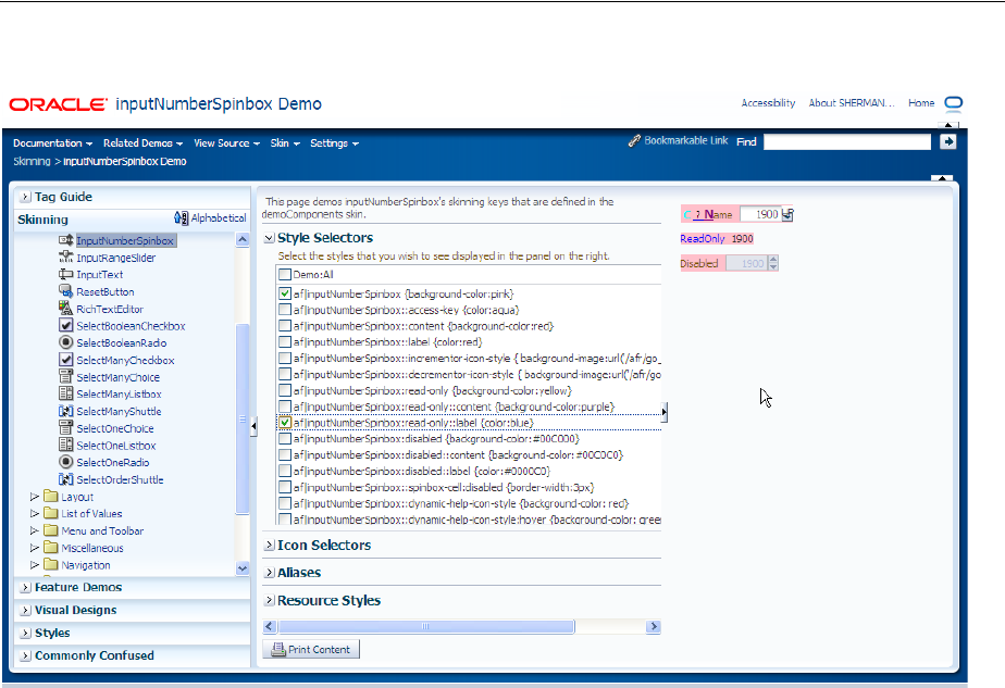
About the ADF Faces Demonstration Application
ADF Faces Demo Application 2-3
Figure 2–2 Skinning Demonstration
■Feature demos: Various pages that demonstrate different ways you can use ADF
components. For example, the File Explorer is an application with a live data
model that displays a directory structure and allows you to create, save, and move
directories and files. This application is meant to showcase the components and
features of ADF Faces in a working application, as shown in Figure 2–3.
About the ADF Faces Demonstration Application
2-4 Web User Interface Developer's Guide for Oracle Application Development Framework
Figure 2–3 File Explorer Application
Other pages demonstrate the main architectural features of ADF Faces, such as
layout components, Ajax postback functionality, and drag and drop. Figure 2–4
shows the demonstration on using the AutoSubmit attribute and partial page
rendering.
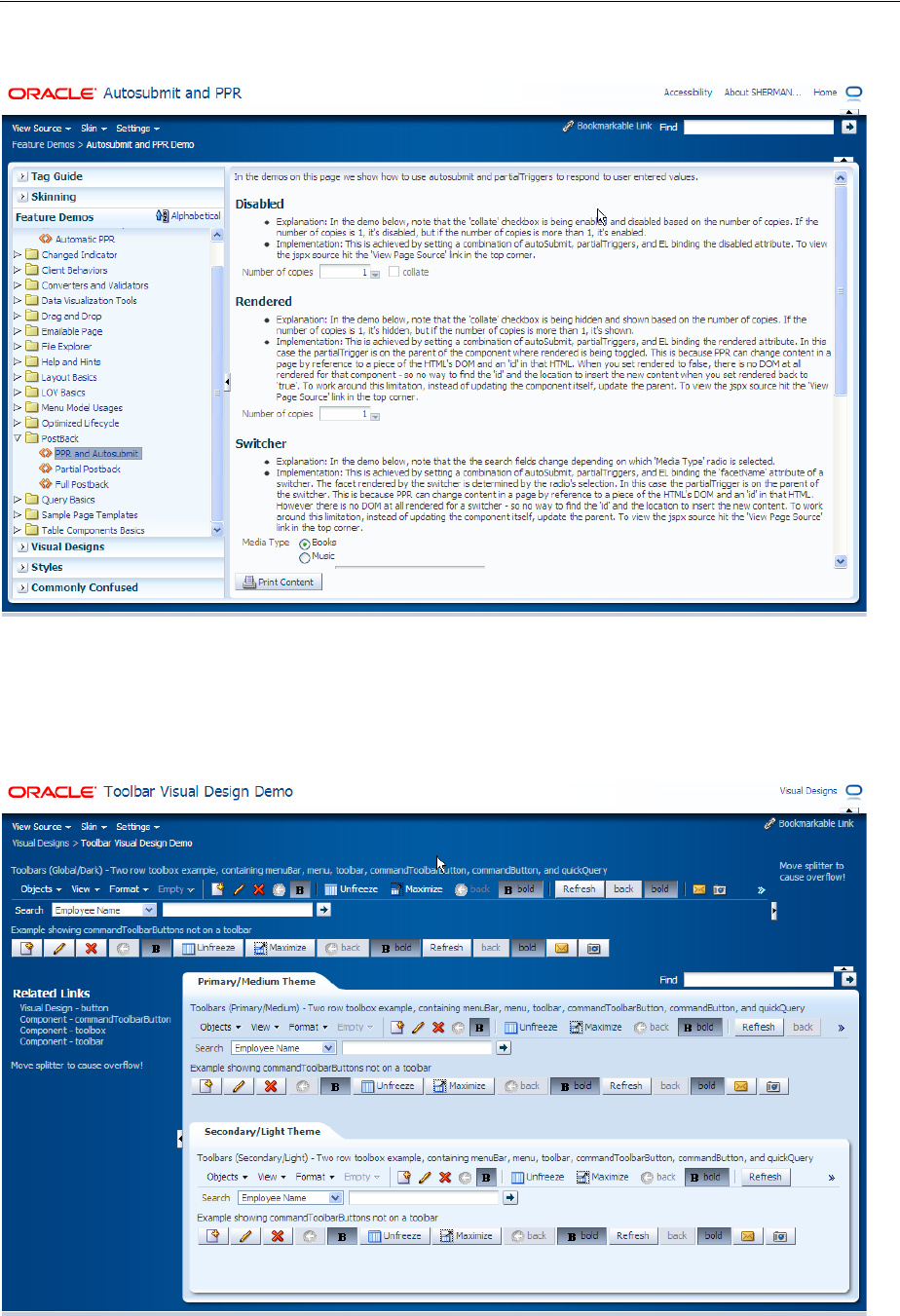
About the ADF Faces Demonstration Application
ADF Faces Demo Application 2-5
Figure 2–4 Framework Demonstration
■Visual designs: Demonstrations of how you can use types of components in
different ways to achieve different UI designs. Figure 2–5 shows how you can
achieve different looks for a toolbar.
Figure 2–5 Toolbar Design Demonstration
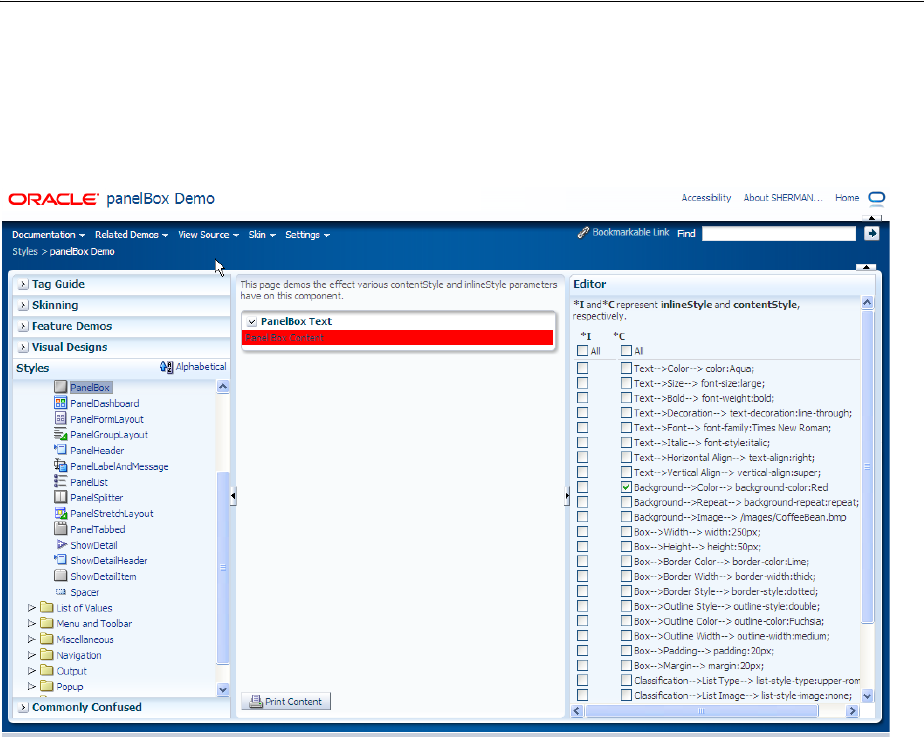
About the ADF Faces Demonstration Application
2-6 Web User Interface Developer's Guide for Oracle Application Development Framework
■Styles: Demonstration of how setting inline styles and content styles affects
components. Figure 2–6 shows different styles applied to the panelBox
component.
Figure 2–6 Styles Demonstration
■Commonly confused components: A comparison of components that provide
similar functionality. Figure 2–7 shows the differences between the various
components that display selection lists.
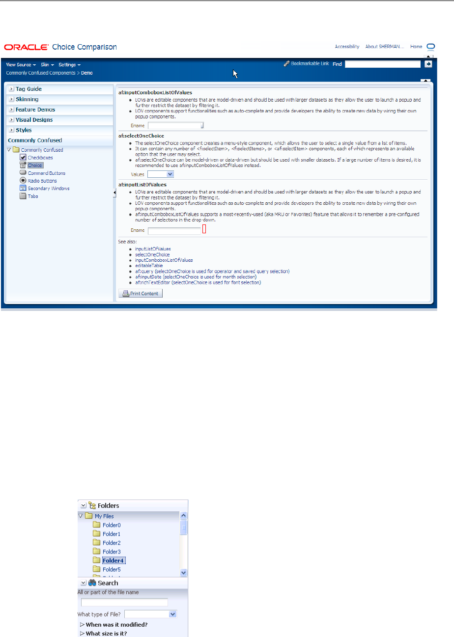
About the ADF Faces Demonstration Application
ADF Faces Demo Application 2-7
Figure 2–7 Commonly Confused Components
Because the File Explorer is a complete working application, many sections in this
guide use that application to illustrate key points, or to provide code samples. The
source for the File Explorer application can be found in the fileExplorer directory.
The File Explorer application uses the fileExplorerTemplate page template. This
template contains a number of layout components that provide the basic look and feel
for the application. For more information about layout components, see Chapter 9,
"Organizing Content on Web Pages." For more information about using templates, see
Chapter 10, "Creating and Reusing Fragments, Page Templates, and Components."
The left-hand side of the application contains a panelAccordion component that
holds two areas: the directory structure and a search field with a results table, as
shown in Figure 2–8.
Figure 2–8 Directory Structure Panel and Search Panel
You can expand and collapse both these areas. The directory structure is created using
a tree component. The search area is created using input components, a command
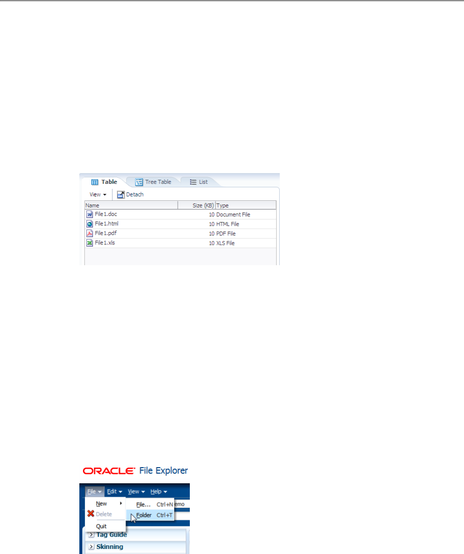
About the ADF Faces Demonstration Application
2-8 Web User Interface Developer's Guide for Oracle Application Development Framework
button, and a table component. For more information about using
panelAccordion components, see Section 9.9, "Displaying or Hiding Contents in
Accordion Panels and Tabbed Panels." For more information about using input
components, see Chapter 11, "Using Input Components and Defining Forms." For
more information about using command buttons, see Chapter 20, "Working with
Navigation Components." For more information about using tables and trees, see
Chapter 12, "Using Tables and Trees."
The right-hand side of the File Explorer application uses tabbed panes to display the
contents of a directory in either a table, a tree table or a list, as shown in Figure 2–9.
Figure 2–9 Directory Contents in Tabbed Panels
The table and tree table have built-in toolbars that allow you to manipulate how the
contents are displayed. In the table an list, you can drag a file or subdirectory from one
directory and drop it into another. In all tabs, you can right-click a file, and from the
context menu, you can view the properties of the file in a popup window. For more
information about using tabbed panes, see Section 9.9, "Displaying or Hiding Contents
in Accordion Panels and Tabbed Panels." For more information about table and tree
table toolbars, see Section 12.9, "Displaying Table Menus, Toolbars, and Status Bars."
For more information about enabling drag and drop, see Chapter 33, "Adding Drag
and Drop Functionality." For more information about using context menus and popup
windows, see Chapter 15, "Using Popup Dialogs, Menus, and Windows."
The top of the File Explorer application contains a menu and a toolbar, as shown in
Figure 2–10.
Figure 2–10 Menu and Toolbar
The menu options allow you to create and delete files and directories and change how
the contents are displayed. The Help menu opens a help system that allows users to
provide feedback in dialogs, as shown in Figure 2–11.
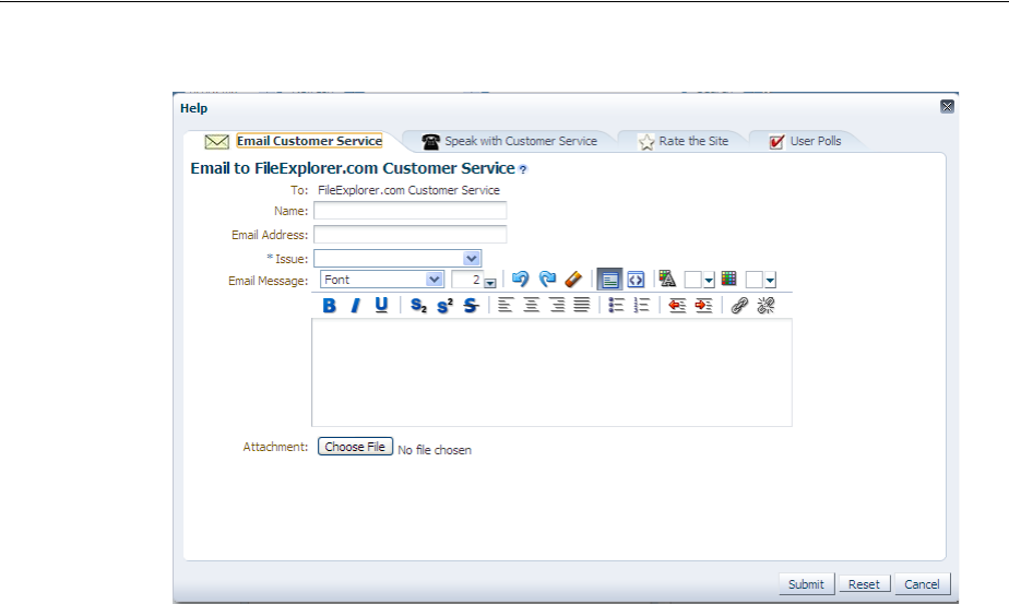
About the ADF Faces Demonstration Application
ADF Faces Demo Application 2-9
Figure 2–11 Help System
The help system consists of a number of forms created with various input components,
including a rich text editor. For more information about menus, see Section 16.2,
"Using Menus in a Menu Bar." For more information about creating help systems, see
Section 19.5, "Displaying Help for Components." For more information about input
components, see Chapter 11, "Using Input Components and Defining Forms."
Within the toolbar of the File Explorer are controls that allow you navigate within the
directory structure, as well as controls that allow you to change the look and feel of the
application by changing its skin. Figure 2–12 shows the File Explorer application using
the simple skin.
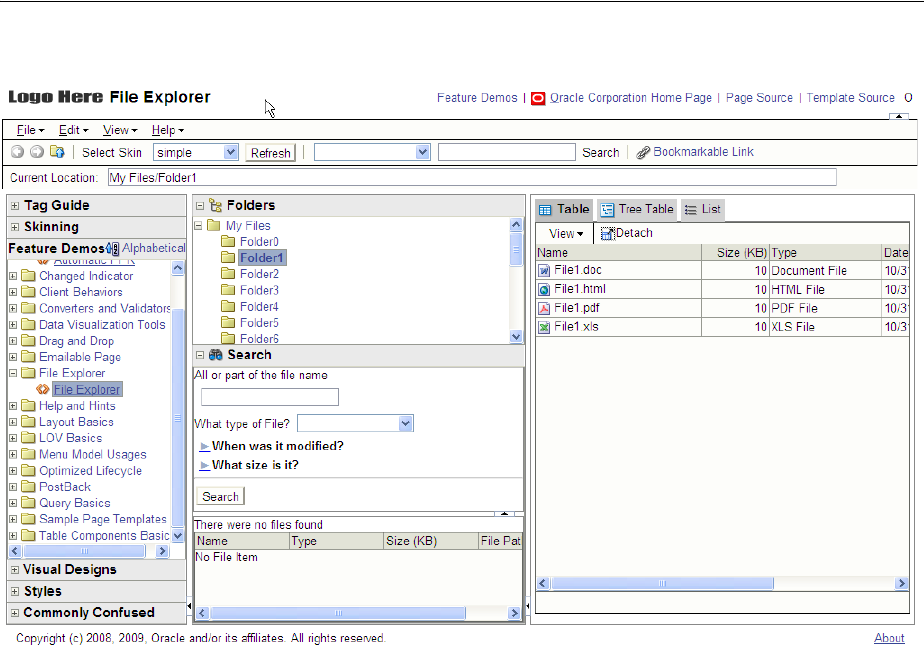
Downloading and Installing the ADF Faces Demo Application
2-10 Web User Interface Developer's Guide for Oracle Application Development Framework
Figure 2–12 File Explorer Application with the Simple Skin
For more information about toolbars, see Section 16.3, "Using Toolbars." For more
information about using skins, see Chapter 28, "Customizing the Appearance Using
Styles and Skins."
2.2 Downloading and Installing the ADF Faces Demo Application
In order to view the demo application (both the code and at runtime), install
JDeveloper, and then download and open the application within JDeveloper.
You can download the ADF Faces demo application from the Oracle Technology
Network (OTN) web site. Navigate to
http://www.oracle.com/technetwork/developer-tools/adf/overview/
index-092391.html and click the ADF Faces Rich Client Components Demo link
in the Download section of the page. The resulting page provides detailed instructions
for downloading the WAR file that contains the application, along with instructions for
deploying the application to a standalone server, or for running the application using
the Integrated WebLogic Server included with JDeveloper.
If you do not want to install the application, you can run the application directly from
OTN by clicking the ADF Faces Rich Client Components Hosted Demo link.

3
Getting Started with ADF Faces and JDeveloper 3-1
3 Getting Started with ADF Faces and
JDeveloper
This chapter describes how to use JDeveloper to declaratively create ADF Faces
applications.
This chapter includes the following sections:
■Section 3.1, "About Developing Declaratively in JDeveloper"
■Section 3.2, "Creating an Application Workspace"
■Section 3.3, "Defining Page Flows"
■Section 3.4, "Creating a View Page"
■Section 3.5, "Creating EL Expressions"
■Section 3.6, "Creating and Using Managed Beans"
■Section 3.7, "Viewing ADF Faces Javadoc"
3.1 About Developing Declaratively in JDeveloper
Using JDeveloper 11g with ADF Faces and JSF provides a number of areas where page
and managed bean code is generated for you declaratively, including creating EL
expressions and automatic component binding. Additionally, there are a number of
areas where XML metadata is generated for you declaratively, including metadata that
controls navigation and configuration.
At a high level, the development process for an ADF Faces view project usually
involves the following:
■Creating an application workspace
■Designing page flows
■Designing and creating the pages using either JavaServer Pages (JSPs) or Facelet
pages
■Deploying the application. For more information about deployment, see the Oracle
Fusion Middleware Administrator's Guide for Oracle Application Development
Framework. If your application uses ADF Faces with the ADF Model layer, the ADF
Controller, and ADF Business Components, see the "Deploying Fusion Web
Applications" chapter of the Oracle Fusion Middleware Fusion Developer's Guide for
Oracle Application Development Framework.
Ongoing tasks throughout the development cycle will likely include the following:
■Creating managed beans

Creating an Application Workspace
3-2 Web User Interface Developer's Guide for Oracle Application Development Framework
■Creating and using EL expressions
■Viewing ADF Faces source code and Javadoc
JDeveloper also includes debugging and testing capabilities. For more information, see
the "Testing and Debugging ADF Components" chapter of the Oracle Fusion Middleware
Fusion Developer's Guide for Oracle Application Development Framework.
3.2 Creating an Application Workspace
The first steps in building a new application are to assign it a name and to specify the
directory where its source files will be saved. You can either create an application that
just contains the view layer, or you can add an ADF Faces project to an existing
application.
3.2.1 How to Create an ADF Faces Application Workspace
You create an application workspace using the Create Application wizard.
To create an application:
1. In the JDeveloper main menu, choose File > New.
The New Gallery opens, where you can select different application components to
create.
2. Select Applications > Custom Application.
3. In the Create Custom Application dialog, set a name, directory location, and
package prefix of your choice and click Next.
4. In the Name Your Project page, you can optionally change the name and location
for your view project. On the Project Features tab, shuttle ADF Faces Components
to Selected. The necessary libraries and metadata files for ADF Faces will be
added to your project. Click Next.
5. In the Configure Java Settings page, optionally change the package name, Java
source path, and output directory for any Java classes you might create. Click
Finish.
Note: This document covers only how to create the ADF Faces
project in an application, without regard to the business services used
or the binding to those services. For information about how to use
ADF Faces with the ADF Model layer, the ADF Controller, and ADF
Business Components, see the Oracle Fusion Middleware Fusion
Developer's Guide for Oracle Application Development Framework. For
more information about using ADF Faces with the ADF Model layer
and EJBs and JPA, see Oracle Fusion Middleware Java EE Developer's
Guide for Oracle Application Development Framework.
Tip: You can also add ADF Faces to an existing project (for example,
a view project in a JEE Web Application). To do so:
1. Right-click the project and choose Project Properties.
2. In the Project Properties dialog, select Features, then click the Add (green
plus) icon, and shuttle ADF Faces to the Selected pane.
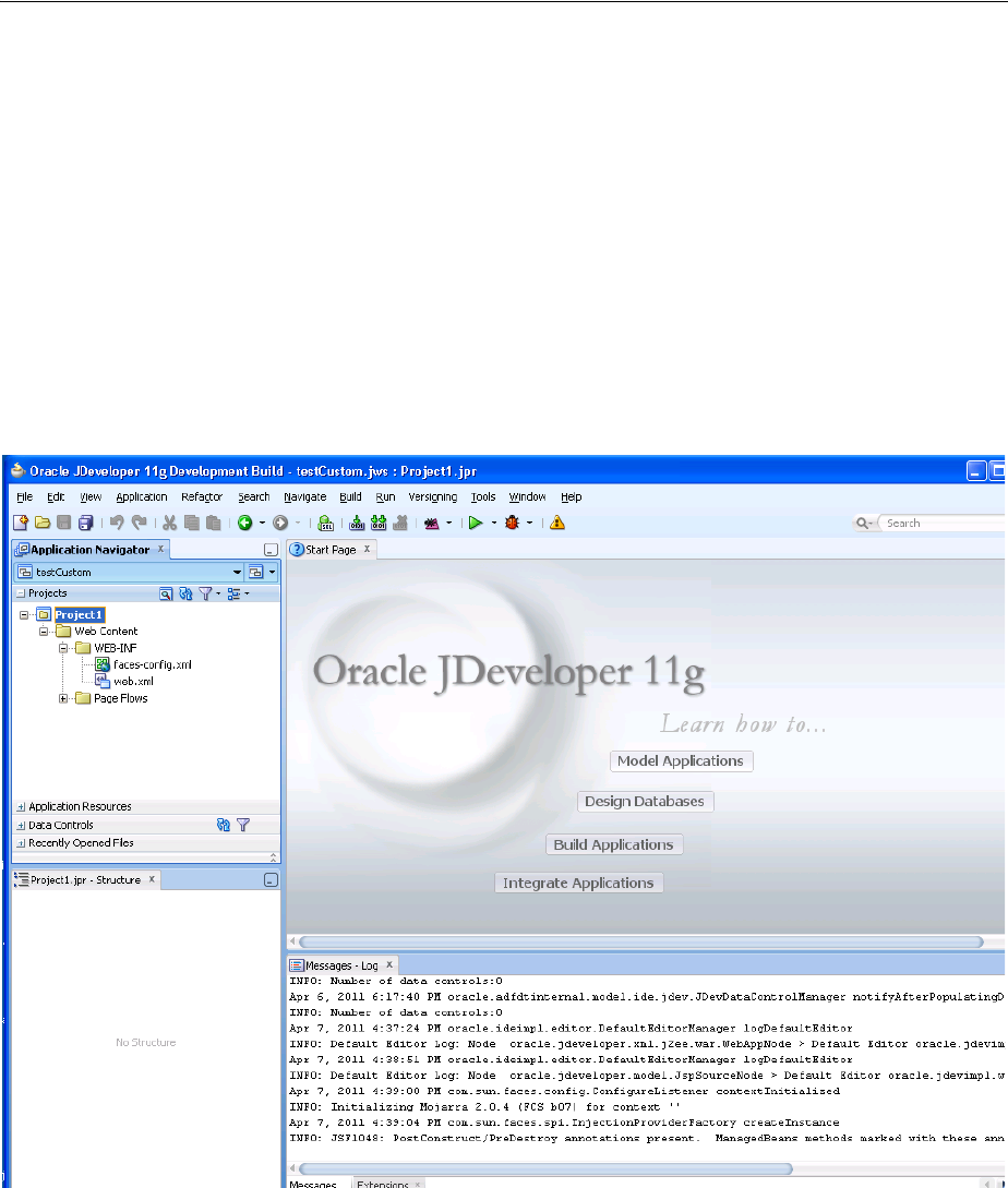
Creating an Application Workspace
Getting Started with ADF Faces and JDeveloper 3-3
3.2.2 What Happens When You Create an Application Workspace
When you create an application workspace using the Custom template, and the select
ADF Faces for your project, JDeveloper creates a project that contains all the source
and configuration files needed for an ADF Faces application. Additionally, JDeveloper
adds the following libraries to your project:
■JSF 2.0
■JSTL 1.2
■JSP Runtime
Once the projects are created for you, you can rename them. Figure 3–1 shows the
workspace for a new ADF Faces application.
Figure 3–1 New Workspace for an ADF Faces Application
JDeveloper also sets configuration parameters in the configuration files based on the
options chosen when you created the application. In the web.xml file, these are
configurations needed to run a JSF application (settings specific to ADF Faces are
added when you create a JSF page with ADF Faces components). Example 3–1 shows
the web.xml file generated by JDeveloper when you create a new Java EE application.
Example 3–1 Generated web.xml File
<?xml version = '1.0' encoding = 'windows-1252'?>
<web-app xmlns:xsi="http://www.w3.org/2001/XMLSchema-instance"
xsi:schemaLocation="http://java.sun.com/xml/ns/javaee
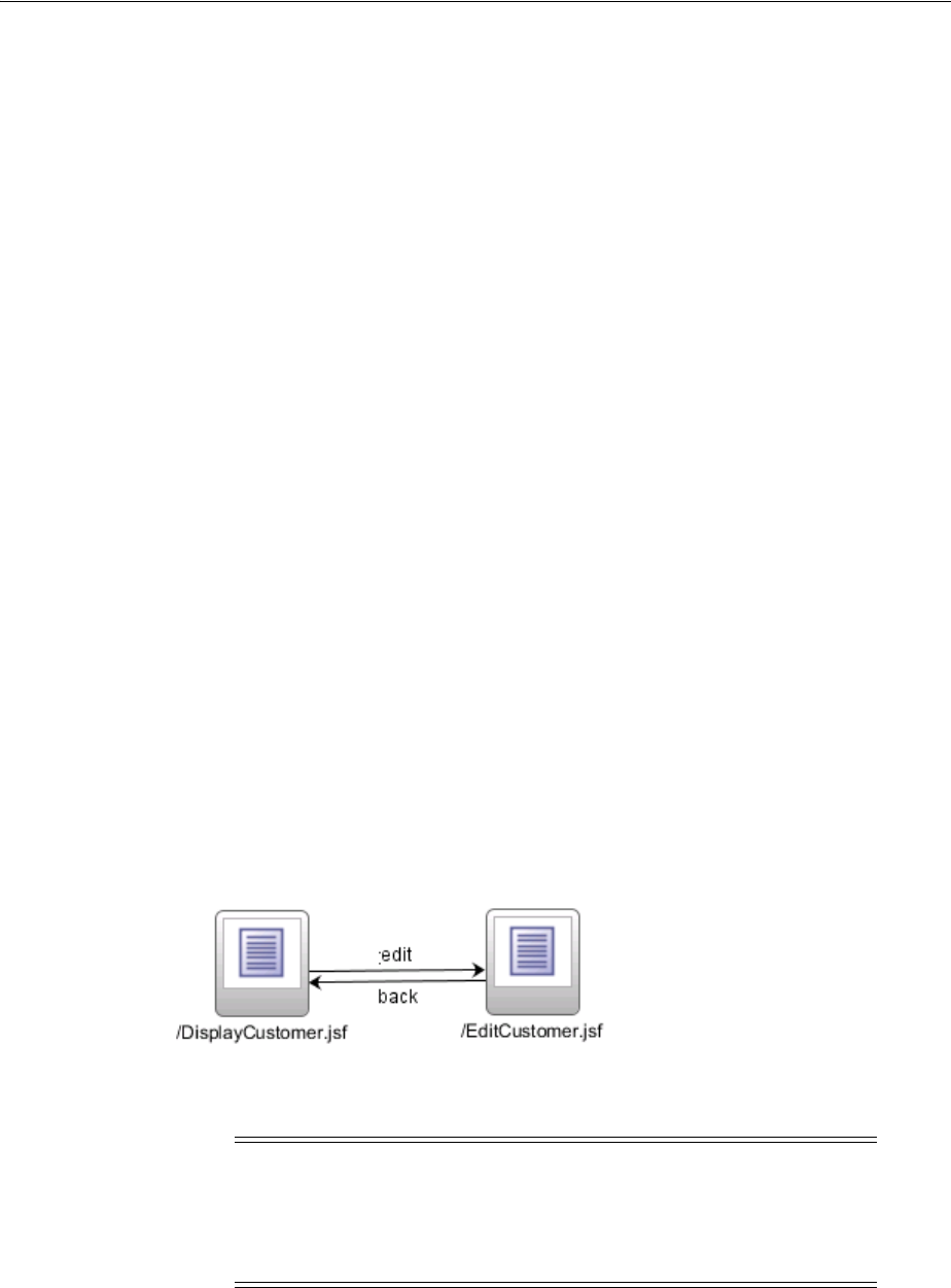
Defining Page Flows
3-4 Web User Interface Developer's Guide for Oracle Application Development Framework
http://java.sun.com/xml/ns/javaee/web-app_2_5.xsd"
version="2.5" xmlns="http://java.sun.com/xml/ns/javaee">
<servlet>
<servlet-name>Faces Servlet</servlet-name>
<servlet-class>javax.faces.webapp.FacesServlet</servlet-class>
<load-on-startup>1</load-on-startup>
</servlet>
<servlet-mapping>
<servlet-name>Faces Servlet</servlet-name>
<url-pattern>/faces/*</url-pattern>
</servlet-mapping>
</web-app>
Configurations required for specific ADF Faces features are covered in the respective
chapters of this guide. For example, any configuration needed in order to use the
Change Persistence framework is covered in Chapter 32, "Allowing User
Customization on JSF Pages." For comprehensive information about configuring an
ADF Faces application, see Appendix A, " ADF Faces Configuration."
3.3 Defining Page Flows
Once you create your application workspace, often the next step is to design the flow
of your UI. As with standard JSF applications, ADF Faces applications use navigation
cases and rules to define the page flow. These definitions are stored in the
faces-config.xml file. JDeveloper provides a diagrammer through which you can
declaratively define your page flow using icons.
Figure 3–2 shows the navigation diagram created for a simple page flow that contains
two pages: a DisplayCustomer page that shows data for a specific customer, and an
EditCustomer page that allows a user to edit the customer information. There is one
navigation rule that goes from the display page to the edit page and one navigation
rule that returns to the display page from the edit page.
Figure 3–2 Navigation Diagram in JDeveloper
Note: If you plan on using Oracle ADF Model data binding and the
ADF Controller, then you use ADF task flows to define your
navigation rules. For more information, see the "Getting Started With
ADF Task Flows" chapter of the Oracle Fusion Middleware Fusion
Developer's Guide for Oracle Application Development Framework.
Best Practice: The ADF Controller extends the JSF default controller.
While you can technically use the JSF controller and ADF Controller in
your application, you should use only one or the other.
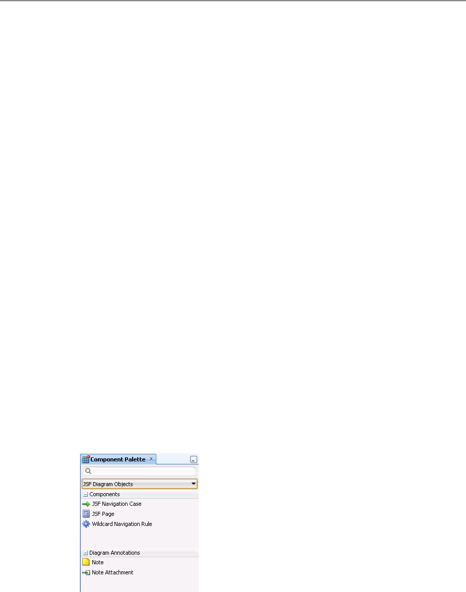
Defining Page Flows
Getting Started with ADF Faces and JDeveloper 3-5
With the advent of JSF 2.0, you no longer need to create a navigation case for simple
navigation between two pages. If no matching navigation case is found after checking
all available rules, the navigation handler checks to see whether the action outcome
corresponds to a view ID. If a view matching the action outcome is found, an implicit
navigation to the matching view occurs. For more information on how navigation
works in a JSF application, see the Java EE 6 tutorial
(http://download.oracle.com/javaee/index.html).
3.3.1 How to Define a Page Flow
You use the navigation diagrammer to declaratively create a page flow using Facelets
or JSPX pages. When you use the diagrammer, JDeveloper creates the XML metadata
needed for navigation to work in your application in the faces-config.xml file.
Before you begin:
It may be helpful to have an understanding of page flows. For more information, see
Section 3.3, "Defining Page Flows."
To create a page flow:
1. In the Application Navigator, double-click the faces-config.xml file for your
application. By default, this is in the Web Content/WEB-INF node of your project.
2. In the editor window, click the Diagram tab to open the navigation diagrammer.
3. If the Component Palette is not displayed, from the main menu choose View >
Component Palette. By default, the Component Palette is displayed in the upper
right-hand corner of JDeveloper.
4. In the Component Palette, use the dropdown menu to choose JSF Diagram
Objects.
The components are contained in two accordion panels: Components and
Diagram Annotations. Figure 3–3 shows the Component Palette displaying JSF
navigation components.
Figure 3–3 Component Palette in JDeveloper
5. Select the component you wish to use and drag it onto the diagram.
JDeveloper redraws the diagram with the newly added component.

Creating a View Page
3-6 Web User Interface Developer's Guide for Oracle Application Development Framework
Once the navigation for your application is defined, you can create the pages and add
the components that will execute the navigation. For more information about using
navigation components on a page, see Chapter 20, "Working with Navigation
Components."
3.3.2 What Happens When You Use the Diagrammer to Create a Page Flow
When you use the diagrammer to create a page flow, JDeveloper creates the associated
XML entries in the faces-config.xml file. Example 3–2 shows the XML generated
for the navigation rules displayed in Figure 3–2.
Example 3–2 Navigation Rules in faces-config.xml
<navigation-rule>
<from-view-id>/DisplayCustomer</from-view-id>
<navigation-case>
<from-outcome>edit</from-outcome>
<to-view-id>/EditCustomer</to-view-id>
</navigation-case>
</navigation-rule>
<navigation-rule>
<from-view-id>/EditCustomer</from-view-id>
<navigation-case>
<from-outcome>back</from-outcome>
<to-view-id>/DisplayCustomer</to-view-id>
</navigation-case>
</navigation-rule>
3.4 Creating a View Page
From the page flows you created during the planning stages, you can double-click the
page icons to create the actual JSF page files. You can choose to create either a Facelets
page or a JSP page. Facelet pages use the extension *.jsf. Facelets is a JSF-centric
declarative XML view definition technology that provides an alternative to using the
JSP engine.
If instead you create a JSP page for an ADF Faces application, you create an
XML-based JSP document, which uses the extension *.jspx. Using an XML-based
document has the following advantages:
■It simplifies treating your page as a well-formed tree of UI component tags.
■It discourages you from mixing Java code and component tags.
■It allows you to easily parse the page to create documentation or audit reports.
Tip: You can also use the overview editor to create navigation rules
and navigation cases by clicking the Overview tab. Press F1 for details
on using the overview editor to create navigation.
Additionally, you can manually add elements to the
faces-config.xml file by directly editing the page in the source
editor. To view the file in the source editor, click the Source tab.
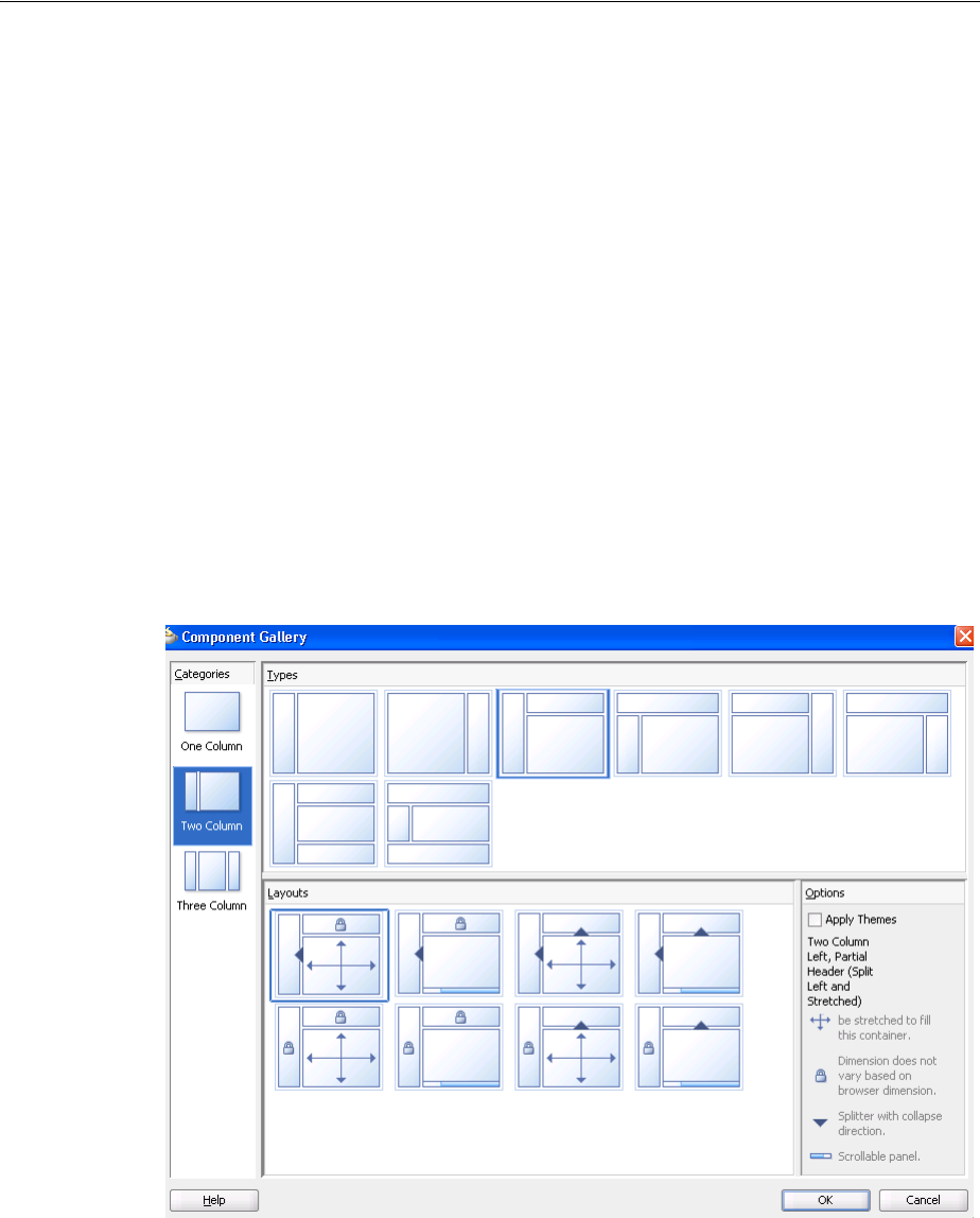
Creating a View Page
Getting Started with ADF Faces and JDeveloper 3-7
ADF Faces provides a number of components that you can use to define the overall
layout of a page. JDeveloper contains predefined quick start layouts that use these
components to provide you with a quick and easy way to correctly build the layout.
You can choose from one, two, or three column layouts, and then determine how you
want the columns to behave. For example, you may want one column’s width to be
locked, while another column stretches to fill available browser space. Figure 3–4
shows the quick start layouts available for a two-column layout with the second
column split between two panes. For more information about the layout components,
see Chapter 9, "Organizing Content on Web Pages."
Figure 3–4 Quick Layouts
Along with adding layout components, you can also choose to apply a theme to the
chosen quick layout. These themes add color styling to some of the components used
in the quick start layout. To see the color and where it is added, see Appendix D,
Best Practice: Use Facelets to take advantage of the following:
■The Facelets layer was created specifically for JSF, which results in
reduced overhead and improved performance during tag
compilation and execution.
■Facelets is considered the primary view definition technology in
JSF 2.0.
■Some future performance enhancements to the JSF standard will
only be available with Facelets.
Best Practice: Creating a layout that works correctly in all browsers
can be time consuming. Use a predefined quick layout to avoid any
potential issues.
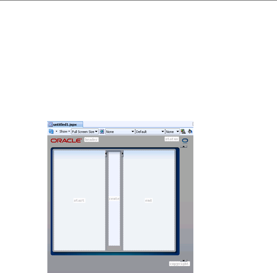
Creating a View Page
3-8 Web User Interface Developer's Guide for Oracle Application Development Framework
"Quick Start Layout Themes." For more information about themes, see Chapter 28,
"Customizing the Appearance Using Styles and Skins"
When you know you want to use the same layout on many pages in your application,
ADF Faces allows you to create and use predefined page templates. When creating
templates, the template developer can not only determine the layout of any page that
will use the template, but can also provide static content that must appear on all pages,
as well as create placeholder attributes that can be replaced with valid values for each
individual page.
For example, ADF Faces ships with the Oracle Three-Column-Layout template. This
template provides areas for specific content, such as branding, a header, and copyright
information, and also displays a static logo and busy icon, as shown in Figure 3–5.
Figure 3–5 Oracle Three Column Layout Template
Whenever a template is changed, for example if the layout changes, any page that uses
the template will also be automatically updated. For more information about creating
and using templates, see Section 10.4, "Using Page Templates."
At the time you create a JSF page, you can also choose to create an associated backing
bean for the page. Backing beans allow you to access the components on the page
programmatically. For more information about using backing beans with JSF pages,
see Section 3.4.4, "What You May Need to Know About Automatic Component
Binding."
Best Practice: Use templates to ensure consistency and so that in the
future, you can easily update multiple pages in an application.
Best Practice: Create backing beans only for pages that contain
components that must be accessed and manipulated
programmatically. Use managed beans instead if you need only to
provide additional functionality accessed through EL expressions on
component attributes (such as listeners).

Creating a View Page
Getting Started with ADF Faces and JDeveloper 3-9
You can also choose to have your page available for display in mobile devices. Once
your page files are created, you can add UI components and work with the page
source.
3.4.1 How to Create JSF Pages
You create JSF pages (either JSP or Facelets) using the Create JSF Page dialog.
Before you begin:
It may be helpful to have an understanding of the different options when creating a
page. For more information, see Section 3.4, "Creating a View Page."
To create a JSF page:
1. In the Application Navigator, right-click the directory where you would like the
page to be saved, and choose New. In the New Gallery, expand the Web Tier
node, select JSF/Facelets and then Page, and click OK.
OR
From a navigation diagram, double-click a page icon for a page that has not yet
been created.
2. Complete the Create JSF Page dialog. For help, click Help in the dialog. For more
information about the Managed Bean tab, which can be used to automatically
create a backing bean and associated bindings, see Section 3.4.4, "What You May
Need to Know About Automatic Component Binding."
3.4.2 What Happens When You Create a JSF Page
When you use the Create JSF Page dialog to create a JSF page, JDeveloper creates the
physical file and adds the code necessary to import the component libraries and
display a page. The code created depends on whether or not you chose to create a
JSPX or Facelets page.
Example 3–3 shows a Facelets page when it is first created by JDeveloper.
Example 3–3 Declarative Facelets Page Source Created by JDeveloper
<!DOCTYPE html PUBLIC "-//W3C//DTD XHTML 1.0 Transitional//EN"
"http://www.w3.org/TR/xhtml1/DTD/xhtml1-transitional.dtd">
<f:view xmlns:f="http://java.sun.com/jsf/core"
xmlns:h="http://java.sun.com/jsf/html"
xmlns:af="http://xmlns.oracle.com/adf/faces/rich">
<af:document title="untitled1.jsf" id="d1">
<af:form id="f1"></af:form>
</af:document>
</f:view>
Example 3–4 shows a .jspx page when it is first created by JDeveloper.
Note: While a Facelets page can use any extension you’d like, a
Facelets page must use the .jsf extension to be customizable. For
more information, see Chapter 32, "Allowing User Customization on
JSF Pages."

Creating a View Page
3-10 Web User Interface Developer's Guide for Oracle Application Development Framework
Example 3–4 Declarative JSPX Page Source Created by JDeveloper
<?xml version='1.0' encoding='UTF-8'?>
<jsp:root xmlns:jsp="http://java.sun.com/JSP/Page" version="2.1"
xmlns:f="http://java.sun.com/jsf/core"
xmlns:h="http://java.sun.com/jsf/html"
xmlns:af="http://xmlns.oracle.com/adf/faces/rich">
<jsp:directive.page contentType="text/html;charset=UTF-8"/>
<f:view>
<af:document title="untitled1" id="d1">
<af:form id="f1"></af:form>
</af:document>
</f:view>
</jsp:root>
If you chose to use one of the quick layouts, then JDeveloper also adds the components
necessary to display the layout. Example 3–5 shows the generated code when you
choose a two-column layout, where the first column is locked and the second column
stretches to fill up available browser space, and you also choose to apply themes.
Example 3–5 Two-Column Layout
<?xml version='1.0' encoding='UTF-8'?>
<jsp:root xmlns:jsp="http://java.sun.com/JSP/Page" version="2.1"
xmlns:f="http://java.sun.com/jsf/core"
xmlns:h="http://java.sun.com/jsf/html"
xmlns:af="http://xmlns.oracle.com/adf/faces/rich">
<jsp:directive.page contentType="text/html;charset=UTF-8"/>
<f:view>
<af:document title="untitled2" id="d1">
<af:form id="f1">
<af:panelStretchLayout startWidth="100px" id="psl1">
<f:facet name="start"/>
<f:facet name="center">
<!-- id="af_twocol_left_sidebar_stretched" -->
<af:decorativeBox theme="dark" id="db1">
<f:facet name="center">
<af:decorativeBox theme="medium" id="db2">
<f:facet name="center"/>
</af:decorativeBox>
</f:facet>
</af:decorativeBox>
</f:facet>
</af:panelStretchLayout>
</af:form>
</af:document>
</f:view>
</jsp:root>
If you chose to automatically create a backing bean using the Managed Bean tab of the
dialog, JDeveloper also creates and registers a backing bean for the page, and binds
any existing components to the bean. Example 3–6 shows the code created for a
backing bean for a page.
Example 3–6 Declarative Backing Bean Source Created by JDeveloper
package view.backing;
import oracle.adf.view.rich.component.rich.RichDocument;
import oracle.adf.view.rich.component.rich.RichForm;

Creating a View Page
Getting Started with ADF Faces and JDeveloper 3-11
public class MyFile {
private RichForm f1;
private RichDocument d1;
public void setF1(RichForm f1) {
this.f1 = f1;
}
public RichForm getF1() {
return f1;
}
public void setD1(RichDocument d1) {
this.document1 = d1;
}
public RichDocument getD1() {
return d1;
}
}
Additionally, JDeveloper adds the following libraries to the view project:
■ADF Faces Runtime 11
■ADF Common Runtime
■ADF DVT Faces Runtime
■ADF DVT Faces Databinding Runtime
■ADF DVT Faces Databinding MDS Runtime
■Oracle JEWT
JDeveloper also adds entries to the web.xml file. Example 3–7 shows the web.xml file
created once you create a JSPX page.
Example 3–7 Code in the web.xml File After a JSF Page is Created
<?xml version = '1.0' encoding = 'windows-1252'?>
<web-app xmlns:xsi="http://www.w3.org/2001/XMLSchema-instance"
xsi:schemaLocation="http://java.sun.com/xml/ns/javaee
http://java.sun.com/xml/ns/javaee/web-app_2_5.xsd"
version="2.5" xmlns="http://java.sun.com/xml/ns/javaee">
<context-param>
<param-name>javax.faces.STATE_SAVING_METHOD</param-name>
<param-value>client</param-value>
</context-param>
<context-param>
<param-name>javax.faces.PARTIAL_STATE_SAVING</param-name>
<param-value>false</param-value>
</context-param>
<context-param>
<description>If this parameter is true, there will be an automatic check of
the modification date of your JSPs, and saved state will be discarded when JSP's
Tip: You can access the backing bean source from the JSF page by
right-clicking the page in the editor, and choosing Go to and then
selecting the bean from the list.

Creating a View Page
3-12 Web User Interface Developer's Guide for Oracle Application Development Framework
change. It will also automatically check if your skinning css files have changed
without you having to restart the server. This makes development easier, but adds
overhead. For this reason this parameter should be set to false when your
application is deployed.</description>
<param-name>org.apache.myfaces.trinidad.CHECK_FILE_MODIFICATION</param-name>
<param-value>false</param-value>
</context-param>
<context-param>
<description>Whether the 'Generated by...' comment at the bottom of ADF Faces
HTML pages should contain version number information.</description>
<param-name>oracle.adf.view.rich.versionString.HIDDEN</param-name>
<param-value>false</param-value>
</context-param>
<context-param>
<param-name>javax.faces.FACELETS_SKIP_XML_INSTRUCTIONS</param-name>
<param-value>true</param-value>
</context-param>
<context-param>
<param-name>javax.faces.FACELETS_SKIP_COMMENTS</param-name>
<param-value>true</param-value>
</context-param>
<context-param>
<param-name>javax.faces.FACELETS_DECORATORS</param-name>
<param-value>
oracle.adfinternal.view.faces.facelets.rich.AdfTagDecorator
</param-value>
</context-param>
<context-param>
<param-name>
javax.faces.FACELETS_RESOURCE_RESOLVER
</param-name>
<param-value>
oracle.adfinternal.view.faces.facelets.rich.AdfFaceletsResourceResolver
</param-value>
</context-param>
<filter>
<filter-name>trinidad</filter-name>
<filter-class>org.apache.myfaces.trinidad.webapp.TrinidadFilter</filter-class>
</filter>
<filter-mapping>
<filter-name>trinidad</filter-name>
<servlet-name>Faces Servlet</servlet-name>
<dispatcher>FORWARD</dispatcher>
<dispatcher>REQUEST</dispatcher>
</filter-mapping>
<servlet>
<servlet-name>Faces Servlet</servlet-name>
<servlet-class>javax.faces.webapp.FacesServlet</servlet-class>
<load-on-startup>1</load-on-startup>
</servlet>
<servlet>
<servlet-name>resources</servlet-name>
<servlet-class>org.apache.myfaces.trinidad.webapp.ResourceServlet</servlet-class>
</servlet>
<servlet>
<servlet-name>BIGRAPHSERVLET</servlet-name>
<servlet-class>oracle.adf.view.faces.bi.webapp.GraphServlet</servlet-class>
</servlet>
<servlet>

Creating a View Page
Getting Started with ADF Faces and JDeveloper 3-13
<servlet-name>BIGAUGESERVLET</servlet-name>
<servlet-class>oracle.adf.view.faces.bi.webapp.GaugeServlet</servlet-class>
</servlet>
<servlet>
<servlet-name>MapProxyServlet</servlet-name>
<servlet-class>oracle.adf.view.faces.bi.webapp.MapProxyServlet</servlet-class>
</servlet>
<servlet-mapping>
<servlet-name>Faces Servlet</servlet-name>
<url-pattern>/faces/*</url-pattern>
</servlet-mapping>
<servlet-mapping>
<servlet-name>resources</servlet-name>
<url-pattern>/adf/*</url-pattern>
</servlet-mapping>
<servlet-mapping>
<servlet-name>resources</servlet-name>
<url-pattern>/afr/*</url-pattern>
</servlet-mapping>
<servlet-mapping>
<servlet-name>BIGRAPHSERVLET</servlet-name>
<url-pattern>/servlet/GraphServlet/*</url-pattern>
</servlet-mapping>
<servlet-mapping>
<servlet-name>BIGAUGESERVLET</servlet-name>
<url-pattern>/servlet/GaugeServlet/*</url-pattern>
</servlet-mapping>
<servlet-mapping>
<servlet-name>MapProxyServlet</servlet-name>
<url-pattern>/mapproxy/*</url-pattern>
</servlet-mapping>
<servlet-mapping>
<servlet-name>resources</servlet-name>
<url-pattern>/bi/*</url-pattern>
</servlet-mapping>
<mime-mapping>
<extension>swf</extension>
<mime-type>application/x-shockwave-flash</mime-type>
</mime-mapping>
<mime-mapping>
<extension>amf</extension>
<mime-type>application/x-amf</mime-type>
</mime-mapping>
</web-app>
In the faces-config.xml file, when you create a JSF page, JDeveloper creates an
entry that defines the default render kit (used to display the components in an HTML
client) for ADF Faces, as shown in Example 3–8.
Example 3–8 Generated faces-config.xml File
<?xml version="1.0" encoding="windows-1252"?>
<faces-config version="2.0" xmlns="http://java.sun.com/xml/ns/javaee">
<application>
Note: The Facelets context parameters are only created if you create
a Facelets page.

Creating a View Page
3-14 Web User Interface Developer's Guide for Oracle Application Development Framework
<default-render-kit-id>oracle.adf.rich</default-render-kit-id>
</application>
</faces-config>
An entry in the trinidad-config.xml file defines the default skin used by the user
interface (UI) components in the application, as shown in Example 3–9.
Example 3–9 Generated trinidad-config.xml File
<?xml version="1.0" encoding="windows-1252"?>
<trinidad-config xmlns="http://myfaces.apache.org/trinidad/config">
<skin-family>fusionFx</skin-family>
<skin-version>v2</skin-version>
</trinidad-config>
When the page is first displayed in JDeveloper, it is displayed in the visual editor
(accessed by clicking the Design tab), which allows you to view the page in a
WYSIWYG environment. You can also preview your page in a browser window by
clicking the Preview tab, or view the source for the page in the source editor by
clicking the Source tab. The Structure window located in the lower left-hand corner of
JDeveloper, provides a hierarchical view of the page.
3.4.3 What You May Need to Know About Updating Your Application to Use the
Facelets Engine
JSF 2.0 web applications can run using either the Facelets engine or JSP servlet engine.
By default, documents with the *.jsf and *.xhtml extensions are handled by the
Facelets engine, while documents with the *.jsp and *.jspx extensions are handled
by the JSP engine. However, this behavior may be changed by setting the
javax.faces.FACELETS_VIEW_MAPPINGS context parameter in the web.xml file.
Because ADF Faces allows JSP pages to be run with the Facelets engine, you may
decide that you want an existing application of JSP pages to use the Facelets engine. To
do that, insert the code shown in Example 3–10 into your web.xml page.
Example 3–10 web.xml Code for Running Both JSP and Facelets Pages Using the
Facelets Engine
<context-param>
<param-name>javax.faces.FACELETS_VIEW_MAPPINGS</param-name>
<!-- Map both *.jspx and *.jsf to the Facelets engine -->
<param-value>*.jsf; *.jspx</param-value>
</context-param>
<context-param>
<param-name>javax.faces.FACELETS_SKIP_COMMENTS</param-name>
<param-value>true</param-value>
</context-param>
<context-param>
<param-name>javax.faces.FACELETS_DECORATORS</param-name>
<param-value>
oracle.adfinternal.view.faces.facelets.rich.AdfTagDecorator
</param-value>
</context-param>
<context-param>
<param-name>
javax.faces.FACELETS_RESOURCE_RESOLVER
</param-name>

Creating a View Page
Getting Started with ADF Faces and JDeveloper 3-15
<param-value>
oracle.adfinternal.view.faces.facelets.rich.AdfFaceletsResourceResolver
</param-value>
</context-param>
You then must redeploy your ADF Faces libraries.
Note that if you do change your application to use the Facelets engine, then your
application will use JSF partial state saving, which is not currently compatible with
ADF Faces. You will need to explicitly add the entry shown in Example 3–11.
Once this incompatibility is resolved (as we expect to happen in future releases), you
should re-enable partial state saving by removing the entry. Check your current release
notes at
http://www.oracle.com/technetwork/developer-tools/jdev/documenta
tion/index.html for the latest information on partial state saving support.
Example 3–11 Add this web.xml Code When Using Facelets Engine
<context-param>
<param-name>javax.faces.PARTIAL_STATE_SAVING</param-name>
<param-value>false</param-value>
</context-param>
3.4.4 What You May Need to Know About Automatic Component Binding
Backing beans are managed beans that contain logic and properties for UI components
on a JSF page (for more information about managed beans, see Section 3.6, "Creating
and Using Managed Beans"). If when you create your JSF page you choose to
automatically expose UI components by selecting one of the choices in the Page
Implementation option of the Create JSF Page dialog, JDeveloper automatically creates
a backing bean (or uses a managed bean of your choice) for the page. For each
component you add to the page, JDeveloper then inserts a bean property for that
component, and uses the binding attribute to bind component instances to those
properties, allowing the bean to accept and return component instances.
Specifically, JDeveloper does the following when you use automatic component
binding:
■Creates a JavaBean using the same name as the JSP or JSPX file, and places it in the
view.backing package (if you elect to have JDeveloper create a backing bean).
■Creates a managed bean entry in the faces-config.xml file for the backing
bean. By default, the managed bean name is backing_<page_name> and the
bean uses the request scope (for more information about scopes, see Section 5.6,
"Object Scope Lifecycles").
Note: When you switch from the servlet engine to the Facelets
engine, you may find certain parts of your application do not function
as expected. For example, if you have any custom JSP tags, these tags
will need to be reimplemented to work with the Facelets engine. For
more information, refer to the ADF Faces release notes.
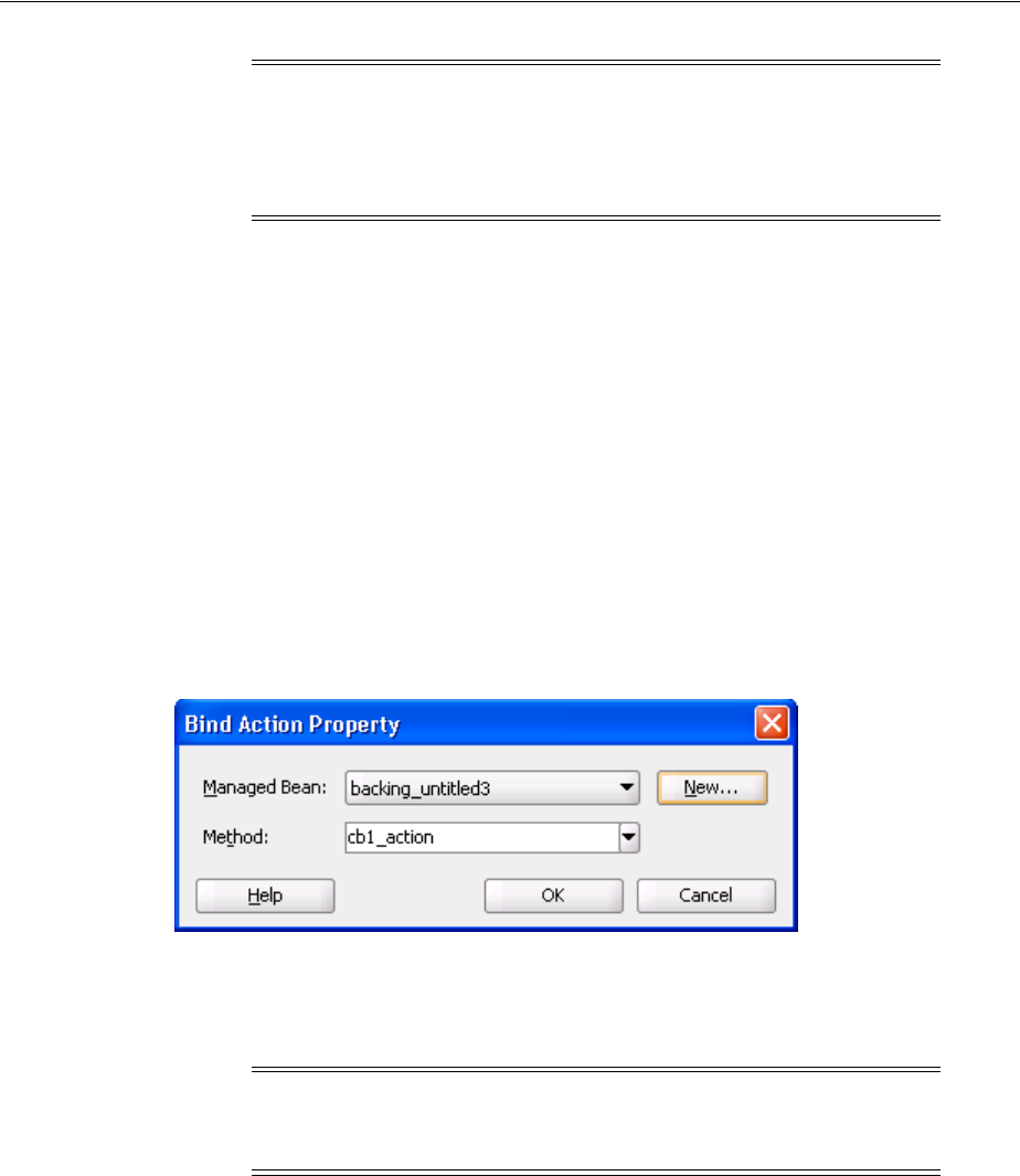
Creating a View Page
3-16 Web User Interface Developer's Guide for Oracle Application Development Framework
■On the newly created or selected bean, adds a property and accessor methods for
each component tag you place on the JSP. JDeveloper binds the component tag to
that property using an EL expression as the value for its binding attribute.
■Deletes properties and methods for any components deleted from the page.
Once the page is created and components added, you can then declaratively add
method binding expressions to components that use them by double-clicking the
component in the visual editor, which launches an editor that allows you to select the
managed bean and method to which you want to bind the attribute. When automatic
component binding is used on a page and you double-click the component, skeleton
methods to which the component may be bound are automatically created for you in
the page’s backing bean. For example, if you add a command button component and
then double-click it in the visual editor, the Bind Action Property dialog displays the
page’s backing bean along with a new skeleton action method, as shown in Figure 3–6.
Figure 3–6 Bind Action Property Dialog
You can select from one these methods, or if you enter a new method name,
JDeveloper automatically creates the new skeleton method in the page's backing bean.
You must then add the logic to the method.
For example, suppose you created a JSF page with the file name myfile.jspx. If you
chose to let JDeveloper automatically create a default backing bean, then JDeveloper
creates the backing bean as view.backing.MyFile.java, and places it in the \src
directory of the ViewController project. The backing bean is configured as a
managed bean in the faces-config.xml file, and the default managed bean name is
backing_myfile.
Example 3–12 shows the code on a JSP that uses automatic component binding, and
contains form, inputText, and commandButton components.
Example 3–12 JSF Page Code with Automatic Component Binding
<f:view>
Note: JDeveloper does not create managed bean property entries in
the faces-config.xml file. If you wish the bean to be instantiated
with certain property values, you must perform this configuration in
the faces-config.xml file manually. For more information, see
Section A.3.1, "How to Configure for ADF Faces in faces-config.xml."
Note: When automatic component binding is not used on a page,
you must select an existing managed bean or create a new backing
bean to create the binding.

Creating a View Page
Getting Started with ADF Faces and JDeveloper 3-17
<af:document id="d1" binding="#{backing_myfile.d1}">
<af:form id="f1" binding="#{backing_myfile.f1}">
<af:inputText label="Label 1" binding="#{backing_MyFile.it1}"
id="inputText1"/>
<af:commandButton text="commandButton 1"
binding="#{backing_MyFile.cb1}"
id="cb1"/>
</af:form>
</af:document>
</f:view>
Example 3–13 shows the corresponding code on the backing bean.
Example 3–13 Backing Bean Code Using Automatic Component Binding
package view.backing;
import oracle.adf.view.rich.component.rich.RichDocument;
import oracle.adf.view.rich.component.rich.RichForm;
import oracle.adf.view.rich.component.rich.input.RichInputText;
import oracle.adf.view.rich.component.rich.nav.RichCommandButton;
public class MyFile {
private RichForm f1;
private RichDocument d1;
private RichInputText it1;
private RichCommandButton cb1;
public void setForm1(RichForm f1) {
this.form1 = f1;
}
public RichForm getF1() {
return f1;
}
public void setD1(RichDocument d1) {
this.d1 = d1;
}
public RichDocument getD1() {
return d1;
}
public void setIt1(RichInputText it1) {
this.inputText1 = inputText1;
}
public RichInputText getInputText1() {
return inputText1;
}
public void setCb1(RichCommandButton cb1) {
this.commandButton1 = commandButton1;
}
public RichCommandButton getCb1() {
return cb1;
}
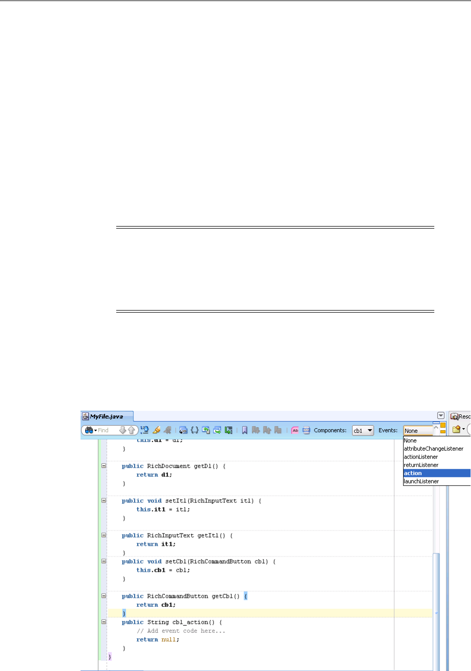
Creating a View Page
3-18 Web User Interface Developer's Guide for Oracle Application Development Framework
public String cb1_action() {
// Add event code here...
return null;
}
}
Example 3–14 shows the code added to the faces-config.xml file to register the
page’s backing bean as a managed bean.
Example 3–14 Registration for a Backing Bean
<managed-bean>
<managed-bean-name>backing_MyFile</managed-bean-name>
<managed-bean-class>view.backing.MyFile</managed-bean-class>
<managed-bean-scope>request</managed-bean-scope>
</managed-bean>
In addition, when you edit a Java file that is a backing bean for a JSF page, a method
binding toolbar appears in the source editor for you to bind appropriate methods
quickly and easily to selected components in the page. When you select an event,
JDeveloper creates the skeleton method for the event, as shown in Figure 3–7.
Figure 3–7 You Can Declaratively Create Skeleton Methods in the Source Editor
Note: Instead of registering the managed bean in the
faces-config.xml file, if you are using Facelets, you can elect to
use annotations in the backing bean for registration. For more
information about using annotations in managed and backing beans,
see the Java EE 6 tutorial at
http://www.oracle.com/technetwork/java/index.html.

Creating a View Page
Getting Started with ADF Faces and JDeveloper 3-19
Once you create a page, you can turn automatic component binding off or on, and you
can also change the backing bean to a different Java class. Open the JSP in the visual
Editor and from the JDeveloper menu, choose Design > Page Properties. Here you can
select or deselect the Auto Bind option, and change the managed bean class. Click
Help for more information about using the dialog.
You can always access the backing bean for a JSF page from the page editor by
right-clicking the page, choosing Go to, and then choosing the bean from the list of
beans associated with the JSP.
3.4.5 How to Add ADF Faces Components to JSF Pages
Once you have created a page, you can use the Component Palette to drag and drop
components onto the page. JDeveloper then declaratively adds the necessary page
code and sets certain values for component attributes.
To add ADF Faces components to a page:
1. In the Application Navigator, double click a JSF page to open it in the editor.
2. If the Component Palette is not displayed, from the menu choose View >
Component Palette. By default, the Component Palette is displayed in the upper
right-hand corner of JDeveloper.
3. In the Component Palette, use the dropdown menu to choose ADF Faces.
Note: If you turn automatic binding off, nothing changes in the
binding attributes of existing bound components in the page. If you
turn automatic binding on, all existing bound components and any
new components that you insert are bound to the selected backing
bean. If automatic binding is on and you change the bean selection, all
existing bindings and new bindings are switched to the new bean.
Tip: For detailed procedures and information about adding and
using specific ADF Faces components, see Part IV, "Using Common
ADF Faces Components".
Note: You cannot use ADF Faces components on the same page as
MyFaces Trinidad components (tr: tags) or other Ajax-enabled
library components. You can use Trinidad HTML tags (trh:) on the
same page as ADF Faces components, however you may experience
some browser layout issues. You should always attempt to use only
ADF Faces components to achieve your layout.
Note that your application may contain a mix of pages built using
either ADF Faces or other components.
Note: If you have chosen to create a Facelets page, then only a subset
of ADF Faces components are available to use. You may need to use
standard JSF components instead. These are available by selecting JSF
from the dropdown menu.
Creating a View Page
3-20 Web User Interface Developer's Guide for Oracle Application Development Framework
The components are contained in five accordion panels: General Controls (which
contains components like buttons, icons, and menus), Text and Selection, Data
Views (which contains components like tables and trees), Menus and Toolbars,
Layout, and Operations.
Figure 3–8 shows the Component Palette displaying the general controls for ADF
Faces.
Figure 3–8 Component Palette in JDeveloper
4. Select the component you wish to use and drag it onto the page.
Tip: If the ADF Faces page is not available in the Component Palette,
then you need to add the ADF Faces tag library to the project.
For a JSPX file:
1. Right-click inside the Component Palette and choose Edit Tab Libraries.
2. In the Customize Component Palette dialog, shuttle ADF Faces
Components to Selected Libraries, and click OK.
For a Facelets file:
1. Right-click the project node and choose Project Properties.
2. Select JSP Tag Libraries to add the ADF Faces library to the project. For
additional help, click Help or press F1.

Creating a View Page
Getting Started with ADF Faces and JDeveloper 3-21
JDeveloper redraws the page in the visual editor with the newly added
component. In the visual editor, you can directly select components on the page
and use the resulting context menu to add more components.
3.4.6 What Happens When You Add Components to a Page
When you drag and drop components from the Component Palette onto a JSF page,
JDeveloper adds the corresponding code to the JSF page. This code includes the tag
necessary to render the component, as well as values for some of the component
attributes. Example 3–15 shows the code when you drop an Input Text and a Button
component from the palette.
Example 3–15 JDeveloper Declaratively Adds Tags to a JSF Page
<af:inputText label="Label 1" id="it1"/>
<af:commandButton text="commandButton 1" id="cb"/>
When you drop a component that contains mandatory child components (for example
a table or a list), JDeveloper launches a wizard where you define the parent and also
each of the child components. Figure 3–9 shows the Table wizard used to create a table
component and the table’s child column components.
Tip: You can also drag and drop components from the palette into
the Structure window or directly into the code in the source editor.
You can always add components by directly editing the page in the
source editor. To view the page in the source editor, click the Source
tab at the bottom of the window.
Note: If you chose to use automatic component binding, then
JDeveloper also adds the binding attribute with its value bound to
the corresponding property on the page’s backing bean. For more
information, see Section 3.4.4, "What You May Need to Know About
Automatic Component Binding."
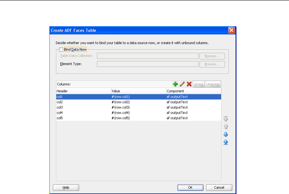
Creating a View Page
3-22 Web User Interface Developer's Guide for Oracle Application Development Framework
Figure 3–9 Table Wizard in JDeveloper
Example 3–16 shows the code created when you use the wizard to create a table with
three columns, each of which uses an outputText component to display data.
Example 3–16 Declarative Code for a Table Component
<af:table var="row" id="t1">
<af:column sortable="false" headerText="col1" id="c1">
<af:outputText value="#{row.col1}" id="ot1"/>
</af:column>
<af:column sortable="false" headerText="col2" id="c2">
<af:outputText value="#{row.col2}" id="ot2"/>
</af:column>
<af:column sortable="false" headerText="col3" id="c3">
<af:outputText value="#{row.col3}" id="ot3"/>
</af:column>
</af:table>
3.4.7 How to Set Component Attributes
Once you drop components onto a page you can use the Property Inspector (displayed
by default at the bottom right of JDeveloper) to set attribute values for each
component.
Figure 3–10 shows the Property Inspector displaying the attributes for an inputText
component.
Tip: If the Property Inspector is not displayed, choose View >
Property Inspector from the main menu.
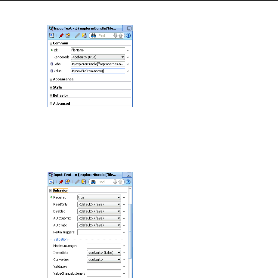
Creating a View Page
Getting Started with ADF Faces and JDeveloper 3-23
Figure 3–10 JDeveloper Property Inspector
The Property Inspector has sections that group similar properties together. For
example, the Property Inspector groups commonly used attributes for the inputText
component in the Common section, while properties that affect how the component
behaves are grouped together in the Behavior section. Figure 3–11 shows the Behavior
section of the Property Inspector for an inputText component.
Figure 3–11 Behavior Section of the Property Inspector
To set component attributes:
1. Select the component, in the visual editor, in the Structure window, or by selecting
the tag directly in the source editor.
2. In the Property Inspector, expand the section that contains the attribute you wish
to set.
3. Either enter values directly into the fields, or if the field contains a dropdown list,
use that list to select a value. You can also use the dropdown to the right of the
field, which launches a popup containing tools you can use to set the value. These
tools are either specific property editors (opened by choosing Edit) or the
Expression Builder, which you can use to create EL expressions for the value
(opened by choosing Expression Builder). For more information about using the
Tip: Some attributes are displayed in more than one section.
Entering or changing the value in one section will also change it in
any other sections. You can search for an attribute by entering the
attribute name in the search field at the top of the inspector.
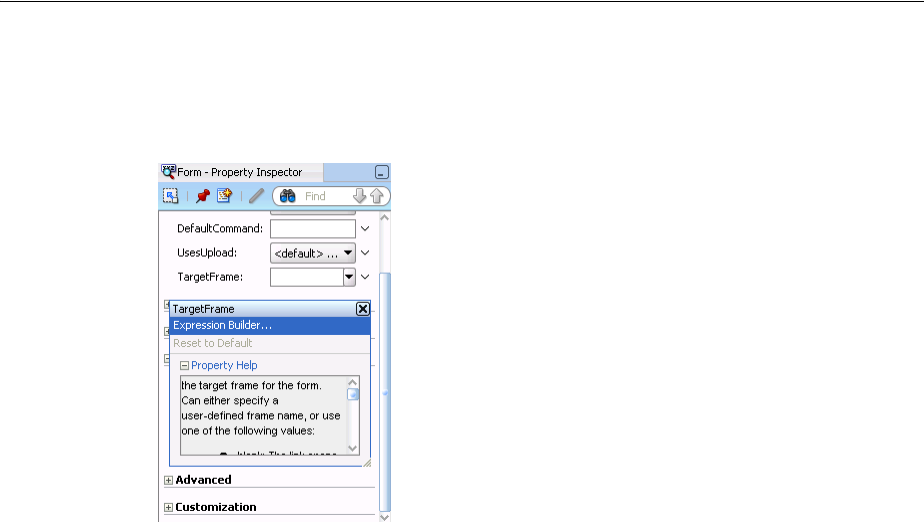
Creating EL Expressions
3-24 Web User Interface Developer's Guide for Oracle Application Development Framework
Expression Builder, see Section 3.5, "Creating EL Expressions." This popup also
displays a description of the property, as shown in Figure 3–12.
Figure 3–12 Property Tools and Help
3.4.8 What Happens When You Use the Property Inspector
When you use the Property Inspector to set or change attribute values, JDeveloper
automatically changes the page source for the attribute to match the entered value.
3.5 Creating EL Expressions
You use EL expressions throughout an ADF Faces application to bind attributes to
object values determined at runtime. For example, #{UserList.selectedUsers}
might reference a set of selected users, #{user.name} might reference a particular
user's name, while #{user.role == 'manager'} would evaluate whether a user is
a manager or not. At runtime, a generic expression evaluator returns the List,
String, and boolean values of these respective expressions, automating access to
the individual objects and their properties without requiring code.
At runtime, the value of certain JSF UI components (such as an inputText
component or an outputText component) is determined by its value attribute.
While a component can have static text as its value, typically the value attribute will
contain an EL expression that the runtime infrastructure evaluates to determine what
data to display. For example, an outputText component that displays the name of
the currently logged-in user might have its value attribute set to the expression
#{UserInfo.name}. Since any attribute of a component (and not just the value
attribute) can be assigned a value using an EL expression, it's easy to build dynamic,
data-driven user interfaces. For example, you could hide a component when a set of
objects you need to display is empty by using a boolean-valued expression like #{not
empty UserList.selectedUsers} in the UI component's rendered attribute. If
the list of selected users in the object named UserList is empty, the rendered
attribute evaluates to false and the component disappears from the page.
In a typical JSF application, you would create objects like UserList as a managed
bean. The JSF runtime manages instantiating these beans on demand when any EL
Tip: You can always change attribute values by directly editing the
page in the source editor. To view the page in the source editor, click
the Source tab at the bottom of the window.

Creating EL Expressions
Getting Started with ADF Faces and JDeveloper 3-25
expression references them for the first time. When displaying a value, the runtime
evaluates the EL expression and pulls the value from the managed bean to populate
the component with data when the page is displayed. If the user updates data in the
UI component, the JSF runtime pushes the value back into the corresponding managed
bean based on the same EL expression. For more information about creating and using
managed beans, see Section 3.6, "Creating and Using Managed Beans." For more
information about EL expressions, see the Java EE 6 tutorial at
http://www.oracle.com/technetwork/java/index.html.
Along with standard EL reachable objects and operands, ADF Faces provides EL
function tags. These are tags that provide certain functionality that you can use within
an EL expression. The format tags can be used to add parameters to String messages,
and the time zone tags can be used to return time zones. For information about the
format tags, see Section 3.5.2, "How to Use the EL Format Tags." For information about
the time zone tags, see Section 11.5.3, "What You May Need to Know About Selecting
Time Zones Without the inputDate Component."
3.5.1 How to Create an EL Expression
You can create EL expressions declaratively using the JDeveloper Expression Builder.
You can access the builder from the Property Inspector.
Before you begin
It may be helpful to have an understanding of EL expressions. For more information,
see Section 3.5, "Creating EL Expressions."
To use the Expression Builder:
1. In the Property Inspector, locate the attribute you wish to modify and use the right
most dropdown menu to choose Expression Builder.
2. Create expressions using the following features:
■Use the Variables dropdown to select items that you want to include in the
expression. These items are displayed in a tree that is a hierarchical
representation of the binding objects. Each icon in the tree represents various
types of binding objects that you can use in an expression.
Note: When using an EL expression for the value attribute of an
editable component, you must have a corresponding set method for
the that component, or else the EL expression will evaluate to
read-only, and no updates to the value will be allowed.
For example, say you have an inputText component (whose ID is
inputText1) on a page, and you have it’s value set to
#{myBean.inputValue}. The myBean managed bean would have
to have get and set method as follows, in order for the inputText
value to be updated:
public void setIt1(RichInputText inputText1) {
this.inputText1 = inputText1;
}
public RichInputText getInputText1() {
return inputText1;
}
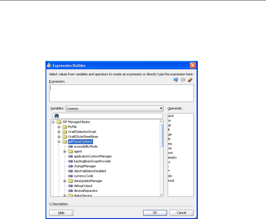
Creating EL Expressions
3-26 Web User Interface Developer's Guide for Oracle Application Development Framework
To narrow down the tree, you can either use the dropdown filter or enter
search criteria in the search field. The EL accessible objects exposed by ADF
Faces are located under the adfFacesContext node, which is under the JSF
Managed Beans node, as shown in Figure 3–13.
Figure 3–13 adfFacesContext Objects in the Expression Builder
Selecting an item in the tree causes it to be moved to the Expression box
within an EL expression. You can also type the expression directly in the
Expression box.
■Use the operator buttons to add logical or mathematical operators to the
expression.
Figure 3–14 shows the Expression Builder dialog being used to create an
expression that binds to the value of a label for a component to the label
property of the explorer managed bean.
Tip: For more information about these objects, see the ADF Faces
Javadoc.
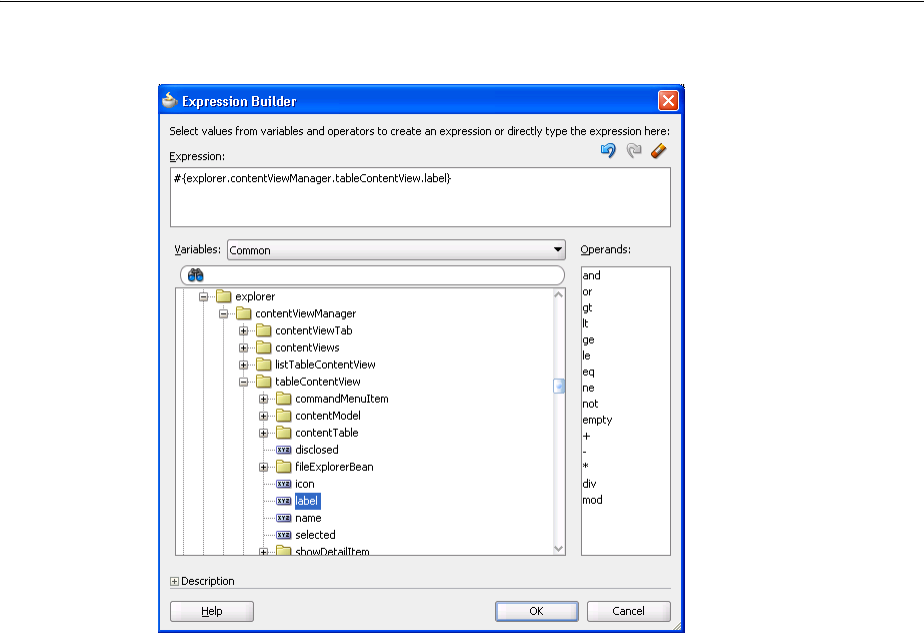
Creating EL Expressions
Getting Started with ADF Faces and JDeveloper 3-27
Figure 3–14 The Expression Builder Dialog
3.5.2 How to Use the EL Format Tags
ADF EL format tags allow you to create text that uses placeholder parameters, which
can then be used as the value for any component attribute that accepts a String. At
runtime, the placeholders are replaced with the parameter values.
For example, say the current user’s name is stored on a managed bean, and you want
to display that name within a message as the value of an outputText component.
You could use the formatString tag as shown in Example 3–17.
Example 3–17 Using the formatString Tag to Display a Message with a Parameter
<af:outputText value="#{af:formatString('The current user is: {0},
someBean.currentUser)}" />
In this example, the formatString tag takes one parameter whose key "0," resolves to
the value someBean.currentUser.
There are two different types of format tags available, formatString tags and
formatNamed tags. The formatString tags use indexed parameters, while the
formatNamed tags use named parameters. There are four tags for each type, each one
taking a different number of parameters (up to 4). For example, the formatString2
tag takes two indexed parameters, and the formatNamed4 tag takes four named
parameters.
When you use a formatNamed tag, you set both the key and the value. Example 3–18
shows a message that uses the formatNamed2 tag to display the number of files on a
specific disk. This message contains two parameters.
Tip: For information about using proper syntax to create EL
expressions, see the Java EE 6 tutorial at
http://download.oracle.com/javaee/index.html.

Creating EL Expressions
3-28 Web User Interface Developer's Guide for Oracle Application Development Framework
Example 3–18 Using the formatNamed2 Tag to Display a Message
<af:outputText value="#{af:formatNamed2(
'The disk named {disk}, contains {fileNumber} files', 'disk', bean.disk,
'fileNumber', bean.fileNumber)}" />
3.5.3 How to Use EL Expressions Within Managed Beans
While JDeveloper creates many needed EL expressions for you, and you can use the
Expression Builder to create those not built for you, there may be times when you need
to access, set, or invoke EL expressions within a managed bean.
Example 3–19 shows how you can get a reference to an EL expression and return (or
create) the matching object.
Example 3–19 Resolving an EL Expression from a Managed Bean
public static Object resolveExpression(String expression) {
FacesContext facesContext = getFacesContext();
Application app = facesContext.getApplication();
ExpressionFactory elFactory = app.getExpressionFactory();
ELContext elContext = facesContext.getELContext();
ValueExpression valueExp =
elFactory.createValueExpression(elContext, expression,
Object.class);
return valueExp.getValue(elContext);
}
Example 3–20 shows how you can resolve a method expression.
Example 3–20 Resolving a Method Expression from a Managed Bean
public static Object resloveMethodExpression(String expression,
Class returnType,
Class[] argTypes,
Object[] argValues) {
FacesContext facesContext = getFacesContext();
Application app = facesContext.getApplication();
ExpressionFactory elFactory = app.getExpressionFactory();
ELContext elContext = facesContext.getELContext();
MethodExpression methodExpression =
elFactory.createMethodExpression(elContext, expression, returnType,
argTypes);
return methodExpression.invoke(elContext, argValues);
}
Example 3–21 shows how you can set a new object on a managed bean.
Example 3–21 Setting a New Object on a Managed Bean
public static void setObject(String expression, Object newValue) {
FacesContext facesContext = getFacesContext();
Application app = facesContext.getApplication();
ExpressionFactory elFactory = app.getExpressionFactory();
ELContext elContext = facesContext.getELContext();
ValueExpression valueExp =
elFactory.createValueExpression(elContext, expression,
Object.class);
//Check that the input newValue can be cast to the property type
//expected by the managed bean.

Creating and Using Managed Beans
Getting Started with ADF Faces and JDeveloper 3-29
//Rely on Auto-Unboxing if the managed Bean expects a primitive
Class bindClass = valueExp.getType(elContext);
if (bindClass.isPrimitive() || bindClass.isInstance(newValue)) {
valueExp.setValue(elContext, newValue);
}
}
3.6 Creating and Using Managed Beans
Managed beans are Java classes that you register with the application using various
configuration files. When the JSF application starts up, it parses these configuration
files and the beans are made available and can be referenced in an EL expression,
allowing access to the beans’ properties and methods. Whenever a managed bean is
referenced for the first time and it does not already exist, the Managed Bean Creation
Facility instantiates the bean by calling the default constructor method on the bean. If
any properties are also declared, they are populated with the declared default values.
Often, managed beans handle events or some manipulation of data that is best
handled at the front end. For a more complete description of how managed beans are
used in a standard JSF application, see the Java EE 6 tutorial at
http://www.oracle.com/technetwork/java/index.html.
In a standard JSF application, managed beans are registered in the
faces-config.xml configuration file.
3.6.1 How to Create a Managed Bean in JDeveloper
You can create a managed bean and register it with the JSF application at the same
time using the overview editor for the faces-config.xml file.
Before you begin
It may be helpful to have an understanding of managed beans. For more information,
see Section 3.6, "Creating and Using Managed Beans."
To create and register a managed bean:
1. In the Application Navigator, open the faces-config.xml file.
2. In the editor window, click the Overview tab.
3. In the overview editor, click the Managed Beans tab.
Figure 3–15 shows the editor for the faces-config.xml file used by the ADF
Faces demo that contains the File Explorer application.
Best Practice: Use managed beans to store only bookkeeping
information, for example the current user. All application data and
processing should be handled by logic in the business layer of the
application.
Note: If you plan on using Oracle ADF Model data binding and ADF
Controller, then instead of registering managed beans in the
faces-config.xml file, you may need to register them within ADF
task flows. For more information, refer to the "Using a Managed Bean
in a Fusion Web Application" section of the Oracle Fusion Middleware
Fusion Developer's Guide for Oracle Application Development Framework.
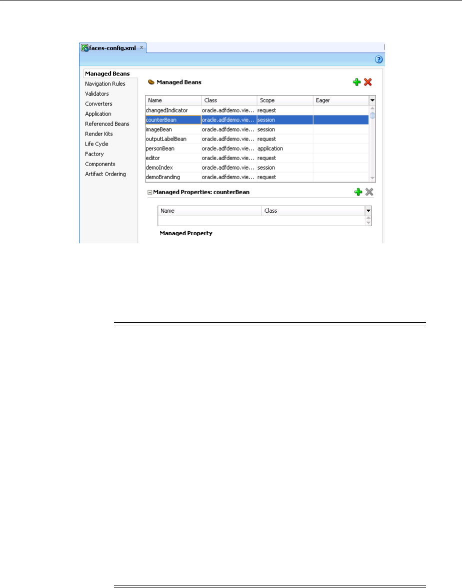
Creating and Using Managed Beans
3-30 Web User Interface Developer's Guide for Oracle Application Development Framework
Figure 3–15 Managed Beans in the faces-config.xml File
4. Click the Add icon to add a row to the Managed Bean table.
5. In the Create Managed Bean dialog, enter values. Click Help for more information
about using the dialog. Select the Generate Class If It Does Not Exist option if
you want JDeveloper to create the class file for you.
6. You can optionally add managed properties for the bean. When the bean is
instantiated, any managed properties will be set with the provided value. With the
bean selected in the Managed Bean table, click the New icon to add a row to the
Managed Properties table. In the Property Inspector, enter a property name (other
fields are optional).
Note: When determining what scope to register a managed bean
with or to store a value in, keep the following in mind:
■Always try to use the narrowest scope possible.
■If your managed bean takes part in component binding by
accepting and returning component instances (that is, if UI
components on the page use the binding attribute to bind to
component properties on the bean), then the managed bean must
be stored in request or backingBean scope. If it can’t be stored
in one of those scopes (for example, if it needs to be stored in
session scope for high availability reasons), then you need to
use the ComponentReference API. For more information, see
Section 3.6.3, "What You May Need to Know About Component
Bindings and Managed Beans."
■Use the sessionScope scope only for information that is
relevant to the whole session, such as user or context information.
Avoid using the sessionScope scope to pass values from one
page to another.
For more information about the different object scopes, see Section 5.6,
"Object Scope Lifecycles."

Creating and Using Managed Beans
Getting Started with ADF Faces and JDeveloper 3-31
3.6.2 What Happens When You Use JDeveloper to Create a Managed Bean
When you create a managed bean and elect to generate the Java file, JDeveloper
creates a stub class with the given name and a default constructor. Example 3–22
shows the code added to the MyBean class stored in the view package.
Example 3–22 Generated Code for a Managed Bean
package view;
public class MyBean {
public MyBean() {
}
}
You now must add the logic required by your page. You can then refer to that logic
using an EL expression that refers to the managed-bean-name given to the managed
bean. For example, to access the myInfo property on the my_bean managed bean, the
EL expression would be:
#{my_bean.myInfo}
JDeveloper also adds a managed-bean element to the faces-config.xml file.
Example 3–23 shows the managed-bean element created for the MyBean class.
Example 3–23 Managed Bean Configuration on the faces-config.xml File
<managed-bean>
<managed-bean-name>my_bean</managed-bean-name>
<managed-bean-class>view.MyBean</managed-bean-class>
<managed-bean-scope>session</managed-bean-scope>
</managed-bean>
3.6.3 What You May Need to Know About Component Bindings and Managed Beans
To avoid issues with managed beans, if your bean needs to use component binding
(through the binding attribute on the component), you must store the bean in
request scope. (If your application uses the Fusion technology stack, then you must
store it in backingBean scope. For more information, see the "Using a Managed Bean
in a Fusion Web Application" section in the Oracle Fusion Middleware Fusion Developer's
Guide for Oracle Application Development Framework.) However, there may be
circumstances where you can’t store the bean in request or backingBean scope. For
example, there may be managed beans that are stored in session scope so that they
can be deployed in a clustered environment, and therefore must implement the
Serializable interface. When they are serializable, managed beans that change during a
request can be distributed to other servers for fail-over. However, ADF Faces
components (and JSF components in general) are not serializable. So if a serialized
managed bean attempts to access a component using component binding, the bean
will fail serialization because the referenced component cannot be serialized. There are
Note: While you can declare managed properties using this editor,
the corresponding code is not generated on the Java class. You must
add that code by creating private member fields of the appropriate
type, and then by choosing the Generate Accessors menu item on the
context menu of the code editor to generate the corresponding get
and set methods for these bean properties.

Viewing ADF Faces Javadoc
3-32 Web User Interface Developer's Guide for Oracle Application Development Framework
also thread safety issues with components bound to serialized managed beans because
ADF Faces components are not thread safe.
When you need to store a component reference to a UI component instance in a
backing bean that is not using request or backingBean scope, you should store a
reference to the component instance using the Trinidad ComponentReference API.
The UIComponentReference.newUIComponentReference() method creates a
serializable reference object that can be used to retrieve a UIComponent instance on
the current page. Example 3–24 shows how a managed bean might use the
UIComponentReference API to get and set values for a search field.
Example 3–24 Session Scoped Managed Bean Uses the UIComponentReference API
...
private ComponentReference<UIInput> searchField;
...
public void setSearchField(UIInput searchField)
{
if( this.searchField == null)
this.searchField = ComponentReference.newUIComponentReference(searchField);
}
public UIInput getSearchField()
{
return searchField ==null ? null : searchField.getComponent();
}
....
Keep the following in mind when using the UIComponentReference API:
■The API is thread safe as long as it is called on the request thread.
■The ADF Faces component being passed in must have an ID.
■The reference will break if the component is moved between naming containers or
if the ID on any of the ancestor naming containers has changed.
For more information about the UIComponentReference API, see the Trinidad
JavaDoc.
3.7 Viewing ADF Faces Javadoc
Often, when you are working with ADF Faces, you will need to view the Javadoc for
ADF Faces classes. You can view Javadoc from within JDeveloper.
3.7.1 How to View ADF Faces Source Code and Javadoc
You can view the ADF Faces Javadoc directly from JDeveloper.
To view Javadoc for a class:
1. From the main menu, choose Navigate > Go to Javadoc.
2. In the Go to Javadoc dialog, enter the class name you want to view. If you don’t
know the exact name, you can either begin to type the name and JDeveloper will
provide a list of classes that match the name. ADF Faces components are in the
oracle.adf.view.rich package.

Viewing ADF Faces Javadoc
Getting Started with ADF Faces and JDeveloper 3-33
Tip: When in a Java class file, you can go directly to the Javadoc for a
class name reference or for a JavaScript function call by placing your
cursor on the name or function and pressing Ctrl+D.

Viewing ADF Faces Javadoc
3-34 Web User Interface Developer's Guide for Oracle Application Development Framework

Part II
Part II Understanding ADF Faces Architecture
Part II contains the following chapters:
■Chapter 4, "Using ADF Faces Client-Side Architecture"
■Chapter 5, "Using the JSF Lifecycle with ADF Faces"
■Chapter 6, "Handling Events"
■Chapter 7, "Validating and Converting Input"
■Chapter 8, "Rerendering Partial Page Content"

4
Using ADF Faces Client-Side Architecture 4-1
4 Using ADF Faces Client-Side Architecture
This chapter outlines the ADF Faces client-side architecture.
This chapter includes the following sections:
■Section 4.1, "About Using ADF Faces Architecture"
■Section 4.2, "Listening for Client Events"
■Section 4.3, "Adding JavaScript to a Page"
■Section 4.4, "Instantiating Client-Side Components"
■Section 4.5, "Locating a Client Component on a Page"
■Section 4.6, "Accessing Component Properties on the Client"
■Section 4.7, "Using Bonus Attributes for Client-Side Components"
■Section 4.8, "Understanding Rendering and Visibility"
■Section 4.9, "JavaScript Library Partitioning"
4.1 About Using ADF Faces Architecture
ADF Faces extends the JavaServer Faces architecture, adding a client-side framework
on top of the standard server-centric model. The majority of ADF Faces components
are rendered in HTML that is generated on the server-side for a request. In addition,
ADF Faces allows component implementations to extend their reach to the client using
a client-side component and event model.
The ADF Faces framework already contains much of the functionality for which you
would ordinarily need to use JavaScript. In many cases, you can achieve rich
component functionality declaratively, without the use of JavaScript. However, there
may be times when you do need to add your own JavaScript, for example custom
processing in response to a client-side event. In these cases, you can use the client-side
framework.
The JavaScript class that you will interact with most is AdfUIComponent and its
subclasses. An instance of this class is the client-side representation of a server-side
component. You can think of a client-side component as a simple property container
with support for event handling. Client-side components primarily exist to add
behavior to the page by exposing an API contract for both application developers as
well as for the framework itself. It is this contract that allows, among other things,
toggling the enabled state of a button on the client.
Each client component has a set of properties (key/value pairs) and a list of listeners
for each supported event type. All ADF Faces JavaScript classes are prefixed with Adf
to avoid naming conflicts with other JavaScript libraries. For example,

About Using ADF Faces Architecture
4-2 Web User Interface Developer's Guide for Oracle Application Development Framework
RichCommandButton has AdfRichCommandButton, RichDocument has
AdfRichDocument, and so on.
In the client-side JavaScript layer, client components exist mostly to provide an API
contract for the framework and for developers. Because client components exist only
to store state and provide an API, they have no direct interaction with the document
object model (DOM) whatsoever. All DOM interaction goes through an intermediary
called the peer. Peers interact with the DOM generated by the Java renderer and handle
updating that state and responding to user interactions.
Peers have a number of other responsibilities, including:
■DOM initialization and cleanup
■DOM event handling
■Geometry management
■Partial page response handling
■Child visibility change handling
This separation isolates the component and application developer from changes in the
DOM implementation of the component and also isolates the need for the application
to know whether a component is implemented in HTML DOM at all (for example the
Flash components).
In JSF, as in most component-based frameworks, an intrinsic property of the
component model is that components can be nested to form a hierarchy, typically
known as the component tree. This simply means that parent components keep track of
their children, making it possible to walk over the component tree to find
all descendents of any given component. While the full component tree exists on the
server, the ADF Faces client-side component tree is sparsely populated.
For performance optimization, client components exist only when they are required,
either due to having a clientListener handler registered on them, or because the
page developer needs to interact with a component on the client side and has
specifically configured the client component to be available. You don’t need to
understand the client framework as except for exceptional cases, you use most of the
architectural features declaratively, without having to create any code.
For example, because the framework does not create client components for every
server-side component, there may be cases where you need a client version of a
component instance. Section 4.4, "Instantiating Client-Side Components," explains how
to do this declaratively. You use the Property Inspector in JDeveloper to set properties
that determine whether a component should be rendered at all, or simply be made not
visible, as described in Section 4.8, "Understanding Rendering and Visibility."
Other functionality may require you to use the ADF Faces JavaScript API. For
example, Section 4.5, "Locating a Client Component on a Page," explains how to use
the API to locate a specific client-side component, and Section 4.6, "Accessing
Component Properties on the Client," documents how to access specific properties.
Note: It is also possible for JavaScript components to be present that
do not correspond to any existing server-side component. For
example, some ADF Faces components have client-side behavior that
requires popup content. These components may create
AdfRichPopup JavaScript components, even though no server-side
Java RichPopup component may exist.

Listening for Client Events
Using ADF Faces Client-Side Architecture 4-3
A common issue with JavaScript-heavy frameworks is determining how best to
deliver a large JavaScript code base to the client. If all the code is in a single JavaScript
library, there will be a long download time, while splitting the JavaScript into too
many libraries will result in a large number of roundtrips. To help mitigate this issue,
ADF Faces aggregates its JavaScript code into partitions. A JavaScript library partition
contains code for components and/or features that are commonly used together. For
more information, see Section 4.9, "JavaScript Library Partitioning."
4.2 Listening for Client Events
In a traditional JSF application, if you want to process events on the client, you must
listen to DOM-level events. However, these events are not delivered in a portable
manner. The ADF Faces client-side event model is similar to the JSF events model, but
implemented on the client. The client-side event model abstracts from the DOM,
providing a component-level event model and lifecycle, which executes independently
of the server. Consequently, you do not need to listen for click events on buttons.
You can instead listen for AdfActionEvent events, which can be caused by key or
mouse events.
Events sent by clients are all subclasses of the AdfBaseEvent class. Each client event
has a source, which is the component that triggered the event. Events also have a type
(for example, action or dialog), used to determine which listeners are interested in
the event. You register a client listener on the component declaratively using the
af:clientListener tag.
4.2.1 How to Listen for Client Events
You use the af:clientListener tag to call corresponding Javascript in response to
a client event. For example, suppose you have a button that, in response to a click,
should display a "Hello World" alert. You need to first create the JavaScript function
that will respond to the event by displaying the alert. You then add the client listener
to the component that will invoke that function.
Before you begin
It may be helpful to have an understanding of client event processing. For more
information, see Section 4.2, "Listening for Client Events."
To listen for a client event:
1. Implement the JavaScript function. For example, to display the alert, you might
create the JavaScript function shown in Example 4–1.
Example 4–1 JavaScript Event Handler
function sayHello(event)
{
alert("Hello, world!")
}
2. From the Operations panel of the Component Palette, drag and drop a Client
Listener as a child to the component that will raise the event.
Enter the function created in Step 1, as well as the type of action that the listener
should respond to. Example 4–2 shows the code that would be created for the
listener for the sayHello function.

Adding JavaScript to a Page
4-4 Web User Interface Developer's Guide for Oracle Application Development Framework
Example 4–2 Registering a Client Listener
<af:commandButton text="Say Hello">
<af:clientListener method="sayHello" type="action"/>
</af:commandButton>
When the button is clicked, because there is a client version of the component, the
AdfAction client event is invoked. Because a clientListener tag is configured to
listen for the AdfAction event, it causes the sayHello function to execute. For more
information about client-side events, see Section 6.3, "Using JavaScript for ADF Faces
Client Events."
4.3 Adding JavaScript to a Page
You can either add inline JavaScript directly to a page or you can import JavaScript
libraries into a page. When you import libraries, you reduce the page content size, the
libraries can be shared across pages, and they can be cached by the browser. You
should import JavaScript libraries whenever possible. Use inline JavaScript only for
cases where a small, page-specific script is needed.
4.3.1 How to Use Inline JavaScript
Create the JavaScript on the page and then use a clientListener tag to invoke it.
Before you begin
It may be helpful to have an understanding of adding JavaScript to a page. For more
information, see Section 4.3, "Adding JavaScript to a Page."
To use inline JavaScript:
1. Add the MyFaces Trinidad tag library to the root element of the page by adding
the code shown in bold in Example 4–3.
Example 4–3 MyFaces Trinidad Tag Library on a Page
<jsp:root xmlns:jsp="http://java.sun.com/JSP/Page" version="2.1"
xmlns:f="http://java.sun.com/jsf/core"
xmlns:h="http://java.sun.com/jsf/html"
xmlns:af="http://xmlns.oracle.com/adf/faces/rich"
xmlns:trh="http://myfaces.apache.org/trinidad/html">
Tip: Because the button has a registered client listener, the
framework will automatically create a client version of the
component.
Performance Tip: Including JavaScript only in the pages that need it
will result in better performance because those pages that do not need
it will not have to load it, as they would if the JavaScript were
included in a template. However, if you find that most of your pages
use the same JavaScript code, you may want to consider including the
script or the tag to import the library in a template.
Note, however, that if a JavaScript code library becomes too big, you
should consider splitting it into meaningful pieces and include only
the pieces needed by the page (and not in a template). This approach
will provide improved performance, because the browser cache will
be used and the HTML content of the page will be smaller.

Adding JavaScript to a Page
Using ADF Faces Client-Side Architecture 4-5
2. In the Component Palette, from the Layout panel, in the Core Structure group,
drag and drop a Resource onto the page.
3. In the Insert Resource dialog, select javascript from the dropdown menu and click
OK.
4. Create the JavaScript on the page within the <af:resource> tag.
For example, the sayHello function shown in Example 4–1 might be included in
a JSF page as shown in Example 4–4.
Example 4–4 Inline JavaScript
<af:resource>
function sayHello()
{
alert("Hello, world!")
}
</af:resource>
5. In the Structure window, right-click the component that will invoke the JavaScript,
and choose Insert inside component > ADF Faces > Client Listener.
6. In the Insert Client Listener dialog, in the Method field, enter the JavaScript
function name. In the Type field, select the event type that should invoke the
function.
4.3.2 How to Import JavaScript Libraries
Use the af:resource tag to access a JavaScript library from a page. This tag should
appear inside the document tag’s metaContainer facet.
Before you begin
It may be helpful to have an understanding of adding JavaScript to a page. For more
information, see Section 4.3, "Adding JavaScript to a Page."
To access a JavaScript library from a page:
1. Below the document tag, add the code shown in bold in Example 4–5 and replace
/mySourceDirectory with the relative path to the directory that holds the
JavaScript library.
Example 4–5 Accessing a JavaScript Library
<af:document>
<f:facet name="metaContainer">
<af:resource source="/mySourceDirectory"/>
</facet>
<af:form></af:form>
</af:document>
2. In the Structure window, right-click the component that will invoke the JavaScript,
and choose Insert inside component > ADF Faces > Client Listener.
Note: Do not use the f:verbatim tag in a page or template to
specify the JavaScript.

Instantiating Client-Side Components
4-6 Web User Interface Developer's Guide for Oracle Application Development Framework
3. In the Insert Client Listener dialog, in the Method field, enter the fully qualified
name of the function. For example, if the sayHello function was in the
MyScripts library, you would enter MyScripts.sayHello. In the Type field,
select the event type that should invoke the function.
4.3.3 What You May Need to Know About Accessing Client Event Sources
Often when your JavaScript needs to access a client component, it is within the context
of a listener and must access the event’s source component. Use the getSource()
method to get the client component. Example 4–6 shows the sayHello function
accessing the source client component in order to display its name.
Example 4–6 Accessing a Client Event Source
function sayHello(actionEvent)
{
var component=actionEvent.getSource();
//Get the ID for the component
var id=component.getId();
alert("Hello from "+id);
}
For more information about accessing client event sources, see Section 6.3, "Using
JavaScript for ADF Faces Client Events." For more information about accessing
client-side properties, see Section 4.6, "Accessing Component Properties on the Client."
For a complete description of how client events are handled at runtime, see
Section 6.3.7, "What Happens at Runtime: How Client-Side Events Work."
4.4 Instantiating Client-Side Components
By default, the framework does not make any guarantees about which components
will have corresponding client-side component instances. To interact with a
component on the client, you will usually register a clientListener handler. When
a component has a registered clientListener handler, it will automatically have
client-side representation. You can also explicitly configure a component to be
available on the client by setting the clientComponent attribute to true.
4.4.1 How to Configure a Component to for a Client-Side Instance
You can manually configure a component to have a client side instance using the
clientComponent attribute.
Performance Tip: Only set clientComponent to true if you plan
on interacting with the component programmatically on the client.
Note: When the framework creates a client component for its own
uses, that client component may only contain information the
framework needs at that time. For example, not all of the attributes
may be available.

Locating a Client Component on a Page
Using ADF Faces Client-Side Architecture 4-7
Before you begin
It may be helpful to have an understanding of client-side instances. For more
information, see Section 4.4, "Instantiating Client-Side Components."
To configure a component for a client-side instance:
1. In the Structure window, select the component that needs a client-side instance.
2. In the Property Inspector, set ClientSide to true.
4.4.2 What Happens When You Set clientComponent to true
When you set the clientComponent attribute to true, the framework creates an
instance of an AdfUIComponent class for the component. This class provides the API
that you can work with on the client side and also provides basic property accessor
methods (for example, getProperty() and setProperty()), event listener
registration, and event delivery-related APIs. The framework also provides
renderer-specific subclasses (for example, AdfRichOutputText) which expose
property-specific accessor methods (for example, getText() and setText()). These
accessor methods are simply wrappers around the AdfUIComponent class’s
getProperty() and setProperty() methods and are provided for coding
convenience.
For example, suppose you have an outputText component on the page that will get
its value (and therefore the text to display) from the sayHello function. That function
must be able to access the outputText component in order to set its value. For this to
work, there must be a client-side version of the outputText component. Example 4–7
shows the JSF page code. Note that the outputText component has an id value and
the clientComponent attribute is set to true. Also, note there is no value in the
example, because that value will be set by the JavaScript.
Example 4–7 Adding a Component
<af:commandButton text="Say Hello">
<af:clientListener method="sayHello" type="action"/>
</af:commandButton>
<af:outputText id="greeting" value="" clientComponent="true">
Because the outputText component will now have client-side representation, the
JavaScript will be able to locate and work with it.
4.5 Locating a Client Component on a Page
When you need to find a client component that is not the source of an event, you can
use the AdfUIComponent.findComponent(expr) method. This method is similar
to the JSF UIComponent.findComponent() method, which searches for and returns
the UIComponent object with an ID that matches the specified search expression. The
AdfUIComponent.findComponent(expr) method simply works on the client
instead of the server.
Example 4–8 shows the sayHello function finding the outputText component
using the component’s ID.
Example 4–8 Finding a Client Component Using findComponent()
function sayHello(actionEvent)
{
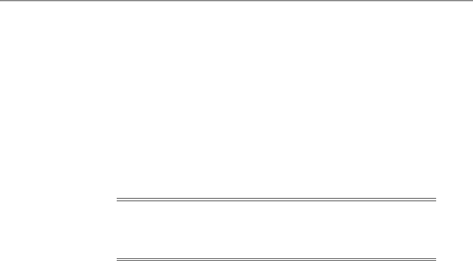
Locating a Client Component on a Page
4-8 Web User Interface Developer's Guide for Oracle Application Development Framework
var buttonComponent=actionEvent.getSource();
//Find the client component for the "greeting" af:outputText
var greetingComponent=buttonComponent.findComponent("greeting");
//Set the value for the outputText component
greetingComponent.setValue("Hello World")
}
ADF Faces also has the
AdfPage.PAGE.findComponentByAbsoluteId(absolute expr) method. Use
this method when you want to hard-code the String for the ID. Use
AdfUIComponent.findComponent(expr) when the client ID is being retrieved
from the component.
4.5.1 What You May Need to Know About Finding Components in Naming Containers
If the component you need to find is within a component that is a naming container
(such as pageTemplate, subform, table, and tree), then instead of using the
AdfPage.PAGE.findComponentByAbsoluteId(absolute expr) method, use
the AdfUIComponent.findComponent(expr) method. The expression can be
either absolute or relative.
Absolute expressions use the fully qualified JSF client ID (meaning, prefixed with the
IDs of all NamingContainer components that contain the component) with a leading
NamingContainer.SEPARATOR_CHAR character, for example:
":" + (namingContainersToJumpUp * ":") + some ending portion of the
clientIdOfComponentToFind
For example, to find a table whose ID is t1 that is within a panel collection component
whose ID is pc1 contained in a region whose ID is r1 on page that uses the
myTemplate template, you might use the following:
:myTemplate:r1:pc1:t1
Alternatively, if both the components (the one doing the search and the one being
searched for) share the same NamingContainer component somewhere in the
hierarchy, you can use a relative path to perform a search relative to the component
doing the search. A relative path has multiple leading
NamingContainer.SEPARATOR_CHAR characters, for example:
":" + clientIdOfComponentToFind
In the preceding example, if the component doing the searching is also in the same
region as the table, you might use the following:
Note: There is also a confusingly named
AdfPage.PAGE.findComponent(clientId) method, however
this function uses implementation-specific identifiers that can change
between releases and should not be used by page authors.
Tip: You can determine whether or not a component is a naming
container by reviewing the component tag documentation. The tag
documentation states whether a component is a naming container.

Accessing Component Properties on the Client
Using ADF Faces Client-Side Architecture 4-9
::somePanelCollection:someTable
When deciding whether to use an absolute or relative path, keep the following in
mind:
■If you know that the component you are trying to find will always be in the same
naming container, then use an absolute path.
■If you know that the component performing the search and the component you
are trying to find will always be in the same relative location, then use a relative
path.
There are no getChildren() or getFacet() functions on the client. Instead, the
AdfUIComponent.visitChildren() function is provided to visit all children
components or facets (that is all descendents). Because ADF Faces uses a sparse
component tree (that is, client components are created on an as-needed basis, the
component that the getParent() method might return on the client may not be the
actual parent on the server (it could be any ancestor). Likewise, the components that
appear to be immediate children on the client could be any descendants. For more
information, see the ADF Faces JavaScript documentation.
4.6 Accessing Component Properties on the Client
For each built-in property on a component, convenience accessor methods are
available on the component class. For example, you can call the getValue() method
on a client component and receive the same value that was used on the server.
Constants are also available for the property names on the class object. For instance,
you can use AdfRichDialog.STYLE_CLASS constant instead of using
"styleClass".
Tip: Think of a naming container as a folder and the clientId as a
file path. In terms of folders and files, you use two sequential periods
and a slash (../) to move up in the hierarchy to another folder.
This is the same thing that the multiple colon (:) characters do in the
findComponent() expression. A single leading colon (:) means
that the file path is absolute from the root of the file structure. If there
are multiple leading colon (:) characters at the beginning of the
expression, then the first one is ignored and the others are counted,
one set of periods and a slash (../) per colon (:) character.
Note that if you were to use the
AdfPage.findComponentByAbsoluteId() method, no leading
colon is needed as, the path always absolute.
Note: All client properties in ADF Faces use the getXyz function
naming convention including boolean properties. The isXyz naming
convention for boolean properties is not used.
Note: In JavaScript, it is more efficient to refer to a constant than to
code the string, as in some JavaScript execution environments, the
latter requires an object allocation on each invocation.

Accessing Component Properties on the Client
4-10 Web User Interface Developer's Guide for Oracle Application Development Framework
When a component’s property changes, the end result should be that the component’s
DOM is updated to reflect its new state, in some cases without a roundtrip to the
server. The component's role in this process is fairly limited: it simply stores away the
new property value and then notifies the peer of the change. The peer contains the
logic for updating the DOM to reflect the new component state.
Most property values that are set on the client result in automatic synchronization
with the server (although some complex Java objects are not sent to the client at all).
There are however, two types of properties that act differently: secured properties and
disconnected properties.
Secured properties are those that cannot be set on the client at all. For example, say a
malicious client used JavaScript to set the immediate flag on a commandLink
component to true. That change would then be propagated to the server, resulting in
server-side validation being skipped, causing a possible security hole (for more
information about using the immediate property, see Section 5.2, "Using the
Immediate Attribute"). Consequently, the immediate property is a secured property.
Attempts to set secured property from JavaScript will fail. For more information, see
Section 4.6.3, "How to Unsecure the disabled Property." Table 4–1 shows the secure
properties on the client components.
Note: Not all property changes are handled through the peer on the
client side. Some property changes are propagated back to the server
and the component is rerendered using PPR.
Table 4–1 Secure Client Properties
Component Secure Property
AdfRichChooseColor colorData
AdfRichComboboxListOfValue disabled
readOnly
AdfRichCommandButton disabled
readOnly
blocking
AdfRichCommandImageLink blocking
disabled
partialSubmit
AdfRichCommandLink readOnly
AdfRichDialog dialogListener
AdfRichDocument failedConnectionText
AdfRichInputColor disabled
readOnly
colorData
AdfRichInputDate disabled
readOnly
valuePassThru
AdfRichInputFile disabled
readOnly

Accessing Component Properties on the Client
Using ADF Faces Client-Side Architecture 4-11
AdfRichInputListOfValues disabled
readOnly
AdfRichInputNumberSlider disabled
readOnly
AdfRichInputNumberSplinBox disabled
readOnly
maximum
minimum
stepSize
AdfRichInputRangeSlider disabled
readOnly
AdfRichInputText disabled
readOnly
secret
AdfRichPopUp launchPopupListener
model
returnPopupListener
returnPopupDataListener
createPopupId
AdfRichUIQuery conjunctionReadOnly
model
queryListener
queryOperationListener
AdfRichSelectBooleanCheckbox disabled
readOnly
AdfRichSelectBooleanRadio disabled
readOnly
AdfRichSelectManyCheckbox disabled
readOnly
valuePassThru
AdfRichSelectManyChoice disabled
readOnly
valuePassThru
AdfRichSelectManyListBox disabled
readOnly
valuePassThru
AdfRichSelectManyShuttle disabled
readOnly
valuePassThru
Table 4–1 (Cont.) Secure Client Properties
Component Secure Property

Accessing Component Properties on the Client
4-12 Web User Interface Developer's Guide for Oracle Application Development Framework
AdfRichSelectOneChoice disabled
readOnly
valuePassThru
AdfRichSelectOneListBox disabled
readOnly
valuePassThru
AdfRichSelectOneRadio disabled
readOnly
valuePassThru
AdfRichSelectOrderShuttle disabled
readOnly
valuePassThru
AdfRichUITable filterModel
AdfRichTextEditor disabled
readOnly
AdfUIChart chartDrillDownListener
AdfUIColumn sortProperty
AdfUICommand actionExpression
returnListener
launchListener
immediate
AdfUIComponentRef componentType
AdfUIEditableValueBase immediate
valid
required
localValueSet
submittedValue
requiredMessageDetail
AdfUIMessage.js for
AdfUINavigationLevel level
AdfUINavigationTree rowDisclosureListener
startLevel
immediate
AdfUIPage rowDisclosureListener
immediate
AdfUIPoll immediate
pollListener
AdfUIProgress immediate
AdfUISelectBoolean selected
Table 4–1 (Cont.) Secure Client Properties
Component Secure Property

Accessing Component Properties on the Client
Using ADF Faces Client-Side Architecture 4-13
ADF Faces does allow you to configure the disabled property so that it can be made
unsecure. This can be useful when you need to use JavaScript to enable and disable
buttons.
Disconnected properties are those that can be set on the client, but that do not propagate
back to the server. These properties have a lifecycle on the client that is independent of
the lifecycle on the server. For example, client form input components (like
AdfRichInputText) have a submittedValue property, just as the Java
EditableValueHolder components do. However, setting this property does not
directly affect the server. In this case, standard form submission techniques handle
updating the submitted value on the server.
A property can be both disconnected and secured. In practice, such properties act like
disconnected properties on the client: they can be set on the client, but will not be sent
to the server. But they act like secured properties on the server, in that they will refuse
any client attempts to set them.
4.6.1 How to Set Property Values on the Client
The ADF Faces framework provides setXYZ convenience functions that call through
to the underlying ADFUIComponent.setProperty function, passing the
appropriate property name (for more information, see the ADF Faces JavaScript
AdfUISelectInput actionExpression
returnListener
AdfUISelectRange immediate
rangeChangeListener
AdfUIShowDetailBase immediate
disclosureListener
AdfUISingleStep selectedStep
maxStep
AdfUISubform default
AdfUITableBase rowDisclosureListener
selectionListener
immediate
sortListener
rangeChangeListener
showAll
AdfUITreeBase immediate
rowDisclosureListener
selectionListener
focusRowKey
focusListener
AdfUITreeTable rowsByDepth
rangeChangeListener
AdfUIValueBase converter
Table 4–1 (Cont.) Secure Client Properties
Component Secure Property

Accessing Component Properties on the Client
4-14 Web User Interface Developer's Guide for Oracle Application Development Framework
JavaDoc). Example 4–9 shows how you might use the setProperty function to set
the backgroundcolor property on an inputText component to red when the value
changes.
Example 4–9
<af:form>
<af:resource type="javascript">
function color(event) {
var inputComponent = event.getSource();
inputComponent.setproperty("inlineStyle", "background-color:Red");
}
</af:resource>
<af:outputText id="it" label="label">
<af:clientListener method="color" type="valueChange"/>
</af:inputText>
</af:form>
By using these functions, you can change the value of a property, and as long as it is
not a disconnected property or a secure property, the value will also be changed on the
server.
4.6.2 What You May Need to Know About Setting Properties on the Client
There may be cases when you do not want the value of the property to always be
delivered and synchronized to the server. For example, say you have inputText
components in a form, and as soon as a user changes a value in one of the components,
you want the changed indicator to display. To do this, you might use JavaScript to set
the changed attribute to true on the client component when the
valueChangeEvent event is delivered. Say also, you do not want the changed
indicator to display once the user submits the page, because at that time, the values are
saved.
Say you use JavaScript to set the changed attribute to true when the
valueChangeEvent is delivered, as shown in
Example 4–10 Using JavaScript to Set the changed Property
<af:form>
<af:resource type="javascript">
function changed(event) {
var inputComponent = event.getSource();
inputComponent.setChanged(true);
}
</af:resource>
<af:inputText id="it" label="label">
<af:clientListener method="changed" type="valueChange"/>
</af:inputText>
<af:commandButton text="Submit"/>
</af:form>
Using this example, the value of the changed attribute, which is true, will also be
sent to the server, because all the properties on the component are normally
synchronized to the server. So the changed indicator will continue to display.
To make it so the indicator does not display when the values are saved to the server,
you might use one of the following alternatives:

Accessing Component Properties on the Client
Using ADF Faces Client-Side Architecture 4-15
■Move the logic from the client to the server, using an event listener. Use this
alternative when there is an event being delivered to the server, such as the
valueChangeEvent event. Example 4–11 shows example JSP code.
Example 4–11 JSP Code for Setting Property Values on the Server
<af:form>
<af:inputText label="label"
autoSubmit="true"
changed="#{test.changed}"
valueChangeListener="#{test.valueChange}"/>
<af:commandButton text="Submit" />
</af:form>
Example 4–12 shows the corresponding managed bean code.
Example 4–12 Using a Managed Bean to Set a Property Value
import javax.faces.event.ValueChangeEvent;
import oracle.adf.view.rich.context.AdfFacesContext;
public class TestBean {
public TestBean() {}
public void valueChange(ValueChangeEvent valueChangeEvent)
{
setChanged(true);
AdfFacesContext adfFacesContext = AdfFacesContext.getCurrentInstance();
adfFacesContext.addPartialTarget(valueChangeEvent.getComponent());
FacesContext.getCurrentInstance().renderResponse();
}
public void setChanged(boolean changed)
{
_changed = changed;
}
public boolean isChanged()
{
return _changed;
}
private boolean _changed;
}
■Move the logic to the server, using JavaScript that invokes a custom server event
and a serverListener tag. Use this when there is no event being delivered.
Example 4–13 shows the JSP code.
Example 4–13 JSP Code for Setting Property Values Using JavaScript and a Server
Listener
<af:form>
<af:resource type="javascript">
function changed(event)
{
var inputComponent = event.getSource();
AdfCustomEvent.queue(inputComponent, "myCustomEvent", null, true);
}
</af:resource>
<af:inputText label="label" changed="#{test2.changed}">
<af:serverListener type="myCustomEvent"

Accessing Component Properties on the Client
4-16 Web User Interface Developer's Guide for Oracle Application Development Framework
method="#{test2.doCustomEvent}"/>
<af:clientListener method="changed" type="valueChange"/>
</af:inputText>
<af:commandButton text="Submit"/>
</af:form>
Example 4–14 shows the managed bean code.
Example 4–14 Using a Custom Event to Set a Property Value
package test;
import javax.faces.context.FacesContext;
import oracle.adf.view.rich.context.AdfFacesContext;
import oracle.adf.view.rich.render.ClientEvent;
public class Test2Bean
{
public Test2Bean()
{
}
public void doCustomEvent(ClientEvent event)
{
setChanged(true);
AdfFacesContext adfFacesContext = AdfFacesContext.getCurrentInstance();
adfFacesContext.addPartialTarget(event.getComponent());
FacesContext.getCurrentInstance().renderResponse();
}
public void setChanged(boolean changed)
{
_changed = changed;
}
public boolean isChanged()
{
return _changed;
}
private boolean _changed;
}
■On the client component, set the changed attribute to true, which will propagate
to the server, but then use an actionListener on the command component to
set the changed attribute back to false. Example 4–15 shows the JSP code.
Example 4–15 JSP Code for Using a Listener on a Command Component to Set a
Property Value
<af:form>
<af:resource type="javascript">
function changed(event) {
var inputComponent = event.getSource();
inputComponent.setChanged(true);
}
</af:resource>
<af:inputText binding="#{test3.input}" label="label">
<af:clientListener method="changed" type="valueChange"/>
</af:inputText>

Accessing Component Properties on the Client
Using ADF Faces Client-Side Architecture 4-17
<af:commandButton text="Submit" actionListener="#{test3.clear}"/>
</af:form>
Example 4–16 shows the corresponding managed bean code.
Example 4–16 Using an ActionLIstener to Set a Property Value
package test;
import javax.faces.event.ActionEvent;
import oracle.adf.view.rich.component.rich.input.RichInputText;
public class Test3Bean
{
public Test3Bean()
{
}
public void clear(ActionEvent actionEvent)
{
_input.setChanged(false);
}
public void setInput(RichInputText input)
{
_input = input;
}
public RichInputText getInput()
{
return _input;
}
private RichInputText _input;
}
4.6.3 How to Unsecure the disabled Property
You use the unsecured property to set the disabled property to be unsecure. You
need to manually add this property and the value of disabled to the code for the
component whose disabled property should be unsecure. For example, the code for
a button whose disabled property should be unsecured would be:
<af:commandButton text="commandButton 1" id="cb1" unsecure="disabled"/>
Once you set the unsecure attribute to disabled, a malicious JavaScript could
change the disabled attribute unwittingly. For example, say you have an expense
approval page, and on that page, you want certain managers to be able to only
approve invoices that are under $200. For this reason, you want the approval button to
be disabled unless the current user is allowed to approve the invoice.
If you did not set the unsecured attribute to disabled, the approval button would
remain disabled until a round-trip to the server occurs, where logic determines if the
current user can approve the expense. But because you want the button to display
correctly as the page loads the expense, say you set the unsecure attribute to
disabled. Now you can use JavaScript on the client to determine if the button should
be disabled. But now, any JavaScript (including malicious JavaScript that you have no
control over) can do the same thing.

Using Bonus Attributes for Client-Side Components
4-18 Web User Interface Developer's Guide for Oracle Application Development Framework
To avoid the malicious JavaScript, the application has to always assume that the
button may have been enabled by malicious client side Javascript and therefore needs
to always recheck that the current manager has the appropriate spending authority
before performing the approval. In the expense report approval screen, you might
have JavaScript that checks that the amount is under $200, but you still need to have
the action for the approval button perform the logic on the server. Adding the logic to
the server ensures that the disabled attribute does not get changed when it should not.
Similarly, if you allow your application to be modified at runtime, and you allow users
to potentially edit the unsecure and/or the disabled attributes, you must ensure
that your application still performs the same logic as if the round-trip to the server had
occurred.
4.6.4 What Happens at Runtime: How Client Properties Are Set on the Client
Calling the setProperty() function on the client sets the property to the new value,
and synchronously fires a PropertyChangeEvent event with the old and new
values (as long as the value is different). Also, setting a property may cause the
component to rerender itself.
4.7 Using Bonus Attributes for Client-Side Components
In some cases you may want to send additional information to the client beyond the
built-in properties. This can be accomplished using bonus attributes. Bonus attributes
are extra attributes that you can add to a component using the clientAttribute
tag. For performance reasons, the only bonus attributes sent to the client are those
specified by clientAttribute.
The clientAttribute tag specifies a name/value pair that is added to the
server-side component's attribute map. In addition to populating the server-side
attribute map, using the clientAttribute tag results in the bonus attribute being
sent to the client, where it can be accessed through the
AdfUIComponent.getProperty("bonusAttributeName") method.
The framework takes care of marshalling the attribute value to the client. The
marshalling layer supports marshalling of a range of object types, including strings,
booleans, numbers, dates, arrays, maps, and so on. For more information on
marshalling, see Section 6.4.3, "What You May Need to Know About Marshalling and
Unmarshalling Data."
4.7.1 How to Create Bonus Attributes
You can use the Component Palette to add a bonus attribute to a component.
Performance Tip: In order to avoid excessive marshalling overhead,
use client-side bonus attributes sparingly.
Note: The clientAttribute tag should be used only for bonus
(application-defined) attributes. If you need access to standard
component attributes on the client, instead of using the
clientAttribute tag, simply set the clientComponent attribute
to true. For more information, see Section 4.4, "Instantiating
Client-Side Components."

Understanding Rendering and Visibility
Using ADF Faces Client-Side Architecture 4-19
Before you begin
It may be helpful to have an understanding of bonus attributes. For more information,
see Section 4.7, "Using Bonus Attributes for Client-Side Components."
To create bonus attributes:
1. In the Structure window, select the component to which you would like to add a
bonus attribute.
2. In the Component Palette, from the Operations panel, drag and drop a Client
Attribute as a child to the component.
3. In the Property Inspector, set the Name and Value attributes.
4.7.2 What You May Need to Know About Marshalling Bonus Attributes
Although client-side bonus attributes are automatically delivered from the server to
the client, the reverse is not true. That is, changing or setting a bonus attribute on the
client will have no effect on the server. Only known (nonbonus) attributes are
synchronized from the client to the server. If you want to send application-defined
data back to the server, you should create a custom event. For more information, see
Section 6.4, "Sending Custom Events from the Client to the Server."
4.8 Understanding Rendering and Visibility
All ADF Faces display components have two attributes that relate to whether or not
the component is displayed on the page for the user to see: rendered and visible.
The rendered attribute has very strict semantics. When rendered is set to false,
there is no way to show a component on the client without a roundtrip to the server.
To support dynamically hiding and showing page contents, the framework adds the
visible attribute. When set to false, the component's markup is available on the
client but the component is not displayed. Therefore calls to the setVisible(true)
or setVisible(false) method will, respectively, show and hide the component
within the browser (as long as rendered is set to true), whether those calls happen
from Java or from JavaScript. However, because visible simply shows and hides the
content in the DOM, it doesn't always provide the same visual changes as using the
rendered would.
Example 4–17 shows two outputText components, only one of which is rendered at
a time. The first outputText component is rendered when no value has been entered
into the inputText component. The second outputText component is rendered
when a value is entered.
Performance Tip: You should set the visible attribute to false
only when you absolutely need to be able to toggle visibility without a
roundtrip to the server, for example in JavaScript. Nonvisible
components still go through the component lifecycle, including
validation.
If you do not need to toggle visibility only on the client, then you
should instead set the rendered attribute to false. Making a
component not rendered (instead of not visible) will improve server
performance and client response time because the component will not
have client-side representation, and will not go through the
component lifecycle.

Understanding Rendering and Visibility
4-20 Web User Interface Developer's Guide for Oracle Application Development Framework
Example 4–17 Rendered and Not Rendered Components
<af:panelGroupLayout layout="horizontal">
<af:inputText label="Input some text" id="input"
value="#{myBean.inputValue}"/>
<af:commandButton text="Enter"/>
</af:panelGroupLayout>
<af:panelGroupLayout layout="horizontal">
<af:outputLabel value="You entered:"/>
<af:outputText value="No text entered" id="output1"
rendered="#{myBean.inputValue==null}"/>
<af:outputText value="#{myBean.inputValue}"
rendered="#{myBean.inputValue !=null}"/>
</af:panelGroupLayout>
Provided a component is rendered in the client, you can either display or hide the
component on the page using the visible property.
Example 4–18 shows how you might achieve the same functionality as shown in
Example 4–17, but in this example, the visible attribute is used to determine which
component is displayed (the rendered attribute is true by default, it does not need
to be explicitly set).
Example 4–18 Visible and Not Visible Components
<af:panelGroupLayout layout="horizontal">
<af:inputText label="Input some text" id="input"
value="#{myBean.inputValue}"/>
<af:commandButton text="Enter"/>
</af:panelGroupLayout>
<af:panelGroupLayout layout="horizontal">
<af:outputLabel value="You entered:"/>
<af:outputText value="No text entered" id="output1"
visible="#{myBean.inputValue==null}"/>
<af:outputText value="#{myBean.inputValue}"
visible="#{myBean.inputValue !=null}"/>
</af:panelGroupLayout>
However, because using the rendered attribute instead of the visible attribute
improves performance on the server side, you may instead decide to have JavaScript
handle the visibility.
Example 4–19 shows the page code for JavaScript that handles the visiblity of the
components.
Example 4–19 Using JavaScript to Turn On Visibility
function showText()
{
var output1 = AdfUIComponent.findComponent("output1")
var output2 = AdfUIComponent.findComponent("output2")
var input = AdfUIComponent.findComponent("input")
if (input.getValue() == "")
{
output1.setVisible(true);
}
else
{
output2.setVisible(true)
}

Understanding Rendering and Visibility
Using ADF Faces Client-Side Architecture 4-21
}
4.8.1 How to Set Visibility Using JavaScript
You can create a conditional JavaScript function that can toggle the visible attribute
of components.
Before you begin
It may be helpful to have an understanding of how components are displayed. For
more information, see Section 4.8, "Understanding Rendering and Visibility."
To set visibility:
1. Create the JavaScript that can toggle the visibility. Example 4–19 shows a script
that turns visibility on for one outputText component if there is no value;
otherwise, the script turns visibility on for the other outputText component.
2. For each component that will be needed in the JavaScript function, expand the
Advanced section of the Property Inspector and set the ClientComponent
attribute to true. This creates a client component that will be used by the
JavaScript.
3. For the components whose visibility will be toggled, set the visible attribute to
false.
Example 4–20 shows the full page code used to toggle visibility with JavaScript.
Example 4–20 JavaScript Toggles Visibility
<f:view>
<af:resource>
function showText()
{
var output1 = AdfUIComponent.findComponent("output1")
var output2 = AdfUIComponent.findComponent("output2")
var input = AdfUIComponent.findComponent("input")
if (input.value == "")
{
output1.setVisible(true);
}
else
{
output2.setVisible(true)
}
}
</af:resource>
<af:document>
<af:form>
<af:panelGroupLayout layout="horizontal">
<af:inputText label="Input some text" id="input"
value="#{myBean.inputValue}" clientComponent="true"
immediate="true"/>
<af:commandButton text="Enter" clientComponent="true">
<af:clientListener method="showText" type="action"/>
</af:commandButton>
</af:panelGroupLayout>

JavaScript Library Partitioning
4-22 Web User Interface Developer's Guide for Oracle Application Development Framework
<af:panelGroupLayout layout="horizontal">
<af:outputLabel value="You entered:" clientComponent="false"/>
<af:outputText value="No text entered" id="output1"
visible="false" clientComponent="true"/>
<af:outputText value="#{myBean.inputValue}" id="output2"
visible="false" clientComponent="true"/>
</af:panelGroupLayout>
</af:form>
</af:document>
</f:view>
4.8.2 What You May Need to Know About Visible and the isShowing Function
If the parent of a component has its visible attribute set to false, when the
isVisible function is run against a child component whose visible attribute is set
to true, it will return true, even though that child is not displayed. For example, say
you have a panelGroupLayout component that contains an outputText
component as a child, and the panelGroupLayout component’s visible attribute
is set to false, while the outputText component’s visible attribute is left as the
default (true). On the client, neither the panelGroupLayout nor the outputText
component will be displayed, but if the isVisible function is run against the
outputText component, it will return true.
For this reason, the framework provides the isShowing() function. This function
will return false if the component’s visible attribute is set to false, or if any
parent of that component has visible set to false.
4.9 JavaScript Library Partitioning
A common issue with JavaScript-heavy frameworks is determining how best to
deliver a large JavaScript code base to the client. On one extreme, bundling all code
into a single JavaScript library can result in a long download time. On the other
extreme, breaking up JavaScript code into many small JavaScript libraries can result in
a large number of roundtrips. Both approaches can result in the end user waiting
unnecessarily long for the initial page to load.
To help mitigate this issue, ADF Faces aggregates its JavaScript code into partitions. A
JavaScript library partition contains code for components and/or features that are
commonly used together. By default, ADF Faces provides a partitioning that is
intended to provide a balance between total download size and total number of
roundtrips.
One benefit of ADF Faces's library partitioning strategy is that it is configurable.
Because different applications make use of different components and features, the
default partitioning provided by ADF Faces may not be ideal for all applications. As
such, ADF Faces allows the JavaScript library partitioning to be customized on a
per-application basis. This partitioning allows application developers to tune the
JavaScript library footprint to meet the needs of their application.
ADF Faces groups its components’ JavaScript files into JavaScript features. A
JavaScript feature is a collection of JavaScript files associated with a logical identifier
that describes the feature. For example, the panelStretchLayout client component
is comprised of the following two JavaScript files
■oracle/adf/view/js/component/rich/layout/
AdfRichPanelStretchLayout.js

JavaScript Library Partitioning
Using ADF Faces Client-Side Architecture 4-23
■oracle/adfinternal/view/js/laf/dhtml/rich/
AdfDhtmlPanelStretchLayoutPeer.js
These two files are grouped into the AdfRichPanelStretchLayout feature.
JavaScript features are further grouped into JavaScript partitions. JavaScript partitions
allow you to group JavaScript features into larger collections with the goal of
influencing the download size and number of round trips. For example, since the
panelStretchLayout component is often used with the panelSplitter
component, the features for these two components are grouped together in the stretch
partition, along with the other ADF Faces layout components that can stretch their
children. At runtime, when a page is loaded, the framework determines the
components used on the page, and then from that, determines which features are
needed (feature names are the same as the components’ constructor name). Only the
partitions that contain those features are downloaded.
Features and partitions are defined using configuration files. ADF Faces ships with a
default features and partitions configuration file. You can overwrite the default
partitions file by creating your own implementation. When you create custom ADF
Faces components, you can create your own features and partition configuration files
for those components.
By default, JavaScript partitioning is turned on. Whether or not your application uses
JavaScript partitioning is determined by a context parameter in the web.xml file. For
more information, see Section A.2.3.17, "JavaScript Partitioning."
4.9.1 How to Create a JavaScript Feature
You create a JavaScript feature by creating an adf-js-features.xml file, and
then adding entries for the features.
Before you begin
It may be helpful to have an understanding of JavaScript partitioning works. For more
information, see Section 4.9, "JavaScript Library Partitioning."
To create a JavaScript feature:
1. If not already created, create a META-INF directory for your component.
2. Right-click the META-INF directory, and choose New from the context menu.
3. In the New Gallery, expand General, select XML and then XML Document, and
click OK.
4. Enter adf-js-features.xml as the file name and save it in the META-INF
directory.
5. In the source editor, replace the generated code with the code shown in
Example 4–21.
Note: You create JavaScript features when you create custom ADF
Faces components. All existing ADF Faces components already have
features created for them, and these cannot be changed.
Tip: If you don’t see the General node, click the All Technologies
tab at the top of the Gallery.

JavaScript Library Partitioning
4-24 Web User Interface Developer's Guide for Oracle Application Development Framework
Example 4–21 XML for adf-js-features.xml File
<?xml version="1.0" encoding="utf-8" ?>
<adf-js-features xmlns="http://xmlns.oracle.com/adf/faces/feature">
</adf-js-features>
6. Add the following elements to populate a feature with the relevant component
files and dependencies.
■features: The root element of the configuration file.
■feature: Create as a child to the features element. This element must
contain one feature-name child element and can also contain any number
of feature-class, as well as any number of feature-dependency
elements.
■feature-name: Create as a child to the feature element. Specifies the name
of the feature. You must use the client component’s constructor name for this
value.
■feature-class: Create as a child to the feature element. Specifies the
location of the single JavaScript file or class to be included in this feature.
There can be multiple feature-class elements.
■feature-dependency: Create as a child to the feature element. Specifies
the name of another feature that this feature depends on. For example, if one
component B extends component A, then the feature that represents
component A must be listed as a dependency for component B. By noting
dependencies, the framework can ensure that any dependent classes are
available, even if the two features are not in the same partition.
Example 4–22 shows the feature element for a fictitious custom component that
uses popup components (and therefore has a dependency to the popup feature).
Example 4–22 JavaScript Features Configuration
<features xmlns="http://xmlns.oracle.com/adf/faces/feature">
<feature>
<feature-name>AcmeMyPane</feature-name>
<feature-class>
oracle/adfdemo/acme/js/component/AcmeMyPane.js
</feature-class>
<feature-class>
oracle/adfdemo/acme/js/event/AcmePaneSelectEvent.js
</feature-class>
<feature-class>
oracle/adfdemo/acme/js/component/AcmeMyPanePeer.js
</feature-class>
<!-- Dependencies -->
<!-- Popup hints -->
<feature-dependency>AdfRichPopup</feature-dependency>
</feature>
4.9.2 How to Create JavaScript Partitions
You create a JavaScript partition by creating an adf-js-partitions.xml file,
and then adding entries for the features.

JavaScript Library Partitioning
Using ADF Faces Client-Side Architecture 4-25
Before you begin
It may be helpful to have an understanding of JavaScript partitioning works. For more
information, see Section 4.9, "JavaScript Library Partitioning."
To create JavaScript partitions:
1. Right-click the WEB-INF directory, and choose New from the context menu.
2. In the New Gallery, expand General, select XML and then XML Document, and
click OK.
3. Enter adf-js-partitions.xml as the file name and save it in the WEB-INF
directory.
4. In the source editor, replace the generated code with the code shown in
Example 4–23.
Example 4–23 XML for adf-js-partitions.xml File
<?xml version="1.0" encoding="utf-8" ?>
<partitions xmlns="http://xmlns.oracle.com/adf/faces/partition">
</partitions>
5. Add the following elements to populate a partition with the relevant features.
■partitions: The root element of the configuration file.
■partition: Create as a child to the partitions element. This element must
contain one partition-name child element and one or more feature
elements.
■partition-name: Create as a child to the partition element. Specifies the
name of the partition. This value will be used to produce a unique URL for
this partition’s JavaScript library.
■feature: Create as a child to the partition element. Specifies the feature to
be included in this partition. There can be multiple feature elements.
Example 4–24 shows the partition element for the tree partition that contains
the AdfRichTree and AdfRichTreeTable features.
Note: ADF Faces provides a default adf-js-partitions.xml file
(see Section E.1.1, "The adf-js-partitions.xml File"). If you want to
change the partition configuration, you need to create your own
complete adf-js-partitions.xml file. At runtime, the framework
will search the WEB-INF directory for that file. If one is not found, it
will load the default partition file.
Tip: If you don’t see the General node, click the All Technologies
tab at the top of the Gallery.
Tip: Any feature configured in the adf-js-features.xml file
that does not appear in a partition is treated as if it were in its own
partition.

JavaScript Library Partitioning
4-26 Web User Interface Developer's Guide for Oracle Application Development Framework
Example 4–24 JavaScript Partition Configuration
<partition>
<partition-name>tree</partition-name>
<feature>AdfUITree</feature>
<feature>AdfUITreeTable</feature>
<feature>AdfRichTree</feature>
<feature>AdfRichTreeTable</feature>
</partition>
4.9.3 What Happens at Runtime: JavaScript Partitioning
ADF Faces loads the library partitioning configuration files at application initialization
time. First, ADF Faces searches for all adf-js-features.xml files in the META-INF
directory and loads all that are found (including the ADF Faces default feature
configuration file).
For the partition configuration file, ADF Faces looks for a single file named
adf-js-partitions.xml in the WEB-INF directory. If no such file is found, the
ADF Faces default partition configuration is used.
During the render traversal, ADF Faces collects information about which JavaScript
features are required by the page. At the end of the traversal, the complete set of
JavaScript features required by the (rendered) page contents is known. Once the set of
required JavaScript features is known, ADF Faces uses the partition configuration file
to map this set of features to the set of required partitions. Given the set of required
partitions, the HTML <script> references to these partitions are rendered just before
the end of the HTML document.

5
Using the JSF Lifecycle with ADF Faces 5-1
5Using the JSF Lifecycle with ADF Faces
This chapter describes the JSF page request lifecycle and the additions to the lifecycle
from ADF Faces, and how to use the lifecycle properly in your application.
This chapter includes the following sections:
■Section 5.1, "About Using the JSF Lifecycle and ADF Faces"
■Section 5.2, "Using the Immediate Attribute"
■Section 5.3, "Using the Optimized Lifecycle"
■Section 5.4, "Using the Client-Side Lifecycle"
■Section 5.5, "Using Subforms to Create Sections on a Page"
■Section 5.6, "Object Scope Lifecycles"
■Section 5.7, "Passing Values Between Pages"
5.1 About Using the JSF Lifecycle and ADF Faces
Because the ADF Faces framework extends the JSF framework, any application built
using the ADF Faces framework uses the standard JSF page request lifecycle.
However, the ADF Faces framework extends that lifecycle, providing additional
functionality, such as a client-side value lifecycle, a subform component that allows
you to create independent submittable sections on a page without the drawbacks (for
example, lost user edits) of using multiple forms on a single page, and additional
scopes.
To better understand the lifecycle enhancements that the framework delivers, it is
important that you understand the standard JSF lifecycle. This section provides only
an overview. For a more detailed explanation, refer to the JSF specification at
http://www.jcp.org/en/jsr/detail?id=314.
When a JSF page is submitted and a new page is requested, the JSF page request
lifecycle is invoked. This lifecycle handles the submission of values on the page,
validation for components on the current page, navigation to and display of the
components on the resulting page, as well as saving and restoring state. The JSF
lifecycle phases use a UI component tree to manage the display of the faces
components. This tree is a runtime representation of a JSF page: each UI component
tag in a page corresponds to a UI component instance in the tree. The FacesServlet
object manages the page request lifecycle in JSF applications. The FacesServlet
object creates an object called FacesContext, which contains the information
necessary for request processing, and invokes an object that executes the lifecycle.
Figure 5–1 shows the JSF lifecycle of a page request. As shown, events are processed
before and after each phase.
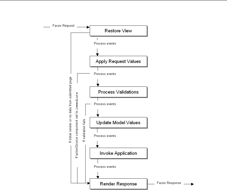
About Using the JSF Lifecycle and ADF Faces
5-2 Web User Interface Developer's Guide for Oracle Application Development Framework
Figure 5–1 Lifecycle of a Page Request in an ADF Faces Application
In a JSF application, the page request lifecycle is as follows:
■Restore View: The component tree is established. If this is not the initial rendering
(that is, if the page was submitted back to server), the tree is restored with the
appropriate state. If this is the initial rendering, the component tree is created and
the lifecycle jumps to the Render Response phase.
■Apply Request Values: Each component in the tree extracts new values from the
request parameters (using its decode method) and stores the values locally. Most
associated events are queued for later processing. If a component has its
immediate attribute set to true, then the validation, the conversion, and the
events associated with the component are processed during this phase. For more
information, see Section 5.2, "Using the Immediate Attribute."
■Process Validations: Local values of components are converted from the input type
to the underlying data type. If the converter fails, this phase continues to
completion (all remaining converters, validators, and required checks are run), but
at completion, the lifecycle jumps to the Render Response phase.
If there are no failures, the required attribute on the component is checked. If the
value is true, and the associated field contains a value, then any associated
validators are run. If the value is true and there is no field value, this phase
completes (all remaining validators are executed), but the lifecycle jumps to the
Render Response phase. If the value is false, the phase completes, unless no

About Using the JSF Lifecycle and ADF Faces
Using the JSF Lifecycle with ADF Faces 5-3
value is entered, in which case no validation is run. For more information about
conversion and validation, see Chapter 7, "Validating and Converting Input."
At the end of this phase, converted versions of the local values are set, any
validation or conversion error messages and events are queued on the
FacesContext object, and any value change events are delivered.
■Update Model Values: The component’s validated local values are moved to the
model, and the local copies are discarded.
■Invoke Application: Application-level logic (such as event handlers) is executed.
■Render Response: The components in the tree are rendered. State information is
saved for subsequent requests and for the Restore View phase.
To help illustrate the lifecycle, consider a page that has a simple input text component
where a user can enter a date and then click a command button to submit the entered
value. A valueChangeListener method is also registered on the component.
Example 5–1 shows the code for the example.
Example 5–1 Sample Code to Illustrate the JSF Lifecycle
<af:form>
<af:inputText value="#{mybean.date}"
valueChangeListener="#{mybean.valueChangeListener}">
<af:convertDateTime dateStyle="long"/>
</af:inputText>
<af:commandButton text="Save" actionListener="#{mybean.actionListener}"/>
</af:form>
Suppose a user enters the string "June 25, 2005" and clicks the submit button.
Figure 5–2 shows how the values pass through the lifecycle and where the different
events are processed.
Tip: In short, for an input component that can be edited, the steps for
the Process Validations phase is as follows:
1. If a converter fails, the required check and validators are not run.
2. If the converter succeeds but the required check fails, the validators are
not run.
3. If the converter and required check succeed, all validators are run. Even if
one validator fails, the rest of the validators are run. This is because when
the user fixes the error, you want to give them as much feedback as
possible about what is wrong with the data entered.
For example suppose you have a dateTimeRange validator that
accepted dates only in the year 2010, and you had a
dateRestrictionValidator validator that did not allow the
user to pick Sundays. If the user entered July 5, 2009 (a
Sunday), you want to give the feedback that this fails both
validators to maximize the chance the user will enter valid data.
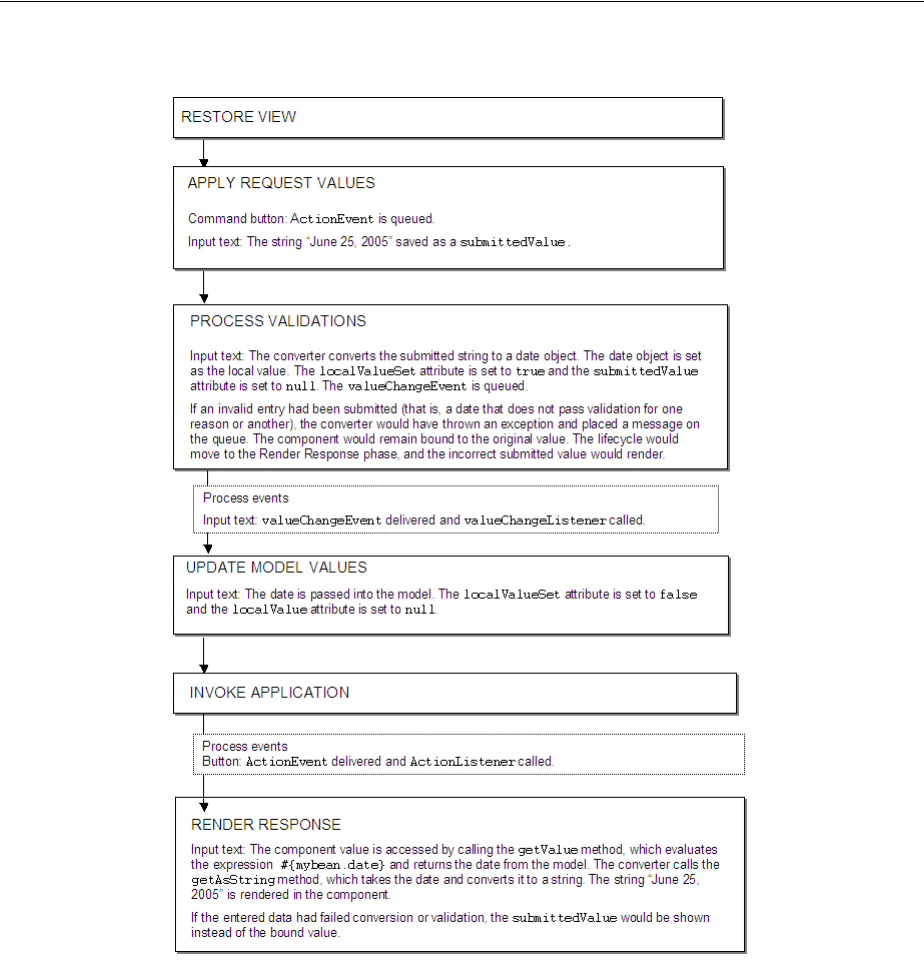
Using the Immediate Attribute
5-4 Web User Interface Developer's Guide for Oracle Application Development Framework
Figure 5–2 Example of Values and Events in the JSF Lifecycle
5.2 Using the Immediate Attribute
You can use the immediate attribute to allow processing of components to move up
to the Apply Request Values phase of the lifecycle. When actionSource components
(such as a commandButton) are set to immediate, events are delivered in the Apply
Request Values phase instead of in the Invoke Application phase. The
actionListener handler then calls the Render Response phase.
For example, you might want to configure a Cancel button to be immediate, and
have the action return a string used to navigate back to the previous page (for more
information about navigation, see Chapter 20, "Working with Navigation
Components"). Because the Cancel button is set to immediate, when the user clicks
the Cancel button, all validation is skipped, any entered data is not updated to the
model, and the user navigates as expected, as shown in Figure 5–3.
Using the Immediate Attribute
Using the JSF Lifecycle with ADF Faces 5-5
Figure 5–3 Lifecycle for Command Button Set to Immediate
As with command components, for components that invoke disclosure events, (such
as a showDetail component), and for editableValueHolder components
(components that hold values that can change, such as an inputText component) the
events are delivered to the Apply Request Values phase. However, for
editableValueHolder components, instead of skipping phases, conversion,
validation, and delivery of valueChangeEvents events are done earlier in the
lifecycle, during the Apply Request Values phase, instead of after the Process
Validations phase. No lifecycle phases are skipped.
Figure 5–4 shows the lifecycle for an input component whose immediate attribute is
set to true. The input component takes a date entered as a string and stores it as a
date object when the command button is clicked.
Note: A command button that does not provide any navigation and
is set to immediate will also go directly to the Render Response
phase: the Validation, Update Model, and Invoke Application phases
are skipped, so any new values will not be pushed to the server.
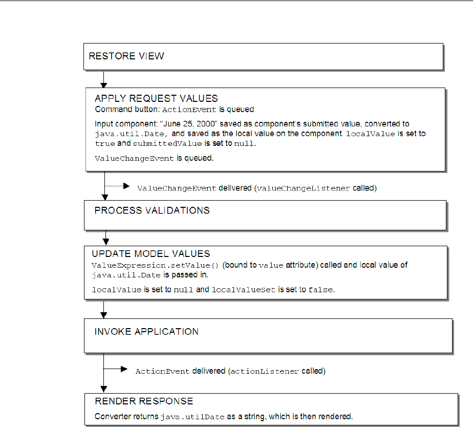
Using the Immediate Attribute
5-6 Web User Interface Developer's Guide for Oracle Application Development Framework
Figure 5–4 Immediate Attribute on an Input Component
Setting immediate to true for an input component can be useful when one or more
input components must be validated before other components. Then, if one of those
components is found to have invalid data, validation is skipped for the other input
components in the same page, thereby reducing the number of error messages shown
for the page.
Performance Tip: There are some cases where setting the
immediate attribute to true can lead to better performance:
■When you create a navigation train, and have a
commandNavigationItem component in a navigationPane
component, you should set the immediate attribute to true to
avoid processing the data from the current page (train stop) while
navigating to the next page. For more information, see
Section 20.9.1, "How to Create the Train Model."
■If an input component value has to be validated before any other
values, the immediate attribute should be set to true. Any
errors will be detected earlier in the lifecycle and additional
processing will be avoided.

Using the Immediate Attribute
Using the JSF Lifecycle with ADF Faces 5-7
As another example, suppose you have a form with an input component used to
search for a string with a command button configured to invoke the search execution,
and another input text component used to input a date with an associated command
button used to submit the date. In this example, we want to set the search input
component and its button both to be immediate. This will allow the user to execute a
search, even if an invalid string is entered into the date field, because the date input
component’s converter is never fired. Also, because the search input text is set to
immediate and the date input field is not, only the search input text will be
processed. And because both fields are within the same form, if the user enters a valid
date in the date field, but then performs a search and does not click the Save button,
the entered value will still be displayed when the search results are displayed.
Example 5–2 shows the code used for the two fields and two buttons.
Example 5–2 Input Component and Command Components Using Immediate
<af:form>
<af:inputText immediate="true" label="Search" value="#{mybean.search}"
valueChangeListener="#{mybean.searchValueChangeListener}"/>
<af:commandButton immediate="true" text="search"
actionListener="#{mybean.searchActionListener}"/>
[.... tags to render search result ....]
<af:inputText label="Date" value="#{mybean.date}"
valueChangeListener="#{mybean.valueChangeListener}">
<af:convertDateTime dateStyle="long"/>
</af:inputText>
<af:commandButton text="save" actionListener="#{mybean.actionListener}"/>
</af:form>
Figure 5–5 shows the lifecycle for this page when a user does the following:
■Enters apple into the Date input field (which is not a valid entry)
■Enters orange into the Search field
■Clicks the Search button to execute the search on orange
■Clicks the Save button to save the value apple as the date
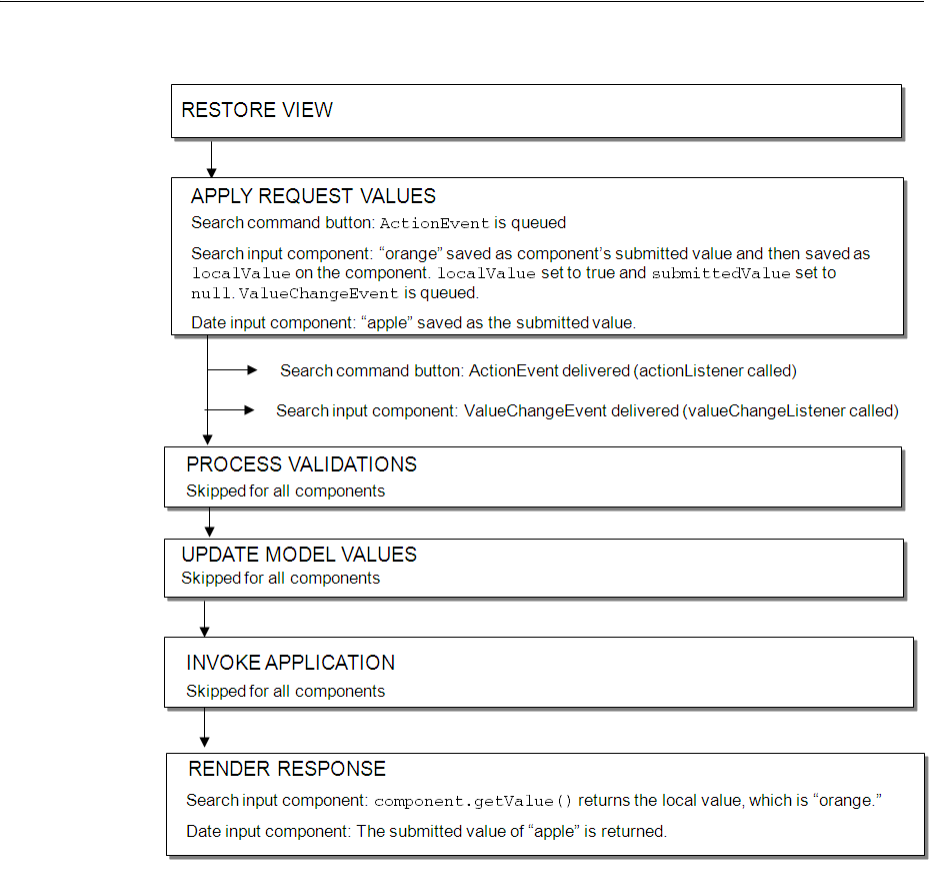
Using the Immediate Attribute
5-8 Web User Interface Developer's Guide for Oracle Application Development Framework
Figure 5–5 Immediate Attribute on Both Command Component and Input Component
When using the immediate attribute for editableValueHolder and
actionSource components on the same page, note the following issues:
■If an editableValueHolder component is marked as immediate, it will
execute before the Update Model Values phase. This could be an issue when an
immediate actionSource component requires data from an
editableValueHolder component, as data entered into an
editableValueHolder component is not available to the model until after the
Update Model Values phase. If you have an immediate actionSource
component, and that component needs data, then set immediate on the
editableValueHolder fields as well. Then, you can call the getValue method
on the editableValueHolder component and the local value will be returned.
It will not have been pushed into the model yet, but it will be available on the
component.
■If an immediate editableValueHolder component fails validation, any
immediate actionSource component will still execute.
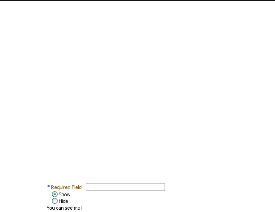
Using the Optimized Lifecycle
Using the JSF Lifecycle with ADF Faces 5-9
5.2.1 How to Use the Immediate Attribute
Before you begin
It may be helpful to have an understanding of the immediate attribute. For more
information, see Section 5.2, "Using the Immediate Attribute."
To use the immediate attribute:
1. On the JSF page, select the component that you want to be immediate.
2. In the Property Inspector, expand the Behavior section and set the immediate
attribute to true.
5.3 Using the Optimized Lifecycle
ADF Faces provides an optimized lifecycle that you can use when you want the JSF
page request lifecycle (including conversion and validation) to be run only for certain
components on a page. For example, suppose you have an inputText component on
a page whose required attribute is set to true. On the same page are radio buttons
that when selected cause the page to either show or hide text in an outputText
component, as shown in Figure 5–6.
Figure 5–6 Required Field and Boolean with Auto-Submit
Also assume that you want the user to be able to select a radio button before entering
the required text into the field. While you could set the radio button components to
automatically trigger a submit action and also set their immediate attribute to true
so that they are processed before the inputText component, you would also have to
add a valueChangeEvent listener, and in it call the Render Response phase so that
validation is not run on the input text component when the radio buttons are
processed.
Instead of having to write this code in a listener, ADF Faces allows you to set
boundaries on the page that allow the lifecycle to run just on components within the
boundary. Event root components determine these boundaries on the page, and so
allow the lifecycle to run just on components within that boundary. The event root
component can be determined in two ways:
■Components: Certain components are always event root components. Regions and
popups are an examples of a component which the framework knows is a
boundary. No matter what event is triggered inside a region or popup, the
lifecycle does not run on components outside the region or popup.
■Events: Certain events indicate a component as a root. For example, the disclosure
event sent when expanding or collapsing a showDetail component (see
Section 9.8, "Displaying and Hiding Contents Dynamically") indicates that the
showDetail component is a root, and so the lifecycle is run only on the
showDetail component and any child components.
Aside from the lifecycle running on the event root and it’s child components, the
lifecycle may also be run on any components configured to listen for that event.

Using the Optimized Lifecycle
5-10 Web User Interface Developer's Guide for Oracle Application Development Framework
Configuring a component to listen for events on root components in order to be
processed is called cross-component refresh.
Cross-component refresh allows you to set up dependencies so that the events from
one component act as triggers for another component, known as the target. When any
event occurs on the trigger component, the lifecycle is run on any target components,
as well as on any child components of both the trigger and the target, causing only
those components to be rerendered. This is considered a partial page rendering (PPR).
In the radio button example, to have the lifecycle run just on the radio buttons and the
output text component, you would set the radio buttons to be triggers and the
panelGroupLayout component that contains the output text to be the target, as
shown in Example 5–3.
Example 5–3 Example of Cross-Component Rendering
<af:form>
<af:inputText label="Required Field" required="true"/>
<af:selectBooleanRadio id="show" autoSubmit="true" text="Show"
value="#{validate.show}"/>
<af:selectBooleanRadio id="hide" autoSubmit="true" text="Hide"
value="#{validate.hide}"/>
<af:panelGroupLayout partialTriggers="show hide" id="panel">
<af:outputText value="You can see me!" rendered="#{validate.show}"/>
</af:panelGroupLayout>
</af:form>
Because the autoSubmit attribute is set to true on the radio buttons, when they are
selected, a SelectionEvent is fired, for which the radio button is considered the
root. Because the panelGroupLayout component is set to be a target to both radio
components, when that event is fired, only the selectOneRadio (the root), the
panelGroupLayout component (the root’s target), and its child component (the
outputText component) are processed through the lifecycle. Because the
outputText component is configured to render only when the Show radio button is
selected, the user is able to select that radio button and see the output text, without
having to enter text into the required input field above the radio buttons.
For more information about how the ADF Faces framework uses PPR, and how you
can use PPR throughout your application, see Chapter 8, "Rerendering Partial Page
Content."
5.3.1 What You May Need to Know About Using the Immediate Attribute and the
Optimized Lifecycle
There may be cases where PPR will not be able to keep certain components from being
validated. For example, suppose instead of using an outputText component, you
want to use an inputText component whose required attribute is set to true,
inside the panelGroupLayout component, as shown in Example 5–4.
Example 5–4 inputText Component Within a panelGroup Component Will Be Validated
with Cross-Component PPR
<af:form>
<af:selectBooleanRadio id="show2" autoSubmit="true" text="Show"
Tip: Because the output text won’t be rendered when it’s configured
to hide, it cannot be a target. Therefore it is placed in a
panelGroupLayout component, which is then configured to be the
target.

Using the Optimized Lifecycle
Using the JSF Lifecycle with ADF Faces 5-11
value="#{validate.show2}"/>
<af:selectBooleanRadio id="hide2" autoSubmit="true" text="Hide"
value="#{validate.hide2}"/>
<af:panelGroupLayout partialTriggers="show2 hide2">
<af:inputText label="Required Field" required="true"
rendered="#{validate.show2}"/>
</af:panelGroupLayout>
</af:form>
In this example, the inputText component will be validated because the lifecycle
runs on the root (the selectBooleanRadio component), the target (the
panelGroupLayout component), and the target’s child (the inputText
component). Validation will fail because the inputText component is marked as
required and there is no value, so an error will be thrown. Because of the error, the
lifecycle will skip to the Render Response phase and the model will not be updated.
Therefore, the panelGroupLayout component will not be able to show or hide
because the value of the radio button will not be updated.
For cases like these, you can skip validation using the immediate attribute on the
radio buttons. Doing so causes the valueChangeEvent on the buttons to run before
the Process Validation phase of the inputText component. Then you need to add a
valueChangeListener handler method that would call the Render Response phase
(thereby skipping validation of the input component), and set the values on the radio
buttons and input component. Example 5–5 shows the JSF code to do this.
Example 5–5 Using the immediate Attribute and a valueChangeListener
<af:form>
<af:selectBooleanRadio immediate="true"
valueChangeListener="#{validate.toggle}"
id="show2" autoSubmit="true" text="Show"
value="#{validate.show2}"/>
<af:selectBooleanRadio id="hide2" autoSubmit="true" text="Hide"
value="#{validate.hide2}"/>
<af:panelGroupLayout partialTriggers="show2 hide2">
<af:inputText label="Required Field" required="true"
rendered="#{validate.show2}"/>
</af:panelGroupLayout>
</af:form>
Example 5–6 shows the valueChangeListener code.
Example 5–6 valueChangeListener Sets the Value and Calls Render Response
public void toggle(ValueChangeEvent vce)
{
setShow2(Boolean.TRUE.equals(vce.getNewValue()));
FacesContext.getCurrentInstance().renderResponse();
}
5.3.2 What You May Need to Know About Using an LOV Component and the Optimized
Lifecycle
For the inputListOfValues and inputComboBoxListOfValues components, the
procedures described in Section 5.3.1, "What You May Need to Know About Using the
Immediate Attribute and the Optimized Lifecycle," will not work. Consider the
following example.
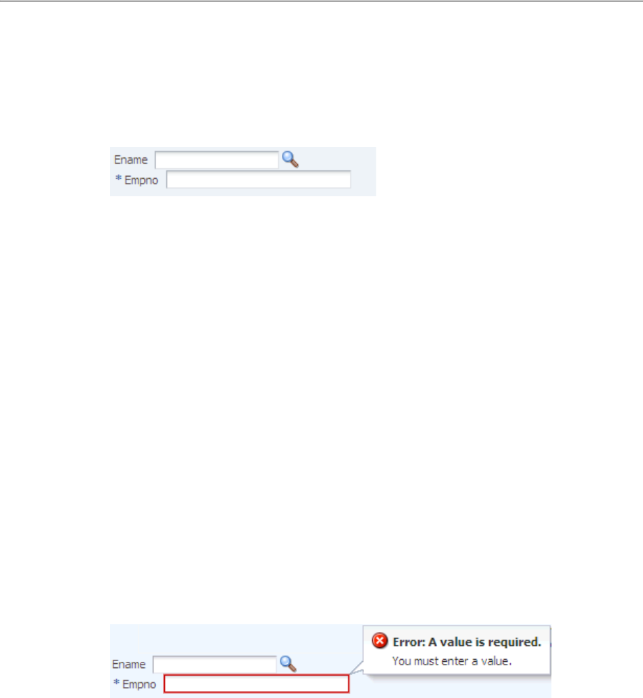
Using the Optimized Lifecycle
5-12 Web User Interface Developer's Guide for Oracle Application Development Framework
Suppose you have an inputListOfValues component from which a user selects an
employee name, and an inputText component whose required attribute is set to
true, which is updated with the employee’s ID number once the employee is selected,
as shown in Figure 5–7.
Figure 5–7 LOV component Updates the Input Component
To achieve this, you might set the Empno field to have the Ename field as a partial
trigger, as shown in Example 5–7.
Example 5–7
<af:inputListOfValues label="Ename" id="lov0"
value="#{validateLOV.ename}" autoSubmit="true"
immediate="true"
popupTitle="Search and Select: Ename"
searchDesc="Choose a name"
model="#{validateLOV.listOfValuesModel}"
valueChangeListener="#{validateLOV.immediateValueChange}"
validator="#{validateLOV.validate}"/>
<af:inputText label="Empno" value="#{validateLOV.empno}" required="true"
id="lovDependent01" partialTriggers="lov0"/>
As with the radio button and input component example in Section 5.3.1, "What You
May Need to Know About Using the Immediate Attribute and the Optimized
Lifecycle," once the user clicks the search icon, the inputText component will be
validated because the lifecycle runs on both the root (the inputListOfValues
component) and the target (the inputText component). Validation will fail because
the inputText component is marked as required and there is no value, so an error
will be thrown, as shown in Figure 5–8.
Figure 5–8 Validation Error is Thrown Because a Value is Required
However, the solution recommended in Section 5.3.1, "What You May Need to Know
About Using the Immediate Attribute and the Optimized Lifecycle," of setting the
LOV component’s immediate attribute to true and using a ValueChangeListener on
the LOV will not fix the validation error. For LOV components, the
ValueChangeEvent is queued only when the value of the LOV component changes.
For this reason, setting the immediate attribute to true has no effect when the user
clicks the search icon, because at that point the ADF LaunchPopupEvent is queued
for the Invoke Application phase always, regardless of the value of the immediate
attribute. In other words, the optimized lifecycle is run as normal on both the root and
target components and therefore the input component throws a validation error.
When the user selects a new value from the LOV popup, the LOV component queues
two events. One is a ValueChangeEvent to signal a change in value for the
component. The second is a ReturnPopupEvent queued for the Invoke Application
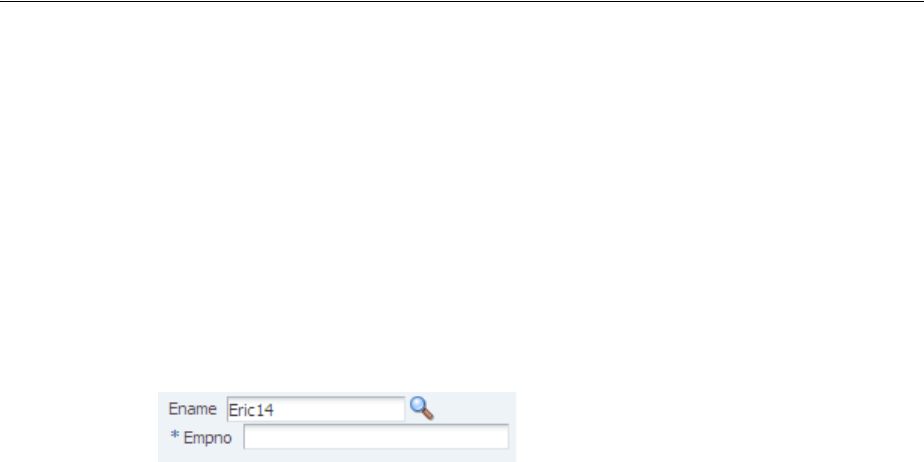
Using the Optimized Lifecycle
Using the JSF Lifecycle with ADF Faces 5-13
phase, which gives application methods a chance to handle the selection. Both these
events need to occur in order for the LOV to behave as expected.
As mentioned, the LOV component queues a ValueChangeEvent only when the
user selects a new value. If you were to set the immediate attribute to true on the
LOV component, this event would be queued for the Apply Request Values phase and
the new value would be validated. In addition if you were to create a
ValueChangeListener method for the LOV component, and in its implementation
jump to the Render Response phase to avoid validation of the input component, the
selected value would never get pushed to the model, the ReturnPopupListener
would never get called during the Invoke Application phase, and the target input
component would not get updated with new value, as shown in Figure 5–9.
Figure 5–9 Model is Not Updated
To resolve this issue of needing both the ValueChangeEvent and the
ReturnPopupEvent to be queued as part of the same request and to have any target
fields refreshed with newly selected values, instead of declaratively setting the LOV
component as a partial trigger for the input component and creating a method for the
ValueChangeListener, you need to create a listener for the ReturnPopupEvent.
This listener must programmatically set the input components as partial targets for the
LOV. You do not need to set the LOV’s immediate attribute to true because the
input component is no longer a target for the LOV until the ReturnPopupListener
method is executed, and so it will not fail validation because the lifecycle will not be
run on it. And because a listener method is used for the ReturnPopupEvent instead
of for the ValueChangeEvent, both events can be queued and the model updated
appropriately.
Example 5–8 shows the needed page code for the LOV and input components.
Example 5–8
<af:inputListOfValues label="Ename" id="lov1"
value="#{validateLOV.ename}" autoSubmit="true"
returnPopupListener="#{validate.processReturnPopup}"
Title="Search and Select: Ename" searchDesc="Choose a name"
model="#{validateLOV.listOfValuesModel}"
validator="#{validateLOV.validate}"/>
<af:inputText label="Empno" value="#{validateLOV.empno}" required="true"
id="lovDependent1" binding="#{validate.lovDependent1}"/>
The input component uses its binding attribute to store the instance on a backing
bean, allowing the instance to be accessed by the listener method. The listener method
then accesses the input component and sets it as a partial target for the LOV, as shown
in Example 5–9.
Example 5–9
AdfFacesContext.getCurrentInstance().addPartialTarget(_lovDependent1)
For more information about programmatically setting partial page rendering, see
Section 8.3, "Enabling Partial Page Rendering Programmatically."
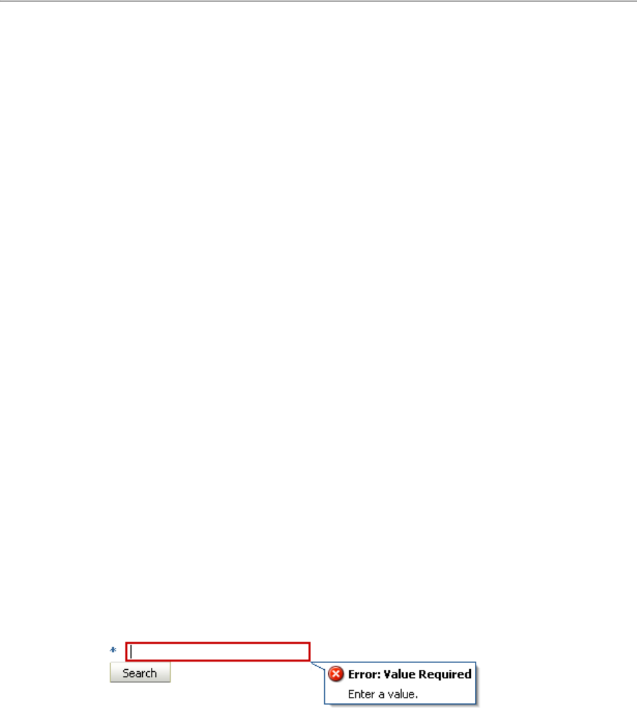
Using the Client-Side Lifecycle
5-14 Web User Interface Developer's Guide for Oracle Application Development Framework
5.4 Using the Client-Side Lifecycle
The ADF Faces framework provides client-side conversion and validation. You can
create your own JavaScript-based converters and validators that run on the page
without a trip to the server.
You can use client-side validation so that when a specific client event is queued, it
triggers client validation of the appropriate form or subform (for more information
about subforms, see Section 5.5, "Using Subforms to Create Sections on a Page"). If this
client validation fails, meaning there are known errors, then the events that typically
propagate to the server (for example, a command button's actionEvent when a form
is submitted) do not go to the server. Having the event not delivered also means that
nothing is submitted and therefore, none of the client listeners is called. This is similar
to server-side validation in that when validation fails on the server, the lifecycle jumps
to the Render Response phase; the action event, though queued, will never be
delivered; and the actionListener handler method will never be called.
For example, ADF Faces provides the required attribute for input components, and
this validation runs on the client. When you set this attribute to true, the framework
will show an error on the page if the value of the component is null, without
requiring a trip to the server. Example 5–10 shows code that has an inputText
component’s required attribute set to true, and a command button whose
actionListener attribute is bound to a method on a managed bean.
Example 5–10 Simple Client-Side Validation Example
<af:form>
<af:inputText id="input1" required="true" value="a"/>
<af:commandButton text="Search" actionListener="#{demoForm.search}"/>
</af:form>
When this page is run, if you clear the field of the value of the inputText component
and tab out of the field, the field will redisplay with a red outline. If you then click into
the field, an error message will state that a value is required, as shown in Figure 5–10.
There will be no trip to the server; this error detection and message generation is all
done on the client.
Figure 5–10 Client-Side Validation Displays an Error Without a Trip to the Server
In this same example, if you were to clear the field of the value and click the Search
button, the page would not be submitted because the required field is empty and
therefore an error occurs; the action event would not be delivered, and the method
bound to the action listener would not be executed. This process is what you want,
because there is no reason to submit the page if the client can tell that validation will
fail on the server.
For more information about using client-side validation and conversion, see Chapter 7,
"Validating and Converting Input."

Object Scope Lifecycles
Using the JSF Lifecycle with ADF Faces 5-15
5.5 Using Subforms to Create Sections on a Page
In the JSF reference implementation, if you want to independently submit a section of
the page, you have to use multiple forms. However multiple forms require multiple
copies of page state, which can result in the loss of user edits in forms that aren't
submitted.
ADF Faces adds support for a subform component, which represents an
independently submittable section of a page. The contents of a subform will be
validated (or otherwise processed) only if a component inside of the subform is
responsible for submitting the page, allowing for comparatively fine-grained control of
the set of components that will be validated and pushed into the model without the
compromises of using entirely separate form elements. When a page using subforms is
submitted, the page state is written only once, and all user edits are preserved.
A subform will always allow the Apply Request Values phase to execute for its child
components, even when the page was submitted by a component outside of the
subform. However, the Process Validations and Update Model Values phases will be
skipped (this differs from an ordinary form component, which, when not submitted,
cannot run the Apply Request Values phase). To allow components in subforms to be
processed through the Process Validations and Update Model Value phases when a
component outside the subform causes a submit action, use the default attribute.
When a subform’s default attribute is set to true, it acts like any other subform in
most respects, but if no subform on the page has an appropriate event come from its
child components, then any subform with default set to true will behave as if one
of its child components caused the submit. For more information about subforms, see
Section 11.2, "Defining Forms."
5.6 Object Scope Lifecycles
At runtime, you pass data to pages by storing the needed data in an object scope
where the page can access it. The scope determines the lifespan of an object. Once you
place an object in a scope, it can be accessed from the scope using an EL expression.
For example, you might create a managed bean named foo, and define the bean to
live in the Request scope. To access that bean, you would use the expression
#{requestScope.foo}.
There are five types of scopes in a standard JSF application:
■applicationScope: The object is available for the duration of the application.
■sessionScope: The object is available for the duration of the session.
■viewScope: The object is available until the user finishes interaction with the
current view. The object is stored in a map on the UIViewRoot object. Note that
this object is emptied upon page refresh or a redirect to the view.
■flashScope: The object is available during a single view transition, and is cleaned
up before moving on to the next view. You can place a parameter value in
flashScope and it will be available to the resulting page, surviving redirects.
Best Practice: Always use only a single form tag per page. Use the
subform tag where you might otherwise be tempted to use multiple
form tags.
Tip: If you need the object to survive a page refresh or redirect tot he
same view, then use the ADF Faces version of viewScope.
Object Scope Lifecycles
5-16 Web User Interface Developer's Guide for Oracle Application Development Framework
■requestScope: The object is available for the duration between the time an
HTTP request is sent until a response is sent back to the client.
In addition to the standard JSF scopes, ADF Faces provides the following scopes:
■pageFlowScope: The object is available as long as the user continues navigating
from one page to another. If the user opens a new browser window and begins
navigating, that series of windows will have its own pageFlowScope scope.
■backingBeanScope: Used for managed beans for page fragments and
declarative components only. The object is available for the duration between the
time an HTTP request is sent until a response is sent back to the client. This scope
is needed because there may be more than one page fragment or declarative
component on a page, and to avoid collisions between values, any values must be
kept in separate scope instances. Use backingBeanScope scope for any
managed bean created for a page fragment or declarative component.
■viewScope: The object is available until the ID for the current view changes. Use
viewScope scope to hold values for a given page. Unlike the JSF viewScope,
objects stored in the ADF Faces viewScope will survive page refreshes and
redirects to the same view ID.
Object scopes are analogous to global and local variable scopes in programming
languages. The wider the scope, the higher the availability of an object. During their
lifespan, these objects may expose certain interfaces, hold information, or pass
variables and parameters to other objects. For example, a managed bean defined in
sessionScope scope will be available for use during multiple page requests.
However, a managed bean defined in requestScope scope will be available only for
the duration of one page request.
Figure 5–11 shows the time period in which each type of scope is valid, and its
relationship with the page flow.
Note: Because these are not standard JSF scopes, EL expressions
must explicitly include the scope to reference the bean. For example,
to reference the MyBean managed bean from the pageFlowScope
scope, your expression would be #{pageFlowScope.MyBean}.
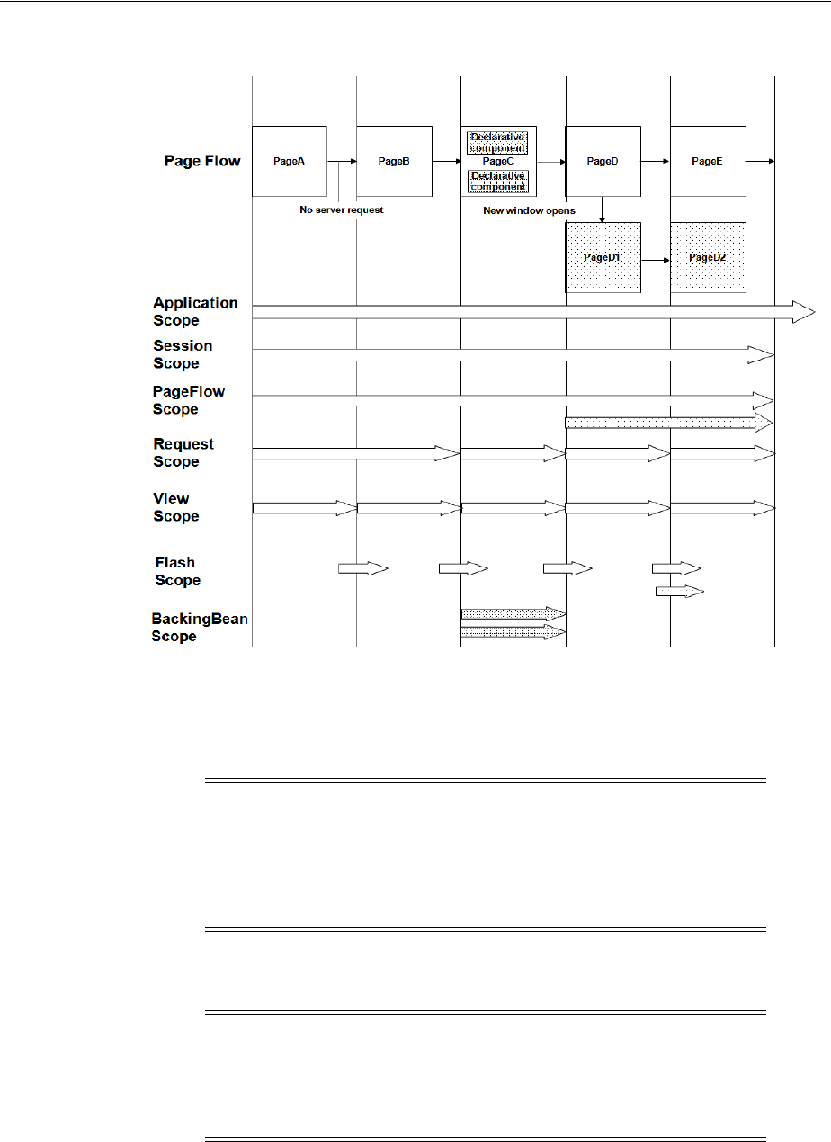
Passing Values Between Pages
Using the JSF Lifecycle with ADF Faces 5-17
Figure 5–11 Relationship Between Scopes and Page Flow
When determining what scope to register a managed bean with or to store a value in,
always try to use the narrowest scope possible. Use the sessionScope scope only for
information that is relevant to the whole session, such as user or context information.
Avoid using the sessionScope scope to pass values from one page to another.
5.7 Passing Values Between Pages
The ADF Faces pageFlowScope scope makes it easier to pass values from one page
to another, thus enabling you to develop master-detail pages more easily. Values
added to the pageFlowScope scope automatically continue to be available as the user
Note: If you are using the full Fusion technology stack, then you
have the option to register your managed beans in various
configuration files. For more information, see the "Using a Managed
Bean in a Fusion Web Application" section of the Oracle Fusion
Middleware Fusion Developer's Guide for Oracle Application Development
Framework.
Note: If you are using the full Fusion technology stack and you need
information about passing values between pages in an ADF bounded
task flow, or between ADF regions and pages, refer to the "Getting
Started With ADF Task Flows" chapter of the Oracle Fusion Middleware
Fusion Developer's Guide for Oracle Application Development Framework.

Passing Values Between Pages
5-18 Web User Interface Developer's Guide for Oracle Application Development Framework
navigates from one page to another, even if you use a redirect directive. But unlike
session scope, these values are visible only in the current page flow or process. If the
user opens a new window and starts navigating, that series of windows will have its
own process. Values stored in each window remain independent.
Like objects stored in any standard JSF scope, objects stored in the pageFlow scope
can be accessed through EL expressions. The only difference with the pageFlow scope
is that the object names must use the pageFlowScope prefix. For example, to have a
button's label provided by a managed bean stored in the pageFlow scope, and to have
a method on the bean called when the button is selected, you might use the following
code on your page:
<af:commandButton text="#{pageFlowScope.buttonBean.label}"
action="#{pageFlowScope.buttonBean.action}"/>
The pageFlowScope is a java.util.Map object that may be accessed from Java
code. The setPropertyListener tag allows you to set property values onto a
scope, and also allows you to define the event the tag should listen for. For example,
when you use the setPropertyListener tag with the type attribute set to
action, it provides a declarative way to cause an action source (for example,
commandButton) to set a value before navigation. You can use the pageFlowScope
scope with the setPropertyListener tag to pass values from one page to another,
without writing any Java code in a backing bean. For example, you might have one
page that uses the setPropertyListener tag and a command component to set a
value in the pageFlowScope scope, and another page whose text components use the
pageFlowScope scope to retrieve their values.
You can also use the pageFlowScope scope to set values between secondary
windows such as dialogs. When you launch secondary windows from, for example, a
commandButton component, you can use a launchEvent event and the
pageFlowScope scope to pass values into and out of the secondary windows without
overriding values in the parent process.
5.7.1 How to Use the pageFlowScope Scope Within Java Code
You can access pageFlow scope from within any Java code in your application.
Remember to clear the scope once you are finished.
Before you begin
It may be helpful to have an understanding of object scopes. For more information, see
Section 5.6, "Object Scope Lifecycles." You may also want to understand how
pageFlow scope is used to pass values. For more information, see Section 5.7, "Passing
Values Between Pages."
To use pageFlowScope in Java code:
1. To get a reference to the pageFlowScope scope, use the
org.apache.myfaces.trinidad.context.RequestContext.
getPageFlowScope() method.
For example, to retrieve an object from the pageFlowScope scope, you might use
the following Java code:
import java.util.Map;
Note: If your application uses Oracle ADF Controller, then you do
not have to manually clear the scope.

Passing Values Between Pages
Using the JSF Lifecycle with ADF Faces 5-19
import org.apache.myfaces.trinidad.context.RequestContext;
. . .
Map pageFlowScope = RequestContext.getCurrentInstance().getPageFlowScope();
Object myObject = pageFlowScope.get("myObjectName");
2. To clear the pageFlowScope scope, access it and then manually clear it.
For example, you might use the following Java code to clear the scope:
RequestContext afContext = RequestContext.getCurrentInstance();
afContext.getPageFlowScope().clear();
5.7.2 How to Use the pageFlowScope Scope Without Writing Java Code
To use the pageFlowScope scope without writing Java code, use a
setPropertyListener tag in conjunction with a command component to set a
value in the scope. The setPropertyListener tag uses the type attribute that
defines the event type it should listen for. It ignores all events that do not match its
type. Once set, you then can access that value from another page within the page flow.
To set a value in the pageFlowScope scope:
1. On the page from where you want to set the value, create a command component
using the Component Palette.
2. In the Component Palette, from the Listeners group of the Operations panel, drag
a Set Property Listener and drop it as a child to the command component.
Or right-click the component and choose Insert inside Button > ADF Faces >
setPropertyListener.
3. In the Insert Set Property Listener dialog, set the From field to the value that will
be set on another component.
For example, say you have a managed bean named MyBean that stores the name
value for an employee, and you want to pass that value to the next page. You
would enter #{myBean.empName} in the From field.
4. Set the To field to be a value on the pageFlowScope scope.
For example, you might enter #{pageFlowScope.empName} in the To field.
5. From the Type dropdown menu, choose Action.
This allows the listener to listen for the action event associated with the command
component.
To access a value from the pageFlowScope scope:
1. On the page from which you want to access the value, drop the component that
you want to display the value.
2. Set the value of the component to be the same value as the To value set on the
setPropertyListener tag.
For example, to have an outputText component access the employee name, you
would set the value of that component to be #{pageFlowScope.empName}.
Tip: Instead of using the setActionListener tag (which may
have been used in previous versions of ADF Faces), use the
setPropertyListener tag and set the event type to action.

Passing Values Between Pages
5-20 Web User Interface Developer's Guide for Oracle Application Development Framework
5.7.3 What Happens at Runtime: How Values are Passed
When a user clicks a command button that contains a setPropertyListener tag,
the listener executes and the To value is resolved and retrieved, and then stored as a
property on the pageFlowScope scope. On any subsequent pages that access that
property through an EL expression, the expression is resolved to the value set by the
original page.

6
Handling Events 6-1
6 Handling Events
This chapter describes how to handle events on the server as well as on the client.
This chapter includes the following sections:
■Section 6.1, "About Events and Event Handling"
■Section 6.2, "Using ADF Faces Server Events"
■Section 6.3, "Using JavaScript for ADF Faces Client Events"
■Section 6.4, "Sending Custom Events from the Client to the Server"
■Section 6.5, "Executing a Script Within an Event Response"
■Section 6.6, "Using ADF Faces Client Behavior Tags"
■Section 6.7, "Using Polling Events to Update Pages"
6.1 About Events and Event Handling
In traditional JSF applications, event handling typically takes place on the server. JSF
event handling is based on the JavaBeans event model, where event classes and event
listener interfaces are used by the JSF application to handle events generated by
components.
Examples of events in an application include clicking a button or link, selecting an
item from a menu or list, and changing a value in an input field. When a user activity
occurs such as clicking a button, the component creates an event object that stores
information about the event and identifies the component that generated the event.
The event is also added to an event queue. At the appropriate time in the JSF lifecycle,
JSF tells the component to broadcast the event to the corresponding registered listener,
which invokes the listener method that processes the event. The listener method may
trigger a change in the user interface, invoke backend application code, or both.
Like standard JSF components, ADF Faces command components deliver
ActionEvent events when the components are activated, and ADF Faces input and
select components deliver ValueChangeEvent events when the component local
values change.
For example, in the File Explorer application, the File Menu contains a submenu
whose commandMenuItem components allow a user to create a new file or folder.
When users click the Folder commandMenuItem, an ActionEvent is invoked.
Because the EL expression set as the value for the component’s actionListener
attribute resolves to the createNewDirectory method on the headerManager
managed bean, that method is invoked and a new directory is created.

About Events and Event Handling
6-2 Web User Interface Developer's Guide for Oracle Application Development Framework
While ADF Faces adheres to standard JSF event handling techniques, it also enhances
event handling in two key ways by providing:
■Ajax-based functionality (partial page rendering)
■A client-side event model
6.1.1 Events and Partial Page Rendering
Unlike standard JSF events, ADF Faces events support Ajax-style partial postbacks to
enable partial page rendering (PPR). Instead of full page rendering, ADF Faces events
and components can trigger partial page rendering, that is, only portions of a page
refresh upon request.
Certain components are considered event root components. Event root components
determine boundaries on the page, and so allow the lifecycle to run just on
components within that boundary (for more information about this aspect of the
lifecycle, see Section 5.3, "Using the Optimized Lifecycle"). When an event occurs
within an event root, only those components that are children to the root are refreshed
on the page. An example of an event root component is a popup. When an event
happens within a popup, only the popup and its children are rerenderd, and not the
whole page.
Additionally, certain events indicate a specific component as an event root component.
For example, the disclosure event sent when a expanding or collapsing a showDetail
component (see Section 9.8, "Displaying and Hiding Contents Dynamically"), indicates
that the showDetail component is a root. The lifecycle is run only on the
showDetail component (and any child components or other components that point
to this as a trigger), and only they are rerendered when it is expanded or collapsed.
Table 6–1 shows the all event types in ADF Faces, and whether or not the source
component is an event root.
Note: Any ADF Faces component that has built-in event
functionality must be enclosed in the form tag.
Table 6–1 Events and Event Root Components
Event Type Component Trigger Is Event Root
action All command components false
dialog dialog false
disclosure showDetail, showDetailHeader true
disclosure showDetailItem true
focus tree, treeTable true
launch All command components NA
launchPopup inputListOfValues,
inputComboboxListOfValues
true
load document NA
poll poll true
popupOpened popup NA
popupOpening popup NA
popupClosed popup NA
Using ADF Faces Server Events
Handling Events 6-3
6.1.2 Client-Side Event Model
In addition to server-side action and value change events, ADF Faces components also
invoke client-side action and value change events, and other kinds of server and client
events. Some events are generated by both server and client components (for example,
selection events); some events are generated by server components only (for example,
launch events); and some events are generated by client components only (for
example, load events).
By default, most client events are propagated to the server. Changes to the component
state are automatically synchronized back to the server to ensure consistency of state,
and events are delivered, when necessary, to the server for further processing.
However, you can configure your event so that it does not propagate.
In addition, any time you register a client-side event listener on the server-side Java
component, the ADF Faces framework assumes that you require a JavaScript
component, so a client-side component is created.
Client-side JavaScript events can come from several sources: they can be derived
automatically from DOM events, from property change events, or they can be
manually created during the processing of other events.
6.2 Using ADF Faces Server Events
ADF Faces provides a number of server-side events. Table 6–2 lists the events
generated by ADF Faces components on the server, and the components that trigger
them.
propertyChange All components NA
queryEvent query, quickQuery true
queryOperation query, quickQuery true
rangeChange table NA
regionNavigation region NA
return All command components true
returnPopupData inputListOfValues,
inputComboboxListOfValues
true
returnPopup inputListOfValues,
inputComboboxListOfValues
true
rowDisclosure tree, treeTable true
sort treeTable, table true
valueChange All input and select components (components that
implement EditableValueHolder)true
Tip: If components outside of the event root need to be processed
when the event root is processed, then you must set the
partialTrigger attribute on those components to the ID of the
event root component. For more information, see Section 8.2,
"Enabling Partial Page Rendering Declaratively."
Table 6–1 (Cont.) Events and Event Root Components
Event Type Component Trigger Is Event Root

Using ADF Faces Server Events
6-4 Web User Interface Developer's Guide for Oracle Application Development Framework
Table 6–2 ADF Faces Server Events
Event Triggered by Component...
ActionEvent All command components. For more information, see
Chapter 20, "Working with Navigation Components."
ActiveDataEvent Used to update components based on events. For more
information see Chapter 35, "Using the Active Data Service with
an Asynchronous Backend."
AttributeChangeEvent All input and select components (components that implement
EditableValueHolder). For more information, see
Chapter 11, "Using Input Components and Defining Forms."
CalendarActivity
DurationChangeEvent
CalendarActivityEvent
CalendarDisplay
ChangeEvent
CalendarEvent
The Calendar component. For more information, see Chapter 17,
"Using a Calendar Component."
CarouselSpinEvent The carousel component. For more information, see
Section 18.6, "Displaying Images in a Carousel."
ColumnSelectionEvent
ColumnVisibility
ChangeEvent
The table and treeTable components. For more information,
see Chapter 12, "Using Tables and Trees."
ContextInfoEvent The contextInfo component. For more information, see
Section 15.5, "Displaying Contextual Information in Popups."
DialogEvent The dialog component. For more information, see Chapter 15,
"Using Popup Dialogs, Menus, and Windows."
DisclosureEvent The showDetail, showDetailHeader, showDetailItem
components. For more information, see Section 9.8, "Displaying
and Hiding Contents Dynamically" and Section 9.9, "Displaying
or Hiding Contents in Accordion Panels and Tabbed Panels."
DropEvent Components that support drag and drop. For more information,
see Chapter 33, "Adding Drag and Drop Functionality."
FocusEvent *The tree and treeTable components. For more information,
see Chapter 12, "Using Tables and Trees."
ItemEvent The panelTabbed component. For more information, see
Section 9.9, "Displaying or Hiding Contents in Accordion Panels
and Tabbed Panels." Also, the navigationPane component. For
more information, see Section 20.6, "Using Navigation Items for
a Page Hierarchy."
LaunchEvent All command components. For more information, see
Chapter 20, "Working with Navigation Components."
LaunchPopupEvent The inputListOfValues and
inputComboboxListOfValues components. For more
information, see Chapter 14, "Using Query Components."
LoadEvent ** The document component. For more information, see
Section 9.2.5, "How to Configure the document Tag."
PollEvent The poll component. For more information, see Section 6.7,
"Using Polling Events to Update Pages"
PopupCanceledEvent
PopupFetchEvent
The popup component. For more information, see Chapter 15,
"Using Popup Dialogs, Menus, and Windows."
Using ADF Faces Server Events
Handling Events 6-5
* This focus event is generated when focusing in on a specific subtree, which is not the
same as a client-side keyboard focus event.
** The LoadEvent event is fired after the initial page is displayed (data streaming
results may arrive later).
6.2.1 How to Handle Server-Side Events
All server events have event listeners on the associated component(s). You need to
create a handler that processes the event and then associate that handler code with the
listener on the component.
For example, in the File Explorer application, a selection event is fired when a user
selects a row in the table. Because the table’s selectionListener attribute is bound
to the tableSelectFileItem handler method on the TableContentView.java
managed bean, that method is invoked in response to the event.
Before you begin
It may be helpful to have an understanding of server-side events. For more
information, see Section 6.2, "Using ADF Faces Server Events."
QueryEvent
QueryOperationEvent
The query and quickQuery components. For more
information, see Chapter 14, "Using Query Components."
RangeChangeEvent The table component. For more information, see Chapter 12,
"Using Tables and Trees."
RegionNavigationEvent The region component. For more information, see the "Using
Task Flows as Regions" chapter of the Oracle Fusion Middleware
Fusion Developer's Guide for Oracle Application Development
Framework.
ReturnEvent All command components. For more information, see
Chapter 20, "Working with Navigation Components."
ReturnPopupEvent The inputListOfValues and
inputComboboxListOfValues components. For more
information, see Chapter 14, "Using Query Components."
ReturnPopupDataEvent The popup component. For more information, see Chapter 15,
"Using Popup Dialogs, Menus, and Windows."
RowDisclosureEvent The tree and treeTable components. For more information,
see Chapter 12, "Using Tables and Trees."
SelectionEvent The table, tree, and treeTable components. For more
information, see Chapter 12, "Using Tables and Trees."
SortEvent The table and treeTable components. For more information,
see Chapter 12, "Using Tables and Trees."
ValueChangeEvent All input and select components (components that implement
EditableValueHolder). For more information, see
Chapter 11, "Using Input Components and Defining Forms."
WindowLifecycleEvent Delivered when the LifecycleState of a window changes.
For more information, see the ADF Faces JavaDoc.
WindowLifecycle
NavigateEvent
Delivered when the current window is unloaded in order to
navigate to a new location. For more information, see the
ADF Faces JavaDoc.
Table 6–2 (Cont.) ADF Faces Server Events
Event Triggered by Component...

Using JavaScript for ADF Faces Client Events
6-6 Web User Interface Developer's Guide for Oracle Application Development Framework
To handle server-side events:
1. In a managed bean (or the backing bean for the page that will use the event
listener), create a public method that accepts the event (as the event type) as the
only parameter and returns void. Example 6–1 shows the code for the
tableSelectFileItem handler. (For information about creating and using
managed beans, see Section 3.6, "Creating and Using Managed Beans.")
Example 6–1 Event Listener Method
public void tableSelectFileItem(SelectionEvent selectionEvent)
{
FileItem data = (FileItem)this.getContentTable().getSelectedRowData();
setSelectedFileItem(data);
}
2. To register an event listener method on a component, in the Structure window,
select the component that will invoke the event. In the Property Inspector, use the
dropdown menu next to the event listener property, and choose Edit.
3. Use the Edit Property dialog to select the managed bean and method created in
Step 1.
Example 6–2 shows sample code for registering a selection event listener method
on a table component.
Example 6–2 Registering an Event Listener Method
<af:table id="folderTable" var="file"
. . .
rowSelection="single"
selectionListener="#{explorer.tableContentView.tableSelectFileItem}"
. . .
</af:table>
6.3 Using JavaScript for ADF Faces Client Events
Most components can also work with client-side events. Handling events on the client
saves a roundtrip to the server. When you use client-side events, instead of having
managed beans contain the event handler code, you use JavaScript, which can be
contained either on the calling page or in a JavaScript library.
Tip: If the event listener code is likely to be used by more than one
page in your application, consider creating an event listener
implementation class that all pages can access. All server event
listener class implementations must override a processEvent()
method, where Event is the event type.
For example, the LaunchListener event listener accepts an instance
of LaunchEvent as the single argument. In an implementation, you
must override the event processing method, as shown in the following
method signature:
public void processLaunch (LaunchEvent evt)
{
// your code here
}
Using JavaScript for ADF Faces Client Events
Handling Events 6-7
By default, client events are processed only on the client. However, some event types
are also delivered to the server, for example, AdfActionEvent events, which indicate
a button has been clicked. Other events may be delivered to the server depending on
the component state. For example, AdfValueChangeEvent events will be delivered
to the server when the autoSubmit attribute is set to true. You can cancel an event
from being delivered to the server if no additional processing is needed. However,
some client events cannot be canceled. For example, because the popupOpened event
type is delivered after the popup window has opened, this event delivery to the server
cannot be canceled.
Table 6–3 lists the events generated by ADF Faces client components, whether or not
events are sent to the sever, whether or not the events are cancelable, and the
components that trigger the events.
Performance Tip: If no server processing is needed for an event,
consider canceling the event at the end of processing so that the event
does not propagate to the server. For more information, see
Section 6.3.5, "How to Prevent Events from Propagating to the Server."
Table 6–3 ADF Faces Client Events
Event Class Event Type
Propagates
to Server
Can Be
Canceled Triggered by Component
AdfActionEvent action Yes Yes All command components
AdfBusyStateEvent busyState No No Triggered by the page
AdfCarouselSpinEvent event Yes No carousel
AdfColumnSelectionEvent event Yes Yes table, treeTable
AdfComponentEvent load Yes Yes document
After the document’s contents
have been displayed on the
client, even when PPR
navigation is used. It does not
always correspond to the
onLoad DOM event.
AdfComponentFocusEvent No Yes Any component that can receive
focus
AdfDialogEvent event Yes Yes dialog
When user selects the OK or
Cancel button in a dialog
AdfDisclosureEvent event Yes Yes panelBox, region,
showDetail,
showDetailHeader,
showDetailItem
When the disclosure state is
toggled by the user
AdfDomComponentEvent inlineFrameLoad Yes Yes inlineFrame
When the internal iframe fires
its load event.
AdfDropEvent drop Yes No Any component that supports
drag and drop
AdfFocusEvent focus Yes Yes tree, treeTable

Using JavaScript for ADF Faces Client Events
6-8 Web User Interface Developer's Guide for Oracle Application Development Framework
AdfItemEvent item Yes Yes commandNavigationItem
showDetailItem
AdfLaunchPopupEvent launch Yes Yes inputListOfValues,
inputComboboxListOfValu
es
AdfPollEvent poll Yes Yes poll
AdfPopupCanceledEvent popupCanceled Yes Yes popup
After a popup is unexpectedly
closed or the cancel method is
invoked
AdfPopupClosedEvent popupClosed No No popup
After a popup window or
dialog is closed
AdfPopupOpenedEvent popupOpened No No popup
After a popup window or
dialog is opened
AdfPopupOpeningEvent popupOpening No Yes popup
Prior to opening a popup
window or dialog
AdfPropertyChangeEvent propertyChange No No All components
AdfQueryEvent event Yes Yes query, quickQuery
Upon a query action (that is,
when the user clicks the search
icon or search button)
AdfQueryOperationEvent event Yes Yes query, quickQuery
AdfReturnEvent returnEvent Yes Yes All command components
AdfReturnPopupDataEvent launchEvent Yes Yes inputListOfValues,
inputComboboxListOfValu
es
AdfReturnPopupEvent returnPopup Yes Yes inputListOfValues,
inputComboboxListOfValu
es
AdfRowDisclosureEvent rowDisclosure Yes Yes tree, treeTable
When the row disclosure state is
toggled
AdfRowKeySetChangeEvent selection,
rowDisclosure
Always for
disclosure
event on a
table. Yes, if
there is a
selection
listener or a
disclosure
listener on
the server.
Yes table, treeTable, tree
Table 6–3 (Cont.) ADF Faces Client Events
Event Class Event Type
Propagates
to Server
Can Be
Canceled Triggered by Component
Using JavaScript for ADF Faces Client Events
Handling Events 6-9
ADF Faces also supports client keyboard and mouse events, as shown in Table 6–4.
The clientListener tag provides a declarative way to register a client-side event
handler script on a component. The script will be invoked when a supported client
event type is fired. Example 6–3 shows an example of a JavaScript function associated
with an action event.
AdfSelectionEvent selection Yes Yes tree, treeTable, table
When the selection state
changes
AdfSortEvent sort Yes Yes treeTable, table
When the user sorts the table
data
AdfValueChangeEvent valueChange Yes Yes All input and select components
(components that implement
EditableValueHolder)
When the value of an input or
select component is changed
Table 6–4 Keyboard and Mouse Event Types Supported
Event Type Event Fires When...
click User clicks a component
dblclick User double-clicks a component
mousedown User moves mouse down on a component
mouseup User moves mouse up on a component
mousemove User moves mouse while over a component
mouseover Mouse enters a component
mouseout Mouse leaves a component
keydown User presses key down while focused on a component
keyup User releases key while focused on a component
keypress When a successful keypress occurs while focused on a component
focus Component gains keyboard focus
blur Component loses keyboard focus
Best Practice: Keyboard and mouse events wrap native DOM
events using the AdfUIInputEvent subclass of the AdfBaseEvent
class, which provides access to the original DOM event and also offers
a range of convenience functions for retrieval of key codes, mouse
coordinates, and so on. The AdfBaseEvent class also accounts for
browser differences in how these events are implemented.
Consequently, you must avoid invoking the getNativeEvent()
method on the directly, and instead use the AdfUIInputEvent API.
Table 6–3 (Cont.) ADF Faces Client Events
Event Class Event Type
Propagates
to Server
Can Be
Canceled Triggered by Component

Using JavaScript for ADF Faces Client Events
6-10 Web User Interface Developer's Guide for Oracle Application Development Framework
Example 6–3 clientListener Tag
<af:commandButton id="button0"
text="Do something in response to an action">
<af:clientListener method="someJSMethod" type="action"/>
</af:commandButton>
All ADF Faces components support the JSF 2.0 client behavior API. Client events on
ADF Faces components are also exposed as client behaviors. Client behaviors tags (like
f:ajax) allow you to declaratively attach JavaScript to a component, which will then
execute in response to a client behavior. For example, Example 6–4 shows the f:ajax
tag attached to an inputText component. This tag will cause the outputText
component to render when the change client event occurs on the inputText
component.
Example 6–4 Using the f:ajax Client Behavior Tag
af:inputText ...>
<f:ajax name="change" render="ot1" execute="@this" />
</af:inputText>
<af:outputText id="ot1" ... />
6.3.1 How to Use Client-Side Events
To use client-side events, you need to first create the JavaScript that will handle the
event. You then use a clientListener tag.
Before you begin
It may be helpful to have an understanding of client-side events. For more
information, see Section 6.3, "Using JavaScript for ADF Faces Client Events."
To use client-side events:
1. Create the JavaScript event handler function. For information about creating
JavaScript, see Section 4.3, "Adding JavaScript to a Page." Within that functionality,
you can add the following:
■Locate a client component on a page
If you want your event handler to operate on another component, you must
locate that component on the page. For example, in the File Explorer
application, when users choose the Give Feedback menu item in the Help
menu, the associated JavaScript function has to locate the help popup dialog
in order to open it. For more information about locating client components,
see Section 4.5, "Locating a Client Component on a Page."
■Return the original source of the event
If you have more than one of the same component on the page, your
JavaScript function may need to determine which component issued the event.
For example, say more than one component can open the same popup dialog,
and you want that dialog aligned with the component that called it. You must
know the source of the AdfLaunchPopupEvent in order to determine where
to align the popup dialog. For more information, see Section 6.3.2, "How to
Return the Original Source of the Event."
Tip: Use the clientListener tag instead of the component's
JavaScript event properties.

Using JavaScript for ADF Faces Client Events
Handling Events 6-11
■Add client attributes
It may be that your client event handler will need to work with certain
attributes of a component. For example, in the File Explorer application, when
users choose the About menu item in the Help menu, a dialog launches that
allows users to provide feedback. The function used to open and display this
dialog is also used by other dialogs, which may need to be displayed
differently. Therefore, the function needs to know which dialog to display
along with information about how to align the dialog. This information is
carried in client attributes. Client attributes can also be used to marshall
custom server-side attributes to the client. For more information, see
Section 6.3.3, "How to Use Client-Side Attributes for an Event."
■Cancel propagation to the server
Some of the components propagate client-side events to the server, as shown
in Table 6–3. If you do not need this extra processing, then you can cancel that
propagation. For more information, see Section 6.3.5, "How to Prevent Events
from Propagating to the Server."
2. Once you create the JavaScript function, you must add an event listener that will
call the event method.
1. Select the component to invoke the JavaScript, and in the Property Inspector,
set ClientComponent to true.
2. In the Component Palette, from the Listeners group of the Operations panel,
drag a Client Listener and drop it as a child to the selected component.
3. In the Insert Client Listener dialog, enter the method and select the type for
the JavaScript function.
The method attribute of the clientListener tag specifies the JavaScript
function to call when the corresponding event is fired. The JavaScript function
must take a single parameter, which is the event object.
The type attribute of the clientListener tag specifies the client event type
that the tag will listen for, such as action or valueChange. Table 6–3 lists
the ADF Faces client events.
The type attribute of the clientListener tag also supports client event
types related to keyboard and mouse events. Table 6–4 lists the keyboard and
mouse event types.
Example 6–5 shows the code used to invoke the
showHelpFileExplorerPopup function from the Explorer.js JavaScript
file.
Example 6–5 clientListener Tags on JSF Page
<af:commandMenuItem id="feedbackMenuItem"
text="#{explorerBundle['menuitem.feedback']}"
clientComponent="true">
<af:clientListener method="Explorer.showHelpFileExplorerPopup"
Note: Alternatively, you can use a JSF 2.0 client behavior tag (such as
f:ajax) to respond to the client event, as all client events on ADF
Faces components are also exposed as client behaviors. For more
information, see the Java EE 6 tutorial
(http://download.oracle.com/javaee/index.html)

Using JavaScript for ADF Faces Client Events
6-12 Web User Interface Developer's Guide for Oracle Application Development Framework
type="action"/>
</af:commandMenuItem>
4. Add any attributes required by the function by dragging a Client Attribute
from the Operations panel of the Component Palette, and dropping it as a
child to the selected component. Enter the name and value for the attribute in
the Property Inspector. Example 6–6 shows the code used to set attribute
values for the showAboutFileExplorerPopup function.
Example 6–6 Adding Attributes
<af:commandMenuItem id="aboutMenuItem"
text="#{explorerBundle['menuitem.about']}"
clientComponent="true">
<af:clientListener method="Explorer.showAboutFileExplorerPopup"
type="action"/>
<af:clientAttribute name="popupCompId" value=":fe:aboutPopup"/>
<af:clientAttribute name="align" value="end_after"/>
<af:clientAttribute name="alignId" value="aboutMenuItem"/>
</af:commandMenuItem>
6.3.2 How to Return the Original Source of the Event
The JavaScript method getSource() returns the original source of a client event. For
example, the File Explorer application contains the showAboutFileExplorerPopup
function shown in Example 6–7, that could be used by multiple events to set the
alignment on a given popup dialog or window, using client attributes to pass in the
values. Because each event that uses the function may have different values for the
attributes, the function must know which source fired the event so that it can access
the corresponding attribute values (for more about using client attributes, see
Section 6.3.3, "How to Use Client-Side Attributes for an Event").
Example 6–7 Finding the Source Component of a Client Event
Explorer.showAboutFileExplorerPopup = function(event)
{
var source = event.getSource();
var alignType = source.getProperty("align");
var alignCompId = source.getProperty("alignId");
var popupCompId = source.getProperty("popupCompId");
source.show({align:alignType, alignId:alignCompId});
event.cancel();
}
The getSource() method is called to determine the client component that fired the
current focus event, which in this case is the popup component.
Best Practice: Keyboard and mouse events wrap native DOM
events using the AdfUIInputEvent subclass of the AdfBaseEvent
class, which provides access to the original DOM event and also offers
a range of convenience functions for retrieval of key codes, mouse
coordinates, and so on. The AdfBaseEvent class also accounts for
browser differences in how these events are implemented.
Consequently, you must avoid invoking the getNativeEvent()
method on the directly, and instead use the AdfUIInputEvent API.

Using JavaScript for ADF Faces Client Events
Handling Events 6-13
6.3.3 How to Use Client-Side Attributes for an Event
There may be cases when you want the script logic to cause some sort of change on a
component. To do this, you may need attribute values passed in by the event. For
example, the File Explorer application contains the showAboutFileExplorerPopup
function shown in Example 6–8, that can be used to set the alignment on a given
popup component, using client attributes to pass in the values. The attribute values are
accessed by calling the getProperty method on the source component.
Example 6–8 Attribute Values Are Accessed from JavaScript
Explorer.showAboutFileExplorerPopup = function(event)
{
var source = event.getSource();
var alignType = source.getProperty("align");
var alignCompId = source.getProperty("alignId");
var popupCompId = source.getProperty("popupCompId");
var aboutPopup = event.getSource().findComponent(popupCompId);
aboutPopup.show({align:alignType, alignId:alignCompId});
event.cancel();
}
The values are set on the source component, as shown in Example 6–9.
Example 6–9 Setting Attributes on a Component
<af:commandMenuItem id="aboutMenuItem"
text="#{explorerBundle['menuitem.about']}"
clientComponent="true">
<af:clientListener method="Explorer.showAboutFileExplorerPopup"
type="action"/>
<af:clientAttribute name="popupCompId" value=":aboutPopup"/>
<af:clientAttribute name="align" value="end_after"/>
<af:clientAttribute name="alignId" value="aboutMenuItem"/>
</af:commandMenuItem>
Using attributes in this way allows you to reuse the script across different components,
as long as they all trigger the same event.
6.3.4 How to Block UI Input During Event Execution
There may be times when you do not want the user to be able to interact with the UI
while a long-running event is processing. For example, suppose your application uses
a button to submit an order, and part of the processing includes creating a charge to
the user’s account. If the user were to inadvertently press the button twice, the account
would be charged twice. By blocking user interaction until server processing is
complete, you ensure no erroneous client activity can take place.
The ADF Faces JavaScript API includes the AdfBaseEvent.preventUserInput
function. To prevent all user input while the event is processing, you can call the
preventUserInput function, and a glass pane will cover the entire browser window,
preventing further input until the event has completed a roundtrip to the server.
You can use the preventUserInput function only with custom events, events raised
in a custom client script, or events raised in a custom client component’s peer.
Additionally, the event must propagate to the server. Example 6–10 shows how you
can use preventUserInput in your JavaScript.

Using JavaScript for ADF Faces Client Events
6-14 Web User Interface Developer's Guide for Oracle Application Development Framework
Example 6–10 Blocking UI Input
function queueEvent(event)
{
event.cancel(); // cancel action event
var source = event.getSource();
var params = {};
var type = "customListener";
var immediate = true;
var isPartial = true;
var customEvent = new AdfCustomEvent(source, type, params, immediate);
customEvent.preventUserInput();
customEvent.queue(isPartial);
}
6.3.5 How to Prevent Events from Propagating to the Server
By default, some client events propagate to the server once processing has completed
on the client. In some circumstances, it is desirable to block this propagation. For
instance, if you are using a commandButton component to execute JavaScript code
when the button is clicked, and there is no actionListener event listener on the
server, propagation of the event is a waste of resources. To block propagation to the
server, you call the cancel() function on the event in your listener. Once the
cancel() function has been called, the isCanceled() function will return true.
Example 6–11 shows the showAboutFileExplorerPopup function, which cancels
its propagation.
Example 6–11 Canceling a Client Event from Propagating to the Server
Explorer.showAboutFileExplorerPopup = function(event)
{
var source = event.getSource();
var alignType = source.getProperty("align");
var alignCompId = source.getProperty("alignId");
var popupCompId = source.getProperty("popupCompId");
var aboutPopup = event.getSource().findComponent(popupCompId);
aboutPopup.show({align:alignType, alignId:alignCompId});
event.cancel();
}
Canceling an event may also block some default processing. For example, canceling an
AdfUIInputEvent event for a context menu will block the browser from showing a
context menu in response to that event.
The cancel() function call will be ignored if the event cannot be canceled, which an
event indicates by returning false from the isCancelable() function (events that
cannot be canceled show "no" in the Is Cancelable column in Table 6–3). This generally
means that the event is a notification that an outcome has already completed, and
cannot be blocked. There is also no way to uncancel an event once it has been
canceled.
6.3.6 How to Indicate No Response is Expected
There may be times when you do not expect the framework to handle the response for
an event. For example, when exporting table content to a spreadsheet, you don’t need

Using JavaScript for ADF Faces Client Events
Handling Events 6-15
to wait for r the call to return To let the framework know that no response is expected,
you use the AdfBaseEvent.noResponseExpected() method.
6.3.7 What Happens at Runtime: How Client-Side Events Work
Event processing in general is taken from the browser's native event loop. The page
receives all DOM events that bubble up to the document, and hands them to the peer
associated with that piece of DOM. The peer is responsible for creating a JavaScript
event object that wraps that DOM event, returning it to the page, which queues the
event (for more information about peers and the ADF Faces architecture, see
Chapter 4, "Using ADF Faces Client-Side Architecture").
The event queue on the page most commonly empties at the end of the browser's
event loop once each DOM event has been processed by the page (typically, resulting
in a component event being queued). However, because it is possible for events to be
queued independently of any user input (for example, poll components firing their
poll event when a timer is invoked), queueing an event also starts a timer that will
force the event queue to empty even if no user input occurs.
The event queue is a First-In-First-Out queue. For the event queue to empty, the page
takes each event object and delivers it to a broadcast() function on the event source.
This loop continues until the queue is empty. It is completely legitimate (and common)
for broadcasting an event to indirectly lead to queueing a new, derived event. That
derived event will be broadcast in the same loop.
When an event is broadcast to a component, the component does the following:
1. Delivers the event to the peer's DispatchComponentEvent method.
2. Delivers the event to any listeners registered for that event type.
3. Checks if the event should be bubbled, and if so initiates bubbling. Most events do
bubble. Exceptions include property change events (which are not queued, and do
not participate in this process at all) and, for efficiency, mouse move events.
While an event is bubbling, it is delivered to the AdfUIComponent
HandleBubbledEvent function, which offers up the event to the peer's
DispatchComponentEvent function. Note that client event listeners do not
receive the event, only the peers do.
Event bubbling can be blocked by calling an event's stopBubbling() function,
after which the isBubblingStopped() function will return true, and bubbling
will not continue. As with cancelling, you cannot undo this call.
4. If none of the prior work has canceled the event, calls the
AdfUIComponent.HandleEvent method, which adds the event to the server
event queue, if the event requests it.
6.3.8 What You May Need to Know About Using Naming Containers
Several components in ADF Faces are NamingContainer components, such as
pageTemplate, subform, table, and tree. When working with client-side API and
events in pages that contain NamingContainer components, you should use the
findComponent() method on the source component.
Note: Canceling an event does not stop bubbling. If you want to both
cancel an event and stop it from bubbling, you must call both
functions.

Sending Custom Events from the Client to the Server
6-16 Web User Interface Developer's Guide for Oracle Application Development Framework
For example, because all components in any page within the File Explorer application
eventually reside inside a pageTemplate component, any JavaScript function must
use the getSource() and findComponent() methods, as shown in Example 6–12.
The getSource() method accesses the AdfUIComponent class, which can then be
used to find the component.
Example 6–12 JavaScript Using the findComponent() Method
function showPopup(event)
{
event.cancel();
var source = event.getSource();
var popup = source.findComponent("popup");
popup.show({align:"after_end", alignId:"button"});
}
When you use the findComponent() method, the search starts locally at the
component where the method is invoked. For more information about working with
naming containers, see Section 4.5, "Locating a Client Component on a Page."
6.4 Sending Custom Events from the Client to the Server
While the clientAttribute tag supports sending bonus attributes from the server
to the client, those attributes are not synchronized back to the server. To send any
custom data back to the server, use a custom event sent through the
AdfCustomEvent class and the serverListener tag.
The AdfCustomEvent.queue() JavaScript method enables you to fire a custom
event from any component whose clientComponent attribute is set to true. The
custom event object contains information about the client event source and a map of
parameters to include on the event. The custom event can be set for immediate
delivery (that is, during the Apply Request Values phase), or non-immediate delivery
(that is, during the Invoke Application phase).
For example, in the File Explorer application, after entering a file name in the search
field on the left, users can press the Enter key to invoke the search. As Example 6–13
shows, this happens because the inputText field contains a clientListener that
invokes a JavaScript function when the Enter key is pressed.
Example 6–13 clientListener Invokes JavaScript Function and Causes ServerLIstener to
Be Invoked
//Code on the JSF page...
<af:inputText id="searchCriteriaName"
value="#{explorer.navigatorManager.searchNavigator.
searchCriteriaName}"
shortDesc="#{explorerBundle['navigator.filenamesearch']}">
<af:serverListener type="enterPressedOnSearch"
method="#{explorer.navigatorManager.
searchNavigator.searchOnEnter}"/>
<af:clientListener type="keyPress"
method="Explorer.searchNameHandleKeyPress"/>
</af:inputText>
//Code in JavaScript file...
Explorer.searchNameHandleKeyPress = function (event)
{
if (event.getKeyCode()==AdfKeyStroke.ENTER_KEY)
{

Sending Custom Events from the Client to the Server
Handling Events 6-17
var source = event.getSource();
AdfCustomEvent.queue(source,
"enterPressedOnSearch",
{},
false);
}
}
The JavaScript contains the AdfCustomEvent.queue method that takes the event
source, the string enterPressedOnSearch as the custom event type, a null
parameter map, and False for the immediate parameter.
The inputText component on the page also contains the following
serverListener tag:
<af:serverListener type="enterPressedOnSearch"
method="#{explorer.navigatorManager.
searchNavigator.searchOnEnter}"/>
Because the type value enterPressedOnSearch is the same as the value of the
parameter in the AdfCustomEvent.queue method in the JavaScript, the method that
resolves to the method expression
#{explorer.navigatorManager.searchNavigator.searchOnEnter} will be
invoked.
6.4.1 How to Send Custom Events from the Client to the Server
To send a custom event from the client to the server, fire the client event using a
custom event type, write the server listener method on a backing bean, and have this
method process the custom event. Next, register the server listener with the
component.
Before you begin
It may be helpful to have an understanding of sending custom events to the server. For
more information, see Section 6.4, "Sending Custom Events from the Client to the
Server."
To send custom events:
1. Create the JavaScript that will handle the custom event using the
AdfCustomEvent.queue() method to provide the event source, custom event
type, and the parameters to send to the server.
For example, the JavaScript used to cause the pressing of the Enter key to invoke
the search functionality uses the AdfCustomEvent.queue method that takes the
event source, the string enterPressedOnSearch as the custom event type, a
null parameter map, and False for the immediate parameter, as shown in
Example 6–14.
Example 6–14 Sample JavaScript for Custom Events
Explorer.searchNameHandleKeyPress = function (event)
{
if (event.getKeyCode()==AdfKeyStroke.ENTER_KEY)
{
var source = event.getSource();
AdfCustomEvent.queue(source,
"enterPressedOnSearch",
{},

Sending Custom Events from the Client to the Server
6-18 Web User Interface Developer's Guide for Oracle Application Development Framework
false);
}
}
2. Create the server listener method on a managed bean. This method must be public
and take an oracle.adf.view.rich.render.ClientEvent object and return
a void type. Example 6–15 shows the code used in the SearchNavigatorView
managed bean that simply calls another method to execute the search and then
refreshes the navigator.
Example 6–15 Server Listener Method for a Custom Client Event
public void searchOnEnter(ClientEvent clientEvent)
{
doRealSearchForFileItem();
// refresh search navigator
this.refresh();
}
3. Register the clientListener by dragging a Client Listener from the Operations
panel of the Component Palette, and dropping it as a child to the component that
raises the event.
4. In the Insert Client Listener dialog, enter the method and type for the JavaScript
function. Be sure to include a library name if the script is not included on the page.
The type can be any string used to identify the custom event, for example,
enterPressedOnSearch was used in the File Explorer.
5. Register the server listener by dragging a Server Listener from the Operations
panel of the Component Palette, and dropping it as a sibling to the
clientListener tag.
6. In the Insert Server Listener dialog, enter the string used as the Type value for the
client listener, as the value for this server listener, for example
enterPressedOnSearch.
In the Property Inspector, for the method attribute, enter an expression that
resolves to the method created in Step 2.
6.4.2 What Happens at Runtime: How Client and Server Listeners Work Together
At runtime, when the user initiates the event, for example, pressing the Enter key, the
client listener script executes. This script calls the AdfCustomEvent.queue()
Note: The Java-to-JavaScript transformation can lose type
information for Numbers, chars, Java Objects, arrays, and
nonstring CharSequences. Therefore, if an object being sent to the
server was initially on the server, you may want to add logic to ensure
the correct conversion. See Section 6.4.3, "What You May Need to
Know About Marshalling and Unmarshalling Data."
Note: On the component that will fire the custom client event, the
clientComponent attribute must be set to true to ensure that a
client-side generated component is available.

Sending Custom Events from the Client to the Server
Handling Events 6-19
method, and a custom event of the specified event type is queued on the input
component. The server listener registered on the input component receives the custom
event, and the associated bean method executes.
6.4.3 What You May Need to Know About Marshalling and Unmarshalling Data
Marshalling and unmarshalling is the process of converting data objects of a
programming language into a byte stream and back into data objects that are native to
the same or a different programming language. In ADF Faces, marshalling and
unmarshalling refer to transformation of data into a suitable format so that it can be
optimally exchanged between JavaScript on the client end and Java on the server end.
When the client is browser-based, the two common strategies for marshalling are
JavaScript Object Notation (JSON) and XML. ADF Faces uses a mix of both of these
strategies, with the information sent from the server to the client mostly as JSON and
information sent from the client to the server as XML (for more information about
JSON, see http://www.json.org).
When you send information from JavaScript to Java, the JavaScript data objects are
converted (marshalled) into XML, which is then parsed back or unmarshalled into
Java objects at the server-side. For example, consider a JSF page that has a
commandButton component whose ID is cmd. When a user clicks the
commandButton component, the client must communicate to the server that an
actionEvent has been fired by this specific commandButton. In the
requestParameter map, the information is mapped with the key using the format
event + . + id where id is the ID of the component. So the requestParameter
map key for the commandComponent would be the XML string stored as the value of
the key event.cmd.
The XML fragment after marshalling in this example would be:
<m xmlns="http:/oracle.com/richClient/comm"><k v="type"><s>action</s></k></m>
The m in the example means that this should be unmarshalled into a map. The k
denotes the key and the value is of type String. On the server side, this XML
fragment is parsed into a java.util.Map of one entry having type
(java.lang.String) as the key and action (java.lang.String) as the value.
The unmarshalled information is grouped per client ID, stored in the request map, and
used when the components are being decoded. So in this example, when the
commandButton is decoded, it will check for the presence of any client events using
its client ID (event.cmd) and then queue an action event if one is found (the decode
behavior is implemented in the renderer hierarchy for commandButton component).
Table 6–5 shows the mapping between corresponding JavaScript and Java types.
Table 6–5 JavaScript to Java Type Map
JavaScript Type Java Type
Boolean java.lang.Boolean
Number java.lang.Double
String java.lang.String
Date java.util.Date
Array java.util.ArrayList
Object java.util.Map

Sending Custom Events from the Client to the Server
6-20 Web User Interface Developer's Guide for Oracle Application Development Framework
Marshalling from Java to JavaScript happens mostly through JSON. This type of
marshalling is straightforward as JSON is the object literal notation in JavaScript. The
client-components usually have their properties encoded in JSON. Consider the
following example:
new AdfRichCommandButton(’demoTemplate:richComand’
{’partialSubmit’:true,’useWindow’:false})
The second argument ({’partialSubmit’:true,’useWindow’:false}) is a JSON object.
There is no additional unmarshalling step required at the browser end as JSON can
directly be parsed into the JavaScript environment as an object.
Encoding for a table also uses JSON to pass push messages to the client. The following
is an example of an envelope containing a single encoded push message:
[{'rKey':'0','type':'update','data':[{'val':'Active Data Every Second: on row
0:78','prop':'value','cInd':0},{'val':'Active Data Every Second: on row
0:78','prop':'value','cInd':1}]}]
The envelope is a JavaScript Array with only one object, which describes the message.
This message contains information about the type of change, the actual value of the
data, and so on, that is then used by the client-side table peer to update the table itself.
Table 6–6 shows the mapping between corresponding Java and JavaScript types.
Note that there could be some loss of information during the conversion process. For
example, say you are using the following custom event to send the number 1 and the
String test, as shown in the following example:
AdfCustomEvent.queue(event.getSource(), "something", {first:1, second:"test"});
In the server-side listener, the type of the first parameter would become a
java.lang.Double because numbers are converted to Doubles when going from
JavaScript to Java. However, it might be that the parameter started on the server side
as an int, and was converted to a number when conversion from Java to JavaScript
took place. Now on its return trip to the server, it will be converted to a Double.
Table 6–6 Java to JavaScript Type Map
Java Type JavaScript Type
java.lang.Boolean Boolean
java.lang.Double Number
java.lang.Integer Number
java.lang.Float Number
java.lang.Long Number
java.lang.Short Number
java.lang.Character String
java.lang.CharSequence String
java.util.Collection Array
java.util.Date Date
java.util.Map Object
Array Array
java.awt.Color TrColor

Executing a Script Within an Event Response
Handling Events 6-21
6.5 Executing a Script Within an Event Response
Using the ExtendedRenderKitService class, you can add JavaScript to an event
response, for example, after invoking an action method binding. It can be a simple
message like sending an alert informing the user that the database connection could
not be established, or a call to a function like hide() on a popup window to
programatically dismiss a popup dialog.
For example, in the File Explorer application, when the user clicks the UpOneFolder
navigation button to move up in the folder structure, the folder pane is repainted to
display the parent folder as selected. The HandleUpOneFolder() method is called in
response to clicking the UpOneFolder button event. It uses the
ExtendedRenderKitService class to add JavaScript to the response.
Example 6–16 shows the UpOneFolder code in the page with the actionListener
attribute bound to the HandleUpOneFolder() handler method which will process
the action event when the button is clicked.
Example 6–16 Invoking a Method to Add JavaScript to a Response
<af:commandToolbarButton id="upOneFolder"
. . .
actionListener="#{explorer.headerManager.handleUpOneFolder}"/>
Example 6–17 shows the handleUpOneFolder method that uses the
ExtendedRenderKitService class.
Example 6–17 Adding JavaScript to a Response
public void handleUpOneFolder(ActionEvent actionEvent)
{
UIXTree folderTree =
feBean.getNavigatorManager().getFoldersNavigator().getFoldersTreeComponent();
Object selectedPath =
feBean.getNavigatorManager().getFoldersNavigator().getFirstSelectedTreePath();
if (selectedPath != null)
{
TreeModel model =
_feBean.getNavigatorManager().getFoldersNavigator().getFoldersTreeModel();
Object oldRowKey = model.getRowKey();
try
{
model.setRowKey(selectedPath);
Object parentRowKey = model.getContainerRowKey();
if (parentRowKey != null)
{
folderTree.getSelectedRowKeys().clear();
folderTree.getSelectedRowKeys().add(parentRowKey);
// This is an example of how to force a single attribute
// to rerender. The method assumes that the client has an optimized
// setter for "selectedRowKeys" of tree.
FacesContext context = FacesContext.getCurrentInstance();
ExtendedRenderKitService erks =
Service.getRenderKitService(context,
ExtendedRenderKitService.class);
String clientRowKey = folderTree.getClientRowKeyManager().
getClientRowKey(context, folderTree, parentRowKey);
String clientId = folderTree.getClientId(context);
StringBuilder builder = new StringBuilder();

Using ADF Faces Client Behavior Tags
6-22 Web User Interface Developer's Guide for Oracle Application Development Framework
builder.append("AdfPage.PAGE.findComponent('");
builder.append(clientId);
builder.append("').setSelectedRowKeys({'");
builder.append(clientRowKey);
builder.append("':true});");
erks.addScript(context, builder.toString());
}
}
finally
{
model.setRowKey(oldRowKey);
}
// Only really needed if using server-side rerendering
// of the tree selection, but performing it here saves
// a roundtrip (just one, to fetch the table data, instead
// of one to process the selection event only after which
// the table data gets fetched!)
_feBean.getNavigatorManager().getFoldersNavigator().openSelectedFolder();
}
}
6.6 Using ADF Faces Client Behavior Tags
ADF Faces client behavior tags provide declarative solutions to common client
operations that you would otherwise have to write yourself using JavaScript, and
register on components as client listeners. By using these tags instead of writing your
own JavaScript code to implement the same operations, you reduce the amount of
JavaScript code that needs to be downloaded to the browser.
ADF Faces provides these client behavior tags that you can use in place of client
listeners:
■panelDashboardBehavior: Enables the runtime insertion of a child component
into a panelDasboard component to appear more responsive. For details, see
Section 9.7.1, "How to Use the panelDashboard Component."
■insertTextBehavior: Enables a command component to insert text at the
cursor in an inputText component. For details, see Section 11.3.2, "How to Add
the Ability to Insert Text into an inputText Component."
■richTextEditorInsertBehavior: Enables a command component to insert
text (including preformatted text) at the cursor in a richTextEditor component.
For details, see Section 11.8.2, "How to Add the Ability to Insert Text into a
richTextEditor Component."
■autoSuggestBehavior: Enables list of values components to show items in a
dropdown list that match what the user is typing. For more information, see
Section 13.1, "About List-of-Values Components."
■showPopupBehavior: Enables a command component to launch a popup
component. For details, see Section 15.3, "Declaratively Invoking a Popup."
■showPrintablePageBehavior: Enables a command component to generate
and display a printable version of the page. For details, see Section 34.2,
"Displaying a Page for Print."
■checkUncommittedDataBehavior: Enables a command component to display
a warning when the immediate attribute is set to true and a user attempts to
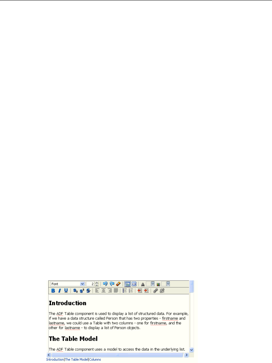
Using ADF Faces Client Behavior Tags
Handling Events 6-23
navigate away from the page. For details see Chapter 20, "Working with
Navigation Components."
■scrollComponentIntoViewBehavior: Enables a command component to
jump to a named component when clicked. For details, see Section 6.6.1, "How to
Use the scrollComponentIntoViewBehavior Tag."
Client behavior tags cancel server-side event delivery automatically. Therefore, any
actionListener or action attributes on the parent component will be ignored.
This cannot be disabled. If you want to also trigger server-side functionality, you
should use either a client-side event (see Section 6.3, "Using JavaScript for ADF Faces
Client Events"), or add an additional client listener that uses AdfCustomEvent and
af:serverListener to deliver a server-side event (see Section 6.4, "Sending Custom
Events from the Client to the Server").
6.6.1 How to Use the scrollComponentIntoViewBehavior Tag
Use the scrollComponentIntoViewBehavior tag when you want the user to be
able to jump to a particular component on a page. This action is similar to an anchor in
HTML. For example, you may want to allow users to jump to a particular part of a
page using a commandLink component. For the richTextEditor and
inlineFrame components, you can jump to a subcomponent. For example,
Figure 6–1 shows a richTextEditor component with a number of sections in its
text. The command links below the editor allow the user to jump to specific parts of
the text.
Figure 6–1 scrollComponentIntoViewBehavior Tag in an Editor
You can also configure the tag to have focus switched to the component to which the
user has scrolled.
Tip: ADF Faces also provides a server-side
scrollComponentIntoView API that can be used when the
component that is to be scrolled to may not yet be rendered on the
page.
For example, if you have a table and you want to be able to scroll to a
specific row, that row may be out of view when the table is first
rendered. You can use the scrollComponentIntoView API as part
of the data fetch event. For more information, see the ADF Faces
JavaDoc.

Using Polling Events to Update Pages
6-24 Web User Interface Developer's Guide for Oracle Application Development Framework
Before you begin:
It may be helpful to have an understanding of behavior tags. For more information,
see Section 6.6, "Using ADF Faces Client Behavior Tags."
To use the scrollComponentIntoViewBehavior tag:
1. Create a command component that the user will click to jump to the named
component. For procedures, see Section 20.3.1, "How to Use Command Buttons
and Command Links."
2. In the Component Palette, from the Operations panel, drag and drop a Scroll
Component Into View Behavior as a child to the command component.
3. In the Insert Scroll Component Into View Behavior dialog, use the dropdown
arrow to select Edit and then navigate to select the component to which the user
should jump.
4. In the Property Inspector, set the focus attribute to true if you want the
component to have focus after the jump.
5. For a richTextEditor or inlineFrame component, optionally enter a value
for the subTargetId attribute. This ID is defined in the value of the
richTextEditor or inlineFrame component.
For example, the value of the subTargetId attribute for the
scrollComponentIntoViewBehavior tag shown in Figure 6–1 is
Introduction. The value of the richTextEditor is bound to the property
shown in Example 6–18. Note that Introduction is the ID for the first header.
Example 6–18 subTargetId Value Defined in a Property
private static final String _RICH_SECTIONED_VALUE =
"<div>\n" +
" <h2>\n" +
" <a id=\"Introduction\"></a>Introduction</h2>\n" +
" <p>\n" +
" The ADF Table component is used to display a list of structured data. For
example,\n" +
" if we have a data structure called Person that has two properties -
firstname and\n" +
" lastname, we could use a Table with two columns - one for firstname, and
the other\n" +
" for lastname - to display a list of Person objects.\n" +
" </p>\n" +
" </div>\n" +
" <div>\n" +
" <h2>\n" +
" <a id=\"The_Table_Model\"></a>The Table Model</h2>\n" +
" <p>\n" +
. . .
</div>";
6.7 Using Polling Events to Update Pages
ADF Faces provides the poll component whose pollEvent can be used to
communicate with the server at specified intervals. For example, you might use the
poll component to update an outputText component, or to deliver a heartbeat to the
server to prevent a user from being timed out of their session.

Using Polling Events to Update Pages
Handling Events 6-25
You need to create a listener for the pollEvent that will be used to do the processing
required at poll time. For example, if you want to use the poll component to update
the value of an outputText component, you would implement a
pollEventListener method that would check the value in the data source and then
update the component.
You can configure the interval time to determine how often the poll component will
deliver its poll event. You also configure the amount of time after which the page will
be allowed to time out. This can be useful, as the polling on a page causes the session
to never time out. Each time a request is sent to the server, a session time out value is
written to the page to determine when to cause a session time out. Because the poll
component will continually send a request to the server (based on the interval time),
the session will never time out. This is expensive both in network usage and in
memory.
To avoid this issue, the web.xml configuration file contains the
oracle.adf.view.rich.poll.TIMEOUT context-parameter, which specifies how
long a page should run before it times out. A page is considered eligible to time out if
there is no keyboard or mouse activity. The default timeout period is set at ten
minutes. So if user is inactive for 10 minutes, that is, does not use the keyboard or
mouse, then the framework stops polling, and from that point on, the page
participates in the standard server-side session timeout (for more information, see
Section A.2.3.22, "Session Timeout Warning").
If the application does time out, when the user moves the mouse or uses the keyboard
again, a new session timeout value is written to the page, and polling starts again.
You can override this time for a specific page using the poll component’s timeout
attribute.
6.7.1 How to Use the Poll Component
When you use the poll component, you normally also create a handler method to
handle the functionality for the polling event.
Before You Begin
It may be helpful to have an understanding of how the attributes can affect
functionality. For more information, see Section 6.7, "Using Polling Events to Update
Pages."
To use a poll component:
1. In a managed bean, create a handler for the poll event. For more information about
managed beans, see Section 3.6, "Creating and Using Managed Beans."
2. Create a poll component by dragging and dropping a Poll from the Operations
panel of the Component Palette.
3. In the Property Inspector, expand the Common section and set the following:
■Interval: Enter the amount of time in milliseconds between poll events. Set to
0 to disable polling.
■PollListener: Enter an EL expression that evaluates to the method in Step 1.
■Timeout: If you want to override the global timeout value in the web.xml file,
set Timeout to the amount of time in milliseconds after which the page will
stop polling and the session will time out.

Using Polling Events to Update Pages
6-26 Web User Interface Developer's Guide for Oracle Application Development Framework

7
Validating and Converting Input 7-1
7Validating and Converting Input
This chapter describes how to add conversion and validation capabilities to ADF Faces
input components in your application. It also describes how to handle and display any
errors, including those not caused by validation.
This chapter includes the following sections:
■Section 7.1, "About ADF Faces Converters and Validators"
■Section 7.2, "Conversion, Validation, and the JSF Lifecycle"
■Section 7.3, "Adding Conversion"
■Section 7.4, "Creating Custom JSF Converters"
■Section 7.5, "Adding Validation"
■Section 7.6, "Creating Custom JSF Validation"
7.1 About ADF Faces Converters and Validators
ADF Faces input components support conversion capabilities. A web application can
store data of many types, such as int, long, and date in the model layer. When
viewed in a client browser, however, the user interface has to present the data in a
manner that can be read or modified by the user. For example, a date field in a form
might represent a java.util.Date object as a text string in the format mm/dd/yyyy.
When a user edits a date field and submits the form, the string must be converted back
to the type that is required by the application. Then the data is validated against any
rules and conditions. Conversely, data stored as something other than a String type
can be converted to a String for display and updating. Many components, such as
af:inputDate, automatically provide a conversion capability.
ADF Faces input components also support validation capabilities. You can add one or
more validator tags to the component. In addition, you can create your own custom
validators to suit your business needs.
Validators and converters have a default hint message that is displayed to users when
they click in the associated field. For converters, the hint usually tells the user the
correct format to use for input values, based on the given pattern. For validators, the
hint is used to convey what values are valid, based on the validation configured for
the component. If conversion or validation fails, associated error messages are
displayed to the user. These messages can be displayed in dialogs, or they can be
displayed on the page itself next to the component whose conversion or validation
failed. For more information about displaying messages in an ADF Faces application,
see Chapter 19, "Displaying Tips, Messages, and Help."

Conversion, Validation, and the JSF Lifecycle
7-2 Web User Interface Developer's Guide for Oracle Application Development Framework
ADF Faces converters is a set of converters that extends the standard JSF converters.
Since ADF Faces Converters for input components operate on the client-side, errors in
conversion can be caught at the client and thus avoid a round trip to the server. You
can easily drag and drop ADF Faces converters into an input component.
ADF Faces validators also augment the standard JSF validators. ADF Faces validators
can operate on both the client and server side. The client-side validators are in written
JavaScript and validation errors caught on the client-side can be processed without a
round-trip to the server.
7.1.1 ADF Faces Converters and Validators Use Cases and Examples
You use ADF Faces converters to convert input from an input component into the
format the model expects. A typical use case is using an input component for entering
numbers and including a converter to convert the string entered by the user into a
number for the model to process. For example, an af:inputText component is used
for a product Id attribute. You add the af:convertNumber converter to the
af:inputText component to convert from String to Number. Another example is
when you have an inputText component for an attribute for the cost of a product. You
can use af:convertNumber to convert the input string into the proper currency
format.
You add validator to input components in the same way to validate the input string.
For instance, you can add a validator to the af:inputText component to check that
the number of digits for the product Id are within the proper range. You add
af:validateLength to af:inputText and set the minimum and maximum
attributes to define the valid digit length.
7.1.2 Additional Functionality for ADF Faces Converters and Validators
You may find it helpful to understand other ADF Faces features before you implement
your converters and validators. Following are links to other sections that may be
useful.
■For detailed information about how conversion and validation works in the JSF
Lifecycle, see Chapter 5, "Using the JSF Lifecycle with ADF Faces."
■ADF Faces lets you customize the detail portion of a conversion error message
instead of a default message. For more information about creating messages, see
Chapter 19, "Displaying Tips, Messages, and Help."
■Instead of entering values for attributes that take strings as values, you can use
property files. These files allow you to manage translation of these strings. For
more information, see Chapter 29, "Internationalizing and Localizing Pages."
7.2 Conversion, Validation, and the JSF Lifecycle
When a form with data is submitted, the browser sends a request value to the server
for each UI component whose editable value attribute is bound. Request values are
decoded during the JSF Apply Request Values phase and the decoded value is saved
locally on the component in the submittedValue attribute. If the value requires
conversion (for example, if it is displayed as a String type but stored as a
java.util.Date object), the data is converted to the correct type during the Process
Validation phase on a per-UI-component basis.
If validation or conversion fails, the lifecycle proceeds to the Render Response phase
and a corresponding error message is displayed on the page. If conversion and

Adding Conversion
Validating and Converting Input 7-3
validation are successful, then the Update Model phase starts and the converted and
validated values are used to update the model.
When a validation or conversion error occurs, the component whose validation or
conversion failed places an associated error message in the queue and invalidates
itself. The current page is then redisplayed with an error message. ADF Faces
components provide a way of declaratively setting these messages.
For detailed information about how conversion and validation works in the JSF
Lifecycle, see Chapter 5, "Using the JSF Lifecycle with ADF Faces."
7.3 Adding Conversion
A web application can store data of many types (such as int, long, date) in the
model layer. When viewed in a client browser, however, the user interface has to
present the data in a manner that can be read or modified by the user. For example, a
date field in a form might represent a java.util.Date object as a text string in the
format mm/dd/yyyy. When a user edits a date field and submits the form, the string
must be converted back to the type that is required by the application. You can set
only one converter on a UI component.
When you create an af:inputText component and set an attribute that is of a type
for which there is a converter, JDeveloper automatically adds that converter’s tag as a
child of the input component. This tag invokes the converter, which will convert the
String type entered by the user back into the type expected by the object.
The JSF standard converters, which handle conversion between String types and
simple data types, implement the javax.faces.convert.Converter interface.
The supplied JSF standard converter classes are:
■BigDecimalConverter
■BigIntegerConverter
■BooleanConverter
■ByteConverter
■CharacterConverter
■DateTimeConverter
■DoubleConverter
■EnumConverter
■FloatConverter
■IntegerConverter
■LongConverter
■NumberConverter
■ShortConverter
Table 7–1 shows the converters provided by ADF Faces.
Adding Conversion
7-4 Web User Interface Developer's Guide for Oracle Application Development Framework
As with validators, the ADF Faces converters are also run on the client side.
If no converter is explicitly added, ADF Faces will attempt to create a converter based
on the data type. Therefore, if the value is bound to any of the following types, you do
not need to explicitly add a converter:
■java.util.Date
■java.util.Color
■java.awt.Color
■java.lang.Number
■java.lang.Integer
■java.lang.Long
■java.lang.Short
■java.lang.Byte
■java.lang.Float
■java.lang.Double
Unlike the converters listed in Table 7–1, the JavaScript-enabled converters are applied
by type and used instead of the standard ones, overriding the class and id
attributes. They do not have associated tags that can be nested in the component.
7.3.1 How to Add a Converter
You can also manually insert a converter into a UI component.
Before you begin:
It may be helpful to have an understanding of converters. For more information, see
Section 7.3, "Adding Conversion."
You may also find it helpful to understand functionality that can be added using other
ADF Faces features. For more information, see Section 7.1.2, "Additional Functionality
for ADF Faces Converters and Validators."
Table 7–1 ADF Faces Converters
Converter Tag Name Description
ColorConverter af:convertColor Converts java.lang.String
objects to java.awt.Color objects.
You specify a set of color patterns as
an attribute of the converter.
DateTimeConverter af:convertDateTime Converts java.lang.String
objects to java.util.Date objects.
You specify the pattern and style of
the date as attributes of the converter.
NumberConverter af:convertNumber Converts java.lang.String
objects to java.lang.Number
objects. You specify the pattern and
type of the number as attributes of
the converter.

Adding Conversion
Validating and Converting Input 7-5
To add ADF Faces converters that have tags:
1. In the Structure window, right-click the component for which you would like to
add a converter.
2. In the context menu, choose Insert inside <UI component>, then ADF Faces to
insert an ADF Faces converter, or JSF Core to insert a JSF converter.
3. Choose a converter tag (for example, ConvertDateTime).
4. In the Property Inspector, set values for the attributes, including any messages for
conversion errors. For additional help, right-click any of the attributes and choose
Help.
You can set multiple patterns for some ADF Faces converters. For more
information, see Section 7.3.2, "How to Set Attributes on a Converter".
ADF Faces lets you customize the detail portion of a conversion error message. By
setting a value for a MessageDetailxyz attribute, where xyz is the conversion error
type (for example, MessageDetailconvertDate), ADF Faces displays the
custom message instead of a default message, if conversion fails. For more
information about creating messages, see Chapter 19, "Displaying Tips, Messages,
and Help."
7.3.2 How to Set Attributes on a Converter
Patterns specify the format of data accepted for conversion. Multiple patterns allow for
more than one format. For example, a user could enter dates using a slash (/) or
hyphen (-) as a separator. Not all converters support multiple patterns, although
pattern matching is flexible and multiple patterns may not be needed.
Example 7–1 illustrates the use of a multiple pattern for the af:convertColor tag in
which "255-255-000" and "FFFF00" are both acceptable values.
Example 7–1 af:convertColor Multiple Patterns
<af:inputColor colorData="#{adfFacesContext.colorPalette.default49}" id="sic3"
label="Select a color" value="#{demoColor.colorValue4}" chooseId="chooseId">
<af:convertColor patterns="rrr-ggg-bbb RRGGBB #RRGGBB"
transparentAllowed="false"/>
</af:inputColor>
Example 7–2 illustrates the use of an af:convertDateTime tag in which "6/9/2007"
and "2007/9/6" are both acceptable values.
Example 7–2 af:convertDateTime Multiple Patterns
<af:inputDate id="mdf5" value="2004/09/06" label="attached converter">
<af:convertDateTime pattern="yyyy/M/d" secondaryPattern="d/M/yyyy" />
</af:inputDate>
Example 7–3 illustrates an af:convertNumber tag with the type attribute set to
currency to accepts "$78.57" and "$078.57" as values for conversion.
Example 7–3 af:convertNumber Set to Currency Attribute
<af:inputText label="type=currency" value="#{validate.currency}">
<af:convertNumber type="currency"/>
</af:inputText>

Creating Custom JSF Converters
7-6 Web User Interface Developer's Guide for Oracle Application Development Framework
7.3.3 What Happens at Runtime
When the user submits the page containing converters, the ADF Faces validate()
method calls the converter's getAsObject() method to convert the String value to
the required object type. When there is not an attached converter and if the component
is bound to a bean property in the model, then ADF checks the model's data type and
attempts to find the appropriate converter. If conversion fails, the component’s valid
attribute is set to false and JSF adds an error message to a queue that is maintained
by FacesContext. If conversion is successful and there are validators attached to the
component, the converted value is passed to the validators. If no validators are
attached to the component, the converted value is stored as a local value that is later
used to update the model.
7.4 Creating Custom JSF Converters
You can create your own converters to meet your specific business needs. You can
create custom JSF converters that run on the server-side using Java, and then also
create a JavaScript version that can run on the client-side. However, unlike custom
validators, you can only attach one converter to a component. You cannot add a
method to a backing bean to provide conversion.
7.4.1 How to Create a Custom JSF Converter
Creating a custom converter requires writing the business logic for the conversion by
creating an implementation of the Converter interface that contains the
getAsObject() and getAsString() methods, and then registering the custom
converter with the application. You then use the f:converter tag and set the custom
converter as a property of that tag, or you can use the converter attribute on the
input component to bind to that converter.
You can also create a client-side version of the converter. ADF Faces client-side
converters work in the same way standard JSF conversion works on the server, except
that JavaScript is used on the client. JavaScript converter objects can throw
ConverterException exceptions and they support the getAsObject() and
getAsString() methods.
Before you begin:
It may be helpful to have an understanding of custom JSF converters. For more
information, see Section 7.4, "Creating Custom JSF Converters."
You may also find it helpful to understand functionality that can be added using other
ADF Faces features. For more information, see Section 7.1.2, "Additional Functionality
for ADF Faces Converters and Validators."
To create a custom JSF converter:
1. Create a Java class that implements the javax.faces.converter.Converter
interface. The implementation must contain a public no-args constructor, a set of
accessor methods for any attributes, and getAsObject and getAsString
methods to implement the Converter interface.
The getAsObject() method takes the FacesContext instance, the UI
component, and the String value to be converted to a specified object, for
example:
public Object getAsObject(FacesContext context,
UIComponent component,
java.lang.String value){

Creating Custom JSF Converters
Validating and Converting Input 7-7
..
}
The getAsString() method takes the FacesContext instance, the UI
component, and the object to be converted to a String value. For example:
public String getAsString(FacesContext context,
UIComponent component,
Object value){
..
}
For more information about these classes, refer to the Javadoc or visit
http://java.sun.com/.
2. Add the needed conversion logic. This logic should use
javax.faces.convert.ConverterException to throw the appropriate
exceptions and javax.faces.application.FacesMessage to generate the
corresponding error messages. For more information about the Converter
interface and the FacesMessage error handlers, see the Javadoc for
javax.faces.convert.ConverterException and
javax.faces.application.FacesMessage, or visit
http://java.sun.com/.
3. If your application saves state on the client, your custom converter must
implement the Serializable interface or the StateHolder interface, and the
saveState(FacesContext) and restoreState(FacesContext, Object)
methods of the StateHolder interface. For more information, see the Javadoc for
the StateHolder interface of javax.faces.component package.
4. Register the converter in the faces-config.xml file.
■Open the faces-config.xml file and select the Overview tab in the editor
window. The faces-config.xml file is located in the <View_
Project>/WEB-INF directory in the JDeveloper Application Navigator.
■In the window, select Converters and click New. Click Help or press F1 for
additional help in registering the converter.
To create a client-side version of the converter:
■Write a JavaScript version of the converter, passing relevant information to a
constructor. Example 7–4 shows the code to implement the interface
org.apache.myfaces.trinidad.convert.ClientConverter, which has
two methods. The first method is getClientScript(), which returns an
implementation of the JavaScript Converter object. The second method is
getClientConversion(), which returns a JavaScript constructor that is used to
instantiate an instance of the converter.
Example 7–4 Interface Converter
function TrConverter()
{
}
/**
* Convert the specified model object value, into a String for display
* @param value Model object value to be converted
* @param label label to identify the editableValueHolder to the user
* @return the value as a string or undefined in case of no converter mechanism is
* available (see TrNumberConverter).
*/

Creating Custom JSF Converters
7-8 Web User Interface Developer's Guide for Oracle Application Development Framework
TrConverter.prototype.getAsString = function(value, label){}
/**
* Convert the specified string value into a model data object
* which can be passed to validators
* @param value String value to be converted
* @param label label to identify the editableValueHolder to the user
* @return the converted value or undefined in case of no converter mechanism is
* available (see TrNumberConverter).
*/
TrConverter.prototype.getAsObject = function(value, label){}
The TrConverter interface can throw a TrConverterException exception, which
should contain a TrFacesMessage error message. Example 7–5 shows the signature
for TrFacesMessage and Example 7–6 shows the signature for
TrFacesException.
Example 7–5 TrFacesMessage Signature
/**
* Message similar to javax.faces.application.FacesMessage
* @param summary - Localized summary message text
* @param detail - Localized detail message text
* @param severity - An optional severity for this message. Use constants
* SEVERITY_INFO, SEVERITY_WARN, SEVERITY_ERROR, and
* SEVERITY_FATAL from the FacesMessage class. Default is
* SEVERITY_INFO
*/
function TrFacesMessage(
summary,
detail,
severity
)
Example 7–6 TrFacesException Signature
/**
* TrConverterException is an exception thrown by the getAsObject() or
getAsString()
* method of a Converter, to indicate that the requested conversion cannot be
performed.
* @param facesMessage the TrFacesMessage associated with this exception
* @param summary Localized summary message text, used to create only if
facesMessage is null
* @param detail Localized detail message text, used only if facesMessage is null
*/
function TrConverterException(
facesMessage,
summary,
detail
Example 7–7 shows an example of a customer converter, SimpleNumberConverter,
written in Java that will run on the server. The custom converter has to implement the
ClientConverter interface.
Example 7–7 Custom Converter SimpleNumberConverter in Java
public class SimpleNumberConverter implements javax.faces.convert.Converter,

Creating Custom JSF Converters
Validating and Converting Input 7-9
org.apache.myfaces.trinidad.convert.ClientConverter
{
public SimpleNumberConverter(boolean isInteger)
{
_isInteger = isInteger;
}
// CONVERTER INTERFACE
public Object getAsObject(FacesContext context, UIComponent component,
String value)
{
// convert to object
}
String getAsString(FacesContext context, UIComponent component, Object value)
{
// convert to string
}
// CLIENTCONVERTER INTERFACE
/**
* Called to retrieve the appropriate client
* conversion code for the node and context.
* For HTML, this will be javascript that will be embedded in a
* script tag. For HTML this method is expected to return a
* constructor of the javascript Converter object
* returned by getClientScript().
*/
public String getClientConversion(FacesContext context, UIComponent component)
{
return "new SimpleNumberConverter(" + Boolean.toString(_isInteger) + ")";
}
public Collection<String> getClientImportNames()
{
// return empty collection
}
public String getClientLibrarySource(FacesContext context)
{
return null;
}
public String getClientScript(FacesContext context, UIComponent component)
{
return null;
}
private boolean _isInteger;
}
You must also create a JavaScript implementation of the custom converter for the
client, as shown in Example 7–8.
Example 7–8 Client-side Implementation of SimpleNumberConverter in JavaScript
/**
* constructor of client side SimpleNumberConverter class
*/
function SimpleNumberConverter(isInteger)
{
this._isInteger = isInteger;
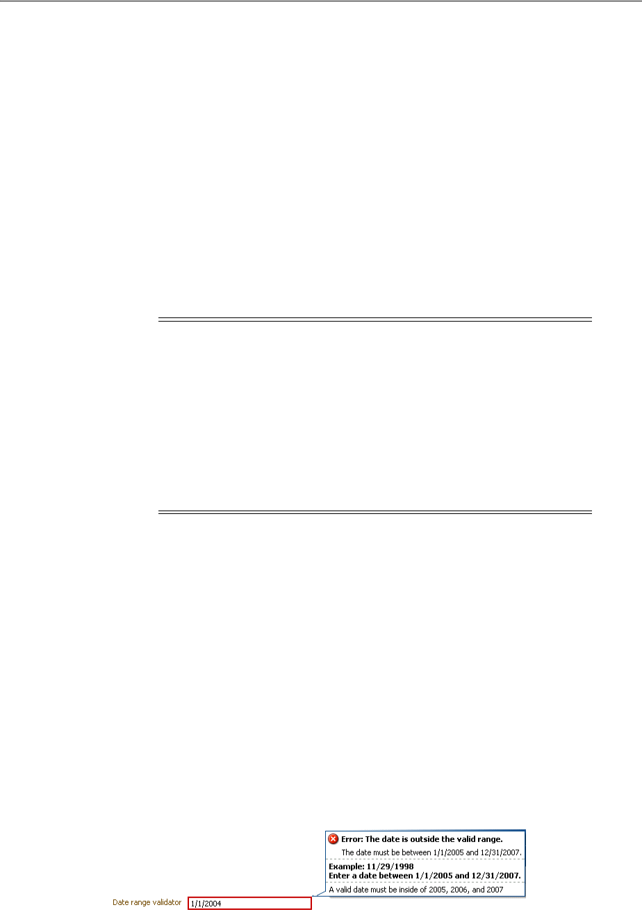
Adding Validation
7-10 Web User Interface Developer's Guide for Oracle Application Development Framework
}
// Inherit object properties from base class if desired.
SimpleNumberConverter.prototype = new SimpleConverter();
SimpleNumberConverter.prototype.getAsString = function(number,label)
{
// convert to string
}
SimpleNumberConverter.prototype.getAsObject = function(numberString,label)
{
// convert to object
}
To use a custom converter on a JSF page:
■Bind your converter class to the converter attribute of the input component.
7.4.2 What Happens When You Use a Custom Converter
When you use a custom converter, the application accesses the converter class
referenced in the converter attribute, and executes the getAsObject or
getAsString method as appropriate. These methods access the data from the
component and execute the conversion logic.
7.5 Adding Validation
You can add validation so that when a user edits or enters data in a field and submits
the form, the data is validated against any set rules and conditions. If validation fails,
the application displays an error message. For example, in Figure 7–1 a specific date
range for user input with a message hint is set by the af:validateDateTimeRange
component and an error message is displayed in the message popup window when an
invalid value is entered.
Figure 7–1 Date Range Validator with Error Message
Note: If a custom converter is registered in an application under a
class for a specific data type, whenever a component's value
references a value binding that has the same type as the custom
converter object, JSF will automatically use the converter of that class
to convert the data. In that case, you do not need to use the
converter attribute to register the custom converter on a
component, as shown in the following code:
<af:inputText value="#{myBean.myProperty}"/>
The myProperty data type has the same type as the custom
converter.

Adding Validation
Validating and Converting Input 7-11
On the view layer use ADF Faces validation when you want client-side validation. All
validators provided by ADF Faces have a client-side peer. Many components have
attributes that provide validation. For information, see Section 7.5.1.2, "Using
Validation Attributes." In addition, ADF Faces provides separate validation classes
that can be run on both the client and the server. For details, see Section 7.5.1.3, "Using
ADF Faces Validators." You can also create your own validators. For information about
custom validators, see Section 7.6.3, "How to Create a Custom JSF Validator."
7.5.1 How to Add Validation
Set ADF Faces validation on the input component and an error message is displayed
inline or in a popup window on the page. For more information about displaying
messages created by validation errors, see Chapter 19, "Displaying Tips, Messages, and
Help."
Before you begin:
It may be helpful to have an understanding of ADF validation. For more information,
see Section 7.5, "Adding Validation."
You may also find it helpful to understand functionality that can be added using other
ADF Faces features. For more information, see Section 7.1.2, "Additional Functionality
for ADF Faces Converters and Validators."
7.5.1.1 Adding ADF Faces Validation
By default, ADF Faces syntactic and semantic validation occurs on both the client and
server side. Client-side validation allows validators to catch and display data without
requiring a round-trip to the server.
ADF Faces provides the following types of validation:
■UI component attributes: ADF Faces input components provide attributes that can
be used to validate data. For example, you can supply simple validation using the
required attribute on ADF Faces input components to specify whether or not a
value must be supplied. When the required attribute is set to true, the
component must have a value. Otherwise the application displays an error
message. For more information, see Section 7.5.1.2, "Using Validation Attributes."
■Default ADF Faces validators: The validators supplied by the JSF framework
provide common validation checks, such as validating date ranges and validating
the length of entered data. For more information, see Section 7.5.1.3, "Using ADF
Faces Validators."
■Custom ADF Faces validators: You can create your own validators and then select
them to be used in conjunction with UI components. For more information, see
Section 7.6, "Creating Custom JSF Validation."
7.5.1.2 Using Validation Attributes
Many ADF Faces UI components have attributes that provide simple validation. For
example, the af:inputDate component has maxValue and minValue attributes to
specify the maximum and minimum number allowed for the Date value.
For additional help with UI component attributes, in the Property Inspector, right-click
the attribute name and choose Help.

Adding Validation
7-12 Web User Interface Developer's Guide for Oracle Application Development Framework
7.5.1.3 Using ADF Faces Validators
ADF Faces Validators are separate classes that can be run on the server or client.
Table 7–2 describes the validators and their logic.
To add ADF Faces validators:
1. In the Structure window, right-click the component for which you would like to
add a validator.
2. In the context menu, choose Insert inside <UI component>, then ADF Faces to
insert an ADF Faces validator, or JSF Core to insert a JSF reference implementation
validator.
Table 7–2 ADF Faces Validators
Validator Tag Name Description
ByteLengthValidator af:validateByteLength Validates the byte length
of strings when encoded.
The maximumLength
attribute of inputText is
similar, but it limits the
number of characters that
the user can enter.
DateRestrictionValidator af:validateDateRestriction Validates that the entered
date is valid with some
given restrictions.
DateTimeRangeValidator af:validateDateTimeRange Validates that the entered
date is within a given
range. You specify the
range as attributes of the
validator.
DoubleRangeValidator af:validateDoubleRange Validates that a
component value is
within a specified range.
The value must be
convertible to a
floating-point type.
LengthValidator af:validateLength Validates that the length
of a component value is
within a specified range.
The value must be of type
java.lang.String.
LongRangeValidator af:validateLongRange Validates that a
component value is
within a specified range.
The value must be any
numeric type or String
that can be converted to a
long data type.
RegExpValidator af:validateRegExp Validates the data using
Java regular expression
syntax.
Note: To register a custom validator on a component, use a standard
JSF f:validator tag. For information about using custom
validators, see Section 7.6, "Creating Custom JSF Validation."
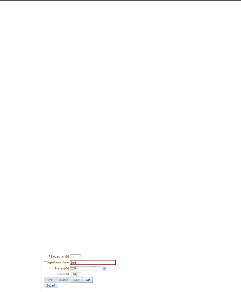
Adding Validation
Validating and Converting Input 7-13
3. Choose a validator tag (for example, ValidateDateTimeRange).
4. In the Property Inspector, set values for the attributes, including any messages for
validation errors. For additional help, right-click any of the attributes and choose
Help.
ADF Faces lets you customize the detail portion of a validation error message. By
setting a value for a MessageDetailxyz attribute, where xyz is the validation error
type (for example, MessageDetailmaximum), ADF Faces displays the custom
message instead of a default message, if validation fails.
7.5.2 What Happens at Runtime
When the user submits the page, ADF Faces checks the submitted value and runs
conversion on any non-null value. The converted value is then passed to the
validate() method. If the value is empty, the required attribute of the component
is checked and an error message is generated if indicated. If the submitted value is
non-null, the validation process continues and all validators on the component are
called in order of their declaration.
ADF Faces validation is performed during the Process Validations phase. If any errors
are encountered, the components are invalidated and the associated messages are
added to the queue in the FacesContext instance. The Update Model phase only
happens when if there are no errors converting or validating. Once all validation is run
on the components, control passes to the model layer, which runs the Validate Model
Updates phase. As with the Process Validations phase, if any errors are encountered,
the components are invalidated and the associated messages are added to the queue in
the FacesContext instance.
The lifecycle then goes to the Render Response phase and redisplays the current page.
If the component generates an error, ADF Faces automatically highlights the error. For
instance, ADF Faces renders a red box around an inputText component when there is
a validation error, as shown in Figure 7–2.
Figure 7–2 Validation Error
For more information about adding error messages when a validation or conversion
error occurs, see Section 19.3, "Displaying Hints and Error Messages for Validation and
Conversion."
7.5.3 What You May Need to Know About Multiple Validators
You can set zero or more validators on a UI component. You can set the required
attribute and use validators on a component. However, if you set the required
Note: ADF Faces provides extensions to the standard JSF validators,
which have client-side support.

Creating Custom JSF Validation
7-14 Web User Interface Developer's Guide for Oracle Application Development Framework
attribute to true and the value is null or a zero-length string, the component is
invalidated and any other validators registered on the component are not called.
This combination might be an issue if there is a valid case for the component to be
empty. For example, if the page contains a Cancel button, the user should be able to
click that button and navigate off the page without entering any data. To handle this
case, you set the immediate attribute on the Cancel button’s component to true.
This attribute allows the action to be executed during the Apply Request Values phase.
Then the default JSF action listener calls FacesContext.renderResponse(), thus
bypassing the validation whenever the action is executed. For more information see
Chapter 5, "Using the JSF Lifecycle with ADF Faces."
7.6 Creating Custom JSF Validation
You can add your own validation logic to meet your specific business needs. If you
want custom validation logic for a component on a single page, you can create a
validation method on the page’s backing bean.
If you want to create logic that will be reused by various pages within the application,
or if you want the validation to be able to run on the client side, you should create a
JSF validator class. You can then create an ADF Faces version, which will allow the
validator to run on the client.
7.6.1 How to Create a Backing Bean Validation Method
When you want custom validation for a component on a single page, create a method
that provides the required validation on a backing bean.
Before you begin:
It may be helpful to have an understanding of custom JSF validation. For more
information, see Section 7.6, "Creating Custom JSF Validation."
You may also find it helpful to understand functionality that can be added using other
ADF Faces features. For more information, see Section 7.1.2, "Additional Functionality
for ADF Faces Converters and Validators."
To add a backing bean validation method:
1. Insert the component that will require validation into the JSF page.
2. In the visual editor, double-click the component to open the Bind Validator
Property dialog.
3. In the Bind Validator Property dialog, enter or select the managed bean that will
hold the validation method, or click New to create a new managed bean. Use the
default method signature provided or select an existing method if the logic already
exists.
When you click OK in the dialog, JDeveloper adds a skeleton method to the code
and opens the bean in the source editor.
4. Add the required validation logic. This logic should use the
javax.faces.validator.ValidatorException exception to throw the
appropriate exceptions and the javax.faces.application.FacesMessage
error message to generate the corresponding error messages. For more information
about the Validator interface and FacesMessage, see the Javadoc for
javax.faces.validator.ValidatorException and
javax.faces.application.FacesMessage, or visit
http://java.sun.com/.

Creating Custom JSF Validation
Validating and Converting Input 7-15
7.6.2 What Happens When You Create a Backing Bean Validation Method
When you create a validation method, JDeveloper adds a skeleton method to the
managed bean you selected. Example 7–9 shows the code JDeveloper generates.
Example 7–9 Managed Bean Code for a Validation Method
public void inputText_validator(FacesContext facesContext,
UIComponent uiComponent, Object object) {
// Add event code here...
}
When the form containing the input component is submitted, the method to which the
validator attribute is bound is executed.
7.6.3 How to Create a Custom JSF Validator
Creating a custom validator requires writing the business logic for the validation by
creating a Validator implementation of the interface, and then registering the
custom validator with the application. You can also create a tag for the validator, or
you can use the f:validator tag and the custom validator as an attribute for that
tag.
You can then create a client-side version of the validator. ADF Faces client-side
validation works in the same way that standard validation works on the server, except
that JavaScript is used on the client. JavaScript validator objects can throw
ValidatorExceptions exceptions and they support the validate() method.
Before you begin:
It may be helpful to have an understanding of custom JSF validation. For more
information, see Section 7.6, "Creating Custom JSF Validation."
You may also find it helpful to understand functionality that can be added using other
ADF Faces features. For more information, see Section 7.1.2, "Additional Functionality
for ADF Faces Converters and Validators."
To create a custom JSF validator:
1. Create a Java class that implements the javax.faces.validator.Validator
interface. The implementation must contain a public no-args constructor, a set of
accessor methods for any attributes, and a validate method to implement the
Validator interface.
public void validate(FacesContext facesContext,
UIComponent uiComponent,
Object object)
throws ValidatorException {
..
}
For more information about these classes, refer to the Javadoc or visit
http://java.sun.com/.
2. Add the needed validation logic. This logic should use the
javax.faces.validate.ValidatorException exception to throw the
appropriate exceptions and the javax.faces.application.FacesMessage
error message to generate the corresponding error messages. For more information
about the Validator interface and FacesMessage, see the Javadoc for
javax.faces.validate.ValidatorException and

Creating Custom JSF Validation
7-16 Web User Interface Developer's Guide for Oracle Application Development Framework
javax.faces.application.FacesMessage, or visit
http://java.sun.com/.
3. If your application saves state on the client, your custom validator must
implement the Serializable interface, or the StateHolder interface, and the
saveState(FacesContext) and restoreState(FacesContext, Object)
methods of the StateHolder interface. For more information, see the Javadoc for
the StateHolder interface of the javax.faces.component package.
4. Register the validator in the faces-config.xml file.
■Open the faces-config.xml file and select the Overview tab in the editor
window. The faces-config.xml file is located in the <View_
Project>/WEB-INF directory.
■In the window, select Validators and click New. Click Help or press F1 for
additional help in registering the validator.
To create a client-side version of the validator:
1. Write a JavaScript version of the validator, passing relevant information to a
constructor.
2. Implement the interface
org.apache.myfaces.trinidad.validator.ClientValidator, which
has two methods. The first method is getClientScript(), which returns an
implementation of the JavaScript Validator object. The second method is
getClientValidation(), which returns a JavaScript constructor that is used to
instantiate an instance of the validator.
Example 7–10 shows a validator in Java.
Example 7–10 Java Validator
public String getClientValidation(
FacesContext context,
UIComponent component)
{
return ("new SSNValidator('Invalid social security number.','Value \"{1}\"
must start with \"123\".')");
}
The Java validator calls the JavaScript validator shown in Example 7–11.
Example 7–11 Client-side JavaScript Validator
function SSNValidator(summary, detail)
{
this._detail = detail;
this._summary = summary;
}
To use a custom validator on a JSF page:
■To use a custom validator that has a tag on a JSF page, you must manually nest it
inside the component’s tag.
Example 7–12 shows a custom validator tag nested inside an inputText
component. Note that the tag attributes are used to provide the values for the
validator’s properties that were declared in the faces-config.xml file.

Creating Custom JSF Validation
Validating and Converting Input 7-17
Example 7–12 A Custom Validator Tag on a JSF Page
<h:inputText id="empnumber" required="true">
<hdemo:emValidator emPatterns="9999|9 9 9 9|9-9-9-9" />
</h:inputText>
To use a custom validator without a custom tag:
To use a custom validator without a custom tag, nest the validator’s ID (as configured
in faces-config.xml file) inside the f:validator tag. The validator’s ID attribute
supports EL expression such that the application can dynamically determine the
validator to use.
1. From the Structure window, right-click the input component for which you want
to add validation, and choose Insert inside component > ADF Faces Core >
Validator.
2. Select the validator’s ID from the dropdown list and click OK.
JDeveloper inserts code on the JSF page that makes the validator ID a property of
the f:validator tag.
Example 7–13 shows the code on a JSF page for a validator using the f:validator
tag.
Example 7–13 A Custom Validator Nested Within a Component on a JSF Page
<af:inputText id="empnumber" required="true">
<f:validator validatorID="emValidator"/>
</af:inputText>
7.6.4 What Happens When You Use a Custom JSF Validator
When you use a custom JSF validator, the application accesses the validator class
referenced in either the custom tag or the f:validator tag and executes the
validate() method. This method executes logic against the value that is to be
validated to determine if it is valid. If the validator has attributes, those attributes are
also accessed and used in the validation routine. Like standard validators, if the
custom validation fails, associated messages are placed in the message queue in the
FacesContext instance.

Creating Custom JSF Validation
7-18 Web User Interface Developer's Guide for Oracle Application Development Framework

8
Rerendering Partial Page Content 8-1
8Rerendering Partial Page Content
This chapter describes how to use the partial page render features provided with
ADF Faces components to rerender areas of a page without rerendering the whole
page.
This chapter includes the following sections:
■Section 8.1, "About Partial Page Rendering"
■Section 8.2, "Enabling Partial Page Rendering Declaratively"
■Section 8.3, "Enabling Partial Page Rendering Programmatically"
■Section 8.4, "Using Partial Page Navigation"
8.1 About Partial Page Rendering
Ajax (Asynchronous JavaScript and XML) is a web development technique for creating
interactive web applications, where web pages appear more responsive by exchanging
small amounts of data with the server behind the scenes, without the whole web page
being rerendered. The effect is to improve a web page's interactivity, speed, and
usability.
With ADF Faces, the feature that delivers the Ajax partial page render behavior is
called partial page rendering (PPR). PPR allows certain components on a page to be
rerendered without the need to rerender the entire page. For example, an output
component can display what a user has chosen or entered in an input component, or a
command link or button can cause another component on the page to be rerendered,
without the whole page rerendering.
In order for PPR to work, boundaries must be set on the page that allow the lifecycle to
run just on components within the boundary. In order to determine the boundary, the
framework must be notified of the root component to process. The root component can
be identified in two ways:
■Events: Certain events indicate a component as a root. For example, the disclosure
event sent when expanding or collapsing a showDetail component (see
Section 9.8, "Displaying and Hiding Contents Dynamically"), indicates that the
showDetail component is a root. When the showDetail component is
expanded or collapsed, only that component goes through the lifecycle. Other
examples of events identifying a root component are the disclosure event when
expanding nodes on a tree, or the sort event on a table. For a complete list of
events that have corresponding event root components, see Table 6–1 in
Section 6.1.1, "Events and Partial Page Rendering."
■Components: Certain components are recognized as a boundary, and therefore a
root component. For example, the framework knows a popup dialog is a

Enabling Partial Page Rendering Declaratively
8-2 Web User Interface Developer's Guide for Oracle Application Development Framework
boundary. No matter what event is triggered inside a dialog, the lifecycle does not
run on components outside the dialog. It runs only on the popup.
In addition to built-in PPR functionality, you can configure components to use
cross-component rendering, which allows you to set up dependencies so that one
component acts as a trigger and another as the listener. When an event occurs on the
trigger component, the lifecycle is run only on listener components and child
components to the listener, and only the listener components and their children are
rerendered. Cross-component rendering can be implemented declaratively. However,
by default, all events from a trigger component will cause PPR (note that some
components, such as table, trigger partial targets on only a subset of their events). For
these cases where you need strict control over the event that launches PPR, or for cases
where you want to use some logic to determine the target, you can implement PPR
programatically.
Additionally, ADF Faces applications can use PPR for navigation. In standard JSF
applications, the navigation from one page to the next requires the new page to be
rendered. When using Ajax-like components, this can cause overhead because of the
time needed to download the different JavaScript libraries and style sheets. To avoid
this costly overhead, the ADF Faces architecture can optionally simulate full-page
transitions while actually remaining on a single page, thereby avoiding the need to
reload JavaScript code and skin styles.
8.2 Enabling Partial Page Rendering Declaratively
Using the simplest form of cross-component rendering, one component, referred to as
the target component, is rerendered when any event occurs on another component,
referred to as the trigger component.
For example, as shown in Figure 8–1, the File Explorer application contains a table that
shows the search results in the Search panel. This table (and only this table) is
rerendered when the search button is activated. The search button is configured to be
the trigger and the table is configured to be the target.
Tip: If your application uses the Fusion technology stack, you can
enable the automatic partial page rendering feature on any page. This
causes any components whose values change as a result of backend
business logic to be automatically rerendered. For more information,
see the "What You May Need to Know About Automatic Partial Page
Rendering" section of the Oracle Fusion Middleware Fusion Developer's
Guide for Oracle Application Development Framework.
Note: The browser must have JavaScript enabled for PPR to work.
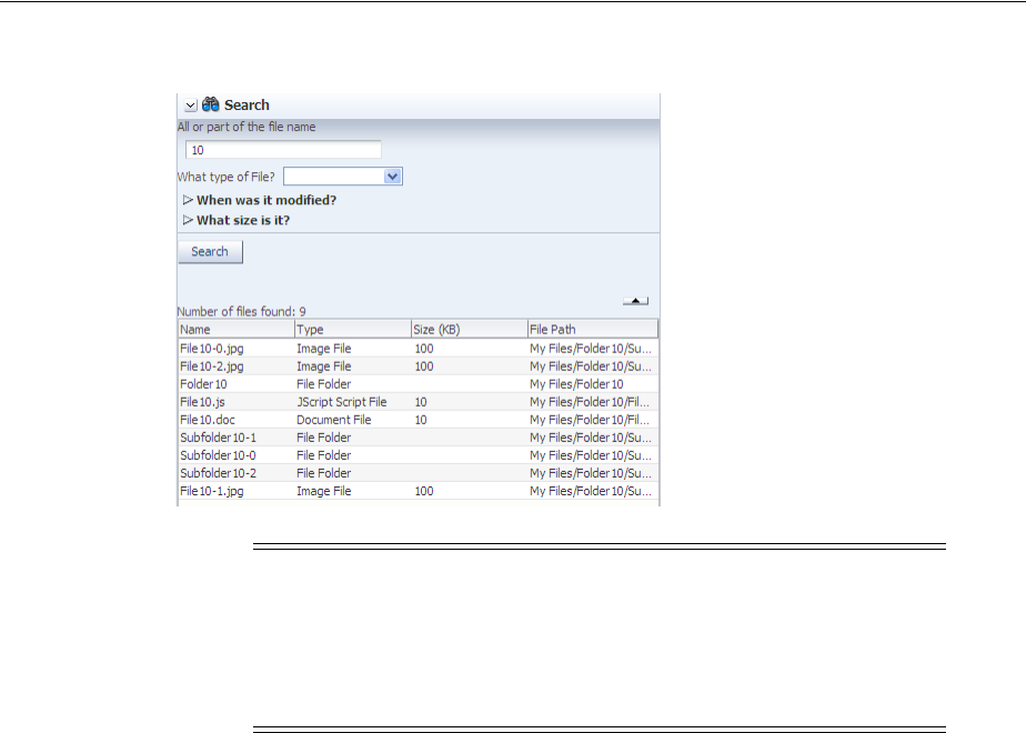
Enabling Partial Page Rendering Declaratively
Rerendering Partial Page Content 8-3
Figure 8–1 The Search Button Causes Results Table to Rerender
Trigger components must inform the framework that a PPR request has occurred. On
command components, this is achieved by setting the partialSubmit attribute to
true. Doing this causes the command component to fire a partial page request each
time it is clicked.
For example, say a page includes an inputText component, a commandButton
component, and an outputText component. When the user enters a value for the
inputText component, and then clicks the commandButton component, the input
value is reflected in the outputText component. You would set the partialSubmit
attribute to true on the commandButton component.
However, components other than command components can trigger PPR. ADF Faces
input and select components have the ability to trigger partial page requests
automatically whenever their values change. To make use of this functionality, use the
autoSubmit attribute of the input or select component so that as soon as a value is
entered, a submit occurs, which in turn causes a valueChangeEvent event to occur.
It is this event that notifies the framework to execute a PPR, as long as a target
component is set. In the previous example, you could delete the commandButton
component and instead set the inputText component’s autoSubmit attribute to
true. Each time the value changes, a PPR request will be fired.
Note: In some cases, you may want a component to be rerendered
only when a particular event is fired, not for every event associated
with the trigger component, or you may want some logic to determine
whether a component is to be rerendered. In these cases, you can
programatically enable PPR. For more information, see Section 8.3,
"Enabling Partial Page Rendering Programmatically."

Enabling Partial Page Rendering Declaratively
8-4 Web User Interface Developer's Guide for Oracle Application Development Framework
Once PPR is triggered, any component configured to be a target will be rerendered.
You configure a component to be a target by setting the partialTriggers attribute
to the relative ID of the trigger component. For information about relative IDs, see
Section 4.5, "Locating a Client Component on a Page."
In the example, to update the outputText in response to changes to the inputText
component, you would set its partialTriggers attribute to the inputText
component’s relative ID.
8.2.1 How to Enable Partial Page Rendering
For a component to be rerendered based on an event caused by another component, it
must declare which other components are the triggers.
Before you begin:
It may be helpful to have an understanding of declarative partial page rendering. For
more information, see Section 8.2, "Enabling Partial Page Rendering Declaratively."
To enable a component to rerender another component:
1. In the Structure window, select the trigger component (that is, the component
whose action will cause the PPR):
■Expand the Common section of the Property Inspector and set the id attribute
if it is not already set. Note that the value must be unique within that
component’s naming container. If the component is not within a naming
Tip: The autoSubmit attribute on an input component and the
partialSubmit attribute on a command component are not the
same thing. When partialSubmit is set to true, then only the
components that have values for their partialTriggers attribute
will be processed through the lifecycle. The autoSubmit attribute is
used by input and select components to tell the framework to
automatically do a form submit whenever the value changes.
However, when a form is submitted and the autoSubmit attribute is
set to true, a valueChangeEvent event is invoked, and the lifecycle
runs only on the components marked as root components for that
event, and their children. For more information, see Section 5.3,
"Using the Optimized Lifecycle."
Note: Certain events on components trigger PPR by default, for
example the disclosure event on the showDetail component and
the sort event on a table. This means that any component configured
to be a target by having its partialTriggers attribute set to that
component’s ID will rerender when these types of events occur.
Note: If your trigger component is an inputLov or an
inputComboBoxLov, and the target component is an input
component set to required, then a validation error will be thrown
for the input component when the LOV popup is displayed. To avoid
this, you must use programmatic partial page rendering. For more
information, see Section 8.3, "Enabling Partial Page Rendering
Programmatically."

Enabling Partial Page Rendering Declaratively
Rerendering Partial Page Content 8-5
container, then the ID must be unique to the page. For more information about
naming containers, see Section 4.5, "Locating a Client Component on a Page."
■If the trigger component is a command component, expand the Behavior
section of the Property Inspector, and set the partialSubmit attribute to
true.
■If the trigger component is an input or select component in a form and you
want the value to be submitted, expand the Behavior section of the Property
Inspector, and set the autoSubmit attribute of the component to true.
2. In the Structure window, select the target component that you want to rerender
when a PPR-triggering event takes place.
3. Expand the Behavior section of the Property Inspector, click the dropdown menu
for the partialTriggers attribute and choose Edit.
4. In the Edit Property dialog, shuttle the trigger component to the Selected panel
and click OK. If the trigger component is within a naming container, JDeveloper
automatically creates the relative path for you.
Example 8–1 shows a commandLink component configured to execute PPR.
Example 8–1 Code for Enabling Partial Page Rendering Through a Partial Submit
<af:commandLink id="deleteFromCart" partialSubmit="true"
actionListener="#{homeBean...}">
Example 8–2 shows an outputText component that will be rerendered when the
command link with ID deleteFromCart in Example 8–1 is clicked.
Example 8–2 Code for Partial Page Rendering Triggered by Another Component
<af:outputText id="estimatedTotalInPopup"
partialTriggers="deleteFromCart"
value="#{shoppingCartBean...}"/>
Tip: JDeveloper automatically assigns component IDs. You can
safely change this value. A component’s ID must be a valid XML
name, that is, you cannot use leading numeric values or spaces in the
ID. JSF also does not permit colons ( : ) in the ID.
Note: Set the autoSubmit attribute to true only if you want the
component to submit its value. If you do not want to submit the value,
then some other logic must cause the component to issue a
ValueChangeEvent event. That event will cause PPR by default and
any component that has the trigger component as its value for the
partialTriggers attribute will be rerendered.
Tip: The selectBooleanRadio components behave like a single
component with partial page rendering;, however, they are in fact
multiple components. Therefore, if you want other components (such
as inputText components) to change based on selecting a different
selectBooleanRadio component in a group, you must group them
within a parent component, and set the partialTriggers attribute
of the parent component to point to all of the SelectBooleanRadio
components.

Enabling Partial Page Rendering Programmatically
8-6 Web User Interface Developer's Guide for Oracle Application Development Framework
8.2.2 What You May Need to Know About Using the Browser Back Button
In an ADF Faces application, because some components use PPR (either implicitly or
because they have been configured to listen for a partial trigger), what happens when
a user clicks the browser’s back button is slightly different than in an application that
uses simple JSF components.
In an application that uses simple JSF components, when the user clicks the browser’s
back button, the browser returns the page to the state of the DOM (document object
model) as it was when last rendered, but the state of the JavaScript is as it was when
the user first entered the page.
For example, suppose a user visited PageA. After the user interacts with components
on the page, say a PPR event took place using JavaScript. Let’s call this new version of
the page PageA1. Next, say the user navigates to PageB, then clicks the browser back
button to return to PageA. The user will be shown the DOM as it was on PageA1, but
the JavaScript will not have run, and therefore parts of the page will be as they were
for PageA. This might mean that changes to the page will be lost. Refreshing the page
will run the JavaScript and so return the user to the state it was in PageA1. In an
application that uses ADF Faces, the refresh is not needed; the framework provides
built-in support so that the JavaScript is run when the back button is clicked.
8.2.3 What You May Need to Know About PPR and Screen Readers
Screen readers do not reread the full page in a partial page request. PPR causes the
screen reader to read the page starting from the component that fired the partial page
request. You should place the target components after the component that triggers the
partial request; otherwise, the screen reader would not read the updated target
components.
8.3 Enabling Partial Page Rendering Programmatically
For components such as tables that have many associated events, PPR will happen any
time any event is triggered, causing any component with the table as a partial trigger
to be rerendered each time. If you want the target to be rerendered only for certain
events, or if you want a target to be rerendered based on some other logic, you can
enable partial page rendering programmatically.
8.3.1 How to Enable Partial Page Rendering Programmatically
You use the addPartialTarget method to enable partial page rendering.
Before you begin:
It may be helpful to have an understanding of programmatic partial page rendering.
For more information, see Section 8.3, "Enabling Partial Page Rendering
Programmatically."
How to enable PPR programatically:
1. Create a listener method for the event that should cause the target component to
be rerendered.
Tip: You can use PPR to prevent components from being validated
on a page. For more information, see Section 5.3, "Using the
Optimized Lifecycle."

Using Partial Page Navigation
Rerendering Partial Page Content 8-7
Use the addPartialTarget() method to add the component (using its ID) as a
partial target for an event, so that when that event is triggered, the partial target
component is rerendered. Using this method associates the component you want
to have rerendered with the event that is to trigger the rerendering.
For example, the File Explorer application contains the
NavigatorManager.refresh() method. When invoked, the navigator
accordion is rerendered.
Example 8–3 Rerendering Using Partial Targets
public void refresh()
{
for (BaseNavigatorView nav: getNavigators())
{
nav.refresh();
}
AdfFacesContext adfFacesContext = AdfFacesContext.getCurrentInstance();
adfFacesContext.addPartialTarget(_navigatorAccordion);
}
2. In the JSF page, select the target component. In the Property Inspector, enter a
component ID and set ClientComponent to true.
3. In the Property Inspector, find the listener for the event that will cause the refresh
and bind it to the listener method created in Step 1.
8.4 Using Partial Page Navigation
Instead of performing a full page transition in the traditional way, you can configure
an ADF Faces application to have navigation triggered through a PPR request. The
new page is sent to the client using PPR. Partial page navigation is disabled by default.
When partial page navigation is used, in order to keep track of location (for example,
for bookmarking purposes, or when a refresh occurs), the framework makes use of the
hash portion of the URL. This portion of the URL contains the actual page being
displayed in the browser.
Additionally, JavaScript and CSS will not be loaded for each page. You must use the
resource tag to include JavaScript and CSS content specific to the current page.
Using the <f:verbatim> or <trh:stylesheet> tags will not work. For more
information, see Section 4.3, "Adding JavaScript to a Page."
When partial page navigation is enabled in an application, get requests are supported
for the following ADF Faces components:
■goButton
■goLink
■goImageLink
■goMenuItem
■commandNavigationItem
Note: You must set the clientComponent attribute to true to
ensure that a client ID will be generated.
Using Partial Page Navigation
8-8 Web User Interface Developer's Guide for Oracle Application Development Framework
8.4.1 How to Use Partial Page Navigation
You can turn partial page navigation on by setting the
oracle.adf.view.rich.pprNavigation.OPTIONS context parameter in the
web.xml file to on.
Before you begin:
It may be helpful to have an understanding of partial page navigation. For more
information, see Section 8.4, "Using Partial Page Navigation."
To use partial page navigation:
1. Double-click the web.xml file.
2. In the source editor, change the
oracle.adf.view.rich.pprNavigation.OPTIONS parameter to one of the
following:
■on: Enables partial page navigation.
■onWithForcePPR: Enables partial page navigation and notifies the
framework to use the PPR channel for all action events, even those that do not
result in navigation. Since partial page navigation requires that the action
event be sent over PPR channel, use this option to easily enable partial page
navigation.
When partial page navigation is used, normally only the visual contents of the
page are rerendered (the header content remains constant for all pages).
However, the entire document will be rerendered when an action on the page
is defined to use full page submit and also when an action does not result in
navigation.
8.4.2 What You May Need to Know About PPR Navigation
Before using PPR navigation, you should be aware of the following:
■When using PPR navigation, all pages involved in this navigation must use the
same CSS skin.
■Because PPR navigation makes use of the hash portion of the URL, you cannot use
the hash portion for navigation to anchors within the page.
■You must use the resource tag to include JavaScript and CSS content specific to
the current page.
Note: PPR get requests are not supported in Internet Explorer.
When using that browser, URLs will be loaded using a standard get
request.
For other browsers, get requests for these components are only
supported for pages within an application.
Note: If you set the parameter to on, then you need to set the
partialSubmit attribute to true for any command components
involved in navigation.

Using Partial Page Navigation
Rerendering Partial Page Content 8-9
■Unlike regular page navigation, partial navigation will not result in JavaScript
globals (variables and functions defined in global scope) being unloaded. This
happens because the window object survives partial page transition. Applications
wishing to use page-specific global variables and/or functions must use the
AdfPage.getPageProperty() and AdfPage.setPageProperty() methods
to store these objects.

Using Partial Page Navigation
8-10 Web User Interface Developer's Guide for Oracle Application Development Framework


9
Organizing Content on Web Pages 9-1
9Organizing Content on Web Pages
This chapter describes how to use several of the ADF Faces layout components to
organize content on web pages.
This chapter includes the following sections:
■Section 9.1, "About Organizing Content on Web Pages"
■Section 9.2, "Starting to Lay Out a Page"
■Section 9.3, "Arranging Contents to Stretch Across a Page"
■Section 9.4, "Using Splitters to Create Resizable Panes"
■Section 9.5, "Arranging Page Contents in Predefined Fixed Areas"
■Section 9.6, "Arranging Content in Forms"
■Section 9.7, "Arranging Contents in a Dashboard"
■Section 9.8, "Displaying and Hiding Contents Dynamically"
■Section 9.9, "Displaying or Hiding Contents in Accordion Panels and Tabbed
Panels"
■Section 9.10, "Displaying Items in a Static Box"
■Section 9.11, "Displaying a Bulleted List in One or More Columns"
■Section 9.12, "Grouping Related Items"
■Section 9.13, "Separating Content Using Blank Space or Lines"
9.1 About Organizing Content on Web Pages
ADF Faces provides a number of layout components that can be used to arrange other
components on a page. Usually, you begin building your page with these components.
You then add components that provide other functionality (for example rendering
data or rendering buttons) either inside facets or as child components to these layout
components.
In addition to layout components that simply act as containers, ADF Faces also
provides interactive layout components that can display or hide their content, or that
provide sections, lists, or empty space. Some layout components also provide
Tip: You can create page templates that allow you to design the
layout of pages in your application. The templates can then be used by
all pages in your application. For more information, see Chapter 10,
"Creating and Reusing Fragments, Page Templates, and Components."
About Organizing Content on Web Pages
9-2 Web User Interface Developer's Guide for Oracle Application Development Framework
geometry management functionality, such as stretching their contents to fit the
browser windows as the window is resized, or the capability to be stretched when
placed inside a component that stretches. For more information about stretching and
other geometry management functionality of layout components, see Section 9.2.1,
"Geometry Management and Component Stretching."
Table 9–1 briefly describes each of the ADF Faces layout components.
Table 9–1 ADF Faces Layout Components
Component Description
Can Stretch
Children Can Be Stretched
Page Management Components
document Creates each of the standard root elements
of an HTML page: <html>, <body>, and
<head>. All pages must contain this
component. For more information, see
Section 9.2, "Starting to Lay Out a Page."
X
form Creates an HTML <form> element. For
more information, see Section 9.2, "Starting
to Lay Out a Page."
Page Layout Containers
panelStretchLayout Contains top, bottom, start, center,
and end facets where you can place other
components. For more information, see
Section 9.3, "Arranging Contents to Stretch
Across a Page."
X X (when the
dimensionsFrom
attribute is set to
parent)
panelSplitter Divides a region into two parts (first
facet and second facet) with a
repositionable divider between the two.
You can place other components within the
facets. For more information, see
Section 9.4, "Using Splitters to Create
Resizable Panes."
X X (when the
dimensionsFrom
attribute is set to
parent)
panelDashboard Provides a columnar display of child
components (usually panelBox
components). For more information, see
Section 9.7, "Arranging Contents in a
Dashboard."
X X (when the
dimensionsFrom
attribute is set to
parent)
panelBorderLayout Can have child components, which are
placed in its center, and also contains 12
facets along the border where additional
components can be placed. These will
surround the center. For more information,
see Section 9.5, "Arranging Page Contents
in Predefined Fixed Areas."
panelFormLayout Positions input form controls, such as
inputText components so that their
labels and fields line up vertically. It
supports multiple columns, and contains a
footer facet. For more information, see
Section 9.6, "Arranging Content in Forms."
Components with Show/Hide Capabilities
showDetailHeader Can hide or display contents below the
header. Often used as a child to the
panelHeader component. For more
information, see Section 9.8, "Displaying
and Hiding Contents Dynamically."
X (if the type
attribute is set to
stretch)
X (if the type
attribute is set to
stretch)
About Organizing Content on Web Pages
Organizing Content on Web Pages 9-3
showDetailItem Used to hold the content for the different
panes of the panelAccordion or different
tabs of the panelTabbed component. For
more information, see Section 9.9,
"Displaying or Hiding Contents in
Accordion Panels and Tabbed Panels."
X (if it contains a
single child
component and its
stretchChildren
attribute is set to
first.)
panelBox Titled box that can contain child
components. Has a toolbar facet. For more
information, see Section 9.8, "Displaying
and Hiding Contents Dynamically."
X (if it is being
stretched or if the
type attribute is set
to stretch)
X
panelAccordion Used in conjunction with
showDetailItem components to display
as a panel that can be expanded or
collapsed. For more information, see
Section 9.9, "Displaying or Hiding Contents
in Accordion Panels and Tabbed Panels."
X (when the
dimensionsFrom
attribute is set to
parent)
panelTabbed Used in conjunction with
showDetailItem components to display
as a set of tabbed panels. For more
information, see Section 9.9, "Displaying or
Hiding Contents in Accordion Panels and
Tabbed Panels."
If you want the tabs to be used in
conjunction with navigational hierarchy, for
example each tab is a different page or
region that contains another set of
navigation items, you may instead want to
use a navigationPane component in a
navigational menu. For more information,
see Section 20.6, "Using Navigation Items
for a Page Hierarchy."
X (when the
dimensionsFrom
attribute is set to
parent)
showDetail Hides or displays content through a toggle
icon. For more information, see Section 9.8,
"Displaying and Hiding Contents
Dynamically."
Miscellaneous Containers
panelHeader Contains child components and provides a
header that can include messages, toolbars,
and help topics. For more information, see
Section 9.10, "Displaying Items in a Static
Box."
X (if the type
attribute is set to
stretch)
X (if the type
attribute is set to
stretch)
panelCollection Used in conjunction with collection
components such as table, tree and
treeTable to provide menus, toolbars,
and status bars for those components. For
more information, see Section 12.9,
"Displaying Table Menus, Toolbars, and
Status Bars."
X (only a single
table, tree, or tree
table)
X
Table 9–1 (Cont.) ADF Faces Layout Components
Component Description
Can Stretch
Children Can Be Stretched
About Organizing Content on Web Pages
9-4 Web User Interface Developer's Guide for Oracle Application Development Framework
9.1.1 Additional Functionality for Layout Components
Once you have added a layout component to your page, you may find that you need
to add functionality such as responding to events. Following are links to other
functionality that layout components can use.
decorativeBox Creates a container component whose
facets use style themes to apply a bordered
look to its children. This component is
typically used as a container for the
navigationPane component that is
configured to display tabs. For more
information, see Section 20.6, "Using
Navigation Items for a Page Hierarchy."
X (in the Center
facet) X (when the
dimensionsFrom
attribute is set to
parent)
inlineFrame Creates an inline iframe tag. X
navigationPane Creates a series of navigation items
representing one level in a navigation
hierarchy. For more information, see
Section 20.6, "Using Navigation Items for a
Page Hierarchy."
X (if configured to
display tabs)
panelList Renders each child component as a list item
and renders a bullet next to it. Can be
nested to create hierarchical lists. For more
information, see Section 9.11, "Displaying a
Bulleted List in One or More Columns."
panelWindow Displays child components inside a popup
window. For more information, see
Section 15.2, "Declaratively Creating
Popups."
toolbox Displays child toolbar and menu
components together. For more
information, see Section 16.3, "Using
Toolbars."
Grouping Containers
panelGroupLayout Groups child components either vertically
or horizontally. Used in facets when more
than one component is to be contained in a
facet. For more information, see
Section 9.12, "Grouping Related Items."
X (only if set to
scroll or vertical
layout)
group Groups child components without regard
to layout unless handled by the parent
component of the group. Used in facets
when more than one component is to be
contained in a facet. For more information,
see Section 9.12, "Grouping Related Items."
Spacing Components
separator Creates a horizontal line between items.
For more information, see Section 9.13,
"Separating Content Using Blank Space or
Lines."
spacer Creates an area of blank space. For more
information, see Section 9.13, "Separating
Content Using Blank Space or Lines."
Table 9–1 (Cont.) ADF Faces Layout Components
Component Description
Can Stretch
Children Can Be Stretched

Starting to Lay Out a Page
Organizing Content on Web Pages 9-5
■Temp l a t es: Once you create a layout, you can save it as a template. When you
make layout modifications to the template, all pages that consume the template
will automatically reflect the layout changes. For more information, see
Section 10.4, "Using Page Templates."
■Themes: Themes add color styling to some of layout components, such as the
panelBox component. For more information about themes, see Appendix 28,
"Customizing the Appearance Using Styles and Skins"
■Skins: You can change the icons and other properties of layout components using
skins. for more information, see Chapter 28, "Customizing the Appearance Using
Styles and Skins."
■Localization: Instead of entering values for attributes that take strings as values,
you can use property files. These files allow you to manage translation of these
strings. For more information, see Chapter 29, "Internationalizing and Localizing
Pages."
■Accessibility: You can make your input components accessible. For more
information, see Chapter 30, "Developing Accessible ADF Faces Pages."
■Using parameters in text: You can use the ADF Faces EL format tags if you want
text displayed in a component to contain parameters that will resolve at runtime.
For more information, see Section 3.5.2, "How to Use the EL Format Tags."
■Events: Layout components fire both server-side and client-side events that you
can have your application react to by executing some logic. For more information,
see Chapter 6, "Handling Events."
■User customization: Some of the components have areas that can be expanded or
collapsed, such as the showDetailHeader component. You can configure your
application so that the state of the component (expanded or collapsed) can be
saved when the user leaves the page. For more information, see Chapter 32,
"Allowing User Customization on JSF Pages."
9.2 Starting to Lay Out a Page
JSF pages that use ADF Faces components must have the document tag enclosed
within a view tag. All other components that make up the page then go in between
<af:document> and </af:document>. The document tag is responsible for
rendering the browser title text, as well as the invisible page infrastructure that allows
other components in the page to be displayed. For example, at runtime, the document
tag creates the root elements for the client page. In HTML output, the standard root
elements of an HTML page, namely, <html>, <head>, and <body>, are generated.
By default, the document tag is configured to allow capable components to stretch to
fill available browser space. You can further configure the tag to allow a specific
component to have focus when the page is rendered, or to provide messages for failed
connections or warnings about navigating before data is submitted. For more
information, see Section 9.2.5, "How to Configure the document Tag."
Typically, the next component used is the ADF Faces form component. This
component creates an HTML form element that can contain controls that allow a user
to interact with the data on the page.
Note: Even though you can have multiple HTML forms on a page,
you should have only a single ADF Faces form tag per page. For more
information, see Section 11.2, "Defining Forms."

Starting to Lay Out a Page
9-6 Web User Interface Developer's Guide for Oracle Application Development Framework
JDeveloper automatically inserts the view, document, and form tags for you, as
shown in Example 9–1. For more information, see Section 3.4, "Creating a View Page."
Example 9–1 Initial JSF Page Created by JDeveloper Wizard
<?xml version='1.0' encoding='UTF-8'?>
<jsp:root xmlns:jsp="http://java.sun.com/JSP/Page" version="2.1"
xmlns:f="http://java.sun.com/jsf/core"
xmlns:h="http://java.sun.com/jsf/html"
xmlns:af="http://xmlns.oracle.com/adf/faces/rich">
<jsp:directive.page contentType="text/html;charset=UTF-8"/>
<f:view>
<af:document title="untitled1" id="d1">
<af:form id="f1"></af:form>
</af:document>
</f:view>
</jsp:root>
Once those tags are placed in the page, you can use the layout components to control
how and where other components on the page will render. The component that will
hold all other components is considered the root component. Which component you
choose to use as the root component depends on whether you want the contained
components to display their contents so that they stretch to fit the browser window, or
whether you want the contents to flow, using a scrollbar to access any content that
may not fit in the window. For more information about stretching and flowing, see
Chapter 9.2.1, "Geometry Management and Component Stretching."
9.2.1 Geometry Management and Component Stretching
Geometry management is the process by which the user, parent components, and child
components negotiate the actual sizes and locations of the components in an
application. For example, a component might be resized when it’s first loaded into a
browser, when the browser is resized, or when a user explicitly resizes it.
By default, if there is only a single effective visual root component, that root
component will stretch automatically to consume the browser's viewable area,
provided that component supports geometry management. Examples of geometry
management components are panelStretchLayout and panelSplitter. If the
root component supports stretching its child components (and they in turn support
being stretched), the size of the child components will also recompute, and so on down
the component hierarchy until a flowing layout area is reached; that is, an area that
does not support stretching of its child components. You do not have to write any code
to enable the stretching.
Tip: Instead of creating your layout yourself, you can use
JDeveloper’s quick layout templates, which provide correctly
configured components that will display your page with the layout
you want. For more information, see Section 9.2.3, "Using Quick Start
Layouts."
Note: The framework does not consider popup dialogs, popup
windows, or non-inline messages as root components. If a form
component is the direct child component of the document
component, the framework will look inside the form tag for the visual
root. For information on sizing a popup, see Chapter 15, "Using
Popup Dialogs, Menus, and Windows."
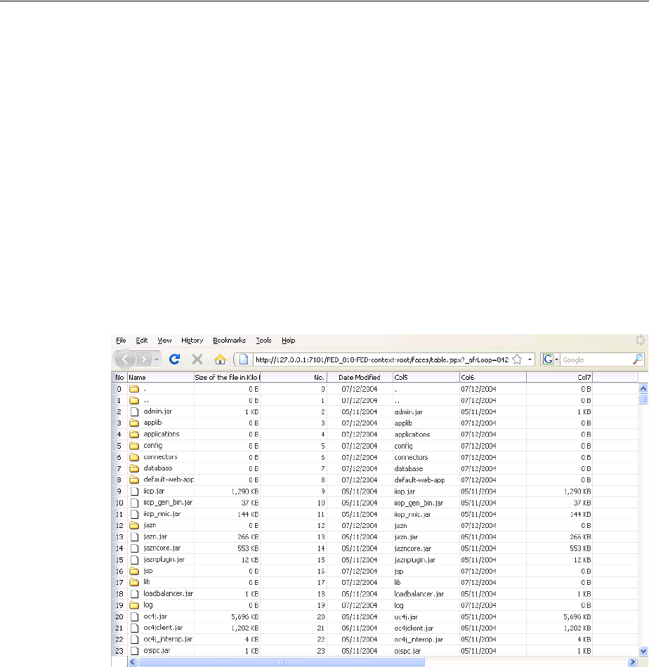
Starting to Lay Out a Page
Organizing Content on Web Pages 9-7
As shown in Table 9–1, the panelStretchLayout, panelSplitter, and
panelDashboard components are components that can be stretched and can also
stretch their child components. Additionally, when the showDetailItem component
is used as a direct child of the panelAccordion or panelTabbed component, the
contents in the showDetailItem component can be stretched. Therefore, the
panelStretchLayout, panelSplitter, panelDashboard, panelAccordion
with a showDetailItem component, and a panelTabbed with a showDetailItem
component, are the components you should use as root components when you want to
make the contents of the page fill the browser window.
For example, Figure 9–1 shows a table placed in the center facet of the
panelStretchLayout component. The table stretches to fill the browser space.
When the entire table does not fit in the browser window, scrollbars are added in the
data body section of the table.
Figure 9–1 Table Inside a Component That Stretches Child Components
Figure 9–2 shows the same table, but nested inside a panelGroupLayout component,
which cannot stretch its child components (for clarity, a dotted red outline has been
placed around the panelGroupLayout component). The table component displays
only a certain number of columns and rows, determined by properties on the table.
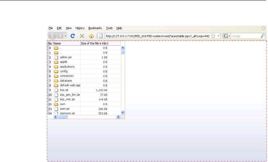
Starting to Lay Out a Page
9-8 Web User Interface Developer's Guide for Oracle Application Development Framework
Figure 9–2 Table Inside a Component That Does Not Stretch Its Child Components
9.2.2 Nesting Components Inside Components That Allow Stretching
Even though you choose a component that can stretch its child components, only the
following components will actually stretch:
■decorativeBox (when configured to stretch)
■inputText (when configured to stretch)
■panelAccordion (when configured to stretch)
■panelBox (when configured to stretch)
■panelCollection
■panelDashboard (when configured to stretch)
■panelGroupLayout (with the layout attribute set to scroll or vertical)
■panelHeader (when configured to stretch)
■panelSplitter (when configured to stretch)
■panelStretchLayout (when configured to stretch)
■panelTabbed (when configured to stretch)
■region
■showDetailHeader (when configured to stretch)
■table (when configured to stretch)
■tree (when configured to stretch)
■treeTable (when configured to stretch)
Performance Tip: The cost of geometry management is directly
related to the complexity of child components. Therefore, try
minimizing the number of child components that are under a parent
geometry-managed component.
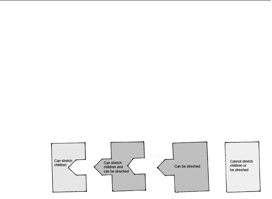
Starting to Lay Out a Page
Organizing Content on Web Pages 9-9
The following layout components cannot be stretched when placed inside a facet of a
component that stretches its child components:
■panelBorderLayout
■panelFormLayout
■panelGroupLayout (with the layout attribute set to default or horizontal)
■panelLabelAndMessage
■panelList
■showDetail
■tableLayout (MyFaces Trinidad component)
One interesting way to think about geometry management and resizing is to think of
components as being one of four types of puzzle pieces, as shown in
Figure 9–3 Four Categories of Components for Geometry Management
You can only place components that can be stretched inside components that stretch
their children. If you want to use a component that does not stretch within the facet of
component that stretches its child components, you must wrap it in a transition
component. Transition components can be stretched but do not stretch their children.
Transition components must always be used between a component that stretches its
children and a component that does not stretch. If you do not, you may see
unexpected results when the component renders.
For example, suppose you want to have a form appear in one side of a
panelSplitter component. Say your root component is the
panelStretchLayout, and so is the first component on your page. You add a
panelSplitter component (configured to default settings) as a child to the
panelStretchLayout component, and to the first facet of that component, you add
a panelFormLayout component. Figure 9–4 shows how those components would fit
together. Notice that the panelFormLayout component cannot "fit" into the
panelSplitter component because the panelSplitter can stretch its children
and so will attempt to stretch the panelFormLayout, but the panelFormLayout
cannot be stretched.
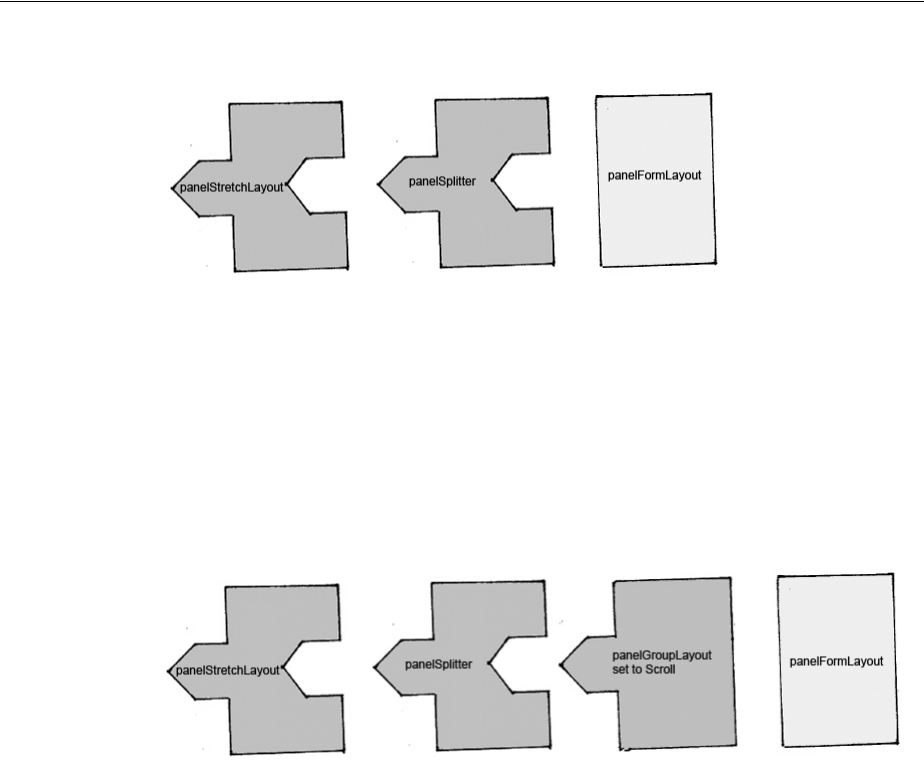
Starting to Lay Out a Page
9-10 Web User Interface Developer's Guide for Oracle Application Development Framework
Figure 9–4 Order of Components in One Layout Scenario
When a component does not "fit" into a component that stretches children, you may
get unexpected results when the browser attempts to render the component.
To have a valid layout, when you want to use a component that does not stretch in a
component that stretches its children, you must use a transition component. To fix the
panelFormLayout example, you could surround the panelFormLayout
component with a panelGroupLayout component set to scroll. This component
stretches, but does not stretch its children, as shown in Figure 9–5.
Figure 9–5 Order of Components in Second Layout Scenario
In this case, all the components fit together. The panelGroupLayout component will
not attempt to stretch the panelFormLayout, and so it will correctly render. And
because the panelGroupLayout component can be stretched, the layout will not
break between the components that can and cannot stretch.
9.2.3 Using Quick Start Layouts
When you use the New Gallery Wizard to create a JSF page (or a page fragment), you
can choose from a variety of predefined quick start layouts. When you choose one of
these layouts, JDeveloper adds the necessary components and sets their attributes to
achieve the look and behavior you want. In addition to saving time, when you use the
quick layouts, you can be sure that layout components are used together correctly to
achieve the desired geometry management.
You can choose from one-, two-, and three-column formats. Within those formats, you
can choose how many separate panes will be displayed in each column, and if those
Tip: Do not attempt to stretch any of the components in the list of
components that cannot stretch by setting their width to 100%. You
may get unexpected results. Instead, surround the component to be
stretched with a component that can be stretched.
The panelGroupLayout component set to scroll is a good
container for components that cannot stretch, when you want to use
those components in layout with components that do stretch.
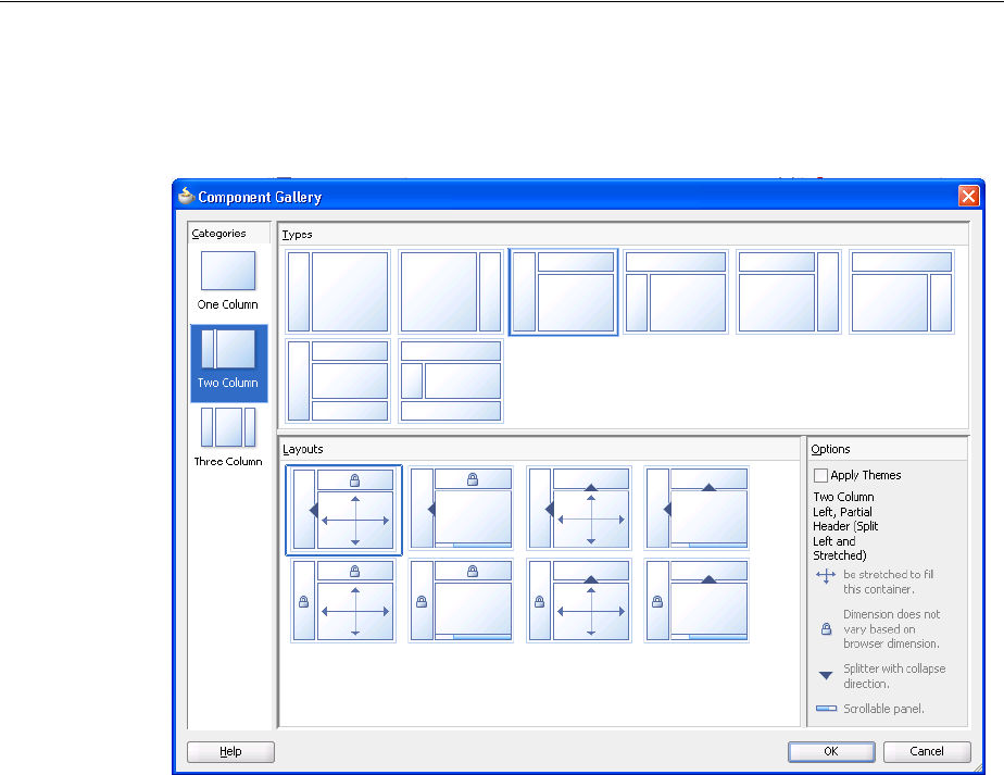
Starting to Lay Out a Page
Organizing Content on Web Pages 9-11
panes can stretch or remain a fixed size. Figure 9–6 shows the different layouts
available in the two-column format.
Figure 9–6 Quick Layouts
Along with adding layout components, you can also choose to apply a theme to the
chosen quick layout. These themes add color styling to some of the components used
in the quick start layout. To see the color and where it is added, see Appendix D,
"Quick Start Layout Themes." For more information about themes, see Chapter 28,
"Customizing the Appearance Using Styles and Skins"
For more information about creating pages using the quick layouts, see Section 3.4,
"Creating a View Page."
9.2.4 Tips for Using Geometry-Managed Components
To ensure your page is displayed as expected in all browsers, use one of the quick
layouts provided by JDeveloper when you create a page. These layouts ensure that the
correct components are used and configured properly. For more information, see
Section 9.2.3, "Using Quick Start Layouts."
However, if you wish to create your layout yourself, follow these tips for creating a
layout that includes both stretched and flowing components:
■Place the page contents inside a root component that performs geometry
management, either panelStretchLayout, panelSplitter,
panelAccordion with a showDetailItem, or panelTabbed with a
showDetailItem.
Best Practice: Use quick start layouts to avoid layout display
issues.

Starting to Lay Out a Page
9-12 Web User Interface Developer's Guide for Oracle Application Development Framework
■Never specify a height value with percent units. Instead, build a component
structure out of components that support being stretched and that stretch their
child components. For more information, see Section 9.2.2, "Nesting Components
Inside Components That Allow Stretching."
■Inside this stretchable structure, create islands of nonstretched or flowing
components by using transition components, such as the panelGroupLayout
component with the layout attribute set to scroll. This component will provide
the transition between stretched and flowing components because it supports
being stretched but will not stretch its child components.
■Never try to stretch something vertically inside a nonstretched or flowing
container because it will not act consistently across web browsers.
■For components contained in a parent flowing component (that is, a component
that does not stretch its children), do not set widths greater than 95%. If you do,
you may get unexpected results.
■If the parent component is 768 pixels or greater, set the styleClass attribute
on the component to be stretched to AFStretchWidth. This style will stretch
the component to what appears to be 100% of the parent container, taking into
account different browsers and any padding or borders on the parent.
■If the parent component is 768 pixels or less, set the styleClass attribute on
the component to be stretched to AFAuxiliaryStretchWidth. This style
will stretch the component to what appears to be 100% of the parent container,
taking into account different browsers and any padding or borders on the
parent.
■Never use the position style.
■Ensure that the maximized attribute on the document tag is set to true (this is
the default). For more information about setting the attribute, see Section 9.2.5,
"How to Configure the document Tag."
The remainder of this chapter describes the ADF Faces layout components and how
they can be used to design a page. You can find information about how each
component handles stretching in the respective "What You May Need to Know About
Geometry Management" sections.
9.2.5 How to Configure the document Tag
The document tag contains a number of attributes that you can configure to control
behavior for the page. For example, you can configure the icon that the browser may
insert into the address bar (commonly known as a favicon). Figure 9–7 shows the
Oracle icon in the address bar of the Firefox browser.
Note: The two different styles are needed due to how Microsoft
Internet Explorer 7 computes widths inside scrolling containers (this
has been resolved in Internet Explorer 8). Unless you can control the
version of browser used to access your application, you should use
these styles as described.
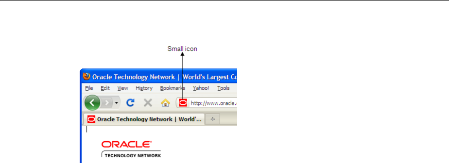
Starting to Lay Out a Page
Organizing Content on Web Pages 9-13
Figure 9–7 Small Icon Configured on the document Tag
You can also configure the tag for the following functionality:
■Focus: You can set which component should have focus when the page is first
rendered.
■Uncommitted data: You can have a warning message display if a user attempts to
navigate off the page and the data has not been submitted.
■State saving: You can override the settings in the web.xml file for an individual
page, so that the state of the page should be saved on the client or on the server.
To configure the document tag:
1. In the Structure window, select the af:document node.
2. In the Property Inspector, expand the Common section and set the following:
■InitialFocusId: Use the dropdown menu to choose Edit. In the Edit Property
dialog, select the component that should have focus when the page first
renders.
Because this focus happens on the client, the component you select must have
a corresponding client component. For more information, see Section 4.4,
"Instantiating Client-Side Components."
■Maximized: Set to true if you want the root component to expand to fit all
available browser space. When the document tag’s maximized attribute is
set to true, the framework searches for a single visual root component, and
stretches that component to consume the browser's viewable area, provided
that the component can be stretched. Examples of components that support
this are panelStretchLayout and panelSplitter. The document tag’s
maximized attribute is set to true by default. For more information, see
Section 9.2.1, "Geometry Management and Component Stretching."
■Title: Enter the text that should be displayed in the title bar of the browser.
3. Expand the Appearance section and set the following: and for the attribute,.
■FailedConnectionText: Enter the text you want to be displayed if a connection
cannot be made to the server.
■Small Icon Source: Enter the URI to an icon (typically 16 pixels by 16 pixels)
that the browser may insert into the address bar (commonly known as a
favicon). If no value is specified, each browser may do or display something
different.
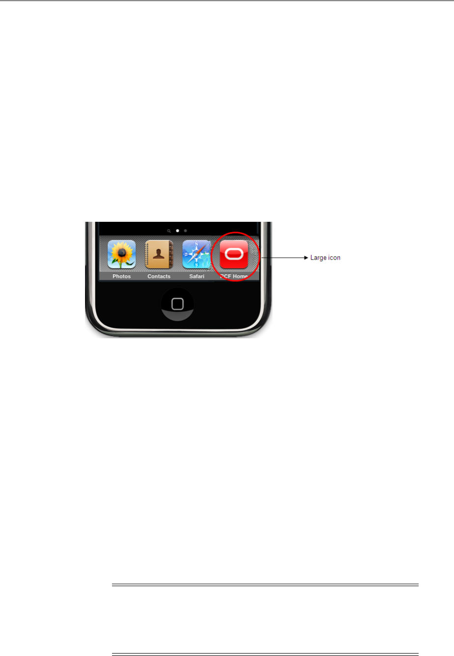
Starting to Lay Out a Page
9-14 Web User Interface Developer's Guide for Oracle Application Development Framework
You can enter a space-delimited list of icons and a browser will typically
display the first value it supports. For example, Microsoft Internet Explorer
only supports .ico for favicons. So given the following value:
/images/small-icon.png /small-icon.ico
Internet Explorer will display small-icon.ico, while Firefox would display
small-icon.png.
Use one forward slash (/) in the address if the file is located inside of the web
application’s root folder. Use two forward slashes (//) if the file located in the
server’s root folder.
■Large Icon Source: Enter the URI to an icon (typically 129 pixels by 129 pixels)
that a browser may use when bookmarking a page to a device’s home page.
Figure 9–8 Mobile Device Displaying Large Icon
If no value is specified, each browser may do or display something different.
You can enter a space-delimited list of icons and a browser will typically
display the first value it supports.
Use one forward slash (/) in the address if the file is located inside of the web
application’s root folder. Use two forward slashes (//) if the file located in the
server’s root folder.
4. Expand the Behavior section and set UncommitedDataWarning to on if you want
a warning message displayed to the user when the application detects that data
has not been committed. This can happen because either the user attempts to leave
the page without committing data or there is uncommitted data on the server. By
default, this is set to off
Tip: Different versions of the iPhone and iPad use different sized
images. You can use the largest size (129 pixels by 129 pixels) and the
image will be scaled to the needed size.
Note: If your application does not use ADF Controller, the data is
considered to be committed when it is posted to the middle tier. For
example, when a user clicks a commandButton, no warning will be
displayed when navigation occurs in the middle tier regardless of
whether the data was actually written to the back end.
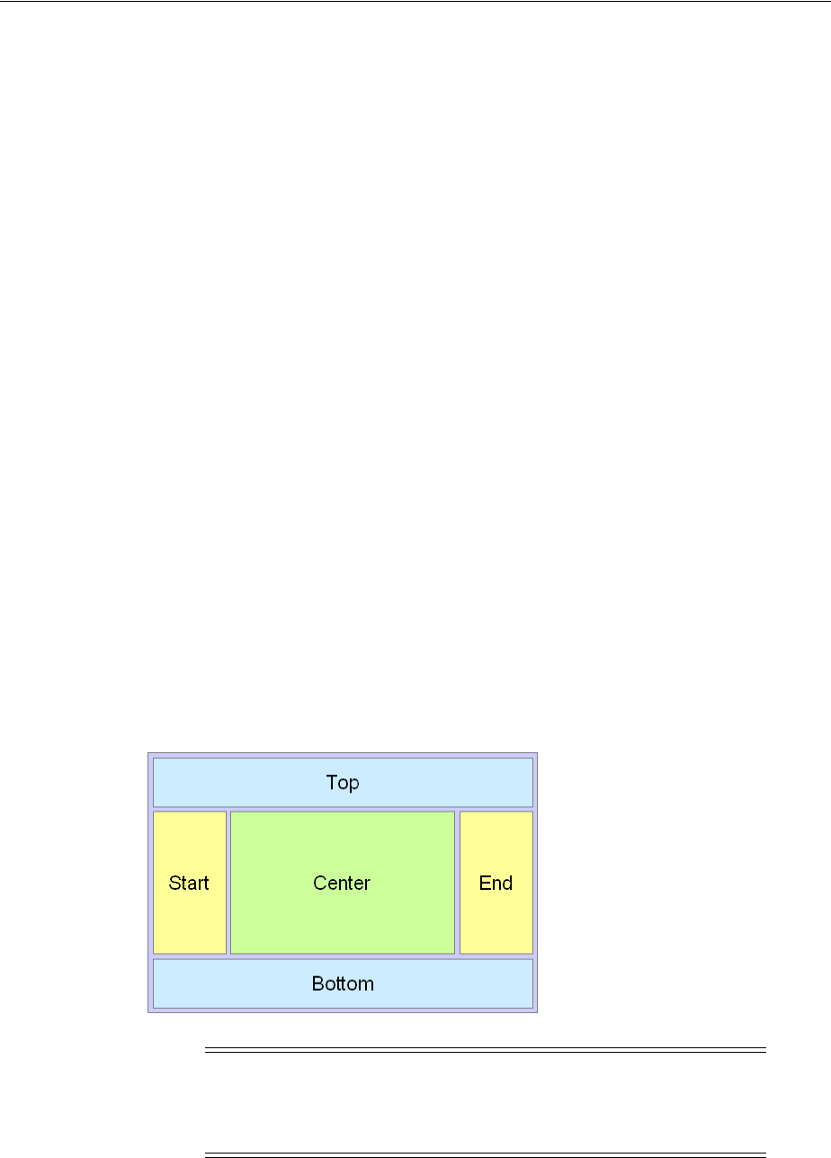
Arranging Contents to Stretch Across a Page
Organizing Content on Web Pages 9-15
5. Expand the Advanced section and set StateSaving to the type of state saving you
want to use for a page.
For ADF Faces applications, it is recommended to have the application use client
state saving with tokens, which saves page state to the session and persists a token
to the client. This setting affects the application globally, such that all pages have
state saved to the session and persist tokens with information regarding state.
However, there may be a page for which you which you want the state saved
differently. For example, when a user posts back to a login page after an extended
period of time, you do not want the session time out error to be displayed. By
changing the stateSaving attribute on the page to client, then when the user
posts back to the login page, the time out error will not display.
You can override the global setting in web.xml to one of the following for the
page:
– client: The state is saved fully to the client, without the use of tokens. This
setting keeps the session expired messages from being displayed.
– default: The state of the page is based on whatever is set in web.xml.
– server: The state of the page is saved on the server.
For more information about state saving, see Appendix A.2, "Configuration in
web.xml."
9.3 Arranging Contents to Stretch Across a Page
Use the panelStretchLayout component to arrange content in defined areas on a
page and when you want the content to be able to stretch when the browser is resized.
The panelStretchLayout component is one of the components that can stretch
components placed in its facets. Figure 9–9 shows the component’s facets.
Figure 9–9 Facets in the panelStretchLayout Component
When you set the height of the top and bottom facets, any contained components are
stretched up to fit the height. Similarly, when you set the width of the start and end
Note: Figure 9–9 shows the facets when the language reading
direction of the application is configured to be left-to-right. If instead
the language direction is right-to-left, the start and end facets are
switched.

Arranging Contents to Stretch Across a Page
9-16 Web User Interface Developer's Guide for Oracle Application Development Framework
facets, any components contained in those facets are stretched to that width. If no
components are placed in the facets, then that facet does not render. That is, that facet
will not take up any space. If you want that facet to take up the set space but remain
blank, insert a spacer component. See Section 9.13, "Separating Content Using Blank
Space or Lines." Child Components components in the center facet are then stretched
to fill up any remaining space. For more information about component stretching, see
Section 9.2.1, "Geometry Management and Component Stretching."
Instead of setting the height of the top or bottom facet, or width of the start or end
facet to a dimension, you can set the height or width to auto. This allows the facet to
size itself to use exactly the space required by the child components of the facet. Space
will be allocated based on what the web browser determines is the required amount of
space to display the facet content.
The File Explorer application uses a panelStretchLayout component as the root
component in the template. Child components are placed only in the center and
bottom facets. Therefore, whatever is in the center facet stretches the full width of
the window, and from the top of the window to the top of the bottom facet, whose
height is determined by the bottomHeight attribute. Example 9–2 shows abbreviated
code from the fileExplorerTemplate file.
Example 9–2 panelStretchLayout in the File Explorer’s Template File
<af:panelStretchLayout
bottomHeight="#{attrs.footerGlobalSize}">
<f:facet name="center">
<af:panelSplitter orientation="vertical" ...>
.
.
.
</af:panelSplitter
</f:facet>
<f:facet name="bottom">
<af:panelGroupLayout layout="vertical">
.
.
.
</af:panelGroupLayout>
</f:facet>
</af:panelStretchLayout>
The template uses an EL expression to determine the value of the bottomHeight
attribute. This expression resolves to the value of the footerGlobalSize attribute
defined in the template, which by default is 0. Any page that uses the template can
override this value. For example, the index.jspx page uses this template and sets
the value to 30. Therefore, when the File Explorer application renders, the contents in
the panelStretchLayout component begin 30 pixels from the bottom of the page.
9.3.1 How to Use the panelStretchLayout Component
The panelStretchLayout component cannot have any direct child components.
Instead, you place components within its facets. The panelStretchLayout is one of
the components that can be configured to stretch any components in its facets to fit the
Performance Tip: Using auto as a value will degrade performance
of your page. You should first attempt to set a height or width and use
the auto attribute sparingly.

Arranging Contents to Stretch Across a Page
Organizing Content on Web Pages 9-17
browser. You can nest panelStretchLayout components. For more information, see
Section 9.2.2, "Nesting Components Inside Components That Allow Stretching."
Before you begin:
It may be helpful to have an understanding of how the attributes can affect
functionality. For more information, see Section 9.3, "Arranging Contents to Stretch
Across a Page."
You may also find it helpful to understand functionality that can be added using other
ADF Faces features. For more information, see Section 9.1.1, "Additional Functionality
for Layout Components."
To create and use the panelStretchLayout component:
1. In the Component Palette, from the Layout panel, drag and drop a Panel Stretch
Layout to the JSF page.
2. In the Property Inspector, expand the Common section and set the attributes as
needed.
When there are child components in the top, bottom, start, and end facets,
these components occupy space that is defined by the topHeight,
bottomHeight, startWidth, and endWidth attributes. For example,
topHeight attribute specifies the height of the top facet, and startWidth
attribute specifies the width of the start facet. Child components in top and
bottom facets are stretched up to the height set by topHeight and
bottomHeight attributes, respectively, and child components in start and end
facets are stretched up to the width set by startWidth and endWidth attributes,
respectively. Instead of setting a numeric dimension, you can set the topHeight,
bottomHeight, startWidth and endWidth attributes to auto and the browser
will determine the amount of space required to display the content in the facets.
If you do not explicitly specify a value, by default, the value for the topHeight,
bottomHeight, startWidth, and endWidth attributes is 50 pixels each. The
widths of the top and bottom facets, and the heights of the start and end facets
are derived from the width and height of the parent component of
panelStretchLayout.
Note: If you set a facet to use auto as a value for the width or height
of that facet, the child component does not have to be able to stretch.
In fact, it must use a stable, standalone width that is not dependent
upon the width of the facet.
For example, you should not use auto on a facet whose child
component can stretch their children automatically. These components
have their own built-in stretched widths by default which will then
cause them to report an unstable offsetWidth value, which is used
by the browser to determine the amount of space.
Additionally, you should not use auto in conjunction with a child
component that uses a percentage length for its width. The facet
content cannot rely on percentage widths or be any component that
would naturally consume the entire width of its surrounding
container.

Arranging Contents to Stretch Across a Page
9-18 Web User Interface Developer's Guide for Oracle Application Development Framework
3. By default, the panelStretchLayout component stretches to fill available
browser space. If you want to place the panelStretchLayout component inside
a component that does not stretch its children, then you need to configure the
panelStretchLayout component to not stretch.
Set DimensionsFrom to one of the following:
■children: Instead of stretching, the panelStretchLayout component will
get its dimensions from its child component.
■parent: the size of the panelStretchLayout component will be
determined in the following order:
–From the inlineStyle attribute.
–If no value exists for inlineStyle, then the size is determined by the
parent container (that is, the panelStretchLayout component will
stretch).
–If the parent container is not configured or not able to stretch its children,
the size will be determined by the skin.
■auto: If the parent component to the panelStretchLayout component
allows stretching of its child, then the panelStretchLayout component will
stretch to fill the parent. If the parent does not stretch its children then the size
of the panelStretchLayout component will be based on the size of its child
component.
4. To place content in the component, drag and drop the desired component into any
of the facets. If you want the child component to stretch, it must be a component
that supports being stretched. See Section 9.3.2, "What You May Need to Know
About Geometry Management and the panelStretchLayout Component," for more
details.
Because facets accept one child only, if you want to add more than one child
component, wrap the child components inside a container component, for
example, a panelGroupLayout component. This component must also be able to
be stretched in order for all contained components to stretch.
Tip: If a facet does not contain a child component, it is not rendered
and therefore does not take up any space. You must place a child
component into a facet in order for that facet to occupy the configured
space.
Note: If you use this setting, you cannot use a percentage to set the
height of the top and bottom facets. If you do, those facets will try to
get their dimensions from the size of this panelStretchLayout
component, which will not be possible, as the panelStretchLayout
component will be getting its height from its contents, resulting in a
circular dependency If a percentage is used for either facet, it will be
disregarded and the default 50px will be used instead.
Additionally, you cannot set the height of the panelStretchLayout
component (for example through the inlineStyle or styleClass
attributes) if you use this setting. Doing so would cause conflict
between the panelStretchLayout height and the child component
height.

Arranging Contents to Stretch Across a Page
Organizing Content on Web Pages 9-19
9.3.2 What You May Need to Know About Geometry Management and the
panelStretchLayout Component
The panelStretchLayout component can stretch its child components and it can
also be stretched. The following components can be stretched inside the facets of the
panelStretchLayout component:
■decorativeBox (when configured to stretch)
■calendar
■inputText (when configured to stretch)
■panelAccordion (when configured to stretch)
■panelBox (when configured to stretch)
■panelCollection
■panelDashboard (when configured to stretch)
■panelGroupLayout (only with the layout attribute set to scroll or
vertical)
■panelHeader (when configured to stretch)
■panelSplitter (when configured to stretch)
■panelStretchLayout (when configured to stretch)
■panelTabbed (when configured to stretch)
■region
■showDetailHeader (when configured to stretch)
■table (when configured to stretch)
■tree (when configured to stretch)
■treeTable (when configured to stretch)
The following components cannot be stretched when placed inside a facet of the
panelStretchLayout component:
■panelBorderLayout
■panelFormLayout
■panelGroupLayout (only with the layout attribute set to default or
horizontal)
■panelLabelAndMessage
■panelList
■showDetail
■tableLayout (MyFaces Trinidad component)
Tip: If any facet is not visible in the visual editor:
1. Right-click the panelStretchLayout component in the Structure
window.
2. From the context menu, choose Facets - Panel Stretch Layout >facet
name. Facets in use on the page are indicated by a checkmark in front of
the facet name.
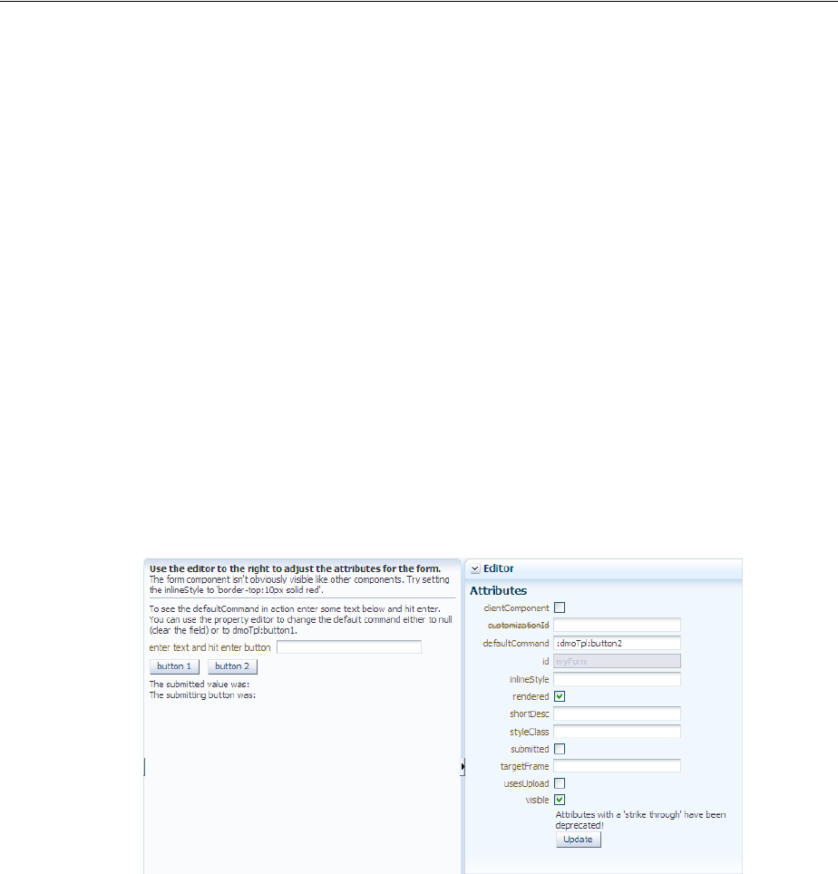
Using Splitters to Create Resizable Panes
9-20 Web User Interface Developer's Guide for Oracle Application Development Framework
You cannot place components that cannot stretch into facets of a component that
stretches its child components. Therefore, if you need to place a component that cannot
be stretched into a facet of the panelStretchLayout component, wrap that
component in a transition component that can stretch.
For example, if you want to place content in a panelBox component (which does not
stretch) within a facet of the panelStretchLayout component, you could place a
panelGroupLayout component with its layout attribute set to scroll in a facet of
the panelStretchLayout component, and then place the panelBox component in
that panelGroupLayout component. For more information, see Section 9.2.2,
"Nesting Components Inside Components That Allow Stretching."
9.4 Using Splitters to Create Resizable Panes
When you have groups of unique content to present to users, consider using the
panelSplitter component to provide multiple panes separated by adjustable
splitters. The ADF Faces demo application uses a panelSplitter to separate the
component demo area from the editor area, as shown in Figure 9–10. Users can change
the size of the panes by dragging the splitter, and can also collapse and restore the
panel that displays the editor. When a panel is collapsed, the panel contents are
hidden; when a panel is restored, the contents are displayed.
Figure 9–10 ADF Faces Demo Application Uses panelSplitter to Separate Contents
The panelSplitter component lets you organize contents into two panes separated
by an adjustable splitter. The panes can either line up on a horizontal line (as does the
splitter shown in Figure 9–10) or on a vertical line. The ADF Faces demo application
uses another panelSplitter component to separate the application’s global menu
from the main body of the page. Figure 9–11 shows the panelSplitter component
expanded to show the menu, which includes access to the documentation and source.
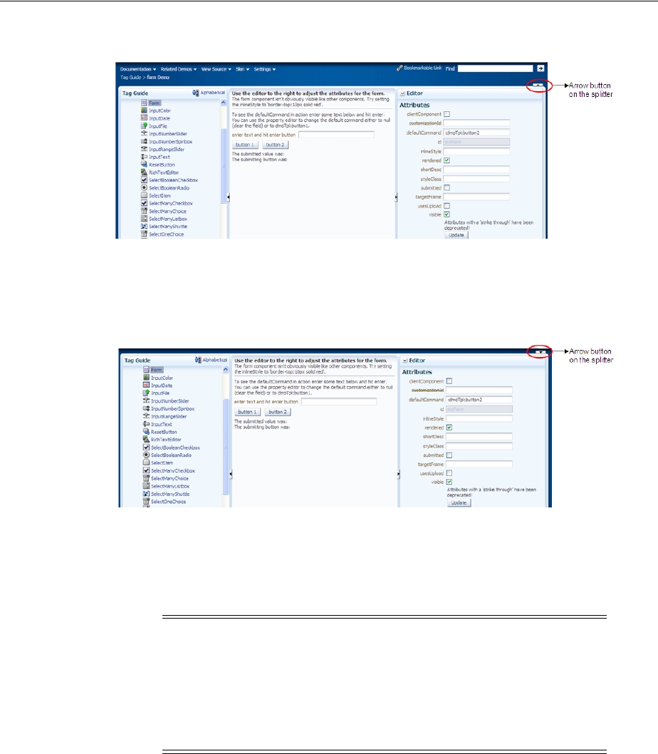
Using Splitters to Create Resizable Panes
Organizing Content on Web Pages 9-21
Figure 9–11 panelSplitter with a Vertical Split Expanded
Clicking the arrow button on a splitter collapses the panel that holds the global menu,
and the menu items are no longer shown, as shown in Figure 9–12.
Figure 9–12 panelSplitter with a Vertical Split Collapsed
You place components inside the facets of the panelSplitter component. The
panelSplitter component uses geometry management to stretch its child
components at runtime. This means when the user collapses one panel, the contents in
the other panel are explicitly resized to fill up available space.
9.4.1 How to Use the panelSplitter Component
The panelSplitter component lets you create two panes separated by a splitter.
Each splitter component has two facets, namely, first and second, which
correspond to the first panel and second panel, respectively. Child components can
reside inside the facets only. To create more than two panes, you nest the
panelSplitter components.
Before You Begin
It may be helpful to have an understanding of how the attributes can affect
functionality. For more information, see Section 9.4, "Using Splitters to Create
Resizable Panes."
Note: While the user can change the values of the
splitterPosition and collapsed attributes by resizing or
collapsing the panes, those values will not be retained once the user
leaves the page unless you configure your application to use change
persistence. For information about enabling and using change
persistence, see Chapter 32, "Allowing User Customization on JSF
Pages."
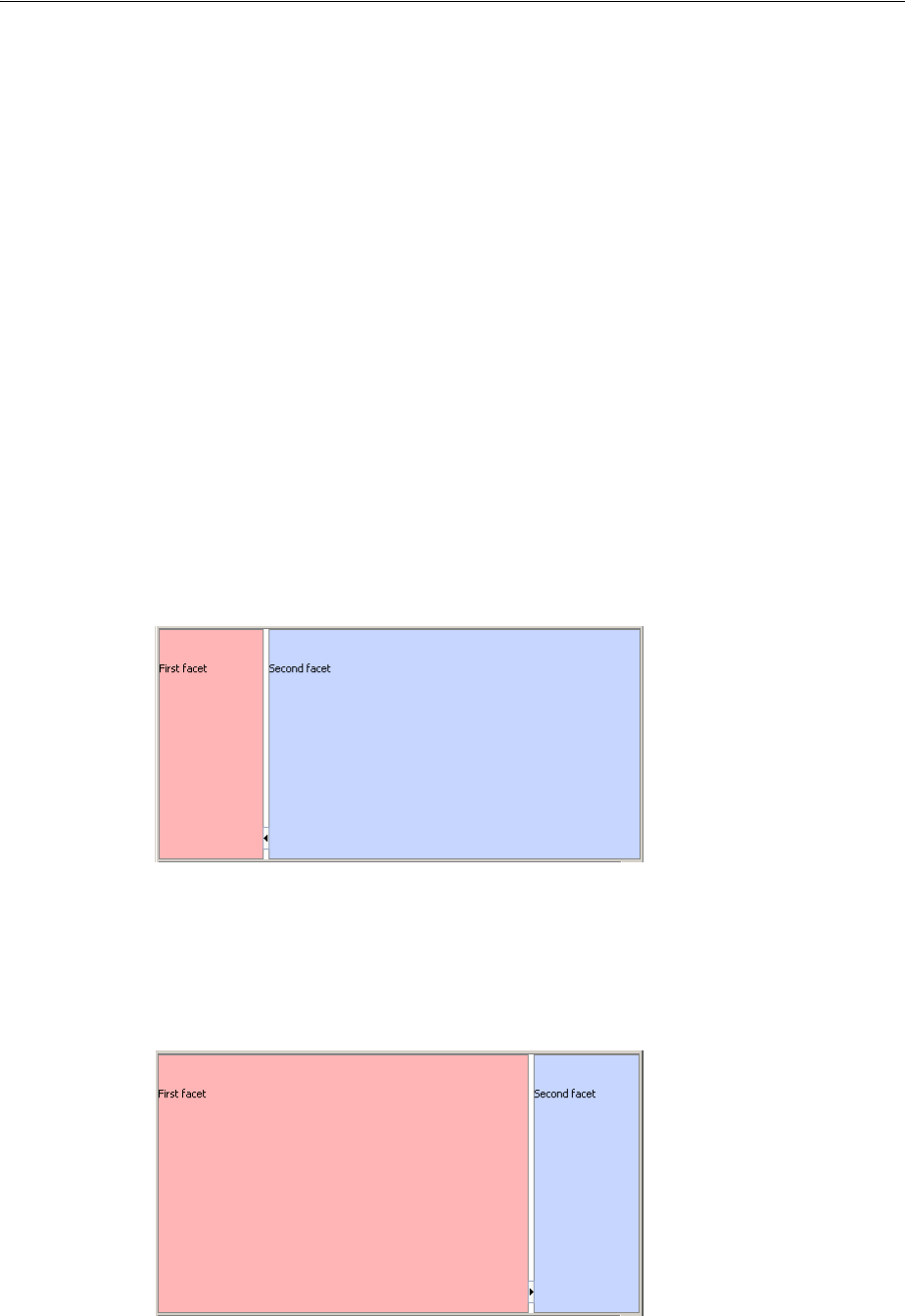
Using Splitters to Create Resizable Panes
9-22 Web User Interface Developer's Guide for Oracle Application Development Framework
You may also find it helpful to understand functionality that can be added using other
ADF Faces features. For more information, see Section 9.1.1, "Additional Functionality
for Layout Components."
To create and use the panelSplitter component:
1. In the Component Palette, from the Layout panel, drag and drop a Panel Splitter
onto the JSF page.
2. In the Property Inspector, expand the Common section.
3. Set Orientation to vertical to create two vertical panes (one on top of the other).
By default, the value is horizontal, which means horizontal panes are placed
left-to-right (or right-to-left, depending on the language reading direction).
4. Set SplitterPosition and PositionedFromEnd to determine the initial placement of
the splitter. By default, the value of the splitterPosition attribute is 200
pixels, and the positionedFromEnd attribute is false. This setting means that
ADF Faces measures the initial position of the adjustable splitter from the start or
top panel (depending on the orientation attribute value). For example, if the
orientation attribute is set to horizontal, the splitterPosition attribute
is 200 and the positionedFromEnd attribute is false (all default values), then
ADF Faces places the splitter 200 pixels from the start panel, as shown in
Figure 9–13.
Figure 9–13 Splitter Position Measured from Start Panel
If the positionedFromEnd attribute is set to true, then ADF Faces measures the
initial position of the splitter from the end (or bottom panel, depending on the
orientation value). Figure 9–14 shows the position of the splitter measured 200
pixels from the end panel.
Figure 9–14 Splitter Position Measured from End Panel

Using Splitters to Create Resizable Panes
Organizing Content on Web Pages 9-23
5. Set collapsed to determine whether or not the splitter is in a collapsed (hidden)
state. By default, the collapsed attribute is false, which means both panes are
displayed. When the user clicks the arrow button on the splitter, the collapsed
attribute is set to true and one of the panes is hidden.
ADF Faces uses the collapsed and positionedFromEnd attributes to
determine which panel (that is, the first or second panel) to hide (collapse) when
the user clicks the arrow button on the splitter. When the collapsed attribute is
set to true and the positionedFromEnd attribute is false, the first panel is
hidden and the second panel stretches to fill up the available space. When the
collapsed attribute is true and the positionedFromEnd attribute is true,
the second panel is hidden instead. Visually, the user can know which panel will
be collapsed by looking at the direction of the arrow on the button: when the user
clicks the arrow button on the splitter, the panel collapses in the direction of the
arrow.
6. By default, the panelSplitter component stretches to fill available browser
space. If you want to place the panelSplitter into a component that does not
stretch its children, then you need to change how the panelSplitter
component handles stretching.
You configure whether the component will stretch or not using the
dimensionsFrom attribute. In the Property Inspector, set DimensionsFrom to
one of the following:
■children: Instead of stretching, the panelSplitter component will get its
dimensions from its child component.
■parent: The size of the panelSplitter component will be determined in
the following order:
–From the inlineStyle attribute.
–If no value exists for inlineStyle, then the size is determined by the
parent container.
–If the parent container is not configured or not able to stretch its children,
the size will be determined by the skin.
■auto: If the parent component to the panelSplitter component allows
stretching of its child, then the panelSplitter component will stretch to fill
the parent. If the parent does not stretch its children then the size of the
panelSplitter component will be based on the size of its child component.
7. To place content in the component, drag and drop the desired component into the
first and second facets. When you have the orientation set to horizontal, the
first facet is the left facet. When you have the orientation set to vertical, the
first facet is the top facet. If you want the child component to stretch, it must be
Note: If you use this setting and you set the orientation attribute
to vertical, then the contents of the collapsible panel will not be
determined by its child component, but instead will be determined by
the value of splitterPosition attribute. The size of the other pane
will be determined by its child component.
Additionally, you cannot set the height of the panelSplitter
component (for example through the inlineStyle or styleClass
attributes) if you use this setting. Doing so would cause conflict
between the panelSplitter height and the child component height.
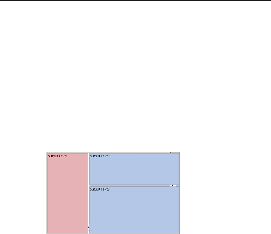
Using Splitters to Create Resizable Panes
9-24 Web User Interface Developer's Guide for Oracle Application Development Framework
a component that supports stretching. For more details, see Section 9.4.2, "What
You May Need to Know About Geometry Management and the panelSplitter
Component."
Because facets accept one child component only, if you want to add more than one
child component, wrap the child components inside a container component. This
component must also be able to be stretched in order for all contained components
to stretch.
8. To create more than two panes, insert another Panel Splitter component into a
facet to create nested splitter panes (as shown in Figure 9–15).
Figure 9–15 Nested panelSplitter Components
Example 9–3 shows the code generated by JDeveloper when you nest splitter
components.
Example 9–3 Nested panelSplitter Components
<af:panelSplitter ...>
<f:facet name="first">
<!-- first panel child components components here -->
</f:facet>
<f:facet name="second">
<!-- Contains nested splitter component -->
<af:panelSplitter orientation="vertical" ...>
<f:facet name="first">
<!-- first panel child components components here -->
</f:facet>
<f:facet name="second">
<!-- second panel child components components here -->
</f:facet>
</af:panelSplitter>
</f:facet>
</af:panelSplitter>
9. If you want to perform some operation when users collapse or expand a panel,
attach a client-side JavaScript using the clientListener tag for the collapsed
Tip: If any facet is not visible in the visual editor:
1. Right-click the panelSplitter component in the Structure window.
2. From the context menu, choose Facets - Panel Splitter >facet name.
Facets in use on the page are indicated by a checkmark in front of the
facet name.

Using Splitters to Create Resizable Panes
Organizing Content on Web Pages 9-25
attribute and a propertyChange event type. For more information about
client-side events, see Chapter 6, "Handling Events."
9.4.2 What You May Need to Know About Geometry Management and the panelSplitter
Component
The panelSplitter component can stretch its child components and it can also be
stretched. The following components can be stretched inside the first or second
facet of the panelSplitter component:
■decorativeBox (when configured to stretch)
■calendar
■inputText (when configured to stretch)
■panelAccordion (when configured to stretch)
■panelBox (when configured to stretch)
■panelCollection (when configured to stretch)
■panelDashboard (when configured to stretch)
■panelGroupLayout (only with the layout attribute set to scroll or
vertical)
■panelHeader (when configured to stretch)
■panelSplitter (when configured to stretch)
■panelStretchLayout (when configured to stretch)
■panelTabbed (when configured to stretch)
■region
■showDetailHeader (when configured to stretch)
■table (when configured to stretch)
■tree (when configured to stretch)
■treeTable (when configured to stretch)
The following components cannot be stretched when placed inside a facet of the
panelSplitter component:
■panelBorderLayout
■panelFormLayout
■panelGroupLayout (only with the layout attribute set to default or
horizontal)
■panelLabelAndMessage
■panelList
■showDetail
■tableLayout (MyFaces Trinidad component)
You cannot place components that cannot stretch into facets of a component that
stretches its child components. Therefore, if you need to place one of the components
that cannot be stretched into a facet of the panelSplitter component, wrap that
component in a transition component that does not stretch its child components.
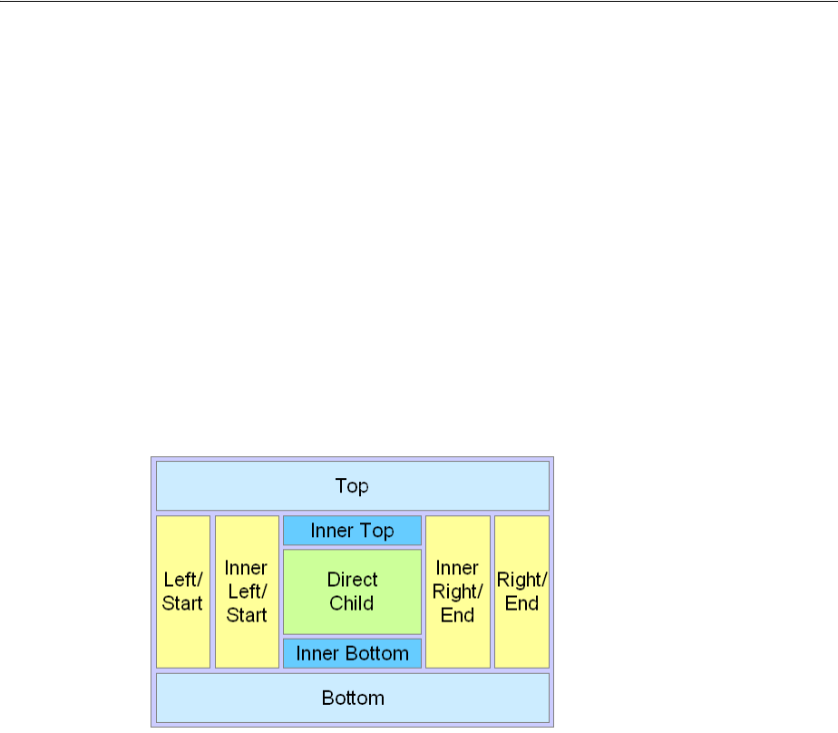
Arranging Page Contents in Predefined Fixed Areas
9-26 Web User Interface Developer's Guide for Oracle Application Development Framework
For example, if you want to place content in a panelBox component and have it flow
within a facet of the panelSplitter component, you could place a
panelGroupLayout component with its layout attribute set to scroll in a facet of
the panelSplitter component, and then place the panelBox component in that
panelGroupLayout component. For more information, see Section 9.2.2, "Nesting
Components Inside Components That Allow Stretching."
9.5 Arranging Page Contents in Predefined Fixed Areas
The panelBorderLayout component uses facets to contain components in
predefined areas of a page. Instead of a center facet, the panelBorder layout
component takes 0 to n direct child components (also known as indexed children),
which are rendered consecutively in the center. The facets then surround the child
components.
Figure 9–16 shows the facets of the panelBorderLayout component.
Figure 9–16 Facets in panelBorderLayout
The 12 supported facets of the panelBorderLayout component are:
■top: Renders child components above the center area.
■bottom: Renders child components below the center area.
■start: Supports multiple reading directions. This facet renders child components
on the left of the center area between top and bottom facet child components, if
the reading direction of the client browser is left-to-right. If the reading direction is
right-to-left, it renders child components on the right of the center area. When
your application must support both reading directions, this facet ensures that the
content will be displayed on the proper side when the direction changes. If you do
not need to support both directions, then you should use either the left or right
facet.
■end: Supports multiple reading directions. This facet renders child components on
the right of the center area between top and bottom facet child components, if
the reading direction of the client browser is left-to-right. If the reading direction is
right-to-left, it renders child components on the left of the center area. When your
application must support both reading directions, this facet ensures that the
content will be displayed on the proper side when the direction changes. If you do
not need to support both directions, then you should use either the left or right
facet.

Arranging Page Contents in Predefined Fixed Areas
Organizing Content on Web Pages 9-27
■left: Supports only one reading direction. This facet renders child components
on the left of the center area between top and bottom facet child components.
When the reading direction is left-to-right, the left facet has precedence over the
start facet if both the left and start facets are used (that is, contents in the
start facet will not be displayed). If the reading direction is right-to-left, the
left facet also has precedence over the end facet if both left and end facets are
used.
■right: Supports only one reading direction. This facet renders child components
on the right of the center area between top and bottom facet child components. If
the reading direction is left-to-right, the right facet has precedence over the end
facet if both right and end facets are used. If the reading direction is right-to-left,
the right facet also has precedence over the start facet, if both right and
start facets are used.
■innerTop: Renders child components above the center area but below the top
facet child components.
■innerBottom: Renders child components below the center area but above the
bottom facet child components.
■innerLeft: Renders child components similar to the left facet, but renders
between the innerTop and innerBottom facets, and between the left facet
and the center area.
■innerRight: Renders child components similar to the right facet, but renders
between the innerTop facet and the innerBottom facet, and between the right
facet and the center area.
■innerStart: Renders child components similar to the innerLeft facet, if the
reading direction is left-to-right. Renders child components similar to the
innerRight facet, if the reading direction is right-to-left.
■innerEnd: Renders child components similar to the innerRight facet, if the
reading direction is left-to-right. Renders child components similar to the
innerLeft facet, if the reading direction is right-to-left.
The panelBorderLayout component does not support stretching its child
components, nor does it stretch when placed in a component that stretches its child
components. Therefore, the size of each facet is determined by the size of the
component it contains. If instead you want the contents to stretch to fill the browser
window, consider using the panelStretchLayout component instead. For more
information, see Section 9.3, "Arranging Contents to Stretch Across a Page."
9.5.1 How to Use the panelBorderLayout Component to Arrange Page Contents in
Predefined Fixed Areas
There is no restriction to the number of panelBorderLayout components you can
have on a JSF page.
Before you begin:
It may be helpful to have an understanding of how the attributes can affect
functionality. For more information, see Section 9.5, "Arranging Page Contents in
Predefined Fixed Areas."
You may also find it helpful to understand functionality that can be added using other
ADF Faces features. For more information, see Section 9.1.1, "Additional Functionality
for Layout Components."
Arranging Content in Forms
9-28 Web User Interface Developer's Guide for Oracle Application Development Framework
To create and use the panelBorderLayout component:
1. In the Component Palette, from the Layout panel, drag and drop a Panel Border
Layout onto the JSF page.
2. From the Component Palette, drag and drop the component that will be used to
display contents in the center of the window as a child component to the
panelBorderLayout component.
Child components are displayed consecutively in the order in which you inserted
them. If you want some other type of layout for the child components, wrap the
components inside the panelGroupLayout component. For more information,
see Section 9.12, "Grouping Related Items."
3. To place contents that will surround the center, drag and drop the desired
component into each of the facets.
Because facets accept one child component only, if you want to add more than one
child component, wrap the child components inside a container.
9.6 Arranging Content in Forms
The panelFormLayout component lets you lay out multiple components such as
input fields and selection list fields in one or more columns. The File Explorer
application uses a panelFormLayout component to display file properties. The
component is configured to have the labels right-aligned, as shown in Figure 9–17.
Figure 9–17 Right-Aligned Labels and Left-Aligned Fields in a Form
Figure 9–18 shows the same page with the component configured to display the labels
above the fields.
Tip: If any facet is not visible in the visual editor:
1. Right-click the panelBorderLayout component in the Structure
window.
2. From the context menu, choose Facets - Panel Border Layout >facet
name. Facets in use on the page are indicated by a checkmark in front of
the facet name.
Arranging Content in Forms
Organizing Content on Web Pages 9-29
Figure 9–18 Labels Above Fields in a Form
You can configure the panelFormLayout component to display the fields with their
labels in one or more columns. Each field in the form is a child component of the
panelFormLayout component. You set the desired number of rows, and if there are
more child components than rows, the remaining child components are placed in a
new column. Example 9–4 shows a panelFormLayout component with 10
inputText child components.
Example 9–4
<af:panelFormLayout id="pfl1" rows="10">
<af:inputText label="Label 1" id="it1"/>
<af:inputText label="Label 2" id="it2"/>
<af:inputText label="Label 3" id="it3"/>
<af:inputText label="Label 4" id="it4"/>
<af:inputText label="Label 5" id="it5"/>
<af:inputText label="Label 6" id="it6"/>
<af:inputText label="Label 7" id="it7"/>
<af:inputText label="Label 8" id="it8"/>
<af:inputText label="Label 9" id="it9"/>
<af:inputText label="Label 10" id="it10"/>
</af:panelFormLayout>
Because the panelFormLayout’s row attribute is set to 10, all 10 inputText
components appear in one column, as shown in Figure 9–19.
Figure 9–19 All inputText Components Display in One Column
However, if the row attribute were to be set to 8, then the first 8 inputText
components display in the first column and the last two appear in the second column,
as shown in Figure 9–20.
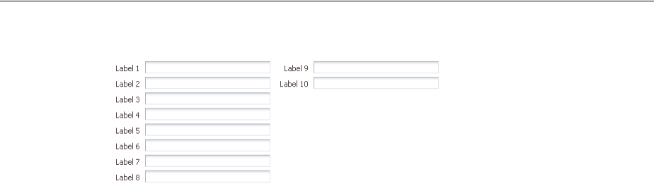
Arranging Content in Forms
9-30 Web User Interface Developer's Guide for Oracle Application Development Framework
Figure 9–20 Components Displayed in Two Columns
However, the number of rows displayed in each is not solely determined by the
configured number of rows. By default, the panelFormLayout component’s
maxColumns attribute is set to render no more than three columns (two for PDA
applications). This value is what actually determines the number of rows. For
example, if you have 25 child components and you set the component to display 5
rows and you leave the default maximum number of columns set to 3, then the
component will actually display 9 rows, even though you have it set to display 5. This
is because the maximum number of columns can override the set number of rows.
Because it is set to allow only up to 3 columns, the component must use 9 rows in
order to display all child components. You would need to set the maximum number of
columns to 5 in order to have the component display just 5 rows.
ADF Faces uses default label and field widths, as determined by the standard HTML
flow in the browser. You can also specify explicit widths to use for the labels and
fields. Regardless of the number of columns in the form layout, the widths you specify
apply to all labels and fields. You specify the widths using either absolute numbers in
pixels or percentage values. If the length of a label does not fit, the text is wrapped.
9.6.1 How to Use the panelFormLayout Component
You can use one or more panelFormLayout components on a page to create the
desired form layout.
Before you begin:
It may be helpful to have an understanding of how the attributes can affect
functionality. For more information, see Section 9.6, "Arranging Content in Forms."
You may also find it helpful to understand functionality that can be added using other
ADF Faces features. For more information, see Section 9.1.1, "Additional Functionality
for Layout Components."
To create and use panelFormLayout:
1. In the Component Palette, from the Layout panel, drag and drop a Panel Form
Layout onto the JSF page.
2. In the Property Inspector, expand the Common section and set the label alignment.
By default, field labels on the child input components are displayed beside the
fields. To place the labels above the fields, set the labelAlignment attribute to
top.
Tip: If your page will be displayed in languages other than English,
you should leave extra space in the labels to account for different
languages and characters.

Arranging Content in Forms
Organizing Content on Web Pages 9-31
3. Set rows and maxColumns to determine the number of rows and columns in the
panelFormLayout component.
The rows attribute value is the number that ADF Faces uses as the number of
rows after which a new column will start. By default, it is set to 2147483647
(Integer.MAX_VALUE). This means all the child components that are set to
rendered="true" and visible="true" will render in one, single column.
If you want the form to contain more than one column, set the rows attribute to a
multiple of the number of rendered child components, and then set the
maxColumns attribute to the maximum amount of columns that the form should
display. The default value of maxColumns is 3. (On PDAs, the default is 2).
For example, if the rows attribute is set to 6 and there are 1 to 6 rendered child
components, the list will be displayed in 1 column. If there are 7 to 12 rendered
child components, the list will be displayed in 2 columns. If there are 13 or more
child components, the list will be displayed in 3 columns. To display all rendered
child components in 1 column, set the rows attribute back to the default value.
If the number of rendered child components would require more columns than
allowed by the maxColumn attribute, then the value of the rows attribute is
overridden. For example, if there are 100 rendered child components, and the
rows attribute is set to 30 and the maxColumns attribute is 3 (default), the list
will be displayed in 3 columns and 34 rows. If the maxColumns attribute is set to
2, the list will be displayed in 2 columns and 51 rows.
4. Set fieldWidth and labelWidth as needed.
ADF Faces uses default label and field widths, as determined by standard HTML
flow in the browser. You can also specify explicit widths to use for the labels and
fields.
The labelWidth attribute on the panelFormLayout component lets you set the
preferred width for labels; the fieldWidth attribute lets you set the preferred
width for fields.
Note: When you nest a panelFormLayout component inside
another panelFormLayout component, the label alignment in the
nested layout is top.
Note: If the panelFormLayout component is inside another
panelFormLayout component, the inner panelFormLayout
component’s maxColumns value is always 1.
Tip: Rendered child components refers only to direct child
components of the panelFormLayout component. Therefore, when a
component that renders multiple rows (for example
selectManyCheckbox) is a child, all its rows will be treated as a
single rendered child and cannot be split across separate columns.
Note: Any value you specify for the labelWidth component is
ignored in layouts where the labelAlignment attribute is set to
top, that is, in layouts where the labels are displayed above the fields.

Arranging Content in Forms
9-32 Web User Interface Developer's Guide for Oracle Application Development Framework
Regardless of the number of columns in the form layout, the widths you specify
apply to all labels and fields, that is, you cannot set different widths for different
columns. You specify the widths using any CSS unit such as em, px, or %. The unit
used must be the same for both the labelWidth and fieldWidth attribute.
When using percentage values:
■The percentage width you specify is a percent of the entire width taken up by
the panelFormLayout component, regardless of the number of columns to
be displayed.
■The sum of the labelWidth and fieldWidth percentages must add up to
100%. If the sum is less than 100%, the widths will be normalized to equal
100%. For example, if you set the labelWidth to 10% and the fieldWidth
to 30%, at runtime the labelWidth would be 33% and the fieldWidth
would be 67%.
■If you explicitly set the width of one but not the other (for example, you
specify a percentage for labelWidth but not fieldWidth), ADF Faces
automatically calculates the percentage width that is not specified.
Suppose the width of the panelFormLayout component takes up 600 pixels of
space, and the labelWidth attribute is set at 50%. In a one-column display, the
label width will be 300 pixels and the field width will be 300 pixels. In a
two-column display, each column is 300 pixels, so each label width in a column
will be 150 pixels, and each field width in a column will be 150 pixels.
If the length of the label text does not fit on a single line with the given label
width, ADF Faces automatically wraps the label text. If the given field width is
less than the minimum size of the child content you have placed inside the
panelFormLayout component, ADF Faces automatically uses the minimum size
of the child content as the field width.
5. Insert the desired child components.
Usually you insert labeled form input components, such as Input Text, Select
Many Checkbox, and other similar components that enable users to provide
input.
Note: If your panelFormLayout component contains multiple
columns and a footer, you may see a slight offset between the
positioning of the main form items and the footer items in web
browsers that do not honor fractional divisions of percentages. To
minimize this effect, ensure that the percentage labelWidth is
evenly divisible by the number of columns.
Note: If the field is wider than the space allocated, the browser will
not truncate the field but instead will take space from the label
columns. This potentially could cause the labels to wrap more than
you would like. In this case, you may want to consider reducing the
width of the field contents (for example, use a smaller contentStyle
width on an inputText component).

Arranging Content in Forms
Organizing Content on Web Pages 9-33
Example 9–5 shows the panelFormLayout component as it is used on the
properties.jspx page of the File Explorer application, shown in Figure 9–17.
Example 9–5 panelFormLayout Component
<af:panelFormLayout rows="5" id="pfl1">
<af:inputText value="#{fileItemProperties.type}"
label="#{explorerBundle['fileproperties.type']}"
readOnly="true" id="it2"/>
<af:inputText value="#{fileItemProperties.location}"
label="#{explorerBundle['fileproperties.currentpath']}"
readOnly="true" id="it3"/>
<af:inputText value="#{fileItemProperties.size}"
label="#{explorerBundle['fileproperties.size']}"
readOnly="true" id="it4"/>
<af:inputText value="#{fileItemProperties.contains}"
label="#{explorerBundle['fileproperties.contains']}"
readOnly="true" id="it5"/>
</af:panelFormLayout>
6. To group semantically related input components in a form layout, use the group
component to wrap those components that belong in a group. Components placed
within a group will cause the panelFormLayout component to draw a separator
line above and below the group.
For more information about using the group component, see Section 9.6.2, "What
You May Need to Know About Using the group Component with the
panelFormLayout Component."
7. To add content below the child input components, insert the desired component
into the footer facet.
Facets accept only one child component. If you have to insert more than one
component in the footer facet, use the panelGroupLayout component or the
group component to wrap the footer child components. Example 9–6 shows
sample code that uses the panelGroupLayout component to arrange footer
child components in a panelFormLayout component.
Example 9–6 Footer Child Components in panelFormLayout Arranged Horizontally
<af:panelFormLayout>
<f:facet name="footer">
<af:panelGroupLayout layout="horizontal">
<af:commandButton text="Save"/>
<af:commandButton text="Cancel"/>
Tip: The panelFormLayout component also allows you to use the
iterator, switcher, and group components as direct child
components, providing these components wrap child components
that would typically be direct child components of the
panelFormLayout component.
Tip: If you use non-input components (which do not have label
attributes) or if you want to group several input components with one
single label inside a panelFormLayout component, first wrap the
components inside a panelLabelAndMessage component. For
information about using the panelLabelAndMessage component,
see Section 19.4, "Grouping Components with a Single Label and
Message."

Arranging Content in Forms
9-34 Web User Interface Developer's Guide for Oracle Application Development Framework
<f:facet name="separator">
<af:spacer width="3" height="3"/>
</f:facet>
</af:panelGroupLayout>
</f:facet>
.
.
.
</af:panelFormLayout>
9.6.2 What You May Need to Know About Using the group Component with the
panelFormLayout Component
While the group component itself does not render anything, when it used as a child in
the panelFormLayout component, visible separators are displayed around the child
components of each group component. For example, you might want to group some
of the input fields in a form layout created by the panelFormLayout component.
Example 9–16 shows sample code that groups two sets of child components inside a
panelFormLayout component.
Example 9–7 Grouping Child Components in panelFormLayout
<af:panelFormLayout binding="#{editor.component}" rows="10" labelWidth="33%"
fieldWidth="67%" testId="panelFormLayout1">
<af:inputText columns="5" label="label 1"/>
<af:group>
<af:inputText columns="5" label="grouped 1" shortDesc="This one is secret!"
secret="true"/>
<af:inputText columns="5" label="grouped 2"/>
<af:inputText columns="5" label="grouped 3"/>
</af:group>
<af:inputDate id="df1" label="label 2"/>
<af:panelLabelAndMessage label="label 3" labelStyle="vertical-align: middle;">
<af:commandButton text="Submit"/>
</af:panelLabelAndMessage>
<af:selectOneListbox id="sol" label="label 4" shortDesc="Select One Option">
<af:selectItem label="option 1"/>
<af:selectItem label="option 2"/>
<af:selectItem label="option 3"/>
<af:selectItem label="option 4"/>
</af:selectOneListbox>
<af:selectManyListbox id="rs" label="label 5" shortDesc="Select Option">
<af:selectItem label="option 1"/>
<af:selectItem label="option 2"/>
<af:selectItem label="option 3"/>
<af:selectItem label="option 4"/>oiiiik,
</af:selectManyListbox>
</af:panelFormLayout>
Following along with the sample code in Example 9–16, at runtime the
panelFormLayout component renders dotted, separator lines before and after the
first group of child components, as shown in Figure 9–21.
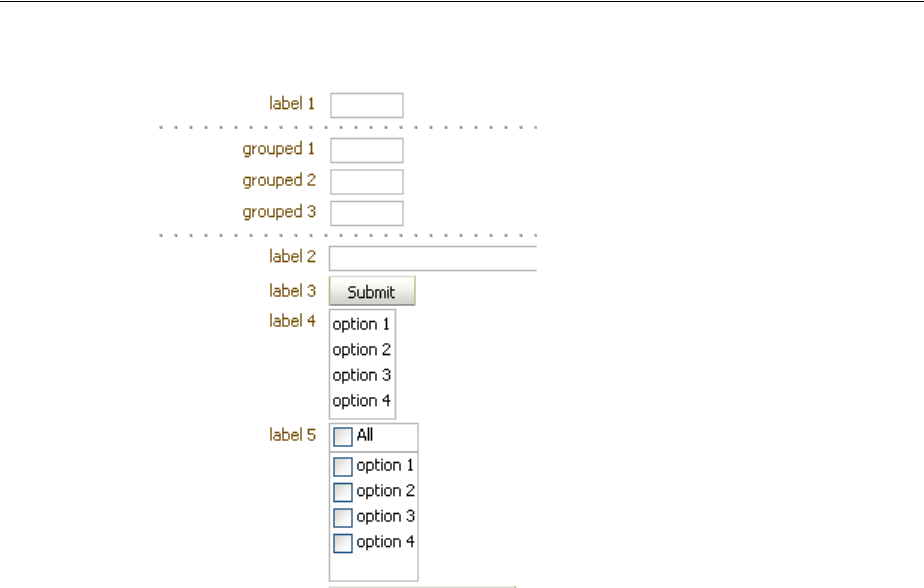
Arranging Content in Forms
Organizing Content on Web Pages 9-35
Figure 9–21 Grouped Components in panelFormLayout
As described in Section 9.6, "Arranging Content in Forms," the panelFormLayout
component uses certain component attributes to determine how to display its child
components (grouped and ungrouped) in columns and rows. When using the group
component to group related components in a panelFormLayout component that will
display its child components in more than one column, the child components of any
group component will always be displayed in the same column, that is, child
components inside a group component will never be split across a column.
While the group component does not provide any layout for its child components, the
underlying HTML elements can provide the desired layout for the child components
inside the group component. For example, if you want child button components in a
group component to flow horizontally in a form layout, use the panelGroupLayout
component to wrap the buttons, and set the layout attribute on panelGroupLayout
component to horizontal. Then insert the panelGroupLayout component into
group component, as shown in Example 9–8.
Example 9–8 panelGroupLayout Inside a Group Component
<af:group>
<af:panelGroupLayout layout="horizontal">
<af:commandButton text="Save" ../>
<af:commandButton text="Cancel" ../>
<f:facet name="separator">
<af:spacer width="3"/>
</f:facet>
</af:panelGroupLayout>
</af:group>
When you use the group component to group child components in the footer facet
of the panelFormLayout component, you must place all the group components and
other ungrouped child components in one root group component, as shown in
Example 9–9.
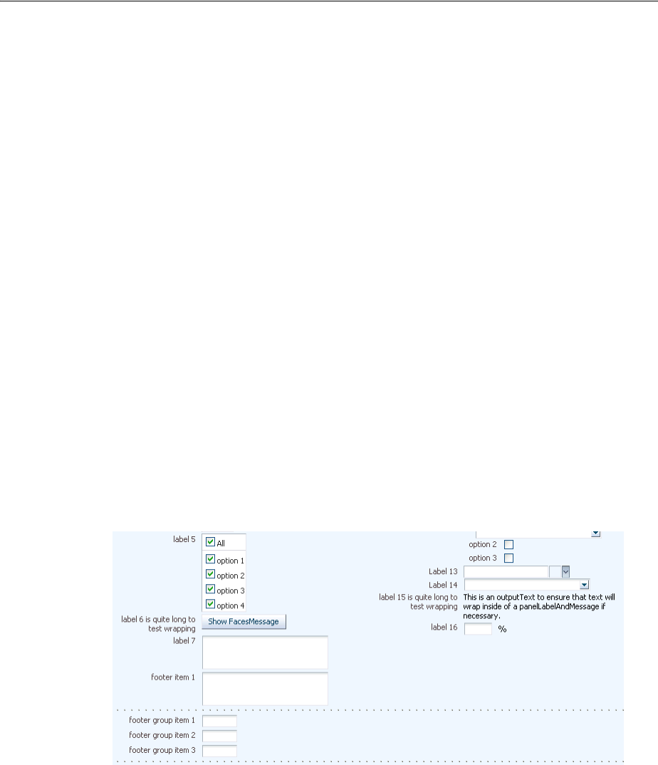
Arranging Content in Forms
9-36 Web User Interface Developer's Guide for Oracle Application Development Framework
Example 9–9 footer Facet in panelFormLayout with One Root group Component
<af:panelFormLayout ...>
<f:facet name="footer">
<!-- One root group component needed -->
<af:group>
<af:outputText value="Footer item 1"/>
<!-- One group -->
<af:group>
<af:outputText value="Group 1 item 1"/>
<af:outputText value="Group 1 item 2"/>
</af:group>
<af:panelGroupLayout layout="horizontal">
<af:commandButton text="Save"/>
<af:commandButton text="Cancel"/>
<f:facet name="separator">
<af:spacer width="3"/>
</f:facet>
</af:panelGroupLayout>
</af:group>
</f:facet>
.
.
.
</af:panelFormLayout>
Like grouped child components in a panelFormLayout component, at runtime the
panelFormLayout component renders dotted, separator lines around the child
components of each group component in the footer facet, as shown in Figure 9–22.
Figure 9–22 Footer in panelGroupLayout with Grouped Components
Arranging Content in Forms
Organizing Content on Web Pages 9-37
Whether you are grouping components in the footer facet or in the main body of the
panelFormLayout component, if the first or last child inside the panelFormLayout
component or inside the footer facet is a group component, no separator lines will
be displayed around the child components in that group. For example, both sets of
code examples in Example 9–10 would produce the same visual effect at runtime.
Example 9–10 Code Producing Same Visual Effect
<!-- Example 1: Group of buttons is last child in root group -->
<f:facet name="footer">
<af:group>
<af:outputText value="Footer text item 1"/>
<af:outputText value="Footer text item 2"/>
<af:group>
<af:inputText label="Nested group item 1"/>
<af:inputText label="Nested group item 2"/>
</af:group>
<af:group>
<af:panelGroupLayout layout="horizontal">
<af:commandButton text="Cancel"/>
<af:commandButton text="Save"/>
</af:panelGroupLayout>
</af:group>
</af:group>
</f:facet>
<!-- Example 2: panelGroupLayout of buttons is last child in root group-->
<f:facet name="footer">
<af:group>
<af:outputText value="Footer text item 1"/>
<af:outputText value="Footer text item 2"/>
<af:group>
<af:inputText label="Nested group item 1"/>
<af:inputText label="Nested group item 2"/>
Note: The footer facet in the panelFormLayout component
supports only two levels of grouped components, that is, you cannot
have three or more levels of nested group components in the footer
facet. For example, the following code is not valid:
<f:facet name="footer">
<!-- Only one root group -->
<af:group>
<af:outputText value="Footer item 1"/>
<!-- Any number of groups at this level -->
<af:group>
<af:outputText value="Group 1 item 1"/>
<af:outputText value="Group 1 item 2"/>
<!-- But not another nested group. This is illegal. -->
<af:group>
<af:outputText value="Nested Group 1 item 1"/>
<af:outputText value="Nested Group 1 item 2"/>
</af:group>
</af:group>
<af:outputText value="Another footer item"/>
</af:group>
</f:facet>
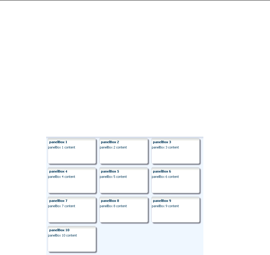
Arranging Contents in a Dashboard
9-38 Web User Interface Developer's Guide for Oracle Application Development Framework
</af:group>
<af:panelGroupLayout layout="horizontal">
<af:commandButton text="Cancel"/>
<af:commandButton text="Save"/>
</af:panelGroupLayout>
</af:group>
</f:facet>
9.7 Arranging Contents in a Dashboard
The panelDashboard component allows you to arrange its child components in rows
and columns, similar to the panelForm component. However, instead of text
components, the panelDashboard children are panelBox components that contain
content, as shown in Figure 9–23.
Figure 9–23 panelDashboard with panelBox Child Components
When you add a panelDashboard component, you configure the number of columns
it will contain, along with the height of each row. The dashboard stretches its children
to fill up the configured space. If all the child components do not fit within the
specified number of columns and row height, then the panelDashboard component
displays a scroll bar.
When placed in a component that stretches it children, by default, the
panelDashboard stretches to fill its parent container, no matter the number of
children. This could mean that you may have blank space in the dashboard when the
browser is resized to be much larger than the dashboard needs.
For example, say you have set the panelDashboard to inherit its size from its parent
by setting the dimensionsFrom attribute to parent. You set columns to 1 and the
rowHeight to 50px. You then add two panelBox components. Because columns is
set to 1, you will have 2 rows. Because the parent component is a
panelStretchLayout, the panelDashboard will stretch to fill the
panelStretchLayout, no matter the height of the boxes, and you end up with extra
space, as shown in Figure 9–24 (the color of the dashboard has been changed to fuchsia
to make it more easy to see its boundaries).
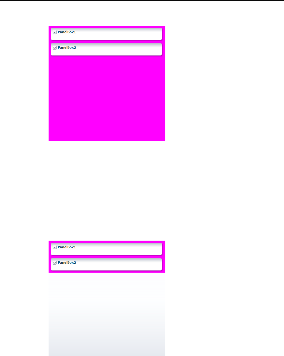
Arranging Contents in a Dashboard
Organizing Content on Web Pages 9-39
Figure 9–24 panelDashboard Stretches to Fill Space
If instead you don’t want the dashboard to stretch, you can place it in a component
that does not stretch its children, and you can configure the panelDashboard to
determine its size based on its children (by setting the dimensionsFrom attribute to
children). It will then be as tall as the number of rows required to display the
children, multiplied by the rowHeight attribute.
In the previous example, if instead you place the dashboard in a panelGroupLayout
set to scroll, because the rowHeight is set to 50, your panelDashboard will
always be just over 100px tall, no matter the size of the browser window, as shown in
Figure 9–25.
Figure 9–25 panelDashboard Does Not Stretch
The panelDashboard component also supports declarative drag and drop behavior,
so that the user can rearrange the child components. As shown in Figure 9–26, the user
can for example, move panelBox 10 between panelBox 4 and panelBox 5. A
shadow is displayed where the box can be dropped.
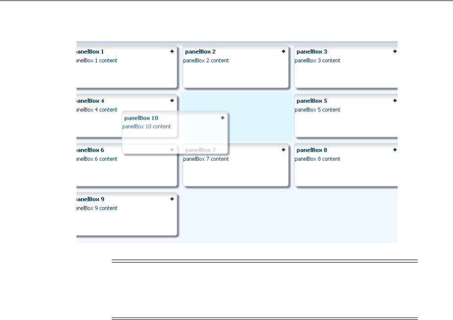
Arranging Contents in a Dashboard
9-40 Web User Interface Developer's Guide for Oracle Application Development Framework
Figure 9–26 Drag and Drop Capabilities in panelDashboard
Along with the ability to move child components, the panelDashboard component
also provides an API that you can access to allow users to switch child components
from being rendered to not rendered, giving the appearance of panelBoxes being
inserted or deleted. The dashboard uses partial page rendering to redraw the new set
of child components without needing to redraw the entire page.
You can use the panelDashboardBehavior tag to make the rendering of
components appear more responsive. This tag allows the activation of a command
component to apply visual changes to the dashboard before the application code
modifies the component tree on the server. Because this opening up of space happens
before the action event is sent to the server, the user will see immediate feedback while
the action listener for the command component modifies the component tree and
prepares the dashboard for the optimized encoding of the insert.
For example, Figure 9–27 shows a panelDashboard component used in the right
panel of a panelSplitter component. In the left panel, list items displayed as links
represent each panelBox component in the panelDashboard. When all panelBox
components are displayed, the links are all inactive. However, if a user deletes one of
the panelBox components, the corresponding link becomes active. The user can click
the link to reinsert the panelBox. By using the panelDashboardBehavior tag with
the commandLink component, the user sees the inserted box drawing.
Note: You can also configure drag and drop functionality that allows
users to drag components into and out of the panelDashboard
component. For more information, see Section 33.6, "Adding Drag and
Drop Functionality Into and Out of a panelDashboard Component."
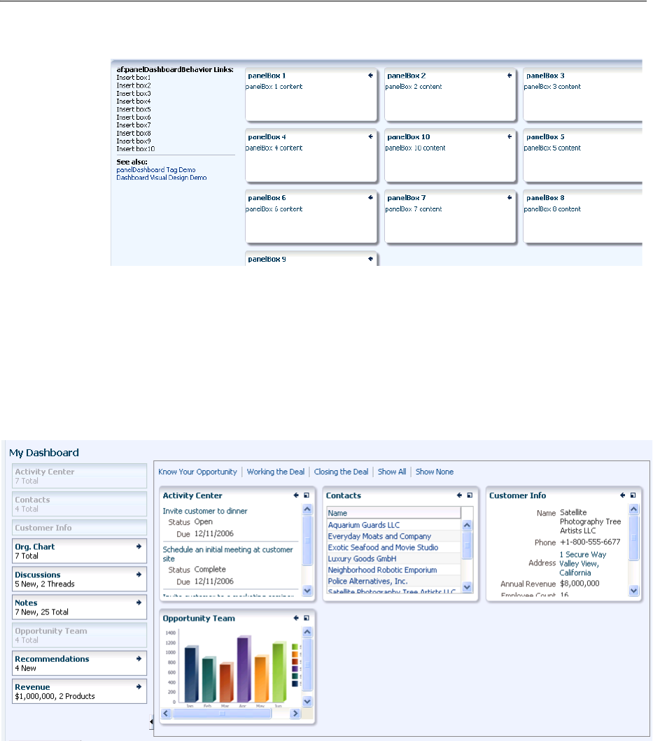
Arranging Contents in a Dashboard
Organizing Content on Web Pages 9-41
Figure 9–27 commandLink Components Use panelDashboardBehavior Tag
If you decide not to use this tag, there will be a slight delay while your action listener
is processing before the user sees any change to the dashboard structure.
Figure 9–28 shows a practical example using a panelDashboard component.
Selecting one of the links at the top of the page changes the panelBoxes displayed in
the dashboard. The user can also add panelBoxes by clicking the associated link on
the left-hand side of the page.
Figure 9–28 Practical Example of panelDashboard
9.7.1 How to Use the panelDashboard Component
After you add a panelDashboard to a page, you can configure the dashboard to
determine whether or not it will stretch. Then, add child components, and if you want
to allow rearrangement the components, also add a componentDragSource tag to
the child component. If you want to allow insertion and deletion of components,
implement a listener to handle the action. You can also use the
panelDashboardBehavior tag to make the panelDashboard component appear
more responsive to the insertion.

Arranging Contents in a Dashboard
9-42 Web User Interface Developer's Guide for Oracle Application Development Framework
Before you begin:
It may be helpful to have an understanding of how the attributes can affect
functionality. For more information, see Section 9.7, "Arranging Contents in a
Dashboard."
You may also find it helpful to understand functionality that can be added using other
ADF Faces features. For more information, see Section 9.1.1, "Additional Functionality
for Layout Components."
To use the panelDashboard component:
1. In the Component Palette, from the Layout panel drag and drop a Panel
Dashboard onto the page.
2. In the Property Inspector, expand the Common section.
3. Set columns to the number of columns you want to use to display the child
components. The child components will stretch to fit each column.
4. Set RowHeight to the number of pixels high that each row should be. The child
components will stretch to this height.
5. By default, the panelDashboard component stretches to fill available browser
space. If instead, you want to use the panelDashboard component as a child to a
component that does not stretch its children, then you need to change how the
panelDashboard component handles stretching.
You configure whether the component will stretch or not using the
dimensionsFrom attribute. To do so, expand the Appearance section, and set
DimensionsFrom to one of the following:
■children: the panelDashboard component will get its dimensions from its
child components.
■parent: the size of the panelDashboard component will be determined in
the following order:
–From the inlineStyle attribute.
–If no value exists for inlineStyle, then the size is determined by the
parent container.
–If the parent container is not configured or not able to stretch its children,
the size will be determined by the skin.
■auto: If the parent component to the panelDashboard component allows
stretching of its child, then the panelDashboard component will stretch to
fill the parent. If the parent does not stretch its children then the size of the
panelDashboard component will be based on the size of its child
component.
6. From the Component Palette, drag and drop child panelBox components.
Note: If you use this setting, you cannot set the height of the
panelDashboard component (for example through the
inlineStyle or styleClass attributes). Doing so would cause
conflict between the panelDashboard height and the child
component height.
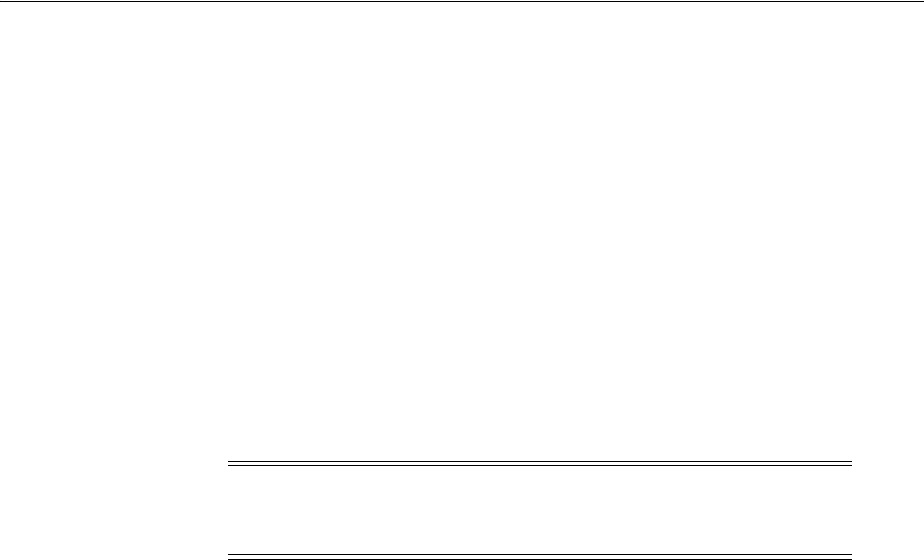
Arranging Contents in a Dashboard
Organizing Content on Web Pages 9-43
7. If you want users to be able to reorder the child components, in the Component
Palette, from the Operations panel, in the Drag and Drop group, drag and drop a
Component Drag Source as a child to each of the child components.
8. If you want to be able to add and delete components, create a managed bean and
implement a handler method that will handle reordering children when a child is
added or dropped. This event is considered a drop event, so you must use the
Drag and Drop framework. For more information about creating a handler for a
drop event, see Chapter 33, "Adding Drag and Drop Functionality."
To use the optimized lifecycle, have the handler call the panelDashboard
component’s prepareOptimizedEncodingOfInsertedChild() method,
which causes the dashboard to send just the inserted child component to be
rendered.
9. If you have added a componentDragSource tag in Step 7, then you must also
implement a DropEvent handler for the panelDashboard. With the
panelDashboard component selected, expand the Behavior section and bind the
DropListener attribute to that handler method.
10. If you wish to use a panelDashboardBehavior tag, drag and drop a command
component that will be used to initiate the insertion.
11. In the Property Inspector, bind the ActionListener for the command component to
a handler on a managed bean that will handle the changes to the component tree.
Have the handler call the panelDashboard component’s
prepareOptimizedEncodingOfInsertedChild() method, which causes the
dashboard to send just the inserted child component to be rendered. Example 9–11
shows code on a managed bean that handles the insertion of child components.
Example 9–11 Action Listener Code for Insert Button
public void handleInsert(ActionEvent e)
{
UIComponent eventComponent = e.getComponent();
String panelBoxId = eventComponent.getAttributes().get("panelBoxId").toString();
UIComponent panelBox = _dashboard.findComponent(panelBoxId);
// Make this panelBox rendered:
panelBox.setRendered(true);
// Becaue the dashboard is already shown, perform an optimized
// render so the whole dashboard does not have to be re-encoded:
int insertIndex = 0;
List<UIComponent> children = _dashboard.getChildren();
for (UIComponent child : children)
{
if (child.equals(panelBox))
{
// Let the dashboard know that only the one child component should be
// encoded during the render phase:
Tip: The panelDashboard component also supports the region
component as a child component.
Note: If you plan on using the panelDashboardBehavior tag,
then this API should be called from the associated command
component’s actionListener handler.

Displaying and Hiding Contents Dynamically
9-44 Web User Interface Developer's Guide for Oracle Application Development Framework
_dashboard.prepareOptimizedEncodingOfInsertedChild(
FacesContext.getCurrentInstance(),
insertIndex);
break;
}
if (child.isRendered())
{
// Count only rendered children because that is all that the
// panelDashboard can see:
insertIndex++;
}
}
// Add the side bar as a partial target because we need to
// redraw the state of the side bar item that corresponds to the inserted item:
RequestContext rc = RequestContext.getCurrentInstance();
rc.addPartialTarget(_sideBar);
}
12. In the Component Palette, from the Operations panel, in the Behavior group, drag
a Panel Dashboard Behavior tag and drop it as a child to the command
component.
13. In the Property Inspector, enter the following:
■for: Enter the ID for the associated panelDashboard component
■index: Enter an EL expression that resolves to a method that determines the
index of the component to be inserted. When you use the
panelDashboardBehavior tag, a placeholder element is inserted into the
DOM tree where the actual component will be rendered once it is returned
from the server. Because the insertion placeholder gets added before the
insertion occurs on the server, you must specify the location where you are
planning to insert the child component so that if the user reloads the page, the
children will continue to remain displayed in the same order.
9.7.2 What You May Need to Know About Geometry Management and the
panelDashboard Component
This component organizes its children into a grid based on the number of columns and
the rowHeight attribute. The child components that can be stretched inside of the
panelDashboard include:
■inputText (when the rows attribute is set to greater than one, and the simple
attribute is set to true)
■panelBox
■region (when configured to stretch)
■table (when configured to stretch)
If you try to put any other component as a child component to the panelDashboard
component, then the component hierarchy is not valid.
9.8 Displaying and Hiding Contents Dynamically
Sometimes you want users to have the choice of displaying or hiding content. When
you do not need to show all the functionality of the user interface at once, you can
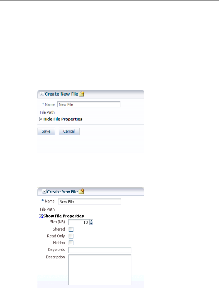
Displaying and Hiding Contents Dynamically
Organizing Content on Web Pages 9-45
save a lot of space by using components that enable users to show and hide parts of
the interface at will.
The showDetail component creates a label with a toggle icon that allows users to
disclose (show) or undisclose (hide) contents under the label. When the contents are
undisclosed (hidden), the default label is Show and the expand icon is displayed.
When the contents are disclosed (shown), the default label is Hide, and the collapse
icon is displayed.
For example, the newFileItem page of the File Explorer application uses a
showDetail component to hide and display file properties. The component is
configured to hide the properties when the page is displayed, as shown in Figure 9–29.
Figure 9–29 Collapsed showDetail
When the user clicks the toggle icon, the properties are displayed, as shown in
Figure 9–30.
Figure 9–30 Expanded showDetail
If you want to use something more complex than an outputText component to
display the disclosed and undisclosed text, you can add components to the
showDetail component’s prompt facet. When set to be visible, any contents in the
prompt facet will replace the disclosed and undisclosed text values. To use the
showDetail component, see Section 9.8.1, "How to Use the showDetail Component."
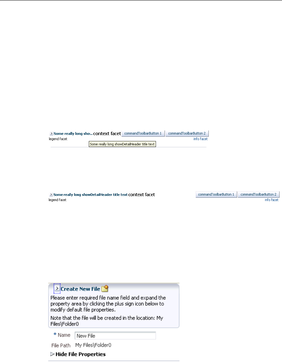
Displaying and Hiding Contents Dynamically
9-46 Web User Interface Developer's Guide for Oracle Application Development Framework
Like the showDetail component, the showDetailHeader component also toggles
the display of contents, but the showDetailHeader component provides the label
and toggle icon in a header, and also provides facets for a menu bar, toolbar, and text.
When there is not enough space to display everything in all the facets of the title line,
the showDetailHeader text is truncated and displays an ellipsis. When the user
hovers over the truncated text, the full text is displayed in a tooltip, as shown in
Figure 9–31.
Figure 9–31 Text for the showDetailHeader Is Truncated
When there is more than enough room to display the contents, the extra space is
placed between the context facet and the toolbar, as shown in Figure 9–32.
Figure 9–32 Extra Space Is Added Before the Toolbar
Additionally, you can configure the showDetailHeader component to be used as a
message for errors, warnings, information, or confirmations. The contents are
undisclosed or disclosed below the header. For example, the newFileItem page of
the File Explorer application uses a showDetailHeader component to display help
for creating a new file. By default, the help is undisclosed, as shown in Figure 9–30.
When the user clicks the toggle icon in the header, the contents are disclosed, as shown
in Figure 9–33.
Figure 9–33 showDetailHeader Component Used to Display Help
You can also use the showDetailHeader component in conjunction with the
panelHeader component to divide a page into sections and subsections, where some
contents can be hidden. The showDetailHeader component contains a number of
facets, such as a toolbar and menu bar facet. These facets are the same as for the
panelHeader component. For more information about the panelHeader
component, see Section 9.10, "Displaying Items in a Static Box."
Tip: The showDetailHeader component is the same as a
panelHeader component, except that it handles disclosure events.
For more information about the panelHeader component, see
Section 9.10, "Displaying Items in a Static Box."
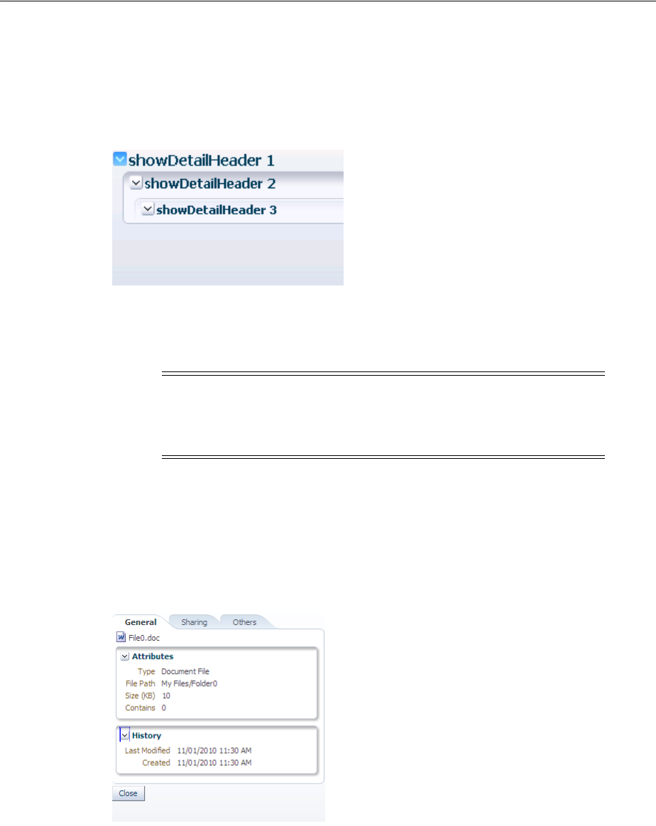
Displaying and Hiding Contents Dynamically
Organizing Content on Web Pages 9-47
You can nest showDetailHeader components to create a hierarchy of content. Each
nested component takes on a different heading style to denote the hierarchy.
Figure 9–34 shows three nested showDetailHeader components, and their different
styles.
Figure 9–34 Nested showDetailHeader Components Create a Hierarchy
You can change the styles used by each header level by applying a skin to the
showDetailHeader component. For details about skinning ADF Faces components,
see Chapter 28, "Customizing the Appearance Using Styles and Skins."
Use the panelBox component when you want information to be able to be displayed
or hidden below the header, and you want the box to be offset from other information
on the page. The File Explorer application uses two panelBox components on the
properties.jspx page to display the attributes and history of a file, as shown in
Figure 9–35.
Figure 9–35 Two panelBox Components
Figure 9–36 shows the same page, but with the History panelBox component in an
undisclosed state.
Note: While you can force the style of the text using the size
attribute, (where 0 is the largest text), the value of the size attribute
will not affect the hierarchy. It only affects the style of the text.
Hierarchy is determined by the nesting of the components.
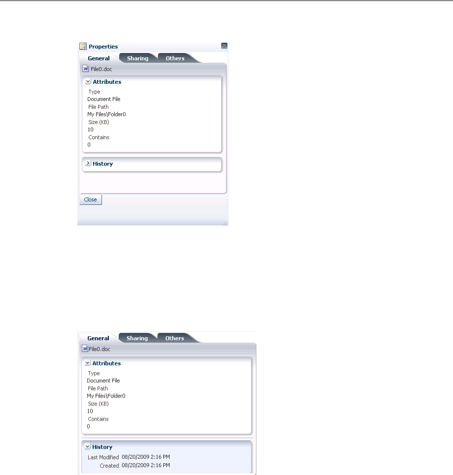
Displaying and Hiding Contents Dynamically
9-48 Web User Interface Developer's Guide for Oracle Application Development Framework
Figure 9–36 Undisclosed panelBox Component
You can set the background color on a panelBox component so that the contents are
further delineated from the rest of the page. Two color combinations (called ramps) are
offered, and each combination contains four levels of color: none, light, medium, and
dark. Figure 9–37 shows the same panel boxes as in Figure 9–35, but with the bottom
panelBox component configured to show the medium tone of the core ramp.
Figure 9–37 Panel Boxes Using a Background Color
You can set the size of a panelBox component either explicitly by assigning a pixel
size, or as a percentage of its parent. You can also set the alignment of the title, and
add an icon. In addition, the panelBox component includes the toolbar facet that
allows you to add a toolbar and toolbar buttons to the box.
The showDetail, showDetailHeader, and panelBox components all handle
disclosure events on the server. Disclosure events are sent whenever the user toggles
the component between disclosed and undisclosed. This means that a roundtrip to the
server is required, even though no data may be being sent or received. You can
configure these components to so that they handle the disclosure event on the client
instead, which improves performance. The event will not be sent to the server until
another event is sent, or if the component detects that any data has changed.
If you want to show and hide multiple large areas of content, consider using the
panelAccordion and panelTabbed components. For more information, see
Section 9.9, "Displaying or Hiding Contents in Accordion Panels and Tabbed Panels."

Displaying and Hiding Contents Dynamically
Organizing Content on Web Pages 9-49
9.8.1 How to Use the showDetail Component
Use the showDetail component to show and hide a single set of content.
Before you begin:
It may be helpful to have an understanding of how the attributes can affect
functionality. For more information, see Section 9.8, "Displaying and Hiding Contents
Dynamically."
You may also find it helpful to understand functionality that can be added using other
ADF Faces features. For more information, see Section 9.1.1, "Additional Functionality
for Layout Components."
To create and use the showDetail component:
1. In the Component Palette, from the Layout panel, drag and drop a Show Detail
onto the JSF page.
2. In the Property Inspector, expand the Common section and set the attributes as
needed.
Set Disclosed to true if you want the component to show its child components.
Set DisclosedText to the label you want to display next to the toggle icon when the
contents are disclosed (shown). By default, the label is Hide if no value is
specified.
Set UndisclosedText to the label you want to display next to the toggle icon when
the contents are undisclosed (hidden). By default, the label is Show if no value is
specified.
3. Expand the Behavior section and set DisclosureListener to a
DisclosureListener method in a backing bean that you want to execute when
the user displays or hides the component’s contents.
For information about disclosure events and listeners, see Section 9.8.4, "What You
May Need to Know About Disclosure Events."
Note: While the user can change the value of the disclosed
attribute by displaying and hiding the contents, the value will not be
retained once the user leaves the page unless you configure your
application to allow user customizations. For information, see
Chapter 32, "Allowing User Customization on JSF Pages."
Note: If you specify a value for disclosedText but not for
undisclosedText, then ADF Faces automatically uses the
disclosedText value for both the disclosed state and undisclosed
state. Similarly, if you specify a value for undisclosedText but not
for disclosedText, the undisclosedText value is used when the
contents are hidden or displayed.
Instead of using text specified in disclosedText and
undisclosedText, you could use the prompt facet to add a
component that will render next to the toggle icon.

Displaying and Hiding Contents Dynamically
9-50 Web User Interface Developer's Guide for Oracle Application Development Framework
4. Set HandleDisclosure to client if you want the disclosure event to be handled
on the client. The event will not be sent to the server until another event is sent, or
if the component detects that the data has changed and needs to be updated.
For information about disclosure events and listeners, see Section 9.8.4, "What You
May Need to Know About Disclosure Events."
5. To add content, insert the desired child components inside the showDetail
component.
9.8.2 How to Use the showDetailHeader Component
Use the showDetailHeader component when you want to display a single set of
content under a header, or when you want the content to be used as messages that can
be displayed or hidden. You can also use the showDetailHeader component to
create a hierarchy of headings and content when you want the content to be able to be
hidden.
Before you begin:
It may be helpful to have an understanding of how the attributes can affect
functionality. For more information, see Section 9.8, "Displaying and Hiding Contents
Dynamically."
You may also find it helpful to understand functionality that can be added using other
ADF Faces features. For more information, see Section 9.1.1, "Additional Functionality
for Layout Components."
To create and use the showDetailHeader component:
1. In the Component Palette, from the Layout panel, drag and drop a Show Detail
Header onto the JSF page.
2. In the Property Inspector, expand the Common section. Set Text to the text string
you want for the section header label.
3. Set Icon to the URI of the image file you want to use for the section header icon.
The icon image is displayed before the header label.
4. If you are using the header to provide specific messaging information, set
MessageType to one of the following values:
Note: If you have bound the disclosureListener to a listener
method that handles the disclosure event, then the
handleDisclosure value is ignored, and the event is handled on
the server.
Performance Tip: If you do not expect the component to handle data
changes, you should set the handleDisclosure attribute to
client.
Note: Because alternative text cannot be provided for this icon, in
order to create an accessible product, use this icon only when it is
purely decorative. You must provide the meaning of this icon in some
accessible manner.
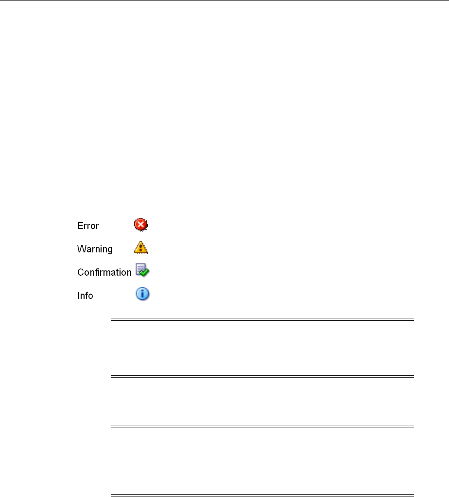
Displaying and Hiding Contents Dynamically
Organizing Content on Web Pages 9-51
■confirmation: The confirmation icon (represented by a note page overlaid
with a green checkmark) replaces any specified icon image.
■error: The error icon (represented by a red circle with an x inside) replaces
any specified icon image. The header label also changes to red.
■info: The info icon (represented by a blue circle with an I inside) replaces any
specified icon image.
■warning: The warning icon (represented by a yellow triangle with an
exclamation mark inside) replaces any specified icon image.
■none: Default. No icon is displayed, unless one is specified for the icon
attribute.
Figure 9–38 shows each of the icons used for message types.
Figure 9–38 Icons Used for Message Types
5. Expand the Behavior section and set Disclosed to true if you want the
component to show its child components.
6. Set DisclosureListener to a disclosureListener method in a backing bean
that you want to execute when the user displays or hides the component’s
contents.
For information about disclosure events and listeners, see Section 9.8.4, "What You
May Need to Know About Disclosure Events."
7. Set HandleDisclosure to client if you want the disclosure event to be handled
on the client. The event will not be sent to the server until another event is sent, or
if the component detects that the data has changed and needs to be updated.
For information about disclosure events and listeners, see Section 9.8.4, "What You
May Need to Know About Disclosure Events."
Note: Because alternative text cannot be provided for this icon, in
order to create an accessible product, use this icon only when it is
purely decorative. You must provide the meaning of this icon in some
accessible manner.
Note: While the user can change the value of the disclosed
attribute by displaying and hiding the contents, the value will not be
retained once the user leaves the page unless you configure your
application to allow user customization. For information, see
Chapter 32, "Allowing User Customization on JSF Pages."

Displaying and Hiding Contents Dynamically
9-52 Web User Interface Developer's Guide for Oracle Application Development Framework
8. If you want to control how the showDetailHeader component handles
geometry management, expand the Appearance section and set Type. Set it to
flow if you do not want the component to stretch or to stretch its children. The
height of the showDetailHeader component will be determined solely by its
children. Set it to stretch if you want it to stretch and stretch its child (will only
stretch a single child component). Leave it set to the default if you want the parent
component of the showDetailHeader component to determine geometry
management. For more information about geometry management, see
Section 9.2.1, "Geometry Management and Component Stretching."
9. To add buttons or icons to the header, in the Component Palette, from the Layout
panel, in the Menus and Toolbar panel, drag and drop the toolbar component
into the toolbar facet. Then add any number of commandToolbarButton or
commandButton components into the newly inserted toolbar component. For
more information about using the toolbar component, see Section 16.3, "Using
Toolbars."
10. To add menus to the header, insert menu components into the menuBar facet. For
more information about creating menus, see Section 16.2, "Using Menus in a Menu
Bar."
11. To create a subsection header, insert another showDetailHeader component
inside an existing showDetailHeader component.
The size attribute specifies the number to use for the header level. The largest
number is 0, and it corresponds to an H1 header level; the smallest is 5, and it
corresponds to an H6 header.
By default, the size attribute is -1. This means ADF Faces automatically
calculates the header number (and thus the header level style to use) from the
topmost, parent component. When you use nested components, you do not have
to set the size attribute explicitly to get the proper header style to be displayed.
Note: If you have bound the disclosureListener to a listener
method that handles the disclosure event, then the
handleDisclosure value is ignored, and the event is handled on
the server.
Performance Tip: If you do not expect the component to handle data
changes, you should set the handleDisclosure attribute to
client.
Note: Toolbar overflow is not supported in panelHeader
components.
Tip: You can place menus in the toolbar facet and toolbars (and
toolboxes) in the menu facet. The main difference between these facets
is location. The toolbar facet is before the menu facet.
Note: While you can force the style of the text using the size
attribute, (where 0 is the largest text), the value of the size attribute
will not affect the hierarchy. It only affects the style of the text.
Hierarchy is determined by the nesting of the components.

Displaying and Hiding Contents Dynamically
Organizing Content on Web Pages 9-53
In the default skin used by ADF Faces, the style used for sizes above 2 will be
displayed the same as size 2. That is, there is no difference in styles for sizes 3, 4, or
5–they all show the same style as size 2. You can change this by creating a custom
skin. For more information, see Chapter 28, "Customizing the Appearance Using
Styles and Skins."
12. To add content to a section or subsection, insert the desired child components
inside the showDetailHeader component.
9.8.3 How to Use the panelBox Component
You can insert any number of panelBox components on a page.
Before you begin:
It may be helpful to have an understanding of how the attributes can affect
functionality. For more information, see Section 9.8, "Displaying and Hiding Contents
Dynamically."
You may also find it helpful to understand functionality that can be added using other
ADF Faces features. For more information, see Section 9.1.1, "Additional Functionality
for Layout Components."
To create and use a panelBox component:
1. In the Component Palette, from the Layout panel, drag and drop a Panel Box to
the JSF page.
2. In the Property Inspector, expand the Appearance section, and for Ramp, select
the ramp you wish to use.
The core ramp uses variations of blue, while the highlight ramp uses
variations of yellow. You can change the colors used by creating a custom skin. For
details, see Chapter 28, "Customizing the Appearance Using Styles and Skins."
3. Set Background to one of the following values: light, medium, dark, or
default. The default background color is transparent.
4. Set Text to the text string you want to display as the title in the header portion of
the container.
5. Set Icon to the URI of the icon image you want to display before the header text.
6. Set TitleHalign to one of the following values: center, start, end, left, or
right. The value determines the horizontal alignment of the title (including any
icon image) in the header portion of the container.
7. Expand the Behavior section and set DisclosureListener to a
disclosureListener method in a backing bean that you want to execute when
the user shows or hides the component’s contents.
Note: If both the text and icon attributes are not set, ADF Faces
does not display the header portion of the panelBox component.
Note: Because alternative text cannot be provided for this icon, in
order to create an accessible product, use this icon only when it is
purely decorative. You must provide the meaning of this icon in some
accessible manner.

Displaying and Hiding Contents Dynamically
9-54 Web User Interface Developer's Guide for Oracle Application Development Framework
For information about disclosure events and listeners, see Section 9.8.4, "What You
May Need to Know About Disclosure Events."
8. Set HandleDisclosure to client if you want the disclosure event to be handled
on the client. The event will not be sent to the server until another event is sent, or
if the component detects that the data has changed and needs to be updated.
For information about disclosure events and listeners, see Section 9.8.4, "What You
May Need to Know About Disclosure Events."
9. To add toolbar buttons, in the Component Palette, from the Layout panel, in the
Menus and Toolbar panel, drag and drop a Too l bar into the toolbar facet. Then
insert the desired number of commandToolbarButton components into the
toolbar component. For information about using toolbar and
commandToolbarButton components, see Section 16.3, "Using Toolbars."
10. To add contents to the container for display, insert the desired components as child
components to the panelBox component.
Typically, you would insert one child component into the panelBox component,
and then insert the contents for display into the child component. The child
component controls how the contents will be displayed, not the parent panelBox
component.
11. To change the width of the panelBox component, set the inlineStyle attribute
to the exact pixel size you want. Alternatively, you can set the inlineStyle
attribute to a percentage of the outer element that contains the panelBox
component. Example 9–12 shows the code you might use for changing the width.
Example 9–12 panelBox Component with inlineStyle Attribute Set
<af:panelBox inlineStyle="width:50%;" ...>
<!-- child contents here -->
</af:panelBox>
9.8.4 What You May Need to Know About Disclosure Events
The disclosed attribute specifies whether to show (disclose) or hide (undisclose) the
contents under its header. By default, the disclosed attribute is true, that is, the
contents are shown. When the attribute is set to false, the contents are hidden. You
Note: If you have bound the disclosureListener to a listener
method that handles the disclosure event, then the
handleDisclosure value is ignored, and the event is handled on
the server.
Performance Tip: If you do not expect the component to handle data
changes, you should set the handleDisclosure attribute to
client.
Tip: If any facet is not visible in the visual editor:
1. Right-click the panelBox component in the Structure window.
2. From the context menu, choose Facets - Panel Box >Toolbar. Facets in use
on the page are indicated by a checkmark in front of the facet name.

Displaying and Hiding Contents Dynamically
Organizing Content on Web Pages 9-55
do not have to write any code to enable the toggling of contents from disclosed to
undisclosed, and vice versa. ADF Faces handles the toggling automatically.
When the user clicks the toggle icon to show or hide contents, by default, the
components deliver a
org.apache.myfaces.trinidad.event.DisclosureEvent event to the server.
The DisclosureEvent event contains information about the source component and
its state: whether it is disclosed (expanded) or undisclosed (collapsed). The
isExpanded() method returns a boolean value that determines whether to expand
(disclose) or collapse (undisclose) the node. If you only want the component to
disclose and undisclose its contents, then you do not need to write any code.
However, if you want to perform special handling of a DisclosureEvent event, you
can bind the component’s disclosureListener attribute to a
disclosureListener method in a backing bean. The disclosureListener
method will then be invoked in response to a DisclosureEvent event, that is,
whenever the user clicks the disclosed or undisclosed icon.
The disclosureListener method must be a public method with a single
disclosureEvent event object and a void return type, shown in Example 9–13.
Example 9–13 disclosureListener Method
public void some_disclosureListener(DisclosureEvent disclosureEvent) {
// Add event handling code here
}
By default, DisclosureEvent events are usually delivered in the Invoke Application
phase, unless the component’s immediate attribute is set to true. When the
immediate attribute is set to true, the event is delivered in the earliest possible
phase, usually the Apply Request Values phase.
If you do not need to use a listener method to react to the disclosure event, then
consider setting the handleDisclosure attribute to client. This setting causes the
disclosure event to be handled on the client. The event will not be sent to the server
until another event is sent, or if the component detects that the data has changed and
needs to be updated. The event will also be automatically sent to the server if the
disclosureListener attribute is bound to a listener method, even when the
handleDisclosure attribute is set to client.
If you do want to have a disclosureListener method and you also want to react
to the event on the client, you can use the AdfDisclosureEvent client-side event.
The event root for the client AdfDisclosureEvent event is set to the event source
component: only the event for the panel whose disclosed attribute is true gets sent
to the server. For more information about client-side events and event roots, see
Chapter 6, "Handling Events."
The value of the disclosed attribute can be persisted at runtime, that is, when the
user shows or hides contents, ADF Faces can change and then persist the attribute
value so that it remains in that state for the length of the user’s session. For more
information, see Chapter 32, "Allowing User Customization on JSF Pages."
Note: Any ADF Faces component that has built-in event
functionality, as the showDetail, showDetailHeader, and
panelBox components do, must be enclosed in the form component.
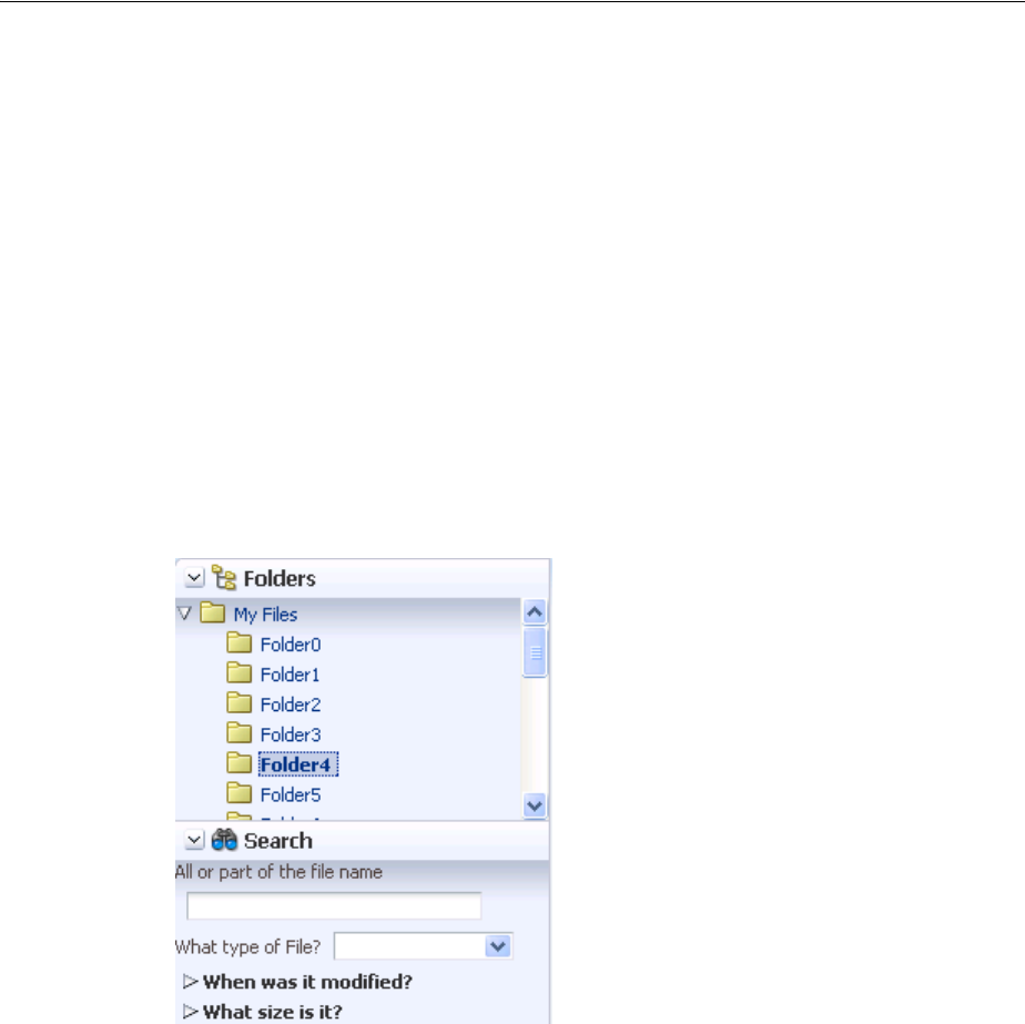
Displaying or Hiding Contents in Accordion Panels and Tabbed Panels
9-56 Web User Interface Developer's Guide for Oracle Application Development Framework
9.9 Displaying or Hiding Contents in Accordion Panels and Tabbed
Panels
When you need to display multiple areas of content that can be hidden and displayed,
you can use the panelAccordion or the panelTabbed components. Both of these
components use the showDetailItem component to display the actual contents.
The panelAccordion component creates a series of expandable panes. You can allow
users to expand more than one panel at any time, or to expand only one panel at a
time. When more than one panel is expanded, the user can adjust the height of the
panel by dragging the header of the showDetailItem component.
When a panel is collapsed, only the panel header is displayed; when a panel is
expanded, the panel contents are displayed beneath the panel header (users can
expand the panes by clicking either the panelAccordion component’s header or the
expand icon). The File Explorer application uses the panelAccordion component to
display the Folders and Search panes, as shown in Figure 9–39.
Figure 9–39 panelAccordion Panes
At runtime, when available browser space is less than the space needed to display
expanded panel contents, ADF Faces automatically displays overflow icons that
enable users to select and navigate to those panes that are out of view. Figure 9–40
shows the overflow icon (circled in the lower right-hand corner) displayed in the
Folders panel of the File Explorer application when there is not enough room to
display the Search panel.
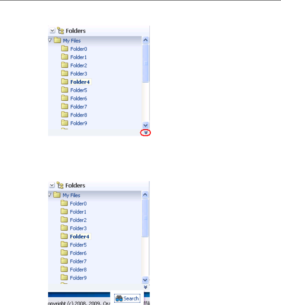
Displaying or Hiding Contents in Accordion Panels and Tabbed Panels
Organizing Content on Web Pages 9-57
Figure 9–40 Overflow Icon In panelAccordion
When the user clicks the overflow icon, ADF Faces displays the overflow popup menu
(as shown in Figure 9–41) for the user to select and navigate to.
Figure 9–41 Overflow Popup Menu in panelAccordion
You can also configure the panelAccordion so that the panes can be rearranged by
dragging and dropping, as shown in Figure 9–42.
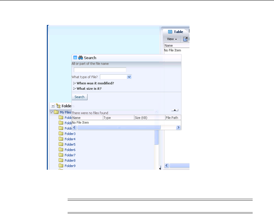
Displaying or Hiding Contents in Accordion Panels and Tabbed Panels
9-58 Web User Interface Developer's Guide for Oracle Application Development Framework
Figure 9–42 Panes Can Be Reordered by Dragging and Dropping
When the order is changed, the displayIndex attribute on the showDetailItem
components also changes to reflect the new order.
To use the panelAccordion component, see Section 9.9.1, "How to Use the
panelAccordion Component."
The panelTabbed component creates a series of tabbed panes. Unlike the
panelAccordion panes, the panelTabbed panes are not collapsible or expandable.
Instead, when users select a tab, the contents of the selected tab are displayed. The tabs
may be positioned above the display area, below the display area, or both. You can
configure a panelTabbed component so that the individual tabs can be closed. You
can have it so that all tabs can be closed, all but the last tab can be closed, or no tabs
can be closed. When tabs are configured to be removed, an X is displayed at the end of
the tab. You can also configure tabs so that they display a disabled X, meaning it can
be removed, but is currently disabled.
You can configure when the showDetailItem components that contain the contents
for each of the tabs will be created. When you have a small number of tabs, you can
have all the showDetailItem components created when the panelTabbed
component is first created, regardless of which tab is currently displayed. However, if
the panelTabbed component contains a large number of showDetailItem
components, the page might be slow to render. To enhance performance, you can
instead configure the panelTabbed component to create a showDetailItem
component only when its corresponding tab is selected. You can further configure the
delivery method to either destroy a showDetailItem once the user selects a different
tab, or to keep any selected showDetailItem components in the component tree so
that they do not need to be recreated each time they are accessed.
The File Explorer application uses the panelTabbed component to display the
contents in the main panel, as shown in Figure 9–43.
Note: Items in the overflow cannot be reordered.
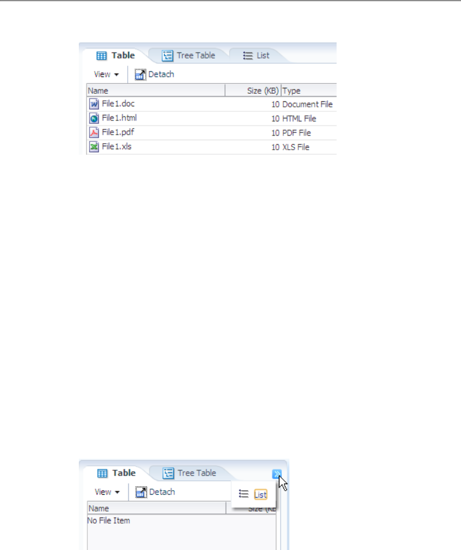
Displaying or Hiding Contents in Accordion Panels and Tabbed Panels
Organizing Content on Web Pages 9-59
Figure 9–43 panelTabbed Panes
To use the panelTabbed component, see Section 9.9.2, "How to Use the panelTabbed
Component."
For both the panelAccordion and panelTabbed components, use one
showDetailItem component to provide the contents for each panel. For example, if
you want to use four panes, insert four showDetailItem components inside the
panelAccordion or panelTabbed components, respectively. To use the
showDetailItem component, see Section 9.9.3, "How to Use the showDetailItem
Component to Display Content in panelAccordion or panelTabbed Components." You
can add a toolbar to the toolbar facet of the showDetailItem component, and the
toolbar will be shown whenever the panel or tab is disclosed. Figure 9–43 shows the
toolbar used by the showDetailItem component in the File Explorer application.
The panelTabbed component also supports an overflow icon if all tabs cannot be
displayed. Figure 9–44 shows the overflow icon in the File Explorer application.
Figure 9–44 Overflow Icon in panelTabbed Component
The panelAccordion and panelTabbed components can be configured to be
stretched, or they can be configured to instead take their dimensions from the
currently disclosed showDetailItem child.
Tip: If you want the tabs to be used in conjunction with navigational
hierarchy, for example, each tab is a different page or region that
contains another set of navigation items, you may want to use a
navigation panel component to create a navigational menu. For more
information, see Section 20.6, "Using Navigation Items for a Page
Hierarchy."
Performance Tip: The number of child components within a
panelAccordion or panelTabbed component, and the complexity
of the child components, will affect the performance of the overflow.
Set the size of the panelAccordion or panelTabbed component to
avoid overflow when possible.

Displaying or Hiding Contents in Accordion Panels and Tabbed Panels
9-60 Web User Interface Developer's Guide for Oracle Application Development Framework
When you configure the panelAccordion or panelTabbed component to stretch,
then you can also configure the showDetailItem component to stretch a single child
as long as it is the only child of the showDetailItem component.
9.9.1 How to Use the panelAccordion Component
You can use more than one panelAccordion component in a page, typically in
different areas of the page, or nested. After adding the panelAccordion component,
insert a series of showDetailItem components to provide the panes, using one
showDetailItem for one panel. Then insert components into each
showDetailItem to provide the panel contents. For procedures on using the
showDetailItem component, see Section 9.9.3, "How to Use the showDetailItem
Component to Display Content in panelAccordion or panelTabbed Components."
Before you begin:
It may be helpful to have an understanding of how the attributes can affect
functionality. For more information, see Section 9.9, "Displaying or Hiding Contents in
Accordion Panels and Tabbed Panels."
You may also find it helpful to understand functionality that can be added using other
ADF Faces features. For more information, see Section 9.1.1, "Additional Functionality
for Layout Components."
To create and use the panelAccordion component:
1. In the Component Palette, from the Layout panel, drag and drop a Panel
Accordion onto the JSF page.
2. In the Property Inspector, expand the Common section.
3. Set DiscloseMany to true if you want users to be able to expand and see the
contents of more than one panel at the same time.
By default, the value is false. This means only one panel can be expanded at any
one time. For example, suppose there is one expanded panel A and one collapsed
panel B when the page first loads. If the user expands panel B, panel A will be
collapsed, because only one panel can be expanded at any time.
4. Set the DiscloseNone to true if you want users to be able to collapse all panes.
By default, the value is false. This means one panel must remain expanded at
any time.
5. By default, the panelAccordion component stretches to fill available browser
space. If instead, you want to use the panelAccordion component as a child to a
component that does not stretch its children, then you need to change how the
panelAccordion component handles stretching.
You configure whether the component will stretch or not using the
dimensionsFrom attribute. Set DimensionsFrom to one of the following:
■children: the panelAccordion component will get its dimensions from
the currently disclosed showDetailItem component.

Displaying or Hiding Contents in Accordion Panels and Tabbed Panels
Organizing Content on Web Pages 9-61
■parent: the size of the panelAccordion component will be determined in
the following order:
–From the inlineStyle attribute.
–If no value exists for inlineStyle, then the size is determined by the
parent container.
–If the parent container is not configured or not able to stretch its children,
the size will be determined by the skin.
■auto: If the parent component to the panelAccordion component allows
stretching of its child, then the panelAccordion component will stretch to
fill the parent. If the parent does not stretch its children then the size of the
panelAccordion component will be based on the size of its child
component.
6. If you want users to be able to rearrange the panes by dragging and dropping,
expand the Behavior section, and set Reorder to enabled. The default is
disabled.
7. By default, one panel is added for you using a showDetailItem component as a
child component to the panelAccordion component. To add more panes, insert
the showDetailItem component inside the panelAccordion component. You
can add as many panes as you wish.
Note: If you use this setting, you cannot set the height of the
panelAccordion component (for example through the
inlineStyle or styleClass attributes). Doing so would cause
conflict between the panelAccordion height and the child
component height.
Similarly, you cannot set the stretchChildren, flex, and
inflexibleHeight attributes on any showDetailItem
component, as those settings would result in a circular reference back
to the panelAccordion to determine size.
Note: If you want the panelAccordion to stretch, and you also
want the showDetailItem to stretch its contents, then you must
configure the showDetailItem in a certain way. For details, see
Section 9.9.3, "How to Use the showDetailItem Component to Display
Content in panelAccordion or panelTabbed Components."
Note: If the panelAccordion has components other than
showDetailItem components (see the tip in Step 7), those
components can be reordered on the client only. Therefore, any new
order will not be preserved.
Tip: Accordion panels also allow you to use the iterator,
switcher, and group components as direct child components,
providing these components wrap child components that would
typically be direct child components of the accordion panel.

Displaying or Hiding Contents in Accordion Panels and Tabbed Panels
9-62 Web User Interface Developer's Guide for Oracle Application Development Framework
To add contents for display in a panel, insert the desired child components into
each showDetailItem component. For procedures, see Section 9.9.3, "How to
Use the showDetailItem Component to Display Content in panelAccordion or
panelTabbed Components."
9.9.2 How to Use the panelTabbed Component
Using the panelTabbed component to create tabbed panes is similar to using the
panelAccordion component to create accordion panes. After adding a
panelTabbed component, you insert a series of showDetailItem components to
provide the tabbed panel contents for display.
Before you begin:
It may be helpful to have an understanding of how the attributes can affect
functionality. For more information, see Section 9.9, "Displaying or Hiding Contents in
Accordion Panels and Tabbed Panels."
You may also find it helpful to understand functionality that can be added using other
ADF Faces features. For more information, see Section 9.1.1, "Additional Functionality
for Layout Components."
To create and use the panelTabbed component:
1. In the Component Palette, from the Layout panel, drag and drop a Panel Tabbed
onto the JSF page.
2. In the Property Inspector, expand the Common section.
3. Set Position to below if you want the tabs to be rendered below the contents in
the display area.
By default, the value is above. This means the tabs are rendered above the
contents in the display area. The other acceptable value is both, where tabs are
rendered above and below the display area.
4. By default, the panelTabbed component stretches to fill available browser space.
If instead, you want to use the panelTabbed component as a child to a
component that does not stretch its children, then you need to change how the
panelTabbed component handles stretching.
You configure whether the component will stretch or not using the
dimensionsFrom attribute. To do so, set DimensionsFrom to one of the
following:
■disclosedChild: the panelTabbed component will get its dimensions
from the currently disclosed showDetailItem component.
■parent: the size of the panelTabbed component will be determined in the
following order:
–From the inlineStyle attribute.
–If no value exists for inlineStyle, then the size is determined by the
parent container.
Note: If you use this setting, you cannot set the height of the
panelTabbed component (for example through the inlineStyle or
styleClass attributes). Doing so would cause conflict between the
panelTabbed height and the child component height.

Displaying or Hiding Contents in Accordion Panels and Tabbed Panels
Organizing Content on Web Pages 9-63
–If the parent container is not configured or not able to stretch its children,
the size will be determined by the skin.
■auto: If the parent component to the PanelTabbed component allows
stretching of its child, then the panelTabbed component will stretch to fill
the parent. If the parent does not stretch its children then the size of the
panelTabbed component will be based on the size of its child component.
5. If you want users to be able to close (remove) tabs, then expand the Behavior
section and set TabRemo v a l . You can set it to allow all tabs to be removed, or all
but the last tab. You must implement a handler to do the actual removal and
configure the listeners for the associated showDetailItem components. You can
override this on an individual showDetail Item component, so that an individual
tab cannot be removed (a close icon does not display), or so that the closed icon is
disabled. For more information, see Section 9.9.3, "How to Use the showDetailItem
Component to Display Content in panelAccordion or panelTabbed Components."
6. By default, at runtime, all child showDetailItem components are created when
the panelTabbed component is created. If there will be a large number of
children, to improve runtime performance you can configure the panelTabbed
either so that it creates the child showDetailItem component only when the tab
is selected, or so that it creates the child showDetailItem component only when
it’s selected the first time, and from that point on it remains created.
You configure when the child components will be created using the
childCreation attribute. To do so, set ChildCreation to one of the following:
■immediate: All showDetailItem components are created when the
panelTabbed component is created.
■lazy: The showDetailItem component is created only when the associated
tab is selected. Once a tab is selected, the showDetailItem component
remains created in the component tree.
■lazyUncached: The showDetailItem component is created only when the
associated tab is selected. Once another tab is selected, the showDetailItem
component is destroyed.
7. By default, one tabbed panel is created for you using a showDetailItem
component as a child to the panelTabbed component. To add more panes, insert
the showDetailItem component inside the panelTabbed component. You can
add as many tabbed panes as you wish.
To add contents for display in a panel, insert the desired child components into
each showDetailItem component. For information about using
showDetailItem, see Section 9.9.3, "How to Use the showDetailItem Component
to Display Content in panelAccordion or panelTabbed Components."
9.9.3 How to Use the showDetailItem Component to Display Content in panelAccordion
or panelTabbed Components
Insert showDetailItem components into a panelAccordion or panelTabbed
component only. Each showDetailItem component corresponds to one accordion
Tip: The panelTabbed component also allow you to use the
iterator, switcher, and group components as direct child
components, providing these components wrap child components
that would typically be direct child components of the panelTabbed
component.

Displaying or Hiding Contents in Accordion Panels and Tabbed Panels
9-64 Web User Interface Developer's Guide for Oracle Application Development Framework
panel or tabbed panel. Typically, you insert two or more showDetailItem
components into the parent component. Insert the child components for display into
the showDetailItem components.
The disclosed attribute on a showDetailItem component specifies whether to
show (disclose) or hide (undisclose) the corresponding accordion panel or tab
contents. By default, the disclosed attribute is false, that is, the contents are
hidden (undisclosed). When the attribute is set to true, the contents are shown
(disclosed). You do not have to write any code to enable the toggling of contents from
disclosed to undisclosed, and vice versa. ADF Faces handles the toggling
automatically.
The following procedure assumes you have already added a panelAccordion or
panelTabbed component to the JSF page, as described in Section 9.9.1, "How to Use
the panelAccordion Component," and Section 9.9.2, "How to Use the panelTabbed
Component," respectively.
Before you begin:
It may be helpful to have an understanding of how the attributes can affect
functionality. For more information, see Section 9.9, "Displaying or Hiding Contents in
Accordion Panels and Tabbed Panels."
You may also find it helpful to understand functionality that can be added using other
ADF Faces features. For more information, see Section 9.1.1, "Additional Functionality
for Layout Components."
To add accordion panel or tabbed panel contents using a showDetailItem
component:
1. Insert one or more showDetailItem components inside the parent component,
such as panelAccordion or panelTabbed, by dragging and dropping a Show
Detail Item component from Layout panel of the Component Palette.
2. In the Property Inspector, expand the Appearance section.
3. Set Text to the label you want to display for this panel or tab.
4. To add an icon before the label, set Icon to the URI of the image file to use.
5. If the showDetailItem component is being used inside a panelAccordion
component configured to stretch, you can configure the showDetailItem to
stretch and in turn stretch its contents, however, the showDetailItem
component must contain only one child component. You need to set Flex and the
StretchChildren for each showDetailItem component.
Use the following attributes on each showDetailItem component to control the
flexibility of panel contents:
■Flex: Specifies a nonnegative integer that determines how much space is
distributed among the showDetailItem components of one
panelAccordion component. By default, the value of the flex attribute is 0
(zero), that is, the panel contents of each showDetailItem component are
inflexible. To enable flexible contents in a panel, specify a flex number larger
Note: Because alternative text cannot be provided for this icon, in
order to create an accessible product, use this icon only when it is
purely decorative. You must provide the meaning of this icon in some
accessible manner.

Displaying or Hiding Contents in Accordion Panels and Tabbed Panels
Organizing Content on Web Pages 9-65
than 0, for example, 1 or 2. A larger flex value means that the contents will
be made larger than components with lower flex values. For two flexible
components, their height sizes are exactly proportionate to the flex values
assigned. If component A has flex set to 2 and component B has flex set to
1, then the height of component A is two times the height of component B.
■InflexibleHeight: Specifies the number of pixels a panel will use. The default
is 100 pixels. This means if a panel has a flex value of 0 (zero), ADF Faces
will use 100 pixels for that panel, and then distribute the remaining space
among the nonzero panes. If the contents of a panel cannot fit within the
panelAccordion container given the specified inflexibleHeight value,
ADF Faces automatically moves nearby contents into overflow menus (as
shown in Figure 9–41). Also, if a panel has a nonzero flex value, this will be
the minimum height that the panel will shrink to before causing other panes to
be moved into the overflow menus.
■StretchChildren: When set to first, stretches a single child component.
However, the child component must allow stretching. For more information,
see Section 9.9.4, "What You May Need to Know About Geometry
Management and the showDetailItem Component."
For example, the File Explorer application uses showDetailItem components to
display contents in the navigator panel. Because the Search Navigator requires
more space when both navigators are expanded, its flex attribute is set to 2 and
the showDetailItem component for the Folders Navigator uses the default flex
value of 1. This setting causes the Search Navigator to be larger than the Folders
Navigator when it is expanded.
The user can change the panel heights at runtime, thereby changing the value of
the flex and inflexibleHeight attributes. Those values can be persisted so
that they remain for the duration of the user’s session. For information, see
Chapter 32, "Allowing User Customization on JSF Pages."
Note the following additional information about flexible accordion panel contents:
■There must be two or more panes (showDetailItem components) with flex
values larger than 0 before ADF Faces can enable flexible contents. This is
because ADF Faces uses the flex ratio between two components to determine
how much space to allocate among the panel contents. At runtime, two or
more panes must be expanded before the effect of flexible contents can be
seen.
■If the showDetailItem component has only one child component and the
flex value is nonzero, and the stretchChildren attribute is set to first,
ADF Faces will stretch that child component regardless of the discloseMany
attribute value on the panelAccordion component.
■When all showDetailItem components have flex values of 0 (zero) and
their panel contents are disclosed, even though the disclosed contents are set
to be inflexible, ADF Faces will stretch the contents of the last disclosed
showDetailItem component as if the component had a flex value of 1, but
Note: Instead of directly setting the value for the flex attribute, the
File Explorer application uses an EL expression that resolves to a
method used to determine the value. Using an EL expression allows
you to programmatically change the value if you decide at a later
point to use metadata to provide model information.

Displaying or Hiding Contents in Accordion Panels and Tabbed Panels
9-66 Web User Interface Developer's Guide for Oracle Application Development Framework
only when that showDetailItem component has one child only, and the
stretchChildren attribute is set to first. If the last disclosed panel has
more than one child component or the stretchChildren attribute is set to
none, the contents will not be stretched.
Even with the flex attribute set, there are some limitations regarding geometry
management. For more information, see Section 9.9.4, "What You May Need to
Know About Geometry Management and the showDetailItem Component."
6. Expand the Behavior section. Set DisclosureListener to the
disclosureListener method in a backing bean you want to execute when this
panel or tab is selected by the user.
For information about server disclosure events and event listeners, see
Section 9.8.4, "What You May Need to Know About Disclosure Events."
7. Set Disabled to true if you want to disable this panel or tab (that is, the user will
not be able to select the panel or tab).
8. Set Disclosed to true if you want this panel or tab to show its child components.
By default, the disclosed attribute is set to false. This means the contents for
this panel or tab are hidden.
If none of the showDetailItem components has the disclosed attribute set to
true, ADF Faces automatically shows the contents of the first enabled
showDetailItem component (except when it is a child of a panelAccordion
component, which has a setting for zero disclosed panes).
9. For showDetailItem components used in a panelAccordion component,
expand the Behavior section, and set DisplayIndex to reflect the order in which
the showDetailItem components should appear. If you simply want them to
appear in the order in which they are in the page’s code, then leave the default,
-1.
Note: Note the difference between the disclosed and rendered
attributes. If the rendered attribute value is false, it means that this
accordion header bar or tab link and its corresponding contents are
not available at all to the user. However, if the disclosed attribute is
set to false, it means that the contents of the item are not currently
visible, but may be made visible by the user because the accordion
header bar or tab link are still visible.
Note: While the user can change the value of the disclosed
attribute by displaying or hiding the contents, the value will not be
retained once the user leaves the page unless you configure your
application to allow user customization. For information, see
Chapter 32, "Allowing User Customization on JSF Pages."
Tip: If some showDetailItem components have -1 as the value for
displayIndex, and others have a positive number, those with the -1
value will display after those with a positive number, in the order they
appear in the page’s code.

Displaying or Hiding Contents in Accordion Panels and Tabbed Panels
Organizing Content on Web Pages 9-67
10. If you chose to allow tab removal for a panelTabbed component, expand the
Behavior section and set Remove to one of the following:
■inherit: The corresponding tab can be removed if the parent panelTabbed
component is configured to allow it. This is the default.
■no: The corresponding tab cannot be removed, and will not display a close
icon.
■disabled: The corresponding tab will display a disabled close icon.
Set ItemListener to an EL expression that resolves to a handler method that will
handle the actual removal of a component.
11. To add toolbar buttons to a panel (supported in the panelAccordion component
only), in the Component Palette, from the Layout panel, in the Menus and Toolbar
Containers group, insert a Too l bar into the toolbar facet of the
showDetailItem component that defines that panel. Then, insert the desired
number of commandToolbarButton components into the toolbar component.
Although the toolbar facet is on the showDetailItem component, it is the
panelAccordion component that renders the toolbar and its buttons. For
information about using toolbar and commandToolbarButton, see
Section 16.3, "Using Toolbars."
12. To add contents to the panel, insert the desired child components into each
showDetailItem component.
9.9.4 What You May Need to Know About Geometry Management and the
showDetailItem Component
Both the panelAccordion or panelTabbed components can be configured to
stretch when they are placed inside a component that uses geometry management to
stretch its child components. However, for the panelAccordion component, the
showDetailItem component will stretch only if the discloseMany attribute on the
panelAccordion component is set to true (that is, when multiple panes may be
expanded to show their inflexible or flexible contents), the showDetailItem
component contains only one child component, and the showDetailItem
component’s stretchChildren attribute is set to first. By default, panel contents
will not stretch. The showDetailItem component will allow stretching if:
■It contains only a single child
■Its stretchChildren attribute is set to first
■The child has no width, height, border, and padding set
■The child must be capable of being stretched
When all of the preceding bullet points are true, the showDetailItem component
can stretch its child component. The following components can be stretched inside the
showDetailItem component:
Tip: This value can be changed at runtime if the parent
panelAccordion component is configured to allow reordering.
Note: When an accordion panel is collapsed, ADF Faces does not
display the toolbar and its buttons. The toolbar and its buttons are
displayed in the panel header only when the panel is expanded.

Displaying or Hiding Contents in Accordion Panels and Tabbed Panels
9-68 Web User Interface Developer's Guide for Oracle Application Development Framework
■decorativeBox (when configured to stretch)
■calendar
■inputText (when configured to stretch)
■panelAccordion (when configured to stretch)
■panelBox
■panelCollection (when configured to stretch)
■panelDashboard (when configured to stretch)
■panelGroupLayout (only when the layout attribute is set to scroll or
vertical)
■panelLabelAndMessage (when configured to stretch)
■panelSplitter (when configured to stretch)
■panelStretchLayout (when configured to stretch)
■panelTabbed (when configured to stretch)
■region
■table (when configured to stretch)
■tree (when configured to stretch)
■treeTable (when configured to stretch)
The following components cannot be stretched when placed inside a
showDetailItem component:
■panelBorderLayout
■panelFormLayout
■panelGroupLayout (only when the layout attribute is set to default or
horizontal)
■panelHeader
■panelList
■tableLayout (MyFaces Trinidad component)
You cannot place components that cannot stretch as a child to a component that
stretches its child components. Therefore, if you need to place one of the components
that cannot be stretched as a child of a showDetailItem component, you need to
wrap that component in different component that does not stretch its child
components.
For example, if you want to place content in a panelList component and have it be
displayed in a showDetailItem component, you might place a panelGroupLayout
component with its layout attribute set to scroll as the chid of the
showDetailItem component, and then place the panelList component in that
component. For more information, see Section 9.2.1, "Geometry Management and
Component Stretching."
9.9.5 What You May Need to Know About showDetailItem Disclosure Events
The showDetailItem component inside of panelAccordion and panelTabbed
components supports queuing of disclosure events so that validation is properly
handled on the server and on the client.

Displaying Items in a Static Box
Organizing Content on Web Pages 9-69
In general, for any component with the disclosed attribute, by default, the event
root for the client AdfDisclosureEvent is set to the event source component: only
the event for the panel whose disclosed attribute is true gets sent to the server.
However, for the showDetailItem component that is used inside of panelTabbed
or panelAccordion component, the event root is the panelTabbed or
panelAccordion component (that is, the event source parent component, not the
event source component). This ensures that values from the previously disclosed panel
will not get sent to the server.
For example, suppose you have two showDetailItem components inside a
panelTabbed or panelAccordion component with the discloseMany attribute
set to false and the discloseNone attribute set to false. Suppose the
showDetailItem 1 component is disclosed but not showDetailItem 2. Given this
scenario, the following occurs:
■On the client:
–When a user clicks to disclose showDetailItem 2, a client-only disclosure
event gets fired to set the disclosed attribute to false for the
showDetailItem 1 component. If this first event is not canceled, another
client disclosure event gets fired to set the disclosed attribute to true for
the showDetailItem 2 component. If this second event is not canceled, the
event gets sent to the server; otherwise, there are no more disclosure changes.
■On the server:
–The server disclosure event is fired to set the disclosed attribute to true on
the showDetailItem 2 component. If this first server event is not canceled,
another server disclosure event gets fired to set the disclosed attribute to
false for the showDetailItem 1 component. If neither server event is
canceled, the new states get rendered, and the user will see the newly
disclosed states on the client; otherwise, the client looks the same as it did
before.
For the panelAccordion component with the discloseMany attribute set to false
and the discloseNone attribute set to true, the preceding information is the same
only when the disclosure change forces a paired change (that is, when two disclosed
states are involved). If only one disclosure change is involved, there will just be one
client and one server disclosure event.
For the panelAccordion component with the discloseMany attribute set to true
(and any discloseNone setting), only one disclosure change is involved; there will
just be one client and one server disclosure event.
For additional information about disclosure events, see Section 9.8.4, "What You May
Need to Know About Disclosure Events."
9.10 Displaying Items in a Static Box
You can use the panelHeader component when you want header type functionality,
such as message display or associated help topics, but you do not have to provide the
capability to show and hide content.
You can use the decorativeBox component when you need to transition to a
different look and feel on the page. The decorativeBox component uses themes and
skinning keys to control the borders and colors of its different facets. For example,
depending on the skin you are using, if you use the default theme, the
decorativeBox component body is white and the border is blue, and the top-left
corner is rounded. If you use the medium theme, the body is a medium blue. For
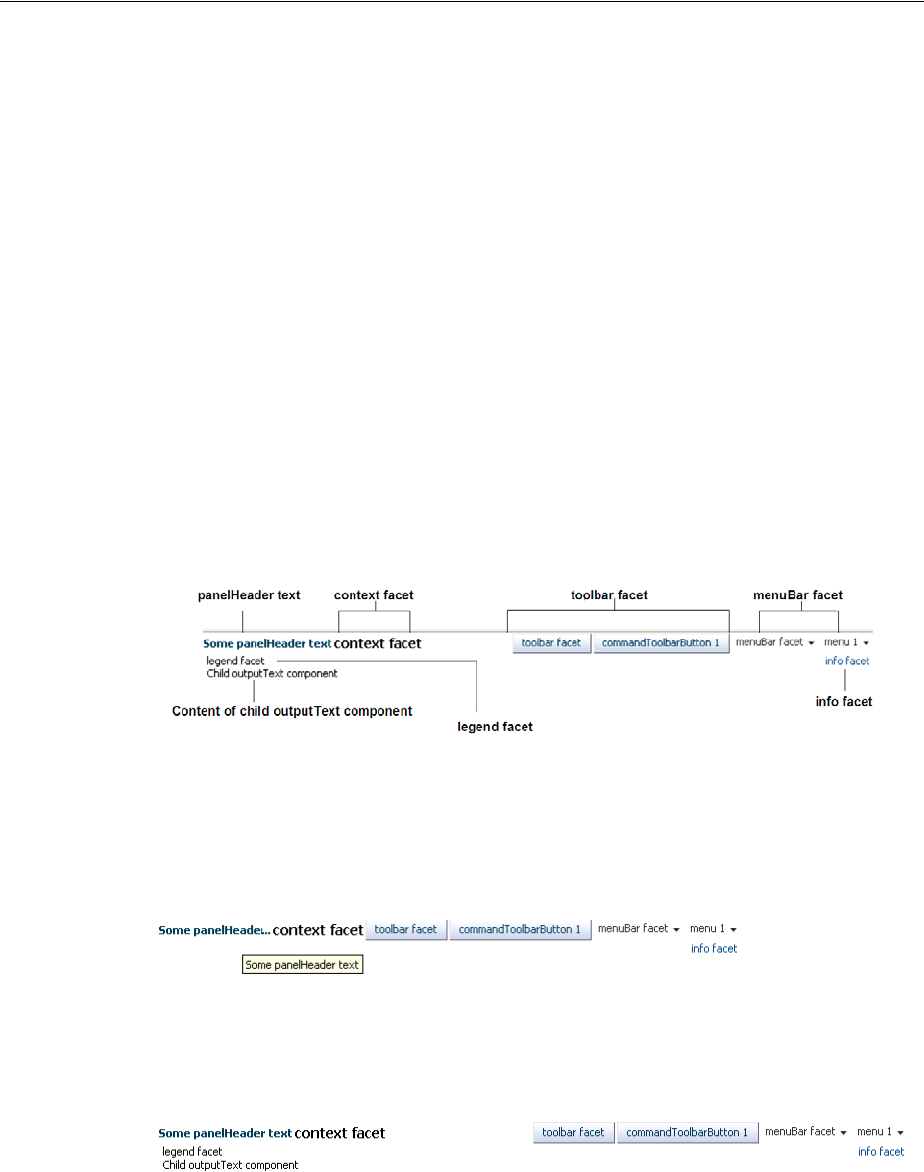
Displaying Items in a Static Box
9-70 Web User Interface Developer's Guide for Oracle Application Development Framework
information about using themes and skins, see Chapter 28, "Customizing the
Appearance Using Styles and Skins"
The panelHeader component offers facets for specific types of components and the
ability to open a help topic from the header. The following are the facets supported by
the panelHeader component:
■context: Displays information in the header alongside the header text.
■help: Displays help information. Use only for backward compatibility. Use the
helpTopicId attribute on the panelHeader component instead.
■info: Displays information beneath the header text, aligned to the right.
■legend: If help text is present, displays information to the left of the help content
and under the info facet's content. If help text is not present, the legend content
will be rendered directly under the header.
■toolbar: Displays a toolbar, before the menu bar.
■menuBar: Displays a menu bar, after the toolbar.
Figure 9–45 shows the different facets in the panelHeader component.
Figure 9–45 panelHeader and Its Facets
When there is not enough space to display everything in all the facets of the title line,
the panelHeader text is truncated and displays an ellipsis. When the user hovers
over the truncated text, the full text is displayed in a tooltip, as shown in Figure 9–46.
Figure 9–46 Text for the panelHeader Is Truncated
When there is more than enough room to display the contents, the extra space is
placed between the context facet and the toolbar, as shown in Figure 9–47.
Figure 9–47 Extra Space Is Added Before the Toolbar
You can configure panelHeader components so that they represent a hierarchy of
sections. For example, as shown in Figure 9–48, you can have a main header with a
subheader and then a heading level 1 also with a subheader.
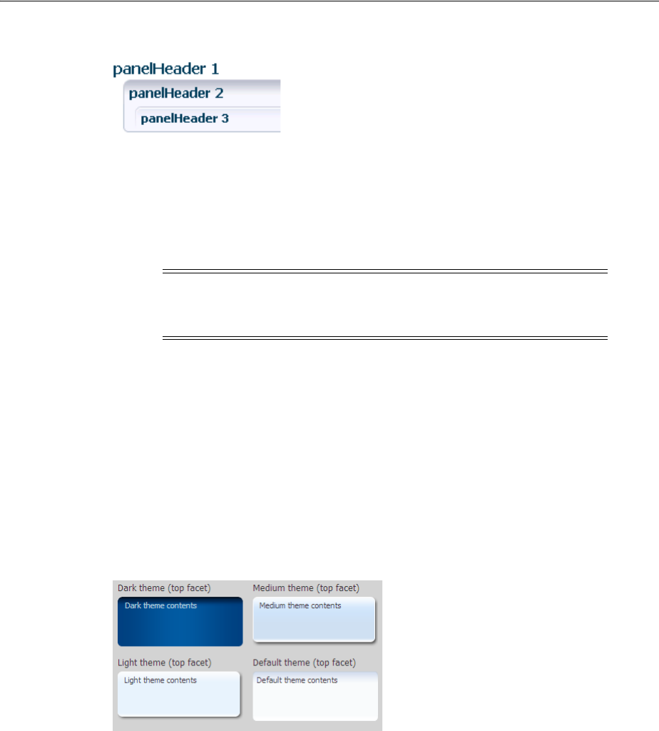
Displaying Items in a Static Box
Organizing Content on Web Pages 9-71
Figure 9–48 Creating Subsections with the panelHeader Component
Create subsections by nesting panelHeader components within each other. When
you nest panelHeader components, the heading text is automatically sized according
to the hierarchy, with the outermost panelHeader component having the largest text.
For information about using the panelHeader component, see Section 9.10.1, "How
to Use the panelHeader Component."
The decorativeBox component provides styling capabilities using themes. It has
two facets, top and center. The top facet provides a non-colored area, while the center
facet is the actual box. The height of the top facet depends on whether or not a
component has been put into the top facet. When the facet is set, the topHeight
attribute is used to specify the size the content should occupy.
The color of the box for the center facet depends on the theme and skin used.
Figure 9–49 shows the different themes available by default.
Figure 9–49 Themes Used in a decorativeBox Component
By default, the decorativeBox component stretches to fill its parent component. You
can also configure the decorative Box component to inherit its dimensions from its
child components. For example, Figure 9–50 shows the medium-theme
decorativeBox configured to stretch to fill its parent, while the dark-theme
decorativeBox is configured to only be as big as its child outputText component.
Note: While you can force the style of the text using the size
attribute (where 0 is the largest text), the value of the size attribute
will not affect the hierarchy. It only affects the style of the text.
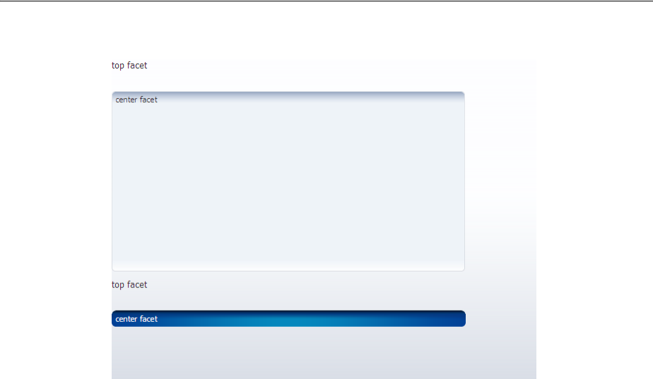
Displaying Items in a Static Box
9-72 Web User Interface Developer's Guide for Oracle Application Development Framework
Figure 9–50 decorativeBox Can Stretch or Not
You can further control the style of the decorativeBox component using skins.
Skinning keys can be defined for the following areas of the component:
■top-start
■top
■top-end
■start
■end
■bottom-start
■bottom
■bottom-end
For more information about skins, see Chapter 28, "Customizing the Appearance
Using Styles and Skins."
9.10.1 How to Use the panelHeader Component
You can use one panelHeader component to contain specific information, or you can
use a series of nested panelHeader components to create a hierarchical organization
of content. If you want to be able to hide and display the content, use the
showDetailHeader component instead. For more information, see Section 9.8.2,
"How to Use the showDetailHeader Component."
Before you begin:
It may be helpful to have an understanding of how the attributes can affect
functionality. For more information, see Section 9.10, "Displaying Items in a Static
Box."
You may also find it helpful to understand functionality that can be added using other
ADF Faces features. For more information, see Section 9.1.1, "Additional Functionality
for Layout Components."
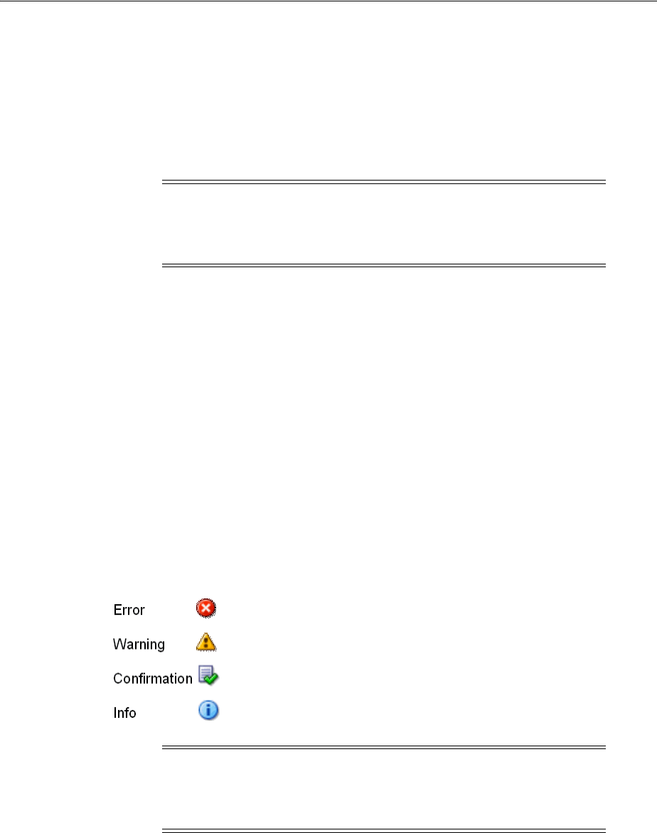
Displaying Items in a Static Box
Organizing Content on Web Pages 9-73
To create and use a panelHeader component:
1. In the Component Palette, from the Layout panel, drag and drop a Panel Header
onto the page.
2. In the Property Inspector, expand the Appearance section.
3. Set Text to the label you want to display for this panel.
4. To add an icon before the label, set Icon to the URI of the image file to use.
5. If you are using the header to provide specific messaging information, set
MessageType to one of the following values:
■confirmation: The confirmation icon (represented by a note page overlaid
with a green checkmark) replaces any specified icon image.
■error: The error icon (represented by a red circle with an "x" inside) replaces
any specified icon image. The header label also changes to red.
■info: The info icon (represented by a blue circle with an "I" inside) replaces any
specified icon image.
■none: Default. No icon is displayed.
■warning: The warning icon (represented by a yellow triangle with an
exclamation mark inside) replaces any specified icon image.
Figure 9–51 shows the icons used for the different message types.
Figure 9–51 Icons for Message Types
6. To display help for the header, enter the topic ID for HelpTopicId. For more
information about creating and using help topics, see Section 19.5, "Displaying
Help for Components."
7. If you want to control how the panelHeader component handles geometry
management, expand the Appearance section and set Type to one of the following.
For more information about geometry management, see Section 9.2.1, "Geometry
Management and Component Stretching."
Note: Because alternative text cannot be provided for this icon, in
order to create an accessible product, use this icon only when it is
purely decorative. You must provide the meaning of this icon in some
accessible manner.
Note: Because alternative text cannot be provided for this icon, in
order to create an accessible product, use this icon only when it is
purely decorative. You must provide the meaning of this icon in some
accessible manner.
Displaying Items in a Static Box
9-74 Web User Interface Developer's Guide for Oracle Application Development Framework
■flow: The component will not stretch or stretch its children. The height of the
panelHeader component will be determined solely by its children.
■stretch: The component will stretch and stretch its child (will only stretch a
single child component).
■default: if you want the parent component of the panelHeader component to
determine geometry management.
8. To add toolbar buttons to a panel, insert the toolbar component into the
toolbar facet. Then, insert the desired number of commandToolbarButton
components into the toolbar component. For information about using toolbar
and commandToolbarButton, see Section 16.3, "Using Toolbars."
9. To add menus to a panel, insert menu components into the menuBar facet. For
information about creating menus in a menu bar, see Section 16.2, "Using Menus in
a Menu Bar."
10. Add contents to the other facets as needed.
11. To add contents to the panel, insert the desired child components into the
panelHeader component.
9.10.2 How to Use the decorativeBox Component
You use the decorativeBox component to provide a colored area or box in a page.
This component is typically used as a container for the navigationPane component
that is configured to display tabs. For more information, see Section 20.6, "Using
Navigation Items for a Page Hierarchy."
To create and use a decorativeBox component:
1. In the Component Palette, from the Layout panel, drag and drop a Decorative Box
onto the page.
2. In the Property Inspector, expand the Common section and set Top Height to the
height for the top facet.
3. By default, the decorativeBox component stretches to fill available browser
space. If instead, you want to use the decorativeBox component as a child to a
component that does not stretch its children, then you need to change how the
decorativeBox component handles stretching.
Note: Toolbar overflow is not supported in panelHeader
components.
Tip: You can place menus in the toolbar facet and toolbars (and
toolboxes) in the menu facet. The main difference between these facets
is location. The toolbar facet is before the menu facet.
Tip: If any facet is not visible in the visual editor:
1. Right-click the panelHeader component in the Structure window.
2. From the context menu, choose Facets - Panel Header >facet name.
Facets in use on the page are indicated by a checkmark in front of the
facet name.
Displaying Items in a Static Box
Organizing Content on Web Pages 9-75
You configure whether the component will stretch or not using the
dimensionsFrom attribute. Set DimensionsFrom to one of the following:
■children: the decorativeBox component will get its dimensions from its
child components.
■parent: the size of the decorativeBox component will be determined in
the following order:
–From the inlineStyle attribute.
–If no value exists for inlineStyle, then the size is determined by the
parent container.
–If the parent container is not configured or not able to stretch its children,
the size will be determined by the skin.
■auto: If the parent component to the decorativeBox component allows
stretching of its child, then the decorativeBox component will stretch to fill
the parent. If the parent does not stretch its children then the size of the
decorativeBox component will be based on the size of its child component.
For more information, see Section 9.10.3, "What You May Need to Know About
Geometry Management and the decorativeBox Component."
4. To change the theme, expand the Style and Theme section and choose a different
theme.
9.10.3 What You May Need to Know About Geometry Management and the
decorativeBox Component
The decorativeBox component can stretch child components in its center facet
and it can also be stretched. The following components can be stretched inside the
center facet of the decorativeBox component:
■inputText (when configured to stretch)
■decorativeBox (when configured to stretch)
■panelAccordion (when configured to stretch)
■panelBox
■panelCollection (when configured to stretch)
■panelDashboard
Note: If you use this setting, you cannot use a percentage to set the
height of the top facet. If you do, the top facet will try to get its
dimensions from the size of this decorativeBox component, which
will not be possible, as the decorativeBox component will be
getting its height from its contents, resulting in a circular dependency.
If a percentage is used, it will be disregarded and the default 50px
will be used instead.
Similarly, you cannot set the height of the decorativeBox (for
example through the inlineStyle or styleClass attributes).
Doing so would cause conflict between the decorativeBox height
and the child component height.

Displaying a Bulleted List in One or More Columns
9-76 Web User Interface Developer's Guide for Oracle Application Development Framework
■panelGroupLayout (only with the layout attribute set to scroll or
vertical)
■panelLabelAndMessage (when configured to stretch)
■panelSplitter (when configured to stretch)
■panelStretchLayout (when configured to stretch)
■panelTabbed (when configured to stretch)
■region
■table (when configured to stretch)
■tableLayout (when configured to stretch. Note that this is a MyFaces Trinidad
component)
■tree (when configured to stretch)
■treeTable (when configured to stretch)
The following components cannot be stretched when placed inside a facet of the
decorativeBox component:
■panelBorderLayout
■panelFormLayout
■panelGroupLayout (only with the layout attribute set to default or
horizontal)
■panelHeader
■panelList
■showDetail
■showDetailHeader
You cannot place components that cannot stretch into facets of a component that
stretches its child components. Therefore, if you need to place one of the components
that cannot be stretched into a facet of the decorativeBox component, wrap that
component in a transition component that does not stretch its child components.
For example, if you want to place content in a panelBox component and have it flow
within a facet of the decorativeBox component, you could place a
panelGroupLayout component with its layout attribute set to scroll in the facet of
the decorativeBox component, and then place the panelBox component in that
panelGroupLayout component. For more information, see Section 9.2.2, "Nesting
Components Inside Components That Allow Stretching."
9.11 Displaying a Bulleted List in One or More Columns
The panelList component is a layout element for displaying a vertical list of child
components with a bullet next to each child, as shown in Figure 9–52. Only child
components whose rendered attribute is set to true and whose visible attribute is
set to true are considered for display by in the list.
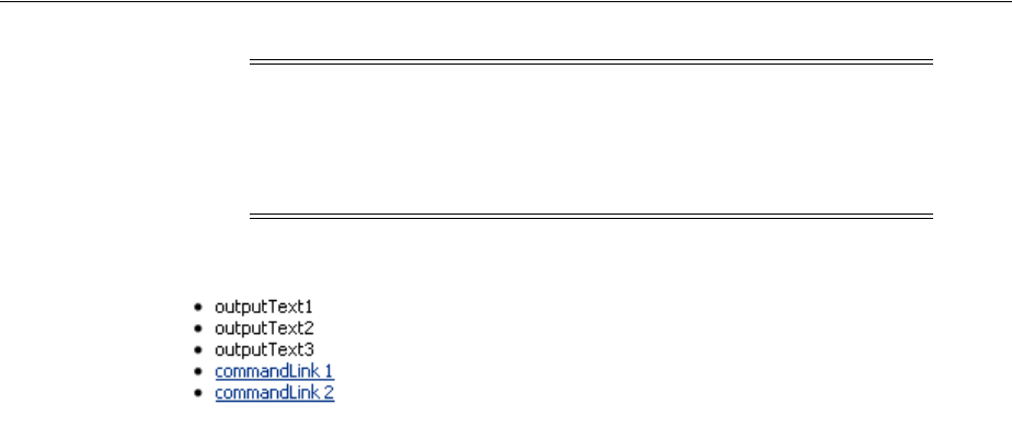
Displaying a Bulleted List in One or More Columns
Organizing Content on Web Pages 9-77
Figure 9–52 PanelList Component with Default Disc Bullet
By default, the disc bullet is used to style the child components. There are other styles
you can use, such as square bullets and white circles. You can also split the list into
columns when you have a very long list of items to display.
9.11.1 How to Use the panelList Component
Use one panelList component to create each list of items.
Before you begin:
It may be helpful to have an understanding of how the attributes can affect
functionality. For more information, see Section 9.11, "Displaying a Bulleted List in
One or More Columns."
You may also find it helpful to understand functionality that can be added using other
ADF Faces features. For more information, see Section 9.1.1, "Additional Functionality
for Layout Components."
To create and use the panelList component:
1. In the Component Palette, from the Layout panel, drag and drop a Panel List to
the JSF page.
2. In the Property Inspector, expand the Common section, and set the listStyle
attribute to a valid CSS 2.1 list style value, such as one of the following:
■list-style-type: disc
■list-style-type: square
■list-style-type: circle
■list-style-type: decimal
■list-style-type: lower-alpha
■list-style-type: upper-alpha
For example, the list-style-type: disc attribute value corresponds to a disc
bullet, and the list-style-type: circle value corresponds to a circle bullet.
For a complete list of the valid style values to use, refer to the CSS 2.1 Specification
for generated lists at
http://www.w3.org/TR/CSS21/generate.html
Note: To display dynamic data (for example, a list of data
determined at runtime by JSF bindings), use the selection components,
as documented in Section 11.6, "Using Selection Components." If you
need to create lists that change the model layer, see Chapter 13, "Using
List-of-Values Components."
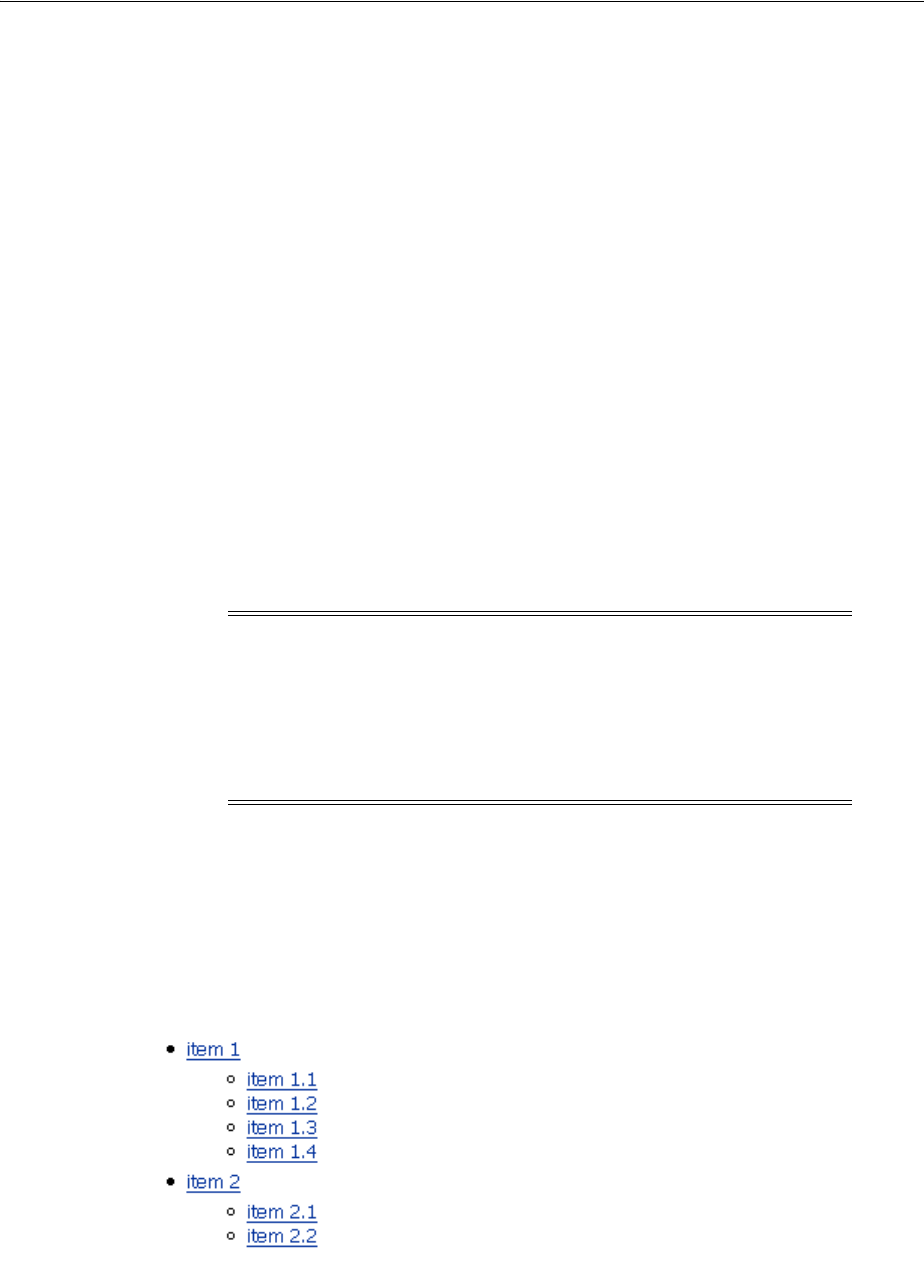
Displaying a Bulleted List in One or More Columns
9-78 Web User Interface Developer's Guide for Oracle Application Development Framework
Example 9–14 shows the code for setting the list style to a circle.
Example 9–14 PanelList Component with ListStyle Attribute Set
<af:panelList listStyle="list-style-type: circle" ...>
<!-- child components here -->
</af:panelList>
3. Insert the desired number of child components (to display as bulleted items) into
the panelList component.
For example, you could insert a series of commandLink components or
outputFormatted components.
9.11.2 What You May Need to Know About Creating a List Hierarchy
You can nest panelList components to create a list hierarchy. A list hierarchy, as
shown in Figure 9–53, has outer items and inner items, where the inner items
belonging to an outer item are indented under the outer item. Each group of inner
items is created by one nested panelList component.
Figure 9–53 Hierarchical List Created Using Nested panelList Components
To achieve the list hierarchy as shown in Figure 9–53, use a group component to wrap
the components that make up each group of outer items and their respective inner
Tip: Some browsers support more style options than others, for
example, upper-roman, lower-roman, and lower-greek. Use of
these is cautioned because they will not display consistently across
web browsers.
Tip: Panel lists also allow you to use the iterator, switcher, and
group components as direct child components, providing these
components wrap child components that would typically be direct
child components of the panel list.
Note: By default, ADF Faces displays all rendered child components
of a panelList component in a single column. For details on how to
split the list into two or more columns and for information about
using the rows and maxColumns attributes, see Section 9.6,
"Arranging Content in Forms." The concept of using the rows and
maxColumns attributes for columnar display in the panelList and
panelFormLayout components are the same.

Grouping Related Items
Organizing Content on Web Pages 9-79
items. Example 9–15 shows the code for how to create a list hierarchy that has one
outer item with four inner items, and another outer item with two inner items.
Example 9–15 Nested PanelList Components
<af:panelList>
<!-- First outer item and its four inner items -->
<af:group>
<af:commandLink text="item 1"/>
<af:panelList>
<af:commandLink text="item 1.1"/>
<af:commandLink text="item 1.2"/>
<af:commandLink text="item 1.3"/>
<af:commandLink text="item 1.4"/>
</af:panelList>
</af:group>
<!-- Second outer item and its two inner items -->
<af:group>
<af:commandLink text="item 2"/>
<af:panelList>
<af:commandLink text="item 2.1"/>
<af:commandLink text="item 2.2"/>
</af:panelList>
</af:group>
</af:panelList>
By default, the outer list items (for example, item 1 and item 2) are displayed with the
disc bullet, while the inner list items (for example, item 1.1 and item 2.1) have the
white circle bullet.
For more information about the panelGroupLayout component, see Section 9.12,
"Grouping Related Items."
9.12 Grouping Related Items
To keep like items together within a parent component, use either the group or
panelGroupLayout component. The group component aggregates or groups
together child components that are related semantically. Unlike the
panelGroupLayout component, the group component does not provide any layout
for its child components. Used on its own, the group component does not render
anything; only the child components inside of a group component render at runtime.
You can use any number of group components to group related components together.
For example, you might want to group some of the input fields in a form layout
created by the panelFormLayout component. Example 9–16 shows sample code that
groups two sets of child components inside a panelFormLayout component.
Example 9–16 Grouping Child Components in panelFormLayout
<af:panelFormLayout>
<af:inputDate label="Pick a date"/>
<!-- first group -->
<af:group>
<af:selectManyCheckbox label="Select all that apply">
<af:selectItem label="Coffee" value="1"/>
<af:selectItem label="Cream" value="1"/>
<af:selectItem label="Low-fat Milk" value="1"/>
<af:selectItem label="Sugar" value="1"/>
<af:selectItem label="Sweetener"/>
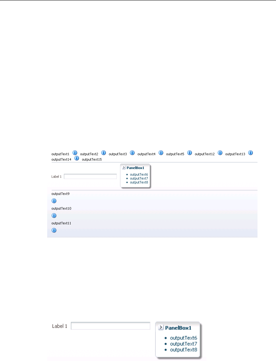
Grouping Related Items
9-80 Web User Interface Developer's Guide for Oracle Application Development Framework
</af:selectManyCheckbox>
<af:inputText label="Special instructions" rows="3"/>
</af:group>
<!-- Second group -->
<af:group>
<af:inputFile label="File to upload"/>
<af:inputText label="Enter passcode"/>
</af:group>
<af:inputText label="Comments" rows="3"/>
<af:spacer width="10" height="15"/>
<f:facet name="footer"/>
</af:panelFormLayout>
The panelGroupLayout component lets you arrange a series of child components
vertically or horizontally without wrapping, or consecutively with wrapping, as
shown in Figure 9–54. The layout attribute value determines the arrangement of the
child components.
Figure 9–54 panelGroupLayout Arrangements
In all arrangements, each pair of adjacent child components can be separated by a line
or white space using the separator facet of the panelGroupLayout component.
For more information, see Section 9.13, "Separating Content Using Blank Space or
Lines."
When using the horizontal layout, the child components can also be vertically or
horizontally aligned. For example, you could make a short component beside a tall
component align at the top, as shown in Figure 9–55.
Figure 9–55 Top-Aligned Horizontal Layout with panelGroupLayout
Unlike the panelSplitter or panelStretchLayout components, the
panelGroupLayout component does not stretch its child components. Suppose you
are already using a panelSplitter or panelStretchLayout component as the
root component for the page, and you have a large number of child components to
flow, but are not to be stretched. To provide scrollbars when flowing the child
components, wrap the child components in the panelGroupLayout component with
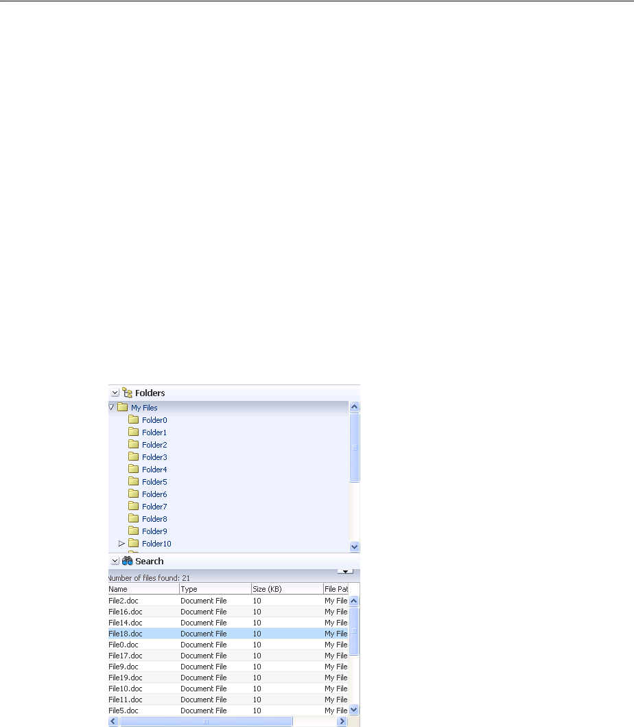
Grouping Related Items
Organizing Content on Web Pages 9-81
its layout attribute set to scroll, and then place the panelGroupLayout
component inside a facet of the panelSplitter or panelStretchLayout
component.
When the layout attribute is set to scroll on a panelGroupLayout component,
ADF Faces automatically provides a scrollbar at runtime when the contents contained
by the panelGroupLayout component are larger than the panelGroupLayout
component itself. You do not have to write any code to enable the scrollbars, or set any
inline styles to control the overflow.
For example, when you use layout components such as the panelSplitter
component that let users display and hide child components contents, you do not have
to write code to show the scrollbars when the contents are displayed, and to hide the
scrollbars when the contents are hidden. Simply wrap the contents the be displayed
inside a panelGroupLayout component, and set the layout attribute to scroll.
In the File Explorer application, the Search Navigator contains a panelSplitter
component used to hide and show the search criteria. When the search criteria are
hidden, and the search results content does not fit into the area, a scrollbar is rendered,
as shown in Figure 9–56.
Figure 9–56 Scrollbars Rendered Using panelGroupLayout
9.12.1 How to Use the panelGroupLayout Component
Any number of panelGroupLayout components can be nested to achieve the desired
layout.
Before you begin:
It may be helpful to have an understanding of how the attributes can affect
functionality. For more information, see Section 9.12, "Grouping Related Items."
You may also find it helpful to understand functionality that can be added using other
ADF Faces features. For more information, see Section 9.1.1, "Additional Functionality
for Layout Components."

Grouping Related Items
9-82 Web User Interface Developer's Guide for Oracle Application Development Framework
To create and use the panelGroupLayout component:
1. In the Component Palette, from the Layout panel, drag and drop a Panel Group
Layout to the JSF page.
2. Insert the desired child components into the panelGroupLayout component.
3. To add spacing or separator lines between adjacent child components, insert the
spacer or separator component into the separator facet.
4. In the Property Inspector, expand the Appearance section. To arrange the child
components in the desired layout, set Layout to one of the following values:
■default: Provides consecutive layout with wrapping.
At runtime, when the contents exceed the browser space available (that is,
when the child components are larger than the width of the parent container
panelGrouplayout), the browser flows the contents onto the next line so
that all child components are displayed.
■horizontal: Uses a horizontal layout, where child components are arranged in
a horizontal line. No wrapping is provided when contents exceed the amount
of browser space available.
In a horizontal layout, the child components can also be aligned vertically and
horizontally. By default, horizontal child components are aligned in the center
with reference to an imaginary horizontal line, and aligned in the middle with
reference to an imaginary vertical line. To change the horizontal and vertical
alignments of horizontal components, use the following attributes:
– halign: Sets the horizontal alignment. The default is center. Other
acceptable values are: start, end, left, right.
For example, set halign to start if you want horizontal child compo-
nents to always be left-aligned in browsers where the language reading
direction is left-to-right, and right-aligned in a right-to-left reading direc-
tion.
–valign: Sets the vertical alignment. Default is middle. Other acceptable
values are: top, bottom, baseline.
In output text components (such as outputText) that have varied font
sizes in the text, setting valign to baseline would align the letters of
the text along an imaginary line on which the letters sit, as shown in
Figure 9–57. If you set valign to bottom for such text components, the
resulting effect would not be as pleasant looking, because bottom verti-
cal alignment causes the bottommost points of all the letters to be on the
same imaginary line.
Tip: The panelGroupLayout component also allows you to use the
iterator, switcher, and group components as direct child
components, providing these components wrap child components
that would typically be direct child components of the
panelGroupLayout component.
Note: ADF Faces uses the bidirectional algorithm when making
contents flow. Where there is a mix of right-to-left content and
left-to-right content, this may result in contents not flowing
consecutively.
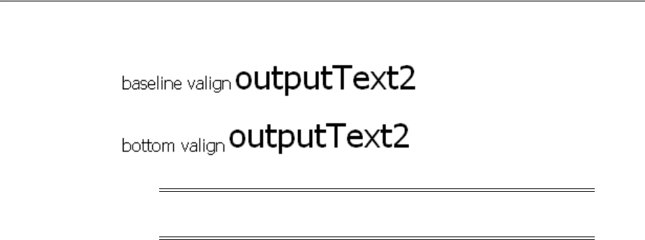
Separating Content Using Blank Space or Lines
Organizing Content on Web Pages 9-83
Figure 9–57 Bottom and Baseline Vertical Alignment of Text
■scroll: Uses a vertical layout, where child components are stacked vertically,
and a vertical scrollbar is provided when necessary.
■vertical: Uses a vertical layout, where child components are stacked vertically.
9.12.2 What You May Need to Know About Geometry Management and the
panelGroupLayout Component
While the panelGroupLayout component cannot stretch its child components, it can
be stretched when it is the child of a panelSplitter or panelStretchLayout
component and its layout attribute is set to either scroll or vertical.
9.13 Separating Content Using Blank Space or Lines
You can incorporate some blank space in your pages, to space out the components so
that the page appears less cluttered than it would if all the components were presented
immediately next to each other, or immediately below each other. The ADF Faces
component provided specifically for this purpose is the spacer component.
You can include either or both vertical and horizontal space in a page using the
height and width attributes.
The height attribute determines the amount of vertical space to include in the page.
Example 9–17 shows a page set up to space out two lengthy outputText components
with some vertical space.
Example 9–17 Vertical Space
<af:panelGroupLayout layout="vertical">
<af:outputText value="This is a long piece of text for this page..."/>
<af:spacer height="10"/>
<af:outputText value="This is some more lengthy text ..."/>
</af:panelGroupLayout>
Figure 9–58 shows the effect the spacer component has on the page output as viewed
in a browser.
Note: The halign and valign attributes are ignored if the layout is
not horizontal.
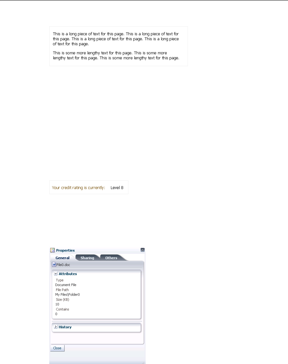
Separating Content Using Blank Space or Lines
9-84 Web User Interface Developer's Guide for Oracle Application Development Framework
Figure 9–58 Vertical Space Viewed in a Browser
The width attribute determines the amount of horizontal space to include between
components. Example 9–18 shows part of the source of a page set up to space out two
components horizontally.
Example 9–18 Horizontal Space
<af:outputLabel value="Your credit rating is currently:"/>
<af:spacer width="10"/>
<af:outputText value="Level 8"/>
Figure 9–59 shows the effect of spacing components horizontally as viewed in a
browser.
Figure 9–59 Horizontal Space Viewed in a Browser
The separator component creates a horizontal line. Figure 9–60 shows the
properties.jspx file as it would be displayed with a separator component
inserted between the two panelBox components.
Figure 9–60 Using the separator Component to Create a Line
The spacer and separator components are often used in facets of other layout
components. Doing so ensures that the space or line stays with the components they
were meant to separate.
9.13.1 How to Use the spacer Component
You can use as many spacer components as needed on a page.

Separating Content Using Blank Space or Lines
Organizing Content on Web Pages 9-85
Before you begin:
It may be helpful to have an understanding of how the attributes can affect
functionality. For more information, see Section 9.13, "Separating Content Using Blank
Space or Lines."
You may also find it helpful to understand functionality that can be added using other
ADF Faces features. For more information, see Section 9.1.1, "Additional Functionality
for Layout Components."
To create and use the spacer component:
1. In the Component Palette, from the Layout panel, drag and drop a Spacer to the
JSF page.
2. In the Property Inspector, expand the Common section. Set the width and height
as needed.
9.13.2 How to Use the Separator Component
You can use as many separator components as needed on a page.
Before you begin:
It may be helpful to have an understanding of how the attributes can affect
functionality. For more information, see Section 9.13, "Separating Content Using Blank
Space or Lines."
You may also find it helpful to understand functionality that can be added using other
ADF Faces features. For more information, see Section 9.1.1, "Additional Functionality
for Layout Components."
To create and use the separator component:
1. In the Component Palette, from the Layout panel, drag and drop a Separator to
the JSF page.
2. In the Property Inspector, set the properties as needed.
Note: If the height is specified but not the width, a block-level HTML
element is rendered, thereby introducing a new line effect. If the width
is specified, then, irrespective of the specified value of height, it may
not get shorter than the applicable line-height in user agents that
strictly support HTML standards.

Separating Content Using Blank Space or Lines
9-86 Web User Interface Developer's Guide for Oracle Application Development Framework

10
Creating and Reusing Fragments, Page Templates, and Components 10-1
10Creating and Reusing Fragments, Page
Templates, and Components
This chapter describes how you can create reusable content and then use that content
to build portions of your JSF pages or entire pages.
This chapter includes the following sections:
■Section 10.1, "About Reusable Content"
■Section 10.2, "Common Functionality in Reusable Components"
■Section 10.3, "Using Page Fragments"
■Section 10.4, "Using Page Templates"
■Section 10.5, "Using Declarative Components"
■Section 10.6, "Adding Resources to Pages"
10.1 About Reusable Content
As you build JSF pages for your application, some pages may become complex and
long, making editing complicated and tedious. Some pages may always contain a
group of components arranged in a very specific layout, while other pages may always
use a specific group of components in multiple parts of the page. And at times, you
may want to share some parts of a page or entire pages with other developers.
Whatever the case is, when something changes in the UI, you have to replicate your
changes in many places and pages. Building and maintaining all those pages, and
making sure that some sets or all are consistent in structure and layout can become
increasingly inefficient.
Instead of using individual UI components to build pages, you can use page building
blocks to build parts of a page or entire pages. The building blocks contain the
frequently or commonly used UI components that create the reusable content for use
in one or more pages of an application. Depending on your application, you can use
just one type of building block, or all types in one or more pages. And you can share
some building blocks across applications. When you modify the building blocks, the
JSF pages that use the reusable content are automatically updated as well. Thus, by
creating and using reusable content in your application, you can build web user
interfaces that are always consistent in structure and layout, and an application that is
scalable and extensible.
ADF Faces provides the following types of reusable building blocks:
■Page fragments: Page fragments allow you to create parts of a page. A JSF page
can be made up of one or more page fragments. For example, a large JSF page can

About Reusable Content
10-2 Web User Interface Developer's Guide for Oracle Application Development Framework
be broken up into several smaller page fragments for easier maintenance. For
details about creating and using page fragments, see Section 10.3, "Using Page
Fragments."
■Page templates: By creating page templates, you can create entire page layouts
using individual components and page fragments. For example, if you are
repeatedly laying out some components in a specific way in multiple JSF pages,
consider creating a page template for those pages. When you use the page
template to build your pages, you can be sure that the pages are always consistent
in structure and layout across the application.
The page template and the declarative component share much of the functionality.
The main difference is that the page template supports ADF Model and ADF
Controller using a page template model. Using the value attribute, you can
specify which object to use as the bindings inside of the page template. If the
value is a page template model binding, ADF Model page bindings may be used,
and you may use the ADF page definition to determine which view to include.
For details about creating and using page templates, see Section 10.4, "Using Page
Templates," and Section 10.4.3, "How to Create JSF Pages Based on Page
Templates."
■Declarative components: The declarative components feature allows you to
assemble existing, individual UI components into one composite, reusable
component, which you then declaratively use in one or more pages. For example,
if you are always inserting a group of components in multiple places, consider
creating a composite declarative component that comprises the individual
components, and then reusing that declarative component in multiple places
throughout the application. Declarative components can also be used in page
templates.
The declarative component is deployed as part of an ADF library JAR file. It
features its own TLD file that allows you to put the component in your own
namespace. The declarative component allows you to pass facets into the
component and also any attributes and method expressions. Inside of the
declarative component, the attributes and facets may be accessed using EL
expressions It has a relatively low overhead as it does not involve ADF Model or
ADF Controller, which also means that it does not have support for ADF Model
transactions or ADF Controller page flows.
Note that you should not reference individual components inside of a declarative
component, and individual components within a declarative component should
not reference external components. The reason is that changes in the declarative
component or in the consuming page could cause the partial triggers to no longer
work. For details about creating and using declarative components, see
Section 10.5, "Using Declarative Components."
Page templates, page fragments, and declarative components provide consistent
structure and layout to the pages in an application. These building blocks can not only
Tip: If your application uses the ADF Controller and the ADF Model
layer, then you can also use ADF regions. Regions used in conjunction
with ADF bounded task flows, encapsulate business logic, process
flow, and UI components all in one package, which can then be reused
throughout the application. For complete information about creating
and using ADF bounded task flows as regions, see the "Using Task
Flows as Regions" chapter of the Oracle Fusion Middleware Fusion
Developer's Guide for Oracle Application Development Framework.

About Reusable Content
Creating and Reusing Fragments, Page Templates, and Components 10-3
be reused in the same application, but also can be shared across applications. When
update a building block, all the instances where it is used is automatically updated.
Page templates are data-bound templates that support both static areas that do not
change and dynamic areas where they change during runtime. You can use page
fragments to build modular pages. For instance, you can create page fragments for the
header, footer, and company logo and reuse these fragments throughout the
application. You can use declarative components when you have several components
that always used in a group. By creating a declarative component, you can add it to
the tag library and be able to drag and drop the declarative component from the
JDeveloper Component Palette.
Page templates, declarative components, and regions implement the
javax.faces.component.NamingContainer interface. At runtime, in the pages
that consume reusable content, the page templates, declarative components, or regions
create component subtrees, which are then inserted into the consuming page’s single,
JSF component tree. Because the consuming page has its own naming container, when
you add reusable content to a page, take extra care when using mechanisms such as
partialTargets and findComponent(), as you will need to take into account the
different naming containers for the different components that appear on the page. For
more information about naming containers, see Section 4.5, "Locating a Client
Component on a Page."
If you plan to include resources such as CSS or JavaScript, you can use the
af:resource tag to add the resources to the page. If this tag is used in page
templates and declarative components, the specified resources will be added to the
consuming page during JSP execution. For more information, see Section 10.6,
"Adding Resources to Pages."
If you are not using an ADF task flow to navigate a portion of the page, you should
not be using regions, but instead use one of the other compound components. Among
the compound components, you should use a page template if you need to use
bindings inside of your compound component and they differ from the bindings of the
host page. You should use a declarative component if you do not need bindings for
your page and do not need to use a bounded task flow as part of your page.
10.1.1 Reusable Components Use Cases and Examples
The File Explorer application uses a fileExploreorTemplate to provide a
consistent look and feel to all the pages in the application. The facets of the file provide
working area to place different types of information. The template defines an
appCopyright facet that is used to display copyright information for every page.
The main page of the File Explorer application not only uses the page template, but
also uses page fragments to contain the content for the individual facets of the
template. The header.jspx page fragment contains the menu commands for the
application.
If you have several components that works as a group and repeats in several places,
you can define a declarative component to group these components together. Once
you have created the component, you can use this declarative component like any
other component. For example, you may use several inputText components to denote
first name, last name, and email address. Since this three inputText components will
be used repeatedly in your application, you can create a declarative component for
them.

Common Functionality in Reusable Components
10-4 Web User Interface Developer's Guide for Oracle Application Development Framework
10.1.2 Additional Functionality for Reusable Components
You may find it helpful to understand other ADF features before you implement your
reusable components. Following are links to other functionality that are related to
reusable components.
■For more information about customization, see the "Customizing Applications
with MDS" chapter of the Oracle Fusion Middleware Fusion Developer's Guide for
Oracle Application Development Framework.
■For more information on using the Quick Start Layouts to provide a
pre-configured layout, see Section 9.2.3, "Using Quick Start Layouts."
■For information about using model parameters and ADF Model data bindings, see
the "Using Page Templates" section of the Oracle Fusion Middleware Fusion
Developer's Guide for Oracle Application Development Framework
■For information about packaging a page template into an ADF Library JAR for
reuse, see the "Reusing Application Components" chapter of the Oracle Fusion
Middleware Fusion Developer's Guide for Oracle Application Development Framework.
10.2 Common Functionality in Reusable Components
Page templates and declarative components share several common functionalities.
10.2.1 Page in Request Scope
The view parts of a page (fragments, declarative components, and the main page) all
share the same request scope. This may result in a collision when you use the same
fragment or declarative component multiple times on a page, and when they share a
backing bean. You should use backingBeanScope for declarative components and
page templates. For more information about scopes, see Section 5.6, "Object Scope
Lifecycles."
10.2.2 Access to Child Components for Customization
You can control whether child components of a page template or declarative
component can be changed by external reference. For example, you can enable or
disable the customization of the child components. Both af:pageTemplateDef and
af:componentDef has a definition attribute that controls access. When
definition is set to public, then the direct child components can be customized,
while definition is set to private, the child components cannot be customized.
The default value is private. You can modify definition by editing the source file
or by using the Property Inspector.
For more information about customization, see the "Customizing Applications with
MDS" chapter of the Oracle Fusion Middleware Fusion Developer's Guide for Oracle
Application Development Framework.
10.3 Using Page Fragments
As you build web pages for an application, some pages may quickly become large and
unmanageable. One possible way to simplify the process of building and maintaining
complex pages is to use page fragments.
Large, complex pages broken down into several smaller page fragments are easier to
maintain. Depending on how you design a page, the page fragments created for one
page may be reused in other pages. For example, suppose different parts of several

Using Page Fragments
Creating and Reusing Fragments, Page Templates, and Components 10-5
pages use the same form, then you might find it beneficial to create page fragments
containing those components in the form, and reuse those page fragments in several
pages. Deciding on how many page fragments to create for one or more complex
pages depends on your application, the degree to which you wish to reuse portions of
a page between multiple pages, and the desire to simplify complex pages.
Page fragments are incomplete JSF pages. A complete JSF page that uses ADF Faces
must have the document tag enclosed within an f:view tag. The contents for the
entire page are enclosed within the document tag. A page fragment, on the other
hand, represents a portion of a complete page, and does not contain the f:view or
document tags. The contents for the page fragment are simply enclosed within a
jsp:root tag.
When you build a JSF page using page fragments, the page can use one or more page
fragments that define different portions of the page. The same page fragment can be
used more than once in a page, and in multiple pages.
For example, the File Explorer application uses one main page (index.jspx) that
includes the following page fragments:
■popups.jspx: Contains all the popup code used in the application.
■help.jspx: Contains the help content.
■header.jspx: Contains the toolbars and menus for the application.
■navigators.jspx: Contains the tree that displays the folder hierarchy of the
application.
■contentViews.jspx: Contains the content for the folder selected in the
navigator pane.
Example 10–1 shows the abbreviated code for the included header.jspx page
fragment. Note that it does not contain an f:view or document tag.
Example 10–1 header.jspx Page Fragment
<?xml version='1.0' encoding='UTF-8'?>
<jsp:root xmlns:jsp="http://java.sun.com/JSP/Page" version="2.0"
xmlns:af="http://xmlns.oracle.com/adf/faces/rich"
xmlns:f="http://java.sun.com/jsf/core">
<af:panelStretchLayout id="headerStretch">
<f:facet name="center">
<!-- By default, every toolbar is placed on a new row -->
<af:toolbox id="headerToolbox"
binding="#{explorer.headerManager.headerToolbox}">
.
.
.
</af:toolbox>
</f:facet>
</af:panelStretchLayout>
</jsp:root>
Note: The view parts of a page (fragments, declarative components,
and the main page) all share the same request scope. This may result
in a collision when you use the same fragment or declarative
component multiple times on a page and the fragments or
components share a backing bean. For more information about scopes,
see Section 5.6, "Object Scope Lifecycles."

Using Page Fragments
10-6 Web User Interface Developer's Guide for Oracle Application Development Framework
When you consume a page fragment in a JSF page, at the part of the page that will use
the page fragment contents, you insert the jsp:include tag to include the desired
page fragment file, as shown in Example 10–2, which is abbreviated code from the
index.jspx page.
Example 10–2 File Explorer Index JSF Page Includes Fragments
<?xml version='1.0' encoding='utf-8'?>
<jsp:root xmlns:jsp="http://java.sun.com/JSP/Page" version="2.0"
xmlns:f="http://java.sun.com/jsf/core"
xmlns:af="http://xmlns.oracle.com/adf/faces/rich"
xmlns:trh="http://myfaces.apache.org/trinidad/html">
<jsp:directive.page contentType="text/html;charset=utf-8"/>
<f:view>
.
.
.
<af:document id="fileExplorerDocument"
title="#{explorerBundle['global.branding_name']}">
<af:form id="mainForm">
<!-- Popup menu definition -->
<jsp:include page="/fileExplorer/popups.jspx"/>
<jsp:include page="/fileExplorer/help.jspx"/>
.
.
.
<f:facet name="header">
<af:group>
<!-- The file explorer header with all the menus and toolbar buttons -->
<jsp:include page="/fileExplorer/header.jspx"/>
</af:group>
</f:facet>
<f:facet name="navigators">
<af:group>
<!-- The auxiliary area for navigating the file explorer -->
<jsp:include page="/fileExplorer/navigators.jspx"/>
</af:group>
</f:facet>
<f:facet name="contentViews">
<af:group>
<!-- Show the contents of the selected folder in the folders navigator -->
<jsp:include page="/fileExplorer/contentViews.jspx"/>
</af:group>
</f:facet>
.
.
.
</af:form>
</af:document>
</f:view>
</jsp:root>
When you modify a page fragment, the pages that consume the page fragment are
automatically updated with the modifications. With pages built from page fragments,
when you make layout changes, it is highly probable that modifying the page
fragments alone is not sufficient; you may also have to modify every page that
consumes the page fragments.

Using Page Fragments
Creating and Reusing Fragments, Page Templates, and Components 10-7
Like complete JSF pages, page fragments can also be based on a page template, as
shown in Example 10–3. For information about creating and applying page templates,
see Section 10.4, "Using Page Templates," and Section 10.4.3, "How to Create JSF Pages
Based on Page Templates."
Example 10–3 Page Fragment Based on a Template
<?xml version='1.0' encoding='UTF-8'?>
<jsp:root xmlns:jsp="http://java.sun.com/JSP/Page" version="2.0"
xmlns:af="http://xmlns.oracle.com/adf/faces/rich"
xmlns:f="http://java.sun.com/jsf/core">
<af:pageTemplate viewId="/someTemplateDefinition.jspx">
.
.
.
</af:pageTemplate>
</jsp:root>
10.3.1 How to Create a Page Fragment
Page fragments are just like any JSF page, except you do not use the f:view or
document tags in page fragments. You can use the Create JSF Page Fragment wizard
to create page fragments. When you create page fragments using the wizard,
JDeveloper uses the extension .jsff for the page fragment files. If you do not use the
wizard, you can use .jspx as the file extension (as the File Explorer application does);
there is no special reason to use .jsff other than quick differentiation between
complete JSF pages and page fragments when you are working in the Application
Navigator in JDeveloper.
Before you begin:
It may be helpful to have an understanding of page fragments. For more information,
see Section 10.3, "Using Page Fragments."
You may also find it helpful to understand functionality that can be added using other
ADF Faces features. For more information, see Section 10.1.2, "Additional
Functionality for Reusable Components."
To create a page fragment:
1. In the Application Navigator, right-click the folder where you wish to create and
store page fragments and choose New.
2. In the Categories tree, select JSF/Facelets node, and in the Items pane, select ADF
Page Fragment, and click OK.
3. Enter a name for the page fragment file.
4. Accept the default directory for the page fragment, or choose a new location.
Note: If the consuming page uses ADF Model data binding, the
included page fragment will use the binding container of the
consuming page. Only page fragments created as part of
ADF bounded task flows can have their own binding container. For
information about ADF bounded task flows, see the "Getting Started
With ADF Task Flows" chapter of the Oracle Fusion Middleware Fusion
Developer's Guide for Oracle Application Development Framework.

Using Page Fragments
10-8 Web User Interface Developer's Guide for Oracle Application Development Framework
By default, JDeveloper saves page fragments in the project’s /public_html
directory in the file system. For example, you could change the default directory to
/public_html/fragments.
5. You can have your fragment pre-designed for you by using either a template or a
Quick Start Layout.
■If you want to create a page fragment based on a page template, select the
Page Template radio button and then select a template name from the
dropdown list. For more information about using page templates, see
Section 10.4.3, "How to Create JSF Pages Based on Page Templates."
■If you want to use a Quick Start Layout, select the Quick Start Layout radio
button and then click Browse to select the layout you want your fragment to
use. Quick Start Layouts provide the correctly configured layout components
need to achieve specific behavior and look. For more information, see
Section 9.2.3, "Using Quick Start Layouts."
When the page fragment creation is complete, JDeveloper displays the page
fragment file in the visual editor.
6. To define the page fragment contents, drag and drop the desired components from
the Component Palette onto the page.
You can use any ADF Faces or standard JSF component, for example table,
panelHeader, or f:facet.
Example 10–4 shows an example of a page fragment that contains a menu component.
Example 10–4 Page Fragment Sample
<?xml version='1.0' encoding='UTF-8'?>
<jsp:root xmlns:jsp="http://java.sun.com/JSP/Page" version="2.0"
xmlns:af="http://xmlns.oracle.com/adf/faces/rich">
<!-- page fragment contents start here -->
<af:menu id="viewMenu"
<af:group>
<af:commandMenuItem type="check" text="Folders"/>
<af:commandMenuItem type="check" text="Search"/>
</af:group>
<af:group>
<af:commandMenuItem type="radio" text="Table"/>
<af:commandMenuItem type="radio" text="Tree Table"/>
<af:commandMenuItem type="radio" text="List"/>
</af:group>
<af:commandMenuItem text="Refresh"/>
</menu>
</jsp:root>
10.3.2 What Happens When You Create a Page Fragment
In JDeveloper, because page fragment files use a different file extension from regular
JSF pages, configuration entries are added to the web.xml file for recognizing and
interpreting .jsff files in the application. Example 10–5 shows the web.xml
configuration entries needed for .jsff files, which JDeveloper adds for you when
you first create a page fragment using the wizard.
Example 10–5 Entries in web.xml for Recognizing and Interpreting .jsff Files
<jsp-config>

Using Page Fragments
Creating and Reusing Fragments, Page Templates, and Components 10-9
<jsp-property-group>
<url-pattern>*.jsff</url-pattern>
<is-xml>true</is-xml>
</jsp-property-group>
</jsp-config>
By specifying the url-pattern subelement to *.jsff and setting the is-xml
subelement to true in a jsp-property-group element, the application will
recognize that files with extension .jsff are actually JSP documents, and thus must
be interpreted as XML documents.
10.3.3 How to Use a Page Fragment in a JSF Page
To consume a page fragment in a JSF page, add the page using either the Component
Palette or the Application Navigator.
10.3.3.1 Adding a Page Fragment Using the Component Palette
You can use the jsp:include tag to include the desired page fragment file
Before you begin:
It may be helpful to have an understanding of page fragments. For more information,
see Section 10.3, "Using Page Fragments."
You may also find it helpful to understand functionality that can be added using other
ADF Faces features. For more information, see Section 10.1.2, "Additional
Functionality for Reusable Components."
To add a page fragment using the Component Palette:
1. In the Component Palette, use the dropdown menu to choose JSP.
2. Add a jsp:include tag by dragging and dropping Include from the Component
Palette.
3. In the Insert Include dialog, use the dropdown list to select the JSF page to include.
Optionally, select whether or not to flush the buffer before the page is included.
For more information, click Help in the dialog.
10.3.3.2 Adding a Page Fragment Using the Application Navigator
You can drag and drop the page fragment directly onto the page.
Before you begin:
It may be helpful to have an understanding of page fragments. For more information,
see Section 10.3, "Using Page Fragments."
You may also find it helpful to understand functionality that can be added using other
ADF Faces features. For more information, see Section 10.1.2, "Additional
Functionality for Reusable Components."
To add a page fragment using the Application Navigator:
1. In the Application Navigator, drag and drop the page fragment onto the page.
2. In the Confirm Add Subview Element dialog, click Yes.
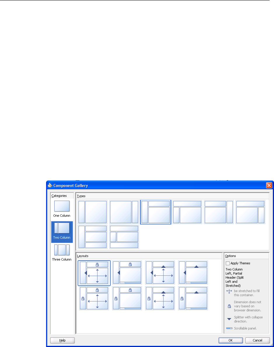
Using Page Templates
10-10 Web User Interface Developer's Guide for Oracle Application Development Framework
10.3.4 What Happens at Runtime: Resolving Page Fragments
When the page that contains the included page(s) is executed, the jsp:include tag
evaluates the view ID during JSF tree component build time and dynamically adds the
content to the parent page at the location of the jsp:include tag. The fragment
becomes part of the parent page after the component tree is built.
10.4 Using Page Templates
Page templates let you define entire page layouts, including values for certain
attributes of the page. When pages are created using a template, they all inherit the
defined layout. When you make layout modifications to the template, all pages that
consume the template will automatically reflect the layout changes. You can either
create the layout of your template yourself, or you can use one of the many quick
layout designs. These predefined layouts automatically insert and configure the
correct components required to implement the layout look and behavior you want. For
example, you may want one column’s width to be locked, while another column
stretches to fill available browser space. Figure 10–1 shows the quick layouts available
for a two-column layout with the second column split between two panes. For more
information about the layout components, see Chapter 9, "Organizing Content on Web
Pages."
Figure 10–1 Quick Layouts
To use page templates in an application, you first create a page template definition.
Page template definitions must be either Facelets or JSP XML documents because page
templates embed XML content. In contrast to regular JSF pages where all components
on the page must be enclosed within the f:view tag, page template definitions cannot
contain an f:view tag and must have pageTemplateDef as the root tag. The page

Using Page Templates
Creating and Reusing Fragments, Page Templates, and Components 10-11
that uses the template must contain the document tag, (by default, JDeveloper adds
the document tag to the consuming page).
A page template can have fixed content areas and dynamic content areas. For example,
if a Help button should always be located at the top right-hand corner of pages, you
could define such a button in the template layout, and when page authors use the
template to build their pages, they do not have to add and configure a Help button.
Dynamic content areas, on the other hand, are areas of the template where page
authors can add contents within defined facets of the template or set property values
that are specific to the type of pages they are building.
The entire description of a page template is defined within the pageTemplateDef
tag, which has two sections. One section is within the xmlContent tag, which
contains all the page template component metadata that describes the template’s
supported content areas (defined by facets), and available properties (defined as
attributes). The second section (anything outside of the xmlContent tag) is where all
the components that make up the actual page layout of the template are defined. The
components in the layout section provide a JSF component subtree that is used to
render the contents of the page template.
Facets act as placeholders for content on a page. In a page that consumes a template,
page authors can insert content for the template only in named facets that have
already been defined. This means that when you design a page template, you must
define all possible facets within the xmlContent tag, using a facet element for each
named facet. In the layout section of a page template definition, as you build the
template layout using various components, you use the facetRef tag to reference the
named facets within those components where content can eventually be inserted into
the template by page authors.
For example, the fileExplorerTemplate template contains a facet for copyright
information and another facet for application information, as shown in Example 10–6.
Example 10–6 Facet Definition in a Template
<facet>
<description>
<![CDATA[Area to put a commandLink to more information
about the application.]]>
</description>
<facet-name>appAbout</facet-name>
</facet>
<facet>
<description>
<![CDATA[The copyright region of the page. If present, this area
typically contains an outputText component with the copyright
information.]]>
</description>
<facet-name>appCopyright</facet-name>
</facet>
In the layout section of the template as shown in Example 10–7, a
panelGroupLayout component contains a table whose cell contains a reference to
the appCopyright facet and another facet contains a reference to the appAbout
facet. This is where a page developer will be allowed to place that content.
Example 10–7 Facet References in a Page Template
<af:panelGroupLayout layout="vertical">
<afh:tableLayout width="100%">
<afh:rowLayout>

Using Page Templates
10-12 Web User Interface Developer's Guide for Oracle Application Development Framework
<afh:cellFormat>
<af:facetRef facetName="appCopyright"/>
</afh:cellFormat>
</afh:rowLayout>
</afh:tableLayout>
<af:facetRef facetName="appAbout"/>
</af:panelGroupLayout>
While the pageTemplateDef tag describes all the information and components
needed in a page template definition, the JSF pages that consume a page template use
the pageTemplate tag to reference the page template definition. Example 10–7 shows
how the index.jspx page references the fileExplorerTemplate template,
provides values for the template’s attributes, and places content within the template’s
facet definitions.
At design time, page developers using the template can insert content into the
appCopyright facet, using the f:facet tag, as shown in Example 10–8
Example 10–8 Using Page Templates Facets in a JSF Page
<af:pageTemplate id="fe"
viewId="/fileExplorer/templates/fileExplorerTemplate.jspx">
<f:attribute name="documentTitle"
value="#{explorerBundle['global.branding_name']}"/>
<f:attribute name="headerSize" value="70"/>
<f:attribute name="navigatorsSize" value="370"/>
.
.
.
<f:facet name="appCopyright">
<!-- Copyright info about File Explorer demo -->
<af:outputFormatted value="#{explorerBundle['about.copyright']}"/>
</f:facet>
.
.
.
</af:pageTemplate>
At runtime, the inserted content is displayed in the right location on the page, as
indicated by af:facetRef facetName="appCopyright" in the template
definition.
Page template attributes specify the component properties (for example,
headerGlobalSize) that can be set or modified in the template. While facet
element information is used to specify where in a template content can be inserted,
attribute element information is used to specify what page attributes are available
for passing into a template, and where in the template those attributes can be used to
Note: Each named facet can be referenced only once in the layout
section of the page template definition. That is, you cannot use
multiple facetRef tags referencing the same facetName value in
the same template definition.
Note: You cannot run a page template as a run target in JDeveloper.
You can run the page that uses the page template.

Using Page Templates
Creating and Reusing Fragments, Page Templates, and Components 10-13
set or modify template properties. Page templates also support dynamic attributes as
an inline tag. For example, af:pageTemplate headerSize="70" is valid
syntax.
For the page template to reference its own attributes, the pageTemplateDef tag must
have a var attribute, which contains an EL variable name for referencing each
attribute defined in the template. For example, in the fileExplorerTemplate
template, the value of var on the pageTemplateDef tag is set to attrs. Then in the
layout section of the template, an EL expression such as
#{attrs.someAttributeName} is used in those component attributes where page
authors are allowed to specify their own values or modify default values.
For example, the fileExplorerTemplate template definition defines an attribute
for the header size, which has a default int value of 100 pixels as shown in
Example 10–9.
Example 10–9 Page Template AttributeDefinition
<attribute>
<description>
Specifies the number of pixels tall that the global header content should
consume.
</description>
<attribute-name>headerGlobalSize</attribute-name>
<attribute-class>int</attribute-class>
<default-value>100</default-value>
</attribute>
In the layout section of the template, the splitterPosition attribute of the
panelSplitter component references the headerGlobalSize attribute in the EL
expression #{attrs.headerGlobalSize}, as shown in the following code:
<af:panelSplitter splitterPosition="#{attrs.headerGlobalSize}" ../>
When page authors use the template, they can modify the headerGlobalSize value
using f:attribute, as shown in the following code:
<af:pageTemplate ..>
<f:attribute name="headerGlobalSize" value="50"/>
.
.
.
</af:pageTemplate>
At runtime, the specified attribute value is substituted into the appropriate part of the
template, as indicated by the EL expression that bears the attribute name.
You can nest templates when you need to reuse the same content across multiple
templates. For example, say your application will have three different types of pages,
but the header and footer will always be the same. Instead of having to include the
same header and footer design in three different templates, you can create a header
template and a footer template, and then simply nest those templates into each of the
different page templates.
Tip: If you define a resource bundle in a page template, the pages
that consume the template will also be able to use the resource bundle.
For information about using resource bundles, see Section 29.3,
"Manually Defining Resource Bundles and Locales."

Using Page Templates
10-14 Web User Interface Developer's Guide for Oracle Application Development Framework
For a simple page template, it is probably sufficient to place all the components for the
entire layout section into the page template definition file. For a more complex page
template, you can break the layout section into several smaller fragment files for easier
maintenance, and use jsp:include tags to include and connect the various fragment
files.
When you break the layout section of a page template into several smaller fragment
files, all the page template component metadata must be contained within the
xmlContent tag in the main page template definition file. There can be only one
xmlContent tag within a pageTemplateDef tag. You cannot have page template
component metadata in the fragment files; fragment files can contain portions of the
page template layout components only.
If your template requires resources such as custom styles defined in CSS or JavaScript,
then you need to include these on the consuming page, using the af:resource tag.
For more information, see Section 10.6, "Adding Resources to Pages."
10.4.1 How to Create a Page Template
JDeveloper simplifies creating page template definitions by providing the Create JSF
Page Template wizard, which lets you add named facets and attributes declaratively to
create the template component metadata section of a template. In addition to
generating the metadata code for you, JDeveloper also creates and modifies a
pagetemplate-metadata.xml file that keeps track of all the page templates you
create in a project.
Before you begin:
It may be helpful to have an understanding of page templates. For more information,
see Section 10.4, "Using Page Templates."
You may also find it helpful to understand functionality that can be added using other
ADF Faces features. For more information, see Section 10.1.2, "Additional
Functionality for Reusable Components."
To create a page template definition:
1. In the Application Navigator, right-click the folder where you wish to create and
store page templates and choose New.
2. In the Categories tree, select the JSF node, in the Items pane select JSF Page
Temp l a t e, and click OK.
3. Enter a file name for the page template definition. Page template definitions must
be XML documents (with file extension .jspx) because they embed XML content.
4. Accept the directory name for the template definition, or choose a new location.
5. Enter a Page Template name for the page template definition.
Performance Tip: Because page templates may be present in every
application page, templates should be optimized so that common
overhead is avoided. One example of overhead is round corners, for
example on boxes, which are quite expensive. Adding them to the
template will add overhead to every page.
Performance Tip: Avoid long names because they can have an
impact on server-side, network traffic, and client processing.

Using Page Templates
Creating and Reusing Fragments, Page Templates, and Components 10-15
6. If you want to use one of the predefined quick layouts, select Use a Quick Start
Layout and click Browse to select the one you want to use.
7. To add named facets, click the Facet Definitions tab and click the Add icon.
Facets are predefined areas on a page template where content can eventually be
inserted when building pages using the template. Each facet must have a unique
name. For example, you could define a facet called main for the main content area
of the page, and a facet called branding for the branding area of the page.
8. To add attributes, click the Attributes tab and click the Add icon.
Attributes are UI component attributes that can be passed into a page when
building pages using the template. Each attribute must have a name and class
type. Note that whatever consumes the attribute (for example an attribute on a
component that you configure in Step 14) must be able to accept that type. You can
assign default values, and you can specify that the values are mandatory by
selecting the Required checkbox.
9. If the page template contents use ADF Model data bindings, select the Create
Associated ADFm Page Definition checkbox, and click Model Parameters to add
one or more model parameters. For information about using model parameters
and ADF Model data bindings, see the "Using Page Templates" section of the
Oracle Fusion Middleware Fusion Developer's Guide for Oracle Application Development
Framework.
Once you complete the wizard, JDeveloper displays the page template definition
file in the visual editor. Example 10–10 shows the code JDeveloper adds for you
when you use the wizard to define the metadata for a page template definition.
You can view this code in the source editor.
Example 10–10 Component Metadata in Page Template Definition
<af:pageTemplateDef var="attrs">
<af:xmlContent>
<component xmlns="http://xmlns.oracle.com/adf/faces/rich/component">
<display-name>sampleTemplateDef1</display-name>
<facet>
<facet-name>main</facet-name>
</facet>
.
.
.
<attribute>
Tip: If you plan on nesting templates or using more than one
template on a page, to avoid confusion, use unique names for the
facets in all templates.
Tip: Once a template is created, you can add facets and attributes by
selecting the pageTemplateDef tag in the Structure window and
using the Property Inspector.
Note: When you change or delete any facet name or attribute name
in the template component metadata, you have to manually change or
delete the facet or attribute name referenced in the layout section of
the template definition, as well as the JSF pages that consume the
template.

Using Page Templates
10-16 Web User Interface Developer's Guide for Oracle Application Development Framework
<attribute-name>Title</attribute-name>
<attribute-class>java.lang.String</attribute-class>
<default-value>Replace title here</default-value>
<required>true</required>
</attribute>
.
.
.
</component>
</af:xmlContent>
.
.
.
</af:pageTemplateDef>
10. Drag a component from the Component Palette and drop it onto the page in the
visual editor.
In the layout section of a page template definition (or in fragment files that contain
a portion of the layout section), you cannot use the f:view tag, because it is
already used in the JSF pages that consume page templates.
You can add any number of components to the layout section. However, you
should only have one root component in a template. If you did not choose to use
one of the quick start layouts, then typically, you would add a panel component
such as panelStretchLayout or panelGroupLayout, and then add the
components that define the layout into the panel component. For more
information, see Chapter 9, "Organizing Content on Web Pages."
Declarative components and databound components may be used in the layout
section. For information about using declarative components, see Section 10.5,
"Using Declarative Components." For information about using databound
components in page templates, see the "Using Page Templates" section of the
Oracle Fusion Middleware Fusion Developer's Guide for Oracle Application Development
Framework.
11. To nest another template into this template, in the Component Palette, from the
Layout panel, drag and drop a Templat e onto the page.
12. In the Insert Template dialog, select the template that you want to nest.
Best Practice Tip: You should not use the document or form tags
in the template. While theoretically, template definitions can use the
document and form tags, doing so means the consuming page
cannot. Because page templates can be used for page fragments,
which in turn will be used by another page, it is likely that the
consuming page will contain these tags. You should never add a
document tag to a page template.
Note: You cannot nest an ADF databound template in a template
that does not use ADF data binding, or in a declarative component.
Additionally, a nested template cannot be used more than once per
rendering. For example, it cannot be used as a child to a component
that stamps its children, such as a table or tree.

Using Page Templates
Creating and Reusing Fragments, Page Templates, and Components 10-17
13. Within those components (in the layout section) where content can eventually be
inserted by page authors using the template, drag Facet from the Component
Palette and drop it in the desired location on the page.
For example, if you have defined a main facet for the main content area on a page
template, you might add the facetRef tag as a child in the center facet of
panelStretchLayout component to reference the main facet. At design time,
when the page author drops content into the main facet, the content is placed in
the correct location on the page as defined in the template.
When you use the facetRef tag to reference the appropriate named facet,
JDeveloper displays the Insert Facet dialog. In that dialog, select a facet name from
the dropdown list, or enter a facet name. If you enter a facet name that is not
already defined in the component metadata of the page template definition file,
JDeveloper automatically adds an entry for the new facet definition in the
component metadata within the xmlContent tag.
14. To specify where attributes should be used in the page template, use the page
template’s var attribute value to reference the relevant attributes on the
appropriate components in the layout section.
The var attribute of the pageTemplateDef tag specifies the EL variable name
that is used to access the page template’s own attributes. As shown in
Example 10–10, the default value of var used by JDeveloper is attrs.
For example, if you have defined a title attribute and added the panelHeader
component, you might use the EL expression #{attrs.title} in the text
value of the panelHeader component, as shown in the following code, to
reference the value of title:
<af:panelHeader text="#{attrs.title}">
15. To include another file in the template layout, use the jsp:include tag wrapped
inside the subview tag to reference a fragment file, as shown in the following
code:
<f:subview id="secDecor">
<jsp:include page="fileExplorerSecondaryDecoration.jspx"/>
</f:subview>
Tip: The dialog displays all the templates that are included in the
current project or that are provided in an ADF Library. For more
information about ADF Libraries, see the "Reusing Application
Components" chapter of the Oracle Fusion Middleware Fusion
Developer's Guide for Oracle Application Development Framework.
Note: Each facet can be referenced only once in the layout section of
the page template definition. That is, you cannot use multiple
facetRef tags referencing the same facetName value in the same
template definition.
Note: If you have nested another template into this template, you
must create facet references for each facet in the nested template, as
well as for facets in this template.

Using Page Templates
10-18 Web User Interface Developer's Guide for Oracle Application Development Framework
The included fragment file must also be an XML document, containing only
jsp:root at the top of the hierarchy. For more information about using
fragments, see Section 10.3.3, "How to Use a Page Fragment in a JSF Page."
By creating a few fragment files for the components that define the template
layout, and then including the fragment files in the page template definition, you
can split up an otherwise large template file into smaller files for easier
maintenance.
10.4.2 What Happens When You Create a Page Template
The first time you use the wizard to create a JSF page template in a project, JDeveloper
automatically creates the pagetemplate-metadata.xml file, which is placed in the
/ViewController/src/META-INF directory in the file system.
For each page template that you define using the wizard, JDeveloper creates a page
template definition file (for example, sampleTemplateDef1.jspx), and adds an
entry to the pagetemplate-metadata.xml file. Example 10–11 shows an example
of the pagetemplate-metadata.xml file.
Example 10–11 Sample pagetemplate-metadata.xml File
<pageTemplateDefs xmlns="http://xmlns.oracle.com/adf/faces/rich/pagetemplate">
<pagetemplate-jsp-ui-def>/sampleTemplateDef1.jspx</pagetemplate-jsp-ui-def>
<pagetemplate-jsp-ui-def>/sampleTemplateDef2.jspx</pagetemplate-jsp-ui-def>
</pageTemplateDefs>
The pagetemplate-metadata.xml file contains the names and paths of all the page
templates that you create in a project. This file is used to determine which page
templates are available when you use a wizard to create template-based JSF pages, and
when you deploy a project containing page template definitions.
10.4.3 How to Create JSF Pages Based on Page Templates
Typically, you create JSF pages in the same project where page template definitions are
created and stored. If the page templates are not in the same project as where you are
going to create template-based pages, first deploy the page templates project to an
ADF Library JAR. For information about deploying a project, see the "Reusing
Application Components" chapter of the Oracle Fusion Middleware Fusion Developer's
Note: If components in your page template use ADF Model data
binding, or if you chose to associate an ADF page definition when you
created the template, JDeveloper automatically creates files and
folders related to ADF Model. For information about the files used
with page templates and ADF Model data binding, the "Using Page
Templates" section of the Oracle Fusion Middleware Fusion Developer's
Guide for Oracle Application Development Framework.
Note: When you rename or delete a page template in the
Application Navigator, JDeveloper renames or deletes the page
template definition file in the file system, but you must manually
change or delete the page template entry in the
pagetemplate-metadata.xml file, and update or remove any
JSF pages that use the template.

Using Page Templates
Creating and Reusing Fragments, Page Templates, and Components 10-19
Guide for Oracle Application Development Framework. Deploying a page template project
also allows you to share page templates with other developers working on the
application.
You can use page templates to build JSF pages or page fragments. If you modify the
layout section of a page template later, all pages or page fragments that use the
template are automatically updated with the layout changes.
In the page that consumes a template, you can add content before and after the
pageTemplate tag. In general, you would use only one pageTemplate tag in a
page, but there are no restrictions for using more than one.
JDeveloper simplifies the creation of JSF pages based on page templates by providing
a template selection option in the Create JSF Page or Create JSF Page Fragment wizard.
Before you begin:
It may be helpful to have an understanding of page templates. For more information,
see Section 10.4, "Using Page Templates."
You may also find it helpful to understand functionality that can be added using other
ADF Faces features. For more information, see Section 10.1.2, "Additional
Functionality for Reusable Components."
To create a JSF page or page fragment based on a page template:
1. Follow the instructions in Section 3.4.1, "How to Create JSF Pages" to open the
Create JSF Page dialog. In the dialog, select a page template to use from the Use
Page Template dropdown list.
By default, JDeveloper displays the new page or page fragment in the visual
editor. The facets defined in the page template appear as named boxes in the
visual editor. If the page template contains any default values, you should see the
values in the Property Inspector, and if the default values have some visual
representation (for example, size), that will be reflected in the visual editor, along
with any content that is rendered by components defined in the layout section of
the page template definition.
2. In the Structure window, expand jsp:root until you see af:pageTemplate.
Within the form tag, you can drop content before and after the pageTemplate
tag.
Note: If the template uses jsp:include tags, then it cannot be
deployed to an ADF Library to be reused in other applications.
Tip: Only page templates that have been created using the template
wizard in JDeveloper are available for selection. If the Use Page
Templat e dropdown list is disabled, this means no page templates are
available in the project where you are creating new pages.
Tip: Instead of basing the whole page on a template, you can use a
template for an area of a page. For example, you may have a template
to be used just in the headers of your pages. To apply a template to an
area of your page, from the Layout panel of the Component Palette,
drag and drop a Templat e into the desired component.

Using Page Templates
10-20 Web User Interface Developer's Guide for Oracle Application Development Framework
3. Add components by dragging and dropping components from the Component
Palette in the facets of the template. In the Structure window, within
af:pageTemplate, the facets (for example, f:facet - main) that have been
predefined in the component metadata section of the page template definition are
shown.
The type of components you can drop into a facet may be dependent on the
location of the facetRef tag in the page template definition. For example, if
you’ve defined a facetRef tag to be inside a table component in the page
template definition, then only column components can be dropped into the facet
because the table component accepts only column components as children.
4. In the Structure window, select af:pageTemplate. Then, in the Property Inspector,
you can see all the attributes that are predefined in the page template definition.
Predefined attributes might have default values.
You can assign static values to the predefined attributes, or you can use EL
expressions (for example, #{myBean.somevalue}). When you enter a value for
an attribute, JDeveloper adds the f:attribute tag to the code, and replaces the
attribute’s default value (if any) with the value you assign (see Example 10–12).
At runtime, the default or assigned attribute value is used or displayed in the
appropriate part of the template, as specified in the page template definition by
the EL expression that bears the name of the attribute (such as
#{attrs.someAttributeName}).
5. To include resources, such as CSS or JavaScript, you need to use the
af:resource tag. For more information, see Section 10.6, "Adding Resources to
Pages."
10.4.4 What Happens When You Use a Template to Create a Page
When you create a page using a template, JDeveloper inserts the pageTemplate tag,
which references the page template definition, as shown in Example 10–12. Any
components added inside the template’s facets use the f:facet tag to reference the
facet. Any attribute values you specified are shown in the f:attribute tag.
Tip: The content you drop into the template facets may contain
ADF Model data binding. In other words, you can drag and drop
items from the Data Controls panel. For more information about using
ADF Model data binding, see Oracle Fusion Middleware Fusion
Developer's Guide for Oracle Application Development Framework.
Note: In addition to predefined template definition attributes, the
Property Inspector also shows other attributes of the pageTemplate
tag such as Id, Value, and ViewId.
The ViewId attribute of the pageTemplate tag specifies the page
template definition file to use in the consuming page at runtime.
JDeveloper automatically assigns the ViewId attribute with the
appropriate value when you use the wizard to create a template-based
JSF page. The ViewId attribute value cannot be removed, otherwise a
runtime error will occur, and the parts of the page that are based on
the template will not render.

Using Page Templates
Creating and Reusing Fragments, Page Templates, and Components 10-21
Example 10–12 JSF Page that References a Page Template
<?xml version='1.0' encoding='UTF-8'?>
<jsp:root xmlns:jsp="http://java.sun.com/JSP/Page" version="2.0"
xmlns:f="http://java.sun.com/jsf/core"
xmlns:af="http://xmlns.oracle.com/adf/faces/rich">
<jsp:directive.page contentType="text/html;charset=windows-1252"/>
<f:view>
<af:document>
<af:form>
.
.
.
<af:pageTemplate viewId="/sampleTemplateDef1.jspx" id="template1">
<f:attribute name="title" value="Some Value"/>
<f:facet name="main">
<!-- add contents here -->
</f:facet>
</af:pageTemplate>
.
.
.
</af:form>
</af:document>
</f:view>
</jsp:root>
10.4.5 What Happens at Runtime: How Page Templates Are Resolved
When a JSF page that consumes a page template is executed:
■The pageTemplate component in the consuming page, using the viewId
attribute (for example, <af:pageTemplate
viewId="/sampleTemplateDef1.jspx"/>), locates the page template
definition file that contains the template component metadata and layout.
■The component subtree defined in the layout section of the pageTemplateDef
tag is instantiated and inserted into the consuming page’s component tree at the
location identified by the pageTemplate tag in the page.
■The consuming page passes facet contents into the template using the facet tag.
The facet contents of each facet tag are inserted into the appropriate location on
the template as specified by the corresponding facetRef tag in the layout section
of the pageTemplateDef tag.
■The consuming page passes values into the template by using the attribute tag.
The pageTemplateDef tag sets the value of the var attribute so that the
pageTemplate tag can internally reference its own parameters. The
pageTemplate tag just sets the parameters; the runtime maps those parameters
into the attributes defined in the pageTemplateDef tag.
■Using template component metadata, the pageTemplate tag applies any default
values to its attributes and checks for required values.

Using Declarative Components
10-22 Web User Interface Developer's Guide for Oracle Application Development Framework
For information about what happens when the page template uses ADF Model data
binding, see the "Using Page Templates" section of the Oracle Fusion Middleware Fusion
Developer's Guide for Oracle Application Development Framework.
10.4.6 What You May Need to Know About Page Templates and Naming Containers
The pageTemplate component acts as a naming container for all content in the
template (whether it is direct content in the template definition, or fragment content
included using the jsp:include action). When working in template-based pages,
you should not reference an individual component inside a page template. Changes
made to the page template or its consuming page may cause the partial triggers to
work improperly. For more details, see Section 6.3.8, "What You May Need to Know
About Using Naming Containers."
10.5 Using Declarative Components
Declarative components are reusable, composite UI components that are made up of
other existing ADF Faces components. Suppose you are reusing the same components
consistently in multiple circumstances. Instead of copying and pasting the commonly
used UI elements repeatedly, you can define a declarative component that comprises
those components, and then reuse that composite declarative component in multiple
places or pages.
To use declarative components in an application, you first create an XML-based
declarative component definition, which is a JSF document written in XML syntax
(with a file extension of .jspx). Declarative component JSF files do not contain the
f:view and document tags, and they must have componentDef as the root tag.
The entire description of a declarative component is defined within two sections. One
section is xmlContent, which contains all the page template component metadata
that describes the declarative component’s supported content areas. A declarative
component’s metadata includes the following:
■Facets: Facets act as placeholders for the content that will eventually be placed in
the individual components that make up the declarative component. Each
component references one facet. When page designers use a declarative
component, they insert content into the facet, which in turn, allows the content to
be inserted into the component.
■Attributes: You define attributes whose values can be used to populate attributes
on the individual components. For example, if your declarative component uses a
panelHeader component, you may decide to create an attribute named Title.
You may then design the declarative component so that the value of the Title
Note: Page templates are processed during JSP execution, not during
JSF processing (that is, component tree creation). This means that
fragments built from page templates cannot be used within tags that
require the component tree creation. For example, you could not
include a fragment based on a template within an iterator tag and
expect it to be included in a loop.
Tip: Facets are the only area within a declarative component that can
contain content. That is, when used on a JSF page, a declarative
component may not have any children. Create facets for all areas
where content may be needed.

Using Declarative Components
Creating and Reusing Fragments, Page Templates, and Components 10-23
attribute is used as the value for the text attribute of the panelHeader
component. You can provide default values for attributes that the user can then
override.
■Methods: You can define a method to which you can bind a property on one of the
included components. For example, if your declarative component contains a
button, you can declare a method name and signature and then bind the
actionListener attribute to the declared method. When page developers use
the declarative component, they rebind to a method on a managed bean that
contains the logic required by the component.
For example, say your declarative component contains a button that you knew
always had to invoke an actionEvent method. You might create a declarative
method named method1 that used the signature void
method(javax.faces.event.ActionEvent). You might then bind the
actionListener attribute on the button to the declared method. When page
developers use the declarative component, JDeveloper will ask them to provide a
method on a backing bean that uses the same signature.
■Tag library: All declarative components must be contained within a tag library that
you import into the applications that will use them.
The second section (anything outside of the xmlContent tag) is where all the
components that make up the declarative component are defined. Each component
contains a reference back to the facet that will be used to add content to the
component.
To use declarative components in a project, you first must deploy the library that
contains the declarative component as an ADF Library. You can then add the deployed
ADF Library JAR to the project’s properties, which automatically inserts the JSP tag
library or libraries into the project’s properties. Doing so allows the component(s) to be
displayed in the Component Palette so that you can drag and drop them onto a JSF
page.
For example, say you want to create a declarative component that uses a panelBox
component. In the panelBox component’s toolbar, you want to include three buttons
that can be used to invoke actionEvent methods on a backing bean. To do this,
create the following:
■One facet named Content to hold the content of the panelBox component.
■One attribute named Title to determine the text to display as the panelBox
component’s title.
■Three attributes (one for each button, named buttonText1, buttonText2, and
buttonText3) to determine the text to display on each button.
Tip: Because users of a declarative component will not be able to
directly set attributes on the individual components, you must be sure
to create attributes for all attributes that you want users to be able to
set or override the default value.
Additionally, if you want the declarative component to be able to use
client-side attributes (for example, attributeDragSource), you
must create that attribute and be sure to include it as a child to the
appropriate component used in the declarative component. For more
information, see Section 10.5.1, "How to Create a Declarative
Component."
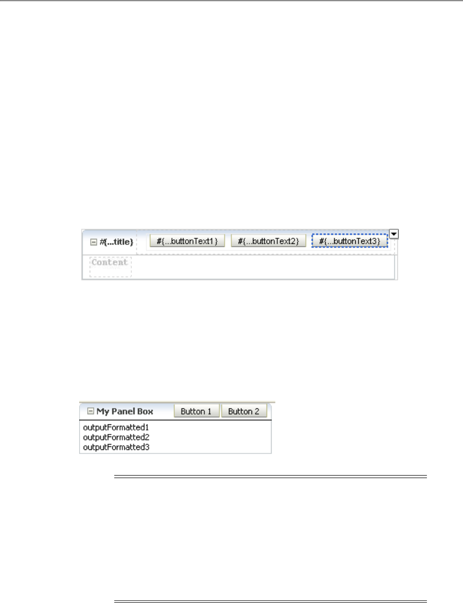
Using Declarative Components
10-24 Web User Interface Developer's Guide for Oracle Application Development Framework
■Three attributes (one for each button, named display1, display2, display3)
to determine whether or not the button will render, because you do not expect all
three buttons will be needed every time the component is used.
■Three declarative methods (one for each button, named method1, method2, and
method3) that each use the actionEvent method signature.
■One panelBox component whose text attribute is bound to the created Title
attribute, and references the Content facet.
■Three toolbarButton components. The text attribute for each would be bound
to the corresponding buttonText attribute, the render attribute would be
bound to the corresponding display attribute, and the actionListener
attribute would be bound to the corresponding method name.
Figure 10–2 shows how such a declarative component would look in the visual editor.
Figure 10–2 Declarative Component in the Visual Editor
When a page developer drops a declarative component that contains required
attributes or methods onto the page, a dialog opens asking for values.
If the developer set values where only the first two buttons would render, and then
added a panelGroupLayout component with output text, the page would render as
shown in Figure 10–3.
Figure 10–3 Displayed Declarative Component
If your declarative component requires resources such as custom styles defined in CSS
or JavaScript, then you need to include these using the af:resource tag on the
consuming page. For more information, see Section 10.6, "Adding Resources to Pages."
Note: You cannot use fragments or ADF databound components in
the component layout of a declarative component. If you think some
of the components will need to be bound to the ADF Model layer, then
create attributes for those component attributes that need to be bound.
The user of the declarative component can then manually bind those
attributes to the ADF Model layer.
Additionally, because declarative components are delivered in
external JAR files, the components cannot use the jsp:include tag
because it will not be able to find the referenced files.

Using Declarative Components
Creating and Reusing Fragments, Page Templates, and Components 10-25
10.5.1 How to Create a Declarative Component
JDeveloper simplifies creating declarative component definitions by providing the
Create JSF Declarative Component wizard, which lets you create facets, and define
attributes and methods for the declarative component. The wizard also creates
metadata in the component-extension tile that describes tag library information for
the declarative component. The tag library metadata is used to create the JSP tag
library for the declarative component.
First you add the template component metadata for facets and attributes inside the
xmlContent section of the componentDef tag. After you have added all the
necessary component metadata for facets and attributes, then you add the components
that define the actual layout of the declarative component in the section outside of the
xmlContent section.
Before you begin:
It may be helpful to have an understanding of declarative components. For more
information, see Section 10.5, "Using Declarative Components."
You may also find it helpful to understand functionality that can be added using other
ADF Faces features. For more information, see Section 10.1.2, "Additional
Functionality for Reusable Components."
To create a declarative component definition:
1. In the Application Navigator, right-click the folder where you wish to create and
store declarative components and choose New.
2. In the Categories tree, select the JSF node, in the Items pane select JSF Declarative
Component, and click OK.
3. Enter a name and file name for the declarative component.
The name you specify will be used as the display name of the declarative
component in the Component Palette, as well as the name of the Java class
generated for the component tag. Only alphanumeric characters are allowed in the
name for the declarative component, for example, SampleName or SampleName1.
The file name is the name of the declarative component definition file (for
example, componentDef1.jspx). By default, JDeveloper uses .jspx as the file
extension because declarative component definition files must be XML documents.
4. Accept the default directory name for the declarative component, or choose a new
location.
By default, JDeveloper saves declarative component definitions in the
/ViewController/public_html directory in the file system. For example, you
could save all declarative component definitions in the /View
Controller/public_html/declcomps directory.
5. Enter a package name (for example, dcomponent1). JDeveloper uses the package
name when creating the Java class for the declarative component.
Best Practice Tip: Because the tag library definition (TLD) for the
declarative component must be generated before the component can
be used, the component must be deployed to a JAR file before it can be
consumed. It is best to create an application that contains only your
declarative components. You can then deploy all the declarative
components in a single library for use in multiple applications.

Using Declarative Components
10-26 Web User Interface Developer's Guide for Oracle Application Development Framework
6. Select a tag library to contain the new declarative component. If no tag library
exists, or if you wish to create a new one, click Add Tag Library, and do the
following to create metadata for the tag library:
a. Enter a name for the JSP tag library to contain the declarative component (for
example, dcompLib1).
b. Enter the URI for the tag library (for example, /dcomponentLib1).
c. Enter a prefix to use for the tag library (for example, dc).
7. If you want to be able to add custom logic to your declarative component, select
the Use Custom Component Class checkbox and enter a class name.
8. To add named facets, click the Facet Definitions tab and click the Add icon.
Facets in a declarative component are predefined areas where content can
eventually be inserted. The components you use to create the declarative
component will reference the facets. When page developers use the declarative
components, they will place content into the facets, which in turn will allow the
content to be placed into the individual components. Each facet must have a
unique name. For example, your declarative component has a panelBox
component, you could define a facet named box-main for the content area of the
panelBox component.
9. To add attributes, click Attributes and click Add.
Attributes are UI component attributes that can be passed into a declarative
component. Each attribute must have a name and class type. Possible class types
to use are: java.lang.String, int, boolean, and float. You can assign
default values, and you can specify that the values are mandatory by selecting the
Required checkbox.
10. To add declarative methods, click the Methods tab and click the Add icon.
Declarative methods allow you to bind command component actions or action
listeners to method signatures, which will later resolve to actual methods of the
same signature on backing beans for the page on which the components are used.
You can click the ellipses button to open the Method Signature dialog, which
allows you to search for and build your signature.
When you complete the dialog, JDeveloper displays the declarative component
definition file in the visual editor.
11. Drag a component from the Component Palette and drop it as a child to the
componentDef tag in the Structure window.
Tip: You must create attributes for any attributes on the included
components for which you want users to be able to set or change
values.
Remember to also add attributes for any tags you may need to add to
support functionality of the component, for example values required
by the attributeDragSource tag used for drag and drop
functionality.
Tip: Once a declarative component is created, you can add facets and
attributes by selecting the componentDef tag in the Structure
window, and using the Property Inspector.

Using Declarative Components
Creating and Reusing Fragments, Page Templates, and Components 10-27
Suppose you dropped a panelBox component. In the Structure window,
JDeveloper adds the component after the xmlContent tag. It does not matter
where you place the components for layout, before or after the xmlContent tag,
but it is good practice to be consistent.
You can use any number of components in the component layout of a declarative
component. Typically, you would add a component such as panelFormLayout
or panelGroupLayout, and then add the components that define the layout into
the panel component.
12. Within those components (in the layout section) where content can eventually be
inserted by page authors using the component, use the facetRef tag to reference
the appropriate named facet.
For example, if you have defined a content facet for the main content area, you
might add the facetRef tag as a child in the panelBox component to reference
the content facet. At design time, when the page developer drops components
into the content facet, the components are placed in the panelBox component.
When you drag Facet from the Component Palette and drop it in the desired
location on the page, JDeveloper displays the Insert Facet dialog. In that dialog,
select a facet name from the dropdown list, or enter a facet name. If you enter a
facet name that is not already defined in the component metadata of the definition
file, JDeveloper automatically adds an entry for the new facet definition in the
component metadata within the xmlContent tag.
13. To specify where attributes should be used in the declarative component, use the
Property Inspector and the Expression Builder to bind component attribute values
to the created attributes.
For example, if you have defined a title attribute and added a panelBox as a
component, you might use the dropdown menu next to the text attribute in the
Property Inspector to open the Expression Builder, as shown in Figure 10–4.
Note: You cannot use fragments or ADF databound components in
the component layout of a declarative component. If you think some
of the components will need to be bound to the ADF Model layer, then
create attributes for those component attributes. The user of the
declarative component can then manually bind those attributes to the
ADF Model layer. For more information about using the ADF Model
layer, see the "Using ADF Model in a Fusion Web Application" chapter
in the Oracle Fusion Middleware Fusion Developer's Guide for Oracle
Application Development Framework.
Additionally, because declarative components are delivered in
external JAR files, the components cannot use the jsp:include tag
because it will not be able to find the referenced files.
Note: Each facet can be referenced only once. That is, you cannot use
multiple facetRef tags referencing the same facetName value in
the same declarative component definition.
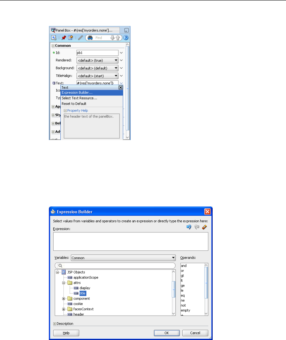
Using Declarative Components
10-28 Web User Interface Developer's Guide for Oracle Application Development Framework
Figure 10–4 Opening the Expression Builder for an Attribute in the Property Inspector
In the Expression Builder, you can expand the JSP Objects > attrs node to select
the created attribute that should be used for the value of the attribute in the
Property Inspector. For example, Figure 10–5 shows the title attribute selected in
the Expression Builder. Click the Insert Into Expression button and then click OK
to add the expression as the value for the attribute.
Figure 10–5 Expression Builder Displays Created Attributes
14. To specify the methods that command buttons in the declarative component
should invoke, use the dropdown menu next to that component’s
actionListener attribute and choose Edit to open the Edit Property dialog.
This dialog allows you to choose one of the declarative methods you created for
the declarative component.
In the dialog, select Declarative Component Methods, select the declarative
method from the dropdown list, and click OK.

Using Declarative Components
Creating and Reusing Fragments, Page Templates, and Components 10-29
10.5.2 What Happens When You Create a Declarative Component
When you first use the Create JSF Declarative Component wizard, JDeveloper creates
the metadata file using the name you entered in the wizard. The entire definition for
the component is contained in the componentDef tag. This tag uses two attributes.
The first is var, which is a variable used by the individual components to access the
attribute values. By default, the value of var is attrs. The second attribute is
componentVar, which is a variable used by the individual components to access the
methods. Be aware that if componentVar is set to component then it is incompatible
with JSF 2.0 and the expression will fail. You will need to set componentVar using a
different variable.
The metadata describing the facets, attributes, and methods is contained in the
xmlContent tag. Facet information is contained within the facet tag, attribute
information is contained within the attribute tag, and method information is
contained within the component-extension tag, as is library information.
Example 10–13 shows abbreviated code for the declarative component shown in
Figure 10–2.
Example 10–13 Declarative Component Metadata in the xmlContent Tag
<af:xmlContent>
<component xmlns="http://xmlns.oracle.com/adf/faces/rich/component">
<display-name>myPanelBox</display-name>
<facet>
<description>Holds the content in the panel box</description>
<facet-name>Content</facet-name>
</facet>
<attribute>
<attribute-name>title</attribute-name>
<attribute-class>java.lang.String</attribute-class>
<required>true</required>
</attribute>
<attribute>
<attribute-name>buttonText1</attribute-name>
<attribute-class>java.lang.String</attribute-class>
</attribute>
. . .
<component-extension>
<component-tag-namespace>component</component-tag-namespace>
<component-taglib-uri>/componentLib1</component-taglib-uri>
<method-attribute>
<attribute-name>method1</attribute-name>
<method-signature>
void method(javax.faces.event.ActionEvent)
</method-signature>
</method-attribute>
<method-attribute>
<attribute-name>method2</attribute-name>
<method-signature>
void method(javax.faces.event.ActionEvent)
</method-signature>
</method-attribute>
. . .
</component-extension>
</component>
</af:xmlContent>
Metadata for the included components is contained after the xmlContent tag. The
code for these components is the same as it might be in a standard JSF page, including

Using Declarative Components
10-30 Web User Interface Developer's Guide for Oracle Application Development Framework
any attribute values you set directly on the components. Any bindings you created to
the attributes or methods use the component’s variables in the bindings.
Example 10–14 shows the code for the panelBox component with the three buttons in
the toolbar. Notice that the facetRef tag appears as a child to the panelBox
component, as any content a page developer will add will then be a child to the
panelBox component.
Example 10–14 Components in a Declarative Component
<af:panelBox text="#{attrs.title}" inlineStyle="width:25%;">
<f:facet name="toolbar">
<af:group>
<af:toolbar>
<af:commandToolbarButton text="#{attrs.buttonText1}"
actionListener="#{component.handleMethod1}"
rendered="#{attrs.display1}"/>
<af:commandToolbarButton text="#{attrs.buttonText2}"
rendered="#{attrs.display2}"
actionListener="#{component.handleMethod2}"/>
<af:commandToolbarButton text="#{attrs.buttonText3}"
rendered="#{attrs.display3}"
actionListener="#{component.handleMethod3}"/>
</af:toolbar>
</af:group>
</f:facet>
<af:facetRef facetName="Content"/>
</af:panelBox>
The first time you use the wizard to create a declarative component in a project,
JDeveloper automatically creates the declarativecomp-metadata.xml file, which
is placed in the /ViewController/src/META-INF directory in the file system.
For each declarative component that you define using the wizard, JDeveloper creates a
declarative component definition file (for example, componentDef1.jspx), and
adds an entry to the declarativecomp-metadata.xml file. Example 10–15 shows
an example of the declarativecomp-metadata.xml file.
Example 10–15 Sample declarativecomp-metadata.xml File
<declarativeCompDefs
xmlns="http://xmlns.oracle.com/adf/faces/rich/declarativecomp">
<declarativecomp-jsp-ui-def>
/componentDef1.jspx
</declarativecomp-jsp-ui-def>
<declarativecomp-taglib>
<taglib-name>
dCompLib1
</taglib-name>
<taglib-uri>
/dcomponentLib1
</taglib-uri>
<taglib-prefix>
dc
</taglib-prefix>
</declarativecomp-taglib>
</declarativeCompDefs>

Using Declarative Components
Creating and Reusing Fragments, Page Templates, and Components 10-31
The declarativecomp-metadata.xml file contains the names, paths, and tag
library information of all the declarative components you create in the project. When
you deploy the project, the metadata is used by JDeveloper to create the JSP tag
libraries and Java classes for the declarative components.
10.5.3 How to Deploy Declarative Components
Declarative components require a tag library definition (TLD) in order to be displayed.
JDeveloper automatically generates the TLD when you deploy the project. Because of
this, you must first deploy the project that contains your declarative components
before you can use them. This means before you can use declarative components in a
project, or before you can share declarative components with other developers, you
must deploy the declarative component definitions project to an ADF Library JAR. For
instructions on how to deploy a project to an ADF Library JAR, see the "Reusing
Application Components" chapter of the Oracle Fusion Middleware Fusion Developer's
Guide for Oracle Application Development Framework.
Briefly, when you deploy a project that contains declarative component definitions,
JDeveloper adds the following for you to the ADF Library JAR:
■A component tag class (for example, the componentDef1Tag.class) for each
declarative component definition (that is, for each componentDef component)
■One or more JSP TLD files for the declarative components, using information from
the project’s declarativecomp-metadata.xml file
To use declarative components in a consuming project, you add the deployed
ADF Library JAR to the project’s properties. For instructions on how to add an ADF
Library JAR, see the "Reusing Application Components" chapter of the Oracle Fusion
Middleware Fusion Developer's Guide for Oracle Application Development Framework. By
adding the deployed JAR, JDeveloper automatically inserts the JSP tag library or
libraries (which contain the reusable declarative components) into the project’s
properties, and also displays them in the Component Palette.
10.5.4 How to Use Declarative Components in JSF Pages
In JDeveloper, you add declarative components to a JSF page just like any other UI
components, by selecting and dragging the components from the Component Palette,
and dropping them into the desired locations on the page. Your declarative
components appear in a page of the palette just for your tag library. Figure 10–6 shows
the page in the Component Palette for a library with a declarative component.
Note: When you rename or delete a declarative component in the
Application Navigator, JDeveloper renames or deletes the declarative
component definition file in the file system, but you must manually
change or delete the declarative component entry in the
declarativecomp-metadata.xml file, and update or remove any
JSF pages that use the declarative component.
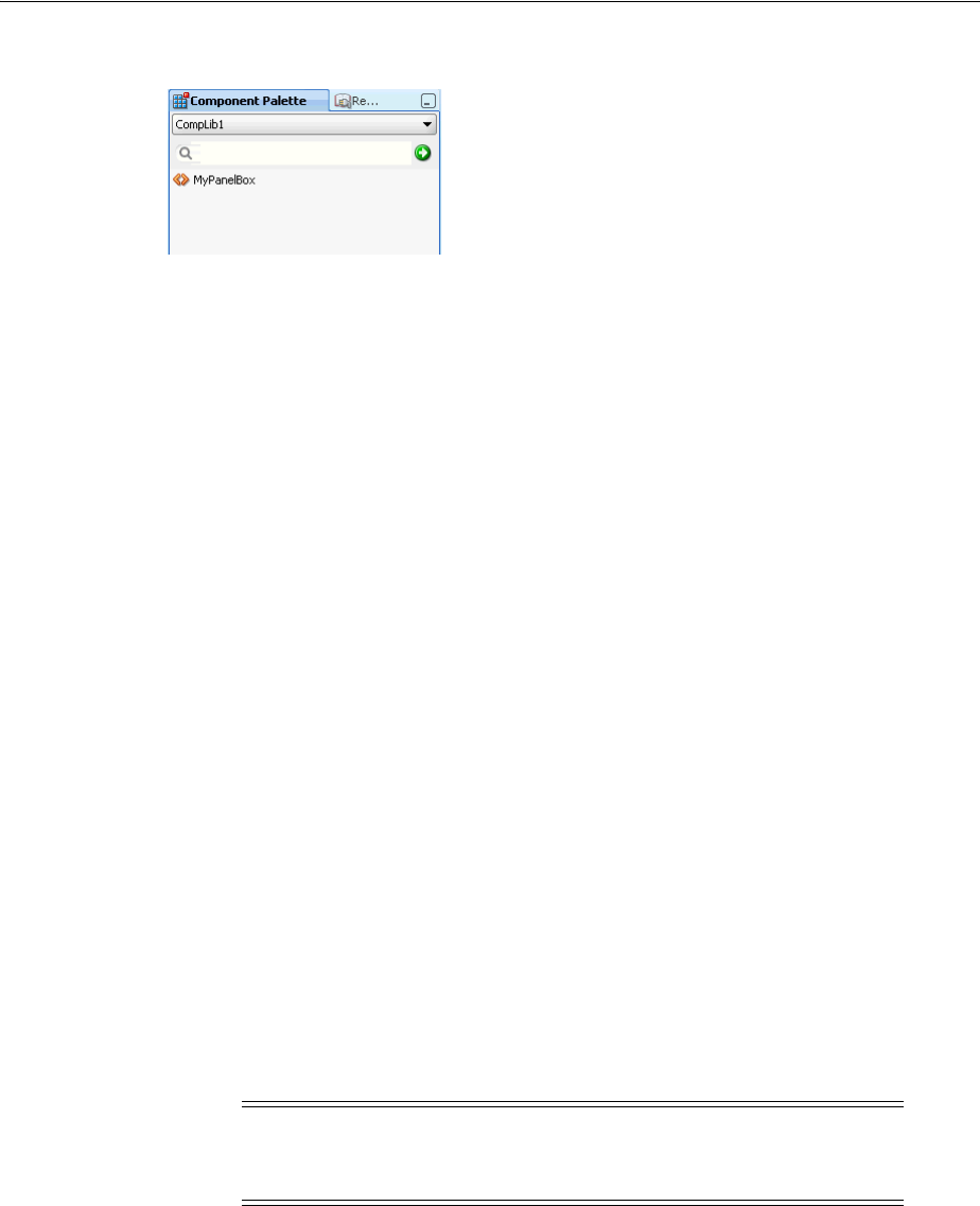
Using Declarative Components
10-32 Web User Interface Developer's Guide for Oracle Application Development Framework
Figure 10–6 Component Palette with a Declarative Component
When you drag a declarative component that contains required attributes onto a page,
a dialog opens where you enter values for any defined attributes.
Once the declarative component is added to the page, you must manually bind the
declarative methods to actual methods on managed beans.
Before proceeding with the following procedure, you must already have added the
ADF Library JAR that contains the declarative components to the project where you
are creating JSF pages that are to consume the declarative components. For
instructions on how to add an ADF Library JAR, see the "Reusing Application
Components" chapter of the Oracle Fusion Middleware Fusion Developer's Guide for
Oracle Application Development Framework.
Before you begin:
It may be helpful to have an understanding of declarative components. For more
information, see Section 10.5, "Using Declarative Components."
You may also find it helpful to understand functionality that can be added using other
ADF Faces features. For more information, see Section 10.1.2, "Additional
Functionality for Reusable Components."
To use declarative components in a JSF page:
1. In the Application Navigator, double-click the JSF page (or JSF page template) to
open it in the visual editor.
2. In the Component Palette, select the declarative components tag library name
from the dropdown list. Drag and drop the desired declarative component onto
the page. You can add the same declarative component more than once on the
same page.
If the declarative component definition contains any required attributes,
JDeveloper opens a dialog for you to enter the required values for the declarative
component that you are inserting.
3. Add components by dragging and dropping components from the Component
Palette in the facets of the template. In the Structure window, expand the structure
until you see the element for the declarative component, for example,
dc:myPanelBox, where dc is the tag library prefix and myPanelBox is the
declarative component name.
Under that are the facets (for example, f:facet - content) that have been
defined in the declarative component definition. You add components to these
facets.
Note: If you want to use ADF Model layer bindings as values for the
attributes, then to create these bindings manually by using the
Expression Builder to locate the needed binding property.
Using Declarative Components
Creating and Reusing Fragments, Page Templates, and Components 10-33
You cannot add content directly into the declarative component; you can drop
content into the named facets only. The types of components you can drop into a
facet may be dependent on the location of the facetRef tag in the declarative
component definition. For example, if you have defined facetRef to be a child of
table in the declarative component definition, then only column components
can be dropped into the facet because table accepts column children only.
4. In the Structure window, again select the declarative component element, for
example, dc:myPanelBox. The Property Inspector displays all the attributes and
methods that have been predefined in the declarative component definition (for
example, title). The attributes might have default values.
You can assign static values to the attributes, or you can use EL expressions (for
example, #{myBean.somevalue}). For any of the methods, you must bind to a
method that uses the same signature as the declared method defined on the
declarative component.
At runtime, the attribute value will be displayed in the appropriate location as
specified in the declarative component definition by the EL expression that bears
the name of the attribute (for example, #{attrs.someAttributeName}).
5. If you need to include resources such as CSS or JavaScript, then you need to
include these using the af:resource tag. For more information, see Section 10.6,
"Adding Resources to Pages."
10.5.5 What Happens When You Use a Declarative Component on a JSF Page
After adding a declarative component to the page, the visual editor displays the
component’s defined facets as named boxes, along with any content that is rendered
by components defined in the component layout section of the declarative component
definition.
Like other UI components, JDeveloper adds the declarative component tag library
namespace and prefix to the jsp:root tag in the page when you first add a
declarative component to a page, for example:
<jsp:root xmlns:dc="/dcomponentLib1: ..>
In this example, dc is the tag library prefix, and /dcomponentLib1 is the namespace.
JDeveloper adds the tag for the declarative component onto the page. The tag includes
values for the component’s attributes as set in the dialog when adding the component.
Example 10–16 shows the code for the MyPanelBox declarative component to which a
user has added a panelGroupLayout component that contains three
outputFormatted components.
Example 10–16 JSF Code for a Declarative Component that Contains Content
<dc:myPanelBox title="My Panel Box" buttonText1="Button 1"
display1="true" display2="true" buttonText2="Button 2"
display3="false">
<f:facet name="Content">
<af:panelGroupLayout layout="scroll">
<af:outputFormatted value="outputFormatted1"
Note: You cannot place any components as direct children of a
declarative component. All content to appear within a declarative
component must be placed within a facet of that component.

Adding Resources to Pages
10-34 Web User Interface Developer's Guide for Oracle Application Development Framework
styleUsage="instruction"/>
<af:outputFormatted value="outputFormatted2"
styleUsage="instruction"/>
<af:outputFormatted value="outputFormatted3"
styleUsage="instruction"/>
</af:panelGroupLayout>
</f:facet>
</dc:myPanelBox>
10.5.6 What Happens at Runtime
When a JSF page that consumes a declarative component is executed:
■The declarative component tag in the consuming page locates the declarative
component tag class and definition file that contains the declarative component
metadata and layout.
■The component subtree defined in the layout section of the componentDef tag is
instantiated and inserted into the consuming page’s component tree at the location
identified by the declarative component tag in the page.
■The componentDef tag sets the value of the var attribute so that the declarative
component can internally reference its own attributes. The declarative component
just sets the attribute values; the runtime maps those values into the attributes
defined in the componentDef tag.
■Using declarative component metadata, the declarative component applies any
default values to its attributes and checks for required values.
■The consuming page passes facet contents into the declarative component by
using the facet tag. The facet contents of each facet tag are inserted into the
appropriate location on the declarative component as specified by the
corresponding facetRef tag in the layout section of the componentDef tag.
10.6 Adding Resources to Pages
You should use the af:resource tag to add CSS or JavaScript to pages, page
templates, or declarative components. This tag is especially useful for page templates
and declarative components because resources can only be added to the page (in the
HTML head element). When you can use this tag in page templates and declarative
components, the resources will be added to the consuming page during JSP execution.
If this tag is not used, browsers may need to re-layout pages that use page templates
and declarative components whenever it encounters a style or link tag. The resources
can be added to the page during any page request, but they must be added before the
document component is rendered.
The resource tag can be used with PPR. During PPR, the following requirements
apply:
■URL resources are compared on the client before being added to the page. This
ensures duplicates are not added.
■CSS resources are removed from the page during a PPR navigation. The new page
will have the new CSS resources.
■The resource used in the af:resource tag is not the ADF skin CSS. For
information on using the ADF skin, see Chapter 28, "Customizing the Appearance
Using Styles and Skins."

Adding Resources to Pages
Creating and Reusing Fragments, Page Templates, and Components 10-35
10.6.1 How to Add Resources to Page Templates and Declarative Components
You use the af:resource tag to define the location of the resource. The resource will
then be added to the document header of the consuming page.
Before you begin:
It may be helpful to have an understanding of the available resources. For more
information, see Section 10.6, "Adding Resources to Pages."
You may also find it helpful to understand functionality that can be added using other
ADF Faces features. For more information, see Section 10.1.2, "Additional
Functionality for Reusable Components."
To add resources:
1. From the Operations section of the Component Palette, drag and drop a Resource
tag anywhere onto the consuming page.
2. In the Insert Resource dialog, select either css or javascript.
3. In the Property Inspector, enter the URI of the resource as the value for the
source attribute. Start the URI with a single forward slash (/) if the URI should
be context relative. Start the URI with two forward slashes if the URI should be
server relative. If you start the URI with something other than one or two slashes,
the URI will be resolved relative to URI location in the browser
10.6.2 What Happens at Runtime: Adding Resources to the Document Header
During JSP tag execution, the af:resource tag only executes if its parent component
has been created. When it executes, it adds objects to a set in the RichDocument
component. RichDocument then adds the specified resources (CSS or JavaScript) to the
consuming page.

Adding Resources to Pages
10-36 Web User Interface Developer's Guide for Oracle Application Development Framework

Part IV
Part IV Using Common ADF Faces Components
Part IV contains the following chapters:
■Chapter 11, "Using Input Components and Defining Forms"
■Chapter 12, "Using Tables and Trees"
■Chapter 13, "Using List-of-Values Components"
■Chapter 14, "Using Query Components"
■Chapter 15, "Using Popup Dialogs, Menus, and Windows"
■Chapter 16, "Using Menus, Toolbars, and Toolboxes"
■Chapter 17, "Using a Calendar Component"
■Chapter 18, "Using Output Components"
■Chapter 19, "Displaying Tips, Messages, and Help"
■Chapter 20, "Working with Navigation Components"

11
Using Input Components and Defining Forms 11-1
11 Using Input Components and Defining
Forms
This chapter describes the input components that are used to enter data, select values,
edit text, and load files. If you want to create lists that may potentially be very large, or
may represent relationships between objects (such as creating a list to represent an
attribute that is a foreign key to another object), then you may want to use a list of
values component. For more information about those components, see Chapter 13,
"Using List-of-Values Components."
This chapter includes the following sections:
■Section 11.1, "About Input Components and Forms"
■Section 11.2, "Defining Forms"
■Section 11.3, "Using the inputText Component"
■Section 11.4, "Using the Input Number Components"
■Section 11.5, "Using Color and Date Choosers"
■Section 11.6, "Using Selection Components"
■Section 11.7, "Using Shuttle Components"
■Section 11.8, "Using the richTextEditor Component"
■Section 11.9, "Using File Upload"
11.1 About Input Components and Forms
Input components accept user input in a variety of formats. The most common formats
are text, numbers, date, and selection lists that appear inside a form and are submitted
when the form is submitted. The entered values or selections may be validated and
converted before they are processed further. Figure 11–1 shows ADF Faces standard
input components.
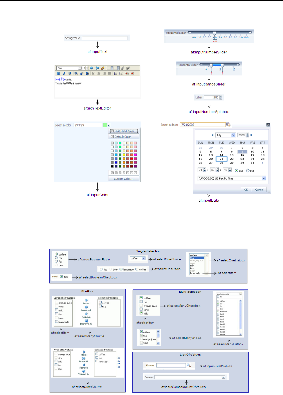
About Input Components and Forms
11-2 Web User Interface Developer's Guide for Oracle Application Development Framework
Figure 11–1 ADF Faces Input Components
ADF Faces input components also include a number of components that allow users to
select one or multiple values, as shown in Figure 11–2.
Figure 11–2 Select Components
About Input Components and Forms
Using Input Components and Defining Forms 11-3
11.1.1 Input Component Use Cases and Examples
Input components are often used to build forms for user input. For example, the File
Explorer application contains a form that allows users to create a new file. As shown
in Figure 11–3, input components allow users to enter the name, the size, select
permissions, and add keywords, and a description for a file. The Name field is
required, as noted by the asterisk. If a user fails to enter a value, an error message is
displayed. That validation and associated error message are configured on the
component.
Figure 11–3 Form Uses Input Components
The richTextEditor component provides rich text input that can span many lines
and can be formatted using different fonts, sizes, justification, and other editing
features that may be required when you want users to enter more than simple text. For
example, the richTextEditor might be used in a web-based discussion forum,
allowing users to format the text that they need to publish, as shown in Figure 11–4.
Figure 11–4 richTextEditor Used in a Discussion Forum
The inputFile component allows users to browse for a local file to upload to the
application server. For example, an email message might allow users to attach a file to
a message, as shown in Figure 11–5.
Figure 11–5 fileUpload Component
About Input Components and Forms
11-4 Web User Interface Developer's Guide for Oracle Application Development Framework
The ADF Faces selection components allows users to make selections from a list of
items instead of typing in values. ADF Faces provides both single choice selection lists
and multi-choice selection lists. Single-choice lists are used to select one value from a
list, such as the desired drink in an online food order, as shown in Figure 11–6.
Figure 11–6 Users Can Select One Value From the selectOneChoice Component
ADF single-selection components include a dropdown list (as shown in Figure 11–6), a
list box, radio buttons, and checkboxes.
ADF multi-selection components allow users to select more than one value in a list.
For example, instead of being able to select just one drink type, the
selectManyChoice component allows a user to select more than one drink, as
shown in Figure 11–7.
Figure 11–7 Users Can Select Multiple Values From the selectManyChoice Component
ADF multiple choice components include a dropdown list, checkboxes, and a shuttle.
The form components provide a container for other components. The form
component represents a region where values from embedded input components can
be submitted. Form components cannot be nested. ADF Faces also provides the
subform component, which adds flexibility by defining subregions whose component
values can be submitted separately within a form. The ADF Faces resetButton
component provides an easy way for the user to reset input values within a form or
subform to their previous state.
Best Practice: You can use either selection lists or list-of-values
(LOV) components to display a list. LOV components should be used
when the selection list is large. LOV components are model-driven
using the ListOfValueModel class and may be configured
programmatically using the API. They present their selection list
inside a popup window that may also include a query panel. Selection
lists simply display a static list of values. For more information about
using LOV components, see Chapter 13, "Using List-of-Values
Components."

About Input Components and Forms
Using Input Components and Defining Forms 11-5
11.1.2 Additional Functionality for Input Components and Forms
You may find it helpful to understand other ADF Faces features before you implement
your input components. Additionally, once you have added an input component or
form to your page, you may find that you need to add functionality such as validation
and accessibility. Following are links to other functionality that input components can
use.
■Using parameters in text: You can use the ADF Faces EL format tags if you want
text displayed in a component to contain parameters that will resolve at runtime.
For more information, see Section 3.5.2, "How to Use the EL Format Tags."
■Client components: Input components can be client components. To work with
the components on the client, see Chapter 4, "Using ADF Faces Client-Side
Architecture."
■JavaScript APIs: All input components have JavaScript client APIs that you can
use to set or get property values. For more information, see the ADF Faces
JavaScript API documentation.
■Events: Input components fire both server-side and client-side events that you can
have your application react to by executing some logic. For more information, see
Chapter 6, "Handling Events."
■You can add validation and conversion to input components. For more
information, see Chapter 7, "Validating and Converting Input."
■You can display tips and messages, as well as associate online help with input
components. For more information, see Chapter 19, "Displaying Tips, Messages,
and Help."
■There may be times when you want the certain input components to be validated
before other components on the page. For more information, see Section 5.2,
"Using the Immediate Attribute."
■You may want other components on the page to update based on selections you
make from a selection component. For more information, see Section 5.3, "Using
the Optimized Lifecycle."
■You may want to use the scrollComponentIntoViewBehavior tag with the
richTextEditor component to allow users to jump to specific areas in the
component. For more information, see Section 6.6.1, "How to Use the
scrollComponentIntoViewBehavior Tag."
■You can change the icons used for required and changed notifications using skins.
For more information, see Chapter 28, "Customizing the Appearance Using Styles
and Skins."
■You can make your input components accessible. For more information, see
Chapter 30, "Developing Accessible ADF Faces Pages."
■Instead of entering values for attributes that take strings as values, you can use
property files. These files allow you to manage translation of these strings. For
more information, see Chapter 29, "Internationalizing and Localizing Pages."
■If your application uses the Fusion technology stack, then you can create
automatically bound forms based on how your ADF Business components are
configured. For more information, see the "Creating a Basic Databound Page"
chapter of the Oracle Fusion Middleware Fusion Developer's Guide for Oracle
Application Development Framework. If your application uses Enterprise JavaBeans,
you can do the same. For more information, see the "Creating a Basic Databound

Defining Forms
11-6 Web User Interface Developer's Guide for Oracle Application Development Framework
Page" of the Oracle Fusion Middleware Java EE Developer's Guide for Oracle
Application Development Framework.
11.2 Defining Forms
A form is a component that serves as a container for other components. When a submit
action occurs within the form, any modified input values are submitted. For example,
you can create an input form that consists of input and selection components, and a
submit command button, all enclosed within a form. When the user enters values into
the various input fields and clicks the Submit button, those new input values will be
sent for processing.
By default, when you create a JSF page in JDeveloper, it automatically inserts a form
component into the page. When you add components to the page, they will be inserted
inside the form component.
Example 11–1 shows two input components and a Submit button that when clicked
will submit both input values for processing.
Example 11–1 ADF Faces Form as a Container for Input Components
<af:form id="f1">
<af:panelFormLayout id="pfl1">
<af:inputText value="#{myBean.firstName}"
label="#{First Name}"
id="it1"
</af:inputText>
<af:inputText value="#{myBean.lastName}"
label="#{Last Name}"
id="it2"
</af:inputText>
<f:facet name="footer">
<af:commandButton text="Submit"/>
id="cb1"
</f:facet>
</af:panelFormLayout>
</af:form>
Because there can be only one form component on a page, you can use subforms
within a form to create separate regions whose input values can be submitted. Within
a region, the values in the subform will be validated and processed only if a
component inside the subform caused the values to be submitted. You can also nest a
subform within another subform to create nested regions whose values can be
submitted. For more information about subforms, see Section 5.5, "Using Subforms to
Create Sections on a Page."
Example 11–2 shows a form with two subforms, each containing its own input
components and Submit button. When a Submit button is clicked, only the input
values within that subform will be submitted for processing.
Example 11–2 ADF Faces Subform Within a Form
<af:form>
Tip: If you do not already have an af:form tag on the page, and
you drag and drop an ADF Faces component onto the page,
JDeveloper will prompt you to enclose the component within a form
component.

Defining Forms
Using Input Components and Defining Forms 11-7
<af:subform>
<af:panelFormLayout>
<af:inputText value="#{myBean.firstName}"
</af:inputText>
<af:inputText value="#{myBean.lastName}"
</af:inputText>
<f:facet name="footer">
<af:commandButton text="Submit"/>
</f:facet>
</af:panelFormLayout>
</af:subform>
<af:subform>
<af:panelFormLayout>
<af:inputText value="#{myBean.primaryPhone}"
</af:inputText>
<af:inputText value="#{myBean.cellPhone}"
</af:inputText>
<f:facet name="footer">
<af:commandButton text="Submit"/>
</f:facet>
</af:panelFormLayout>
</af:subform>
</af:form>
Aside from the basic Submit button, you can add any other command component
within a form and have it operate on any field within the form. ADF Faces provides a
specialized command component: the resetButton component, which when clicked,
resets all the input and selection components within a form. That is, it updates all
components whose values can be edited with the current values of the model. The
resetButton component is different from HTML reset in that the resetButton
component will reset the input components to their previous state which was partially
or fully submitted successfully to the server without any validation or conversion
error. For example, if a user enters value A and clicks the Submit button, and then
changes the value from A to B and clicks the resetButton component, the value A
will be restored.
11.2.1 How to Add a Form to a Page
In most cases, JDeveloper will add the form component for you. However, there may
be cases where you must manually add a form, or configure the form with certain
attribute values.
Before you begin:
It may be helpful to have an understanding of form components. For more
information, see Section 11.2, "Defining Forms."
You may also find it helpful to understand functionality that can be added using other
ADF Faces features. For more information, see Section 11.1.2, "Additional
Functionality for Input Components and Forms."
To add a form to a page:
1. In the Component Palette, from the Layout panel, in the Core Structure group,
drag and drop a Form onto the page.
2. In the Property Inspector expand the Common section, where you can optionally
set the following:

Defining Forms
11-8 Web User Interface Developer's Guide for Oracle Application Development Framework
■DefaultCommand: Specify the ID attribute of the command component
whose action should be invoked when the Enter key is pressed and the focus
is inside the form.
■UsesUpload: Specify whether or not the form supports uploading files. The
default is False. For more information about uploading files, see Section 11.9,
"Using File Upload."
■TargetFrame: Specify where the new page should be displayed. Acceptable
values are any of the valid values for the target attribute in HTML. The default
is _self.
11.2.2 How to Add a Subform to a Page
You should add subform components within a form component when you need a
section of the page to be capable of independently submitting values.
Before you begin:
It may be helpful to have an understanding of forms and subforms. For more
information, see Section 11.2, "Defining Forms."
You may also find it helpful to understand functionality that can be added using other
ADF Faces features. For more information, see Section 11.1.2, "Additional
Functionality for Input Components and Forms."
You must add a form component to the page. For procedures, see Section 11.2.1, "How
to Add a Form to a Page."
To add subforms to a page:
1. In the Component Palette, from the Layout panel, in the Core Structure group,
drag and drop a Subform onto the page as a child to a form component.
2. Use the Property Inspector to set the following:
■Default: Specify whether or not the subform should assume it has submitted
its values. When set to the default value of false, this subform component
will consider itself to be submitted only if no other subform component has
been submitted. When set to true, this subform component assumes it has
submitted its values.
■Default Command: Specify the ID attribute of the command component
whose action should be invoked when the Enter key is pressed and the focus
is inside the subform.
11.2.3 How to Add a Reset Button to a Form
You can add the resetButton component inside a form or a subform. The reset
button will act upon only those components within that form or subform.
Tip: A subform is considered submitted if an event is queued by
one of its children or facets for a phase later than Apply Request
Values (that is, for later than decode()). For more information about
lifecycle phases, see Chapter 5, "Using the JSF Lifecycle with ADF
Faces."
Using the inputText Component
Using Input Components and Defining Forms 11-9
Before you begin:
It may be helpful to have an understanding of form components and the reset button.
For more information, see Section 11.2, "Defining Forms."
You may also find it helpful to understand functionality that can be added using other
ADF Faces features. For more information, see Section 11.1.2, "Additional
Functionality for Input Components and Forms."
To add a reset button to a page:
1. In the Component Palette, from the General Controls panel, drag and drop a
Button (Reset) onto the page.
2. Use the Property Inspector to set the following:
■Text: Specify the textual label of the button.
■Disabled: Specify whether or not the button should be disabled. For example,
you could enter an EL expression that determines certain conditions under
which the button should be disabled.
11.3 Using the inputText Component
Although input components include many variations, such as pickers, sliders, and a
spinbox, the inputText component is the basic input component for entering values.
You can define an inputText component as a single-row input field or as a text area
by setting the rows attribute to more than 1. However, if you want to create a multiple
row text input, consider using the richTextEditor component as described in
Section 11.8, "Using the richTextEditor Component."
You can allow auto-completion for an inputText component using the
autoComplete attribute. When set to true, the component remembers previous
entries, and then displays those entries when the user types in values that begin to
match those entries.
You can hide the input values from being displayed, such as for passwords, by setting
the secret attribute to true. Like other ADF Faces components, the inputText
component supports label, text, and messages. When you want this component to be
displayed without a label, you set the simple attribute to true. Figure 11–8 shows a
single-row inputText component.
Figure 11–8 Single-Row inputText Component
You can make the inputText component display more than one row of text using the
rows attribute. If you set the rows attribute to be greater than one, and you set the
simple attribute to true, then the inputText component can be configured to stretch
to fit its container using the dimensionsFrom attribute. For more information about
how components stretch, see Section 9.2.1, "Geometry Management and Component
Stretching." Figure 11–10 shows a multi-row inputText component.
You can add multiple inputText components to create an input form. Figure 11–9
shows an input form using three inputText components and a Submit command
button.
Using the inputText Component
11-10 Web User Interface Developer's Guide for Oracle Application Development Framework
Figure 11–9 Form Created by inputText Components
You can also configure an insertTextBehavior tag that works with command
components to insert given text into an inputText component. The text to be entered
can be a simple string, or it can be the value of another component, for example the
selected list item in a selectOneChoice component. For example, Figure 11–10
shows an inputText component with some text already entered by a user.
Figure 11–10 inputText Component with Entered Text
The user can then select additional text from a dropdown list, click the command
button, and that text appears in the inputText component as shown in Figure 11–11.
Figure 11–11 inputText Component with Inserted Text
11.3.1 How to Add an inputText Component
You can use an inputText component inside any of the layout components described
in Chapter 9, "Organizing Content on Web Pages."
Before you begin:
It may be helpful to have an understanding of how the attributes can affect
functionality. For more information, see Section 11.3, "Using the inputText
Component."
You may also find it helpful to understand functionality that can be added using other
ADF Faces features. For more information, see Section 11.1.2, "Additional
Functionality for Input Components and Forms."
To add an inputText component:
1. In the Component Palette, from the Text and Selection panel, drag and drop an
Input Text onto the page.
2. In the Property Inspector, expand the Common section and set the following:

Using the inputText Component
Using Input Components and Defining Forms 11-11
■Label: Enter a value to specify the text to be used as the label.
If the text to be used is stored in a resource bundle, use the dropdown list to
select Select Text Resource. Use the Select Text Resource dialog either to
search for appropriate text in an existing bundle, or to create a new entry in an
existing bundle. For more information about using resource bundles, see
Chapter 29, "Internationalizing and Localizing Pages."
■Value: Specify the value of the component. If the EL binding for a value points
to a bean property with a get method but no set method, and this is a
component whose value can be edited, then the component will be rendered
in read-only mode.
3. Expand the Appearance section, and set the following:
■Columns: Specify the size of the text control by entering the maximum
number of characters that can be entered into the field.
■Rows: Specify the height of the text control by entering the number of rows to
be shown. The default value is 1, which generates a one-row input field. The
number of rows is estimated based on the default font size of the browser. If
set to more than 1, you must also set the wrap attribute.
■DimensionsFrom: Determine how you want the inputText component to
handle geometry management. Set this attribute to one of the following:
–auto: If the parent component to the inputText component allows
stretching of its child, then the inputText component will stretch to fill
the parent component, as long as the rows attribute is set to a number
greater than one and the simple attribute is set to true. If the parent
component does not allow stretching, then the inputText component
gets its dimensions from the content.
–content: The inputText component gets its dimensions from the
component content. This is the default.
–parent: The inputText component gets its dimensions from the
inlineStyle attribute. If no value exists for inlineStyle, then the
size is determined by the parent container.
■Secret: Specify this boolean value that applies only to single-line text controls.
When set to true, the secret attribute hides the actual value of the text from
the user.
■Wrap: Specify the type of text wrapping to be used in a multiple-row text
control. This attribute is ignored for a single-row component. By default, the
attribute is set to soft, which means multiple-row text wraps visually, but
does not include carriage returns in the submitted value. Setting this attribute
to off will disable wrapping: the multiple-row text will scroll horizontally.
Setting it to hard specifies that the value of the text should include any
carriage returns needed to wrap the lines.
■ShowRequired: Specify whether or not to show a visual indication that the
field is required. Note that setting the required attribute to true will also
Note: If you are using an inputText component to display a
Character Large Object (CLOB), then you will need to create a custom
converter that converts the CLOB to a String. For more information
about conversion, see Chapter 7.4, "Creating Custom JSF Converters."

Using the inputText Component
11-12 Web User Interface Developer's Guide for Oracle Application Development Framework
show the visual indication. You may want to use the showRequired attribute
when a field is required only if another field’s value is changed.
■Changed: Specify whether or not to show a blue circle whenever the value of
the field has changed. If you set this to true, you may also want to set the
changedDesc attribute.
■ChangedDesc: Specify the text to be displayed in a tooltip on a mouseover of
the changed icon. By default, the text is "Changed." You can override this by
providing a different value.
■Editable: Determine whether you want the component to always appear
editable. If so, select always. If you want the value to appear as read-only
until the user hovers over it, select onAccess. If you want the value to be
inherited from an ancestor component, select inherit.
■AccessKey: Specify the key to press that will access the field.
■LabelAndAccessKey: Instead of specifying a separate label and access key,
you can combine the two, so that the access key is part of the label. Simply
precede the letter to be used as an access key with an ampersand (&).
For example, if the label of a field is Description and you want the D to be the
access key, you would enter &Description.
■Simple: Set to true if you do not want the label to be displayed.
4. If you want to style the label text, expand the Style section and set LabelStyle.
Enter a CSS style property and value. For example, if you do not want the label
text to wrap, you would enter white-space:nowrap; for the value
5. Expand the Behavior section and set the following:
■Required: Specify whether or not a value is required. If set to true, a visual
indication is displayed to let the user know a value must be entered. If a value
is not entered, an exception will occur and the component will fail validation.
■ReadOnly: Specify whether the control is displayed as a field whose value can
be edited, or as an output-style text control.
■AutoSubmit: Specify whether or not the component will automatically submit
when the value changes. For more information about using the autoSubmit
attribute, see Section 5.3, "Using the Optimized Lifecycle."
■AutoComplete: Set to on to allow the component to display previous values
when the user begins to enter a matching value. Set to off if no matches
should be displayed. Default is on.
■AutoTab: Specify whether or not focus will automatically move to the next tab
stop when the maximum length for the current component is reached.
Note: If you select inherit, and no ancestor components define the
editable value, then the value always is used.
Note: Because the value is being stored in the source of the page in
XML, the ampersand (&) character must be escaped, so the value will
actually be represented in the source of the page using the characters
& to represent the ampersand.

Using the inputText Component
Using Input Components and Defining Forms 11-13
■MaximumLength: Specify the maximum number of characters per line that
can be entered into the text control. This includes the characters representing
the new line. If set to 0 or less, the maximumLength attribute is ignored. Note
that in some browsers such as Internet Explorer, a new line is treated as two
characters.
■Converter: Specify a converter object. For more information, see Section 7.3,
"Adding Conversion."
■Validator: Specify a method reference to a validator method using an EL
expression. For more information, see Section 7.5, "Adding Validation."
11.3.2 How to Add the Ability to Insert Text into an inputText Component
The insertTextBehavior tag works with command components to insert given
text into an inputText component. The text to be entered can be a simple string, or it
can be the value of another component, for example the selected list item in a
selectOneChoice component. To allow text to be inserted into an inputText
component, add the insertTextBehavior tag as a child to a command component
that will be used to insert the text.
Before You Begin
It may be helpful to have an understanding of how the attributes can affect
functionality. For more information, see Section 11.3, "Using the inputText
Component."
You may also find it helpful to understand functionality that can be added using other
ADF Faces features. For more information, see Section 11.1.2, "Additional
Functionality for Input Components and Forms."
Before you add an insertTextBehavior tag, you need to create an inputText
component as described in Section 11.3.1, "How to Add an inputText Component." Set
the clientComponent attribute to true.
To add text insert behavior:
1. Add a command component that the user will click to insert the text. For
procedures, see Section 20.3.1, "How to Use Command Buttons and Command
Links."
2. In the Component Palette, from the Operations panel, from the Behavior group,
drag and drop an Insert Text Behavior as a child to the command component.
3. In the Insert Text Behavior dialog, enter the following:
■For: Use the dropdown arrow to select Edit and then navigate to select the
inputText component into which the text will be inserted.
■Value: Enter the value for the text to be inserted. If you want to insert static
text, then enter that text. If you want the user to be able to insert the value of
another component (for example, the value of a selectOneChoice
Note: The insertTextBehavior tag cancels server-side event
delivery automatically; actionListener or action attributes on
the parent command component will be ignored. If you need to also
trigger server-side functionality, you must add an custom client
listener to deliver the server-side event. For more information, see
Section 6.4, "Sending Custom Events from the Client to the Server."

Using the Input Number Components
11-14 Web User Interface Developer's Guide for Oracle Application Development Framework
component), then enter an EL expression that resolves to that value.
Example 11–3 shows page code for an inputText component into which
either the value of a dropdown list or the value of static text can be inserted.
Example 11–3 Using the insertTextBehavior Tag
<af:inputText clientComponent="true" id="idInputText" label="String value"
value="#{demoInput.value}" rows="10" columns="60"/>
<af:selectOneChoice id="targetChoice" autoSubmit="true"
value="#{demoInput.choiceInsertText}"
label="Select text to insert">
<af:selectItem label="Some Text." value="Some Text."/>
<af:selectItem label="0123456789" value="0123456789"/>
<af:selectItem label="~!@#$%^*" value="~!@#$%^*"/>
<af:selectItem label="Two Lines" value="\\nLine 1\\nLine 2"/>
</af:selectOneChoice>
<af:commandButton text="Insert Selected Text" id="firstButton"
partialTriggers="targetChoice">
<af:insertTextBehavior for="idInputText"
value="#{demoInput.choiceInsertText}"/>
</af:commandButton>
<af:commandButton text="Insert Static Text">
<af:insertTextBehavior for="idInputText"
value="Some Static Text."/>
</commandButton>
4. By default, the text will be inserted when the action event is triggered by clicking
the command component. However, you can change this to another client event by
choosing that event from the dropdown menu for the triggerType attribute of
the insertTextBehavior component in the Property Inspector.
11.4 Using the Input Number Components
The slider components present the user with a slider with one or two markers whose
position on the slider corresponds to a value. The slider values are displayed and
include a minus icon at one end and a plus icon at the other. The user selects the
marker and moves it along the slider to select a value. The inputNumberSlider
component has one marker and allows the user to select one value from the slider, as
shown in Figure 11–12 in horizontal layout, and in Figure 11–13 in vertical layout.
Figure 11–12 inputNumberSlider in Horizontal Layout
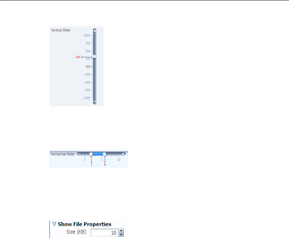
Using the Input Number Components
Using Input Components and Defining Forms 11-15
Figure 11–13 InputNumberSlider in Vertical Layout
The inputRangeSlider component has two markers and allows the user to pick the
end points of a range, as shown in Figure 11–14.
Figure 11–14 inputRangeSlider in horizontal layout
The inputNumberSpinbox is an input component that presents the user with an
input field for numerical values and a set of up- and down-arrow keys to increment or
decrement the current value in the input field, as shown in Figure 11–15.
Figure 11–15 inputNumberSpinbox
11.4.1 How to Add an inputNumberSlider or an inputRangeSlider Component
When you add an inputNumberSlider or an inputRangeSlider component, you
can determine the range of numbers shown and the increment of the displayed
numbers.
Before you begin:
It may be helpful to have an understanding of how the attributes can affect
functionality. For more information, see Section 11.4, "Using the Input Number
Components."
You may also find it helpful to understand functionality that can be added using other
ADF Faces features. For more information, see Section 11.1.2, "Additional
Functionality for Input Components and Forms."
To add an inputNumberSlider or inputRangeSlider component:
1. In the Component Palette, from the Text and Selection panel, drag and drop a
Slider (Number) or Slider (Range) onto the page.
2. In the Property Inspector, expand the Common section (and for the
inputRangeSlider component, also expand the Data section) and set the
following attributes:
■Label: Specify a label for the component.

Using the Input Number Components
11-16 Web User Interface Developer's Guide for Oracle Application Development Framework
■Minimum: Specify the minimum value that can be selected. This value is the
begin value of the slider.
■Maximum: Specify the maximum value that can be selected. This value is the
end value of the slider.
■MinimumIncrement: Specify the smallest possible increment. This is the
increment that will be applied when the user clicks the plus or minus icon.
■MajorIncrement: Specify the distance between two major marks. This value
causes a labeled value to be displayed. For example, the majorIncrement
value of the inputRangeSlider component in Figure 11–14 is 5.0. If set to
less than 0, major increments will not be shown.
■MinorIncrement: Specify the distance between two minor marks. If less than
0, minor increments will not be shown.
■Value: Specify the value of the component. If the EL binding for value points
to a bean property with a get method but no set method, the component will
be rendered in read-only mode.
3. Expand the Appearance section and set the Orientation to specify whether the
component will be in horizontal or vertical layout. For information about the other
attributes in this section, see Section 11.3.1, "How to Add an inputText
Component."
11.4.2 How to Add an inputNumberSpinbox Component
The inputNumberSpinbox component allows the user to scroll through a set of
numbers to select a value.
Before you begin:
It may be helpful to have an understanding of how the attributes can affect
functionality. For more information, see Section 11.4, "Using the Input Number
Components."
You may also find it helpful to understand functionality that can be added using other
ADF Faces features. For more information, see Section 11.1.2, "Additional
Functionality for Input Components and Forms."
To add an inputNumberSpinbox component:
1. In the Component Palette, from the Text and Selection panel, drag and drop an
Input Number Spinbox onto the page.
2. Expand the Data section of the Property Inspector and set the following:
■Value: Specify the value of the component. If the EL binding for value points
to a bean property with a get method but no set method, the component will
be rendered in read-only mode.
■Minimum: Specify the minimum value allowed in the input field.
■Maximum: Specify the maximum value allowed in the input field.
■StepSize: Specify the increment by which the spinbox will increase or decrease
the number in the input field.
3. Expand the Appearance and Behavior sections and set the attributes. For more
information about setting these attributes, see Section 11.3.1, "How to Add an
inputText Component."
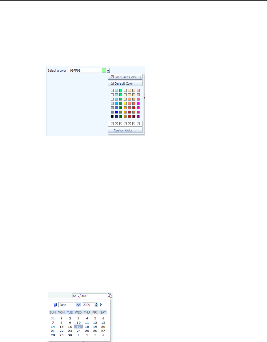
Using Color and Date Choosers
Using Input Components and Defining Forms 11-17
11.5 Using Color and Date Choosers
The inputColor component allows users to pick a color from a a palette. It presents a
text input field for entering code for colors. It also displays a button for picking colors
from a palette in a popup, as shown in Figure 11–16.
Figure 11–16 inputColor Component with Popup chooseColor Component
By default, the content delivery for the popup is lazy. When the user clicks the button,
the inputColor component receives a PPR request, and rerenders, displaying a
chooseColor component in a popup component.
The default color code format is the hexadecimal color format. However, you can
override the format using a ColorConverter class.
The inputDate component presents a text input field for entering dates and a button
for picking dates from a popup calendar, as shown in Figure 11–17. The default date
format is the short date format appropriate for the current locale. For example, the
default format in American English (ENU) is mm/dd/yy. However, you can override
the format using a date-time converter (for more information about using converters,
see Section 7.3, "Adding Conversion").
Figure 11–17 inputDate Component
When you add a date-time converter and configure it to show both the date and the
time, the date picker is displayed as a modal dialog with additional controls for the
user to enter a time. Additionally, if the converter is configured to show a time zone, a
timezone dropdown list is shown in the dialog, as shown in Figure 11–18.
Performance Tip: If the clientComponent attribute on the
inputColor component is set to true, then the popup and
chooseColor component are delivered immediately. If the color
palette is large, this could negatively affect initial page load
performance.
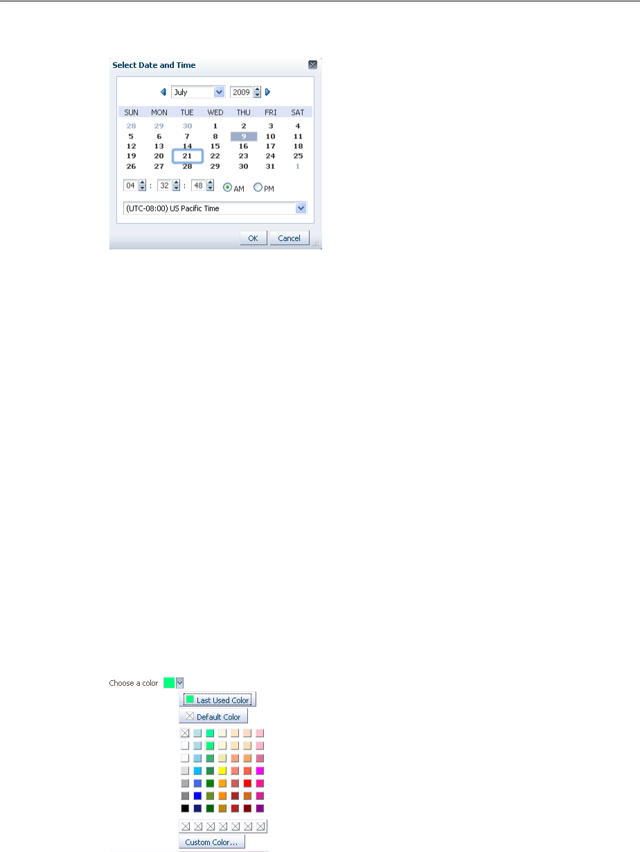
Using Color and Date Choosers
11-18 Web User Interface Developer's Guide for Oracle Application Development Framework
Figure 11–18 Modal Dialog When Date-Time Converter Is Used
11.5.1 How to Add an inputColor Component
The inputColor component allows users either to enter a value in an input text field,
or to select a color from a color chooser.
Before you begin:
It may be helpful to have an understanding of how the attributes can affect
functionality. For more information, see Section 11.5, "Using Color and Date Choosers."
You may also find it helpful to understand functionality that can be added using other
ADF Faces features. For more information, see Section 11.1.2, "Additional
Functionality for Input Components and Forms."
To add an inputColor component:
1. In the Component Palette, from the Text and Selection panel, drag and drop an
Input Color onto the page.
2. In Property Inspector, expand the Common section and set the following:
■Label: Specify a label for the component.
■Compact: Set to true if you do not want to display the input text field, as
shown in Figure 11–19.
Figure 11–19 inputColor Component in Compact Mode
3. Expand the Data section and set the following attributes:
■Value: Specify the value of the component. If the EL binding for value points
to a bean property with a get method but no set method, the component will
be rendered in read-only mode.

Using Color and Date Choosers
Using Input Components and Defining Forms 11-19
■ColorData: Specify the list of colors to be displayed in the standard color
palette. The number of provided colors can be 49 (7 colors x 7 colors), 64 (8
colors x 8 colors), or 121 (11 colors x 11 colors). The number set for this
attribute will determine the valid value for the width attribute. For example,
if you set the colorData attribute to 49, the width must be 7. If the number
does not match the width, extra color elements in the list will be ignored and
missing color elements will be displayed as no-color. The color list must be an
array of type TrColor on the client side.
■CustomColorData: Specify the list of custom-defined colors. The number of
colors can be 7, 8, or 11. The color list must be an array of type TrColor on
the client side. On the server side, it must be a List of java.awt.Color
objects, or a list of hexadecimal color strings.
■DefaultColor: Specify the default color using hexadecimal color code, for
example #000000.
4. Expand the Appearance section and set the following attributes:
■Width: Specify the width of the standard palette in cells. The valid values are
7, 8, and 11, which correspond to the values of the colorData and
customColorData attributes.
■CustomVisible: Specify whether or not the Custom Color button and custom
color row are to be displayed. When set to true, the Custom Color button
and custom color row will be rendered.
■DefaultVisible: Specify whether or not the Default button is to be displayed.
When set to true, the Default button will be rendered. The Default button
allows the user to easily select the color set as the value for the
defaultColor attribute.
■LastUsedVisible: Specify whether or not the Last Used button is to be
displayed. When set to true the Last Used button will be rendered, which
allows the user to select the color that was most recently used.
■Editable: Set to onAccess if you want the value of the component to appear
as read-only until the user hovers over it. If you want the component to
always appear editable, select always. If you want the value to be inherited
from an ancestor component, select inherit.
5. If you want to style the label, expand the Style section and set LabelStyle. Enter a
CSS style property and value for the label. For example, if you do not want the
label text to wrap, you would enter white-space:nowrap; for the value.
6. Expand the Behavior section and set the following attribute:
■ChooseId: Specify the id of the chooseColor component which can be used
to choose the color value. If not set, the inputColor component has its own
default popup dialog with a chooseColor component.
■AutoComplete: Set to true to allow the component to display previous
values when the user begins to enter a matching value. Set to false if no
matches should be displayed. Default is true.
Note: If you select inherit, and no ancestor components define the
editable value, then the value always is used.

Using Color and Date Choosers
11-20 Web User Interface Developer's Guide for Oracle Application Development Framework
11.5.2 How to Add an InputDate Component
The inputDate component allows the user to either enter or select a date.
Before you begin:
It may be helpful to have an understanding of how the attributes can affect
functionality. For more information, see Section 11.5, "Using Color and Date Choosers."
You may also find it helpful to understand functionality that can be added using other
ADF Faces features. For more information, see Section 11.1.2, "Additional
Functionality for Input Components and Forms."
To add an inputDate component:
1. In the Component Palette, from the Text and Selection panel, drag and drop an
Input Date onto the page.
2. In the Property Inspector, in the Common section, set the following:
■Label: Specify a label for the component.
■Value: Specify the value of the component. If the EL binding for value points
to a bean property with a get method but no set method, the component will
be rendered in read-only mode.
3. Optionally expand the Style section and set the LabelStyle attribute to a CSS style
property and value. For example, if you did not want the label text to wrap, you
would enter white-space:nowrap; as the value.
4. Expand the Data section and set the following attributes:
■MinValue: Specify the minimum value allowed for the date value. When set
to a fixed value on a tag, this value will be parsed as an ISO 8601 date. ISO
8601 dates are of the form "yyyy-MM-dd" (for example: 2002-02-15). All other
uses require java.util.Date objects.
■MaxValue: Specify the maximum value allowed for the date value. When set
to a fixed value on a tag, this value will be parsed as an ISO 8601 date. ISO
8601 dates are of the form "yyyy-MM-dd" (for example: 2002-02-15). All other
uses require java.util.Date objects.
■DisableDays: Specify a binding to an implementation of the
org.apache.myfaces.trinidad.model.DateListProvider interface.
The getDateList method should generate a List of individual
java.util.Date objects which will be rendered as disabled. The dates must
be in the context of the given base calendar.
■DisableDaysOfWeek: Specify a whitespace-delimited list of weekdays that
should be rendered as disabled in every week. The list should consist of one or
more of the following abbreviations: sun, mon, tue, wed, thu, fri, sat. By
default, all days are enabled.
■DisableMonths: Specify a whitespace-delimited list of months that should be
rendered as disabled in every year. The list should consist of one or more of
the following abbreviations: jan, feb, mar, apr, may, jun, jul,
aug, sep, oct, nov, dec. By default, all months are enabled.
Performance Tip: This binding requires periodic roundtrips. If you
just want to disable certain weekdays (for example, Saturday and
Sunday), use the disableDaysOfWeek attribute.

Using Color and Date Choosers
Using Input Components and Defining Forms 11-21
5. Expand the Behavior section and set the following:
■ChooseId. Specify the id of the chooseDate component which can be used
to choose the date value. If not set, the inputDate component has its own
default popup dialog with a chooseDate component.
■AutoComplete: Set to true to allow the component to display previous
values when the user begins to enter a matching value. Set to false if no
matches should be displayed. Default is true.
6. If you want the value of the component to appear as read-only until the user
hovers over it, expand the Appearance section and set Editable to onAccess. If
you want the component to always appear editable, select always. If you want
the value to be inherited from an ancestor component, select inherit.
11.5.3 What You May Need to Know About Selecting Time Zones Without the inputDate
Component
By default, the inputDate component displays a drop down list of time zones if the
associated converter is configured to do so, for example, if you include the timezone
placeholder z in the converter’s pattern. The end user can only modify the timezone
using this list. The list is configured to display the most common time zones.
However, there may be times when you need to display the list of time zones outside
of the inputDate component. For example, on a Application Preferences page, you
may want to use a selectOneChoice component that allows the user to select the
time zone that will be used to display all inputDates in the application. A backing
bean would handle the conversion between the time zone ID and the
java.util.TimeZone object. Converters for the inputDate instances in the
application would then bind the time zone to that time zone object.
You can access this list using either an API on the DateTimeUtils class, or using an
EL expression on a component.
Following are the methods on DateTimeUtils class:
■getCommonTimeZoneSelectItems (): Returns a list of commonly used time
zones.
■getCommonTimeZoneSelectItems (String timeZoneId): Returns a list of
commonly used time zones, including the given time zone if it is not part of the
list.
To access this list using EL, use one of the following expressions:
■af:getCommonTimeZoneSelectItems
For example:
<f:selectItems value="#{af:getCommonTimeZoneSelectItems()}" id="tzones2" />
■af:getMergedTimeZoneSelectItems (id)
For example:
<f:selectItems
value="#{af:getMergedTimeZoneSelectItems(demoInput.preferredTimeZoneId)}"
id="tzones" />
Note: If you select inherit, and no ancestor components define the
editable value, then the value always is used.

Using Selection Components
11-22 Web User Interface Developer's Guide for Oracle Application Development Framework
If you will be using an inputDate component and a selection list for its time zone on
the same page, you must clear out the local value for the inputDate's timezone to
ensure that the value binding for the selection takes precedence. Otherwise, a non-null
local value will take precedence, and the inputDate component will not appear to be
updated.
In Example 11–4, the backing bean has a reference using the binding attribute to the
inputDate component. When the user picks a new time zone, the id is set and the
code gets the converter for the inputDate and clears out its time zone. When the
page is rendered, since the local value for the converter's time zone is null, it will
evaluate #{demoInput.preferredTimeZone} and obtain the updated time zone.
Example 11–4 Using an inputDate and Time Zone Selection List Together
<af:selectOneChoice label="Select a new timezone"
value="#{demoInput.preferredTimeZoneId}" autoSubmit="true">
<f:selectItems
value="#{af:getMergedTimeZoneSelectItems(demoInput.preferredTimeZoneId)}"
id="tzones" />
</af:selectOneChoice>
<af:inputDate label="First inputDate with timezone bound" id="bound1"
partialTriggers="tzpick" binding="#{demoInput.boundDate1}">
<af:convertDateTime type="both" timeStyle="full"
timeZone="#{demoInput.preferredTimeZone}"/>
</af:inputDate>
DemoInputBean.java
public void setPreferredTimeZoneId(String _preferredTimeZoneId)
{
TimeZone tz = TimeZone.getTimeZone(_preferredTimeZoneId);
setPreferredTimeZone (tz);
this._preferredTimeZoneId = _preferredTimeZoneId;
}
public void setPreferredTimeZone(TimeZone _preferredTimeZone)
{
this._preferredTimeZone = _preferredTimeZone;
DateTimeConverter conv1 = (DateTimeConverter)
_boundDate1.getConverter();
conv1.setTimeZone(null);
}
11.6 Using Selection Components
The selection components allow the user to select single and multiple values from a
list or group of items. ADF Faces provides a number of different selection components,
ranging from simple boolean radio buttons to list boxes that allow the user to select
multiple items. The list of items within a selection component is made up of a number
of selectItem components
All the selection components except the selectItem component delivers the
ValueChangeEvent and AttributeChangeEvent events. The selectItem
component only delivers the AttributeChangeEvent event. You must create a
valueChangeListener handler or an attributeChangeListener handler, or
both for them.
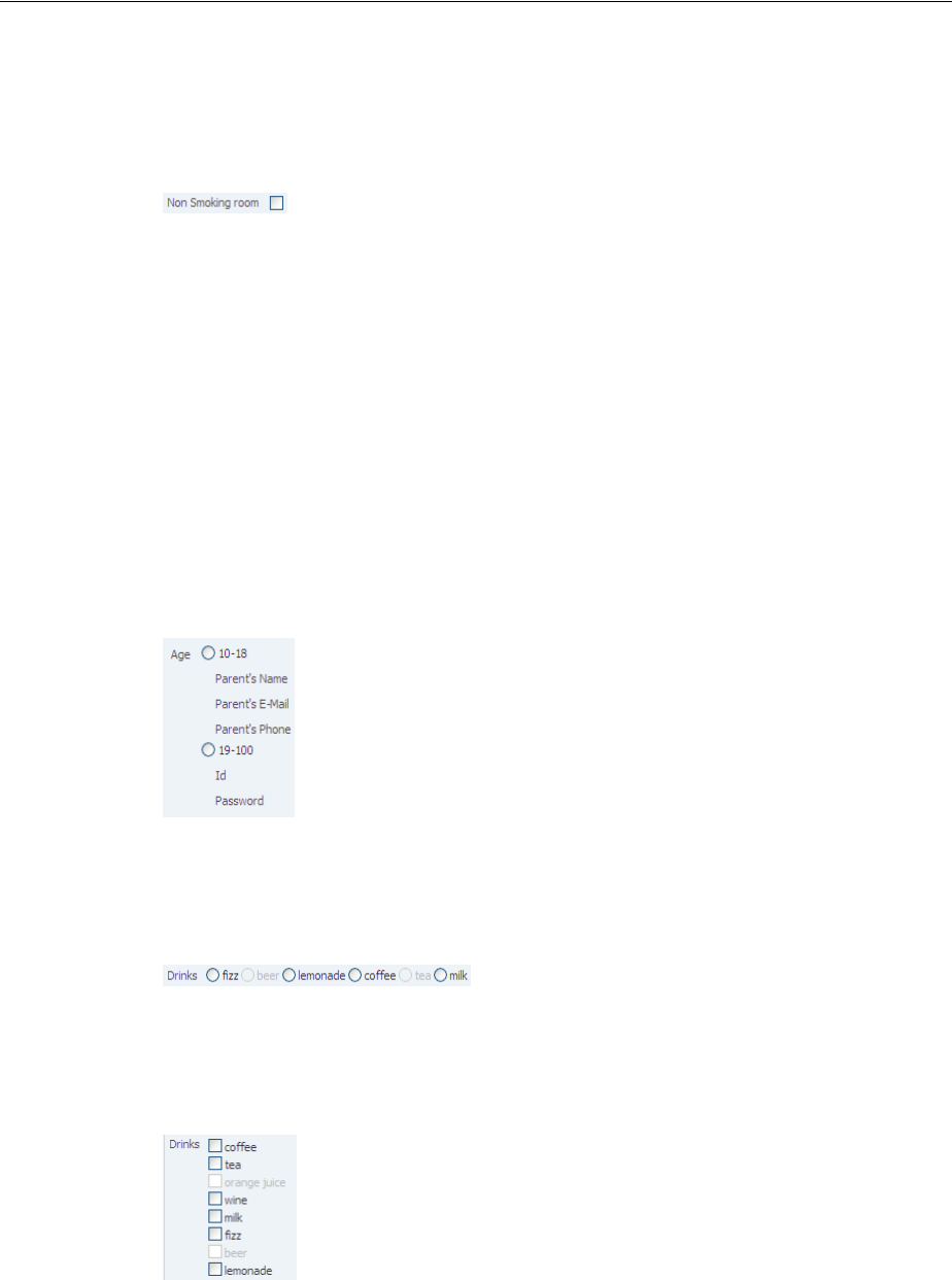
Using Selection Components
Using Input Components and Defining Forms 11-23
The selectBooleanCheckbox component value must always be set to a boolean
and not an object. It toggles between selected and unselected states, as shown in
Figure 11–20.
Figure 11–20 selectBooleanCheckbox Component
The selectBooleanRadio component displays a boolean choice, and must always
be set to a boolean. Unlike the selectBooleanCheckbox component, the
selectBooleanRadio component allows you to group selectBooleanRadio
components together using the same group attribute.
For example, say you have one boolean that determines whether or not a user is age 10
to 18 and another boolean that determines whether a user is age 19-100. As shown in
Figure 11–21, the two selectBooleanRadio components can be placed anywhere on
the page, they do not have to be next to each other. As long as they share the same
group value, they will have mutually exclusive selection, regardless of their physical
placement on the page.
Figure 11–21 selectBooleanRadio Component
You use the selectOneRadio component to create a list of radio buttons from which
the user can select a single value from a list, as shown in Figure 11–22.
Figure 11–22 selectOneRadio Component
You use the selectManyCheckbox component to create a list of checkboxes from
which the user can select one or more values, as shown in Figure 11–23.
Figure 11–23 selectManyCheckbox Component
The selectOneListbox component creates a component which allows the user to
select a single value from a list of items displayed in a shaded box, as shown in
Figure 11–24.
Tip: Each selectBooleanRadio component must be bound to a
unique boolean.
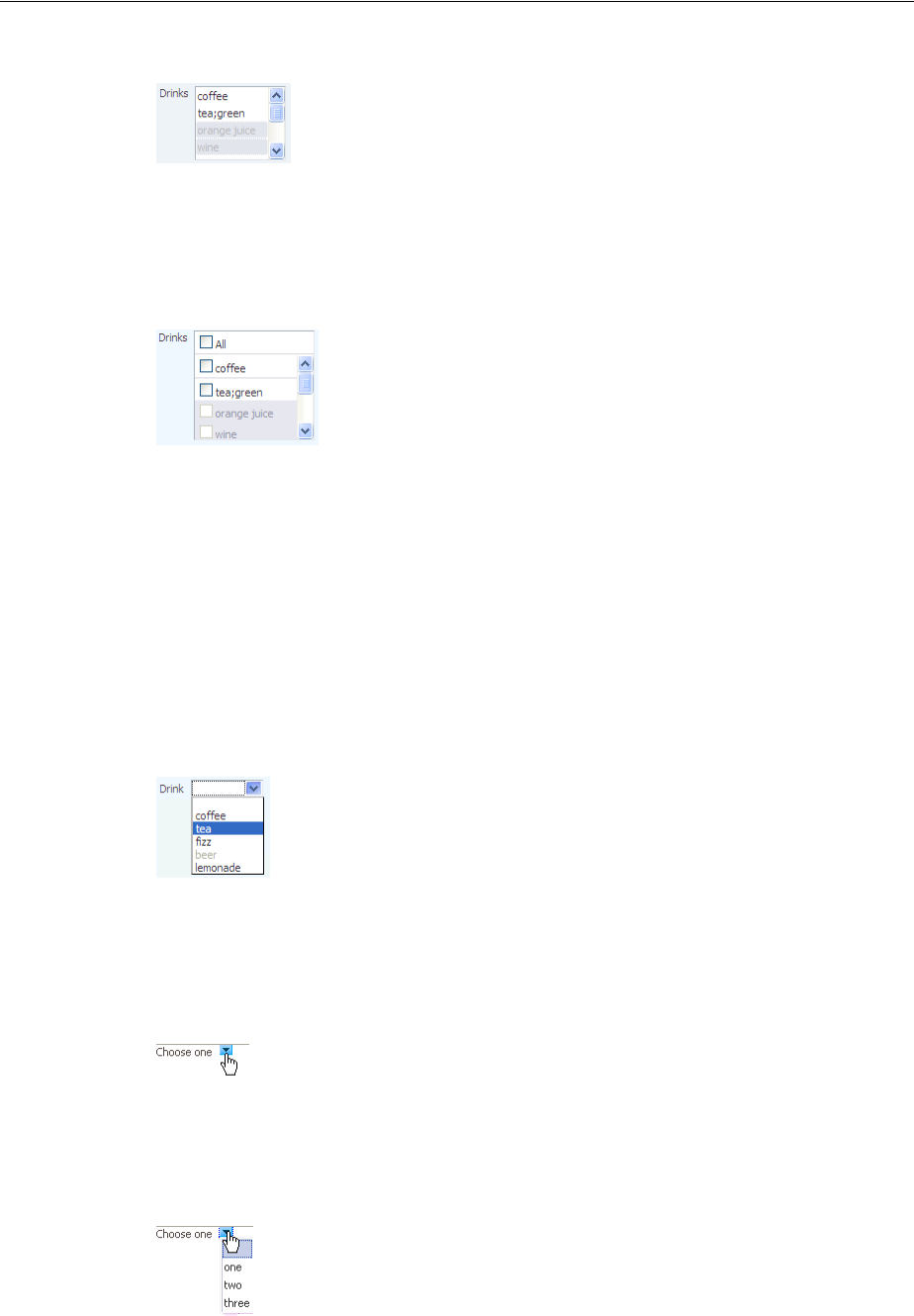
Using Selection Components
11-24 Web User Interface Developer's Guide for Oracle Application Development Framework
Figure 11–24 selectOneListbox Component
The selectManyListbox component creates a component which allows the user to
select many values from a list of items. This component includes an All checkbox that
is displayed at the beginning of the list of checkboxes, as shown in Figure 11–25.
Figure 11–25 selectManyListbox Component
The selectOneChoice component creates a menu-style component, which allows
the user to select a single value from a dropdown list of items. The
selectOneChoice component is intended for a relatively small number of items in
the dropdown list.
The selectOneChoice component is shown in Figure 11–26.
Figure 11–26 selectOneChoice Component
You can configure the selectOneChoice component to display in a compact mode,
as shown in Figure 11–27. When in compact mode, the input field is replaced with a
smaller icon.
Figure 11–27 selectOneChoice Component in Compact Mode
When the user clicks the icon, the dropdown list is displayed, as shown in
Figure 11–28.
Figure 11–28 List for selectOneChoice Component in Compact Mode
Best Practice: If a large number of items is desired, use an
inputComboboxListOfValues component instead. For more
information, see Chapter 13, "Using List-of-Values Components."
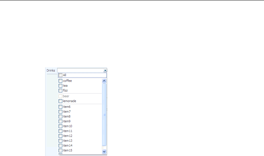
Using Selection Components
Using Input Components and Defining Forms 11-25
The selectManyChoice component creates a menu-style dropdown component,
which allows the user to select multiple values from a dropdown list of items. This
component can be configured to include an All selection item that is displayed at the
beginning of the list of selection items. If the number of choices is greater than 15, a
scrollbar will be presented, as shown in Figure 11–29.
Figure 11–29 selectManyChoice Component
By default, all selectItem child components are built when the
selectManyChoice component is built, as the page is rendered. However, if the way
the list items are accessed is slow, then performance can be hampered. This delay can
be especially troublesome when it is likely that the user will select the items once, and
then not change them on subsequent visits.
For example, suppose you have a selectManyChoice component used to filter what
a user sees on a page, and that the values for the child selectItem components are
accessed from a web service. Suppose also that the user is not likely to change that
selection each time they visit the page. By default, each time the page is rendered, all
the selectItems must be built, regardless of whether or not the user will actually
need to view them. Instead, you can change the contentDelivery attribute on the
selectManyChoice component from immediate (the default) to lazy. The lazy
setting causes the selectItem components to be built only when the user clicks the
dropdown.
For both immediate and lazy, when the user then makes a selection, the values of
the selected selectItem components are displayed in the field. However when lazy
content delivery is used, on subsequent visits, instead of pulling the selected values
from the selectItem components (which would necessitate building these
components), the values are pulled from the lazySelectedLabel attribute. This
attribute is normally bound to a method that returns an array of Strings
representing the selected items. The selectItem components will not be built until
the user goes to view or change them, using the dropdown.
Note that there are limitations when using the lazy delivery method on the
selectManyChoice component. For more information about content delivery for the
selectManyChoice component and its limitations, see Section 11.6.2, "What You
May Need to Know About the contentDelivery Attribute on the SelectManyChoice
Component."
For the following components, if you want the label to appear above the control, you
can place them in a panelFormLayout component.
■selectOneChoice

Using Selection Components
11-26 Web User Interface Developer's Guide for Oracle Application Development Framework
■selectOneRadio
■selectOneListbox
■selectManyChoice
■selectManyCheckbox
■selectManyListbox
For the following components, the attributes disabled, immediate, readOnly,
required, requireMessageDetail, and value cannot be set from JavaScript on
the client for security reasons (for more information, see Section 4.6.1, "How to Set
Property Values on the Client"):
■selectOneChoice
■selectOneRadio
■selectOneListbox
■selectBooleanRadio
■selectBooleanCheckbox
■selectManyChoice
■selectManyCheckbox
■selectManyListbox
11.6.1 How to Use Selection Components
The procedures for adding selection components are the same for each of the
components. First, you add the selection component and configure its attributes. Then
you add any number of selectItem components for the individual items in the list,
and configure those.
Before you begin:
It may be helpful to have an understanding of how the attributes can affect
functionality. For more information, see Section 11.6, "Using Selection Components."
You may also find it helpful to understand functionality that can be added using other
ADF Faces features. For more information, see Section 11.1.2, "Additional
Functionality for Input Components and Forms."
To use a selection component:
1. In the Component Palette, from the Text and Selection panel, drag and drop the
selection component onto the page.
2. For all selection components except the selectBooleanCheckbox and
selectBooleanRadio components, a dialog opens where you choose either to
bind to a value in a managed bean, or to create a static list. On the second page of
the dialog, you can set the following properties:
■Label: Enter the label for the list.
■RequiredMessageDetail: Enter the message that should be displayed if a
selection is not made by the user. For more information about messages, see
Section 19.3, "Displaying Hints and Error Messages for Validation and
Conversion."
Using Selection Components
Using Input Components and Defining Forms 11-27
■Validator: Enter an EL expression that resolves to a validation method on a
managed bean (for more information, see Chapter 7, "Validating and
Converting Input").
■Value: Specify the value of the component. If the EL binding for the value
points to a bean property with a get method but no set method, the
component will be rendered in read-only mode.
■ValueChangeListener: Enter an EL expression that resolves to a listener on a
managed bean that handles value change events.
3. Expand the Appearance section of the Property Inspector and set the attributes, as
described in Table 11–1. Note that only attributes specific to the selection
components are discussed here. Many of the attributes are the same as for input
text components. For more information, see Section 11.3.1, "How to Add an
inputText Component."
4. Expand the Behavior section of the Property Inspector and set the attributes, as
described in Table 11–2. Note that only attributes specific to the selection
components are discussed here. Many of the attributes are the same as for input
text components. For more information, see Section 11.3.1, "How to Add an
inputText Component."
Note: If you are creating a selectBooleanRadio or
selectBooleanCheckbox component, and you enter a value for the
value attribute, you cannot also enter a value for the selected
attribute, as it is a typesafe alias for the value attribute. You cannot
use both.
Table 11–1 Appearance Attributes for Selection Components
Components Attribute
selectOneRadio,
selectManyCheckbox
Layout: Set to vertical to have the buttons or checkboxes
displayed vertically. Set to horizontal to have them displayed
in a single horizontal line.
selectManyListbox Size: Set to the number of items that should be displayed in the
list. If the number of items in the list is larger than the size
attribute value, a scrollbar will be displayed.
selectManyListbox,
selectManyChoice
SelectAllVisible: Set to true to display an All selection that
allows the user to select all items in the list.
selectOneChoice Mode: Set to compact to display the component only when the
user clicks the dropdown icon.
selectOneRadio,
selectOneListbox,
selectOneChoice
UnselectedLabel: Enter text for the option that represents a
value of null, meaning nothing is selected. If
unselectedLabel is not set and if the component does not
have a selected value, then an option with an empty string as the
label and value is rendered as the first option in the choice box
(if there is not an empty option already defined). Note that you
should set the required attribute to true when defining an
unselectedLabel value. If you do not, two blank options
will appear in the list. Once an option has been successfully
selected, and if unselectedLabel is not set, then the empty
option will not be rendered.
Using Selection Components
11-28 Web User Interface Developer's Guide for Oracle Application Development Framework
5. If you want the value of a selectOneChoice or selectManyChoice
component to appear as read-only until the user hovers over it, expand the
Appearance section and set Editable to onAccess. If you want the component to
always appear editable, select always. If you want the value to be inherited from
an ancestor component, select inherit.
6. If you do not want the child selectItem components for the
selectManyChoice to be built each time the page is rendered, do the following:
■Create logic that can store the labels of the selected items and also return those
labels as an array of strings.
■Expand the Advanced section, and set ContentDelivery to lazy.
■Bind LazySelectedLabel to the method that returns the array of the selected
items.
Note that there are limitations to using lazy content delivery. For more information
about content delivery for the selectManyChoice component, see Section 11.6.2,
"What You May Need to Know About the contentDelivery Attribute on the
SelectManyChoice Component."
7. For the boolean components, drag and drop any number of selectItem
components as children to the boolean component. These will represent the items
in the list (for other selection components, the dialog in Step 2 automatically
added these for you).
8. With the selectItem component selected, in the Property Inspector, expand the
Common section, and if not set, enter a value for the value attribute. This will be
the value that will be submitted.
9. Expand the Appearance section, and if not set, enter a value for Label. This will be
the text that is displayed in the list.
10. Expand the Behavior section, and set Disabled to true if you want the item to
appear disabled in the list.
Table 11–2 Behavior Attributes for Selection Components
Component Attribute
All except the boolean
selection components ValuePassThru: Specify whether or not the values are passed
through to the client. When valuePassThru is false, the
value and the options' values are converted to indexes before
being sent to the client. Therefore, when valuePassThru is
false, there is no need to write your own converter when you
are using custom Objects as your values, options, or both. If you
need to know the actual values on the client-side, then you can
set valuePassThru to true. This will pass the values through
to the client, using your custom converter if it is available; a
custom converter is needed if you are using custom objects. The
default is false.
Note that if your selection components uses ADF Model
binding, this value will be ignored.
selectBooleanRadio Group: Enter a group name that will enforce mutual exclusivity
for all other selectBooleanRadio components with the same
group value.
Note: If you select inherit, and no ancestor components define the
editable value, then the value always is used.

Using Selection Components
Using Input Components and Defining Forms 11-29
11.6.2 What You May Need to Know About the contentDelivery Attribute on the
SelectManyChoice Component
When the contentDelivery attribute on the selectManyChoice component is set
to immediate (the default), the following happens:
■First visit to the page:
–The selectManyChoice and all selectItem components are built as the
page is rendered. This can cause performance issues if there are many items,
or if the values for the selectItem components are accessed for example,
from a web service.
–When the selectManyChoice component renders, nothing displays in the
field, as there has not yet been a selection.
–When user clicks drop down, all items are shown.
–When user selects items, the corresponding labels for the selected
selectItem components are shown in field.
–When page is submitted, values are posted back to the model.
■Subsequent visit: The selectManyChoice and all selectItem components are
built again as the page is rendered. Labels for selected selectItem components
are displayed in field. This will cause the same performance issues as on the first
visit to the page.
When the contentDelivery attribute on the selectManyChoice component is set
to lazy, the following happens:
■First visit to the page:
–The selectManyChoice is built as the page is rendered, but the
selectItem components are not.
–When the selectManyChoice component renders, nothing displays in the
field, as there has not yet been a selection.
–When user clicks drop down, the selectItem components are built. While
this is happening, the user sees a "busy" spinner. Once the components are
built, all items are shown.
–When user selects items, the corresponding labels for the selected
selectItem components are shown in field.
–When page is submitted, values are posted back to the model.
■Subsequent visit:
–When page is first rendered, only the selectManyChoice component is
built. At this point, the value of the lazySelectedLabel attribute is used to
display the selected items.
–If user clicks drop down, the selectItem components are built. While this is
happening, the user sees a "busy" spinner. Once the components are built, all
items are shown.
Once the selectItem components are built, the selectManyChoice
component will act as though its contentDelivery attribute is set to
immediate, and use the actual value of the selectItem components to
display the selected items.
Following are limitations for using lazy content delivery for the selectManyChoice
component:
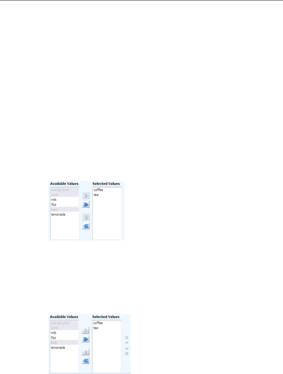
Using Shuttle Components
11-30 Web User Interface Developer's Guide for Oracle Application Development Framework
■You cannot store the value of the selectManyChoice in Request scope. On
postback, the value attribute is accessed from the model, rather than decoding
what was returned from the client. If the value is stored in Request scope, that
value will be empty. Do not store the value in Request scope.
■On postbacks, converters are not called. If you are relying on converters for
postbacks, then you should not use lazy content delivery.
■The contentDelivery attribute is ignored when in screen reader mode. The
selectItem components will always be built when the page is rendered.
11.7 Using Shuttle Components
The selectManyShuttle and selectOrderShuttle components present the user
with two list boxes and buttons to move or shuttle items from one list box to the other.
The user can select a single item or multiple items to shuttle between the leading
(Available values) list box and the trailing (Selected values) list box. For either
component, if you want the label to appear above the control, place them in a
panelFormLayout component.
The selectManyShuttle component is shown in Figure 11–30.
Figure 11–30 selectManyShuttle component
The selectOrderShuttle component additionally includes up and down arrow
buttons that the user can use to reorder values in the Selected values list box, as
shown in Figure 11–31. When the list is reordered, a ValueChangeEvent event is
delivered. If you set the readOnly attribute to true, ensure the values to be
reordered are selected values that will be displayed in the trailing list (Selected
values).
Figure 11–31 selectOrderShuttle Component
The value attribute of these components, like any other selectMany component,
must be a List or an Array of values that correspond to a value of one of the
contained selectItem components. If a value of one of the selectItems is in the
List or Array, that item will appear in the trailing list. You can convert a
selectManyListbox component directly into a selectManyShuttle; instead of
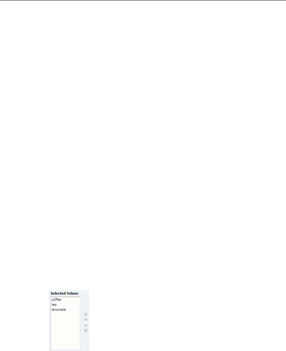
Using Shuttle Components
Using Input Components and Defining Forms 11-31
the value driving which items are selected in the listbox, it affects which items appear
in the trailing list of the selectOrderShuttle component.
Similar to other select components, the List or Array of items are composed of
selectItem components nested within the selectManyShuttle or
selectOrderShuttle component. Example 11–5 shows a sample
selectOrderShuttle component that allows the user to select the top five file types
from a list of file types.
Example 11–5 selectOrderShuttle JSF Page Code
<af:selectOrderShuttle value="#{helpBean.topFive}"
leadingHeader="#{explorerBundle['help.availableFileTypes']}"
trailingHeader="#{explorerBundle['help.top5']}"
simple="true">
<af:selectItem label="XLS"/>
<af:selectItem label="DOC"/>
<af:selectItem label="PPT"/>
<af:selectItem label="PDF"/>
<af:selectItem label="Java"/>
<af:selectItem label="JWS"/>
<af:selectItem label="TXT"/>
<af:selectItem label="HTML"/>
<af:selectItem label="XML"/>
<af:selectItem label="JS"/>
<af:selectItem label="PNG"/>
<af:selectItem label="BMP"/>
<af:selectItem label="GIF"/>
<af:selectItem label="CSS"/>
<af:selectItem label="JPR"/>
<af:selectItem label="JSPX"/>
<f:validator validatorId="shuttle-validator"/>
</af:selectOrderShuttle>
If you set the reorderOnly attribute of a selectOrdershuttle component to
true, the shuttle function will be disabled, and only the Selected Values listbox
appears. The user can only reorder the items in the listbox, as shown in Figure 11–32.
Figure 11–32 selectOrderShuttle Component in Reorder-Only Mode
11.7.1 How to Add a selectManyShuttle or selectOrderShuttle Component
The procedures for adding shuttle components are the same for both components.
First you add the selection component and configure its attributes. Then you add any
number of selectItem components for the individual items in the list, and configure
those.

Using Shuttle Components
11-32 Web User Interface Developer's Guide for Oracle Application Development Framework
Before you begin:
It may be helpful to have an understanding of how the attributes can affect
functionality. For more information, see Section 11.7, "Using Shuttle Components."
You may also find it helpful to understand functionality that can be added using other
ADF Faces features. For more information, see Section 11.1.2, "Additional
Functionality for Input Components and Forms."
To add a selectManyShuttle or selectOrderShuttle component:
1. In the Component Palette, from the Text and Selection panel, drag and drop a
Shuttle or Shuttle (Ordered) onto the page.
2. A dialog appears where you choose either to bind to a value in a managed bean, or
to create a static list. On the second page of the dialog, you can set the following:
■Label: Enter the label for the list.
■RequiredMessageDetail: Enter the message that should be displayed if a
selection is not made by the user. For more information about messages, see
Section 19.3, "Displaying Hints and Error Messages for Validation and
Conversion."
■Size: Specify the display size (number of items) of the lists. The size specified
must be between 10 and 20 items. If the attribute is not set or has a value less
than 10, the size would have a default or minimum value of 10. If the attribute
value specified is more than 20 items, the size would have the maximum value
of 20.
■Validator: Enter an EL expression that resolves to a validation method on a
managed bean.
■Value: Specify the value of the component. If the EL binding for the value
points to a bean property with a get method but no set method, the
component will be rendered in read-only mode.
■ValueChangeListener: Enter an EL expression that resolves to a listener on a
managed bean that handles value change events.
3. In the Property Inspector, expand the Appearance section and set the following:
■Layout: Specify whether the component will be in horizontal or vertical
layout. The default is horizontal, meaning the leading and trailing list
boxes are displayed next to each other. When set to vertical, the leading list
box is displayed above the trailing list box.
■LeadingHeader: Specify the header text of the leading list of the shuttle
component.
■LeadingDescShown: Set to true to display a description of the selected item
at the bottom of the leading list box.
■TrailingHeader: Specify the header of the trailing list of the shuttle
component.
■TrailingDescShown: Set to true to display a description of the selected item
at the bottom of the trailing list box.
4. Expand the Behavior section and optionally set the following attributes:
■ValuePassThru: Specify whether or not the values are passed through to the
client. When valuePassThru is false, the value and the options' values are
converted to indexes before being sent to the client. Therefore, when
valuePassThru is false, there is no need to write your own converter
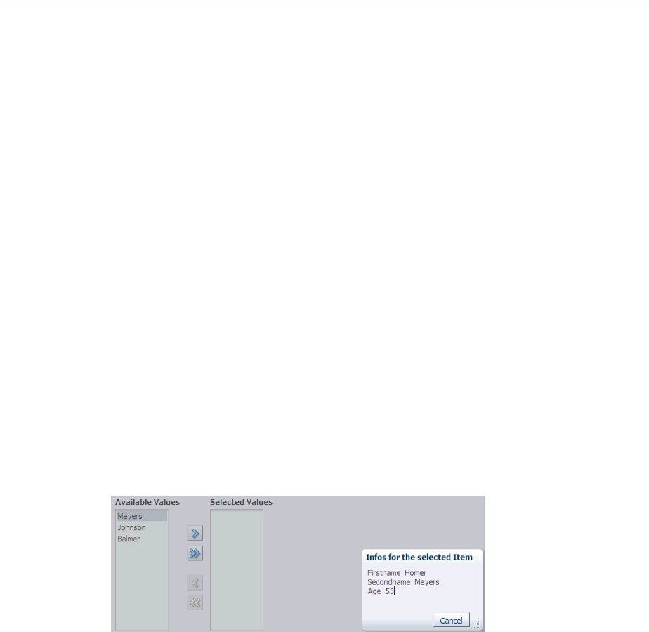
Using Shuttle Components
Using Input Components and Defining Forms 11-33
when you are using custom objects as your values, options, or both. If you
need to know the actual values on the client-side, then you can set
valuePassThru to true. This will pass the values through to the client,
using your custom converter if it is available; a custom converter is needed if
you are using custom objects. The default is false.
■ReorderOnly (selectOrderShuttle component only): Specify whether or
not the shuttle component is in reorder-only mode, where the user can reorder
the list of values, but cannot add or remove them.
5. In the Structure window, select one of the selectItem components, and in the
Property Inspector, set any needed attributes.
11.7.2 What You May Need to Know About Using a Client Listener for Selection Events
You can provide the user with information about each selected item before the user
shuttles it from one list to another list by creating JavaScript code to perform
processing in response to the event of selecting an item. For example, your code can
obtain additional information about that item, then display it as a popup to help the
user make the choice of whether to shuttle the item or not. Figure 11–33 shows a
selectManyShuttle component in which the user selects Meyers and a popup
provides additional information about this selection.
Figure 11–33 selectManyShuttle with selectionListener
You implement this feature by adding a client listener to the selectManyShuttle or
selectOrderShuttle component and then create a JavaScript method to process
this event. The JavaScript code is executed when a user selects an item from the lists.
For more information about using client listeners for events, see Section 4.2, "Listening
for Client Events."
How to add a client listener to a shuttle component to handle a selection event:
1. In the Component Palette, from the Operations panel, in the Listeners group, drag
a Client Listener and drop it as a child to the shuttle component.
2. In the Insert Client Listener dialog, enter a function name in the Method field (you
will implement this function in the next step), and select propertyChange from
the Type dropdown.
If for example, you entered showDetails as the function, JDeveloper would enter
the code shown in bold in Example 11–6.
Example 11–6 Using a clientListener to Register a Selection
<af:selectManyShuttle value="#{demoInput.manyListValue1}"
Tip: If you elected to have the leading or trailing list box display a
description, you must set a value for the shortDesc attribute for
each selectItem component.

Using the richTextEditor Component
11-34 Web User Interface Developer's Guide for Oracle Application Development Framework
valuePassThru="true" ...>
<af:clientListener type="propertyChange" method="showDetails"/>
<af:selectItem label="coffee" value="bean" />
...
</af:selectManyShuttle>
This code causes the showDetails function to be called any time the property
value changes.
3. In your JavaScript, implement the function entered in the last step. This function
should do the following:
■Get the shuttle component by getting the source of the event.
■ Use the client JavaScript API calls to get information about the selected items.
In Example 11–7, AdfShuttleUtils.getLastSelectionChange is called to get
the value of the last selected item
Example 11–7 Sample JavaScript methods showDetails used to process a selection
function showDetails(event)
{
if(AdfRichSelectManyShuttle.SELECTION == event.getPropertyName())
{
var shuttleComponent = event.getSource();
var lastChangedValue =
AdfShuttleUtils.getLastSelectionChange(shuttleComponent, event.getOldValue());
var side = AdfShuttleUtils.getSide(shuttleComponent, lastChangedValue);
if(AdfShuttleUtils.isSelected(shuttleComponent, lastChangedValue))
{
//do something...
}
else
{
//do something else
}
if(AdfShuttleUtils.isLeading(shuttleComponent, lastChangedValue))
{
//queue a custom event (see serverListener) to call a java method on the
server
}
}
}
11.8 Using the richTextEditor Component
The richTextEditor component provides an input field that can accept text with
formatting. It also supports label text, and messages. It allows the user to change font
name, size, and style, create ordered lists, justify text, and use a variety of other
features. The richTextEditor component also can be used to edit an HTML source
file. Two command buttons are used to toggle back and forth between editing
standard formatted text and editing the HTML source file. Figure 11–34 shows the rich
text editor component in standard rich text editing Mode.
Figure 11–34 The richTextEditor Component in Standard Editing Mode
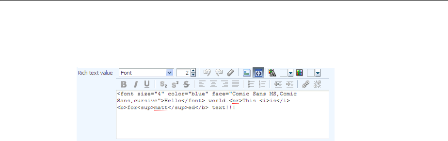
Using the richTextEditor Component
Using Input Components and Defining Forms 11-35
Figure 11–35 shows the editor in source code editing mode.
Figure 11–35 The richTextEditor in Source Editing Mode
Other supported features include:
■Font type
■Font size
■Link/unlink
■Clear styling
■Undo/redo
■Bold/italics/underline
■Subscript/superscript
■Justify (left, middle, right, full)
■Ordered/unordered lists
■Indentation
■Text color/background color
■Rich text editing mode/source code editing mode
The value (entered text) of the rich text editor is a well-formed XHTML fragment.
Parts of the value may be altered for browser-specific requirements to allow the value
to be formatted. Also, for security reasons, some features such as script-related tags
and attributes will be removed. There are no guarantees that this component records
only the minimal changes made by the user. Because the editor is editing an XHTML
document, the following elements may be changed:
■Nonmeaningful whitespace
■Element minimization
■Element types
■Order of attributes
■Use of character entities
The editor supports only HTML 4 tags, with the exception of:
■Script, noscript
■Frame, frameset, noframes
■Form-related elements (input, select, optgroup, option, textarea, form, button,
label, isindex)
■Document-related elements (html, head, body, meta, title, base, link)
The richTextEditor component also supports tags that pull in content (such as
applet, iframe, object, img, and a). For the iframe tag, the content should not be
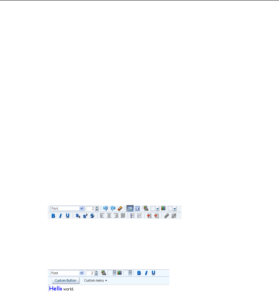
Using the richTextEditor Component
11-36 Web User Interface Developer's Guide for Oracle Application Development Framework
able to interact with the rest of the page because browsers allow interactions only with
content from the same domain. However, this portion of the page is not under the
control of the application.
While the richTextEditor component does not support font units such as px and
em, it does support font size from 1 to 7 as described in the HTML specification. It does
not support embed or unknown tags (such as <foo>).
On the client, the richTextEditor component does not support getValue and
setValue methods. There is no guarantee the component’s value on the client is the
same as the value on the server. Therefore, the richTextEditor does not support
client-side converters and validators. Server-side converters and validators will still
work.
The rich text editor delivers ValueChangeEvent and AttributeChangeEvent
events. Create valueChangeListener and attributeChangeListener handlers
for these events as required.
You can also configure the richTextEditorInsertBehavior tag, which works
with command components to insert given text into the richTextEditor
component. The text to be entered can be a simple string, or it can be preformatted text
held, for example, in a managed bean.
By default, the toolbar in the richTextEditor component allows the user to change
many aspects of the text, such as the font, font size and weight, text alignment, and
view mode, as shown in Figure 11–36.
Figure 11–36 Toolbar in richTextEditor Component
Figure 11–37 shows a toolbar that has been customized. Many of the toolbar buttons
have been removed and a toolbar with a custom toolbar button and a menu have been
added.
Figure 11–37 Customized Toolbar for richTextEditor
11.8.1 How to Add a richTextEditor Component
Once you add a richTextEditor component, you can configure it so that text can be
inserted at a specific place, and you can also customize the toolbar. For more
information, see Section 11.8.2, "How to Add the Ability to Insert Text into a
richTextEditor Component," and Section 11.8.3, "How to Customize the Toolbar."
Before you begin:
It may be helpful to have an understanding of how the attributes can affect
functionality. For more information, see Section 11.8, "Using the richTextEditor
Component."
You may also find it helpful to understand functionality that can be added using other
ADF Faces features. For more information, see Section 11.1.2, "Additional
Functionality for Input Components and Forms."

Using the richTextEditor Component
Using Input Components and Defining Forms 11-37
To add a richTextEditor component:
1. In the Component Palette, from the Text and Selection panel, drag and drop a Rich
Text Editor onto the page.
2. Expand the Common section of the Property Inspector and set the value
attribute.
3. Expand the Appearance section and set the following:
■Rows: Specify the height of the edit window as an approximate number of
characters shown.
■Columns: Specify the width of the edit window as an approximate number of
characters shown.
■Label: Specify a label for the component.
4. Expand the Behavior section and set the following:
■EditMode: Select whether you want the editor to be displayed using the
WYSIWYG or source mode.
■ContentDelivery: Specify whether or not the data within the editor should be
fetched when the component is rendered initially. When the
contentDelivery attribute value is immediate, data is fetched and
displayed in the component when it is rendered. If the value is set to lazy,
data will be fetched and delivered to the client during a subsequent request.
For more information, see Section 12.2.2, "Content Delivery."
11.8.2 How to Add the Ability to Insert Text into a richTextEditor Component
To allow text to be inserted into a richTextEditor component, add the
richTextEditorInsertBehavior tag as a child to a command component that
will be used to insert the text.
Before you begin
It may be helpful to have an understanding of the rich text editor component. For
more information, see Section 11.8, "Using the richTextEditor Component."
You may also find it helpful to understand functionality that can be added using other
ADF Faces features. For more information, see Section 11.1.2, "Additional
Functionality for Input Components and Forms."
You need to create a richTextEditor component as described in Section 11.8.1,
"How to Add a richTextEditor Component." Set the clientComponent attribute to
true.
To add text insert behavior:
1. Add a command component that the user will click to insert the text. For
procedures, see Section 20.3.1, "How to Use Command Buttons and Command
Links."
Tip: You can set the width of a richTextEditor component to full
width or 100%. However, this works reliably only if the editor is
contained in a geometry-managing parent components. It may not
work reliably if it is placed in flowing layout containers such as
panelFormLayout or panelGroupLayout. For more information,
see Section 9.2.1, "Geometry Management and Component
Stretching."

Using the richTextEditor Component
11-38 Web User Interface Developer's Guide for Oracle Application Development Framework
2. In the Component Palette, from the Operations panel, in the Behavior group, drag
and drop a Rich Text Editor Insert Behavior as a child to the command
component.
3. In the Rich Text Editor Insert Behavior dialog, enter the following:
■For: Use the dropdown arrow to select Edit and then navigate to select the
richTextEditor component into which the text will be inserted.
■Value: Enter the value for the text to be inserted. If you want to insert static
text, then enter that text. If you want the user to be able to insert the value of
another component (for example, the value of a selectOneChoice
component), then enter an EL expression that resolves to that value. If you
want the user to enter preformatted text, enter an EL expression that resolves
to that text. For example Example 11–8 shows preformatted text as the value
for an attribute in the demoInput managed bean.
Example 11–8 Preformatted Text in a Managed Bean
private static final String _RICH_INSERT_VALUE =
"<p align=\"center\" style=\"border: 1px solid gray;
margin: 5px; padding: 5px;\">" +
"<font size=\"4\"><span style=\"font-family: Comic Sans MS,
Comic Sans,cursive;\">Store Hours</span></font><br/>\n" +
"<font size=\"1\">Monday through Friday 'til 8:00 pm</font><br/>\n" +
"<font size=\"1\">Saturday & Sunday 'til 5:00 pm</font>" +
"</p>";
Example 11–9 shows how the text is referenced from the
richTextEditorInsertBehavior tag.
Example 11–9 Using the richTextEditorInsertBehavior Tag
<af:richTextEditor id="idRichTextEditor" label="Rich text value"
value="#{demoInput.richValue2}"/>
. . .
</af:richTextEditor>
<af:commandButton text="Insert Template Text">
<af:richTextEditorInsertBehavior for="idRichTextEditor"
value="#{demoInput.richInsertValue}"/>
</af:commandButton>
4. By default, the text will be inserted when the action event is triggered by clicking
the command component. However, you can change this to another client event by
choosing that event from the dropdown menu for the triggerType attribute.
11.8.3 How to Customize the Toolbar
Place the toolbar and toolbar buttons you want to add in custom facets that you create.
Then, reference the facet (or facets) from an attribute on the toolbar, along with
keywords that determine how or where the contained items should be displayed.
To allow text to be inserted into a richTextEditor component, add the
richTextEditorInsertBehavior tag as a child to a command component that
will be used to insert the text.
Before you begin
It may be helpful to have an understanding of the rich text editor component. For
more information, see Section 11.8, "Using the richTextEditor Component."

Using the richTextEditor Component
Using Input Components and Defining Forms 11-39
You may also find it helpful to understand functionality that can be added using other
ADF Faces features. For more information, see Section 11.1.2, "Additional
Functionality for Input Components and Forms."
To customize the toolbar:
1. In the JSF page of the Component Palette, from the Core panel, drag and drop a
Facet for each section of the toolbar you want to add. For example, to add the
custom buttons shown in Figure 11–37, you would add two <f:facet> tags.
Ensure that each facet has a unique name for the page.
2. In the ADF Faces page of the Component Palette, from the Menus and Toolbars
panel, drag and drop a Toolbar into each facet and add toolbar buttons or other
components and configure as needed. For more information about toolbars and
toolbar buttons, see Section 16.3, "Using Toolbars."
3. With the richTextEditor component selected, in the Property Inspector, in the
Appearance section, click the dropdown icon for the toolboxLayout attribute
and select Edit to open the Edit Property: ToolboxLayout dialog. The value for this
attribute should be a list of the custom facet names, in the order in which you
want the contents in the custom facets to appear. In addition to those facets, you
can also include all, or portions, of the default toolbar, using the following
keywords:
■all: All the toolbar buttons and text in the default toolbar. If all is entered,
then any keyword for noncustom buttons will be ignored.
■font: The font selection and font size buttons.
■history: Undo and redo buttons.
■mode: Rich text mode and source code mode buttons.
■color: Foreground and background color buttons.
■formatAll: Bold, italic, underline, superscript, subscript, strikethrough
buttons. If formatAll is specified, formatCommon and formatUncommon
will be ignored.
■formatCommon: Bold, italic, and underline buttons.
■formatUncommon: Superscript, subscript, and strikethrough buttons.
■justify: Left, center, right and full justify buttons.
■list: Bullet and numbered list buttons.
■indent: Outdent and indent buttons.
■link: Add and remove Link buttons.
For example, if you created two facets named customToolbar1 and
customToolbar2, and you wanted the complete default toolbar to appear in
between your custom toolbars, you would enter the following list:
■customToolbar1
■all
■customToolbar2
You can also determine the layout of the toolbars using the following keywords:
Tip: To ensure that there will be no conflicts with future releases of
ADF Faces, start all your facet names with customToolbar.

Using File Upload
11-40 Web User Interface Developer's Guide for Oracle Application Development Framework
■newline: Places the toolbar in the next named facet (or the next keyword
from the list in the toolboxLayout attribute) on a new line. For example, if
you wanted the toolbar in the customToolbar2 facet to appear on a new
line, you would enter the following list:
–customToolbar1
–all
–newline
–customToolbar2
If instead, you did not want to use all of the default toolbar, but only the font,
color, and common formatting buttons, and you wanted those buttons to
appear on a new line, you would enter the following list:
–customToolbar1
–customToolbar2
–newline
–font
–color
–formatCommon
■stretch: Adds a spacer component that stretches to fill all available space so
that the next named facet (or next keyword from the default toolbar) is
displayed as right-aligned in the toolbar.
11.9 Using File Upload
The inputFile component provides users with file uploading and updating
capabilities. This component allows the user to select a local file and upload it to a
selectable location on the server (to download a file from the server to the user, see
Section 20.5.1, "How to Use a Command Component to Download Files").
The inputFile component delivers the standard ValueChangeEvent event as files
are being uploaded, and it manages the loading process transparently. The value
property of an inputFile component is set to an instance of the
org.apache.myfaces.trinidad.model.UploadedFile class when the file is
uploaded.
To initiate the upload process you first must configure the page’s form to allow
uploads. You then create an action component such as a command button, as shown in
Figure 11–38, that can be used to upload a file.
Figure 11–38 inputFile Component
Once a file has been uploaded, and so the value of the inputFile is not null (either
after the initial load is successful or it has been specified as an initial value), you can
create an Update button that will be displayed instead of the Browse button, as shown
in Figure 11–39. This will allow the user to modify the value of the inputFile
component.
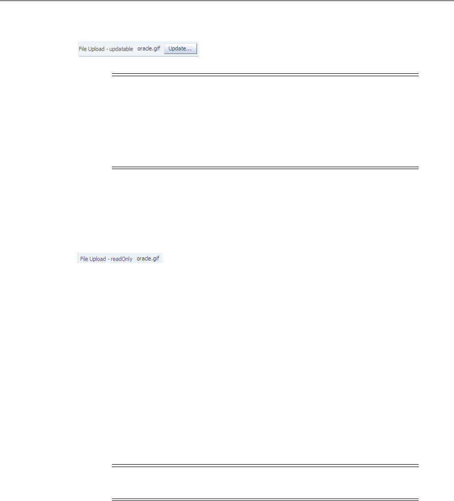
Using File Upload
Using Input Components and Defining Forms 11-41
Figure 11–39 inputFile Component in Update Mode
You can also specify that the component be able to load only a specific file by setting
the readOnly property to true, In this mode, only the specified file can be loaded, as
shown in Figure 11–40.
Figure 11–40 inputFile Component in Read-Only Mode
The inputFile component can be placed in either an h:form tag or an af:form
tag, but in either case, you have to set the form tag to support file upload. If you use
the JSF basic HTML h:form, set the enctype to multipart/form-data. This
would make the request into a multipart request to support file uploading to the
server. If you are using the ADF Faces af:form tag, set usesUpload to true, which
performs the same function as setting enctype to multipart/form-data to support
file upload.
The ADF Faces framework performs a generic upload of the file. You should create an
actionListener or action method to process the file after it has been uploaded (for
example, processing xml files, pdf files, and so on).
The value of an inputFile component is an instance of the
org.apache.myfaces.trinidad.model.UploadedFile interface. The API lets
you get at the actual byte stream of the file, as well as the file's name, its MIME type,
and its size.
The uploaded file may be stored as a file in the file system, but may also be stored in
memory; the API hides that difference. The filter ensures that the UploadedFile
content is cleaned up after the request is complete. Because of this, you cannot usefully
cache UploadedFile objects across requests. If you need to keep the file, you must
copy it into persistent storage before the request finishes.
For example, instead of storing the file, add a message stating the file upload was
successful using a managed bean as a response to the ValueChangeEvent event, as
shown in Example 11–10.
Example 11–10 Using valueChangeListener to Display Upload Message
JSF Page Code ----->
<af:form usesUpload="true">
<af:inputFile label="Upload:"
Note: When the file is uploaded, the value of the inputFile
component becomes the instance of the
org.apache.myfaces.trinidad.model.UploadedFile class.
Therefore, if you need to access the value (that is, the file itself), you
need to access this class. Accessing the component itself through the
binding attribute only accesses the component and not the uploaded
file.
Note: The API does not allow you to get path information from the
client about from where the file was uploaded.

Using File Upload
11-42 Web User Interface Developer's Guide for Oracle Application Development Framework
valueChangeListener="#{managedBean.fileUploaded}"/>
<af:commandButton text="Begin"/>
</af:form>
Managed Bean Code ---->
import javax.faces.application.FacesMessage;
import javax.faces.context.FacesContext;
import javax.faces.event.ValueChangeEvent;
import org.apache.myfaces.trinidad.model.UploadedFile;
public class ABackingBean
{
...
public void fileUploaded(ValueChangeEvent event)
{
UploadedFile file = (UploadedFile) event.getNewValue();
if (file != null)
{
FacesContext context = FacesContext.getCurrentInstance();
FacesMessage message = new FacesMessage(
"Successfully uploaded file " + file.getFilename() +
" (" + file.getLength() + " bytes)");
context.addMessage(event.getComponent().getClientId(context), message);
// Here's where we could call file.getInputStream()
}
}
}
You can also handle the upload by binding the value directly to a managed bean, as
shown in Example 11–11.
Example 11–11 Binding the Value to a Managed Bean
JSF Page Code ---->
<af:form usesUpload="true">
<af:inputFile label="Upload:" value="#{managedBean.file}"/>
<af:commandButton text="Begin" action="#{managedBean.doUpload}"/>
</af:form>
Managed Bean Code ---->
import org.apache.myfaces.trinidad.model.UploadedFile;
public class AManagedBean
{
public UploadedFile getFile()
{
return _file;
}
public void setFile(UploadedFile file)
{
_file = file;
}
public String doUpload()
{
UploadedFile file = getFile();
// ... and process it in some way
}
private UploadedFile _file;

Using File Upload
Using Input Components and Defining Forms 11-43
}
11.9.1 How to Use the inputFile Component
A Java class must be bound to the inputFile component. This class will be
responsible for containing the value of the uploaded file.
Before you begin:
It may be helpful to have an understanding of how the attributes can affect
functionality. For more information, see Section 11.9, "Using File Upload."
You may also find it helpful to understand functionality that can be added using other
ADF Faces features. For more information, see Section 11.1.2, "Additional
Functionality for Input Components and Forms."
To add an inputFile component:
1. Create a Java class that will hold the value of the input file. It must be an instance
of the org.apache.myfaces.trinidad.model.UploadedFile interface.
2. Select the af:form component and set UsesUpload to true.
3. In the Component Palette, from the Text and Selection panel, drag and drop an
Input File onto the page.
4. Set value to be the class created in Step 1.
5. If you want the value of the component to appear as read-only until the user
hovers over it, expand the Appearance section and set Editable to onAccess. If
you want the component to always appear editable, select always. If you want
the value to be inherited from an ancestor component, select inherit.
6. In the Component Palette, from the General Controls panel, drag and drop any
command component onto the page. This will be used to initiate the upload
process.
7. With the command component selected, set the actionListener attribute to a
listener that will process the file after it has been uploaded.
11.9.2 What You May Need to Know About Temporary File Storage
Because ADF Faces will temporarily store files being uploaded (either on disk or in
memory), by default it limits the size of acceptable incoming upload requests to avoid
denial-of-service attacks that might attempt to fill a hard drive or flood memory with
uploaded files. By default, only the first 100 kilobytes in any one request will be stored
in memory. Once that has been filled, disk space will be used. Again, by default, that is
limited to 2,000 kilobytes of disk storage for any one request for all files combined.
Once these limits are exceeded, the filter will throw an EOFException.
Files are, by default, stored in the temporary directory used by the
java.io.File.createTempFile() method, which is usually defined by the
system property java.io.tmpdir. Obviously, this will be insufficient for some
applications, so you can configure these values using three servlet context
initialization parameters, as shown in Example 11–12.
Note: If you select inherit, and no ancestor components define the
editable value, then the value always is used.

Using File Upload
11-44 Web User Interface Developer's Guide for Oracle Application Development Framework
Example 11–12 Parameters That Define File Upload Size and Directory
<context-param>
<!-- Maximum memory per request (in bytes) -->
<param-name>org.apache.myfaces.trinidad.UPLOAD_MAX_MEMORY</param-name>
<!-- Use 500K -->
<param-value>512000</param-value>
</context-param>
<context-param>
<!-- Maximum disk space per request (in bytes) -->
<param-name>org.apache.myfaces.trinidad.UPLOAD_MAX_DISK_SPACE</param-name>
<!-- Use 5,000K -->
<param-value>5120000</param-value>
</context-param>
<context-param>
<!-- directory to store temporary files -->
<param-name>org.apache.myfaces.trinidad.UPLOAD_TEMP_DIR</param-name>
<!-- Use a TrinidadUploads subdirectory of /tmp -->
<param-value>/tmp/TrinidadUploads/</param-value>
</context-param>
<!-- This filter is always required; one of its functions is
file upload. -->
<filter>
<filter-name>trinidad</filter-name>
<filter-class>org.apache.myfaces.trinidad.webapp.TrinidadFilter</filter-class>
</filter>
You can customize the file upload process by replacing the entire
org.apache.myfaces.trinidad.webapp.UploadedFileProcessor class with
the <uploaded-file-processor> element in the trinidad-config.xml
configuration file. Replacing the UploadedFileProcessor class makes the
parameters listed in Example 11–12 irrelevant, they are processed only by the default
UploadedFileProcessor class.
The <uploaded-file-processor> element must be the name of a class that
implements the oracle.adf.view.rich.webapp.UploadedFileProcessor
interface. This API is responsible for processing each individual uploaded file as it
comes from the incoming request, and then making its contents available for the rest of
the request. For most applications, the default UploadedFileProcessor class is
sufficient, but applications that need to support uploading very large files may
improve their performance by immediately storing files in their final destination,
instead of requiring ADF Faces to handle temporary storage during the request.

12
Using Tables and Trees 12-1
12Using Tables and Trees
This chapter describes how to display tables and trees using the ADF Faces table,
tree and treeTable components. If your application uses the Fusion technology
stack, then you can use data controls to create tables and trees. For more information
see the "Creating ADF Databound Tables" and "Displaying Master-Detail Data"
chapters of the Oracle Fusion Middleware Fusion Developer's Guide for Oracle Application
Development Framework
This chapter includes the following sections:
■Section 12.1, "About Tables, Trees, and Tree Tables"
■Section 12.2, "Common Functionality in Tables and Trees"
■Section 12.3, "Using the Table Component"
■Section 12.4, "Adding Hidden Capabilities to a Table"
■Section 12.5, "Enabling Filtering in Tables"
■Section 12.6, "Displaying Data in Trees"
■Section 12.7, "Displaying Data in Tree Tables"
■Section 12.8, "Passing a Row as a Value"
■Section 12.9, "Displaying Table Menus, Toolbars, and Status Bars"
■Section 12.10, "Exporting Data from Table, Tree, or Tree Table"
■Section 12.11, "Accessing Selected Values on the Client from Components That Use
Stamping"
12.1 About Tables, Trees, and Tree Tables
Structured data can be displayed as tables consisting of rows and columns using the
ADF Faces table component. Hierarchical data can be displayed either as tree
structures using ADF Faces tree component, or in a table format, using ADF Faces tree
table component. Figure 12–1 shows the ADF Faces table and tree components.
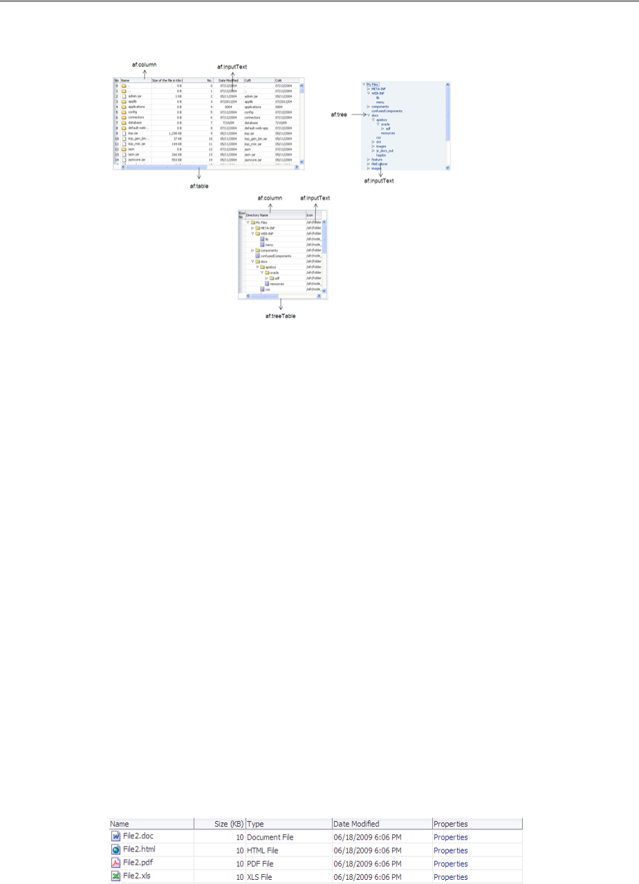
About Tables, Trees, and Tree Tables
12-2 Web User Interface Developer's Guide for Oracle Application Development Framework
Figure 12–1 ADF Faces Table and Tree Components
12.1.1 Table and Tree Use Cases and Examples
Tables, tree, and tree tables are used to display structured information. For example,
as shown in Figure 12–2, the Table tab in the File Explorer application uses a table to
display the contents of the selected directory.
Figure 12–2 Table Component in the File Explorer Application
Hierarchical data (that is data that has parent/child relationships), such as the
directory in the File Explorer application, can be displayed as expandable trees using
the tree component. Items are displayed as nodes that mirror the parent/child
Tip: When you do not want to use a table, but still need the same
stamping capabilities, you can use the iterator tag. For example, say
you want to display a list of periodic table elements, and for each
element, you want to display the name, atomic number, symbol, and
group. You can use the iterator tag as shown in the following
example.
<af:iterator var="row" first="3" rows="3" varStatus="stat"
value="#{periodicTable.tableData}" >
<af:outputText value="#{stat.count}.Index:#{stat.index} of
#{stat.model.rowCount}"/>
<af:inputText label="Element Name" value="#{row.name}"/>
<af:inputText label="Atomic Number" value="#{row.number}"/>
<af:inputText label="Symbol" value="#{row.symbol}"/>
<af:inputText label="Group" value="#{row.group}"/>
</af:iterator>
Each child is stamped as many times as necessary. Iteration starts at
the index specified by the first attribute for as many indexes specified
by the row attribute. If the row attribute is set to 0, then the iteration
continues until there are no more elements in the underlying data.
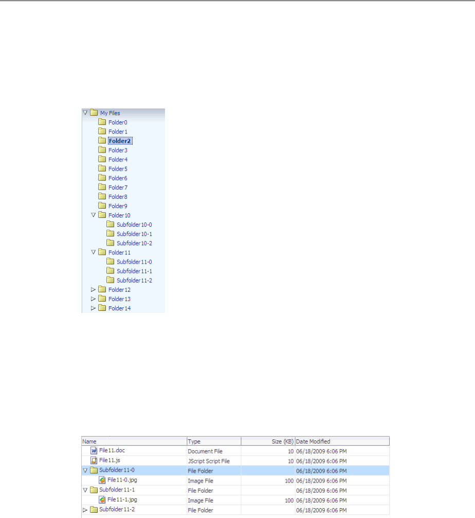
About Tables, Trees, and Tree Tables
Using Tables and Trees 12-3
structure of the data. Each top-level node can be expanded to display any child nodes,
which in turn can also be expanded to display any of their child nodes. Each expanded
node can then be collapsed to hide child nodes. Figure 12–3 shows the file directory in
the File Explorer application, which is displayed using a tree component.
Figure 12–3 Tree Component in the File Explorer Application
Hierarchical data can also be displayed using tree table components. The tree table
also displays parent/child nodes that are expandable and collapsible, but in a tabular
format, which allows the page to display attribute values for the nodes as columns of
data. For example, along with displaying a directory’s contents using a table
component, the File Explorer application has another tab that uses the tree table
component to display the contents, as shown in Figure 12–4.
Figure 12–4 Tree Table in the File Explorer Application
Like the tree component, the tree table component can show the parent/child
relationship between items. And like the table component, the tree table component
can also show any attribute values for those items in a column. Most of the features
available on a table component are also available in tree table component.
You can add a toolbar and a status bar to tables, trees, and tree tables by surrounding
them with the panelCollection component. The top panel contains a standard
menu bar as well as a toolbar that holds menu-type components such as menus and
menu options, toolbars and toolbar buttons, and status bars. Some buttons and menus
are added by default. For example, when you surround a table, tree, or tree table with
a panelCollection component, a toolbar that contains the View menu is added.
This menu contains menu items that are specific to the table, tree, or tree table
component.
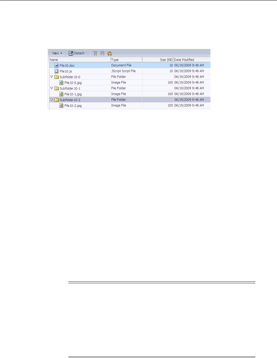
About Tables, Trees, and Tree Tables
12-4 Web User Interface Developer's Guide for Oracle Application Development Framework
Figure 12–5 shows the tree table from the File Explorer application with the toolbar,
menus, and toolbar buttons created using the panelCollection component.
Figure 12–5 TreeTable with Panel Collection
12.1.2 Additional Functionality for Tables and Trees
You may find it helpful to understand other ADF Faces features before you implement
your table and tree components. Additionally, once you have added a tree or table
component to your page, you may find that you need to add functionality such as
validation and accessibility. Following are links to other functionality that table and
tree components can use.
■Customizing the toolbar: You can customize the toolbar included in the
panelCollection component, which provides menus, toolbars, and status bars for
the table and tree table components. For more information about menus, toolbars,
and toolbar buttons, see Chapter 16, "Using Menus, Toolbars, and Toolboxes."
■Geometry management of the table width: If the table is a child to a component
that stretches its children, then this width setting will be overridden and the table
will automatically stretch to fit its container. For more information about how
components stretch, see Section 9.2.1, "Geometry Management and Component
Stretching."
■Active data: If your application uses active data, then you can have the data in
your tables and trees update automatically, whenever the data in the data source
changes. For more information, see Chapter 35, "Using the Active Data Service
with an Asynchronous Backend."
■Events: Table and tree components fire both server-side and client-side events that
you can have your application react to by executing some logic. For more
information, see Chapter 6, "Handling Events."
■Partial page rendering: You may want a table or tree to refresh to show new data
based on an action taken on another component on the page. For more
information, see Section 5.3, "Using the Optimized Lifecycle."
Note: If you wish to use active data, and your application uses ADF
Business Components, then your tables must conform to the
following:
■The table or tree is bound to homogeneous data which contains
only a single attribute.
■The table does not use filtering.
■The tree component's nodeStamp facet contains a single
outputText tag and contains no other tags.

Common Functionality in Tables and Trees
Using Tables and Trees 12-5
■Personalization: Users can change the way the table displays at runtime (for
example the user can reorder columns or change column widths), those values will
not be retained once the user leaves the page unless you configure your
application to allow user customization. For information, see Chapter 32,
"Allowing User Customization on JSF Pages."
■Accessibility: You can make your table and tree components accessible. For more
information, see Chapter 30, "Developing Accessible ADF Faces Pages."
■Automatic data binding: If your application uses the Fusion technology stack,
then you can create automatically bound tables and trees based on how your ADF
Business components are configured. For more information, see the "Creating ADF
Databound Tables" and "Displaying Master-Detail Data" chapters of the Oracle
Fusion Middleware Web User Interface Developer's Guide for Oracle Application
Development Framework.
12.2 Common Functionality in Tables and Trees
Trees and tables share many of the same functionality, such as how data is delivered
and how data can be displayed and edited. It is important that you understand this
shared functionality and how it is configured before you use these components.
12.2.1 Displaying Data in Rows and Nodes
Instead of containing a child component for each record to be displayed, and then
binding these components to the individual records, table, tree and tree table
components are bound to a complete collection, and they then repeatedly render one
component (for example an outputText component) by stamping the value for each
record. For example, say a table contains two child column components. Each column
displays a single attribute value for the row using an output component and there are
four records to be displayed. Instead of binding four sets of two output components to
display the data, the table itself is bound to the collection of all four records and
simply stamps one set of the output components four times. As each row is stamped,
the data for the current row is copied into the var attribute on the table, from which
the output component can retrieve the correct values for the row. For more
information about how stamping works, especially with client components, see
Section 12.2.6, "Accessing Client Table, Tree, and Tree Table Components."
Example 12–1 shows the JSF code for a table whose value for the var attribute is row.
Each outputText component in a column displays the data for the row because its
value is bound to a specific property on the variable.
Example 12–1 JSF Code for a Table Uses the var Attribute to Access Values
<af:table var="row" value="#{myBean.allEmployees}">
<af:column>
<af:outputText value="#{row.firstname}"/>
</af:column>
<af:column>
af:outputText value="#{row.lastname}"/>
</af:column>
</af:table>
12.2.2 Content Delivery
The table, tree, and tree table components are virtualized, meaning not all the rows that
are there for the component on the server are delivered to and displayed on the client.

Common Functionality in Tables and Trees
12-6 Web User Interface Developer's Guide for Oracle Application Development Framework
You configure tables, trees, and tree tables to fetch a certain number of rows at a time
from your data source. The data can be delivered to the components immediately
upon rendering, when it is available, or lazily fetched after the shell of the component
has been rendered (by default, the components fetch data when it is available).
With immediate delivery, the data is fetched during the initial request. With lazy
delivery, when a page contains one or more table or tree components, the page
initially goes through the standard lifecycle. However, instead of fetching the data
during that initial request, a special separate partial page rendering (PPR) request is
run, and the number of rows set as the value of the fetch size for the table is then
returned. Because the page has just been rendered, only the Render Response phase
executes for the components, allowing the corresponding data to be fetched and
displayed. When a user’s actions cause a subsequent data fetch (for example scrolling
in a table for another set of rows), another PPR request is executed.
When content delivery is configured to be delivered when it is available, the
framework checks for data availability during the initial request, and if it is available,
it sends the data to the table. If it is not available, the data is loaded during the
separate PPR request, as it is with lazy delivery.
The number of rows that are displayed on the client are just enough to fill the page as
it is displayed in the browser. More rows are fetched as the user scrolls the component
vertically. The fetchSize attribute determines the number of rows requested from
the client to the server on each attempt to fill the component. The default value is 25.
Note: If your application does not use the Fusion technology stack,
then you must explicitly add support for whenAvailable to your
CollectionModel implementation. For an example, see the
WhenAvailableData.java managed bean in the Faces demo
application.
If your application does use the Fusion technology stack, then the
CollectionModel implementation created for you automatically
uses these APIs.
Performance Tip: Lazy delivery should be used when a data fetch is
expected to be an expensive (slow) operation, for example, slow,
high-latency database connection, or fetching data from slow
non-database data sources like web services. Lazy delivery should
also be used when the page contains a number of components other
than a table, tree, or tree table. Doing so allows the initial page layout
and other components to be rendered first before the data is available.
Immediate delivery should be used if the table, tree, or tree table is the
only context on the page, or if the component is not expected to return
a large set of data. In this case, response time will be faster than using
lazy delivery (or in some cases, simply perceived as faster), as the
second request will not go to the server, providing a faster user
response time and better server CPU utilizations. Note however that
only the number of rows configured to be the fetch block will be
initially returned. As with lazy delivery, when a user’s actions cause a
subsequent data fetch, the next set of rows are delivered.
When available delivery provides the additional flexibility of using
immediate when data is available during initial rendering or falling
back on lazy when data is not initially available.

Common Functionality in Tables and Trees
Using Tables and Trees 12-7
So if the height of the table is small, the fetch size of 25 is sufficient to fill the
component. However, if the height of the component is large, there might be multiple
requests for the data from the server. Therefore, the fetchSize attribute should be
set to a higher number. For example, if the height of the table is 600 pixels and the
height of each row is 18 pixels, you will need at least 45 rows to fill the table. With a
fetchSize of 25, the table has to execute two requests to the server to fill the table.
For this example, you would set the fetch size to 50.
However, if you set the fetch size too high, it will impact both server and client. The
server will fetch more rows from the data source than needed and this will increase
time and memory usage. On the client side, it will take longer to process those rows
and attach them to the component.
You can also configure the set of data that will be initially displayed using the
displayRow attribute. By default, the first record in the data source is displayed in
the top row or node and the subsequent records are displayed in the following rows or
nodes. You can also configure the component to first display the last record in the
source instead. In this case, the last record is displayed in the bottom row or node of
the component, and the user can scroll up to view the preceding records. Additionally,
you can configure the component to display the selected row. This can be useful if the
user is navigating to the table, and based on some parameter, a particular row will be
programmatically selected. When configured to display the selected row, that row will
be displayed at the top of the table and the user can scroll up or down to view other
rows.
12.2.3 Row Selection
You can configure selection to be either for no rows, for a single row, or for multiple
rows of tables, trees, and tree tables using the rowSelection attribute. This setting
allows you to execute logic against the selected rows. For example, you may want
users to be able to select a row in a table or a node in a tree, and then to click a
command button that navigates to another page where the data for the selected row is
displayed and the user can edit it.
When the selected row (or node) of a table, tree, or tree table changes, the component
triggers a selection event. This event reports which rows were just deselected and
which rows were just selected. While the components handle selection declaratively, if
you want to perform some logic on the selected rows, you need to implement code
that can access those rows and then perform the logic. You can do this in a selection
listener method on a managed bean. For more information, see Section 12.3.8, "What
You May Need to Know About Performing an Action on Selected Rows in Tables."
Note: You cannot use JavaScript to dynamically size a table or tree.
The height of tables, trees and treetables is set the first time they are
rendered and cannot be changed using JavaScript APIs.
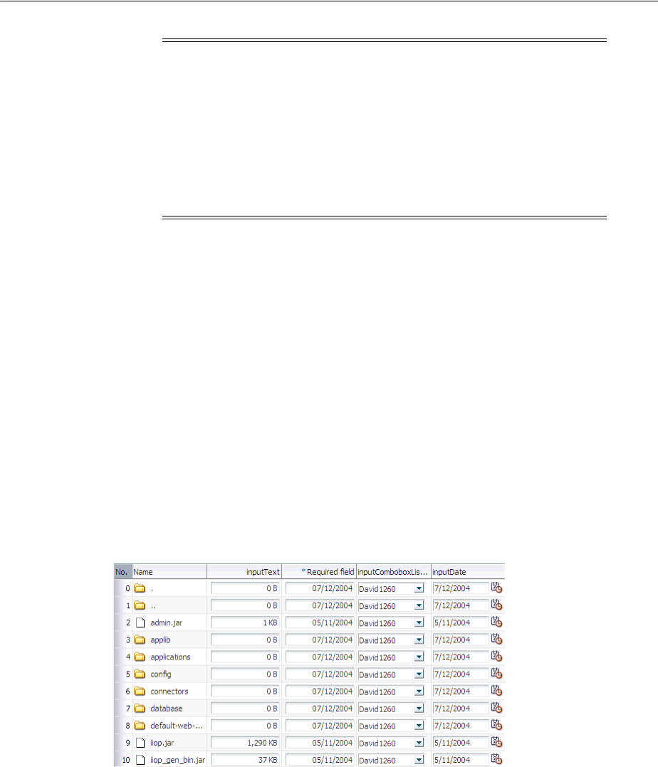
Common Functionality in Tables and Trees
12-8 Web User Interface Developer's Guide for Oracle Application Development Framework
12.2.4 Editing Data in Tables, Trees, and Tree Tables
You can choose the component used to display the actual data in a table, tree, or tree
table. For example, you may want the data to be read-only, and therefore you might
use an outputText component to display the data. Conversely, if you want the data
to be able to be edited, you might use an inputText component, or if choosing from
a list, one of the SelectOne components. All of these components are placed as
children to the column component (in the case of a table and tree table) or within the
nodeStamp facet (for a tree).
When you decide to use components whose value can be edited to display your data,
you have the option of having the table, tree, or tree table either display all rows as
available for editing at once, or display all but the currently active row as read-only
using the editingMode attribute. For example, Figure 12–6 shows a table whose rows
can all be edited. The page renders using the components that were added to the page
(for example, inputText, inputDate, and inputComboBoxListOfValues
components).
Figure 12–6 Table Whose Rows Can All Be Edited
Figure 12–7 shows the same table (that is, it uses inputText, inputDate, and
inputComboBoxListOfValues components to display the data), but configured so
that only the active row displays the editable components. Users can then click on
another row to make it editable (only one row is editable at a time). Note that
outputText components are used to display the data in the noneditable rows, even
though the same input components as in Figure 12–6 were used to build the page. The
only row that actually renders those components is the active row.
Note: If you configure your component to allow multiple selection,
users can select one row and then press the shift key to select another
row, and all the rows in between will be selected. This selection will
be retained even if the selection is across multiple data fetch blocks.
Similarly, you can use the Ctrl key to select rows that are not next to
each other.
For example, if you configure your table to fetch only 25 rows at a
time, but the user selects 100 rows, the framework is able to keep track
of the selection.
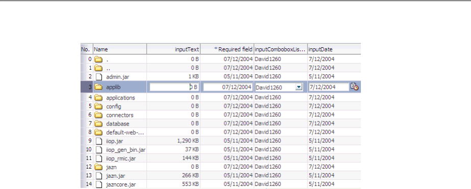
Common Functionality in Tables and Trees
Using Tables and Trees 12-9
Figure 12–7 Table Allows Only One Row to Be Edited at a Time
The currently active row is determined by the activeRowKey attribute on the table.
By default, the value of this attribute is the first visible row of the table. When the table
(or tree or tree table) is refreshed, that component scrolls to bring the active row into
view, if it is not already visible. When the user clicks on a row to edit its contents, that
row becomes the active row.
When you allow only a single row (or node) to be edited, the table (or tree or tree
table) performs PPR when the user moves from one row (or node) to the next, thereby
submitting the data (and validating that data) one row at a time. When you allow all
rows to be edited, data is submitted whenever there is an event that causes PPR to
typically occur, for example scrolling beyond the currently displayed rows or nodes.
Not all editable components make sense to be displayed in a click-to-edit mode. For
example, those that display multiple lines of HTML input elements may not be good
candidates. These components include:
■SelectManyCheckbox
■SelectManyListBox
■SelectOneListBox
■SelectOneRadio
■SelectManyShuttle
Performance Tip: For increased performance during both rendering
and postback, you should configure your table to allow editing only to
a single row.
When you elect to allow only a single row to be edited at a time, the
page will be displayed more quickly, as output components tend to
generate less HTML than input components. Additionally, client
components are not created for the read-only rows. Because the table
(or tree, or tree table) performs PPR as the user moves from one row
to the next, only that row’s data is submitted, resulting in better
performance than a table that allows all cells to be edited, which
submits all the data for all the rows in the table at the same time.
Allowing only a singe row to be edited also provides more intuitive
validation, because only a single row’s data is submitted for
validation, and therefore only errors for that row are displayed.

Common Functionality in Tables and Trees
12-10 Web User Interface Developer's Guide for Oracle Application Development Framework
12.2.5 Using Popup Dialogs in Tables, Trees, and Tree Tables
You can configure your table, tree, or tree table so that popup dialogs will be
displayed based on a user’s actions. For example, you can configure a popup dialog to
display some data from the selected row when the user hovers the mouse over a cell or
node. You can also create popup context menus for when a user right-clicks a row in a
table or tree table, or a node in a tree. Additionally, for tables and tree tables, you can
create a context menu for when a user right-clicks anywhere within the table, but not
on a specific row.
Tables, trees, and tree tables all contain the contextMenu facet. You place your
popup context menu within this facet, and the associated menu will be displayed
when the user right-clicks a row. When the context menu is being fetched on the
server, the components automatically establish the currency to the row for which the
context menu is being displayed. Establishing currency means that the current row in
the model for the table now points to the row for which the context menu is being
displayed. In order for this to happen, the popup component containing the menu
must have its contentDelivery attribute set to lazyUncached so that the menu is
fetched every time it is displayed.

Common Functionality in Tables and Trees
Using Tables and Trees 12-11
Tables and tree tables contain the bodyContextMenu facet. You can add a popup that
contains a menu to this facet, and it will be displayed whenever a user clicks on the
table, but not within a specific row.
For more information about creating context menus, see Section 15.2, "Declaratively
Creating Popups."
Tip: If you want the context menu to dynamically display content
based on the selected row, set the popup content delivery to
lazyUncached and add a setPropertyListener tag to a method
on a managed bean that can get the current row and then display data
based on the current row:
<af:tree value="#{fs.treeModel}"
contextMenuSelect="false" var="node" ..>
<f:facet name="contextMenu">
<af:popup id="myPopup" contentDelivery="lazyUncached">
<af:setPropertyListener from="#{fs.treeModel.rowData}"
to="#{dynamicContextMenuTable.currentTreeRowData}"
type="popupFetch" />
<af:menu>
<af:menu text="Node Info (Dynamic)">
<af:commandMenuItem actionListener=
"#{dynamicContextMenuTable.alertTreeRowData}"
text=
"Name - #{dynamicContextMenuTable.currentTreeRowData.name}" />
<af:commandMenuItem actionListener=
"#{dynamicContextMenuTable.alertTreeRowData}"
text=
"Path - #{dynamicContextMenuTable.currentTreeRowData.path}" />
<af:commandMenuItem actionListener=
"#{dynamicContextMenuTable.alertTreeRowData}"
text="Date -
#{dynamicContextMenuTable.currentTreeRowData.lastModified}" />
</af:menu>
</af:menu>
</af:popup>
</f:facet>
...
</af:tree>
The code on the backing bean might look something like this:
public class DynamicContextMenuTableBean
{
...
public void setCurrentTreeRowData(Map currentTreeRowData)
{
_currentTreeRowData = currentTreeRowData;
}
public Map getCurrentTreeRowData()
{
return _currentTreeRowData;
}
private Map _currentTreeRowData;
}

Common Functionality in Tables and Trees
12-12 Web User Interface Developer's Guide for Oracle Application Development Framework
12.2.6 Accessing Client Table, Tree, and Tree Table Components
With ADF Faces, the contents of the table, tree, or tree table are rendered on the server.
There may be cases when the client needs to access that content on the server,
including:
■Client-side application logic may need to read the row-specific component state.
For example, in response to row selection changes, the application may want to
update the disabled or visible state of other components in the page (usually menu
items or toolbar buttons). This logic may be dependent on row-specific metadata
sent to the client using a stamped inputHidden component. In order to enable
this, the application must be able to retrieve row-specific attribute values from
stamped components.
■Client-side application logic may need to modify row-specific component state.
For example, clicking a stamped command link in a table row may update the
state of other components in the same row.
■ The peer may need access to a component instance to implement event handling
behavior (for more information about peers, see Section 4.1, "About Using ADF
Faces Architecture"). For example, in order to deliver a client-side action event in
response to a mouse click, the AdfDhtmlCommandLinkPeer class needs a
reference to the component instance which will serve as the event source. The
component also holds on to relevant state, including client listeners as well as
attributes that control event delivery behavior, such as disabled or
partialSubmit.
Because there is no client-side support for EL in the ADF Faces framework, nor is there
support for sending entire table models to the client, the client-side code cannot rely
on component stamping to access the value. Instead of reusing the same component
instance on each row, a new JavaScript client component is created on each row
(assuming any component must be created at all for any of the rows).
Therefore, to access row-specific data on the client, you need to use the stamped
component itself to access the value. To do this without a client-side data model, you
use a client-side selection change listener. For detailed instructions, see Section 12.11,
"Accessing Selected Values on the Client from Components That Use Stamping."
12.2.7 Geometry Management and Table, Tree, and Tree Table Components
By default, when tables, trees, and tree tables are placed in a component that stretches
its children (for example, a panelCollection component inside a
panelStretchLayout component), the table, tree, or tree table will stretch to fill the
existing space. However, in order for the columns to stretch to fit the table, you must
specify a single column to stretch to fill up any unused space, using the
columnStretching attribute. Otherwise, the table will only stretch vertically to fit as
many rows as possible. It will not stretch the columns, as shown in Figure 12–8.
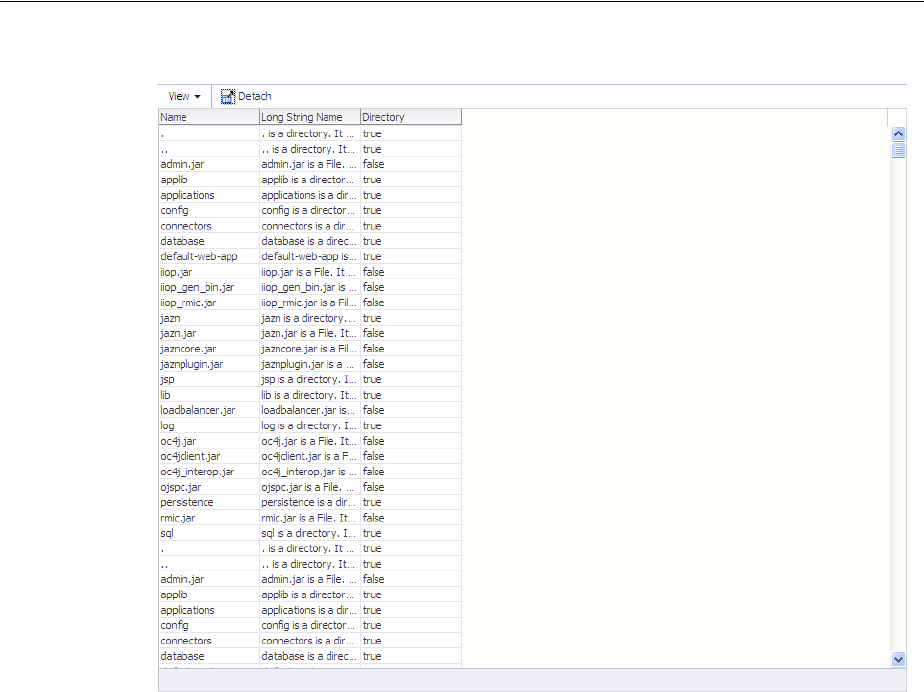
Common Functionality in Tables and Trees
Using Tables and Trees 12-13
Figure 12–8 Table Stretches But Columns Do Not
When placed in a component that does not stretch its children (for example, in a
panelCollection component inside a panelGroupLayout component set to
vertical), by default, a table width is set to 300px (27.27em units which translates to
300px for an 11px font setting) and the default fetch size is set to return 25 rows, as
shown in Figure 12–9.
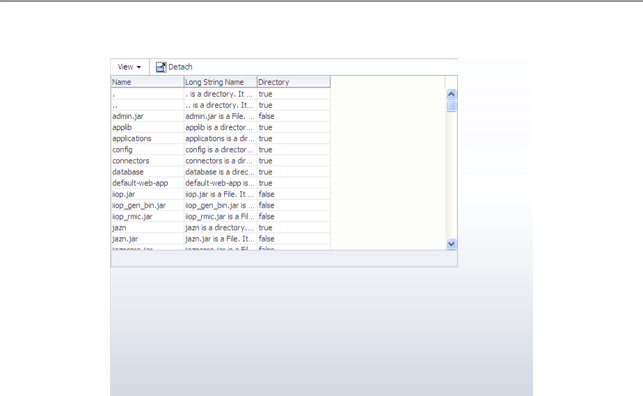
Using the Table Component
12-14 Web User Interface Developer's Guide for Oracle Application Development Framework
Figure 12–9 Table Does Not Stretch
When you place a table in a component that does not stretch its children, you can
control the height of the table so that is never more than a specified number of rows,
using the autoHeightRows attribute. When you set this attribute to a positive
integer, the table height will be determined by the number of rows set. If that number
is higher than the fetchSize attribute, then only the number of rows in the
fetchSize attribute will be returned. You can set autoHeightRows to -1 (the
default), to turn off auto-sizing.
Auto-sizing can be helpful in cases where you want to use the same table both in
components that stretch their children and those that don’t. For example, say you have
a table that has 6 columns and can potentially display 12 rows. When you use it in a
component that stretches its children, you want the table to stretch to fill the available
space. When you use that table in a component that doesn’t stretch its children, you
want to be able to "fix" the height of the table to six rows. However, if you were to set a
height on the table, then that table will not stretch when placed in the other
component. To solve this issue, you can set the autoHeightRows attribute. Then,
when the table in the example above is placed in a component that stretches, the table
will stretch (ignoring the autoHeightRows attribute), and when it is placed in a
component that does not stretch, the table will be 6 rows high, the number of rows set
for autoHeightRows attribute.
12.3 Using the Table Component
The table component uses a CollectionModel class to access the data in the
underlying collection. This class extends the JSF DataModel class and adds on
support for row keys and sorting. In the DataModel class, rows are identified entirely
by index. This can cause problems when the underlying data changes from one
request to the next, for example a user request to delete one row may delete a different
row when another user adds a row. To work around this, the CollectionModel
class is based on row keys instead of indexes.
You may also use other model classes, such as java.util.List, array, and
javax.faces.model.DataModel. If you use one of these other classes, the table
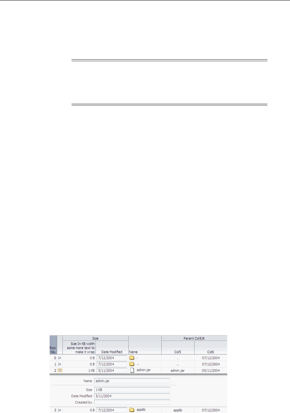
Using the Table Component
Using Tables and Trees 12-15
component automatically converts the instance into a CollectionModel class, but
without the additional functionality. For more information about the
CollectionModel class, see the MyFaces Trinidad Javadoc at
http://myfaces.apache.org/trinidad/trinidad-1_
2/trinidad-api/apidocs/index.html.
The immediate children of a table component must be column components. Each
visible column component is displayed as a separate column in the table. Column
components contain components used to display content, images, or provide further
functionality. For more information about the features available with the column
component, see Section 12.3.1, "Columns and Column Data."
The child components of each column display the data for each row in that column.
The column does not create child components per row; instead, the table uses
stamping to render each row. Each child is stamped once per row, repeatedly for all
the rows. As each row is stamped, the data for the current row is copied into a
property that can be addressed using an EL expression. You specify the name to use
for this property using the var property on the table. Once the table has completed
rendering, this property is removed or reverted back to its previous value.
Because of this stamping behavior, some components may not work inside the
column. Most components will work without problems, for example any input and
output components. If you need to use multiple components inside a cell, you can
wrap them inside a panelGroupLayout component. Components that themselves
support stamping are not supported, such as tables within a table. For information
about using components whose values are determined dynamically at runtime, see
Section 12.3.9, "What You May Need to Know About Dynamically Determining Values
for Selection Components in Tables."
You can use the detailStamp facet in a table to include data that can be optionally
displayed or hidden. When you add a component to this facet, the table displays an
additional column with an expand and collapse icon for each row. When the user
clicks the icon to expand, the component added to the facet is displayed, as shown in
Figure 12–10.
Figure 12–10 Extra Data Can Be Optionally Displayed
Note: If your application uses the Fusion technology stack, then you
can use data controls to create tables and the collection model will be
created for you. For more information see the "Creating ADF
Databound Tables" chapter of the Oracle Fusion Middleware Web User
Interface Developer's Guide for Oracle Application Development Framework.
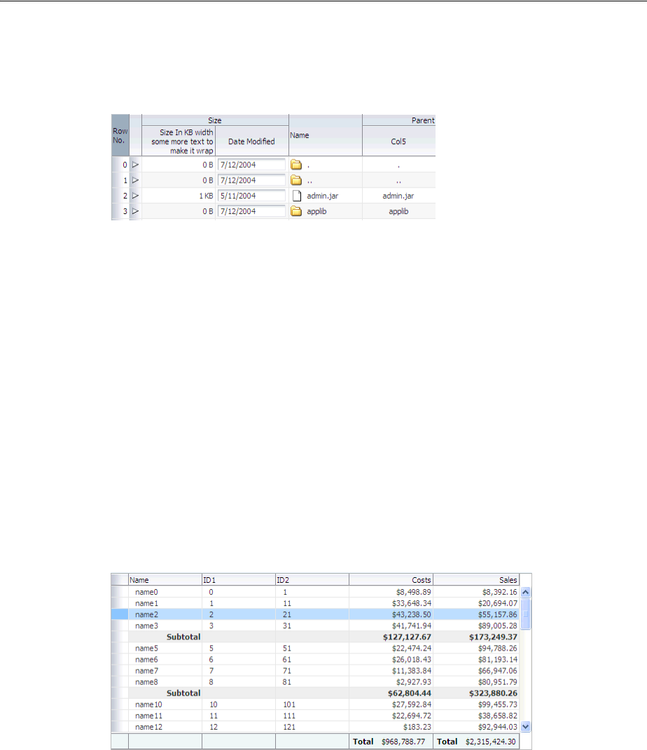
Using the Table Component
12-16 Web User Interface Developer's Guide for Oracle Application Development Framework
When the user clicks on the expanded icon to collapse it, the component is hidden, as
shown in Figure 12–11.
Figure 12–11 Extra Data Can Be Hidden
For more information about using the detailStamp facet, see Section 12.4, "Adding
Hidden Capabilities to a Table."
12.3.1 Columns and Column Data
Columns contain the components used to display the data. As stated previously, only
one child component is needed for each item to be displayed; the values are stamped
as the table renders. Columns can be sorted and can also contain a filtering element.
Users can enter a value into the filter and the returned data set will match the value
entered in the filter. You can set the filter to be either case-sensitive or case-insensitive.
If the table is configured to allow it, users can also reorder columns. Columns have
both header and footer facets. The header facet can be used instead of using the header
text attribute of the column, allowing you to use a component that can be styled. The
footer facet is displayed at the bottom of the column. For example, Figure 12–12 uses
footer facets to display the total at the bottom of two columns. If the number of rows
returned is more than can be displayed, the footer facet is still displayed; the user can
scroll to the bottom row.
Figure 12–12 Footer Facets in a Column
12.3.2 Formatting Tables
A table component offers many formatting and visual aids to the user. You can enable
these features and specify how they can be displayed. These features include:
■Row selection: By default, at runtime, users cannot select rows. If you want users
to be able to select rows in order to perform some action on them somewhere else
on the page, or on another page, then enable row selection for the table by setting
the rowSelection attribute. You can configure the table to allow either a single
row or multiple rows to be selected. For information about how to then
programatically perform some action on the selected rows, see Section 12.3.8,

Using the Table Component
Using Tables and Trees 12-17
"What You May Need to Know About Performing an Action on Selected Rows in
Tables."
■Table height: You can set the table height to be absolute (for example, 300 pixels),
or you can determine the height of the table based on the number of rows you
wish to display at a time by setting the autoHeightRows attribute. For more
information, see Section 12.2.7, "Geometry Management and Table, Tree, and Tree
Table Components."
■Grid lines: By default, an ADF table component draws both horizontal and vertical
grid lines. These may be independently turned off using the
horizontalGridVisible and verticalGridVisible attributes.
■Banding: Groups of rows or columns are displayed with alternating background
colors using the columnBandingInterval attribute. This helps to differentiate
between adjacent groups of rows or columns. By default, banding is turned off.
■Column groups: Columns in a table can be grouped into column groups, by
nesting column components. Each group can have its own column group heading,
linking all the columns together.
■Editable cells: When you elect to use input text components to display data in a
table, you can configure the table so that all cells can be edited, or so that the user
must explicitly click in the cell in order to edit it. For more information, see
Section 12.2.4, "Editing Data in Tables, Trees, and Tree Tables."
■Column stretching: If the widths of the columns do not together fill the whole
table, you can set the columnStretching attribute to determine whether or not
to stretch columns to fill up the space, and if so, which columns should stretch.
You can set the minimum width for columns, so that when there are many
columns in a table and you enable stretching, columns will not be made smaller
than the set minimum width. You can also set a width percentage for each column
you want to stretch to determine the amount of space that column should take up
when stretched.
Note: When table is placed in a layout-managing container, such as a
panelSplitter component, it will be sized by the container and the
autoHeightRows is not honored.
Note: You cannot use JavaScript to dynamically size a table. The
height of a table is set the first time is rendered and cannot be changed
using JavaScript APIs.
Performance Tip: When you choose to have cells be available for
editing only when the user clicks on them, the table will initially load
faster. This may be desirable if you expect the table to display large
amounts of data.
Note: If the total sum of the columns’ minimum widths equals more
than the viewable space in the viewport, the table will expand outside
the viewport and a scrollbar will appear to allow access outside the
viewport.

Using the Table Component
12-18 Web User Interface Developer's Guide for Oracle Application Development Framework
■Column selection: You can choose to allow users to be able to select columns of
data. As with row selection, you can configure the table to allow single or multiple
column selection. You can also use the columnSelectionListener to respond
to the ColumnSelectionEvent that is invoked when a new column is selected
by the user. This event reports which columns were just deselected and which
columns were just selected.
■Column reordering: Users can reorder the columns at runtime by simply dragging
and dropping the column headers. By default, column reordering is allowed, and
is handled by a menu item in the panelCollection component. For more
information, see Section 12.9, "Displaying Table Menus, Toolbars, and Status Bars."
12.3.3 Formatting Columns
Each column component also offers many formatting and visual aids to the user. You
can enable these features and specify how they can be displayed. These features
include:
■Column sorting: Columns can be configured so that the user can sort the contents
by a given column, either in ascending or descending order using the sortable
attribute. A special indicator on a column header lets the user know that the
column can be sorted.
When the user clicks on the icon to sort a previously unsorted column, the
column’s content is sorted in ascending order. Subsequent clicks on the same
header sort the content in the reverse order. In order for the table to be able to sort,
the underlying data model must also support sorting. For more information, see
Section 12.3.7, "What You May Need to Know About Programmatically Enabling
Sorting for Table Columns."
■Content alignment: You can align the content within the column to either the start,
end, left, right, or center using the align attribute.
■Column width: The width of a column can be specified as an absolute value in
pixels using the width attribute. If you configure a column to allow stretching,
then you can also set the width as a percentage.
■Line wrapping: You can define whether or not the content in a column can wrap
over lines, using the noWrap attribute. By default, content will not wrap.
■Row headers: You can define the left-most column to be a row header using the
rowHeader attribute. When you do so, the left-most column is rendered with the
same look as the column headers, and will not scroll off the page. Figure 12–13
Performance Tip: Column stretching is turned off by default.
Turning on this feature may have a performance impact on the client
rendering time when used for complex tables (that is, tables with a
large amount of data, or with nested columns, and so on).
Note: Columns configured to be row headers or configured to be
frozen will not be stretched because doing so could easily leave the
user unable to access the scrollable body of the table.
Tip: Use start and end instead of left and right if your
application supports multiple reading directions.
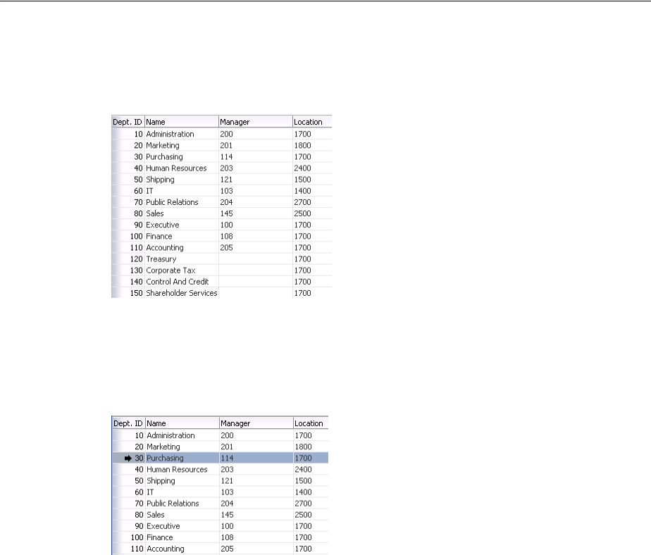
Using the Table Component
Using Tables and Trees 12-19
shows how a table showing departments appears if the first column is configured
to be a row header.
Figure 12–13 Row Header in a Table
If you elect to use a row header column and you configure your table to allow row
selection, the row header column displays a selection arrow when a users hovers
over the row, as shown in Figure 12–14.
Figure 12–14 Selection Icon in Row Header
For tables that allow multiple selection, users can mouse down and then drag on the
row header to select a contiguous blocks of rows. The table will also autoscroll
vertically as the user drags up or down.
12.3.4 How to Display a Table on a Page
You use the Create an ADF Faces Table dialog to add a table to a JSF page. You also
use this dialog to add column components for each column you need for the table.
You can also bind the table to the underlying model or bean using EL expressions.
Performance Tip: Use of row headers increases the complexity of
tables and can have a negative performance impact.
Tip: While the user can change the way the table displays at runtime
(for example the user can reorder columns or change column widths),
those values will not be retained once the user leaves the page unless
you configure your application to allow user customization. For
information, see Chapter 32, "Allowing User Customization on JSF
Pages."

Using the Table Component
12-20 Web User Interface Developer's Guide for Oracle Application Development Framework
Once you complete the dialog, and the table and columns are added to the page, you
can use the Property Inspector to configure additional attributes of the table or
columns, and add listeners to respond to table events. You must have an
implementation of the CollectionModel class to which your table will be bound.
Before you begin:
It may be helpful to have an understanding of how the attributes can affect
functionality. For more information, see Section 12.3, "Using the Table Component."
You may also find it helpful to understand functionality that can be added using other
ADF Faces features. For more information, see Section 12.1.2, "Additional
Functionality for Tables and Trees."
To display a table on a page:
1. In the Component Palette, from the Data Views panel, drag and drop a Table to
open the Create ADF Faces Table dialog.
Use the dialog to bind the table to any existing model you have. When you bind
the table to a valid model, the dialog automatically shows the columns that will be
created. You can then use the dialog to edit the values for the columns’ header
and value attributes, and choose the type of component that will be used to
display the data. Alternatively, you can manually configure columns and bind at a
later date. For more information about using the dialog, press F1 or click Help.
2. In the Property Inspector, expand the Common section. If you have already bound
your table to a model, the value attribute should be set. You can use this section to
set the following table-specific attributes:
■RowSelection: Set a value to make the rows selectable. Valid values are: none,
single, and multiple, and multipleNoSelectAll.
For information about how to then programatically perform some action on
the selected rows, see Section 12.3.8, "What You May Need to Know About
Performing an Action on Selected Rows in Tables."
Note: If your application uses the Fusion technology stack, then you
can use data controls to create tables and the binding will be done for
you. For more information see the "Creating ADF Databound Tables"
chapter of the Oracle Fusion Middleware Web User Interface Developer's
Guide for Oracle Application Development Framework.
Note: If you are using an inputText component to display a
Character Large Object (CLOB), then you will need to create a custom
converter that converts the CLOB to a String. For more information
about conversion, see Chapter 7.4, "Creating Custom JSF Converters."
Note: Users can select all rows and all columns in a table by clicking
the column header for the row header if the rowSelection attribute
is set to multiple and that table also contains a row header. If you
do not want users to be able to select all columns and rows, then set
rowSelection to multipleNoSelectAll.

Using the Table Component
Using Tables and Trees 12-21
■ColumnSelection: Set a value to make the columns selectable. Valid values
are: none, single, and multiple.
3. Expand the Columns section. If you previously bound your table using the Create
ADF Faces Table dialog, then these settings should be complete. You can use this
section to change the binding for the table, to change the variable name used to
access data for each row, and to change the display label and components used for
each column.
4. Expand the Appearance section. You use this section to set the appearance of the
table, by setting the following table-specific attributes:
■Width: Specify the width of the table. You can specify the width as either a
number of pixels or as a percentage. The default setting is 300 pixels. If you
configure the table to stretch columns (using the columnStretching
attribute), you must set the width to percentages.
■ColumnStretching: If the widths of the columns do not together fill the whole
table, you can set this attribute to determine whether or not to stretch columns
to fill up the space, and if so, which columns should stretch.
Tip: If you want to use a component other than those listed, select
any component in the Property Inspector, and then manually change
it:
1. In the Structure window, right-click the component created by the dialog.
2. Choose Convert from the context menu.
3. Select the desired component from the list. You can then use the Property
Inspector to configure the new component.
Tip: If you want more than one component to be displayed in a
column, add the other component manually and then wrap them both
in a panelGroupLayout component. To do so:
1. In the Structure window, right-click the first component and choose
Insert before or Insert after. Select the component to insert.
2. By default the components will be displayed vertically. To have multiple
components displayed next to each other in one column, press the shift
key and select both components in the Structure window. Right-click the
selection and choose Surround With.
3. Select panelGroupLayout.
Tip: If the table is a child to a component that stretches its children,
then this width setting will be overridden and the table will
automatically stretch to fit its container. For more information about
how components stretch, see Section 12.2.7, "Geometry Management
and Table, Tree, and Tree Table Components."
Note: If the table is placed inside a component that can stretch its
children, only the table will stretch automatically. You must manually
configure column stretching if you want the columns to stretch to fill
the table.
Using the Table Component
12-22 Web User Interface Developer's Guide for Oracle Application Development Framework
You can set column stretching to one of the following values:
–blank: If you want to have an empty blank column automatically inserted
and have it stretch (so the row background colors will span the entire
width of the table).
–A specifically named column: Any column currently in the table can be
selected to be the column to stretch.
–last: If you want the last column to stretch to fill up any unused space
inside of the window.
–none: The default option where nothing will be stretched. Use this for
optimal performance.
–multiple: All columns that have a percentage value set for their width
attribute will be stretched to that percent, once other columns have been
rendered to their (non-stretched) width. The percentage values will be
weighted with the total. For example, if you set the width attribute on
three columns to 50%, each column will get 1/3 of the remaining space
after all other columns have been rendered.
■HorizontalGridVisible: Specify whether or not the horizontal grid lines are to
be drawn.
■VerticalGridVisible: Specify whether or not the vertical grid lines are to be
drawn.
■RowBandingInterval: Specify how many consecutive rows form a row group
for the purposes of color banding. By default, this is set to 0, which displays all
rows with the same background color. Set this to 1 if you want to alternate
colors.
■ColumnBandingInterval: Specify the interval between which the column
banding occurs. This value controls the display of the column banding in the
table. For example, columnBandingInterval=1 would display alternately
banded columns in the table.
■FilterVisible: You can add a filter to the table so that it displays only those
rows that match the entered filter criteria. If you configure the table to allow
filtering, you can set the filter to be case-insensitive or case-sensitive. For more
information, see Section 12.5, "Enabling Filtering in Tables."
Note: Columns configured to be row headers or configured to be
frozen will not be stretched because doing so could easily leave the
user unable to access the scrollable body of the table.
Performance Tip: Column stretching is turned off by default.
Turning on this feature may have a performance impact on the client
rendering time for complex tables.
Tip: While the widths of columns can change at runtime, those
width values will not be retained once the user leaves the page unless
you configure your application to use change persistence. For
information about enabling and using change persistence, see
Chapter 32, "Allowing User Customization on JSF Pages."

Using the Table Component
Using Tables and Trees 12-23
■Text attributes: You can define text strings that will determine the text
displayed when no rows can be displayed, as well as a table summary and
description for accessibility purposes.
5. Expand the Behavior section. You use this section to configure the behavior of the
table by setting the following table-specific attributes:
■ColumnResizing: Specify whether or not you want the end user to be able to
resize a column’s width at runtime. When set to disabled, the widths of the
columns will be set once the page is rendered, and the user will not be able to
change those widths.
■DisableColumnReordering: By default, columns can be reordered at runtime
using a menu option contained by default in the panelCollection
component. You can change this so that users will not be able to change the
order of columns. (The panelCollection component provides default
menus and toolbar buttons for tables, trees, and tree tables. For more
information, see Section 12.9, "Displaying Table Menus, Toolbars, and Status
Bars".)
■FetchSize: Set the size of the block that should be returned with each data
fetch. The default is 25.
■ContentDelivery: Specify when the data should be delivered. When the
contentDelivery attribute is set to immediate, data is fetched at the same
time the component is rendered. If the contentDelivery attribute is set to
lazy, data will be fetched and delivered to the client during a subsequent
request. If the attribute is set to whenAvailable (the default), the renderer
checks if the data is available. If it is, the content is delivered immediately. If it
is not, then lazy delivery is used. For more information, see Section 12.2.2,
"Content Delivery."
Tip: While the user can change the values of the column width at
runtime when columnResizing is set to true, those width values
will not be retained once the user leaves the page unless you configure
your application to use change persistence. For information about
enabling and using change persistence, see Chapter 32, "Allowing
User Customization on JSF Pages."
Note: While the user can change the order of columns, those values
will not be retained once the user leaves the page unless you configure
your application to allow user customization. For information, see
Chapter 32, "Allowing User Customization on JSF Pages."
Tip: You should determine the value of the fetchSize attribute by
taking the height of the table and dividing it by the height of each row
to determine how many rows will be needed to fill the table. If the
fetchSize attribute is set too low, it will require multiple trips to the
server to fill the table. If it is set too high, the server will need to fetch
more rows from the data source than needed, thereby increasing time
and memory usage. On the client side, it will take longer to process
those rows and attach them to the component. For more information,
see Section 12.2.2, "Content Delivery."

Using the Table Component
12-24 Web User Interface Developer's Guide for Oracle Application Development Framework
■AutoHeightRows: If you want your table to size to a specific height when
placed in a component that does not stretch its children, specify the maximum
number of rows that the table should display. The default value is -1 (no
automatic sizing for any number of rows). You can also set the value to 0 to
have the value be the same as the fetchSize.
■DisplayRow: Specify the row to be displayed in the table during the initial
display. The possible values are first to display the first row at the top of
the table, last to display the last row at the bottom of the table (users will
need to scroll up to view preceding rows) and selected to display the first
selected row in the table.
■DisplayRowKey: Specify the row key to display in the table during initial
display. This attribute should be set programmatically rather than
declaratively because the value may not be strings. Specifying this attribute
will override the displayRow attribute.
■EditingMode: Specify whether for any editable components, you want all the
rows to be editable (editAll), or you want the user to click a row to make it
editable (clickToEdit). For more information, see Section 12.2.4, "Editing
Data in Tables, Trees, and Tree Tables."
■ContextMenuSelect: Specify whether or not the row is selected when you
right-click to open a context menu. When set to true, the row is selected. For
Note: Note the following about setting the autoHeightRows
attribute:
■Specifying height on the inlineStyle attribute will have no
effect and will be overridden by the value of autoHeightRows.
■Specifying a min-height or max-height on the inlineStyle
attribute is not recommended and is incompatible with the
autoHeightRows attribute.
■When the component is placed in a component that stretches its
children, such as panelSplitter, it will be sized by the
container (no auto-sizing will occur). For more information, see
Section 12.2.7, "Geometry Management and Table, Tree, and Tree
Table Components."
Note: The total number of rows from the table model must be
known in order for this attribute to work successfully.
Note: The total number of rows must be known from the table
model in order for this attribute to work successfully.
Tip: If you choose clickToEdit, then only the active row can be
edited. This row is determined by the activeRowKey attribute. By
default, when the table is first rendered, the active row is the first
visible row. When a user clicks another row, then that row becomes
the active row. You can change this behavior by setting a different
value for the activeRowKey attribute.

Using the Table Component
Using Tables and Trees 12-25
more information about context menus, see Chapter 15, "Using Popup
Dialogs, Menus, and Windows."
■FilterModel: Use in conjunction with filterVisible. For more
information, see Section 12.5, "Enabling Filtering in Tables."
■Various listeners: Bind listeners to methods that will execute when the table
invokes the corresponding event. For more information, see Chapter 6,
"Handling Events."
6. In the Structure window, select a column. In the Property Inspector, expand the
Common section, and set the following column-specific attributes:
■HeaderText: Specify text to be displayed in the header of the column. This is a
convenience that generates output equivalent to adding a header facet
containing an outputText component. If you want to use a component other
than outputText, you should use the column’s header facet instead (for
more information, see Step 11). When the header facet is added, any value for
the headerText attribute will not be rendered in a column header.
■Align: Specify the alignment for this column. start, end, and center are
used for left-justified, right-justified, and center-justified respectively in
left-to-right display. The values left or right can be used when left-justified
or right-justified cells are needed, irrespective of the left-to-right or
right-to-left display. The default value is null, which implies that it is
skin-dependent and may vary for the row header column versus the data in
the column. For more information about skins, see Chapter 28, "Customizing
the Appearance Using Styles and Skins."
■Sortable: Specify whether or not the column can be sorted. A column that can
be sorted has a header that when clicked, sorts the table by that column's
property. Note that in order for a column to be sortable, the sortable
attribute must be set to true and the underlying model must support sorting
by this column's property. For more information, see Section 12.3.7, "What You
May Need to Know About Programmatically Enabling Sorting for Table
Columns."
■Filterable: Specify whether or not the column can be filtered. A column that
can be filtered has a filter field on the top of the column header. Note that in
order for a column to be filterable, this attribute must be set to true and the
filterModel attribute must be set on the table. Only leaf columns can be
filtered and the filter component is displayed only if the column header is
present. This column's sortProperty attribute must be used as a key for the
filterProperty attribute in the filterModel class.
Note: When column selection is enabled, clicking on a column
header selects the column instead of sorting the column. In this case,
columns can be sorted by clicking the ascending/descending sort
indicator.
Note: For a column with filtering turned on (filterable=true),
you can specify the input component to be used as the filter criteria
input field. To do so, add a filter facet to the column and add the input
component. For more information, see Section 12.5, "Enabling
Filtering in Tables."

Using the Table Component
12-26 Web User Interface Developer's Guide for Oracle Application Development Framework
7. Expand the Appearance section. Use this section to set the appearance of the
column, using the following column-specific attributes:
■DisplayIndex: Specify the display order index of the column. Columns can be
rearranged and they are displayed in the table based on the displayIndex
attribute. Columns without a displayIndex attribute value are displayed at
the end, in the order in which they appear in the data source. The
displayIndex attribute is honored only for top-level columns, because it is
not possible to rearrange a child column outside of the parent column.
■Width: Specify the width of the column. If the table uses column stretching,
then you must enter a percentage for the width.
In column stretching, column width percentages are treated as weights. For
example, if all columns are given 50% widths, and there are more than three
columns, each column will receive an equal amount of space, while still
respecting the value set for the minWidth attribute.
Because the width as a percentage is a weight rather than an actual percentage
of space, if column stretching is turned on in the table, and only one column is
listed as being stretched by having a percentage width, that column will use
up all remaining space in the table not specified by pixel widths in the rest of
the columns.
■MinimumWidth: Specify the minimum number of pixels for the column
width. When a user attempts to resize the column, this minimum width will
be enforced. Also, when a column is flexible, it will never be stretched to be a
size smaller than this minimum width. If a pixel width is defined and if the
minimum width is larger, the minimum width will become the smaller of the
two values. By default, the minimum width is 10 pixels.
■ShowRequired: Specify whether or not an asterisk should be displayed in the
column header if data is required for the corresponding attribute.
■HeaderNoWrap and NoWrap: Specify whether or not you want content to
wrap in the header and in the column.
■RowHeader: Set to true if you want this column to be a row header for the
table.
8. Expand the Behavior section. Use this section to configure the behavior of the
columns, using the following column-specific attributes:
■SortProperty: Specify the property that is to be displayed by this column. This
is the property that the framework might use to sort the column’s data.
■Frozen: Specify whether the column is frozen; that is they can’t be scrolled off
the page. In the table, columns up to the frozen column are locked with the
header, and not scrolled with the rest of the columns. The frozen attribute is
honored only on the top-level column, because it is not possible to freeze a
child column by itself without its parent being frozen.
■Selected: When set to true, the column will be selected on initial rendering.
Performance Tip: Use of row headers increases the complexity of
tables and can have a negative performance impact.
Performance Tip: Use of frozen columns increases the complexity of
tables and can have a negative performance impact.

Using the Table Component
Using Tables and Trees 12-27
9. To add a column to an existing table, in the Structure window, right-click the table
and from the context menu choose Insert Inside Table > Column.
10. To add facets to the table, right-click the table and from the context menu, choose
Facets - Table and choose the type of facet you want to add. You can then add a
component directly to the facet.
11. To add facets to a column, right-click the column and from the context menu,
choose Facets - Column and choose the type of facet you want to add. You can
then add a component directly to the facet.
12. Add components as children to the columns to display your data.
The component’s value should be bound to the variable value set on the table’s
var attribute and the attribute to be displayed. For example, the table in the File
Explorer application uses file as the value for the var attribute, and the first
column displays the name of the file for each row. Therefore, the value of the
output component used to display the directory name is #{file.name}.
12.3.5 What Happens When You Add a Table to a Page
When you use JDeveloper to add a table onto a page, JDeveloper creates a table with a
column for each attribute. If you bind the table to a model, the columns will reflect the
attributes in the model. If you are not yet binding to model, JDeveloper will create the
columns using the default values. You can change the default values (add/delete
columns, change column headings, and so on) during in the table creation dialog or
later using the Property Inspector.
Example 12–2 shows abbreviated page code for the table in the File Explorer
application.
Example 12–2 ADF Faces Table in the File Explorer Application
<af:table id="folderTable" var="file"
value="#{explorer.contentViewManager.
tableContentView.contentModel}"
binding="#{explorer.contentViewManager.
Tip: Facets can have only one direct child. If you want the facet to
display more than one component, first insert a group component
(such as panelGroupLayout) and then insert the multiple
components as children to the group component.
Tip: Facets can have only one direct child. If you want the facet to
display more than one component, first insert a group component
(such as panelGroupLayout) and then insert the multiple
components as children to the group component.
Tip: If an input component is the direct child of a column, be sure its
width is set to a width that is appropriate for the width of the column.
If the width is set too large for its parent column, the browser may
extend its text input cursor too wide and cover adjacent columns. For
example, if an inputText component has its size set to 80 pixels and
its parent column size is set to 20 pixels, the table may have an input
cursor that covers the clickable areas of it neighbor columns.
To allow the input component to be automatically sized when it is not
the direct child of a column, set contentStyle="width:auto".

Using the Table Component
12-28 Web User Interface Developer's Guide for Oracle Application Development Framework
tableContentView.contentTable}"
emptyText="#{explorerBundle['global.no_row']}"
rowselection="multiple"
contextMenuId=":context1" contentDelivery="immediate"
columnStretching="last"
selectionListener="#{explorer.contentViewManager.
tableContentView.tableFileItem}"
summary="table data">
<af:column width="180" sortable="true" sortProperty="name"
headerText="" align="start">
<f:facet name="header">
<af:outputText value="#{explorerBundle['contents.name']}"/>
</f:facet>
<af:panelGroupLayout>
<af:image source="#{file.icon}"
inlineStyle="margin-right:3px; vertical-align:middle;"
shortDesc="file icon"/>
<af:outputText value="#{file.name}" noWrap="true"/>
</af:panelGroupLayout>
</af:column>
<af:column width="70" sortable="true"
sortProperty="property.size">
<f:facet name="header">
<af:outputText value="#{explorerBundle['contents.size']}"/>
</f:facet>
<af:outputText value="#{file.property.size}" noWrap="true"/>
</af:column>
...
<af:column width="100">
<f:facet name="header">
<af:outputText value="#{explorerBundle['global.properties']}"/>
</f:facet>
<af:commandLink text="#{explorerBundle['global.properties']}"
partialSubmit="true"
action="#{explorer.launchProperties}"
returnListener="#{explorer.returnFromProperties}"
windowWidth="300" windowHeight="300"
useWindow="true"></af:commandLink>
</af:column>
</af:table>
12.3.6 What Happens at Runtime: Data Delivery
When a page is requested that contains a table, and the content delivery is set to lazy,
the page initially goes through the standard lifecycle. However, instead of fetching the
data during that request, a special separate PPR request is run. Because the page has
just rendered, only the Render Response phase executes, and the corresponding data is
fetched and displayed. If the user’s actions cause a subsequent data fetch (for example
scrolling in a table), another PPR request is executed. Figure 12–15 shows a page
containing a table during the second PPR request.
Using the Table Component
Using Tables and Trees 12-29
Figure 12–15 Table Fetches Data in a Second PPR Request
When the user clicks a sortable column header, the table component generates a
SortEvent event. This event has a getSortCriteria property, which returns the
criteria by which the table must be sorted. The table responds to this event by calling
the setSortCriteria() method on the underlying CollectionModel instance,
and calls any registered SortListener instances.
12.3.7 What You May Need to Know About Programmatically Enabling Sorting for Table
Columns
Sorting can be enabled for a table column only if the underlying model supports
sorting. If the model is a CollectionModel instance, it must implement the
following methods:
public boolean isSortable(String propertyName)
public List getSortCriteria()
public void setSortCriteria(List criteria)
For more information, see the MyFaces Trinidad website at
http://myfaces.apache.org/trinidad/index.html.
If the underlying model is not a CollectionModel instance, the table component
automatically examines the actual data to determine which properties can be sorted.
Any column that has data that implements the java.lang.Comparable class is able
to be sorted. Although this automatic support is not as efficient as coding sorting
directly into a CollectionModel (for instance, by translating the sort into an ORDER
BY SQL clause), it may be sufficient for small data sets.
12.3.8 What You May Need to Know About Performing an Action on Selected Rows in
Tables
A table can allow users to select one or more rows and perform some actions on those
rows.
When the selection state of a table changes, the table triggers selection events. A
selectionEvent event reports which rows were just deselected and which rows
were just selected.
To listen for selection events on a table, you can register a listener on the table either
using the selectionListener attribute or by adding a listener to the table using the
addselectionListener() method. The listener can then access the selected rows
and perform some actions on them.
Note: Automatic support provides sorting for only one column.
Multi-column sorting is not supported.

Using the Table Component
12-30 Web User Interface Developer's Guide for Oracle Application Development Framework
The current selection, that is the selected row or rows, are the RowKeySet object,
which you obtain by calling the getSelectedRowKeys() method for the table. To
change a selection programmatically, you can do either of the following:
■Add rowKey objects to, or remove rowKey objects from, the RowKeySet object.
■Make a particular row current by calling the setRowIndex() or the
setRowKey() method on the table. You can then either add that row to the
selection, or remove it from the selection, by calling the add() or remove()
method on the RowKeySet object.
Example 12–3 shows a portion of a table in which a user can select some rows then
click the Delete button to delete those rows. Note that the actions listener is bound to
the performDelete method on the mybean managed bean.
Example 12–3 Selecting Rows
<af:table binding="#{mybean.table}" rowselection="multiple" ...>
...
</af:table>
<af:commandButton text="Delete" actionListener="#{mybean.performDelete}"/>
Example 12–4 shows an actions method, performDelete, which iterates through all
the selected rows and calls the markForDeletion method on each one.
Example 12–4 Using the rowKey Object
public void performDelete(ActionEvent action)
{
UIXTable table = getTable();
Iterator selection = table.getSelectedRowKeys().iterator();
Object oldKey = table.getRowKey();
while(selection.hasNext())
{
Object rowKey = selection.next();
table.setRowKey(rowKey);
MyRowImpl row = (MyRowImpl) table.getRowData();
//custom method exposed on an implementation of Row interface.
row.markForDeletion();
}
// restore the old key:
table.setRowKey(oldKey);
}
// Binding methods for access to the table.
public void setTable(UIXTable table) { _table = table; }
public UIXTable getTable() { return _table; }
private UIXTable _table;
12.3.9 What You May Need to Know About Dynamically Determining Values for
Selection Components in Tables
There may be a case when you want to use a selectOne component in a table, but
you need each row to display different choices in a component. Therefore, you need to
dynamically determine the list of items at runtime.
While you may think you should use a forEach component to stamp out the
individual items, this will not work because forEach does not work with the
CollectionModel instance. It also cannot be bound to EL expressions that use

Adding Hidden Capabilities to a Table
Using Tables and Trees 12-31
component-managed EL variables, as those used in the table. The forEach
component performs its functions in the JSF tag execution step while the table
performs in the following component encoding step. Therefore, the forEach
component will execute before the table is ready and will not perform its iteration
function.
In the case of a selectOne component, the direct child must be the items
component. While you could bind the items component directly to the row variable
(for example, <f:items value="#{row.Items}"/>, doing so would not allow
any changes to the underlying model.
Instead, you should create a managed bean that creates a list of items, as shown in
Example 12–5.
Example 12–5 Managed Bean Returns a List of Items
public List<SelectItem> getItems()
{
// Grab the list of items
FacesContext context = FacesContext.getCurrentInstance();
Object rowItemObj = context.getApplication().evaluateExpressionGet(
context, "#{row.items}", Object.class);
if (rowItemObj == null)
return null;
// Convert the model objects into items
List<SomeModelObject> list = (List<SomeModelObject>) rowItemObj;
List<SelectItem> items = new ArrayList<SelectItem>(list.size());
for (SomeModelObject entry : list)
{
items.add(new SelectItem(entry.getValue(), entry.getLabel());public
}
// Return the items
return items;
}
You can then access the list from the one component on the page, as shown in
Example 12–6.
Example 12–6 Accessing the Items from a JSF Page
<af:table var="row">
<af:column>
<af:selectOneChoice value="#{row.myValue}">
<f:Items value="#{page_backing.Items}"/>
</af:selectOneChoice>
</af:column>
</af:table>
12.4 Adding Hidden Capabilities to a Table
You can use the detailStamp facet in a table to include data that can be displayed or
hidden. When you add a component to this facet, the table displays an additional
column with a toggle icon. When the user clicks the icon, the component added to the
facet is shown. When the user clicks on the toggle icon again, the component is
hidden. Figure 12–16 shows the additional column that is displayed when content is
added to the detailStamp facet.
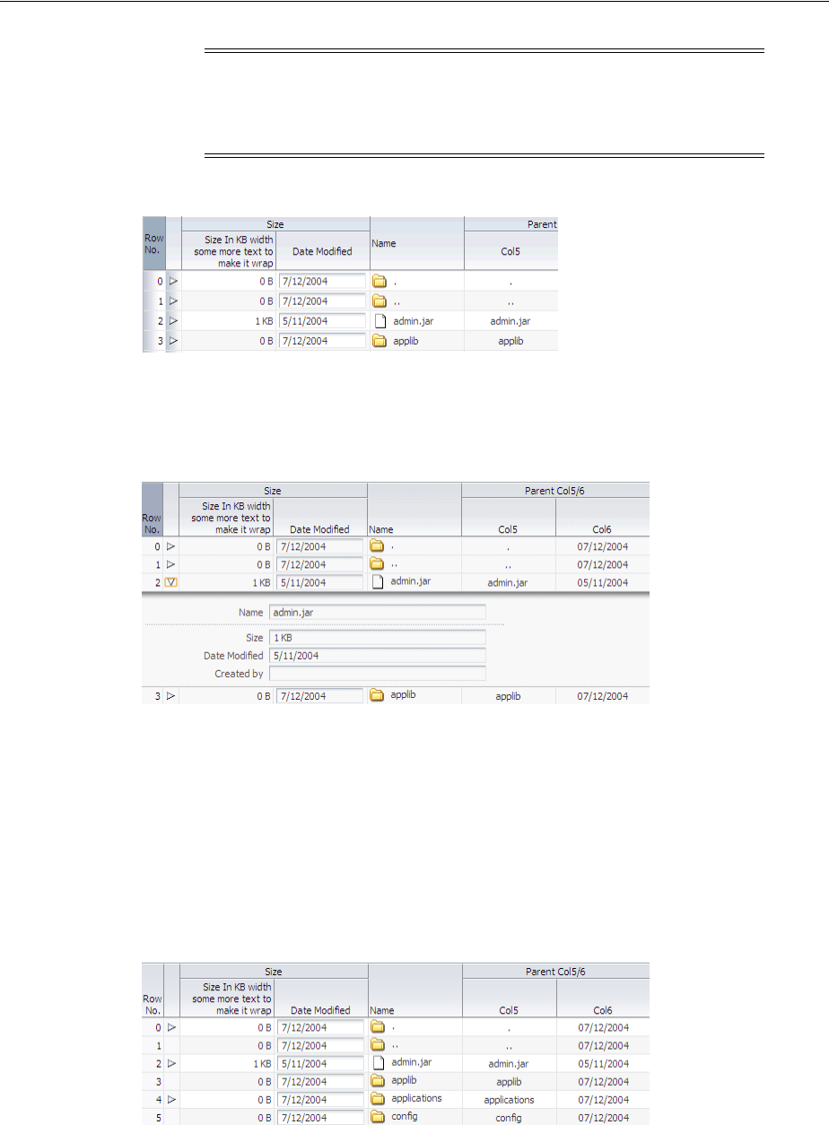
Adding Hidden Capabilities to a Table
12-32 Web User Interface Developer's Guide for Oracle Application Development Framework
Figure 12–16 Table with Unexpanded DetailStamp Facet
Figure 12–17 shows the same table, but with the detailStamp facet expanded for the
first row.
Figure 12–17 Expanded detailStamp Facet
You can use an EL expression for the rendered attribute on the facet to determine
whether or not to display the toggle icon and show details. For example, say on a
shopping cart page you want to use the detailStamp facet to display gift wrapping
information. However, not all order items will have gift wrapping information, so you
only want the toggle icon to display if the order item has the information to display.
You could create a method on managed bean that determines if there is information to
display, and then bind the rendered attribute to that method. Figure 12–18 shows the
same table but with icons displayed only for the rows that have information to display.
Figure 12–18 Conditional detailStamp Facet
Note: When a table that uses the detailStamp facet is rendered in
Screen Reader mode, the contents of the facet appear in a popup
window. For more information about accessibility, see Chapter 30,
"Developing Accessible ADF Faces Pages."
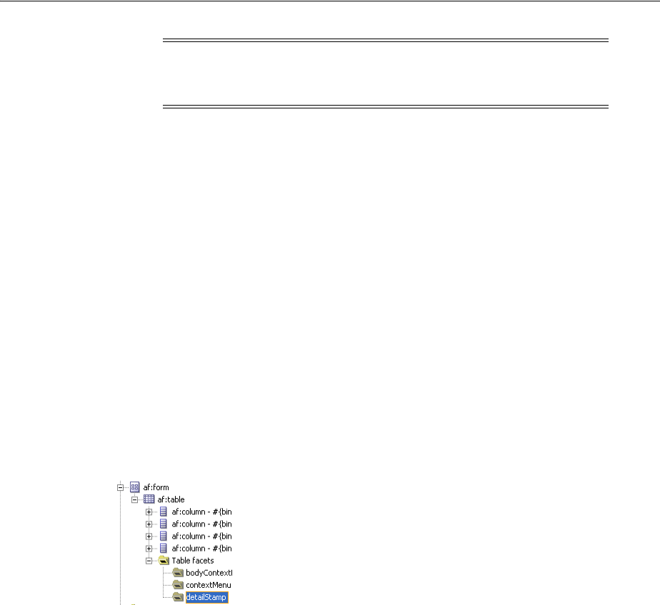
Adding Hidden Capabilities to a Table
Using Tables and Trees 12-33
12.4.1 How to Use the detailStamp Facet
To use the detailStamp facet, you insert a component that is bound to the data to be
displayed or hidden into the facet.
Before you begin:
It may be helpful to have an understanding of how the attributes can affect
functionality. For more information, see Section 12.4, "Adding Hidden Capabilities to a
Table."
You may also find it helpful to understand functionality that can be added using other
ADF Faces features. For more information, see Section 12.1.2, "Additional
Functionality for Tables and Trees."
To use the detailStamp facet:
1. In the Component Palette, drag the components you want to appear in the facet to
the detailStamp facet folder. Figure 12–19 shows the detailStamp facet folder in
the Structure window.
Figure 12–19 detailStamp Facet in the Structure Window
2. If the attribute to be displayed is specific to a current record, replace the JSF code
(which simply binds the component to the attribute), so that it uses the table’s
variable to display the data for the current record.
Example 12–7 shows abbreviated code used to display the detailStamp facet
shown in Figure 12–17, which shows details about the selected row.
Example 12–7 Code for detailStamp Facet
<af:table rowSelection="multiple" var="test1"
value="#{tableTestData}"
<f:facet name="detailStamp">
<af:panelFormLayout rows="4" labelWidth="33%" fieldWidth="67%"
inlineStyle="width:400px">
<af:inputText label="Name" value="#{test1.name}"/>
<af:group>
<af:inputText label="Size" value="#{test1.size}"/>
<af:inputText label="Date Modified" value="#{test1.inputDate}"/>
<af:inputText label="Created by"/>
Note: If you set the table to allow columns to freeze, the freeze will
not work when you display the detailStamp facet. That is, a user
cannot freeze a column while the details are being displayed.
Tip: If the facet folder does not appear in the Structure window,
right-click the table and choose Facets - Table > Detail Stamp.
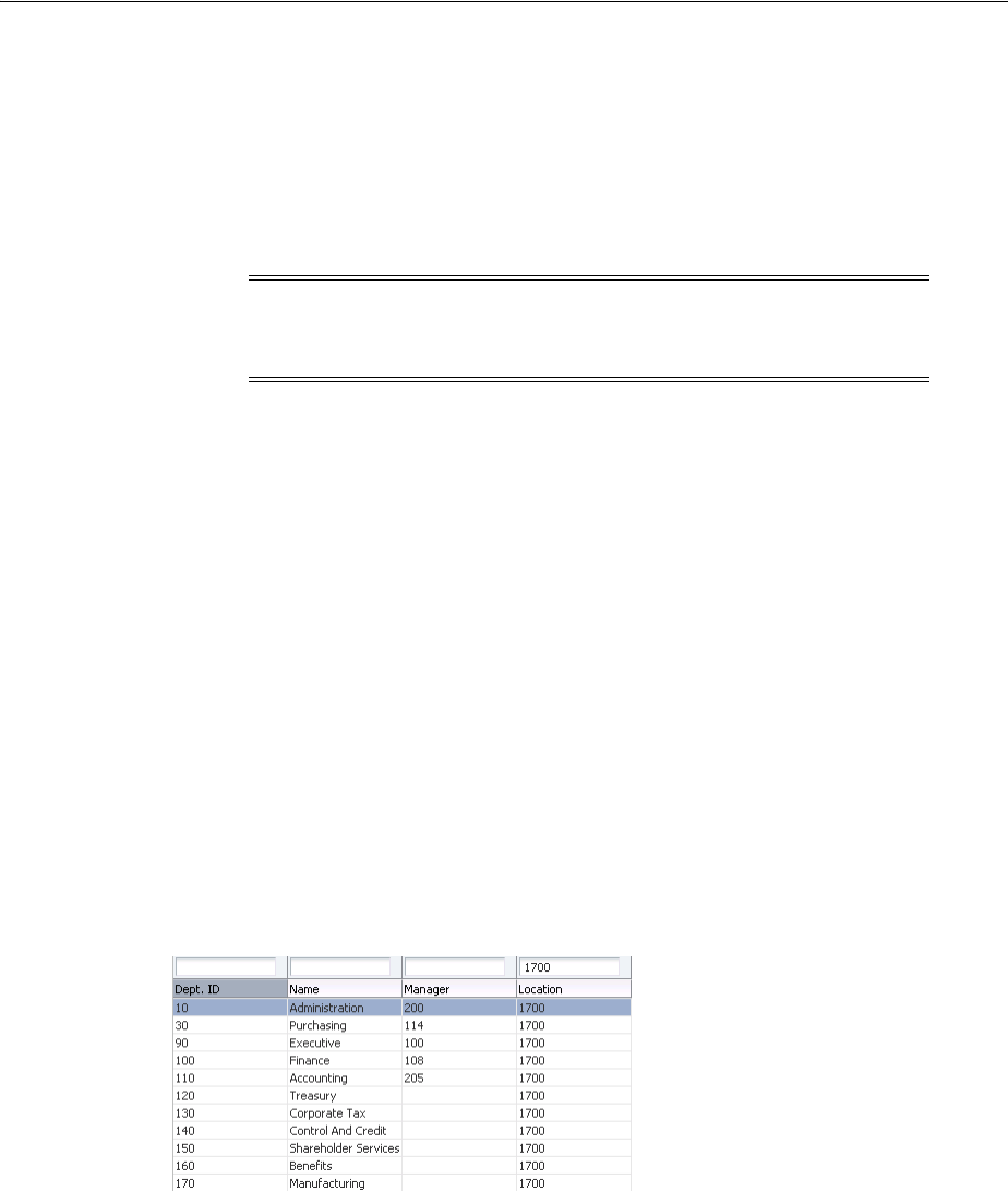
Enabling Filtering in Tables
12-34 Web User Interface Developer's Guide for Oracle Application Development Framework
</af:group>
</af:panelFormLayout>
</f:facet>
</af:table>
3. If you want the detailStamp facet to display its icon and components
conditionally, set the rendered attribute on the facet to a method on a managed
bean that will determine if the facet should be rendered.
12.4.2 What Happens at Runtime: Disclosing Row Data
When the user hides or shows the details of a row, the table generates a
rowDisclosureEvent event. The event tells the table to toggle the details (that is,
either expand or collapse).
The rowDisclosureEvent event has an associated listener. You can bind the
rowDisclosureListener attribute on the table to a method on a managed bean.
This method will then be invoked in response to the rowDisclosureEvent event to
execute any needed post-processing.
12.5 Enabling Filtering in Tables
You can add a filter to a table that can be used so that the table displays only rows
whose values match the filter. When enabled and set to visible, a search criteria input
field displays above each searchable column.
For example, the table in Figure 12–20 has been filtered to display only rows in which
the Location value is 1700.
Figure 12–20 Filtered Table
Filtered table searches are based on Query-by-Example and use the QBE text or date
input field formats. The input validators are turned off to allow for entering characters
for operators such as > and < to modify the search criteria. For example, you can enter
>1500 as the search criteria for a number column. Wildcard characters may also be
supported. Searches can be either case-sensitive or case-insensitive. If a column does
not support QBE, the search criteria input field will not render for that column.
The filtering feature uses a model for filtering data into the table. The table’s
filterModel attribute object must be bound to an instance of the
FilterableQueryDescriptor class.
Note: If your application uses the Fusion technology stack, then you
can drag attributes from a data control and drop them into the
detailStamp facet. You don’t need to modify the code.

Enabling Filtering in Tables
Using Tables and Trees 12-35
In Example 12–8, the table filterVisible attribute is set to true to enable the filter
input fields, and the sortProperty attribute is set on the column to identify the
column in the filterModel instance. Each column element has its filterable
attribute set to true.
Example 12–8 Table Component with Filtering Enabled
<af:table value="#{myBean.products}" var="row"
...
filterVisible="true"
...
rowselection="single">
...
<af:column sortProperty="ProductID" filterable="true" sortable="true"
<af:outputText value="#{row.ProductID}">
...
</af:column>
<af:column sortProperty="Name" filterable="true" sortable="true"
<af:outputText value="#{row.Name}"/>
...
</af:column>
<af:column sortProperty="warehouse" filterable="true" sortable="true"
<af:outputText value="#{row.warehouse}"/>
...
</af:column>
</af:table>
12.5.1 How to Add Filtering to a Table
To add filtering to a table, first create a class that can provide the filtering
functionality. You then bind the table to that class, and configure the table and
columns to use filtering. The columns that will use filtering must either have a value
for the headerText attribute, or must contain a component in the header facet. This
allows the filter component to be displayed. Additionally, the column must be
configured to be sortable, because the filterModel class uses the sortProperty
attribute.
Before you begin:
It may be helpful to have an understanding of how the attributes can affect
functionality. For more information, see Section 12.5, "Enabling Filtering in Tables."
You may also find it helpful to understand functionality that can be added using other
ADF Faces features. For more information, see Section 12.1.2, "Additional
Functionality for Tables and Trees."
To add filtering to a table:
1. Create a Java class that is a subclass of the FilterableQueryDescriptor class.
For more information about this class, see the ADF Faces Javadoc.
Note: If your application uses the Fusion technology stack, then you
can use data controls to create tables and filtering will be created for
you. For more information see the "Creating ADF Databound Tables"
chapter of the Oracle Fusion Middleware Web User Interface Developer's
Guide for Oracle Application Development Framework

Displaying Data in Trees
12-36 Web User Interface Developer's Guide for Oracle Application Development Framework
2. Create a table, as described in Section 12.3, "Using the Table Component."
3. Select the table in the Structure window and set the following attributes in the
Property Inspector:
■FilterVisible: Set to true to display the filter criteria input field above
searchable column.
■FilterModel: Bind to an instance of the FilterableQueryDescriptor class
created in Step 1.
4. In the Structure window, select a column in the table and in the Property
Inspector, and set the following for each column in the table:
■Filterable: Set to true.
■FilterFeatures: Set to caseSensitive or caseInsensitive. If not
specified, the case sensitivity is determined by the model.
12.6 Displaying Data in Trees
The ADF Faces tree component displays hierarchical data, such as organization charts
or hierarchical directory structures. In data of these types, there may be a series of
top-level nodes, and each element in the structure may expand to contain other
elements. As an example, in an organization chart, each element, that is, each
employee, in the hierarchy may have any number of child elements (direct reports).
The tree component supports multiple root elements. It displays the data in a form
that represents the structure, with each element indented to the appropriate level to
indicate its level in the hierarchy, and connected to its parent. Users can expand and
collapse portions of the hierarchy. Figure 12–21 shows a tree used to display directories
in the File Explorer application.
Tip: If you want to use a component other than an inputText
component for your filter (for example, an inputDate component),
then instead of setting filterVisible to true, you can add the
needed component to the filter facet. To do so:
1. In the Structure window, right-click the column to be filtered and choose
Insert inside af:column > JSF Core > Filter facet.
2. From the Component Palette, drag and drop a component into the facet.
3. Set the value of the component to the corresponding attribute within the
FilterableQueryDescriptor class created in Step 1. Note that the
value must take into account the variable used for the row, for example:
#{af:inputDate label="Select Date" id="name"
value="row.filterCriteria.date"}
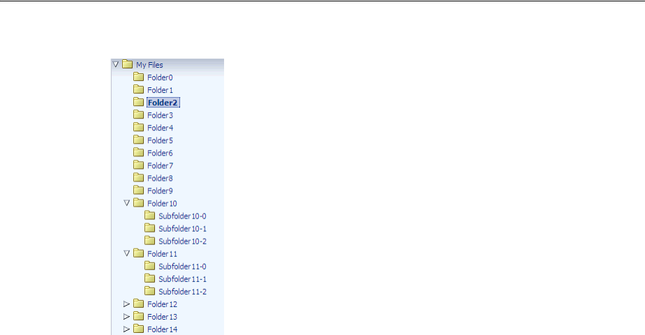
Displaying Data in Trees
Using Tables and Trees 12-37
Figure 12–21 Tree Component in the File Explorer Application
The ADF Faces tree component uses a model to access the data in the underlying
hierarchy. The specific model class is oracle.adf.view.rich.model.TreeModel,
which extends CollectionModel, described in Section 12.3, "Using the Table
Component."
You must create your own tree model to support your tree. The tree model is a
collection of rows. It has an isContainer() method that returns true if the current
row contains child rows. To access the children of the current row, you call the
enterContainer() method. Calling this method results in the TreeModel instance
changing to become a collection of the child rows. To revert back up to the parent
collection, you call the exitContainer() method.
You may find the
org.apache.myfaces.trinidad.model.ChildPropertyTreeModel class
useful when constructing a TreeModel class, as shown in Example 12–9.
Example 12–9 Constructing a TreeModel
List<TreeNode> root = new ArrayList<TreeNode>();
for(int i = 0; i < firstLevelSize; i++)
{
List<TreeNode> level1 = new ArrayList<TreeNode>();
for(int j = 0; j < i; j++)
{
List<TreeNode> level2 = new ArrayList<TreeNode>();
for(int k=0; k<j; k++)
{
TreeNode z = new TreeNode(null, _nodeVal(i,j,k));
level2.add(z);
}
TreeNode c = new TreeNode(level2, _nodeVal(i,j));
level1.add(c);
}
TreeNode n = new TreeNode(level1, _nodeVal(i));
root.add(n);
}
ChildPropertyTreeModel model = new ChildPropertyTreeModel(root, "children");
private String _nodeVal(Integer... args)
{

Displaying Data in Trees
12-38 Web User Interface Developer's Guide for Oracle Application Development Framework
StringBuilder s = new StringBuilder();
for(Integer i : args)
s.append(i);
return s.toString();
}
You can manipulate the tree similar to the way you can manipulate a table. You can do
the following:
■To make a node current, call the setRowIndex() method on the tree with the
appropriate index into the list. Alternatively, call the setRowKey() method with
the appropriate rowKey object.
■To access a particular node, first make that node current, and then call the
getRowData() method on the tree.
■To access rows for expanded or collapsed nodes, call getAddedSet and
getRemovedSet methods on the RowDisclosureEvent. For more information,
see Section 12.6.4, "What You May Need to Know About Programmatically
Expanding and Collapsing Nodes."
■To manipulate the node’s child collection, call the enterContainer() method
before calling the setRowIndex() and setRowKey() methods. Then call the
exitContainer() method to return to the parent node.
■To point to a rowKey for a node inside the tree (at any level) use the
focusRowKey attribute. The focusRowKey attribute is set when the user
right-clicks on a node and selects the Show as top context menu item (or the Show
as top toolbar button in the panelCollection component).
When the focusRowKey attribute is set, the tree renders the node pointed to by
the focusRowKey attribute as the root node in the Tree and displays a
Hierarchical Selector icon next to the root node. Clicking the Hierarchical Selector
icon displays a Hierarchical Selector dialog which shows the path to the
focusRowKey object from the root node of the tree. How this displays depends
on the components placed in the pathStamp facet.
As with tables, trees use stamping to display content for the individual nodes. Trees
contain a nodeStamp facet, which is a holder for the component used to display the
data for each node. Each node is rendered (stamped) once, repeatedly for all nodes. As
each node is stamped, the data for the current node is copied into a property that can
be addressed using an EL expression. Specify the name to use for this property using
the var property on the tree. Once the tree has completed rendering, this property is
removed or reverted back to its previous value.
Note: If your application uses the Fusion technology stack, then you
can use data controls to create trees and the model will be created for
you. For more information see the "Displaying Master-Detail Data"
chapter of the Oracle Fusion Middleware Web User Interface Developer's
Guide for Oracle Application Development Framework
Note: You cannot use JavaScript to dynamically size a tree. The
height of a tree is set the first time is rendered and cannot be changed
using JavaScript APIs.

Displaying Data in Trees
Using Tables and Trees 12-39
Because of this stamping behavior, only certain types of components are supported as
children inside an ADF Faces tree. All components that have no behavior are
supported, as are most components that implement the ValueHolder or
ActionSource interfaces.
In Example 12–10, the data for each element is referenced using the variable node,
which identifies the data to be displayed in the tree. The nodeStamp facet displays the
data for each element by getting further properties from the node variable:
Example 12–10 Displaying Data in a Tree
<af:tree var="node">
<f:facet name="nodeStamp">
<af:outputText value="#{node.firstname}"/>
</f:facet>
</af:tree>
Trees also contain a pathStamp facet. This facet determines how the content of the
Hierarchical Selector dialog is rendered, just like the nodeStamp facet determines
how the content of the tree is rendered. The component inside the pathStamp facet
can be a combination of simple outputText, image, and outputFormatted tags
and cannot not be any input component (that is, any EditableValueHolder
component) because no user input is allowed in the Hierarchical Selector popup. If
this facet is not provided, then the Hierarchical Selector icon is not rendered.
For example, including an image and an outputText component in the pathStamp
facet causes the tree to render an image and an outputText component for each node
level in the Hierarchical Selector dialog. Use the same EL expression to access the
value. For example, if you want to show the first name for each node in the path in an
outputText component, the EL expression would be <af:outputText
value="#{node.firstname}"/>.
12.6.1 How to Display Data in Trees
To create a tree, you add a tree component to your page and configure the display and
behavior properties.
Before you begin:
It may be helpful to have an understanding of how the attributes can affect
functionality. For more information, see Section 12.6, "Displaying Data in Trees."
You may also find it helpful to understand functionality that can be added using other
ADF Faces features. For more information, see Section 12.1.2, "Additional
Functionality for Tables and Trees."
To add a tree to a page:
1. Create a Java class that extends the
org.apache.myfaces.trinidad.model.TreeModel class, as shown in
Example 12–9.
Tip: The pathStamp facet is also used to determine how default
toolbar buttons provided by the panelCollection component will
behave. If you want to use the buttons, add a component bound to a
node value. For more information about using the
panelCollection component, see Section 12.9, "Displaying Table
Menus, Toolbars, and Status Bars."

Displaying Data in Trees
12-40 Web User Interface Developer's Guide for Oracle Application Development Framework
2. In the Component Palette, from the Data Views panel, drag and drop a Tree to
open the Insert Tree dialog. Configure the tree as needed. Click Help or press F1
for help in using the dialog.
3. In the Property Inspector, expand the Data section and set the following attributes:
■Value: Specify an EL expression for the object to which you want the tree to be
bound. This must be an instance of
org.apache.myfaces.trinidad.model.TreeModel as created in Step 1.
■Var: Specify a variable name to represent each node.
■VarStatus: Optionally enter a variable that can be used to determine the state
of the component. During the Render Response phase, the tree iterates over
the model rows and renders each node. For any given node, the varStatus
attribute provides the following information:
–model: A reference to the CollectionModel instance
–index: The current row index
–rowKey: The unique key for the current node
4. Expand the Appearance section and set the following attributes:
■DisplayRow: Specify the node to display in the tree during the initial display.
The possible values are first to display the first node, last to display the
last node, and selected to display the first selected node in the tree. The
default is first.
■DisplayRowKey: Specify the row key to display in the tree during the initial
display. This attribute should be set only programatically. Specifying this
attribute will override the displayRow attribute.
■Summary: Optionally enter a summary of the data displayed by the tree.
5. Expand the Behavior section and set the following attributes:
■InitiallyExpanded: Set to true if you want all nodes expanded when the
component first renders.
■EditingMode: Specify whether for any editable components used to display
data in the tree, you want all the nodes to be editable (editAll), or you want
the user to click a node to make it editable (clickToEdit). For more
information, see Section 12.2.4, "Editing Data in Tables, Trees, and Tree Tables."
■ContextMenuSelect: Determines whether or not the node is selected when
you right-click to open a context menu. When set to true, the node is selected.
For more information about context menus, see Chapter 15, "Using Popup
Dialogs, Menus, and Windows."
■RowSelection: Set a value to make the nodes selectable. Valid values are:
none, single, or multiple. For information about how to then
programatically perform some action on the selected nodes, see Section 12.6.5,
"What You May Need to Know About Programmatically Selecting Nodes."
■ContentDelivery: Specify when the data should be delivered. When the
contentDelivery attribute is set to immediate, data is fetched at the same
time the component is rendered. If the contentDelivery attribute is set to
lazy, data will be fetched and delivered to the client during a subsequent
request. If the attribute is set to whenAvailable (the default), the renderer
checks if the data is available. If it is, the content is delivered immediately. If it
is not, then lazy delivery is used. For more information, see Section 12.2.2,
"Content Delivery."
Displaying Data in Trees
Using Tables and Trees 12-41
■FetchSize: Specify the number of rows in the data fetch block. For more
information, see Section 12.2.2, "Content Delivery."
■AutoHeightRows: Set to the maximum number of nodes to display before a
scroll bar is displayed. The default value is -1 (no automatic sizing for any
number of number). You can set the value to 0 to have the value be the same
as the fetchSize value.
■SelectionListener: Optionally enter an EL expression for a listener that
handles selection events. For more information, see Section 12.6.5, "What You
May Need to Know About Programmatically Selecting Nodes."
■FocusListener: Optionally enter an EL expression for a listener that handles
focus events.
■RowDisclosureListener: Optionally enter an EL expression for a listener
method that handles node disclosure events.
6. Expand the Advanced section and set the following attributes:
■FocusRowKey: Optionally enter the node that is to be the initially focused
node.
■DisclosedRowKeys: Optionally enter an EL expression to a method on a
backing bean that handles node disclosure. For more information, see
Section 12.6.4, "What You May Need to Know About Programmatically
Expanding and Collapsing Nodes."
■SelectedRowKeys: Optionally enter the keys for the nodes that should be
initially selected. For more information, see Section 12.6.5, "What You May
Need to Know About Programmatically Selecting Nodes."
7. To add components to display data in the tree, drag the desired component from
the Component Palette to the nodeStamp facet. Figure 12–22 shows the
nodeStamp facet for the tree used to display directories in the File Explorer
application.
Note: Note the following about setting the autoHeightRows
attribute:
■Specifying height on the inlineStyle attribute will have no
effect and will be overridden by the value of AutoHeightRows.
■Specifying a min-height or max-height on the inlineStyle
attribute is not recommended and is incompatible with the
autoHeightRows attribute.
■When the component is placed in a layout-managing container,
such as panelSplitter, it will be sized by the container (no
auto-sizing will occur). For more information, see Section 12.2.7,
"Geometry Management and Table, Tree, and Tree Table
Components."
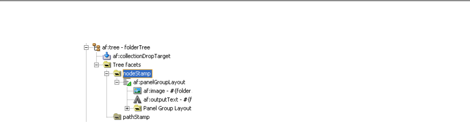
Displaying Data in Trees
12-42 Web User Interface Developer's Guide for Oracle Application Development Framework
Figure 12–22 nodeStamp Facet in the Structure Window
The component’s value should be bound to the variable value set on the tree’s var
attribute and the attribute to be displayed. For example, the tree in the File
Explorer application uses folder as the value for the var attribute, and displays
the name of the directory for each node. Therefore, the value of the output
component used to display the directory name is #{folder.name}.
12.6.2 What Happens When You Add a Tree to a Page
When you add a tree to a page, JDeveloper adds a nodeStamp facet to stamp out the
nodes of the tree. Example 12–11 shows the abbreviated code for the tree in the File
Explorer application that displays the directory structure.
Example 12–11 ADF Faces Tree Code in a JSF Page
<af:tree id="folderTree"
var="folder"
binding="#{explorer.navigatorManager.foldersNavigator
.foldersTreeComponent}"
value="#{explorer.navigatorManager.foldersNavigator.
foldersTreeModel}"
disclosedRowKeys="#{explorer.navigatorManager.foldersNavigator.
foldersTreeDisclosedRowKeys}"
rowSelection="single"
contextMenuId=":context2"
selectionListener="#{explorer.navigatorManager.foldersNavigator.
showSelectedFolderContent}">
<f:facet name="nodeStamp">
<af:panelGroupLayout>
<af:image id="folderNodeStampImg" source="#{folder.icon}"
inlineStyle="vertical-align:middle; margin-right:3px;
shortDesc="folder icon"/>
<af:outputText id="folderNodeStampText" value="#{folder.name}"/>
</af:panelGroupLayout>
</f:facet>
</af:tree>
12.6.3 What Happens at Runtime: Tree Component Events
The tree is displayed in a format with nodes indented to indicate their levels in the
hierarchy. The user can click nodes to expand them to show children nodes. The user
can click expanded nodes to collapse them. When a user clicks one of these icons, the
component generates a RowDisclosureEvent event. You can register a custom
rowDisclosureListener method to handle any processing in response to the
Tip: Facets can accept only one child component. Therefore, if you
want to use more than one component per node, place the
components in a group component that can be the facet’s direct child,
as shown in Figure 12–22.

Displaying Data in Trees
Using Tables and Trees 12-43
event. For more information, see Section 12.6.4, "What You May Need to Know About
Programmatically Expanding and Collapsing Nodes."
When a user selects or deselects a node, the tree component invokes a
selectionEvent event. You can register custom selectionListener instances,
which can do post-processing on the tree component based on the selected nodes. For
more information, see Section 12.6.5, "What You May Need to Know About
Programmatically Selecting Nodes."
12.6.4 What You May Need to Know About Programmatically Expanding and Collapsing
Nodes
The RowDisclosureEvent event has two RowKeySet objects: the RemovedSet
object for all the collapsed nodes and the AddedSet object for all the expanded nodes.
The component expands the subtrees under all nodes in the added set and collapses
the subtrees under all nodes in the removed set.
Your custom rowDisclosureListener method can do post-processing, on the tree
component, as shown in Example 12–12.
Example 12–12 Tree Table Component with rowDisclosureListener
<af:treeTable id="folderTree" var="directory" value="#{fs.treeModel}"
binding="#{editor.component}" rowselection="multiple"
columnselection="multiple" focusRowKey="#{fs.defaultFocusRowKey}"
selectionListener="#{fs.Table}"
contextMenuId="treeTableMenu"
rowDisclosureListener="#{fs.handleRowDisclosure}">
The backing bean method that handles row disclosure events is shown in
Example 12–13. The example illustrates expansion of a tree node. For the contraction
of a tree node, you would use getRemovedSet.
Example 12–13 Backing Bean Method for RowDisclosureEvent
public void handleRowDisclosure(RowDisclosureEvent rowDisclosureEvent)
throws Exception {
Object rowKey = null;
Object rowData = null;
RichTree tree = (RichTree) rowDisclosureEvent.getSource();
RowKeySet rks = rowDisclosureEvent.getAddedSet();
if (rks != null) {
int setSize = rks.size();
if (setSize > 1) {
throw new Exception("Unexpected multiple row disclosure
added row sets found.");
}
if (setSize == 0) {
// nothing in getAddedSet indicates this is a node
// contraction, not expansion. If interested only in handling
// node expansion at this point, return.
return;
}
rowKey = rks.iterator().next();
tree.setRowKey(rowKey);

Displaying Data in Trees
12-44 Web User Interface Developer's Guide for Oracle Application Development Framework
rowData = tree.getRowData();
// Do whatever is necessary for accessing tree node from
// rowData, by casting it to an appropriate data structure
// for example, a Java map or Java bean, and so forth.
}
}
Trees and tree tables use an instance of the
oracle.adf.view.rich.model.RowKeySet class to keep track of which nodes
are expanded. This instance is stored as the disclosedRowKeys attribute on the
component. You can use this instance to control the expand or collapse state of an
node in the hierarchy programatically, as shown in Example 12–14. Any node
contained by the RowKeySet instance is expanded, and all other nodes are collapsed.
The addAll() method adds all elements to the set, and the and removeAll()
method removes all the nodes from the set.
Example 12–14 Tree Component with disclosedRowKeys Attribute
<af:tree var="node"
inlineStyle="width:90%; height:300px"
id="displayRowTable"
varStatus="vs"
rowselection="single"
disclosedRowKeys="#{treeTableTestData.disclosedRowKeys}"
value="#{treeTableTestData.treeModel}">
The backing bean method that handles the disclosed row keys is shown in
Example 12–15.
Example 12–15 Backing Bean Method for Handling Row Keys
public RowKeySet getDisclosedRowKeys()
{
if (disclosedRowKeys == null)
{
// Create the PathSet that we will use to store the initial
// expansion state for the tree
RowKeySet treeState = new RowKeySetTreeImpl();
// RowKeySet requires access to the TreeModel for currency.
TreeModel model = getTreeModel();
treeState.setCollectionModel(model);
// Make the model point at the root node
int oldIndex = model.getRowIndex();
model.setRowKey(null);
for(int i = 1; i<=19; ++i)
{
model.setRowIndex(i);
treeState.setContained(true);
}
model.setRowIndex(oldIndex);
disclosedRowKeys = treeState;
}
return disclosedRowKeys;
}
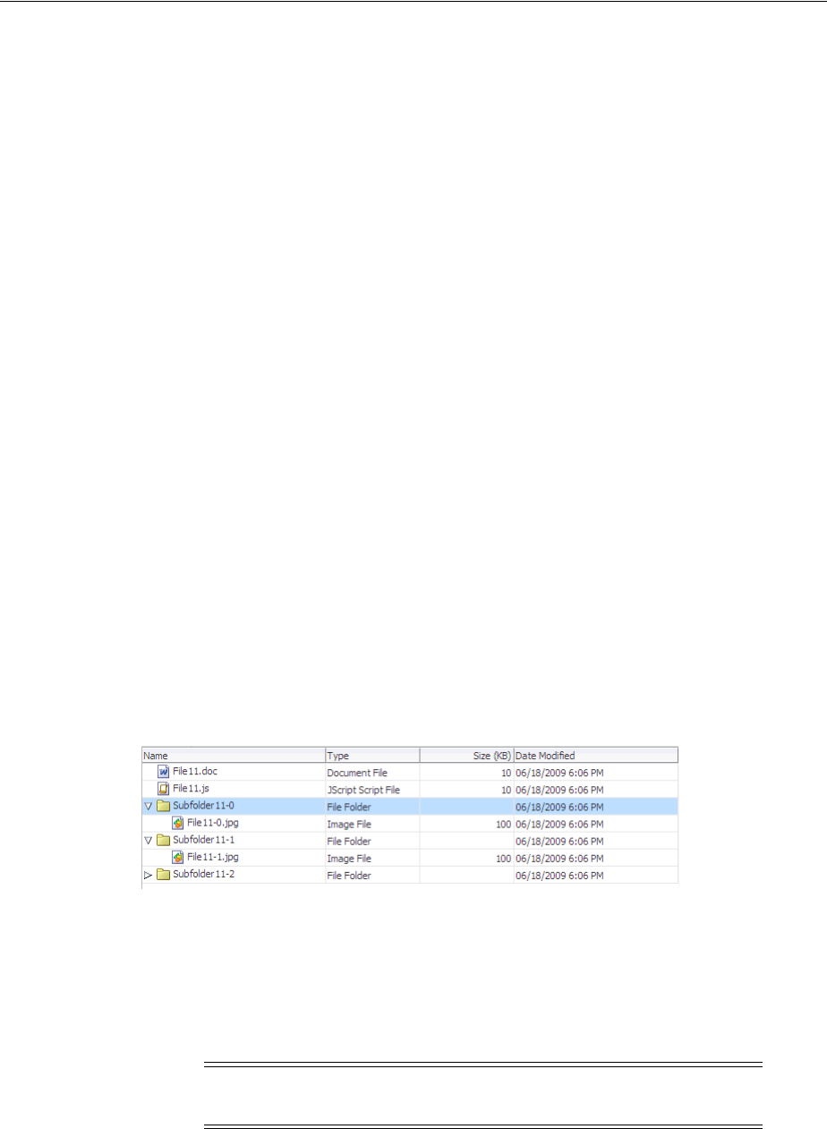
Displaying Data in Tree Tables
Using Tables and Trees 12-45
12.6.5 What You May Need to Know About Programmatically Selecting Nodes
The tree and tree table components allow nodes to be selected, either a single node
only, or multiple nodes. If the component allows multiple selections, users can select
multiple nodes using Control+click and Shift+click operations.
When a user selects or deselects a node, the tree component fires a selectionEvent
event. This event has two RowKeySet objects: the RemovedSet object for all the
deselected nodes and the AddedSet object for all the selected nodes.
Tree and tree table components keep track of which nodes are selected using an
instance of the class oracle.adf.view.rich.model.RowKeySet. This instance is
stored as the selectedRowKeys attribute on the component. You can use this
instance to control the selection state of a node in the hierarchy programatically. Any
node contained by the RowKeySet instance is deemed selected, and all other nodes
are not selected. The addAll() method adds all nodes to the set, and the and
removeAll() method removes all the nodes from the set. Tree and tree table node
selection works in the same way as table row selection. You can refer to sample code
for table row selection in Section 12.3.8, "What You May Need to Know About
Performing an Action on Selected Rows in Tables."
12.7 Displaying Data in Tree Tables
The ADF Faces tree table component displays hierarchical data in the form of a table.
The display is more elaborate than the display of a tree component, because the tree
table component can display columns of data for each tree node in the hierarchy. The
component includes mechanisms for focusing on subtrees within the main tree, as well
as expanding and collapsing nodes in the hierarchy. Figure 12–23 shows the tree table
used in the File Explorer application. Like the tree component, the tree table can
display the hierarchical relationship between the files in the collection. And like the
table component, it can also display attribute values for each file.
Figure 12–23 Tree Table in the File Explorer Application
The immediate children of a tree table component must be column components, in the
same way as for table components. Unlike the table, the tree table component has a
nodeStamp facet which holds the column that contains the primary identifier of an
node in the hierarchy. The treeTable component supports the same stamping
behavior as the Tree component (for details, see Section 12.6, "Displaying Data in
Trees").
For example, in the File Explorer application (as shown in Figure 12–23), the primary
identifier is the file name. This column is what is contained in the nodeStamp facet.
The other columns, such as Type and Size, display attribute values on the primary
Note: The nodeStamp facet can only contain one column (which
becomes the node in the tree).

Displaying Data in Tree Tables
12-46 Web User Interface Developer's Guide for Oracle Application Development Framework
identifier, and these columns are the direct children of the tree table component. This
tree table uses node as the value of the variable that will be used to stamp out the data
for each node in the nodeStamp facet column and each component in the child
columns. Example 12–16 shows abbreviated code for the tree table in the File Explorer
application.
Example 12–16 Stamping Rows in a TreeTable
<af:treeTable id="folderTreeTable" var="file"
value="#{explorer.contentViewManager.treeTableContentView.
contentModel}"
binding="#{explorer.contentViewManager.treeTableContentView.
contentTreeTable}"
emptyText="#{explorerBundle['global.no_row']}"
columnStretching="last"
rowSelection="single"
selectionListener="#{explorer.contentViewManager.
treeTableContentView.treeTableSelectFileItem}"
summary="treeTable data">
<f:facet name="nodeStamp">
<af:column headerText="#{explorerBundle['contents.name']}"
width="200" sortable="true" sortProperty="name">
<af:panelGroupLayout>
<af:image source="#{file.icon}"
shortDesc="#{file.name}"
inlineStyle="margin-right:3px; vertical-align:middle;"/>
<af:outputText id="nameStamp" value="#{file.name}"/>
</af:panelGroupLayout>
</af:column>
</f:facet>
<f:facet name="pathStamp">
<af:panelGroupLayout>
<af:image source="#{file.icon}"
shortDesc="#{file.name}"
inlineStyle="margin-right:3px; vertical-align:middle;"/>
<af:outputText value="#{file.name}"/>
</af:panelGroupLayout>
</f:facet>
<af:column headerText="#{explorerBundle['contents.type']}">
<af:outputText id="typeStamp" value="#{file.type}"/>
</af:column>
<af:column headerText="#{explorerBundle['contents.size']}">
<af:outputText id="sizeStamp" value="#{file.property.size}"/>
</af:column>
<af:column headerText="#{explorerBundle['contents.lastmodified']}"
width="140">
<af:outputText id="modifiedStamp"
value="#{file.property.lastModified}"/>
</af:column>
</af:treeTable>
The tree table component supports many of the same attributes as both tables and
trees. For more information about these attributes see Section 12.3, "Using the Table
Component" and Section 12.6, "Displaying Data in Trees."

Passing a Row as a Value
Using Tables and Trees 12-47
12.7.1 How to Display Data in a Tree Table
You use the Insert Tree Table wizard to create a tree table. Once the wizard is
complete, you can use the Property Inspector to configure additional attributes on the
tree table.
Before you begin:
It may be helpful to have an understanding of how the attributes can affect
functionality. For more information, see Section 12.7, "Displaying Data in Tree Tables."
You may also find it helpful to understand functionality that can be added using other
ADF Faces features. For more information, see Section 12.1.2, "Additional
Functionality for Tables and Trees."
To add a tree table to a page:
1. In the Component Palette, from the Data Views panel, drag and drop a Tree Table
onto the page to open the Insert Tree Table wizard. Configure the table by
completing the wizard. If you need help, press F1 or click Help.
2. Use the Property Inspector to configure any other attributes.
12.8 Passing a Row as a Value
There may be a case where you need to pass an entire row from a collection as a value.
To do this, you pass the variable used in the table to represent the row, or used in the
tree to represent a node, and pass it as a value to a property in the pageFlow scope.
Another page can then access that value from the scope. The setPropertyListener
tag allows you to do this (for more information about the setPropertyListener
tag, including procedures for using it, see Section 5.7, "Passing Values Between
Pages").
For example, suppose you have a master page with a single-selection table showing
employees, and you want users to be able to select a row and then click a command
button to navigate to a new page to edit the data for that row, as shown in
Example 12–17. The EL variable name emp is used to represent one row (employee) in
the table. The action attribute value of the commandButton component is a static
string outcome showEmpDetail, which allows the user to navigate to the Employee
Detail page. The setPropertyListener tag takes the from value (the variable
emp), and stores it with the to value.
Example 12–17 Using SetPropertyListener and PageFlowScope
<af:table value="#{myManagedBean.allEmployees}" var="emp"
rowSelection="single">
<af:column headerText="Name">
<af:outputText value="#{emp.name}"/>
</af:column>
<af:column headerText="Department Number">
<af:outputText value="#{emp.deptno}"/>
</af:column>
<af:column headertext="Select">
<af:commandButton text="Show more details" action="showEmpDetail">
<af:setPropertyListener from="#{emp}"
Tip: The attributes of the tree table are the same as those on the table
and tree components. Refer to Section 12.3.4, "How to Display a Table
on a Page," and Section 12.6.1, "How to Display Data in Trees" for help
in configuring the attributes.

Displaying Table Menus, Toolbars, and Status Bars
12-48 Web User Interface Developer's Guide for Oracle Application Development Framework
to="#{pageFlowScope.empDetail}"
type="action"/>
</af:commandButton>
</af:column>
</af:table>
When the user clicks the command button on an employee row, the listener executes,
and the value of #{emp} is retrieved, which corresponds to the current row
(employee) in the table. The retrieved row object is stored as the empDetail property
of pageFlowScope with the #{pageFlowScope.empDetail} EL expression. Then
the action event executes with the static outcome, and the user is navigated to a detail
page. On the detail page, the outputText components get their value from
pageFlowScope.empDetail objects, as shown in Example 12–18.
Example 12–18 Retrieving PageFlowScope Objects
<h:panelGrid columns="2">
<af:outputText value="Firstname:"/>
<af:inputText value="#{pageFlowScope.empDetail.name}"/>
<af:outputText value="Email:"/>
<af:inputText value="#{pageFlowScope.empDetail.email}"/>
<af:outputText value="Hiredate:"/>
<af:inputText value="#{pageFlowScope.empDetail.hiredate}"/>
<af:outputText value="Salary:"/>
<af:inputText value="#{pageFlowScope.empDetail.salary}"/>
</h:panelGrid>
12.9 Displaying Table Menus, Toolbars, and Status Bars
You can use the panelCollection component to add menus, toolbars, and status
bars to tables, trees, and tree tables. To use the panelCollection component, you
add the table, tree, or tree table component as a direct child of the panelCollection
component. The panelCollection component provides default menus and toolbar
buttons.
Figure 12–24 shows the panelCollection component with the tree table component
in the File Explorer application. The toolbar contains a menu that provides actions that
can be performed on the tree table (such as expanding and collapsing nodes), a button
that allows users to detach the tree table, and buttons that allow users to change the
rows displayed in the tree table. You can configure the toolbar to not display certain
toolbar items. For example, you can turn off the buttons that allow the user to detach
the tree or table. For more information about menus, toolbars, and toolbar buttons, see
Chapter 16, "Using Menus, Toolbars, and Toolboxes."
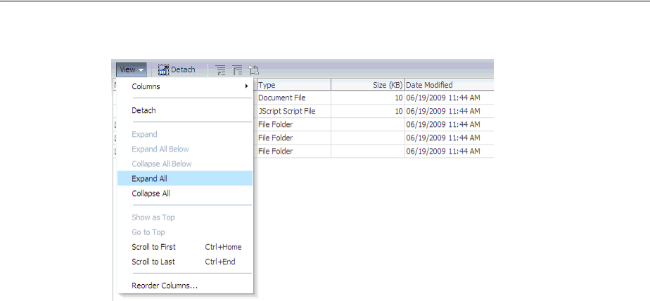
Displaying Table Menus, Toolbars, and Status Bars
Using Tables and Trees 12-49
Figure 12–24 Panel Collection for Tree Table with Menus and Toolbar
Among other facets, the panelCollection component contains a menu facet to hold
menu components, a toolbar facet for toolbar components, a secondaryToolbar
facet for another set of toolbar components, and a statusbar facet for status items.
The default top-level menu and toolbar items vary depending on the component used
as the child of the panelCollection component:
■Table and tree: Default top-level menu is View.
■Table and tree table with selectable columns: Default top-level menu items are
View and Format.
■Table and tree table: Default toolbar menu is Detach.
■Table and tree table with selectable columns: Default top-level toolbar items are
Freeze, Detach, and Wrap
■Tree and tree table (when the pathStamp facet is used): The toolbar buttons Go
Up, Go To Top, and Show as Top also appear.
Example 12–19 shows how the panelCollection component contains menus and
toolbars.
Example 12–19 The panelCollection Component with Table, Menus, and Toolbars
<af:panelCollection
binding="#{editor.component}">
<f:facet name="viewMenu">
<af:group>
<af:commandMenuItem text="View Item 1..."/>
<af:commandMenuItem text="View Item 2.."/>
<af:commandMenuItem text="View Item 3..." disabled="true"/>
<af:commandMenuItem text="View Item 4"/>
</af:group>
</f:facet>
<f:facet name="menus">
<af:menu text="Actions">
<af:commandMenuItem text="Add..." />
<af:commandMenuItem text="Create.." />
<af:commandMenuItem text="Update..." disabled="true"/>
<af:commandMenuItem text="Copy"/>
<af:commandMenuItem text="Delete"/>
<af:commandMenuItem text="Remove" accelerator="control A"/>

Displaying Table Menus, Toolbars, and Status Bars
12-50 Web User Interface Developer's Guide for Oracle Application Development Framework
<af:commandMenuItem text="Preferences"/>
</af:menu>
</f:facet>
<f:facet name="toolbar">
<af:toolbar>
<af:commandToolbarButton shortDesc="Create" icon="/new_ena.png">
</af:commandToolbarButton>
<af:commandToolbarButton shortDesc="Update" icon="/update_ena.png">
</af:commandToolbarButton>
<af:commandToolbarButton shortDesc="Delete" icon="/delete_ena.png">
</af:commandToolbarButton>
</af:toolbar>
</f:facet>
<f:facet name="secondaryToolbar">
</f:facet>
<f:facet name="statusbar">
<af:toolbar>
<af:outputText id="statusText" ... value="Custom Statusbar Message"/>
</af:toolbar>
</f:facet>
<af:table rowselection="multiple" columnselection="multiple"
...
<af:column
...
</af:column>
12.9.1 How to Add a panelCollection with a Table, Tree, or Tree Table
You add a panelCollection component and then add the table, tree, or tree table
inside the panelCollection component. You can then add and modify the menus
and toolbars for it.
Before you begin:
It may be helpful to have an understanding of how the attributes can affect
functionality. For more information, see Section 12.9, "Displaying Table Menus,
Toolbars, and Status Bars."
You may also find it helpful to understand functionality that can be added using other
ADF Faces features. For more information, see Section 12.1.2, "Additional
Functionality for Tables and Trees."
Tip: You can make menus detachable in the panelCollection
component. For more information, see Section 16.2, "Using Menus in a
Menu Bar." Consider using detached menus when you expect users to
do any of the following:
■Execute similar commands repeatedly on a page.
■Execute similar commands on different rows of data in a large
table, tree table, or tree.
■View data in long and wide tables or tree tables, and trees. Users
can choose which columns or branches to hide or display with a
single click.
■Format data in long or wide tables, tree tables, or trees.
Displaying Table Menus, Toolbars, and Status Bars
Using Tables and Trees 12-51
To create a panelCollection component with an aggregate display component:
1. In the Component Palette, from the Layout panel, drag and drop a Panel
Collection onto the page. Add the table, tree, or tree table as a child to that
component.
Alternatively, if the table, tree, or tree table already exists on the page, you can
right-click the component and choose Surround With. Then select Panel
Collection to wrap the component with the panelCollection component.
2. Optionally, customize the panelCollection toolbar by turning off specific
toolbar and menu items. To do so, select the panelCollection component in the
Structure window. In the Property Inspector, set the featuresOff attribute.
Table 12–1 shows the valid values and the corresponding effect on the toolbar.
3. Add your custom menus and toolbars to the component:
■Menus: Add a menu component inside the menu facet.
■Toolbars: Add a toolbar component inside the toolbar or
secondaryToolbar facet.
■Status items: Add items inside the statusbar facet.
Table 12–1 Valid Values for the featuresOff Attribute
Value Will not display...
statusBar status bar
viewMenu View menu
formatMenu Format menu
columnsMenuItem Columns menu item in the View menu
columnsMenuItem:colId
For example:
columnsMenuItem:col1, col2
Columns with matching IDs in the Columns menu
For example, the value to the left would not display the
columns whose IDs are col1 and col2
freezeMenuItem Freeze menu item in the View menu
detachMenuItem Detach menu item in the View menu
sortMenuItem Sort menu item in the View menu
reorderColumnsMenuItem Reorder Columns menu item in the View menu
resizeColumnsMenuItem Resize Columns menu item in the Format menu
wrapMenuItem Wrap menu item in the Format menu
showAsTopMenuItem Show As Top menu item in the tree’s View menu
scrollToFirstMenuItem Scroll To First menu item in the tree’s View menu
scrollToLastMenuItem Scroll To Last menu item in the tree’s View menu
freezeToolbarItem Freeze toolbar item
detachToolbarItem Detach toolbar item
wrapToolbarItem Wrap toolbar item
showAsTopToolbarItem Show As Top toolbar item
wrap Wrap menu and toolbar items
freeze Freeze menu and toolbar items
detach Detach menu and toolbar items
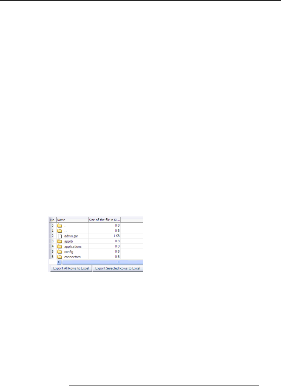
Exporting Data from Table, Tree, or Tree Table
12-52 Web User Interface Developer's Guide for Oracle Application Development Framework
■View menu: Add commandMenuItem components to the viewMenu facet. For
multiple items, use the group component as a container for the
commandMenuItem components.
From the Component Palette, drag and drop the component into the facet. For
example, drop Menu into the menu facet, then drop Menu Items into the same
facet to build a menu list. For more instructions about menus and toolbars, see
Chapter 16, "Using Menus, Toolbars, and Toolboxes."
12.10 Exporting Data from Table, Tree, or Tree Table
You can export the data from a table, tree, or tree table, or from a table region of the
DVT project Gantt chart to a Microsoft Excel spreadsheet. To allow users to export a
table, you create an action source, such as a command button or command link that
will be used to invoke the export, and add an exportCollectionActionListener
component and associate it with the data you wish to export. You can configure the
table so that all the rows will be exported, or so that only the rows selected by the user
will be exported.
For example, Figure 12–25 shows the table from the ADF Faces demo that includes a
command button component that allows users to export the data to an Excel
spreadsheet.
Figure 12–25 Table with Command Button for Exporting Data
When the user clicks the command button, the listener processes the exporting of all
the rows to Excel. As shown in Figure 12–25, you can also configure the
exportCollectionActionListener component so that only the rows the user
selects are exported.
Depending on the browser, and the configuration of the listener, the browser will
either open a dialog, allowing the user to either open or save the spreadsheet as shown
in Figure 12–26, or the spreadsheet will be displayed in the browser. For example, if
Tip: You can also export data from a DVT pivot table. For more
information, see Section 24.8, "How to Export from a Pivot Table."
Note: Only the following can be exported:
■Value of value holder components (such as input and output
components).
■Value of selectItem components used in selelctOneChoice
and selectOneListbox components (the value of selectItem
components in other selection components are not exported).
■Value of the text attribute of a command component.
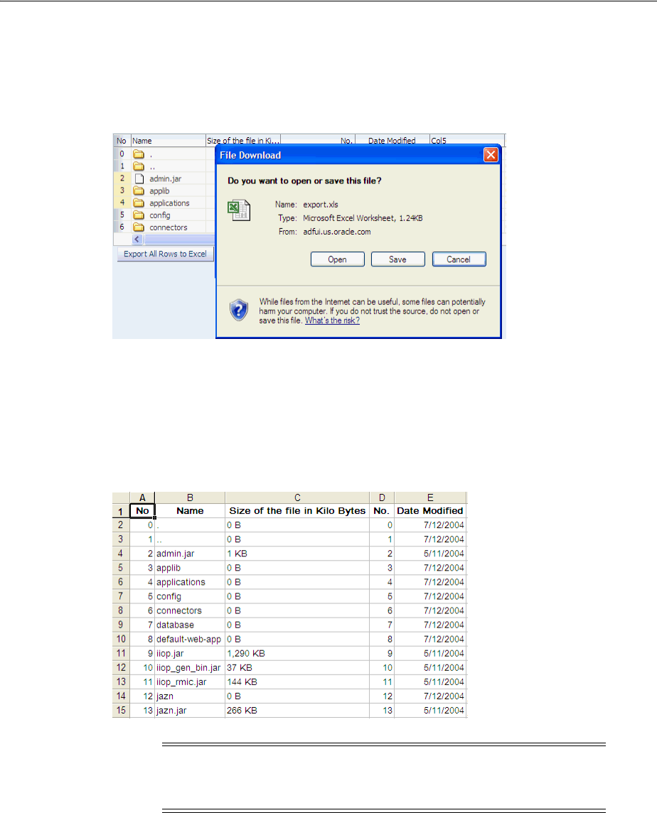
Exporting Data from Table, Tree, or Tree Table
Using Tables and Trees 12-53
the user is viewing the page in Microsoft Internet Explorer, and no file name has been
specified on the exportCollectionActionListener component, the file is
displayed in the browser. In Mozilla Firefox, the dialog opens.
Figure 12–26 Exporting to Excel Dialog
If the user chooses to save the file, it can later be opened in Excel, as shown in
Figure 12–27. If the user chooses to open the file, what happens depends on the
browser. For example, if the user is viewing the page in Microsoft Internet Explorer,
the spreadsheet opens in the browser window. If the user is viewing the page in
Mozilla Firefox, the spreadsheet opens in Excel.
Figure 12–27 Exported Data File in Excel
12.10.1 How to Export Table, Tree, or Tree Table Data to an External Format
You create a command component, such as a button, link, or menu item, and add the
exportCollectionActionListener inside this component. Then you associate
the data collection you want to export by setting the
exportCollectionActionListener component’s exportedId attribute to the ID
of the collection component whose data you wish to export.
Note: You may receive a warning from Excel stating that the file is in
a different format than specified by the file extension. This warning
can be safely ignored.

Exporting Data from Table, Tree, or Tree Table
12-54 Web User Interface Developer's Guide for Oracle Application Development Framework
Before you begin:
It may be helpful to have an understanding of how the attributes can affect
functionality. For more information, see Section 12.10, "Exporting Data from Table,
Tree, or Tree Table."
You may also find it helpful to understand functionality that can be added using other
ADF Faces features. For more information, see Section 12.1.2, "Additional
Functionality for Tables and Trees."
You should already have a table, tree, or tree table on your page. If you do not, follow
the instructions in this chapter to create a table, tree, or tree table. For example, to add
a table, see Section 12.3, "Using the Table Component."
To export collection data to an external format:
1. In the Component Palette, from the General Controls panel, drag and drop a
command component, such as a button, to your page.
You may want to change the default label of the command component to a
meaningful name such as Export to Excel.
2. In the Component Palette, from the Operations panel, drag an Export Collection
Action Listener as a child to the command component.
3. In the Insert Export Collection Action Listener dialog, set the following:
■ExportedId: Specify the ID of the table, tree, or tree table to be exported. Either
enter it manually or use the dropdown menu to choose Edit. Use the Edit
Property dialog to select the component.
■Type: Set to excelHTML.
4. With the exportCollectionActionListener component still selected, in the
Property Inspector, set the following:
■Filename: Specify the proposed file name for the exported content. When this
attribute is set, a "Save File" dialog will typically be displayed, though this is
ultimately up to the browser. If the attribute is not set, the content will
typically be displayed inline, in the browser, if possible.
■Title: Specify the title of the exported document. Whether or not the title is
displayed and how exactly it is displayed depends on Excel.
■ExportedRows: Set to all if you want all rows to be automatically selected
and exported. Set to selected if you want only the rows the user has
selected to be exported.
Example 12–20 shows the code for a table and its
exportCollectionActionListener component. Note that the exportedId
value is set to the table id value.
Tip: If you want users to be able to select rows to export, then set
your table to allow selection. For more information, see Section 12.3.2,
"Formatting Tables."
Tip: If you want your table, tree, or tree table to have a toolbar that
will hold command components, you can wrap the collection
component in a panelCollection component. This component
adds toolbar functionality. For more information, see Section 12.9,
"Displaying Table Menus, Toolbars, and Status Bars."

Accessing Selected Values on the Client from Components That Use Stamping
Using Tables and Trees 12-55
Example 12–20 Using the exportCollectionActionListener to Export a Table
<af:table contextMenuId="thePopup" selectionListener="#{fs.Table}"
rowselection="multiple" columnselection="multiple"
columnBandingInterval="1"
binding="#{editor.component}" var="test1" value="#{tableTestData}"
id="table" summary="table data">
<af:column>
. . .
</af:column>
</af:table>
<af:commandButton text="Export To Excel" immediate="true">
<af:exportCollectionActionListener type="excelHTML" exportedId="table"
filename="export.xls" title="ADF Faces Export"/>
12.10.2 What Happens at Runtime: How Row Selection Affects the Exported Data
Exported data is exported in index order, not selected key order. This means that if
you allow selected rows to be exported, and the user selects rows (in this order) 8, 4,
and 2, then the rows will be exported and displayed in Excel in the order 2, 4, 8.
12.11 Accessing Selected Values on the Client from Components That
Use Stamping
Since there is no client-side support for EL in the ADF Faces framework, nor is there
support for sending entire table models to the client, if you need to access values on
the client using JavaScript, the client-side code cannot rely on component stamping to
access the value. Instead of reusing the same component instance on each row, a new
JavaScript component is created on each row (assuming any component needs to be
created at all for any of the rows), using the fully resolved EL expressions.
Therefore, to access row-specific data on the client, you need to use the stamped
component itself to access the value. To do this without a client-side data model, you
use a client-side selection change listener.
12.11.1 How to Access Values from a Selection in Stamped Components.
To access values on the client from a stamped component, you first need to make sure
the component has a client representation. Then you need to register a selection
change listener on the client and then have that listener handle determining the
selected row, finding the associated stamped component for that row, use the stamped
component to determine the row-specific name, and finally interact with the selected
data as needed.
Before you begin:
You may also find it helpful to understand functionality that can be added using other
ADF Faces features. For more information, see Section 12.1.2, "Additional
Functionality for Tables and Trees."
To access selected values from stamped components:
1. In the Structure window for your page, select the component associated with the
stamped row. For example, in Example 12–21 the table uses an outputText
component to display the stamped rows.

Accessing Selected Values on the Client from Components That Use Stamping
12-56 Web User Interface Developer's Guide for Oracle Application Development Framework
Example 12–21 Table Component Uses an outputText Component for Stamped Rows
<af:table var="row" value="#{data}" rowSelection="single">
<af:column headerText="Name">
<af:outputText value="#{row.name}"/>
</af:column>
</af:table>
Set the following on the component:
■Expand the Common section of the Property Inspector and if one is not
already defined, set a unique ID for the component using the Id attribute.
■Expand the Advanced section and set ClientComponent to True.
2. In the Component Palette, from the Operations panel, drag and drop a Client
Listener as a child to the table.
3. In the Insert Client Listener dialog, enter a function name in the Method field (you
will implement this function in the next step), and select selection from the
Type dropdown.
If for example, you entered mySelectedRow as the function, JDeveloper would
enter the code shown in bold in Example 12–22.
Example 12–22 Using a clientListener to Register a Selection
<af:table var="row" value="#{data}" rowSelection="single">
<af:clientListener type="selection" method="mySelectedRow"/>
...
</af:table>
This code causes the mySelectedRow function to be called any time the selection
changes.
4. In your JavaScript library, implement the function entered in the last step. This
function should do the following:
■Figure out what row was selected. To do this, use the event object that is
passed into the listener. In the case of selection events, the event object is of
type AdfSelectionEvent. This type provides access to the newly selected
row keys via the getAddedSet() method, which returns a POJSO (plain old
JavaScript object) that contains properties for each selected row key. Once you
have access to this object, you can iterate over the row keys using a "for in"
loop. For example, the code in Example 12–23 extracts the first row key (which
in this case, is the only row key).
Example 12–23 Iterating Over Row Keys Using a "for" in Loop
function showSelectedName(event)
{
var firstRowKey;
var addRowKeys=event.getAddedSet();
for(var rowKey in addedRowKeys)
{
firstRowKey=rowKey;
break;
}
}

Accessing Selected Values on the Client from Components That Use Stamping
Using Tables and Trees 12-57
■Find the stamped component associated with the selected row. The client-side
component API AdfUIComponent exposes a findComponent() method
that takes the ID of the component to find and returns the AdfUIComponent
instance. When using stamped components, you need to find a component not
just by its ID, but by the row key as well. In order to support this, the
AdfUITable class provides an overloaded method of findComponent(),
which takes both an ID as well as a row key.
In the case of selection events, the component is the source of the event. So
you can get the table from the source of the event and then use the table to
find the instance using the ID and row key. Example 12–24 shows this, where
nameStamp is the ID of the table.
Example 12–24 Finding a Stamped Component Instance Given a Selected Row
// We need the table to find our stamped component.
// Fortunately, in the case of selection events, the
// table is the event source.
var table = event.getSource();
// Use the table to find the name stamp component by id/row key:
var nameStamp = table.findComponent("nameStamp", firstRowKey);
5. Add any additional code needed to work with the component. Once you have the
stamped component, you can interact with it as you would with any other
component. For example, Example 12–25 shows how to use the stamped
component to get the row-specific value of the name attribute (which was the
stamped value as shown in Example 12–21)and then display the name in an alert.
Example 12–25 Retrieving the Name of the Row in a Stamped Component
if (nameStamp)
{
// This is the row-specific name
var name = nameStamp.getValue();
alert("The selected name is: " + name);
}
Example 12–26 shows the entire code for the JavaScript.
Example 12–26 JavaScript Used to Access Selected Row Value
function showSelectedName(event)
{
var firstRowKey;
var addedRowKeys = event.getAddedSet();
for (var rowKey in addedRowKeys)
{
firstRowKey = rowKey;
break;
}
// We need the table to find our stamped component.
// Fortunately, in the case of selection events, the
// table is the event source.
var table = event.getSource();
// We use the table to find the name stamp component by id/row key:
var nameStamp = table.findComponent("nameStamp", firstRowKey);

Accessing Selected Values on the Client from Components That Use Stamping
12-58 Web User Interface Developer's Guide for Oracle Application Development Framework
if (nameStamp)
{
// This is the row-specific name
var name = nameStamp.getValue();
alert("The selected name is: " + name);
}
}
12.11.2 What You May Need to Know About Accessing Selected Values
Row keys are tokenized on the server, which means that the row key on the client may
have no resemblance to the row key on the server. As such, only row keys that are
served up by the client-side APIs (like AdfSelectionEvent.getAddedSet()) are
valid.
Also note that AdfUITable.findComponent(id, rowKey)method may return
null if the corresponding row has been scrolled off screen and is no longer available
on the client. Always check for null return values from
AdfUITable.findComponent() method.
13
Using List-of-Values Components 13-1
13 Using List-of-Values Components
This chapter describes how to use a list-of-values component to display a
model-driven list of objects from which a user can select a value.
This chapter includes the following sections:
■Section 13.1, "About List-of-Values Components"
■Section 13.2, "Creating the ListOfValues Data Model"
■Section 13.3, "Using the inputListOfValues Component"
■Section 13.4, "Using the InputComboboxListOfValues Component"
13.1 About List-of-Values Components
ADF Faces provides two list-of-values (LOV) input components that can display
multiple attributes of each list item and can optionally allow the user to search for the
needed item. These LOV components are useful when a field used to populate an
attribute for one object might actually be contained in a list of other objects, as with a
foreign key relationship in a database. For example, suppose you have a form that
allows the user to edit employee information. Instead of having a separate page where
the user first has to find the employee record to edit, that search and select
functionality can be built into the form, as shown in Figure 13–1.
Figure 13–1 List-of-Values Input Field
In this form, the employee name field is an LOV that contains a list of employees.
When the user clicks the search icon of the inputListOfValues component, a
Search and Select popup dialog displays all employees, along with a search field that
allows the user to search for the employee, as shown in Figure 13–2.
About List-of-Values Components
13-2 Web User Interface Developer's Guide for Oracle Application Development Framework
Figure 13–2 The Search Popup Dialog for a List-of-Values Component
When the user returns to the page, the current information for that employee is
displayed in the form, as shown in Figure 13–3. The user can then edit and save the
data.
Figure 13–3 Form Populated Using LOV Component
As shown in the preceding figures, the inputListOfValues component provides a
popup dialog from which the user can search for and select an item. The list is
displayed in a table. In contrast, the inputComboboxListOfValues component
allows the user two different ways to select an item to input: from a simple dropdown
list, or by searching as you can in the inputListOfValues component. Note that the
columns of the table will not stretch to the full width of the dialog.
You can also create custom content to be rendered in the Search and Select dialog by
using the searchContent facet. You define the returnPopupDataValue attribute
and programmatically set it with a value when the user selects an item from the Search
and Select dialog and then closes the dialog. This value will be the return value from
the ReturnPopupEvent to the returnPopupListener. When you implement the
returnPopupListener, you can perform functions such as setting the value of the
LOV component and its dependent components, and displaying the custom content.

About List-of-Values Components
Using List-of-Values Components 13-3
In the searchContent facet you can add components such as tables, trees, and input
text to display your custom content.
If you implement both the searchContent facet and the ListOfValues model, the
searchContent facet implementation will take precedence in rendering the Search
and Select dialog. Example 13–1 shows the code to display custom content using a
table component.
Example 13–1 Adding Custom Content to the Search and Select Dialog
<af:inputListOfValues model="#{bean.listOfValuesModel}"
...
returnPopupDataValue="#{bean.returnPopupDataValue}"
returnPopupListener="#{bean.returnPopupListener}">
<f:facet name="searchContent">
<af:table id="t1" value="#{bean.listModel}" var="row"
selectionListener="#{bean.selected}"
...
</f:facet>
</af:inputListOfValues>
Both components support the auto-complete feature, which allows the user to enter a
partial value in the input field, tab out, and have the dialog populated with the rows
that match the partial criteria. For this to work, you must implement logic so that
when the user tabs out after a partial entry, the entered value is posted back to the
server. On the server, your model implementation filters the list using the partially
entered value and performs a query to retrieve the list of values. ADF Faces provides
APIs for this functionality.
If you want to add the auto-complete feature when the user tabs out after entering a
partial entry, you will need to disable the custom popup. In your
LaunchPopupListener()code, add
launchPopupEvent.setLaunchPopup(false) to prevent the custom popup from
launching when the user tabs out. Clicking on the Search link will still launch the
Search and Select dialog. Example 13–2 shows the listener code in a managed bean
that is used to disable the custom popup.
Example 13–2 Disabling the Custom Popup
public void LaunchPopupListener(LaunchPopupEvent launchPopupEvent) {
if (launchPopupEvent.getPopupType().equals
(LaunchPopupEvent.PopupType.SEARCH_DIALOG)
{
...
launchPopupEvent.setLaunchPopup(false);
}
}
If the readOnly attribute is set to true, the input field is disabled. If readOnly is set
to false, then the editMode attribute determines which type of input is allowed. If
editMode is set to select, the value can be entered only by selecting from the list. If
editMode is set to input, then the value can also be entered by typing.
You can also implement the LOV component to automatically display a list of
suggested items when the user types in a partial value. For example, when the user
enters Ca, then a suggested list which partially matches Ca is displayed as a suggested
About List-of-Values Components
13-4 Web User Interface Developer's Guide for Oracle Application Development Framework
items list, as shown in Figure 13–4. If there are no matches, a "No results found."
message will be displayed.
Figure 13–4 Suggested Items List for an LOV
The user can select an item from this list to enter it into the input field, as shown in
Figure 13–5.
Figure 13–5 Suggested Items Selected
You add the auto-suggest behavior by adding the af:autoSuggestBehavior tag
inside the LOV component with the tag’s suggestItems values set to a method that
retrieves and displays the list. You can create this method in a managed bean. If you
are using ADF Model, the method is implemented by default. You also need to set the
component’s autoSubmit property to true.
In your LOV model implementation, you can implement a smart list that filters the list
further. You can implement a smart list for both LOV components. If you are using
ADF Model, the inputComboboxListOfValues allows you declaratively select a
smart list filter defined as a view criteria for that LOV. If the smart list is implemented,
and auto-suggest behavior is also used, auto-suggest will search from the smart list
first. If the user waits for two seconds without a gesture, auto-suggest will also search
from the full list and append the results. The maxSuggestedItems attribute specifies
the number of items to return (-1 indicates a complete list). If maxSuggestedItems
> 0, a More link is rendered for the user to click to launch the LOV’s Search and Select
dialog. Example 13–3 shows the code for an LOV component with both auto-suggest
behavior and a smart list.
Example 13–3 Auto-Suggest Behavior and Smart List
af:autoSuggestBehavior
suggestItems="#{bean.suggestItems}"
smartList="#{bean.smartList}"/>
maxSuggestedItems="7"/>
Figure 13–6 shows how a list can be displayed by an inputComboboxListOfValues
component. If the popup dialog includes a query panel, then a Search link is displayed
at the bottom of the dropdown list. If a query panel is not used, a More link is
displayed.
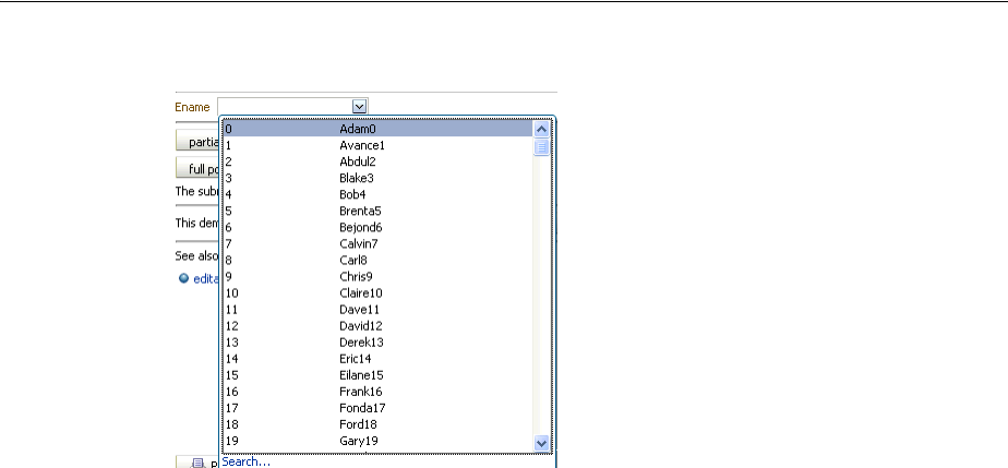
About List-of-Values Components
Using List-of-Values Components 13-5
Figure 13–6 InputComboboxListOfValues Displays a List of Employee Names
The dropdown list of the inputComboboxListOfValues component can display the
following:
■Full list: As shown in Figure 13–6, a complete list of items returned by the
ListOfValuesModel.getItems() method.
■Favorites list: A list of recently selected items returned by the
ListOfValuesModel.getRecentItems() method.
■Search link: A link that opens a popup Search and Select dialog. The link is not on
the scrollable region on the dropdown list.
■customActions facet: A facet for adding additional content. Typically, this
contains one or more commandLink components. You are responsible for
implementing any logic for the commandLink to perform its intended action, for
example, launching a popup dialog.
The number of columns to be displayed for each row can be retrieved from the model
using the getItemDescriptors() method. The default is to show all the columns.
The popup dialog from within an inputListOfValues component or the optional
search popup dialog in the inputComboboxListOfValues component also
provides the ability to create a new record. For the inputListOfValues component,
when the createPopupId attribute is set on the component, a toolbar component
with a commandToolbarButton is displayed with a create icon. At runtime, a
commandToolbarButton component appears in the LOV popup dialog, as shown in
Figure 13–7.
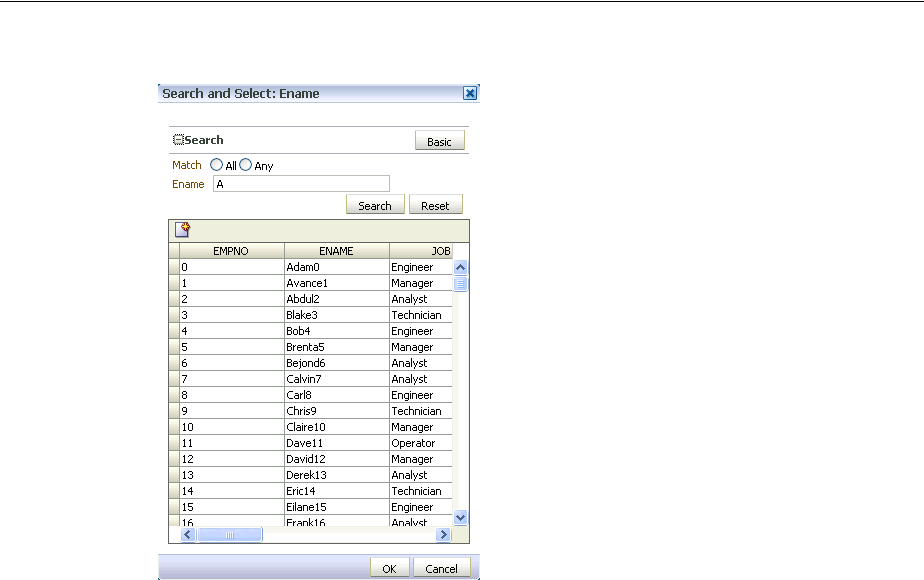
About List-of-Values Components
13-6 Web User Interface Developer's Guide for Oracle Application Development Framework
Figure 13–7 Create Icon in Toolbar of Popup Dialog
When the user clicks the Create button, a popup dialog is displayed that can be used
to create a new record. For the inputComboboxListOfValues, instead of a toolbar,
a commandLink with the label Create is displayed in the customActions facet, at
the bottom of the dialog. This link launches a popup where the user can create a new
record. In both cases, you must provide the code to actually create the new record.
Both the inputListOfValues and the inputComboboxListOfValues
components support the context facet. This facet allows you to add the
af:contextInfo control, which can be used to show contextual information. When
the user clicks in this area, it launches a popup window displaying contextual
information.
Like the query components, the LOV components rely on a data model to provide the
functionality. This data model is the ListOfValuesModel class. This model uses a
table model to display the list of values, and can also access a query model to perform
a search against the list. You must implement the provided interfaces for the
ListOfValuesModel in order to use the LOV components.
Tip: Instead of having to build your own create functionality, you
can use ADF Business Components and ADF data binding. For more
information, see the "Creating an Input Table" section of the Oracle
Fusion Middleware Fusion Developer's Guide for Oracle Application
Development Framework.
Tip: Instead of having to build your own ListOfValuesModel
class, you can use ADF Business Components to provide the needed
functionality. For more information, see the "Creating Databound
Selection Lists and Shuttles" chapter of the Oracle Fusion Middleware
Fusion Developer's Guide for Oracle Application Development Framework.

About List-of-Values Components
Using List-of-Values Components 13-7
When the user selects an item in the list, the data is returned as a list of objects for the
selected row, where each object is the rowData for a selected row. The list of objects is
available on the ReturnPopupEvent event, which is queued after a selection is made.
If you choose to also implement a QueryModel class, then the popup dialog will
include a Query component that the user can use to perform a search and to filter the
list. Note the following about using the Query component in an LOV popup dialog:
■The saved search functionality is not supported.
■The Query component in the popup dialog and its functionality is based on the
corresponding QueryDescriptor class.
■The only components that can be included in the LOV popup dialog are query,
toolbar, and table.
When the user clicks the Search button to start a search, the
ListOfValuesModel.performQuery() method is invoked and the search is
performed. For more information about the query model, see Chapter 14, "Using
Query Components."
You should use the list-of-values components when you have a more complex
selection process than can be handled by the simpler select components. With
list-of-values components, you can filter the selection list using accessors, smart list,
auto-suggest, and other features to fine-tune the list criteria. You can create custom
content in the popup window. You can add code to the returnPopupListener to
perform functions when the popup window closes. A customActions facet can be
used to add additional content. A create feature allows the user to create a new record.
The list-of-values components offer a rich set of data input features for easier data
entry.
13.1.1 Additional Functionality for List-of-Values Components
You may find it helpful to understand other ADF Faces features before you implement
your list-of-values components. Additionally, once you have added a list-of-value
component to your page, you may find that you need to add functionality such as
validation and accessibility. Following are links to other functionality that input
components can use.
■Client components: Components can be client components. To work with the
components on the client, see Chapter 4, "Using ADF Faces Client-Side
Architecture."
■JavaScript APIs: All list-of-value components have JavaScript client APIs that you
can use to set or get property values. For more information, see the ADF Faces
JavaScript API documentation.
■Events: List-of-value components fire both server-side and client-side events that
you can have your application react to by executing some logic. For more
information, see Chapter 6, "Handling Events."
■You can add validation and conversion to list-of-values components. For more
information, see Chapter 7, "Validating and Converting Input."
■You can display tips and messages, as well as associate online help with
list-of-values components. For more information, see Chapter 19, "Displaying Tips,
Messages, and Help."
■There may be times when you want the certain list-of-values components to be
validated before other components on the page. For more information, see
Section 5.2, "Using the Immediate Attribute."

Creating the ListOfValues Data Model
13-8 Web User Interface Developer's Guide for Oracle Application Development Framework
■You may want other components on the page to update based on selections you
make from a list-of-values component. For more information, see Section 5.3,
"Using the Optimized Lifecycle."
■You can change the appearance of the components using skins. For more
information, see Chapter 28, "Customizing the Appearance Using Styles and
Skins."
■You can make your list-of-values components accessible. For more information,
see Chapter 30, "Developing Accessible ADF Faces Pages."
■Instead of entering values for attributes that take strings as values, you can use
property files. These files allow you to manage translation of these strings. For
more information, see Chapter 29, "Internationalizing and Localizing Pages."
■The LOV components use the query component to populate the search list. For
more information on the query component, see Chapter 14, "Using Query
Components."
■Other list components, such as selectOneChoice, also allow users to select from
a list, but they do not include a popup dialog and they are intended for smaller
lists. For more information about select choice components, list box components,
and radio buttons, see Chapter 11, "Using Input Components and Defining
Forms."
■If your application uses the Fusion technology stack, then you can create
list-of-value components based on how your ADF Business components are
configured. For more information, see the "Creating a Basic Databound Page"
chapter of the Oracle Fusion Middleware Fusion Developer's Guide for Oracle
Application Development Framework. If your application uses Enterprise JavaBeans,
you can do the same. For more information, see the “Creating a Basic Databound
Page" of the Oracle Fusion Middleware Java EE Developer's Guide for Oracle
Application Development Framework.
13.2 Creating the ListOfValues Data Model
Before you can use the LOV components, you must have a data model that uses the
ADF Faces API to access the LOV functionality. Figure 13–8 shows the class diagram
for a ListOfValues model.
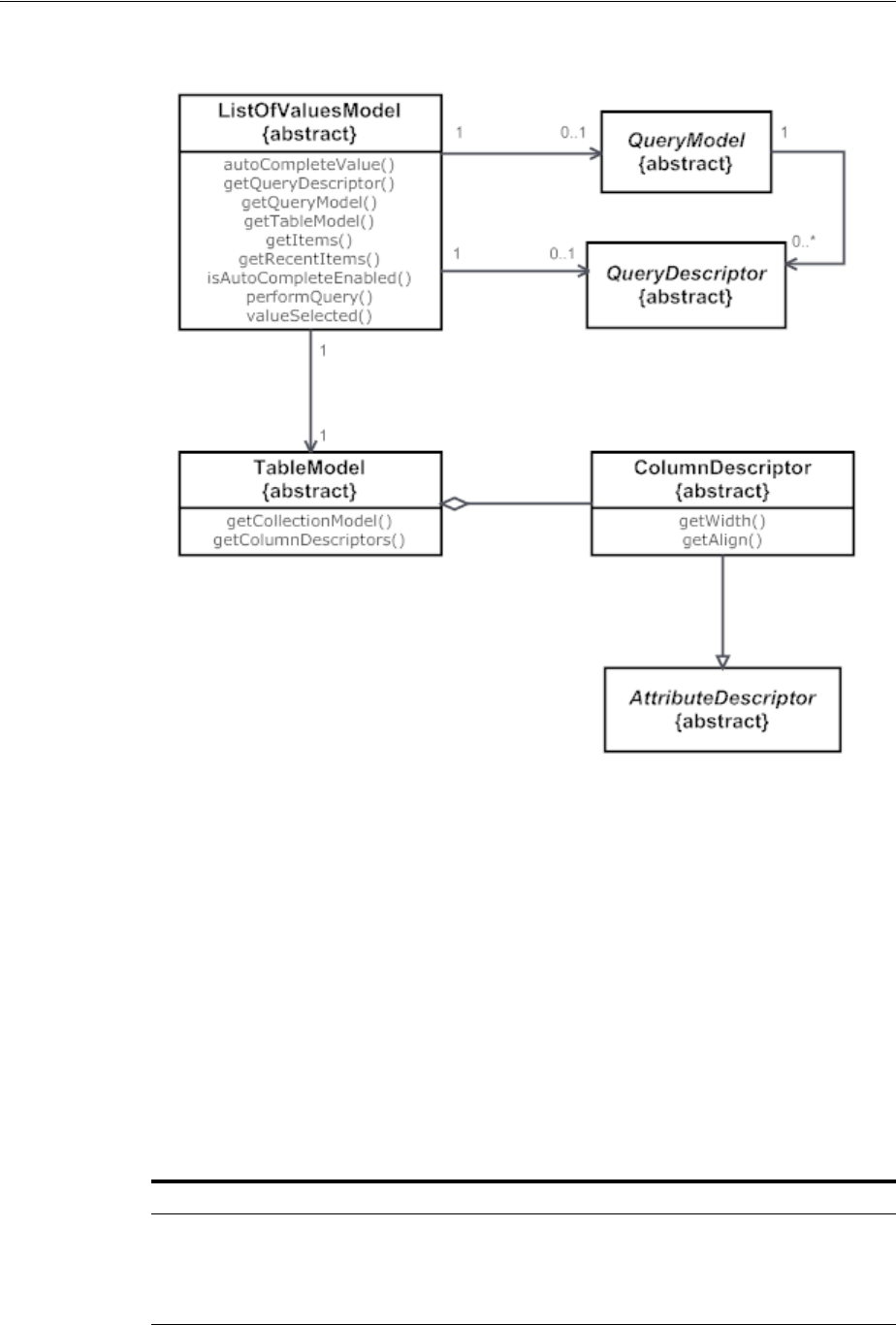
Creating the ListOfValues Data Model
Using List-of-Values Components 13-9
Figure 13–8 Class Diagram for LIstOfValues Model
13.2.1 How to Create the ListOfValues Data Model
Begin you begin:
It may be helpful to have an understanding of the list-of-values data model. For more
information, see Section 13.2, "Creating the ListOfValues Data Model."
You may also find it helpful to understand functionality that can be added using other
ADF Faces features. For more information, see Section 13.1.1, "Additional
Functionality for List-of-Values Components."
To create a ListOfValues model and associated events:
1. Create implementations of each of the interface classes shown in Figure 13–8.
Table 13–1 provides a description of the APIs.
Table 13–1 ListOfValues Model API
Method Functionality
autoCompleteValue() Called when the search icon is clicked or the value is changed
and the user tabs out from the input field, as long as
autoSubmit is set to true on the component. This method
decides whether to open the dialog or to auto-complete the
value. The method returns a list of filtered objects.
Using the inputListOfValues Component
13-10 Web User Interface Developer's Guide for Oracle Application Development Framework
For an example of a ListOfValues model, see the DemoLOVBean and
DemoComboboxLOVBean classes located in the oracle.adfdemo.view.lov
package, found in the Application Sources directory of the ADF Faces application.
2. For the inputListOfValues component, provide logic in a managed bean (it
can be the same managed bean used to create your LOV model) that accesses the
attribute used to populate the list. The inputComboboxListOfValues
component uses the getItems() and getRecentItems() methods to return
the list.
3. For the Search and Select popup dialog used in the InputListOfValues
component, or if you want the InputComboboxListOfValues component to
use the Search and Select popup dialog, implement the
ListOfValuesModel.autoCompleteValue() and
ListOfValuesModel.valueSelected() methods. These methods open the
popup dialog and apply the selected values onto the component.
13.3 Using the inputListOfValues Component
The inputListOfValues component uses the ListOfValues model you
implemented to access the list of items, as documented in Section 13.2, "Creating the
ListOfValues Data Model."
13.3.1 How to Use the InputListOfValues Component
Before you begin:
It may be helpful to have an understanding of the inputListOfValues component.
For more information, see Section 13.3, "Using the inputListOfValues Component."
valueSelected(value) Called when the value is selected from the Search and Select
dialog and the OK button is clicked. This method gives the
model a chance to update the model based on the selected
value.
isAutoCompleteEnabled() Returns a boolean to decide whether or not the auto complete
is enabled.
getTableModel() Returns the implementation of the TableModel class, on
which the table in the search and select dialog will be based
and created.
getItems() and
getRecentItems()
Return the items and recentItems lists to be displayed in
the combobox dropdown. Valid only for the
inputComboboxListOfValues component. Returns null
for the inputListOfValues component.
getItemDescriptors() Return the list of columnDescriptors to be displayed in
the dropdown list for an inputComboboxListOfValues
component.
getQueryModel() and
getQueryDescriptor() Return the queryModel based on which the query
component inside the Search and Select dialog is created.
performQuery() Called when the search button in the query component is
clicked.
Table 13–1 (Cont.) ListOfValues Model API
Method Functionality

Using the inputListOfValues Component
Using List-of-Values Components 13-11
You may also find it helpful to understand functionality that can be added using other
ADF Faces features. For more information, see Section 13.1.1, "Additional
Functionality for List-of-Values Components."
You will need to complete this task:
Create a page or page fragment. If you also implemented the search API in the
model, the component would also allows the user to search through the list for the
value.
To add an inputListOfValues component:
1. In the Component Palette, from the Common panel, drag an Input List Of Values
and drop it onto the page.
2. In the Property Inspector, expand the Common section and set the following
attributes:
■model: Enter an EL expression that resolves to your ListOfValuesModel
implementation, as created in Section 13.2.1, "How to Create the ListOfValues
Data Model."
■value: Enter an EL expression that resolves to the attribute values used to
populate the list, as created in Section 13.2.1, "How to Create the ListOfValues
Data Model."
3. Expand the Appearance section and set the following attribute values:
■popupTitle: Specify the title of the Search and Select popup dialog.
■searchDesc: Enter text to display as a mouseover tip for the component.
The rest of the attributes in this section can be populated in the same manner as
with any other input component. For more information, see Section 11.3, "Using
the inputText Component."
4. Expand the Behavior section and set the following attribute values:
■autoSubmit: Set to true if you want the component to automatically submit
the enclosing form when an appropriate action takes place (a click, text
change, and so on). This will allow the auto-complete feature to work. If you
are adding the auto-suggest behavior, you must set autoSubmit to true.
■createPopupId: If you have implemented a popup dialog used to create a new
object in the list, specify the ID of that popup component. Doing so will
display a toolbar component above the table that contains a
commandToolbarButton component bound to the popup dialog you
defined. If you have added a dialog to the popup, then it will intelligently
decide when to refresh the table. If you have not added a dialog to the popup,
then the table will be always refreshed.
■launchPopupListener: Enter an EL expression that resolves to a
launchPopupListener that you implement to provide additional
functionality when the popup is launched.
■returnPopupListener: Enter an EL expression that resolves to a
returnPopupListener component that you implement to provide
additional functionality when the value is returned.
The rest of the attributes in this section can be populated in the same manner as
with any other input component. For more information, see Section 11.3, "Using
the inputText Component."

Using the InputComboboxListOfValues Component
13-12 Web User Interface Developer's Guide for Oracle Application Development Framework
5. If you want users to be able to create a new item, create a popup dialog with the
ID given in Step 4. For more information, see Chapter 15, "Using Popup Dialogs,
Menus, and Windows."
6. In the Component Palette, from the Operations panel, drag an Auto Suggest
Behavior and drop it as a child to the inputListOfValues component.
7. In the Property Inspector, for each of the auto-suggest attributes, enter the:
■EL expression that resolves to the suggestItems method.
The method should return List<javax.model.SelectItem> of the
suggestItems. The method signature should be of the form
List<javax.model.SelectItem>
suggestItems(javax.faces.context.FacesContext,
oracle.adf.view.rich.model.AutoSuggestUIHints)
■EL expression that resolves to the smartList method. The method should
return List<javax.model.SelectItem> of the smart list items.
■Number of items to be displayed in the auto-suggest list. Enter -1 to display
the complete list.
If you are implementing this method in a managed bean, the JSF page entry
should have the format shown in Example 13–4
Example 13–4 autoSuggestBehavior Tag in an LOV
<af:inputListOfValues value="#{bean.value}" id="inputId">
...
<af:autoSuggestBehavior
suggestItems="#{bean.suggestItems}"
smartList="#{bean.smartList}"
maxSuggestedItems="7"/>
</af:inputListOfValues>
If the component is being used with a data model such as ADF Model, the
suggestItem method should be provided by the default implementation.
8. If you are not using ADF Model, create the suggestItems method to process and
display the list. The suggestItems method signature is shown in Example 13–5.
Example 13–5 suggestItems Method Signature
List<javax.model.SelectItem> suggestItems(javax.faces.context.FacesContext,
oracle.adf.view.rich.model.AutoSuggestUIHints)
13.4 Using the InputComboboxListOfValues Component
The inputComboboxListOfValues component allows a user to select a value from
a dropdown list and populate the LOV field, and possibly other fields, on a page,
similar to the inputListOfValues component. However, it also allows users to
view the values in the list either as a complete list, or by most recently viewed. You can
also configure the component to perform a search in a popup dialog, as long as you
have implemented the query APIs, as documented in Section 13.2, "Creating the
ListOfValues Data Model."

Using the InputComboboxListOfValues Component
Using List-of-Values Components 13-13
13.4.1 How to Use the InputComboboxListOfValues Component
Before you begin:
It may be helpful to have an understanding of the inputComboboxListOfValues
component. For more information, see Section 13.4, "Using the
InputComboboxListOfValues Component."
You may also find it helpful to understand functionality that can be added using other
ADF Faces features. For more information, see Section 13.1.1, "Additional
Functionality for List-of-Values Components."
To add an inputComboboxListOfValues component:
1. In the Component Palette, from the Common panel, drag an Input Combobox List
Of Values and drop it onto the page.
2. In the Property Inspector, expand the Common section and set the following
attributes:
■model: Enter an EL expression that resolves to your ListOfValuesModel
implementation, as created in Section 13.2.1, "How to Create the ListOfValues
Data Model."
■value: Enter an EL expression that resolves to the attribute values used to
populate the list, as created in Section 13.2.1, "How to Create the ListOfValues
Data Model."
3. Expand the Appearance section and set the following attribute values:
■popupTitle: Specify the title of the Search and Select popup dialog.
■searchDesc: Enter text to display as a mouseover tip for the component.
The rest of the attributes in this section can be populated in the same manner as
with any other input component. For more information, see Section 11.3, "Using
the inputText Component."
4. Expand the Behavior section and set the following attribute values:
■autoSubmit: Set to true if you want the component to automatically submit
the enclosing form when an appropriate action takes place (a click, text
change, and so on). This will allow the auto complete feature to work. If you
are adding the auto-suggest behavior, you must set autoSubmit to true.
■createPopupId: If you have implemented a popup dialog used to create a new
object in the list, specify the ID of that popup component. Doing so will
display a toolbar component above the table that contains a
commandToolbarButton component bound to the dialog you defined. If
you have added a dialog to the popup, then it will intelligently decide when to
refresh the table. If you have not added a dialog to the popup, then the table
will always be refreshed.
■launchPopupListener: Enter an EL expression that resolves to a
launchPopupListener handler that you implement to provide additional
functionality when the popup dialog is opened.
■returnPopupListener: Enter an EL expression that resolves to a
returnPopupListener handler that you implement to provide additional
functionality when the value is returned.

Using the InputComboboxListOfValues Component
13-14 Web User Interface Developer's Guide for Oracle Application Development Framework
The rest of the attributes in this section can be populated in the same manner as
with any other input component. For more information, see Section 11.3, "Using
the inputText Component."
5. If you are using a launchPopupListener, you can use the getPopupType()
method of the LaunchPopupEvent class to differentiate the source of the event.
getPopupType() returns DROPDOWN_LIST if the event is a result of the launch
of the LOV Search and Select dialog, and SEARCH_DIALOG if the event is the
result of the user clicking the Search button in the dialog.
6. If you want users to be able to create a new item, create a popup dialog with the
ID given in Step 5. For more information, see Chapter 15, "Using Popup Dialogs,
Menus, and Windows."
7. In the Component Palette, from the Operations panel, drag an Auto Suggest
Behavior and drop it as child to the inputComboboxListOfValues component.
8. In the Property Inspector, for each of the auto-suggest attributes, enter the:
■EL expression that resolves to the suggestItems method.
The method should return List<javax.model.SelectItem> of the
suggestItems. The method signature should be of the form
List<javax.model.SelectItem>
suggestItems(javax.faces.context.FacesContext,
oracle.adf.view.rich.model.AutoSuggestUIHints)
■EL expression that resolves to the smartList method. The method should
return List<javax.model.SelectItem> of the smart list items.
■Number of items to be displayed in the auto-suggest list. Enter -1 to display
the complete list.
If you are implementing this method in a managed bean, the JSF page entry
should have the format shown in Example 13–6.
Example 13–6 autoSuggestBehavior Tag in an LOV
<af:inputComboboxListOfValues value="#{bean.value}" id="inputId">
...
<af:autoSuggestBehavior
suggestItems="#{bean.suggestItems}"
smartList="#{bean.smartList}"
maxSuggestedItems="7"/>
</af:inputComboboxListOfValues>
If the component is being used with a data model such as ADF Model, the
suggestItem method should be provided by the default implementation.
9. If you are not using the component with ADF Model, create the suggestItems
method to process and display the list. The suggestItems method signature is
shown in Example 13–7.
Example 13–7 suggestItems Method Signature
List<javax.model.SelectItem> suggestItems(javax.faces.context.FacesContext,
oracle.adf.view.rich.model.AutoSuggestUIHints)

14
Using Query Components 14-1
14Using Query Components
This chapter describes how to use the query and quickQuery search panel
components.
This chapter includes the following sections:
■Section 14.1, "About Query Components"
■Section 14.2, "Creating the Query Data Model"
■Section 14.3, "Using the quickQuery Component"
■Section 14.4, "Using the query Component"
14.1 About Query Components
The query and quickQuery components are used to search through data sets. The
query component provides a comprehensive set of search criteria and controls, while
the quickQuery component can be used for searching on a single criterion.
The query component supports the following functionality:
■Selecting and searching against multiple search criteria
■Dynamically adding and deleting criteria items
■Selecting search operators (associated to a single criterion)
■Choosing match all or match any conjunction
■Displaying in a basic or advanced mode
■Creating saved searches
■Personalizing saved searches
By default, the advanced mode of the query component allows the user to add and
delete criteria items to the currently displayed search. However you can implement
your own QueryModel class that can hide certain features in basic mode (and expose
them only in advanced mode). For example, you might display operators only in
advanced mode or display more criteria in advanced mode than in basic mode.
Typically, the results of the query are displayed in a table or tree table, which is
identified using the resultComponentId attribute of the query component.
However, you can display the results in any other output components as well. The
component configured to display the results is automatically rerendered when a
search is performed.
Figure 14–1 shows an advanced mode query component with three search criteria.
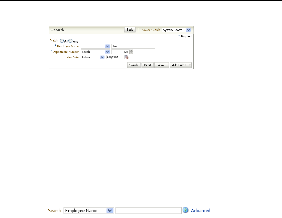
About Query Components
14-2 Web User Interface Developer's Guide for Oracle Application Development Framework
Figure 14–1 Query Component with Three Search Criteria
You can create seeded searches, that is, searches whose criteria are already determined
and from which the user can choose, or you can allow the user to add criterion and
then save those searches. For example, Figure 14–1 shows a seeded search for an
employee. The user can enter values for the criteria on which the search will execute.
The user can also choose the operands (greater than, equals, less than) and the
conjunction (matches all or matches any, which creates either an "and" or "or" query).
The user can click the Add Fields dropdown list to add one or more criteria and then
save that search. If the application is configured to use persistence, then those search
criteria, along with the chosen operands and conjunctions, can be saved and
reaccessed using a given search name (for more information about persistence, see
Chapter 32, "Allowing User Customization on JSF Pages").
The quickQuery component is a simplified version of the query component. The
user can perform a search on any one of the searchable attributes by selecting it from a
dropdown list. Figure 14–2 shows a quickQuery component in horizontal layout.
Figure 14–2 A QuickQuery Component in Horizontal Layout
Both the query and quickQuery components use the QueryModel class to define
and execute searches. Create the associated QueryModel classes for each specific
search you want users to be able to execute.
The QueryModel class manages QueryDescriptor objects, which define a set of
search criteria. The QueryModel class is responsible for creating, deleting, and
updating QueryDescriptor objects. The QueryModel class also retrieves saved
searches, both those that are seeded and those that the user personalizes. For more
information, refer to the ADF Faces Javadoc.
You must create a QueryDescriptor class for each set of search criteria items. The
QueryDescriptor class is responsible for accessing the criteria and conjunction
needed to build each seeded search. It is also responsible for dynamically adding,
deleting, or adding and deleting criteria in response to end-user's actions. The
QueryDescriptor class also provides various UI hints such as mode, auto-execute,
and so on. For more information, refer to the ADF Faces Javadoc. One QueryModel
class can manage multiple QueryDescriptor objects.
When a user creates a new saved search, a new QueryDescriptor object is created
for that saved search. The user can perform various operations on the saved search,
Tip: Instead of having to build your own QueryModel
implementation, you can use ADF Business Components, which
provide the needed functionality. For more information, see the
"Creating ADF Databound Search Forms" chapter of the Oracle Fusion
Middleware Fusion Developer's Guide for Oracle Application Development
Framework.

About Query Components
Using Query Components 14-3
such as deleting, selecting, resetting, and updating. When a search is executed or
changed, in addition to calling the appropriate QueryModel method to return the
correct QueryDescriptor object, a QueryOperationEvent event is broadcast
during the Apply Request Values phase. This event is consumed by the
QueryOperationListener handlers during the Invoke Application phase of the JSF
lifecycle. The QueryOperationEvent event takes the QueryDescriptor object as
an argument and passes it to the listener. ADF Faces provides a default
implementation of the listener. For details of what the listener does, see Table 14–2.
For example, updating a saved search would be accomplished by calling the
QueryModel’s update() method. A QueryOperationEvent event is queued, and
then consumed by the QueryOperationListener handler, which performs
processing to change the model information related to the update operation.
The query operation actions that generate a QueryOperationEvent event are:
■Saving a search
■Deleting a saved search
■Toggling between the basic and advanced mode
■Resetting a saved search
■Selecting a different saved search
■Updating a saved search
■Updating the value of a criterion that has dependent criteria
The hasDependentCriterion method of the AttributeCriterion class can be
called to check to see whether a criterion has dependents. By default, the method
returns false, but it returns true if the criterion has dependent criteria. When that
criterion’s value has changed, a QueryOperationEvent is queued for the Update
Model Values JSF lifecycle phase. The model will need a listener to update the values
of the dependent criterion based on the value entered in its root criteria.
14.1.1 Query Component Use Cases and Examples
The query component can be used in several different modes to accommodate the
needs of your application. It can be configured with seeded searches and provide
customization and personalization functions.The query component is a feature-rich
component that can be used to implement enterprise search functions.
You can use query and quick query components to build complex transactional search
forms. The query components are model-driven and provide many functional and
display options. The quick query component has a small footprint and provide a
simple search on one attribute. The query component has a larger footprint but
provides multiple criterion searches and other search features.
14.1.2 Additional Functionality for the Query Components
You may find it helpful to understand other ADF Faces features before you implement
your query components. Additionally, once you have added a query or quick query
component to your page, you may find that you need to add functionality such as
validation and accessibility. Following are links to other functionality that query
components can use.
■All query components have JavaScript client APIs that you can use to set or get
property values. For more information, see the ADF Faces JavaScript API
documentation.

Creating the Query Data Model
14-4 Web User Interface Developer's Guide for Oracle Application Development Framework
■You can display tips and messages, as well as associate online help with query
components. For more information, see Chapter 19, "Displaying Tips, Messages,
and Help."
■You can change appearance of the components using skins. For more information,
see Chapter 28, "Customizing the Appearance Using Styles and Skins."
■You can make your query components accessible. For more information, see
Chapter 30, "Developing Accessible ADF Faces Pages."
■Instead of entering values for attributes that take strings as values, you can use
property files. These files allow you to manage translation of these strings. For
more information, see Chapter 29, "Internationalizing and Localizing Pages."
■If your application uses the Fusion technology stack, then you can create search
forms based on how your ADF Business components are configured. For more
information, see the "Creating Databound Search Forms" chapter of the Oracle
Fusion Middleware Fusion Developer's Guide for Oracle Application Development
Framework. If your application uses Enterprise JavaBeans, you can do the same. For
more information, see the “Creating a Basic Databound Page" of the Oracle Fusion
Middleware Java EE Developer's Guide for Oracle Application Development Framework.
14.2 Creating the Query Data Model
Before you can use the query components, you must to create your QueryModel
classes.
Figure 14–3 shows the class diagram for a QueryModel class.
Tip: You can use the quickQuery component without
implementing a QueryModel class. However, you will have to add
some additional logic to a managed bean. For more information, see
Section 14.3.2, "How to Use a quickQuery Component Without a
Model."
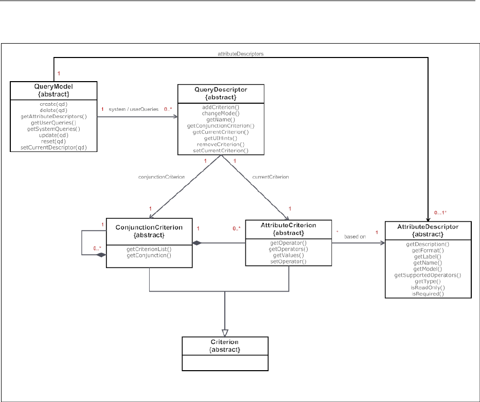
Creating the Query Data Model
Using Query Components 14-5
Figure 14–3 Class Diagram for QueryModel
Query component has a refresh() method on the UIXQuery component. This
method should be called when the model definition changes and the query component
need to be refreshed (i.e., all its children removed and recreated). When a new
criterion is added to the QueryDescriptor or an existing one is removed, if the
underlying model returns a different collection of criterion objects than what the
component subtree expects, then this method should be called.
QueryOperationListener, QueryListener, and ActionListener should all
call this method. The query component itself will be flushed at the end of the Invoke
Application Phase. This method is a no-op when called during the Render Response
Phase.
To better understand what your implementations must accomplish, Table 14–1 and
Table 14–2 map the functionality found in the UI component shown in Figure 14–4
with the corresponding interface.
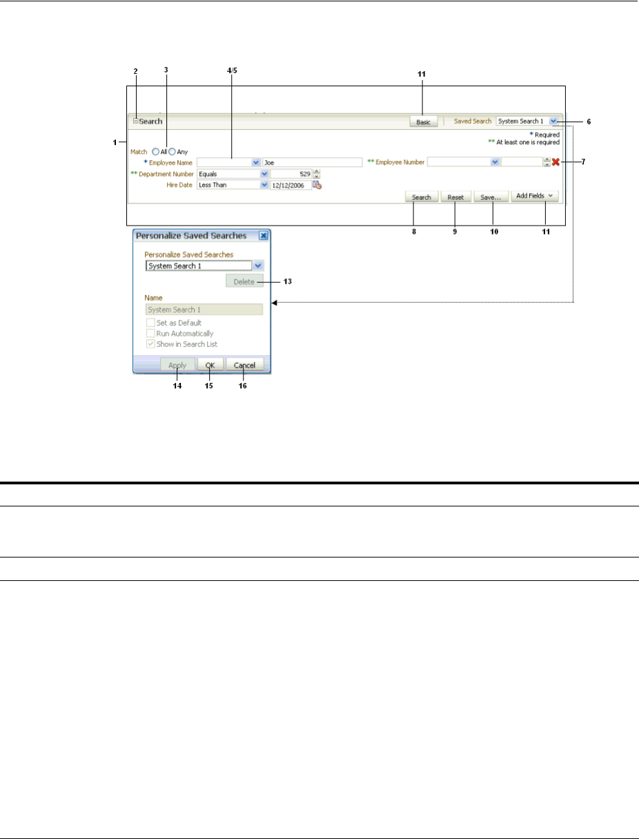
Creating the Query Data Model
14-6 Web User Interface Developer's Guide for Oracle Application Development Framework
Figure 14–4 Query Component and Associated Popup Dialog
Table 14–1 shows UI artifacts rendered for the query component, the associated class,
class property, and methods used by the artifact.
Table 14–1 Query UI Artifacts and Associated Model Class Operations and Properties
UI Artifact Class Property/Methods Used Comments
1 Search panel The QueryDescriptor instance
provides the items displayed in the
panel.
Based on a saved search.
2 Disclosure icon Opens or closes the search panel
3 Match type radio
button Available through the
getConjunction() method on the
ConjunctionCriterion class.
Displays the default conjunction to use
between search fields, when a query is
performed. If a default is set, and it is the
same for all search fields, it appears
selected. If the search fields are configured
such that a mix of different conjunctions
must be used between them, then a value
may not be selected on the UI.
For example, if the All conjunction type is
used between all the search fields, then
All appears selected. If it is a mix of All
and Any, then none of the radio buttons
appears selected.
The Match Type will be read only if the
conjunctionReadOnly property is set to
true. Its not rendered at all when the
displayMode attribute is set to simple.
Creating the Query Data Model
Using Query Components 14-7
Table 14–2 shows the behaviors of the different UI artifacts, and the associated
methods invoked to execute the behavior.
4Group of search
fields The collection of search fields for a
QueryDescriptor object is
represented by a
ConjunctionCriterion object,
returned by the method
getConjunctionCriterion() on the
QueryDescriptor class. The
getCriterionList() method returns
a List<Criterion> list.
Displays one or more search fields
associated with the currently selected
search.
5 Search field An AttributeCriterion class
provides information specific to a search
field instance. An
AttributeCriterion object is an
item in the List<Criterion> list
returned by getCriterionList()
method on the
ConjunctionCriterion class (see
#4).
An AttributeDescriptor class
provides static information pertaining to
a search field. This is available through
the method getAttribute(), on the
AttributeCriterion class.
The getConverter() method of the
AttributeDescriptor class can be
overridden to return a converter object
of type
javax.faces.convert.Converter.
When defined, the attribute value is
converted using this converter instance.
The default return value is null.
The hasDependentCriterion
method in the AttributeCriterion
class returns true if the criterion has
dependents. If the criterion has
dependents, then the dependent
criterion fields are refreshed when the
value for this criterion changes. By
default this method returns false.
Each search field contains a label, an
operator, one or more value components
(for example, an input text component),
and an optional delete icon. The
information required to render these can be
either specific to an instance of a search
field (in a saved search) or it can be generic
and unchanging regardless of which saved
search it is part of.
For example, assume an Employee
business object contains the search fields
Employee Name and Salary.
A user can then configure two different
searches: one named Low Salaried
Employees and one named High Salaried
Employees. Both searches contain two
search fields based on the Employee and
Salary attributes. Even though both
saved searches are based on the same
attributes of the Employee object, the
search field Salary is configured to have its
default operator as less than and value as
50000.00 for the low Salaried Employees
search and for the High Salaried
Employees search, with a default operator
of greater than and value of 100000.00.
Selecting the saved searches on the UI will
show the appropriate operator and values
for that search.
Regardless of the search selected by the
user, the search field for Salary always has
to render a number component, and the
label always has to show Salary.
6 Saved Searches
dropdown System- and user-saved searches are
available through the methods
getSystemQueries() and
getUserQueries() on the
QueryModel class.
Displays a list of available system- and
user-saved searches.
A Personalize option is also added if the
saveQueryMode property is set to
default. Selecting this option opens a
Personalize dialog, which allows users to
personalize saved searches. They can
duplicate or update an existing saved
search.
Table 14–1 (Cont.) Query UI Artifacts and Associated Model Class Operations and
UI Artifact Class Property/Methods Used Comments
Creating the Query Data Model
14-8 Web User Interface Developer's Guide for Oracle Application Development Framework
Table 14–2 UI Artifact Behaviors and Associated Methods
UI Artifact Class Method Invoked Event Generated Comments
7 Delete icon During the Invoke Application
phase, the method
removeCriterion() on the
QueryDescriptor class is
called automatically by an
internal ActionListener
handler registered with the
command component.
ActionEvent Deletes a search field
from the current
QueryDescriptor
object.
8 Search button During the Apply Request
Values phase of the JSF lifecycle,
a QueryEvent event is queued,
to be broadcast during the
Invoke Application phase.
During the Update Model
Values phase, the selected
operator and the values entered
in the search fields are
automatically updated to the
model using the EL expressions
added to the operator and value
components (for more
information, see Section 14.4.1,
"How to Add the Query
Component"). These expressions
should invoke the
get/setOperator();
get/setOperators(); and
getValues() methods,
respectively, on the
AttributeCriterion class.
During the Invoke Application
phase, the QueryListener
registered with the query
component is invoked and this
performs the search.
You must implement this
listener.
QueryEvent Rendered always on the
footer (footer contents
are not rendered at all
when the
displayMode attribute
is simple)
Performs a query using
the select operator and
selected Match radio (if
no selection is made the
default is used), and the
values entered for every
search field.
9 Reset button During the Apply Request
Values phase of the JSF lifecycle,
a QueryOperationEvent
event is queued with the
operation type
QueryOperationEvent.
Operation.RESET, to be
broadcast during the Invoke
Application phase.
During the Invoke Application
phase, the method reset() on
the QueryModel class is called.
This is done automatically by an
internal
QueryOperationListener
handler registered with the
query component. You must
override this method to reset the
QueryDescriptor object to its
original state.
QueryOperationEvent
(an internal
QueryOperation
Listener handler is
registered with the
query component that in
turn calls the model
methods).
Resets the search fields
to its previous saved
state.

Creating the Query Data Model
Using Query Components 14-9
10 Save button During the Apply Request
Values phase of the JSF lifecycle,
a QueryOperationEvent
event is queued with the
operation type
QueryOperationEvent.
Operation.SAVE, to be
broadcast during the Invoke
Application phase.
During the Invoke Application
phase, the method create()
on the QueryModel class is
called. After the call to the
create() method, the
update() method is called to
save the hints (selected by the
user in the dialog) onto the new
saved search. This is done
automatically by an internal
QueryOperationListener
handler registered with the
query component. You must
override this method to create a
new object based on the
argument passed in.
QueryOperationEvent
(an internal
QueryOperation
Listener handler is
registered with the
query component that in
turn calls the model
methods).
Creates a new saved
search based on the
current saved search
settings, including any
new search fields added
by the user.
11 Add Fields
dropdown list During the Invoke Application
phase, the method
addCriterion() on the
QueryDescriptor class is
called automatically by an
internal ActionListener
handler registered with the
command component. You must
override this method to create a
new AttributeCriterion
object based on the
AttributeDescriptor object
(identified by the name
argument).
ActionEvent Adds an attribute as a
search field to the
existing saved search.
12 Mode (Basic or
Advanced) button During the Apply Request
Values phase of the JSF lifecycle,
a QueryOperationEvent
event is queued with the
operation type
QueryOperationEvent.
Operation.MODE_CHANGE, to
be broadcast during the Invoke
Application phase.
During the Invoke Application
phase, the method
changeMode()on the
QueryModel class is called.
QueryOperationEvent
(an internal
QueryOperation
Listener handler is
registered with the
query component that in
turn calls the model
methods).
Clicking the mode
button toggles the
mode.
Table 14–2 (Cont.) UI Artifact Behaviors and Associated Methods
UI Artifact Class Method Invoked Event Generated Comments
Creating the Query Data Model
14-10 Web User Interface Developer's Guide for Oracle Application Development Framework
14.2.1 How to Create the Query Data Model
Begin you begin:
It may be helpful to have an understanding of the query data model. For more
information, see Section 14.2, "Creating the Query Data Model."
13 Delete button During the Invoke Application
phase, the method delete()
on the QueryModel class is
called. This is done
automatically by an internal
QueryOperationListener
handler registered with the
query component. You must
override this method order to
delete the QueryDescriptor
object.
ActionEvent Deletes the selected
saved search, unless it is
the one currently in use.
14 Apply button During the Apply Request
Values phase of the JSF lifecycle,
a QueryOperationEvent
event is queued with the
operation type
QueryOperationEvent.
Operation.UPDATE, to be
broadcast during the Invoke
Application phase.
During the Invoke Application
phase, the method update()
on the QueryModel class is
called. This is done
automatically by an internal
QueryOperationListener
handler registered with the
query component. You must
override this method in order to
update the QueryDescriptor
object using the arguments
passed in.
QueryOperationEvent
(an internal
QueryOperation
Listener is registered
with the query
component that in turn
calls the model methods).
Applies changes made
to the selected saved
search.
15 OK button Same as the Apply button. QueryOperationEvent
(an internal
QueryOperation
Listener handler is
registered with the
query component that in
turn calls the model
methods).
Applies changes made
to the selected saved
search and the dialog is
closed afterwards.
16 Cancel button No method defined for this
action. QueryOperationEvent
(an internal
QueryOperation
Listener handler is
registered with the
query component that in
turn calls the model
methods).
Cancels any edits made
in the dialog.
Table 14–2 (Cont.) UI Artifact Behaviors and Associated Methods
UI Artifact Class Method Invoked Event Generated Comments

Using the quickQuery Component
Using Query Components 14-11
You may also find it helpful to understand functionality that can be added using other
ADF Faces features. For more information, see Section 14.1.2, "Additional
Functionality for the Query Components."
To create a query model classes:
1. Create implementations of each of the interface classes shown in Figure 14–3.
Implement one QueryModel class and then a QueryDescriptor class with
appropriate criteria (operators and values) for each system-seeded search. For
example implementations of the different model classes for a query, see the classes
located in the oracle.adfdemo.view.query.rich package of the ADF Faces
sample application.
2. Create a QueryListener handler method on a managed bean that listens for the
QueryEvent event (this will be referenced by a button on the query component).
This listener will invoke the proper APIs in the QueryModel to execute the query.
Example 14–1 shows the listener method of a basic QueryListener
implementation that constructs a String representation of the search criteria.
This String is then displayed as the search result.
Example 14–1 A QueryListener Handler Method
public void processQuery(QueryEvent event)
{
DemoQueryDescriptor descriptor = (DemoQueryDescriptor) event.getDescriptor();
String sqlString = descriptor.getSavedSearchDef().toString();
setSqlString(sqlString);
}
14.3 Using the quickQuery Component
The quickQuery component has one dropdown list that allows a user to select an
attribute to search on. The available searchable attributes are drawn from your
implementation of the model or from a managed bean. The user can search against the
selected attribute or against all attributes.
A quickQuery component may be used as the starting point of a more complex
search using a query component. For example, the user may perform a quick query
search on one attribute, and if successful, may want to continue to a more complex
search. The quickQuery component supports this by allowing you to place command
components in the end facet, which you can bind to a method on a managed bean that
allows the user to switch from a quickQuery to a query component.
The quickQuery component renders the searchable criteria in a dropdown list and
then, depending on the type of the criteria chosen at runtime, the quickQuery
component renders different criteria fields based on the attribute type. For example, if
the attribute type is Number, it renders an inputNumberSpinbox component. You
Note: If your query uses composition (for example,
ConjunctionCriterion 1...n with
AttributeCriterion/ConjunctionCriterion), this
relationship is not enforced by the abstract interfaces. Your
implementation must decide whether to use composition over
association, and determine how the lifecyle of these objects are
managed.
Using the quickQuery Component
14-12 Web User Interface Developer's Guide for Oracle Application Development Framework
do not need to add these components as long as you have implemented the complete
model for your query. If instead you have the logic in a managed bean and do not
need a complete model, then you create the quickQuery component artifacts
manually. For more information, see Section 14.3.2, "How to Use a quickQuery
Component Without a Model."
14.3.1 How to Add the quickQuery Component Using a Model
Before you begin
It may be helpful to have an understanding of forms and subforms. For more
information, see Section 14.3, "Using the quickQuery Component."
You may also find it helpful to understand functionality that can be added using other
ADF Faces features. For more information, see Section 14.1.2, "Additional
Functionality for the Query Components."
You will need to complete this task:
Create a QueryModel class and associated classes. For more information, see
Section 14.2, "Creating the Query Data Model."
To add a quickQuery component:
1. In the Component Palette, from the Common Components panel, drag a Quick
Query and drop it onto the page.
2. Expand the Common section of the Property Inspector and set the following
attributes:
■id: Enter a unique ID for the component.
■layout: Specify if you want the component to be displayed horizontally with
the criterion and value next to each other, as shown in Figure 14–2, or
vertically as shown in Figure 14–5.
Figure 14–5 A quickQuery Component Set to Display Vertically
■model: Enter an EL expression that evaluates to the class that implements the
QueryModel class, as created in Section 14.2, "Creating the Query Data
Model."
■value: Enter an EL expression that evaluates to the class that implements the
QueryDescriptor class, as created in Section 14.2, "Creating the Query Data
Model."
3. Expand the Behavior section and set the following attributes:
■conjunctionReadOnly: Specify whether or not the user should be able to set
the Match Any or Match All radio buttons. When set to false, the user can
set the conjunction. When set to true, the radio buttons will not be rendered.
■queryListener: Enter an EL expression that evaluates to the QueryListener
handler you created in Section 14.2, "Creating the Query Data Model."
4. Drag and drop a table (or other component that will display the search results)
onto the page. Set the results component’s PartialTriggers with the ID of the

Using the quickQuery Component
Using Query Components 14-13
quickQuery component. The value of this component should resolve to a
CollectionModel object that contains the filtered results.
5. If you want users to be able to click the Advanced link to turn the quickQuery
component into a full query component, add a command component to the End
facet of the quickQuery component, and implement logic that will hide the
quickQuery component and display the query component.
14.3.2 How to Use a quickQuery Component Without a Model
You can use the quickQuery component without a model, for example if all your
query logic resides in a simple managed bean, including a QueryListener handler
that will execute the search and return the results. You must to manually add and bind
the components required to create the complete quickQuery component.
Before you begin:
It may be helpful to have an understanding of forms and subforms. For more
information, see Section 14.3, "Using the quickQuery Component."
You may also find it helpful to understand functionality that can be added using other
ADF Faces features. For more information, see Section 14.1.2, "Additional
Functionality for the Query Components."
To add a quickQuery component:
1. On a managed bean, create a valueChangeListener handler for the
selectOneChoice component that will display the attributes on which the user
can search. The valueChangeListener handler should handle the choice for
which attribute to search on.
2. On a managed bean, create the QueryListener handle to execute the search.
This handle will use the ID of the input component used to enter the search
criterion value, to retrieve the component and the value to execute the query.
3. In the Component Palette, from the Common Components panel, drag a Quick
Query and drop it onto the page.
4. In the Property Inspector, expand the Common section, and set the following
attributes:
■id: Enter a unique ID for the component.
■layout: Specify if you want the component to display horizontally with the
criterion and value next to each other, as shown in Figure 14–2, or vertically, as
shown in Figure 14–5.
5. Expand the Behavior section and set the QueryListener attribute to an EL
expression that evaluates to the QueryListener handler created in Step 2.
6. In the Component Palette, from the Common Components panel, drag a Select
One Choice and drop it onto the criteriaItems facet of the quickQuery
component. In the dialog, choose either to enter an EL expression that evaluates to
the list of attributes on which the user can search, or to enter a static list. For help
with the dialog, press F1 or click Help.
7. In the Structure window, select the selectOneChoice component in the
criteriaItems facet, and set the following attributes:
■simple: Set to true so that no label for the component displays.
■valueChangeListener: Enter an EL expression that evaluates to the listener
created in Step 1.

Using the quickQuery Component
14-14 Web User Interface Developer's Guide for Oracle Application Development Framework
■autoSubmit: Set to true.
8. From the Component Palette, add select list items as needed. For more
information about using the selectOneChoice and selectItems components,
see Section 11.6, "Using Selection Components."
9. In the Component Palette, from the Common Components panel, drag an
inputText component as a direct child to the quickQuery component. Set the
following attributes:
■simple: Set to true so that the label is not displayed.
■value: Enter an EL expression that evaluates to the property that will contain
the value that the user enters.
10. If you want users to be able to click the Advanced link to turn the quickQuery
component into a full query component, add a command component to the End
facet of the quickQuery component, and implement logic that will hide the
quickQuery component and display the query component.
11. In the Component Palette, from the Common Components panel, drag a table (or
other component that will display the search results) onto the page. Set the results
component’s PartialTriggers with the ID of the quickQuery component.
The value of this component should resolve to a CollectionModel object that
contains the filtered results.
14.3.3 What Happens at Runtime: How the Framework Renders the quickQuery
Component and Executes the Search
When the quickQuery component is bound to a QueryDescriptor object, the
selectOneChoice and inputText components are automatically added at runtime
as the page is rendered. However, you can provide your own components. If you do
provide both the component to display the searchable attributes and the inputText
components, then you need the QueryListener handler to get the name-value pair
from your components.
If you provide only your own component to show the searchable attributes (and use
the default input text component), the framework will display an input text
component. You must have your QueryListener handler get the attribute name
from the dropdown list and the value from the
QueryDescriptor.getCurrentCriterion() method to perform the query.
If you provide only your own component to collect the searchable attribute value (and
use the default selectOneChoice component to provide the attribute name), then
the framework will display the selectOneChoice component. You must have your
QueryListener handler get the attribute name from the
QueryDescriptor.getCurrentCriterion() method and the value from your
component.
If you choose not to bind the QuickQuery component value attribute to a
QueryDescriptor object, and you provide both components, when the Go button is
clicked, the framework queues a QueryEvent event with a null QueryDescriptor
object. The provided QueryListener handler then executes the query using the
changeValueListener handler to access the name and the input component to
access the value. You will need to implement a QueryListener handler to retrieve
Tip: If you do not provide an inputText component, then at
runtime, a disabled inputText component and a disabled Go icon
will be rendered.

Using the query Component
Using Query Components 14-15
the attribute name from your selectOneChoice component and the attribute value
from your inputText component, and then perform a query.
14.4 Using the query Component
The query component is used for full feature searches. It has a basic and an advanced
mode, which the user can toggle between by clicking a button.
The features for a basic mode query include:
■Dropdown list of selectable search criteria operators
■Selectable WHERE clause conjunction of either AND or OR (match all or match any)
■Saved (seeded) searches
■Personalized saved searches
The advanced mode query form also includes the ability for the user to dynamically
add search criteria by selecting from a list of searchable attributes. The user can
subsequently delete any criteria that were added.
The user can select from the dropdown list of operators to create a query for the
search. The input fields may be configured to be list-of-values (LOV), number
spinners, date choosers, or other input components.
To support selecting multiple items from a list, the model must expose a control hint
on viewCriteriaItem and the underlying attribute must be defined as an LOV in
the corresponding view object. The hint is used to enable or disable the multiple
selection or "in" operator functionality. When multiple selection is enabled, selecting
the Equals or Does not equal operator will render the search criteria field as a
selectManyChoice component. The user can choose multiple items from the list.
The component for the search criteria field depends on the underlying attribute data
type, the operator that was chosen, and whether multiple selection is enabled. For
example, a search field for an attribute of type String with the Contains operator
chosen would be rendered as an inputText component, as shown in Table 14–3.
If the operator is Equals or Does not equal, but multiple selection is not enabled,
the component defaults to the component specified in the Default List Type hint from
the model.
Table 14–3 Rendered Component for Search Criteria Field of Type String
Operator Component
Component When Multiple
Select Is Enabled
Starts with af:inputText af:inputText
Ends with af:inputText af:inputText
Equals Default list type hint af:selectManyChoice
Does not equal Default list type hint af:selectManyChoice
Contains af:inputText af:inputText
Does not contain af:inputText af:inputText
Is blank None None
Is not blank None None
Using the query Component
14-16 Web User Interface Developer's Guide for Oracle Application Development Framework
If the underlying attribute is the Number data type, the component that will be
rendered is shown in Table 14–4.
If the underlying attribute is the Date data type, the component that will be rendered
is shown in Table 14–5.
If a search criterion's underlying attribute was defined as an LOV, in order for the
auto-complete feature to work, the ListOfValues model instance returned by the
getModelList method of the AttributeCriterion class must return true for its
isAutoCompleteEnabled method. For more information about LOV, see
Chapter 13, "Using List-of-Values Components."
When autoSubmit is set to true, any value change on the search criterion will be
immediately pushed to the model. The query component will automatically flush its
Table 14–4 Rendered Component for Search Criteria Field of Type Number
Operator Component
Component When Multiple
Select Is Enabled
Equals Default list type hint af:selectManyChoice
Does not equal Default list type hint af:selectManyChoice
Less than af:inputNumberSpinBox af:inputNumberSpinBox
Less than or equal to af:inputNumberSpinBox af:inputNumberSpinBox
Greater than af:inputNumberSpinBox af:inputNumberSpinBox
Greater than or equal
to af:inputNumberSpinBox af:inputNumberSpinBox
Between af:inputNumberSpinBox af:inputNumberSpinBox
Not between af:inputNumberSpinBox af:inputNumberSpinBox
Is blank None None
Is not blank None None
Table 14–5 Rendered Component for Search Criteria Field of Type Date
Operator Component
Component When Multiple
Select Is Enabled
Equals Default list type hint af:selectManyChoice
Does not equal Default list type hint af:selectManyChoice
Before af:inputDate af:inputDate
After af:inputDate af:inputDate
On or before af:inputDate af:inputDate
On or after af:inputDate af:inputDate
Between af:inputDate (2) af:inputDate (2)
Not between af:inputDate (2) af:inputDate (2)
Is blank None None
Is not blank None None
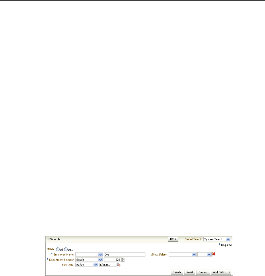
Using the query Component
Using Query Components 14-17
criterion list only when it has dependent criteria. If the criterion instance has no
dependent criteria but autoSubmit is set to true, then the query component will be
only partially refreshed.
A Match All or Match Any radio button group further modifies the query. A Match
All selection is essentially an AND function. The query will return only rows that match
all the selected criteria. A Match Any selection is an OR function. The query will return
all rows that match any one of the criteria items.
After the user enters all the search criteria values (including null values) and selects
the Match All or Match Any radio button, the user can click the Search button to
initiate the query. The query results can be displayed in any output component.
Typically, the output component will be a table or tree table, but you can associate
other display components such as af:forms, af:outputText, and graphics to be
the results component by specifying it in the resultComponentId attribute.
If the Basic or Advanced button is enabled and displayed, the user can toggle between
the two modes. Each mode will display only the search criteria that were defined for
that mode. A search criteria field can be defined to appear only for basic, only for
advanced, or for both modes.
In advanced mode, the control panel also includes an Add Fields button that exposes a
popup list of searchable attributes. When the user selects any of these attributes, a
dynamically generated search criteria input field and dropdown operator list is
displayed. The position of all search criteria input fields, as well as newly added fields,
are determined by the model implementation.
This newly created search criteria field will also have a delete icon next to it. The user
can subsequently click this icon to delete the added field. The originally defined search
criteria fields do not have a delete icon and therefore cannot be deleted by the user.
Figure 14–6 shows an advanced mode query component with a dynamically added
search criteria field named Salary. Notice the delete icon (an X) next to the field.
Figure 14–6 Advanced Mode Query with Dynamically Added Search Criteria
The user can also save the entered search criteria and the mode by clicking the Save
button. A popup dialog allows the user to provide a name for the saved search and
specify hints by selecting checkboxes. A persistent data store is required if the saved
search is to be available beyond the session. For more information about persistence,
see Chapter 32, "Allowing User Customization on JSF Pages."
A seeded search is essentially a saved search that was created by the application
developer. When the component is initialized, any seeded searches associated with
that query component become available for the user to select.
Any user-created saved searches and seeded system searches appear in the Saved
Search dropdown list. The seeded searches and user-saved searches are separated by a
divider.
Users can also personalize the saved and seeded searches for future use.
Personalization of saved searches requires the availability of a persistent data store.
Using the query Component
14-18 Web User Interface Developer's Guide for Oracle Application Development Framework
For more information about persistence, see Chapter 32, "Allowing User
Customization on JSF Pages."
Along with the default display described previously, you can also configure the query
component to display in a compact mode or simple mode. The compact mode has no
header or border, and the Saved Search dropdown list moves next to the expand or
collapse icon. Figure 14–7 shows the same query component as in Figure 14–6, but set
to compact mode.
Figure 14–7 Query Component in Compact Mode
The simple mode displays the component without the header and footer, and without
the buttons typically displayed in those areas. Figure 14–8 shows the same query
component set to simple mode.
Figure 14–8 Query Component in Simple Mode
The query component supports toolbar and footer facets that allow you to add
additional components to the query, such as command buttons. For example, you can
create command components to toggle between the quickQuery and query
components and place those in a toolbar in the toolbar facet.
Because the query component is responsible for rendering its subcomponents (input
fields, selection list, buttons, etc.), you should not use inlineStyle with the query. If
you use inlineStyle, it may result in unexpected display behavior.
14.4.1 How to Add the Query Component
Before you begin:
It may be helpful to have an understanding of forms and subforms. For more
information, see Section 14.4, "Using the query Component."
You may also find it helpful to understand functionality that can be added using other
ADF Faces features. For more information, see Section 14.1.2, "Additional
Functionality for the Query Components."
You will need to complete this task:
Create a QueryModel class and associated classes. For more information, see
Section 14.2, "Creating the Query Data Model."
To add a query component:
1. In the Component Palette, from the Common Components panel, drag a Query
and drop it onto the page.

Using the query Component
Using Query Components 14-19
2. In the Property Inspector, expand the Common section and set the following
attributes:
■id: Set a unique ID for the component.
■model: Enter an EL expression that resolves to the QueryModel class, as
created in Section 14.2, "Creating the Query Data Model."
■value: Enter an EL expression that resolves to the QueryDescriptor class, as
created in Section 14.2, "Creating the Query Data Model."
3. Expand the Appearance section and set the following attributes:
■displayMode: Specify if you want the component to display in Default,
Simple, or Compact mode.
■saveQueryMode: Specify if you want saved searches to be displayed and used
at runtime. Set to default if you want the user to be able to view and edit all
saved searches. Set to readOnly if you want the user to only be able to view
and select saved searches, but not update them. Set to hidden if you do not
want any saved searches to be displayed.
■modeButtonPosition: Specify if you want the button that allows the user to
switch the mode from basic to advanced to be displayed in toolbar (the
default) or in the footer facet.
■modeChangeVisible: Set to false if you want to hide the basic or advanced
toggle button.
4. Expand the Behavior section and set the following:
■conjunctionReadOnly: Set to false if you want the user to be able to select a
radio button to determine if the search should match all criteria (query will
use the AND function) or any criteria (query will use the OR function). When
set to true, the radio buttons will not be rendered.
■queryListener: Enter an EL expression that evaluates to the QueryListener
handler, as created in Section 14.2, "Creating the Query Data Model."
5. Expand the Other section and set the following:
■CriterionFeatures: Set to matchCaseDisplayed will require all string-based
search criterion to be case-sensitive. Set to requiredDisplayed will require
all criterion be displayed.
6. In the Component Palette, from the Common Components panel, drag a table (or
other component that will display the search results) onto the page. Set an ID on
the table. The value of this component should resolve to a CollectionModel
object that contains the filtered results.
7. In the Structure window, select the query component and set the
resultComponentID to the ID of the table.

Using the query Component
14-20 Web User Interface Developer's Guide for Oracle Application Development Framework

15
Using Popup Dialogs, Menus, and Windows 15-1
15Using Popup Dialogs, Menus, and Windows
This chapter describes how to create and use popups in secondary windows including
dialogs, menus, and windows on JSF pages.
This chapter includes the following sections:
■Section 15.1, "About Popup Dialogs, Menus, and Windows"
■Section 15.2, "Declaratively Creating Popups"
■Section 15.3, "Declaratively Invoking a Popup"
■Section 15.4, "Programmatically Invoking a Popup"
■Section 15.5, "Displaying Contextual Information in Popups"
■Section 15.6, "Controlling the Automatic Cancellation of Inline Popups"
■Section 15.7, "Resetting Input Fields in a Popup"
15.1 About Popup Dialogs, Menus, and Windows
You can use the popup component with a number of other ADF Faces components to
create a variety of dialogs, menus, and windows that provide information or request
input from end users. Using these components, you can configure functionality to
allow your end users to show and hide information in secondary windows, input
additional data, or invoke functionality. The capabilities offered by these components
allow you to render content or functionality that is supplemental to the content
rendered on the primary interface and, as a result, develop uncluttered and user
friendly interfaces.
The popup component is an invisible layout control, used in conjunction with other
components to display inline (that is, belonging to the same page) dialogs, windows,
and menus. The popup component is invoked from within the primary interface and
the application manages the content that renders in the popup component like content
in the primary interface without interference from popup blockers. It is recommended
that the content type you render in a popup component be HTML. Other types of
content, such as Flash or PDF files, may not render appropriately in a popup
component.
Figure 15–1 shows examples where the popup component works with other ADF
Faces components to render secondary windows.

About Popup Dialogs, Menus, and Windows
15-2 Web User Interface Developer's Guide for Oracle Application Development Framework
Figure 15–1 ADF Faces Components for Dialogs, Menus, and Windows
To provide support for building pages for a process displayed separate from the parent
page, ADF Faces provides a dialog framework. This framework supports multiple dialog
pages with a control flow of their own. For example, say a user is checking out of a
web site after selecting a purchase and decides to sign up for a new credit card before
completing the checkout. The credit card transaction could be launched using the
dialog framework in an external browser window. The completion of the credit card
transaction does not close the checkout transaction on the original page.
This dialog framework can also be used inline as part of the parent page. This can be
useful when you want the pages to have a control flow of their own, but you don’t
want the external window blocked by popup blockers.
If your application uses the full Fusion technology stack, note that this dialog
framework is integrated with ADF Controller for use with ADF task flows. For more
information, see the "Running a Bounded Task Flow in a Modal Dialog" section in the
Oracle Fusion Middleware Fusion Developer's Guide for Oracle Application Development
Framework.
Using a context parameter named LAST_WINDOW_SESSION_TIMEOUT in your
application’s web.xml file, you can specify the maximum inactive period of time
before session timeout when an application has only one open window. The maximum
inactive period of time that you specify for the context parameter should be less than
the value you specify for session timeout. If you enable this feature and there is only
one window open in a session, the session timeout is set to the value that you specify
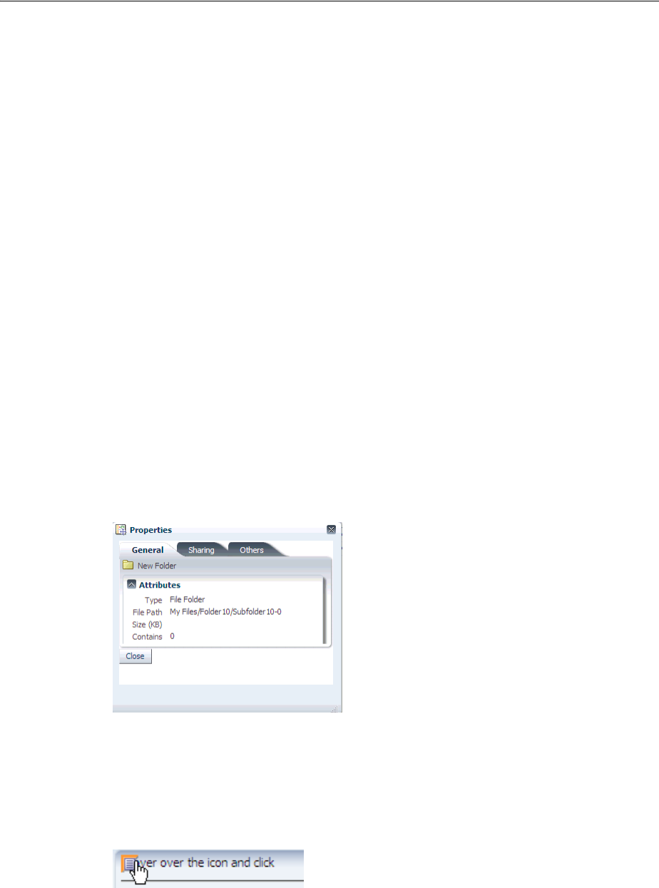
About Popup Dialogs, Menus, and Windows
Using Popup Dialogs, Menus, and Windows 15-3
for this context parameter. Example 15–1 shows how to set the value of the LAST_
WINDOW_SESSION_TIMEOUT context parameter in a web.xml file to 1800 seconds.
Example 15–1 Specifying the Session Timeout for the Last Window in an Application
<!-- Sets the session timeout to 1800 seconds when there is only one window open
in the session and 1800 seconds is smaller then the original session timeout. This
gives your application the option to end the session when an end user closes the
last window. Specify a value in seconds. A negative value disables this feature.
The default value is -1. -->
<context-param>
<param-name>LAST_WINDOW_SESSION_TIMEOUT</param-name>
<param-value>1800</param-value>
</context-param>
For more information about configuring your application’s web.xml file,
Appendix A.2, "Configuration in web.xml."
15.1.1 Popup Dialogs, Menus, Windows Use Cases and Examples
You can place a dialog component as a child to a popup component and render a
dialog in a popup at runtime. The dialog component must be the only immediate
child component of the popup component. At runtime, end users can view or enter
information (for example, search criteria) and use the dialog component’s default
command component buttons to invoke a dialogEvent when clicked. Figure 15–2
shows an example where an end user can dismiss the dialog by clicking the Close
button.
Figure 15–2 af:dialog Component
You can also use components within a popup to display contextual information related
to another component. When so configured, the related component displays a small
square. When moused over, the icon grows and also displays a note icon as shown in
Figure 15–3.
Figure 15–3 With Mouseover, Larger Icon with Note is Displayed
When the user clicks the note icon, the associated popup displays its enclosed content.

Declaratively Creating Popups
15-4 Web User Interface Developer's Guide for Oracle Application Development Framework
15.1.2 Additional Functionality for Popup Dialogs, Menus, and Windows
You may find it helpful to understand other ADF Faces features before you use a
popup component to create dialogs, menus, and windows. Additionally, once you
have added a popup component (or related components) to your page, you may find
that you need to add functionality such as accessibility and localization. Following are
links to other functionality that these components can use.
■Using parameters in text: You can use the ADF Faces EL format tags if you want
the text displayed in a component to contain parameters that will resolve at
runtime. For more information, see Section 3.5.2, "How to Use the EL Format
Tags."
■Events: The dialog component renders ADF Faces command components. You
also use a command component in conjunction with the showPopupBehavior
tag to launch a popup. These ADF Faces command components deliver
ActionEvent events when activated. For more information about how to handle
events on the server as well as on the client, see Chapter 6, "Handling Events."
■Messages: Popup dialogs and secondary windows are frequently used to provide
different levels of help information for users. For more information about how to
display messages to users, see Chapter 19, "Displaying Tips, Messages, and Help."
■Localization: Instead of directly entering text for labels in the popup dialogs,
menus, and windows that you create, you can use property files. These files allow
you to manage translation of the text strings. For more information, see
Chapter 29, "Internationalizing and Localizing Pages."
■Skins: You can change the look and feel of the components that you use to create
popup dialogs, menus, and windows by changing the skin. For more information,
see Chapter 28, "Customizing the Appearance Using Styles and Skins."
■Accessibility: You can make your popup dialogs, menus, and windows accessible.
For more information, see Chapter 30, "Developing Accessible ADF Faces Pages."
■Dialog framework: If your application uses the full Fusion technology stack, note
that the dialog framework is integrated with ADF Controller for use with ADF
task flows. For more information, see the "Using Dialogs in Your Application"
chapter in the Oracle Fusion Middleware Fusion Developer's Guide for Oracle
Application Development Framework.
15.2 Declaratively Creating Popups
The dialog, panelWindow, menu, and noteWindow components can all be used
inside the popup component to display inline popups, as shown in Table 15–1. When
no child component exists for the popup component, a very simple inline popup
appears.
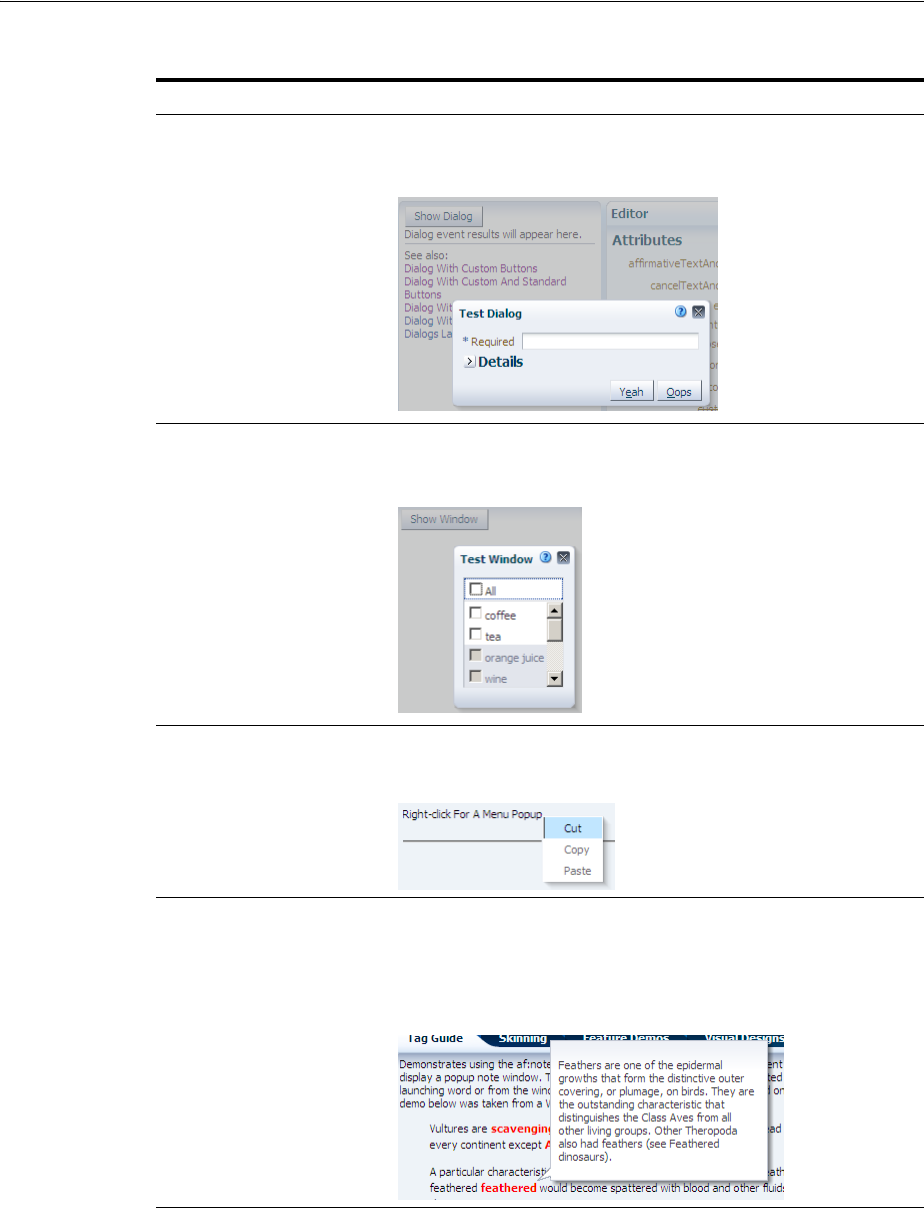
Declaratively Creating Popups
Using Popup Dialogs, Menus, and Windows 15-5
Table 15–1 Components Used with the popup Component
Component Displays at Runtime
dialog Displays its children inside a dialog and delivers events when
the OK, Yes, No, and Cancel actions are activated. For more
information, see Section 15.2.1, "How to Create a Dialog."
panelWindow Displays its children in a window that is similar to a dialog, but
does not support events. For more information, see
Section 15.2.2, "How to Create a Panel Window."
menu Displays a context menu for an associated component. For more
information, see Section 15.2.3, "How to Create a Context Menu."
noteWindow Displays read-only information associated with a particular UI
component. Note windows are used to display help and
messages and are commonly shown on mouseover or on focus
gestures. For more information, see Section 15.2.4, "How to
Create a Note Window."
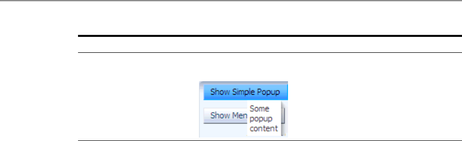
Declaratively Creating Popups
15-6 Web User Interface Developer's Guide for Oracle Application Development Framework
Both the dialog and panelWindow components support definition help, content
displayed when a user moves the cursor over a help icon (a blue circle with a question
mark). The dialog and panelWindow components do not support instruction help.
For more information, see Chapter 19, "Displaying Tips, Messages, and Help."
Typically, you use a command component in conjunction with the
showPopupBehavior tag to launch a popup. You associate the
showPopupBehavior tag with the component it should launch. This tag also controls
the positioning of the popup (when needed).
In addition to being used with action events on command components, the
showPopupBehavior tag can be used in conjunction with other events, such as the
showDetail event and the selection event. For more information, see Section 15.3,
"Declaratively Invoking a Popup."
As an alternative to using the showPopupBehavior tag in conjunction with a
command component, you can launch, cancel, or hide a popup by writing a backing
bean method. The backing bean method you write takes the actionEvent returned
by the command component as an argument. For more information about this
alternative, see Section 15.4, "Programmatically Invoking a Popup."
By default, the content of the popup is not sent from the server until the popup is
displayed. This represents a trade-off between the speed of showing the popup when
it is opened and the speed of rendering the parent page. Once the popup is loaded, by
default the content will be cached on the client for rapid display.
You can modify this content delivery strategy by setting the contentDelivery
attribute on the popup component to one of the following options:
■lazy - The default strategy previously described. The content is not loaded until
you show the popup once, after which it is cached.
■immediate - The content is loaded onto the page immediately, allowing the
content to be displayed as rapidly as possible. Use this strategy for popups that are
consistently used by all users every time they use the page.
■lazyUncached - The content is not loaded until the popup displays, and then the
content reloads every time you show the popup. Use this strategy if the popup
shows data that can become stale or outdated.
If you choose to set the popup component’s contentDelivery attribute to lazy,
you can further optimize the performance of the popup component and the page that
hosts it by setting another popup component attribute (childCreation) to
deferred. This defers the creation of the popup component's child components until
the application delivers the content. The default value for the childCreation
attribute is immediate.
popup component without
one of the following
components as an
immediate child
component: dialog,
panelWindow, menu, or
noteWindow
Displays content inline.
Table 15–1 (Cont.) Components Used with the popup Component
Component Displays at Runtime

Declaratively Creating Popups
Using Popup Dialogs, Menus, and Windows 15-7
15.2.1 How to Create a Dialog
Create a dialog when you need the dialog to raise events when dismissed. Once you
add the dialog component as a child to the popup component, you can add other
components to display and collect data.
By default, the dialog component can have the following combination of buttons:
■Cancel
■OK
■OK and Cancel
■Yes and No
■Yes, No, and Cancel
■None
These buttons launch a dialogEvent when clicked. You can add other buttons to a
dialog using the buttonBar facet. Any buttons that you add do not invoke the
dialogEvent. Instead, they invoke the standard actionEvent. It is recommended
that any of these buttons that you add have their partialSubmit attribute set to
true. This makes sure that an actionEvent invokes only on components within the
dialog. However, you can add buttons and set their partialSubmit attribute to
false if you set the af:popup component’s autoCancel property’s value to
disabled. Choosing this latter option (partialSubmit set to false) results in
increased wait times for end users because your application reloads the page and
reinitializes components on the page before it restores the popup component’s
visibility (and by extension, the dialog component). Note that you must set the
command component’s partialSubmit attribute to true if the af:popup
component’s autoCancel property’s value is set to enabled (the default value). For
more information about the use of the af:popup component’s autoCancel property,
see Section 15.6, "Controlling the Automatic Cancellation of Inline Popups."
Before you begin:
It may be helpful to understand how the dialog component’s attributes and other
components affect the functionality of inline dialogs. For more information, see
Section 15.2, "Declaratively Creating Popups."
You may also find it helpful to understand functionality that can be added using other
ADF Faces features. For more information, see Section 15.1.2, "Additional
Functionality for Popup Dialogs, Menus, and Windows."
To create an inline dialog:
1. In the ADF Faces page of the Component Palette, from the Layout panel, in the
Secondary Windows group, drag a Popup and drop it on the page.
2. In the Property Inspector, expand the Common section and set the following
attributes:
■ContentDelivery: Select how the content is delivered to the component in the
popup.
Tip: It does not matter where the popup component appears on the
page, as the position is driven by the component used to invoke the
popup. However, the popup component must be within a form
component.

Declaratively Creating Popups
15-8 Web User Interface Developer's Guide for Oracle Application Development Framework
■Animate: Select true to enable animation. Animation is determined by
configuration in the trinidad-config.xml file and by its skin properties
(for more information, see Section A.6.2.1, "Animation Enabled."). You can
override this setting by selecting false.
■LauncherVar: Enter a variable to be used to reference the launch component.
This variable is reachable only during event delivery on the popup or its child
components, and only if the EventContext is set to launcher.
■EventContext: Set to launcher if the popup is shared by multiple objects, for
example if the dialog within the popup will display information for the
selected row in a table. Setting this attribute to launcher makes the row
clicked current before the event listener is called, and returns data only for that
row. For more information, see Section 15.2.5, "What Happens at Runtime:
Popup Component Events."
3. Optionally, in the Property Inspector, expand the Common section and set the
following attributes:
■AutoCancel: Select disabled to prevent the automatic cancellation of an
inline popup. For more information, see Section 15.6, "Controlling the
Automatic Cancellation of Inline Popups."
■ChildCreation: Set to deferred to defer the creation of the popup
component's child components until the application delivers the content. The
default value for the childCreation attribute is immediate. For more
information, see Section 15.2, "Declaratively Creating Popups."
■ResetEditableValues: Select whenCanceled to reset editable values that an
end user entered to null if the end user cancels the dialog.
Alternatively, you can use the resetListener component. For more
information about using the resetListener component, see Section 15.7,
"Resetting Input Fields in a Popup."
4. From the Component Palette, drag and drop a Dialog as a direct child to the
popup component.
5. In the Property Inspector, expand the Common section and set the following
attributes:
■Type: Select the built-in partial-submit command buttons you want to display
in your dialog.
For example, if you set the type attribute to yesNoCancel, the dialog
displays Yes, No, and Cancel buttons. When any of these buttons are pressed,
the dialog dismisses itself, and the associated outcome (either ok, yes, no, or
cancel) is delivered with an event. The ok, yes, and no outcomes are
delivered with the dialogEvent. Cancel outcomes are sent with the
PopupCanceled event. You can use the appropriate listener property to bind
to a method to handle the event, using the outcome to determine the logic.
Tip: Values of input components in a dialog are not reset when a
user clicks the dialog’s Cancel button. If the user opens the dialog a
second time, those values will still display. If you want the values to
match the current values on the server, then set the
contentDelivery attribute to lazyUncached.
Tip: A dialog will not dismiss if there are any ADF Faces messages
with a severity of error or greater.
Declaratively Creating Popups
Using Popup Dialogs, Menus, and Windows 15-9
■Title: Enter text to be displayed as the title on the dialog window.
■CloseIconVisible: Select whether or not you want the Close icon to display in
the dialog.
■Modal: Select whether or not you want the dialog to be modal. Modal dialogs
do not allow the user to return to the main page until the dialog has been
dismissed.
■Resize: Select whether or not you want users to be able to change the size of
the dialog. The default is off.
■StretchChildren: Select whether or not you want child components to stretch
to fill the dialog. When set to first, the dialog stretches a single child
component. However, the child component must allow stretching. For more
information, see Section 9.2.1, "Geometry Management and Component
Stretching."
6. Expand the Appearance section and set the text attributes.
Instead of specifying separate button text and an access key, you can combine the
two, so that the access key is part of the button text. Simply precede the letter to be
used as an access key with an ampersand (&).
For example, if you want the text for the affirmative button to be OK, and you
want the O in OK to be the access key, enter &OK.
7. Expand the Behavior section and if needed, enter a value for the DialogListener
attribute. The value should be an EL expression method reference to a dialog
listener method that handles the event.
For example, suppose you create a dialog to confirm the deletion of an item. You
might then create a method on a managed bean similar to the deleteItem
method shown in Example 15–2. This method accesses the outcome from the
event. If the outcome is anything other than yes, the dialog is dismissed. If the
outcome is yes (meaning the user wants to delete the item), the method then gets
the selected item and deletes it.
Example 15–2 Handler for dialogEvent That Deletes an Item
public void deleteItem(DialogEvent dialogEvent)
{
if (dialogEvent.getOutcome() != DialogEvent.Outcome.yes)
{
return;
}
// Ask for selected item from FileExplorerBean
FileItem selectedFileItem = _feBean.getLastSelectedFileItem();
if (selectedFileItem == null)
{
return;
}
else
{
// Check if we are deleting a folder
Note: If you set Resize to on or set StretchChildren to first, you
must also set ContentWidth and ContentHeight (see Step 8).
Otherwise, the size will default to 250x250 pixels.

Declaratively Creating Popups
15-10 Web User Interface Developer's Guide for Oracle Application Development Framework
if (selectedFileItem.isDirectory())
{
_feBean.setSelectedDirectory(null);
}
}
this.deleteSelectedFileItem(selectedFileItem);
}
Example 15–3 shows how the dialogListener attribute is bound to the
deleteItem method.
Example 15–3
<af:dialog title="#{explorerBundle['deletepopup.popuptitle']}"
type="yesNo"
dialogListener="#{explorer.headerManager.deleteItem}"
id="d1">
The dialogEvent is propagated to the server only when the outcome is ok, yes,
or no. You can block this if needed. For more information, see Section 6.3.5, "How
to Prevent Events from Propagating to the Server.")
If the user instead clicks the Cancel button (or the Close icon), the outcome is
cancel, the popupCancel client event is raised on the popup component. Any
values entered into input components rendered in the popup component do not
get sent to the server. Any editable components that have changed their values
since the popup component rendered do not send the changed values to the
server. The popupCancel event is delivered to the server.
8. If you want to set a fixed size for the dialog, or if you have set resize to on or set
stretchChildren to first, expand the Appearance section and set the following
attributes:
■ContentHeight: Enter the desired height in pixels.
■ContentWidth: Enter the desired width in pixels.
Tip: While the user can change the values of these attributes at
runtime (if the resize attribute is set to on), the values will not be
retained once the user leaves the page unless you configure your
application to use change persistence. For information about enabling
and using change persistence, see Chapter 32, "Allowing User
Customization on JSF Pages."
Note: If you use a command component without the
showPopupBehavior tag to launch the dialog, and if that command
component has values for the windowHeight and windowWidth
attributes, the values on the command component override the
contentHeight and contentWidth values. The dialog framework
allows you to use a command component to launch a dialog without
the showPopupBehavior tag. For more information, see the
"Running a Bounded Task Flow in a Modal Dialog" section in the
Oracle Fusion Middleware Fusion Developer's Guide for Oracle Application
Development Framework. For more information about the
showPopupBehavior tag, see Section 15.3, "Declaratively Invoking a
Popup."

Declaratively Creating Popups
Using Popup Dialogs, Menus, and Windows 15-11
9. If needed, add command components to the buttonBar facet. It is recommended
that you set the partialSubmit attribute to true for every added command
component. However, you can set the command component’s partialSubmit
attribute to false if the af:popup component’s autoCancel property is set to
disabled. The values an af:popup component’s autoCancel property and a
command component partialSubmit property determine how a command
component dismisses and reloads a dialog. For more information, see Section 15.6,
"Controlling the Automatic Cancellation of Inline Popups."
By default, added command components do not dismiss the dialog. You need to
bind the actionListener on the command component to a handler that
manages closing the dialog, as well as any needed processing. For examples on
how to do this, see the tag documentation.
10. Insert components to display or collect data for the dialog. Use a layout
component like panelGroupLayout to contain the components.
11. Add logic on the parent page to invoke the popup and dialog. For more
information, see Section 15.3, "Declaratively Invoking a Popup."
15.2.2 How to Create a Panel Window
The panelWindow component is similar to the dialog component, but it does not
allow you to configure the buttons or to add buttons to a facet. If you need to invoke
logic to handle data in the panelWindow, you need to create a listener for the popup
component’s cancel event.
The popup component that contains the panelWindow component must be contained
within a form component.
Before you begin:
It may be helpful to understand how the panelWindow component’s attributes affect
the functionality of inline windows. For more information, see Section 15.2,
"Declaratively Creating Popups."
You may also find it helpful to understand functionality that can be added using other
ADF Faces features. For more information, see Section 15.1.2, "Additional
Functionality for Popup Dialogs, Menus, and Windows."
Tip: If the facet is not visible in the visual editor:
1. Right-click the dialog component in the Structure window.
2. From the context menu, choose Facets - Dialog > ButtonBar. Facets in use
on the page are indicated by a checkmark in front of the facet name.
Tip: Normally, clicking a dialog’s Cancel button or Close icon
prevents any data entered into an inputText component from being
submitted. However, setting the autoSubmit attribute to true on an
inputText component in a dialog overrides the dialog's cancel
behavior, as this setting causes a submit.
Tip: If you are using the panelWindow as an inline popup in an
application that uses the Fusion technology stack, and you want to
emulate the look of a dialog, place the panelWindow component in
the center facet of a panelStretchLayout component, and place
command buttons in the bottom facet.

Declaratively Creating Popups
15-12 Web User Interface Developer's Guide for Oracle Application Development Framework
To create an inline window:
1. In the ADF Faces page of the Component Palette, from the Layout panel, in the
Secondary Windows group, drag a Popup and drop it on the page.
2. In the Property Inspector, expand the Common section and set the following
attributes:
■ContentDelivery: Select how the content is to be delivered to the component
in the popup.
■Animate: Select true to enable animation. Animation is determined by
configuration in the trinidad-config.xml file and by its skin properties
(for more information, see Section A.6.2.1, "Animation Enabled.").
■LauncherVar: Enter a name (for example, source) for a variable. Similar to
the var attribute on a table, this variable is used to store reference in the
Request scope to the component containing the showPopupBehavior tag.
The variable is reachable only during event delivery on the popup or its child
components, and only if EventContext is set to launcher.
■EventContext: Set to launcher if the popup is shared by multiple objects, for
example if the window within the popup will display information for the
selected row in a table. Setting this attribute to launcher makes the row
clicked current before the event listener is called, and returns data only for that
row. For more information, see Section 15.2.5, "What Happens at Runtime:
Popup Component Events."
■PopupCancelListener: set to an EL expression that evaluates to a handler with
the logic that you want to invoke when the window is dismissed.
3. Optionally, in the Property Inspector, expand the Common section and set a value
for the AutoCancel property to determine the automatic cancel behavior. For more
information, see Section 15.6, "Controlling the Automatic Cancellation of Inline
Popups."
4. In the ADF Faces page of the Component Palette, from the Layout panel, drag and
drop a Panel Window as a direct child to the popup component.
5. In the Property Inspector, expand the Common section and set the following
attributes:
■Modal: Select whether or not you want the window to be modal. Modal
windows do not allow the user to return to the main page until the window
has been dismissed.
■CloseIconVisible: Select whether or not you want the Close icon to display in
the window.
■Title: The text displayed as the title in the window.
Tip: It does not matter where the popup component appears on the
page, as the position is driven by the component used to invoke the
popup. However, the popup component must be within a form
component.
Tip: Values of input components are not reset when a user closes the
panelWindow component. If the user opens the window a second
time, those values will still display. If you want the values to match
the current values on the server, then set the contentDelivery
attribute to lazyUncached.

Declaratively Creating Popups
Using Popup Dialogs, Menus, and Windows 15-13
■Resize: Select whether or not you want users to be able to change the size of
the dialog. The default is off.
■StretchChildren: Select whether or not you want child components to stretch
to fill the window. When set to first, the window stretches a single child
component. However, the child component must allow stretching. For more
information, see Section 9.2.1, "Geometry Management and Component
Stretching."
6. If you want to set a fix size for the window, or if you have set resize to on or set
stretchChildren to first, expand the Appearance section and set the following
attributes:
■ContentHeight: Enter the desired height in pixels.
■ContentWidth: Enter the desired width in pixels.
7. Insert components to display or collect data for the window. Use a layout
component like panelGroupLayout to contain the components.
8. Add logic on the parent page to invoke the popup and panel window. For more
information, see Section 15.3, "Declaratively Invoking a Popup."
15.2.3 How to Create a Context Menu
You create a context menu by using menu components within the popup component.
You can then invoke the context menu popup from another component, based on a
given trigger. If instead, you want toolbar buttons in a toolbar to launch popup menus,
then see Section 16.3, "Using Toolbars."
Before you begin:
It may be helpful to understand how the popup component’s attributes and other
components affect the functionality of context menus. For more information, see
Section 15.2, "Declaratively Creating Popups."
Note: If you set Resize to on or set StretchChildren to first, you
must also set ContentWidth and ContentHeight (see Step 6).
Otherwise, the size will default to 250x250 pixels.
Tip: While the user can change the values of these attributes at
runtime (if the resize attribute is set to on), the values will not be
retained once the user leaves the page unless you configure your
application to use change persistence. For information about enabling
and using change persistence, see Chapter 32, "Allowing User
Customization on JSF Pages."
Note: If a command component without the showPopupBehavior
tag is used to launch the dialog, and if that command component has
values for the windowHeight and windowWidth attributes, the
values on the command component will override the
contentHeight and contentWidth values. For more information
about the showPopupBehavior tag, see Section 15.3, "Declaratively
Invoking a Popup."

Declaratively Creating Popups
15-14 Web User Interface Developer's Guide for Oracle Application Development Framework
You may also find it helpful to understand functionality that can be added using other
ADF Faces features. For more information, see Section 15.1.2, "Additional
Functionality for Popup Dialogs, Menus, and Windows."
To create an inline context menu:
1. In the ADF Faces page of the Component Palette, from the Layout panel, in the
Secondary Windows group, drag a Popup and drop it on the page.
2. In the Property Inspector, expand the Common section and set the following
attributes.
■ContentDelivery: Determines how the content is delivered to the component
in the popup.
■Animate: Select true to enable animation. Animation is determined by
configuration in the trinidad-config.xml file and by its skin properties
(for more information, see Section A.6.2.1, "Animation Enabled."). You can
override this setting by selecting false.
■LauncherVar: Enter a variable name (for example, source) to be used to
reference the launch component. This variable is reachable only during event
delivery on the popup or its child components, and only if the EventContext
is set to launcher.
■EventContext: Set to launcher if the popup is shared by multiple objects, for
example if the menu within the popup will display information for the
selected row in a table. Setting this attribute to launcher makes the row
clicked current before the event listener is called, and returns only data for that
row. For more information, see Section 15.2.5, "What Happens at Runtime:
Popup Component Events."
3. Optionally, in the Property Inspector, expand the Common section and set a value
for the AutoCancel property to determine the automatic cancel behavior. For more
information, see Section 15.6, "Controlling the Automatic Cancellation of Inline
Popups."
4. From the Component Palette, drag and drop a Menu as a direct child to the popup
component, and build your menu using commandMenuItem components, as
documented starting with Step 6 in Section 16.2.1, "How to Create and Use Menus
in a Menu Bar."
5. Add logic on the parent page to invoke the popup and context menu. For more
information, see Section 15.3, "Declaratively Invoking a Popup."
15.2.4 How to Create a Note Window
Use the noteWindow component to display read-only text. The popup component
that contains the noteWindow component must be contained within a form
component.
Tip: It does not matter where the popup component appears on the
page, as the position is driven by the component used to invoke the
popup. However, the popup component must be within a form
component.
Tip: Because this is a context menu, you do not need to create a
menu bar or multiple menus, as documented in Steps 1 through 5 in
Section 16.2.1, "How to Create and Use Menus in a Menu Bar."

Declaratively Creating Popups
Using Popup Dialogs, Menus, and Windows 15-15
Before you begin:
It may be helpful to understand how the noteWindow component’s attributes and
other components affect functionality. For more information, see Section 15.2,
"Declaratively Creating Popups."
You may also find it helpful to understand functionality that can be added using other
ADF Faces features. For more information, see Section 15.1.2, "Additional
Functionality for Popup Dialogs, Menus, and Windows."
To create an inline window:
1. In the ADF Faces page of the Component Palette, from the Layout panel, in the
Secondary Windows group, drag a Popup and drop it on the page.
2. In the Property Inspector, expand the Common section and set the following
attributes.
■ContentDelivery: Determines how the content is delivered to the component
in the popup.
■Animate: Select true to enable animation. Animation is determined by
configuration in the trinidad-config.xml file and by its skin properties
(for more information, see Section A.6.2.1, "Animation Enabled."). You can
override this setting by selecting false.
■LauncherVar: Enter a variable to be used to reference the launch component.
This variable is reachable only during event delivery on the popup or its child
components, and only if the EventContext is set to launcher.
■EventContext: Set to launcher if the popup is shared by multiple objects, for
example if the window within the popup will display information for the
selected row in a table. Setting this attribute to launcher makes the row
clicked current before the event listener is called, and returns only data for that
row. For more information, see Section 15.2.5, "What Happens at Runtime:
Popup Component Events."
■PopupCancelListener: Set to an EL expression that evaluates to a handler with
the logic that you want to invoke when the window is dismissed.
3. Optionally, in the Property Inspector, expand the Common section and set a value
for the AutoCancel property to determine the automatic cancel behavior. For more
information, see Section 15.6, "Controlling the Automatic Cancellation of Inline
Popups."
4. From the Component Palette, drag and drop a Note Window as a direct child to
the popup component.
5. To enter the text to display in the window:
1. Click the Source tab to view the page source code.
2. Remove the closing slash (/) from the af:noteWindow tag.
3. Below the af:noteWindow tag, enter the text to display, using simple
HTML tags, and ending with a closed af:noteWindow tag.
Example 15–4 shows text for a note window.
Tip: It does not matter where the popup component appears on the
page, as the position is driven by the component used to invoke the
popup. However, the popup component must be within a form
component.
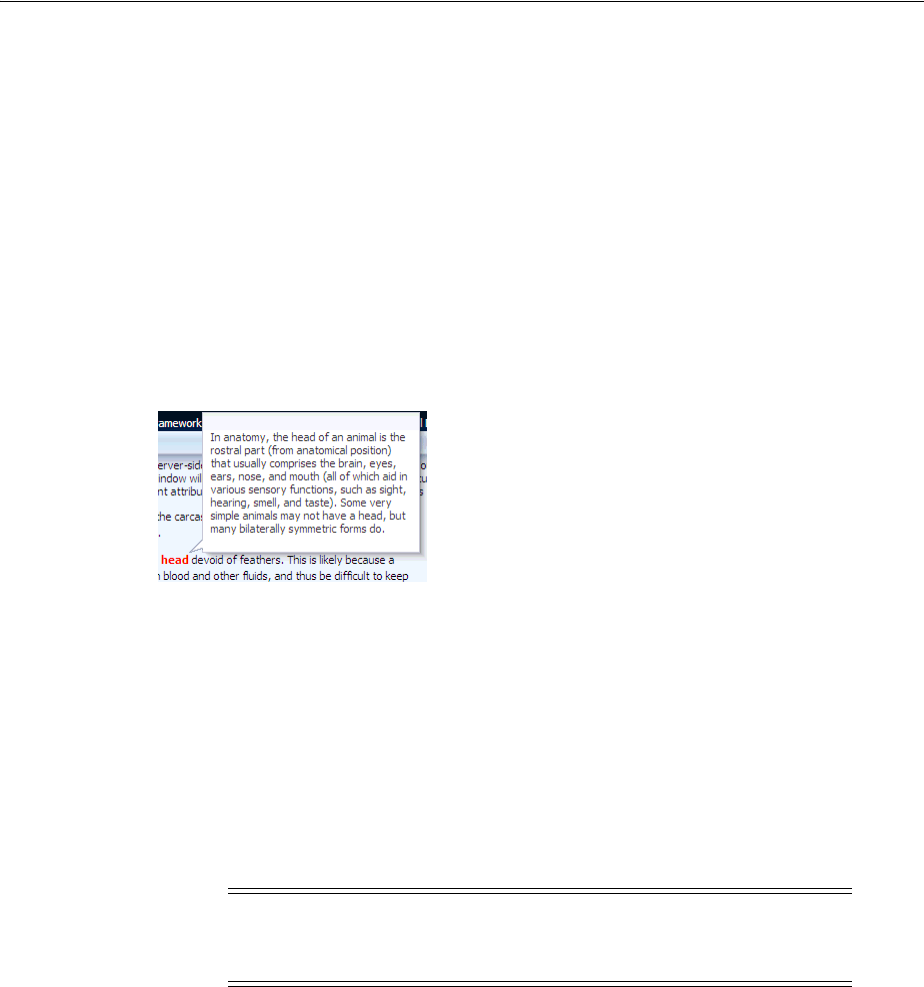
Declaratively Creating Popups
15-16 Web User Interface Developer's Guide for Oracle Application Development Framework
Example 15–4 Text Within an af:noteWindow Tag
<af:popup id="popupHead" contentDelivery="lazyUncached">
<af:noteWindow inlineStyle="width:200px" id="nw3">
<p>In anatomy, the head of an animal is the rostral part (from
anatomical position) that usually comprises the brain, eyes,
ears, nose, and mouth (all of which aid in various sensory
functions, such as sight, hearing, smell, and taste). Some very
simple animals may not have a head, but many bilaterally
symmetric forms do.</p>
</af:noteWindow>
</af:popup>
Figure 15–4 shows how the note would display.
Figure 15–4 Text Displayed in a Note Window
6. Optionally, in the Property Inspector, expand the Behavior section and specify a
number of seconds for the AutoDismissalTimeout property. The value you
specify determines the time in seconds that the note window displays before the
application automatically dismisses it. Any value you specify overrides the default
automatic dismissal behavior. This override is revoked if the end user moves the
mouse over the content of the note window because this gesture reverts the
automatic dismissal behavior back to the default automatic dismissal behavior for
the note window. The default automatic dismissal behavior is to dismiss the note
window when focus changes from the launching source or from the content of the
popup.
7. Add logic on the parent page to invoke the popup and note window. For more
information, see Section 15.3, "Declaratively Invoking a Popup."
15.2.5 What Happens at Runtime: Popup Component Events
When content is delivered to the popup, and the contentDelivery attribute is set to
either lazy or lazyUncached, the popupFetch server-side event is invoked. This
event has two properties, eventContext and launcherVar. The eventContext
property determines the context from which the event is delivered, either from the
context of the popup (self) or from the component that launched the popup
(launcher). Setting the context to launcher can be very useful if the popup is
shared by multiple components, because the framework will behave as though the
component that launched the popup had launched the event, and not the popup. The
launcherVar property is used to keep track of the current launcher, similar to the
way in which variables are used to stamp out rows in a table.
Note: The feature enabled by this property is not accessible friendly
because a mouse over triggers the timeout cancellation period and
there is no keyboard equivalent.

Declaratively Creating Popups
Using Popup Dialogs, Menus, and Windows 15-17
For example, say you have a column in a table that displays a person’s first name
using a command link. When the command link is hovered over, a popup
noteWindow is invoked that shows the person’s full name. Because this noteWindow
will be used by all rows in the table, but it needs to display the full name only for the
row containing the command link that was clicked, you need to use the
eventContext property to ensure that the context is that row, as shown in
Example 15–5.
Example 15–5 Using eventContext for Shared Popups
<af:popup id="noteWindow" contentDelivery="lazyUncached" eventContext="launcher"
launcherVar="source">
<af:noteWindow>
<af:outputText value="#{testBean.fullName}"/>
</af:noteWindow>
</af:popup>
<af:table var="person" value="#{testBean.people}">
<af:column id="firstName">
<af:commandLink text="#{person.firstName}">
<af:showPopupBehavior popupId="::noteWindow" triggerType="mouseHover"/>
</af:commandLink>
</af:column>
</af:table>
Using the variable source, you can take values from the source and apply them, or you
can set values. For example, you could get the full name value of the people object
used in the table, and set it as the value of the testBean’s fullName property used
by the window, using a setPropertyListener and clientAttribute tag, as
shown in Example 15–6.
Example 15–6 Setting the Value of a Component in a Popup Using the launcherVar
Property
<af:popup id="noteWindow" contentDelivery="lazyUncached" eventContext="launcher"
launcherVar="source">
<af:noteWindow>
<af:outputText value="#{testBean.fullName}"/>
</af:noteWindow>
<af:setPropertyListener from="#{source.attributes.fullName}"
to="#{testBean.fullName}" type="popupFetch"/>
</af:popup>
<af:table var="person" value="#{testBean.people}">
<af:column id="firstName">
<f:facet name="header">
<af:outputText value="First Name"/>
</f:facet>
<af:commandLink text="#{person.firstName}">
<af:showPopupBehavior popupId="::noteWindow" triggerType="mouseHover"/>
<af:clientAttribute name="fullName" value="#{person.fullName}"/>
</af:commandLink>
</af:column>
</af:table>
In this example, the launcherVar property source gets the full name for the current
row using the popupFetch event. For more information about using the
setPropertyListener tag, see Section 5.7.2, "How to Use the pageFlowScope
Scope Without Writing Java Code." For more information about using client attributes,
see Section 4.7, "Using Bonus Attributes for Client-Side Components." For more

Declaratively Creating Popups
15-18 Web User Interface Developer's Guide for Oracle Application Development Framework
information about the showPopupBehavior tag, see Section 15.3, "Declaratively
Invoking a Popup."
Popups also invoke the following client-side events:
■popupOpening: Fired when the popup is invoked. If this event is canceled in a
client-side listener, the popup will not be shown.
■popupOpened: Fired after the popup becomes visible. One example for using this
event would be to create custom rules for overriding default focus within the
popup.
■popupCanceled: Fired when a popup is unexpectedly dismissed by
auto-dismissal or by explicitly invoking the popup client component's cancel
method. This client-side event also has a server-side counterpart.
■popupClosed: Fired when the popup is hidden or when the popup is
unexpectedly dismissed. This client-side event also has a server-side counterpart.
When a popup is closed by an affirmative condition, for example, when the Yes button
is clicked, it is hidden. When a popup is closed by auto-dismissal, for example when
either the Close icon or the Cancel button is clicked, it is canceled. Both types of
dismissals result in raising a popupClosed client-side event. Canceling a popup also
raises a client-side popupCanceled event that has an associated server-side
counterpart. The event will not be propagated to the server unless there are registered
listeners for the event. If it is propagated, it prevents processing of any child
components to the popup, meaning any submitted values and validation are ignored.
You can create a listener for the popupCanceled event that contains logic to handle
any processing needed when the popup is canceled.
If you want to invoke some logic based on a client-side event, you can create a custom
client listener method. For more information, see Section 4.2, "Listening for Client
Events." If you want to invoke server-side logic based on a client event, you can add a
serverListener tag that will invoke that logic. For more information, see
Section 6.4, "Sending Custom Events from the Client to the Server."
15.2.6 What You May Need to Know About Dialog Events
The dialog component raises a dialogEvent when the end user clicks the OK, Yes,
No or Cancel buttons. A dialog component automatically hides itself when the end
user clicks the OK, Yes or No buttons provided that no message with a severity of
error or greater exists on the page. An end user selecting the Cancel button or close
icon cancels the parent popup component and raises a popup canceled event.
You can configure a dialogListener attribute to intercept the dialogEvent
returned by the OK, Yes, No, and Cancel buttons. Only the dialogEvent returned
by the OK, Yes and No buttons get propagated to the server. The dialogEvent
returned by the Cancel button, the ESC key, and close icon queue a client dialog event
and do not get propagated to the server.
If you configure an actionListener for the command component that invokes a
dialog component to carry out an action (for example, update an inputText
component) after the dialog component returns, you also need to call
resetValue() on the inputText component if the command component’s
immediate value is set to true.
For more information about the events raised by the dialog and popup components,
see the Oracle Fusion Middleware Tag Reference for Oracle ADF Faces.

Declaratively Invoking a Popup
Using Popup Dialogs, Menus, and Windows 15-19
15.3 Declaratively Invoking a Popup
With ADF Faces components, JavaScript is not needed to show or hide popups. The
showPopupBehavior tag provides a declarative solution, so that you do not have to
write JavaScript to open a popup component or register a script with the popup
component. For more information about client behavior tags, see Section 6.6, "Using
ADF Faces Client Behavior Tags."
The showPopupBehavior tag listens for a specified event, for example the
actionEvent on a command component, or the disclosureEvent on a
showDetail component. However, the showPopupBehavior tag also cancels
delivery of that event to the server. Therefore, if you need to invoke some server-side
logic based on the event that the showPopupBehavior tag is listening for, then you
need to use either JavaScript to launch the popup, or programmatically launch the
popup component as documented in Section 15.4, "Programmatically Invoking a
Popup."
15.3.1 How to Declaratively Invoke a Popup Using the af:showPopupBehavior Tag
You use the showPopupBehavior tag in conjunction with the component that
invokes the popup, for example a commandButton component that invokes a dialog,
or an inputText component that, when right-clicked, will invoke a context menu.
Before you begin:
Create the type of popup that you to invoke declaratively, as described in Section 15.2,
"Declaratively Creating Popups" and create the component that invokes the popup.
It may be helpful to have an understanding of the configuration options available to
you if you want to invoke a popup component declaratively. For more information, see
Section 15.3, "Declaratively Invoking a Popup."
You may also find it helpful to understand functionality that can be added using other
ADF Faces features. For more information, see Section 15.1.2, "Additional
Functionality for Popup Dialogs, Menus, and Windows."
To use the showPopupBehavior tag:
1. In the Component Palette, from the Operations panel, in the Behavior group, drag
a Show Popup Behavior and drop it as a child to the component that invokes the
popup.
2. In the Property Inspector, use the dropdown menu for the PopupId attribute to
choose Edit. Use the Edit Property: PopuId dialog to select the popup component
to invoke and click OK.
3. In the Property Inspector, from the TriggerType dropdown menu, choose the
trigger to invoke the popup. The default is action which can be used for
command components. Use contextMenu to trigger a popup when the
right-mouse is clicked. Use mouseHover to trigger a popup when the cursor is
over the component. The popup closes when the cursor moves off the component.
For a detailed list of component and mouse/keyboard events that can trigger the
popup, see the documentation for the showPopupBehavior tag in the Oracle
Fusion Middleware Tag Reference for Oracle ADF Faces.
Declaratively Invoking a Popup
15-20 Web User Interface Developer's Guide for Oracle Application Development Framework
4. From the AlignId dropdown, choose Edit, and then use the Edit Property: AlignId
dialog to select the component with which you want the popup to align.
5. From the Align dropdown menu, choose how the popup should be positioned
relative to the component selected in the previous step.
15.3.2 What Happens When You Use af:showPopupBehavior Tag to Invoke a Popup
At design time, JDeveloper generates the corresponding values in the source files that
you selected in the Property Inspector. Example 15–7 shows sample code that displays
some text in the af:popup component with the id “popup1" when the button "Click
Me" is clicked.
Example 15–7 showPopupBehavior Associated with commandButton component
<af:commandButton immediate="true"
text="Show Popup"
clientComponent="true"
id="popupButton2">
<af:showPopupBehavior
popupId="popup2"
alignId="popupButton2"
align="afterStart"/>
</af:commandButton>
<af:popup id="popup2">
<af:inputText label="What is your name?" id="it1"/>
</af:popup>
The code in Example 15–7 tells ADF Faces to align the popup contents with the
commandButton identified by the id attribute, and to use the alignment position of
afterStart, which aligns the popup underneath the button, as shown in
Figure 15–5.
Note: The event selected for the showPopupBehavior tag's
triggerType attribute will not be delivered to the server. If you
need to invoke server-side logic based on this event, then you must
invoke the popup using either JavaScript or a custom event as
documented in Section 6.4, "Sending Custom Events from the Client to
the Server" or invoke the popup programmatically as documented in
Section 15.4, "Programmatically Invoking a Popup"
Note: The dialog and panelWindow components do not require
alignId or align attributes, as the corresponding popup can be
moved by the user. If you set AlignId, the value will be overridden by
any manual drag and drop repositioning of the dialog or window. If
no value is entered for AlignId or Align, then the dialog or window is
opened in the center of the browser.
Additionally, if the triggerType attribute is set to contextMenu,
the alignment is always based on mouse position.
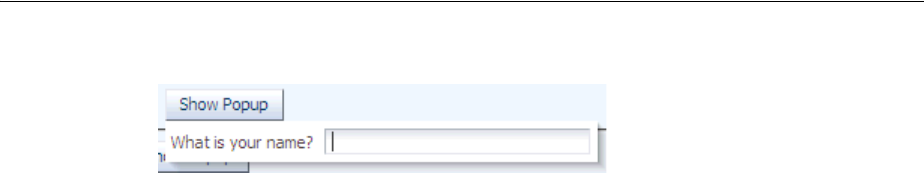
Programmatically Invoking a Popup
Using Popup Dialogs, Menus, and Windows 15-21
Figure 15–5 Button and Popup Contents
15.4 Programmatically Invoking a Popup
You can programmatically show, hide, or cancel a popup in response to an
actionEvent generated by a command component. Implement this functionality if
you want to deliver the actionEvent to the server immediately so you can invoke
server-side logic and show, hide, or cancel the popup in response to the outcome of
invoking the server-side logic.
Programmatically invoking a popup as described here differs to the method of
invoking a popup described in Section 15.3, "Declaratively Invoking a Popup" where
the showPopupBehavior tag does not deliver the actionEvent to the server
immediately.
You create the type of popup that you want by placing one of the components
(dialog, panelWindow, menu, or noteWindow) inside the popup component as
described in Section 15.2, "Declaratively Creating Popups." Make sure that the popup
component is in the right context when you invoke it. One of the easier ways to do this
is to bind it to the backing bean for the page, as in Example 15–8.
Example 15–8 Binding a popup Component to a Backing Bean
<af:popup
id="p1"
binding="#{mybean.popup}"
...
/>
Once you have done this, you configure a command component's actionListener
attribute to reference the popup component by calling an accessor for the popup
binding.
Write code for the backing bean method that invokes, cancels, or hides the popup.
Example 15–9 shows a showPopup backing bean method that uses the HINT_
LAUNCH_ID hint to identify the command component that passes the actionEvent
to it and p1 to reference the popup on which we invoke the show method.
Example 15–9 Backing Bean Method Invoking a Popup
public void showPopup(ActionEvent event) {
{
FacesContext context = FacesContext.getCurrentInstance();
UIComponent source = (UIComponent)event.getSource();
String alignId = source.getClientId(context);
RichPopup.PopupHints hints = new RichPopup.PopupHints();
hints.add(RichPopup.PopupHints.HintTypes.HINT_ALIGN_ID,source)
.add(RichPopup.PopupHints.HintTypes.HINT_LAUNCH_ID,source)
.add(RichPopup.PopupHints.HintTypes.HINT_ALIGN,
RichPopup.PopupHints.AlignTypes.ALIGN_AFTER_END);
p1.show(hints);
}
Example 15–10 shows a backing bean method that cancels a popup in response to an
actionEvent:

Programmatically Invoking a Popup
15-22 Web User Interface Developer's Guide for Oracle Application Development Framework
Example 15–10 Backing Bean Method Canceling a Popup
public void cancelPopupActionListener(ActionEvent event) {
FacesContext context = FacesContext.getCurrentInstance();
p1.cancel();
}
Example 15–11 shows a backing bean method that hides a popup in response to an
actionEvent:
Example 15–11 Backing Bean Method Hiding a Popup
public void hidePopupActionListener(ActionEvent event) {
FacesContext context = FacesContext.getCurrentInstance();
p1.hide();
}
The p1 object in the previous examples refers to an instance of the RichPopup class
from the following package:
oracle.adf.view.rich.component.rich.RichPopup
For more information about RichPopup, see the Oracle Fusion Middleware Java API
Reference for Oracle ADF Faces.
15.4.1 How to Programmatically Invoke a Popup
You configure the command component’s actionListener attribute to reference the
backing bean method that shows, cancels or hides the popup.
Before you begin:
Create the type of popup that you want the server-side method to invoke, as described
in Section 15.2, "Declaratively Creating Popups."
It may be helpful to have an understanding of the configuration options available to
you if you want to invoke a popup component programmatically. For more
information, see Section 15.4, "Programmatically Invoking a Popup."
You may also find it helpful to understand functionality that can be added using other
ADF Faces features. For more information, see Section 15.1.2, "Additional
Functionality for Popup Dialogs, Menus, and Windows."
To programmatically invoke a popup:
1. In the Component Palette, from the General Controls panel, drag and drop a
command component onto the JSF page.
For example, a Button component.
2. In the Property Inspector, expand the Behavior section and set the following
attributes:
■PartialSubmit: set to true if you do not want the Fusion web application to
render the entire page after an end user clicks the command component. The
default value (false) causes the application to render the whole page after an
end user invokes the command component. For more information about page
rendering, see Chapter 8, "Rerendering Partial Page Content."
■ActionListener: set to an EL expression that evaluates to a backing bean
method with the logic that you want to execute when the end user invokes the
command component at runtime.
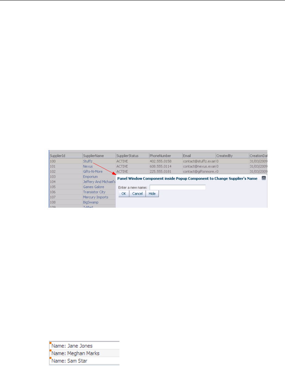
Displaying Contextual Information in Popups
Using Popup Dialogs, Menus, and Windows 15-23
3. Write the logic for the backing bean that is invoked when the command
component in step 2 passes an actionEvent.
For more information, see Example 15–9, "Backing Bean Method Invoking a
Popup", Example 15–10, "Backing Bean Method Canceling a Popup", or
Example 15–11, "Backing Bean Method Hiding a Popup".
15.4.2 What Happens When You Programmatically Invoke a Popup
At runtime, end users can invoke the command components you configure to invoke
the server-side methods to show, cancel, or hide a popup. For example, Figure 15–6
shows a panelWindow component that renders inside a popup component. It exposes
two command buttons (Cancel and Hide) that invoke the cancel and hide methods
respectively. End users invoke a commandLink component rendered in the
SupplierName column of the table component in the underlying page to show the
popup.
Figure 15–6 Popup Component Invoked by a Server-Side Method
15.5 Displaying Contextual Information in Popups
There may be cases when you think the user may need more information to complete a
task on a page, but you don’t want to clutter the page with information that may not
be needed each time the page is accessed, or with multiple buttons that might launch
dialogs to display information. While you could put the information in a popup that
was launched with a right-click on a component, the user would have no way of
knowing the information was available in a popup.
The contextInfo component allows you to display additional information in a
popup and also notifies users that additional information is available. When you place
the contextInfo component into the context facet of a component that supports
contextual information, a small orange square is shown in the upper left-hand corner
of the component, as shown in Figure 15–7.
Figure 15–7 contextInfo Displays a Square
When the user places the cursor over the square, a larger triangle with a note icon and
tooltip is displayed, indicating that additional information is available, as shown in
Figure 15–8.
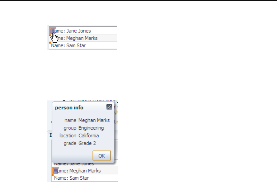
Displaying Contextual Information in Popups
15-24 Web User Interface Developer's Guide for Oracle Application Development Framework
Figure 15–8 contextInfo Component Indicates Additional Information Is Available
Because a showPopupBehavior tag is a child to the contextInfo component, the
referenced popup will display when the user clicks the information icon, as shown in
Figure 15–9.
Figure 15–9 Dialog launched From contextInfo Component
15.5.1 How to Create Contextual Information
You use the showPopupBehavior component as a child to the contextInfo
component, which allows the popup component to align with the component that
contains the contextInfo component.
Before you begin:
1. Create the component that will be the parent to the contextInfo component.
The following components support the contextInfo component:
■column
■commandLink
■inputComboboxListOfValues
■inputListOfValues
■inputText
■outputFormatted
■outputText
■selectOneChoice
2. Create the popup to display, as documented in Section 15.2, "Declaratively
Creating Popups."
3. You may also find it helpful to understand functionality that can be added using
other ADF Faces features. For more information, see Section 15.1.2, "Additional
Functionality for Popup Dialogs, Menus, and Windows."
Controlling the Automatic Cancellation of Inline Popups
Using Popup Dialogs, Menus, and Windows 15-25
To use a contextInfo component:
1. In the ADF Faces page of the Component Palette, from the General Controls panel,
drag a Context Info and drop it into the Context facet of the component that is to
display the additional information icons.
2. If you need server-side logic to execute when the contextInfo component
displays, bind the contextInfoListener attribute to a handler that can handle
the event.
3. In the Component Palette, from the Operations panel, in the Behavior group, drag
a Show Popup Behavior and drop it as a child to the contextInfo component.
4. With the showPopupBehavior tag selected in the editor, in the Property
Inspector, set the attributes as described in Section 15.3.1, "How to Declaratively
Invoke a Popup Using the af:showPopupBehavior Tag." For the triggerType value,
be sure to enter contextInfo.
15.6 Controlling the Automatic Cancellation of Inline Popups
You can use the af:popup component with a number of other components to create
inline popups. That is, inline windows, dialogs, and context menus. These other
components include the:
■Dialog component to create an inline dialog
For more information, see Section 15.2.1, "How to Create a Dialog."
■panelWindow component to create an inline window
For more information, see Section 15.2.2, "How to Create a Panel Window."
■Menu components to create context menus
For more information, see Section 15.2.3, "How to Create a Context Menu."
■noteWindow component to create a note window
For more information, see Section 15.2.4, "How to Create a Note Window."
By default, a Fusion web application automatically cancels an inline popup if the
metadata that defines the inline popup is replaced. Scenarios where this happens
include the following:
■Invocation of a command component that has its partialSubmit property set to
false. The Fusion web application renders the entire page after it invokes such a
command component. In contrast, a command component that has its
Tip: If the facet is not visible in the visual editor:
1. Right-click the outputText component in the Structure window.
2. From the context menu, choose Facets - component name > Context.
Facets in use on the page are indicated by a checkmark in front of the
facet name.
Note: If you use the showPopupBehavior tag to launch the popup,
then delivery of the contextInfoEvent to the server is cancelled. If you
need to invoke server-side logic based on this event, then you must
launch the popup by using either JavaScript or a custom event as
documented in Section 6.4, "Sending Custom Events from the Client to
the Server."

Controlling the Automatic Cancellation of Inline Popups
15-26 Web User Interface Developer's Guide for Oracle Application Development Framework
partialSubmit property set to true causes the Fusion web application to
render partial content. For more information about page rendering, see Chapter 8,
"Rerendering Partial Page Content."
■A component that renders a toggle icon for end users to display or hide content
hosts the popup component. Examples include the showDetailItem and
panelTabbed components. For more information about the use of components
that render toggle icons, see Section 9.8, "Displaying and Hiding Contents
Dynamically."
■Failover occurs when the Fusion web application displays an inline popup.
During failover, the Fusion web application replaces the entire page.
You can change the default behavior described in the previous list by disabling the
automatic cancellation of an inline popup component. This means that the Fusion web
application does not automatically cancel the inline popup if any of the above events
occur. Instead, the Fusion web applications restores the inline popup.
15.6.1 How to Disable the Automatic Cancellation of an Inline Popup
You disable the automatic cancellation of an inline popup by setting the popup
component’s autoCancel property to disabled.
Before you begin:
It may be helpful to understand how other components can affect functionality. For
more information, see Section 15.6, "Controlling the Automatic Cancellation of Inline
Popups."
You may also find it helpful to understand functionality that can be added using other
ADF Faces features. For more information, see Section 15.1.2, "Additional
Functionality for Popup Dialogs, Menus, and Windows."
To control the automatic cancellation of inline popups:
1. In the Structure window, right-click the af:popup component for which you
want to configure the automatic cancellation behavior and choose Go to
Properties.
2. In the Property Inspector, expand the Common section and use the dropdown
menu for the AutoCancel property to choose disabled.
15.6.2 What Happens When You Disable the Automatic Cancellation of an Inline Popup
JDeveloper sets the af:popup component autoCancel property’s value to
disabled, as shown in Example 15–12:
Example 15–12 Metadata to Prevent the Automatic Cancellation of an Inline Popup
<af:popup id="p1" autoCancel="disabled">
...
</af:popup>
At runtime, the Fusion web application restores an inline popup after it rerenders a
page if the inline popup displayed before invocation of the command to rerender the
page.

Resetting Input Fields in a Popup
Using Popup Dialogs, Menus, and Windows 15-27
15.7 Resetting Input Fields in a Popup
You can use the resetListener component in conjunction with a popup component
to allow end users to reset input values in an input field. Example use cases where you
may want to implement this functionality for input components that render in a
popup component include:
■Permitting end users to reset an incorrect value that they previously entered
■Removing values where the popup component invokes a popupCanceledEvent
before the application submits the values to the server that an end user entered.
End user gestures that invoke a popupCancelEvent include clicking a command
button (for example, a button labelled Close), the cancel icon in the title bar of a
popup dialog or pressing the Esc key.
Depending on how you configure the popup component, data may be cached on
the client. For example, if you set the popup component’s contentDelivery
attribute to immediate, the application always caches data on the client.
For more information about how the setting that you choose for the
contentDelivery attribute determines the content delivery strategy for your popup
component, see Section 15.2, "Declaratively Creating Popups" and Section 15.2.5,
"What Happens at Runtime: Popup Component Events."
Example 15–13 shows the metadata for a popup component where the
contentDelivery attribute is set to immediate and the user’s popup renders a
dialog component with preconfigured controls that raise dialogEvents, as
described in Section 15.2.1, "How to Create a Dialog." In this scenario, data that the
end user entered is cached on the client. The application does not submit data that you
want to reset to the server. Also, the preconfigured controls rendered by the dialog
component may prevent the popup from closing if they encounter validation errors.
Example 15–13 The resetListener Tag on the Popup Component
<af:popup id="popup" contentDelivery="immediate">
<af:resetListener type="popupCanceled"/>
</af:popup>
For more information about using the resetListener component independently of
a popup component, see Section 20.5.2, "How to Use a Command Component to Reset
Input Fields."
15.7.1 How to Reset the Input Fields in a Popup
You enable end users to reset the data in a popup’s input fields to null by setting the
resetListener component’s type attribute to popupCanceled.
Note: Setting the resetListener component’s type attribute to
popupCanceled provides the same functionality as setting the
popup component’s resetEditableValues attribute to
whenCanceled. For more information about setting the
resetEditableValues attribute of the popup component, see
Section 15.2.1, "How to Create a Dialog."
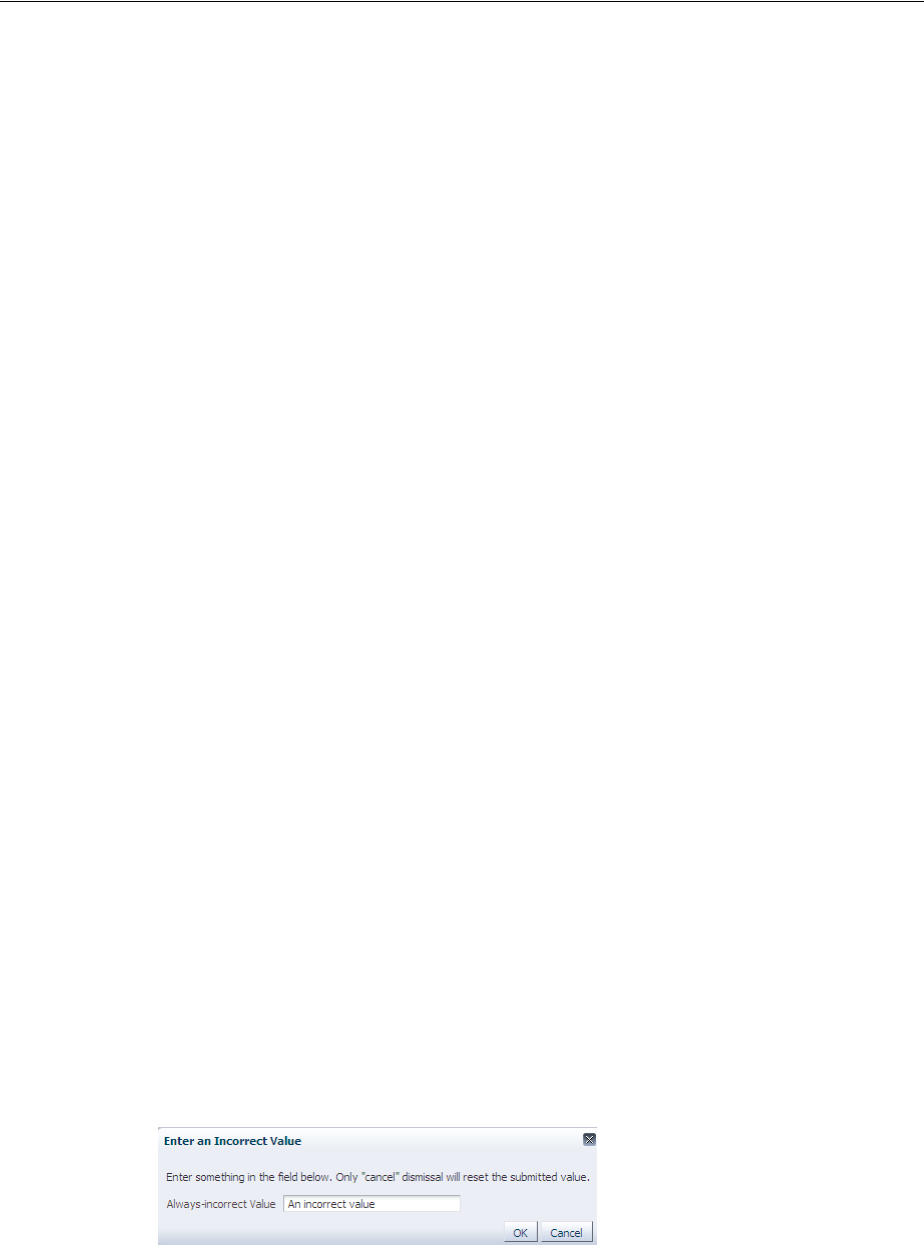
Resetting Input Fields in a Popup
15-28 Web User Interface Developer's Guide for Oracle Application Development Framework
Before you begin:
It may be helpful to understand the use cases for which you can configure this
functionality in a popup component. For more information, see Section 15.7, "Resetting
Input Fields in a Popup."
You may also find it helpful to understand functionality that can be added using other
ADF Faces features. For more information, see Section 15.1.2, "Additional
Functionality for Popup Dialogs, Menus, and Windows."
To reset the input fields in a popup:
1. Create the type of popup dialog that you require, as described in Section 15.2,
"Declaratively Creating Popups."
2. From the Component Palette, drag and drop a Reset Listener as a direct child to
the popup component.
3. In the Insert Reset Listener dialog that JDeveloper displays, enter
popupCanceled as the type of event that the resetListener component
responds to.
Click Help in the Insert Reset Listener dialog to view a complete list of supported
values.
15.7.2 What Happens When You Configure a Popup to Reset Its Input Fields
JDeveloper writes entries similar to those shown in Example 15–14 when you
configure a popup component and a resetListener component to allow end users
to reset the input field(s) in the popup component to null.
Example 15–14 Popup Component Configured to Reset Input Fields Using Reset Listener
<af:popup id="popupDialog" contentDelivery="lazyUncached"
popupCanceledListener="#{demoInput.resetPopupClosed}">
<af:dialog title="Enter an Incorrect Value">
<af:inputText id="it2" label="Always-incorrect Value" value="#{demoInput.value}">
<f:validator binding="#{demoInput.obstinateValidator2}"/>
</af:inputText>
</af:dialog>
<af:resetListener type="popupCanceled"/>
</af:popup>
At runtime, an end user gesture that raises a popupCanceled event results in the
resetListener component resetting values in the input fields of the popup
component to null, as illustrated in Figure 15–10.
Figure 15–10 Popup Component Resetting Input Fields

16
Using Menus, Toolbars, and Toolboxes 16-1
16 Using Menus, Toolbars, and Toolboxes
This chapter describes how to create menu bars and toolbars that contain tool buttons.
For information about creating navigation menus, that is, menus that allow you to
navigate through a hierarchy of pages, see Section 20.6, "Using Navigation Items for a
Page Hierarchy."
This chapter includes the following sections:
■Section 16.1, "About Menus, Toolbars, and Toolboxes"
■Section 16.2, "Using Menus in a Menu Bar"
■Section 16.3, "Using Toolbars"
16.1 About Menus, Toolbars, and Toolboxes
Menu bars and toolbars allow you to organize menus, buttons, and other simple
components in a horizontal bar. When a user clicks a menu in the bar, the menu drops
down and the user can select from the menu items, which cause some action to happen
in the application. Icons in the toolbar also cause some action to happen in the
application. Figure 16–1 shows the different components used to create menus and
toolbars.
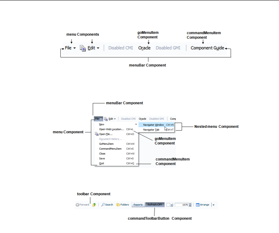
About Menus, Toolbars, and Toolboxes
16-2 Web User Interface Developer's Guide for Oracle Application Development Framework
Figure 16–1 Menu and Toolbar Components
16.1.1 Menu Components Use Cases and Examples
Menu components are used to create menus that allow users to add or edit items,
search data, change the view, or launch help. For example, the ADF Faces demo
application contains both a menu bar and a toolbar, as shown in Figure 16–2.
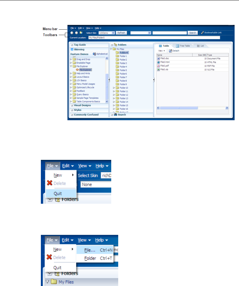
About Menus, Toolbars, and Toolboxes
Using Menus, Toolbars, and Toolboxes 16-3
Figure 16–2 Menu Bar and Toolbar in File Explorer Application
When a user chooses a menu item in the menu bar, the menu component displays a list
of menu items, as shown in Figure 16–3.
Figure 16–3 Menu in the File Explorer Application
As shown in Figure 16–4, menus can be nested.
Figure 16–4 Nested Menu Items
Buttons in a toolbar also allow a user to invoke some sort of action on an application
or to open a popup menu that behaves the same as a standard menu.
You can organize toolbars and menu bars using a toolbox. The toolbox gives you the
ability to define relative sizes for the toolbars on the same line and to define several
layers of toolbars and menu bars vertically.
Using Menus in a Menu Bar
16-4 Web User Interface Developer's Guide for Oracle Application Development Framework
16.1.2 Additional Functionality for Menu and Toolbar Components
You may find it helpful to understand other ADF Faces features before you implement
your menu and toolbar components. Additionally, once you have added these
components to your page, you may find that you need to add functionality such as
validation and accessibility. Following are links to other functionality that menu and
toolbar components can use.
■Invoking functionality: ADF Faces offer tags that can be used with menu
command components to invoke functionality, such as downloading a file or
resetting submitted values. For more information, see Section 20.5, "Using Buttons
or Links to Invoke Functionality."
■Table menus: You can create menus and toolbars that display above a table and
work only on that table (as opposed to the whole application). For more
information, see Section 12.9, "Displaying Table Menus, Toolbars, and Status Bars."
■Context menus: You can create menus that launch in a popup when a user
right-clicks an item in the UI. For more information, see Section 15.2.3, "How to
Create a Context Menu."
■Using parameters in text: You can use the ADF Faces EL format tags if you want
text displayed in a component to contain parameters that will resolve at runtime.
For more information, see Section 3.5.2, "How to Use the EL Format Tags."
■Events: Command menu components can launch action events. For more
information about events, see Chapter 6, "Handling Events." For more information
about action events specifically, see Section 20.3, "Using Buttons and Links for
Navigation."
■Accessibility: You can use specific attributes on the menu components to create
shortcuts that allow users to open menus using keyboard. For information about
how to define access keys, see Section 30.3.4, "How to Define Access Keys for an
ADF Faces Component."For more information about accessibility, see Section 30.3,
"Specifying Component-Level Accessibility Properties."
■Localization: Instead of entering values for attributes that take strings as values,
you can use property files. These files allow you to manage translation of these
strings. For more information, see Chapter 29, "Internationalizing and Localizing
Pages."
■Skins: You can change the look and feel of menus (such as the icon used to display
a selected menu item), along with some basic functionality (such as the maximum
number of menu items that display) by changing the skin. For more information,
see Chapter 28, "Customizing the Appearance Using Styles and Skins."
16.2 Using Menus in a Menu Bar
Use the menuBar component to render a bar that contains the menu bar items (such as
File in the File Explorer application). These items can be menu components, which
Note: If you want to create menus and toolbars in a table, then
follow the procedures in Section 12.9, "Displaying Table Menus,
Toolbars, and Status Bars."
If you want to create a context menu for a component (that is a menu
that launches when a user right-clicks the component), follow the
procedures in Section 15.2.3, "How to Create a Context Menu."
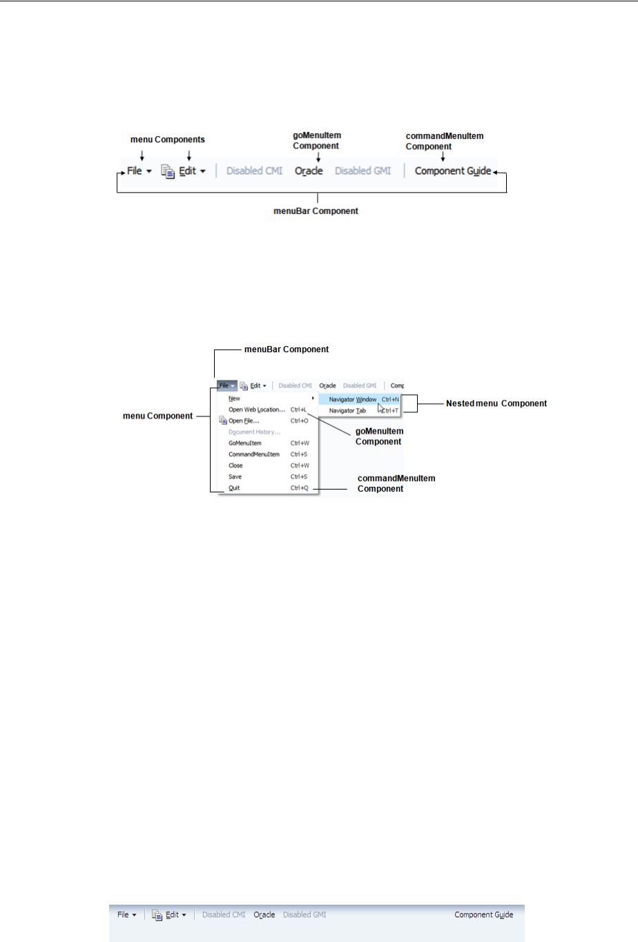
Using Menus in a Menu Bar
Using Menus, Toolbars, and Toolboxes 16-5
hold a vertical menu, as well as commandMenuItem components that invoke some
operation on the application, and goMenu items that invoke a URL, as shown in
Figure 16–5.
Figure 16–5 menuBar and Child Components
Menu components can also contain commandMenuItems, goMenu items, or you can
nest menu components inside menu components to create submenus. The different
components used to create a menu are shown in Figure 16–6.
Figure 16–6 Components Used to Create a Menu
You can use more than one menu bar by enclosing them in a toolbox. Enclosing them
in a toolbox stacks the menu bars so that the first menu bar in the toolbox is displayed
at the top, and the last menu bar is displayed at the bottom. When you use more than
one menu bar in a single toolbox row (by having them grouped inside the toolbox),
then the flex attribute will determine which menu bar will take up the most space.
If you wish menu bars to be displayed next to each other (rather than being stacked),
you can enclose them in a group component.
Within a menu bar, you can set one component to stretch so that the menu bar will
always be the same size as its parent container. For example, in Figure 16–7, the menu
bar is set to stretch a spacer component that is placed between the Disabled GMI menu
and the Component Guide button. When the window is resized, that spacer
component either stretches or shrinks so that the menu bar will always be the same
width as the parent. Using a spacer component like this also ensures that any
components to the right of the spacer will remain right-justified in the menu bar.
Figure 16–7 Spacer Component Stretches and Shrinks
Tip: You can also use the toolbox component to group menu bars
with toolbars, or to group multiple menu bars. Use the group
component to group menu bars and toolbars on the same row.
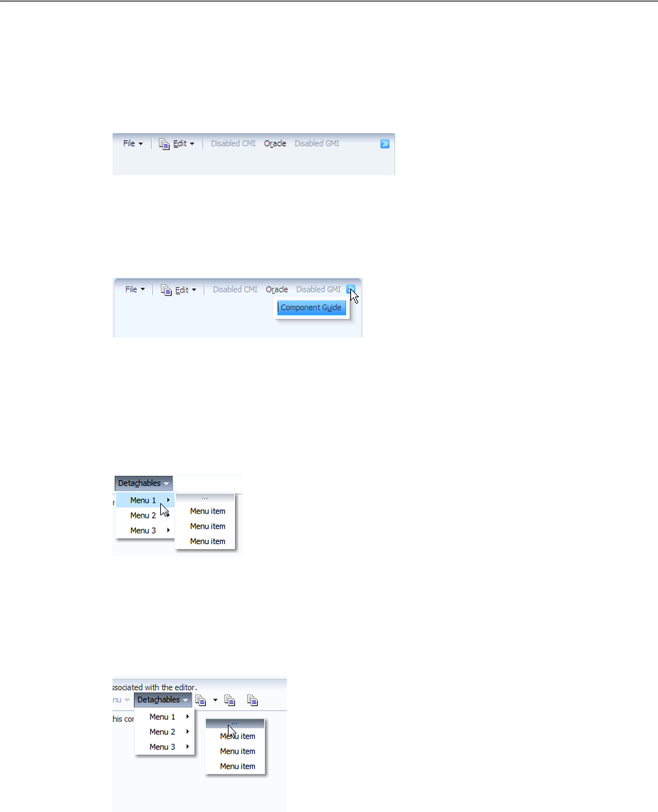
Using Menus in a Menu Bar
16-6 Web User Interface Developer's Guide for Oracle Application Development Framework
When a window is resized such that all the components within the menu bar can no
longer be displayed, the menu bar displays an overflow icon, identified by the arrow
cursor as shown in Figure 16–8.
Figure 16–8 Overflow Icon in a Menu Bar
Clicking that overflow icon displays the remaining components in a popup window,
as shown in Figure 16–9.
Figure 16–9 menu Component in an Overflow Popup Window
Menus and submenus can be made to be detachable and to float on the browser
window. Figure 16–10 shows the Menu 1 submenu in the Detachables menu
configured to be detachable. The top of the menu is rendered with a bar to denote that
it can be detached.
Figure 16–10 Detachable Menu
The user can drag the detachable menu to anywhere within the browser. When the
mouse button is released, the menu stays on top of the application until the user closes
it, as shown in Figure 16–11.
Figure 16–11 Floating Detached Menu
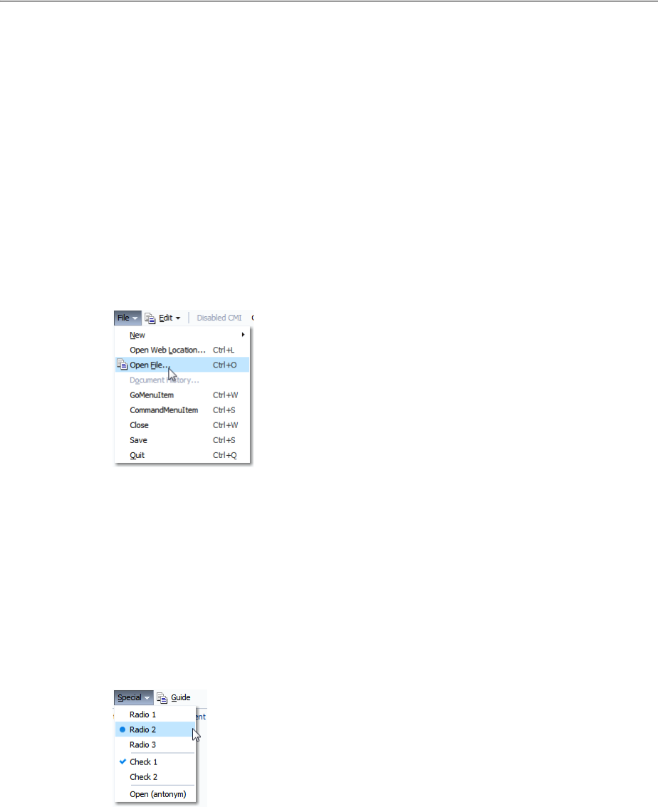
Using Menus in a Menu Bar
Using Menus, Toolbars, and Toolboxes 16-7
The menu and commandMenuItem components can each include an icon image.
Figure 16–12 shows the Open File menu item configured to display a copy icon.
Figure 16–12 Icons Can Be Used in Menus
Aside from always displaying graphics, you can configure commandMenuItem
components display a graphic when the menu item is chosen. For example, you can
configure a commandMenuItem component to display a checkmark when chosen, or
you can group menu items together and configure them to behave like a group of
radio buttons, so that an icon displays next to the label when one of items in the group
is chosen. Figure 16–13 shows the Special menu with the Check 1 menu item
configured to use a checkmark when chosen. The Radio 1, Radio 2, and Radio 3 menu
items are configured to be radio buttons, and allow the user to choose only one of the
group.
Figure 16–13 Square Icon and Radio Button Denote the Chosen Menu Items
You can also configure a commandMenuItem component to have an antonym.
Antonyms display different text when the user chooses a menu item. Figure 16–14
shows an Open menu item in the Special menu.
Tip: Consider using detachable menus when you expect users to:
■Execute similar commands repeatedly on a page.
■Execute similar commands on different rows of data in a large
table, tree table, or tree.
■View data in long and wide tables, tree tables, or trees. Users can
choose which columns or branches to hide or display with a single
click.
■Format data in long or wide tables, tree tables, or trees.
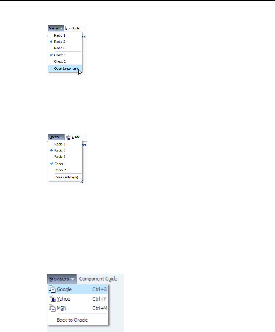
Using Menus in a Menu Bar
16-8 Web User Interface Developer's Guide for Oracle Application Development Framework
Figure 16–14 The Edit Menu of the File Explorer Application
By configuring the commandMenuItem component for the Open menu item to be an
antonym and to have alternate text to display, when a user chooses Open, the next
time the user returns to the menu, the menu item will display the antonym Close, as
shown in Figure 16–15.
Figure 16–15 Menu Items Can Be Antonyms
Because an action is expected when a user chooses a menu item, you must bind the
action or actionListener attribute of the commandMenuItem component to
some method that will execute the needed functionality.
Along with commandMenuItem components, a menu can also include one or more
goMenuItem components. These are navigation components similar to the goLink
component, in that they perform direct page navigation, without delivering an
ActionEvent event. Figure 16–16 shows three goMenuItem components used to
navigate to external web sites.
Figure 16–16 Menus Can Use goMenuItem Components
Aside from menus that are invoked from menu bars, you can also create context
menus that are invoked when a user right-clicks a UI component, and popup menus
that are invoked when a user clicks a command component. For more information, see
Section 15.2.3, "How to Create a Context Menu."

Using Menus in a Menu Bar
Using Menus, Toolbars, and Toolboxes 16-9
By default, the contents of the menu are delivered immediately, as the page is
rendered. If you plan on having a large number of children in a menu (multiple menu
and commandMenuItem components), you can choose to configure the menu to use
lazy content delivery. This means that the child components are not retrieved from the
server until the menu is accessed.
You can also create menus that mainly provide navigation throughout the application,
and are not used to cause any change on a selected item in an application. To create
this type of menu, see Section 20.7, "Using a Menu Model to Create a Page Hierarchy."
16.2.1 How to Create and Use Menus in a Menu Bar
To create a menu, you first have to create a menu bar to hold the menus. You then add
and configure menu and commandMenuItem components as needed.
Before you begin:
It may be helpful to have an understanding of how the attributes can affect
functionality. For more information, see Section 16.2, "Using Menus in a Menu Bar."
You may also find it helpful to understand functionality that can be added using other
ADF Faces features. For more information, see Section 16.1.2, "Additional
Functionality for Menu and Toolbar Components."
To create and use menus in a menu bar:
1. If you plan on using more than one menu bar or a combination of toolbars and
menu bars, create a toolbox component by dragging and dropping a Toolbox
component from the Menus and Toolbars panel of the Component Palette.
2. Create a menu bar by dragging and dropping a Menu Bar from the Component
Palette. If you are using a toolbox component, the Menu Bar should be dropped
as a direct child of the toolbox component.
Note: ADF Faces provides a button with built-in functionality that
allows a user to view a printable version of the current page. Menus
and menu bars do not render on these pages. For more information,
see Section 6.6, "Using ADF Faces Client Behavior Tags.".
Note: Content delivery for menus used as popup context menus is
determined by the parent popup dialog, and not the menu itself.
Note: If you want to create menus in a table, follow the procedures
outlined in Section 12.9, "Displaying Table Menus, Toolbars, and
Status Bars."
Tip: The panelHeader, showDetailHeader, and
showDetailItem components support a toolbar facet for adding
toolboxes and toolbars to section headers and accordion panel
headers.

Using Menus in a Menu Bar
16-10 Web User Interface Developer's Guide for Oracle Application Development Framework
3. If grouping more than one menu bar within a toolbox, for each menu bar, expand
the Appearance section and set the flex attribute to determine the relative sizes
of each of the menu bars. The higher the number given for the flex attribute, the
longer the toolbox will be. For the set of menu bars shown in Example 16–5,
menubar2 will be the longest, menubar4 will be the next longest, and because
their flex attributes are not set, the remaining menu bars will be the same size
and shorter than menubar4.
Example 16–1 Flex Attribute Determines Length of Toolbars
<af:toolbox>
<af:menuBar id="menuBar1" flex="0">
<af:menu text="MenuA"/>
</af:menBar>
<af:menuBar id="menuBar2" flex="2">
<af:menu text="MenuB"/>
</af:menuBar>
<af:menuBar id="menuBar3" flex="0">
<af:menu text="MenuC"/>
</af:menuBar>
<af:menuBar id="menuBar4" flex="1">
<af:menu text="MenuD"/>
</af:toolbar>
</af:toolbox>
For information about how the flex attribute works, see Section 16.3.2, "What
Happens at Runtime: How the Size of Menu Bars and Toolbars are Determined."
4. Insert the desired number of menu components into the menu bar by dragging a
Menu from the Component Palette, and dropping it as a child to the menuBar
component.
You can also insert commandMenuItem components directly into a menu bar by
dragging and dropping a Menu Item from the Menus and Toolbars panel of the
Tip: Toolboxes also allow you to use the iterator, switcher, and group
components as direct children, providing these components wrap
child components that would usually be direct children of the toolbox.
For more information about toolboxes, see Section 16.3, "Using
Toolbars."
Performance Tip: At runtime, when available browser space is less
than the space needed to display the contents of the toolbox,
ADF Faces automatically displays overflow icons that enable users to
select and navigate to those items that are out of view. The number of
child components within a toolbox component, and the complexity
of the children, will affect the performance of the overflow. You
should set the size of the toolbox component to avoid overflow
when possible. For more information, see Section 16.3.2, "What
Happens at Runtime: How the Size of Menu Bars and Toolbars are
Determined."
Tip: You can use the group component to group menu bars (or
menu bars and toolbars) that you want to appear on the same row. If
you do not use the group component, the menu bars will appear on
subsequent rows.

Using Menus in a Menu Bar
Using Menus, Toolbars, and Toolboxes 16-11
Component Palette. Doing so creates a commandMenuItem component that
renders similar to a toolbar button.
5. For each menu component, expand the Appearance section in the Property
Inspector and set the following attributes:
■Text: Enter text for the menu’s label. If you wish to also provide an access key
(a letter a user can use to access the menu using the keyboard), then leave this
attribute blank and enter a value for textAndAccessKey instead.
■TextAndAccessKey: Enter the menu label and access key, using conventional
ampersand notation. For example, &File sets the menu label to File, and
at the same time sets the menu access key to the letter F. For more information
about access keys and the ampersand notation, see Section 30.3, "Specifying
Component-Level Accessibility Properties."
■Icon: Use the dropdown list to select the icon. If the icon does not display in
this menu, use the dropdown menu to the right of the list to choose Edit, and
browse to select the icon.
6. If you want the menu to be detachable (as shown in Figure 16–10), expand the
Behavior section in the Property Inspector and set the Detachable attribute to
true. At runtime, the user can drag the menu to detach it, and drop it anywhere
on the screen (as shown in Figure 16–11).
7. If you want the menu to use lazy content delivery, set the ContentDelivery
attribute to lazy.
8. To create a menu item that invoke some sort of action along with navigation, drag
a Menu Item from the Component Palette and drop it as a child to the menu
component to create a commandMenuItem component. Create a number of
commandMenuItem components to define the items in the vertical menu.
If necessary, you can wrap the commandMenuItem components within a group
component to display the items as a group. Example 16–2 shows simplified code
for grouping the Folders and Search menu items in one group, the Table, Tree
Tab l e and List menu items in a second group, and the Refresh menu item by itself
at the end.
Tip: Menu bars also allow you to use the iterator, switcher, and
group components as direct children, providing these components
wrap child components that would usually be direct children of the
menu bar.
Note: If you use lazy content delivery, any accelerators set on the
child commandMenuItem components will not work because the
contents of the menu are not known until the menu is accessed. If
your menu must support accelerators, then ContentDelivery must be
set to immediate.
Note: If the menu will be used inside a popup dialog or window,
leave ContentDelivery set to immediate, because the popup dialog
or window will determine the content delivery for the menu.
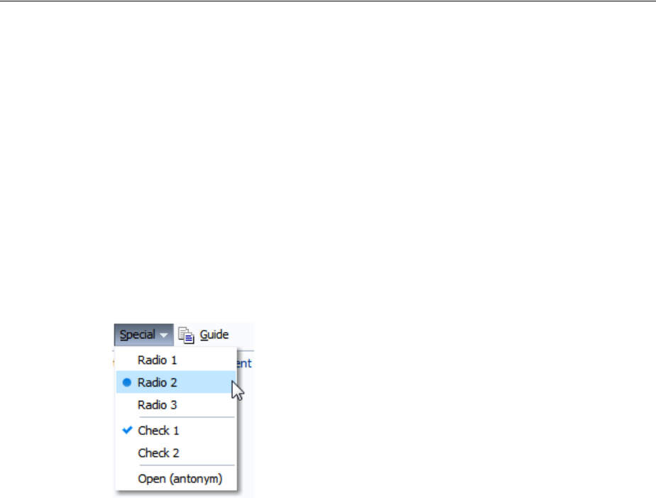
Using Menus in a Menu Bar
16-12 Web User Interface Developer's Guide for Oracle Application Development Framework
Example 16–2 Grouping Menu Items
<af:menu id="viewMenu"
<af:group>
<af:commandMenuItem type="check" text="Folders"/>
<af:commandMenuItem type="check" text="Search"/>
</af:group>
<af:group>
<af:commandMenuItem type="radio" text="Table"/>
<af:commandMenuItem type="radio" text="Tree Table"/>
<af:commandMenuItem type="radio" text="List"/>
</af:group>
<af:commandMenuItem text="Refresh"/>
</menu>
Figure 16–17 shows how the menu is displayed.
Figure 16–17 Grouped commandMenuItem Components in a Menu
You can also insert another menu component into an existing menu component to
create a submenu (as shown in Figure 16–4).
9. For each commandMenuItem component, expand the Common section in the
Property Inspector and set the following attributes:
■Type: Specify a type for this menu item. When a menu item type is specified,
ADF Faces adds a visual indicator (such as a radio button) and a toggle
behavior to the menu item. At runtime, when the user selects a menu item
with a specified type (other than the default), ADF Faces toggles the visual
indicator or menu item label. Use one of the following acceptable type values:
–check: In the default FusionFX skin, toggles a square next to the menu
item label. The square is displayed as solid blue when the menu item is
chosen, and greyed out when not.
Tip: By default, only up to 14 items are displayed in the menu. If
more than 14 items are added to a menu, the first 14 are displayed
along with a scrollbar, which can be used to access the remaining
items. If you wish to change the number of visible items, edit the
af|menu {-tr-visible-items} skinning key. For more
information, see Chapter 28, "Customizing the Appearance Using
Styles and Skins."
Tip: Menus also allow you to use the iterator and switcher
components as direct children, providing these components wrap
child components that would usually be direct children of the menu.

Using Menus in a Menu Bar
Using Menus, Toolbars, and Toolboxes 16-13
–radio: Toggles a radio button next to the menu item label. The radio
button is displayed as a solid blue circle when the menu item is chosen,
and greyed out when not.
–antonym: Toggles the menu item label. The value set in the SelectedText
attribute is displayed when the menu item is chosen, instead of the menu
item defined by the value of text or textAndAccessKey attribute
(which is what is displayed when the menu item is not chosen). If you
select this type, you must set a value for SelectedText.
– default: Assigns no type to this menu item. The menu item is displayed in
the same manner whether or not it is chosen.
■Text: Enter text for the menu item’s label. If you wish to also provide an access
key (a letter a user can use to access the item using the keyboard), then leave
this attribute blank and enter a value for TextAndAccessKey instead. Or, you
can set the access key separately using the accessKey attribute.
■Selected: Set to true to have this menu item appear to be chosen. The
selected attribute is supported for check-, radio-, and antonym-type menu
items only.
■SelectedText: Set the alternate label to display for this menu item when the
menu item is chosen. This value is ignored for all types except antonym.
Example 16–3 shows the Special menu with one group of menu items configured
to use radio buttons and another group of menu items configured to show blue
squares when chosen. The last group contains a menu item configured to be the
antonym Open when it is first displayed, and then it toggles to Closed.
Example 16–3 Using the Type Attribute in a commandMenuItem Component
<af:menu text="Special">
<af:group>
<af:commandMenuItem text="Radio 1" type="radio" selected="true"
<af:commandMenuItem text="Radio 2" type="radio"/>
<af:commandMenuItem text="Radio 3" type="radio">
</af:group>
<af:group>
<af:commandMenuItem text="Check 1" type="check" selected="true"
<af:commandMenuItem text="Check 2" type="check"/>
</af:group>
<af:commandMenuItem text="Open (antonym)" type="antonym"
selectedText="Close (antonym)"/>
</af:menu>
Figure 16–18 shows how the menu will be displayed when it is first accessed.
Note: By default, ADF Faces components use the FusionFX skin,
which displays the check type as a square. You can change this by
creating your own skin. For more information, see Chapter 28,
"Customizing the Appearance Using Styles and Skins."
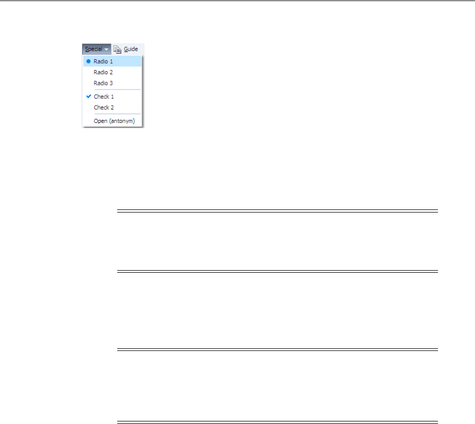
Using Menus in a Menu Bar
16-14 Web User Interface Developer's Guide for Oracle Application Development Framework
Figure 16–18 Menu Items Using the Type Attribute
10. Expand the Appearance section and set the following attributes:
■Icon: Use the dropdown list to select the icon. If the icon does not display in
this menu, use the dropdown menu to the right of the list to choose Edit, and
browse to select the icon.
■Accelerator: Enter the keystroke that will activate this menu item’s command
when the item is chosen, for example, Control O. ADF Faces converts the
keystroke and displays a text version of the keystroke (for example, Ctrl+O)
next to the menu item label, as shown in Figure 16–4.
■TextAndAccessKey: Enter the menu item label and access key, using
conventional ampersand notation. For example, &Save sets the menu
item label to Save, and at the same time sets the menu item access key to the
letter S. For more information about access keys and the ampersand notation,
see Section 30.3, "Specifying Component-Level Accessibility Properties."
11. Expand the Behavior section and set the following attributes:
■Action: Use an EL expression that evaluates to an action method in an object
(such as a managed bean) that will be invoked when this menu item is chosen.
The expression must evaluate to a public method that takes no parameters,
and returns a java.lang.Object object.
If you want to cause navigation in response to the action generated by
commandMenuItem component, instead of entering an EL expression, enter a
static action outcome value as the value for the action attribute. You then
must either set the partialSubmit attribute to false, or use a redirect. For
more information about configuring navigation in your application, see
Section 3.3, "Defining Page Flows."
■ActionListener: Specify the expression that refers to an action listener method
that will be notified when this menu item is chosen. This method can be used
instead of a method bound to the action attribute, allowing the action
Note: Because alternative text cannot be provided for this icon, in
order to create an accessible product, this icon must only be used
when the use is purely decorative. You must provide the meaning of
this icon using another accessible manner.
Note: If you choose to use lazy content delivery, any accelerators set
on the child commandMenuItem components will not work because
the contents of the menu are not known until it is accessed. If your
menu must support accelerator keys, then the contentDelivery
attribute must be set to immediate.

Using Menus in a Menu Bar
Using Menus, Toolbars, and Toolboxes 16-15
attribute to handle navigation only. The expression must evaluate to a public
method that takes an ActionEvent parameter, with a return type of void.
12. To create a menu item that simply navigates (usually to an external site), drag and
drop a Menu Item (Go) from the Component Palette as a child to the menu.
13. In the Property Inspector, expand the Common section and set the following
attributes:
■Destination: Enter the URI of the page to which the link should navigate. For
example, to navigate to the Oracle Corporation Home Page, you would enter
http://www.oracle.com.
■TargetFrame: Use the dropdown list to specify where the new page should
display. Values are
–_blank: The link opens the document in a new window.
–_parent: The link opens the document in the window of the parent. For
example, if the link appeared in a dialog, the resulting page would render
in the parent window.
–_self: The link opens the document in the same page or region.
–_top: The link opens the document in a full window, replacing the entire
page.
■Text: Enter the text for the link.
14. If you want a menu bar to stretch so that it equals the width of the containing
parent component, select the menuBar component in the Structure window, then
set stretchId to be the ID of the component within the menu bar that should be
stretched so that the menu bar is the same size as the parent. This one component
will stretch, while the rest of the components in the menu bar remain a static size.
You can also use the stretchId attribute to justify components to the left and
right by inserting a spacer component, and setting that component ID as the
stretchId for the menu bar, as shown in Example 16–7.
Example 16–4 Using a Spacer to Justify menuBar Components
<af:menuBar binding="#{editor.component}" id="menuBar1" stretchId="stretch1">
<af:menu text="File" id="m1">
. . .
</af:menu>
. . .
<af:commandMenuItem text="Disabled CMI"/>
<af:goMenuItem textAndAccessKey="O&racle destination="http://www.oracle.com"
id="gmi1"/>
<af:goMenuItem text="Disabled GMI" destination="http://www.gizmo.com"
shortDesc="disabled goMenuItem" id="gmi2"/>
<af:spacer id="stretch1" clientComponent="true"/>
<af:commandMenuItem textAndAccessKey="Component G&uide"
action="guide" id="cmi9"/>
</af:menuBar>
Tip: Instead, you can use the textAndAccessKey attribute to
provide a single value that defines the label and the access key to use
for the link. For information about how to define access keys, see
Section 30.3.4, "How to Define Access Keys for an ADF Faces
Component."
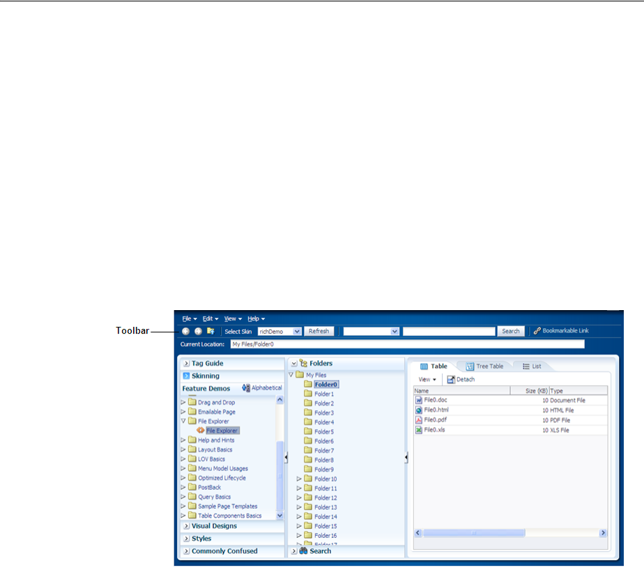
Using Toolbars
16-16 Web User Interface Developer's Guide for Oracle Application Development Framework
16.3 Using Toolbars
Along with menus, you can create toolbars in your application that contain toolbar
buttons used to initiate some operation in the application. The buttons can display
text, an icon, or a combination of both. Toolbar buttons can also open menus in a
popup window. Along with toolbar buttons, other UI components, such as dropdown
lists, can be displayed in toolbars. Figure 16–19 shows the toolbar from the File
Explorer application.
Figure 16–19 Toolbar in the File Explorer Application
The toolbar component can contain many different types of components, such as
inputText components, LOV components, selection list components, and command
components. ADF Faces also includes a commandToolbarButton component that
has a popup facet, allowing you to provide popup menus from a toolbar button. You
can configure your toolbar button so that it only opens the popup dialog and does not
fire an action event. As with menus, you can group related toolbar buttons on the
toolbar using the group component.
You can use more than one toolbar by enclosing them in a toolbox. Enclosing toolbars
in a toolbox stacks them so that the first toolbar on the page is displayed at the top,
and the last toolbar is displayed on the bottom. For example, in the File Explorer
application, the currently selected folder name is displayed in the Current Location
toolbar, as shown in Figure 16–19. When you use more than one toolbar, you can set
the flex attribute on the toolbars to determine which toolbar should take up the most
space. In this case, the Current Location toolbar is set to be the longest.
If you wish toolbars to be displayed next to each other (rather than stacked), you can
enclose them in a group component.
Tip: Toolbars can also include command buttons and command links
(including the commandImageLink component) instead of toolbar
buttons. However, toolbar buttons provide additional functionality,
such as opening popup menus. Toolbar buttons can also be used
outside of a toolbar component
Tip: You can also use the toolbox component to group menu bars
with toolbars, or to group multiple menu bars. As with grouping
toolbars, use the group component to group menu bars and toolbars
on the same row.
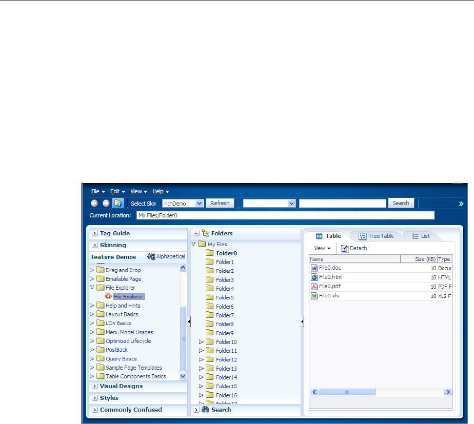
Using Toolbars
Using Menus, Toolbars, and Toolboxes 16-17
Within a toolbar, you can set one component to stretch so that the toolbar will always
be the same size as its parent container. For example, in the File Explorer application,
the lower toolbar that displays the current location contains the component that shows
the selected folder. This component is set to stretch so that when the window is
resized, that component and the toolbar will always be the same width as the parent.
However, because no component in the top toolbar is set to stretch, it does not change
size when the window is resized. When a window is resized such that all the
components within the toolbar can no longer be displayed, the toolbar displays an
overflow icon, identified by an arrow cursor in the upper right-hand corner, as shown
in Figure 16–20.
Figure 16–20 Overflow Icon in a Toolbar
Clicking that overflow icon displays the remaining components in a popup window,
as shown in Figure 16–21.
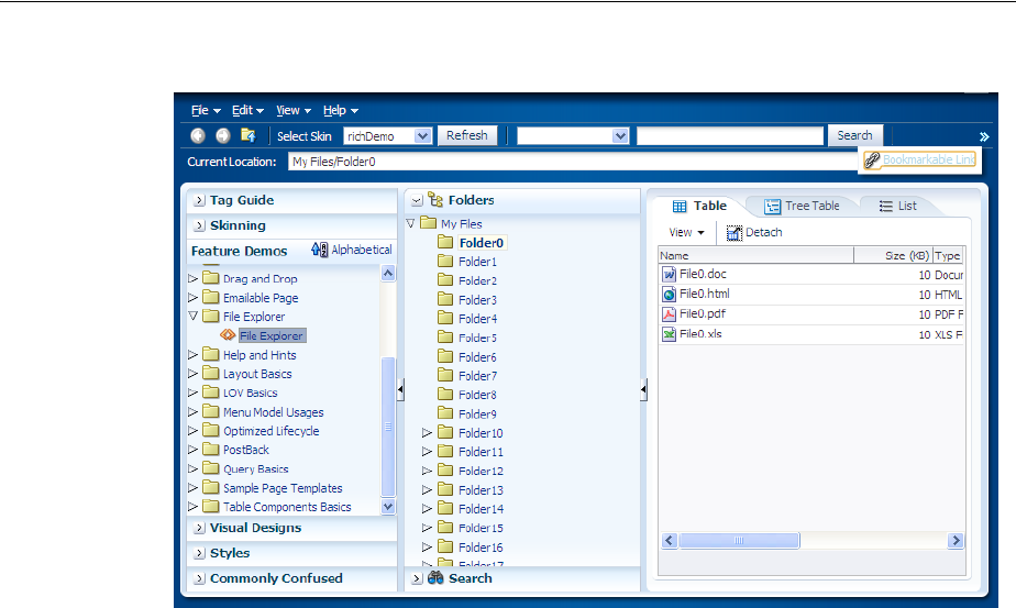
Using Toolbars
16-18 Web User Interface Developer's Guide for Oracle Application Development Framework
Figure 16–21 Toolbar Component in an Overflow Popup Window
When you expect overflow to occur in your toolbar, it is best to wrap it in a toolbox
that has special layout logic to help in the overflow.
16.3.1 How to Create and Use Toolbars
If you are going to use more than one toolbar component on a page, or if you plan to
use menu bars with toolbars, you first create the toolbox component to hold them.
You then create the toolbars, and last, you create the toolbar buttons.
Before you begin:
It may be helpful to have an understanding of how the attributes can affect
functionality. For more information, see Section 16.3, "Using Toolbars."
You may also find it helpful to understand functionality that can be added using other
ADF Faces features. For more information, see Section 16.1.2, "Additional
Functionality for Menu and Toolbar Components."
To create and use toolbars:
1. If you plan on using more than one toolbar or a combination of toolbars and menu
bars, create a toolbox component by dragging and dropping a Toolbox
component from the Menus and Toolbars panel of the Component Palette.
Tip: If you encounter layout issues with single toolbars or menu
bars, consider wrapping them in a toolbox component, because this
component can handle overflow and layout issues.
Tip: The panelHeader, showDetailHeader, and
showDetailItem components support a toolbar facet for adding
toolboxes and toolbars to section headers and accordion panel
headers.

Using Toolbars
Using Menus, Toolbars, and Toolboxes 16-19
2. Drag and drop a Toolbar onto the JSF page. If you are using a toolbox
component, the Toolbar should be dropped as a direct child of the toolbox
component.
3. If grouping more than one toolbar within a toolbox, for each toolbar, select the
toolbar, expand the Appearance section and set the flex attributes to determine
the relative sizes of each of the toolbars. The higher the number given for the flex
attribute, the longer the toolbox will be. For the set of toolbars shown in
Example 16–5, toolbar2 will be the longest, toolbar4 will be the next longest,
and because their flex attributes are not set, the remaining toolbars will be the
same size and shorter than toolbar4.
Example 16–5 Flex Attribute Determines Length of Toolbars
<af:toolbox>
<af:toolbar id="toolbar1" flex="0">
<af:commandToolbarButton text="ButtonA"/>
</af:toolbar>
<af:toolbar id="toolbar2" flex="2">
<af:commandToolbarButton text="ButtonB"/>
</af:toolbar>
<af:toolbar id="toolbar3" flex="0">
<af:commandToolbarButton text="ButtonC"/>
</af:toolbar>
<af:toolbar id="toolbar4" flex="1">
<af:commandToolbarButton text="ButtonD"/>
</af:toolbar>
</af:toolbox>
For information about how the flex attribute works, see Section 16.3.2, "What
Happens at Runtime: How the Size of Menu Bars and Toolbars are Determined."
4. Insert components into the toolbar as needed. To create a
commandToolbarButton drag a Toolbar B utton from the Component Palette
and drop it as a direct child of the toolbar component.
Tip: Toolboxes also allow you to use the iterator, switcher, and group
components as direct children, providing these components wrap
child components that would usually be direct children of the toolbox.
Performance Tip: At runtime, when available browser space is less
than the space needed to display the contents of the toolbox,
ADF Faces automatically displays overflow icons that enable users to
select and navigate to those items that are out of view. The number of
child components within a toolbox component, and the complexity
of the children, will affect the performance of the overflow. You
should set the size of the toolbox component to avoid overflow
when possible. For more information, see Section 16.3.2, "What
Happens at Runtime: How the Size of Menu Bars and Toolbars are
Determined."
Tip: You can use the group component to group toolbars (or menu
bars and toolbars) that you want to appear on the same row. If you do
not use the group component, the toolbars will appear on subsequent
rows.

Using Toolbars
16-20 Web User Interface Developer's Guide for Oracle Application Development Framework
5. For each commandToolbarButton component, expand the Common section of
the Property Inspector and set the following attributes:
■Type: Specify a type for this toolbar button. When a toolbar button type is
specified, an icon can be displayed when the button is clicked. Use one of the
following acceptable type values:
–check: Toggles to the depressedIcon value if selected or to the default
icon value if not selected.
–radio: When used with other toolbar buttons in a group, makes the button
currently clicked selected, and toggles the previously clicked button in the
group to unselected.
– default: Assigns no type to this toolbar button.
■Selected: Set to true to have this toolbar button appear as selected. The
selected attribute is supported for checkmark- and radio-type toolbar
buttons only.
■Icon: Use the dropdown list to select the icon. If the icon does not display in
this menu, use the dropdown menu to the right of the list to choose Edit, and
browse to select the icon.
Tip: You can use the group component to wrap related buttons on
the bar. Doing so inserts a separator between the groups, as shown
surrounding the group for the Select Skin dropdown list and Refresh
button in Figure 16–19.
Toolbars also allow you to use the iterator and switcher components
as direct children, providing these components wrap child
components that would usually be direct children of the toolbar.
Tip: You can place other components, such as command buttons and
links, input components, and select components in a toolbar.
However, they may not have the capability to stretch. For details
about stretching the toolbar, see Step 9.
Tip: If you plan to support changing the visible attribute of the
button through active data (for example, data being pushed from the
data source will determine whether nor not the toolbar is displayed),
then you should use the activeCommandToolbarButton
component instead of the commandToolbarButton component.
Create an activeCommandToolbarButton component by dragging
a ToolbarButton (Active) from the Component Palette.
Note: When setting the type to radio, you must wrap the toolbar
button in a group tag that includes other toolbar buttons whose types
are set to radio as well.
Note: Because alternative text cannot be provided for this icon, in
order to create an accessible product, this icon must only be used
when the use is purely decorative. You must provide the meaning of
this icon using another accessible manner.

Using Toolbars
Using Menus, Toolbars, and Toolboxes 16-21
■Text: Enter the label for this toolbar button.
■Action: Use an EL expression that evaluates to an action method in an object
(such as a managed bean) that will be invoked when a user presses this
button. The expression must evaluate to a public method that takes no
parameters, and returns a java.lang.Object object.
If you want to cause navigation in response to the action generated by the
button, instead of entering an EL expression, enter a static action outcome
value as the value for the action attribute. You then must set either
partialSubmit to false, or use a redirect. For more information about
configuring navigation, see Section 3.3, "Defining Page Flows."
■ActionListener: Specify the expression that refers to an action listener method
that will be notified when a user presses this button. This method can be used
instead of a method bound to the action attribute, allowing the action
attribute to handle navigation only. The expression must evaluate to a public
method that takes an ActionEvent parameter, with a return type of void.
6. Expand the Appearance section and set the following properties:
■HoverIcon: Use the dropdown list to select the icon to display when the
mouse cursor is directly on top of this toolbar button. If the icon is not in this
menu, use the dropdown menu to the right of the list to choose Edit, and
browse to select the icon.
■DepressedIcon: Use the dropdown list to select the icon to display when the
toolbar button is activated. If the icon is not in this menu, use the dropdown
menu to the right of the list to choose Edit, and browse to select the icon.
7. Expand the Behavior section and set ActionDelivery to none if you do not want
to fire an action event when the button is clicked. This is useful if you want the
button to simply open a popup window. If set to none, you must have a popup
component in the popup facet of the toolbar button (see Step 8), and you cannot
have any value set for the action or actionListener attributes. Set to
clientServer attribute if you want the button to fire an action event as a
standard command component
8. To have a toolbar button invoke a popup menu, insert a menu component into the
popup facet of the commandToolbarButton component. For information, see
Section 16.2.1, "How to Create and Use Menus in a Menu Bar."
9. If you want a toolbar to stretch so that it equals the width of the containing parent
component, set stretchId to be the ID of the component within the toolbar that
should be stretched. This one component will stretch, while the rest of the
components in the toolbar remain a static size.
For example, in the File Explorer application, the inputText component that
displays the selected folder’s name is the one that should stretch, while the
outputText component that displays the words "Current Folder" remains a static
size, as shown in Example 16–6.
Example 16–6 Using the stretchId Attribute
<af:toolbar id="headerToolbar2" flex="2" stretchId="pathDisplay">
<af:outputText id="currLocation" noWrap="true"
value="#{explorerBundle['menuitem.location']}"/>
<af:inputText id="pathDisplay" simple="true" inlineStyle="width:100%"
contentStyle="width:100%"
binding="#{explorer.headerManager.pathDisplay}"
value="#{explorer.headerManager.displayedDirectory}"

Using Toolbars
16-22 Web User Interface Developer's Guide for Oracle Application Development Framework
="true"
validator="#{explorer.headerManager.validatePathDisplay}"/>
</af:toolbar>
You can also use the stretchId attribute to justify components to the left and
right by inserting a spacer component, and setting that component ID as the
stretchId for the toolbar, as shown in Example 16–7.
Example 16–7 Using a Spacer to Justify Toolbar Components
<af:toolbar flex="1" stretchId="stretch1">
<af:commandToolbarButton text="Forward"
icon="/images/fwdarrow_gray.gif"
disabled="true"></af:commandToolbarButton>
<af:commandToolbarButton icon="/images/uplevel.gif" />
<!-- Insert a stretched spacer to push subsequent buttons to the right -->
<af:spacer id="stretch1" clientComponent="true"/>
<af:commandToolbarButton text="Reports" />
<af:commandToolbarButton id="toggleRefresh"
text="Refresh:OFF" />
</af:toolbar>
16.3.2 What Happens at Runtime: How the Size of Menu Bars and Toolbars are
Determined
When a page with a menu bar or toolbar is first displayed or resized, the space needed
for each bar is based on the value of the bar’s flex attribute. The percentage of size
allocated to each bar is determined by dividing its flex attribute value by the sum of
all the flex attribute values. For example, say you have three toolbars in a toolbox,
and those toolbars are grouped together to display on the same line. The first toolbar is
given a flex attribute value of 1, the second toolbar also has a flex attribute value of
1, and the third has a flex attribute value of 2, giving a total of 4 for all flex
attribute values. In this example, the toolbars would have the following allocation
percentages:
■Toolbar 1: 1/4 = 25%
■Toolbar 2: 1/4 = 25%
■Toolbar 3: 2/4 = 50%
Once the allocation for the bars is determined, and the size set accordingly, each
element within the toolbars are placed left to right. Any components that do not fit are
placed into the overflow list for the bar, keeping the same order as they would have if
displayed, but from top to bottom instead of left to right.
Note: If the application is configured to read right to left, the
toolbars will be placed right to left. For more information, see
Section A.6.2.6, "Language Reading Direction."

Using Toolbars
Using Menus, Toolbars, and Toolboxes 16-23
16.3.3 What You May Need to Know About Toolbars
Toolbars are supported and rendered by parent components such as panelHeader,
showDetailHeader, and showDetailItem, which have a toolbar facet for
adding toolbars and toolbar buttons to section headers and accordion panel headers.
Note the following points about toolbars at runtime:
■A toolbar and its buttons do not display on a header if that header is in a collapsed
state. The toolbar displays only when the header is in an expanded state.
■When the available space on a header is less than the space needed by a toolbar
and all its buttons, ADF Faces automatically renders overflow icons that allow
users to select hidden buttons from an overflow list.
■Toolbars do not render on printable pages.

Using Toolbars
16-24 Web User Interface Developer's Guide for Oracle Application Development Framework
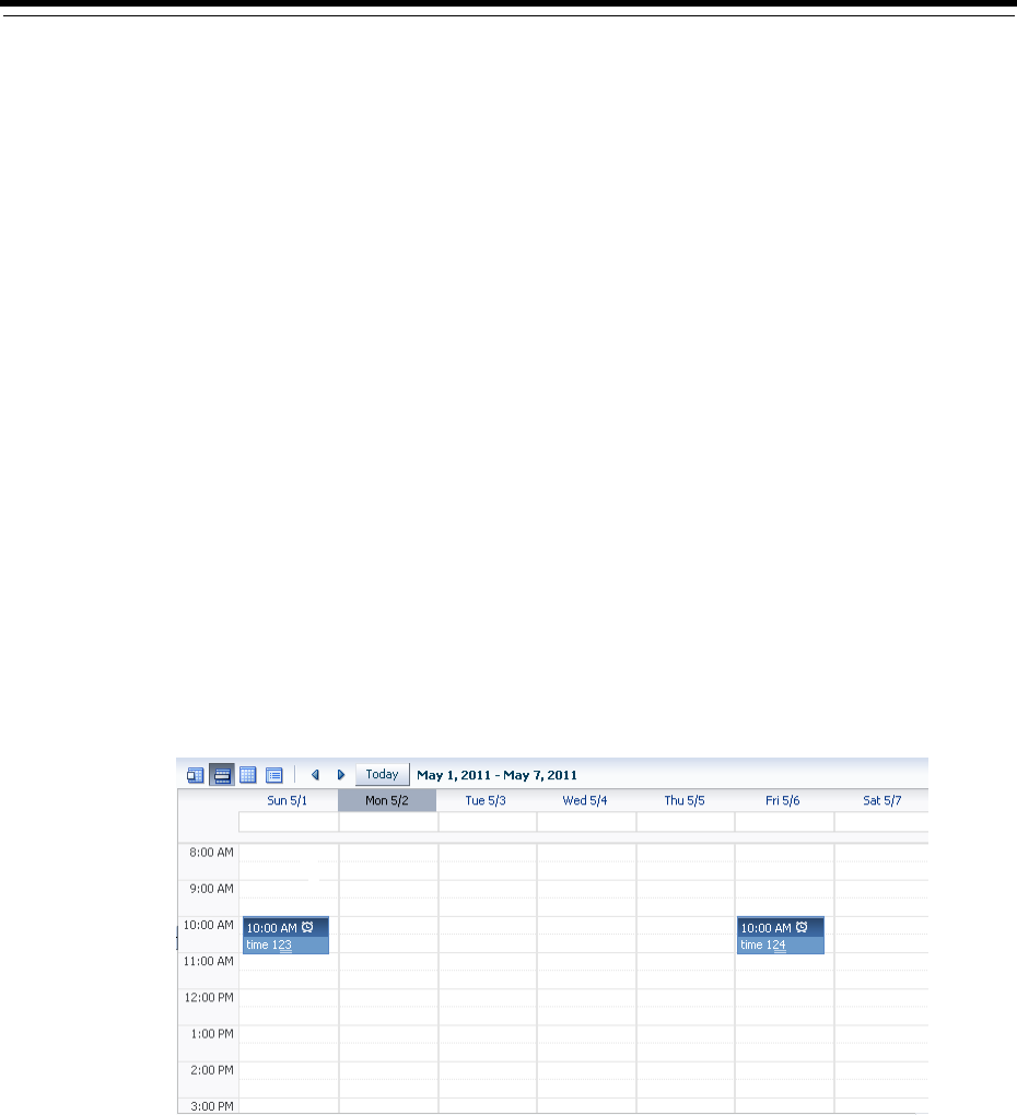
17
Using a Calendar Component 17-1
17 Using a Calendar Component
This chapter describes how to use the ADF Faces calendar component to create a
calendar application.
This chapter includes the following sections:
■Section 17.1, "About Creating a Calendar Component"
■Section 17.2, "Creating the Calendar"
■Section 17.3, "Configuring the Calendar Component"
■Section 17.4, "Adding Functionality Using Popup Components"
■Section 17.5, "Customizing the Toolbar"
■Section 17.6, "Styling the Calendar"
17.1 About Creating a Calendar Component
ADF Faces includes a calendar component that by default displays created activities in
daily, weekly, monthly, or list views for a given provider or providers (a provider is the
owner of an activity). Figure 17–1 shows an ADF Faces calendar in weekly view
mode with some sample activities.
Figure 17–1 ADF Faces Calendar Showing Weekly View
You can configure the calendar so that it only displays a subset of those views. For
example, you may not want your calendar to use the month and list views. You can
configure it so that only the day and week views are available, as shown in
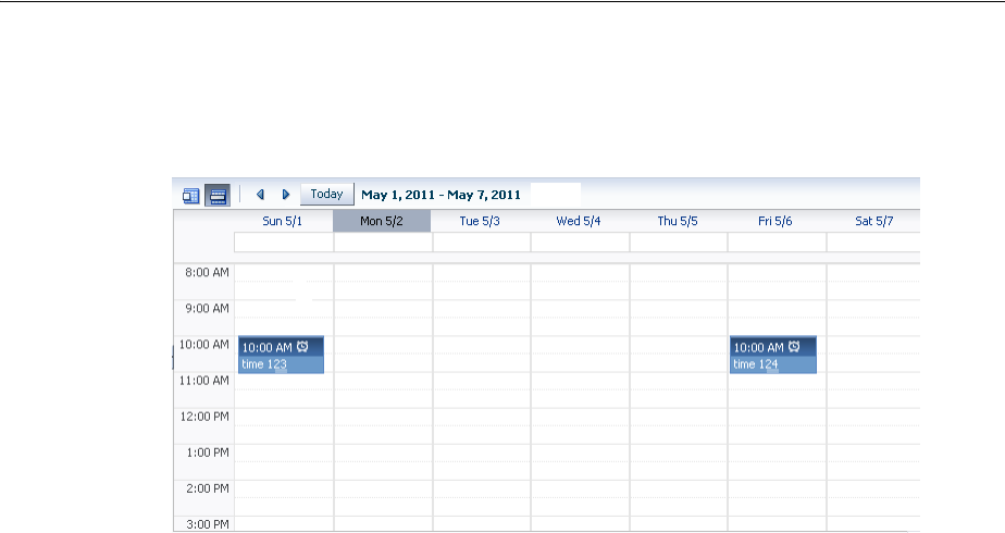
About Creating a Calendar Component
17-2 Web User Interface Developer's Guide for Oracle Application Development Framework
Figure 17–2. Because only day and week views are available, those are the only
buttons displayed in the toolbar.
Figure 17–2 Calendar Configured to Use Only Week and Day Views
By default, the calendar displays dates and times based on the locale set in the
trinidad-config.xml file using the formatting-locale parameter. For more
information, see Section A.6, "Configuration in trinidad-config.xml." If a locale is not
set in that file, then it is based on the locale sent by the browser. For example, in the
United States, by default, the start day of the week is Sunday, and 2 p.m. is shown as
2:00 PM. In France, the default start day is Monday, and 2 p.m. is shown as 14:00. The
time zone for the calendar is also based on the time-zone parameter setting in
trinidad-config.xml. You can override the default when you configure the
calendar. For more information, see Section 17.3, "Configuring the Calendar
Component."
The calendar includes a toolbar with built-in functionality that allows a user to change
the view (between daily, weekly, monthly, or list), go to the previous or next day, week,
or month, and return to today. The toolbar is fully customizable. You can choose which
buttons and text to display, and you can also add buttons or other components. For
more information, see Section 17.5, "Customizing the Toolbar."
The calendar component displays activities based on those activities and the provider
returned by the CalendarModel class. By default, the calendar component is
read-only. That is, it can display only those activities that are returned. You can add
functionality within supported facets of the calendar so that users can edit, create, and
delete activities. When certain events are invoked, popup components placed in these
corresponding facets are opened, which can allow the user to act on activities or the
calendar.
Tip: When these toolbar buttons are used, attribute values on the
calendar are changed. You can configure these values to be persisted
so that they remain for the user during the duration of the session. For
more information, see Chapter 32, "Allowing User Customization on
JSF Pages."
You can also configure your application so that the values will be
persisted and used each time the user logs into the system. For this
persistence to take place, your application must use the Fusion
technology stack. For more information, see the "Allowing User
Customizations at Runtime" chapter of the Oracle Fusion Middleware
Fusion Developer's Guide for Oracle Application Development Framework.
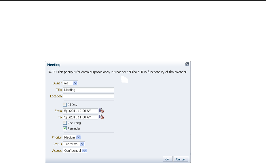
About Creating a Calendar Component
Using a Calendar Component 17-3
For example, when a user clicks on an activity in the calendar, the
CalendarActivityEvent is invoked and the popup component in the
ActivityDetail facet is opened. You might use a dialog component that contains a
form where users can view and edit the activity, as shown in Figure 17–3.
Figure 17–3 Dialog Implemented to Edit an Activity
For more information about implementing additional functionality using events,
facets, and popup components, see Section 17.4, "Adding Functionality Using Popup
Components."
The calendar component supports the ADF Faces drag and drop architectural feature.
Users can drag activities to different areas of the calendar, executing either a copy or a
move operation, and can also drag handles on the activity to change the duration of
the activity. For more information about adding drag and drop functionality, see
Section 33.7, "Adding Drag and Drop Functionality to a Calendar."
By default, the calendar displays activities using a blue ramp. Color ramps are groups
of colors all based on the same hue, for example, blue. In the default calendar, for a
short-duration activity shown in the daily view, the time of an activity is shown with a
dark blue background, while the title of the activity is shown with a light blue
background, as shown in Figure 17–1. You can customize how the activities are
displayed by changing the color ramp.
Each activity is associated with a provider, that is, an owner. If you implement your
calendar so that it can display activities from more than one provider, you can also
style those activities so that each provider’s activity shows in a different color, as
shown in Figure 17–4.
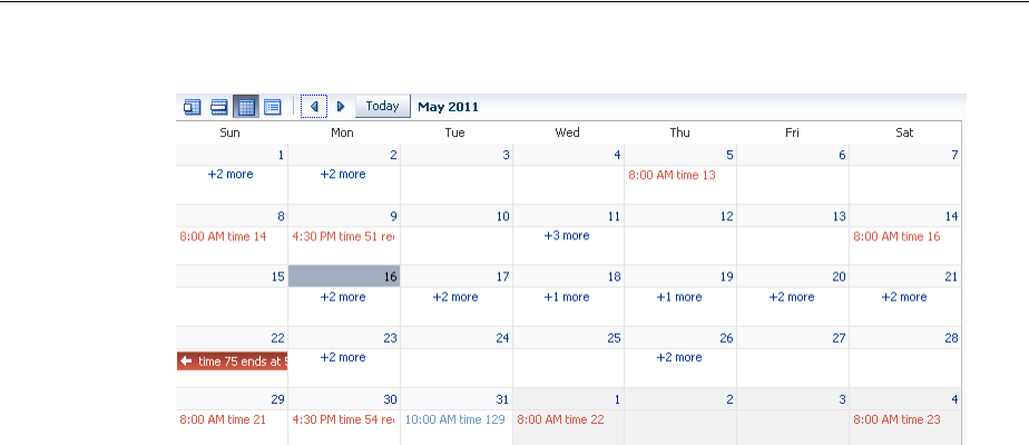
About Creating a Calendar Component
17-4 Web User Interface Developer's Guide for Oracle Application Development Framework
Figure 17–4 Month View with Activities from Different Providers
17.1.1 Calendar Use Cases and Examples
The calendar component provides the features you need to implement
calendar-related functions such as creating activities in daily, weekly, monthly or list
view. It features a customizable toolbar that can be used for switching views. It has
configurable start of the week and start of the day functions. Like other ADF Faces
components, it supports skinning in order to customize its style and appearance.
You can create popups by inserting them into the calendar facets to add more
functionality. You can also implement the calendar so the user can drag and drop
activities from one area to another within the calendar.
The calendar uses the CalendarModel class to display the activities for a given time
period. You must create your own implementation of the model class for your
calendar. If your application uses the Fusion technology stack, then you can create
ADF Business Components over your data source that represents the activities, and
the model will be created for you. You can then declaratively create the calendar, and
it will automatically be bound to that model. For more information, see the "Using the
ADF Faces Calendar Component" section of the Oracle Fusion Middleware Fusion
Developer's Guide for Oracle Application Development Framework.
If your application does not use the Fusion technology stack, then you create your own
implementation of the CalendarModel class and the associated
CalendarActivity and CalendarProvider classes. The classes are abstract
classes with abstract methods. You must provide the functionality behind the methods,
suitable for your implementation of the calendar. For more information, see
Section 17.2, "Creating the Calendar."
17.1.2 Additional Functionality for the Calendar
You may find it helpful to understand other ADF Faces features before you implement
your calendar component. Additionally, once you have added a calendar component
to your page, you may find that you need to add functionality such as validation and
accessibility. Following are links to other functionality that calendar components can
use.
■Client components: Components can be client components. To work with the
components on the client, see Chapter 4, "Using ADF Faces Client-Side
Architecture."

Creating the Calendar
Using a Calendar Component 17-5
■JavaScript APIs: All components have JavaScript client APIs that you can use to
set or get property values. For more information, see the ADF Faces JavaScript API
documentation.
■Events: Components fire both server-side and client-side events that you can have
your application react to by executing some logic. For more information, see
Chapter 6, "Handling Events."
■You can display tips and messages, as well as associate online help with calendar
component. For more information, see Chapter 19, "Displaying Tips, Messages,
and Help."
■You may want other components on the page to update based on selections you
make from a calendar component. For more information, see Section 5.3, "Using
the Optimized Lifecycle."
■You can change the appearance using skins. For more information, see Chapter 28,
"Customizing the Appearance Using Styles and Skins."
■You can make your components accessible. For more information, see Chapter 30,
"Developing Accessible ADF Faces Pages."
■Instead of entering values for attributes that take strings as values, you can use
property files. These files allow you to manage translation of these strings. For
more information, see Chapter 29, "Internationalizing and Localizing Pages."
■You can create popups for additional functionality. For more information about
using these events to provide additional functionality, see Section 17.4, "Adding
Functionality Using Popup Components."
■If your application uses the Fusion technology stack, then you can create calendars
based on how your ADF Business components are configured. For more
information, see the "Creating a Basic Databound Page" chapter of the Oracle
Fusion Middleware Fusion Developer's Guide for Oracle Application Development
Framework. If your application uses Enterprise JavaBeans, you can do the same. For
more information, see the “Creating a Basic Databound Page" of the Oracle Fusion
Middleware Java EE Developer's Guide for Oracle Application Development Framework.
17.2 Creating the Calendar
Before you can add a calendar component to a page, you must implement the logic
required by the calendar in Java classes that extend ADF Faces calendar abstract
classes. For an ADF Faces application, create the classes as managed beans. After you
create the classes, you can add the calendar to a page.
Before you implement your logic, it helps to have an understanding of the
CalendarModel and CalendarActivity classes, as described in the following
section.
Note: If your application uses the Fusion technology stack,
implement the calendar classes using ADF Business Components.
This will allow you to declaratively create and bind your calendar
component. For more information, see the "Using the ADF Faces
Calendar Component" section of the Oracle Fusion Middleware Fusion
Developer's Guide for Oracle Application Development Framework.

Creating the Calendar
17-6 Web User Interface Developer's Guide for Oracle Application Development Framework
17.2.1 Calendar Classes
The calendar component must be bound to an implementation of the
CalendarModel class. The CalendarModel class contains the data for the calendar.
This class is responsible for returning a collection of calendar activities, given the
following set of parameters:
■Provider ID: The owner of the activities. For example, you may implement the
CalendarModel class such that the calendar can return just the activities
associated with the owner currently in session, or it can also return other owners’
activities.
■Time range: The expanse of time for which all activities that begin within that time
should be returned. A date range for a calendar is inclusive for the start time and
exclusive for the end time (also known as half-open), meaning that it will return all
activities that intersect that range, including those that start before the start time,
but end after the start time (and before the end time).
A calendar activity represents an object on the calendar, and usually spans a certain
period of time. The CalendarActivity class is an abstract class whose methods you
can implement to return information about the specific activities.
Activities can be recurring, have associated reminders, and be of a specific time type
(for example, TIME (with a start and end time) or ALLDAY). Activities can also have
start and end dates, a location, a title, and a tag.
The CalendarProvider class represents the owner of an activity. A provider can be
either enabled or disabled for a calendar.
17.2.2 How to Create a Calendar
Create your own implementations of the CalendarModel and CalendarActivity
classes and implement the abstract methods to provide the logic.
Before you begin:
It may be helpful to have an understanding of the CalendarModel and
CalendarActivity classes. For more information, see Section 17.2.1, "Calendar
Classes."
You may also find it helpful to understand functionality that can be added using other
ADF Faces features. For more information, see Section 17.1.2, "Additional
Functionality for the Calendar."
To create the calendar model classes:
1. Create a managed bean that will hold logic for the calendar. This bean must:
■Extend the oracle.adf.view.rich.model.CalendarModel class.
■Implement the abstract methods.
For more information about the CalendarModel class, see the ADF Faces
Javadoc.
■Implement any other needed functionality for the calendar. For example, you
might add logic that sets the time zone, as in the
oracle.adfdemo.view.calendar.rich.model.DemoCalendarBean
managed bean in the ADF Faces demo application (for more information
about the demo application, see Chapter 2, "ADF Faces Demo Application").
For more information about creating managed beans, see Section 3.6, "Creating
and Using Managed Beans."

Configuring the Calendar Component
Using a Calendar Component 17-7
2. Create a managed bean that will hold logic for the activities. This bean must:
■Extend the oracle.adf.view.rich.model.CalendarActivity class.
■Implement the abstract methods.
■Implement any other required functionality for the calendar. As an example,
see the oracle.adfdemo.view.calendar.rich.model.
■DemoCalendarActivity managed bean in the ADF Faces demo application.
3. Create a managed bean that will hold information and logic for providers.
■Extend the oracle.adf.view.rich.model.CalendarProvider class.
■Implement the abstract methods.
■Implement any other required functionality for the provider.
To create the calendar component:
1. In the Component Palette, from the Data Views section, drag a Calendar and drop
it onto a JSF page.
2. Expand the Calendar Data section of the Property Inspector, and enter an EL
expression for Value that resolves to the managed bean that extends the
CalendarModel class.
17.3 Configuring the Calendar Component
Configure the many display attributes for the calendar, for example, the time
displayed at the beginning of a day.
17.3.1 How to Configure the Calendar Component
You configure the calendar using the Property Inspector.
Before you begin:
It may be helpful to have an understanding of the calendar component. For more
information, see Section 17.3, "Configuring the Calendar Component."
Tip: If you want to style individual instances of an activity (for
example, if you want each provider’s activities to be displayed in a
different color), then the getTags method must return a string that
represents the activity instance. For more information, see
Section 17.6.1, "How to Style Activities."
Tip: The calendar component can be stretched by any parent
component that can stretch its children. If the calendar is a child
component to a component that cannot be stretched, it will use a
default width and height, which cannot be stretched by the user at
runtime. However, you can override the default width and height
using inline style attributes. For more information about the default
height and width, see Section 17.3, "Configuring the Calendar
Component." For more information about stretching components, see
Section 9.2.1, "Geometry Management and Component Stretching."

Configuring the Calendar Component
17-8 Web User Interface Developer's Guide for Oracle Application Development Framework
You may also find it helpful to understand functionality that can be added using other
ADF Faces features. For more information, see Section 17.1.2, "Additional
Functionality for the Calendar."
To configure a calendar:
1. With the calendar component selected, expand the Common section of the
Property Inspector, and set the following:
■View: Select the view that should be the default when the calendar is
displayed. Users change this value when they click the corresponding button
in the calendar’s toolbar. Valid values are:
–day
–list
–month
–week
■StartDayOfWeek: Enter the day of the week that should be shown as the
starting day, at the very left in the monthly or weekly view. When not set, the
default is based on the user’s locale. Valid values are:
–sun
–mon
–tue
–wed
–thu
–fri
–sat
■StartHour: Enter a number that represents the hour (in 24 hour format, with 0
being midnight) that should be displayed at the top of the day and week view.
While the calendar (when in day or week view) starts the day at 12:01 a.m.,
the calendar will automatically scroll to the startHour value, so that it is
displayed at the top of the view. The user can always scroll above that time to
view activities that start before the startHour value.
■ListType: Select how you want the list view to display activities. Valid
values are:
–day: Shows activities only for the active day.
–dayCount: Shows a number of days including the active day and after,
based on the value of the listCount attribute.
–month: Shows all the activities for the month to which the active day
belongs.
–week: Shows all the activities for the week to which the active day belongs
■ListCount: Enter the number of days’ activities to display (used only when the
listType attribute is set to dayCount).
Figure 17–5 shows a calendar in list view for the active date May 2 with the
listType set to dayCount and the listCount value set to 14.
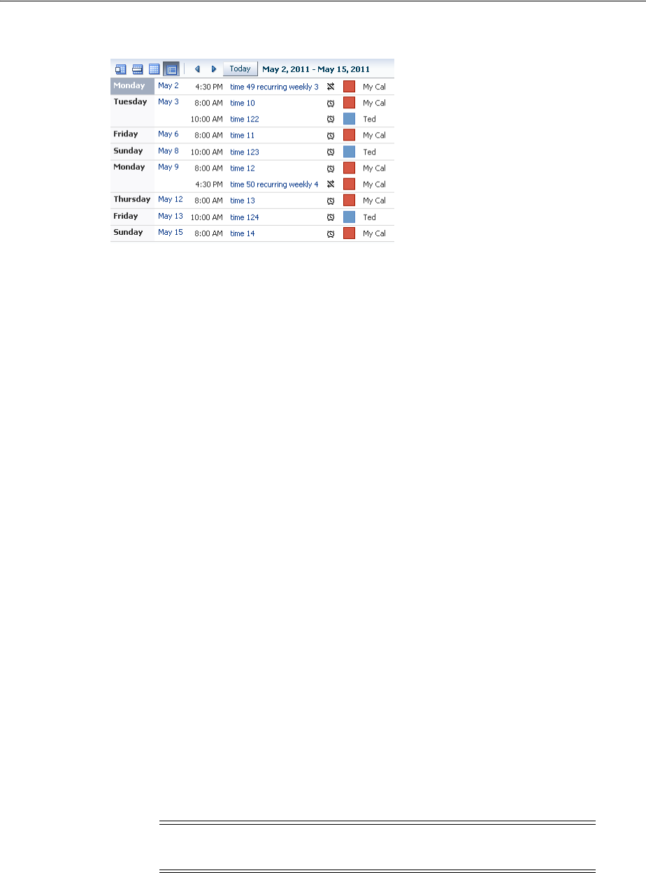
Configuring the Calendar Component
Using a Calendar Component 17-9
Figure 17–5 List View Using dayCount Type
2. Expand the Calendar Data section of the Property Inspector, and set the following:
■ActiveDay: Set the day used to determine the date range that is displayed in
the calendar. By default, the active day is today’s date for the user. Do not
change this if you want today’s date to be the default active day when the
calendar is first opened.
Note that when the user selects another day, this becomes the value for the
activeDay attribute. For example, when the user first accesses the calendar,
the current date, May 2, 2011 is the active day. The user can select another day
to be the active day by clicking on the day link in the month view. The active
day also changes when the user selects a different month or year.
■TimeZone: Set the time zone for the calendar. If not set, the value is taken
from AdfFacesContext. The valid value is a java.util.TimeZone object.
By default, time is displayed based on the formatting-locale parameter
in the trinidad-config.xml file. For more information, see Section A.6,
"Configuration in trinidad-config.xml."
3. Expand the Appearance section of the Property Inspector and set AvailableViews.
The value can be one of or a combination of the following:
■month
■week
■day
■list
■all
If you want to enter more than one value, enter the values with a space between.
For example, if you want the calendar to use day and week views, you would
enter the following:
day week
The corresponding buttons will automatically be displayed in the toolbar, in the
order they appear in the list.
Note: If all is entered, then all views are available, regardless if one
is left out of the list.
Configuring the Calendar Component
17-10 Web User Interface Developer's Guide for Oracle Application Development Framework
If you do not enter day as an available view, then activities in the list and week
views will not appear as links to the day view (provided you do not also enter
all).
4. If you want the user to be able to drag a handle on an existing activity to expand
or collapse the time period of the activity, then implement a handler for
CalendarActivityDurationChangeListener. This handler should include
functionality that changes the end time of the activity. If you want the user to be
able to move the activity (and, therefore, change the start time as well as the end
time), then implement drag and drop functionality. For more information, see
Section 33.7, "Adding Drag and Drop Functionality to a Calendar."
You can now add the following functionality:
■Allow users to create, edit, and delete activities using popup components. For
more information, see Section 17.4, "Adding Functionality Using Popup
Components."
■Allow users to move activities around on the calendar. For more information, see
Section 33.7, "Adding Drag and Drop Functionality to a Calendar."
■Change or add to the toolbar buttons in the toolbar. For more information, see
Section 17.5, "Customizing the Toolbar."
■Change the appearance of the calendar and events. For more information, see
Section 17.6, "Styling the Calendar."
17.3.2 What Happens at Runtime: Calendar Events and PPR
The calendar has two events that are used in conjunction with facets to provide a way
to easily implement additional functionality needed in a calendar, such as editing or
adding activities. These two events are CalendarActivityEvent (invoked when an
action occurs on an activity) and CalendarEvent (invoked when an action occurs on
the calendar, itself). For more information about using these events to provide
additional functionality, see Section 17.4, "Adding Functionality Using Popup
Components."
The calendar also supports events that are fired when certain changes occur. The
CalendarActivityDurationChangeEvent is fired when the user changes the
duration of an activity by dragging the end time or by drag and drop to change the
start time. The CalendarDisplayChangeEvent is fired whenever the component
changes the value of a display attribute, for example when the view attribute changes
from month to day.
When a CalendarDisplayChangeEvent is fired, the calendar component adds
itself as a partial page rendering (PPR) target, allowing the calendar to be immediately
refreshed. This is because the calendar assumes that if the display changed
programatically, then the calendar must need to be rerendered. For example, if a user
changes the view attribute from day to month, then the calendar is rerendered
automatically.
Note: In order to handle an overflow of tasks for a given day in the
month view, if you enter month and do not also enter all, then you
must also enter day.

Adding Functionality Using Popup Components
Using a Calendar Component 17-11
17.4 Adding Functionality Using Popup Components
When a user acts upon an activity, a CalendarActivityEvent is fired. This event
causes the popup component contained in a facet to be displayed, based on the user’s
action. For example, if the user right-clicks an activity, the CalendarActivityEvent
causes the popup component in the activityContextMenu to be displayed. The
event is also delivered to the server, where a configured listener can act upon the
event. You create the popup components for the facets (or if you do not want to use a
popup component, implement the server-side listener). It is in these popup
components and facets where you can implement functionality that will allow users to
create, delete, and edit activities, as well as to configure their instances of the calendar.
Table 17–1 shows the different user actions that invoke events, the event that is
invoked, and the associated facet that will display its contents when the event is
invoked. The table also shows the component you must use within the popup
component. You create the popup and the associated component within the facet,
along with any functionality implemented in the handler for the associated listener. If
you do not insert a popup component into any of the facets in the table, then the
associated event will be delivered to the server, where you can act on it accordingly by
implementing handlers for the events.
Table 17–1 Calendar Faces Events and Associated Facets
User Action Event Associated Facet
Component
to Use in
Popup
Right-click an
activity. CalendarActivity
Event activityContextMenu: The
enclosed popup component can be
used to display a context menu,
where a user can choose some
action to execute against the
activity, for example edit or delete.
menu
Select an activity
and press the
Delete key.
CalendarActivity
Event
activityDelete: The enclosed
popup component can be used to
display a dialog that allows the user
to delete the selected activity.
dialog
Click or
double-click an
activity, or select
an activity and
press the Enter
key.
CalendarActivity
Event activityDetail: The enclosed
popup component can be used to
display the activity’s details.
dialog
Hover over an
activity. CalendarActivity
Event activityHover: The enclosed
popup component can be used to
display high-level information
about the activity.
noteWindow
Right-click the
calendar (not an
activity or the
toolbar).
CalendarEvent contextMenu: The enclosed
popup component can be used to
display a context menu for the
calendar.
menu
Click or
double-click any
free space in the
calendar (not an
activity).
CalendarEvent create: The enclosed popup
component can be used to display a
dialog that allows a user to create
an activity.
dialog
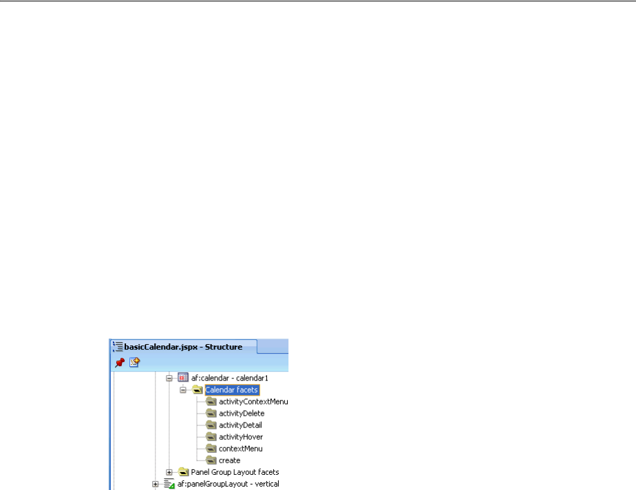
Adding Functionality Using Popup Components
17-12 Web User Interface Developer's Guide for Oracle Application Development Framework
17.4.1 How to Add Functionality Using Popup Components
To add functionality, create the popups and associated components in the associated
facets.
Before you begin:
It may be helpful to have an understanding of popup components. For more
information, see Section 17.4, "Adding Functionality Using Popup Components."
You may also find it helpful to understand functionality that can be added using other
ADF Faces features. For more information, see Section 17.1.2, "Additional
Functionality for the Calendar."
To add functionality using popup components:
1. In the Structure window, expand the af:calendar component node so that the
calendar facets are displayed, as shown in Figure 17–6.
Figure 17–6 Calendar Facets in the Structure Window
2. Based on Table 17–1, create popup components in the facets that correspond to the
user actions for which you want to provide functionality. For example, if you want
users to be able to delete an activity by clicking it and pressing the Delete key, you
add a popup dialog to the activityDelete facet.
To add a popup component, right-click the facet in the Structure window and
choose Insert inside facetName > ComponentName.
For more information about creating popup components, see Chapter 15, "Using
Popup Dialogs, Menus, and Windows."
Example 17–1 shows the JSF code for a dialog popup component used in the
activityDelete facet.
Example 17–1 JSF Code for an Activity Delete Dialog
<f:facet name="activityDelete">
<af:popup id="delete" contentDelivery="lazyUncached">
<!-- don't render if the activity is null -->
<af:dialog dialogListener="#{calendarBean.deleteListener}"
affirmativeTextAndAccessKey="Yes" cancelTextAndAccessKey="No"
rendered="#{calendarBean.currActivity != null}">
<af:spacer height="20"/>
<af:outputText value="Are you sure you want to delete this activity?"/>
<af:panelFormLayout>
<af:inputText label="Title" value="#{calendarBean.currActivity.title}"
readOnly="true"/>
<af:inputDate label="From" value="#{calendarBean.currActivity.from}"
readOnly="true">
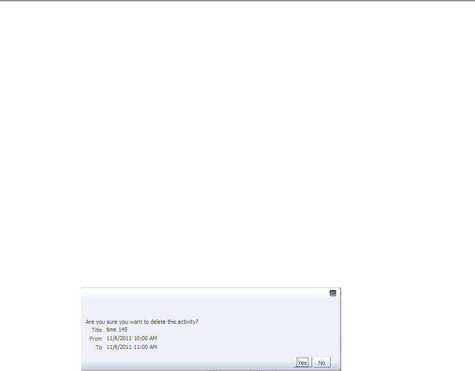
Adding Functionality Using Popup Components
Using a Calendar Component 17-13
<af:convertDateTime type="date" dateStyle="short"
timeZone="#{calendarBean.timeZone}"
pattern="#{calendarBean.currActivity.dateTimeFormat}"/>
</af:inputDate>
<af:inputDate label="To" value="#{calendarBean.currActivity.to}"
readOnly="true">
<af:convertDateTime type="date" dateStyle="short"
timeZone="#{calendarBean.timeZone}"
pattern="#{calendarBean.currActivity.dateTimeFormat}"/>
</af:inputDate>
<af:inputText label="Location" readOnly="true"
rendered="#{calendarBean.currActivity.location != null}"
value="#{calendarBean.currActivity.location}"/>
</af:panelFormLayout>
</af:dialog>
</af:popup>
</f:facet>
Figure 17–7 shows how the dialog is displayed when a user clicks an activity and
presses the Delete key.
Figure 17–7 Delete Activity Dialog
3. Implement any needed logic for the calendarActivityListener. For
example, if you are implementing a dialog for the activityDeleteFacet, then
implement logic in the calendarActivityListener that can save-off the
current activity so that when you implement the logic in the dialog listener (in the
next step), you will know which activity to delete. Example 17–2 shows the
calendarActivityListener for the calendar.jspx page in the ADF Faces demo
application.
Example 17–2 calendarActivityLIstener Handler
public void activityListener(CalendarActivityEvent ae)
{
CalendarActivity activity = ae.getCalendarActivity();
if (activity == null)
{
// no activity with that id is found in the model
setCurrActivity(null);
return;
}
setCurrActivity(new DemoCalendarActivityBean((DemoCalendarActivity)activity,
getTimeZone()))
4. Implement the logic for the popup component in the handler for the popup event.
For example, for the delete dialog, implement a handler for the dialogListener
that actually deletes the activity when the dialog is dismissed. For more
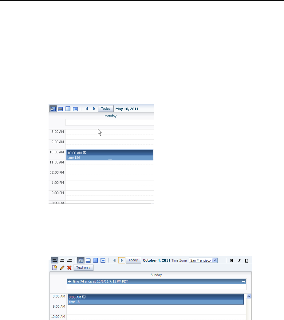
Customizing the Toolbar
17-14 Web User Interface Developer's Guide for Oracle Application Development Framework
information about creating dialogs and other popup components, see Chapter 15,
"Using Popup Dialogs, Menus, and Windows."
17.5 Customizing the Toolbar
By default, the toolbar in the calendar allows the user to change the view between day,
week, month, and list, go to the next or previous item in the view, go to the present
day, or display a text description of the current view. For example in the day view, it
displays the active date, as shown in Figure 17–8.
Figure 17–8 Toolbar in Day View of a Calendar
Figure 17–9 shows a toolbar that has been customized. It has added toolbar buttons,
including buttons that are right-aligned on the top toolbar, and buttons in a second
toolbar.
Figure 17–9 Customized Toolbar for a Calendar
17.5.1 How to Customize the Toolbar
Place the toolbar and toolbar buttons you want to add in custom facets that you create.
Then, reference the facet (or facets) from an attribute on the calendar, along with
keywords that determine how or where the contained items should be displayed.
Before you begin:
It may be helpful to have an understanding of calendar toolbar customization. For
more information, see Section 17.5, "Customizing the Toolbar."
You may also find it helpful to understand functionality that can be added using other
ADF Faces features. For more information, see Section 17.1.2, "Additional
Functionality for the Calendar."

Customizing the Toolbar
Using a Calendar Component 17-15
To customize the toolbar:
1. In the JSF page of the Component Palette, from the Core panel, drag and drop a
Facet for each section of the toolbar you want to add. For example, to add the
custom buttons shown in Figure 17–9, you would add four facet tags. Ensure
that each facet has a unique name for the page.
2. In the ADF Faces page of the Component Palette, from the Layout panel, drag and
drop a Toolbar to each facet and add toolbar buttons and configure the buttons
and toolbar as needed. For more information about toolbars and toolbar buttons,
see Section 16.3, "Using Toolbars."
3. In the Property Inspector, from the dropdown menu next to the toolboxLayout
attribute, choose Edit.
4. In the Edit Property: ToolboxLayout dialog set the value for this attribute. It
should be a list of the custom facet names, in the order in which you want the
contents in the custom facets to appear. In addition to those facets, you can also
include all, or portions of the default toolbar, using the following keywords:
■all: Displays all the toolbar buttons and text in the default toolbar
■dates: Displays only the previous, next, and today buttons
■range: Displays only the string showing the current date range
■views: Displays only the buttons that allows the user to change the view
For example, if you created two facets named customToolbar1 and
customToolbar2, and you wanted the complete default toolbar to appear in
between your custom toolbars, the value of the toolboxLayout attribute would
be the following list items:
■customToolbar1
■all
■customToolbar2
You can also determine the layout of the toolbars using the following keywords:
■newline: Places the toolbar in the next named facet (or the next keyword
from the list in the toolboxLayout attribute) on a new line. For example, if
you wanted the toolbar in the customToolbar2 facet to appear on a new
line, the list would be:
–customToolbar1
–all
–newline
–customToolbar2
Tip: To ensure that there will be no conflicts with future releases of
ADF Faces, start all your facet names with customToolbar. For
example, the section of the toolbar that contains the alignment buttons
shown in Figure 17–9 are in the customToolbarAlign facet.
Note: If you use the all keyword, then the dates, range, and
views keywords are ignored.

Styling the Calendar
17-16 Web User Interface Developer's Guide for Oracle Application Development Framework
If instead, you did not want to use all of the default toolbar, but only the views
and dates sections, and you wanted those to each appear on a new line, the list
would be:
–customToolbar1
–customToolbar2
–newline
–views
–newline
–dates
■stretch: Adds a spacer component that stretches to fill up all available space
so that the next named facet (or next keyword from the default toolbar) is
displayed as right-aligned in the toolbar. Example 17–3 shows the value of the
toolboxLayout attribute for the toolbar displayed in Figure 17–9, along with
the toolbar placed in the customToolbarAlign facet. Note that the toolbar
buttons displayed in the customToolbarBold facet are right-aligned in the
toolbar because the keyword stretch is named before the facet.
Example 17–3 Value for Custom Toolbar
<af:calendar binding="#{editor.component}" id="calendar1"
value="#{calendarBean.calendarModel}"
timeZone="#{calendarBean.timeZone}"
toolboxLayout="customToolbarAlign all customToolbarTZ stretch
customToolbarBold newline customToolbarCreate"
. . .
<f:facet name="customToolbarAlign">
<af:toolbar>
<af:commandToolbarButton id="alignLeft" shortDesc="align left"
icon="/images/alignleft16.png" type="radio"
selected="true"/>
<af:commandToolbarButton id="alignCenter" shortDesc="align center"
icon="/images/aligncenter16.png" type="radio"
selected="false"/>
<af:commandToolbarButton id="alignRight" shortDesc="align right"
icon="/images/alignright16.png" type="radio"
selected="false"/>
</af:toolbar>
</f:facet>
. . .
</af:calendar>
17.6 Styling the Calendar
Like other ADF Faces components, the calendar component can be styled as described
in Chapter 28, "Customizing the Appearance Using Styles and Skins." However, along
with standard styling procedures, the calendar component has specific attributes that
make styling instances of a calendar easier. These attributes are:
■activityStyles: Allows you to individually style each activity instance. For
example, you may want to show activities belonging to different providers in
different colors.
■dateCustomizer: Allows you to display strings other than the calendar date for
the day in the month view. For example, you may want to display countdown or
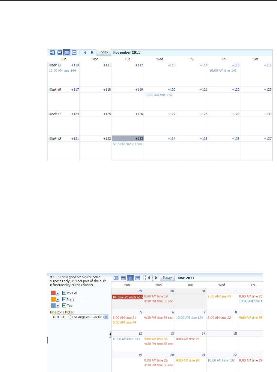
Styling the Calendar
Using a Calendar Component 17-17
countup type numbers, as shown in Figure 17–10. This attribute also allows you to
add strings to the blank portion of the header for a day.
Figure 17–10 Customized Display of Dates in a Calendar
17.6.1 How to Style Activities
The activityStyles attribute uses InstanceStyles objects to style specific
instances of an activity. The InstanceStyles class is a way to provide per-instance
inline styles based on skinning keys.
The most common usage of the activityStyles attribute is to display activities
belonging to a specific provider using a specific color. For example, the calendar
shown in Figure 17–11 shows activities belonging to three different providers. The user
can change that color used to represent a provider’s activities in the left panel. The
activityStyles attribute is used to determine the color displayed for each activity,
based on the provider with which it is associated.
Figure 17–11 Activities Styled to Display Color for Different Providers
Note that instead of using a single color, a range of a color is used in the calendar. This
is called a color ramp. A color ramp is a set of colors in a color family to represent the
different states of activities. For example, Ted’s activities use the Blue ramp. Activities
whose time span is within one day are displayed in medium blue text. Activities that

Styling the Calendar
17-18 Web User Interface Developer's Guide for Oracle Application Development Framework
span across multiple days are shown in a medium blue box with white text. Darker
blue is the background for the start time, while lighter blue is the background for the
title. These three different blues are all part of the Blue color ramp.
The CalendarActivityRamp class is a subclass (of InstanceStyles) that
supports some built-in color ramps and can take a representative color (for example,
the blue chosen for Ted’s activities) and return the correct color ramp to be used to
display each activity in the calendar.
The activityStyles attribute must be bound to a map object. The map key is the set
returned from the getTags method on an activity. The map value is an
InstanceStyles object, most likely an instance of CalendarActivityRamp. This
InstanceStyles object will take in skinning keys, and for each activity, styles will
be returned.
Before you begin:
It may be helpful to have an understanding of calendar styles. For more information,
see Section 17.6, "Styling the Calendar."
You may also find it helpful to understand functionality that can be added using other
ADF Faces features. For more information, see Section 17.1.2, "Additional
Functionality for the Calendar."
To style activities:
1. In your CalendarActivity class, have the getTags method return a string set
that will be used by the activityStyles attribute to map the returned string to
a specific style. For example, to use the different color ramps for the different
providers shown in Figure 17–11, you must return a string for each provider. In
this case, an activity belonging to the current user might return Me, an activity
belonging to Mary might return MJ, and an activity belonging to Ted might return
TC. For more information about implementing the CalendarActivity class, see
Section 17.2.2, "How to Create a Calendar."
2. Create a map whose key is the set returned from the getTags method, and whose
value is an InstanceStyles object (for example, a CalendarActivityRamp
instance).
For example, to use the different color ramps shown in Figure 17–11, you would
create a map using the values shown in Table 17–2.
3. In the Structure window, select the calendar component, and in the Property
Inspector, bind the activityStyles attribute to the map.
Table 17–2 Map for activityStyles Attribute
Key
(String Set) Value (InstanceStyles Object)
{"Me"} CalendarActivityRamp.getActivityRamp
(CalendarActivityRamp.RampKey.RED)
{"LE"} CalendarActivityRamp.getActivityRamp
(CalendarActivityRamp.RampKey.ORANGE)
{"TF"} CalendarActivityRamp.getActivityRamp
(CalendarActivityRamp.RampKey.BLUE)

Styling the Calendar
Using a Calendar Component 17-19
17.6.2 What Happens at Runtime: Activity Styling
During calendar rendering for each activity, the renderer calls the
CalendarActivity.getTags method to get a string set. The string set is then
passed to the map bound to the activityStyles attribute, and an
InstanceStyles object is returned (which may be a CalendarActivityRamp).
Using the example:
■If the string set {"Me"} is passed in, the red CalendarActivityRamp is
returned.
■If the string set {"LE"} is passed in, the orange CalendarActivityRamp is
returned.
■If the string set {"TF"} is passed in, the blue CalendarActivityRamp is
returned.
17.6.3 How to Customize Dates
If you want to display something other than the date number string in the day header
of the monthly view, you can bind the dateCustomizer attribute to an
implementation of a DateCustomizer class that determines what should be
displayed for the date.
Before you begin:
It may be helpful to have an understanding of calendar styling. For more information,
see Section 17.6, "Styling the Calendar."
You may also find it helpful to understand functionality that can be added using other
ADF Faces features. For more information, see Section 17.1.2, "Additional
Functionality for the Calendar."
To customize the date string:
1. Create a subclass of the oracle.adf.view.rich.util.DateCustomizer
class. This subclass should determine what to display using the following skinning
keys:
■af|calendar::day-header-row: In day view, customize the day of the
week in the header. For example, replace "Thursday" with "Thu".
■af|calendar::list-day-of-month-link: In list view, customize the
text for the day of the month link. For example, replace "Jan 1" with "New
Year's Day".
■af|calendar::list-day-of-week-column: In list view, customize the
day of the week in the left list column. For example, replace "Thursday" with
"Thu".
■af|calendar::week-header-day-link: In week view, customize the
date link for each date in the header. For example, replace "Sun 1/1" with
"New Year's Day".
■af|calendar::month-grid-cell-header-misc: In month view, add
miscellaneous text to the empty area of the cell header. For example, on Jan 1,
add the text "New Year's Day".
■af|calendar::month-grid-cell-header-day-link: In month view,
customize the date link labels in the cell header. For example, replace "5" with
"-34".

Styling the Calendar
17-20 Web User Interface Developer's Guide for Oracle Application Development Framework
Example 17–4 shows the DemoDateCustomizer class that displays the week
number in the first day of the week, and instead of the day of the month, a
countdown number to a specific date, as shown in Figure 17–10.
Example 17–4 Date Customizer Class
public class MyDateCustomizer extends DateCustomizer
{
public String format(Date date, String key, Locale locale, TimeZone tz)
{
if ("af|calendar::month-grid-cell-header-misc".equals(key))
{
// return appropriate string
}
else if ("af|calendar::month-grid-cell-header-day-link".equals(key))
{
// return appropriate string
}
return null;
}
}
2. In a managed bean, create an instance of the DateCustomizer class, for example:
private DateCustomizer _dateCustomizer = new DemoDateCustomizer();
3. In the calendar component, bind the dateCustomizer attribute to the
DateCustomizer instance created in the managed bean.

18
Using Output Components 18-1
18Using Output Components
This chapter describes how to display output text, images, and icons using ADF Faces
components, and how to use components that allow users to play video and audio
clips.
This chapter includes the following sections:
■Section 18.1, "About Output Text, Image, Icon, and Media Components"
■Section 18.2, "Displaying Output Text and Formatted Output Text"
■Section 18.3, "Displaying Icons"
■Section 18.4, "Displaying Images"
■Section 18.5, "Using Images as Links"
■Section 18.6, "Displaying Images in a Carousel"
■Section 18.7, "Displaying Application Status Using Icons"
■Section 18.8, "Playing Video and Audio Clips"
18.1 About Output Text, Image, Icon, and Media Components
ADF Faces provides components for displaying text, icons, and images, and for
playing audio and video clips on JSF pages.
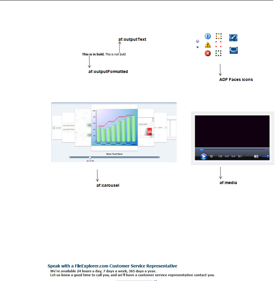
About Output Text, Image, Icon, and Media Components
18-2 Web User Interface Developer's Guide for Oracle Application Development Framework
Figure 18–1 ADF Faces Output Components
18.1.1 Output Components Use Case and Examples
The outputText component can be used as child to many other components to
display read-only text. When you need the text to be formatted, you can use the
outputFormatted component. For example, you may want to use bold formatted
text within instruction text, as shown in Figure 18–2.
Figure 18–2 Use the outputFormatted Component in Instruction Text
Many ADF Faces components can have icons associated with them. For example, in a
menu, each of the menu items can have an associated icon. You identify the image to
use for each one as the value of an icon attribute for the menu item component itself.
Information and instructions for adding icons to components that support them are
covered in those components’ chapters. In addition to providing icons within
components, ADF Faces also provides icons used when displaying messages. You can
use these icons outside of messages as well.
To display an image on a page, you use the image component. Images can also be
used as links (including image maps) or used to depict the status of the server.
The carousel component manages a group of objects that users can scroll through. It
can display objects that rotate in a circular, simulated 3D space, or it can display one
object at a time. The objects can be displayed either horizontally or vertically. Users
can browse through carousel objects using the slider or using the next and previous
buttons. Some use cases for the carousel might include printed collateral, catalogues,
and pictures.
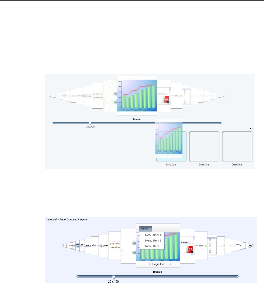
About Output Text, Image, Icon, and Media Components
Using Output Components 18-3
The carousel component may be used alone or may be used in conjunction with other
components, which you can configure to control the image. For example, you might
add components below the carousel that can be used as a drop zone for objects in the
carousel; the user can drag an object from the carousel and drop it into a specific area,
as shown in Figure 18–3. For more information about implementing drag and drop,
see Chapter 33, "Adding Drag and Drop Functionality."
Figure 18–3 Drop Zone for Carousel Items
Another example might be adding a menu bar that allows users to perform some
action on the current object, such as deleting it, adding it to a favorites list, or preview
the image, as shown in Figure 18–4.
Figure 18–4 Menus in a Carousel
The media component is used to display audio-visual content, such as advertisements
or directions to complete a task. The media component can be configured to display all
controls, typical controls, minimal controls, no visible controls (for example, controls
are available only from a context menu), or no controls at all. Typically, you would not
display controls when the clip is very short and control is not needed.
When the media component is the primary component on the page, then typically all
controls are displayed, as shown in Figure 18–5.
Best Practice: Including more than one carousel per page may be
visually confusing for the user by making it unclear which slider
controls a given carousel, or which drop zone belongs to a given
carousel.
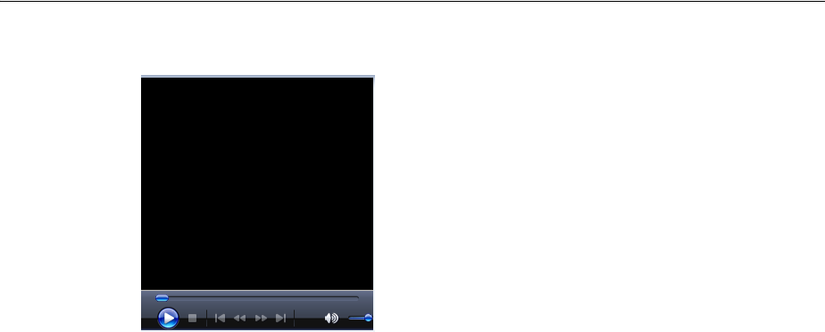
Displaying Output Text and Formatted Output Text
18-4 Web User Interface Developer's Guide for Oracle Application Development Framework
Figure 18–5 All Controls are Displayed at the Bottom of the Player
18.1.2 Additional Functionality for Output Components
You may find it helpful to understand other ADF Faces features before you implement
your output components. Additionally, once you have added these components to
your page, you may find that you need to add functionality such as drag and drop and
accessibility. Following are links to other functionality that output components can
use.
■Using parameters in text: You can use the ADF Faces EL format tags if you want
text displayed in a component to contain parameters that will resolve at runtime.
For more information, see Section 3.5.2, "How to Use the EL Format Tags."
■Conversion: In some cases, a value may need to be converted to a string in order
to display. For more information about conversion, see Chapter 7, "Validating and
Converting Input."
■Drag and drop: You can configure a page so that a user can drag and drop output
components or values of output components, to another area on a page. For more
information, see Chapter 33, "Adding Drag and Drop Functionality."
■Localization: Instead of entering values for attributes that take strings as values,
you can use property files. These files allow you to manage translation of these
strings. For more information, see Chapter 29, "Internationalizing and Localizing
Pages."
■Skins: You can change the look and feel of output components by changing the
skin. For more information, see Chapter 28, "Customizing the Appearance Using
Styles and Skins."
18.2 Displaying Output Text and Formatted Output Text
There are two ADF Faces components specifically for displaying output text on pages:
outputText, which displays unformatted text, and outputFormatted, which
displays text and can include a limited range of formatting options.
To display simple text specified either explicitly or from a resource bundle or bean,
you use the outputText component. You define the text to be displayed as the value
of the value property. For example:
<af:outputText value="The submitted value was: "/>
Example 18–1 shows two outputText components: the first specifies the text to be
displayed explicitly, and the second takes the text from a managed bean and converts
Displaying Output Text and Formatted Output Text
Using Output Components 18-5
the value to a text value ready to be displayed (for more information about conversion,
see Section 7.3, "Adding Conversion").
Example 18–1 Output Text
<af:panelGroupLayout>
<af:outputText value="The submitted value was: "/>
<af:outputText value="#{demoInput.date}">
<af:convertDateTime dateStyle="long"/>
</af:outputText>
</af:panelGroupLayout>
You can use the escape attribute to specify whether or not special HTML and XML
characters are escaped for the current markup language. By default, characters are
escaped.
Example 18–2 illustrates two outputText components, the first of which uses the
default value of true for the escape attribute, and the second of which has the
attribute set to false.
Example 18–2 Output Text With and Without the escape Property Set
<af:outputText value="<h3>output & heading</h3>"/>
<af:outputText value="<h3>output & heading</h3>"
escape="false"/>
Figure 18–6 shows the different effects seen in a browser of the two different settings of
the escape attribute.
Figure 18–6 Using the escape Attribute for Output Text
You should avoid setting the escape attribute to false unless absolutely necessary.
A better choice is to use the outputFormatted component, which allows a limited
number of HTML tags.
As with the outputText component, the outputFormatted component also
displays the text specified for the value property, but the value can contain HTML
tags. Use the formatting features of the outputFormatted component specifically
when you want to format only parts of the value in a certain way. If you want to use
the same styling for the whole component value, instead of using HTML within the
value, apply a style to the whole component. If you want all instances of a component
to be formatted a certain way, then you should create a custom skin. For more
information about using inline styles and creating skins, see Chapter 28, "Customizing
the Appearance Using Styles and Skins."
Example 18–3 shows an outputFormatted component displaying only a few words
of its value in bold (note that you need to use entities such as < on JSPX pages).
Example 18–3 Using outputFormatted to Bold Some Text for a JSPX file
<af:outputFormatted value="<b>This is in bold.</b> This is not bold"/>
Displaying Output Text and Formatted Output Text
18-6 Web User Interface Developer's Guide for Oracle Application Development Framework
Example 18–4 Using outputFormatted to Bold Some Text for a JSP file
<af:outputFormatted value="<b>This is in bold.</b> This is not bold"/>
Figure 18–7 shows how the component displays the text.
Figure 18–7 Text Formatted Using the outputFormatted Component
18.2.1 How to Display Output Text
Before displaying any output text, decide whether or not any parts of the value must
be formatted in a special way. If they do, then use an outputFormatted component.
Before you begin:
It may be helpful to have an understanding of how the attributes can affect
functionality. For more information, see Section 18.2, "Displaying Output Text and
Formatted Output Text."
You may also find it helpful to understand functionality that can be added using other
ADF Faces features. For more information, see Section 18.1.2, "Additional
Functionality for Output Components."
To display output text:
1. In the Component Palette, from the Text and Selection panel, drag and drop an
Output Text onto the page. To create an outputFormatted component, drag and
drop an Output Text (Formatted) from the Component Palette.
2. Expand the Common section of the Property Inspector and set the value attribute
to the value to be displayed. If you are using the outputFormatted component,
use HTML formatting codes to format the text as needed, as described in
Table 18–1 and Table 18–2.
The outputFormatted component also supports the styleUsage attribute
whose values are the following predefined styles for the text:
■inContextBranding
■instruction
■pageStamp
Figure 18–8 shows how the styleUsage values apply styles to the component.
Tip: If parts of the value require special formatting, use an
outputFormatted component.
Tip: If you plan to support changing the text of the component
through active data (for example, data being pushed from the data
source will determine the text that is displayed), then you should use
the activeOutputText component instead of the outputText
component. Create an activeOutputText component by dragging
an Output Text (Active) from the Component Palette.
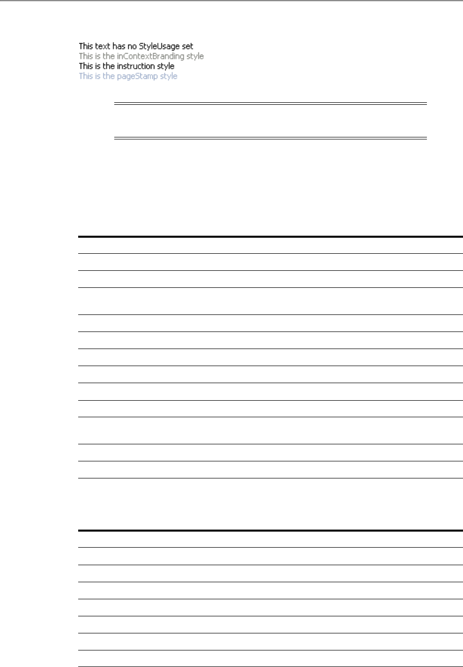
Displaying Output Text and Formatted Output Text
Using Output Components 18-7
Figure 18–8 styleUsage Attribute Values
18.2.2 What You May Need to Know About Allowed Format and Character Codes in the
outputFormatted Component
Only certain formatting and character codes can be used. Table 18–1 lists the
formatting codes allowed for formatting values in the outputFormatted component.
Table 18–2 lists the character codes for displaying special characters in the values.
Note: If the styleUsage and styleClass attributes are both set,
the styleClass attribute takes precedence.
Table 18–1 Formatting Codes for Use in af:outputFormatted Values
Formatting Code Effect
<br> Line break
<hr> Horizontal rule
<ol>...</ol><ul>...</
ul><li>...</li>
Lists: ordered list, unordered list, and list item
<p>...</p> Paragraph
<b>...</b> Bold
<i>...</i> Italic
<tt>...</tt> Teletype or monospaced
<big>...</big> Larger font
<small>...</small> Smaller font
<pre>...</pre> Preformatted: layout defined by whitespace and line break
characters preserved
<span>...</span> Span the enclosed text
<a>...</a> Anchor
Table 18–2 Character Codes for Use in af:outputFormatted Values
Character Code Character
< Less than
> Greater than
& Ampersand
® Registered
© Copyright
Nonbreaking space
" Double quotation marks
Displaying Icons
18-8 Web User Interface Developer's Guide for Oracle Application Development Framework
The attributes class, style, and size can also be used in the value attribute of the
outputFormatted component, as can href constructions. All other HTML tags are
ignored.
18.3 Displaying Icons
ADF Faces provides a set of icons used with message components, shown in
Figure 18–9.
Figure 18–9 ADF Faces Icons
If you want to display icons outside of a message component, you use the icon
component and provide the name of the icon type you want to display.
18.3.1 How to Display Icons
When you use messages in an ADF Faces application, the icons are automatically
added for you. You do not have to add them to the message component. However, you
can use the icons outside of a message component. To display one of the standard
icons defined in the skin for your application, you use the icon component.
Before you begin:
It may be helpful to have an understanding of how the attributes can affect
functionality. For more information, see Section 18.3, "Displaying Icons."
You may also find it helpful to understand functionality that can be added using other
ADF Faces features. For more information, see Section 18.1.2, "Additional
Functionality for Output Components."
To display a standard icon:
1. In the Component Palette, from the General Controls panel, drag and drop an Icon
onto your page.
2. Expand the Common section and set Name to the name of one of the icon
functions shown in Figure 18–9. For example, if you want to display a red circle
with a white X, you would set Name to error.
Note: For security reasons, JavaScript is not supported in output
values.
Note: The images used for the icons are determined by the skin the
application uses. If you want to change the image, create a custom
skin. For more information, see Chapter 28, "Customizing the
Appearance Using Styles and Skins."

Using Images as Links
Using Output Components 18-9
3. Expand the Appearance section, and set ShortDesc to the text you want to be
displayed as the alternate text for the icon.
18.4 Displaying Images
To display an image on a page, you use the image component and set the source
attribute to the URI where the file is located. The image component also supports
accessibility description text by providing a way to link to a long description of the
image.
The image component can also be used as a link and can include an image map,
however, it must be placed inside a goLink component. For more information, see
Section 18.5, "Using Images as Links."
18.4.1 How to Display Images
You use the image component to display images.
Before you begin:
You may also find it helpful to understand functionality that can be added using other
ADF Faces features. For more information, see Section 18.1.2, "Additional
Functionality for Output Components."
To display an image:
1. In the Component Palette, from the General Controls panel, drag and drop an
Image onto your page.
2. In the Insert Image dialog, set the following:
■ShortDesc: Set to the text to be used as the alternate text for the image.
■Source: Enter the URI to the image file.
3. If you want to include a longer description for the image, in the Property
Inspector, set LongDescURL attribute to the URI where the information is located.
18.5 Using Images as Links
ADF Faces provides the commandImageLink component that renders an image as a
link, along with optional text. You can set different icons for when the user hovers the
mouse over the icon, and for when the icon is depressed or disabled. For more
information about the commandImageLink component, see Section 20.3, "Using
Buttons and Links for Navigation."
If you simply want an image to be used to navigate to a given URI, you can enclose an
image in the goLink component and then, if needed, link to an image map.
You can use an image as a goLink component to one or more destinations. If you
want to use an image as a simple link to a single destination, use a goLink component
Tip: If you plan to support changing the source attribute of the
image through active data (for example, data being pushed from the
data source will determine the image that is displayed), then you
should use the activeImage component instead of the image
component. Create an activeImage component by dragging an
Image (Active) from the Component Palette.

Displaying Images in a Carousel
18-10 Web User Interface Developer's Guide for Oracle Application Development Framework
to enclose your image, and set the destination attribute of the goLink component
to the URI of the destination for the link.
If your image is being used as a graphical navigation menu, with different areas of the
graphic navigating to different URIs, enclose the image component in a goLink
component and create a server-side image map for the image.
18.5.1 How to Use Images as Links
You use the commandImageLink component to render an image as a link.
Before you begin:
It may be helpful to have an understanding of how the attributes can affect
functionality. For more information, see Section 18.5, "Using Images as Links."
You may also find it helpful to understand functionality that can be added using other
ADF Faces features. For more information, see Section 18.1.2, "Additional
Functionality for Output Components."
To use an image as one or more goLink components:
1. In the Component Palette, from the General Controls panel, drag and drop a Link
(Go) onto the page.
2. Drag and drop an Image as a child to the goLink component.
3. In the Insert Image dialog, set the following:
■ShortDesc: Set to the text to be used as the alternate text for the image.
■Source: Enter the URI to the image file.
4. If different areas of the image are to link to different destinations:
■Create an image map for the image and save it to the server.
■In the Property Inspector, set ImageMapType attribute to server.
■Select the goLink component and in the Property Inspector, set Destination to
the URI of the image map on the server.
5. If the whole image is to link to a single destination, select the goLink component
and enter the URI of the destination as the value of Destination.
18.6 Displaying Images in a Carousel
You can display images in a revolving carousel, as shown in Figure 18–10. Users can
change the image at the front either by using the slider at the bottom or by clicking one
of the auxiliary images to bring that specific image to the front.
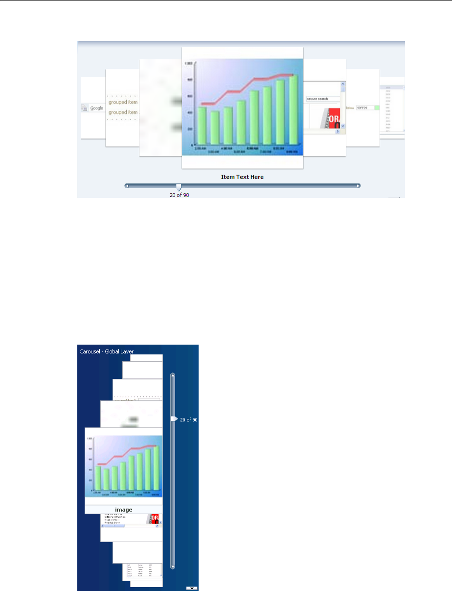
Displaying Images in a Carousel
Using Output Components 18-11
Figure 18–10 The ADF Faces Carousel
By default, the carousel displays horizontally. The objects within the horizontal
orientation of the carousel are vertically-aligned to the middle and the carousel itself is
horizontally-aligned to the center of its container.
You can configure the carousel so that it can be displayed vertically, as you might want
for a reference rolodex. By default, the objects within the vertical orientation of the
carousel are horizontally-aligned to the center and the carousel itself is vertically
aligned middle, as shown in Example 18–11. You can change the alignments using the
carousel’s alignment attributes.
Figure 18–11 Vertical Carousel Component
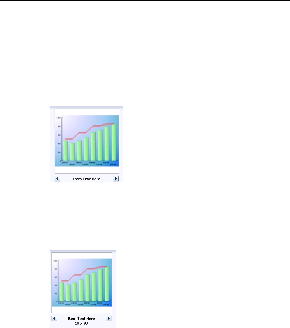
Displaying Images in a Carousel
18-12 Web User Interface Developer's Guide for Oracle Application Development Framework
Instead of partially displaying the previous and next images, you can configure your
carousel so that it only displays the current image, as shown in Figure 18–12.
Figure 18–12 Carousel Can Display Just One Image.
You can also configure the controls used to browse through the images. You can
display a slider with next and previous arrows that spans more than one image, as
shown in Figure 18–10, display only next and previous buttons, as shown in
Figure 18–12, or display next and previous buttons, along with the slide counter, as
shown in Figure 18–12.
Figure 18–13 Next and Previous Buttons Without a Slider
A child carouselItem component displays the objects in the carousel, along with a
title for the object. Instead of creating a carouselItem component for each object to
be displayed, and then binding these components to the individual object, you bind
the carousel component to a complete collection. The component then repeatedly
renders one carouselItem component by stamping the value for each item, similar
to the way a tree stamps out each row of data. As each item is stamped, the data for
the current item is copied into a property that can be addressed using an EL
expression using the carousel component’s var attribute. Once the carousel has
completed rendering, this property is removed or reverted back to its previous value.
Carousels contain a nodeStamp facet, which is both a holder for the carouselItem
component used to display the text and short description for each item, and also the
parent component to the image displayed for each item.
Best Practice: Generally the carousel should be placed in a parent
component that stretches its children (such as a panelSplitter or
panelStretchLayout). If you do not place the carousel in a
component that stretches its children, your carousel will display at the
default dimension of 500px wide and 300px tall. You can change these
dimensions.

Displaying Images in a Carousel
Using Output Components 18-13
For example, the carouselItem JSF page in the ADF Faces demo shown in
Figure 18–10 contains a carousel component that displays an image of each of the
ADF Faces components. The demoCarouselItem (CarouselBean.java) managed
bean contains a list of each of these components. The value attribute of the carousel
component is bound to the items property on that bean, which represents that list.
The carousel component’s var attribute is used to hold the value for each item to
display, and is used by both the carouselItem component and image component to
retrieve the correct values for each item. Example 18–5 shows the JSF page code for the
carousel. For more information about stamping behavior in a carousel, see
Section 12.6, "Displaying Data in Trees."
Example 18–5 Carousel Component JSF Page Code
<af:carousel id="carousel" binding="#{editor.component}"
var="item"
value="#{demoCarousel.items}"
carouselSpinListener="#{demoCarousel.handleCarouselSpin}">
<f:facet name="nodeStamp">
<af:carouselItem id="crslItem" text="#{item.title}" shortDesc="#{item.title}">
<af:image id="img" source="#{item.url}" shortDesc="#{item.title}"/>
</af:carouselItem>
</f:facet>
</af:carousel>
A carouselItem component stretches its sole child component. If you place a single
image component inside of the carouselItem, the image stretches to fit within the
square allocated for the item (as the user spins the carousel, these dimensions shrink or
grow).
The carousel component uses a CollectionModel class to access the data in the
underlying collection. This class extends the JSF DataModel class and adds on
support for row keys. In the DataModel class, rows are identified entirely by index.
However, to avoid issues if the underlying data changes, the CollectionModel class
is based on row keys instead of indexes.
You may also use other model classes, such as java.util.List, array, and
javax.faces.model.DataModel. If you use one of these other classes, the
carousel component automatically converts the instance into a CollectionModel
class, but without any additional functionality. For more information about the
CollectionModel class, see the MyFaces Trinidad Javadoc at
http://myfaces.apache.org/trinidad/trinidad-1_
2/trinidad-api/apidocs/index.html.
Best Practice: The image component does not provide any
geometry management controls for altering how it behaves when
stretched. You should use images that have equal width and height
dimensions in order for the image to retain its proper aspect ratio
when it is being stretched.
Note: If your application uses the Fusion technology stack, you can
create ADF Business Components over your data source that
represent the items, and the model will be created for you. You can
then declaratively create the carousel, and it will automatically be
bound to that model. For more information, see the "Using the ADF
Faces Carousel Component" section of the Oracle Fusion Middleware
Fusion Developer's Guide for Oracle Application Development Framework

Displaying Images in a Carousel
18-14 Web User Interface Developer's Guide for Oracle Application Development Framework
The carousel components are virtualized, meaning not all the items that are there for
the component on the server are delivered to and displayed on the client. You
configure the carousel to fetch a certain number of rows at a time from your data
source. The data can be delivered to the component either immediately upon
rendering, or lazily fetched after the shell of the component has been rendered. By
default, the carousel lazily fetches data for the initial request. When a page contains
one or more of these components, the page initially goes through the standard
lifecycle. However, instead of the carousel fetching the data during that initial request,
a special separate partial page rendering (PPR) request is run on the component, and
the number of items set as the value of the fetch size for the carousel is then returned.
Because the page has just been rendered, only the Render Response phase executes for
the carousel, allowing the corresponding data to be fetched and displayed. When a
user does something to cause a subsequent data fetch (for example spinning the
carousel for another set of images), another PPR request is executed.
A slider control allows users to navigate through the collection. Normally the thumb
on the slider displays the current object number out of the total number of objects, for
example 6 of 20. When the total number of objects is too high to calculate, the thumb
on the slider will show only the current object number. For example, say a carousel is
used for a company' s employee directory. By default the directory might show faces
for every employee, but it may not know without an expensive database call that there
are exactly 94,409 employees in the system that day.
You can use other components in conjunction with the carousel. For example, you can
add a toolbar or menu bar, and to that, add buttons or menu items that allow users to
perform actions on the current object.
18.6.1 How to Create a Carousel
To create a carousel, you must first create the data model that contains the images to
display. You then bind a carousel component to that model and insert a
carouselItem component into the nodeStamp facet of the carousel. Lastly, you
insert an image component (or other components that contain an image component)
as a child to the carouselItem component.
Before you begin:
It may be helpful to have an understanding of how the attributes can affect
functionality. For more information, see Section 18.6, "Displaying Images in a
Carousel."
Performance Tip: You should use lazy delivery when the page
contains a number of components other than a carousel. Using lazy
delivery allows the initial page layout and other components to be
rendered first before the data is available.
Use immediate delivery if the carousel is the only context on the page,
or if the carousel is not expected to return a large set of items. In this
case, response time will be faster than using lazy delivery (or in some
cases, simply perceived as faster), as the second request will not go to
the server, providing a faster user response time and better server
CPU utilizations. Note however that only the number of items
configured to be the fetch block will be initially returned. As with lazy
delivery, when a user’s actions cause a subsequent data fetch, the next
set of items are delivered.

Displaying Images in a Carousel
Using Output Components 18-15
You may also find it helpful to understand functionality that can be added using other
ADF Faces features. For more information, see Section 18.1.2, "Additional
Functionality for Output Components."
To Create a Carousel:
1. Create the data model that will provide the collection of images to display. The
data model can be a List, Array, DataModel or CollectionModel. If the
collection is anything other than a CollectionModel, the framework will
automatically convert it to a CollectionModel. For more information about the
CollectionModel class, see the MyFaces Trinidad Javadoc at
http://myfaces.apache.org/trinidad/trinidad-1_
2/trinidad-api/apidocs/index.html.
The data model should provide the following information for each of the images
to be displayed in the carousel:
■URL to the images
■Title, which will be displayed below the image in the carousel
■Short description used for text displayed when the user mouses over the
image
For examples, see the CarouselBean.java and the
CarouselMediaBean.java classes in the ADF Faces demo application.
2. In the Component Palette, from the Data Views panel, drag and drop a Carousel
onto the page.
3. In the Property Inspector, expand the Common section, and set the following:
■Orientation: By default, the carousel displays horizontally. Select vertical if
you want it to display vertically, as shown in Figure 18–11. If you set it to
horizontal, you must configure how the items line up using the halign
attribute. If you set it to vertical, set how the items line up using the
valign attribute.
■Halign: Specify how you want items in a vertical carousel to display. Valid
values are:
– Center: Aligns the items so that they have the same centerpoint. This is
the default.
–End: Aligns the items so that the right edges line up (when the browser is
displaying a left-to-right language).
–Start: Aligns the items so that the left edges line up (when the browser is
displaying a left-to-right language).
■Valign: Specify how you want items in a horizontal carousel to display. Valid
values are:
–Bottom: Aligns the items so that the bottom edges line up.
– Middle: Aligns the items so that they have the same middle point. This is
the default.
–Top: Aligns the items so that the top edges line up.
■Value: Bind the carousel to the model.
Best Practice: Place the carousel in a parent container that stretches
its children.

Displaying Images in a Carousel
18-16 Web User Interface Developer's Guide for Oracle Application Development Framework
4. Expand the Data section and set the following:
■Var: Enter a variable that will be used in EL to access the individual item data.
■VarStatus: Enter a variable that will be used in EL to access the status of the
carousel. Common properties of varStatus include:
–model: Returns the CollectionModel for the component.
–index: Returns the zero-based item index.
5. Expand the Appearance section and set the following:
■EmptyText: Enter text that should display if no items are returned. If using a
resource bundle, use the dropdown menu to choose Select Text Resource.
■DisplayItems: Select circular to have the carousel display multiple images.
Select oneByOne to have the carousel display one image at a time.
■ControlArea: Specify the controls used to browse through the carousel images.
Valid values are:
–full: A slider displays with built-in next and previous buttons, the current
item text, and the image number.
–small: Next and previous buttons are displayed, along with the current
item text, and the image number.
–compact: Only the next and previous buttons and item text are displayed.
6. If you do not place the carousel in a parent component that stretches its children,
then the carousel will display at 500px wide by 300px tall. You can change these
settings. To do so, expand the Style section, click the Layout tab, and set a height
and width in pixels.
7. Expand the Behavior section, and set the following:
■FetchSize: Set the size of the block that should be returned with each data
fetch.
■ContentDelivery: Specify when the data should be delivered. When the
contentDelivery attribute is set to immediate, items are fetched at the
same time the carousel is rendered. If the contentDelivery attribute is set
to lazy, items will be fetched and delivered to the client during a subsequent
request.
■CarouselSpinListener: Bind to a handler method that handles the spinning of
the carousel when you need logic to be executed when the carousel spin is
executed. Example 18–6 shows the handler method on the CarouselBean
which redraws the detail panel when the spin happens.
Example 18–6 Handler for the CarouselSpinEvent
public void handleCarouselSpin(CarouselSpinEvent event)
{
RichCarousel carousel = (RichCarousel)event.getComponent();
carousel.setRowKey(event.getNewItemKey());
ImageInfo itemData = (ImageInfo)carousel.getRowData();
_currentImageInfo = itemData;
// Redraw the detail panel so that we can update the selected details.
RequestContext rc = RequestContext.getCurrentInstance();
rc.addPartialTarget(_detailPanel);
}
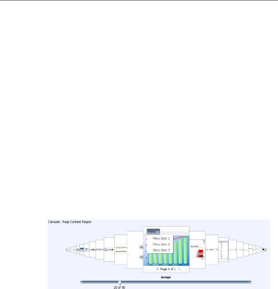
Displaying Images in a Carousel
Using Output Components 18-17
8. Expand the Advanced section and set CurrentItemKey. Specify which item is
showing when the carousel is initially rendered. The value should be (or evaluate
to) the item’s primary key in the CollectionModel:
9. In the Component Palette, from the Data Views panel, drag a Carousel Item to the
nodeStamp facet of the Carousel component.
Bind the CarouselItem component’s attributes to the properties in the data
model using the variable value set on the carousel’s var attribute. For example,
the carousel in Example 18–5 uses item as the value for the var attribute. So the
value of the carouselItem’s text attribute would be item.title (given that
title is the property used to access the text used for the carousel items on the
data model).
10. In the Component Palette, from the General Controls, drag an image and drop it as
a child to the carouselItem.
Bind the image component’s attributes to the properties in the data model using
the variable value set on the carousel’s var attribute. For example, the carousel in
Example 18–5 uses item as the value for the var attribute. So the value of the
image’s source attribute would be item.url (given that url is the property
used to access the image).
You can surround the image component with other components if you want more
functionality. For example, Figure 18–14 shows a carousel whose images are
surrounded by a panelGroupLayout component and that also uses a
clientListener to call a JavaScript function to show a menu and a navigation
bar.
Figure 18–14 Using a More Complex Layout in a Carousel
Example 18–7 shows the corresponding page code.
Example 18–7 A More Complex Layout for a Carousel
<af:carouselItem id="mainItem" text="#{item.title}" shortDesc="#{item.title}">
<af:panelGroupLayout id="itemPgl" layout="vertical">
<af:image id="mainImg" source="#{item.url}" shortDesc="#{item.title}"
styleClass="MyImage">
<af:clientListener method="handleItemOver" type="mouseOver"/>
<af:clientListener method="handleItemDown" type="mouseDown"/>
<af:showPopupBehavior triggerType="contextMenu" popupId="::itemCtx"/>
</af:image>
<af:panelGroupLayout id="overHead" styleClass="MyOverlayHeader"
layout="vertical" clientComponent="true">
<af:menuBar id="menuBar">
<af:menu id="menu" text="Menu">
<af:commandMenuItem id="menuItem1" text="Menu Item 1"/>
<af:commandMenuItem id="menuItem2" text="Menu Item 2"/>

Displaying Images in a Carousel
18-18 Web User Interface Developer's Guide for Oracle Application Development Framework
<af:commandMenuItem id="menuItem3" text="Menu Item 3"/>
</af:menu>
</af:menuBar>
</af:panelGroupLayout>
<af:panelGroupLayout id="overFoot" styleClass="MyOverlayFooter"
layout="vertical" clientComponent="true"
halign="center">
<af:panelGroupLayout id="footHorz" layout="horizontal">
<f:facet name="separator">
<af:spacer id="footSp" width="8"/>
</f:facet>
<af:commandImageLink . . .
/>
<af:outputText id="pageInfo" value="Page 1 of 1"/>
<af:commandImageLink . . .
/>
</af:panelGroupLayout>
</af:panelGroupLayout>
</af:panelGroupLayout>
</af:carouselItem>
Example 18–8 shows the corresponding JavaScript.
Example 18–8 JavaScript Code to Handle Mouse Over and Mouse Down
function handleItemOver(uiInputEvent)
{
var imageComponent = uiInputEvent.getCurrentTarget();
var carousel = null;
var componentParent = imageComponent.getParent();
while (componentParent != null)
{
if (componentParent instanceof AdfRichCarousel)
{
carousel = componentParent;
}
componentParent = componentParent.getParent();
}
if (carousel == null)
{
AfLogger.LOGGER.severe("Unable to find the carousel component!");
return;
}
var currentItemKeyPattern = ":"+ carousel.getCurrentItemKey() +":";
var overlayHeaderComponent = imageComponent.findComponent("overHead");
var overlyHeaderId = overlayHeaderComponent.getClientId();
// In IE we get mouseover for other items as well. This is inspite of having an
// overly div on top
if(overlyHeaderId.indexOf(currentItemKeyPattern) == -1)
return;
if (overlyHeaderId != window._myHeader)
{
// ensure only one set of overlays are visible
hideExistingOverlays();
}
var overlayFooterComponent = imageComponent.findComponent("overFoot");
window._myHeader = overlayHeaderComponent.getClientId();
window._myFooter = overlayFooterComponent.getClientId();
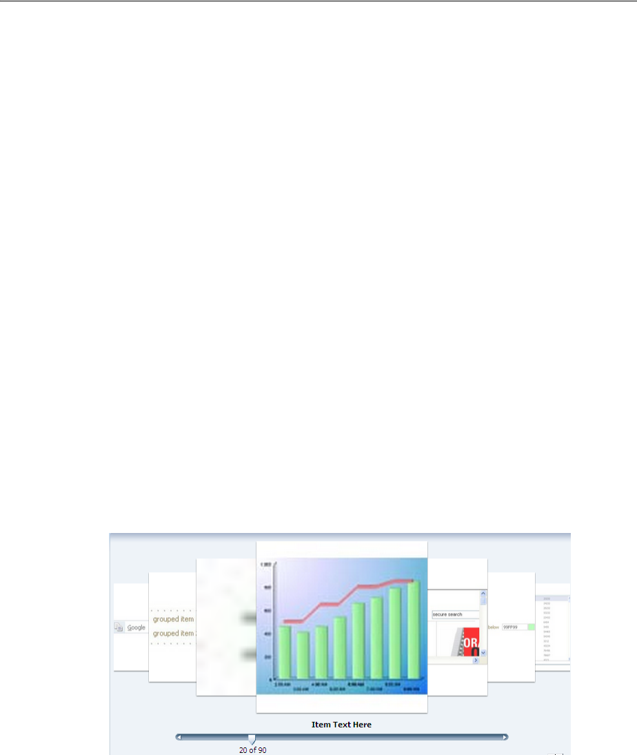
Displaying Images in a Carousel
Using Output Components 18-19
// do not propagate to the server otherwise all stamps will get this property on
// next data fetch
overlayHeaderComponent.setProperty("inlineStyle", "display:block", false,
AdfUIComponent.PROPAGATE_LOCALLY);
overlayFooterComponent.setProperty("inlineStyle", "display:block",
false, AdfUIComponent.PROPAGATE_LOCALLY);
}
function handleItemDown(uiInputEvent)
{
if (uiInputEvent.isLeftButtonPressed())
{
// Only hide the overlays if the left button was pressed
hideExistingOverlays();
}
}
18.6.2 What You May Need to Know About the Carousel Component and Different
Browsers
In some browsers, the visual decoration of the carousel’s items will be richer. For
example, Safari and Google Chrome display subtle shadows around the carousel’s
items, and the noncurrent items have a brightness overlay to help make clear that the
auxiliary items are not the current item, as shown in Figure 18–15.
Figure 18–15 Carousel Component Displayed in Google Chrome
Figure 18–16 shows the same component in Internet Explorer.
Performance Tip: The simpler the structure for the carousel is, the
faster it will perform.
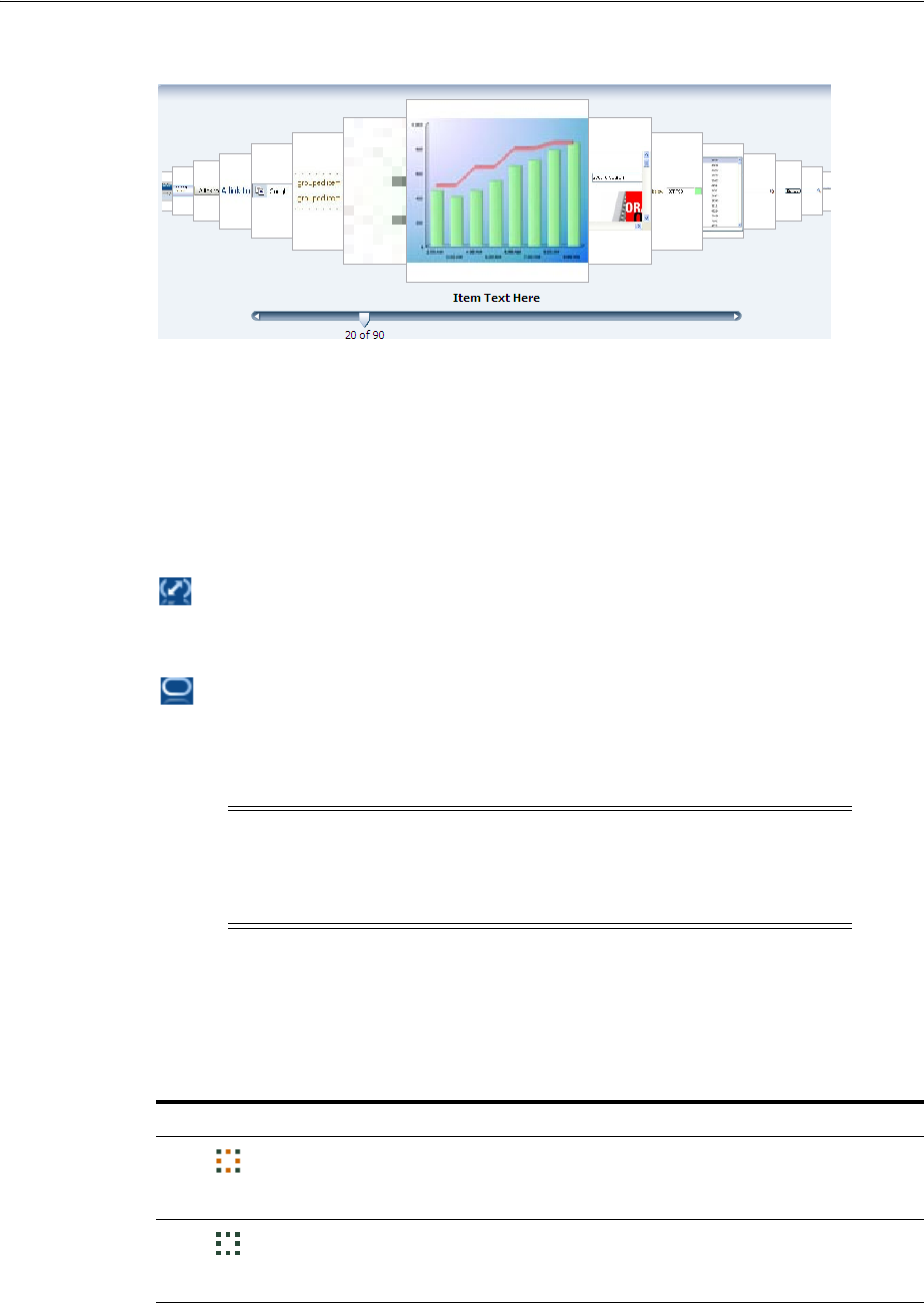
Displaying Application Status Using Icons
18-20 Web User Interface Developer's Guide for Oracle Application Development Framework
Figure 18–16 Carousel Component Displayed in Microsoft Internet Explorer
18.7 Displaying Application Status Using Icons
ADF Faces provides the statusIndicator component that you can use to indicate
server activity. What displays depends both on the skin your application uses and on
how your server is configured. By default, the following are displayed:
■When your application is configured to use the standard data transfer service,
during data transfer an animated spinning icon is displayed:
When the server is not busy, a static icon is displayed:
■When your application is configured to use the Active Data Service (ADS), what
the status indicator displays depends on how ADS is configured.
ADS can be configured to either have data pushed to the model, or it can be
configured to have the application poll for the data at specified intervals.
Table 18–3 shows the icons that are used to display server states for push and poll
modes (note that the icons are actually animated).
Note: ADS allows you to bind your application to an active data
source. You must use the Fusion technology stack in order to use ADS.
For more information, see Chapter 35, "Using the Active Data Service
with an Asynchronous Backend."
Table 18–3 Icons Used in Status Indicator for ADS
Icon Push Mode Pull Mode
At the first attempt at connecting to
the server. At the first attempt at connecting to
server.
When the first connection is
successfully established. When the first connection is
successfully established and when a
connection is reestablished.
Playing Video and Audio Clips
Using Output Components 18-21
After you drop a status indicator component onto the page, you can use skins to
change the actual image files used in the component. For more information about
using skins, see Chapter 28, "Customizing the Appearance Using Styles and Skins."
Before you begin:
It may be helpful to have an understanding of how the attributes can affect
functionality. For more information, see Section 18.7, "Displaying Application Status
Using Icons."
You may also find it helpful to understand functionality that can be added using other
ADF Faces features. For more information, see Section 18.1.2, "Additional
Functionality for Output Components."
To use the status indicator icon:
1. In the Component Palette, from the General Controls panel, drag and drop a
Status Indicator onto the page.
2. Use the Property Inspector to set any needed attributes.
18.8 Playing Video and Audio Clips
The ADF Faces media component allows you to include video and audio clips on
your application pages.
The media control handles two complex aspects of cross-platform media display:
determining the best player to display the media, and sizing the media player.
You can specify which media player is preferred for each clip, along with the size of
the player to be displayed for the user. By default, ADF Faces uses the MIME type of
the media resource to determine the best media player and the default inner player
size to use, although you can specify the type of content yourself, using the
contentType attribute.
You can specify which controls are to be available to the user, and other player features
such as whether or not the clip should play automatically, and whether or not it
should play continuously or a specified number of times.
18.8.1 How to Allow Playing of Audio and Video Clips
Once you add a media component to your page, you can configure the media player to
use by default, the size of the player and screen, the controls, and whether or not the
clip should replay.
When subsequent attempts are made
to reconnect to the server. Before every poll request.
When a connection cannot be
established or reestablished. When the configured number of poll
attempts are unsuccessful.
Tip: For help in setting attributes, use the field’s dropdown menu to
view a description of the attribute.
Table 18–3 (Cont.) Icons Used in Status Indicator for ADS
Icon Push Mode Pull Mode

Playing Video and Audio Clips
18-22 Web User Interface Developer's Guide for Oracle Application Development Framework
Before you begin:
It may be helpful to have an understanding of how the attributes can affect
functionality. For more information, see Section 18.8, "Playing Video and Audio Clips."
You may also find it helpful to understand functionality that can be added using other
ADF Faces features. For more information, see Section 18.1.2, "Additional
Functionality for Output Components."
To include an audio or video clip in your application page:
1. In the Component Palette, from the General Controls panel, drag and drop a
Media onto the page.
2. In the Insert Media dialog, set the following attributes:
■Source: Enter the URI to the media to be played.
■StandbyText: Enter a message that will be displayed while the content is
loading.
3. Expand the Common section of the Property Inspector and set the following:
■Player: Select the media player that should be used by default to play the clip.
You can choose from Real Player, Windows Media Player, or Apple Quick
Time Player.
Alternatively, you can create a link in the page that starts the playing of the
media resource based on the user agent's built-in content type mapping. The
media control attempts to pick the appropriate media player using the
following steps:
–If the primary MIME type of the content is image, the built-in user-agent
support is used.
–If a media player has been specified by the player attribute, and that
player is available on the user agent and can display the media resource,
that player is used.
–If one player is especially good at playing the media resource and that
player is available on the user agent, that player is used.
–If one player is especially dominant on the user agent and that player can
play the media resource, that player is used.
–The player connected to the link provided on the page is used.
■Autostart: Set to True if you want the clip to begin playing as soon as it loads.
■ContentType: Enter the MIME type of the media to play. This will be used to
determine which player to use, the configuration of the controls, and the size
of the display.
4. Expand the Appearance section of the Property Inspector and set the following:
■Controls: Select the amount and types of controls you want the player to
display.
Because the set of controls available varies between players, you define what
set of controls to display in a general way, rather than listing actual controls.
For example, you can have the player display all controls available, the most
commonly used controls, or no controls.
As an example, Example 18–9 uses the all setting for a media component.
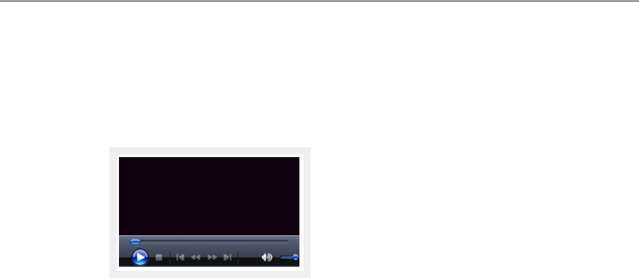
Playing Video and Audio Clips
Using Output Components 18-23
Example 18–9 Controls for a Media Player
<af:media source="/images/myvideo.wmv" controls="all"/>
Figure 18–17 shows how the player is displayed to the user.
Figure 18–17 Media Player with All Controls
Following values are valid:
–All: Show all available controls for playing media on the media player.
Using this setting can cause a large amount of additional space to be
required, depending on the media player used.
–Minimal: Show a minimal set of controls for playing media on the media
player.
This value gives users control over the most important media playing con-
trols, while occupying the least amount of additional space on the user
agent.
–None: Do not show any controls for the media player and do not allow
control access through other means, such as context menus.
You would typically use this setting only for kiosk-type applications,
where no user control over the playing of the media is allowed. This set-
ting is typically used in conjunction with settings that automatically start
the playback, and to play back continuously.
–NoneVisible: Do not show any controls for the media player, but allow
control access through alternate means, such as context menus.
You would typically use this value only in applications where user con-
trol over the playing of the media is allowed, but not encouraged. As with
the none setting, this setting is typically used in conjunction with settings
that automatically start the playback, and to play back continuously.
–Typical: Show the typical set of controls for playing media on the media
player.
This value, the default, gives users control over the most common media
playing controls, without occupying an inordinate amount of extra space
on the user agent.
■Width and Height: Define the size in pixels of the complete display, including
the whole player area, which includes the media content area.

Playing Video and Audio Clips
18-24 Web User Interface Developer's Guide for Oracle Application Development Framework
■InnerWidth and InnerHeight: Define the size in pixels of only the media
content area. This is the preferred scheme, because you control the amount of
space allocated to the player area for your clip.
5. Expand the Behavior section and set Autostart. By default, playback of a clip will
not start until the user starts it using the displayed controls. You can specify that
playback is to start as soon as the clip is loaded by setting the autostart
attribute to true.
Set PlayCount to the number of times you want the media to play. Once started,
by default, the clip with play through once only. If the users have controls
available, they can replay the clip. However, you can specify that the clip is to play
back a fixed number of times, or loop continuously, by setting a value for the
playCount attribute. Setting the playCount attribute to 0 replays the clip
continuously. Setting the attribute to some other number plays the clip the
specified number of times.
Example 18–10 shows an af:media component in the source of a page. The
component will play a video clip starting as soon as it is loaded and will continue to
play the clip until stopped by the user. The player will display all the available
controls.
Example 18–10 Media Component to Play a Video Clip Continuously
<af:media source="/components/images/seattle.wmv" playCount="0"
autostart="true" controls="all"
innerHeight="112" innerWidth="260"
shortDesc="My Video Clip"
standbyText="My video clip is loading"/>
Tip: Using the width and height attributes can lead to unexpected
results because it is difficult to define a suitable width and height to
use across different players and different player control
configurations. Instead of defining the size of the complete display,
you can instead define just the size of the media content area using the
innerWidth and innerHeight attributes.
Tip: If you do not specify a size for the media control, a default inner
size, determined by the content type of the media resource, is used.
While this works well for audio content, it can cause video content to
be clipped or to occupy too much space.
If you specify dimensions from both schemes, such as a height and
an innerHeight, the overall size defined by the height attribute is
used. Similarly, if you specify both a width and an innerWidth, the
width attribute is used.

19
Displaying Tips, Messages, and Help 19-1
19 Displaying Tips, Messages, and Help
This chapter describes how to define and display tips and messages for ADF Faces
components, and how to provide different levels of help information for users.
This chapter includes the following sections:
■Section 19.1, "About Displaying Tips and Messages"
■Section 19.2, "Displaying Tips for Components"
■Section 19.3, "Displaying Hints and Error Messages for Validation and
Conversion"
■Section 19.4, "Grouping Components with a Single Label and Message"
■Section 19.5, "Displaying Help for Components"
19.1 About Displaying Tips and Messages
ADF Faces provides many different ways for displaying informational text in an
application. You can create simple tip text, validation and conversion tip text,
validation and conversion failure messages, as well as elaborate help systems.
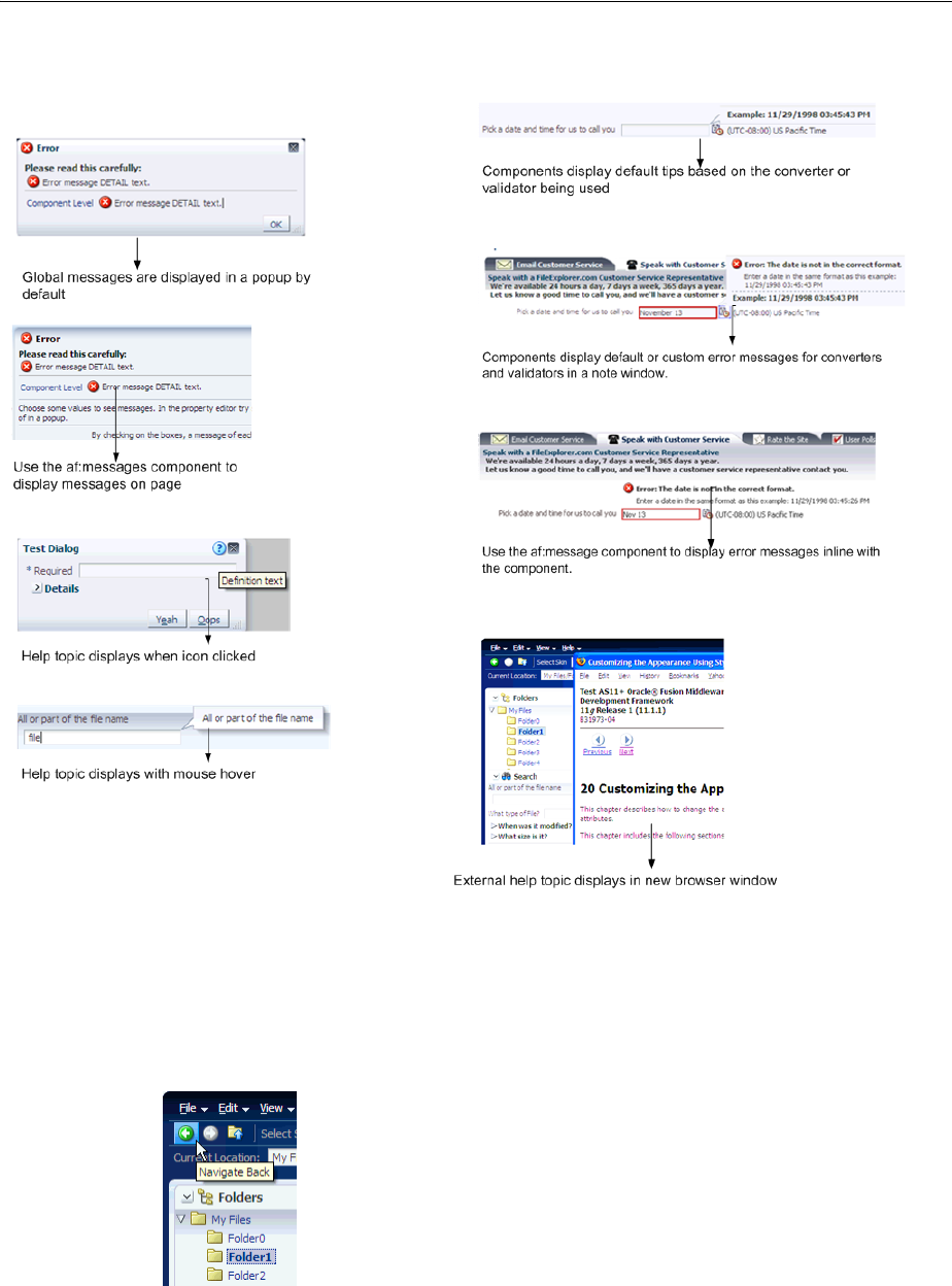
About Displaying Tips and Messages
19-2 Web User Interface Developer's Guide for Oracle Application Development Framework
Figure 19–1 ADF Messaging Components
Many ADF Faces components support the shortDesc attribute, which for most
components, displays tip information when a user hovers the cursor over the
component. Figure 19–2 shows a tip configured for a toolbar button. For more
information about creating tips, see Section 19.2, "Displaying Tips for Components."
Figure 19–2 Tip Displays Information
Along with tips, EditableValueHolder components (such as the inputText
component, or the selection components) can display hints used for validation and
conversion. When you configure validation or conversion, a default hint automatically
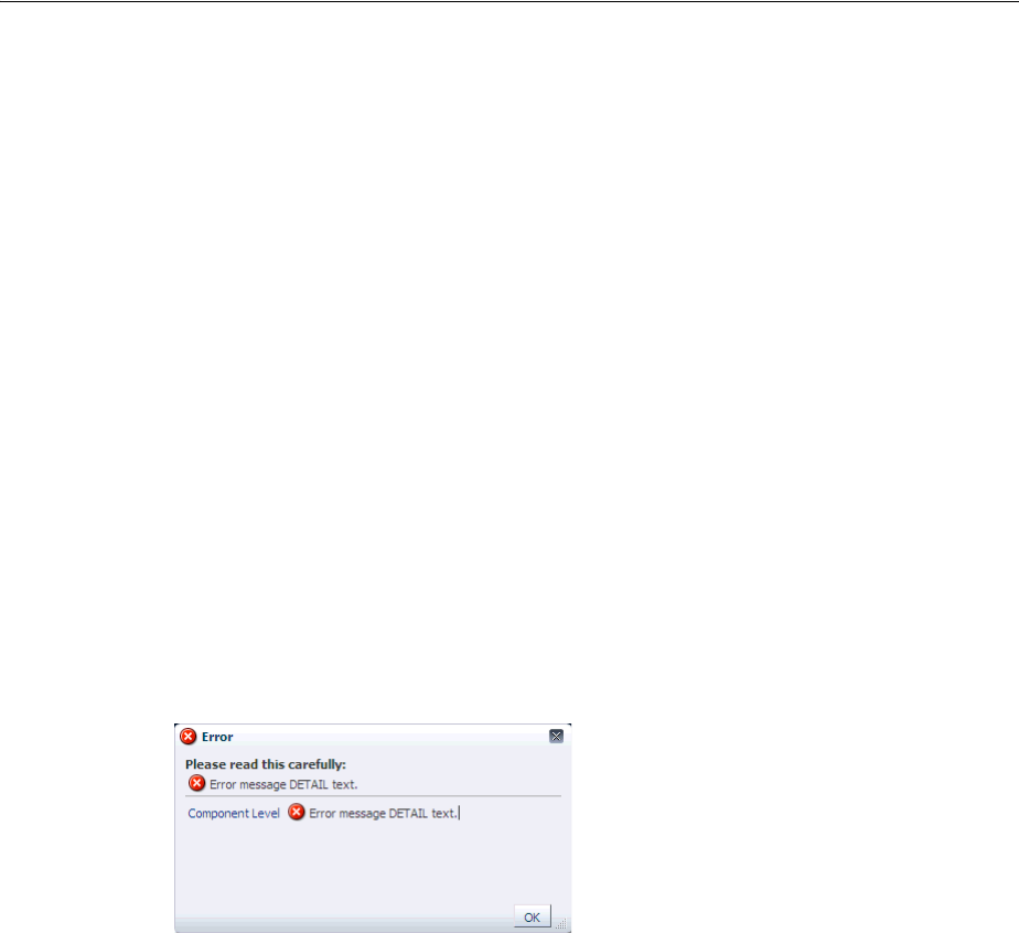
About Displaying Tips and Messages
Displaying Tips, Messages, and Help 19-3
displays in a note window (for more information, see Chapter 7, "Validating and
Converting Input").
ADF Faces uses the standard JSF messaging API. JSF supports a built-in framework for
messaging by allowing FacesMessage instances to be added to the FacesContext
object using the addMessage(java.lang.String clientId, FacesMessage
message) method. In general there are two types of messages that can be created:
component-level messages, which are associated with a specific component based on
any client ID that was passed to the addMessage method, and global-level messages,
which are not associated with a component because no client ID was passed to the
addMessage method.
When conversion or validation fails on an EditableValueHolder ADF Faces
component, FacesMessages objects are automatically added to the message queue
on the FacesContext instance, passing in that component’s ID. These messages are
then displayed in the note window for the component. ADF Faces components are
able to display their own messages. You do not need to add any tags.
Similarly, the document tag handles and displays all global FacesMessages objects
(those that do not contain an associated component ID), as well as component
FacesMessages. Like component messages, you do not need to add any tags for
messages to be displayed. Whenever a global message is created (or more than one
component message), all messages in the queue will be displayed in a popup window,
as shown in Figure 19–3.
Figure 19–3 Global and Component Messages Displayed by the Document
Alternatively, you can use the ADF Faces messages component if you want messages
to display on the page rather than in a popup window. For more information about
displaying hints and messages for components, see Section 19.3, "Displaying Hints and
Error Messages for Validation and Conversion."
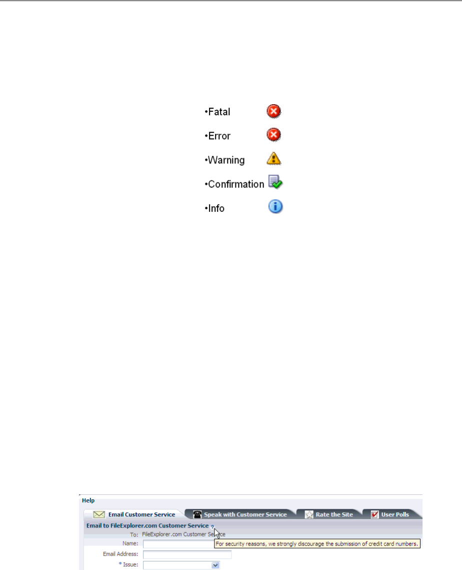
About Displaying Tips and Messages
19-4 Web User Interface Developer's Guide for Oracle Application Development Framework
Instead of having each component display its own messages, you can use the
panelLabelAndMessage component to group components and display a message in
one area. This can be very useful when you have to group components together. For
example, the File Explorer application uses a panelLabelAndMessage component
where users enter a telephone number. The telephone number input field is actually
three separate inputText components. The panelLabelAndMessage component
wraps three inputText components. Instead of each having its own label and
message, the three have just one label and one message, as shown in Figure 19–8. For
more information, see Section 19.4, "Grouping Components with a Single Label and
Message."
Along with configuring messages for individual component instances, you can create a
separate help system that provides information that can be reused throughout the
application.You create help information using different types of providers, and then
reference the help text from the UI components. The following are the three types of
help supported by ADF Faces:
■Definition: Provides a help icon (question mark in a blue circle) with the help text
appearing when the user mouses over the icon, as shown in Figure 19–4.
Figure 19–4 Definition Messages Display When Mousing Over the Icon
■Instruction: Depending on the component, this type of help either provides
instruction text within the component (as with panelHeader components), or
displays text in the note window that is opened when the user clicks in the
component, as shown in Figure 19–5. The text can be any length.
Tip: While ADF Faces provides messages for validation and
conversion, you can add your own FacesMessages objects to the
queue using the standard JSF messaging API. When you do so, ADF
Faces will display icons with the message based on the message level,
as follows:
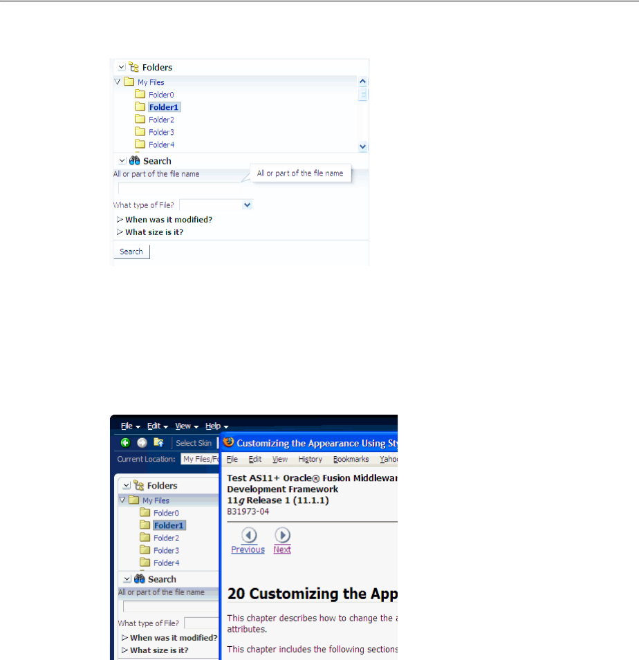
About Displaying Tips and Messages
Displaying Tips, Messages, and Help 19-5
Figure 19–5 Instruction Messages Display in a Note Window
■External URL: You can have a help topic that resides in an external application,
which will open in a separate browser window. For example, instead of displaying
instruction help, Figure 19–6 shows the Select Skin selectOneChoice
component configured to open a help topic about skins. When a user clicks the
help icon, the help topic opens.
Figure 19–6 External URL Help Opens in a New Window
For more information about creating help systems, see Section 19.5, "Displaying
Help for Components."
19.1.1 Messaging Components Use Cases and Examples
Messages can typically be divided into to types: error messages that display when an
error occurs in the application, for example when a user enters incompatible
information, and informational messages that provide for example, hints for using a
component or for completing a task on a page.
Error messages use the JSF messaging API. There are two types of error messages:
component messages where the message applies to the specific component only, and
global messages, where the message applies to more than one component or the whole
page.
By default, the noteWindow component is used for component error messages. When
you configure conversion or validation on any input component, validation and
About Displaying Tips and Messages
19-6 Web User Interface Developer's Guide for Oracle Application Development Framework
conversion hints and errors are automatically displayed in the noteWindow
component. You do not need to add the component to the page.
For example, when users click Help > Give Feedback in the File Explorer application,
a dialog displays where they can enter a time and date for a customer service
representative to call. Because the inputDate component contains a converter, when
the user clicks in the field, a note window displays a hint that shows the expected
pattern, as shown in Figure 19–7. If the inputDate component was also configured
with a minimum or maximum value, the hint would display that information as well.
These hints are provided by the converters and validators automatically.
Figure 19–7 Attached Converters and Validators Include Messages
If a user enters a date incorrectly in the field shown in Figure 19–7, an error message is
displayed, as shown in Figure 19–8. Note that the error message appears in the note
window along with the hint.
Figure 19–8 Validation and Conversion Errors Display in Note Window
If you want to display an error message for a non-ADF Faces component, or if you
want the message to be displayed inline instead of the note window, use the ADF
Faces message component. When you use this component, messages are displayed
next to the component, as shown in Figure 19–9.
Figure 19–9 Use the message Component to Display Messages Inline
Global messages are by default displayed in a dialog, as shown in Figure 19–10. You
do not need to add the popup component to the page.
About Displaying Tips and Messages
Displaying Tips, Messages, and Help 19-7
Figure 19–10 Global Messages Display in a Popup Dialog
If instead you want the error messages to display directly on the page, use the
messages component. When you use this component, the messages are displayed in a
list at the top of the page, as shown in Figure 19–11.
Figure 19–11 Use the messages Component to Display Global Messages on the Page
For more information about error messages, see Section 19.3, "Displaying Hints and
Error Messages for Validation and Conversion."
Informational messages can range from simple tooltips to comprehensive help
systems. Tooltips should be used when the component for which you want to display
hints or information does not support help text. However, tooltip text must be very
brief. If you have to display more detailed information, or if the text can be reused
among many component instances, consider using help text instead.
You create tooltips by configuring the shortDesc attribute on a component. The
value of that attribute then displays in a note window when the user hovers over the
component, as shown in Figure 19–12.
Figure 19–12 Tooltip for a Component
For more information about tooltips, see Section 19.2, "Displaying Tips for
Components."
About Displaying Tips and Messages
19-8 Web User Interface Developer's Guide for Oracle Application Development Framework
Use definition help when you need to display more information than can fit in a
tooltip. When you configure definition help for most components, a help icon is
displayed next to the component. The help text is displayed when the mouse hovers
over the component, as shown in Figure 19–13.
Figure 19–13 Definition Help for a Column Component
For more information about definition help, see Section 19.5, "Displaying Help for
Components."
When you want to display field-level help, configure an input component to use
instruction text. When the user clicks in the component, the help text is displayed in a
note window, as shown in Figure 19–14.
Figure 19–14 Instruction Text for a Component
When you want to display instructions for a task, configure instruction help for a
container component. The text will appear in the header of the component, as shown
in Figure 19–15.
Figure 19–15 Instruction Text for the panelHeader Component
When you need to provide comprehensive help, you can use the help icon to link to an
external help system available through a URL.
For more information about instruction and external help, see Section 19.5, "Displaying
Help for Components."
Best Practice: Instruction text for input components should be used
only when the typical user may fail to perform a task without
assistance. Excessive use of instruction text clutters the page with
directions or distracts users with note windows that may also obscure
related page elements.
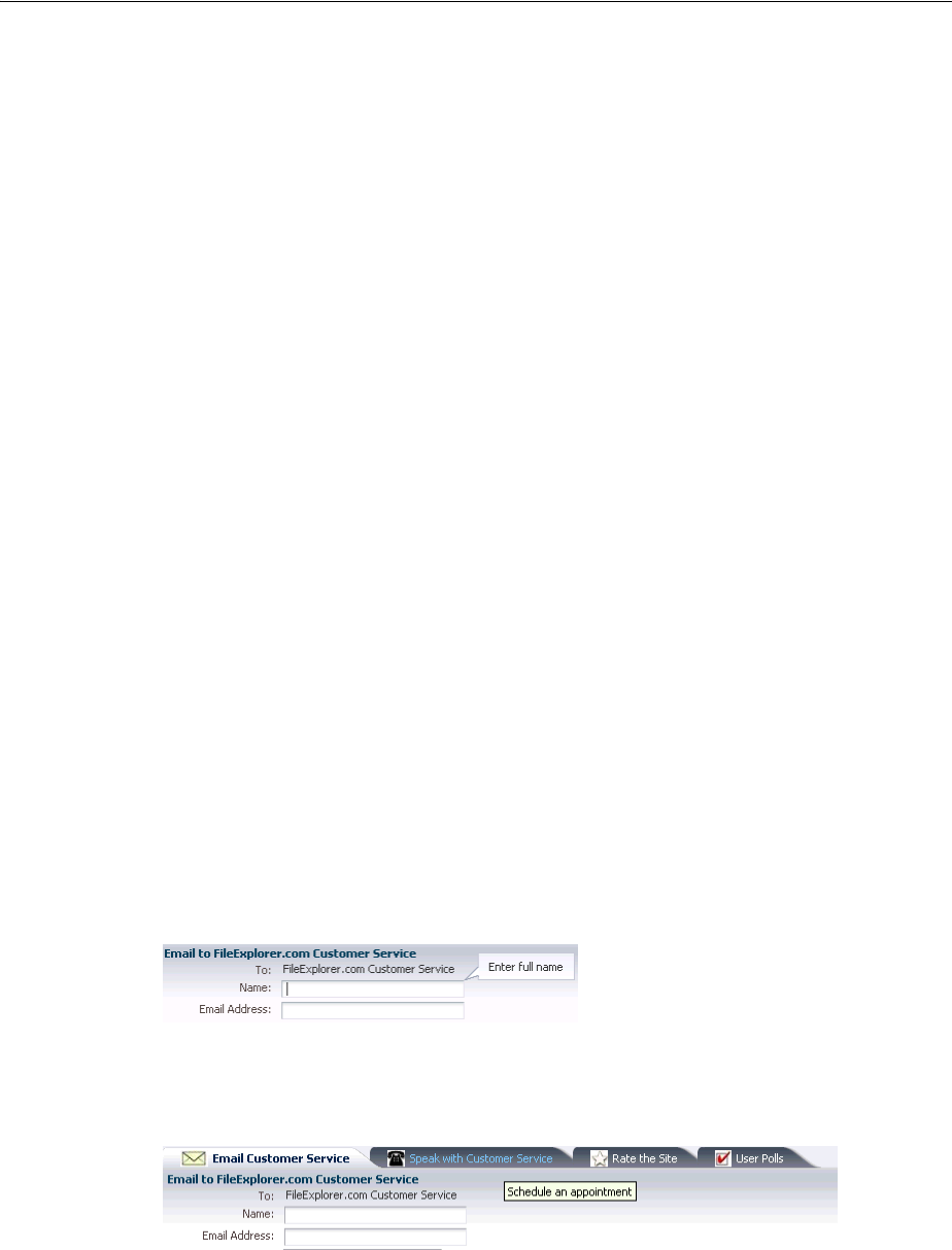
Displaying Tips for Components
Displaying Tips, Messages, and Help 19-9
19.1.2 Additional Functionality for Message Components
You may find it helpful to understand other ADF Faces features before you implement
your message components and help functionality. Additionally, once you have added
these components to your page, you may find that you need to add functionality such
as skinning to change icons and accessibility and using resource bundles to store
message text. Following are links to other functionality that message components can
use.
■Using parameters in text: You can use the ADF Faces EL format tags if you want
text displayed in a component to contain parameters that will resolve at runtime.
For more information, see Section 3.5.2, "How to Use the EL Format Tags."
■Client events: If you want your help topic to launch using JavaScript, you use a
listener for a client event. For more information about client-side events, see
Section 6.3, "Using JavaScript for ADF Faces Client Events."
■Skinning: The icons displayed for messages and help are determined by the skin
used by the application. You can change the icons by creating a new skin. For more
information, see Chapter 28, "Customizing the Appearance Using Styles and
Skins."
■Localization: Instead of directly entering text for messages, you can use property
files. These files allow you to manage translation of these strings. For more
information, see Chapter 29, "Internationalizing and Localizing Pages."
19.2 Displaying Tips for Components
ADF Faces components use the shortDesc attribute to display a tip when the user
hovers the mouse over the component. Input components display the tips in their note
window. Other component types display the tip in a standard tip box. This text should
be kept short. If you have to display more detailed information, or if the text can be
reused among many component instances, consider using help text, as described in
Section 19.5, "Displaying Help for Components."
Figure 19–16 shows the effect when the cursor hovers over an inputText component.
Figure 19–16 Tip for an inputText Component
Figure 19–17 shows a tip as displayed for a showDetailItem component.
Figure 19–17 Tip for a showDetailItem Component
19.2.1 How to Display Tips for Components
You use the shortDesc attribute on a component to display a tip.
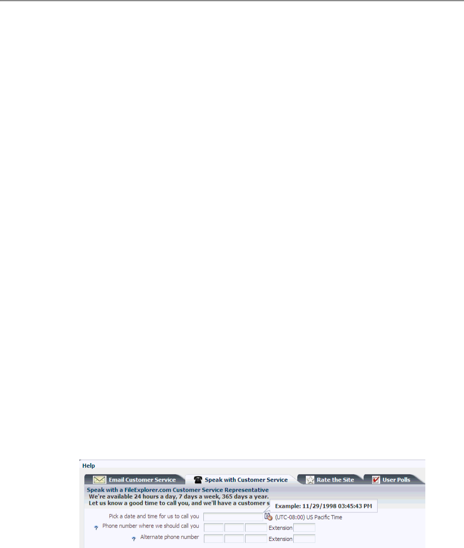
Displaying Hints and Error Messages for Validation and Conversion
19-10 Web User Interface Developer's Guide for Oracle Application Development Framework
Before you begin:
It may be helpful to have an understanding of how the attributes can affect
functionality. For more information, see Section 19.2, "Displaying Tips for
Components."
You may also find it helpful to understand functionality that can be added using other
ADF Faces features. For more information, see Section 19.1.2, "Additional
Functionality for Message Components."
To define a tip for a component:
1. In the Structure window, select the component for which you want to display the
tip.
2. In the Property Inspector, expand the Appearance section and enter a value for the
shortDesc attribute.
If the text to be used is stored in a resource bundle, use the dropdown list to select
Select Text Resource. Use the Select Text Resource dialog to either search for
appropriate text in an existing bundle, or to create a new entry in an existing
bundle. For more information about using resource bundles, see Chapter 29,
"Internationalizing and Localizing Pages."
19.3 Displaying Hints and Error Messages for Validation and Conversion
Validators and converters have a default hint that is displayed to users when they click
in the associated field. For converters, the hint usually tells the user the correct format
to use. For validators, the hint is used to convey what values are valid.
For example, in the File Explorer application, when a user clicks in the input date field
on the Speak with Customer Service page, a tip is displayed showing the correct
format to use, as shown in Figure 19–18.
Figure 19–18 Validators and Converters Have Built-in Messages
When the value of an ADF Faces component fails validation, or cannot be converted
by a converter, the component displays the resulting FacesMessage instance.
For example, entering a date that does not match the dateStyle attribute of the
converter results in an error message, as shown in Figure 19–19.
Tip: The value should be less than 80 characters, as some browsers
will truncate the tip if it exceeds that length.
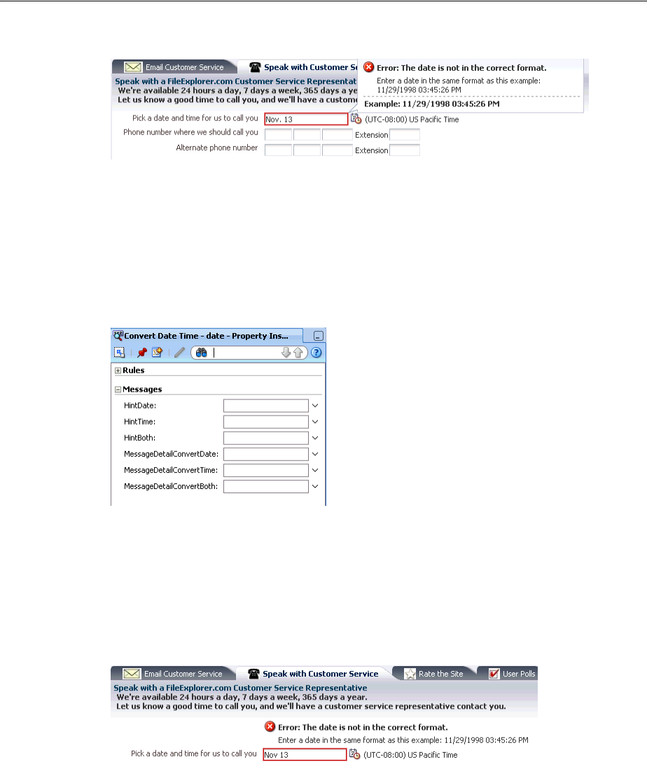
Displaying Hints and Error Messages for Validation and Conversion
Displaying Tips, Messages, and Help 19-11
Figure 19–19 Validation Error at Runtime
You can override the default validator and converter hint and error messages for
either a component instance, or globally for all instances. To define a custom message
for a component instance you set attributes to the detail messages to be displayed. The
actual attributes vary according to the validator or converter. Figure 19–20 shows the
attributes that you can populate to override the messages for the convertDateTime
converter, as displayed in the Property Inspector.
Figure 19–20 Message Attributes on a Converter
To define an error message that will be used by all instances of the component, you
need to create an entry in a resource bundle that will override the default message.
If you do not want messages to be displayed in the note window, you can use the
message component, and messages will be displayed inline with the component.
Figure 19–21 shows how messages are displayed using the message component.
Figure 19–21 Use the message Component to Display Messages Inline
JSF pages in an ADF Faces application use the document tag, which among other
things, handles displaying all global messages (those not associated with a
component) in a popup window. However, if you want to display global messages on
the page instead, use the messages component.
19.3.1 How to Define Custom Validator and Converter Messages for a Component
Instance
To override the default validator and converter messages for a single component
instance, set values for the different message attributes.
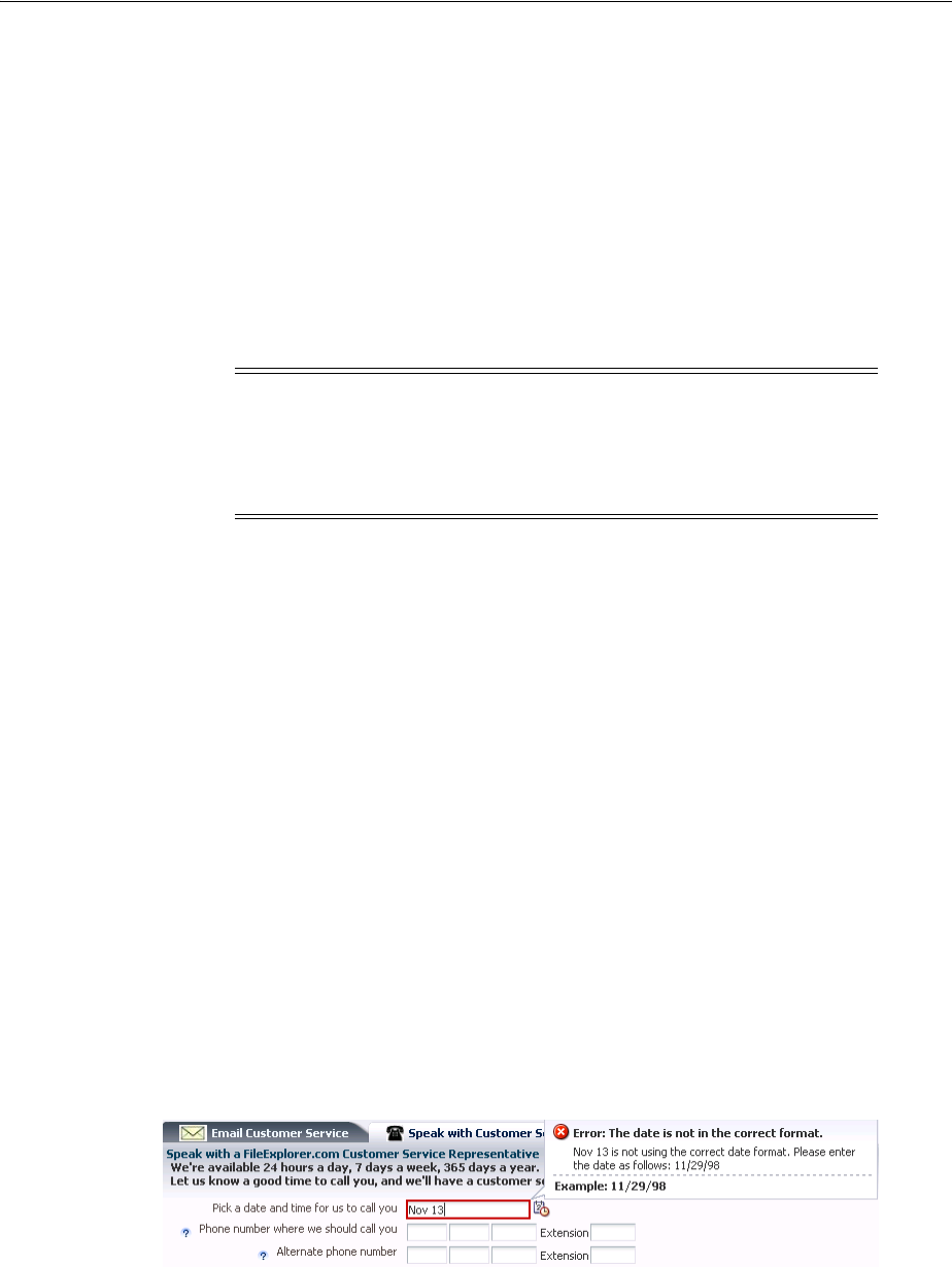
Displaying Hints and Error Messages for Validation and Conversion
19-12 Web User Interface Developer's Guide for Oracle Application Development Framework
Before you begin:
It may be helpful to have an understanding of how the attributes can affect
functionality. For more information, see Section 19.3, "Displaying Hints and Error
Messages for Validation and Conversion."
You may also find it helpful to understand functionality that can be added using other
ADF Faces features. For more information, see Section 19.1.2, "Additional
Functionality for Message Components."
To define a validator or converter message:
1. In the Structure window, select the converter or validator for which you want to
create the error message.
2. In the Property Inspector, expand the Messages section and enter a value for the
attribute for which you want to provide a message.
The values can include dynamic content by using parameter placeholders such as
{0}, {1}, {2}, and so on. For example, the messageDetailConvertDate attribute
on the convertDateTime converter uses the following parameters:
■{0} the label that identifies the component
■{1} the value entered by the user
■{2}an example of the format expected by the component.
Using these parameters, you could create this message:
{1} is not using the correct date format. Please enter the date as follows:
{2}.
The error message would then be displayed as shown in Figure 19–22.
Figure 19–22 Detail Message at Runtime
Note: You can override messages only for ADF Faces components. If
you want to create a message for a non-ADF Faces component (for
example for the f:validator component), then use the message
component. For more information, see Section 19.3.3, "How to Display
Component Messages Inline."
Tip: your application uses bidirectional or right-to-left display, do
not start the message with the expected format parameter (2), as it
may not display correctly in Internet Explorer.
Tip: Use the dropdown menu to view the property help, which
includes the parameters accepted by the message.

Displaying Hints and Error Messages for Validation and Conversion
Displaying Tips, Messages, and Help 19-13
If the text to be used is stored in a resource bundle, use the dropdown list to select
Select Text Resource. Use the Select Text Resource dialog to either search for
appropriate text in an existing bundle, or to create a new entry in an existing
bundle. For more information about using resource bundles, see Chapter 29,
"Internationalizing and Localizing Pages."
19.3.2 How to Define Custom Validator and Converter Messages for All Instances of a
Component
Instead of changing the message string per component instance with the
messageDetail[XYZ] attributes, you can override the string globally so that the
custom string will be displayed for all instances. The global messages are handled by
key/value pairs in a message bundle. You can override summary, detail, and hint
messages.
To globally override a default validator or converter message:
1. Refer to Appendix B, "Message Keys for Converter and Validator Messages" to
determine the message key for the message you want to override. For example, to
override the detail message displayed when the input value exceeds the maximum
value length, you would use the key
org.apache.myfaces.trinidad.validator.LengthValidator.
MAXIMUM_detail, as shown in Section B.3.8, "af:validateLength."
2. Create or open a message bundle. For procedures and information about message
bundles, see Chapter 29, "Internationalizing and Localizing Pages."
3. Add the key override to the message bundle. For example, to override the
message for the input value length, you might add:
org.apache.myfaces.trinidad.validator.LengthValidator.
MAXIMUM_detail: Your value exceeds the limit.
19.3.3 How to Display Component Messages Inline
Instead of having a component display its messages in the note window, use the
message component to display the messages inline on the page. In order for the
message component to display the correct messages, associate it with a specific
component.
Before you begin:
It may be helpful to have an understanding of how the attributes can affect
functionality. For more information, see Section 19.3, "Displaying Hints and Error
Messages for Validation and Conversion."
Note: The message text is for the detail message of the
FacesMessage object. If you want to override the summary (the text
shown at the top of the message), you can only do this globally. For
more information, see Section 19.3.2, "How to Define Custom
Validator and Converter Messages for All Instances of a Component."
Note: If you are creating a new bundle, you will need to register it
with the application.

Displaying Hints and Error Messages for Validation and Conversion
19-14 Web User Interface Developer's Guide for Oracle Application Development Framework
You may also find it helpful to understand functionality that can be added using other
ADF Faces features. For more information, see Section 19.1.2, "Additional
Functionality for Message Components."
To display component messages inline:
1. In the Structure window, select the component that will display its messages using
the message component. If not already set, enter an ID for the component.
2. In the Component Palette, from the Text and Selection panel, drag a Message and
drop it where you want the message to be displayed on the page.
3. Use the dropdown menu for the for attribute to select Edit.
4. In the Edit Property dialog, locate the component for which the message
component will display messages. Only components that have their ID set are
valid selections.
19.3.4 How to Display Global Messages Inline
Instead of displaying global messages in a popup window for the page, display them
inline using the messages component.
Before you begin:
It may be helpful to have an understanding of how the attributes can affect
functionality. For more information, see Section 19.3, "Displaying Hints and Error
Messages for Validation and Conversion."
You may also find it helpful to understand functionality that can be added using other
ADF Faces features. For more information, see Section 19.1.2, "Additional
Functionality for Message Components."
To display global messages inline:
1. In the Component Palette, from the Text and Selection panel, drag a Messages and
drop it onto the page where you want the messages to be displayed.
2. In the Property Inspector set the following attributes:
■globalOnly: By default, ADF Faces displays global messages (messages that
are not associated with components) followed by individual component
messages. If you want to display only global messages in the box, set this
attribute to true. Component messages will continue to be displayed with the
associated component.
■inline: Set to true to show messages at the top of the page. Otherwise,
messages will be displayed in a dialog.
Note: The message icon and message content that will be displayed
are based on what was given when the FacesMessage object was
created. Setting the messageType or message attributes on the
message component causes the messageType or message attribute
values to be displayed at runtime, regardless of whether or not an
error has occurred. Only populate these attributes if you want the
content to always be displayed when the page is rendered.
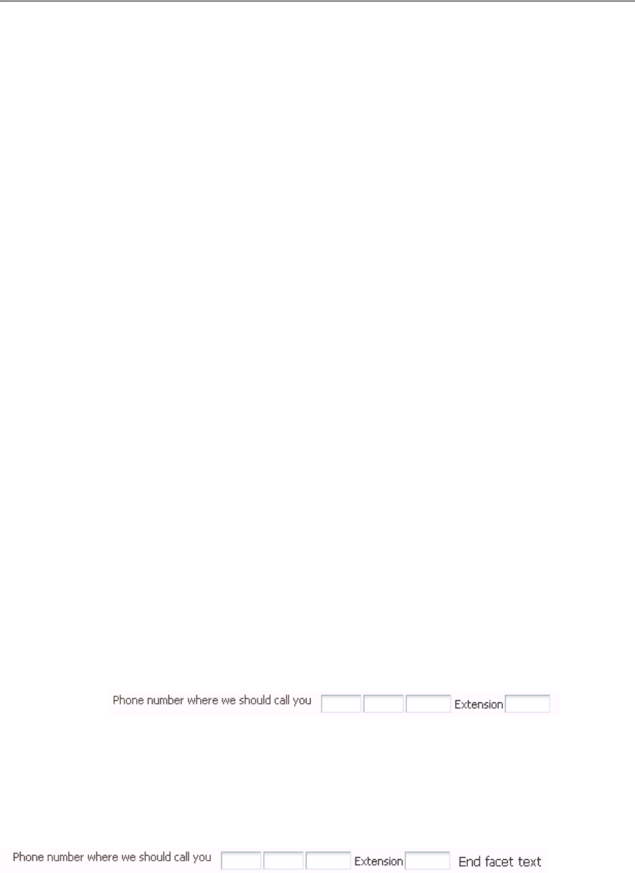
Grouping Components with a Single Label and Message
Displaying Tips, Messages, and Help 19-15
19.4 Grouping Components with a Single Label and Message
By default, ADF Faces input and select components have built-in support for label and
message display. If you want to group components and use a single label, wrap the
components using the panelLabelAndMessage component.
For example, the File Explorer application collects telephone numbers using four
separate inputText components; one for the area code, one for the exchange, one for
the last four digits, and one for the extension. Because a single label is needed, the four
inputText components are wrapped in a panelLabelAndMessage component,
and the label value is set on that component. However, the input component for the
extension requires an additional label, so an outputText component is used.
Example 19–1 shows the JSF code for the panelLabelAndMessage component.
Example 19–1 panelLabelAndMessage Can Display a Single Label and Help Topic
<af:panelLabelAndMessage labelAndAccessKey="#{explorerBundle['help.telephone']}"
helpTopicId="HELP_TELEPHONE_NUMBER"
labelStyle="vertical-align: top;
padding-top: 0.2em;">
<af:inputText autoTab="true" simple="true" maximumLength="3"
columns="3">
<af:convertNumber type="number" integerOnly="true"/>
</af:inputText>
<af:inputText autoTab="true" simple="true" maximumLength="3"
columns="3">
<af:convertNumber type="number" integerOnly="true"/>
</af:inputText>
<af:inputText autoTab="true" simple="true" maximumLength="4"
columns="4">
<af:convertNumber type="number" integerOnly="true"/>
</af:inputText>
<af:outputText value="#{explorerBundle['help.extension']}"/>
<af:inputText simple="true" columns="4">
<af:convertNumber type="number" integerOnly="true"/>
</af:inputText>
</af:panelLabelAndMessage>
Figure 19–23 shows how the panelLabelAndMessage and nested components are
displayed in a browser.
Figure 19–23 Examples Using the panelLabelAndMessage Component
The panelLabelAndMessage component also includes an End facet that can be used
to display additional components at the end of the group. Figure 19–24 shows how the
telephone number fields would be displayed if the End facet was populated with an
outputText component.
Figure 19–24 End Facet in a panelLabelAndMessage Component
Use a panelGroupLayout component within a panelLabelAndMessage
component to group the components for the required layout. For information about

Grouping Components with a Single Label and Message
19-16 Web User Interface Developer's Guide for Oracle Application Development Framework
using the panelGrouplayout component, see Section 9.12, "Grouping Related
Items."
You set the simple attribute to true on each of the input components so that their
individual labels are not displayed. However, you may want to set a value for the label
attribute on each of the components for messaging purposes and for accessibility.
Group and wrap components using the panelLabelAndMessage component. The
panelLabelAndMessage component can be used to wrap any components, not just
those that typically display messages and labels.
19.4.1 How to Group Components with a Single Label and Message
You use the panelLabelAndMessage component to group components and display
a single label for that group.
Before you begin:
It may be helpful to have an understanding of how the attributes can affect
functionality. For more information, see Section 19.4, "Grouping Components with a
Single Label and Message."
You may also find it helpful to understand functionality that can be added using other
ADF Faces features. For more information, see Section 19.1.2, "Additional
Functionality for Message Components."
To arrange form input components with one label and message:
1. Add input or select components as needed to the page.
For each input and select component:
■Set the simple attribute to true.
■For accessibility reasons, set the label attribute to a label for the component.
2. In the Structure window, select the input and/or select components created in Step
1. Right-click the selection and choose Surround With > Panel Label And
Message.
3. With the panelLabelAndMessage component selected, in the Property
Inspector, set the following:
■label: Enter the label text to be displayed for the group of components.
■for: Use the dropdown menu to choose Edit. In the Edit Property dialog, select
the ID of the child input component. If there is more than one input
component, select the first component.
Set the for attribute to the first inputComponent to meet accessibility
requirements.
If one or more of the nested input components is a required component and you
want a marker to be displayed indicating this, set the showRequired attribute to
true.
Tip: If you have to use multiple panelLabelAndMessage
components one after another, wrap them inside an
af:panelFormLayout component, so that the labels line up
properly. For information about using the panelFormLayout
component, see Section 9.6, "Arranging Content in Forms."
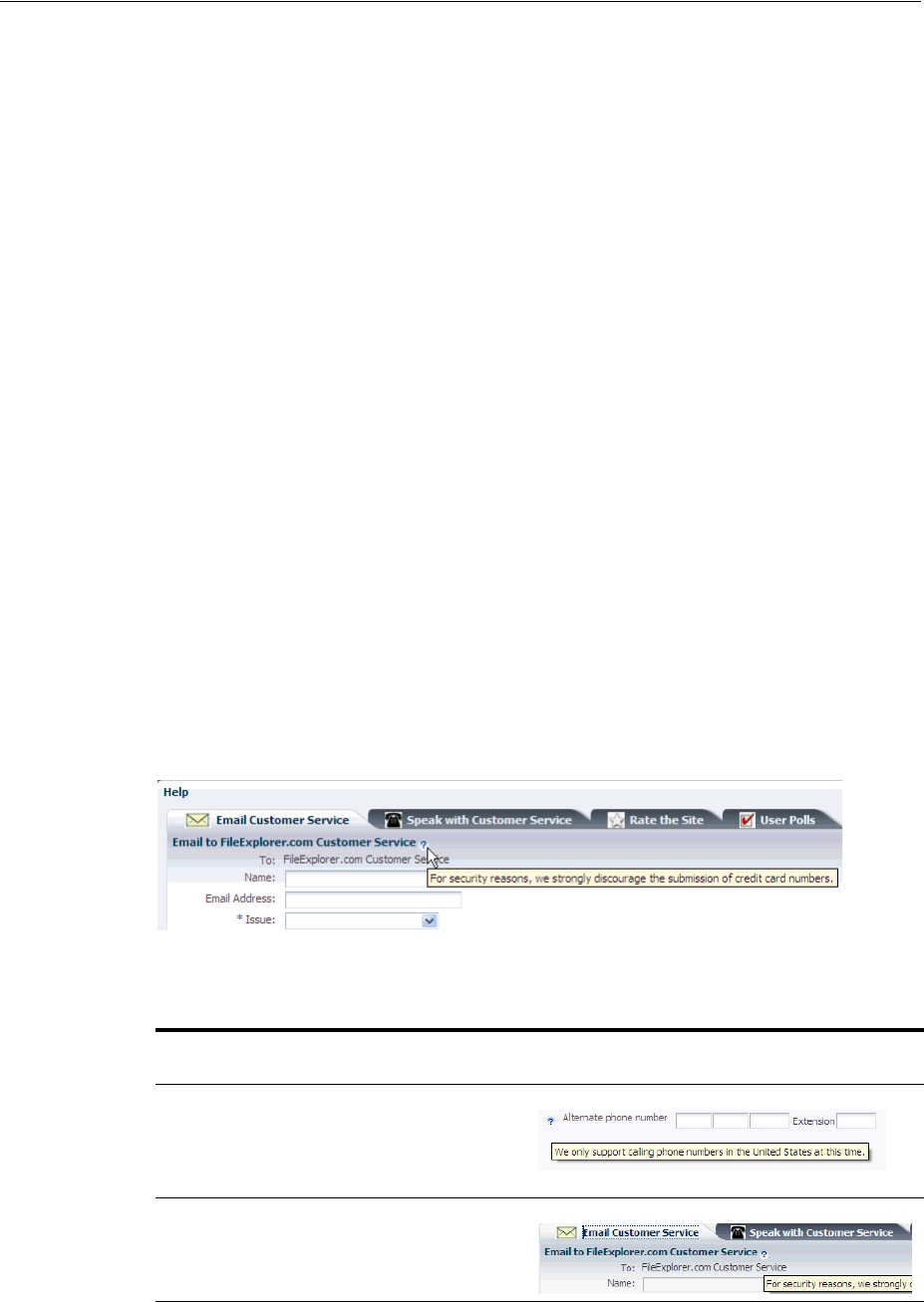
Displaying Help for Components
Displaying Tips, Messages, and Help 19-17
4. To place content in the End facet, drag and drop the desired component into the
facet.
Because facets accept one child component only, if you want to add more than one
child component, you must wrap the child components inside a container, such as
a panelGroupLayout or group component.
19.5 Displaying Help for Components
ADF Faces provides a framework that allows you to create and display three different
types of help whose content comes from an external source, rather than as text
configured on the component. Because it is not configured directly on the component,
the content can be used by more than one component, saving time in creating pages
and also allowing you to change the content in one place rather than everywhere the
content appears.
The first type of external help provided by ADF Faces is Definition help. Like a
standard tip, the content appears in a message box. However, instead of appearing
when the user mouses over the component, Definition help provides a help icon (a
blue circle with a question mark). When the user mouses over the icon, the content is
displayed, as shown in Figure 19–25.
Figure 19–25 Definition Text for a Component
Table 19–1 shows the components that support Definition help.
Tip: If the facet is not visible in the visual editor:
1. Right-click the panelLabelAndMessage component in the Structure
window.
2. From the context menu, choose Facets - Panel Label And Message >facet
name. Facets in use on the page are indicated by a checkmark in front of
the facet name.
Table 19–1 Components That Support Definition Help
Supported
Components Help Icon Placement Example
All input
components, Select
components, Choose
Color, Choose Date,
Query components
Before the label, or if
no label exists, at the
start of the field
Panel Header,
PanelBox, Show
Detail Header
End of header text
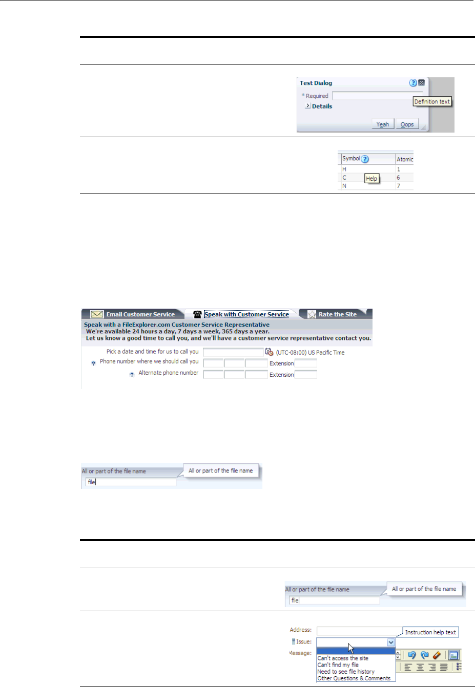
Displaying Help for Components
19-18 Web User Interface Developer's Guide for Oracle Application Development Framework
The second type of help is Instruction help. Where Instruction help is displayed
depends on the component with which it is associated. The panelHeader and Search
panel components display Instruction help within the header. Figure 19–26 shows how
the text that typically is displayed as Definition help as shown in Figure 19–25 would
be displayed as Instruction help within the panelHeader component.
Figure 19–26 Instruction Text for panelHeader
All other components that support Instruction help display the text within a note
window, as shown in Figure 19–27. Note that no help icon is displayed.
Figure 19–27 Instruction Text for a Component
Table 19–2 shows the components that support Instruction help.
Panel Window,
Dialog Next to close icon in
header
Columns in table and
tree Below header text
Table 19–2 Components That Support Instruction Help
Supported
Components Help Placement Example
Input components,
Choose Color, Choose
Date, Quick Query
Note window, on
focus only
Select components Note window, on
hover and focus
Table 19–1 (Cont.) Components That Support Definition Help
Supported
Components Help Icon Placement Example
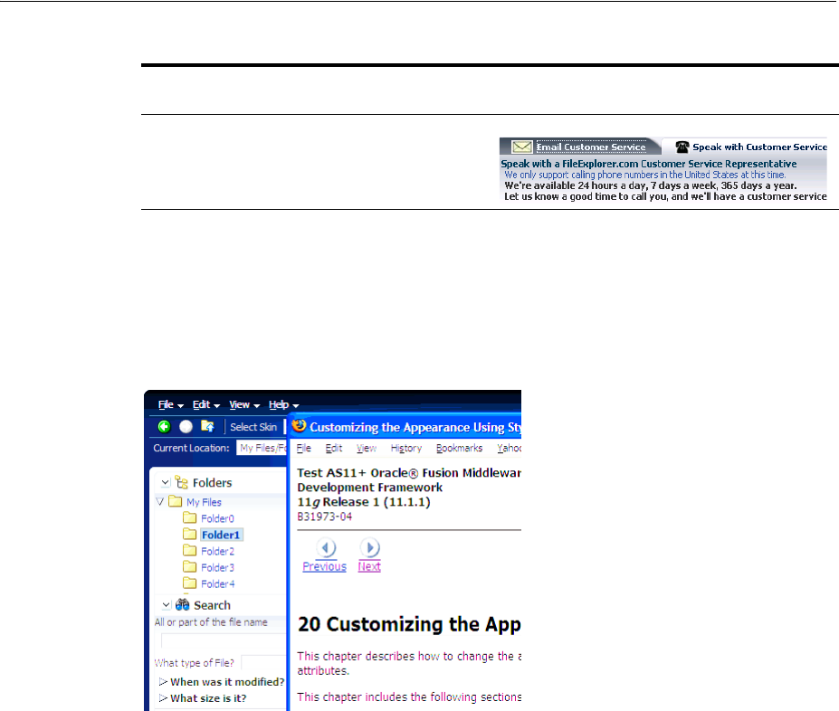
Displaying Help for Components
Displaying Tips, Messages, and Help 19-19
The last type of help is External URL help. You provide a URL to a web page in an
external application, and when the help icon is clicked, the web page opens in a
separate browser window, as shown in Figure 19–28. Instead of clicking a help icon,
you can use JavaScript to open a help window based on any client-based event.
Figure 19–28 External URL Help
ADF Faces includes a variety of help providers. The
ResourceBundleHelpProvider help provider allows you to create resource
bundles that hold the help content. The ELHelpProvider help provider allows you
to create XLIFF files that get converted into maps, or create a managed bean that
contains a map of help text strings. You can use a combination of the different help
providers. You can also create your own help provider class.
To create help for your application, do the following:
■Determine the help provider(s) to use and then implement the required artifacts.
■Register the help provider(s), specifying the prefix that will be used to access the
provider’s help. Each help provider has its own unique prefix, which is used as its
identifier. A particular provider will be called to produce help only for help topic
IDs that start with the prefix under which the provider is registered.
■Have the UI components access the help contained in the providers by using the
component’s helpTopicId attribute. A helpTopicId attribute contains the
following.
■The prefix that is used by the provider of the help
■The topic name
For example, the value of the helpTopicId attribute on the inputText
component shown in Figure 19–27 might be RBHELP_FILE_NAME, where RBHELP
Panel Header, Panel
Box, Query Text below header text
Table 19–2 (Cont.) Components That Support Instruction Help
Supported
Components Help Placement Example

Displaying Help for Components
19-20 Web User Interface Developer's Guide for Oracle Application Development Framework
is the resource bundle help providers prefix, and FILE_NAME is the help topic
name.
19.5.1 How to Create Resource Bundle-Based Help
You can store help text within standard resource bundle property files and use the
ResourceBundleHelpProvider class to deliver the content.
Before you begin:
It may be helpful to have an understanding of how the attributes can affect
functionality. For more information, see Section 19.5, "Displaying Help for
Components."
You may also find it helpful to understand functionality that can be added using other
ADF Faces features. For more information, see Section 19.1.2, "Additional
Functionality for Message Components."
To create resource bundle-based help:
1. Create a properties file that contains the topic ID and help text for each help topic.
The topic ID must contain the following:
■The prefix that will be used by this provider, for example, RBHELP.
■The topic name, for example, TELEPHONE_NUMBER.
■The help type, for example, DEFINITION.
For example, a topic ID might be RBHELP_TELEPHONE_NUMBER_DEFINITION.
Example 19–2 shows an example resource bundle with three topics.
Example 19–2 Resource Bundle Help
RBHELP_CUST_SERVICE_EMAIL_DEFINITION=For security reasons,
we strongly discourage the submission of credit card numbers.
RBHELP_TELEPHONE_NUMBER_DEFINITION=We only support calling telephone numbers
in the United States at this time.
RBHELP_TELEPHONE_NUMBER_INSTRUCTIONS=Enter a telephone number.
Note: All prefixes under which help providers are registered must be
unique. It is also not permissible for one prefix to begin with the same
characters as another prefix. For example, if help providers have
already been registered for the two prefixes AAB and AC, then the
following prefixes are all invalid and will cause an exception to be
thrown at registration time: AABC, A, AA, AC, ACB. However, the
following are valid: AAD, AB, and so on.
UI components access the help content based on the topic name.
Therefore, if you use the same topic name for two different types of
help (as shown in Example 19–2), then both types of help will be
displayed by the UI component.
Note: If you wish to use an external URL help type, create a subclass
of the ResourceBundleHelpProvider class. For more information,
see Step 3.

Displaying Help for Components
Displaying Tips, Messages, and Help 19-21
2. Register the resource bundle as a help provider in the adf-settings.xml file
To register the provider, from the META-INF directory, open the
adf-settings.xml file, click the Source tab, and add the following elements:
■<help-provider>: Use the prefix attribute to define the prefix that UI
components will use to access this help provider. This must be unique in the
application, and must match the prefix used in the resource bundle.
■<help-provider-class>: Create as a child element to the
<help-provider> element and enter
oracle.adf.view.rich.help.ResourceBundleHelpProvider.
■<property>: Create as a child element to the <help-provider> element.
The property defines the actual help source.
■<property-name>: Create as a child element to the <property> element,
and enter a name for the source, for example, baseName.
■<value>: Create as a child element to the <property> element and enter the
fully qualified class name of the resource bundle. For example, the qualified
class name of the resource bundle used in the ADF Faces demo application is
oracle.adfdemo.view.resource.DemoResources.
Example 19–3 shows how the resource bundle in Example 19–2 would be
registered in the adf-settings.xml file.
Example 19–3 Registering a Resource Bundle as a Help Provider
<adf-settings xmlns="http://xmlns.oracle.com/adf/settings">
<adf-faces-config xmlns="http://xmlns.oracle.com/adf/faces/settings">
<help-provider prefix="RBHELP_">
<help-provider-class>
oracle.adf.view.rich.help.ResourceBundleHelpProvider
</help-provider-class>
<property>
<property-name>baseName</property-name>
<value>oracle.adfdemo.view.resource.DemoResources</value>
</property>
</help-provider>
</adf-faces-config>
</adf-settings>
3. If you want to use External URL help, then you also must extend the
ResourceBundleHelpProvider class and implement the getExternalUrl
method. Example 19–4 shows an example method.
Example 19–4 Overriding the getExternalURL Method
protected String getExternalUrl(FacesContext context, UIComponent component,
String topicId)
{
if (topicId == null)
return null;
Note: If the prefix attribute is missing, or is empty, then the help
provider will be registered as a special default help provider. It will be
used to produce help for help topic IDs that cannot be matched with
any other help provider. Only one default help provider is permitted.

Displaying Help for Components
19-22 Web User Interface Developer's Guide for Oracle Application Development Framework
if (topicId.contains("TOPICID_ALL") ||
topicId.contains("TOPICID_DEFN_URL") ||
topicId.contains("TOPICID_INSTR_URL") ||
topicId.contains("TOPICID_URL"))
return http://www.myURL.com;
else
return null;
}
In Example 19–4, all the topics in the method return the same URL. You would
have to create separate if statements to return different URLs.
If you want the external window to be launched based on a component’s client
event instead of from a help icon, use a JavaScript function. For more information,
see Section 19.5.4, "How to Use JavaScript to Launch an External Help Window."
19.5.2 How to Create XLIFF-Based Help
You can store the help text in XLIFF XML files and use the ELHelpProvider class to
deliver the content. This class translates the XLIFF file to a map of strings that will be
used as the text in the help.
Before you begin:
It may be helpful to have an understanding of how the attributes can affect
functionality. For more information, see Section 19.5, "Displaying Help for
Components."
You may also find it helpful to understand functionality that can be added using other
ADF Faces features. For more information, see Section 19.1.2, "Additional
Functionality for Message Components."
To create XLIFF help:
1. Create an XLIFF file that defines your help text, using the following elements
within the <body> tag:
■<trans-unit>: Enter the topic ID. This must contain the prefix, the topic
name, and the help type, for example, XLIFFHELP_CREDIT_CARD_
DEFINITION. In this example, XLIFFHELP will become the prefix used to
access the XLIFF file. CREDIT_CARD is the topic name, and DEFINITION is
the type of help.
■<source>: Create as a direct child of the <trans-unit> element and enter
the help text.
Note: All prefixes under which help providers are registered must be
unique. It is also not permissible for one prefix to begin with the same
characters as another prefix. For example, if help providers have
already been registered for the two prefixes AAB and AC, then the
following prefixes are all invalid and will cause an exception to be
thrown at registration time: AABC, A, AA, AC, ACB. However, the
following are valid: AAD, AB, and so on.
UI components access the help content based on the topic name.
Therefore, if you use the same topic name for two different types of
help (as shown in Example 19–5), then both types of help will be
displayed by the UI component.

Displaying Help for Components
Displaying Tips, Messages, and Help 19-23
■<target>: Create as a direct child of the <trans-unit> element and leave it
blank. This element is used to hold translated help text.
■<note>: Create as a direct child of the <trans-unit> element and enter a
description of the help text.
Example 19–5 shows an example of an XLIFF file that contains two topics.
Example 19–5 XLIFF Help
<?xml version="1.0" encoding="UTF-8" ?>
<xliff version="1.1" xmlns="urn:oasis:names:tc:xliff:document:1.1">
<file source-language="en" original="this" datatype="xml">
<body>
<trans-unit id="XLIFF_CREDIT_CARD_DEFINITION">
<source>Credit Card Definition</source>
<target/>
<note>Credit Card definition text.</note>
</trans-unit>
<trans-unit id="XLIFF_CREDIT_CARD_INSTRUCTIONS">
<source>Credit Card Instructions</source>
<target/>
<note>Credit card instruction text.</note>
</trans-unit>
</body>
</file>
</xliff>
2. Register XLIFF as a help provider in the adf-settings.xml file.
To register the provider, from the META-INF directory, open the
adf-settings.xml file and add the following elements:
■<help-provider>: Use the prefix attribute to define the prefix that UI
components will use to access this help provider. This must be unique in the
application, and must match the prefix used in the XLIFF file.
■<help-provider-class>: Create as a child element to the
<help-provider> element and enter
oracle.adf.view.rich.help.ELHelpProvider.
■<property>: Create as a child element to the <help-provider> element.
The property values define the actual help source.
■<property-name>: Create as a child element to the <property> element
and enter a name for the help, for example, helpSource.
■<value>: Create as a child element to the <property> element and enter an
EL expression that resolves to the XLIFF file, wrapped in the adfBundle EL
function, for example,
#{adfBundle['project1xliff.view.Project1XliffBundle']}.
Example 19–6 shows how the XLIFF file in Example 19–5 would be registered in
the adf-settings.xml file.
Note: If the prefix attribute is missing, or is empty, then the help
provider will be registered as a special default help provider. It will be
used to produce help for help topic IDs that cannot be matched with
any other help provider. Only one default help provider is permitted.

Displaying Help for Components
19-24 Web User Interface Developer's Guide for Oracle Application Development Framework
Example 19–6 Registering an XLIFF File as a Help Provider
<adf-settings xmlns="http://xmlns.oracle.com/adf/settings">
<adf-faces-config xmlns="http://xmlns.oracle.com/adf/faces/settings">
<help-provider prefix="XLIFF">
<help-provider-class>
oracle.adf.view.rich.help.ELHelpProvider
</help-provider-class>
<property>
<property-name>helpSource</property-name>
<value>#{adfBundle['project1xliff.view.Project1XliffBundle']}</value>
</property>
</help-provider>
</adf-faces-config>
</adf-settings>
19.5.3 How to Create Managed Bean Help
To implement managed bean help, create a managed bean that contains a map of
strings that will be used as the text in the help. Managed bean help providers use the
ELHelpProvider class to deliver the help.
Before you begin:
It may be helpful to have an understanding of how the attributes can affect
functionality. For more information, see Section 19.5, "Displaying Help for
Components."
You may also find it helpful to understand functionality that can be added using other
ADF Faces features. For more information, see Section 19.1.2, "Additional
Functionality for Message Components."
To create managed bean help:
1. Create a managed bean that returns a map of strings, each of which is the ID and
content for a help topic, as shown in Example 19–7.
Example 19–7 Managed Bean that Returns a Map of Help Text Strings
public class ELHelpProviderMapDemo
{
public ELHelpProviderMapDemo()
{
}
/* To use the ELHelpProvider, the EL expression must point to a Map, otherwise
* you will get a coerceToType error. */
public Map<String, String> getHelpMap()
{
return _HELP_MAP;
}
static private final Map<String, String> _HELP_MAP =
new HashMap<String, String>();
static
{
_HELP_MAP.put("MAPHELP_CREDIT_CARD_DEFINITION",
"Map value for credit card definition");
_HELP_MAP.put("MAPHELP_CREDIT_CARD_INSTRUCTIONS",

Displaying Help for Components
Displaying Tips, Messages, and Help 19-25
"Map value for credit card instructions");
_HELP_MAP.put("MAPHELP_SHOPPING_DEFINITION",
"Map value for shopping definition");
_HELP_MAP.put("MAPHELP_SHOPPING_INSTRUCTIONS",
"Map value for shopping instructions");
}
}
The first string must contain the prefix, the topic name, and the help type, for
example, MAPHELP_CREDIT_CARD_DEFINITION. In this example, MAPHELP
will become the prefix used to access the bean. CREDIT_CARD is the topic name,
and DEFINITION is the type of help. The second string is the help text.
2. Register the managed bean in the faces-config.xml file. Example 19–8 shows
the bean shown in Example 19–7 registered in the faces-config.xml file.
Example 19–8 Managed Bean Registration in the faces-config.xml File.
<managed-bean>
<managed-bean-name>helpTranslationMap</managed-bean-name>
<managed-bean-class>
oracle.adfdemo.view.webapp.ELHelpProviderMapDemo
</managed-bean-class>
<managed-bean-scope>session</managed-bean-scope>
</managed-bean>
For more information about using and registering managed beans, see Section 3.6,
"Creating and Using Managed Beans."
3. Register the managed bean as a help provider in the adf-settings.xml file.
To register the provider, from the META-INF directory, open the
adf-settings.xml file and add the following elements:
■<help-provider>: Create and use the prefix attribute to define the prefix
that UI components will use to access this help provider. This must be unique
in the application.
Note: All prefixes under which help providers are registered must be
unique. It is also not permissible for one prefix to begin with the same
characters as another prefix. For example, if help providers have
already been registered for the two prefixes AAB and AC, then the
following prefixes are all invalid and will cause an exception to be
thrown at registration time: AABC, A, AA, AC, ACB. However, the
following are valid: AAD, AB, and so on.
UI components access the help content based on the topic name.
Therefore, if you use the same topic name for two different types of
help (as shown in Example 19–7), then both types of help will be
displayed by the UI component.
Note: If you wish to use external URL help, create a subclass of the
ELHelpProvider class. For more information, see Step 4.
Displaying Help for Components
19-26 Web User Interface Developer's Guide for Oracle Application Development Framework
■<help-provider-class>: Create as a child element to the
<help-provider> element and enter the fully qualified class path to the
class created in Step 1.
■<property>: Create as a child element to the <help-provider> element.
The property defines the map of help strings on the managed bean.
■<property-name>: Create as a child element to the <property> element
and enter a property name, for example helpSource.
■<value>: Create as a child element to the <property> element and enter an
EL expression that resolves to the help map on the managed bean.
Example 19–9 shows how the bean in Example 19–8 would be registered in the
adf-settings.xml file.
Example 19–9 Registering a Managed Bean as a Help Provider
<adf-settings xmlns="http://xmlns.oracle.com/adf/settings">
<adf-faces-config xmlns="http://xmlns.oracle.com/adf/faces/settings">
<help-provider prefix="MAPHELP_">
<help-provider-class>
oracle.adf.view.rich.help.ELHelpProvider
</help-provider-class>
<property>
<property-name>helpSource</property-name>
<value>#{helpTranslationMap.helpMap}</value>
</property>
</help-provider>
</adf-faces-config>
</adf-settings>
4. If you want to use External URL help with the managed bean provider, then
extend the ELHelpProvider class and implement the getExternalUrl
method. Example 19–10 shows an example method.
Example 19–10 Overriding the getExternalURL Method
protected String getExternalUrl(FacesContext context, UIComponent component,
String topicId)
{
if (topicId == null)
return null;
if (topicId.contains("TOPICID_ALL") ||
topicId.contains("TOPICID_DEFN_URL") ||
topicId.contains("TOPICID_INSTR_URL") ||
topicId.contains("TOPICID_URL"))
return http://www.myURL.com;
else
return null;
}
In Example 19–10, all the topics in the method return the same URL. You must
create separate if statements to return different URLs.
Note: If the prefix attribute is missing, or is empty, then the help
provider will be registered as a special default help provider. It will be
used to produce help for help topic IDs that cannot be matched with
any other help provider. Only one default help provider is permitted.

Displaying Help for Components
Displaying Tips, Messages, and Help 19-27
If you want the external window to be launched based on a component’s client
event instead of from a help icon, use a JavaScript function. For more information,
see Section 19.5.4, "How to Use JavaScript to Launch an External Help Window."
19.5.4 How to Use JavaScript to Launch an External Help Window
If you want to use external URL help, by default, the user clicks a help icon to launch
the help window. Instead, you can use JavaScript and a client event listener for a
specific component’s event to launch the help window.
Before you begin:
It may be helpful to have an understanding of how the attributes can affect
functionality. For more information, see Section 19.5, "Displaying Help for
Components."
You may also find it helpful to understand functionality that can be added using other
ADF Faces features. For more information, see Section 19.1.2, "Additional
Functionality for Message Components."
To use JavaScript to launch an external help window:
1. Create a JavaScript function that uses the launchHelp API to launch a specific
URL or page.
Example 19–11 shows the launchHelp function used to launch the
helpClient.jspx.
Example 19–11 JavaScript to Launch an External Help Page
<af:resource type="javascript">
function launchHelp(event)
{
AdfPage.PAGE.launchHelpWindow("helpClient.jspx");
}
</af:resource>
2. Drag and drop a component whose client event will cause the function to be
called. You must set the clientId on this component to true.
3. In the Component Palette, from the Operations panel, drag and drop a Client
Listener as a child to the component created in Step 2. Configure the
clientListener to invoke the function created in Step 1. For more information
about using the clientListener tag, see Section 4.2, "Listening for Client
Events."
Example 19–12 shows the code used to have a click event on a
commandToolbarButton component launch the helpClient.jspx page.
Example 19–12 Page Code Used to Launch an External Help Window
<af:toolbar id="tb1">
<af:commandToolbarButton text="Launch help window" id="ctb1"
icon="/images/happy_computer.gif">
<af:clientListener method="launchHelp" type="click"/>
</af:commandToolbarButton>
</af:toolbar>
<af:resource type="javascript">
function launchHelp(event)
{
AdfPage.PAGE.launchHelpWindow("helpClient.jspx");

Displaying Help for Components
19-28 Web User Interface Developer's Guide for Oracle Application Development Framework
}
</af:resource>
19.5.5 How to Create a Java Class Help Provider
Instead of using one of the ADF Faces help providers, create your own. Create the
actual text in some file that your help provider will be able to access and display. To
create a Java class help provider, extend the HelpProvider class. For more
information about this class, refer to the ADF Faces Javadoc.
Before you begin:
It may be helpful to have an understanding of how the attributes can affect
functionality. For more information, see Section 19.5, "Displaying Help for
Components."
You may also find it helpful to understand functionality that can be added using other
ADF Faces features. For more information, see Section 19.1.2, "Additional
Functionality for Message Components."
To create a Java class help provider:
1. Create a Java class that extends
oracle.adf.view.rich.help.HelpProvider.
2. Create a public constructor with no parameters. You also must implement the logic
to access and return help topics.
3. This class will be able to access properties and values that are set in the
adf-settings.xml file when you register this provider. For example, the ADF
Faces providers all use a property to define the actual source of the help strings. To
access a property in the adf-settings.xml file, create a method that sets a
property that is a String. For example:
public void setMyCustomProperty(String arg)
4. To register the provider, from the META-INF directory, open the
adf-settings.xml file and add the following elements:
■<help-provider>: Use the prefix attribute to define the prefix that UI
components will use to access this help provider. This must be unique in the
application.
Note: If the prefix attribute is missing, or is empty, then the help
provider will be registered as a special default help provider. It will be
used to produce help for help topic IDs that cannot be matched with
any other help provider. Only one default help provider is permitted.
All prefixes under which help providers are registered must be
unique. It is also not permissible for one prefix to begin with the same
characters as another prefix. For example, if help providers have
already been registered for the two prefixes AAB and AC, then the
following prefixes are all invalid and will cause an exception to be
thrown at registration time: AABC, A, AA, AC, ACB. However, the
following are valid: AAD, AB, and so on.

Displaying Help for Components
Displaying Tips, Messages, and Help 19-29
■<help-provider-class>: Create as a child element to the
<help-provider> element and enter the fully qualified class path to the
class created in Step 1.
■<property>: Create as a child element to the <help-provider> element
and use it to define the property that will be used as the argument for the
method created in Step 3.
■<property-name>: Create as a child element to the <property> element
and enter the property name.
■<value>: Create as a child element to the <property> element and enter the
value for the property.
Example 19–13 shows an example of a help provider class registered in the
adf-settings.xml file.
Example 19–13 Registering a Help Provider Class
<adf-settings xmlns="http://xmlns.oracle.com/adf/settings">
<adf-faces-config xmlns="http://xmlns.oracle.com/adf/faces/settings">
<help-provider prefix="MYAPP">
<help-provider-class>
oracle.adfdemo.view.webapp.MyHelpProvider
</help-provider-class>
<property>
<property-name>myCustomProperty</property-name>
<value>someValue</value>
</property>
</help-provider>
</adf-faces-config>
</adf-settings>
19.5.6 How to Access Help Content from a UI Component
Use the HelpTopicId attribute on components to access and display the help.
Before you begin:
It may be helpful to have an understanding of how the attributes can affect
functionality. For more information, see Section 19.5, "Displaying Help for
Components."
You may also find it helpful to understand functionality that can be added using other
ADF Faces features. For more information, see Section 19.1.2, "Additional
Functionality for Message Components."
To access help from a component:
1. In the Structure window, select the component to which you want to add help. For
a list of components that support help, see Table 19–1 and Table 19–2.
2. In the Property Inspector, expand the Appearance section, and enter a value for
the helpTopicId attribute. This should include the prefix to access the correct
help provider and the topic name. It should not include the help type, as all help
types registered with that name will be returned and displayed, for example:
<af:inputText label="Credit Card" helpTopicId="XLIFF_CREDIT_CARD"/>
This example will return both the definition and instruction help defined in the
XLIFF file in Example 19–5.
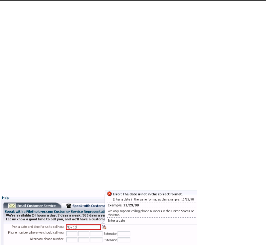
Displaying Help for Components
19-30 Web User Interface Developer's Guide for Oracle Application Development Framework
3. If you want to provide help for a component that does not support help, you can
instead add an outputText component to display the help text, and then bind
that component to the help provider, for example:
<af:outputFormatted
value="#{adfFacesContext.helpProvider['XLIFF_CREDIT_CARD'].instructions}"/>
This will access the instruction help text.
19.5.7 What You May Need to Know About Combining Different Message Types
When you add help messages to input components that may already display messages
for validation and conversion, ADF Faces displays the messages in the following order
within the note window:
1. Validation and conversion error messages.
2. Validation and conversion hints.
3. For input and select components only, Instruction help. For panelHeader
components, Instruction help is always displayed below the header.
4. Value for shortDesc attribute.
Figure 19–29 shows an inputDate component that contains a converter, instruction
help, and a tip message.
Figure 19–29 Different Message Types Can Be Displayed at One Time

20
Working with Navigation Components 20-1
20Working with Navigation Components
This chapter describes how to use ADF Faces navigation components such as
commandButton, navigationPane, and train to provide navigation in web user
interfaces.
This chapter includes the following sections:
■Section 20.1, "About Navigation Components"
■Section 20.2, "Common Functionality in Navigation Components"
■Section 20.3, "Using Buttons and Links for Navigation"
■Section 20.4, "Configuring a Browser’s Context Menu for Command Links."
■Section 20.5, "Using Buttons or Links to Invoke Functionality"
■Section 20.6, "Using Navigation Items for a Page Hierarchy"
■Section 20.7, "Using a Menu Model to Create a Page Hierarchy"
■Section 20.8, "Creating a Simple Navigational Hierarchy"
■Section 20.9, "Using Train Components to Create Navigation Items for a Multistep
Process"
20.1 About Navigation Components
Navigation components allow users to drill down for more information, to navigate to
related pages or windows, and to perform specific actions on data and navigate at the
same time. The common forms of navigation components are buttons and links, most
of which can be used on their own and a few that can only be used in conjunction with
other components.
Some components render navigable items such as tabs and breadcrumbs for
navigating hierarchical pages and keeping track of the user’s current location in the
page hierarchy. Two components render links and buttons that you use specifically to
guide users through a multistep task. You can also use the command button or
commandLink components to fire partial page requests, and to implement popup
dialogs and secondary windows (in conjunction with other ADF Faces tags and
components). Navigation components can provide navigation with or without
server-side actions.
Figure 20–1 shows the different ADF Faces components that are used to provide
navigation.
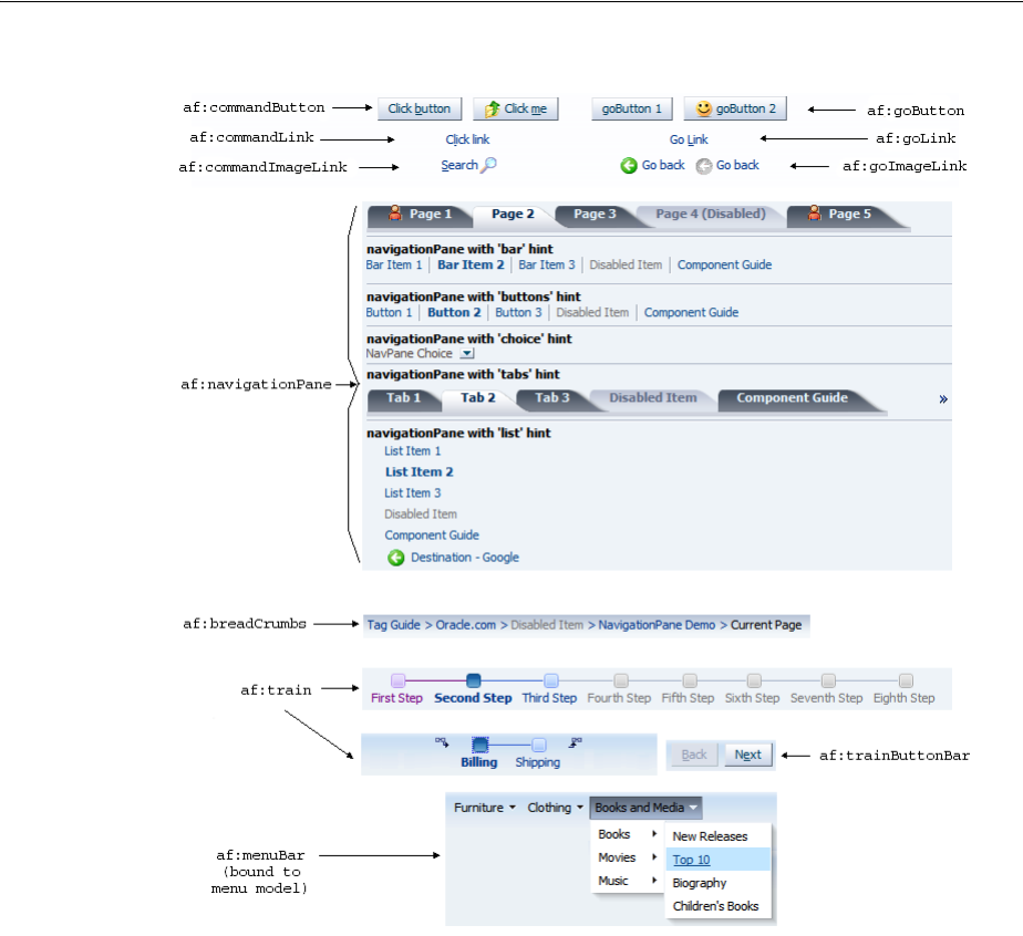
About Navigation Components
20-2 Web User Interface Developer's Guide for Oracle Application Development Framework
Figure 20–1 ADF Faces Navigation Components
20.1.1 Navigation Components Use Cases and Examples
Typical uses of navigation components are to create buttons and links for allowing
users to navigate to another page or window, to perform actions on data, or to perform
actions and navigate at the same time. For example, as shown in Figure 20–2, the main
page of the File Explorer application contains a commandButton component that you
click to refresh the page after making a skin selection, a commandLink component that
opens a popup window when clicked, and a goImageLink component that simply
redirects to the current view Id in the component tree.
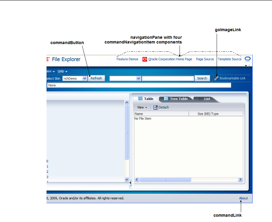
About Navigation Components
Working with Navigation Components 20-3
Figure 20–2 File Explorer Application Main Page
At the top right corner of the File Explorer application, there are four global
application links. While you can use goLink components to provide the destinations
for navigation, the File Explorer application uses the navigationPane and child
commandNavigationItem components to provide links that either navigate directly
to another location or deliver an action that results in navigation.
The navigationPane component also lets you organize application content in a
meaningful structure and provides a navigation method for users to move through
different content areas in the application to perform various functions. For example, a
simple HR application might have pages that let employees check on company
benefits, and pages for administration to view and create employee data, as shown in
Figure 20–3. The navigationPane component provides the structure with tabs, bars,
or lists for example, and the child commandNavigationItem components provide
the navigation links.
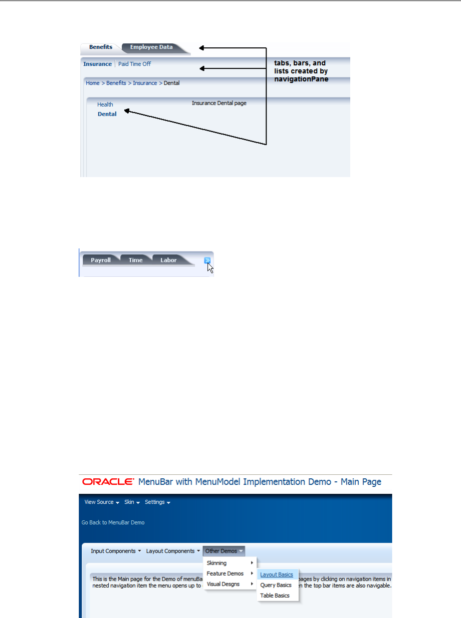
About Navigation Components
20-4 Web User Interface Developer's Guide for Oracle Application Development Framework
Figure 20–3 Page Showing Navigation Tab, Bar and List Links
A built-in overflow indicator appears if the application window is not wide enough to
display all the navigation items, as shown in Figure 20–4.
Figure 20–4 Overflow Indicator
The navigationPane component can also be used with a menu model, where the
component is bound to the menu model managed bean. For complex page hierarchies,
using a menu model is more efficient as the framework generates the correct number
of navigation items in the structure on each page and also keeps track of which items
are to be displayed as "selected".
The menuBar component can also be bound to a menu model to implement menus
and submenus for navigating different levels in a page hierarchy. Most shopping web
sites use a system of menus to categorize shopping areas and provide a one-click
action to a specific subcategory or item in the hierarchy. As shown in Figure 20–5, the
menu bar shows the first level of menu items at a glance. As the mouse cursor hovers
over a menu, a submenu of more items display for the user to browse and choose.
Typically you would not implement more than three levels of menu items.
Figure 20–5 Page With Three Menus On a Bar with a Submenu Expanded
Whether you use navigationPane or menuBar (bound to a menu model) to create
your page hierarchy, you can use the breadCrumbs component and a series of child
commandNavigationItem components to provide users with a visual indication to
their current location in the page hierarchy. As shown in Figure 20–6, the
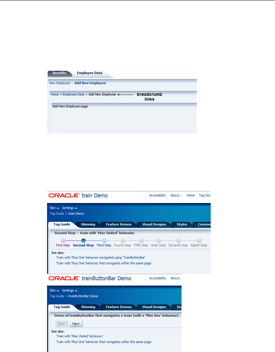
About Navigation Components
Working with Navigation Components 20-5
breadCrumbs component displays a line of text links starting from the root page
down to the current page, which is always the last link. If you create your page
hierarchy using a menu model, you can also bind the breadCrumbs component to the
same menu model managed bean and let the framework dynamically generate the
links for you.
Figure 20–6 Page Showing Horizontal Breadcrumb Links
The train component allows users to quickly see where they are in a multistep
process and also navigate through that process. The trainButtonBar component
provides additional navigation for a train process in the form of Back and Next
buttons, as shown in Figure 20–7.
Figure 20–7 ADF Faces Train and TrainButtonBar Demonstration Pages
20.1.2 Additional Functionality for Navigation Components
You may find it helpful to understand other ADF Faces features before you implement
your navigation components. Additionally, once you have added these components to
your page, you may find that you need to add functionality such as accessibility and
localization. Following are links to other functionality that navigation components can
use.

Common Functionality in Navigation Components
20-6 Web User Interface Developer's Guide for Oracle Application Development Framework
■Using parameters in text: You can use the ADF Faces EL format tags if you want
the text displayed in a component to contain parameters that will resolve at
runtime. For more information, see Section 3.5.2, "How to Use the EL Format
Tags."
■Events: ADF Faces command components deliver ActionEvent events when the
components are activated. For more information about how to handle events on
the server as well as on the client, see Chapter 6, "Handling Events."
■Partial page rendering: ADF Faces command components can be used to trigger
partial rerendering of components on a page. For more information, see Chapter 8,
"Rerendering Partial Page Content."
■Accessibility: You can make your navigation components accessible. For more
information, see Chapter 30, "Developing Accessible ADF Faces Pages."
■Localization: Instead of directly entering text for labels, you can use property files.
These files allow you to manage translation of the text strings. For more
information, see Chapter 29, "Internationalizing and Localizing Pages."
■Skins: You can change the look and feel of navigation components by changing
the skin. For more information, see Chapter 28, "Customizing the Appearance
Using Styles and Skins."
20.2 Common Functionality in Navigation Components
Like any JSF application, an application that uses ADF Faces components contains a
set of rules for choosing the next page to display when a button or link (used on its
own or within another navigation component) is clicked. You define the rules by
adding JSF navigation rules and cases in the application’s configuration resource file
(faces-config.xml).
JSF uses an outcome string to select the navigation rule to use to perform a page
navigation. ADF Faces navigation components that implement
javax.faces.component.ActionSource interface generate an ActionEvent
event when users activate the component. The JSF NavigationHandler and default
ActionListener mechanisms use the outcome string on the activated component to
find a match in the set of navigation rules. When JSF locates a match, the
corresponding page is selected, and the Render Response phase renders the selected
page. For more information about the JSF lifecycle, see Chapter 5, "Using the JSF
Lifecycle with ADF Faces". Also note that navigation in an ADF Faces application may
use partial page rendering. For more information, see Section 8.4, "Using Partial Page
Navigation".
20.3 Using Buttons and Links for Navigation
Buttons and links in ADF Faces include the command components commandButton,
commandLink, and commandImageLink, as well as the go components goButton,
goImageLink, and goLink. The main difference between command components and
go components is that while command components submit requests and fire
ActionEvent events, go components navigate directly to another location without
delivering an action. Visually, the rendered command and go components look the
same, as shown in Figure 20–8.
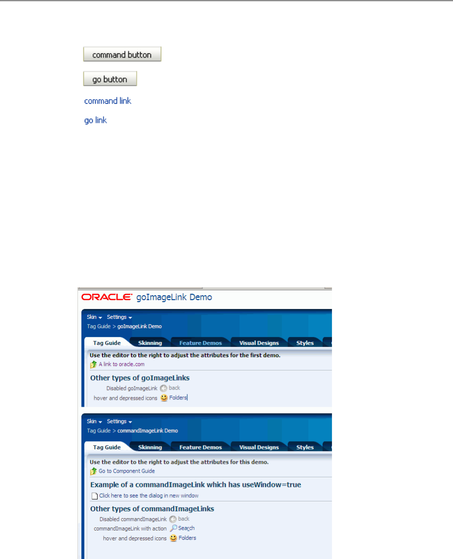
Using Buttons and Links for Navigation
Working with Navigation Components 20-7
Figure 20–8 Command Components and Go Components
The commandImageLink and goImageLink components render images as links,
along with optional text, as shown in Figure 20–9. You can determine the position of
the image relative to the optional text by setting a value for the iconPosition
attribute. In addition, you can set different icons for when the user hovers over an
icon, or the icon is depressed or disabled.
Figure 20–9 Command Image Link and Go Image Link
ADF Faces also includes the commandToolbarButton component that provides
additional functionality, such as a popup facet that can open popup menus from a
toolbar button. For more information, see Section 16.3, "Using Toolbars".
The behavior of command and link components differ when you output your page in
simplified mode for printing or email. The following link components appear in print
and email modes although they cannot be invoked:
■af:commandImageLink
Tip: ADF Faces also provides specialized command and go
components that are used inside menus and toolbars only. For more
information, see Chapter 16, "Using Menus, Toolbars, and Toolboxes".

Using Buttons and Links for Navigation
20-8 Web User Interface Developer's Guide for Oracle Application Development Framework
■af:commandLink
■af:goImageLink
■af:goLink
The following command and go button components do not render when you output a
page in simplified mode for printing or email:
■af:commandButton
■af:commandToolbarButton
■af:goButton
For more information about email and print output modes, see Chapter 34, "Using
Different Output Modes."
You can configure your application to allow end users to invoke a browser’s context
menu when they right-click a command component that renders a link. End users who
right-click the link rendered by a command component may use a browser’s context
menu to invoke an action that you do not want them to invoke (for example, open the
link in a new window). For more information, see Section 20.4, "Configuring a
Browser’s Context Menu for Command Links."
You can show a warning message to users if the page that they attempt to navigate
away from contains uncommitted data. Add the checkUncommittedDataBehavior
component as a child to command components that have their immediate attribute
set to true. If the user chooses not to navigate, the client event will be cancelled. You
can add the checkUncommittedDataBehavior component as a child to the
following components:
■af:commandButton
■af:commandLink
■af:commandImageLink
■af:commandToolbarButton
■af:activeCommandToolbarButton
For the warning message to appear to end users, the page must contain uncommitted
data and you must have also set the document tag’s uncommittedDataWarning
attribute to on, as described in Section 9.2.5, "How to Configure the document Tag."
20.3.1 How to Use Command Buttons and Command Links
Typically, you use commandButton, commandLink, and commandImageLink
components to perform page navigation and to execute any server-side processing.
Before you begin:
It may help to understand how command component’s attributes affect functionality.
For more information, see Section 20.3, "Using Buttons and Links for Navigation."
Note: A warning message may also appear for uncommitted data if
you set the document tag’s uncommittedDataWarning tag to on
and your page renders an ADF Controller bounded task flow that is
configured as critical, as described in the "How to Enable Implicit
Save Points" section of the Oracle Fusion Middleware Fusion Developer's
Guide for Oracle Application Development Framework.

Using Buttons and Links for Navigation
Working with Navigation Components 20-9
You may also find it helpful to understand functionality that can be added using other
ADF Faces features. For more information, see Section 20.1.2, "Additional
Functionality for Navigation Components."
To create and use command components:
1. Create a commandButton component by dragging and dropping a Button from
the General Controls panel of the Component Palette to the JSF page. Create a
commandLink component by dragging and dropping a Link. Create a
commandImageLink component by dragging and dropping a Link (Image).
2. In the Property Inspector, expand the Common section and set the text attribute.
3. Set the icon attribute to the URI of the image file you want to use inside a
commandButton or commandImageLink component (this is not supported for
commandLink). For a commandImageLink component, you can also set the
hoverIcon, disabledIcon, and depressedIcon attributes.
4. Set the action attribute to an outcome string or to a method expression that
refers to a backing bean action method that returns a logical outcome String. For
more information about configuring the navigation between pages, see Section 3.3,
"Defining Page Flows".
The default JSF ActionListener mechanism uses the outcome string to select
the appropriate JSF navigation rule, and tells the JSF NavigationHandler what
page to use for the Render Response phase. For more information about using
managed bean methods to open dialogs, see Chapter 15, "Using Popup Dialogs,
Menus, and Windows". For more information about outcome strings and
navigation in JSF applications, see the Java EE 6 tutorial at
http://download.oracle.com/javaee/index.html.
5. Expand the Behavior section and set the disabled attribute to true if you want
to show the component as a non-interactive button or link.
Tip: Alternatively, you can use the textAndAccessKey attribute to
provide a single value that defines the label along with the access key
to use for the button or link. For information about how to define
access keys, see Section 30.3.4, "How to Define Access Keys for an
ADF Faces Component"
Tip: You can use either the text attribute (or textAndAccessKey
attribute) or the icon attribute, or both.
Tip: The actionListener attribute can also be used for navigation
when bound to a handler that returns an outcome. Usually, you
should use this attribute only to handle user interface logic and not
navigation.
For example, in the File Explorer application, the Search button in
Search panel does not navigate anywhere. Instead, it is used to
perform a search. It has the following value for its actionListener
attribute:
actionListener="#{explorer.navigatorManager.searchNavigator.
searchForFileItem}"
This expression evaluates to a method that actually performs the
search.

Using Buttons and Links for Navigation
20-10 Web User Interface Developer's Guide for Oracle Application Development Framework
6. Set the partialSubmit attribute to true to fire a partial page request each time
the component is activated. For more information, see Section 8.2, "Enabling
Partial Page Rendering Declaratively".
7. Set the immediate attribute to true if you want to skip the Process Validations
and Update Model phases. The component’s action listeners (if any), and the
default JSF ActionListener handler are executed at the end of the Apply
Request Values phase of the JSF lifecycle. For more information, see Section 5.2,
"Using the Immediate Attribute".
8. Optionally, if you set the immediate attribute to true as described in step 7, you
can add the af:checkUncommittedDataBehavior component as a child to the
command component to display a warning message to the user if the page
contains uncommitted data. Drag Check Uncommitted Data Behavior from the
Behavior group in the Operations panel of the Component Palette and drop it as a
child of the command component you added in step 1.
Command buttons and links can also be used to open secondary windows through
these attributes: useWindow, windowHeight, windowWidth, launchListener,
and returnListener. For information about opening secondary windows, see the
"Using the ADF Faces Dialog Framework" section in the Oracle Fusion Middleware
Fusion Developer's Guide for Oracle Application Development Framework.
To use command buttons and links to invoke popups without writing any JavaScript
code, see Section 15.3, "Declaratively Invoking a Popup."
20.3.2 How to Use Go Buttons and Go Links
You use the goButton, goImageLink, and goLink components to perform direct
page navigation, without delivering an ActionEvent event.
Before you begin:
It may help to understand how the go component’s attributes affect functionality. For
more information, see Section 20.3, "Using Buttons and Links for Navigation."
You may also find it helpful to understand functionality that can be added using other
ADF Faces features. For more information, see Section 20.1.2, "Additional
Functionality for Navigation Components."
To create and use go buttons and go links:
1. Create a goButton component by dragging and dropping a Button (Go) from the
General Controls panel of the Component Palette to the JSF page. Create a goLink
component by dragging and dropping a Link (Go). Create a goImageLink
component by dragging and dropping an Image (Go).
2. In the Property Inspector, expand the Common section and set the text attribute.
Note: You must have also set the document tag’s
uncommittedDataWarning attribute to on, as described in
Section 9.2.5, "How to Configure the document Tag."

Using Buttons and Links for Navigation
Working with Navigation Components 20-11
3. Set the icon attribute to the URI of the image file you want to use inside a
goButton or goImageLink component (not supported for goLink). For a
goImageLink component, you can also set the hoverIcon, disabledIcon,
depressedIcon, and iconPosition attributes.
The iconPosition attribute supports two values: leading (default) and
trailing. Set to leading to render the icon before the text. Set to trailing to
render the icon after the text.
4. Set the destination attribute to the URI of the page to which the link should
navigate.
For example, in the File Explorer application, the goLink component in the
popups.jspx file has the following set for its destination attribute:
destination="http://www.oracle.com"
5. Set the targetFrame attribute to specify where the new page should display.
Acceptable values are:
■_blank: The link opens the document in a new window.
■_parent: The link opens the document in the window of the parent. For
example, if the link appeared in a dialog, the resulting page would render in
the parent window.
■_self: The link opens the document in the same page or region.
■_top: The link opens the document in a full window, replacing the entire
page.
6. Expand the Behavior section and set the disabled attribute to true if you want
to show the component as a non-interactive button or link.
20.3.3 What You May Need to Know About Using Partial Page Navigation
As described in Section 8.4, "Using Partial Page Navigation," you can configure an
ADF Faces application to have navigation triggered through a partial page rendering
request. When partial page navigation is turned on, partial page navigation for GET
requests is automatically supported on the following components:
■af:goButton
■af:goImageLink
■af:goLink
■af:goMenuItem (used within af:menu and af:menuBar)
■af:commandNavigationItem (used within af:navigationPane)
The only requirement is that the destination attribute on a supported component
contain a relative URL of the application context root and begin with "/", such as
Tip: Instead, you can use the textAndAccessKey attribute to
provide a single value that defines the label and the access key to use
for the button or link. For information about how to define access
keys, see Section 30.3.4, "How to Define Access Keys for an ADF Faces
Component"
Tip: You can use either the text attribute (or textAndAccessKey
attribute) or the icon attribute, or both.

Configuring a Browser’s Context Menu for Command Links
20-12 Web User Interface Developer's Guide for Oracle Application Development Framework
"/faces/myPage.jspx", where faces is the URL mapping to the application’s
servlet defined in web.xml and myPage.jspx is the page to navigate. Because partial
page navigation makes use of the hash (’#’) portion of the URL, you cannot use the
hash portion for navigation to anchors within a page.
If the targetFrame attribute on a supported component is set to open the link in a
new window, the framework automatically reverts to full page navigation.
20.4 Configuring a Browser’s Context Menu for Command Links
The command components that render links at runtime allow your end users to invoke
actions. In addition you can configure your application so that the ADF Faces
framework allows the end user´s browser to render a context menu for these
command components. The context menu may present menu options that invoke a
different action (for example, open a link in a new window) to that specified by the
command component. The components for which you can configure this behavior
include the following:
■af:commandLink
■af:commandImageLink
■af:commandMenuItem (used within an af:menuBar component)
■af:commandNavigationItem if no value is specified for the destination
attribute, the ADF Faces framework enables the browser context menu in the
following scenarios:
–For the two anchors that af:commandNavigationItem renders when inside
an af:train component
–When an af:commandNavigationItem renders inside an
af:breadCrumbs component
–When an af:commandNavigationItem renders inside an
af:navigationPane component (any hint--tabs, bar, buttons, choice, list)
■af:panelTabbed: the tabs and overflow indicators
■af:panelAccordion: the disclosure link and overflow indicators
You cannot configure this behavior for components that specify a destination and do
not invoke an action. Examples of these components include the following:
■af:goLink
■af:goImageLink
■af:commandNavigationItem where you specify a value for the destination
attribute and no value for the action attribute
20.4.1 How to Configure a Browser’s Context Menu for Command Links
Set the value of the oracle.adf.view.rich.ACTION_LINK_BROWSER_CONTEXT_
SUPPRESSION context parameter in your application’s web.xml file to no.
Before you begin:
It may help to understand what command components you can configure this
functionality for. For more information, Section 20.4, "Configuring a Browser’s Context
Menu for Command Links."

Using Buttons or Links to Invoke Functionality
Working with Navigation Components 20-13
You may also find it helpful to understand functionality that can be added using other
ADF Faces features. For more information, see Section 20.1.2, "Additional
Functionality for Navigation Components."
To configure a browser’s context menu for a command link:
1. In the Application Navigator, double-click web.xml to open the file.
By default, JDeveloper opens the web.xml file in the Overview editor.
2. In the Context Initialization Parameters table, add an entry for the
oracle.adf.view.rich.ACTION_LINK_BROWSER_CONTEXT_SUPPRESSION
parameter and set it to no.
3. Save and close the web.xml file.
20.4.2 What Happens When You Configure a Browser’s Context Menu for Command
Links
If you followed the procedure outlined in Section 20.4.1, "How to Configure a
Browser’s Context Menu for Command Links," JDeveloper writes a value to the
web.xml file, as shown in Example 20–1.
Example 20–1 Context Parameter to Configure a Browser’s Context Menu
<context-param>
<param-name>oracle.adf.view.rich.ACTION_LINK_BROWSER_CONTEXT_
SUPPRESSION</param-name>
<param-value>no</param-value>
</context-param>
For more information about ADF Faces configuration options in your application’s
web.xml file, see Section A.2, "Configuration in web.xml."
At runtime, end users can invoke a browser’s context menu by right-clicking on the
links rendered by certain components, as described in Section 20.4, "Configuring a
Browser’s Context Menu for Command Links."
20.5 Using Buttons or Links to Invoke Functionality
In addition to using command components for navigation, ADF Faces also includes
listener tags that you can use in conjunction with command components to have
specific functionality execute when the action event fires. Listener tags included with
ADF Faces include:
■exportCollectionActionListener: Use to export data from the table,
tree and treeTable components to an Excel spreadsheet. For more information,
see Section 12.10, "Exporting Data from Table, Tree, or Tree Table".
■fileDownloadActionListener: Use to initiate a file download from the server
to the local hard drive. For more information, see Section 20.5.1, "How to Use a
Command Component to Download Files".
■resetListener: Use to reset submitted values. However, no data model states
will be altered. For more information, see Section 20.5.2, "How to Use a Command
Component to Reset Input Fields". If the input components render in a popup, see
Section 15.7, "Resetting Input Fields in a Popup."
If you want to reset the input components to their previous state, which was
partially or fully submitted successfully to the server, then you can use a reset
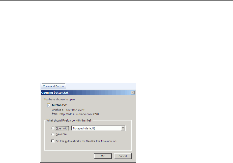
Using Buttons or Links to Invoke Functionality
20-14 Web User Interface Developer's Guide for Oracle Application Development Framework
button. For more information, see Section 11.2.3, "How to Add a Reset Button to a
Form".
20.5.1 How to Use a Command Component to Download Files
You can create a way for users to download files by creating an action component such
as a command button and associating it with a fileDownloadActionListener tag.
When the user selects or clicks the action component, a popup dialog displays that
allows the user to select different download options, as shown in Figure 20–10.
Figure 20–10 File Download Dialog
Use the fileDownloadActionListener tag to allow an action component (for
example, a command button, command link, or menu item) to send the contents of a
file to an end user. You can also specify the content type or file name when you use
this tag. Any value that you set for the action component’s partialSubmit attribute
is ignored at render time if you use the fileDownloadActionListener tag. The
fileDownloadActionListener tag determines what type of submit the action
component invokes based on the context. If you use the
fileDownloadActionListener tag within a JSF portlet in your application, the
action component invokes a partial submit (partialSubmit="true"). If you use the
fileDownloadActionListener tag within an application that uses the ADF Faces
servlet, the action component invokes a full submit (partialSubmit="false").
After the content has been sent to the browser, how that content is displayed or saved
depends on the option that the end user selects in the dialog. If the end user selects the
Open with option, the application associated with that file type will be invoked to
display the content. For example, a text file may result in the Notepad application
being started. If the end user selects the Save to Disk option, depending on the
browser, a popup dialog may appear to select a file name and a location in which to
store the content.
Example 20–2 shows the tags of a command button with the
fileDownloadActionListener tag to download the file named hello.txt to the
user.
Tip: For information about uploading a file to the server, see
Section 11.9, "Using File Upload".
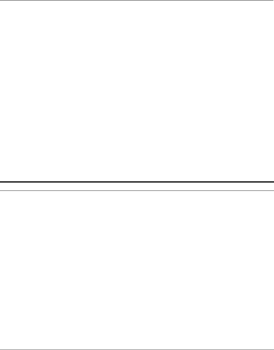
Using Buttons or Links to Invoke Functionality
Working with Navigation Components 20-15
Example 20–2 File Download Using Command Button and fileDownloadActionListener
Tag
<af:commandButton value="Say Hello">
<af:fileDownloadActionListener filename="hello.txt"
contentType="text/plain; charset=utf-8"
method="#{bean.sayHello}"/>
</af:commandButton>
Example 20–3 shows a managed bean method used to process the file download.
Example 20–3 Managed Bean Method Used to Process File Download
public void sayHello(FacesContext context, OutputStream out) throws IOException
{
OutputStreamWriter w = new OutputStreamWriter(out, "UTF-8");
w.write("Hi there!");
. . .
}
If you use the fileDownloadActionListener tag from within a JSF portlet in your
application, you can optionally add the parameters described in Table 20–1 to the
web.xml file of your application to configure the size and temporary location options
for the file during download.
For more information about configuring your web.xml file, Section A.2,
"Configuration in web.xml." For information about how to create a JSF portlet, see the
Oracle Fusion Middleware Developer’s Guide for Oracle WebCenter.
Table 20–1 Parameters to Add to web.xml File to Use fileDownloadActionListener in a Portlet
Parameter name Data type Description
oracle.adf.view.rich.portal.FILE_DOWNLOAD_MAX_MEM Integer Specify the maximum size in
kilobytes of the file that the
fileDownloadActionListener
tag can store during a session. If the
file exceeds the maximum size you
specify, the application attempts to
save the file to the hard drive in the
location you specify for FILE_
DOWNLOAD_TEMP_DIR.
If you do not specify a value for this
parameter in the web.xml file, it
defaults to 100 kilobytes.
oracle.adf.view.rich.portal.FILE_DOWNLOAD_MAX_DISK_SPACE Integer Specify the maximum size in
kilobytes of the file that the
fileDownloadActionListener
tag can download. If a file’s size
exceeds this value, an exception
occurs and a log message is logged to
the server’s log file.
If you do not specify a value for this
parameter in the web.xml file, it
defaults to 2000.
oracle.adf.view.rich.portal.FILE_DOWNLOAD_TEMP_DIR String Specify the temporary location where
you store files during download. If
you do not specify a value, it defaults
to the directory specified by
java.io.tempDir.

Using Buttons or Links to Invoke Functionality
20-16 Web User Interface Developer's Guide for Oracle Application Development Framework
Before you begin:
It may help to understand how command component’s attributes affect functionality.
For more information, see Section 20.5, "Using Buttons or Links to Invoke
Functionality."
You may also find it helpful to understand functionality that can be added using other
ADF Faces features. For more information, see Section 20.1.2, "Additional
Functionality for Navigation Components."
To create a file download mechanism:
1. From the Component Palette, drag and drop any action component to your page
(for more information about action components, see Section 20.3, "Using Buttons
and Links for Navigation").
2. Expand the Operations panel of the Component Palette. From the Listeners group
in the panel, and drag and drop the File Download Action Listener tag as a child
to the action component.
3. In the Property Inspector set the following attributes:
■contentType: Specify the MIME type of the file, for example text/plain,
text/csv, application/pdf, and so on.
■filename: Specify the proposed file name for the object. When the file name
is specified, a Save File dialog will typically be displayed, though this is
ultimately up to the browser. If the name is not specified, the content will
typically be displayed inline in the browser, if possible.
■method: Specify the method that will be used to download the file contents.
The method takes two arguments, a FacesContext object and an
OutputStream object. The OutputStream object will be automatically
closed, so the sole responsibility of this method is to write all bytes to the
OutputStream object.
For example, the code for a command button would be similar to the following:
<af:commandButton text="Load File">
<af:fileDownloadActionListener contentType="text/plain"
filename="MyFile.txt"
method="#(mybean.LoadMyFile"/>
</af:commandButton>
20.5.2 How to Use a Command Component to Reset Input Fields
You can use the resetListener tag in conjunction with a command component to
reset input values. When the end user invokes the command component, it resets all
input values to null or empty. If you want to reset the input components to their
previous state, which was partially or fully submitted successfully to the server, then
you should use a reset button. For more information, see Section 11.2.3, "How to Add a
Reset Button to a Form".
If you use the resetListener tag to reset input components that render in a popup,
you also need to set a value for the popup component’s resetEditableValues
property. For more information about this use case, see Section 15.7, "Resetting Input
Fields in a Popup."

Using Navigation Items for a Page Hierarchy
Working with Navigation Components 20-17
Before you begin:
It may help to understand how command component’s attributes affect functionality.
For more information, see Section 20.5, "Using Buttons or Links to Invoke
Functionality."
You may also find it helpful to understand functionality that can be added using other
ADF Faces features. For more information, see Section 20.1.2, "Additional
Functionality for Navigation Components."
To use the reset listener tag:
1. Create a command component as documented in Section 20.3, "Using Buttons and
Links for Navigation".
2. Drag and drop a Reset Listener from the Listeners group of Operations panel of
the Component Palette as a child to the command component that you created in
step 1.
JDeveloper displays the Insert Reset Listener dialog.
3. Specify the type of event that the resetListener tag activates in response to.
For example, enter action so that the resetListener tag responds to an
actionEvent returned by the command component’s actionListener
attribute.
Click Help in the Insert Reset Listener dialog to view a complete list of supported
values.
20.6 Using Navigation Items for a Page Hierarchy
An application may consist of pages that are related and organized in a tree-like
hierarchy, where users gain access to specific information on a page by drilling down a
path of links. For example, Figure 20–11 shows a simple page hierarchy with three
levels of nodes under the top-level node, Home. The top-level node represents the root
parent page; the first-level nodes, Benefits and Employee Data, represent parent pages
that contain general information for second-level child nodes (such as Insurance and
View Employee) that contain more specific information; the Insurance node is also a
parent node, which contains general information for third-level child nodes, Health
and Dental. Each node in a page hierarchy (except the root Home node) can be a
parent and a child node at the same time, and each node in a page hierarchy
corresponds to a page.
Note: If your application uses the Fusion technology stack with the
ADF Controller, then you should use ADF task flows and an
XMLMenuModel implementation to create the navigation system for
your application page hierarchy. For details, see the "Creating a Page
Hierarchy Using Task Flows" section in the Oracle Fusion Middleware
Fusion Developer's Guide for Oracle Application Development Framework.
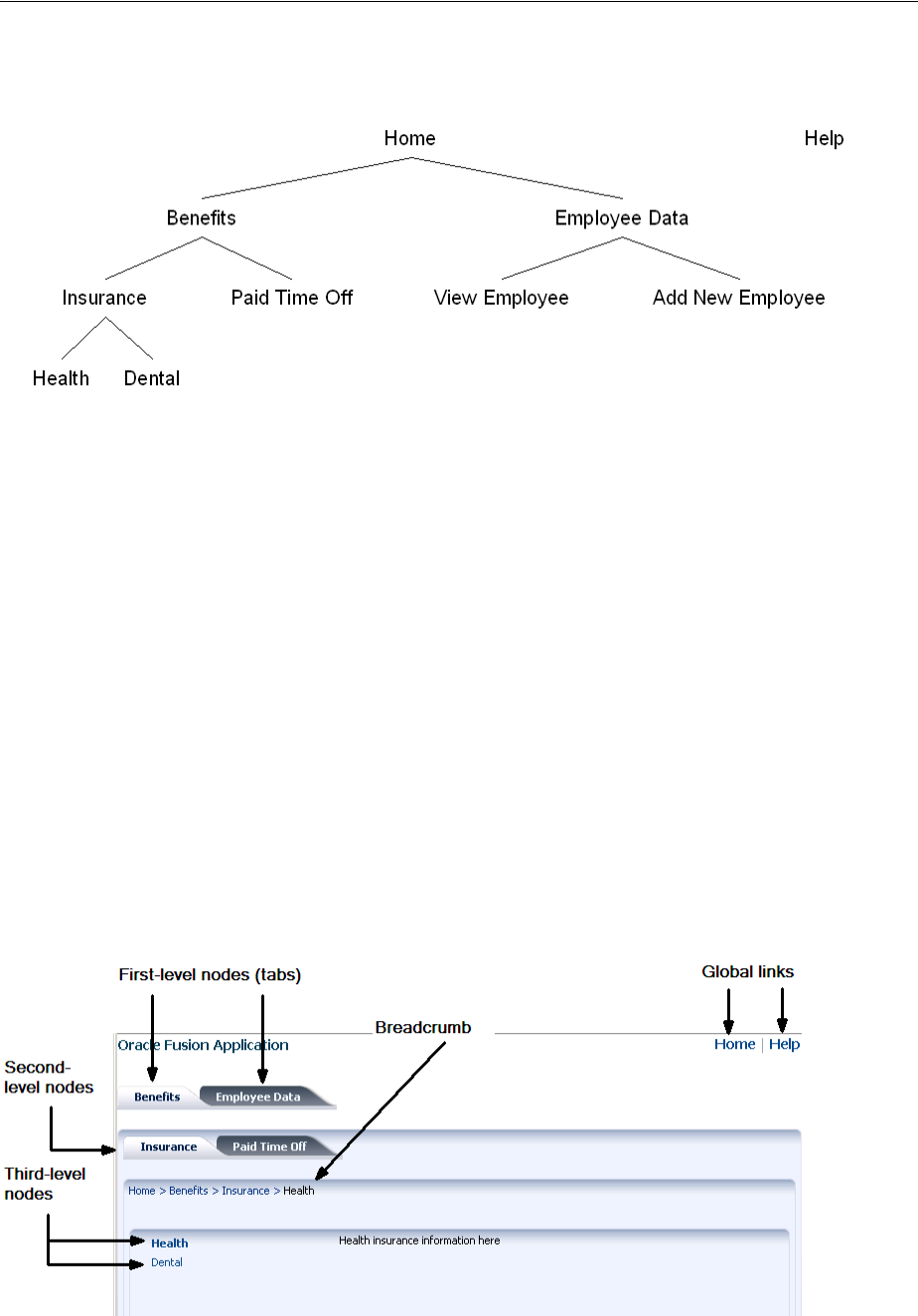
Using Navigation Items for a Page Hierarchy
20-18 Web User Interface Developer's Guide for Oracle Application Development Framework
Figure 20–11 Benefits and Employee Page Hierarchy
Navigation in a page hierarchy follows the parent-child links. For example, to view
Health information, the user would start drilling from the Benefits page, then move to
the Insurance page where two choices are presented, one of which is Health. The path
of selected links starting from Home and ending at Health is known as the focus path in
the tree.
In addition to direct parent-child navigation, some cross-level or cross-parent
navigation is also possible. For example, from the Dental page, users can jump to the
Paid Time Off page on the second level, and to the Benefits page or the Employee Data
page on the first level.
As shown in Figure 20–11, the Help node, which is not linked to any other node in the
hierarchy but is on the same level as the top-level Home node, is a global node. Global
nodes represent global pages (such as a Help page) that can be accessed from any page
in the hierarchy.
Typical widgets used in a web user interface for navigating a page hierarchy are tabs,
bars, lists, and global links, all of which can be created by using the navigationPane
component. Figure 20–12 shows an example of how the hierarchy as illustrated in
Figure 20–11 could be rendered using the navigationPane and other components.
Figure 20–12 Rendered Benefits and Employee Data Pages

Using Navigation Items for a Page Hierarchy
Working with Navigation Components 20-19
In general, tabs are used as first-level nodes, as shown in Figure 20–12, where there are
tabs for the Benefits and Employee Data pages. Second-level nodes, such as Insurance
and Paid Time Off are usually rendered as bars, and third-level nodes, such as Health
and Dental are usually rendered as lists. However, you may also use tabs for both first-
and second-level nodes. Global links (which represent global nodes) are rendered as
text links. In Figure 20–12, the Home and Help global links are rendered as text links.
One navigationPane component corresponds to one level of nodes, whether they
are first-, second-, or third-level nodes, or global nodes. Regardless of the type of items
the navigationPane component is configured to render for a level, you always use
the commandNavigationItem component to represent the items within the level.
The navigationPane component simply renders tabs, bars, lists, and global links for
navigation. To achieve the positioning and visual styling of the page background, as
shown in Figure 20–17 and Figure 20–18, you use the decorativeBox component as
the parent to the first level navigationPane component. The decorativeBox
component uses themes and skinning keys to control the borders and colors of its
different facets. For example, if you use the default theme, the decorativeBox
component body is white and the border is blue, and the top-left corner is rounded. If
you use the medium theme, the body is a medium blue. For information about using
themes and skins, see Chapter 28, "Customizing the Appearance Using Styles and
Skins".
On each page in simple hierarchies, you first use a series of navigationPane
components to represent each level of the hierarchy. Then you add
commandNavigationItem components as direct children of the navigationPane
components for each of the links at each level. For example, to create the Health
insurance page as shown in Figure 20–12, you would first use a navigationPane
component for each level displayed on the page, in this case it would be four: one for
the global links, one for the first-level nodes, one for the second-level nodes, and one
for the third-level nodes. You would then need to add commandNavigationItem
components as children to each of the navigationPane components to represent the
individual links (for example, you would add two commandNavigationItem child
components to the third-level navigationPane component to represent the two
third-level list items). If instead you were creating the Benefits page, as shown in
Figure 20–13, you would add only three navigationPane components (one each for
the global, first, and second levels), and then add just the commandNavigationItem
components for the links seen from this page.
Tip: Because creating a page hierarchy requires that each page in the
hierarchy use the same layout and look and feel, consider using a
template to determine where the navigation components should be
placed and how they should be styled. For more information, see
Section 10.4, "Using Page Templates".
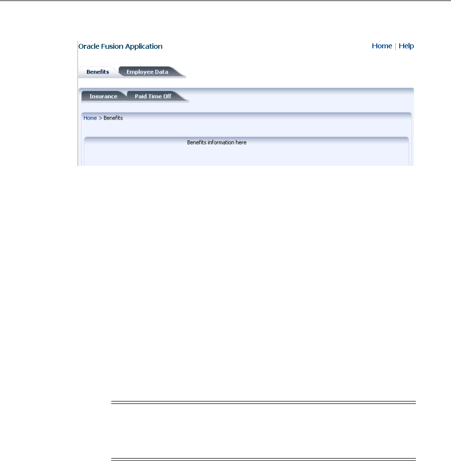
Using Navigation Items for a Page Hierarchy
20-20 Web User Interface Developer's Guide for Oracle Application Development Framework
Figure 20–13 First-Level Page
As you can see, with large page hierarchies, this process can be very time consuming
and error prone. Instead of creating each of the separate commandNavigationItem
components on each page, for larger hierarchies you can use an XMLMenuModel
implementation and managed beans to dynamically generate the navigation items on
the pages. The XMLMenuModel class, in conjunction with a metadata file, contains all
the information for generating the appropriate number of hierarchical levels on each
page, and the navigation items that belong to each level.
Then instead of using multiple commandNavigationItem components within each
navigationPane component and marking the current items as selected on each
page, you declaratively bind each navigationPane component to the same
XMLMenuModel implementation, and use one commandNavigationItem component
in the nodeStamp facet to provide the navigation items. The
commandNavigationItem component acts as a stamp for navigationPane
component, stamping out navigation items for nodes (at every level) held in the
XMLMenuModel object.
The menuBar component can also be used with the XMLMenuModel implementation
to stamp out menu items for navigating a page hierarchy.
On any page, to show the user’s current position in relation to the entire page
hierarchy, you use the breadCrumbs component with a series of
commandNavigationItem components or one commandNavigationItem
component as a nodeStamp, to provide a path of links from the current page back to
the root page (that is, the current nodes in the focus path).
For more information about creating a navigational hierarchy using the
XMLMenuModel, see Section 20.7, "Using a Menu Model to Create a Page Hierarchy".
For more information about manually creating a navigational hierarchy, see
Section 20.8, "Creating a Simple Navigational Hierarchy".
20.6.1 How to Create Navigation Cases for a Page Hierarchy
Whether you use a menu model to create the navigation items for a page hierarchy or
manually create the navigation items yourself, the JSF navigation model, through the
default ActionListener mechanism, is used to choose the page to navigate to when
users select a navigation item.
Note: If you want to create menus that can be used to cause some
sort of change in an application (for example, a File menu that
contains the commands Open and Delete), then see Chapter 16, "Using
Menus, Toolbars, and Toolboxes".

Using Navigation Items for a Page Hierarchy
Working with Navigation Components 20-21
Before you begin:
It may help to understand how the attributes of navigation components affect
functionality. For more information, see Section 20.6, "Using Navigation Items for a
Page Hierarchy."
You may also find it helpful to understand functionality that can be added using other
ADF Faces features. For more information, see Section 20.1.2, "Additional
Functionality for Navigation Components."
To create navigation cases for a page hierarchy:
1. In the Application Navigator, double-click faces-config.xml. By default, this file is
located in the project’s Web Content/WEB-INF folder.
2. Create one global JSF navigation rule that has the navigation cases for all the
nodes in the page hierarchy.
For example, the page hierarchy shown in Figure 20–11 has 10 nodes, including
the global Help node. Thus, you would create 10 navigation cases within one
global navigation rule in the faces-config.xml file, as shown in Example 20–4.
For each navigation case, specify a unique outcome string, and the path to the JSF
page that should be displayed when the navigation system returns an outcome
value that matches the specified string.
Example 20–4 Global Navigation Rule for a Page Hierarchy in faces-config.xml
<navigation-rule>
<navigation-case>
<from-outcome>goHome</from-outcome>
<to-view-id>/home.jspx</to-view-id>
</navigation-case>
<navigation-case>
<from-outcome>goHelp</from-outcome>
<to-view-id>/globalhelp.jspx</to-view-id>
</navigation-case>
<navigation-case>
<from-outcome>goEmp</from-outcome>
<to-view-id>/empdata.jspx</to-view-id>
</navigation-case>
<navigation-case>
<from-outcome>goBene</from-outcome>
<to-view-id>/benefits.jspx</to-view-id>
</navigation-case>
<navigation-case>
<from-outcome>goIns</from-outcome>
<to-view-id>/insurance.jspx</to-view-id>
</navigation-case>
<navigation-case>
<from-outcome>goPto</from-outcome>
<to-view-id>/pto.jspx</to-view-id>
</navigation-case>
<navigation-case>
<from-outcome>goView</from-outcome>
<to-view-id>/viewdata.jspx</to-view-id>
</navigation-case>
<navigation-case>
<from-outcome>goCreate</from-outcome>
<to-view-id>/createemp.jspx</to-view-id>
</navigation-case>
<navigation-case>

Using a Menu Model to Create a Page Hierarchy
20-22 Web User Interface Developer's Guide for Oracle Application Development Framework
<from-outcome>goHealth</from-outcome>
<to-view-id>/health.jspx</to-view-id>
</navigation-case>
<navigation-case>
<from-outcome>goDental</from-outcome>
<to-view-id>/dental.jspx</to-view-id>
</navigation-case>
</navigation-rule>
For more information about creating navigation cases in JDeveloper, see Section 3.3,
"Defining Page Flows".
20.7 Using a Menu Model to Create a Page Hierarchy
Section 20.6, "Using Navigation Items for a Page Hierarchy" describes how you can
create navigation items for a very simple page hierarchy using navigationPane
components with multiple commandNavigationItem children components. Using
the same method for more complex page hierarchies would be time consuming and
error prone. It is inefficient and tedious to manually insert and configure individual
commandNavigationItem components within navigationPane and
breadCrumbs components on several JSF pages to create all the available items for
enabling navigation. It is also difficult to maintain the proper selected status of each
item, and to deduce and keep track of the breadcrumb links from the current page
back to the root page.
For more complex page hierarchies (and even for simple page hierarchies), a more
efficient method of creating a navigation system is to use a menu model. A menu model
is a special kind of tree model. A tree model is a collection of rows indexed by row keys.
In a tree, the current row can contain child rows (for more information about a tree
model, see Section 12.6, "Displaying Data in Trees"). A menu model is a tree model that
knows how to retrieve the rowKey of the node that has the current focus (the focus
node). The menu model has no special knowledge of page navigation and places no
requirements on the nodes that go into the tree.
The XMLMenuModel class creates a menu model from a navigation tree model. But
XMLMenuModel class has additional methods that enable you to define the
hierarchical tree of navigation in XML metadata. Instead of needing to create Java
classes and configuring many managed beans to define and create the menu model (as
you would if you used one of the other ADF Faces menu model classes), you create
one or more XMLMenuModel metadata files that contain all the node information
needed for the XMLMenuModel class to create the menu model.
Note: If your application uses the Fusion technology stack or the
ADF Controller, then you should use ADF task flows and an
XMLMenuModel implementation to create the navigation system for
your application page hierarchy. For details, see the "Creating a Page
Hierarchy Using Task Flows" section in the Oracle Fusion Middleware
Fusion Developer's Guide for Oracle Application Development Framework.

Using a Menu Model to Create a Page Hierarchy
Working with Navigation Components 20-23
To create a page hierarchy using a menu model, you do the following:
■Create the JSF navigation rule and navigation cases for the page hierarchy. See
Section 20.6.1, "How to Create Navigation Cases for a Page Hierarchy".
■Create the XMLMenuModel metadata. See Section 20.7.1, "How to Create the Menu
Model Metadata".
■Configure the managed bean for the XMLMenuModel class. The application uses
the managed bean to build the hierarchy. This configuration is automatically done
for you when you use the Create ADF Menu Model dialog in JDeveloper to create
the XMLMenuModel metadata file. See Section 20.7.2, "What Happens When You
Use the Create ADF Menu Model Wizard".
■Create a JSF page for each of the hierarchical nodes (including any global nodes).
■On each page, bind the navigationPane and breadCrumbs components to the
XMLMenuModel class. See Section 20.7.3, "How to Bind the navigationPane
Component to the Menu Model" and Section 20.7.4, "How to Use the breadCrumbs
Component with a Menu Model". To bind the menuBar component, see
Section 20.7.5, "How to Use the menuBar Component with a Menu Model".
20.7.1 How to Create the Menu Model Metadata
The XMLMenuModel metadata file is a representation of a navigation menu for a page
hierarchy in XML format. You can use one or more XMLMenuModel metadata files to
represent an entire page hierarchy. In an XMLMenuModel metadata file, the page
hierarchy is described within the menu element, which is the root element of the file.
Every XMLMenuModel metadata file is required to have a menu element and only one
menu element is allowed in each file.
The other elements in the XMLMenuModel metadata file or hierarchy can be made up
of item nodes, group nodes, and shared nodes. Item nodes represent navigable nodes
(or pages) in the hierarchy. For example, say you wanted to build the hierarchy as
depicted in Figure 20–14.
Tip: Do not confuse the navigationPane component with the
panelTabbed component. You use the panelTabbed component to
display multiple tabbed content areas that can be hidden and
displayed (see Section 9.9, "Displaying or Hiding Contents in
Accordion Panels and Tabbed Panels"). However, the panelTabbed
component cannot bind to any navigational model and the whole
content must be available from within the page, so it has limited
applicability.
Tip: Typically, you would use a page template that contains a facet
for each level of items (including global items and breadcrumbs) to
create each JSF page. For example, the navigationPane component
representing global items might be wrapped in a facet named
navigationGlobal, and the navigationPane component
representing first level tabs might be wrapped in a navigation1
facet. For information about creating page templates, see Chapter 10,
"Creating and Reusing Fragments, Page Templates, and Components".
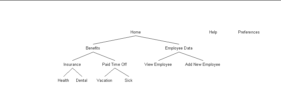
Using a Menu Model to Create a Page Hierarchy
20-24 Web User Interface Developer's Guide for Oracle Application Development Framework
Figure 20–14 Sample Page Hierarchy
If you wanted each node in the hierarchy to have its own page to which a user can
navigate, then in the metadata file you would create an item node for each page. You
nest children nodes inside a parent node to create the hierarchy. However, say you did
not need a page for the Employee Data node, but instead wanted the user to navigate
directly to the View Employee page. You would then use a group node to represent the
Employee Data page and use the group node's idref attribute to reference the page
that opens (the View Employee page) when an end user clicks the Employee Data tab.
The group node allows you to retain the hierarchy without needing to create pages for
nodes that are simply aggregates for their children nodes.
Example 20–5 shows an XMLMenuModel metadata file that uses mostly item nodes
and one group node to define the entire page hierarchy illustrated in Figure 20–14.
Example 20–5 XMLMenuModel Metadata File Sample 1
<?xml version="1.0" encoding="windows-1252" ?>
<menu xmlns="http://myfaces.apache.org/trinidad/menu">
<itemNode id="in01" focusViewId="/home.jspx" label="Home" action="goHome">
<itemNode id="in1" focusViewId="/benefits.jspx" action="goBene"
label="Benefits">
<itemNode id="in11" focusViewId="/insurance.jspx" action="goIns"
label="Insurance">
<itemNode id="in111" focusViewId="/health.jspx" action="goHealth"
label="Health"/>
<itemNode id="in112" focusViewId="/dental.jspx" action="goDental"
label="Dental"/>
</itemNode>
<itemNode id="in12" focusViewId="/pto.jspx" action="goPto"
label="Paid Time Off">
<itemNode id="in121" focusViewId="/vacation.jspx"
action="goVacation" label="Vacation"/>
<itemNode id="in122" focusViewId="/sick.jspx" action="goSick"
label="Sick Pay"/>
</itemNode>
</itemNode>
<groupNode id="gn2" idref="newEmp" label="Employee Data">
<itemNode id="in21" focusViewId="/createemp.jspx" action="goCreate"
label="Create New Employee"/>
<itemNode id="in22" focusViewId="/viewdata.jspx" action="goView"
label="View Data"/>
</groupNode>
</itemNode>
<itemNode id="in02" focusViewId="/globalhelp.jspx" action="goHelp"
label="Help"/>
<itemNode id="in03" focusViewId="/preferences.jspx" action="goPref"
label="Preferences"/>
</menu>

Using a Menu Model to Create a Page Hierarchy
Working with Navigation Components 20-25
Within the root menu element, global nodes are any nodes that are direct children of
the menu element. For example, the code in Example 20–5 shows three global nodes,
namely, Home, Help, and Preferences.
You can also nest menu models using shared nodes. This approach is recommended
where you have sub trees in the hierarchy (for example, the Benefits tree) as it makes
the page hierarchy easier to maintain. For example, you might create the entire
Benefits tree as its own menu model metadata file (as shown in Example 20–6) so that
the menu model could be reused across an application.
Example 20–6 Benefits XMLMenuModel Metadata File
<?xml version="1.0" encoding="windows-1252" ?>
<menu xmlns="http://myfaces.apache.org/trinidad/menu">
<itemNode id="in1" focusViewId="/benefits.jspx" action="goBene"
label="Benefits">
<itemNode id="in11" focusViewId="/insurance.jspx" action="goIns"
label="Insurance">
<itemNode id="in111" focusViewId="/health.jspx" action="goHealth"
label="Health"/>
<itemNode id="in112" focusViewId="/dental.jspx" action="goDental"
label="Dental"/>
</itemNode>
<itemNode id="in12" focusViewId="/pto.jspx" action="goPto"
label="Paid Time Off">
<itemNode id="in121" focusViewId="/vacation.jspx"
action="goVacation" label="Vacation"/>
<itemNode id="in122" focusViewId="/sick.jspx" action="goSick"
label="Sick Pay"/>
</itemNode>
</itemNode>
</menu>
Once you have created the nodes as a separate menu model, then within the different
hierarchies that need to use those nodes, you use a shared node to reference the
Benefits menu model.
Example 20–7 shows an XMLMenuModel metadata file that uses item nodes, a shared
node and a group node to define the same page hierarchy depicted in Figure 20–14.
Example 20–7 XMLMenuModel Metadata File Sample 2
<?xml version="1.0" encoding="windows-1252" ?>
<menu xmlns="http://myfaces.apache.org/trinidad/menu">
<itemNode id="in01" focusViewId="/home.jspx" label="Home" action="goHome">
<sharedNode ref="#{benefits_menu}/>
<groupNode id="gn2" idref="newEmp" label="Employee Data">
<itemNode id="in21" focusViewId="/createemp.jspx" action="goCreate"
label="Create New Employee"/>
<itemNode id="in22" focusViewId="/viewdata.jspx" action="goView"
label="View Data"/>
</groupNode>
</itemNode>
<itemNode id="in02" focusViewId="/globalhelp.jspx" action="goHelp"
label="Help"/>
<itemNode id="in03" focusViewId="/preferences.jspx" action="goPref"
label="Preferences"/>
</menu>

Using a Menu Model to Create a Page Hierarchy
20-26 Web User Interface Developer's Guide for Oracle Application Development Framework
The sharedNode element references the managed bean that is configured for the
Benefits XMLMenuModel metadata file. Whenever you use the Create ADF Menu
Model wizard to create a metadata file, JDeveloper automatically adds the managed
bean configuration for you.
Before you begin:
It may help to understand how the attributes of navigation components affect
functionality. For more information, see Section 20.7, "Using a Menu Model to Create a
Page Hierarchy."
You may also find it helpful to understand functionality that can be added using other
ADF Faces features. For more information, see Section 20.1.2, "Additional
Functionality for Navigation Components."
To create the XMLMenuModel metadata:
1. In the Application Navigator, locate the project where you wish to create the
XMLMenuModel metadata file. Under the project’s Web Content/WEB-INF folder,
right-click faces-config.xml and choose Create ADF Menu Model from the
context menu.
2. In the Create ADF Menu Model dialog, enter a file name for the XMLMenuModel
metadata file, for example, root_menu.
3. Enter a directory for the metadata file. By default, JDeveloper will save the
XMLMenuModel metadata file in the WEB-INF directory of the application.
When you click OK, JDeveloper displays a blank XMLMenuModel metadata file in
the source editor, as shown in Example 20–8.
Example 20–8 Blank XMLMenuModel Metadata File
<?xml version="1.0" encoding="windows-1252" ?>
<menu xmlns="http://myfaces.apache.org/trinidad/menu"></menu>
For information about the managed bean configuration that JDeveloper
automatically adds for you in faces-config.xml, see Section 20.7.2, "What
Happens When You Use the Create ADF Menu Model Wizard".
4. Select the menu node in the Structure window and enter the appropriate
information in the Property Inspector.
Table 20–2 shows the attributes you can specify for the menu element.
Note: If your application uses ADF Controller, then this menu option
will not be available to you. You need to instead use a bounded task
flow to create the hierarchy. See the "Creating a Page Hierarchy Using
Task Flows" section in the Oracle Fusion Middleware Fusion Developer's
Guide for Oracle Application Development Framework.
Tip: If you are using more than one XMLMenuModel metadata file to
define your page hierarchy, use the name root_menu only for the
topmost (root) metadata file that contains references to the other
submenu metadata files.
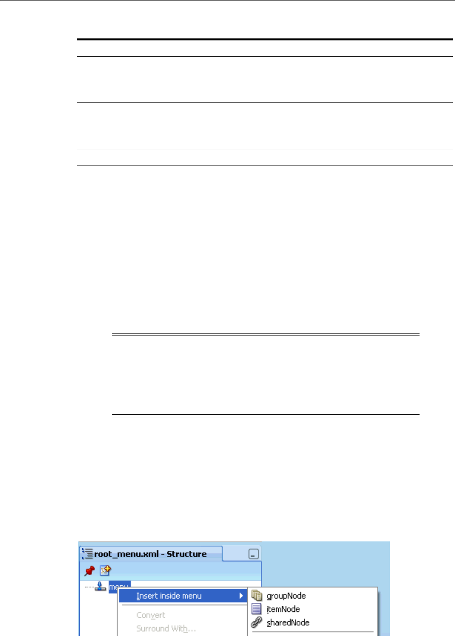
Using a Menu Model to Create a Page Hierarchy
Working with Navigation Components 20-27
Example 20–9 shows sample XMLMenuModel metadata code that uses EL
expressions to access a resource bundle for the navigation item labels.
Example 20–9 XMLMenuModel Using Resource Bundle
<?xml version="1.0" encoding="windows-1252" ?>
<menu xmlns="http://myfaces.apache.org/trinidad/menu"
resourceBundle="org.apache.myfaces.demo.xmlmenuDemo.resource.MenuBundle"
var="bundle">
<itemNode id="in1" label="#{bundle.somelabel1}" ../>
<itemNode id="in2" label="#{bundle.somelabel2}" ../>
</menu>
For more information about using resource bundles, see Chapter 29,
"Internationalizing and Localizing Pages".
5. In the Structure window, add the desired elements for the nodes in your hierarchy,
using itemNode, groupNode, or sharedNode as needed. To begin, right-click
menu and choose Insert inside menu, and then choose the desired element from
the context menu, as shown in Figure 20–15.
Figure 20–15 Context Menu for Inserting Elements into Menu
The elements can be one of the following:
■itemNode: Specifies a node that performs navigation upon user selection.
Table 20–2 Menu Element Attributes
Attribute Description
resourceBundle Optional. This is the resource bundle to use for the labels (visible text)
of the navigation items at runtime. For example,
org.apache.myfaces.demo.xmlmenuDemo.resource.MenuBu
ndle.
var If using a resource bundle, specify an ID to use to reference the bundle
in EL expressions for navigation item labels. For example,
#{bundle.somelabel}. See Example 20–9 for a sample
XMLMenuModel metadata file that uses a resource bundle.
xmlns Required. Set to http://myfaces.apache.org/trinidad/menu
Note: When you use a sharedNode element to create a submenu
and you use resource bundles for the navigation item labels, it is quite
possible that the shared menu model will use the same value for the
var attribute on the root menu element. The XMLMenuModel class
handles this possibility during parsing by ensuring that each resource
bundle is assigned a unique hash key.
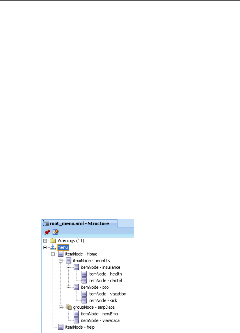
Using a Menu Model to Create a Page Hierarchy
20-28 Web User Interface Developer's Guide for Oracle Application Development Framework
■groupNode: Groups child components; the groupNode itself does no
navigation. Child nodes node can be itemNode or another groupNode.
For example, say you did not need a page for the Employee Data node, but
instead, wanted the user to navigate directly to the View Employee page. You
would then use a group node to represent the Employee Data page by
specifying the id attribute of the desired child node as a value for the group
node’s idref attribute. The group node allows you to retain the hierarchy
without needing to create pages for nodes that are simply aggregates for their
children nodes.
■sharedNode: References another XMLMenuModel instance. A sharedNode
element is not a true node; it does not perform navigation nor does it render
anything on its own.
You can insert a sharedNode element anywhere within the hierarchy. For
example, in the code shown in Example 20–10, the sharedNode element adds
a submenu on the same level as the first-level Employee Data node.
Example 20–10 SharedNode Sample Code
<?xml version="1.0" encoding="windows-1252" ?>
<menu xmlns="http://myfaces.apache.org/trinidad/menu"
<itemNode id="in0" label="Home" ..>
<sharedNode ref="#{shared_menu}"/>
<itemNode id="in1" label="Employee Data" ../>
</itemNode>
<itemNode id="in01" label="Help" ../>
</menu>
As you build the XMLMenuModel metadata file, the tree structure you see in the
Structure window exactly mirrors the indentation levels of the menu metadata, as
shown in Figure 20–16.
Figure 20–16 Tree Structure of XMLMenuModel Metadata in Structure Window
6. For each element used to create a node, set the properties in the Property
Inspector, as described in Table 20–3 for itemNode elements, Table 20–4 for
groupNode elements, and Table 20–5 for sharedNode elements.
Using a Menu Model to Create a Page Hierarchy
Working with Navigation Components 20-29
A groupNode element does not have the action or destination attribute that
performs navigation directly, but it points to a child node that has the action
outcome or destination URI, either directly by pointing to an itemNode child
(which has the action or destination attribute), or indirectly by pointing to a
groupNode child that will then point to one of its child nodes, and so on until an
itemNode element is reached. Navigation will then be determined from the action
outcome or destination URI of that itemNode element.
Consider the groupNode code shown in Example 20–11. At runtime, when users
click groupNode id="gn1", or groupNode id="gn11", or itemNode
id="in1", the navigation outcome is "goToSubTabOne", as specified by the first
itemNode reached (that is itemNode id="id1"). Table 20–4 shows the
attributes you must specify when you use a groupNode element.
Example 20–11 groupNode Elements
<?xml version="1.0" encoding="windows-1252" ?>
<menu xmlns:"http://myfaces.apache.org/trinidad/menu">
<groupNode id="gn1" idref="gn11" label="GLOBAL_TAB_0">
<groupNode id="gn11" idref="in1" label="PRIMARY_TAB_0">
<itemNode id="in1" label="LEVEL2_TAB_0" action="goToSubTabOne"
focusViewId="/menuDemo/subtab1.jspx"/>
Table 20–3 itemNode Element Attributes
Attribute Description
action Specify either an outcome string or an EL method binding
expression that returns an outcome string. In either case, the
outcome string must match the from-outcome value to the
navigation case for that node as configured in the
faces-config.xml file.
destination Specify the URI of the page to navigate to when the node is
selected, for example, http://www.oracle.com. If the
destination is a JSF page, the URI must begin with "/faces".
Alternatively, specify an EL method expression that evaluates to
the URI.
If both action and destination are specified, destination
takes precedence over action.
focusViewId Required. The URI of the page that matches the node’s
navigational result, that is, the to-view-id value of the
navigation case for that node as specified in the
faces-config.xml file.
For example, if the action outcome of the node navigates to
/page_one.jspx (as configured in the faces-config.xml
file), then focusViewId must also be /page_one.jspx.
The focusViewId does not perform navigation. Page
navigation is the job of the action or destination attributes.
The focusViewId, however, is required for the XMLMenuModel
to determine the correct focus path.
id Required. Specify a unique identifier for the node.
As shown in Example 20–5, it is good practice to use "inX" for
the ID of each itemNode, where for example, "inX" could be in1,
in11, in111, in2, in21, in 211, and so on.
label Specify the label text to display for the node. Can be an EL
expression to a string in a resource bundle, for example,
#{bundle.somelabel}, where bundle must match the root
menu element’s var attribute value.
Using a Menu Model to Create a Page Hierarchy
20-30 Web User Interface Developer's Guide for Oracle Application Development Framework
<itemNode id="in2" label="LEVEL2_TAB_1" action="goToSubTabTwo"
focusViewId="/menuDemo/subtab2.jspx"/>
</groupNode>
<itemNode id="in3" label="PRIMARY_TAB_1" focusViewId="/menuDemo/tab2.jspx"
destination="/faces/menuDemo/tab2.jspx"/>
</groupNode>
<itemNode id="gin1" label="GLOBAL_TAB_1" action="goToGlobalOne"
focusViewId="/menuDemo/global1.jspx"/>
<itemNode id="gin2" label="GLOBAL_TAB_2"
destination="/faces/menuDemo/global2.jspx"
focusViewId="/menuDemo/global2.jspx"/>
</menu>
20.7.2 What Happens When You Use the Create ADF Menu Model Wizard
When you use the Create ADF Menu Model wizard to create an XMLMenuModel
metadata file, JDeveloper automatically configures for you a managed bean for the
menu metadata file in the faces-config.xml file, using the metadata file name you
provide as the managed bean name.
Example 20–12 shows part of the faces-config.xml file that contains the
configuration of one XMLMenuModel metadata file. By default, JDeveloper uses the
oracle.adf.view.rich.model.MDSMenuModel class as the managed bean class,
and request as the managed bean scope, which is required and cannot be changed.
Example 20–12 Managed Bean Configuration for XMLMenuModel in faces-config.xml
<managed-bean>
<managed-bean-name>root_menu</managed-bean-name>
Table 20–4 GroupNode Element Attribute
Attribute Description
id A unique identifier for the group node.
As shown in Example 20–11, it is good practice to use gnX for
the ID of each groupNode, where for example, gnX could be
gn1, gn2, and so on.
idref Specify the ID of a child node, which can be an itemNode, or
another groupNode. When adding a groupNode as a child
node, that child in turn can reference another groupNode and
so on, but eventually an itemNode child must be referenced as
the last child.
The idref attribute can contain more than one child ID,
separated by spaces; the IDs are processed in the order they are
listed.
label Specify the label text to display for the group node. Can be an
EL expression to a string in a resource bundle, for example,
#{bundle.somelabel}.
Table 20–5 sharedNode Element Attribute
Attribute Description
ref Specify the managed bean name of another XMLMenuModel
class, as configured in the faces-config.xml file, for
example, #{shared_menu}.
At runtime, the referenced navigation menu is created, inserted
as a submenu into the main (root) menu, and rendered.

Using a Menu Model to Create a Page Hierarchy
Working with Navigation Components 20-31
<managed-bean-class>oracle.adf.view.
rich.model.MDSMenuModel</managed-bean-class>
<managed-bean-scope>request</managed-bean-scope>
<managed-property>
<property-name>createHiddenNodes</property-name>
<value>false</value>
</managed-property>
<managed-property>
<property-name>source</property-name>
<property-class>java.lang.String</property-class>
<value>/WEB-INF/root_menu.xml</value>
</managed-property>
</managed-bean>
In addition, the following managed properties are added by JDeveloper for the
XMLMenuModel managed bean:
■createHiddenNodes: When true, specifies that the hierarchical nodes must be
created even if the component’s rendered attribute is false. The
createHiddenNodes value is obtained and made available when the menu
metadata source file is opened and parsed. This allows the entire hierarchy to be
created, even when you do not want the actual component to be rendered.
■source: Specifies the menu metadata source file to use (for example,
/WEB-INF/root_menu.xml).
For each XMLMenuModel metadata file that you create in a project using the wizard,
JDeveloper configures a managed bean for it in the faces-config.xml file. For
example, if you use a sharedNode element in an XMLMenuModel to reference another
XMLMenuModel metadata file (as shown in Example 20–10), you would have created
two metadata files. And JDeveloper would have added two managed bean
configurations in the faces-config.xml file, one for the main (root) menu model,
and a second managed bean for the shared (referenced) menu model, as shown in
Example 20–13.
Example 20–13 Managed Bean for Shared Menu Model in faces-config.xml
<!-- managed bean for referenced, shared menu model -->
<managed-bean>
<managed-bean-name>shared_menu</managed-bean-name>
<managed-bean-class>
<managed-bean-class>oracle.adf.view.
rich.model.MDSMenuModel</managed-bean-class>
</managed-bean-class>
<managed-bean-scope>request</managed-bean-scope>
<managed-property>
<property-name>createHiddenNodes</property-name>
<value>false</value>
</managed-property>
<managed-property>
<property-name>source</property-name>
Note: The createHiddenNodes property must be placed before
the source property, which JDeveloper does for you when the
managed bean is automatically configured. The XMLMenuModel
managed bean must have the createHiddenNodes value already set
to properly parse and create the menu's XML metadata from the
source managed property.

Using a Menu Model to Create a Page Hierarchy
20-32 Web User Interface Developer's Guide for Oracle Application Development Framework
<property-class>java.lang.String</property-class>
<value>/WEB-INF/shared_menu.xml</value>
</managed-property>
</managed-bean>
This means, if you use shared nodes in your XMLMenuModel metadata files, the
faces-config.xml file will have a root menu model managed bean, plus menu
model managed beans for any menu models referenced through shared nodes.
20.7.3 How to Bind the navigationPane Component to the Menu Model
Each node in the page hierarchy corresponds to one JSF page. On each page, you use
one navigationPane component for each level of navigation items that you have
defined in your XMLMenuModel metadata file, including global items. Levels are
defined by a zero-based index number: Starting with global nodes in the metadata file
(that is, direct children nodes under the menu element as shown in Example 20–5), the
level attribute value is 0 (zero), followed by 1 for the next level (typically tabs), 2 for
the next level after that (typically bars), and so on. For example, if you had a page
hierarchy like the one shown in Figure 20–14 and Example 20–5, you would use three
navigationPane components on a page such as Home (for the three levels of
navigation under the Home node), plus one more navigationPane component for
the global nodes.
As described in Section 20.8.1, "How to Create a Simple Page Hierarchy", you use the
hint attribute to specify the type of navigation item you want to use for each
hierarchical level (for example, buttons, tabs, or bar). But instead of manually
adding multiple commandNavigationItem components yourself to provide the
navigation items, you bind each navigationPane component to the root
XMLMenuModel managed bean, and insert only one commandNavigationItem
component into the nodeStamp facet of each navigationPane component, as
shown in Example 20–14.
Example 20–14 navigationPane Component Bound to XMLMenuModel Managed Bean
<af:navigationPane var="menuNode" value="#{root_menu}" level="0"
hint="buttons">
<f:facet name="nodeStamp">
<af:commandNavigationItem text="#{menuNode.label}"
action="#{menuNode.doAction}"
icon="#{menuNode.icon}"
destination="#{menuNode.destination}"
visible="#{menuNode.visible}"
rendered="#{menuNode.rendered}"/>
</f:facet>
</af:navigationPane>
Tip: Because the menu model dynamically determines the hierarchy
(that is, the links that appear in each navigationPane component)
and also sets the current nodes in the focus path as selected, you can
practically reuse the same code for each page. You need to change
only the page’s document title, and add the specific page contents to
display on that page.
Because of this similar code, you can create a single page fragment
that has just the facets containing the navigationPane components,
and include that fragment in each page, where you change the page’s
document title and add the page contents.
Using a Menu Model to Create a Page Hierarchy
Working with Navigation Components 20-33
The nodeStamp facet and its single commandNavigationItem component, in
conjunction with the XMLMenuModel managed bean, are responsible for:
■Stamping out the correct number of navigation items in a level.
■Displaying the correct label text and other properties as defined in the metadata.
For example, the EL expression #{menuNode.label} retrieves the correct label
text to use for a navigation item, and #{menuNode.doAction} evaluates to the
action outcome defined for the same item.
■Marking the current items in the focus path as selected. You should not specify the
selected attribute at all for the commandNavigationItem components.
Before you begin:
It may help to understand how the attributes of navigation components affect
functionality. For more information, see Section 20.7, "Using a Menu Model to Create a
Page Hierarchy."
You may also find it helpful to understand functionality that can be added using other
ADF Faces features. For more information, see Section 20.1.2, "Additional
Functionality for Navigation Components."
To bind a navigationPane component to the menu model:
1. If you want the navigation items to be styled, create a decorativeBox
component by dragging and dropping a Decorative Box from the Layout panel of
the Component Palette to the JSF page. Set the theme to determine how you want
the tabs to appear. Valid values are:
■default: Body is white with a blue border. Top-left corner is rounded.
■light: Body is light blue. Top-left corner is rounded.
■medium: Body is medium blue. Top-left corner is rounded.
■dark: Body is dark blue. Top-left corner is rounded.
You can change how the themes are displayed. For more information, see
Chapter 28, "Customizing the Appearance Using Styles and Skins".
2. Create a navigationPane component by dragging and dropping a Navigation
Pane from the Component Palette to the JSF page. Add a navigationPane
component for each level of the hierarchy.
For example, to create any of the pages as shown in the hierarchy in Figure 20–14,
you would drag and drop four navigationPane components.
3. For each navigationPane component, in the Property Inspector, expand the
Common section and set the hint attribute to one of the following types of
navigation items to determine how the navigationPane will display the
following:
Note: If there is no node information in the XMLMenuModel object
for a particular hierarchical level (for example, level 3 lists), ADF Faces
does not display those items on the page even though the page
contains the navigationPane component code for that level.
Tip: The Navigation Pane component can be found in the Interactive
Containers and Headers group of the Layout panel in the Component
Palette.

Using a Menu Model to Create a Page Hierarchy
20-34 Web User Interface Developer's Guide for Oracle Application Development Framework
■bar: Displays the navigation items separated by a bar, for example the
Insurance and Paid Time Off links in Figure 20–18.
■buttons: Displays the navigation items separated by a bar in a global area,
for example the Home and Help links in Figure 20–18.
■choice: Displays the navigation items in a popup list when the associated
dropdown icon is clicked. You must include a value for the navigationPane
component’s icon attribute and you can associate a label to the dropdown list
using the title attribute.
■list: Displays the navigation items in a bulleted list, for example the Health
and Dental links in Figure 20–18.
■tabs: Displays the navigation items as tabs, for example the Benefits and
Employee Data tabs in Figure 20–18.
4. Set the level attribute to point to the appropriate level of metadata in the
XMLMenuModel metadata file. The level attribute is a zero-based index number:
Starting with global nodes in the metadata file (that is, direct children nodes under
the menu element as shown in Example 20–5), the level attribute value is 0
(zero), followed by 1 for the next level (typically tabs), 2 for the next level after
that (typically bars), and so on.
The commandNavigationItem component is able to get its metadata from the
metadata file through the level attribute on the parent navigationPane
component. By default, if you do not specify a level attribute value, 0 (zero) is
used, that means the navigationPane component will take the metadata from
the first-level under the menu element for rendering by the
commandNavigationItem component.
5. In the Property Inspector, expand the Data section. Set the value attribute to the
menu model managed bean that is configured for the root XMLMenuModel class in
the faces-config.xml file.
6. Set the var attribute to text that you will use in the commandNavigationItem
components to get the needed data from the menu model.
As the hierarchy is created at runtime, and each node is stamped, the data for the
current node is copied into the var attribute, which can then be addressed using
an EL expression. You specify the name to use for this property in the EL
expression using the var property.
7. Drag and drop a Navigation Item from the Interactive Containers and Headers
group in the Layout panel of the Component Palette to the nodeStamp facet of the
navigationPane component.
Note: The value attribute can reference root menu models and
menu models referenced by shared nodes. If you reference a shared
node in the value attribute, the faces-config.xml file needs to
have a new managed bean entry with a different managed bean name
than the one which is used in a root menu model definition in the
menu model metadata file. This promotes the menu model of a shared
node to a root menu model which can then be referred to in the value
attribute.
Tip: You use the same value for the var attribute for every
navigationPane component on the page or in the application.
Using a Menu Model to Create a Page Hierarchy
Working with Navigation Components 20-35
8. Set the values for the remaining attributes that have corresponding values in the
metadata using EL expressions that refer to the menu model (whose metadata
contains that information). You access these values using the value of the var
attribute you set for the parent navigationPane component in Step 6 along with
the name of the corresponding itemNode element that holds the value in the
metadata. Table 20–6 shows the attributes on the navigation item that has
corresponding values in the metadata.
For example, if you had set the var attribute on the parent navigationPane
component to menuNode, you would use #{menuNode.doAction} as the EL
expression for the value of the action attribute. This would resolve to the action
property set in the metadata for each node. Example 20–15 shows the JSF code for
binding to a menu model that has four levels of hierarchical nodes.
Example 20–15 Binding to the XMLMenuModel
<af:form>
<af:navigationPane hint="buttons" level="0" value="#{root_menu}"
var="menuNode">
<f:facet name="nodeStamp">
<af:commandNavigationItem text="#{menuNode.label}"
action="#{menuNode.doAction}"
icon="#{menuNode.icon}"
destination="#{menuNode.destination}"/>
</f:facet>
</af:navigationPane>
<af:navigationPane hint="tabs" level="1" value="#{root_menu}"
var="menuNode">
<f:facet name="nodeStamp">
<af:commandNavigationItem text="#{menuNode.label}"
action="#{menuNode.doAction}"
icon="#{menuNode.icon}"
destination="#{menuNode.destination}"/>
</f:facet>
</af:navigationPane>
<af:navigationPane hint="bar" level="2" value="#{root_menu}"
var="menuNode">
<f:facet name="nodeStamp">
<af:commandNavigationItem text="#{menuNode.label}"
action="#{menuNode.doAction}"
icon="#{menuNode.icon}"
destination="#{menuNode.destination}"/>
</f:facet>
</af:navigationPane>
<af:navigationPane hint="list" level="3" value="#{root_menu}"
var="menuNode">
Table 20–6 Navigation Item Attributes and the Associated Menu Model Attributes
Navigation Item Attribute Associated Menu Model Element Attribute
text label
action doAction
icon icon
destination destination
visible visible
rendered rendered

Using a Menu Model to Create a Page Hierarchy
20-36 Web User Interface Developer's Guide for Oracle Application Development Framework
<f:facet name="nodeStamp">
<af:commandNavigationItem text="#{menuNode.label}"
action="#{menuNode.doAction}"
icon="#{menuNode.icon}"
destination="#{menuNode.destination}"/>
</f:facet>
</af:navigationPane>
</af:form>
20.7.4 How to Use the breadCrumbs Component with a Menu Model
Creating a breadcrumb using the menu model is similar to creating the page hierarchy;
you use the breadCrumbs component with a nodeStamp facet that stamps a
commandNavigationItem component with data from the model.
Before you begin:
It may help to understand how the attributes of navigation components affect
functionality. For more information, see Section 20.7, "Using a Menu Model to Create a
Page Hierarchy."
You may also find it helpful to understand functionality that can be added using other
ADF Faces features. For more information, see Section 20.1.2, "Additional
Functionality for Navigation Components."
To create a breadcrumb using a menu model:
1. Create a breadCrumbs component by dragging and dropping a BreadCrumbs
from the Location group of General Controls panel of the Component Palette to
the JSF page.
2. By default, breadcrumb links are displayed in a horizontal line. To change the
layout to be vertical, in the Property Inspector, expand the Common section and
set the orientation attribute to vertical.
3. In the Property Inspector, expand the Data section. Set the value attribute to the
root XMLMenuModel managed bean as configured in the faces-config.xml
file. This is the same bean to which the navigationPane component is bound.
4. Set the var attribute to text that you will use in the commandNavigationItem
components to get the needed data from the menu model.
As the hierarchy is created at runtime, and each node is stamped, the data for the
current node is copied into the var attribute, which can then be addressed using
Note: For information about how to let users close navigation tabs,
see Section 20.8.3, "What You May Need to Know About Removing
Navigation Tabs".
Note: The value attribute should reference only a root menu model
and not any menu models referenced through shared nodes. For
example, if you use a shared node in your main XMLMenuModel
element (as shown in Example 20–10), JDeveloper would have created
managed bean configurations for the shared node and the root
XMLMenuModel bean that consumes the shared model. The shared
model managed bean is automatically incorporated into the root
menu model managed bean as the menu tree is parsed at startup.

Using a Menu Model to Create a Page Hierarchy
Working with Navigation Components 20-37
an EL expression. You specify the name to use for this property in the EL
expression using the var property.
5. Add one commandNavigationItem component as a child by dragging and
dropping a Navigation Item from the Interactive Containers and Headers group
in the Layout panel of the Component Palette to the nodeStamp facet of the
breadCrumbs component.
6. Set the values for the remaining attributes that have corresponding values in the
metadata using EL expressions that refer to the menu model (whose metadata
contains that information). You access these values using the value of the var
attribute you set for the parent breadCrumbs component in Step 4 along with the
name of the corresponding itemNode element that holds the value in the
metadata. Table 20–6 shows the attributes on the navigation item that has
corresponding values in the metadata.
For example, if you had set the var attribute on the breadCrumbs component to
menuNode, you would use #{menuNode.doAction} as the EL expression for the
value of the action attribute. This would resolve to the action property set in the
metadata for each node.
Example 20–16 breadCrumbs Component Bound to the XMLMenuModel
<af:breadCrumbs var="menuNode" value="#{root_menu}">
<f:facet name="nodeStamp">
<af:commandNavigationItem text="#{menuNode.label}"
action="#{menuNode.doAction}"/>
</f:facet>
</af:breadCrumbs>
20.7.5 How to Use the menuBar Component with a Menu Model
As described in Chapter 16, "Using Menus, Toolbars, and Toolboxes," the menuBar
and menu components are usually used to organize and create menus that users click
to cause some change or action in the application. Where applicable, the menuBar
component can be used with an XMLMenuModel implementation and managed beans
to create a page hierarchy. Like the breadCrumbs or navigationPane component,
when menuBar is bound to the root XMLMenuModel managed bean, you use one
commandNavigationItem component in the nodeStamp facet to dynamically
provide the menu items for navigating the page hierarchy.
When the page hierarchy of a web site cannot be sufficiently represented by a tabbed
navigation system (through a navigationPane or panelTabbed component), use
the menuBar component to provide a navigation bar of menus and submenus. For
Tip: You can use the same value for the var attribute for the
breadCrumbs component as you did for the navigationPane
components on the page or in the application.
Note: The nodeStamp facet of the breadCrumbs component
determines what links appear according to the menu model that you
specify for the value attribute of the breadCrumbs component. If
you do not specify the menu model you want to render for the value
attribute of the breadCrumbs component, no links appear at runtime.
Do not use a nodeStamp facet for the breadCrumbs component if
you do not use a menu model because no stamps will be required.

Using a Menu Model to Create a Page Hierarchy
20-38 Web User Interface Developer's Guide for Oracle Application Development Framework
example, a web store application with many shopping categories for users to browse
might benefit from a horizontal arrangement of top-level menus in a bar instead of
rendering all the categories and subcategories within tabs, subtabs or bars, and lists.
With a menuBar bound to a menu model, submenus appear only when the user places
the mouse cursor over a top-level menu or a submenu item. Not only does this
arrangement reduce screen real estate, but the user can also quickly navigate from the
top of the hierarchy to a page at the lowest level with just one click.
Unlike a menuBar component that is not bound to a menu model, a menuBar that is
bound to a menu model is not detachable, and should not be used with a toolbar. Also,
do not use navigation tabs with a menuBar bound to a menu model on the same page.
If you must use both, always place the menuBar component above the navigation
tabs. You can, however, use a menuBar bound to a menu model with a breadCrumbs
component bound to the same model on those pages where you want to show
breadcrumb links.
Before you begin:
It may help to understand how the attributes of navigation components affect
functionality. For more information, see Section 20.7, "Using a Menu Model to Create a
Page Hierarchy."
You may also find it helpful to understand functionality that can be added using other
ADF Faces features. For more information, see Section 20.1.2, "Additional
Functionality for Navigation Components."
To create a horizontal menu bar using a menu model:
1. If you want the menu bar to be styled, create a decorativeBox component by
dragging and dropping a Decorative Box from the Layout panel of the
Component Palette to the JSF page. Set the theme to determine how you want the
tabs to appear. Valid values are:
■default: Body is white with a blue border. Top-left corner is rounded.
■light: Body is light blue. Top-left corner is rounded.
■medium: Body is medium blue. Top-left corner is rounded.
■dark: Body is dark blue. Top-left corner is rounded.
You can change how the themes are displayed. For more information, see
Chapter 28, "Customizing the Appearance Using Styles and Skins".
2. Create a menuBar component by dragging and dropping a Menu Bar from the
Menus and Toolbars panel of the Component Palette to the JSF page.
3. In the Property Inspector, Menu Model section, set the value attribute to the root
XMLMenuModel managed bean as configured in the faces-config.xml file.
This is the same bean to which the breadCrumbs component is bound.
Note: The value attribute should reference only a root menu model
and not any menu models referenced through shared nodes. For
example, if you use a shared node in your main XMLMenuModel
element (as shown in Example 20–10), JDeveloper would have created
managed bean configurations for the shared node and the root
XMLMenuModel bean that consumes the shared model. The shared
model managed bean is automatically incorporated into the root
menu model managed bean as the menu tree is parsed at startup.

Using a Menu Model to Create a Page Hierarchy
Working with Navigation Components 20-39
4. Set the var attribute to text that you will use in the commandNavigationItem
components to get the needed data from the menu model.
As the hierarchy is created at runtime, and each node is stamped, the data for the
current node is copied into the var attribute, which can then be addressed using
an EL expression. You specify the name to use for this property in the EL
expression using the var property.
5. Add one commandNavigationItem component as a child by dragging and
dropping a Navigation Item from the Interactive Containers and Headers group
in the Layout panel of the Component Palette to the nodeStamp facet of the
menuBar component.
6. Set the values for the remaining attributes that have corresponding values in the
metadata using EL expressions that refer to the menu model (whose metadata
contains that information). You access these values using the value of the var
attribute you set for the parent menuBar component in Step 4 along with the name
of the corresponding itemNode element that holds the value in the metadata.
Table 20–6 shows the attributes on the navigation item that has corresponding
values in the metadata.
For example, if you had set the var attribute on the menuBar component to
menuNode, you would use #{menuNode.doAction} as the EL expression for the
value of the action attribute. This would resolve to the action property set in the
metadata for each node.
Example 20–17 menuBar Component Bound to the XMLMenuModel
<af:menuBar var="menuNode" value="#{root_menu}">
<f:facet name="nodeStamp">
<af:commandNavigationItem text="#{menuNode.label}"
action="#{menuNode.doAction}"/>
</f:facet>
</af:menuBar>
20.7.6 What Happens at Runtime
The value attribute of the menu model bound component (navigationPane,
breadCrumbs, or menuBar) references the managed bean for the XMLMenuModel
element. When that managed bean is requested, the following takes place:
■The setSource() method of the XMLMenuModel class is called with the location
of the model’s metadata, as specified in the managed-property element in the
faces-config.xml file.
Tip: You can use the same value for the var attribute for the
menuBar component as you did for the breadCrumbs component on
the page or in the application.
Note: The nodeStamp facet of the menuBar component determines
what links appear according to the menu model that you specify for
the value attribute of the menuBar component. If you do not specify
the menu model you want to render for the value attribute of the
menuBar component, no menu items will appear at runtime.

Using a Menu Model to Create a Page Hierarchy
20-40 Web User Interface Developer's Guide for Oracle Application Development Framework
■An InputStream object to the metadata is made available to the parser
(SAXParser); the metadata for the navigation items is parsed, and a call to
MenuContentHandler method is made.
■The MenuContentHandler builds the navigation menu tree structure as a List
object in the following manner:
–The startElement() method is called at the start of processing a node in
the metadata.
–The endElement() method is called at the end of processing the node.
–As each node is processed, a List of navigation menu nodes that make up the
page hierarchy of the menu model is created.
■A TreeModel object is created from the list of navigation menu nodes.
■The XMLMenuModel object is created from the TreeModel object.
If a groupNode element has more than one child id in its idref attribute, the
following occurs:
■The IDs are processed in the order they are listed. If no child node is found with
the current ID, the next ID is used, and so on.
■Once a child node is found that matches the current ID in the idref list, then that
node is checked to see if its rendered attribute is set to true, its disabled
attribute is set to false, its readOnly attribute is set to false, and its visible
attribute is set to true. If any of the criteria is not met, the next ID in the idref
list is used, and so on.
■The first child node that matches the criteria is used to obtain the action outcome
or destination URI. If no child nodes are found that match the criteria, an error is
logged. However, no error will be shown in the UI.
■If the first child node that matches the criteria is another groupNode element, the
processing continues into its children. The processing stops when an itemNode
element that has either an action or destination attribute is encountered.
■When the itemNode element has an action attribute, the user selection initiates
a POST action and the navigation is performed through the action outcome. When
the itemNode element has a destination attribute, the user selection initiates a
GET action and navigation is performed directly using the destination value.
The XMLMenuModel class provides the model that correctly highlights and enables the
items on the navigation menus (such as tabs and bars) as you navigate through the
navigation menu system. The model is also instantiated with values for label,
doAction, and other properties that are used to dynamically generate the navigation
items.
The XMLMenuModel class does no rendering; the model bound component uses the
return value from the call to the getFocusRowKey() method to render the
navigation menu items for a level on a page.
The commandNavigationItem component housed within the nodeStamp facet of
the menu model bound component provides the label text and action outcome for each
navigation item. Each time the nodeStamp facet is stamped, the data for the current
navigation item is copied into an EL-reachable property, the name of which is defined
by the var attribute on the navigationPane component that houses the nodeStamp
facet. The nodeStamp displays the data for each item by getting further properties
from the EL-reachable property. Once the navigation menu has completed rendering,
this property is removed (or reverted back to its previous value). When users select a

Using a Menu Model to Create a Page Hierarchy
Working with Navigation Components 20-41
navigation item, the default JSF actionListener mechanism uses the action
outcome string or destination URI to handle the page navigation.
The XMLMenuModel class, in conjunction with nodeStamp facet also controls whether
or not a navigation item is rendered as selected. As described earlier, the
XMLMenuModel object is created from a tree model, which contains viewId attribute
information for each node. The XMLMenuModel class has a method
getFocusRowKey() that determines which page has focus, and automatically
renders a node as selected if the node is on the focus path. The getFocusRowKey()
method in its most simplistic fashion does the following:
■Gets the current viewId attribute.
■Compares the viewId attribute value with the IDs in internal maps used to
resolve duplicate viewId values and in the viewIdFocusPathMap object that
was built by traversing the tree when the menu model was created.
■Returns the focus path to the node with the current viewId attribute or returns
null if the current viewId attribute value cannot be found.
The viewId attribute of a node is used to determine the focus rowKey object. Each
item in the model is stamped based on the current rowKey object. As the user
navigates and the current viewId attribute changes, the focus path of the model also
changes and a new set of navigation items is accessed.
20.7.7 What You May Need to Know About Using Custom Attributes
Custom attributes that you have created can be displayed, but only for itemNode
elements. To add an itemNode element to access the value of a custom attribute, you
need to get the tree from the menu model by:
■Calling the menu models getWrappedData() method
■Calling the getFocusRowKey() method to get the current focus path
■Using this focus path to traverse the tree and return a list of nodes in the focus
path
■Testing one or more of these nodes for custom attribute(s) by calling the
getCustomProperty() API
Example 20–18 shows an example of the required code.
Example 20–18 Accessing Custom Attributes from the XMLMenuModel
/**
* Returns the nodes corresponding to a focus path
*
* @param tree
* @param focusPath
*/
public List getNodesFromFocusPath(TreeModel tree, ArrayList focusPath)
{
if (focusPath == null || focusPath.size() == 0)
return null;
// Clone the focusPath cause we remove elements
ArrayList fp = (ArrayList) focusPath.clone();
// List of nodes to return
List nodeList = new ArrayList<Object>(fp.size());

Using a Menu Model to Create a Page Hierarchy
20-42 Web User Interface Developer's Guide for Oracle Application Development Framework
// Convert String rowkey to int and point to the
// node (row) corresponding to this index
int targetNodeIdx = Integer.parseInt((String)fp.get(0));
tree.setRowIndex(targetNodeIdx);
// Get the node
Object node = tree.getRowData()
// put the Node in the List
nodeList.add(node);
// Remove the 0th rowkey from the focus path
// leaving the remaining focus path
fp.remove(0);
// traverse into children
if ( fp.size() > 0
&& tree.isContainer()
&& !tree.isContainerEmpty()
)
{
tree.enterContainer();
// get list of nodes in remaining focusPath
List childList = getNodesFromFocusPath(tree, fp);
// Add this list to the nodeList
nodeList.addAll(childList);
tree.exitContainer();
}
return nodeList;
}
public String getElementLabel(XMLMenuModel model, Object myVal, String myProp)
{
TreeModel tree = model.getWrappedData();
Object node = findNodeByPropertyValue(tree, myVal, myProp);
FacesContext context = FacesContext.getCurrentInstance();
PropertyResolver resolver = context.getApplication().getPropertyResolver();
String label = (String) resolver.getValue(node, _LABEL_ATTR);
return label;
}
public Object findNodeByPropertyValue(TreeModel tree, Object myVal, String
myProp)
{
FacesContext context = FacesContext.getCurrentInstance();
PropertyResolver resolver = context.getApplication().getPropertyResolver();
for ( int i = 0; i < tree.getRowCount(); i++)
{
tree.setRowIndex(i);
// Get a node
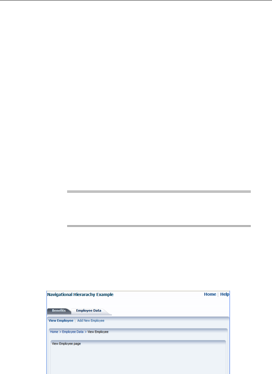
Creating a Simple Navigational Hierarchy
Working with Navigation Components 20-43
Object node = tree.getRowData();
// Get the value of the attribute of the node
Obect propVal = resolver.getValue(node, myProp);
if (propVal == myVal)
{
return node;
}
if (tree.isContainer() && !tree.isContainerEmpty())
{
tree.enterContainer();
node = findNodeByPropertyValue(tree, myVal, myProp);
if (node != null)
return node;
tree.exitContainer();
}guap
}
return null;
}
20.8 Creating a Simple Navigational Hierarchy
Section 20.6, "Using Navigation Items for a Page Hierarchy" describes a simple page
hierarchy with three levels of links under a top-level root node, Home. Figure 20–17
and Figure 20–18 show an example of what the user interface could look like when the
navigationPane component and individual commandNavigationItem
components are used to create a view for the page hierarchy shown in Figure 20–11.
Figure 20–17 Navigation Items Available from the View Employee Page
When you create the hierarchy manually, first determine the focus path of each page
(that is, where exactly in the hierarchy the page resides) in order to determine the exact
number of navigationPane and commandNavigationItem components needed
Note: If the application hierarchy is complex and consists of deeply
nested pages, it is more efficient to use a menu model to create your
navigation system. For details, see Section 20.7, "Using a Menu Model
to Create a Page Hierarchy".
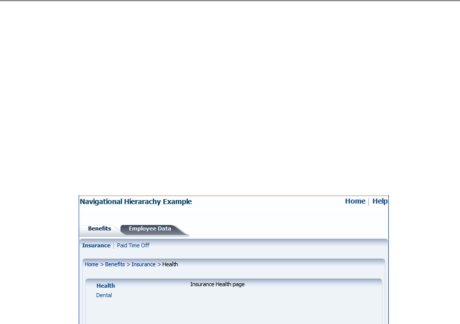
Creating a Simple Navigational Hierarchy
20-44 Web User Interface Developer's Guide for Oracle Application Development Framework
for each page, as well as to determine the components that should be configured as
selected when the user visits the page. For example, in Figure 20–17, which shows the
View Employee page, you would need three navigationPane components. In
addition to the first-level tabs, only the second-level child bars of Employee Data are
needed, and only the Employee Data tab and View Employee bar render as selected.
Similarly in Figure 20–18, which shows the Health page, only the child bars of Benefits
are needed, and the Benefits tab and Insurance bar must be configured as selected.
Additionally for this page, you would create the child nodes under Insurance, which
can be presented as a vertical list on the side of the page. The Health item in the
vertical list is configured as selected, and the contents of the Health page are displayed
in the middle, to the right of the vertical list.
Figure 20–18 Navigation Items Available from the Health Page
Regardless of the type of navigation items you use (such as tabs, bars or lists), you use
a navigationPane component to represent one level of hierarchical links, and a
series of commandNavigationItem child components within each
navigationPane component to provide the actual navigation items. For example, in
Figure 20–18 the actual links for the first-level tabs (Benefits and Employee Data), the
second-level bars (Insurance and Paid Time Off), and the Health and Dental links in
the list are each provided by a commandNavigationItem component. Underneath
the bars, to provide the breadcrumb links that show the focus path of the current page,
you use a breadCrumbs component with the required number of child
commandNavigationItem components.
20.8.1 How to Create a Simple Page Hierarchy
When your navigational hierarchy contains only a few pages and is not very deep, you
can elect to manually create the hierarchy. Doing so involves creating the navigation
rule and navigation cases, using the navigationPane component to create the
hierarchy, and using the commandNavigationItem component to create the links.
Before you begin:
It may help to understand how the attributes of navigation components affect
functionality. For more information, see Section 20.8, "Creating a Simple Navigational
Hierarchy."
You may also find it helpful to understand functionality that can be added using other
ADF Faces features. For more information, see Section 20.1.2, "Additional
Functionality for Navigation Components."

Creating a Simple Navigational Hierarchy
Working with Navigation Components 20-45
To manually create a navigation hierarchy:
1. In the Application Navigator, double-click faces-config.xml. By default, this file is
located in the project’s Web Content/WEB-INF folder.
2. Create one global JSF navigation rule that has the navigation cases for all the
nodes (that is, pages) in the page hierarchy.
For example, the page hierarchy shown in Figure 20–11 has 10 nodes, including
the global Help node. Thus, you would create 10 navigation cases within one
global navigation rule in the faces-config.xml file, as shown in
Example 20–19.
For each navigation case, specify a unique outcome string, and the path to the JSF
page that should be displayed when the navigation system returns an outcome
value that matches the specified string.
Example 20–19 Global Navigation Rule for a Page Hierarchy in faces-config.xml
<navigation-rule>
<navigation-case>
<from-outcome>goHome</from-outcome>
<to-view-id>/home.jspx</to-view-id>
</navigation-case>
<navigation-case>
<from-outcome>goHelp</from-outcome>
<to-view-id>/globalhelp.jspx</to-view-id>
</navigation-case>
<navigation-case>
<from-outcome>goEmp</from-outcome>
<to-view-id>/empdata.jspx</to-view-id>
</navigation-case>
<navigation-case>
<from-outcome>goBene</from-outcome>
<to-view-id>/benefits.jspx</to-view-id>
</navigation-case>
<navigation-case>
<from-outcome>goIns</from-outcome>
<to-view-id>/insurance.jspx</to-view-id>
</navigation-case>
<navigation-case>
<from-outcome>goPto</from-outcome>
<to-view-id>/pto.jspx</to-view-id>
</navigation-case>
<navigation-case>
<from-outcome>goView</from-outcome>
<to-view-id>/viewdata.jspx</to-view-id>
</navigation-case>
<navigation-case>
<from-outcome>goCreate</from-outcome>
<to-view-id>/createemp.jspx</to-view-id>
</navigation-case>
<navigation-case>
<from-outcome>goHealth</from-outcome>
<to-view-id>/health.jspx</to-view-id>
</navigation-case>
<navigation-case>
<from-outcome>goDental</from-outcome>
<to-view-id>/dental.jspx</to-view-id>
</navigation-case>
</navigation-rule>

Creating a Simple Navigational Hierarchy
20-46 Web User Interface Developer's Guide for Oracle Application Development Framework
For more information about creating navigation cases in JDeveloper, see
Section 3.3, "Defining Page Flows".
3. Create the JSF pages for all the hierarchical nodes. If you want the navigation tabs
to be styled, create a decorativeBox component by dragging and dropping a
Decorative Box from the Layout panel of the Component Palette to each page. Set
the theme to determine how you want the tabs to appear. Valid values are:
■default: Body is white with a blue border. Top-left corner is rounded.
■light: Body is light blue. Top-left corner is rounded.
■medium: Body is medium blue. Top-left corner is rounded.
■dark: Body is dark blue. Top-left corner is rounded.
You can change how the themes are displayed. For more information, see
Chapter 28, "Customizing the Appearance Using Styles and Skins". To consider
using a page template to achieve the positioning and visual styling of your JSF
pages, see Section 10.4, "Using Page Templates".
4. Create a navigationPane component by dragging and dropping a Navigation
Pane from the Interactive Containers and Headers group in the Layout panel of
the Component Palette to each page. Drop a navigationPane component for
each level of the hierarchy on the page.
For example, to create the Health page as shown in Figure 20–18, drag and drop
four navigationPane components. In the Health page, the components are
dropped into specific areas of a template that already contains layout components
to create the look and feel of the page.
5. For each navigationPane component, in the Property Inspector, expand the
Common section and set the hint attribute to one of the following types of
navigation items to determine how the navigationPane component will be
displayed:
■bar: Displays the navigation items separated by a bar, for example the
Insurance and Paid Time Off links in Figure 20–18.
■buttons: Displays the navigation items separated by a bar in a global area,
for example the Home and Help links in Figure 20–18.
■choice: Displays the navigation items in a popup list when the associated
dropdown icon is clicked. You must include a value for the navigationPane
component’s icon attribute and you can associate a label to the dropdown list
using title attribute.
■list: Displays the navigation items in a bulleted list, for example the Health
and Dental links in Figure 20–18.
■tabs: Displays the navigation items as tabs, for example the Benefits and
Employee Data tabs in Figure 20–18.
6. For each navigationPane component, add the needed
commandNavigationItem components to represent the different links by
dragging and dropping a Navigation Item from the Interactive Containers and
Headers group in the Layout panel of the Component Palette. Drop a Navigation
Item as a child to the navigationPane component for each link needed.
For example, to create the Health page as shown in Figure 20–18, you would use a
total of eight commandNavigationItem components, two for each
navigationPane component.

Creating a Simple Navigational Hierarchy
Working with Navigation Components 20-47
7. For each commandNavigationItem component, set the navigation to the desired
page. In the Property Inspector, expand the Common section and provide a static
string outcome of an action or use an EL expression to reference an action method
through the action property. If you use a string, it must match the navigation
metadata set up in the navigation rules for the page created in Step 2. If
referencing a method, that method must return the required string.
8. In the Property Inspector, expand the Behavior section and set the selected
attribute. This attribute should be true if the commandNavigationItem
component should be displayed as selected when the page is first rendered, and
false if it should not.
At runtime, when a navigation item is selected by the user, that component’s
selected attribute changes to selected="true" and the appearance changes
to indicate to the user that the item has been selected. For example, in Figure 20–18
the Benefits tab, Insurance bar, and Health list item are shown as selected by a
change in either background color or font style. You do not have to write any code
to show the selected status; the selected attribute on the
commandNavigationItem component for that item takes care of turning on the
selected status when the attribute value is true.
Example 20–20 shows code used to generate the navigation items that are available
when the current page is Health. Because the Health page is accessed from the
Insurance page from the Benefits page, the commandNavigationItem components
for those three links have selected="true".
Example 20–20 Sample Code Using Individual Navigation Items on One Page
<af:navigationPane hint="buttons">
<af:commandNavigationItem text="Home" action="goHome"/>
<af:commandNavigationItem text="Help" action="goHelp"/>
</af:navigationPane>
.
.
.
<af:navigationPane hint="tabs">
<af:commandNavigationItem text="Benefits" action="goBene"
selected="true"/>
<af:commandNavigationItem text="Employee Data" action="goEmp"/>
</af:navigationPane>
.
.
.
<af:navigationPane hint="bar">
<af:commandNavigationItem text="Insurance" action="goIns"
selected="true"/>
<af:commandNavigationItem text="Paid Time Off" action="goPto"/>
Performance Tip: At runtime, when available browser space is less
than the space needed to display the contents in a tab or bar of a
navigation pane, or the contents of the breadcrumb, ADF Faces
automatically displays overflow icons that enable users to select and
navigate to those items that are out of view. The number of child
components within a navigationPane or breadCrumbs
component, and the complexity of the children, will affect the
performance of the items within the overflow. You should set the size
of the navigationPane or breadCrumbs component to avoid
overflow when possible.

Creating a Simple Navigational Hierarchy
20-48 Web User Interface Developer's Guide for Oracle Application Development Framework
</af:navigationPane>
.
.
.
<af:navigationPane hint="list">
<af:commandNavigationItem text="Health" action="goHealth"
selected="true"/>
<af:commandNavigationItem text="Dental" action="goDental"/>
</af:navigationPane>
To change the selected state programmatically, you have to write a backing bean
method to handle an action event. Then reference the method on the
actionListener attribute of the commandNavigationItem components, as shown
in Example 20–21.
Example 20–21 Using actionListener to Change Selected State
JSF Page Code ----->
<af:navigationPane hint="tabs">
<af:commandNavigationItem text="Benefits"
actionListener="#{myBean.navigationItemAction}"
partialSubmit="true"../>
.
</af:navigationPane>
Managed Bean Code ----->
public void navigationItemAction(ActionEvent event)
{
UIComponent actionItem = event.getComponent();
UIComponent parent = actionItem.getParent();
while (! (parent instanceof UIXNavigationHierarchy) )
{
parent = parent.getParent();
if (parent == null)
{
System.err.println(
"Unexpected component hierarchy, no UIXNavigationHierarchy found.");
return;
}
}
List<UIComponent> children = parent.getChildren();
for (UIComponent child : children)
{
FacesBean childFacesBean = ((UIXComponent) child).getFacesBean();
FacesBean.Type type = childFacesBean.getType();
PropertyKey selectedKey = type.findKey("selected");
if (selectedKey != null)
{
childFacesBean.setProperty(selectedKey, child==actionItem);
}
}
RequestContext adfContext = RequestContext.getCurrentInstance();
adfContext.addPartialTarget(parent);
}
20.8.2 How to Use the breadCrumbs Component
In both Figure 20–17 and Figure 20–18, the user’s current position in the page
hierarchy is indicated by a path of links from the current page back to the root page.

Creating a Simple Navigational Hierarchy
Working with Navigation Components 20-49
The path of links, also known as breadcrumbs, is displayed beneath the secondary bars,
above the vertical lists (if any). To manually create such a path of links, you use the
breadCrumbs component with a series of commandNavigationItem components
as children.
Before you begin:
It may help to understand how the attributes of navigation components affect
functionality. For more information, see Section 20.8, "Creating a Simple Navigational
Hierarchy."
You may also find it helpful to understand functionality that can be added using other
ADF Faces features. For more information, see Section 20.1.2, "Additional
Functionality for Navigation Components."
To manually create a breadcrumb:
1. Create a breadCrumbs component by dragging and dropping a BreadCrumbs
from the Location group in the General Controls panel of the Component Palette
to the JSF page.
2. By default, breadcrumb links are displayed in a horizontal line. To change the
layout to be vertical, in the Property Inspector, expand the Common section and
set the orientation attribute to vertical.
3. For each link in the breadcrumb, create a commandNavigationItem component
by dragging and dropping a Navigation Item from the Interactive Containers and
Headers group in the Layout panel of the Component Palette as a child to the
breadCrumbs component. The last item should represent the current page.
4. For each commandNavigationItem component (except the last), set the
navigation to the desired page. In the Property Inspector, expand the Common
section and provide a static string outcome of an action or use an EL expression to
reference an action method through the action property. If you use a string, it
must match the navigation metadata set up in the navigation rule for the page
created in Step 2. If referencing a method, that method must return the required
string.
For example, to create the breadcrumb as shown on the Health page in Figure 20–18,
drag and drop four commandNavigationItem components, as shown in
Example 20–22.
Example 20–22 BreadCrumbs Component With Individual CommandNavigationItem
Children
<af:breadCrumbs>
<af:commandNavigationItem text="Home" action="goHome"/>
<af:commandNavigationItem text="Benefits" action="goBene"/>
<af:commandNavigationItem text="Insurance" action="goIns"/>
<af:commandNavigationItem text="Health"/>
</af:breadCrumbs>
Tip: Depending on the renderer or client device type, the last link in
the breadcrumb may not be displayed, but you still must add the
commandNavigationItem component for it. On clients that do
display the last breadcrumb link, the link is always disabled
automatically because it corresponds to the current page.

Creating a Simple Navigational Hierarchy
20-50 Web User Interface Developer's Guide for Oracle Application Development Framework
20.8.3 What You May Need to Know About Removing Navigation Tabs
You can configure a navigationPane component whose hint attribute value is
tabs so that the individual tabs can be closed. You can set it such that all tabs can be
closed, all but the last tab can be closed, or no tabs can be closed. When navigation
tabs are configured to be removed, a close icon (for example, an X) is displayed at the
end of each tab as the mouse cursor hovers over the tab.
To enable tabs removal in a navigationPane component when hint="tabs", you
need to do the following:
■Set the itemRemoval attribute on navigationPane hint="tabs" to all or
allExceptLast. When set to allExceptLast, all but one tab can be closed.
This means as a user closes tabs, when there is only one tab left, that single last tab
cannot be closed.
■Implement a handler to do the tab removal. When a user closes a tab, an
ItemEvent of type remove is launched. Your code must handle this event and
the actual removal of the tab, and any other desired functionality (for example,
show a warning dialog or how to handle child components). For more information
about events, see Chapter 6, "Handling Events." For information about using
popup dialogs and windows, see Chapter 15, "Using Popup Dialogs, Menus, and
Windows."
■Set the itemListener attribute on the commandNavigationItem component
to an EL expression that resolves to the handler method that will handle the actual
tab removal, as shown in Example 20–23.
Example 20–23 Using itemListener to Remove a Tab Item
JSF Page Code ----->
<af:navigationPane hint="tabs" itemRemoval="all">
<af:commandNavigationItem text="Benefits" partialSubmit="true"
itemListener="#{closebean.handleCloseTabItem}"/>
.
.
.
</af:navigationPane>
Managed Bean Code ----->
import oracle.adf.view.rich.event.ItemEvent;
...
public void handleCloseTabItem(ItemEvent itemEvent)
{
if (itemEvent.getType().equals(ItemEvent.Type.remove))
{
Object item = itemEvent.getSource();
if (item instanceof RichCommandNavigationItem)
{
RichCommandNavigationItem tabItem = (RichCommandNavigationItem) item;
tabItem.setVisible(false);
// do other desired functionality here ...
}
}
}
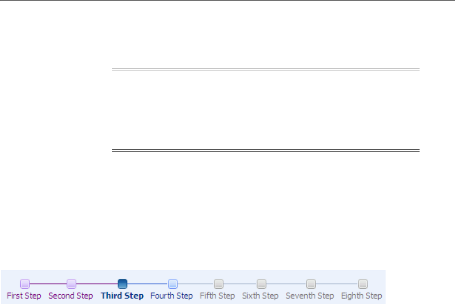
Using Train Components to Create Navigation Items for a Multistep Process
Working with Navigation Components 20-51
20.9 Using Train Components to Create Navigation Items for a Multistep
Process
If you have a set of pages that users should visit in a particular order, consider using
the train component on each page to display a series of navigation items that guide
users through the multistep process. Figure 20–19 shows an example of what a
rendered train component looks like on a page. Not only does a train component
display the number of steps in a multistep process, it also indicates the location of the
current step in relation to the entire process.
Figure 20–19 Navigation Items Rendered by a train Component
The train component renders each configured step represented as a train stop, and
with all the stops connected by lines. Each train stop has an image (for example, a
square block) with a label underneath the image.
Each train stop corresponds to one step or one page in your multistep process. Users
navigate the train stops by clicking an image or label, which causes a new page to
display. Typically, train stops must be visited in sequence, that is, a user must start at
step 1, move to step 2, then step 3, and so on; a user cannot jump to step 3 if the user
has not visited step 2. Train stops can also be configured so that end users do not have
to visit the stops in sequence. When you configure train stops in this way, all train
stops that can be directly visited are enabled.
As shown in Figure 20–19, the train component provides at least four styles for train
stops. The current stop where the user is visiting is indicated by a bold font style in the
train stop’s label, and a different image for the stop; visited stops before the current
stop are indicated by a different label font color and image color; the next stop
immediately after the current stop appears enabled; any other stops that have not been
visited are grayed-out.
A train stop can include a subtrain, that is, you configure a command component (for
example, a commandButton component) to start a child multistep process from a
parent stop, and then return to the correct parent stop after completing the subprocess.
Suppose stop number 3 has a subprocess train containing two stops, when the user
navigates into the first stop in the subprocess train, ADF Faces displays an icon
representation of the parent train before and after the subprocess train, as shown in
Figure 20–20.
Note: If your application uses the Fusion technology stack or the
ADF Controller, then you should use ADF task flows to create the
navigation system for your application page hierarchy. For details, see
the "Using Train Components in Bounded Task Flows" section of the
Oracle Fusion Middleware Fusion Developer's Guide for Oracle Application
Development Framework.
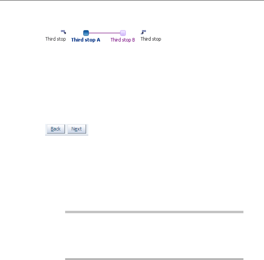
Using Train Components to Create Navigation Items for a Multistep Process
20-52 Web User Interface Developer's Guide for Oracle Application Development Framework
Figure 20–20 Parent Train Icons At Start and End of a Subtrain
You can use the trainButtonBar component in conjunction with the train
component to provide additional navigation items for the train, in the form of Back
and Next buttons, as shown in Figure 20–21. These Back and Next buttons allow users
to navigate only to the next or previous train stop from the current stop. You can also
use the trainButtonBar component without a train component. For example, you
may want to display just the Back and Next buttons without displaying the stops
when not all of the stops will be visited based on some conditional logic.
Figure 20–21 Navigation Buttons Rendered by a trainButtonBar Component
Both train components work by having the value attribute bound to a train model of
type org.apache.myfaces.trinidad.model.MenuModel. The train menu model
contains the information needed to:
■Control a specific train behavior (that is, how the train advances users through the
train stops to complete the multistep process).
■Dynamically generate the train stops, including the train stop labels, and the status
of each stop (that is, whether a stop is currently selected, visited, unvisited, or
disabled).
Briefly, a menu model for the train is implemented by extending the MenuModel
abstract class, which in turn extends the TreeModel class (for more information, see
Chapter 12, "Using Tables and Trees"). A MenuModel object represents the menu
structure of a page or application or could represent the hierarchy of pages and stops
involved in a flow.
Because an instance of a MenuModel class is a special kind of a TreeModel object, the
nodes in the TreeModel object can represent the stops of a train. The node instance
that represents a train stop within the train component can be of type
TrainStopModel, or it can be any object as long as it provides the same EL structure
as a TrainStopModel object. However, the TrainStopModel class is a convenient
interface that exposes all the relevant methods to retrieve the outcome, as well as the
label of a stop and its immediate, disabled, and visited attribute states.
The MenuModel class can also indicate where in the tree the current train stop (page)
is focused. The getFocusRowKey() method in the MenuModel class returns the
rowKey object of the focus page for the current viewId. The menu model
implementation for the train must also have a specific train behavior. You can
implement this behavior by extending the MenuModel abstract class or the
Note: In an application that uses the ADF Model layer and ADF
Controller, this navigation and display is set up and handled in a
different manner. For more information, see the "Using Train
Components in Bounded Task Flows" section of the Oracle Fusion
Middleware Fusion Developer's Guide for Oracle Application Development
Framework.

Using Train Components to Create Navigation Items for a Multistep Process
Working with Navigation Components 20-53
ProcessMenuModel convenience class. Both these classes come from the following
package:
org.apache.myfaces.trinidad.model
The train behavior controls what other stops along the train users can visit while
visiting the current train stop.
To create a train stop model, you can either extend the TrainStopModel abstract
class and implement the abstract methods, or you can create your own class with the
same method signatures. Your class must return a rowData object. An instance of this
class represents a rowData object in the underlying collection (for the MenuModel
implementation).
Binding a train component to a menu model is similar to binding a navigationPane
component to an XMLMenuModel class using the value attribute (described in
Section 20.7.3, "How to Bind the navigationPane Component to the Menu Model").
However, as long as your TrainStopModel implementation represents a rowData
object, you do not need to use the nodeStamp facet and its
commandNavigationItem component to provide the train stops. At runtime
ADF Faces dynamically creates the nodeStamp facet and commandNavigationItem
component, and automatically binds the methods in the train stop model to the
appropriate properties on the commandNavigationItem component. Example 20–24
shows the simplified binding for a train.
Example 20–24 Simplified Train Model Binding
<af:train value="#{simpleTrainModel}"/>
The MenuModel implementation of your train model must provide specific train
behavior. Train behavior defines how you want to control the pages users can access
based on the page they are currently visiting. ADF Faces supports two train behaviors:
Plus One and Max Visited.
Suppose there are 5 pages or stops in a train, and the user has navigated from page 1
to page 4 sequentially. Currently the user is at page 4. Where the user can go next
depends on which train behavior the train model implements:
■Plus One behavior: the user can go to page 3 or page 5
■Max Visited behavior: the user can visit pages 1 to 3 (previously visited) and page
5 because it is the next page in the sequence. If the user goes to page 2, the next
page that the user can visit is page 1, 3 or 4. The user cannot visit page 5 because
page 4 was the maximum visited train stop in the sequence.
To define and use a train for all pages in a multistep process:
■Create a JSF navigation rule and the navigation cases for the train. Creating a
navigation rule and its navigation cases for a train is similar to Section 20.8.1,
"How to Create a Simple Page Hierarchy", where you create one global navigation
rule that has the navigation cases for all the train stops in the train.
Tip: If you need to collate information for the train stops from
various places, then you will need to manually create the nodeStamp
facet and the individual commandNavigationItem components that
represent the train stops. For more information, see Section 20.9.3,
"How to Bind to the Train Model in JSF Pages".
Using Train Components to Create Navigation Items for a Multistep Process
20-54 Web User Interface Developer's Guide for Oracle Application Development Framework
■Create a train model that implements a specific train behavior and provides the
train stop items for stamping. This includes creating a train stop model class and a
menu model class. See Section 20.9.1, "How to Create the Train Model".
■Configure managed beans for the train model. See Section 20.9.2, "How to
Configure Managed Beans for the Train Model".
■Create a JSF page for each train stop.
■On each page, bind the train component to the train model. See Section 20.9.3,
"How to Bind to the Train Model in JSF Pages". Optionally, bind the
trainButtonBar component to the same train model, if you want to provide
additional navigation buttons for the train.
20.9.1 How to Create the Train Model
To define a train menu model, you create:
■A train stop model that provides data for rendering a train stop.
■A MenuModel implementation with a specific train behavior (like Max Visited or
Plus One) that controls what stops along the train users can visit while visiting at a
current train stop, which stops should be disabled or whether the train needs to be
navigated sequentially or not, among other things.
ADF Faces makes it easier for you to define a train menu model by providing
additional public classes, such as:
■The abstract class TrainStopModel for implementing a train stop model
■The classes ProcessMenuModel and ProcessUtils that implement the Max
Visited and Plus One behaviors
Users can either implement their own custom train behavior by overriding
MenuModel or extend the existing ProcessMenuModel to provide specialized
behavior.
For examples of train model classes, see the oracle.adfdemo.view.nav.rich
package of the ADF Faces Demonstration application.
Before you begin:
It may help to understand how a train component’s attributes affect functionality. For
more information, see Section 20.9, "Using Train Components to Create Navigation
Items for a Multistep Process."
You may also find it helpful to understand functionality that can be added using other
ADF Faces features. For more information, see Section 20.1.2, "Additional
Functionality for Navigation Components."
Note: You may want to set the value of the redirect element to
true for each navigation case that you define within the JSF
navigation rule if each train stop is an individual page and you want
the client browser’s URL to reference each new page. If you enable
partial page rendering, the displayed URL may be different. For more
information about the redirect element, see the JavaServer Faces
specification. For more information about partial page rendering, see
Chapter 8, "Rerendering Partial Page Content".

Using Train Components to Create Navigation Items for a Multistep Process
Working with Navigation Components 20-55
To create the train model:
1. Create a train stop model class. A train stop model object holds the row data for
stamping each train stop. The train stop model implementation you create should
set and get the properties for each stop in the train, and define the methods
required to render a train stop. The properties of a train stop correspond to the
properties of the commandNavigationItem component. This will allow you to
use the simplified binding, as shown in Example 20–24.
Alternatively, you can extend the abstract class TrainStopModel, and implement
the abstract methods in the subclass.
The properties on the commandNavigationItem component that will be
automatically EL bound are:
■action: A static action outcome or a reference to an action method that
returns an action outcome. The outcome is used for page navigation through
the default ActionListener mechanism in JSF.
■disabled: A boolean value that indicates whether or not the train stop
should be non-interactive. Note that the train behavior you elect to use affects
the value of this property. For more information, see Step 2.
■immediate: A boolean value that determines whether or not data validations
should be performed. Note that the train behavior you elect to use affects the
value of this property. For more information, see Step 2.
■messageType: A value that specifies a message alert icon over the train stop
image. Possible values are none, error, warning, and info, and complete.
For more information about messages, see Chapter 19, "Displaying Tips,
Messages, and Help".
■shortDesc: A value that is commonly used by client user agents to display as
tooltip help text for the train stop.
■showRequired: A boolean value that determines whether or not to display
an asterisk next to the train stop to indicate that required values are contained
in that train stop page.
■textAndAccessKey: A single value that sets both the label text to display for
the train stop, as well as the access key to use.
■visited: A boolean value that indicates whether or not the train stop has
already been visited. Note that the train behavior you elect to use affects the
value of this property. For more information, see Step 2.
2. Create a class based on the MenuModel class to facilitate the construction of a train
model.
The MenuModel implementation of your train model must have a specific train
behavior. The ProcessMenuModel class in the
org.apache.myfaces.trinidad.model package is a reference
implementation of the MenuModel class that supports the two train behaviors:
Plus One and Max Visited. To implement a train behavior for a train model, you
can either extend the ProcessMenuModel class, or create your own.
In your train model class, you override the getFocusRowKey() method (see the
MenuModel class) and implement a train behavior (see the ProcessMenuModel
and ProcessUtils classes).
The train behaviors provided in the ProcessMenuModel class have an effect on
the visited, immediate, and disabled properties of the
commandNavigationItem component.

Using Train Components to Create Navigation Items for a Multistep Process
20-56 Web User Interface Developer's Guide for Oracle Application Development Framework
The visited attribute is set to true only if that page in the train has been visited.
The ProcessMenuModel class uses the following logic to determine the value of
the visited attribute:
■Max Visited: A max visited stop is the farthest stop the user has visited in the
current session. visited is set to true for any stop if it is before a max
visited stop, or if it is the max visited stop itself.
■Plus One: A plus one stop does not keep track of the farthest stop that was
visited. The visited attribute is set to true for the current stop, or a stop
that is before the current stop.
When the data on the current page does not have to be validated, the immediate
attribute should be set to true. Suppose page 4 in the Plus One behavior
described earlier has data that must be validated. If the user has advanced to page
4 and then goes back to page 2, the user has to come back to page 4 again later to
proceed on to page 5. This means the data on page 4 does not have to be validated
when going back to page 1, 2, or 3 from page 4, but the data should be validated
when going ahead to page 5. For more information about how the immediate
attribute works, see Section 5.2, "Using the Immediate Attribute".
The ProcessMenuModel class uses the following logic to determine the value of
the immediate attribute:
■Plus One: The immediate attribute is set to true for any previous step, and
false otherwise.
■Max Visited: When the current page and the maximum page visited are the
same, the behavior is the same as the Plus One scenario. If the current page is
before the maximum page visited, then the immediate attribute is set to
false.
The disabled attribute is set to true only if that page in the train cannot be
reached from the current page. The ProcessMenuModel class uses the following
logic to determine the value of the disabled attribute:
■Plus One: The disabled attribute will be true for any page beyond the next
available page.
■Max Visited: When the current stop and the maximum page visited are the
same, the behavior is the same as the Plus One behavior. If the current page is
before the maximum page visited, then disabled is set to true for any page
beyond the maximum page visited.
By default, ADF Faces uses the Max Visited behavior when a non-null maxPathKey
value is passed into the train model, as determined by the managed bean you will
create to support the behavior (for more information, see Section 20.9.2, "How to
Configure Managed Beans for the Train Model"). If the maxPathKey value is null,
then ADF Faces uses the Plus One behavior.
Note: In an application that uses the ADF Model layer, the
pageDefinition element in a page definition file supports an
attribute (SkipValidation) that, when set to true, skips data
validation for the page. Set SkipValidation to true if you want
users to navigate from the page without invoking data validation. For
more information, see the "pageNamePageDef.xml" section in the
Oracle Fusion Middleware Fusion Developer's Guide for Oracle Application
Development Framework.

Using Train Components to Create Navigation Items for a Multistep Process
Working with Navigation Components 20-57
20.9.2 How to Configure Managed Beans for the Train Model
You use managed beans in a train model to gather the individual train stops into an
Arraylist object, which is turned into the tree model that is then injected into a
menu model to bind to the value attribute of the train component. You must
instantiate the beans with the proper values for injection into the models, and you also
have to configure a managed bean for each train stop or page in the train.
Before you begin:
It may help to understand how a train component’s attributes affect functionality. For
more information, see Section 20.9, "Using Train Components to Create Navigation
Items for a Multistep Process."
You may also find it helpful to understand functionality that can be added using other
ADF Faces features. For more information, see Section 20.1.2, "Additional
Functionality for Navigation Components."
To configure managed beans for the train model:
1. Configure a managed bean for each stop in the train, with values for the properties
that require setting at instantiation, to create the train stops to pass into an
ArrayList.
If a train stop has subprocess train children, there should be a managed bean for
each subprocess train stop as well.
Each bean should be an instance of the train stop model class created in
Section 20.9.1, "How to Create the Train Model". Example 20–25 shows sample
managed bean code for train stops in the faces-config.xml file.
Example 20–25 Managed Beans for All Train Stops
<!-- First train stop -->
<managed-bean>
<managed-bean-name>train1</managed-bean-name>
<managed-bean-class>project1.DemoTrainStopModel</managed-bean-class>
<managed-bean-scope>none</managed-bean-scope>
<managed-property>
<property-name>viewId</property-name>
<value>/train.jspx</value>
</managed-property>
<managed-property>
<property-name>outcome</property-name>
<value>guide.train</value>
</managed-property>
<managed-property>
<property-name>label</property-name>
<value>First Step</value>
</managed-property>
<managed-property>
<property-name>model</property-name>
<value>trainMenuModel</value>
</managed-property>
</managed-bean>
<!-- Second train stop -->
<managed-bean>
<managed-bean-name>train2</managed-bean-name>
<managed-bean-class>project1.DemoTrainStopModel</managed-bean-class>
<managed-bean-scope>none</managed-bean-scope>

Using Train Components to Create Navigation Items for a Multistep Process
20-58 Web User Interface Developer's Guide for Oracle Application Development Framework
<managed-property>
<property-name>viewId</property-name>
<value>/train2.jspx</value>
</managed-property>
<managed-property>
<property-name>outcome</property-name>
<value>guide.train2</value>
</managed-property>
<managed-property>
<property-name>label</property-name>
<value>Second Step</value>
</managed-property>
<managed-property>
<property-name>model</property-name>
<value>trainMenuModel</value>
</managed-property>
</managed-bean>
<!-- And so on -->
.
.
.
The managed properties set the values to the train stop model object (the class
created in Step 1 in Section 20.9.1, "How to Create the Train Model").
The viewId value is the path and file name to the page that is navigated to when
the user clicks a train stop.
The outcome property value is the action outcome string that matches a JSF
navigation case. The default JSF ActionListener mechanism is used to choose
the page associated with the train stop as the view to navigate to when the train
stop is selected.
The label property value is the train stop label text that displays beneath the
train stop image. The value can be static or an EL expression that evaluates to a
string in a resource bundle.
The model property value is the managed bean name of the train model (see
Example 20–29).
If a train stop has subprocess train children, the managed bean configuration
should also include the property (for example, children) that lists the managed
bean names of the subprocess train stops in value expressions (for example,
#{train4a}), as shown in Example 20–26.
Example 20–26 Managed Bean for a Train Stop with Subprocess train Children
<managed-bean>
<managed-bean-name>train4</managed-bean-name>
<managed-bean-class>project1.DemoTrainStopModel</managed-bean-class>
<managed-bean-scope>none</managed-bean-scope>
<managed-property>
<property-name>viewId</property-name>
<value>/train4.jspx</value>
</managed-property>
<managed-property>
<property-name>outcome</property-name>
<value>guide.train4</value>
</managed-property>
<managed-property>

Using Train Components to Create Navigation Items for a Multistep Process
Working with Navigation Components 20-59
<property-name>label</property-name>
<value>Fourth Step</value>
</managed-property>
<managed-property>
<property-name>children</property-name>
<list-entries>
<value-class>project1.DemoTrainStopModel</value-class>
<value>#{train4a}</value>
<value>#{train4b}</value>
<value>#{train4c}</value>
</list-entries>
</managed-property>
<managed-property>
<property-name>model</property-name>
<value>trainMenuModel</value>
</managed-property>
</managed-bean>
2. Configure a managed bean that is an instance of an ArrayList object to create
the list of train stops to pass into the train tree model.
Example 20–27 shows sample managed bean code for creating the train stop list.
Example 20–27 Managed Bean for Train List
<managed-bean>
<managed-bean-name>trainList</managed-bean-name>
<managed-bean-class>
java.util.ArrayList
</managed-bean-class>
<managed-bean-scope>
none
</managed-bean-scope>
<list-entries>
<value-class>project1.DemoTrainStopModel</value-class>
<value>#{train1}</value>
<value>#{train2}</value>
<value>#{train3}</value>
<value>#{train4}</value>
<value>#{train5}</value>
</list-entries>
</managed-bean>
The list-entries element contains the managed bean names for the train stops
(excluding subprocess train stops) in value expressions (for example,
#{train1}), listed in the order that the stops should appear on the train.
3. Configure a managed bean to create the train tree model from the train list.
The train tree model wraps the entire train list, including any subprocess train
lists. The train model managed bean should be instantiated with a
childProperty value that is the same as the property name that represents the
list of subprocess train children (see Example 20–26).
Example 20–28 Managed Bean for Train Tree Model
<managed-bean>
<managed-bean-name>trainTree</managed-bean-name>
<managed-bean-class>
org.apache.myfaces.trinidad.model.ChildPropertyTreeModel
</managed-bean-class>

Using Train Components to Create Navigation Items for a Multistep Process
20-60 Web User Interface Developer's Guide for Oracle Application Development Framework
<managed-bean-scope>none</managed-bean-scope>
<managed-property>
<property-name>childProperty</property-name>
<value>children</value>
</managed-property>
<managed-property>
<property-name>wrappedData</property-name>
<value>#{trainList}</value>
</managed-property>
</managed-bean>
The childProperty property defines the property name to use to get the child
list entries of each train stop that has a subprocess train.
The wrappedData property value is the train list instance to wrap, created by the
managed bean in Step 2.
4. Configure a managed bean to create the train model from the train tree model.
This is the bean to which the train component on each page is bound. The train
model wraps the train tree model. The train model managed bean should be
instantiated with a viewIdProperty value that is the same as the property name
that represents the pages associated with the train stops.
Example 20–29 shows sample managed bean code for a train model.
Example 20–29 Managed Bean for Train Model
<managed-bean>
<managed-bean-name>trainMenuModel</managed-bean-name>
<managed-bean-class>
org.apache.myfaces.trinidad.model.ProcessMenuModel
</managed-bean-class>
<managed-bean-scope>session</managed-bean-scope>
<managed-property>
<property-name>viewIdProperty</property-name>
<value>viewId</value>
</managed-property>
<managed-property>
<property-name>wrappedData</property-name>
<value>#{trainTree}</value>
</managed-property>
<!-- to enable plusOne behavior instead, comment out the maxPathKey property -->
<managed-property>
<property-name>maxPathKey</property-name>
<value>TRAIN_DEMO_MAX_PATH_KEY</value>
</managed-property>
</managed-bean>
The viewIdProperty property value is set to the property that is used to specify
the page to navigate to when the user clicks the train stop.
The wrappedData property value is the train tree instance to wrap, created by the
managed bean in Step 3.
The maxPathKey property value is the value to pass into the train model for using
the Max Visited train behavior. ADF Faces uses the Max Visited behavior when a
non-null maxPathKey value is passed into the train model. If the maxPathKey
value is null, then ADF Faces uses the Plus One behavior.

Using Train Components to Create Navigation Items for a Multistep Process
Working with Navigation Components 20-61
20.9.3 How to Bind to the Train Model in JSF Pages
Each stop in the train corresponds to one JSF page. On each page, you use one train
component and optionally a trainButtonBar component to provide buttons that
allow the user to navigate through the train.
Before you begin:
It may help to understand how a train component’s attributes affect functionality. For
more information, see Section 20.9, "Using Train Components to Create Navigation
Items for a Multistep Process."
You may also find it helpful to understand functionality that can be added using other
ADF Faces features. For more information, see Section 20.1.2, "Additional
Functionality for Navigation Components."
To bind the train component to the train model:
1. Create a train component by dragging and dropping a Tr a i n from the Location
group in the General Controls panel of the Component Palette to the JSF page.
Optionally drag and drop a Train Button Bar.
2. Bind the component. If your MenuModel implementation for a train model returns
a rowData object similar to the public abstract class
oracle.adf.view.rich.model.TrainStopModel, you can use the
simplified form of train binding in the train components, as shown in the
following code:
<af:train value="#{trainMenuModel}"/>
<af:trainButtonBar value="#{trainMenuModel}"/>
The trainMenuModel EL expression is the managed bean name for the train model
(see Example 20–29).
If you cannot use the simplified binding, you must bind the train value to the train
model bean, manually add the nodeStamp facet to the train, and to that, add a
commandNavigationItem component, as shown in Example 20–30.
Example 20–30
<af:train value="#{aTrainMenuModel}" var="stop">
<f:facet name="nodeStamp">
<af:commandNavigationItem
text="#{stop.label}"
action="#{stop.outcome}"
.
.
.
</af:commandNavigationItem>
</f:facet>
</af:train>

Using Train Components to Create Navigation Items for a Multistep Process
20-62 Web User Interface Developer's Guide for Oracle Application Development Framework

Part V
Part V Using ADF Data Visualization
Components
Part V contains the following chapters:
■Chapter 21, "Introduction to ADF Data Visualization Components"
■Chapter 22, "Using Graph Components"
■Chapter 23, "Using Gauge Components"
■Chapter 24, "Using Pivot Table Components"
■Chapter 25, "Using Map Components"
■Chapter 26, "Using Gantt Chart Components"
■Chapter 27, "Using Hierarchy Viewer Components"

21
Introduction to ADF Data Visualization Components 21-1
21Introduction to ADF Data Visualization
Components
This chapter describes the ADF Data Visualization components, an expressive set of
interactive ADF Faces components. The functionality shared across the components
and with other ADF Faces components is also highlighted. The remaining chapters in
this part of the guide provide detailed information about how to create and customize
each component.
This chapter includes the following sections:
■Section 21.1, "About ADF Data Visualization Components"
■Section 21.2, "Common Functionality in Data Visualization Components"
■Section 21.3, "Providing Data for ADF Data Visualization Components"
21.1 About ADF Data Visualization Components
The ADF data visualization components provide significant graphical and tabular
capabilities for displaying and analyzing data. These components provide the
following common features:
■They are full ADF Faces components that support the use of ADF data controls.
■They provide for declarative design time creation using the Data Controls Panel,
the JSF visual editor, Property Inspector, and Component Palette.
■Each component offers live data preview during design. This feature is especially
useful to let you see the effect of your design as it progresses without having to
compile and run a page.
Data visualization components include: graph, gauge, pivot table, geographic map,
thematic map, Gantt charts, and hierarchy viewer.
The prefix dvt: occurs at the beginning of each gauge component name indicating
that the component belongs to the ADF Data Visualization Tools (DVT) tag library.
21.1.1 Graph Component Use Cases and Examples
The graph component gives you the capability of producing more than 50 types of
graphs, including a variety of bar graphs, pie graphs, line graphs, scatter graphs, and
stock graphs. This component lets you evaluate multiple data points on multiple axes
in many ways. For example, a number of graphs assist you in the comparison of
results from one group against the results from another group.
The following kinds of graphs can be produced by the graph component:

About ADF Data Visualization Components
21-2 Web User Interface Developer's Guide for Oracle Application Development Framework
■Area graph (areaGraph): Creates a graph in which data is represented as a
filled-in area. Use area graphs to show trends over time, such as sales for the last
12 months. Area graphs require at least two groups of data along an axis. The axis
is often labeled with increments of time such as months.
■Bar graph (barGraph): Creates a graph in which data is represented as a series of
vertical bars. Use to examine trends over time or to compare items at the same
time, such as sales for different product divisions in several regions.
■Bar (horizontal) graph (horizontalBarGraph): Creates a graph that displays
bars horizontally along the Y-axis. Use to provide an orientation that allows you to
show trends or compare values.
■Bubble graph (bubbleGraph): Creates a graph in which data is represented by
the location and size of round data markers (bubbles). Use to show correlations
among three types of values, especially when you have a number of data items
and you want to see the general relationships. For example, use a bubble graph to
plot salaries (X-axis), years of experience (Y-axis), and productivity (size of bubble)
for your work force. Such a graph allows you to examine productivity relative to
salary and experience.
■Combination graph (comboGraph): Creates a graph that uses different types of
data markers (bars, lines, or areas) to display different kinds of data items. Use to
compare bars and lines, bars and areas, lines and areas, or all three.
■Funnel graph (funnelGraph): Creates a graph that is a visual representation of
data related to steps in a process. The steps appear as vertical slices across a
horizontal cylinder. As the actual value for a given step or slice approaches the
quota for that slice, the slice fills. Typically a funnel graph requires actual values
and target values against a stage value, which might be time. For example, use this
component to watch a process (such as a sales pipeline) move towards a target
across the stage of the quarters of a fiscal year.
■Line graph (lineGraph): Creates a graph in which data is represented as a line, as
a series of data points, or as data points that are connected by a line. Line graphs
require data for at least two points for each member in a group. For example, a
line graph over months requires at least two months. Typically a line of a specific
color is associated with each group of data such as Americas, Europe, and Asia.
Use to compare items over the same time.
■Pareto graph (paretoGraph): Creates a graph in which data is represented by
bars and a percentage line that indicates the cumulative percentage of bars. Each
set of bars identifies different sources of defects, such as the cause of a traffic
accident. The bars are arranged by value, from the largest number to the lowest
number of incidents. A Pareto graph is always a dual-Y graph in which the first
Y-axis corresponds to values that the bars represent and the second Y-axis runs
from 0 to 100% and corresponds to the cumulative percentage values. Use the
Pareto graph to identify and compare the sources of defects.
■Pie graph (pieGraph): Creates a graph in which one group of data is represented
as sections of a circle causing the circle to look like a sliced pie. Use to show the
relationship of parts to a whole such as how much revenue comes from each
product line.
■Radar graph (radarGraph): Creates a graph that appears as a circular line graph.
Use to show patterns that occur in cycles, such as monthly sales for the last three
years.
■Scatter/polar graph (scatterGraph): Creates a graph in which data is
represented by the location of data markers. Use to show correlation between two
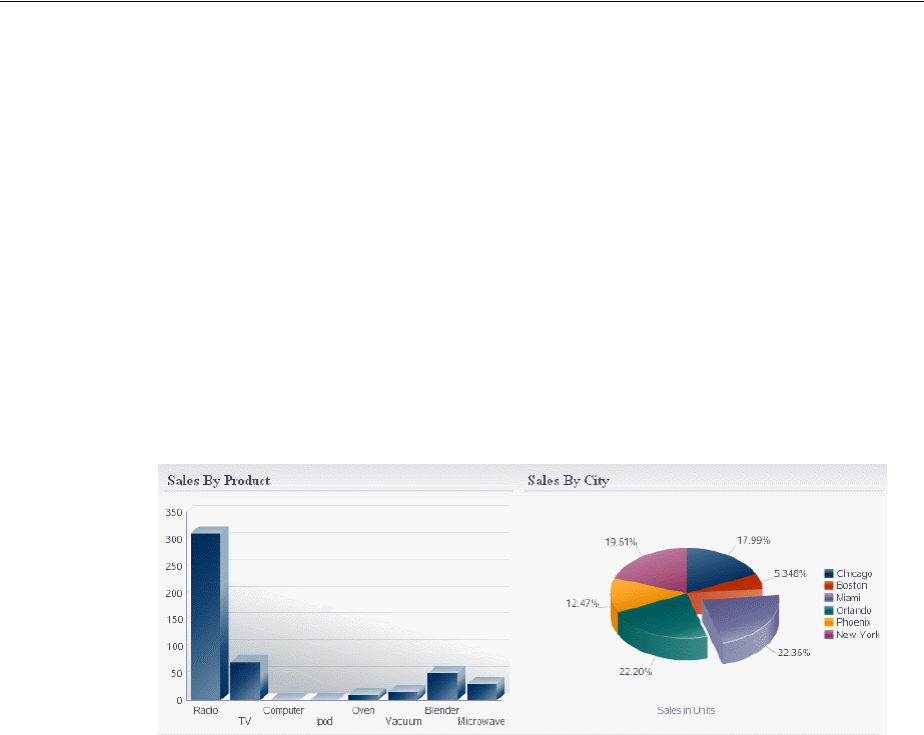
About ADF Data Visualization Components
Introduction to ADF Data Visualization Components 21-3
different kinds of data values such as sales and costs for top products. Scatter
graphs are especially useful when you want to see general relationships among a
number of items.
■Sparkchart (sparkChart): Creates a simple, condensed graph that displays
trends or variations, often in the column of a table or inline with text. Sparkcharts
are simple in design, with limited features and formatting options, showing as
much data as possible.
■Stock graph (stockGraph): Creates a graph in which data shows the high, low,
and closing prices of a stock. Each stock marker displays three separate values.
Figure 21–1 show an application dashboard that illustrates:
■bar graph
■pie graph with exploded slice
Figure 21–1 Dashboard with Bar Graph and Pie Graph
Figure 21–2 shows an application dashboard that illustrates, clockwise from top left:
■curved line graph with time selector window
■pie graph with 3D effect and an exploded slice
■bar graph with 3D effect
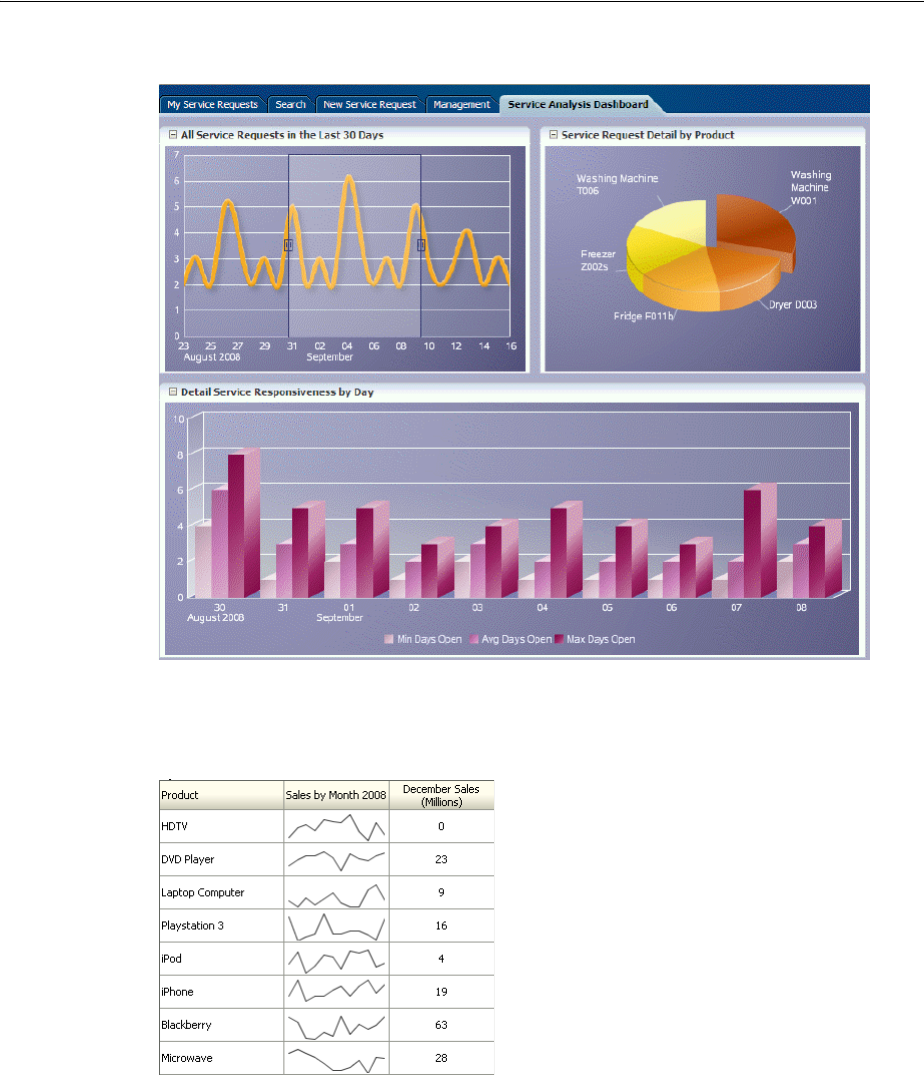
About ADF Data Visualization Components
21-4 Web User Interface Developer's Guide for Oracle Application Development Framework
Figure 21–2 Dashboard with Line, Pie, and Bar Graphs
Figure 21–3 shows a line sparkchart displaying sales trends in a table column.
Figure 21–3 Sparkchart of Sales Trends
For more information including additional use cases and examples, see Chapter 22,
"Using Graph Components."
21.1.2 Gauge Component Use Cases and Examples
The gauge (gauge) component renders graphical representations of data. Unlike the
graph, a gauge focuses on a single data point and examines that point relative to
minimum, maximum, and threshold indicators to identify problem areas.
One gauge component can create a single gauge or a set of gauges depending on the
data provided.
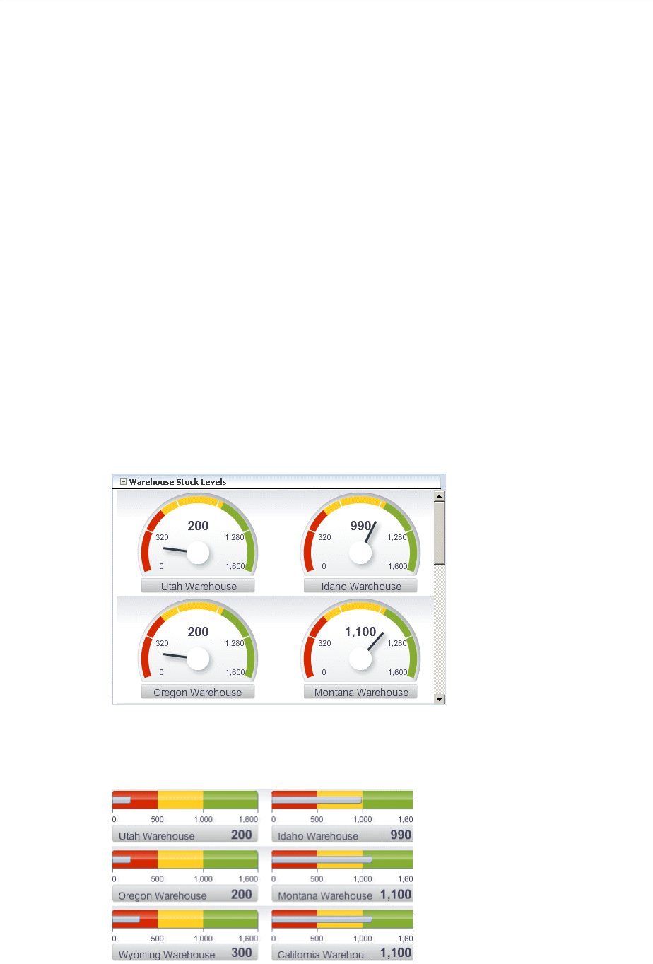
About ADF Data Visualization Components
Introduction to ADF Data Visualization Components 21-5
The following kinds of gauges can be produced by this component:
■Dial gauge: Creates a gauge that indicates its metric value along an 180-degree arc.
This type of gauge usually has an indicator in the shape of a line or an arrow that
points to the value that the gauge is plotting.
■Status meter gauge: Creates a gauge that indicates the progress of a task or the
level of some measurement along a horizontal rectangular bar. An inner rectangle
shows the current level of a measurement against the ranges marked on an outer
rectangle.
■Status meter gauge (vertical): Creates a gauge that indicates the progress of a task
of the level of some measurement along a vertical rectangular bar.
■LED (lighted electronic display) gauge: Creates a gauge that depicts graphically a
measurement, such as key performance indicator (KPI). Several styles of graphics
are available for LED gauges such as arrows that indicate good (up arrow), fair
(left- or right-pointing arrow), or poor (down arrow).
You can specify any number of thresholds for a gauge. However, some LED gauges
(such as those with arrow or triangle indicators) support a limited number of
thresholds because there are a limited number of meaningful directions for them to
point. For arrow or triangle indicators, the threshold limit is three.
Figure 21–4 shows a set of dial gauges set with thresholds to display warehouse stock
levels.
Figure 21–4 Dial Gauges set with Thresholds
Figure 21–5 shows a set of status meter gauges set with thresholds.
Figure 21–5 Status Meter Gauges set with Thresholds
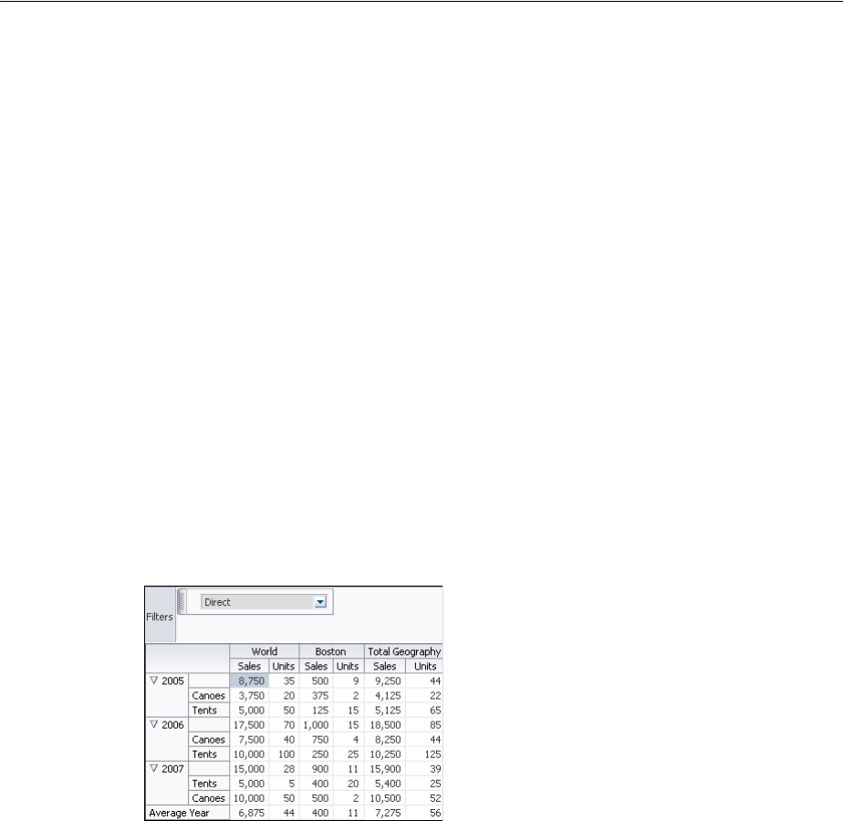
About ADF Data Visualization Components
21-6 Web User Interface Developer's Guide for Oracle Application Development Framework
For more information including additional use cases and examples, see Chapter 23,
"Using Gauge Components."
21.1.3 Pivot Table Use Cases and Examples
The pivot table (pivotTable) produces a grid that supports multiple layers of data
labels on rows or columns. An optional pivot filter bar (pivotFilterBar) can be
associated with the pivot table to filter data not displayed in the row or column edge.
When bound to an appropriate data control such as a row set, the component also
supports the option of generating subtotals and totals for grid data, and drill
operations at runtime.
Pivot tables let you swap data labels from one edge (row or column) or pivot filter bar
(page edge) to another edge to obtain different views of your data. For example, a
pivot table might initially display total sales data for products within regions on the
row edge, broken out by years on the column edge. If you swap region and year at
runtime, then you end up with total sales data for products within years, broken out
by region.
Pivot tables support horizontal and vertical scrolling, header and cell formatting, and
drag-and-drop pivoting. Pivot tables also support ascending and descending group
sorting of rows at runtime. Figure 21–6 shows an example pivot table with a pivot
filter bar.
Figure 21–6 Pivot Table with Pivot Filter Bar
For more information including additional use cases and examples, see Chapter 24,
"Using Pivot Table Components."
21.1.4 Geographic Map Use Cases and Examples
The geographic map (map) provides the functionality of Oracle Spatial within the ADF
framework. This component represents business data on a map and lets you
superimpose multiple layers of information on a single map. This component supports
the simultaneous display of a color theme, a graph theme (bar or pie graph), and point
themes. You can create any number of each type of theme and you can use the map
toolbar to select the desired themes at runtime.
As an example of a geographic map, consider a base map of the United States with a
color theme that provides varying color intensity to indicate the popularity of a
product within each state, a pie chart theme that shows the stock levels of warehouses,
and a point theme that identifies the exact location of each warehouse. When all three
themes are superimposed on the United States map, you can easily evaluate whether
there is sufficient inventory to support the popularity level of a product in specific
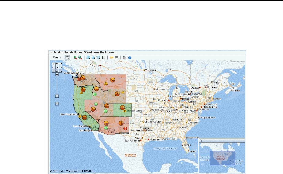
About ADF Data Visualization Components
Introduction to ADF Data Visualization Components 21-7
locations. Figure 21–7 shows a geographic map with color theme, pie graph theme,
and point theme.
Figure 21–7 Geographic Map with Color Theme, Pie Graph Theme, and Point Theme
For more information including additional use cases and examples, see Chapter 25,
"Using Map Components."
21.1.5 Thematic Map Component Use Cases and Examples
A thematic map (thematicMap) component represents business data as patterns in
stylized areas or associated markers and does not require a connection to a map
viewer service. Thematic maps focus on data without the geographic details in a
geographic map. The thematic map is packaged with prebuilt base maps including a
USA base map, a world base map, as well as base maps for continents and regions of
the world such as EMEA and APAC. The thematic map component does not require a
map service to display a base map.
For example, you could use a USA base map with a states map layer to display the
preferences in each state for a particular brand of soft drink using colors as displayed
in Figure 21–8. The example illustrates thematic map default features including a data
bound legend and labels associated with the stylized areas.
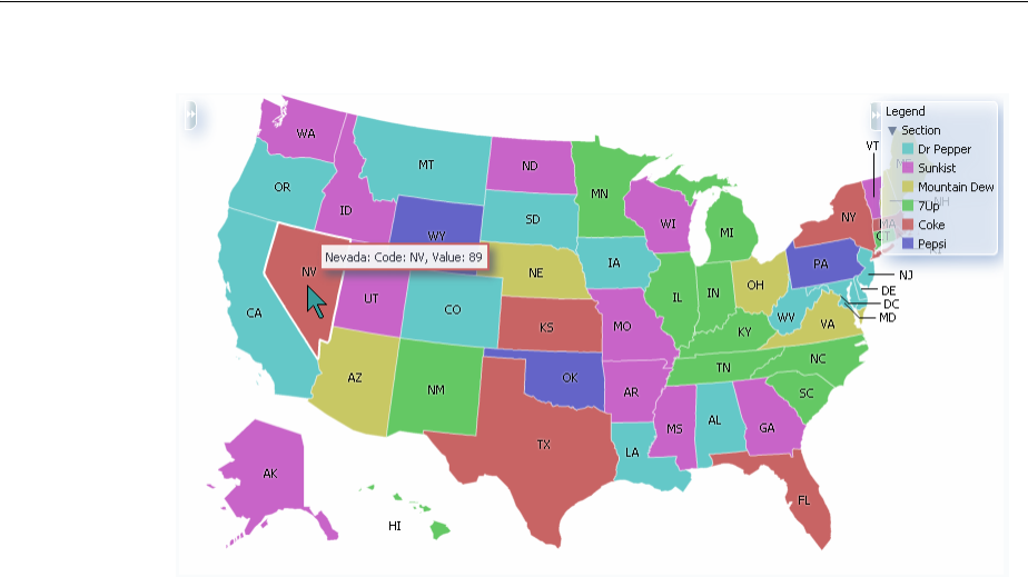
About ADF Data Visualization Components
21-8 Web User Interface Developer's Guide for Oracle Application Development Framework
Figure 21–8 Thematic Map Displaying Product Preferences by Area
For more information including additional use cases and examples, see Chapter 25,
"Using Map Components."
21.1.6 Gantt Chart Component Use Cases and Examples
The Gantt chart is a type of horizontal bar graph (with time on the horizontal axis) that
is used in planning and tracking projects to show resources or tasks in a time frame
with a distinct beginning and end.
A Gantt chart consists of two ADF Faces tree tables combined with a splitter. The
left-hand table contains a list of tasks or resources while the right-hand table consists
of a single column in which progress is graphed over time.
There are three types of gantt components:
■Project Gantt (projectGantt): Creates a Gantt chart that shows tasks vertically,
and the duration of the task is represented as a bar on a horizontal timeline.
■Resource utilization Gantt (resourceUtilizationGantt): Creates a Gantt
chart that shows graphically whether resources are over or under allocated. It
shows resources vertically while showing their allocation and, optionally, capacity
on the horizontal time axis.
■Scheduling Gantt (schedulingGantt): Creates a Gantt chart that shows resource
management and is based on manual scheduling boards. It shows resources
vertically with corresponding activities on the horizontal time axis.
Figure 21–9 shows a project Gantt view of staff resources and schedules.
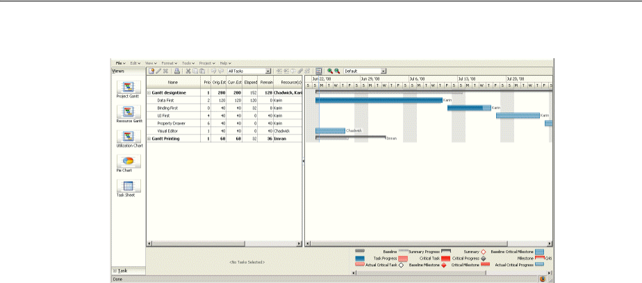
About ADF Data Visualization Components
Introduction to ADF Data Visualization Components 21-9
Figure 21–9 Project Gantt
For more information including additional use cases and examples, see Chapter 26,
"Using Gantt Chart Components."
21.1.7 Hierarchy Viewer Component Use Cases and Examples
The hierarchy viewer (hierarchyViewer) component displays hierarchical data as a
set of linked nodes in a diagram. The nodes and links correspond to the elements and
relationships to the data. The component supports pan and zoom operations,
expanding and collapsing of the nodes, rendering of simple ADF Faces components
within the nodes, and search of the hierarchy viewer data. A common use of the
hierarchy viewer is to display an organization chart, as shown in Figure 21–10.
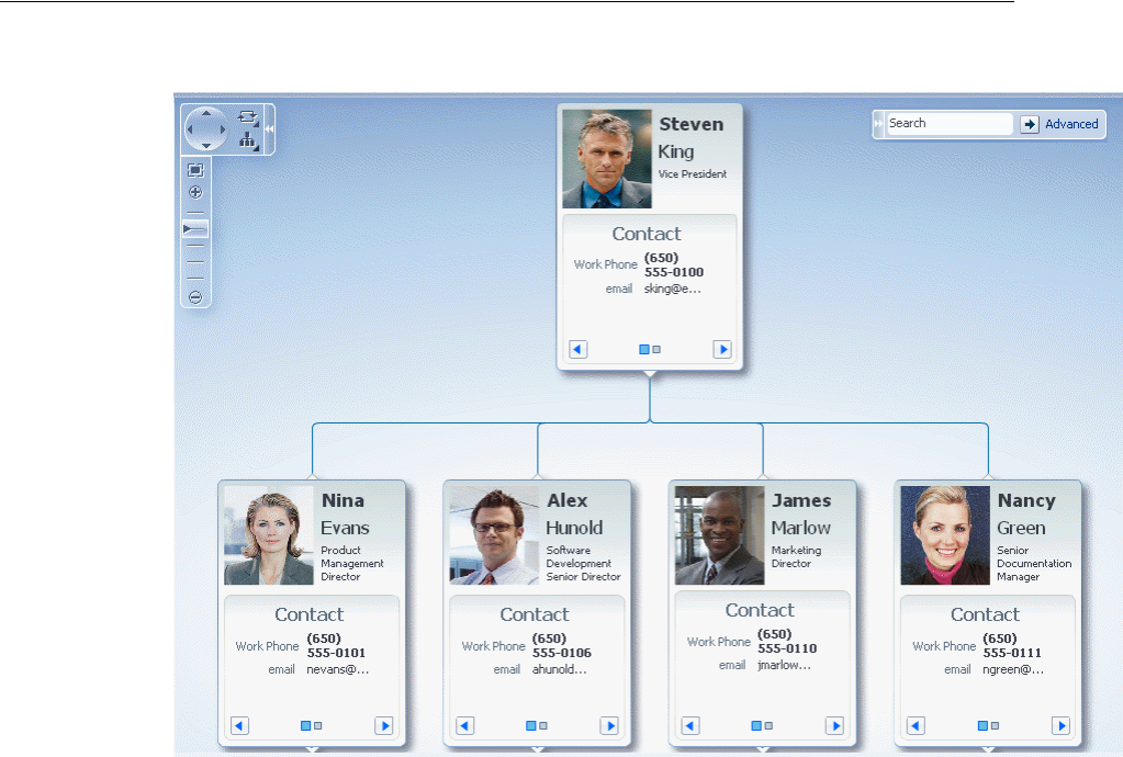
About ADF Data Visualization Components
21-10 Web User Interface Developer's Guide for Oracle Application Development Framework
Figure 21–10 Hierarchy Viewer as Organizational Chart
For more information including additional use cases and examples, see Chapter 27,
"Using Hierarchy Viewer Components."
21.1.8 Additional Functionality for Data Visualization Components
You may find it helpful to understand other ADF Faces features before you data bind
your data visualization components. Additionally, once you have added a data
visualization component to your page, you may find that you need to add
functionality such as validation and accessibility. Following are links to other
functionality that data visualization components use:
■Partial page rendering: You may want a DVT component to refresh to show new
data based on an action taken on another component on the page. For more
information, see Chapter 8, "Rerendering Partial Page Content."
■Personalization: Users can change the way the DVT components display at
runtime, those values will not be retained once the user leaves the page unless you
configure your application to allow user customization. For more information, see
Chapter 32, "Allowing User Customization on JSF Pages."
■Accessibility: You can make your DVT components accessible. For more
information, see Chapter 30, "Developing Accessible ADF Faces Pages."
■Skins and styles: You can customize the appearance of DVT components using an
ADF skin that you apply to the application or by applying CSS style properties
directly using a style-related property (styleClass or inlineStyle). For more
information, see Chapter 28, "Customizing the Appearance Using Styles and
Skins."

Common Functionality in Data Visualization Components
Introduction to ADF Data Visualization Components 21-11
■Placeholder data controls: If you know the DVT components on your page will
eventually use ADF data binding, but you need to develop the pages before the
data controls are ready, then you should consider using placeholder data controls,
rather than manually binding the components. Using placeholder data controls
will provide the same declarative development experience as using developed
data controls. For more information, see the "Designing a Page Using Placeholder
Data Controls" chapter in the Oracle Fusion Middleware Fusion Developer's Guide for
Oracle Application Development Framework.
21.2 Common Functionality in Data Visualization Components
Data visualization components share much of the same functionality, such as how
data is delivered, automatic partial page rendering (PPR), the image format used to
display the component, and how data can be displayed and edited. It is important that
you understand this shared functionality and how it is configured before you use
these components.
21.2.1 Content Delivery
Data visualization components including graph, gauge, pivot table, Gantt chart,
thematic map, and hierarchy viewer can be configured for how data is delivered from
the data source. The data con be delivered to the components either immediately upon
rendering, as soon as the data is available, or lazily fetch after the shell of the
component has been rendered. By default all data visualization components, with the
exception of the geographic map, support the delivery of content from the data source
when it is available. The contentDelivery attribute of these components is set to
whenAvailable by default.
Data visualization components based on a tree or tree table model including Gantt
charts, pivot tables, and the hierarchy viewer are virtualized, meaning not all the rows,
columns, or levels that are there for the component on the server are delivered to and
displayed on the client. You configure these components to fetch a certain number of
rows, columns, or levels at a time from your data source. Use these attributes to
configure fetch size:
■Pivot table:
–rowFetchSize: Specifies the number of rows in a data fetch block. The
default value is 25.
–columnFetchSize: Specifies the number of columns in a data fetch block.
The default value is 10.
■Hierarchy Viewer:
–levelFetchSize: Specifies the number of child nodes that will be fetched
and displayed at a single time for each expanded parent node. Additional
child nodes may be fetched and displayed by using the lateral navigation
controls shown in the hierarchy viewer. The default value is 25.
■Gantt charts:
–fetchSize: Specifies the number of rows in the data fetch block. The default
value is 25.
–horizontalFetchSize: Specifies the size of the horizontal data window in
number of pixels in which the data are fetched. Only task bars within this data
window would be rendered. In contrast with fetchSize, which provides

Common Functionality in Data Visualization Components
21-12 Web User Interface Developer's Guide for Oracle Application Development Framework
vertical virtualization, horizontalFetchSize provides horizontal
virtualization.
For lazy delivery, when a page contains one or more of these components, the page
initially goes through the standard lifecycle. However, instead of fetching the data
during that initial request, a special separate partial page rendering (PPR) request is
run, and the value of the fetch size for the component is then returned. Because the
page has just been rendered, only the Render Response phase executes for the
components, allowing the corresponding data to be fetched and displayed. When a
user’s actions cause a subsequent data fetch (for example scrolling in a pivot table grid
for another set of rows), another PPR request is executed.
When content delivery is configured to be delivered when it is available, the
framework checks for data availability during the initial request, and if it is available,
it sends the data to the component. If it is not available, the data is loaded during the
separate PPR request, as it is with lazy delivery.
For more information about setting the fetch size for components based on the tree or
tree table model, see Section 21.2.1, "Content Delivery."
21.2.2 Automatic Partial Page Rendering (PPR)
ADF Faces supports Partial Page Rendering (PPR), which allows certain components
on a page to be rerendered without the need to rerender the entire page. In addition to
built-in PPR functionality, you can configure components to use cross-component
rendering, which allows you to set up dependencies so that one component acts as a
trigger and another as the listener. For more information, see Section 8.1, "About
Partial Page Rendering."
By default, ADF data visualization components support automatic PPR, where any
component whose values change as a result of backend business logic is automatically
rerendered. If your application uses the Fusion technology stack, you can enable the
automatic partial page rendering feature on any page. For more information, see the
"What You May Need to Know About Automatic Partial Page Rendering" section of
Performance Tip: Lazy delivery should be used when a data fetch is
expected to be an expensive (slow) operation, for example, slow,
high-latency database connection, or fetching data from slow
non-database data sources like web services. Lazy delivery should
also be used when the page contains a number of components other
than a data visualization component. Doing so allows the initial page
layout and other components to be rendered first before the data is
available.
Immediate delivery should be used if the data visualization
component is the only context on the page, or if the component is not
expected to return a large set of data. In this case, response time will
be faster than using lazy delivery (or in some cases, simply perceived
as faster), as the second request will not go to the server, providing a
faster user response time and better server CPU utilizations. Note that
for components based on a tree or tree table model, only the value
configured to be the fetch block will be initially returned. As with lazy
delivery, when a user’s actions cause a subsequent data fetch, the next
set of rows are delivered.
The whenAvailable delivery provides the additional flexibility of
using immediate when data is available during initial rendering or
falling back on lazy when data is not initially available.

Common Functionality in Data Visualization Components
Introduction to ADF Data Visualization Components 21-13
the Oracle Fusion Middleware Fusion Developer's Guide for Oracle Application Development
Framework.
21.2.3 Image Formats for Graph and Gauge Components
By default, data visualization graph and gauge components are displayed using a
Flash player as specified in the component imageFormat attribute. Alternatively,
components can be displayed using a Portable Network Graphics (PNG) output
format, as in the case when plug-ins are not allowed on client machines, or when
printing the components.
Both Flash and PNG image formats support bi-directional locales. Although static
rendering, for example, maintaining a drilled view of the graph Flash image is fully
supported when using a PNG output format, certain interactive features are not
available, such as:
■Animation
■Context menus
■Popup support
When graphs or gauges are displayed in ADF tables through stamping, a PNG_
STAMPED image format should be used.
You can disable the use of Flash content across the entire application by setting a
flash-player-usage context parameter in adf-config.xml. For more
information, see Section A.4.3, "Configuring Flash as Component Output Format."
21.2.4 Embedded Fonts for Graph and Gauge Components
Graph and gauge components provide text rotation, high fidelity display, and
embedded fonts using Flash image types. The Flash engine is a prebuilt Shockwave
Flash (SWF) file containing precompiled ActionScript code used to display a graph
or gauge by using an XML definition of a chart. The Flash engine is downloaded and
instantiated by a Flash Player embedded in the client browser at runtime.
Embedded fonts are used for display and printing purposes, they are not installed on
the client, and they cannot be edited. They are used by the Flash Player, in memory,
and are cleared when the player terminates. Although embedded fonts require a
roundtrip to the server to download the font SWF file, they provide a consistent look
across all clients, support text rotation, and minimize distortion or anti-aliasing.
Oracle provides one font, Albany WT, for use in Flash images when necessary. This
font does not provide any non-plain variations such as Bold or Italic. The Albany WT
font is used instead of the default font to support certain animations not supported by
Flash with device fonts, if the application does not specify and provide its own
embedded font to use instead.
Specific fonts and their respective SWF files can be added to your application as
embedded fonts to be passed to the Flash engine. The engine will defer-load any font
specified in the list until that font is required by any text or labels in a graph or gauge
definition. Example 21–1 defines the Georgia font with a Bold and Italic combination.
Example 21–1 SWF File
package
{
import.flash.display.Sprite;
import.flash.text.Font;
public class fGeorgiaBoldItalic extends Srite

Common Functionality in Data Visualization Components
21-14 Web User Interface Developer's Guide for Oracle Application Development Framework
(
[Embed (source="c:\\WINDOWS\\Fonts\\GEORGIABI.TTF",
fontName="Georgia Bold Italic",
fontWeight="Bold",
fontStyle="Italic".
mimType="application/x-font-truetype")]
private statis car font1:Class;
public function fGeorgiaBoldItalic() {
Font registerFont(font1);
}
}
}
You can set graph and gauge embedded font attributes as follows:
■flashDefaultFontLoading: Specifies whether default fonts are loaded in
FLASH from the middle tier. Valid values are:
–FLASH_DEFAULT_FONT_LOADING_ALL: The default value. Specify to use the
embedded font. The application is responsible to make sure that the correct
fonts are specified and available on the system.
–FLASH_DEFAULT_FONT_LOADING_NONE: Specify not to use the embedded
font.
■fontURLMap: Use for gauge components. Provides a mapping of font names and
font SWF file URLs in the form of a java.util.Map object. This map should
have the font names as the keys, and the font URLs as the values.
21.2.5 Graph and Gauge Context Menus
Context menus can be defined for graph and gauge components using these context
menu facets:
■bodyContextMenu: Specifies a context menu that is displayed on non-selectable
elements in the component.
■contextMenu: Specifies a context menu that is displayed on any selectable
element in the component.
■multiSelectContextMenu: Specifies a content menu that is displayed when
multiple elements are selected in the component.
Each facet supports a single child component. For all of these facets to work, selection
must be enabled and supported for the specific graph or gauge type. Context Menus
are currently only supported in Flash.
Due to technical limitations when using the Flash rendering format, context menu
contents are currently displayed using the Flash Player's context menu. This imposes
several limitations defined by the Flash Player:
■Flash does not allow for submenus it its context menu.
■Flash limits custom menu items to 15. Any built-in menu items for the component,
for example, a pie graph interactiveSliceBehavior menu item, will count
towards the limit,
■Flash limits menu items to text-only. Icons or other controls possible in ADF Faces
menus are not possible in Flash menus.
■Each menu caption must contain at least one visible character. Control characters,
new lines, and other white space characters are ignored. No caption can be more
than 100 characters long.

Common Functionality in Data Visualization Components
Introduction to ADF Data Visualization Components 21-15
■Menu captions that are identical to another custom item are ignored, whether the
matching item is visible or not. Menu captions are compared to built-in captions or
existing custom captions without regard to case, punctuation, or white space.
■The following captions are not allowed, although the words may be used in
conjunction with other words to form a custom caption: Save, Zoom In, Zoom
Out, 100%, Show All, Quality, Play, Loop, Rewind, Forward, Back, Movie not
loaded, About, Print, Show Redraw Regions, Debugger, Undo, Cut, Copy, Paste,
Delete, Select All, Open, Open in new window, and Copy link.
■None of the following words can appear in a custom caption on their own or in
conjunction with other words: Adobe, Macromedia, Flash Player, or Settings.
Additionally, since the request from Flash for context menu items is a synchronous
call, a server request to evaluate EL is not possible when the context menu is invoked.
To provide context menus that vary by selected object, the menus will be pre-fetched if
the context menu popup uses the setting contentDelivery="lazyUncached". For
context menus that may vary by state, this means that any EL expressions within the
menu definition will be called repeatedly at render time, with different selection and
currency states. When using these context menus that are pre-fetched, the application
must be aware of the following:
■Long running or slow code should not be executed in any EL expression that may
be used to determine how the context menu is displayed. This does not apply to
af:commandMenuItem attributes that are called after a menu item is selected,
such as actionListener.
■In the future, if the Flash limitations are solved, the ADF context menu may be
displayed in place of the Flash context menu. To ensure upgrade compatibility,
you should code such that an EL expression will function both in cases where the
menu is pre-fetched, and also where the EL expression is evaluated when the
menu is invoked. It is recommended that the only component state that
applications rely on are selection and currency.
21.2.6 Screen Reader Support
All data visualization components provide attributes that support descriptive text
about the component. Setting the appropriate attribute for the component is required
for supporting the screen reader mode. Set the following attributes for data
visualization components:
■shortDesc attribute: Use for all graph and gauge components.
■summary attribute: Use for pivot table, Gantt chart, geographic and thematic map,
and hierarchy viewer components.
21.2.7 Text Resources from Application Resource Bundles
JDeveloper supports easy localization of ADF Faces and data visualization
components using the abstract class java.util.ResourceBundle to provide
locale-specific resources.
Data visualization components may include text that is part of the component, for
example the af:table component uses the resource string af_table.LABEL_
FETCHING for the message text that displays in the browser while the af:table
component fetches data during the initial load of data or while the user scrolls the
table. JDeveloper provides automatic translation of these text resources into 28
languages. These text resources are referenced in a resource bundle. If you set the

Providing Data for ADF Data Visualization Components
21-16 Web User Interface Developer's Guide for Oracle Application Development Framework
browser to use the language in Italy, any text contained within the components will
automatically be displayed in Italian
For any text you add to a component, for example if you define the title of a
pieGraph component by setting the text attribute on its child graphTitle
component, you must provide a resource bundle that holds the actual text, create a
version of the resource bundle for each locale, and add a <locale-config> element
to define default and support locales in the application’s faces-config.xml file.
You must also add a <resource-bundle> element to your application’s
faces-config.xml file in order to make the resource bundles available to all the
pages in your application. Once you have configured and registered a resource
bundle, the Expression Language (EL) editor will display the key from the bundle,
making it easier to reference the bundle in application pages.
To simplify the process of creating text resources for text you add to ADF components,
JDeveloper supports automatic resource bundle synchronization for any translatable
string in the visual editor. When you edit components directly in the visual editor or in
the Property Inspector, text resources are automatically created in the base resource
bundle. For more information, see Section 29.2, "Using Automatic Resource Bundle
Integration in JDeveloper."
For data visualization components with title and label child components, you can also
create and add text resources to a resource bundle by using the attribute dropdown
list to open a Select Text Resource dialog to select or add a translatable string from an
application resource bundle. Alternatively, you can select Expression Builder to open
the Expression Language (EL) editor to create an expression to be executed at runtime
for the title or label.
21.3 Providing Data for ADF Data Visualization Components
In JDeveloper you can add any Data Visualization component to your JSF page using
UI-first development, and then later manually bind the data you wish to display using
ADF data controls or managed beans. In this case the component is added to the page
by dragging from the Component Palette and the Property Inspector is used to
manually bind the data.
Alternatively, you can use data-first development and create the component using an
ADF data control that will handle the data binding for you. In this case the component
is added to the page by dragging from the Data Controls panel, and completing data
binding dialogs to configure the display of data.
For example, when you are designing your page using simple UI-first development,
you use the Component Palette to add a graph to a JSF page. When you drag and drop
a graph component onto the page, the Component Gallery displays available
categories of graph types, with descriptions, to provide visual assistance when
creating graphs. You can also specify a quick-start layout of the graph’s title and
legend. Figure 21–11 shows the Component Gallery that displays when creating a pie
graph from the Component Palette.
Note: Any text retrieved from the database is not translated.
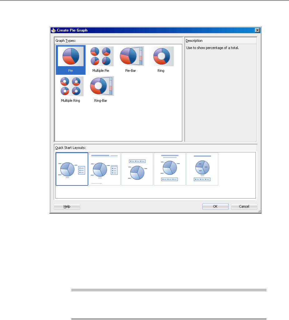
Providing Data for ADF Data Visualization Components
Introduction to ADF Data Visualization Components 21-17
Figure 21–11 Component Gallery for Pie Graphs from Component Palette
For information about creating Data Visualization components using UI-first
development, understanding component data requirements, configuring DVT parent
and child components, customizing the appearance of components, and adding special
effects and interactivity to components, see the following chapters in this part of the
guide:
■Chapter 22, "Using Graph Components"
■Chapter 23, "Using Gauge Components"
■Chapter 24, "Using Pivot Table Components"
■Chapter 25, "Using Map Components"
■Chapter 26, "Using Gantt Chart Components"
■Chapter 27, "Using Hierarchy Viewer Components"
You can also create and data bind a graph by dragging a data control from the Data
Controls Panel. A Component Gallery displays available graph categories, types, and
descriptions to provide visual assistance when designing graphs and defining a quick
layout. Figure 21–12 shows the Component Gallery that displays when creating a line
graph from a data control.
Note: Graphs and gauges have a tabularData method that lets
you provide CSV (Comma Separated Value) data from a method
stored in a managed bean.
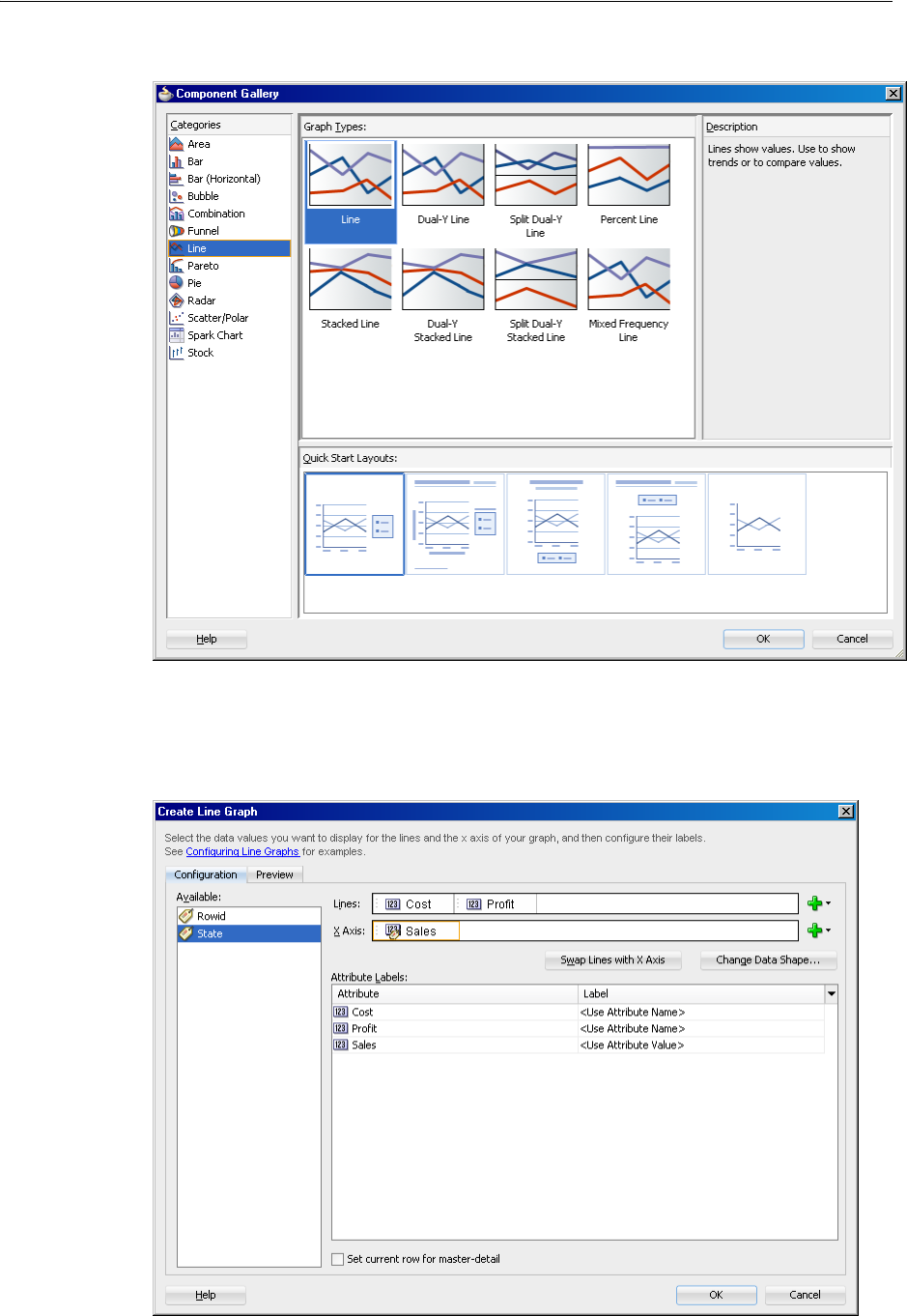
Providing Data for ADF Data Visualization Components
21-18 Web User Interface Developer's Guide for Oracle Application Development Framework
Figure 21–12 Component Gallery for Line Graphs from Data Controls Panel
Figure 21–13 shows the Create Line Graph dialog you use to bind the data collection
attributes to the graph component.
Figure 21–13 Create Line Graph Data Binding Dialog
Providing Data for ADF Data Visualization Components
Introduction to ADF Data Visualization Components 21-19
All data visualization components can be bound to data collections in an ADF data
control. For information and examples of data binding these components to data
controls, see the following:
■"Creating DataBound Graphs" section in the Oracle Fusion Middleware Fusion
Developer's Guide for Oracle Application Development Framework.
■"Creating Databound Gauges" section in the Oracle Fusion Middleware Fusion
Developer's Guide for Oracle Application Development Framework.
■"Creating Databound Pivot Tables" section in the Oracle Fusion Middleware Fusion
Developer's Guide for Oracle Application Development Framework.
■"Creating Databound Geographic Maps" section in the Oracle Fusion Middleware
Fusion Developer's Guide for Oracle Application Development Framework.
■"Creating Databound Thematic Maps" section in the Oracle Fusion Middleware
Fusion Developer's Guide for Oracle Application Development Framework.
■"Creating Databound Gantt Charts" section in the Oracle Fusion Middleware Fusion
Developer's Guide for Oracle Application Development Framework.
■"Creating Databound Hierarchy Viewers" section in the Oracle Fusion Middleware
Fusion Developer's Guide for Oracle Application Development Framework.
Note: In JDeveloper, a Create Pivot Table wizard provides
declarative support for databinding and configuring the pivot table.

Providing Data for ADF Data Visualization Components
21-20 Web User Interface Developer's Guide for Oracle Application Development Framework

22
Using Graph Components 22-1
22Using Graph Components
This chapter describes how to display data in graphs using the ADF Data
Visualization areaGraph, barGraph, horizontalBarGraph, bubbleGraph,
comboGraph, funnelGraph, lineGraph, paretoGraph, pieGraph, radarGraph.
scatterGraph, sparkChart, and stockGraph components. If your application
uses the Fusion technology stack, you can use data controls to create graphs. For more
information, see the "Creating Databound ADF Graphs" section in the Oracle Fusion
Middleware Fusion Developer's Guide for Oracle Application Development Framework.
This chapter includes the following sections:
■Section 22.1, "About the Graph Component"
■Section 22.2, "Using the Graph Component"
■Section 22.3, "Customizing Graph Display Elements"
■Section 22.4, "Formatting Graph Text, Colors, and Data Values"
■Section 22.5, "Customizing the Appearance of Series and Groups of Data"
■Section 22.6, "Animating Graphs"
■Section 22.7, "Adding Interactive Features to Graphs"
22.1 About the Graph Component
The graph component gives you the capability of producing more than 50 types of
graphs, including a variety of area, bar, bubble, combination, funnel, line, Pareto, pie,
radar, scatter, sparkchart, and stock graphs. This component lets you evaluate
multiple data points on multiple axes in many ways. For example, a number of graphs
assist you in the comparison of results from one group with the results from another
group.
A graph displays series and groups of data. Series and groups are analogous to the rows
and columns of a grid of data. Typically, the rows in the grid appear as a series in a
graph and the columns in the grid appear as groups in the graph.
For most graphs, a series appears as a set of markers that are the same color. Typically,
the graph legend shows the identification and associated color of each series. For
example, in a bar graph, the yellow bars might represent the sales of shoes and the
green bars might represent the sales of boots.
Groups appear differently in different graph types. For example, in a clustered bar
graph, each cluster is a group. In a stacked bar graph, each stack is a group. In a
multiple pie graph, each pie is a group. A group might represent time periods, such as
years. A group might also represent geographical locations such as regions.
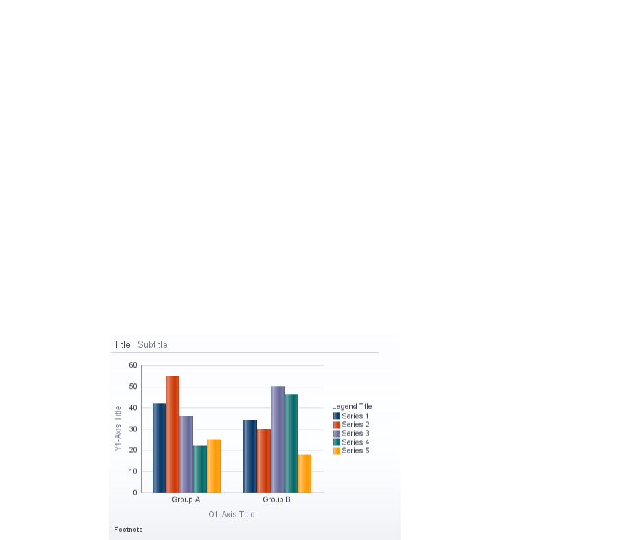
About the Graph Component
22-2 Web User Interface Developer's Guide for Oracle Application Development Framework
Depending on the data requirements for a graph type, a single group might require
multiple data values. For example, a scatter graph requires two values for each data
marker. The first value determines where the marker appears along the x-axis while
the second value determines where the marker appears along the y-axis.
22.1.1 End User and Presentation Features
Graph end user and configurable presentation features include a rich variety of
options.
22.1.1.1 Graph Layout
The optional graph title, subtitle, footnote, legend, and axis title components can be
customized for placement and appearance. The plot area, present for all graphs, can be
customized for appearance. Figure 22–1 shows the default display of those graph
components for a bar graph.
Figure 22–1 Graph Layout Components
22.1.1.2 Sizing
Graphs are displayed in a default size of 400 X 300 pixels. You can customize the size
of a graph or specify dynamic resizing to fit an area across different browser window
sizes. When graphs are displayed in a horizontally or vertically restricted area, for
example in a web page sidebar, the graph is displayed in a fully featured, although,
simplified display.
22.1.1.3 Data Marker Selection
Graphs can be enabled for selection of data markers such as bubbles in a bubble graph
or shapes in a scatter graph. Enabling selection is required for context menus.
22.1.1.4 Context Menus
Graphs support right-click context menus using facets for any of three types:
■Context menus displayed on any non-selectable area within the component, for
example, the plot area
■Context menus displayed on any selectable element, for example, the marker in a
scatter graph
■Context menus displayed on multiple selectable elements
Figure 22–2 shows a context menu displayed on a marker selected in a scatter graph.
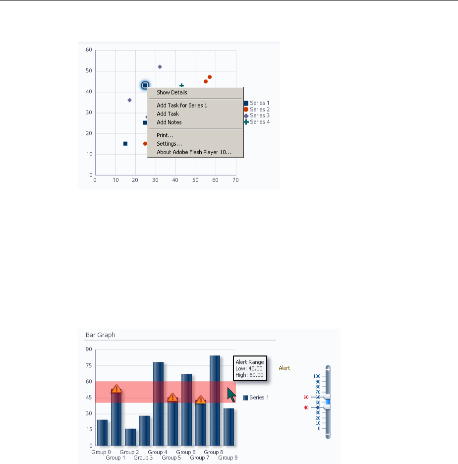
About the Graph Component
Using Graph Components 22-3
Figure 22–2 Selected Marker Context Menu in Scatter Graph
22.1.1.5 Reference Areas/Line and Alerts
Graphs can be configured to associate a data reference area or line with a graph series
or axis. Separately, graphs can be configured to define an additional data point that
needs to be highlighted with a separate symbol, such as for an error or warning.
Figure 22–3 shows a bar graph with a warning alert icon for each bar inside the alert
range of the graph. The figure also illustrates an ADF input range slider that can be
associated with the graph to change the reference area.
Figure 22–3 Alerts in Bar Graph
22.1.1.6 Hide and Show Series
Graphs can be configured to hide and show one or more series displayed in the graph
data. This is useful for comparison and analysis, particularly when multiple series are
displayed. Figure 22–4 shows hide and show in a line graph. The default icon for the
hidden series is an empty box.
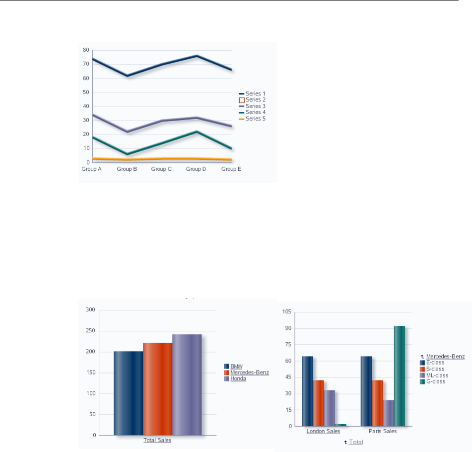
About the Graph Component
22-4 Web User Interface Developer's Guide for Oracle Application Development Framework
Figure 22–4 Hide and Show in Line Graph
22.1.1.7 Drilling
The series and groups in a graph can be configured for drilling up and down from an
aggregated total to a detail view of the data. Figure 22–5 shows a bar graph displaying
total sales for all cars, and a detail view of London and Paris sales for the four types of
Mercedes-Benz. Active drill icons are displayed in the drilled view.
Figure 22–5 Drilling in Bar Graph
22.1.1.8 Annotations
Annotations can be used to call out significant values in the graph data. Figure 22–6
shows sample annotations in a line graph.
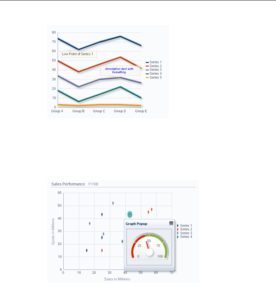
About the Graph Component
Using Graph Components 22-5
Figure 22–6 Annotations in Line Graph
22.1.1.9 Popup Support
Graph components can be configured to display popup dialogs, windows, and menus
that provide information or request input from end users. Figure 22–7 shows a popup
with a gauge component in a graph.
Figure 22–7 Popup in a Scatter Graph
22.1.1.10 Time Selector
Graphs that include a time axis can be configured to set a time range for display of the
data on a graph. Figure 22–8 shows a user enabled time selector to display the
master-detail data in graphs.
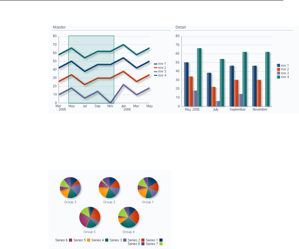
About the Graph Component
22-6 Web User Interface Developer's Guide for Oracle Application Development Framework
Figure 22–8 Time Selector in Line Graph
22.1.1.11 Bi-directional Support
Both Flash and PNG image formats for graphs support bi-directional locales.
Figure 22–9 shows bi-directional support in multiple pie graphs.
Figure 22–9 Bi-directional Support in Multiple Pie Graphs
22.1.1.12 Drag and Drop
Graphs can be configured to support these drag and drop operations:
■ Drag and drop between graphs
■Drag and drop from a graph into another ADF component
■Drag a scatter/bubble marker within the plot area of a graph
■Drag a scatter/bubble marker to another component
■Drag and drop multiple markers
22.1.1.13 Screen Reader Support
To support visually impaired users who read web pages with a screen reader, graphs
are automatically replaced with pivot tables when screen reader mode is enabled for
the application. Screen readers can more easily navigate and read the data in a pivot
table than in a graph. For information about enabling screen reader mode, see
Section 30.2, "Configuring Accessibility Support In ADF Faces." For information about
ADF pivot tables, see Section 24.1, "About the Pivot Table Component."
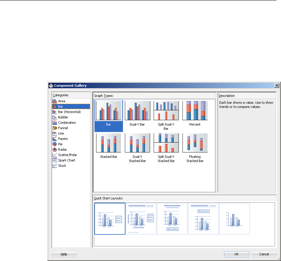
About the Graph Component
Using Graph Components 22-7
22.1.2 Graph Component Use Cases and Examples
Graph components include 13 types of graphs with one or more variations for a total
of over 50 different graphs you can use to display data. JDeveloper provides a
Component Gallery that displays available graph categories, types, and descriptions to
provide visual assistance when you are creating graphs. Figure 22–10 shows the
Component Gallery for bar graphs.
Figure 22–10 Component Gallery for Bar Graphs
Graph types include:
■Area: Represents data as a filled-in area. Use area graphs to show trends over
time, such as sales for the last 12 months. Area graphs require at least two groups
of data along an axis. The axis is often labeled with increments of time such as
months.
Area graphs represent these kinds of data values:
–Absolute: Each area marker connects a series of two or more data values. This
type of graph has the following variations: Absolute area graph with a single
y-axis and absolute area graph with a split dual-Y axis.
In a split dual-Y graph, the plot area is split into two sections, so that sets of
data assigned to the different Y-axes appear in different parts of the plot area.
–Stacked: Area markers are stacked. The values of each set of data are added to
the values for previous sets. The size of the stack represents a cumulative total.
This kind of graph has the following variations: Stacked area graph with a
single y-axis and stacked area graph with a split dual y-axis.
–Percentage: Area markers show the percentage of the cumulative total of all
sets of data.
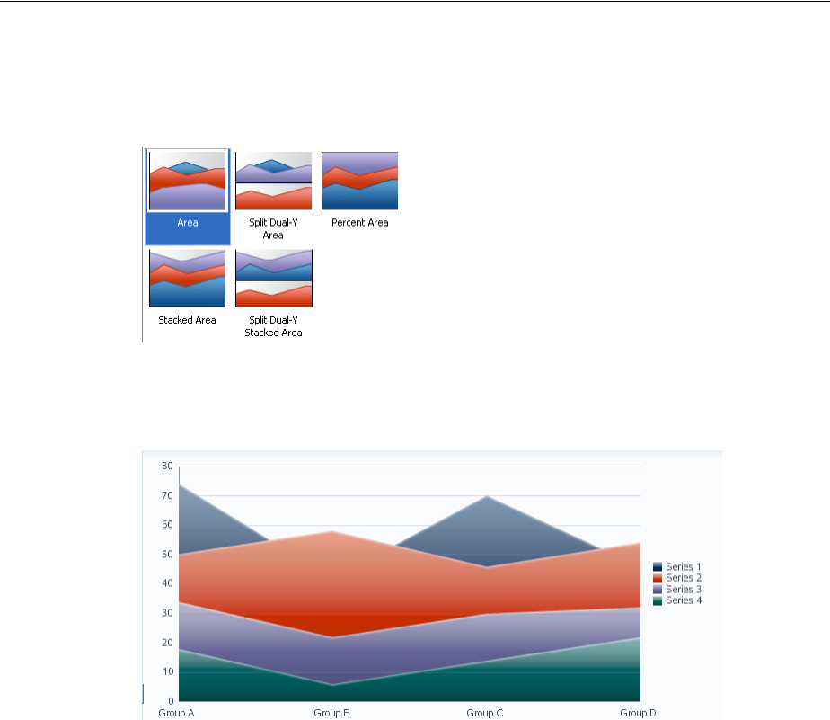
About the Graph Component
22-8 Web User Interface Developer's Guide for Oracle Application Development Framework
Figure 22–11 shows variations of the area graph type as displayed in the
Component Gallery with the default graph selected.
Figure 22–11 Area Graph Type Variations
Figure 22–12 shows an example area bar graph.
Figure 22–12 Area Graph Example
■Bar: Represents data as a series of vertical bars. Use bar graphs to examine trends
over time or to compare items at the same time, such as sales for different product
divisions in several regions.
Bar graphs represent these kinds of data values:
–Clustered: Each cluster of bars represents a group of data. For example, if data
is grouped by employee, one cluster might consist of a Salary bar and a
Commission bar for a given employee. This kind of graph includes the
following variations: Vertical clustered bar graphs and horizontal clustered
bar graphs. All variations of clustered bar graphs can be arranged as single
y-axis, dual y-axis, and split dual y-axis graphs.
–Stacked: Bars for each set of data are appended to previous sets of data. The
size of the stack represents a cumulative data total. This kind of graph
includes the following variations: Vertical stacked bar graphs and horizontal
stacked bar graphs. All variations of stacked bar graphs can be arranged as
single y-axis, dual y-axis, and split dual y-axis graphs.
–Percentage: Bars are stacked and show the percentage of a given set of data
relative to the cumulative total of all sets of data. Percentage bar graphs are
arranged only with a single y-axis.
Figure 22–13 shows variations of the bar graph type as displayed in the
Component Gallery with the default graph selected.
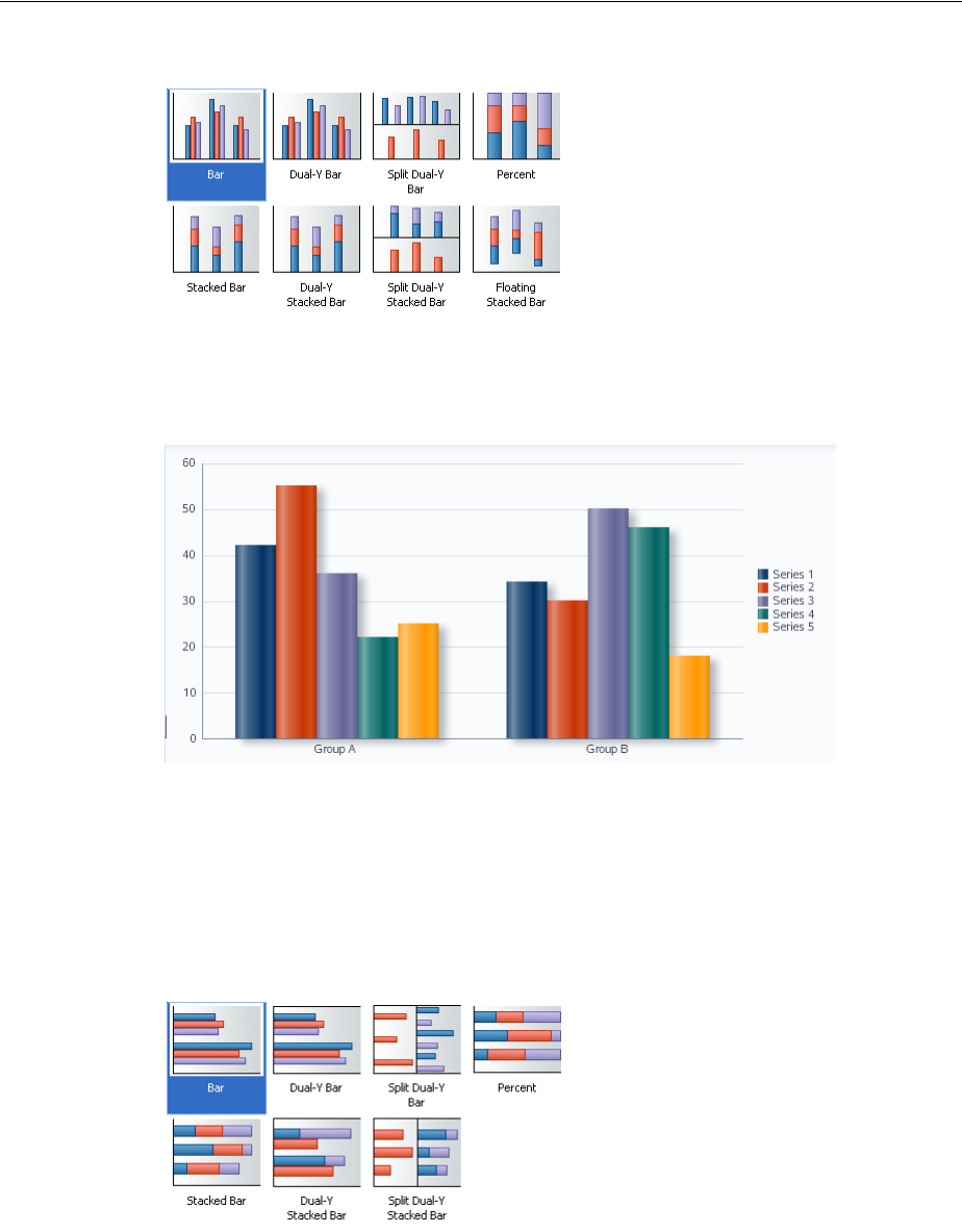
About the Graph Component
Using Graph Components 22-9
Figure 22–13 Bar Graph Type Variations
Figure 22–14 shows an example bar graph.
Figure 22–14 Bar Graph Example
■Horizontal bar: Displays bars horizontally along the y-axis. Use horizontal bar
graphs to provide an orientation that allows you to show trends or compare
values.
Figure 22–15 shows variations of the horizontal bar graph type as displayed in the
Component Gallery with the default graph selected.
Figure 22–15 Horizontal Bar Graph Type Variations
Figure 22–16 shows an example horizontal bar graph.
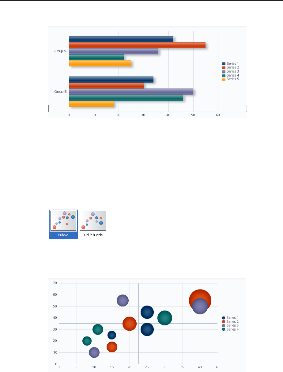
About the Graph Component
22-10 Web User Interface Developer's Guide for Oracle Application Development Framework
Figure 22–16 Horizontal Bar Graph Example
■Bubble: Represents data by the location and size of round data markers (bubbles).
Use bubble graphs to show correlations among three types of values, especially
when you have a number of data items and you want to see the general
relationships. For example, use a bubble graph to plot salaries (x-axis), years of
experience (y-axis), and productivity (size of bubble) for your work force. Such a
graph allows you to examine productivity relative to salary and experience.
Figure 22–17 shows variations of the bubble graph type as displayed in the
Component Gallery with the default graph selected.
Figure 22–17 Bubble Graph Type Variations
Figure 22–18 shows an example bubble graph.
Figure 22–18 Bubble Graph Example
■Combination: Graph that uses different types of data markers (bars, lines, or areas)
to display different kinds of data items. Use combination graphs to compare bars
and lines, bars and areas, lines and areas, or all three combinations.
Figure 22–19 shows variations of the combination graph type as displayed in the
Component Gallery with the default graph selected.
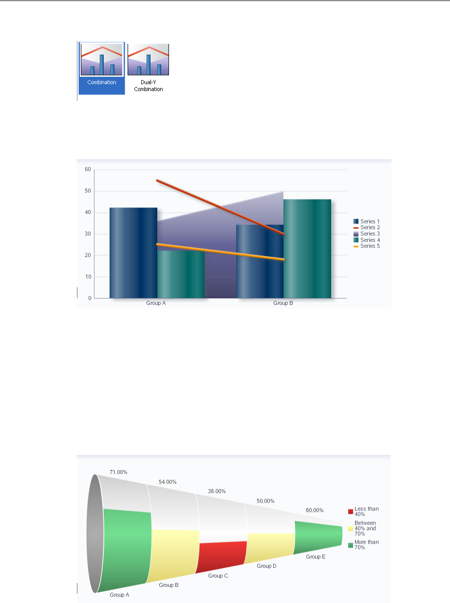
About the Graph Component
Using Graph Components 22-11
Figure 22–19 Combination Graph Type Variations
Figure 22–20 shows an example combination graph.
Figure 22–20 Combination Graph Example
■Funnel: Visually represents data related to steps in a process. The steps appear as
vertical slices across a horizontal cone-shaped section. As the actual value for a
given step or slice approaches the quota for that slice, the slice fills. Typically, a
funnel graph requires actual values and target values against a stage value, which
might be time. For example, use the funnel graph to watch a process where the
different sections of the funnel represent different stages in the sales cycle. There
are no variations of the funnel graph.
Figure 22–21 shows an example funnel graph.
Figure 22–21 Funnel Graph Example
■Line: Represents data as a line, as a series of data points, or as data points that are
connected by a line. Line graphs require data for at least two points for each
member in a group. For example, a line graph over months requires at least two
months. Typically a line of a specific color is associated with each group of data
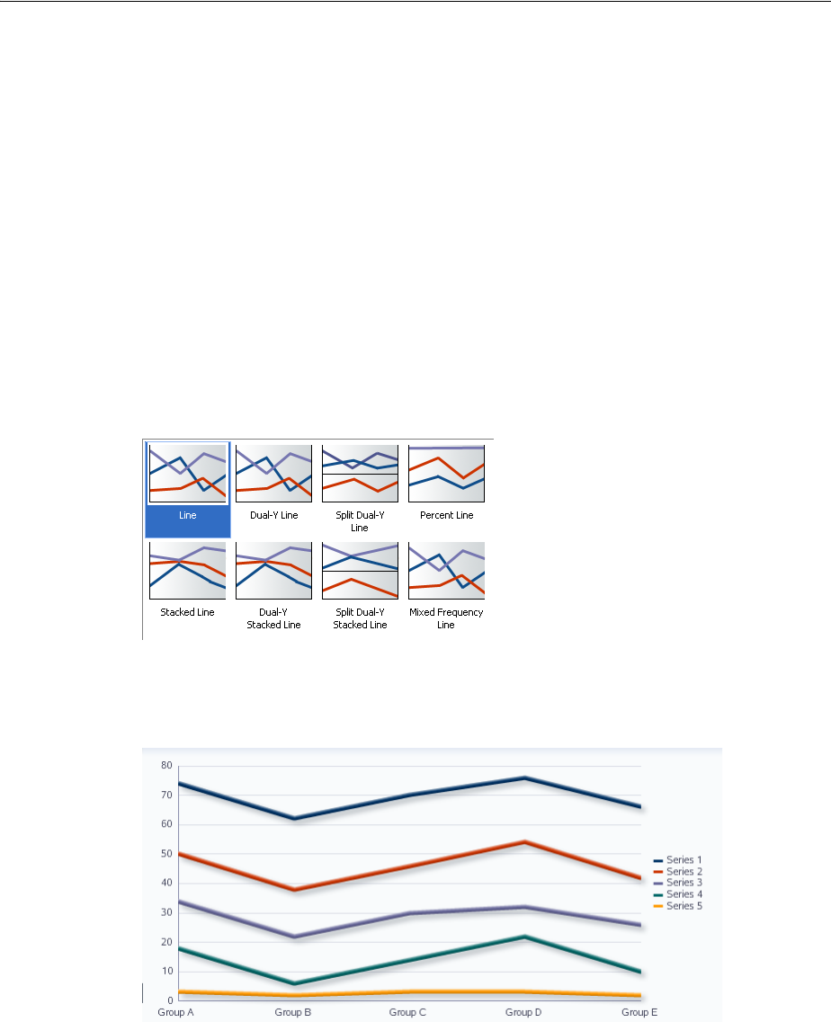
About the Graph Component
22-12 Web User Interface Developer's Guide for Oracle Application Development Framework
such as the Americas, Europe, and Asia. Use line graphs to compare items over the
same time.
Line graphs represent these kinds of data values:
–Absolute: Each line segment connects two data points. This kind of graph can
have its axes arranged as single y-axis, dual y-axis, and split dual y-axis.
–Stacked: Lines for each set of data are appended to previous sets of data. The
size of the stack represents a cumulative data total. This kind of graph can
have its axes arranged as single y-axis, dual y-axis, and split dual y-axis.
–Percentage: Lines are stacked and each line shows the percentage of a given
set of data relative to the cumulative total of all sets of data. Percentage line
graphs are arranged only with a single y-axis.
Figure 22–22 shows variations of the line graph type as displayed in the
Component Gallery with the default graph selected.
Figure 22–22 Line Graph Type Variations
Figure 22–23 shows an example line graph.
Figure 22–23 Line Graph Example
■Pareto: Represents data by bars and a percentage line that indicates the cumulative
percentage of bars. Each set of bars identifies different sources of defects, such as
the cause of a traffic accident. The bars are arranged by value, from the largest
number to the lowest number of incidents. A Pareto graph is always a dual-Y
graph in which the first y-axis corresponds to values that the bars represent and
the second y-axis runs from 0% to 100% and corresponds to the cumulative
percentage values. Use Pareto graphs to identify and compare the sources of
defects. The Pareto graph has not variations.
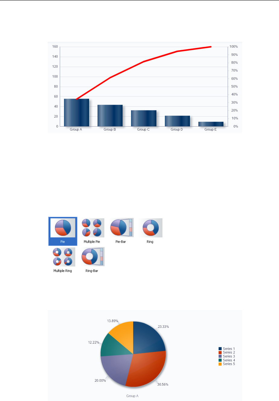
About the Graph Component
Using Graph Components 22-13
Figure 22–24 shows an example Pareto graph.
Figure 22–24 Pareto Graph Example
■Pie/Ring: Represents one group of data as sections of a circle causing the circle to
look like a sliced pie. Use pie graphs to show the relationship of parts to a whole
such as how much revenue comes from each product line. Pie graphs can display
as a pie or ring, where the center of each circle has a hole in which the total pie
value is displayed.
Figure 22–25 shows variations of the pie graph type as displayed in the
Component Gallery with the default graph selected.
Figure 22–25 Pie Graph Type Variations
Figure 22–26 shows an example pie graph.
Figure 22–26 Pie Graph Example
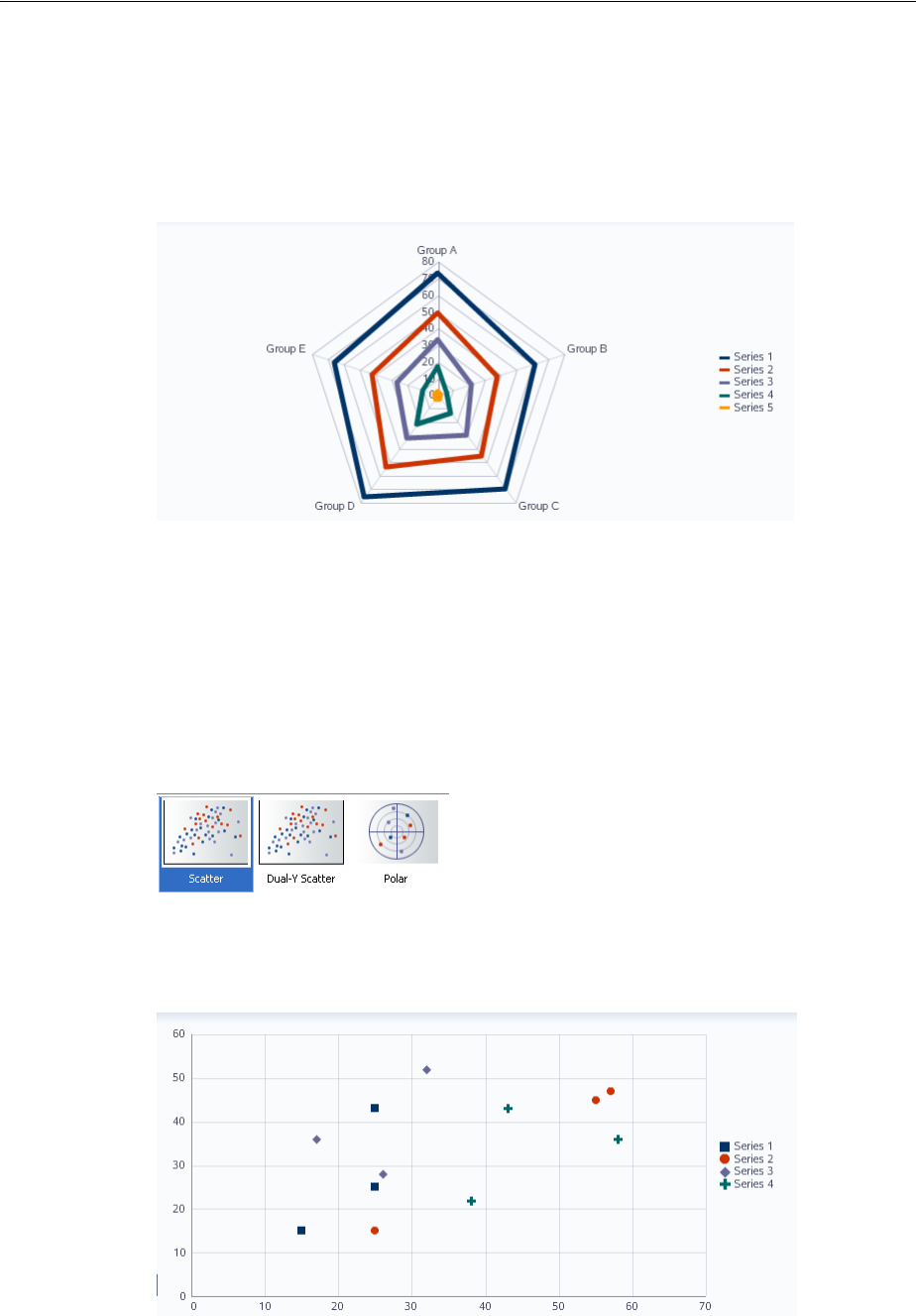
About the Graph Component
22-14 Web User Interface Developer's Guide for Oracle Application Development Framework
■Radar: A graph that appears as a circular line graph. Use radar graphs to show
patterns that occur in cycles, such as monthly sales for the last three years. The
radar graph has no variations.
Figure 22–27 shows an example radar graph.
Figure 22–27 Radar Graph Example
■Scatter/Polar: Represents data by the location of data markers. Use scatter graphs
to show correlation between two different kinds of data values such as sales and
costs for top products. Use scatter graphs in particular to see general relationships
among a number of items. A scatter graph can display data in a directional
manner as a polar graph.
Figure 22–28 shows variations of the scatter graph type as displayed in the
Component Gallery with the default graph selected.
Figure 22–28 Scatter Graph Type Variations
Figure 22–29 shows an example scatter graph.
Figure 22–29 Scatter Graph Example
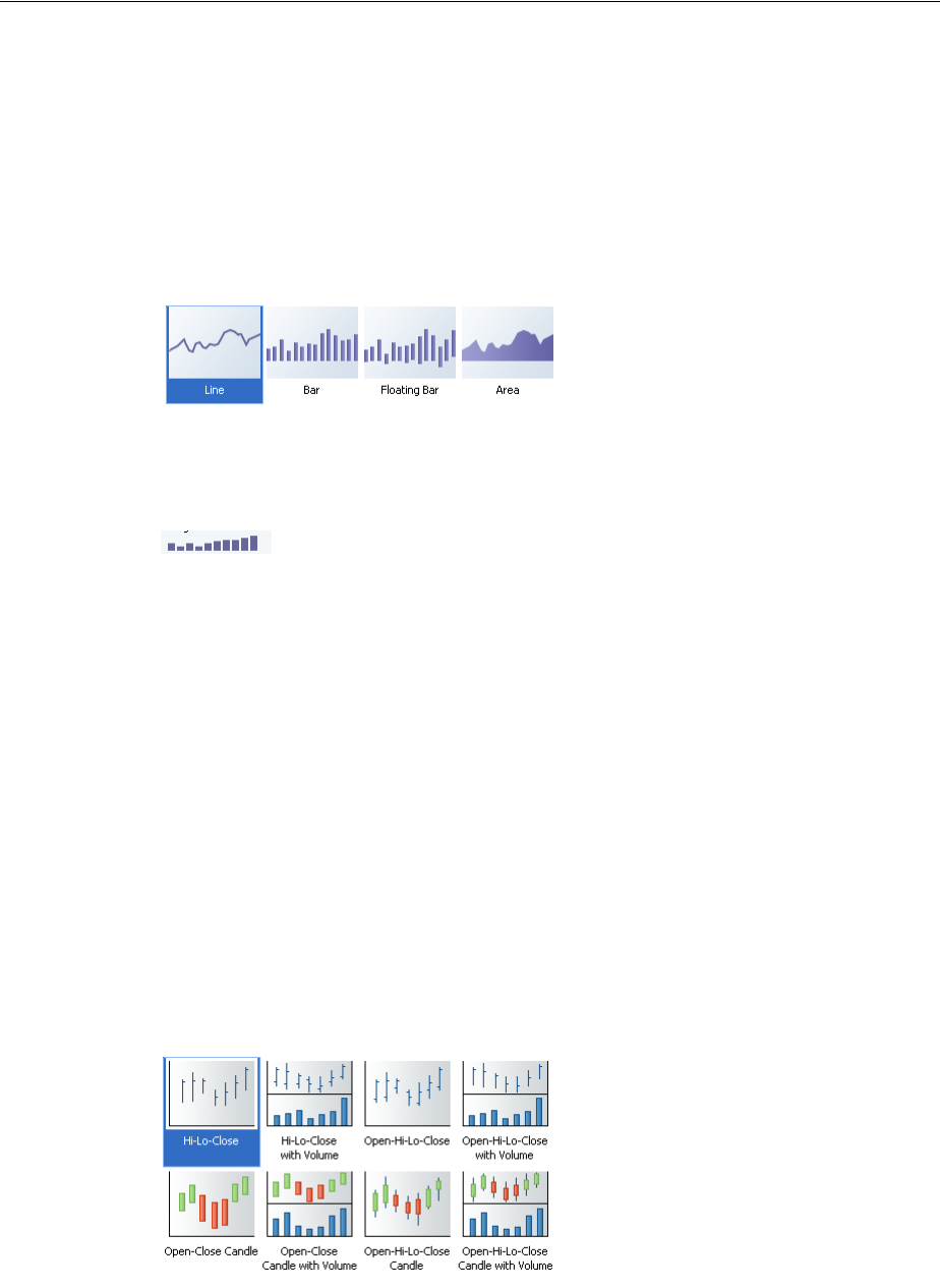
About the Graph Component
Using Graph Components 22-15
■Sparkchart: A simple, condensed graph that displays trends or variations in a
single data value, typically stamped in the column of a table or in line with related
text. Sparkcharts have basic conditional formatting. Since sparkcharts contain no
labels, the adjacent columns of a table or surrounding text provide context for
sparkchart content
Figure 22–30 shows variations of the sparkchart graph type as displayed in the
Component Gallery with the default graph selected.
Figure 22–30 Sparkchart Graph Type Variations
Figure 22–31 shows an example sparkchart.
Figure 22–31 Bar Sparkchart Example
■Stock: Shows data as the high, low, and closing prices of a stock. Each stock
marker displays two to four separate values (not counting the optional volume
marker) depending on the specific type of stock graph chosen. Stock graphs
display stock prices and, optionally, the volume of trading for one or more stocks
in a graph. When any stock or candle stock graph includes the volume of trading,
the volume appears as bars in the lower part of the graph.
Candle stock graphs display stock prices and, optionally, the volume of trading
for only a single stock. When a candle stock graph includes the volume of trading,
the volume appears as bars in the lower part of the graph.
Candle stock graphs also show the lesser of the open and close values at the
bottom of the candle. The greater value appears at the top of the candle. If the
closing value is greater than the opening value, then the candle is green. If the
opening value is higher than the closing value, then the candle is red.
Figure 22–32 shows variations of the stock graph type as displayed in the
Component Gallery with the default graph selected.
Figure 22–32 Stock Graph Type Variations
Figure 22–33 shows an example candle stock graph.
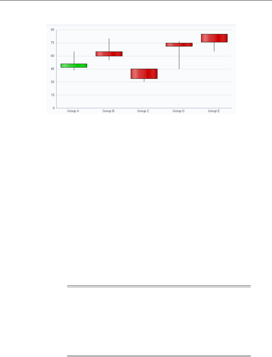
About the Graph Component
22-16 Web User Interface Developer's Guide for Oracle Application Development Framework
Figure 22–33 Candle Stock Chart Example
22.1.3 Additional Functionality for Graph Components
You may find it helpful to understand other ADF Faces features before you implement
your graph component. Additionally, once you have added a graph component to
your page, you may find that you need to add functionality such as validation and
accessibility. Following are links to other functionality that graph components can use:
■Partial page rendering: You may want a graph to refresh to show new data based
on an action taken on another component on the page. For more information, see
Chapter 8, "Rerendering Partial Page Content."
■Personalization: When enabled, users can change the way the graph displays at
runtime, those values will not be retained once the user leaves the page unless you
configure your application to allow user customization. For information, see
Chapter 32, "Allowing User Customization on JSF Pages."
■Accessibility: You can make your graph components accessible. For more
information, see Chapter 30, "Developing Accessible ADF Faces Pages."
■Automatic data binding: If your application uses the Fusion technology stack, then
you can create automatically bound graphs based on how your ADF Business
components are configured. For more information, see the "Creating Databound
Graphs" section of the Oracle Fusion Middleware Fusion Developer's Guide for Oracle
Application Development Framework.
Additionally, data visualization components share much of the same functionality,
such as how data is delivered, automatic partial page rendering (PPR), image formats,
and how data can be displayed and edited. For more information, see Section 21.2,
"Common Functionality in Data Visualization Components."
Note: If you know the UI components on your page will eventually
use ADF data binding, but you need to develop the pages before the
data controls are ready, then you should consider using placeholder
data controls, rather than manually binding the components. Using
placeholder data controls will provide the same declarative
development experience as using developed data controls. For more
information, see the "Designing a Page Using Placeholder Data
Controls" section of the Oracle Fusion Middleware Fusion Developer's
Guide for Oracle Application Development Framework.

Using the Graph Component
Using Graph Components 22-17
22.2 Using the Graph Component
Data requirements for graphs differ with graph type. Data requirements can be any of
the following kinds:
■Geometric: Some graph types need a certain number of data points in order to
display data. For example, a line graph requires at least two groups of data
because a line requires at least two points.
■Complex: Some graph types require more than one data point for each marker
(which is the component that actually represents the data in a graph). A scatter
graph, for example, needs two values for each group so that it can position the
marker along the x-axis and along the y-axis. If the data that you provide to a
graph does not have enough data points for each group, the graph component
does its best to display a graph.
■Logical: Some graph types cannot accept certain kinds of data. The following
examples apply:
–Negative data issues: Do not pass negative data to a pie graph or to a
percentage bar, line, or area graph. Markers will not display for negative data
in percentage graphs.
–Null or zero data: You cannot see markers for null data because markers will
not be produced for null data. Also, if a graph receives zero data and the axis
line is at zero, the marker is not visible. However, if the axis line is at nonzero,
the zero marker is visible.
–Insufficient sets (or series) of data: Dual-Y graphs require a set of data for each
y-axis. Usually, each set represents different information. For example, the
y1-axis might represent sales for specific countries and time periods, while the
y2-axis might represent total sales for all countries. If you pass only one set of
y-axis data, then the graph cannot display data on two different Y-axes. It
displays the data on a single y-axis.
Similar graphs share similar data requirements. For example, you can group the
following graphs under the category of area graphs:
■Absolute area graph.
■Stacked area graph.
■Percentage area graph.
22.2.1 Graph Type Data Requirements
Specific data requirements for each graph type are defined as follows:
■Area graphs:
–At least two groups of data is required for area graphs. A group is represented
by a position along the horizontal axis that runs through all area markers. In a
graph that shows data for a three-month period, the groups might be labeled
Jan, Feb, and Mar.
–One or more series of data is required for area graphs. A filled-in area
represents a series or set of data and is labeled by legend text, such as the
continent of the Americas, Europe, and Asia.
–Percentage area graphs cannot have negative numbers.
–Dual-Y graphs require two sets of data.

Using the Graph Component
22-18 Web User Interface Developer's Guide for Oracle Application Development Framework
■Bar and horizontal bar graphs:
–Percentage bar graphs cannot have negative numbers.
–Dual-Y graphs require two sets of data.
■Bubble graphs:
–At least three data values for a data marker are required. Each data marker in
a bubble graph represents three group values:
*The x value that determines the marker’s location along the x-axis.
*The y value that determines the marker’s location along the y-axis.
*The z value that determines the size of the marker.
–For more than one group of data, bubble graphs require that data must be in
multiples of three. For example, in a specific bubble graph, you might need
three values for Paris, three for Tokyo, and so on. An example of these three
values might be: x value is average life expectancy, y value is average income,
and z value is population.
■Combination graphs:
–Combination graphs require at least two sets of data or else the graph cannot
show different marker types.
–Combination graphs require at least two groups of data or else the graph
cannot render an area marker or a line marker.
■Funnel graphs:
–At least two series (or sets of data) are required for funnel graphs. These two
sets of data serve as the target and actual data values. Threshold values
appear in the graph legend.
Another variation of the funnel graph requires only one set of data, where the
data values shown are percentages of the total values. To produce this type of
funnel graph, you must set the funnelPercentMeasure property on the
graph to be True. This setting should be done in the XML for the graph.
–At least one group of data is required to be used as a stage for funnel graphs.
■Line graphs:
–At least two groups of data are required for line graphs because lines require
at least two points. A group is represented by a marker of each color. The
group has a tick label such as the name of a month.
–Percentage line graphs cannot have negative numbers.
–Dual-Y graphs require two sets of data.
■Pareto graphs:
–At least two groups of data are required for Pareto graphs.
–Pareto graphs cannot have negative numbers.
Note: When you look at a bubble graph, you can identify groups of
data by examining tooltips on the markers. However, identifying
groups is not as important as looking at the overall pattern of the data
markers.

Using the Graph Component
Using Graph Components 22-19
–If you pass more than one set of data to a Pareto graph, the graph uses only
the first set of data.
–Do not pass percentage values as part of the data for a Pareto graph. The
graph calculates the percentages based on the data that you pass.
■Pie and ring graphs:
–At least one group of data is required for a pie or ring graph. The data
structure is as follows:
*Each pie or ring represents one group of data and has a pie or ring label
such as the name of a month. If you have only one group of data, then
only one pie or ring appears even if you selected a multiple pie or ring
graph type. Also, if any group has all zero data, then the pie or ring for
that group is not displayed.
*A series or set of data is represented by all the slices of the same color. You
see legend text for each set of this data. For example, if there is a separate
set of data for each country, then the name of each country appears in the
legend text.
–Pie graphs cannot have negative numbers.
–Multiple pie graphs must have at least two sets of data.
■Polar graphs:
Polar graphs are circular scatter graphs with a directional aspect. At least two data
values are required for each marker in a polar graph. Each data marker represents
the following:
–The x value that determines the location of the marker along the x-axis, which
is the location around the circle, clockwise.
–The y value that determines the location of the marker along the y-axis, which
is the distance from the center of the graph.
■Radar graphs:
At least three groups of data are required for a radar graph. The data structure is
as follows:
–The number of sides on the polygon is equal to the number of groups of data.
Each corner of the polygon represents a group.
–A series or set of data is represented by a line, all the markers of the same
color, or both. It is labeled by legend text.
■Scatter graphs:
–At least two data values are required for each marker in a scatter graph.
Scatter graphs have either a single y-axis or a dual y-axis. Each data marker
represents the following:
*The x value that determines the marker’s location along the x-axis.
*The y value that determines the marker’s location along the y-axis.
–For more than one group of data, the data must be in multiples of two.
■Sparkcharts:
–Sparkcharts do not accept tabular data or graphDataModel.
–Line, bar, and area sparkcharts require a single series of data values.

Using the Graph Component
22-20 Web User Interface Developer's Guide for Oracle Application Development Framework
–Floating bar sparkcharts require two series of data values, one for the float
offset, and one for the bar value
■Stock graphs:
–Stock: High-Low-Close
*Each stock marker requires a group of three data values in the following
sequence: High, Low, Close. To display stock data for more than one day,
data must be in multiples of three, such as three data values for Monday,
three data values for Tuesday, and so on for each additional day.
*A series (or set) of data is represented by markers of the same color that
represent one stock. A series is labeled by legend text such as Stock A. The
legend appears even if you have only one stock with the except of candle
stock graphs. Most high-low-close stock graphs have only one series. If
you show more than one series and the prices of the different stocks
overlap, then some stock markers obscure other stock markers.
–Stock: High-Low-Close with Volume:
*Each stock marker requires a group of four data values in the following
sequence: High, Low, Close, Volume. To display stock data for more than
one day, data must be in multiples of four and sequenced as follows:
Monday High, Monday Low, Monday Close, Monday Volume, and so on
for each additional day.
*High-low-close stock graphs that also show volume can display the data
for only one stock. The label for this stock appears in the legend of the
graph.
–Stock: Open-High-Low-Close
*Each stock marker requires a group of four data values in the following
sequence: Open, High, Low, Close. To display stock data for more than
one day, data must be in multiples of four, such as four data values for
Monday, four data values for Tuesday, and so on.
*A series (or set) of data is represented by markers that have the same color
and represent one stock. A series is labeled by legend text such as Stock A.
The legend appears even if you have only one stock. Most
open-high-low-close stock graphs have only one series. If you show more
than one series and the prices of the different stocks overlap, then some
stock markers obscure other stock markers.
–Stock: Open-High-Low-Close with Volume
*Each stock marker requires a group of five data values in the following
sequence: Open, High, Low, Close, Volume. To display stock data for
more than one day, data must be in multiples of five and sequenced as
follows: Monday Open, Monday High, Monday Low, Monday Close,
Monday Volume, and so on for each additional day.
*Open-high-low-close stock graphs that also show volume can display the
data for only one stock. The label for this stock appears in the legend of
the graph.
–Candle: Open-Close
*Each stock marker requires a group of two data values in the following
sequence: Open, Close. To display stock data for more than one day, data
must be in multiples of two, such as two data values for Monday, two
data values for Tuesday, and so on.

Using the Graph Component
Using Graph Components 22-21
*A series (or set of data) is represented by markers for one stock. Candle
stock graphs allow the display of values for only one stock. For this
reason, no legend appears in these graphs and you should show the series
label (which is the name of the stock) in the title of the graph.
–Candle: Open-Close with Volume
*Each stock marker requires a group of three data values in the following
sequence: Open, Close, Volume. To display stock data for more than one
day, data must be in multiples of three, such as three data values for
Monday, three data values for Tuesday, and so on.
*A series (or set of data) is represented by markers for one stock. Candle
stock graphs allow the display of values for only one stock. For this
reason, no legend appears in these graphs and you should show the series
label (which is the name of the stock) in the title of the graph.
–Candle: Open-High-Low-Close
*Each stock marker requires a group of four data values in the following
sequence: Open, High, Low, Close. To display stock data for more than
one day, data must be in multiples of four, such as four data values for
Monday, four data values for Tuesday, and so on.
*A series (or set) of data is represented by markers for one stock. Candle
stock graphs allow the display of values for only one stock. For this
reason, no legend appears in these graphs and you should show the series
label (which is the name of the stock) in the title of the graph.
–Candle: Open-High-Low-Close with Volume
*Each stock marker requires a group of five data values in the following
sequence: Open, High, Low, Close, Volume. To display stock data for
more than one day, data must be in multiples of five, such as five data
values for Monday, five data values for Tuesday, and so on.
*A series (or set) of data is represented by markers for one stock. Candle
stock graphs allow the display of values for only one stock. For this
reason, no legend appears in these graphs and you should show the series
label (which is the name of the stock) in the title of the graph.
22.2.2 Configuring Graphs
Because of the many graph types and the significant flexibility of the graph
components, graphs have a large number of DVT tags. The prefix dvt: occurs at the
beginning of each graph tag name indicating that the tag belongs to the ADF Data
Visualization Tools (DVT) tag library. The following list identifies groups of tags
related to the graph component:
■Graph component tags: The 13 graph component tags provide a convenient and
quick way to create a commonly used graph type. They are represented in the
Component Gallery as categories of graphs with one or more type variations.
Table 22–1 provides a description of the graph component tags, and their
variations as specified in the subType attribute of the graph component.
Using the Graph Component
22-22 Web User Interface Developer's Guide for Oracle Application Development Framework
Table 22–1 Graph Component Tags and Sub Types
Graph Tag Description Sub Types
areaGraph Represents data as a
filled-in area. AREA_VERT_ABS
AREA_VERT_ABS_SPLIT2Y
AREA_VERT_PERCENT
AREA_VERT_STACK
AREA_VERT_STACK_SPLIT2Y
barGraph Represents data as a series
of vertical bars. BAR_VERT_CLUST
BAR_VERT_CLUST_SPLIT2Y
BAR_VERT_CLUST2Y
BAR_VERT_FLOAT_STACK
BAR_VERT_PERCENT
BAR_VERT_STACK
BAR_VERT_STACK_SPLIT2Y
BAR_VERT_STACK2Y
bubbleGraph Represents data by the
location and size of round
data markers (bubbles).
BUBBLE
BUBBLE_2Y
comboGraph Uses different types of data
markers (bars, lines, or
areas) to display different
kinds of data items.
COMBINTATION_VERT_ABS
COMBINTATION_VERT_ABS_2Y
funnelGraph Visually represents data
related to steps in a process.
The steps appear as vertical
slices across a horizontal
cone-shaped section.
FUNNEL
horizontalBarGraph Displays data as bars
horizontally along the
y-axis.
BAR_HORIZ_CLUST
BAR_HORIZ_CLUST_SPLIT2Y
BAR_HORIZ_CLUST2Y
BAR_HORIZ_PERCENT
BAR_HORIZ_STACK
BAR_HORIZ_STACK_SPLIT2Y
BAR_HORIZ_STACK2Y
lineGraph Represents data as a line, as
a series of data points, or as
data points that are
connected by a line.
LINE_VERT_CLUST
LINE_VERT_CLUST_SPLIT2Y
LINE_VERT_CLUST2Y
LINE_VERT_PERCENT
LINE_VERT_STACK
LINE_VERT_STACK_SPLIT2Y
LINE_VERT_STACK2Y
paretoGraph Represents data by bars and
a percentage line that
indicates the cumulative
percentage of bars.
PARETO
pieGraph Represents one group of
data as sections of a circle
causing the circle to look
like a sliced pie. Pie graphs
can display as a pie or ring,
where the center of each
circle has a hole in which
the total pie value is
displayed.
PIE
PIE_BAR
PIE_MULTI
RING
RING_BAR
RING_MULTI
Using the Graph Component
Using Graph Components 22-23
■Common graph child tags: These tags are supported by most graph component
tag to provide a variety of customization options.
Table 22–2 provides a list and description of these tags.
radarGraph Appears as a circular line
graph. RADAR
scatterGraph Represents data by the
location of data markers. A
scatter graph can display
data in a directional manner
as a polar graph.
SCATTER
SCATTER_2Y
POLAR
sparkChart Simple, condensed graph
that displays trends or
variations in a single data
value, typically stamped in
the column of a table or in
line with related text.
area
bar
floatingBar
line
stockGraph Displays stock prices and,
optionally, the volume of
trading for one or more
stocks in a graph. When any
stock or candle stock graph
includes the volume of
trading, the volume appears
as bars in the lower part of
the graph.
STOCK_CANDLE
STOCK_CANDLE_VOLUME
STOCK_HILO_CLOSE
STOCK_HILO_CLOSE_VOLUME
STOCK_OHLC_CANDLE
STOCK_OHLC_CANDLE_VOLUME
STOCK_OPEN_HILO_CLOSE
STOCK_VOLUME
Table 22–2 Common Graph Child Tags
Child Tag Description
animationOnDisplay
animationOnDataChange
Configuring animation effects for graphs.
background
graphFont
graphFootnote
graphPlotArea
graphSubTitle
graphTitle
Customizing the appearance of graph elements including titles.
attributeFormat Formatting categorical attributes in the ordinal axis and marker
tooltips.
legendArea
legendText
legendTitle
Customizing of the graph legend.
markerText
x1Format
y1Format
y2Format
zFormat
Marker customization related to each axis.
Table 22–1 (Cont.) Graph Component Tags and Sub Types
Graph Tag Description Sub Types
Using the Graph Component
22-24 Web User Interface Developer's Guide for Oracle Application Development Framework
■Child set tags: These tags wrap a set of an unlimited number of related tags.
Table 22–3 provides a list and description of these tags.
In each case, during design, you must create the wrapper tag first, followed by a
related tag for each item in the set. Example 22–1 shows the sequence of the tags
when you create a set of alert tags to define two alert points for an area graph.
Example 22–1 Code Sample for a Set of Alert Tags
<dvt:areaGraph id="areaGraph1" subType="AREA_VERT_ABS">
<dvt:background>
<dvt:specialEffects/>
</dvt:background>
<dvt:graphPlotArea/>
<dvt:alertSet>
<dvt:alert xValue="Boston" yValue="3.50"
yValueAssignment="Y1AXIS" imageSource="myWarning.gif"/>
o1Axis
o1MajorTick
o1TickLabel
o1Title
Customizing the ordinal axis (also known as the category axis)
used with bar, area, combination, line, radar, and stock graphs
with group labels.
x1Axis
x1MajorTick
x1TickLabel
x1MinorTick
x1Title
Customizing the x-axis used with scatter and bubble graphs
with numerical labels.
y1Axis
y1MajorTick
y1TickLabel
y1MinorTick
y1Title
Customizing the y1-axis.
Table 22–3 Graph Child Set Tags
Child Set Tag Description
alertSet Wraps dvt:alert tags that define an additional data point
that needs to be highlighted with a separate symbol, such as an
error or warning.
annotationSet Wraps dvt:annotation tags that define an annotation on a
graph. An annotation is associated with a specific data point on
a graph
referenceObjectSet Wraps dvt:referenceObject tags that define a reference
line or a reference area for a graph. You can define an unlimited
number of reference objects for a given graph.
seriesSet Wraps dvt:series tags that define a set of data markers or
series on a graph.
shapeAttributesSet Wraps dvt:shapeAttributes tags that specify interactivity
properties on a subcomponent of a graph.
Table 22–2 (Cont.) Common Graph Child Tags
Child Tag Description
Using the Graph Component
Using Graph Components 22-25
<dvt:alert xValue="Boston" yValue="5.50"
yValueAssignment="Y1AXIS" imageSource="myError.gif"/>
</dvt:alertSet>
<dvt:o1Axis/>
<dvt:y1Axis/>
<dvt:legendArea automaticPlacement="AP_NEVER"/>
</dvt:areaGraph>
■Graph-specific child tags: These tags apply either to specific graph types or to
specific parts of a graph.
Table 22–4 provides a list and description of these tags.
■Graph tag: Although available, but not the preferred method, the dvt:graph tag
lets you create an instance of a graph for any supported graph type. Even though
some graph attributes and some graph child tags are meaningful only for certain
graph types, the graph tag has a complete set of graph attributes and supports the
Table 22–4 Graph-Specific Child Tags
Child Tag Description
specialEffects
gradientStopStyle
Gradients that are used for a graph only in conjunction with
dvt:background, dvt:legendArea, dvt:graphPlotArea,
dvt:graphPieFrame, dvt:series,
dvt:referenceObject, or dvt:timeSelector child
components.
sliceLabel
x1TickLabel
y2TickLabel
y1TickLabel
x1Format
y1Format
y2Format
zFormat
stockVolumeFormat
Formatting numerical data values for graph.
timeAxisDateFormat
timeSelector
Time axis customization for area, bar, combination, line, and
stacked bar graphs.
timeSelector Selection of a range on a time axis for master-detail graphs
paretoLine
paretoMarker
Pareto graph customizations.
graphPieFrame
slice
sliceLabel
Pie graph customizations.
sparkItem Sparkchart customizations.
stockMarker
stockVolumeformat
volumeMarker
Stock graph customizations.
Using the Graph Component
22-26 Web User Interface Developer's Guide for Oracle Application Development Framework
use of all graph child tags. Therefore, the dvt:graph tag provides full flexibility
for choosing graph types, customizing graphs, and changing from one graph type
to another.
For complete descriptions of all the tags, their attributes, and a list of valid values,
consult the DVT tag documentation. To access this documentation for a specific graph
tag in JDeveloper, select the tag in the Structure window and press F1 or click the help
button.
22.2.3 How to Add a Graph to a Page
When you are designing your page using simple UI-first development, you use the
Component Palette to add a graph to a JSF page. When you drag and drop a graph
component onto the page, the Component Gallery displays available categories of
graph types, with descriptions, to provide visual assistance when creating graphs. You
can also specify a quick-start layout of the graph’s title and legend. Figure 22–34
shows the Component Gallery for bar graphs with the default vertical clustered bar
graph type selected.
Figure 22–34 Component Gallery for Graphs
Once you complete the dialog, and the graph is added to your page, you can use the
Property Inspector to specify data values and configure additional display attributes
for the graph.
Note: In JDeveloper the dvt:graph tag is not available to
declaratively insert from the Component Palette. The tag and its child
tags must be typed into the source code of a.jspx file.
Using the Graph Component
Using Graph Components 22-27
In the Property Inspector you can use the dropdown menu for each attribute field to
display a property description and options such as displaying an EL Expression
Builder or other specialized dialogs. Figure 22–35 shows the dropdown menu for a bar
graph component value attribute.
Figure 22–35 Bar Graph Component Value Attribute Dropdown Menu
Before you begin:
It may be helpful to have an understanding of how graph attributes and gauge graph
tags can affect functionality. For more information, see Section 22.2.2, "Configuring
Graphs."
You may also find it helpful to understand functionality that can be added using other
ADF Faces features. For more information, see Section 22.1.3, "Additional
Functionality for Graph Components."
Note: If your application uses the Fusion technology stack, then you
can use data controls to create a graph and the binding will be done
for you. For more information, see the "Creating Databound ADF
Graphs" chapter in the Oracle Fusion Middleware Fusion Developer's
Guide for Oracle Application Development Framework

Using the Graph Component
22-28 Web User Interface Developer's Guide for Oracle Application Development Framework
To add a graph to a page:
1. In the Component Palette, from the ADF Data Visualizations page, in the Graph
panel, drag and drop the desired type graph onto the page to open the Create
Graph dialog in the Component Gallery.
Use the dialog to select the graph type, and the quick start layout for display of
graph title, legend, and labels. If you need help, press F1 or click Help.
2. In the Property Inspector, view the attributes for the graph. Use the help button to
display the complete tag documentation for the graph type component.
3. Expand the Common section. Use this section to set the following attribute:
■SubType: If you wish to change the variation of the graph type selected in the
Component Gallery, select the desired type from the attribute dropdown
menu. The valid values will vary depending on the graph.
For example, the valid values for a bar graph are:
–BAR_VERT_CLUST: Clustered bar graph that has a vertical orientation.
–BAR_VERT_CLUST_SPLIT2Y: Clustered, vertical, split dual-y bar graph.
–BAR_VERT_CLUST2Y: Clustered, vertical, dual-y bar graph.
–BAR_VERT_FLOAT_STACK: Floating, vertical, stacked bar graph.
–BAR_VERT_PERCENT: Percent, vertical bar graph.
–BAR_VERT_STACK: Stacked, vertical bar graph.
–BAR_VERT_STACK_SPLIT2Y: Stacked, vertical, split dual-y bar graph.
–BAR_VERT_STACK2Y: Stacked, vertical, dual-y bar graph.
4. Expand the Graph Data section. Specify data values for the graph by setting the
value in these fields:
■Value: Specify the data model, which must be an instance of DataModel,
using an EL Expression. Alternatively, set a metric value as either a
Java.lang.Number object or a String.
■TabularValue: Alternatively, specify a tabular data set as a Java.util.List
object. For more information, see Section 22.2.5, "How to Create a Graph Using
Tabular Data."
5. Expand the Appearance section. Specify display attributes by setting the value in
these fields:
■ShortDesc: Enter a statement of the graph’s purpose and structure for use by
screen readers
■EmptyText: Specify the error text to display if the graph has no data.
■ImageFormat (Image subsection): Specify the image format in which to
display the graph. The default value is FLASH. For more information, see
Section 22.2.6, "What You May Need to Know About Flash and PNG Image
Formats."
22.2.4 What Happens When You Add a Graph to a Page
When a graph component is inserted into a JSF page using the Component Gallery, a
set of child tags that support customization of the graph is automatically inserted.
Example 22–2 shows the code inserted in the JSF page for a bar graph with the
quick-start layout selected in the Component Gallery in Figure 22–34.
Using the Graph Component
Using Graph Components 22-29
Example 22–2 Graph Sample Code
<dvt:barGraph id="graph1" subType="BAR_VERT_CLUST">
<dvt:background>
<dvt:specialEffects/>
</dvt:background>
<dvt:graphPlotArea/>
<dvt:seriesSet>
<dvt:series/>
</dvt:seriesSet>
<dvt:o1Axis/>
<dvt:y1Axis/>
<dvt:legendArea automaticPlacement="AP_NEVER"/>
</dvt:barGraph>
After inserting a graph component into the page, specialized context menus in the
visual editor and Property Inspector buttons are available to support the
customization of graph features. For more information, see Section 22.2.7, "Editing
Graphs in the Visual Editor and Property Inspector."
22.2.5 How to Create a Graph Using Tabular Data
A graph is created when a grid of data is used for the graph component. The
tabularData attribute of a graph component lets you specify a list of values that the
graph uses to create a grid and to populate itself. To create a graph using tabular data
you must store the data in a method in the graph’s managed bean, and then use the
graph component’s tabularData attribute to reference the data.
For example, the table in Figure 22–36 has three columns: 2006, 2007, and 2008, and
two rows: Shoes and Boots. This data produces a graph that compares annual sales for
boots and shoes over a three-year period.
Figure 22–36 Comparison of Annual Sales
In a managed bean, the list that contains the tabular data consists of a three-member
Object array for each data value to be passed to the graph. The members of each
array must be organized as follows:
■The first member (index 0) is the column label, in the grid, of the data value. This
is generally a String. If the graph has a time axis, then this should be a Java
Date. Column labels typically identify groups in the graph.
■The second member (index 1) is the row label, in the grid, of the data value. This is
generally a String. Row labels appear as series labels in the graph, usually in the
legend.
■The third member (index 2) is the data value, which is usually Double.
Example 22–3 shows code that creates the list of data required for a graph to compare
annual sales of shoes and boots for a three-year period.
Example 22–3 Code to Create a List of Data for a Graph
public List getTabularData()
{
ArrayList list = new ArrayList();

Using the Graph Component
22-30 Web User Interface Developer's Guide for Oracle Application Development Framework
String[] rowLabels = new String[] {"Boots", "Shoes"};
String[] colLabels = new String[] {"2006", "2007", "2008"};
Double [] [] values = new Double[][]{
{120000, 122000, 175000},
{90000, 110000, 150000}
};
for (int c = 0; c < colLabels.length; c++)
{
for (int r = 0; r < rowLabels.length; r++)
{
list.add (new Object [] {colLabels[c], rowLabels[r],
new Double (values[r][c])});
}
}
return list;
}
Before you begin:
It may be helpful to have an understanding of how graph attributes and graph child
tags can affect functionality. For more information, see Section 22.2.2, "Configuring
Graphs."
You should already have a managed bean that creates a list of tabular data. If you do
not, follow the instructions in Section 3.6, "Creating and Using Managed Beans."
You should already have a graph on your page. If you do not, follow the instructions
in this chapter to create a graph. For information, see Section 22.2.3, "How to Add a
Graph to a Page."
To create a graph that uses data from a managed bean:
1. In the Structure window, right-click the dvt:graph component and choose Go to
Properties.
2. In the Property Inspector, expand the Data section.
3. From the TabularDa t a attribute dropdown menu, choose Expression Builder.
4. In the Expression Builder dialog, use the search box to locate the graph’s managed
bean
5. Expand the managed bean node and select the method that contains the list of
tabular data.
6. Click OK.
The Expression is created.
For example, for a managed bean named sampleGraph and a method named
getTabularData, the Expression Builder generates the code
#(sampleGraph.tabularData)as the values for the tabularData attribute of the
graph.
22.2.6 What You May Need to Know About Flash and PNG Image Formats
By default, graphs are displayed using a Flash player as specified in the graph
component imageFormat attribute. Alternatively, graphs can be displayed using a
Portable Network Graphics (PNG) output format, as in the case when plug-ins are not
allowed on client machines. A PNG output format is used also when printing graphs.
Although static rendering is fully supported when using a PNG output format, certain
interactive features are not available including:
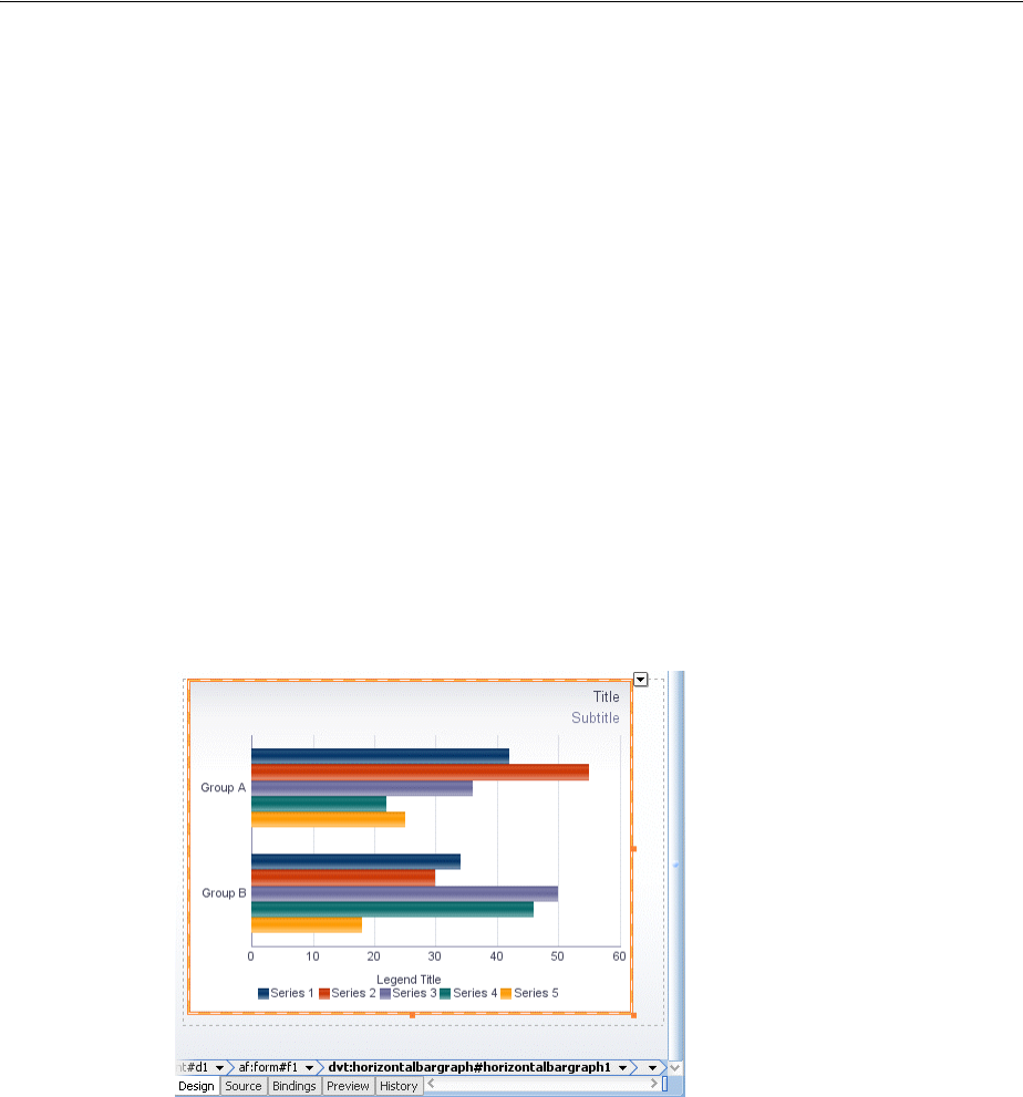
Using the Graph Component
Using Graph Components 22-31
■Animation
■Context menus
■Popup support
■Interactivity
You can disable the use of Flash content across the entire application by setting a
flash-player-usage context parameter in adf-config.xml. For more
information, see Section A.4.3, "Configuring Flash as Component Output Format."
When graphs are displayed in ADF table cells through stamping, a PNG_STAMPED
setting is required for the graph’s imageFormat attribute.
22.2.7 Editing Graphs in the Visual Editor and Property Inspector
When you edit graph components in the visual editor and Property Inspector,
specialized context menus and buttons are available to support the customization of
graph features. Graph child components such as the title, legend area, plot area,
background, axis labels, and display of graph series such as bars can be selected to
display a context menu with editing choices. Figure 22–37 shows the display of a
horizontal bar graph in the visual editor.
Figure 22–37 Horizontal Bar Graph in Visual Editor
Popups in the visual editor provide confirmation of selection of the graph feature to
be customized. For example, Figure 22–38 shows the popup displayed in the plot area
of a line graph.
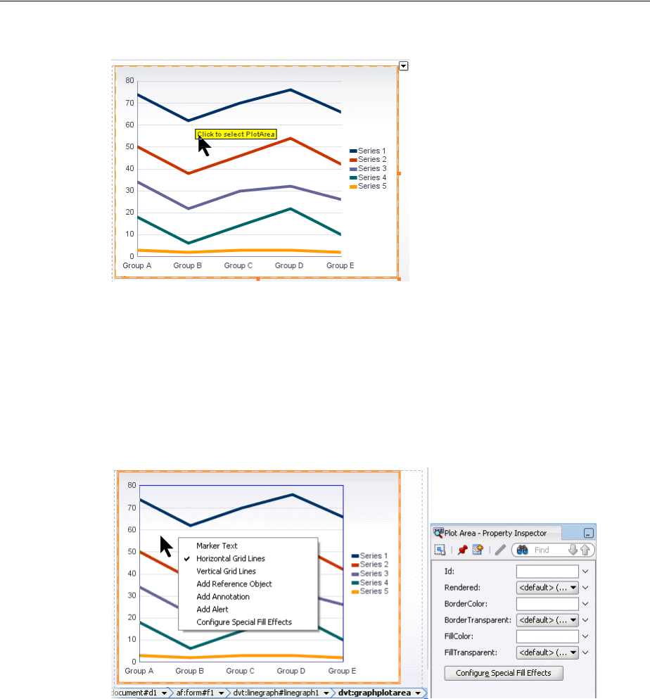
Customizing Graph Display Elements
22-32 Web User Interface Developer's Guide for Oracle Application Development Framework
Figure 22–38 Visual Editor Popup in Line Graph
When the graph feature is selected in the visual editor, a specialized editing context
menu is made available. Figure 22–39 shows the line graph plot area context menu
from which you can choose a variety of options including removing the default
display of the horizontal grid marks. You can also use the context menu or the
Property Inspector buttons to configure special fill effects in the plot area. The
selection of the graph tags is synchronized in the visual editor, Structure window,
Property Inspector, and source editor.
Figure 22–39 Line Graph Plot Area Context Menu
For additional information about configuring line graphs, see. Section 22.5.3,
"Changing the Appearance of Lines in Graphs." For additional information about
configuring special fill effects, see Section 22.4.3, "Using Gradient Special Effects in
Graphs."
22.3 Customizing Graph Display Elements
You can configure graph display elements including sizing, background and plot area
appearance, title, axes, labels, legends, and tooltips.
22.3.1 Changing Graph Size and Style
You can customize the width and height of a graph and you can allow for dynamic
resizing of a graph based on changes to the size of its container. You can also control

Customizing Graph Display Elements
Using Graph Components 22-33
the style sheet used by a graph. These two aspects of a graph are interrelated in that
they share the use of the graph inlineStyle attribute.
22.3.1.1 How to Specify the Size of a Graph at Initial Display
You can specify the initial size of a graph by setting values for attributes of the
dvt:<type>Graph tag. If you do not also provide for dynamic resizing of the graph,
then the initial size becomes the only display size for the graph.
To specify the size of a graph at its initial display:
1. In the Structure window, right-click the graph node and choose Go to Properties.
2. In the Style attributes category of the Property Inspector, enter a value for the
inlineStyle attribute of the graph tag. For example:
inlineStyle="width:200px;height:200px"
22.3.1.2 How to Provide for Dynamic Resizing of a Graph
You must enter values in each of two attributes of the dvt:<type>Graph tag to allow
for a graph to resize when its container in a JSF page changes in size. The values that
you specify for this capability also are useful for creating a graph component that fills
an area across different browser window sizes.
To allow dynamic resizing of a graph:
1. In the Structure window, right-click the graph node and choose Go to Properties.
2. In the Behavior attributes category of the Property Inspector for the
DynamicResize attribute, select the value DYNAMIC_SIZE.
3. In the Style attributes category of the Property Inspector for the InlineStyle
attribute, enter a fixed number of pixels or a relative percent for both width and
height.
For example, to create a graph that fills its container’s width and has a height of
200 pixels, use the following setting for the inlineStyle attribute:
"width:100%;height:200px;".
22.3.1.3 How to Use a Specific Style Sheet for a Graph
You have the option of selecting any of the standard styles available for the
dvt:<type>Graph tag. You can also specify a custom style sheet for use with a
graph.
To select a specific style sheet for a graph:
1. If you want to use one of the standard style sheets provided with the graph, do the
following:
a. In the Structure window, right-click the graph node and choose Go to
Properties.
b. In the Appearance attributes category, select the desired style sheet from the
style attribute dropdown list.
2. If you want to use a custom style sheet, then set the following attributes in the
Style attributes category of the Property Inspector:
a. For the StyleClass attribute, select Edit from the Property menu choices,
and select the CSS style class to use for this gauge.

Customizing Graph Display Elements
22-34 Web User Interface Developer's Guide for Oracle Application Development Framework
b. In the InlineStyle attribute, enter a fixed number of pixels or a relative
percent for both width and height.
For example, to create a graph that fills its container’s width and has a height
of 200 pixels, use the following setting for the inlineStyle attribute:
"width:100%;height:200px;"
22.3.2 Changing Graph Background, Plot Area, and Title
The graph automatically provides default settings for its background and plot area
based on the style it is using. You can customize these settings using child tags of the
graph.
The graph also provides title, subtitle, and footnote options that you can specify. By
default, no text is provided for titles and footnotes. When you enter this information,
you can also specify the font and font characteristics that you want to use for the text.
22.3.2.1 How to Customize the Background and Plot Area of a Graph
You can customize the following parts of graphs related to background and plot area:
■Background: The area on which the graph is plotted.
■Plot area: A frame in which data is plotted for all graphs other than pie graphs.
Axes are displayed on at least two borders of the plot area.
■Pie frame: A frame in which pie graphs are plotted without the use of axes.
To customize the background and plot area of a graph:
1. If you want to customize the background of a graph, do the following:
a. In the Structure window, right-click the graph node and choose Insert inside
dvt:<type>Graph > ADF Data Visualization > Background.
b. Use the Property Inspector to enter colors in the attributes that you want to
customize in the dvt:background tag.
2. If you want to customize the plot area of any graph other than a pie graph, do the
following:
a. In the Structure window, right-click the graph node and choose Insert inside
dvt:<type>Graph > ADF Data Visualization > Plot Area.
b. Use the Property Inspector to enter colors in the attributes that you want to
customize in the dvt:graphPlotArea tag.
3. If you want to customize the plot area of a pie graph, do the following:
a. In the Structure window, right-click the graph node and choose Insert inside
dvt:<type>Graph > ADF Data Visualization > Pie Frame.
b. Use the Property Inspector to enter colors in the attributes that you want to
customize in the dvt:graphPieFrame tag.
Note: You can also customize the colors of the background and plot
area in a graph by adding gradient special effects. For more
information, see Section 22.4.3, "Using Gradient Special Effects in
Graphs."

Customizing Graph Display Elements
Using Graph Components 22-35
22.3.2.2 How to Specify Titles and Footnotes in a Graph
You have the option of specifying a title, subtitle, and footnote for a graph. You use a
separate child tag of the graph for each of these text entries. The attributes of each of
these child tags let you define the horizontal alignment of the text field, the text
content, and whether or not the text should be rendered.
The tags for title, subtitle, and footnote support the use of a child graph font tag to let
you identify the exact font characteristics to be used for each text field.
To specify titles and a footnote for a graph:
1. If you want to enter a graph title, do the following:
a. In the Structure window, right-click the graph node and choose Insert inside
dvt:<type>Graph > ADF Data Visualization > Graph Title.
b. Use the Property Inspector to specify values in the attributes of the
dvt:graphTitle tag.
c. If you want to provide specific font characteristics for the text, then in the
Structure window, right-click the dvt:graphTitle node and choose Insert
inside dvt:graphTitle > Font.
d. Use the Property Inspector to specify values for the attributes of the
dvt:graphFont tag.
2. If you want to enter a graph subtitle, do the following:
a. In the Structure window, right-click the graph node and choose Insert inside
dvt:<type>Graph > ADF Data Visualization > Subtitle.
b. Use the Property Inspector to specify values in the attributes of the
dvt:graphSubtitle tag.
c. If you want to provide specific font characteristics for the text, in the Structure
window, right-click the dvt:graphSubtitle node and choose Insert inside
dvt:graphSubtitle > Font.
d. Use the Property Inspector to specify values for the attributes of the
dvt:graphFont tag.
3. If you want to enter a graph footnote, do the following:
a. In the Structure window, right-click the graph node and choose Insert inside
dvt:<type>Graph > ADF Data Visualization > Footnote.
b. Use the Property Inspector to specify values in the attributes of the
dvt:graphFootnote tag.
c. If you want to provide specific font characteristics for the text, then in the
Structure window, right-click the dvt:graphFootnote node and choose Insert
inside dvt:graphFootnote > Font.
d. Use the Property Inspector to specify values for the attributes of the
dvt:graphFont tag.
22.3.3 How to Customize Graph Axes and Labels
Graphs can have the following axes:
■Ordinal axis (also known as the o1-axis): The ordinal (or category) axis of a graph
shows ordered data, such as ratings or stages, or shows nominal data, such as
different cities or different products. The ordinal axis appears on bar, line, area,

Customizing Graph Display Elements
22-36 Web User Interface Developer's Guide for Oracle Application Development Framework
combination, or radar graphs. When the ordinal axis is horizontal and contains
time data, it is called a time axis.
An example of an ordinal axis is the horizontal line across the bottom of the plot
area of a vertical bar graph. The values along this axis do not identify the extent of
the data shown. Instead, they identify the different groups to which the data
belongs.
■x1-axis: The x1-axis shows the values that appear along the horizontal axis in a
graph. This axis has regular intervals of numbers instead of group labels. It is
referred to as the x-axis.
■y1-axis: The y1-axis is the primary y-axis. It is usually the vertical value axis along
the left side of the plot area. It has regular intervals of numbers.
■y2-axis: The y2-axis is the secondary y-axis. It is usually the vertical axis along the
right side of the plot area. It has regular intervals of numbers.
For each axis, there are several graph child tags that support customization. The
following sections discuss the options available for various kinds of customization of
an axis.
22.3.3.1 How to Specify the Title, Appearance, and Scaling of an Axis
The following graph child tags support customization of the title, and appearance of
an axis:
■Title: Specifies the text and alignment for an axis title. Includes the following tags:
dvt:o1Title, dvt:x1Title, dvt:y1Title, and dvt:y2Title. An axis does
not show a title unless you use the appropriate title tag.
■Axis: Controls the color, line width, scaling, increment between tick marks,
visibility of the axis, and scrolling in specific graph types. Includes the following
tags: dvt:o1Axis, dvt:x1Axis, dvt:y1Axis, dvt:y2Axis.
To specify the title and appearance of an x1-axis:
1. In the Structure window, right-click the graph node and choose Insert inside
dvt:<type>Graph > ADF Data Visualization > x1 Title.
2. In the Property Inspector, enter the text for the axis title and optionally specify
values for other attributes of this tag.
3. If you want to specify font characteristics for the title, do the following:
a. In the Structure window, right-click the dvt:x1Title node and choose Insert
inside dvt:x1Title > Font.
b. In the Property Inspector, enter the desired values for the characteristics of the
font.
4. Optionally, in the Structure window, right-click the graph node and choose Insert
inside dvt:<type>Graph > ADF Data Visualization > x1 Axis.
5. In the Property Inspector, enter the desired values for the attributes of this tag.
The procedure for controlling the title and appearance of any graph axis is similar to
the procedure for the x-axis. However, insert the title and axis tags related to the
specific axis that you want to customize.
Note: Scaling attributes are not present on the dvt:o1Axis tag
because the ordinal axis does not display numeric values.

Customizing Graph Display Elements
Using Graph Components 22-37
22.3.3.2 How to Specify Scrolling on an Axis
Scrolling on a graph axis can be specified for the following graph types:
■Area, bar, and line graphs for the dvt:o1Axis, dvt:y1Axis, and dvt:y2Axis
tags.
■Bubble and scatter graphs for the dvt:x1Axis,dvt:y1Axis, and dvt:y2Axis
tags.
By default, a graph axis scrolling attribute is set to off. You can specify these
values for the scrolling attribute:
■off: Scrolling is disabled (default).
■on: Scrolling is enabled and the scroll bar is always present.
■asNeeded: Scrolling is enabled, but the scrollbar is not initially present. After
zooming on the graph, the scrollbar displays and remains visible for the session.
■hidden: Scrolling is enabled but the scroll bar is always hidden. User may use pan
scrolling.
22.3.3.3 How to Control the Appearance of Tick Marks and Labels on an Axis
Tick marks are used to indicate specific values along a scale on a graph. The following
graph child tags support customization of the tick marks and their labels on an axis:
■Major tick: Controls the color, width, and style of tick marks on the axis. Includes
the following tags: dvt:o1MajorTick, dvt:x1MajorTick,
dvt:y1MajorTick, and dvt:y2MajorTick. Major tick increments are
calculated automatically by default, or you can specify the tick steps with the
majorIncrement attribute.
■Minor tick: Controls the color, width, and style of minor tick marks on the axis.
Includes the following tags: dvt:x1MinorTick, dvt:y1MinorTick, and
dvt:y2MinorTick. Minor tick increments are one-half of the major tick
increment by default, or you can specify the tick steps with the minorIncrement
attribute. Minor ticks do not support labels.
■Tick label: Controls the rotation of major tick label text and lets you specify font
characteristics for the label. Includes the following tags: dvt:o1TickLabel,
dvt:x1TickLabel, dvt:y1TickLabel, and dvt:y2TickLabel. These tags
can also have a dvt:graphFont child tag to change font characteristics of the
label.
To control the appearance of the ordinal axis tick labels:
1. In the visual editor, select the o1 Tick Label element on the graph.
Alternatively, you can select the dvt:o1Axis element in the Structure window,
then in the Property Inspector click the Configure o1Axis button and choose
Value Labels.
2. In the Property Inspector enter values as needed for the following properties:
■TextRotation: Use to specify the degree of text rotation to improve readability
of the tick labels.

Customizing Graph Display Elements
22-38 Web User Interface Developer's Guide for Oracle Application Development Framework
■TickLabelSkipMode: Use to specify if and how tick labels will be displayed
on the ordinal axis. When you set the value at TLS_MANUAL, you can
optionally use the tickLabelSkipCount to set the number of tick labels to
display between tick labels and tickLabelSkipFirst to set the index of the
first tick label to be skipped.
3. Optionally, in the Property Inspector, click the Configure Font button to set
properties for the child dvt:graphFont tag.
To control the appearance of tick marks and labels on an x-axis:
1. In the Structure window, right-click the graph node and choose Insert inside
dvt:<type>Graph > ADF Data Visualization > X1 Major Tick.
2. In the Property Inspector, enter desired values for the attributes of this tag and
click the Configure Tick Label button to add an X1 Tick Label tag to the graph.
3. In the Property Inspector, enter desired values for the X1 Tick Label and if
desired, click the Configure Font button to specify font characteristics for the tick
label.
4. If you want to specify minor ticks in the graph, do the following:
a. In the Structure window, right-click the graph node and choose Insert inside
dvt:<type>Graph > ADF Data Visualization > X1 Minor Tick.
b. In the Property Inspector, enter desired values for the characteristics of the
font.
The procedure for controlling the appearance of tick marks on any graph axis is
similar to the procedure for the x-axis. However, you customize the major tick and
label tags and insert the minor ticks related to the specific axis that you want to
customize.
22.3.3.4 How to Format Numbers on an Axis
The dvt:markerText tag lets you to control the format of numbers on an axis. The
following dvt:markerText child tags wrap the number format for specific axes:
dvt:x1Format, dvt:y1Format, and dvt:y2Format.
To format numbers on these axes, insert child tags for the appropriate axis as shown in
Section 22.4.4, "Formatting Data Values in Graphs."
Note: Use rotation angles that are multiples of 90 degrees to achieve
best results. For Flash image types, embedded fonts are required to
support rotated text in non-90 degree angles, and embedded fonts are
not available for all locales.
Note: For the tickStyle attribute you must specify a value other
than GS_NONE or GS_AUTOMATIC.
Note: There is no format for the ordinal axis because that axis does
not contain numeric values.

Customizing Graph Display Elements
Using Graph Components 22-39
22.3.3.5 How to Set Minimum and Maximum Values on a Data Axis
The Y-axes have the following graph child tags to support the starting value of the
axis: dvt:y1Axis, and dvt:y2Axis. You have the option of specifying different
scaling on each y-axis in a dual y-axis graph. For example, the y1-axis might represent
units in hundreds while the y2-axis might represent sales in thousands of dollars.
Some graphs, such as scatter and bubble graphs, contain a dvt:x1Axis child tag for
which the minimum and maximum values can also be set.
To specify the starting value on a y1-axis:
1. In the Structure window, right-click the graph node and choose Insert inside
dvt:<type>Graph > ADF Data Visualization > y1 Axis.
2. In the Property Inspector, for the AxisMinValue field, enter the starting value for
the y1-axis.
3. In the AxisMinAutoScaled field, select false from the attribute dropdown list.
You must set this attribute in order for the minimum value to be honored.
To establish the starting value on a y2-axis, use a similar procedure, but insert the
dvt:y2Axis tag as a child of the graph.
22.3.4 Customizing Graph Legends
Graph components provide child tags for the following kinds of customization for the
legend:
■Specifying the color, border, visibility, positioning, and scrollability of the legend
area relative to the graph, dvt:legendArea tag
■Specifying the font characteristics and positioning of the text that is related to each
colored entry in the legend, dvt:legendText tag
■Specifying an optional title and font characteristics for the legend area,
dvt:legendTitle tag
To customize the legend area, legend text, and title:
1. In the Structure window, right-click the graph node and choose Insert inside
dvt:<type>Graph > ADF Data Visualization > Legend Area.
2. Use the Property Inspector to specify values for the attributes of this tag. For
example, you can specify the following attributes for the legend area:
■AutomaticPlacement and Position: Specify automatic positioning of the
legend area on the right or the bottom of the graph with the default value of
AP_ALWAYS. Setting the value at AP_NEVER requires the value of the
position attribute to be used for positioning of the legend area.
■Scrolling: Specify scrolling in the legend area when required space exceeds
available space using the value asNeeded. By default the value is set to off.
3. If you want to customize the legend text, do the following:
a. In the Structure window, right-click the graph node and choose Insert inside
dvt:<type>Graph > ADF Data Visualization > Legend Text.
b. Use the Property Inspector to enter values for the attributes of this tag.
c. Right-click the dvt:legendText node and choose Insert inside dvt:legendText
> Font.

Customizing Graph Display Elements
22-40 Web User Interface Developer's Guide for Oracle Application Development Framework
d. Use the Property Inspector to specify values for the attributes of the font tag.
4. If you want to enter a title for the legend, do the following:
a. In the Structure window, right-click the graph node and choose Insert inside
dvt:<type>Graph > ADF Data Visualization, then Legend Title.
b. Use the Property Inspector to enter values for the attributes of this tag.
c. Right-click the dvt:legendTitle node and choose Insert inside dvt:legendTitle
> Font.
d. Use the Property Inspector to specify values for the attributes of the font tag.
22.3.5 Customizing Tooltips in Graphs
Tooltips are useful to display identification or detail information for data markers.
They can be very useful in smaller graphs without enough space to display
markerText. Graphs automatically displays tooltips for components like title,
subtitle, footnote, legend text, and annotations when their text is truncated.
In most graphs, if you move the cursor over a data marker, then a tooltip is displayed.
In a line or area graph, you must move the cursor over a data marker or at the corners
of the line or area and not merely over the line or area.
You can specify that each graph marker (such as bars) displays a tooltip with
information. The following graph attributes are used together to customize a graph
tooltip:
■MarkerTooltipType: Specifies whether tooltips are displayed for markers (such as
bars) and identifies the kind of information that appears in the tooltips. You have
the option to display the following information: text only, values only, or text and
values. For specific graph types, options include displaying cumulative data value
for each stacked graph marker or displaying percentage data value for each pie
slice marker.
■SeriesTooltipLabel: Specifies whether tooltips are displayed for each set of values
that appear in a legend. This attribute also controls the kind of information that
appears in a series tooltip. For example, you could choose to display text that
identifies a general term for the entire series (such as Product) or a specific term
for a given member of the series (such as a specific Product name).
■GroupTooltipLabelType: Specifies whether tooltip labels are displayed for data
groups along an axis. For example, sales for specific products might be grouped
by years or quarters. You can choose to display text that identifies a general term
for the entire group (such as Time) or specific terms for each member of the group
(such as Q1, Q2, Q3, or Q4 for quarters).
You can quickly format all the marker tooltips in a graph by setting the graph’s
markerTooltipTemplate attribute to a tokenized String. The attribute accepts a
String that may contain any number of a set of predefined tokens. For example:
<dvt:lineGraph markerTooltipTemplate="Template Based Tooltip NEW_LINE SERIES_LABEL
GROUP_LABEL NEW_LINE Value: Y_VALUE"/>
The list of supported tokens is described in Table 22–5.
Note: The graph displays series tooltip labels only if the graph’s
markerTooltipType attribute has a setting that includes text.
Formatting Graph Text, Colors, and Data Values
Using Graph Components 22-41
You can use the graph’s customToolTipCallback attribute to specify tooltips that
vary on an object by object basis. For example:
<dvt:graph id="g2" customToolTipCallback="#{customToolTipCallback.callback}"
22.4 Formatting Graph Text, Colors, and Data Values
You can format the text, colors, and data values for all graph types.
22.4.1 Formatting Text in Graphs
You can format text in any of the following subcomponents of a graph:
■Annotation: Includes only the dvt:annotation tag.
■Axis title: Includes the dvt:o1Title, dvt:x1Title, dvt:y1Title, and
dvt:y2Title tags.
■Axis tick label: Includes the dvt:o1TickLabel, dvt:x1TickLabel,
dvt:y1TickLabel, and dvt:y2TickLabel tags.
■Graph title: Includes the dvt:graphFootnote, dvt:graphSubtitle, and
dvt:graphTitle tags.
■Legend: Includes only the dvt:legendText tag.
■Marker: Includes only the dvt:markerText tag.
Table 22–5 markerTooltipTemplate String Tokens
Token Description
NEW_LINE Inserts a new line.
SERIES_LABEL The series label for the series of this marker.
GROUP_LABEL The group label for the group of this marker.
X_VALUE The X value of a scatter or bubble marker or continuous time
axis marker.
Y_VALUE The Y value of this marker (if this marker has a Y value).
Z_VALUE The Z value (bubble size) of a bubble marker.
PIE_VALUE The value of a pie slice.
PIE_PERCENT The pie slice percentage value.
ACTUAL_VALUE The actual value for a funnel slice.
TARGET_VALUE The target value for a funnel slice.
HIGH_VALUE The high value for a stock marker.
LOW_VALUE The low value for a stock marker.
CLOSE_VALUE The close value for a stock marker.
OPEN_VALUE The open value for a stock marker.
VOLUME_VALUE The volume value for a stock volume marker.
CUM_VALUE The cumulative stacked value for a stacked graph.
CUM_PERCENT The cumulative percentage value for a stacked percent graph or
Pareto graph.

Formatting Graph Text, Colors, and Data Values
22-42 Web User Interface Developer's Guide for Oracle Application Development Framework
Use the dvt:graphFont tag as a child of the specific subcomponent for which you
want to format text. For an example of formatting text in a graph, see Section 22.4.1,
"Formatting Text in Graphs.".
22.4.1.1 How to Globally Set Graph Font Using a Skin
You can set the font attributes of graph components globally across all pages in your
application by using a cascading style sheet (CSS) to build a skin, and configuring
your application to use the skin. By applying a skin to define the fonts used in graph
components, the pages in an application will be smaller and more organized, with a
consistent style easily modified by changing the CSS file.
You can use the ADF Data Visualization Tools Skin Selectors to define the font styles
for graph components. Graph component skin selectors include the following:
■af|dvt-graphFootnote
■af|dvt-graphSubtitle
■af|dvt-graphTitle
■af|dvt-o1Title
■af|dvt-x1Title
■af|dvt-y1Title
■af|dvt-y2Title
■af|dvt-pieLabel
■af|dvt-ringTotalLabel
■af|dvt-legendTitle
■af|dvt-legendText
■af|dvt-markerText
■af|dvt-o1TickLabel
■af|dvt-x1TickLabel
■af|dvt-y1TickLabel
■af|dvt-y2TickLabel
■af|dvt-annotation
■af|dvt-sliceLabel
■af|dvt-tooltips
You can also use ADF Data Visualization Tools global skin selectors to define the
font attributes across multiple graph components. Global skin selector names end in
the :alias pseudo-class, and affect the skin for more than one component. Global
graph skin selectors include the following:
■.AFDvtGraphFont:alias: Specifies the font attributes for all graph
components.
■.AFDvtGraphTitlesFont:alias: Specifies the font attributes for all graph
title components.
■.AFDvtGraphLabelsFont:alias: Specifies the font attributes for all graph
label components.

Formatting Graph Text, Colors, and Data Values
Using Graph Components 22-43
To use a custom skin to set graph fonts:
1. Add a custom skin to your application containing the defined skin style selectors
for the graph subcomponents. You can specify values for the following attributes:
■-tr-font-family: Specifies the font family (name). It may not contain more
than one font. If multiple fonts are specified, the first font will be used.
■-tr-font-size: Specifies the size of the font. Units of absolute size are
defined as:
–pt: Points - the standard font size used by CSS2, where 1 point equals
1/72nd of an inch.
–in: Inches, where 1 inch equals 72 points.
–cm: Centimeters, where 1 centimeter equals approximately 28 points.
–mm: Millimeters, where 1 millimeter equals approximately 2.8 points.
–pc: Picas, where 1 pica equals 12 points.
You can also use font size names for this attribute, including the following:
–xx-small: 8 points
–x-small: 9 points
–small: 10 points
–medium: 12 points
–large: 14 points
–x-large: 16 points
–xx-large: 18 points
■-tr-font-style: Specifies the style of the font. Valid values are normal or
italic.
■-tr-font-weight: Specifies the weight of the font. Valid values are normal
or bold.
■-tr-text-decoration: Specifies whether or not the underline emphasis is
rendered. Valid values are none or underline.
■-tr-color: Specifies the color of the font. Valid values are color names for
HTML and CSS. The World Wide Consortium lists 17 valid color names
including aqua, black, blue, fuchsia, gray, green, lime, maroon, navy,
olive, orange (CSS 2.1), purple, red, silver, teal, white, and yellow.
You can also use 3, 6, or 8 digits HEX (alpha channel is first 2 digit in 8 digit
HEX), RGB, or RGBA.
For example, specify the font family for all graph titles in a mySkin.css file as
follows:
af|dvt-graphTitle,
{
-tr-font-family: Comic Sans MS:
}
2. Register the custom skin with the application in the trinidad-skins.xml file.
For example, mySkin.css extends the default blafplus-rich.desktop style
sheet:
<?xml version="1.0" encoding="ISO-8859-1"?>

Formatting Graph Text, Colors, and Data Values
22-44 Web User Interface Developer's Guide for Oracle Application Development Framework
<skins xmlns="http://myfaces.apache.org/trinidad/skin">
<skin>
<id>mySkinExtends.desktop</id>
<family>mySkinExtends</family>
<extends>blafplus-rich.desktop</extends>
<render-kit-id>org.apache.myfaces.trinidad.desktop</render-kit-id>
<style-sheet-name>skins/mySkin.css</style-sheet-name>
</skin>
</skins>
3. Configure the application to use the custom skin in the trinidad-config.xml
file. For example:
<trinidad-config xmlns="http://myfaces.apache.org/trinidad/config">
<skin-family>mySkin</skin-family>
</trinidad-config>
4. Package the custom skin into a jar file to deploy with the application. The
trinidad-skins.xml file that defines the skin and that references the CSS file
must be within the META-INF directory.
For detailed information about applying a custom skin to applications, see Chapter 28,
"Customizing the Appearance Using Styles and Skins."
22.4.2 Specifying Transparent Colors for Parts of a Graph
You can specify that various parts of a graph show transparent colors by setting the
borderTransparent and fillTransparent attributes on the graph child tags
related to these parts of the graph. The following list identifies the parts of the graph
that support transparency:
■Graph background: Use the dvt:background tag. By default the
fillTransparent attribute is set to true.
■Graph legend area: Use the dvt:legendArea tag.
■Graph pie frame: Use the dvt:graphPieFrame tag.
■Graph plot area: Use the dvt:graphPlotArea tag.
22.4.3 Using Gradient Special Effects in Graphs
A gradient is a special effect in which an object changes color gradually. Each color in a
gradient is represented by a stop. The first stop is stop 0, the second is stop 1, and so
on. You can specify any number of stops in the special effects for a subcomponent of a
graph that supports special effects.
You can define gradient special effects for the following subcomponents of a graph:
■Graph background: Use the dvt:background tag.
■Graph plot area: Use the dvt:graphPlotArea tag.
■Graph pie frame: Use the dvt:graphPieFrame tag.
■Legend area: Use the dvt:legendArea tag.
■Series: Use the dvt:series tag.

Formatting Graph Text, Colors, and Data Values
Using Graph Components 22-45
■Time selector: Use the dvt:timeSelector tag.
■Reference area: Use the dvt:referenceObject tag.
The approach that you use to define gradient special effects is identical for each part of
the graph that supports these effects.
22.4.3.1 How to Add Gradient Special Effects to a Graph
For each subcomponent of a graph to which you want to add special effects, you must
insert a dvt:specialEffects tag as a child tag of the subcomponent. For example,
if you want to add a gradient to the background of a graph, then you would create one
dvt:specialEffects tag that is a child of the dvt:background tag.
Then, optionally if you want to control the rate of change for the fill color of the
subcomponent, you would insert as many dvt:gradientStopStyle tags as you
need to control the color and rate of change for the fill color of the component. These
dvt:gradientStopStyle tags then must be inserted as child tags of the single
dvt:specialEffects tag.
To add a gradient special effect to the background of a graph:
1. In the Structure window, right-click the dvt:background node that is a child of
the graph node, then choose Insert inside dvt:background, then Special Effects.
2. Use the Property Inspector to enter values for the attributes of the
dvt:specialEffects tag:
a. For fillType attribute, choose FT_GRADIENT.
For gradientDirection attribute, select the direction of change that you
want to use for the gradient fill.
b. For numStops attribute, enter the number of stops to use for the gradient.
3. Optionally, in the Structure window, right-click the dvt:specialEffects node
and choose Insert within dvt:specialEffects > dvt:gradientStopStyle if you want
to control the color and rate of change for each gradient stop.
4. Use the Property Inspector to enter values for the attributes of the
dvt:gradientStopStyle tag:
a. For the stopIndex attribute, enter a zero-based integer as an index within the
dvt:gradientStopStyle tags that are included within the
specialEffects tag.
b. For the gradientStopColor attribute, enter the color that you want to use
at this specific point along the gradient.
c. For the gradientStopPosition attribute, enter the proportional distance
along a gradient for the identified stop color. The gradient is scaled from 0 to
100. If 0 or 100 is not specified, default positions are used for those points.
5. Repeat Step 3 and Step 4 for each gradient stop that you want to specify.
Note: By default, a graph’s series gradient is set in the
seriesEffect attribute with a value of SE_AUTO_GRADIENT to
make the data markers appear smoother and apply graphic
antialiasing. You must set the attribute to SE_NONE in order to specify
a custom series gradient.

Formatting Graph Text, Colors, and Data Values
22-46 Web User Interface Developer's Guide for Oracle Application Development Framework
22.4.3.2 What Happens When You Add a Gradient Special Effect to a Graph
Example 22–4 shows the XML code that is generated when you add a gradient fill to
the background of a graph and specify two stops.
Example 22–4 XML Code Generated for Adding a Gradient to the Background of a Graph
<dvt:graph >
<dvt:background borderColor="#848284">
<dvt:specialEffects fillType="FT_GRADIENT" gradientDirection="GD_RADIAL"
gradientNumStops="2">
<dvt:gradientStopStyle stopIndex="0" gradientStopPosition="60"
gradientStopColor="FFFFCC"/>
<dvt:gradientStopStyle stopIndex="1" gradientStopPosition="90"
gradientStopColor="FFFF99"/>
</dvt:specialEffects>
</dvt:background>
</dvt:graph>
22.4.4 Formatting Data Values in Graphs
The attributes in a data collection can be data values or categories of data values. Data
values are numbers represented by markers, like bar height, or points in a scatter
graph. Categories of data values are members represented as an ordinal axis label, or
appear as additional properties in a tooltip. You can format both numerical and
categorical attributes by using ADF Faces converter tags, including
af:convertNumber for numerical data values, and af:convertNumber,
af:convertDateTime, and af:convertColor for categorical data values.
Converter tag attributes let you format percents, scale numbers, control the number of
decimal places, placement of signs, and so on. For more information about ADF Faces
converters, see Chapter 7, "Validating and Converting Input."
22.4.4.1 How to Format Categorical Data Values
Categorical data values in graphs are represented by the name in the page definition
file (<pagename>PageDef.xml) that defines the graph’s data model. Example 22–5
shows the XML code in a page definition file for a page with a graph displaying
categorical data values for the hire date and the bonus cost for employees.
Example 22–5 Categorical Data Value Names in Page Definition File
<graph IterBinding="EmpView1Iterator" id="EmpView1"
xmlns="http://xmlns.oracle.com/adfm/dvt" type="BAR_VERT_CLUST">
<graphDataMap leafOnly="true">
<series>
<data>
<item value="Bonus"/>
</data>
</series>
<groups>
<item value="Hiredate"/>
</groups>
</graphDataMap>
</graph>
For each categorical attribute to be formatted, use the dvt:attributeFormat tag to
specify the name of the categorical data value, and specify the child converter tag to be
used when formatting the attribute. You can use af:convertNumber,

Formatting Graph Text, Colors, and Data Values
Using Graph Components 22-47
af:convertDateTime, and af:convertColor to specify formatting for a
categorical attribute.
For example, you can format the Hiredate and Bonus categorical data values defined
in the page definition file in (<pagename>PageDef.xml).
1. In the Structure window, right-click the bar graph tag and choose Insert inside
dvt:barGraph > ADF Data Visualizations > Attribute Format.
2. In the Property Inspector, for the Name attribute, enter Hiredate as the name of
the af1 category attribute.
3. In the Structure window, right-click the attribute format tag you named and
choose Insert inside dvt:attributeFormat > Convert Date Time.
4. In the Property Inspector, for the Pattern attribute, enter the formatting pattern for
the date/time string conforming to java.text.SimpleDateFormat. For the
TimeZone attribute, enter the timezone to interpret any time information in the
data string.
5. Repeat Steps 1-4 for the Bonus category attribute, setting Bonus as the name of the
af2 category attribute, adding an af:convertNumber converter, and formatting
the attribute for currency.
Example 22–6 shows the XML code that is generated if you format the categorical data
values in a bar graph.
Example 22–6 Formatting Categorical Data Values in a Bar Graph
<dvt:barGraph id="barGraph1" value="#{bindings.EmpView1.graphModel}"
subType="BAR_VERT_CLUST">
<dvt:attributeFormat id="af1" name="Hiredate">
<af:convertDateTime pattern = "yyyy-MM-dd hh:mm:ss a" timeZone="US/Pacific"/>
</dvt:attributeFormat>
<dvt:attributeFormat id="af2" name="Bonus">
<af:convertNumber type = "currency" currencySymbol = "$"
</dvt:attributeFormat>
</dvt:barGraph
22.4.4.2 How to Format Numerical Data Values
Use the ADF Faces af:convertNumber tag to specify formatting for numeric data
values related to any of the following graph tags:
■dvt:sliceLabel
■dvt:stockVolumeFormat
■dvt:x1TickLabel
■dvt:x1Format
■dvt:y1TickLabel
Note: If there is a single categorical date attribute being displayed on
the ordinal (o1) axis, then the graph displays a time axis. The time axis
will show dates in a hierarchical format as opposed to a single label on
the axis, for example, June 27, 2001. To display a single label on the
ordinal axis, the time axis should be turned off, for example
timeAxisType="TAT_OFF" and a dvt:attributeFormat tag
should be used to specify the date format.

Formatting Graph Text, Colors, and Data Values
22-48 Web User Interface Developer's Guide for Oracle Application Development Framework
■dvt:y1Format
■dvt:y2TickLabel
■dvt:y2Format
■dvt:zFormat
For example, by default a pie graph shows the relationship of parts to a whole,
represented as slices in a pie, and each slice label displays the percentage that each
slice represents. You can configure a pie graph to represent each slice as a value such
as the cost of materials, labor, and profit that make up the list price. You specify the
textType attribute of the dvt:sliceLabel tag to display the value represented in
the slice, and format the number accordingly.
To format numbers in the slice label of a pie graph:
1. In the Structure window, right-click the child dvt:sliceLabel tag of the pie graph
tag and choose Go to Properties.
2. In the Property Inspector, choose LD_VALUE from the TextType attribute
dropdown list to specify that the pie slice in the graph represents a value.
3. In the Property Inspector, click Configure Slice Label and choose Number Format
from the dropdown list.
4. In the Property Inspector for the af:convertNumber tag, specify the values as
currency, using a dollar sign as the currency symbol.
Example 22–7 shows the XML code that is generated if you format the numbers in the
slice label of a graph to appear as currency, and use the dollar sign symbol.
Example 22–7 Formatting the Numbers in the Slice Label of a Pie Graph
<pieGraph>
...
<dvt:sliceLabel textType="LD_VALUE">
<af:convertNumber type="currency" currencySymbol="$"/>
</dvt:sliceLabel>
...
</pieGraph>
You can also use the ADF Faces af:convertNumber tag to format numbers in the
marker text of a graph.
For example, you can provide different formatting for the marker text of each axis in
the graph. In this procedure, the af:convertNumber tag is used to format the
marker text on dvt:y1axis.
To format numerical data values for the marker text associated with the y1-axis
of a graph:
1. In the Structure window, right-click the graph node and choose Insert inside
dvt:<type>Graph > ADF Data Visualization > Marker Text.
2. In the Property Inspector, optionally enter values for attributes of
dvt:markerText. For example, select true for the rendered attribute to
display the text in the graph.
3. In the Property Inspector, click Configure Marker and choose Y1 Format.
4. In the Property Inspector, optionally enter values as needed for the
dvt:y1Format attributes.

Customizing the Appearance of Series and Groups of Data
Using Graph Components 22-49
5. In the Property Inspector, click Configure Number Format and specify values as
needed for the attributes of the af:convertNumber tag. For example, select a
percent value for the type attribute to place a percentage sign after the marker
text.
shows the XML code that is generated when you format the numbers in the marker
text for the y1-axis of a graph. This example specifies that numbers are followed by a
percentage sign and that the text appears above the markers. For example, in a bar
graph, the text will appear above the bars.
Example 22–8 Formatting Numbers in Graph Marker Text
<dvt:barGraph>
<dvt:markerText rendered="true" markerTextPlace="MTP_OUTSIDE_MAX">
<dvt:y1Format>
<af:convertNumber type="percent"/>
</dvt:y1Format>
</dvt:markerText>
</dvt:barGraph>
22.4.4.3 What You May Need to Know About Automatic Scaling and Precision
In order to achieve a compact and clean display, graphs automatically determine the
scale and precision of the values being displayed in axis labels, marker text, and
tooltips. For example, a value of 40,000 will be formatted as 40K, and 0.230546 will be
displayed with 2 decimal points as 0.23.
Automatic formatting still occurs when af:convertNumber is specified. Graph tags
that support af:convertNumber child tags have scaling and autoPrecision
attributes that can be used to control the graph's automatic number formatting. By
default, these attribute values are set to scaling="auto" and
autoPrecision="on". Fraction digit settings specified in af:convertNumber,
such as minFractionDigits, maxFractionDigits, or pattern, are ignored
unless autoPrecision is set to off.
22.5 Customizing the Appearance of Series and Groups of Data
You can customize the appearance of series and groups of data for color, style, display.
You can also customize the appearance of lines in a line graphs, pie slice in a pie
graph, and markers in bubble and scatter graphs. You can also add reference lines to a
graph.
22.5.1 Changing the Color, Style, and Display of Graph Data Values
For most graph types, an entry appears in the legend for each set of data values
represented as graph bars, lines, areas, points, and slices. This entry identifies a set of
Note: When the textType attribute of a pie slice label is set to percent
(LD_PERCENT), or the markerTooltipType attribute of a graph
tooltip is set to percent (MTT_PERCENT_XXX), a child
af:convertNumber tag, if used, will be automatically set to
percent for its type attribute. When af:convertNumber is forced
to percent, graph clears the pattern attribute. This means that
patterns are ignored when a graph forces percent formatting. This is
applicable for pie, Pareto, funnel and any bar, line, or area percent
graph.

Customizing the Appearance of Series and Groups of Data
22-50 Web User Interface Developer's Guide for Oracle Application Development Framework
related data values and displays the color that represents the set in the graph. For
example, a bar graph might use yellow bars to represent the sales of shoes and green
bars to represent the sales of boots. The graph component refers to each set of related
data values as a series.
The graph automatically assigns a different color to each set of data values. You can
customize the colors assigned to each series, including the fill color and the border
color. For some graph types, you can enable filtering the display of data values in a
graph by hiding or showing the series from the graph legend.
You can specify additional characteristics for specific graph types such as the width
and style of lines in a line graph with choices including solid lines, dotted lines, lines
with dashes, and so on. For more information, see Section 22.5.3, "Changing the
Appearance of Lines in Graphs."
For scatter graphs you can separate data marker shape and color from the series to
display the interdependence of data values. For more information, see Section 22.5.5,
"Customizing Scatter Graph Series Marker Data Values."
You can also customize the colors of each series in a graph by adding gradient special
effects. For more information, see Section 22.4.3, "Using Gradient Special Effects in
Graphs."
22.5.1.1 How to Specify the Color and Style for Individual Series Items
Use one dvt:seriesSet tag to wrap all the individual dvt:series tags for a graph
and set attributes for color and style of graph data markers.
To specify the color and style for series items in a graph:
1. In the Structure window, right-click the dvt:seriesSet child tag in the graph node,
and choose Go to Properties.
2. Optionally, use the Property Inspector to specify values for attributes of the
dvt:seriesSet tag.
The attributes of this tag determine default settings for all series tags in the set.
However, you can override these settings for a given series by entering values in
the corresponding attributes of a dvt:series tag.
3. In the Structure window, right-click the seriesSet node and choose Insert inside
dvt:seriesSet > Series.
The first dvt:series tag represents the first series item that appears in the
Create Graph Binding dialog.
4. Use the Property Inspector to specify colors and other characteristics as needed for
the dvt:series tag.
5. Repeat Step 3 and Step 4 for each series item.
22.5.1.2 How to Control the Number of Different Colors Used for Series Items
The graph stores separate properties (such as color) for a specific number of series.
Beyond that number, the graph repeats series properties. By default, a graph allows up
to 30 different series items for which it displays separate properties.
The value in the seriesObjectCount attribute of the graph determines the number
of series before properties are repeated. If seriesObjectCount is set to the value 4,
then series 5 has the same properties as series 1, series 6 has the same properties as
series 2, and so on.

Customizing the Appearance of Series and Groups of Data
Using Graph Components 22-51
To control the number of different colors used for series items:
1. In the Structure window, right-click the graph node and choose Go to Properties.
2. In the Property Inspector, in the Appearance attributes category, specify a
zero-based value for the seriesObjectCount attribute of the graph.
22.5.1.3 How to Enable Hiding and Showing Series Items
For graph types including area, bar, bubble, combination, line, pie, radar, and scatter,
you can enable the hiding or showing of the series in a graph at runtime. Although at
least one series must be displayed in the graph, users can filter the display of data
values by clicking on the corresponding legend item.
To enable hiding and show series items:
1. In the Structure window, right-click the graph node and choose Go to Properties.
2. In the Property Inspector, in the Series section of the Appearance attributes
category, set the hideAndShowBehavior attribute of the graph. Valid values
include:
■none: Default value, no hide and show series behavior is enabled.
■withRescale: Rescales the graph to show only the visible series.
■withoutRescale: Hides the series, but does not rescale the graph.
22.5.2 Changing the Appearance of Pie Graphs
You can customize the appearance of pie graphs and you can specify that you want
one slice of a pie to be separated from the other slices in the pie.
22.5.2.1 How to Customize the Overall Appearance of Pie Graphs
You can customize the appearance of a pie graph by inserting any of the following
child tags within the graph tag:
■dvt:pieFeeler tag: Specifies the color of a line, called a pie feeler, that extends
from a pie slice to a slice label.
■dvt:slice tag: Specifies the location of a label for a pie slice.
■dvt:sliceLabel tag: Specifies the characteristics of the labels that describe each
slice of a pie or ring graph. Each slice represents a data value. Use the textType
attribute of this tag to indicate whether the slice label should show text only, value
only, percent only, or text and percent. If you want to format numbers or specify
font characteristics, you can add the following tags within the dvt:sliceLabel
tag: dvt:graphFont and af:convertNumber.
22.5.2.2 How to Customize an Exploding Pie Slice
When one slice is separated from the other slices in a pie, this display is referred to as
an exploding pie slice. The reason for separating one slice is to highlight that slice
possibly as having the highest value of the quantity being measured in the graph.
The slices of a pie graph are the sets of data that are represented in the graph legend.
As such, the slices are the series items of a pie graph.
Before you begin:
Follow the procedure in Section 22.5.1.1, "How to Specify the Color and Style for
Individual Series Items" to create a series set that wraps individual series items.

Customizing the Appearance of Series and Groups of Data
22-52 Web User Interface Developer's Guide for Oracle Application Development Framework
To customize one slice in a pie graph:
1. Follow the procedure in Section 22.5.1.1, "How to Specify the Color and Style for
Individual Series Items" to create a series set that wraps individual series items.
2. To separate one slice in a pie graph, in the Property Inspector, for the series tag
that represents the pie slice that you want to separate from the pie, set the
PieSliceExplode attribute between 0 to 100, where 100 is the maximum exploded
distance available.
3. To animate the slices in a pie graph, in the Property Inspector, set the
InteractiveSliceBehavior attribute on the dvt:pieGraph tag. Valid values are
any combination of the following:
■none: No interactive slice behavior enabled.
■explode: User can click to explode the slices in a pie graph.
■explodeAll: Add Explode All and Unite All options to a context menu.
For example, you can specify that users can explode the slices in a pie graph, and
use a context menu to explode or collapse all the slices in the graph in the code:
<dvt:pieGraph interactiveSliceBehavior="explode explodeAll"/>
22.5.3 Changing the Appearance of Lines in Graphs
You can use attributes of the dvt:seriesSet child of a graph tag to change the
appearance of lines in graphs.
22.5.3.1 How to Display Either Data Lines or Markers in Graphs
You have the option of displaying data lines or data markers in a line, combination, or
radar graph. If you display markers rather than data lines, then the markers appear in
the legend automatically.
In the Property Inspector, set the following attributes of the dvt:seriesSet tag to
display data lines or data markers:
■LineDisplayed: Specifies whether data lines appear in the graph. You can set
these values:
–True indicates that data lines are displayed in the graph.
–False indicates that markers are displayed in the graph rather than data
lines.
■MarkerDisplayed: Specifies whether markers or data lines appear in graph. You
can set these values:
–True indicates that markers are displayed in a graph.
–False indicates that data lines are displayed in a graph.
Note: The interactiveSliceBehavior attribute is only available
in a Flash image format, while the pieSliceExplode attribute is
available in all image formats.
Note: Do not set both the lineDisplayed attribute and the
markerDisplayed attribute to False.

Customizing the Appearance of Series and Groups of Data
Using Graph Components 22-53
22.5.3.2 How to Change the Appearance of Lines in a Graph Series
You can customize the appearance of lines by using the dvt:seriesSet tag and the
dvt:series tag as described in the following list:
■On the dvt:seriesSet tag, you can affect all the dvt:series tags within that
set by specifying values for the following attributes:
–defaultMarkerShape: Used only for line, scatter, and combination graphs.
Identifies a default marker shape for all the series in the series set.
–defaultMarkerType: Used only for combination graphs. Valid values
include MT_AREA, MT_BAR, MT_MARKER, and MT_DEFAULT.
■On the dvt:series tag, you can specify settings for each individual series using
the following line attributes:
–lineWidth: Specifies the width of a line in pixels
–lineStyle: Specifies whether you want the graph to use solid lines, dotted
lines, dashed lines, or dash-dot combination lines.
See the procedures in Section 22.5.1.1, "How to Specify the Color and Style for
Individual Series Items" for more information about using the dvt:seriesSet tag
and the dvt:series tag.
22.5.4 Customizing Pareto Graphs
A Pareto graph identifies the sources of defects using a series of bars. The bars are
arranged by value, from the greatest to the lowest number. The Pareto line shows the
percentage of cumulative values of the bars, to the total values of all the bars in the
graph. The line always ends at 100 percent.
You can customize the Pareto line and the Pareto marker by using the following graph
child tags:
■dvt:paretoLine tag: Lets you specify the color, line width, and line style (such
as solid, dashed, dotted, or a combination of dash-dot).
■dvt:paretoMarker tag: Lets you specify the shape of the Pareto markers.
To customize a Pareto graph:
1. In the Structure window, right-click the graph node and choose Insert inside
dvt:<type>Graph > ADF Data Visualization > Pareto Line.
2. In the Property Inspector, specify values for the attributes of this tag.
3. In the Structure window, right-click the graph node and choose Insert inside
dvt:<type>Graph > ADF Data Visualization > Pareto Marker.
4. In the Property Inspector, select a value for the markerShape attribute.
22.5.5 Customizing Scatter Graph Series Marker Data Values
In scatter graphs, related data values in a series are represented by the data marker’s
shape and color. You can separate marker shape and color from the series to display
the interdependence of data values.
For example, Figure 22–40 shows a scatter graph that uses City and Product attributes
collectively to determine the series represented by the data marker’s shape and color.
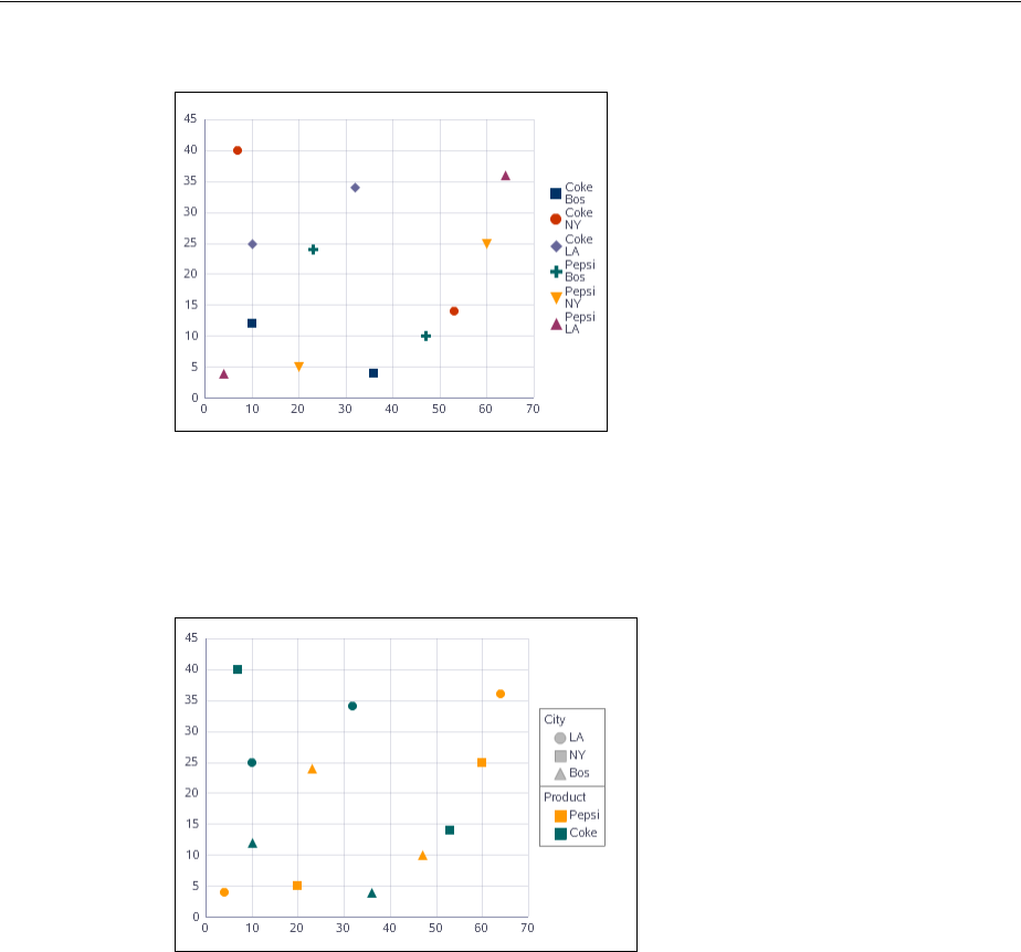
Customizing the Appearance of Series and Groups of Data
22-54 Web User Interface Developer's Guide for Oracle Application Development Framework
Figure 22–40 Scatter Graph with Series Marker
The row header attributes can be used to override the default series specification.
Figure 22–41 shows a scatter graph that displays the data values for the City attribute
mapped to shapes and the Product attribute mapped to colors.
Figure 22–41 Scatter Graph with Series Item Markers
Use the following attributes to customize the scatter graph series marker data values:
■markerShape - Specifies the row header attribute name to use to set the marker
shape. The graph will display the default index based series marker shapes if this
attribute is not specified.
■markerColor - Specifies the row header attribute name to use to set the marker
color. The graph will display the default index based series marker colors if this
attribute is not specified.
For example, specify City and Product as separate series item markers using this code:
<dvt:scatterGraph markerColor="Product" markerShape="City"
value="#{bindings.View1.graphModel}"/>
22.5.6 Customizing Graph Marker Shapes
The shape of line, scatter, polar, combination and bubble graph markers is specified in
the graph series component markerShape attribute. By default, the line, scatter,
polar or combination graph assigns marker shapes to each series rotating through
square, circle, diamond, plus sign, and triangle, and the bubble graph assigns marker
shapes to a circle. The default value for markerShape is MS_AUTOMATIC.

Customizing the Appearance of Series and Groups of Data
Using Graph Components 22-55
You can specify prebuilt graph marker shapes by setting the series component
markerShape attribute to one of these values:
■MS_NONE: Do not use series markers
■MS_AUTOMATIC: Default setting. Use default markers.
■MS_SQUARE: Use to specify square markers.
■MS_CIRCLE: Use to specify circular markers.
■MS_DIAMOND: Use to specify diamond markers.
■MS_PLUS: Use to specify plus sign markers.
■MS_TRIANGLE_DOWN: Use to specify triangular markers with the point down.
■MS_TRIANGLE_UP: Use to specify triangular markers with the point up.
■MS_HUMAN: Use to specify human shaped markers. When the markerSize
attribute is specified, the human marker is scaled so that its width matches the
markerSize value.
For custom graph markers, the shapePath attribute can be used to specify the path of
an SVG file that will get displayed in place of a predefined shape. For example:
<dvt:series shapePath="/resources/shapes/house.svg" />
Marker shapes can be also specified through CSS style properties in an ADF skin.
Using graph style properties, predefined marker shapes can be overwritten, and the
paths to SVG files for custom markers can be defined without using the shapePath
attribute. When using style properties, the shape attribute in the series component
is used for defining both predefined and custom shapes.
A predefined shape will be overwritten if a global or component-specific style
property for that shape is specified in the ADF skin. For example, you can overwrite
the predefined circle shape by specifying the newCircle.svg file in the graph
component style property as follows:
af|dvt-graph::shape-circle{
-tr-path: url(/resources/path/newCircle.svg);
}
In the JSF page, the series component shape attribute is set as follows:
<dvt:series id="s1" shape="circle"/>
To specify a custom shape in the series component shape attribute, you must use a
prefix of custom in the shape style property name. For example, if the custom shape is
named customName, then the ADF skin file should define either a global
.AFDVTShapeCustomName:alias style property, or the graph specific
af|dvt-graph::shape-customName with the -tr-path property pointing to the
SVG file as follows:
af|dvt-graph::shape-customName{
-tr-path: url(/resource/path/newCShape.svg);
}
In the JSF page, the marker component shape attribute is set as follows:
<dvt:series id="s1" shape="customName"/>
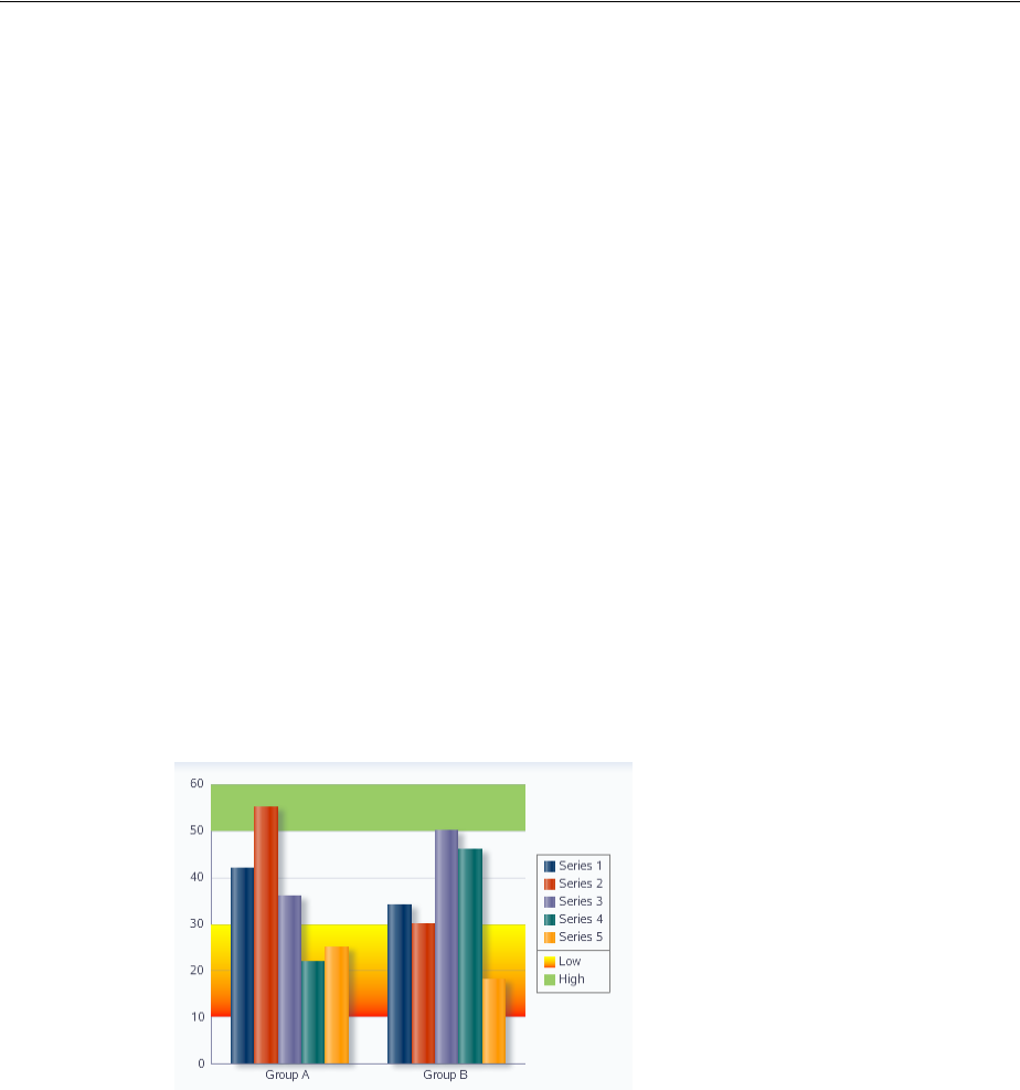
Customizing the Appearance of Series and Groups of Data
22-56 Web User Interface Developer's Guide for Oracle Application Development Framework
For information about using ADF skins and style properties, see the "Customizing the
Appearance Using Styles and Skins" chapter in the Oracle Fusion Middleware Web User
Interface Developer's Guide for Oracle Application Development Framework.
22.5.7 Adding Reference Lines or Areas to Graphs
Reference lines and areas can be set to display always, on rollover only, or never,
regardless of how many there are and whether they are associated with a series or an
axis.
You can create reference lines that are associated with a series (that is a set of data
values that appears as a single color in the graph legend). If there are multiple series
with reference lines, then the reference lines show only when you move the cursor
over a series marker or the corresponding series legend item. This is because multiple
reference lines can be confusing to users.
You can also create reference areas that are associated with an axis. Typically, these
areas are associated with a y-axis. If there are multiple reference areas, then these areas
are also displayed when you move the cursor over the related axis.
If your application does not know how many reference lines or areas it will need until
it is running, then you can create reference lines or areas dynamically at runtime.
For example, you could add areas to a bar graph to provide a reference for the values
displayed in the graph. Figure 22–42 shows a bar graph with two reference areas for
the high and low values of the graph.
Figure 22–42 Bar Graph with Reference Areas
22.5.7.1 How to Create Reference Lines or Areas During Design
Both reference lines and reference areas are created by the use of the following tags:
■referenceObjectSet: Wraps all the reference object tags for reference lines or
reference areas for this graph.
■referenceObject: Identifies whether the tag represents a reference line or a
reference area and specifies characteristics for the tag.
To add reference lines or areas to a graph during design:
1. In the Structure window, right-click the graph node and choose Insert inside
dvt:<type>Graph > ADF Data Visualization > Reference Object Set.
2. If you are defining reference areas related to specific axes, then specify a value for
the appropriate axis or axes attributes: displayX1, displayY1, or displayY2.

Customizing the Appearance of Series and Groups of Data
Using Graph Components 22-57
The value RO_DISPLAY_AUTOMATIC enables the display of a reference area only
when the mouse moves over the related axis. This choice prevents the confusion
that might occur if multiple reference areas were displayed all the time.
Optionally, you can apply a gradient special effect to the reference area. For more
information see Section 22.4.3, "Using Gradient Special Effects in Graphs."
3. In the Structure window, right-click the referenceObjectSet component and
choose Insert inside dvt:referenceObjectSet > Reference Object.
4. In the Property Inspector, do the following:
a. In the Common attributes category, specify values for the index attribute of
the reference object, the type attribute of the reference object (RO_LINE or
RO_AREA), the associated object in the association attribute (a series for a
reference line or a specific axis for a reference area). Also specify if the object
should be displayed in the legend using the displayedInLegend attribute,
and specify the text, if any, to display in the legend.
b. If you are creating a reference line, then specify values for the attributes
related to the line. This includes specifying the series number of the series to
which the line is related. The series number refers to the sequence in which the
series appear in the Graph data binding dialog.
c. If you are creating a reference area, then specify the low value and the high
value that represent the reference area on the specified axis.
5. In the Structure window, right-click the graph node and choose Go To Properties.
6. In the Property Inspector, select the Appearance attributes category and do the
following to control the display of reference lines and reference areas:
a. If you have defined reference lines (which must be related to a series), then
expand the dvt:series node and specify a value for the behavior of the
displaySeries attribute.
The value RO_DISPLAY_AUTOMATIC enables the display of a reference line
only when the cursor moves over a series item (such as a bar) or over the
corresponding series entry in the graph legend. This choice prevents the
confusion that might occur if multiple series reference lines were displayed all
the time.
b. If you have defined reference areas (which must be related to specific axes),
then associate the reference object with the appropriate axis or axes.
22.5.7.2 What Happens When You Create Reference Lines or Areas During Design
When you create reference lines or areas during design, XML code is generated within
the graph XML on the JSF page. The reference objects (both lines and areas) are
wrapped by the dvt:referenceObjectSet tags. Example 22–9 shows the code for
the two reference areas associated with the bar graph in Figure 22–42.
Example 22–9 XML Code for Reference Lines and Areas in a Graph
<dvt:barGraph shortDesc="Graph" id="bg1">
<dvt:referenceObjectSet>
<dvt:referenceObject type="RO_AREA" association="Y1AXIS"
location="RO_BACK" color="#55FFFF00"
lowValue="10" highValue="30"
displayedInLegend="true" text="Low">
<dvt:specialEffects fillType="FT_GRADIENT"
gradientDirection="GD_DOWN"

Animating Graphs
22-58 Web User Interface Developer's Guide for Oracle Application Development Framework
gradientNumStops="2">
<dvt:gradientStopStyle stopIndex="0" gradientStopPosition="0"
gradientStopColor="#FFFF00"/>
<dvt:gradientStopStyle stopIndex="1"
gradientStopPosition="100"
gradientStopColor="#FF0000"/>
</dvt:specialEffects>
</dvt:referenceObject>
<dvt:referenceObject type="RO_AREA" association="Y1AXIS"
location="RO_BACK" color="#99cc66"
lowValue="50" highValue="100"
displayedInLegend="true" text="High"/>
</dvt:referenceObjectSet>
</dvt:barGraph>
22.5.7.3 How to Create Reference Lines or Areas Dynamically
If you want to create reference objects dynamically at runtime, then you use only the
referenceObjectSet tag. You set the referenceObjectMap attribute on this tag
with a method reference to the code that creates a map of the child component
reference objects. The method that creates this map must be stored in a managed bean.
To create reference lines or areas dynamically:
1. Write a method that creates a map of the child component reference objects that
you want to create during runtime. Example 22–10 shows sample code for creating
this method.
2. In the Structure window, right-click the graph node, then choose Insert inside
dvt:<type>Graph > ADF Data Visualization > Reference Object Set.
3. In the Property Inspector, specify in the referenceObjectMap attribute a
method reference to the code that creates the map of child component reference
objects.
For example, for the managed bean (sampleGraph) and the method
getReferenceObjectMapList, the attribute should be set to the following
value:
referenceObjectMap="#{sampleGraph.referenceObjectMapList}"
Example 22–10 Code for a Map of Child Reference Objects
Managed bean SampleGraph.java :
public Map getReferenceObjectMapList() {
HashMap map = new HashMap();
ReferenceObject referenceObject = new ReferenceObject();
referenceObject.setIndex(1);
referenceObject.setColor(Color.red);
referenceObject.setLineValue(30);
referenceObject.setLineWidth(3);
map.put(new Integer(1), referenceObject);
return map;
}
22.6 Animating Graphs
Graph components dvt:areaGraph, dvt:bubbleGraph, dvt:barGraph,
dvt:lineGraph, dvt:comboGraph, dvt:pieGraph, and dvt:scatterGraph
support animation effects such as slideshow transition for initial display of the graph

Animating Graphs
Using Graph Components 22-59
component and for partial page refresh (PPR) events. Animation effects are specified
in the graph’s animationOnDisplay and animationOnDataChange properties
with these values:
■alphaFade
■conveyorFromLeft
■conveyorFromRight
■cubeToLeft
■cubeToRight
■flipLeft
■flipRight
■slideToLeft
■slideToRight
■transitionToLeft
■transitionToRight
■zoom
Animation effects can also be performed using active data. The Active Data Service
(ADS) allows you to bind ADF Faces components to an active data source using the
ADF model layer. To allow this, you must configure the components and the bindings
so that the components can display the data as it is updated in the
source.Alternatively, you can configure the application to poll the data source for
changes at prescribed intervals.
22.6.1 How to Configure Graph Components to Display Active Data
To use the Active Data Service, you must have a data source that publishes events
when data is changed, and you must create business services that react to those events
and the associated data controls to represent those services. For more information
about ADS and configuring your application, see Chapter 35, "Using the Active Data
Service with an Asynchronous Backend."
Configure databound graphs to display active data by setting a value on the binding
element in the corresponding page definition file.
To configure a graph to display active data:
1. In the Structure window, select the graph node.
2. In the Property Inspector, enter a unique value in the ID field.
If you do not select an identifier, one will be entered for you.
3. Open the page’s associated page definition file.
4. In the Structure window for the page definition file, select the node that represents
the attribute binding for the component. In the Property Inspector, select Push for
the ChangeEventPolicy attribute.
22.6.2 How to Specify Animation Effects for Graphs
In the Property Inspector for the graph you wish to animate, set the following
attributes:

Adding Interactive Features to Graphs
22-60 Web User Interface Developer's Guide for Oracle Application Development Framework
■animationOnDisplay: Optional. Use with or without ADS to specify the type of
initial rendering effect to apply. Valid values are:
–none (default): Do not show any initial rendering effect.
–auto: Apply an initial rendering effect automatically chosen based on graph
or gauge type.
–alphaFade
–conveyorFromLeft or conveyorFromRight
–cubeToLeft or cubeToRight
–flipLeft or flipRight
–slideToLeft or slideToRight
–transitionToLeft or transitionToRight
–zoom
■animationOnDataChange: Use to specify the type of data change animation to
apply. Valid values are:
–none: Apply no data change animation effects.
–activeData (default): Apply Active Data Service (ADS) data change
animation events.
–auto: Apply partial page refresh (PPR) and ADS data change animation
events.
–alphaFade
–conveyorFromLeft or conveyorFromRight
–cubeToLeft or cubeToRight
–flipLeft or flipRight
–slideToLeft or slideToRight
–transitionToLeft or transitionToRight
–zoom
■animationDuration: Use to specify the animation duration in milliseconds.
■animationIndicators: Use to specify the type of data change indicators to
show. Valid values are:
–none: Show no data change indicators.
–all (default): Show all data change indicators.
■animationUpColor: Use to specify the RGB hexadecimal color used to indicate
that a data value has increased.
■animationDownColor: Use to specify the RGB hexadecimal color used to
indicate that a data value has decreased.
22.7 Adding Interactive Features to Graphs
You can add interactive features to graphs including drilling, adding an interactive
time axis, annotations and alerts, drag and drop, popups and context menus.

Adding Interactive Features to Graphs
Using Graph Components 22-61
22.7.1 Providing Interactive Capability for Graphs
You can add a number of interactive functions to graphs including:
■Marker and legend dimming
Markers include lines, bars, areas, scatter markers, bubbles, and pie slices.
■Zooming and scrolling
■Changing zoom and scroll levels
22.7.1.1 How to Provide Marker and Legend Dimming
You can force all the data markers for a given set of data to be highlighted when you
move the cursor over one data marker in the set or over the corresponding entry in the
graph legend. The highlighting effect is visually achieved by dimming the other data
markers in the set. For example, if a bar graph displays sales by month for four
products (P1, P2, P3, P4), when you move the cursor over product P2 in January, all
the P2 bars are highlighted, and the P1, P3, and P4 bars are dimmed.
Because the graph refers to all the data markers in a given set of data (such as all the
P2 bars) as a series, then the ability to highlight the data markers in a series is part of
the graph’s series rollover behavior feature.
Series rollover behavior is available only in the following graph types: bar, line, area,
pie, scatter, polar, radar, and bubble graphs.
To dim all the data markers in a series:
1. In the Structure window, right-click the graph node and choose Go to Properties.
2. In the Appearance attributes category, in the SeriesRolloverBehavior field,
use the dropdown list to select RB_DIM.
22.7.1.2 How to React to Changes in the Zoom and Scroll Levels
You can provide custom code that will be executed when the zoom and scroll levels
change on a graph. In a managed bean you store methods that takes as input a
ZoomEvent or ScrollEvent. With these events, users can determine which axis is
zoomed, as well as the current extent of the zoomed axes.
To provide custom behavior in response to zooming and scrolling in a graph:
1. In a managed bean, write a custom method that performs the desired behavior
when a zoom or scroll event is triggered. Example 22–11 shows sample code for
creating this method.
2. In the Structure window, right-click the graph node and choose Go to Properties.
3. Select the Behavior attributes category and expand the Advanced node and do
one or both of the following:
■In the zoomlListener field, specify a reference to the method that you
stored in the managed bean.
For example, if the method setZoom is stored in the managed bean
SampleGraph, then the setting becomes: "#{sampleGraph.zoom)".
■In the scrollListener field, specify a reference to the method that you
stored in the managed bean.
For example, if the method setScroll is stored in the managed bean
SampleGraph, then the setting becomes: "#{sampleGraph.scroll)".

Adding Interactive Features to Graphs
22-62 Web User Interface Developer's Guide for Oracle Application Development Framework
Example 22–11 Sample Code to Set Zoom and Scroll
Managed bean sampleGraph.java
public void setZoom(ZoomEvent event) {
System.out.println("Start Group: " +
event.getAxisStartGroup(ZoomEvent.O1AXIS));
System.out.println("Group Count: " +
event.getAxisGroupCount(ZoomEvent.O1AXIS));
System.out.println("Start Group Label: " +
event.getAxisStartGroupLabel(ZoomEvent.O1AXIS));
public void setScroll(ScrollEvent event) {
System.out.println("End Group Label: " +
event.getAxisEndGroupLabel(ScrollEvent.O1AXIS));
System.out.println("Axis Min: " +
event.getAxisMin(ScrollEvent.O1AXIS));
System.out.println("Axis Max: " +
event.getAxisMax(ScrollEvent.O1AXIS));
22.7.2 Providing an Interactive Time Axis for Graphs
You can define relative ranges and explicit ranges for the display of time data.
22.7.2.1 How to Define a Relative Range of Time Data for Display
You can define a simple relative range of time data to be displayed, such as the last
seven days. This will force old data to scroll off the left edge of the graph as new data
points are added to the display of an active data graph. Relative time range
specifications are not limited to use in active data graphs.
To specify a relative range of time data for display:
1. In the Structure window, right click the graph node and choose Go to Properties.
2. In the Appearance attributes category, expand the dvt:timeAxis node and specify
values for the following attributes:
a. In the timeRangeMode attribute, specify the value TRM_RELATIVE_LAST
or TRM_RELATIVE_FIRST depending on whether the relative range applies
to the end of the time range (such as the last seven days) or to the beginning of
the time range (such as the first seven days).
b. In the timeRelativeRange attribute, specify the relative range in
milliseconds.
22.7.2.2 How to Define an Explicit Range of Time Data for Display
You can define an explicit range of time data to be displayed, such as the period
between March 15 and March 25. In this example, the year, hour, minute, and second
use default values because they were not stated in the start and end values.
To specify an explicit range of time data for display:
1. In the Structure window, right click the graph node and choose Go to Properties.
2. In the Appearance attributes category, specify the values for the following
attributes:
a. In the timeRangeMode attribute, specify the value TRM_EXPLICIT.
b. In the timeRangeStart attribute, enter the initial date for the time range.
c. In the timeRangeEnd attribute, enter the ending date for the time range.

Adding Interactive Features to Graphs
Using Graph Components 22-63
22.7.3 Adding Alerts and Annotations to Graphs
Alerts define a data value on a graph that must be highlighted with a separate symbol,
such as an error or warning. An icon marks the location of the alert. When the cursor
moves over the alert icon, the text of that alert is displayed. An unlimited number of
alerts can be defined for a graph using dvt:alert tags. The alerts are wrapped in a
dvt:alertSet tag, that is a child of graph tag. Example 22–12 shows a set of alerts
for an area graph.
Example 22–12 Sample Code for Set of Graph Alerts
<dvt:areaGraph>
<dvt:alertSet>
<dvt:alert xValue="Boston" yValue="3.50" yValueAssignment="Y1AXIS"
imageSource="myWarning.gif"/>
<dvt:alert xValue="Boston" yValue="5.50" yValueAssignment="Y1AXIS"
imageSource="myError.gif"/>
</dvt:alertSet>
</dvt:areaGraph>
Annotations are associated with a data value on a graph to provide information when
the cursor moves over the data value. An unlimited number of annotations can be
defined for a graph using dvt:annotation tags and multiple annotations can be
associated with a single data value. The annotations are wrapped in a
dvt:annotationSet tag that is a child of the graph tag.
The data marker associated with the annotation is defined using these attributes of the
dvt:annotation tag:
■series - Specifies the zero-based index of a series in a graph. In most graphs,
each series appears as a set of markers that are the same color. For example, in a
multiple pie graph, each yellow slice might represent sales of shoes, while each
green slice represents the sales of boots. In a bar graph, all of the yellow bars
might represent the sales of shoes, and the green bars might represent the sales of
boots.
■group - Specifies the zero-based index of a group in a graph. Groups appear
differently in different graph types. In a clustered bar graph, each cluster of bars is
a group. In a stacked bar graph, each stack is a group. In a multiple pie graph,
each pie is a group.
shows a set of annotations for an area graph.
Example 22–13 Sample Code for a Set of Annotations
<dvt:areaGraph>
<dvt:annotationSet>
<dvt:annotation series="0" group="0" text="annotation #1"/>
<dvt:annotation series="0" group="7" fillColor="#55FFFF00"
borderColor="#55FF0000" text="second annotation"/>
</dvt:annotationSet>
</dvt:areaGraph>
You can control the position of the annotation in the plot area of a graph using these
attributes:
■position - Specifies the type of positioning to use for the annotation. Valid
values are:
–dataValue (default) - Positions the annotation by the data value defined in
the series and group attributes. Overlap with other annotations is avoided.

Adding Interactive Features to Graphs
22-64 Web User Interface Developer's Guide for Oracle Application Development Framework
–absolute - Positions the annotation at the exact point defined by the xValue
and the yValue in graphs with both those axes. Overlap with other
annotations is not avoided.
–percentage - Positions the annotation at the exact point defined by using the
xValue and yValue as a percentage between 0 and 100 of the plot area of
graphs with both those axes. Overlap with other annotations is not avoided.
■xValue - Specifies the X value at which to position the annotation. This setting
only applies when the annotation position is absolute or percentage.
■yValue - Specifies the Y value at which to position the annotation. This setting
only applies when the annotation position is absolute or percentage.
■horizontalAlignment - Specifies the horizontal positioning of the annotation.
This setting only applies when the annotation position attribute is absolute or
percentage. Valid values are LEFT (default), CENTER, LEADING, or RIGHT.
■verticalAlignment - Specifies the vertical positioning of the annotation. This
setting only applies when the annotation position attribute is absolute or
percentage. Valid values are CENTER (default), TOP, or BOTTOM.
22.7.4 Creating Drillable Graphs
You can configure a graph to display a detailed view of data displayed by an area,
line, or marker. To make a graph drillable, set the drillingEnabled attribute for the
<type>Graph component to true. The default value is false.
You must also update the page definition file to add code to support drilling. For
example, to make a bar graph drillable, add the highlighted code in Example 22–14 to
the pageDef.xml file for the graph.
Example 22–14 Code Sample to Enable Drilling in Page Definition File
<graph IterBinding="clazzIterator" id="clazz4"
xmlns="http://xmlns.oracle.com/adfm/dvt" type="BAR_VERT_CLUST">
<graphDataMap leafOnly="true">
<!-- this is the code snippet you need to add -->
<hierarchies>
<item value="packageName">
<child value="name"/>
</item>
</hierarchies>
<drills type="REPLACE"/>
<!-- end snippet -->
<series>
<data aggregateDuplicates="true" defaultAggregateType="AVERAGE">
<item value="lineCoverage"/>
<item value="branchCoverage"/>
</data>
</series>
<groups>
<item value="packageName"/>
</groups>
</graphDataMap>
</graph>
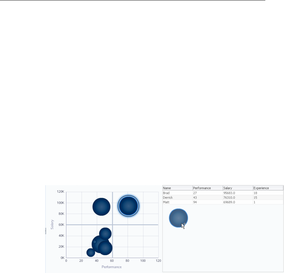
Adding Interactive Features to Graphs
Using Graph Components 22-65
22.7.5 How to Add Drag and Drop to Graphs
The ADF Faces framework provides the ability to drag and drop items from one place
to another on a page. Bubble and scatter graphs can be configured as a drag source to
allow moving markers from one position to another in the graph plot area, by adding
and configuring a child af:dragSource component. All data axis graphs, those with
x and y positions, can be configured as a drop target, for example inserting a bubble
graph marker into a bar graph, by adding and configuring a child af:dropTarget
component.
Graphs can be configured to support these operations:
■ between graphs
■Drag from a graph into another ADF component
■Drag a scatter/bubble marker within the plot area of a graph
■Drag a scatter/bubble marker to another component
■Drag multiple markers
For example, you may want to drag the data markers in a bubble graph to display
their values in a table view, or conversely, you may wish to drag data values from a
table for display in a bubble graph. Figure 22–43 shows a bubble graph configured as a
drag source and a drop target to accomplish this functionality.
Figure 22–43 Bubble Graph as Drag Source and Drop Target
Before you begin:
It may be helpful to have an understanding of how graph attributes and graph child
components can affect functionality. For more information, see Section 22.2.2,
"Configuring Graphs."
You should already have a graph on your page. If you do not, follow the instructions
in this chapter to create a graph. For more information, see Section 22.2.3, "How to
Add a Graph to a Page."
You should already have created and configured the table component as a drag source
and drop target. Example 22–15 shows a code sample for creating the table.
Example 22–15 Code Sample for Table Drag Source and Drop Target
<af:table id="table" value="#{dragAndDrop.tableModel}"
var="row" width="420" inlineStyle=" height:300px;"
columnStretching="last">
<af:dragSource actions="COPY MOVE LINK" defaultAction="MOVE"

Adding Interactive Features to Graphs
22-66 Web User Interface Developer's Guide for Oracle Application Development Framework
discriminant="fromTable"/>
<af:dropTarget dropListener="#{dragAndDrop.fromGraphDropListener}"
actions="COPY MOVE LINK">
<af:dataFlavor
flavorClass="oracle.adf.view.faces.bi.component.graph.GraphSelectionSet"
discriminant="fromGraph"/>
</af:dropTarget>
<af:column headerText="Name" id="c1">
<af:outputText value="#{row.name}" id="ot5"/>
</af:column>
<af:column headerText="Performance" id="c2">
<af:outputText value="#{row.performance}" id="ot6"/>
</af:column>
<af:column headerText="Salary" id="c3">
<af:outputText value="#{row.salary}" id="ot7"/>
</af:column>
<af:column headerText="Experience" id="c4">
<af:outputText value="#{row.experience}" id="ot8"/>
</af:column>
</af:table>
To add drag and drop to a bubble graph:
1. In the Structure window, right-click the dvt:bubbleGraph component and choose
insert inside dvt:bubbleGraph > ADF Faces > Drag Source.
2. In the Property Inspector, set the following attributes:
■Actions: Specify the drag and drop actions supported by this drag source. The
actions must be space delimited list with all caps in any particular order for
the available values of COPY, LINK, MOVE. The default value is COPY.
■DefaultAction: Specify the default drag and drop action supported by this
drag source. Possible actions are COPY, MOVE or LINK.
■Discriminant: Specify the discriminant for the default DataFlavors
generated by this drag source. The discriminant is used to segregate drags
from this drag source. Please note that drag and drop can only be performed
between compatible drag sources and drop targets. The discriminant is used
for the compatibility purpose. The discriminants of the DataFlavors
generated by the default drag source must match the allowed discriminants
on the allowed DataFlavors of the drop target.
3. In the Structure window, right-click the dvt:bubbleGraph component and choose
insert inside dvt:bubbleGraph > ADF Faces > Drop Target.
4. In the Insert Drop Target dialog, specify the DropListener as an EL Expression
that evaluates the reference to the
oracle.adf.view.rich.event.DropEvent dropEvent method called
when a drop occurs on the component.
5. In the Insert Data Flavors dialog, Specify the FlavorClass, the fully qualified Java
class name for this DataFlavor. If the drop contains this DataFlavor, the drop
target is guaranteed to be able to retrieve an Object from the drop with this Java
type using this DataFlavor.
Example 22–16 shows a code sample for adding drag and drop operations to a bubble
graph.
Example 22–16 Code Sample for Bubble Graph Drag and Drop
<dvt:bubbleGraph shortDesc="Graph" dataSelection="multiple"
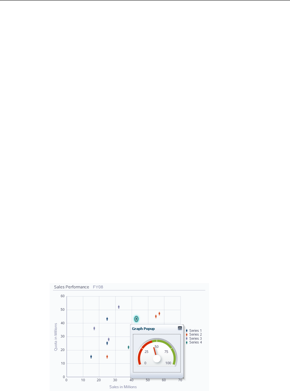
Adding Interactive Features to Graphs
Using Graph Components 22-67
markerTooltipTemplate="GROUP_LABEL NEW_LINEPerformance: X_VALUE
NEW_LINESalary: Y_VALUE NEW_LINEExperience: Z_VALUE"
value="#{dragAndDrop.graphModel}" id="bg1">
<dvt:x1Title text="Performance"/>
<dvt:y1Title text="Salary"/>
<dvt:x1Axis axisMaxValue="120" axisMaxAutoScaled="false"/>
<dvt:y1Axis axisMaxValue="120000" axisMaxAutoScaled="false"/>
<dvt:legendArea rendered="false"/>
<af:dragSource actions="COPY MOVE LINK" defaultAction="MOVE"
discriminant="fromGraph"/>
<af:dropTarget actions="COPY MOVE LINK"
dropListener="#{dragAndDrop.fromTableDropListener}">
<af:dataFlavor flavorClass="org.apache.myfaces.trinidad.model.RowKeySet"
discriminant="fromTable"/>
</af:dropTarget>
</dvt:bubbleGraph>
22.7.6 How to Add Popups to Graphs
Graph child component seriesSet can be configured to display popup dialogs,
windows, and menus that provide information or request input from end users. Using
the af:popup component with other ADF Faces components, you can configure
functionality to allow your end users to show and hide information in secondary
windows, input additional data, or invoke functionality such as a context menu.
With ADF Faces components, JavaScript is not needed to show or hide popups. The
af:showPopupBehavior tag provides a declarative solution, so that you do not
have to write JavaScript to open a popup component or register a script with the
popup component. For more information about these components, see Chapter 15,
"Using Popup Dialogs, Menus, and Windows."
For example, you may want to associate a popup displaying information in a note
window with the data markers in a scatter graph series. Figure 22–44 shows a scatter
graph with a data markers clicked to display a gauge in a note window with data
about a specific marker.
Figure 22–44 Scatter Graph Data Marker Popup Note Window
Before you begin:
It may be helpful to have an understanding of how graph attributes and graph child
components can affect functionality. For more information, see Section 22.2.2,
"Configuring Graphs."

Adding Interactive Features to Graphs
22-68 Web User Interface Developer's Guide for Oracle Application Development Framework
You should already have a graph on your page. If you do not, follow the instructions
in this chapter to create a graph. For more information, see Section 22.2.3, "How to
Add a Graph to a Page."
You should already have created the popup components for data points in a graph
series to reference. Example 22–17 shows a code sample for the popup to be referenced
when the cursor hovers over a data point in a graph series.
Example 22–17 Code Sample for the Graph Series Note Window
<af:popup id="noteWindowPopup" launcherVar="source"
eventContext="launcher"
clientComponent="true" contentDelivery="lazyUncached">
<af:setPropertyListener from="#{source.seriesKey}"
to="#{popupSample.seriesKey}" type="popupFetch"/>
<af:setPropertyListener from="#{source.groupKeys}"
to="#{popupSample.groupKeys}" type="popupFetch"/>
<af:panelWindow title="Graph Popup" id="pw1">
<dvt:gauge shortDesc="Gauge" value="#{popupSample.gaugeValue}"
gaugeType="DIAL" animationOnDisplay="AUTO"
inlineStyle="width:150px;height:120px;" minValue="0"
maxValue="100" contentDelivery="immediate" id="g3">
<dvt:bottomLabel text="Sales" position="LP_NONE"/>
<dvt:metricLabel position="LP_NONE"/>
<dvt:thresholdSet>
<dvt:threshold thresholdMaxValue="#{popupSample.quotaValue}"
text="Under Quota"/>
<dvt:threshold fillColor="#84AE31" text="Above Quota"/>
</dvt:thresholdSet>
<dvt:indicator useThresholdFillColor="true"/>
<dvt:tickLabel content="TC_MIN_MAX TC_INCREMENTS"/>
<dvt:tickMark content="TC_NONE" majorTickCount="5"/>
</dvt:gauge>
</af:panelWindow>
</af:popup>
To add a popup to a graph series set:
1. In the Structure window, right-click the graph child dvt:seriesSet component and
choose insert inside dvt:seriesSet > Show Popup Behavior.
2. In the Property Inspector, set the following attributes:
■PopupId: Enter the ID of the popup referenced by the seriesSet
component. An ID beginning with a colon will be treated as absolute after
trimming off the colon.
■TriggerType: Enter the event type that will trigger the popup being displayed.
Valid values for graph seriesSet component are action, click and
mouseHover.
■Align: From the dropdown list, choose how the popup should be aligned with
the seriesSet component.
■AlignID: Enter the ID of the seriesSet component associated with the popup.
An ID beginning with a colon will be treated as absolute after trimming off the
colon.
Example 22–18 shows the code sample for associating a popup component with a
graph series set component.
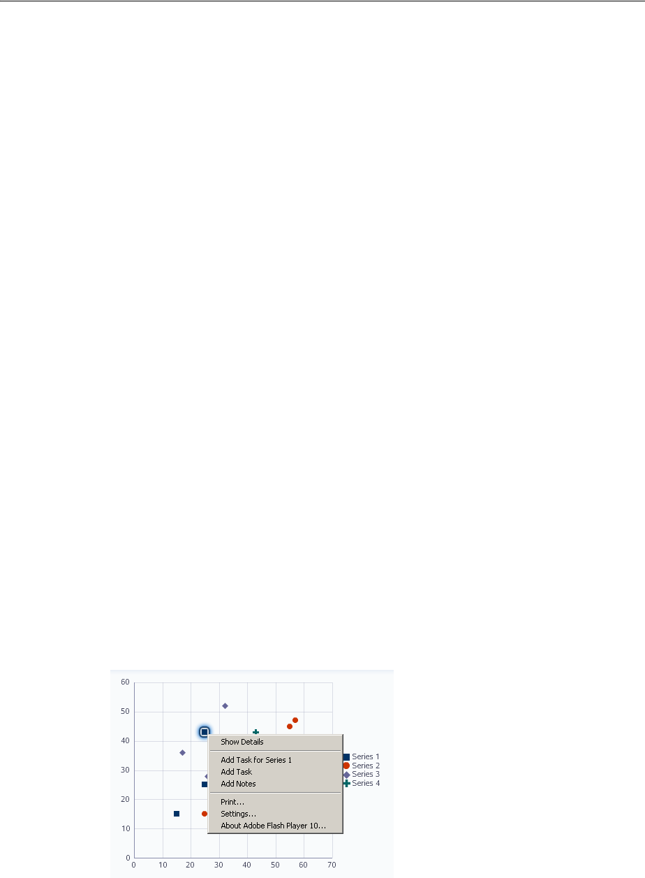
Adding Interactive Features to Graphs
Using Graph Components 22-69
Example 22–18 Code Sample for Popup Associated With Series Set Component
<dvt:scatterGraph dataSelection="single"
shortDesc="Scatter Graph with Click Popup"
binding="#{popupSample.graph}"
inlineStyle="width:500px;height:350px;" id="g2">
<dvt:seriesSet defaultMarkerShape="MS_HUMAN">
<af:showPopupBehavior triggerType="click" popupId="::graphPopup"/>
</dvt:seriesSet>
<dvt:x1Title text="#{viewcontrollerBundle.SALES_IN_MILLIONS}"/>
<dvt:y1Title text="#{viewcontrollerBundle.QUOTA_IN_MILLIONS}"/>
<dvt:graphTitle text="#{viewcontrollerBundle.SALES_PERFORMANCE}"/>
<dvt:graphSubtitle text="#{viewcontrollerBundle.FY08}"/>
</dvt:scatterGraph>
22.7.7 How to Configure Graph Context Menus
Context menus can be defined for graph components using these context menu facets:
■bodyContextMenu: Specifies a context menu that is displayed on non-selectable
elements in the graph component.
■contextMenu: Specifies a context menu that is displayed on any selectable
element in the graph component.
■multiSelectContextMenu: Specifies a content menu that is displayed when
multiple elements are selected in the graph component.
Each facet supports a single child component. For all of these facets to work, selection
must be enabled and supported for the specific graph type. Context menus are
currently only supported in Flash.
Due to technical limitations when using the Flash rendering format, context menu
contents are currently displayed using the Flash Player's context menu. This imposes
several limitations defined by the Flash Player. For more information, see
Section 21.2.5, "Graph and Gauge Context Menus."
For example, Figure 22–45 shows a scatter graph context menu with custom menu
items.
Figure 22–45 Scatter Graph Custom Context Menu
Example 22–19 shows a code sample for configuring a scatter graph context menu.

Adding Interactive Features to Graphs
22-70 Web User Interface Developer's Guide for Oracle Application Development Framework
Example 22–19 Code Sample for Scatter Graph Context Menu
<dvt:scatterGraph binding="#{contextMenu.graph}" subType="SCATTER"
dataSelection="multiple" id="graph">
<f:facet name="contextMenu">
<af:popup contentDelivery="lazyUncached" id="p1">
<af:menu id="m1">
<af:commandMenuItem text="Show Details"
actionListener="#{contextMenu.menuItemListener}"
id="cmi1"/>
<af:group id="g1">
<af:commandMenuItem text="Add Task for #{contextMenu.currentSeriesId}"
actionListener="#{contextMenu.menuItemListener}"
id="cmi2"/>
<af:commandMenuItem text="Add Task"
actionListener="#{contextMenu.menuItemListener}"
id="cmi3"/>
<af:commandMenuItem text="Add Notes"
actionListener="#{contextMenu.menuItemListener}"
id="cmi4"/>
</af:group>
</af:menu>
</af:popup>
</f:facet>
<f:facet name="bodyContextMenu">
<af:popup contentDelivery="immediate" id="p2">
<af:menu id="m2">
<af:goMenuItem text="www.oracle.com"
destination="http://www.oracle.com"
id="gmi1"/>
</af:menu>
</af:popup>
</f:facet>
<f:facet name="multiSelectContextMenu">
<af:popup contentDelivery="lazyUncached" id="p3">
<af:menu id="m3">
<af:commandMenuItem text="Compare Selected Objects"
actionListener="#{contextMenu.menuItemListener}"
id="cmi5"/>
</af:menu>
</af:popup>
</f:facet>
</dvt:scatterGraph>
Example 22–20 shows a code sample for a managed bean to create a custom context
menu.
Example 22–20 Managed Bean to Create Custom Context Menu
public class ContextMenu {
private RichOutputFormatted m_outputFormatted;
public RichOutputFormatted getOutputFormatted() {
if(m_outputFormatted == null)
m_outputFormatted = new RichOutputFormatted();
return m_outputFormatted;
}
public void setOutputFormatted(RichOutputFormatted text) {
m_outputFormatted = text;
}

Adding Interactive Features to Graphs
Using Graph Components 22-71
private String m_status = "Click Menu Item for Status";
public String getStatus() {
return m_status;
}
private UIGraph m_graph;
public UIGraph getGraph() {
if(m_graph == null)
m_graph = new UIGraph();
return m_graph;
}
public void setGraph(UIGraph graph) {
m_graph = graph;
}
public String getCurrentSeriesId() {
if(m_graph != null) {
Set<? extends GraphSelection> set = m_graph.getSelection();
if(set != null && !set.isEmpty()) {
GraphSelection selection = set.iterator().next();
if(selection instanceof DataSelection) {
DataSelection dataSelection = (DataSelection) selection;
KeyMap seriesKey = dataSelection.getSeriesKey();
Set seriesKeySet = seriesKey.keySet();
for(Object key : seriesKeySet) {
return seriesKey.get((String)key);
}
}
}
}
return null;
}
/**
* Called when a commandMenuItem is clicked. Updates the outputText with
information about the menu item clicked.
* @param actionEvent
*/
public void menuItemListener(ActionEvent actionEvent) {
UIComponent component = actionEvent.getComponent();
if(component instanceof RichCommandMenuItem) {
RichCommandMenuItem cmi = (RichCommandMenuItem) component;
// Add the text of the item into the status message
StringBuilder s = new StringBuilder();
s.append("You clicked on \"").append(cmi.getText()).append("\". <br><br>");
// If graph data is selected, add that too
Set<? extends GraphSelection> selectionSet = m_graph.getSelection();
if(!selectionSet.isEmpty()) {
// Write out the selection state
s.append("The current graph selection is: <br>");
s.append(SelectionSample.convertSelectionStateToString(selectionSet));
}
m_status = s.toString();
RequestContext.getCurrentInstance().addPartialTarget(m_outputFormatted);
}
}

Adding Interactive Features to Graphs
22-72 Web User Interface Developer's Guide for Oracle Application Development Framework
}

23
Using Gauge Components 23-1
23Using Gauge Components
This chapter describes how to display data in gauges using the ADF Data
Visualization gauge component. If your application uses the Fusion technology stack,
then you can use data controls to create gauges. For more information, see the
"Creating Databound ADF Gauges" chapter in the Oracle Fusion Middleware Fusion
Developer's Guide for Oracle Application Development Framework.
This chapter includes the following sections:
■Section 23.1, "About the Gauge Component"
■Section 23.2, "Using the Gauge Component"
■Section 23.3, "Configuring Gauge Display Elements"
■Section 23.4, "Formatting Gauge Style Elements"
■Section 23.5, "Formatting Numeric Data Values in Gauges"
■Section 23.6, "Adding Gauge Special Effects and Animation"
■Section 23.7, "Using Custom Shapes for Gauges"
23.1 About the Gauge Component
Gauges are measuring instruments for indicating a quantity such as sales, stock levels,
temperature, or speed. Gauges typically display a single data value, often more
effectively than a graph. Gauges can show state information such as acceptable or
unacceptable ranges using color. For example, a gauge value axis might show ranges
colored red, yellow, and green to represent low, medium, and high states. When you
need to compare many data values at a glance, multiple gauges can be shown inside
table cells, or in a vertical, horizontal, or grid layout as a gauge set.
The gauge component supports four categories of gauge types: dial, status meter,
vertical status meter, and LED. All gauge types can display a title, bottom label, data
label, and legend.
23.1.1 End User and Presentation Features of Gauge Components
To understand how gauges are used and can be customized, it may be helpful to
review these elements and features:
■Display elements including:
Best Practice Tip: When multiple data values, such as the text
values of thresholds and the current value are required, a list or table
component may be a better choice than a gauge.
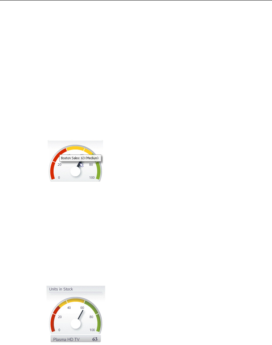
About the Gauge Component
23-2 Web User Interface Developer's Guide for Oracle Application Development Framework
–Gauge and gauge set backgrounds
–Gauge frames
–Dial gauge plot area
–Indicators and indicator bars
–Gauge top, bottom, and metric labels
–Thresholds and labels
–Legends
–Tick marks and labels
■Tooltips: A tooltip of contextual information automatically displays when a user
moves a cursor over the plot area, indicator, or threshold region. Figure 23–1
shows the indicator tooltip for a dial gauge.
Figure 23–1 Indicator Tooltip for Dial Gauge
23.1.2 Gauge Component Use Cases and Examples
Gauges are typically used to display a single data point. The following types of gauges
are supported by the gauge component:
■Dial: Indicates its metric along a configurable arc value axis. This is the default
gauge type. Dial gauges can display as a simple gauge, a gauge with thresholds, or
as a set of dial gauges.
Figure 23–2 shows a dial gauge with thresholds indicating a Plasma HD TV stock
level within an acceptable range.
Figure 23–2 Dial Gauge with Thresholds
■Status Meter: Indicates the progress of a task or the level of some measurement
along a horizontal rectangular bar. An inner rectangle shows the current level of a
measurement against the ranges marked on an outer rectangle. Status meter
gauges can display as a simple gauge, a gauge with thresholds, or as a set of status
meter gauges.
Figure 23–3 shows the Plasma HD TV stock level using a status meter gauge.
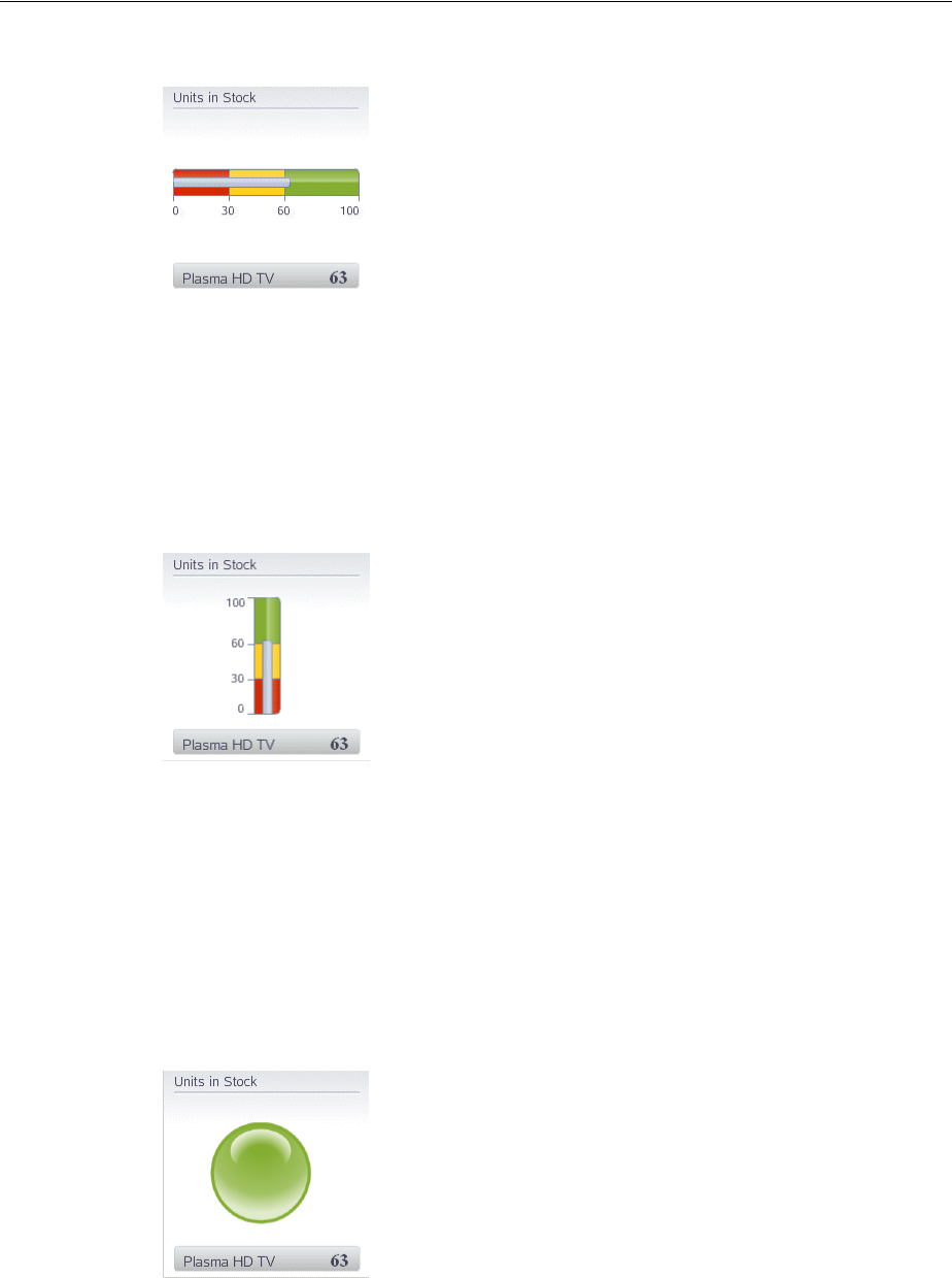
About the Gauge Component
Using Gauge Components 23-3
Figure 23–3 Status Meter Gauge with Thresholds
■Status Meter (vertical): Indicates the progress of a task or the level of some
measurement along a vertical rectangular bar. Vertical status meter gauges can
display as a simple gauge, a gauge with thresholds, or as a set of vertical status
meter gauges.
Figure 23–4 shows the Plasma HD TV stock level using a vertical status meter
gauge.
Figure 23–4 Vertical Status Meter Gauge with Thresholds
■LED (light-emitting diode): Graphically depicts a measurement, such as a key
performance indicator (KPI). Several styles of graphics are available for LED
gauges, such as round or rectangular shapes that use color to indicate status, and
triangles or arrows that indicate good (up), fair (left- or right-pointing), or poor
(down) states in addition to a color indicator. LED gauges can also display as a
gauge set.
Figure 23–5 shows the Plasma HD TV stock level using a LED bulb indicator using
color to indicate status.
Figure 23–5 LED Bulb Gauge
Figure 23–6 shows the same stock level using a LED arrow.
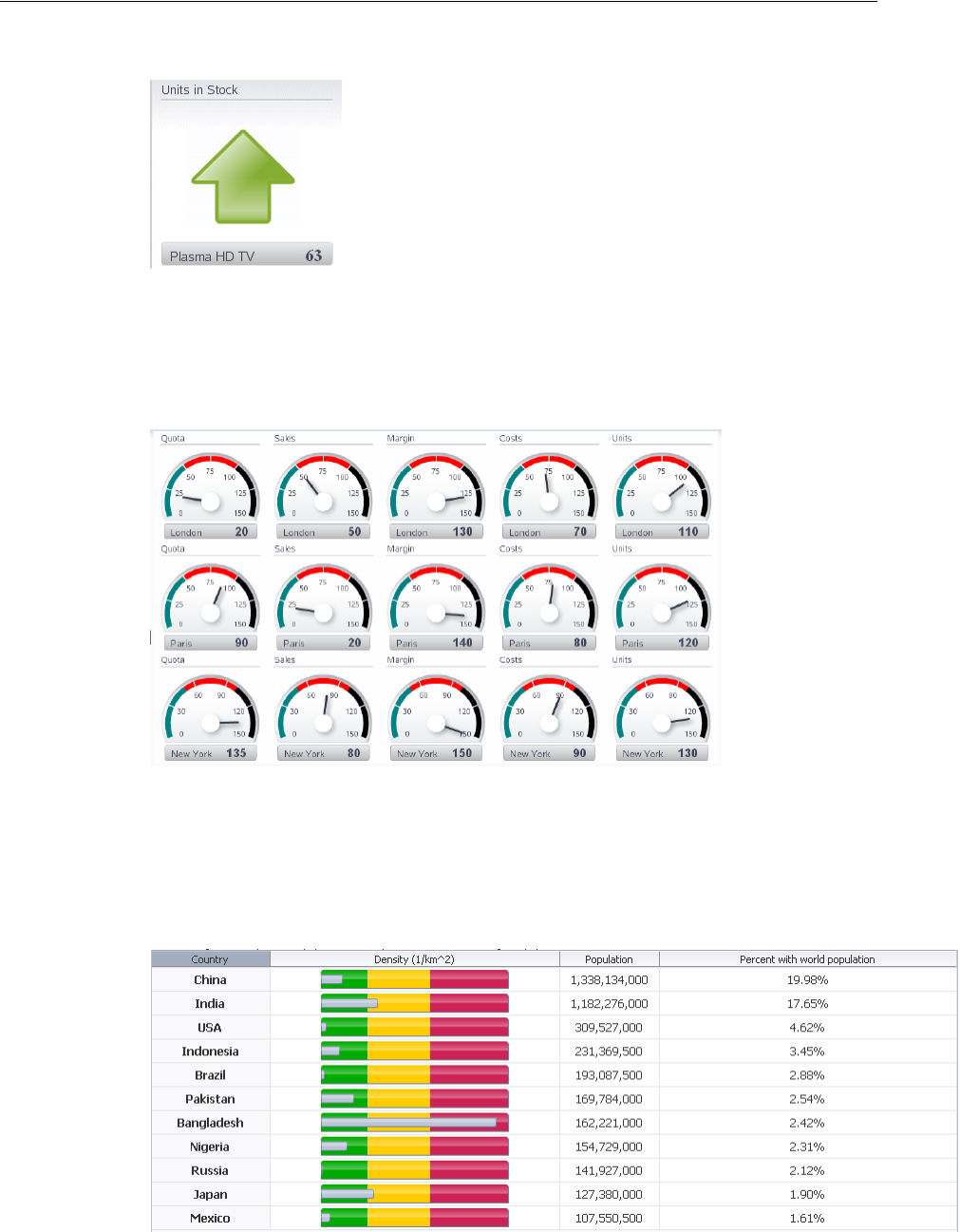
About the Gauge Component
23-4 Web User Interface Developer's Guide for Oracle Application Development Framework
Figure 23–6 LED Arrow Gauge
All gauge types can be displayed as a set of gauges in a built-in grid layout. Gauge sets
are useful when displaying individual values for a group of related items. Figure 23–7
shows a gauge set comparing performance measures across three cities.
Figure 23–7 Gauge Set Comparing Performance Across Cities
Horizontal status meter and LED gauges are well-suited for display in table cells
where users can see and compare them alongside related information such as labels,
links, and icons. Figure 23–8 shows a table comparing the population density in
countries with the highest population in 2010.
Figure 23–8 Horizontal Status Meter Gauges Displayed in Table

Using the Gauge Component
Using Gauge Components 23-5
23.1.3 Additional Functionality of Gauge Components
You may find it helpful to understand other ADF Faces features before you implement
your gauge component. Additionally, once you have added a gauge component to
your page, you may find that you need to add functionality such as validation and
accessibility. Following are links to other functionality that gauge components can use:
■Partial page rendering: You may want a gauge to refresh to show new data based
on an action taken on another component on the page. For more information, see
Chapter 8, "Rerendering Partial Page Content."
■Personalization: When enabled for users to change the way the gauge displays at
runtime, those values will not be retained once the user leaves the page unless you
configure your application to allow user customization. For information, see
Chapter 32, "Allowing User Customization on JSF Pages."
■Accessibility: You can make your gauge components accessible. For more
information, see Chapter 30, "Developing Accessible ADF Faces Pages."
■Skins and styles: You can customize the appearance of gauge components using
an ADF skin that you apply to the application or by applying CSS style properties
directly using a style-related property (styleClass or inlineStyle). For more
information, see Chapter 28, "Customizing the Appearance Using Styles and
Skins."
■Automatic data binding: If your application uses the Fusion technology stack, then
you can create automatically bound gauges based on how your ADF Business
components are configured. For more information, see the "Creating Databound
Gauges" chapter of the Oracle Fusion Middleware Fusion Developer's Guide for Oracle
Application Development Framework.
Additionally, data visualization components share much of the same functionality,
such as how data is delivered, automatic partial page rendering (PPR), image formats,
and how data can be displayed and edited. For more information, see Section 21.2,
"Common Functionality in Data Visualization Components."
23.2 Using the Gauge Component
Gauges display the following kinds of data values:
■Metric: The value that the gauge is to plot. This value can be specified as static
data in the Gauge Data attributes category in the Property Inspector. It can also be
specified through data controls or through the tabularData attribute of the
gauge tag. This is the only required data for a gauge. The number of metric values
supplied affects whether a single gauge is displayed or a series of gauges are
displayed in a gauge set.
Note: If you know the UI components on your page will eventually
use ADF data binding, but you need to develop the pages before the
data controls are ready, then you should consider using placeholder
data controls, rather than manually binding the components. Using
placeholder data controls will provide the same declarative
development experience as using developed data controls. For more
information, see the "Designing a Page Using Placeholder Data
Controls" section of the Oracle Fusion Middleware Fusion Developer's
Guide for Oracle Application Development Framework.

Using the Gauge Component
23-6 Web User Interface Developer's Guide for Oracle Application Development Framework
■Minimum and maximum: Optional values that identify the lowest and highest
points on the gauge value axis. These values can be provided as dynamic data
from a data collection. They can also be specified as static data in the Gauge Data
attributes category in the Property Inspector for the gauge tag. For more
information, see Section 23.3.1, "How to Configure Gauge Thresholds."
■Threshold: Optional values that can be provided as dynamic data from a data
collection to identify ranges of acceptability on the value axis of the gauge. You
can also specify these values as static data using gauge threshold tags in the
Property Inspector. For more information, see Section 23.3.1, "How to Configure
Gauge Thresholds."
23.2.1 Configuring Gauges
The properties for the gauge component are sufficient to produce a gauge, but you
can also add and configure child components or supported facets to further customize
the display and behavior of the gauge or gauge set. The prefix dvt:occurs at the
beginning of each gauge component name indicating that the component belongs to
the ADF Data Visualization Tools (DVT) tag library. You can configure gauge child
components and supported facets in the following areas:
■Gauge display elements:
–Gauge background (gaugeBackground) and gauge set background
(gaugeSetBackground): Bounded area behind the gauge or gauge set.
–Gauge frame (gaugeFrame): Refers to the decorative frame that encloses the
plot area on dial gauges.
–Plot area (gaugePlotArea): Indicates the graphical representation of the
metric value of the gauge.
–Indicator (indicator): Points to the value that is plotted in a dial gauge,
typically in the form of a line or an arrow.
–Indicator bar (indicatorBar): The inner rectangle in a status meter gauge.
–Indicator base (indicatorBase): The circular base of a line or needle style
indicator in a dial gauge.
–Gauge labels:
–Top label (topLabel): Shows the gauge title appearing at the top or
inside of a gauge. You can configure an upper label frame
(upperLabelFrame) for this label to specify border color and fill color.
Turn off the default title separator when using this frame.
–Bottom label (bottomLabel): Refers to an optional label that appears
below or inside the gauge. By default, displays the label for the data row.
You can configure a lower label frame (lowerLabelFrame) for this label
to specify border color and fill color.
–Metric label (metricLabel): Shows the value of the metric that the gauge
is plotting in text.
–Thresholds and legend: Use a threshold set (thresholdSet) to specify the
threshold sections (threshold) for the metrics of a gauge. You can create an
unlimited number of thresholds for a gauge.
A legend displays a description of the threshold set with the color and the
name or range of each threshold. Legend elements include legend area

Using the Gauge Component
Using Gauge Components 23-7
(gaugeLegendArea), text (gaugeLegendText), and title
(gaugeLegendTitle).
–Tick marks (tickMark): Refers to the markings along the value axis of the
gauge. These can identify regular intervals, from minimum value to maximum
value, and can also indicate threshold values. Tick marks can specify major
increments that may include tick mark labels (tickLabel) or minor
increments.
–Context menus (bodyContextMenu facet): Use this facet to support a single
af:popup component containing the context menu that will be shown on
right click on any non-selectable object within the component. The af:popup
must contain an af:menu to display the context menu.
■Data values: Format categorical and numeric data values with standard ADF
converters. For more information, see Section 23.5, "Formatting Numeric Data
Values in Gauges."
■Interactivity: Use a shape attributes set (shapeAttributesSet) to configure
behavior properties for gauge child elements. For example, the alt text of a gauge
plot area can be displayed as a tooltip when the user moves the mouse over that
area at runtime. For more information, see Section 23.6.3, "How to Add
Interactivity to Gauges."
■Custom shapes: You can use a set of pre-built custom styles for gauges, or specify
a vector graphics file that is used for output by setting the customShapesPath
attribute. For more information, see Section 23.7, "Using Custom Shapes for
Gauges."
23.2.2 How to Add a Gauge to a Page
When you are designing your page using simple UI-first development, you use the
Component Palette to add a gauge to a JSF page. When you drag and drop a gauge
component onto the page, the Component Gallery displays available categories of
gauge types, with descriptions, to provide visual assistance when creating gauges.
You can also specify a quick-start layout of the gauge’s title and legend. Figure 23–9
shows the Component Gallery for gauges with the dial gauge type selected.
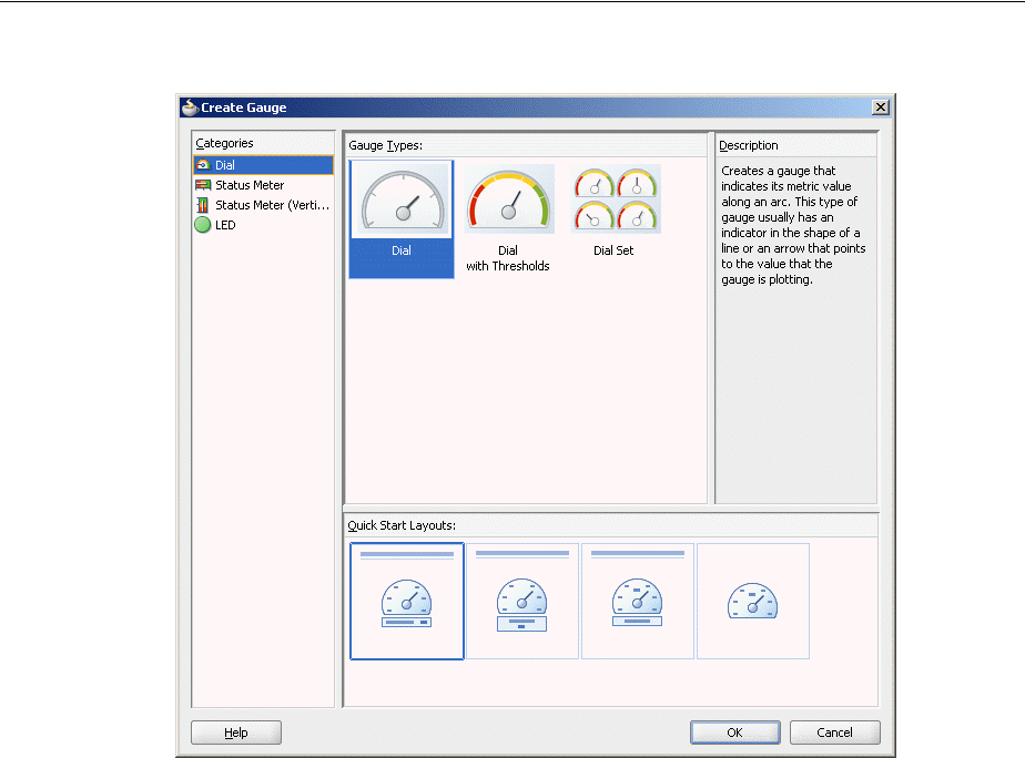
Using the Gauge Component
23-8 Web User Interface Developer's Guide for Oracle Application Development Framework
Figure 23–9 Component Gallery for Gauges
Once you complete the dialog, and the gauge is added to your page, you can use the
Property Inspector to specify data values and configure additional display attributes
for the gauge.
In the Property Inspector you can use the dropdown menu for each attribute field to
display a property description and options such as displaying an EL Expression
Builder or other specialized dialogs. Figure 23–10 shows the dropdown menu for a
gauge component value attribute.
Using the Gauge Component
Using Gauge Components 23-9
Figure 23–10 Gauge Component Value Attribute Dropdown Menu
Before you begin:
It may be helpful to have an understanding of how gauge attributes and gauge child
components can affect functionality. For more information, see Section 23.2.1,
"Configuring Gauges."
You may also find it helpful to understand functionality that can be added using other
ADF Faces features. For more information, see Section 23.1.3, "Additional
Functionality of Gauge Components."
To add a gauge to a page:
1. In the Component Palette, from the ADF Data Visualizations page, in the Gauge
panel, drag and drop a Gauge onto the page to open the Create Gauge dialog in
the Component Gallery.
Use the dialog to select the gauge category and type, and the quick start layout for
display of gauge title, legend, and labels. If you need help, press F1 or click Help.
2. In the Property Inspector, view the attributes for the gauge or gauge set. Use the
help button to display the complete tag documentation for the gauge component.
3. Expand the Common section. Use this section to set the following attributes:
■GaugeType: If you wish to change the category of gauge types selected in the
Component Gallery, use the dropdown list to select any of the following valid
values: DIAL, LED, STATUSMETER, or VERTICALSTATUSMETER.
Note: If your application uses the Fusion technology stack, then you
can use data controls to create a gauge and the binding will be done
for you. For more information, see the "Creating Databound ADF
Gauges" chapter in the Oracle Fusion Middleware Fusion Developer's
Guide for Oracle Application Development Framework

Using the Gauge Component
23-10 Web User Interface Developer's Guide for Oracle Application Development Framework
■GaugeSetColumnCount, GaugeSetAlignment, and GaugeSetDirection: Use
one or more of these attributes to determine the layout of gauges in a gauge
set. For more information see, Section 23.3.4, "How to Specify the Layout of
Gauges in a Gauge Set."
4. Expand the Gauge Data section. Specify data values for the gauge by setting the
value in these fields:
■Value: For a single gauge, specify the data model, which must be an instance
of DataModel, using an EL Expression. Alternatively, set a metric value as
either a Java.lang.Number object or a String.
■TabularData: For a gauge set, specify a tabular data set as a
Java.util.List object. For more information, see Section 23.2.4, "How to
Create a Gauge Using Tabular Data."
■MinValue and MaxValue: Optionally, set the lowest and greatest values on
the gauge axis. These values are set automatically if not specified.
5. Expand the Appearance section. Specify display attributes by setting the value in
these fields:
■LedStyle: If you wish to change the shape of the LED gauge selected in the
Component Gallery, use the dropdown list to select any of the following valid
values: LS_DOT, LS_ARROW, LS_RECTANGLE, or LS_TRIANGLE. You
can also use the LS_CUSTOM value if you wish to specify a custom image.
■ThresholdDialStyle: If you wish to change the default style (TDS_
SEGMENTS) of thresholds in dial gauges, use the dropdown list to select any
of the following valid values: TDS_PIE_FILL, TDS_RING_FILL.
■AngleExtent: Use to specify the range of degrees that sweeps through angles
other than the standard 220-degree arc in a dial gauge.
■CustomShapesPath: Use to specify the path to the custom shape definition
file. For more information, see Section 23.7, "Using Custom Shapes for
Gauges."
■ShortDesc: Enter a description of the gauge. This description is accessed by
screen reader users.
■AnimationOnDisplay, AnimationOnDataChange, AnimationDuration
(Animation sub-section): Use one or more of these attributes to set animation
effects for the gauge. For more information, see Section 23.6.4, "Animating
Gauges."
23.2.3 What Happens When You Add a Gauge to a Page
When a gauge component is inserted into a JSF page using the Component Gallery, a
set of child tags that support customization of the gauge is automatically inserted.
Example 23–1 shows the code inserted in the JSF page for a dial gauge with the
quick-start layout selected in the Component Gallery in Figure 23–9.
Example 23–1 Gauge Sample Code
<dvt:gauge id="gauge2" value="#{bindings.Gaugedemo1View1.gaugeModel}"
gaugeType="DIAL" imageFormat="FLASH">
<dvt:gaugeBackground>
<dvt:specialEffects fillType="FT_GRADIENT">
<dvt:gradientStopStyle/>
</dvt:specialEffects>
</dvt:gaugeBackground>
Using the Gauge Component
Using Gauge Components 23-11
<dvt:gaugeFrame/>
<dvt:indicator/>
<dvt:indicatorBase/>
<dvt:gaugePlotArea/>
<dvt:tickLabel/>
<dvt:tickMark/>
<dvt:topLabel/>
<dvt:bottomLabel/>
<dvt:metricLabel position="LP_WITH_BOTTOM_LABEL"/>
<dvt:thresholdSet>
<dvt:threshold fillColor="#d62800"/>
<dvt:threshold fillColor="#00ff00"/>
</dvt:thresholdSet>
</dvt:gauge>
23.2.4 How to Create a Gauge Using Tabular Data
A gauge set is created when a grid of data is used for the gauge component. The
tabularData attribute of a gauge component lets you specify a list of values that the
gauge uses to create a grid and to populate itself. To create a gauge using tabular data
you must store the data in a method in the gauge’s managed bean, and then use the
gauge component’s tabularData attribute to reference the data.
When you provide only the metric value through the tabularData attribute, each
value in the grid is represented by a separate gauge. In this case you must specify any
desired thresholds and minimum or maximum values through the Property Inspector.
For example, the table in Figure 23–11 has five columns: Quota, Sales, Margin, Costs,
and Units, and three rows: London, Paris, and New York. This data produces a gauge
set with five gauges in each row and lets you compare values such as sales across the
three cities.
Figure 23–11 Comparison of Annual Results
In a managed bean, the structure of the list of tabular data consists of a three-member
Object array for each data value to be passed to the gauge. The members of each
array must be organized as follows:
■The first member (index 0) is the column label of the data value in the grid. This is
generally a String.
■The second member (index 1) is the row label of the data value in the grid. This is
generally a String.
■The third member (index 2) is the data value, which is usually Double.
Example 23–2 shows code in a managed bean that creates the list of tabular data
required for the gauge that compares annual results for three cities displayed in
Figure 23–11.
Example 23–2 Managed Bean to Create a List of Tabular Data for Annual Results
public List getGaugeData()
{
Using the Gauge Component
23-12 Web User Interface Developer's Guide for Oracle Application Development Framework
ArrayList list = new ArrayList();
String[] rowLabels = new String[] {"London", "Paris", "New York"};
String[] colLabels = new String[] {"Quota", "Sales", "Margin", "Costs",
"Units"};
double [] [] values = new double[][]{
{60, 90, 135},
{50, -100, -150},
{130, 140, 150},
{70, 80, -130},
{110, 120, 130}
};
for (int c = 0; c < colLabels.length; c++)
{
for (int r = 0; r < rowLabels.length; r++)
{
list.add (new Object [] {colLabels[c], rowLabels[r],
new Double (values [c][r])});
}
}
return list;
}
To provide the metric value and optionally threshold. minimum, and maximum
values, use data specification to set the columns or rows of data through the
tabularData attribute.
For example, the data in Figure 23–12 provides the metric values and minimum,
maximum, and threshold values for two cities. The data produces a gauge set of two
gauges comparing sales results by desired specifications.
Figure 23–12 Comparison of Sales Results by Specification
Example 23–3 shows code in a managed bean that creates the list of tabular data
required for the gauge that compares sales results by specification for two cities
displayed in Figure 23–12.
Example 23–3 Managed Bean to Create a List of Tabular Data for Sales Results
CommonGauge gauge = new CommonGauge();
Object[] specs = { DataSpecification.METRIC, DataSpecification.MINIMUM,
DataSpecification.MAXIMUM, DataSpecification.THRESHOLD,
DataSpecification.THRESHOLD };
String[] colLabels = new String[] { "Sales", "Min", "Max", "Quota", "Target"
};
String[] rowLabels = new String[] { "Boston", "Chicago" };
double[][] values = new double[][] { {40, 60}, {0,0}, {100,80}, {30,35},
{50,70} };
List gaugeData = new ArrayList();
for (int c = 0; c < colLabels.length; c++) {
for (int r = 0; r < rowLabels.length; r++) {
gaugeData.add(new Object[] { colLabels[c], rowLabels[r], new
Double(values[c][r]) });
}
}
gauge.setTabularData(specs, gaugeData);

Using the Gauge Component
Using Gauge Components 23-13
Before you begin:
It may be helpful to have an understanding of how gauge attributes and gauge child
tags can affect functionality. For more information, see Section 23.2.1, "Configuring
Gauges."
You should already have a managed bean that creates a list of tabular data. If you do
not, follow the instructions in Section 3.6, "Creating and Using Managed Beans."
You should already have a gauge set on your page. If you do not, follow the
instructions in this chapter to create a gauge set. For information, see Section 23.2.2,
"How to Add a Gauge to a Page."
To create a gauge set using tabular data from a managed bean:
1. In the Structure window, select the dvt:gauge component.
2. In the Property Inspector expand the Gauge Data section.
3. From the TabularDa t a attribute menu, choose Expression Builder.
4. In the Expression Builder dialog, use the search box to locate the gauge’s managed
bean.
5. Expand the managed bean node and select the method that creates the list of
tabular data.
6. Click OK.
The Expression is created.
For example, if the name of the managed bean is sampleGauge and the name of
the method that creates the list of tabular data is getGaugeData, the Expression
Builder generates the code #{sampleGauge.gaugeData} as the value for the
tabularData attribute of the gauge component.
23.2.5 What You May Need to Know About Flash and PNG Image Formats
By default, gauges are displayed using a Flash player as specified in the gauge
component imageFormat attribute. Alternatively, gauges can be displayed using a
Portable Network Graphics (PNG) output format, as in the case when plug-ins are not
allowed on client machines. A PNG output format is used also when printing gauges.
Although static rendering is fully supported when using a PNG output format, certain
interactive features are not available including:
■Animation
■Context menus
■Popup support
You can disable the use of Flash content across the entire application by setting a
flash-player-usage context parameter in adf-config.xml. For more
information, see Section A.4.3, "Configuring Flash as Component Output Format."
To improve performance, inline PNG images using data URIs are used when there is
browser support for URIs and the images are sufficiently small. However, if the
application specifies a path to a stored image using the imageSource attribute on the
gauge component, it will be respected and inline images will not be sent.
When gauges are displayed in ADF table cells through stamping, a PNG_STAMPED
setting is required for the gauge’s imageFormat attribute.

Using the Gauge Component
23-14 Web User Interface Developer's Guide for Oracle Application Development Framework
23.2.6 Using Gauges in Tables
You can display gauges in table cells where users can see and compare them alongside
related information. The immediate children of an ADF table component must be
column components. Each visible column component is displayed as a separate
column in the table. Column components contain components used to display content,
images, or provide further functionality.
The child components of each column display the data for each row in that column.
The column does not create child components per row; instead, the table uses
stamping to render each row. Each child is stamped once per row, repeatedly for all
the rows. As each row is stamped, the data for the current row is copied into a
property that can be addressed using an EL expression. You specify the name to use
for this property using the var property on the table. Once the table has completed
rendering, this property is removed or reverted back to its previous value.
Example 23–4 shows sample code for displaying gauges in an ADF table component.
Example 23–4 Gauge Component Stamped in Table Column
<af:table summary="table" value="#{gaugeData.gaugeTableData}" var="testvar"
rowBandingInterval="0" id="t1" columnStretching="last"
inlineStyle="height:400px" styleClass="AFStretchWidth">
<af:column rowHeader="true" sortable="false" headerText="Country"
align="center"
id="c1" width="120"
inlineStyle="font-weight:bold; font-size: 12px;">
<af:outputText value="#{testvar.name}" id="ot1"/>
</af:column>
<af:column sortable="true" headerText="Density (1/km^2)"
align="center" id="c2" width="300"
sortProperty="density">
<dvt:gauge shortDesc="Gauge" id="gauge77" gaugeType="STATUSMETER"
binding="#{editor.component}" dynamicResize="DYNAMIC_SIZE"
value="#{testvar.density}"
inlineStyle="height:22px" styleClass="AFStretchWidth"
minValue="0.0" maxValue="1200.0">
<dvt:indicatorBar/>
<dvt:thresholdSet>
<dvt:threshold fillColor="#00aa00" thresholdMaxValue="300"/>
<dvt:threshold fillColor="#ffcc00" thresholdMaxValue="700"/>
<dvt:threshold fillColor="#cc2255"/>
</dvt:thresholdSet>
<dvt:topLabel position="LP_NONE"/>
<dvt:bottomLabel position="LP_NONE"/>
<dvt:metricLabel position="LP_NONE"/>
</dvt:gauge>
</af:column>
When configuring gauges in table cells, use these guidelines to improve usability:
■Vertical status meter gauges are not recommended for use in table cells as the
table rows would have to be very tall.
■Make gauges as small as possible while maintaining legibility.
■To maximize use of space, use table column and row headers to describe gauges,
rather than using gauge titles or bottom labels.
■Use only one type of gauge per column or row, and use the same axis values and
thresholds.

Configuring Gauge Display Elements
Using Gauge Components 23-15
■Display horizontal status meters in columns, and dial and LED gauges in rows or
columns.
■Avoid displaying so many gauges that users must scroll to see them all.
23.3 Configuring Gauge Display Elements
You can customize gauge display elements including thresholds, labels, indicators,
tick marks, and the layout of gauge sets.
23.3.1 How to Configure Gauge Thresholds
Thresholds are numerical data values in a gauge that highlight a particular range of
values. Thresholds must be values between the minimum and the maximum value for
a gauge. The range identified by a threshold is filled with a color that is different from
the color of other ranges.
The data collection for a gauge can provide dynamic values for thresholds when the
gauge is databound. For information about using dynamic values for thresholds, see
After the gauge is created, you can also specify static threshold values by configuring a
thresholdSet child component that wraps an unlimited number of threshold
child components in a gauge. If threshold values are supplied in both the data
collection and in threshold components, the gauge honors the values in the
threshold components.
Before you begin:
It may be helpful to have an understanding of how gauge attributes and gauge child
tags can affect functionality. For more information, see Section 23.2.1, "Configuring
Gauges."
You should already have a gauge on your page. If you do not, follow the instructions
in this chapter to create a gauge. For information, see Section 23.2.2, "How to Add a
Gauge to a Page."
To add static thresholds to a gauge:
1. In the Structure window, right-click the dvt:gauge component and choose Insert
inside dvt:gauge > ADF Data Visualization > Threshold Set.
2. Right-click the dvt:thresholdSet component and choose Insert inside
dvt:thresholdSet > Threshold.
3. In the Property Inspector, set the following attributes:
■ThresholdMaxValue: Specify the maximum value for the threshold section
you are configuring. Values can be an integer or
Note: If you create a gauge using a gauge type with thresholds in the
Component Gallery, a dvt:thresholdSet component and dvt:threshold
component children are automatically added to the dvt:gauge
component in the Structure window.
Note: For the final threshold, the maximum value of the gauge is
used as the threshold maximum value regardless of any entry you
make in the ThresholdMaxValue attribute for the final threshold.

Configuring Gauge Display Elements
23-16 Web User Interface Developer's Guide for Oracle Application Development Framework
■FillColor and BorderColor: Optionally, specify a RGB value for the fill color
and border color respectively for the threshold section you are configuring.
You can also change the color from opaque to transparent. For more
information, see Section 23.4.2, "Specifying Transparency for Gauge Elements."
■Text : Optionally, specify the text to be displayed in the legend to identify this
threshold. You can also bind the text to a text resource. For more information,
see Section 23.4.3, "How to Format Gauge Text and Use Text Resources."
4. Repeat Step 2 and Step 3 to create each threshold in the gauge from the lowest
minimum value to the highest maximum value.
23.3.2 How to Customize Gauge Labels
By default gauges display a metric label, and optional top and bottom labels using the
child components metricLabel, topLabel, and bottomLabel. You can customize
the display and positioning of each label, as well as control the fill and border colors of
the optional top and bottom gauge label frames.
The categorical data value represented by the top or bottom label can also be
customized using an attributeFormat tag and ADF Faces converter tags to format
percents, scale numbers, control the number of decimal places, placement of signs, and
so on. For more information, see
Before you begin:
It may be helpful to have an understanding of how gauge attributes and gauge child
tags can affect functionality. For more information, see Section 23.2.1, "Configuring
Gauges."
You should already have a gauge on your page. If you do not, follow the instructions
in this chapter to create a gauge. For information, see Section 23.2.2, "How to Add a
Gauge to a Page."
To customize a gauge label:
1. In the Structure window, select the gauge child label component (dvt:metricLabel,
dvt:topLabel, or dvt:bottomLabel) you wish to configure.
2. In the Property Inspector, set the following attributes:
■Position: Use to specify the location, if any, of the gauge label. Valid values
include:
–LP_NONE: No label is displayed.
– LP_INSIDE_GAUGE: Label is displayed inside the plot area of the gauge.
Labels are horizontally centered across a gauge. When set to this value,
Note: You have the option of adding any number of thresholds to
gauges. However, arrow and triangle LED gauges support thresholds
only for the three directions to which they point
Note: When you add a gauge to your page, gauge child label
components are automatically added to the gauge component. The
default location, if any, of each gauge label is specified in the
position attribute of the component, based on the choice you make
for a quick-layout option in the Component Gallery.

Configuring Gauge Display Elements
Using Gauge Components 23-17
top and bottom labels are also vertically centered inside the plot area.
Good choice for the LED gauge.
– LP_INSIDE_GAUGE_RIGHT and LP_INSIDE_GAUGE_LEFT: Metric
label is displayed either to the right or lefts of the plot area.
–LP_ABOVE_GAUGE: The default value for the top label. Displays the
label above the gauge.
– LP_BELOW_GAUGE: The default value for the bottom label. Displays the
label below the gauge. If the position of both the bottom and metric labels
are set to this value, then both labels are displayed below the gauge.
However, the bottom label is displayed above the metric label.
– LP_WITH_BOTTOM_GAUGE: The default value for the metric label.
Displays the label beside the bottom label.
■Text: The text displayed in the top or bottom label. In the attribute menu,
choose Select Text Resources for a dialog to associate the text with application
text resources. For more information, see Section 23.4.3, "How to Format
Gauge Text and Use Text Resources."
■NumberType, Scaling, and AutoPrecision: Available only for metric labels.
Use these attributes to configure the display of numeric data values in the
gauge. For more information, see Section 23.5.2, "What You May Need to
Know About Automatic Scaling and Precision."
3. If you wish to configure the text font used in the gauge label, do the following:
a. In the Structure window, right-click the gauge child label component
(dvt:metricLabel, dvt:topLabel, or dvt:bottomLabel) you wish to configure
and select Insert inside label component > Font.
b. In the Property Inspector, set the attributes for the font. For more information,
see Section 23.4.3, "How to Format Gauge Text and Use Text Resources."
4. If you wish to configure a frame around the top or bottom gauge label, do the
following:
a. In the Structure window, right-click the dvt:gauge component and select
Insert inside dvt:gauge > Upper Label Frame or Lower Label Frame.
b. In the Property Inspector, specify a RGB value for the FillColor and
BorderColor attributes for the label frame you are configuring. You can also
change the color from opaque to transparent. For more information, see
Section 23.4.2, "Specifying Transparency for Gauge Elements."
23.3.3 How to Customize Gauge Indicators and Tick Marks
Gauges use a graphic to indicate the precise gauge value. By default gauges display a
line for dial gauges using the child component indicator, and a bar inside status
meter or vertical status meter gauges using the child component indicatorBar. The
child component indicatorBase is used to set the fill properties of the circular base
of all indicators of a dial gauge. You can customize the appearance of gauge
indicators.
Before you begin:
It may be helpful to have an understanding of how gauge attributes and gauge child
tags can affect functionality. For more information, see Section 23.2.1, "Configuring
Gauges."

Configuring Gauge Display Elements
23-18 Web User Interface Developer's Guide for Oracle Application Development Framework
You should already have a gauge on your page. If you do not, follow the instructions
in this chapter to create a gauge. For information, see Section 23.2.2, "How to Add a
Gauge to a Page."
To customize the appearance of gauge indicators:
■For dial gauge indicators, do the following:
1. In the Structure window, select the dvt:indicator component.
2. In the Property Inspector, set the following attributes:
–Type: Identifies the kind of indicator: a line indicator (default), a fill
indicator, or a needle indicator.
– BorderColor: Specifies the color of the border of the indicator.
– FillColor: Specifies the color of the fill for the indicator.
– UseThresholdFillColor: Determines whether the color of the threshold
area in which the indicator falls should override the specified color of the
indicator.
3. In the Structure window, select the dvt:indicatorBase component.
4. In the Property Inspector, set the following attributes:
– Rendered: Identifies the kind of indicator: a line indicator (default), a fill
indicator, or a needle indicator.
– BorderColor: Specifies the color of the border of the indicator.
– FillColor: Specifies the color of the fill for the indicator.
■For status meter and vertical status meter gauges, do the following:
1. In the Structure window, select the dvt:indicatorBar component.
2. In the Property Inspector, set the following attributes:
– BorderColor: Specifies the color of the border of the indicator.
– FillColor: Specifies the color of the fill for the indicator.
Tick marks are incremental marks along the gauge value axis for dial, status meter,
and vertical status meter gauges. LED gauges do not have tick marks. By default,
gauges display tick marks using the gauge child tickMark component to specify the
display, spacing, and color or major and minor tick marks.
The gauge child tickLabel component identifies major tick labels to specify the
location of the labels (interior or exterior of the gauge), and the format for numbers
displayed in the tick labels. Minor tick marks do not support labels.
Note: When you add a gauge to your page, gauge child indicator
components are automatically added to the gauge component based
on the gauge type you chose in the Component Gallery. LED gauges
do not have indicators.
Note: If you want to specify that the color of the threshold area in
which the indicator bar falls should override the specified color of the
indicator, add an indicator component to the gauge, and set its
UseThresholdFillColor attribute to true.
Configuring Gauge Display Elements
Using Gauge Components 23-19
Before you begin:
It may be helpful to have an understanding of how gauge attributes and gauge child
tags can affect functionality. For more information, see Section 23.2.1, "Configuring
Gauges."
You should already have a gauge on your page. If you do not, follow the instructions
in this chapter to create a gauge. For information, see Section 23.2.2, "How to Add a
Gauge to a Page."
To customize the tick marks and tick labels for a gauge:
1. In the Structure window, select the dvt:tickMark component.
2. In the Property Inspector, set values for the following attributes:
– MajorIncrement and MinorIncrement: Sets the distance between two major
tick marks and two minor tick marks, respectively. If the value is less than
zero for either attribute, the tick marks are not displayed.
–MajorTickColor and MinorTickColor: Sets the hexidecimal color of major
tick marks and minor tick marks, respectively.
–Content: Specifies where tick marks occur within a gauge set. Valid values are
any combination separated by spaces or commas including:
* TC_INCREMENTS: Display tick marks in increments.
* TC_MAJOR_TICK: Display tick marks for minimum, maximum, and
incremental values.
* TC_MIN_MAX: Display tick marks for minimum and maximum values.
*TC_METRIC: Display tick marks for actual metric values.
*TC_NONE: Display no tick marks.
*TC_THRESHOLD: Display tick marks for threshold values.
3. In the Structure window, select the dvt:tickLabel component.
4. In the Property Inspector, set values for the following attributes:
– Position: By default, the dial gauge displays interior tick labels to provide a
cleaner look when the gauge is contained entirely within the gauge frame.
Because the tick labels lie within the plot area, the length of the tick labels
must be limited to fit in this space. You can customize your gauge to use
exterior labels by setting the value for this attribute to TLP_EXTERIOR from
the default TLP_INTERIOR.
–Content: Specifies where tick labels occur within a gauge set. Valid values are
any combination separated by spaces or commas including:
* TC_INCREMENTS: Display tick labels in increments.
* TC_MAJOR_TICK: Display tick labels for minimum, maximum, and
incremental values.
* TC_MIN_MAX: Display tick labels for minimum and maximum values.
Note: When you add a gauge to your page, gauge child tick mark
and tick mark label components are automatically added to the gauge
component based on the choices you make in the Component Gallery.
LED gauges do not have tick marks.

Configuring Gauge Display Elements
23-20 Web User Interface Developer's Guide for Oracle Application Development Framework
*TC_METRIC: Display tick labels for actual metric values.
*TC_NONE: Display no tick labels.
*TC_THRESHOLD: Display tick labels for threshold values.
–NumberType, Scaling, and AutoPrecision: Available only for metric labels.
Use these attributes to configure the display of numeric data values in the
gauge. For more information, see Section 23.5.1, "How to Format Numeric
Data Values in Gauges."
23.3.4 How to Specify the Layout of Gauges in a Gauge Set
A single gauge can display one row of data bound to a gauge component. A gauge set
displays a gauge for each row in multiple rows of data in a data collection.
You can specify the location of gauges within a gauge set by specifying values for
attributes in the gauge component.
Before you begin:
It may be helpful to have an understanding of how gauge attributes and gauge child
components can affect functionality. For more information, see Section 23.2.1,
"Configuring Gauges."
You should already have a gauge set on your page. If you do not, follow the
instructions in this chapter to create a gauge set. For information, see Section 23.2.2,
"How to Add a Gauge to a Page."
To specify the layout of gauges in a gauge set:
1. In the Structure window, right-click the dvt:gauge component and choose Go to
Properties.
2. In the Property Inspector, expand the Common section and set the following
attributes:
■GaugeSetColumnCount: Specify the number of columns of gauges that will
appear in the gauge set.
A setting of zero causes all gauges to appear in a single row. Any positive
integer determines the exact number of columns in which the gauges are
displayed. A setting of -1 causes the number of columns to be determined
automatically from the data source.
■GaugeSetDirection: Use the dropdown list to select a value for the placement
of gauges in columns.
If you select GSD_ACROSS, then the default layout of the gauges is used and
the gauges appear from left to right, then top to bottom. If you select GSD_
DOWN, the layout of the gauges is from top to bottom, then left to right.
■GaugesSetAlignment: Use the dropdown list to select a value for the
alignment of gauges within a gauge set.
This attribute defaults to the setting GSA_NONE, which divides the available
space equally among the gauges in the gauge set. Other options use the
available space and optimal gauge size to allow for alignment towards the left
or right and the top or bottom within the gauge set. You can also select GSA_
CENTER to center the gauges within the gauge set.

Formatting Gauge Style Elements
Using Gauge Components 23-21
23.3.5 What You May Need to Know About Configuring Gauge Set Display
When configuring gauge set display, use these guidelines to improve usability:
■When the individual gauges in a gauge set do not have titles or axes, specify a
label above the gauge set that displays the name of the data set and its units of
measure, for example, "2010 Population (Millions)."
■When thresholds are defined, include a legend. For more information, see
Section 23.3.1, "How to Configure Gauge Thresholds."
■Avoid displaying so many gauges that users must scroll to view all of the gauges.
23.4 Formatting Gauge Style Elements
You can customize the styling of gauges to change the initial size or a gauge, specify
dynamic resizing to fit the presentation area of a gauge, and apply style elements. You
can also use text formatting and text resource, and transparency in gauges.
23.4.1 How to Change Gauge Size and Apply CSS Styles
Gauges are displayed in a default size of 200 X 200 pixels. You can customize the size
of a gauge or specify dynamic resizing to fit an area across different browser window
sizes. When gauges are displayed in a horizontally or vertically restricted area, for
example in a web page sidebar, the gauge is displayed in a small image size. Although
fully featured, the smaller image is a simplified display.
You can customize the width and height of a gauge, and you can allow for dynamic
resizing of a gauge based on changes to the size of its container. These two aspects of a
gauge are interrelated in that they share the use of the gauge inlineStyle attribute.
You can also apply CSS styles such as active, focus, hover, link, and visited to
use for a gauge.
Before you begin:
It may be helpful to have an understanding of how gauge attributes and gauge child
tags can affect functionality. For more information, see Section 23.2.1, "Configuring
Gauges."
You should already have a gauge on your page. If you do not, follow the instructions
in this chapter to create a gauge. For information, see Section 23.2.2, "How to Add a
Gauge to a Page."
To specify the size of a gauge:
1. In the Structure window, select the dvt:gauge component.
2. In Property Inspector, expand the Style section. Specify the initial size of the
gauge in the InlineStyle attribute. If you do not also provide for dynamic resizing
of the gauge, then the initial size becomes the only display size for the gauge. For
example,
width:200px;height:200px
If you are specifying dynamic resizing for the gauge, you can enter a fixed number
of pixels or a relative percent for both width and height. For example, to create a
gauge that fills 50% of its container’s width and has a height of 200 pixels, use the
following setting for the InlineStyle attribute:
width:50%;height:200px

Formatting Gauge Style Elements
23-22 Web User Interface Developer's Guide for Oracle Application Development Framework
3. If you want to specify dynamic resizing for the gauge, expand the Behavior
section. From the DynamicResize attribute dropdown list, select DYNAMIC_
SIZE.
To apply CSS styles to a gauge:
1. In the Structure window, select the dvt:gauge component.
2. In the Property Inspector, expand the Style section. From the StyleClass attribute
menu, choose Edit and use the property editor dialog to select the CSS styles to
apply to the gauge.
23.4.2 Specifying Transparency for Gauge Elements
You can specify that various elements of a gauge display a transparent color instead of
the default opaque color by setting the borderColor and fillColor attributes on
the gauge child components related to those elements. These color properties accept a
6 or 8 RGB hexidecimal value. When an 8-digit value is used, the first two digits
represent transparency. For example, you can set transparency by using a value of
00FFFFFF.
Any gauge child component that supports borderColor or fillColor attributes
can be set to transparency. The following are examples of gauge child components that
support transparency:
■gaugeBackground
■gaugeFrame
■gaugePlotArea
■gaugeLegendArea
23.4.3 How to Format Gauge Text and Use Text Resources
You can format the text in gauges using a gaugeFont component as a child for any of
the these gauge child components that represent titles and labels in a gauge:
■bottomLabel
■metricLabel
■gaugeLegendText
■gaugeLegendTitle
■tickLabel
■topLabel
The attributes of the gaugeFont component allows you to specify these font
attributes for the gauge child element:
■name: Specifies the name of the font, for example San Serif.
■size: Specifies the font size in pixels, for example 11.
■color: Specifies the color of the font. This color property accepts a 6 or 8 RGB
hexidecimal value. When an 8-digit value is used, the first two digits represent
Best Practice Tip: Instead of specifying width at 100% in the
inlineStyle attribute, set the styleClass attribute to
AFStretchWidth.
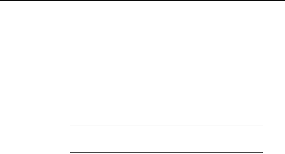
Formatting Gauge Style Elements
Using Gauge Components 23-23
transparency. For example, you can set transparency by using a value of
00FFFFFF
■bold: Specifies whether or not the font is bold. The default value is FALSE.
■italic: Specifies whether or not the text is in italics. The default value is FALSE.
Before you begin:
It may be helpful to have an understanding of how gauge attributes and gauge child
tags can affect functionality. For more information, see Section 23.2.1, "Configuring
Gauges."
You should already have a gauge on your page. If you do not, follow the instructions
in this chapter to create a gauge. For information, see Section 23.2.2, "How to Add a
Gauge to a Page."
To specify a text font for a gauge title or label component:
1. In the Structure window, right-click the gauge child component for a title or label,
for example, dvt:metricLabel, and choose Insert inside dvt:metricLabel > Font.
If the component is not available, right-click the dvt:gauge component, and choose
Insert inside dvt:gauge > ADF Data Visualization > gauge child title or label
component.
2. In the Property Inspector, set values for one or more of the dvt:gaugeFont
component attributes. Use the help button to display the complete tag
documentation for the dvt:gaugeFont component.
You can also set the font attributes of gauge components globally across all pages in
your application by using a cascading style sheet (CSS) to build a skin, and
configuring your application to use the skin. By applying a skin to define the fonts
used in gauge components, the pages in an application will be smaller and more
organized, with a consistent style easily modified by changing the CSS file. For more
information, see Chapter 28, "Customizing the Appearance Using Styles and Skins."
JDeveloper supports easy localization of DVT components using the abstract class
java.util.ResourceBundle to provide locale-specific resources. For those gauge
child components that represent titles and labels in a gauge you can associate a text
resource referenced in an application resource bundle. For more information, see
Chapter 29, "Internationalizing and Localizing Pages."
To specify a text resource for a gauge title or label component:
1. In the Structure window, select the gauge child component for a title or label, for
example, dvt:metricLabel.
2. In the Property Inspector, in the text attribute menu, choose Select Text Resources
to open the Select Text Resource dialog.
Use the dialog to associate the component text with a text resource. If you need
help, press F1 or click Help
Note: When you add a gauge to your page, gauge child components
for titles or labels are automatically added to the gauge component,
based on the choices you make in the Component Gallery.

Formatting Numeric Data Values in Gauges
23-24 Web User Interface Developer's Guide for Oracle Application Development Framework
23.5 Formatting Numeric Data Values in Gauges
Gauge child components including metricLabel, tickLabel, and
gaugeLgendText display numeric data values in gauges. Each component has a
numberType attribute that lets you specify whether you want to display the value
itself, or a percentage that the value represents. In some cases, this might be sufficient
numeric formatting.
If you wish to further format the gauge metric or tick label value, you can use an ADF
Faces standard converter, af:convertNumber. For example, you may wish to
display the value as currency or display specific decimal settings.
23.5.1 How to Format Numeric Data Values in Gauges
The metrics represented in gauges are numeric data values. You can apply specific
formatting rules to these values.
Before you begin:
It may be helpful to have an understanding of how gauge attributes and gauge child
tags can affect functionality. For more information, see Section 23.2.1, "Configuring
Gauges."
You should already have a gauge on your page. If you do not, follow the instructions
in this chapter to create a gauge. For information, see Section 23.2.2, "How to Add a
Gauge to a Page."
To format numeric data values in a gauge:
1. In the Structure window, select the gauge child component displaying data values
(metricLabel, tickLabel, or gaugeLegendText) that you wish to configure.
If the component is not available, right-click the dvt:gauge component, and choose
Insert inside dvt:gauge > ADF Data Visualization > (metricLabel, tickLabel, or
gaugeLegendText).
2. In the Property Inspector, if you want to display the data value as a percentage
rather than as a value, set the NumberType attribute of the component to NT_
PERCENT.
3. If you want to specify additional formatting for the data values displayed in the
gauge metric or tick label, do the following:
a. In the Structure window, right-click the dvt:metricLabel or dvt:tickLabel, and
choose Insert inside (dvt:metricLabel or dvt:tickLabel) > Convert Number.
b. In the Property Inspector, specify values for the attributes of the
af:convertNumber component to produce additional formatting. Use the help
button to display the complete tag documentation for the
af:convertNumber component.
Note: When you add a gauge to your page, gauge child components
that display configurable data values are automatically added to the
gauge component, based on the choices you make in the Component
Gallery.

Adding Gauge Special Effects and Animation
Using Gauge Components 23-25
23.5.2 What You May Need to Know About Automatic Scaling and Precision
In order to achieve a compact and clean display, gauges automatically determine the
scale and precision of the values being displayed in metric labels and tick labels. For
example, a value of 40,000 will be formatted as 40K, and 0.230546 will be displayed
with 2 decimal points as 0.23.
Automatic formatting still occurs when af:convertNumber is specified. Gauge tags
that support af:convertNumber child tags have scaling and autoPrecision
attributes that can be used to control the graph's automatic number formatting. By
default, these attribute values are set to scaling="auto" and
autoPrecision="on". Fraction digit settings specified in af:convertNumber,
such as minFractionDigits, maxFractionDigits, or pattern, are ignored
unless autoPrecision is set to off.
23.6 Adding Gauge Special Effects and Animation
You can add special features to a gauge such as applying gradient effects to parts of a
gauge, adding interactivity to gauges, animating gauges, and taking advantage of
gauge support for active data.
23.6.1 How to Add Gradient Special Effects to a Gauge
A gradient is a special effect in which an object changes color gradually. Each color in a
gradient is represented by a stop. The first stop is stop 0, the second is stop 1, and so
on. You must specify the number of stops in the special effects for a child component
of a gauge that supports special effects.
You can define gradient special effects for the following child components of a gauge:
■gaugeBackground
■gaugeSetBackground
■gaugePlotArea
■gaugeFrame
■gaugeLegendArea
■lowerLabelFrame
■upperLabelFrame
■indicator
■indicatorBar
■indicatorBase
■threshold
For each child component of a gauge to which you want to add special effects, you
must insert a child specialEffects component. For example, if you want to add a
Note: When the numberType attribute of metric or tick labels is set
to percent (NT_PERCENT), a child af:convertNumber tag, if used,
will be automatically set to percent for its type attribute. When
af:convertNumber is forced to percent, gauge clears the
pattern attribute. This means that patterns are ignored when a
gauge forces percent formatting.

Adding Gauge Special Effects and Animation
23-26 Web User Interface Developer's Guide for Oracle Application Development Framework
gradient to the background of a gauge, then you would add a child specialEffects
component to the background component. You must also set the specialEffects
component fillType attribute to FT_GRADIENT.
Then, optionally if you want to control the rate of change for the fill color of the child
component, you add as many gradientStopStyle components as you need to
control the color and rate of change for the fill color of the component. The
gradientStopStyle components are added as child components to the
specialEffects component.
The approach that you use to define gradient special effects is identical for each child
component of the gauge that supports these effects. The procedure defines how to add
gradient special effects to the background of a gauge.
Before you begin:
It may be helpful to have an understanding of how gauge attributes and gauge child
tags can affect functionality. For more information, see Section 23.2.1, "Configuring
Gauges."
You should already have a gauge on your page. If you do not, follow the instructions
in this chapter to create a gauge. For information, see Section 23.2.2, "How to Add a
Gauge to a Page."
To add a gradient special effect to the background of a gauge:
1. In the Structure window, right-click the gauge child component that supports
gradient special effects, for example dvt:gaugeBackground, and choose Insert
inside dvt:gaugeBackground > Special Effects.
2. In the Property Inspector, set the following attributes:
■FillType: From the dropdown list select FT_GRADIENT.
■GradientDirection: From the dropdown list select the direction of change that
you want to use for the gradient fill. The default value is GD_RIGHT.
■NumStops: Enter the number of stops to use for the gradient.
3. Optionally, in the Property Inspector, click Configure Gradient Stops to control
the color and rate of change for the first gradient stop.
4. In the Property Inspector, set the following attributes:
■StopIndex: Enter a zero-based integer as an index for the component.
■GradientStopColor: Specify a RGB value for the color that you want to use at
this specific point along the gradient. You can also change the color from
opaque to transparent. For more information, see Section 23.4.2, "Specifying
Transparency for Gauge Elements."
■GradientStopPosition: Enter the proportional distance along a gradient for
the identified stop color. The gradient is scaled from 0 to 100. If 0 or 100 is not
specified, default positions are used for those points.
5. If you wish to configure additional gradient stops, in the Structure window,
right-click the dvt:specialEffects component and choose Insert inside
dvt:specialEffects > dvt:gradientStopStyle.
Note: When you add a gauge to your page, gauge child components
are automatically added to the gauge component based on the gauge
type you chose in the Component Gallery.

Adding Gauge Special Effects and Animation
Using Gauge Components 23-27
6. Repeat Step 4 for each gradient stop you want to configure.
23.6.2 What Happens When You Add a Gradient Special Effect to a Gauge
When you add a gradient fill to the background of a gauge, specify two stops, and
configure the color and rate of change for each stop, XML code is generated.
Example 23–5 shows the XML code that is generated.
Example 23–5 XML Code Generated for Adding a Gradient to the Background of a
Gauge
<dvt:gauge >
<dvt:gaugeBackground borderColor="#848284">
<dvt:specialEffects fillType="FT_GRADIENT" gradientDirection="GD_RADIAL">
<dvt:gradientStopStyle stopIndex="0" gradientStopPosition="60"
gradientStopColor="FFFFCC"/>
<dvt:gradientStopStyle stopIndex="1" gradientStopPosition="90"
gradientStopColor="FFFF99"/>
</dvt:specialEffects>
</dvt:gaugeBackground>
</dvt:gauge>
23.6.3 How to Add Interactivity to Gauges
Interactivity in gauges involves associating a specified part of a gauge with an HTML
attribute such as a hyperlink, or a JavaScript event such as a user moving the cursor
over that part of the gauge. For example, a gauge indicator could be associated with a
hyperlink, or a tooltip of a gauge indicator could change from "Indicator" to "Indicator
is Clicked" when the user clicks the indicator.
You specify interactivity properties on one or more shapeAttributes components
wrapped in a gauge child shapeAttributesSet component. The interactivity
provides a connection between the gauge subcomponent, as specified in the
component attribute of a shapeAttributes component, and an HTML attribute or
a JavaScript event. Each shapeAttributes component must contain a
subcomponent and at least one attribute in order to be functional.
The valid values for gauge subcomponents, as specified in the component attribute of
the shapeAttributes component, are:
■GAUGE_BOTTOMLABEL: the label below the gauge
■GAUGE_INDICATOR: the indicator in the gauge
■GAUGE_LEGENDAREA: the legend area of the gauge
■GAUGE_LEGENDTEXT: the text label of the legend area
■GAUGE_METRICLABEL: the label showing the metric value
■GAUGE_TOPLABEL: the label above the gauge
■GAUGE_PLOTAREA: the area inside the gauge
■GAUGE_THRESHOLD: the threshold area of the gauge
Interactivity attributes associated with the gauge subcomponent can be any of the
following:
■Behavior attributes: An attribute such as onClick, onMouseMove, onKeyDown,
or any attribute with a prefix of on that takes a string containing JavaScript code
or a reference to a managed bean method that returns JavaScript code as its value.

Adding Gauge Special Effects and Animation
23-28 Web User Interface Developer's Guide for Oracle Application Development Framework
If the value is a managed bean method, the method takes the subcomponent
handle as its input parameter.
■Common attributes: An HTML attribute such as alt, href, nohref, target,
title, and tabindix that takes a string or a managed bean method that returns
a string as its value. The value can be a string, or a boolean depending on the
attribute. Other attributes control the basic settings of the interactivity, such as
clickable, clickAction, and clickListener to control the click events, and
id to reference the subcomponent.
For example, Example 23–6 shows the code for a dial gauge where the tooltip of the
indicator changes from "Indicator" to "Indicator is Clicked" when the user clicks the
indicator, and the tooltip for the gauge metric label displays "Metric Label" when the
user mouses over that label at runtime.
Example 23–6 Sample Code for Gauge shapeAttributes Component
<dvt:gauge >
<dvt:shapeAttributesSet>
<dvt:shapeAttributes component="GAUGE_INDICATOR" alt="Indicator"
onClick="document.title="onClick";"/>
<dvt:shapeAttributes component="GAUGE_METRICLABEL" alt="Metric Label"
onMouseMove="document.title="onMouseMove";"/>
</dvt:shapeAttributesSet>
</dvt:gauge>
You can also use a managed bean method to return the value of the interactivity
attribute. Example 23–8 shows a managed bean sample code.
Example 23–7 Sample Managed Bean Code
public String alt(oracle.dss.dataView.ComponentHandle handle) {
return handle.getName(); }
public String onClick(oracle.dss.dataView.ComponentHandle handle) {
return ("document.title=\"onClick\";"); }
public String onMouseMove(oracle.dss.dataView.ComponentHandle handle) {
return ("document.title=\"onMouseMove\";"); }
Example 23–7 shows sample code for referencing the managed bean in a
shapeAttributes component.
Example 23–8 Gauge shapeAttributes Component Referencing a Managed Bean
<dvt:gauge >
<dvt:shapeAttributesSet>
<dvt:shapeAttributes component="GAUGE_INDICATOR" alt="#{sampleGauge.alt}"
onClick="#{sampleGauge.onClick}"/>
<dvt:shapeAttributes component="GAUGE_METRICLABEL"
alt="#{sampleGauge.alt}" onMouseMove="#{sampleGauge.onMouseMove}"/>
</dvt:shapeAttributesSet>
</dvt:gauge>
Before you begin:
It may be helpful to have an understanding of how gauge attributes and gauge child
tags can affect functionality. For more information, see Section 23.2.1, "Configuring
Gauges."
You may find it helpful to understand how managed beans are used in JDeveloper.
For more information, see Section 3.6, "Creating and Using Managed Beans."
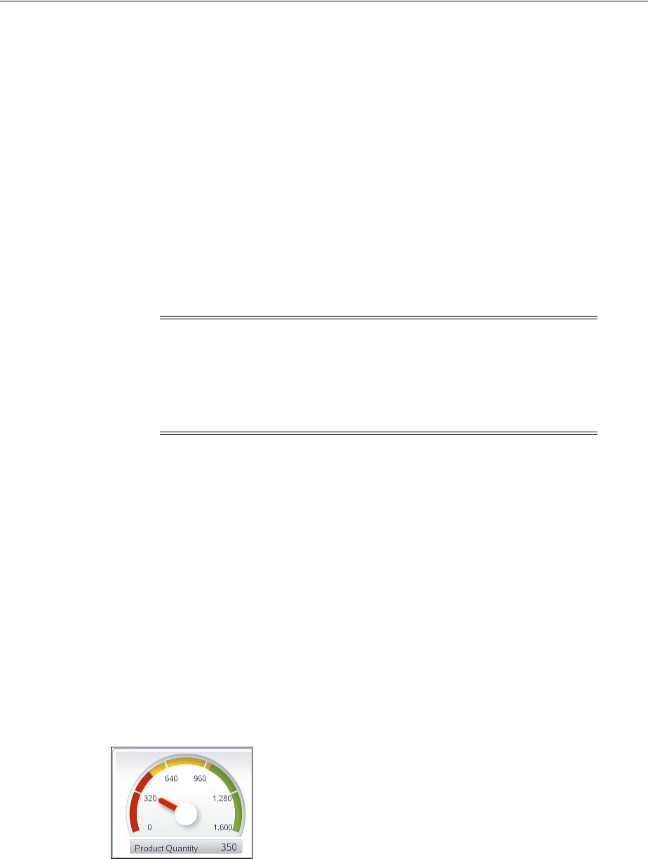
Adding Gauge Special Effects and Animation
Using Gauge Components 23-29
You should already have a gauge on your page. If you do not, follow the instructions
in this chapter to create a gauge. For information, see Section 23.2.2, "How to Add a
Gauge to a Page."
To add interactivity to a gauge subcomponent:
1. In the Structure window, right-click the dvt:gauge component, and choose Insert
inside dvt:gauge > ADF Data Visualizations > Shape Attributes Set.
2. Right-click the dvt:shapeAttributesSet component, and choose Insert inside
dvt:shapeAttributesSet > Shape Attributes.
3. In the Property Inspector, expand the Common Section. For the Component
attribute, use the dropdown list to select the gauge subcomponent to which you
are adding interactivity, for example GAUGE_INDICATOR
4. Set one or more of the other attributes in this section to specify the interactivity
properties for the subcomponent.
5. Expand the Behavior section. Use this section to set one or more of these attributes
with a prefix of on that takes a string containing JavasScript code or a reference to
a managed bean method that returns JavaScript code as its value.
6. If you wish to configure additional interactivity effects for a gauge subcomponent,
repeat step 2 through step 5 for each subcomponent.
23.6.4 Animating Gauges
You can animate gauges (not gauge sets) upon initial display, or to show changes in
data. Animation effects are specified in the gauge’s animationOnDisplay and
animationOnDataChange properties. For example, a dial gauge indicator can
change color at initial display or when a data value increases or decreases.
Figure 23–13 shows a dial gauge with the dial indicator animated to display the data
change at each threshold level.
Figure 23–13 Animated Dial Gauge
Animation effects can also be performed using active data. The Active Data Service
(ADS) allows you to bind ADF Faces components to an active data source using the
ADF model layer. To allow this, you must configure the components and the bindings
so that the components can display the data as it is updated in the
Note: You can use the attribute dropdown menu on the attributes in
this section to choose a Method Expression Builder dialog when
creating a reference to a managed bean. For some attributes you can
also choose Edit > Edit Property to select an available managed bean
from a dropdown list, or choose New to create a managed bean using
the Create Managed Bean dialog.

Adding Gauge Special Effects and Animation
23-30 Web User Interface Developer's Guide for Oracle Application Development Framework
source.Alternatively, you can configure the application to poll the data source for
changes at prescribed intervals.
23.6.5 How to Specify Animation Effects for Gauges
You can set animation effects for gauges upon initial display, or upon data change
associated with partial page rerendering (PPR), or Active Data Service (ADS). For
more information about PPR, see Chapter 8, "Rerendering Partial Page Content." For
more information about ADS, see Chapter 35, "Using the Active Data Service with an
Asynchronous Backend."
Before you begin:
It may be helpful to have an understanding of how gauge attributes and gauge child
tags can affect functionality. For more information, see Section 23.2.1, "Configuring
Gauges."
You should already have a gauge on your page. If you do not, follow the instructions
in this chapter to create a gauge. For information, see Section 23.2.2, "How to Add a
Gauge to a Page."
To specify animation effects for a gauge:
1. In the Structure window, select the dvt:gauge component.
2. In the Property Inspector, expand the Appearance section. Use the Animation
subsection to set these attributes:
■AnimationOnDisplay: Use to specify the type of initial rendering effect to
apply. Valid values are:
–NONE (default): Do not show any initial rendering effect.
–AUTO: Apply an initial rendering effect automatically chosen based on
graph or gauge type.
■AnimationOnDataChange: Use to specify the type of data change animation
to apply. Valid values are:
–NONE: Apply no data change animation effects.
–AUTO (default): Apply Active Data Service (ADS) data change animation
events. For more information about ADS, see Section 23.6.6, "How to
Configure Gauges to Display Active Data."
–ON: Apply partial page refresh (PPR) data change animation events.Use
this setting to configure the application to poll the data source for changes
at prescribed intervals.
23.6.6 How to Configure Gauges to Display Active Data
Animation effects using Active Data Service (ADS) can be added to dial and status
meter gauge types. ADS allows you to bind ADF Faces components to an active data
source using the ADF model layer. To allow this, you must configure the components
and the bindings so that the components can display the data as it is updated in the
data source. For more information about ADS and configuring your application, see
Chapter 35, "Using the Active Data Service with an Asynchronous Backend."
You configure a databound gauge to display active data by setting a value on the
binding element in the corresponding page definition file.
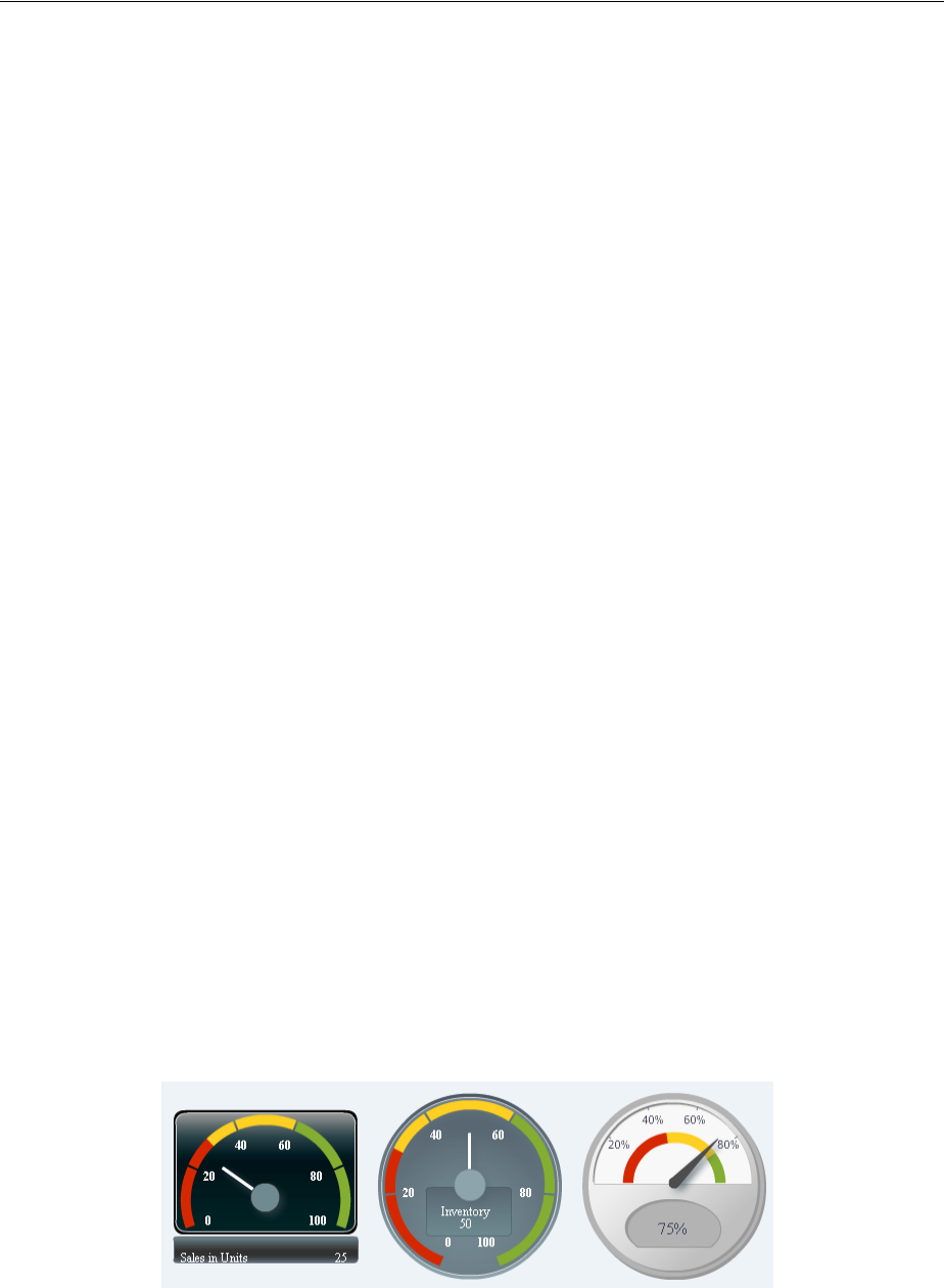
Using Custom Shapes for Gauges
Using Gauge Components 23-31
Before you begin:
You should have a data source that publishes events when data is changed and you
should have created business services that react to those events and the associated
data controls to represent those services.
To configure a gauge to display active data:
1. In the Structure window, select the dvt:gauge component.
2. In the Property Inspector, expand the Common section and enter a unique value
for the ID attribute.
If you do not select an identifier, one will be entered for you.
3. In the Structure window, right-click the dvt:gauge component, and select Go to
Page Definition.
4. In the Structure window, expand the Bindings folder, and select the node that
represents the attribute binding for the component.
5. In the Property Inspector, expand the Advanced section, and from the
ChangeEventPolicy attribute dropdown list, select Push.
23.7 Using Custom Shapes for Gauges
A set of prebuilt custom shapes styles are provided for the gauge component. You can
also create and use a graphics file to create a custom shape for a gauge. Set the
customShapesPath attribute for the gauge component to use an available custom
shapes style, or to point to the vector graphics file that is processed into the graphics
used for output.
23.7.1 How to Use Prebuilt Custom Shapes Styles
You can choose from a set of prebuilt custom shapes styles to specify a custom shape
for a gauge. The custom shapes styles are:
■Rounded rectangle
■Full circle
■Beveled circle
Figure 23–14 shows a dial gauge displayed with each of the custom shapes styles
applied.
Figure 23–14 Dial Gauges with Custom Shapes Styles

Using Custom Shapes for Gauges
23-32 Web User Interface Developer's Guide for Oracle Application Development Framework
Before you begin:
It may be helpful to have an understanding of how gauge attributes and gauge child
tags can affect functionality. For more information, see Section 23.2.1, "Configuring
Gauges."
You should already have a gauge on your page. If you do not, follow the instructions
in this chapter to create a gauge. For information, see Section 23.2.2, "How to Add a
Gauge to a Page."
To apply a custom shapes style to a gauge:
1. In the Structure window, right-click the dvt:gauge component and choose Go to
Properties.
2. In the Property Inspector, expand the Appearance section, and select the custom
shapes style from the CustomShapesPath attribute dropdown list. Valid values
include: Rounded Rectangle, Full Circle, and Beveled Circle.
23.7.2 How to Use a Custom Shapes Graphic File
Due to the requirements for rotating and resizing a gauge’s components, such as the
plot area or tick marks, a vector graphics file is required when creating a custom
shapes graphic file. Scalable Vector Graphics (SVG) is the supported file format for
creating custom shapes for gauges.
After designing the gauge and exporting it to an SVG file, a designer can add
information to identify, scale, and position the gauge shapes and components, and to
specify other metadata used in processing.
In the SVG file, gauge components are identified using an ID. For example, an SVG file
with <polygon id="indicator"/> would be interpreted as using a polygon shape
for the indicator component. To specify multiple shapes to create the desired visual
for a component, the ID can be modified as in id="indicator_0",
id="indicator_1", and id="indicator_2".
Table 23–1 shows the gauge component IDs and their descriptions.
Table 23–1 Gauge Component IDs for Custom Shapes
ID Description
indicator Points to the value represented by the gauge. If not specified, the
gauge will use the indicator specified in the application.
For the dial gauge, the indicator must be specified while
pointing up (90 degrees), so that the shape can be properly
rotated.
For the status meter gauge, the indicator should be specified
with its full extent, and the gauge will be cropped to point to the
metric value.
indicatorBase For a dial gauge, refers to the object that appears at the base of
the indicator component. If specified, and the
indicatorCenter is not, then the center of the
indicatorBase will be taken as the indicatorCenter.

Using Custom Shapes for Gauges
Using Gauge Components 23-33
Table 23–2 shows the metadata IDs and the descriptions used for internal calculations,
not rendered in the gauge.
gaugeFrame Refers to the optional component that adds visual distinction to
the plotArea. It can be turned on or off in the application by
setting the rendered property. Used primarily when the user
wants to use the default gauge plotArea. If no plotArea is
specified, then the gauge will insert the default plotArea
within the plotAreaBounds. This provides a quick way to
change the look of the gauge without having to create a custom
plotArea or tickMark.
lowerLabelFrame Refers to the frame that contains the bottomLabel when its
position is LP_BELOW_GAUGE; allows the user to customize the
look of this frame. The gauge will position the
lowerLabelFrame in the same relative position to other gauge
components when it is found in the custom shapes file.
plotArea For the dial gauge, refers to the circular area within which the
indicator moves.
For the status meter gauge, refers to the area that contains the
indicator.
For the LED gauge, refers to the area that contains any graphics
that will not be filled with the LED fill color.
When a plotArea is not specified, the gauge will draw the
default plotArea. For tick marks to be drawn, a specification of
the plotArea also requires either tickMarkPath or a set of
tick marks.
tickMark Used to define increments on the gauge. When a set of tick
marks is specified with no tickMarkPath, the gauge will use
the tick marks exactly where they appear on the plotArea. In
this case, it is up to the user to ensure that the tick marks appear
at equal increments. If a tickMarkPath is specified, the gauge
will accept a single tickMark, at 90 degrees for the dial, and it
will rotate and position the tickMark along the
tickMarkPath.
upperLabelFrame Refers to the frame that contains the topLabel when its
position is LP_ABOVE_GAUGE. Setting the upperLabelFrame
allows the user to customize the look of this frame. The gauge
will position the upperLabelFrame in the same relative
position to other gauge components when it is found in the
custom shapes file.
Table 23–2 Metadata IDs for Custom Shapes
ID Description
indicatorBarBounds Specifies the box containing the minimum and maximum
extent of the indicator bar. If not specified, the bounding box is
taken to be the entire indicator as specified in the input file.
indicatorCenter Specifies the center of rotation for the indicator that rotates
around in a dial gauge. The center of the shape with this ID is
considered to be the indicator center. If not specified, it is
assumed to be the center of the bottom edge of the plot area
for an 180-degree dial gauge, and the center of the plot area for
an N-degree dial gauge.
Table 23–1 (Cont.) Gauge Component IDs for Custom Shapes
ID Description
Using Custom Shapes for Gauges
23-34 Web User Interface Developer's Guide for Oracle Application Development Framework
Example 23–9 shows a sample SVG file used to specify custom shapes for the
components of a gauge.
Example 23–9 Sample SVG File Used for Gauge Custom Shapes
<?xml version="1.0" encoding="UTF-8" standalone="no"?>
<svg xmlns:svg="http://www.w3.org/2000/svg"
xmlns="http://www.w3.org/2000/svg"
version="1.0">
<rect width="264.72726" height="179.18887" rx="8.2879562"
ry="10.368411" x="152.76225" y="202.13995"
style="fill:#c83737;fill-opacity:1;stroke:none"
id="gaugeFrame"/>
<rect width="263.09058" height="42.581127" rx="3.0565372"
ry="3.414634" x="155.11697" y="392.35468"
fill="#c83737"
id="lowerLabelFrame" />
<rect width="241.79999" height="120.13961"
x="164.2415" y="215.94714"
style="fill:#ffeeaa"
id="plotAreaBounds"/>
<rect width="74.516975" height="44.101883"
rx="2.6630435" ry="3.5365853"
x="247.883" y="325.4415"
style="fill:#ffd5d5;fill-opacity:1;stroke:none"
id="indicatorBase"/>
ledFillArea Specifies the area of the LED gauge that should be filled with
the appropriate threshold color. If not specified, then the entire
plotArea shape specified in the graphics file will be filled
with the threshold color.
lowerLabelFrameTextBox For complex lowerLabelFrame shapes, specifies a rectangle
that can be set as the lowerLabelFrameTextBox. This box
determines the position of the bottom label within the
lowerLabelFrame.
plotAreaBounds Specified the bounding box for the plotArea. If no
plotArea has been specified in this file, then a bounding box
is needed for the gauge to draw the plot area of the gauge. If
not specified, then the gaugeFrame will use its own bounding
box for this purpose.
thresholdFillArea Defines the area that will be filled with the threshold colors.
For a dial gauge, specifies the thresholdFillArea that will
be filled by sweeping an arc from the indicatorCenter.
For a status meter gauge, specifies the thresholdFillArea
that will be filled based on the orientation of the status meter
gauge.
tickMarkPath Defines the path in which to draw tick marks. This is necessary
for the gauge to calculate where tick marks should be drawn
on a custom plot area, and the gauge will be unable to change
the majorTickCount if this is not specified.
upperLabelFrameTextBox For complex upperLabelFrame shapes, specifies a rectangle
that can be set as the upperLabelFrameTextBox. This box
determines the position of the topLabel within the
upperLabelFrame.
Table 23–2 (Cont.) Metadata IDs for Custom Shapes
ID Description

Using Custom Shapes for Gauges
Using Gauge Components 23-35
<rect width="6.0830183" height="98.849045" rx="2.6630435"
ry="2.2987804" x="282.86035" y="237.23772"
style="fill:#00aa00;fill-opacity:1;stroke:none"
id="indicator"/>
</svg>
Before you begin:
It may be helpful to have an understanding of how gauge attributes and gauge child
tags can affect functionality. For more information, see Section 23.2.1, "Configuring
Gauges."
You should already have a gauge on your page. If you do not, follow the instructions
in this chapter to create a gauge set. For information, see Section 23.2.2, "How to Add a
Gauge to a Page."
To use a custom shapes graphics file for a gauge:
1. In the Structure window, right-click the dvt:gauge component and choose Go to
Properties.
2. In the Property Inspector, expand the Appearance section, and in the
CustomShapesPath attribute field, enter the path to the SVG file to be used to
specify the custom shapes for your gauge. For example:
/path/customShapesFile.svg
23.7.3 What You May Need to Know About Supported SVG Features
The custom shapes available to you support the following SVG features:
■Transformations
■Paths
■Basic shapes
■Fill and stroke painting
■Linear and radial gradients
SVG features that are not supported by custom shapes include:
■Unit Identifiers: All coordinates and lengths should be specified without the unit
identifiers, and are assumed to be in pixels. The parser does not support unit
identifiers, because the size of certain units can vary based on the display used.
For example, an inch may correspond to different numbers of pixels on different
displays. The only exceptions to this are gradient coordinates, which can be
specified as percentages.
■Text: All text on the gauge is considered data, and should be specified through the
tags or data binding.
■Specifying Paint: The supported options are none, 6-digit hexadecimal, and a
<uri> reference to a gradient.
■Fill Properties: The fill-rule attribute is not supported.
■Stroke Properties: The stroke-linecap, stroke-linejoin,
stroke-miterlimit, stroke-disarray, and stroke-opacity attributes
are not supported.

Using Custom Shapes for Gauges
23-36 Web User Interface Developer's Guide for Oracle Application Development Framework
■Linear Gradients and Radial Gradients: The gradientUnits,
gradientTransform, spreadMethod, and xlink:href are not supported.
Additionally, the r, fx, and fy attributes on the radial gradient are not supported.
■Elliptical Arc Out-of-Range Parameters: If rx, ry, and x-axis-rot are too small
such that there is no solution, the ellipse should be scaled uniformly until there is
exactly one solution. The SVG parser will not support this.
■General Error Conditions: The SVG input is expected to be well formed and
without errors. The SVG parser will not perform any error checking or error
recovery for incorrectly formed files, and it will stop parsing when it encounters
an error in the file.

24
Using Pivot Table Components 24-1
24Using Pivot Table Components
This chapter describes how to display data in pivot tables using the ADF Data
Visualization pivotTable and pivotFilterBar components. If your application
uses the Fusion technology stack, then you can use data controls to create pivot tables.
For more information, see the "Creating Databound Pivot Tables" section in the Oracle
Fusion Middleware Fusion Developer's Guide for Oracle Application Development
Framework.
This chapter includes the following sections:
■Section 24.1, "About the Pivot Table Component"
■Section 24.2, "Using the Pivot Table Component"
■Section 24.3, "Using Stamping in Pivot Tables"
■Section 24.4, "Using a Pivot Filter Bar with a Pivot Table"
■Section 24.5, "Customizing Pivot Table Cell Content"
■Section 24.6, "Using Selection in Pivot Tables"
■Section 24.7, "Updating Pivot Tables with Partial Page Rendering"
■Section 24.8, "How to Export from a Pivot Table"
24.1 About the Pivot Table Component
Pivot tables display data in a grid layout with unlimited layers of nested rows and
columns. Similar to spreadsheets, pivot tables provide the option of automatically
generating subtotals and totals for grid data. The power of the pivot table’s interactive
capability is based in its display of multiple nested attributes on row and column
headers. Users can dynamically change the layout of these attributes using
drag-and-drop operations. A pivot table lets you pivot or reposition data labels and the
associated data layer from one location on the row or column edge to another to obtain
different views of your data, supporting interactive analysis.
A pivot filter bar is a component that can be added to a pivot table to provide the user
with a way to filter pivot table data in layers not displayed in one of the row or
column edges of the pivot table. Users can also drag and drop these layers between the
pivot filter bar and the associated pivot table to change the view of the data.
24.1.1 End User and Presentation Features of Pivot Table Components
The ADF Data Visualization pivot table component provides a range of features for
end users, such as pivoting, sorting columns, and selecting one or more rows and then
executing an application defined action on the selected rows. It also provides a range
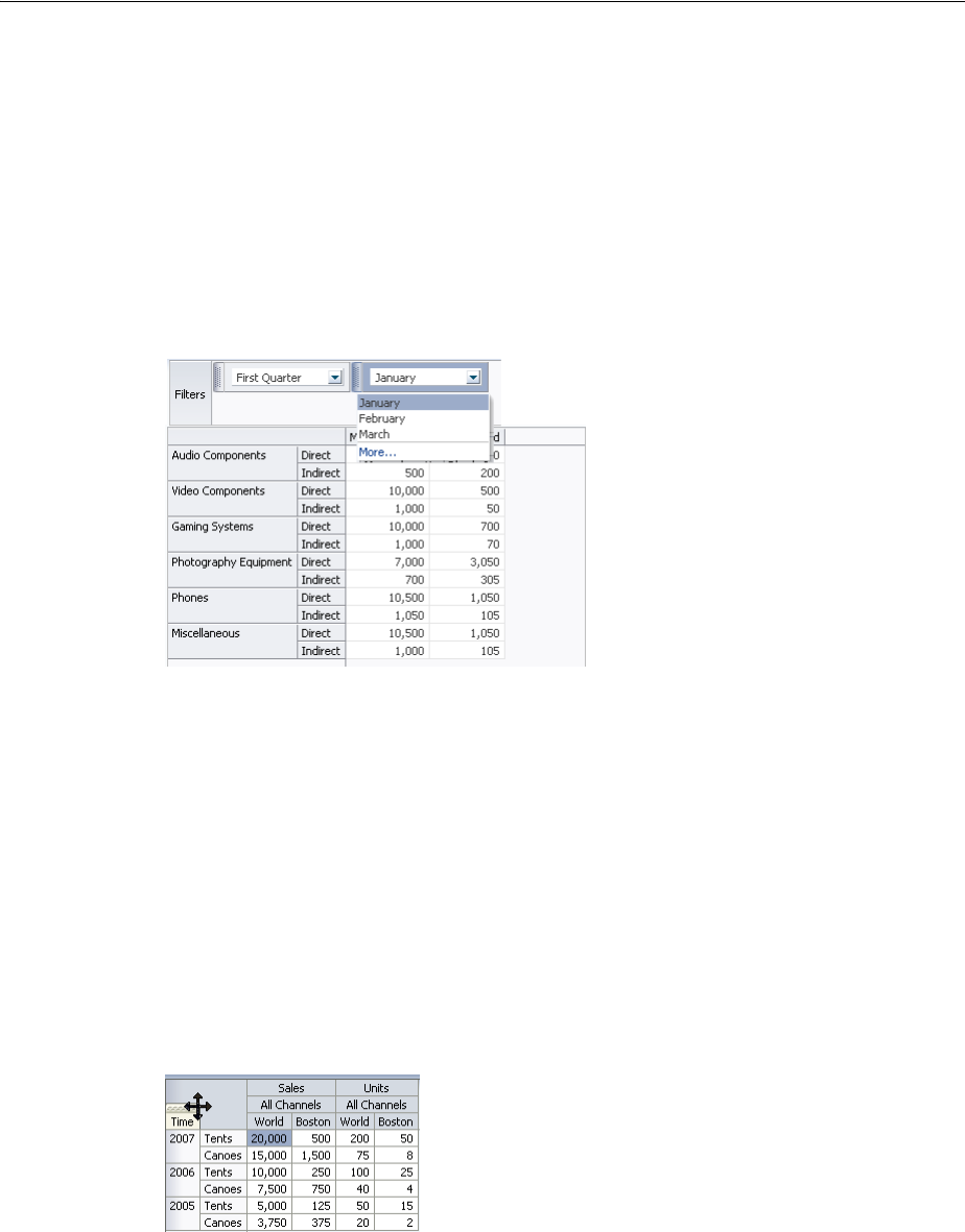
About the Pivot Table Component
24-2 Web User Interface Developer's Guide for Oracle Application Development Framework
of presentation features, such as unlimited layers of hierarchically nested rows and
columns.
24.1.1.1 Pivot Filter Bar
The data filtering capacity in a pivot table can be enhanced with an optional pivot
filter bar. Zero or more layers of data not already displayed in the pivot table row edge
or column edge are displayed in the page edge. Figure 24–22 shows a pivot filter bar
with Quarter and Month layers that can be used to filter the data displayed in the
pivot table.
Figure 24–1 Pivot Filter Bar with Data Layer Filters
24.1.1.2 Pivoting
You can drag any layer in a pivot table to a different location on the same edge, to the
opposite edge, or to the associated pivot filter bar (if present), to change the view of
the data in the pivot table. Any layer in a pivot filter bar can be dragged to a different
location within the pivot filter bar, or to the row or column edge of the pivot table.
This operation is called pivoting and is enabled by default.
When you move the mouse over a layer, the layer’s pivot handle and an optional pivot
label are displayed. If you move the mouse over the pivot handle, the cursor changes
to a four-point arrow drag cursor. You can then use the handle to drag the layer to the
new location. If you move the mouse over a layer on the row edge, the pivot handle
appears above the layer, as shown in Figure 24–2.
Figure 24–2 Display of Pivot Handle on the Row Edge
If you move the cursor over a layer in the column edge, the pivot handle appears to
the left of the layer, as shown in Figure 24–3.
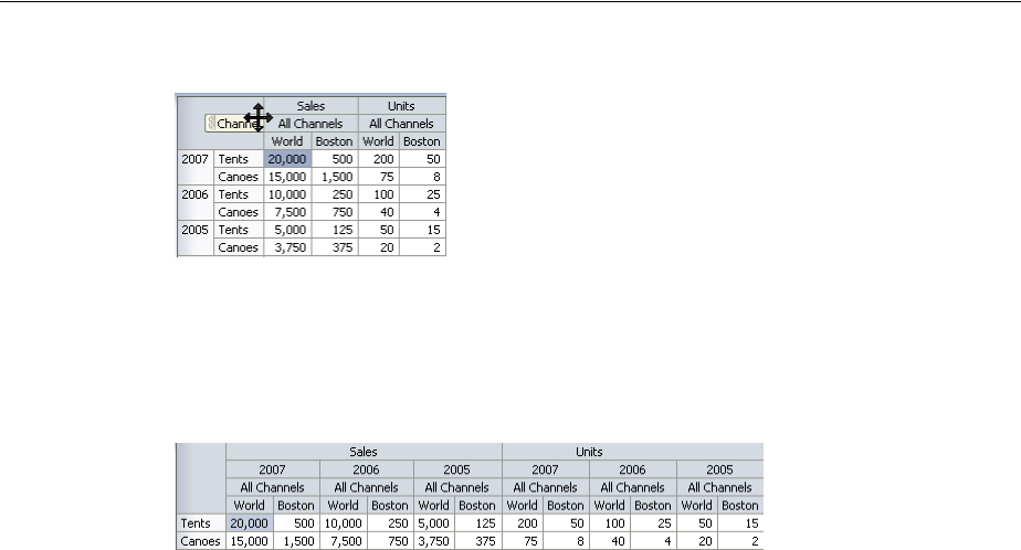
About the Pivot Table Component
Using Pivot Table Components 24-3
Figure 24–3 Display of Pivot Handle on the Column Edge
If, in Figure 24–2, you drag the pivot handle of the Time (Year) layer from the row edge
to the column edge between the Measure (Sales) layer and the Channel layer, the pivot
table will change shape as shown in Figure 24–4.
Figure 24–4 Sales Pivot Table After Pivot of Year
You can customize pivoting to disable pivot labels and pivoting. If both are disabled,
the pivot handle does not display when mousing over the layer.
24.1.1.3 Editing Data Cells
Pivot tables can contain both read-only and editable data cells. Editable cells are those
containing an input component, for example, af:inputText. When a pivot table
containing editable cells is initially displayed, the first data cell is selected and the
pivot table is open for editing. Users can initiate editing anywhere in the pivot table
through a single click to overwrite the value in a cell, or double-click to edit the cell.
Double-clicking in editable cells enables the user to identify a specific location within
the cell, and then navigate within that cell using the arrow keys. Any edit performed
on an editable cell can be reverted by pressing Esc.
While in editing mode, you can navigate through pivot table data cells using Tab,
Enter or the arrow keys. To quickly navigate to the cell below or above the currently
selected cell, use the arrow keys. When using the Enter key to navigate, an active link
will automatically be launched for a cell containing an active link. When using Tab or
Shift+Tab to navigate, data cells containing multiple editable components, as in the
case of both an af:inputDate and date picker in the same cell, the Tab highlights
each editable component in turn. When tabbing through the last column of the pivot
table, the first column of the next row is highlighted, and when Shift-Tabbing through
the first column in the pivot table, the last column of the previous row is highlighted.
When using arrow keys to navigate, you can press F2 to navigate within a cell
containing an af:inputText component, and Esc to return to arrow key data cell
navigation. Any edits to a cell can be discarded by pressing Esc.
Once editing mode is initiated, users can navigate through read-only data cells to
editable data cells, maintaining the editing mode. While an editable cell is selected,
you can select other cells using Ctrl or Shift+click without enabling editing in the new
cells and maintaining editing in the original cell.
To support rapid data entry, pivot tables also support pattern navigation using a
single click or arrow key. For example, if a user clicks a cell for editing and then tabs
through additional cells in a row, pressing Enter highlights the cell below the initial
cell in the next row.
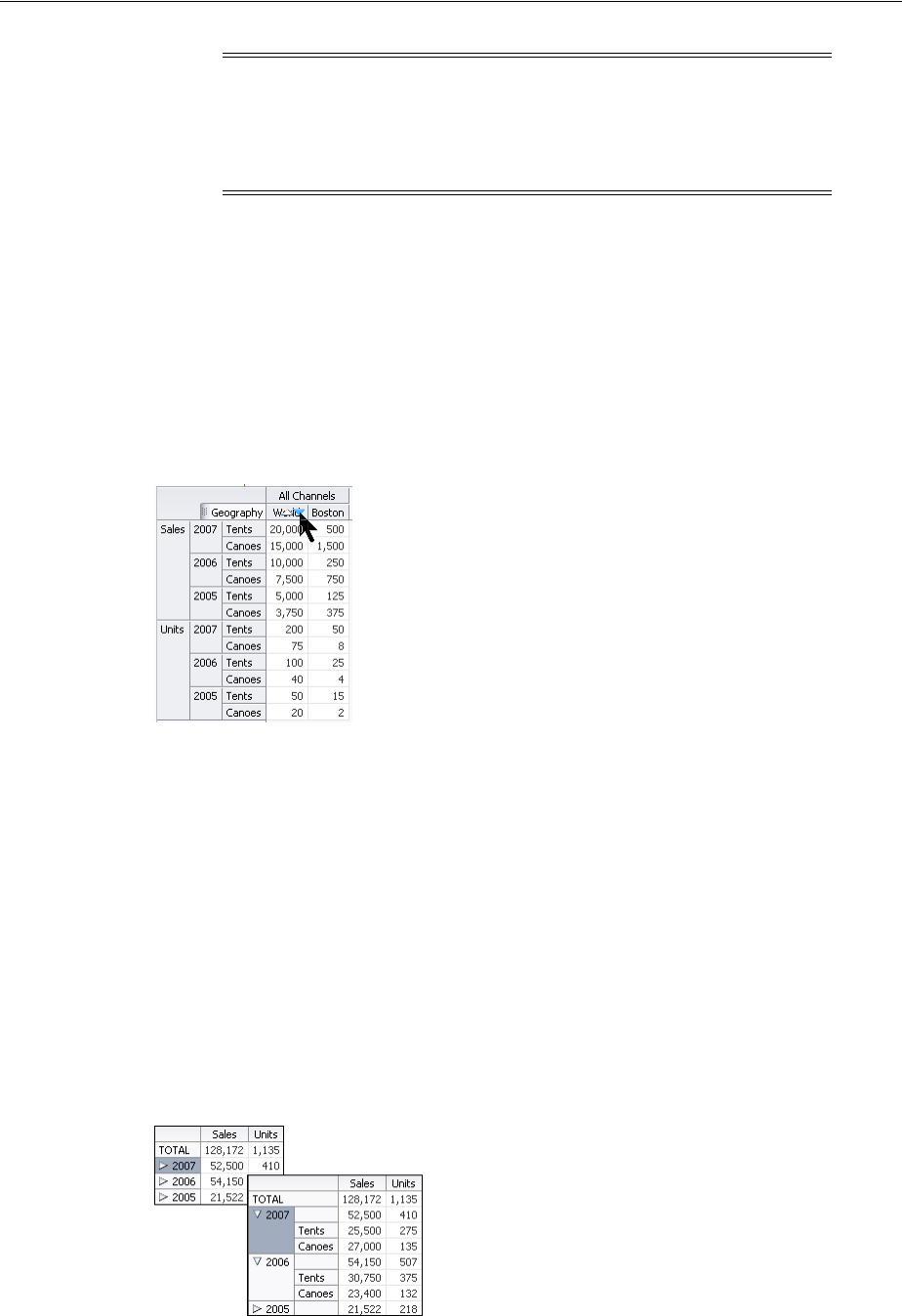
About the Pivot Table Component
24-4 Web User Interface Developer's Guide for Oracle Application Development Framework
24.1.1.4 Sorting
Pivot tables support sorting of data within the pivot table. When sorting is enabled,
ascending and descending sort icons are displayed as the user hovers the mouse over
the innermost layer of the column header. By default, the sortMode attribute of the
pivotTable component is set to grouped, effectively sorting the data grouped by
the second-to-innermost layer of the row edge. Figure 24–5 shows the sort icons in the
World Sales column of the pivot table, where the data is grouped by Year, the
second-to-innermost layer of the row edge.
Figure 24–5 Ascending and Descending Sorting Icons in a Pivot Table
24.1.1.5 Drilling
Pivot tables support two types of drilling including insert drilling, and filter drilling.
With insert drilling. the expand operation reveals the detail data while preserving the
sibling and aggregate data. With filter drilling, the expand operation displays the
detail data only, filtering out sibling and aggregate data.
For example, Figure 24–6 and Figure 24–7 illustrate how drilling is used to display
product data within each year; revealing that the 2007 total sales number of 52,500 is
composed of 25,500 for tents and 27,000 for canoes. This total contributes to the
aggregated total of all sales for all years of 128,172. Figure 24–6 shows a pivot table
using insert drilling with the total number of 52,500 displayed alongside the detail
numbers. The data for other years and the aggregated total for all years is also
available.
Figure 24–6 Pivot Table with Insert Drilling Enabled
Note: In order to temporarily or permanently write values back to a
set of cells within a cube, called a writeback, the pivot table must be
bound to a data control or data model that supports writeback
operations. A row set based data control is transformed into a cube
and therefore cannot support writeback operations.
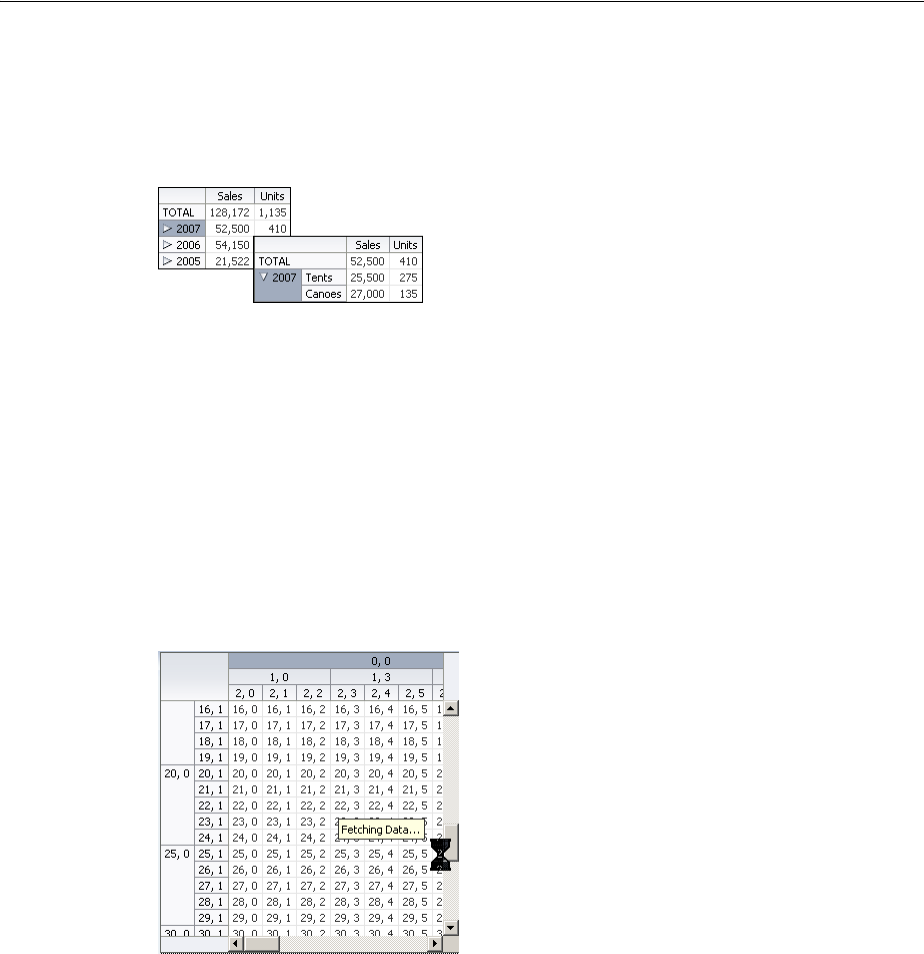
About the Pivot Table Component
Using Pivot Table Components 24-5
Figure 24–7 shows a pivot table using filter drilling with only the detail numbers are
displayed. The numbers for other years, and the aggregated total for all years is
filtered out.
Figure 24–7 Pivot Table with Filter Drilling Enabled
At runtime, a drill icon is enabled in the parent attribute display label for both types of
drilling.
24.1.1.6 On Demand Data Scrolling
Pivot tables support on-demand data scrolling for in order to support large data sets
while maintaining performance. Only the data that is scrolled into view in the pivot
table is loaded. As the user scrolls vertically or horizontally, data is fetched for the
portion of the pivot table that has scrolled into view, and data that is no longer needed
is discarded. Figure 24–8 shows a pivot table with a large data set using on-demand
data scrolling.
Figure 24–8 On-Demand Data Scrolling in a Pivot Table
24.1.1.7 Sizing
The default size of a pivot table is a width of 300 pixels and a height of 300 pixels. The
pivot table autosizes rows, columns, and layers within the space allowed when the
pivot table is initially displayed. At runtime, you can change the size of rows,
columns, or layers by dragging the row, column, or layer separator to a new location.
You position the cursor in the row or column header on the separator between the
row, column, or layer you want to resize and the next row, column, or layer. When the
cursor changes to a double-sided arrow, click and drag the row, column, or layer
separator to the desired location.
When you resize rows, columns, or layers, the new sizes remain until you perform a
pivot operation. After a pivot operation, the new sizes are cleared and the pivot table
rows, columns, and layers return to their original sizes.
If you do not perform a pivot operation, then the new sizes remain for the life of the
session. However, you cannot save these sizes through MDS (Metadata Services)
customization.
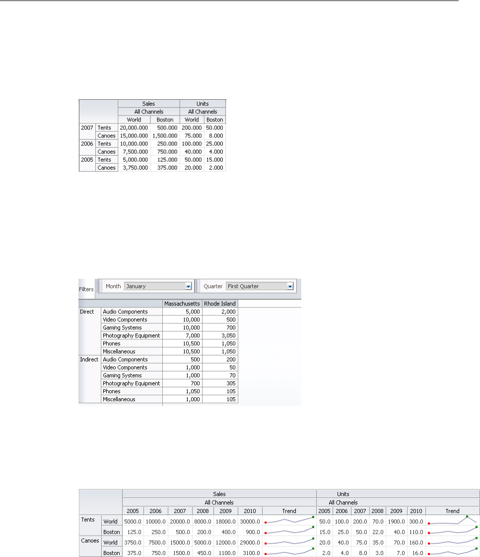
About the Pivot Table Component
24-6 Web User Interface Developer's Guide for Oracle Application Development Framework
24.1.2 Pivot Table and Pivot Filter Bar Component Use Cases and Examples
A pivot table display a grid of data with rows and columns.Figure 24–9 shows a pivot
table with multiple attributes nested on its rows and columns.
Figure 24–9 Sales Pivot Table with Multiple Rows and Columns
A pivot filter bar is a component that can be associated with a pivot table to provide
the user with a way to filter pivot table data in layers not displayed in the row or
column edges of the pivot table. Users can also drag and drop these layers between the
pivot filter bar and the associated pivot table to change the view of the data.
Figure 24–10 Figure 24–10 shows a pivot filter bar associated with a pivot table.
Figure 24–10 Pivot Filter Bar Component Associated with Pivot Table
Pivot table data cells support other data display components such as sparkcharts,
gauges, and graphs. Figure 24–11 shows a pivot table with sparkcharts illustrating
data trends over time in a data cell.
Figure 24–11 Pivot Table with Sparkcharts Stamped in Data Cells
Figure 24–12 shows a pivot table with gauges stamped in data cells.
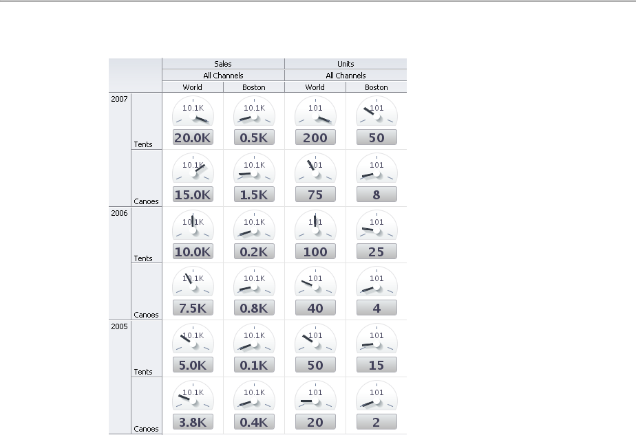
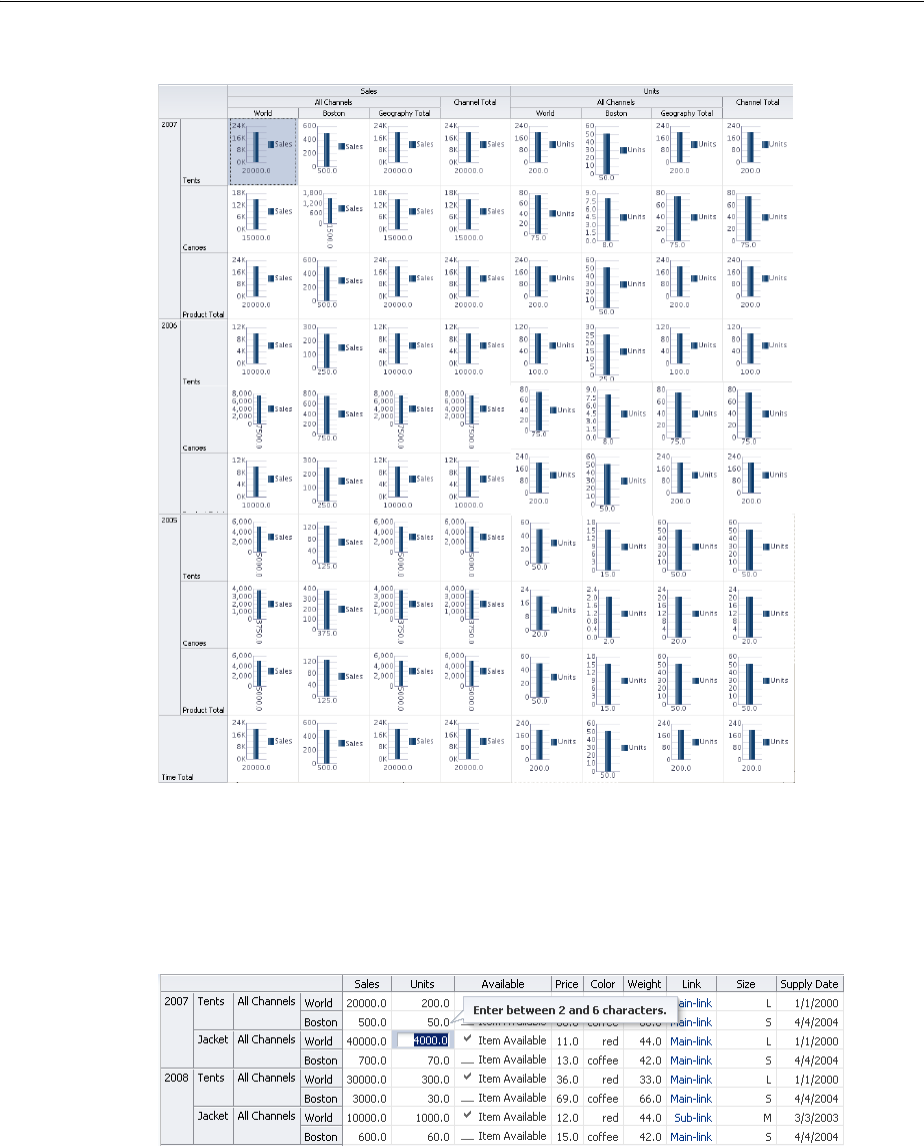
About the Pivot Table Component
24-8 Web User Interface Developer's Guide for Oracle Application Development Framework
Figure 24–13 Pivot Table with Graphs Stamped in Data Cells
Pivot tables can support editable data cells. Editable cells are those containing an input
component, for example, af:inputText. At runtime, editing can be initiated
anywhere in the pivot table by single click for direct editing or double-clicking to edit
in a cell. Figure 24–14 shows a pivot table data cell open for direct editing.
Figure 24–14 Data Cell Open for Direct Editing
Data cells selected for dropdown list editing are displayed as shown in Figure 24–15.
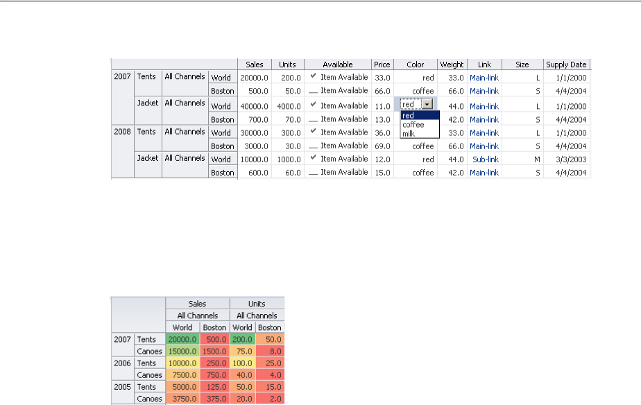
About the Pivot Table Component
Using Pivot Table Components 24-9
Figure 24–15 Data Cell Open for Dropdown List Editing
Header and data cells in pivot tables can be customized to display image, icons or
links, and to display stoplight and conditional formatting. Figure 24–16 shows a pivot
table with conditional formatting to display levels of sales performance.
Figure 24–16 Conditional Data Cell Formatting
24.1.3 Additional Functionality for the Pivot Table Component
You may find it helpful to understand other ADF Faces features before you implement
your pivot table component. Additionally, once you have added a pivot table
component to your page, you may find that you need to add functionality such as
validation and accessibility. Following are links to other functionality that pivot table
components can use:
■Partial page rendering: You may want a pivot table to refresh a header cell, a data
cell, or the entire pivot table to show new data based on an action taken on
another component on the page. For more information, see Chapter 8,
"Rerendering Partial Page Content."
■Personalization: If enabled, users can change the way the pivot table displays at
runtime, and those values will not be retained once the user leaves the page unless
you configure your application to allow user customization. For information, see
Chapter 32, "Allowing User Customization on JSF Pages."
■Accessibility: You can make your pivot table and pivot filter bar components
accessible. For more information, see Chapter 30, "Developing Accessible ADF
Faces Pages."
■Skins and styles: You can customize the appearance of pivot table and pivot filter
bar components using an ADF skin that you apply to the application or by
applying CSS style properties directly using a style-related property
(styleClass or inlineStyle). For more information, see Chapter 28,
"Customizing the Appearance Using Styles and Skins."
■Content Delivery: You can configure your pivot table and pivot filter bar to fetch
data from the data source immediately upon rendering the components, or on a
second request after the components have been rendered using the
contentDelivery attribute. For more information, see Section 12.2.2, "Content
Delivery."
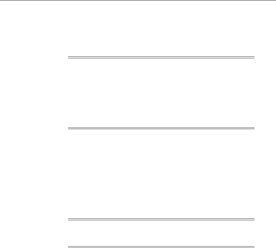
Using the Pivot Table Component
24-10 Web User Interface Developer's Guide for Oracle Application Development Framework
■Automatic data binding: If your application uses the Fusion technology stack, then
you can create automatically bound pivot tables based on how your ADF Business
components are configured. For more information, see the "Creating Databound
Pivot Tables" section of the Oracle Fusion Middleware Fusion Developer's Guide for
Oracle Application Development Framework.
Additionally, data visualization components share much of the same functionality,
such as how data is delivered, automatic partial page rendering (PPR), image formats,
and how data can be displayed and edited. For more information, see Section 21.2,
"Common Functionality in Data Visualization Components."
24.2 Using the Pivot Table Component
The pivot table component uses a data model to display and interact with data. The
specific model class used is
oracle.adf.view.faces.bi.model.pivotTable.PivotTableModel.
You can use any row set (flat file) data collection to supply data to a pivot table.
During the data binding operation, you have the opportunity to drag each data
element to the desired location on the row edge or column edge of the pivot table in
the data binding dialog.
During data binding, you also have the option of specifying subtotals and totals for
pivot table rows and columns, specifying drill operations at runtime, defining how to
aggregate duplicate records, and setting up initial sort criteria.
For information about the data binding of ADF pivot tables, see the "Creating
Databound ADF Pivot Tables" section in the Oracle Fusion Middleware Fusion
Developer's Guide for Oracle Application Development Framework.
24.2.1 Configuring Pivot Tables
The pivot table (pivotTable) component has two child components, a header cell
(headerCell) and a data cell (dataCell). The pivot filter bar (pivotFilterBar) is
a sibling component that can be associated with the pivot table. The prefix dvt:
occurs at the beginning of each pivot table and pivot filter bar component name
indicating that the component belongs to the ADF Data Visualization Tools (DVT) tag
library.
Note: If you know the UI components on your page will eventually
use ADF data binding, but you need to develop the pages before the
data controls are ready, then you should consider using placeholder
data controls, rather than manually binding the components. Using
placeholder data controls will provide the same declarative
development experience as using developed data controls. For more
information, see the "Designing a Page Using Placeholder Data
Controls" chapter of the Oracle Fusion Middleware Fusion Developer's
Guide for Oracle Application Development Framework.
Note: If you are linking a pivot table and a graph to the same set of
data, the model class
oracle.adf.view.faces.bi.model.DataModel should be used
Using the Pivot Table Component
Using Pivot Table Components 24-11
Pivot tables display data in a grid layout with unlimited layers of nested rows and
columns. Figure 24–17 shows a pivot table and its associated pivot filter bar displaying
the sales of electronic equipment.
Figure 24–17 Electronic Sales Pivot Table
Pivot table and pivot filter bar components are defined by the following terms using
the Electronic Sales Pivot Table in Figure 24–17:
■Edges: The axes in pivot tables, including:
–Row edge: The vertical axis to the left of the body of the pivot table. In
Figure 24–17, the row edge contains two layers, Product Category and
Product, and each row in the pivot table represents the combination of a
particular category and a particular product.
–Column edge: The horizontal axis above the body of the pivot table. In
Figure 24–17, the column edge contains two layers, Measure and US State, and
each column in the pivot table represents the combination of a particular
measure value (Sales or Units), and a particular geographic location (US State).
–Page edge: The edge represented by the pivot filter bar, whose layers can be
filtered or pivoted with the layers in the row and column edges.
■Layers: Nested attributes that appear in a single edge. In Figure 24–17, the
following two layers appear in the column edge: Measure and Geography (Sales
and US State). The following two layers appear in the row edge: Category and
Product (Product Category and Product).
■Header cell: The labels that identify the data displayed in a row or column. Row
header cells appear on the row edge, and column header cells appear on the
column edge. In the sample, header cells include Cell Phones, iPod Speakers,
Sales, and Colorado.
■Data cell: The cells within the pivot table that contain data values, not header
information. In the sample, the first data cell contains a value of 1,499.99.
■QDR (Qualified Data Reference): A fully qualified data reference to a row, a
column, or an individual cell. For example, in Figure 24–17, the QDR for the first
data cell in the pivot table must provide the following information:
–Category=Audio Video
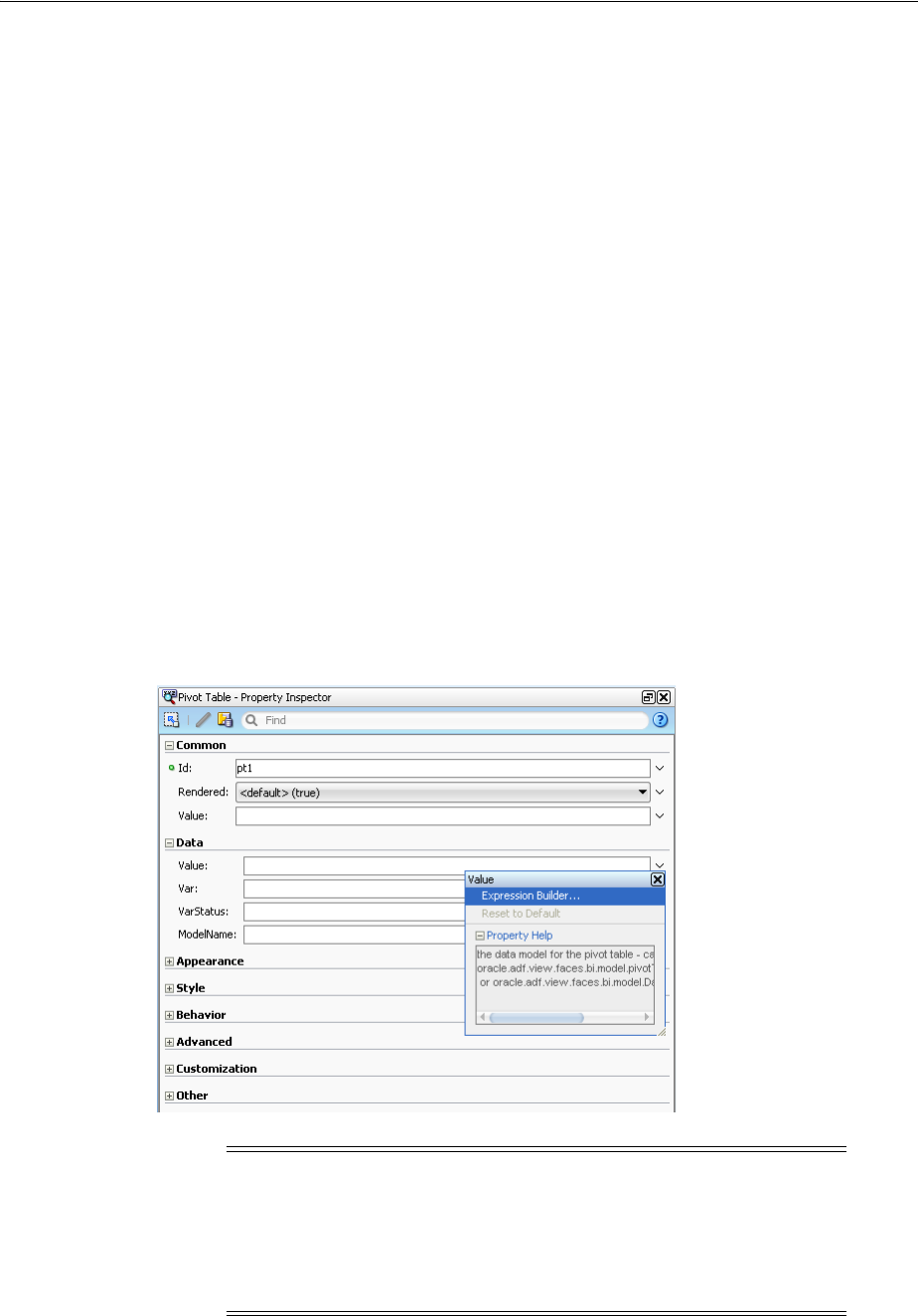
Using the Pivot Table Component
24-12 Web User Interface Developer's Guide for Oracle Application Development Framework
–Product=iPod Nano 1Gb
–Measure=Sales
–Geography=Colorado
Likewise, the QDR for the first row in the pivot table, which is also the QDR of the
"iPod Nano 1Gb" header cell, contains the following information:
–Category=Audio Video
–Product=iPod Nano 1Gb
Finally, the QDR for the "Sales" header cell contains the following information:
–Measure=Sales
24.2.2 How to Add a Pivot Table to a Page
When you are designing your page using simple UI-first development, you use the
Component Palette to add a pivot table to the page. Once the pivot table is added to
your page, you can use the Property Inspector to specify data values and configure
additional display attributes for the pivot table.
In the Property Inspector you can use the dropdown menu for each attribute field to
display a property description and options such as displaying an EL Expression
Builder or other specialized dialogs. Figure 24–18 shows the dropdown menu for a
pivot table component value attribute.
Figure 24–18 Pivot Table Value Attribute Dropdown Menu
Note: If your application uses the Fusion technology stack, then you
can use data controls to create a pivot table and the binding will be
done for you. JDeveloper provides a wizard for data binding and
configuring your pivot table. For more information, see the "Creating
Databound ADF Pivot Tables" chapter in the Oracle Fusion Middleware
Fusion Developer's Guide for Oracle Application Development Framework.

Using the Pivot Table Component
Using Pivot Table Components 24-13
Before you begin:
It may be helpful to have an understanding of how pivot table attributes and child
tags can affect functionality. For more information, see Section 24.2.1, "Configuring
Pivot Tables."
You may also find it helpful to understand functionality that can be added using other
ADF Faces features. For more information, see Section 24.1.3, "Additional
Functionality for the Pivot Table Component."
To add a pivot table to a page:
1. In the Component Palette, from the ADF Data Visualizations page, in the Pivot
Table panel, drag and drop a Pivot Table onto the page.
2. In the Property Inspector, view the attributes for the pivot table. Use the help
button to display the complete tag documentation for the pivotTable
component.
3. Expand the Data section. Use this section to set the following attributes:
■Value: Specify an EL expression for the object to which you want the pivot
table to be bound. Can be an instance of
oracle.adf.view.faces.bi.model.pivotTable.PivotTableModel
or
oracle.adf.view.faces.bi.model.DataModel.
■Var and VarStatus: Use to specify a variable to access cell data in stamped
dataCell and headerCell components. For more information, see
Section 24.3.2, "What You May Need to Know About Using var and varStatus
Properties."
4. Expand the Appearance section. Use this section to set the following attributes:
■DataFormat and HeaderFormat: Use to create formatting rules to customize
content in data and header cells. For more information, see Section 24.5,
"Customizing Pivot Table Cell Content."
■PivotLabelVisible: Specify whether or not to display the labels on the pivot
handles. The default value is true.
■Sizing: Use to specify how the pivot table's size in width and height is
determined. The default value is fixed where the pivot table is sized based on
the width and height CSS properties in its default style or inline style
property.
You can also set the attribute to auto where the height of the pivot table is
determined by the size of the content that is being displayed by the pivot
table. If the content is smaller than the default size of the pivot table, then the
pivot table will shrink. If the content is larger than the default size of the pivot
table, the pivot table will grow.
You can control the maximum height and width of the pivot table by using the
inlineStyle property as follows:
max-width:400px, max-height:300px
Once the maximum height or width is exceeded, then pivot table will display
scrollbars as needed.

Using Stamping in Pivot Tables
24-14 Web User Interface Developer's Guide for Oracle Application Development Framework
■StatusBarRendered: Use to specify whether or not the pivot table status bar is
display. The default value is false.
■EmptyText: Enter the text to use to describe an empty pivot table. If the text is
enclosed in an HTML tag, it will be formatted.
■Summary: Enter a statement of the pivot table’s purpose and structure for use
by screen readers.
5. Expand the Behavior section. Use this section to set the following attributes:
■PivotEnabled: Specify whether or not to allow the end user to reposition the
view of the data in the pivot table. The default value is true. If you choose to
disallow pivoting, you should also set the PivotLabelVisible attribute to false.
■ColumnFetchSize and RowFetchSize: Use to specify the number of columns
and rows in a data fetch block. The default value for columns is 10 and the
default value for rows is 25. For more information about content delivery to
pivot tables, see Section 21.2.1, "Content Delivery."
24.2.3 What Happens When You Add a Pivot Table to a Page
When a pivot table component is inserted into a JSF page using the Component
Gallery, a basic pivot table tag is added to the source code as follows:
<dvt:pivotTable id="pt1"/>
You can then use the Component Palette to insert a header cell and data cell and then
configure the cell content through stamping. For more information, see Section 24.3,
"Using Stamping in Pivot Tables."
A Create Pivot Table wizard provides declarative support for data-binding and
configuring the pivot table. In the wizard pages you can:
■Specify the initial layout of the pivot table
■Associate and configure a pivot filter bar
■Specify alternative labels for the data layers
■Configure insert or filter drilling
■Define aggregation of data values
■Configure category and data sorting
■View a live data preview of the pivot table
For more information, see the "Creating Databound ADF Pivot Tables" chapter in the
Oracle Fusion Middleware Fusion Developer's Guide for Oracle Application Development
Framework.
24.3 Using Stamping in Pivot Tables
Each immediate child of a pivot table component must be either a headerCell or
dataCell component. The pivot table can contain at most one headerCell and at
Note: When this attribute is set to auto, the pivot table frame will
initially be displayed with the default size of the pivot table and then
readjusted to fit its contents. This can cause the layout of the page
displaying the pivot table to change after the page is initially
displayed.

Using Stamping in Pivot Tables
Using Pivot Table Components 24-15
most one dataCell component. These components make it possible to customize the
cell content through stamping. When you use stamping, child components are not
created for every header cell or data cell in a pivot table. Rather, the content of the
component is repeatedly rendered, or stamped, once per cell, such as the rows in the
pivot table.
Each time a header or data cell is stamped, the value for the current cell is copied into
a var property, and additional data for the cell is copied into a varStatus property.
These properties can be accessed in EL expressions inside the header or data cell
component, for example, to pass the cell value to a stamped af:outputText
component. Once the pivot table has completed rendering, the var and varStatus
properties are removed, or reverted back to their previous values.
24.3.1 How to Configure Header and Data Cells as Stamps
Only certain types of child components are supported by header cells or data cells. For
example, each header cell can contain read-only components. Each data cell can
contain read-only or input components, including all components with no activity and
most components that implement the EditableValueHolder or ActionSource
interfaces.
Header cells and data cells should have only one child component. If multiple children
are desired, they should be wrapped in another component. If no layout is desired,
af:group can be used, which simply renders its children without adding layout, and
is consequently lightweight. If layout is desired, a layout component like
af:panelGroupLayout can be used instead. For more information, see Section 9.12,
"Grouping Related Items."
Data cell editing is enabled by using an input component as the child component of
dataCell. At runtime you can open the cell for editing by single or double-clicking
the cell in the pivot table. For more information, see Section 24.1.1.3, "Editing Data
Cells."
Example 24–1 shows a code sample for configuring header cell stamping using
af:switcher to vary the type of stamped component by layer name, that is, a
different content for Geography, Channel, and so on. The example also illustrates
components that can be used as children of headerCell.
Example 24–1 Code Sample for Header Cell Stamping
<dvt:pivotTable id="goodPT"
inlineStyle="width:100%;height:600px;"
binding="#{editor.component}"
contentDelivery="immediate"
value="#{pivotTableHeaderCellDemo.dataModel}"
headerFormat="#{pivotTableHeaderCellDemo.getHeaderFormat}"
dataFormat="#{pivotTableHeaderCellDemo.getDataFormat}"
var="cellData"
varStatus="cellStatus"
summary="pivot table">
<dvt:headerCell id="goodHC>
<af:switcher id="sw" facetName="#{cellData.layerName}" defaultFacet="Other">
<f:facet name="Geography">
<af:group id="g1">
<af:icon id="idicon11" name="info" shortDesc="Icon" />
<af:outputText value="#{cellData.dataValue}" id="ot11"
shortDesc="#{cellData.dataValue}" />
</af:group>
</f:facet>
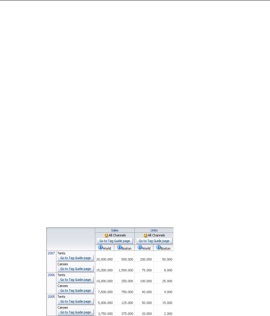
Using Stamping in Pivot Tables
24-16 Web User Interface Developer's Guide for Oracle Application Development Framework
<f:facet name="Channel">
<af:group id="g2">
<af:panelGroupLayout id="pgl2" layout="vertical">
<af:commandImageLink shortDesc="Sample commandImageLink"
icon="/images/pivotTableCSVDemo/smily-normal.gif"
hoverIcon="/images/pivotTableCSVDemo/smily-glasses.gif"
id="cil1"/>
<af:outputText value="#{cellData.dataValue}" id="ot1" />
</af:group>
<af:commandButton text="Go to Tag Guide page" immediate="true"
action="guide" id="cb1"/>
</af:panelGroupLayout>
</f:facet>
<f:facet name="Product">
<af:panelGroupLayout id="pgl3" layout="vertical">
<af:outputText value="#{cellData.dataValue}" id="ot12" />
<af:commandButton text="Go to Tag Guide page" immediate="true"
action="guide" id="cb2"/>
</af:panelGroupLayout>
</f:facet>
<f:facet name="Other">
<af:commandLink text="#{cellData.dataValue}"
shortDesc="#{cellData.dataValue}" immediate="true"
action="guide" id="idcommandlink11"/>
</f:facet>
</af:switcher>
</dvt:headerCell>
</dvt:pivotTable>
Figure 24–19 shows the resulting pivot table for the code sample.
Figure 24–19 Pivot Table Header Cell Stamps
Example 24–2 shows a code sample for configuring data cell stamping using
af:switcher to vary the type of stamped component by measure, that is, a different
content for Sales, Weight, and so on. The example also illustrates components that can
be used as children of dataCell.
Example 24–2 Code Sample for Data Cell Stamping
<dvt:pivotTable id="goodPT" var="cellData" varStatus="cellStatus">
<dvt:dataCell>
<af:switcher id="sw" facetName="#{cellStatus.members.MeasDim.value}"
defaultFacet="Other">
<f:facet name="Sales">

Using Stamping in Pivot Tables
Using Pivot Table Components 24-17
<af:inputText id="idinputtext1" value="#{cellData.dataValue}" />
</f:facet>
<f:facet name="Units">
<af:inputText id="idinputtext2" value="#{cellData.dataValue}" >
<af:validateLength maximum="6" minimum="2" />
</af:inputText>
</f:facet>
<f:facet name="Weight">
<af:outputText id="idoutputtext1" value="#{cellData.dataValue}" />
</f:facet>
<f:facet name="Color">
<af:selectOneChoice id="idselectonechoice"
value="#{cellData.dataValue}" label="Color">
<af:selectItem label="red" value="red" shortDesc="shortDesc sample"/>
<af:selectItem label="coffee" value="coffee"
shortDesc="Sample shortDesc text"/>
<af:selectItem label="milk" value="milk"
shortDesc="Another shortDesc sample"/>
</af:selectOneChoice>
</f:facet>
<f:facet name="Available">
<af:selectBooleanCheckbox id="idselectbooleancheckbox"
label="Availability" text="Item Available"
autoSubmit="true"
value="#{cellData.dataValue}"/>
</f:facet>
<f:facet name="Supply Date">
<af:inputDate id="idinputdate1" value="#{cellData.dataValue}"
label="Change Date:" simple="true" >
<af:validateDateTimeRange maximum="2020-12-31" minimum="1980-12-31" />
</af:inputDate>
</f:facet>
<f:facet name="Link">
<af:commandLink text="#{cellData.dataValue}" immediate="true"
action="guide" id="idcommandlink"/>
</f:facet>
<f:facet name="Size">
<af:inputComboboxListOfValues label="Size"id="idInputComboboxListOfValues"
value="#{cellData.dataValue}"
searchDesc="Search Size"
model="#{pivotTableEditBean.listOfValuesModel}"
columns="3" />
</f:facet>
<f:facet name="Other">
<af:outputText id="idoutputtext2" value="#{cellData.dataValue}" />
</f:facet>
</af:switcher>
</dvt:dataCell>
</dvt:pivotTable>
Figure 24–20 shows the resulting pivot table for the code sample.
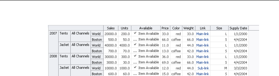
Using Stamping in Pivot Tables
24-18 Web User Interface Developer's Guide for Oracle Application Development Framework
Figure 24–20 Pivot Table Data Cell Stamps
You can also specify header and data cell CSS styling using the style attributes of their
child components. shows custom CSS styling using inlineStyle and
contentStyle attributes of af:outputText and af:inputText respectively.
Example 24–3 Code Sample for Data Cell CSS Styling
<dvt:pivotTable id="goodPT"
value="#{richPivotTableModel.dataModel}"
var="cellData"
varStatus="cellStatus">
<dvt:dataCell id="dc1">
<af:switcher id="sw1" facetName="#{richPivotTableModel.stampFacet}">
<f:facet name="outputText">
<af:outputText id="ot1" value="#{cellData.dataValue}"
inlineStyle="#{myBean.textStyle}"/>
</f:facet>
<f:facet name="inputText">
<af:inputText id="ot2" value="#{cellData.dataValue}"
contentStyle="#{myBean.textStyle}" />
</f:facet>
</af:switcher>
</dvt:dataCell>
</dvt:pivotTable>
Before you begin:
It may be helpful to have an understanding of how pivot table attributes and child
tags can affect functionality. For more information, see Section 24.2.1, "Configuring
Pivot Tables."
You should already have a pivot table on your page. If you do not, follow the
instructions in this chapter to create a pivot table. For more information, see
Section 24.2.2, "How to Add a Pivot Table to a Page."
To add and configure a header or data cell stamp:
1. In the Component Palette, from the ADF Data Visualizations page, in the Pivot
Table panel, drag and drop a Header Cell or Data Cell onto the pivot table in the
visual editor.
2. In the Structure window, right-click the dvt:headerCell or dvt:dataCell and
choose insert inside dvt:headerCell or insert inside dvt:dataCell > ADF Data
Visualization Components or ADF Faces.
3. In the Insert Item dialog, select the component you wish to stamp in the header or
data cell.
4. In the Structure window, select the component you inserted, and in the Property
Inspector, set the component attributes.

Using Stamping in Pivot Tables
Using Pivot Table Components 24-19
24.3.2 What You May Need to Know About Using var and varStatus Properties
Pivot table var and varStatus properties are used to access cell data in stamped
dataCell and headerCell components. The var property names the EL expression
variable used to reference cell data within pivot table data cell stamps. In the stamped
dataCell or headerCell component, the var property must be referenced and
followed by a metadata keyword. The optional varStatus property names the EL
expression variable used to provide contextual information about the state of the
component. In stamped dataCell or headerCell components, the varStatus
property must be referenced and followed by one of the following:
■members: Valid only for the dataCell component. Provides access to the header
cells corresponding to the same row or column as the current data cell.
■model: Returns the DataModel for this component.
■cellIndex: Returns the cell index for this component.
■cellKey: Returns the cell key for this component.
Example 24–4 shows a code sample for using var and varStatus to access data from
a stamped data cell.
Example 24–4 Code Sample for Data Cell Stamping
<dvt:pivotTable id="pt1" var="cellData" varStatus="cellStatus">
<dvt:dataCell>
<af:outputText id="ot1" value="#{cellData.dataValue}"/>
inlineStyle="color:#{(cellStatus.members.Product.dataValue ==
'Canoes' ? 'red' : 'blue')};"/>
</dvt:dataCell>
</dvt:pivotTable>
The code sample illustrates the syntax for using each data cell value property as
follows:
■var: [var property].[data cell metadata keyword]
In the code sample, the value of af:outputText is set to
#{cellData.dataValue}, the value of the current cell.
■varStatus: [varStatus property].[members, model, cellIndex, or
cellKey].[layer name].[header cell metadata keyword]
The data cell component value references the pivot table varStatus
(cellStatus) followed by members to access the header cells corresponding to
the same row or column as the current data cell, followed by the name of the layer
(Product) containing the desired header cell, followed by the header cell
metadata keyword dataValue.
Table 24–1 shows the metadata keywords supported for data cells in a rowset data
model.
Table 24–1 Supported Metadata Keywords for Data Cells
Keyword Description
dataValue Most frequently useful keyword. Returns the data value Object
for the current cell. To specify the object’s accessible field
through EL Expression, use the setting dataValue.fieldName.
dataCubeMax and
dataCubeMin
Returns a number that is the maximum and minimum,
respectively, for the measure of the cell across the values in the
cube.
Using Stamping in Pivot Tables
24-20 Web User Interface Developer's Guide for Oracle Application Development Framework
Table 24–2 shows the metadata keywords supported for header cells in a rowset data
model.
Example 24–5 shows a code sample using sparkcharts stamped in data cells. The
resulting pivot table is shown in Figure 24–11.
Example 24–5 Code Sample for Stamping Sparkcharts in Data Cells
<dvt:pivotTable id="pivotTable1"
value="#{pivotTableSparkChart.dataModel}"
var="cellData"
varStatus="cellStatus">
dataIsTotal Returns a Boolean true if this cell is an aggregate.
dataAggregates If the cell is an aggregate, returns a List<String,Object> of
the column and value pairs representing the cells
(non-aggregate) that make up the aggregation for the given cell.
aggregateCollection If the cell is an aggregate, returns the List<String,Object>
of the column and value pairs in the cube that make up the cell's
aggregate value. Note that aggregateCollection is
post-cube and dataAggregates is not.
dataRow Returns a Map<String,Object> from attribute name to data
Object in the original row mapping. Usage: dataRow.foo, where
"foo" is one of the rowset attribute (column) names.
dataTypeColumn Returns a String representing the name of the rowset attribute
from which the value comes.
dataRowKey Returns the row data model's ADF model row key,
dataKeyPath Returns the ADF model key path object.
Table 24–2 Supported Metadata Keywords for Header Cells
Keyword Description
dataValue Most frequently useful keyword. Returns the data value Object
for the current cell. To specify the object’s accessible field
through EL Expression, use the setting dataValue.fieldName.
value Returns the String value of the header cell. Also available in
cubic data models.
label Returns the String label for the header cell. Also available in
cubic data models.
isTotal Returns a Boolean true if the header cell represents an
aggregate.
drillState Returns an Integer value representing the drill state of the
current header cell, if applicable. 0 indicates "not drillable", 1
indicates "drillable", and 2 indicates "drilled". Also available in
cubic data models
memberMetadataColumn Returns the String attribute column of the header cell.
layerName Returns a String representing the name of the layer containing
the header cell.
layerLabel Returns a String representing the label (if any) for the layer
containing this header cell. May fall back to layerName.
Table 24–1 (Cont.) Supported Metadata Keywords for Data Cells
Keyword Description

Using Stamping in Pivot Tables
Using Pivot Table Components 24-21
<dvt:dataCell>
<af:switcher id="s2"
facetname="O___b_cellData_dataIsTotal__b__"
defaultFacet="false">
<f:facet name="true">
<dvt:sparkChart id="sc1" shortDesc="Spark Chart"
highMarkerColor="#008200"
lowMarkerColor="#ff0000">
<af:iterator id="i1"
value="#{cellData.aggregateCollection}"
var="sparks" >
<dvt:sparkItem id="si1"
value="#{sparks.dataValue}"/>
</af:iterator>
</dvt:sparkChart>
</f:facet>
<f:facet name="false">
<af:outputText id="ot1" value="#{cellData.dataValue}"/>
</f:facet>
</af:switcher>
</dvt:dataCell>
<dvt:headerCell>
<af:switcher id="s3"
facetname="O___b_cellData_isTotal__b__"
defaultFacet="false">
<f:facet name="true">
<af:outputText id="ot2" value="Trend"/>
</f:facet>
<f:facet name="false">
<af:outputText id="ot3" value="#{cellData.dataValue}"/>
</f:facet>
</af:switcher>
</dvt:headerCell>
</dvt:pivotTable>
Example 24–6 shows a code sample for using gauges in data cells. The resulting pivot
table is displayed in Figure 24–13.
Example 24–6 Code Sample for Stamping Gauges in Data Cells
<dvt:pivotTable
id="pivotTable2"
value="#{pivotTableGauge.dataModel}"
var="cellData"
varStatus="cellStatus">
<dvt:dataCell>
<dvt:gauge id="g1" shortDesc="Gauge"
imageWidth="80" imageHeight="80" imageFormat="PNG_STAMPED"
value="#{cellData.dataValue}"
minValue="#{cellData.dataCubeMin}"
maxValue="#{cellData.dataCubeMax}"/>
</dvt:dataCell>
</dvt:pivotTable>
Example 24–7 shows a code sample for formatting based on pivot table header cells.
Example 24–7 Code Sample for Formatting Based on Header Cells
<dvt:pivotTable
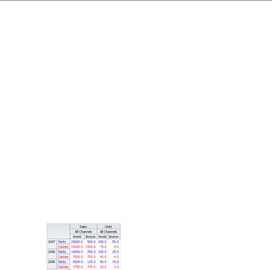
Using a Pivot Filter Bar with a Pivot Table
24-22 Web User Interface Developer's Guide for Oracle Application Development Framework
id="pivotTable3"
value="#{pivotTableMemberFormatting.dataModel}"
var="cellData"
varStatus="cellStatus">
<dvt:headerCell>
<af:switcher
facetname="O___b_cellData_layerName__b__"
defaultFacet="Other">
<f:facet name="Product">
<af:outputText id="ot1"
value="#{cellData.dataValue}"
inlineStyle="color:#{(cellData.dataValue == 'Canoes' ?
'red' : 'blue')};"/>
</f:facet>
<f:facet name="Other">
<af:outputText id="ot2" value="#{cellData.dataValue}"/>
</f:facet>
</af:switcher>
</dvt:headerCell>
<dvt:dataCell>
<af:outputText id="ot3" value="#{cellData.dataValue}"
inlineStyle="color:#{(cellStatus.members.Product.dataValue ==
'Canoes' ? 'red' : 'blue')};"/>
</dvt:dataCell>
</dvt:pivotTable>
Figure 24–21 shows the pivot table resulting from the code sample for formatting
based on header cells.
Figure 24–21 Formatting Based on Header Cells
24.4 Using a Pivot Filter Bar with a Pivot Table
You can enhance the data filtering capacity in a pivot table by adding a pivot filter bar.
Zero or more layers of data not already displayed in the pivot table row edge or
column edge are displayed in the page edge. Figure 24–22 shows a pivot filter bar with
Quarter and Month layers that can be used to filter the data displayed in the pivot
table.
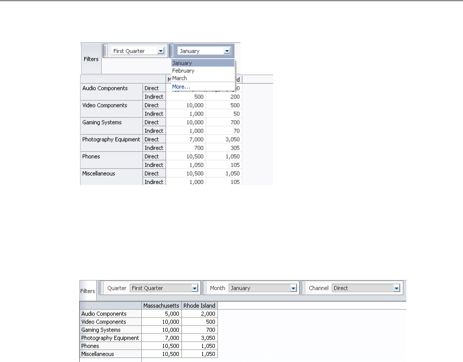
Using a Pivot Filter Bar with a Pivot Table
Using Pivot Table Components 24-23
Figure 24–22 Pivot Filter Bar with Data Layer Filters
You can also change the display of data in the pivot table by pivoting layers between
the row, column, or page edges. Use the pivot handle to drag the layers between the
edges as desired. Figure 24–23 shows the modified pivot table and pivot filter bar
when the Channel data layer is pivoted to the page edge.
Figure 24–23 Pivot Table and Pivot Filter Bar After Pivot
24.4.1 How to Associate a Pivot Filter Bar with a Pivot Table
You associate a pivot filter bar component, pivotFilterBar, to work with a pivot
table component, pivotTable, by configuring the data model and associated
properties to work with both components. Example 24–8 shows a code sample for
associating a pivot filter bar with a pivot table.
Example 24–8 Code Sample for Pivot Filter Bar
<dvt:pivotFilterBar id="pf1" value="#{binding.pt.pivotFilterBarModel}"
modelName="pt1Model"/>
<dvt:pivotTable id="pt1" value="#{binding.pt.dataModel}" modelName="pt1Model"
partialTriggers="pf1"/>
You can associate a pivot filter bar with a pivot table in any of the following ways:
■Create a pivot table using the Data Controls Panel.
When you drag a data collection from the Data Controls Panel to create a pivot
table on your page, the Select Display Attributes page of the Create Pivot Table
wizard provides the option to create a pivot filter bar to associate with the pivot
table. You can choose to specify zero or more attributes representing data layers in
the page edge. The data model and associated properties are automatically
configured for you. For detailed information, see the "Creating Databound ADF
Pivot Tables" section in the Oracle Fusion Middleware Fusion Developer's Guide for
Oracle Application Development Framework.
■Add a pivot filter bar to a pivot table bound to data.

Customizing Pivot Table Cell Content
24-24 Web User Interface Developer's Guide for Oracle Application Development Framework
From the ADF Data Visualizations page of the Component Palette, Pivot Table
panel, you can drag a pivotFilterBar element adjacent to a pivotTable
element that has been bound to a data collection and the data binding will be done
for you.
■Add a pivot filter bar to a pivot table not bound to data.
From ADF Data Visualizations page of the Component Palette, Pivot Table panel,
you can drag a pivotFilterBar element adjacent to a pivotTable element
that has not been bound to a data collection. In this instance, you must configure
the data model and associated properties in order for the pivot filter bar to work
with the pivot table.
24.5 Customizing Pivot Table Cell Content
All cells in a pivot table are either header cells or data cells. Before rendering a cell, the
pivot table calls a method expression. You can customize the content of pivot table
header cells and data cells by providing method expressions for the following
attributes of the pivotTable component:
■For header cells, use one of the following attributes:
–headerFormat: Use to create formatting rules to customize header cell
content.
–headerFormatManager: Use only if you want to provide custom state
saving for the formatting rules of the application’s pivot table header cells.
■For data cells, use one of the following attributes:
–dataFormat: Use to create formatting rules to customize data cell content.
–dataFormatManager: Use only if you want to provide custom state saving
for the formatting rules of the application’s pivot table data cells.
24.5.1 How to Create a CellFormat Object for a Data Cell
To specify customization of the content of a data cell, you must code a method
expression that returns an instance of
oracle.dss.adf.view.faces.bi.component.pivotTable.CellFormat.
An instance of a CellFormat object lets you specify an argument to change the CSS
style of a cell. For example, you might use this argument to change the background
color of a cell.
■Converter: An instance of javax.faces.convert.Converter, which is used
to perform number, date, or text formatting of a raw value in a cell.
■CSS style: Used to change the CSS style of a cell. For example, you might use this
argument to change the background color of a cell.
■CSS text style: Used to change the CSS style of the text in a cell. For example, you
might use this argument to set text to bold.
■New raw value: Used to change the cell’s underlying value that was returned from
the data model. For example, you might choose to change the abbreviated names
of states to longer names. In this case, the abbreviation NY might be changed to
New York.

Customizing Pivot Table Cell Content
Using Pivot Table Components 24-25
To create an instance of a CellFormat object for a data cell:
1. Construct an
oracle.adf.view.faces.bi.component.pivotTable.DataCellContext
object for the data cells that you want to format. The DataCellContext method
requires the following parameters in its constructor:
–model: The name of the dataModel used by the pivot table.
–row: An integer that specifies the zero-based row that contains the data cell on
which you are operating.
–column: An integer that specifies the zero-based column that contains the
data cell that you want to format.
–qdr: The QDR that is a fully qualified reference for the data cell that you want
to format.
–value: A java.lang.Object that contains the value in the data cell that
you want to format.
2. Pass the DataCellContext to a method expression for the dataFormat
attribute of the pivot table.
3. In the method expression, write code that specifies the kind of formatting you
want to apply to the data cells of the pivot table. This method expression must
return a CellFormat object.
24.5.2 How to Change Cell Format
You can apply header and data cell formatting styles to emphasize aspects of the data
displayed in the pivot table. Figure 24–24 shows a pivot table with sales totals
generated for products and for product categories. In the rows that contain totals, this
pivot table displays bold text against a shaded background, a style change. This
change shows in both the row header cells and the data cells for the pivot table. The
row headers for totals contain the text "Sales Total."
The pivot table also shows stoplight and conditional formatting of data cells. For more
information, see Section 24.5.3, "How to Create Stoplight and Conditional Formatting
in a Pivot Table."
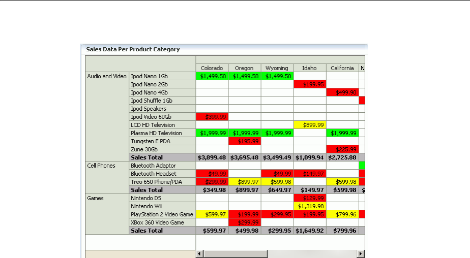
Customizing Pivot Table Cell Content
24-26 Web User Interface Developer's Guide for Oracle Application Development Framework
Figure 24–24 Sales Data Per Product Category
Example 24–9 shows sample code that produces the required custom formats for the
sales totals, but not for the stoplight formatting. The example includes the code for
method expressions for both the dataFormat attribute and the headerFormat
attribute of the dvt:pivotTable tag. If you want to include stoplight formatting in
the pivot table, you might want to include the code from Example 24–10.
Example 24–9 Sample Code to Change Style in a Pivot Table
public CellFormat getDataFormat(DataCellContext cxt)
{
CellFormat cellFormat = new CellFormat(null, null, null);
QDR qdr = cxt.getQDR();
//Obtain a reference to the product category column.
Object productCateg = qdr.getDimMember("ProductCategory");
//Obtain a reference to the product column.
Object product = qdr.getDimMember("ProductId");
if (productCateg != null && productCateg.toString().equals("Sales Total"))
{
cellFormat.setStyle("background-color:#C0C0C0");
}
else if (product != null && product.toString().equals("Sales Total")
{
cellFormat.setStyle("background-color:#C0C0C0");
}
return cellFormat;
}
public CellFormat getHeaderFormat(HeaderCellContext cxt)
{
if (cxt.getValue() != null)
{
String header = cxt.getValue().toString();
if (header.equals("Sales Total"))
{
return new CellFormat(null, "background-color:#C0C0C0",
"font-weight:bold");

Customizing Pivot Table Cell Content
Using Pivot Table Components 24-27
}
}
return null;
}
24.5.3 How to Create Stoplight and Conditional Formatting in a Pivot Table
Stoplight and conditional formatting of the cells in a pivot table are examples of
customizing the cell content. For this kind of customization, an application might
prompt a user for a high value and a low value to be associated with the stoplight
formatting. Generally three colors are used as follows:
■Values equal to and above the high value are colored green to indicate they have
no issues.
■Values above the low value but below the high value are colored yellow to warn
that they are below the high standard.
■Values at or below the low value are colored red to indicate that they fall below
the minimum acceptable level.
Figure 24–24 shows data cells with stoplight formatting for minimum, acceptable, and
below standards sales for States.
Example 24–10 shows code that performs stoplight formatting in a pivot table that
does not display totals. If you want to do stoplight formatting for a pivot table that
displays totals, then you might want to combine the code from Example 24–9 (which
addresses rows with totals) with the code for stoplight and conditional formatting.
Example 24–10 Sample Code for Stoplight and Conditional Formatting
public CellFormat getDataFormat(DataCellContext cxt)
{
//Use low and high values provided by the application.
double low = m_rangeValues.getMinimum().doubleValue() * 100;
double high = m_rangeValues.getMaximum().doubleValue() * 100;
CellFormat cellFormat = new CellFormat(null, null, null);
// Create stoplight format
if (isStoplightingEnabled())
{
String color = null;
Object value = cxt.getValue();
if (value != null && value instanceof Number)
{
double dVal = ((Number)value).doubleValue();
if (dVal <= low)
{
color = "background-color:" + ColorUtils.colorToHTML(m_belowColor) + ";";
}
else if (dVal > low && dVal <= high)
{
color = "background-color:" + ColorUtils.colorToHTML(m_goodColor) + ";";
}
else if (dVal > high)
{
color = "background-color:" + ColorUtils.colorToHTML(m_aboveColor) + ";";
}
}
cellFormat.setStyle(color);
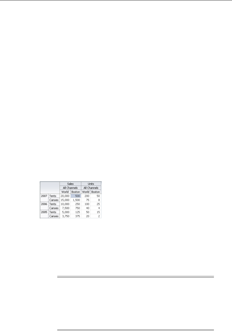
Using Selection in Pivot Tables
24-28 Web User Interface Developer's Guide for Oracle Application Development Framework
}
return cellFormat;
}
24.6 Using Selection in Pivot Tables
Selection in a pivot table allows a user to select one or more cells in a pivot table. Only
one of the three areas including the row header, column header, or data cells can be
selected at one time.
An application can implement features such as displaying customized content for a
context menu, based on currently selected cells. Example 24–11 shows sample code for
getting the currently selected header cells.
Example 24–11 Sample Code to Get Selected Header Cells
UIPivotTable pt = getPivotTable()
if (pt == null)
return null;
HeaderCellSelectionSet headerCells = null;
if (pt.getSelection().getColumnHeaderCells().size() > 0) {
headerCells = pt.getSelection().getColumnHeaderCells();
} else if (pt.getSelection().getRowHeaderCells().size() > 0) {
headerCells = pt.getSelection().getRowHeaderCells();
}
At runtime, selection in a data cell highlights the cell, as shown in Figure 24–25.
Figure 24–25 Selected Data Cell
24.7 Updating Pivot Tables with Partial Page Rendering
You can update pivot tables, data cells, and header cells by using partial page
rendering (PPR). For example, you may display totals in a pivot table when triggered
by a checkbox. PPR allows individual components on a page to be re-rendered without
the need to refresh the entire page. For more information about PPR, see Chapter 8.1,
"About Partial Page Rendering."
Note: By default, ADF pivot tables support automatic PPR, where
any component whose values change as a result of backend business
logic is automatically rerendered. If your application uses the Fusion
technology stack, you can enable the automatic partial page rendering
feature on any page. For more information, see the "What You May
Need to Know About Automatic Partial Page Rendering" section of
the Oracle Fusion Middleware Fusion Developer's Guide for Oracle
Application Development Framework.
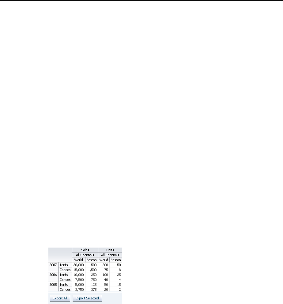
How to Export from a Pivot Table
Using Pivot Table Components 24-29
For a component to be rerendered based on an event caused by another component, it
must declare which other components are the triggers. Use the partialTriggers
attribute to provide a list of IDs of the components that should trigger a partial update
of the pivot table. The pivot table listens on the trigger components and if one of the
trigger components receives an event that will cause it to update in some way, the
pivot table is also updated.
Example 24–12 shows sample code for updating a pivot table by displaying the totals
when a checkbox is triggered. The triggering component uses the ID as the
partialTriggers value.
Example 24–12 Partial Update of a Pivot Table
<dvt:pivotTable id="goodPT"
value="#{richPivotTableModel.dataModel}"
partialTriggers="showTotals"/>
<af:selectBooleanCheckbox id="showTotals" autoSubmit="true" label="Show Totals"
value="#{richPivotTableModel.totalsEnabled}"/>
24.8 How to Export from a Pivot Table
You can export the data from a pivot table to a Microsoft Excel spreadsheet. You create
an action source, such as a command button or command link, add a
exportPivotTableData component, and associate it with the data you wish to
export. You can configure the exportPivotTableData component so that the entire
pivot table will be exported, or so that only the rows selected by the user will be
exported. For example, Figure 24–26 shows a pivot table that includes command
button components that allow users to export the data to an Excel spreadsheet.
Figure 24–26 Pivot Table with Export to Excel Command Buttons
At runtime, when the user clicks the command button, by default all the rows and
columns are exported in an Excel format written to the file specified in the filename
attribute of the component. Alternatively, you can configure the
exportPivotTableData component so that only the rows the user selects are
exported, by setting the exportedData attribute to selected. Example 24–13 shows
the code sample for the Export to Excel command buttons.
Example 24–13 Code Sample for Export to Excel Command Button
<dvt:pivotTable id="pivotTableToExport"
binding="#{editor.component}"
contentDelivery="immediate"
value="#{pivotTableExport.dataModel}" summary="pivot table"/>
<h:panelGrid id="pfl" columns="2" cellpadding="3">
<af:commandButton text="Export All" id="exportAll">
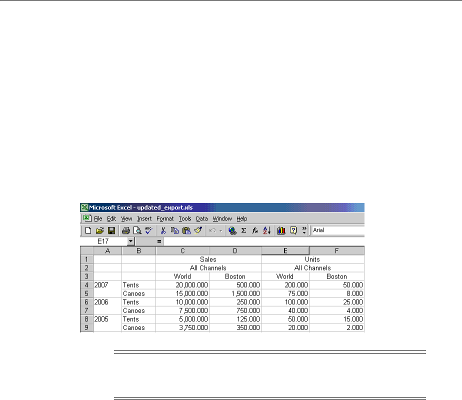
How to Export from a Pivot Table
24-30 Web User Interface Developer's Guide for Oracle Application Development Framework
<dvt:exportPivotTableData exportedId="pivotTableToExport" type="excelHTML"
exportedData="all" filename="all.xls"
title="All pivotTable data"/>
</af:commandButton>
<af:commandButton text="Export Selected" id="exportSelected">
<dvt:exportPivotTableData exportedId="pivotTableToExport" type="excelHTML"
exportedData="selected" filename="selected.xls"
title="Selected pivotTable data"/>
</af:commandButton>
</h:panelGrid>
Figure 24–27 shows the resulting Excel spreadsheet when the Export All button is
clicked.
Figure 24–27 Pivot Table Export to Excel Spreadsheet
Note: You may receive a warning from Excel stating that the file is in
a different format than specified by the file extension. This warning
can be safely ignored.

25
Using Map Components 25-1
25 Using Map Components
This chapter describes how to display data in geographic and thematic maps using
ADF Faces data visualization map and thematicMap components. If your application
uses the Fusion technology stack, then you can use data controls to create geographic
map themes and thematic map area and point data layers to display data. For more
information, see the "Creating Databound ADF Data Visualization Components"
chapter in the Oracle Fusion Middleware Fusion Developer's Guide for Oracle Application
Development Framework.
This chapter includes the following sections:
■Section 25.1, "About Map Components"
■Section 25.2, "Using the Geographic Map Component"
■Section 25.3, "Customizing Geographic Map Display Attributes"
■Section 25.4, "Customizing Geographic Map Themes"
■Section 25.5, "Adding a Toolbar to a Geographic Map"
■Section 25.6, "Using Thematic Map Components"
■Section 25.7, "Customizing Thematic Map Display Attributes"
■Section 25.8, "Adding Interactivity to Thematic Maps"
25.1 About Map Components
A geographic map represents business data in one or more interactive layers of
information (known as themes), superimposed on a single map. Geographic maps
require a configuration that contains a URL to a remote Oracle Application Server (AS)
MapViewer service, and optionally, a geocoder service if address data will have to be
converted to longitude and latitude.
A thematic map represents business data as patterns in stylized areas or associated
markers and does not require a connection to an Oracle MapViewer service. Thematic
maps focus on data without the geographic details in a geographic map.
25.1.1 End User and Presentation Features of Maps
The ADF Data Visualization map and thematic map components provides a range of
features for end users, such as panning and zooming and legend display. It also
provides a range of presentation features, such as state management.
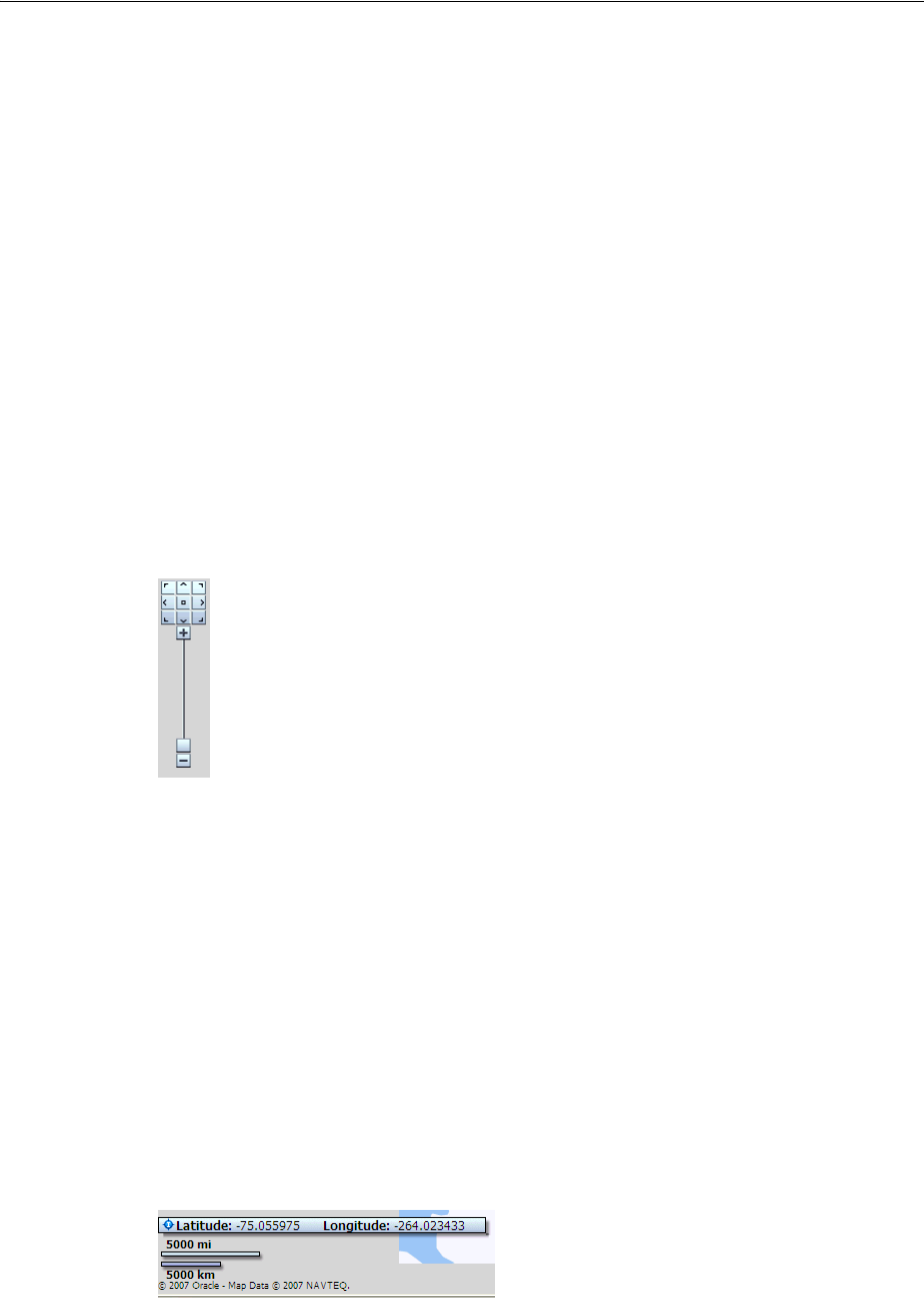
About Map Components
25-2 Web User Interface Developer's Guide for Oracle Application Development Framework
25.1.1.1 Geographic Map End User and Presentation Features
To understand how geographic maps are used and can be customized, it may be
helpful to review these elements and features:
■Viewport: The container for the geographic map and its presentation features. The
default size is 600px by 375px and is customizable.
■Base map: The background geographic data, zoom levels, and the appearance and
presence of items such as countries, cities, and roads. By default, geographic maps
use based maps from the remote Oracle MapViewer service. The base map can be
any image that can be configured using a map viewer and map builder, for
example, the floor maps of office buildings.
■Zoom control: Pan icons and a zoom slider that render in the upper left-hand
corner of the map. Figure 25–1 shows a map zoom control that is zoomed out all
the way (that is, the zoom level is set to 0). At zero, the entire map is displayed.
You can customize the location and the initial setting of the zoom control in the
map component. The View menu in the map toolbar lets you determine the
visibility of the zoom control. By default, the initial zoom level for a map is set to
0.
Figure 25–1 Zoom Control of a Map
–Pan icons: Icons (with arrows that point north, south, east, west, northeast,
northwest, southeast, and southwest) at the top of the zoom control. You can
use these icons to move the entire map in specific directions.
–Zoom slider: Slider with a thumb for large scale zooming and icons for
zooming a single level. You can use the plus icon to zoom in and the minus
icon to zoom out one level at a time. When the thumb is at the bottom of the
slider, the zoom level is zero.
■Scale: Two horizontal bars that display in the lower left-hand corner of the map
below the information panel and above the copyright. Figure 25–2 shows the scale.
The top bar represents miles (mi) and the bottom bar represents kilometers (km).
Labels appear above the miles bar and below the kilometers bar in the format:
[distance] [unit of measure]. The length and distance values of the bars change as
the zoom level changes and as the map is panned.
Figure 25–2 Map Information Panel, Scale, and Copyright
■Information panel: Displays latitude and longitude in the lower left-hand corner
above the scale. Figure 25–2 shows the information panel. By default, the
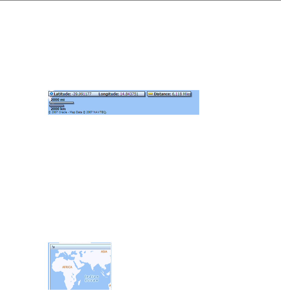
About Map Components
Using Map Components 25-3
information panel is not visible. You can display this panel from the View menu or
by clicking the Information button on the toolbar.
■Measurement panel: Displays either distance, area, or radius depending on which
tools in the toolbar are currently in use. Text appears in the following format:
[label] [value] [unit of measure] to the right of the information panel. Figure 25–3
shows the measurement panel with a distance measurement. Area measurement
and radius measurement appear in a similar manner with the appropriate labels.
Figure 25–3 Map Measurement Panel Beside the Information Panel
The following tools provide information in the measurement panel:
–Area measurement: Appears only when the Area, Rectangular Selection, or
Multi-Point Selection tools are active.
–Distance measurement: Appears only when the Distance tool is active.
–Radius measurement: Appears only when the Circular Selection tool is active.
■Copyright: Appears in the lower left-hand corner of the map and contains text that
you can customize in the map component.
■Overview map: Consists of a miniature view of the main map as shown in
Figure 25–4. This map appears in the lower right-hand corner of the main map and
lets you change the viewable region of the main map without having to use the
pan tool or the pan icons.
Figure 25–4 Overview Map
The following items are part of the overview map:
–Reticule: Appears in a small window that you can move across a miniature
view of the main map. The position of the reticule in the miniature map
determines the viewable area of the main map. As you move the reticule, the
main map is updated automatically.
–Show/Hide icon: Appears in the upper left-hand corner when the overview
map is displayed. When you click the Show/Hide icon, the overview map
becomes invisible and only the icon can be seen in the lower right corner of
the main map.
■Toolbar: Appears in association with the map to provide user controls to adjust
the display of the map and map themes.
The toolbar contains the following elements in the sequence listed:
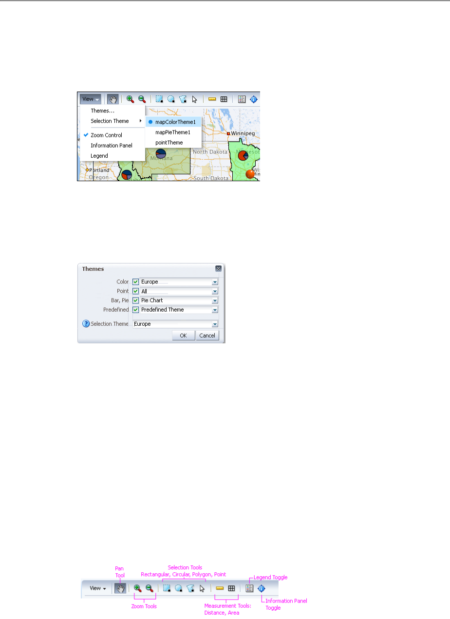
About Map Components
25-4 Web User Interface Developer's Guide for Oracle Application Development Framework
–View menu: Lets the user control which themes are visible, select a specific
theme for display, and determine the visibility of the zoom control,
information panel, and the legend. Figure 25–5 show a sample View menu.
Figure 25–5 Map View Menu
The Themes option on the View menu provides a dialog to configure a
geographic map when multiple themes are available. Figure 25–6 shows a
sample map themes dialog.
Figure 25–6 Map Themes Dialog
–Toolbar buttons: Provides user controls to interact with the geographic map
including:
*Pan: Use to pan the map by drag and drop operation within the view
*Zoom: Use to zoom in or out in the map view
*Selection: Use to select shaped (rectangle, circle, or polygon) areas or
points on the map. The themes within the selection will be highlighted
*Measurement: Use to hide or show the map distance and area
measurements tools
*Legend: Use to hide or show the map legend
*Information panel: Use to hide or show the map information panel
Figure 25–7 shows the features supported by the map toolbar buttons
Figure 25–7 Map Toolbar Button Features

About Map Components
Using Map Components 25-5
25.1.1.2 Thematic Map End User and Presentation Features
To understand how thematic maps are used and can be customized, it may be helpful
to review these elements and features:
■Viewport: The container for the thematic map and its presentation features. The
default size is 600px by 375px and is customizable.
■Base map: The background geographic area. Each base map includes several sets
of regions and one fixed set of cities referred to as points. A set of regions or cities
is referred to as an layer. Only one base map and one layer may be displayed at a
time, with the exception of enabled drilling. The base maps prebuilt for the
thematic map include:
–United States
–United States and Canada
–World
–Africa
–Asia
–Europe
–North America
–Latin America
–South America
–APAC (Asia Pacific)
–EMEA (Europe, Middle East, and Africa
–World Regions
■Layers and labels: Each base map includes several regions that represent levels in
a geographical hierarchy. For example, in the United States map the hierarchy is
country > states > counties > cities. The hierarchical relationship supports drilling
in the region. When displayed, the cities in the city layer associated with the base
map will appear as data points. By default, each region in a layer displays a label
that can be customized.
Thematic maps support one or more custom area layers, a named group of regions
based on either an existing area layer or another custom region. A custom region
fits naturally into the geographical hierarchy of the base map. For example, a
custom area layer based on the Counties layer would appear between the US
States and US Counties layers in the hierarchy.
■Data layers: Each layer can be bound to a data collection and sylized to represent
the data with color and pattern fills, or a data marker, or both. A map layer may
display only one data layer at a time, whereas multiple data markers may appear
at the same time. Data layers can be defined by geographic area, or by points
associated with a map position as in longitude and latitude, or x and y
coordinates.
■Data markers and labels: Data markers are bound to a data collection and can be
associated with a region or city layer to represent data as shapes available with the
thematicMap component, custom shapes, or graphic files. A data marker can
also be associated with a map position as in longitude and latitude, or x and y
coordinates. By default, each data marker displays a label.
■Control panel: Optional tool that allows user to control the following operations:
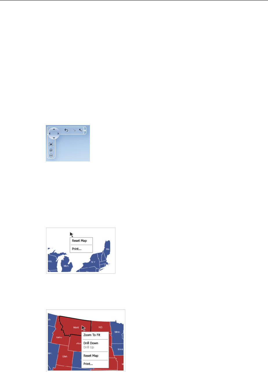
About Map Components
25-6 Web User Interface Developer's Guide for Oracle Application Development Framework
–Pan and zoom control: Use to pan the map, and zoom and center the map
within the view
–Zoom to fit: Use to center and fit the full view of the map within the viewport
–Zoom buttons: Use to zoom in or out on the view of the thematic map
–Show/hide control panel button: Use to show or hide the control panel
–Reset button: Available when drilling is enabled for the thematic map. Use to
reset map to display with no drilling in regions.
–Drill buttons: Available when drilling is enabled for the thematic map. Use
arrows pointing up or down to drill up or down in a map region.
Figure 25–8 shows the control panel with drilling enabled in the map.
Figure 25–8 Control Panel with Drilling Enabled
■Context menus: By default, thematic maps display context menus for the viewport
background, map regions, and data markers. Custom context menu items can be
added to the default menus.
Figure 25–9 shows the default context menu for the map viewport. The same
menu items are available for data markers.
Figure 25–9 Map Viewport Background Context Menu
Figure 25–10 shows the context menu for a map region.
Figure 25–10 Map Region Context Menu
■State management: By default, display changes made to a thematic map such as
center, zoom, selection, and drill state persist across sessions, and carry over to
printing.

About Map Components
Using Map Components 25-7
■Image formats: By default, thematic maps are displayed using a Flash player and a
Portable Network Graphics (PNG) output format is used when printing thematic
maps. Both Flash and PNG image formats support bi-directional locales. Static
rendering, such as maintaining pan and zoom state of the Flash display, is fully
supported in the printable PNG image.
■Printing: Thematic maps are printed using a PNG output format, maintaining any
zoom or pan state in the map.
■Animation: By default, thematic maps are animated upon initial rendering of the
map, when the data associated with the map changes, and when a region is drilled
in the map.
■Drilling: When enabled, drilling of the next layer in the geographical hierarchy is
displayed. For example, the counties within a US state are displayed when the
user double-clicks a state region. Drilling icons are added to the Control Panel
when drilling is enabled.
■Drag and drop: Maps can be configured to support these operations:
–Drag selected map regions or data markers to another page component.
–Move data markers from one location to another on the map.
–Drag data elements from another page component to a map region or data
marker.
■Disable features: End user features including map zoom, zoom-to-fit, and pan can
be disabled for a thematic map. When disabled, the controls are removed from the
control panel.
■Tooltips: By default, thematic maps use tooltips to orient the user to the map
location and associated data when moving the cursor over the map.
25.1.2 Map Component Use Cases and Examples
Both geographic and thematic maps are designed to display data. The difference is
that geographic maps focus on data that is best displayed with details such as roads or
rivers. and requires configuration to an Oracle MapViewer service and optionally, a
geocoder service. Thematic maps focus on data trends or patterns without the visual
clutter of geographic details and do not require configuration to an Oracle MapViewer
or geocoder service.
Geographic maps support a variety of map themes, each of which must be bound to a
data collection. The following kinds of map themes are available:
■Color: Applies to regions. For example, a color theme might identify a range of
colors to represent the population in the states of a region or the popularity of a
product in the states of a region. A geographic map can have multiple color
themes visible at different zoom levels. For example, a color theme at zoom levels
1 to 5 might represent the population of a state, and the county median income at
zoom levels 6 to 10.
■Point: Displays individual latitude/longitude locations in a map. For example, a
point theme might identify the locations of warehouses in a map. If you customize
the style of the point that is displayed, you might choose to use a different image
for the type of inventory (electronics, housewares, garden supplies) in a set of
warehouses to differentiate them from each other.
■Graph: Creates any number of pie graph themes and bar graph themes. However,
only one graph theme can be visible at a given time. You select the desired theme
from the View menu of the map toolbar. Graph themes can show statistics related
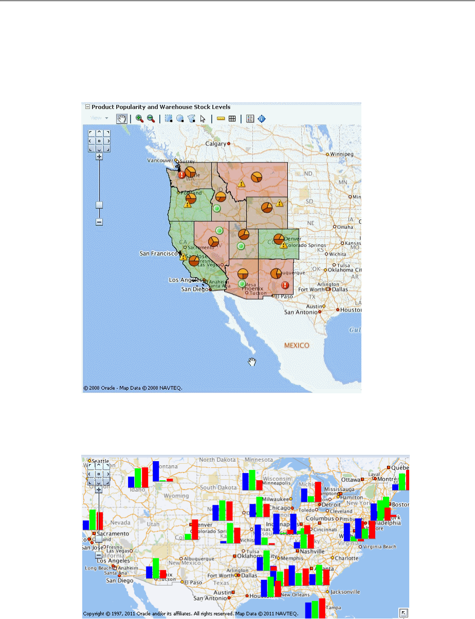
About Map Components
25-8 Web User Interface Developer's Guide for Oracle Application Development Framework
to a given region such as states or counties. For example, a graph theme could
display the sales values for a number of products in a state.
Figure 25–11 displays a geographic map with color, point, and graph themes.
Figure 25–11 Geographic Map of Southwest US with Color, Point, and Pie Graph Themes
Figure 25–12 shows a geographic map with a customized bar graph theme.
Figure 25–12 Geographic Map with Custom Bar Graph Theme
Thematic maps display trends or patterns in data associated with a geographic
location. Data is stylized by region, for example, using a fill color based on data
values, associating a marker with the region, or both.
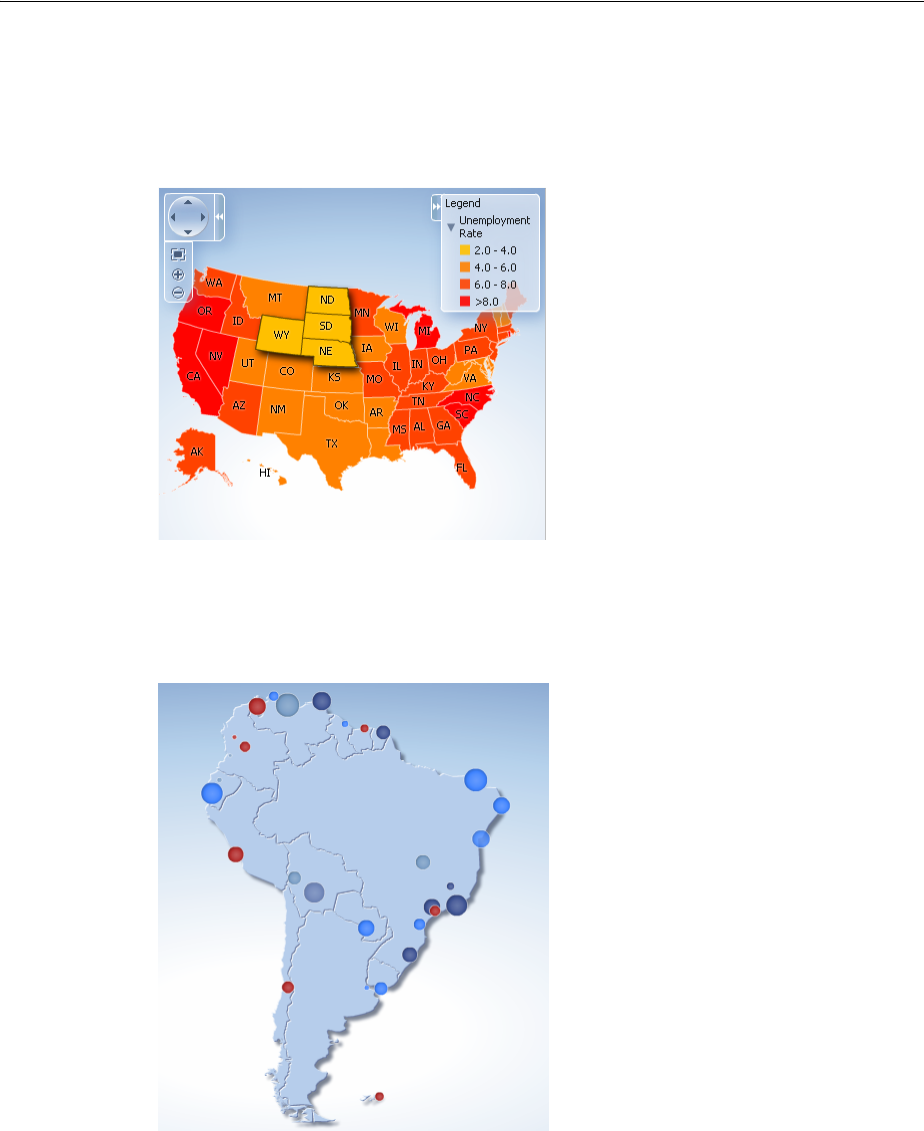
About Map Components
Using Map Components 25-9
Figure 25–13 shows a thematic map that displays unemployment rates by states in the
US. The map displays multiple selection of the states with an employment rate of
2.0-4.0 percent.
Figure 25–13 Thematic Map of Unemployment Rates in the US
Figure 25–14 shows a thematic map that displays a graduated symbol for the size of
the major cities in South America.
Figure 25–14 Thematic Map with City by Size in South American
25.1.3 Additional Functionality for Map Components
You may find it helpful to understand other ADF Faces features before you implement
your map component. Additionally, once you have added a map component to your
page, you may find that you need to add functionality such as validation and
accessibility. Following are links to other functionality that map components can use:

Using the Geographic Map Component
25-10 Web User Interface Developer's Guide for Oracle Application Development Framework
■Partial page rendering: You may want a map to refresh to show new data based on
an action taken on another component on the page. For more information, see
Chapter 8, "Rerendering Partial Page Content."
■Personalization: When enabled, users can change the way the map displays at
runtime, and those values will not be retained once the user leaves the page unless
you configure your application to allow user customization. For information, see
Chapter 32, "Allowing User Customization on JSF Pages."
■Accessibility: You can make your map components accessible. For more
information, see Chapter 30, "Developing Accessible ADF Faces Pages."
■Skins and styles: You can customize the appearance of gauge components using
an ADF skin that you apply to the application or by applying CSS style properties
directly using a style-related property (styleClass or inlineStyle). For more
information, see Chapter 28, "Customizing the Appearance Using Styles and
Skins."
■Content Delivery: You can configure your thematic map area and point data layers
to fetch a certain number of rows from your data source using the
contentDelivery attribute. For more information, see Section 12.2.2, "Content
Delivery."
■Automatic data binding: If your application uses the Fusion technology stack, then
you can create automatically bound gauges based on how your ADF Business
components are configured. For more information, see the "Creating Databound
Gauges" chapter of the Oracle Fusion Middleware Web User Interface Developer's
Guide for Oracle Application Development Framework.
Additionally, data visualization components share much of the same functionality,
such as how data is delivered, automatic partial page rendering (PPR), image formats,
and how data can be displayed and edited. For more information, see Section 21.2,
"Common Functionality in Data Visualization Components."
25.2 Using the Geographic Map Component
When you create a map, you are prompted to select a base map that an administrator
has already configured using the Map Builder tool of Oracle Spatial. During
configuration, the map administrator defines the zoom levels that the map supports.
These levels also determine the zoom capability of the geographic map.
Administrators also have the option of creating predefined map themes using the Map
Builder tool. For example, a predefined theme might use specific colors to identify
regions. In the geographic map component, you can select such a predefined map
theme, but you cannot modify it because this theme is part of the base map.
Note: If you know the UI components on your page will eventually
use ADF data binding, but you need to develop the pages before the
data controls are ready, then you should consider using placeholder
data controls, rather than manually binding the components. Using
placeholder data controls will provide the same declarative
development experience as using developed data controls. For more
information, see the "Designing a Page Using Placeholder Data
Controls" chapter of the Oracle Fusion Middleware Fusion Developer's
Guide for Oracle Application Development Framework.

Using the Geographic Map Component
Using Map Components 25-11
The base map becomes the background on which you build interactive themes of
information using the geographic map component. You can create as many themes as
you wish, but you must define at least one map theme.
Geographic maps have the following data requirements:
■Map configuration requirements:
–Map Viewer URL: You must provide a URL for the location of the Oracle
Application Server MapViewer service. This service is required to run the base
map that provides the background for the layers in the ADF geographic map
component. OracleAS MapViewer is a programmable tool for rendering maps
using spatial data managed by Oracle Spatial. The URL is:
http://elocation.oracle.com/mapviewer
–Geocoder URL: If you want to convert street addresses into coordinates, then
you must provide the URL for the Geocoder for the geographic map. A
Geocoder is a Web service that converts street addresses into longitude and
latitude coordinates for mapping. The URL is:
http://elocation.oracle.com/geocoder/gcserver
■Base map: You must have a base map created by the Map Builder tool in OracleAS
MapViewer. This base map must define polygons at the level of detail that you
require for your map themes to function as desired. For example, if you have a
map pie graph or bar graph theme that you want to use for creating graphs in each
state of a certain region, then you must have a base map that defines polygons for
all these states at some zoom level. You can display only one graph in a polygon.
■Map themes: Each map theme must be bound to a data collection. The data
collection must contain location information that can be bound to similar
information in the base map.
25.2.1 Configuring Geographic Map Components
The geometric map has parent components, map child components, and components
that modify map themes. The prefix dvt: occurs at the beginning of each map
component name indicating that the component belongs to the ADF Data
Visualization Tools (DVT) tag library. You can configure the following map
components:
■Map (map): The main map component. Unlike other data visualization
components, the map component is not bound to data. Instead, all the map theme
child components are bound individually to data collections. The map component
contains general information about the map including the identification of the
base map, the URL for the remote server that is running Oracle Application Server
MapViewer service and the URL for the Geocoder web service that converts street
addresses into longitude and latitude coordinates for mapping.
The map component supports the following map child components:
–Color theme (mapColorTheme): Map layer that you bind to a data collection.
The color theme can be used to identify regions on a base map.
–Point theme (mapPointTheme): Map layer that you bind to a data collection.
The point theme identifies individual locations on a map.
Optionally, you can use child map point style components
(mapPointStyleItem) if you want to customize the image that represents
points that fall in a certain data value range. To define multiple images, create

Using the Geographic Map Component
25-12 Web User Interface Developer's Guide for Oracle Application Development Framework
a component for each image and specify the associated data value range and
image.
–Bar graph theme (mapBarGraphTheme): Map layer that you bind to a data
collection. This theme displays a bar graph at points to represent multiple data
values related to that location. For example, this tag might be used to display a
graph that shows inventory levels at warehouse locations.
Optionally, use the map bar graph series set component (mapBarSeriesSet)
to wrap map bar graph series components (mapBarSeriesItem) if you want
to customize the color of the bars in a map bar graph. Each map bar graph
component customizes the color of one bar in a map bar graph.
–Pie graph theme (mapPieGraphTheme): Map layer that you bind to a data
collection. This theme displays a pie graph at specific points to represent
multiple values at that location. For example, this tag might be used to display
a graph that shows inventory levels at warehouse locations.
Optionally, use the map pie slice set component (mapPieSliceSet) to wrap
map pie slice components (mapPieSliceItem) if you want to customize the
color of the slices in a map pie graph. Each map pie slice component
customizes the color of one slice in a map pie graph.
–Predefined graph theme (predefinedTheme): Map layer defined using the
Map adminstrator tool stored along with the map metadata in the database.
The predefined theme tag is used when you have your own custom Oracle AS
MapViewer instance and need to display large datasets that can be rendered
directly by the map viewer.
–Map legend (mapLegend): Created automatically when you create a map. Use
this component to customize the map legend.
–Overview map (mapOverview): Created automatically when you create a
map. Use this tag to customize the overview map that appears in the lower
right-hand corner of the map.
■Toolbar (mapToolbar): A parent component that allows the map toolbar to be
placed in any location on a JSF page that contains a map. This toolbar contains a
mapID attribute that points to the map associated with the toolbar. The toolbar lets
you perform significant interaction with the map at runtime including the ability
to display the map legend and to perform selection and distance measurement.
The map toolbar tag has no child components.
25.2.2 How to Add a Geographic Map to a Page
When you are designing your page using simple UI-first development, you use the
Component Palette to add a geographic map to a JSF page. When you drag and drop a
geographic map component onto the page, you are prompted to configure the an
Oracle MapViewer service, and optionally a geocoder service.
Once you complete the configuration, and the geographic map is added to your page,
you can use the Property Inspector to configure additional display attributes for the
map.
In the Property Inspector you can use the dropdown menu for each attribute field to
display a property description and options such as displaying an EL Expression
Builder or other specialized dialogs. shows the dropdown menu for a thematic map
component mapServerConfigId attribute.
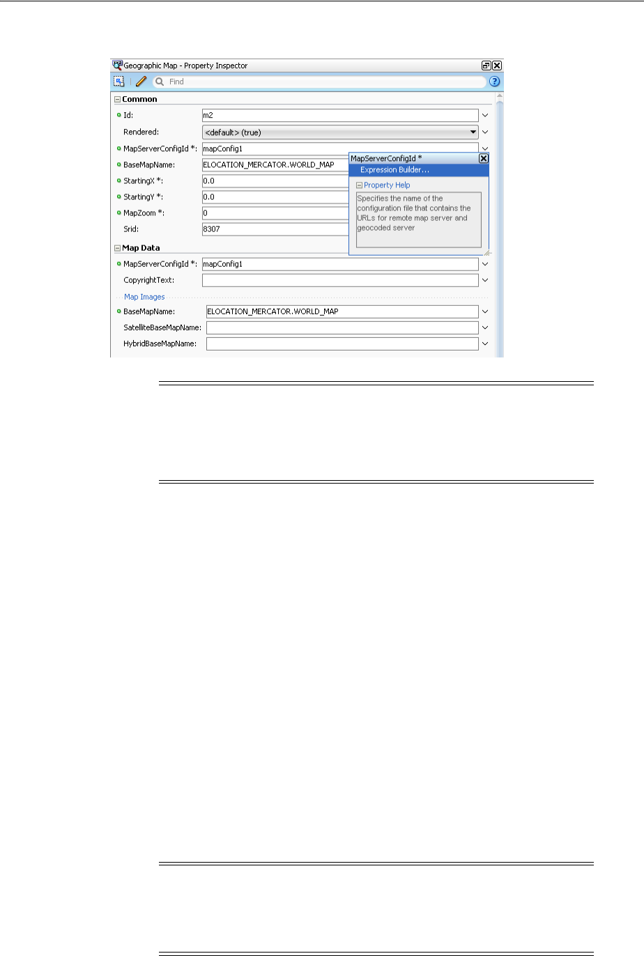
Using the Geographic Map Component
Using Map Components 25-13
Figure 25–15 Geographic Map MapServerConfigId Attribute Dropdown Menu
Before you begin:
It may be helpful to have an understanding of how geographic map attributes and
geographic map child components can affect functionality. For more information, see
Section 25.2.1, "Configuring Geographic Map Components."
You may also find it helpful to understand functionality that can be added using other
ADF Faces features. For more information, see Section 25.1.3, "Additional
Functionality for Map Components."
To add a geographic map to a page:
1. In the Component Palette, from the ADF Data Visualizations page, in the Map
panel, drag and drop a Geographic map onto the page to open the Create
Geographic Map dialog. Use the dialog Maps page to specify Map Configuration
in one of two ways:
■Use the dropdown list to choose an available configuration, or
■Click the Add icon to open the Create Geographic Map Configuration dialog.
In the dialog you can specify the MapViewer URL and Geocoder URL from
the respective dropdown list, or click the Add icon to open the Create URL
Connection dialog for each URL.
Note: If your application uses the Fusion technology stack, then you
can use data controls to create a geographic map and the binding will
be done for you. For more information, see the "Creating Databound
Geographic Maps" section in the Oracle Fusion Middleware Fusion
Developer's Guide for Oracle Application Development Framework
Note: For the Oracle AS MapViewer service use this URL:
http://elocation.oracle.com/mapviewer
For the Oracle AS Geocoder service use this URL:
http://elocation.oracle.com/geocoder/gcserver
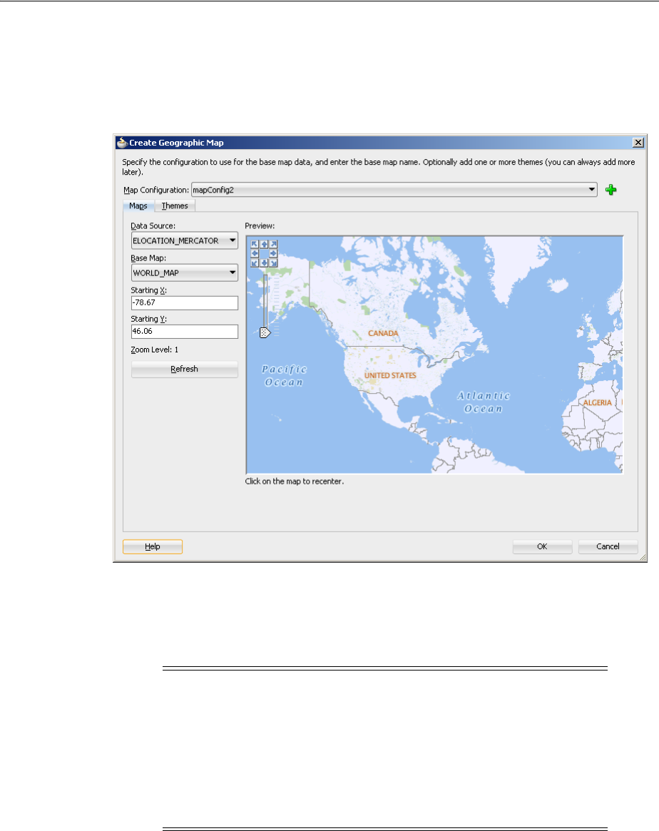
Using the Geographic Map Component
25-14 Web User Interface Developer's Guide for Oracle Application Development Framework
If you need help with any of the dialogs, press F1 or click Help. As you complete
each dialog to create the configuration, the settings are reflected in the Create
Geographic Map dialog. Figure 25–16 shows a sample completed dialog.
Figure 25–16 Maps Page of the Create Geographic Map Dialog
2. Optionally, use the map Preview control panel to make adjustments to the center
and zoom level of the base map. When you click Refresh, the Starting X (X
coordinate of the center), Starting Y (Y coordinate of the center), and Zoom Level
(initial zoom level) values are updated. If you need help, press F1 or click Help.
3. In the Property Inspector, view the attributes for the geographic map. Use the help
button to display the complete tag documentation for the map component.
4. Expand the Appearance section. Use this section to set the following attributes:
■ShowScaleBar: Use to specify the display of the map scale bar. The default
value is false.
Note: Optionally, use the Themes page of the Create Geographic
Map dialog to add and configure color, point, bar graph, or pie graph
themes to display data on the map.
When you create a geographic map using the Data Controls panel and
the theme binding dialogs, the data bindings are created for you. For
more information, see the "Creating Databound Geographic Maps"
section in the Oracle Fusion Middleware Fusion Developer's Guide for
Oracle Application Development Framework.

Using the Geographic Map Component
Using Map Components 25-15
■ZoomBarPosition: Use to specify the location of the map zoom bar. The
default value is West for placement on the left side of the map. Other valid
values include East for placement on the right side of the map, and none for
no zoom bar display.
■AutoZoomThemeId: Use to specify the id of the theme where the map view
and zoom level will be centered upon initial map display. The value set in the
AutoZoomStrategy will be used to determine how the map adjusts the center
and zoom level.
■ShowInfoArea: Use to specify the display of the information area. The default
value is true.
■MapZoom: Use to specify the initial zoom level of the geographic map. The
zoom levels are defined in the map cache instance as part of the base map.
■Unit: Use to specify the unit of measurement to use for the geographic map.
The default value is miles. The attribute can also be set to meters.
■Selection subsection: Use the attributes in this subsection to define the
appearance of the area (rectangular, circular, polygon) and point selection
tools. For more information, see Section 25.3.3, "How to Customize and Use
Map Selections."
5. Expand the Other section. Use this section to set the following attributes:
■AutoZoomStrategy: Use to specify how the map adjusts the center and zoom
level. If the AutoZoomStrategy value is set to MAXZOOM (default), the map
will zoom to the maximum level where all objects in AutoZoomThemeId are
visible. If the AutoZoomStrategy is set to CENTERATZOOMLEVEL, the map
will center on the theme in AutoZoomThemeId, and will use the value in the
MapZoom attribute as the starting zoom level.
■Summary: Enter a description of the geographic map. This description is
accessed by screen reader users.
25.2.3 What Happens When You Add a Geographic Map to a Page
When you use a Component Palette to add a geographic map to a page, JDeveloper
adds code to the JSF page. Example 25–1 shows the code added to the JSF page.
Example 25–1 Geographic Map Added to JSF Page
<dvt:map startingY="46.06" startingX="-78.67" mapZoom="1"
mapServerConfigId="mapConfig2"
baseMapName="ELOCATION_MERCATOR.WORLD_MAP"
inlineStyle="width:600px; height:375px;" id="m2">
<f:facet name="rtPopup"/>
<f:facet name="popup"/>
</dvt:map>
Note: JDeveloper automatically inserts two popup facets. The
rtPopup facet supports a single child component for a right click
af:menu. The popup facet supports a single child component for a
left click af:dialog or af:noteWindow. For more information
about configuring popup components, see Chapter 15, "Using Popup
Dialogs, Menus, and Windows."

Customizing Geographic Map Display Attributes
25-16 Web User Interface Developer's Guide for Oracle Application Development Framework
You can then configure the geographic map to display data in color, point, pie graph
or bar graph themes using the ADF Data Controls panel and the theme binding
dialogs. For information about configuring geographic maps to display data, see the
"Creating Databound Geographic Maps" section in the Oracle Fusion Middleware Fusion
Developer's Guide for Oracle Application Development Framework.
25.3 Customizing Geographic Map Display Attributes
You can customize geographic display attributes including the size of the map, how
the map centers and zoom the map size, zoom strategy, the appearance of selected
regions, and the display of the map legend.
25.3.1 How to Adjust the Map Size
You can control the width and height of the map by using the inlineStyle attribute
in the dvt:map tag.
Before you begin:
It may be helpful to have an understanding of how map attributes and map child tags
can affect functionality. For more information, see Section 25.2.1, "Configuring
Geographic Map Components."
You should already have a map on your page. If you do not, follow the instructions in
this chapter to create a map. For information, see Section 25.2.2, "How to Add a
Geographic Map to a Page."
To adjust the size of a map:
1. In the Structure window, right-click the dvt:map component and choose Go to
Properties.
2. In Property Inspector, expand the Style section. Specify the initial size of the map
in the InlineStyle attribute.
For example, to specify a width of 600 pixels and a height of 400 pixels, use the
following setting:
width:600px;height:400px
For a map that uses half the available width and height of the page, use the
following setting:
width:50%;height:50%
25.3.2 How to Specify Strategy for Map Zoom Control
You can customize how the geographic map display attributes for the initial zoom
level, starting location, initial map theme, and zoom strategy.
Before you begin:
It may be helpful to have an understanding of how map attributes and map child tags
can affect functionality. For more information, see Section 25.2.1, "Configuring
Geographic Map Components."
Best Practice Tip: Instead of specifying width at 100% in the
inlineStyle attribute, set the styleClass attribute to
AFStretchWidth.
Customizing Geographic Map Display Attributes
Using Map Components 25-17
You should already have a map on your page. If you do not, follow the instructions in
this chapter to create a map. For information, see Section 25.2.2, "How to Add a
Geographic Map to a Page."
You should have already configured at least one map color, point, pie graph, or bar
graph theme to display data on the map.
To control the initial zoom and starting location on a map:
1. In the Structure window, right-click the dvt:map component and choose Go to
Properties.
2. In the Property Inspector, expand the Appearance section. Use this section to set
the following attributes:
■AutoZoomThemeID: Enter the Id of the first theme that will be displayed.
■ZoomBarStrategy: Select the default value MAXZOOM to direct the map to
zoom down to the maximum level where all objects in the
AutoZoomThemeId are visible, or select CENTERATZOOMLEVEL to direct
the map to center on the theme in AutoZoomThemeId and to set the zoom
level to the value in the MapZoom attribute.
■If you want to change the starting location on the map, enter latitude and
longitude in StartingX and StartingY respectively.
■MapZoom: Enter the beginning zoom level for the map. This setting is
required for the zoom bar strategy CENTERATZOOMLEVEL.
25.3.3 How to Customize and Use Map Selections
The geographic map provides selection tools for map areas displaying data in color,
pie graph, and bar graph themes. By default, the selection tools are available on the
map toolbar and include options for rectangular, circular, polygonal, or point
selection. Figure 25–17 show the use of the polygon tool to select an area in a map with
a color theme.
Figure 25–17 Polygon Selection Tool in Map
You can customize the attributes used by the selection tools when users make selection
on a colorTheme, barGraphTheme, and pieGraphTheme, using the rectangle tool,
circle tool, polygon tool or point tool on the mapToolbar.
Note: The property autoZoomThemeID takes precedence over the
property set in mapZoom.
Customizing Geographic Map Display Attributes
25-18 Web User Interface Developer's Guide for Oracle Application Development Framework
Before you begin:
It may be helpful to have an understanding of how map attributes and map child tags
can affect functionality. For more information, see Section 25.2.1, "Configuring
Geographic Map Components."
You should already have a map on your page. If you do not, follow the instructions in
this chapter to create a map. For information, see Section 25.2.2, "How to Add a
Geographic Map to a Page."
You should have already configured at least one map color, point, pie graph, or bar
graph theme to display data on the map.
To customize map selection tool attributes:
1. In the Structure window, right-click the dvt:map component and choose Go to
Properties.
2. In the Property Inspector, expand the Appearance section. Use this section to set
the following attributes:
■SelectionFillColor: Use to specify the fill color for the selected region. Valid
values are RGB hexadecimal. For example, color="#000000" for black. The
default value is #49E0F6.
■SelectionStrokeColor: Use to specify the stroke color for the selected region.
Valid values are RGB hexadecimal. For example, color="#000000" for
black, the default color.
■SelectionOpacity: Use to specify the opacity of the fill color for the selected
region. Valid values range from 0 to 100, where 0 is 100% transparent, and 100
is opaque. The default value is 40.
When an end user clicks on a selection tool and uses the tool to highlight an area on
the map, the data values in that area can be displayed in another UI element such as a
table, or totalled in the information panel, by using a selection listener.
Figure 25–18 shows a map with the states selected in the area outlined in the color red.
The related information about the area is displayed in an associated table.
Figure 25–18 Selected Map Area with Table Data Display
You can provide a selection listener that totals the values associated with a map area
selected with one of the map selection tools such as the rectangular selection tool. The
total is displayed in an area under the map. You must provide a class that takes

Customizing Geographic Map Display Attributes
Using Map Components 25-19
MapSelectionEvent as an argument in a backing bean method. Example 25–2
shows sample code for a backing bean.
Example 25–2 Sample Code in Backing Bean for Selection Listener
package view;
import java.util.Iterator;
import oracle.adf.view.faces.bi.component.geoMap.DataContent;
import oracle.adf.view.faces.bi.event.MapSelectionEvent;
public class SelectionListener {
private double m_total = 0.0;
public SelectionListener() {
}
public void processSelection(MapSelectionEvent mapSelectionEvent) {
// Add event code here...
m_total = 0.0;
Iterator selIterator = mapSelectionEvent.getIterator();
while (selIterator.hasNext())
{
DataContent dataContent = (DataContent) selIterator.next();
if (dataContent.getValues() != null)
{
Double allData[] = dataContent.getValues();
m_total += allData[0];
}
}
}
public double getTotal () {
return m_total;
}
public void setTotal (double total) {
m_total = total;
}
}
To provide a selection listener to total map selection values:
1. In the Structure window, right-click the dvt:map component and choose Go to
Properties.
2. In the Property Inspector, expand the Behavior section. For the SelectionListener
attribute, enter a method reference that points to the backing bean. For example:
#{eventBean.processSelection}
25.3.4 How to Customize the Map Legend
The map legend provides an explanation of the map theme data in symbol and label
pairs. The legend displays by default in a popup upon initial display of the map, and
when a map toolbar is added and configured, the map legend can display in a window
when the user clicks the legend toolbar button. When multiple themes are configured,
a dropdown list is available to display the legend for each theme. Figure 25–19 shows
a map displaying the legend for one of its multiple themes.
Customizing Geographic Map Display Attributes
25-20 Web User Interface Developer's Guide for Oracle Application Development Framework
Figure 25–19 Thematic Map Legend Display
Before you begin:
It may be helpful to have an understanding of how map attributes and map child tags
can affect functionality. For more information, see Section 25.2.1, "Configuring
Geographic Map Components."
You should already have a map on your page. If you do not, follow the instructions in
this chapter to create a map. For information, see Section 25.2.2, "How to Add a
Geographic Map to a Page."
You should have already configured at least one map color, point, pie graph, or bar
graph theme to display data on the map.
To customize a map legend:
1. In the Structure window, right-click the dvt:map component and choose Insert
inside dvt:map > Legend.
2. In the Property Inspector, expand the Common section. In this section set the
following attributes:
■InitialShown: Use to specify whether or not the map legend is displayed in a
popup upon initial display of the map. The default value is true.
■Width: Enter the width of the legend. The default value is 200px.
■Height: Enter the height of the legend. The default value is 150px.
■PointThemeLabel: Enter the label to use for the map point theme in the
legend. All point themes are shown as one option in the dropdown list. The
default value is Point Theme.
■NumberOfColumns: Enter the number of columns to use for displaying the
colors of a color map theme in the legend.
For example, if a color theme has 15 colors, and the value of the attribute is set
to 3, then the legend will show 5 rows on the legend for the theme, where each
row has 3 columns.
Note: In order for the legend toolbar button to be available, you
must add and configure a toolbar to the map. For more information,
see Section 25.5, "Adding a Toolbar to a Geographic Map."

Customizing Geographic Map Themes
Using Map Components 25-21
25.4 Customizing Geographic Map Themes
Each of the geographic map themes, color, point, pie graph, and bar graph, can be
customized using one or more of the following: the map theme binding dialogs, the
attributes of the theme tag, or the child tags of the theme tag.
25.4.1 How to Customize Zoom Levels for a Theme
For all map themes, you must verify that the theme specifies zoom levels that match
the related zoom levels in the base map. For example, if the base map shows counties
only at zoom levels 6 through 8, then a theme that displays points or graphs by county
should be applied only at zoom levels 6 through 8.
Before you begin:
It may be helpful to have an understanding of how map attributes and map child tags
can affect functionality. For more information, see Section 25.2.1, "Configuring
Geographic Map Components."
You should already have a map on your page. If you do not, follow the instructions in
this chapter to create a map. For information, see Section 25.2.2, "How to Add a
Geographic Map to a Page."
You should have already configured at least one map color, point, pie graph, or bar
graph theme to display data on the map.
To customize the zoom levels of a map theme:
1. In the Structure window, right-click the dvt:mapColorTheme,
dvt:mapPointTheme, dvt:mapBarGraphTheme, or dvt:mapPieGraphTheme
component that you want to customize, and select Go to Properties.
2. In the Property Inspector, expand the Appearance section. For the MinZoom and
MaxZoom attribute, enter the desired low and high zoom values, respectively.
25.4.2 How to Customize the Labels of a Map Theme
By default, the Id attribute of a map theme is used as the label when that theme is
displayed in the legend or in the View menu, Theme Selection dialog. You can
customize map theme labels using shortLabel and menuLabel attributes to create
meaningful labels that identify both the theme type (color, point, bar graph, or pie
graph) and the data (such as population, sales, or inventory) so that users can easily
recognize the available themes.
Use these attributes to create meaningful labels that identify both the theme type
(color, point, bar graph, or pie graph) and the data (such as population, sales, or
inventory) so that users can easily recognize the available themes.
Before you begin:
It may be helpful to have an understanding of how map attributes and map child tags
can affect functionality. For more information, see Section 25.2.1, "Configuring
Geographic Map Components."
You should already have a map on your page. If you do not, follow the instructions in
this chapter to create a map. For information, see Section 25.2.2, "How to Add a
Geographic Map to a Page."
You should have already configured at least one map color, point, pie graph, or bar
graph theme to display data on the map.

Customizing Geographic Map Themes
25-22 Web User Interface Developer's Guide for Oracle Application Development Framework
To customize the labels of a map theme:
1. In the Structure window, right-click the dvt:mapColorTheme,
dvt:mapPointTheme, dvt:mapBarGraphTheme, or dvt:mapPieGraphTheme
component that you want to customize, and select Go to Properties.
2. In the Property Inspector expand the Appearance section. Use this section to set
the following attributes:
■ShortLabel: Use to specify a label for the theme when displayed in the map
legend.
■MenuLabel: Use to specify a label for the theme in the View menu, Theme
Selection dialog.
For example, you might want to enter the following text for a color theme that
colors New England states according to population:
shortLabel="Color - Population, NE Region"
25.4.3 How to Customize Color Map Themes
When you create a color map theme, you can customize the colors used for the
coloring of the background layer. You can specify the colors associated with the
minimum and maximum ranges, and then specify the number of color ranges for the
theme. For example, if the colors relate to the population on the map, the least
populated areas display the minimum color and the most populated areas display the
maximum color. Graduated colors between the minimum and maximum color are
displayed for ranges between these values.
Before you begin:
It may be helpful to have an understanding of how map attributes and map child tags
can affect functionality. For more information, see Section 25.2.1, "Configuring
Geographic Map Components."
You should already have a map on your page. If you do not, follow the instructions in
this chapter to create a map. For information, see Section 25.2.2, "How to Add a
Geographic Map to a Page."
You should have already configured a map color theme to display data on the map.
To customize the colors of a color map theme:
1. In the Structure window, right-click the dvt:mapColorTheme component and
choose Go to Properties.
2. In the Property Inspector, expand the Theme Data section. Use this section to set
the following attributes:
■If you want to change the default colors associated with the minimum and
maximum range of data values, then select the desired colors for the
MinColor and MaxColor attributes respectively.
■If you want to change the default number of color ranges for this theme,
change the integer in the BucketCount attribute.
For example, if <dvt:mapColorTheme minColor="#000000" maxColor=
"#ffffff" bucketCount="5"/>, then the colors for the five buckets are:
#000000, #444444, #888888, #bbbbbb, #ffffff.
Alternatively, you can specify the color for each bucket. To specify colors for multiple
buckets, for the ColorList attribute of mapColorTheme, bind a color array to the

Customizing Geographic Map Themes
Using Map Components 25-23
attribute or use a semicolon-separated string. Color can be specified using RGB
hexadecimal.
For example, if the value is colorList="#ff0000;#00ff00;#0000ff", then the
value of the first bucket is red, the second bucket is green, and the third bucket is blue.
25.4.4 How to Customize Point Images in a Point Theme
A map point theme uses a default image to identify each point. However, you can
specify multiple custom images for a point theme and identify the range of data values
that each image should represent, using a mapPointStyleItem component for each
custom image you want to use in a map point theme.
Before you begin:
It may be helpful to have an understanding of how map attributes and map child tags
can affect functionality. For more information, see Section 25.2.1, "Configuring
Geographic Map Components."
You should already have a map on your page. If you do not, follow the instructions in
this chapter to create a map. For information, see Section 25.2.2, "How to Add a
Geographic Map to a Page."
You should have already configured a map point theme to display data on the map.
To customize the images for points in a map point theme:
1. In the Structure window, right-click the dvt:mapPointTheme component and
select Insert inside dvt:mapPointTheme > Point Style Item.
2. In the Property Inspector, expand the Common section. Use this section to set the
following attributes:
■ImageURL: Use to specify the path to the image file to display on the map for
a point that falls in the data value range for this custom image. Alternatively,
you can choose Edit from the attribute dropdown menu to open a dialog to
navigate to the image file.
■MaxValue and MinValue: Use to specify the data value range that this
custom image represents by entering minimum values and maximum values
for each attribute respectively.
■Id: Enter a unique identifier for the custom image that you are defining.
■ShortLabel: Use to specify the descriptive text that you want to display in
front of the actual data value when a user hovers the cursor over a point that
falls in the range represented by this tag.
For example, you might want to enter the following text for a custom point
that falls in the lowest data value range:
Low Inventory
■HoverURL: Optionally, specify the path to a different image to use when the
end user moves the mouse over an image on the map.
■SelectedURL: Optionally, specify the path to a different image to use when
the end user selects an image on the map.
3. Repeat Step 2 for each custom image that you want to create for your point theme.

Customizing Geographic Map Themes
25-24 Web User Interface Developer's Guide for Oracle Application Development Framework
25.4.5 What Happens When You Customize the Point Images in a Map
When you use the point style item components to specify a custom image representing
a range of data values for a point theme, a child mapPointStyleItem tag is defined
inside the parent mapPointTheme tag. Example 25–3 shows the code generated on a
JSF page for a map point theme that has three custom point images that represent
ranges of inventory at each warehouse point.
The initial point style setting (ps0) applies to values that do not exceed 500. This point
style displays an image for very low inventory and provides corresponding tooltip
information.
The second point style setting (ps1) applies to values between 500 and 1000. This
point style displays an image for low inventory and provides corresponding tooltip
information.
The final point style setting (ps2) applies to values between 1000 and 1600. This point
style displays an image for high inventory and provides corresponding tooltip
information.
Example 25–3 Map Point Theme Code with Custom Point Images
<dvt:map id="map1"
...
<dvt:mapPointTheme id="mapPointTheme1"
shortLabel="Warehouse Inventory"
value="{bindings.WarehouseStockLevelsByProduct1.geoMapModel}">
<dvt:mapPointStyleItem id="ps0" minValue="0"
maxValue="500"
imageURL="/images/low.png"
selectedImageURL="/images/lowSelected.png"
shortLabel="Very Low Inventory"/>
<dvt:mapPointStyleItem id="ps1" minValue="500"
maxValue="1000"
imageURL="/images/medium.png"
selectedImageURL="/images/mediumSelected.png"
shortLabel="Low Inventory"/>
<dvt:mapPointStyleItem id="ps2" minValue="1000"
maxValue="1600"
imageURL="/images/regularGreen.png"
selectedImageURL="/images/regularGreenSelected.png"
shortLabel="High Inventory"/>
</dvt:mapPointTheme>
</dvt:map>
25.4.6 How to Customize the Bars in a Bar Graph Theme
When you create a map bar graph theme, default colors are assigned to the bars in the
graph. You can customize the colors of the bars. Use one mapBarSeriesSet tag to
wrap all the mapBarSeriesItem tags for a bar graph theme and insert a
mapBarSeriesItem tag for each bar in the graph.
Before you begin:
It may be helpful to have an understanding of how map attributes and map child tags
can affect functionality. For more information, see Section 25.2.1, "Configuring
Geographic Map Components."
You should already have a map on your page. If you do not, follow the instructions in
this chapter to create a map. For information, see Section 25.2.2, "How to Add a
Geographic Map to a Page."

Customizing Geographic Map Themes
Using Map Components 25-25
You should have already configured a map bar graph theme to display data on the
map.
To customize the color of the bars in a map bar graph theme:
1. In the Structure window, right-click the dvt:mapBarGraphTheme tag and choose
Insert inside dvt:mapBarGraphTheme > Map Bar Series Set.
There are no attributes to set for this tag. It is used to wrap the individual bar
series item tags.
2. In the Structure window, right-click the dvt:mapBarSeriesSet tag and choose
Insert inside dvt:mapBarSeriesSet > Map Bar Series Item.
3. In the Property Inspector, set the following attributes:
■Id: Enter a unique Id for the bar series item.
■Color: Enter the unique color to use for the bar. Valid values are RGB
hexidecimal colors. Alternatively, you can choose Edit from the attribute
dropdown menu to open an Edit Property: Color dialog.
4. Repeat Step 3 for each bar in the graph.
25.4.7 What Happens When You Customize the Bars in a Map Bar Graph Theme
When you use the Edit Bar Graph Map Theme Binding dialog to customize the bars in
a map bar graph theme, the sequence of the bars reflect the sequence of the entries in
the Series Attribute column in the dialog. Example 25–4 shows sample source code
generated on the JSF page when you customize the bars in a map bar graph.
Example 25–4 Code for Customizing the Bars in a Map Bar Graph
<dvt:map
...
<dvt:mapBarGraphTheme
...
<dvt:mapBarSeriesSet>
<dvt:mapBarSeriesItem color="#333399" id="bar1"/>
<dvt:mapBarSeriesItem color="#0000ff" id="bar2"/>
</dvt:mapBarSeriesSet>
</dvt:mapBarGraphTheme>
</dvt:map>
25.4.8 How to Customize the Slices in a Pie Graph Theme
When you create a map pie graph theme, default colors are assigned to the slices in the
graph. You can customize the colors of the slices. Use one mapPieSliceSet tag to
wrap all the mapPieSliceItem tags for a pie graph theme and insert a
mapPieSliceItem tag for each slice in the graph.
Note: To find and modify the sequence of the bars in the graph,
examine the Edit Bar Graph Map Theme Binding dialog by clicking
the Edit icon for the mapBarGraphTheme component. The sequence
of the entries in the Series Attribute column of that dialog determines
the sequence that bars appear in the graph. After selecting an existing
series, use the arrow icons (Up, Down, To p , Bottom) to reorder the
series or use the Delete icon to delete that series.

Customizing Geographic Map Themes
25-26 Web User Interface Developer's Guide for Oracle Application Development Framework
Before you begin:
It may be helpful to have an understanding of how map attributes and map child tags
can affect functionality. For more information, see Section 25.2.1, "Configuring
Geographic Map Components."
You should already have a map on your page. If you do not, follow the instructions in
this chapter to create a map. For information, see Section 25.2.2, "How to Add a
Geographic Map to a Page."
You should have already configured a map pie graph theme to display data on the
map.
To customize the color of the slices in a map pie graph theme:
1. In the Structure window, right-click the dvt:mapPieGraphTheme tag and choose
Insert inside dvt:mapPieGraphTheme > Pie Slice Set.
There are no attributes to set for this tag. It is used to wrap the individual pie
graph item tags.
2. In the Structure window, right-click the dvt:mapPieSliceSet node and choose
Insert inside dvt:mapPieSliceSet > Pie Slice Item.
3. In the Property Inspector, set the following attributes:
■Id: Enter a unique Id for the pie slice item.
■Color: Enter the unique color to use for the pie slice. Valid values are RGB
hexidecimal colors. Alternatively, you can choose Edit from the attribute
dropdown menu to open an Edit Property: Color dialog.
4. Repeat Step 3 for each pie slice in the graph.
25.4.9 What Happens When You Customize the Slices in a Map Pie Graph Theme
When you use the Edit Pie Graph Map Theme Binding dialog to customize the slices
in a map pie graph theme, the sequence of the slices reflect the sequence of the entries
in the Pie Slices Attribute column of the dialog. Example 25–5 shows sample code
generated in a JSF page when you customize the slices in a map pie graph.
Example 25–5 Code for Customizing the Slices in a Map Pie Graph
<dvt:map
...
<dvt:mapPieGraphTheme
...
<dvt:mapPieSliceSet>
<dvt:mapPieSliceItem color="#ffffff" id="slice1"/>
<dvt:mapPieSliceItem color="#ffff00" id="slice2"/>
<dvt:mapPieSliceItem color="#ff0000" id="slice3"/>
</dvt:mapPieSliceSet>
</dvt:mapPieGraphTheme>
Note: To find and modify the sequence of the slices in the graph,
examine the Edit Pie Graph Map Theme Binding dialog by clicking
the Edit icon for the mapPieGraphTheme component. The sequence
of the entries in the Pie Slice Attribute column of that dialog
determines the sequence that bars appear in the graph. After selecting
an existing pie slice, use the arrow icons (Up, Down, Top, Bottom) to
reorder the slices or use the Delete icon to delete that slice.
Adding a Toolbar to a Geographic Map
Using Map Components 25-27
</dvt:map>
25.5 Adding a Toolbar to a Geographic Map
When you create a geographic map, you can also add and configure a map toolbar to
display the legend and information panel, select themes (if you have multiple themes
of the same type) or use any of the distance measurement, area measurement, or
selection tools. Figure 25–20 shows a map toolbar.
Figure 25–20 Geographic Map Toolbar
For more information about toolbar functionality, see Section 25.1.1.1, "Geographic
Map End User and Presentation Features."
25.5.1 How to Add a Toolbar to a Map
The map toolbar is a separate component and can be positioned on the JSF page above
or below the map.
Before you begin:
It may be helpful to have an understanding of how map attributes and map child tags
can affect functionality. For more information, see Section 25.2.1, "Configuring
Geographic Map Components."
You should already have a map on your page. If you do not, follow the instructions in
this chapter to create a map. For information, see Section 25.2.2, "How to Add a
Geographic Map to a Page."
To add and configure a map toolbar:
1. In the Structure window, right-click the dvt:map component and choose Insert
before dvt:map or Insert after dvt:map > ADF Data Visualization.
2. From the ADF Data Visualization Item dialog, select Toolba r to open the Create
Map Toolbar dialog.
3. From the dropdown list, choose the ID of the map on which this toolbar will
operate and click OK.
4. In the Property Inspector, expand the Common section. In this section set the
following attributes:
■ShowDistanceTools: Use to specify whether or not the distance tool is
available on the toolbar. The default value is true.
■ShowSelectThemeDialog: Use to specify whether or not the Select Theme
dialog is available on the View menu of the toolbar. The default value is true.
■ShowSelectThemeMenuItem: Use to specify whether or not the Select Theme
option is available on the View menu of the toolbar. The default value is true.
■ShowSelectionTools: Use to specify whether or not the selection tools, area
rectangle, circle, polygon, or point tool is available on the toolbar. The default
value is true.
■ShowViewMenu: Use to specify whether or not the View menu is available
on the toolbar. The default is true.

Using Thematic Map Components
25-28 Web User Interface Developer's Guide for Oracle Application Development Framework
■ShowZoomTools: Use to specify whether or not the zoom in and zoom out
tools are available on the toolbar. The default is true.
25.5.2 What Happens When You Add a Toolbar to a Map
When you add a toolbar to a map, the following occurs:
■A toolbar appears in the JSF page above or below the map as specified. By default,
the toolbar contains all the tools unless you change the visibility of one or more
tools.
■Source code is generated and appears in the JSF page above or below the code for
the map.
Example 25–6 shows sample code for a toolbar that is associated with a map with the
ID of map_us. The example shows the location of the code for the map.
Example 25–6 Code Generated for a Map Toolbar
<af:form>
<dvt:mapToolbar mapId="map_us" id="T1"/>
<dvt:map id="map_us"
...
</dvt:map>
</af:form>
25.6 Using Thematic Map Components
To display data in thematic maps, a named data collection is required. A data
collection represents a set of data objects (also known as a row set) in the data model.
Each object in a data collection represents a specific structured data item (also known
as a row) in the data model.
25.6.1 Configuring Thematic Maps
The thematic map has a parent component that specifies the geographic base map and
child components that are used to style map regions with colors, patterns, or markers,
or both, or to add a legend to the map. The prefix dvt: occurs at the beginning of each
thematic map component name indicating that the component belongs to the ADF
Data Visualization Tools (DVT) tag library. You can configure the following map
components:
■Thematic map component (thematicMap): The main thematic map component
used to specify the base map upon which data is displayed. The thematic map is
packaged with prebuilt base maps including a USA base map, a world base map,
as well as base maps for continents and regions of the world such as EMEA and
APAC. The thematic map component does not require a map service to display a
base map.
■Layer (areaLayer): Use to specify the layers in the base map that are displayed.
Each areaLayer component references a single layer, for example, States, or
Points (cities) in the USA base map, and only the map layers for which an
areaLayer tag is present will be displayed. Data is then associated with a layer
by nesting a data layer within the layer. The areaLayer child tags are area data
layer (areaDataLayer) and point data layer (pointDataLayer).
■Area Data Layer (areaDataLayer): Use to associate map layers with a data
collection. Using stamping, each row of data in the data model can be identified by

Using Thematic Map Components
Using Map Components 25-29
a style, for example a color or pattern; a marker, for example a circle or square; or
an image.
The location of the data layer is identified by its immediate child, the
areaLocation tag. This component specifies the location of the named region or
area in the map layer. The three types of data that can be stylized in a child tag to
the areaLocation tag include:
–Area (area): Use to stamp out stylistic attributes such as fill colors, patterns,
or opacity onto the geographical regions of the map.
–Marker (marker): Use to stamp out built-in or custom shapes associated with
data points on the map. Markers can be customized with different stylistic
attributes such as colors and patterns based on their underlying data.
–Images (af:image): Use to stamp out an image associated with geographical
regions of the map.
Figure 25–21 illustrates the basic tag structure for configuring a data layer in a
thematic map.
Note: When you use stamping, child components are not created for
every area, marker, or image in a thematic map. Rather, the content of
the component is repeatedly rendered, or stamped, once per data
attribute, such as the rows in a data collection.
Each time a child component is stamped, the data for the current
component is copied into a var property used by the data layer
component in an EL Expression. Once the thematic map has
completed rendering, the var property is removed, or reverted back
to its previous value.
Note: Instead of directly specifying the style attributes for the area
or marker tags, you can use a child attributeGroups tag to
generate the style attribute type automatically based on categorical
definitions of the data set. If the same style attribute is set in both the
area or marker tags, and by an attributeGroups tag, the
attributeGroups style type will take precedence.
Note: You can format a numerical value represented in the area or
marker tag, for example, apply a currency format, by using an
af:convertNumber tag. For more information, see Section 25.7.3,
"How to Format Numeric Data Values in Area and Marker Labels."
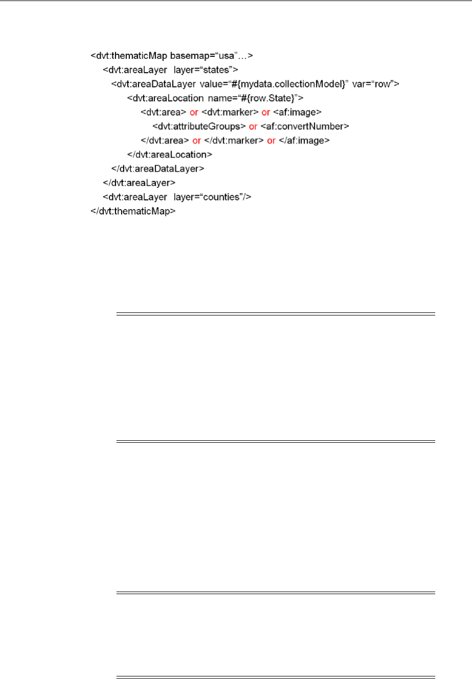
Using Thematic Map Components
25-30 Web User Interface Developer's Guide for Oracle Application Development Framework
Figure 25–21 Tag Structure for Thematic Map Area Data Layers
■Point data layer (pointDataLayer): Use to associate a map with a specific data
point or a map layer with a data collection. The data point can be specified by a
named point in a map layer, for example, cities in the USA map, or by longitude
and latitude. Using stamping, each point in the data model can be identified by a
marker, for example a circle or square, or an image.
The location of the point layer is identified in its immediate child, a
pointLocation tag. You can configure the location to specify longitude and
latitude, or by the location of the named area in the map layer. The two types of
data that can be stylized in a child tag to the pointLocation tag include:
–Marker (marker): Use to stamp out built-in or custom shapes associated with
data points on the map. Markers can be customized with different stylistic
attributes such as colors and patterns based on their underlying data.
–Images (af:image): Use to stamp out an image associated with geographical
regions of the map.
Note: When you use stamping, child components are not created for
every marker or image in a thematic map. Rather, the content of the
component is repeatedly rendered, or stamped, once per data
attribute, such as the rows in a data collection.
Each time a child component is stamped, the data for the current
component is copied into a var property used by the point layer
component in an EL Expression. Once the thematic map has
completed rendering, the var property is removed, or reverted back
to its previous value.
Note: Instead of directly specifying the style attributes for the
marker tag, you can use a child attributeGroups tag to generate
the style attribute type automatically based on categorical definitions
of the data set. If the same style attribute is set in both the marker
tags, and by an attributeGroups tag, the attributeGroups style
type will take precedence.
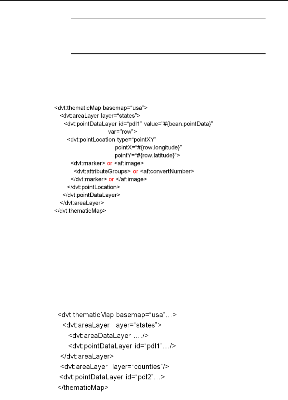
Using Thematic Map Components
Using Map Components 25-31
Figure 25–22 illustrates the basic tag structure for configuring a point data layer in
a thematic map.
Figure 25–22 Tag Structure for Configuring Thematic Map Point Data Layer
When a point data layer is configured as a direct child of the thematic map
component, the data points are always displayed as a global point layer. If the
point layer is nested inside a map layer, the data points are only displayed when
that map layer is displayed.
Figure 25–23 illustrates the tag structure for nesting point data layers. In the
illustration, point data layer pd1 is only displayed when the states layer is
displayed. Point data layer pd2 is always displayed.
Figure 25–23 Tag Structure for Nesting Thematic Map Point Data Layers
■Custom layer (customAreaLayer): Use to create a new map layer from
independent region data and insert the newly created layer into the layer
hierarchy. The custom layer is created by extending a predefined map layer and
Note: You can format a numerical value represented in the marker
tag, for example, apply a currency format, by using an
af:convertNumber tag. For more information, see Section 25.7.3,
"How to Format Numeric Data Values in Area and Marker Labels."

Using Thematic Map Components
25-32 Web User Interface Developer's Guide for Oracle Application Development Framework
aggregating the lower level regions to form the new regions in the custom layer.
After defining a custom map layer, it is used in the same way as any other map
layer
Use the child customArea component to specify the regions from the predefined
base map that will be aggregated to form the new area.
■Categorical attributes (attributeGroups): Use to generate stylistic attribute
values such as colors or shapes based on categorical data values in a data set.
An alternative to configuring a default stamp across all areas or markers in the
thematic map, you use an area or marker component child attributeGroups
tag to generate the style attribute type automatically based on categorical groups
in the data set. If the same style attribute is set in both the area or marker tag,
and by an attributeGroups tag, the attributeGroups style type will take
precedence.
Based on the attribute representing the column in the data model to group by, the
attributeGroups component can generate style values for each unique value,
or group, in the data. The type property of the attributeGroups tag specifies
the type of stylistic attribute for which values are produced. Supported types for
area components are color, pattern, and opacity. Supported types for
marker components are color, shape, pattern, opacity, scaleX, and
scaleY. These types can be combined in a space-delimited list to generate
multiple stylistic properties for each unique data value.
The default style values that are generated are defined using CSS style properties
in the ADF skin. Each attributeGroups type has a default ramp defined in the
ADF skin that can be customized by setting the index-based selectors to the
desired values.
To achieve a finer level of detail in the display of data, the grouping rules specified
in the attributeGroups component can be overridden by two types of rules
defined in these child components:
–Matching rule (attributeMatchRule): Use to substitute an attribute when
the data matches a certain value.
–Exception rule (attributeExceptionRule): Use to replace an attribute
value with another when a particular boolean condition is met.
Note: The attributeMatchRule and
attributeExceptionRule tags use a child f:attribute tag to
define the override values, where the name property defines the type
of attribute (such as color or shape), and the value property defines
the override value to use (such as red or square). When the value
property of the attributeGroups tag overrides the value in the
group property of the attributeMatchRule, then the style value in
the child f:attribute will be assigned to that group of data instead
of the next value from the default ramp.
The f:attribute tag name property must match one of the
attributes listed in the type of the attributeGroups tag grouping
rules. If the value provided by an override also happens to be in the
prebuilt ramp returned by the attributeGroups, then that value
will only be used by the overrides and will be skipped in the prebuilt
ramp.

Using Thematic Map Components
Using Map Components 25-33
■Legend (legend): Use to display an explanatory table of the map’s styled data in
symbol and label pairs. Legend components support symbols for color, shape,
custom shape, fill pattern, opacity, and images.
–Legend section (legendSection): Use one or more to point to a thematic
map area, marker, attributeGroups, or af:image components stamped
to style the data displayed in the map. Legend items sourced from the
attributeGroups component split area or marker attribute types into
different sections.
–Legend group (showLegendGroup): Use to create a disclosable section that
contains legend section components.
25.6.2 What You May Need to Know About Prebuilt Base Maps
Each base map provided for the thematic map component has two or more prebuilt
map layers that represent a set of regions. For example, the world base map includes
a map layer for continents and another layer for countries. The regions in the
lower level map layers are aggregated to make up the next level in the geographical
hierarchy. The map layer is specified in the layer attribute of the areaLayer
component.
Table 25–1 shows the valid map layers for each base map.
When you are binding your data collection to a thematic map, you must provide a
column in the data model that specifies the location of the area or point data using the
map location Ids of the regions from the base map for which the data is being
displayed. Area locations are specified in the name attribute of the areaLocation
component, and point locations are specified in the pointName attribute for the
pointLocation component when its type attribute is set to pointName. For more
information, see the "What You May Need to Know About Base Map Location Ids"
section in the Oracle Fusion Middleware Fusion Developer's Guide for Oracle Application
Development Framework.
25.6.3 Using the Layer Browser
JDeveloper provides a Layer Browser as a tool to ease the development of structuring
map layers, data layers, and styling areas and markers to display data in a thematic
map. The Layer Browser displays on top of the thematic map in the visual editor and
can be repositioned and resized. If not visible, right-click in the map and select Open
Layer Browser.
Table 25–1 Prebuilt Base Maps and Layers
Base Map Layers
usa country, states, counties, cities
world continents, countries, cities
worldRegions regions, countries, cities
africa, asia, australia,
europe, northAmerica,
southAmerica
continents, countries, cities
apac, emea,
latinAmerica,
usaAndCanada
regions, countries, cities
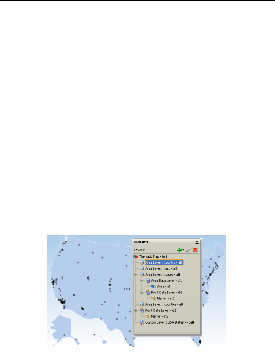
Using Thematic Map Components
25-34 Web User Interface Developer's Guide for Oracle Application Development Framework
The Layer Browser visually represents the logical structure of the thematic map and its
hierarchical map layers and components. Selection of a component in the Layer
Browser is coordinated with selection in the Property Inspector, Structure window,
and page source code.
The Layer Browser toolbar provides controls for the following operations:
■Add: Provides a dropdown menu for opening a create map layer, data layer, area,
or marker dialog to add and configure the component and add source code to the
thematic map. The menu choices are provided to maintain the correct structure of
the thematic map
■Edit: Open a data layer, area, or marker binding dialog to modify the settings for
the component and change the thematic map source code.
■Delete: Remove a selected map layer, data layer, area or marker from the thematic
map structure and source code.
The Layer Browser displays the Id for each component represented in the hierarchical
structure. Components are automatically assigned a unique, consecutively numbered
id value. Map layers (areaLayer) are assigned al1, al2, al3, and so on. Custom
layers (customAreaLayer) are assigned cal1, cal2, cal3, and then referenced by
an areaLayer component within the consecutive order. Data layers including area
(areaDataLayer) and point (pointDataLayer) components are assigned dl1,dl2,
dl3, and so on. When a point layer (pointDataLayer) is added as a direct child of
the thematic map, it is a global point layer and always displayed in the thematic map.
Markers (marker) are assigned m1, m2, m3 and so on. Areas (area) are assigned a1,
a2, a3, and so on.
Figure 25–23 shows a Layer Browser displaying the hierarchical structure of a thematic
map.
Figure 25–24 Thematic Map Layer Browser
25.6.4 How to Add a Thematic Map to a Page
When you are designing your page using simple UI-first development, you use the
Component Palette to add a thematic map to a JSF page. When you drag and drop a
thematic map component onto the page, the Component Gallery displays available
base maps, prebuilt regional layers, and a custom layer option to provide visual
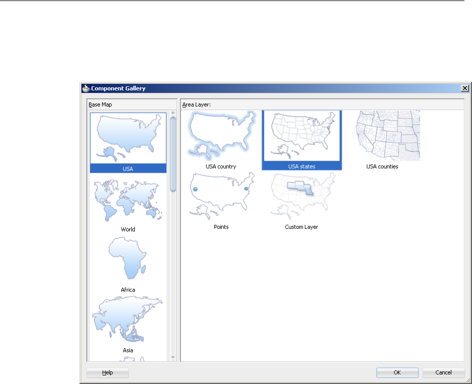
Using Thematic Map Components
Using Map Components 25-35
assistance when creating thematic maps. Figure 25–25 show the Component Gallery
for thematic maps with the United States base map and states layer selected.
Figure 25–25 Component Gallery for Thematic Maps
Once you complete the dialog, and the thematic map is added to your page, you can
use the Property Inspector to specify data values and configure additional display
attributes for the map.
In the Property Inspector you can use the dropdown menu for each attribute field to
display a property description and options such as displaying an EL Expression
Builder or other specialized dialogs. Figure 25–26 shows the dropdown menu for a
thematic map component tooloTipDisplay attribute.
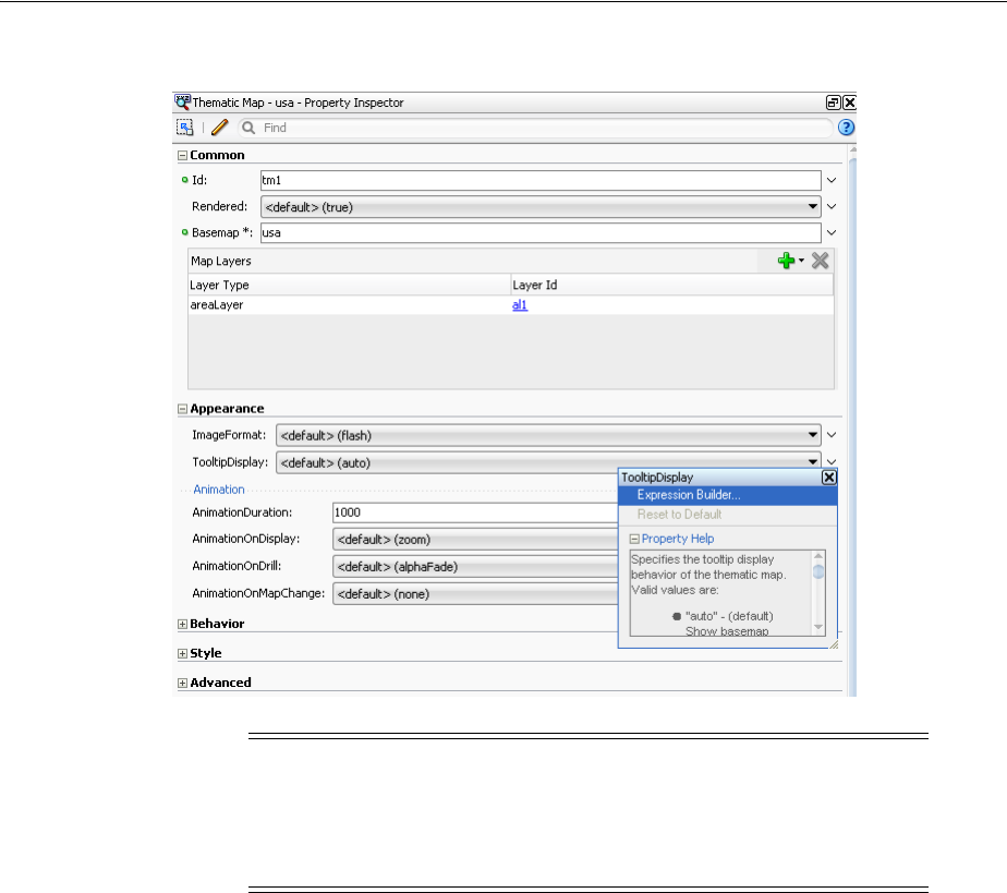
Using Thematic Map Components
25-36 Web User Interface Developer's Guide for Oracle Application Development Framework
Figure 25–26 Thematic Map ToolTipDisplay Attribute Dropdown Menu
Before you begin:
It may be helpful to have an understanding of how thematic map attributes and
thematic map child components can affect functionality. For more information, see
Section 25.6.1, "Configuring Thematic Maps."
You may also find it helpful to understand functionality that can be added using other
ADF Faces features. For more information, see Section 25.1.3, "Additional
Functionality for Map Components."
To add a thematic map to a page:
1. In the Component Palette, from the ADF Data Visualizations page, in the Map
panel, drag and drop a Thematic map onto the page to open the Create Thematic
Map dialog in the Component Gallery.
Use the dialog to select the thematic map base map and layer in the prebuilt map
hierarchy that you want the thematic map to display. If you need help, press F1 or
click Help.
2. In the Property Inspector, view the attributes for the thematic map. Use the help
button to display the complete tag documentation for the thematicMap
component.
3. Expand the Common section. Use this section to set the following attributes:
Note: If your application uses the Fusion technology stack, then you
can use data controls to create a thematic map and the binding will be
done for you. For more information, see the "Creating Databound
Thematic Maps" section in the Oracle Fusion Middleware Fusion
Developer's Guide for Oracle Application Development Framework
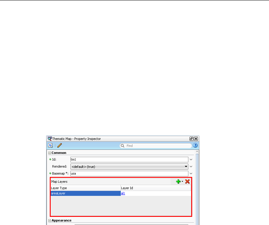
Using Thematic Map Components
Using Map Components 25-37
■Basemap: If you want to change the base map selected in the Component
Gallery, use the dropdown list to select any of the following valid values: usa,
world, africa, asia, australia, europe, northAmerica, southAmerica, apac,
emea, latinAmerica, usaAndCanada, or worldRegions.
■Map Layers: Use the dialog that displays inside the Property Inspector to add
additional map layers you wish to display in the thematic map. For example,
the USA base map includes a map layer for the country, the states, the
counties, the cities (points), and a custom layer. Use the dropdown list
associated with the Add icon to add available map layers in the predefined
geographic hierarchy, to create a custom map layer and insert it into the
hierarchy, or to add a global point layer into the base map. Use the Delete icon
to delete a layer you do not wish to display in the thematic map. Figure 25–27
shows the map layers dialog outlined in the Property Inspector for the
thematicMap component.
Figure 25–27 Map Layers Dialog in the Property Inspector
Alternatively, you can use the Layer Browser to add map layers to the
thematic map. For more information, see Section 25.6.3, "Using the Layer
Browser."
4. Expand the Appearance section. Use this section to set the following attributes:
■ImageFormat: Use the dropdown list to select the image format with which to
display the thematic map. By default, thematic maps are displayed with a
Flash player. For more information, see Section 25.6.6, "What You May Need to
Know About Flash and PNG Image Formats."
■TooltipDisplay: By default (auto), thematic maps automatically display
tooltips using prebuilt map labels when the user moves the cursor over the
map. If data is available, the label is concatenated with the shortDesc
attribute from the area or marker component stamp. Other valid values
include none to disable the display of tooltips, and shortDesc to display only
the data coming from the stamps, not including the prebuilt label of the base
map. For more information, see Section 25.7, "Customizing Thematic Map
Display Attributes."
■Animation subsection: Use the animation attributes in this subsection to
configure animation in thematic maps. For more information, see
Section 25.8.3, "How to Configure Animation Effects."
5. Expand the Behavior section. Use this section to set the following attributes:
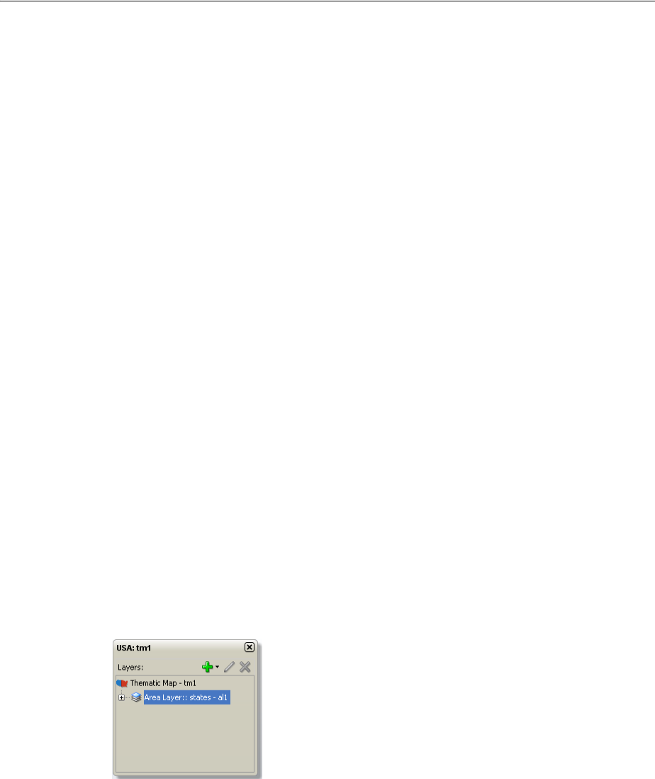
Using Thematic Map Components
25-38 Web User Interface Developer's Guide for Oracle Application Development Framework
■Drilling: Use to enable drilling the data view between thematic map layers.
From the dropdown list select on to enable drilling. The default value is off.
■MaintainDrill: Use to specify an optional true value for maintaining the
drilled state of a previously drilled area when a new area is drilled. The
default value is false.
■DrillBehavior: Use to specify an optional zoomToFit effect on the area being
drilled. The default value is none.
■ControlPanelBehavior: Use the dropdown list to select the display of the
thematic map control panel. The default value is initCollapsed for only
display of the hide/show button. Other valid values include hidden and
initExpanded.
■FeaturesOff: Enter a space delimited list of end user features to disable at
runtime. Valid values are pan, zoom, and zoomToFit. The default value is
none.
6. Expand the Other category. For the Summary attribute, enter a description of the
thematic map. This description is accessed by screen reader users.
25.6.5 What Happens When You Add a Thematic Map to a Page
When you use the Component Palette to create a thematic map, JDeveloper inserts
code in the JSF page. Example 25–7 shows the code inserted in the JSF page.
Example 25–7 Thematic Map Code In JSF Page
<dvt:thematicMap basemap="usa" id="tm1">
<dvt:areaLayer layer="states" id="al1"/>
</dvt:thematicMap>
The Layer Browser displays the hierarchical structure of the thematic map.
Figure 25–28 shows the Layer Browser after using the Component Palette to create a
thematic map.
Figure 25–28 Thematic Map Layer Browser
You can then configure the thematic map to display data in stylized areas or markers
using the ADF Data Controls panel and the thematic map binding dialogs. For
information about configuring thematic maps to display data, see the "Creating
Databound Thematic Maps" section in the Oracle Fusion Middleware Fusion Developer's
Guide for Oracle Application Development Framework.
25.6.6 What You May Need to Know About Flash and PNG Image Formats
By default, thematic maps are displayed using a Flash player and a Portable Network
Graphics (PNG) output format is used when printing thematic maps. Both Flash and

Customizing Thematic Map Display Attributes
Using Map Components 25-39
PNG image formats support bi-directional locales. Static rendering, such as
maintaining pan and zoom state of the Flash display, is fully supported in the
printable PNG image.
In order to display thematic maps, do not disable the use of Flash content across the
entire application by setting a flash-player-usage context parameter in
adf-config.xml. For more information, see Section A.4.3, "Configuring Flash as
Component Output Format."
25.7 Customizing Thematic Map Display Attributes
You can customize the display attributes of thematic maps labels, including prebuilt
map layer labels and labels for area and marker components that stamp out the data
values for the thematic map. Data values that require special formatting, for example,
currency or percentages, can be configured to display special symbols and decimal
points. You can also configure tooltips to display data when the user moves the cursor
over the map.
25.7.1 How to Customize Thematic Map Labels
By default, each region in each map layer for a prebuilt base map has a label with a
short and long type, for example, BRA and Brazil in the countries layer of the
world base map. The map layer is specified by the areaLayer component in the
layer attribute, for example:
<dvt:areaLayer id="al1" layer="countries">
Figure 25–29 shows the default labels for the europe and usa base maps.
Figure 25–29 Default Labels for Europe and USA Base Maps
You can customize the default labels provided by the base map for display and style.
Note: Labels are only displayed when they fit within the named
region of the map layer. When a label does not fit inside the region, it
is not displayed unless leader lines determining the alternate label
location are provided for that layer in the base map. Only the prebuilt
usa map provides leader lines for labels outside the states layer.

Customizing Thematic Map Display Attributes
25-40 Web User Interface Developer's Guide for Oracle Application Development Framework
Before you begin:
It may be helpful to have an understanding of how thematic map attributes and
thematic map child components can affect functionality. For more information, see
Section 25.6.1, "Configuring Thematic Maps."
You should already have a thematic map on your page. If you do not, follow the
instructions in this chapter to create a thematic map. For more information, see
Section 25.6.4, "How to Add a Thematic Map to a Page."
To customize a map layer label:
1. In the Structure window, right-click the dvt:areaLayer component representing
the map layer for which you wish to customize the label, and select Go to
Properties.
2. In the Property Inspector, expand the Appearance section, and set the following
attributes:
■LabelDisplay: Use the dropdown list to select how the prebuilt base map
labels for the layer are to be displayed. Valid values are: auto (default) to
display the label if there is sufficient space in the region; on to display the base
map labels for all regions of this layer; and off to disable the display of labels.
■LabelStyle: Enter the font-related CSS styles to use for the label font.
■LabelType: Use the dropdown list to select the prebuilt base map labels to
display. Valid values are short (default) to display the short labels defined in
the base map, for example, TX, and long to display the long labels defined in
the base map, for example, Texas.
You can also override the default labels in the base map by specifying attributes for
the area components that stamp out stylistic attributes such as fill colors, patterns, or
opacity onto the geographic regions of the map, and for marker components that
stamp out built-in or custom shapes associated with data points on the map.
To customize area and marker labels:
1. In the Structure window, right-click the dvt:aler component or dvt:areaGraph
component representing the stamp for which you wish to customize the label, and
select Go to Properties.
2. In the Property Inspector, expand the Other section, and set the following
attributes:
■LabelDisplay: Use the dropdown list to select on to display the text displayed
in the value attribute.
■Value: Enter the text you wish to use for the area or marker label when
LabelDisplay is set to on.
■LabelStyle: Enter the font-related CSS styles to use for the area or marker label
font.
■LabelPosition: Available only for the marker label. Use the dropdown list to
select the position relative to the marker that the specified value label should
be displayed. Valid values are center (default), top, and bottom.
Note: If a marker is displayed on a region, that is as a child
component to a pointLocation for an areaDataLayer, and that
marker has a label, then the label associated with the base map region
will not be displayed.

Customizing Thematic Map Display Attributes
Using Map Components 25-41
■ShortDesc: Enter the short description you wish to use for the area or marker
stamp. This value is used for the tooltip that displays when the user moves the
cursor over the area or marker. For more information, see Section 25.7.2, "How
to Configure Tooltips to Display Data."
25.7.2 How to Configure Tooltips to Display Data
By default, thematic maps automatically display tooltips using map layer labels when
the user moves the cursor over the map. If data is available, the map layer label is
concatenated with the value from the area or marker component stamp. You can
also configure the tooltip to only display available data.
Before you begin:
It may be helpful to have an understanding of how thematic map attributes and
thematic map child components can affect functionality. For more information, see
Section 25.6.1, "Configuring Thematic Maps."
You should already have a thematic map on your page. If you do not, follow the
instructions in this chapter to create a thematic map. For more information, see
Section 25.6.4, "How to Add a Thematic Map to a Page."
To configure tooltips to display data:
1. In the Structure window, right-click the dvt:thematicMap component and select
Go to Properties.
2. In the Property Inspector, expand the Appearance section. For the TooltipDisplay
attribute choose auto to display the label concatenated with the value of the area
or marker stamp, or shortDesc to only display the value.
3. In the Structure window, right-click the dvt:area component or dvt:marker
component representing the stamp for which you wish to display data in the
tooltip, and select Go to Properties.
4. In the Property Inspector, expand the Other section. For the ShortDesc attribute
enter the value you want to display in the tooltip. For example, if an area
component value attribute is #{row.data}, use that same value for the
shortDesc attribute.
25.7.3 How to Format Numeric Data Values in Area and Marker Labels
Thematic map area and marker components can display numeric data values in
labels, for example a dollar value, or a percentage. Area and marker labels are
specified in the value attribute of the component. You can format numeric data
values by adding a standard ADF converter, af:convertNumber, as a child of the
area or marker component, or by specifying a converter through an EL Expression
directly on the component. If both a converter and a child af:convertNumber tag
are specified, then the properties of the child tag take precedence.
Before you begin:
It may be helpful to have an understanding of how thematic map attributes and
thematic map child components can affect functionality. For more information, see
Section 25.6.1, "Configuring Thematic Maps."
You should already have a thematic map on your page. If you do not, follow the
instructions in this chapter to create a thematic map. For more information, see
Section 25.6.4, "How to Add a Thematic Map to a Page."

Adding Interactivity to Thematic Maps
25-42 Web User Interface Developer's Guide for Oracle Application Development Framework
You should already have configured an area or marker label in your thematic map. If
you do not, follow the instructions in this chapter to customize an area or marker
label. For more information, see Section 25.7.1, "How to Customize Thematic Map
Labels."
To format numeric data values in area or maker labels:
1. In the Structure window, right-click the dvt:area or dvt:marker component
representing the stamp you wish to format, and choose insert inside dvt:area or
insert inside dvt:marker > Convert number.
2. In the Property Inspector, specify values for the attributes of the
af:convertNumber component to produce numeric formatting. Use the help
button to display the complete tag documentation for the af:convertNumber
component.
Example 25–8 shows sample code for formatting numeric data values for an area and a
marker label.
Example 25–8 Sample Code for Area and Marker Numeric Data Value Formatting
...
<dvt:area id="a2" labelDisplay="on" value="#{mapBean.value}" >
<af:convertNumber id="cn1" type="currency"/>
</dvt:area>
<dvt:marker id="m2" labelDisplay="on" value="#{mapBean.value}" >
<af:convertNumber id="cn1" type="currency"/>
</dvt:marker>
...
Alternatively, specify a converter through an EL expression directly on the area or
marker component. For example:
<dvt:marker id="m1" labelDisplay="on" value="#{mapBean.value}"
converter="#{mapBean.myConverter}"/>
25.8 Adding Interactivity to Thematic Maps
Thematic maps include support for interaction features including selection and action
events, drilling, popups, animation, and drag and drop operations.
25.8.1 How to Configure Selection and Action Events in Thematic Maps
You can configure your thematic map components to allow users to select one or more
areas or markers across multiple data layers. By default, selection is not enabled.
You configure selection on areaDataLayer and pointDataLayer components to
allow selection of one or multiple area or marker stamps.
Once selection is enabled, you can configure an area or marker stamp with an action
listener to specify and handle a custom event such as displaying output text or
navigating to another page. For more information about ADF action events, see
Chapter 6, "Handling Events."
Figure 25–30 shows a thematic map configured to display output text when a human
marker is clicked, and navigate to another JSF page when a circle marker is clicked.
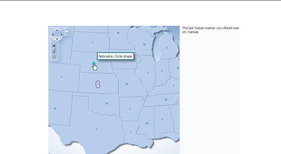
Adding Interactivity to Thematic Maps
Using Map Components 25-43
Figure 25–30 Thematic Map Action Events
Before you begin:
It may be helpful to have an understanding of how thematic map attributes and
thematic map child components can affect functionality. For more information, see
Section 25.6.1, "Configuring Thematic Maps."
You should already have a thematic map on your page. If you do not, follow the
instructions in this chapter to create a thematic map. For more information, see
Section 25.6.4, "How to Add a Thematic Map to a Page."
You should have already configured a data layer with an area or marker to display
data on your thematic map.
To configure selection and action events:
1. In the Structure window, right-click the dvt:areaDataLayer or dvt:pointDataLayer
component and select Go to Properties.
2. In the Property Inspector, expand the Behavior section. For the SelectionMode
attribute choose single to enable single selection of an area or marker, or multiple
to enable multiple selection of areas or markers.
3. In the Structure window, right-click the dvt:area component or dvt:marker
component representing the stamp for which you wish to configure an action
event, and select Go to Properties.
4. In the Property Inspector, expand the Behavior section. In this section set the
following attributes:
■Action: Enter a reference to an action method sent by the component, or the
static outcome of an action. For example, mapAction.
■ActionListener: Enter a method reference to an action listener. For example,
#{tmapEventBean.processClick}
shows sample code for configuring markers to fire action events.
Example 25–9 Sample Code for Thematic Map Marker Action Events
<f:facet name="center">
<dvt:thematicMap id="thematicMap"

Adding Interactivity to Thematic Maps
25-44 Web User Interface Developer's Guide for Oracle Application Development Framework
imageFormat="flash" basemap="usa"
inlineStyle="width:98%;height:95%;"
summary="Thematic map showing action events">
<dvt:areaLayer id="areaLayer" layer="states"
labelDisplay="off">
<dvt:areaDataLayer id="dataLayer"
contentDelivery="immediate"
value="#{tmapBean.colorModel}"
var="row"
varStatus="rowStatus"
selectionMode="single">
<dvt:areaLocation id="dataLoc"
name="#{row.name}">
<dvt:marker id="marker1"
shape="human" scaleX="3"
scaleY="3"
fillColor="#666699"
actionListener="#{tmapEventBean.processClick}"
rendered="#{row.category == 'category1'}"
shortDesc="Human shape"/>
<dvt:marker id="marker2"
shape="circle"
scaleX="2" scaleY="2"
fillColor="#006666"
action="mapAction"
rendered="#{row.category == 'category2'}"
shortDesc="Circle shape"/>
</dvt:areaLocation>
</dvt:areaDataLayer>
</dvt:areaLayer
</dvt:thematicMap>
</f:facet>
<f:facet name="end">
<af:outputText value="#{tmapEventBean.clickString}"
id="ot1"
partialTriggers="thematicMap:areaLayer:dataLayer:marker1"/>
</f:facet>
You can also configure an area or point data layer with a selection listener for
declarative master-detail processing, for example, to display the thematic map
associated data in another UI component on the page such as a table. For more
information, see the "What You May Need to Know About Master-Detail Processing"
section in the Oracle Fusion Middleware Fusion Developer's Guide for Oracle Application
Development Framework.
25.8.2 How to Add Popups to Thematic Map Areas and Markers
Thematic map area and marker components can be configured to display popup
dialogs, windows, and menus that provide information or request input from end
users. Using the af:popup component with other ADF Faces components, you can
configure functionality to allow your end users to show and hide information in
secondary windows, input additional data, or invoke functionality such as a context
menu.
With ADF Faces components, JavaScript is not needed to show or hide popups. The
af:showPopupBehavior tag provides a declarative solution, so that you do not
have to write JavaScript to open a popup component or register a script with the
popup component. For more information about these components, see Chapter 15,
"Using Popup Dialogs, Menus, and Windows."
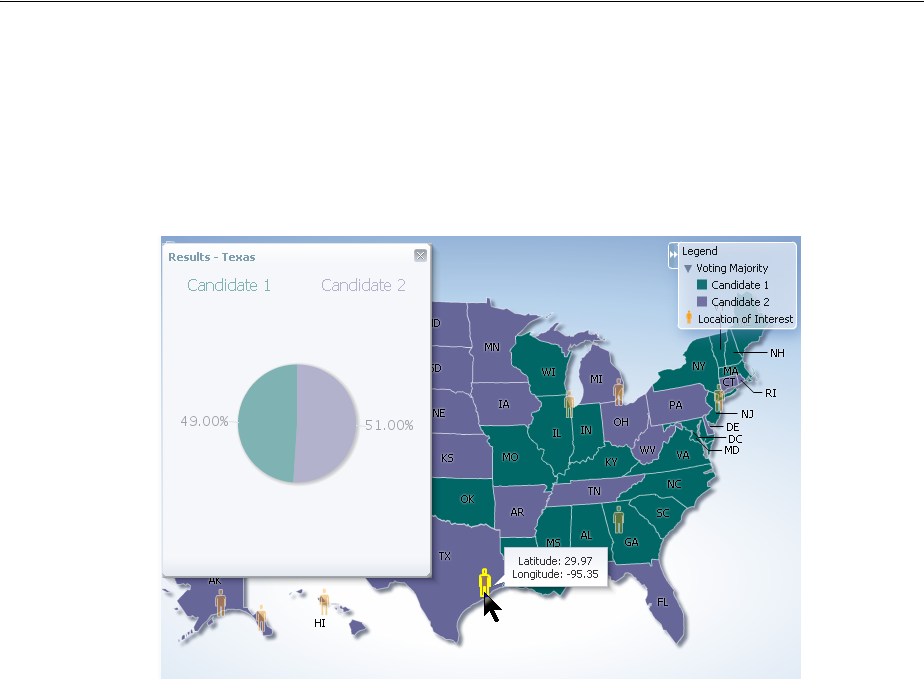
Adding Interactivity to Thematic Maps
Using Map Components 25-45
For example, you may want to associate a popup to display information in a dialog or
note window with thematic map areas or markers. Figure 25–31 shows a thematic map
area (Texas) clicked to display a dialog of data about voting results, and the cursor
hovered over marker (human) displaying a note window of data about a specific
location.
Figure 25–31 Area Dialog and Marker Note Window
Before you begin:
It may be helpful to have an understanding of how thematic map attributes and
thematic map child components can affect functionality. For more information, see
Section 25.6.1, "Configuring Thematic Maps."
You should already have a thematic map on your page. If you do not, follow the
instructions in this chapter to create a thematic map. For more information, see
Section 25.6.4, "How to Add a Thematic Map to a Page."
You should already have created the popup components for the thematic map area or
marker components to reference. Example 25–10 shows sample code for the dialog to
be referenced when an area stamp is clicked.
Example 25–10 Code Sample for the Area Dialog Popup
<af:popup id="pop1" contentDelivery="lazyUncached" launcherVar="source"
eventContext="launcher">
<af:setPropertyListener from="#{tmapPopupBean.colorModel.rowData}"
to="#{tmapPopupBean.source}"
type="popupFetch"/>
<af:dialog id="nw1" modal="false" type="none"
title="Results - #{tmapPopupBean.source.fullName}">
<af:panelGroupLayout id="pgl6">
<af:panelGroupLayout id="pgl7" layout="horizontal"
halign="center">
<af:outputText value="Candidate 1" id="ot2"
inlineStyle="color:#{tmapPopupBean.strColor2};
font-size:medium;"/>
<af:spacer width="50" height="10" id="spacer1"/>
<af:outputText value="Candidate 2" id="ot1"

Adding Interactivity to Thematic Maps
25-46 Web User Interface Developer's Guide for Oracle Application Development Framework
inlineStyle="color:#{tmapPopupBean.strColor1};
font-size:medium;"/>
</af:panelGroupLayout>
<af:panelGroupLayout id="pgl5" layout="horizontal"
halign="center">
<dvt:pieGraph id="graph1" subType="PIE"
inlineStyle="height:250.0px;width:250.0px"
tabularData="#{tmapPopupBean.graphData[tmapPopupBean.source]}"
imageFormat="PNG">
<dvt:background fillTransparent="true"/>
<dvt:graphPieFrame fillTransparent="true"/>
<dvt:seriesSet>
<dvt:series index="0" color="#{tmapPopupBean.color1}"/>
<dvt:series index="1" color="#{tmapPopupBean.color2}"/>
</dvt:seriesSet>
<dvt:sliceLabel rendered="true">
<dvt:graphFont id="graphFont1" size="14"/>
</dvt:sliceLabel>
<dvt:pieLabel rendered="false"/>
<dvt:legendArea rendered="false"/>
</dvt:pieGraph>
</af:panelGroupLayout>
</af:panelGroupLayout>
</af:dialog>
</af:popup>
Example 25–11 shows sample code for the note window to be referenced when the
user hovers the mouse over a marker stamp.
Example 25–11 Sample Code for Marker Note Window
<af:popup id="pop2" contentDelivery="lazyUncached" launcherVar="source"
eventContext="launcher">
<af:setPropertyListener from="#{tmapPopupBean.pointModel.rowData}"
to="#{tmapPopupBean.noteSource}"
type="popupFetch"/>
<af:noteWindow id="nw2">
<af:panelGroupLayout id="pgl8" halign="center" layout="vertical">
<af:outputText value="Latitude: #{tmapPopupBean.noteSource.latitude}"
id="ot4"/>
<af:outputText value="Longitude: #{tmapPopupBean.noteSource.longitude}"
id="ot5"/>
</af:panelGroupLayout>
</af:noteWindow>
</af:popup>
For more information about popup components, see Chapter 15, "Using Popup
Dialogs, Menus, and Windows."
To add a popup to an area or marker:
1. In the Structure window, right-click the dvt:area or dvt:marker component and
choose insert inside dvt:area or insert inside dvt:marker > Show Popup
Behavior.
2. In the Property Inspector, set the following attributes:
■PopupId: Enter the ID of the popup referenced by the area or marker
component. An ID beginning with a colon will be treated as absolute after
trimming off the colon.

Adding Interactivity to Thematic Maps
Using Map Components 25-47
■TriggerType: Enter the event type that will trigger the popup being displayed.
Valid values for thematic map area or marker components are action, click
and mouseHover.
■Align: From the dropdown list, choose how the popup should be aligned with
the area or marker component.
■AlignID: Enter the ID of the area or marker component associated with the
popup. An ID beginning with a colon will be treated as absolute after
trimming off the colon.
Example 25–12 shows sample code for adding popup components to the area and
marker stamps in a thematic map.
Example 25–12 Popups Associated With Area and Marker Components
<dvt:thematicMap id="thematicMap" imageFormat="flash
basemap="usa" summary="Thematic map showing voting data in US">
<dvt:legend label="Legend">
<dvt:showLegendGroup label="Voting Majority">
<dvt:legendSection source="areaLayer:dataLayer:area1"/>
</dvt:showLegendGroup>
<dvt:legendSection source="areaLayer:pointLayer:marker1"/>
</dvt:legend>
<dvt:areaLayer id="areaLayer" layer="states">
<dvt:areaDataLayer id="dataLayer" contentDelivery="immediate"
value="#{tmapPopupBean.colorModel}"
var="row" varStatus="rowStatus">
<dvt:areaLocation id="areaLoc" name="#{row.name}">
<dvt:area id="area1"
fillColor="#{row.value > 50 ? tmapPopupBean.color1 :
tmapPopupBean.color2}"
<f:attribute name="legendLabel" value="#{row.value > 50 ? 'Candidate 2' :
'Candidate 1'}" />
<af:showPopupBehavior triggerType="click"
popupId="::::pop1"
alignId="area1"
align="endAfter"/>
</dvt:area>
</dvt:areaLocation>
</dvt:areaDataLayer>
<dvt:pointDataLayer id="pointLayer"
value="#{tmapPopupBean.pointModel}" var="row"
varStatus="rowStatus"
contentDelivery="immediate">
<dvt:pointLocation id="pointLoc" type="pointXY"
pointX="#{row.longitude}"
pointY="#{row.latitude}">
<dvt:marker id="marker1" shape="human" fillColor="#FF9900"
scaleX="3" scaleY="3"
<f:attribute name="legendLabel" value="Location of Interest" />
<af:showPopupBehavior triggerType="mouseHover"
alignId="marker1"
popupId="::::pop2"
align="endAfter"/>
</dvt:marker>
</dvt:pointLocation>
</dvt:pointDataLayer>
</dvt:areaLayer>
</dvt:thematicMap>

Adding Interactivity to Thematic Maps
25-48 Web User Interface Developer's Guide for Oracle Application Development Framework
25.8.3 How to Configure Animation Effects
By default, thematic maps are animated upon initial rendering of the map, when the
data associated with the map changes, and when a region is drilled in the map. You
can customize the default setting of each animation event.
Before you begin:
It may be helpful to have an understanding of how thematic map attributes and
thematic map child components can affect functionality. For more information, see
Section 25.6.1, "Configuring Thematic Maps."
You should already have a thematic map on your page. If you do not, follow the
instructions in this chapter to create a thematic map. For more information, see
Section 25.6.4, "How to Add a Thematic Map to a Page."
To customize animation effects in a thematic map:
1. In the Structure window, right-click the thematicMap component and select Go to
Properties.
2. In the Property Inspector, expand the Appearance section. Use this section to set
the following attributes:
■AnimationDuration: Enter the animation duration in milliseconds. The
default value is 1000.
■AnimationOnDisplay: Use the dropdown list to select the animation effect
upon initial display of the thematic map. The default value is zoom.
■AnimationOnDrill: Use the dropdown list to select the animation effect when
a map layer is drilled to a lower level. The default value is alphaFade.
■AnimationOnMapChange: Use the dropdown list to select the animation
effect when the value of the area or point data layer changes, or when the base
map changes. The default value is none.
Table 25–2 shows the animation effect available for each supported thematic map
event.
Table 25–2 Thematic Map Animation Effects
Animation Effect AnimationOnDisplay AnimationOnDrill AnimationOnMapChange
none xxx
alphaFade xxx
conveyorFromLeft xx
conveyorFromRight xx
cubeToLeft xx
cubeToRight xx
flipLeft xxx
flipRight xx
slideToLeft xx
slideToRight xx
transitionToLeft xx
transitionToRight xx
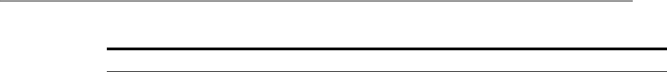
Adding Interactivity to Thematic Maps
Using Map Components 25-49
25.8.4 How to Add Drag and Drop to Thematic Map Components
The ADF Faces framework provides the ability to drag and drop items from one place
to another on a page. For thematic maps, area and marker components can be used
as a drag source by adding and configuring a child af:dragSource component, and
areaLayer components can be used as a drop target by adding and configuring a
child af:dropTarget component. For example, you could drag an area representing
the population for a state in a USA map and drop it into a table to display the data.
Before you begin:
It may be helpful to have an understanding of how thematic map attributes and
thematic map child components can affect functionality. For more information, see
Section 25.6.1, "Configuring Thematic Maps."
You should already have a thematic map on your page. If you do not, follow the
instructions in this chapter to create a thematic map. For more information, see
Section 25.6.4, "How to Add a Thematic Map to a Page."
To use an area or marker as a drag source:
1. In the Structure window, right-click the area or marker component you are
configuring as a drag source, and select insert inside dvt:area or insert inside
dvt:marker > Drag source.
2. In the Property Inspector, specify the actions attribute.
Example 25–13 shows sample code for adding and configuring an area as a drag
source.
Example 25–13 Sample Code for Area as a Drag Source
<dvt:area id="area" fillColor="#{tmapTargetActualBean.colorObj}"
shortDesc="#{tmapTargetActualBean.tooltip}">
<af:dragSource actions="COPY" discriminant="DnDDemoModel"/>
</dvt:area>
To use a map layer as a drop target:
1. In the Structure window, right-click the areaLayer component you are
configuring as a drop target, and select insert inside dvt:areaLayer > Drop target.
2. Enter an expression for the dropListener that evaluates to a method on a
managed bean that will handle the event.
3. In the managed bean referenced in the EL expression created in Step 2 for the
dropListener attribute, create the event handler method (using the same name
as in the EL expression) that will handle the drag and drop functionality.
Example 25–14 shows sample code for adding and configuring a map layer as a drop
target.
Example 25–14 Sample Code for Area Layer as a Drop Target
<dvt:areaLayer id="areaLayer" layer="states">
<af:dropTarget actions="COPY"
zoom xx
Table 25–2 (Cont.) Thematic Map Animation Effects
Animation Effect AnimationOnDisplay AnimationOnDrill AnimationOnMapChange

Adding Interactivity to Thematic Maps
25-50 Web User Interface Developer's Guide for Oracle Application Development Framework
dropListener="#{TestDropHandler.handleCollectionFireDrop}">
<af:dataFlavor flavorClass="java.util.Collection"/>
</af:dropTarget>
</dvt:areaLayer>
For more information about adding drag and drop functionality, see Section 33.5,
"Adding Drag and Drop Functionality for Components."

26
Using Gantt Chart Components 26-1
26Using Gantt Chart Components
This chapter describes how to display data in Gantt charts using the ADF Data
Visualization projectGantt, resourceUtilizationGantt, and
schedulingGantt components. If your application uses the Fusion technology stack,
then you can use data controls to create Gantt charts. For more information, see the
"Creating Databound Gantt Charts" section in the Oracle Fusion Middleware Fusion
Developer's Guide for Oracle Application Development Framework.
This chapter includes the following sections:
■Section 26.1, "About Gantt Chart Components"
■Section 26.2, "Using Gantt Chart Components"
■Section 26.3, "Customizing Gantt Chart Legends, Toolbars, and Context Menus"
■Section 26.4, "Working with Gantt Chart Tasks and Resources"
■Section 26.5, "Specifying Nonworking Days, Read-Only Features, and Time Axes"
■Section 26.6, "Printing a Gantt Chart"
■Section 26.7, "Using Gantt Charts as a Drop Target or Drag Source"
26.1 About Gantt Chart Components
A Gantt chart is a type of horizontal bar graph that you use to plan and track projects.
It shows resources or tasks in a time frame with a distinct beginning and end. A Gantt
chart component is composed of two regions, one displaying the Gantt chart data in a
table, and the other displaying the Gantt chart data graphically with a resizable splitter
between the two regions. The table and chart regions share the same data and
selection model, supporting and synchronizing scrolling, and expanding and
collapsing of rows between the two regions.
At runtime, Gantt charts provide interaction capabilities in the table region to the user
such as entering data, expanding and collapsing rows, showing and hiding columns,
navigating to a row, and sorting and totaling columns. In the chart region, users can
drag a task to a new date, select multiple tasks to create dependencies, and extend the
task date. A Gantt chart toolbar is available to support user operations such as
changing or filtering the view of the data, and creating, deleting, cutting, copying, and
pasting tasks.
Both Gantt chart regions are based on an ADF Faces tree table component. For more
information about ADF tree tables, including virtualization of rows, see Chapter 12,
"Using Tables and Trees."
ADF Gantt chart components include a project Gantt chart, a resource utilization Gantt
chart, and a scheduling Gantt chart.

About Gantt Chart Components
26-2 Web User Interface Developer's Guide for Oracle Application Development Framework
26.1.1 End User and Presentation Features
To understand how Gantt charts are used and can be customized, it is helpful to
understand these elements and features:
26.1.1.1 Scrolling, Zooming, and Panning
The Gantt chart design lets you perform horizontal scrolling of the table and the chart
regions independently. This is especially helpful when you want to hold specific task
or resource information constant in the table region while scrolling through multiple
time periods of information in the chart region.
Users can also zoom in and out on the time scale of a Gantt chart by holding the Ctrl
key and using the mouse scroll wheel. A tooltip displays to allow the user to keep
track of the current level when zooming through multiple levels at a time. This is
especially useful for users with a scroll wheel without a click function.
In project and scheduling Gantt charts, users can pan the chart area by dragging it
vertically and horizontally using the cursor. A move cursor displays when the user
clicks inside the chart area, other than on a task.
26.1.1.2 Selection
This feature provides access to the rowKeys of the selected tasks in the scheduling
Gantt chart and the selected time buckets in the resource utilization Gantt chart
components. Furthermore, this feature will allow access to the rowKeys of the
currently selected task in the scheduling Gantt and the currently selected time bucket
in the resource utilization Gantt. By default, the project Gantt chart provides access to
the scheduled tasks.
26.1.1.3 How to Navigate to a Specific Date in a Gantt Chart- Navigation and
Display
You can move the chart region of the Gantt chart rapidly to a specific date.
To navigate to a specific date in a Gantt chart:
1. From the View menu, choose Go to Date.
2. In the Go to Date dialog, specify the desired date by clicking the Select Date icon
and indicating the date in the calendar.
3. Click OK.
The display of the chart region of the Gantt chart begins at the date you requested.
26.1.1.4 How to Control the Visibility of Columns in the Table Region
By default, all the columns that you define when you create a databound Gantt chart
are visible in the table region. You can selectively cause one or more of these columns
to be hidden.
To control the display of columns in the table region of a Gantt chart:
1. From the View menu, select List Pane.
2. From the context menu, select Columns.
3. In the Columns menu, deselect any column that you want to be hidden in the table
region of the Gantt chart. You can also select any column that you want to make
visible in the table region.
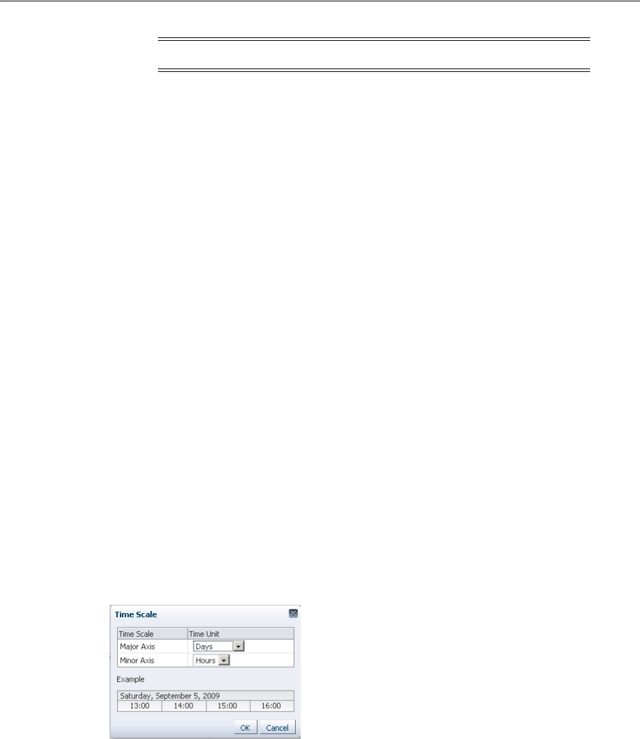
About Gantt Chart Components
Using Gantt Chart Components 26-3
26.1.1.5 Navigating in a Gantt Chart
You can browse through Gantt chart regions by scrolling, or you can access a specific
date in the chart region. You can also control if columns in the table region are visible.
26.1.1.6 How to Display Data in a Hierarchical List or a Flat List
If a Gantt chart is using a hierarchical data model, then you have the option of
displaying all the Gantt chart data in a collapsed form or in an expanded form.
To control the display of Gantt chart data in a list:
1. From the View menu, select List Pane.
2. From the ensuing menu, select either Show As List, for an expanded list, or Show
As Hierarchy, for a collapsed list.
26.1.1.7 How to Change the Gantt Chart Time Scale
You can change the time scale display in a Gantt chart and you can zoom in and out
on a time axis to display the chart region in different time units. You can also use a
specialized zoom-to-fit feature in which you select the amount of time that you want
to display in the chart region without a need to scroll the chart.
To change the settings of a time axis:
1. From the View menu, select Time Scale.
2. In the ensuing Time Scale dialog, in the Time Unit column, select a new unit value
for either the major axis, the minor axis, or both axes. A sample box displays
sample settings for the time unit that you select. Figure 26–1 shows the Time Scale
dialog.
Figure 26–1 Time Scale Dialog
3. Click OK.
To zoom in or out on a time axis:
1. Optionally, on the toolbar, click the Zoom In icon to display the time axis at a
lower level time unit.
2. Optionally, on the toolbar, click the Zoom Out icon to display the time axis at a
higher level time unit.
3. Optionally, in the box on the toolbar after the zoom icons, select a time period that
represents the amount of time on the chart that you want to display without the
need to scroll.
Note: You must keep at least one column visible in the table region.

About Gantt Chart Components
26-4 Web User Interface Developer's Guide for Oracle Application Development Framework
4. Optionally, right-click the time axis for which you wish to change the scale and
select an available time unit from the submenu.
26.1.1.8 Server-Side Events
When a user interaction involves a change in data, the Gantt chart processes the
change by performing validation, event handling, and update of the data model.
Validation ensures that the data submitted meets basic requirements, for example, that
a date is valid and does not fall into a nonworking time period. When validation fails,
the update of the data model is omitted, and an error message is returned.
When a Gantt chart server-side event is fired, an event with validated information
about the change is sent to the registered listener. The listener is then responsible for
updating the underlying data model. A customized event handler can be registered by
specifying a method binding expression on the dataChangeListener attribute of
the Gantt chart component.
Server-side events supported by the Gantt chart include:
■Update of data in the table cells of the Gantt chart table region
■Create, update, delete, move, cut, copy, paste, indent, outdent of tasks
■Reassignment of resource by dragging the task bar from one row to another
■Drag the task bar to another date
■Extend the duration of a task
■Link or unlink tasks
■Select a row or multiple rows in the Gantt chart table region
■Undo or redo of user actions
■Double-click on a task bar
Users can filter the data in a Gantt chart using a dropdown list from the toolbar. You
can create a custom filter.
26.1.2 Gantt Chart Component Use Cases and Examples
The Gantt chart provides the following components:
■Project Gantt chart: A project Gantt chart is used for project management. The
chart lists tasks vertically and shows the duration of each task as a bar on a
horizontal time line. It graphs each task on a separate line as shown in Figure 26–2.
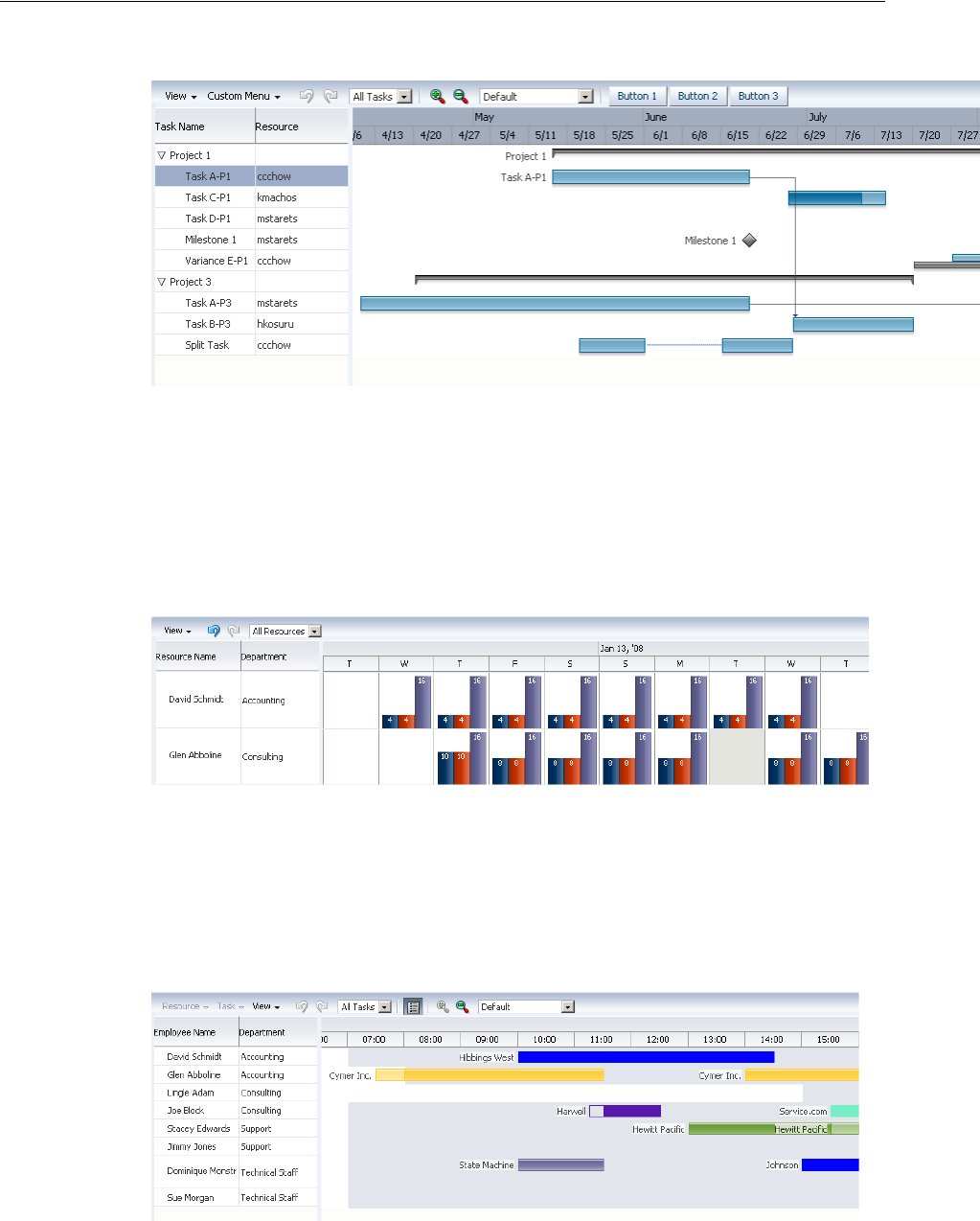
About Gantt Chart Components
Using Gantt Chart Components 26-5
Figure 26–2 Project Gantt Chart for a Software Application
■Resource Utilization Gantt chart: A resource utilization Gantt chart graphically
shows the metrics for a resource, for example, whether resources are over or under
allocated. It shows resources vertically while showing their metrics, such as
allocation and capacity on the horizontal time axis. Figure 26–3 shows a resource
utilization Gantt chart illustrating how many hours are allocated and utilized for a
particular developer resource in a given time period.
Figure 26–3 Resource Utilization Gantt Chart for a Software Application
■Scheduling Gantt chart: A scheduling Gantt chart is used for resource scheduling.
The chart is based on manual scheduling boards and shows resources vertically,
with corresponding activities on the horizontal time axis. Examples of resources
include people, machines, or rooms. The scheduling Gantt chart uses a single line
to graph all the tasks that are assigned to a resource as shown in Figure 26–4.
Figure 26–4 Scheduling Gantt Chart for a Software Application
A Gantt chart consists of the following functional areas:
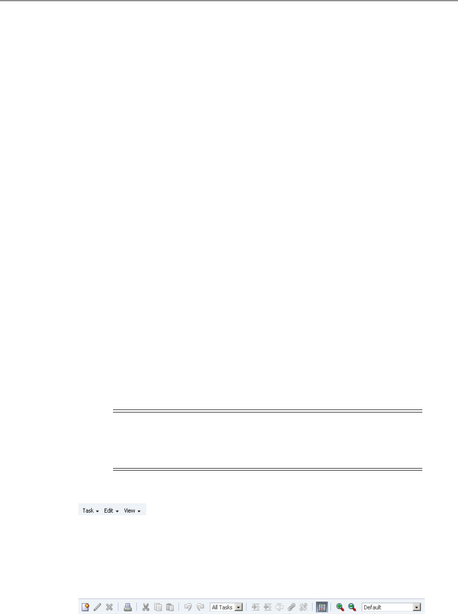
About Gantt Chart Components
26-6 Web User Interface Developer's Guide for Oracle Application Development Framework
■Table region: Displays Gantt chart data attributes in a table with columns. The
table region requires a minimum of one column, but you can define attributes for
as many columns as desired in the Gantt chart data binding dialogs.
For example, in Figure 26–2, the table region contains the following columns:
Name (of the task), Priority, Orig. Est., Curr. Est., Elapsed (days), Remaining
(days), and Resources.
■Chart region: Displays a bar graph of the Gantt chart data along a horizontal time
axis. The time axis provides for major and minor settings to allow for zooming.
The major setting is for larger time increments and the minor setting is for smaller
time increments.
For example, in Figure 26–2, the chart region graphs tasks on a time axis that
shows days within weeks.
■Information panel: Displays both the information region that displays text about
the selected task or metrics about the selected resource, and the optional legend
that displays task types in the area beneath the table region and the chart region.
Note that the Gantt chart legend is not present unless you insert the legend child
tag inside the parent Gantt chart tag.
■Toolbar: Lets users perform operations on the Gantt chart. The toolbar is visible in
the Gantt chart by default. You can change the visibility of the toolbar by setting
the ShowToolbar attribute on the Appearance page of the Property Inspector for
the Gantt chart.
The toolbar consists of the following sections:
–Menu bar: The left section of the toolbar contains a set of menus for the Gantt
chart. Each Gantt chart type has a set of default options. Figure 26–5 displays
the menu bar, which is visible in the Gantt chart by default. You can change
the visibility of the menu bar by setting the ShowMenuBar attribute in the
Appearance page of the Property Inspector for the Gantt chart. You can
customize menu items by using the menubar facet.
Figure 26–5 Sample Menu Bar for a Gantt Chart
–Toolbar buttons: The right section of the toolbar displays a set of action
buttons for working with the Gantt chart. Each Gantt chart type has a set of
default options. Figure 26–6 shows a sample toolbar for a project Gantt chart.
Figure 26–6 Sample Toolbar for a Project Gantt Chart
You can customize toolbar buttons by using the toolbar facet.
■Context menu: Right-clicking in the Gantt chart table or chart regions provides a
popup context menu with a standard set of menu items. You can provide your
Note: The View menu items do not require that you write
application code to make them functional. However, you must
provide application code for any items that you want to use on the
other menus.

About Gantt Chart Components
Using Gantt Chart Components 26-7
own set of menu items by using the tablePopupMenu or chartPopupMenu
facet.
■Printing service: The Gantt chart provides printing capability in conjunction with
XML Publisher by generating PDF files. For more information, see Section 26.6,
"Printing a Gantt Chart".
26.1.3 Additional Functionality for Gantt Chart Components
You may find it helpful to understand other ADF Faces features before you implement
your Gantt chart component. Additionally, once you have added a Gantt chart
component to your page, you may find that you need to add functionality such as
validation and accessibility. Following are links to other functionality that Gantt chart
components can use:
■Partial page rendering: You may want a Gantt chart to refresh to show new data
based on an action taken on another component on the page. For more
information, see Chapter 8, "Rerendering Partial Page Content."
■Personalization: Users can change the way the Gantt chart displays at runtime,
those values will not be retained once the user leaves the page unless you
configure your application to allow user customization. For information, see
Chapter 32, "Allowing User Customization on JSF Pages."
■Accessibility: You can make your Gantt chart components accessible. For more
information, see Chapter 30, "Developing Accessible ADF Faces Pages."
■Export to Excel: You can export the table region of the project Gantt chart using
af:exportCollectionActionListener. For more information, see
Section 12.10, "Exporting Data from Table, Tree, or Tree Table."
■Content Delivery: You configure your Gantt chart table region to fetch a certain
number of rows at a time from your data source using the contentDelivery
attribute. For more information, see Section 12.2.2, "Content Delivery."
■Automatic data binding: If your application uses the Fusion technology stack, then
you can create automatically bound Gantt charts based on how your ADF
Business components are configured. For more information, see the "Creating
Databound Gantt Charts" section of the Oracle Fusion Middleware Fusion Developer's
Guide for Oracle Application Development Framework.
Additionally, data visualization components share much of the same functionality,
such as how data is delivered, automatic partial page rendering (PPR), image
formats, and how data can be displayed and edited. For more information, see
Section 21.2, "Common Functionality in Data Visualization Components."
Note: If you know the UI components on your page will eventually
use ADF data binding, but you need to develop the pages before the
data controls are ready, then you should consider using placeholder
data controls, rather than manually binding the components. Using
placeholder data controls will provide the same declarative
development experience as using developed data controls. For more
information, see the "Designing a Page Using Placeholder Data
Controls" chapter of the Oracle Fusion Middleware Fusion Developer's
Guide for Oracle Application Development Framework.

Using Gantt Chart Components
26-8 Web User Interface Developer's Guide for Oracle Application Development Framework
26.2 Using Gantt Chart Components
The data model for a Gantt chart can be either a tree (hierarchical) model or a
collection model that contains a row set or flat list of objects. For more information, see
the "Creating Databound ADF Gantt Charts" section in the Oracle Fusion Middleware
Fusion Developer's Guide for Oracle Application Development Framework.
When you bind a Gantt chart to a data control, you specify how the collection in the
data control maps to the node definitions of the Gantt chart.
26.2.1 Data for a Project Gantt Chart
The data model for a project Gantt chart supports hierarchical data and uses
TreeModel to access the data in the underlying list. The specific model class is
org.apache.myfaces.trinidad.model.TreeModel.
The collection of objects returned by the TreeModel must have, at a minimum, the
following properties:
■taskId: The ID of the task.
■startTime: The start time of the task.
■endTime: The end time of the task.
Optionally, the object could implement the
oracle.adf.view.faces.bi.model.Task interface to ensure it provides the
correct properties to the Gantt chart.
When binding the data to an ADF data control, the following node definitions are
available in a project Gantt chart:
■Task node: Represents a collection of tasks. The task node definition has the
following types of optional accessors:
–subTask (available only for project Gantt chart)
–splitTask
■Split task node: Represents a collection of split tasks. A split task node definition
does not have accessors.
■Dependency node: Represents a collection of dependencies for a task. A
dependency node definition does not have accessors.
■Recurring task node: Represents a collection of recurring tasks. A recurring task
node definition does not have accessors.
Table 26–1 shows a complete list of data object keys for the project Gantt chart.
Table 26–1 Data Object Keys for Project Gantt
Data Object Key Date Type and Description
actualEnd Date. The actual end time for normal and milestone tasks.
actualStart Date. The actual start time for normal and milestone tasks.
completedThrough Date. Completed through for normal and summary tasks.
critical Boolean. Specifies whether or not the task is critical for all tasks.
Using Gantt Chart Components
Using Gantt Chart Components 26-9
26.2.2 Data for a Resource Utilization Gantt Chart
The data model for a resource utilization Gantt chart supports hierarchical data and
uses TreeModel to access the data in the underlying list. The specific model class is
org.apache.myfaces.trinidad.model.TreeModel.
The collection of objects returned by TreeModel must have, at a minimum, the
following properties:
■resourceId: The ID of the task.
■timeBuckets: A collection of time bucket objects for this resource.
Optionally, the object could implement the
oracle.adf.view.faces.bi.model.Resource interface to ensure it provides
the correct properties to the Gantt chart.
Dependency (node) A list of dependencies for a task. Data object keys for
dependencies include:
■fromId: The ID of the task where the dependency begins.
■toId: The ID of the task where the dependency ends.
■type: The type of the dependency. Valid values are
start-start, start-finish, finish-finish,
finish-start, start-before, start-together,
finish-after, and finish-together.
endTime (required) Date. The end time for all tasks.
icon1 String. The first icon associated with the task bar for all tasks.
The icon might change depending on other attributes
icon2 String. The second icon associated with the tasks bar for all
tasks.
icon3 String. The third icon associated with the tasks bar for all tasks.
iconPlacement String. The alignment of the icon in the task bar for all tasks.
Valid values are left (default), right, inside, start, end,
innerLeft, innerRight, innerCenter, innerStart,
innerEnd.
isContainer Boolean. Specifies whether or not a node definition is a
container.
label String. The label associated with the task bar for all tasks.
labelPlacement String. The alignment of the label in the task bar for all tasks.
Valid values are left (default), right, inside, start, end,
innerLeft, innerRight, innerCenter, innerStart,
innerEnd.
percentComplete Integer. Percentage completed for normal and summary tasks.
Recurring tasks (node) The list of recurring tasks for all tasks.
Split tasks (node) The list of tasks without a continuous time line for all tasks.
startTime (required) Date. The starting time for all tasks.
Subtasks (node) An optional list of subtasks for all tasks.
taskId (required) String. The unique identifier for all tasks.
type Sting. The type of the tasks for all tasks.
Table 26–1 (Cont.) Data Object Keys for Project Gantt
Data Object Key Date Type and Description
Using Gantt Chart Components
26-10 Web User Interface Developer's Guide for Oracle Application Development Framework
The collection of objects returned by the timeBuckets property must also have the
following properties:
■time: The date represented by the time bucket.
■values: A list of metrics for this resource.
When binding the data to an ADF data control, the following node definitions are
available in a Resource Utilization Gantt chart:
■Resource node: Represents a collection of resources. The resource node definition
has an optional subResources accessor that returns a collection of subresources
for the current resource.
■Time bucket node: Represents a collection of time slots with metrics defined.
Table 26–2 shows a complete list of data object keys for the resource utilization Gantt
chart.
26.2.3 Data for a Scheduling Gantt Chart
The data model for a scheduling Gantt chart supports hierarchical data and uses
TreeModel to access the data in the underlying list. The specific model class is
org.apache.myfaces.trinidad.model.TreeModel.
The collection of objects returned by TreeModel must have, at a minimum, the
following properties:
■resourceId: The ID of the task.
■tasks: A collection of task objects for this resource.
Optionally, the object could implement the
oracle.adf.view.faces.bi.model.ResourceTask interface to ensure it
provides the correct properties to the Gantt chart.
The collection of objects returned by the tasks property must also have the following
properties:
■taskId: The ID of the task.
■startTime: The start time of the task.
■endTime: The end time of the task.
When binding the data to an ADF data control, the scheduling Gantt chart has a
Resource node definition. The Resource node has the following types of accessors:
■subResources: Returns a collection of subresources for the current resource.
This accessor is optional.
Table 26–2 Data Object Keys for Resource Utilization Gantt
Data Object Key Data Type and Description
label String. The label associated with the task bar.
labelAlign String. The alignment of the label in the task bar. Valid values
are top (default) and inside.
resourceId (required) String. The unique identifier of a resource.
timeBuckets (required) List. The list of tasks associated with a resource.
time (required) Date. The start time of the time bucket.
values (required) Double. The values of the metrics.

Using Gantt Chart Components
Using Gantt Chart Components 26-11
■tasks: Returns a collection of tasks for the current resource. This accessor is
required. Tasks can also include a splitTask accessor.
Table 26–3 shows a complete list of data object keys for a scheduling Gantt chart.
26.2.4 Gantt Chart Tasks
Project and scheduling Gantt charts use predefined tasks with a set of formatting
properties that describe how the tasks will be rendered in the chart area. All supported
Table 26–3 Data Object Keys for Scheduling Gantt Chart
Data Object Key Data Type and Description
Dependency (node) A list of dependencies for a task. Data object keys for
dependencies include:
■fromId: The ID of the task where the dependency begins.
■toId: The ID of the task where the dependency ends.
■type: The type of the dependency. Valid values are
start-start, start-finish, finish-finish,
finish-start, start-before, start-together,
finish-after, and finish-together.
endTime (required) Date. The end time for all the tasks.
icon1 String. The first icon associated with the task bar for all tasks.
The icon might change depending on other attributes.
icon2 String. The second icon associated with the task bar for all tasks.
icon3 String. The third icon associated with the task bar for all tasks.
iconPlacement String. The alignment of the icon in the task bar for all tasks.
Valid values are left (default), right, inside, inside_
left, inside_right, and inside_center. In bi-directional
locales, start and end values are also supported.
isContainer Boolean. Specifies whether or not a node definition is a
container.
label String. The label associated with the task bar for all tasks.
labelPlacement String. The alignment of the label in the task bar for all tasks.
Valid values are left (default), right, inside, inside_
left, inside_right, and inside_center. In bi-directional
locales, start and end values are also supported.
Recurring tasks (node) A list of recurring tasks for all tasks.
resourceId (required) String. The unique identifier of a resource.
Split tasks (node) A collection of tasks without a continuous time line for all tasks.
startTime (required) Date. The start time for all tasks.
startupTime Date. The startup time before a task begins.
Tasks (node) (required) A list of tasks associated with a resource.
taskId (required) String. The unique identifier of the task for all tasks.
taskType String. The type of the task for all tasks.
workingDaysOfTheWeek Object. A list of the working days of the week.
workingEndTime Date. The work end time for the resource.
workingStartTime Date. The work start time for the resource.
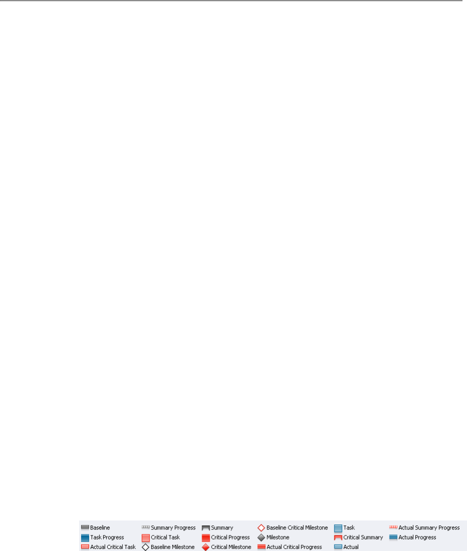
Using Gantt Chart Components
26-12 Web User Interface Developer's Guide for Oracle Application Development Framework
tasks must have a unique identifier. The following describes the supported tasks and
how they appear in a Gantt chart:
■Normal: The basic task type. It is a plain horizontal bar that shows the start time,
end time, and duration of the task.
■Summary: The start and end date for a group of subtasks. A summary task cannot
be moved or extended. Instead, it is the responsibility of the application to execute
code to recalculate the start and end date for a summary task when the date of a
subtask changes. Summary tasks are available only for the project Gantt chart.
■Milestone: A specific date in the Gantt chart. There is only one date associated
with a milestone task. A milestone task cannot be extended but it can be moved. A
milestone task is available only for the project Gantt chart.
■Recurring: A task that is repeated in a Gantt chart, each instance with its own start
and end date. Individual recurring tasks can optionally contain a subtype. All
other properties of the individual recurring tasks come from the task which they
are part of. However, if an individual recurring task has a subtype, this subtype
overrides the task type.
■Split: A task that is split into two horizontal bars, usually linked by a line. The time
between the bars represents idle time due to traveling or down time.
■Scheduled: The basic task type for a scheduling Gantt chart. This task type shows
the starting time, ending time, and duration of a task, as well as startup time if one
is specified.
For normal, summary, and milestone tasks, additional attributes are supported that
would change the appearance and activity of a task. These style attributes include:
■percentComplete, completedThrough: An extra bar would be drawn to
indicate how far the task is completed. This is applicable to normal and summary
task types.
■critical: The color of the bar would be changed to red to mark it as critical. This
is applicable to normal, summary, and milestone task types.
■actualStart and actualEnd: When these attributes are specified, instead of
drawing one bar, two bars are drawn. One bar indicates the base start and end
date, the other bar indicates the actual start and end date. This is applicable to
normal and milestone task types.
Figure 26–7 displays a legend that shows common task types in a project Gantt chart.
Figure 26–7 Project Gantt Chart Legend for Task Types
26.2.5 Configuring Gantt Charts
The three Gantt chart components beginning with the prefix dvt: for each Gantt chart
tag name indicates that the tag belongs to the ADF Data Visualization Tools (DVT) tag
library:
■dvt:projectGantt
■dvt:resourceUtilizationGantt
■dvt:schedulingGantt

Using Gantt Chart Components
Using Gantt Chart Components 26-13
All Gantt chart components support the child tag dvt:ganttLegend to provide an
optional legend in the information panel of a Gantt chart. Some menu bar and toolbar
functions may or may not be available depending on whether the Gantt legend is
specified.
In the Gantt chart table region, the ADF Faces af:column tag is used to specify the
header text, icons and alignment for the data, the width of the column, and the data
bound to the column. To display data in hierarchical form, a nodeStamp facet
specifies the primary identifier of an element in the hierarchy. For example, the "Task
Name" column might be used as the nodeStamp facet for a project Gantt chart.
Example 26–1 shows sample code for a project Gantt chart with "Task Name" as the
nodeStamp facet, with columns for Resource, Start Date, and End Date.
Example 26–1 Sample Code for Project Gantt Chart Columns
<dvt:projectGantt id="projectChart1" startTime="2008-04-12"
endTime="2009-04-12"
value="#{project.model}"
var="task">
<f:facet name="major">
<dvt:timeAxis scale="months"/>
</f:facet>
<f:facet name="minor">
<dvt:timeAxis scale="weeks"/>
</f:facet>
<f:facet name="nodeStamp">
<af:column headerText="Task Name">
<af:outputText value="#{task.taskName}"/>
</af:column>
</f:facet>
<af:column headerText="Resource">
<af:outputText value="#{task.resourceName}"/>
</af:column>
<af:column headerText="Start Date">
<af:outputText value="#{task.startTime}"/>
</af:column>
<af:column headerText="End Date">
<af:outputText value="#{task.endTime}"/>
</af:column>
</dvt:projectGantt>
In addition to the nodeStamp facet, other facets are used for customizations by the
Gantt chart components. Table 26–4 shows the facets supported by Gantt chart
components.
Table 26–4 Facets Supported by Gantt Chart Components
chartPopupMenu Specifies the component to use to identify additional controls to
appear in the context menu of the chart region. Must be an
af:popup component.
customPanel Specifies the component to use to identify controls to appear in
the custom tab of the task properties dialog.
major Specifies the component to use to identify the major time axis.
Must be a dvt:timeAxis component.
menuBar Specifies the component to use to identify additional controls to
appear in the Gantt menu bar. Must be an af:menu component
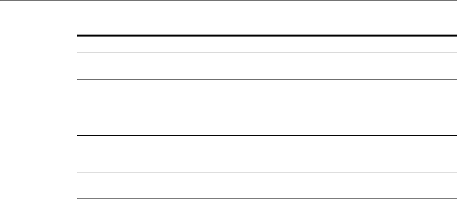
Using Gantt Chart Components
26-14 Web User Interface Developer's Guide for Oracle Application Development Framework
26.2.6 How to Add a Gantt Chart to a Page
When you are designing your page using simple UI-first development, you use the
Component Palette to drag and drop a project, resource utilization, or scheduling
Gantt chart component onto a JSF page.
Once the Gantt chart is added to your page, you can use the Property Inspector to
specify data values and configure additional display attributes for the Gantt chart.
In the Property Inspector you can use the dropdown menu for each attribute field to
display a property description and options such as displaying an EL Expression
Builder or other specialized dialogs. Figure 26–8 shows the dropdown menu for a
project Gantt chart component value attribute.
minor Specifies the component to use to identify the minor time axis.
Must be a dvt:timeAxis component.
nodeStamp Specifies the component to use to stamp each element in the
Gantt chart. Only certain types of components are supported,
including all components with no activity and most components
that implement the EditableValueHolder or
ActionSource interfaces. Must be an af:column component.
tablePopupMenu Specifies the component to use to identify additional controls to
appear in the context menu of the table region. Must be an
af:popup component.
toolbar Specifies the component to use to identify additional controls to
appear in the Gantt toolbar. Must be an af:toobar component.
Table 26–4 (Cont.) Facets Supported by Gantt Chart Components
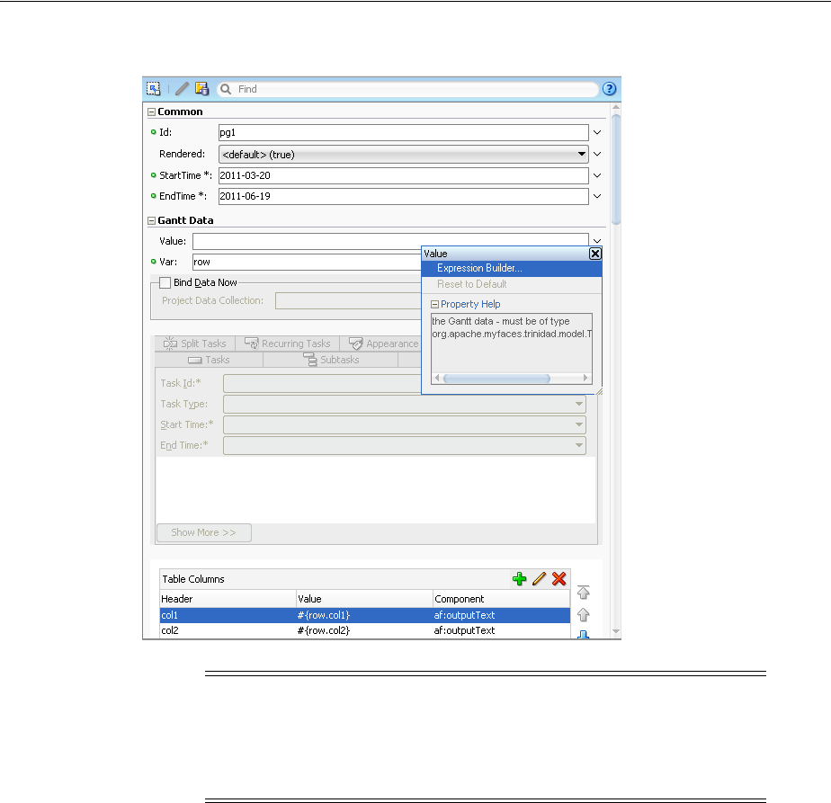
Using Gantt Chart Components
Using Gantt Chart Components 26-15
Figure 26–8 Project Gantt Chart Value Attribute Dropdown Menu
Before you begin:
It may be helpful to have an understanding of how Gantt chart attributes and Gantt
chart child components can affect functionality. For more information, see
Section 26.2.5, "Configuring Gantt Charts."
You may also find it helpful to understand functionality that can be added using other
ADF Faces features. For more information, see Section 26.1.3, "Additional
Functionality for Gantt Chart Components."
To add a Gantt chart to a page:
1. In the Component Palette, from the ADF Data Visualizations page, in the Gantt
chart panel, drag and drop a Project, Resource Utilization, or Scheduling Gantt
chart onto the page to open the Create Gantt chart dialog.
Optionally, use the dialog to bind the Gantt chart by selecting Bind Data Now and
entering or navigating to the ADF data control or ADF managed bean that
represents the data you wish to display on the Gantt chart. If you choose this
option, the data binding fields in the dialog will be available for editing.
Otherwise, click OK to add the component to the page.
Note: If your application uses the Fusion technology stack, then you
can use data controls to create a Gantt chart and the binding will be
done for you. For more information, see the "Creating Databound
Gantt Charts" section in the Oracle Fusion Middleware Fusion
Developer's Guide for Oracle Application Development Framework

Using Gantt Chart Components
26-16 Web User Interface Developer's Guide for Oracle Application Development Framework
2. In the Property Inspector, view the attributes for the Gantt chart. Use the help
button to display the complete tag documentation for the projectGantt,
resourceUtilizationGantt, or schedulingGantt, component.
3. Expand the Common section. Use this section to set the following attributes:
■StartTime: Enter the start time used to render the time period of the Gantt
chart.
■EndTime: Enter the end time used to render the time period of the Gantt
chart.
4. Expand the Gantt Data section. Use this section to set the following attributes:
■Value: Specify the data model, which must be of type
org.apache.myfaces.trinidad.model.TreeModel, using an EL
Expression.
■Var: Specify the variable used to reference each element of the Gantt chart
data collection. Once this component has completed rendering, this variable is
removed, or reverted back to its previous value.
5. Expand the Appearance section. Use this section to set the following attributes:
■ShowMenuBar: Specify whether or not the menu bar should be shown in the
Gantt chart. If this attribute is set to false, then any custom menu bar items
specified in the menuBar facet will also be hidden.
■ShowToolbar: Specify whether or not the toolbar should be shown in the
Gantt chart. If this attribute is set to false, then any custom toolbar buttons
specified in the toolbar facet will also be hidden.
■Summary: Enter a description of the Gantt chart. This description is accessed
by screen reader users
6. Expand the Behavior section. Use this section to set the following attributes:
■InitiallyExpandAll: Specifies whether or not all the rows should be initially
expanded.
■FetchSize: Use to specify the number of rows in a data fetch block. The default
value for rows is 25. For more information about content delivery to Gantt
charts, see Section 21.2.1, "Content Delivery."
■FeaturesOff: Enter a space delimited list of end user features to disable at
runtime. The valid values will depend upon the type of Gantt chart.
26.2.7 What Happens When You Add a Gantt Chart to a Page
When you use the Component Palette to create a Gantt chart, JDeveloper inserts code
in the JSF page. Example 26–2 shows the code inserted in the JSF page for a project
Gantt chart.
Example 26–2 Code Sample for Project Gantt Chart
<dvt:projectGantt startTime="2011-03-20" endTime="2011-06-19" var="row" id="pg1">
<f:facet name="major">
<dvt:timeAxis scale="weeks" id="ta5"/>
</f:facet>
<f:facet name="minor">
<dvt:timeAxis scale="days" id="ta6"/>
</f:facet>
<f:facet name="nodeStamp">

Customizing Gantt Chart Legends, Toolbars, and Context Menus
Using Gantt Chart Components 26-17
<af:column sortable="false" headerText="col1" id="c11">
<af:outputText value="#{row.col1}" id="ot11"/>
</af:column>
</f:facet>
<af:column sortable="false" headerText="col2" id="c12">
<af:outputText value="#{row.col2}" id="ot12"/>
</af:column>
<af:column sortable="false" headerText="col3" id="c13">
<af:outputText value="#{row.col3}" id="ot13"/>
</af:column>
<af:column sortable="false" headerText="col4" id="c14">
<af:outputText value="#{row.col4}" id="ot14"/>
</af:column>
<af:column sortable="false" headerText="col5" id="c15">
<af:outputText value="#{row.col5}" id="ot15"/>
</af:column>
</dvt:projectGantt>
26.3 Customizing Gantt Chart Legends, Toolbars, and Context Menus
You can modify default Gantt chart features including the information panel and
legend that are displayed below the Gantt chart, menu bar options and toolbar
buttons, and the popup menu that is displayed when you right-click in the Gantt chart
table or chart regions.
26.3.1 How to Customize a Gantt Chart Legend
The optional Gantt chart legend subcomponent includes an area that displays detailed
information about the selected task, or metrics about the selected time bucket, and a
legend that displays the symbol and color code bar used to represent each type of task
in a Gantt chart. At runtime, users can hide or show the information panel using a
toolbar button.
The dvt:ganttLegend tag must be added as a child of the Gantt chart tag in order to
provide the legend areas. The content of the legend areas is automatically generated
based on the properties for each type of task registered with the
taskbarFormatManager.
You can customize the information displayed when a task or time bucket is selected by
using the keys and label attributes on the Gantt chart legend tag. The keys attribute
should specify the data object keys used to retrieve the value to display and the
labels attribute should contain the corresponding labels for the values retrieved
with the keys. If these attributes are not specified, the legend will use the entire space
of the information panel.
You can also add icons to the legend by using the iconKeys and iconLabels
attributes on the Gantt chart legend tag. Icons will be automatically resized to 12 by 12
pixels if the icon size is too large.
Example 26–3 show sample code to display information about an On Hold task in the
legend of a project Gantt chart.
Example 26–3 Adding a Gantt Chart Legend
<dvt:projectGantt var="task">
<dvt:ganttLegend id="gl" keys="TaskName StartTime EndTime" labels="Name Start
Finish" icons="images/wait.png" iconLabels="OnHold"/>
</dvt:projectGantt>

Customizing Gantt Chart Legends, Toolbars, and Context Menus
26-18 Web User Interface Developer's Guide for Oracle Application Development Framework
26.3.2 Customizing Gantt Chart Toolbars
The Gantt chart toolbar subcomponent allows users to perform operations on the
Gantt chart. The left section of the toolbar is a menu bar that contains a set of default
menu options for each Gantt chart type. The right section of the toolbar displays a set
of default action buttons for working with each Gantt chart type.
You can supply your own menu items and toolbar buttons by using the menu and
toolbar facets in your Gantt chart. The Gantt chart merges the new menu items with
the standard items in the Gantt chart. Example 26–4 shows sample code for specifying
a new menu item.
Example 26–4 Sample Code for Custom Menu Item
<dvt:projectGantt var="task">
<f:facet name=”menuBar”>
<af:menu text=”My Menu”>
<af:commandMenuItem text="Add..." />
<af:commandMenuItem text="Create.." />
</af:menu>
</f:facet>
</dvt:projectGantt>
Example 26–5 shows sample code for specifying a new toolbar button.
Example 26–5 Sample Code for Custom Toolbar Button
<dvt:schedulingGantt var="task">
<f:facet name="toolbar">
<af:toolbar>
<af:commandToolbarButton text="Custom" disabled="true"/>
</af:toolbar>
</dvt:schedulingGantt>
Actions initiated on the menu bar and toolbar buttons are handled through a
registered listener, DataChangeListener, on the Gantt chart component. For
example, when a user presses the delete button in the toolbar, a DataChangeEvent
with the ID of the task selected for deletion would be fired on the server. The
registered listener is then responsible for performing the actual deletion of the task,
and the Gantt chart data model is refreshed with the updated information.
You can register DataChangeListener by specifying a method binding using the
dataChangeListener attribute on the Gantt chart tag. For example, if you put the
code in a backing bean in a method called handleDataChange, then the setting for
the dataChangeListener attribute becomes:
"#{myBackingBean.handleDataChange}".
Example 26–6 shows sample code in a backing bean.
Example 26–6 Backing Bean for Handling Data Change
public void handleDataChanged(DataChangeEvent evt)
{
if (DataChangeEvent.DELETE == evt.getActionType())
…………
}

Customizing Gantt Chart Legends, Toolbars, and Context Menus
Using Gantt Chart Components 26-19
26.3.3 Customizing Gantt Chart Context Menus
When users right-click in the Gantt chart table or chart regions, a context menu is
displayed to allow users to perform operations on the Gantt chart. A standard set of
options is provided for each region.
You can supply your own menu items using the tablePopupMenu and
chartPopupMenu facets in your Gantt chart. The Gantt chart merges the new menu
items with the standard items in the Gantt chart. Example 26–7 shows sample code for
specifying a custom menu item in the table region context menu.
Example 26–7 Sample Code for Custom Context Menu Item
<dvt:projectGantt startTime="#{test.startTime}" endTime="#{test.endTime}"
value="#{test.treeModel}" var="task">
<f:facet name="tablePopupMenu">
<af:popup>
<af:commandMenuItem text="Custom" disabled="true"/>
</af:popup>
</f:facet>
</dvt:projectGantt>
You can also dynamically change the context menu at runtime. Example 26–8 shows
sample code to update a custom popup menu on a task bar based on which task is
selected in the chart region of a project Gantt chart.
Example 26–8 Sample Code for Dynamic Context Menu
<dvt:projectGantt var="task"
taskSelectionListener="#{backing.handleTaskSelected}">
<f:facet name="chartPopupMenu">
<af:popup id="p1" contentDelivery="lazyUncached">
<af:menu>
</af:menu>
</af:popup>
</f:facet>
</dvt:projectGantt>
The handleTaskSelected method is specified in a backing bean. Example 26–9
shows sample code for the backing bean.
Example 26–9 Backing Bean for Handling Task Selection
public void handleTaskSelected(TaskSelectionEvent evt)
{
JUCtrlHierNodeBinding _task = (JUCtrlHierNodeBinding)evt.getTask();
String _type = _task.getAttribute("TaskType");
RichPopup _popup = m_gantt.getFacet("chartPopupMenu");
if (_popup != null)
{
RichMenu _menu = (RichMenu)_popup.getChildren().get(0);
_menu.getChildren().clear();
if ("Summary".equals(_type))
{
RichCommandMenuItem _item = new RichCommandMenuItem();
_item.setId("i1");
_item.setText("Custom Action 1");
_menu.getChildren().add(_item); }

Working with Gantt Chart Tasks and Resources
26-20 Web User Interface Developer's Guide for Oracle Application Development Framework
else if ("Normal".equals(_type))
{
RichCommandMenuItem _item = new RichCommandMenuItem();
_item.setId("i1");
_item.setText("Custom Action 2");
_menu.getChildren().add(_item); }
}
}
For more information about using the af:popup components see Chapter 15, "Using
Popup Dialogs, Menus, and Windows".
26.4 Working with Gantt Chart Tasks and Resources
You can customize Gantt chart tasks to create a new task type, specify a custom data
filter, and add a double-click event to a task bar.
26.4.1 How to Create a New Task Type
A task type is represented visually as a bar in the chart region of a Gantt chart. You
can create a new task type in one of three ways:
■Defining the task type style properties in the .jspx file or in a separate CSS file.
■Defining a TaskbarFormat object and registering the object with the
taskbarFormatManager.
■Modifying the properties of a predefined task type by retrieving the associated
TaskbarFormat object and updating its properties through a set method.
The TaskBarFormat object exposes the following properties:
■Fill color
■Fill image pattern
■Border color
■Images used for a milestone task
■Images used for the beginning and end of a summary task
For tasks that have more than one bar, such as a split or recurring task, properties are
defined for each individual bar.
Example 26–10 shows sample code to define the properties for a custom task type in
the .jspx file.
Example 26–10 Sample Code to Define Custom Task Type Properties
<af:document>
<f:facet name="metaContainer">
<f:verbatim>
<
Working with Gantt Chart Tasks and Resources
Using Gantt Chart Components 26-21
]]>
</f:verbatim>
</f:facet>
shows sample code to define a TaskbarFormat object fill and border color and
register the object with the taskbarFormatManager.
Example 26–11 Custom TaskbarFormat Object Registered with TaskbarFormat Manager
TaskbarFormat _custom = new TaskbarFormat("Task on hold", null, "onhold", null);
// _gantt.getTaskbarFormatManager().registerTaskbarFormat("FormatId", _
custom);
TaskbarFormat _custom = new TaskbarFormat("Task on hold", "#FF00FF", null,
"#00FFDD", 13);
// _gantt.getTaskbarFormatManager().registerTaskbarFormat("FormatId", _custom);
26.4.2 How to Specify Custom Data Filters
You can change the display of data in a Gantt chart using a data filter dropdown list
on the toolbar. Gantt charts manage all predefined and user-specified data filters using
a FilterManager. Filter objects contain information including:
■A unique ID for the filter
■The label to display for the filter in the dropdown list
■An optional JavaScript method to invoke when the filter is selected
You can define your own filter by creating a filter object and then registering the object
using the addFilter method on the FilterManager. Example 26–12 shows sample
code for registering a Resource filter object with the FilterManager.
Example 26–12 Custom Filter Object Registered with FilterManager
FilterManager _manager = m_gantt.getFilterManager();
// ID for filter display label javascript callback (optional)
_manager.addFilter((new Filter(RESOURCE_FILTER, "Resource...",
"showResourceDialog")));
When the user selects a filter, a FilterEvent is sent to the registered
FilterListener responsible for performing the filter logic. The filterListener
attribute on the Gantt chart component is used to register the listener. When
implemented by the application, the data model is updated and the Gantt chart
component displays the filtered result. Example 26–13 shows sample code for a
FilterListener.
Example 26–13 FilterListener for Custom Filter
public void handleFilter(FilterEvent event)
{
String _type = event.getType();
if (FilterEvent.ALL_TASKS.equals(_type))
{
// update the gantt model as appropriate
}
}
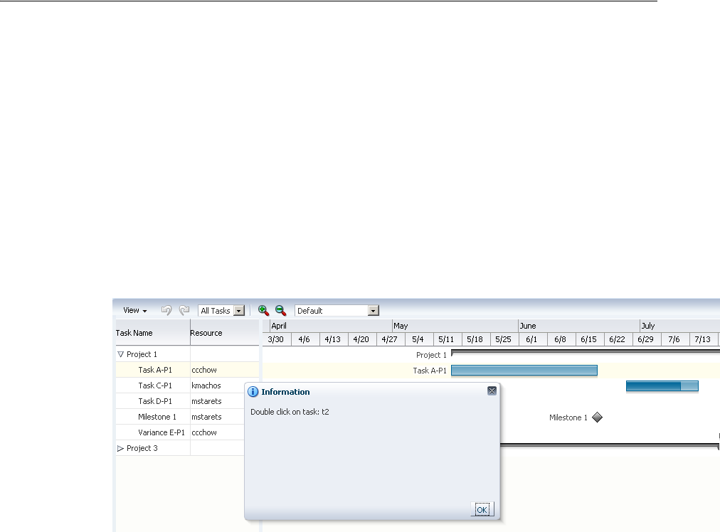
Specifying Nonworking Days, Read-Only Features, and Time Axes
26-22 Web User Interface Developer's Guide for Oracle Application Development Framework
To specify a custom data filter:
1. In the Structure window, right-click the Gantt chart node and choose Go to
Properties.
2. In the Behavior category of the Property Inspector, in the FilterListener field,
enter a method reference to the FilterListener you defined. For example,
"#{project.handleFilter}".
26.4.3 How to Add a Double-Click Event to a Task Bar
Gantt chart components support a double-click event on a task bar. For example, you
may want to display detailed information about a task in a popup window.
Figure 26–9 shows a project Gantt chart with a double-click event on a task bar.
Figure 26–9 Task Bar with Double-Click Event
Example 26–14 show sample code for adding a double-click event to a task bar.
Example 26–14 Sample Code for Double-Click Event
<dvt:projectGantt id="projectGanttDoubleClick"
startTime="2008-04-01" endTime="2008-09-30"
value="#{projectGanttDoubleClick.model}"
var="task"
doubleClickListener="#{projectGanttDoubleClick.handleDoubleClick}">
</dvt:projectGantt>
Implement the handleDoubleClick method in a backing bean, for example:
public void handleDoubleClick(DoubleClick event)
26.5 Specifying Nonworking Days, Read-Only Features, and Time Axes
You can customize a Gantt chart to display nonworking days of the week, turn off
user interaction features, and specify the time axes.
26.5.1 Identifying Nonworking Days in a Gantt Chart
You can specify nonworking days in a Gantt chart. By default, nonworking days are
shaded gray, but you can select a custom color to be used for nonworking days.

Specifying Nonworking Days, Read-Only Features, and Time Axes
Using Gantt Chart Components 26-23
26.5.1.1 How to Specify Weekdays as Nonworking Days
If certain weekdays are always nonworking days, then you can indicate the days of the
week that fall in this category.
To identify weekdays as nonworking days:
1. In the Structure window, right-click a Gantt chart node and choose Go to
Properties.
2. In the Appearance category of the Property Inspector, in the
NonWorkingDaysOfWeek field, enter the string of days that you want to identify
as nonworking days for each week. For example, to specify that Saturday and
Sunday are nonworking days, enter the following string: "sat sun".
Alternatively, you can create a method in a backing bean to programmatically
identify the nonworking days. For example, if you put the code in a backing bean
in a method called getNonWorkingDaysOfWeek, then the setting for the
nonWorkingDaysOfWeek attribute becomes:
"#{myBackingBean.nonWorkingDays}". Example 26–15 shows sample code
in a backing bean.
Example 26–15 Backing Bean to Identify Nonworking Days
public int[] getNonWorkingDaysOfWeek()
{
if (locale == Locale.EN_US
return new int[] {Calendar.SATURDAY, Calendar.SUNDAY};
else
.......
}
3. Optionally, specify a custom color in the NonWorkingDaysColor field. The
value you enter for this attribute must be a hexadecimal color string.
26.5.1.2 How to Identify Specific Dates as Nonworking Days
You can enter specific dates as nonworking days in a Gantt chart when individual
weekdays are not sufficient.
To identify specific dates as nonworking days:
1. In the Structure Window, right-click a Gantt chart and choose Go to Properties.
2. In the Property Inspector, select the Appearance attributes category.
3. In the nonWorkingDays field, enter the string of dates that you want to identify
as nonworking days. For example: "2008-07-04 2008-11-28 2008-12-25".
Alternatively, for more flexibility, you can create a method in a backing bean to
programmatically identify the nonworking days. For example, if you put the code
in a backing bean in a method called getNonWorkingDays, then the setting for
the nonWorkingDays attribute becomes:
"#{myBackingBean.nonWorkingDays}".
4. Optionally, specify a custom color in the nonWorkingDaysColor field. The
value you enter for this attribute must be a hexadecimal color string.
Specifying Nonworking Days, Read-Only Features, and Time Axes
26-24 Web User Interface Developer's Guide for Oracle Application Development Framework
26.5.2 How to Apply Read-Only Values to Gantt Chart Features
User interactions with a Gantt chart can be customized to disable features by setting
the featuresOff property to specify read-only values. Table 26–5 shows the valid
values and the disabled feature for the Gantt chart types.
To set read-only values on Gantt chart features:
1. In the Structure window, right-click the Gantt chart node and choose Go to
Properties.
2. In the Behavior attributes category of the Property Inspector, for the
featuresOff attribute, enter one or more String values to specify the Gantt chart
features to disable.
For example, to disable user interactions for editing the data model, printing, or
changing the zoom level of a Gantt chart, use the following setting for the
featuresOff attribute: edit print zoom
Alternatively, you can create a method in a backing bean to programmatically
identify the features to be disabled. For example, if you put the code in a backing
bean in a method called whatToTurnOff that returns a String array of the values,
then the setting for the featuresOff attribute becomes:
"#{BackingBean.whatToTurnOff}".
26.5.3 Customizing the Time Axis of a Gantt Chart
Every Gantt chart is created with a major time axis and a minor time axis. Each time
axis has a facet that identifies the level of the axis as major or minor. The default time
axis settings for all Gantt charts are:
■Major time axis: Weeks
■Minor time axis: Days
Table 26–5 Valid Vales for Read-Only Attributes
Value Feature Disabled
clipboard Cut, copy, and paste tasks for all Gantt charts.
dependcyLines Hide and show dependency lines for the project and scheduling
Gantt charts.
edit Changes to the data model for all Gantt charts.
filter Hide the data filter operation on the toolbar.
indenting Indent and outdent tasks for project and scheduling Gantts
charts.
legend Hide and show legend and task information for all Gantt charts.
linking Link and unlink tasks for scheduling Gantt charts.
print Print task for all Gantt charts.
properties Show property dialogs for all Gantt charts.
split Split task for project Gantt.
undo Undo and redo tasks for all Gantt charts.
view Show as list, Show as hierarchy, Columns, Expand and Collapse
tasks for all Gantt charts.
zoom Changes to the zoom level for all Gantt charts.

Specifying Nonworking Days, Read-Only Features, and Time Axes
Using Gantt Chart Components 26-25
You can customize the settings of a time axis. However, the setting of a major axis
must be a higher time level than the setting of a minor axis. The following values for
setting the scale on a dvt:timeAxis component are listed from highest to lowest:
■twoyears
■year
■halfyears
■quarters
■twomonths
■months
■twoweeks
■weeks
■days
■sixhours
■threehours
■hours
■halfhours
■quarterhours
Example 26–19 shows sample code to set the time axis of a Gantt chart to use months
as a major time axis and weeks as the minor time axis.
Example 26–16 Gantt Chart Time Axis Set to Months and Weeks
<f:facet name="major">
<dvt:timeAxis scale="months"/>
</f:facet>
<f:facet name="minor">
<dvt:timeAxis scale="weeks"/>
</f:facet>
The time units you specify for the major and minor axes apply only to the initial
display of the Gantt chart. At runtime, the user can zoom in or out on a time axis to
display the time unit level at a different level.
26.5.3.1 How to Create and Use a Custom Time Axis
You can create a custom time axis for the Gantt chart and specify that axis in the
scale attribute of dvt:timeAxis. The custom time axis will be added to the Time
Scale dialog at runtime.
To create and use a custom time axis:
1. Implement the CustomTimescale.java interface to call the method
getNextDate(Date currentDate) in a loop to build the time axis.
Example 26–17 show sample code for the interface.
Example 26–17 Interface to Build Custom Dates
public interface CustomTimescale
{
public String getScaleName();
public Date getPreviousDate(Date ganttStartDate);

Printing a Gantt Chart
26-26 Web User Interface Developer's Guide for Oracle Application Development Framework
public Date getNextDate(Date currentDate);
public String getLabel(Date date);
}
2. In the Structure window, right-click a Gantt chart node and choose Go to
Properties.
3. In the Other attributes category of the Property Inspector, for the
CustomTimeScales attribute, register the implementation of the interface for the
custom time axis.
The customTimeScales attribute's value is a java.util.Map object. The
specified map object contains pairs of key/values. The key is the time scale name
(fiveyears), and the value is the implementation of the
CustomTimeScale.java interface. For example:
customTimesScales="#{project.customTimescales}"
4. Also in the Property Inspector, set the Scale attribute for major and minor time
axis, and specify the ZoomOrder attribute to zoom to the custom times scales.
Example 26–18 shows sample code for setting a threeyears minor time axis and
a fiveyears major time axis.
Example 26–18 Custom Time Axis
<f:facet name="major">
<dvt:timeAxis scale="fiveyears" id="ta1" zoomOrder="fiveyears threeyears years
halfyears quarters months weeks days hours"/>
</f:facet>
<f:facet name="minor">
<dvt:timeAxis scale="threeyears" id="ta2"/>
</f:facet>
26.6 Printing a Gantt Chart
The ADF Gantt chart provides a helper class (GanttPrinter) that can generate a
Formatted Object (FO) for use with XML Publisher to produce PDF files.
26.6.1 Print Options
In general, the GanttPrinter class prints the Gantt chart content as it appears on
your screen. For example, if you hide the legend in the Gantt chart, then the legend
will not be printed. Similarly, if you deselect a column in the List Pane section of the
View Menu, then that column will not be visible in the Gantt chart and will not appear
in the printed copy unless you take advantage of the column visibility print option.
You can use the following print options in the GanttPrinter class:
■Column visibility: The setColumnVisible method lets you control whether
individual columns in the list region of the Gantt chart will appear in the printed
output.
For example, to hide the first column in the list region of a Gantt chart, use the
following code, where the first parameter of the method is the zero-based index of
the column and the second parameter indicates if the column should be visible in
the printed Gantt chart: _printer.setColumnVisible(o, false);

Printing a Gantt Chart
Using Gantt Chart Components 26-27
■Margins: The setMargin method of the GanttPrinter lets you specify the top,
bottom, left, and right margins in pixels as shown in the following code, where _
printer is an instance of the GanttPrinter class:
_printer.setMargin(25, 16, 66, 66);
■Page size: The setPageSize method of the GanttPrinter class lets you specify
the height and width of the printed page in pixels as shown in the following code,
where _printer is an instance of the GanttPrinter class:
_printer.setPageSize (440, 600);
■Time period: The setStartTime and setEndTime methods of the
GanttPrinter class let you identify the time period of the Gantt chart that you
want to print.
Example 26–19 shows sample code for setting a specific time period in the Gantt
chart for printing, where startDate and endDate are variables that represent
the desired dates and _printer is an instance of the GanttPrinter class.
Example 26–19 Code for Setting the Time Period Option for Printing a Gantt Chart
_printer.setStartTime(startDate);
_printer.setEndTime(endDate);
26.6.2 Action Listener to Handle the Print Event
The Gantt chart toolbar includes a print button that initiates a print action. To print a
Gantt chart, you must create an ActionListener to handle the print event. The code
in the ActionListener should include the following processes:
1. Access the servlet’s output stream.
2. Generate the FO. This process includes creating an instance of the GanttPrinter
class and entering the code for any print options that you want to use.
3. Generate the PDF.
Example 26–20 shows the code for an ActionListener that handles the print event.
This listener includes settings for all the print options available in the GanttPrinter
helper class.
Example 26–20 Sample ActionListener for Handling the Gantt Chart Print Event
public void handleAction(GanttActionEvent evt)
{
if (GanttActionEvent.PRINT == evt.getActionType())
{
FacesContext _context = FacesContext.getCurrentInstance();
ServletResponse _response = (ServletResponse)
_context.getExternalContext().getResponse();
_response.setContentType("application/pdf");
ServletOutputStream _sos = _response.getOutputStream();
// Generate FO.
GanttPrinter _printer = new GanttPrinter(m_gantt);
// Set column visibility by column index.
_printer.setColumnVisible(0, false);
// Set start and end date.
_printer.setStartTime(startDate);
_printer.setEndTime(endDate);
// Set top, bottom, left, and right margins in pixels.
_printer.setMargin(25, 16, 66, 66);
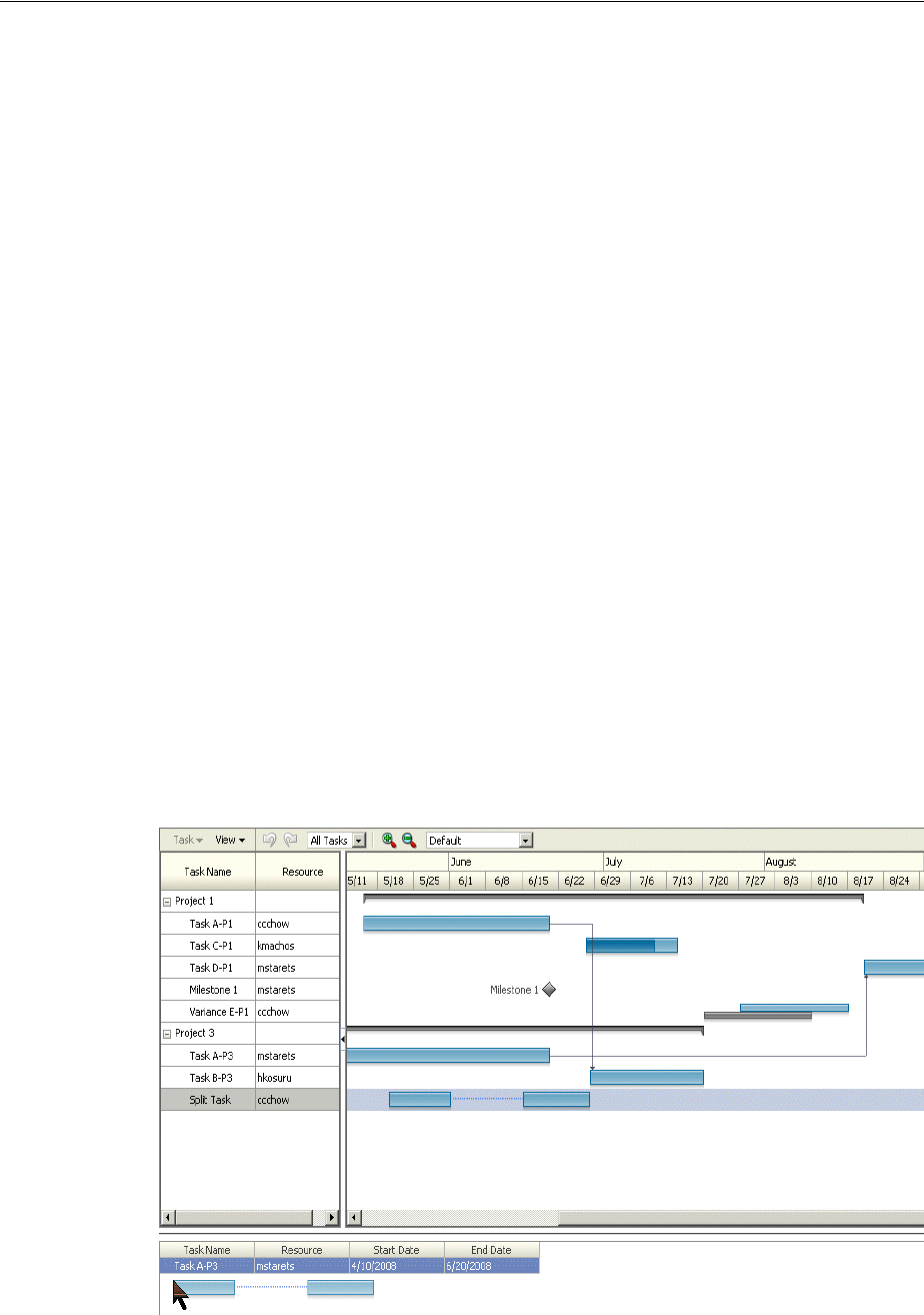
Using Gantt Charts as a Drop Target or Drag Source
26-28 Web User Interface Developer's Guide for Oracle Application Development Framework
// Set height and width in pixels.
_printer.setPageSize(440, 660);
File _file = File.createTempFile("gantt", "fo");
OutputStream _out = new FileOutputStream(_file);
_printer.print(_out);
_out.close();
// generate PDF.
FOProcessor _processor = new FOProcessor();
_processor.setData(new FileInputStream(_file),"UTF-8"));
_processor.setOutputFormat(FOProcessor.FORMAT_PDF);
_processor.setOutput(_sos);
_processor.generate();
_context.responseComplete();
response.setHeader("Cache-Control", "no-cache");
}
}
26.7 Using Gantt Charts as a Drop Target or Drag Source
You can add drag and drop functionality that allows users to drag an item from a
collection, for example, a row from a table, and drop it into another collection
component, such as a tree. Project and scheduling Gantt chart components can be
enabled as drag sources as well as drop targets for ADF table or tree table components.
A resource utilization Gantt chart component can be enabled only as a drop target.
The application must register the Gantt chart component as a drag source or drop
target by adding the af:collectionDragSource or af:collectionDropTarget
behavior tags respectively as a child to the Gantt tag. For example, you can use the
af:collectionDragSource to register a drop listener that would be invoked when
a project Gantt chart task is dragged from a table region onto a separate table. shows a
project Gantt chart with tasks dragged from the table region onto a table of tasks.
Figure 26–10 Project Gantt Chart as Drag Source

Using Gantt Charts as a Drop Target or Drag Source
Using Gantt Chart Components 26-29
Example 26–21 shows sample code for adding drag and drop functionality to a
scheduling Gantt chart.
Example 26–21 Sample Code for Adding Drag and Drop Functionality
<dvt:schedulingGantt value="#{test.treeModel}"
.............
<af:schedulingDragSource actions="COPY MOVE" modelName="treeModel" />
</dvt:projectGantt>
Example 26–22 shows sample code for the listener method for handling the drop
event.
Example 26–22 Event Handler Code for a dropListener for a Collection
public DnDAction onTableDrop(DropEvent evt)
{
Transferable _transferable = evt.getTransferable();
// Get the drag source, which is a row key, to identify which row has been
dragged.
RowKeySetImpl _rowKey = (RowKeySetImpl)_
transferable.getTransferData(DataFlavor.ROW_KEY_SET_FLAVOR).getData();
// Set the row key on the table model (source) to get the data.
// m_tableModel is the model for the Table (the drag source).
object _key = _rowKey.iterator().next();
m_tableModel.setRowKey(_key);
// See on which resource this is dropped (specific for scheduling Gantt
chart).
String _resourceId = _transferable.getData(String.class);
Resource _resource = findResourceById(_resourceId);
// See on what time slot did this dropped.
Date _date = _transferable.getData(Date.class);
// Add code to update your model here.
// Refresh the table and the Gantt chart.
RequestContext.getCurrentInstance().addPartialTarget(_evt.getDragComponent());
RequestContext.getCurrentInstance().addPartialTarget(m_gantt);
// Indicate the drop is successful.
return DnDAction.COPY;
}
For a detailed procedure about adding drag and drop functionality for collections, see
Section 33.4, "Adding Drag and Drop Functionality for Collections".

Using Gantt Charts as a Drop Target or Drag Source
26-30 Web User Interface Developer's Guide for Oracle Application Development Framework

27
Using Hierarchy Viewer Components 27-1
27 Using Hierarchy Viewer Components
This chapter describes how to display data in hierarchy viewers using the ADF Data
Visualization hierarchyViewer component. If your application uses the Fusion
technology stack, then you can use data controls to create hierarchy viewers. For more
information, see the "Creating Databound Hierarchy Viewers" section in the Oracle
Fusion Middleware Fusion Developer's Guide for Oracle Application Development Framework
This chapter includes the following sections:
■Section 27.1, "About Hierarchy Viewer Components"
■Section 27.2, "Using Hierarchy Viewer Components"
■Section 27.3, "Managing Nodes in a Hierarchy Viewer"
■Section 27.4, "Using Panel Cards"
■Section 27.5, "Configuring Navigation in a Hierarchy Viewer"
■Section 27.6, "Customizing the Appearance of a Hierarchy Viewer"
■Section 27.7, "Adding Interactivity to a Hierarchy Viewer Component"
■Section 27.8, "Adding Search to a Hierarchy Viewer"
27.1 About Hierarchy Viewer Components
Hierarchy viewers are used to visually display hierarchical data. Hierarchical data
contains master-detail relationships within the data. For example, you could create a
hierarchy viewer that renders an organization chart from a data collection that
contains information about the relationships between employees in an organization.
Hierarchy viewers use a shape called a node to reference the data in a hierarchy. The
shape and content of the nodes is configurable, as well as the visual layout of the
nodes. nodes can display multiple views in a panel card.
27.1.1 End User and Presentation Features
The ADF Data Visualization hierarchy viewer component provides a range of features
for end users, such as panning and zooming, changing the layout view, It also
provides a range of presentation features, such as changing node shape, and lines and
labels.
27.1.1.1 Layouts
You can define the initial layout of the hierarchy viewer when you insert the
component on the page from either the Data Controls panel to bind a data collection to
the hierarchy viewer component, or from the Component Palette to insert the
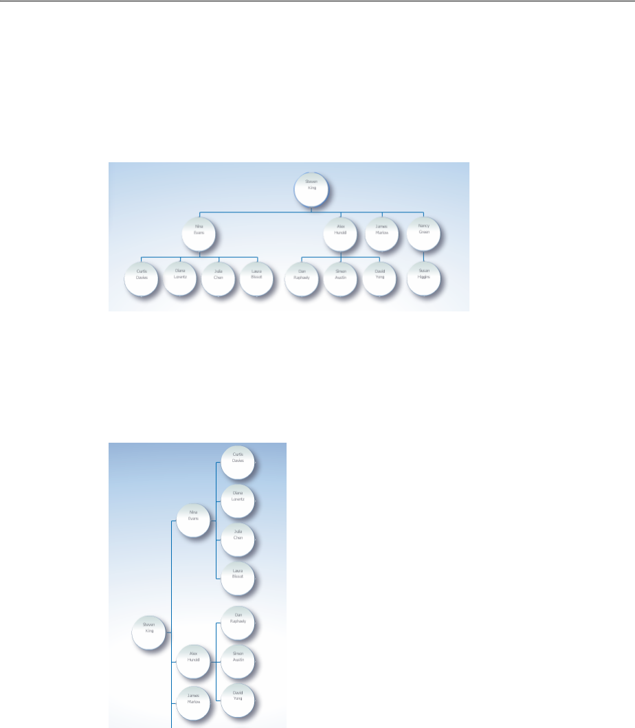
About Hierarchy Viewer Components
27-2 Web User Interface Developer's Guide for Oracle Application Development Framework
component and bind to data later. The layouf of nodes in a hierarchy viewer is
configurable, and include the following types of layouts:
■Vertical top down
Figure 27–1 shows an example of a vertical top down layout.
Figure 27–1 Hierarchy Viewer Vertical Top Down Layout
■Vertical bottom up
■Horizontal left-to-right
Figure 27–2 shows an example of a horizontal left-to-right layout.
Figure 27–2 Hierarchy Viewer Horizontal Left-to-Right Layout
■Horizontal right-to-left
■Horizontal, direction depends on the locale
■Tree, indented tree
Figure 27–3 shows an example of a tree layout.
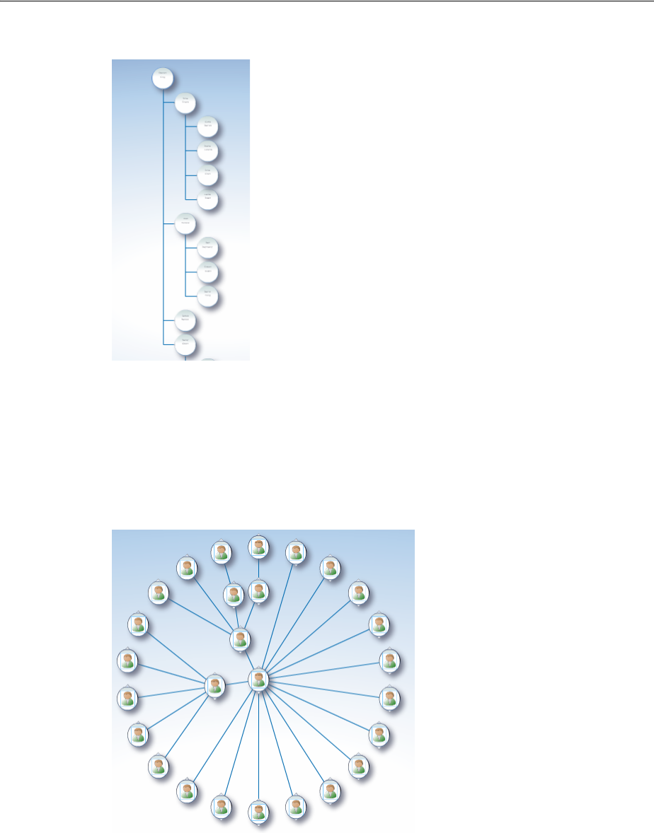
About Hierarchy Viewer Components
Using Hierarchy Viewer Components 27-3
Figure 27–3 Hierarchy Viewer Tree Layout
■Radial, root node in center and successive child levels radiating outward from
their parent nodes
■Circle, root node in center and all leaf nodes arranged in concentric circle, with
parent nodes arranged within the circle
Figure 27–4 shows an example of a circle layout.
Figure 27–4 Hierarchy Viewer Circle Layout
27.1.1.2 Navigation
At runtime, the node contains controls that allow users to navigate between nodes and
to show or hide other nodes by default.
At runtime, the end user uses the controls on the node to dynamically switch between
the content that the af:showDetailItem elements reference.
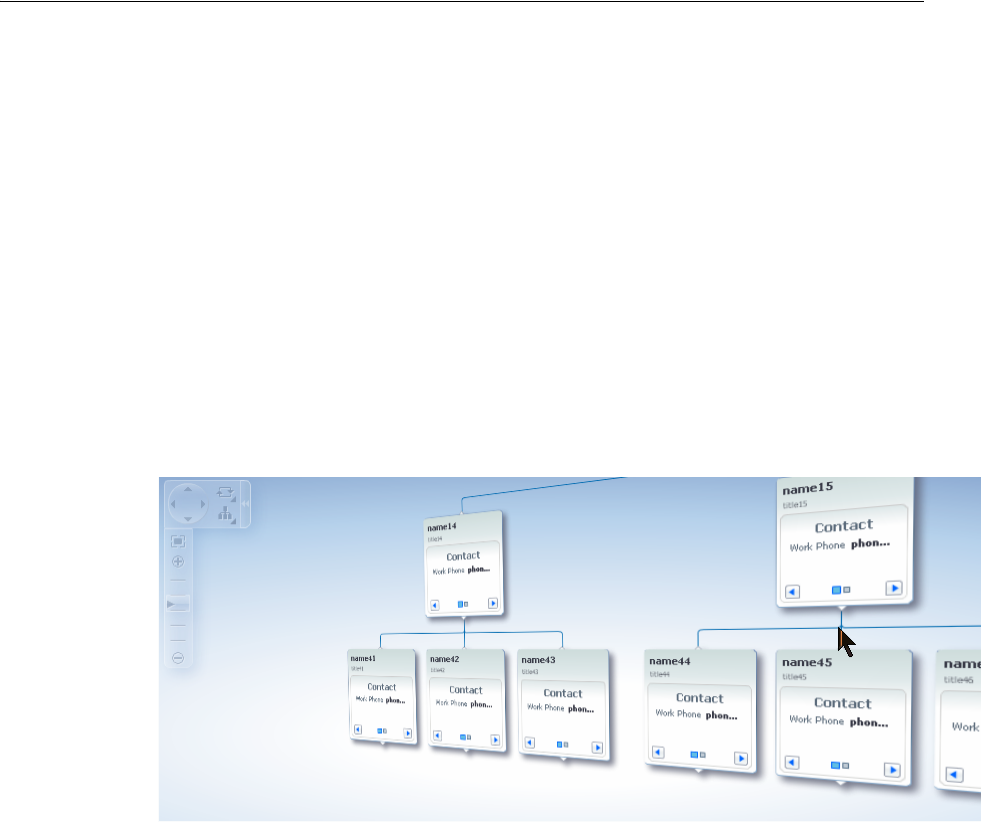
About Hierarchy Viewer Components
27-4 Web User Interface Developer's Guide for Oracle Application Development Framework
At runtime, if a user double-clicks another node that has a value specified for its
setAnchorListener property, that node becomes the anchor node.
At runtime, when a user moves the mouse over a node at any zoom level, a hover
window displaying node content at zoom level 100% is automatically displayed,
allowing the user to see the full information regardless of zoom level. The controls on
the hover window are active when the node has been selected in the hierarchy viewer.
27.1.1.3 Tilt Panning
If enabled, instead of browsing through a hierarchy viewer with a large quantity of
nodes one page at a time, users can initiate a tilt panning effect that animates the
hierarchy viewer to visually fly through the hierarchy viewer nodes. Once set in
motion toward the edge of a view, the effect continues automatically until it reaches
the end of the nodes on an edge. Figure 27–5 shows the tilt panning effect as it reaches
the edge of the view.
Figure 27–5 Hierarchy Viewer Tilt Panning Effect
To use the tilt panning effect you should first adjust the zoom level on the hierarchy
view for an acceptable view of the content of the nodes. You can initiate the effect in
any of these ways:
■Click and drag when using the pan control in the control panel to initiate tilt
panning after a short period of regular panning.
■Click and drag the view one-third of the way across the viewport.
■Click and hold the cursor near the edge of the view to initiate tilt panning in that
direction.
Once the tilt panning effect is initiated, you can move the mouse within the view to
change the direction of the pan through the view. Exit tilt panning by selecting any
node in the view.
27.1.1.4 Control Panel
The hierarchy viewer Control Panel provides tools for a user to manipulate the
position and appearance of a hierarchy viewer component at runtime. By default, it
appears in a hidden state in the upper left-hand corner of the hierarchy viewer, as
illustrated by Figure 27–6.
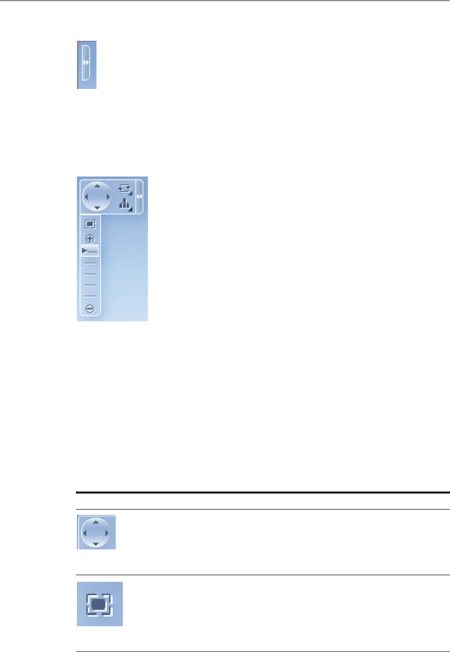
About Hierarchy Viewer Components
Using Hierarchy Viewer Components 27-5
Figure 27–6 Control Panel in Hidden State
Users click the Hide or Show Control Panel button shown in Figure 27–6 to hide or
expand the Control Panel. Figure 27–7 shows the expanded Control Panel.
Figure 27–7 Control Panel in Show State
Table 27–1 describes the functionality that the controls in the Control Panel provide to
users. The Panel Selector is automatically enabled if a node in your hierarchy viewer
component contains a nodes with panel cards. The Layout Selector appears
automatically if the hierarchy viewer component uses one of the following layouts:
■Vertical top down
■Horizontal left to right
■Tree
■Radial
■Circle
Table 27–1 Elements in the Control Panel
Control Name Description
Pan Control Allows user to reposition the hierarchy viewer
component within the viewport.
Zoom to Fit Allows user to zoom a hierarchy viewer component so
that all nodes are visible within the viewport.
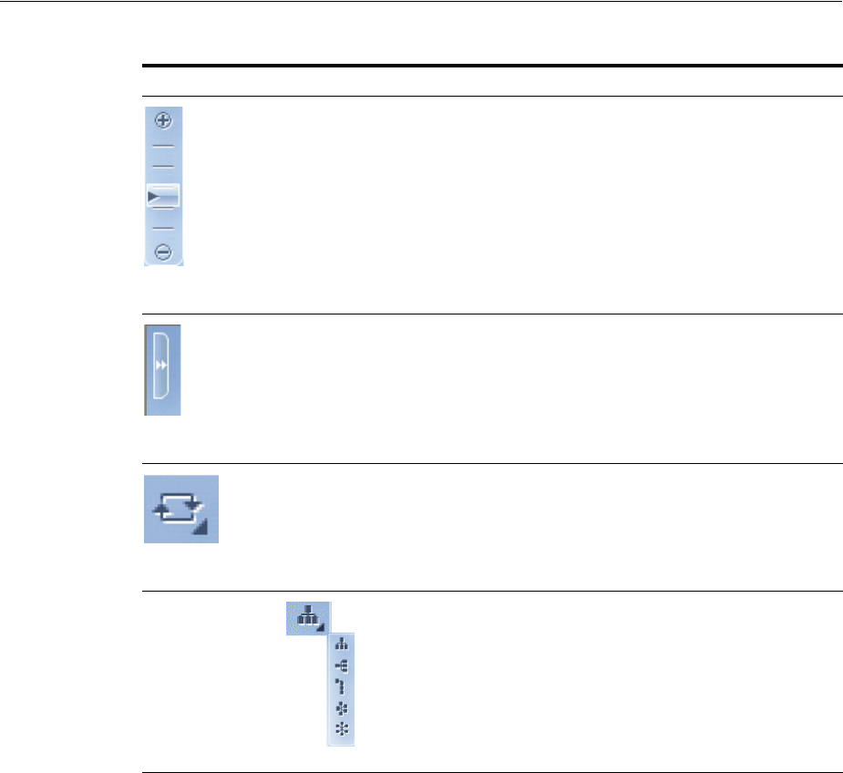
About Hierarchy Viewer Components
27-6 Web User Interface Developer's Guide for Oracle Application Development Framework
27.1.1.5 Printing
Hierarchy viewers are printed using the HMTL view in the browser.
27.1.1.6 Bi-directional Support
Hierarchy viewers support bi-directional text in node content, the search panel, and
the display of search results. Bi-directional text is text containing text in both text
directionalities, both right-to-left (RTL) and left-to-right (LTR). It generally involves
text containing different types of alphabets such as Arabic or Hebrew scripts.
Hierarchy viewers also support bi-directional support for flipping panel cards from
one node view to the next.
27.1.1.7 Disable Features
End user features including hierarchy viewer hover window display, panning and
zooming, modify layout, node detail display and synchronizing the panel card can be
disabled.
Zoom Control Allows user to zoom the hierarchy viewer component.
Hide or Show Hides or shows the Control Panel.
Panel Selector Displays a list of node panels that you have defined.
Users can use the panel selector to show the same panel
on all nodes at once.
Layout Selector Allows a choice of layouts. Users can change the layout
of the hierarchy viewer component from the layout you
defined to one of the layout options presented by the
component.
Table 27–1 (Cont.) Elements in the Control Panel
Control Name Description
About Hierarchy Viewer Components
Using Hierarchy Viewer Components 27-7
27.1.1.8 State Management
By default, specify the expansion state of the hierarchy viewer at initial display, and
selected row key.
27.1.2 Hierarchy Viewer Use Cases and Examples
A hierarchy viewer visually displays hiearchical data and the master-detail
relationships. Figure 27–8 shows a segment of a hierarchy viewer component at
runtime that includes a control panel, a number of nodes, and links that connect the
nodes. The nodes include a panel card with
Figure 27–8 Hierarchy Viewer Component with Control Panel and Nodes
27.1.3 Additional Functionality for Hierarchy Viewer Components
You may find it helpful to understand other ADF Faces features before you implement
your hierarchy viewer component. Additionally, once you have added a hierarchy
viewer component to your page, you may find that you need to add functionality such
as validation and accessibility. Following are links to other functionality that hierarchy
viewer components can use:
■Partial page rendering: You may want a hierarchy viewer to refresh to show new
data based on an action taken on another component on the page. For more
information, see Chapter 8, "Rerendering Partial Page Content."
■Personalization: Users can change the way the hierarchy viewer displays at
runtime, those values will not be retained once the user leaves the page unless you
configure your application to allow user customization. For information, see
Chapter 32, "Allowing User Customization on JSF Pages."

Using Hierarchy Viewer Components
27-8 Web User Interface Developer's Guide for Oracle Application Development Framework
■Accessibility: You can make your hierarchy viewer components accessible. For
more information, see Chapter 30, "Developing Accessible ADF Faces Pages."
■Content Delivery: You can configure your hierarchy viewer to fetch a certain
number of rows at a time from your data source using the contentDelivery
attribute. For more information, see Section 12.2.2, "Content Delivery."
■Automatic data binding: If your application uses the Fusion technology stack, then
you can create automatically bound hierarchy viewers based on how your ADF
Business components are configured. For more information, see the "Creating
Databound Hierarchy Viewer" section of the Oracle Fusion Middleware Fusion
Developer's Guide for Oracle Application Development Framework.
Additionally, data visualization components share much of the same functionality,
such as how data is delivered, automatic partial page rendering (PPR), image formats,
and how data can be displayed and edited. For more information, see Section 21.2,
"Common Functionality in Data Visualization Components."
27.2 Using Hierarchy Viewer Components
A hierarchy viewer component requires data collections where a master-detail
relationship exists between one or more detail collections and a master detail
collection. The hierarchy viewer component uses the same data model as the ADF
Faces tree component. You can test whether it is possible to bind a data collection to
a hierarchy viewer component by first binding it to an ADF Faces tree component. If
you can navigate the data collection using the ADF Faces tree component, it should
be possible to bind it to a hierarchy viewer component.
When you add a hierarchy viewer component to a JSF page, JDeveloper adds a tree
binding to the page definition file for the JSF page. For information about how to
populate nodes in a tree binding with data, see the "Using Trees to Display
Master-Detail Objects" section in the Oracle Fusion Middleware Fusion Developer's Guide
for Oracle Application Development Framework.
The data collections that you bind to nodes in a hierarchy viewer component must
contain a recursive accessor if you want users to be able to navigate downward from
the root node of the hierarchy viewer component. For more information about
navigating a hierarchy viewer component, see Section 27.5, "Configuring Navigation
in a Hierarchy Viewer."
27.2.1 Configuring Hierarchy Viewer Components
JDeveloper generates the following elements in JSF pages when you drag and drop
components from the Component Gallery onto a JSF page or when you use the Create
Hierarchy Viewer dialog to create a hierarchy viewer component as described in the
Note: If you know the UI components on your page will eventually
use ADF data binding, but you need to develop the pages before the
data controls are ready, then you should consider using placeholder
data controls, rather than manually binding the components. Using
placeholder data controls will provide the same declarative
development experience as using developed data controls. For more
information, see the "Designing a Page Using Placeholder Data
Controls" chapter of the Oracle Fusion Middleware Fusion Developer's
Guide for Oracle Application Development Framework.

Using Hierarchy Viewer Components
Using Hierarchy Viewer Components 27-9
"Creating Databound Hierarchy Viewers" section in the Oracle Fusion Middleware
Fusion Developer's Guide for Oracle Application Development Framework.
■Hierarchy viewer (hierarchyViewer): Wraps the node and link elements.
■ Node (node): A node is a shape that references the data in a hierarchy, for
example, employees in an organization or computers in a network. You configure
the child elements of the node element to reference whatever data you want to
display. The node element supports the use of one or more f:facet elements
that display content at different zoom levels (100%, 75%, 50%, and 25%). The
f:facet element supports the use of many ADF Faces components, such as
af:outputText, af:image, and af:panelGroupLayout, in addition to the
ADF Data Visualization panelCard component.
At runtime, the node contains controls that allow users to navigate between nodes
and to show or hide other nodes by default. For information about specifying
node content and defining zoom levels, see Section 27.3.1, "How to Specify Node
Content."
■Link (link): You set values for the attributes of the link element to connect one
node with another node. For information about how to customize the appearance
of the link and add labels, see Section 27.6.4, "How to Configure the Display of
Links and Labels."
■Panel card (panelCard): Provides a method to dynamically switch between
multiple sets of content referenced by a node element using animation by, for
example, horizontally sliding the content or flipping a node over.
The f:facet tag for each zoom level supports the use of a dvt:panelCard
element that contains one or more af:showDetailItem elements defining the
content to be displayed at the specified zoom level. At runtime, the end user uses
the controls on the node to dynamically switch between the content that the
af:showDetailItem elements reference. For more information, see Section 27.4,
"Using Panel Cards."
27.2.2 How to Add a Hierarchy Viewer to a Page
You use the Component Palette to add a hierarchy viewer to a JSF page. When you
drag and drop a hierarchy viewer component onto the page, the Component Gallery
displays available categories of hierarchy viewer layouts, with descriptions, to provide
visual assistance when creating hierarchy viewers. Figure 27–9 shows the Component
Gallery for hierarchy viewers with the vertical top down layout type selected.
Note: Unlike the other elements, the dvt:panelCard element is not
generated if you choose the default quick layout option when using
the Component Gallery to create a hierarchy viewer.
Using Hierarchy Viewer Components
27-10 Web User Interface Developer's Guide for Oracle Application Development Framework
Figure 27–9 Component Gallery for Hierarchy Viewers
Once you select the hierarchy viewer layout, and the hierarchy viewer is added to
your page, you can use the Property Inspector to specify data values and configure
additional display attributes for the hierarchy viewer.
In the Property Inspector you can use the dropdown menu for each attribute field to
display a property description and options such as displaying an EL Expression
Builder or other specialized dialogs. Figure 27–10 shows the dropdown menu for a
hierarchy viewer component value attribute.
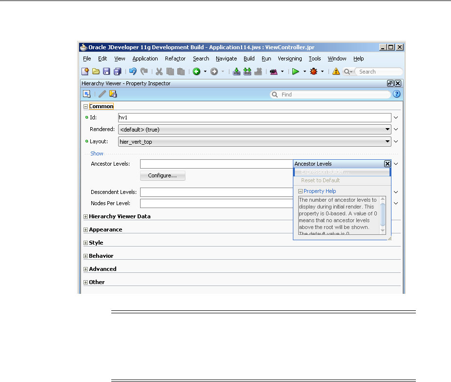
Using Hierarchy Viewer Components
Using Hierarchy Viewer Components 27-11
Figure 27–10 Hierarchy Viewer Ancestor Level Attribute Dropdown Menu
Before you begin:
It may be helpful to have an understanding of how hierarchy viewer attributes and
hierarchy child tags can affect functionality. For more information, see Section 27.2.1,
"Configuring Hierarchy Viewer Components."
You may also find it helpful to understand functionality that can be added using other
ADF Faces features. For more information, see Section 27.1.3, "Additional
Functionality for Hierarchy Viewer Components."
To add a hierarchy viewer to a page:
1. In the Component Palette, from the ADF Data Visualizations page, in the
Hierarchy Viewer panel, drag and drop a Hierarchy Viewer onto the page to open
the Create Hierarchy Viewer dialog in the Component Gallery.
Use the dialog to select the hierarchy viewer layout type. If you need help, press
F1 or click Help.
2. In the Property Inspector, view the attributes for the hierarchy viewer. Use the
help button to display the complete tag documentation for the
hierarchyViewer component.
3. Expand the Common section. Use this section to set the following attributes:
■Layout: Specify the hiearchical layout of the hierarchy viewer. For a
description with illustration of the valid values, see Section 27.1.1.1, "Layouts."
Note: If your application uses the Fusion technology stack, then you
can use data controls to create a hierarch viewer and the binding will
be done for you. For more information, see the "Creating Databound
Hierarchy Viewers" section in the Oracle Fusion Middleware Fusion
Developer's Guide for Oracle Application Development Framework

Using Hierarchy Viewer Components
27-12 Web User Interface Developer's Guide for Oracle Application Development Framework
■Ancestor Levels (show sub-menu): Use to set the displayLevelsAncestor
attribute that specifies the number of ancestor levels to display during initial
render. This property is zero-based. A value of 0 means that no ancestor levels
above the root will be shown. The default value is 0.
You can click Configure to open a Configure Ancestor Display dialog and
specify the ancestor data collection to use.
■Descendent Levels (show sub-menu): Use to set the
displayLevelsChildren attribute that specifies the number of child levels
to display during initial render. This property is zero-based. A value of 0
means that no child levels below the root will be shown; the root itself will be
shown. The default value is 1, which means that the root and the first level of
children will be shown.
■Nodes Per Level (show sub-menu): Use to set the levelFetchSize attribute
that specified the number of child nodes that will be fetched and displayed at
a single time for each expanded parent node. Additional child nodes may be
fetched and displayed by using the lateral navigation controls shown in the
hierarchy viewer. The default value is 25.
4. Expand the Hierarchy Viewer Data section. Use this section to set the following
attributes:
■Value: Specify the data model for the hierarchy viewer; can be an instance of
javax.faces.TreeModel.
■Var: Specify the variable used to reference each element of the hierarchy
viewer data collection. Once this component has completed rendering, this
variable is removed, or reverted back to its previous value.
5. Expand the Appearance section. Use this section to set the following attributes:
■Summary: Enter a description of the hierarchy viewer. This description is
accessed by screen reader users.
■EmptyText: Specify the text to display when a hierarchy viewer does not
display data.
6. Expand the Behavior section. Use this section to set the following attributes:
■ControlPanelBehavior: Specify the behavior of the Control Panel. For more
information, see Section 27.6.3, "How to Configure the Display of the Control
Panel."
■FeaturesOff: Specify a space delimited list of default features to turn off for
the hierarchy viewer. Valid values are: pan, zoom, zoomToFit, changeLayout,
cardSync, and nodeDetail.
■Panning: Specify panning behavior. The default value is default for click and
drag panning. You can also specify a tilt value for click and drag panning with
automatic 3D tilt panning enabled.
27.2.3 What Happens When You Add a Hierarchy Viewer to a Page
When a hierarchy viewer component is inserted into a JSF page using the Component
Gallery, a set of child tags that support customization of the gauge is automatically
inserted.
The hierarchy viewer component uses elements such as af:panelGroupLayout,
af:spacer, and af:separator to define how content is displayed in the nodes.
Example 27–1 shows the code generated when the component is created by insertion

Using Hierarchy Viewer Components
Using Hierarchy Viewer Components 27-13
from the Component Palette. Code related to the hierarchy viewer elements is
highlighted in the example.
Example 27–1 Hierarchy Viewer Sample Code
<dvt:hierarchyViewer id="hierarchyViewer1" layout="hier_vert_top"
inlineStyle="width:100%;height:600px;">
<dvt:link linkType="orthogonalRounded" id="l1"/>
<dvt:node width="233" height="330" id="n1">
<f:facet name="zoom100">
<af:panelGroupLayout layout="vertical"
inlineStyle="width:100%;height:100%;padding:5px"
id="pgl2">
<af:panelGroupLayout layout="horizontal" id="pgl3">
<af:panelGroupLayout inlineStyle="width:85px;height:120px"
id="pgl4">
<af:image id="i1"/>
</af:panelGroupLayout>
<af:spacer width="5" height="5" id="s2"/>
<af:panelGroupLayout layout="vertical" id="pgl1">
<af:outputText value=" attribute value1 "
inlineStyle="font-weight:bold;font-size:20px;color:#383A47"
id="ot5"/>
<af:outputText value=" attribute value2"
inlineStyle="font-size:20px;color:#383A47"
id="ot9"/>
<af:outputText value=" attribute value3"
inlineStyle="font-size:11px;font-style:italic;color:#383A47"
id="ot2"/>
</af:panelGroupLayout>
</af:panelGroupLayout>
<af:spacer height="5" id="s1"/>
<af:separator id="s4"/>
<af:spacer height="5" id="s3"/>
<dvt:panelCard effect="slide_horz"
inlineStyle="border-width:1px;border-color:#CCCCCC;
font-size:16px;font-weight:bold;color:#5a6a7a"
id="pc1">
<af:showDetailItem text="first group title "
inlineStyle="font-weight:bold;font-size:16px;color:#5a6a7a"
id="sdi1">
<af:panelFormLayout inlineStyle="width:100%;height:100%;padding:5px"
id="pfl1">
<af:panelLabelAndMessage label="attribute label4"
labelStyle="font-size:14px;color:#5A6A7A" id="plam2">
<af:outputText value="attribute value4"
inlineStyle="font-size:14px;color:#383A47" id="ot3">
</af:panelLabelAndMessage>
<af:panelLabelAndMessage label="attribute label5"
labelStyle="font-size:14px;color:#5A6A7A" id="plam6">
<af:outputText value="attribute value5"
inlineStyle="font-size:14px;color:#383A47" id="ot8">
</af:panelLabelAndMessage>
<af:panelLabelAndMessage label="attribute label6"
labelStyle="font-size:14px;color:#5A6A7A" id="plam5">
<af:outputText value="attribute value6"
inlineStyle="font-size:14px;color:#383A47" id="ot6">
</af:panelLabelAndMessage>
</af:panelFormLayout>
</af:showDetailItem>

Managing Nodes in a Hierarchy Viewer
27-14 Web User Interface Developer's Guide for Oracle Application Development Framework
<af:showDetailItem text="second group title "
inlineStyle="font-weight:bold;
font-size:16px;color:#5a6a7a" id=sd12">
<af:panelFormLayout inlineStyle="width:100%;height:100%;padding:5px"
id="pfl2">
<af:panelLabelAndMessage label="attribute label7"
labelStyle="font-size:14px;color:#5A6A7A" id="plam3">
<af:outputText value="attribute value7"
inlineStyle="font-size:14px;color:#383A47" id="ot7"/>
</af:panelLabelAndMessage>
<af:panelLabelAndMessage label="attribute label8"
labelStyle="font-size:14px;color:#5A6A7A"id="plam4">
<af:outputText value="attribute value8"
inlineStyle="font-size:14px;color:#383A47" id="ot1"/>
</af:panelLabelAndMessage>
<af:panelLabelAndMessage label="attribute label9"
labelStyle="font-size:14px;color:#5A6A7A" id="plam1">
<af:outputText value="attribute value9"
inlineStyle="font-size:14px;color:#383A47" id="ot4"/>
</af:panelLabelAndMessage>
</af:panelFormLayout>
</af:showDetailItem>
</dvt:panelCard>
</af:panelGroupLayout>
</f:facet>
</dvt:node>
</dvt:hierarchyViewer>
27.2.4 What You May Need to Know About How HTML Rendering
By default, the hierarchy viewer component renders in a Flash Player. When Flash 10
or higher is not available on the client or for the purpose or printing, the hierarchy
viewer is rendered in HTML. While HTML rendering follows Flash rendering as
closely as possible, there are some differences. For the most part, hierarchy viewer
display and features are supported with the following exceptions:
■Isolate and restore nodes is not available
■Node shapes are limited to rectangular
■For links, the link end connector is not supported, link type is limited to
orthogonal and link style is limited to a solid line
■For the control panel, all panel cards cannot be switched, panning is limited to
scroll bars, and zooming and zoom to fit is limited to 4 zoom facets
■Search is not supported
■Emailable page is not supported
■Node detail hover window is not supported
27.3 Managing Nodes in a Hierarchy Viewer
A node is a shape that represents the individual elements in a hierarchy viewer
component at runtime. Examples of individual elements in a hierarchy viewer
component include an employee in an organization chart or a computer in a network
diagram. By default, each node in a hierarchy viewer component includes controls that
allows users to do the following:
■Navigate to other nodes in a hierarchy viewer component
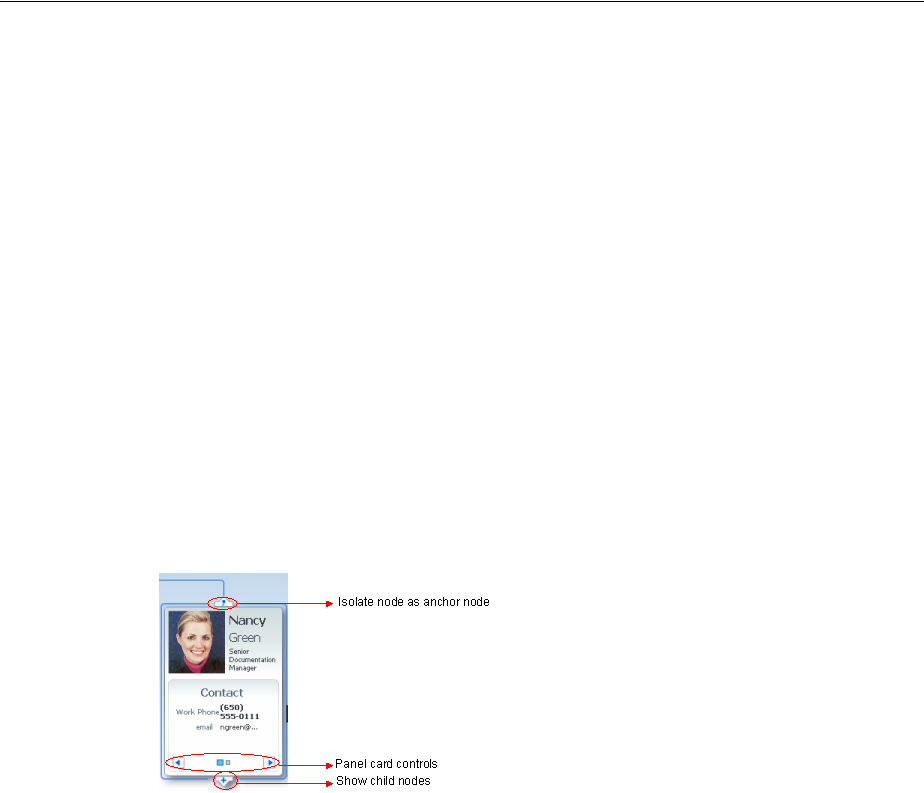
Managing Nodes in a Hierarchy Viewer
Using Hierarchy Viewer Components 27-15
The top of each node contains a single Restore or Isolate button to either display
the parent node or single out the node as the anchor node in the hierarchy viewer.
One exception is the node at the very top of the hierarchy viewer component,
because this node has no parent nodes and may not be isolated.
■Show or hide child nodes of the currently selected node in a hierarchy viewer
component
The single Show or Hide button appears on the bottom of every node that is a not
a leaf node.
If you use a panel card to display different sets of information for the node that the
hierarchy viewer component references, controls at the bottom of the node allow the
user to change the information set in the active node. For more information, see
Section 27.4, "Using Panel Cards."
Figure 27–11 shows an example of a node with controls that allow an end user to
isolate the node as the anchor node, show the child nodes, and change the node to
show different sets of information in the active node. For information about how to
configure the controls on a node, see Section 27.3.2, "How to Configure the Controls on
a Node."
Figure 27–11 Node Controls
There are four basic types of nodes:
■Root nodes are the uppermost visible nodes in a hierarchy viewer component. A
root node is always the root of the hierarchy returned from the tree component.
Typically, only one root node is visible at a time. However, there could be more
than one root node depending on the use case that you implement (for example, in
a family tree).
■An anchor node is the node that has focus whenever the hierarchy viewer
component is rendered. There is always just one anchor node visible.
The anchor node may be the same as the root node if child nodes are defined for
the tree node and if the value of the hierarchy viewer component’s
displayLevelsAncestor property is equal to 0. At runtime, if a user
double-clicks another node that has a value specified for its
setAnchorListener property, that node becomes the anchor node. An anchor
node may also be an inner or leaf node, depending on whether or not it has child
nodes. For information about how to specify an anchor node, see Section 27.3.4,
"How to Associate a Node Definition with a Particular Set of Data Rows."
You can specify one or more ancestor levels above the anchor node. For more
information, see Section 27.3.5, "How to Specify Ancestor Levels for an Anchor
Node."
■Inner nodes are nodes that have child nodes.
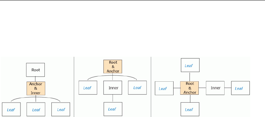
Managing Nodes in a Hierarchy Viewer
27-16 Web User Interface Developer's Guide for Oracle Application Development Framework
■Leaf nodes are nodes that do not have child nodes.
Figure 27–12 illustrates how a node can be a different type depending on the layout of
the hierarchy viewer component.
Figure 27–12 Node Types and Positions
27.3.1 How to Specify Node Content
Although a node contains controls by default that allow you to navigate to a node and
show or hide nodes, nodes do not by default include content unless you used a quick
start layout when creating the hierarchy viewer component. You must define what
content a node renders at runtime. You can specify node content when you associate
data bindings with the hierarchy viewer component as described in the "Creating
Databound Hierarchy Viewers" section in the Oracle Fusion Middleware Fusion
Developer's Guide for Oracle Application Development Framework.
By default, a hierarchy viewer component that you create contains one node with one
facet element that has a zoom level of 100%:
<f:facet name="zoom100"/>
You can insert three more instances of the facet element into the hierarchy viewer
component with the following zoom levels:
■25%: zoom25
■50%: zoom50
■75%: zoom75
Use these zoom level definitions to improve readability of node content when the
hierarchy viewer is zoomed out to display more nodes and less display room is
available in each node. You can define a subset of the available data collection within
one or more of the facet elements. For example, if you have a data collection with node
attributes that references data about a company department such as its name, location,
and number, you can specify a facet element with a zoom level of 50% that references
the node attribute for the department’s name and number.
At runtime, when a user moves the mouse over a node at any zoom level, a hover
window displaying node content at zoom level 100% is automatically displayed,
allowing the user to see the full information regardless of zoom level. The controls on
the hover window are active when the node has been selected in the hierarchy viewer.
Each of the facet elements that you insert can be used to reference other components.
You can use one or more of the following ADF Faces components when you define
content for a node in a hierarchy viewer component. The node component facet’s
support the following components:
■Layout components including: af:panelFormLayout,
af:panelGroupLayout, af:separator, af:showDetailItem, and

Managing Nodes in a Hierarchy Viewer
Using Hierarchy Viewer Components 27-17
af:spacer. For more information about using these components, see Chapter 9,
"Organizing Content on Web Pages."
■Menu components including: af:menu and af:menuItem. For more information
about these components, see Chapter 16, "Using Menus, Toolbars, and Toolboxes."
■Output components including: af:outputFormatted and af:outputText.
For more information about these components, see Chapter 18, "Using Output
Components."
■Message component af:outputLabelMessage. For more information about
this component, see Chapter 19, "Displaying Tips, Messages, and Help."
■Navigation components including: af:commandButton,
af:commandImageLink, af:commandLink, af:commandMenuItem,
af:goButton, and af:goLink. For more information about these components,
see Chapter 20, "Working with Navigation Components."
■Image component af:image. For information about how to use the af:image
component, see Section 27.6.2, "How to Include Images in a Hierarchy Viewer."
■af:showPopupBehavior: For information about how to use the
af:showPopupBehavior component, see Section 27.7.2, "How to Configure a
Hierarchy Viewer to Invoke a Popup Window."
■Hierarchy viewer child component panelCard. For information about how to use
the dvt:panelCard component, see Section 27.4, "Using Panel Cards."
By default, the hierarchy viewer component renders in a Flash Player, and in HTML
for the purpose of printing. For this reason, certain properties of ADF Faces
components that you specify as node content may not be supported and the
component may not render as you expect.
To add a node to a hierarchy viewer component:
1. In the Structure window, right-click the dvt:hierarchyViewer node and choose
Insert inside dvt:hierarchyViewer > Node.
The following entry appears in the JSF page:
<dvt:node>
<f:facet name="zoom100"/>
</dvt:node>
2. In the Structure window, right-click the dvt:node and choose Go to Properties.
3. Configure the appropriate properties in the Property Inspector.
For example, set a value for the type property to associate a node component
with an accessor:
<dvt:node type="model.rootEmp model.HvtestView"/>
For more information, see Section 27.3.3, "How to Specify a Node Definition for an
Accessor."
Note: Unsupported components are flagged at design time.
Managing Nodes in a Hierarchy Viewer
27-18 Web User Interface Developer's Guide for Oracle Application Development Framework
27.3.2 How to Configure the Controls on a Node
The node component (node) exposes a number of properties that allow you to
determine if controls such as Restore, Isolate, Show or Hide appear at runtime. It also
exposes properties that determine the size and shape of the node at runtime.
To configure the controls on a node:
1. In the Structure window, right-click the dvt:node component and choose Go to
Properties.
2. Configure properties in the Appearance section of the Property Inspector for the
dvt:node component, as described in Table 27–2.
3. For information about configuring the properties in the Style section of the
Property Inspector for the node component, see Section 28.2, "Changing the Style
Properties of a Component."
The hover window is automatically displayed when the user moves the mouse over
the node, reflecting the shape attribute set for the node. A node with the shape
attribute roundedRect, for example, will have a hover window with the same
attribute, as shown in Figure 27–13.
Table 27–2 Node Configuration Properties
To do this: Set the following value for this property:
Configure the Hide or Show controls to
appear or not on a node. Set showExpandChildren to False to hide
the controls. By default the property is set to
True.
Configure the Restore or Isolate controls to
appear or not on the node. Set the showNavigateUp and showIsolate
properties to False to hide these controls on
the node. By default the property is set to
true.
If the showNavigateUp property is set to
true, you must also set a value for the
hierarchy viewer component’s
navigateUpListener property, as
described in Section 27.5.1, "How to Configure
Upward Navigation in a Hierarchy Viewer."
Configure the height and width of a node. Set values for the width and height
properties.
Select the shape of the node. Select a value from the Shape dropdown list.
Available values are:
■ellipse
■rect
■roundedRect (default)
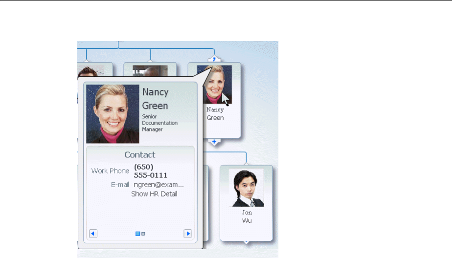
Managing Nodes in a Hierarchy Viewer
Using Hierarchy Viewer Components 27-19
Figure 27–13 Hover Window in Hierarchy Viewer Node
27.3.3 How to Specify a Node Definition for an Accessor
By default, you associate a node component with an accessor when you use the Create
Hierarchy Viewer dialog to create a hierarchy viewer component, as described in the
"Creating Databound Hierarchy Viewers" section in the Oracle Fusion Middleware
Fusion Developer's Guide for Oracle Application Development Framework. The Create
Hierarchy Viewer dialog sets the node component’s type property to a specific
accessor.
You can configure a node component’s type property to use one or more specified
accessors. Alternatively, you can configure a node component’s rendered property to
use a node definition across accessors, as described in Section 27.3.4, "How to
Associate a Node Definition with a Particular Set of Data Rows." When the hierarchy
viewer component determines which node definition to use for a particular data row,
it first checks for a match on the type property:
■If the type property matches and the rendered property value is true (default),
the hierarchy viewer component uses the node definition.
■If the type property does not match, the hierarchy viewer component checks for a
value of the rendered property that evaluates to true. The result of evaluating
the rendered property does not affect the type property.
27.3.4 How to Associate a Node Definition with a Particular Set of Data Rows
You can use a node component’s rendered property to associate the node with a
particular set of data rows or with a single data row. The rendered property accepts a
boolean value so you can write an EL expression that evaluates to true or false to
determine what data rows you associate with a node definition. For example, assume
that you want a node to display data based on job title. You write an EL expression for
the node component’s rendered property similar to the following pseudo EL
expression that evaluates to true when a job title matches the value you specify (in
this example, CEO):
rendered="#{node.title == 'CEO'}"

Using Panel Cards
27-20 Web User Interface Developer's Guide for Oracle Application Development Framework
When you use the node component’s rendered property in this way, you do not
define a value for the node component’s type property.
27.3.5 How to Specify Ancestor Levels for an Anchor Node
The anchor node of a hierarchy viewer component is the root of the hierarchy returned
by the tree binding. Depending on the use case, there can be multiple root nodes, for
example, a hierarchy viewer component that renders an organization chart with one or
more managers. When a hierarchy viewer component renders at runtime, the node
that has focus is the anchor node. If a user double-clicks another node at runtime that
has a value specified for its setAnchorListener property, that node becomes the
anchor node.
You can configure the hierarchy viewer to display one or more levels above the anchor
node, the ancestor levels. For example, if you search for an employee in a company,
you may wish to display the chain of management above the employee. Specify
ancestor levels using the displayLevelsAncestor property.
To specify the number of ancestor levels for an anchor node:
1. In the Structure window, right-click the dvt:hierarchyViewer node and choose Go
to Properties.
2. Expand the Common section of the Property Inspector.
3. Specify the number of levels of ancestor nodes that you want to appear at runtime
above the anchor node in the displayLevelsAncestor property.
For example, the following entry appears in the JSF page if you entered 2 as the
number of ancestor levels for the anchor node.
displayLevelsAncestor="2"
4. Save changes to the JSF page.
27.4 Using Panel Cards
You can use the panel card component in conjunction with the hierarchy viewer
component to hold different sets of information for the nodes that the hierarchy viewer
component references. The panel card component is an area inside the node element
that can include one or more af:showDetailItem elements.
Each of the af:showDetailItem elements references a set of content. For example, a
hierarchy viewer component that renders an organization chart would include a node
for employees in the organization. This node could include a panel card component
that references contact information using an af:showDetailItem element and
another af:showDetailItem element that references salary information.
A panel card component displays the content referenced by one
af:showDetailItem element at runtime. The panel card component renders
navigation buttons and other controls that allow the user to switch between the sets of
data referenced by af:showDetailItem elements. The controls that allow users to
switch between different sets of data can be configured with optional transitional
effects. For example, you can configure a panel card to horizontally slide between one
set of data referenced by an af:showDetailItem element to another set of data
referenced by another af:showDetailItem element.

Using Panel Cards
Using Hierarchy Viewer Components 27-21
27.4.1 How to Create a Panel Card
You can insert a panel card component into the JSF page that renders the hierarchy
viewer component by using the context menu that appears when you select the Facet
zoom element in the Structure window for the JSF page.
To create a panel card:
1. In the Structure window, right-click the zoom level within the node where you
want to create a panel card.
For example, select f:facet - zoom100.
2. Select Insert inside f:facet -zoom100 > Panel Card.
3. Use the Property Inspector to configure the properties of the panel card
component.
For example, set a value for the Effect property in the Advanced properties for the
panel card component. Valid values are:
■Horizontal Slide (default)
■Panel Flip
■Node Flip
■No Animation
4. In the Structure window, right-click dvt:panelCard and choose Insert inside
dvt:panelCard > Show Detail Item.
5. Repeat Step 4 as necessary.
6. Use the Property Inspector to configure the properties of the
af:showDetailItem elements that you insert.
27.4.2 What Happens at Runtime When a Panel Card Component Is Rendered
At runtime, a node appears and displays one panel card component. Users can click
the navigation buttons at the bottom of the panel card to navigate to the next set of
content referenced by one of the panel card’s af:showDetailItem child elements.
Figure 27–14 shows a node with a panel card component where two different
af:showDetailItem child elements reference different sets of information (Contact
and Address). The controls in the example include arrows to slide through the panel
cards as well as buttons to directly select the panel card to display. Tooltips display for
both control options.
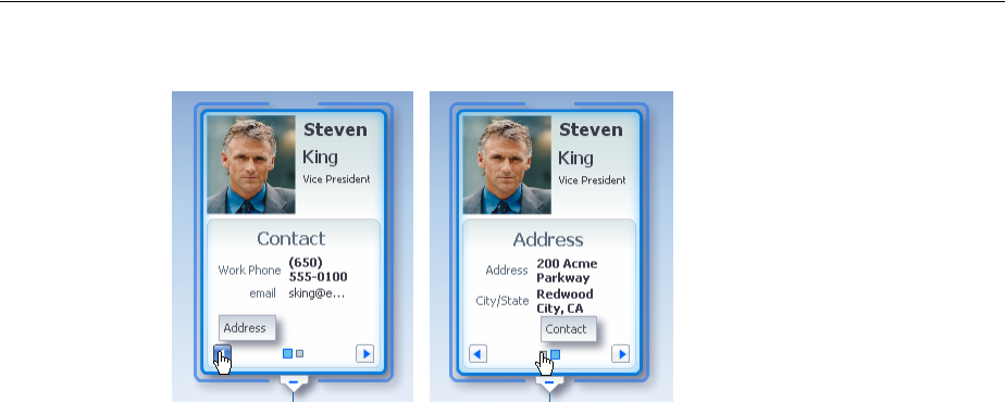
Configuring Navigation in a Hierarchy Viewer
27-22 Web User Interface Developer's Guide for Oracle Application Development Framework
Figure 27–14 Runtime View of a Node with a Panel Card
27.5 Configuring Navigation in a Hierarchy Viewer
By default, a hierarchy viewer component has downward navigation configured for
root and inner nodes. You can configure the hierarchy viewer component to enable
upward navigation and to determine the number of nodes to appear when a user
navigates between nodes on the same level.
For more information about node types, see Section 27.3, "Managing Nodes in a
Hierarchy Viewer."
27.5.1 How to Configure Upward Navigation in a Hierarchy Viewer
If you want to configure upward navigation for a hierarchy view component, you
configure a value for the hierarchy viewer component’s navigateUpListener
property.
To configure upward navigation for a hierarchy viewer component:
1. In the Structure window, select dvt:hierarchyViewer and choose Go to Properties.
2. In the Property Inspector, expand the Behavior section of the Property Inspector
and write a value for the hierarchy viewer component’s navigateUpListener
property that specifies a method to update the data model so that it references the
new anchor node when the user navigates up to a new anchor node.
3. Click OK.
27.5.2 How to Configure Same-Level Navigation in a Hierarchy Viewer
Same-level navigation between the nodes in a hierarchy viewer component is enabled
by default. You can configure the hierarchy viewer component to determine how
many nodes to display at a time. When you do this, controls appear that enable users
to navigate to the following:
■Left or right to view the next set of nodes
■First or last set of nodes in the collection of available nodes
To configure same-level navigation in a hierarchy viewer component:
1. In the Structure window, right-click the dvt:hierarchyViewer node and select Go
to Properties.
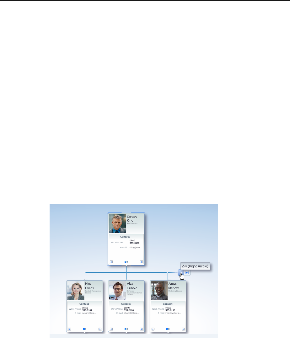
Customizing the Appearance of a Hierarchy Viewer
Using Hierarchy Viewer Components 27-23
2. Expand the Common section of the Property Inspector and specify the number of
nodes that you want to appear at runtime in the Nodes Per Level field
(levelFetchSize).
For example, the following entry appears in the JSF page if you entered 3 as the
number of nodes:
levelFetchSize="3"
3. Click OK.
27.5.3 What Happens When You Configure Same-Level Navigation in a Hierarchy
Viewer
At runtime, the hierarchy viewer component renders the number of nodes that you
specified as a value for the hierarchy viewer component’s levelFetchSize property.
It also renders controls that allow users to do the following:
■Navigate to the left or right to view the next set of nodes
■Navigate to the first or last set of nodes in the collection of available nodes
Figure 27–15 shows a runtime example where levelFetchSize="3". When a user
moves the mouse over the control, as shown in the circled area in Figure 27–15, the
control that allows users to navigate to the last set of nodes appears.
Figure 27–15 Hierarchy Viewer Component with Same-Level Navigation
27.6 Customizing the Appearance of a Hierarchy Viewer
You can customize the hierarchy viewer component size and appearance including
adding images, configuring the display of the control panel, and customizing links
and labels.
You can change the appearance of your hierarchy viewer component by changing
skins and component style attributes, as described in Chapter 28, "Customizing the
Appearance Using Styles and Skins."

Customizing the Appearance of a Hierarchy Viewer
27-24 Web User Interface Developer's Guide for Oracle Application Development Framework
27.6.1 How to Adjust the Size of a Hierarchy Viewer
You can adjust the size of the hierarchy viewer component by setting values for a
number of the hierarchy viewer component’s attributes using the Property Inspector.
To adjust the size of a hierarchy viewer:
1. In the Structure window for the JSF page that contains the hierarchy viewer
component, select the dvt:hierarchyViewer node.
2. In the Property Inspector, write the following values for the InlineStyle
property:
■width
Write a value in percent (%) or pixels (px). The default value for width is 100%.
■height
Write a value in percent (%) or pixels (px). The default value for height is
600px.
The final value that you enter for the InlineStyle property must use this
syntax:
width:100%;height:600px;
3. Save changes to the JSF page.
27.6.2 How to Include Images in a Hierarchy Viewer
You can configure a hierarchy viewer component to display images in the nodes of a
hierarchy viewer component at runtime. This can be useful where, for example, you
want pictures to appear in an organization chart. Insert an af:image component with
the source attribute bound to the URL of the desired image. The following code
example renders an image.
<af:panelGroupLayout>
<af:image source="/person_id=#{node.PersonId}"
inlineStyle="width:64px;height:90px;"/>
</af:panelGroupLayout>
For more information about the af:panelGroupLayout component, see
Section 9.12.1, "How to Use the panelGroupLayout Component."
27.6.3 How to Configure the Display of the Control Panel
Although you cannot configure the Control Panel to appear in another location, you
can configure the hierarchy viewer component to act as follows when the hierarchy
viewer component renders at runtime:
■Appears in an expanded or show state
■Appears in a collapsed or hidden state
■Does not appear to users
To configure the display of the Control Panel:
1. In the Structure window, right-click the dvt:hierarchyViewer node and choose Go
to Properties.
2. Expand the Appearance section and select one of the following values from the
ControlPanelBehavior dropdown list:
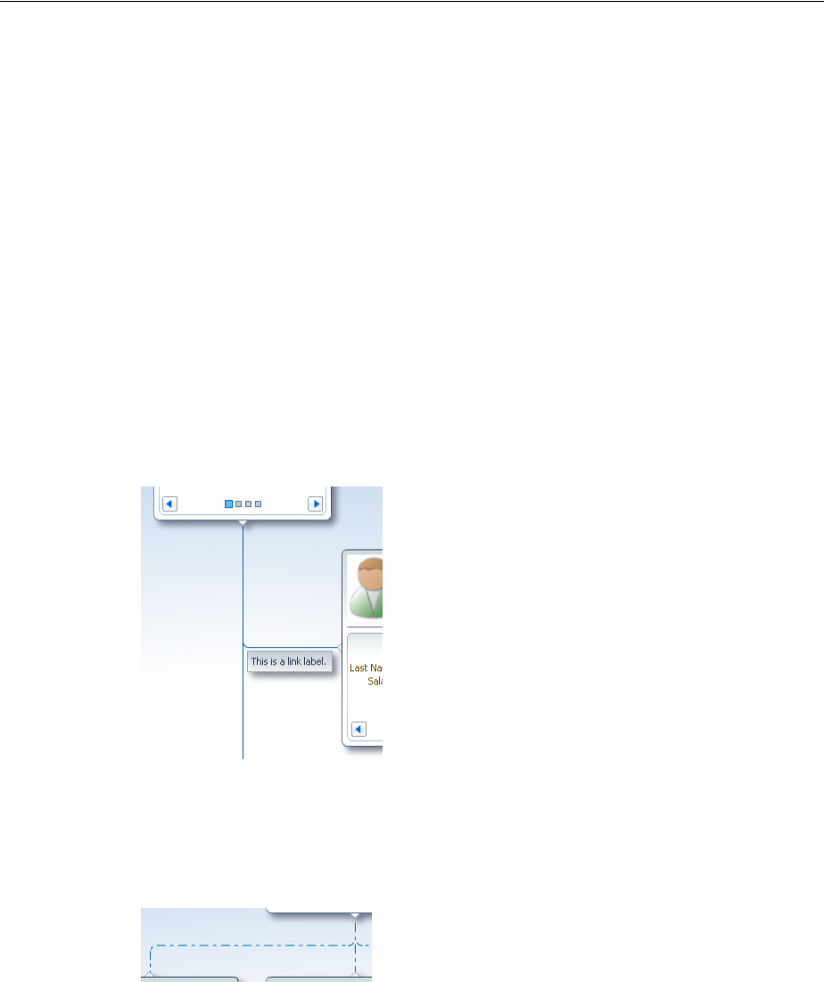
Customizing the Appearance of a Hierarchy Viewer
Using Hierarchy Viewer Components 27-25
■hidden
Select this value if you do not want the Control Panel to appear at runtime.
■initCollapsed
This is the default value. The Control Panel appears in a collapsed or hidden
state at runtime.
■initExpanded
Select this value if you want the Control Panel to appear in an expanded or
show state at runtime.
3. Save changes to the JSF page.
27.6.4 How to Configure the Display of Links and Labels
In a hierarchy viewer the relationships between nodes are represented by lines that
link the nodes. The links can be configured to include labels. Figure 27–16 illustrates
links and labels in a hierarchy viewer.
Figure 27–16 Hierarchy Viewer Links and Labels
You can customize the appearance of links and labels by setting properties of the
dvt:link element in a hierarchy viewer. Figure 27–17 illustrates links with a
dashDot value set for the linkStype attribute.
Figure 27–17 Links with dashDot Link Style
To customize the display of links and labels:
1. In the Structure window, right-click the dvt:link node and choose Go to
Properties.
2. In the Property Inspector, set the following attributes to customize the appearance
of links between nodes in a hierarchy viewer as desired:
■linkStyle - Sets the style of the link, for example, dotted or dashed line.
■linkColor - Sets the color of the link.
■linkWidth - Sets the width of the link, in pixels.

Adding Interactivity to a Hierarchy Viewer Component
27-26 Web User Interface Developer's Guide for Oracle Application Development Framework
■linkType - Sets the type of link, for example, direct line or smooth curved
line fitted to what would have been a single right angle.
■endConnectorType - Sets the style of the link connection end to none
(default) or arrowOpen.
3. Also in the Property Inspector, enter text for the label associated with the link in
the label property.
Alternatively, specify an EL expression to stamp out the link label based on the
child node. For example, write an EL expression similar to the following where the
node var attribute refers to the child node associated with the link.
label="{node.relationship}"
4. Optionally, also in the Property Inspector, use the rendered property to stamp
the link for a particular relationship between nodes. The property accepts a
boolean value so you can write an EL expression that evaluates to true or false
to determine if the link represents the relationship. For example, assume that you
want a link to display based on reporting relationship. You write an EL expression
for the link component’s rendered property similar to the following EL
expression that evaluates to true when the relationship matches the value you
specify (in this example, CONSULTANT):
rendered="#{node.relationship == "CEO"}
27.7 Adding Interactivity to a Hierarchy Viewer Component
You can configure a hierarchy viewer component to invoke popup windows and
display menus with functionality and data from other pages in your Oracle Fusion
web application.
27.7.1 How to Configure Node Selection Action
By default, clicking a hierarchy viewer node at runtime selects the node. You can
customize this interaction by setting the clickBehavior attribute on the dvt:node
component. Valid values for this property include:
■focus - The node receives focus and is selected when clicked (default).
■expandCollapse - Child node elements are either expanded or collapsed,
depending on their current expansion state.
■isolateRestore - The node is either isolated or restored, depending on its
current state.
■none - Clicking the node does nothing.
27.7.2 How to Configure a Hierarchy Viewer to Invoke a Popup Window
You can invoke a popup window from a hierarchy viewer node by specifying values
for the af:showPopupBehavior tag and invoking it from a command component,
for example, af:commandButton. You must nest the command component that
invokes the popup inside an f:facet element in a node of the hierarchy viewer
component. The triggerType property of an af:showPopupBehavior tag used in
this scenario supports only the following values:
■action
■mouseHover
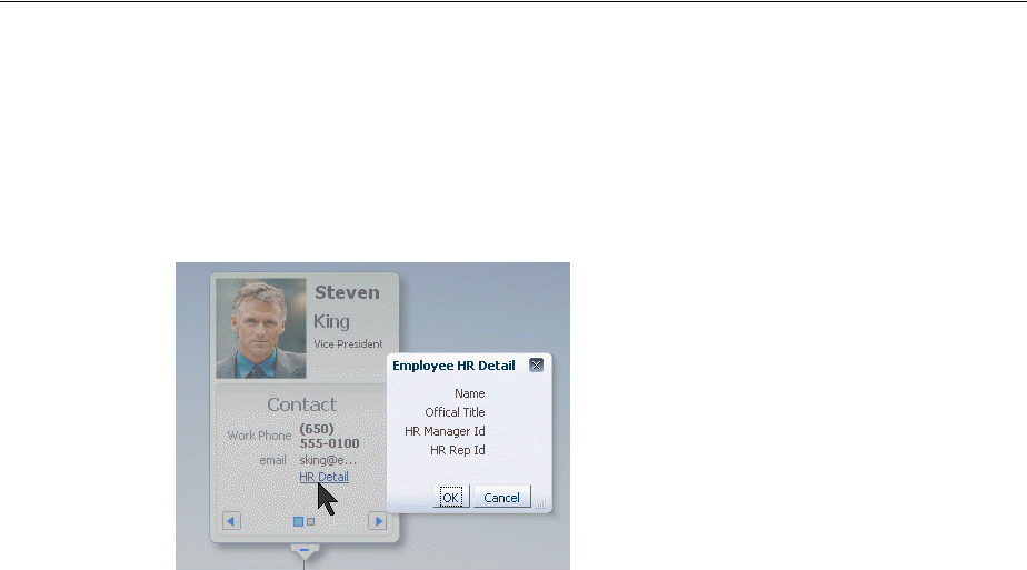
Adding Interactivity to a Hierarchy Viewer Component
Using Hierarchy Viewer Components 27-27
For example, Figure 27–18 shows a modal popup invoked from an HR Detail link in
the node. Example 27–2 shows sample code for creating the popup. Example 27–3
shows sample code for the invoking the popup from a command component. For
brevity, elements such as <af:panelGroupLayout>, <af:spacer>, and
<af:separator> are not included in the sample code.
Figure 27–18 Modal Popup in Hierarchy Viewer Node
Example 27–2 Sample Code to Create the Popup
<af:popup id="popupDialog" contentDelivery="lazyUncached" eventContext="launcher"
launcherVar="source">
<af:setPropertyListener from="#{source.currentRowData}"
to="#{myBean.selectedEmployee}" type="popupFetch"/>
<af:dialog title="Employee HR Detail">
<af:panelFormLayout>
<af:panelLabelAndMessage label="Name" >
<af:outputText value="#{myBean.selectedEmployee.firstName}
#{myBean.selectedEmployee.lastName}"/>
</af:panelLabelAndMessage>
<af:panelLabelAndMessage label="Offical Title" >
<af:outputText value="#{myBean.selectedEmployee.officalTitle}"/>
</af:panelLabelAndMessage>
<af:panelLabelAndMessage label="HR Manager Id" >
<af:outputText value="#{myBean.selectedEmployee.hrMgrPersonId}"/>
</af:panelLabelAndMessage>
<af:panelLabelAndMessage label="HR Rep Id" >
<af:outputText value="#{myBean.selectedEmployee.hrRepPersonId}"/>
</af:panelLabelAndMessage>
</af:panelFormLayout>
</af:dialog>
</af:popup>
Example 27–3 Sample Code to Invoke Popup from Command Component
<f:facet name="zoom100">
...
<dvt:panelCard effect="slide_horz"
...
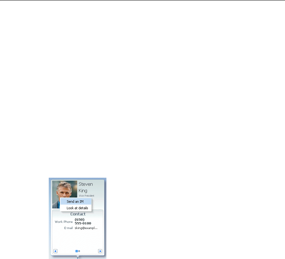
Adding Search to a Hierarchy Viewer
27-28 Web User Interface Developer's Guide for Oracle Application Development Framework
<af:showDetailItem text="Contact "
...
<af:commandLink text="Show HR Detail" inlineStyle="font-size:14px;color:#383A47" >
<af:showPopupBehavior popupId="::popupDialog" triggerType="action"
align="endAfter" alignId="pg1" />
</af:commandLink>
</showDetailItem>
</dvt:panelCard>
</f:facet>
For more information about using the af:showPopupBehavior tag, see Section 15.3,
"Declaratively Invoking a Popup."
27.7.3 How to Configure a Hierarchy View Node to Invoke a Menu
You can configure a node component (dvt:node) within a hierarchy viewer to invoke
a menu by using the af:menu component. You can configure one or more
af:commandMenuItem elements for the af:menu component. Nodes within a
hierarchy viewer component do not support the nesting of af:menu components.
Figure 27–19 shows a context menu associated with a node.
Figure 27–19 Hierarchy Viewer Node Context Menu
Example 27–4 shows sample code for creating the context menu
Example 27–4 Context Menu Sample Code
<af:popup id="popupDialog" contentDelivery="lazyUncached" >
<af:menu>
<af:commandMenuItem text="Send an IM"/>
<af:commandMenuItem text="Look at details"/>
</af:menu>
</af:popup>
For more information about using the af:menu component, see Chapter 15, "Using
Popup Dialogs, Menus, and Windows."
27.8 Adding Search to a Hierarchy Viewer
The hierarchy viewer search functionality looks through the data structure of the
hierarchy viewer and presents matches in a scrollable list. Users can double-click a
search result to display the matching node as the anchor node in the hierarchy viewer.
When enabled, a search panel is displayed in the upper right-hand corner of the
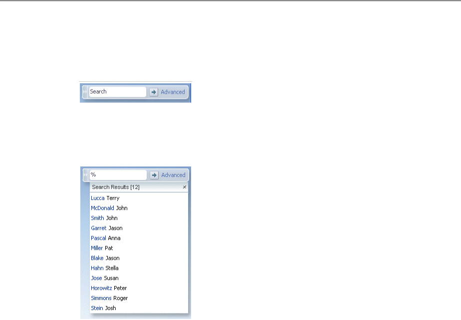
Adding Search to a Hierarchy Viewer
Using Hierarchy Viewer Components 27-29
hierarchy viewer, and results are displayed below the search panel. Figure 27–20
shows a sample search panel.
Figure 27–20 Hierarchy Viewer Search Panel
Figure 27–21 shows sample search results.
Figure 27–21 Hierarchy Viewer Sample Search Results
27.8.1 How to Configure Searching in a Hierarchy Viewer
Add the dvt:search tag as a child of the dvt:hierarchyViewer tag to enable
searching, and dvt:searchResults as a child of dvt:search to specify how to
handle the results.
To configure search in a hierarchy viewer:
1. In the Structure window, right-click the dvt:hierarchyViewer node and choose
insert inside dvt:hierarchyViewer > dvt:search.
2. In the Property Inspector, set the following attributes to configure the search
functionality:
■value: Specify the variable to hold the search text.
■actionListener: Enter the listener called to perform the search.
■initialBehavior: Specify how the search panel is initially displayed. Valid
values are initCollapsed for initially collapsed, initExpanded for
initially expanded, or hidden for completely hidden from view.
3. Optionally, add a f:facet with a value of name="end" to specify a component
that will launch an advanced search outside of the hierarchy viewer component.
This facet should contain only a single component, for example
af:commandLink, to launch a comprehensive search of a data set. For more
information, see Section 14.4, "Using the query Component."
4. In the Structure window, right-click the dvt:search node and choose insert inside
dvt:search > dvt:searchResults.
5. In the Property Inspector, set the following attributes to configure the display of
the search results:

Adding Search to a Hierarchy Viewer
27-30 Web User Interface Developer's Guide for Oracle Application Development Framework
■value: Specify the search results data model. This must be an instance of
oracle.adf.view.faces.bi.model.DataModel.
■var: Enter the name of the EL variable used to reference each element of the
hierarchy viewer collection. Once this component has completed rendering,
this variable is removed, or reverted back, to its previous value.
■varStatus: Enter the name of the EL variable used to reference the
varStatus information. Once this component has completed rendering, this
variable is removed, or reverted back, to its previous value.
■resultListener: Specify a reference to an action listener that will be called
after a row in the search results is selected.
■emptyText: Specify the text to display when no results are returned.
■fetchSize: Specify the number of result rows to fetch at a time.
6. In the Structure window, right-click the dvt:searchResults node and select insert
inside dvt:searchResults, then select ADF Faces, then select
af:setPropertyListener.
7. In the Property Inspector, set the following attributes to map the search results
node from the results model to the corresponding hierarchy viewer model:
■from: Specify the source of the value, a constant or an EL expression.
■to: Specify the target of the value.
■type: Choose action as the value.
8. In the Structure window, right-click the dvt:searchResults node and choose insert
inside dvt:searchResults > f:facet with a value of name="content".
9. In the Structure window, right-click the f:facet content node and do the
following to specify the components to stamp out the search results:
■Insert an ADF Faces af:panelGroupLayout element to wrap the output of
the search results.
■Insert the ADF Faces output components to display the search results. For
example:
<af:outputText value="#{resultRow.Lastname} " id="ot1"
inlineStyle="color:blue;"/>
<af:outputText value="#{resultRow.Firstname}" id="ot2"/>
Each stamped row references the current row using the var attribute of the
dvt:searchResults tag.
Example 27–5 shows sample code for configuring search in a hierarchy viewer.
Example 27–5 Sample Hierarchy Viewer Search Code
<dvt:hierarchyViewer>
<dvt:search id="searchId" value="#{bindings.lastNameParam.inputValue}"
actionListener="#{bindings.ExecuteWithParams1.execute}">
<f:facet name="end">
<af:commandLink text="Advanced">
<af:showPopupBehavior popupId="::mypop" triggerType="action"/>
</af:commandLink>
</f:facet>
<dvt:searchResults id="searchResultId"
emptyText="#{bindings.searchResult1.viewable ? 'No match.' : 'Access
Denied.'}"

Adding Search to a Hierarchy Viewer
Using Hierarchy Viewer Components 27-31
fetchSize="25"
value="#{bindings.searchResult1.collectionModel}"
resultListener="#{bindings.ExecuteWithParams.execute}"
var="resultRow">
<af:setPropertyListener from="#{resultRow.Id}"
to="#{bindings.employeeId.inputValue}"
type="action"/>
<f:facet name="content">
<af:panelGroupLayout inlineStyle="width:110px;height:20px;">
<af:outputText value="#{resultRow.Lastname} " id="ot1"
inlineStyle="color:blue;"/>
<af:outputText value="#{resultRow.Firstname}" id="ot2"/>
</af:panelGroupLayout>
</f:facet>
</dvt:searchResults>
</dvt:search>
</dvt:hierarchyViewer>
27.8.2 What You May Need to Know About Configuring Search in a Hierarchy Viewer
Search in a hierarchy viewer is based on the searchable attributes or columns of the
data collection that is the basis of the hierarchy viewer data model. Using a query
results collection defined in data controls in Oracle ADF, JDeveloper makes this a
declarative task. For more information, see the "How to Create a Databound Search in
a Hierarchy Viewer" section in the Oracle Fusion Middleware Fusion Developer's Guide for
Oracle Application Development Framework.

Adding Search to a Hierarchy Viewer
27-32 Web User Interface Developer's Guide for Oracle Application Development Framework

Part VI
Part VI Completing Your View
Part VI contains the following chapters:
■Chapter 28, "Customizing the Appearance Using Styles and Skins"
■Chapter 29, "Internationalizing and Localizing Pages"
■Chapter 30, "Developing Accessible ADF Faces Pages"
■Chapter 31, "Creating Custom ADF Faces Components"
■Chapter 32, "Allowing User Customization on JSF Pages"
■Chapter 33, "Adding Drag and Drop Functionality"
■Chapter 34, "Using Different Output Modes"
■Section 35, "Using the Active Data Service with an Asynchronous Backend"

28
Customizing the Appearance Using Styles and Skins 28-1
28Customizing the Appearance Using Styles
and Skins
This chapter describes how you customize the appearance of your application by
changing component style attributes or by using ADF skins.
This chapter includes the following sections:
■Section 28.1, "About Customizing the Appearance Using Styles and Skins"
■Section 28.2, "Changing the Style Properties of a Component"
■Section 28.3, "Enabling End Users to Change an Application’s ADF Skin"
28.1 About Customizing the Appearance Using Styles and Skins
You can customize the appearance of ADF Faces and ADF Data Visualization
components using an ADF skin that you apply to the application or by applying CSS
style properties directly to an ADF Faces or ADF DVT component if the component
exposes a style-related property (styleClass or inlineStyle). Choosing the latter
option means that you override style properties defined in your application’s ADF
skin for the component. You might do this when you want to change the style for an
instance of a component on a page rather than for all components throughout the
application or you want to programmatically set styles conditionally. For example, you
want to display text in red only under certain conditions. For more information, see
Section 28.2, "Changing the Style Properties of a Component."
An ADF skin is a type of CSS file where you define CSS style properties based on the
Cascading Style Sheet (CSS) specification for the component for which you want to
customize the appearance. The ADF skin defines rules that determine how to apply
CSS style properties to specific components or groups of components. The end user’s
browser interprets these rules and overrides the browser’s default settings.
Figure 28–1 and Figure 28–2 demonstrate the result that applying ADF skins can have
on the appearance of the ADF Faces and ADF Data Visualization components that
appear in your application. Figure 28–1 shows a page from the File Explorer
application with the simple ADF skin applied.
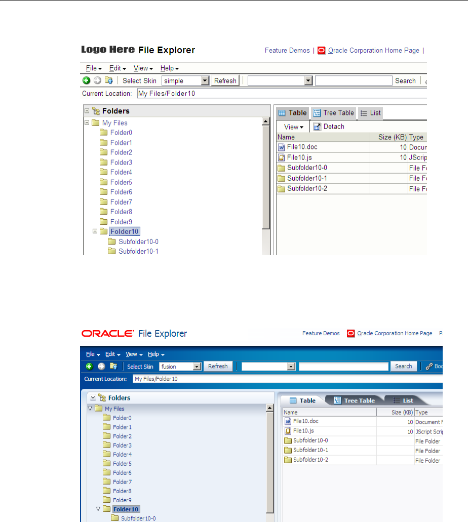
About Customizing the Appearance Using Styles and Skins
28-2 Web User Interface Developer's Guide for Oracle Application Development Framework
Figure 28–1 Index Page Using the Simple Skin
Figure 28–2 shows the same page from the same application with the fusion ADF
skin applied.
Figure 28–2 Index Page Using the Fusion ADF Skin
The File Explorer application provides several ADF skins to customize the appearance
of the application. You can view the source files for these ADF skins and the File
Explorer application. For more information, see Section 2.1, "About the ADF Faces
Demonstration Application."
It is beyond the scope of this guide to explain the concept of CSS. For extensive
information on style sheets, including the official specification, visit the World Wide
Web Consortium’s web site at:
http://www.w3.org/
It is also beyond the scope of this guide to describe how to create, modify, or apply
ADF skins to your application. For more information, see the Oracle Fusion Middleware
Skin Editor User's Guide for Oracle Application Development Framework.
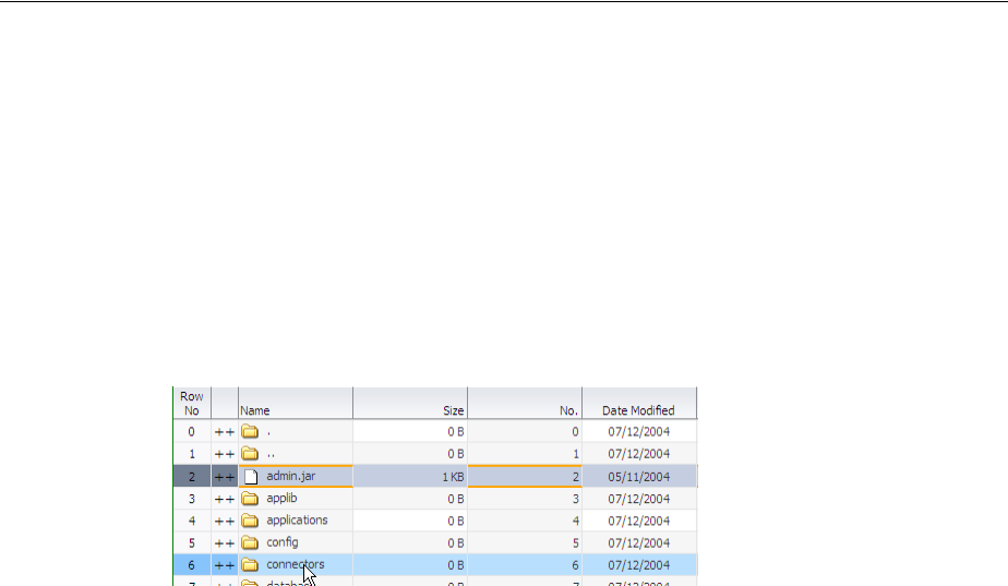
About Customizing the Appearance Using Styles and Skins
Customizing the Appearance Using Styles and Skins 28-3
If you create multiple ADF skins, you can configure your application so that end users
choose the ADF skin that they want the application to use. For more information, see
Section 28.3, "Enabling End Users to Change an Application’s ADF Skin."
28.1.1 Customizing the Appearance Use Cases and Examples
You can customize an ADF skin to serve a number of purposes. For example, you
might define properties in an ADF skin so that the application highlights a data row
rendered by an ADF Faces table component after an end user selects it to provide
feedback, as illustrated in Figure 28–3.
Figure 28–3 ADF Skin Properties in an ADF Table Component
Use ADF skin properties to define behavior and appearance that you cannot specify
using only CSS or that is dependent on component properties and, as a result, is not
feasible to define using CSS. For example, ADF Faces supports animation in browsers
where CSS 3 animations are not available. If you want to configure the duration of an
animation, use an ADF skin property to do so. Example 28–1 shows how an ADF skin
property defines the duration that an ADF Faces carousel component displays the
spin animation to be 500 milliseconds long.
Example 28–1 Using an ADF Skin Property to Specify Length of Spin Animation
af|carousel {
-tr-spin-animation-duration: 500;
}
28.1.2 Additional Functionality for Customizing the Appearance
You may find it helpful to understand other ADF Faces features and non-ADF Faces
features before you decide to customize the appearance of your application. The
following links provide more information that may be useful to know:
■Using parameters in text: You can use the ADF Faces EL format tags if you want
the text displayed in a component to contain parameters that will resolve at
runtime. For more information, see Section 3.5.2, "How to Use the EL Format
Tags."
■Internationalization and localization: The ADF skin that you create to apply to
your application can be customized as part of a process to internationalize and
localize ADF Faces pages. For more information about this process, see
Chapter 29, "Internationalizing and Localizing Pages."
■Accessibility: The ADF skin that you create to apply to your application can be
customized as part of a process to make your ADF Faces pages accessible. For
more information about this process, see Chapter 30, "Developing Accessible ADF
Faces Pages."

Changing the Style Properties of a Component
28-4 Web User Interface Developer's Guide for Oracle Application Development Framework
28.2 Changing the Style Properties of a Component
You can adjust the look and feel of any component at design time by changing the
component’s style-related properties, inlineStyle and styleClass, both of which
render on the root DOM element. Any style-related property (inlineStyle or
styleClass) you specify at design time overrides the comparable style specified in
the application’s ADF skin for that particular instance of the component. Any value
you specify for a component’s inlineStyle property overrides a value set for the
styleClass attribute.
The inlineStyle attribute is a semicolon-delimited string of CSS styles that can set
individual attributes, for example, background-color:red; color:blue;
font-style:italic; padding:3px. The styleClass attribute is a CSS style
class selector used to group a set of inline styles. The style classes can be defined using
an ADF public style class, for example, .AFInstructionText, sets all properties for
the text displayed in an af:outputText component.
Given a specific selector, you can get style properties for a custom component by
creating a class for a renderer. For more information, see Section 31.4.7, "How to Create
a Class for a Renderer."
28.2.1 How to Set an Inline Style
Set an inline style for a component by defining the inlineStyle attribute. You can
use inline style to specify the style of a component for that instance of the component.
For more information, see Section 9.3, "Arranging Contents to Stretch Across a Page."
Before you begin:
It may be helpful to have an understanding of how the inlineStyle attribute relates
to other attributes. For more information, see Section 28.2, "Changing the Style
Properties of a Component."
You may also find it helpful to understand functionality that can be added using other
ADF Faces features. For more information, see Section 28.1.2, "Additional
Functionality for Customizing the Appearance."
To set an inline style:
1. Set the inlineStyle attribute of the component to the inline style you want to
use.
2. If you use the Property Inspector to set a style, you can select the style features you
want from dropdown lists, as shown in Figure 28–4.
WARNING: Do not use styles to achieve stretching of components.
Using styles to achieve stretching is not declarative and, in many
cases, will result in inconsistent behavior across different web
browsers. Instead, you can use the geometry management provided
by the ADF Faces framework to achieve component stretching. For
more information about layouts and stretching, see Section 9.2.1,
"Geometry Management and Component Stretching."
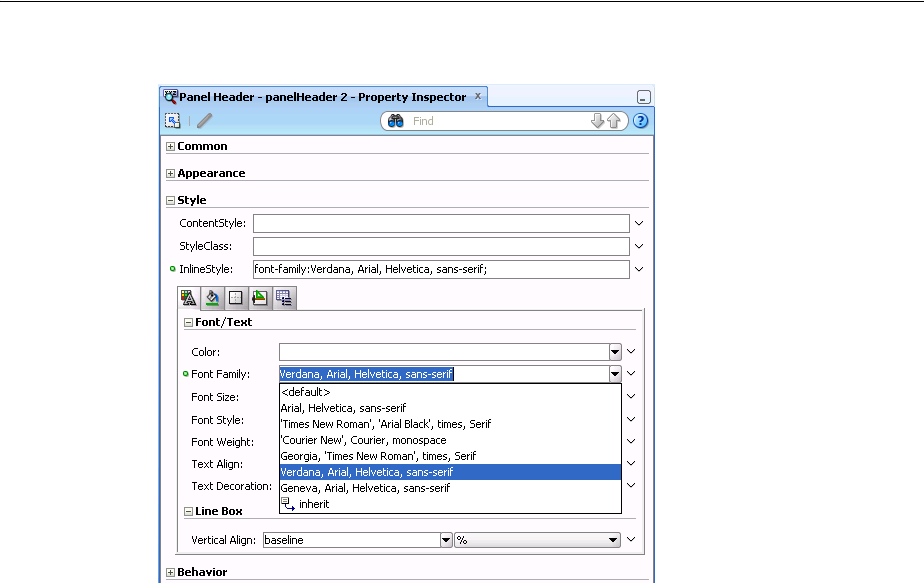
Changing the Style Properties of a Component
Customizing the Appearance Using Styles and Skins 28-5
Figure 28–4 Setting an inlineStyle Attribute
JDeveloper adds the corresponding code for the component to the JSF page.
Example 28–2 shows the source for an af:outputText component with an
inlineStyle attribute.
Example 28–2 InlineStyle in the Page Source
<af:outputText value="outputText1"
inlineStyle="color:Red; text-decoration:overline;"/>
3. You can use an EL expression for the inlineStyle attribute itself to
conditionally set inline style attributes. For example, if you want the date to be
displayed in red when an action has not yet been completed, you could use the
code similar to that in Example 28–3.
Example 28–3 EL Expression Used to Set an inlineStyle Attribute
<af:outputText value="#{row.assignedDate eq
null?res['srsearch.unassignedMessage']:row.assignedDate}"
inlineStyle="#{row.assignedDate eq null?'color:rgb(255,0,0);':''}"/>
4. The ADF Faces component may have other style attributes not available for styling
that do not register on the root DOM element. For example, for the
af:inputText component, set the text of the element using the contentStyle
property, as shown in Example 28–4.
Example 28–4 Using the contentStyle Property
<af:inputText value="outputText1"
contentStyle="color:Red;"/>

Enabling End Users to Change an Application’s ADF Skin
28-6 Web User Interface Developer's Guide for Oracle Application Development Framework
28.2.2 How to Set a Style Class
You can define the style for a component using a style class. You create a style class to
group a set of inline styles. Use the styleClass attribute to reference the style class.
Before you begin:
It may be helpful to have an understanding of how the styleClass attribute relates
to other attributes. For more information, see Section 28.2, "Changing the Style
Properties of a Component."
You may also find it helpful to understand functionality that can be added using other
ADF Faces features. For more information, see Section 28.1.2, "Additional
Functionality for Customizing the Appearance."
To set a style using a style class:
1. Set the styleClass attribute of the component to the style class you want to use.
Example 28–5 shows an example of a style class being used in the page source.
Example 28–5 Page Source for Using a Style Class
<af:outputText value="Text with a style class"
styleClass="overdue"/>
2. You can also use EL expressions for the styleClass attribute to conditionally set
style attributes. For example, if you want the date to be displayed in red when an
action has not yet been completed, you could use code similar to that in
Example 28–3.
28.3 Enabling End Users to Change an Application’s ADF Skin
You can configure your application to enable end users select an alternative ADF skin.
You might configure this functionality when you want end users to render the
application’s page using an ADF skin that is more suitable for their needs. For
example, you want your application to use an ADF skin with features specific to a
Japanese locale when a user’s browser is Japanese. An alternative example is where
you want your application to use an ADF skin that is configured to make your
application’s pages more accessible for users with disabilities.
Figure 28–5 shows how you might implement this functionality by configuring a
component (for example, af:commandMenuItem) to allow end users to change the
ADF skin the application uses at runtime. Configure the component on the JSF page to
set a scope value that can later be evaluated by the skin-family property in the
trinidad-config file.
Figure 28–5 Changing an Application’s ADF Skin

Enabling End Users to Change an Application’s ADF Skin
Customizing the Appearance Using Styles and Skins 28-7
28.3.1 How to Enable End Users Change an Application's ADF Skin
You enable end users change an application’s ADF skin by exposing a component that
allows them to update the value the skin-family property in the
trinidad-config file.
Before you begin:
It may be helpful to have an understanding of how the changes that you make can
affect functionality. For more information, see Section 28.3, "Enabling End Users to
Change an Application’s ADF Skin."
You may also find it helpful to understand functionality that can be added using other
ADF Faces features. For more information, see Section 28.1.2, "Additional
Functionality for Customizing the Appearance."
To enable end users change an application's ADF skin:
1. Open the main JSF page where you want to configure the component(s) that you
use to set the skin family.
2. Configure a number of components (for example, af:commandMenuItem
components) that allow end users to choose one of a number of available ADF
skins at runtime, as shown in Figure 28–5.
Example 28–6 shows how you configure af:commandMenuItem components that
allow end users to choose available ADF skins at runtime, as shown in
Figure 28–5. Each af:commandMenuItem component specifies a value for the
actionListener attribute. This attribute passes an actionEvent to a method
(skinMenuAction) on a managed bean named skins if an end user clicks the
menu item.
Example 28–6 Using a Component to Set the Skin Family
<af:menu text="Change Skin" id="skins" binding="#{backing_ChangeSkin.skins}">
<af:commandMenuItem text="blafplus-rich" id="skin1"
binding="#{backing_ChangeSkin.skin1}" type="radio"
actionListener="#{skins.skinMenuAction}"
selected="#{skins.skinFamily}"/>
<af:commandMenuItem id="skin2" text="blafplus-medium" type="radio"
actionListener="#{skins.skinMenuAction}"
selected="#{skins.skinFamily=='blafplus-medium'}"/>
<af:commandMenuItem id="skin3" text="fusion" type="radio"
actionListener="#{skins.skinMenuAction}"
selected="#{skins.skinFamily=='fusion'}"/>
<af:commandMenuItem id="skin4" text="fusion-projector" type="radio"
actionListener="#{skins.skinMenuAction}"
selected="#{skins.skinFamily=='fusion-projector'}"/>
<af:commandMenuItem id="skin5" text="simple" type="radio"
actionListener="#{skins.skinMenuAction}"
selected="#{skins.skinFamily=='simple'}"/>
<af:commandMenuItem id="skin6" text="skin1" type="radio"
actionListener="#{skins.skinMenuAction}"
selected="#{skins.skinFamily=='skin1'}"/>
</af:menu>
3. Write a method (for example, skinMenuAction) on a managed bean named
skins to store the value of the ADF skin selected by the end user. Example 28–7
shows a method that takes the value the end user selected and uses it to set the
value of skinFamily in a managed bean. The method in Example 28–7 also
invokes a method to reload the page after it sets the value of skinFamily.

Enabling End Users to Change an Application’s ADF Skin
28-8 Web User Interface Developer's Guide for Oracle Application Development Framework
Example 28–7 Managed Bean Method to Change ADF Skin
public void skinMenuAction(ActionEvent ae)
{
RichCommandMenuItem menuItem = (RichCommandMenuItem)ae.getComponent();
// Invoke another managed bean method to set the value of skinFamily
setSkinFamily(menuItem.getText());
// Invoke a method to reload the page. The application reloads the page
// using the newly-selected ADF skin.
reloadThePage();
}
4. In the Application Navigator, double-click the trinidad-config.xml file.
5. In the trinidad-config.xml file, write an EL expression to dynamically
evaluate the skin family:
<skin-family>#{skins.skinFamily}</skin-family>
28.3.2 What Happens at Runtime: Changing an Application's ADF Skin
At runtime, the end user uses the component that you exposed to select another ADF
skin. In our example, this is one of a number of af:commandMenuItem components.
This component submits the value that the end user selected to a managed bean that,
in turn, sets the value of a managed bean property (skinFamily). At runtime, the
<skin-family> property in the trinidad-config file reads the value from the
managed bean using an EL expression.

29
Internationalizing and Localizing Pages 29-1
29Internationalizing and Localizing Pages
This chapter describes how to configure JSF pages or an application to display text in
the correct language of a user’s browser.
This chapter includes the following sections:
■Section 29.1, "About Internationalizing and Localizing ADF Faces Pages"
■Section 29.2, "Using Automatic Resource Bundle Integration in JDeveloper"
■Section 29.3, "Manually Defining Resource Bundles and Locales"
■Section 29.4, "Configuring Pages for an End User to Specify Locale at Runtime"
■Section 29.5, "Configuring Optional ADF Faces Localization Properties"
29.1 About Internationalizing and Localizing ADF Faces Pages
Internationalization is the process of designing and developing products for easy
adaptation to specific local languages and cultures. Localization is the process of
adapting a product for a specific local language or culture by translating text and
adding locale-specific components. A successfully localized application will appear to
have been developed within the local culture. JDeveloper supports easy localization of
ADF Faces components using the abstract class java.util.ResourceBundle to
provide locale-specific resources.
When your application will be viewed by users in more than one country, you can
configure your JSF page or application to use different locales so that it displays the
correct language for the language setting of a user’s browser. For example, if you
know your page will be viewed in Italy, you can localize your page so that when a
user’s browser is set to use the Italian language, text strings in the browser page
appear in Italian.
ADF Faces components may include text that is part of the component, for example
the af:table component uses the resource string af_table.LABEL_FETCHING for
the message text that displays in the browser while the af:table component fetches
data during the initial load of data or while the user scrolls the table. JDeveloper
provides automatic translation of these text resources into 28 languages. These text
resources are referenced in a resource bundle. You must enable support for each
language that you want your application to support by specifying the
<supported-locale> element in the faces-config.xml file. For example, if you
set the browser to use the language in Italy, and you add
<supported-locale>it</supported-locale> to the faces-config.xml file,
any text contained within the components will automatically be displayed in Italian.
For more information, see Section 29.3.3, "How to Register Locales and Resource
Bundles in Your Application."

About Internationalizing and Localizing ADF Faces Pages
29-2 Web User Interface Developer's Guide for Oracle Application Development Framework
For any text you add to a component, for example if you define the label of an
af:commandButton component by setting the text attribute, you must provide a
resource bundle that holds the actual text, create a version of the resource bundle for
each locale, and add a <locale-config> element to define default and support
locales in the application’s faces-config.xml file. You must also add a
<resource-bundle> element to your application’s faces-config.xml file in
order to make the resource bundles available to all the pages in your application. Once
you have configured and registered a resource bundle, the Expression Language (EL)
editor will display the key from the bundle, making it easier to reference the bundle in
application pages.
To simplify the process of creating text resources for text you add to ADF components,
JDeveloper supports automatic resource bundle synchronization for any translatable
string in the visual editor. When you edit components directly in the visual editor or in
the Property Inspector, text resources are automatically created in the base resource
bundle. For more information, see Section 29.2, "Using Automatic Resource Bundle
Integration in JDeveloper."
29.1.1 Internationalizing and Localizing Pages Use Cases and Examples
Assume, for example, that you have a page with a title of My Purchase Requests.
Rather than set the literal string, My Purchase Requests, as the value of the
af:panelPage component’s title attribute, you bind the value of the title
attribute to a key in the UIResources resource bundle. The UIResources resource
bundle is registered in the faces-config.xml file for the application, as shown in
Example 29–1.
Example 29–1 Resource Bundle Element in JSF Configuration File
<resource-bundle>
<var>res</var>
<base-name>resources.UIResources</base-name>
</resource-bundle>
The resource bundle is given a variable name (in this case, res) that can then be used
in EL expressions. On the page, the title attribute of the af:panelPage component is
then bound to the myDemo.pageTitle key in that resource bundle, as shown in
Example 29–2.
Example 29–2 Component Text Referencing Resource Bundle
<af:panelPage text="#{res['myDemo.pageTitle']}
The UIResources resource bundle has an entry in the English language for all static
text displayed on each page in the application, as well as for text for messages and
global text, such as generic labels. Example 29–3 shows the keys for the myDemo page.
Example 29–3 Resource Bundle Keys for the myDemo Page Displayed in English
#myDemo Screen
myDemo.pageTitle=My Purchase Requests
myDemo.menubar.openLink=Open Requests
myDemo.menubar.pendingLink=Requests Awaiting customer
Note: Any text retrieved from the database is not translated. This
document explains how to localize static text, not text that is stored in
the database.

About Internationalizing and Localizing ADF Faces Pages
Internationalizing and Localizing Pages 29-3
myDemo.menubar.closedLink=Closed Requests
myDemo.menubar.allRequests=All Requests
myDemo.menubar.newLink=Create New Purchase Request
myDemo.selectAnd=Select and
myDemo.buttonbar.view=View
myDemo.buttonbar.edit=Edit
Note that text in the banner image and data retrieved from the database are not
translated.
Example 29–4 shows the resource bundle version for the Italian (Italy) locale,
UIResources_it. Note that there is not an entry for the selection facet’s title, yet it
was translated from Select to Seleziona automatically. That is because this text is part of
the ADF Faces table component’s selection facet.
Example 29–4 Resource Bundle Keys for the myDemo Page Displayed in Italian
#myDemo Screen
myDemo.pageTitle=Miei Ticket
myDemo.menubar.openLink=Ticket Aperti
myDemo.menubar.pendingLink=Ticket in Attesa del Cliente
myDemo.menubar.closedLink=Ticket Risolti
myDemo.menubar.allRequests=Tutti i Ticket
myDemo.menubar.newLink=Creare Nuovo Ticket
myDemo.selectAnd=Seleziona e
myDemo.buttonbar.view=Vedere Dettagli
myDemo.buttonbar.edit=Aggiorna
29.1.2 Additional Functionality for Internationalizing and Localizing Pages
You may find it helpful to understand other ADF Faces features before you
internationalize or localize your application. Additionally, once you have
internationalized or localized your application, you may find that you need to add
functionality such as accessibility or render ADF Faces components from right to left.
Following are links to other functionality that you can use.
■Using parameters in text: You can use the ADF Faces EL format tags if you want
the text displayed in a component to contain parameters that will resolve at
runtime. For more information, see Section 3.5.2, "How to Use the EL Format
Tags."
■Pseudo-classes: ADF skins support a number of pseudo-classes that you can use
to change how an application renders in a particular locale. For example, the :rtl
pseudo-class renders ADF Faces components from right to left. This may be useful
if your application is localized into languages, such as Arabic and Hebrew, that
read from right to left. For more information, see Chapter 28, "Customizing the
Appearance Using Styles and Skins."
■Accessibility: You can make the pages in your application accessible. For more
information, see Chapter 30, "Developing Accessible ADF Faces Pages."
■Global resource strings: The default resource bundle stores the global resource
strings that ADF Faces components support and the resource strings that are
specific to individual components. For information about these resource strings,
see the Oracle Fusion Middleware Tag Reference for Oracle ADF Faces Skin
Selectors.
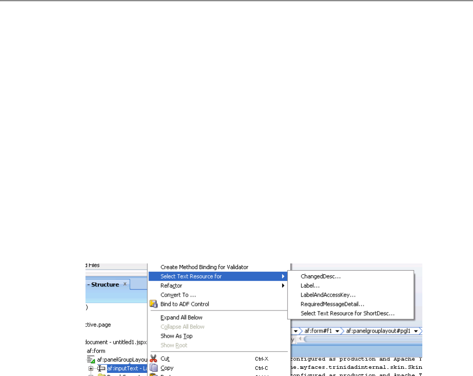
Using Automatic Resource Bundle Integration in JDeveloper
29-4 Web User Interface Developer's Guide for Oracle Application Development Framework
29.2 Using Automatic Resource Bundle Integration in JDeveloper
By default, JDeveloper supports the automatic creation of text resources in the default
resource bundle when editing ADF Faces components in the visual editor. To treat
user-defined strings as static values, disable Automatically Synchronize Bundle in the
Project Properties dialog, as described in Section 29.2.1, "How to Set Resource Bundle
Options".
Automatic resource bundle integration can be configured to support one resource
bundle per page or project, or multiple shared bundles.
You can edit translatable text strings using any one of the following methods:
■In the Structure window, right-click the component for which you want to enter
translatable text strings. Choose Select Text Resource for followed by the
translatable item for which you want to enter text. For example, Figure 29–1 shows
the context menu that appears when you right-click an af:inputText
component.
Figure 29–1 Adding Text to a Component
■From the text input window, choose Select Text Resource to launch the Select Text
Resource dialog, as shown in Figure 29–2. The dialog can also be accessed by
right-clicking the component and choosing Select Text Resource for, or from the
Property Inspector, by clicking the icon to the right of a translatable property and
selecting Select Text Resource.
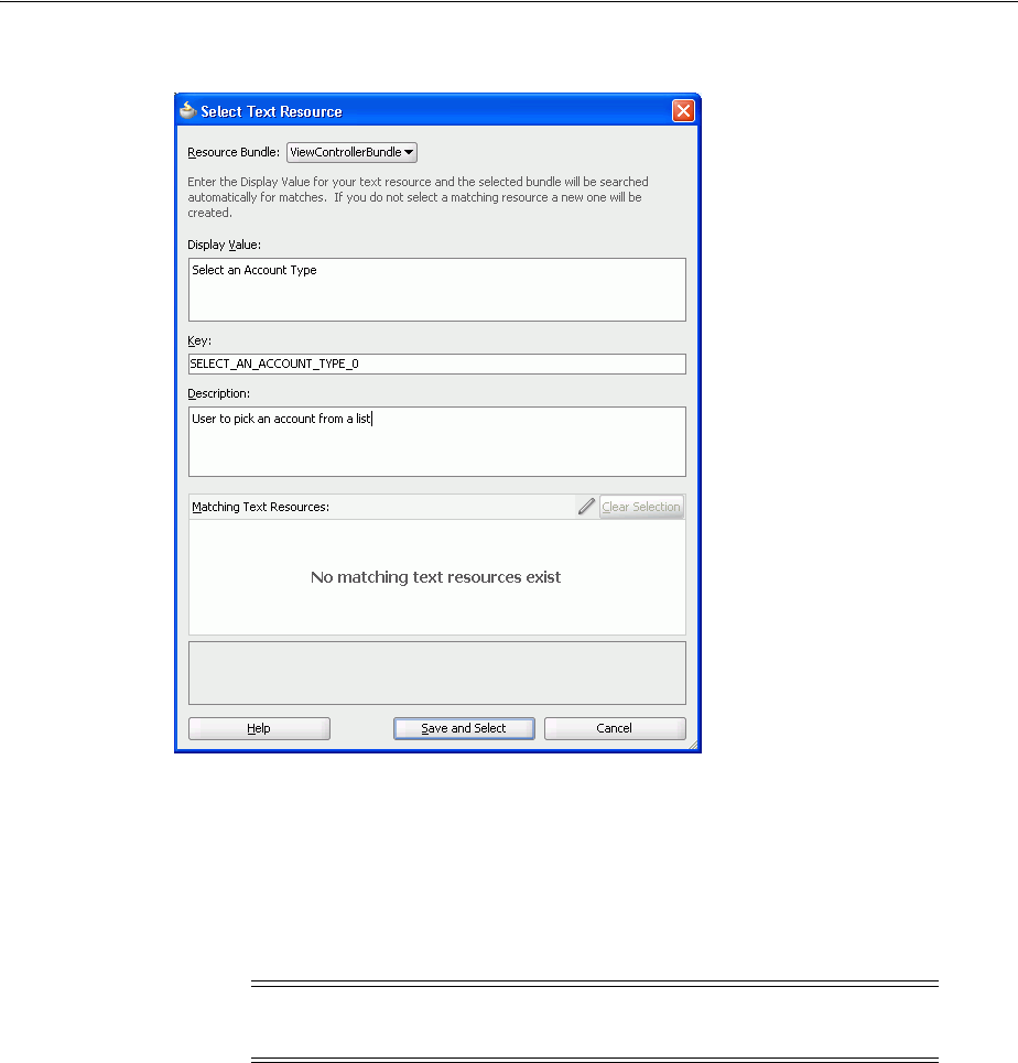
Using Automatic Resource Bundle Integration in JDeveloper
Internationalizing and Localizing Pages 29-5
Figure 29–2 Select Text Resource Dialog
■From the text input window, select Expression Builder to launch the Expression
Builder dialog. The dialog can also be accessed from the Property Inspector by
clicking the icon to the right of a translatable property and selecting Expression
Builder.
■In the Property Inspector, enter a valid expression language string for a
translatable property.
29.2.1 How to Set Resource Bundle Options
After you have created a project, you can set resource bundle options in the Project
Properties dialog.
Before you begin:
It may help to understand how JDeveloper manages resource bundles. For more
information, see Section 29.2, "Using Automatic Resource Bundle Integration in
JDeveloper."
You may also find it helpful to understand functionality that can be added using other
Oracle ADF features. For more information, see Section 29.1.2, "Additional
Functionality for Internationalizing and Localizing Pages."
To set resource bundle options for a project:
1. In the Application Navigator, double-click the project.
Note: JDeveloper only writes strings to a resource bundle that you
enter using one of the previously-listed methods.
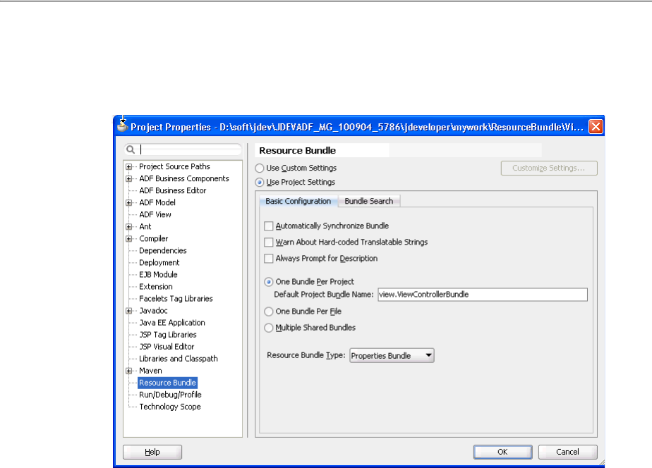
Using Automatic Resource Bundle Integration in JDeveloper
29-6 Web User Interface Developer's Guide for Oracle Application Development Framework
2. In the Project Properties dialog, select Resource Bundle to display the resource
bundle options, as shown in Figure 29–3.
Figure 29–3 Project Properties Resource Bundle dialog
3. If you want JDeveloper to automatically generate a default resource file, select
Automatically Synchronize Bundle.
4. Select one of the following resource bundle file options:
■One Bundle Per Project - configured in a file named
<ProjectName>.properties.
■One Bundle Per File - configured in a file named
<FileName>.properties.
■Multiple Shared Bundles.
5. Select the resource bundle type from the dropdown list:
■XML Localization Interchange File Format (XLIFF) Bundle
■List Resource Bundle
■Properties Bundle
6. Click OK.
29.2.2 What Happens When You Set Resource Bundle Options
JDeveloper generates one or more resource bundles of a particular type based on the
selections that you make in the resource bundle options part of the Project Properties
dialog, as illustrated in Figure 29–3. It generates a resource bundle the first time that
you invoke the Select Text Resource dialog illustrated in Figure 29–2.
Assume, for example, that you select the One Bundle Per Project checkbox and the
List Resource Bundle value from the Resource Bundle Type dropdown list. The
first time that you invoke the Select Text Resource dialog, JDeveloper generates one

Using Automatic Resource Bundle Integration in JDeveloper
Internationalizing and Localizing Pages 29-7
resource bundle for the project. The generated resource bundle is a Java class named
after the default project bundle name in the Project Properties dialog (for example,
ViewControllerBundle.java).
JDeveloper generates a resource bundle as an .xlf file if you select the XML
Localization Interchange File Format (XLIFF) Bundle option and a .properties file
if you select the Properties Bundle option.
By default, JDeveloper creates the generated resource bundle in the view subdirectory
of the project’s Application Sources directory.
29.2.3 How to Create an Entry in a JDeveloper-Generated Resource Bundle
JDeveloper generates one or more resource bundles based on the values you select in
the resource bundle options part of the Project Properties dialog. It generates a
resource bundle the first time that you invoke the Select Text Resource dialog from a
component property in the Property Inspector.
JDeveloper writes key-value pairs to the resource bundle based on the values that you
enter in the Select Text Resource dialog. It also allows you to select an existing
key-value pair from a resource bundle to render a runtime display value for a
component.
Before you begin:
It may help to understand how JDeveloper manages resource bundles. For more
information, see Section 29.2, "Using Automatic Resource Bundle Integration in
JDeveloper."
You may also find it helpful to understand functionality that can be added using other
Oracle ADF features. For more information, see Section 29.1.2, "Additional
Functionality for Internationalizing and Localizing Pages."
To create an entry in the resource bundle generated by JDeveloper:
1. In the JSF page, select the component for which you want to write a runtime value.
For example, select an af:inputText component.
2. In the Property Inspector, use a property’s dropdown list to select Select Text
Resource to create a new entry in the resource bundle.
The Select Text Resource entry in the dropdown list only appears for properties
that support text resources. For example, the Label property of an af:inputText
component.
3. Write the value that you want to appear at runtime in the Display Value input
field, as illustrated in Figure 29–2.
JDeveloper generates a value in the Key input field.
4. Optionally, write a description in the Description input field.
5. Click Save and Select.
Note: JDeveloper displays a matching text resource in the Matching
Text Resource field if a text resource exists that matches the value you
entered in the Display Value input field exists.

Manually Defining Resource Bundles and Locales
29-8 Web User Interface Developer's Guide for Oracle Application Development Framework
29.2.4 What Happens When You Create an Entry in a JDeveloper-Generated Resource
Bundle
JDeveloper writes the key-value pair that you define in the Select Text Resource dialog
to the resource bundle. The options that you select in the resource bundle options part
of the Project Properties dialog determine what type of resource bundle JDeveloper
writes the key-value pair to. For more information, see Section 29.2.2, "What Happens
When You Set Resource Bundle Options".
The component property for which you define the resource bundle entry uses an EL
expression to retrieve the value from the resource bundle at runtime. For example, an
af:inputText component’s Label property may reference an EL expression similar
to the following:
#{viewcontrollerBundle.NAME}
where viewcontrollerBundle references the resource bundle and NAME is the key
for the runtime value.
29.3 Manually Defining Resource Bundles and Locales
A resource bundle contains a number of named resources, where the data type of the
named resources is String. A bundle may have a parent bundle. When a resource is
not found in a bundle, the parent bundle is searched for the resource. Resource
bundles can be either Java classes, property files, or XLIFF files. The abstract class
java.util.ResourceBundle has two subclasses:
java.util.PropertyResourceBundle and
java.util.ListResourceBundle. A java.util.PropertyResourceBundle
is stored in a property file, which is a plain-text file containing translatable text.
Property files can contain values only for String objects. If you need to store other
types of objects, you must use a java.util.ListResourceBundle class instead.
For more information about using XLIFF, see
http://docs.oasis-open.org/xliff/xliff-core/xliff-core.html
To add support for an additional locale, replace the values for the keys with localized
values and save the property file, appending a language code (mandatory) and an
optional country code and variant as identifiers to the name, for example,
UIResources_it.properties.
The java.util.ListResourceBundle class manages resources in a name and
value array. Each java.util.ListResourceBundle class is contained within a
Java class file. You can store any locale-specific object in a
java.util.ListResourceBundle class. To add support for an additional locale,
you create a subclass from the base class, save it to a file with a locale or language
extension, translate it, and compile it into a class file.
The ResourceBundle class is flexible. If you first put your locale-specific String
objects in a java.util.PropertyResourceBundle file, you can still move them to
a ListResourceBundle class later. There is no impact on your code, because any
call to find your key will look in both the java.util.ListResourceBundle class
and the java.util.PropertyResourceBundle file.
The precedence order is class before properties. So if a key exists for the same language
in both a class file and a property file, the value in the class file will be the value
presented to you. Additionally, the search algorithm for determining which bundle to
load is as follows:
1. (baseclass)+(specific language)+(specific country)+(specific variant)

Manually Defining Resource Bundles and Locales
Internationalizing and Localizing Pages 29-9
2. (baseclass)+(specific language)+(specific country)
3. (baseclass)+(specific language)
4. (baseclass)+(default language)+(default country)+(default variant)
5. (baseclass)+(default language)+(default country)
6. (baseclass)+(default language)
For example, if your browser is set to the Italian (Italy) locale and the default locale of
the application is US English, the application attempts to find the closest match,
looking in the following order:
1. it_IT
2. it
3. en_US
4. en
5. The base class bundle
29.3.1 How to Define the Base Resource Bundle
You must create a base resource bundle that contains all the text strings that are not
part of the components themselves. This bundle should be in the default language of
the application. You can create a resource bundle as a property file, as an XLIFF file, or
as a Java class. After a resource bundle file has been created, you can edit the file using
the Edit Resource Bundles dialog.
Before you begin:
It may help to understand what types of resource bundle you can create. For more
information, see Section 29.3, "Manually Defining Resource Bundles and Locales."
You may also find it helpful to understand functionality that can be added using other
Oracle ADF features. For more information, see Section 29.1.2, "Additional
Functionality for Internationalizing and Localizing Pages."
To create a resource bundle as a property file or an XLIFF file:
1. In JDeveloper, create a new file.
■In the Application Navigator, right-click where you want the file to be placed
and choose New from the context menu to open the New Gallery.
■In the Categories tree, select General, and in the Items list, select File. Click
OK.
■In the Create File dialog, enter a name for the file using the convention
<name><_lang>.properties for the using the properties file or <name><_
Tip: The getBundle method used to load the bundle looks for the
default locale classes before it returns the base class bundle. If it fails
to find a match, it throws a MissingResourceException error. A
base class with no suffixes should always exist as a default. Otherwise,
it may not find a match and the exception is thrown.
Note: If you are creating a localized version of the base resource
bundle, save the file to the same directory as the base file.
Manually Defining Resource Bundles and Locales
29-10 Web User Interface Developer's Guide for Oracle Application Development Framework
lang>.xlf for using the XLIFF file, where the <_lang> suffix is provided for
translated files, as in _de for German, and omitted for the base language.
2. Enter the content for the file. You can enter the content manually by entering the
key-value pairs. You can use the Edit Resource Bundle dialog to enter the
key-value pairs, as described in Section 29.3.2, "How to Edit a Resource Bundle
File".
■If you are creating a property file, create a key and value for each string of
static text for this bundle. The key is a unique identifier for the string. The
value is the string of text in the language for the bundle. If you are creating a
localized version of the base resource bundle, any key not found in this
version will inherit the values from the base class.
For example, the key and the value for the title of the myDemo page is:
myDemo.pageTitle=My Purchase Requests
■If you are creating an XLIFF file, enter the proper tags for each key-value pair.
For example:
<?xml version="1.0" encoding="windows-1252" ?>
<xliff version="1.1" xmlns="urn:oasis:names:tc:xliff:document:1.1">
<file source-language="en" original="myResources" datatype="xml">
<body>
<trans-unit id="NAME">
<source>Name</source>
<target/>
<note>Name of employee</note>
</trans-unit>
<trans-unit id="HOME_ADDRESS">
<source>Home Address</source>
<target/>
<note>Adress of employee</note>
</trans-unit>
<trans-unit id="OFFICE_ADDRESS">
<source>Office Address</source>
<target/>
<note>Office building </note>
</trans-unit>
</body>
Note: If you are creating a localized version of a base resource
bundle, you must append the ISO 639 lowercase language code to the
name of the file. For example, the Italian version of the UIResources
bundle is UIResources_it.properties. You can add the ISO 3166
uppercase country code (for example it_CH, for Switzerland) if one
language is used by more than one country. You can also add an
optional nonstandard variant (for example, to provide platform or
region information).
If you are creating the base resource bundle, do not append any codes.
Note: All non-ASCII characters must be UNICODE-escaped or the
encoding must be explicitly specified when compiling, for example:
javac -encoding ISO8859_5 UIResources_it.java

Manually Defining Resource Bundles and Locales
Internationalizing and Localizing Pages 29-11
</file>
</xliff>
3. After you have entered all the values, click OK.
To create a resource bundle as a Java class:
1. In JDeveloper, create a new Java class:
■In the Application Navigator, right-click where you want the file to be placed
and choose New to open the New Gallery.
■In the Categories tree, select General, and in the Items list, select Java Class.
Click OK.
■In the Create Java Class dialog, enter a name and package for the class. The
class must extend java.util.ListResourceBundle.
2. Implement the getContents() method, which simply returns an array of
key-value pairs. Create the array of keys for the bundle with the appropriate
values. Or use the Edit Resource Bundles dialog to automatically generate the
code, as described in Section 29.3.2, "How to Edit a Resource Bundle File".
Example 29–5 shows a base resource bundle Java class.
Example 29–5 Base Resource Bundle Java Class
package sample;
import java.util.ListResourceBundle;
public class MyResources extends ListResourceBundle {
public Object[][] getContents() {
return contents;
}
static final Object[][] contents {
{"button_Search", Search"},
{"button_Reset", "Reset"},
};
Note: If you are creating a localized version of the base resource
bundle, it must reside in the same directory as the base file.
Note: If you are creating a localized version of a base resource
bundle, you must append the ISO 639 lowercase language code to the
name of the class. For example, the Italian version of the
UIResources bundle might be UIResources_it.java. You can
add the ISO 3166 uppercase country code (for example it_CH, for
Switzerland) if one language is used by more than one country. You
can also add an optional nonstandard variant (for example, to provide
platform or region information).
If you are creating the base resource bundle, do not append any codes.
Note: Keys must be String objects. If you are creating a localized
version of the base resource bundle, any key not found in this version
will inherit the values from the base class.
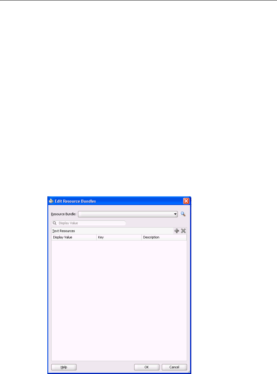
Manually Defining Resource Bundles and Locales
29-12 Web User Interface Developer's Guide for Oracle Application Development Framework
}
29.3.2 How to Edit a Resource Bundle File
After you have created a resource bundle property file, XLIFF file, or Java class file,
you can edit it using the source editor.
Before you begin:
It may help to understand what types of resource bundles you can define and edit. For
more information, see Section 29.3, "Manually Defining Resource Bundles and
Locales."
You may also find it helpful to understand functionality that can be added using other
Oracle ADF features. For more information, see Section 29.1.2, "Additional
Functionality for Internationalizing and Localizing Pages."
To edit a resource bundle after it has been created:
1. In JDeveloper, choose Application > Edit Resource Bundles from the main menu.
2. In the Edit Resource Bundles dialog, select the resource bundle file you want to
edit from the Resource Bundle dropdown list, as shown in Figure 29–4, or click
the Search icon to launch the Select Resource Bundle dialog.
Figure 29–4 Edit Resource Bundle Dialog
3. In the Select Resource Bundle dialog, select the file type from the File type
dropdown list. Navigate to the resource bundle you want to edit, as shown in
Figure 29–5. Click OK.
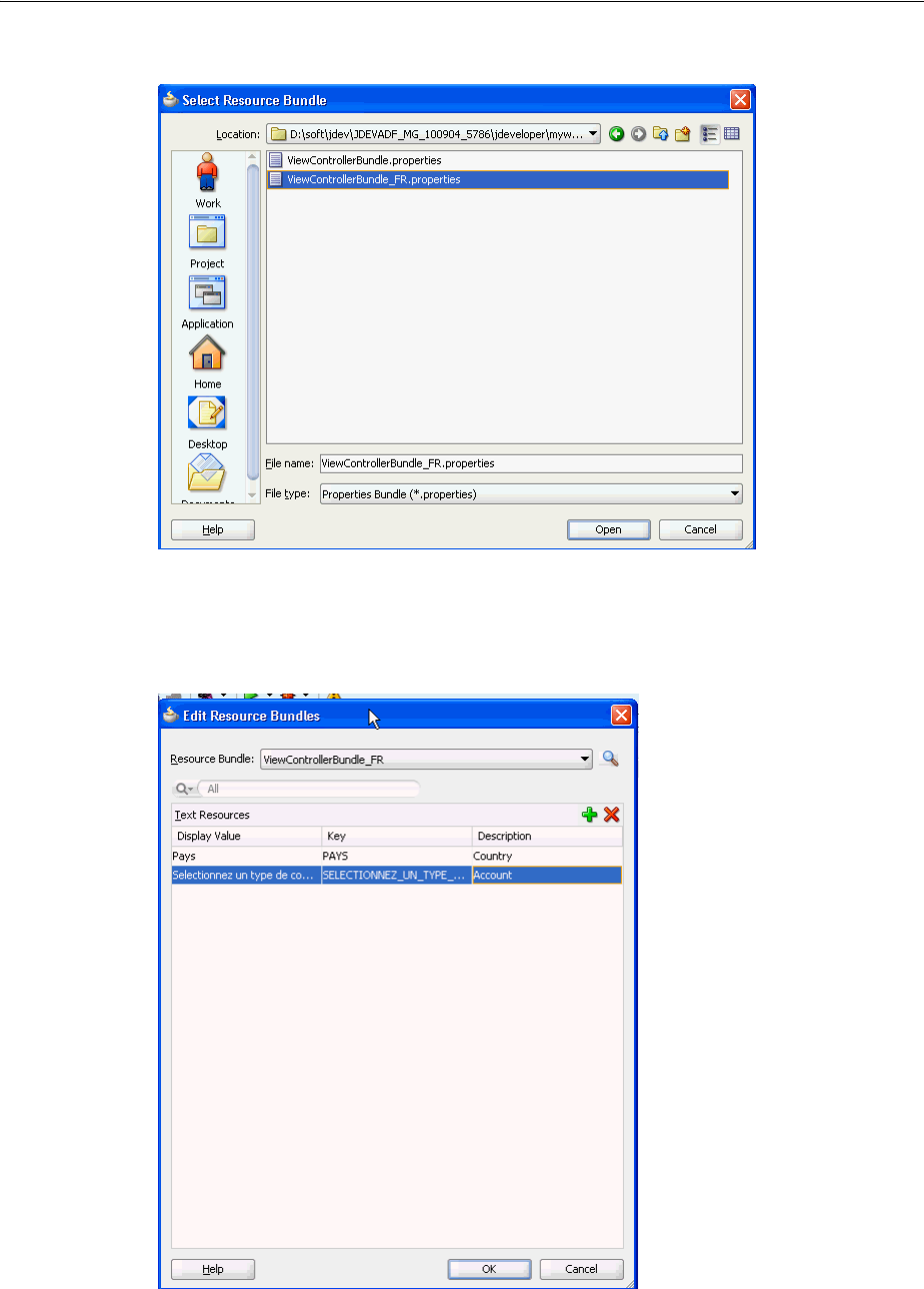
Manually Defining Resource Bundles and Locales
Internationalizing and Localizing Pages 29-13
Figure 29–5 Select Resource Bundle Dialog
4. In the Edit Resource Bundles dialog, click the Add icon to add a key-value pair, as
shown in Figure 29–6. When you have finished, click OK.
Figure 29–6 Adding Values to a Resource Bundle
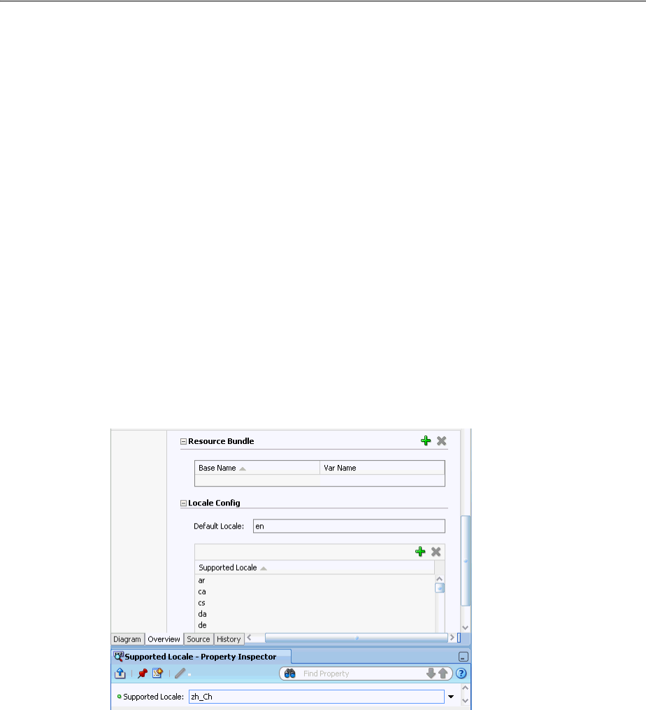
Manually Defining Resource Bundles and Locales
29-14 Web User Interface Developer's Guide for Oracle Application Development Framework
29.3.3 How to Register Locales and Resource Bundles in Your Application
You must register the locales and resource bundles used in your application in the
faces-config.xml file.
Before you begin:
It may help to understand how you can manually manage resource bundles. For more
information, see Section 29.3, "Manually Defining Resource Bundles and Locales."
You may also find it helpful to understand functionality that can be added using other
Oracle ADF features. For more information, see Section 29.1.2, "Additional
Functionality for Internationalizing and Localizing Pages."
To register a locale for your application:
1. Open the faces-config.xml file and click the Overview tab in the editor
window. The faces-config.xml file is located in the <View_
Project>/WEB-INF directory.
2. In the editor window, select Application.
3. In the Locale Config area, click Add to open the Property Inspector to add the
code for the locale, as shown in Figure 29–7.
Figure 29–7 Adding a Locale to faces-config.xml
After you have added the locales, the faces-config.xml file should have code
similar to the following:
<locale-config>
<default-locale>en</default-locale>
<supported-locale>ar</supported-locale>
<supported-locale>ca</supported-locale>
<supported-locale>cs</supported-locale>
<supported-locale>da</supported-locale>
<supported-locale>de</supported-locale>
<supported-locale>zh_Ch</supported-locale>
</locale-config>
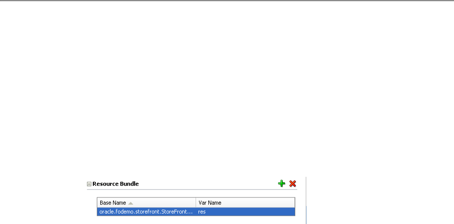
Manually Defining Resource Bundles and Locales
Internationalizing and Localizing Pages 29-15
To register the resource bundle:
1. Open the faces-config.xml file and click the Overview tab in the editor
window. The faces-config.xml file is located in the <View_
Project>/WEB-INF directory.
2. In the editor window, select Application.
3. In the Resource Bundle section, click Add to enable editor input. Enter the fully
qualified name of the base bundle that contains messages to be used by the
application and a variable name that can be used to reference the bundle in an EL
expression, as shown in Figure 29–8.
Figure 29–8 Adding a Resource Bundle to faces-config.xml
After you have added the resource bundle, the faces-config.xml file should
have code similar to the following:
<resource-bundle>
<base-name>oracle.fodemo.storefront.StoreFrontUIBundle</base-name>
<var>res</var>
</resource-bundle>
29.3.4 How to Use Resource Bundles in Your Application
You set your page encoding and response encoding to all supported languages and
you bind to the resource bundle.
Before you begin:
It may help to understand how you can manually manage resource bundles. For more
information, see Section 29.3, "Manually Defining Resource Bundles and Locales."
You may also find it helpful to understand functionality that can be added using other
Oracle ADF features. For more information, see Section 29.1.2, "Additional
Functionality for Internationalizing and Localizing Pages."
To use a base resource bundle on your page:
1. Set your page encoding and response encoding to be a superset of all supported
languages. If no encoding is set, the page encoding defaults to the value of the
response encoding set using the contentType attribute of the page directive.
Example 29–6 shows the encoding for a sample page.
Example 29–6 Page and Response Encoding
<?xml version='1.0' encoding='UTF-8'?>
<jsp:root xmlns:jsp="http://java.sun.com/JSP/Page" version="2.1"
xmlns:f="http://java.sun.com/jsf/core"
xmlns:h="http://java.sun.com/jsf/html"
xmlns:af="http://xmlns.oracle.com/adf/faces/rich">
<jsp:directive.page contentType="text/html;charset=UTF-8"/>
<f:view>
2. Bind all attributes that represent strings of static text displayed on the page to the
appropriate key in the resource bundle, using the variable defined in the

Manually Defining Resource Bundles and Locales
29-16 Web User Interface Developer's Guide for Oracle Application Development Framework
faces-config.xml file for the <resource-bundle> element. Example 29–7
shows the code for the View button on the myDemo page.
Example 29–7 Binding to a Resource Bundle
<af:commandButton text="#{res['myDemo.buttonbar.view']}"
. . . />
3. You can also use the adfBundle keyword to resolve resource strings from specific
resource bundles as EL expressions in the JSF page.
The usage format is #{adfBundle[ bundleID ] [ resource_Key ]}, where
bundleID is the fully qualified bundle ID, such as project.EmpMsgBundle,
and resource_Key is the resource key in the bundle, such as Deptno_LABEL.
Example 29–8 shows how adfBundle is used to provide the button text with a
resource strings from a specific resource bundle.
Example 29–8 Binding Using adfBundle
<af:commandButton text="#{adfBundle[’project.EmpMsgBundle’] [’Deptno_LABEL’]}"
29.3.5 What You May Need to Know About ADF Skins and Control Hints
If you use an ADF skin and have created a custom resource bundle for the skin, you
must also create localized versions of the resource bundle. Similarly, if your
application uses control hints to set any text, you must create localized versions of the
generated resource bundles for that text.
29.3.6 What You May Need to Know About Overriding a Resource Bundle in a
Customizable Application
If you are developing a customizable application using the Oracle Metadata Services
(MDS) framework and you create a resource bundle (an override bundle) that
overrides key-value pairs from the base resource bundle, you need to configure your
application’s adf-config.xml file to support the overriding of the base resource
bundle. An override bundle is a resource bundle that contains the key-value pairs that
differ from the base resource bundle that you want to use in your customizable
application. If, for example, you have a base bundle with the name
oracle.demo.CustAppUIBundle, you configure an entry in your application's
adf-config.xml file as shown in Example 29–9 to make it overrideable. Once it is
marked as overriden, any customizations of that bundle will be stored in your
application's override bundle.
Example 29–9 Entry for Override Bundle in adf-config.xml File
<adf-resourcebundle-config xmlns="http://xmlns.oracle.com/adf/resourcebundle/config">
<applicationBundleName>oracle/app.../xliffBundle/FusionAppsOverrideBundle</applicationBundleName>
Tip: If you type the following syntax in the source editor, JDeveloper
displays a dropdown list of the keys that resolve to strings in the
resource bundle:
<af:commandButton text="#{res.
JDeveloper completes the EL expression when you select a key from
the dropdown list.

Configuring Pages for an End User to Specify Locale at Runtime
Internationalizing and Localizing Pages 29-17
<bundleList>
<bundleId override="true">oracle.demo.CustAppUIBundle</bundleId>
</bundleList>
</adf-resourcebundle-config>
For more information about the adf-config.xml file, see Section A.4,
"Configuration in adf-config.xml." For more information about creating customizable
applications using MDS, see the "Customizing Applications with MDS" chapter of the
Oracle Fusion Middleware Fusion Developer's Guide for Oracle Application Development
Framework.
29.4 Configuring Pages for an End User to Specify Locale at Runtime
You can configure an application so end users can specify the locale at runtime rather
than the default behavior where the locale settings of the end user’s browser
determine the runtime locale. Implement this functionality if you want your
application to allow end users to specify their preferred locale and save their
preference.
29.4.1 How to Configure a Page for an End User to Specify Locale
Create a new page or open an existing page. Configure it so that:
■It references a backing bean to store locale information
■An end user can invoke a control at runtime to update the locale information in
the backing bean
■The locale attribute of the f:view tag references the backing bean
Before you begin:
It may help to understand the configuration options available to you. For more
information, see Section 29.4, "Configuring Pages for an End User to Specify Locale at
Runtime."
You may also find it helpful to understand functionality that can be added using other
Oracle ADF features. For more information, see Section 29.1.2, "Additional
Functionality for Internationalizing and Localizing Pages."
To configure a page for an end user to specify locale:
1. Create a page with a backing bean to store locale information.
For more information, see Section 3.4.1, "How to Create JSF Pages".
2. Provide a control (for example, a selectOneChoice component) that an end
user can use to change locale.
For example, in the ADF Faces page of the Component Palette, from the Text and
Selection panel, drag a Choice component and drop it on the page.
3. Bind the control to a backing bean that stores the locale value, as illustrated in the
following example.
<af:selectOneChoice label="Select Locale"
binding="#{backingBeanScope.backing_changeLocale.soc1}"
id="soc1">
<af:selectItem label="French" value="FR"
binding="#{backingBeanScope.backing_changeLocale.si1}"
id="si1"/>
...
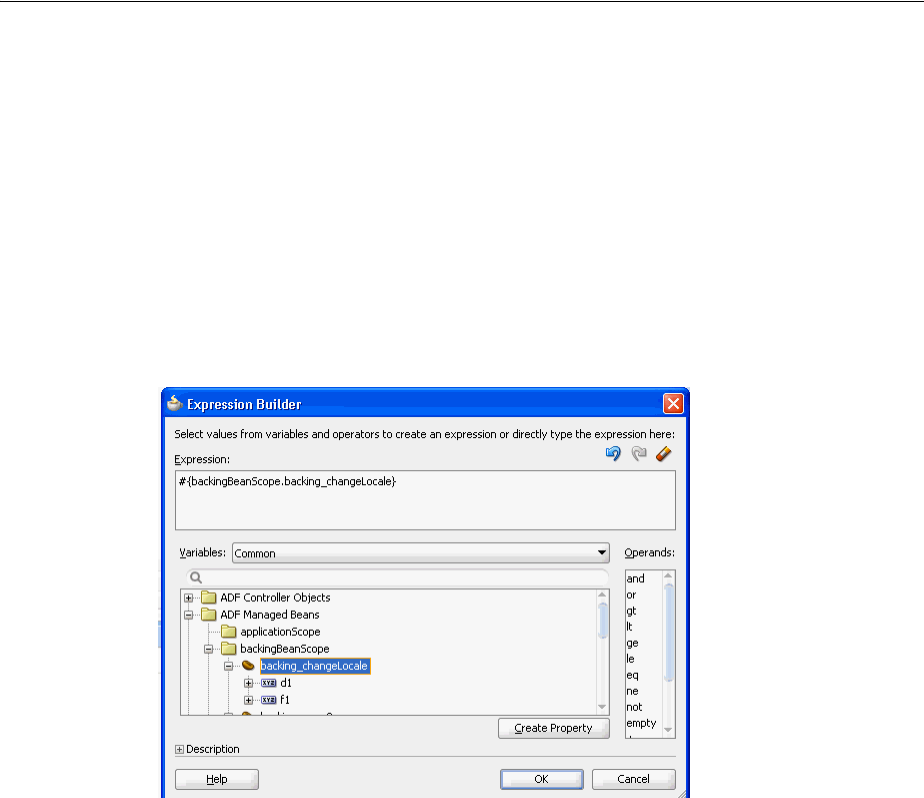
Configuring Pages for an End User to Specify Locale at Runtime
29-18 Web User Interface Developer's Guide for Oracle Application Development Framework
</af:selectOneChoice>
4. Bind the locale attribute of the f:view tag to the locale value in the backing
bean.
1. In the Structure window for the JSF page, right-click the f:view tag and
choose Go to Properties.
2. In the Property Inspector, use the dropdown menu next to the locale attribute
to open the Expression Builder.
3. Use the Expression Builder to bind to the locale value in the backing bean, as
shown in Figure 29–9.
Figure 29–9 Expression Builder Binding the Locale Attribute to a Backing Bean
5. Save the page.
29.4.2 What Happens When You Configure a Page to Specify Locale
JDeveloper generates a reference to the backing bean for the command component that
you use to change the locale. Example 29–10 shows an example using the
selectOneChoice component.
Example 29–10 selectOneChoice Component Referencing a Backing Bean
<af:selectOneChoice label="Select Locale"
binding="#{backingBeanScope.backing_changeLocale.soc1}"
id="soc1">
<af:selectItem label="French" value="FR"
binding="#{backingBeanScope.backing_changeLocale.si1}"
id="si1"/>
...
</af:selectOneChoice>
JDeveloper also generates the required methods in the backing bean for the page.
Example 29–11 shows extracts for the backing bean that correspond to Example 29–10.

Configuring Optional ADF Faces Localization Properties
Internationalizing and Localizing Pages 29-19
Example 29–11 Backing Bean Methods to Change Locale
package view.backing;
...
import oracle.adf.view.rich.component.rich.input.RichSelectOneChoice;
public class ChangeLocale {
...
...
private RichSelectOneChoice soc1;
...
...
...
public void setD2(RichDocument d2) {
this.d2 = d2;
}
...
public void setSoc1(RichSelectOneChoice soc1) {
this.soc1 = soc1;
}
public RichSelectOneChoice getSoc1() {
return soc1;
}
public void setSi1(RichSelectItem si1) {
this.si1 = si1;
}
...
}
29.4.3 What Happens at Runtime When an End User Specifies a Locale
At runtime, an end user invokes the command component you configured to change
the locale of the application. The backing bean stores the updated locale information.
Pages where the locale attribute of the f:view tag reference the backing bean
render using the locale specified by the end user.
The locale specified by the end user must be registered with your application. For
more information about specifying a locale and associated resource bundles, see
Section 29.3.3, "How to Register Locales and Resource Bundles in Your Application".
29.5 Configuring Optional ADF Faces Localization Properties
Along with providing text translation, ADF Faces also automatically provides other
types of translation, such as currency codes and support for bidirectional rendering
(also known as BiDi support). The application will automatically be displayed
appropriately, based on the user’s selected locale. However, you can also manually set
the following localization settings for an application in the trinidad-config.xml
file:

Configuring Optional ADF Faces Localization Properties
29-20 Web User Interface Developer's Guide for Oracle Application Development Framework
■<currency-code>: Defines the default ISO 4217 currency code used by
oracle.adf.view.faces.converter.NumberConverter to format
currency fields that do not specify a currency code in their own converter.
■<number-grouping-separator>: Defines the separator used for groups of
numbers (for example, a comma). ADF Faces automatically derives the separator
from the current locale, but you can override this default by specifying a value in
this element. If set, this value is used by
oracle.adf.view.faces.converter.NumberConverter while it parses
and formats.
■<decimal-separator>: Defines the separator used for the decimal point (for
example, a period or a comma). ADF Faces automatically derives the separator
from the current locale, but you can override this default by specifying a value in
this element. If set, this value is used by
oracle.adf.view.faces.converter.NumberConverter while it parses
and formats.
■<right-to-left>: Defines the direction in which text appears in a page. ADF
Faces supports bidirectional rendering and automatically derives the rendering
direction from the current locale, but you can explicitly set the default page
rendering direction by using the values true or false.
■<time-zone>: Defines the time zone appropriate to the selected locale. ADF
Faces automatically uses the time zone used by the client browser. This value is
used by oracle.adf.view.faces.converter.DateTimeConverter when
it converts String to Date.
■<formatting-locale>: Defines the date and number format appropriate to the
selected locale. ADF Faces and Trinidad, will by default, format dates and numbers
in the same locale used for localized text. If you want dates and numbers
formatted in a different locale, you can use an IANA-formatted locale (for
example, ja, fr-CA). The contents of this element can also be an EL expression
pointing at an IANA string or a java.util.Locale object.
29.5.1 How to Configure Optional Localization Properties
You can configure optional localization properties by entering elements in the
trinidad-config.xml file.
Before you begin:
It may help to understand what optional localization properties you can modify. For
more information, see Section 29.3, "Manually Defining Resource Bundles and
Locales."
You may also find it helpful to understand functionality that can be added using other
Oracle ADF features. For more information, see Section 29.1.2, "Additional
Functionality for Internationalizing and Localizing Pages."
To configure optional localization properties:
1. Open the trinidad-config.xml file. The file is located in the <View_
Project>/WEB-INF directory.
2. From the Component Palette, drag the element you wish to add to the file into the
Structure window. An empty element is added to the page.
3. Enter the desired value.

Configuring Optional ADF Faces Localization Properties
Internationalizing and Localizing Pages 29-21
Example 29–12 shows a sample trinidad-config.xml file with all the optional
localization elements set.
Example 29–12 Configuring Currency Code and Separators for Numbers and Decimal
Point
<!-- Set the currency code to US dollars. -->
<currency-code>USD</currency-code>
<!-- Set the number grouping separator to period for German -->
<!-- and comma for all other languages -->
<number-grouping-separator>
#{view.locale.language=='de' ? '.' : ','}
</number-grouping-separator>
<!-- Set the decimal separator to comma for German -->
<!-- and period for all other languages -->
<decimal-separator>
#{view.locale.language=='de' ? ',' : '.'}
</decimal-separator>
<!-- Render the page right-to-left for Arabic -->
<!-- and left-to-right for all other languages -->
<right-to-left>
#{view.locale.language=='ar' ? 'true' : 'false'}
</right-to-left>
<formatting-locale>
#{request.locale}
</formatting-locale>
<!-- Set the time zone to Pacific Daylight Savings Time -->
<time-zone>PDT</time-zone>

Configuring Optional ADF Faces Localization Properties
29-22 Web User Interface Developer's Guide for Oracle Application Development Framework

30
Developing Accessible ADF Faces Pages 30-1
30Developing Accessible ADF Faces Pages
This chapter describes how to add accessibility support to ADF Faces components
with keyboard shortcuts and text descriptions of the component name and state.
Accessibility guidelines for ADF pages that use partial page rendering, scripting,
styles, and certain page and navigation structures are also described in this chapter.
This chapter includes the following sections:
■Section 30.1, "About Accessibility Support In ADF Faces"
■Section 30.2, "Configuring Accessibility Support In ADF Faces"
■Section 30.3, "Specifying Component-Level Accessibility Properties"
■Section 30.4, "Creating Accessible Pages"
■Section 30.5, "Running Accessibility Audit Rules"
30.1 About Accessibility Support In ADF Faces
Accessibility involves making your application usable for persons with disabilities
such as low vision or blindness, deafness, or other physical limitations. This means
creating applications that can be used without a mouse (keyboard only), used with a
screen reader for blind or low-vision users, and used without reliance on sound, color,
or animation and timing.
ADF Faces user interface components have built-in accessibility support for visually
and physically impaired users. User agents such as a web browser rendering to
nonvisual media such as a screen reader can read component text descriptions to
provide useful information to impaired users.
While the ADF Faces accessibility guidelines for components, page, and navigation
structures is useful, it is not a substitute for familiarity with accessibility standards and
performing accessibility testing with assistive technology.
For physically impaired users, ADF Faces has been tested to work with JAWS, an
assistive technology screen reader. More information about the JAWS screen reader
software is available at http://www.freedomscientific.com.
Access key support provides an alternative method to access components and links
using only the keyboard. ADF Faces accessibility audit rules provide direction to
create accessible images, tables, frames, forms, error messages, and popup windows
using accessible HTML markup. Additional framework and platform issues presented
by client-side scripting, in particular using asynchronous JavaScript and XML (AJAX),
have been addressed in Oracle’s accessibility strategy.
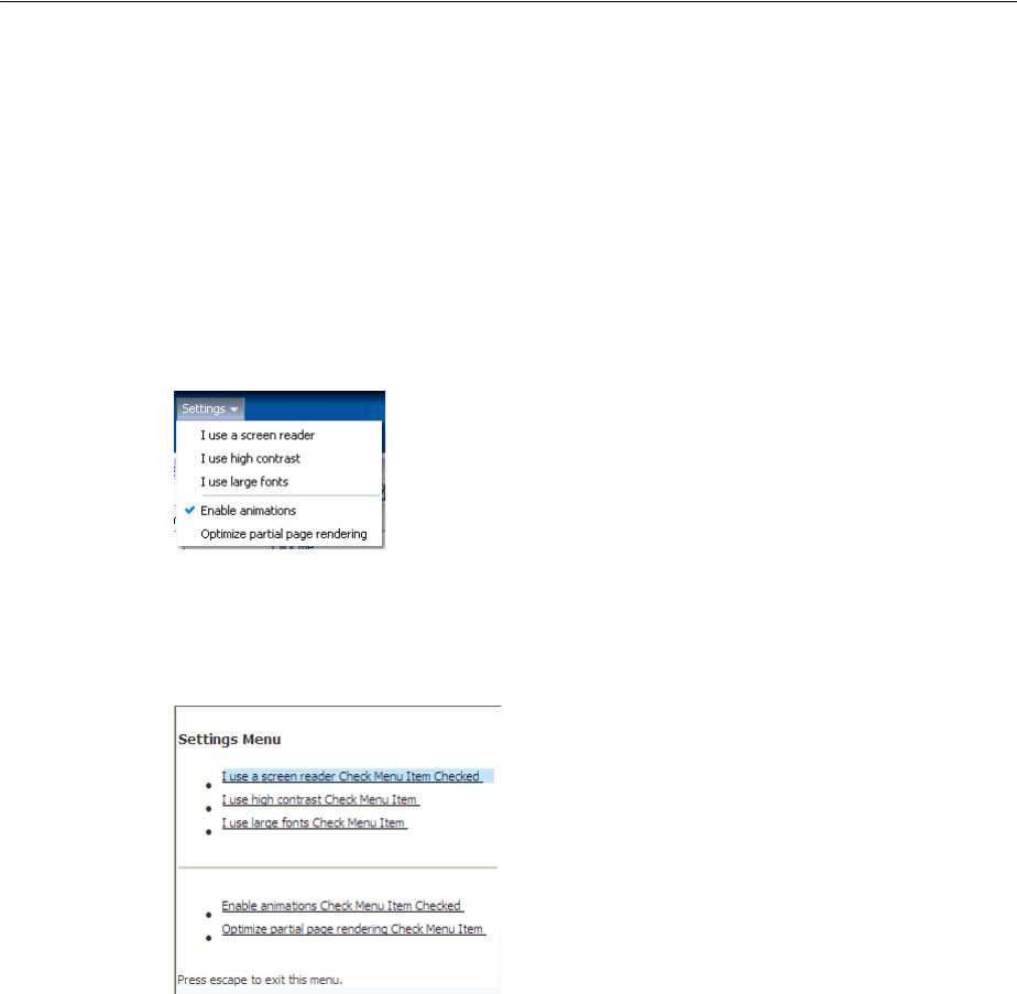
About Accessibility Support In ADF Faces
30-2 Web User Interface Developer's Guide for Oracle Application Development Framework
Oracle software implements the Web Content Accessibility Guidelines (WCAG) 1.0
AA standards. The interpretation of these standards is available at
http://www.oracle.com/accessibility/standards.html
30.1.1 ADF Faces Accessibility Support Use Cases and Examples
ADF Faces provides three types of application accessibility support: screen reader,
high-contrast mode, and large-font mode. Figure 30–1 shows an example of
accessibility options in a dropdown menu. The user can choose a combination of all
three options as required.
Figure 30–1 Dropdown Menu Listing Accessibility Support Options
Figure 30–2 shows an example of accessibility options in screen reader mode.
Figure 30–2 Dropdown Menu listing Accessibility Support options in Screen Reader
mode
30.1.2 Additional Information for Accessibility Support in ADF Pages
You may also find it helpful to understand other ADF Faces features before you make
your application accessible. Following are links to other features that work with
accessibility.
■Internationalization and localization: The ADF skin that you create to apply to
your application can be customized as part of a process to internationalize and
localize ADF Faces pages. For more information about this process, see
Chapter 29, "Internationalizing and Localizing Pages."
■Keyboard shortcuts: Keyboard shortcuts provide an alternative to pointing
devices for navigating the page. For more information about how to use keyboard
shortcuts with accessibility, see Appendix C, "Keyboard Shortcuts."

Configuring Accessibility Support In ADF Faces
Developing Accessible ADF Faces Pages 30-3
30.2 Configuring Accessibility Support In ADF Faces
ADF Faces provides two levels of application accessibility support, configured in the
trinidad-config.xml file using the <accessibility-mode> element. The
acceptable values for <accessibility-mode> are:
■default: By default, ADF Faces generates components that have rich user
interface interaction, and are also accessible through the keyboard. Note that in the
default mode, screen readers cannot access all ADF Faces components. If a
visually impaired user is using a screen reader, it is recommended to use the
screenReader mode.
■screenReader: ADF Faces generates components that are optimized for use with
screen readers. The screenReader mode facilitates the display for visually
impaired users, but will degrade the display for sighted users (without visual
impairment).
It is recommended that you provide the ability to switch between the above
accessibility support levels in the application, so that users can choose their desired
type of accessibility support, if required.
You can also use the @accessibility-profile element to define finer-grain
accessibility preferences in the style sheet or you can specify the accessibility profile
options in the trinidad-config.xml file. The options are high-contrast,
large-fonts, or both. For more information, see Chapter 28, "Customizing the
Appearance Using Styles and Skins."
The acceptable values for <accessibility-profile> are:
■high-contrast: ADF Faces can generate high-contrast–friendly visual content.
High-contrast mode is intended to make ADF Faces applications compatible with
operating systems or browsers that have high-contrast features enabled. For
example, ADF Faces changes its use of background images and background colors
in high-contrast mode to prevent the loss of visual information. Note that the ADF
Faces high-contrast mode is more beneficial if used in conjunction with your
browser’s or operating system’s high-contrast mode. Also, some users might find
it beneficial to use large-font mode along with high-contrast mode.
■large-fonts: ADF Faces can generate browser-zoom–friendly content. In
default mode, most text and many containers have a fixed font size to provide a
consistent and defined look. In large-font mode, text and containers have a
scalable font size. This allows ADF Faces both to be compatible with browsers that
are set to larger font sizes and to work with browser-zoom capabilities. Note that
if you are not using large-font mode or browser-zoom capabilities, you should
disable large-font mode. Also, some users might find it beneficial to use
high-contrast mode along with the large-font mode.
30.2.1 Accessibility Support Guidelines at Sign-In
When developing an application, it is a good practice to provide accessibility selection
options for users after application sign-in. The sign-in accessibility flow should consist
of three pages for first-time users and two pages for subsequent users, as described
here:
Note: The <accessibility-mode> and
<accessibility-profile> elements should be EL-bound to a
session scope managed bean that contains the user-specific
preferences.
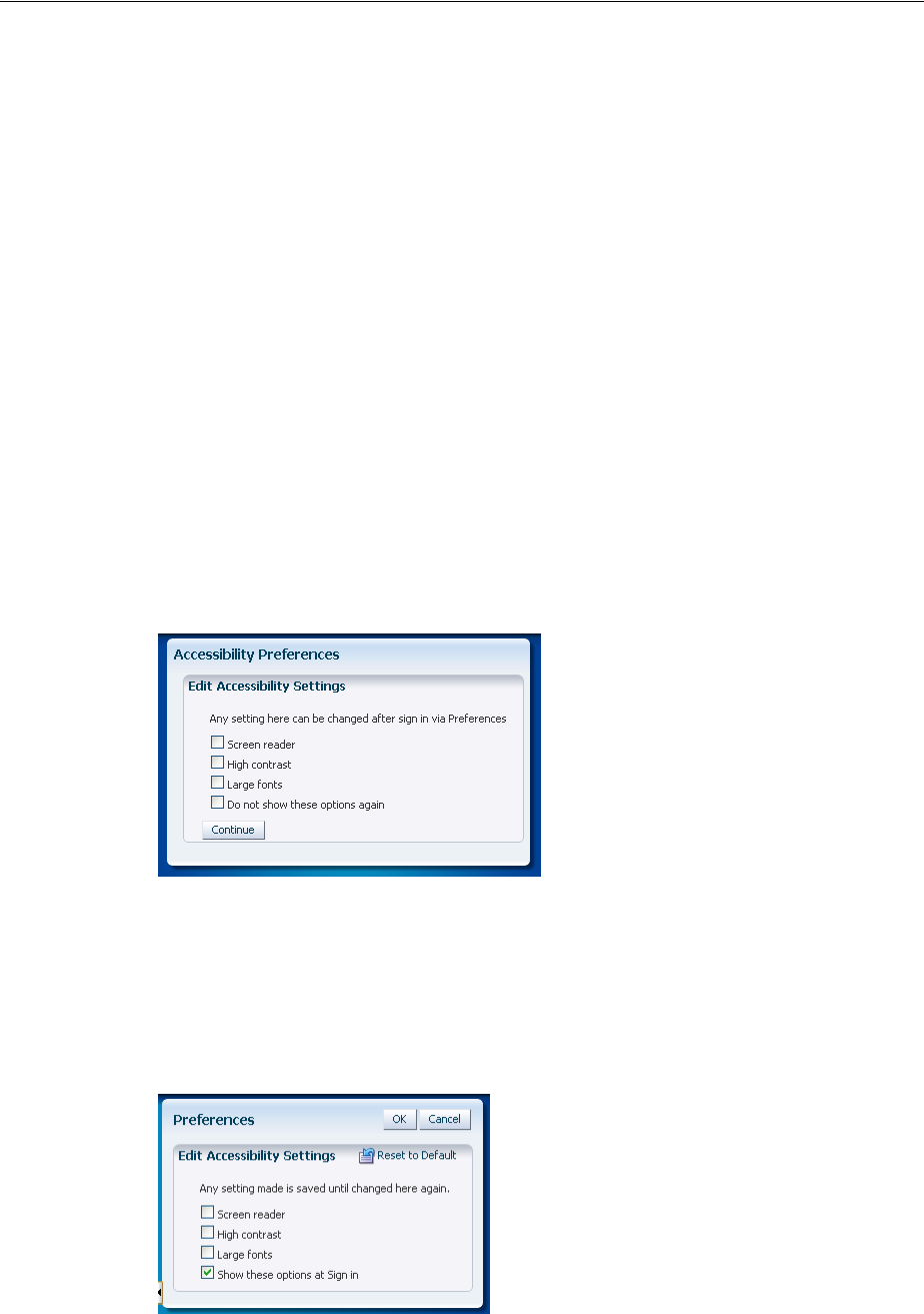
Configuring Accessibility Support In ADF Faces
30-4 Web User Interface Developer's Guide for Oracle Application Development Framework
1. Sign-in page
2. Accessibility Mode Selection page (mandatory for first-time users)
3. Application home page
The accessibility options should appear for first time users and any user who opts not
to circumvent it on subsequent authentications. For example, you can provide a page
or dialog with the following options:
■Hint text: Provide brief information about the accessibility options.
■Checkboxes
–Screen reader: Generate ADF Faces components that are optimized for use
with screen readers.
–High Contrast: Generate high-contrast–friendly visual content.
–Large Fonts: Generate browser-zoom–friendly content
–Do not show these options again: Do not show the accessibility options after
sign-in.
■A Continue button: Navigate to the home page of the application.
Figure 30–3 shows a page with accessibility options.
Figure 30–3 Accessibility Options After Sign-In
If the user opts not to see the accessibility options at sign-in by choosing Do not
show these options again, then you should also provide a page or a dialog to
navigate the user to the accessibility options. For example, the user preferences page of
the application. Figure 30–4 shows the preferences page of an application with
accessibility options.
Figure 30–4 Accessibility Options in User Preferences Page
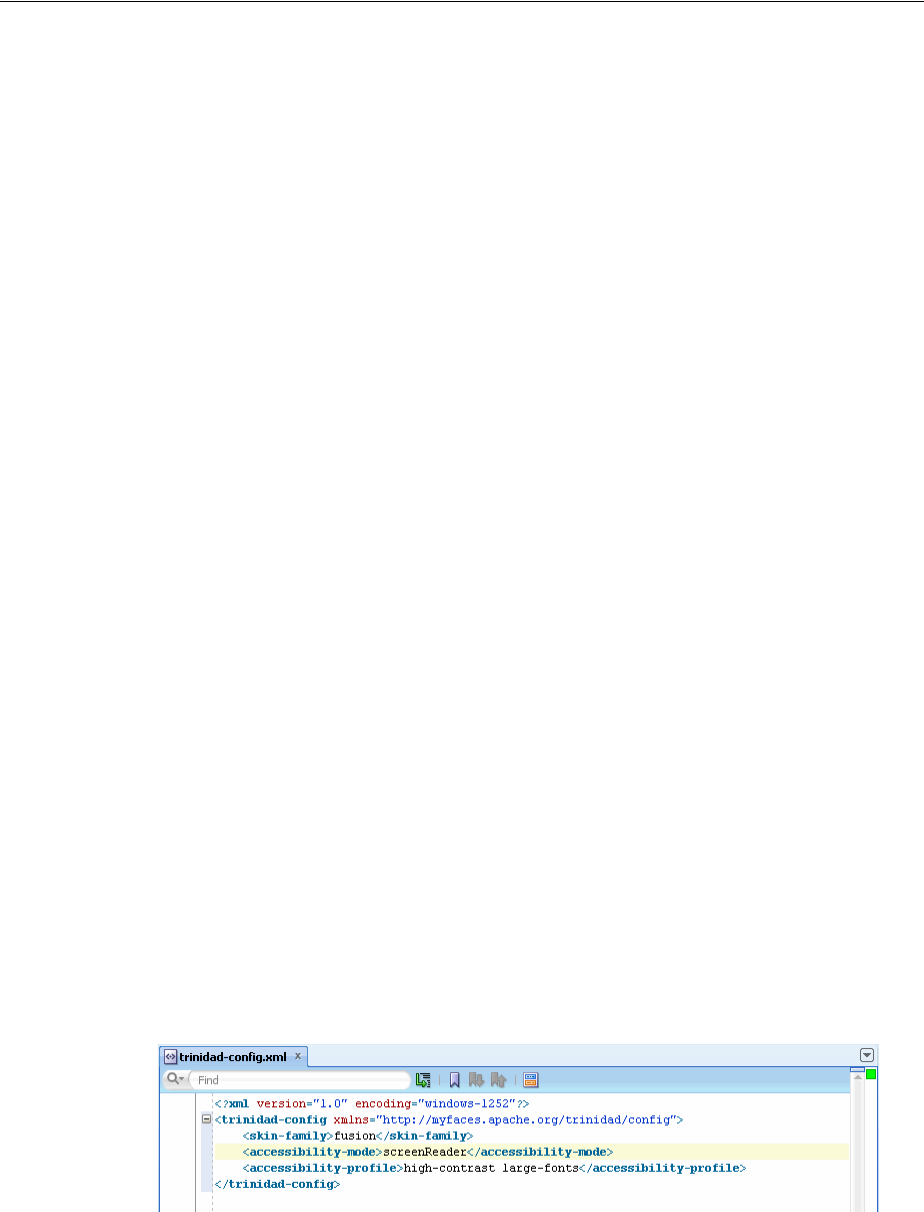
Configuring Accessibility Support In ADF Faces
Developing Accessible ADF Faces Pages 30-5
Note that the application may have additional authentication security set up between
the Accessibility Mode Selection page and the product-specific home page.
30.2.2 How to Configure Accessibility Support in trinidad-config.xml
In JDeveloper, when you insert an ADF Faces component into a JSF page for the first
time, a starter trinidad-config.xml file is automatically created for you in the
/WEB-INF/ directory. The file has a simple XML structure that enables you to define
element properties using the JSF expression language (EL) or static values. The order
of elements in the file does not matter. You can configure accessibility support by
editing the XML file directly or by using the Structure window.
Before you begin:
It may be helpful to have an understanding of accessibility support in ADF Faces. For
more information, see Section 30.2, "Configuring Accessibility Support In ADF Faces."
You may also find it helpful to understand functionality that can be added using other
ADF Faces features. For more information, see Section 30.1.2, "Additional Information
for Accessibility Support in ADF Pages."
To configure accessibility support in trinidad-config.xml:
1. In the Application Navigator, double-click trinidad-config.xml.
2. In the XML editor, enter the element name <accessibility-mode> and
accessibility support value (default, screenReader, or inaccessible). For
example:
<accessibility-mode>screenReader</accessibility-mode>
This code sets the application’s accessibility support to screen reader mode.
3. Enter the element name <accessibility-profile> and accessibility profile
value (high-contrast, large-fonts).
For example:
<!-- Enable both high-contrast and large-fonts content -->
<accessibility-profile>high-contrast large-fonts</accessibility-profile>
This code sets the application’s profile support to use both high-contrast and
large-fonts. Figure 30–5 illustrates a trinidad-config.xml file in
JDeveloper.
Figure 30–5 trinidad-config.xml in JDeveloper
4. Alternatively, you can use the Structure window to insert the value:
a. In the Application Navigator, select the trinidad-config.xml file.
b. In the Structure window, right-click the XML file root element, choose the
Insert Inside menu item, and click the <accessibility-mode> element.

Specifying Component-Level Accessibility Properties
30-6 Web User Interface Developer's Guide for Oracle Application Development Framework
c. Double-click the newly inserted element in the Structure window to open the
Property Inspector. Enter a value or select one from the dropdown list.
Once you have configured the trinidad-config.xml file, you can retrieve the
property values programmatically or by using JSF EL expressions.
For example, the following code returns nothing if the accessibility mode is not
explicitly set:
String mode=ADFFacesContext.getCurrentInstance().getAccessibilityMode;
In this EL expression example, a null value is returned if the accessibility mode is not
explicitly set:
<af:outputText value="*#{requestContext.accessibilityMode}"/>
You can set accessibility selection options at the time of application sign-in, or in the
user preferences page of the application. For more information, see Section 30.2.1,
"Accessibility Support Guidelines at Sign-In."
30.3 Specifying Component-Level Accessibility Properties
Guidelines for component-specific accessibility are provided in Section 30.3.1, "ADF
Faces Component Accessibility Guidelines." The guidelines include a description of
the relevant property with examples and tips. For information about auditing
compliance with ADF Faces accessibility rules, see Section 30.5, "Running Accessibility
Audit Rules."
Access key support for ADF Faces input or command and go components such as
af:inputText, af:commandButton, and af:goLink involves defining labels and
specifying keyboard shortcuts. While it is possible to use the tab key to move from one
control to the next in a web application, keyboard shortcuts are more convenient and
efficient.
To specify an access key for a component, set the component's accessKey attribute to
a keyboard character (or mnemonic) that is used to gain quick access to the
component. You can set the attribute in the Property Inspector or in the page source
using & encoding.
The same access key can be bound to several components. If the same access key
appears in multiple locations in the same page, the rendering agent will cycle among
the components accessed by the same key. That is, each time the access key is pressed,
the focus will move from component to component. When the last component is
reached, the focus will return to the first component.
Using access keys on af:goButton and af:goLink components may immediately
activate them in some browsers. Depending on the browser, if the same access key is
assigned to two or more go components on a page, the browser may activate the first
component instead of cycling through the components that are accessed by the same
key.
To develop accessible page and navigation structures, follow the additional
accessibility guidelines described in Section 30.4, "Creating Accessible Pages."
30.3.1 ADF Faces Component Accessibility Guidelines
To develop accessible ADF Faces components, follow the guidelines described in
Table 30–1. Components not listed do not have accessibility guidelines.
Specifying Component-Level Accessibility Properties
Developing Accessible ADF Faces Pages 30-7
Note: In cases where the label property is referenced in the
accessibility guidelines, the labelAndAccessKey property may be
used where available, and is the preferred option.
Unless noted otherwise, you can also label ADF Faces input and select
controls by:
■Specifying the for property in an af:outputLabel component
■Specifying the for property in an af:panelLabelAndMessage
component
Table 30–1 ADF Faces Components Accessibility Guidelines
Component Guidelines
af:activeCommandToolbarBu
tton
Specify the text, textAndAccessKey, or shortDesc
property. Usually, the text or textAndAccessKey
property is used as the label for the component. Unique
buttons and links must have unique text.
All toolbar buttons and links that support icons must have
the text, textAndAccessKey, or shortDesc property
defined. When there is no text, the shortDesc must be
defined and used as the label for the component.
af:activeImage Specify the shortDesc property.
If the image is only present for decorative purposes and
communicates no information, set shortDesc to the
empty string.
af:chooseColor For every af:chooseColor component, there must be at
least one af:inputColor component with a chooseId
property which points to the af:chooseColor
component.
af:chooseDate For every af:chooseDate component, there must be at
least one af:inputDate component with a chooseId
property which points to the af:chooseDate component.
af:column Specify the headerText property, or provide a header
facet.
In a table, you must identify atleast one column component
as a row header by setting rowHeader to true or
unstyled. Ensure that the rowHeader column provides a
unique textual value, and columns that contain an input
component are not assigned as the row header.
For every child input component, set the Simple attribute
to true, and ensure that the input component has a label
assigned. In rich mode, the label is not displayed, but it is
read by the screen reader software in screen reader mode.
If you wish to provide help information for the column,
use helpTopicId.
If you use a filter facet to set a filter on a column, ensure
that the filter component has a label assigned.
Specifying Component-Level Accessibility Properties
30-8 Web User Interface Developer's Guide for Oracle Application Development Framework
af:commandButton
af:commandImageLink
One of the following properties must be specified: text,
textAndAccessKey, or shortDesc. The text should
specify the action to be taken and make sense when read
out of context. For example, use "go to index" instead of
"click here."
Usually, the text or textAndAccessKey property is
used as the label for the component. Unique buttons and
links must have unique text.
af:commandLink Specify the text or textAndAccessKey property. The
text should specify where the link will take the user and
make sense when read out of context. For example use "go
to index" instead of "click here." Multiple links that go to
the same location must use the same text and unique links
must have unique text.
Usually, the text or textAndAccessKey property is
used as the label for the component. Unique buttons and
links must have unique text.
af:commandMenuItem
af:commandNavigationItem
af:comandToolbarButton
One of the following properties must be specified: text,
textAndAccessKey, or shortDesc.
Usually, the text or textAndAccessKey property is
used as the label for the component. Unique buttons and
links must have unique text.
af:dialog
af:document
Specify the title property.
If you wish to provide help information, use
helpTopicId.
af:goButton One of the following properties must be specified: text,
textAndAccessKey, or shortDesc. The text should
specify the action to be taken and make sense when read
out of context. For example use "go to index" instead of
"click here."
Usually, the text or textAndAccessKey property is
used as the label for the component. Unique buttons and
links must have unique text.
af:goLink
af:goMenuItem
Specify the text property. The text should specify where
the link will take the user and make sense when read out of
context. For example use "go to index" instead of "click
here." Multiple links that go to the same location must use
the same text and unique links must have unique text.
Usually, the text or textAndAccessKey property is
used as the label for the component. Unique buttons and
links must have unique text.
af:icon Specify the shortDesc property. If the icon is only present
only for decorative purposes and communicates no
information, set shortDesc to the empty string.
af:image Specify the shortDesc property. If the image is only
present for decorative purposes and communicates no
information, set shortDesc to the empty string.
Use the longDescURL property for images where a
complex explanation is necessary. For example, charts and
graphs require a description file that includes all the details
that make up the chart.
af:inlineFrame Specify the shortDesc property.
Table 30–1 (Cont.) ADF Faces Components Accessibility Guidelines
Component Guidelines
Specifying Component-Level Accessibility Properties
Developing Accessible ADF Faces Pages 30-9
af:inputColor
af:inputComboboxListOfVal
ues
af:inputDate
af:inputFile
af:inputListOfValues
af:inputNumberSlider
af:inputNumberSpinbox
af:inputRangeSlider
af:inputText
Specify the label property.
For af:inputComboboxListOfValues and
af:inputListOfValues components, the searchDesc
must also be specified.
If you wish to provide help information, use
helpTopicId.
af:outputFormatted The value property must specify valid HTML.
af:outputLabel Specify the value or valueAndAccessKey property.
af:panelBox
af:panelHeader
Specify the text property.
If you wish to provide help information, use
helpTopicId.
af:panelLabelAndMessage Specify the label or labelAndAccessKey property.
When using this component to label an ADF Faces input or
select control, the for property must be specified.
If you wish to provide help information, use
helpTopicId.
af:panelSplitter
af:panelStretchLayout
Refer to Section 30.4.4, "How to Use Page Structures and
Navigation."
af:panelWindow Specify the title property.
If you wish to provide help information, use
helpTopicId.
af:poll When using polling to update content, allow end users to
control the interval, or to explicitly initiate updates instead
of polling.
af:query Specify the following properties:
■headerText
■addFieldsButtonAccessKey
■addFieldsButtonText
■resetButtonAccessKey
■resetButtonText
■saveButtonAccessKey
■saveButtonText
■searchButtonAccessKey
■searchButtonText
If you wish to provide help information, use
helpTopicId.
af:quickQuery Specify the label and searchDesc properties.
If you wish to provide help information, use
helpTopicId.
Table 30–1 (Cont.) ADF Faces Components Accessibility Guidelines
Component Guidelines

Specifying Component-Level Accessibility Properties
30-10 Web User Interface Developer's Guide for Oracle Application Development Framework
af:region If you wish to provide help information, use
helpTopicId.
af:resetButton One of the following properties must be specified: text or
textAndAccessKey. The text should specify the action to
be taken and make sense when read out of context. For
example, use "go to index" instead of "click here."
Usually, the text or textAndAccessKey property is
used as the label for the component. Unique buttons and
links must have unique text.
af:richTextEditor Specify the label property.
If you wish to provide help information, use
helpTopicId.
af:selectBooleanCheckbox
af:selectBooleanRadio
One of the following properties must be specified: text,
textAndAccessKey, or label.
If you wish to provide help information, use
helpTopicId.
af:selectItem Specify the label property. Note that using the for
attribute of af:outputLabel and
af:panelMessageAndLabel components is not an
acceptable alternative.
af:selectManyCheckbox
af:selectManyChoice
af:selectManyListbox
af:selectManyShuttle
af:selectOneChoice
af:selectOneListbox
af:selectOneRadio
af:selectOrderShuttle
Specify the label property.
For the af:selectManyShuttle and
af:selectOrderShuttle components, the
leadingHeader and trailingHeader properties must
be specified.
If you wish to provide help information, use
helpTopicId.
af:showDetailHeader Specify the text property.
If you wish to provide help information, use
helpTopicId.
af:showDetailItem One of the following properties must be specified: text,
textAndAccessKey, or shortDesc.
af:showPopupBehavior Specify the triggerType property.
Note that trigger types of mouseHover, mouseMove,
mouseOver, and mouseOut are suppressed in the screen
reader mode. Hence, you must provide alternate access to
the content for these trigger types in the screen reader
mode.
af:table
af:treeTable
Specify the summary property. The summary should
describe the purpose of the table.
All table columns must have column headers.
In screen reader mode, if a label is specified for an input
component inside af:column, ADF Faces automatically
inserts row information into the application-specified label
of the input component. Typically, the
application-specified label matches the column header text,
and along with the inserted row information it provides a
unique identity for each input component.
Table 30–1 (Cont.) ADF Faces Components Accessibility Guidelines
Component Guidelines

Specifying Component-Level Accessibility Properties
Developing Accessible ADF Faces Pages 30-11
30.3.2 Using ADF Faces Table Components in Screen Reader Mode
If you are using ADF Faces table components in your web application, you must
designate a column as the row header for screen reader mode. The row header is used
by the screen reader software to announce the row when the end user selects it.
Typically, a single column is used as a row header that allows multiple selections, but
you can mark multiple columns as row headers. When you mark multiple columns as
row headers, they appear as the initial columns of the table, and they are frozen.
Sometimes, for display purposes, you may not want to have a row header. In such a
case, you must define one column in the table to have the rowHeader attribute set to
unstyled. In screen reader mode, the table or the tree table component with the
unstyled row header column is moved to the starting position with displayIndex
set to 0, and it is frozen. In default mode, the table or tree table component with the
unstyled row header column is not moved to the starting position, it is not frozen,
and it is rendered without any row header CSS style.
30.3.3 Data Visualization Components Accessibility Guidelines
To develop accessible Data Visualization components, follow the accessibility
guidelines described in Table 30–2. Components not listed do not have accessibility
guidelines.
Table 30–2 Data Visualization Components Accessibility Guidelines
Component Guideline
dvt:projectGantt
dvt:resourceUtilizati
onGantt
dvt:schedulingGantt
Specify the summary property. The summary should describe
the purpose of the Gantt component.
dvt:gauge Specify the shortDesc property.

Specifying Component-Level Accessibility Properties
30-12 Web User Interface Developer's Guide for Oracle Application Development Framework
dvt:areaGraph
dvt:barGraph
dvt:horizontalBarGrap
h
dvt:bubbleGraph
dvt:comboGraph
dvt:funnelGraph
dvt:lineGraph
dvt:paretoGraph
dvt:pieGraph
dvt:radarGraph
dvt:scatterGraph
dvt:stockGraph
Specify the shortDesc property. The shortDesc property
should describe the purpose of the graph.
Note that in screen reader mode, an instance of pivot table
substitutes for the graph component, and the end user can then
use the standard cursor keys to navigate through the data.
In screen reader mode, the following visualization features of
the graph component are not supported:
■Data change animation during partial page rendering.
■Zoom and scroll. Scrolling is supported in pivot table.
■The seriesRolloverBehavior and
hideAndShowBehavior properties on simple graph tags.
■The interactiveSliceBehavior property on pie
graphs.
■Precise control of data marker shapes and colors, including
the following:
■Declarative properties on the
Series child tag
■Declarative markerShape and
markerColor properties on
scatter graphs
■Callback APIs
■Conditional formatting rules
from a backing bean
■Marker underlays for bubble
and scatter graphs
In screen reader mode, the following interactive features of the
graph component are not supported:
■Context menu facets
■Popups
■TimeSelector functionality through the
<dvt:timeSelector> child tag
■The drillingEnabled property of simple graph tags
■ShapeAttributes support, and access to fine-grained
mouse and key events from all graph components
■Drag and drop in bubble and scatter graphs
■DataSelection in bubble and scatter graphs
■Programmatic TickLabelCallback support
dvt:hierarchyViewer Specify the summary property.
Note that in screen reader mode, an instance of the tree table
component substitutes for the hierarchy viewer component, and
the end user can then use the standard cursor keys to navigate
through the data.
dvt:map Specify the summary property.
Note that in screen reader mode, an instance of the table
component substitutes for the map component, and the end user
can then use the standard cursor keys to navigate through the
data.
Table 30–2 (Cont.) Data Visualization Components Accessibility Guidelines
Component Guideline

Specifying Component-Level Accessibility Properties
Developing Accessible ADF Faces Pages 30-13
30.3.4 How to Define Access Keys for an ADF Faces Component
In the Property Inspector of the component for which you are defining an access key,
enter the mnemonic character in the accessKey attribute field. When simultaneously
setting the text, label, or value and mnemonic character, use the ampersand (&)
character in front of the mnemonic character in the relevant attribute field.
Before you begin:
It may be helpful to have an understanding of component-level accessibility
guidelines. For more information, see Section 30.3, "Specifying Component-Level
Accessibility Properties." You may also find it helpful to understand functionality that
can be added using other ADF Faces features. For more information, see Section 30.1.2,
"Additional Information for Accessibility Support in ADF Pages."
Defining Access Keys
Use one of four attributes to specify a keyboard character for an ADF Faces input or
command and go component:
■accessKey: Use to set the mnemonic character used to gain quick access to the
component. For command and go components, the character specified by this
attribute must exist in the text attribute of the instance component; otherwise,
ADF Faces does not display the visual indication that the component has an access
key.
Example 30–1 shows the code that sets the access key to the letter h for the
af:goLink component. When the user presses the keys ALT+H, the text value of
the component will be brought into focus.
Example 30–1 AccessKey Attribute Defined
<af:goLink text="Home" accessKey="h">
■textAndAccessKey: Use to simultaneously set the text and the mnemonic
character for a component using the ampersand (&) character. In JSPX files, the
conventional ampersand notation is &. In JSP files, the ampersand notation is
simply &. In the Property Inspector, you need only the &.
Example 30–2 shows the code that specifies the button text as Home and sets the
access key to H, the letter immediately after the ampersand character, for the
af:commandButton component.
dvt:thematicMap Specify the summary property.
Note that in screen reader mode, an instance of the table
component substitutes for each DataLayer component, and the
end user can then use the standard cursor keys to navigate
through the data.
If the thematic map instance has multiple DataLayers
associated with it, then a dropdown list is also rendered in
screen reader mode to enable end users to switch between the
corresponding table instances.
dvt:pivotTable Specify the summary property. The summary should describe
the purpose of the pivot table component.
dvt:sparkChart Specify the shortDesc property.
Table 30–2 (Cont.) Data Visualization Components Accessibility Guidelines
Component Guideline

Specifying Component-Level Accessibility Properties
30-14 Web User Interface Developer's Guide for Oracle Application Development Framework
Example 30–2 TextAndAccessKey Attribute Defined
<af:commandButton textAndAccessKey="&Home"/>
■labelAndAccessKey: Use to simultaneously set the label attribute and the
access key on an input component, using conventional ampersand notation.
Example 30–3 shows the code that specifies the label as Date and sets the access
key to a, the letter immediately after the ampersand character, for the
af:selectInputDate component.
Example 30–3 LabelAndAccessKey Attribute Defined
<af:inputSelectDate value="Choose date" labelAndAccessKey="D&ate"/>
■valueAndAccessKey: Use to simultaneously set the value attribute and the
access key, using conventional ampersand notation.
Example 30–4 shows the code that specifies the label as Select Date and sets
the access key to e, the letter immediately after the ampersand character, for the
af:outputLabel component.
Example 30–4 ValueAndAccessKey Attribute Defined
<af:outputLabel for="someid" valueAndAccessKey="Select Dat&e"/>
<af:inputText simple="true" id="someid"/>
Access key modifiers are browser and platform-specific. If you assign an access key
that is already defined as a menu shortcut in the browser, the ADF Faces component
access key will take precedence. Refer to your specific browser’s documentation for
details.
In some browsers, if you use a space as the access key, you must provide the user with
the information that Alt+Space or Alt+Spacebar is the access key because there is no
way to present a blank space visually in the component's label or textual label. For that
browser you could provide text in a component tooltip using the shortDesc
attribute.
30.3.5 How to Define Localized Labels and Access Keys
Labels and access keys that must be displayed in different languages can be stored in
resource bundles where different language versions can be displayed as needed. Using
the <resource-bundle> element in the JSF configuration file available in JSF 1.2,
you can make resource bundles available to all the pages in your application without
using a f:loadBundle tag in every page.
Before you begin:
It may be helpful to have an understanding of component-level accessibility
guidelines. For more information, see Section 30.3, "Specifying Component-Level
Accessibility Properties." You may also find it helpful to understand functionality that
can be added using other ADF Faces features. For more information, see Section 30.1.2,
"Additional Information for Accessibility Support in ADF Pages."
To define localized labels and access keys:
1. Create the resource bundles as simple.properties files to hold each language
version of the labels and access keys. For details, see Section 29.3.1, "How to
Define the Base Resource Bundle."
Creating Accessible Pages
Developing Accessible ADF Faces Pages 30-15
2. Add a <locale-config> element to the faces-config.xml file to define the
default and supported locales for your application. For details, see Section 29.3.3,
"How to Register Locales and Resource Bundles in Your Application."
3. Create a key and value for each string of static text for each resource bundle. The
key is a unique identifier for the string. The value is the string of text in the
language for the bundle. In each value, place an ampersand (& or amp) in front of
the letter you wish to define as an access key.
For example, the following code defines a label and access key for an edit button
field in the UIStrings.properties base resource bundle as Edit:
srlist.buttonbar.edit=&Edit
In the Italian language resource bundle, UIStrings_it.properties, the
following code provides the translated label and access key as Aggiorna:
srlist.buttonbar.edit=A&ggiorna
4. Add a <resource-bundle> element to the faces-config.xml file for your
application. Example 30–5 shows an entry in a JSF configuration file for a resource
bundle.
Example 30–5 Resource Bundle in JSF Configuration File
<resource-bundle>
<var>res</var>
<base-name>resources.UIStrings</base-name>
</resource-bundle>
Once you set up your application to use resource bundles, the resource bundle keys
show up in the Expression Language (EL) editor so that you can assign them
declaratively.
In the following example, the UI component accesses the resource bundle:
<af:outputText value="#{res[’login.date’]}"/
For more information, see Chapter 29, "Internationalizing and Localizing Pages."
30.4 Creating Accessible Pages
In addition to component-level accessibility guidelines, you should also follow
page-level accessibility guidelines when you design your application. While
component-level guidelines may determine how you use a component, page-level
accessibility guidelines are more involved with the overall design and function of the
application as a whole.
The page-level accessibility guidelines are for:
■Using partial page rendering
■Using scripting
■Using styles
■Using page structures and navigation
■Using WAI-ARIA landmark regions
When designing the application pages, you must follow these general accessibility
guidelines described in Table 30–3.
Creating Accessible Pages
30-16 Web User Interface Developer's Guide for Oracle Application Development Framework
The guidelines described in this section, and its subsections, follow Oracle Global
HTML Accessibility Guidelines, which combines the guidelines of Section 508 and
Web Content Accessibility Guidelines. ADF Faces components ease your
responsibility, as they implicitly meet several accessibility guidelines. For example,
Table 30–3 General Accessibility Guidelines
Guideline Action
Avoid using raw HTML
content If possible, avoid using raw HTML content. If raw HTML content
is required, use af:outputFormatted and ensure that the
content is valid.
Use the clearest and
simplest language
appropriate for a site's
content
Ensure language clarity and simplicity across the application.
Provide keyboard
alternatives to drag and
drop
Any functionality that uses drag and drop operations must also be
exposed through a keyboard-accessible interface, such as Cut,
Copy, and Paste menu items.
Provide access to the
accessibility mode ADF Faces exposes the following accessibility modes:
■Default
■Screen reader - optimized for screen reader users
You must design your web application to enable end users to
choose a screen reader mode, if required. For more information
about configuring screen reader mode in ADF Faces, see
Section 30.2, "Configuring Accessibility Support In ADF Faces."
When designing your web application, note that you may be
required to add additional accessibility modes, such as a
high-contrast accessibility mode or a large-font mode.
Review accessibility
standards You must be aware of relevant accessibility standards, such as the
Web Content Accessibility Guidelines. Although the ADF Faces
framework and components hide many of the implementation
details, it is recommended that you be familiar with these
guidelines.
Write text that describes
the link’s purpose Ensure that the purpose of each link can be determined from the
link text alone, or from the link text together with its
programmatically determined link context, except where the
purpose of the link would be ambiguous to users in general.
Provide information
about the general layout
of the site, such as a site
map or table of contents
Ensure that site layout requirements are met.
Provide multiple ways to
locate a page Ensure that page access requirements are met across the
application. Pages that are the result of a process, or a step in a
process, can be excluded.
Provide visual separation
between adjacent links Ensure that adjacent links are visually separated, and that a single
link containing white space does not appear as multiple links.
Provide accessibility
support for non-ADF
content
Ensure that non-ADF Faces content in the page is accessible. The
content can come from other Oracle products, or any third-party
products.
Provide accessibility
support for external
documents
Ensure that external documents, such as Word documents and PDF
files, are accessible. The documents could be generated by the
product, or be shipped with the product, and must have least one
accessible version.

Creating Accessible Pages
Developing Accessible ADF Faces Pages 30-17
ADF Faces renders the lang attribute on every page, and all headers rendered by
ADF Faces components use the appropriate HTML header elements.
30.4.1 How to Use Partial Page Rendering
Screen readers do not reread the full page in a partial page request. When using Partial
Page Rendering (PPR), you must follow the guidelines described in Table 30–4.
30.4.2 How to Use Scripting
Client-side scripting is not recommended for any application problem for which there
is a declarative solution and so should be kept to a minimum.
When using scripting, you must follow these guidelines as described in Table 30–5.
Table 30–4 Partial Page Rendering Guidelines for Accessibility
Guideline Action
Prefer downstream
partial page changes Partial page rendering causes the screen reader software to read
the page starting from the component that triggered the partial
action. Therefore, place the target component after the component
that triggers the partial request; otherwise, the screen reader
software will not read the updated target.
For example, the most common PPR use case is the master-detail
user interface, where selecting a value in the master component
results in partial page replacement of the detail component. In
such scenarios, the master component must always appear before
the detail component in the document order.
Provide guidance for
partial page changes Screen reader or screen magnifier users may have difficulty
determining exactly what content has changed as a result of partial
page rendering activity. It may be helpful to provide guidance in
the form of inline text descriptions that identify relationships
between key components in the page. For example, in a
master-detail scenario, inline text might explain that when a row
on master component is updated, the detail component is also
updated. Alternatively, a help topic might explain the structure in
the page and the relationships between components.
Table 30–5 Scripting Guidelines for Accessibility
Guideline Action
Keep scripting to a
minimum Avoid client-side scripting.
Do not interact with the
component Document
Object Model (DOM)
directly
ADF Faces components automatically synchronize with the screen
reader when DOM changes are made. Direct interaction with the
DOM is not allowed.
Do not use JavaScript
timeouts Screen readers do not reliably track modifications made in
response to timeouts implemented using the JavaScript
setTimeout() or setInterval() APIs. Do not call these
methods.

Creating Accessible Pages
30-18 Web User Interface Developer's Guide for Oracle Application Development Framework
In addition to scripting guidelines, you must also provide some programming
guidelines. Many of these guidelines are implicitly adopted by ADF Faces and no
action is required to implement them. The programming guidelines are listed in
Table 30–6.
Provide keyboard
equivalents Some users may not have access to the mouse input device. For
example, some users may be limited to keyboard use only, or may
use alternate input devices or technology such as voice recognition
software. When adding functions using client-side listeners, ensure
that the function is accessible independent in device. Practically
speaking this means that:
■All functions must be accessible using the keyboard events.
■Click events should be preferred over mouse-over or
mouse-out.
■Mouse-over or mouse-out events should additionally be
available through the click event.
Avoid focus changes Focus changes can be confusing to screen reader users as they
involve a change of context. Design your application to avoid
changing the focus programmatically, especially in response to
focus events. Additionally, do not set popup windows to be
displayed in response to focus changes because standard tabbing is
disrupted.
Provide explicit popup
triggers Screen readers do not automatically respond to inline popup
startups. To force the screen reader software to read the popup
contents when in screen reader mode, the ADF Faces framework
explicitly moves the keyboard focus to any popup window just
after it is opened. An explicit popup trigger such as a link or
button must be provided, or the same information must be
available in some other keyboard or screen reader accessible way.
Provide text description
for embedded objects Ensure that each embedded object has a proper text description
associated with it. The OBJECT element must specify the title
attribute; the APPLET element must specify the alt attribute.
Run the audit report to verify the audit rule for af:media.
Provide links to
download required
plug-ins
ADF Faces does not make use of any plug-ins such as Java, Flash,
or PDF. You must ensure that the appropriate links are provided
for plug-ins required by the application.
Provide accessible content
for plug-ins Ensure that all content conveyed by applets and plug-ins is
accessible, or provide an alternate means of accessing equivalent
content.
Avoid input-device
dependency for event
handlers
Ensure that event handlers are input device-independent, except
for events not essential to content comprehension or application
operation, such as mouse rollover image swaps.
Table 30–6 Application Programming Guidelines for Accessibility
Guideline Action
Avoid using markup to
redirect pages No action required. ADF Faces does not use markup to redirect
pages.
Specify the DOCTYPE of
each page No action required. ADF Faces specifies the DOCTYPE for every
page.
Table 30–5 (Cont.) Scripting Guidelines for Accessibility
Guideline Action

Creating Accessible Pages
Developing Accessible ADF Faces Pages 30-19
Avoid using ASCII
characters to render
drawings or figures
Ensure that no ASCII art is included in the application.
Avoid disrupting the
features of the platform
that are defined, in the
documentation intended
for application
developers, as having an
accessibility usage
No action required. ADF Faces ensures that content generated by
the ADF Faces components does not disrupt platform accessibility
features.
Describe components that
control the appearance of
other components
Ensure that ADF Faces components that control other components
have proper descriptions. The control over other components may
include enabling or disabling, hiding or showing, or changing the
default values of other controls.
Always use well-formed
HTML code No action required. ADF Faces is responsible for ensuring that its
components generate well-formed HTML code.
Do not use depreciated
HTML elements No action required. ADF Faces is responsible for ensuring that its
components do not use deprecated HTML elements.
Ensure that section
headings are
self-explanatory, and use
header elements H1
through H6
No action required. All headers rendered by ADF Faces
components use the appropriate HTML header elements.
Ensure that the list
content uses appropriate
HTML list elements
No action required. All lists rendered by ADF Faces components
use the appropriate HTML list elements, such as OL, UL, LI, DL,
DT, and DD.
Mark quotations with
proper elements Ensure that quotations are appropriately marked up using Q or
BLOCKQUOTE elements. Do not use quotation markup for
formatting effects such as indentation.
Identify the primary
natural language of each
page with the lang
attribute on the HTML
element
No action required. ADF Faces renders the lang attribute on every
page.
Ensure that all form
elements have a label
associated with them
using markup
Run the audit report. The Verify that the component is
labeled audit rule warns about missing labels.
Provide unique titles to
each FRAME or IFRAME
elements
Run the audit report. The Verify that the component has
a short description audit rule warns when
af:inlineFrame is missing the shortDesc title.
Note that ADF Faces af:inlineFrame does not provide access to
longDesc.
Provide a title to each
page of the frame Run the audit report. The Verify that the component has
a title audit rule warns when af:document is missing the
title attribute.
Ensure that popup
windows have focus
when they open, and
focus must return to a
logical place when the
popup window is closed
Popup windows provided by ADF Faces components always
appear in response to explicit user action. ADF Faces also ensures
that focus is properly moved to the popup window on launch and
restored on dismiss. However, for popup windows which are
launched manually through af:clientListener or
af:showPopupBehavior, you must ensure that the pop-up
window is launched in response to explicit user action.
Table 30–6 (Cont.) Application Programming Guidelines for Accessibility
Guideline Action
Creating Accessible Pages
30-20 Web User Interface Developer's Guide for Oracle Application Development Framework
30.4.3 How to Use Styles
ADF Faces components are already styled and you may not need to make any
changes. When using cascading style sheets (CSS) to directly modify the default
appearance of ADF Faces components, you must follow the guidelines as described in
Table 30–7.
30.4.4 How to Use Page Structures and Navigation
When using page structures and navigation tools, you must follow the guidelines as
described in Table 30–8.
Table 30–7 Style Guidelines for Accessibility
Guideline Action
Keep CSS use to a
minimum You are not required to specify CSS directly to the ADF
components, as they are already styled.
Do not override default
component appearance Be aware of accessibility implications when you override default
component appearance. Using CSS to change the appearance of
components can have accessibility implications. For example,
changing colors may result in color contrast issues.
Use scalable size units When specifying sizes using CSS, use size units that scale relative
to the font size rather than absolute units. For example, use em, ex
or % units rather than px. This is particularly important when
specifying heights using CSS, because low-vision users may scale
up the font size, causing contents restricted to fixed or absolute
heights to be clipped. It is important to do this in large fonts mode,
which is the mode that is best compatible with browser zoom.
Do not use CSS
positioning Use CSS positioning only in the case of positioning the stretched
layout component. Do not use CSS positioning elsewhere.
Use style sheets to change
the layout and
presentation of the screen
No action required. ADF Faces uses structural elements with style
sheets to implement layout.
Create a style of
presentation that is
consistent across pages
No action required. ADF Faces provides a consistent style of
presentation via its skinning architecture.
Do not use colors or font
styles to convey
information or indicate an
action
Ensure that colors, or font styles, are not used as the only visual
means of conveying information, indicating an action, prompting a
response, or distinguishing a visual element.
Creating Accessible Pages
Developing Accessible ADF Faces Pages 30-21
Table 30–8 Style Guidelines for Page Structures and Navigation
Guideline Action
Use af:panelSplitter
for layouts When implementing geometry-managed layouts, using
af:panelSplitter allows users to:
■Redistribute space to meet their needs
■Hide or collapse content that is not of immediate interest.
If you are planning to use af:panelStretchLayout, you
should consider using af:panelStretchLayout instead
when appropriate.
These page structure qualities are useful to all users, and are
particularly helpful for low-vision users and screen-reader
users
As an example, a chrome navigation bar at the top of the page
should be placed within the first facet of a vertical
af:panelSplitter component, rather than within the top
facet of af:panelStretchLayout component. This allows
the user to decrease the amount of space used by the bar, or to
hide it altogether. Similarly, in layouts that contain left, center,
or right panes, use horizontal splitters to lay out the panes.
Enable scrolling of flow
layout contents When nesting flow layout contents (for example layout controls
inside of geometry-managed parent components such as
af:panelSplitter or af:panelStretchLayout), wrap
af:panelGroupLayout with layout="scroll" around the
flow layout contents. This provides scrollbars in the event that the
font size is scaled up such that the content no longer fits. Failure to
do this can result in content being clipped or truncated.
Use header based
components to identify
page structure
HTML header elements play an important role in screen
readability. Screen readers typically allow users to gain an
understanding of the overall structure of the page by examining or
navigating across HTML headers. Identify major portions of the
page through components that render HTML header contents
including:
■af:panelHeader
■af:showDetailHeader
■af:showDetailItem in af:panelAccordion (each
accordion in a pane renders an HTML header for the title area)
Use af:breadCrumbs to
identify page location Accessibility standards require that users be able to determine
their location within a web site or application. The use of
af:breadCrumbs achieves this purpose.
Use
af:skipLinkTarget to
provide a skip link target
The af:skipLinkTarget tag provides a way to automatically
generate a skip link at the beginning of the page. This is helpful for
both screen reader and keyboard users, who benefit from the
ability to skip over page-level chrome that is repeated on all pages.
The af:skipLinkTarget tag should be specified once per page
template.
Maintain consistency for
navigational mechanisms
that are repeated on
multiple pages
Ensure navigation consistency by using the ADF Faces navigation
components.
Provide a method for
skipping repetitive
content
If repetitive content (including navigation links) is provided at the
top of a page, ensure that the af:skipLinkTarget is used to
skip over the repetitive content.

Creating Accessible Pages
30-22 Web User Interface Developer's Guide for Oracle Application Development Framework
30.4.5 How to Use Images and Tables
When using images, you must follow the guidelines as described in Table 30–9.
When using tables, you must follow the guidelines as described in Table 30–10.
Table 30–9 Style Guidelines for Images
Guideline Action
Specify description in
alt attribute of
non-decorative images
Run the audit report. The Verify that the component has
a short description audit rule warns about missing
shortDesc attributes. Ensure that shortDesc value is
meaningful.
Ensure that decorative
images, such as spacer
images, specify an
alt="" attribute
Run the audit report. The Verify that the component has
a short description audit rule warns about missing
shortDesc attributes. Ensure that shortDesc value is
meaningful.
Specify description in
alt attribute of complex
images, such as charts
Ensure that the longDesc attribute is specified for complex
af:image components.
You may consider replacing charts with an accessible component,
such as a table, in screen reader mode.
Provide audio or text
alternative for
prerecorded synchronized
media, such as videos
Ensure that the appropriate audio or text alternatives are provided.
Provide captions for
prerecorded synchronized
media
Ensure that the appropriate captions are provided. Captions are
not required if the synchronized media is an alternative to text and
is clearly labeled.
Table 30–10 Style Guidelines for Tables
Guideline Action
Always provide row or
column headers in tables The ADF Faces table based components provide proper HTML
markup for row or column header data.
Run the audit report. The Verify that table columns have
headers audit rule warns when column header data is missing.
Applications which use trh:tableLayout to construct data or
layout tables are responsible for ensuring that such tables adhere
to all Oracle accessibility guidelines.
Provide a description for
each table component
using the summary
attribute or CAPTION
element.
Run the audit report. The Verify that tables has
summaries audit rule warns when data tables are missing the
summary attribute.
Ensure that layout tables
do not use the TH
element.
No action required. ADF Faces ensures that layout components do
not use TH for layout tables.
Ensure that layout tables
specify summary="" and
do not have the CAPTION
element
No action required. ADF Faces ensures that the layout components
generate an empty summary for layout tables.
Provide correct reading
sequence in a layout table No action required. ADF Faces ensures that the reading sequence
is correct for any layout tables that it generates.
Running Accessibility Audit Rules
Developing Accessible ADF Faces Pages 30-23
30.4.6 How to Use WAI-ARIA Landmark Regions
The WAI-ARIA standard defines different sections of the page as different landmark
regions. Together with WAI-ARIA roles, they convey information about the high-level
structure of the page and facilitate navigation across landmark areas. This is
particularly useful to users of assistive technologies such as screen readers.
ADF Faces includes landmark attributes for several layout components, as listed in
Table 30–11.
These attributes can be set to one of the WAI-ARIA landmark roles, including:
■banner
■complimentary
■contentinfo
■main
■navigation
■search
When any of the landmark-related attributes is set, ADF Faces renders a role attribute
with the value you specified.
30.5 Running Accessibility Audit Rules
JDeveloper provides ADF Faces accessibility audit rules to investigate and report
compliance with many of the common requirements described in Section 30.3.1, "ADF
Faces Component Accessibility Guidelines."
30.5.1 How to Create and Run an Audit Profile
Running an audit report requires creating and running an audit profile.
Before you begin:
It may be helpful to have an understanding of accessibility audit rules. For more
information, see Section 30.5, "Running Accessibility Audit Rules." You may also find
it helpful to understand functionality that can be added using other ADF Faces
Table 30–11 ADF Faces Components with Landmark Attributes
Component Attribute
decorativeBox topLandmark
centerLandmark
panelGroupLayout landmark
panelSplitter firstLandmark
secondLandmark
panelStretchLayout topLandmark
startLandmark
centerLandmark
endLandmark
bottomLandmark
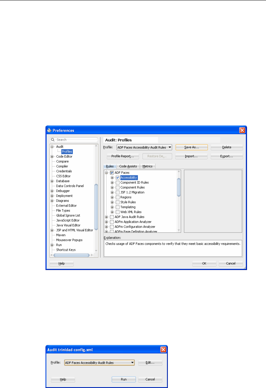
Running Accessibility Audit Rules
30-24 Web User Interface Developer's Guide for Oracle Application Development Framework
features. For more information, see Section 30.1.2, "Additional Information for
Accessibility Support in ADF Pages."
To create an audit profile:
1. From the main menu, choose To o l s > Preferences.
2. In the Preferences dialog, choose Audit > Profiles.
3. In the Audit: Profiles dialog, clear all checkboxes, and then select the ADF Faces >
Accessibility checkbox.
4. Click Save As and save the profile with a unique name.
Figure 30–6 illustrates the settings of the Audit: Profiles dialog to create an
accessibility audit profile.
Figure 30–6 Audit Profile Settings for ADF Faces Accessibility
5. Click OK.
To run the audit report:
1. From the main menu, choose Build > Audit target.
2. In the Audit Profile dialog, from the Profile dropdown menu, select the ADF Faces
accessibility audit profile you created.
Figure 30–7 Audit dialog to run an audit report

Running Accessibility Audit Rules
Developing Accessible ADF Faces Pages 30-25
3. Click Run to generate the report.
The audit report results are displayed in the Log window. After the report generation
is complete, you can export the report to an HTML file by clicking the Export icon in
the Log window toolbar.

Running Accessibility Audit Rules
30-26 Web User Interface Developer's Guide for Oracle Application Development Framework

31
Creating Custom ADF Faces Components 31-1
31 Creating Custom ADF Faces Components
This chapter describes how to create custom ADF Faces components.
This chapter includes the following sections:
■Section 31.1, "About Custom ADF Faces Components"
■Section 31.2, "Setting Up the Workspace and Starter Files"
■Section 31.3, "Developing for the Client-Side"
■Section 31.4, "Developing for the Server-Side"
■Section 31.5, "Deploying a Component Library"
■Section 31.6, "Adding the Custom Component to an Application"
31.1 About Custom ADF Faces Components
The ADF Faces component library provides a comprehensive set of UI components
that covers most of your requirements. However, there are situations when you will
want to create a custom rich component that is specific to your application. A custom
rich component will allow you to have custom behavior and perform actions that best
suit the needs of your application.
JSF technology is built to allow self-registering components and other framework
parts. The core JSF runtime at web application startup accomplishes this by inspecting
all JAR files in the class path. Any JAR files whose /META-INF/faces-config.xml
file contains JSF artifacts will be loaded. Therefore, you can package custom ADF
Faces components in a JAR file and simply add it into the web project.
For each ADF Faces component, there is a server-side component and there can also be
a client-side component. On the server, for JSPs, a render kit provides a base to balance
the complex mixture of markup language and JavaScript. The server-side framework
also adds a custom lifecycle to take advantage of the API hooks for partial page
component rendering. On the client, ADF Faces provides a structured JavaScript
framework for handling various nontrivial tasks. These tasks include state
synchronization using partial page rendering. For more information about the ADF
Faces architecture, see Chapter 4, "Using ADF Faces Client-Side Architecture."
Note: Creating custom JSF Facelet components is covered in many
books, articles, web sites, and the JavaServer Faces specification,
therefore, it is not covered in this guide. This chapter describes how to
create ADF Faces components.

About Custom ADF Faces Components
31-2 Web User Interface Developer's Guide for Oracle Application Development Framework
ADF Faces components are derived from the Apache MyFaces Trinidad component
library. Because of this, many of the classes you extend when creating a custom ADF
Faces component are actually MyFaces Trinidad classes. For more information about
the history of ADF Faces, including its evolution, see Chapter 1, "Introduction to ADF
Faces."
Between the JSP and the JSF components is the Application class. The tag library
uses a factory method on the application object to instantiate a concrete component
instance using the mnemonic referred to as the componentType.
A component can render its own markup but this is not considered to be a best
practice. The preferred approach is to define a render kit that focuses on a strategy for
rendering the presentation. The component uses a factory method on the render kit to
get the renderer associated with the particular component. If the component is
consumed in an application that uses Facelets, then a component handler creates the
component.
In addition to functionality, any custom component you create must use an ADF Faces
skin to be able to be displayed properly with other ADF Faces components. To use a
skin, you must create and register the skinning keys and properties for your
component. This chapter describes only how to create and register skins for custom
components. For more information about how skins are used and created in general,
see Chapter 28, "Customizing the Appearance Using Styles and Skins."
31.1.1 Developing a Custom Component with JDeveloper
An ADF Faces component consists of both client-side and server-side resources. On
the client side, there is the client component, the component peer (the component
presenter), and any events associated with the client component.
On the server side, there is the server component, server component events, and event
listeners. Also, there is a component renderer, a component JSP tag, a composite
resource loader, a JavaScript resource loader, and a resource bundle.
The component also has several configuration and support files. Together, these
classes, JavaScripts, and configuration files are packaged into a JAR file, which can be
imported as a library into an application and used like other components.
You can use JDeveloper to set up the application workspace and project in which you
develop the custom component. After you have created the workspace and project,
you add starter working files for the required classes, JavaScript files, and
configuration files that make up the custom component. During development, you
edit and add code to each of these files, specific for the custom component.
The development process is as follows:
1. Create an application, workspace, and project as an environment for development.
This includes adding library dependencies and registering XML schemas. You
should not create the component in the same application in which you plan to use
the component.
2. Create a deployment profile for packaging the component into a JAR file.
3. Create the following starter configuration and support files:
Tip: To work with ADF Faces components, your custom component
must use at least the ADF Faces simple skin, because the FusionFX,
blafplus-rich, and blafplus-medium skins inherit from the
simple skin. Additionally, if there is any chance your component will
be used in an Oracle WebCenter application, then your skin must also
be registered with the simple.portlet skin.

About Custom ADF Faces Components
Creating Custom ADF Faces Components 31-3
–faces-config.xml: Used to register many of the artifacts used by the
component.
–trinidad-skins.xml: Used to register the skins that the component uses.
–Cascading style sheet: Used to define the style properties for the skins.
–Render kit resource loader: Allows the application to load all the resources
required by the component.
–adf-js-features.xml: Allows the component to become part of a
JavaScript partition. For more information about partitions, see Section 4.9,
"JavaScript Library Partitioning."
–JSP tag library descriptor (TLD) (for JSP): Defines the tag used on the JSF page.
–Component handler (for Facelets): Defines the handler used to render the
component.
4. Create the following client-side JavaScript files:
–Client Component: Represents the component and its attributes on the client.
–Client Peer: Manages the document object model (DOM) for the component.
–Client Event: Invokes processing on the client and optionally propagates
processing to the server.
5. Create the following server-side Java files:
–Server Component class: Represents the component on the server.
–Server Event Listener class: Listens for and responds to events.
–Server Events class: Invokes events on the server.
–Server Renderer class: Determines the display of the component.
–Resource Bundle class: Defines text strings used by the component.
6. Further develop the component by testing and debugging the JavaScript and Java
code. You can use the JDeveloper debugger to set breakpoints and to step through
the code. You can also use Java logging features to trace the execution of the
component.
7. Deploy the component into a JAR file.
8. Test the component by adding it into an application.
Table 31–1 lists the client-side and server-side component artifacts for a custom
component. The configuration and support files are not included in the table.
About Custom ADF Faces Components
31-4 Web User Interface Developer's Guide for Oracle Application Development Framework
Table 31–1 Client-Side and Server-Side Artifacts for a Custom Component
Client Server
Component class:
oracle.component_
package.js.component.prefixComponent_
name.js
Extends:
oracle.adf.view.js.component.
AdfUIObject.js
Component:
oracle.<component_
package>.faces.component.<Component_
name>.java
Extends:
org.apache.myfaces.trinidad.component.
UIXObject.java
Event:
oracle.<component_
package>.js.event.<prefix><Event_
name>.js
Extends:
oracle.adf.view.js.component.
AdfComponentEvent.js
Event:
oracle.<component_
package>.faces.event.<Event_name> .java
Extends:
javax.faces.event.FacesEvent.java
Event Listener:
oracle.<component_
package>.faces.event<Listener_name>
Extends:
com.faces.event.FacesListener
Component Peer:
com.<component_
package>.js.component.<prefix><Peer_
name>Peer.js
Extends:
oracle.adf.view.js.laf.rich.
AdfRichUIPeer.js.js
Component Renderer:
com.<component_
package>.faces.render.<Renderer_name>.java
Extends:
oracle.adf.view.rich.render.RichRenderer.
java
Component JSP Tag (JSP only):
com.<component_
package>.faces.taglib.<Tagname_
name>Tag.java
Extends:
javax.faces.webapp.UIComponentELTag.java
About Custom ADF Faces Components
Creating Custom ADF Faces Components 31-5
31.1.2 An Example Custom Component
To help illustrate creating a custom component, a custom component named tagPane
will be used as an example throughout the procedures. The tagPane custom
component is created for reuse purposes. Although the tagPane presentation might
have been implemented using a variety of existing components, having a single
custom component simplifies the work of the page developer. In this case, there may
be a trade-off of productivity between the component developer and the page
developers. If this particular view composition were needed more than once, the
development team would reduce costs by reducing the lines of code and simplifying
the task of automating a business process.
The tagPane component displays a series of tags and their weighted occurrences for a
set of files. Tags that are most frequently used are displayed in the largest font size,
while the least used tags are displayed in the smallest font size. Each tag is also a link
that triggers an event, which is then propagated to the server. The server causes all the
files that contain an occurrence of that tag to then be displayed in a table. Figure 31–1
shows how the tagPane component would be displayed if it was added below the
Search pane in the File Explorer application.
Composite Resource Loader:
com.<component_
package>.faces.resource.<Loader_
name>ResourceLoader.java
Extends:
org.myfaces.trinidad.resource.
RegxResourceLoader.java
JavaScript Resource Loader:
com.<component_
package>.faces.resource.<Script_Loader_
name>ResourceLoader.java
Extends:
org.myfaces.trinidad.resource.
AggregateingResourceLoader.java
Resource Bundle:
com.<component_
package>.faces.resource.<Bundle_
name>Bundle.java
Extends:
java.util.ListResouceBundle.java
Table 31–1 (Cont.) Client-Side and Server-Side Artifacts for a Custom Component
Client Server
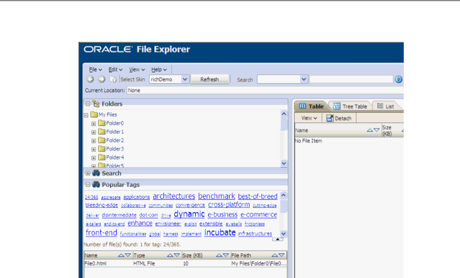
About Custom ADF Faces Components
31-6 Web User Interface Developer's Guide for Oracle Application Development Framework
Figure 31–1 Custom tagPane Component
The tagPane component receives a collection of tags in a Java Map collection. The key
of the map is the tag name. The value is a weight assigned to the tag. In the File
Explorer application, the weight is the number of times the tag occurs and in most
cases, the number of files associated with the tag. The tag name is displayed in the
body text of a link and the font size used to display the name represents the weight.
Each tag’s font size will be proportionally calculated within the minimum and
maximum font sizes based upon the upper and lower weights assigned to all tags in
the set of files. To perform these functions, the tagPane custom component must have
both client-side and server-side behaviors.
On the server side, the component displays the map of tags by rendering HTML
hyperlinks. The basic markup rendering is performed on the server. A custom event
on the component is defined to handle the user clicking a link, and then to display the
associated files. These server-side behaviors are defined using a value expression and
a method expression.
For example, the tagPane component includes:
■A tag property for setting a Map<String, Number> collection of tags.
■A tagSelectionListener method-binding event that is invoked on the server
when the user clicks the link for the tag.
■An orderBy property for displaying the sequence of tags from left to right in the
order of descending by weight or alternatively displaying the tag links ascending
alphabetically.
To allow each tag to be displayed in a font size that is proportional to its weight
(occurrences), the font size is controlled using an inline style. However, each tag and
the component’s root markup node also uses a style class.
Example 31–1 shows how the tagPane component might be used in a JSF page.
Example 31–1 tagPane Custom Component Tag in a JSF Page
<acme:tagPane id="tagPane" tags="#{explorer.navigatorManager.tagNavigator.tags}"
tagSelectListener="#{explorer.navigatorManager.tagNavigator.onTagSelect}"

About Custom ADF Faces Components
Creating Custom ADF Faces Components 31-7
orderBy="alpha"
partialTriggers="tagCountLabel"/>
Because the tagPane component must be used with other ADF Faces components, it
must use the same skins. Therefore, any styling is achieved through the use of
cascading style sheets (CSS) and corresponding skin selectors. For example, the
tagPane component needs skin selectors to specify the root element, and to define the
style for the container of the links and the way the hyperlinks are displayed.
Example 31–2 shows a sample set of style selectors in the CSS file for the tagPane
component.
Example 31–2 CSS Style Selectors for the Sample Custom Component
acme|tagPane - root element
acme|tagPane::content - container for the links
acme|tagPane::tag - tag hyperlink
You may need to specify the HTML code required for the custom component on the
server side.
Example 31–3 shows HTML server-side code used for the tagPane component.
Example 31–3 HTML Code for the Server Side
<div class=" acme|tagPane">
<span class=" acme|tagPane::content ">
<a class=" acme|tagPane::tag" href="#" style="font-size:9px;">Tag1</a>
<a class=" acme|tagPane::tag" href="#" style="font-size:10px;">Tag2</a>
</span>
</div>
On the client side, the component requires a JavaScript component counterpart and a
component peer that defines client-side behavior. All DOM interaction goes through
the peer (for more information, see Chapter 4, "Using ADF Faces Client-Side
Architecture"). The component peer listens for the user clicking over the hyperlinks
that surround the tag names. When the links are clicked, the peer raises a custom event
on the client side, which propagates the event to the server side for further processing.
Table 31–2 lists the client-side and server-side artifacts for the tagPane component.
Referencing the naming conventions in Table 31–1, the component_package is
com.adfdemo.acme and the prefix is Acme.
About Custom ADF Faces Components
31-8 Web User Interface Developer's Guide for Oracle Application Development Framework
Table 31–2 Client-Side and Server-Side Artifacts for the tagPane Custom Component
Client Server
Component:
com.adfdemo.acme.js.component.
AcmeTagPane.js
Extends:
oracle.adf.view.js.component.
AdfUIObject.js
Component
com.adfdemo.acme.faces.component.TagPane.
java
Extends:
org.apache.myfaces.trinidad.component.
UIXObject.java
Event:
com.adfdemo.acme.js.event.
AcmeTagSelectEvent.js
Extends:
oracle.adf.view.js.component.
AdfComponentEvent.js
Event:
com.adfdemo.acme.faces.event.
TagSelectEvent.java
Extends:
javax.faces.event.FacesEvent.java
Event Listener:
com.adfdemo.acme.faces.event.
SelectListener
Extends:
com.faces.event.FacesListener
Component Peer:
com.adfdemo.acme.js.component.
AcmeTagPanePeer.js
Extends:
oracle.adf.view.js.laf.rich.
AdfRichUIPeer.js
Component Renderer:
com.adfdemo.acme.faces.render.
TagPaneRenderer.java
Extends:
oracle.adf.view.rich.render.RichRenderer.
java
Component JSP Tag:
oracle.adfdemo.acme.faces.taglib.
TagPaneTag.java
Extends:
javax.faces.webapp.UIComponentELTag.java
Setting Up the Workspace and Starter Files
Creating Custom ADF Faces Components 31-9
31.2 Setting Up the Workspace and Starter Files
Use JDeveloper to set up an application and a project to develop the custom
component. After your skeleton project is created, you can add a deployment profile
for packaging the component into a JAR file.
During the early stages of development, you create starter configuration and support
files to enable development. You may add to and edit these files during the process.
You create the following configuration files:
■META-INF/faces-config.xml: The configuration file required for any
JSF-based application. While the component will use the faces-config.xml file
in the application into which it is eventually imported, you will need this
configuration file for development purposes.
■META-INF/trinidad-skins.xml: The configuration information for the skins
that the component can use. Extend the simple skin provided by ADF Faces to
include the new component.
■META-INF/package_directory/styles/skinName.css: The style metadata
needed to skin the component.
■META-INF/servlets/resources/name.resources: The render kit resource
loader that loads style sheets and images from the component JAR file. The
resource loader is aggregated by a resource servlet in the web application, and is
used to configure the resource servlet. In order for the servlet to locate the resource
loader file, it must be placed in the META-INF/servlets/resources directory.
■META-INF/adf-js-features.xml: The configuration file used to define a
feature. The definition usually includes a component name or description of
functionality that a component provides, and the files used to implement the
client-side component.
Composite Resource Loader:
oracle.adfdemo.acme.faces.resource.
AcmeResourceLoader.java
Extends:
org.myfaces.trinidad.resource.
RegxResourceLoader.java
JavaScript Resource Loader:
oracle.adfdemo.acme.faces.resource.
ScriptsResourceLoader.java
Extends:
org.myfaces.trinidad.resource.
AggregateingResourceLoader.java
Resource Bundle:
oracle.adfdemo.acme.faces.resource.
AcmeSimpleDesktopBundle.java
Extends:
java.util.ListResouceBundle.java
Table 31–2 (Cont.) Client-Side and Server-Side Artifacts for the tagPane Custom Component
Client Server

Setting Up the Workspace and Starter Files
31-10 Web User Interface Developer's Guide for Oracle Application Development Framework
■META-INF/prefix_name.tld (for JSP): The tag definition library for the
component. If the consuming web application is using JSP, the custom component
requires a defined TLD. The TLD file will be located in the META-INF folder along
with the faces-config.xml and trinidad-skins.xml files.
■META-INF/prefix_name.taglib.xml (for Facelets): The tag library definition
for the component when the consuming application uses Facelets. This file defines
the handler for the component.
For example, for the tagPane component, the following configuration files are
needed:
■META-INF/faces-config.xml
■META-INF/trinidad-skins.xml
■META-INF/acme/styles/acme-simple-desktop.css
■META-INF/servlets/resources/acme.resources
■META-INF/acme.tld
■META-INF/acme.taglib.xml
■META-INF/adf-js-features.xml
After the files are set up in JDeveloper, you add content to them. Then, you create the
client-side files nd server-side files. For more information, see Section 31.3,
"Developing for the Client-Side," and Section 31.4, "Developing for the Server-Side."
31.2.1 How to Set Up the JDeveloper Custom Component Environment
This chapter assumes you have experience using JDeveloper and are familiar with the
steps involved in creating and deploying an application. For more information about
using JDeveloper to create applications, see Chapter 3, "Getting Started with ADF
Faces and JDeveloper." For more information about deployment, see the "Deploying
Fusion Web Applications" chapter of the Oracle Fusion Middleware Fusion Developer's
Guide for Oracle Application Development Framework.
Before you begin:
It may be helpful to have an understanding of the workspace and starter files needed
for custom ADF Faces components. For more information, see Section 31.2, "Setting Up
the Workspace and Starter Files."
To set up the custom component development environment in JDeveloper:
1. Create an application to serve as a development container for the component. Use
JDeveloper to create a workspace and project. For procedures on creating an
application, see Section 3.2, "Creating an Application Workspace." When selecting
an application template, select the Generic Application template.
Note: Do not select any other application template, or add any
technologies to your application. Because the custom component will
be packaged into a JAR file, you do not need to create unnecessary
folders such as public_html that JDeveloper creates by default
when you use a template specifically for web applications, or add web
technologies. Instead, create the starter configuration file from the
XML schemas.

Setting Up the Workspace and Starter Files
Creating Custom ADF Faces Components 31-11
2. Prepare the project to be deployed as a JAR file by creating a new deployment
profile.
a. In the Application Navigator, right-click the project and choose New.
b. In the New Gallery, select Deployment Profile and then ADF Library JAR
File, and click OK.
c. In the Create Deployment Profile dialog, enter a name for the Deployment
Profile name. For example, the tagPane component might use
adf-richclient-demo-acme.
d. In the Edit JAR Deployment Profile Properties dialog, click OK.
3. In the Project Properties dialog, add library dependencies.
a. Select Libraries and Classpath in the left pane.
b. Click Add Library.
c. In the Add Library dialog, select ADF Faces Runtime 11, Facelets Runtime (if
using Facelets), JSF 1.2, and JSP Runtime, and click OK.
d. Click OK to close the Project Properties dialog.
4. Register XML schemas.
The custom component requires several XML configuration files. You can use
JDeveloper to register the XML schemas associated with these configuration files.
You must add schemas for three configuration files: faces-config.xml,
trinidad-skins.xml, and trinidad-config.xml. By preregistering these
schemas, you can create a template XML configuration file without having to
know the specifics about the markup structure. The names and locations of the
schemas are assumed by the base installation of JDeveloper.
a. Select Tools > Preferences. In the Preferences dialog, select XML Schemas in
the left pane, and click Add.
b. In the Add Schema dialog, click Browse to navigate to the XML schemas
included in your JDeveloper build, as shown in Table 31–3.
Note: In the Add Schema dialog, make sure Extension is set to .xml.
If you change it to XSD, when you later create XML files, you will not
be able to use the XML schema you have created.
Table 31–3 XML Schema Locations
XML Configuration File Schema Location
/META-INF/faces-config.xml JDeveloper_Home/jdeveloper/modules/
oracle.jsf_1.2.9/glassfish.jsf_1.2.9jar!
/com/sun/faces/web-facesconfig_1_2.xsd
/META-INF/trinidad-skins.x
ml
JDeveloper_
Home/jdeveloper/modules/oralce.adf.view_
11.1.1/trinidad-impl.jar!/org/apache/
myfaces/trinidadinternal/ui/laf/xml/schemas
/skin/trinidad-skins.xsd
/META-INF/trinidad-config.
xml
JDeveloper_Home/jdeveloper/modules/
oracle.adf.view_11.1.1/
trinidad-api.jar!/trinidad-config.xsd
Setting Up the Workspace and Starter Files
31-12 Web User Interface Developer's Guide for Oracle Application Development Framework
31.2.2 How to Add a Faces Configuration File
Although the custom component will be registered in the consuming application’s
faces-config.xml file, during development, the workspace requires a
faces-config.xml file.
Before you begin:
It may be helpful to have an understanding of the workspace and starter files needed
for custom ADF Faces components. For more information, see Section 31.2, "Setting Up
the Workspace and Starter Files."
To create a faces-config.xml file for the custom component:
1. In the Application Navigator, right-click the project and select New.
2. In the New Gallery, expand General, select XML, and then Select XML Document
from XML Schema, and click OK.
3. In the Create XML from XML Schema dialog:
■XML File: Enter faces-config.xml.
■Directory: Append \src\META-INF to the end of the directory entry.
■Select Use Registered Schemas and click Next.
4. Enter the following:
■Target Namespace: Select http://java.sun.com/xml/ns/javaee.
■Root Element: Select faces-config.
Leave the defaults for the other fields, and click Finish.
The new file will automatically open in the XML editor.
5. Add the following schema information after the first line in the file:
<?xml version="1.0" encoding="US-ASCII"?>
<faces-config version="1.2" xmlns="http://java.sun.com/xml/ns/javaee">
Adding a schema provides better WYSIWYG tool support.
31.2.3 How to Add a MyFaces Trinidad Skins Configuration File
Add a MyFaces Trinidad skins file to register the component’s CSS file, which is used
to define the component’s styles.
/META-INF/adf-js-features.
xml
JDeveloper_Home/jdeveloper/modules/
oracle.adf.view_11.1.1/
adf-richclient-api-ll.jar!
/adf-js-features.xsd
Note: Do not use any of JDeveloper’s declarative wizards or dialogs
to create the faces-config.xml file. These declarative methods
assume you are creating a web application, and will add uneccessary
artifacts to your custom component application.
Table 31–3 (Cont.) XML Schema Locations
XML Configuration File Schema Location

Setting Up the Workspace and Starter Files
Creating Custom ADF Faces Components 31-13
To create a trinidad-skins.xml file for the custom component:
1. In the Application Navigator, right-click the project and select New.
2. In the New Gallery, expand General and select XML.
3. Select XML Document from XML Schema and click OK.
4. In the Create XML from XML Schema dialog:
■XML File: Enter trinidad-skins.xml.
■Directory: Append \src\META-INF to the end of the Directory entry.
■Select Use Registered Schemas, and click Next.
5. Enter the following:
■Target Namespace: Select
http://myfaces.apache.org/trinidad/skin.
■Root Element: Select skins.
■Click Finish. The new file will automatically open in the XML editor.
31.2.4 How to Add a Cascading Style Sheet
Add a cascading style sheet to define component’s style.
Before you begin:
It may be helpful to have an understanding of the workspace and starter files needed
for custom ADF Faces components. For more information, see Section 31.2, "Setting Up
the Workspace and Starter Files."
To create a cascading style sheet for the custom component:
1. In the Application Navigator, right-click the project and select New.
2. In the New Gallery, expand General, select File and click OK.
3. In the Create File dialog:
■Enter a file name, for example, acme-simple-desktop.css.
■Append \src\META-INF\component_prefix\styles to the end of the
Directory entry, where component_prefix is the prefix that will be used in
the component library. For example, for the tagPane component, acme is the
prefix, therefore, the string to append would be \META-INF\acme\styles.
31.2.5 How to Add a Resource Kit Loader
Create an empty file and add the fully qualified classpath to the custom resource
loader.
Before you begin:
It may be helpful to have an understanding of the workspace and starter files needed
for custom ADF Faces components. For more information, see Section 31.2, "Setting Up
the Workspace and Starter Files."
To create a resource loader for the custom component:
1. In the Application Navigator, right-click the project and select New.
2. In the New Gallery, expand General and then File, and click OK.

Setting Up the Workspace and Starter Files
31-14 Web User Interface Developer's Guide for Oracle Application Development Framework
3. In the Create File dialog:
■Enter component_prefix.resources for File Name, where component_
prefix will be the prefix used in the component library. For example, for the
tagPane component, acme is the prefix, therefore, the string to enter is
acme.resources.
■Append \src\META-INF\sevlets\resources\ to the end of the
Directory entry.
31.2.6 How to Add a JavaServer Pages Tag Library Descriptor File
You need a JSP TLD file to work with JSF pages.
Before you begin:
It may be helpful to have an understanding of the workspace and starter files needed
for custom ADF Faces components. For more information, see Section 31.2, "Setting Up
the Workspace and Starter Files."
To create a JavaServer Pages TLD file for the custom component:
1. In the Application Navigator, right-click the project and select New.
2. In the New Gallery, expand Web Tier and select JSP.
3. Select JSP Tag Library and click OK.
4. In the Create JavaServer Page Tag Library dialog, select Deployable and click
Next.
5. Enter the following:
■Tag Library Descriptor Version: Select 2.1.
■Short Name: A name. For example, for the tagPane component, you would
enter acme.
■Tag Library URI: A URI for the tag library. For example, for the tagPane
component, you would enter http://oracle.adfdemo.acme.
6. Click Next and optionally enter additional tag library information, then click
Finish.
31.2.7 How to Add a JavaScript Library Feature Configuration File
Add a features file to define the JavaScript files associated with the custom
component, including the files for the client component, the client peer, and the client
events.
Before you begin:
It may be helpful to have an understanding of the workspace and starter files needed
for custom ADF Faces components. For more information, see Section 31.2, "Setting Up
the Workspace and Starter Files."
To create an adf-js-features.xml file for the custom component:
1. In the Application Navigator, right-click the project and select New.
2. In the New Gallery, expand General and select XML.
3. In the right pane, select XML Document from XML Schema and click OK.

Setting Up the Workspace and Starter Files
Creating Custom ADF Faces Components 31-15
4. In the Create XML from XML Schema dialog:
■XML File: Enter adf-js-features.xml.
■Directory: Append \src\META-INF to the end of the Directory entry.
■Select Use Registered Schemas, and click Next.
5. Do the following:
■Target Namespace: Select
http://xmlns.oracle.com/adf/faces/feature.
■Root Element: Select features.
■Click Finish. The new file will automatically open in the XML editor.
31.2.8 How to Add a Facelets Tag Library Configuration File
If a consuming application uses Facelets, then you must define the handler for the
component.
Before you begin:
It may be helpful to have an understanding of the workspace and starter files needed
for custom ADF Faces components. For more information, see Section 31.2, "Setting Up
the Workspace and Starter Files."
To create a Facelets tag library file:
1. In the Application Navigator, right-click the project and select New.
2. In the New Gallery, expand General and select XML.
3. In the right pane, select XML Document and click OK.
4. In the Create XML file dialog, enter the following:
■File Name: Enter prefix_name.taglib.xml
■Directory: Append \src\META-INF to the end of the Directory entry.
5. Copy and paste the code shown in Example 31–4:
Example 31–4 Code for Facelets Tag Library Configuration File
<?xml version="1.0" encoding="utf-8"?>
<!DOCTYPE facelet-taglib
PUBLIC "-//Sun Microsystems, Inc.//DTD Facelet Taglib 1.0//EN"
"http://java.sun.com/dtd/facelet-taglib_1_0.dtd">
<facelet-taglib xmlns="http://java.sun.com/JSF/Facelet">
<namespace>http://xmlns.oracle.adfdemo/acme</namespace>
<tag>
<tag-name>tagPane</tag-name>
<handler-class>
oracle.adfinternal.view.faces.facelets.rich.RichComponentHandler
</handler-class>
</tag>
</facelet-taglib>
6. Replace the namespace and tag-name code shown in bold with code appropriate
for your application.

Developing for the Client-Side
31-16 Web User Interface Developer's Guide for Oracle Application Development Framework
31.3 Developing for the Client-Side
After the JDeveloper workspace and configuration files have been created, you can
create and code the client-side JavaScript files. When you have finished with the
client-side development, create the server-side files, as described in Section 31.4,
"Developing for the Server-Side."
Client components hold state for properties that are not defined within the
corresponding DOM element. These properties are bound to an associated DOM
element using the clientId. The clientId uniquely defines a server-side
component within the component tree representing a page. The DOM element holds
the clientId within the Id attribute.
Developing the client-side component requires creating a JavaScript file for the
component, the peer, and the component event.
In addition to the client component, client-side events must be defined. The tagPane
component’s client-side event is fired and propagated to the server when the user
clicks one of the three file types. The client event passed to the server is queued so that
the target server-side component can take the appropriate action.
Finally, the custom component requires a client peer. The peer is the component
presenter. Peers act as the links between a client component and an associated DOM
element. Client peers add client behaviors. A peer must be bound to a component
through a registration method.
As with the client component, the associated peer is bound to a DOM element using
the component's clientId. There are two types of peers, statefull and stateless.
■Some complex client components require the peer to hold state and thereby need
to use a statefull peer. This type of peer is always bound to a DOM element.
Statefull peers are less common than stateless peers.
■Stateless peers do not hold state and one peer can be bound to multiple
components. Stateless peers are the best performance option because they reduce
the client footprint. This type of peer performs lazy content delivery to the
component.
Peers add behavior to the component by dynamically registering and listening for
DOM events. Conceptually, a peer’s function is similar to the role of a managed bean.
However, the client component is not bound to the peer using EL like the server-side
component is bound to a view model (#{backingbean.callback}). The peer
registers client component events in the InitSubclass
(AdfRichUIPeer.addComponentEventHandlers("click")) callback method.
The callback is assumed by using a naming convention of
(<Peer>.prototype.HandleComponent<Event>). The peer manages DOM event
callbacks where the server-side component handles the linking using EL bindings to
Best Practice: Because JavaScript libraries do not have namespaces,
you should create all JavaScript object names for the custom
component using the same prefix. You do not need to do this on the
server because the server-side Java package names will prevent name
collisions. For example, for the tagPane component, the client-side
JavaScript object names all have the acme prefix.
Note: Place each JavaScript object in its own separate source file for
best practice and consistency.

Developing for the Client-Side
Creating Custom ADF Faces Components 31-17
managed beans. For more information about client-side architecture, including peers,
see Section 4.1, "About Using ADF Faces Architecture."
The following section assumes you have already set up a custom component
development template environment. This development environment includes the
setting up of application workspace, projects, deployment profiles, and registering
schemas. If you have not done so, see Section 31.2, "Setting Up the Workspace and
Starter Files."
31.3.1 How to Create a JavaScript File for a Component
Use JDeveloper to create a JavaScript file for the component. In it, you will define the
component type for the component.
Before you begin:
It may be helpful to have an understanding of client-side development for custom
ADF Faces components. For more information, see Section 31.3, "Developing for the
Client-Side."
You must also have set up your workspace and created the configuration files. For
more information, see Section 31.2, "Setting Up the Workspace and Starter Files."
To create the component JavaScript file:
1. In the Application Navigator, right-click the project and click New.
2. In the New Gallery, expand Web Tier and select HTML.
3. Select JavaScript File and click OK.
4. In the Create JavaScript File dialog, do the following:
■File Name: Enter the name of the client-side component. For example, for the
tagPane component, you might enter AcmeTagPane.js.
■Directory: Enter the directory path of the component in a subdirectory under
the src directory. For example, for the tagPane component, you might enter
adfrichclient-demo-acme\src\oracle\adfdemo\acme\js\compone
nt.
5. Open the JavaScript File in the editor and add the component code to define the
component type. Example 31–5 shows the code that might be used for the
tagPane component.
Example 31–5 tagPane Component JavaScript
AdfUIComponents.createComponentClass(
"AcmeTagPane",
{
componentType:"oracle.adfdemo.acme.TagPane",superclass:AdfUIObject
}
);
Tip: To prevent naming collisions, start the name with the
component prefix.

Developing for the Client-Side
31-18 Web User Interface Developer's Guide for Oracle Application Development Framework
31.3.2 How to Create a Javascript File for an Event
Use JDeveloper to create a JavaScript file for the event. Add code to the JavaScript to
perform the functions required when a event is fired, such as a mouse click.
Before you begin:
It may be helpful to have an understanding of client-side development for custom
ADF Faces components. For more information, see Section 31.3, "Developing for the
Client-Side."
You must also have set up your workspace and created the configuration files. For
more information, see Section 31.2, "Setting Up the Workspace and Starter Files."
To create the JavaScript for the event:
1. In the Application Navigator, right-click the project and select New.
2. In the New Gallery, expand Web Tier and select HTML.
3. Select JavaScript File and click OK.
4. In the Create JavaScript File dialog, do the following:
■File Name: Enter the name of the client-side event. For example, for the
tagPane component, you might enter AcmeTagSelectEvent.js.
■Directory: Enter the directory path of the event in a subdirectory under the
src directory. For example, for the tagPane component, you might enter
adf-richclient-demo-acme\src\oracle\adfdemo\acme\js\event.
5. Open the JavaScript File in the editor and add the event code. For an example that
shows the event code that might be added for the tagPane component, see
Section E.2.1, "Event Code for JavaScript."
31.3.3 How to Create a JavaScript File for a Peer
Use JDeveloper to create a JavaScript file for the peer. Add code to register the peer
and bind it to the component.
Before you begin:
It may be helpful to have an understanding of client-side development for custom
ADF Faces components. For more information, see Section 31.3, "Developing for the
Client-Side."
You should have also already created the JavaScript file for the component. For more
information, see Section 31.3.1, "How to Create a JavaScript File for a Component."
To create the peer JavaScript file:
1. In the Application Navigator, right-click the project and select New.
2. In the New Gallery, expand Web Tier and select HTML.
3. Select JavaScript File and click OK.
4. In the Create JavaScript File dialog, do the following:
Tip: To prevent naming collisions, start the name with the
component prefix.

Developing for the Client-Side
Creating Custom ADF Faces Components 31-19
■File Name: Enter the name of the client-side peer. For example, for the
tagPane component, you might enter AcmeTagPanePeer.js.
■Directory: Enter the directory path of the event in a subdirectory under the
src directory. For example, for the tagPane component, you might enter
adf-richclient-demo-acme\src\oracle\adfdemo\acme\js\compon
ent.
5. Open the JavaScript file in the editor and add code for the peer. In this code, you
must create the peer, add event handling with respect to the DOM, and register the
peer with the component. Example 31–6 shows the code that might be added for
the tagPane component.
Example 31–6 tagPane JavaScript Peer
AdfRichUIPeer.createPeerClass(AdfRichUIPeer, "AcmeTagPanePeer", true);
AcmeTagPanePeer.InitSubclass = function()
{
AdfLogger.LOGGER.logMessage(AdfLogger.FINEST,
"AcmeTagPanePeer.InitSubclass()");
AdfRichUIPeer.addComponentEventHandlers(this,
AdfUIInputEvent.CLICK_EVENT_TYPE);
}
AcmeTagPanePeer.prototype.HandleComponentClick = function(componentEvent)
{
AdfLogger.LOGGER.logMessage(AdfLogger.FINEST,
"AcmeTagPanePeer.HandleComponentClick(componentEvent)");
// if the left mouse button was pressed
if (componentEvent.isLeftButtonPressed())
{
// find component for the peer
var component = this.getComponent();
AdfAssert.assertPrototype(component, AcmeTagPane);
// find the native dom element for the click event
var target = componentEvent.getNativeEventTarget();
if (target && target.tagName == "A")
{
AdfLogger.LOGGER.logMessage(AdfLogger.FINEST, "File type element (A)
found: " + componentEvent.toString());
var tag = target.firstChild.nodeValue;
AdfAssert.assertString(tag);
AdfLogger.LOGGER.logMessage(AdfLogger.FINEST, "tag :" + tag);
// fire a select event
AcmeTagSelectEvent.queue(component, tag);
//cancel the native dom onclick to prevent browser actions based on the
//'#' hyperlink. The event is of type AdfIEUIInputEvent. This event
//will cancle the native dom event by calling
//AdfAgent.AGENT.preventDefault(Event)
componentEvent.cancel();
}
// event has dom node
}
}
// Register the peer with the component. This bit of script must
Tip: To prevent naming collisions, start the name with the
component prefix.

Developing for the Server-Side
31-20 Web User Interface Developer's Guide for Oracle Application Development Framework
// be invoked after the AcmeTagPane and AcmeTagSelectEvent objects
// are created. This is enforced by the ordering of the script files
// in the
oracle.asfdemo.acme.faces.resource.AcmeResourceLoader.
AcmeScriptsResourceLoader.AdfPage.PAGE.getLookAndFeel()
.registerPeerConstructor("oracle.adfdemo.acme.TagPane",
"AcmeTagPanePeer");
31.3.4 How to Add a Custom Component to a JavaScript Library Feature Configuration
File
Now that you have created all the JavaScript files for the component, you can add the
component to the adf-js-features.xml file you created.
Before you begin:
It may be helpful to have an understanding of client-side development for custom
ADF Faces components. For more information, see Section 31.3, "Developing for the
Client-Side."
You should have also already created the JavaScript file for the component. For more
information, see Section 31.3.1, "How to Create a JavaScript File for a Component."
To add a custom component to a JavaScript library feature configuration file:
Follow the procedures documented in Section 4.9.1, "How to Create a JavaScript
Feature," omitting the steps for creating the XML files, as you have already done so.
Example 31–7 shows the adf-js-features.xml file used for the tagPane
component.
Example 31–7 adf-js-features.xml File for the tagPane Component
<?xml version="1.0" encoding="UTF-8" ?>
<features xmlns="http://xmlns.oracle.com/adf/faces/feature">
<feature>
<feature-name>AcmeTagPane</feature-name>
<feature-class>
oracle/adfdemo/acme/js/component/AcmeTagPane.js
</feature-class>
<feature-class>
oracle/adfdemo/acme/js/event/AcmeTagSelectEvent.js
</feature-class>
<feature-class>
oracle/adfdemo/acme/js/component/AcmeTagPanePeer.js
</feature-class>
</feature>
</features>
31.4 Developing for the Server-Side
Server-side development involves creating Java classes for:
■Event listener: This class listens for events and then invokes processing logic to
handle the event.
■Events: You create an event in order to invoke the logic in the associated listener.

Developing for the Server-Side
Creating Custom ADF Faces Components 31-21
■Component: This class holds the properties that define behavior for the
component.
■Resource bundle: This class holds text strings for the component.
■Renderer: This class determines how the component will be displayed in the
client.
■Resource loader: This class is required only if your component contains images
needed for skinning.
After you have created the classes, add the component class and the renderer class to
the faces-config.xml file. Then, complete the configuration files started in
Section 31.2, "Setting Up the Workspace and Starter Files."
31.4.1 How to Create a Class for an Event Listener
The ADF Faces event API requires an event listener interface to process the event. The
custom component has a dependency with the event and the event has a dependency
with an event listener interface. The Java import statements must reflect these
dependencies. You also must define the componentType for the component.
Before you begin:
It may be helpful to have an understanding of server-side development for custom
ADF Faces components. For more information, see Section 31.4, "Developing for the
Server-Side."
You must also have set up your workspace and created the configuration files. For
more information, see Section 31.2, "Setting Up the Workspace and Starter Files."
To create the EventListener class:
1. In the Application Navigator, right-click the project and select New.
2. In the New Gallery, expand General and select Java.
3. Select Java Interface and click OK.
4. In the Create Java Interface File dialog, do the following:
■Name: Enter a listener name. For example, for the tagPane component, you
might enter TagSelectListener.
■Package: Enter a name for the package. For example, for the tagPane
component, you might enter oracle.adfdemo.acme.faces.event.
5. Open the Java file in the editor and add the following:
■Have the listener extend the javax.faces.event.FacesListener
interface.
■Add an import statement, and import the FacesListener class and any
other classes on which your event is dependent.
■Add a method signature that will process the new event. Even though you
have not created the actual event, you can enter it now so that you will not
have to enter it later.
Example 31–8 shows the code for the tagPane event listener.
Example 31–8 tagPane Event Listener Java Code
package oracle.adfdemo.acme.faces.event;

Developing for the Server-Side
31-22 Web User Interface Developer's Guide for Oracle Application Development Framework
import javax.faces.event.AbortProcessingException;
import javax.faces.event.FacesListener;
public interface TagSelectListener
extends FacesListener
{
/**
* <p>Process the {@link TagSelectEvent}.</p>
* @param event fired on click of a tag link
* @throws AbortProcessingException error processing {@link TagSelectEvent}
*/
public void processTagSelect(TagSelectEvent event)
throws AbortProcessingException;
}
31.4.2 How to Create a Class for an Event
You must create a server-side event that will be the counter representation of the
JavaScript event created in Section 31.3.2, "How to Create a Javascript File for an
Event." Server-side JSF events are queued by the component during the Apply Request
Values lifecycle phase. Events propagate up to the UIViewRoot class after all the
phases but the Render Response phase. Queued events are broadcast to the associated
component.
The server-side Java component must raise the server-side event, so you must create
the event source file first to resolve the compilation dependency.
Before you begin:
It may be helpful to have an understanding of server-side development for custom
ADF Faces components. For more information, see Section 31.4, "Developing for the
Server-Side."
You should have also already created the event listener class. For more information,
see Section 31.4.1, "How to Create a Class for an Event Listener."
To create the server-side event class:
1. In the Application Navigator, right-click the project and select New.
2. In the New Gallery, expand General and select Java.
3. Select Java Class and click OK.
4. In the Create Java Class File dialog, do the following:
■Name: Enter an event name. For example, for the tagPane component, you
might enter TagSelectEvent.
■Package: Enter the package name. For example, for the tagPane component,
you might enter oracle.adfdemo.acme.faces.event.
■Extends: Enter a name for the class that the event class extends. This is usually
javax.faces.event.FacesEvent.
■In the Optional Attributes section, select the following:.
–In the Access Modifiers section, select public.
–At the bottom, select Constructors from Superclass and Implement
Abstract Methods.
Example 31–9 shows the code for the event class.

Developing for the Server-Side
Creating Custom ADF Faces Components 31-23
Example 31–9 tagPane Event Java Code
package oracle.adfdemo.acme.faces.event;
import javax.faces.component.UIComponent;
import javax.faces.event.FacesEvent;
import javax.faces.event.FacesListener;
public class TagSelectEvent
extends FacesEvent
{
/**
* <p>Tag selected on the client.</p>
*/
private String tag = null;
/**
* <p>Overloade constructor passing the <code>source</code>
* {@link oracle.adfdemo.acme.faces.component.TagPane} component and the
* selected <code>tag</code>.
* </p>
* @param source component firing the event
* @param tag selected tag link type
*/
public TagSelectEvent(UIComponent source,
String tag)
{
super(source);
this.tag = tag;
}
/**
* <p>Returns <code>true</code> if the <code>facesListener</code> is a
* {@link TagSelectListener}.</p>
*
* @param facesListener listener to be evaluated
* @return <code>true</code>
* if <code>facesListener</code> instancof {@link TagSelectListener}
*/
public boolean isAppropriateListener(FacesListener facesListener)
{
return (facesListener instanceof TagSelectListener);
}
/**
* <p>Delegates to the <code>processTagSelect</code>
* method of a <code>FacesListener</code>
* implementing the {@link TagSelectListener} interface.
*
* @param facesListener target listener realizing {@link TagSelectListener}
*/
public void processListener(FacesListener facesListener)
{
((TagSelectListener) facesListener).processTagSelect(this);
}
/**
* @return the tag that was selected triggering this event
*/
public String getTag()
{
return tag;
}
}
Developing for the Server-Side
31-24 Web User Interface Developer's Guide for Oracle Application Development Framework
31.4.3 Creating the Component
A JSF component can be described as a state holder of properties. These properties
define behavior for rendering and how a component responds to user interface
actions. When you are developing the component class, you identify the types of the
needed properties. You also define the base component that it will extend from the
MyFaces Trinidad Framework. For example, the tagPane component extends the
UIXObject in MyFaces Trinidad.
Most components will have several properties that should be implemented. Some of
the properties are inherited from the base class, and some are required for the ADF
Faces framework. Other properties are required because they are best practice. And
finally, some properties are specific to the functionality of the custom component.
For example, the tagPane component has the properties shown in Table 31–4.
Table 31–4 Component Properties for the tagPane Custom Component
Origin Property Data Type Description
Inherited id String.class The identifier for a component.
rendererType String.class The logical identifier registered as a component
renderer.
rendered Boolean.class True or false flag that determines if the component is
rendered.
binding ValueExpression.cl
ass
A binding value expression to store a component
instance in a managed bean.
ADF Faces
Framework clientCompone
nt
Boolean.class True or false flag that determines whether a client-side
component will be generated.
clientListene
rs
ClientListenerSet.
class
A binding expression that registers a client listener on
a component.
clientAttribu
tes
Set.class A client attribute on a component. The attribute is
added both to the server-side JSF component as well as
the client-side equivalent.
Best
Practice inlineStyle String.class A CSS style applied to the root component’s class
attribute.
styleClass String.class A CSS style added to the component’s class attribute.
visible Boolean.class True or false flag that returns the visibility of the
component. The visible property is not the same as the
rendered property. The visible attribute affects the CSS
style on the CSS root of the component.
partialTrigge
rs
String[].class The IDs of the components that should trigger a partial
page update.
Specific to
tagPane tags Map.class The map of weighted tags. The key represents the tag
name and the value as a number.
Map<String.Number>.
orderBy String.class The order that the tags are rendered. The valid
enumerations are alpha and weight.
tagSelectList
ener
MethodExpression.c
lass
The newselectListener method binding expression
that expects a single parameter of type
oracle.adfdemo.acme.faces.event.TagSelec
tEvent. This binding will be when the client-side
oracle.adfdemo.acme.js.event.AcmeTagSele
ctEvent.js event is queued from clicking one of the
tags.

Developing for the Server-Side
Creating Custom ADF Faces Components 31-25
ADF Faces and MyFaces Trinidad component libraries are defined differently from
other libraries. A JSF component has a collection called attributes that provides
access to component properties (using the Java simple beans specification) through a
MAP interface. The collection also holds value pairs that do not correspond to a
component's properties. This concept is called attribute transparency. The JSF runtimes
(both MyFaces Trinidad and the JSF reference implementation) implement this concept
using the Java reflection API.
My Faces Trinidad defines its own internal collection, which does not use the Java
reflection API. This difference means that it is more efficient than the base
implementation. The solution in MyFaces Trinidad collects more metadata about the
component properties. This metadata declares state properties, which allows the base
class to fully implement the StateHolder interface in a base class.
My Faces Trinidad extends the javax.faces.component.UIComponent class with
the org.apache.trinidad.component.UIXComponent class, followed by a
complete component hierarchy. To ease code maintenance, the framework has a
strategy for generating code based on configuration files and templates.
This component strategy is a trade-off in terms of development. It requires more
coding for defining properties, but you will not have to code the two methods
(saveState, restoreState) for the StateHolder interface for each component.
31.4.4 How to Create a Class for a Component
Use JDeveloper to create a Java file for the component. Create a Type bean to hold
property information and define a PropertyKey for each property. Then, generate
accessors for the private attributes.
Before you begin:
It may be helpful to have an understanding of server-side development for custom
ADF Faces components. For more information, see Section 31.4, "Developing for the
Server-Side." You should also understand the class you will be creating. For more
information, see Section 31.4.3, "Creating the Component."
You must have also created the event class. For more information, see Section 31.4.2,
"How to Create a Class for an Event."
To create the component class:
1. In the Application Navigator, right-click the project and select New.
2. In the New Gallery, expand General and select Java.
3. Select Java Class. Click OK.
4. In the Create Java Class File dialog, do the following:
■Name: Enter a component name. For example, for the tagPane component,
you might enter TagPane.
■Package: Enter a name for the package. For example, for the tagPane
component, you might enter oracle.adfdemo.acme.faces.component.
Note: Do not have your custom component extend from any ADF
Faces implementation packages. These implementations are private
and might change.

Developing for the Server-Side
31-26 Web User Interface Developer's Guide for Oracle Application Development Framework
■Extends: Enter a name for the class the component class extends. For example,
for the tagPane component, you would enter
org.apache.myfaces.trinidad.component.UIXObject.
■In the Optional Attributes section, select the following:.
–In the Access Modifiers section, select public.
–At the bottom, select Constructors from Superclass, and Implement
Abstract Methods.
5. In the source editor, create a Type bean that contains component property
information. This static class attribute shadows an attribute with the same name in
the superclass. The type attribute is defined once per component class. Through
the Type constructor, you pass a reference to the superclass’s Type bean, which
copies property information. For example, the tagPane class would contain the
following constructor:
static public final FacesBean.Type TYPE = new FacesBean.Type(UIXObject.TYPE);
6. For each property, define a static PropertyKey that is used to access the
properties state. Use the TYPE reference to register a new attribute. Specify the
property type using the class reference. The component data type should
correspond to the component property. There is another overload of the
registerKey method that allows you to specify state information. The default
assumes the property is persistent. Example 31–10 shows the PropertyKey
methods for the tagPane component.
Example 31–10 PropertyKey Definition
/**
* <p>Custom CSS applied to the style attribute of the root markup node.</p>
*/
static public final PropertyKey INLINE_STYLE_KEY =
TYPE.registerKey("inlineStyle", String.class);
/**
* <p>Custom CSS class to the class attribute of the root markup node.</p>
*/
static public final PropertyKey STYLE_CLASS_KEY =
TYPE.registerKey("styleClass", String.class);
7. Right-click in the editor and choose Generate Accessors. In the Generate
Accessors dialog, click Select All, ensure the Scope is set to Public, and click OK.
This allows JDeveloper to generate get and set methods for the private
attributes.
Then, remove the private attribute and replace with calls to
getProperty(PropertyKey) and getProperty(PropertyKey).
Example 31–11 shows the code after replacing the private attribute.
Example 31–11 Component Properties
public void setInlineStyle(String newinlineStyle)
{
// inlineStyle = newinlineStyle;
setProperty(INLINE_STYLE_KEY, newinlineStyle);
}
/**
* <p>CSS value applied to the root component's style attribute.</p>
*

Developing for the Server-Side
Creating Custom ADF Faces Components 31-27
* @return newinlineStyle CSS custom style text
*/
public String getInlineStyle()
{
// return inlineStyle;
return (String) getProperty(INLINE_STYLE_KEY);
}
8. You may need to override any methods to perform specific functions in the
component. For example, to allow your component to participate in partial page
rendering (PPR), you must override the getBeanType method, as shown in
Example 31–12.
Example 31–12
/**
* <p>Exposes the <code>FacesBean.Type</code> for this class through a protected
* method. This method is called but the <code>UIComponentBase</code> superclass
* to setup the components <code>ValueMap</code> which is the container for the
* <code>attributes</code> collection.</p>
*
* @return <code>TagPane.TYPE</code> static property
*/
@Override
protected FacesBean.Type getBeanType()
{
return TYPE;
}
Refer to the ADF Faces JavaDoc for more information about the class your
component extends, and the methods you may need to override.
For the tagPane component, the component must act on the event fired from the
client component. A reference to the source component is passed as a parameter to
the event’s constructor.
For the tagPane component, the broadcast method checks if the event passed
in using the formal parameter is a TagSelectEvent. If it is, the broadcast
method invokes the method expression held by the tagSelectListener
attribute.
Most events have an immediate boolean property that specifies the lifecycle
phase in which the event should be invoked. If the immediate attribute is true,
the event is processed in the Apply Values phase; otherwise, the event is processed
in the Invoke Application phase. For more information, see Chapter 5, "Using the
JSF Lifecycle with ADF Faces."
Example 31–13 shows the overwritten broadcast method for the tagPane
component.
Example 31–13 The broadcast Method in the tagPane Component
/**
* @param facesEvent faces event
* @throws AbortProcessingException exception during processing
*/
@Override
public void broadcast(FacesEvent facesEvent)
throws AbortProcessingException
{
// notify the bound TagSelectListener

Developing for the Server-Side
31-28 Web User Interface Developer's Guide for Oracle Application Development Framework
if (facesEvent instanceof TagSelectEvent)
{
TagSelectEvent event = (TagSelectEvent) facesEvent;
// utility method found in UIXComponentBase for invoking method event
// expressions
broadcastToMethodExpression(event, getTagSelectListener());
}
super.broadcast(facesEvent);
}
31.4.5 How to Add the Component to the faces-config.xml File
After creating the component class, register the component by adding it to the
/META-INF/faces-config.xml file. By defining the component in the faces
configuration file packaged with the JAR project, you ensure that component is
automatically recognized by the JSF runtime during web application startup.
To register the component, enter the component type, which is a logical name used by
the applications factory to instantiate an instance of the component. For example, the
tagPane component’s type is oracle.adfdemo.acme.TagPane. You also need to
add the fully qualified class path for the component, for example
oracle.adfdemo.acme.faces.component.TagPane.
Before you begin:
It may be helpful to have an understanding of server-side development for custom
ADF Faces components. For more information, see Section 31.4, "Developing for the
Server-Side." You should also understand the class you will be creating. For more
information, see Section 31.4.3, "Creating the Component."
You must have also created the component class. For more information, see
Section 31.4.4, "How to Create a Class for a Component."
To register a custom component:
1. In the Application Navigator, double-click the faces-config.xml file.
2. Click the Overview tab and click the Components navigation tab.
3. Click the Add icon and enter the type and class for the component.
4. Optionally, add any attributes, properties, or facets.
Example 31–14 shows the tagPane component defined within a faces-config.xml
file.
Example 31–14 tagPane Component Added to the faces-config.xml File
<?xml version="1.0" encoding="UTF-8" ?>
<faces-config version="1.2" xmlns="http://java.sun.com/xml/ns/javaee">
<application>
</application>
<component>
<component-type>oracle.adfdemo.acme.TagPane</component-type>
<component-class>oracle.adfdemo.acme.faces.component.TagPane
</component-class>
</component>

Developing for the Server-Side
Creating Custom ADF Faces Components 31-29
31.4.6 How to Create a Class for a Resource Bundle
Resource bundles are used to store information for the component, such as text for
labels and messages, as well as translated text used if the application allows locale
switching. Skins also use resource bundles to hold text for components. Because your
custom component must use at least the simple skin, you must create at least a
resource bundle for that skin. For a custom component, create a Java file for the
resource bundle. For more information, see Chapter 28, "Customizing the Appearance
Using Styles and Skins."
Before you begin:
It may be helpful to have an understanding of server-side development for custom
ADF Faces components. For more information, see Section 31.4, "Developing for the
Server-Side." You should also understand the class you will be creating. For more
information, see Section 31.4.3, "Creating the Component."
You must have also registered the component. For more information, see
Section 31.4.5, "How to Add the Component to the faces-config.xml File."
To create the resource bundle class:
1. In the Application Navigator, right-click the project and select New.
2. In the New Gallery, expand General and select Java.
3. Select Java Class and click OK.
4. In the Create Java Class File dialog, do the following:
■Name: Enter a resource bundle name. The name should reflect the skin with
which it will be used. For example, for the sample component, you might
enter AcmeSimpleDesktopBundle.
■Package: Enter a name for the package. For example, for the sample
component, you might enter oracle.adfdemo.acme.faces.resource.
■Extends: For resource bundles, you must enter
java.util.ListResourceBundle.
■In the Optional Attributes section, select the following:.
–In the Access Modifiers section, select public.
–At the bottom, select Constructors from Superclass and Implement
Abstract Methods.
5. Add any keys and define the text as needed. For more information about creating
resource bundles for skins, see Chapter 28, "Customizing the Appearance Using
Styles and Skins."
Example 31–15 shows the resource bundle code for the tagPane component.
Example 31–15 tagPane Resource Bundle Java Code
package oracle.adfdemo.acme.faces.resource;
import java.util.ListResourceBundle;
/**
* <p>Holds properties used by the components bundled in the jar project.
* This bundle is part of the trinidad component skin that is configured
* in the "/META-INF/trinidad-skins.xml" file. Component Renderers
* will use the <code>RenderingContext</code> to lookup a key by calling
Tip: You can also use a properties file for your resources.

Developing for the Server-Side
31-30 Web User Interface Developer's Guide for Oracle Application Development Framework
* the <code>getTranslatedString(key)</code> method.</p>
*/
public class AcmeSimpleDesktopBundle
extends ListResourceBundle
{
/**
* <p>Returns a two dimensional object array that represents a resource bundle
. * The first
* element of each pair is the key and the second the value.</p>
*
* @return an array of value pairs
*/
protected Object[][] getContents()
{
return new Object[][]
{
{"AcmeTagPane_tag_title","Tag Weight: {0}"}
};
}
}
6. To register the resource bundle for the simple desktop skin and any other desired
skins, double-click the /META-INF/trinidad-skins.xml file to open it and do the
following:
a. In the Structure window, select skin-addition.
b. In the Property Inspector, enter a skin ID. For the simple skin ID, enter
simple.desktop.
c. In the Structure window, right-click skin-addition and choose Insert inside
skin-addition > bundle-name.
d. In the Property Inspector, enter the fully qualified name of the resource bundle
just created.
Example 31–16 shows the code for registering the tagPane resource bundle with
the simple skin (you will add the style-sheet-name element value in a later
step).
Example 31–16 Registering a Resource Bundle with a Skin
<skins xmlns="http://myfaces.apache.org/trinidad/skin">
<skin-addition>
<skin-id>simple.desktop</skin-id>
<style-sheet-name></style-sheet-name>
<bundle-name>
oracle.adfdemo.acme.faces.resource.AcmeSimpleDesktopBundle
</bundle-name>
</skin-addition>
</skins>
Note: JDeveloper adds translation-source and bundle-name
elements as comments. Instead of declaratively creating another
bundle-name element, you can manually enter the bundle-name
value in the generated element, and then remove the comment tag.

Developing for the Server-Side
Creating Custom ADF Faces Components 31-31
31.4.7 How to Create a Class for a Renderer
ADF Faces components delegate the functionality of the component to a component
class, and when the consuming application uses JSPs, the display of the component to
a renderer. By default, all tags for ADF Faces combine the associated component class
with an HTML renderer, and are part of the HTML render kit. HTML render kits are
included with ADF Faces for display on both desktop and PDA devices.
Renderers are qualified in a render kit by family and renderer type. The family is a
general categorization for a component, and should be the same as the family defined
in the superclass. You do not have to override the getFamily() method in the
component because the component will have the method through inheritance.
Before you begin:
It may be helpful to have an understanding of server-side development for custom
ADF Faces components. For more information, see Section 31.4, "Developing for the
Server-Side." You should also understand the class you will be creating. For more
information, see Section 31.4.3, "Creating the Component."
You must have also created the resource bundle. For more information, see
Section 31.4.6, "How to Create a Class for a Resource Bundle.":
To create the renderer class:
1. In the Application Navigator, right-click the project and select New.
2. In the New Gallery, expand General then select Java.
3. Select Java Class and click OK.
4. In the Create Java Class File dialog, do the following:
■Name: Enter a renderer name. For example, for the tagPane component, you
might enter TagPaneRenderer.
■Package: Enter a name for the package. For example, for the tagPane
component, you might enter oracle.adfdemo.acme.faces.render.
■Extends: Enter oracle.adf.view.rich.render.RichRenderer.
■In the Optional Attributes section, select the following:.
–In the Access Modifiers section, select public.
–At the bottom, select Constructors from Superclass and Implement
Abstract Methods.
5. Add any needed functionality. For more information about the methods and fields
available on the RichRender class, see the ADF Faces JavaDoc.
Note: The skinning functionality provides an API you can use to get
the CSS style properties for a given CSS selector during rendering of
the component. This API is useful if you need to do conditional
rendering based on what styling is set. For more information, see
RenderingContext#getStyles and
Styles#getSelectorStyleMap in the MyFaces Trinidad Javadoc
at http://myfaces.apache.org/trinidad/trinidad-1_
2/trinidad-api/apidocs/index.html.
Developing for the Server-Side
31-32 Web User Interface Developer's Guide for Oracle Application Development Framework
31.4.8 How to Add the Renderer to the faces-config.xml File
After you create the renderer, register it using the faces-config.xml configuration
file. If you want the custom component to work with the other ADF Faces
components, you must use the same render kit ID that ADF Faces components use.
Before you begin:
It may be helpful to have an understanding of server-side development for custom
ADF Faces components. For more information, see Section 31.4, "Developing for the
Server-Side."
You must have also created the render kit and renderer. For more information, see
Section 31.4.7, "How to Create a Class for a Renderer."
To register the render kit and renderer:
1. In the Application Navigator, double-click the faces-config.xml file to open it
in the editor.
2. Select the Overview tab and then select the Render Kits navigation tab.
3. Click the Add icon for the Render Kits and enter oracle.adf.rich for the
render kit ID.
4. Register your renderer by clicking the Add icon for Renderers and doing the
following:
■Family: Enter the class that the component extends. For example, for the
tagPane component, you would enter
org.apache.myfaces.trinidad.Object.
■Type: Enter the type for the component. For example, for the tagPane
component, you would enter oracle.adfdemo.acme.TagPane. This must
match the renderer type.
■Class: Enter the fully qualified class path to the renderer created in
Section 31.4.7, "How to Create a Class for a Renderer." For example, for the
tagPane component, you would enter
oracle.adfdemo.acme.faces.render.TagPaneRenderer.
Note: If your DOM structure is one that supports stretching, you can
have your component automatically stretched to fill up the browser's
viewport when that component is the sole visual root component in
the component tree and if the document component is configured to
allow stretching (for more information, see Section 9.2.5, "How to
Configure the document Tag").
To have your component automatically stretch, override
RichRenderer.getPrependedInlineStyle() and return
getVisualRootStretchingStyles(context, rc,
component, client, bean).
This method will return null in cases where your component is not the
visual root component and will return a String of styles that would
cause a DIV to fill up the browser's viewport if your component is the
visual root component.
Tip: The most granular level that JSF allows for defining a render kit
is at the view root.

Developing for the Server-Side
Creating Custom ADF Faces Components 31-33
Example 31–17 shows the registration of the tagPane component render kit and
renderer.
Example 31–17 tagPane Renderer Added to the faces-config.xml File
<render-kit>
<render-kit-id>oracle.adf.rich</render-kit-id>
<renderer>
<component-family>org.apache.myfaces.trinidad.Object</component-family>
<renderer-type>oracle.adfdemo.acme.TagPane</renderer-type>
<renderer-class>oracle.adfdemo.acme.faces.render.TagPaneRenderer
</renderer-class>
</renderer>
</render-kit>
31.4.9 How to Create JSP Tag Properties
To use the component on a JSP page, you create a custom tag that will instantiate the
custom component. The JSP tag has nothing to do with rendering because the
component’s renderer will actually perform that task. In JSF 1.1, the JSP tag would
invoke rendering on the component after creating and adding it to the component tree.
This caused problems because the non-JSF/JSP tags were writing to the same response
writer. The timing of the interleaving did not work out for components that rendered
their own child components.
In JSF 1.2, the target for Java EE 5 (Servlet 2.5, JSP 2.1), most of the JSP problems were
fixed. The JSF/JSP component acts as a component factory that is responsible only for
creating components. This means that the rendering response phase is divided into
two steps. First the component tree is created, and then the tree is rendered, instead of
rendering the components as the component tree was being built. This functionality
was made possible by insisting that the entire view be represented by JSF components.
The non-JSF/JSP generates markup that implicitly becomes a JSF verbatim component.
As a result of changing these mechanics, in JSF 1.2, custom JSP tags extend the
javax.faces.webapp.UIComponentELTag class. The encodeBegin,
encodeChildren, and encodeEnd methods in the JSP tag have been deprecated.
These methods once made corresponding calls to the component. Because the view
root in JSF 1.2 does the rendering, all the work can be done in the doStartTag and
doEndTag methods. MyFaces Trinidad has its own version of this base class that you
will use. The org.apache.myfaces.Trinidad.webapp.UIComponentELTag
hooks into the components property bag and makes coding JSPs simpler.
The tag class includes the creation of the component’s properties. You must choose tag
properties carefully. There are some properties that you can ignore for tag
implementation, but they may be required as TLD attributes.
The following three attributes are implemented by superclasses and shared by many
components through Java inheritance:
■id
■binding
Note: An application that uses Facelets uses a handler to instantiate
the component. For more information, see Section 31.2.8, "How to Add
a Facelets Tag Library Configuration File."

Developing for the Server-Side
31-34 Web User Interface Developer's Guide for Oracle Application Development Framework
■rendered
Do not implement the id attribute because the id attribute is implemented by the
superclass javax.faces.webapp.UIComponentTagBase. The superclass
javax.faces.webapp.UIComponentELTag implements the other two attributes,
binding and rendered. Therefore, you do not need to add these to your tag class.
Before you begin:
It may be helpful to have an understanding of server-side development for custom
ADF Faces components. For more information, see Section 31.4, "Developing for the
Server-Side."
You must have also completed the previous procedures in this section, up to this point.
To add a JSP tag:
1. In the Application Navigator, right-click the project and select New.
2. In the New Gallery, expand General then select Java.
3. Select Java Class and click OK.
4. In the Create Java Class File dialog, do the following:
■Name: Enter a tag name. For example, for the tagPane component, you
might enter TagPaneTag.
■Package: Enter a name for the package. For example, for the tagPane
component, you might enter oracle.adfdemo.acme.faces.taglib.
■Class: Enter
org.apache.myfaces.trinidad.webapp.UIXComponentELTag.
■In the Optional Attributes section, select the following:.
–In the Access Modifiers section, select public.
–At the bottom, select Constructors from Superclass and Implement
Abstract Methods.
5. In the source editor, add all the attributes to the file.
Example 31–18 shows the code for the attributes for the TagPaneTag class.
Example 31–18 Attributes in the TagPaneTag Class
public class TagPaneTag
extends UIXComponentELTag
{
private ValueExpression _partialTriggers = null;
private ValueExpression _visible = null;
private ValueExpression _inlineStyle = null;
private ValueExpression _styleClass = null;
private ValueExpression _tags = null;
private ValueExpression _orderBy = null;
private MethodExpression _tagSelectListener = null;
6. To declaratively generate the accessor methods for the attributes, right-click the
file in the source editor and choose Generate Accessors.
7. In the Generate Accessors dialog, click Select All, set the Scope to public and
click OK.

Developing for the Server-Side
Creating Custom ADF Faces Components 31-35
8. Add the render type and component type to the class. The component type will be
used by the superclass to instantiate the component using the application's factory
method, createComponent(componentType).
Example 31–19 shows the code for the TagPaneTag class, where both the
component type and render type are oracle.adfdemo.acme.TagPane.
Example 31–19 Component Type and Render Type for the TagPaneTag Class
public String getComponentType()
{
return COMPONENT_TYPE;
}
public String getRendererType()
{
return RENDERER_TYPE;
}
/**
* <p>This component's type, <code>oracle.adfdemo.acme.TagPane</code></p>
*/
static public final String COMPONENT_TYPE =
"oracle.adfdemo.acme.TagPane";
/**
* <p>Logical name given to the registered renderer for this component.</p>
*/
static public final String RENDERER_TYPE = "oracle.adfdemo.acme.TagPane";
9. Override the setProperties method from the superclass that has a single
formal parameter of type FacesBean. This is a MyFaces Trinidad version on the
base UIComponentELTag, but it is passed the components state holder instead of
the component reference. The job of the setProperties method is to push the
JSP tag attribute values to the component.
Example 31–20 shows the overridden method for the tagPaneTag class.
Example 31–20 Overridden setProperties Method in the TagPaneTag Class
@Override
protected void setProperties(FacesBean facesBean) {
super.setProperties(facesBean);
setStringArrayProperty(facesBean, TagPane.PARTIAL_TRIGGERS_KEY,
_partialTriggers);
setProperty(facesBean, TagPane.VISIBLE_KEY, _visible);
setProperty(facesBean, TagPane.INLINE_STYLE_KEY, _inlineStyle);
setProperty(facesBean, TagPane.STYLE_CLASS_KEY, _styleClass);
setProperty(facesBean, TagPane.TAGS_KEY, _tags);
setProperty(facesBean, TagPane.ORDER_BY_KEY, _orderBy);
facesBean.setProperty(TagPane.TAG_SELECT_LISTENER_KEY,
_tagSelectListener);
}
31.4.10 How to Configure the Tag Library Descriptor
A tag library descriptor (TLD) provides more information on the Java Class to the JSP
compilation engine and IDE tools (TLDs are not used in applications that use Facelets).

Developing for the Server-Side
31-36 Web User Interface Developer's Guide for Oracle Application Development Framework
Before you begin:
It may be helpful to have an understanding of server-side development for custom
ADF Faces components. For more information, see Section 31.4, "Developing for the
Server-Side."
You must have also completed the previous procedures in this section, and have
specifically associated the tag library with a URI, assigned a version, and given it a
name. You should have already performed this step when you created the tag library
stub file in Section 31.2.6, "How to Add a JavaServer Pages Tag Library Descriptor
File."
To configure the TLD:
1. Open the skeleton TLD file.
2. In the Component Palette, drag and drop a tag element.
3. In the Insert tag dialog, do the following:
■name: Enter the name of the component. For example, for the tagPane
component, you might enter tagPane.
■body-content: Enter JSP.
■tag-class: Click the ellipses button and navigate to the components tag class
file.
4. Define each of the attributes as follows. For each attribute:
a. In the Structure window, right-click the tag element and choose Insert inside
tag > attribute.
b. In the Insert Attribute dialog, enter a value for the name. This should be the
same as the name given in the tag class.
c. In the Structure window, select the attribute and in the Property Inspector, set
any attribute values.
There are three types of elements to define for each attribute. The <id>
element is a simple string. Additionally attributes can be either deferred-value
or deferred-method attributes. These allow late (deferred) evaluation of the
expression. Now that JSP and JSF share the same EL engine, the compiled EL
can be passed directly to the component.
For an example of the TLD for the tagPane component, see Section E.2.2,
"Example Tag Library Descriptor File Code."
31.4.11 How to Create a Resource Loader
A resource loader is required only if the custom component has image files needed for
the component's skinning. The images files are packaged into the JAR project so that
the consumer of the component library will need to include the JAR into the class path
of their web project and add a few entries into their web deployment descriptor file
(web.xml). The ADF Faces framework uses a resource servlet to deliver images. You
need to register this servlet in the web.xml file and then create the resource loader
class. A component library requires a resource loader that is auto-loaded by the
resource servlet. You create a URL pattern folder mapping for the servlet, which will
be used to locate and identify resources within your custom component library.

Developing for the Server-Side
Creating Custom ADF Faces Components 31-37
Before you begin:
It may be helpful to have an understanding of server-side development for custom
ADF Faces components. For more information, see Section 31.4, "Developing for the
Server-Side."
You must have also completed the previous procedures in this section, up to this point.
To create a resource loader class:
1. In the Application Navigator, right-click the project and select New.
2. In the New Gallery, expand General and select Java.
3. Select Java Class and click OK.
4. In the Create Java Class File dialog, do the following:
■Name: Enter a resource loader name. For example, for the tagPane
component, you might enter AcmeResourceLoader.
■Package: Enter a name for the package. For example, for the tagPane
component, you might enter oracle.adfdemo.acme.faces.resources.
■Extends: Enter a name for the class that the tag extends. For example, for the
tagPane component, you would enter
org.apache.myfaces.trinidad.resource.RegexResourceLoader.
■In the Optional Attributes section, select the following:.
–In the Access Modifiers section, select public.
–At the bottom, select Constructors from Superclass and Implement
Abstract Methods.
5. In the source editor, register regular expressions that map to more specific resource
loaders. For example, you might create an expression that maps image resources
located under an images directory.
Example 31–21 shows the expression for the tagPane component that maps the
/acme/images/ directory located relative to the /META-INF folder of the
custom component JAR. As a result of the registration, the custom component
images should be located under /META-INF/acme/images.
Example 31–21 Resource Loader for the tagPane Component
public class AcmeResourceLoader
extends RegexResourceLoader
{
public AcmeResourceLoader()
{
// any resource in "/acme/" with the following suffixes will be
// loaded from the base folder of "META-INF".
// The servlet pattern match "/acme/*" should exist under "META-INF".
// For example URL : context-root/acme/images/type1.gif
// map to: META-INF/acme/images/type1.gif
register("(/.*\\.(jpg|gif|png|jpeg))",
new ClassLoaderResourceLoader("META-INF"));
6. Register the Libraries Resource Loader by opening the
/META-INF/servlet/resources/name.resources file and adding the fully
qualified name of the resource loader class bound to the URI pattern.
The MyFaces Trinidad ResourceServlet uses the servlet context to scan across
all JAR files within the class path of the web application. The servlet looks at its

Developing for the Server-Side
31-38 Web User Interface Developer's Guide for Oracle Application Development Framework
own URI mappings in the web deployment descriptor to formulate the location of
this resource file. This file must contain the fully qualified name of the Java class
bound to the URI pattern. During startup, the ResourceServlet will locate and
use this file in a manner similar to how FacesServlet locates and uses the
faces-config.xml files.
For the tagPane component, the acme.resources file would contain this entry
for the composite resource loader:
oracle.adfdemo.acme.faces.resource.AcmeResourceLoader
31.4.12 How to Create a MyFaces Trinidad Cascading Style Sheet
A skin is a style sheet based on the CSS 3.0 syntax specified in one place for an entire
application. Instead of inserting a style sheet on each page, you use one or more skins
for the entire application. Every component automatically uses the styles as described
by the skin. No design time code changes are required.
Oracle ADF Faces provides three skins for use in your applications:
■blafplus-rich: Defines the default styles for ADF Faces components. This skin
extends the blafplus-medium skin.
■blafplus-medium: Provides a modest amount of styling. This style extends the
simple skin.
■simple: Contains only minimal formatting.
Skins provide more options than setting standard CSS styles and layouts. The skin's
CSS file is processed by the skin framework to extract skin properties and icons and
register them with the Skin object. Style sheet rules include a style selector, which
identifies an element, and a set of style properties, which describes the appearance of
the components.
All ADF Faces components use skins. The default skin is the simple skin. Because your
custom components will be used in conjunction with other ADF Faces components,
you add style selectors to an existing ADF Faces skin. Because the rich and medium
skins inherit styles from the simple skin, you can simply add your selectors to the
simple skin, and it will be available in all skins. However, you may want to style the
selector differently for each skin. You set these styles in the CSS file you created. This
file will be merged with other CSS styles in the application in which the component is
used.
The text used in a skin is defined in a resource bundle. Create the text by creating a
custom resource bundle and declaring the text you want to display. After you create
your custom resource bundle, you register it with the skin. Coupling resource bundles
with your CSS provides a method to make your components support multiple locales.
The /META-INF/trinidad-skins.xml file you created is used to register your CSS
file and your resource bundle with an ADF Faces skin.
Before you begin:
It may be helpful to have an understanding of server-side development for custom
ADF Faces components. For more information, see Section 31.4, "Developing for the
Server-Side."
You must have also completed the previous procedures in this section, up to this point.

Developing for the Server-Side
Creating Custom ADF Faces Components 31-39
To create styles for your component:
1. Open the CSS file you created in Section 31.2.4, "How to Add a Cascading Style
Sheet."
2. Define a root style selector for the component. This style will be associated with
the <DIV> element that establishes the component.
3. Add other style selectors as needed. Example 31–22 shows the CSS file for the
tagPane component.
Example 31–22 CSS File for the tagPane component
acme|tagPane - root element
acme|tagPane::content - container for the links
acme|tagPane::tag - tag hyperlink
For more information about creating CSS for components to be used by skins, see
Chapter 28, "Customizing the Appearance Using Styles and Skins."
4. Create any needed resource bundle for your component.
5. To register your CSS with an ADF Faces skin, open the
/META-INF/trinidad-skins.xml file.
6. In the Structure window, select the skin-addition element, and in the Property
Inspector, do the following:
■skin-id: Enter the ADF Faces skin to which you want to add the custom
component selectors. You must register the selectors at least to the
simple.desktop skin in order for them to be compatible with ADF Faces
components.
■style-sheet-name: Use the dropdown menu to choose Edit, and navigate to
the CSS file you created.
7. If you created a resource bundle, add the fully qualified path to the bundle as the
value for the <bundle-name> element.
Example 31–23 show the code for the tagPane component.
Example 31–23 tagPane trinidad-skins.xml Code
<?xml version="1.0" encoding="UTF-8" ?>
<skins xmlns="http://myfaces.apache.org/trinidad/skin">
<skin-addition>
<skin-id>simple.desktop</skin-id>
<style-sheet-name>acme/styles/acme-simple-desktop.css</style-sheet-name>
<bundle-name>oracle.adfdemo.acme.faces.resource.AcmeSimpleDesktopBundle
</bundle-name>
</skin-addition>
</skins>
Note: If there is a possibility that the component will be used in an
Oracle WebCenter application, then you must also register the
selectors with the simple.portlet skin. Skins are also available for
PDAs (for example, simple.pda). For more information, see
Chapter 28, "Customizing the Appearance Using Styles and Skins."

Deploying a Component Library
31-40 Web User Interface Developer's Guide for Oracle Application Development Framework
8. Add an image folder for the images used for the custom component. This folder
should be under the META-INF directory. Place any images used by the custom
component into this folder.
For tagPane, the image folder is /META-INF/acme/images.
31.5 Deploying a Component Library
After creating the custom component library, you must create a deployable artifact that
can be used by a web application.
31.5.1 How to Deploy a Component Library
Before you can build a Java archive (JAR) file, update the project's deployment profile
by adding the many resources you created.
Before you begin:
You must have created the client-files for the component, as described in Section 31.3,
"Developing for the Client-Side," and also the server-side files, as described in
Section 31.4, "Developing for the Server-Side."
To create the JAR file for deployment:
1. In the Application Navigator, double-click the project to open the Project
Properties dialog.
2. In the left pane, select Compiler.
3. On the right, ensure that all file types to be deployed are listed in the Copy File
Types to Output Directory text field.
4. In the left pane, select Deployment.
5. On the right, under Deployment Profiles, select the ADF Library JAR file, and
click Edit.
6. In the left pane, select JAR Options.
7. Verify the default directory path or enter a new path to store your ADF Library
JAR file. Ensure that Include Manifest File is selected, and click OK.
8. To deploy, right-click the project and select Deploy >Project_name from the
context menu. By default, the JAR file will be deployed to a deployment directory
within the project directory.
31.6 Adding the Custom Component to an Application
After the component has been created and you have created an ADF Library, you can
proceed to import it and use it in another application. However, before using it in an
application under development, you should use it in a test application to ensure it
works as expected. To do so, import the custom library into your test application. For
procedures, see the "Adding ADF Library Components into Projects" section of the
Oracle Fusion Middleware Fusion Developer's Guide for Oracle Application Development
Framework.
Note: Some file types, such as .css and .js are not included by
default. You will need to add these.

Adding the Custom Component to an Application
Creating Custom ADF Faces Components 31-41
After you add the library, you configure the web deployment descriptor to add a
resource servlet mapping. When you use the component and run your test application,
you may find you need to debug the component. Therefore, it helps to have logging
and assertions enabled for the project.
31.6.1 How to Configure the Web Deployment Descriptor
You configured the component resource loader to assume a servlet resource mapping
(for example, for the tagPane component, the mapping was acme). Therefore, you
must add the expected resource servlet mappings to the consuming application’s
web.xml file.
By default, MyFaces Trinidad skinning compresses the CSS classes when it normalizes
CSS 3 into CSS 2. Turn off this compression while you are debugging the component.
For a production deployment, toggle off this setting.
Before you begin:
It may be helpful to have an understanding of adding a custom component to an
application. For more information, see Section 31.6, "Adding the Custom Component
to an Application."
To configure the web.xml file:
1. In the Application Navigator, double-click the web.xml file to open it.
2. In the overview editor, select the Servlets navigation tab, and click the Add icon to
add a new servlet.
3. In the Servlets table, do the following:
■Name: Enter resources.
■Servlet Class: Enter
org.apache.myfaces.trinidad.webapp.ResourceServlet.
4. Below the table, click the Servlet Mappings tab, then click the Add icon.
5. Enter a URI prefix. Resources beginning with this prefix will be handled by the
servlet. For example, for the tagPane component, you might enter the prefix
/acme/*.
6. To disable compression of the style sheet:
a. Select Application.
b. Click the Add icon for Context Initialization Parameters.
c. For Name, enter org.apache.myfaces.trinidad.DISABLE_CONTENT_
COMPRESSION and for Val u e enter true.
31.6.2 How to Enable JavaScript Logging and Assertions
JavaScript debugging can be a difficult task. To help debug this dynamic language
with no type checking, the ADF Faces JavaScript libraries provide a logging
mechanism similar to Java logging. There is also an assertion strategy to make the
client scripts more type safe. Both of these features are turned on using configuration
parameters in the web.xml file. The logging and assertion routines are browser
specific. The client JavaScript libraries will support Gecko, Internet Explorer, Opera,
Tip: Importing a library into an application allows the custom
component to appear in JDeveloper’s Component Palette.

Adding the Custom Component to an Application
31-42 Web User Interface Developer's Guide for Oracle Application Development Framework
and Safari versions of browser agents. For more information, see Section A.2.3.4,
"Resource Debug Mode."
Before you begin:
It may be helpful to have an understanding of adding a custom component to an
application. For more information, see Section 31.6, "Adding the Custom Component
to an Application."
You must have also configured the deployment descriptor. For more information, see
Section 31.6.1, "How to Configure the Web Deployment Descriptor."
To turn on logging and assertion:
1. In the Application Navigator, double-click the web.xml file.
2. In the overview editor, click the Application navigation tab.
3. On the Application page, click the Add icon for the Context Initialization
Parameters.
4. Add the following parameter to turn on debugging:
■Name: org.apache.myfaces.trinidad.resource.DEBUG
■Value: true
This setting prevents MyFaces Trinidad from setting the cache headers for
resources like JavaScript. It prevents the browser from caching resources.
5. Add the following parameter to set the debug level for client side JavaScript.
■Name: oracle.adf.view.rich.LOGGER_LEVEL
■Value: ALL
The valid values are OFF, SEVERE, WARNING, INFO, CONFIG, FINE, FINER,
FINEST and ALL. The default is OFF.
6. Add the following parameter to turn on client-side script assertions:
■Name: oracle.adf.view.rich.ASSERT_ENABLED
■Value: true
This setting works together with logging. Toggling this switch to on will make
debug information available to the browser. The assertions and logging are
displayed differently, depending on the browser. For Internet Explorer, a child
browser window will appear beside the active window. For FireFox with the Fire
Bug plugin, the debug information will be available through the Fire Bug console.
31.6.3 How to Add a Custom Component to JSF Pages
Before you begin:
It may be helpful to have an understanding of adding a custom component to an
application. For more information, see Section 31.6, "Adding the Custom Component
to an Application."
You must have also configured the deployment descriptor. For more information, see
Section 31.6.1, "How to Configure the Web Deployment Descriptor."
To add the custom component to a JSF page:
1. Open the jspx page in the source editor.

Adding the Custom Component to an Application
Creating Custom ADF Faces Components 31-43
2. Add the TLD namespace to the root tag.
For example, for the tagPane component, because the tag library's URI is:
http://adf-richclient-demo-acme, you would add:
xmlns:acme="http://oracle.adfdemo.acme"
3. Use the Component Palette to add the component to the page. Use the Property
Inspector to set any attributes.
31.6.4 What You May Need to Know About Using the tagPane Custom Component
If you wish to create the tagPane component as described in this chapter, and use it
in an application, you will need to use backing beans to bind the custom component to
the application components.
Example 31–24 shows the backing bean code that is used to bind the tagPane
component to the File Explorer application.
Example 31–24 Backing Bean Logic for the tagPane Custom Component
public Map<String, Number> getTags()
{
if (_tags == null)
{
_tags = new TreeMap<String, Number>();
List<FileItem> nameToFileItems = feBean.getDataFactory().getFileItemList();
_doDeepTagCollection(_tags, nameToFileItems);
}
return _tags;
}
public void onTagSelect(TagSelectEvent event)
{
_selectedTag = event.getTag();
CriteriaFileItemFilter criteria = new CriteriaFileItemFilter(_selectedTag);
List<FileItem> nameToFileItems = _feBean.getDataFactory().getFileItemList();
if (_selectedTagFileItemList == null) {
_selectedTagFileItemList = new ArrayList<FileItem>();
else {
_selectedTagFileItemList.clear();
}
_doDeepTagSearch(criteria, _selectedTagFileItemList, nameToFileItems);
_selectedTagResultsTableModel = new SortableModel(_selectedTagFileItemList);
}
Tip: If you are developing the application outside of JDeveloper,
then on the page, use TLD short name and the component name. Also,
add any values for attributes. For example, for the tagPane, you
might add:
<acme:tagPane>
<visible="true">
<orderBy="alpha">
<tagSelectionListener=#(tagBean.onTagSelect)
</tagPane>

Adding the Custom Component to an Application
31-44 Web User Interface Developer's Guide for Oracle Application Development Framework

32
Allowing User Customization on JSF Pages 32-1
32 Allowing User Customization on JSF Pages
This chapter describes how changes to certain UI components that the user makes at
runtime can persist for the duration of the session.
Alternatively, you can configure your application so that changes persist in a
permanent data repository. Doing so means that the changes remain whenever the
user reenters the application. To allow this permanent persistence, you need to use the
Oracle Metadata Service (MDS), which is part of the full Fusion technology stack.
Using MDS and the full Fusion stack also provides the following additional
persistence functionality:
■Persisting additional attribute values
■Persisting search criteria
■Persisting the results of drag and drop gestures in the UI
■Reordering components on a page at runtime
■Adding and removing components and facets from the page at runtime
For information and procedures for using Oracle MDS, see the "Allowing User
Customizations at Runtime" chapter of the Oracle Fusion Middleware Fusion Developer's
Guide for Oracle Application Development Framework.
This chapter includes the following sections:
■Section 32.1, "About User Customization"
■Section 32.2, "Implementing Session Change Persistence"
32.1 About User Customization
Many ADF Faces components allow users to change the display of the component at
runtime. For example, a user can change the location of the splitter in the
panelSplitter component or change whether or not a panel displays detail
contents. By default, these changes live only as long as the page request. If the user
leaves the page and then returns, the component displays in the manner it is
configured by default. However, you can configure your application so that the
changes persist through the length of the user’s session. This way the changes will stay
in place until the user leaves the application.
Table 32–1 shows the changes by component that provide default personalization
capabilities:

About User Customization
32-2 Web User Interface Developer's Guide for Oracle Application Development Framework
Table 32–1 Implicitly Persisted Attribute Values
Component Attribute Affect at Runtime
panelBox
showDetail
showDetailHeader
showDetailItem
disclosed Users can display or hide content
using an icon in the header. Detail
content will either display or be
hidden, based on the last action of
the user.
showDetailItem (used in
a panelAccordion
component)
flex The heights of multiple
showDetailItem components are
determined by their relative value
of the flex attribute. The
showDetailItem components
with larger flex values will be taller
than those with smaller values.
Users can change these
proportions, and the new values
will be persisted.
showDetailItem (used in
a panelAccordion
component)
inflexibleHeight Users can change the size of a
panel, and that size will remain.
panelSplitter collapsed Users can collapse either side of the
splitter. The collapsed state will
remain as last configured by the
user.
panelSplitter splitterPosition The position of the splitter in the
panel will remain where last
moved by user.
richTextEditor editMode The editor will display using the
mode (either WYSIWYG or source)
last selected by the user.
calendar activeDay The day considered active in the
current display will remain the
active day.
calendar view The view (day, week, month, or list)
that currently displays activities
will be retained.
panelWindow
dialog
contentHeight Users can change the height of a
panelWindow or dialog popup
component, and that height will
remain.
panelWindow
dialog
contentWidth Users can change the width of a
panelWindow or dialog popup
component, and that width will
remain.
activeCommandToolbar
Button
commandButton
commandImageLink
commandLink
commandMenuItem
commandNavigationItem
commandToolbarButton
windowHeight When an inline popup dialog is
launched using the ADF Faces
dialog framework or an ADF
taskflow, if the user manually
resizes the dialog, any associated
windowHeight value on the
command component that
launched the dialog is also changed
and will remain This feature only
applies to inline dialogs and not
browser window dialogs.

About User Customization
Allowing User Customization on JSF Pages 32-3
activeCommandToolbar
Button
commandButton
commandImageLink
commandLink
commandMenuItem
commandNavigationItem
commandToolbarButton
windowWidth When an inline popup dialog is
launched using the ADF Faces
dialog framework or an ADF
taskflow, if the user manually
resizes the dialog, any associated
windowWidth value on the
command component that
launched the dialog is also changed
and will remain This feature only
applies to inline dialogs and not
browser window dialogs.
column displayIndex ADF Faces columns can be
reordered by the user at runtime.
The displayIndex attribute
determines the order of the
columns. (By default, the value is
set to -1 for each column, which
means the columns will display in
the same order as the data source).
When a user moves a column, the
value on each column is changed to
reflect the new order. These new
values will be persisted.
column frozen ADF Faces columns can be frozen
so that they will not scroll. When a
column’s frozen attribute is set to
true, all columns before that
column (based on the
displayIndex value) will not
scroll. When you use the table with
a panelCollection component,
you can configure the table so that
a button appears that allows the
user to freeze a column. For more
information, see Section 12.3.4,
"How to Display a Table on a
Page."
column noWrap The content of the column will
either wrap or not. You need to
create code that allows the user to
change this attribute value. For
example, you might create a
context menu that allows a user to
toggle the value from true to
false.
column selected The selected column is based on the
column last selected by the user.
column visible The column will either be visible or
not, based on the last action of the
user. You will need to write code
that allows the user to change this
attribute value. For example, you
might create a context menu that
allows a user to toggle the value
from true to false.
column width The width of the column will
remain the same size as the user
last set it.
Table 32–1 (Cont.) Implicitly Persisted Attribute Values
Component Attribute Affect at Runtime

About User Customization
32-4 Web User Interface Developer's Guide for Oracle Application Development Framework
table filterVisible ADF Faces tables can contain a
component that allows users to
filter the table rows by an attribute
value. For a table that is configured
to use a filter, the filter will either
be visible or not, based on the last
action of the user. You will need to
write code that allows the user to
change this attribute value. For
example, you might create a button
that allows a user to toggle the
value from true to false.
dvt:areaGraph
dvt:barGraph
dvt:bubbleGraph
dvt:comboGraph
dvt:horizontal
BarGraph
dvt:lineGraph
dvt:scatterGraph
timeRangeMode The time range for the data
displayed on a graph time axis can
be specified for all data
visualization graph components.
By default, all data is displayed.
The time range can also be set for a
relative time range from the last or
first data point, or an explicit time
range. You will need to write code
that allows the user to change this
attribute value. For example, you
might create a dropdown list to
choose the time range for a graph.
dvt:ganttLegend visible The legend for data visualization
project, resource utilization, and
scheduling Gantt chart components
will either be visible or not inside
the information panel. You will
need to write code that allows the
user to change this attribute value,
for example, a hide and show
button to display the legend.
dvt:hierarchyViewer layout The data visualization hierarchy
viewer component supports nine
hierarchy layout options including
a top-to-bottom vertical, tree, circle,
radial, and so on. Users can change
the layout in the map control panel
and the last selected layout will be
retained.
dvt:map mapZoom This data visualization geographic
map component attribute specifies
the beginning zoom level of the
map. The zoom levels are defined
in the map cache instance as part of
the base map. You will need to
write code that allows the user to
change this attribute value.
Table 32–1 (Cont.) Implicitly Persisted Attribute Values
Component Attribute Affect at Runtime

About User Customization
Allowing User Customization on JSF Pages 32-5
32.1.1 User Customization Use Cases and Examples
You can configure an application so that the value of the attributes listed in Table 32–1
can be persisted through the length of the user’s session. For example, say your
application contains a table, and a user adjusts the width of a column so that the
contents all display on one line. If you configure your application to use session
dvt:map srid This data visualization geographic
map component attribute specifies
the srid (spatial reference id) of all
the coordinates of the map, which
includes the center of the map,
defined by starting X and starting
Y, and all the points in the point
theme. You will need to write code
that allows the user to change this
attribute value.
dvt:map startingX,
startingY
This data visualization geographic
map component attribute specifies
the X and Y coordinate of the center
of the map. The srid for the
coordinate is specified in the srid
attribute. If the srid attribute is not
specified, this attribute assumes
that its value is the longitude of the
center of the map. You will need to
write code that allows the user to
change this attribute value.
dvt:projectGantt
dvt:resource
UtilizationGantt
dvt:schedulingGantt
splitterPosition The position of the splitter in the
panel will remain where last
moved by user.
dvt:timeAxis scale Data visualization components for
project, resource utilization, and
scheduling Gantt charts use this
facet to specify the major and
minor time axes in the Gantt chart.
The time scale (twoyears, year,
halfyears, quarters,
twomonths, months, weeks,
twoweeks, days, sixhours,
threehours, hours, halfhours,
quarterhours) can be set by the
user using the menu bar View
menu and the selection will be
retained. Note that a custom time
scale can also be named for this
component value.
dvt:timeSelector explicitStart,
explicitEnd
Data visualization area, bar, combo,
line, scatter, and bubble graph
components use this child tag
attribute to specify the explicit start
and end dates for the time selector.
Only value-binding is supported
for this attribute. You will need to
write code that allows the user to
change this attribute value.
Table 32–1 (Cont.) Implicitly Persisted Attribute Values
Component Attribute Affect at Runtime
Implementing Session Change Persistence
32-6 Web User Interface Developer's Guide for Oracle Application Development Framework
change persistence, when the user leaves and then returns to that page, the column
will still be expanded to the previously set width.
32.2 Implementing Session Change Persistence
In order for the application to persist user changes to the session, you must configure
your project to enable customizations.
32.2.1 How to Implement Session Change Persistence
You configure your application to enable customizations in the web.xml file.
To implement session change persistence:
1. In the Application Navigator, double-click the web project.
2. In the Project Properties dialog, select the ADF View node.
3. On the ADF View page, activate the Enable User Customizations checkbox, select
the For Duration of Session radio button, and click OK.
32.2.2 What Happens When You Configure Your Application to Use Change Persistence
When you elect to save changes to the session, JDeveloper adds the CHANGE_
PERSISTENCE context parameter to the web.xml file, and sets the value to session.
This context parameter registers the ChangeManager class that will be used to handle
persistence. Example 32–1 shows the context parameter in the web.xml file.
Example 32–1 Context Parameter in web.xml Used for Change Persistence
<context-param>
<param-name>org.apache.myfaces.trinidad.CHANGE_PERSISTENCE</param-name>
<param-value>session</param-value>
</context-param>
32.2.3 What Happens at Runtime: How Changes are Persisted
When an application is configured to persist changes to the session, any changes are
recorded in a session variable in a data structure that is indexed according to the view
ID. Every time the page is requested, in the subsequent view or restore view phase, the
Note: For additional functionality, you can configure your
application so that changes persist in a permanent data repository,
meaning they will persist for that user across multiple sessions. To
allow this permanent persistence, you need to use the full Fusion
technology stack. For more information, see the "Allowing User
Customizations at Runtime" chapter of the Oracle Fusion Middleware
Fusion Developer's Guide for Oracle Application Development Framework.
Note: MDS requires that pages be XML-based to be customized.
Therefore, customizations are not allowed on .jsp files; use .jspx
files instead.
Additionally, Facelets files must have a .jsf extension to be
customizable. MDS uses this extension to recognize it as a Facelets file.

Implementing Session Change Persistence
Allowing User Customization on JSF Pages 32-7
tag action classes look up all changes for a given component and apply the changes in
the same order as they were added. This means that the changes registered through
the session will be applied only during subsequent requests in the same session.
32.2.4 What You May Need to Know About Using Change Persistence on Templates
and Regions
When you use session persistence, changes are recorded and restored on components
against the viewId for the given session. As a result, when the change is applied on a
component that belongs to a fragment or page template, it is applicable only in scope
of the page that uses the fragment or template. It does not span all pages that consume
the fragment or template.
For example, say your project has the pageOne.jspx and pageTwo.jspx JSF pages,
and they both contain the fragment defined in the region.jsff page fragment,
which in turn contains a showDetail component. When the pageOne.jspx JSF
page is rendered and the disclosed attribute on the showDetail component
changes, the implicit attribute change is recorded and will be applied only for the
pageOne.jspx page. If the user navigates to the pageTwo.jspx page, no attribute
change is applied.

Implementing Session Change Persistence
32-8 Web User Interface Developer's Guide for Oracle Application Development Framework

33
Adding Drag and Drop Functionality 33-1
33Adding Drag and Drop Functionality
This chapter describes how to add drag and drop functionality to your pages, which
allows users to drag the values of attributes or objects from one component to another,
or allows users to drag and drop components.
This chapter includes the following sections:
■Section 33.1, "About Drag and Drop Functionality"
■Section 33.2, "Adding Drag and Drop Functionality for Attributes"
■Section 33.3, "Adding Drag and Drop Functionality for Objects"
■Section 33.4, "Adding Drag and Drop Functionality for Collections"
■Section 33.5, "Adding Drag and Drop Functionality for Components"
■Section 33.6, "Adding Drag and Drop Functionality Into and Out of a
panelDashboard Component"
■Section 33.7, "Adding Drag and Drop Functionality to a Calendar"
■Section 33.8, "Adding Drag and Drop Functionality for DVT Graphs"
■Section 33.9, "Adding Drag and Drop Functionality for DVT Gantt Charts"
33.1 About Drag and Drop Functionality
The ADF Faces framework provides the ability to drag and drop items from one place
to another on a page. In most cases, drag and drop can easily be implemented by
added the appropriate tags to the source and target and implementing code in a
managed bean. Drag and drop provides users with the GUI experience that is
expected in web applications. For example, in the File Explorer application, you can
drag a file from the Tab l e tab and drop it into another directory folder, as shown in
Figure 33–1.
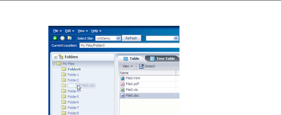
About Drag and Drop Functionality
33-2 Web User Interface Developer's Guide for Oracle Application Development Framework
Figure 33–1 Drag and Drop in the File Explorer Application
In this scenario, you are actually dragging an object from one collection (Folder0) and
dropping it into another collection (Folder2). This is one of the many supported drag
and drop scenarios. ADF Faces supports the following scenarios:
■Dragging an attribute value from one component instance and copying it to
another. For example, a user might be able to drag an outputText component
onto an inputText component, which would result in the value of the text
attribute of the outputText component becoming the value of the text attribute
on the inputText component.
■Dragging the value of one object and dropping it so that it becomes the value of
another object. For example, a user might be able to drag an outputText
component onto another outputText component, which would result in an array
of String objects populating the text attribute of the second outputText
component.
■Dragging an object from one collection and dropping it into another, as shown in
Figure 33–1.
■Dragging a component from one place on a page to another. For example, a user
might be able to drag an existing panelBox component to a new place within a
panelGrid component.
■Dragging an activity in a calendar from one start time or date to another.
■Dragging a component into or out of a panelDashboard component.
■Dragging a marker in a DVT scatter or bubble graph to change its value.
■Dragging an object from a DVT Gantt chart to another component.
When users click on a source and begin to drag, the browser displays the element
being dragged as a ghost element attached to the mouse pointer. Once the ghost
element hovers over a valid target, the target component shows some feedback (for
example, it becomes highlighted). If the user drags the ghost element over an invalid
target, the cursor changes to indicate that the target is not valid.
When dragging attribute values, the user can only copy the value to the target. For all
other drag and drop scenarios, on the drop, the element can be copied (copy and
paste), moved (cut and paste), or linked (creating a shortcut for a file in a directory in
which the link is a reference to the real file object).
The component that will be dragged and that contains the value is called the source.
The component that will accept the drop is called the target. You use a specific tag as a
child to the source and target components that tells the framework to allow the drop.

About Drag and Drop Functionality
Adding Drag and Drop Functionality 33-3
Table 33–1 shows the different drag and drop scenarios, the valid source(s) and
target(s), and the associated tags to be used for that scenario.
You can restrict the type of the object that can be dropped on a target by adding a
dataFlavor tag. This helps when the target can accept only one object type, but the
source may be one of a number of different types. The dataFlavor tag also allows
you to set multiple types so that the target can accept objects from more than one
source or from a source that may contain more than one type. Both the target and the
source must contain the dataFlavor tag, and the values must be the same in order
for the drop to be successful.
Table 33–1 Drag and Drop Scenarios
Scenario Source Target
Dragging an attribute value An attribute value on a
component An attribute value on
another component, as
long as it is the same object
type
Tag:
attributeDragSource
Tag:
attributeDropTarget
Dragging an object from one
component to another Any component Any component
Tag:
attributeDragSource
Tag:
dropTarget
Dragging an item from one collection
and dropping it into another table, tree, and
treeTable components table, tree, and
treeTable components
Tag:
dragSource
Tag:
collectionDropTarget
Dragging a component from one
container to another Any component Any component
Tag:
componentDragSource
Tag:
dropTarget
Dragging a calendar activity from
one start time or date to another calendarActivity
object calendar component
Tag:
None needed Tag :
calendarDropTarget
Dragging a panelBox component
into a panelDashboard component. panelBox component panelDashboard
component
Tag:
componentDragSource
Tag:
dataFlavor
Dragging a panelBox component
out of a panelDashboard
component.
panelBox component in
a panelDashboard
component
Any component
Tag:
componentDragSource
Tag:
dropTarget
Dragging a marker in a DVT graph graph component graph component
Tag:
dragSource
Tag:
dropTarget
Dragging an object from a DVT Gantt
chart and dropping it on another
component
Gantt chart Any component
Tag:
dragSource
Tag:
dropTarget

Adding Drag and Drop Functionality for Attributes
33-4 Web User Interface Developer's Guide for Oracle Application Development Framework
33.1.1 Additional Functionality for Drag and Drop
You may find it helpful to understand other ADF Faces features before you implement
drag and drop. Following are links to other sections that may be useful for
implementing drag and drop.
■Managed beans: You may be using managed beans for your code. For information
about using managed beans, see Section 3.6, "Creating and Using Managed Beans."
■Events: Table and tree components fire both server-side and client-side events that
you can have your application react to by executing some logic. For more
information, see Chapter 6, "Handling Events."
33.2 Adding Drag and Drop Functionality for Attributes
You add drag and drop functionality for attributes by defining one component’s
attribute to be a target and another component’s attribute to be a source.
The following procedure assumes you have your target and source components
already on the JSF page.
Before you begin:
It may be helpful to have an understanding of drag and drop functionality. For more
information, see Section 33.2, "Adding Drag and Drop Functionality for Attributes."
You may also find it helpful to understand functionality that can be added using other
ADF Faces features. For more information, see Section 33.1.1, "Additional
Functionality for Drag and Drop."
To add drag and drop functionality for attributes:
1. In the Component Palette, from the Operations panel, drag and drop an Attribute
Drop Target as a child to the target component.
2. In the Insert Attribute Drop Target dialog, use the Attribute dropdown to select
the attribute that will be populated by the drag and drop action. This dropdown
list shows all valid attributes on the target component.
Note: Drag and drop functionality is not supported between
windows. Any drag that extends past the window boundaries will be
canceled. Drag and drop functionality is supported between popup
windows and the base page for the popup.
Also note that drag and drop functionality is not accessible; that is,
there are no keyboard strokes that can be used to execute a drag and
drop. Therefore, if your application requires all functionality to be
accessible, you must provide this logic. For example, your page might
also present users with a method for selecting objects and a Move
button or menu item that allows them to move those selected objects.
Note: The target and source attribute values must both be the same
data type. For example, attribute drag and drop is available when
both the source and target are of type String. If they are both of type
number, they both use the same converters.
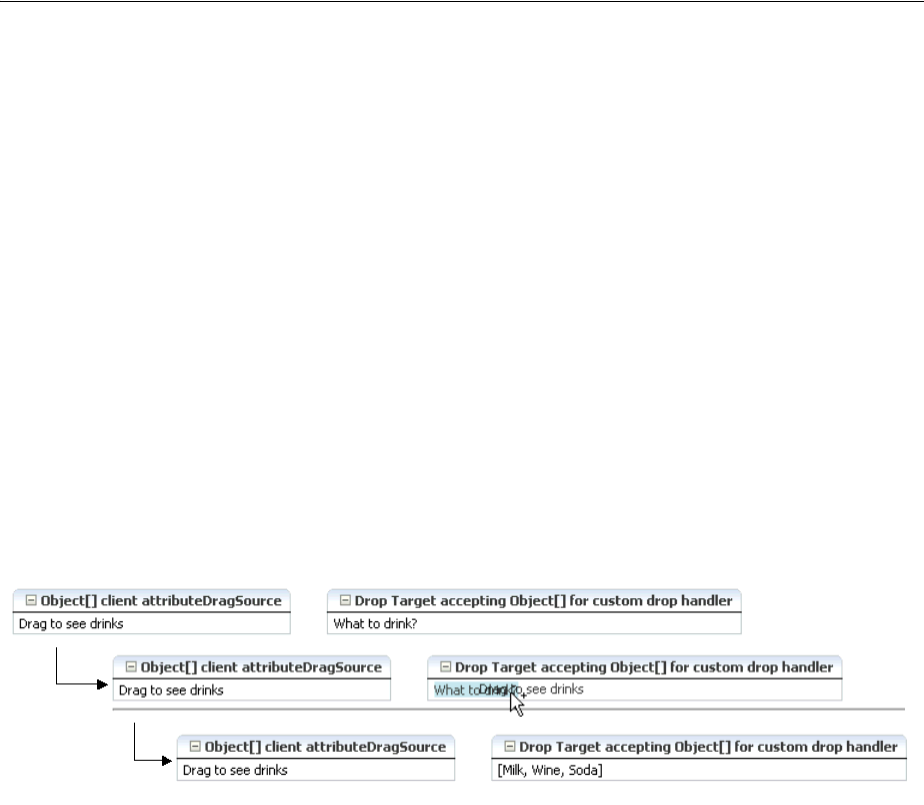
Adding Drag and Drop Functionality for Objects
Adding Drag and Drop Functionality 33-5
3. From the Component Palette, drag and drop an Attribute Drag Source as a child
to the component that can provide a value for the target.
4. In the Insert Attribute Drag Source dialog, use the Attribute dropdown to select
the attribute whose value will be used to populate the target attribute. This
dropdown list shows all valid attributes on the source component.
33.3 Adding Drag and Drop Functionality for Objects
When you want users to be able to drag things other than attribute values, or you
want users to be able to do something other than copy attributes from one component
to another, you use the dropTarget tag. Additionally, use the DataFlavor object to
determine the valid Java types of sources for the drop target. Because there may be
several drop targets and drag sources, you can further restrict valid combinations by
using discriminant values. You also must implement any required functionality in
response to the drag and drop action.
For example, suppose you have an outputText component and you want the user to
be able to drag the outputText component to a panelBox component and have that
component display an array, as shown in Figure 33–6.
Figure 33–2 Dragging and Dropping an Array Object
The outputText component contains an attributeDragSource tag. However,
because you want to drag an array (and not just the String value of the attribute),
you must use the dropTarget tag instead of the attributeDropTarget tag. Also
use a dataFlavor tag to ensure that only an array object will be accepted on the
target.
You can also define a discriminant value for the dataFlavor tag. This is helpful if
you have two targets and two sources, all with the same object type. By creating a
discriminant value, you can be sure that each target will accept only valid sources. For
example, suppose you have two targets that both accept an EMPLOYEE object,
TargetA and TargetB. Suppose you also have two sources, both of which are
EMPLOYEE objects. By setting a discriminant value on TargetA with a value of
alpha, only the EMPLOYEE source that provides the discriminant value of alpha
will be accepted.
You also must implement a listener for the drop event. The object of the drop event is
called the transferable, which contains the payload of the drop. Your listener must
access the transferable object, and from there, use the DataFlavor object to
verify that the object can be dropped. You then use the drop event to get the target
component and update the property with the dropped object. More details about this
listener are covered in the procedure in Section 33.9.1, "How to Add Drag and Drop
Functionality for a DVT Component".

Adding Drag and Drop Functionality for Objects
33-6 Web User Interface Developer's Guide for Oracle Application Development Framework
33.3.1 How to Add Drag and Drop Functionality for a Single Object
To add drag and drop functionality, first add tags to a component that define it as a
target for a drag and drop action. Then implement the event handler method that will
handle the logic for the drag and drop action. Last, you define the sources for the drag
and drop.
Before you begin:
It may be helpful to have an understanding of drag and drop functionality. For more
information, see Section 33.3, "Adding Drag and Drop Functionality for Objects."
You may also find it helpful to understand functionality that can be added using other
ADF Faces features. For more information, see Section 33.1.1, "Additional
Functionality for Drag and Drop."
You will need to complete this task:
Create the source and target components on the page.
To add drag and drop functionality:
1. In the JSF page that contains the target, add a dropTarget tag as a child to the
target component by dragging and dropping a Drop Target tag (located in the
Operations panel) from the Component Palette.
2. In the Insert Drop Target dialog, enter an expression that evaluates to a method on
a managed bean that will handle the event (you will create this code in Step 5).
For information about using managed beans, see Section 3.6, "Creating and Using
Managed Beans."
3. In the Insert Data Flavor dialog, enter the class for the object that can be dropped
onto the target, for example java.lang.Object. This selection will be used to
create a dataFlavor tag, which determines the type of object that can be dropped
onto the target, for example a String or a Date. Multiple dataFlavor tags are
allowed under a single drop target to allow the drop target to accept any of those
types.
4. In the Structure window, select the dropTarget tag. In the Property inspector,
select a value for the actions attribute. This defines what actions are supported
by the drop target. Valid values can be COPY (copy and paste), MOVE (cut and
paste), and LINK (copy and paste as a link), for example:.
MOVE COPY
If no actions are specified, the default is COPY.
Example 33–1 shows the code for a dropTarget component inserted into an
panelBox component that takes an array object as a drop target. Note that
because an action was not defined, the only allowed action will be COPY.
Tip: You can also intercept the drop on the client by populating the
clientDropListener attribute. For more information, see
Section 33.3.3, "What You May Need to Know About Using the
ClientDropListener."
Tip: To specify a typed array in a DataFlavor tag, add brackets ([])
to the class name, for example, java.lang.Object[].

Adding Drag and Drop Functionality for Objects
Adding Drag and Drop Functionality 33-7
Example 33–1 JSP Code for a dropTarget tag
<af:panelBox text="PanelBox2">
<f:facet name="toolbar"/>
<af:dropTarget dropListener="#{myBean.handleDrop}">
<af:dataFlavor flavorClass="java.lang.Object[]"/>
</af:dropTarget>
</af:panelBox>
5. In the managed bean referenced in the EL expression created in Step 2, create the
event handler method (using the same name as in the EL expression) that will
handle the drag and drop functionality.
This method must take a DropEvent event as a parameter and return a
DnDAction object, which is the action that will be performed when the source is
dropped. Valid return values are DnDAction.COPY, DnDAction.MOVE, and
DnDAction.LINK, and were set when you defined the target attribute in Step 5.
This method should check the DropEvent event to determine whether or not it
will accept the drop. If the method accepts the drop, it should perform the drop
and return the DnDAction object it performed. Otherwise, it should return
DnDAction.NONE to indicate that the drop was rejected.
The method must also check for the presence for each dataFlavor object in
preference order.
The DataFlavor object defines the type of data being dropped, for example
java.lang.Object, and must be as defined in the DataFlavor tag on the JSP,
as created in Step 3.
Example 33–2 shows a private method that the event handler method calls (the
event handler itself does nothing but call this method; it is needed because this
method also needs a String parameter that will become the value of the
outputText component in the panelBox component). This method copies an
array object from the event payload and assigns it to the component that initiated
the event.
Example 33–2 Event Handler Code for a dropListener
public DnDAction handleDrop(DropEvent dropEvent)
{
Tip: If your target has more than one defined dataFlavor object,
then you can use the
Transferable.getSuitableTransferData() method, which
returns a List of TransferData objects available in the
Transferable object in order, from highest suitability to lowest.
Tip: To specify a typed array in a DataFlavor object, add brackets
([]) to the class name, for example, java.lang.Object[].
DataFlavor objects support polymorphism so that if the drop target
accepts java.util.List, and the transferable object contains a
java.util.ArrayList, the drop will succeed. Likewise, this
functionality supports automatic conversion between Arrays and
Lists.
If the drag and drop framework doesn't know how to represent a
server DataFlavor object on the client component, the drop target
will be configured to allow all drops to succeed on the client.

Adding Drag and Drop Functionality for Objects
33-8 Web User Interface Developer's Guide for Oracle Application Development Framework
Transferable dropTransferable = dropEvent.getTransferable();
Object[] drinks = dropTransferable.getData(DataFlavor.OBJECT_ARRAY_FLAVOR);
if (drinks != null)
{
UIComponent dropComponent = dropEvent.getDropComponent();
// Update the specified property of the drop component with the Object[] dropped
dropComponent.getAttributes().put("value", Arrays.toString(drinks));
return DnDAction.COPY;
}
else
{
return DnDAction.NONE;
}
}
6. Add a clientAttribute tag as a child to the source component by dragging a
Client Attribute (located in the Operations panel), from the Component Palette.
This tag is used to define the payload of the source for the event. Define the
following for the clientAttribute tag in the Property Inspector:
■Name: Enter any name for the payload.
■Value: Enter an EL expression that evaluates to the value of the payload. In the
drinks example, this would resolve to the Array that holds the different drink
values.
7. Drag and drop an Attribute Drag Source (located in the Operations panel), from
the palette as another child to the source component. In the Insert Attribute Drag
Source dialog, use the dropdown list to select the name defined for the
clientAttribute tag created in the previous step. Doing so makes the value of
the clientAttribute tag the source’s payload. Example 33–3 shows the code
for an outputText component that is the source of the drag and drop operation.
Example 33–3 JSP Code for a Drag Source
<af:outputText value="Drag to see drinks">
<af:clientAttribute name="drinks" value="#{myBean.drinks}"/>
<af:attributeDragSource attribute="drinks"/>
</af:outputText>
33.3.2 What Happens at Runtime
When performing a drag and drop operation, users can press keys on the keyboard
(called keyboard modifiers) to select the action they wish to take on a drag and drop.
The drag and drop framework supports the following keyboard modifiers:
■SHIFT: MOVE
■CTRL: COPY
■CTRL+SHIFT: LINK
When a user executes the drag and drop operation, the drop target first determines
that it can accept the drag source’s data flavor value. Next, if the source and target are
collections, the framework intersects the actions allowed between the drag source and
drop target and executes the action (one of COPY, MOVE, or LINK) in that order from

Adding Drag and Drop Functionality for Objects
Adding Drag and Drop Functionality 33-9
the intersection. When there is only one valid action, that action is executed. When
there is more than one possible action and the user's keyboard modifier matches that
choice, then that is the one that is executed. If either no keyboard modifier is used, or
the keyboard modifier used does not match an allowed action, then the framework
chooses COPY, MOVE, LINK in that order, from the set of allowed actions.
For example, suppose you have a drop target that supports COPY and MOVE. First
the drop target determines that drag source is a valid data flavor. Next, it determines
which action to perform when the user performs the drop. In this example, the set is
COPY and MOVE. If the user holds down the SHIFT key while dragging (the
keyboard modifier for MOVE), the framework would choose the MOVE action. If the
user is doing anything other than holding down the SHIFT key when dragging, the
action will be COPY because COPY is the default when no modifier key is chosen (it is
first in the order). If the user is pressing the CTRL key, that modifier matches COPY, so
COPY would be performed. If the user was pressing the CTRL+SHIFT keys, the action
would still be COPY because that modifier matches the LINK action which is not in
the intersected set of allowed actions.
33.3.3 What You May Need to Know About Using the ClientDropListener
The dropTarget tag contains the clientDropListener attribute where you can
reference JavaScript that will handle the drop event on the client. The client handler
should not take any parameters and returns an AdfDnDContext action. For example,
if the method returns AdfDnDContext.ACTION_NONE the drop operation will be
canceled and no server call will be made; if the method returns
AdfDnDContext.ACTION_COPY, a copy operation will be allowed and a server call
will be made which will execute the dropListener method if it exists.
For example, suppose you want to log a message when the drop event is invoked. You
might create a client handler to handle logging that message and then returning the
correct action so that the server listener is invoked. Example 33–4 shows a client
handler that uses the logger to print a message.
Example 33–4 clientDropListener Handler
<script>
/**
* Shows a message.
*/
function showMessage()
{
AdfLogger.LOGGER.logMessage(AdfLogger.ALL, "clientDropListener handler,
copying...");
return AdfDnDContext.ACTION_COPY;
}
</script>
Note: Because information is lost during the roundtrip between Java
and JavaScript, the data in the drop may not be the type that you
expect. For example, all numeric types appear as double objects,
char objects appear as String objects, List and Array objects
appear as List objects, and most other objects appear as Map objects.
For more information, see Section 6.4.3, "What You May Need to
Know About Marshalling and Unmarshalling Data.".
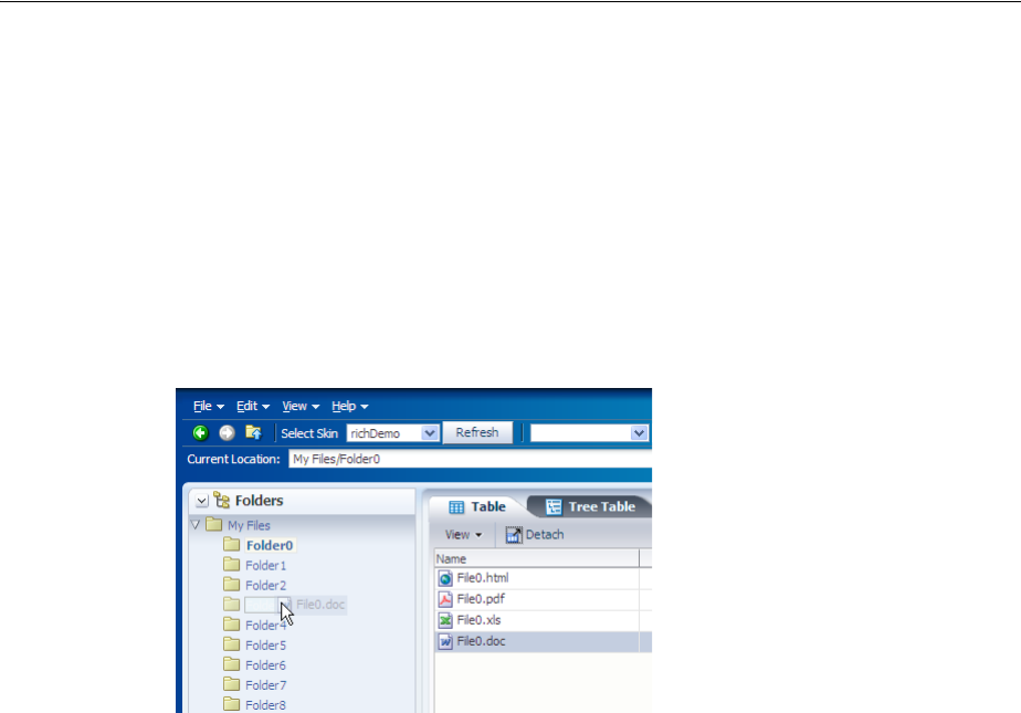
Adding Drag and Drop Functionality for Collections
33-10 Web User Interface Developer's Guide for Oracle Application Development Framework
33.4 Adding Drag and Drop Functionality for Collections
You use the collectionDropTarget and dragSource tags to add drag and drop
functionality that allows users to drag an item from one collection (for example, a row
from a table), and drop it into another collection component such, as a tree. For
example, in the File Explorer application, users can drag a file from the table that
displays directory contents to any folder in the directory tree. Figure 33–3 shows the
File0.doc object being dragged from the table displaying the contents of the
Folder0 directory to the Folder3 directory. Once the drop is complete, the object
will become part of the collection that makes up Folder3.
Figure 33–3 Drag and Drop Functionality in the File Explorer Application
As with dragging and dropping single objects, you can have a drop on a collection
with a copy, move, or copy and paste as a link (or a combination of the three), and use
dataFlavor tags to limit what a target will accept.
When the target source is a collection and it supports the move operation, you may
also want to also implement a method for the dragDropEndListener attribute,
which is referenced from the source component and is used to clean up the collection
after the drag and drop operation. For more information, see Section 33.4.2, "What You
May Need to Know About the dragDropEndListener".
33.4.1 How to Add Drag and Drop Functionality for Collections
To add drag and drop functionality for collections, instead of using the dropTarget
tag, you use the collectionDropTarget tag. You then must implement the event
handler method that will handle the logic for the drag and drop action. Next, you
define the source for the drag and drop operation using the dragSource tag.
Before you begin:
It may be helpful to have an understanding of drag and drop functionality. For more
information, see Section 33.4, "Adding Drag and Drop Functionality for Collections."
You may also find it helpful to understand functionality that can be added using other
ADF Faces features. For more information, see Section 33.1.1, "Additional
Functionality for Drag and Drop."
You will need to complete this task:
Create the source and target components on the page.

Adding Drag and Drop Functionality for Collections
Adding Drag and Drop Functionality 33-11
To add drag and drop functionality:
1. Add a collectionDropTarget tag as a child to the target collection component
by dragging a Collection Drop Target from the Component Palette.
2. In the Insert Collection Drop Target dialog, enter an expression for the
dropListener attribute that evaluates to a method on a managed bean that will
handle the event (you will create this code in Step 4).
3. In the Property Inspector, set the following:
■actions: Select the actions that can be performed on the source during the
drag and drop operation.
If no actions are specified, the default is COPY.
■modelName: Define the model for the collection.
The value of the modelName attribute is a String object used to identify the
drag source for compatibility purposes. The value of this attribute must match
the value of the discriminant attribute of the dragSource tag you will use
in a Step 6. In other words, this is an arbitrary name and works when the
target and the source share the same modelName value or discriminant value.
4. In the managed bean inserted into the EL expression in Step 2, implement the
handler for the drop event.
This method must take a DropEvent event as a parameter and return a
DnDAction. This method should use the DropEvent to get the Transferable
object and from there get the RowKeySet (the rows that were selected for the
drag). Using the CollectionModel obtained through the Transferable object,
the actual rowData can be obtained to complete the drop. The method should
then check the DropEvent to determine whether it will accept the drop or not. If
the method accepts the drop, it should perform the drop and return the
DnDAction it performed -- DnDAction.COPY, DnDAction.MOVE or
DnDAction.LINK, otherwise it should return DnDAction.NONE to indicate that
the drop was rejected.
Example 33–5 shows the event handler method on the CollectionDnd.java
managed bean used in the collectionDropTarget demo that handles the copy
of the row between two tables.
Example 33–5 Event Handler Code for a dropListener for a Collection
public DnDAction handleDrop(DropEvent dropEvent)
{
Transferable transferable = dropEvent.getTransferable();
// The data in the transferable is the row key for the dragged component.
DataFlavor<RowKeySet> rowKeySetFlavor =
DataFlavor.getDataFlavor(RowKeySet.class, "DnDDemoModel");
RowKeySet rowKeySet = transferable.getData(rowKeySetFlavor);
if (rowKeySet != null)
{
// Get the model for the dragged component.
CollectionModel dragModel = transferable.getData(CollectionModel.class);
if (dragModel != null)
{
// Set the row key for this model using the row key from the transferable.
Object currKey = rowKeySet.iterator().next();
dragModel.setRowKey(currKey);
// And now get the actual data from the dragged model.
// Note this won't work in a region.

Adding Drag and Drop Functionality for Collections
33-12 Web User Interface Developer's Guide for Oracle Application Development Framework
DnDDemoData dnDDemoData = (DnDDemoData)dragModel.getRowData();
// Put the dragged data into the target model directly.
// Note that if you wanted validation/business rules on the drop,
// this would be different.
// getTargetValues() is the target collection used by the target component
getTargetValues().add(dnDDemoData);
}
return dropEvent.getProposedAction();
}
else
{
return DnDAction.NONE;
}
}
5. In the Component Palette, from the Operations panel, drag and drop a Drag
Source as a child to the source component.
6. With the dragSource tag selected, in the Property Inspector set the actions,
discriminant, and any dragDropEndListener as configured for the target.
For instance, the dragSource tag may appear similar to the following:
<af:dragSource actions="MOVE" discriminant="DnDDemoModel
dragDropEndListener="#{collectionDnD.endListener}"/>
33.4.2 What You May Need to Know About the dragDropEndListener
There may be cases when after a drop event, you have to clean up the source
collection. For example, if the drag caused a move, you may have to clean up the
source component so that the moved item is no longer part of the collection.
The dragSource tag contains the dragDropEndListener attribute that allows you
to register a handler that contains logic for after the drag drop operation ends.
For example, if you allow a drag and drop to move an object, you may have to
physically remove the object from the source component once you know the drop
succeeded. Example 33–6 shows a handler for a dragDropEndListener. attribute
Example 33–6 Handler for dragDropEndListener
public void endListener(DropEvent dropEvent)
{
Transferable transferable = dropEvent.getTransferable();
// The data in the transferrable is the row key for the dragged component.
DataFlavor<RowKeySet> rowKeySetFlavor =
DataFlavor.getDataFlavor(RowKeySet.class, "DnDDemoModel");
RowKeySet rowKeySet = transferable.getData(rowKeySetFlavor);
if (rowKeySet != null)
{
Integer currKey = (Integer)rowKeySet.iterator().next();
// Remove the dragged data from the source model directly.
// getSourceValues() represents a collection object used by the source
// component
Object removed = getSourceValues().remove(currKey.intValue());
}
// Need to add the drag source table so it gets redrawn.
// The drag source component needs to be partially refreshed explicitly, while
// drop target component automatically refreshed and displayed.
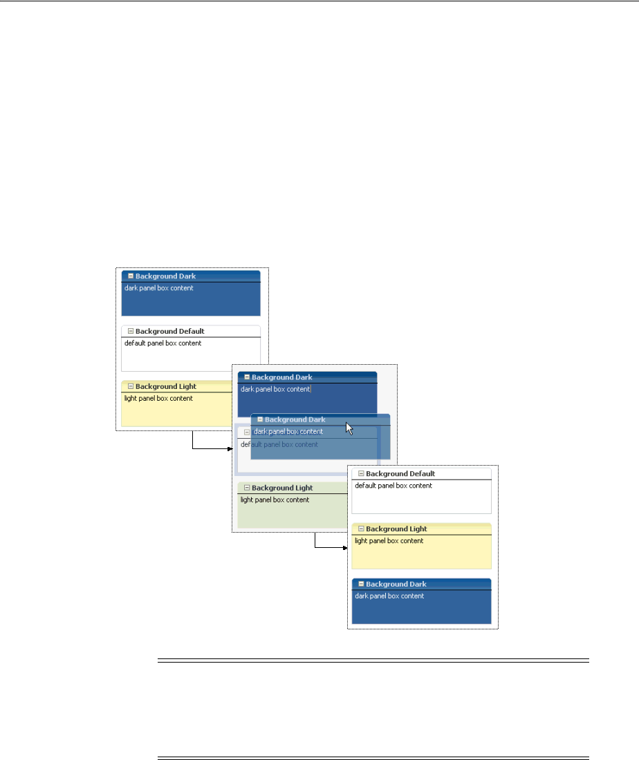
Adding Drag and Drop Functionality for Components
Adding Drag and Drop Functionality 33-13
AdfFacesContext.getCurrentInstance().addPartialTarget(dropEvent.getDragComponent()
);
33.5 Adding Drag and Drop Functionality for Components
You can allow components to be moved from one parent to another, or you can allow
child components of a parent component to be reordered. For example, Figure 33–4
shows the darker panelBox component being moved from being the first child
component of the panelGrid component to the last.
Figure 33–4 Drag and Drop Functionality Between Components
33.5.1 How to Add Drag and Drop Functionality for Components
Adding drag and drop functionality for components is similar for objects. However,
instead of using the attributeDragSource tag, use the componentDragSource
tag. As with dragging and dropping objects or collections, you also must implement a
dropListener handler.
Note: If you want to move components into or out of a
panelDashboard component, then you need to use procedures specific
to that component. For more information, see Section 33.6, "Adding
Drag and Drop Functionality Into and Out of a panelDashboard
Component."

Adding Drag and Drop Functionality for Components
33-14 Web User Interface Developer's Guide for Oracle Application Development Framework
Before you begin:
It may be helpful to have an understanding of drag and drop functionality. For more
information, see Section 33.5, "Adding Drag and Drop Functionality for Components."
You may also find it helpful to understand functionality that can be added using other
ADF Faces features. For more information, see Section 33.1.1, "Additional
Functionality for Drag and Drop."
To add drag and drop functionality:
1. From the Operations panel of the Component Palette, drag and drop a Drop
Targe t as a child to the target component.
2. In the Insert Drop Target dialog, enter an expression that evaluates to a method on
a managed bean that will handle the event (you will create this code in Step 4).
3. With the dropTarget tag still selected, in the Property Inspector, select a valid
action set for the actions attribute.
4. In the managed bean referenced in the EL expression created in Step 2 for the
dropListener attribute, create the event handler method (using the same name
as in the EL expression) that will handle the drag and drop functionality.
If the method accepts the drop, it should perform the drop and return the
DnDAction it performed -- DnDAction.COPY, DnDAction.MOVE or
DnDAction.LINK, otherwise it should return DnDAction.NONE to indicate that
the drop was rejected
This handler method should use the DropEvent event to get the transferable
object and its data and then complete the move or copy, and reorder the
components as needed. Once the method completes the drop, it should return the
DnDAction it performed. Otherwise, it should return DnDAction.NONE to
indicate that the drop was rejected.
Example 33–7 shows the handleComponentMove event handler on the
DemoDropHandler.java managed bean used by the componentDragSource
JSF page in the demo application.
Example 33–7 Event Handler Code for a dropListener That Handles a Component Move
public DnDAction handleComponentMove(DropEvent dropEvent)
{
Transferable dropTransferable = dropEvent.getTransferable();
UIComponent movedComponent = dropTransferable.getData
(DataFlavor.UICOMPONENT_FLAVOR);
if ((movedComponent != null) &&
DnDAction.MOVE.equals(dropEvent.getProposedAction()))
{
UIComponent dropComponent = dropEvent.getDropComponent();
UIComponent dropParent = dropComponent.getParent();
UIComponent movedParent = movedComponent.getParent();
UIComponent rootParent = null;
ComponentChange change = null;
// Build the new list of IDs, placing the moved component after the dropped
//component.
String movedLayoutId = movedParent.getId();
String dropLayoutId = dropComponent.getId();
List<String> reorderedIdList = new
ArrayList<String>(dropParent.getChildCount());

Adding Drag and Drop Functionality Into and Out of a panelDashboard Component
Adding Drag and Drop Functionality 33-15
for (UIComponent currChild : dropParent.getChildren())
{
String currId = currChild.getId();
if (!currId.equals(movedLayoutId))
{
reorderedIdList.add(currId);
if (currId.equals(dropLayoutId))
{
reorderedIdList.add(movedLayoutId);
}
}
}
change = new ReorderChildrenComponentChange(reorderedIdList);
rootParent = dropParent;
// apply the change to the component tree immediately
// change.changeComponent(rootParent);
// redraw the shared parent
AdfFacesContext.getCurrentInstance().addPartialTarget(rootParent);
return DnDAction.MOVE;
}
else
{
return DnDAction.NONE;
}
}
5. Add a componentDragSource tag to the source component by dragging and
dropping a Component Drag Source from the Component Palette as a child of the
source component. For instance, the componentDragSource tag may appear
similar to the following:
<af:componentDragSource discriminant="col2"/>
33.6 Adding Drag and Drop Functionality Into and Out of a
panelDashboard Component
By default the panelDashboard component supports dragging and dropping
components within itself. That is, you can reorder components in a panelDashboard
component without needing to implement a listener or use additional tags. However,
if you want to be able to drag a component into a panelDashboard component, or to
drag a component out of a panelDashboard component, you do need to use tags
and implement a listener. Because you would be dragging and dropping a component,
you use the componentDragSource tag when dragging into the panelDashboard.
However, because the panelDashboard already supports being a drop target, you do
not need to use the dropTarget tag. Instead, you need to use a dataFlavor tag with
a discriminant. The tag and discriminant notify the framework that the drop is from an
external component.
Dragging a component out of a panelDashboard is mostly the same as dragging and
dropping any other component. You use a dropTarget tag for the target and the
componentDragSource tag for the source. However, you must also use the
dataFlavor tag and a discriminant.

Adding Drag and Drop Functionality Into and Out of a panelDashboard Component
33-16 Web User Interface Developer's Guide for Oracle Application Development Framework
33.6.1 How to Add Drag and Drop Functionality Into a panelDashboard Component
Because the panelDashboard component has built-in drag and drop functionality
used to reorder panelBox components within the dashboard, you need not use a
dropTarget tag, but you do need to use a dataFlavor tag with a discriminant and
implement the dropListener. In that implementation, you need to handle the
reorder of the components.
Before you begin:
It may be helpful to have an understanding of drag and drop functionality. For more
information, see Section 33.6, "Adding Drag and Drop Functionality Into and Out of a
panelDashboard Component."
You may also find it helpful to understand functionality that can be added using other
ADF Faces features. For more information, see Section 33.1.1, "Additional
Functionality for Drag and Drop."
Before you begin:
1. Create a panelDashboard component. For more information, see Section 9.7,
"Arranging Contents in a Dashboard."
2. Create another component outside of the panelDashboard that contains
panelBox components. For more information about panelBox components, see
Section 9.8.3, "How to Use the panelBox Component."
To add drag and drop functionality into a panelDashboard component:
1. In the Structure window, select the panelDashboard component that is to be the
target component.
2. In the Property Inspector, for DropListener, enter an expression that evaluates to a
method on a managed bean that will handle the drop event (you will create this
code in Step 6).
3. In the Component Palette, from the Operations panel, drag a Data Flavor and
drop it as a child to the panelDashboard component.
4. In the Insert Data Flavor dialog, enter
javax.faces.component.UIComponent.
5. In the Property Inspector, set Discriminant to a unique name that will identify the
components allowed to be dragged into the panelDashboard component, for
example, dragIntoDashboard.
6. In the managed bean referenced in the EL expression created in Step 2 for the
dropListener attribute, create the event handler method (using the same name
as in the EL expression) that will handle the drag and drop functionality.
This method must take a DropEvent event as a parameter and return a
DnDAction of NONE, because the panelDashboard handles the positioning of its
child components.
This handler method should use the
dropEvent.getTransferable().getData(DataFlavor.UICOMPONENT_
FLAVOR) to get the transferable object and its data. Once the method
completes the drop, you can use the
org.apache.myfaces.trinidad.change.ReorderChildrenComponent
Change method to preserve the new ordering of the children and the
dropEvent.getDropSiteIndex() method to get the location at which the user
wants the dragged component. You can also use the

Adding Drag and Drop Functionality Into and Out of a panelDashboard Component
Adding Drag and Drop Functionality 33-17
dashboardComponent.prepareOptimizedEncodingOfInsertedChild()
method to animate the drop of the component.
Example 33–8 shows the move event handler and helper methods on the
DemoDashboardBean.java managed bean used by the dashboard JSF page in
the ADF Faces demo application.
Example 33–8 Handler for DropListener on a panelDashboard Component
public DnDAction move(DropEvent e)
{
UIComponent dropComponent = e.getDropComponent();
UIComponent movedComponent = e.getTransferable().getData(DataFlavor.UICOMPONENT_FLAVOR);
UIComponent movedParent = movedComponent.getParent();
// Ensure that we are handling the re-order of a direct child of the panelDashboard:
if (movedParent.equals(dropComponent) && dropComponent.equals(_dashboard))
{
// Move the already rendered child and redraw the side bar since the insert indexes have
// changed:
_moveDashboardChild(e.getDropSiteIndex(), movedComponent.getId());
}
else
{
// This isn't a re-order but rather the user dropped a minimized side bar item into the
// dashboard, in which case that item should be restored at the specified drop location.
String panelKey = _getAssociatedPanelKey(movedComponent);
if (panelKey != null)
{
UIComponent panelBoxToShow = _dashboard.findComponent(panelKey);
// Make this panelBox rendered:
panelBoxToShow.setRendered(true);
int insertIndex = e.getDropSiteIndex();
// Move the already rendered child and redraw the side bar since the insert indexes have
// changed and because the side bar minimized states are out of date:
_moveDashboardChild(insertIndex, panelKey);
// Let the dashboard know that only the one child should be encoded during the render phase:
_dashboard.prepareOptimizedEncodingOfInsertedChild(
FacesContext.getCurrentInstance(),
insertIndex);
}
}
return DnDAction.NONE; // the client is already updated, so no need to redraw it again
}
private void _moveDashboardChild(int dropIndex, String movedId)
{
// Build the new list of IDs, placing the moved component at the drop index.
List<String> reorderedIdList = new ArrayList<String>(_dashboard.getChildCount());
int index = 0;
boolean added = false;
for (UIComponent currChild : _dashboard.getChildren())
{
if (currChild.isRendered())
{
if (index == dropIndex)

Adding Drag and Drop Functionality Into and Out of a panelDashboard Component
33-18 Web User Interface Developer's Guide for Oracle Application Development Framework
{
reorderedIdList.add(movedId);
added = true;
}
String currId = currChild.getId();
if (currId.equals(movedId) && index < dropIndex)
{
// component is moved later, need to shift the index by 1
dropIndex++;
}
if (!currId.equals(movedId))
{
reorderedIdList.add(currId);
}
index++;
}
}
if (!added)
{
// Added to the very end:
reorderedIdList.add(movedId);
}
// Apply the change to the component tree immediately:
ComponentChange change = new ReorderChildrenComponentChange(reorderedIdList);
change.changeComponent(_dashboard);
// Add the side bar as a partial target since we need to redraw the state of the side bar items
// since their insert indexes are changed and possibly because the side bar minimized states
// are out of date:
RequestContext rc = RequestContext.getCurrentInstance();
rc.addPartialTarget(_sideBarContainer);
}
7. In the Component Palette, from the Operations panel, drag a Component Drag
Source and drop it as a child to the panelBox component that will be the source
component.
8. In the Property Inspector, set Discriminant to be the same value as entered for the
Discriminant on the panelDashboard in Step 5.
33.6.2 How to Add Drag and Drop Functionality Out of a panelDashboard Component
Implementing drag and drop functionality out of a panelDashboard component is
similar to standard drag and drop functionality for other components, except that you
must use a dataFlavor tag with a discriminant.
Before you begin:
It may be helpful to have an understanding of drag and drop functionality. For more
information, see Section 33.6, "Adding Drag and Drop Functionality Into and Out of a
panelDashboard Component."
You may also find it helpful to understand functionality that can be added using other
ADF Faces features. For more information, see Section 33.1.1, "Additional
Functionality for Drag and Drop."

Adding Drag and Drop Functionality Into and Out of a panelDashboard Component
Adding Drag and Drop Functionality 33-19
How to add drag and drop functionality out of a panelDashboard component:
1. In the Component Palette, from the Operations panel, drag and drop a Drop
Targe t as a child to the target component.
2. In the Insert Drop Target dialog, enter an expression that evaluates to a method on
a managed bean that will handle the event (you will create this code in Step 5) and
enter javax.faces.component.UIComponent as the FlavorClass.
3. With the dropTarget tag still selected, in the Property Inspector, select MOVE as
the value action attribute.
4. In the Structure window, select the dataFlavor tag and in the Property Inspector,
set Discriminant to a unique name that will identify the panelBox components
allowed to be dragged into this component, for example, dragOutOfDashboard.
5. In the managed bean referenced in the EL expression created in Step 2 for the
dropListener attribute, create the event handler method (using the same name
as in the EL expression) that will handle the drag and drop functionality.
This handler method should use the DropEvent event to get the transferable
object and its data and then complete the move and reorder the components as
needed. Once the method completes the drop, it should return a DnDAction of
NONE.
You can use the
dashboardComponent.prepareOptimizedEncodingOfDeletedChild()
method to animate the removal of the panelBox component.
Example 33–9 shows the handleSideBarDrop event handler and helper
methods on the oracle.adfdemo.view.layout.DemoDashboardBean.java
managed bean used by the dashboard JSF page in the demo application.
Example 33–9 Event Handler Code for a dropListener That Handles a panelBox Move Out of a panelDash-
board Component
public DnDAction handleSideBarDrop(DropEvent e)
{
UIComponent movedComponent = e.getTransferable().getData(DataFlavor.UICOMPONENT_FLAVOR);
UIComponent movedParent = movedComponent.getParent();
// Ensure that the drag source is one of the items from the dashboard:
if (movedParent.equals(_dashboard))
{
_minimize(movedComponent);
}
return DnDAction.NONE; // the client is already updated, so no need to redraw it again
}
private void _minimize(UIComponent panelBoxToMinimize)
{
// Make this panelBox non-rendered:
panelBoxToMinimize.setRendered(false);
// If the dashboard is showing, let's perform an optimized render so the whole dashboard
doesn't
// have to be re-encoded.
// If the dashboard is hidden (because the panelBox is maximized), we will not do an optimized
// encode since we need to draw the whole thing.
if (_maximizedPanelKey == null)
{

Adding Drag and Drop Functionality to a Calendar
33-20 Web User Interface Developer's Guide for Oracle Application Development Framework
int deleteIndex = 0;
List<UIComponent> children = _dashboard.getChildren();
for (UIComponent child : children)
{
if (child.equals(panelBoxToMinimize))
{
_dashboard.prepareOptimizedEncodingOfDeletedChild(
FacesContext.getCurrentInstance(),
deleteIndex);
break;
}
if (child.isRendered())
{
// Only count rendered children since that's all that the panelDashboard can see:
deleteIndex++;
}
}
}
RequestContext rc = RequestContext.getCurrentInstance();
if (_maximizedPanelKey != null)
{
// Exit maximized mode:
_maximizedPanelKey = null;
_switcher.setFacetName("restored");
rc.addPartialTarget(_switcher);
}
// Redraw the side bar so that we can update the colors of the opened items:
rc.addPartialTarget(_sideBarContainer);
}
6. In the Component Palette, from the Operations panel, drag and drop a
Component Drag Source as a child of the source panelBox component within
the panelDashboard component.
7. In the Property Inspector, set Discriminant to be the same value as entered for the
Discriminant on the dataFlavor tag for the target component in Step 4.
33.7 Adding Drag and Drop Functionality to a Calendar
The calendar includes functionality that allows users to drag the handle of an activity
to change the end time. However, if you want users to be able to drag and drop an
activity to a different start time, or even a different day, then you implement drag and
drop functionality. Drag and drop allows you to not only move an activity, but also to
copy one.
33.7.1 How to Add Drag and Drop Functionality to a Calendar
You add drag and drop functionality by using the calendarDropTarget tag. Unlike
dragging and dropping a collection, there is no need for a source tag; the target (that is
the object to which the activity is being moved, in this case, the calendar) is responsible
for moving the activities. If the source (that is, the item to be moved or copied), is an
activity within the calendar, then you use only the calendarDropTarget tag. The tag
expects the transferable to be a CalendarActivity object.

Adding Drag and Drop Functionality to a Calendar
Adding Drag and Drop Functionality 33-21
However, you can also drag and drop objects from outside the calendar. When you
want to enable this, use dataFlavor tags configured to allow the source object
(which will be something other than a calendarActivity object) to be dropped.
Before you begin:
It may be helpful to have an understanding of drag and drop functionality. For more
information, see Section 33.7, "Adding Drag and Drop Functionality to a Calendar."
You may also find it helpful to understand functionality that can be added using other
ADF Faces features. For more information, see Section 33.1.1, "Additional
Functionality for Drag and Drop."
To add drag and drop functionality to a calendar:
1. In the Component Palette, from the Operations panel, drag and drop a Calendar
Drop Target as a child to the calendar component.
2. In the Insert Calendar Drop Target dialog, enter an expression for the
dropListener attribute that evaluates to a method on a managed bean that will
handle the event (you will create this code in Step 4).
3. In the Property Inspector, set Actions. This value determines whether the activity
(or other source) can be moved, copied, or copied as a link, or any combination of
the three. If no action is specified, the default is COPY.
4. In the managed bean inserted into the EL expression in Step 2, implement the
handler for the drop event.
This method must take a DropEvent event as a parameter and return a
DnDAction. The DnDAction is the action that will be performed when the source
is dropped. Valid return values are COPY, MOVE, and LINK, and are set when you
define the actions attribute in Step 3. This method should use the DropEvent to
get the transferable object, and from there, access the CalendarModel object
in the dragged data and from there, access the actual data. The listener can then
add that data to the model for the source and then return the DnDAction it
performed: DnDAction.COPY, DnDAction.MOVE or DnDAction.LINK;
otherwise, the listener should return DnDAction.NONE to indicate that the drop
was rejected.
The drop site for the drop event is an instance of the
oracle.adf.view.rich.dnd.CalendarDropSite class. For an example of a
drag and drop handler for a calendar, see the handleDrop method on the
oracle.adfdemo.view.calendar.rich.DemoCalendarBean managed
bean in the ADF Faces demo application.
5. If the source for the activity is external to the calendar, drag a Data Flavor and
drop it as a child to the calendarDropTarget tag. This tag determines the type
of object that can be dropped onto the target, for example a String or a Date
object. Multiple dataFlavor tags are allowed under a single drop target to allow
the drop target to accept any of those types.
6. In the Insert Data Flavor dialog, enter the class for the object that can be dropped
onto the target, for example java.lang.Object.
Tip: To specify a typed array in a dataFlavor tag, add brackets ([])
to the class name, for example, java.lang.Object[].
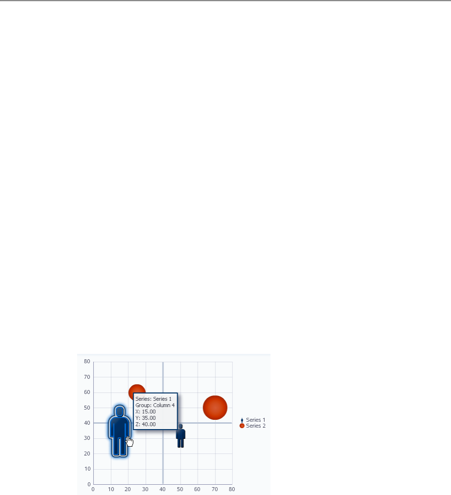
Adding Drag and Drop Functionality for DVT Graphs
33-22 Web User Interface Developer's Guide for Oracle Application Development Framework
33.7.2 What You May Need to Know About Dragging and Dropping in a Calendar
For dragging and dropping activities within a calendar, users can drag and drop only
within a view. That is, users can drag an activity from one time slot to another in the
day view, but cannot cut an activity from a day view and paste it into a month view.
When the user is dragging and dropping activities in the day or week view, the
calendar marks the drop site by half-hour increments. The user cannot move any
all-day or multi-day activities in the day view.
In the week view, users can move all-day and multi-day activities, however, they can
be dropped only within other all-day slots. That is, the user cannot change an all-day
activity to an activity with start and end times. In the month view, users can move
all-day and multi-day activities to any other day.
33.8 Adding Drag and Drop Functionality for DVT Graphs
You can configure drag and drop for the DVT bubble and scatter graphs, which allows
the user to change the value of a marker by repositioning it. When you want users to
be able to drag and drop in a graph, you use the dragSource and dropTarget tags.
Additionally, you use the DataFlavor object to determine the valid Java type of the
sources for the drop target, in this case a GraphSelection object. You also must
implement any required functionality in response to the drag and drop action.
For example, you might have a scatterGraph component and you want the user to
be able to drag a human scatter marker to adjust the performance rating of an
employee, as shown in Figure 33–6.
Figure 33–5 Dragging and Dropping an Object
The scatterGraph component contains both a dragSource tag and a dropTarget
tag. You also use a dataFlavor tag to determine the type of object being dropped.
You also must implement a listener for the drop event. The object of the drop event is
called the transferable, which contains the payload of the drop. Your listener must
access the transferable object, and from there, use the DataFlavor object to
verify that the object can be dropped. You then use the drop event to get the target
component and update the property with the dropped object.
33.8.1 How to Add Drag and Drop Functionality for a DVT Graph
To add drag and drop functionality, first add source and target tags to the graph. Then
implement the event handler method that will handle the logic for the drag and drop

Adding Drag and Drop Functionality for DVT Graphs
Adding Drag and Drop Functionality 33-23
action. For information about what happens at runtime, see Section 33.3.2, "What
Happens at Runtime."
Before you begin:
It may be helpful to have an understanding of drag and drop functionality. For more
information, see Section 33.8, "Adding Drag and Drop Functionality for DVT Graphs."
You may also find it helpful to understand functionality that can be added using other
ADF Faces features. For more information, see Section 33.1.1, "Additional
Functionality for Drag and Drop."
To add drag and drop functionality:
1. In the Component Palette, from the Operations panel, drag a Drop Target tag and
drop it as a child to the graph component.
2. In the Insert Drop Target dialog, enter an expression that evaluates to a method on
a managed bean that will handle the event (you will create this code in Step 6).
3. In the Insert Data Flavor dialog, enter
oracle.adf.view.faces.bi.component.graph.GraphSelection, which
is the class for the object that can be dropped onto the target. This entry will be
used to create a dataFlavor tag, which determines the type of object that can be
dropped onto the target.
4. In the Property Inspector, set a value for Discriminant, if needed. A discriminant
is an arbitrary string used to determine which source can drop on the target. For
example, suppose you have two graphs that both accept an GraphSelection
object, GraphA and GraphB. You also have two sources, both of which are
GraphSelection objects. By setting a discriminant value on GraphA with a
value of alpha, only the GraphSelection source that provides the discriminant
value of alpha will be accepted.
5. In the Structure window, select the dropTarget tag. In the Property inspector,
select MOVE as the value for Actions.
6. In the Component Palette, from the Operations panel, drag and drop a Drag
Source as a child to the graph component.
7. With the dragSource tag selected, in the Property Inspector set MOVE as the
allowed Action and add any needed discriminant, as configured for the
dataFlavor tag.
8. In the managed bean referenced in the EL expression created in Step 2, create the
event handler method (using the same name as in the EL expression) that will
handle the drag and drop functionality.
This method must take a DropEvent event as a parameter and return a
DnDAction object, which is the action that will be performed when the source is
dropped, in this case DnDAction.MOVE. This method should check the
DropEvent event to determine whether or not it will accept the drop. If the
method accepts the drop, it should perform the drop and return the DnDAction
object it performed. Otherwise, it should return DnDAction.NONE to indicate that
the drop was rejected. The method must also check for the presence of the
dataFlavor object, in this case
oracle.adf.view.faces.bi.component.graph.GraphSelection.
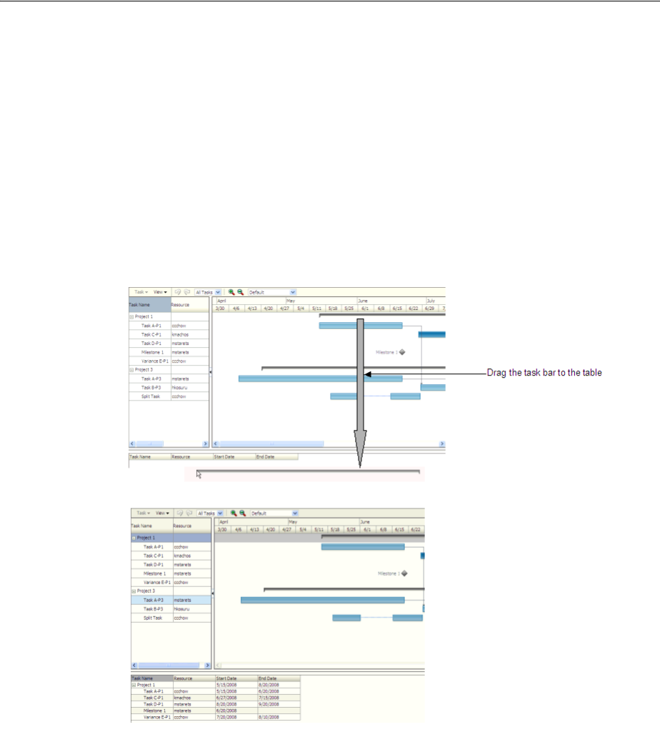
Adding Drag and Drop Functionality for DVT Gantt Charts
33-24 Web User Interface Developer's Guide for Oracle Application Development Framework
33.9 Adding Drag and Drop Functionality for DVT Gantt Charts
When you want users to be able to drag and drop between Gantt charts and other
components, you use the dragSource and dropTarget tags. Additionally, you use
the DataFlavor object to determine the valid Java types of sources for the drop
target. You also must implement any required functionality in response to the drag
and drop action. Both the projectGantt and schedulingGantt components
support drag and drop functionality.
For example, suppose you have an projectGantt component and you want the user
to be able to drag one timeline to a treeTable component and have that component
display information about the timeline, as shown in Figure 33–6.
Figure 33–6 Dragging and Dropping an Object
The projectGantt component contains a dragSource tag. And because the user
will drag the whole object and not just the String value of the output text that is
displayed, you use the dropTarget tag instead of the attributeDropTarget tag.
You also use a dataFlavor tag to determine the type of object being dropped. On this
tag, you can define a discriminant value. This is helpful if you have two targets and
two sources, all with the same object type. By creating a discriminant value, you can be
sure that each target will accept only valid sources. For example, suppose you have
two targets that both accept an TaskDragInfo object, TargetA and TargetB. Suppose
you also have two sources, both of which are TaskDragInfo objects. By setting a
discriminant value on TargetA with a value of alpha, only the TaskDragInfo source
that provides the discriminant value of alpha will be accepted.

Adding Drag and Drop Functionality for DVT Gantt Charts
Adding Drag and Drop Functionality 33-25
You also must implement a listener for the drop event. The object of the drop event is
called the transferable, which contains the payload of the drop. Your listener must
access the transferable object, and from there, use the DataFlavor object to
verify that the object can be dropped. You then use the drop event to get the target
component and update the property with the dropped object.
33.9.1 How to Add Drag and Drop Functionality for a DVT Component
To add drag and drop functionality, first add tags to a component that define it as a
target for a drag and drop action. Then implement the event handler method that will
handle the logic for the drag and drop action. Last, you define the sources for the drag
and drop. For information about what happens at runtime, see Section 33.3.2, "What
Happens at Runtime." For information about using the clientDropListener
attribute, see Section 33.3.3, "What You May Need to Know About Using the
ClientDropListener."
Before you begin:
It may be helpful to have an understanding of drag and drop functionality. For more
information, see Section 33.9, "Adding Drag and Drop Functionality for DVT Gantt
Charts."
You may also find it helpful to understand functionality that can be added using other
ADF Faces features. For more information, see Section 33.1.1, "Additional
Functionality for Drag and Drop."
To add drag and drop functionality:
1. In the Component Palette, from the Operations panel, drag a Drop Target tag and
drop it as a child to the target component.
2. In the Insert Drop Target dialog, enter an expression that evaluates to a method on
a managed bean that will handle the event (you will create this code in Step 6).
3. In the Insert Data Flavor dialog, enter the class for the object that can be dropped
onto the target, for example java.lang.Object. This selection will be used to
create a dataFlavor tag, which determines the type of object that can be dropped
onto the target. Multiple dataFlavor tags are allowed under a single drop target
to allow the drop target to accept any of those types.
4. In the Property Inspector, set a value for Discriminant, if needed. A discriminant
is an arbitrary string used to determine what sources of the type specified by the
dataFlavor will be allowed as a source.
5. In the Structure window, select the dropTarget tag. In the Property inspector,
select a value for Actions. This defines what actions are supported by the drop
target. Valid values can be COPY (copy and paste), MOVE (cut and paste), and LINK
(copy and paste as a link), for example:.
MOVE COPY
Tip: You can also intercept the drop on the client by populating the
clientDropListener attribute. For more information, see
Section 33.3.3, "What You May Need to Know About Using the
ClientDropListener".
Tip: To specify a typed array in a DataFlavor tag, add brackets ([])
to the class name, for example, java.lang.Object[].

Adding Drag and Drop Functionality for DVT Gantt Charts
33-26 Web User Interface Developer's Guide for Oracle Application Development Framework
If no actions are specified, the default is COPY.
Example 33–10 shows the code for a dropTarget component that takes a
TaskDragInfo object as a drop source. Note that because COPY was set as the
value for the actions attribute, that will be the only allowed action.
Example 33–10 JSP Code for a dropTarget tag
<af:treeTable id="treeTableDropTarget"
var="task" value="#{projectGanttDragSource.treeTableModel}">
<f:facet name="nodeStamp">
<af:column headerText="Task Name">
<af:outputText value="#{task.taskName}"/>
</af:column>
</f:facet>
<af:column headerText="Resource">
<af:outputText value="#{task.resourceName}"/>
</af:column>
<af:column headerText="Start Date">
<af:outputText value="#{task.startTime}"/>
</af:column>
<af:column headerText="End Date">
<af:outputText value="#{task.endTime}"/>
</af:column>
<af:dropTarget actions="COPY"
dropListener="#{projectGanttDragSource.onTableDrop}">
<af:dataFlavor flavorClass=
"oracle.adf.view.faces.bi.component.gantt.TaskDragInfo"/>
</af:dropTarget>
</af:treeTable>
6. In the managed bean referenced in the EL expression created in Step 2, create the
event handler method (using the same name as in the EL expression) that will
handle the drag and drop functionality.
This method must take a DropEvent event as a parameter and return a
DnDAction object, which is the action that will be performed when the source is
dropped. Valid return values are DnDAction.COPY, DnDAction.MOVE, and
DnDAction.LINK, and were set when you defined the target attribute in Step 5.
This method should check the DropEvent event to determine whether or not it
will accept the drop. If the method accepts the drop, it should perform the drop
and return the DnDAction object it performed. Otherwise, it should return
DnDAction.NONE to indicate that the drop was rejected.
The method must also check for the presence for each dataFlavor object in
preference order.
The DataFlavor object defines the type of data being dropped, for example
java.lang.Object, and must be as defined in the DataFlavor tag on the JSP,
as created in Step 3.
Tip: If your target has more than one defined dataFlavor object,
then you can use the
Transferable.getSuitableTransferData() method, which
returns a List of TransferData objects available in the
Transferable object in order, from highest suitability to lowest.

Adding Drag and Drop Functionality for DVT Gantt Charts
Adding Drag and Drop Functionality 33-27
Example 33–11 shows a handler method that copies a TaskDragInfo object from
the event payload and assigns it to the component that initiated the event.
Example 33–11 Event Handler Code for a dropListener
public DnDAction onTableDrop(DropEvent evt)
{
// retrieve the information about the task dragged
DataFlavor<TaskDragInfo> _flv = DataFlavor.getDataFlavor(TaskDragInfo.class, null);
Transferable _transferable = evt.getTransferable();
// if there is no data in the transferable, then the drop is unsuccessful
TaskDragInfo _info = _transferable.getData(_flv);
if (_info == null)
return DnDAction.NONE;
// find the task
Task _draggedTask = findTask(_info.getTaskId());
if (_draggedTask != null) {
// process the dragged task here and indicate the drop is successful by returning DnDAction.COPY
return DnDAction.COPY;
}
else
return DnDAction.NONE;
}
7. In the Component Palette, from the Operations panel, drag and drop a Drag
Source as a child to the source component.
8. With the dragSource tag selected, in the Property Inspector set the allowed
Actions and any needed discriminant, as configured for the target.
Tip: To specify a typed array in a DataFlavor object, add brackets
([]) to the class name, for example, java.lang.Object[].
DataFlavor objects support polymorphism so that if the drop target
accepts java.util.List, and the transferable object contains a
java.util.ArrayList, the drop will succeed. Likewise, this
functionality supports automatic conversion between Arrays and
Lists.
If the drag and drop framework doesn't know how to represent a
server DataFlavor object on the client component, the drop target
will be configured to allow all drops to succeed on the client.

Adding Drag and Drop Functionality for DVT Gantt Charts
33-28 Web User Interface Developer's Guide for Oracle Application Development Framework

34
Using Different Output Modes 34-1
34Using Different Output Modes
This chapter describes how you can have your pages display in modes suitable for
printing and emailing.
This chapter includes the following sections:
■Section 34.1, "About Using Different Output Modes"
■Section 34.2, "Displaying a Page for Print"
■Section 34.3, "Creating Emailable Pages"
34.1 About Using Different Output Modes
ADF Faces allows you to output your page in a simplified mode either for printing or
for emailing. For example, you may want users to be able to print a page (or a portion
of a page), but instead of printing the page exactly as it is rendered in a web browser,
you want to remove items that are not needed on a printed page, such as scroll bars
and buttons. If a page is to be emailed, the page must be simplified so that email
clients can correctly display it.
For displaying printable pages, ADF Faces offers the
showPrintablePageBehavior tag that, when used in conjunction with a command
component, allows users to view a simplified version of the page in their browser,
which they can then print.
For email support, ADF Faces provides an API that can be used to convert a page to
one that is suitable for display in either Microsoft Outlook 2007 or Mozilla
Thunderbird 2.0.
Note: By default, when the ADF Faces framework detects that an
application is being crawled by a search engine, it outputs pages in a
simplified format for the crawler, similar to that for an emailable page.
If you want to generate special content for web crawlers, you can use
the EL-reachable Agent interface to detect when an agent is crawling
the site, and then direct the agent to a specified link, for example:
<c:if test="#{requestContext.agent.type == 'webcrawler'}">
<af:goLink text="This Link is rendered only for web crawlers"
destination="http://www.newPage.com"/>
</c:if>
For more information, see the Trinidad JavaDoc.
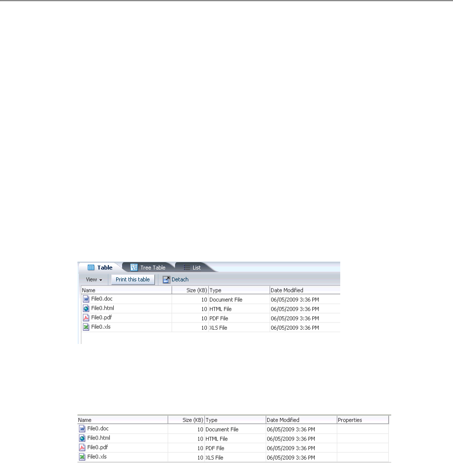
About Using Different Output Modes
34-2 Web User Interface Developer's Guide for Oracle Application Development Framework
34.1.1 Output Mode Use Cases
Most web pages are not suitable for print or for emailing, but users may need that
functionality. For example, in the File Explorer application, you could place a
commandButton component inside the toolbar of the panelCollection component
that contains the table, as shown in Figure 34–1.
Figure 34–1 Button to Print Part of a Page
When the user clicks the button, the page is displayed in a new browser window (or
tab, depending on the browser) in a simplified form, as shown in Figure 34–2.
Figure 34–2 Printable Version of the Page
Only the contents of the table are displayed for printing. All extraneous components,
such as the tabs, the toolbar, and the scroll bars, are not rendered.
There may be occasions when you need a page in your application to be emailed. For
example, purchase orders created on the web are often emailed to the purchaser at the
end of the session. However, because email clients do not support external stylesheets
which are used to render to web browsers, you can’t email the same page, as it would
not be rendered correctly.
Say you have a page that displays a purchase order, as shown in Figure 34–3.
Tip: The current output mode (email or printable) can be
reached from AdfFacesContext. Because this context is EL
reachable, you can use EL to bind to the output mode from the JSP
page. For example, you might allow a graphic to be rendered only if
the current mode is not email using the following expression:
<af:activeImage source="/images/stockChart.gif"
rendered="#{adfFacesContext.outputMode != "email"}"/>
You can determine the current mode using
AdfFacesContext.getOutputMode().
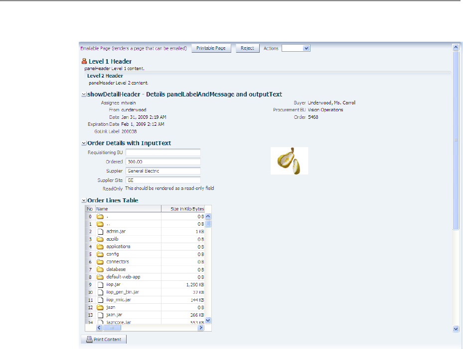
About Using Different Output Modes
Using Different Output Modes 34-3
Figure 34–3 Purchase Order Web Page
When the user clicks the Emailable Page link at the top, an actionListener method
or another service appends
org.apache.myfaces.trinidad.agent.email=true to the current URL and
emails the page. Figure 34–4 shows the page as it appears in an email client.
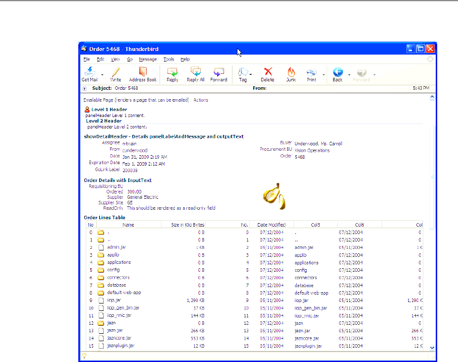
Displaying a Page for Print
34-4 Web User Interface Developer's Guide for Oracle Application Development Framework
Figure 34–4 Page in an Email Client
34.2 Displaying a Page for Print
You place the showPrintablePageBehavior tag as a child to a command
component. When clicked, the framework walks up the component tree, starting with
the component that is the parent to the printableBehavior tag, until it reaches a
panelSplitter or a panelAccordion or the root of the tree (whichever comes
first). The tree is rendered from there. Additionally, certain components that are not
needed in print version (such as buttons, tabs, and scrollbars) are omitted.
When the command component is clicked, the action event is canceled. Instead, a
request is made to the server for the printable version of the page.
34.2.1 How to Use the showPrintablePageBehavior Tag
The showPrintablePageBehavior tag is used as a direct child of a command
component.
To use the showPrintablePageBehavior tag:
1. In one of the layout components, add a command component in the facet that
contains the content you would like to print. For procedures, see Section 20.3.1,
"How to Use Command Buttons and Command Links."
Creating Emailable Pages
Using Different Output Modes 34-5
2. In the Component Palette, from the Operations panel, drag a Show Printable Page
Behavior and drop it as a child to the command component.
34.3 Creating Emailable Pages
The ADF Faces framework provides you with automatic conversion of a JSF page so
that it will render correctly in the Microsoft Outlook 2007 and Mozilla Thunderbird 2.0
email clients.
Not all components can be rendered in an email client. The following components can
be converted so that they can render properly in an email client:
■document
■panelHeader
■panelFormLayout
■panelGroupLayout
■panelList
■spacer
■showDetailHeader
■inputText (renders as readOnly)
■inputComboBoxListOfValues (renders as readOnly)
■inputNumberSlider (renders as readOnly)
■inputNumberSpinbox (renders as readOnly)
■inputRangeSlider (renders as readOnly)
■outputText
■selectOneChoice (renders as readOnly)
■panelLabelAndMessage
■image
■table
■column
■goLink (renders as text)
■commandImageLink (renders as text)
Note: While you can insert a showPrintablePageBehavior
component outside of a layout component to allow the user to print
the entire page, the printed result will be roughly in line with the
layout, which may mean that not all content will be visible. Therefore,
if you want the user to be able to print the entire content of a facet, it is
important to place the command component and the
showPrintablePageBehavior component within the facet whose
contents users would typically want to print. If more than one facet
requires printing support, then insert one command component and
showPrintablePageBehavior tag into each facet. To print all
contents, the user then has to execute the print command one facet at a
time.

Creating Emailable Pages
34-6 Web User Interface Developer's Guide for Oracle Application Development Framework
■commandLink (renders as text)
■goImageLink (renders as text)
34.3.1 How to Create an Emailable Page
You notify the ADF Faces framework to convert your page to be rendered in an email
client by appending a request parameter to the URL for the page to be emailed.
Before you begin:
It may be helpful to have an understanding of how components will display in an
emailable page. For more information, see Section 34.3, "Creating Emailable Pages."
To create an emailable page:
1. Insert a command component onto the page to be emailed. For more information,
see Chapter 20, "Working with Navigation Components."
2. In a managed bean, create an actionListener method or another service that
appends org.apache.myfaces.trinidad.agent.email=true to the
current URL and emails the page.
3. Select the command component, and in the Property Inspector, set the method or
service as the value for ActionListener.
34.3.2 How to Test the Rendering of a Page in an Email Client
Before you complete the development of a page, you may want to test how the page
will render in an email client. You can easily do this using a goButton component.
To test an emailable page:
1. In the Component Palette, from the General Controls panel, drag and drop a
Button (Go) anywhere onto the page.
2. In the Property Inspector, expand the Common section and set the Destination to
be the page’s name plus
org.apache.myfaces.trinidad.agent.email=true.
For example, if your page’s name is myPage, the value of the destination attribute
should be:
myPage.jspx?org.apache.myfaces.trinidad.agent.email=true
3. Right-click the page and choose Run to run the page in the default browser.
The Configure Default Domain dialog displays the first time your run your
application and start a new domain in Integrated WebLogic Server. Use the dialog
to define an administrator password for the new domain. Passwords you enter can
be eight characters or more and must have a numeric character.
4. Once the page displays in the browser, click the goButton you added to the page.
This will again display the page in the browser, but converted to a page that can be
handled by an email client.
5. In your browser, view the source of the page. For example, in Mozilla Firefox, you
would select View > Page Source. Select the entire source and copy it.
6. Create a new message in your email client. Paste the page source into the message
and send it to yourself.

Creating Emailable Pages
Using Different Output Modes 34-7
7. If needed, create a skin specifically for the email version of the page using an
agent. Example 34–1 shows how you might specify the border on a table rendered
in email.
Example 34–1 Skin for Emailable Page
af|table {
border: 1px solid #636661;
}
@agent email {
af|table
{border:none}
}
af|table::column-resize-indicator {
border-right: 2px dashed #979991;
}
For more information about creating skins, see Chapter 28, "Customizing the
Appearance Using Styles and Skins."
34.3.3 What Happens at Runtime: How ADF Faces Converts JSF Pages to Emailable
Pages
When the ADF Faces framework receives the request parameter
org.apache.myfaces.trinidad.agent.email=true in the Render Response phase, the
associated phase listener sets an internal flag that notifies the framework to do the
following:
■Remove any JavaScript from the HTML.
■Add all CSS to the page, but only for components included on the page.
■Remove the CSS link from the HTML.
■Convert all relative links to absolute links.
■Render images with absolute URLs.
Tip: Because you are pasting HTML code, you will probably need to
use an insert command to insert the HTML into the email body. For
example, in Thunderbird, you would choose Insert > HTML.

Creating Emailable Pages
34-8 Web User Interface Developer's Guide for Oracle Application Development Framework
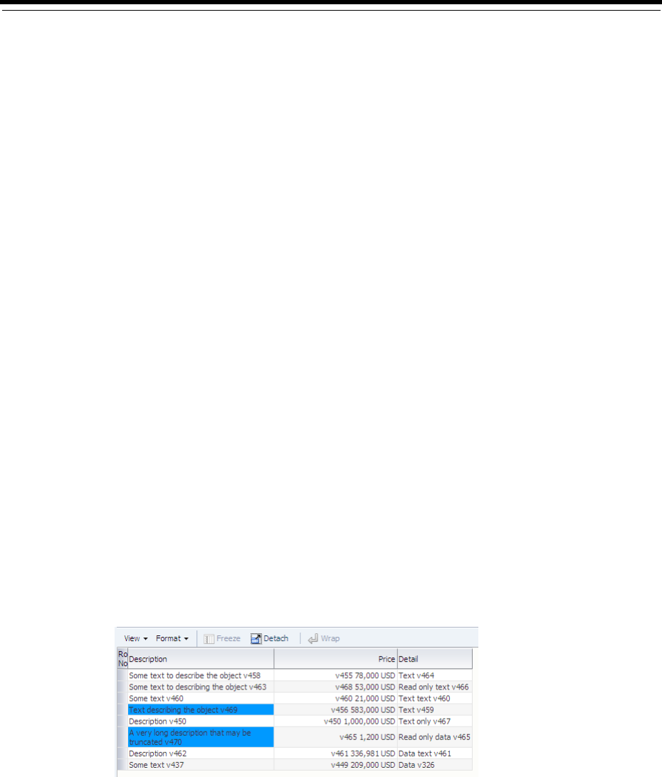
35
Using the Active Data Service with an Asynchronous Backend 35-1
35Using the Active Data Service with an
Asynchronous Backend
This chapter provides information on registering an asynchronous backend to provide
real-time data updates to ADF Faces components.
This chapter includes the following sections:
■Section 35.1, "About the Active Data Service"
■Section 35.2, "Process Overview for Using Active Data Service"
■Section 35.3, "Implement the ActiveModel Interface in a Managed Bean"
■Section 35.4, "Pass the Event Into the Active Data Service"
■Section 35.5, "Register the Data Update Event Listener"
■Section 35.6, "Configure the ADF Component to Display Active Data"
35.1 About the Active Data Service
The Fusion technology stack includes the Active Data Service (ADS), which is a
server-side push framework that allows you to provide real-time data updates for
ADF Faces components. You bind ADF Faces components to a data source and ADS
pushes the data updates to the browser client without requiring the browser client to
explicitly request it. For example, you may have a table bound to attributes of an ADF
data control whose values change on the server periodically, and you want the
updated values to display in the table. You can create a Java bean to implement the
ActiveModel interface and register it as an event listener to notify the component of
a data event from the backend, and the component rerenders the changed data with
the new value highlighted, as shown in Figure 35–1.
Figure 35–1 Table Displays Updated Data as Highlighted

Process Overview for Using Active Data Service
35-2 Web User Interface Developer's Guide for Oracle Application Development Framework
35.1.1 Active Data Service Use Cases and Examples
Using ADS is an alternative to using automatic partial page rendering (PPR) to
rerender data that changes on the backend as a result of business logic associated with
the ADF data control bound to the ADF Faces component. Whereas automatic PPR
requires sending a request to the server (typically initiated by the user), ADS enables
changed data to be pushed from the data store as the data arrives on the server. Also,
in contrast to PPR, ADS makes it possible for the component to rerender only the
changed data instead of the entire component. This makes ADS ideal for situations
where the application needs to react to data that changes periodically.
To use this functionality, you must configure the application to use ADS. If your
application services do not support ADS, then you also need to create a proxy of the
service so that the components can display the data as it updates in the source.
Any ADF Faces page can use ADS. However, you can configure only the following
ADF Faces components to work with active data:
■activeCommandToolbarButton
■activeImage
■activeOutputText
■table
■tree
■treeTable
■DVT graph, gauge, and geographical map components
For details about the active data service framework and important configuration
information, see Oracle Fusion Middleware Fusion Developer's Guide for Oracle Application
Development Framework.
35.2 Process Overview for Using Active Data Service
To use ADS, you can optionally configure your application to determine the method of
data transport, as well as other performance options.
Before you begin:
Complete the following tasks:
■Implement the logic to fire the active data events asynchronously from the data
source. For example, this logic might be a business process that updates the
database, or a JMS client that gets notified from JMS.
■The Active Data framework does not support complicated business logic or
transformations that require the ADF runtime context, such as a user profile or
security. For example, the framework cannot convert an ADF context
locale-dependent value and return a locale-specific value. Instead, you need to
have your data source handle this before publishing the data change event.
Note: Do not use filtering on a table that will be using active data.
Once a table is filtered at runtime, active data cannot be displayed.
Currently, ADS supports table components with the outputText
component contained within a column; other components are not
supported inside the table column.

Implement the ActiveModel Interface in a Managed Bean
Using the Active Data Service with an Asynchronous Backend 35-3
■Before users can run the ADF Faces page with ADS configured for the application,
they must disable the popup blocker for their web browser. Active data is not
supported in web browsers that have popup blockers enabled.
To use the Active Data Service:
1. Optionally, configure ADS to determine the data transport mode, as well as to set
other configurations, such as a latency threshold and reconnect information.
Configuration for ADS is done in the adf-config.xml file.
For details about configuring ADS, see Oracle Fusion Middleware Fusion Developer's
Guide for Oracle Application Development Framework.
2. Create a backing bean that implements the ActiveModel interface and register it
as the listener for active data events from your backend.
3. Create a class that extends the BaseActiveDataModel API to pass the Event
object to the ADS framework.
4. Register a data change listener for data change events from the backend.
5. In the web page, configure the ADF Faces component to capture and display the
pushed data by adding an expression to name the managed bean that implements
the the ADF component that you use to capture and display the pushed data.
35.3 Implement the ActiveModel Interface in a Managed Bean
Create a backing bean that contains the active model implementation as its property.
This class uses an ADS decorator class to wrap the JSF model. This class should also
implement a callback from the backend that will push data into the ADS framework.
You need to create a Java class that subclasses one of the following ADS decorator
classes:
■ActiveCollectionModelDecorator class
■ActiveDataModelDecorator class (for use with graphs)
■ActiveGeoMapDataModelDecorator class
■ActiveGaugeDataModelDecorator class
These classes are wrapper classes that delegate the active data functionality to a
default implementation of ActiveDataModel. The ActiveDataModel class listens
for data change events and interacts with the Event Manager.
Specifically, when you implement the ActiveModel interface, you accomplish the
following:
■Wraps the JSF model interface. For example, the
ActiveCollectionModelDecorator class wraps the CollectionModel
class.
■Generates active data events based on data change events from the data source.
To implement the ActiveModel interface, you need to implement methods on your
Java class that gets the model to which the data is being sent and registers itself as the
listener of the active data source (as illustrated in Example 35–1):
1. Create a Java class that extends the decorator class appropriate for your
component.

Implement the ActiveModel Interface in a Managed Bean
35-4 Web User Interface Developer's Guide for Oracle Application Development Framework
Example 35–1 shows a StockManager class that extends
ActiveCollectionModelDecorator. In this case, the data is displayed for an
ADF Faces table component.
2. Implement the methods of the decorator class that will return the
ActiveDataModel class and implement the method that returns the scalar
model.
Example 35–1 shows an implementation of the getCollectionModel() method
that registers with an existing asynchronous backend. The method returns the list
of stocks collection from the backend.
3. Implement a method that creates application-specific events that can be used to
insert or update data on the active model.
Example 35–1 shows the onStockUpdate() callback method from the backend,
which uses the active model (an instance of ActiveStockModel) to create
ActiveDataUpdateEvent objects to push data to the ADF Faces component.
Example 35–1 Extend the Decorator Class
package sample.oracle.ads;
import java.util.List;
import sample.backend.IBackendListener;
import sample.bean.StockBean;
import sample.oracle.model.ActiveStockModel;
import oracle.adf.view.rich.event.ActiveDataEntry;
import oracle.adf.view.rich.event.ActiveDataUpdateEvent;
import oracle.adf.view.rich.model.ActiveCollectionModelDecorator;
import oracle.adf.view.rich.model.ActiveDataModel;
import oracle.adfinternal.view.faces.activedata.ActiveDataEventUtil;
import org.apache.myfaces.trinidad.model.CollectionModel;
import org.apache.myfaces.trinidad.model.SortableModel;
// 1. This example wraps the existing collection model in the page and implements
// the ActiveDataModel interface to enable ADS for the page.
public StockManager extends ActiveCollectionModelDecorator implements
IBackendListener
{
// 2. Implement methods from ADF ActiveCollectionModelDecorator class to
// return the model.
@Override
public ActiveDataModel getActiveDataModel()
{
return stockModel;
}
@Override
protected CollectionModel getCollectionModel()
{
if(collectionModel == null)
{
// connect to a backend system to get a Collection
List<StockBean> stocks = FacesUtil.loadBackEnd().getStocks();
// make the collection become a (Trinidad) CollectionModel
collectionModel = new SortableModel(stocks);

Implement the ActiveModel Interface in a Managed Bean
Using the Active Data Service with an Asynchronous Backend 35-5
}
return collectionModel;
}
// 3. Implement a callback method to create active data events and deliver to
// the ADS framework.
/**
* Callback from the backend to push new data to our decorator.
* The decorator itself notifies the ADS system that there was a data change.
*
* @param key the rowKey of the updated Stock
* @param updatedStock the updated stock object
*/
@Override
public void onStockUpdate(Integer rowKey, StockBean stock)
{
ActiveStockModel asm = getActiveStockModel();
// start the preparation for the ADS update
asm.prepareDataChange();
// Create an ADS event, using an _internal_ util.
// This class is not part of the API
ActiveDataUpdateEvent event = ActiveDataEventUtil.buildActiveDataUpdateEvent(
ActiveDataEntry.ChangeType.UPDATE, // type
asm.getCurrentChangeCount(), // changeCount
new Object[] {rowKey}, // rowKey
null, //insertKey, null as we don't insert stuff
new String[] {"value"}, // attribute/property name that changes
new Object[] { stock.getValue()} // the payload for the above attribute
);
// Deliver the new Event object to the ADS framework
asm.notifyDataChange(event);
}
/**
* Typesafe caller for getActiveDataModel()
* @return
*/
protected ActiveStockModel getActiveStockModel()
{
return (ActiveStockModel) getActiveDataModel();
}
// properties
private CollectionModel collectionModel; // see getCollectionModel()...
private ActiveStockModel stockModel = new ActiveStockModel();
}
Register the class as a managed bean in the faces-config.xml file. Example 35–2
shows the bean StockManager is registered. Defining the managed bean allows you
to specify the managed bean in an expression for the ADF Faces component’s value
property.

Pass the Event Into the Active Data Service
35-6 Web User Interface Developer's Guide for Oracle Application Development Framework
Example 35–2 Register as a Managed Bean
...
<managed-bean>
<managed-bean-name>stockManager</managed-bean-name>
<managed-bean-class>
oracle.afdemo.view.feature.rich.StockManager
</managed-bean-class>
<managed-bean-scope>session</managed-bean-scope>
</managed-bean>
35.3.1 What You May Need to Know About Read Consistency
Using active data means that your component has two sources of data: the active data
feed and the standard data fetch. Because of this, you must make sure your application
maintains read consistency.
For example, say your page contains a table and that table has active data enabled. The
table has two methods of delivery from which it updates its data: normal table data
fetch and active data push. Say the back end data changes from foo to bar to fred.
For each of these changes, an active data event is fired. If the table is refreshed before
those events hit the browser, the table will display fred because standard data fetch
will always get the latest data. But then, because the active data event might take
longer, some time after the refresh the data change event would cause foo to arrive at
the browser, and so the table would update to display foo instead of fred for a
period of time. Therefore, you must implement a way to maintain the read
consistency.
To achieve read consistency, the ActiveDataModel has the concept of a change count,
which effectively timestamps the data. Both data fetch and active data push need to
maintain this changeCount object by monotonically increasing the count, so that if
any data returned has a lower changeCount, the active data event can throw it away.
Example 35–3 shows how you can use your implementation of the
ActiveDataModel class to maintain read consistency.
35.4 Pass the Event Into the Active Data Service
You need to create a class that extends BaseActiveDataModel class to pass the
event created by your managed bean. The ActiveDataModel class listens for data
change events and interacts with the Event Manager. Specifically, the methods you
implement do the following:
■Optionally, starts and stops the active data and the ActiveDataModel object,
and registers and unregisters listeners to the data source.
■Manages listeners from the Event Manager and pushes active data events to the
Event Manager.
Example 35–3 shows the notifyDataChange() method of the model passes the
Event object to the ADS framework, by placing the object into the
fireActiveDataUpdate() method.
Example 35–3 Pass the Event Object into ADS
import java.util.Collection;
import java.util.concurrent.atomic.AtomicInteger;
import oracle.adf.view.rich.activedata.BaseActiveDataModel;

Register the Data Update Event Listener
Using the Active Data Service with an Asynchronous Backend 35-7
import oracle.adf.view.rich.event.ActiveDataUpdateEvent;
public class ActiveStockModel extends BaseActiveDataModel
{
// -------------- API from BaseActiveDataModel ----------
@Override
protected void startActiveData(Collection<Object> rowKeys,
int startChangeCount)
{
/* We don't do anything here as there is no need for it in this example.
* You could use a listenerCount to see if the maximum allowed listerners
* are already attached. You could register listeners here.
*/
}
@Override
protected void stopActiveData(Collection<Object> rowKeys)
{
// same as above... no need to disconnect here
}
@Override
public int getCurrentChangeCount()
{
return changeCounter.get();
}
// -------------- Custom API -----------
/**
* Increment the change counter.
*/
public void prepareDataChange()
{
changeCounter.incrementAndGet();
}
/**
* Deliver an ActiveDataUpdateEvent object to the ADS framework.
*
* @param event the ActiveDataUpdateEvent object
*/
public void notifyDataChange(ActiveDataUpdateEvent event)
{
// Delegate to internal fireActiveDataUpdate() method.
fireActiveDataUpdate(event);
}
// properties
private final AtomicInteger changeCounter = new AtomicInteger();
}
35.5 Register the Data Update Event Listener
You need to register a data change listener for data change events from the backend.
Example 35–4 shows the listener bean StockBackEndSystem is registered in the

Configure the ADF Component to Display Active Data
35-8 Web User Interface Developer's Guide for Oracle Application Development Framework
faces-config.xml file. Note that for this example, expression language is used to
inject a listener to the backend.
Example 35–4 Register the Data Update Event Listener
...
<managed-bean>
<managed-bean-name>backend</managed-bean-name>
<managed-bean-class>
oracle.afdemo.backend.StockBackEndSystem
</managed-bean-class>
<managed-bean-scope>session</managed-bean-scope>
<managed-property>
<property-name>listener</property-name>
<value>#{stockManager}</value>
</managed-property>
</managed-bean>
35.6 Configure the ADF Component to Display Active Data
ADF components that display collection-based data can be configured to work with
ADS and require no extra setup in the view layer. Once the listener is registered, you
can use ADS to stream the data to the view layer. For example, imagine that your JSPX
page uses a table component to display stock updates from a backend source on
which you register a listener.
Example 35–5 shows the expression language used on the table component value
attribute to receive the pushed data.
Example 35–5 Display the Active Data
...
<f:view>
<af:document id="d1">
<af:form id="f1">
<af:panelStretchLayout topHeight="50px" id="psl1">
<f:facet name="top">
<af:outputText value="Oracle ADF Faces goes Push!" id="ot1"/>
</f:facet>
<f:facet name="center">
<!-- id="af_twocol_left_full_header_splitandstretched" -->
<af:decorativeBox theme="dark" id="db2">
<f:facet name="center">
<af:panelSplitter orientation="horizontal"
splitterPosition="100" id="ps1">
<f:facet name="first">
<af:outputText value="Some content here." id="menu"/>
</f:facet>
<f:facet name="second">
<af:decorativeBox theme="medium" id="db1">
<f:facet name="center">
<af:table value="#{stockManager}" var="row"
rowBandingInterval="0"
id="table1" emptyText="No data...">
<af:column sortable="false" headerText="Name"
id="column1">
<af:outputText value="#{row.name}" id="outputText1"/>
</af:column>
<af:column sortable="false"
headerText="Value...." id="column2">

Configure the ADF Component to Display Active Data
Using the Active Data Service with an Asynchronous Backend 35-9
<af:outputText value="#{row.value}"
id="outputText2" />
</af:column>
</af:table>
</f:facet>
</af:decorativeBox>
</f:facet>
</af:panelSplitter>
</f:facet>
</af:decorativeBox>
</f:facet>
</af:panelStretchLayout>
</af:form>
</af:document>
</f:view>

Configure the ADF Component to Display Active Data
35-10 Web User Interface Developer's Guide for Oracle Application Development Framework


A
ADF Faces Configuration A-1
AADF Faces Configuration
This appendix describes how to configure JSF and ADF Faces features in various XML
configuration files, as well as how to retrieve ADF Faces configuration values using
the RequestContext API and how to use JavaScript partitioning.
This chapter includes the following sections:
■Section A.1, "About Configuring ADF Faces"
■Section A.2, "Configuration in web.xml"
■Section A.3, "Configuration in faces-config.xml"
■Section A.4, "Configuration in adf-config.xml"
■Section A.5, "Configuration in adf-settings.xml"
■Section A.6, "Configuration in trinidad-config.xml"
■Section A.7, "Configuration in trinidad-skins.xml"
■Section A.8, "Using the RequestContext EL Implicit Object"
■Section A.9, "Performance Tuning"
A.1 About Configuring ADF Faces
A JSF web application requires a specific set of configuration files, namely, web.xml
and faces-config.xml. ADF applications also store configuration information in
the adf-config.xml and adf-settings.xml files. Because ADF Faces shares the
same code base with MyFaces Trinidad, a JSF application that uses ADF Faces
components for the UI also must include a trinidad-config.xml file, and
optionally a trinidad-skins.xml file. For more information about the relationship
between Trinidad and ADF Faces, see Chapter 1, "Introduction to ADF Faces."
A.2 Configuration in web.xml
Part of a JSF application's configuration is determined by the contents of its Java EE
application deployment descriptor, web.xml. The web.xml file, which is located in
the /WEB-INF directory, defines everything about your application that a server needs
to know (except the root context path, which is automatically assigned for you in
JDeveloper, or assigned by the system administrator when the application is
deployed). Typical runtime settings in the web.xmlfile include initialization
parameters, custom tag library location, and security settings.
The following is configured in the web.xmlfile for all applications that use ADF Faces:
■Context parameter javax.faces.STATE_SAVING_METHOD set to client

Configuration in web.xml
A-2 Web User Interface Developer's Guide for Oracle Application Development Framework
■MyFaces Trinidad filter and mapping
■MyFacesTrinidad resource servlet and mapping
■JSF servlet and mapping
For more information about the required elements, see Section A.2.2, "What You May
Need to Know About Required Elements in web.xml."
For information about optional configuration elements in web.xml related to
ADF Faces, see Section A.2.3, "What You May Need to Know About ADF Faces
Context Parameters in web.xml."
For information about configuring web.xml outside of ADF Faces, see Developing Web
Applications, Servlets, and JSPs for Oracle.
A.2.1 How to Configure for JSF and ADF Faces in web.xml
In JDeveloper, when you create a project that uses JSF technology, a starter web.xml
file with default servlet and mapping elements is created for you in the /WEB-INF
directory.
When you use ADF Faces components in a project (that is, a component tag is used on
a page rather than just importing the library), in addition to default JSF configuration
elements, JDeveloper also automatically adds the following to the web.xml file for
you:
■Configuration elements that are related to MyFaces Trinidad filter and MyFaces
Trinidad resource servlet
■Context parameter javax.faces.STATE_SAVING_METHOD with the value of
client
When you elect to use JSP fragments in the application, JDeveloper automatically adds
a JSP configuration element for recognizing and interpreting.jsff files in the
application.
Example A–1 shows the web.xml file with the default elements that JDeveloper adds
for you when you use JSF and ADF Faces and.jsff files.
For information about the web.xml configuration elements needed for working with
JSF and ADF Faces, see Section A.2.2, "What You May Need to Know About Required
Elements in web.xml."
Example A–1 Generated web.xml File
<?xml version = '1.0' encoding = 'windows-1252'?>
<web-app xmlns:xsi="http://www.w3.org/2001/XMLSchema-instance"
xsi:schemaLocation="http://java.sun.com/xml/ns/javaee
http://java.sun.com/xml/ns/javaee/web-app_2_5.xsd" version="2.5"
xmlns="http://java.sun.com/xml/ns/javaee">
<description>Empty web.xml file for Web Application</description>
<servlet>
<servlet-name>Faces Servlet</servlet-name>
<servlet-class>javax.faces.webapp.FacesServlet</servlet-class>
<load-on-startup>1</load-on-startup>
Note: JDeveloper automatically adds the necessary ADF Faces
configurations to the web.xml file for you the first time you use an
ADF Faces component in an application.

Configuration in web.xml
ADF Faces Configuration A-3
</servlet>
<servlet-mapping>
<servlet-name>Faces Servlet</servlet-name>
<url-pattern>/faces/*</url-pattern>
</servlet-mapping>
<session-config>
<session-timeout>35</session-timeout>
</session-config>
<mime-mapping>
<extension>html</extension>
<mime-type>text/html</mime-type>
</mime-mapping>
<mime-mapping>
<extension>txt</extension>
<mime-type>text/plain</mime-type>
</mime-mapping>
</web-app>
Configuration options for ADF Faces are set in the web.xml file using
<context-param> elements.
To add ADF Faces configuration elements in web.xml:
1. In the Application Navigator, double-click web.xml to open the file.
By default, JDeveloper opens the web.xml file in the overview editor, as indicated
by the active Overview tab at the bottom of the editor window.
When you use the overview editor to add or edit entries declaratively, JDeveloper
automatically updates the web.xml file for you.
2. To edit the XML code directly in the web.xml file, click Source at the bottom of
the editor window.
When you edit elements in the XML editor, JDeveloper automatically reflects the
changes in the overview editor.
For a list of context parameters you can add, see Section A.2.3, "What You May Need
to Know About ADF Faces Context Parameters in web.xml."
A.2.2 What You May Need to Know About Required Elements in web.xml
The required, application-wide configuration elements for JSF and ADF Faces in the
web.xml file are:
■Context parameter javax.faces.STATE_SAVING_METHOD: Specifies where to
store the application’s view state. By default this value is server, which stores the
application's view state on the server. It is recommended that you set
javax.faces.STATE_SAVING_METHOD to client when you use ADF Faces, to
store the view state on the browser client. When set to client, ADF Faces then
automatically uses token-based, client-side state saving. You can specify the
number of tokens to use instead of using the default number of 15. For more
information about state-saving context parameters, see Section A.2.3, "What You
May Need to Know About ADF Faces Context Parameters in web.xml."
Note: When you use ADF data controls to build databound web
pages, the ADF binding filter and a servlet context parameter for the
application binding container are added to the web.xml file.

Configuration in web.xml
A-4 Web User Interface Developer's Guide for Oracle Application Development Framework
■MyFaces Trinidad filter and mapping: Installs the MyFaces Trinidad filter
org.apache.myfaces.trinidad.webapp.TrinidadFilter, which is a
servlet filter that ensures ADF Faces is properly initialized, in part by establishing
a RequestContext object. TrinidadFilter also processes file uploads. The
filter mapping maps the JSF servlet’s symbolic name to the MyFaces Trinidad
filter. The forward and request dispatchers are needed for any other filter that is
forwarding to the MyFaces Trinidad filter.
■MyFaces Trinidad resource servlet and mapping: Installs the MyFaces Trinidad
resource servlet
org.apache.myfaces.trinidad.webapp.ResourceServlet, which serves
up web application resources (images, style sheets, JavaScript libraries) by
delegating to a resource loader. The servlet mapping maps the MyFaces Trinidad
resource servlet’s symbolic name to the URL pattern. By default, JDeveloper uses
/adf/* for MyFaces Trinidad Core, and /afr/* for ADF Faces.
■JSF servlet and mapping (added when creating a JSF page or using a template
with ADF Faces components): The JSF servlet servlet
javax.faces.webapp.FacesServlet manages the request processing
lifecycle for web applications that utilize JSF to construct the user interface. The
mapping maps the JSF servlet’s symbolic name to the URL pattern, which can use
either a path prefix or an extension suffix pattern.
By default JDeveloper uses the path prefix /faces/*, as shown in the following
code:
<servlet-mapping>
<servlet-name>Faces Servlet</servlet-name>
<url-pattern>/faces/*</url-pattern>
</servlet-mapping>
For example, if your web page is index.jspx, this means that when the URL
http://localhost:8080/MyDemo/faces/index.jspx is issued, the URL
activates the JSF servlet, which strips off the faces prefix and loads the file
/MyDemo/index.jspx.
A.2.3 What You May Need to Know About ADF Faces Context Parameters in web.xml
ADF Faces configuration options are defined in the web.xml file using
<context-param> elements. For example:
<context-param>
<param-name>oracle.adf.view.rich.LOGGER_LEVEL</param-name>
<param-value>ALL</param-value>
</context-param>
The following context parameters are supported for ADF Faces.
A.2.3.1 State Saving
You can specify the following state-saving context parameters:
■org.apache.myfaces.trinidad.CLIENT_STATE_METHOD: Specifies the type
of client-side state saving to use when client-side state saving is enabled by using
Tip: If you use multiple filters in your application, ensure that they
are listed in the web.xml file in the order in which you want to run
them. At runtime, the filters are called in the sequence listed in that
file.

Configuration in web.xml
ADF Faces Configuration A-5
javax.faces.STATE_SAVING_METHOD. The values for CLIENT_STATE_
METHOD are:
–token: (Default) Stores the page state in the session, but persists a token to the
client. The simple token, which identifies a block of state stored back on the
HttpSession object, is stored on the client. This enables ADF Faces to
disambiguate the same page appearing multiple times. Failover is supported.
–all: Stores all state information on the client in a (potentially large) hidden
form field. It is useful for developers who do not want to use HttpSession.
■org.apache.myfaces.trinidad.CLIENT_STATE_MAX_TOKENS: Specifies
how many tokens should be stored at any one time per user, when token-based
client-side state saving is enabled. The default is 15. When the number of tokens is
exceeded, the state is lost for the least recently viewed pages, which affects users
who actively use the Back button or who have multiple windows opened at the
same time. If you are building HTML applications that rely heavily on frames, you
would want to increase this value.
■org.apache.myfaces.trinidad.COMPRESS_VIEW_STATE: Specifies whether
or not to globally compress state saving on the session. Each user session can have
multiple pageState objects that heavily consume live memory and thereby
impact performance. This overhead can become a much bigger issue in clustering
when session replication occurs. The default is off.
A.2.3.2 Debugging
You can specify the following debugging context parameters:
■org.apache.myfaces.trinidad.DEBUG_JAVASCRIPT: ADF Faces, by
default, obfuscates the JavaScript it delivers to the client, stripping comments and
whitespace at the same time. This dramatically reduces the size of the ADF Faces
JavaScript download, but it also makes it tricky to debug the JavaScript. Set to
true to turn off the obfuscation during application development. Set to false for
application deployment.
■org.apache.myfaces.trinidad.CHECK_FILE_MODIFICATION: By default
this parameter is false. If it is set to true, ADF Faces will automatically check
the modification date of your JSPs and CSS files, and discard the saved state when
the files change.
■oracle.adf.view.rich.LOGGER_LEVEL: This parameter enables JavaScript
logging when the default render kit is oracle.adf.rich. The default is OFF. If
you wish to turn on JavaScript logging, use one of the following levels: SEVERE,
WARNING, INFO, CONFIG, FINE, FINER, FINEST, and ALL. Set to INFO if you
have enabled automated profiler instrumentation code (see
oracle.adf.view.rich.profiler.ENABLED in Section A.2.3.8, "Profiling").
Performance Tip: Because of the potential size of storing all state
information, it is recommended that you set client-state saving to
token.
Performance Tip: When set to true, this CHECK_FILE_
MODIFICATION parameter adds overhead that should be avoided
when your application is deployed. Set to false when deploying
your application to a runtime environment.

Configuration in web.xml
A-6 Web User Interface Developer's Guide for Oracle Application Development Framework
■oracle.adf.view.rich.REQUEST_ID_TRACING: This parameter is used for
diagnosing failed partial page rendering (PPR) requests by associating end user
reports with corresponding entries in server-side logs. This is accomplished by
appending the unique ECIF number for the server log to the PPR URL. By default
this parameter is set to off. Set the parameter to PPR to activate the diagnostic
functionality.
A.2.3.3 File Uploading
You can specify the following file upload context parameters:
■org.apache.myfaces.trinidad.UPLOAD_MAX_MEMORY: Specifies the
maximum amount of memory that can be used in a single request to store
uploaded files. The default is 100K.
■org.apache.myfaces.trinidad.UPLOAD_MAX_DISK_SPACE: Specifies the
maximum amount of disk space that can be used in a single request to store
uploaded files. The default is 2000K.
■org.apache.myfaces.trinidad.UPLOAD_TEMP_DIR: Specifies the directory
where temporary files are to be stored during file uploading. The default is the
user's temporary directory.
A.2.3.4 Resource Debug Mode
You can specify the following:
■org.apache.myfaces.trinidad.resource.DEBUG: Specifies whether or not
resource debug mode is enabled. The default is false. Set to true if you want to
enable resource debug mode. When enabled, ADF Faces sets HTTP response
headers to let the browser know that resources (such as JavaScript libraries,
images, and CSS) can be cached.
A.2.3.5 User Customization
For more information about enabling and using session change persistence, see
Chapter 32, "Allowing User Customization on JSF Pages."
A.2.3.6 Enabling the Application for Real User Experience Insight
Real User Experience Insight (RUEI) is a web-based utility to report on real-user traffic
requested by, and generated from, your network. It measures the response times of
pages and transactions at the most critical points in the network infrastructure. Session
diagnostics allow you to perform root-cause analysis.
Performance Tip: JavaScript logging will affect performance. Set this
value to OFF in a runtime environment.
Note: The file upload initialization parameters are processed by the
default UploadedFileProcessor only. If you replace the default
processor with a custom UploadedFileProcessor implementation,
the parameters are not processed.
Tip: After turning on resource debug mode, clear your browser
cache to force the browser to load the latest versions of the resources.
Performance Tip: In a production environment, this parameter
should be removed or set to false.

Configuration in web.xml
ADF Faces Configuration A-7
RUEI enables you to view server and network times based on the real-user experience,
to monitor your Key Performance Indicators (KPIs) and Service Level Agreements
(SLAs), and to trigger alert notifications on incidents that violate their defined targets.
You can implement checks on page content, site errors, and the functional
requirements of transactions. Using this information, you can verify your business and
technical operations. You can also set custom alerts on the availability, throughput,
and traffic of all items identified in RUEI.
Specify whether or not RUEI is enabled for
oracle.adf.view.faces.context.ENABLE_ADF_EXECUTION_CONTEXT_
PROVIDER by adding the parameter to the web.xml file and setting the value to true.
By default this parameter is not set or is set to false.
A.2.3.7 Assertions
You can specify whether or not assertions are used within ADF Faces using the
oracle.adf.view.rich.ASSERT_ENABLED parameter. The default is false. Set
to true to turn on assertions.
A.2.3.8 Profiling
You can specify the following JavaScript profiling context parameters:
■oracle.adf.view.rich.profiler.ENABLED: Specifies whether or not to use
the automated profiler instrumentation code provided with the JavaScript Profiler.
The default is false. Set to true to enable the JavaScript profile. When the
profiler is enabled, an extra roundtrip is needed on each page to fetch the profiler
data. By default, JDeveloper uses the /WEB-INF/profiler.xml configuration
file. To override the location of the profiler.xml file, use the ROOT_FILE
context parameter, as described next. You may also want to set DEBUG_
JAVASCRIPT to true, to turn off JavaScript obfuscation. You also must set the
LOGGER_LEVEL to at least INFO.
■oracle.adf.view.rich.profiler.ROOT_FILE: Specifies the initial
profiler.xml file to load, if automated profiler instrumentation code is turned
on. By default, JDeveloper uses the /WEB-INF/profiler.xml file if ROOT_FILE
is not specified.
A.2.3.9 Dialog Prefix
To change the prefix for launching dialogs, set the
org.apache.myfaces.trinidad.DIALOG_NAVIGATION_PREFIX parameter.
The default is dialog:, which is used in the beginning of the outcome of a JSF
navigation rule that launches a dialog (for example, dialog:error).
A.2.3.10 Compression for CSS Class Names
You can set the org.apache.myfaces.trinidad.DISABLE_CONTENT_
COMPRESSION parameter to determine compression of the CSS class names for
skinning keys.
The default is false. Set to true if you want to disable the compression.
Performance Tip: Assertions will affect performance. Set this value
to false in a runtime environment.
Performance Tip: Compression will affect performance. In a
production environment, set this parameter to false.

Configuration in web.xml
A-8 Web User Interface Developer's Guide for Oracle Application Development Framework
A.2.3.11 Control Caching When You Have Multiple ADF Skins in an Application
The skinning framework caches information in memory about the generated CSS file
of each skin that an application requests. This could have performance implications if
your application uses many different skins. Specify the maximum number of skins for
which you want to cache information in memory as a value for the
org.apache.myfaces.trinidad.skin.MAX_SKINS_CACHED parameter. The
default value for this parameter is 20.
A.2.3.12 Test Automation
When you set the oracle.adf.view.rich.automation.ENABLED parameter to
true and when the component ID attribute is null, the component testId attribute
is used during automated testing to ensure that the ID is not null. The testId is an
attribute only on the tag. It is not part of the Java component API.
A.2.3.13 UIViewRoot Caching
Use the org.apache.myfaces.trinidad.CACHE_VIEW_ROOT parameter to
enable or disable UIViewRoot caching. When token client-side state saving is
enabled, MyFaces Trinidad can apply an additional optimization by caching an entire
UIViewRoot tree with each token. (Note that this does not affect thread safety or
session failover.) This is a major optimization for AJAX-intensive systems, as
postbacks can be processed far more rapidly without the need to reinstantiate the
UIViewRoot tree.
You set the org.apache.myfaces.trinidad.CACHE_VIEW_ROOT parameter to
true to enable caching. This is the default. Set the parameter to false to disable
caching.
A.2.3.14 Themes and Tonal Styles
Although the oracle.adf.view.rich.tonalstyles.ENABLED parameter is still
available for the purpose of backward compatibility, keep the parameter set to false,
and use themes as a replacement style for the tonal style classes of.AFDarkTone,
.AFMediumTone, .AFLightTone and .AFDefaultTone. Themes are easier to
author than tonal styles; they rely on fewer selectors, and they avoid CSS containment
selectors. For this reason they are less prone to bugs. Due to the limitation on the
number of selectors in one CSS file, both tonal styles and themes cannot be supported
in the same application.
A.2.3.15 Partial Page Rendering
Use the org.apache.myfaces.trinidad.PPR_OPTIMIZATION parameter to turn
partial page rendering (PPR) optimization on and off. By default, this parameter is set
to off. Set to on for improving the performance and efficiency of PPR.
Note: When this context parameter is set to true, the
oracle.adf.view.rich.security.FRAME_BUSTING context
parameter behaves as though it were set to never. For more
information, see Section A.2.3.18, "Framebusting."
Note: This type of caching is known to interfere with some other JSF
technologies. In particular, the Apache MyFaces Tomahawk
saveState component does not work, and template text in Facelets
may appear in duplicate.

Configuration in web.xml
ADF Faces Configuration A-9
A.2.3.16 Partial Page Navigation
Use the oracle.adf.view.rich.pprNavigation.OPTIONS parameter to turn
partial page navigation on and off. By default, the value is off. Partial page
navigation uses the same base page throughout the application, and simply replaces
the body content of the page with each navigation. This processing results in better
performance because JavaScript libraries and style sheets do not need to be reloaded
with each new page. For more information, see Section 8.4, "Using Partial Page
Navigation."
Valid values are:
■on: PPR navigation is turned on for the application.
■off: PPR navigation is turned off for the application.
■onWithForcePPR: When an action on a command component results in
navigation, the action will always be delivered using PPR, as if the component had
partialSubmit set to true. For more information about partialSubmit, see
Section 6.1.1, "Events and Partial Page Rendering." If the component already has
partialSubmit set to true, the framework does nothing. If partialSubmit is
not set to true, the entire document is refreshed to ensure that old page refresh
behavior is preserved. The entire document is also refreshed if the action
component does not contain navigation.
A.2.3.17 JavaScript Partitioning
Use the oracle.adf.view.rich.libraryPartitioning.ENABLED parameter to
turn JavaScript partitioning on and off. By default, the value is true (enabled).
JavaScript partitioning allows a page to download only the JavaScript needed by client
components for that page.
Valid values are:
■true: JavaScript partitioning is enabled (the default).
■false: JavaScript partitioning is disabled.
For more information about using and configuring JavaScript partitioning, see
Section 4.9, "JavaScript Library Partitioning."
A.2.3.18 Framebusting
Use the oracle.adf.view.rich.security.FRAME_BUSTING context parameter
to use framebusting in your application. Framebusting is a way to prevent clickjacking,
which occurs when a malicious web site pulls a page originating from another domain
into a frame and overlays it with a counterfeit page, allowing only portions of the
original, or clickjacked, page (for example, a button) to display. When users click the
button, they in fact are clicking a button on the clickjacked page, causing unexpected
results.
For example, say your application is a web-based email application that resides in
DomainA, and a web site in DomainB clickjacks your page by creating a page with an
IFrame that points to a page in your email application at DomainA. When the two
pages are combined, the page from DomainB covers most of your page in the IFrame,
Note: If you set the parameter to on, then you need to set the
partialSubmit attribute to true for any command components
involved in navigation. For more information about partialSubmit,
see Section 6.1.1, "Events and Partial Page Rendering."

Configuration in web.xml
A-10 Web User Interface Developer's Guide for Oracle Application Development Framework
and exposes only a button on your page that deletes all email for the account. Users,
not realizing they are actually in the email application, may click the button and
inadvertently delete all their email.
Framebusting prevents clickjacking by using the following JavaScript to block the
application’s pages from running in frames:
top.location.href = location.href;
If you configure your application to use framebusting by setting the parameter to
always, then whenever a page tries to run in a frame, an alert is shown to the user
that the page is being redirected, the JavaScript code is run to define the page as
topmost, and the page is disallowed to run in the frame.
If your application needs to use frames, you can set the parameter value to
differentDomain. This setting causes framebusting to occur only if the frame has
the same origin as the parent page. This is the default setting.
For example, say you have a page named DomainApage1 in your application that
uses a frame to include the page DomainApage2. Say the external DomainBpage1
tries to clickjack the page DomainApage1. The result would be the following window
hierarchy:
■DomainBpage1
–DomainApage1
*DomainApage2
If the application has framebusting set to be differentDomain, then the framework
walks the parent window hierarchy to determine whether any ancestor windows
originate from a different domain. Because DoaminBpage1 originates from a different
domain, the framebusting JavaScript code will run for the DomainApage1 page,
causing it to become the top-level window. And because DomainApage2 originates
from the same domain as DomainApage1, it will be allowed to run in the frame.
Valid values are:
■always: The page will show an error and redirect whenever it attempts to run in a
frame.
■differentDomain: The page will show an error and redirect only when it
attempts to run in a frame on a page that originates in a different domain (the
default).
■never: The page can run in any frame on any originating domain.
Note: The origin of a page is defined using the domain name,
application layer protocol, and in most browsers, TCP port of the
HTML document running the script. Pages are considered to originate
from the same domain if and only if all these values are exactly the
same.
For example, these pages will fail the origin check due to the
difference in port numbers:
■http://www.example.com:8888/dir/page.html
■http://www.example.com:7777/dir/page.html

Configuration in web.xml
ADF Faces Configuration A-11
A.2.3.19 Suppressing Auto-Generated Component IDs
Use the oracle.adf.view.rich.SUPPRESS_IDS context parameter set to auto
when programmatically adding an af:outputText or af:outputFormatted
component as a partial target, that is, through a call to addPartialTarget().
By default, this parameter is set to explicit, thereby reducing content size by
suppressing both auto-generated and explicitly set component IDs except when either
of the following is true:
■The component partialTriggers attribute is set
■The clientComponent attribute is set to true
In the case of a call to addPartialTarget(), the partialTriggers attribute is not
set and the partial page render will not succeed. You can set the parameter to auto to
suppress only auto-generated component IDs for these components.
A.2.3.20 ADF Faces Caching Filter
The ADF Faces Caching Filter (ACF) is a Java EE Servlet filter that can be used to
accelerate web application performance by enabling the caching (and/or compression)
of static application objects such as images, style sheets, and documents like.pdf
and.zip files. These objects are cached in an external web cache such as Oracle Web
Cache or in the browser cache. With web cache, the cacheability of content is largely
determined through URL-based rules defined by the web cache administrator. Using
ACF, the ADF application administrator or author can define caching rules directly in
the adf-config.xml file. For more information about defining caching rules, see
Section A.4.2, "Defining Caching Rules for ADF Faces Caching Filter."
ADF Faces tag library JARs include default caching rules for common resource types,
such as.js, .css, and image file types. These fixed rules are defined in the
adf-settings.xml file, and cannot be changed during or after application
deployment. In the case of conflicting rules, caching rules defined by the application
developer in adf-config.xml will take precedence. For more information about
settings in adf-settings.xml, see Section A.5.2, "What You May Need to Know
About Elements in adf-settings.xml."
Oracle Web Cache must be configured by the web cache administrator to route all
traffic to the web application through the web cache. In the absence of the installation
of Oracle Web Cache, the caching rules defined in adf-config.xml will be applied
for caching in the browser if the <agent-caching> child element is set to true. To
configure the ACF to be in the URL request path, add the following servlet filter
definitions in the web.xml file:
■ACF filter class: Specify the class to perform URL matching to rules defined in
adf-config.xml
■ACF filter mapping: Define the URL patterns to match with the caching rules
defined in adf-config.xml
Note: This context parameter is ignored and will behave as if it were
set to never when either of the following context parameters is set to
true:
■org.apache.myfaces.trinidad.util.
ExternalContextUtils.isPortlet
■oracle.adf.view.rich.automation.ENABLED
Configuration in web.xml
A-12 Web User Interface Developer's Guide for Oracle Application Development Framework
Example A–2 shows a sample ACF servlet definition.
Example A–2 ACF Servlet Definition
<!- Servlet Filter definition ->
<filter>
<filter-name>ACF</filter-name>
<filter-class>oracle.adfinternal.view.faces.caching.filter.AdfFacesCachingFilter
</filter-class>
</filter>
<!- servlet filter mapping definition ->
<filter-mapping>
<filter-name>ACF</filter-name>
<url-pattern>*</url-pattern>
</filter-mapping>
A.2.3.21 Configuring Native Browser Context Menus for Command Links
Use the oracle.adf.view.rich.ACTION_LINK_BROWSER_CONTEXT_
SUPPRESSION context parameter to enable or disable the end user´s browser to
supply a context menu for ADF Faces command components that render a link. The
context menu may present menu options that invoke a different action (for example,
open a link in a new window) to that specified by the command component.
By default, this parameter is set to yes, thereby suppressing the rendering of a context
menu for ADF Faces command components. By setting the parameter to no, you can
disable this suppression and allow the native browser context menu to appear. For
information about the ADF Faces command components for which you can configure
this functionality, see
A.2.3.22 Session Timeout Warning
When a request is sent to the server, a session timeout value is written to the page and
the session timeout warning interval is defined by the context parameter
oracle.adf.view.rich.sessionHandling.WARNING_BEFORE_TIMEOUT. The
user is given the opportunity to extend the session in a warning dialog, and a
notification is sent when the session has expired and the page is refreshed. Depending
on the application security configuration, the user may be redirected to the log in page
when the session expires.
Use the oracle.adf.view.rich.sessionHandling.WARNING_BEFORE_
TIMEOUT context parameter to set the number of seconds prior to the session timeout
when a warning dialog is displayed. If the value of WARNING_BEFORE_TIMEOUT is
less than 120 seconds, if client state saving is used for the page, or if the session has
been invalidated, the feature is disabled. The session timeout value it taken directly
from the session.
Example A–3 shows configuration of the warning dialog to display at 120 seconds
before the timeout of the session.
Example A–3 Configuration of Session Timeout Warning
<context-param>
<param-name>oracle.adf.view.rich.sessionHandling.WARNING_BEFORE_
TIMEOUT</param-name>
Note: The ACF servlet filter must be the first filter in the chain of
filters defined for the application.

Configuration in web.xml
ADF Faces Configuration A-13
<param-value>120</param-value>
</context-param>
The default value of this parameter is 120 seconds. To prevent notification of the user
too frequently when the session timeout is set too short, the actual value of WARNING_
BEFORE_TIMEOUT is determined dynamically, where the session timeout must be
more than 2 minutes or the feature is disabled.
A.2.3.23 JSP Tag Execution in HTTP Streaming
Use the oracle.adf.view.rich.tag.SKIP_EXECUTION parameter to enable or
disable JSP tag execution in HTTP streaming requests during the processing of JSP
pages. Processing of facelets is not included.
By default, this parameter is set to streaming, where JSP tag execution is skipped
during streaming requests. You can set the parameter to off to execute JSP tags per
each request in cases where tag execution is needed by streaming requests.
A.2.4 What You May Need to Know About Other Context Parameters in web.xml
Other optional, application-wide context parameters are:
■javax.faces.CONFIG_FILE: Specifies paths to JSF application configuration
resource files. Use a comma-separated list of application-context relative paths for
the value, as shown in the following code. Set this parameter if you use more than
one JSF configuration file in your application.
<context-param>
<param-name>javax.faces.CONFIG_FILES</param-name>
<param-value>
/WEB-INF/faces-config1.xml,/WEB-INF/faces-config2.xml
</param-value>
</context-param>
■javax.faces.DEFAULT_SUFFIX: Specifies a file extension (suffix) for JSP pages
that contain JSF components. The default value is .jsp.
■javax.faces.LIFECYCLE_ID: Specifies a lifecycle identifier other than the
default set by the javax.faces.lifecycle.LifecycleFactory.DEFAULT_
LIFECYCLE constant.
■org.apache.myfaces.trinidad.CHECK_FILE_MODIFICATION: Specifies
whether JSP and CSS files require a restart in order to see changes at runtime. By
default, set to false. Set to true if you want to be able to view changes without
restarting the server.
Note: This parameter value is ignored when you use prefix mapping
for the JSF servlet (for example, /faces), which is done by default for
you.
Caution: Setting LIFECYCLE_ID to any other value will break ADF
Faces.

Configuration in faces-config.xml
A-14 Web User Interface Developer's Guide for Oracle Application Development Framework
A.3 Configuration in faces-config.xml
The JSF configuration file is where you register a JSF application's resources such as
custom validators and managed beans, and define all the page-to-page navigation
rules. While an application can have any JSF configuration file name, typically the file
name is the faces-config.xml file. Small applications usually have one
faces-config.xml file.
When you use ADF Faces components in your application, JDeveloper automatically
adds the necessary configuration elements for you into faces-config.xml. For
more information about the faces-config.xml file, see the Java EE 5 tutorial on
Sun’s web site (http://java.sun.com).
A.3.1 How to Configure for ADF Faces in faces-config.xml
In JDeveloper, when you create a project that uses JSF technology, an empty
faces-config.xml file is created for you in the /WEB-INF directory. An empty
faces-config.xml file is also automatically added for you when you create a new
application workspace based on an application template that uses JSF technology (for
example, the Java EE Web Application template. For more information, see Section 3.2,
"Creating an Application Workspace."
When you use ADF Faces components in your application, the ADF default render kit
ID must be set to oracle.adf.rich. When you insert an ADF Faces component into
a JSF page for the first time, or when you add the first JSF page to an application
workspace that was created using the Fusion template, JDeveloper automatically
inserts the default render kit for ADF components into the faces-config.xml file,
as shown in Example A–4.
Example A–4 ADF Default Render Kit Configuration in faces-config.xml
<?xml version="1.0" encoding="windows-1252"?>
<faces-config version="1.2" xmlns="http://java.sun.com/xml/ns/javaee">
<application>
<default-render-kit-id>oracle.adf.rich</default-render-kit-id>
</application>
</faces-config>
Typically, you would configure the following in the faces-config.xml file:
■Application resources such as message bundles and supported locales
■Page-to-page navigation rules
■Custom validators and converters
■Managed beans for holding and processing data, handling UI events, and
performing business logic
In JDeveloper, you can use the declarative overview editor to modify the
faces-config.xml file. If you are familiar with the JSF configuration elements, you
can use the XML editor to edit the code directly.
Note: If your application uses ADF Controller, these items are
configured in the adfc-config.xml file. For more information, see
the "Getting Started With Task Flows" chapter of the Oracle Fusion
Middleware Fusion Developer's Guide for Oracle Application Development
Framework.

Configuration in adf-config.xml
ADF Faces Configuration A-15
To edit faces-config.xml:
1. In the Application Navigator, double-click faces-config.xml to open the file.
By default, JDeveloper opens the faces-config.xml file in the overview editor,
as indicated by the active Overview tab at the bottom of the editor window.
When you use the overview editor to add for example, managed beans and
validators declaratively, JDeveloper automatically updates the
faces-config.xml file for you.
2. To edit the XML code directly in the faces-config.xml file, click Source at the
bottom of the editor window.
When you edit elements in the XML editor, JDeveloper automatically reflects the
changes in the overview editor.
A.4 Configuration in adf-config.xml
The adf-config.xml file is used to configure application-wide features, like
security, caching, and change persistence. Other Oracle components also configure
properties in this file.
A.4.1 How to Configure ADF Faces in adf-config.xml
Before you can provide configuration for your application, you must first create the
adf-config.xml file. Then you can add configuration for any application-wide ADF
features that your application will use.
To create and edit adf-config.xml:
1. If not already created, create a META-INF directory for your project.
2. Right-click the META-INF directory, and choose New.
3. In the New Gallery, expand General, select XML and then XML Document, and
click OK.
4. Enter adf-config.xml as the file name and save it in the META-INF directory.
5. In the source editor, replace the generated code with the code shown in
Example A–5.
Example A–5 XML for adf-config.xml File
<?xml version="1.0" encoding="utf-8" ?>
<adf-config xmlns="http://xmlns.oracle.com/adf/config"
xmlns:ads="http://xmlns.oracle.com/adf/activedata/config">
</adf-config>
Tip: JSF allows more than one <application> element in a single
faces-config.xml file. The Overview mode of the JSF
Configuration Editor allows you to edit only the first
<application> instance in the file. For any other <application>
elements, you will need to edit the file directly using the XML editor.
Tip: If you don’t see the General node, click the All Technologies
tab at the top of the Gallery.

Configuration in adf-config.xml
A-16 Web User Interface Developer's Guide for Oracle Application Development Framework
6. You can now add the elements needed for the configuration of features you wish
to use.
A.4.2 Defining Caching Rules for ADF Faces Caching Filter
Caching rules for the ADF Faces Caching Filter (ACF) are defined in the
adf-config.xml file, located in the web-application’s.adf/META-INF directory.
You must configure ACF to be in the request path for these URL matching rules. For
information about adding the ACF servlet filter definition, see Section A.2.3.20, "ADF
Faces Caching Filter."
The single root element for one or more caching rules is <caching-rules>,
configured as a child of the <adf-faces-config> element in the namespace
http://xmlns.oracle.com/adf/faces/config.
A <caching-rule> element defines each caching rule, evaluated in the order listed
in the configuration file. Example A–6 shows the syntax for defining caching rules in
adf-config.xml.
Example A–6 ACF Caching Rule Syntax
<adf-config xmlns="http://xmlns.oracle.com/adf/config">
<adf-faces-config xmlns="http://xmlns.oracle.com/adf/faces/config">
<caching-rules xmlns="http://xmlns.oracle.com/adf/faces/rich/acf">
<caching-rule id="cache-rule1">
<cache>true|false</cache>
<duration>3600</duration>
<agent-caching>true|false</agent-caching>
<agent-duration>4800</agent-duration>
<compress>true|false</compress>
<cache-key-pattern>....</cache-key-pattern>
<search-key>
<key>key1</key>
<key>key2</key>
</search-key>
<varyBy>
<vary-element>
<vary-name><cookieName>|<headerName></vary-name>
<vary-type>cookie|header</vary-type>
</vary-element>
</varyBy>
</caching-rule>
</caching-rules>
</adf-faces-config>
</adf-config>
Each caching rule is defined in a <caching-rule> element. An optional id attribute
can be defined to support rule location. Table A–1 describes the <caching-rule>
child elements used to define the parameters for caching or compressing the objects in
the application.
Table A–1 AFC Caching Rule Elements and Attributes
Rule Element Children Attribute Description and Value
<cache> Specifies whether or not the object must be cached in the web
cache. A value of false will ensure the object is never cached.
The default is true.
<duration> Defines the duration in seconds for which the object will be
cached in the web cache. The default is 300 seconds.
Configuration in adf-config.xml
ADF Faces Configuration A-17
A.4.3 Configuring Flash as Component Output Format
By default, the application uses the output format specified for each component. For
example, ADF Data Visualization components specify a Flash output format to display
animation and interactivity effects in a web browser. If the component output format is
Flash, and the user’s platform doesn't support the Flash Player, as in Apple’s iOS
operating system, the output format is automatically downgraded to the best available
fallback.
You can configure the use of Flash content across the entire application by setting a
flash-player-usage context parameter in adf-config.xml. The valid settings
include:
■downgrade: Specify that if the output format is Flash, but the Flash Player isn't
available, then downgrade to the best available fallback. The user will not be
prompted to download the Flash Player.
■disable: Specify to disable the use of Flash across the application. All
components will be rendered in their non-Flash versions, regardless of whether or
not the Flash Player is available on the client.
<agent-caching> Specify a value of true to use a browser cache in the absence of
a web cache.
<agent-duration> Defines the duration in seconds for which the object is cached in
a browser cache. The default is -1. If <agent-caching> is
true and <agent-duration> is not defined, then the value
for <duration> is used instead.
<compress> Specifies whether or not the object cached in the web cache must
be compressed. The default value is true.
<cache-key-pattern> Determines the URLs to match for the rule. One and only one
<cache-key-pattern> element must be defined for the file
extensions or the path prefix of a request URL. A
<cache-key-pattern> value starting with a "*." value will
be used as a file extension mapping, and others will be used as
path prefix mapping.
<search-key>
<key>
Defines the search keys tagged to the cached object. Each
<caching-rule> can define one <search-key> element with
one or more child <key> elements. The value of a search key is
used in invalidating cached content. A default <search-key>
is added at runtime for the context root of the application in
order to identify all resources related to an application.
<varyBy>
<vary-element>
<vary-name>
<vary-type>
Used for versioning objects cached in the web cache. A
<varyBy> element can have one or more <vary-element>
elements that define the parameters for versioning a cached
object. Most static resources will not require this definition.
Each <vary-element> is defined by:
■<vary-name>: Valid values are cookieName for the name
of the cookie whose value the response varies on, or
headerName for the name of the HTTP header whose value
determines the version of the object that is cached in the
web cache.
■<vary-type>: Valid values are cookie or header.
The web cache automatically versions request parameters.
Multiple version of an object will be stored in web cache based
on the request parameter.
Table A–1 (Cont.) AFC Caching Rule Elements and Attributes
Rule Element Children Attribute Description and Value

Configuration in adf-settings.xml
A-18 Web User Interface Developer's Guide for Oracle Application Development Framework
Example A–7 shows the syntax for application-wide disabling of Flash in
adf-config.xml.
Example A–7 Flash Disabled in adf-config.xml
<adf-config xmlns="http://xmlns.oracle.com/adf/config">
<adf-faces-config xmlns="http://xmlns.oracle.com/adf/faces/config">
<flash-player-usage>disabled</flash-player-usage>
</adf-faces-config>
</adf-config>
The context parameter also supports an EL Expression value. This allows applications
to selectively enable or disable Flash for different parts of the application, or for
different users, based on their preferences.
A.5 Configuration in adf-settings.xml
The adf-settings.xml file holds project- and library-level settings such as ADF
Faces help providers and caching/compression rules. The configuration settings for
the adf-settings.xml files are fixed and cannot be changed during and after
application deployment. There can be multiple adf-settings.xml files in an
application. ADF settings file users are responsible for merging the contents of their
configurations.
A.5.1 How to Configure for ADF Faces in adf-settings.xml
Before you can provide configuration for your application, you must first create the
adf-settings.xml file. Then you can add the configuration for any project features
that your application will use. For more information about configurations in this file,
see Section A.5.2, "What You May Need to Know About Elements in adf-settings.xml."
To create and edit adf-settings.xml:
1. If not already created, create a META-INF directory for your project in the
Application Sources folder (.adf\META-INF).
2. Right-click the META-INF directory, and choose New from the context menu.
3. In the New Gallery, expand General, select XML and then XML Document, and
click OK.
4. In the source editor, replace the generated code with the code shown in
Example A–8, with the correct settings for your web application root.
Example A–8 XML for adf-settings.xml File
<adf-settings xmlns="http://xmlns.oracle.com/adf/settings"
xmlns:wap="http://xmlns.oracle.com/adf/share/http/config" >
Note: Previously Data Visualization dvt:graph and dvt:gauge
components used an imageFormat=AUTO" value. The AUTO value
has been deprecated and you should set use imageFormat="FLASH"
and set flash-player-usage context parameter to downgrade to
achieve the same effect application-wide.
Tip: If you don’t see the General node, click the All Technologies
tab at the top of the Gallery.

Configuration in adf-settings.xml
ADF Faces Configuration A-19
<wap:adf-web-config xmlns="http://xmlns.oracle.com/adf/share/http/config">
<web-app-root rootName="myroot" />
</wap:adf-web-config>
</adf-settings>
5. You can now add the elements needed for the configuration of features you wish
to use. For more information, see Section A.5.2, "What You May Need to Know
About Elements in adf-settings.xml."
A.5.2 What You May Need to Know About Elements in adf-settings.xml
The following configuration elements are supported in the adf-settings.xml file.
A.5.2.1 Help System
You register the help provider used by your help system using the following elements:
■<adf-faces-config>: A parent element that groups configurations specific to
ADF Faces.
■<prefix-characters>: The provided prefix if the help provider is to supply
help topics only for help topic IDs beginning with a certain prefix. This can be
omitted if prefixes are not used.
■<help-provider-class>: The help provider class.
■<custom-property> and <property-value>: A property element that defines
the parameters the help provider class accepts.
Example A–9 shows an example of a registered help provider. In this case, there is only
one help provider for the application, so there is no need to include a prefix.
Example A–9 Help Provider Registration
<adf-settings xmlns="http://xmlns.oracle.com/adf/settings">
<adf-faces-config xmlns="http://xmlns.oracle.com/adf/faces/settings">
<help-provider prefix="MYAPP">
<help-provider-class>
oracle.adfdemo.view.webapp.MyHelpProvider
</help-provider-class>
<property>
<property-name>myCustomProperty</property-name>
<value>someValue</value>
</property>
</help-provider>
</adf-faces-config>
</adf-settings>
A.5.2.2 Caching Rules
Application-specific libraries and JARs contain a variety of resources that may require
caching and/or compression of files. In the event of multiple libraries or JARs, an
application may include one or more adf-setting.xml files that contain various
caching rules based on matching URLs. The caching rules are merged into an ordered
list at runtime. If a request for a resource matches more than one caching rule, the rule
encountered first in the list will be honored.
The ADF Faces JAR includes default caching rules for common resource types, such
as.js, .css, and image file types. These fixed rules are defined in the
adf-settings.xml file, and cannot be changed during or after application

Configuration in trinidad-config.xml
A-20 Web User Interface Developer's Guide for Oracle Application Development Framework
deployment. Application developers can define application caching rules in the
adf-config.xml file that take precedence over the rules defined in
adf-settings.xml. Example A–10 shows the adf-settings.xml file for the ADF
Faces JAR.
Example A–10 ADF Faces adf-settings.xml File
<adf-settings>
<adf-faces-settings>
<caching-rules>
<caching-rule id="cache css">
<duration>99999</duration>
<agent-caching>true</agent-caching>
<cache-key-pattern>*.css</cache-key-pattern>
</caching-rule>
<caching-rule id="cache js">
<duration>99999</duration>
<agent-caching>true</agent-caching>
<cache-key-pattern>*.js</cache-key-pattern>
</caching-rule>
<caching-rule id="cache png">
<compress>false</compress>
<duration>99999</duration>
<agent-caching>true</agent-caching>
<cache-key-pattern>*.png</cache-key-pattern>
</caching-rule>
<caching-rule id="cache jpg">
<compress>false</compress>
<duration>99999</duration>
<agent-caching>true</agent-caching>
<cache-key-pattern>*.jpg</cache-key-pattern>
</caching-rule>
<caching-rule id="cache jpeg">
<compress>false</compress>
<duration>99999</duration>
<agent-caching>true</agent-caching>
<cache-key-pattern>*.jpeg</cache-key-pattern>
</caching-rule>
<caching-rule id="cache gif">
<compress>false</compress>
<duration>99999</duration>
<agent-caching>true</agent-caching>
<cache-key-pattern>*.gif</cache-key-pattern>
</caching-rule>
<caching-rule id="cache html">
<compress>true</compress>
<duration>99999</duration>
<agent-caching>true</agent-caching>
<cache-key-pattern>*.html</cache-key-pattern>
</caching-rule>
</caching-rules>
</adf-faces-settings>
</adf-settings>
A.6 Configuration in trinidad-config.xml
When you create a JSF application using ADF Faces components, you configure ADF
Faces features (such as skin family and level of page accessibility support) in the
trinidad-config.xml file. Like faces-config.xml, the
Configuration in trinidad-config.xml
ADF Faces Configuration A-21
trinidad-config.xml file has a simple XML structure that enables you to define
element properties using the JSF Expression Language (EL) or static values.
A.6.1 How to Configure ADF Faces Features in trinidad-config.xml
In JDeveloper, when you insert an ADF Faces component into a JSF page for the first
time, a starter trinidad-config.xml file is automatically created for you in the
/WEB-INF directory. Example A–11 shows a starter trinidad-config.xml file.
Example A–11 Starter trinidad-config.xml File Created by JDeveloper
<?xml version="1.0" encoding="windows-1252"?>
<trinidad-config xmlns="http://xmlns.oracle.com/trinidad/config">
<skin-family>fusion</skin-family>
</trinidad-config>
By default, JDeveloper configures the fusion skin family for a JSF application that
uses ADF Faces. You can change this to blafplus-rich, blafplus-medium,
simple, or use a custom skin. If you wish to use a custom skin, create the
trinidad-skins.xml configuration file, and modify trinidad-config.xml file
to use the custom skin. For more information about creating custom skins, see
Chapter 28, "Customizing the Appearance Using Styles and Skins."
Typically, you would configure the following in the trinidad-config.xml file:
■Page animation
■Level of page accessibility support
■Time zone
■Enhanced debugging output
■Oracle Help for the Web (OHW) URL
You can also register a custom file upload processor for uploading files.
In JDeveloper, you can use the XML editor to modify the trinidad-config.xml
file.
To edit trinidad-config.xml:
1. In the Application Navigator, double-click trinidad-config.xml to open the file in
the XML editor.
2. If you are familiar with the element names, enter them in the editor. Otherwise use
the Structure window to help you insert them.
3. In the Structure window:
a. Right-click an element to choose from the Insert before or Insert after menu,
and click the element you wish to insert.
Note: You can also configure high availability testing support by
setting a system property to use
org.apache.myfaces.trinidad.CHECK_STATE_
SERIALIZATION. For more information, see Section A.6.3, "What You
May Need to Know About Configuring a System Property."

Configuration in trinidad-config.xml
A-22 Web User Interface Developer's Guide for Oracle Application Development Framework
b. Double-click the newly inserted element in the Structure window to open it in
the Property Inspector. Enter a value or select one from a dropdown list (if
available).
In most cases you can enter either a JSF EL expression (such as
#{view.locale.language=='en' ? 'minimal' :
'blafplus-rich'}) or a static value (for example.,
<debug-output>true</debug-output>). EL expressions are dynamically
reevaluated on each request, and must return an appropriate object (for
example, a boolean object).
For a list of the configuration elements you can use, see Section A.6.2, "What You May
Need to Know About Elements in trinidad-config.xml."
Once you have configured the trinidad-config.xml file, you can retrieve the
property values programmatically or by using JSF EL expressions. For more
information, see Section A.8, "Using the RequestContext EL Implicit Object."
A.6.2 What You May Need to Know About Elements in trinidad-config.xml
All trinidad-config.xml files must begin with a <trinidad-config> element
in the http://myfaces.apache.org/trinidad/config XML namespace. The
order of elements inside of <trinidad-config> does not matter. You can include
multiple instances of any element.
A.6.2.1 Animation Enabled
Certain ADF Faces components use animation when rendering. For example, trees and
tree tables use animation when expanding and collapsing nodes. The following
components use animation when rendering:
■Table detail facet for disclosing and undisclosing the facet
■Trees and tree table when expanding and collapsing nodes
■Menus
■Popup selectors
■Dialogs
■Note windows and message displays
The type and time of animation used is configured as part of the skin for the
application. For more information, see Chapter 28, "Customizing the Appearance
Using Styles and Skins."
You can set the animation-enabled element to either true or false, or you can
use an EL expression that resolves to either true or false. By default
animation-enabled is set to true.
A.6.2.2 Skin Family
As described in Section A.6.1, "How to Configure ADF Faces Features in
trinidad-config.xml," JDeveloper by default uses the fusion skin family for a JSF
application that uses ADF Faces. You can change the <skin-family> value to
Note: Enabling animation will have an impact on performance. For
more information, see the "Oracle Application Development
Framework Performance Tuning" section in the Oracle Fusion
Middleware Performance and Tuning Guide.

Configuration in trinidad-config.xml
ADF Faces Configuration A-23
blafplus-rich, blafplus-medium, simple, or to a custom skin definition. For
information about creating and using custom skins, see Chapter 28, "Customizing the
Appearance Using Styles and Skins."
You can use an EL expression for the skin family value, as shown in the following
code:
<skin-family>#{prefs.proxy.skinFamily}</skin-family>
A.6.2.3 Time Zone and Year
To set the time zone used for processing and displaying dates, and the year offset that
should be used for parsing years with only two digits, use the following elements:
■<time-zone>: By default, ADF Faces uses the time zone used by the application
server if no value is set. If needed, you can use an EL expression that evaluates to a
TimeZone object. This value is used by
org.apache.myfaces.trinidad.converter.DateTimeConverter while
converting strings to Date.
■<two-digit-year-start>: This defaults to the year 1950 if no value is set. If
needed, you can use a static, integer value or an EL expression that evaluates to an
Integer object. This value is used by
org.apache.myfaces.trinidad.converter.DateTimeConverter to
convert strings to Date.
A.6.2.4 Enhanced Debugging Output
By default, the <debug-output> element is false. ADF Faces enhances debugging
output when you set <debug-output> to true. The following features are then
added to debug output:
■Automatic indenting
■Comments identifying which component was responsible for a block of HTML
■Detection of unbalanced elements, repeated use of the same attribute in a single
element, or other malformed markup problems
■Detection of common HTML errors (for example, <form> tags inside other
<form> tags or <tr> or <td> tags used in invalid locations).
A.6.2.5 Page Accessibility Level
Use <accessibility-mode> to define the level of accessibility support in an
application. The supported values are:
■default: Output supports accessibility features.
■inaccessible: Accessibility-specific constructs are removed to optimize output
size.
■screenReader: Accessibility-specific constructs are added to improve behavior
under a screen reader.
Performance Tip: Debugging impacts performance. Set this
parameter to false in a production environment.
Note: Screen reader mode may have a negative effect on other users.
For example, access keys are not displayed if the accessibility mode is
set to screen reader mode.

Configuration in trinidad-config.xml
A-24 Web User Interface Developer's Guide for Oracle Application Development Framework
Use <accessibility-profile> to configure the color contrast and font size used
in the application. The supported values are:
■high-contrast: Application displays using high-contrast instead of the default
contrast.
■large-fonts: Application displays using large fonts instead of the default size
fonts.
To use more than one setting, separate the values with a space.
A.6.2.6 Language Reading Direction
By default, ADF Faces page rendering direction is based on the language being used
by the browser. You can, however, explicitly set the default page rendering direction in
the <right-to-left> element by using an EL expression that evaluates to a Boolean
object, or by using true or false, as shown in the following code:
<!-- Render the page right-to-left for Arabic -->
<!-- and left-to-right for all other languages -->
<right-to-left>
#{view.locale.language=='ar' ? 'true' : 'false'}
</right-to-left>
A.6.2.7 Currency Code and Separators for Number Groups and Decimal Points
To set the currency code to use for formatting currency fields, and define the separator
to use for groups of numbers and the decimal point, use the following elements:
■<currency-code>: Defines the default ISO 4217 currency code used by the
org.apache.myfaces.trinidad.converter.NumberConverter class to
format currency fields that do not specify an explicit currency code in their own
converter. Use a static value or an EL expression that evaluates to a String object.
For example:
<!-- Set the currency code to US dollars. -->
<currency-code>USD</currency-code>
■<number-grouping-separator>: Defines the separator used for groups of
numbers (for example, a comma). ADF Faces automatically derives the separator
from the current locale, but you can override this default by specifying a value in
this element. You can use a static value or an EL expression that evaluates to a
Character object. If set, this value is used by the
org.apache.myfaces.trinidad.converter.NumberConverter class
while parsing and formatting.
For example, to set the number grouping separator to a period when the German
language is used in the application, use this code:
<!-- Set the number grouping separator to period for German -->
<!-- and comma for all other languages -->
<number-grouping-separator>
#{view.locale.language=='de' ? '.' : ','}
</number-grouping-separator>
■<decimal-separator>: Defines the separator (for example, a period or a
comma) used for the decimal point. ADF Faces automatically derives the separator
from the current locale, but you can override this default by specifying a value in
this element. You can use a static value or an EL expression that evaluates to a
Character object. If set, this value is used by the

Configuration in trinidad-config.xml
ADF Faces Configuration A-25
org.apache.mtfaces.trinidad.converter.NumberConverter class
while parsing and formatting.
For example, to set the decimal separator to a comma when the German language
is used in the application, use this code:
<!-- Set the decimal separator to comma for German -->
<!-- and period for all other languages -->
<decimal-separator>
#{view.locale.language=='de' ? ',' : '.'}
</decimal-separator>
A.6.2.8 Formatting Dates and Numbers Locale
By default, ADF Faces and MyFaces Trinidad will format dates (including the first day
of the week) and numbers in the same locale used for localized text (which by default
is the locale of the browser). If, however, you want dates and numbers formatted in a
different locale, you can use the <formatting-locale> element, which takes an
IANA-formatted locale (for example, ja, fr-CA) as its value. The contents of this
element can also be an EL expression pointing at an IANA string or a
java.util.Locale object.
A.6.2.9 Output Mode
To change the output mode ADF Faces uses, set the <output-mode> element, using
one of these values:
■default: The default page output mode (usually display).
■printable: An output mode suitable for printable pages.
■email: An output mode suitable for emailing a page's content.
A.6.2.10 Number of Active PageFlowScope Instances
By default ADF Faces sets the maximum number of active PageFlowScope instances
at any one time to 15. Use the <page-flow-scope-lifetime> element to change
the number. Unlike other elements, you must use a static value: EL expressions are not
supported.
A.6.2.11 File Uploading
While you can set file uploading parameters in web.xml, configuring file uploading
parameters in trinidad-config.xml has the advantage of supporting EL
Expressions that can be evaluated at runtime to change the value setting. The
following elements are supported:
■<uploaded-file-processor>: This parameter must be the name of a class that
implements the
org.apache.myfaces.trinidad.webapp.UploadedFileProcessor
interface, responsible for processing each individual uploaded file as it comes
from the incoming request and making its contents available for the rest of the
request. Most developers will find the default UploadedFileProcessor
sufficient for their purposes, but applications that need to support uploading very
large files may improve their performance by immediately storing files in their
final destination, instead of requiring Apache Trinidad to handle temporary
storage during the request.
■<uploaded-file-max-memory>: Used to set the maximum amount of memory
used during the file upload process before the data will start writing out to disk.
This setting directly overrides the web.xml setting

Configuration in trinidad-config.xml
A-26 Web User Interface Developer's Guide for Oracle Application Development Framework
org.apache.myfaces.trinidad.UPLOAD_MAX_MEMORY. This value can be
hard coded or can be explicitly configured with an EL expression that returns a
Long object.
■<uploaded-file-max-disk-space>: Used to set the maximum amount of
disk space allowed for an uploaded file before an EOFException is thrown. This
setting directly overrides the web.xml setting
org.apache.myfaces.trinidad.UPLOAD_MAX_DISK_SPACE. This value can
be hard coded or can be explicitly configured with an EL expression that returns a
Long object.
■<uploaded-file-max-disk-space>: Used to change the default location
uploaded files are stored. This setting directly overrides the web.xml setting
org.apache.myfaces.trinidad.UPLOAD_TEMP_DIR. This value can be hard
coded or can be explicitly configured with an EL expression that returns a String
object.
A.6.2.12 Custom File Uploaded Processor
Most applications do not need to replace the default UploadedFileProcessor
instance provided in ADF Faces, but if your application must support uploading of
very large files, or if it relies heavily on file uploads, you may wish to replace the
default processor with a custom UploadedFileProcessor implementation.
For example, you could improve performance by using an implementation that
immediately stores files in their final destination, instead of requiring ADF Faces to
handle temporary storage during the request. To replace the default processor, specify
your custom implementation using the <uploaded-file-processor> element, as
shown in the following code:
<uploaded-file-processor>
com.mycompany.faces.myUploadedFileProcessor
</uploaded-file-processor>
A.6.2.13 Client-Side Validation and Conversion
ADF Faces validators and converters support client-side validation and conversion, as
well as server-side validation and conversion. ADF Faces client-side validators and
converters work the same way as the server-side validators and converters, except that
JavaScript is used on the client.
The JavaScript-enabled validators and converters run on the client when the form is
submitted; thus errors can be caught without a server roundtrip.
The <client-validation-disabled> configuration element is not supported in
the rich client version of ADF Faces. This means you cannot turn off client-side
validation and conversion in ADF Faces applications.
A.6.3 What You May Need to Know About Configuring a System Property
Some Trinidad configuration options are set by a system property. To support high
availability testing, use org.apache.myfaces.trinidad.CHECK_STATE_
SERIALIZATION. On the system property pass a comma-delimited set of
case-insensitive values including:
■NONE: No state serialization checks are performed (the default).
■ALL: Perform all available tests (unless NONE is also specified, in which case
NONE takes precedence).

Using the RequestContext EL Implicit Object
ADF Faces Configuration A-27
■SESSION: Wrap the Session Map returned by the ExternalContext to test that only
serializable objects are placed in the Session Map, throwing a CastCastException if
the object is not serializable.
■TREE: Aggressively attempt to serialize the component state during state saving
and throw an exception if serialization fails.
■COMPONENT: Aggressively attempt to serialize each component subtree's state
during state saving in order to identify the problem component (slow).
■PROPERTY: Aggressively attempt to serialize each property value during state
saving in order to identify the problem property (slow).
For example, the tester would initially start off validating if the session and JSF state is
serializable by setting the system property to:
-Dorg.apache.myfaces.trinidad.CHECK_STATE_SERIALIZATION=session,tree
If a JSF state serialization is detected, the test is rerun with the component and
property flags enabled as:
-Dorg.apache.myfaces.trinidad.CHECK_STATE_SERIALIZATION=all
A.7 Configuration in trinidad-skins.xml
By default, JDeveloper uses the blafplus-rich skin family when you create JSF
pages with ADF Faces components. The skin family is configured in the
trinidad-config.xml file, as described in Section A.6.1, "How to Configure ADF
Faces Features in trinidad-config.xml." If you wish to use a custom skin for your
application, create a trinidad-skins.xml file, which is used to register custom
skins in an application.
For detailed information about creating custom skins, see Chapter 28, "Customizing
the Appearance Using Styles and Skins."
A.8 Using the RequestContext EL Implicit Object
In ADF Faces, you can use the EL implicit object requestContext to retrieve values
from configuration properties defined in the trinidad-config.xml file. The
requestContext implicit object, which is an instance of the
org.apache.myfaces.trinidad.context.RequestContext class, exposes
several properties of type java.util.Map, enabling you to use JSF EL expressions to
retrieve context object property values.
For example, the EL expression #{requestContext} returns the RequestContext
object itself, and the EL expression #{requestContext.skinFamily} returns the
value of the <skin-family> element from the trinidad-config.xml file.
You can also use EL expressions to bind a component attribute value to a property of
the requestContext implicit object. For example, in the EL expression that follows,
the <currency-code> property is bound to the currencyCode attribute value of
the JSF ConvertNumber component:
<af:outputText>
<f:convertNumber currencyCode="#{requestContext.currencyCode}"/>
</af:outputText>
You can use the following requestContext implicit object properties:
■requestContext.accessibilityMode: Returns the value of the
<accessibility-mode> element from the trinidad-config.xml file.

Using the RequestContext EL Implicit Object
A-28 Web User Interface Developer's Guide for Oracle Application Development Framework
■requestContext.agent: Returns an object that describes the client agent that is
making the request and that is to display the rendered output. The properties in
the agent object are:
–agentName: Canonical name of the agent browser, (for example, gecko and
ie).
–agentVersion: Version number of the agent browser.
–capabilities: Map of capability names (for example, height, width) and
their values for the current client request.
–hardwareMakeModel: Canonical name of the hardware make and model (for
example, nokia6600 and sonyericssonP900).
–platformName: Canonical name of the platform (for example, ppc,
windows, and mac).
–platformVersion: Version number of the platform.
–type: Agent type (for example, desktop, pda, and phone).
■requestContext.clientValidationDisabled: Returns the value of the
<client-validation-disabled> element from the trinidad-config.xml
file.
■requestContext.colorPalette: Returns a Map that takes color palette names
as keys, and returns the color palette as a result. Each color palette is an array of
java.awt.Color objects. Provides access to four standard color palettes:
–web216: The 216 web-safe colors
–default49: A 49-color palette, with one fully transparent entry
–opaque40: A 49-color palette, without a fully transparent entry
–default80: An 80-color palette, with one fully transparent entry
■requestContext.currencyCode: Returns the value of the <currency-code>
element from the trinidad-config.xml file.
■requestContext.debugOutput: Returns the value of the <debug-output>
element from the trinidad-config.xml file.
■requestContext.decimalSeparator: Returns the value of the
<decimal-separator> element from the trinidad-config.xml file.
■requestContext.formatter: Returns a Map object that performs message
formatting with a recursive Map structure. The first key must be the message
formatting mask, and the second key is the first parameter into the message.
■requestContext.helpSystem: Returns a Map object that accepts help system
properties as keys, and returns a URL as a result. For example, the EL expression
#{requestContext.helpSystem['frontPage']} returns a URL to the front
page of the help system. This assumes you have configured the
<oracle-help-servlet-url> element in the trinidad-config.xml file.
■requestContext.helpTopic: Returns a Map object that accepts topic names as
keys, and returns a URL as a result. For example, the EL expression
#{requestContext.helpTopic['foo']} returns a URL to the help topic
"foo". This assumes you have configured the <oracle-help-servlet-url>
element in the trinidad-config.xml file.

Performance Tuning
ADF Faces Configuration A-29
■requestContext.numberGroupingSeparator: Returns the value of the
<number-grouping-separator> element from the trinidad-config.xml
file.
■requestContext.oracleHelpServletUrl: Returns the value of the
<oracle-help-servlet-url> element from the trinidad-config.xml file.
■requestContext.outputMode: Returns the value of the <output-mode>
element from the trinidad-config.xml file.
■requestContext.pageFlowScope: Returns a map of objects in the
pageFlowScope object.
■requestContext.rightToLeft: Returns the value of the <right-to-left>
element from the trinidad-config.xml file.
■requestContext.skinFamily: Returns the value of the <skin-family>
element from the trinidad-config.xml file.
■requestContext.timeZone: Returns the value of the <time-zone> element
from the trinidad-config.xml file.
■requestContext.twoDigitYearStart: Returns the value of the
<two-digit-year-start> element from the trinidad-config.xml file.
For a complete list of properties, refer to the Javadoc for
org.apache.myfaces.trinidad.context.RequestContext.
A.9 Performance Tuning
In addition to the performance tips related to specific configuration options, find more
information about performance tuning in the "Oracle Application Development
Framework Performance Tuning" section in the Oracle Fusion Middleware Performance
and Tuning Guide.
Note: One instance of the
org.apache.myfaces.trinidad.context.RequestContext
class exists per request. The RequestContext class does not extend
the JSF FacesContext class.
To retrieve a configuration property programmatically, first call the
static getCurrentInstance() method to get an instance of the
RequestContext object, and then call the method that retrieves the
desired property, as shown in the following code:
RequestContext context = RequestContext.getCurrentInstance();
// Get the time-zone property
TimeZone zone = context.getTimeZone();
// Get the right-to-left property
if (context.isRightToLeft())
{
.
.
.
}

Performance Tuning
A-30 Web User Interface Developer's Guide for Oracle Application Development Framework

B
Message Keys for Converter and Validator Messages B-1
B Message Keys for Converter and Validator
Messages
This appendix lists all the message keys and message setter methods for ADF Faces
converters and validators.
This chapter includes the following sections:
■Section B.1, "About ADF Faces Default Messages"
■Section B.2, "Message Keys and Setter Methods"
■Section B.3, "Converter and Validator Message Keys and Setter Methods"
B.1 About ADF Faces Default Messages
The FacesMessage class supports both summary and detailed messages. The
convention is that:
■The summary message is defined for the main key. The key value is of the form
classname.MSG_KEY.
■The detailed message is of the form classname.MSG_KEY_detail.
In summary, to override a detailed message you can either use the setter method on
the appropriate class or enter a replacement message in a resource bundle using the
required message key.
You can also override the message string globally instead of having to change the
message string per instance. You use a message bundle so that the custom string will
be available for all instances. For more information about overriding default converter
and validator error messages globally, see Section 19.3.2, "How to Define Custom
Validator and Converter Messages for All Instances of a Component."
Placeholders are used in detail messages to provide relevant details such as the value
the user entered and the label of the component for which this is a message. The
general order of placeholder identifiers is:
■component label
■input value (if present)
■minimum value (if present)
■maximum value (if present)
■pattern (if present)

Message Keys and Setter Methods
B-2 Web User Interface Developer's Guide for Oracle Application Development Framework
You can also use message bundles to set message strings globally at the
application-level. For more information, see Section 19.3.2, "How to Define Custom
Validator and Converter Messages for All Instances of a Component."
B.2 Message Keys and Setter Methods
The following information is given for each of the ADF Faces converter and validators:
■The set method you can use to override the message.
■The message key you can use to identify your own version of the message in a
resource bundle.
■How placeholders can be used in the message to include details such as the input
values and patterns.
B.3 Converter and Validator Message Keys and Setter Methods
This section gives the reference details for all ADF Faces converter and validator detail
messages.
B.3.1 af:convertColor
Converts strings representing color values to and from java.awt.Color objects. The
set of patterns used for conversion can be overriden.
Convert color: Input value cannot be converted to a color based on the patterns set
Set method:
setMessageDetailConvertBoth(java.lang.String convertBothMessageDetail)
Message key:
org.apache.myfaces.trinidad.convert.ColorConverter.CONVERT_detail
Placeholders:
{0} The label that identifies the component
{1} Value entered by the user
{2} A date-time example, based on the dateStyle and timeStyle set in the
converter
B.3.2 af:convertDateTime
Converts a string to and from java.util.Date and the converse based on the
pattern and style set.
Convert date and time: Date-time value that cannot be converted to Date object
when type is set to both
Set method:
setMessageDetailConvertBoth(java.lang.String convertBothMessageDetail)
Message key:
org.apache.myfaces.trinidad.convert.DateTimeConverter.CONVERT_BOTH_detail
Placeholders:

Converter and Validator Message Keys and Setter Methods
Message Keys for Converter and Validator Messages B-3
{0} The label that identifies the component
{1} Value entered by the user
{2} Example of the format the converter is expecting
Convert date: Input value cannot be converted to a Date when the pattern or
secondary pattern is set or when type is set to date
Set method:
setMessageDetailConvertDate(java.lang.String convertDateMessageDetail)
Message key:
org.apache.myfaces.trinidad.convert.DateTimeConverter.CONVERT_DATE_detail
Placeholders:
{0} The label that identifies the component
{1} Value entered by the user
{2} Example of the format the converter is expecting
Convert date: Input value cannot be converted to a Date when the pattern or
secondary pattern is set or when type is set to date
Set method:
setMessageDetailConvertTime(java.lang.String convertTimeMessageDetail)
Message key:
org.apache.myfaces.trinidad.convert.DateTimeConverter.CONVERT_TIME_detail
Placeholders:
{0} The label that identifies the component
{1} Value entered by the user
{2} Example of the format the converter is expecting
B.3.3 af:convertNumber
Provides an extension of the standard JSF
javax.faces.convert.NumberConverter class. The converter provides all the
standard functionality of the default NumberConverter and is strict while converting
to an object.
Convert number: Input value cannot be converted to a Number, based on the
pattern set
Set method:
setMessageDetailConvertPattern(java.lang.String convertPatternMessageDetail)
Message key:
org.apache.myfaces.trinidad.convert.NumberConverter.CONVERT_PATTERN_detail
Placeholders:
{0} The label that identifies the component
{1} Value entered by the user
{2} The specified conversion pattern

Converter and Validator Message Keys and Setter Methods
B-4 Web User Interface Developer's Guide for Oracle Application Development Framework
Convert number: Input value cannot be converted to a Number when type is set to
number and pattern is null or not set
Set method:
setMessageDetailConvertNumber(java.lang.String convertNumberMessageDetail)
Message key:
org.apache.myfaces.trinidad.convert.NumberConverter.CONVERT_NUMBER_detail
Placeholders:
{0} The label that identifies the component
{1} Value entered by the user
Convert number: Input value cannot be converted to a Number when type is set to
currency and pattern is null or not set
Set method:
setMessageDetailConvertCurrency(java.lang.String convertCurrencyMessageDetail)
Message key:
org.apache.myfaces.trinidad.convert.NumberConverter.CONVERT_CURRENCY_detail
Placeholders:
{0} The label that identifies the component
{1} Value entered by the user
Convert number: Input value cannot be converted to a Number when type is set to
percent and pattern is null or not set
Set method:
setMessageDetailConvertPercent(java.lang.String convertPercentMessageDetail)
Message key:
org.apache.myfaces.trinidad.convert.NumberConverter.CONVERT_PERCENT_detail
Placeholders:
{0} The label that identifies the component
{1} Value entered by the user
B.3.4 af:validateByteLength
Validates the byte length of strings when encoded.
Validate byte length: The input value exceeds the maximum byte length
Set method:
setMessageDetailMaximum(java.lang.String maximumMessageDetail)
Message key:
org.apache.myfaces.trinidad.validator.ByteLengthValidator.MAXIMUM_detail
Placeholders:
{0} The label that identifies the component

Converter and Validator Message Keys and Setter Methods
Message Keys for Converter and Validator Messages B-5
{1} Value entered by the user
{2} Maximum length
B.3.5 af:validateDateRestriction
Validates that the date is valid with some given restrictions.
Validate date restriction - Invalid Date: The input value is invalid when
invalidDate is set
Set method:
setMessageDetailInvalidDays(java.lang.String invalidDays)
Message key:
org.apache.myfaces.trinidad.validator.DateRestrictionValidator.WEEKDAY_detail
Placeholders:
{0} The label that identifies the component
{1} Value entered by the user
{2} The invalid date
Validate date restriction - Invalid day of the week: The input value is invalid when
invalidDaysOfWeek is set
Set method:
setMessageDetailInvalidDaysOfWeek(java.lang.String invalidDaysOfWeek)
Message key:
org.apache.myfaces.trinidad.validator.DateRestrictionValidator.DAY_detail
Placeholders:
{0} The label that identifies the component
{1} Value entered by the user
{2} The invalid month
Validate date restriction - Invalid month: The input value is invalid when
invalidMonths is set
Set method:
setMessageDetailInvalidMonths(java.lang.String invalidMonths)
Message key:
org.apache.myfaces.trinidad.validator.DateRestrictionValidator.MONTH_detail
Placeholders:
{0} The label that identifies the component
{1} Value entered by the user
{2} The invalid weekday
B.3.6 af:validateDateTimeRange
Validates that the date entered is within a given range.

Converter and Validator Message Keys and Setter Methods
B-6 Web User Interface Developer's Guide for Oracle Application Development Framework
Validate date-time range: The input value exceeds the maximum value set
Set method:
setMessageDetailMaximum(java.lang.String maximumMessageDetail)
Message key:
org.apache.myfaces.trinidad.validator.DateTimeRangeValidator.MAXIMUM_detail
Placeholders:
{0} The label that identifies the component
{1} Value entered by the user
{2} The maximum allowed date
Validate date-time range: The input value is less than the minimum value set
Set method:
setMessageDetailMinimum(java.lang.String minimumMessageDetail)
Message key:
org.apache.myfaces.trinidad.validator.DateTimeRangeValidator.MINIMUM_detail
Placeholders:
{0} The label that identifies the component
{1} Value entered by the user
{2} The minimum allowed date
Validate date-time range: The input value is not within the range, when minimum
and maximum are set
Set method:
setMessageDetailNotInRange(java.lang.String notInRangeMessageDetail)
Message key:
org.apache.myfaces.trinidad.validator.DateTimeRangeValidator.NOT_IN_RANGE_detail
Placeholders:
{0} The label that identifies the component
{1} Value entered by the user
{2} The minimum allowed date
{3} The maximum allowed date
B.3.7 af:validateDoubleRange
Validates that the value entered is within a given range.
Validate double range: The input value exceeds the maximum value set
Set method:
setMessageDetailMaximum(java.lang.String maximumMessageDetail)
Message key:
org.apache.myfaces.trinidad.validator.DoubleRangeValidator.MAXIMUM_detail
Placeholders:

Converter and Validator Message Keys and Setter Methods
Message Keys for Converter and Validator Messages B-7
{0} The label that identifies the component
{1} Value entered by the user
{2} The maximum allowed value
Validate double range: The input value is less than the minimum value set
Set method:
setMessageDetailMinimum(java.lang.String minimumMessageDetail)
Message key:
org.apache.myfaces.trinidad.validator.DoubleRangeValidator.MINIMUM_detail
Placeholders:
{0} The label that identifies the component
{1} Value entered by the user
{2} The minimum allowed value
Validate double range: The input value is not within the range, when minimum and
maximum are set
Set method:
setMessageDetailNotInRange(java.lang.String notInRangeMessageDetail)
Message key:
org.apache.myfaces.trinidad.validator.DoubleRangeValidator.NOT_IN_RANGE_detail
Placeholders:
{0} The label that identifies the component
{1} Value entered by the user
{2} The minimum allowed value
{3} The maximum allowed value
B.3.8 af:validateLength
Validates that the value entered is within a given range.
Validate length: The input value exceeds the maximum value set
Set method:
setMessageDetailMaximum(java.lang.String maximumMessageDetail)
Message key:
org.apache.myfaces.trinidad.validator.LengthValidator.MAXIMUM_detail
Placeholders:
{0} The label that identifies the component
{1} Value entered by the user
{2} The maximum allowed length
Validate length: The input value is less than the minimum value set
Set method:
setMessageDetailMinimum(java.lang.String minimumMessageDetail)

Converter and Validator Message Keys and Setter Methods
B-8 Web User Interface Developer's Guide for Oracle Application Development Framework
Message key:
org.apache.myfaces.trinidad.validator.LengthValidator.MINIMUM_detail
Placeholders:
{0} The label that identifies the component
{1} Value entered by the user
{2} The minimum allowed length
Validate length: The input value is not within the range, when minimum and
maximum are set
Set method:
setMessageDetailNotInRange(java.lang.String notInRangeMessageDetail)
Message key:
org.apache.myfaces.trinidad.validator.LengthValidator.NOT_IN_RANGE_detail
Placeholders:
{0} The label that identifies the component
{1} Value entered by the user
{2} The minimum allowed length
{3} The maximum allowed length
B.3.9 af:validateRegExp
Validates an expression using Java regular expression syntax.
Validate regular expression: The input value does not match the specified pattern
Set method:
setMessageDetailNoMatch(java.lang.String noMatchMessageDetail)
Message key:
org.apache.myfaces.trinidad.validator.RegExpValidator.NO_MATCH_detail
Placeholders:
{0} The label that identifies the component
{1} Value entered by the user
{2} The expected pattern

C
Keyboard Shortcuts C-1
CKeyboard Shortcuts
This appendix describes the keyboard shortcuts that can be used instead of pointing
devices.
This appendix includes the following sections:
■Section C.1, "About Keyboard Shortcuts"
■Section C.2, "Tab Traversal"
■Section C.3, "Shortcut Keys"
■Section C.4, "Default Cursor or Focus Placement"
■Section C.5, "The Enter Key"
C.1 About Keyboard Shortcuts
Keyboard shortcuts provide an alternative to pointing devices for navigating the page.
There are five types of keyboard shortcuts that can be provided in ADF Faces
applications:
■Tab traversal, using Tab and Shift+Tab keys: Moves the focus through UI elements
on a screen.
■Accelerator keys (hot keys): bypasses menu and page navigation, and performs an
action directly, for example, Ctrl+C for Copy.
■Access keys: Moves the focus to a specific UI element, for example, Alt+F for the
File menu.
■Default cursor/focus placement: Puts the initial focus on a component so that
keyboard users can start interacting with the page without excessive navigation.
■Enter key: Triggers an action when the cursor is in certain fields or when the focus
is on a link or button.
Keyboard shortcuts are not required for accessibility. Users should be able to navigate
to all parts and functions of the application using the Tab and arrow keys, without
using any keyboard shortcuts. Keyboard shortcuts merely provide an additional way
to access a function quickly.
C.2 Tab Traversal
Tab traversal allows the user to move the focus through different UI elements on a
page.
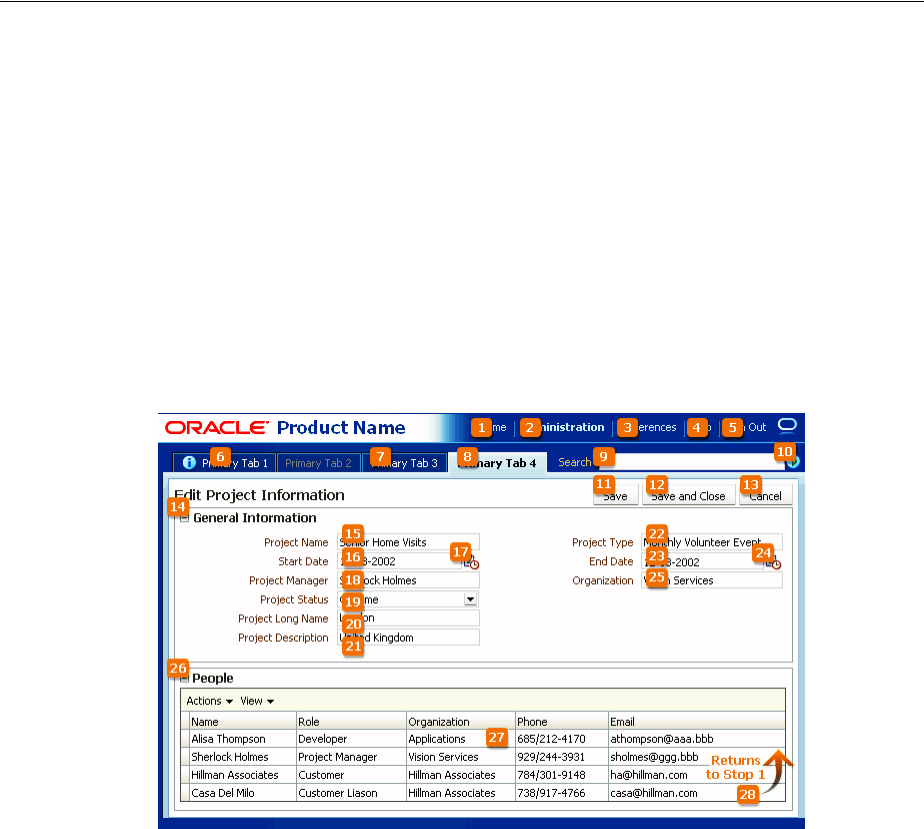
Ta b Tr a v er sa l
C-2 Web User Interface Developer's Guide for Oracle Application Development Framework
All active elements of the page are accessible by Tab traversal, that is, by using the Tab
key to move to the next control and Shift+Tab to move to the previous control. In most
cases, when a control has focus, the action can then be initiated by pressing Enter.
Some complex components use arrow keys to navigate after the component receives
focus using the Tab key.
C.2.1 Tab Traversal Sequence on a Page
Default Tab traversal order for a page is from left to right and from top to bottom, as
shown in Figure C–1. Tab traversal in a two-column form layout does not follow this
pattern, but rather follows a columnar pattern. On reaching the bottom, the tab
sequence repeats again from the top.
Figure C–1 Tab Traversal Sequence on a Page
Avoid using custom code to control the tab traversal sequence within a page, as the
resulting pages would be too difficult to manage and would create an inconsistent user
experience across pages in an application and across applications.
To improve keyboard navigation efficiency for users, you should set the
initialFocusId attribute on the document. For accessibility purposes, you should
also define a skipLinkTarget and include a skip navigation link at the top of
the page, which should navigate directly to the first content-related tab stop.
C.2.2 Tab Traversal Sequence in a Table
The Tab traversals in a table establish a unique row-wise navigation pattern when the
user presses the Tab key several times to navigate sequentially from one cell to
another. When the user presses Enter, the focus moves to the next row, to follow the
same pattern. The navigational sequence begins and ends in the same column as in the
previous row.
Figure C–2 shows an example of a tab traversal sequence in a table.
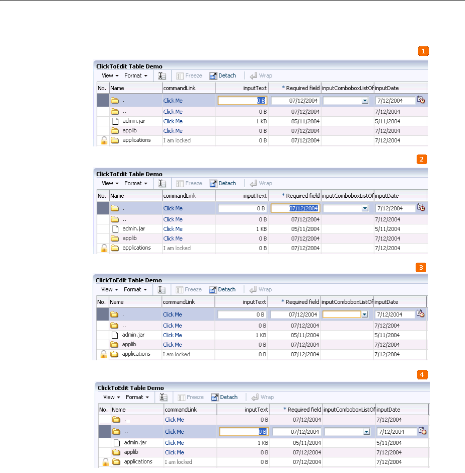
Ta b Tra v er sa l
Keyboard Shortcuts C-3
Figure C–2 Tab Traversal Sequence in a Table
In Figure C–2, the user has navigated the rows in the following way:
1. The user clicks a cell in the inputText column, giving it focus and making it
editable.
Because the Tab key is used to navigate, the inputText column is recognized as the
starting column for the navigation pattern.
2. The user presses the Tab key and moves the focus in the same row to the cell of the
* Required field column.
3. The user presses the Tab key and moves the focus in the same row to the cell of the
inputComboListOf column.
4. The user presses the Enter key and the focus shifts to the inputText column in the
next row.
When the user presses the Enter key in an editabale field, the focus moves to the
first editable field in the next row, and sets a navigation pattern based on the first
set of Tab keys, which is followed in subsequent rows.
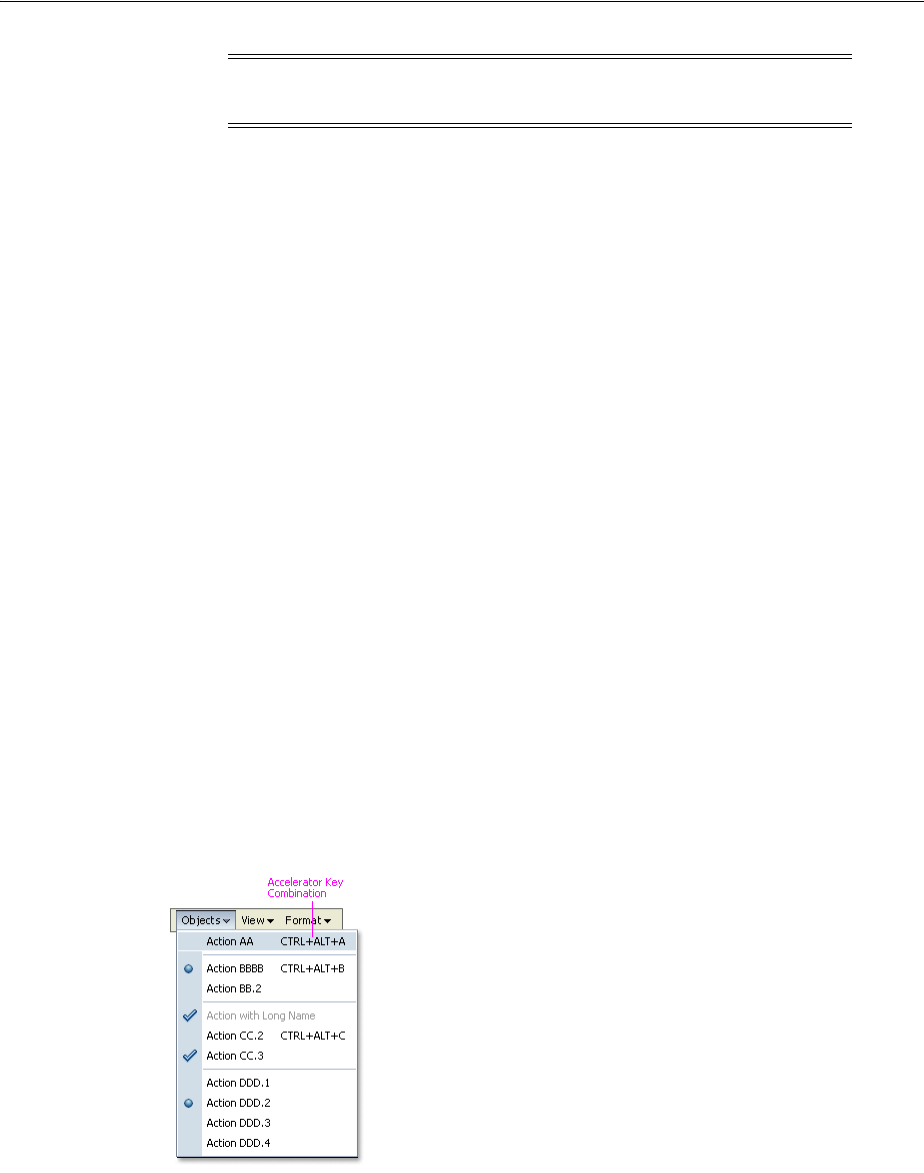
Shortcut Keys
C-4 Web User Interface Developer's Guide for Oracle Application Development Framework
C.3 Shortcut Keys
There are various keyboard shortcuts provided by ADF Faces itself, as well as
component attributes that enable you to create specific keyboard shortcuts for their
specific applications. ADF Faces categorizes shortcut keys for components into two
types, accelerator keys and access keys.
C.3.1 Accelerator Keys
Accelerator keys bypass menu and page navigation and perform actions directly.
Accelerator keys are sometimes also called hot keys. Common accelerator keys in a
Windows application, such as Internet Explorer, are Ctrl+O for Open and Ctrl+P for
Print.
Accelerator keys are single key presses (for example, Enter and Esc) or key
combinations (for example, Ctrl+A) that initiate actions immediately when activated.
A key combination consists of a meta key and an execution key. The meta key may be
Ctrl (Command on a Macintosh keyboard), Alt (Option on a Macintosh keyboard), or
Shift. The execution key is the key that is pressed in conjunction with the meta key.
Some ADF Faces components have their own built-in accelerator keys. For example,
Ctrl+Alt+M is the accelerator key to open the context menu. For more information
about ADF Faces components with their own built-in accelerator keys, see the
component tag documentation.
ADF Faces also enable you to provide custom accelerator keys to specific menu items,
as shown in Figure C–3. All assigned menu accelerator keys are visible when you open
the menu, and should be available in both the regular mode and screen reader mode.
Figure C–3 Accelerator Keys in a Menu
When defining accelerator keys, you must follow these guidelines:
■Because accelerator keys perform actions directly, if a user presses an accelerator
key unintentionally, data may be lost or incorrect data may be entered. To reduce
the likelihood of user error, accelerator keys should be used sparingly, and only for
frequently and repetitively used functions across applications. As a general rule,
less than 25% of available functions should have accelerator keys.
Note: The navigational pattern is not recognized if you use arrow
keys to navigate from one cell to another.

Shortcut Keys
Keyboard Shortcuts C-5
■Custom accelerator keys must not override accelerator keys that are used in the
menus of ADF Faces-supported browsers (see the browser and system
requirements for supported operating systems and browsers in ADF Faces), and
must not override accelerator keys that are used in assistive technologies such as
screen readers.
■Custom menu accelerator keys must always be key combinations. The meta key
may be Ctrl, Ctrl+Shift, or Ctrl+Alt. Ctrl+Alt is the recommended metakey
because Ctrl and Ctrl+Shift are commonly used by browsers. The execution key
must be a printable character (ASCII code range 33-126).
■Custom menu accelerator keys must be unique. If a page were to have different
components that used the same accelerator, it would be difficult for the browser to
predict which actions would be executed by the accelerator at any given time.
Certain ADF Faces components have built-in accelerator keys that apply when the
component has focus. Of these, some are reserved for page-level components, whereas
others may be assigned to menus when the component is not used on a page.
Table C–1 lists the accelerator keys that are already built into page-level ADF Faces
components. You must not use these accelerator keys at all.
The menu commands take precedence if they are on the same page as page-level
components, and have the same accelerator keys. For this reason, you must not use the
accelerator keys listed in Table C–3 and Table C–7 in menus when the related
component also appears on the same page.
C.3.2 Access Keys
Access keys move the focus to a specific UI element, and is defined by the accessKey
property of the ADF Faces component.
Access keys relocate cursor or selection focus to specific interface components. Every
component on the page with definable focus is accessible by tab traversal (using Tab
and Shift+Tab); however, access keys provide quick focus to frequently used
components. Access keys must be unique within a page.
The result of triggering an access key depends on the associated element and the
browser:
Note: In Windows, users have the ability to assign a
Ctrl+Alt+character key sequence to an application desktop shortcut. In
this case, the key assignment overrides browser-level key
assignments. However, this feature is rarely used, so it can generally
be ignored.
Table C–1 Accelerator Keys Reserved for Page-Level Components
Accelerator Key Used In Function
Ctrl+Alt+W
Ctrl+Shift+W
Pop-up
Messaging
Secondary Windows
Toggle focus between open
popups.
Ctrl+Alt+P Splitter Give focus to splitter bar.

Shortcut Keys
C-6 Web User Interface Developer's Guide for Oracle Application Development Framework
■Buttons: In both Firefox and Internet Explorer, access keys give focus to the
component and directly execute the action. Note that in Internet Explorer 7 access
key gives focus to the component, but does not execute the action.
■Links: In Firefox, access keys give focus to the component and directly navigate
the link; in Internet Explorer, access keys give focus only to the link.
■Other Elements: In both browsers, access keys give focus only to the element. For
checkbox components, the access key toggles the checkbox selection. For option
buttons, the access key performs selection of the option button.
Note that the access key could be different for different browsers on different
operating systems. You must refer to your browser's documentation for information
about access keys and their behavior. Table C–2 lists access key combinations for
button and anchor components in some common browsers.
If the mnemonic is present in the text of the component label or prompt (for example,
a menu name, button label, or text box prompt), it is visible in the interface as an
Table C–2 Access Key For Various Browsers
Browser Operating System Key Combination Action
Google Chrome Linux Alt + mnemonic Click
Google Chrome Mac OS X Control + Option +
mnemonic Click
Google Chrome Windows Alt +mnemonic Click
Mozilla Firefox Linux Alt + Shift + mnemonic Click
Mozilla Firefox Mac OS X Control + mnemonic Click
Mozilla Firefox Windows Alt + Shift + mnemonic Click
Microsoft Internet
Explorer 7 Windows Alt + mnemonic Set focus
Microsoft Internet
Explorer 8 Windows Alt + mnemonic Click or set focus
Apple Safari Windows Alt + mnemonic Click
Apple Safari Mac OS X Control + Option +
mnemonic Click
Notes:
■Different versions of a browser might behave differently for the
same access key. For example, using Alt + mnemonic for a button
component in Internet Explorer 7 sets focus on the component,
but it triggers the click action in Internet Explorer 8.
■In Firefox, to change the default behavior of the component when
access key combination is used, change the configuration setting
for the accessibility.accesskeycausesactivation user
preference.
■Some ADF Faces components that are named as Button do not use
HTML button elements. For example,
af:commandToolbarButton uses an anchor HTML element.
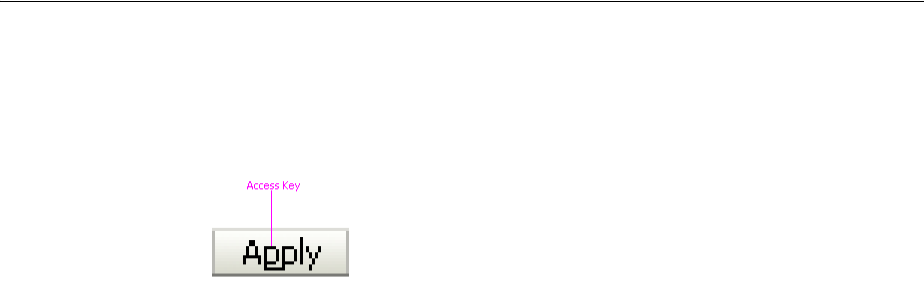
Shortcut Keys
Keyboard Shortcuts C-7
underlined character, as shown in Figure C–4. If the character is not part of the text of
the label or prompt, it is not displayed in the interface.
Figure C–4 Access Key
When defining access keys, you must follow these guidelines:
■Access keys may be provided for buttons and other components with a high
frequency of use. You may provide standard cross-application key assignments for
common actions, such as Save and Cancel. Each of these buttons is assigned a
standard mnemonic letter in each language, such as S for Save or C for Cancel.
■A single letter or symbol can be assigned only to a single instance of an action on a
page. If a page had more than one instance of a button with the same mnemonic,
users would have no way of knowing which button the access key would invoke.
■Focus change initiated through access keys must have alternative interactions,
such as direct manipulation with the mouse (for example, clicking a button).
■The mnemonic must be an alphanumeric character — not a punctuation mark or
symbol — and it must always be case-insensitive. Letters are preferred over
numbers for mnemonics.
■In Internet Explorer, application access keys override any browser-specific menu
access keys (such as Alt+F for the File menu), and this can be a usability issue for
users who habitually use browser access keys. Thus, you must not use access keys
that conflict with the top-level menu access keys in ADF Faces-supported
browsers (for example, Alt+F, E, V, A, T, or H in the English version of Internet
Explorer for Windows XP).
■You are responsible for assigning access keys to specific components. When
choosing a letter for the access key, there are a few important considerations:
–Ease of learning: Although the underlined letter in the label clearly indicates
to the user which letter is the access key, it is still recommended to pick a letter
that is easy for users to remember even without scanning the label. That is
often the first letter of the label, like Y in Yes, or a letter that has a strong sound
when the label is read aloud, such as x in Next.
–Consistency: It is good practice to use the same access key for the same
command on multiple pages. However, this may not always be possible if the
same command label appears multiple times on a page, or if another, more
frequently used command on the page uses the same access key.
–Translation: When a label is translated, the same letter that is used for the
access key in English might not be present in the translation. Developers
should work with their localization department to ensure that alternative
access keys are present in component labels after translation. For example, in
English, the button Next may be assigned the mnemonic letter x, but that letter
does not appear when the label is translated to Suivantes in French.
Depending on the pool of available letters, an alternative letter, such as S or v
(or any other unassigned letter in the term Suivantes), should be assigned to
the translated term.
Shortcut Keys
C-8 Web User Interface Developer's Guide for Oracle Application Development Framework
C.3.3 Shortcut Keys for Common Components
Table C–3 lists the shortcut keys assigned to common components such as Menu,
Menu bar, Multi-Select Choice List, Multi-Select List Box, and so on.
Note: For translation reasons, you should specify access keys as part
of the label. For example, to render the label Cancel with the C access
key, it is recommended to use &Cancel in the textAndAccessKey
property (where the ampersand denotes the mnemonic) rather than C
in the accessKey property. Product suites must ensure that access
keys are not duplicated within each supported language and do not
override access keys within each supported browser unless explicitly
intended.
Table C–3 Shortcut Keys Assigned to Common Components
Shortcut Key Components Function
Enter
Spacebar
All components Activate the component, or the
component element that has the
focus.
Tab
Shift+Tab
All components
Flash components like
ThematicMap, Graph, and
Gauge
Move focus to next or previous
editable component.
Ctrl+A All components Select all.
Alt+Arrow Down Multi-Select Choice List
Multi-Select List Box
Open the list.
Use arrow keys to navigate, and
press Enter or Spacebar to select.
Ctrl+Shift+Home
Ctrl+Shift+End
Multi-Select Choice List
Multi-Select List Box
Select all items from top to
current selection, or select all
items from current selection to
bottom.
Arrow Left
Arrow Right
Menu Bar
Splitter
Input Number Slider
Input Range Slider
Input Number Spinbox
Move focus to different menu on
a menu bar.
Move splitter left or right when it
is in focus.
Move slider left or right when
input number slider or input
range slider is in focus.
Increment or decrement the value
when input number spinbox is in
focus.
Arrow Up
Arrow Down
Menu
Splitter
Input Number Slider
Input Range Slider
Move focus to different menu
items in a menu.
Move splitter up or down when it
is in focus.
Move slider up or down when
input number slider or input
range slider is in focus.
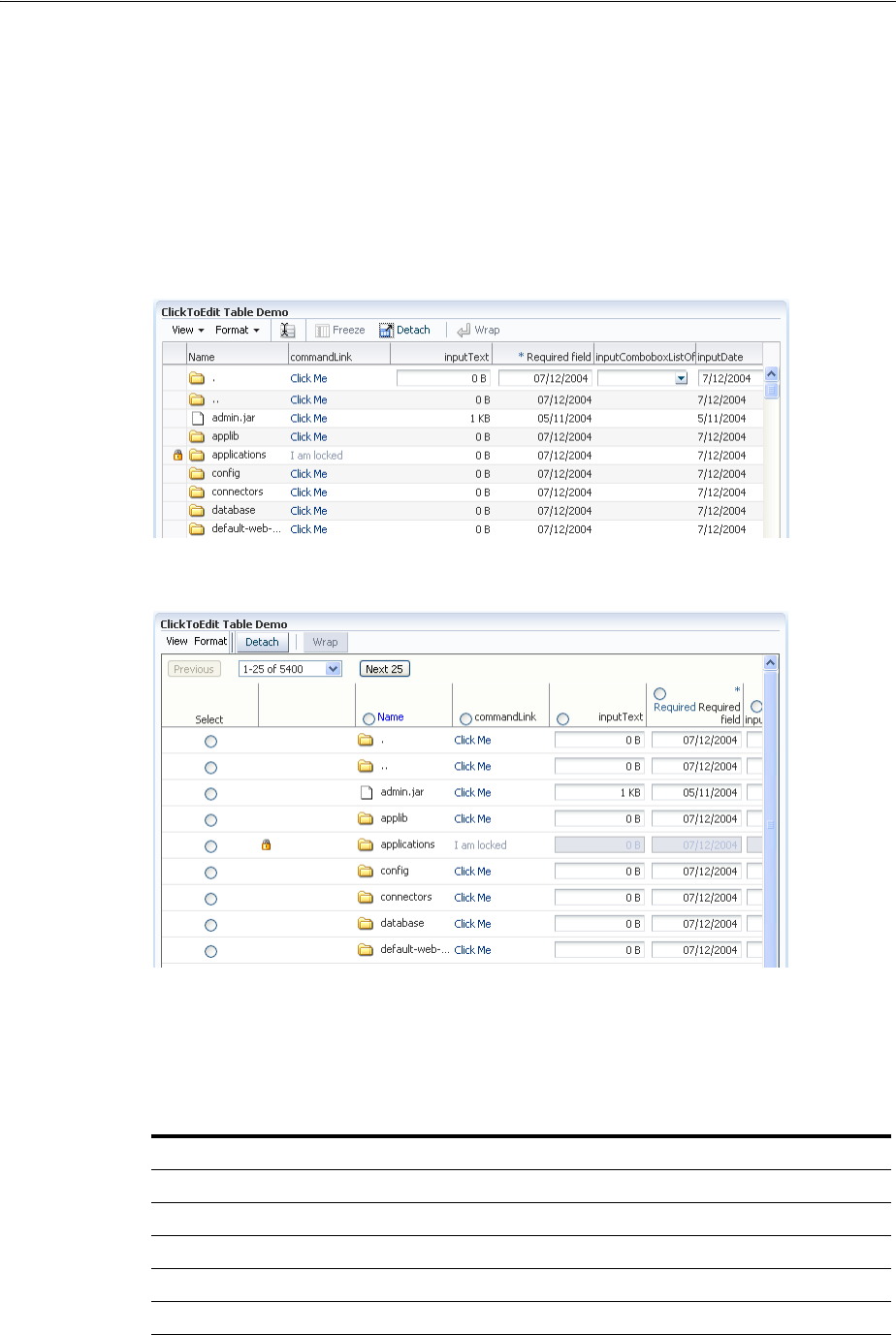
Shortcut Keys
Keyboard Shortcuts C-9
C.3.4 Shortcut Keys for Screen Reader Mode
In screen reader mode, ADF Faces components may render differently than in the
default mode in order to provide better accessibility. For example, a Tree component
has an additional column of radio controls for tree node selection per row.
Figure C–5 and Figure C–6 show the ClickToEdit demo application in the default and
the screen reader mode. In the screen reader mode, note the additional column of
radio controls for row selection.
Figure C–5 ClicktoEdit Demo application in Default mode
Figure C–6 ClickToEdit Demo application in Screen Reader mode
C.3.5 Shortcut Keys for Rich Text Editor Component
Table C–4 lists shortcut keys assigned to the Rich Text Editor component. In regular
mode, all toolbar controls appear on top of the Rich Text Editor area.
Table C–4 Shortcut Keys Assigned to Rich Text Editor Component
Shortcut Key Components Function
Ctrl+B Rich Text Editor Boldface
Ctrl+I Rich Text Editor Italics
Ctrl+U Rich Text Editor Underline
Ctrl+5 Rich Text Editor Strikethrough
Ctrl+E Rich Text Editor Center alignment

Shortcut Keys
C-10 Web User Interface Developer's Guide for Oracle Application Development Framework
In screen reader mode, the Rich Text Editor component displays only the editor and
the toolbar controls are not displayed. There are no shortcut keys for Rich Text Editor
that apply in screen reader mode.
C.3.6 Shortcut Keys for Table, Tree, and Tree Table Components
Table C–5 lists shortcut keys assigned to Table, Tree, and Tree Table in regular rich
mode. Shortcut keys for these components in screen reader mode is summarized in
Table C–6. For more information about Tables and Trees, see Chapter 12, "Using Tables
and Trees."
Ctrl+J Rich Text Editor Full-justified alignment
Ctrl+L Rich Text Editor Left-justified alignment
Ctrl+R Rich Text Editor Right alignment
Ctrl+H Rich Text Editor Create hyperlink
Ctrl+M Rich Text Editor Increase indentation
Ctrl+Shift+M Rich Text Editor Decrease indentation
Ctrl+Shift+H Rich Text Editor Remove hyperlink
Ctrl+Shift+L Rich Text Editor Bulleted list
Ctrl+Alt+L Rich Text Editor Numbered list
Ctrl+Shift+S Rich Text Editor Clear text styles
Ctrl+Alt+- Rich Text Editor Subscript
Ctrl+Alt++ Rich Text Editor Superscript
Ctrl+Alt+R Rich Text Editor Enable rich text editing mode
Ctrl+Y Rich Text Editor Redo
Ctrl+Z Rich Text Editor Undo
Table C–5 Shortcut Keys Assigned to Table, Tree, and Tree Table components
Shortcut Key Components Function
Tab
Shift+Tab
Table
Tree Table
Move focus to next or previous cell
or editable component.
In a table, navigate to the next or
previous editable content in cells. If
the focus is on the last cell of a row
in the table, the Tab key moves focus
to the first editable cell in the next
row. Similarly, Shift + Tab moves
focus to the previous row.
Ctrl+A Table
Tree Table
Select all components, including
column headers, row headers, and
data area.
Ctrl+Alt+M Table
Tree
Tree Table
Launch context menu.
You can also launch context menu
by pressing Ctrl+Alt+B.
Table C–4 (Cont.) Shortcut Keys Assigned to Rich Text Editor Component
Shortcut Key Components Function
Shortcut Keys
Keyboard Shortcuts C-11
Ctrl+Shift+^ Tree
Tree Table
Go up one level.
Enter
Shift+Enter
Table
Tree
Tree Table
Navigate to the next editable cell or
previous editable cell of the column.
If focus is on the column header, sort
table data in ascending order.
Pressing Enter again sorts the
column in descending order.
If the focus is on the filter cell,
perform table filtering.
In a click-to-edit table, if the focus is
on a cell, enable edit mode.
Arrow Left
Arrow Right
Table
Tree Table
Move focus.
Arrow Up
Arrow Down
Table
Tree Table
Move focus.
If a row is selected, move focus to
the previous row or next row. If no
row is selected, scroll the table one
row up or down.
If the first row is selected, move
focus to the column header.
Shift+Arrow Left
Shift+Arrow Right
Table
Tree Table
Move focus and add to selection.
Ctrl+Shift+Arrow Left
Ctrl+Shift+Arrow Right
Table
Tree Table
Move the selected column to the left
or right.
Shift+Arrow Up
Shift+Arrow Down
Table
Tree Table
Tree
Select multiple rows.
Page Up
Page Down
Table
Tree Table
If a row is selected, scroll and select
the same row of the next or previous
page.
If no row is selected, scroll by one
page.
Alt+Page Up
Alt+Page Down
Table
Tree Table
Horizontally scroll the table to the
right or left.
Space Bar
Ctrl+Space Bar
Table
Tree
Tree Table
Select the node.
To select or remove multiple nodes,
press Ctrl+Space Bar.
Shift+Space Bar Table
Tree Table
Select multiple rows.
Esc Table
Tree Table
Remove selection.
If the focus is on the cell, exit
click-to-edit mode, revert the cell
value to original value, and return
focus to the cell. Press Esc key again
to move focus to the row header.
Table C–5 (Cont.) Shortcut Keys Assigned to Table, Tree, and Tree Table components
Shortcut Key Components Function

Shortcut Keys
C-12 Web User Interface Developer's Guide for Oracle Application Development Framework
C.3.7 Shortcut Keys for Table, Tree, and Tree Table Components in Screen Reader
Mode
Table C–6 lists shortcut keys assigned to the Tree, Table, and Tree Table components in
screen reader mode.
F2 Table
Tree Table
Activate click-to-edit mode for the
row. Press F2 again to disable cell
navigation mode.
Table C–6 Shortcut keys assigned to Components in Screen Reader mode
Shortcut Keys Components Function
Spacebar Table
Tree
Tree Table
Select the component. To select a
node, press Tab and move focus to
the component or its radio control.
Press Spacebar when the
component is in focus.
You can also use the Spacebar for
multiple selection.
Pressing Spacebar on a selected
component, unselects it.
Enter Table
Tree
If the focus is on the column
header, sort the column in
ascending order. Pressing Enter
again sorts the column in
descending order.
If the focus is on the disclosure icon
of a tree, open or close that node.
If the focus is on the filter cell,
perform table filtering.
Tab
Shift+Tab
Table Move the focus to the next or
previous cell or editable
component.
Arrow Up
Arrow Down
Arrow Left
Arrow Right
Table Move focus.
Ctrl+Shift+Arrow Left
Ctrl+Shift+Arrow Right
Table
Tree Table
Move the selected column to the
left or right.
Shift+Arrow Left
Shift+Arrow Right
Table
Tree Table
Resize the selected column by 25
pixels from the left or right.
Ctrl+Shift+^ Tree If the focus is on the Hierarchical
Selector icon, show the Hierarchical
Selector popup.
Ctrl+Alt+M
Ctrl+Alt+B
Table
Tree
Tree Table
Launch body context menu.
Table C–5 (Cont.) Shortcut Keys Assigned to Table, Tree, and Tree Table components
Shortcut Key Components Function
Shortcut Keys
Keyboard Shortcuts C-13
In screen reader mode, the Tree component has an additional column of radio controls
for tree node selection per row. The next column in the tree contains the tree nodes
themselves. Nodes that can be expanded have disclosure links that can be in either an
open or closed state. Opening a closed disclosure link makes more nodes of the tree
visible, and navigable on the page.
C.3.8 Shortcut Keys for Data Visualization Components
Table C–7 lists shortcut keys assigned to data visualization components including
Gantt chart, ADF hierarchy viewer components, and ADF geographic map. For more
information about data visualization components, see Chapter 21, "Introduction to
ADF Data Visualization Components."
Note: The screen reader mode does not support the following
functions for the Table and Tree Table components:
■Click-to-edit mode
■Select all rows from the first row to the current row or from the
current row to the last row
■Select all rows
■Remove selection from all columns
Shortcut Keys
C-14 Web User Interface Developer's Guide for Oracle Application Development Framework
Table C–7 Shortcut Keys Assigned to Data Visualization Components
Shortcut Key Components Function
Arrow Left
Arrow Right
List region of all Gantt
chart types
Chart region of project
Gantt
Chart region of scheduling
Gantt
Chart region of resource
utilization Gantt
ADF Geographic Map
ADF Hierarchy Viewer -
nodes
Pivot table
Pivot filter bar
Move focus.
If the focus is on the chart region of
scheduling Gantt, the arrow key
navigation selects the previous or
next taskbar of the current row.
If the focus is on the time bucket of
resource utilization Gantt, the arrow
key navigation selects the previous
or next time bucket in the current
row.
If the focus is on the ADF geographic
map, the arrow key navigation pans
left or right by a small increment.
Press Home or End key to pan by a
large increment.
If the focus is on the node
component of ADF hierarchy viewer,
press Ctrl+Arrow keys to move the
focus left or right without selecting
the component.
If you are using arrow keys to
navigate cells of an editable pivot
table, each focused cell is activated
for editing before allowing you to
navigate to the next cell, making the
navigation slower. Press the Esc key
to deactivate the edit mode of the
focused cell, and navigate faster. To
edit a cell, press the F2 or Enter key.
If the focus is on the pivot table data
cell, press Ctrl+Arrow Left to jump
to the corresponding row header cell.
If the locale is bidirectional (such as
Arabic), press Ctrl+Arrow Right to
jump to the corresponding row
header cell.

Shortcut Keys
Keyboard Shortcuts C-15
Arrow Up
Arrow Down
List region of all Gantt
chart types
Chart region of project
Gantt
Chart Region of scheduling
Gantt
Chart region of resource
utilization Gantt
ADF Geographic Map
ADF Hierarchy Viewer -
nodes
Pivot table
Pivot filter bar
Move focus.
If the focus is on the chart region of
project Gantt, the arrow key
navigation selects previous or next
row.
If the focus is on the chart region
taskbar of scheduling Gantt, the
arrow key navigation selects the first
taskbar of the previous row or the
next row.
If the focus is on the time bucket of
resource utilization Gantt, the arrow
key navigation selects the time
bucket of the previous row or next
row.
If the focus is on the ADF geographic
map component, the arrow key
navigation pans up or down by a
small increment.
If the focus is on the node
component of ADF hierarchy viewer,
press Ctrl+Arrow keys to move the
focus up or down without selecting
the component.
If you are using arrow keys to
navigate cells of an editable pivot
table, each focused cell is activated
for editing before allowing you to
navigate to the next cell, making the
navigation slower. Press the Esc key
to deactivate the edit mode of the
focused cell, and navigate faster. To
edit a cell, press the F2 or Enter key.
If the focus is on the pivot table data
cell, press Ctrl+Arrow Up to jump to
the corresponding column header
cell.
Page Up
Page Down
ADF Geographic Map
ADF Hierarchy Viewer -
diagram
If the focus is on the ADF geographic
map component, the page key
navigation pans up or down by a
large increment.
If the focus is on the diagram of ADF
hierarchy viewer, press and hold to
Page Up or Page Down keys to pan
up or down continuously. Press
Ctrl+Page Up or Ctrl+Page Down to
pan left or right continuously.
+ ADF Geographic Map
ADF Hierarchy Viewer -
diagram
Increase zoom level.
If the focus is on the diagram of ADF
hierarchy viewer, press number keys
1 through 5 to zoom from 10%
through 100%. Press 0 to zoom the
diagram to fit within available space.
Table C–7 (Cont.) Shortcut Keys Assigned to Data Visualization Components
Shortcut Key Components Function

Shortcut Keys
C-16 Web User Interface Developer's Guide for Oracle Application Development Framework
- ADF Geographic Map
ADF Hierarchy Viewer -
diagram
Decrease zoom level.
If the focus is on the diagram of ADF
hierarchy viewer, press number keys
1 through 5 to zoom from 10%
through 100%. Press 0 to zoom the
diagram to fit within available space.
Ctrl+Alt+M All Gantt chart types
Pivot table
Pivot filer bar
Launch context menu.
Home ADF Hierarchy Viewer -
nodes Move focus to first node in the
current level.
End ADF Hierarchy Viewer -
nodes Move focus to last node in the
current level.
Ctrl + Home ADF Hierarchy Viewer -
nodes Move focus and select the root node.
< ADF Hierarchy Viewer -
nodes Switches to the active node's
previous panel.
> ADF Hierarchy Viewer -
nodes Switches to the active node's next
panel.
Ctrl + / ADF Hierarchy Viewer -
nodes Synchronize all nodes to display the
active node's panel.
Ctrl+Shift+^ ADF Hierarchy Viewer -
nodes Go up one level.
Ctrl+/ ADF Hierarchy Viewer -
nodes Switch content panel.
Ctrl+Alt+0 ADF Hierarchy Viewer -
diagrams Center the active node and zoom the
diagram to 100%.
Tab ADF Hierarchy Viewer -
nodes
Pivot table
Pivot filter bar
Move focus through elements.
Esc ADF Hierarchy Viewer -
nodes Return focus to the containing node.
If the focus is on search panel, close
the panel.
Close the Detail window, if it
appears while hovering over a node.
Spacebar ADF Hierarchy Viewer -
nodes
Pivot table
Pivot filter bar
Select the active node. Press
Ctrl+Spacebar to toggle selection of
the active node, and for selecting
multiple nodes.
Enter ADF Hierarchy Viewer -
nodes
Pivot table
Pivot filter bar
Isolate and select active node. Press
Shift+Enter to toggle the state of the
node.
/ ADF Hierarchy Viewer -
nodes Toggle control panel state.
Table C–7 (Cont.) Shortcut Keys Assigned to Data Visualization Components
Shortcut Key Components Function
Shortcut Keys
Keyboard Shortcuts C-17
Some data visualization components provide some common functions to the end user
through menu bar, toolbar, context menu, or a built-in Task Properties dialog box. You
may choose to show, hide, or replace these functionality. If you hide or replace any
functionality, you must provide alternate keyboard accessibility to those functions.
In screen reader mode, the data visualization components are replaced by other
accessible components, as described in Table C–8.
In screen reader mode, the Pivot Table and Pivot Filter Bar render additional icons for
each Header layer and Filter, respectively. End users of the screen reader software can
use Tab key to move focus between these icons and press Enter to perform the
specified Pivot operation.
Ctrl+F ADF Hierarchy Viewer -
nodes If the ADF hierarchy viewer
component is configured to support
search functionality, open the search
panel.
Ctrl+Alt+1 through
Ctrl+Alt+5 ADF Hierarchy Viewer -
nodes Switch diagram layout.
Shift+Alt+Arrow keys Pivot table
Pivot filter bar
Change the layout by pivoting a row,
column, or filter layer to a new
location. Use Shift+Alt+Arrow keys
to perform the following:
■Provide visual feedback,
showing potential destination of
the pivot operation, if the header
layer is selected
■Select different destination
locations.
■Moving or swapping the
selected header layer to the
specified destination.
Table C–8 Alternate ADF Components for Data Visualization components in screen
reader mode
This data visualization
component ... ... is replaced by
Chart region for each Gantt
type Hyperlinks
Use the Tab key to move focus within the chart region. Use Enter
or Esc keys to launch or dismiss the corresponding Properties
dialog box.
ADF Geographic Map Table
Use standard keyboard shortcuts to navigate through the data,
as described in Table C–5.
Note that if the ADF geographic map instance references
multiple data-bound themes, then a dropdown list is also
rendered to enable end users to switch between the
corresponding Table instances.
Hierarchy Viewer Tree Table
Use standard keyboard shortcuts to navigate through the data,
as described in Table C–5.
Table C–7 (Cont.) Shortcut Keys Assigned to Data Visualization Components
Shortcut Key Components Function
Shortcut Keys
C-18 Web User Interface Developer's Guide for Oracle Application Development Framework
C.3.9 Shortcut Keys for Calendar Component
The Calendar component has several views: Day view, Week view, Moth view, and
List view. The List view is displayed in the screen reader mode.
Table C–4 lists shortcut keys assigned to the Calendar component. In regular mode, all
toolbar controls appear on top of the Rich Text Editor area.
Table C–9 Shortcut Keys Assigned to Rich Text Editor Component
Shortcut Key Components Function
Tab
Shift+Tab
Calendar Move focus.
If the focus is on the calendar toolbar, move
focus through Day, Week, Month, List,
Forward button, Backward button, and Today
button.
In the day view, move focus through activities
of the day.
In the week view and month view, move focus
through the Month Day header labels only. Use
Arrow keys to navigate through activities, "+n
more links", and Month Day header labels.
In the month view, if the focus is on a Month
Day header label at the end of the week, move
focus to the Month Day header label of the
following week.
In the list view, move focus to the day, and
then through the activities of the day.

Shortcut Keys
Keyboard Shortcuts C-19
Arrow Left
Arrow Right
Calendar Move focus.
In the day view, Right and Left arrows do not
move focus.
In the week view, if the focus is on an activity,
move focus to the first activity of the previous
or next day. If the previous or next days
contain no activities, move focus to the day
header.
In the month view, the following interaction
occurs:
■If the focus is on a Month Day header
label, move focus to the previous or next
day label.
If the focus is on the label of the last day of
the week in the first week of the month,
Right Arrow moves focus to the label of
the first day of the week in the second
week of the month. If the focus is on the
label of the last day of the month, the Right
Arrow does nothing.
■If the focus is on an activity, move focus to
the next activity of the previous or next
day.
If the previous or next day does not
contain any activities, move focus to the
Month Day label. If focus is on an activity
in the last day of a week, the Right Arrow
does nothing.
■If the focus is on a "+n more" link, move
focus to the next "+n more" links, if they
exist.
If adjacent "+n more" links do not exist,
move focus to the last activity of the day. If
the "+n more" link resides in a day at the
beginning or end of the week, the Left or
Right Arrow do nothing.
Table C–9 (Cont.) Shortcut Keys Assigned to Rich Text Editor Component
Shortcut Key Components Function

Shortcut Keys
C-20 Web User Interface Developer's Guide for Oracle Application Development Framework
C.3.10 Shortcut Keys for Calendar Component in Screen Reader Mode
In screen reader mode, the Calendar component renders to the List view. Table C–10
lists the shortcut keys assigned to Calendar component in screen reader mode.
Arrow Up
Arrow Down
Calendar Move focus.
In the day view, move focus through activities.
When activities conflict and appear within the
same time slot, the Down Arrow moves focus
right and the Up Arrow moves focus left.
In the week view, move focus through
activities of the day. If the focus is on the first
activity of a day, the Up Arrow moves focus to
the day header. If the focus is on the day
header, the Down Arrow moves focus to the
first activity of that day. If the day has no
activities, the Down Arrow does nothing.
In the month view, move focus through
activities in a day.
■If the focus is on the first activity in a day,
the Up Arrow moves focus to the Month
day header label.
■If the focus is on the Month Day header
label, the Up Arrow moves focus to the last
activity of the day above it.
■If the focus is on the last activity on a day
in the last week of the month, the Down
Arrow does nothing.
■If the focus is on the month header day
label in the first week of the month, the Up
Arrow does nothing.
Ctrl+Alt+M Calendar Launch context menu.
You can also launch context menu by pressing
Ctrl+Alt+B.
Note: When using arrows to navigate through activities of a month
or week, all-day activities get focus only when the user is navigating
within a day, which an all-day activity starts on. Otherwise, all-day
activities are skipped.
Table C–10 Shortcut keys assigned to Calendar Component in Screen Reader mode
Shortcut Key Components Function
Tab
Shift+Tab
Calendar Move the focus to the next or
previous cell or editable
component.
Arrow Up
Arrow Down
Arrow Left
Arrow Right
Calendar Move focus.
Table C–9 (Cont.) Shortcut Keys Assigned to Rich Text Editor Component
Shortcut Key Components Function

The Enter Key
Keyboard Shortcuts C-21
C.4 Default Cursor or Focus Placement
The default cursor puts the initial focus on a component so that keyboard users can
start interacting with the page without excessive navigation.
Focus refers to a type of selection outline that moves through the page when users
press the tab key or access keys. When the focus moves to a field where data can be
entered, a cursor appears in the field. If the field already contains data, the data is
highlighted. In addition, after using certain controls (such as a list of values (LOV) or
date-time picker), the cursor or focus placement moves to specific locations predefined
by the component.
During the loading of a standard ADF Faces page, focus appears on the first focusable
component on the page — either an editable widget or a navigation component. If
there is no focusable element on the page, focus appears on the browser address field.
When defining default cursor and focus placement, you should follow these
guidelines:
■ADF Faces applications should provide default cursor or focus placement on most
pages so that keyboard users have direct access to content areas, rather than
having to tab through UI elements at the top of the page.
■You can set focus on a different component than the default when the page is
loaded. If your page has a common starting point for data entry, you may change
default focus or cursor location so that users can start entering data without
excessive keyboard or mouse navigation. Otherwise, do not do this because it
makes it more difficult for keyboard users (particularly screen reader users) to
orient themselves after the page is loaded.
C.5 The Enter Key
The Enter key triggers an action when the cursor is in certain fields or when focus is on
a link or button. You should use the Enter key to activate a common commit button,
such as in a Login form or in a dialog.
Many components have built-in actions for the Enter key. Some examples include:
■When focus is on a link or button, the Enter key navigates the link or triggers the
action.
■When the cursor is in a query search region, quick query search, or
Query-By-Example (QBE) field, the Enter key triggers the search.
■In a table, the Enter key moves focus to the cell below, and pressing Shift+Enter
moves focus to the cell above. When the focus moves, the current cell reverts to the
read-only mode.

The Enter Key
C-22 Web User Interface Developer's Guide for Oracle Application Development Framework

D
Quick Start Layout Themes D-1
DQuick Start Layout Themes
This appendix shows how each of the quick start layouts are affected when you choose
to apply themes to them. ADF Faces provides a number of components that you can
use to define the overall layout of a page. JDeveloper contains predefined quick start
layouts that use these components to provide you with a quick and easy way to
correctly build the layout. You can choose from one, two, or three column layouts.
When you choose to apply a theme to the chosen quick layout, color and styling are
added to some of the components used in the quick start layout.
Figure D–1 and Figure D–2 show each of the layouts with and without themes applied.
For more information about themes, see Chapter 28, "Customizing the Appearance
Using Styles and Skins"
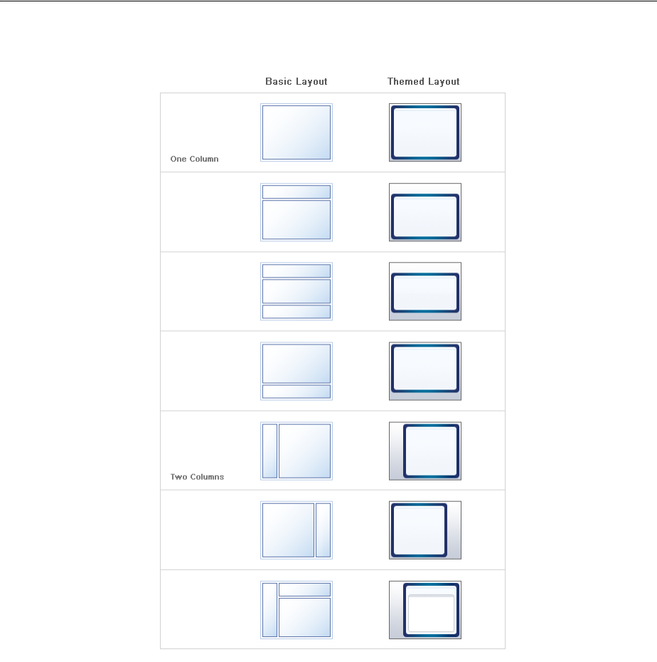
D-2 Web User Interface Developer's Guide for Oracle Application Development Framework
Figure D–1 Quick Start Layouts With and Without Themes
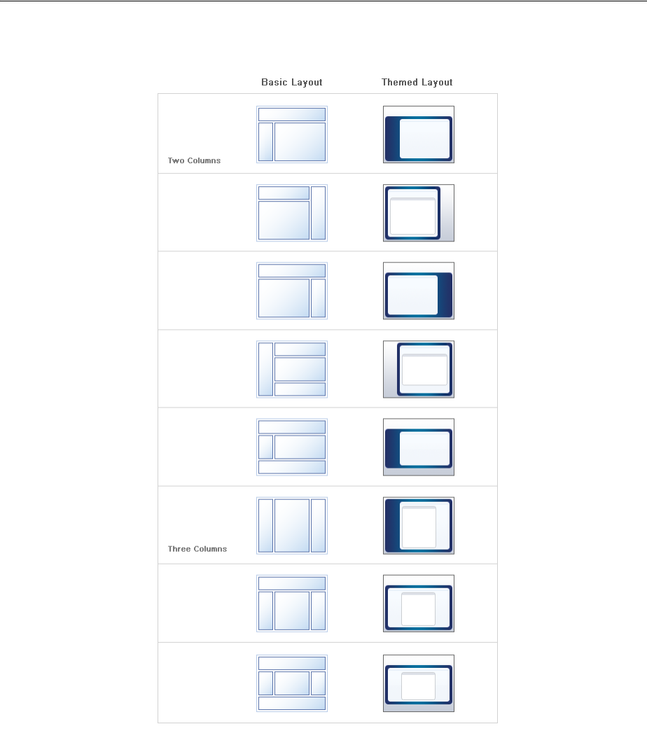
Quick Start Layout Themes D-3
Figure D–2 Quick Start Layouts With and Without Themes

D-4 Web User Interface Developer's Guide for Oracle Application Development Framework

E
Code Samples E-1
ECode Samples
This appendix provides the full length code samples referenced from sections
throughout this guide.
E.1 Samples for Chapter 4, "Using ADF Faces Client-Side Architecture"
Following are code examples for using ADF Faces architecture
E.1.1 The adf-js-partitions.xml File
The default ADF Faces adf-js-partitions.xml file has partitions that you can
override by creating your own partitions file. For more information, see Section 4.9,
"JavaScript Library Partitioning." Example E–1 shows the default ADF Faces
adf-js-partitions.xml file.
Example E–1 The Default adf-js-partitions.xml File
<?xml version="1.0" encoding="utf-8"?>
<partitions xmlns="http://xmlns.oracle.com/adf/faces/partition">
<partition>
<partition-name>boot</partition-name>
<feature>AdfBootstrap</feature>
</partition>
<partition>
<partition-name>core</partition-name>
<feature>AdfCore</feature>
<!-- Behavioral component super classes -->
<feature>AdfUIChoose</feature>
<feature>AdfUICollection</feature>
<feature>AdfUICommand</feature>
<feature>AdfUIDialog</feature>
<feature>AdfUIDocument</feature>
<feature>AdfUIEditableValue</feature>
<feature>AdfUIForm</feature>
<feature>AdfUIGo</feature>
<feature>AdfUIInput</feature>
<feature>AdfUIObject</feature>
<feature>AdfUIOutput</feature>
<feature>AdfUIPanel</feature>
<feature>AdfUIPopup</feature>

Samples for Chapter 4, "Using ADF Faces Client-Side Architecture"
E-2 Web User Interface Developer's Guide for Oracle Application Development Framework
<feature>AdfUISelectBoolean</feature>
<feature>AdfUISelectInput</feature>
<feature>AdfUISelectOne</feature>
<feature>AdfUISelectMany</feature>
<feature>AdfUIShowDetail</feature>
<feature>AdfUISubform</feature>
<feature>AdfUIValue</feature>
<!-- These are all so common that we group them with core -->
<feature>AdfRichDocument</feature>
<feature>AdfRichForm</feature>
<feature>AdfRichPopup</feature>
<feature>AdfRichSubform</feature>
<feature>AdfRichCommandButton</feature>
<feature>AdfRichCommandLink</feature>
<!--
Dialog is currently on every page for messaging. No use
in putting these in a separate partition.
-->
<feature>AdfRichPanelWindow</feature>
<feature>AdfRichDialog</feature>
<!-- af:showPopupBehavior is so small/common, belongs in core -->
<feature>AdfShowPopupBehavior</feature>
</partition>
<partition>
<partition-name>accordion</partition-name>
<feature>AdfRichPanelAccordion</feature>
</partition>
<partition>
<partition-name>border</partition-name>
<feature>AdfRichPanelBorderLayout</feature>
</partition>
<partition>
<partition-name>box</partition-name>
<feature>AdfRichPanelBox</feature>
</partition>
<partition>
<partition-name>calendar</partition-name>
<feature>AdfUICalendar</feature>
<feature>AdfRichCalendar</feature>
<feature>AdfCalendarDragSource</feature>
<feature>AdfCalendarDropTarget</feature>
</partition>
<partition>
<partition-name>collection</partition-name>
<feature>AdfUIDecorateCollection</feature>
<feature>AdfRichPanelCollection</feature>
</partition>
<partition>
<partition-name>color</partition-name>
<feature>AdfRichChooseColor</feature>
<feature>AdfRichInputColor</feature>

Samples for Chapter 4, "Using ADF Faces Client-Side Architecture"
Code Samples E-3
</partition>
<partition>
<partition-name>date</partition-name>
<feature>AdfRichChooseDate</feature>
<feature>AdfRichInputDate</feature>
</partition>
<partition>
<partition-name>declarativeComponent</partition-name>
<feature>AdfUIInclude</feature>
<feature>AdfUIDeclarativeComponent</feature>
<feature>AdfRichDeclarativeComponent</feature>
</partition>
<partition>
<partition-name>detail</partition-name>
<feature>AdfRichShowDetail</feature>
</partition>
<partition>
<partition-name>dnd</partition-name>
<feature>AdfDragAndDrop</feature>
<feature>AdfCollectionDragSource</feature>
<feature>AdfStampedDropTarget</feature>
<feature>AdfCollectionDropTarget</feature>
<feature>AdfAttributeDragSource</feature>
<feature>AdfAttributeDropTarget</feature>
<feature>AdfComponentDragSource</feature>
<feature>AdfDropTarget</feature>
</partition>
<partition>
<partition-name>detailitem</partition-name>
<feature>AdfRichShowDetailItem</feature>
</partition>
<partition>
<partition-name>file</partition-name>
<feature>AdfRichInputFile</feature>
</partition>
<partition>
<partition-name>form</partition-name>
<feature>AdfRichPanelFormLayout</feature>
<feature>AdfRichPanelLabelAndMessage</feature>
</partition>
<partition>
<partition-name>format</partition-name>
<feature>AdfRichOutputFormatted</feature>
</partition>
<partition>
<partition-name>frame</partition-name>
<feature>AdfRichInlineFrame</feature>
</partition>
<partition>
<partition-name>header</partition-name>

Samples for Chapter 4, "Using ADF Faces Client-Side Architecture"
E-4 Web User Interface Developer's Guide for Oracle Application Development Framework
<feature>AdfRichPanelHeader</feature>
<feature>AdfRichShowDetailHeader</feature>
</partition>
<partition>
<partition-name>imagelink</partition-name>
<feature>AdfRichCommandImageLink</feature>
</partition>
<partition>
<partition-name>iedit</partition-name>
<feature>AdfInlineEditing</feature>
</partition>
<partition>
<partition-name>input</partition-name>
<feature>AdfRichInputText</feature>
<feature>AdfInsertTextBehavior</feature>
</partition>
<partition>
<partition-name>label</partition-name>
<feature>AdfRichOutputLabel</feature>
</partition>
<partition>
<partition-name>list</partition-name>
<feature>AdfRichPanelList</feature>
</partition>
<partition>
<partition-name>lov</partition-name>
<feature>AdfUIInputPopup</feature>
<feature>AdfRichInputComboboxListOfValues</feature>
<feature>AdfRichInputListOfValues</feature>
</partition>
<partition>
<partition-name>media</partition-name>
<feature>AdfRichMedia</feature>
</partition>
<partition>
<partition-name>message</partition-name>
<feature>AdfUIMessage</feature>
<feature>AdfUIMessages</feature>
<feature>AdfRichMessage</feature>
<feature>AdfRichMessages</feature>
</partition>
<partition>
<partition-name>menu</partition-name>
<feature>AdfRichCommandMenuItem</feature>
<feature>AdfRichGoMenuItem</feature>
<feature>AdfRichMenuBar</feature>
<feature>AdfRichMenu</feature>
</partition>
<partition>
<partition-name>nav</partition-name>

Samples for Chapter 4, "Using ADF Faces Client-Side Architecture"
Code Samples E-5
<feature>AdfUINavigationPath</feature>
<feature>AdfUINavigationLevel</feature>
<feature>AdfRichBreadCrumbs</feature>
<feature>AdfRichCommandNavigationItem</feature>
<feature>AdfRichNavigationPane</feature>
</partition>
<partition>
<partition-name>note</partition-name>
<feature>AdfRichNoteWindow</feature>
</partition>
<partition>
<partition-name>poll</partition-name>
<feature>AdfUIPoll</feature>
<feature>AdfRichPoll</feature>
</partition>
<partition>
<partition-name>progress</partition-name>
<feature>AdfUIProgress</feature>
<feature>AdfRichProgressIndicator</feature>
</partition>
<partition>
<partition-name>print</partition-name>
<feature>AdfShowPrintablePageBehavior</feature>
</partition>
<partition>
<partition-name>scrollComponentIntoView</partition-name>
<feature>AdfScrollComponentIntoViewBehavior</feature>
</partition>
<partition>
<partition-name>query</partition-name>
<feature>AdfUIQuery</feature>
<feature>AdfRichQuery</feature>
<feature>AdfRichQuickQuery</feature>
</partition>
<partition>
<partition-name>region</partition-name>
<feature>AdfUIRegion</feature>
<feature>AdfRichRegion</feature>
</partition>
<partition>
<partition-name>reset</partition-name>
<feature>AdfUIReset</feature>
<feature>AdfRichResetButton</feature>
</partition>
<partition>
<partition-name>rte</partition-name>
<feature>AdfRichTextEditor</feature>
<feature>AdfRichTextEditorInsertBehavior</feature>
</partition>
<partition>

Samples for Chapter 4, "Using ADF Faces Client-Side Architecture"
E-6 Web User Interface Developer's Guide for Oracle Application Development Framework
<partition-name>select</partition-name>
<feature>AdfRichSelectBooleanCheckbox</feature>
<feature>AdfRichSelectBooleanRadio</feature>
<feature>AdfRichSelectManyCheckbox</feature>
<feature>AdfRichSelectOneRadio</feature>
</partition>
<partition>
<partition-name>selectmanychoice</partition-name>
<feature>AdfRichSelectManyChoice</feature>
</partition>
<partition>
<partition-name>selectmanylistbox</partition-name>
<feature>AdfRichSelectManyListbox</feature>
</partition>
<partition>
<partition-name>selectonechoice</partition-name>
<feature>AdfRichSelectOneChoice</feature>
</partition>
<partition>
<partition-name>selectonelistbox</partition-name>
<feature>AdfRichSelectOneListbox</feature>
</partition>
<partition>
<partition-name>shuttle</partition-name>
<feature>AdfUISelectOrder</feature>
<feature>AdfRichSelectManyShuttle</feature>
<feature>AdfRichSelectOrderShuttle</feature>
</partition>
<partition>
<partition-name>slide</partition-name>
<feature>AdfRichInputNumberSlider</feature>
<feature>AdfRichInputRangeSlider</feature>
</partition>
<partition>
<partition-name>spin</partition-name>
<feature>AdfRichInputNumberSpinbox</feature>
</partition>
<partition>
<partition-name>status</partition-name>
<feature>AdfRichStatusIndicator</feature>
</partition>
<partition>
<partition-name>stretch</partition-name>
<feature>AdfRichDecorativeBox</feature>
<feature>AdfRichPanelSplitter</feature>
<feature>AdfRichPanelStretchLayout</feature>
<feature>AdfRichPanelDashboard</feature>
<feature>AdfPanelDashboardBehavior</feature>
<feature>AdfDashboardDropTarget</feature>
</partition>

Samples for Chapter 4, "Using ADF Faces Client-Side Architecture"
Code Samples E-7
<partition>
<partition-name>tabbed</partition-name>
<feature>AdfUIShowOne</feature>
<feature>AdfRichPanelTabbed</feature>
</partition>
<partition>
<partition-name>table</partition-name>
<feature>AdfUIIterator</feature>
<feature>AdfUITable</feature>
<feature>AdfUITable2</feature>
<feature>AdfUIColumn</feature>
<feature>AdfRichColumn</feature>
<feature>AdfRichTable</feature>
</partition>
<partition>
<partition-name>toolbar</partition-name>
<feature>AdfRichCommandToolbarButton</feature>
<feature>AdfRichToolbar</feature>
</partition>
<partition>
<partition-name>toolbox</partition-name>
<feature>AdfRichToolbox</feature>
</partition>
<partition>
<partition-name>train</partition-name>
<feature>AdfUIProcess</feature>
<feature>AdfRichCommandTrainStop</feature>
<feature>AdfRichTrainButtonBar</feature>
<feature>AdfRichTrain</feature>
</partition>
<partition>
<partition-name>tree</partition-name>
<feature>AdfUITree</feature>
<feature>AdfUITreeTable</feature>
<feature>AdfRichTree</feature>
<feature>AdfRichTreeTable</feature>
</partition>
<!--
Some components which typically do have client-side representation,
but small enough that we might as well download in a single partition
in the event that any of these are needed.
-->
<partition>
<partition-name>uncommon</partition-name>
<feature>AdfRichGoButton</feature>
<feature>AdfRichIcon</feature>
<feature>AdfRichImage</feature>
<feature>AdfRichOutputText</feature>
<feature>AdfRichPanelGroupLayout</feature>
<feature>AdfRichSeparator</feature>
<feature>AdfRichSpacer</feature>
<feature>AdfRichGoLink</feature>
</partition>

Samples for Chapter 31, "Creating Custom ADF Faces Components"
E-8 Web User Interface Developer's Guide for Oracle Application Development Framework
<partition>
<partition-name>eum</partition-name>
<feature>AdfEndUserMonitoring</feature>
</partition>
<partition>
<partition-name>ads</partition-name>
<feature>AdfActiveDataService</feature>
</partition>
<partition>
<partition-name>automation</partition-name>
<feature>AdfAutomationTest</feature>
</partition>
</partitions>
E.2 Samples for Chapter 31, "Creating Custom ADF Faces Components"
Following are code examples for creating a custom component.
E.2.1 Event Code for JavaScript
When you create a custom component, you need to provide code in JavaScript that
will perform the functions required when a event is fired, such as a mouse click.
Example E–2 shows the event code that might be added for the tagPane component.
Example E–2 tagPane Event JavaScript
/**
* Fires a select type event to the server for the source component
* when a tag is clicked.
*/
function AcmeTagSelectEvent(source, tag)
{
AdfAssert.assertPrototype(source, AdfUIComponent);
AdfAssert.assertString(tag); this.Init(source, tag);
}
// make AcmeTagSelectEvent a subclass of AdfComponentEvent
AdfObject.createSubclass(AcmeTagSelectEvent, AdfComponentEvent);
/**
* The event type
*/
AcmeTagSelectEvent.SELECT_EVENT_TYPE = "tagSelect";
/**
* Event Object constructor
*/
AcmeTagSelectEvent.prototype.Init = function(source, tag)
{
AdfAssert.assertPrototype(source, AdfUIComponent);
AdfAssert.assertString(tag);
this._tag = tag;
AcmeTagSelectEvent.superclass.Init.call(this, source, AcmeTagSelectEvent.SELECT_
EVENT_TYPE);}
/**
* Indicates this event should be sent to the server

Samples for Chapter 31, "Creating Custom ADF Faces Components"
Code Samples E-9
*/
AcmeTagSelectEvent.prototype.propagatesToServer = function()
{
return true;
}
/**
* Override of AddMarshalledProperties to add parameters * sent server side.
*/
AcmeTagSelectEvent.prototype.AddMarshalledProperties = function( properties)
{
properties.tag = this._tag;
}
/**
* Convenient method for queue a AcmeTagSelectEvent.
*/
AcmeTagSelectEvent.queue = function(component, tag)
{
AdfAssert.assertPrototype(component, AdfUIComponent);
AdfAssert.assertString(tag);
AdfLogger.LOGGER.logMessage(AdfLogger.FINEST,
"AcmeTagSelectEvent.queue(component, tag)");
new AcmeTagSelectEvent(component, tag).queue(true);
}
/**
* returns the selected file type
*/
AcmeTagSelectEvent.prototype.getTag = function()
{
return this._tag;}
/**
* returns a debug string
*/
AcmeTagSelectEvent.prototype.toDebugString = function()
{
var superString = AcmeTagSelectEvent.superclass.toDebugString.call(this);
return superString.substring(0, superString.length - 1)
+ ", tag="
+ this._tag + "]";
}
/*
*
* Make sure that this event only invokes immediate validators
* on the client.
*/
AcmeTagSelectEvent.prototype.isImmediate = function()
{
return true;
}
E.2.2 Example Tag Library Descriptor File Code
When you create a custom component, you need to create a tag library descriptor
(TLD) file, which provides more information on the Java Class to the JSP compilation
engine and IDE tools. Example E–3 shows an example TLD file that defines the
tagPane component.

Samples for Chapter 31, "Creating Custom ADF Faces Components"
E-10 Web User Interface Developer's Guide for Oracle Application Development Framework
Example E–3 tagPane acme.tld Tag Library Descriptor Code
<?xml version = '1.0' encoding = 'windows-1252'?>
<taglib xmlns:xsi="http://www.w3.org/2001/XMLSchema-instance"
xsi:schemaLocation="http://java.sun.com/xml/ns/javaee
http://java.sun.com/xml/ns/javaee/web-jsptaglibrary_2_1.xsd"
version="2.1" xmlns="http://java.sun.com/xml/ns/javaee">
<description>Acme Corporation JSF components</description>
<display-name>acme</display-name>
<tlib-version>1.0</tlib-version>
<short-name>acme</short-name>
<uri>http://oracle.adfdemo.acme</uri>
<tag>
<description>
</description>
<name>tagPane</name>
<tag-class>oracle.adfdemo.acme.faces.taglib.TagPaneTag</tag-class>
<body-content>JSP</body-content>
<attribute>
<name>id</name>
<rtexprvalue>true</rtexprvalue>
</attribute>
<attribute>
<name>rendered</name>
<deferred-value>
<type>boolean</type>
</deferred-value>
</attribute>
<attribute>
<name>tagSelectListener</name>
<deferred-method>
<method-signature>void
</method-signature>
myMethod(oracle.adfdemo.acme.faces.event.TagSelectEvent)
</deferred-method>
</attribute>
<attribute>
<name>visible</name>
<deferred-value>
<type>boolean</type>
</deferred-value>
</attribute>
<attribute>
<name>partialTriggers</name>
<deferred-value>
</deferred-value>
</attribute>
<attribute>
<name>inlineStyle</name>
<deferred-value/>
</attribute>
<attribute>
<name>inlineClass</name>
<deferred-value/>
</attribute>
<attribute>
<name>tags</name>
<deferred-value/>
</attribute>
<attribute>
<name>binding</name>

Samples for Chapter 31, "Creating Custom ADF Faces Components"
Code Samples E-11
<deferred-value/>
</attribute>
<attribute>
<name>orderBy</name>
<deferred-value/>
</attribute>
</tag>
</taglib>

Samples for Chapter 31, "Creating Custom ADF Faces Components"
E-12 Web User Interface Developer's Guide for Oracle Application Development Framework
