UMA Style Guide V2
User Manual:
Open the PDF directly: View PDF  .
.
Page Count: 21


01 About UMA
02 Logo Wordmark
03 Brand Elements
04 Brand in Use

About UMA
01
About UMA
UMA stands for universal market access,
derived from our mission to make
financial markets universally accessible
and fair. UMA can be leveraged to create
unstoppable financial contracts on the
blockchain that can securely reference
on-chain or fiat-world assets.

Brand Attributes Innovative
Global
Institutional
Aspirational
Moonshot
Fundamental
Open
Revolutionizing
Financial
Our brand attributes describe how UMA
should feel as a brand.!
!
These attributes are used to check the
tone of feeling of UMA’s brand materials,
writing, and website.

Logo Wordmark
02
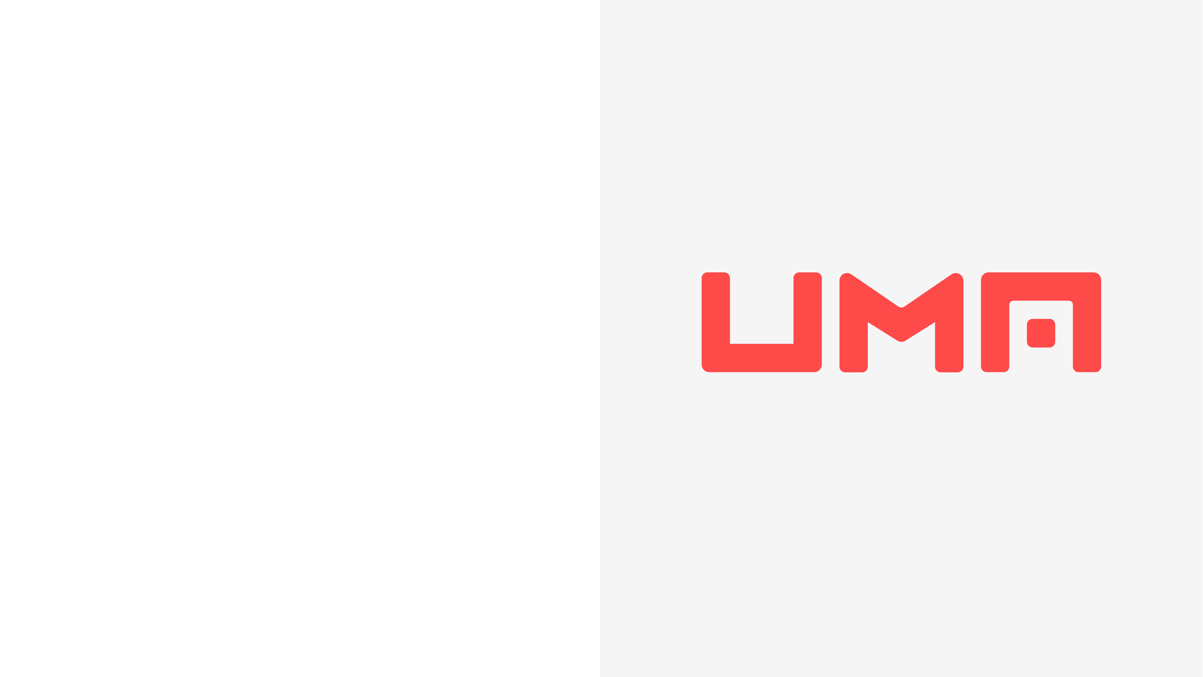
Primary Wordmark
A horizontal wordmark is the primary
mark for UMA. It should be used !
in almost all instances that require brand
representation and identification.
Usage Examples:
-UMA website
-Social media, avatars, headers
-Advertising, promotional material
-Collateral

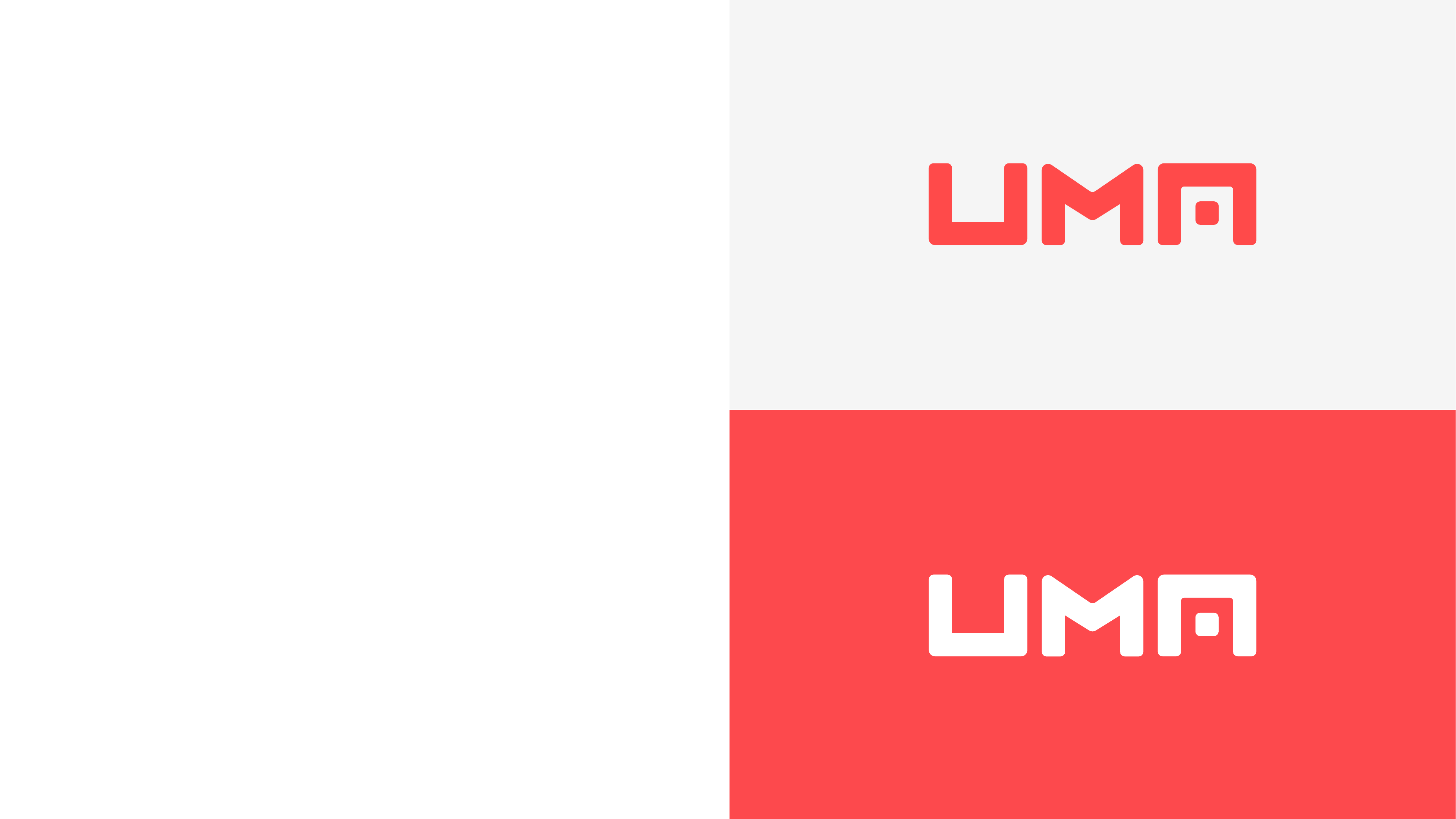
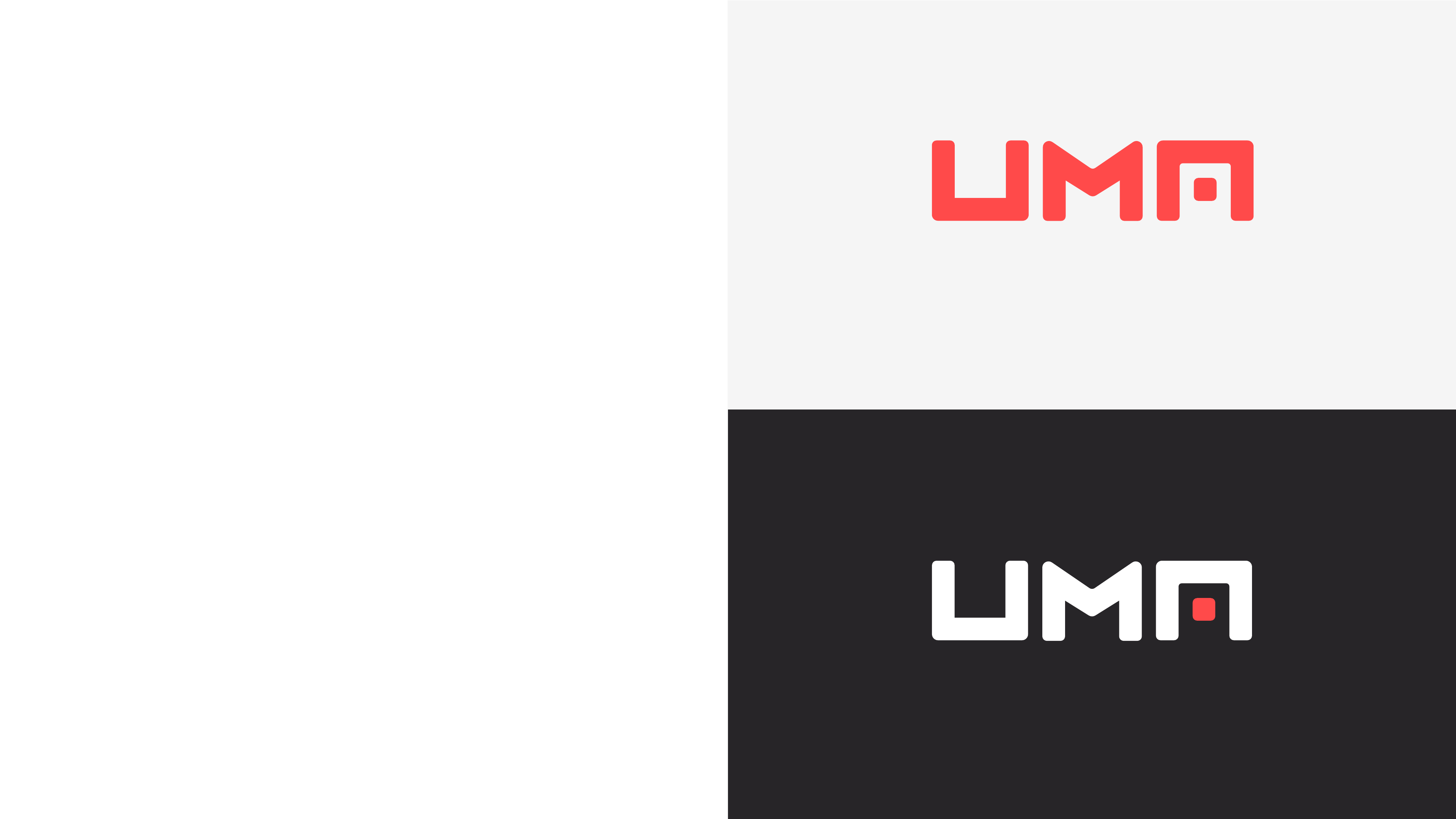
Alternate Wordmark
The UMA wordmark can also be used on !
a dark gray background knocked out in
white, with the center element of the “A”
colored in the brand’s primary red color.
Universal Market Access
Universal Market Access
Tagline Lockup
The wordmark can also be used in !
conjunction with “Universal Market Access”
for presentation purposes or further !
brand representation.
When using this lockup, “Universal Market
Access” should always be stacked vertically
underneath and equal to the width of the
wordmark. “Universal Market Access” should
be set in Halyard Display SemiBold.
Project
Project
Project Lockup
For additional brand representation along !
with the tagline lockup, the UMA wordmark
may also be used with the word “Project”.
When using this lockup, “Project” should
always sit beside the UMA wordmark !
on one line and be equal to the height of the
wordmark. “Project” should be set in Halyard !
Display SemiBold.
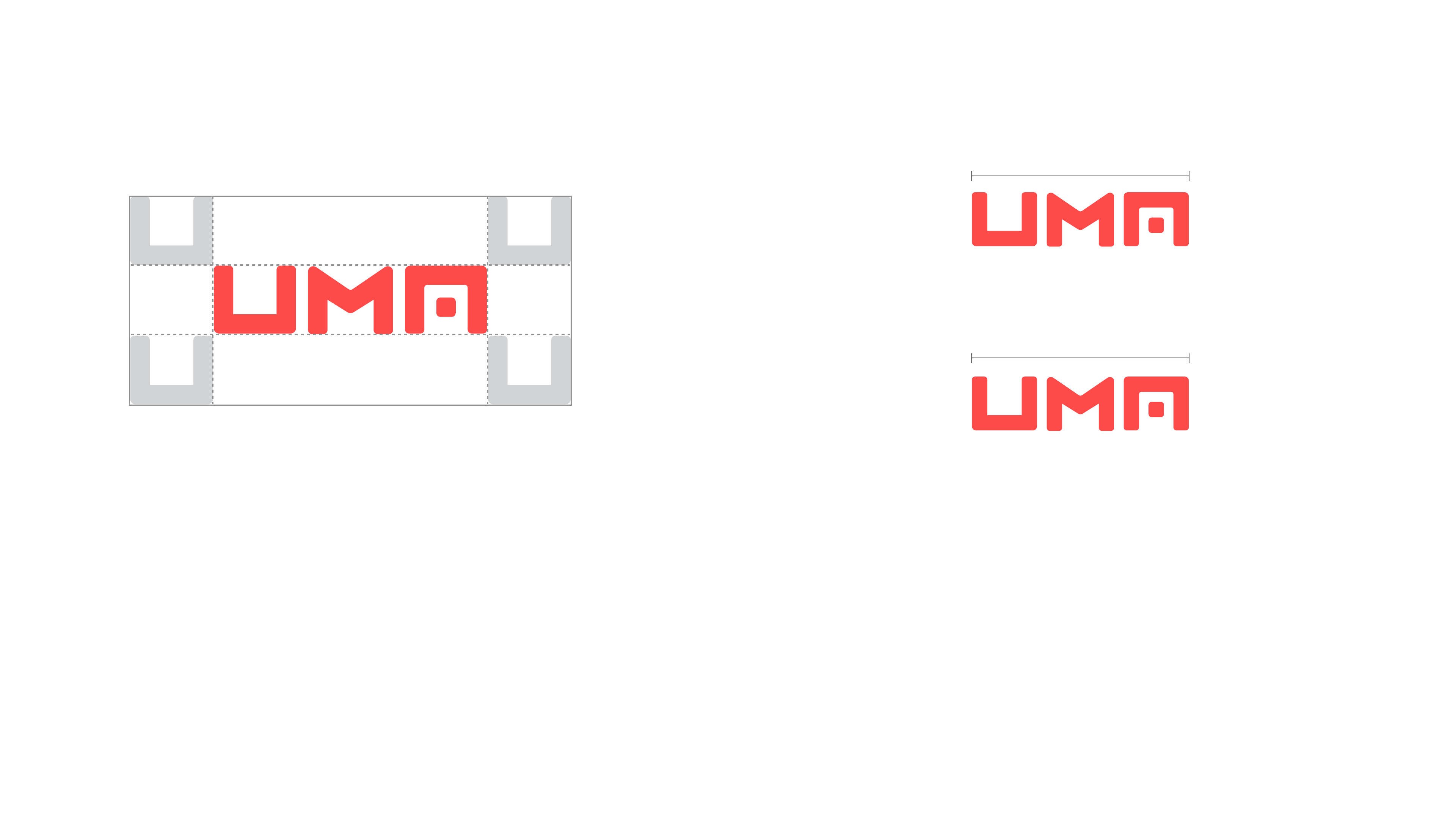
Clearspace
The full wordmark should be allowed ample
space from other elements including edges,
images, and other logos. Leave space
equivalent to the “U” from the wordmark.
Mark Size Limits
The full wordmark should never be reduced
below 35px in width for screen applications,
and 0.5” for print applications.
0.5”
35px

03
Brand Elements

Halyard Display SemiBold
Halyard Text Book
AaBbCcDdEeFfGgHhIiJjKkLl
MmNnOoPpQqRrSsTtUuVvW
wXxYyZz
0123456789!@#$%^&*( )
AaBbCcDdEeFfGgHhIiJjKkLl
MmNnOoPpQqRrSsTtUuVvW
wXxYyZz
0123456789!@#$%^&*( )
Primary Typography
UMA uses Halyard as its primary typeface.
For all display and heading type, !
Halyard Display SemiBold should be used.
!
For all body type, Halyard Text Book
should be used.

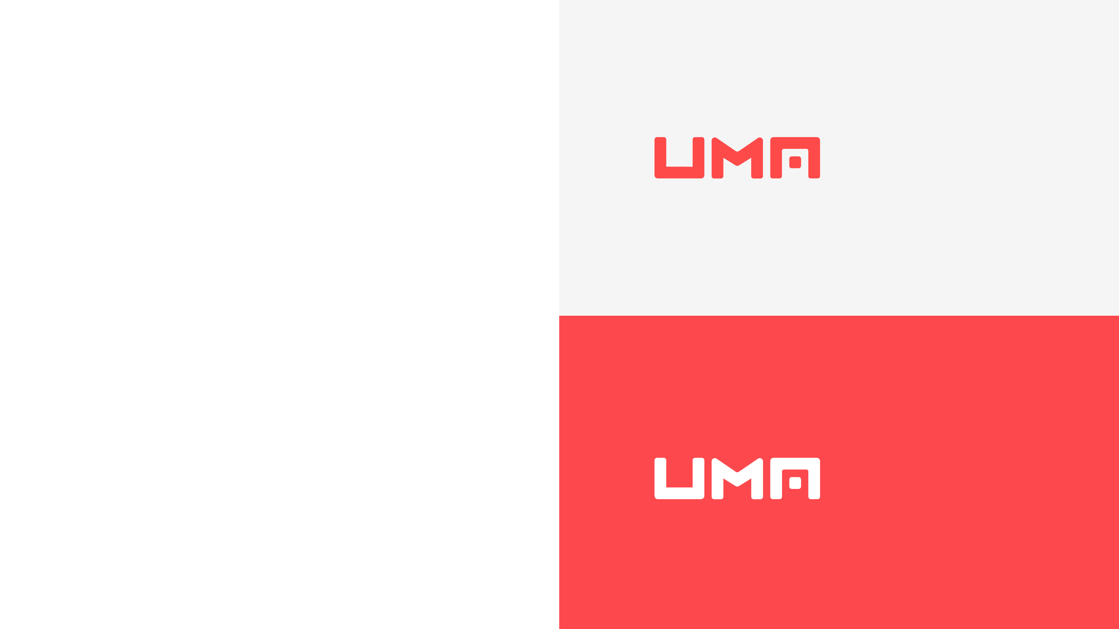
Primary Color
UMA’s colors are simple yet bold. !
The dominant color of the brand !
is a vibrant red, signifying UMA’s
aspirational mission and
distinguishing the brand from !
others in a similar space.
This color can be used as a highlight
or accent, or can stand alone.
Red
Hex
#FF4A4A
RGB
R: 255 G: 74 B: 74
CMYK
C: 0 M: 71 Y: 71 K: 0

Secondary Colors
The secondary colors are a neutral
palette to contrast against the
primary red and add visual depth
when needed.
These colors can be used within
supporting elements such as
backgrounds.
White Dark Gray
Hex
#FFFFFF
RGB
R:250 G:250 B: 250
CMYK
C:0 M:0 Y:0 K:0
Hex
#272528
RGB
R: 39 G: 37 B: 40
CMYK
C: 2 M: 7 Y:0 K: 84
Light Gray
Hex
#F5F5F5
RGB
R: 245 G: 245 B: 245
CMYK
C: 0 M: 0 Y: 0 K: 4

Brand in Use
04
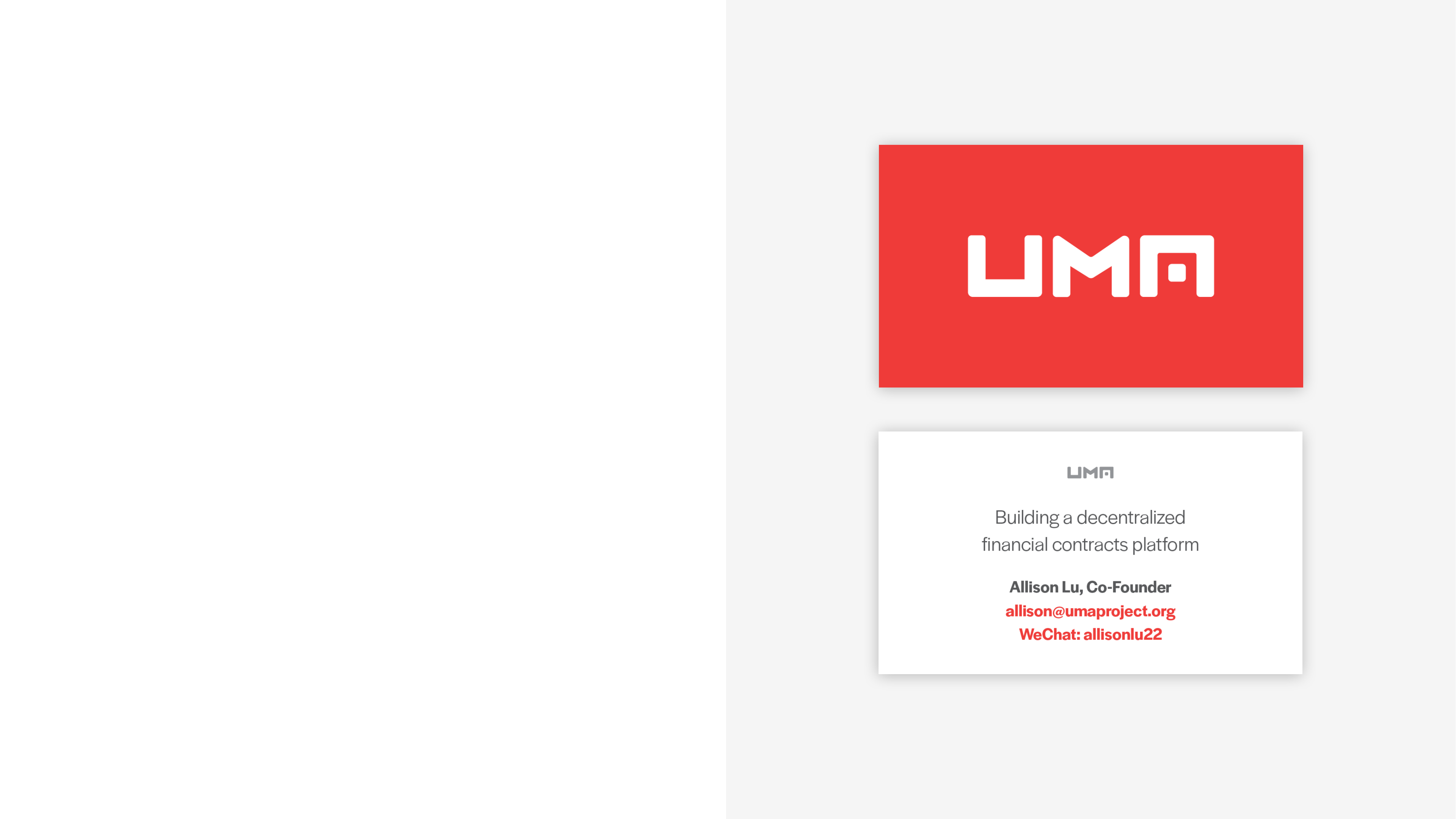
Business Card
The business card utilizes the wordmark by
itself on the front knocked out in white, !
while the tagline and contact information !
is on the back.
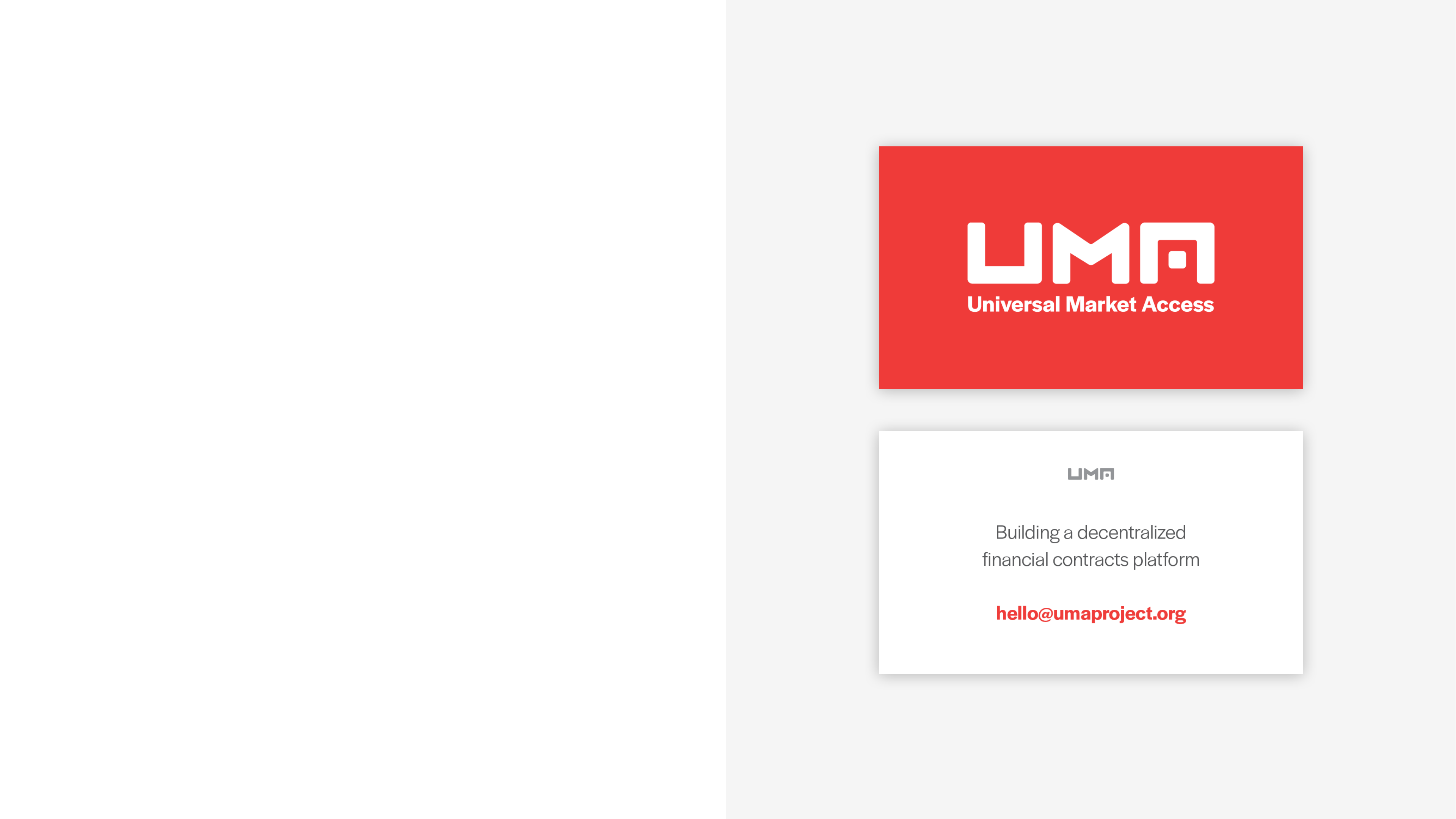
Alternate Card
A simpler version of the card can be used as !
a calling card, featuring the tagline lockup on
the front and a contact e-mail on the back.

Website
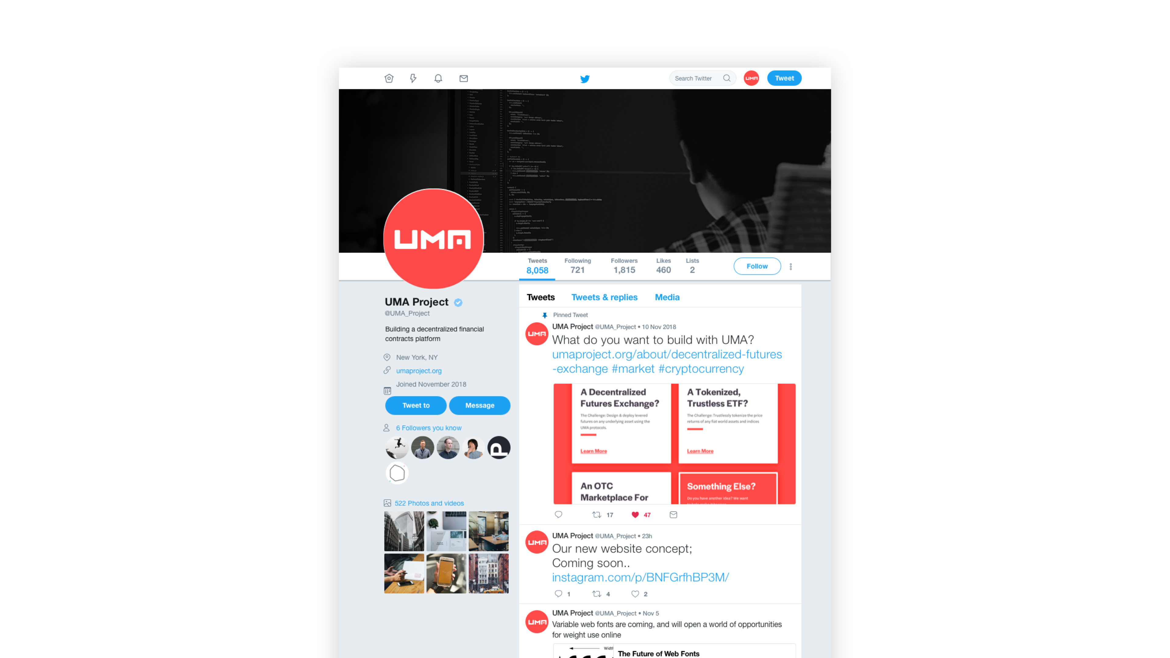
Twitter

Thank You
