Valve User Guide
User Manual:
Open the PDF directly: View PDF ![]() .
.
Page Count: 18
Valve User’s Guide
Version 3.7.0
May 7, 2019
1 Summary
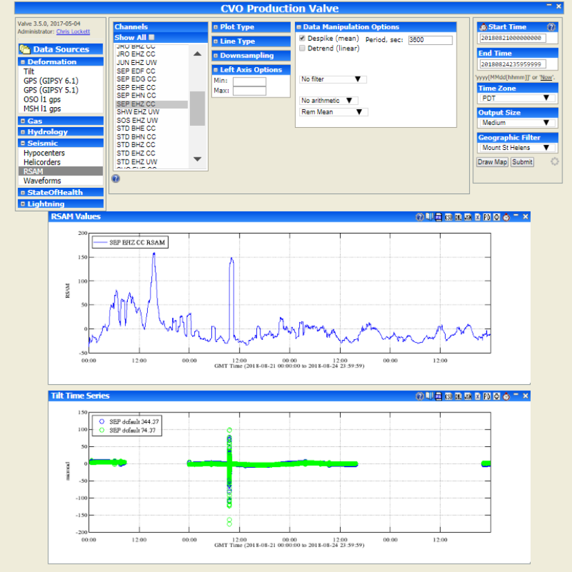
Valve is a web-based application used to view and export volcano monitoring data plots. Primary
categories of data used in volcano monitoring are deformation (e.g GPS, tilt), seismic (e.g. hypocenters,
waveforms, helicorders, RSAM), and gas (e.g. CO2, SO2). However, other types of data can also be
displayed. Valve, in conjunction with its middle-ware VDX, provides for a one-stop shop for viewing all
types of data viewable as time-series.
Figure 1 Valve displaying RSAM and Tilt data
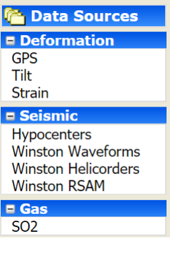
2 Data Sources
The left hand-side menu of Valve allows user to choose the data source to
plot from. The categories and menu items are configured based on local
needs and may vary. The default data types are shown in the image to the
left.
2.1 Deformation
2.1.1 GPS
GPS data that is loaded into Valve typically comes from STACOV files and
contains time series option for East, North, and Up components in meters.
2.1.2 Tilt
Tilt data time series options contain x (East), and y (North) values, usually
in micro radians.
2.2 Seismic
2.2.1 Hypocenters
Hypocenters are the locations of earthquakes. Valve can either plot the location on a map, or show the
number of hypocenters in a given bounding box or circle.
2.2.2 Winston Waveforms
Valve can plot Winston wave data as waveform, spectra, or spectrogram.
2.2.3 Winston Helicorders
Valve can plot Winston helicorders.
2.2.4 Winston RSAM
Valve can plot Winston RSAM as values or event count (given a threshold). Note, filtering the RSAM
value under Data Manipulation options does not result in RSAM calculated from filtered RSAM.
Winston RSAM is pre-calculated at 1 second periods so the filter would apply to these values.
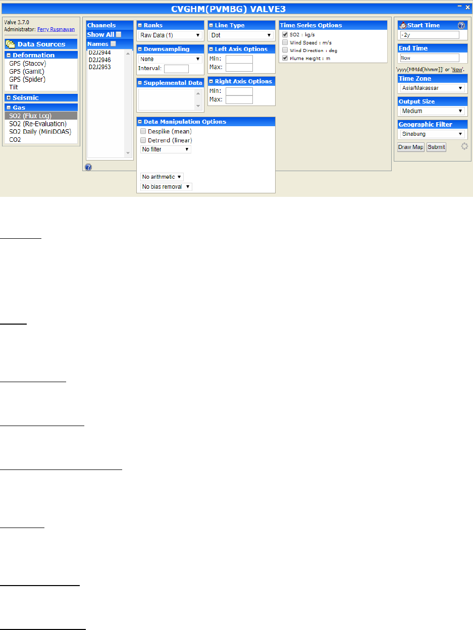
2.3 Gas
Gas monitoring systems used varies between observatories, but common ones used are FLYSPEC,
NOVAC Scanning and Mobile DOAS, and Multi-Gas. CO2 and SO2 emissions are commonly measured
gases.
3 Plot Options
There are some plot options that are common across time-series data types, and some that are specific
to the data type.
Figure 2 Data Sources
3.1 Generic Time-Series Plot Options
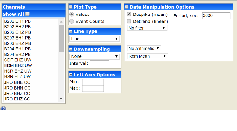
Figure 3 Time Series Plot Options
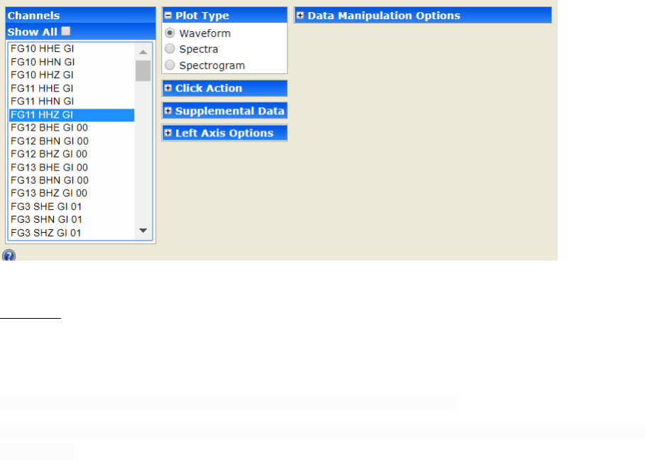
Channels
This option lists the channels available for the selected data source. The list can be filtered by
geographic region if locations for the stations and filters are configured properly. Select channels to
plot. To display channel names instead of code, check the ‘Names’ option. It will then use the channel
name as defined in the channels table.
Ranks
Valve may contain variations of the same data, such as raw vs aggregate or multiple sensors on same
station. In such cases the Ranks option helps differentiate between the different data.
Downsampling
Valve offers option to reduce the sample rate of the data, either through decimation or mean filtering.
Supplemental Data
This option is currently not used.
Data Manipulation Options
Data manipulation options allows user to modify the displayed data in various ways through despiking,
detrending, filtering, multiplication, division, and bias removal.
Line Type
Users may choose to plot the data as a continuous line, or points represented by circle, square, star,
triangle, or dot.
Left Axis Options
Users may specify min and max for the left axis.
Right Axis Options
Users may specify min and max for the right axis.
Time Series Options
Shows the data type available to plot on same time series. Users may select or deselect data to plot.
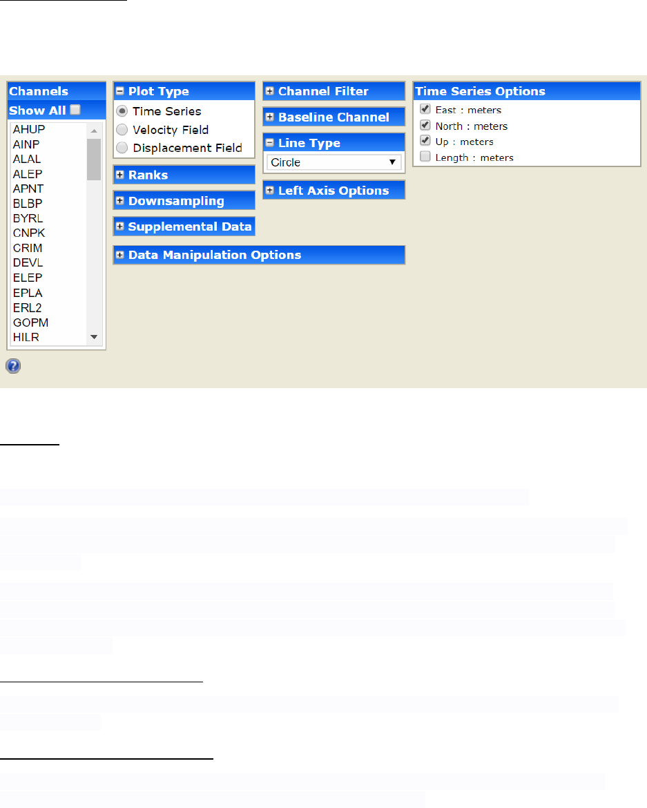
3.2 GPS
Figure 4 GPS Plot Options
Plot Type
GPS data can be plotted as Time Series, Velocity Field, or Displacement Field.
Time Series - Perhaps the most common use of the GPS section is plotting time-series.
Velocity Field - Valve can also be used to estimate average velocities over time and plot them spatially.
Select the stations you want estimated, optionally select a baseline station, choose your options, and
press submit.
Displacement Field - Valve can also be used to estimate a displacement using subset of points at the
beginning and end of an interval. Select the stations you want estimated, optionally select a baseline
station, enter the displacement times (unfortunately this must be done by hand), choose your options,
and press submit.
Time Series Options (if selected)
Valve can plot four different components of a time-series: east, north, up, and, if a baseline station is
selected, length.
Velocity Field Options (if selected)
The Scale Errors option scales the error ellipse by the model misfit, the Horizontal option draws the
velocity vector, and the Vertical option shows the vertical component.
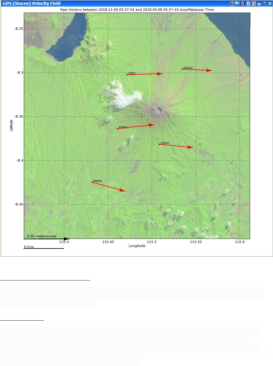
Figure 5 Velocity Field Plot
Displacement Options (if selected)
The Detrend option removes the linear trend from the positions first, the Scale Errors option scales the
error ellipse by the model misfit, the Horizontal option draws the displacement vector, and the Vertical
option shows the vertical component.
Baseline Channel
A single station can be set as the baseline station. This subtracts that station’s velocity from all other
observations. When using a baseline station only epochs in which both the source station and the
baseline station have data will be used. To get channels to show up under Baseline Channel option it
must be marked ‘Continuous’ in the database. This can be done in the channel_types table and assigning
the ‘Continuous’ ctid to the channel in channels table.
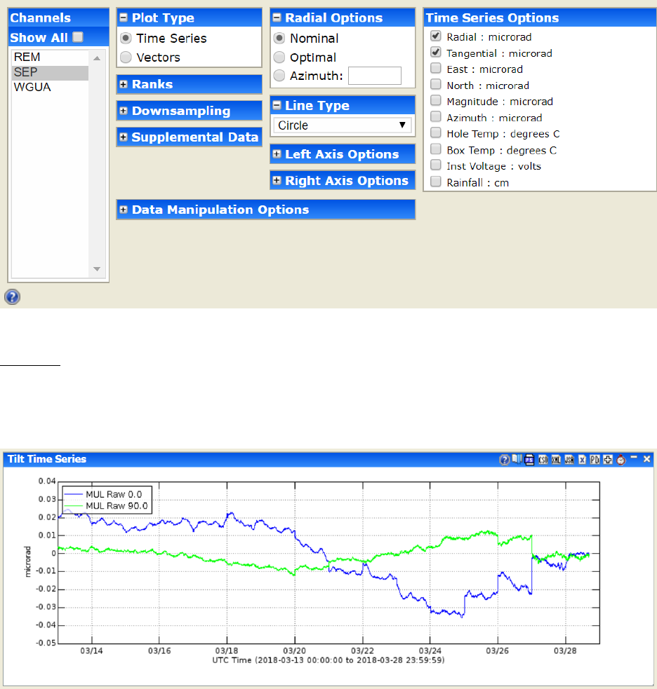
3.3 Tilt
Figure 6 Tilt Plot Options
Plot Type
Select Time Series or Vector option. Plotting Tilt Vectors shows a spatial plot with representations of
the direction of tilt at the specified Tilt Sites (control-click/shift-click to specify multiple sites) over the
specified time interval.
Figure 7 Tilt Time Series Example
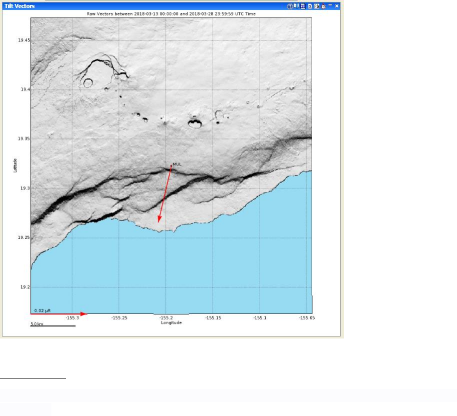
Figure 8 Tilt Vector Example
Radial Options
If either of the radial or tangential components is selected, then an azimuth must be specified in one of
three ways:
Nominal - The nominal azimuth to the assumed source of inflation or deflation. This number is stored
outside of Valve at the source.
Optimal - The azimuth is optimized to place the maximum tilt in the radial direction.
Azimuth - User-specified azimuth: 0 to 360 degrees.
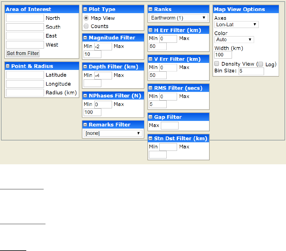
3.4 Hypocenters
Figure 9 Hypocenters Plot Options
Area of Interest
Specify the bounding box for display or count of hypocenters. This can be set from the geographic filter
that is currently selected.
Point and Radius
Alternative to specifying a bounding box. Specify coordinate and radius to filter display on.
Plot Type
Hypocenters can be plotted on map or
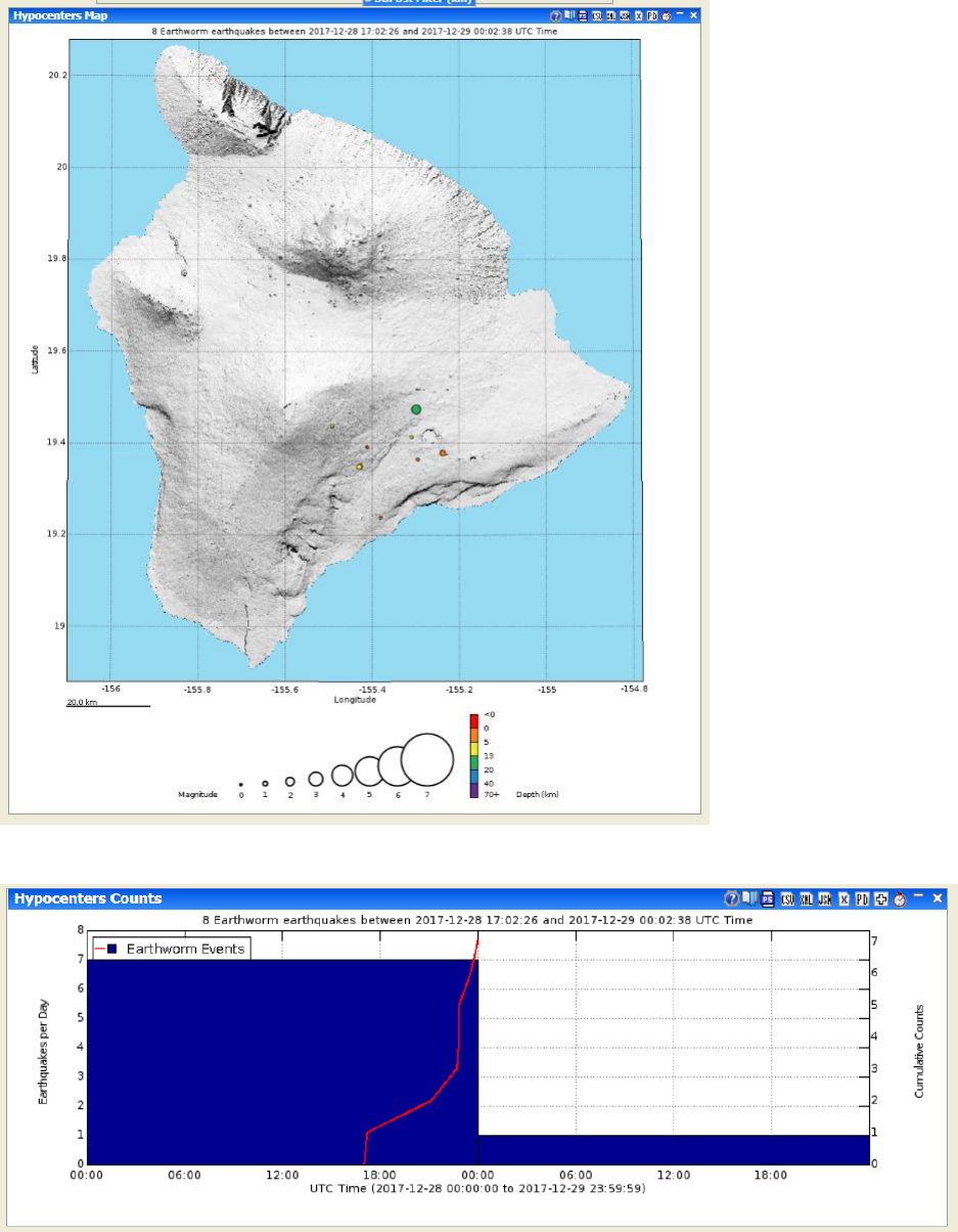
Figure 10 Hypocenter Map View
Figure 11 Hypocenter Counts View
3.5 Winston Waveforms
Figure 12 Winston Waveform Plot Options
Plot Type
Select Waveform, Spectra, or Spectrogram.
Waveform shows the raw data.
Spectra is a graph with power on the y-axis and frequency on the x-axis.
Spectrogram shows the power of the frequency as a color. The y-axis is the frequency band and the x-
axis is time.
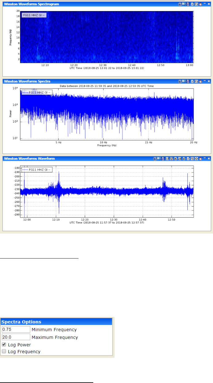
Figure 13 Waveform plots. From top to bottom: Spectrogram, Spectra, Waveform.
Spectra Options (if selected)
Specify Minimum Frequency and Maximum Frequency. Select/de-select Log Power and Log Frequency
options.
The frequency range allows you to look at certain frequency ranges specifically, essentially they allow
you to control the size of the frequency axis. Checking the log button takes the log of the power before
plotting.
Figure 14 Spectra Options
Spectrogram Options (if selected)
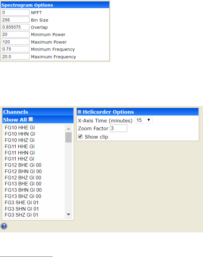
Enter NFFT, Bin Size, Overlap, Minimum Power, Maximum Power, Minimum Frequency, and Maximum
Frequency.
Figure 15 Spectrogram Options
3.6 Winston Helicorders
Figure 16 Helicorder Plot Options
Helicorder Options
Specify X-Axis Time and Zoom Factor. Select/de-select ‘show clip’ option.
3.7 Winston RSAM
Figure 17 RSAM Plot Options
Plot Type
Select Values or Event Counts.
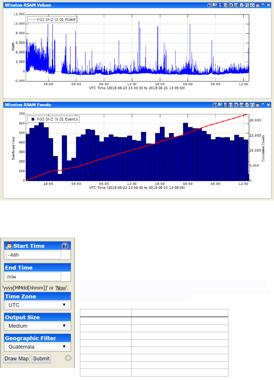
Figure 18 RSAM Plots. Values on top, Counts on bottom.
4 Other Plot Options
On the right side of the web-interface are the other options. Here you
can specify the start time, end time, time zone, output size, and
geographic filter.
4.1 Start Time
This is the starting time for a given request. Incomplete formats such as
yyyy (e.g., 2002) are rounded to the earliest time for start time and latest
time for end time. Valid entry formats are:
Format
Example
yyyy
2002 becomes 200201010000
yyyyMMdd
20020405 becomes 200204050000
yyyyMMddHHmm
200204051200
-#i
-30i is last 30 minutes
-#h
-2h is last 2 hours
-#d
-3d is last 3 days
-#w
-6w is last 6 weeks
-#m
-9m is last 9 months
Figure 19 Other Options
-#y
-15y is last 15 years
All
All data, if supported
4.2 End Time
This is the ending time for a given request. Clicking the 'Now' link replaces the text with 'Now'.
Incomplete formats are rounded to the latest time. Valid entry formats are:
Format
Example
yyyy
2002 becomes 200212312359
yyyyMMdd
20020405 becomes 200204052359
yyyyMMddHHmm
200204051200
Now
Data up until now
4.3 Time Zone
Select the time zone to plot the data in. Typically, available options are the local time zone and UTC.
4.4 Output Size
Choose output size of tiny, small, medium, or large.
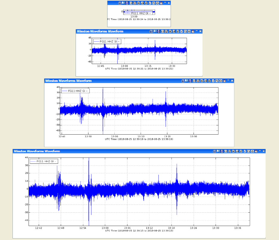
Figure 20 Example output sizes. From top to bottom: tiny, small, medium, large.
4.5 Geographic Filter
Selecting a geographic filter will limit the channels displayed
4.6 Draw Map
Will draw a map of selected geographical filter. If an image for the geographic filter is not configured by
your Valve Administrator, you will get a blank map based on the filter bounding box. Any stations for
the current selected data source in the bounding box will be displayed.
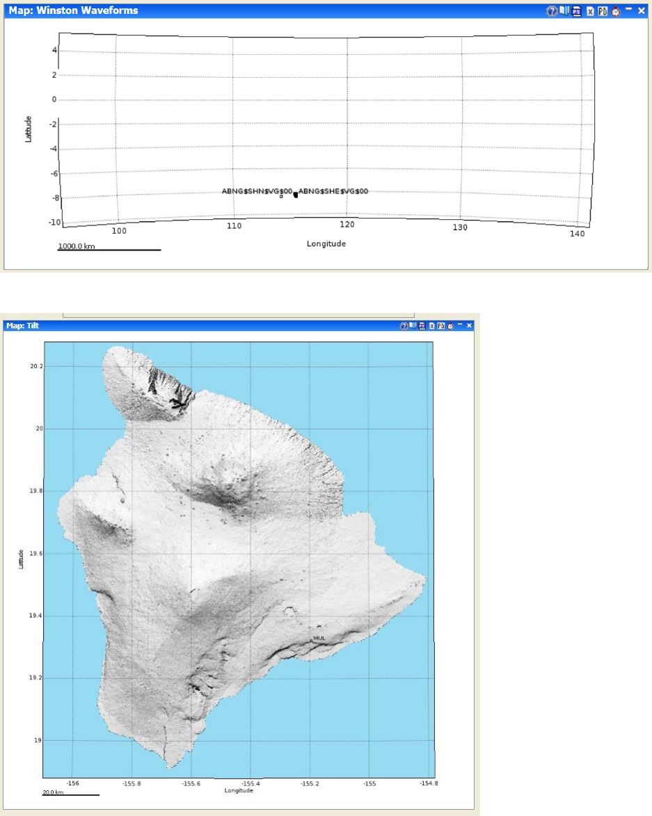
Figure 21 Map with no image configured
Figure 22 Map with image configured
4.7 Submit
Clicking this button will draw the plot given the current selected options.
5 Interacting with Graphs
Most graphs that Valve produces allow extensive interaction. These graphs can be used to select time
intervals on other graphs, select map bounding boxes, earthquake cross-sections.
• To select a subset of the time represented on the x-axis in this graph simply move the mouse
over the graph (a red line and crosshair cursor will appear) and click the time the start and end
times respectively. A green marker arrow will appear over the start time you selected and a red
arrow over the end time.
• Or to set the time interval to exactly what is on the x-axis, click the clock icon ( ) on the
graph menu bar. Graphs that do not have time as the x-axis (like a frequency power chart) will
not allow this. This functionality allows the user to quickly look at interesting time intervals on a
variety of different instruments or to find interesting events and plot them in other, perhaps
more insightful, ways. For example, a user could plot earthquake counts over a region for the
last 25 years, select a time interval that has a swarm, then plot the swarm's hypocenters on an
earthquake map.
• Valve also produces many spatial plots. These plots can be interacted with to select area
boundaries, assuming that the tab currently visible is 'interested' in boundary selection.
• If the Valve UI was open to a tab that was interested in spatial boundaries or other user-
selected spatial information, clicking on the spatial graph would provide that input. In the case of
selecting a boundary for an earthquake plot, for example, simply click on the upper-left corner
of the new boundary (a rubber-band type box will appear), then click on the lower-right. The
coordinates in the ‘Area of Interest’ should change. Unfortunately, due to browsers interpreting
a dragged mouse as a drag-and-drop event, dragging (the intuitive way of selecting a space) the
clicked mouse will not work.
5.1 Exporting Graphs
Follow export options may be available from the graph menu depending on the Valve configuration for
that data set:
• - PNG as URL
• - Post Script (PS)
• - CSV as file
• - XML as file
• - JSON as file
• - XML as pop-up
• - Binary data
