VistaLINK PRO Plus Vista LINK Graphics User Manual
User Manual:
Open the PDF directly: View PDF  .
.
Page Count: 46
VistaLINK® PRO Graphics Manual
SNMP Monitoring Control Software

VistaLINK® PRO GRAPHICS
Revision 2.0 Page - i
REVISION HISTORY
REVISION DESCRIPTION DATE
1.0 First Release Jan 2008
1.1 Added “Installation” section Dec 2012
2.0 Updated all screenshots June 2013
Information contained in this manual is believed to be accurate and reliable. However, Evertz assumes no responsibility for the use thereof nor
for the rights of third parties, which may be effected in any way by the use thereof. Any representations in this document concerning
performance of Evertz products are for informational use only and are not warranties of future performance, either express or implied. The
only warranty offered by Evertz in relation to this product is the Evertz standard limited warranty, stated in the sales contract or order
confirmation form.
Although every attempt has been made to accurately describe the features, installation and operation of this product in this manual, no
warranty is granted nor liability assumed in relation to any errors or omissions unless specifically undertaken in the Evertz sales contract or
order confirmation. Information contained in this manual is periodically updated and changes will be incorporated into subsequent editions. If
you encounter an error, please notify Evertz Customer Service department. Evertz reserves the right, without notice or liability, to make
changes in equipment design or specifications.

VistaLINK® PRO GRAPHICS
Page - ii Revision 2.0
This page left intentionally blank

VistaLINK® PRO GRAPHICS
Revision 2.0 Page - iii
TABLE OF CONTENTS
1. VIEW NODE .................................................................................................................................... 1
2. INSTALLATION .............................................................................................................................. 3
2.1. INSTALLATION OF THE VISTALINK® PRO SERVER ......................................................... 3
2.1.1. Component Check-List ............................................................................................... 3
3. PAGE CONSOLE ........................................................................................................................... 4
3.1. DYNAMIC MODE ................................................................................................................... 6
3.2. PAGE CONSOLE MODES .................................................................................................... 6
4. DESIGN MODE ............................................................................................................................... 8
4.1. VIEW PROPERTIES .............................................................................................................. 9
5. ADDING NAVIGATION TREE ELEMENTS TO GRAPHICAL VIEWS .......................................... 12
5.1. ICON FACES AND CUSTOM ICONS .................................................................................. 12
6. VECTORS ..................................................................................................................................... 16
7. CLOCKS AND GRAPHS .............................................................................................................. 19
7.1. CLOCKS .............................................................................................................................. 19
7.2. GRAPHS.............................................................................................................................. 20
8. VIEW LINKS ................................................................................................................................. 22
9. CONTROLS .................................................................................................................................. 24
10. LABELING .................................................................................................................................... 26
11. DROP ACTIONS ........................................................................................................................... 28
11.1. DROP AS A BLOCK ........................................................................................................... 28
11.2. DROP AS RACK ................................................................................................................. 30
11.3. DROP AS FILM ................................................................................................................... 30
11.4. DROP AS EMBEDDED ALARM VIEW ................................................................................ 31
12. MACRO TOGGLES ...................................................................................................................... 33
13. VISIBILITY CONTROLS ............................................................................................................... 34
14. SWAP COMPONENTS ................................................................................................................. 35
15. IMPORT AND EXPORT ................................................................................................................ 36
15.1. EXPORT .............................................................................................................................. 36
15.2. IMPORT ............................................................................................................................... 37
16. TEMPLATE SUBSTITUTIONS ..................................................................................................... 38

VistaLINK® PRO GRAPHICS
Page - iv Revision 2.0
Figures
Figure 1-1: Views Menu ..................................................................................................................... 1
Figure 1-2: View Creation Window ..................................................................................................... 1
Figure 1-3: Views ............................................................................................................................... 1
Figure 3-1: Highlights where the Page Console Resides in the Graphics Program ............................ 4
Figure 3-2: Displays a Combo Box for Page Listing ........................................................................... 4
Figure 3-3: ‘Page 1’ in Design Mode with the Design Mode Button Highlighted ................................. 5
Figure 3-4: Views added to Page 1 with Thumbnail Image ................................................................ 5
Figure 3-5: Right-Click Menu ............................................................................................................. 5
Figure 3-6: Split Mode Enabled ......................................................................................................... 7
Figure 4-1: Toolbar with Design Mode button highlighted .................................................................. 8
Figure 4-2: Properties Control Pane .................................................................................................. 8
Figure 5-1: Navigation Tree Elements Placed onto the Canvas ....................................................... 12
Figure 5-2: Side bar displaying Icon Face Property ......................................................................... 13
Figure 5-3: Tools menu and Icon Face Creation dialog box ............................................................. 14
Figure 5-4: Custom Icon properties shown on the left with the icon parameter selected .................. 15
Figure 6-1: Adjusting the size of the vector image ........................................................................... 16
Figure 7-1: Analog and Digital Clock Faces ..................................................................................... 19
Figure 8-1: Conceptual design of multiple views linked together ...................................................... 22
Figure 8-2: Properties Window with View Link Menu Selected ......................................................... 23
Figure 9-1: Shows the process for adding controls to the graphical view ......................................... 24
Figure 11-1: Shows the process for adding a block to a graphical view ........................................... 28
Figure 11-2: Shows the points around the perimeter of the block for resizing .................................. 28
Figure 11-3: Drop as Rack function with MVP and 7700 Frames ..................................................... 30
Figure 11-4: Corners of the film can be used to reshape and resize ................................................ 30
Figure 11-5: Film can have a translucent flash if it is made from an element that has severities ...... 30
Figure 11-6: Shows an embedded alarm view on the graphical view ............................................... 31
Figure 12-1: Illustrates how a macro toggle works ........................................................................... 33
Figure 12-2: Side bar showing the toggle properties ........................................................................ 33
Figure 14-1: Shows the Swap Components Enabled ....................................................................... 35
Figure 15-1: Shows the steps involved in importing and exporting ................................................... 36
Figure 16-1: Legacy System ............................................................................................................ 38
Figure 16-2: Template Substitutions ................................................................................................ 38
Figure 16-3: Template Reference Identifier property highlighted ...................................................... 39
Figure 16-4: View Link property field highlighted and set to a view called ‘Template’ ....................... 40
Figure 16-5: Displays right click option menu enabling Template Substitutions ............................... 40
Tables
Table 3-1: Page Console Buttons ...................................................................................................... 4
VistaLINK® PRO GRAPHICS
Revision 2.0 Page - 1
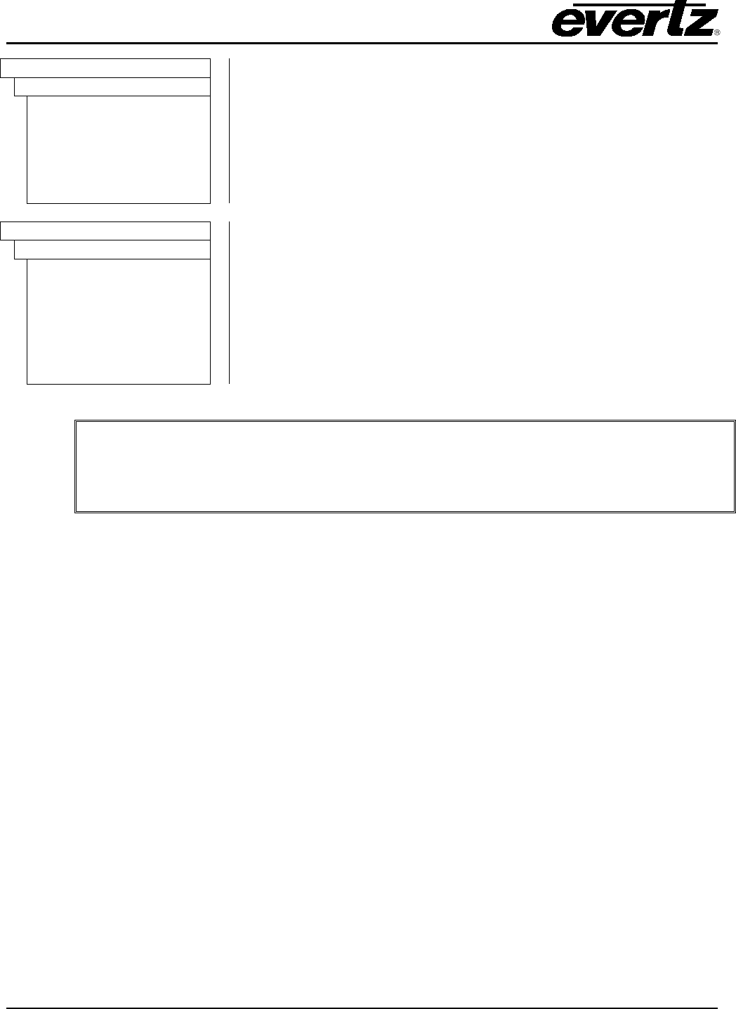
1. VIEW NODE
The VistaLINK® PRO Graphics system houses the workable areas in a node group from the Navigation
Tree called ‘Views’. This can be located from the Navigation Tree and enabled/disabled from the tree
properties. Views can be created, deleted and grouped from the Navigation Tree using the following
menus.
This icon will be shown in the navigation tree when Views are enabled in the Tree properties.
To create views, right click the Views icon in the Navigation Tree. When the right-click menu appears,
navigate to the New option and select the View… menu item from the sub-menu.
Figure 1-1: Views Menu
View groups are for organization purposes only. It allows for ease of management when
working with a system that has many views. Views can be placed into the groups by
dragging the view into the group.
The View Creation dialog box, shown in Figure 1-2, enables the
creation of views. A View Name must be given to the new view.
To assign a view name type a name identifier in the View Name
field. To assign a background image or icon image to the selected
view, click on the Browse button and select an image file.
When selecting a background image for the view, the file can take
form of a PNG, GIF and JPEG/JPG. Sample backgrounds are
provided in the VLPRO Graphics installation directory.
Once the appropriate fields are entered, click the Create button to
create the view.
Once the view is created it should appear in the Navigation Tree
underneath the Views node as shown in Figure 1-3.
Figure 1-2: View Creation Window
Figure 1-3: Views
The sample backgrounds that are provided in the VLPRO graphics directory are listed below. The
following is a list of the directory structure, which will reside in:
C:\Program Files\VistaLinkProGraphics\media\image
VistaLINK® PRO GRAPHICS
Page - 2 Revision 2.0
Backgrounds
This is the directory structure for the XGA Sample background library.
These images are used when the monitor can only run at 1024x768.
The background fits the screen dimensions at this resolution.
1024x768
3D Icon Grid
Blanks
Maps
Miscellaneous
Monitoring Thumbnail
Rack HD
Backgrounds
This is the directory structure for the SXGA Sample background library.
These images are used when the monitor can run at 1280x768
resolution. The background fits the screen dimensions at this
resolution.
1280x1024
3D Icon Grid
Blanks
Maps
Miscellaneous
Open Modular Frame
Rack HD
Thumbnail Background
The sample view background sizes are actually smaller than the mentioned pixel sizes.
This is to take account for the top toolbars of the VLPRO Application.
1024x768 views are roughly 1012x648 pixels
1280x1024 views are roughly 1267x903 pixels

VistaLINK® PRO GRAPHICS
Revision 2.0 Page - 3
2. INSTALLATION
2.1. INSTALLATION OF THE VISTALINK® PRO SERVER
2.1.1. Component Check-List
To start working with the VistaLINK® monitoring suite, your machine must meet the following
requirements:
VistaLINK PRO Server (or Server and Client):
• Server Class Platform
• Intel Xeon Processor (5xxx or equivalent)
• 4GB RAM (minimum)
• 100GB HDD (minimum)
• 100/1000 Network Adapter
• Windows Server 2008 64-bit (recommended)
Most commonly used platform is HP DL360/380 servers
VistaLINK PRO Client Only:
• 2 GHz or faster 32-bit (x86) or 64-bit (x64) Core2Duo
• 2 GB RAM (minimum)
• 10 GB available disk space
• DirectX 9 graphics processor with WDDM 1.0 or higher driver
• 100/1000 Network Adapter
• Windows 7 (recommended)
Compatible Operating Systems:
• Windows XP
• Windows Server 2003
• Windows Server 2003 x64
• Windows Server 2008
• Windows Server 2008 x64 (recommended for VLPRO Server)
• Windows 7
• Windows 7 x64 (recommended for VLPRO Client)
VistaLINK® PRO GRAPHICS
Page - 4 Revision 2.0
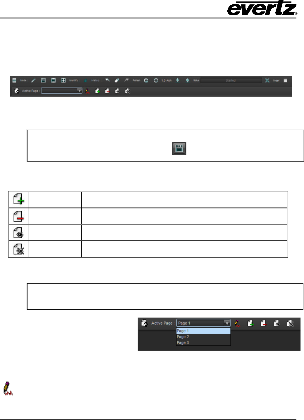
3. PAGE CONSOLE
The Page Console tool is used to display and access the views. The major purpose of the Page
Console is that it acts as a table for the views. Placing the views onto the page allows the views to be
displayed and edited.
Figure 3-1: Highlights where the Page Console Resides in the Graphics Program
The Page Console permits the addition and deletion of pages. Table 3-1 lists the buttons in the page
console toolbar.
Add Page This button is used to add pages to the system.
Delete Page This button is used to delete pages from the system.
Display Page This button enables the user to display pages for the particular client.
Hide Page This button enables the user to hide certain pages from the client.
Table 3-1: Page Console Buttons
Using the combo box, the Page Console
enables the user to view a section of the
created pages. Use the drop down combo
box, shown in Figure 3-2, to select a page to
view.
Figure 3-2: Displays a Combo Box for Page Listing
The Page Console must be put into Edit mode in order for the user to add views onto the
pages. Select the edit icon on the page console to move the page console into an editable
state.
You cannot display the view, unless it is on a page.
If you do not see the Page Console, select the mode button from the Tool Bar.
The Page Console hide and display buttons enable the user to isolate
views from
certain clients.
VistaLINK® PRO GRAPHICS
Revision 2.0 Page - 5
Once the page is in edit mode, a watermark will be displayed on the page to indicate that it is in Design
mode.
Figure 3-3: ‘Page 1’ in Design Mode with the Design Mode Button Highlighted
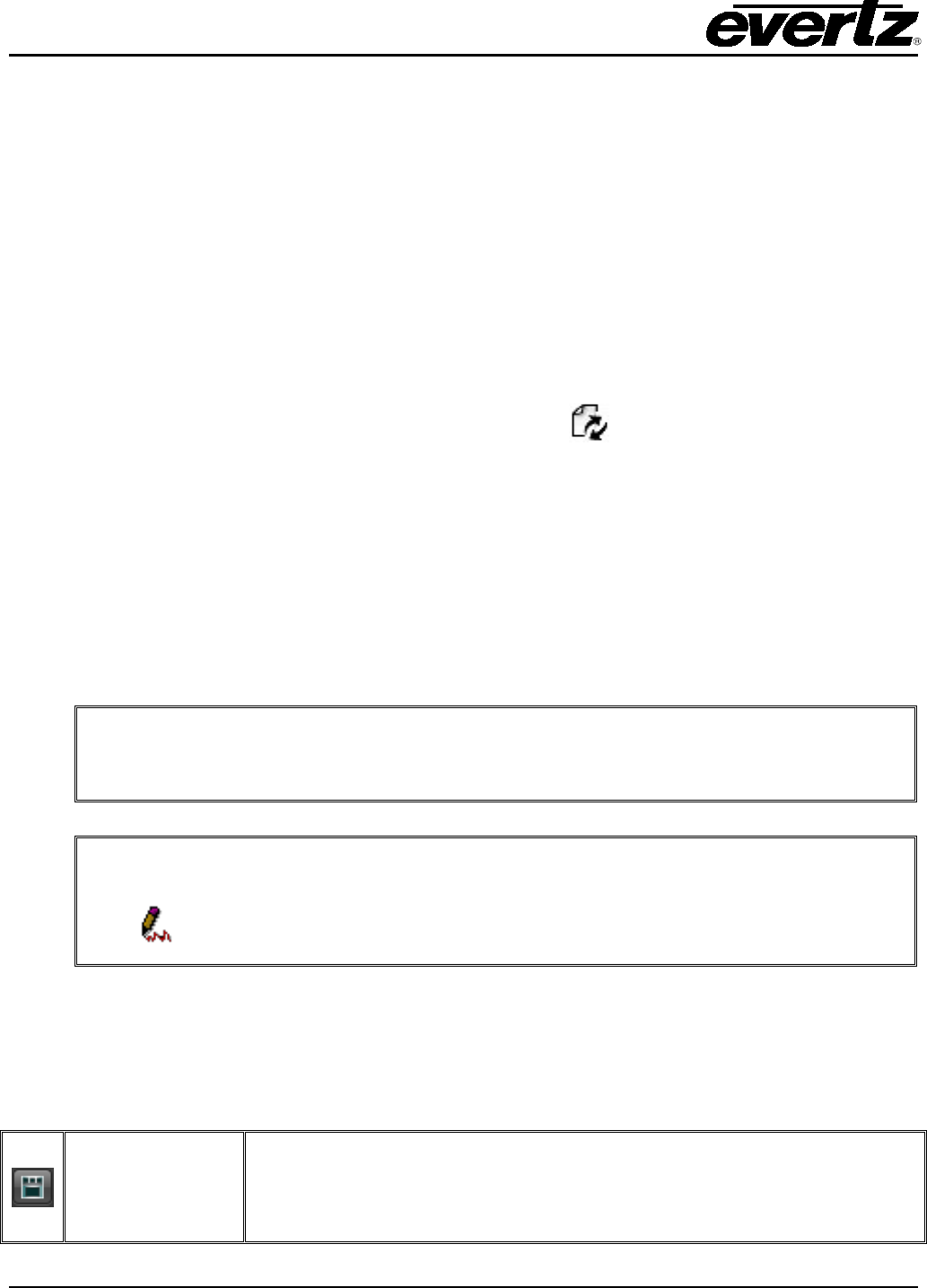
Once the page is in Design mode, the views can be placed onto the pages. The process for doing this
is to drag and drop the view from the Navigation Tree onto the editable page. If done correctly, the
view will appear on the page with a small thumbnail of the background view.
Figure 3-4: Views added to Page 1 with Thumbnail Image
Right-click anywhere on the page to reveal an option menu. When the Page Console is in design
mode, the following right-click menu will appear, as shown in Figure 3-5.
Figure 3-5: Right-Click Menu
• Edit (View Selector) Enabled: This option puts the Page Console into Edit mode. Placing a
check mark beside this option enables the views to be edited.
VistaLINK® PRO GRAPHICS
Page - 6 Revision 2.0
• Alarm Indicator Enabled: This option enables the alarm indicator. Placing a check mark
beside this option enables the alarm indicator.
• Remove All Views: Enables the user to remove the views from the page console view but it
does not delete the views from the system.
• Snap Enabled: This option enables the user to snap to the grid lines. The Snap Enabled
setting helps to align the views correctly.
• Grid Enabled: This option enables the user to display a grid. The Grid Enabled setting helps
to align the views correctly.
3.1. DYNAMIC MODE
Select the following icon to toggle in and out of dynamic mode.
The Page Console dynamic mode function allows the Page Console to utilize the view groups that
have been created. When the dynamic mode is enabled, pages are automatically created based off the
view groups. Any views that belong to any view groups will be automatically placed onto the page. If
views do not belong in any of the view groups, than the views will be placed onto the generic ‘Root’
page, which is created automatically.
Dynamic Page Mode disables the Page Console Add and Delete controls. This mode will hinder a
view from belonging to multiple pages because of the nature of how the views are organized in the
Navigation Tree.
3.2. PAGE CONSOLE MODES
The Page Console Mode buttons adjust the view mode of the graphics program. Two distinctive panes
are available, the Page Console Pane and the View area Pane. The following icons on the toolbar
enable the specific modes.
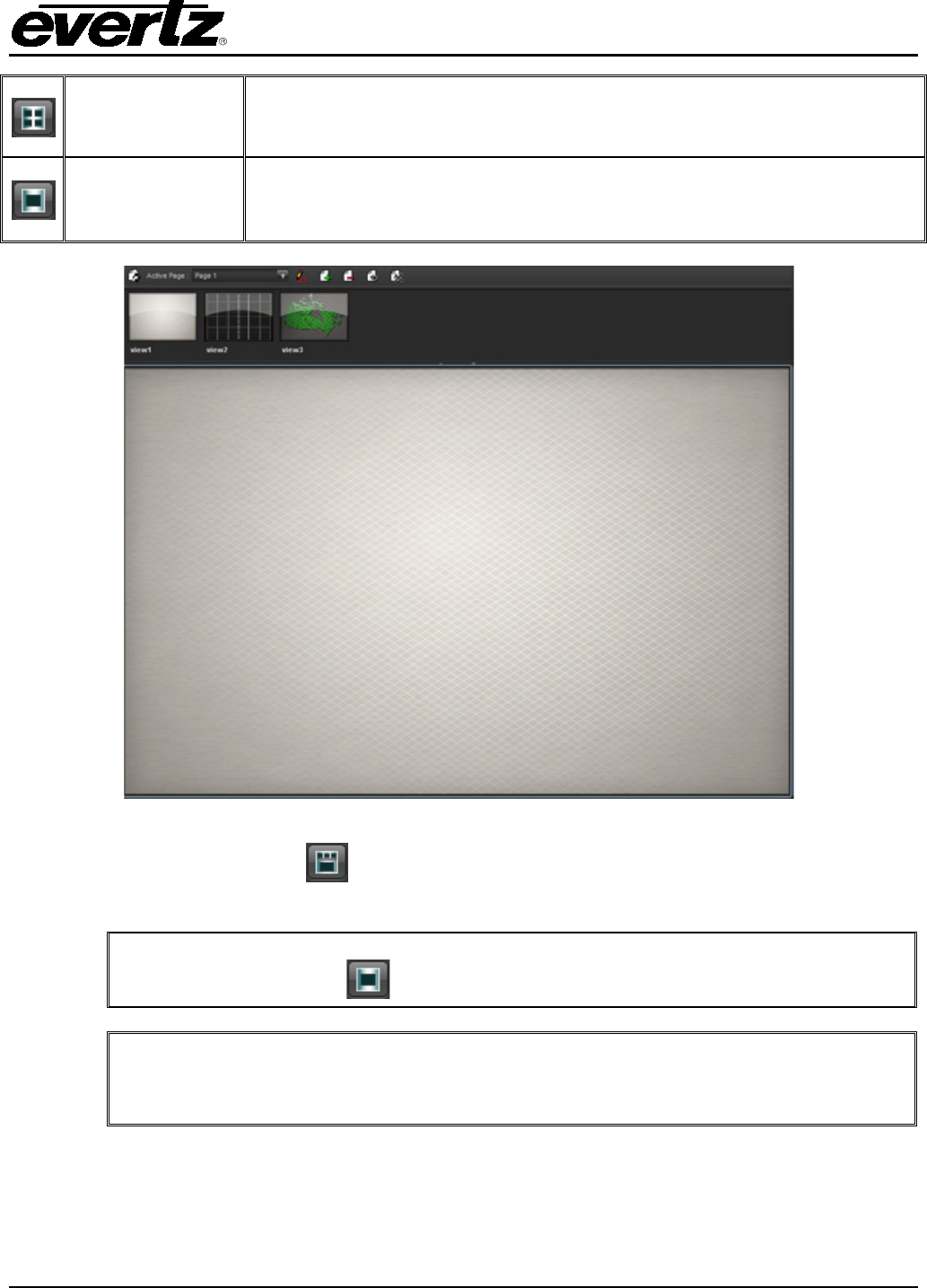
SPLIT MODE
Split Mode sets the application to display the page console at the top and
the selected view canvas at the bottom. This mode also allows the user to
adjust how much of the page console is shown and how much of the view’s
canvas is shown.
The system will remember any previous pages that were created manually when
turning off dynamic mode.
Remember to toggle out of Page Console Design mode as many functions are disabled
when the Page Console is in this mode. Select the icon from the Page Console tool
bar.
VistaLINK® PRO GRAPHICS
Revision 2.0 Page - 7
VIEW
SELECTOR
MODE
View Selector Mode sets the application to use the entire panel for the
Page Console. A list of pages is shown or a list of views (thumbnail images
of views) is shown when opening a page.
WHITEBOARD
MODE
Whiteboard Mode displays the full canvas and hides the page console
completely. The full view mode is used when showing your graphics
development to the operators.
Figure 3-6: Split Mode Enabled
Figure 3-6 shows the split mode enabled. Single clicking any of the views in the Page Console
Pane, will update the View Area Pane.
Double clicking any View from the Page Console will have the same effect as using
the full view pane mode
On occasion, selecting the Split Mode may only show the View Selector Pane in
full. This is caused because the View Area Pane is shrunken to the bottom of the
screen.
VistaLINK® PRO GRAPHICS
Page - 8 Revision 2.0
4. DESIGN MODE
Design Mode is used to bring the application into a mode where the views can be edited. Editing the
views involves many steps, which are described throughout the manual. The user can only modify a
view in design mode. When the application is out of design mode the elements on the view operate the
same as they would from the navigation tree. The view becomes a static picture of the vector arts or
custom icons that were created on the view. The Design Mode control is seldom delegated to all
operators and is heavily used by the graphic developers and administrators.
Figure 4-1: Toolbar with Design Mode button highlighted
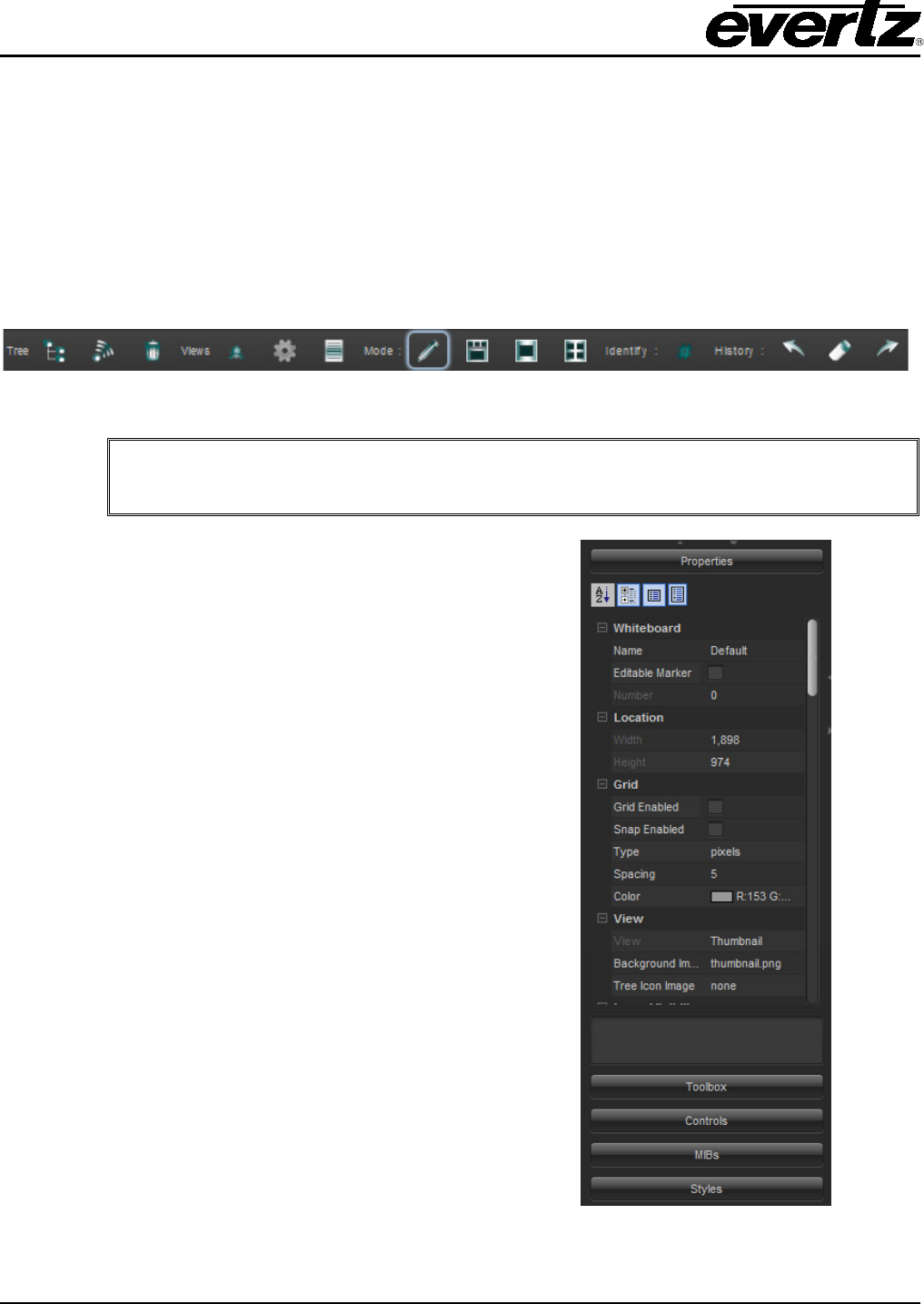
You can right mouse click anywhere on the Graphical View and navigate the Edit
(GFX) Enable function to enter and exit Design Mode.
Once the program enters
design mode
, the navigation
tree splits in half to open up a control pane as shown
in Figure 4-2. This side bar control area is a single
point of contact for managing and accessing elements
and their properties.
The properties menu dynamically changes depending
on what is selected in the graphics view. The side bar
can be resized by sliding the top portion up and down
the Navigation Tree and can be stretched and
squeezed by adjusting the Navigation Tree left and
right.
The side bar houses other functions like Vector Arts,
Control Selection and MIB parsing. See section 4.1
for a description of the properties.
Figure 4-2: Properties Control Pane
VistaLINK® PRO GRAPHICS
Revision 2.0 Page - 9
When the Graphics program is in Design Mode, the side bar will be easily visible.
The following icons on the Side Bar allow for ease of management of the properties pane. Any of the
modes can be selected in any combination.
This button alphabetically sorts the properties and categories.
This button toggles between a category list view and a flat list view.
This button enables and disables the description pane for the parameters.
This button displays and hides the Expert level properties.
With older versions of VistaLINK® PRO Graphics, the properties were accessed from
the elements item in the right click option menu. The Side Bar has replaced this
method because it is faster and easier to access the properties this way.
4.1. VIEW PROPERTIES
Below is a full list of property elements that can be found in the side bar of a graphical view.
VIEW
View Sets the view name that is currently being rendered on the whiteboard.
Background Image Sets the background Image that is rendered into the background of the
whiteboard.
Tree Icon Image Sets the Image that is shown in the tree for the view.
It is possible to change the background of a view by double clicking the
background name. A dialog will appear that will allow the selection of a new
background.
VistaLINK® PRO GRAPHICS
Page - 10 Revision 2.0
WHITEBOARD
Number Number of the whiteboard. This function allows the user to switch between
whiteboards using the numeric keys.
Name This function enables the user to assign a whiteboard name so that the
whiteboard window can be referred to by name instead of number.
Editable Marker This marker is enabled or disabled to show whether the program is in
Design Mode.
ICON
Icon Face
Selects the Default Icon Face to be used when the Navigation Tree
elements are dropped onto the view.
TOOLTIP
Tool Tips
Sets whether the components will show a tool tips menu when the mouse
is hovering over the item.
TOOLS
Tool Click Count
Sets the number of mouse clicks for actions that are required to create
components from the active tool.
COMPONENT
Confirm Default
Actions
Sets whether or not VistaLINK
®
will prompt for confirmation to execute a
default action on a component.
VECTOR
Point Selection
When enabled, only selecting the control points of a vector will select the
vector. When disabled, the white space inside the vector will also trigger
selection of the vector.
PROPERTIES
Width Sets the width of the view canvas area.
Height Sets the height of the view canvas area.
VistaLINK® PRO GRAPHICS
Revision 2.0 Page - 11
GRID
Grid Enable Enables or disables Grid lines to appear on the canvas.
Snap Enable Enables or disables the elements to snap to the grid points.
Type Sets the grid type. The type of grid determines where the grid lines appear
based on grid spacing.
Spacing
If the grid type is in pixels then the spacing is the number of pixels between
the grid lines. If the grid type is rows then the spacing is the number of
columns and rows in the grid.
Colour Sets the display colour of the grid.
It is possible to use both the Snap Enabled and the Grid Disabled functions, and
still have the elements snap to an invisible grid.
VistaLINK® PRO GRAPHICS
Page - 12 Revision 2.0
5. ADDING NAVIGATION TREE ELEMENTS TO GRAPHICAL VIEWS
VistaLINK® PRO Graphics incorporates the Navigation Tree into the graphical system. Elements from
the tree can be placed onto the graphic views using the drag and drop method. All hardware, services,
preset configuration nodes and more can be carried over and placed strategically onto the graphical
view. Elements dropped onto the graphical views will function the same as they do in the Navigation
Tree. Alarm severities will be available in the graphical views for hardware and service type elements.
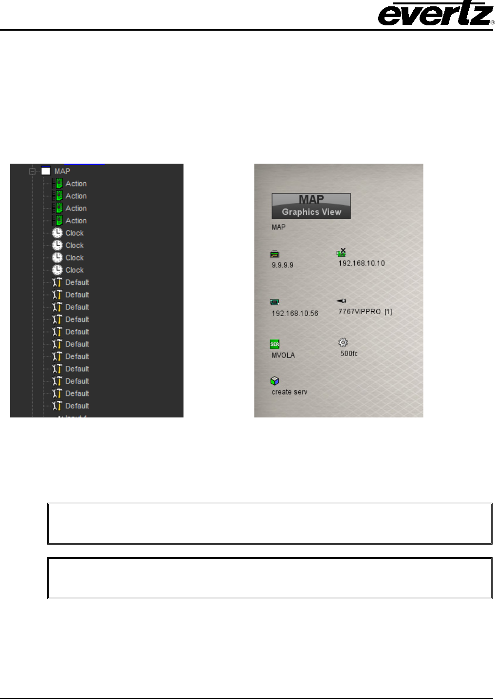
Figure 5-1 is a sample of the majority of the Navigation Tree elements placed onto a graphical view.
Figure 5-1: Navigation Tree Elements Placed onto the Canvas
The tree on the left shows the View node from the Navigation Tree. Sub-nodes are created for every
element placed onto the graphical view. You can use the tree to manage what has been placed onto
the Graphical View.
You can add the same element more than once onto the Graphical View.
Ensure the Design Mode is enabled from the application toolbar. It is not possible to
edit the canvas when the program is not in Design Mode.
5.1. ICON FACES AND CUSTOM ICONS
VLPRO Graphics enables the user to change the element icons from the graphical view. The program
gives the user the ability to import icons from an image file. The default icons are located in the tiny
(standard) libraries.
VistaLINK® PRO GRAPHICS
Revision 2.0 Page - 13
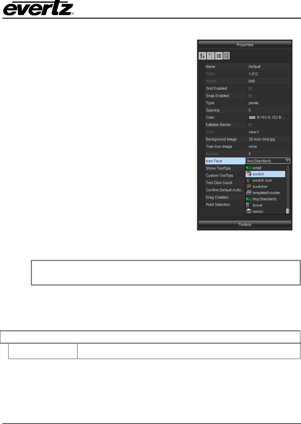
To change an icon face from a dropped element, first select the element from the canvas.
Once the element is selected the side bar area is updated to
show the relevant properties for the e
lement. A common
property for all elements is the ‘Icon Face’ property.
Figure 5-2 highlights the property that is shown in the side bar
once the element is selected from the canvas.
An icon face can be selected from the combo box of the side
bar. Small thumbnail images show what the icon looks like as
well as the icon face name. A default installation of VistaLINK®
includes various types of icons by default.
Figure 5-2: Side bar displaying
Icon Face Property
It is possible to change the icon for more than one element at a time by having more
than one element selected.
It is possible to setup a default icon face. Setting a default icon face enables the program to use the
same icon face every time an element is dropped from the Navigation Tree. A property group called
‘Icon’ is available in the side bar of the view where the same combo box is available for selecting the
default icon face.
ICON
Icon Face
Selects the Default Icon Face to be used when the Navigation Tree
elements are dropped onto the view.
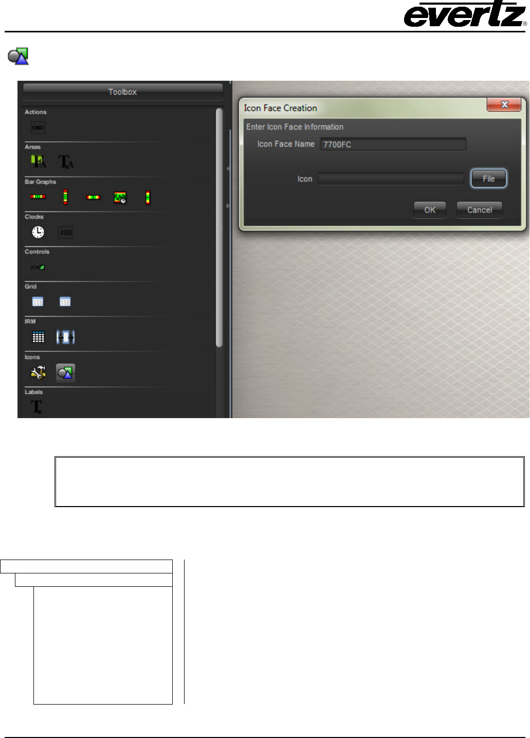
The side bar allows for importation of new icon faces. The user can import image files in the following
format: PNG, JPG or GIF files. The image on the left of Figure 5-3 shows the Tools Pane selected from
the side bar with the New Icon Face icon. Once selected, the Icon Face Creation popup opens and a
name and the icon can be chosen from the file system.
VistaLINK® PRO GRAPHICS
Page - 14 Revision 2.0
This icon imports a new Icon Face and is located in the Tools Toolbar.
Figure 5-3: Tools menu and Icon Face Creation dialog box
When importing icons into the system, the icons get stored into C:\Program
Files\VistaLinkProServer\images\hardware on the VistaLINK® Server. Any connected
Graphics Client will be able to access the icon face libraries.
Sample icons are available in the default installation of VLPRO Graphics from C:\Program
Files\VistaLinkProGraphics\media.
Images
There is an assortment of icons available, ranging from 3D icons
to hardware blocks. This is just a sample library. All files are
PNG type graphic files.
Extended Graphics Library
3D
Audio & Video
Logos
Maps
Miscellaneous
Open Modular Frames
Photos
Rack HD
User Created
VistaLINK® PRO GRAPHICS
Revision 2.0 Page - 15
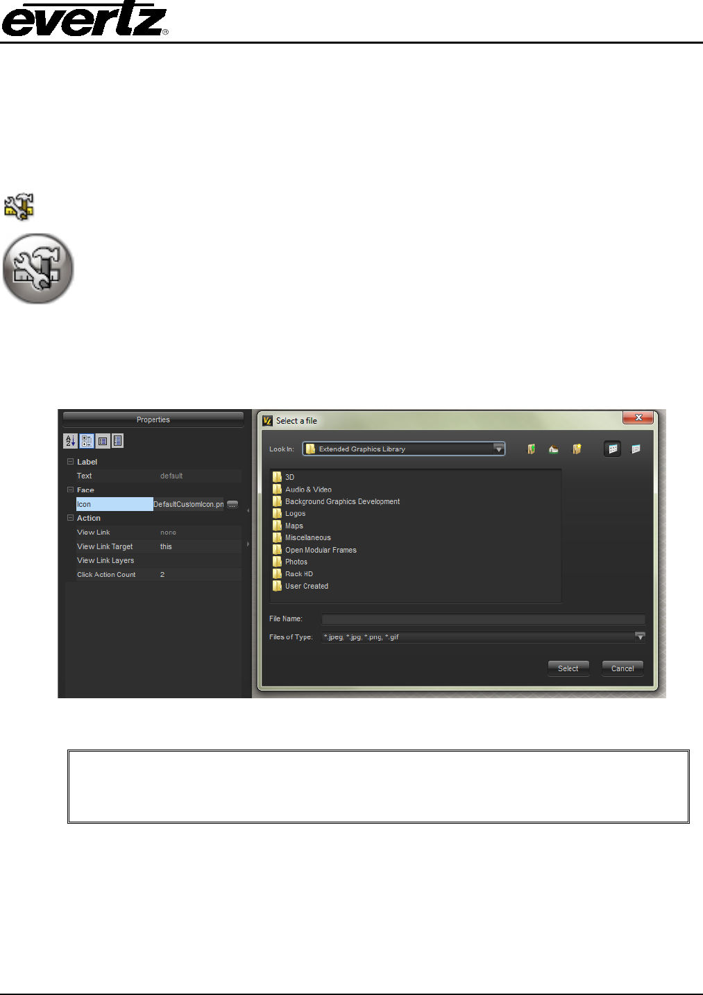
Custom Icons are icons that can also be imported to the canvas without having the icon linked to any
element from the Navigation Tree. One particular application for these Custom Icons is to create
graphic icons in the graphics system for devices and elements that are not supported in VLPRO (items
such as some routers, IRD’s and data networking devices). Icons can also be symbols or channel
logos. Custom icons are a way of adding icons to the graphical views without having them linked to
elements from the Navigation Tree.
Once this icon is selected from the Tools Pane, double clicking anywhere on the
graphical view canvas will create a custom icon.
This is the default icon that will appear on the canvas when using custom icons.
To change the display of the custom icon, first select the icon from the canvas. Next, select the icon
parameter from the side bar. This will open up a dialog that will allow the program to accept a new
icon from anywhere on the file system.
Figure 5-4: Custom Icon properties shown on the left with the icon parameter selected
It is possible to copy a previous custom icon using the CTRL+C command from the
keyboard. To paste the icon, hold down CTRL+V on the icon.
VistaLINK® PRO GRAPHICS
Page - 16 Revision 2.0
6. VECTORS
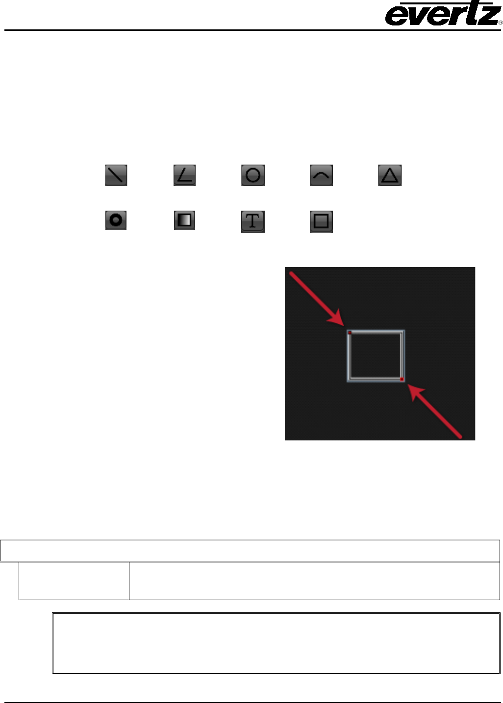
The vector art tools give the user the ability to create vector art designs through the VistaLINK® PRO
Graphics applications. These tools can assist in labeling, line drawings, coloured boxes and circles.
To create vector arts in your graphical view select one of the vector art tools from the Tools pane in the
side bar area. Now double click anywhere on the canvas to create a vector.
The following images show the available vectors in the VistaLINK® Graphics program.
Line
Polyline
Circle
Arc
Polygon
Torus
Gradient
Rectangle
Text
Rectangle
Once the vector is placed onto the canvas it can be
manipulated by its size, position and colour.
The image on the right shows 2x red points on the
rectangle. By selecting one of these points, the vector
can be changed to different shapes and sizes.
To re-position a vector, make sure all the points are
selected. Once all the red points are selected, the
vector can be re-positioned on the canvas by clicking
and dragging the mouse.
Figure 6-1: Adjusting the size of the
vector image
A point selection parameter exists for the View Properties to disable point selection. Disabling point
selection will allow the program to automatically select all the points when any area of the vector is
selected.
VECTOR
Point Selection When enabled, only selecting the control points of a vector will select the
vector. When disabled, the white space inside the vector will also trigger
the selection of the vector.
There are Pros and Cons to Point Selection. If point selection is enabled, it is
difficult to select all points of a vector if an icon covers some of the points. If point
selection is disabled,
it is often difficult to drag and select certain points from
multiple vectors.

VistaLINK® PRO GRAPHICS
Revision 2.0 Page - 17
All vectors have a set of common properties and parameters. Listed.below is a sample of these
parameters.
SHADOW
Shadow Colour Sets the colour of the shadow cast on the view from the vector.
Shadow Height Sets the angle at which the shadow is cast from the vector.
Display Shadow Sets whether there is a shadow cast by the vector.
LINE
Line Colour Sets the colour of the line.
Line Transparency Sets the transparency of the line colour.
Line Style Sets the line type; to either solid, dashed or dotted.
Line Thickness Sets the thickness of the line.
Additional parameters are available for Line, Arc and Polyline vectors.
LINE
Arrows Angle Sets the angle used to create the arrowhead.
Arrows Length Sets the length of the arrowhead.
Start Arrow Sets whether there is an arrowhead on the start of the line.
End Arrow Sets whether there is an arrowhead on the end of the line.
The following fill parameters and properties for Rectangle and Circle vectors are available.
FILL
Filled Sets whether the vector is filled in or empty.
Colour Sets the fill colour of the vector.
Colour
Transparency
Sets the transparency level for the fill colour of the vector.
Additional sets of parameters are available for rectangles to configure the roundness of the vector.
RECTANGLE
Rounded Sets whether the rectangle’s corners are rounded or not.
Roundness If the edges are rounded, this option sets the amount of roundness.
VistaLINK® PRO GRAPHICS
Page - 18 Revision 2.0
The following is a sample list of additional Text vector parameters for configuring the text.
LABEL
Bold Sets whether the text will be bold.
Italics Sets whether the text will be in italics.
Font Sets the font type used in the label.
Label Selects the label to show on the canvas.
Colour Sets the colour of the view label.
Colour
Transparency
Sets the transparency of the label colour.
Orientation Sets the direction of the text to be displayed.
Size Sets the size of the text.
Vectors can be copied and pasted by us
ing the CTRL+C and CTRL+V keyboard
commands.
To use custom fonts for label vectors, install the font into the Windows Font
database system of the Control Panel.
VistaLINK® PRO GRAPHICS
Revision 2.0 Page - 19
7. CLOCKS AND GRAPHS
Macro type components are available for displaying the time information, as well as for graphing.
7.1. CLOCKS
Two types of clocks are available: An analog clock and a digital clock can be created on the graphical
views. Time reference is derived from the local computer time. To create a clock, select the clock type
from the Tools Pane of the side bar area. Once the clock is selected, double click on the graphical view
canvas to create the clock.
Enables the creation of analog clock faces.
Enables the creation of digital clock faces.
Figure 7-1: Analog and Digital Clock Faces
Clocks can be resized by selecting a point on the clock edge and dragging it to shrink or enlarge the
clock size. A sample of the available clock properties and parameters that enable offset times and
colours are listed below.
BODY
Face Colour Sets the clock face colour.
Hand Colour Sets the clock minute hand colour.
Hour Colour Sets the clock hour hand colour.
Transparency Sets the transparency level of the clock.
VistaLINK® PRO GRAPHICS
Page - 20 Revision 2.0
TIME
Hour Count Displays the Hour Count.
Hours(s) Offset
Sets the number of hours that the hour hand is offset from the system
clock.
Minute(s) Offset
Sets the number of minutes that the minute hand is offset from the system
clock.
Seconds(s) Offset
Sets the number of seconds that the second hand is offset from the system
clock.
It is not possible to colour the background of a digital clock. Use a rectangle vector
with a fill to create a colour background for a digital clock. Place the vector behind
the clock.
For optimal time referencing, you can configure the window system time to reference
to a NTP server for time synchronization.
7.2. GRAPHS
Graphs enable the user to monitor the trend of a parameter. The flexibility of a graph allows the user to
configure an OID manually for the graph and an IP address of the agent. To use graphs, select the
type of graph from the Tools pane on the side bar. Once the graph is selected, double click on the
graphical view to create a graph. Graphs can be resized by clicking and dragging the graph point
handles inwards and outwards.
Graphs are best suited for Gauge type SNMP objects because their value will float in
a specific range, which the graph can be configured for. Counter objects may not be
ideal since the value is always increasing.
Enables the creation of horizontal graphs.
Enables the creation of vertical graphs.
Enables the creation of line graphs.
Below is a sample of the properties and parameters for configuring graphs in VistaLINK® Graphics.
PARAMETER
IP Sets the IP Address of the device to poll.
OID Sets the OID to use as polling OID for value in bar graphs.
OID Description Sets the label that is displayed beneath the bar graph by default.
SNMP Version Version of SNMP to use for communication with the device.

VistaLINK® PRO GRAPHICS
Revision 2.0 Page - 21
RANGE
Positive Max Positive Maximum value.
Positive Med Positive Medium value.
Positive Low Positive Low value.
Negative Low Negative Low value.
Negative Med Negative Medium value.
Negative Max Negative Maximum value.
FACE
Positive Max Colour Sets the Positive Maximum area colour.
Positive Med Colour Sets the Positive Medium area colour.
Positive Low Colour Sets the Positive Low area colour.
Negative Low
Colour
Sets the Negative Low area colour.
Negative Med
Colour
Sets the Negative Medium area colour.
Negative Max
Colour
Sets the Negative Maximum area colour.
Value Colour Sets the colour of the Tick representing current value.
Transparency Sets object transparency.
AUGMENTS
Show Range Ticks Sets whether the value ticks are to be rendered.
Show Outlines Sets whether the outlines are to be rendered.
The MIB documents are needed to identify the OID of a parameter on a SNMP
enabled device.
Graphs are updated when the Auto Refresh button is enabled from the toolbar.
VistaLINK® PRO GRAPHICS
Page - 22 Revision 2.0
8. VIEW LINKS
The VistaLINK® PRO graphics program enables the user to link multiple views together much like a
web page. Views can be linked together though the Navigation Tree elements and Custom
components allowing an operator to double click one of the items to access another view. This
functionality can create a ‘drill down’ system from a top view to a bottom view. For example, the drill
down system is similar to a national map linked to a facility view, and the facility view linked to a specific
item view in the facility.
To successfully switch from one view to another view, the destination view must be located on at least
one page. The destination view can be on the same or different page as the source view. An operator
can recognize a view element being a link path to another view by observing the mouse icon change
when hovering over the view element.
Figure 8-1 conceptually demonstrates how a drill down might look. Notice how the frame view might
have a view link to the map view. Of course, the frame view would have two icons to link to the Racks
view and the Global view. Essentially, this design would be chosen by the graphic developer.
Figure 8-1: Conceptual design of multiple views linked together
View links are different compared to macros with graphic view changes. The view
links actually perform faster and are less complicated than the macro method for
changing graphical views.
VistaLINK® PRO GRAPHICS
Revision 2.0 Page - 23
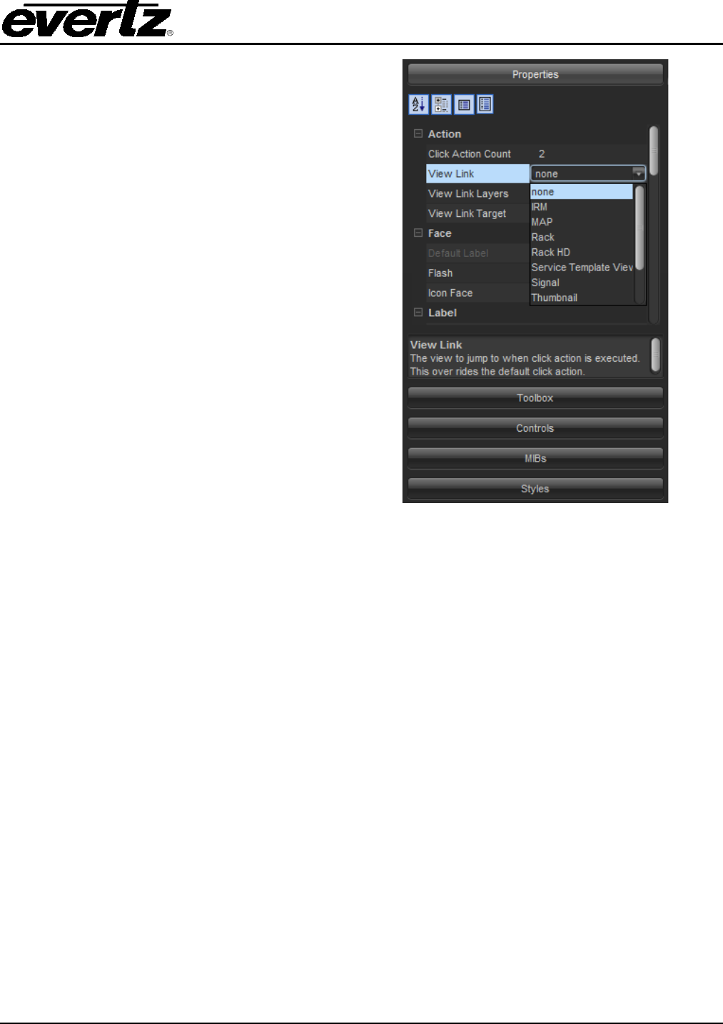
To create a view link from one view to another,
first select the element from the view. The
element properties will have a View Link
parameter with a combo box of all the views
made in the system. Select the view from the
combo box to enable view linking from the
element to another view.
By choosing ‘none’ from the list, view linking will
be disabled for the element.
Figure 8-2: Properties Window with View Link
Menu Selected
VistaLINK® PRO GRAPHICS
Page - 24 Revision 2.0
9. CONTROLS
VistaLINK® PRO Graphics can utilize the controls of hardware support within the graphical view.
Therefore, it is possible to take the same controls found in a configuration view for a card and place
them onto the canvas. This gives the program the ability to make custom control panels. These control
panels can be used for easy access to common parameters. Also the custom control panels can be
used to delegate control to certain users. It is possible to mix and match different controls from
different devices onto a single view.
The following information outlines the process for adding control from a card to the graphical view.
1) To reveal the controls, select the ‘Controls’
Pane from the side bar area.
2) Select the device from the Navigation Tree
and drag and drop the device into the
Controls pane.
3) To reveal the control parameters, which will
be placed onto the graphical view, use the
Controls pane to navigate through the
control groups.
4) Drag the control parameter from the Controls
pane and drop the parameter onto the
canvas. The program
will automatically
generate the correct type of control for the
parameter.
Figure 9-1: Shows the process for adding
controls to the graphical view
To remove the device from the control pane, right mouse click the device in the tree
and select ‘Remove’.
Once the controls are placed onto the graphical view, they become bonded to the Apply and Refresh
buttons on the application toolbar.
VistaLINK® PRO GRAPHICS
Revision 2.0 Page - 25
The following is a list of toolbar functions:
This button is a single refresh for all the controls on the view.
This button is an auto refresh for all the controls on the view. Controls are automatically
updated to display the current value.
This button is a single apply change for all the controls on the view.
This button is a dynamic apply change for all the controls on the view. It is used for auto
applying when adjusting control values.
It is possible to specify the refresh rate for the Auto Refresh function. Right mouse
click the icon to specify an interval in seconds.
The following parameters are available for all controls from the side bar area.
SNMP
Agent IP Sets the IP Address of the SNMP Agent that the control will communicate
with.
OID Sets the OID value for the control that resides on the Agent.
To create a background colour for a control, draw a rectangle vector with a fill colour.
Place the rectangle vector behind the control to simulate the control has a fill.
VistaLINK® PRO GRAPHICS
Page - 26 Revision 2.0
10. LABELING
Labels provide a method of custom naming for elements on the graphical view. By default, the element
label is derived from the label that is used in the Navigation Tree. The custom labeling not only allows
for a new label but it also allows for modifications to the label that is rendered. Colour, size, font, etc
are all available for the labeling properties.
To view the labeling properties for an element; first select the element from the canvas. Ensure that the
expert level controls are visible from the side bar by selecting the list icon .
Below are a sample of the available parameters for labels from the side bar area.
LABELS
Label Sets the label to show on the whiteboard.
Label Colour Sets the colour of the label.
Label Position Sets the label position in relation to the component.
Label Alignment Sets the label alignment in relation to the position.
Default Label Label to show on whiteboard if no custom label is set.

VistaLINK® PRO GRAPHICS
Revision 2.0 Page - 27
LABEL
North Edge Visible Sets whether the North Edge is painted or not.
South Edge Visible Sets whether the South Edge is painted or not.
East Edge Visible Sets whether the East Edge is painted or not.
West Edge Visible Sets whether the West Edge is painted or not.
South Edge Colour Sets the colour of the South Edge.
East Edge Colour Sets the colour of the East Edge.
West Edge Colour Sets the colour of the West Edge.
North Edge Colour Sets the colour of the North Edge.
Edge Transparency Sets the level of transparency for all edges.
Label Background Colour Sets the background colour of the label.
Label Background Transparency Sets the transparency level of the label background colour.
Font Sets the font type of the label.
Font Size Sets the font size on the label.
Bold Sets whether the text will be bold.
Italics Sets whether the text will be in italics.
It is
possible to modify the label settings for more than one element by having
multiple elements selected at once.
To use custom fonts for label vectors, install the font into the Windows Font
database system of the Control Panel.
VistaLINK® PRO GRAPHICS
Page - 28 Revision 2.0
11. DROP ACTIONS
11.1. DROP AS A BLOCK
Additional options are available in the VistaLINK® Graphics program to create elements on the View.
Traditionally the Icon Face object is used to render the element on the view. A Block function can be
used instead for all elements from the Navigation Tree. The benefit of the block function is that the
colour can change and the function is resizable. It also provides a method to create buttons for controls
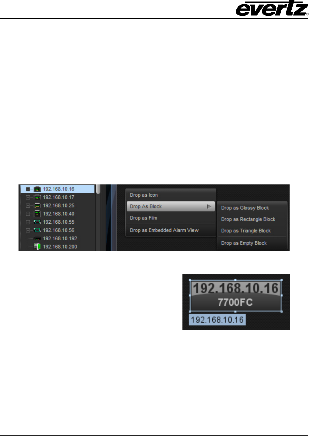
and block icons for signal path views. Figure 11-1 shows the process for dropping an element from the
navigation tree as a block.
1) Select the element from the Navigation Tree and drag it over to the graphical view. While still
holding the mouse button, hold the CTRL key down before letting go of the mouse button.
2) After letting go of the mouse button an option menu will appear. Select the ‘Drop as Block’
menu system and choose the ‘Drop as Rectangle Block’ function from the sub-menu.
3) A block should appear on the graphical view.
Figure 11-1: Shows the process for adding a block to a graphical view
When the block is selected from the graphical view,
the block will have points around the perimeter of the
block. By clicking and dragging these points, the
block can shrink and enlarge to different sizes.
Figure 11-2: Shows the points around the
perimeter of the block for resizing
VistaLINK® PRO GRAPHICS
Revision 2.0 Page - 29
The following is a sample list of properties and parameters that are available for blocks in the side bar.
LABELS
Label Sets the label that is displayed on the whiteboard.
Default Primary Label Default primary label text.
Default Secondary Label Default secondary label text.
Custom Primary Label Customization to primary label.
Custom Secondary Label Customization to secondary label.
Primary Label Colour Sets the colour of the primary label.
Secondary Label Colour Sets the colour of the secondary label.
Primary Label Alignment Sets the label position of the primary label.
Secondary Label Align Sets the label position of the secondary label.
BODY
Primary Colour Sets the primary shading colour for the block.
Secondary Colour Sets the secondary shading colour for the block.
Tertiary Colour Sets the third colour augmentation.
Background Colour Sets the background colour of the Block.
Transparency Set the transparency level of the block.
Highlight Enables or Disables the Blocks bevel.
Setting the labels to ‘this’ will revert the label to its default label.
It is possible to change more than one block setting at a single time by having more
than one block selected at once.
VistaLINK® PRO GRAPHICS
Page - 30 Revision 2.0
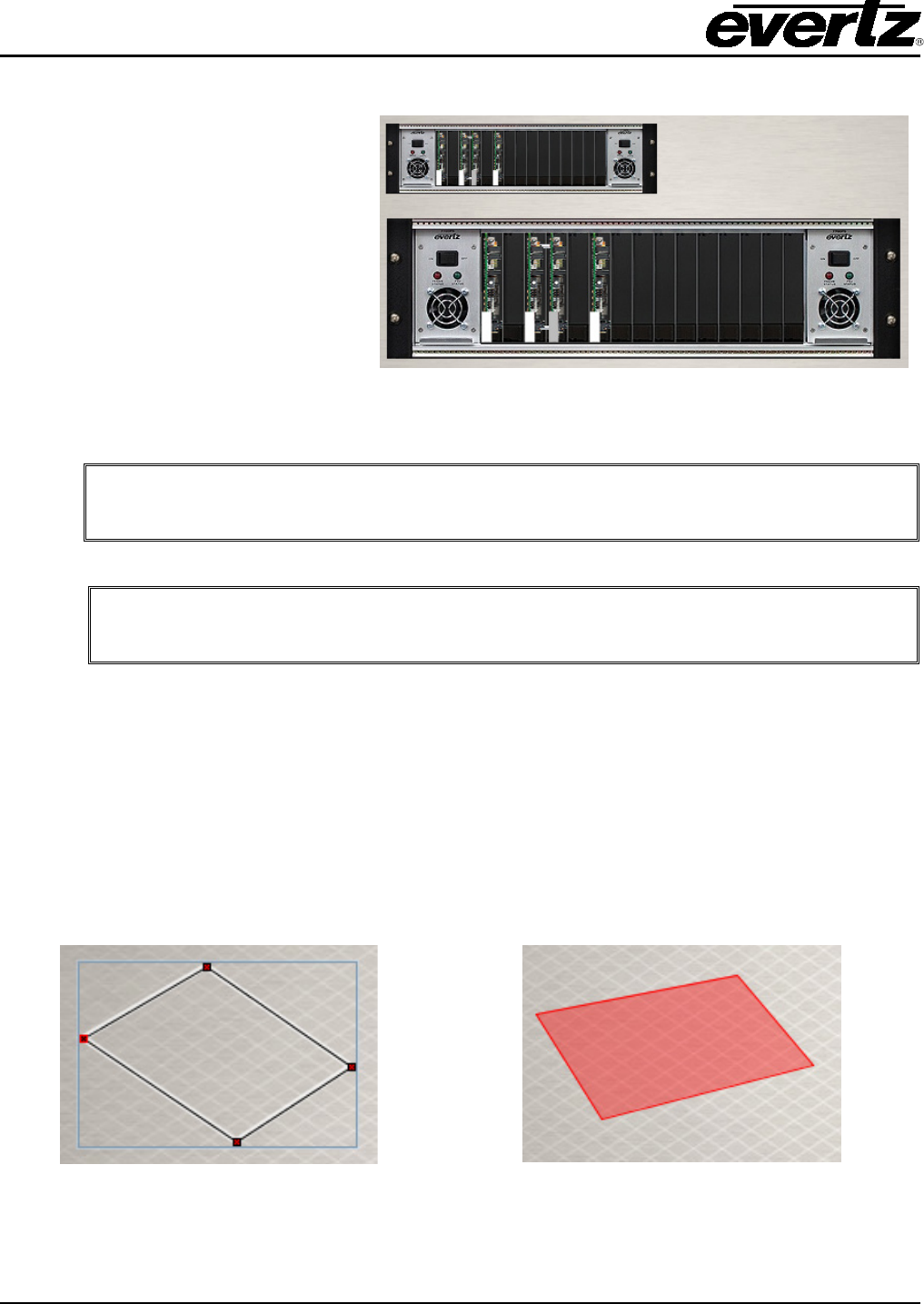
11.2. DROP AS RACK
The drop as rack is another macro drop
function available for hardware frames
being dropped onto the graphical view.
The drop as rack
option will
automatically place the cards in the
frame under the frame icon.
This method is accessed through the
CTRL key option when placing only
frames onto the graphical view.
Figure 11-3: Drop as Rack function with MVP and 7700
Frames
The Icon Faces used in the Drop as Rack option fit the dimensions in the sample rack
view backgrounds.
Other types of elements have special drop functions like the above drop as rack
.
Thumbnails, MIB Control Sets and Streams all have droppable actions.
11.3. DROP AS FILM
The drop as film option is available for all element types; it works much like the drop as block accept it
provides an invisible icon. The film is most commonly used when providing clickable actions for
elements that do not support an action. For example, a film made out of a macro that is on top of a
thumbnail. The operator could click over top of the thumbnail to execute the macro. Films can be
resized and reshaped so that they can be fitted on top of almost anything.
To access films, use the CTRL key function when dropping elements from the Navigation Tree onto the
graphical view. Choose the ‘Drop as Film’ option from the option menu.
Figure 11-4: Corners of the film can be used
to reshape and resize Figure 11-5: Film can have a translucent flash if
it is made from an element that has severities
VistaLINK® PRO GRAPHICS
Revision 2.0 Page - 31
BODY
Corporeal Sets whether the component has a physical presence (i.e. if it can be clicked)
Default Colour Sets the default colour when there is no severity.
Transparency Sets the transparency of the default colour.
You can save the size and shape of the film by right mouse clicking the film’s points
and choosing the ‘Set as Default Film Shape”
It is possible to use Films and Services together to create a button that flashes when
a fault occurs and have the button execute a particular task. The service can be a
block and the macro can be the film.
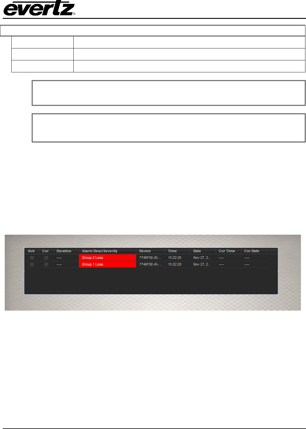
11.4. DROP AS EMBEDDED ALARM VIEW
It is possible to embed the alarm views from hardware or services onto the graphical views. This type
of component uses the same structure as the original alarm views. To create an embedded alarm view
select a device or service from the Navigation Tree and drag and drop it while holding the CTRL key.
Select “Drop as Embedded Alarm View” from the option menu to create an embedded alarm view on
the graphical view.
Figure 11-6 shows an embedded alarm view from a device. The points that surround the perimeter of
the alarm view allow resizing of the component.
Figure 11-6: Shows an embedded alarm view on the graphical view
VistaLINK® PRO GRAPHICS
Page - 32 Revision 2.0
A sample of side bar parameters for the embedded alarm view are listed below.
BODY
Grid Colour Sets the grid line colour used in the alarm table.
Background Colour Sets the background colour of the Alarm view.
Header Colour Sets the background colour of the Alarm table.
Transparency Sets the transparency level of the background colour.
Border Sets the border style to add to the edges of the alarm view.
CONTROLS
Controls Toggles the display of the toolbar controls for the alarm view.
Records Toggles the display of the record controls for the alarm view.
Headers Toggles the display of the headers for the alarm view.
ALARMS
Max Alarms Sets the number of alarms to show in the alarm view.
Updateable Sets whether the user can update the number of alarms in the alarm
view.
Any customizations done to the alarm view will be propagated down to the
embedded alarm views.
VistaLINK® PRO GRAPHICS
Revision 2.0 Page - 33
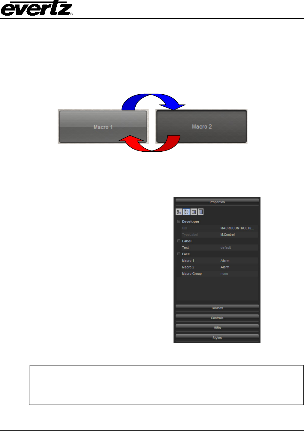
12. MACRO TOGGLES
Macro toggles are a special type of component that are built for macro use. A toggle is basically a
push button system. A macro is assigned when the button is not pressed and another macro is
assigned when the button is pressed. To create a toggle on a graphical view, drag a previously
created macro over to the canvas. While holding the CTRL key down, let go of the mouse button to
bring up an option menu. Select the “Drop as Control” option.
Figure 12-1: Illustrates how a macro toggle works
To configure a macro toggle, first select
the toggle so that the properties are shown
in the side bar.
Select a macro for the ‘Macro 1’ field
property and select a macro for the ‘Macro
2’ field property. A combo box will show all
the available macros from the side bar
area for the 2x property fields.
The label name of the two toggle states
can be changed from the ‘Labels’ grouping
in the side bar. Select the expert level
controls to show the alignment
adjustments that can be made.
Figure 12-2: Side bar showing the toggle properties
If certain toggles have to be disabled when other toggles are used, use the ‘Unity
Group’ function from the expert level properties for a toggle. Type in a new group
name for one toggle and it should be available for selection on the other toggles.
Using unity groups, all of the toggles in a group will be disabled if a toggle is
pressed.
VistaLINK® PRO GRAPHICS
Page - 34 Revision 2.0
13. VISIBILITY CONTROLS
Visibility controls are available to manage elements on the view without having to reposition them.
These controls aid in the development process where some elements might be placed on top of other
elements. Instead of having to reposition the element, the type of control can be set to hidden. To use
the visibility controls, ensure that the expert level parameters are shown for the view properties.
Below are the available Visibility parameters for the view from the side bar.
VISIBILITY
Icons
Sets whether or not the component will be visible.
Custom Icons
Blocks
Alarm Views
Bar Graphs
Thumbnails
Controls
MIB Controls
Macro Controls
Clocks
Firms
Streams
Vectors
VistaLINK® PRO GRAPHICS
Revision 2.0 Page - 35
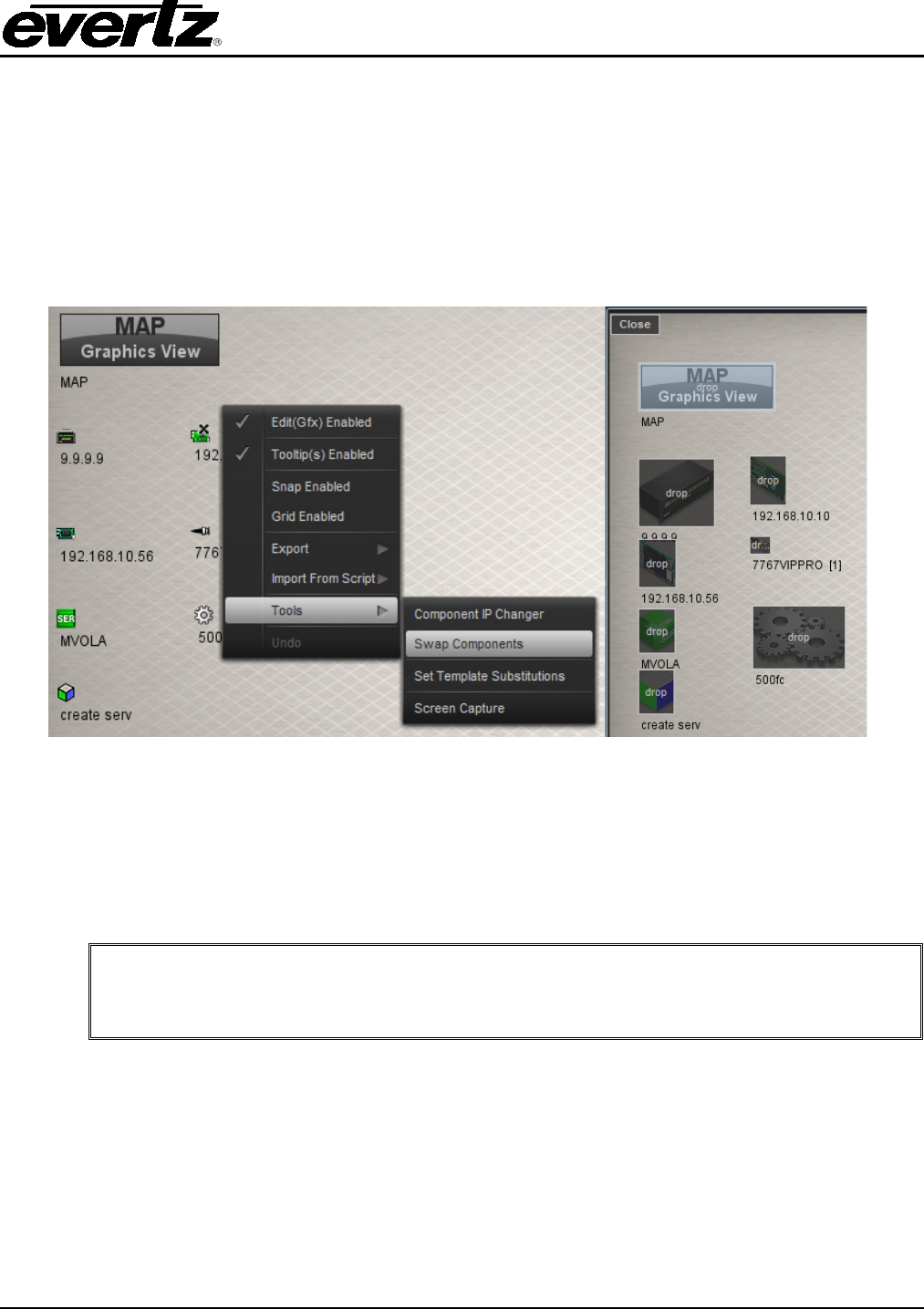
14. SWAP COMPONENTS
Swap components provide the ability to replace elements from a view with another set of elements. It
provides a drag and drop interface for replacing an element with another set of elements. This is ideal
when a view is created and it needs to be duplicated for another set of elements of the same type.
To use swap components, right mouse click anywhere on the graphical view and choose ‘Tools’ and
then ‘Swap Components’.
Figure 14-1: Shows the Swap Components Enabled
When swap components are enabled, all elements from the graphical view have a translucent blue box
overtop of the element. This signifies that elements from the navigation tree can be dragged and
dropped overtop of the element on the graphical view for swapping. Swapping will cause the
necessary pointer information to be converted to a different pointer that was selected from the
Navigation Tree.
It is only possible to swap components of the same type. Meaning, if a macro is
enabled for swapping on the graphical view, it is not possible to swap it with a
hardware element, etc.
VistaLINK® PRO GRAPHICS
Page - 36 Revision 2.0
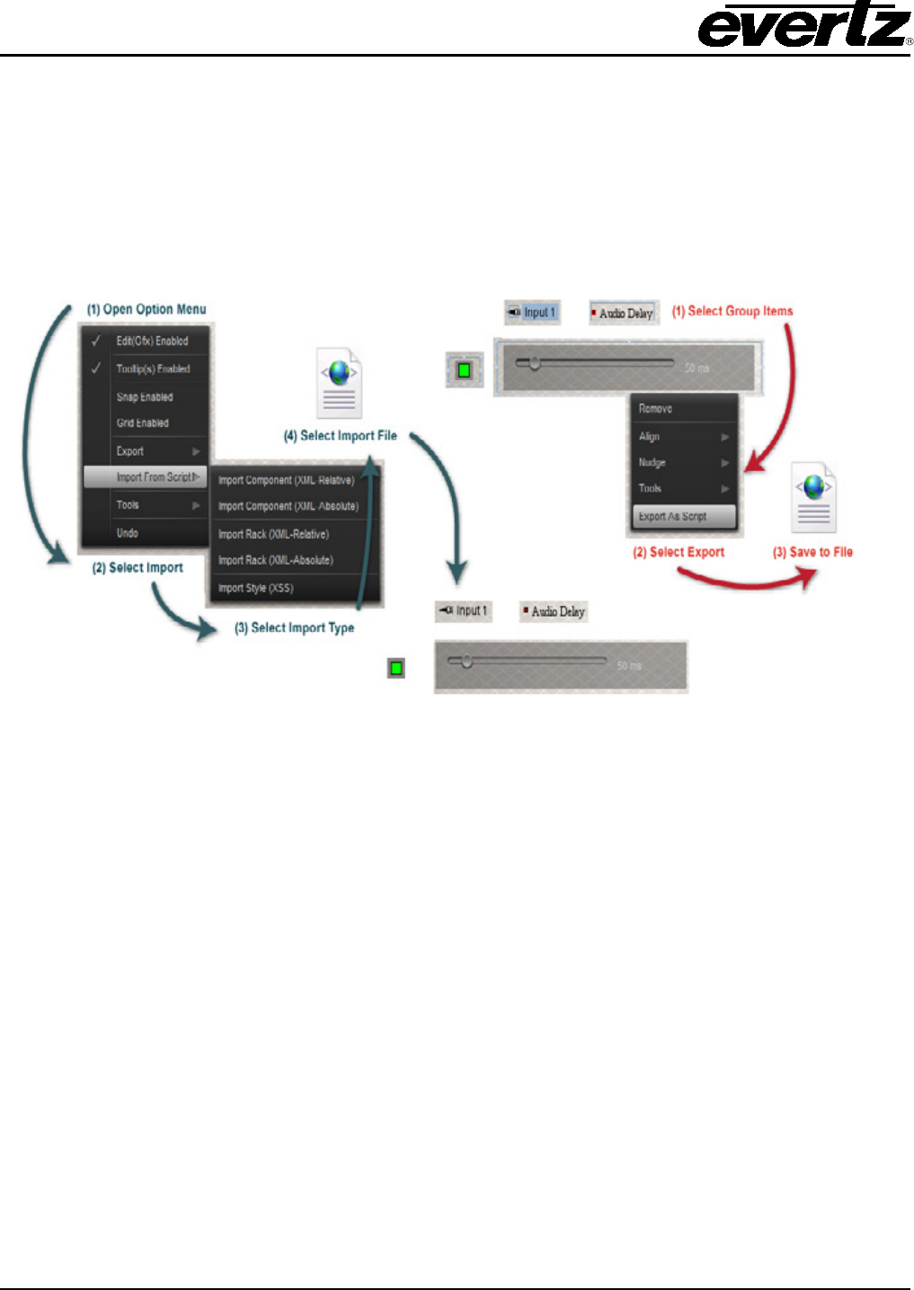
15. IMPORT AND EXPORT
Import and Export features are used to re-use design layouts. Elements from the navigation and vector
arts may be included in the export. The export function creates a text editable XML based file. This file
can be hand edited and is used by the Import function. Typical uses of the Import and Export are for
repetitive and favorable designs. This feature is more powerful than using the clipboard (copy and
paste) because the export converts the copy into a file that can be saved on the local hard disk.
Figure 15-1: Shows the steps involved in importing and exporting
15.1. EXPORT
1. The first step is to select a group of components. Figure 15-1 shows that all items are selected.
Using the mouse to select everything performs a group select function.
2. Select any of the selected item’s points using the right click mouse button to bring up the option
menu. Other items should still be selected at this point. Select the last menu item called
‘Export…’
3. A dialog will appear enabling the user to select the location and name of the saved file. A XML
file will be created in the desired path.

VistaLINK® PRO GRAPHICS
Revision 2.0 Page - 37
15.2. IMPORT
1. Open the global option menu in the design mode by right mouse clicking anywhere on the
canvas.
2. Select the ‘Import from script’ option from the menu.
3. Select the ‘Absolute…’ or ‘Relative…’ Import option:
a. Absolute… imports the elements from their original destination. This method is ideal if
you are duplicating a view layout on another view.
b. Relative… imports the elements based on where the mouse initiated the import
command. This is ideal for duplicated designs on a single view.
4. Locate and open the saved XML file to create the graphic elements based in the file.
VistaLINK® PRO GRAPHICS
Page - 38 Revision 2.0
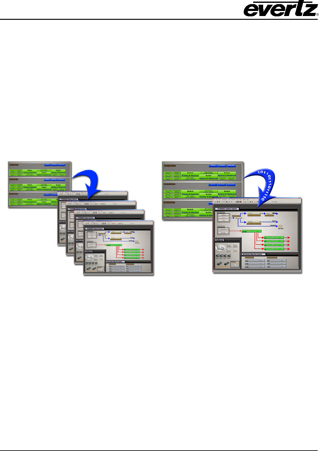
16. TEMPLATE SUBSTITUTIONS
Template Substitutions are used to allow a faster method of creating a multi-channel monitoring and
control system. The Template Substitutions function allows the user to create a template view with
various control and monitoring elements. This template view can be used so that the program will sub
in key information that will change the functions on a graphics view from one set of elements to another
set of elements.
The following is an example of how you may use the template substitution function for a possible
problem where a system has a custom control page. The control page consists of various parameters
from a modular card. The controls are bonded to only one particular modular card. This creates a
system where x number of modular cards would equate to x number of graphic views.
Figure 16-1 shows a standard legacy system with an index view linked to multiple views that are the
same. Each view has their controls bonded to a different card.
Figure 16-1: Legacy System Figure 16-2: Template Substitutions
Figure 16-2 illustrates how by using template substitutions the program can sub in data to 1x single view
and have the controls be bonded to another device. This is just one example of using template
substitutions with controls. This method can be used with any type of Navigation Tree elements to create
a dynamic system. The greatest benefit of having template substitutions in a system is that modifying the
template is simpler and faster than modifying x number of graphic views.
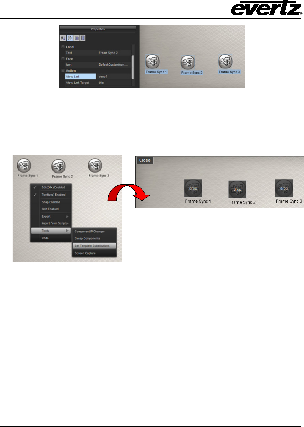
One of the key elements in using Template Substitutions is the Template Reference Identifier. The
reference identifier can be found in the element property editor. Figure 16-3 highlights the Template
Reference Identifier property.
VistaLINK® PRO GRAPHICS
Revision 2.0 Page - 39
Figure 16-3: Template Reference Identifier property highlighted
The purpose of the Template Reference Identifier is to signify an element or a group of elements for
replacement. Figure 16-3 illustrates how the user sets the identifier for each object on the graphics view.
This would allow all the controls and icon faces to be dynamically bonded to another device. This
example is using 3x frame synchronizers from the hardware tree.
The above example is showing a template made with the following:
• 4x Controls with a template reference ID of ‘1’
• 1x Block Icon Face the card itself. It also has a template reference ID of ‘1’
If other types of elements were on the view and are subject to replacement (like a Service), it would have
a template reference ID of another number.
After completion of the template page, it is now possible to create the top-level page in this example.
Figure 16-4 has 3x icons on a new graphics view. Each icon has a view link to the template page. It is
important that the View Link is created at this step.
VistaLINK® PRO GRAPHICS
Page - 40 Revision 2.0
Figure 16-4: View Link property field highlighted and set to a view called ‘Template’
Once the view links are established you can put the program in a mode to show what elements on the
graphics view have view links with Template Reference Identifiers configured. The image on the left
shows the right click options menu from the graphics view. You can select ‘Set Template Substitutions’
from the tools menu. After selecting the option, the graphics view elements will show a drop area
indication as shown in the bottom right image of Figure 16-5.
Figure 16-5: Displays right click option menu enabling Template Substitutions
When the ‘Set Template Substitutions’ is enabled, the program will allow any elements from the
Navigation Tree to be dropped on top of the view linked icons. In this example, the droppable element
would be a frame synchronizer from the hardware tree.
Once finished, the index page could be used to access the template page, which would cause the
template page to re-bind all it’s elements to the proper frame synchronizer.
