SAS Visual Analytics 7.3: Getting Started With Exploration And Reporting 7 3 Guide For Exploration And
User Manual:
Open the PDF directly: View PDF ![]() .
.
Page Count: 48

SAS® Visual Analytics 7.3
Getting Started with Exploration and
Reporting
SAS® Documentation
The correct bibliographic citation for this manual is as follows: SAS Institute Inc. 2015. SAS® Visual Analytics 7.3: Getting
Started with Exploration and Reporting. Cary, NC: SAS Institute Inc.
SAS® Visual Analytics 7.3: Getting Started with Exploration and Reporting
Copyright © 2015, SAS Institute Inc., Cary, NC, USA
All rights reserved. Produced in the United States of America.
For a hard-copy book: No part of this publication may be reproduced, stored in a retrieval system, or transmitted, in any
form or by any means, electronic, mechanical, photocopying, or otherwise, without the prior written permission of the
publisher, SAS Institute Inc.
For a web download or e-book: Your use of this publication shall be governed by the terms established by the vendor at
the time you acquire this publication.
The scanning, uploading, and distribution of this book via the Internet or any other means without the permission of the
publisher is illegal and punishable by law. Please purchase only authorized electronic editions and do not participate in or
encourage electronic piracy of copyrighted materials. Your support of others' rights is appreciated.
U.S. Government License Rights; Restricted Rights: The Software and its documentation is commercial computer
software developed at private expense and is provided with RESTRICTED RIGHTS to the United States Government. Use,
duplication or disclosure of the Software by the United States Government is subject to the license terms of this Agreement
pursuant to, as applicable, FAR 12.212, DFAR 227.7202-1(a), DFAR 227.7202-3(a) and DFAR 227.7202-4 and, to the extent
required under U.S. federal law, the minimum restricted rights as set out in FAR 52.227-19 (DEC 2007). If FAR 52.227-19 is
applicable, this provision serves as notice under clause (c) thereof and no other notice is required to be affixed to the
Software or documentation. The Government's rights in Software and documentation shall be only those set forth in this
Agreement.
SAS Institute Inc., SAS Campus Drive, Cary, North Carolina 27513-2414.
August 2015
SAS® and all other SAS Institute Inc. product or service names are registered trademarks or trademarks of SAS Institute
Inc. in the USA and other countries. ® indicates USA registration.
Other brand and product names are trademarks of their respective companies.

Contents
Using This Book . . . . . . . . . . . . . . . . . . . . . . . . . . . . . . . . . . . . . . . . . . . . . . . . . . . . . . . . . . . . . . v
Accessibility . . . . . . . . . . . . . . . . . . . . . . . . . . . . . . . . . . . . . . . . . . . . . . . . . . . . . . . . . . . . . . . . . vii
Chapter 1 • Introduction . . . . . . . . . . . . . . . . . . . . . . . . . . . . . . . . . . . . . . . . . . . . . . . . . . . . . . . . . . . . . 1
About Exploration . . . . . . . . . . . . . . . . . . . . . . . . . . . . . . . . . . . . . . . . 1
About Reporting . . . . . . . . . . . . . . . . . . . . . . . . . . . . . . . . . . . . . . . . . 2
Chapter 2 • Basic Tasks . . . . . . . . . . . . . . . . . . . . . . . . . . . . . . . . . . . . . . . . . . . . . . . . . . . . . . . . . . . . . 3
Introduction . . . . . . . . . . . . . . . . . . . . . . . . . . . . . . . . . . . . . . . . . . . . . 3
Explore a Data Source . . . . . . . . . . . . . . . . . . . . . . . . . . . . . . . . . . . . 3
Share an Exploration . . . . . . . . . . . . . . . . . . . . . . . . . . . . . . . . . . . . . 5
Create a Report . . . . . . . . . . . . . . . . . . . . . . . . . . . . . . . . . . . . . . . . . 6
View a Report . . . . . . . . . . . . . . . . . . . . . . . . . . . . . . . . . . . . . . . . . . . 7
Chapter 3 • Specific Tasks . . . . . . . . . . . . . . . . . . . . . . . . . . . . . . . . . . . . . . . . . . . . . . . . . . . . . . . . . . . 9
Introduction . . . . . . . . . . . . . . . . . . . . . . . . . . . . . . . . . . . . . . . . . . . . . 9
Cheat Sheet for Explorations . . . . . . . . . . . . . . . . . . . . . . . . . . . . . . 10
Cheat Sheet for Reports . . . . . . . . . . . . . . . . . . . . . . . . . . . . . . . . . . 12
About the Availability of Actions . . . . . . . . . . . . . . . . . . . . . . . . . . . . 18
Chapter 4 • Quick Reference . . . . . . . . . . . . . . . . . . . . . . . . . . . . . . . . . . . . . . . . . . . . . . . . . . . . . . . . 19
Data Sources . . . . . . . . . . . . . . . . . . . . . . . . . . . . . . . . . . . . . . . . . . 19
Anatomy of a Report . . . . . . . . . . . . . . . . . . . . . . . . . . . . . . . . . . . . . 20
Gallery . . . . . . . . . . . . . . . . . . . . . . . . . . . . . . . . . . . . . . . . . . . . . . . . 20
SAS Home Page . . . . . . . . . . . . . . . . . . . . . . . . . . . . . . . . . . . . . . . . 34
The Explorer . . . . . . . . . . . . . . . . . . . . . . . . . . . . . . . . . . . . . . . . . . . 35
The Designer . . . . . . . . . . . . . . . . . . . . . . . . . . . . . . . . . . . . . . . . . . 37
The Viewers . . . . . . . . . . . . . . . . . . . . . . . . . . . . . . . . . . . . . . . . . . . 39
Where to Find Additional Documentation . . . . . . . . . . . . . . . . . . . . . 40
iv Contents
Using This Book
Audience
This book covers the basics of how to explore data and build reports using SAS Visual
Analytics. The emphasis is on introductory instructions, how-to hints, and quick
reference information.
Requirements
Prerequisites
If you choose to perform the tasks in this book, you need the following software,
information, and privileges:
na link to a working deployment of SAS Visual Analytics 7.3
na supported web browser (see the SAS support site for supported versions)
na supported version of the Adobe Flash Player (see the SAS support site for
supported versions)
nan account that can log on to the working deployment
nthe ReadMetadata and Read permissions for at least one LASR table (without the
necessary permissions, you cannot select a data source or access data)
ndata exploration and reporting capabilities (without the necessary capabilities, you
cannot see certain user interface elements)
v
naccess to data sources that can be used to obtain data for explorations or reports
Note: SAS Visual Statistics is visually and functionally integrated with SAS Visual
Analytics Explorer. SAS Visual Statistics requires a separate license.
System Requirements
Detailed system requirements, including support for additional web browsers, are
available on the SAS support site.
vi Using This Book

viii Using This Book
1
Introduction
About Exploration . . . . . . . . . . . . . . . . . . . . . . . . . . . . . . . . . . . . . . . . . . . . . . . . . . . . . . . . . . 1
About Reporting . . . . . . . . . . . . . . . . . . . . . . . . . . . . . . . . . . . . . . . . . . . . . . . . . . . . . . . . . . . . 2
About Exploration
Data exploration involves getting to know a data source and then using it to inform your
decisions. In exploration, the emphasis is on discovery and ad hoc visualization.
Exploration is driven by predefined questions, curiosity, logic, intuition, creativity, and
experimentation.
The SAS Visual Analytics Explorer (the explorer) is well suited to the task.
nThe explorer provides fast, highly visual responses so that you can use an iterative
approach to exploring the data.
nThe explorer’s clean interface and natural interactions minimize distractions so that
you can concentrate on the data.
nThe explorer supports a range of visualization and discovery activities so that you
can adapt your tactics as insights emerge.
nThe explorer includes advanced analytical tools (such as forecasting, correlations,
and fit lines) to further guide and refine the exploration process.
1

Note: If SAS Visual Statistics is licensed at your site, then visualizations are available
for performing statistical modeling tasks. SAS Visual Statistics supports prediction
variable generation. For more information about getting started with modeling and
prediction variable generation, see SAS Visual Analytics: Getting Started with Analytical
Models.
About Reporting
In reporting, the emphasis is on clear, compelling, and widespread communication.
Reporting encompasses design, data selection, interactions by viewers (such as
brushing and filtering), and viewing (in web and native mobile device formats).
Like the explorer, the reporting interfaces are intuitive and responsive, even for
extremely large data sources. Here are the interfaces that you use for reporting:
nThe SAS Visual Analytics Designer (the designer) is for creating and enhancing
reports and dashboards. You can print reports to PDF and distribute and e-mail
reports to other users.
nThe SAS Visual Analytics Graph Builder (the graph builder) is for creating custom
graph objects, which can be made available in the designer for use in reports and
dashboards.
nThe SAS Visual Analytics Viewer (the viewer) is for viewing and interacting with
reports in a web browser.
nSAS Mobile BI is for viewing and interacting with reports on mobile devices.
2Chapter 1 / Introduction
2
Basic Tasks
Introduction . . . . . . . . . . . . . . . . . . . . . . . . . . . . . . . . . . . . . . . . . . . . . . . . . . . . . . . . . . . . . . . . . 3
Explore a Data Source . . . . . . . . . . . . . . . . . . . . . . . . . . . . . . . . . . . . . . . . . . . . . . . . . . . . 3
Share an Exploration . . . . . . . . . . . . . . . . . . . . . . . . . . . . . . . . . . . . . . . . . . . . . . . . . . . . . . 5
Create a Report . . . . . . . . . . . . . . . . . . . . . . . . . . . . . . . . . . . . . . . . . . . . . . . . . . . . . . . . . . . . . 6
View a Report . . . . . . . . . . . . . . . . . . . . . . . . . . . . . . . . . . . . . . . . . . . . . . . . . . . . . . . . . . . . . . . 7
Introduction
This chapter provides step-by-step instructions to guide you through basic tasks. The
purpose is to provide a brief, hands-on orientation to a few of the many possible
workflows for exploration and reporting.
Explore a Data Source
To explore a data source:
1In a web browser, open the home page (at your equivalent of http://
<serverName>:<portNumber>/SASVisualAnalyticsHub).
3
2Click Data Explorer.
3In the SAS Visual Analytics Explorer window, click Select a Data Source.
4In the Open Data Source window, select a data source or click a link in the Import
Data panel to add a new data source. Click Open.
Note: For more details about importing data, see the SAS Visual Analytics: User's
Guide.
5Drag any data item from the left pane onto the center of the screen. The explorer
assigns the data item to a role and displays an initial chart as the new exploration’s
first visualization.
TIP An exploration contains all of the visualizations, filters, and data settings from
an explorer session.
6Extend, enhance, and refine the exploration (as little or as much as you like). For
ideas, see “Cheat Sheet for Explorations” on page 10.
TIP In exploration and reporting, access to data is always Read-Only, so feel free
to experiment—you will not break anything.
TIP If your session times out due to inactivity, any unsaved changes are lost. It is
a good idea to save your work frequently.
7To save the exploration, select File Save from the main menu. In the Save As
window, select My Folder, and enter a name. Click Save.
TIP Each data exploration is saved in its own project, which is called an
exploration.
8In the upper left corner of the explorer, click .
9On the home page, notice that the new exploration is in the Recent list.
4Chapter 2 / Basic Tasks
Share an Exploration
As you explore your data, you might want to share your findings. One way to share the
contents of an exploration is to export some or all of its visualizations as a report.
To export an exploration as a report:
1On the home page, double-click an exploration to open it.
2Select File Export Exploration as Report from the explorer’s main menu.
3If your exploration contains more than one visualization, use the Export as Report
window to select the visualizations that you want to export. Click OK.
TIP A few types of content (decision trees, network diagrams, word clouds, and
treemaps that display additional levels) cannot be exported. To share such
content, export it as a PDF or save it as an image.
4In the Save As window, select a shared folder, and accept the default name. Click
Save.
5In the Export as Report window, select the check box to Open the report now. Click
OK.
You can also browse to open the report. In the upper left corner of the explorer, click
. On the home page, notice that the report is not in the Recent list. Only objects
that you create or open are in the Recent list. If you want to navigate to the report,
click Browse.
The preceding steps export content to SAS metadata as a report. The following table
lists some other ways to share the contents of an exploration. First, make sure that the
exploration is saved in a shared folder so that it is accessible to other users.
Share an Exploration 5

Table 2.1 Additional Methods for Sharing Exploration Content
Task How to Initiate
E-mail a saved exploration
as a link
From the explorer’s main menu, select File E-mail.
Export as a PDF From the explorer’s main menu, select File Export
Exploration as PDF.
Save as an image In a visualization’s toolbar, click , and select Export Image.
Create a Report
1On the home page, click Report Designer. The designer opens with a new, empty
report.
2Drag an object, such as a Bar Chart , from the left pane onto the canvas in the
center of the screen.
3To add data:
aOn the Data tab (in the left pane), click Select a data source. In the Add Data
Source window, select a data source or click a link in the Import Data panel to
add a new data source. Click Add.
Note: For more details about importing data, see the SAS Visual Analytics:
User's Guide.
bDrag a category from the Data tab onto the Category label (at the bottom of
the bar chart).
TIP A category has alphanumeric or date values that can be used as discrete
groupings (for example, the values in a product category might include shoes
and belts).
6Chapter 2 / Basic Tasks
cDrag a measure from the Data tab onto the bar chart.
TIP A measure has numeric values that can be used as numbers (for
example, the values in a sales measure might specify the quantity of units
sold).
4Extend, enhance, and refine the report (as little or as much as you like). For ideas,
see “Cheat Sheet for Reports” on page 12.
TIP If your session times out due to inactivity, any unsaved changes are lost. It is
a good idea to save your work frequently.
5To save the report, select File Save from the main menu. In the Save As window,
select My Folder, and enter a name. Click Save.
6In the upper left corner of the designer, click .
7On the home page, notice that the new report is in the Recent list.
View a Report
To open a report in the viewer, double-click on the report on the home page. In addition,
you can click on the report on the classic home page to display it in the object inspector
and view details. In the object inspector, click View to display the report in the viewer.
To open a report in a native mobile app, launch the SAS Mobile BI app, connect to a
server, navigate to the report, and open it. Instructions vary by device. See the “Viewing
Reports on a Mobile Device” chapter in SAS Visual Analytics: User's Guide, and videos
on the SAS support site.
TIP The SAS Mobile BI app for iPad and iPhone is available in the iTunes App Store.
The Android app is available from Google Play.
View a Report 7
8Chapter 2 / Basic Tasks
3
Specific Tasks
Introduction . . . . . . . . . . . . . . . . . . . . . . . . . . . . . . . . . . . . . . . . . . . . . . . . . . . . . . . . . . . . . . . . . 9
Cheat Sheet for Explorations . . . . . . . . . . . . . . . . . . . . . . . . . . . . . . . . . . . . . . . . . . 10
Cheat Sheet for Reports . . . . . . . . . . . . . . . . . . . . . . . . . . . . . . . . . . . . . . . . . . . . . . . . . 12
About the Availability of Actions . . . . . . . . . . . . . . . . . . . . . . . . . . . . . . . . . . . . . . 18
Introduction
This chapter highlights core functionality in the explorer and designer. For most tasks,
there are multiple ways to begin. Here, one way to initiate each task is documented. If
you ever get stuck or have questions, some of the text right inside the interface might
help.
TIP For comprehensive instructions, access the SAS Visual Analytics: User's Guide
from the Help menu or the SAS support site.
Samples are available. When a SAS Visual Analytics system administrator configures
the samples, the following objects are included:
nsample tables
nsample reports
nsample exploration (if you have SAS Visual Analytics Explorer)
9
Cheat Sheet for Explorations
Task How to Initiate in the Explorer
Add variables to a visualization. Drag the data items onto the visualization in the center
of the screen (from the Data pane on the left).
Add another data source. From the main menu, select Data Add Data Source.
Switch to a different visualization
type.
From the main menu, select Visualization type.
Subset data for the entire
exploration.
Right-click on a data item, and select Add as Filter on
data-source.
Subset data for one visualization. Select the visualization, right-click on a data item, and
select Add as Filter on Visualization.
Subset data in a chart by inclusion
or exclusion.
Select a data value (for example, a bar in a bar chart),
right-click, and select either Include Only Selection or
Exclude Selection. (For a line chart, Show markers
must be selected on the Properties tab.)
Sort elements within a chart or
table.
Right-click on a data item in a chart axis or table, and
select Sort.
View a visualization’s data. Right-click on the visualization, and select Show
Details.
Use a different aggregation
method.
Right-click on a measure in a chart axis or table, and
select Aggregation.
Use a distinct count as a measure. In the Data pane, right-click on a category (or date),
and select Create Distinct Count.
Create a derived item for a
measure.
In the Data pane, right-click on a measure, and select
Create item type.
10 Chapter 3 / Specific Tasks
Task How to Initiate in the Explorer
Apply a correlation and fit line. Right-click on a scatter plot or heat map, and select Fit
Line type. (For a scatter plot, there must be at least
two measures and no grouping categories. For a heat
map, both the X and Y axes must be measures.)
Predict future values. In a line chart where a date or time data item is
assigned to the category role (and no other category
roles are used), right-click, and select Show Forecast.
Create multiple visualizations. From the main menu, select Visualization New.
Organize your visualizations. From the main menu, select View Manage
Visualizations.
See how selected data in one
visualization corresponds to other
visualizations.
From the main menu, select View Data Brushing.
(Not all visualizations support cross-visualization
highlighting.)
Create a data item from an
expression.
From the main menu, select Data New Calculated
Item. (Calculations use unaggregated data.)
Create an aggregated measure
from an expression.
From the main menu, select Data New Aggregated
Measure.
Set up drill-down functionality. From the main menu, select Data New Hierarchy.
Set up a geographic data item. In the Data pane, right-click on a data item that contains
geographic information, select Geography, and assign
a geographic role.
Display a geographic map with a
bubble plot overlay. Drag a geographic data item onto an empty
visualization.
Set up a document collection for a
word cloud with text analytics.
First, specify a data item as the unique row identifier for
the exploration. The unique row identifier must have a
unique value for each row of the data source. Right-
click on the data item in the Data pane, and then select
Set as Unique Row Identifier.
In the Data pane, right-click on a category, and then
select Document Collection.
Cheat Sheet for Explorations 11
Task How to Initiate in the Explorer
Display a word cloud with text
analytics. Drag one or more document collections onto the
visualization in the center of the screen (from the Data
pane on the left).
Delete an exploration. Click Home, and then click Manage (next to My
Content or Other Content).
Explore a different data source. From the main menu, select File New Exploration.
Replace a data source. On the top of the Data pane, click , and then select
Change Data Source.
Add or view exploration-level
comments.
From the main menu, select File Exploration
Comments.
Add or view comments for the
selected visualization.
From the main menu, select Visualization
Comment. The Comments tab is in the right pane.
Duplicate the selected visualization. From the main menu, select Visualization
Duplicate.
Specify whether to automatically
update the visualization after each
change is made.
Use the Auto-Update check box at the bottom of the
right pane to specify this option. If this option is
disabled, you can click Update to update the
visualization when you are ready.
Cheat Sheet for Reports
TIP In general, data-related tasks are initiated from the leftmost panes, and
presentation-related tasks are initiated from the rightmost pane.
Data Task How to Initiate in the Designer
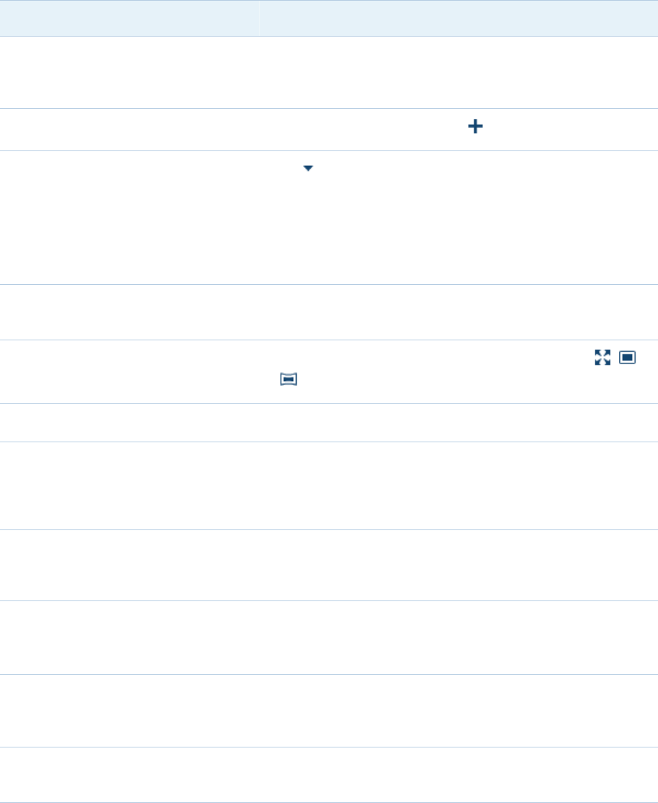
Add another data source. On the Data tab, click .
12 Chapter 3 / Specific Tasks
Data Task How to Initiate in the Designer
Insert a data display object (such
as a table, graph, or gauge).
Drag the object (from the Objects tab) onto the report
in the center of the screen.
Show or hide report objects. On the top of the Objects tab, click , and then select
Show or Hide Objects. You can use this feature to
specify which report objects are displayed on the
Objects tab, including displaying report objects that are
not displayed by default.
Use a distinct count as a measure. On the Data tab, right-click on a category (or date) data
item, and select Create Distinct Count.
Change the format of a measure,
date, or numeric category.
On the Data tab, select the measure, and then click the
triangle at the end of the Format row (below the list of
data items).
Create a data item from an
expression. On the Data tab, click , and select New Calculated
Item. (Calculations use unaggregated data.)
Create an aggregated measure
from an expression. On the Data tab, click , and select New Aggregated
Measure.
Create a new custom category. On the Data tab, right-click on the category or measure
data item that you want to use to create the new custom
category. Select New Custom Category.
Set up drill-down functionality. On the Data tab, click , and select New Hierarchy.
Hide a data item. On the Data tab, click , and select Show or Hide
Items. Alternatively, you can select Only Show Used
Items to hide all of the data items that are not used in
the current report.
Create a custom sort. On the Data tab, right-click on a category data item and
select New Custom Sort.
Exclude a subset of data from the
entire data source. On the Data tab, click , and select New Data Source
Filter.
Cheat Sheet for Reports 13

Data Task How to Initiate in the Designer
Incorporate a stored process. From the main menu, select Insert Other Stored
Process.
Get basic statistics about all
measures. On the Data tab, click , and select Measure Details.
Get additional statistics about a
particular measure. On the Data tab, click , select Measure Details, and
select the measure (in the Measure Details window).
Change the data source for the
current report. On the Data tab, click , and select Change Data
Source.
Show multiple aggregations (or
multiple formats) for a data item.
Right-click on the data item, select Duplicate Data
Item, and then change the aggregation (or format) of
the new data item.
Reuse an existing visualization or
report object in a separate report.
From the main menu, select View Imports. The
Imports tab is in the left pane.
Use a predefined geography data
item.
On the Data tab, right-click on an item that contains
geographic information, and then select Geography.
Select a predefined geographic role, such as US ZIP
Codes.
Create a custom geography data
item.
On the Data tab, right-click on an item that contains
geographic information, and then select Geography
Custom. In the Geography window, assign measures
that contain location information. (For example, you
might assign Latitude and Longitude as the respective
measures for a Region category.)
Display a geographic map with a
bubble plot overlay, coordinates, or
colored regions.
From the Other list on the Objects tab, drag Geo
Bubble Map, Geo Coordinate Map, or Geo Region
Map onto a report in the center of the screen. From the
Data tab, drag a geographic data item onto the map.
Create the percentage of total for a
measure.
On the Data tab, right-click on a measure (with a
current default target aggregation of Sum or Count),
and select Create Percent of Total. A new
aggregated measure is created.
14 Chapter 3 / Specific Tasks
Data Task How to Initiate in the Designer
Cancel slow-running queries for a
report object.
Position your mouse over the progress indicator for the
report object and click the icon.
Specify whether to automatically
update the report after each
change is made.
Use the Auto-Update check box above the canvas to
specify this option. If this option is disabled, you can
click to update the report when you are ready.
Export data from a report object to
a Microsoft Excel spreadsheet.
Right-click on the report object, and select Export
reportObjectName.
Presentation Task How to Initiate in the Designer
Edit a report’s description. At the top of the Properties tab, select the report from
the drop-down list.
Format a chart’s title. Select the chart, and then make changes on its
Properties tab.
Add a trend line to a list table. In a table, right-click on a column, and select Add
Sparkline. (The data source must include a date data
item.)
Change a bar chart’s orientation. Select the bar chart, and then change Direction on its
Properties tab.
Change a chart’s colors or styles. Select the chart, and then make changes on its Styles
tab.
Set up report-level conditional
highlighting.
On the Display Rules tab, select the report, and then
click New.
Set up object-level conditional
highlighting.
On the Display Rules tab, select a report object.
For example, to populate intervals for a KPI, click the
Display Rules tab, and select the gauge.
Create a reusable pattern of gauge
intervals and colors.
From the main menu, select View Shared Rules.
The Shared Rules tab is in the left pane. Click .
Cheat Sheet for Reports 15
Presentation Task How to Initiate in the Designer
Apply a shared display rule to a
new gauge.
From the main menu, select View Shared Rules.
The Shared Rules tab is in the left pane. Drag the rule
onto the gauge.
Add a new section (tab) to a report. At the top of the canvas, click .
Add an info window to a report. Click on the Sections tab, and then select Display
as Info Window.
In the SAS Visual Analytics Viewer, when the user
double-clicks data in a report object that has an info
window, then the additional information is displayed in a
new window.
Create a scrollable area. From the main menu, select Insert Containers
container type.
Use a different canvas size. Above the canvas, from the drop-down list, click , ,
or .
Change your default canvas size. From the main menu, select File Preferences.
Overlap one report object on top of
another.
On a section’s Properties tab, select Precision from
the Layout drop-down list. Drag report objects to the
appropriate locations. In the toolbar, use the Arrange
and Sizing menus to make adjustments.
Set up view-time filters (prompts). From the Objects tab, drag a control object onto the
drop zone at the top of a report or section. Then, drag a
category data item onto the control object.
Set up view-time interactions
(where an action on one object
affects other objects).
From the main menu, select View Interactions. The
Interactions tab is in the right pane. Click New
Interaction. (Not all objects support interactions.)
Add or view comments. From the main menu, select View Comments. The
Comments tab is in the right pane. (Only report-level
comments are supported.)
Add or view alerts for a report
object.
From the main menu, select View Alerts. The Alerts
tab is in the right pane.
16 Chapter 3 / Specific Tasks
Presentation Task How to Initiate in the Designer
Specify a preference for receiving
alert notifications.
Select File Preferences, and then click General in
the left pane.
Delete alerts for a report object. On the Alerts tab, select the alert that you want to
delete and click .
Display totals for list tables. On the Properties tab, select Show totals.
Display totals and subtotals for
crosstabs.
On the Properties tab, make selections to show
subtotals and totals for columns and rows.
Create basic and advanced filters. From the main menu, select View Filters. The
Filters tab is in the right pane. Select a data item or
Advanced from the drop-down list, and then click Add
Filter and select values.
Create links to reports, sections,
info windows, or external URLs.
From the main menu, select View Interactions. The
Interactions tab is in the right pane. Click New, and
then select the type of link that you want to create.
Rank values. From the main menu, select View Ranks. The
Ranks tab is in the right pane.
E-mail reports. Select File E-mail. You can select Attach report
PDF if you want to attach a PDF of the report to the e-
mail. This option is useful if your report contains filters
or interactions that you typically do not save with the
report.
Note: A user’s e-mail address must be stored in
metadata to be displayed in the Manage subscribers list
on the Subscription and Notification tab.
Print reports. Select File Print to PDF.
Distribute reports on a schedule. Select File Distribute Reports.
Delete a report. Click Home, and then click Manage (next to My
Content or Other Content).
Cheat Sheet for Reports 17
Presentation Task How to Initiate in the Designer
Export an image of a report object. Right-click on the report object, and select Export
Image. The image is saved as a PNG file.
About the Availability of Actions
The following factors affect the availability of actions:
nYour capabilities (for example, if you do not have export capabilities, the export
options in the explorer’s File menu are not available to you).
nYour location in SAS Visual Analytics. For example, some application features are
available only if you are designing a report.
nThe currently selected object (for example, list tables do not have ranges).
nWhether data has been defined (for example, you must add a data source before
you can define filters).
nWhether a data item is already in use (for example, you cannot change a data item’s
role while it is incorporated in a bar chart as a category).
18 Chapter 3 / Specific Tasks
4
Quick Reference
Data Sources . . . . . . . . . . . . . . . . . . . . . . . . . . . . . . . . . . . . . . . . . . . . . . . . . . . . . . . . . . . . . . 19
Anatomy of a Report . . . . . . . . . . . . . . . . . . . . . . . . . . . . . . . . . . . . . . . . . . . . . . . . . . . . . 20
Gallery . . . . . . . . . . . . . . . . . . . . . . . . . . . . . . . . . . . . . . . . . . . . . . . . . . . . . . . . . . . . . . . . . . . . . . 20
SAS Home Page . . . . . . . . . . . . . . . . . . . . . . . . . . . . . . . . . . . . . . . . . . . . . . . . . . . . . . . . . . . 34
The Explorer . . . . . . . . . . . . . . . . . . . . . . . . . . . . . . . . . . . . . . . . . . . . . . . . . . . . . . . . . . . . . . . 35
The Designer . . . . . . . . . . . . . . . . . . . . . . . . . . . . . . . . . . . . . . . . . . . . . . . . . . . . . . . . . . . . . . 37
The Viewers . . . . . . . . . . . . . . . . . . . . . . . . . . . . . . . . . . . . . . . . . . . . . . . . . . . . . . . . . . . . . . . . 39
Where to Find Additional Documentation . . . . . . . . . . . . . . . . . . . . . . . . . . . 40
Data Sources
Explorations and reports (and each section within a report) can have multiple data
sources.
Data that is used for explorations and reports must be loaded into memory on the SAS
LASR Analytic Server. In addition to loading SAS data sets, you can load other data that
is accessible to a SAS/ACCESS engine and import local Excel or delimited (CSV) files.
19

TIP You can perform ETL and aggregation functions before loading data. For more
information, see the data preparation chapters in the SAS Visual Analytics: User's
Guide.
Anatomy of a Report
A report’s content can include the following types of objects:
nObjects that display data or results, including tables, graphs, geo maps, gauges, and
stored processes.
nObjects that provide static content, including images (for example, a logo) and text
(for example, a link to a web page).
nObjects that enable viewers to interact with a report (these objects are called
controls).
A report’s structure is provided by sections and containers:
nSections separate content onto different tabs or pages. Designers and viewers can
see the contents of only one section at a time.
nVertical, horizontal, stack, and prompt containers group objects within a section.
Containers can hold more content than what fits on the screen. A horizontal or
vertical container has a scrollable space, and a stack container displays objects as if
they were in a slide deck. Designers and viewers can use the scroll bar or control
bar in the report to see additional content. Prompt containers are used to group
prompt controls.
Gallery
This is an illustrated guide to displaying data and results. Many of the features are
available in two contexts:
20 Chapter 4 / Quick Reference
nas visualizations (the building blocks of explorations) in the explorer
nas report objects (the building blocks of reports) in the designer and viewers
Any differences in availability are driven by the purpose of each interface. Explorations
emphasize discovery. Reports and dashboards emphasize presentation.
TIP Use the following images for orientation. Actual appearance and functionality are
affected by the underlying data, any styles that you apply, and the interface that you
are using. (Some of the following images are from the explorer, others are from the
designer).
Table 4.1 Displaying Data and Results
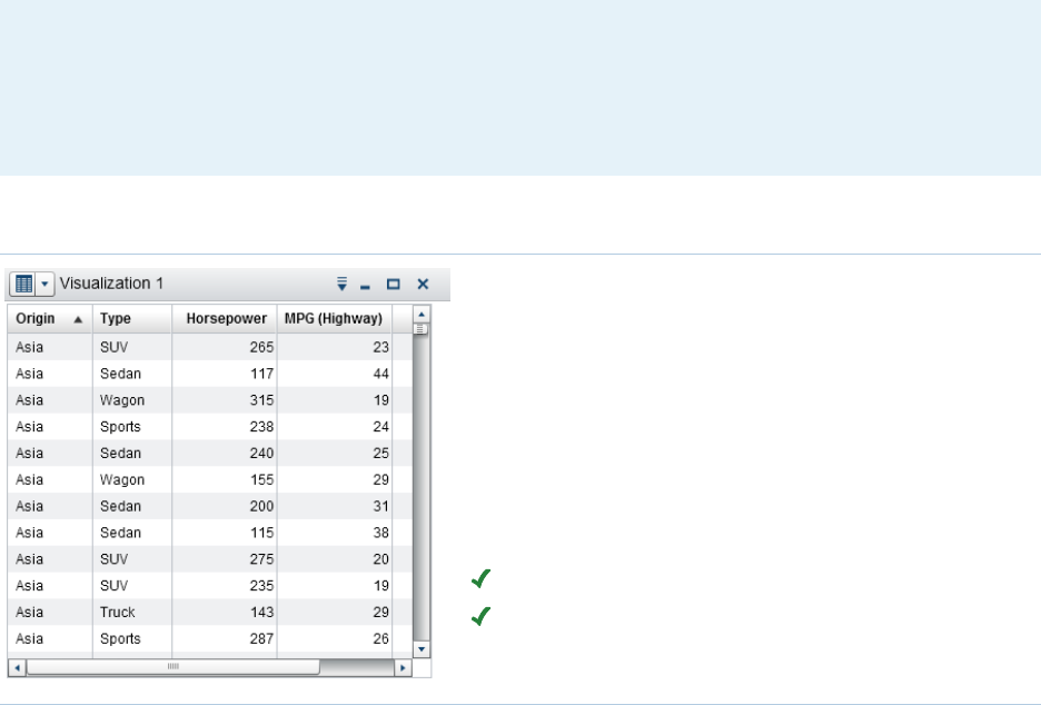
A table (also known as a list table) is a two-
dimensional representation of data. Values are
arranged in unlabeled rows and labeled columns.
A table cannot use a hierarchy.
In the designer, list tables contain aggregated data
(unless the Show detail data property is selected).
You can add sparklines to a column (if the data
source contains a date data item). In the explorer,
tables contain raw data.
Availability:
Supported in the explorer.
Supported in the designer and viewers.
Gallery 21
A crosstab (also known as a crosstabulation table)
shows an aggregate metric for the intersections of
two or more categories. In a crosstab, categories
are typically displayed in both the columns and the
rows. Each cell value represents the aggregated
measure from the intersection of the categories in
the cell’s row and column. A crosstab uses less
space than a traditional table and is easier to read
because data is grouped both horizontally and
vertically. A crosstab can use a hierarchy.
Frequency is displayed when there are no
measures in the crosstab.
Availability:
Supported in the explorer.
Supported in the designer and viewers.
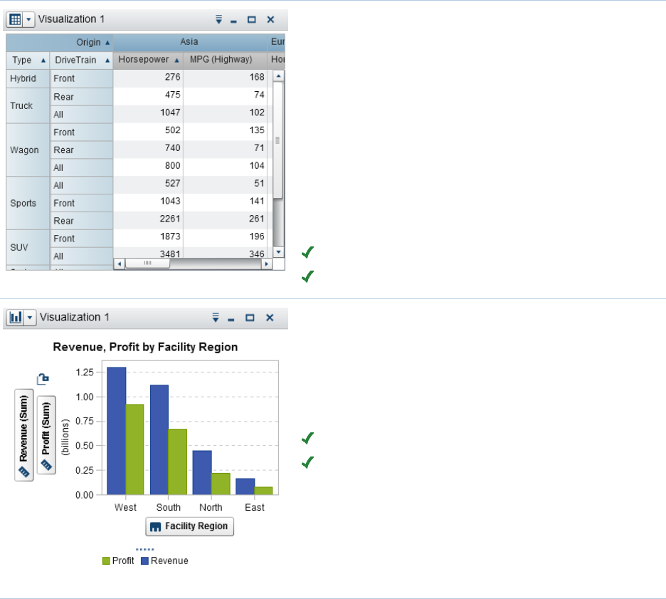
A bar chart consists of vertical or horizontal bars
that represent quantitative data. Use bar charts to
compare data that is aggregated by the distinct
values of a category.
You can apply grouping and create lattices.
Availability:
Supported in the explorer.
Supported in the designer and viewers.
22 Chapter 4 / Quick Reference
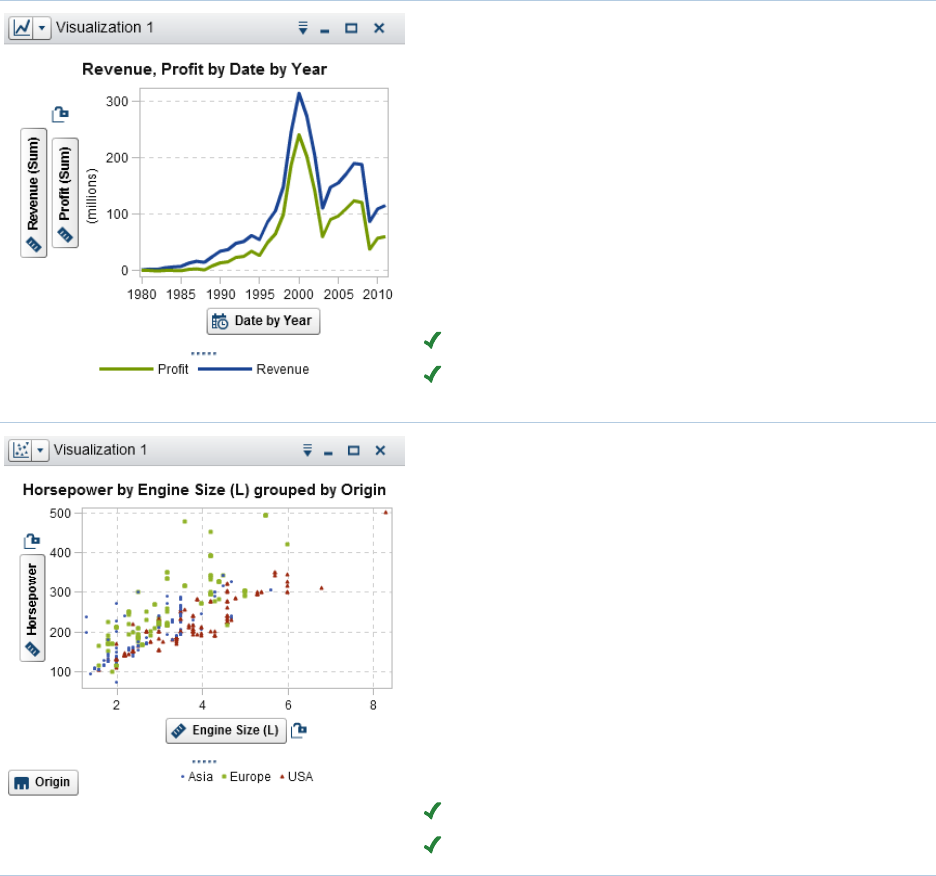
A line chart shows the relationship of one variable
to another, often as movements or trends in the
data over a period of time. Line charts summarize
source data, and typically are used to show how
values change over time. You can apply grouping
and create lattices.
In the explorer, line charts support time series.
From a time series, you can generate a forecast
analysis that enables you to predict future values
for the series and visualize the probability range
for those values.
Availability:
Supported in the explorer.
Supported in the designer and viewers.
A scatter plot is a two-dimensional plot that shows
the joint variation of two data items. Each marker
(represented by symbols such as dots, squares, or
plus signs) represents an observation. The marker
position indicates the value for each observation.
Use a scatter plot to examine the relationship
between numeric data items. You can apply
grouping. (In the designer, grouping is called
"color.")
In the explorer, you can apply statistical analysis
with correlation and fit lines. When you apply more
than two measures to a scatter plot, a scatter plot
matrix compares each pairing of measures.
Availability:
Supported in the explorer.
Supported in the designer and viewers.
Gallery 23
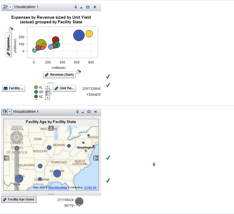
A bubble plot displays the relationships among at
least three measures. Two measures are
represented by the plot axes, and the third
measure is represented by the size of the plot
markers. Each bubble represents an observation.
A bubble plot is useful for data sets with dozens to
hundreds of values. You can apply grouping and
create lattices. You can use color to represent an
additional measure and animate the bubbles to
display changes in the data over time.
Availability:
Supported in the explorer.
Supported in the designer and viewers.
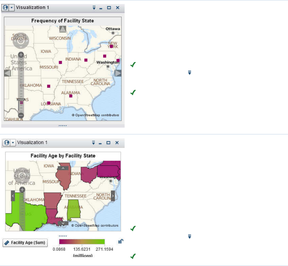
A geo bubble map is a bubble plot that is overlaid
on a geographic map. Each bubble is located at a
geographic location or at the center of a
geographical region. A geo bubble map requires a
data item that contains geographical information
and is assigned to a geography role.
Availability:
Supported in the explorer (in a geo map
visualization, click , and then select Map Style
Bubbles).
Supported in the designer and viewers.
24 Chapter 4 / Quick Reference
A geo coordinate map is a simple scatter plot that
is overlaid on a geographic map. Each point is
located at a geographic location or at the center of
a geographical region. A geo coordinate map
requires a data item that contains geographical
information and is assigned to a geography role.
Availability:
Supported in the explorer (in a geo map
visualization, click , and then select Map Style
Coordinates).
Supported in the designer and viewers.
A geo region map (also known as a choropleth
map) is a two-dimensional map that uses colors to
represent different categories or levels of
magnitude. You can fill geographical boundaries
(for example, a country or a state) on a map with
color, based on measure values that are
aggregated to the level defined by a geographical
boundary. A geo region map requires a data item
that contains geographical information and is
assigned to a geography role.
Availability:
Supported in the explorer (in a geo map
visualization, click , and then select Map Style
Regions).
Supported in the designer and viewers.
Gallery 25
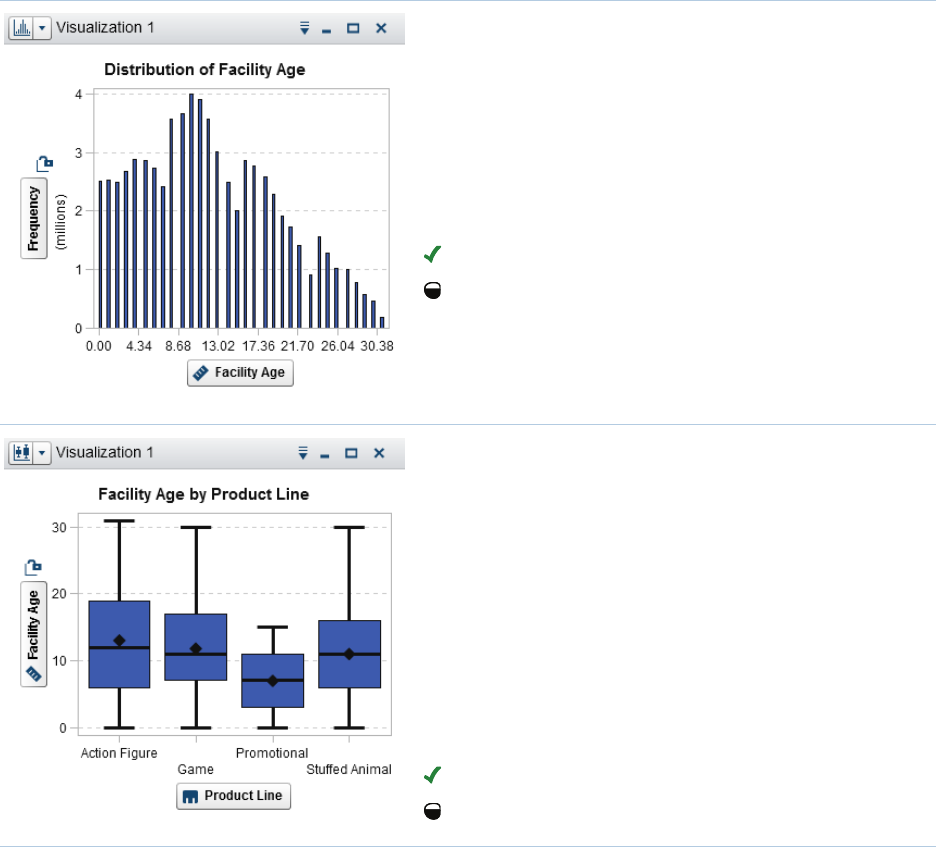
A histogram displays the distribution of values for
a single measure.
In the explorer, you can select the bar orientation.
You can select whether the values are displayed
as a percentage or as a count.
To add a histogram to a report, create it in the
explorer, and export it as a report object.
Availability:
Supported in the explorer.
Limited support in the designer and viewers.
A box plot displays the distribution of values for a
single measure using a box and whiskers. The
size and location of the box indicate the range of
values that are between the 25th and 75th
percentile. Additional statistical information is
represented by other visual features.
In the explorer, you can create lattices and specify
whether the average (mean) value and outliers are
displayed for each box.
To add a box plot to a report, create it in the
explorer, and export it as a report object.
Availability:
Supported in the explorer.
Limited support in the designer and viewers.
26 Chapter 4 / Quick Reference
A heat map displays the distribution of values for
two data items using a grid of colored cells. If you
do not assign a measure to the color data role,
then a cell’s color represents the frequency of
each intersection of values. If you assign a
measure to the color data role, then a cell’s color
represents the measure value of each intersection
of values.
To add a heat map to a report, create it in the
explorer, and export it as a report object.
Availability:
Supported in the explorer.
Limited support in the designer and viewers.
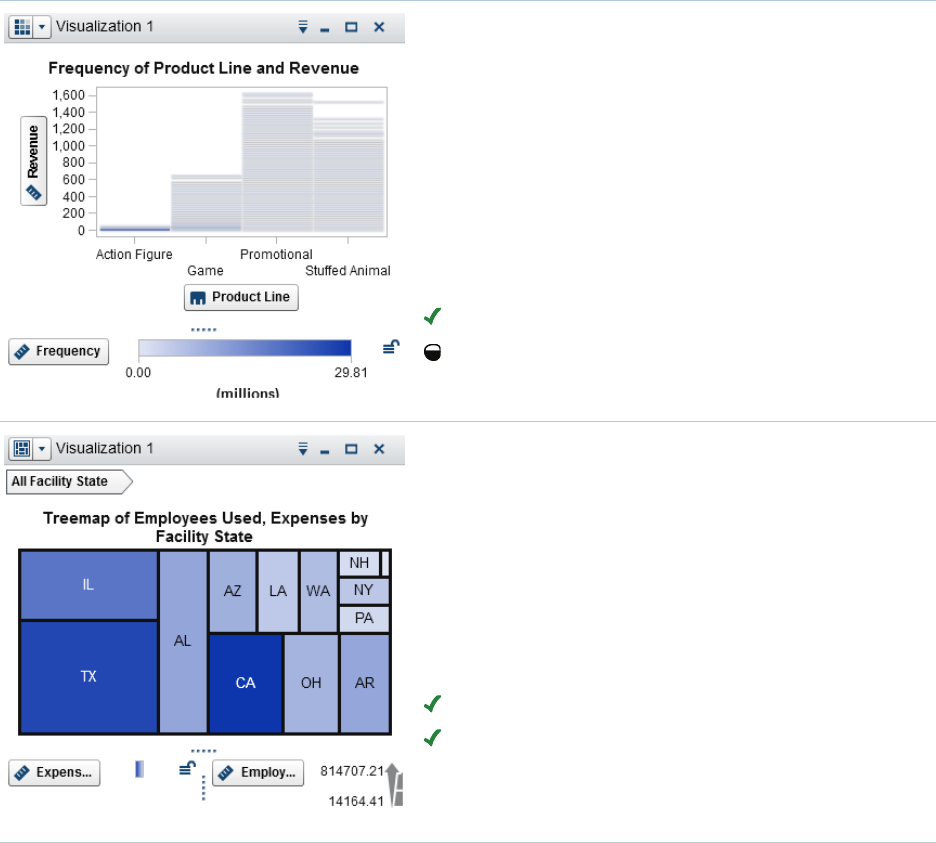
A treemap displays your data as a set of
rectangles (called tiles). Each tile represents a
category or a hierarchy node. The color of each
tile represents the value of the first measure. The
size of each tile represents the value of the second
measure. For example, a sales data treemap
might have tile sizes that represent the number of
orders and tile colors that are derived from color
gradients that represent sales.
Availability:
Supported in the explorer.
Supported in the designer and viewers.
Gallery 27
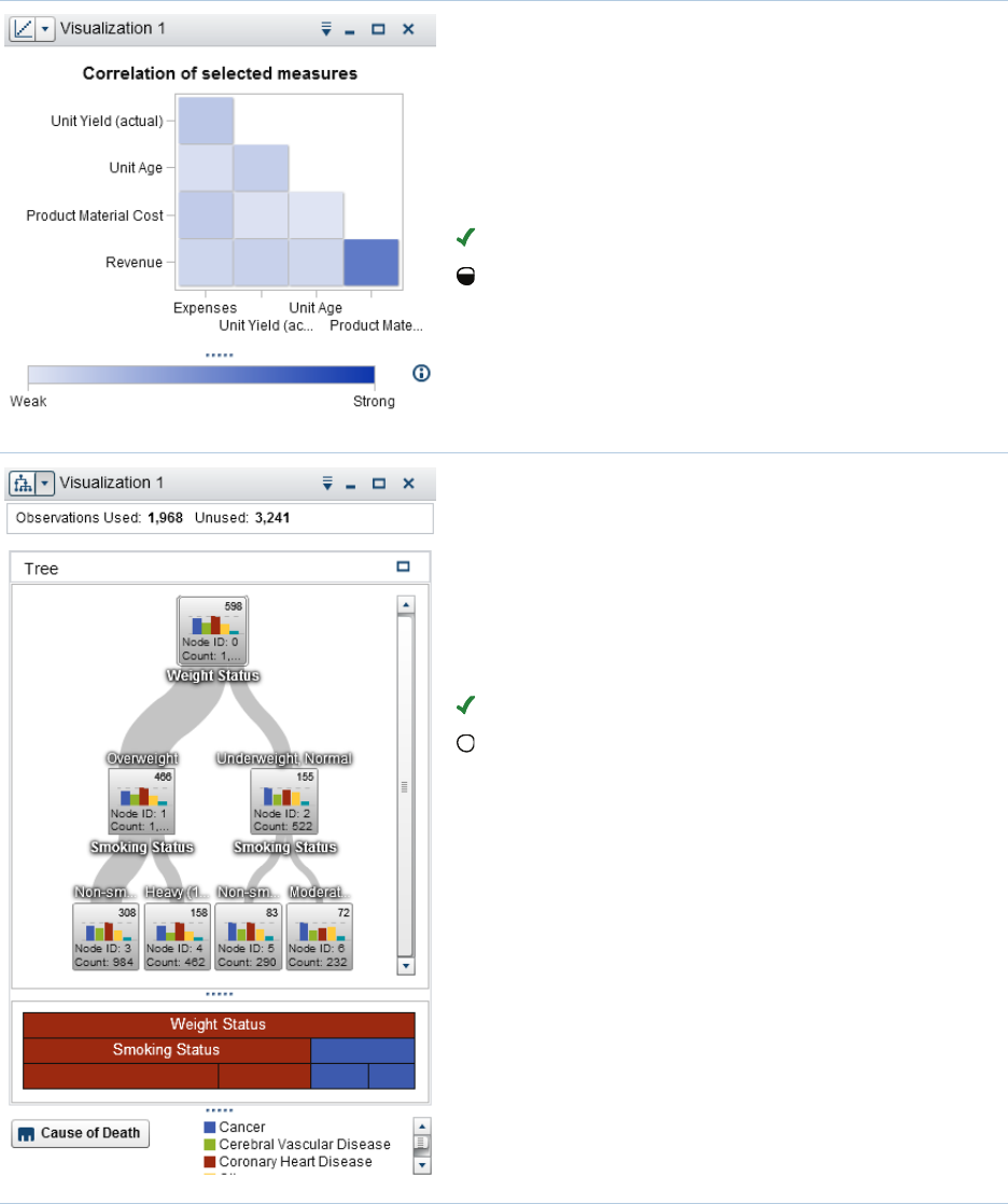
A correlation matrix displays the degree of
correlation between measures as a series of
colored rectangles. The color of each rectangle
indicates the strength of the correlation.
To add a correlation matrix to a report, create it in
the explorer, and export it as a report object.
Availability:
Supported in the explorer.
Limited support in the designer and viewers.
A decision tree displays a series of nodes as a
tree, where the top node is the target data item
and each branch represents a split in the values of
a predictor data item. A split enables you to see
which value of the predictor data item corresponds
to a different distribution of the value in the target
data item.
Availability:
Supported in the explorer.
Not supported in the designer or viewers.
28 Chapter 4 / Quick Reference
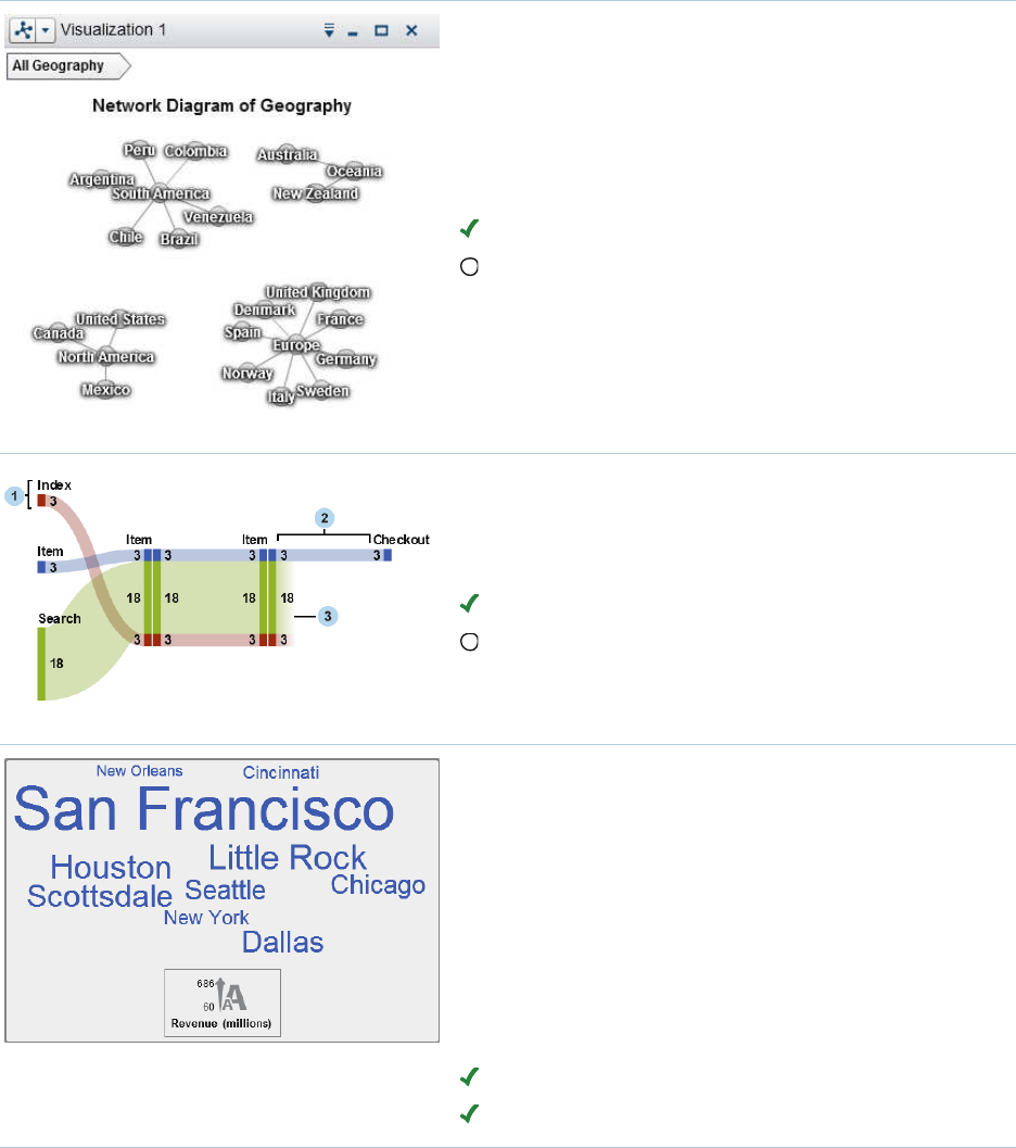
A network diagram displays a series of linked
nodes. A network diagram displays the
relationships between the values of categories or
hierarchy levels. You can indicate the values of
measures through the sizes and colors of the
nodes and the node links.
Availability:
Supported in the explorer.
Not supported in the designer or viewers.
A Sankey diagram displays a series of linked
nodes, where the width of each link indicates the
frequency of the link or the value of a measure.
Availability:
Supported in the explorer.
Not supported in the designer or viewers.
A word cloud displays a set of category values as
text, grouped in a cloud-like shape. Depending on
the type of word cloud and your data roles, the
size of each word in the cloud can indicate the
relevance of the word to a topic, the frequency of
the word in a category, or the value of a measure.
In the explorer, you can use text analytics in a
word cloud to identify topics and terms that appear
together in your data and to analyze the sentiment
of the documents in a topic.
Availability:
Supported in the explorer.
Supported in the designer and viewers.
Gallery 29
A targeted bar chart is a bar chart that has
pointers to target values. In this example, the
pointers appear above each bar.
Availability:
Not supported in the explorer.
Supported in the designer and viewers.
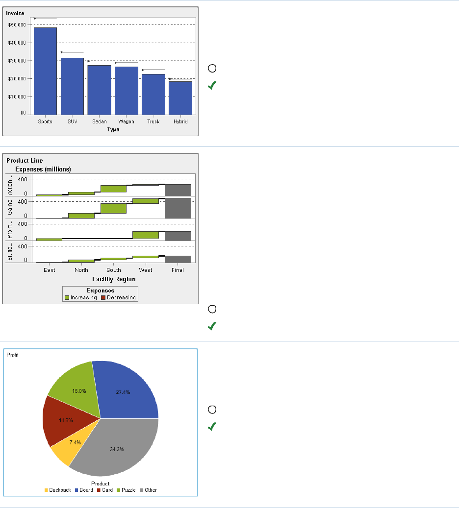
A waterfall chart (also known as a progressive bar
chart) shows how the initial value of a measure
increases or decreases during a series of
operations or transactions. The first bar begins at
the initial value, and each subsequent bar begins
where the previous bar ends. The length and
direction of a bar indicate the magnitude and type
(positive or negative, for example) of the operation
or transaction. The resulting chart is a stepped
cascade that shows how the operations or
transactions lead to the final value of the measure.
Availability:
Not supported in the explorer.
Supported in the designer and viewers.
A pie chart is a circular chart that is divided into
slices by radial lines. Each slice represents the
relative contribution of each part to the whole.
Availability:
Not supported in the explorer.
Supported in the designer and viewers.
30 Chapter 4 / Quick Reference
A time series plot shows an ordered sequence of
values that are observed at equally spaced time
intervals. A time series plot requires a date or date
time category data item that is continuous.
Availability:
Supported in the explorer as a line chart.
Supported in the designer and viewers.
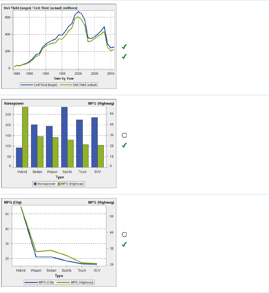
A dual axis bar chart is a variation of the bar chart
that has two measures. A measure is on each
axis.
Availability:
Not supported in the explorer.
Supported in the designer and viewers.
A dual axis line chart is a variation of the line chart
that has two measures. A measure is on each
axis.
Availability:
Not supported in the explorer.
Supported in the designer and viewers.
Gallery 31
A dual axis bar-line chart is a variation of the bar
chart that has two measures. A measure is on
each axis, and the bar chart is overlaid by a line
chart.
Availability:
Not supported in the explorer.
Supported in the designer and viewers.
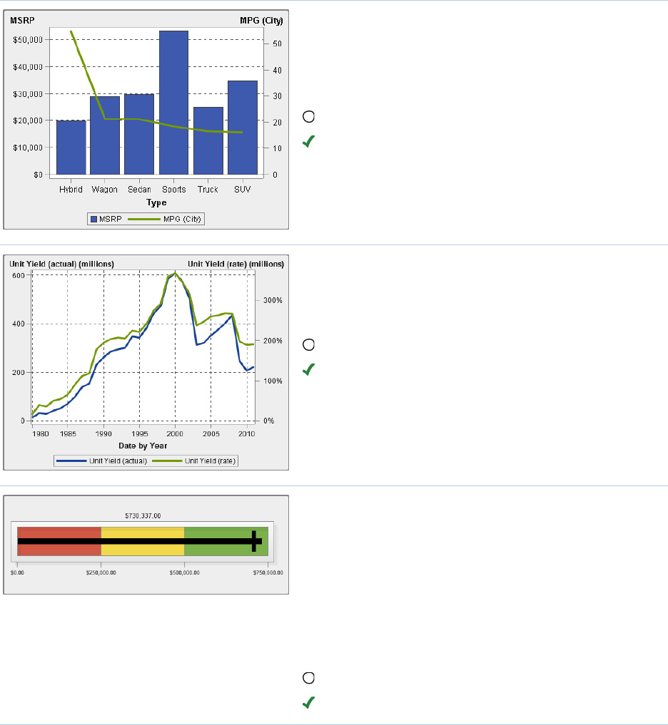
A dual axis time series plot is a variation of the
time series plot that has two measures. A measure
is on each axis.
Availability:
Not supported in the explorer.
Supported in the designer and viewers.
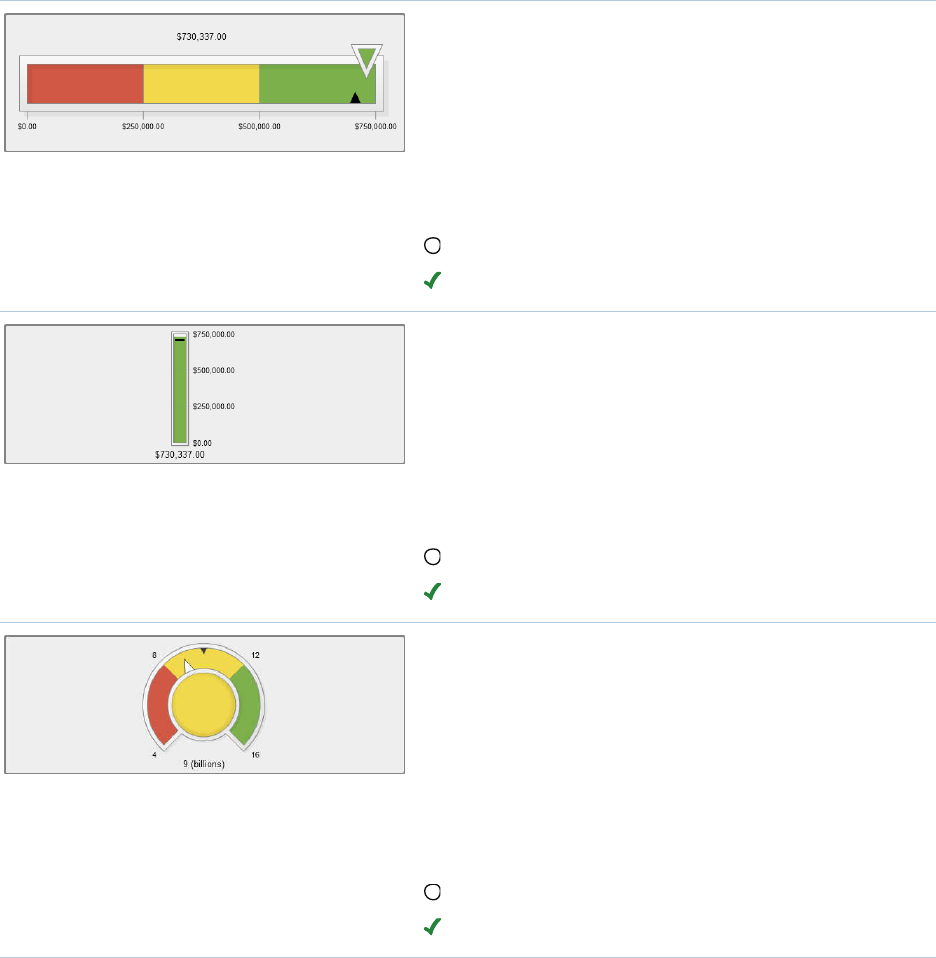
A bullet gauge is a dashboard indicator (also
known as a key performance indicator (KPI) chart)
that compares an actual value to a target value in
intervals. The actual value is indicated by an inset
bar.
To add a bullet gauge, add a gauge report object,
and then use the Type property to specify that you
want a bullet gauge.
Availability:
Not supported in the explorer.
Supported in the designer and viewers.
32 Chapter 4 / Quick Reference
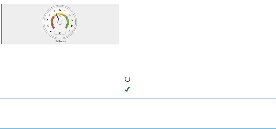
A slider gauge is a dashboard indicator (also
known as a KPI chart) that compares an actual
value to a target value in intervals. The actual
value is indicated by an arrow.
To add a slider gauge, add a gauge report object,
and then use the Type property to specify that you
want a slider gauge.
Availability:
Not supported in the explorer.
Supported in the designer and viewers.
A thermometer gauge is a dashboard indicator
(also known as a KPI chart) that compares an
actual value to a target value in intervals. The
actual value is indicated by a bar.
To add a thermometer gauge, add a gauge report
object, and then use the Type property to specify
that you want a thermometer gauge.
Availability:
Not supported in the explorer.
Supported in the designer and viewers.
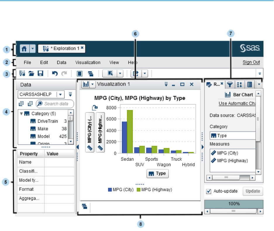
A dial gauge is an arc-shaped dashboard indicator
(also known as a KPI chart) that compares an
actual value to a target value and compares them
in intervals. The actual value is indicated by an
arrow that points outward from the inner circle.
To add a dial gauge, add a gauge report object,
and then use the Type property to specify that you
want a dial gauge.
Availability:
Not supported in the explorer.
Supported in the designer and viewers.
Gallery 33
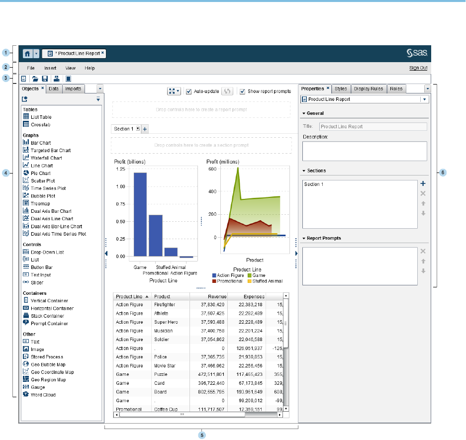
A speedometer gauge is a circular dashboard
indicator (also known as a KPI chart) that
compares an actual value to a target value and
compares them in intervals. The actual value is
indicated by the larger pointer.
To add a speedometer gauge, add a gauge report
object, and then use the Type property to specify
that you want a speedometer gauge.
Availability:
Not supported in the explorer.
Supported in the designer and viewers.
SAS Home Page
After you sign in to SAS Visual Analytics using the standard sign-in window for SAS
applications, you will see the SAS Home page. The Home page enables you to create
new content in SAS Visual Analytics. In addition, it enables you to access content that
you and others have created. For more information, refer to the online Help that is
available for the SAS Home page.
34 Chapter 4 / Quick Reference
The Explorer
1The application bar enables you to return to the home page and to access other
parts of SAS Visual Analytics and other SAS applications that integrate with the
home page. You can also access applications in your recent history. Buttons are
displayed for each open application.
2The menu bar offers common tasks, such as creating a new exploration.
3The toolbar enables you to manage your explorations and visualizations.
The Explorer 35
4The Data pane enables you to manage the data that is used in your visualizations.
5The data properties table enables you to set data item properties.
6The workspace displays one or more visualizations.
7The right pane’s tabs enable you to set properties and data roles, subset data,
manage global parameter values, and use comments.
8The dock contains any minimized visualizations.
36 Chapter 4 / Quick Reference
The Designer
1The application bar enables you to return to the home page and to access other
parts of SAS Visual Analytics and other SAS applications that integrate with the
home page. You can also access applications in your recent history. Buttons are
displayed for each open application.
2The menu bar offers common tasks for the current report or section.
The Designer 37
3The toolbar enables you to manage and print your reports and expand the
workspace.
4The tabs in the left pane enable you to work with new report objects, data, imported
report objects, and shared rules.
5The canvas is the workspace for building a report. The appearance of the canvas is
affected by the report theme.
A report can have multiple sections, which can each be accessed by using the tabs
at the top of the canvas. You can change the report view by clicking the icons at the
top of the canvas.
Above the canvas, there is an Auto-update check box. You can clear this check box
so that you can design your report without waiting for a query to finish.
There is an area at the top of the canvas on which you can drag and drop filter
controls and then assign categories to create report-level prompts. If you do not
want to see this area, clear the Show report prompts check box.
6The tabs in the right pane enable you to work with details about a report and its
report objects.
38 Chapter 4 / Quick Reference
The Viewers
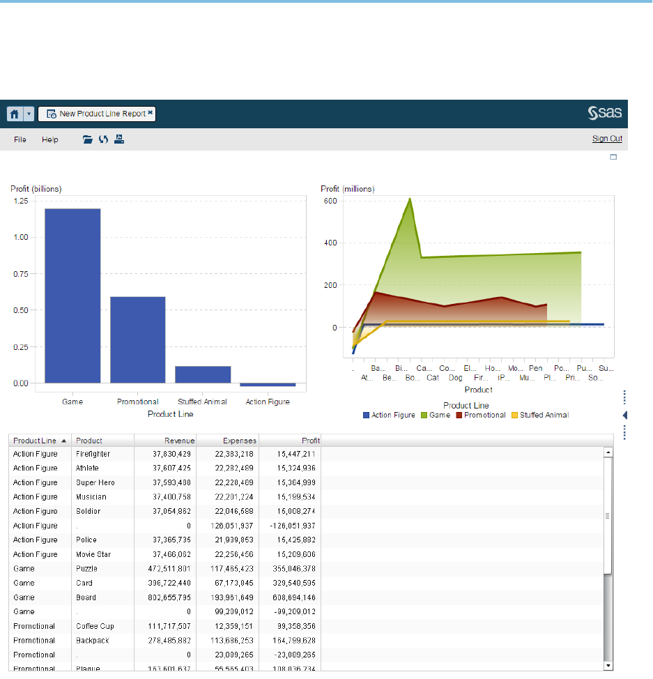
Here is an example of a report in the web viewer:
The Viewers 39
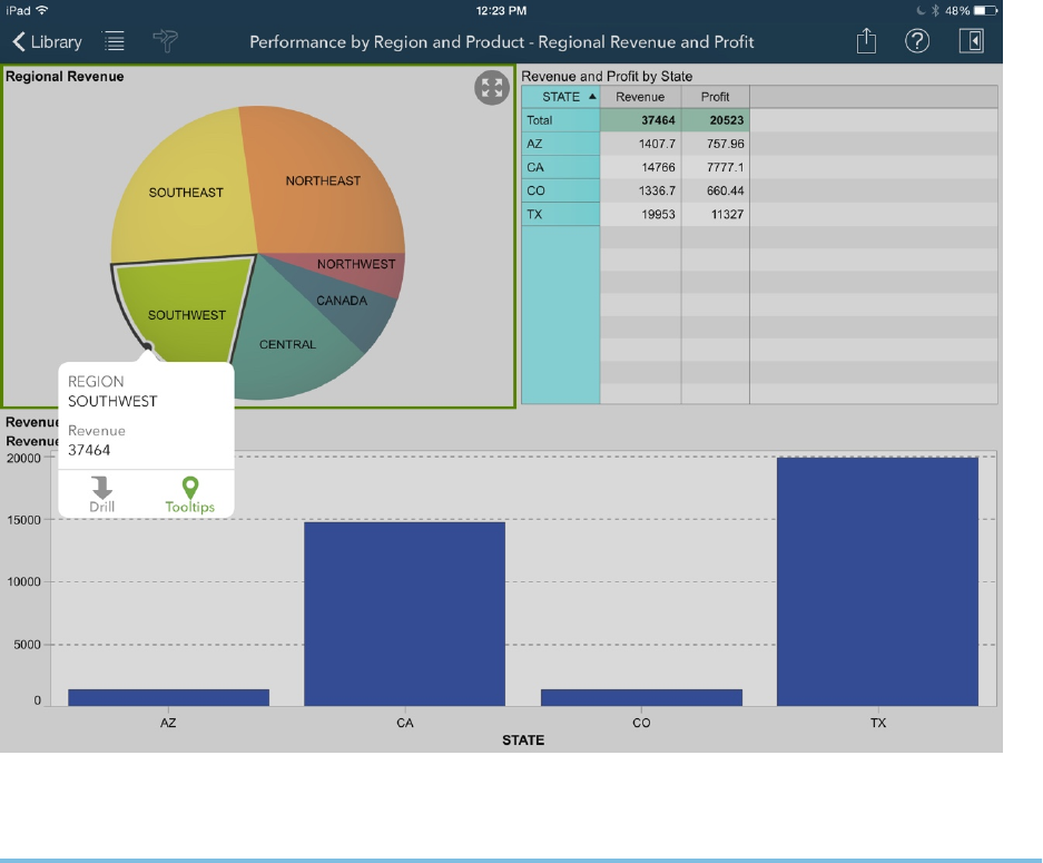
The mobile viewers are native to each device. For example, here is a screen capture
from the SAS Mobile BI app for iPad:
Where to Find Additional
Documentation
The most current technical resources for SAS Visual Analytics are available on the SAS
Visual Analytics page on the SAS support site.
Your experience with SAS software should be as smooth as possible. Please submit
your feedback.
40 Chapter 4 / Quick Reference
