Visualize This Yau Nathan. The Flowing Data Guide To Design, Visualization, And Statistics
User Manual:
Open the PDF directly: View PDF ![]() .
.
Page Count: 456 [warning: Documents this large are best viewed by clicking the View PDF Link!]

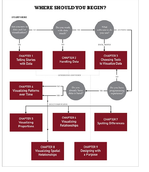
Table of Contents
Cover
Chapter 1: Telling Stories with Data
More Than Numbers
What to Look For
Design
Wrapping Up
Chapter 2: Handling Data
Gather Data
Formatting Data
Wrapping Up
Chapter 3: Choosing Tools to Visualize
Data
Out-of-the-Box Visualization
Programming

Illustration
Mapping
Survey Your Options
Wrapping Up
Chapter 4: Visualizing Patterns over
Time
What to Look for over Time
Discrete Points in Time
Continuous Data
Wrapping Up
Chapter 5: Visualizing Proportions
What to Look for in Proportions
Parts of a Whole
Proportions over Time
Wrapping Up
Chapter 6: Visualizing Relationships
What Relationships to Look For

Correlation
Distribution
Comparison
Wrapping Up
Chapter 7: Spotting Differences
What to Look For
Comparing across Multiple
Variables
Reducing Dimensions
Searching for Outliers
Wrapping Up
Chapter 8: Visualizing Spatial
Relationships
What to Look For
Specific Locations
Regions
Over Space and Time
Wrapping Up

Chapter 9: Designing with a Purpose
Prepare Yourself
Prepare Your Readers
Visual Cues
Good Visualization
Wrapping Up
Introduction
Learning Data

Chapter 1
Telling Stories with Data
Think of all the popular data visualization works out
there—the ones that you always hear in lectures or read
about in blogs, and the ones that popped into your head
as you were reading this sentence. What do they all
have in common? They all tell an interesting story.
Maybe the story was to convince you of something.
Maybe it was to compel you to action, enlighten you with
new information, or force you to question your own
preconceived notions of reality. Whatever it is, the best
data visualization, big or small, for art or a slide
presentation, helps you see what the data have to say.
More Than Numbers
Face it. Data can be boring if you don’t know what
you’re looking for or don’t know that there’s something
to look for in the first place. It’s just a mix of numbers
and words that mean nothing other than their raw
values. The great thing about statistics and visualization

is that they help you look beyond that. Remember, data
is a representation of real life. It’s not just a bucket of
numbers. There are stories in that bucket. There’s
meaning, truth, and beauty. And just like real life,
sometimes the stories are simple and straightforward;
and other times they’re complex and roundabout. Some
stories belong in a textbook. Others come in novel form.
It’s up to you, the statistician, programmer, designer, or
data scientist to decide how to tell the story.
This was one of the first things I learned as a
statistics graduate student. I have to admit that before
entering the program, I thought of statistics as pure
analysis, and I thought of data as the output of a
mechanical process. This is actually the case a lot of
the time. I mean, I did major in electrical engineering, so
it’s not all that surprising I saw data in that light.
Don’t get me wrong. That’s not necessarily a bad
thing, but what I’ve learned over the years is that data,
while objective, often has a human dimension to it.
For example, look at unemployment again. It’s easy
to spout state averages, but as you’ve seen, it can vary
a lot within the state. It can vary a lot by neighborhood.
Probably someone you know lost a job over the past
few years, and as the saying goes, they’re not just
another statistic, right? The numbers represent
individuals, so you should approach the data in that
way. You don’t have to tell every individual’s story.
However, there’s a subtle yet important difference

between the unemployment rate increasing by
5 percentage points and several hundred thousand
people left jobless. The former reads as a number
without much context, whereas the latter is more
relatable.
Journalism
A graphics internship at The New York Times drove the
point home for me. It was only for 3 months during the
summer after my second year of graduate school, but
it’s had a lasting impact on how I approach data. I didn’t
just learn how to create graphics for the news. I learned
how to report data as the news, and with that came a lot
of design, organization, fact checking, sleuthing, and
research.
There was one day when my only goal was to verify
three numbers in a dataset, because when The New
York Times graphics desk creates a graphic, it makes
sure what it reports is accurate. Only after we knew the
data was reliable did we move on to the presentation.
It’s this attention to detail that makes its graphics so
good.
Take a look at any New York Times graphic. It
presents the data clearly, concisely, and ever so nicely.
What does that mean though? When you look at a
graphic, you get the chance to understand the data.
Important points or areas are annotated; symbols and
colors are carefully explained in a legend or with points;
and the Times makes it easy for readers to see the
story in the data. It’s not just a graph. It’s a graphic.
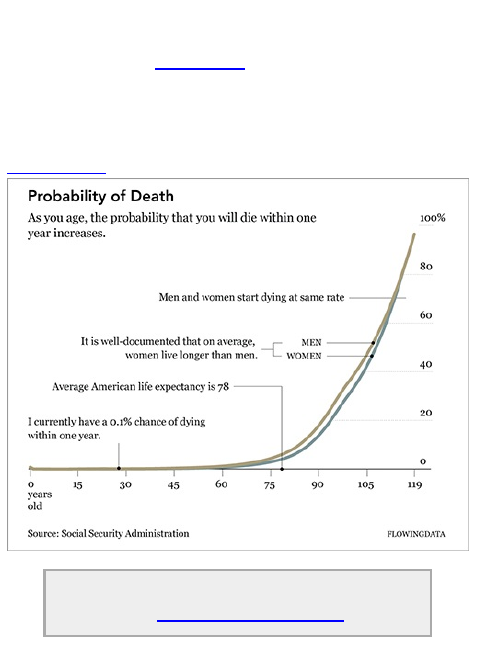
The graphic in Figure 1-1 is similar to what you will
find in The New York Times. It shows the increasing
probability that you will die within one year given your
age.
Figure 1-1: Probability of death given your age
Check out some of the best New York Times
graphics at http://datafl.ws/nytimes.

The base of the graphic is simply a line chart.
However, design elements help tell the story better.
Labeling and pointers provide context and help you see
why the data is interesting; and line width and color
direct your eyes to what’s important.
Chart and graph design isn’t just about making
statistical visualization but also explaining what the
visualization shows.
Note
See Geoff McGhee’s video documentary
“Journalism in the Age of Data” for more on how
journalists use data to report current events.
This includes great interviews with some of the
best in the business.
Art
The New York Times is objective. It presents the data
and gives you the facts. It does a great job at that. On
the opposite side of the spectrum, visualization is less
about analytics and more about tapping into your
emotions. Jonathan Harris and Sep Kamvar did this
quite literally in We Feel Fine (Figure 1-2).
Figure 1-2: We Feel Fine by Jonathan Harris and Sep
Kamvar
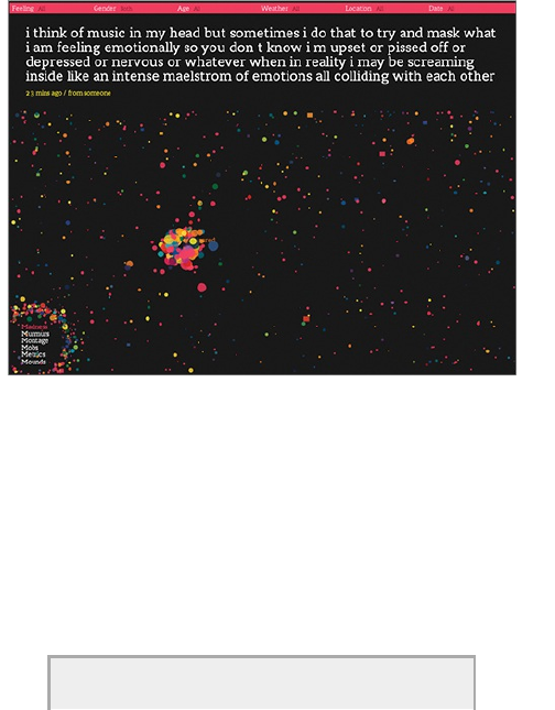
The interactive piece scrapes sentences and
phrases from personal public blogs and then visualizes
them as a box of floating bubbles. Each bubble
represents an emotion and is color-coded accordingly.
As a whole, it is like individuals floating through space,
but watch a little longer and you see bubbles start to
cluster. Apply sorts and categorization through the
interface to see how these seemingly random vignettes
connect. Click an individual bubble to see a single story.
It’s poetic and revealing at the same time.
Interact and explore people’s emotions in
Jonathan Harris and Sep Kamvar’s live and
online piece at http://wefeelfine.org.
There are lots of other examples such as Golan
Levin’s The Dumpster, which explores blog entries that
mention breaking up with a significant other; Kim
Asendorf’s Sumedicina, which tells a fictional story of a
man running from a corrupt organization, with not words,
but graphs and charts; or Andreas Nicolas Fischer’s
physical sculptures that show economic downturn in the
United States.
See FlowingData for many more examples of
art and data at http://datafl.ws/art.
The main point is that data and visualization don’t
always have to be just about the cold, hard facts.
Sometimes you’re not looking for analytical insight.
Rather, sometimes you can tell the story from an
emotional point of view that encourages viewers to
reflect on the data. Think of it like this. Not all movies
have to be documentaries, and not all visualization has
to be traditional charts and graphs.
Entertainment
Somewhere in between journalism and art, visualization
has also found its way into entertainment. If you think of
data in the more abstract sense, outside of

spreadsheets and comma-delimited text files, where
photos and status updates also qualify, this is easy to
see.
Facebook used status updates to gauge the happiest
day of the year, and online dating site OkCupid used
online information to estimate the lies people tell to
make their digital selves look better, as shown in Figure
1-3. These analyses had little to do with improving a
business, increasing revenues, or finding glitches in a
system. They circulated the web like wildfire because of
their entertainment value. The data revealed a little bit
about ourselves and society.
Facebook found the happiest day to be
Thanksgiving, and OkCupid found that people tend to
exaggerate their height by about 2 inches.
Figure 1-3: Male Height Distribution on OkCupid
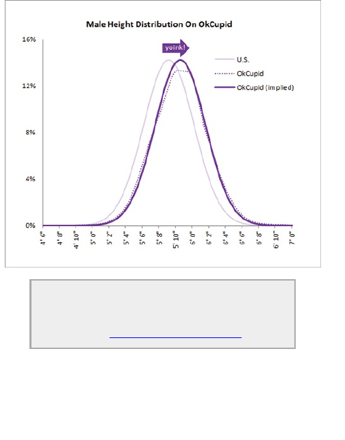
Check out the OkTrends blog for more
revelations from online dating such as what
white people really like and how not to be ugly
by accident: http://blog.okcupid.com.
Compelling
Of course, stories aren’t always to keep people
informed or entertained. Sometimes they’re meant to
provide urgency or compel people to action. Who can

forget that point in An Inconvenient Truth when Al Gore
stands on that scissor lift to show rising levels of carbon
dioxide?
For my money though, no one has done this better
than Hans Rosling, professor of International Health and
director of the Gapminder Foundation. Using a tool
called Trendalyzer, as shown in Figure 1-4, Rosling runs
an animation that shows changes in poverty by country.
He does this during a talk that first draws you in deep to
the data and by the end, everyone is on their feet
applauding. It’s an amazing talk, so if you haven’t seen it
yet, I highly recommend it.
The visualization itself is fairly basic. It’s a motion
chart. Bubbles represent countries and move based on
the corresponding country’s poverty during a given year.
Why is the talk so popular then? Because Rosling
speaks with conviction and excitement. He tells a story.
How often have you seen a presentation with charts and
graphs that put everyone to sleep? Instead Rosling gets
the meaning of the data and uses that to his advantage.
Plus, the sword-swallowing at the end of his talk drives
the point home. After I saw Rosling’s talk, I wanted to
get my hands on that data and take a look myself. It was
a story I wanted to explore, too.
Figure 1-4: Trendalyzer by the Gapminder Foundation
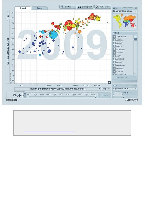
Watch Hans Rosling wow the audience with
data and an amazing demonstration at
http://datafl.ws/hans.
I later saw a Gapminder talk on the same topic with
the same visualizations but with a different speaker. It
wasn’t nearly as exciting. To be honest, it was kind of a
snoozer. There wasn’t any emotion. I didn’t feel any
conviction or excitement about the data. So it’s not just
about the data that makes for interesting chatter. It’s
how you present it and design it that can help people
remember.

When it’s all said and done, here’s what you need to
know. Approach visualization as if you were telling a
story. What kind of story are you trying to tell? Is it a
report, or is it a novel? Do you want to convince people
that action is necessary?
Think character development. Every data point has a
story behind it in the same way that every character in a
book has a past, present, and future. There are
interactions and relationships between those data
points. It’s up to you to find them. Of course, before
expert storytellers write novels, they must first learn to
construct sentences.
What to Look For
Okay, stories. Check. Now what kind of stories do you
tell with data? Well, the specifics vary by dataset, but
generally speaking, you should always be on the lookout
for these two things whatever your graphic is for:
patterns and relationships.
Patterns
Stuff changes as time goes by. You get older, your hair
grays, and your sight starts to get kind of fuzzy (Figure
1-5). Prices change. Logos change. Businesses are
born. Businesses die. Sometimes these changes are
sudden and without warning. Other times the change
happens so slowly you don’t even notice.
Figure 1-5: A comic look at aging
Whatever it is you’re looking at, the change itself can
be interesting as can the changing process. It is here
you can explore patterns over time. For example, say
you looked at stock prices over time. They of course
increase and decrease, but by how much do they
change per day? Per week? Per month? Are there
periods when the stock went up more than usual? If so,
why did it go up? Were there any specific events that
triggered the change?
As you can see, when you start with a single question
as a starting point, it can lead you to additional
questions. This isn’t just for time series data, but with all
types of data. Try to approach your data in a more
exploratory fashion, and you’ll most likely end up with
more interesting answers.
You can split your time series data in different ways.
In some cases it makes sense to show hourly or daily
values. Other times, it could be better to see that data
on a monthly or annual basis. When you go with the
former, your time series plot could show more noise,
whereas the latter is more of an aggregate view.
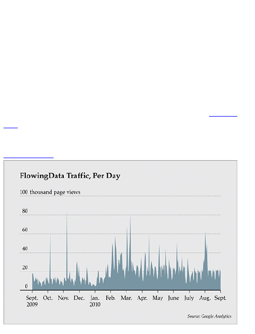
Those with websites and some analytics software in
place can identify with this quickly. When you look at
traffic to your site on a daily basis, as shown in Figure
1-6, the graph is bumpier. There are a lot more
fluctuations.
Figure 1-6: Daily unique visitors to FlowingData

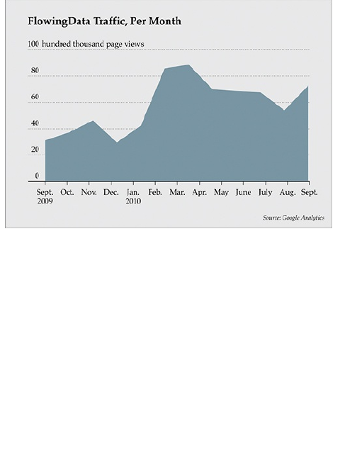
When you look at it on a monthly basis, as shown in
Figure 1-7, fewer data points are on the same graph,
covering the same time span, so it looks much
smoother.
I’m not saying one graph is better than the other. In
fact, they can complement each other. How you split
your data depends on how much detail you need (or
don’t need).
Of course, patterns over time are not the only ones to
look for. You can also find patterns in aggregates that
can help you compare groups, people, and things. What
do you tend to eat or drink each week? What does the
President usually talk about during the State of the
Union address? What states usually vote Republican?
Looking at patterns over geographic regions would be
useful in this case. While the questions and data types
are different, your approach is similar, as you’ll see in
the following chapters.
Figure 1-7: Monthly unique visitors to FlowingData
Relationships
Have you ever seen a graphic with a whole bunch of
charts on it that seemed like they’ve been randomly
placed? I’m talking about the graphics that seem to be
missing that special something, as if the designer gave
only a little bit of thought to the data itself and then
belted out a graphic to meet a deadline. Often, that
special something is relationships.
In statistics, this usually means correlation and
causation. Multiple variables might be related in some
way. Chapter 6, “Visualizing Relationships,” covers
these concepts and how to visualize them.
At a more abstract level though, where you’re not
thinking about equations and hypothesis tests, you can
design your graphics to compare and contrast values
and distributions visually. For a simple example, look at
this excerpt on technology from the World Progress
Report in Figure 1-8.
The World Progress Report was a graphical
report that compared progress around the
world using data from UNdata. See the full
version at http://datafl.ws/12i.
These are histograms that show the number of users
of the Internet, Internet subscriptions, and broadband
per 100 inhabitants. Notice that the range for Internet
users (0 to 95 per 100 inhabitants) is much wider than
that of the other two datasets.
Figure 1-8: Technology adoption worldwide
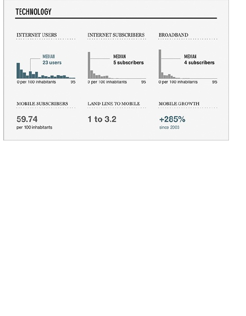
The quick-and-easy thing to do would have been to
let your software decide what range to use for each
histogram. However, each histogram was made on the
same range even though there were no countries who
had 95 Internet subscribers or broadband users per
100 inhabitants. This enables you to easily compare the
distributions between the groups.
So when you end up with a lot of different datasets, try
to think of them as several groups instead of separate
compartments that do not interact with each other. It can
make for more interesting results.
Questionable Data
While you’re looking for the stories in your data, you

should always question what you see. Remember, just
because it’s numbers doesn’t mean it’s true.
I have to admit. Data checking is definitely my least
favorite part of graph-making. I mean, when someone, a
group, or a service provides you with a bunch of data, it
should be up to them to make sure all their data is legit.
But this is what good graph designers do. After all,
reliable builders don’t use shoddy cement for a house’s
foundation, so don’t use shoddy data to build your data
graphic.
Data-checking and verification is one of the most
important—if not the most important—part of graph
design.
Basically, what you’re looking for is stuff that makes
no sense. Maybe there was an error at data entry and
someone added an extra zero or missed one. Maybe
there were connectivity issues during a data scrape,
and some bits got mucked up in random spots.
Whatever it is, you need to verify with the source if
anything looks funky.
The person who supplied the data usually has a
sense of what to expect. If you were the one who
collected the data, just ask yourself if it makes sense:
That state is 90 percent of whatever and all other states
are only in the 10 to 20 percent range. What’s going on
there?
Often, an anomaly is simply a typo, and other times
it’s actually an interesting point in your dataset that

could form the whole drive for your story. Just make sure
you know which one it is.
Design
When you have all your data in order, you’re ready to
visualize. Whatever you’re making, whether it is for a
report, an infographic online, or a piece of data art, you
should follow a few basic rules. There’s wiggle room
with all of them, and you should think of what follows as
more of a framework than a hard set of rules, but this is
a good place to start if you are just getting into data
graphics.
Explain Encodings
The design of every graph follows a familiar flow. You
get the data; you encode the data with circles, bars, and
colors; and then you let others read it. The readers have
to decode your encodings at this point. What do these
circles, bars, and colors represent?
William Cleveland and Robert McGill have written
about encodings in detail. Some encodings work better
than others. But it won’t matter what you choose if
readers don’t know what the encodings represent in the
first place. If they can’t decode, the time you spend
designing your graphic is a waste.

Note
See Cleveland and McGill’s paper on Graphical
Perception and Graphical Methods for
Analyzing Data for more on how people encode
shapes and colors.
You sometimes see this lack of context with graphics
that are somewhere in between data art and
infographic. You definitely see it a lot with data art. A
label or legend can completely mess up the vibe of a
piece of work, but at the least, you can include some
information in a short description paragraph. It helps
others appreciate your efforts.
Other times you see this in actual data graphics,
which can be frustrating for readers, which is the last
thing you want. Sometimes you might forget because
you’re actually working with the data, so you know what
everything means. Readers come to a graphic blind
though without the context that you gain from analyses.
So how can you make sure readers can decode your
encodings? Explain what they mean with labels,
legends, and keys. Which one you choose can vary
depending on the situation. For example, take a look at
the world map in Figure 1-9 that shows usage of Firefox
by country.
Figure 1-9: Firefox usage worldwide by country
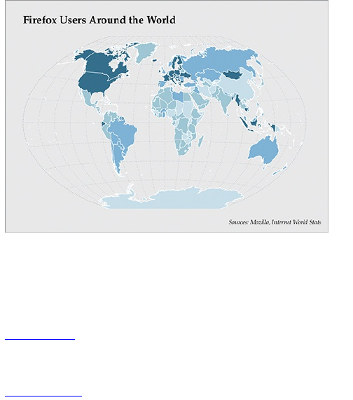
You can see different shades of blue for different
countries, but what do they mean? Does dark blue
mean more or less usage? If dark blue means high
usage, what qualifies as high usage? As-is, this map is
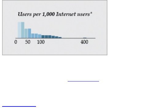
pretty useless to us. But if you provide the legend in
Figure 1-10, it clears things up. The color legend also
serves double time as a histogram showing the
distribution of usage by number of users.
Figure 1-10: Legend for Firefox usage map
You can also directly label shapes and objects in your
graphic if you have enough space and not too many
categories, as shown in Figure 1-11. This is a graph
that shows the number of nominations an actor had
before winning an Oscar for best actor.
Figure 1-11: Directly labeled objects
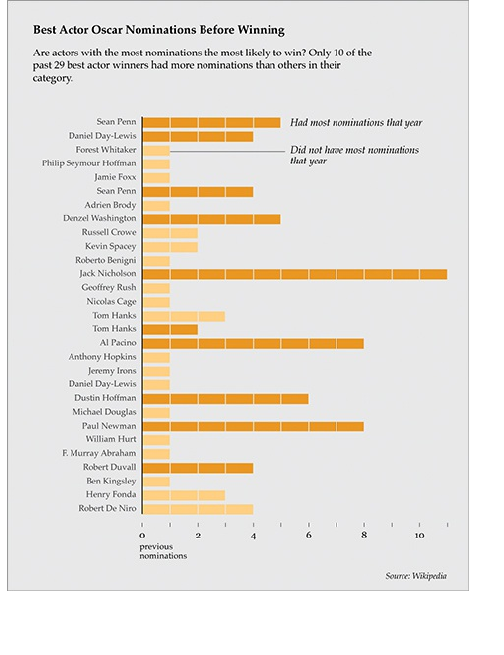
A theory floated around the web that actors who had
the most nominations among their cohorts in a given

year generally won the statue. As labeled, dark orange
shows actors who did have the most nominations,
whereas light orange shows actors who did not.
As you can see, plenty of options are available to you.
They’re easy to use, but these small details can make a
huge difference on how your graphic reads.
Label Axes
Along the same lines as explaining your encodings, you
should always label your axes. Without labels or an
explanation, your axes are just there for decoration.
Label your axes so that readers know what scale points
are plotted on. Is it logarithmic, incremental,
exponential, or per 100 flushing toilets? Personally, I
always assume it’s that last one when I don’t see labels.
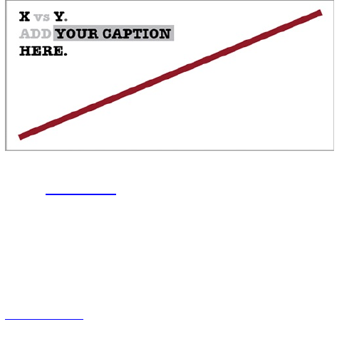
To demonstrate my point, rewind to a contest I held
on FlowingData a couple of years ago. I posted the
image in Figure 1-12 and asked readers to label the
axes for maximum amusement.
Figure 1-12: Add your caption here.
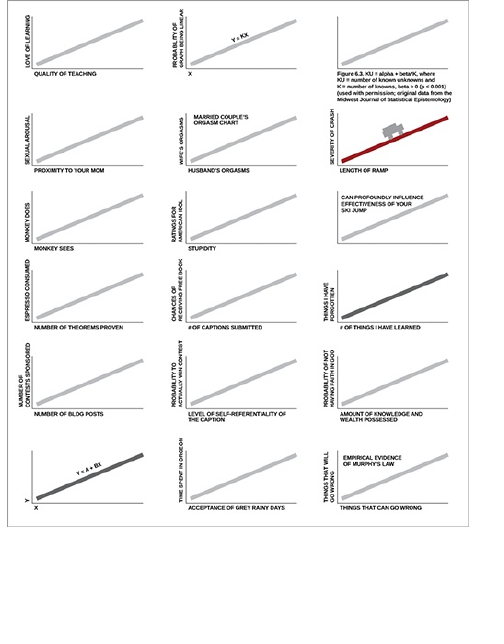
There were about 60 different captions for the same
graph; Figure 1-13 shows a few.
As you can see, even though everyone looked at the
same graph, a simple change in axis labels told a
completely different story. Of course, this was just for
play. Now just imagine if your graph were meant to be
taken seriously. Without labels, your graph is
meaningless.
Figure 1-13: Some of the results from a caption
contest on FlowingData
Keep Your Geometry in Check
When you design a graph, you use geometric shapes.
A bar graph uses rectangles, and you use the length of
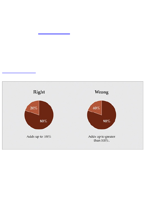
the rectangles to represent values. In a dot plot, the
position indicates value—same thing with a standard
time series chart. Pie charts use angles to indicate
value, and the sum of the values always equal 100
percent (see Figure 1-14). This is easy stuff, so be
careful because it’s also easy to mess up. You’re going
to make a mistake if you don’t pay attention, and when
you do mess up, people, especially on the web, won’t
be afraid to call you out on it.
Figure 1-14: The right and wrong way to make a pie
chart
Another common mistake is when designers start to
use two-dimensional shapes to represent values, but
size them as if they were using only a single dimension.
The rectangles in a bar chart are two-dimensional, but
you only use one length as an indicator. The width
doesn’t mean anything. However, when you create a
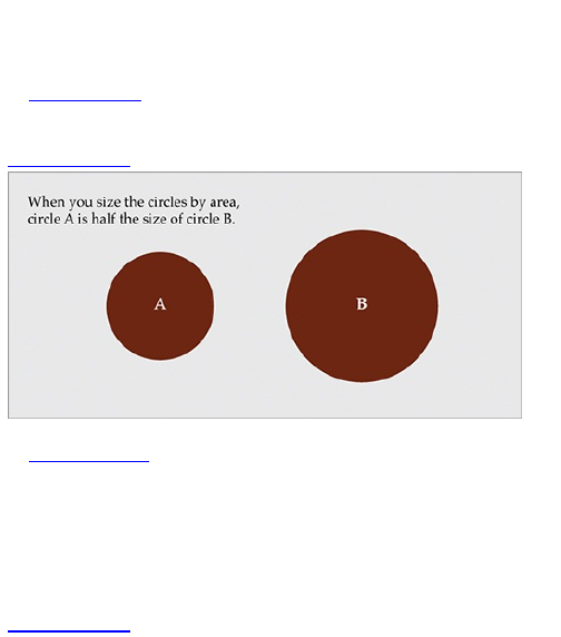
bubble chart, you use an area to represent values.
Beginners often use radius or diameter instead, and the
scale is totally off.
Figure 1-15 shows a pair of circles that have been
sized by area. This is the right way to do it.
Figure 1-15: The right way to size bubbles
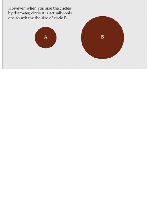
Figure 1-16 shows a pair of circles sized by
diameter. The first circle has twice the diameter as that
of the second but is four times the area.
It’s the same deal with rectangles, like in a treemap.
You use the area of the rectangles to indicate values
instead of the length or width.
Figure 1-16: The wrong way to size bubbles
Include Your Sources
This should go without saying, but so many people miss
this one. Where did the data come from? If you look at
the graphics printed in the newspaper, you always see
the source somewhere, usually in small print along the
bottom. You should do the same. Otherwise readers
have no idea how accurate your graphic is.
There’s no way for them to know that the data wasn’t
just made up. Of course, you would never do that, but
not everyone will know that. Other than making your
graphics more reputable, including your source also lets
others fact check or analyze the data.
Inclusion of your data source also provides more
context to the numbers. Obviously a poll taken at a state
fair is going to have a different interpretation than one
conducted door-to-door by the U.S. Census.

Consider Your Audience
Finally, always consider your audience and the purpose
of your graphics. For example, a chart designed for a
slide presentation should be simple. You can include a
bunch of details, but only the people sitting up front will
see them. On the other hand, if you design a poster
that’s meant to be studied and examined, you can
include a lot more details.
Are you working on a business report? Then don’t try
to create the most beautiful piece of data art the world
has ever seen. Instead, create a clear and straight-to-
the-point graphic. Are you using graphics in analyses?
Then the graphic is just for you, and you probably don’t
need to spend a lot of time on aesthetics and
annotation. Is your graphic meant for publication to a
mass audience? Don’t get too complicated, and explain
any challenging concepts.
Wrapping Up
In short, start with a question, investigate your data with
a critical eye, and figure out the purpose of your
graphics and who they’re for. This will help you design a
clear graphic that’s worth people’s time—no matter
what kind of graphic it is.
You learn how to do this in the following chapters. You
learn how to handle and visualize data. You learn how to

design graphics from start to finish. You then apply what
you learn to your own data. Figure out what story you
want to tell and design accordingly.

Chapter 2
Handling Data
Before you start working on the visual part of any
visualization, you actually need data. The data is what
makes a visualization interesting. If you don’t have
interesting data, you just end up with a forgettable graph
or a pretty but useless picture. Where can you find good
data? How can you access it?
When you have your data, it needs to be formatted so
that you can load it into your software. Maybe you got
the data as a comma-delimited text file or an Excel
spreadsheet, and you need to convert it to something
such as XML, or vice versa. Maybe the data you want is
accessible point-by-point from a web application, but
you want an entire spreadsheet.
Learn to access and process data, and your
visualization skills will follow.
Gather Data
Data is the core of any visualization. Fortunately, there
are a lot of places to find it. You can get it from experts
in the area you’re interested in, a variety of online
applications, or you can gather it yourself.
Provided by Others
This route is common, especially if you’re a freelance
designer or work in a graphics department of a larger
organization. This is a good thing a lot of the time
because someone else did all the data gathering work
for you, but you still need to be careful. A lot of mistakes
can happen along the way before that nicely formatted
spreadsheet gets into your hands.
When you share data with spreadsheets, the most
common mistake to look for is typos. Are there any
missing zeros? Did your client or data supplier mean
six instead of five? At some point, data was read from
one source and then input into Excel or a different
spreadsheet program (unless a delimited text file was
imported), so it’s easy for an innocent typo to make its
way through the vetting stage and into your hands.
You also need to check for context. You don’t need to
become an expert in the data’s subject matter, but you
should know where the original data came from, how it
was collected, and what it’s about. This can help you
build a better graphic and tell a more complete story
when you design your graphic. For example, say you’re
looking at poll results. When did the poll take place?
Who conducted the poll? Who answered? Obviously,
poll results from 1970 are going to take on a different
meaning from poll results from the present day.
Finding Sources
If the data isn’t directly sent to you, it’s your job to go out
and find it. The bad news is that, well, that’s more work
on your shoulders, but the good news is that’s it’s
getting easier and easier to find data that’s relevant and
machine-readable (as in, you can easily load it into
software). Here’s where you can start your search.
Search Engines
How do you find anything online nowadays? You Google
it. This is a no-brainer, but you’d be surprised how many
times people email me asking if I know where to find a
particular dataset and a quick search provided relevant
results. Personally, I turn to Google and occasionally
look to Wolfram|Alpha, the computational search
engine.
See Wolfram|Alpha at
http://wolframalpha.com. The search
engine can be especially useful if you’re looking
for some basic statistics on a topic.
Direct from the Source
If a direct query for “data” doesn’t provide anything of
use, try searching for academics who specialize in the
area you’re interested in finding data for. Sometimes
they post data on their personal sites. If not, scan their
papers and studies for possible leads. You can also try
emailing them, but make sure they’ve actually done
related studies. Otherwise, you’ll just be wasting
everyone’s time.
You can also spot sources in graphics published by
news outlets such as The New York Times. Usually
data sources are included in small print somewhere on

the graphic. If it’s not in the graphic, it should be
mentioned in the related article. This is particularly
useful when you see a graphic in the paper or online
that uses data you’re interested in exploring. Search for
a site for the source, and the data might be available.
This won’t always work because finding contacts
seems to be a little easier when you email saying that
you’re a reporter for the so-and-so paper, but it’s worth
a shot.
Universities
As a graduate student, I frequently make use of the
academic resources available to me, namely the library.
Many libraries have amped up their technology
resources and actually have some expansive data
archives. A number of statistics departments also keep
a list of data files, many of which are publicly
accessible. Albeit, many of the datasets made available
by these departments are intended for use with course
labs and homework. I suggest visiting the following
resources:
Data and Story Library (DASL)
(http://lib.stat.cmu.edu/DASL/)—An online library
of data files and stories that illustrate the use of
basic statistics methods, from Carnegie Mellon
Berkeley Data Lab
(http://sunsite3.berkeley.edu/wikis/datalab/)—Part
of the University of California, Berkeley library
system
UCLA Statistics Data Sets
(www.stat.ucla.edu/data/)—Some of the data that
the UCLA Department of Statistics uses in their
labs and assignments
General Data Applications
A growing number of general data-supplying
applications are available. Some applications provide
large data files that you can download for free or for a
fee. Others are built with developers in mind with data
accessible via Application Programming Interface
(API). This lets you use data from a service, such as
Twitter, and integrate the data with your own
application. Following are a few suggested resources:
Freebase (www.freebase.com)—A community
effort that mostly provides data on people, places,
and things. It’s like Wikipedia for data but more
structured. Download data dumps or use it as a
backend for your application.
Infochimps (http://infochimps.org)—A data
marketplace with free and for-sale datasets. You
can also access some datasets via their API.
Numbrary (http://numbrary.com)—Serves as a
catalog for (mostly government) data on the web.
AggData (http://aggdata.com)—Another
repository of for-sale datasets, mostly focused on
comprehensive lists of retail locations.
Amazon Public Data Sets
(http://aws.amazon.com/publicdatasets)—There’s
not a lot of growth here, but it does host some
large scientific datasets.
Wikipedia (http://wikipedia.org)—A lot of smaller
datasets in the form of HTML tables on this
community-run encyclopedia.
Topical Data
Outside more general data suppliers, there’s no
shortage of subject-specific sites offering loads of free
data.
Following is a small taste of what’s available for the
topic of your choice.
Geography
Do you have mapping software, but no geographic
data? You’re in luck. Plenty of shapefiles and other
geographic file types are at your disposal.
TIGER (www.census.gov/geo/www/tiger/)—From
the Census Bureau, probably the most extensive
detailed data about roads, railroads, rivers, and
ZIP codes you can find
OpenStreetMap (www.openstreetmap.org/)—One
of the best examples of data and community effort
Geocommons (www.geocommons.com/)—Both
data and a mapmaker
Flickr Shapefiles (www.flickr.com/services/api/)—
Geographic boundaries as defined by Flickr
users
Sports
People love sports statistics, and you can find decades’
worth of sports data. You can find it on Sports Illustrated
or team organizations’ sites, but you can also find more
on sites dedicated to the data specifically.
Basketball Reference (www.basketball-
Basketball Reference (www.basketball-
reference.com/)—Provides data as specific as
play-by-play for NBA games.
Baseball DataBank (http://baseball-
databank.org/)—Super basic site where you can
download full datasets.
databaseFootball (www.databasefootball.com/)—
Browse data for NFL games by team, player, and
season.
World
Several noteworthy international organizations keep
data about the world, mainly health and development
indicators. It does take some sifting though, because a
lot of the datasets are quite sparse. It’s not easy to get
standardized data across countries with varied
methods.
Global Health Facts (www.globalhealthfacts.org/)
—Health-related data about countries in the world.
UNdata (http://data.un.org/)—Aggregator of world
data from a variety of sources
World Health Organization
(www.who.int/research/en/)—Again, a variety of
health-related datasets such as mortality and life
expectancy
OECD Statistics (http://stats.oecd.org/)—Major
source for economic indicators
World Bank (http://data.worldbank.org/)—Data for
hundreds of indicators and developer-friendly
Government and Politics
There has been a fresh emphasis on data and
transparency in recent years, so many government
organizations supply data, and groups such as the
Sunlight Foundation encourage developers and
designers to make use of it. Government organizations
have been doing this for awhile, but with the launch of
data.gov, much of the data is available in one place.
You can also find plenty of nongovernmental sites that
aim to make politicians more accountable.
Census Bureau (www.census.gov/)—Find
extensive demographics here.
Data.gov (http://data.gov/)—Catalog for data
supplied by government organizations. Still
relatively new, but has a lot of sources.
Data.gov.uk (http://data.gov.uk/)—The Data.gov
equivalent for the United Kingdom.
DataSF (http://datasf.org/)—Data specific to San
Francisco.
NYC DataMine (http://nyc.gov/data/)—Just like the
above, but for New York.
Follow the Money (www.followthemoney.org/)—
Big set of tools and datasets to investigate money
in state politics.
OpenSecrets (www.opensecrets.org/)—Also
provides details on government spending and
lobbying.
Data Scraping
Often you can find the exact data that you need, except
there’s one problem. It’s not all in one place or in one
file. Instead it’s in a bunch of HTML pages or on multiple
websites. What should you do?
The straightforward, but most time-consuming
method would be to visit every page and manually enter
your data point of interest in a spreadsheet. If you have
only a few pages, sure, no problem.
What if you have a thousand pages? That would take
too long—even a hundred pages would be tedious. It
would be much easier if you could automate the
process, which is what data scraping is for. You write
some code to visit a bunch of pages automatically, grab
some content from that page, and store it in a database
or a text file.
Note
Although coding is the most flexible way to
scrape the data you need, you can also try tools
such as Needlebase and Able2Extract PDF
converter. Use is straightforward, and they can
save you time.
Example: Scrape a Website
The best way to learn how to scrape data is to jump
right into an example. Say you wanted to download
temperature data for the past year, but you can’t find a
source that provides all the numbers for the right time
frame or the correct city. Go to almost any weather
website, and at the most, you’ll usually see only
temperatures for an extended 10-day forecast. That’s
not even close to what you want. You want actual
temperatures from the past, not predictions about future
weather.
Fortunately, the Weather Underground site does
provide historic temperatures; however, you can see
only one day at a time.
Visit Weather Underground at
http://wunderground.com.
To make things more concrete, look up temperature
in Buffalo. Go to the Weather Underground site and
search for BUF in the search box. This should take you
to the weather page for Buffalo Niagara International,
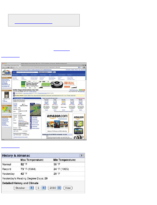
which is the airport in Buffalo (see Figure 2-1).
Figure 2-1: Temperature in Buffalo, New York,
according to Weather Underground
Figure 2-2: Drop-down menu to see historical data for
a selected date
The top of the page provides the current temperature,
a 5-day forecast, and other details about the current
day. Scroll down toward the middle of the page to the
History & Almanac panel, as shown in Figure 2-2.
Notice the drop-down menu where you can select a
specific date.
Adjust the menu to show October 1, 2010, and click
the View button. This takes you to a different view that
shows you details for your selected date (see Figure 2-
3).
Figure 2-3: Temperature data for a single day
There’s temperature, degree days, moisture,
precipitation, and plenty of other data points, but for
now, all you’re interested in is maximum temperature
per day, which you can find in the second column,
second row down. On October 1, 2010, the maximum
temperature in Buffalo was 62 degrees Fahrenheit.
Getting that single value was easy enough. Now how
can you get that maximum temperature value every day,
during the year 2009? The easy-and-straightforward
way would be to keep changing the date in the drop-
down. Do that 365 times and you’re done.
Wouldn’t that be fun? No. You can speed up the
process with a little bit of code and some know-how,
and for that, turn to the Python programming language
and Leonard Richardson’s Python library called
Beautiful Soup.
You’re about to get your first taste of code in the next
few paragraphs. If you have programming experience,
you can go through the following relatively quickly. Don’t
worry if you don’t have any programming experience
though—I’ll take you through it step-by-step. A lot of
people like to keep everything within a safe click
interface, but trust me. Pick up just a little bit of
programming skills, and you can open up a whole bag
of possibilities for what you can do with data. Ready?
Here you go.
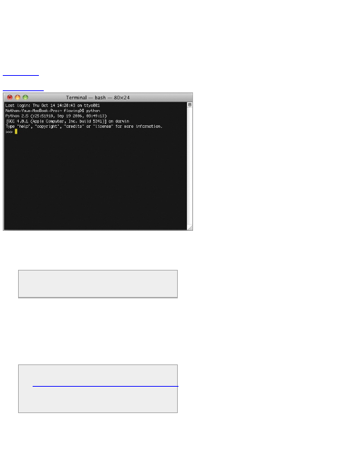
First, you need to make sure your computer has all
the right software installed. If you work on Mac OS X,
you should have Python installed already. Open the
Terminal application and type python to start (see
Figure 2-4).
Figure 2-4: Starting Python in OS X
If you’re on a Windows machine, you can visit the
Python site and follow the directions on how to
download and install.
Vi s i t http://python.org to download and
install Python. Don’t worry; it’s not too hard.
Next, you need to download Beautiful Soup, which
can help you read web pages quickly and easily. Save
the Beautiful Soup Python (.py) file in the directory that
you plan to save your code in. If you know your way
around Python, you can also put Beautiful Soup in your
library path, but it’ll work the same either way.
Visit
www.crummy.com/software/BeautifulSoup/
to download Beautiful Soup. Download the
version that matches the version of Python that
you use.
After you install Python and download Beautiful Soup,
start a file in your favorite text or code editor, and save it
as get-weather-data.py. Now you can code.
The first thing you need to do is load the page that

shows historical weather information. The URL for
historical weather in Buffalo on October 1, 2010,
follows:
www.wunderground.com/history/airport/KBUF/2010/10/1/DailyHistory.html?
req_city=NA&req_state=NA&req_statename=NA
If you remove everything after .html in the preceding
URL, the same page still loads, so get rid of those. You
don’t care about those right now.
www.wunderground.com/history/airport/KBUF/2010/10/1/DailyHistory.html
The date is indicated in the URL with /2010/10/1. Using
the drop-down menu, change the date to January 1,
2009, because you’re going to scrape temperature for
all of 2009. The URL is now this:
www.wunderground.com/history/airport/KBUF/2009/1/1/DailyHistory.html
Everything is the same as the URL for October 1,
except the portion that indicates the date. It’s /2009/1/1
now. Interesting. Without using the drop-down menu,
how can you load the page for January 2, 2009? Simply
change the date parameter so that the URL looks like
this:
www.wunderground.com/history/airport/KBUF/2009/1/2/DailyHistory.html
Load the preceding URL in your browser and you get
the historical summary for January 2, 2009. So all you
have to do to get the weather for a specific date is to
modify the Weather Underground URL. Keep this in
mind for later.
Now load a single page with Python, using the urllib2
library by importing it with the following line of code:
import urllib2
To load the January 1 page with Python, use the
urlopen function.
page = urllib2.urlopen("www.wunderground.com/history/airport/KBUF/2009/1/1/DailyHistory.html")
This loads all the HTML that the URL points to in the
page variable. The next step is to extract the maximum
temperature value you’re interested in from that HTML,
and for that, Beautiful Soup makes your task much
easier. After urllib2, import Beautiful Soup like so:
from BeautifulSoup import BeautifulSoup
At the end of your file, use Beautiful Soup to read
(that is, parse) the page.
soup = BeautifulSoup(page)
Without getting into nitty-gritty details, this line of code

reads the HTML, which is essentially one long string,
and then stores elements of the page, such as the
header or images, in a way that is easier to work with.
Note
Beautiful Soup provides good documentation
and straightforward examples, so if any of this
is confusing, I strongly encourage you to check
those out on the same Beautiful Soup site you
used to download the library.
For example, if you want to find all the images in the
page, you can use this:
images = soup.findAll(‘img’)
This gives you a list of all the images on the Weather
Underground page displayed with the <img /> HTML tag.
Want the first image on the page? Do this:
first_image = images[0]
Want the second image? Change the zero to a one. If
you want the src value in the first <img /> tag, you would
use this:
src = first_image[‘src’]
Okay, you don’t want images. You just want that one
value: maximum temperature on January 1, 2009, in
Buffalo, New York. It was 26 degrees Fahrenheit. It’s a
little trickier finding that value in your soup than it was
finding images, but you still use the same method. You
just need to figure out what to put in findAll(), so look at
the HTML source.
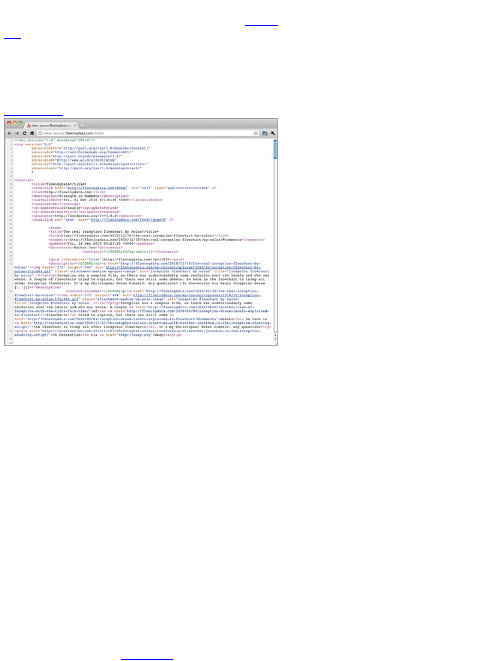
You can easily do this in all the major browsers. In
Firefox, go to the View menu, and select Page Source.
A window with the HTML for your current page appears,
as shown in Figure 2-5.
Scroll down to where it shows Mean Temperature, or
just search for it, which is faster. Spot the 26. That’s what
you want to extract.
The row is enclosed by a <span> tag with a nobr class.
That’s your key. You can find all the elements in the
page with the nobr class.
nobrs = soup.findAll(attrs={"class":"nobr"})
Figure 2-5: HTML source for a page on Weather
Underground
As before, this gives you a list of all the occurrences
o f nobr. The one that you’re interested in is the sixth
occurrence, which you can find with the following:
print nobrs[5]
This gives you the whole element, but you just want
the 26. Inside the <span> tag with the nobr class is another
<span> tag and then the 26. So here’s what you need to
use:
dayTemp = nobrs[5].span.string
print dayTemp
Ta Da! You scraped your first value from an HTML
web page. Next step: scrape all the pages for 2009. For
that, return to the original URL.
www.wunderground.com/history/airport/KBUF/2009/1/1/DailyHistory.html
Remember that you changed the URL manually to get
the weather data for the date you want. The preceding
code is for January 1, 2009. If you want the page for
January 2, 2009, simply change the date portion of the
URL to match that. To get the data for every day of
2009, load every month (1 through 12) and then load
every day of each month. Here’s the script in full with
comments. Save it to your get-weather-data.py file.
import urllib2
from BeautifulSoup import BeautifulSoup
# Create/open a file called wunder.txt (which will be
a comma-delimited file)
f = open(‘wunder-data.txt’, ‘w’)
# Iterate through months and day
for m in range(1, 13):
for d in range(1, 32):

# Check if already gone through month
if (m == 2 and d > 28):
break
elif (m in [4, 6, 9, 11] and d > 30):
break
# Open wunderground.com url
timestamp = ‘2009’ + str(m) + str(d)
print "Getting data for " + timestamp
url = "http://www.wunderground.com/history/airport/KBUF/2009/" +
str(m) + "/" + str(d) + "/DailyHistory.html"
page = urllib2.urlopen(url)
# Get temperature from page
soup = BeautifulSoup(page)
# dayTemp = soup.body.nobr.b.string
dayTemp = soup.findAll(attrs={"class":"nobr"})[5].span.string
# Format month for timestamp
if len(str(m)) < 2:
mStamp = ‘0’ + str(m)
else:
mStamp = str(m)
# Format day for timestamp
if len(str(d)) < 2:
dStamp = ‘0’ + str(d)
else:
dStamp = str(d)
# Build timestamp
timestamp = ‘2009’ + mStamp + dStamp
# Write timestamp and temperature to file
f.write(timestamp + ‘,’ + dayTemp + ‘\n’)
# Done getting data! Close file.
f.close()
You should recognize the first two lines of code to
import the necessary libraries, urllib2 and
BeautifulSoup.
import urllib2
from BeautifulSoup import BeautifulSoup
Next, start a text file called wunder-data-txt with write
permissions, using the open() method. All the data that
you scrape will be stored in this text file, in the same
directory that you saved this script in.
# Create/open a file called wunder.txt (which will be
a comma-delimited file)
f = open(‘wunder-data.txt’, ‘w’)
With the next line of code, use a for loop, which tells
the computer to visit each month. The month number is
stored in the m variable. The loop that follows then tells
the computer to visit each day of each month. The day
number is stored in the d variable.
# Iterate through months and day
for m in range(1, 13):
for d in range(1, 32):
See Python documentation for more on how

See Python documentation for more on how
loops and iteration work:
http://docs.python.org/reference/compound_stmts.html
Notice that you used range (1, 32) to iterate through the
days. This means you can iterate through the numbers 1
to 31. However, not every month of the year has 31
days. February has 28 days; April, June, September,
and November have 30 days. There’s no temperature
value for April 31 because it doesn’t exist. So check
what month it is and act accordingly. If the current month
is February and the day is greater than 28, break and
move on to the next month. If you want to scrape multiple
years, you need to use an additional if statement to
handle leap years.
Similarly, if it’s not February, but instead April, June,
September, or November, move on to the next month if
the current day is greater than 30.
# Check if already gone through month
if (m == 2 and d > 28):
break
elif (m in [4, 6, 9, 11] and d > 30):
break
Again, the next few lines of code should look familiar.
You used them to scrape a single page from Weather
Underground. The difference is in the month and day
variable in the URL. Change that for each day instead of
leaving it static; the rest is the same. Load the page
with the urllib2 library, parse the contents with Beautiful
Soup, and then extract the maximum temperature, but
look for the sixth appearance of the nobr class.
# Open wunderground.com url
url = "http://www.wunderground.com/history/airport/KBUF/2009/" + str(m) + "/" + str(d) + "/DailyHistory.html"
page = urllib2.urlopen(url)
# Get temperature from page
soup = BeautifulSoup(page)
# dayTemp = soup.body.nobr.b.string
dayTemp = soup.findAll(attrs={"class":"nobr"})[5].span.string
The next to last chunk of code puts together a
timestamp based on the year, month, and day.
Timestamps are put into this format: yyyymmdd. You
can construct any format here, but keep it simple for
now.
# Format day for timestamp
if len(str(d)) < 2:
dStamp = ‘0’ + str(d)
else:
dStamp = str(d)
# Build timestamp
timestamp = ‘2009’ + mStamp + dStamp
Finally, the temperature and timestamp are written to
‘wunder-data.txt’ using the write() method.
# Write timestamp and temperature to file
f.write(timestamp + ‘,’ + dayTemp + ‘\n’)
Then use close()when you finish with all the months
and days.
# Done getting data! Close file.
f.close()
The only thing left to do is run the code, which you do
in your terminal with the following:
$ python get-weather-data.py
It takes a little while to run, so be patient. In the
process of running, your computer is essentially loading
365 pages, one for each day of 2009. You should have
a file named wunder-data.txt in your working directory
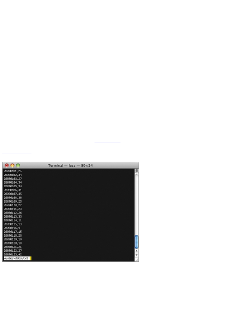
when the script is done running. Open it up, and there’s
your data, as a comma-separated file. The first column
is for the timestamps, and the second column is
temperatures. It should look similar to Figure 2-6.
Figure 2-6: One year’s worth of scraped temperature
data
Generalizing the Example
Although you just scraped weather data from Weather
Underground, you can generalize the process for use
with other data sources. Data scraping typically involves
three steps:
1. Identify the patterns.
2. Iterate.
3. Store the data.

In this example, you had to find two patterns. The first
was in the URL, and the second was in the loaded web
page to get the actual temperature value. To load the
page for a different day in 2009, you changed the month
and day portions of the URL. The temperature value
was enclosed in the sixth occurrence of the nobr class in
the HTML page. If there is no obvious pattern to the
URL, try to figure out how you can get the URLs of all the
pages you want to scrape. Maybe the site has a site
map, or maybe you can go through the index via a
search engine. In the end, you need to know all the
URLs of the pages of data.
After you find the patterns, you iterate. That is, you
visit all the pages programmatically, load them, and
parse them. Here you did it with Beautiful Soup, which
makes parsing XML and HTML easy in Python. There’s
probably a similar library if you choose a different
programming language.
Lastly, you need to store it somewhere. The easiest
solution is to store the data as a plain text file with
comma-delimited values, but if you have a database set
up, you can also store the values in there.
Things can get trickier as you run into web pages that
use JavaScript to load all their data into view, but the
process is still the same.
Formatting Data
Different visualization tools use different data formats,
and the structure you use varies by the story you want to
tell. So the more flexible you are with the structure of
your data, the more possibilities you can gain. Make
use of data formatting applications, and couple that with
a little bit of programming know-how, and you can get
your data in any format you want to fit your specific
needs.
The easy way of course is to find a programmer who
can format and parse all of your data, but you’ll always
be waiting on someone. This is especially evident
during the early stages of any project where iteration
and data exploration are key in designing a useful
visualization. Honestly, if I were in a hiring position, I’d
likely just get the person who knows how to work with
data, over the one who needs help at the beginning of
every project.

What I Learned about
Formatting
When I first learned statistics in high school, the data
was always provided in a nice, rectangular format. All I
had to do was plug some numbers into an Excel
spreadsheet or my awesome graphing calculator (which
was the best way to look like you were working in class,
but actually playing Tetris). That’s how it was all the way
through my undergraduate education. Because I was
learning about techniques and theorems for analyses,
my teachers didn’t spend any time on working with raw,
preprocessed data. The data always seemed to be in
just the right format.
This is perfectly understandable, given time constraints
and such, but in graduate school, I realized that data in
the real world never seems to be in the format that you
need. There are missing values, inconsistent labels,
typos, and values without any context. Often the data is
spread across several tables, but you need everything in
one, joined across a value, like a name or a unique id
number.
This was also true when I started to work with
visualization. It became increasingly important because I
wanted to do more with the data I had. Nowadays, it’s not
out of the ordinary that I spend just as much time getting
data in the format that I need as I do putting the visual
part of a data graphic together. Sometimes I spend more
time getting all my data in place. This might seem
strange at first, but you’ll find that the design of your data
graphics comes much easier when you have your data
neatly organized, just like it was back in that introductory
statistics course in high school.
Various data formats, the tools available to deal with
these formats, and finally, some programming, using the
same logic you used to scrape data in the previous
example are described next.
Data Formats
Most people are used to working with data in Excel.
This is fine if you’re going to do everything from
analyses to visualization in the program, but if you want
to step beyond that, you need to familiarize yourself with
other data formats. The point of these formats is to
make your data machine-readable, or in other words, to
structure your data in a way that a computer can
understand. Which data format you use can change by
visualization tool and purpose, but the three following
formats can cover most of your bases: delimited text,
JavaScript Object Notation, and Extensible Markup
Language.
Delimited Text

Most people are familiar with delimited text. You did
after all just make a comma-delimited text file in your
data scraping example. If you think of a dataset in the
context of rows and columns, a delimited text file splits
columns by a delimiter. The delimiter is a comma in a
comma-delimited file. The delimiter might also be a tab.
It can be spaces, semicolons, colons, slashes, or
whatever you want; although a comma and tab are the
most common.
Delimited text is widely used and can be read into
most spreadsheet programs such as Excel or Google
Documents. You can also export spreadsheets as
delimited text. If multiple sheets are in your workbook,
you usually have multiple delimited files, unless you
specify otherwise.
This format is also good for sharing data with others
because it doesn’t depend on any particular program.
JavaScript Object Notation (JSON)
This is a common format offered by web APIs. It’s
designed to be both machine- and human-readable;
although, if you have a lot of it in front of you, it’ll
probably make you cross-eyed if you stare at it too long.
It’s based on JavaScript notation, but it’s not dependent
on the language. There are a lot of specifications for
JSON, but you can get by for the most part with just the
basics.
JSON works with keywords and values, and treats
items like objects. If you were to convert JSON data to
comma-separated values (CSV), each object might be
a row.
As you can see later in this book, a number of
applications, languages, and libraries accept JSON as
input. If you plan to design data graphics for the web,
you’re likely to run into this format.
Visit http://json.org for the full specification of
JSON. You don’t need to know every detail of
the format, but it can be handy at times when
you don’t understand a JSON data source.
Extensible Markup Language (XML)
XML is another popular format on the web, often used
to transfer data via APIs. There are lots of different
types and specifications for XML, but at the most basic
level, it is a text document with values enclosed by tags.
For example, the Really Simple Syndication (RSS) feed
that people use to subscribe to blogs, such as
FlowingData, is actually an XML file, as shown in Figure
2-7.
The RSS lists recently published items enclosed in
t h e <item></item> tag, and each item has a title,
description, author, and publish date, along with some
other attributes.
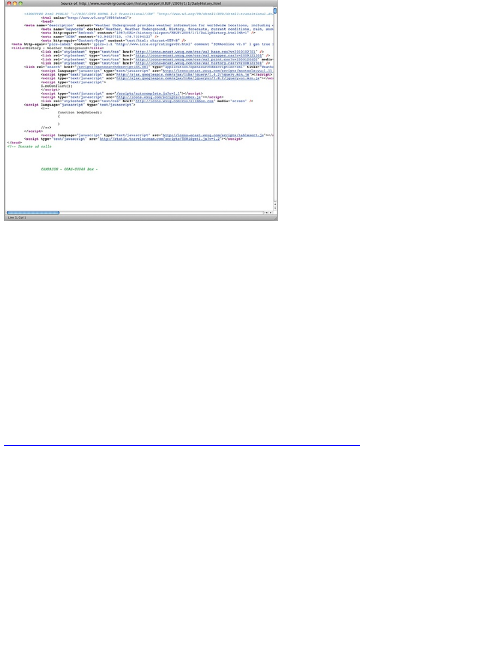
Figure 2-7: Snippet of FlowingData’s RSS feed
XML is relatively easy to parse with libraries such as
Beautiful Soup in Python. You can get a better feel for
XML, along with CSV and JSON, in the sections that
follow.
Formatting Tools
Just a couple of years ago, quick scripts were always
written to handle and format data. After you’ve written a
few scripts, you start to notice patterns in the logic, so
it’s not super hard to write new scripts for specific
datasets, but it does take time. Luckily, with growing
volumes of data, some tools have been developed to
handle the boiler plate routines.
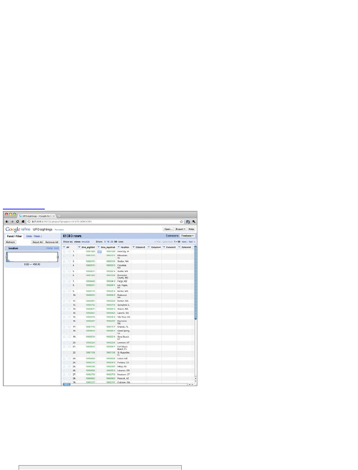
Google Refine
Google Refine is the evolution of Freebase Gridworks.
Gridworks was first developed as an in-house tool for
an open data platform, Freebase; however, Freebase
was acquired by Google, therefore the new name.
Google Refine is essentially Gridworks 2.0 with an
easier-to-use interface (Figure 2-8) with more features.
It runs on your desktop (but still through your browser),
which is great, because you don’t need to worry about
uploading private data to Google’s servers. All the
processing happens on your computer. Refine is also
open source, so if you feel ambitious, you can cater the
tool to your own needs with extensions.
When you open Refine, you see a familiar
spreadsheet interface with your rows and columns. You
can easily sort by field and search for values. You can
also find inconsistencies in your data and consolidate in
a relatively easy way.
For example, say for some reason you have an
inventory list for your kitchen. You can load the data in
Refine and quickly find inconsistencies such as typos or
differing classifications. Maybe a fork was misspelled
as “frk,” or you want to reclassify all the forks, spoons,
and knives as utensils. You can easily find these things
with Refine and make changes. If you don’t like the
changes you made or make a mistake, you can revert
to the old dataset with a simple undo.
Figure 2-8: Google Refine user interface
Getting into the more advanced stuff, you can also
incorporate data sources like your own with a dataset
from Freebase to create a richer dataset.
If anything, Google Refine is a good tool to keep in
your back pocket. It’s powerful, and it’s a free download,
so I highly recommend you at least fiddle around with
the tool.
Download the open-source Google Refine and
view tutorials on how to make the most out of
the tool at
http://code.google.com/p/google-
refine/.
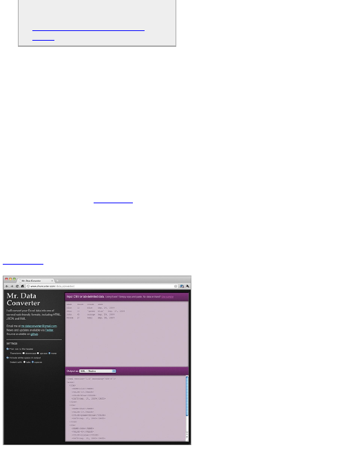
Mr. Data Converter
Often, you might get all your data in Excel but then need
to convert it to another format to fit your needs. This is
almost always the case when you create graphics for
the web. You can already export Excel spreadsheets as
CSV, but what if you need something other than that?
Mr. Data Converter can help you.
Mr. Data Converter is a simple and free tool created
by Shan Carter, who is a graphics editor for The New
York Times. Carter spends most of his work time
creating interactive graphics for the online version of the
paper. He has to convert data often to fit the software
that he uses, so it’s not surprising he made a tool that
streamlines the process.
It’s easy to use, and Figure 2-9 shows that the
interface is equally as simple. All you need to do is copy
and paste data from Excel in the input section on the
top and then select what output format you want in the
bottom half of the screen. Choose from variants of XML,
JSON, and a number of others.
Figure 2-9: Mr. Data Converter makes switching
between data formats easy.
The source code to Mr. Data Converter is also
available if you want to make your own or extend.
Try out Mr. Data Converter at
http://www.shancarter.com/data_converter/
or download the source on github at
https://github.com/shancarter/Mr-
Data-Converter to convert your Excel
spreadsheets to a web-friendly format.
Mr. People
Inspired by Carter’s Mr. Data Converter, The New York
Times graphics deputy director Matthew Ericson
created Mr. People. Like Mr. Data Converter, Mr.
People enables you to copy and paste data into a text
field, and the tool parses and extracts for you. Mr.
People, however, as you might guess, is specifically for
parsing names.
Maybe you have a long list of names without a
specific format, and you want to identify the first and last
names, along with middle initial, prefix, and suffix.
Maybe multiple people are listed on a single row. That’s
where Mr. People comes in. Copy and paste names, as
shown in Figure 2-10, and you get a nice clean table
that you can copy into your favorite spreadsheet
software, as shown in Figure 2-11.
Like Mr. Data Converter, Mr. People is also available
as open-source software on github.
Use Mr. People at
http://people.ericson.net/ or download the
Ruby source on github to use the name parser
in your own scripts:
http://github.com/mericson/people.
Spreadsheet Software
Of course, if all you need is simple sorting, or you just
need to make some small changes to individual data
points, your favorite spreadsheet software is always
available. Take this route if you’re okay with manually
editing data. Otherwise, try the preceding first
(especially if you have a giganto dataset), or go with a
custom coding solution.
Figure 2-10: Input page for names on Mr. People
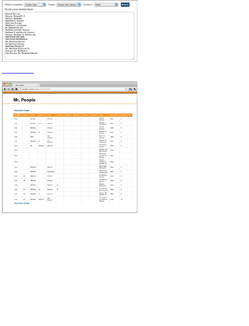
Figure 2-11: Parsed names in table format with Mr.
People
Formatting with Code
Although point-and-click software can be useful,
sometimes the applications don’t quite do what you
want if you work with data long enough. Some software
doesn’t handle large data files well; they get slow or they
crash.
What do you do at this point? You can throw your
hands in the air and give up; although, that wouldn’t be
productive. Instead, you can write some code to get the
job done. With code you become much more flexible,
and you can tailor your scripts specifically for your data.
Now jump right into an example on how to easily
switch between data formats with just a few lines of
code.

Example: Switch Between Data
Formats
This example uses Python, but you can of course use
any language you want. The logic is the same, but the
syntax will be different. (I like to develop applications in
Python, so managing raw data with Python fits into my
workflow.)
Going back to the previous example on scraping
data, use the resulting wunder-data.txt file, which has
dates and temperatures in Buffalo, New York, for 2009.
The first rows look like this:
20090101,26
20090102,34
20090103,27
20090104,34
20090105,34
20090106,31
20090107,35
20090108,30
20090109,25
...
This is a CSV file, but say you want the data as XML
in the following format:
<weather_data>
<observation>
<date>20090101</date>
<max_temperature>26</max_temperature>
</observation>
<observation>
<date>20090102</date>
<max_temperature>34</max_temperature>
</observation>
<observation>
<date>20090103</date>
<max_temperature>27</max_temperature>
</observation>
<observation>
<date>20090104</date>
<max_temperature>34</max_temperature>
</observation>
...
</weather_data>
Each day’s temperature is enclosed in <observation>
tags with a <date> and the <max_temperature>.
To convert the CSV into the preceding XML format,
you can use the following code snippet:
import csv
reader = csv.reader(open(‘wunder-
data.txt’, ‘r’), delimiter=",")
print ‘<weather_data>’
for row in reader:
print ‘<observation>’
print ‘<date>’ + row[0] + ‘</date>’
print ‘<max_temperature>’ + row[1] + ‘</max_temperature>’
print ‘</observation>’
print ‘</weather_data>’

As before, you import the necessary modules. You
need only the csv module in this case to read in wunder-
data.txt.
import csv
The second line of code opens wunder-data.txt to read
usi ng open() and then reads it with the csv.reader()
method.
reader = csv.reader(open(‘wunder-
data.txt’, ‘r’), delimiter=",")
Notice the delimiter is specified as a comma. If the
file were a tab-delimited file, you could specify the
delimiter as ‘\t’.
Then you can print the opening line of the XML file in
line 3.
print ‘<weather_data>’
In the main chunk of the code, you can loop through
each row of data and print in the format that you need
the XML to be in. In this example, each row in the CSV
header is equivalent to each observation in the XML.
for row in reader:
print ‘<observation>’
print ‘<date>’ + row[0] + ‘</date>’
print ‘<max_temperature>’ + row[1] + ‘</max_temperature>’
print ‘</observation>’
Each row has two values: the date and the maximum
temperature.
End the XML conversion with its closing tag.
print ‘</weather_data>’
Two main things are at play here. First, you read the
data in, and then you iterate over the data, changing
each row in some way. It’s the same logic if you were to
convert the resulting XML back to CSV. As shown in the
following snippet, the difference is that you use a
different module to parse the XML file.
from BeautifulSoup import BeautifulStoneSoup
f = open(‘wunder-data.xml’, ‘r’)
xml = f.read()
soup = BeautifulStoneSoup(xml)
observations = soup.findAll(‘observation’)
for o in observations:
print o.date.string + "," + o.max_temperature.string
The code looks different, but you’re basically doing
the same thing. Instead of importing the csv module, you
import BeautifulStoneSoup from BeautifulSoup.

Remember you used BeautifulSoup to parse the HTML
from Weather Underground. BeautifulStoneSoup
parses the more general XML.
You can open the XML file for reading with open() and
then load the contents in the xml variable. At this point,
the contents are stored as a string. To parse, pass the
xml string to BeautifulStoneSoup to iterate through each
<observation> in the XML file. Use findAll() to fetch all the
observations, and finally, like you did with the CSV to
XML conversion, loop through each observation,
printing the values in your desired format.
This takes you back to where you began:
20090101,26
20090102,34
20090103,27
20090104,34
...
To drive the point home, here’s the code to convert
your CSV to JSON format.
import csv
reader = csv.reader(open(‘wunder-
data.txt’, ‘r’), delimiter=",")
print "{ observations: ["
rows_so_far = 0
for row in reader:
rows_so_far += 1
print ‘{‘
print ‘"date": ‘ + ‘"‘ + row[0] + ‘", ‘
print ‘"temperature": ‘ + row[1]
if rows_so_far < 365:
print " },"
else:
print " }"
print "] }"
Go through the lines to figure out what’s going on, but
again, it’s the same logic with different output. Here’s
what the JSON looks like if you run the preceding code.
{
"observations": [
{
"date": "20090101",
"temperature": 26
},
{
"date": "20090102",
"temperature": 34
},
...
]
}
This is still the same data, with date and temperature
but in a different format. Computers just love variety.

Put Logic in the Loop
If you look at the code to convert your CSV file to JSON,
you should notice the if-else statement in the for loop,
after the three print lines. This checks if the current
iteration is the last row of data. If it isn’t, don’t put a
comma at the end of the observation. Otherwise, you
do. This is part of the JSON specification. You can do
more here.
You can check if the max temperature is more than a
certain amount and create a new field that is 1 if a day
is more than the threshold, or 0 if it is not. You can
create categories or flag days with missing values.
Actually, it doesn’t have to be just a check for a
threshold. You can calculate a moving average or the
difference between the current day and the previous.
There are lots of things you can do within the loop to
augment the raw data. Everything isn’t covered here
because you can do anything from trivial changes to
advanced analyses, but now look at a simple example.
Going back to your original CSV file, wunder-data.txt,
create a third column that indicates whether a day’s
maximum temperature was at or below freezing. A 0
indicates above freezing, and 1 indicates at or below
freezing.
import csv
reader = csv.reader(open(‘wunder-
data.txt’, ‘r’), delimiter=",")
for row in reader:
if int(row[1]) <= 32:
is_freezing = ‘1’
else:
is_freezing = ‘0’
print row[0] + "," + row[1] + "," + is_freezing
Like before, read the data from the CSV file into
Python, and then iterate over each row. Check each day
and flag accordingly.
This is of course a simple example, but it should be
easy to see how you can expand on this logic to format
or augment your data to your liking. Remember the
three steps of load, loop, and process, and expand from
there.
Wrapping Up
This chapter covered where you can find the data you
need and how to manage it after you have it. This is an
important step, if not the most important, in the
visualization process. A data graphic is only as

interesting as its underlying data. You can dress up a
graphic all you want, but the data (or the results from
your analysis of the data) is still the substance; and now
that you know where and how to get your data, you’re
already a step ahead of the pack.
You also got your first taste of programming. You
scraped data from a website and then formatted and
rearranged that data, which will be a useful trick in later
chapters. The main takeaway, however, is the logic in
the code. You used Python, but you easily could have
used Ruby, Perl, or PHP. The logic is the same across
languages. When you learn one programming language
(and if you’re a programmer already, you can attest to
this), it’s much easier to learn other languages later.
You don’t always have to turn to code. Sometimes
there are click-and-drag applications that make your job
a lot easier, and you should take advantage of that
when you can. In the end, the more tools you have in
your toolbox, the less likely you’re going to get stuck
somewhere in the process.
Okay, you have your data. Now it’s time to get visual.

Chapter 3
Choosing Tools to Visualize
Data
In the last chapter, you learned where to find your data
and how to get it in the format you need, so you’re ready
to start visualizing. One of the most common questions
people ask me at this point is “What software should I
use to visualize my data?”
Luckily, you have a lot of options. Some are out-of-the-
box and click-and-drag. Others require a little bit of
programming, whereas some tools weren’t designed
specifically for data graphics but are useful
nevertheless. This chapter covers these options.
The more visualization tools you know how to use and
take advantage of, the less likely you’ll get stuck not
knowing what to do with a dataset and the more likely
you can make a graphic that matches your vision.
Out-of-the-Box Visualization
The out-of-the-box solutions are by far the easiest for
beginners to pick up. Copy and paste some data or
load a CSV file and you’re set. Just click the graph type
you want—maybe change some options here and there.
Options
The out-of-the-box tools available vary quite a bit,
depending on the application they’ve been designed
for. Some, such as Microsoft Excel or Google
Documents, are meant for basic data management and
graphs, whereas others were built for more thorough
analyses and visual exploration.
Microsoft Excel
You know this one. You have the all-familiar
spreadsheet where you put your data, such as in Figure
3-1.
Figure 3-1: Microsoft Excel spreadsheet
Then you can click the button with the little bar graph

on it to make the chart you want. You get all your
standard chart types (Figure 3-2) such as the bar chart,
line, pie, and scatterplot.
Some people scoff at Excel, but it’s not all that bad
for the right tasks. For example, I don’t use Excel for any
sort of deep analyses or graphics for a publication, but
if I get a small dataset in an Excel file, as is often the
case, and I want a quick feel for what is in front of me,
then sure, I’ll whip up a graph with a few clicks in
everyone’s favorite spreadsheet program.
Graphs Really Can Be Fun
The first graph I made on a computer was in Microsoft
Excel for my fifth grade science fair project. My project
partner and I tried to find out which surface snails moved
on the fastest. It was ground-breaking research, I assure
you.
Even back then I remember enjoying the graph-making. It
took me forever to learn (the computer was still new to
me), but when I finally did, it was a nice treat. I entered
numbers in a spreadsheet and then got a graph instantly
that I could change to any color I wanted—blinding, bright
yellow it is.
Figure 3-2: Microsoft Excel chart options
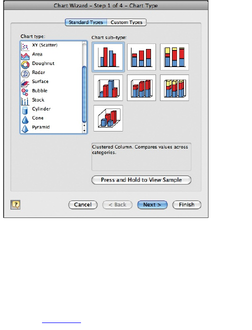
This ease of use is what makes Excel so appealing
to the masses, and that’s fine. If you want higher quality
data graphics, don’t stop here. Other tools are a better
fit for that.
Google Spreadsheets
Google Spreadsheets is essentially the cloud version of
Microsoft Excel with the familiar spreadsheet interface,
obviously (Figure 3-3).
Figure 3-3: Google Spreadsheets
It also offers your standard chart types, as shown in
Figure 3-4.
Figure 3-4: Google Spreadsheets charting options
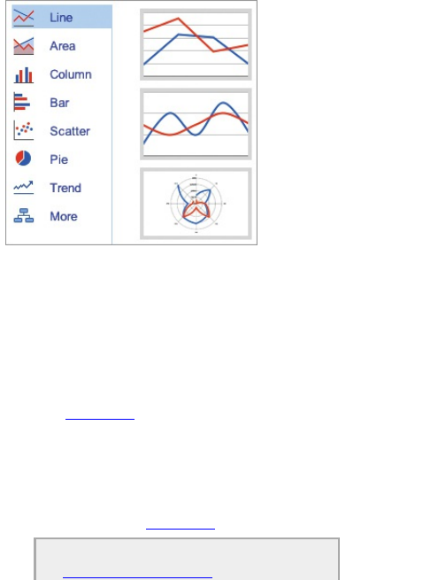
Google Spreadsheets offers some advantages over
Excel, however. First, because your data is stored on
the Google servers, you can see your data on any
computer as long as it has a web browser installed. Log
in to your Google account and go. You can also easily
share your spreadsheet with others and collaborate in
real-time. Google Spreadsheets also offers some
additional charting options via the Gadget option, as
shown in Figure 3-5.
A lot of the gadgets are useless, but a few good ones
are available. You can, for example, easily make a
motion chart with your time series data (just like Hans
Rosling). There’s also an interactive time series chart
that you might be familiar with if you’ve visited Google
Finance, as shown in Figure 3-6.
Visit Google Docs at
http://docs.google.com to try
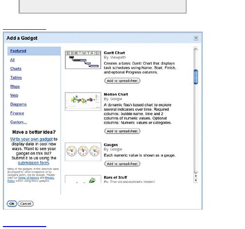
spreadsheets.
Figure 3-5: Google gadgets
Figure 3-6: Google Finance
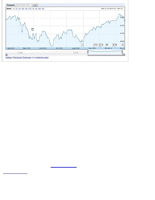
Many Eyes
Many Eyes is an ongoing research project by the IBM
Visual Communication Lab. It’s an online application
that enables you to upload your data as a text-delimited
file and explore through a set of interactive visualization
tools. The original premise of Many Eyes was to see if
people could explore large datasets as groups—
therefore the name. If you have a lot of eyes on a large
dataset, can a group find interesting points in the data
quicker or more efficiently or find things in the data that
you would not have found on your own?
Although social data analyses never caught on with
Many Eyes, the tools can still be useful to the individual.
Most traditional visualization types are available, such
as the line graph (Figure 3-7) and the scatterplot
(Figure 3-8).
One of the great things about all the visualizations on
Many Eyes is that they are interactive and provide a
number of customization options. The scatterplot, for
example, enables you to scale dots by a third metric,
and you can view individual values by rolling over a
point of interest.
Figure 3-7: Line graph on Many Eyes
Figure 3-8: Scatterplot on Many Eyes
Many Eyes also provides a variety of more advanced
and experimental visualizations, along with some basic
mapping tools. A word tree helps you explore a full body
of text, such as in a book or news article. You choose a
word or a phrase, and you can see how your selection
is used throughout the text by looking at what follows.
Figure 3-9, for example, shows the results of a search
for right in the United States Constitution.
Figure 3-9: Word tree on Many Eyes showing parts of
the United States Constitution
Alternatively, you can easily switch between tools,
using the same data. Figure 3-10 shows the
Constitution visualized with a stylized word cloud, known
as a Wordle. Words used more often are sized larger.
Figure 3-10: Wordle of the United States Constitution
As you can see, Many Eyes has a lot of options to
help you play with your data and is by far the most-
extensive (and in my eyes, the best) free tool for data
exploration; however, a couple of caveats exist. The first
is that most of the tools are Java applets, so you can’t
do much if you don’t have Java installed. (This isn’t a
big deal for most, but I know some people, for whatever
reason, who are particular about what they put on their
computer.)
The other caveat, which can be a deal breaker, is that
all the data you upload to the site is in the public
domain. So you can’t use Many Eyes, for example, to
dig into customer information or sales made by your
business.
Try uploading and visualizing your own data
http://many-eyes.com.
Tableau Software
Tableau Software, which is Windows-only software, is
relatively new but has been growing in popularity for the
past couple of years. It’s designed mainly to explore
and analyze data visually. It’s clear that careful thought
has been given to aesthetics and design, which is why
so many people like it.
Tableau Software offers lots of interactive
visualization tools and does a good job with data
management, too. You can import data from Excel, text
files, and database servers. Standard time series
charts, bar graphs, pie charts, basic mapping, and so
on are available. You can mix and match these displays,
hook in a dynamic data source for a custom view, or a
dashboard, for a snapshot of what’s going on in your
data.
Most recently, Tableau released Tableau Public,
which is free and offers a subset of the functionality in
the desktop editions. You can upload your data to
Tableau’s servers, build an interactive display, and
easily publish it to your website or blog. Any data you
upload to the servers though, like with Many Eyes, does
become publicly available, so keep that in mind.
If you want to use Tableau and keep your data
private, you need to go with the desktop editions. At the
time of this writing, the desktop software is on the
pricier side at $999 and $1,999 for the Personal and
Professional editions, respectively.
Visit Tableau Software at
http://tableausoftware.com. It has a full-
functioning free trial.
your.flowingdata
My interest in personal data collection inspired my own
application, your.flowingdata (YFD). It’s an online
application that enables you to collect data via Twitter
and then explore patterns and relationships with a set of
interactive visualization tools. Some people track their
eating habits or when they go to sleep and wake up.
Others have logged the habits of their newborn as sort
of a baby scrapbook, with a data twist.
YFD was originally designed with personal data in
mind, but many have found the application useful for
more general types of data collection, such as web

activity or train arrivals and departures.
Try personal data collection via Twitter at
http://your.flowingdata.com.
Trade-Offs
Although these tools are easy to use, there are some
drawbacks. In exchange for click-and-drag, you give up
some flexibility in what you can do. You can usually
change colors, fonts, and titles, but you’re restricted to
what the software offers. If there is no button for the
chart you want, you’re out of luck.
On the flip side, some software might have a lot of
functions, but in turn have a ton of buttons that you need
to learn. For example, there was one program (not
listed here) that I took a weekend crash course for, and
it was obvious that it could do a lot if I put in the time.
The processes to get things done though were so
counterintuitive that it made me not want to learn
anymore. It was also hard to repeat my work for different
datasets, because I had to remember everything I
clicked. In contrast, when you write code to handle your
data, it’s often easy to reuse code and plug in a
different dataset.
Don’t get me wrong. I’m not saying to avoid out-of-
the-box software completely. They can help you explore
your data quickly and easily. But as you work with more
datasets, there will be times when the software doesn’t
fit, and when that time comes you can turn to
programming.

Programming
This can’t be stressed enough: Gain just a little bit of
programming skills, and you can do so much more with
data than if you were to stick only with out-of-the-box
software. Programming skills give you the ability to be
more flexible and more able to adapt to different types
of data.
If you’ve ever been impressed by a data graphic that
looked custom-made, most likely it was coded or
designed in illustrative software. A lot of the time it’s
both. The latter is covered a little later.
Code can look cryptic to beginners—I’ve been there.
But think of it as a new language because that’s what it
is. Each line of code tells the computer to do something.
Your computer doesn’t understand the way you talk to
your friends, so you have to talk to the computer in its
own language or syntax.
Like any language, you can’t immediately start a
conversation. Start with the basics first and then work
your way up. Before you know it, you’ll be coding. The
cool thing about programming is that after you learn one
language, it’s much easier to learn others because the
logic is similar.
Options
So you decide to get your hands dirty with code—good
for you. A lot of options are freely available. Some
languages are better at performing certain tasks better
than others. Some solutions can handle large amounts

of data, whereas others are not as robust in that
department but can produce much better visuals or
provide interaction. Which language you use largely
depends on what your goals are for a specific data
graphic and what you’re most comfortable with.
Some people stick with one language and get to
know it well. This is fine, and if you’re new to
programming, I highly recommend this strategy.
Familiarize yourself with the basics and important
concepts of code.
Use the language that best suits your needs.
However, it’s fun to learn new languages and new ways
to play with data; so you should develop a good bit of
programming experience before you decide on your
favorite solution.
Python
The previous chapter discussed how Python can handle
data. Python is good at that and can handle large
amounts of data without crashing. This makes the
language especially useful for analyses and heavy
computation.
Python also has a clean and easy-to-read syntax that
programmers like, and you can work off of a lot of
modules to create data graphics, such as the graph in
Figure 3-11.
From an aesthetic point of view, it’s not great. You
probably don’t want to take a graphic from Python direct
to publication. The output usually looks kind of rough
around the edges. Nevertheless, it can be a good
starting point in the data exploration stages. You might
also export images and then touch them up or add
information using graphic editing software.
Figure 3-11: Graph produced in Python
Useful Python Resources
Official Python website
(http://python.org)
NumPy and SciPy
(http://numpy.scipy.org/)—Scientific
computing
PHP
PHP was the first language I learned when I started
programming for the web. Some people say it’s messy,
which it can be, but you can just as easily keep it
organized. It’s usually an easy setup because most web
servers already have it installed, so it’s easy to jump
right in.
Figure 3-12: Sparklines using a PHP graphing library
There’s a flexible PHP graphics library called GD
that’s also usually included in standard installs. The
library enables you to create images from scratch or
manipulate existing ones. Also a number of PHP
graphing libraries exist that enable you to create basic
charts and graphs. The most popular is the Sparklines
Graphing Library, which enables you to embed small
word-size graphs in text or add a visual component to a
numeric table, as shown in Figure 3-12.
Most of the time PHP is coupled with a database
such as MySQL, instead of working with a lot of CSV
files, to maximize usage and to work with hefty
datasets.
Useful PHP Resources
Official PHP website (http://php.net)
Sparkline PHP Graphing Library

(http://sparkline.org)
Processing
Processing is an open-source programming language
geared toward designers and data artists. It started as
a coding sketchbook in which you could produce
graphics quickly; however, it developed a lot since its
early days, and many high-quality projects have been
created in Processing. For example, We Feel Fine,
mentioned in Chapter 1, “Telling Stories with Data,” was
created in Processing.
The great thing about Processing is that you can
quickly get up and running. The programming
environment is lightweight, and with just a few lines of
code, you can create an animated and interactive
graphic. It would of course be basic, but because it was
designed with the creation of visuals in mind, you can
easily learn how to create more advanced pieces.
Although the audience was originally for designers
and artists, the community around Processing has
grown to be a diverse group. Many libraries can help
you do more with the language.
One of the drawbacks is that you do end up with a
Java applet, which can be slow to load on some
people’s computers, and not everyone has Java
installed. (Although most people do.) There’s a solution
for that, though. There’s a JavaScript version of
Processing recently out of development and ready to
use.
Nevertheless, this is a great place to start for
beginners. Even those who don’t have any
programming experience can make something useful.
Useful Processing Resource
Processing (http://processing.org)
—Official site for Processing
Flash and ActionScript
Most interactive and animated data graphics on the
web, especially on major news sites such as The New
York Times, are built in Flash and ActionScript. You
can design graphics in just Flash, which is a click-and-
drag interface, but with ActionScript you have more
control over interactions. Many applications are written
completely in ActionScript, without the use of the Flash
environment. However, the code compiles as a Flash
application.
Note
Although there are many free and open-source
ActionScript libraries, Flash and Flash builders
can be pricey, which you should consider in
your choice of software.
For example, an interactive map that animates the
growth of Walmart, as shown in Figure 3-13, was written
in ActionScript. The Modest Maps library was used,
which is a display and interaction library for tile-based
maps. It’s BSD-licensed, meaning it’s free, and you can
use it for whatever you want.
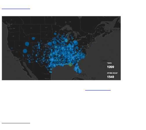
Figure 3-13: Map animating the growth of Walmart,
written in ActionScript
The interactive stacked area chart in Figure 3-14 was
also written in ActionScript. It enables you to search for
spending categories over the years. The Flare
ActionScript library by the UC Berkeley Visualization
Lab was used to do most of the heavy lifting.
Figure 3-14: Interactive stacked area chart showing
consumer spending breakdowns, written in ActionScript
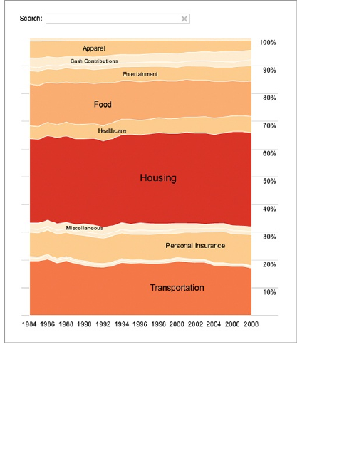
If you want to get into interactive graphics for the web,
Flash and ActionScript is an excellent option. Flash
applications are relatively quick to load, and most
people already have Flash installed on their computers.
It’s not the easiest language to pick up; the syntax
isn’t that complicated, but the setup and code
organization can overwhelm beginners. You’re not
going to have an application running with just a few lines
of code like you would with Processing. Later chapters
take you through the basic steps, and you can find a
number of useful tutorials online because Flash is so
widely used.
Also, as web browsers improve in speed and
efficiency, you have a growing number of alternatives.
Useful Flash and ActionScript
Resources
Adobe Support
www.adobe.com/products/flash/whatisflash/)
—Official documentation for Flash and
ActionScript (and other Adobe products)
Flare Visualization Toolkit
(http://flare.prefuse.org)
Modest Maps
(http://modestmaps.com)
HTML, JavaScript, and CSS
Web browsers continue to get faster and improve in
functionality. A lot of people spend more time using their
browsers than any other application on their computers.
More recently, there has been a shift toward
visualization that runs native in your browser via HTML,
JavaScript, and CSS. Data graphics used to be
primarily built in Flash and ActionScript if there were an
interactive component or saved as a static image. This
is still often the case, but it used to be that these were
the only options.
Now there are several robust packages and libraries
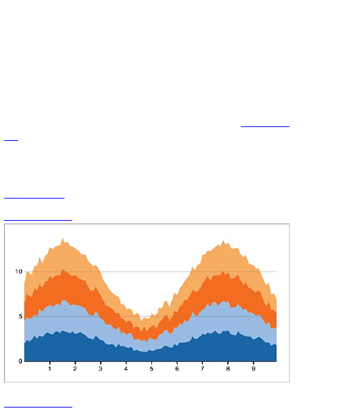
that can help you quickly build interactive and static
visualizations. They also provide a lot of options so that
you can customize the tools for your data needs.
For example, Protovis, maintained by the Stanford
Visualization Group, is a free and open-source
visualization library that enables you to create web-
native visualizations. Protovis provides a number of out-
of-the-box visualizations, but you’re not at all limited by
what you can make, geometrically speaking. Figure 3-
15 shows a stacked area chart, which can be
interactive.
This chart type is built into the Protovis, but you can
also go with a less traditional streamgraph, as shown in
Figure 3-16.
Figure 3-15: Stacked area chart with Protovis
Figure 3-16: Custom-made streamgraph with Protovis
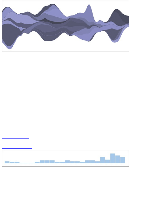
You can also easily use multiple libraries for
increased functionality. This is possible in Flash, but
JavaScript can be a lot less heavy code-wise.
JavaScript is also a lot easier to read and use with
libraries such as jQuery and MooTools. These are not
visualization-specific but are useful. They provide a lot
of basic functionality with only a few lines of code.
Without the libraries, you’d have to write a lot more, and
your code can get messy in a hurry.
Plugins for the libraries can also help you with some
of your basic graphics. For example, you can use a
Sparkline plugin for jQuery to make small charts (see
Figure 3-17).
Figure 3-17: Sparklines with jQuery Sparklines plugin
You can also do this with PHP, but this method has a
couple of advantages. First, the graphic is generated in
a user’s browser instead of the server. This relieves
stress off your own machines, which can be an issue if
you have a website with a lot of traffic.

The other advantage is that you don’t need to set up
your server with the PHP graphics library. A lot of
servers are set up with graphics installed, but
sometimes they are not. Installation can be tedious if
you’re unfamiliar with the system.
You might not want to use a plugin at all. You can also
design a custom visualization with standard web
programming. Figure 3-18, for example, is an
interactive calendar that doubles as a heatmap in
your.flowingdata.
There are, however, a couple of caveats. Because
the software and technology are relatively new, your
designs might look different in different browsers. Some
of the previously mentioned tools won’t work correctly in
an old browser such as Internet Explorer 6. This is
becoming less of a problem though, because most
people use modern browsers such as Firefox or Google
Chrome. In the end it depends on your audience. Less
than 5 percent of visitors to FlowingData use old
versions of Internet Explorer, so compatibility isn’t much
of an issue.
Figure 3-18: Interactive calendar that also serves as a
heatmap in your.flowingdata
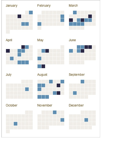
Also related to the age of the technology, there aren’t
as many libraries available for visualization in
JavaScript as there are in Flash and ActionScript. This
is why many major news organizations still use a lot of
Flash, but this will change as development continues.
Useful HTML, JavaScript, and
CSS Resources
jQuery (http://jquery.com/)—A
JavaScript library that makes coding in
the language much more efficient and
makes your finished product easier to
read.
jQuery Sparklines
(http://omnipotent.net/jquery.sparkline/)
—Make static and animated sparklines
in JavaScript.
Protovis
(http://vis.stanford.edu/protovis/)
—A visualization-specific JavaScript
library designed to learn by example.
JavaScript InfoVis Toolkit
(http://datafl.ws/15f)—Another
visualization library, although not quite as
developed as Protovis.
Google Charts API
(http://code.google.com/apis/chart/)
—Build traditional charts on-the-fly,
simply by modifying a URL.
R
If you read FlowingData, you probably know that my
favorite software for data graphics is R. It’s free and
open-source statistical computing software, which also
has good statistical graphics functionality. It is also most
statisticians’ analysis software of choice. There are

paid alternatives such as S-plus and SAS, but it’s hard
to beat the price of free and an active development
community.
One of the advantages that R has over the previously
mentioned software is that it was specifically designed
to analyze data. HTML was designed to make web
pages, and Flash is used for tons of other things, such
as video and animated advertisements. R, on the other
hand, was built and is maintained by statisticians for
statisticians, which can be good and bad depending on
what angle you’re looking from.
There are lots of R packages that enable you to make
data graphics with just a few lines of code. Load your
data into R, and you can have a graphic with even just
one line of code. For example, you can quickly make a
treemap using the Portfolio package, as shown in
Figure 3-19.
Just as easily, you can build a heatmap, as shown in
Figure 3-20.
And of course, you can also make more traditional
statistical graphics, such as scatterplots and time
series charts, which are discussed in Chapter 4,
“Visualizing Patterns over Time.”
Figure 3-19: Treemap generated in R with the Portfolio
package
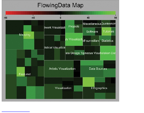
Figure 3-20: Heatmap generated in R
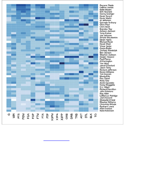
To be completely honest though, the R site looks
horribly out-dated (Figure 3-21), and the software itself
isn’t very helpful in guiding new users. You need to
remember though that R is a programming language,
and you’re going to get that with any language you use.
The few bad things that I’ve read about R are usually
written by people who are used to buttons and clicking
and dragging. So when you come to R don’t expect a
clicky interface, or you will of course find the interface
unfriendly.
Figure 3-21: R homepage, www.r-project.org
But get past that, and there’s a lot you can do. You
can make publication-quality graphics (or at least the
beginnings of them), and you can learn to embrace R’s
flexibility. If you like, you can write your own functions
and packages to make graphics the way you want, or
you can use the ones that others have made available in
the R library.
R provides base drawing functions that basically
enable you to draw what you want. You can draw lines,
shapes, and axes within a plotting framework, so again,
like the other programming solutions, you’re limited only
by your imagination. Then again, practically every chart
type is available via some R package.

Tip
When you search for something about R on the
web via search engines, the basic name can
sometimes throw off your results. Instead, try
searching for r-project instead of just R, along
with what you’re looking for. You’ll usually find
more relevant search results.
Why would you use anything besides R? Why not just
do everything in R? Following are a few reasons. R
works on your desktop, so it’s not a good fit for the
dynamic web. Saving graphics and images and putting
them on a web page isn’t a problem, but it’s not going
to happen automatically. You can generate graphics on-
the-fly via the web, but so far, the solutions aren’t
particularly robust when you compare them to the web-
native stuff such as JavaScript.
R is also not good with interactive graphics and
animation. Again, you can do this in R, but there are
better, more elegant ways to accomplish this using, for
example, Flash or Processing.
Finally, you might have noticed that the graphics in
Figures 3-19 and 3-20 lack a certain amount of polish.
You probably won’t see graphics like that in a
newspaper any time soon. You can tighten up the
design in R by messing with different options or writing
additional code, but my strategy is usually to make the
base graphic in R and then edit and refine in design
software such as Adobe Illustrator, which is discussed
soon. For analyses, the raw output from R does just fine,
but for presentation and storytelling, it’s best to adjust
aesthetics.

Useful R Resource
R Project for Statistical Computing
(www.r-project.org)
Trade-Offs
Learning programming is learning a new language. It’s
your computer’s language of bits and logic. When you
work with Excel or Tableau for example, you essentially
work with a translator. The buttons and menus are in
your language, and when you click items, the software
translates your interaction and then sends the
translation to your computer. The computer then does
something for you, such as makes a graph or
processes some data.
So time is definitely a major hurdle. It takes time for
you to learn a new language. For a lot of people, this
hurdle is too high which I can relate to. You need to get
work done now because you have a load of data sitting
in front of you, and people waiting on results. If that’s the
case, in which you have only this single data-related
task with nothing in the future, it might be better to go
with the out-of-the-box visualization tools.
However, if you want to tackle your data and will most
likely have (or want) lots of data-related projects in the
future, the time spent learning how to program now
could end up as saved time on other projects, with more
impressive results. You’ll get better at programming on
each project you go through, and it’ll start to come much
easier. Just like any foreign language, you don’t start

easier. Just like any foreign language, you don’t start
writing books in that language; you start with the
essentials and then branch out.
Here’s another way to look at it. Hypothetically
speaking, say you’re tossed into a foreign country, and
you don’t speak the language. Instead, you have a
translator. (Stay with me on this one. I have a point.) To
talk to a local, you speak, and then your translator
forwards the message. What if the translator doesn’t
know the meaning or the right word for something you
just said? He could leave the word out, or if he’s
resourceful, he can look it up in a translation dictionary.
For out-of-the-box visualization tools, the software is
the translator. If it doesn’t know how to do something,
you’re stuck or have to try an alternative method. Unlike
the speaking translator, software usually doesn’t
instantly learn new words, or in this case, graph types or
data handling features. New functions come in the form
of software updates, which you have to wait for. So what
if you learn the language yourself?
Again, I’m not saying to avoid out-of-the-box tools. I
use them all the time. They make a lot of tedious tasks
quick and easy, which is great. Just don’t let the
software restrict you.
As you see in later chapters, programming can help
you get a lot done with much less effort than if you were
to do it all by hand. That said, there are also things
better done by hand, especially when you’re telling
stories with data. That brings you to the next section on
illustration: the opposite end of the visualization
spectrum.

Illustration
Now you’re in graphic designers’ comfort zone. If you’re
an analyst or in a more technical field, this is probably
unfamiliar territory. You can do a lot with a combination
of code and out-of-the-box visualization tools, but the
resulting data graphics almost always have that look of
something that was automatically generated. Maybe
labels are out of place or a legend feels cluttered. For
analyses, this is usually fine—you know what you’re
looking at.
However, when you make graphics for a
presentation, a report, or a publication, more polished
data graphics are usually appropriate so that people
can clearly see the story you’re telling.
For example, Figure 3-19 is the raw output from R. It
shows views and comments on FlowingData for 100
popular posts. Posts are separated by category such
as Mapping. The brighter the green, the more
comments on that post, and the larger the rectangle, the
more views. You wouldn’t know that from the original,
but when I was looking at the numbers, I knew what I
was looking at, because I’m the one who wrote the code
in R.
Figure 3-22 is a revised version. The labels have
been adjusted so that they’re all readable; lead-in copy
has been added on the top so that readers know what
they’re looking at; and the red portion of the color
legend was removed because there is no such thing as
a post having a negative number of comments. I also
changed the background to white from gray just
because I think it looks better.

I could have edited the code to fit my specific needs,
but it was a lot easier to click-and-drag in Adobe
Illustrator. You can either make graphics completely with
illustration software, or you can import graphics that
you’ve made in, for example, R, and edit it to your liking.
For the former, your visualization choices are limited
because visualization is not the primary purpose of the
software. For anything more complex than a bar chart,
your best bet is to go with the latter. Otherwise, you will
have to do a lot of things by hand, which is prone to
mistakes.
The great thing about using illustration software is that
you have more control over individual elements, and you
can do everything by clicking and dragging. Change the
color of bars or a single bar, modify axes width, or
annotate important features with a few mouse clicks.
Figure 3-22: Treemap created in R, and edited in
Adobe Illustrator
Options
A lot of illustration programs are available but only a few
that most people use—and one that almost everyone
uses. Cost will most likely be your deciding factor.
Prices range from free (and open-source) to several
hundred dollars.
Adobe Illustrator
Any static data graphic that looks custom-made or is in
a major news publication most likely passed through
Adobe Illustrator at some point. Adobe Illustrator is the
industry standard. Every graphic that goes to print at
The New York Times either was created or edited in

Illustrator.
Illustrator is so popular for print because you work
with vectors instead of pixels. This means you can
make the graphics big without decreasing the quality of
your image. In contrast, if you were to blow up a low-
resolution photograph, which is a set number of pixels,
you would end up with a pixelated image.
The software was originally designed for font
development and later became popular among
designers for illustrations such as logos and more art-
focused graphics. And that’s still what Illustrator is
primarily used for.
However, Illustrator does offer some basic graphing
functionality via its Graph tool. You can make the more
basic graph types such as bar graphs, pie charts, and
time series plots. You can paste your data into a small
spreadsheet, but that’s about the extent of the data
management capabilities.
The best part about using Illustrator, in terms of data
graphics, is the flexibility that it provides and its ease of
use, with a lot of buttons and functions. It can be kind of
confusing at first because there are so many, but it’s
easy to pick up, as you’ll see in Chapter 4, “Visualizing
Patterns over Time.” It’s this flexibility that enables the
best data designers to create the most clear and
concise graphics.
Illustrator is available for Windows and Mac. The
downside though is that it’s expensive when you
compare it to doing everything with code, which is free,
assuming you already have the machine to install things
on. However, compared to some of the out-of-the-box
solutions, Illustrator might not seem so pricey.
As of this writing, the most recent version of Illustrator
is priced at $599 on the Adobe site, but you should find
substantial discounts elsewhere (or go for an older
version). Adobe also provides large discounts to
students and those in academia, so be sure to check
those out. (It’s the most expensive software I’ve ever
purchased, but I use it almost every day.)
Useful Adobe Illustrator
Resources
Adobe Illustrator Product Page
(www.adobe.com/products/illustrator/)
VectorTuts (http://vectortuts.com)—
Thorough and straightforward tutorials
on how to use Illustrator
Inkscape
Inkscape is the free and open-source alternative to
Adobe Illustrator. So if you want to avoid the hefty price
tag, Inkscape is your best bet. I always use Illustrator
because when I started to learn the finer points of data
graphics on the job, Illustrator was what everyone used,
so it just made sense. I have heard good things about
Inkscape though, and because it’s free, there’s no harm
in trying it. Just don’t expect as many resources on how
to use the software.
Useful Inkscape Resources
Inkscape (http://inkscape.org)
Inkscape Tutorials
(http://inkscapetutorials.wordpress.com/)
Tip
Parts of this book use Adobe Illustrator to refine
your data graphics; however, it shouldn’t be too
hard to figure out how to do the same thing in
Inkscape. Many of the tools and functions are
similarly named.
Others
Illustrator and Inkscape are certainly not your only
options to create and polish your data graphics. They
just happen to be the programs that most people use.
You might be comfortable with something else. Some
people are fond of Corel Draw, which is Windows-only
software and approximately the same price as
Illustrator. It might be slightly cheaper, depending on
where you look.
There are also programs such as Raven by Aviary
and Lineform, that offer a smaller toolset. Remember
that Illustrator and Inkscape are general tools for graphic
designers, so they provide a lot of functionality. But if
you just want to make a few edits to existing graphics,
you might opt for the simpler (lower-priced) software.
Trade-Offs
Illustration software is for just that—illustration. It’s not
made specifically for data graphics. It’s meant for
graphic design, so many people do not use a lot of

functions offered by Illustrator or Inkscape. The software
is also not good for handling a lot of data, compared to
when you program or use visualization-specific tools.
Because of that, you can’t explore your data in these
programs.
That said, these programs are a must if you want to
make publication-level data graphics. They don’t just
help with aesthetics, but also readability and clarity
that’s often hard to achieve with automatically
generated output.
Mapping
Some overlap exists between the covered visualization
tools and the ones that you use to map geographic
data. However, the amount of geographic data has
increased significantly in the past years as has the
number of ways you can map. With mobile location
services on the rise, there will be more data with latitude
and longitude coordinates attached to it. Maps are also
an incredibly intuitive way to visualize data, and this
deserves a closer look.
Mapping in the early days of the web wasn’t easy; it
wasn’t elegant either. Remember the days you would go
to MapQuest, look up directions, and get this small
static map? Yahoo had the same thing for a while.
It wasn’t until a couple of years later until Google
provided a slippy map implementation (Figure 3-23).
The technology was around for a while, but it wasn’t
useful until most people’s Internet speed was fast
enough to handle the continuous updating. Slippy maps

are what we’re used to nowadays. We can pan and
zoom maps with ease, and in some cases, maps aren’t
just for directions; they’re the main interface to browse a
dataset.
Note
Slippy maps are the map implementation that
is now practically universal. Large maps, that
would normally not fit on your screen, are split
into smaller images, or tiles. Only the tiles that
fit in your window display, and the rest are
hidden from view. As you drag the map, other
tiles display, making it seem as if you’re moving
around a single large map. You might have
also seen this done with high-resolution
photographs.
Figure 3-23: Google Maps to look up directions
Options
Along with all the geographic data making its way into
the public domain, a variety of tools to map that data
have also sprung up. Some require only a tiny bit of
programming to get something up and running whereas
others need a little more work. There are also a few
other solutions that don’t require programming.
Google, Yahoo, and Microsoft Maps
This is your easiest online solution; although, it does
require a little bit of programming. The better you can
code, the more you can do with the mapping APIs
offered by Google, Yahoo, and Microsoft.
The base functionality of the three is fairly similar, but
if you’re just starting out, I recommend you go with
Google. It seems to be the most reliable. They have a
Maps API in both JavaScript and Flash, along with other
geo-related services such as geocoding and directions.
Go through the Getting Started tutorial and then branch
out to other items such as placing markers (Figure 3-
24), drawing paths, and adding overlays. The
comprehensive set of code snippets and tutorials
should quickly get you up and running .
Figure 3-24: Marker placement on Google Maps
Yahoo also has JavaScript and Flash APIs for
mapping, plus some geoservices, but I’m not sure how
long it’ll be around given the current state of the
company. As of this writing, Yahoo has shifted focus
from applications and development to content provider.
Microsoft also provides a JavaScript API (under the
Bing name) and one in Silverlight, which was its answer
to Flash.
Useful Mapping API Resources
Google Maps API Family
(http://code.google.com/apis/maps/)
Yahoo! Maps Web Services
(http://code.google.com/apis/maps/index.html)
Bing Maps API
(http://www.microsoft.com/maps/developers/web.aspx)
ArcGIS
The previously mentioned online mapping services are
fairly basic in what they can do at the core. If you want
more advanced mapping, you’ll most likely need to
implement the functionality yourself. ArcGIS, built for
desktop mapping, is the opposite. It’s a massive
program that enables you to map lots of data and do
lots of stuff with it, such as smoothing and processing.
You can do all this through a user interface, so there’s
no code required.
Any graphics department with mapping specialists
most likely uses ArcGIS. Professional cartographers
use ArcGIS. Some people love it. So if you’re interested
in producing detailed maps, it’s worth checking out
ArcGIS.
I have used ArcGIS only for a few projects because I
tend to take the programming route when I can, and I
just didn’t need all that functionality. The downside of
such a rich feature set is that there are so many buttons
and menus to go through. Online and server solutions
are also available, but they feel kind of clunky compared
to other implementations.
Useful ArcGIS Resource
ArcGIS Product Page
(www.esri.com/software/arcgis/)
Modest Maps
I mentioned Modest Maps earlier, with an example in
Figure 3-13. It shows the growth of Walmart. Modest
Maps is a Flash and ActionScript library for tile-based
maps, and there is support for Python. It’s maintained
by a group of people who know their online mapping
and do great work for both clients and for fun, which
should tell you a little something about the quality of the
library.
The fun thing about Modest Maps is that it’s more of a
framework than a mapping API like the one offered by
Google. It provides the bare minimum of what it takes to
create an online map and then gets out of the way to let
you implement what you want. You can use tiles from
different providers, and you can customize the maps to
fit with your application. For example, Figure 3-13 has a
black-and-blue theme, but you can just as easily change
that to white and red, as shown in Figure 3-25.
Figure 3-25: White-and-red themed map using Modest
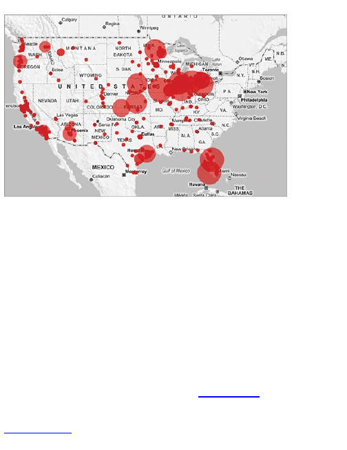
Maps
It’s BSD-licensed, so you can do just about anything
you want with it at no cost. You do have to know the
ropes around Flash and ActionScript, but the basics are
covered in Chapter 8, “Visualizing Spatial
Relationships.”
Polymaps
Polymaps is kind of like the JavaScript version of
Modest Maps. It was developed and is maintained by
some of the same people and provides the same
functionality—and then some. Modest Maps provides
only the basics of mapping, but Polymaps has some
built-in features such as choropleths (Figure 3-26) and
bubbles.
Figure 3-26: Choropleth map showing unemployment,
implemented in Polymaps
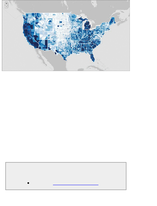
Because it’s JavaScript, it does feel more lightweight
(because it requires less code), and it works in modern
browsers. Polymaps uses Scalable Vector Graphics
(SVG) to display data, so it doesn’t work in the old
versions of Internet Explorer, but most people are up-to-
date. As a reference, only about 5 percent of
FlowingData visitors use a browser that’s too old, and I
suspect that percentage will approach zero soon.
My favorite plus of a mapping library in JavaScript is
that all the code runs native in the browser. You don’t
have to do any compiling or Flash exports, which makes
it easier to get things running and to make updates
later.
Useful Polymaps Resource
Polymaps (http://polymaps.org/)
R
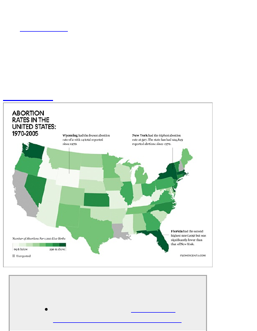
R doesn’t provide mapping functionality in the base
distribution, but there are a few packages that let you do
s o . Figure 3-27 is a map that I made in R. The
annotation was added after the fact in Adobe Illustrator.
Maps in R are limited in what they can do, and the
documentation isn’t great. So I use R for mapping if I
have something simple and I happen to be using R.
Otherwise, I tend to use the tools already mentioned.
Figure 3-27: United States map created in R
Useful R Mapping Resources
Analysis of Spatial Data (http://cran.r-
project.org/web/views/Spatial.html)
—Comprehensive list of packages in R
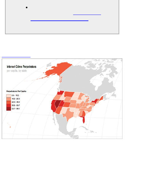
for spatial analysis
A Practical Guide to Geostatistical
Mapping (http://spatial-
analyst.net/book/download)—Free
book download on how to use R and
other tools for spatial data
Online-Based Solutions
Figure 3-28: Choropleth map created in Indiemapper
A few online mapping solutions make it easy to
visualize your geographic data. For the most part,
they’ve taken the map types that people use the most
and then stripped away the other stuff—kind of like a
simplified ArcGIS. Many Eyes and GeoCommons are
two free ones. The former, discussed previously, has
only basic functionality for data by country or by state in
the United States. GeoCommons, however, has more

features and richer interaction. It also handles common
geospatial file formats such as shapefiles and KML.
A number of paid solutions exist, but Indiemapper
and SpatialKey are the most helpful. SpatialKey is
geared more toward business and decision making
whereas Indiemapper is geared toward cartographers
and designers. Figure 3-28 shows an example I
whipped up in just a few minutes in Indiemapper.
Trade-Offs
Mapping software comes in all shapes and sizes suited
to fit lots of different needs. It’d be great if you could
learn one program and be able design every kind of
map imaginable. Unfortunately, it doesn’t work that way.
For example, ArcGIS has a lot of functions, but it
might not be worth the time to learn or the money to
purchase if you only want to create simple maps. On the
other hand, R, which has basic mapping functionality
and is free, could be too simple for what you want. If
online and interactive maps are your goal, you can go
open-source with Modest Maps or Polymaps, but that
requires more programming skills. You’ll learn more
about how to use what’s available in Chapter 8.
Survey Your Options
This isn’t a comprehensive list of what you can use to
visualize data, but it should be enough to get you
started. There’s a lot to consider and play with here. The
tools you end up using largely depend on what you want
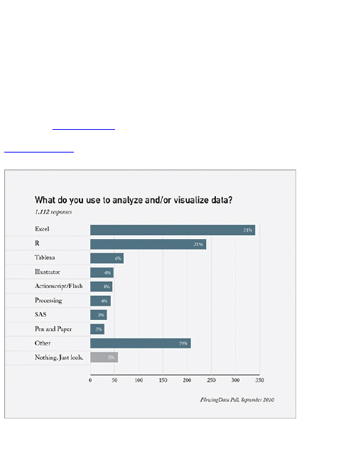
to accomplish, and there are always multiple ways to
accomplish a single task, even within the same
software. Want to design static data graphics? Maybe
try R or Illustrator. Do you want to build an interactive
tool for a web application? Try JavaScript or Flash.
On FlowingData, I ran a poll that asked people what
they mainly used to analyze and visualize data. A little
more than 1,000 people responded. The results are
shown in Figure 3-29.
Figure 3-29: What FlowingData readers use to analyze
and visualize data
There are some obvious leaders, given the topic of
FlowingData. Excel was first, and R followed in second.

But after that, there was a variety of software picks.
More than 200 people chose the Other category. In the
comments, many people stated that they use a
combination of tools to fill different needs, which is
usually the best route for the long term.
Combining Them
A lot of people like to stick to one program—it’s
comfortable and easy. They don’t have to learn anything
new. If that works, then by all means they should keep at
it. But there comes a point after you’ve worked with data
long enough when you hit the software’s threshold. You
know what you want to do with your data or how to
visualize it, but the software doesn’t let you do it or
makes the process harder than it has to be.
You can either accept that, or you can use different
software, which could take time to learn but helps you
design what you envision—I say go with the latter.
Learning a variety of tools ensures that you won’t get
stuck on a dataset, and you can be versatile enough to
accomplish a variety of visualization tasks to get actual
results.
Wrapping Up
Remember that none of these tools are a cure-all. In the
end, the analyses and data design is still up to you. The
tools are just that—they’re tools. Just because you have
a hammer doesn’t mean you can build a house.
Likewise, you can have great software and a super

computer, but if you don’t know how to use your tools,
they might as well not exist. You decide what questions
to ask, what data to use, and what facets to highlight,
and this all becomes easier with practice.
But hey, you’re in luck. That’s what the rest of this
book is for. The following chapters cover important data
design concepts and teach you how to put the abstract
into practice, using a combination of the tools that were
just covered. You can learn what to look for in your data
and how to visualize it.

Chapter 4
Visualizing Patterns over
Time
Time series data is just about everywhere. Public
opinion changes, populations shift, and businesses
grow. You look to time series data to see how much
these things have changed. This chapter looks at
discrete and continuous data because the type of data
graphics you use depends on the type of data you have.
You also get your hands dirty with R and Adobe
Illustrator—the two programs go great together.
What to Look for over Time
You look at time every day. It’s on your computer, your
watch, your phone, and just about anywhere else you
look. Even without a clock, you feel time as you wake up
and go to sleep and the sun rises and sets. So it’s only
natural to have data over time. It lets you see how things
change.
The most common thing you look for in time series, or
temporal, data is trends. Is something increasing or
decreasing? Are there seasonal cycles? To find these
patterns, you have to look beyond individual data points
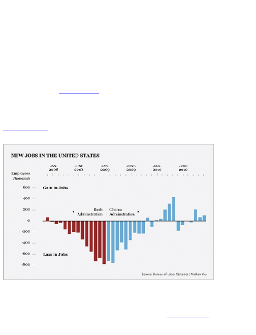
to get the whole picture. It’s easy to pick out a single
value from a point in time and call it a day, but when you
look at what came before and after, you gain a better
understanding of what that single value means, and the
more you know about your data, the better the story that
you can tell.
For example, there was a chart the Obama
administration released a year into the new presidency,
reproduced in Figure 4-1. It showed job loss during the
tail end of the Bush administration through the first part
of Obama’s.
Figure 4-1: Change in job loss since Barack Obama
took office
It looks like the new administration had a significant
positive effect on job loss, but what if you zoom out and
look at a larger time frame, as shown in Figure 4-2?
Does it make a difference?
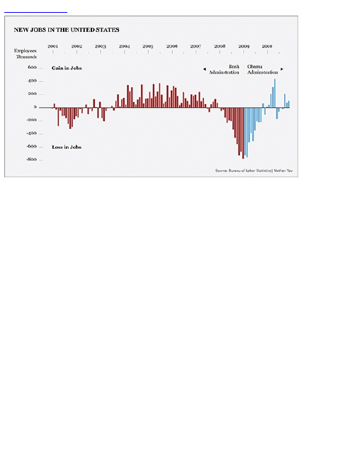
Figure 4-2: Change in job loss from 2001 through 2010
Although you always want to get the big picture, it’s
also useful to look at your data in more detail. Are there
outliers? Are there any periods of time that look out of
place? Are there spikes or dips? If so, what happened
during that time? Often, these irregularities are where
you want to focus. Other times the outliers can end up
being a mistake in data entry. Looking at the big picture
—the context—can help you determine what is what.
Discrete Points in Time
Temporal data can be categorized as discrete or
continuous. Knowing which category your data belongs
to can help you decide how to visualize it. In the discrete
case, values are from specific points or blocks of time,
and there is a finite number of possible values. For
example, the percentage of people who pass a test
each year is discrete. People take the test, and that’s it.

Their scores don’t change afterward, and the test is
taken on a specific date. Something like temperature,
however, is continuous. It can be measured at any time
of day during any interval, and it is constantly changing.
In this section you look at chart types that help you
visualize discrete temporal data, and you see concrete
examples on how to create these charts in R and
Illustrator. The beginning will be the main introduction,
and then you can apply the same design patterns
throughout the chapter. This part is important. Although
the examples are for specific charts, you can apply the
same principles to all sorts of visualization. Remember
it’s all about the big picture.
Bars
The bar graph is one of the most common chart types.
Most likely you’ve seen lots of them. You’ve probably
made some. The bar graph can be used for various
data types, but now take a look at how it can be used
for temporal data.
Figure 4-3 shows a basic framework. The time axis
(the horizontal one, that is, x-axis) provides a place for
points in time that are ordered chronologically. In this
case the points in time are months, from January to
June 2011, but it could just as easily be by year, by day,
or by some other time unit. Bar width and bar spacing
typically do not represent values.
Figure 4-3: Framework of bar graphs
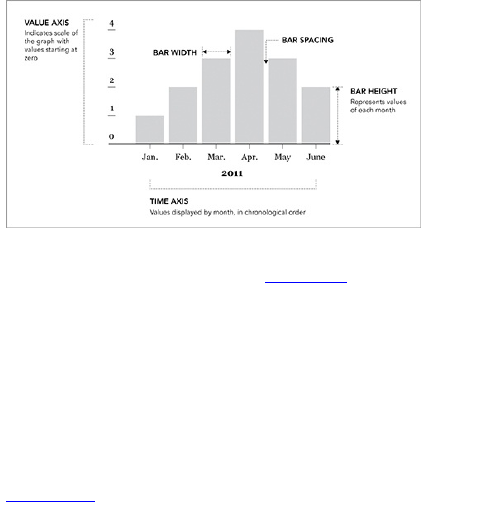
The value axis (the vertical one, that is, y-axis)
indicates the scale of the graph. Figure 4-3 shows a
linear scale where units are evenly spaced across the
full axis. Bar height matches up with the value axis. The
first bar, for example, goes up to one unit, whereas the
highest bar goes up to four units.
This is important. The visual cue for value is bar
height. The lower the value is, the shorter the bar will be.
The greater a value is, the taller a bar will be. So you
can see that the height of the four-unit bar in April is
twice as tall as the two-unit bar in February.
Figure 4-4: Bar graph with non-zero axis
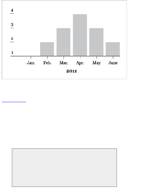
Many programs, by default, set the lowest value of the
value axis to the minimum of the dataset, as shown in
Figure 4-4. In this case, the minimum is 1. However, if
you were to start the value axis at 1, the height of the
February bar wouldn’t be half the height of the April bar
anymore. It would look like February was one-third that
of April. The bar for January would also be nonexistent.
The point: Always start the value axis at zero.
Otherwise, your bar graph could display incorrect
relationships.
Tip
Always start the value axis of your bar graph at
zero when you’re dealing with all positive
values. Anything else makes it harder to visually
compare the height of the bars.

Create a Bar Graph
It’s time to make your first graph, using real data, and
it’s an important part of history that is an absolute must
for all people who call themselves a human. It’s the
results from the past three decades of Nathan’s Hot
Dog Eating Contest. Oh, yes.
Figure 4-5 is the final graph you’re after. Do this in
two steps. First, create a basic bar graph in R, and then
you can refine that graph in Illustrator.
In case you’re not in the know of the competitive
eating circuit, Nathan’s Hot Dog Eating Contest is an
annual event that happens every July 4. That’s
Independence Day in the United States. The event has
become so popular that it’s even televised on ESPN.
Throughout the late 1990s, the winners ate 10 to 20
hot dogs and buns (HDBs) in about 15 minutes.
However, in 2001, Takeru Kobayashi, a professional
eater from Japan, obliterated the competition by eating
50 HDBs. That was more than twice the amount anyone
in the world had eaten before him. And this is where the
story begins.
Figure 4-5: Bar graph showing results from Nathan’s
Hot Dog Eating Contest
Wikipedia has results from the contest dating back to
1916, but the hot dog eating didn’t become a regular
event until 1980, so we start here. The data is in an
HTML table and includes the year, name, number of
HDBs eaten, and country where the winner is from. I’ve
compiled the data in a CSV file that you can download
a t http://datasets.flowingdata.com/hot-dog-contest-
winners.csv. Here’s what the first five rows of data look
like:
"Year","Winner","Dogs eaten","Country","New record"
1980,"Paul Siederman & Joe Baldini",9.1,"United States",0
1981,"Thomas DeBerry ",11,"United States",0
1982,"Steven Abrams ",11,"United States",0
1983,"Luis Llamas ",19.5,"Mexico",1
1984,"Birgit Felden ",9.5,"Germany",0
Download the data in CSV format from
http://datasets.flowingdata.com/hot-
dog-contest-winners.csv. See the page
for “Nathan’s Hot Dog Eating Contest” on
Wikipedia for precompiled data and history of

the contest.
To load the data in R, use the read.csv() command.
You can either load the file locally from you own
computer, or you can use a URL. Enter this line of code
in R to do the latter:
hotdogs <-
read.csv("http://datasets.flowingdata.com/hot-dog-
contest-winners.csv",
sep=",", header=TRUE)
Set your working directory in R to the same directory
as your data file via the main menu if you want to load
the data locally from your own computer, You can also
use the setwd() function.
If you’re new to programming, this probably looks
cryptic, so now break it down so you can understand it.
This is one line of R code. You load data with the
read.csv() command, and it has three arguments. The
first is the location of your data, which in this case is a
URL.
The second argument, sep, specifies what character
separates the columns in the data file. It’s a comma-
delimited file, so specify the comma. If it were a tab-
delimited file, you would use \t instead of a comma to
indicate the separator was a tab.
The last argument, header, tells R that the data file has
a header, which contains the name of each column. The
first column is year, the second is the winner’s name,
the third is number of HDBs eaten, and the fourth is the
competitor’s resident country. I’ve also added a new
field that you might have noticed: new record. If the
world record was broken on a year, the value is 1.

Otherwise it is 0. You can put this to use soon.
The data is now loaded into R and is available via the
hotdogs variable. Technically, the data is stored as a data
frame, which isn’t totally important but worth noting.
Here’s what the beginning of the data frame looks like if
you type hotdogs.
Year Winner
Dogs.eaten Country New.record
1 1980 Paul Siederman & Joe Baldini 9.10 United
States 0
2 1981 Thomas DeBerry 11.00 United
States 0
3 1982 Steven Abrams 11.00 United
States 0
4 1983 Luis
Llamas 19.50 Mexico 1
5 1984 Birgit
Felden 9.50 Germany 0
The spaces in the column names have been replaced
with periods. Dogs eaten is now Dogs.eaten. It’s the same
thing with New record. To access a specific column of
data, you use the name of the data frame followed by a
dollar sign ($) and then the column name. For example,
if you want to access Dogs.eaten you enter the following:
hotdogs$Dogs.eaten
Now that you have the data in R, you can go straight
to graphing with the barplot() command.
barplot(hotdogs$Dogs.eaten)
This tells R to graph the Dogs.eaten column, and you
should get Figure 4-6.
Figure 4-6: Default graph of number of hot dogs and
buns eaten, using barplot() in R
Not bad, but you can do better. Use the names.arg
argument in barplot() to specify the names of each bar.
In this case, it is the year of each contest.
barplot(hotdogs$Dogs.eaten, names.arg=hotdogs$Year)
This gives you Figure 4-7. There are now labels on
the bottom.
Figure 4-7: Bar graph with labels for years
You can apply a number of other arguments. You can
add axis labels, change borders, and change colors, as
shown in Figure 4-8.
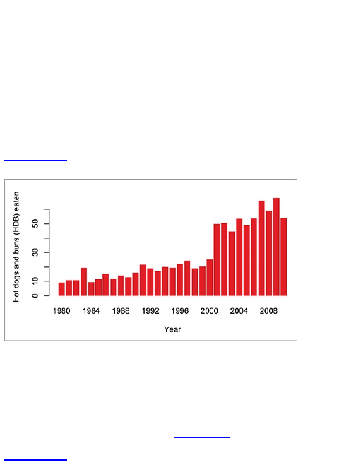
barplot(hotdogs$Dogs.eaten, names.arg=hotdogs$Year, col="red",
border=NA, xlab="Year", ylab="Hot dogs and
buns (HDB) eaten")
T h e col argument can be your pick of colors
(specified in R documentation) or a hexadecimal
number such as #821122. Here you specified no border
with NA, which is a logical constant meaning no value.
You also labeled the x- and y-axes as “Year” and “Hot
dogs and buns (HDB) eaten,” respectively.
Figure 4-8: Bar graph with colored bars and labeled
axes
You don’t need to limit yourself to just one color. You
can provide multiple colors to barplot() to shade each
bar how you want. For example, say you want to
highlight the years the United States won the contest.
You can highlight those years in dark red (#821122) and
the rest a light gray, as shown in Figure 4-9.
Figure 4-9: Bar graph with individually colored bars
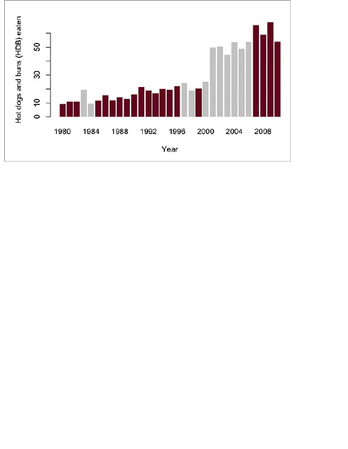
To do this, you need to build a list, or vector in R, of
colors. Visit each year and decide what color to make
the corresponding bar. If it’s a win for the United States,
specify red. Otherwise, specify gray. Here’s the code to
do that:
fill_colors <- c()
for ( i in 1:length(hotdogs$Country) ) {
if (hotdogs$Country[i] == "United States") {
fill_colors <- c(fill_colors, "#821122")
} else {
fill_colors <- c(fill_colors, "#cccccc")
}
}
The first line starts an empty vector named fill_colors.
You use c() to create vectors in R.
The next line starts a for loop. You can tell R to loop
through an index named i from 1 to the number of rows
in your hotdogs data frame. More specifically, you can
take a single column, Country, from the hotdogs data
frame, and find the length. If you were to use length() with
just hotdogs, you would get the number of columns,

which is 5 in this case, but you want the number of rows,
which is 31. There is one row for each year from 1980 to
2010, so the loop will execute the code inside the
brackets 31 times, and for each loop, the i index will go
up one.
So in the first iteration, where i equals 1, check if the
country in the first row (that is, winner for 1980) is the
United States. If it is, append the color #821122, which is a
reddish color in hexadecimal form, to fill_colors.
Otherwise, append #cccccc, which is a light gray.
Note
Most languages use 0-based arrays or vectors
where the first item is referenced with a 0-index.
R, however, uses 1-based vectors.
In 1980, the winners were from the United States, so
do the former. The loop checks 30 more times for the
rest of the years. Enter fill_colors in the R console to
see what you end up with. It’s a vector of colors just like
you want.
Pass the fill_colors vector in the col argument for
barplot() like so.
barplot(hotdogs$Dogs.eaten, names.arg=hotdogs$Year, col=fill_colors,
border=NA, xlab="Year", ylab="Hot dogs and
buns (HDB) eaten")
The code is the same as before, except you use
fill_colors instead of “red” in the col argument.
The final bar graph in Figure 4-5 highlights years
when a record was broken though—not when the United
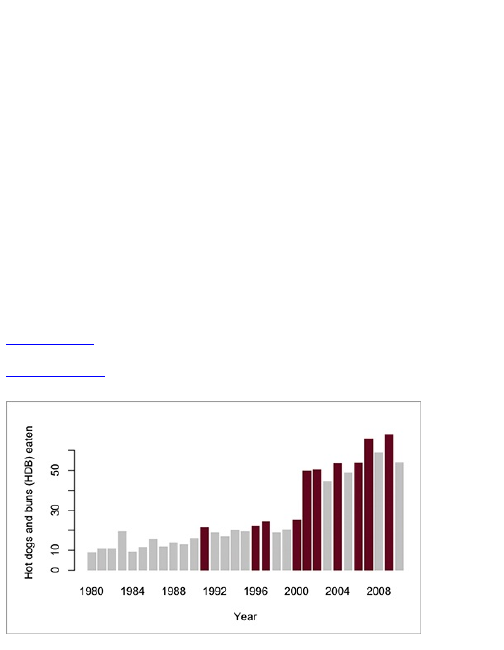
States won. The process and logic are the same. You
just need to change some of the conditions. The
New.record column in your data frame indicates new
records, so if it’s 1, you do dark red, and gray otherwise.
Here’s how to do it in R.
fill_colors <- c()
for ( i in 1:length(hotdogs$New.record) ) {
if (hotdogs$New.record[i] == 1) {
fill_colors <- c(fill_colors, "#821122")
} else {
fill_colors <- c(fill_colors, "#cccccc")
}
}
barplot(hotdogs$Dogs.eaten, names.arg=hotdogs$Year, col=fill_colors,
border=NA, xlab="Year", ylab="Hot dogs and
buns (HDB) eaten")
It’s the same as the United States example, just with
different if statements. Your result should look like
Figure 4-10.
Figure 4-10: Bar graph with bars colored individually,
but using different conditions than Figure 4-9
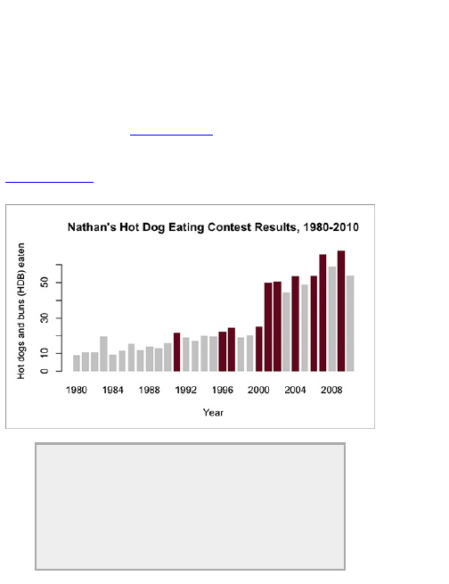
At this point you can play around with some of the
other barplot() options such as spacing or adding a title.
barplot(hotdogs$Dogs.eaten, names.arg=hotdogs$Year, col=fill_colors,
border=NA, space=0.3, xlab="Year", ylab="Hot dogs and
buns (HDB)
eaten")
This gives you Figure 4-11. Notice the spacing is
wider than before, and there is a title on the top.
Figure 4-11: Bar graph with custom spacing and main
title
Tip
Be careful when you choose bar spacing. When
the width of spacing is close to that of the width
of the bars, there’s a vibration effect visually. It’s
almost as if the roles of the bar and spacing
have switched.

Voilá! You’ve gotten your first taste of R.
In the File menu, there is an option to save your
graph. Save it as a PDF. You’re going to need it soon.
tip
To see the documentation for any function in R, simply type a
question mark followed by the function name. For example, to
read more about barplot() in R, simply type ?barplot. A description
of the function is provided along with an explanation of available
arguments. There are also usually working examples, which can
be extremely helpful.
Refine Your Graph in Illustrator
You now have a basic bar graph. It’s not bad to look at,
and if you use it only for analysis, it’s not necessary to
do much more with it. But if you want to make your
graph into a standalone graphic, you can do some
things to make it more readable.
Now look at this from a storytelling perspective.
Pretend Figure 4-11 was by itself, and you’re a reader
who came across it somehow. What can you glean from
the basic graph? You know the graph shows hot dogs
and buns eaten by year. Is this one person’s eating
habits? That sure is a lot of hot dogs for one person. Is it
food for animals? Are leftovers given to birds? Is it the
average number of hot dogs eaten per person per
year? Why are the bars colored?
As the one who made the graph, you know the
context behind the numbers, but your readers don’t, so
you have to explain what’s going on. Good data design
can help your readers understand the story more clearly.

Illustrator, which enables you to manipulate individual
elements by hand, can help you do that. You can change
fonts, add notes, modify axes, edit colors, and pretty
much do whatever your imagination allows.
Tip
Put yourself in a reader’s shoes when you
design data graphics. What parts of the data
need explanation?
Tip
If you don’t have Illustrator, you can try InkScape,
the free and open-source alternative. Although
the functions or buttons might not look exactly
the same as Illustrator, you can still find many
of the same things in InkScape.
This book keeps the editing in Illustrator simple, but
as you work through more examples, and start to design
your own graphics, you’ll see how these small changes
can be a big help to make your graphic clear and
concise.
First things first. Open the PDF file of your bar graph
in Illustrator. You should see the graph you made in one
window, and then there will most likely be several
smaller windows with tools, colors, and fonts, among
other things. The main window to make note of is the
Tools window, as shown in Figure 4-12. You’ll use this
often. If you don’t see the Tools window, go to the
Window menu and click Tools to turn it on.
Figure 4-12: Tools window in Illustrator
The black arrow is called the Selection tool. Select it,
and your mouse pointer becomes a black arrow (if it
wasn’t already). Click-and-drag over the border. The
borders appear highlighted, as shown in Figure 4-13.
This is known as a clipping mask in Illustrator. It can be
useful in various situations, but you don’t care about it
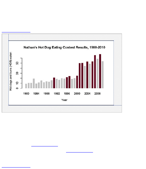
now, so press Delete on your keyboard to get rid of it. If
this deletes the entire graphic, undo the edit, and use
the Direct Selection tool, which is represented by a
white arrow, to highlight the clipping mask instead.
Figure 4-13: Remove clipping mask from PDF
Now try to change the fonts, which is easy to do.
Again, using the Selection tool, click the text to highlight
what you want to change. Change the font to whatever
you like through drop-down menus in the Font window,
as shown in Figure 4-14. You can also change fonts
through the Type menu. In Figure 4-15, the font is
changed to Georgia Regular.
Figure 4-14: Font window in Illustrator
Next, something must be done about the number
labels on the value axis. The numbers are turned on
their side, but they should be turned right-side up to
improve readability. Click those numbers. Notice that
other stuff is highlighted, too. This is because the
numbers are grouped with those elements of the graph.
You need to ungroup them so that you can rotate each
of the numbers, which you can do through the Object
menu. Click Ungroup. Deselect the number labels and
then select them again. Now only the numbers highlight.
That’s what you want. You might have to ungroup a few
times before this happens. Alternatively, you can use
the Direct Selection tool instead.
Figure 4-15: Graph with fonts changed to Georgia
Regular
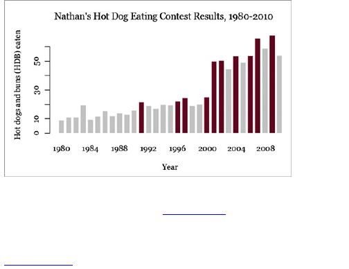
Go back to the Object menu, and select Transform ⇒
Transform Each. As shown in Figure 4-16, change the
rotation angle to –90 degrees. Click OK. The labels are
now right-side up.
Figure 4-16: Transform menu
Figure 4-17: Bar graph with simplified value axis
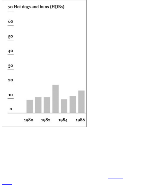
While you’re at it, shift the labels (not the tick marks)
up and to the right so that they’re above the tick marks,
instead of to the left. Shift items either with the arrow
keys on your keyboard or drag with your mouse. You
can also directly specify the units as hot dogs and buns
(HDBs) instead of having them off to the side. Again,
this improves readability as a reader’s eyes move from
left to right. You should now have something like Figure
4-17.
This is starting to look more like the final graph in

Figure 4-5. It’s still missing a few things, though. There
aren’t any tick marks on the horizontal axis, nothing is
annotated, and it’d be nice if you incorporated green,
one of the colors in Nathan’s Hot Dogs’ logo.
You can also simplify the graphic by removing the
vertical line on the value axis. It doesn’t help
communicate the data more clearly. Notice how in the
final graphic there are only tick marks. If you click the
vertical line with the Selection Tool, the labels also
highlight. That’s because they’re all part of a group. To
select just the line, use the Direct Selection tool. After
you highlight the line, press Delete and it’ll be gone.
Tip
Data graphics are meant to shine a light on
your data. Try to remove any elements that don’t
help you do that.
There are a bunch of ways to create tick marks, but
here’s one way to do it. Using the Pen tool, you can
easily draw straight lines. Select it from the Tools
window, and then specify the style of your line via the
Stroke window. Make the weight 0.3 pt, and make sure
the Dashed Line check box is not selected.
To draw a line, click where you want to put the first
point of the line (or tick mark in this case); then click
where you want to put the second point. If you press the
Shift key during the second click, the line will
automatically be straight. You should now have a single
tick mark. You need 30 more because you need a tick
mark for each year.
You can draw them all by hand, but there’s a better
way. If you’re on a Mac, hold down Option, or if you’re
on a PC, hold down Alt. Click the single tick with the
Selection tool and drag to where you want the next tick,
while still holding down Option or Alt. This creates a
copy, so you should now have two tick marks. Now
press Command+D for Mac or Control+D for PC. This
duplicates the new tick mark spaced the same distance
that the second was from the first. Press
Command/Control+D until you have all the tick marks
you need.
Finally, arrange all the marks correctly. Move the last
tick mark so that it’s centered with the last bar. The first
tick should already be centered with the first bar. Now
highlight all the ticks, and click Horizontal Distribute
Center in the Align window (Figure 4-18).
Figure 4-18: Align window in Illustrator
This distributes the ticks so that they’re evenly
spaced between the outermost marks. Optionally, you
can highlight every other tick with the Selection Tool and
resize it vertically to make them smaller. This makes it
obvious that the longer ticks are for the year labels.
To change the fill color from red to green, you could
go back to the Direct Selection tool and select every
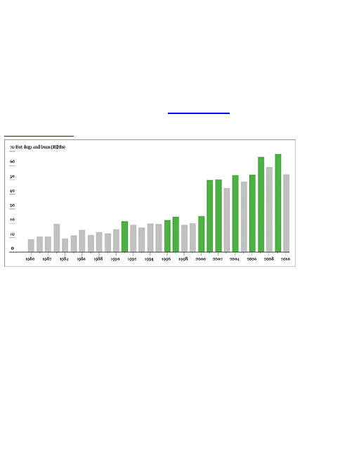
red box. Because there aren’t that many, it would be
quick, but what if you have a lot of elements to click?
Instead, click a single red bar; then go to Select ⇒
Same ⇒ Fill Color. This does what you’d expect. It
selects all the bars that have a red fill. Now simply
change the color to your liking via the Color window.
You can change both border and fill color here, but just
change fill for now, as shown in Figure 4-19.
Figure 4-19: Changing color of graph elements
Using the Type tool, found in the Tools window, you
can add text boxes to the graphic. This is your chance
to explain what readers are looking at in your graphic
and to clarify any spots that might seem unclear.
Choose fonts that you think will work, using size and
style to differentiate the label from graph elements like
axis labels.
In the case of this ever important hot dog graphic,
highlight the first record since 1980, Takeru
Kobayashi’s dominance, and Joey Chestnut’s current
reign. Also include a title and a lead-in that explains the
gist of the graphic.
Last but not least: Remember to include the data
source. There’s no way to tell if your graphic is accurate
otherwise.
Tip
Always include your data source in your
graphics. It not only provides credibility but also
context.
Put all this together, and you have the final graphic, as
shown in Figure 4-5.
I know this was a lot to take in, but it gets much easier
as you work on more graphics. You’ll see how coding in
R, or any language for that matter, follows a certain
pattern, and although Illustrator has a huge toolset, you’ll
just learn the ones that pertain to the task at hand.
The following examples look at other charting types
for temporal data and spend more time with R and
Illustrator. They’ll go by quicker now that you covered
some of the basics of the two tools.
Stack the Bars
As shown in Figure 4-20, the geometry of stacked bar
charts is similar to regular bar charts. The difference of
course is that rectangles are stacked on top of each
other. You use stacked bar charts when there are
subcategories, and the sum of these subcategories is
meaningful.
Like bar charts, stacked bar charts are not just for
temporal data; they can be used for more categorical
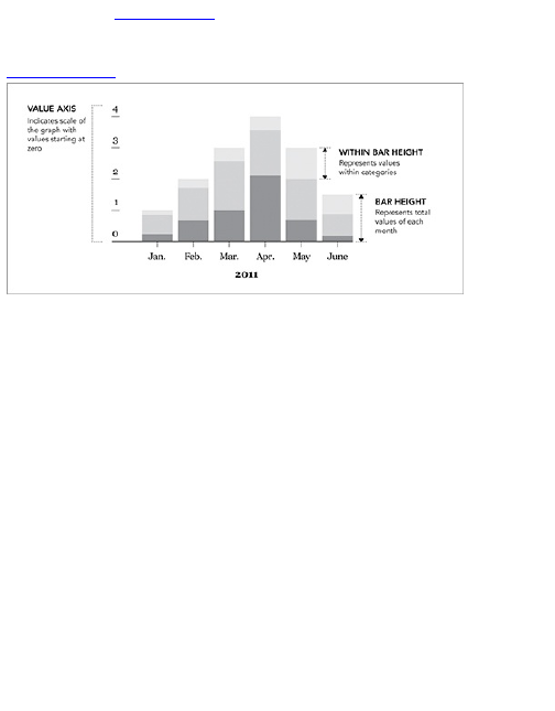
data. But in Figure 4-19, for example, the categories
are months.
Figure 4-20: Framework for stacked bar charts
Create a Stacked Bar Chart
Because the stacked bar chart is a relatively common
chart type, there are plenty of ways to make one (like its
unstacked sibling), but here’s how to do it in R. Follow a
similar process to what you did to make a regular bar
chart.
1. Load the data.
2. Make sure the data is properly formatted.
3. Use an R function to produce a plot.
This is generally what you’ll do every time you use R
to make data graphics. Sometimes you’ll spend more
time on one part than the other. It might take longer to
get your data in the right format, or you might write your
own functions in R to get exactly what you want.
Whatever the case may be, you’ll almost always follow
the preceding three steps, and this will carry over to
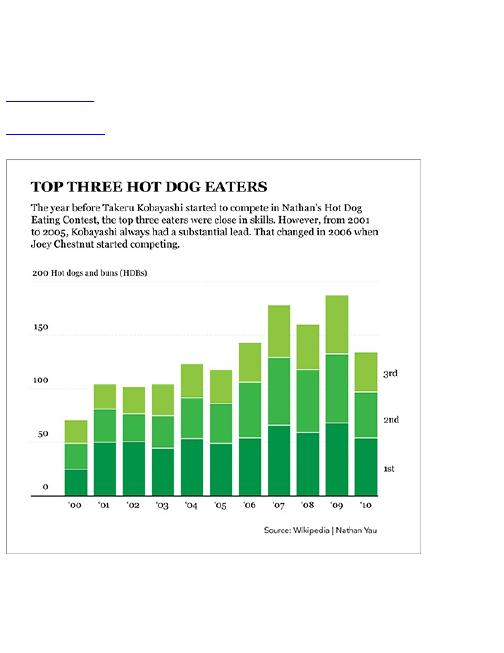
other languages, as you’ll see in later chapters.
Back to your stacked bar chart. Go back to Nathan’s
Hot Dog Contest. This is the last time you look at hot
dog eating data in this book, so savor the moment.
Figure 4-21 is the graphic you want to make.
Figure 4-21: Stacked bar charts showing top three
eaters from 2000 to 2010
Instead of looking at only the number of HDBs eaten
by the winners, look at the top three for each year. Each
stack represents a year, each with three bars, and one
for each top-three eater. Wikipedia has this data

consistently starting only in 2000, so start there.
First things first. Load the data in R. You can load it
directly from the URL with the following.
hot_dog_places <-
read.csv(‘http://datasets.flowingdata.com/hot-dog-
places.csv’,
sep=",", header=TRUE)
Type hot_dog_places to view the data. Each column
shows the results for a year, and each row is for places
1 through 3.
X2000 X2001 X2002 X2003 X2004 X2005 X2006 X2007 X2008 X2009 X2010
1 25 50.0 50.5 44.5 53.5 49 54 66 59 68.0 54
2 24 31.0 26.0 30.5 38.0 37 52 63 59 64.5 43
3 22 23.5 25.5 29.5 32.0 32 37 49 42 55.0 37
See how an “X” precedes all the column names,
which were added by default when you loaded the data
because the header names are numbers? R doesn’t
like that, so it adds a letter to make it word-like, or more
technically speaking, a string. You need to use the
header names for labels in the stacked bar chart, so
change those back.
names(hot_dog_places) <-
c("2000", "2001", "2002", "2003", "2004",
"2005", "2006", "2007", "2008", "2009", "2010")
Use quotes around each year to specify that it is a
string. Type hot_dog_places again, and the headers are
just the years now.
2000 2001 2002 2003 2004 2005 2006 2007 2008 2009 2010
1 25 50.0 50.5 44.5 53.5 49 54 66 59 68.0 54

2 24 31.0 26.0 30.5 38.0 37 52 63 59 64.5 43
3 22 23.5 25.5 29.5 32.0 32 37 49 42 55.0 37
Like before, use the barplot() function, but use data
that’s in a different format. To pass all the preceding
values to barplot(), you need to convert hot_dog_places to a
matrix. Right now it’s a data frame. These are different
structures in R, but the differences between the two are
not so important right now. What you need to know is
how to convert a data frame to a matrix.
hot_dog_matrix <- as.matrix(hot_dog_places)
You stored our newly created matrix as hot_dog_matrix.
You can pass this into barplot().
barplot(hot_dog_matrix, border=NA, space=0.25, ylim=c(0, 200),
xlab="Year", ylab="Hot dogs and buns (HDBs) eaten",
main="Hot Dog Eating Contest Results, 1980-2010")
You specified no borders around the bar, spacing to
be 0.25 the width of bar width, and the limits of the value
axis to go from 0 to 200, along with title and axis labels.
Figure 4-22 is the result.
Figure 4-22: Stacked bar chart using R
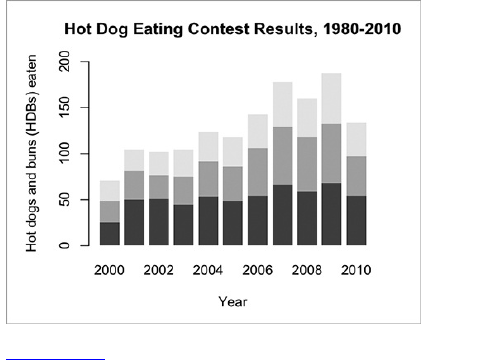
Figure 4-23: Edits in Illustrator
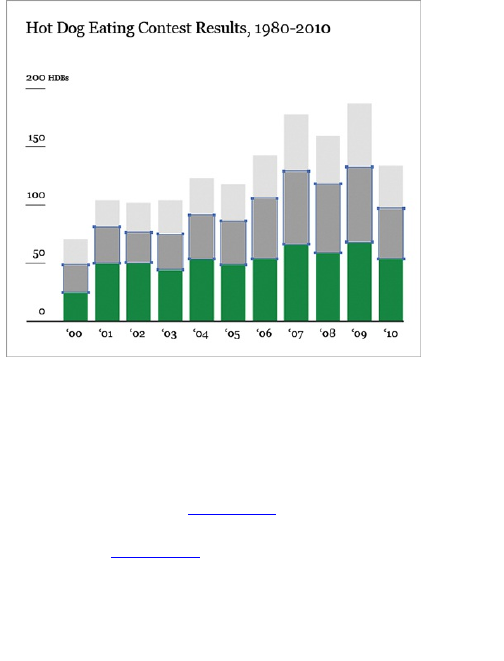
Not bad for a few lines of code, but you’re not quite
done. Now you can refine. Save the image as a PDF
and open it in Illustrator. Use the same tools that you did
before. You can add text with the Type tool, change
fonts, simplify the vertical axis, edit colors with the ability
to select elements with the same fill, and of course
include the data source (Figure 4-23).
Add some lead-in text and change the title to what
you want, and Figure 4-21 shows the final result.
The next chapter covers the stacked bar chart’s
continuous cousin: the stacked area chart. The
geometry is similar; just imagine if you connected all the
stacks for a continuous flow.
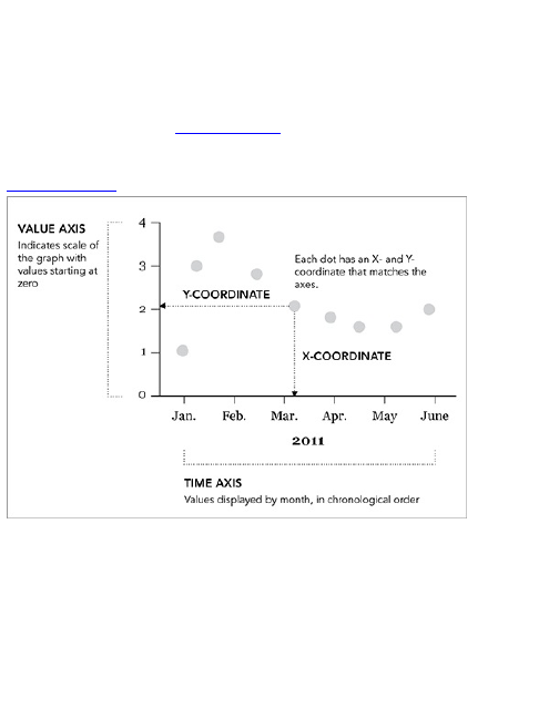
Points
Sometimes it makes more sense to use points instead
of bars. They use less space and because there are no
bins, points can provide a better feeling of flow from one
point to the next. Figure 4-24 shows the common
geometry when using points to graph temporal data.
Figure 4-24: Framework for using points to chart
This type of chart is commonly known as a scatterplot
and you can also use it to visualize nontemporal data.
It’s often used to show the relationship between two
variables, which is covered in Chapter 6, “Visualizing
Relationships.” For temporal data, time is represented
on the horizontal axis, and values or measurements are
represented on the vertical axis.
Unlike the bar graph, which uses length as the visual

cue, scatterplots use position. You can think of each
point with an X- and Y-coordinate, and you can
compare to other points in time based on where they
are placed. Because of this, the value axis of
scatterplots doesn’t always have to start at zero, but it’s
usually good practice.
Create a ScatterPlot
R makes it easy to create a scatterplot via the plot()
function, but you can use variations, depending on what
data you look at. Figure 4-25 shows the final graphic.
Figure 4-25: Scatterplot created in R and designed in
Illustrator
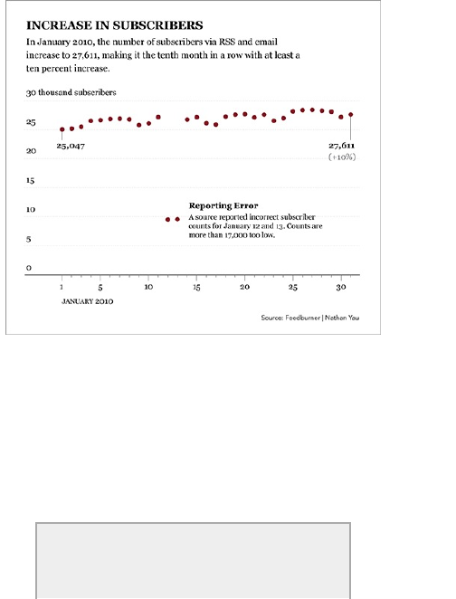
This is the story of FlowingData subscriber counts in
January 2010, as reported by Feedburner, the service
that keeps track of how many people read FlowingData
on a daily basis. On January 1, 2010, there were
25,047 subscribers, and by the end of the month, there
were 27,611 subscribers. Probably the most interesting
part though was what wasn’t reported in the middle of
the month. Did I actually say something to offend 17,000
readers that made them unsubscribe? Not likely.
Tip
Just because it’s data doesn’t make it fact.
There can be typos, errors in reporting, or

There can be typos, errors in reporting, or
something else that causes a
misrepresentation of reality.
Do you remember the first thing to do when you make
a graph in R? You load your data. Use read.csv() to load
the data directly from a URL.
subscribers <-
read.csv("http://datasets.flowingdata.com/flowingdata_subscribers.csv",
sep=",", header=TRUE)
To look at the first five rows of the data, enter the
following:
subscribers[1:5,]
And here’s what it looks like:
Date Subscribers Reach Item.Views Hits
1 01-01-2010 25047 4627 9682 27225
2 01-02-2010 25204 1676 5434 28042
3 01-03-2010 25491 1485 6318 29824
4 01-04-2010 26503 6290 17238 48911
5 01-04-2010 26654 6544 16224 45521
There are five columns on date, subscribers, reach,
item views, and hits. You care only about subscribers.
You can also incorporate the date, but counts are
already in chronological order, so you actually don’t
need the first column to plot subscribers. To plot the
points, enter the following, and you’ll get the result in
Figure 4-26.
plot(subscribers$Subscribers)
Easy, right? The plot() function actually enables you to
make several different types of graphs, but the point
type is the default. You used only the subscriber counts.
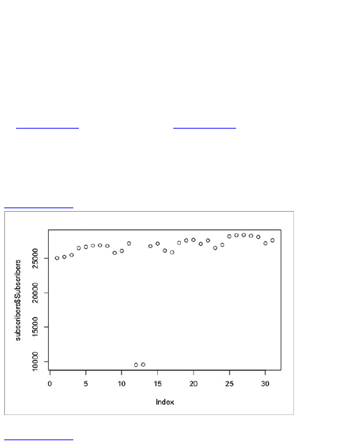
When you provide only one data array to the plot()
function, it assumes that the array contains values, and
it automatically generates an index for the x-
coordinates.
Now explicitly specify that you want the point type,
and set the range of the vertical axis from 0 to 30,000.
plot(subscribers$Subscribers, type="p", ylim=c(0, 30000))
Figure 4-27 is same thing as Figure 4-26, but with a
wider vertical axis as you specified with the ylim
argument. Notice you use the type argument to tell R to
use points. If you changed type to h, R would make high-
density vertical lines.
Figure 4-26: Default plot in R
Figure 4-27: Point plot in R with y-limits specified
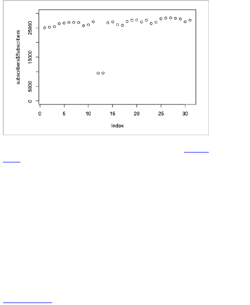
You could also combine the two, as shown in Figure
4-28. However, you’d also need to use the points()
method. Whenever you use the plot() function, you
create a new graphic, instead of adding new elements
to an existing graph. Following is how you would
combine vertical lines and points if you were so
inclined.
plot(subscribers$Subscribers, type="h", ylim=c(0, 30000),
xlab="Day", ylab="Subscribers")
points(subscribers$Subscribers, pch=19, col="black")
The plot with vertical lines is drawn first, this time with
axis labels. Points are then added to the existing plot.
The pch argument is for size, and the col argument, which
you used with the bar chart, specifies fill color.
Figure 4-28: Plot with high-density vertical lines
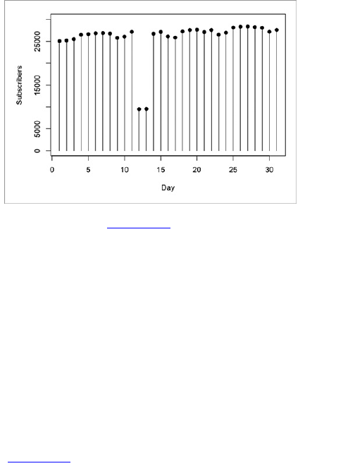
Let’s go back to Figure 4-27. Save it as a PDF and
then open it in Illustrator so that we can do some
designing.
Using the Selection tool, highlight labels, and change
the font to your liking. Then ungroup the labels so that
you can edit the vertical axis labels individually. Use
Transform ⇒ Transform Each to turn the labels right-
side up. Then use the Direct Selection tool to remove
the vertical bar from the axis. You don’t need that—it’s
just taking up space.
Finally, highlight the actual points, which are plain
white circles, and use the options in the Color window to
take your pick of fill and stroke color. You might need to
change the color scheme to CMYK (that’s Cyan,
Magenta, Yellow, and key) from Grayscale to get more
color choices via the options menu of the Color window
(Figure 4-29).
Figure 4-29: Options menu for Color window
This should bring you to Figure 4-30. It already looks
more like the finished graphic.
Figure 4-30: Point plot after editing vertical axis and
color
Figure 4-31: Options for dotted lines in Stroke window
Now try adding a grid so that it’s easier to see what
values the points on the far right represent and how they
relate to previous points. Highlight the ticks on the value
axis with the Selection tool, and then click-and-drag
across to extend the ticks all the way across the graph.
As-is, they’re kind of blunt, so change the style for those.
Like before, you can change the style of lines with the
options available in the Stroke window. Use the options
in Figure 4-31 if you want thin, dotted lines.
Figure 4-32 is what you have after those changes.
From here, use the same tools and techniques to get
Figure 4-32 to your final graphic. Make tick marks on
the horizontal axis with the Pen tool, and edit and add
labels with the Type tool. Don’t forget to add the source
of your data on the bottom to complete the story.
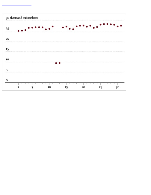
Figure 4-32: Added grid lines and filled in values for
the value axis
Continuous Data
Visualizing continuous time series data is similar to
visualizing discrete data. You do, after all, still have a
discrete number of data points, even if the dataset is
continuous. The structure of continuous and discrete is
the same. The difference between the two is what they
represent in the physical world. As previously covered,
continuous data represents constantly changing
phenomena, so to this end, you want to visualize the
data in a way that shows that.
Connect the Dots
You’re probably familiar with this one. The time series
chart is similar to drawing points, except you also
connect the points with lines. Often, you don’t show the
points. Figure 4-33 shows the geometry of the popular
chart type.
You have the nodes, or points, that take on X- and Y-
coordinates, and then the edges, or connecting lines
that help you see trends in your data. It’s usually a good
idea to start the value axis at zero because starting
anywhere else could affect the scale.
How far you stretch the horizontal axis can also affect
the appearance of trends. Squish too much, and an
increase from point to point might look more than it is.
Stretch too far out, and you might not see patterns.
Figure 4-33: Time series chart framework
Create a Time Series Chart

If you know how to make a scatterplot in R, you know
how to make a time series chart. Load your data and
use the plot() function, but instead of using p in the type
argument, you use l as the type, which stands for line.
To demonstrate, use world population data from the
World Bank from 1960 to 2009. As usual load the data
with the read.csv() function.
population <-
read.csv("http://datasets.flowingdata.com/world-
population.csv",
sep=",", header=TRUE)
Here’s what the first few rows of the data look like. It’s
just the year and population.
Year Population
1 1960 3028654024
2 1961 3068356747
3 1962 3121963107
4 1963 3187471383
5 1964 3253112403
Use the plot() function and specify the X- and Y-
coordinates, the type, the value axis limits, and axis
labels.
plot(population$Year, population$Population, type="l",
ylim=c(0, 7000000000), xlab="Year", ylab="Population")
Your chart will look like Figure 4-34.
Figure 4-34: Default time series chart in R
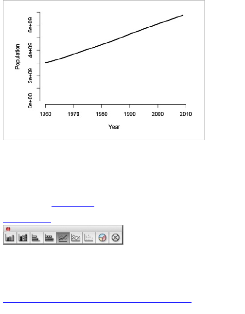
At this point, you can save the image as a PDF and
edit it in Illustrator like you’ve done a couple of times,
but now try something else. Design the entire chart in
Illustrator with the Line Graph tool. This is one of several
graphing tools in Illustrator that enables you to create
basic charts (Figure 4-35).
Figure 4-35: Graph tools in Illustrator
To start, select the Line Graph tool from the Tool
window. You should see an icon of some kind of chart.
Press and hold down the icon to choose the chart type.
Then download the population data at
http://datasets.flowingdata.com/world-population.csv.
You can’t load data directly from a URL like you can in
R, so you have to save the file on your computer. Open
the CSV file in Excel or Google Documents, so that it’s
li ke Figure 4-36. Copy all the rows, except for the
header row that names each column. You’re going to
paste the data into Illustrator.
Figure 4-36: CSV file opened in Excel
Figure 4-37: Spreadsheet to enter data in Illustrator
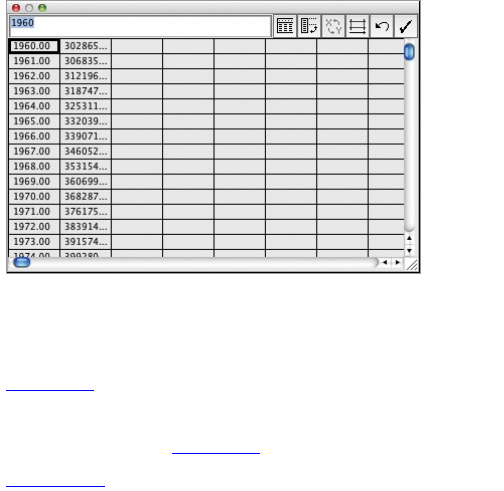
Go back to Illustrator. Using the Line Graph tool,
which you already selected from the Tool window, click-
and-drag a rectangle that is approximately the size that
you want your graph to be. A spreadsheet, as shown in
Figure 4-37 will pop up.
Paste the data that you copied from Excel, and then
click the check mark on the top right. You should see an
image that resembles Figure 4-38.
Figure 4-38: Default line graph in Illustrator
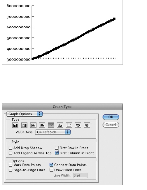
Here’s your base, but you need to change some
options so that the graph doesn’t look so rough. Right-
click and select Type. Uncheck the box to Mark Data
Points to match Figure 4-39.
Figure 4-39: Graph options in Illustrator

Select Category Axis from the drop-down menu, and
choose None for tick mark length. Press OK. This can
give you a cleaner, less cluttered looking graph. From
here, follow the same process that you followed when
you edited graphs generated in R.
Tip
If you’re going to edit in Illustrator and use a
basic graph type, save some time and make
the graph directly in Illustrator. You don’t need to
make everything in R first. That said, you don’t
have to make everything in Illustrator either.
You can clean up the vertical axis, simplify the value
labels, add ticks and labels on the horizontal axis for
years, and add a title and some copy. You can also
change the stroke style for the actual line so that it
stands out more. The default light gray makes it seem
like the data is in the background when it should be front
and center. Make these changes, and you should end
up with Figure 4-40.
Figure 4-40: World population over the past five
decades
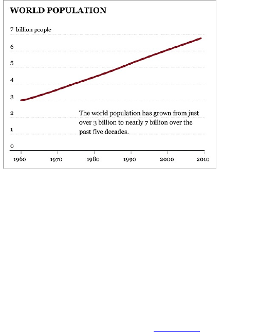
The main takeaway here is that you can make the
same graph in both Illustrator and R—you still would
have the same end result no matter. To that end, figure
out what you’re comfortable with tool-wise and go with
it. The most important part is getting results.
Step It Up
One of the drawbacks of the standard line plot is that it
implies steady change from point A to point B. That’s
about right with a measure like world population, but
some things stay at a value for a long time and then all
of a sudden see a boost or a decline. Interest rates, for
example, can stay the same for months and then drop in
a day. Use a step chart, as shown in Figure 4-41, for
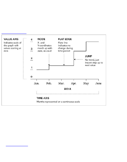
this type of data.
Instead of connecting point A to point B directly, the
line stays at the same value until there is a change, at
which point it jumps up (or down) to the next value. You
end up with a bunch of steps.
Figure 4-41: Step chart basic framework
Create a Step Chart
Illustrator doesn’t have a tool to easily create step
charts. R does, however, so you can create a base
chart in R and then edit in Illustrator. Are you starting to
see a pattern here?
Figure 4-42 shows the final chart. It shows the change
in postage rate for letters via the United States Postal
Service. Notice the changes don’t happen on a
scheduled basis. From 1995 to 1999, postage stuck at
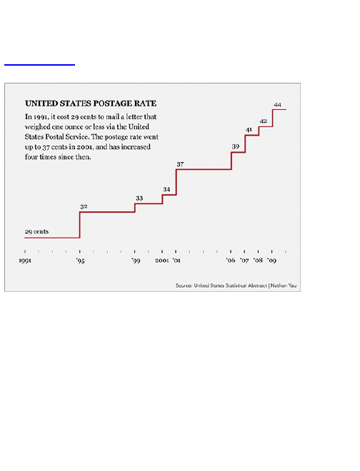
32 cents. That’s 4 years without a change. However,
more recently, there has been a change once a year
from 2006 to 2009.
Figure 4-42: Step chart showing change in postage
rate
To create the step chart in R, follow the same
process you’ve been using throughout the chapter:
1. Load the data.
2. Make sure the data is properly formatted.
3. Use an R function to produce a plot.
You can find historical postage rates, along with many
other datasets, from the United States Statistical
Abstract. I’ve put it in a CSV file found at
http://datasets.flowingdata.com/us-postage.csv. Plug that URL
into read.csv() as the source to load the data file into R.

postage <- read.csv("http://datasets.flowingdata.com/us-
postage.csv", sep=",", header=TRUE)
Following is the full dataset. It’s only ten points, one
for each postage rate change from 1991 to 2009, and a
last point to indicate the current rate. The first column is
year and the second column is rate in U.S. dollars.
Year Price
1 1991 0.29
2 1995 0.32
3 1999 0.33
4 2001 0.34
5 2002 0.37
6 2006 0.39
7 2007 0.41
8 2008 0.42
9 2009 0.44
10 2010 0.44
The plot() function makes it easy to create a step
chart. As you would expect, you plug in the year as the
X-coordinate, price as the Y-coordinate, and use "s" as
the type, which of course stands for step.
plot(postage$Year, postage$Price, type="s")
You can also specify main title and axis labels, if you
like.
plot(postage$Year, postage$Price, type="s",
main="US Postage Rates for Letters, First Ounce, 1991-
2010",
xlab="Year", ylab="Postage Rate (Dollars)")
This gives you the step chart for postage rate, as
shown in Figure 4-43.
Just for fun, see what the graph would like if you used
a line plot instead (Figure 4-44).
There’s an increasing trend, but notice how it looks
like it was a steady increase? At no point during 2001
and 2006 was the rate at 38 cents, but you wouldn’t
know that from the line plot unless you looked at the raw
data.
Figure 4-43: Step chart created in R
Figure 4-44: Line plot of postage rates
Save the image as a PDF and then open it in
Illustrator. Follow the same process that you’ve used
previously to edit the step chart to your liking. Design-
wise, I got rid of the vertical axis altogether and directly
labeled each jump (with the Type tool). I also made
evenly spaced tick marks, but only labeled the years
when there were changes.
Tip
When you have a small dataset, it can
sometimes be useful to label points directly
instead of using a value axis and grid. This
places more emphasis on the data, and
because there aren’t that many points, the
labels won’t clutter and confuse.
Finally, I used a gray background. This was a
personal preference, but the background helps highlight
the graph, especially placed within text. It provides more
surrounding space while not being annoyingly flashy. To
make a background behind the graph and text, instead
of on the top covering everything, you need to create a
new layer in Illustrator. You can do this in, what else, the
Layers window. Click the button to create a new layer.
By default, the layer will be placed on top, but you want it
on the bottom, so click-and-drag the new layer below
Layer 1, as shown in Figure 4-45.
Figure 4-45: Layer window in Illustrator
You can rename your layers, which can be especially
useful when you start to design more complex graphics.
I renamed the new layer “background.” Then draw a
rectangle using the Rectangle tool. Click and draw to
make the size you want, and then change color via the
Color window.
Smoothing and Estimation
When you have a lot of data, or the data you have is
noisy, it can be hard to spot trends and patterns. So to
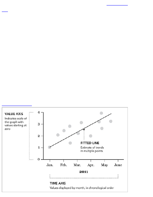
make it easier, you can estimate a trend line. Figure 4-
46 shows the basic idea.
Draw a line that goes through the most points as
possible, and minimize the summed distance from the
points to the fitted line. The most straightforward route is
to create a straight fitted line using the basic slope-
intercept equation you probably learned in high school.
y = mx + b
Slope is m and the intercept is b. What happens
when your trend is not linear? It doesn’t make sense to
fit a straight line to data that shows winds and curves.
Instead use a statistical method created by William
Cleveland and Susan Devlin called LOESS, or locally
weighted scatterplot smoothing. It enables you to fit a
curve to your data.
Figure 4-46: Fitting a line to data points

LOESS starts at the beginning of the data and takes
small slices. At each slice it estimates a low-degree
polynomial for just the data in the slice. LOESS moves
along the data, fitting a bunch of tiny curves, and
together they form a single curve. You can Google it for
more details. There are several papers on the topic.
Now get into how to use LOESS with your data.
See “Robust Locally Weighted Regression and
Smoothing Scatterplots” in the Journal of the
American Statistical Association by William
Cleveland for full details on LOESS.
Fit a LOESS Curve
The story you look at is unemployment in the United
States over the past few decades. There have been ups
and downs, along with seasonal fluctuations. What is
the extent of the overall trends? As shown in Figure 4-
47, the unemployment rate peaked in the 1980s,
declined through the 1990s, and then shot up around
2008.
Figure 4-47: Unemployment rates with fitted LOESS
curve
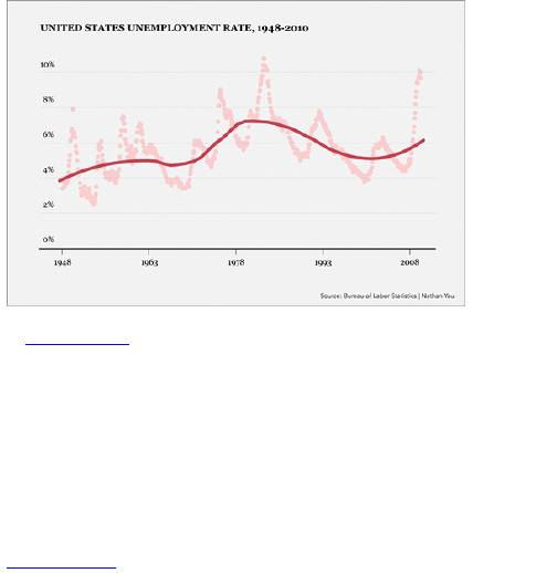
Figure 4-48 shows what the unemployment graph
looks like using only points with the R plot() function.
# Load data
unemployment <-
read.csv(
"http://datasets.flowingdata.com/unemployment-rate-
1948-2010.csv",
sep=",")
unemployment[1:10,]
# Plain scatter plot
plot(1:length(unemployment$Value), unemployment$Value)
Figure 4-48: Unemployment plot using only points
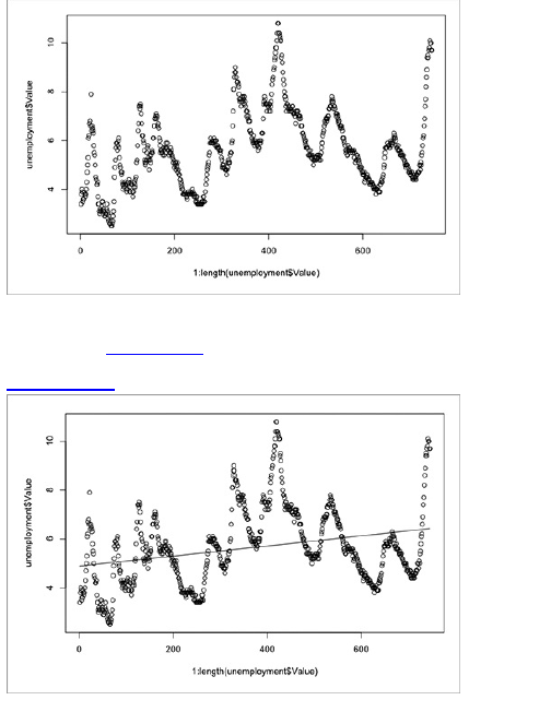
Now here’s what a straight fitted line would look like,
as shown in Figure 4-49.
Figure 4-49: Straight fitted line
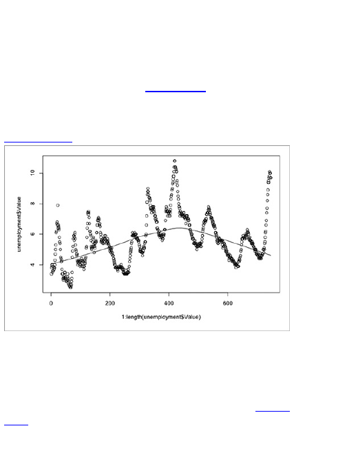
It’s not helpful. It looks as if it ignores all the
fluctuations in the unemployment rate. To fit a LOESS
curve instead, you use the scatter.smooth() function.
scatter.smooth(x=1:length(unemployment$Value), y=unemployment$Value)
You can see the result in Figure 4-50. The line curves
up now, accounting for the spike in the 1980s. That’s a
little better.
Figure 4-50: Fitting a LOESS curve
You can adjust how fitted the curve is via the degree
and span arguments in the scatter.smooth() function. The
former controls the degree of the polynomials that are
fitted, and the latter controls how smooth the curve is.
The closer the span is to zero, the closer the fit. Figure
4-51 is what you get if you change degree to 2 and
span to 0.5. Now change the colors and adjust the axis
limits.
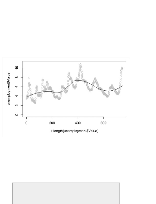
scatter.smooth(x=1:length(unemployment$Value),
y=unemployment$Value, ylim=c(0,11), degree=2, col="#CCCCCC", span=0.5)
The ups and downs of the curve are more prominent
with these settings. Try messing around with span to get
a better feel for how it changes smoothness.
Figure 4-51: Fitted LOESS curve with less
smoothness and higher degree polynomial
To get to the final graphic in Figure 4-47, save the
image as a PDF and bring it into Illustrator. The same
tools (for example, Selection, Type, Pen) are used to
add titles, a background, and ticks for a horizontal axis.
The fitted line was made more prominent to place more
focus on the trends than on the individual data points.
Tip
Vary color and stroke styles to emphasize the

parts in your graphic that are most important to
the story you’re telling.
Wrapping Up
It’s fun to explore patterns over time. Time is so
embedded in our day-to-day life that so many aspects
of visualizing temporal data are fairly intuitive. You
understand things changing and evolving—the hard part
is figuring out by how much and learning what to look for
in your graphs.
It’s easy to glance over some lines on a plot and say
something is increasing, and that’s good. That’s what
visualization is for—to quickly get a general view of your
data. But you can take it further. You can use
visualization as an exploratory tool. Zoom in on sections
of time and question why there was a small blip on
some day but nowhere else or why there was a spike on
a different day. That’s when data is fun and interesting
—the more you know about your data, the better story
you can tell.
After you learn what your data is about, explain those
details in your data graphic. Highlight the interesting
parts so that your readers know where to look. A plain
graph can be cool for you, but without context, the graph
is boring for everyone else.
You used R with Illustrator to accomplish this. R built
the base, and you used Illustrator to design graphics
that pointed out what was important in the data. The
covered chart types are of course only a subset of what
you can do with temporal data. You open a whole new

bag of tricks when you bring animation and interaction
to the party, which you see in the next chapter. While
you move on to a new data type—proportions—you can
apply the same programming process and design
principles that you used in this chapter, even if you code
in a different language.

Chapter 5
Visualizing Proportions
Time series data is naturally grouped by, well, time. A
series of events happen during a specific time frame.
Proportion data is also grouped, but by categories,
subcategories, and population. By population, I don’t
mean just human population. Rather, population in this
case represents all possible choices or outcomes. It’s
the sample space.
In a poll, people might be asked if they approve,
disapprove, or have no opinion on some issue. Each
category represents something, and the sum of the
parts represent a whole.
This chapter discusses how to represent the individual
categories, but still provides the bigger picture of how
each choice relates to the other. You use some of what
you learned in the previous chapter and get your first
taste of interactive graphics using HTML, CSS, and
JavaScript and then have a look at graphics with Flash.
What to Look for in
Proportions
For proportions you usually look for three things:
maximum, minimum, and the overall distribution. The
first two are straightforward. Sort your data from least to
greatest, and pick the ends for your maximum and
minimum. If you were dealing with poll results, these
could mean the most popular and least popular answers
from participants; or if you were graphing calories from

separate parts of a meal, you would see the biggest
and smallest contributor to the overall calorie count.
You don’t need a chart though to show you minimum
and maximum. What you are most interested in is the
distribution of proportions. How does the selection of
one poll choice compare to the others? Are calories
spread evenly across fat, protein, and carbohydrates, or
does one group dominate? The following chart types
can help you figure that out.
Parts of a Whole
This is proportions in their simplest form. You have a set
of proportions that add up to 1 or a set of percentages
that add up to 100 percent. You want to show the
individual parts relative to the other parts but you also
want to maintain the sense of a whole.
The Pie
Pie charts are the old standby. You see them
everywhere these days, from business presentations to
sites that use charts as a medium for jokes. The first
known pie chart was published by William Playfair, who
also invented the line graph and bar chart, in 1801.
Smart guy.
You know how they work. As shown in Figure 5-1, you
start with a circle, which represents a whole, and then
cut wedges, like you would a pie. Each wedge
represents a part of the whole. Remember that last part,
because a lot of beginners make this mistake. The
percentage of all the wedges should add up to 100
percent. If the sum is anything else, you have done
something wrong.
Figure 5-1: Pie chart generalized
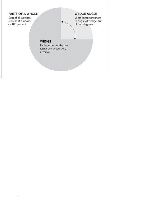
Pie charts have developed a stigma for not being as
accurate as bar charts or position-based visuals, so
some think you should avoid them completely. It’s
easier to judge length than it is to judge areas and
angles. That doesn’t mean you have to completely avoid
them though.
You can use the pie chart without any problems just
as long you know its limitations. It’s simple. Keep your
data organized, and don’t put too many wedges in one
pie.
Create a Pie Chart
Although just about every charting program enables you
to make pie charts, you can make one in Illustrator just
like you did in the previous chapter. The process of
adding data, making a default chart, and then refining
should feel familiar.
To build the base of your chart—the actual pie—is
fairly straightforward. After you create a new document,
select the Pie Graph tool from the Tool window, as
shown in Figure 5-2. Click and drag a rectangle so that
it is roughly the size of what you want your graph to be.
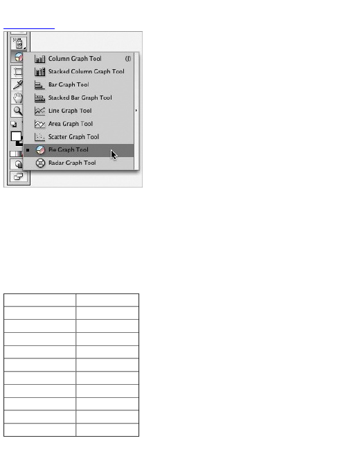
You can resize it later.
Figure 5-2: Tool window in Illustrator
When you release the mouse button, a spreadsheet
window pops up where you enter your data. For a single
pie chart, enter each data point from left to right, and the
values show up in your chart in the same order.
For this example, use the results from a poll on
FlowingData. Readers were asked what data-related
field they were most interested in. There were 831
responses.
Area of Interest Number of Votes
Statistics 172
Design 136
Business 135
Cartography 101
Information Science 80
Web Analytics 68
Programming 50
Engineering 29
Mathematics 19
Other 41
Enter the numbers in the spreadsheet in Illustrator, as
shown in Figure 5-3. The order you enter the numbers
will match the order the wedges appear in your pie
chart, starting at the top and then rotating clockwise.
Notice that the poll results are organized from
greatest to least and then end with the Other category.
This kind of sorting can make your pie charts easier to
read. Click the check mark in the top right of the pop-up
when you finish.
Figure 5-3: Spreadsheet in Illustrator
Tip
The spreadsheet in Illustrator is fairly bare
bones, so you can’t easily manipulate or
rearrange your data. A way to get around this is
to do all your data handling in Microsoft Excel,
and then copy and paste into Illustrator.
The default pie chart appears with eight shades of
gray, in a seemingly random sequence with a black
border, as shown in Figure 5-4. It kind of looks like a
grayscale lollipop, but you can easily do something
about that. The important thing here is that you have the
base of your pie chart.
Figure 5-4: Default pie chart
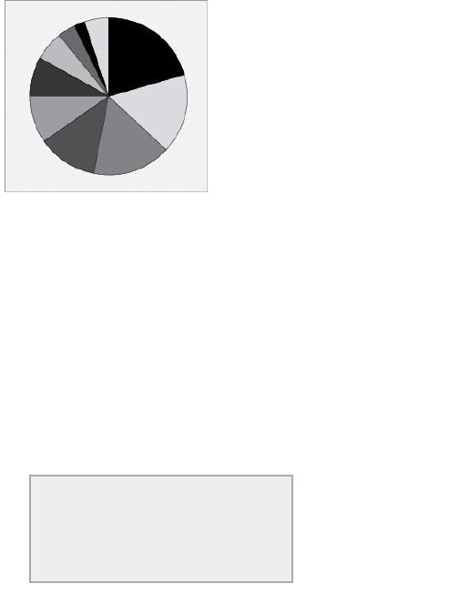
Now make the pie chart more readable by changing
some colors and adding text to explain to readers what
they are looking at. As it is now, the colors don’t make
much sense. They just separate the wedges, but you
can use colors as a way to tell readers what to look at
and in what order. You did after all go through the
trouble of sorting your data from greatest to least.
If you start at 12 o’clock and rotate clockwise, you
should see a descending order. However, because of
the arbitrary color scheme, some of the smaller wedges
are emphasized with darker shades. The dark shade
acts as a highlighter, so instead, make larger wedges
darker and smaller wedges lighter. If for some reason,
you want to highlight answers that have fewer
responses, you might want to color in reverse. In the
case of this poll though, you want to know what data-
related fields were the most popular.
Tip
Color can play an important role in how people
read your graph. It’s not just an aesthetic
component—although sometimes it can be.
Color can be a visual cue just like length or
area, so choose wisely.
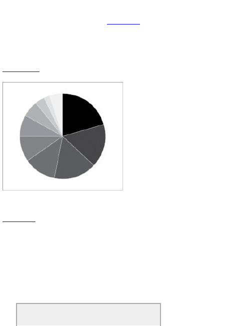
Choose the Direct Selection tool in the Tool window,
and then click a wedge. Change fill and stroke color via
the controls in the Color window. Figure 5-5 shows the
same pie chart with a white stroke and wedges colored
from darkest to lightest. Now it’s easier to see that
numbers go from greatest to least, with the exception of
the last wedge for Other.
Figure 5-5: Pie chart with colors arranged darkest to
lightest
Of course, you don’t have to be so frugal with your
colors. You can use whatever colors you want, as shown
Figure 5-6. Although it’s usually a good idea to not use
colors that are bright—you don’t want to blind your
readers. If a blinding color scheme fits with your topic
though, go wild.
Because this is a FlowingData poll, I used the shade
of red from the FlowingData logo and then made lighter
color wedges by decreasing opacity. You can find the
option in the Transparency window. At 0 percent
opacity, the fill is completely see-through; at 100
percent opacity, the fill is not see-through.
Note
When you use opacity, the fill of the shape you
are changing will blend with the color of the
background. In this case, the background is
white, which gives a faded look the higher the
transparency. If, however, the background were
blue, the shape would appear purple.
Figure 5-6: Colored pie chart
Finally, add a title, a lead-in sentence, and labels for
the graph with the Type tool. With practice, you can
have a better idea what fonts you like to use for headers
and copy, but whatever you use, Illustrator’s alignment
tools are your best friend when it comes to placing your
text. Properly aligned and evenly spaced labels make
your charts more readable. You can also make use of
the Pen tool to create pointers, as shown in Figure 5-7,
for the last three poll categories. These sections are too
small to put the labels inside and are too close together
to place the labels adjacent.
Figure 5-7: Final pie chart with labels and lead-in copy
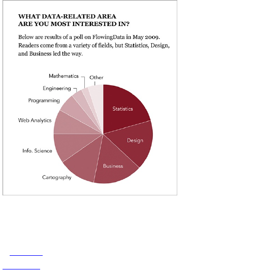
The Donut
Your good friend the pie chart also has a lesser cousin:
the donut chart. It’s like a pie chart, but with a hole cut
out in the middle so that it looks like a donut, as shown
in Figure 5-8.
Figure 5-8: Donut chart framework
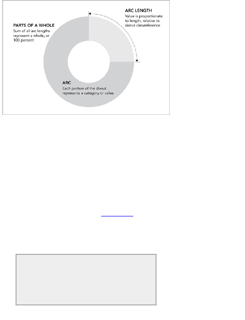
Because there’s a hole in the middle, you don’t judge
values by angle anymore. Instead you use arc length.
This introduces many of the same problems when you
use a single chart with too many categories, but in
cases with fewer categories the donut chart can still
come in handy.
Create a Donut Chart
It’s straightforward to make a donut chart in Illustrator.
Create a pie chart like you just did; then put a filled
circle in the middle, as shown in Figure 5-9. Again, use
color to guide readers’ eyes.
A lot of the time the middle of donut charts are used
for a label or some other content like was done in the
figure.
Tip
The main thing to remember, whether you use
a pie chart or donut chart, is that they can
quickly become cluttered. They’re not meant to
represent a lot of values.
Now make the same chart using Protovis, the free
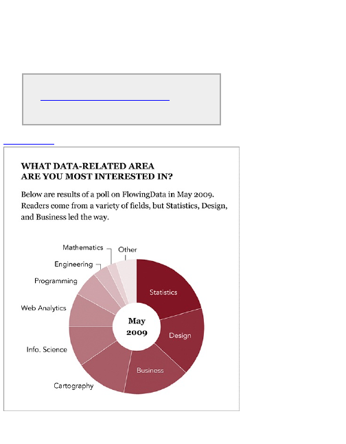
and open-source visualization toolkit. It’s a library
implemented in JavaScript and makes use of modern
browsers’ Scalable Vector Graphics (SVG)
capabilities. Graphics are generated dynamically and
enable animation and interactivity, which makes
Protovis great for online graphics.
Download Protovis at
http://vis.stanford.edu/protovis/ and put
it in the same directory that you use to save
example files.
Figure 5-9: From pie to donut chart
Although you’re about to get into a different
programming language, you still follow the same
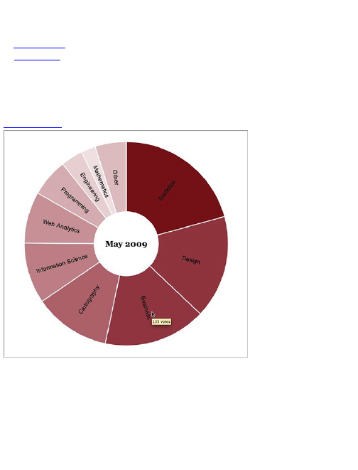
process like you did in R and Illustrator. First, load the
data, then build the base, and finally, customize the
aesthetics.
Figure 5-10 shows what you want to make. It’s similar
to Figure 5-9, except the labels are set at an angle, and
when you mouse over an arc, you can see how many
votes there were for the corresponding category.
Interaction can get much more advanced, but you have
to learn the basics before you get fancy.
Figure 5-10: Donut chart using Protovis
The first thing you do is create an HTML page—call it
donut.html.
<html>
<head>
<title>Donut Chart</title>
<script type="text/javascript" src="protovis-
r3.2.js"></script>
<style type="text/css">
#figure {
width: 400px;
height: 400px;

height: 400px;
}
</style>
</head>
<body>
<div id="figure">
</div><!-- @end figure -->
</body>
</html>
If you’ve ever created a web page, this should be
straightforward, but in case you haven’t, the preceding
is basic HTML that you’ll find almost everywhere online.
Every page starts with an <html> tag and is followed by a
<head> that contains information about the page but
doesn’t show in your browser window. Everything
enclosed by the <body> tag is visible. Title the page
Donut Chart and load the Protovis library, a JavaScript
file, with the <script> tag. Then specify some CSS, which
is used to style HTML pages. Keeping it simple, set the
width and height of the <div> with the id “figure” at 400
pixels. This is where you draw our chart. The preceding
HTML isn’t actually part of the chart but necessary so
that the JavaScript that follows loads properly in your
browser. All you see is a blank page if you load the
preceding donut.html file in your browser now.
Inside the figure <div>, specify that the code that you’re
going to write is JavaScript. Everything else goes in
these <script> tags.
<script type="text/javascript+protovis">
</script>
Okay, first things first: the data. You’re still looking at
the results from the FlowingData poll, which you store in
arrays. The vote counts are stored in one array, and the
corresponding category names are stored in another.
var data = [172,136,135,101,80,68,50,29,19,41];
var
cats = ["Statistics", "Design", "Business", "Cartography",
"Information Science", "Web Analytics", "Programming",
"Engineering", "Mathematics", "Other"];
Then specify the width and height of the donut chart
and the radius length and scale for arc length.

var w = 350,
h = 350,
r = w / 2,
a = pv.Scale.linear(0, pv.sum(data)).range(0, 2 * Math.PI);
The width and height of the donut chart are both 350
pixels, and the radius (that is, the center of the chart to
the outer edge) is half the width, or 175 pixels. The
fourth line specifies the arc scale. Here’s how to read it.
The actual data is on a linear scale from 0 to the sum of
all votes, or total votes. This scale is then translated to
the scale to that of the donut, which is from 0 to 2π
radians, or 0 to 360 degrees if you want to think of it in
that way.
Next create a color scale. The more votes a category
receives, the darker the red it should be. In Illustrator,
you did this by hand, but Protovis can pick the colors for
you. You just pick the range of colors you want.
var
depthColors = pv.Scale.linear(0, 172).range("white", "#821122");
Now you have a color scale from white to a dark red
(that is #821122) on a linear range from 0 to 172, the
highest vote count. In other words, a category with 0
votes will be white, and one with 172 votes will be dark
red. Categories with vote counts in between will be
somewhere in between white and red.
So far all you have are variables. You specified size
and scale. To create the actual chart, first make a blank
panel 350 (w) by 350 (h) pixels.
var vis = new pv.Panel()
.width(w)
.height(h);
Then add stuff to the panel, in this case wedges. It
might be a little confusing, but now look over it line by
line.
vis.add(pv.Wedge)
.data(data)
.bottom(w / 2)

.left(w / 2)
.innerRadius(r - 120)
.outerRadius(r)
.fillStyle(function(d) depthColors(d))
.strokeStyle("#fff")
.angle(a)
.title(function(d) String(d) + " votes")
.anchor("center").add(pv.Label)
.text(function(d) cats[this.index]);
The first line says that you’re adding wedges to the
panel, one for each point in the data array. The bottom()
a n d left() properties orient the wedges so that the
points are situated in the center of the circle. The
innerRadius() specifies the radius of the hole in the middle
whereas the outerRadius is the radius of the full circle.
That covers the structure of the donut chart.
Rather than setting the fill style to a static shade, fill
colors are determined by the value of the data point and
the color scale stored as depthColors, or in other words,
color is determined by a function of each point. A white
(#fff) border is used, which is specified by strokeStyle().
The circular scale you made can determine the angle of
each wedge.
To get a tooltip that says how many votes there were
when you mouse over a section, title() is used. Another
option would be to create a mouseover event where
you specify what happens when a user places a pointer
over an object, but because browsers automatically
show the value of the title attribute, it’s easier to use
title(). Make the title the value of each data point
followed by “votes.” Finally, add labels for each section.
The only thing left to do is add May 2009 in the hole of
the chart.
vis.anchor("center").add(pv.Label)
.font("bold 14px Georgia")
.text("May 2009");
This reads as, “Put a label in the center of the chart in
bold 14-pixel Georgia font that says May 2009.”
The full chart is now built, so now you can render it.
vis.render();
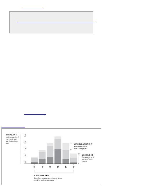
When you open donut.html in your browser, you
should see Figure 5-10.
Visit
http://book.flowingdata.com/ch05/donut.html
to see the live chart and view the source for the
code in its entirety.
If you’re new to programming, this section might have
felt kind of daunting, but the good news is that Protovis
was designed to be learned by example. The library’s
site has many working examples to learn from and that
you can use with your own data. It has traditional
statistical graphics to the more advanced interactive
and animated graphics. So don’t get discouraged if you
were a little confused. The effort you put in now will pay
off after you get the hang of things. Now have another
look at Protovis in the next section.
Stack Them Up
In the previous chapter you used the stacked bar chart
to show data over time, but it’s not just temporal data.
As shown in Figure 5-11, you can also use the stacked
bar chart for categorical data.
Figure 5-11: Stacked bar chart with categories
For example, look at approval ratings for Barack
Obama as estimated from a Gallup and CBS poll taken
in July and August 2010. Participants were asked
whether they approved or disapproved of how Obama
has dealt with 13 issues.
Here are the numbers in table form.
Issue Approve Disapprove No Opinion
Race relations 52 38 10
Education 49 40 11
Terrorism 48 45 7
Energy policy 47 42 11
Foreign affairs 44 48 8
Environment 43 51 6
Situation in Iraq 41 53 6
Taxes 41 54 5
Healthcare policy 40 57 3
Economy 38 59 3
Situation in Afghanistan 36 57 7
Federal budget deficit 31 64 5
Immigration 29 62 9
One option would be to make a pie chart for every
issue, as shown in Figure 5-12. To do this in Illustrator,
all you have to do is enter multiple rows of data instead
of just a single one. One pie chart is generated for each
row.
However, a stacked bar chart enables you to
compare approval ratings for the issues more easily
because it’s easier to judge bar length than wedge
angles, so try that. In the previous chapter, you made a
stacked bar chart in Illustrator using the Stacked Graph
tool. This time you add some simple interactions.
Create an Interactive Stacked Bar
Chart
Like in the donut chart example, use Protovis to create
an interactive stacked bar chart. Figure 5-13 shows the
final graphic. There are two basic interactions to
implement. The first shows the percentage value of any
given stack when you place the mouse pointer over it.
The second highlights bars in the approve, disapprove,
and no opinion categories based on where you put your
mouse.
Figure 5-12: Series of pie charts
Figure 5-13: Interactive stacked bar chart in Protovis
To start, set up the HTML page and load the
necessary Protovis JavaScript file.
<html>
<head>
<title>Stacked Bar Chart</title>
<script type="text/javascript" src="protovis-
r3.2.js"></script>
</head>
<body>
<div id="figure-wrapper">
<div id="figure">
</div><!-- @end figure -->
</div><!-- @end figure-wrapper -->
</body>
</html>
This should look familiar. You did the same thing to
make a donut chart with Protovis. The only difference is
that the title of the page is “Stacked Bar Chart” and
there’s an additional <div> with a “figure-wrapper” id. We
also haven’t added any CSS yet to style the page,
because we’re saving that for later.
Now on to JavaScript. Within the figure <div>, load and

prepare the data (Obama ratings, in this case) in
arrays.
<script type="text/javascript+protovis">
var data = {
"Issue":["Race
Relations","Education","Terrorism","Energy Policy",
"Foreign Affairs","Environment","Situation in
Iraq",
"Taxes","Healthcare Policy","Economy","Situation
in Afghanistan",
"Federal Budget Deficit","Immigration"],
"Approve":[52,49,48,47,44,43,41,41,40,38,36,31,29],
"Disapprove":[38,40,45,42,48,51,53,54,57,59,57,64,62],
"None":[10,11,7,11,8,6,6,5,3,3,7,5,9]
};
</script>
You can read this as 52 percent and 38 percent
approval and disapproval ratings, respectively, for race
relations. Similarly, there were 49 percent and 40
percent approval and disapproval ratings for education.
To make it easier to code the actual graph, you can
split the data and store it in two variables.
var cat = data.Issue;
var
data = [data.Approve, data.Disapprove, data.None];
The issues array is stored in cat and the data is now
an array of arrays.
Set up the necessary variables for width, height,
scale, and colors with the following:
var w = 400,
h = 250,
x = pv.Scale.ordinal(cat).splitBanded(0, w, 4/5),
y = pv.Scale.linear(0, 100).range(0, h),
fill = ["#809EAD", "#B1C0C9", "#D7D6CB"];
The graph will be 400 pixels wide and 250 pixels tall.
The horizontal scale is ordinal, meaning you have set
categories, as opposed to a continuous scale. The
categories are the issues that the polls covered. Four-
fifths of the graph width will be used for the bars,
whereas the rest is for padding in between the bars.
The vertical axis, which represents percentages, is a
linear scale from 0 to 100 percent. The height of the
bars can be anywhere in between 0 pixels to the height
of the graph, or 250 pixels.
Finally, fill is specified in an array with hexadecimal
numbers. That’s dark blue for approval, light blue for
disapproval, and light gray for no opinion. You can
change the colors to whatever you like.
If you’re not sure what colors to use,
ColorBrewer at http://colorbrewer2.org is
a good place to start. The tool enables you to
specify the number of colors you want to use
and the type of colors, and it provides a color
scale that you can copy in various formats.
0to255 at http://0to255.com is a more
general color tool, but I use it often.
Next step: Initialize the visualization with specified
width and height. The rest provides padding around the
actual graph, so you can fit axis labels. For example,
bottom(90) moves the zero-axis up 90 pixels. Think of this
part as setting up a blank canvas.
var vis = new pv.Panel()
.width(w)
.height(h)
.bottom(90)
.left(32)
.right(10)
.top(15);
To add stacked bars to your canvas, Protovis
provides a special layout for stacked charts
appropriately named Stack. Although you use this for a
stacked bar chart in this example, the layout can also be
used with stacked area charts and streamgraphs. Store
the new layout in the “bar” variable.
var bar = vis.add(pv.Layout.Stack)
.layers(data)
.x(function() x(this.index))
.y(function(d) y(d))
.layer.add(pv.Bar)
.fillStyle(function() fill[this.parent.index])
.width(x.range().band)
.title(function(d) d + "%")
.event("mouseover", function() this.fillStyle("#555"))

.event("mouseout", function()
this.fillStyle(fill[this.parent.index]));
Another way to think about this chart is as a set of
three layers, one each for approval, disapproval, and no
opinion. Remember how you structured those three as
an array of three arrays? That goes in layers(), where x
and y follow the scales that you already made.
For each layer, add bars using pv.Bar. Specify the fill
style with fillStyle(). Notice that we used a function that
goes by this.parent.index. This is so that the bar is
colored by what layer it belongs to, of which there are
three. If you were to use this.index, you would need color
specifications for every bar, of which there are 39 (3
times 13). The width of each bar is the same across,
and you can get that from the ordinal scale you already
specified.
The final three lines of the preceding code are what
make the graph interactive. Using title() in Protovis is
the equivalent of setting the title attribute of an HTML
element such as an image. When you roll over an image
on a web page, a tooltip shows up if you set the title.
Similarly, a tooltip appears as you place the mouse
pointer over a bar for a second. Here simply make the
tooltip show the percentage value that the bar
represents followed with a percent sign (%).
To make the layers highlight whenever you mouse
over a bar, use event(). On “mouseover” the fill color is
set to a dark gray (#555), and when the mouse pointer
is moved off, the bar is set to its original color using the
“mouseout” event.
Tip
Interaction in Protovis isn’t just limited to mouse
over and out. You can also set events for things
such as click and double-click. See Protovis
documentation for more details.
To make the graph appear, you need to render it.
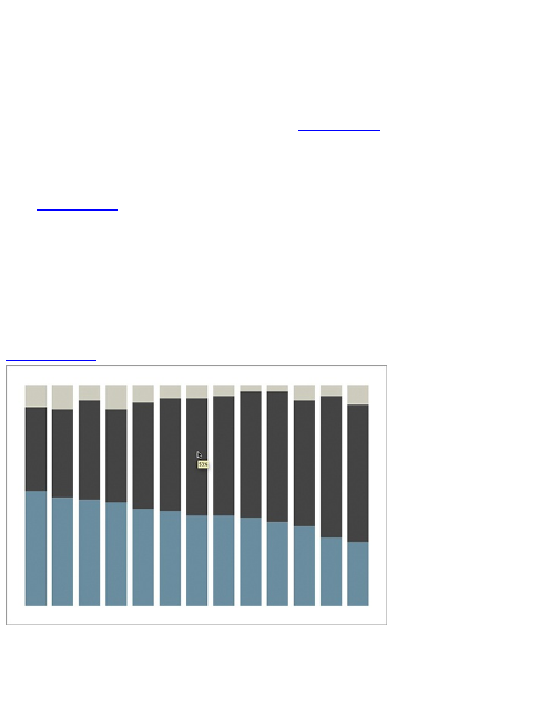
Enter this at the end of our JavaScript.
vis.render();
This basically says, “Okay, we’ve put together all the
pieces. Now draw the visualization.” Open the page in
your web browser (a modern one, such as Firefox or
Safari), and you should see something like Figure 5-14.
Mouse over a bar, and the layer appears highlighted.
A tooltip shows up, too. A few things are still missing,
namely the axes and labels. Add those now.
In Figure 5-13, a number of labels are on the bars. It’s
only on the larger bars though, that is, not the gray ones.
Here’s how to do that. Keep in mind that this goes
before vis.render(). Always save rendering for last.
bar.anchor("center").add(pv.Label)
.visible(function(d) d > 11)
.textStyle("white")
.text(function(d) d.toFixed(0));
Figure 5-14: Stacked bar graph without any labels
For each bar, look to see if it is greater than 11
percent. If it is, a white label that reads the percentage
rounded to the nearest integer is drawn in the middle of
the bar.

Now add the labels for each issue on the x-axis.
Ideally, you want to make all labels read horizontally, but
there is obviously not enough space to do that. If the
graph were a horizontal bar chart, you could fit
horizontal labels, but for this you want to see them at 45-
degree angles. You can make the labels completely
vertical, but that’d make them harder to read.
bar.anchor("bottom").add(pv.Label)
.visible(function() !this.parent.index)
.textAlign("right")
.top(260)
.left(function() x(this.index)+20)
.textAngle(-Math.PI / 4)
.text(function() cat[this.index]);
This works in the same way you added number labels
to the middle of each bar. However, this time around
add labels only to the bars at the bottom, that is, the
ones for approval. Then right-align the text and set their
absolute vertical position with textAlign() and top(). Their
x-position is based on what bar they label, each is
rotated 45 degrees, and the text is the category.
That gives the categorical labels. The labels for
values on the vertical axis are added in the same way,
but you also need to add tick marks.
vis.add(pv.Rule)
.data(y.ticks())
.bottom(y)
.left(-15)
.width(15)
.strokeStyle(function(d) d > 0 ? "rgba(0,0,0,0.3)" : "#000")
.anchor("top").add(pv.Label)
.bottom(function(d) y(d)+2)
.text(function(d) d == 100 ? "100%" : d.toFixed(0));
This adds a Rule, or lines, according to y.ticks(). If the
tick mark is for anything other than the zero line, its color
is gray. Otherwise, the tick is black. The second section
then adds labels on top of the tick marks.
Figure 5-15: Adding the horizontal axis
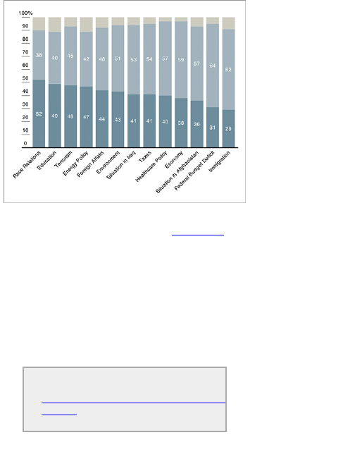
You’re still missing the horizontal axis, so add another
Rule, separately to get what you see in Figure 5-15.
vis.add(pv.Rule)
.bottom(y)
.left(-15)
.right(0)
.strokeStyle("#000")
Lead-in copy and remaining labels are added with
HTML and CSS. There are entire books for web design
though, so I’ll leave it at that. The cool thing here is that
you can easily combine the HTML and CSS with
Protovis, which is just JavaScript and still make it look
seamless.
To see and interact with the stacked bar graph,
visit
http://book.flowingdata.com/ch05/stacked-
bar.html. Check out the source code to see
how HTML, CSS, and JavaScript fit together.
Hierarchy and Rectangles
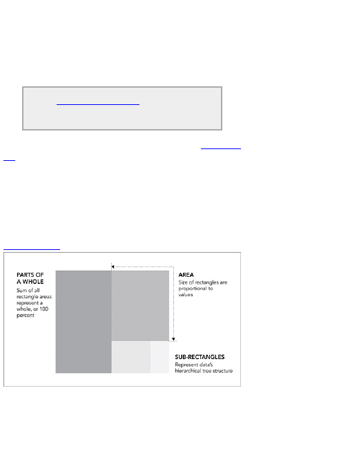
In 1990, Ben Shneiderman, of the University of
Maryland, wanted to visualize what was going on in his
always-full hard drive. He wanted to know what was
taking up so much space. Given the hierarchical
structure of directories and files, he first tried a tree
diagram. It got too big too fast to be useful though. Too
many nodes. Too many branches.
See http://datafl.ws/11m for a full history of
treemaps and additional examples described
by the creator, Ben Shneiderman.
The treemap was his solution. As shown in Figure 5-
16, it’s an area-based visualization where the size of
each rectangle represents a metric. Outer rectangles
represent parent categories, and rectangles within the
parent are like subcategories. You can use a treemap
to visualize straight-up proportions, but to fully put the
technique to use, it’s best served with hierarchical, or
rather, tree-structured data.
Figure 5-16: Treemap generalized
Create a Treemap
Illustrator doesn’t have a Treemap tool, but there is an R
package by Jeff Enos and David Kane called Portfolio.
It was originally intended to visualize stock market
portfolios (hence the name), but you can easily apply it
to your own data. Look at page views and comments of
100 popular posts on FlowingData and separate them
by their post categories, such as visualization or data
design tips.
Tip
R is an open-source software environment for
statistical computing. You can download it for
free from www.r-project.org/. The great
thing about R is that there is an active
community around the software that is always
developing packages to add functionality. If
you’re looking to make a static chart, and don’t
know where to start, the R archives are a great
place to look.
As always, the first step is to load the data into R. You
can load data directly from your computer or point to a
URL. Do the latter in this example because the data is
already available online. If, however, you want to do the
former when you apply the following steps to your own
data, just make sure you put your data file in your
working directory in R. You can change your working
directory through the Miscellaneous menu.
Loading a CSV file from a URL is easy. It’s only one
line of code with the read.csv()function in R (Figure 5-17).
posts <- read.csv("http://datasets.flowingdata.com/post-
data.txt")
Figure 5-17: Loading CSV in R
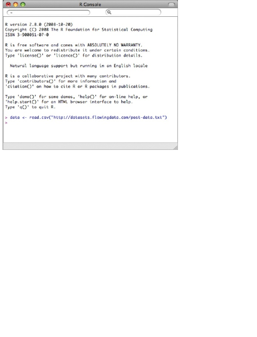
Easy, right? We’ve loaded a text file (in CSV format)
using read.csv() and stored the values for page views
and comments in a variable called posts. As mentioned
in the previous chapter, the read.csv() function assumes
that your data file is comma-delimited. If your data were
say, tab-delimited, you would use the sep argument and
set the value to \t. If you want to load the data from a
local directory, the preceding line might look something
like this.
posts <- read.csv("post-data.txt")
This is assuming you’ve changed your working
directory accordingly. For more options and instructions
on how to load data using the read.csv() function, type the
following in the R console:
?read.csv
Moving on, now that the data is stored in the
posts variable, enter the following line to see the first five
rows of the data.

posts[1:5,]
You should see four columns that correspond to the
original CSV file, with id, views, comments, and
category. Now that the data is loaded in R, make use of
the Portfolio package. Try loading it with the following:
library(portfolio)
Get an error? You probably need to install the
package before you begin:
install.packages("portfolio")
You should load the package now. Go ahead and do
that. Loaded with no errors? Okay, good, now go to the
next step.
Tip
You can also install packages in R through the
user interface. Go to Packages &
Data ⇒Package Installer. Click Get List, and
then find the package of interest. Double-click to
install.
The Portfolio package does the hard work with a
function called map.market(). The function takes several
arguments, but you use only five of them.
map.market(id=data$id, area=posts$views, group=posts$category,
color=posts$comments, main="FlowingData Map")
The id is the column that indicates a unique point, and
you tell R to use views to decide the areas of the
rectangles in the treemap, the categories to form
groups, and the number of comments in a post to
decide color. Finally, enter FlowingData Map as the
main title. Press Enter on your keyboard to get a
treemap, as shown in Figure 5-18.
It’s still kind of rough around the edges, but the base
and hierarchy is set up, which is the hard part. Just like
you specified, rectangles, each of which represent a
post, are sized by the number of page views and sorted
by category. Brighter shades of green indicate posts
that received more comments; posts with a lot of views
don’t necessarily get the most comments.
You can save the image as a PDF in R and then
open the file in Illustrator. All regular edit options apply.
You can change stroke and fill colors, fonts, remove
anything extraneous, and add comments if you like.
Figure 5-18: Default treemap in R
For this particular graphic you need to change the
scale of the legend that goes from –90 to 90. It doesn’t
make sense to have a negative scale because there’s
no such thing as a negative number of comments. You
can also fix the labels. Some of them are obscured in
the small rectangles. Size the labels by popularity
instead of the uniform scale it now has using the
Selection tool. Also thicken the category borders so that
they’re more prominent. That should give you something
like Figure 5-19.
There you go. The graphic is much more readable
now with unobscured labeling and a color scale that
makes more sense. You also got rid of the dark gray
background, which makes it cleaner. Oh, and of course,
you included a title and lead-in to briefly explain what the
graphic shows.
The New York Times used an animated
treemap to show changes in the stock market
during the financial crisis in its piece titled “How
the Giants of Finance Shrank, Then Grew,
Under the Financial Crisis.” See it in action at
http://nyti.ms/9JUkWL.
Because the Portfolio package does most of the
heavy lifting, the only tough part in applying this to your
own data is getting it into the right format. Remember,
you need three things. You need a unique id for each
row, a metric to size rectangles, and parent categories.
Optionally, you can use a fourth metric to color your
rectangles. Check out Chapter 2, “Handling Data,” for
instructions on how to get your data into the format you
need.
Figure 5-19: Revised treemap from R to Illustrator
Proportions over Time
Often you’ll have a set of proportions over time. Instead
of results for a series of questions from a single polling
session, you might have results from the same poll run
every month for a year. You’re not just interested in
individual poll results; you also want to see how views
have changed over time. How has opinion changed
from one year ago until now?
This doesn’t just apply to polls, of course. There are
plenty of distributions that change over time. In the
following examples, you take a look at the distribution of
age groups in the United States from 1860 to 2005.
With improving healthcare and average family size
shrinking, the population as a whole is living longer than
the generation before.
Stacked Continuous
Imagine you have several time series charts. Now stack
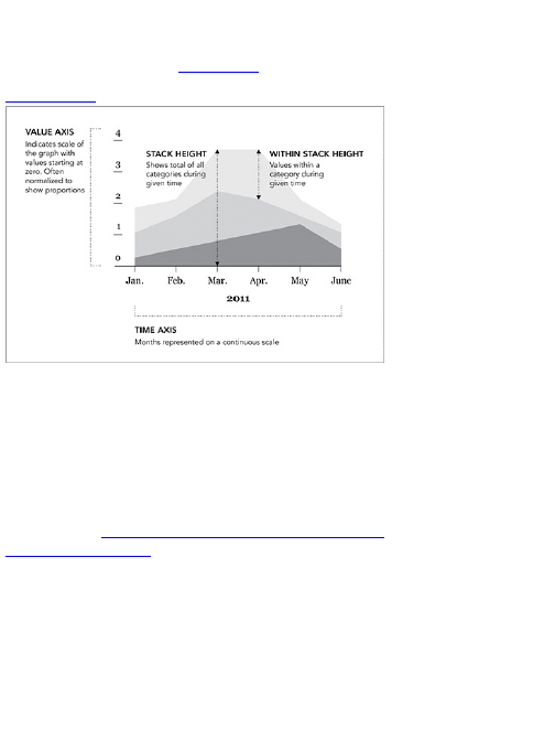
each line on top of the other. Fill the empty space. What
you have is a stacked area chart, where the horizontal
axis is time, and the vertical axis is a range from 0 to
100 percent, as shown in Figure 5-20.
Figure 5-20: Stacked area chart generalized
So if you were to take a vertical slice of the area
chart, you would get the distribution of that time slice.
Another way to look at it is as a series of stacked bar
charts connected by time.
Create a Stacked Area Chart
In this example, look at the aging population. Download
the data at http://book.flowingdata.com/ch05/data/us-
population-by-age.xls. Medicine and healthcare have
improved over the decades, and the average lifespan
continues to rise. As a result, the percentage of the
population in older age brackets has increased. By how
much has this age distribution changed over the years?
Data from the U.S. Census Bureau can help you see via
a stacked area chart. You want to see how the
proportion of older age groups has increased and how
the proportion of the younger age groups has
decreased.
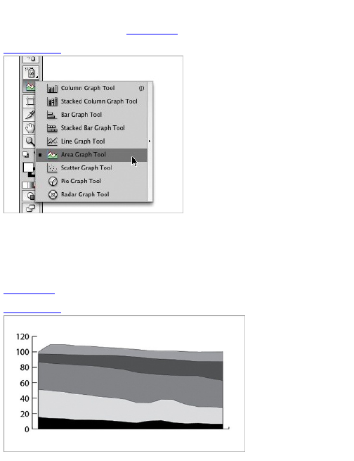
You can do this in a variety of ways, but first use
Illustrator. For the stacked area graph, it comes in the
form of the Area Graph tool (Figure 5-21).
Figure 5-21: Area Graph Tool
Click and drag somewhere on a new document, and
enter the data in the spreadsheet that pops up. You’re
familiar with the load data, generate graphic, and refine
process now, right?
You can see a stacked area chart, as shown in
Figure 5-22, after you enter the data.
Figure 5-22: Default stacked area chart in Illustrator
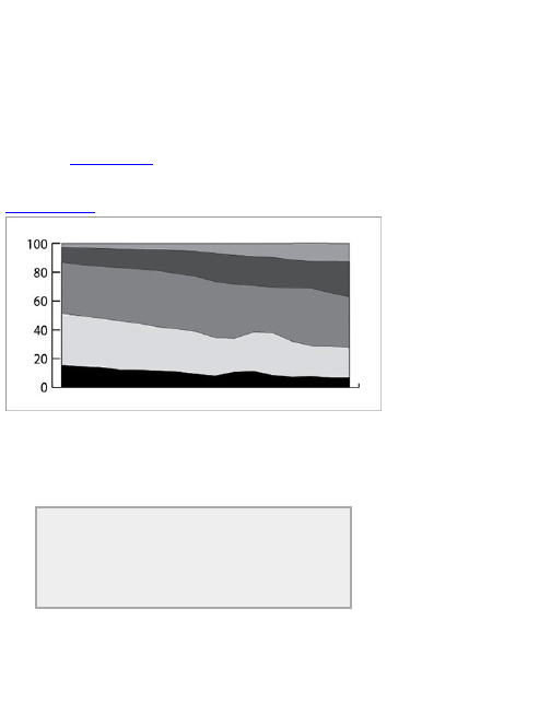
The top area goes above the 100 percent line. This
happened because the stacked area graph is not just
for normalized proportions or a set of values that add up
to 100 percent. It can also be used for raw values, so if
you want each time slice to add up to 100 percent, you
need to normalize the data. The above image was
actually from a mistake on my part; I entered the data
incorrectly. Oops. A quick fix, and you can see the
graph in Figure 5-23. Although, you probably entered
the data correctly the first time, so you’re already here.
Figure 5-23: Fixed area chart
Keep an eye out for stuff like this in your graph design
though. It’s better to spot typos and small data entry
errors in the beginning than it is to finish a design and
have to backtrack to figure out where things went wrong.
Tip
Be careful when you enter data manually. A lot
of silly mistakes come from transferring data
from one source to another.
Now that you have a proper base, clean up the axis
and lines. Make use of the Direct Selection tool to
select specific elements. I like to remove the vertical
axis line and leave thinner tick marks for a cleaner, less
clunky look, and add the percentage sign to the
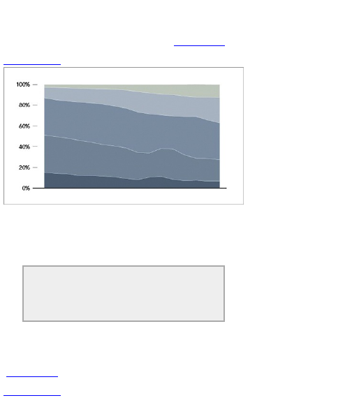
numbers because that’s what we’re dealing with. I also
typically change the stroke color of the actual graph fills
from the default black to a simpler white. Also bring in
some shades of blue. That takes you to Figure 5-24.
Figure 5-24: Modified colors from default
Again, this is just my design taste, and you can do
what you want. Color selection can also vary by case.
The more graphs that you design, the better feel you’ll
develop for what you like and what works best.
Tip
Use colors that fit your theme and guide your
readers’ eyes with varying shades.
Are you missing anything else? Well, there are no
labels for the horizontal axis. Now put them in. And while
you’re at it, label the areas to indicate the age groups
(Figure 5-25).
Figure 5-25: Labeled stacked area chart
I also added annotation on the right of the graph.
What we’re most interested in here is the change in age
distribution. We can see that from the graph, but the
actual numbers can help drive the point home.
Lastly, put in the title and lead-in copy, along with the
data source on the bottom. Tweak the colors of the right
annotations a little bit to add some more meaning to the
display, and you have the final graphic, as shown in
Figure 5-26.
Figure 5-26: Final stacked area chart
Create an Interactive Stacked Area
Chart
One of the drawbacks to using stacked area charts is
that they become hard to read and practically useless
when you have a lot of categories and data points. The
chart type worked for age breakdowns because there
were only five categories. Start adding more, and the
layers start to look like thin strips. Likewise, if you have
one category that has relatively small counts, it can
easily get dwarfed by the more prominent categories.
Making the stacked area graph interactive, however,
can help solve that problem.
You can provide a way for readers to search for
categories and then adjust the axis to zoom in on points
of interest. Tooltips can help readers see values in
places that are too small to place labels. Basically, you
can take data that wouldn’t work as a static stacked
area chart, but use it with an interactive chart, and make
it easy to browse and explore. You could do this in
JavaScript with Protovis, but for the sake of learning
more tools (because it’s super fun), use Flash and
ActionScript.
The NameVoyager by Martin Wattenberg made
the interactive stacked area chart popular. It is
used to show baby names over time, and the
graph automatically updates as you type names
in the search box. Try it out at
www.babynamewizard.com/voyager.
Note
Online visualization has slowly been shifting
away from Flash toward JavaScript and HTML5,
but not all browsers support the latter, namely
Internet Explorer. Also, because Flash has
been around for years, there are libraries and
packages that make certain tasks easier than if
you were to try to do it with native browser
functionality.
Luckily you don’t have to start from scratch. Most of
the work has already been done for you via the Flare
visualization toolkit, designed and maintained by the
UC Berkeley Visualization Lab. It’s an ActionScript
library, which was actually a port of a Java visualization
toolkit called Prefuse. We’ll work off one of the sample
applications on the Flare site, JobVoyager, which is like
NameVoyager, but an explorer for jobs. After you get
your development environment set up, it’s just a matter
of switching in your data and then customizing the look
and feel.
Note
Download Flare for free at
http://flare.prefuse.org/.
You can write the code completely in ActionScript
and then compile it into a Flash file. Basically this
means you write the code, which is a language that you
understand, and then use a compiler to translate the
code into bits so that your computer, or the Flash player,
can understand what you told it to do. So you need two
things: a place to write and a way to compile.
The hard way to do this is to write code in a standard
text editor and then use one of Adobe’s free compilers. I
say hard because the steps are definitely more
roundabout, and you have to install separate things on
your computer.
The easy way to do this, and the way I highly
recommend if you’re planning on doing a lot of work in
Flash and ActionScript, is to use Adobe Flex Builder. It
makes the tedious part of programming with
ActionScript quicker, because you code, compile, and
debug all in the same place. The downside is that it
does cost money, although it’s free for students. If you’re
not sure if it’s worth the money, you can always
download a free trial and make your decision later. For
the stacked area chart example, I’ll explain the steps
you have to take in Flex Builder.
Note
At the time of this writing, Adobe changed the
name of Flex Builder to Flash Builder. They are
similar but there are some variations between
the two. While the following steps use the
former, you can still do the same in the latter.
Download Flash Builder at
www.adobe.com/products/flashbuilder/.
Be sure to take advantage of the student
discount. Simply provide a copy of your student
ID, and you get a free license. Alternatively, find
an old, lower-priced copy of Flex Builder.
When you’ve downloaded and installed Flex Builder,
go ahead and open it; you should see a window, as
shown in Figure 5-27.
Figure 5-27: Initial window on opening Flex Builder
Right-click the Flex Navigator (left sidebar) and click
Import. You’ll see a pop-up that looks like Figure 5-28.
Select Existing Projects into Workspace and click
Next. Browse to where you put the Flare files. Select the
flare directory, and then make sure Flare is checked in
the project window, as shown in Figure 5-29.
Figure 5-28: Import window in Flex Builder
Figure 5-29: Existing projects window
Do the same thing with the flare.apps folder. Your
Flex Builder window should look like Figure 5-30 after
you expand the flare.apps/flare/apps/ folder and click
JobVoyager.as.
Figure 5-30: JobVoyager code opened
If you click the run button right now (the green button
with the white play triangle at the top left), you should
see the working JobVoyager, as shown in Figure 5-31.
Get that working, and you’re done with the hardest part:
the setup. Now you just need to plug in your own data
and customize it to your liking. Sound familiar?
Figure 5-32 shows what you’re after. It’s a voyager for
consumer spending from 1984 to 2008, as reported by
the U.S. Census Bureau. The horizontal axis is still
years, but instead of jobs, there are spending
categories such as housing and food.
Vi s i t http://datafl.ws/16r to try the final
visualization and to see how the explorer works
with consumer spending.
Now you need to change the data source, which is
specified on line 57 of JobVoyager.as.
private
var _url:String = "http://flare.prefuse.org/data/jobs.txt";
Figure 5-31: JobVoyager application
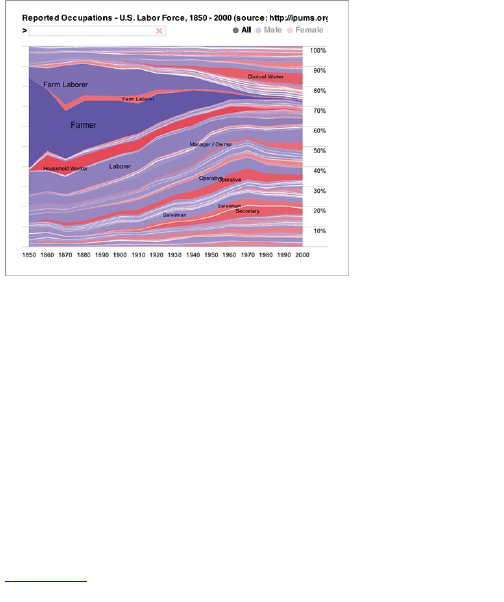
Change the _url to point at the spending data
available at http://datasets.flowingdata.com/expenditures.txt.
Like jobs.txt, the data is also a tab-delimited file. The
first column is year, the second category, and the last
column is expenditure.
private var _url:String =
"http://datasets.flowingdata.com/expenditures.txt";
Now the file will read in your spending data instead of
the data for jobs. Easy stuff so far.
The next two lines, line 58 and 59, are the column
names, or in this case, the distinct years that job data
was available. It’s by decade from 1850 to 2000. You
could make things more robust by finding the years in
the loaded data, but because the data isn’t changing,
you can save some time and explicitly specify the years.
Figure 5-32: Interactive voyager for consumer
spending
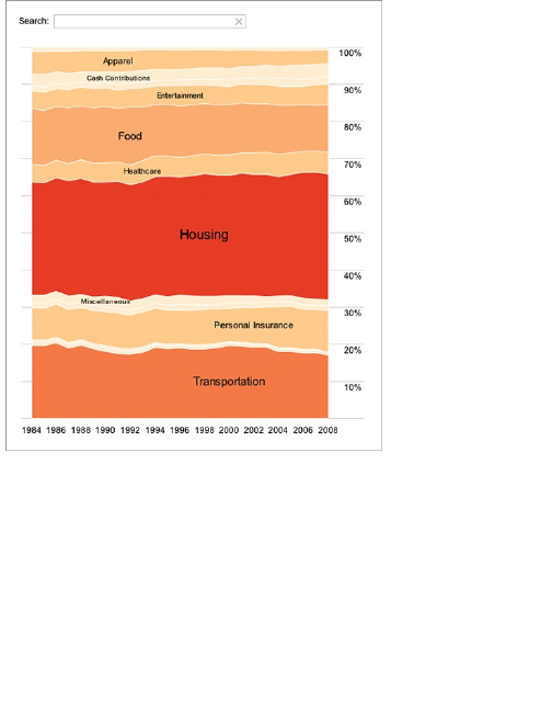
The expenditures data is annual from 1984 to 2008,
so Change lines 58–59 accordingly.
private var _cols:Array =
[1984,1985,1986,1987,1988,1989,1990,1991,1992,
1993,1994,1995,1996,1997,1998,1999,2000,2001,2002,
2003,2004,2005,2006,2007,2008];
Next change references to the data headers. The
original data file (jobs.txt) has four columns: year,
occupation, people, and sex. The spending data has
only three columns: year, category, and expenditure.
You need to adapt the code to this new data structure.
Luckily, it’s easy. The year column is the same, so
you just need to change any people references to
expenditure (vertical axis) and any occupation

references to category (the layers). Finally, remove all
uses of gender.
At line 74 the data is reshaped and prepared for the
stacked area chart. It specifies by occupation and sex
as the categories (that is, layers) and uses year on the
x-axis and people on the y-axis.
var dr:Array = reshape(ds.nodes.data, ["occupation","sex"],
"year", "people", _cols);
Change it to this:
var dr:Array = reshape(ds.nodes.data, ["category"],
"year", "expenditure", _cols);
You only have one category (sans sex), and that’s uh,
category. The x-axis is still year, and the y-axis is
expenditure.
Line 84 sorts the data by occupation (alphabetically)
and then sex (numerically). Now just sort by category:
data.nodes.sortBy("data.category");
Are you starting to get the idea here? Mostly
everything is laid out for you. You just need to adjust the
variables to accommodate the data.
Tip
There’s some great open-source work
going on in visualization, and although
coding can seem daunting in the
beginning, many times you can use
existing code with your own data just by
changing variables. The challenge is
reading the code and figuring out how
everything works.
Line 92 colors layers by sex, but you don’t have that
split in the data, so you don’t need to do that. Remove
the entire row:

data.nodes.setProperty("fillHue", iff(eq("data.sex",1), 0.7, 0));
We’ll come back to customizing the colors of the
stacks a little later.
Line 103 adds labels based occupation:
_vis.operators.add(new
StackedAreaLabeler("data.occupation"));
You want to label based on spending category, so
change the line accordingly:
_vis.operators.add(new StackedAreaLabeler("data.category"));
Lines 213–231 handle filtering in JobVoyager. First,
there’s the male/female filter; then there’s the filter by
occupation. You don’t need the former, so you can get
rid of lines 215–218 and then make line 219 a plain if
statement.
Similarly, lines 264–293 create buttons to trigger the
male/female filter. We can get rid of that, too.
You’re close to fully customizing the voyager to the
spending data. Go back to the filter() function at line
213. Again, update the function so that you can filter by
the spending category instead of occupation.
Here’s line 222 as-is:
var s:String = String(d.data["occupation"]).toLowerCase();
Change occupation to category:
var s:String = String(d.data["category"]).toLowerCase();
Next up on the customization checklist is color. If you
compiled the code now and ran it, you would get a
reddish stacked area graph, as shown in Figure 5-33.
You want more contrast though.
Color is specified in two places. First lines 86–89
specify stroke color and color everything red:
shape: Shapes.POLYGON,
lineColor: 0,
fillValue: 1,
fillSaturation: 0.5
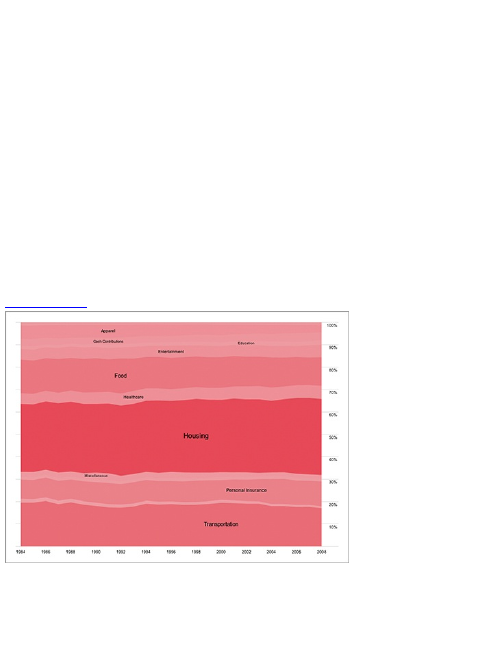
Then line 105 updates saturation (the level of red), by
count. The code for the SaturationEncoder() is in lines 360–
383. We’re not going to use saturation; instead,
explicitly specify the color scheme.
First, update lines 86–89 to this:
shape: Shapes.POLYGON,
lineColor: 0xFFFFFFFF
Now make stroke color white with lineColor. If there
were more spending categories, you probably wouldn’t
do this because it’d be cluttered. You don’t have that
many though, so it’ll make reading a little easier.
Next, make an array of the colors you want to use
ordered by levels. Put it toward the top around line 50:
private
var _reds:Array = [0xFFFEF0D9, 0xFFFDD49E, 0xFFFDBB84, 0xFFFC8D59, 0xFFE34A33, 0xFFB30000];
Figure 5-33: Stacked area graph with basic coloring
I used the ColorBrewer (referenced earlier) for these
colors, which suggests color schemes based on criteria
that you set. It’s intended to choose colors for maps but
works great for general visualization, too.
Now add a new ColorEncoder around line 110:

Now add a new ColorEncoder around line 110:
var colorPalette:ColorPalette = new ColorPalette(_reds);
vis.operators.add(new ColorEncoder("data.max", "nodes",
"fillColor", null, colorPalette));
note
If you get an error when you try to compile your
code, check the top of JobVoyager.as to see if
the following two lines to import the
ColorPallete and Encoder objects are specified.
Add them if they are not there already.
import flare.util.palette.*;
import flare.vis.operator.encoder.*;
Ta Da! You now have something that looks like what
we’re after (Figure 5-32). Of course, you don’t have to
stop here. You can do a lot of things with this. You can
apply this to your own data, use a different color
scheme, and further customize to fit your needs. Maybe
change the font or the tooltip format. Then you can get
fancier and integrate it with other tools or add more
ActionScript, and so on.
Point-by-Point
One disadvantage of the stacked area graph is that it
can be hard to see trends for each group because the
placement of each point is affected by the points below
it. So sometimes a better way is to plot proportions as a
straight up time series like the previous chapter
covered.
Luckily, it’s easy to switch between the two in
Illustrator. The data entry is the same, so you just need
to change the graph type. Select the line plot instead of
the stacked area in the beginning, and you get this, the
default graph in Figure 5-34.
Clean up and format to your liking in the same way
you did with the time series examples, and you have the
same data from a different point of view (Figure 5-35).
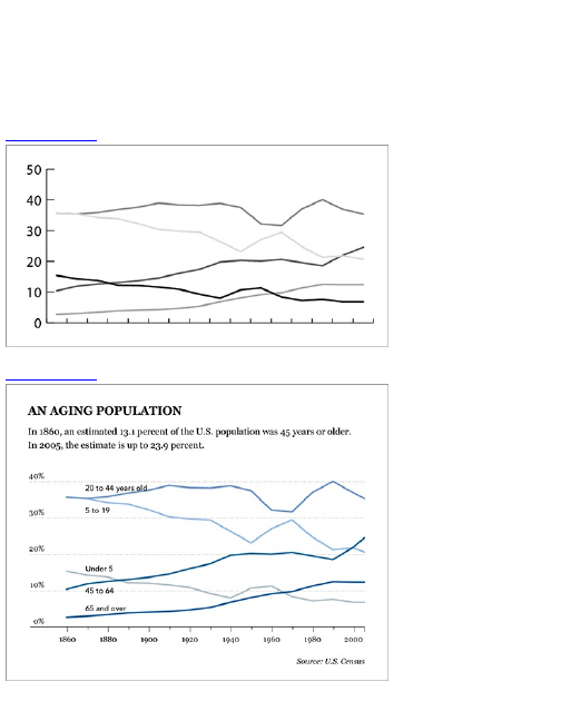
It’s easier to see the individual trends in each age
group with this time series plot. On the other hand, you
do lose the sense of a whole and distributions. The
graph you choose should reflect the point you’ want to
get across or what you want to find in your data. You can
even show both views if you have the space.
Figure 5-34: Default line plot
Figure 5-35: Labeled line plot cleaned up

Wrapping Up
The main thing that sets proportions apart from other
data types is that they represent parts of a whole. Each
individual value means something, but so do the sum of
all the parts or just a subset of the parts. The
visualization you design should represent these ideas.
Only have a few values? The pie chart might be your
best bet. Use donut charts with care. If you have several
values and several categories, consider the stacked
bar chart instead of multiple pie charts. If you’re looking
for patterns over time, look to your friend the stacked
area chart or go for the classic time series. With these
steady foundations, your proportions will be good to go.
When it comes time to design and implement, ask
yourself what you want to know about your data, and
then go from there. Does a static graphic tell your story
completely? A lot of the time the answer will be yes, and
that’s fine. If, however, you decide you need to go with
an interactive graphic, map out on paper what should
happen when you click objects and what shouldn’t. It
gets complicated quickly if you add too much
functionality, so do your best to keep it simple. Have
other people try interacting with your designs to see if
they understand what’s going on.
Finally, while you’re programming—especially if
you’re new to code—you’re undoubtedly going to reach
a point where you’re not sure what to do next. This
happens to me all the time. When you get stuck, there’s
no better place than the web to find your solution. Look
at documentation if it’s available or study examples that
are similar to what you’re trying to do. Don’t just look at
the syntax. Learn the logic because that’s what’s going
to help you the most. Luckily there are libraries such as
Protovis and Flare that have many examples and great
documentation.
In the next chapter, we move towards deeper analysis
and data interpretation and come back to your good

statistical friend. You put R to good use as you study
relationships between data sets and variables. Ready?
Let’s go.

Chapter 6
Visualizing Relationships
Statistics is about finding relationships in data. What
are the similarities between groups? Within groups?
Within subgroups? The relationship that most people
are familiar with for statistics is correlation. For
example, as average height goes up in a population,
most likely average weight will go up, too. This is a
simple positive correlation. The relationships in your
data, just like in real life, can get more complicated
though as you consider more factors or find patterns
that aren’t so linear. This chapter discusses how to use
visualization to find such relationships and highlight
them for storytelling.
As you get into more complex statistical graphics, you
can make heavy use of R in this chapter and the next.
This is where the open-source software shines. Like in
previous chapters, R does the grunt work, and then you
can use Illustrator to make the graphic more readable
for an audience.
What Relationships to Look

For
So far you looked at basic relationships with patterns in
time and proportions. You learned about temporal
trends, and compared proportions and percentages to
see what’s the least and greatest and everything in
between. The next step is to look for relationships
between different variables. As something goes up,
does another thing go down, and is it a causal or
correlative relationship? The former is usually quite hard
to prove quantitatively, which makes it even less likely
you can prove it with a graphic. You can, however,
easily show correlation, which can lead to a deeper
more exploratory analysis.
You can also take a step back to look at the big
picture, or the distribution of your data. Is it actually
spaced out or is it clustered in between? Such
comparisons can lead to stories about citizens of a
country or how you compare to those around you. You
can see how different countries compare to one another
or general developmental can progress around the
world, which can aid in decisions about where to
provide aid.
You can also compare multiple distributions for an
even wider view of your data. How has the makeup of a
population changed over time? How has it stayed the
same?
Most important, in the end, when you have all your
graphics in front of you, ask what the results mean. Are
they what you expected? Does anything surprise you?
This might seem abstract and hand-wavy, so now

jump right into some concrete examples on how to look
at relationships in your data.
Correlation
Correlation is probably the first thing you think of when
you hear about relationships in data. The second thing
is probably causation. Now maybe you’re thinking about
the mantra that correlation doesn’t equal causation. The
first, correlation, means one thing tends to change a
certain way as another thing changes. For example, the
price of milk per gallon and the price of gasoline per
gallon are positively correlated. Both have been
increasing over the years.
Now here’s the difference between correlation and
causation. If you increase the price of gas, will the price
of milk go up by default? More important, if the price of
milk did go up, was it because of the increase in the
gas price or was it an outside factor, such as a dairy
strike?
It’s difficult to account for every outside, or
confounding factor, which makes it difficult to prove
causation. Researchers spend years figuring stuff like
that out. You can, however, easily find and see
correlation, which can still be useful, as you see in the
following sections.
Correlation can help you predict one metric by
knowing another. To see this relationship, return to
scatterplot and multiple scatterplots.

More with Points
In Chapter 4, “Visualizing Patterns over Time,” you used
a scatterplot to graph measurements over time, where
time was on the horizontal axis and a metric of interest
was on the vertical axis. This helped spot temporal
changes (or nonchanges). The relationship was
between time and another factor, or a variable. As
shown in Figure 6-1, however, you can use the
scatterplot for variables other than time; you can use a
scatterplot to look for relationships between two
variables.
If two metrics are positively correlated (Figure 6-2,
left), dots move higher up as you read the graph from
left to right. Conversely, if a negative correlation exists,
the dots appear lower, moving from left to right, as
shown in the middle of Figure 6-2.
Sometimes the relationship is straightforward, such
as the correlation between peoples’ height and weight.
Usually, as height increases, weight increases. Other
times the correlation is not as obvious, such as that
between health and body mass index (BMI). A high BMI
typically indicates that someone is overweight; however,
muscular people for example, who can be athletically fit,
could have a high BMI. What if the sample population
were body builders or football players? What would
relationships between health and BMI look like?
Figure 6-1: Scatterplot framework, comparing two
variables
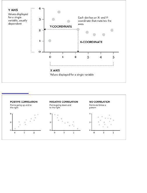
Figure 6-2: Correlations shown in scatterplots
Remember the graph is only part of the story. It’s still
up to you to interpret the results. This is particularly
important with relationships. You might be tempted to
assume a cause-and-effect relationship, but most of the
time that’s not the case at all. Just because the price of
a gallon of gas and world population have both
increased over the years doesn’t mean the price of gas
should be decreased to slow population growth.

should be decreased to slow population growth.
Create a Scatterplot
In this example, look at United States crime rates at the
state level, in 2005, with rates per 100,000 population
for crime types such as murder, robbery, and
aggravated assault, as reported by the Census Bureau.
There are seven crime types in total. Look at two of
them to start: burglary and murder. How do these
relate? Do states with relatively high murder rates also
have high burglary rates? You can turn to R to
investigate.
As always, the first thing you do is load the data into
R using read.csv(). You can download the CSV file at
http://datasets.flowingdata.com/crimeRatesByState2005.csv,
but now load it directly into R via the URL.
# Load the data
crime <-
read.csv(‘http://datasets.flowingdata.com/crimeRatesByState2005.csv’,
sep=",", header=TRUE)
Check out the first few lines of the data by typing the
variable, crime, followed by the rows you want to see.
crime[1:3,]
Following is what the first three rows look like.
state murder forcible_rape robbery
aggravated_assault burglary
1 United
States 5.6 31.7 140.7 291.1 726.7
2 Alabama 8.2 34.3 141.4 247.8 953.8
3 Alaska 4.8 81.1 80.9 465.1 622.5
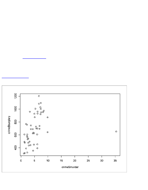
larceny_theft motor_vehicle_theft population
1 2286.3 416.7 295753151
2 2650.0 288.3 4545049
3 2599.1 391.0 669488
The first column shows the state name, and the rest
are rates for the different types of crime. For example,
the average robbery rate for the United States in 2005
was 140.7 per 100,000 population. Use plot() to create
the default scatterplot of murder against burglary, as
shown in Figure 6-3.
plot(crime$murder, crime$burglary)
Figure 6-3: Default scatterplot of murder against
burglary
It looks like there’s a positive correlation in there.
States that have higher murder rates tend to have

higher burglary rates, but it’s not so easy to see
because of that one dot on the far right. That one dot—
that outlier—is forcing the horizontal axis to be much
wider. That dot happens to represent Washington, DC,
which has a much higher murder rate of 35.4. The
states with the next highest murder rates are Louisiana
and Maryland, which were 9.9.
For the sake of a graphic that is more clear and
useful, take out Washington, DC, and while you’re at it,
remove the United States averages and place full focus
on individual states.
crime2 <- crime[crime$state != "District of Columbia",]
crime2 <- crime2[crime2$state != "United States",]
The first line stores all rows that aren’t for the District
of Columbia in crime2. Similarly, the second line filters
out the United States averages.
Now when you plot murder against burglary, you get a
clearer picture, as shown in Figure 6-4.
plot(crime2$murder, crime2$burglary)
Figure 6-4: Scatterplot after filtering data
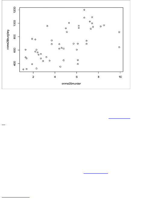
Although, it could probably be better if the axes
started at zero, so do that, too. The x-axis should go
from 0 to 10, and the y-axis will go from 0 to 1,200. This
shifts the dots up and to the right, as shown in Figure 6-
5.
plot(crime2$murder, crime2$burglary, xlim=c(0,10), ylim=c(0, 1200))
You know what would make this plot even more
useful? A LOESS curve like you saw in Chapter 4. This
would help you see the relationship between burglary
and murder rates. Use scatter.smooth() to make the line
with the dots. The result is shown in Figure 6-6.
scatter.smooth(crime2$murder, crime2$burglary,
xlim=c(0,10), ylim=c(0, 1200))
Figure 6-5: Scatterplot with axes starting at zero
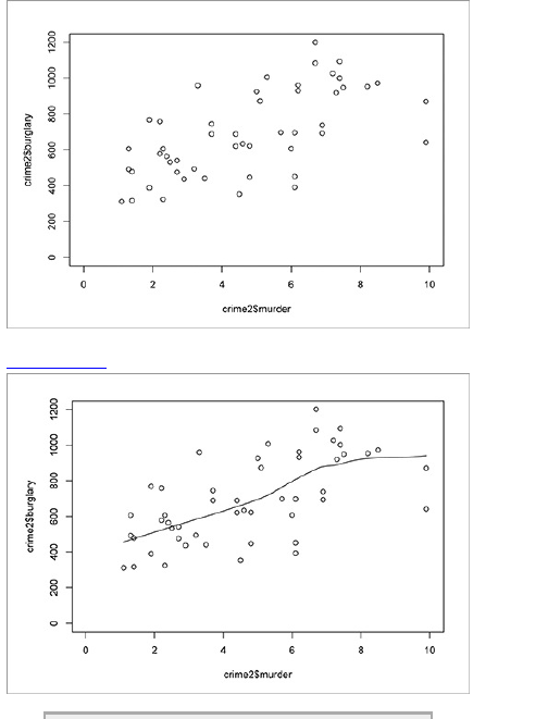
Figure 6-6: Using a curve to estimate relationship

Note
For the sake of simplicity, Washington, DC was
removed from the dataset to see the rest of the
data better. It is important, however, to consider
the importance of the outliers in your data. This
is discussed more in Chapter 7, “Spotting
Differences.”
It’s not bad for a base chart, and if the graphic were
just for analysis, you could stop here. However, if you
have more than an audience of one, you can improve
the readability a lot with a few small changes, as shown
in Figure 6-7.
I put less emphasis on the surrounding box by getting
rid of the thick border, and direct your attention to the
curve by making it thicker and darker than the dots.
Figure 6-7: Revised scatterplot on murder versus
burglary
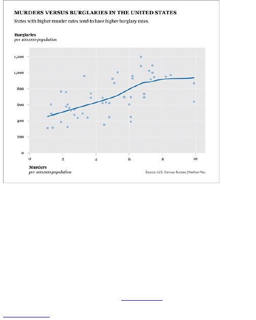
Exploring More Variables
Now that you’ve plotted two variables against each
other, the obvious next step is to compare other
variables. You could pick and choose the variables you
want to compare and make a scatterplot for each pair,
but that could easily lead to missed opportunities and
ignoring interesting spots in the data. You don’t want
that. So instead, you can plot every possible pair with a
scatterplot matrix, as shown in Figure 6-8.
Figure 6-8: Scatterplot matrix framework

This method is especially useful during your data
exploration phases. You might have a dataset in front of
you but have no clue where to start or what it’s about. If
you don’t know what the data is about, your readers
won’t either.
Tip
To tell a complete story, you have to understand
your data. The more you know about your data,
the better the story you can tell.

The scatterplot matrix reads how you expect. It’s
usually a square grid with all variables on both the
vertical and horizontal. Each column represents a
variable on the horizontal axis, and each row represents
a variable on the vertical axis. This provides all possible
pairs, and the diagonal is left for labels because there’s
no sense in comparing a variable to itself.
Create a Scatterplot Matrix
Now come back to your crime data. You have seven
variables, or rates for crime types, but in the previous
example, you compared only two: murder and burglary.
With a scatterplot matrix, you can compare all the crime
types. Figure 6-9 shows what you’re making.
As you might expect, a lot of positive correlations can
exist. The correlation between burglary and aggravated
assault, for example, seems to be relatively high. As the
former goes up, the latter also tends to increase, and
vice versa; however, the relationship between murder
and larceny theft is not so clear. You shouldn’t make any
assumptions, but it should be easy to see how the
scatterplot matrix can be useful. At first glance, it can
look confusing with all the lines and plots, but read from
left to right and top to bottom, and you can take away a
lot of information.
Luckily, R makes creating a scatterplot matrix as
easy as it is to make a single scatterplot, albeit creation
of the matrix is not as robust. Again, use the plot()
function, but instead of passing two columns, pass the
whole data frame, minus the first column because that’s
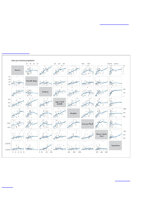
just state names.
plot(crime2[,2:9])
This gives you a matrix as shown in Figure 6-10,
which is almost what you want. It’s still missing fitted
curves though that can help you see relationships a bit
better.
Figure 6-9: Scatterplot matrix of crime rates
To create a scatterplot matrix with fitted LOESS
curves, you can use the pairs() function instead, but it’s
equally as simple to call. The result is shown in Figure
6-11.
pairs(crime2[,2:9], panel=panel.smooth)
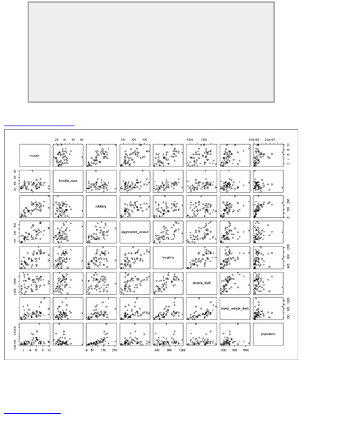
Tip
The panel argument in pairs() takes a function
of x and y. In this example, you use
panel.smooth(), which is a native function in R and
results in a LOESS curve. You can also specify
your own function.
Figure 6-10: Default scatterplot matrix in R
Now you have a nice framework to work off of, and
you can edit it further to make it more readable (refer to
Figure 6-9). Save the graphic as a PDF and open the
file in Illustrator.
Mainly, you need to get rid of clutter and make it
easier to see what’s important. That’s the crime types
and trend lines first, the points second, and the axes
last, and you should see that order in the choice of color
and sizes. The size of the labels across the diagonal
increase, and the boxes are grayed out. Then make the
trend lines thicker and provide more contrast between
the lines and the dots. Finally, the borders and grid lines
are made more subtle with a thinner stroke width and
lighter gray. Compare Figure 6-9 to Figure 6-11.
There’s a lot less visual vibration in Figure 6-9, right?
Tip
Decide what part of the story you want to tell and
design your graphic to emphasize those areas,
but also take care not to obscure facts.
Figure 6-11: Scatterplot matrix with LOESS curves
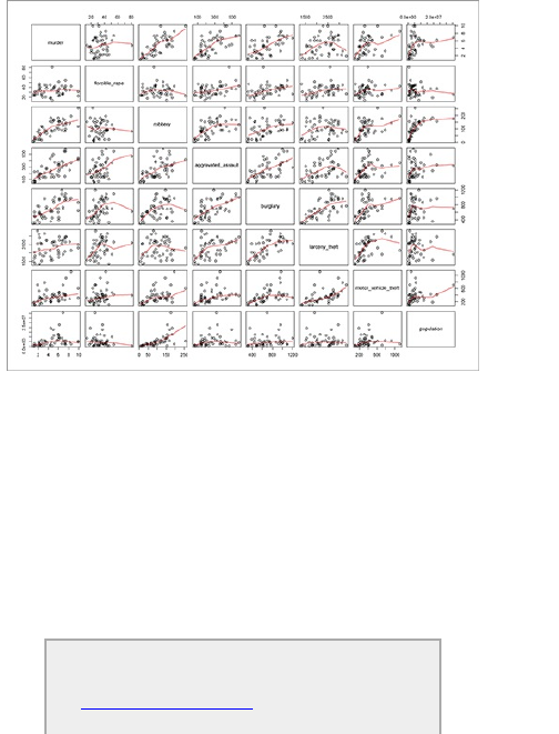
Bubbles
Ever since Hans Rosling, Professor of International
Health at Karolinska Institute and chairman of the
Gapminder Foundation, presented a motion chart to tell
his story of the wealth and health of nations, there has
been an affinity for proportional bubbles on an x-y axis.
Although the motion chart is animated to show changes
over time, you can also create a static version: the
bubble chart.
Check out Hans Rosling’s now famous talks on
the Gapminder site at
www.gapminder.org, including a BBC
documentary on the joy of statistics.
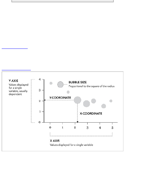
A bubble chart can also just be straight up
proportionally sized bubbles, but now consider how to
create the variety that is like a scatterplot with a third,
bubbly dimension.
The advantage of this chart type is that it enables you
to compare three variables at one time, as shown in
Figure 6-12. One variable is on the x-axis, one is on the
y-axis, and the third is represented by the area size of
the bubbles.
Figure 6-12: Bubble chart framework
Take note of that last part because people often size
the bubbles incorrectly. As discussed in Chapter 1,
“Telling Stories with Data,” bubbles should be sized by
area. They should not be sized by radius, diameter, or
circumference, which can easily happen. If you go with

software defaults, you might end up with circles that are
too big and too small.
Tip
When using circles to represent data, size by
the area rather than the diameter, radius, or
circumference.
Now look at a quick example to emphasize this point.
Imagine you run ad sales for your company, and you’re
testing two banner ads on a site. You want to know
which ad converts better. Over the course of a month,
both ads run the same number of times; however, the
number of clicks is different. The first banner was
clicked 150 times, whereas the second banner was
clicked 100 times. So the first banner performed 50
percent better than the second. Figure 6-13 shows a
circle, sized by area, for each banner. The circle for the
first banner is 50 percent bigger than the second.
Figure 6-13: Bubbles sized by area

In Figure 6-14, you see how the bubbles compare to
each other if they are sized by radius.
Figure 6-14: Bubbles sized by radius
The radius for the first circle, representing the first
banner, is 50 percent larger than the radius for the
second banner, which makes the area of the first circle
more than twice that of the second. Although this
doesn’t seem like a huge deal with only two data points,
which are easy to compare, the challenge becomes
more obvious when you use more data.
Create a Bubble Chart
Look at the final chart in Figure 6-15 to see what you’re
making. It’s the same crime data relating murder and
burglary rate by state, but population is added as a third
dimension. Do states with more people have higher
crime rates? It’s not clear-cut (as is usually the case).
Large states such as California, Florida, and Texas are
near the top-right quadrant, but New York and
Pennsylvania have relatively low burglary rates.
Similarly, Louisiana and Maryland, which have smaller
populations, are far on the right.
Figure 6-15: Bubble plot showing crime in the United
States
To start, load the data in R with read.csv(). This is the
same data that you just used, except a column for
population was added, and Washington, DC is not
included. It’s also tab-delimited instead of comma-
delimited. No biggie. Simply change the sep argument in
the function.
crime <-
read.csv("http://datasets.flowingdata.com/crimeRatesByState2005.tsv",
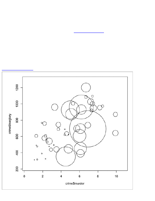
header=TRUE, sep="\t")
Then jump right into drawing some bubbles with the
symbols() function. The x-axis is murder rate, the y-axis is
burglary rate, and radius of bubbles is sized
proportionally to population. Figure 6-16 shows the
result. Want to do try more with symbols()? You’ll get to
that soon.
symbols(crime$murder, crime$burglary, circles=crime$population)
Figure 6-16: Default bubble chart
All done, right? Wrong. That was a test. The
preceding sizes the circles such that population is
proportional to the radius. You need to size the circles
proportional to the area. The relative proportions are all
out of whack if you size by radius. Is California’s
population, represented by that giant circle in the
middle, that much higher than that of all of the other
states?
To size radiuses correctly, look to the equation for the
area of a circle.
Area of circle = πr2
The area of each bubble represents population. What
you need to find out is how to size the radius, so isolate
the radius to find that it should be proportional to the
square root of the area.
You can actually get rid of the π altogether because
it’s a constant, but leave it in there for the sake of clarity.
Now instead of using crime$population to size the circle
radiuses, find the square root and then plug it into
symbols().
radius <- sqrt( crime$population/ pi )
symbols(crime$murder, crime$burglary, circles=radius)
The first row of code simply creates a new vector of
square root values stored in radius. Figure 6-17 shows
the bubble plot with radiuses sized correctly, but it’s a
mess because the states with populations smaller than
California are a little bigger now.
You need to scale down all circles to see what’s
going on. The inches argument of symbols() sets the size

of the largest circle in, well, inches. By default it’s 1 inch,
so in Figure 6-17 California is sized at 1 inch, and the
rest of the circles are scaled accordingly. You can make
the maximum smaller, say 0.35 inches, while still
maintaining the right proportions. You also can change
color using fg and bg to change stroke color and fill color,
respectively. You can also add your own labels to the
axes. Figure 6-18 shows the output.
symbols(crime$murder, crime$burglary, circles=radius, inches=0.35,
fg="white", bg="red", xlab="Murder Rate", ylab="Burglary Rate")
Figure 6-17: Default bubble chart with correctly sized
circles
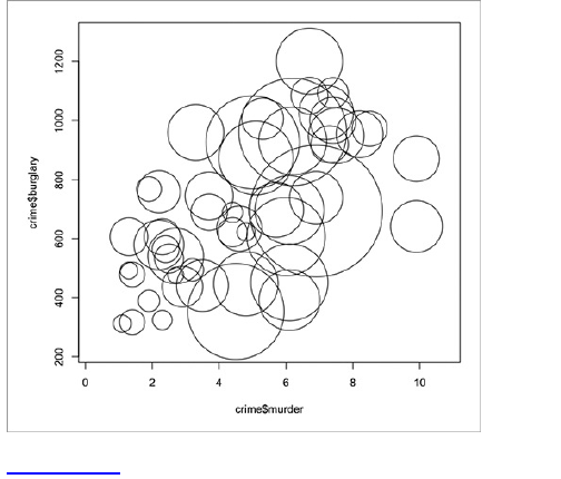
Figure 6-18: Bubble chart with bubbles scaled down
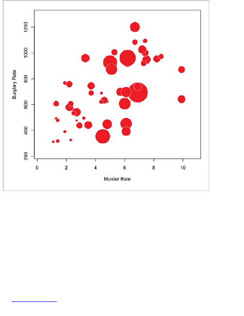
Now you’re getting somewhere.
You also can make a chart with other shapes, too,
w i t h symbols()—you can make squares, rectangles,
thermometers, boxplots, and stars. They take different
arguments than the circle. The squares, for example,
use side length to size; however, like with bubbles, you
want the squares to be sized by area. In other words,
you need to size the square sides by the square root of
the area.
Figure 6-19 shows what squares look like using the
following line of code:

symbols(crime$murder, crime$burglary,
squares=sqrt(crime$population), inches=0.5)
Stick with circles for now. The chart in Figure 6-18
shows some sense of distribution, but you don’t know
which circle represents each state. So now add labels.
wi t h text(), whose arguments are x-coordinates, y-
coordinates, and the actual text to print—you have all of
these. Like the bubbles, the x is murders and the y is
burglaries. The actual labels are state names, which is
the first column in your data frame.
text(crime$murder, crime$burglary, crime$state, cex=0.5)
The cex argument controls text size, which is 1 by
default. Values greater than one can make the labels
bigger and the opposite for less than one. The labels
can center on the x- and y-coordinates, as shown in
Figure 6-20.
At this point, you don’t need to make a ton of changes
to get your graphic to look like the final one in Figure 6-
15. Save the chart you made in R as a PDF, and open it
in your favorite illustration software to refine the graphic
to what you want it to look and read like. You can thin
the axis lines and remove the surrounding box to
simplify a bit. You can also move around some of the
labels, particularly in the bottom left, so that you can
actually read the state names; then bring the bubble for
Georgia to the front—before it was hidden by the larger
Texas bubble.
There you go. Type in ?symbols in R for more plotting
options. Go wild.
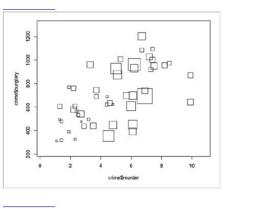
Figure 6-19: Using squares instead of circles
Figure 6-20: Bubble chart with labels
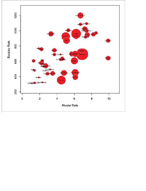
Distribution
You’ve probably heard of mean, median, and mode.
Schools teach you this stuff in high school; although they
should teach it much sooner. The mean is the sum of all
data points divided by the number of points. To find the
median, you order your data from least to greatest and
mark the halfway point. The mode is the number that
occurs the most. These are well and good and super
easy to find, but they don’t give you the whole story.
They describe how parts of your data are distributed. If

you visualize everything though, you can see the full
distribution.
A skew to the left means most of your data is
clustered in the lower side of the full range. A skew to
the right means the opposite. A flat line means a
uniform distribution, whereas the classic bell curve
shows a clustering at the mean and a gradual decrease
in both directions.
Next take a look at a classic plot, mainly to get a feel
for distribution, and then move on to the more practical
histogram and density plot.
Old School Distribution
In the 1970s, when computers weren’t so popular, most
data graphics were drawn by hand. Some of the tips
offered by famed statistician John Tukey, in his book
Exploratory Data Analysis, were centered around using
pen and pencil to vary darkness of lines and shades.
You could also use hash patterns as a fill to differentiate
between variables.
The stem-and-leaf plot, or stemplot, was designed in
a similar manner. All you have to do is write the
numbers using an ordered method, and the end result is
a rough view of the distribution. The method was
particularly popular in the 1980s (when using statistical
graphics for analysis was gaining momentum), because
it was easy to include the graphic—even if you were
writing with a typewriter.
Although there are easier and faster ways to look at
distributions today, it’s useful to take a look because

you can still apply the same principles making a stem-
and-leaf plot as you would a histogram.
Create a Stem-and-Leaf
If you want to live on the wild side, you can draw a stem-
and-leaf plot with pen and paper, but you can make one
much quicker in R. Figure 6-21 shows a stem-and-leaf
plot for worldwide birth rates in 2008, as estimated by
the World Bank.
As you can see, it’s basic. Base numbers are on the
left and trailing numbers are on the right. In this case,
the decimal point is at the bar (|), so the interval with the
most countries in it is the one that ranges from 10 to 12
live births per 1,000 population. There’s also one
country, Niger, with a birth rate between 52 and 54.
Figure 6-21: Stem-and-leaf plot showing worldwide
birth rates
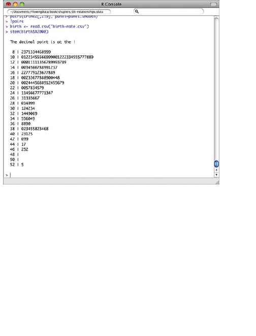
Here’s how you would draw this by hand. Write
numbers 8 to 52 in intervals of 2, top to bottom. Draw a
line to the right of the column of numbers. Then go down
each row of your data and add numbers accordingly. If a
country has a birth rate of 8.2, you add a 2 to the right of
the 8. If there is a country with a rate of 9.9, it also goes
in the row with an 8. You write a 9.
This can obviously get tedious if you have a lot of
data, so here’s how to make a stemplot in R. After you
load your data, simply use the stem() function.
birth <- read.csv("http://datasets.flowingdata.com/birth-
rate.csv")
stem(birth$X2008)
That’s all there is to it. If you want to style it, as shown
in Figure 6-22, you can copy the text in R, and paste it
elsewhere—but this method is outdated and probably
better off with a histogram. The histogram is basically
the more graphical version of the stem-and-leaf.
Figure 6-22: Revised stem-and-leaf plot
Distribution Bars
Looking at the steam-and-leaf plot in Figure 6-22, you
can spot frequency in specific ranges. The more
countries with a birth rate in a range, the more numbers
that are drawn, and the longer the row will be. Now flip
the plot on its side so that the rows become columns.
The higher the column, the more countries there are in
that range. Now change the column of numbers into a
simple bar or rectangle. Now you have a histogram, as
shown in Figure 6-23.
Figure 6-23: Histogram framework
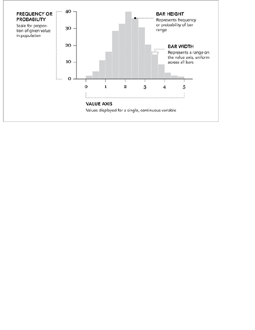
Bar height represents frequency, and bar width does
not represent anything. The horizontal and vertical axes
are continuous. In contrast, the horizontal axis of a bar
chart is discrete. You have set categories and usually
space in between each bar when you use a bar chart.
Often, people who don’t read data graphics on a
regular basis mistake the horizontal axis to be time. It
can be time, but there’s no restriction. This is especially
important when you consider your audience. If your
graphic is for a more general readership, you need to
explain how to read the graph and what important points
to note. Also keep in mind that a lot of people aren’t
familiar with the concept of distributions. But design
your graphic clearly, and you can teach them.
Create a Histogram
Like the stem-and-leaf, the histogram is just as easy to
create in R. Using the hist() function, again plot the
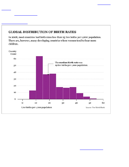
distribution of birth rates worldwide, as shown in Figure
6-24. Notice how the shape is similar to the stem-and-
leaf in Figure 6-22?
Figure 6-24: Distribution of birth rates worldwide
Assuming you’ve already loaded the data from your
previous example, run the hist() function with the same
numbers from 2008.
hist(birth$X2008)
This is the default histogram shown in Figure 6-25.
There are ten bars or ranges in the default histogram,
but you can change that to what you like with the breaks
argument. For example, you could have fewer, wider
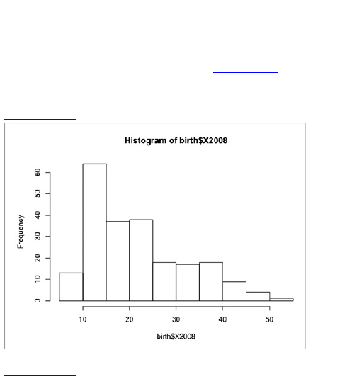
bars, as shown in Figure 6-26. It has only five breaks.
hist(birth$X2008, breaks=5)
You can also go the other way and make a histogram
with more skinny bars, say 20 of them (Figure 6-27).
hist(birth$X2008, breaks=20)
Figure 6-25: Default histogram
Figure 6-26: Histogram with five breaks
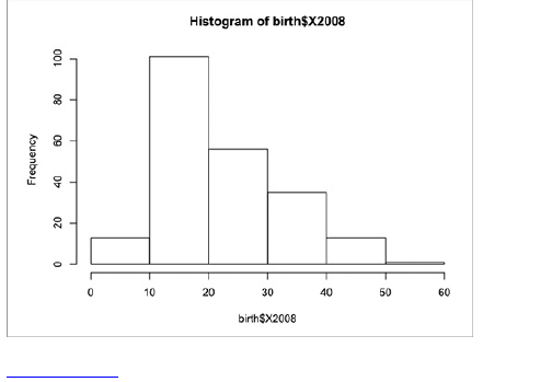
Figure 6-27: Histogram with 20 breaks
The number of breaks you should choose depends
on the data that you visualize. If most of your data is
clustered toward the beginning, you might want to have
more breaks so that you can see the variations instead
of one high bar. On the other hand, if you don’t have that
much data or the numbers are evenly distributed, thicker
bars could be more appropriate. The good news is that
it’s easy to change and experiment.
Tip
The default number of breaks for your
histogram isn’t always the best choice. Play
around with the options and decide what
makes the most sense for your particular
dataset.
For the purposes of the birth rate data, the default
number of breaks is fine. You can see that there are
some countries with birth rates under 10, but most
countries have birth rates between 10 and 25 live births
per 1,000 population. A number of countries are also
above the 25 mark, but relatively fewer compared to the
lower groups.
At this point, you can save the output as a PDF and
make further edits in Illustrator. Most of the edits will be
similar to what you did with the bar charts in Chapter 4,
but a few things are specific to the histogram that you
can add to make it read better and to explain to readers
what the graphic is about.
Tip
You can find mean, median, maximum, and
quartiles easily with the summary() function in R.
In the final graphic in Figure 6-24, you can see some
of the important facets of the distribution, namely the
median, maximum, and minimum. The lead-in copy, of
course, is another opportunity to explain, and you can
add a little bit of color so that the histogram doesn’t look
like a wireframe.
Continuous Density
Although the value axis is continuous, the distribution is
still broken up into a discrete number of bars. Each bar
represents a collection of items, or in the case of the
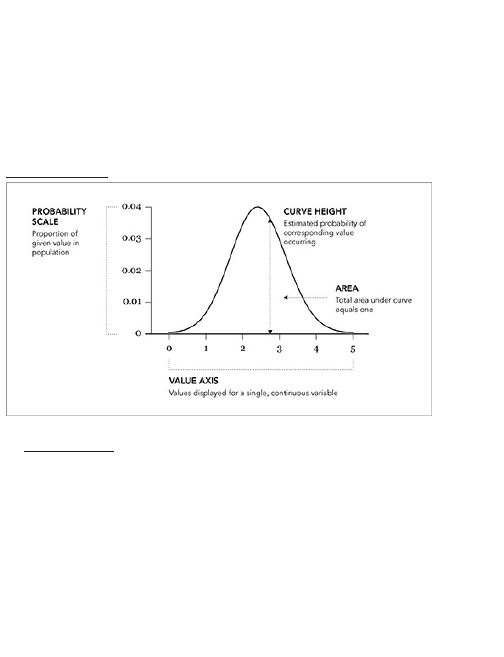
previous examples, countries. What sort of variation is
occurring within each bin? With the stem-and-leaf plot,
you could see every number, but it’s still hard to gauge
the magnitude of differences, which is similar to how
you used Cleveland and Devlin’s LOESS in Chapter 4
to see trends better; you can use a density plot to
visualize the smaller variations within a distribution.
Figure 6-28: Density plot framework
Figure 6-28 shows the use of a curve instead of bars.
The total area under the curve is equal to one, and the
vertical axis represents the probability or a proportion of
a value in the sample population.
Create a Density Plot
Returning to the birth rates data, you need to take one
extra step to make a density plot. It’s a small step. You
need to use the density() function to estimate the points
for the curve; however, the data can’t have any missing

values. Actually 15 rows are in the 2008 data without
any values.
In R these spots with missing values are labeled as
NA. Luckily, it’s easy to filter those spots out.
birth2008 <- birth$X2008[!is.na(birth$X2008)]
Note
In this example, missing values are removed
for the sake of simplicity. When you visualize
and explore your own data, you should look
more closely at missing values. Why are the
values missing? Should they be set to zero or
removed completely?
This line of code retrieves the 2008 column from the
birth data frame, and then basically you request only the
rows that don’t have missing values and store it in
birth2008. More technically speaking, is.na() checks each
item in the birth$X2008 vector and returns an equal-length
vector of true and false values known as booleans.
When you pass a vector of booleans into the index of a
vector, only the items that correspond to true values are
returned. Don’t worry if this confuses you. You don’t
have to know the technical details to get it to work. If,
however, you plan on writing your own functions, it helps
to know the language. It can also make documentation
easier to read, but you’ll tend to pick it up with practice.
Now you have the clean birth rate data stored in
birth2008, so you can pass it into the density() function to
estimate a curve and store the results in d2008.

d2008 <- density(birth2008)
This gives the x- and y-coordinates for the curve. The
cool thing about this is that you can save the
coordinates into a text file in case you want to use a
different program to make the plot. Type d2008 in the R
console to see what’s stored in the variable. Here’s
what you get.
Call:
density.default(x = birth2008)
Data: birth2008 (219 obs.); Bandwidth ‘bw’ = 3.168
x y
Min. :-1.299 Min. :6.479e-06
1st Qu.:14.786 1st Qu.:1.433e-03
Median :30.870 Median :1.466e-02
Mean :30.870 Mean :1.553e-02
3rd Qu.:46.954 3rd Qu.:2.646e-02
Max. :63.039 Max. :4.408e-02
The main thing you care about is the x and y. That
shows the breakdown of the coordinates, but if you want
to access all of them you could enter the following.
d2008$x
d2008$y
Then to store them in a text file, use write.table(). As
arguments, it takes the data you want to save, the
filename you want to save it as, the separator you want
to use (for example, comma or tab), and some others.
To save the data as a basic tab-delimited text file, do
the following.
d2008frame <- data.frame(d2008$x, d2008$y)
write.table(d2008frame, "birthdensity.txt", sep="\t")

Note
Th e write.table() function saves new files in
your current working directory. Change your
working directory via the main menu or with
setwd().
The file birthdensity.txt should now be available in your
working directory. If you don’t want the rows to be
numbered and a comma as the separator instead of
tabs, you can do that just as easily.
write.table(d2008frame, "birthdensity.txt", sep=",", row.names=FALSE)
Now you can load that data into Excel, Tableau,
Protovis, or whatever you want that accepts delimited
text, which is just about everything.
Tip
If you like to do your plotting with different
software other than R but want to make use of
R’s computing functionality, you can save any or
all of your results with write.table().
Back to the actual density plot. Remember, you
already have the coordinates for your density plot. You
just have to put them in graph form with, naturally, the
plot() function. Figure 6-29 shows the result.
plot(d2008)
You can also make a filled density plot if you want,
using plot() along with polygon(), as shown in Figure 6-
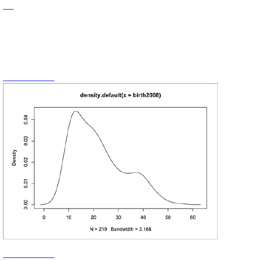
30. You use the former to set the axes, but with the type
set to “n” for no plotting. Then use the latter to actually
draw the shape; set the fill color to a dark red and the
border to a light gray.
plot(d2008, type="n")
polygon(d2008, col="#821122", border="#cccccc")
Figure 6-29: Density plot for birth rate
Figure 6-30: Filled density plot
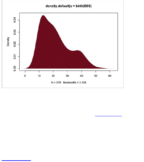
No need to stop here though. You can plot the
histogram and density plot together to get the exact
frequencies represented by the bars and the estimated
proportions from the curve, as shown in Figure 6-31.
Use the histogram() (from the lattice package) and lines()
functions. The former creates a new plot whereas the
latter adds lines to an existing plot.
library(lattice)
histogram(birth$X2008, breaks=10)
lines(d2008)
Figure 6-31: Histogram and density plot combined
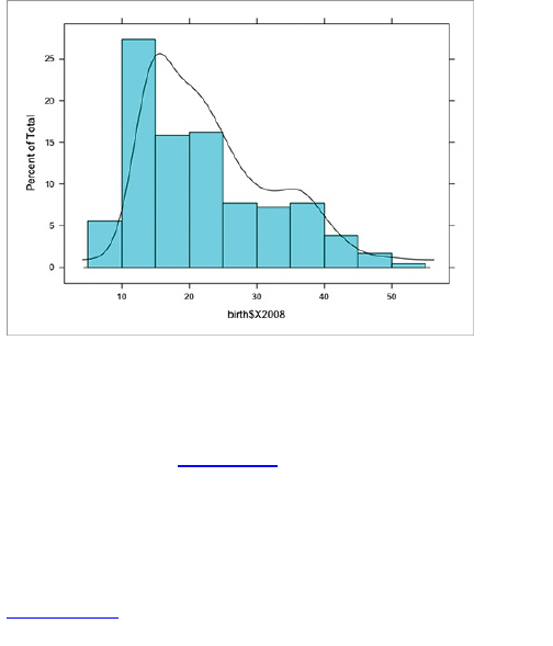
So there’s a lot you can do and plenty of variations,
but the math and geometry are still the same as the old-
school stem-and-leaf plot. You’re counting, aggregating,
and grouping. The best variation can vary based on
what data you have. Figure 6-32 shows a more finished
graphic. I de-emphasized the axis lines, rearranged the
labels, and added a pointer for median. The vertical
axis, which represents density, isn’t especially useful in
this graphic, but I left it in there for the sake of
completeness.
Figure 6-32: Density plot for worldwide birth rates in
2008
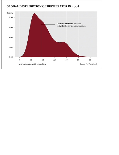
Comparison
Often it’s useful to compare multiple distributions rather
than just the mean, median, and mode. These summary
statistics are after all descriptors of the big picture. They
tell you only part of a story.
For example, I could tell you that the average birth
rate for the world in 2008 was 19.98 live births per
1,000 population and 32.87 in 1960, so the birth rate
was about 39 percent lower in 2008 than it was in 1960.
That only tells you what’s going on in the center of the
distribution though. Or is it even the center? Are there
only a few countries that had high birth rates in 1960,
bringing up the average? Did differences in birth rate
increase or decrease over the past few decades?

You can make comparisons in lots of ways. You could
go entirely analytical and not use visualization at all. (I
spent a year learning about statistical methods in
graduate school, and that was just the tip of the
iceberg.) You could also go the other way and use
visualization. Your results won’t be an exact answer
offered by a thorough statistical analysis, but they could
be good enough to make an informed decision about
whatever you’re looking into. Obviously you’re going to
go the visualization route, or I would have named this
book Analyze This.
Multiple Distributions
So far you’ve looked at only single distributions, namely
birth rates for 2008. But if you looked at the data file or
the data frame in R, you know that you have annual birth
rates all the way back to 1960. If you didn’t look, then
um, you still have annual birth rates all the way back to
1960. Like I said earlier, the world birth rate has
decreased significantly, but how has the entire
distribution changed?
Now take the straightforward route to create a
histogram for every year and lay them out nicely
organized as a matrix. It’s a similar idea to the
scatterplot matrix designed at the beginning of this
chapter.
Create a Histogram Matrix
The lattice package in R makes it easy to create a
whole bunch of histograms with just one line of code, but

there’s a small catch. You have to give it the data in the
format that the function wants it. Following is a snippet
of the originally loaded text file.
Country,1960,1961,1962,1963...
Aruba,36.4,35.179,33.863,32.459...
Afghanistan,52.201,52.206,52.208,52.204...
...
There’s a row for each country. The first column is the
country name, and then there’s a column for each year,
so there are 30 columns and 234 rows of data, plus the
header. You need the data to be in two columns though,
one for the year and the other for the birth rate. You
don’t actually need country names for this, so the first
few rows should look like this.
year,rate
1960,36.4
1961,35.179
1962,33.863
1963,32.459
1964,30.994
1965,29.513
...
If you compare the snippet you want to the current
snippet, you should notice that the values in the second
snippet match the values for Aruba. So there’s a row for
every birth rate value that is accompanied by the year.
This results in 9,870 rows of data, plus a header.
How do you get the data into the format you want?
Remember what you did with Python in Chapter 2,
“Handling Data”? You loaded the CSV file in Python,
and then iterated over each row, printing the values into
the format that you wanted. You can do the same thing
here. Start a new file in your favorite text editor called

transform-birth-rate.py. Make sure it’s in the same
directory as birth-rate.csv. Then enter the following
script.
import csv
reader = csv.reader(open(‘birth-
rate.csv’, ‘r’), delimiter=",")
rows_so_far = 0
print ‘year,rate’
for row in reader:
if rows_so_far == 0:
header = row
rows_so_far += 1
else:
for i in range(len(row)):
if i > 0 and row[i]:
print header[i] + ‘,’ + row[i]
rows_so_far += 1
This should look familiar, but now break it down. You
import the csv package and then load birth-rate.csv. Then
print the header, and iterate through each row and
column so that the script outputs the data in the format
you want. Run the script in your console and save the
output in a new CSV file named birth-rate-yearly.csv.
python transform-birth-rate.py > birth-rate-yearly.csv
Tip
If you want to keep all your coding in R, you can
try using Hadley Wickham’s reshape package.
It helps you shift data frames into the format you
want.
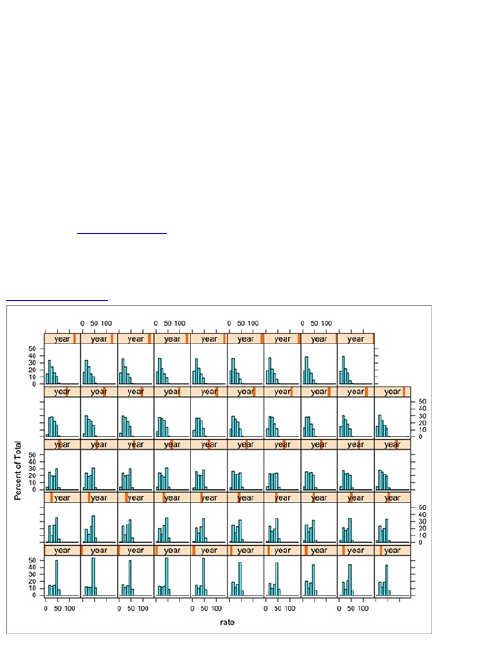
Great. Now use histogram() for that matrix; go back to
R and load the new data file with read.csv(). In case you
skipped all the data formatting stuff (to save for later),
the new data file is online so that you can load it from a
URL.
birth_yearly <-
read.csv("http://datasets.flowingdata.com/birth-rate-
yearly.csv")
Now plug the data into histogram() to make a 10 by 5
matrix, with rate categorized by year. The output is
shown in Figure 6-33.
histogram(~ rate | year, data=birth_yearly, layout=c(10,5))
Figure 6-33: Default histogram matrix

Okay, not bad, but you can improve it. First, there is
an outlier on the far right that’s pushing all the bars to
the left. Second, an orange bar shifts left and right
according to the year for each cell of the matrix, but it’d
be easier to read if those were actually labels that
showed the year number. Finally, it’s hard to tell
because there are no year labels, but the order of the
histograms isn’t actually working. The first year, 1960, is
at the bottom left, and 1969 is at the bottom right. The
cell above 1960 is the one for 1970. So the order is
going bottom to top and left to right. Weird.
To find the outlier, use summary() again on birth_yearly.
year rate
Min. :1960 Min. : 6.90
1st Qu.:1973 1st Qu.: 18.06
Median :1986 Median : 29.61
Mean :1985 Mean : 29.94
3rd Qu.:1997 3rd Qu.: 41.91
Max. :2008 Max. :132.00
The maximum rate is 132. That seems off. No other
rates even come close to 100. What’s going on? It turns
out that the rate recorded for Palau in 1999 is 132. This
is most likely a typo because the rates for Palau before
and after 1999 are no greater than 20. It’s probably
supposed to be 13.2, but you’d have to look into that
deeper. For now, temporarily remove that mistake.
birth_yearly.new <- birth_yearly[birth_yearly$rate < 132,]
On to the labels for the years. When the values used
for labels are stored as numeric, the lattice function
automatically uses the orange bar to indicate value. If,
however, the labels are characters, the function uses

strings, so now do that.
birth_yearly.new$year <- as.character(birth_yearly.new$year)
You still need to update the order, but create the
histogram matrix first and store it in a variable.
h <-
histogram(~ rate | year, data=birth_yearly.new, layout=c(10,5))
Now use the update() function to change the order of
the histograms.
update(h, index.cond=list(c(41:50, 31:40, 21:30, 11:20, 1:10)))
This basically reverses the order of all the rows. As
shown in Figure 6-34, you get a nicely labeled
histogram matrix—and a better sense of the
distributions after removing the typo. Plus the
histograms are arranged more logically so that you can
read from left to right, top to bottom. Read just one cell
from each row, and move your eyes top to bottom so
that you can see how the distribution has changed by
decade.
Figure 6-34: Modified histogram matrix
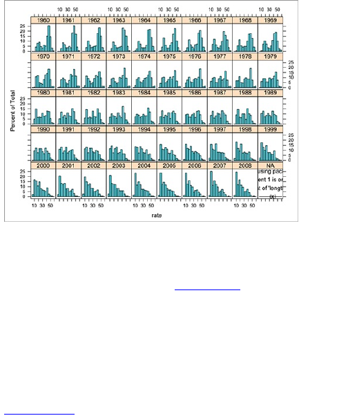
At this point, the layout is good. If you were to refine
the graphic in Illustrator, you could make the labels
smaller, change the border and fill colors, and do some
general cleanup, as shown in Figure 6-35. It’s more
readable this way. To make it even clearer, and to
complete the story, you can also add a proper lead-in,
include the source, and point out how the distribution is
shifting left toward lower birth rates worldwide. This
could be too complex as a standalone graphic. You’d
need to provide a lot of context for readers to fully
appreciate the data.
Figure 6-35: Histogram matrix refined in Illustrator
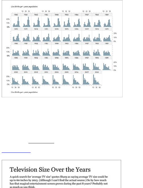
This isn’t the only way to do things. You could create
the same matrix with Processing, Protovis, PHP, or
anything that draws bars. There are even multiple ways
to make the same type of matrix within R. For example, I
made a graphic for FlowingData on the changing
distribution of television sizes from 2002 through 2009,
as shown in Figure 6-36.
Figure 6-36: Distribution of television size over the
years
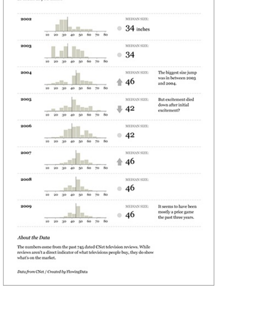
The code looks different from what you just did, but
the logic is similar. I loaded the data, applied some
filters for outliers, and then drew a bunch of histograms.

The difference is that I didn’t use histogram() from the
lattice package. Instead, I set the layout with par(), which
you use to set universal parameters in R, and then used
hist() to draw each histogram.
# Load data
tvs <-
read.table(‘http://datasets.flowingdata.com/tv_sizes.txt’,
sep="\t", header=TRUE)
# Filter outliers
tvs <- tvs[tvs$size < 80, ]
tvs <- tvs[tvs$size > 10, ]
# Set breaks for histograms
breaks = seq(10, 80, by=5)
# Set the layout
par(mfrow=c(4,2))
# Draw histograms, one by one
hist(tvs[tvs$year == 2009,]$size, breaks=breaks)
hist(tvs[tvs$year == 2008,]$size, breaks=breaks)
hist(tvs[tvs$year == 2007,]$size, breaks=breaks)
hist(tvs[tvs$year == 2006,]$size, breaks=breaks)
hist(tvs[tvs$year == 2005,]$size, breaks=breaks)
hist(tvs[tvs$year == 2004,]$size, breaks=breaks)
hist(tvs[tvs$year == 2003,]$size, breaks=breaks)
hist(tvs[tvs$year == 2002,]$size, breaks=breaks)
The graphic output of this code is shown in Figure 6-
37. It has four rows and two columns, which was
specified in the mfrow argument of par(). For the final
graphic, I ended up putting them all in one column, but
the important part is that I didn’t have to do a bunch of
data entry in Illustrator or Excel to manually make eight
graphs.
Small Multiples
The technique of putting a bunch of small graphs
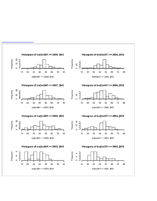
together in a single graphic is more commonly referred
to as small multiples. It encourages readers to make
comparisons across groups and categories, and within
them. Plus, you can fit a lot in one space if your graphic
is organized.
Figure 6-37: Grid layout for histograms
For example, I looked at movie ratings on the site
Rotten Tomatoes for trilogies. In case you’re unfamiliar,
Rotten Tomatoes aggregates movie reviews and marks

them as positive and negative. When at least 60
percent of reviewers say they like a film, it is marked
fresh. Otherwise, it’s rotten. I wanted to know how
sequels compared to their originals in freshness. It turns
out not very well, as shown in Figure 6-38. The median
rating of finales was 37 percentage points lower than
the median of the originals. In other words, most
originals were fresh, and most finales were rotten.
Figure 6-38: How trilogies rate from original to finale
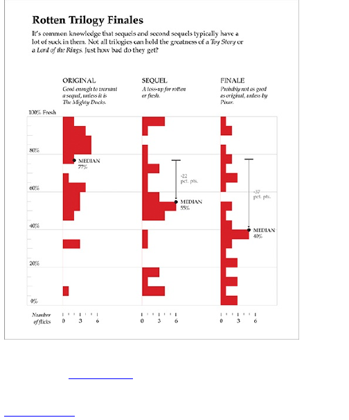
This was actually just three histograms flipped on
their sides. Figure 6-39 shows the original histograms
in R. I just gussied them up a bit in Illustrator.
Figure 6-39: Original trilogy histograms
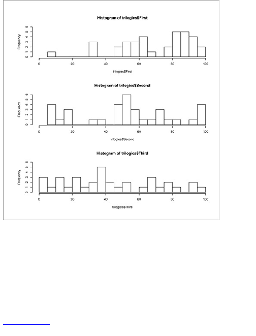
In any case, FlowingData readers understood the
graphic for the most part—they’re a data savvy bunch,
naturally. However, the graphic was later linked from
IMDB, also known as the Internet Movie Database.
IMDB has a much more general audience, and judging
by the comments after that linkback, the less data savvy
readers had trouble interpreting the distributions.
However, the second part of the graphic, as shown in
Figure 6-40, seemed much easier to understand. It’s a
use of small multiples where each bar represents the
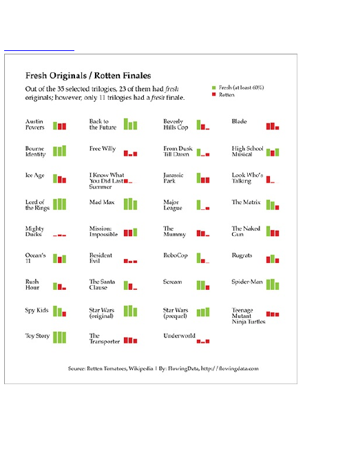
rating for a movie. Bars were colored red for rotten and
green for fresh.
Figure 6-40: Small multiples for ratings of trilogies
In case you’re wondering how to do this, it’s just a
bunch of bar charts, so you could change the mfrow
parameter like you did before and use the plot() or
polygon() functions. I did this using the Column Graph tool

in Illustrator though, because I happened to already
have it open.
I learned a couple of things after posting this graphic.
The first and most important is that aggregates and
distributions are not something everybody deals with on
a regular basis, so you need to do your best to explain
the data and take extra care in telling the story. The
second is that people love their movies, and when you
say that their favorite movies of all time are horrible,
they sort of take it to heart.
Wrapping Up
Looking for relationships in your data can be
challenging at times and requires more critical thinking
than blindly graphing numbers, but it can also be the
most rewarding and informative. It’s how your data, or
rather, how the things that your data represents relate
and interact with each other that’s interesting—that’s
what makes for the best stories.
This chapter covered how to look for correlations
between multiple variables, but explained relationships
in a more general sense, too. Look at how everything
relates to each other as a whole through distributions.
Look within the distributions for outliers or patterns, and
then think about the context of what you see. Then if you
find something interesting, ask why. Think about the
context of the data and possible explanations.
This is the best part about playing with data because
you get to explore what the data is about and maybe dig

up something interesting. Then when you dig enough,
you can explain to readers what you find. Remember,
not everyone speaks the language of numbers, so keep
it at a human level for the general audience. Don’t be
afraid to turn it up to nerd level though, if you have the
right audience.

Chapter 7
Spotting Differences
Sports commentators like to classify a select few
athletes as superstars or as part of an elite group, while
the rest are designated average or role players. These
classifications usually aren’t so much from sports
statistics as they are from watching a lot of games. It’s
the know-it-when-I-see-it mentality. There’s nothing
wrong with this. The commentators (usually) know what
they’re talking about and are always considering the
context of the numbers. It always makes me happy when
a group of sports analysts look at performance metrics,
and almost without fail someone will say, “You can’t just
look at the numbers. It’s the intangibles that make so
and so great.” That’s statistics right there.
Obviously this doesn’t apply to just sports. Maybe you
want to find the best restaurants in an area or identify
loyal customers. Rather than categorizing units, you
could look for someone or something that stands out
from the rest. This chapter looks at how to spot groups
within a population and across multiple criteria, and
spot the outliers using common sense.

What to Look For
It’s easy to compare across a single variable. One
house has more square feet than another house, or one
cat weighs more than another cat. Across two variables,
it is a little more difficult, but it’s still doable. The first
house has more square feet, but the second house has
more bathrooms. The first cat weighs more and has
short hair, whereas the second cat weighs less and has
long hair.
What if you have one hundred houses or one hundred
cats to classify? What if you have more variables for
each house, such as number of bedrooms, backyard
size, and housing association fees? You end up with the
number of units times the number of variables. Okay,
now it is more tricky, and this is what we focus on.
Perhaps your data has a number of variables, but you
want to classify or group units (for example, people or
places) into categories and find the outliers or
standouts. You want to look at each variable for
differences, but you also want to see differences across
all variables. Two basketball players could have
completely different scoring averages, but they could be
almost identical in rebounds, steals, and minutes played
per game. You need to find differences but not forget
the similarities and relationships, just like, oh yes, the
sports commentators.
Comparing across Multiple
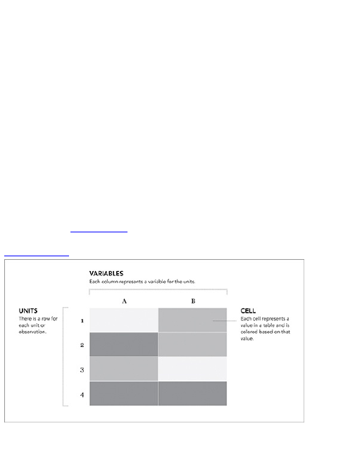
Variables
One of the main challenges when dealing with multiple
variables is to determine where to begin. You can look
at so many variations and subsets that it can be
overwhelming if you don’t stop to think about what data
you have. Sometimes, it’s best to look at all the data at
once, and interesting points could point you in the next
interesting direction.
Getting Warmer
One of the most straightforward ways to visualize a
table of data is to show it all at once. Instead of the
numbers though, you can use colors to indicate values,
as shown in Figure 7-1.
Figure 7-1: Heatmap framework
You end up with a grid the same size of the original
data table, but you can easily find relatively high and low

values based on color. Typically, dark colors mean
greater values, and lighter colors represent lower values
but that can easily change based on your application.
You also read the heatmap (or heat matrix) the same
way you would a table. You can read a row left to right to
see the values of all variables for a single unit, or you
can see how all the units compare across a single
variable.
This layout can still confuse you, especially if you have
a large table of data, but with the right color scheme and
some sorting, you can make a useful graphic.
Create a Heatmap
It’s easy to make heatmaps in R. There’s a heatmap()
function that does all the math work, which leaves you
with picking colors best suited for your data and
organizing labels so that they’re still readable, even if
you have a lot of rows and columns. In other words, R
sets up the framework, and you handle the design. That
should sound familiar by now.
In this example, take a look at NBA basketball
statistics for 2008. You can download the data as a
CSV file at
http://datasets.flowingdata.com/ppg2008.csv. There are
22 columns, the first for player names, and the rest for
stats such as points per game and field goal
percentage. You can use read.csv() to load the data into
R. Now look at the first five rows to get a sense of the
data’s structure (Figure 7-2).
bball <-
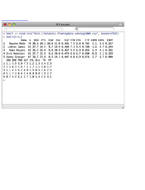
read.csv("http://datasets.flowingdata.com/ppg2008.csv",
header=TRUE)
bball[1:5,]
Figure 7-2: Structure of the first five rows of data
Players are currently sorted by points per game,
greatest to least, but you could order players by any
column, such as rebounds per game or field goal
percentage, with order().
bball_byfgp <- bball[order(bball$FGP, decreasing=TRUE),]
Now if you look at the first five rows of bball_byfgp, you
see the list is led by Shaquille O’Neal, Dwight Howard,
and Pau Gasol instead of Dwyane Wade, Lebron
James, and Kobe Bryant. For this example, reverse the
order on points per game.
bball <- bball[order(bball$PTS, decreasing=FALSE),]

Tip
Th e decreasing argument in order() specifies
whether you want the data to be sorted in
ascending or descending order.
As is, the column names match the CSV file’s
header. That’s what you want. But you also want to
name the rows by player name instead of row number,
so shift the first column over to row names.
row.names(bball) <- bball$Name
bball <- bball[,2:20]
The first line changes row names to the first column in
the data frame. The second line selects columns 2
through 20 and sets the subset of data back to bball.
The data also has to be in matrix format rather than a
data frame. You’d get an error if you tried to use a data
frame with the heatmap() function. Generally speaking, a
data frame is like a collection of vectors where each
column represents a different metric. Each column can
have different formats such as numeric or a string. A
matrix on the other hand is typically used to represent a
two-dimensional space and the data type has to be
uniform across all cells.
bball_matrix <- data.matrix(bball)
Tip
A lot of visualization involves gathering and
preparing data. Rarely, do you get data exactly

how you need it, so you should expect to do
some data munging before the visuals.
The data is ordered how you want it and formatted
how you need it to be, so you can plug it into heatmap() to
reap the rewards. By setting the scale argument to
“column,” you tell R to use the minimum and maximum
of each column to determine color gradients instead of
the minimum and maximum of the entire matrix.
bball_heatmap <- heatmap(bball_matrix, Rowv=NA,
Colv=NA, col = cm.colors(256), scale="column", margins=c(5,10))
Your result should resemble Figure 7-3. Using
cm.colors(), you specified a color range from cyan to
magenta. The function creates a vector of hexadecimal
colors with a cyan-to-magenta range by default with n
shades in between (in this case, 256). So notice the
third column, which is for points per game, starts at
magenta, indicating the highest values for Dwyane
Wade and Lebron James, and then shifts toward a
darker cyan hue to the bottom for Allen Iverson and Nate
Robinson. You can also quickly find other magenta
spots representing leading rebounder Dwight Howard
or assist leader Chris Paul.
Figure 7-3: Default heatmap ordered by points per
game
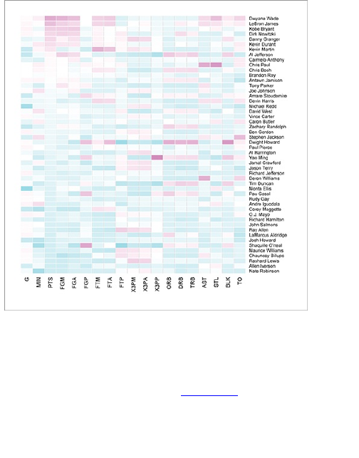
Maybe you want a different color scheme. Just
change the col argument, which is cm.colors(256) in the
line of code you just executed. Type ?cm.colors for help on
what colors R offers. For example, you could use more
heat-looking colors, as shown in Figure 7-4.
bball_heatmap <- heatmap(bball_matrix,
Rowv=NA, Colv=NA, col = heat.colors(256), scale="column",
margins=c(5,10))
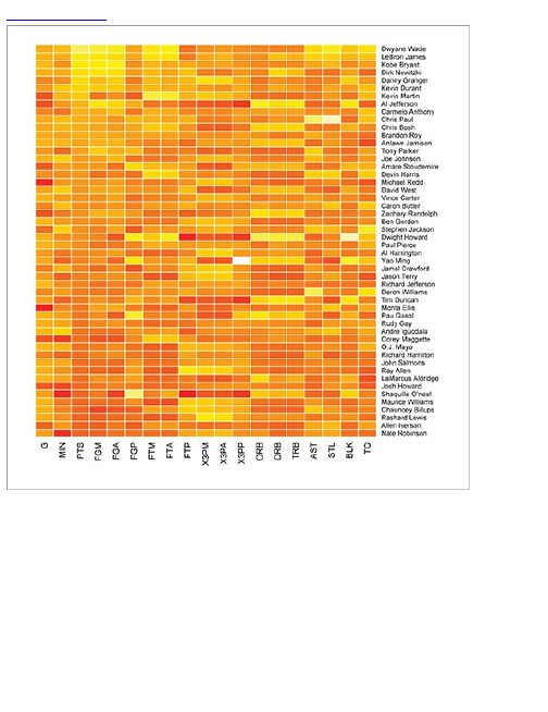
Figure 7-4: Heatmap with a red-yellow color scale
If you typed cm.colors(10) in the R console, you’d get an
array of ten colors that range from cyan to magenta.
The n heatmap() automatically chooses the color that
corresponds to each value based on a linear scale.
[1] "#80FFFFFF" "#99FFFFFF" "#B3FFFFFF" "#CCFFFFFF" "#E6FFFFFF"
[6] "#FFE6FFFF" "#FFCCFFFF" "#FFB3FFFF" "#FF99FFFF" "#FF80FFFF"
This is great, because you can easily create your own

color scale. For example, you could go to 0to255.com and
pick out the base color and go from there. Figure 7-5
shows a gradient with a red base. You can pick a
handful of colors, from light to dark, and then easily plug
them into heatmap(), as shown in Figure 7-6. Instead of
using R to create a vector of colors, you define your own
in the red_colors variable.
red_colors <- c("#ffd3cd", "#ffc4bc", "#ffb5ab",
"#ffa69a", "#ff9789", "#ff8978", "#ff7a67", "#ff6b56",
"#ff5c45", "#ff4d34")
bball_heatmap <- heatmap(bball_matrix, Rowv=NA,
Colv=NA, col = red_colors, scale="column", margins=c(5,10))
Tip
Choose your colors wisely because they also
set the tone for the context of your story. For
example, if you deal with a somber topic, it’s
probably better to stay with more neutral, muted
tones, whereas you can use vibrant colors for a
more uplifting or casual topic.
Figure 7-5: Red gradient from 0to255.com
Figure 7-6: Heatmap using custom red color scale
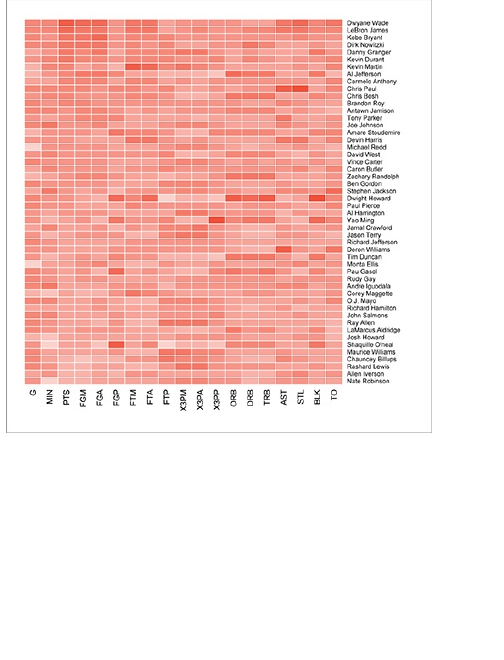
If you don’t want to pick your own colors, you can also
use the RColorBrewer package. The package is not
installed by default, so you need to download and install
it via the Package Installer if you haven’t already.
ColorBrewer was designed by cartographer Cynthia
Brewer and was originally intended for maps, but it can
help you create data graphics in general. You can
choose from a variety of options, such as a sequential
or divergent color palette and number of shades. For
the purposes of this example, go with a simple blue
palette. Enter ?brewer.pal in the R console for more
options—it’s fun to play with. Assuming you installed
RColorBrewer, enter the following for a heatmap using
a blue palette with nine shades. The result is shown in
Figure 7-7.
library(RColorBrewer)
bball_heatmap <- heatmap(bball_matrix, Rowv=NA,
Colv=NA, col = brewer.pal(9, "Blues"),
scale="column", margins=c(5,10))
Visit the interactive version of Colorbrewer at
http://colorbrewer2.com. You can select
options from drop-down menus to see how
color schemes look in a sample map.
Figure 7-7: Heatmap using RColorBrewer for color
palette
Check out Figure 7-7, which you can bring into
Illustrator to spruce up. The graphic doesn’t need a ton
of edits, but you can make the labels more readable
and soften the colors so that the graphic is easier to
scan.
Addressing the former, it’d be better if the labels
were the full descriptions. As a basketball fan, I know
what each abbreviation stands for, but someone not so
familiar with the sport would be confused. As for the
latter, you can tone down the contrast by using

transparency, available in the Color Window in
Illustrator. Cell borders can also provide more definition
to each cell so that the graphic is easier to scan left to
right and top to bottom. Figure 7-8 shows the finished
graphic.
Figure 7-8: Heatmap showing NBA per game
performance for the top 50 scorers during the 2008–
2009 season
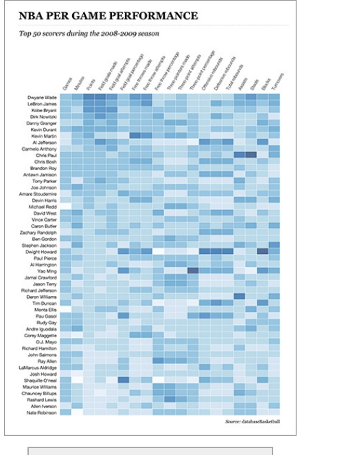

Mike Bostock ported this example to Protovis,
which you can find in the Protovis examples
section. The aesthetic is the same, but it has
the added bonus of tooltips as you mouse over
each cell.
See It in His Face
The good thing about a heatmap is that it enables you
to see all your data at once; however, the focus is on
individual points. You can easily spot highs and lows for
points or rebounds per game, but it’s more challenging
to compare one player to another.
Often you want to see each unit as a whole instead of
split up by several metrics. Chernoff Faces is one way
to do this; however the method isn’t an exact one, and
it’s possible a general audience might become
confused. That said, Chernoff Faces can be useful from
time to time, it’s good data nerd fun, which makes it
totally worth it.
The point of Chernoff Faces is to display multiple
variables at once by positioning parts of the human
face, such as ears, hair, eyes, and nose, based on
numbers in a dataset (Figure 7-9). The assumption is
that you can read people’s faces easily in real life, so
you should recognize small differences when they
represent data. That’s a big assumption, but roll with it.
As you see in the following example, larger values
stand out in the form of big hair or big eyes, whereas
smaller values tend to shrink facial features. In addition
to size, you can also adjust features such as the curve of
the lips or shape of the face.
Figure 7-9: Chernoff Faces framework
Create Chernoff Faces
Go back to the basketball data, which represents the
top 50 scorers in the NBA, during the 2008–2009
season. There will be one face per player. Don’t worry
—you don’t have to create each face manually. The
aplpack in R provides a faces() function to help get you to
where you want.
If you haven’t already, go ahead and install aplpack with
install.packages() or via the Package Installer. The
package name stands for “another plotting package” in
case you were wondering, and it was designed by Hans
Peter Wolf. When installed, the package is usually
automatically loaded, but if not, you should do that, too.
library(aplpack)
You should have also already loaded the basketball

data while creating a heatmap. If not, again use
read.csv() to load the data directly from a URL.
bball <-
read.csv("http://datasets.flowingdata.com/ppg2008.csv", header=TRUE)
After you load the package and data, it’s
straightforward to make Chernoff Faces with the faces()
function, as shown in Figure 7-10.
faces(bball[,2:16], ncolors=0)
Note
The newest version of the aplpack lets you add
color with the faces() function. In this example,
you set ncolors to 0 to use only black and white.
See ?faces to see how you can use color vectors
in the same way you used them with the
previous heatmap example.
Your dataset has 20 variables, plus player names;
however, the faces() function offered by the aplpack
enables only a maximum of 15 variables, because there
are only so many facial features you can change. This is
why you subset the data on columns 2 to 16.
What does each face represent? The faces() function
changes features in the following order, matching the
order of the data columns.
1. Height of face
2. Width of face
3. Shape of face
4. Height of mouth
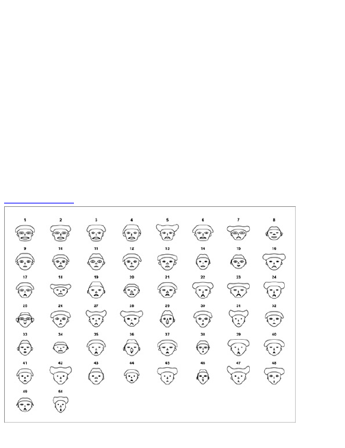
5. Width of mouth
6. Curve of smile
7. Height of eyes
8. Width of eyes
9. Height of hair
10. Width of hair
11. Styling of hair
12. Height of nose
13. Width of nose
14. Width of ears
15. Height of ears
Figure 7-10: Default Chernoff Faces
So for example, the height of a face represents the

number of games played, and the height of a mouth
represents field goals made per game. This is kind of
useless as it is because you don’t have any names to
the faces, but you can see that the first few have more
well-rounded gameplay than the others, whereas player
7, for instance, has relatively wide hair, which
corresponds to three-pointers made.
Use the labels argument in faces() to add names to the
faces, as shown in Figure 7-11.
faces(bball[,2:16], labels=bball$Name)
Tip
When you have a lot of individuals, it can be
useful to cluster by category so that the faces
are easier to scan. For this example, you could
separate faces by position: guards, forwards,
and centers.
That’s better. Now you can see which face
corresponds to which player. To identify the point
guards, you can start with say, Chris Paul, and look for
similar faces such as the one for Devin Harris or Deron
Williams. Chauncey Billups, in the bottom-right corner is
also a point guard, but the face looks different than the
others. The hair is higher and mouth width is narrow,
which corresponds to high free throw percentage and
field goal attempts, respectively.
To make the graphic more readable, you can add
some more spacing between rows, and at the least,
provide a description of what feature provides what, as

shown in Figure 7-12. Normally, I’d use a graphical
legend, but we used every facial feature, so it’s a
challenge to provide that many pointers on a single
face.
Tip
White space in your graphics can make them
more readable, especially when there is a lot to
look at and evaluate.
Again, the usefulness of Chernoff Faces can vary by
dataset and audience, so you can decide whether you
want to use the method. One thing though, is that people
who aren’t familiar with Chernoff Faces, tend to take the
faces somewhat literally, as if the face that represents
Shaquille O’Neal is actually supposed to look like the
player. Most of you know that O’Neal is one of the
physically biggest players of all time.
Figure 7-11: Chernoff Faces with names for players
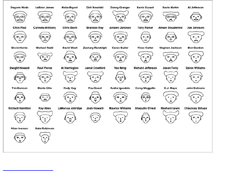
Figure 7-12: Chernoff Faces for top NBA scorers
during the 2008–2009 season
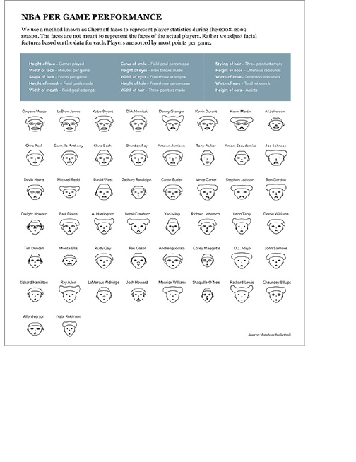
Along the same lines, I designed a graphic for crime
in the United States (Figure 7-13) using Chernoff
Faces, and someone actually commented that it was
racist because of how the face looked for states with
high crime rates. That never crossed my mind because
changing a facial feature was like changing the length of
a bar on a graph for me, but hey, it’s something to think

about.
Figure 7-13: Crime in the United States represented
by a face for each state
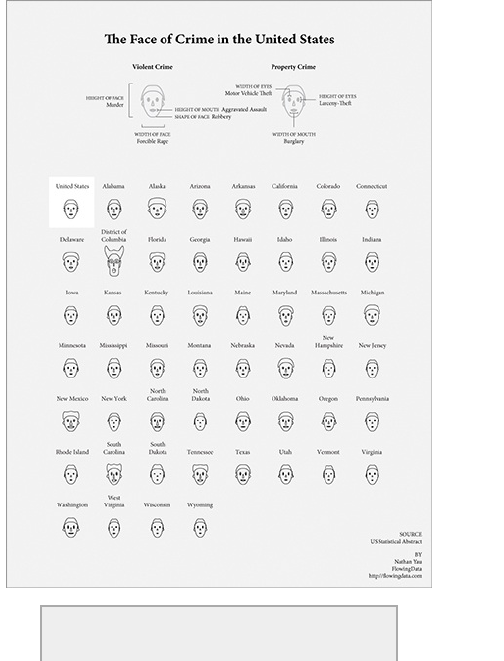
Tip

Put yourself in the mind of a reader as you
design your graphics. They won’t always be as
familiar with visualization methods as you are
or know what you know about the data, so it’s
up to you, the storyteller, to explain.
Starry Night
Instead of using faces to show multivariate data, you
can use the same idea but abstract on it by using a
different shape. Instead of changing facial features, you
can modify the shape to match data values. This is the
idea for star charts, also known as radar or spider
charts.
As shown in Figure 7-14, you can draw several axes,
one for each variable, starting from the middle and
equally spaced in a circle. The center is the minimum
value for each variable, and the ends represent the
maximums. So if you draw a chart for a single unit, start
at a variable and draw a connecting line to the
corresponding spot on the next axis. Then you end up
with something that looks like a star (or a radar or
spider web).
Figure 7-14: Star chart framework

You can represent several units on a single chart, but
it’ll become useless in a hurry, which makes for a poorly
told story. So stick to separate star charts and
compare.
Create Star Charts
Now use the same crime data used for Figure 7-13 to
see if it makes any difference to use these star charts.
First things first. Load the data into R.
crime <-
read.csv("http://datasets.flowingdata.com/crimeRatesByState-
formatted.csv")
Now it’s as straightforward to make star charts as it
was to make Chernoff Faces. Use the stars() function,

which comes packaged with base R.
stars(crime)
The default charts are shown in Figure 7-15.
Hopefully, these won’t offend anyone. Of course, you still
need state labels, but you also need a key to tell you
which dimension is which. A certain order is followed,
like with faces(), but you don’t know where the first
variable starts. So take care of both in one swoop.
Notice that you can change to first column to row names
just like you did with the heatmap. You can also set
flip.labels to FALSE, because you don’t want the labels to
alternate heights. Figure 7-16 shows the results.
row.names(crime) <- crime$state
crime <- crime[,2:7]
stars(crime, flip.labels=FALSE, key.loc = c(15, 1.5))
It’s relatively easy to spot the differences and
similarities now. In the Chernoff version, the District of
Columbia looked like a wild-eyed clown compared to all
the other states, but with the star version, you see that
yes, it does have high rates of crime in some
categories, but relatively lower rates of forcible rape
and burglary. It’s also easy to find the states with
relatively low crime rates such as New Hampshire and
Rhode Island. Then there are states such as North
Carolina that are high in just a single category.
For this dataset, I’m satisfied with this format, but
there are two variations that you might want to try with
your own data. The first restricts all data to the top half
of the circle, as shown in Figure 7-17.

stars(crime, flip.labels=FALSE, key.loc = c(15, 1.5), full=FALSE)
The second variation uses the length of the segments
instead of placement of points, as shown in Figure 7-
18. These are actually Nightingale charts (also known
as polar area diagrams) more than they are star charts,
but there you go. If you do go with this option, you might
want to try a different color scheme other than this crazy
default one.
stars(crime, flip.labels=FALSE, key.loc = c(15, 1.5), draw.segments=TRUE)
Figure 7-15: Default star charts showing crime by state
Figure 7-16: Star charts with labels and key
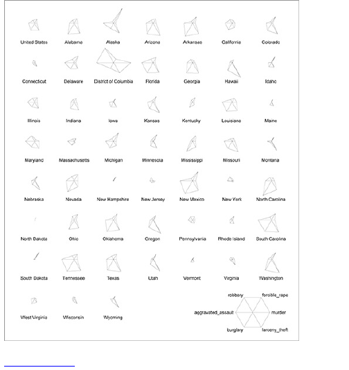
Figure 7-17: Star charts restricted to top half of circle
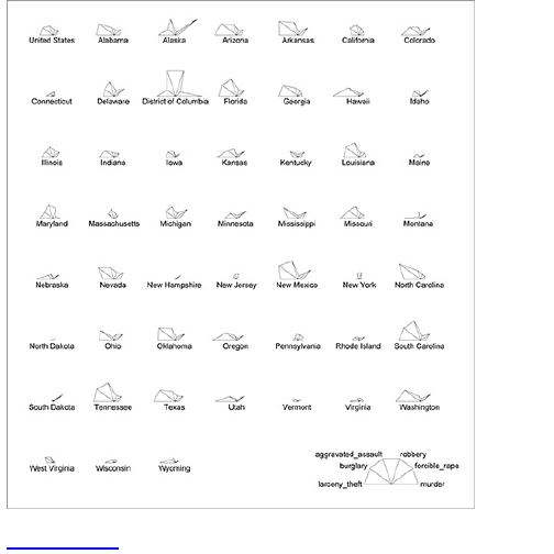
Figure 7-18: Crime displayed as Nightingale charts
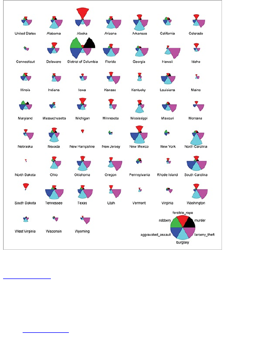
Like I said though, I’m good with the original format in
Figure 7-16, so you can take that into Illustrator to do
some cleanup. It doesn’t need a whole lot of
modification. More white space between the rows could
make the labels less ambiguous, and you can place the
key on top so that readers know what they’re getting
into (Figure 7-19). Other than that, it’s good to go.

Figure 7-19: Series of star charts showing crime by
state
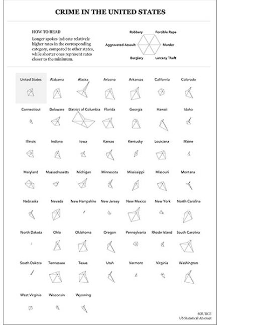
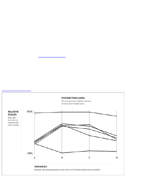
Running in Parallel
Although star charts and Chernoff Faces can make it
easier to spot units that are different from the rest of the
pack, it’s a challenge to identify groups or how variables
could be related. Parallel coordinates, which were
invented in 1885 by Maurice d’Ocagne, can help with
this.
As shown in Figure 7-20, you place multiple axes
parallel to each other. The top of each axis represents a
variable’s maximum, and the bottom represents the
minimum. For each unit, a line is drawn from left to right,
moving up and down, depending on the unit’s values.
Figure 7-20: Parallel coordinates framework
For example, imagine you made a plot using the

basketball data from earlier in the chapter. For the sake
of simplicity, you only plot points, rebounding, and fouls,
in that order. Now imagine a player who was a top
scorer, a weak rebounder, and fouled a lot. A line in the
parallel coordinates plot for that player would start high,
go low, and then come back up again.
When you plot more units, this method helps to spot
groups and tendencies. In the following example, you
can use parallel coordinates on data from the National
Center for Education Statistics.
Create a Parallel Coordinates Plot
You have several interactive options for parallel
coordinates. You can build it in Protovis if you want to
make a custom graphic, or you can plug your data into
an exploratory tool such as GGobi. These
implementations enable you to filter and highlight the
data points you’re interested in; however, I still like to go
with static parallel coordinates plots, namely because
you can compare different filters all at once. With
interactive versions, you have only one plot, and it’s
tough to make sense of what you’re looking at when you
have a bunch of highlighting all in one place.
Download GGobi for free at http://ggobi.org.
You know the first step. Before doing any visualizing,
you need data. Load our education data into R with
read.csv().
education <-

education <-
read.csv("http://datasets.flowingdata.com/education.csv", header=TRUE)
education[1:10,]
There are seven columns. The first is for state name,
including “United States” for the national average. The
next three are average reading, mathematics, and
writing SAT scores. The fifth column is percentage of
graduates who actually take the SAT, and the last two
columns are pupil-to-staff ratio and high school dropout
rate. What you’re interested in is whether any of these
variables are related and if there are any clear
groupings. For example, do states with high dropout
rates tend to have low SAT scores on average?
The base distribution of R doesn’t supply a
straightforward way to use parallel coordinates, but the
lattice package does, so use that. Go ahead and load
the package (or install if you haven’t already).
library(lattice)
Great, now this will be super easy. The lattice
package provides a parallel() function that you can
quickly use.
parallel(education)
This produces the plot shown in Figure 7-21. Okay,
that’s quite useless, actually. There are a bunch of lines
all over the place, and the variables go top to bottom
instead of left to right. It looks like rainbow spaghetti at
this point.
Figure 7-21: Default parallel coordinates plot with the
lattice package
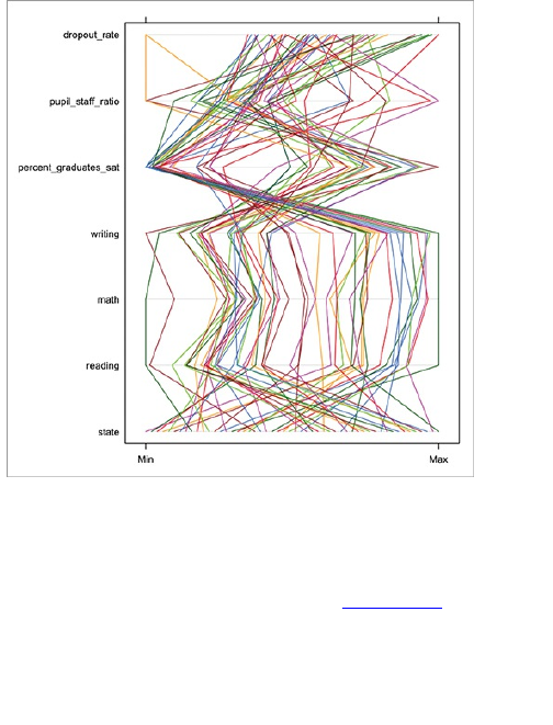
How can you modify this parallel coordinates plot so
that you can actually get some information out of it? For
starters, flip it on its side. This is more of a personal
preference than it is a rule, but parallel coordinates left
to right makes more sense, as shown in Figure 7-22.
parallel(education, horizontal.axis=FALSE)
You also don’t need to include the state column,
because for one, it’s categorical, and second, every
state has a different name. Now change the color of the
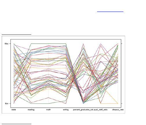
lines to black—I’m all for color, but it’s too much as-is.
Execute the line of code below and you get Figure 7-23.
parallel(education[,2:7], horizontal.axis=FALSE, col="#000000")
Figure 7-22: Horizontal parallel coordinates
Figure 7-23: Parallel coordinates, simplified
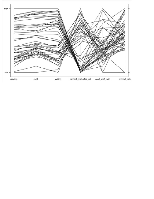
That’s a little better. The lines from reading, to math,
to writing seldom criss-cross and almost run parallel.
This makes sense that states with high reading scores
also have math and writing scores. Similarly, states with
low reading scores tend to have low math and writing
scores.
Then something interesting happens as you go from
SAT scores to percentage of graduates who take the
SAT. It looks like the states with higher SAT score
averages tend to have a lower percentage of graduates
who take the test. It’s the opposite for states with lower
SAT averages. My specialty isn’t in education, but my
best bet is that in some states everyone takes the SAT,
whereas in others people don’t take the test if they’re
not planning to go to college. Thus, the average comes
down when you require people who don’t care about the
results to take the test.

You can make this point more obvious by offering
some contrasting colors. The parallel() function gives
you full control over the colors with the col argument.
Previously, you used only a single color (#000000), but you
can also pass it an array of colors, a color value for
each row of data. Now make the states in the 50th
percentile of reading scores black and the bottom half
gray. Use summary() to find the medians in the education
data. Simply enter summary(education) in the console. This
actually gives you summary stats for all columns, but it’s
a quick way to find that the median for reading is 523.
state reading math writing
Alabama : 1 Min. :466.0 Min. :451.0 Min. :455.0
Alaska : 1 1st Qu.:497.8 1st Qu.:505.8 1st
Qu.:490.0
Arizona : 1 Median :523.0 Median :525.5 Median :510.0
Arkansas : 1 Mean :533.8 Mean :538.4 Mean :520.8
California: 1 3rd Qu.:571.2 3rd Qu.:571.2 3rd
Qu.:557.5
Colorado : 1 Max. :610.0 Max. :615.0 Max. :588.0
(Other) :46
percent_graduates_sat pupil_staff_ratio dropout_rate
Min. : 3.00 Min. : 4.900 Min. :-1.000
1st Qu.: 6.75 1st Qu.: 6.800 1st Qu.: 2.950
Median :34.00 Median : 7.400 Median : 3.950
Mean :37.35 Mean : 7.729 Mean : 4.079
3rd Qu.:66.25 3rd Qu.: 8.150 3rd Qu.: 5.300
Max. :90.00 Max. :12.100 Max. : 7.600
Now iterate through each row of the data; check if it’s
above or below and specify the colors accordingly. The
c() directive creates an empty vector, which you add to
in each iteration.
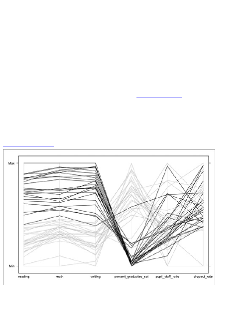
reading_colors <- c()
for (i in 1:length(education$state)) {
if (education$reading[i] > 523) {
col <- "#000000"
} else {
col <- "#cccccc"
}
reading_colors <- c(reading_colors, col)
}
Then pass the reading_colors array into parallel instead
of the lone "#000000". This gives you Figure 7-24, and it’s
much easier to see the big move from high to low.
parallel(education[,2:7], horizontal.axis=FALSE, col=reading_colors)
Figure 7-24: States with top reading scores highlighted
What about dropout rates? What if you do the same
thing with dropout rates that you just did with reading
scores, except you use the third quartile instead of the

median? The quartile is 5.3 percent. Again, you iterate
over each row of data, but this time check the dropout
rate instead of reading score.
dropout_colors <- c()
for (i in 1:length(education$state)) {
if (education$dropout_rate[i] > 5.3) {
col <- "#000000"
} else {
col <- "#cccccc"
}
dropout_colors <- c(dropout_colors, col)
}
parallel(education[,2:7], horizontal.axis=FALSE, col=dropout_colors)
Figure 7-25 shows what you get, and it’s not nearly as
compelling as the previous graphic. Visually speaking,
there aren’t any obvious groupings across all of the
variables.
Figure 7-25: States with highest dropout rates
highlighted
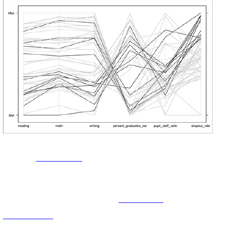
You can do more exploring on your own. Now go
back to Figure 7-24 and tighten it up. Better looking
labels that are more obvious would be good. Maybe
add some color instead of all grayscale? How about a
short blurb about why the top 50 percent of states are
highlighted? What do you get? Figure 7-26.
Figure 7-26: Standalone parallel coordinates plot on
SAT scores
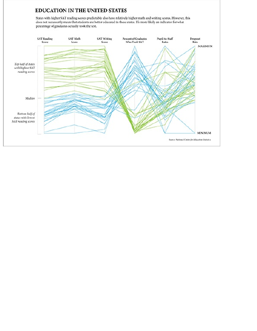
Reducing Dimensions
When you use Chernoff Faces or parallel coordinates,
your main goal is to reduce. You want to find groups
within the dataset or population. The challenge is that
you don’t always know where to start looking in the
faces or the connecting lines, so it’d be nice if you could
cluster objects, based on several criteria. This is one of
the goals of multidimensional scaling (MDS). Take
everything into account, and then place units that are
more similar closer together on a plot.
Entire books are written on this topic, so explanations
can get technical, but for the sake of simplicity, I’ll keep
it at a high level and leave the math for another day.
That said, MDS is one of the first concepts I learned in

graduate school, and it is worth learning the mechanics
behind it, if you’re into that sort of thing.
For more details on the method, look up
multidimensional scaling or principal
components analysis.
Imagine that you’re in an empty, square-shaped room
and there are two other people there. It’s your job to tell
those people where to stand in the room, based on their
height. The more similar their height, the closer they
should stand, and the more different their height, the
farther away they should stand. One is really short. The
other is really tall. Where should they go? The two
people should stand at opposite corners, because they
are complete opposites.
Now a third person comes in, and he’s medium
height. Sticking with the arrangement scheme, the new
person should stand in the center of the room, right in
between the first two. He’s equally different from the tall
and the short, so he’s equal distance from each. At the
same time, the tall and short people are still maximum
distance from each other.
Okay, now introduce another variable: weight. You
know the height and weight of all three people. The
short and medium height people are actually the exact
same weight whereas the tall person is, say, a third
heavier. How can you, based on height and weight,
place the three people in the room? Well, if you keep
the first two people (short and tall) in their opposite
positions, the third person (medium height) would need

to move closer to the shorter person, because their
weights are the same.
Do you get what is occurring? The more similar two
people are, the closer they should stand to each other.
In this simple case, you have only three people and two
variables, so it’s easy to work this out manually, but
imagine you have 50 people, and you have to place
them in the room based on say, five criteria. It’s trickier.
And that’s what multidimensional scaling is for.
Make Use of Multidimensional Scaling
Multidimensional scaling is much easier to understand
with a concrete example, so jump right in. Come back
to the education data, so if you haven’t loaded it in R
already, go ahead and do that first.
education <-
read.csv("http://datasets.flowingdata.com/education.csv",
header=TRUE)
Remember, there is a row for each state, which
includes the District of Columbia and more rows for the
United States averages. There are six variables for
each state: reading, math, and writing SAT scores;
percentage of graduates who took the SAT; pupil-to-
staff ratio; and dropout rate.
It’s just like the room metaphor, but instead of a
square room, it’s a square plot; instead of people, there
are states; and instead of height and weight, you have
education-related metrics. The goal is the same. You
want to place the states on an x-y plot, so that similar

states are closer together.
First step: Figure out how far each state should be
from every other state. Use the dist() function, which
does just that. You use only columns 2 through 7
because the first column is state names, and you know
all those are different.
ed.dis <- dist(education[,2:7])
If you type ed.dis in the console, you see a series of
matrices. Each cell represents how far one state should
be from another (by Euclidean pixel distance). For
example, the value in the second row, second column
over is the distance Alabama should be from Alaska.
The units aren’t so important at this point. Rather it’s the
relative differences that matter.
How do you plot this 51 by 51 matrix on an x-y plot?
You can’t yet, until you have an x-y coordinate for each
state. That’s what cmdscale() is for. It takes a distance
matrix as input and returns a set of points so that the
differences between those points are about the same
as specified in the matrix.
ed.mds <- cmdscale(ed.dis)
Type ed.mds in the console, and you see you now have
x-y coordinates for each row of data. Store these in the
variables x and y, and toss them into plot() to see what it
looks like (Figure 7-27).
x <- ed.mds[,1]
y <- ed.mds[,2]
plot(x,y)
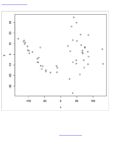
Figure 7-27: Dot plot showing results of
multidimensional scaling
Not bad. Each dot represents a state. One problem,
though: You don’t know what state is which. You need
labels, so like before use text() to put state names in
place of the dots, as shown in Figure 7-28.
plot(x, y, type="n")
text(x, y, labels=education$state)
That’s kind of cool. You see a couple of clusters
emerge, with one on the left and the other on the right.
United States is on the bottom of the right cluster,
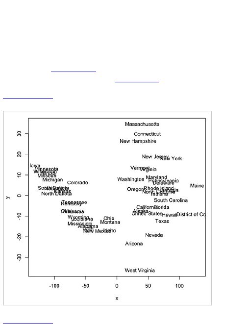
toward the middle, which seems about right. At this
point, it’s up to you to figure what the clusters mean, but
it’s a good jumping off point in your data exploration
escapades.
You could, for example, color the states by
dropout_colors like you did with the parallel coordinates,
as shown in Figure 7-29. It doesn’t tell you much, but it
does confirm what you saw in Figure 7-25.
Figure 7-28: Using state names instead of dots to see
where each state was placed
Figure 7-29: States colored by dropout rates
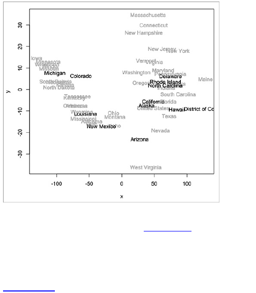
What about states colored by reading scores? Yeah,
you can do that, too, as shown in Figure 7-30. Ah, it
looks like there’s a clear pattern there. High scores are
on the left and lower scores are on the right? What
makes Washington different? Look into that—you can
tell me later.
Figure 7-30: States colored by reading scores
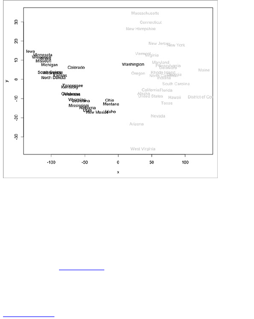
If you want to be fancy, you can try something called
model-based clustering. I’m not going to get into the
details of it. I’ll just show you how to do it, and you can
take my word for it that we’re not doing any magic here.
There’s actual math involved. Basically, use the mclust
package to identify clusters in your MDS plot. Install
mclust if you haven’t already. Now run the following code
for the plots in Figure 7-31.
library(mclust)
ed.mclust <- Mclust(ed.mds)
plot(ed.mclust, data=ed.mds)
Figure 7-31: Results of model-based clustering
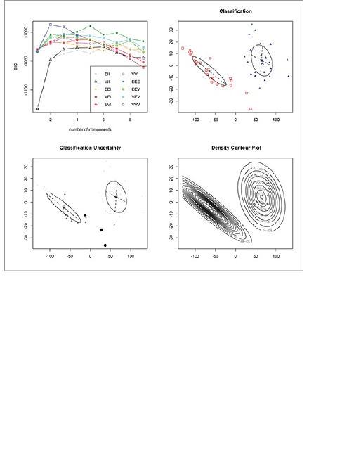
That first plot on the top left shows the results of
running an algorithm to find the ideal number of clusters
in the data. The remaining three plots show the clusters.
Pretty awesome. You get the two clusters, now more
well defined, showing high and low states.
This is usually when I tell you to bring your PDF files
into Illustrator and apply some touchups, but I’m not so
sure I’d ever publish these for a general audience. It’s
too abstract for the nontechnically minded to figure out
what’s going on. They’re good for data exploration;
however, if you were so inclined, all standard design
principles apply. Figure out what you need to tell a clear

story, and strip out the rest.
Searching for Outliers
Rather than looking for how units of data belong in
certain groups, you should also be interested in how
they don’t belong in groups. That is, there will often be
data points that stand out from the rest, which are
called, you guessed it, outliers. These are data points
that are different from the rest of the population.
Sometimes they could be the most interesting part of
your story, or they could just be boring typos with a
missing zero. Either way, you need to check them out to
see what’s going on. You don’t want to make a giant
graphic on the premise of an outlier, only to find out later
from a diligent reader that your hard work makes no
sense.
Graphic types have been designed specifically to
highlight outliers, but in my experience, nothing beats
basic plots and common sense. Learn about the context
of your data, do your homework, and ask experts about
the data when you’re not sure about something. Once
you find the outliers, you can use the same graphical
techniques that we’ve used so far to highlight them for
readers: Use varied colors, provide pointers, or use
thicker borders.
Now look at a simple example. Figure 7-32 shows a
time series plot that shows weather data scraped from
Weather Underground (like you did in Chapter 2,
“Handling Data”), from 1980 to 2005. There are
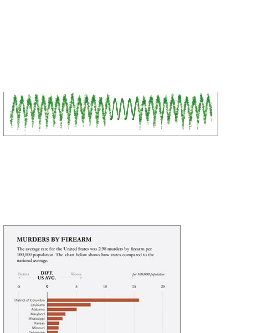
seasonal cycles like you’d expect, but what’s going on
in the middle? It seems to be unusually smooth,
whereas the rest of the data has some noise. This is
nothing to go crazy over, but if you happen to run
weather models on this data, you might want to know
what has been estimated and what’s real data.
Figure 7-32: Estimated weather data from Weather
Underground
Similarly, looking at the star charts you made that
show crime, you can see the District of Columbia
stands out. You could have seen this just as easily with
a basic bar chart, as shown in Figure 7-33. Is it fair to
compare Washington, DC to the states, considering it
has more of a city makeup? You be the judge.
Figure 7-33: Murders by Firearm in the United States
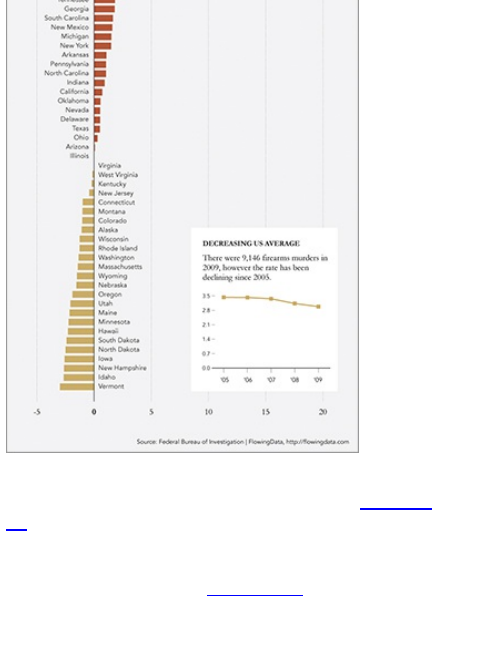
How about the subscriber counts from Chapter 3,
“Choosing Tools to Visualize Data,” shown in Figure 7-
34? There’s that big dip in the middle where it looks like
more than half of FlowingData’s readership is lost.
You can also look at the distribution as a whole via a
histogram, as shown in Figure 7-35. All counts are
sitting on the right, except for a couple all the way to the
left with nothing in the middle.
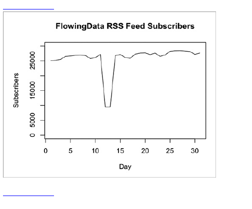
Figure 7-34: FlowingData subscriber counts over time
Figure 7-35: Histogram showing distribution of
subscriber counts
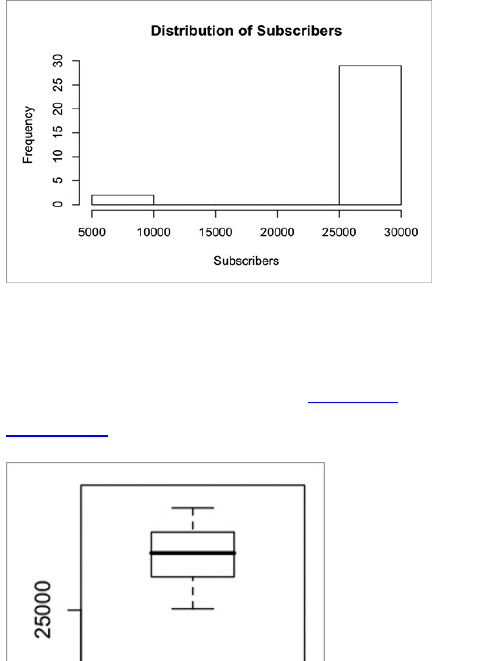
More concretely, you can use a boxplot, which shows
quartiles in a distribution. Boxplots generated in R with
the boxplot() function can automatically highlight points
that are more than 1.5 times more or less than the
upper and lower quartiles, respectively (Figure 7-36).
Figure 7-36: Boxplot showing distribution of subscriber
counts
A quartile is one of three points in a dataset,
which marks quarter spots. The middle quartile
is the median or the halfway point; the upper
quartile marks the spot where 25 percent of the
data is greater than that value; and the lower
quartile marks the bottom 25 percent.
If I had a small number of subscribers in the single
digits, then sure, such a big percentage-wise decrease

could be possible, but it’s unlikely that I said something
so offensive to compel tens of thousands of readers to
defect (and then come back a couple of days later). It’s
much more likely that Feedburner, the feed delivery
service I use, made a reporting error.
These outliers in these datasets are obvious because
you know a little bit about the data. It could be less
obvious if you use datasets you’re not familiar with.
When that happens, it can be helpful to go directly to the
source and just ask whoever is in charge. The person or
group curating the data is usually happy that you’re
making use of it and will offer some quick advice. If you
can’t find out any more details, you can at least say you
tried, and make a note of the ambiguity in your
explanation of your graphic.
Wrapping Up
For beginners, one of the hardest parts to design data
graphics is to figure out where to start. You have all this
data in front of you without a clue about what it is or what
to expect. Usually, you should start with a question
about the data and work off of that question, but what if
you don’t know what to ask? The methods described in
this chapter can help a lot with this. They help you see
all the data at once, which makes it easier to figure out
what part of the data to explore next.
However, don’t stop here. Use these as jumping off
points to narrow down to spots that look interesting.
This, in addition to what previous chapters cover should

be enough to help you dig deep into your data, no
matter what type of data you deal with. Well, except for
one. The next chapter covers one more data type:
spatial data. Get ready to make some maps.

Chapter 8
Visualizing Spatial
Relationships
Maps are a subcategory of visualization that have the
added benefit of being incredibly intuitive. Even as a
kid, I could read them. I remember sitting in the
passenger seat of my dad’s car and sounding off
directions as I read the fantastically big unfolded map
laid out in front of me. An Australian lady with a robotic
yet calming voice spits out directions from a small box
on the dash nowadays.
In any case, maps are a great way to understand your
data. They are scaled down versions of the physical
world, and they’re everywhere. In this chapter you dive
into several spatial datasets, looking for patterns over
space and time. You create some basic maps in R and
then jump to more advanced mapping with Python and
SVG. Finally, you round it up with interactive and
animated maps in ActionScript and Flash.
What to Look For
You read maps much the same way that you read
statistical graphics. When you look at specific locations
on a map, you still look for clustering in specific regions
or for example, compare one region to the rest of a
country. The difference is that instead of x- and y-
coordinates, you deal with latitude and longitude. The
coordinates on a map actually relate to each other in the
same way that one city relates to another. Point A and
Point B are a specific number of miles away, and it
takes an estimated time to get there. In contrast, the
distance on a dot plot is abstract and (usually) has no
units.
This difference brings with it a lot of subtleties to
maps and cartography. There’s a reason The New York
Times has a group of people in its graphics department
who exclusively design maps. You need to make sure
all your locations are placed correctly, colors make
sense, labels don’t obscure locations, and that the right
projection is used.
This chapter covers only a handful of the basics.
These can actually take you pretty far in terms of finding
stories in your data, but keep in mind there’s a whole
other level of awesome that you can strive for.
Things can get especially interesting when you
introduce time. One map represents a slice in time, but
you can represent multiple slices in time with several
maps. You can also animate changes to, say, watch
growth (or decline) of a business across a geographic
region. Bursts in specific areas become obvious, and if
the map is interactive, readers can easily focus in on
their area to see how things have changed. You don’t
get the same effect with bar graphs or dot plots, but with
maps, the data can become instantly personal.

Specific Locations
A list of locations is the easiest type of spatial data
you’ll come across. You have the latitude and longitude
for a bunch places, and you want to map them. Maybe
you want to show where events, such as crime,
occurred, or you want to find areas where points are
clustered. This is straightforward to do, and there are a
lot of ways to do it.
On the web, the most common way to map points is
via Google or Microsoft Maps. Using their mapping
APIs, you can have an interactive map that you can
zoom and pan in no time with just a few lines of
JavaScript. Tons of tutorials and excellent
documentation are online on how to make use of these
APIs, so I’ll leave that to you.
Note
Google and Microsoft provide super
straightforward tutorials that start with their
mapping APIs, so be sure to check those out if
you’re interested in taking advantage of some
basic mapping functionality.
However, there is a downside. You can only
customize the maps so much, and in the end you’ll
almost always end up with something that still looks like
a Google or Microsoft map. I’m not saying they’re ugly,
but when you’re developing an application or designing
a graphic that fits into a publication, it’s often more
fitting to have a map that matches your design scheme.
There are sometimes ways to get around these
barriers, but it’s not worth the effort if you can just do the
same thing but better, with a different tool.
Find Latitude and Longitude
Before you do any mapping, consider the available data
and the data that you actually need. If you don’t have the
data you need, then there’s nothing to visualize, right? In
most practical applications, you need latitude and
longitude to map points, and most datasets don’t come
like that. Instead, you most likely will have a list of
addresses.
As much as you might want to, you can’t just plug in
street names and postal codes and expect a pretty
map. You have to get latitude and longitude first, and for
that, turn to geocoding. Basically, you take an address,
give it to a service, the service queries its database for
matching addresses, and then you get latitude and
longitude for where the service thinks your address is
located in the world.
As for which service to use, well, there are many. If
you have only a few locations to geocode, it’s easy to
just go to a website and manually enter them.
Geocoder.us is a good free option for that. If you don’t
need your locations to be exact, you can try Pierre
Gorissen’s Google Maps Latitude Longitude Popup.
It’s a simple Google Maps interface that spits out
latitude and longitude for anywhere you click on the
map.
If, however, you have a lot of locations to geocode,
then you should do it programmatically. You don’t need
to waste your time copying and pasting. Google,
Yahoo!, Geocoder.us, and Mediawiki all provide APIs
for gecoding; and Geopy, a geocoding toolbox for
Python, wraps them all up into one package.
Useful Geocoding Tools
Geocoder.us , http://geocoder.us—
Provides a straightforward interface to
copy and paste location to get latitude
and longitude. Also provides an API.
Latitude Longitude Popup,
www.gorissen.info/Pierre/maps/—
Google Maps’ mashup. Click a location
on the map, and it gives you latitude and
longitude.
Geopy,
http://code.google.com/p/geopy/—
Geocoding toolbox for Python. Wraps up
multiple geocoding APIs into a single
package.
Visit the Geopy project page for instructions on how
to install the package. There are also lots of
straightforward examples on how to start. The following
example assumes you have already installed the
package on your computer.
After you install Geopy, download location data at
http://book.flowingdata.com/ch08/geocode/costcos-
limited.csv. This is a CSV file that contains the address
of every Costco warehouse in the United States, but it
doesn’t have latitude or longitude coordinates. That’s up
to you.
Open a new file and save it as geocode-locations.py. As
usual, import the packages that you need for the rest of
the script.
from geopy import geocoders
import csv
You also need an API key for each service you want
to use. For the purposes of this example, you only need
one from Google.
Note
Visit
http://code.google.com/apis/maps/signup.html
to sign up for a free API key for the Google Maps
API. It’s straightforward and takes only a couple
of minutes.
Store your API key in a variable named g_api_key, and
then use it when you instantiate the geocoder.
g_api_key = ‘INSERT_YOUR_API_KEY_HERE’
g = geocoders.Google(g_api_key)
Load the costcos-limited.csv data file, and then loop.
For each row, you piece together the full address and
then plug it in for geocoding.
costcos = csv.reader(open(‘costcos-
limited.csv’), delimiter=’,’)
next(costcos) # Skip header
# Print header
print "Address,City,State,Zip Code,Latitude,Longitude"
for row in costcos:
full_addy = row[1] + "," + row[2] + "," + row[3] + "," + row[4]
place, (lat, lng) = list(g.geocode(full_addy, exactly_one=False))[0]
print full_addy + "," + str(lat) + "," + str(lng)
That’s it. Run the Python script, and save the output
a s costcos-geocoded.csv. Here’s what the first few lines of
the data looks like:
Address,City,State,Zip Code,Latitude,Longitude
1205 N. Memorial Parkway,Huntsville,Alabama,35801-
5930,34.7430949,-86.6009553
3650 Galleria Circle,Hoover,Alabama,35244-2346,33.377649,-
86.81242
8251 Eastchase Parkway,Montgomery,Alabama,36117,32.363889,-
86.150884
5225 Commercial Boulevard,Juneau,Alaska,99801-7210,58.3592,-
134.483
330 West Dimond Blvd,Anchorage,Alaska,99515-1950,61.143266,-
149.884217
...
Pretty cool. By some stroke of luck, latitude and
longitude coordinates are found for every address. That
usually doesn’t happen. If you do run into that problem,
you should add error checking at the second to last line
of the preceding script.
try:
place, (lat, lng) = list(g.geocode(full_addy, exactly_one=False))[0]
print full_addy + "," + str(lat) + "," + str(lng)
except:
print full_addy + ",NULL,NULL"
This tries to find the latitude and longitude
coordinates, and if it fails, it prints the row with the
address and null coordinate values. Run the Python
script and save the output as a file, and you can go
back and look for the nulls. You can either try a different
service for the missing addresses via Geopy, or you
can just manually enter the addresses in Geocoder.us.
Just Points
Now that you have points with latitude and longitude,
you can map them. The straightforward route is to do
the computer equivalent of putting pushpins in a paper
map on a billboard. As shown in the framework in
Figure 8-1, you place a marker for each location on the
map.
Figure 8-1: Mapping points framework
Although a simple concept, you can see features in
the data such as clustering, spread, and outliers.
Map with Dots
R, although limited in mapping functionality, makes
placing dots on a map easy. The maps package does
most of the work. Go ahead and install it via the
Package Installer, or use install.packages() in the
console. When installed, load it into the workspace.
library(maps)
Next step: Load the data. Feel free to use the Costco
locations that you just geocoded, or for convenience,
I’ve put the processed dataset online, so you can load it
directly from the URL.
costcos <-
read.csv("http://book.flowingdata.com/ch08/geocode/costcos-
geocoded .csv", sep=",")
Now on to mapping. When you create your maps, it’s
useful to think of them as layers (regardless of the
software in use). The bottom layer is usually the base
map that shows geographical boundaries, and then you
place data layers on top of that. In this case the bottom
layer is a map of the United States, and the second
layer is Costco locations. Here’s how to make the first
layer, as shown in Figure 8-2.
map(database="state")
Figure 8-2: Plain map of the United States
The second layer, or Costco’s, are then mapped with
the symbols() function. This is the same function you used
to make the bubble plots in Chapter 6, “Visualizing
Relationships,” and you use it in the same way, except
you pass latitude and longitude instead of x- and y-
coordinates. Also set add to TRUE to indicate that you want
symbols to be added to the map rather than creating a
new plot.
symbols(costcos$Longitude, costcos$Latitude,
circles=rep(1, length(costcos$Longitude)), inches=0.05, add=TRUE)
Figure 8-3 shows the results. All the circles are the
same size because you set circles to an array of ones
with the length equal to the number of locations. You
also set inches to 0.05, which sizes the circles to that
number. If you want smaller markers, all you need to do
is decrease that value.
Figure 8-3: Map of Costco locations
As before, you can change the colors of both the map
and the circles so that the locations stand out and
boundary lines sit in the background, as shown in
Figure 8-4. Now change the dots to a nice Costco red
and the state boundaries to a light gray.
map(database="state", col="#cccccc")
symbols(costcos$Longitude, costcos$Latitude, bg="#e2373f", fg="#ffffff",
lwd=0.5, circles=rep(1, length(costcos$Longitude)),
inches=0.05, add=TRUE)
Figure 8-4: Using color with mapped locations
In Figure 8-3, the unfilled circles and the map were all
the same color and line width, so everything blended
together, but with the right colors, you can make the
data sit front and center.
It’s not bad for a few lines of code. Costco has clearly
focused on opening locations on the coasts with
clusters in southern and northern California, northwest
Washington, and in the northeast of the country.
However, there is a glaring omission here. Well, two
of them actually. Where are Alaska and Hawaii?
They’re part of the United States, too, but are nowhere
to be found even though you use the “state” database
wi th map(). The two states are actually in the “world”
database, so if you want to see Costco locations in
Alaska in Hawaii, you need to map the entire world, as
shown in Figure 8-5.
map(database="world", col="#cccccc")
symbols(costcos$Longitude, costcos$Latitude, bg="#e2373f", fg="#ffffff",
lwd=0.3, circles=rep(1, length(costcos$Longitude)),
inches=0.03, add=TRUE)
Figure 8-5: World map of Costco locations
It’s a waste of space, I know. There are options that
you can mess around with, which you can find in the
documentation, but you can edit the rest in Illustrator to
zoom in on the United States or remove the other
countries from view.
Tip
With R, when in doubt, always jump to the
documentation for the function or package
you’re stuck on by preceding the name with a
question mark.
Taking the map in the opposite direction, say you
want to only map Costco locations for a few states. You
can do that with the region argument.
map(database="state", region=c("California", "Nevada", "Oregon",
"Washington"), col="#cccccc")
symbols(costcos$Longitude, costcos$Latitude, bg="#e2373f", fg="#ffffff",
lwd=0.5, circles=rep(1, length(costcos$Longitude)), inches=0.05,
add=TRUE)
As shown in Figure 8-6, you create a bottom layer
with California, Nevada, Oregon, and Mexico. Then you
create the data layer on top of that. Some dots are not
in any of those states, but they’re in the plotting region,
so they still appear. Again, it’s trivial to remove those in
your favorite vector editing software.
Map with Lines
In some cases it could be useful to connect the dots on
your map if the order of the points have any relevance.
With online location services such as Foursquare
growing in popularity, location traces aren’t all that rare.
An easy way to draw lines is, well, with the lines()
function. To demonstrate, look at locations I traveled
during my seven days and nights as a spy for the fake
government of Fakesville. Start with loading the data
(as usual) and drawing a base world map.
faketrace <-
read.csv("http://book.flowingdata.com/ch08/points/fake-
trace.txt",
sep="\t")
map(database="world", col="#cccccc")
Take a look at the data frame by entering faketrace in
your R console. You see that it’s just two columns for
latitude and longitude and eight data points. You can
assume that the points are already in the order that I
traveled during those long seven nights.
latitude longitude
1 46.31658 3.515625
2 61.27023 69.609375
3 34.30714 105.468750
4 -26.11599 122.695313
4 -26.11599 122.695313
5 -30.14513 22.851563
6 -35.17381 -63.632813
7 21.28937 -99.492188
8 36.17336 -115.180664
Figure 8-6: Costco locations in selected states
Draw the lines by simply plugging in the two columns
into lines(). Also specify color (col) and line width (lwd).
lines(faketrace$longitude, faketrace$latitude, col="#bb4cd4", lwd=2)
Now also add dots, exactly like you just did with the
Costco locations, for the graphic in Figure 8-7.
symbols(faketrace$longitude, faketrace$latitude, lwd=1, bg="#bb4cd4", fg="#ffffff", circles=rep(1, length(faketrace$longitude)), inches=0.05, add=TRUE)
Figure 8-7: Drawing a location trace
After those seven days and nights as a spy for the
Fakesville government, I decided it wasn’t for me. It’s
just not as glamorous as James Bond makes it out to
be. However, I did make connections in all the countries
I visited. It could be interesting to draw lines from my
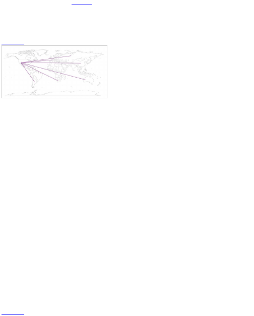
location to all the others, as shown in Figure 8-8.
map(database="world", col="#cccccc")
for (i in 2:length(faketrace$longitude)-1) {
lngs <-
c(faketrace$longitude[8], faketrace$longitude[i])
lats <-
c(faketrace$latitude[8], faketrace$latitude[i])
lines(lngs, lats, col="#bb4cd4", lwd=2)
}
Figure 8-8: Drawing worldwide connections
After you create the base map, you can loop through
each point and draw a line from the last point in the data
frame to every other location. This isn’t incredibly
informative, but maybe you can find a good use for it.
The point here is that you can draw a map and then use
R’s other graphics functions to draw whatever you want
using latitude and longitude coordinates.
By the way, I wasn’t actually a spy for Fakesville. I was
just kidding about that.
Scaled Points
Switching gears back to real data and a more
interesting topic than my fake spy escapades, more
often than not, you don’t just have locations. You also
have another value attached to locations such as sales
for a business or city population. You can still map with
points, but you can take the principles of the bubble plot
and use it on a map.
I don’t have to explain how bubbles should be sized
by area and not radius again, right? Okay, cool.
Map with Bubbles
In this example, look at adolescent fertility rate as
reported by the United Nations Human Development
Report—that is, the number of births per 1,000 women
aged 15 to 19 in 2008. The geo-coordinates were
provided by GeoCommons. You want to size bubbles in
proportion to these rates.
The code is almost the same as when you mapped
Costco locations, but remember you just passed a
vector of ones for circle size in the symbols() function.
Instead, we use the sqrt() of the rates to indicate size.
fertility <-
read.csv("http://book.flowingdata.com/ch08/points/adol-
fertility.csv")
map(‘world’, fill = FALSE, col = "#cccccc")
symbols(fertility$longitude, fertility$latitude,
circles=sqrt(fertility$ad_fert_rate), add=TRUE,
inches=0.15, bg="#93ceef", fg="#ffffff")
Figure 8-9: Adolescent fertility rate worldwide
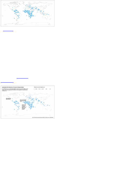
Figure 8-9 shows the output. Immediately, you should
see that African countries tend to have the highest
adolescent fertility rates, whereas European countries
have relatively lower rates. From the graphic alone, it’s
not clear what value each circle represents because
there is no legend. A quick look with summary() in R can
tell you more.
summary(fertility$ad_fert_rate)
Min. 1st Qu. Median Mean 3rd Qu. Max. NA’s
3.20 16.20 39.00 52.89 78.20 201.40 1.00
That’s fine for us, an audience of one, but you need to
explain more if you want others, who haven’t looked at
the data, to understand the graphic. You can add
annotation to highlight countries with the highest and
lowest fertility rates, point out the country where most
readers will be from (in this case, the United States),
and provide a lead-in to set up readers for what they’re
going to look at. Figure 8-10 shows these changes.
Figure 8-10: Rates more clearly explained for a wider
audience
Regions
Mapping points can take you only so far because they
represent only single locations. Counties, states,
countries, and continents are entire regions with
boundaries, and geographic data is usually aggregated
in this way. For example, it’s much easier to find health
data for a state or a country than it is for individual
patients or hospitals. This is usually done for privacy,
whereas other times aggregated data is just easier to
distribute. In any case, this is usually how you’re going
to use your spatial data, so now learn to visualize it.
Color by Data
Choropleth maps are the most common way to map
regional data. Based on some metric, regions are
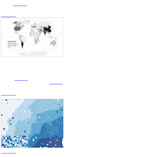
colored following a color scale that you define, as
shown in Figure 8-11. The areas and location are
already defined, so your job is to decide the
appropriate color scales to use.
Figure 8-11: Choropleth map framework
As touched on in a previous chapter, Cynthia
Brewer’s ColorBrewer is a great way to pick your
colors, or at least a place to start to design a color
palette. If you have continuous data, you might want a
similarly continuous color scale that goes from light to
dark, but all with the same hue (or multiple similar hues),
as shown in Figure 8-12.
A diverging color scheme, as shown in Figure 8-13,
might be good if your data has a two-sided quality to it,
such as good and bad or above and below a threshold.
Figure 8-12: Sequential color schemes with
ColorBrewer
Figure 8-13: Diverging color schemes with
ColorBrewer
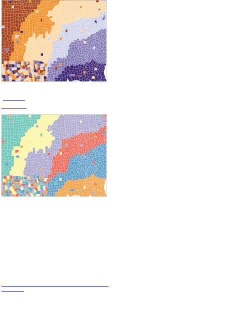
Finally, if your data is qualitative with classes or
categories, then you might want a unique color for each
(Figure 8-14).
Figure 8-14: Qualitative color scheme with
ColorBrewer
When you have your color scheme, you have two
more things to do. The first is to decide how the colors
you picked match up to the data range, and the second
is to assign colors to each region based on your choice.
You can do both with Python and Scalable Vector
Graphics (SVG) in the following examples.
Map Counties
The U.S. Bureau of Labor Statistics provides county-
level unemployment data every month. You can
download the most recent rates or go back several
years from its site. However, the data browser it
provides is kind of outdated and roundabout, so for the
sake of simplicity (and in case the BLS site changes),
you can download the data at
http://book.flowingdata.com/ch08/regions/unemployment-
aug2010.txt. There are six columns. The first is a code
specific to the Bureau of Labor Statistics. The next two
together are a unique id specifying county. The fourth
and fifth columns are the county name and month the
rate is an estimate of, respectively. The last column is
the estimated percentage of people in the county who
are unemployed. For the purposes of this example, you
care only about the county id (that is, FIPS codes) and
the rate.
Now for the map. In previous examples, you
generated base maps in R, but now you can use Python
and SVG to do this. The former is to process the data,
and the latter is for the map itself. You don’t need to
start completely from scratch, though. You can get a
blank map from Wikimedia Commons found here:
http://commons.wikimedia.org/wiki/File:USA_Counties_with_FIPS_and_names.svg,
as shown in Figure 8-15. The page links to the map in
four sizes in PNG format and then one in SVG. You
want the SVG one. Download the SVG file and save it
a s counties.svg, in the same directory that you save the
unemployment data.
Figure 8-15: Blank U.S. county map from Wikimedia
Commons
The important thing here, if you’re not familiar with
SVG, is that it’s actually an XML file. It’s text with tags,
and you can edit it in a text editor like you would an
HTML file. The browser or image viewer reads the
XML, and the XML tells the browser what to show, such
as the colors to use and shapes to draw.
To drive the point home, open the map SVG file in a
text editor to see what you’re dealing with. It’s mostly
SVG declarations and boiler plate stuff, which you don’t
totally care about right now.
Scroll down some more to start to see some <path>
tags, as shown in Figure 8-16. All those numbers in a
single tag specify the boundaries of a county. You’re not
going to touch those. You’re interested in changing the
fill color of each county to match the corresponding
unemployment rate. To do that, you need to edit the
style in the path.
Tip
SVG files are XML files, which are easy to
change in a text editor. This also means that
you can parse the SVG code to make changes
programmatically.
Figure 8-16: Paths specified in SVG file

Notice how each <path> starts with style? Those who
have written CSS can immediately recognize this.
There is a f i l l attribute followed by a hexadecimal
color, so if you change that in the SVG file, you change
the color of the output image. You could edit each one
manually, but there are more than 3,000 counties. That
would take way too long. Instead, come back to your old
friend Beautiful Soup, the Python package that makes
parsing XML and HTML relatively easy.
Open a blank file in the same directory as your SVG
map and unemployment data. Save it as colorize_svg.py.
You need to import the CSV data file and parse the
SVG file with Beautiful Soup, so start by importing the
necessary packages.
import csv
from BeautifulSoup import BeautifulSoup
Then open the CSV file and store it so that you can
iterate through the rows using csv.reader(). Note that the
“r” in the open() function just means that you want to open
the file to read its contents, as opposed to writing new
rows to it.
reader = csv.reader(open(‘unemployment-
aug2010.txt’, ‘r’), delimiter=",")
Now also load the blank SVG county map.
svg = open(‘counties.svg’, ‘r’).read()
Cool, you loaded everything you need to create a
choropleth map. The challenge at this point is that you
need to somehow link the data to the SVG. What is the
commonality between the two? I’ll give you a hint. It has
to do with each county’s unique id, and I mentioned it
earlier. If you guessed FIPS codes, then you are
correct!
Each path in the SVG file has a unique id, which
happens to be the combined FIPS state and county
FIPS code. Each row in the unemployment data has the
state and county FIPS codes, too, but they’re separate.
For example, the state FIPS code for Autauga County,
Alabama, is 01, and its county FIPS code is 001. The
path id in the SVG are those two combined: 01001.
You need to store the unemployment data so that you
can retrieve each county’s rate by FIPS code, as we
iterate through each path. If you start to become
confused, stay with me; it’ll be clearer with actual code.
But the main point here is that the FIPS codes are the
common bond between your SVG and CSV, and you
can use that to your advantage.

Tip
Paths in SVG files, geographic ones in
particular, usually have a unique id. It’s not
always FIPS code, but the same rules apply.
To store the unemployment data so that it’s easily
accessible by FIPS code later, use a construct in
Python called a dictionary. It enables you to store and
retrieve values by a keyword. In this case, your keyword
is a combined state and county FIPS code, as shown in
the following code.
unemployment = {}
min_value = 100; max_value = 0
for row in reader:
try:
full_fips = row[1] + row[2]
rate = float( row[8].strip() )
unemployment[full_fips] = rate
except:
pass
Next parse the SVG file with BeautifulSoup. Most
tags have an opening and closing tag, but there are a
couple of self-closing tags in there, which you need to
specify. Then use the findAll() function to retrieve all the
paths in the map.
soup = BeautifulSoup(svg, selfClosingTags=[‘defs’,’sodipodi:namedview’])
paths = soup.findAll(‘path’)
Then store the colors, which I got from ColorBrewer,
in a Python list. This is a sequential color scheme with
multiple hues ranging from purple to red.
colors = ["#F1EEF6", "#D4B9DA", "#C994C7", "#DF65B0", "#DD1C77", "#980043"]
You’re getting close to the climax. Like I said earlier,
you’re going to change the style attribute for each path
in the SVG. You’re just interested in fill color, but to
make things easier, you can replace the entire style
instead of parsing to replace only the color. I changed
the hexadecimal value after stroke to #ffffff, which is
white. This changes the borders to white instead of the
current gray.
path_style = ‘font-size:12px;fill-
rule:nonzero;stroke:#fffff;stroke-opacity:1;stroke-
width:0.1;stroke-miterlimit:4;stroke-dasharray:none;stroke-
linecap:butt;marker-start:none;stroke-linejoin:bevel;fill:’
I also moved fill to the end and left the value blank
because that’s the part that depends on each county’s
unemployment rate.
Finally, you’re ready to change some colors! You can
iterate through each path (except for state boundary
lines and the separator for Hawaii and Alaska) and
color accordingly. If the unemployment rate is greater
than 10, use a darker shade, and anything less than 2
has the lightest shade.
for p in paths:
if p[‘id’] not in ["State_Lines", "separator"]:
# pass
try:
rate = unemployment[p[‘id’]]
except:
continue
if rate > 10:
color_class = 5
elif rate > 8:
color_class = 4
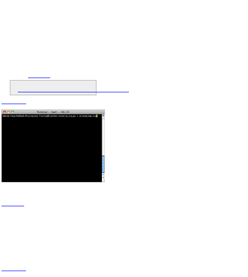
elif rate > 6:
color_class = 3
elif rate > 4:
color_class = 2
elif rate > 2:
color_class = 1
else:
color_class = 0
color = colors[color_class]
p[‘style’] = path_style + color
The last step is to print out the SVG file with prettify().
The function converts your soup to a string that your
browser can interpret.
print soup.prettify()
Now all that’s left to do is run the Python script and
save the output as a new SVG file named, say,
colored_map.svg (Figure 8-17).
You can grab the script in its entirety here:
http://book.flowingdata.com/ch08/regions/colorize_svg.py.txt
Figure 8-17: Running Python script and saving output
as a new SVG file
Open your brand spanking new choropleth map in
Illustrator or a modern browser such as Firefox, Safari,
or Chrome to see the fruits of your labor, as shown in
Figure 8-18. It’s easy to see now where in the country
there were higher unemployment rates during August
2010. Obviously a lot of the west coast and much of the
southeast had higher rates, as did Alaska and
Michigan. There are a lot of counties in middle America
with relatively lower unemployment rates.
With the hard part of this exercise done, you can
customize your map to your heart’s content. You can
edit the SVG file in Illustrator, change border colors and
sizes, and add annotation to make it a complete
graphic for a larger audience. (Hint: It still needs a
legend.)
Figure 8-18: Choropleth map showing unemployment
rates

The best part is that the code is reusable, and you
can apply it to other datasets that use the FIPS code. Or
even with this same dataset, you can mess around with
color scheme to design a map that fits with the theme of
your data.
Depending on your data, you can also change the
thresholds for how to color each region. The examples
so far used equal thresholds where regions were
colored with six shades, and every 2 percentage points
was a new class. Every county with an unemployment
rate greater than 10 percent was one class; then
counties with rates between 8 and 10, then 6 and 8, and
so forth. Another common way to define thresholds is by
quartiles, where you use four colors, and each color
represents a quarter of the regions.
For example, the lower, middle, and upper quartiles
for these unemployment rates are 6.9, 8.7, and 10.8
percent, respectively. This means that a quarter of the
counties have rates below 6.9 percent, another quarter
between 6.9 and 8.7, one between 8.7 and 10.8, and
the last quarter is greater than 10.8 percent. To do this,
change the colors list in your script to something like the
following. It’s a purple color scheme, with one shade per
quarter.
colors = ["#f2f0f7", "#cbc9e2", "#9e9ac8", "#6a51a3"]
Then modify the color conditions in the for loop, using
the preceding quartiles.
if rate > 10.8:
color_class = 3
elif rate > 8.7:
color_class = 2
elif rate > 6.9:
color_class = 1
else:
color_class = 0
Run the script and save like before, and you get
Figure 8-19. Notice how there are more counties
colored lightly.
To increase the usability of your code, you can
calculate quartiles programmatically instead of hard-
coding them. This is straightforward in Python. You
store a list of your values, sort them from least to
greatest, and find the values at the one-quarter, one-
half, and three-quarters marks. More concretely, as it
pertains to this example, you can modify the first loop in
colorize_svg.py to store just unemployment rates.
unemployment = {}
rates_only = [] # To calculate quartiles
min_value = 100; max_value = 0; past_header = False
for row in reader:
if not past_header:
past_header = True
continue
try:
full_fips = row[1] + row[2]
rate = float( row[5].strip() )
unemployment[full_fips] = rate
rates_only.append(rate)
except:
pass
Then you can sort the array, and find the quartiles.
# Quartiles
rates_only.sort()
q1_index = int( 0.25 * len(rates_only) )
q1 = rates_only[q1_index] # 6.9
q2_index = int( 0.5 * len(rates_only) )
q2 = rates_only[q2_index] # 8.7
q3_index = int( 0.75 * len(rates_only) )
q3 = rates_only[q3_index] # 10.8
Figure 8-19: Unemployment rates divided by quartiles
Instead of hard-coding the values 6.9, 8.7, and 10.8 in
your code, you can replace those values with q1, q2, and
q3, respectively. The advantage of calculating the values
programmatically is that you can reuse the code with a
different dataset just by changing the CSV file.
Which color scale you choose depends on that data
you have and what message you want to convey. For
this particular dataset, I prefer the linear scale because
it represents the distribution better and highlights the
relatively high unemployment rates across the country.
Working from Figure 8-18, you can add a legend, a title,
and a lead-in paragraph for a more finalized graphic, as
shown in Figure 8-20.
Figure 8-20: Finished map with title, lead-in, and
legend
Map Countries
The process to color counties in the previous example
isn’t exclusive to these regions. You can use the same
steps to color states or countries. All you need is an
SVG file with unique ids for each region you want to
color (which are easily accessible on Wikipedia) and
data with ids to match. Now try this out with open data
from the World Bank.
Tip
World Bank is one of the most complete
resources for country-specific demographic
data. I usually go here first.
Look at percentages of urban populations with
access to an improved water source, by country, in
2008. You can download the Excel file from the World
Bank data site here:
http://data.worldbank.org/indicator/SH.H2O.SAFE.UR.ZS/countries.
For convenience, you can also download the stripped
down data as a CSV file here: Full URL is:
http://book.flowingdata.com/ch08/worldmap/water-
source1.txt. There are some countries with missing
data, which is common with country-level data. I’ve
removed those rows from the CSV file.
There are seven columns. The first is the country
name; the second is a country code (could this be your
unique id?); and the last five columns are percentages
for 1990 to 2008.
For the base map, again go to Wikipedia. You can
find a lot of versions when you search for the SVG world
map, but use the one found here:
http://en.wikipedia.org/wiki/File:BlankMap-World6.svg.
Download the full resolution SVG file, and save it in the
same directory as your data. As shown in Figure 8-21,
it’s a blank world map, colored gray with white borders.
Figure 8-21: Blank world map

Open the SVG file in a text editor. It is of course all
text formatted as XML, but it’s formatted slightly
differently than your counties example. Paths don’t have
useful ids and the style attribute is not used. The paths
do, however, have classes that look like country codes.
They have only two letters, though. The country codes
used in the World Bank data have three letters.
According to World Bank documentation, it uses ISO
3166-1 alpha 3 codes. The SVG file from Wikipedia, on
the other hand, uses ISO 3166-1 alpha 2 codes. The
names are horrible, I know, but don’t worry; you don’t
have to remember that. All you need to know is that
Wikipedia provides a conversion chart at
http://en.wikipedia.org/wiki/ISO_3166-1. I copied and
pasted the table into Excel and then saved the
important bits as a text file. It has one column for the
alpha 2 and another for the alpha 3. Download it here:
http://book.flowingdata.com/ch08/worldmap/country-
codes.txt. Use this chart to switch between the two
codes.
As for styling each country, take a slightly different
route to do that, too. Instead of changing attributes
directly in the path tags, use CSS outside of the paths
to color the regions. Now jump right in.
Create a file named generate_css.py in the same
directory as the SVG and CSV files. Again, import the
CSV package to load the data in the CSV files with the
country codes and water access percentages.
import csv
codereader = csv.reader(open(‘country-
codes.txt’, ‘r’), delimiter="\t")
waterreader = csv.reader(open(‘water-
source1.txt’, ‘r’), delimiter="\t")
Then store the country codes so that it’s easy to
switch from alpha 3 to alpha 2.
alpha3to2 = {}
i = 0
next(codereader)
for row in codereader:
alpha3to2[row[1]] = row[0]
This stores the codes in a Python dictionary where
alpha 3 is the key and alpha 2 is the value.
Now like in your previous example, iterate through
each row of the water data and assign a color based on
the value for the current country.
i = 0
next(waterreader)
for row in waterreader:
if row[1] in alpha3to2 and row[6]:
alpha2 = alpha3to2[row[1]].lower()
pct = int(row[6])
if pct == 100:
fill = "#08589E"
elif pct > 90:
fill = "#08589E"
elif pct > 80:
fill = "#4EB3D3"
elif pct > 70:
fill = "#7BCCC4"
elif pct > 60:
fill = "#A8DDB5"
elif pct > 50:
fill = "#CCEBC5"
else:
fill = "#EFF3FF"
print ‘.’ + alpha2 + ‘ { fill: ‘ + fill + ‘ }’
i += 1
This part of the script executes the following steps:
1. Skip the header of the CSV.
2. It starts the loop to iterate over water data.
3. If there is a corresponding alpha 2 code to the
alpha 3 from the CSV, and there is data available for
the country in 2008, it finds the matching alpha 2.
4. Based on the percentage, an appropriate fill color
is chosen.
5. A line of CSS is printed for each row of data.
Run generate_css.py and save the output as style.css.
The first few rows of the CSS will look like this:
.af { fill: #7BCCC4 }
.al { fill: #08589E }
.dz { fill: #4EB3D3 }
.ad { fill: #08589E }
.ao { fill: #CCEBC5 }
.ag { fill: #08589E }
.ar { fill: #08589E }
.am { fill: #08589E }
.aw { fill: #08589E }
.au { fill: #08589E }
...
This is standard CSS. The first row, for example,
changes the fill color of all paths with class .af to
#7BCCC4.
Op en style.css in your text editor and copy all the
contents. Then open the SVG map and paste the
contents at approximately line 135, below the brackets
for .oceanxx. You just created a choropleth map of the
world colored by the percentage of population with
access to an improved water source, as shown in
Figure 8-22. The darkest blue indicates 100 percent,
and the lightest shades of green indicate lower
percentages. Countries that are still gray indicate
countries where data was not available.
Figure 8-22: Choropleth world map showing access to
improved water source
The best part is that you can now download almost
any dataset from the World Bank (and there are a lot of
them) and create a choropleth map fairly quickly just by
changing a few lines of code. To spruce up the graphic
i n Figure 8-22, again, you can open the SVG file in
Illustrator and edit away. Mainly, the map needs a title
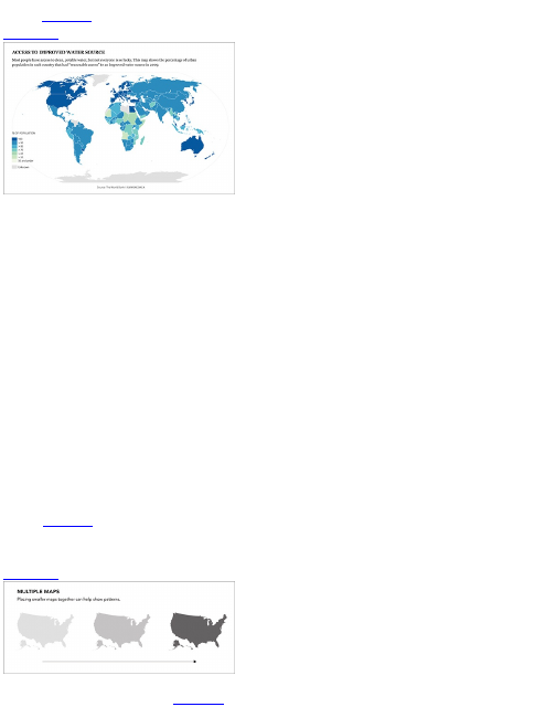
and a legend to indicate what each shade means, as
shown in Figure 8-23.
Figure 8-23: Finished world map
Over Space and Time
The examples so far enable you to visualize a lot of data
types, whether it be qualitative or quantitative. You can
vary colors, categories, and symbols to fit the story
you’re trying to tell; annotate your maps to highlight
specific regions or features; and aggregate to zoom in
on counties or countries. But wait, there’s more! You
don’t have to stop there. If you incorporate another
dimension of data, you can see changes over both time
and space.
In Chapter 4, “Visualizing Patterns over Time,” you
visualized time more abstractly with lines and plots,
which is useful, but when location is attached to your
data, it can be more intuitive to see the patterns and
changes with maps. It’s easier to see clustering or
groups of regions that are near in physical distance.
The best part is that you can incorporate what you’ve
already learned to visualize your data over space and
time.
Small Multiples
You saw this technique in Chapter 6, “Visualizing
Relationships,” to visualize relationships across
categories, and it can be applied to spatial data, too, as
shown in Figure 8-24. Instead of small bar graphs, you
can use small maps, one map for each slice of time.
Line them up left to right or stack them top to bottom,
and it’s easy for your eyes to follow the changes.
Figure 8-24: Small multiples with maps
For example, in late 2009, I designed a graphic that
showed unemployment rates by county (Figure 8-25). I
actually used a variation of the code you just saw in the
previous section, but I applied it to several slices of
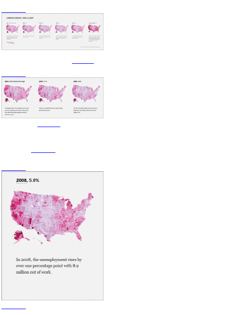
time.
Figure 8-25: Unemployment rates from 2004 to 2009
It’s easy to see the changes, or lack thereof, by year,
from 2004 through 2006, as shown in Figure 8-26. The
national average actually went down during that time.
Figure 8-26: Unemployment rates 2004 to 2006
Then 2008 hits (Figure 8-27), and you start to see
some of the increases in the unemployment rate,
especially in California, Oregon, and Michigan, and
some counties in the southeast.
Fast forward to 2009, and there is a clear difference,
as shown in Figure 8-28. The national average
increased 4 percentage points and the county colors
become very dark.
Figure 8-27: Unemployment rates in 2008
Figure 8-28: Unemployment rates during September
2009
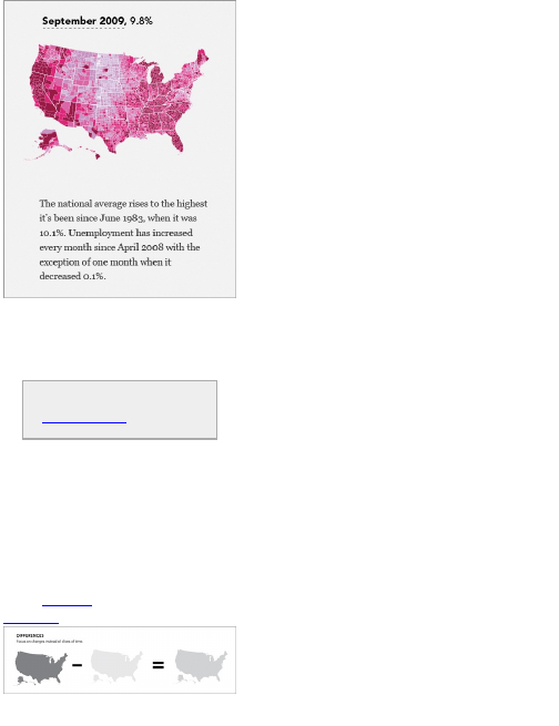
This was one of the most popular graphics I posted
on FlowingData because it’s easy to see that dramatic
change after several years of relative standstill. I also
used the OpenZoom Viewer, which enables you to
zoom in on high-resolution images, so you can focus on
your own area to see how it changed.
When high-resolution images are too big to
display on a single monitor, it can be useful to
put the image in OpenZoom Viewer
(http://openzoom.org) so that you can see
the picture and then zoom in on the details.
I could have also visualized the data as a time series
plot, where each line represented a county; however,
there are more than 3,000 U.S. counties. The plot would
have felt cluttered, and unless it was interactive, you
would not be able to tell which line represented which
county.
Take the Difference
You don’t always need to create multiple maps to show
changes. Sometimes it makes more sense to visualize
actual differences in a single map. It saves space, and it
highlights changes instead of single slices in time, as
shown in Figure 8-29.
Figure 8-29: Focusing on change
If you were to download urban population counts from
the World Bank, you’d have similar data to the previous
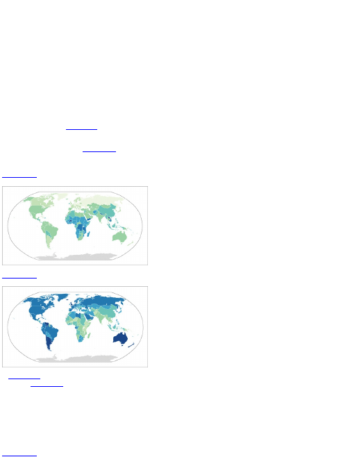
example using access to improved water. Each row is a
country, and each column is a year. However, the urban
population data is raw counts for an estimated number
of people in the country living in urban areas. A
choropleth map of these counts would inevitably
highlight larger countries because they of course have
larger populations in general. Two maps to show the
difference in urban population between 2005 and 2009
wouldn’t be useful unless you changed the values to
proportions. To do that, you’d have to download
population data for 2005 and 2009 in all countries and
then do some simple math. It’s not all that hard to do
that, but it’s an extra step. Plus, if the changes are
subtle, they’ll be hard to see across multiple maps.
Instead, you can take the difference and show it in a
single map. You can easily calculate this in Excel or
modify the previous Python script, and then make a
single map, as shown in Figure 8-30.
It’s easy to see which countries changed the most
and which ones changed the least when you visualize
the differences. In contrast, Figure 8-31 shows the
proportion of each country’s total population that lived in
an urban area in 2005.
Figure 8-30: Change in urban population from 2005 to
2009
Figure 8-31: Proportion of people living in an urban
area in 2005
Figure 8-32 shows the same data for 2009. It looks
similar to Figure 8-31, and you can barely notice a
difference.
For this particular example, it’s clear that the single
map is more informative. You have to do a lot less work
mentally to decipher the changes. It’s obvious that
although many countries in Africa have a relatively lower
percentage of their population living in urban areas
compared to the rest of the world, they have also
changed the most in recent years.
Figure 8-32: Proportion of people living in an urban
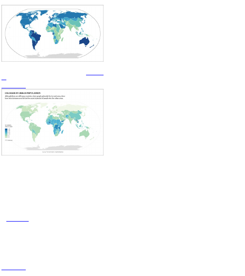
area in 2009
Remember to add a legend, source, and title if your
graphic is for a wider audience, as shown in Figure 8-
33.
Figure 8-33: Annotated map of differences
Animation
One of the more obvious ways to visualize changes
over space and time is to animate your data. Instead of
showing slices in time with individual maps, you can
show the changes as they happen on a single
interactive map. This keeps the intuitiveness of the
map, while allowing readers to explore the data on their
own.
A few years ago, I designed a map that shows the
growth of Walmart across the United States, as shown
i n Figure 8-34. The animation starts with the fist store
that opened in 1962 in Rogers, Arkansas, and then
moves through 2010. For each new store that opened
up, another dot appears on the map. The growth is slow
at first, and then Walmarts spread across the country
almost like a virus. It keeps growing and growing, with
bursts in areas where the company makes large
acquisitions. Before you know it, Walmart is
everywhere.
Figure 8-34: Animated map showing growth of
Walmart stores
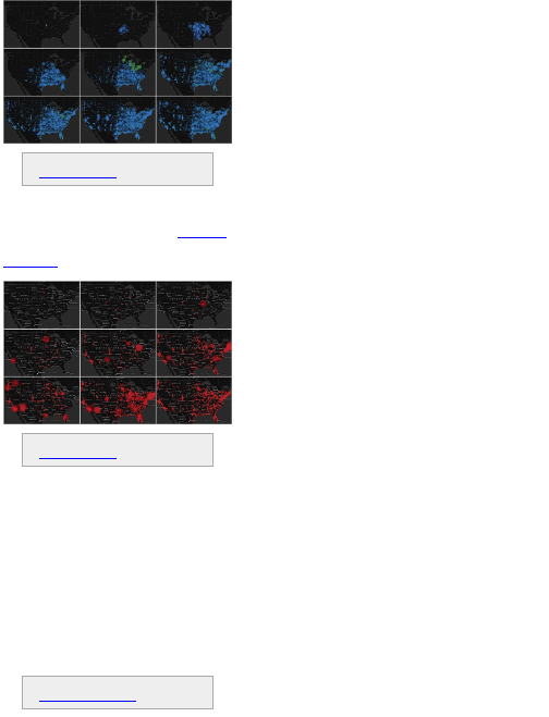
View the Walmart map in its entirety at
http://datafl.ws/197.
At the time, I was just trying to learn Flash and
ActionScript, but the map was shared across the web
and has been viewed millions of times. I later created a
similar map showing the growth of Target (Figure 8-35),
and it was equally well spread.
Figure 8-35: Animated map showing growth of Target
stores
You can watch the growth of Target stores at
http://datafl.ws/198.
People have been so interested for two main
reasons. The first is that the animated map enables you
to see patterns that you wouldn’t see with a time series
plot. A regular plot would show only the number of store
openings per year, which is fine if that’s the story you
want to tell, but the animated maps show growth that’s
more organic, especially with the Walmart one.
The second reason is that the map is immediately
understandable to a general audience. When the
animation starts, you know what you’re seeing. I’m not
saying there isn’t value in visualization that takes time to
interpret; it’s often the opposite. However, there’s a low
time threshold for the web, so because the map is
intuitive (and that people can zoom in on their own local
areas) certainly helped the eager sharing.
Create an Animated Growth Map
Download Modest Maps at
http://modestmaps.com.
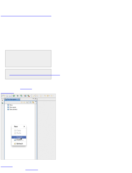
In this example, you create the Walmart growth map
in ActionScript. You use Modest Maps, an ActionScript
mapping library to provide interaction and the base
map. The rest you code yourself. Download the
complete source code at
http://book.flowingdata.com/ch08/Openings_src.zip.
Instead of going through every line and file, you’ll look at
just the important bits in this section.
As in Chapter 5, “Visualizing Proportions,” when you
create a stacked area chart with ActionScript and the
Flare visualization toolkit, I highly recommend you use
Adobe Flex Builder. It makes ActionScript a lot easier
and keeps your code organized. You can of course still
code everything in a standard text editor, but Flex
Builder wraps up the editor, debugging, and compiling
into one package. This example assumes you do have
Flex Builder, but you are of course welcome to grab an
ActionScript 3 compiler from the Adobe site.
Note
Adobe Flex Builder was recently changed to
Adobe Flash Builder. There are small
differences between the two, but you can use
either.
Download the growth map code in its entirety at
http://book.flowingdata.com/ch08/Openings_src.zip
to follow along in this example.
To begin, open Flex Builder 3, and right-click the left
sidebar, which shows the current list of projects. Select
Import, as shown in Figure 8-36.
Figure 8-36: Import ActionScript project
Select Existing Projects Into Workspace, as shown in
Figure 8-37.
Then, as shown in Figure 8-38, browse to the
directory in which you saved the code. The Openings
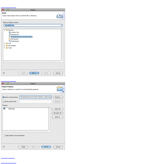
project should appear after selecting the root directory.
Figure 8-37: Existing project
Figure 8-38: Import Openings project
Your workspace in Flex Builder should look similar to
Figure 8-39.
Figure 8-39: Workspace after importing project

All of the code is in the src folder. This includes
Modest Maps in the com folder and TweenFilterLite in
the gs folder, which help with transitions.
With the Openings project imported, you’re ready to
start building the map. Do this in two parts. In the first
part create an interactive base map. In the second add
the markers.
Add the Interactive Base Map
In Openings.as, the first lines of code import the
necessary packages.
import com.modestmaps.Map;
import com.modestmaps.TweenMap;
import com.modestmaps.core.MapExtent;
import com.modestmaps.geo.Location;
import
com.modestmaps.mapproviders.OpenStreetMapProvider;
import flash.display.Sprite;
import flash.display.StageAlign;
import flash.display.StageScaleMode;
import flash.events.Event;
import flash.events.MouseEvent;
import flash.filters.ColorMatrixFilter;
import flash.geom.ColorTransform;
import flash.text.TextField;
import flash.net.*;
The first section imports classes from the Modest
Maps package, whereas the second section imports
display objects and event classes provided by Flash.
The name of each class isn’t important right now. That
becomes clear as you use them. However, the naming
pattern for the first section matches the directory
structure, starting with com, then modestmaps, and ending
with Map. This is how you import classes most of the time
when you write your own ActionScript.
A b ove public class Openings extends Sprite, several
variables—width, height, background color, and frame
rate—of the compiled Flash file are initialized.
[SWF(width="900", height="450", backgroundColor="#ffffff", frameRate="32")]
Then after the class declaration, you need to specify
some variables and initialize a Map object.
private var stageWidth:Number = 900;
private var stageHeight:Number = 450;
private var map:Map;
private var mapWidth:Number = stageWidth;
private var mapHeight:Number = stageHeight;
In between the brackets of the Openings() function, you
can now create your first interactive map with Modest
Maps.
stage.scaleMode = StageScaleMode.NO_SCALE;
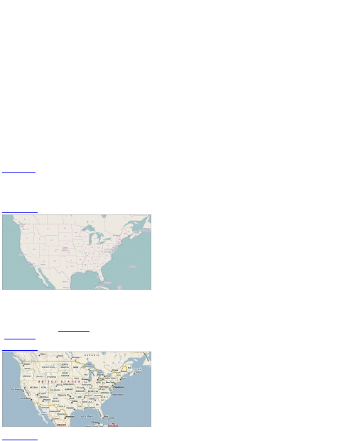
stage.scaleMode = StageScaleMode.NO_SCALE;
stage.align = StageAlign.TOP_LEFT;
// Initialize map
map = new
TweenMap(mapWidth, mapHeight, true, new
OpenStreetMapProvider());
map.setExtent(new
MapExtent(50.259381, 24.324408, -128.320313, -59.941406));
addChild(map);
Like in Illustrator, you can think of the full interactive as
a bunch of layers. In ActionScript and Flash, the first
layer is the stage. You set it to not scale objects when
you zoom in on it, and you align the stage in the top left.
Next you initialize the map with the mapWidth and mapHeight
that you specified in the variables, turn on interaction,
and use map tiles from OpenStreetMap. By setting the
map extent to the preceding code, you frame the map
around the United States.
The coordinates in MapExtent() are latitude and
longitude which set the bounding box for what areas of
the world to show. The first and third numbers are
latitude and longitude for the top left corner, and the
second and fourth numbers are latitude and longitude
for the bottom right.
Finally, add the map (with addChild()) to the stage.
Figure 8-40 shows the result when you compile the
code without adding any filters to the map. You can
either press the Play button in the top left of Flex
Builder, or from the main menu, you can select Run
⇒Run Openings.
Figure 8-40: Plain map using OpenStreetMap tiles
When you run Openings, the result should pop up in
your default browser. There’s nothing on it yet, but you
can click-and-drag, which is kind of cool. Also if you
prefer a different set of map tiles, you can use the
Microsoft road map (Figure 8-41) or Yahoo! hybrid map
(Figure 8-42).
Figure 8-41: Plain map with Microsoft road map
Figure 8-42: Plain map with Yahoo! hybrid map
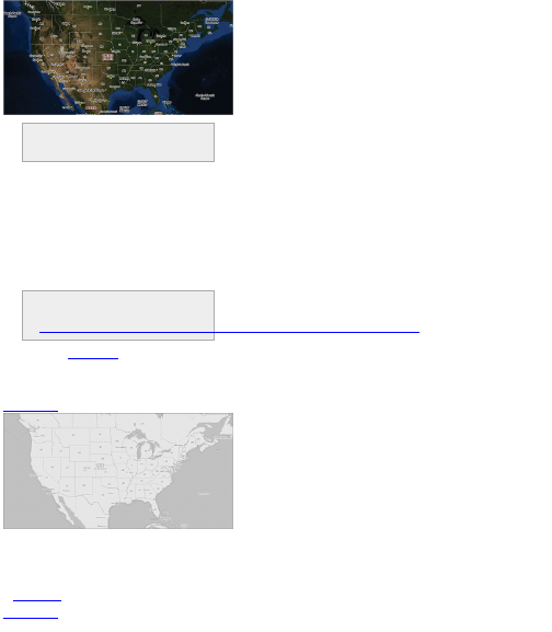
You can also use your own tiles if you want.
There’s a good tutorial on the Modest Maps
site.
You can also experiment with the colors of the map by
applying filters. You could for example, change the map
to grayscale by placing the following under the code you
just wrote. The mat array is of length 20 and takes
values from 0 to 1. Each value represents how much
red, green, blue and alpha each pixel gets.
var
mat:Array = [0.24688,0.48752,0.0656,0,44.7,0.24688,0.48752,
0.0656,0,44.7,0.24688,0.48752,0.0656,0,44.7,0,0,0,1,0];
var colorMat:ColorMatrixFilter = new ColorMatrixFilter(mat);
map.grid.filters = [colorMat];
See the Adobe reference for more on how to
use color matrices to customize objects in
ActionScript at
http://livedocs.adobe.com/flash/9.0/ActionScriptLangRefV3/flash/filters/ColorMatrixFilter.html.
As shown in Figure 8-43, the map is all gray, which
can be useful to highlight the data that you plan to
overlay on top of the map. The map serves as
background instead of battling for attention.
Figure 8-43: Grayscale map after applying filter
You can also invert the colors with a color transform.
map.grid.transform.colorTransform =
new ColorTransform(-1,-1,-1,1,255,255,255,0);
This turns white to black and black to white, as shown
in Figure 8-44.
Figure 8-44: Black and white map after inverting colors
with transform

To create zooming buttons, first write a function to
make buttons. You’d think that there would be a quick
default way to do this by now, but it still takes a handful
of code to get the job done. The function definition of
makeButton() is at the bottom of the Openings class.
public function
makeButton(clip:Sprite, name:String, labelText:String,
action:Function):Sprite
{
var button:Sprite = new Sprite();
button.name = name;
clip.addChild(button);
var label:TextField = new TextField();
label.name = ‘label’;
label.selectable = false;
label.textColor = 0xffffff;
label.text = labelText;
label.width = label.textWidth + 4;
label.height = label.textHeight + 3;
button.addChild(label);
button.graphics.moveTo(0, 0);
button.graphics.beginFill(0xFDBB30, 1);
button.graphics.drawRect(0, 0, label.width, label.height);
button.graphics.endFill();
button.addEventListener(MouseEvent.CLICK, action);
button.useHandCursor = true;
button.mouseChildren = false;
button.buttonMode = true;
return button;
}
Then create another function that makes use of the
function and draws the buttons you want. The following
code creates two buttons using makeButton()—one for
zooming in and the other for zooming out. It puts them at
the bottom left of your map.
// Draw navigation buttons
private function drawNavigation():void
{
// Navigation buttons (zooming)
var buttons:Array = new Array();
navButtons = new Sprite();
addChild(navButtons);
buttons.push(makeButton(navButtons, ‘plus’, ‘+’, map.zoomIn));
buttons.push(makeButton(navButtons, ‘minus’, ‘–’, map.zoomOut));
var nextX:Number = 0;
for(var i:Number = 0; i < buttons.length; i++) {
var currButton:Sprite = buttons[i];
Sprite(buttons[i]).scaleX = 3;
Sprite(buttons[i]).scaleY = 3;
Sprite(buttons[i]).x = nextX;
nextX += 3*Sprite(buttons[i]).getChildByName(‘label’).width;
}
navButtons.x = 2; navButtons.y = map.height-
navButtons.height-2;
}
However, because it’s a function, the code won’t
execute until you call it. In the Openings() function, also
known as the constructor, under the filters, add
drawNavigation(). Now you can zoom in to locations of
interest, as shown in Figure 8-45.
Figure 8-45: Map with zooming enabled

That’s all you need for the base map. You pick your
tiles, set your variables, and enable interaction.
Add the Markers
The next steps are to load the Walmart location data
and create markers for each store opening. In the
constructor, the following code loads an XML file from a
URL. When the file finishes loading, a function named
onLoadLocations() is called.
var urlRequest:URLRequest =
new
URLRequest(‘http://projects.flowingdata.com/walmart/walmarts_
new.xml’);
urlLoader = new URLLoader();
urlLoader.addEventListener(Event.COMPLETE, onLoadLocations);
urlLoader.load(urlRequest);
The obvious next step is to create the onLoadLocations()
function. It reads the XML file and stores the data in
arrays for easier use later. Before you do that though,
you need to initialize a few more variables after
navButtons.
private var urlLoader:URLLoader;
private var locations:Array = new Array();
private var openingDates:Array = new Array();
These variables are used in onLoadLocations(). Latitude
and longitude are stored in locations, and opening dates,
in year format, are stored in openingDates.
private function onLoadLocations(e:Event):void {
var xml:XML = new XML(e.target.data);
for each(var w:* in xml.walmart) {
locations.push(new
Location(w.latitude, w.longitude));
openingDates.push(String(w.opening_date));
}
markers = new MarkersClip(map, locations, openingDates);
map.addChild(markers);
}
The next step is to create the MarkersClip class.
Following the same directory structure discussed
earlier, there is a directory named flowingdata in the
com directory. A gps directory is in the flowingdata
directory. Finally, in com ⇒ flowingdata ⇒ gps is the
MarkersClip class. This is the container that will hold all
the Walmart markers, or rather, the data layer of your
interactive map.
As before, you need to import the classes that you will
use. Usually, you add these as you need them in the
code, but for the sake of simplicity, you can add all of
them at once.
import com.modestmaps.Map;
import com.modestmaps.events.MapEvent;
import flash.display.Sprite;
import flash.events.TimerEvent;
import flash.geom.Point;

import flash.utils.Timer;
The first two are from Modest Maps, whereas the last
four are native classes. Then you set variables right
before the MarkersClip() function. Again, you would add
these as you need them, but you can add them all now
to get to the meat of this class—the functions.
protected var map:Map; // Base map
public var markers:Array; // Holder for
markers
public var isStationary:Boolean;
public var locations:Array;
private var openingDates:Array;
private var storesPerYear:Array = new Array();
private var spyIndex:Number = 0; // Stores per year
index
private var currentYearCount:Number = 0; // Stores
shown so far
private var currentRate:Number; // Number of stores
to show
private var
totalTime:Number = 90000; // Approx. 1.5 minutes
private var timePerYear:Number;
public var currentYear:Number = 1962; // Start with
initial year
private var xpoints:Array = new
Array(); // Transformed longitude
private var ypoints:Array = new
Array(); // Transformed latitude
public var markerIndex:Number = 0;
private var starting:Point;
private var pause:Boolean = false;
public var scaleZoom:Boolean = false;
In the MarkersClip() constructor, store the variables that
will be passed to the class and compute a few things
such as time per year and coordinates for stores. You
can think of this as the setup.
The storesPerYear variable stores how many stores
opened during a given year. For example, one store
opened the first year, and no stores opened the next.
When you use this code with your own data, you need to
update storesPerYear appropriately. You could also write a
function that computes stores or location openings per
year to increase the reusability of your code. A hard-
coded array is specified in this example for the sake of
simplicity.
this.map = map;
this.x = map.getWidth() / 2;
this.y = map.getHeight() / 2;
this.locations = locations;
setPoints();
setMarkers();
this.openingDates = openingDates;
var tempIndex:int = 0;
storesPerYear = [1,0,1,1,0,2,5,5,5,15,17,19,25,19,27,
39,34,43,54,150,63,87,99,110,121,142,125,131,178,
163,138,156,107,129,53,60,66,80,105,106,114,96,
130,118,37];
timePerYear = totalTime / storesPerYear.length;
There are two other functions in the MarkersClip
class: setPoints() and setMarkers(). The first one translates
latitude and longitude coordinates to x- and y-
coordinates, and the second function places the
markers on the map without actually showing them.
Following is the definition for setPoints(). It uses a built-in
function provided by Modest Maps to calculate x and y
and then stores the new coordinates in xpoints and
ypoints.

public function setPoints():void {
if (locations == null) {
return;
}
var p:Point;
for (var i:int = 0; i < locations.length; i++) {
p = map.locationPoint(locations[i], this);
xpoints[i] = p.x;
ypoints[i] = p.y;
}
}
The second function, setMarkers(), uses the points that
setPoints() stores and places markers accordingly.
protected function setMarkers():void
{
markers = new Array();
for (var i:int = 0; i < locations.length; i++)
{
var marker:Marker = new Marker();
addChild(marker);
marker.x = xpoints[i]; marker.y = ypoints[i];
markers.push(marker);
}
}
The function also uses a custom Marker class, which
you can find in com ⇒ flowingdata ⇒ gps ⇒ Marker.as,
assuming you have downloaded the complete source
code. It’s basically a holder, and when you call its play()
function, it “lights up.”
Now you have location and markers loaded on the
map. However, if you compiled the code now and
played the file, you would still see a blank map. The next
step is to cycle through the markers to make them light
up at the right time.
The playNextStore() function simply calls play() of the
next marker and then gets ready to play the one after
that. The startAnimation() and onNextYear() functions use
timers to incrementally display each store.
private function playNextStore(e:TimerEvent):void
{
Marker(markers[markerIndex]).play();
markerIndex++;
}
If you were to compile and run the animation now,
you’d get dots, but it doesn’t work with the map’s zoom
and pan, as shown in Figure 8-46. As you drag the map
back and forth or zoom in and out, the bubbles for each
store are stationary.
Figure 8-46: Growth map with incorrect pan and zoom
Listeners are added in the constructor so that the
dots move whenever the map moves. Whenever a
MapEvent is triggered by Modest Maps, a
corresponding function defined in MarkersClip.as is
called. For example in the first line below,
onMapStartZooming() is called when a user clicks on the
map’s zoom button.
this.map.addEventListener(MapEvent.START_ZOOMING,
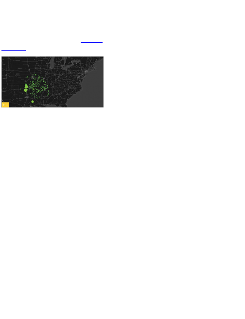
this.map.addEventListener(MapEvent.START_ZOOMING,
onMapStartZooming);
this.map.addEventListener(MapEvent.STOP_ZOOMING,
onMapStopZooming);
this.map.addEventListener(MapEvent.ZOOMED_BY, onMapZoomedBy);
this.map.addEventListener(MapEvent.START_PANNING,
onMapStartPanning);
this.map.addEventListener(MapEvent.STOP_PANNING,
onMapStopPanning);
this.map.addEventListener(MapEvent.PANNED, onMapPanned);
This gives you the final map, as shown in Figure 8-47.
Figure 8-47: Fully interactive growth map showing Wal-
Mart openings
The story with Walmart store openings is the organic
growth. The company started in a single location and
slowly spread outward. Obviously, this isn’t always the
case. For example, Target’s growth doesn’t look so
calculated. Costco’s growth is less dramatic because
there are fewer locations, but its strategy seems to be
growth on the coasts and then a move inward.
In any case, it’s a fun and interesting way to view your
data. The growth maps seem to spur people’s
imaginations, and they can wonder about the spread of
McDonald’s or Starbucks. Now that you have the code,
it’s a lot easier to implement. The hard part is finding
the data.
Wrapping Up
Maps are a tricky visualization type because in addition
to your own data, you have to handle the dimension of
geography. However, because of how intuitive they are,
maps can also be rewarding, both in how you can
present data to others and how you can explore your
data deeper than you could with a statistical plot.
As seen from the examples in this chapter, there are
a lot of possibilities for what you can do with spatial
data. With just a few basic skills, you can visualize a lot
of datasets and tell all sorts of interesting stories. This is
just the tip of the iceberg. I mean, people go to college
and beyond to earn degrees in cartography and
geography, so you can imagine what else is out there.
You can play with cartograms, which size geographic
regions according to a metric; add more interaction in
Flash; or combine maps with graphs for more detailed
and exploratory views of your data.
Online maps have become especially prevalent, and
their popularity is only going to grow as browsers and
tools advance. For the growth map example,
ActionScript and Flash were used, but it could have
also been implemented in JavaScript. Which tool you
use depends on the purpose. If it doesn’t matter what
tool you use, then go with the one you’re more

comfortable with. The main thing, regardless of
software, is the logic. The syntax might change, but you
do the same with your data, and you look for the same
flow in your storytelling.

Chapter 9
Designing with a Purpose
When you explore your own data, you don’t need to do
much in terms of storytelling. You are, after all, the
storyteller. However, the moment you use your graphic
to present information—whether it’s to one person,
several thousand, or millions—a standalone chart is no
longer good enough.
Sure, you want others to interpret results and perhaps
form their own stories, but it’s hard for readers to know
what questions to ask when they don’t know anything
about the data in front of them. It’s your job and
responsibility to set the stage. How you design your
graphics affects how readers interpret the underlying
data.
Prepare Yourself
You need to know your source material to tell good
stories with data. This is an often overlooked part of
designing data graphics. When you start, it’s easy to

get excited about your end result. You want something
amazing, beautiful, and interesting to look at, and this is
great; but you can’t do any of that if you have no idea
what you’re visualizing. You’ll just end up with something
like Figure 9-1. How can you explain interesting points
in a dataset when you don’t know the data?
Learn about the numbers and metrics. Figure out
where they came from and how they were estimated,
and see if they even make sense. This early data
gathering process is what makes graphics in The New
York Times so good. You see the end results in the
paper and on the web, but you miss all the work that
goes into the graphics before a single shape is drawn.
A lot of the time, it takes longer to get all the data in
order than it does to design a graphic.
So the next time you have a dataset in front of you, try
not to jump right into design. That’s the lazy person’s
way out, and it always shows in the end. Take the time
to get to know your data and learn the context of the
numbers.
Tip
Visualization is about communicating data, so
take the time to learn about what makes the
base of your graphic, or you’ll just end up
spouting numbers.
Punch some numbers into R, read any accompanying

documentation so that you know what each metric
represents, and see if there’s anything that looks weird.
If there is something that looks weird, and you can’t
figure out why, you can always contact the source.
People are usually happy to hear that someone is
making use of the data they published and are eager to
fix mistakes if there are any.
After you learn all you can about your data, you are
ready to design your graphics. Think of it like this.
Remember that part in The Karate Kid when Daniel is
just starting to learn martial arts? Mister Miyagi tells him
to wax a bunch of cars, sand a wooden floor, and
refinish a fence, and then Daniel is frustrated because
he feels like these are useless tasks. Then of course, it
turns out that blocking and punching all of a sudden
come natural to him because he’s been working on all
the right motions. It’s the same thing with data. Learn all
you can about the data, and the visual storytelling will
come natural. If you haven’t seen the movie, just nod
your head in agreement. And then go add The Karate
Kid to your Netflix queue.
Figure 9-1: Big graphic blueprint. Go big or go home.

Prepare Your Readers
Your job as a data designer is to communicate what you
know to your audience. They most likely didn’t look at
the data, so they might not see the same thing that you
see if there’s no explanation or setup. My rule of thumb
is to assume that people are showing up to my graphics
blindly, and with sharing via Facebook and Twitter and
links from other blogs, that’s not all that far off.
For example, Figure 9-2 shows a screenshot of an
animated map I made. If you haven’t seen this graphic
before, you probably have no clue what you’re looking
at. Given the examples in Chapter 8, “Visualizing
Spatial Relationships,” your best guess might be
openings for some store.
Figure 9-2: Map without a title or context
Watch the full map animation at
http://datafl.ws/19n.
The map actually shows geotagged tweets that were
posted around the world during the inauguration of
President Barack Obama on Tuesday, January 20,
2009, at noon Eastern Standard Time. The animation
starts early Monday morning, and as the day moves on,
more people wake and tweet at a steady rate. The
number of tweets per hour increases as the event
nears, and Europe gets in on some of the action as the
United States sleeps. Then Tuesday morning starts,
and then boom—there’s huge excitement as the event
actually happens. You can easily see this progression in
Figure 9-3. Had I provided this context for Figure 9-2, it
probably would’ve made a lot more sense.
Figure 9-3: Tweets during the inauguration of
President Barack Obama
You don’t have to write an essay to accompany every
graphic, but a title and a little bit of explanation via a
lead-in are always helpful. It’s often good to include a
link somewhere on your graphic so that people can still
find your words even if the graphic is shared on another
site. Otherwise, it can quickly become like a game of
Telephone, and before you know it, the graphic you
carefully designed is explained with the opposite
meaning you intended. The web is weird like that.
As another example, the graphic in Figure 9-4 is a
simple timeline that shows the top ten data breaches at
the time.
It’s basic with only ten data points, but when I posted
it on FlowingData, I brought up how the breaches grow
higher in frequency as you move from 2000 to 2008.
The graphic ended up getting shared quite a bit, with a
variant even ending up in Forbes magazine. Almost
everyone brought up that last bit. I don’t think people
would’ve given the graphic much thought had I not
provided that simple observation.
Figure 9-4: Major data breaches since 2000
The lesson: Don’t assume your readers know
everything or that they can spot features in your graphic.
This is especially true with the web because people are
used to clicking to the next thing.
That’s not to say that people won’t spend time looking
at data. As you might have seen, the OkCupid blog has
been writing relatively long posts presenting results from
thorough analyses of its online dating dataset. Titles
include “The Best Questions for a First Date” and “The
Mathematics of Beauty.”
Posts on the blog have been viewed millions of times,
and people love what the OkCupid folks have to say. In
addition to the tons of context in the actual post, people
also come to the blog with a bit of context of their own.
Because it is data and findings about dating and the

opposite sex, people can easily relate with their own
experiences. Figure 9-5, for example, is a graphic that
shows what Asian guys typically like, which is from an
OkCupid post on what people like, categorized by race
and gender. Hey, I’m Asian and a guy. Instant
connection.
Figure 9-5: What Asian guys like based on OkCupid
online dating profiles

On the other hand, when your graphic’s topic is
pollution levels or global debt, it can be a tough sell to a
general audience if you don’t do a good job of
explaining.
Sometimes, no matter how much you explain, people
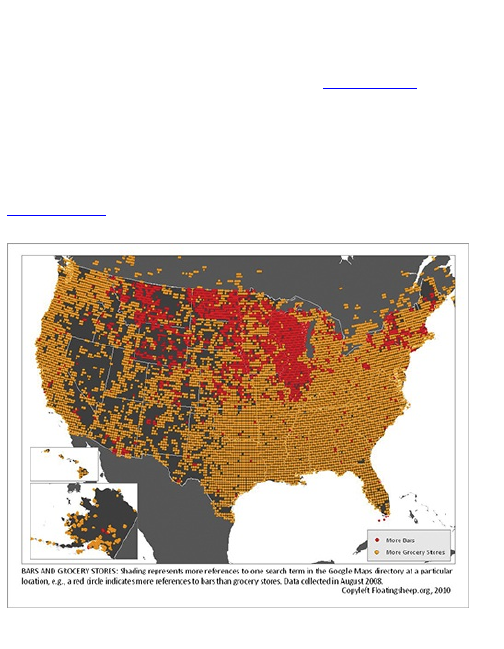
simply don’t like to read online, and they’ll just skim. For
example, I posted a map by FloatingSheep that
compares number of bars to number of grocery stores
in the United States, as shown in Figure 9-6. Red
indicates areas where there are more bars than grocery
stores, and orange indicates vice versa. The
FloatingSheep guys called it the “beer belly of
America.”
Figure 9-6: Where bars outnumber grocery stores in
the United States
Toward the end of the post, I wondered about the

accuracy of the map and then finished up with, “Anyone
who lives in the area care to confirm? I expect your
comment to be filled with typos and make very little
sense. And maybe smell like garbage.” The lesson?
Dry humor and sarcasm doesn’t translate very well
online, especially when people aren’t used to reading
your writing. I didn’t actually expect comments to smell
like garbage. Most people got the joke, but there were
also a good number of insulted Wisconsinites. Like I
said, the web is an interesting place (in a good way).
Visual Cues
In Chapter 1, “Telling Stories with Data,” you saw how
encodings work. Basically, you have data, and that data
is encoded by geometry, color, or animation. Readers
then decode those shapes, shades, and movement,
mapping them back to numbers. This is the foundation
of visualization. Encoding is a visual translation.
Decoding helps you see data from a different angle and
find patterns that you otherwise would not have seen if
you looked only at the data in a table or a spreadsheet.
These encodings are usually straightforward because
they are based on mathematical rules. Longer bars
represent higher values, and smaller circles represent
smaller values. Although your computer makes a lot of
decisions during this process, it’s still up to you to pick
encodings appropriate for the dataset at hand.

Through all the examples in previous chapters, you’ve
seen how good design not only lends to aesthetics, but
also makes graphics easier to read and can change
how readers actually feel about the data or the story you
tell. Graphics with default settings from R or Excel feel
raw and mechanical. This isn’t necessarily a bad thing.
Maybe that’s all you want to show for an academic
report. Or if your graphic is just a supplement to a more
important body of writing, it could be better to not
detract from what you want people to focus on. Figure
9-7 shows a generic bar plot that is about as plain as
plain can be.
If, however, you do want to display your graphic
prominently, a quick color change can make all the
difference. Figure 9-8 is just Figure 9-7 with different
background and foreground colors.
A darker color scheme might be used for a somber
topic, whereas a brighter color scheme can feel more
happy-go-lucky (Figure 9-9).
Of course, you don’t always need a theme. You can
use a neutral color palette if you like, as shown in Figure
9-10.
Figure 9-7: Plain bar plot
Figure 9-8: Default graph with dark color scheme
Figure 9-9: Default graph with light color scheme
Figure 9-10: Default graph with neutral color scheme
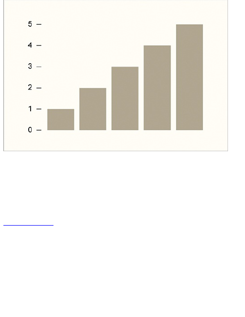
The main point is that color choice can play a major
role in data graphics. It can evoke emotions (or not) and
help provide context. It’s your responsibility to choose
colors that represent an accurate message. Your colors
should match the story you are trying to tell. As shown in
Figure 9-11, a simple color change can change the
meaning of your data completely. The graphic by
designer David McCandless and design duo Always
With Honor, explores the meaning of colors in different
cultures. For example, black and white are often used to
represent death; however, blue and green are more
commonly used in Muslim and South American cultures,
respectively.
Similarly, you can change geometry for a different
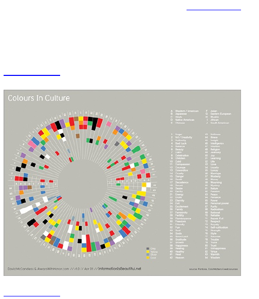
look, feel, and meaning. For example, Figure 9-12
shows a randomly generated stacked bar chart with
visualization researcher Mike Bostock’s Data-Driven
Documents. It has straight edges and distinct points,
along with peaks and valleys.
Figure 9-11: Colours In Culture by David McCandless
and Always With Honor
Figure 9-12: Randomly generated stacked bar chart
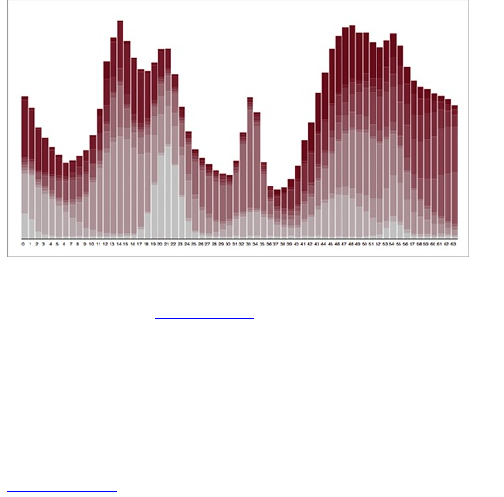
If instead you used a streamgraph to show similar
data, as shown in Figure 9-13, you clearly get a different
feel. It’s more free-flowing and continuous, and instead
of peaks and valleys, you have tightening and swelling.
At the same time though, the geometry between the two
chart types is similar. The streamgraph is basically a
smoothed stacked bar chart with the horizontal axis in
the center instead of on the bottom.
Figure 9-13: Randomly generated streamgraph
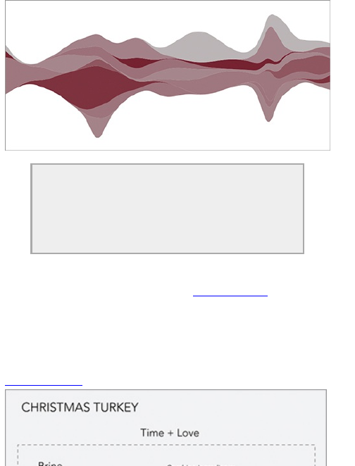
Check out Lee Byron and Martin Wattenberg’s
paper, “Stacked Graphs—Geometry and
Aesthetics” for more information on
streamgraphs. Several packages are also
available, such as Protovis and D3, that enable
you to design your own.
Sometimes context can simply come from how you
organize shapes and colors. Figure 9-14 shows a
graphic that I made for fun to celebrate the holidays. The
top part shows the ingredients that go into brining your
turkey, and on the bottom is what goes into the turkey
when you roast it in the oven.
Figure 9-14: Recipe for Christmas turkey
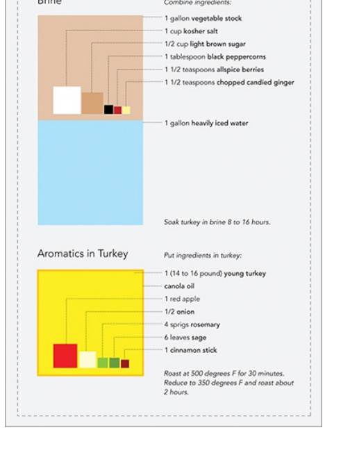
The bottom line: At its most basic level, visualization

is turning data, which can be numbers, text, categories,
or any variety of things, into visual elements. Some
visual cues work better than others, but applicability
also varies by dataset. A method that’s completely
wrong for one dataset could fit perfectly for another.
With practice, you can quickly decide what fits your
purpose best.
Good Visualization
Although people have been charting and graphing data
for centuries, only in the past few decades have
researchers been studying what works and what
doesn’t. In that respect, visualization is a relatively new
field. There still isn’t a consensus on what visualization
actually is. Is visualization something that has been
generated by a computer following a set of rules? If a
person has a hand in the design process, does that
make it not a visualization? Are information graphics
visualization, or do they belong in their own category?
Look online, and you can find lots of threads
discussing differences and similarities between
information graphics and visualization or essays that try
to define what visualization is. It always leads to a
never-ending back and forth without resolution. These
opposing opinions lead to varied criteria for what
makes a data graphic good or bad.
Statisticians and analysts, for example, generally

think of visualization as traditional statistical graphics
that they can use in their analyses. If a graphic or
interactive doesn’t help in analysis, then it’s not useful.
It’s a failure. On the other hand, if you talk to graphic
designers about the same graphic, they might think the
work is a success because it displays the data of
interest fairly and presents the data in an engaging way.
What you need to do is smush them all together, or at
least get them in the same room together more often.
The analytically minded can learn a lot from designers
about making data more relatable and understandable,
whereas design types can learn to dig deeper into data
from their analytic counterparts.
I don’t try to define what visualization is because the
definition doesn’t affect how I work. I consider the
audience, the data in front of me, and ask myself
whether the final graphic makes sense. Does it tell me
what I want to know? If yes, then great. If no, I go back to
the drawing board and figure out what would make the
graphic better so that it answers the questions I have
about the data. Ultimately, it’s all about your goals for
the graphic, what story you want to tell, and who you tell
it to. Take all of the above into account—and you’re
golden.
Wrapping Up
A lot of data people see design as just a way to make

your graphics look pretty. That’s certainly part of it, but
design is also about making your graphics readable,
understandable, and usable. You can help people
understand your data better than if they were to look at a
default graph. You can clear clutter, highlight important
points in your data, or even evoke an emotional
response. Data graphics can be entertaining, fun, and
informative. Sometimes it’ll just be the former,
depending on your goal, but no matter what you try to
design—visualization, information graphic, or data art—
let the data guide your work.
When you have a big dataset, and you don’t know
where to begin, the best place to start is with a
question. What do you want to know? Are you looking
for seasonal patterns? Relationships between multiple
variables? Outliers? Spatial relationships? Then look
back to your data to see if you can answer your
question. If you don’t have the data you need, then look
for more.
When you have your data, you can use the skills you
learned from the examples in this book to tell an
interesting story. Don’t stop here, though. Think of the
material you worked through as a foundation. At the
core of all your favorite data graphics is a data type and
a visualization method that you now know how to work
with. You can build on these for more advanced and
complex graphics. Add interactions, combine plots, or
complement your graphics with photographs and words

to add more context.
Remember: Data is simply a representation of real
life. When you visualize data, you visualize what’s going
on around you and in the world. You can see what’s
going on at a micro-level with individuals or on a much
larger scale spanning the universe. Learn data, and you
can tell stories that most people don’t even know about
yet but are eager to hear. There’s more data to play with
than ever before, and people want to know what it all
means. Now you can tell them. Have fun.
Visualize This: The FlowingData Guide to Design,
Visualization, and Statistics

Published by
Wiley Publishing, Inc.
10475 Crosspoint Boulevard
Indianapolis, IN 46256
www.wiley.com
Copyright © 2011 by Nathan Yau
Published by Wiley Publishing, Inc., Indianapolis,
Indiana
Published simultaneously in Canada
ISBN: 978-0-470-94488-2
ISBN: 978-1-118-14024-6 (ebk)
ISBN: 978-1-118-14026-0 (ebk)
ISBN: 978-1-118-14025-3 (ebk)
Manufactured in the United States of America
10 9 8 7 6 5 4 3 2 1
No part of this publication may be reproduced, stored in
a retrieval system or transmitted in any form or by any
means, electronic, mechanical, photocopying,
recording, scanning or otherwise, except as permitted
under Sections 107 or 108 of the 1976 United States
Copyright Act, without either the prior written permission
of the Publisher, or authorization through payment of the
appropriate per-copy fee to the Copyright Clearance
Center, 222 Rosewood Drive, Danvers, MA 01923,

(978) 750-8400, fax (978) 646-8600. Requests to the
Publisher for permission should be addressed to the
Permissions Department, John Wiley & Sons, Inc., 111
River Street, Hoboken, NJ 07030, (201) 748-6011, fax
(201) 748-6008, or online at
http://www.wiley.com/go/permissions.
Limit of Liability/Disclaimer of Warranty: The
publisher and the author make no representations or
warranties with respect to the accuracy or
completeness of the contents of this work and
specifically disclaim all warranties, including without
limitation warranties of fitness for a particular purpose.
No warranty may be created or extended by sales or
promotional materials. The advice and strategies
contained herein may not be suitable for every situation.
This work is sold with the understanding that the
publisher is not engaged in rendering legal, accounting,
or other professional services. If professional
assistance is required, the services of a competent
professional person should be sought. Neither the
publisher nor the author shall be liable for damages
arising herefrom. The fact that an organization or Web
site is referred to in this work as a citation and/or a
potential source of further information does not mean
that the author or the publisher endorses the information
the organization or website may provide or
recommendations it may make. Further, readers should
be aware that Internet websites listed in this work may

have changed or disappeared between when this work
was written and when it is read.
For general information on our other products and
services please contact our Customer Care
Department within the United States at (877) 762-2974,
outside the United States at (317) 572-3993 or fax
(317) 572-4002.
Wiley also publishes its books in a variety of electronic
formats and by print-on-demand. Not all content that is
available in standard print versions of this book may
appear or be packaged in all book formats. If you have
purchased a version of this book that did not include
media that is referenced by or accompanies a standard
print version, you may request this media by visiting
http://booksupport.wiley.com. For more information
about Wiley products, visit us at www.wiley.com.
Library of Congress Control Number: 2011928441
Trademarks: Wiley and the Wiley logo are trademarks
or registered trademarks of John Wiley & Sons, Inc.
and/or its affiliates, in the United States and other
countries, and may not be used without written
permission. All other trademarks are the property of
their respective owners. Wiley Publishing, Inc. is not
associated with any product or vendor mentioned in this
book.

Dedication
To my loving wife, Bea
About the Author
Since 2007, Nathan Yau has written and created
graphics for FlowingData, a site on visualization,
statistics, and design. Working with groups such as The
New York Times, CNN, Mozilla, and SyFy, Yau believes
that data and information graphics, while great for
analysis, are also perfect for telling stories with data.
Yau has a master’s degree in statistics from the
University of California, Los Angeles, and is currently a
Ph.D. candidate with a focus on visualization and
personal data.
About the Technical Editor
Kim Rees is co-founder of Periscopic, a socially
conscious information visualization firm. A prominent
individual in the visualization community, Kim has over
seventeen years of experience in the interactive
industry. She has published papers in the Parsons
Journal of Information Mapping and the InfoVIS 2010
Proceedings, and has spoken at the O’Reilly Strata
Conference, WebVisions, AIGA Shift, and Portland

Data Visualization. Kim received her bachelor of arts in
Computer Science from New York University.
Periscopic has been recognized in CommArts Insights,
Adobe Success Stories, and awarded by the VAST
Challenge, CommArts Web Picks, and the
Communication Arts Interactive Annual . Recently,
Periscopic’s body of work was nominated for the
Cooper-Hewitt National Design Awards.
Credits
Executive Editor
Carol Long
Senior Project Editor
Adaobi Obi Tulton
Technical Editor
Kim Rees
Senior Production Editor
Debra Banninger
Copy Editor
Apostrophe Editing Services
Editorial Director
Robyn B. Siesky
Editorial Manager
Mary Beth Wakefield
Freelancer Editorial Manager

Rosemarie Graham
Marketing Manager
Ashley Zurcher
Production Manager
Tim Tate
Vice President and Executive Group Publisher
Richard Swadley
Vice President and Executive Publisher
Barry Pruett
Associate Publisher
Jim Minatel
Project Coordinator, Cover
Katie Crocker
Compositor
Maureen Forys, Happenstance Type-O-Rama
Proofreader
Nancy Carrasco
Indexer
Robert Swanson
Cover Image
Nathan Yau
Cover Designer
Ryan Sneed
Acknowledgments

This book would not be possible without the work by the
data scientists before me who developed and continue
to create useful and open tools for everyone to use. The
software from these generous developers makes my
life much easier, and I am sure they will keep innovating.
My many thanks to FlowingData readers who helped
me reach more people than I ever imagined. They are
one of the main reasons why this book was written.
Thank you to Wiley Publishing, who let me write the
book that I wanted to, and to Kim Rees for helping me
produce something worth reading.
Finally, thank you to my wife for supporting me and to
my parents who always encouraged me to find what
makes me happy.

Introduction
Data is nothing new. People have been quantifying and
tabulating things for centuries. However, while writing for
FlowingData, my website on design, visualization, and
statistics, I’ve seen a huge boom in just these past few
years, and it keeps getting better. Improvements in
technology have made it extremely easy to collect and
store data, and the web lets you access it whenever you
want. This wealth in data can, in the right hands, provide
a wealth of information to help improve decision
making, communicate ideas more clearly, and provide
a more objective window looking in at how you look at
the world and yourself.
A significant shift in release of government data
came in mid-2009, with the United States’ launch of
Data.gov. It’s a comprehensive catalog of data
provided by federal agencies and represents
transparency and accountability of groups and officials.
The thought here is that you should know how the
government spends tax dollars. Whereas before, the
government felt more like a black box. A lot of the data
on Data.gov was already available on agency sites
scattered across the web, but now a lot of it is all in one
place and better formatted for analysis and
visualization. The United Nations has something similar
with UNdata; the United Kingdom launched Data.gov.uk

soon after, and cities around the world such as New
York, San Francisco, and London have also taken part
in big releases of data.
The collective web has also grown to be more open
with thousands of Application Programming Interfaces
(API) to encourage and entice developers to do
something with all the available data. Applications such
as Twitter and Flickr provide comprehensive APIs that
enable completely different user interfaces from the
actual sites. API-cataloging site ProgrammableWeb
reports more than 2,000 APIs. New applications, such
as Infochimps and Factual, also launched fairly recently
and were specifically developed to provide structured
data.
At the individual level, you can update friends on
Facebook, share your location on Foursquare, or tweet
what you’re doing on Twitter, all with a few clicks on a
mouse or taps on a keyboard. More specialized
applications enable you to log what you eat, how much
you weigh, your mood, and plenty of other things. If you
want to track something about yourself, there is
probably an application to help you do it.
With all this data sitting around in stores,
warehouses, and databases, the field is ripe for people
to make sense of it. The data itself isn’t all that
interesting (to most people). It’s the information that
comes out of the data. People want to know what their
data says, and if you can help them, you’re going to be

in high demand. There’s a reason that Hal Varian,
Google’s chief economist, says that statistician is the
sexy job of the next 10 years, and it’s not just because
statisticians are beautiful people. (Although we are
quite nice to look at in that geek chic sort of way.)
Visualization
One of the best ways to explore and try to understand a
large dataset is with visualization. Place the numbers
into a visual space and let your brain or your readers’
brains find the patterns. We’re good at that. You can
often find stories that you might never have found with
just formal statistical methods.
John Tukey, my favorite statistician and the father of
exploratory data analysis, was well versed in statistical
methods and properties but believed that graphical
techniques also had a place. He was a strong believer
in discovering the unexpected through pictures. You can
find out a lot about data just by visualizing it, and a lot of
the time this is all you need to make an informed
decision or to tell a story.
For example, in 2009, the United States experienced
a significant increase in its unemployment rate. In 2007,
the national average was 4.6 percent. In 2008, it had
risen to 5.8 percent. By September 2009, however, it
was 9.8 percent. These national averages tell only part
of the story though. It’s generalizing over an entire
country. Were there any regions that had higher
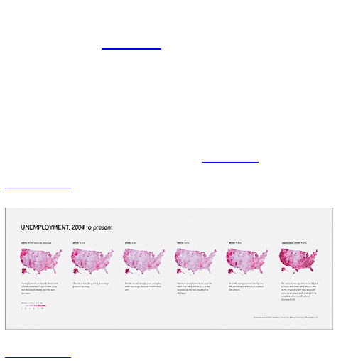
unemployment rates than others? Were there any
regions that seemed to be unaffected?
The maps in Figure I-1 tell a more complete story,
and you can answer the preceding questions after a
glance. Darker-colored counties are areas that had
relatively higher unemployment rates, whereas the
lighter-colored counties had relatively lower rates. In
2009, you see a lot of regions with rates greater than 10
percent in the west and most areas in the east. Areas in
the Midwest were not hit as hard (Figure I-2).
Figure I-1: Maps of unemployment in the United States
from 2004 to 2009
Figure I-2: Map of unemployment for 2009
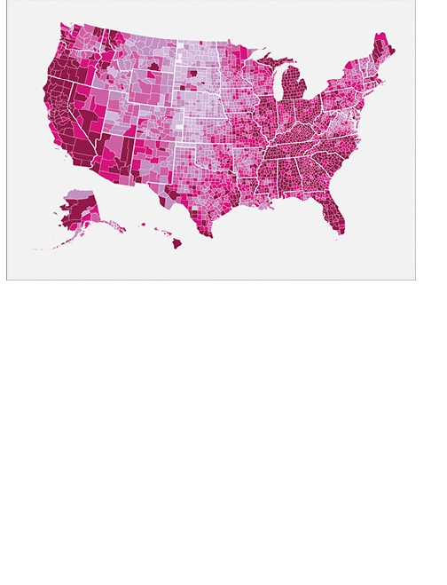
You couldn’t find these geographic and temporal
patterns so quickly with just a spreadsheet, and
definitely not with just the national averages. Also,
although the county-level data is more complex, most
people can still interpret the maps. These maps could in
turn help policy makers decide where to allocate relief
funds or other types of support.
The great thing about this is that the data used to
produce these maps is all free and publicly available
from the Bureau of Labor Statistics. Albeit the data was
not incredibly easy to find from an outdated data
browser, but the numbers are there at your disposal,
and there is a lot sitting around waiting for some visual
treatment.

The Statistical Abstract of the United States, for
instance, exists as hundreds of tables of data (Figure I-
3), but no graphs. That’s an opportunity to provide a
comprehensive picture of a country. Really interesting
stuff. I graphed some of the tables a while back as a
proof of concept, as shown in Figure I-4, and you get
marriage and divorce rates, postal rates, electricity
usage, and a few others. The former is hard to read and
you don’t get anything out of it other than individual
values. In the graphical view, you can find trends and
patterns easily and make comparisons at a glance.
News outlets, such as The New York Times and The
Washington Post do a great job at making data more
accessible and visual. They have probably made the
best use of this available data, as related stories have
come and passed. Sometimes data graphics are used
to enhance a story with a different point of view,
whereas other times the graphics tell the entire story.
Graphics have become even more prevalent with the
shift to online media. There are now departments within
news organizations that deal only with interactives or
only graphics or only maps. The New York Times, for
example, even has a news desk specifically dedicated
to what it calls computer-assisted reporting. These are
reporters who focus on telling the news with numbers.
The New York Times graphics desk is also
comfortable dealing with large amounts of data.
Visualization has also found its way into pop culture.

Stamen Design, a visualization firm well known for its
online interactives, has provided a Twitter tracker for the
MTV Video Music Awards the past few years. Each
year Stamen designs something different, but at its
core, it shows what people are talking about on Twitter
in real-time. When Kanye West had his little outburst
during Taylor Swift’s acceptance speech in 2009, it was
obvious what people thought of him via the tracker.
Figure I-3: Table from the Statistical Abstract of the
United States
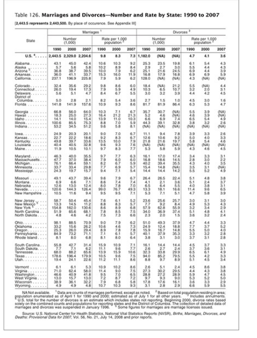
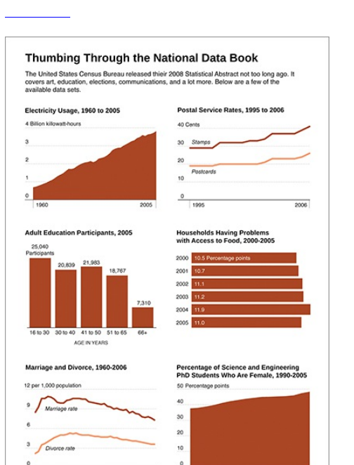
Figure I-4: A graphical view of data from the Statistical
Abstract of the United States
At this point, you enter a realm of visualization less
analytical and more about feeling. The definition of
visualization starts to get kind of fuzzy. For a long time,
visualization was about quantitative facts. You should
recognize patterns with your tools, and they should aid
your analysis in some way. Visualization isn’t just about
getting the cold hard facts. Like in the case of Stamen’s
tracker, it’s almost more about the entertainment factor.
It’s a way for viewers to watch the awards show and
interact with others in the process. Jonathan Harris’
work is another great example. Harris designs his work,
such as We Feel Fine and Whale Hunt, around stories
rather than analytical insight, and those stories revolve
around human emotion over the numbers and analytics.
Charts and graphs have also evolved into not just
tools but also as vehicles to communicate ideas—and
even tell jokes. Sites such as GraphJam and Indexed
use Venn diagrams, pie charts, and the like to
represent pop songs or show that a combination of red,
black, and white equals a Communist newspaper or a
panda murder. Data Underload, a data comic of sorts
that I post on FlowingData, is my own take on the genre.
I take everyday observations and put it in chart form.
The chart in Figure I-5 shows famous movie quotes
listed by the American Film Institute. It’s totally ridiculous

but amusing (to me, at least).
Find more Data Underload on FlowingData at
http://datafl.ws/underload
So what is visualization? Well, it depends on who you
talk to. Some people say it’s strictly traditional graphs
and charts. Others have a more liberal view where
anything that displays data is visualization, whether it is
data art or a spreadsheet in Microsoft Excel. I tend to
sway more toward the latter, but sometimes find myself
in the former group, too. In the end, it doesn’t actually
matter all that much. Just make something that works for
your purpose.
Whatever you decide visualization is, whether you’re
making charts for your presentation, analyzing a large
dataset, or reporting the news with data, you’re
ultimately looking for truth. At some point in time, lies
and statistics became almost synonymous, but it’s not
that the numbers lie. It’s the people who use the
numbers who lie. Sometimes it’s on purpose to serve
an agenda, but most of the time it’s inadvertent. When
you don’t know how to create a graph properly or
communicate with data in an unbiased way, false junk is
likely to sprout. However, if you learn proper
visualization techniques and how to work with data, you
can state your points confidently and feel good about
your findings.
Figure I-5: Movie quotes in graph form

Learning Data
I got my start in statistics during my freshman year in
college. It was a required introductory course toward my
unrelated electrical engineering degree. Unlike some of
the horror stories I’ve heard, my professor was
extremely enthusiastic about his teaching and clearly
enjoyed the topic. He quickly walked up and down the
stairs of the lecture hall as he taught. He waved his
hands wildly as he spoke and got students involved as
he walked by. To this day, I don’t think I’ve ever had
such an excited teacher or professor, and it’s
undoubtedly something that drew me into the area of
data and eventually what led to graduate school in
statistics four years later.
Through all my undergraduate studies, statistics was
data analysis, distributions, and hypothesis testing, and
I enjoyed it. It was fun looking at a dataset and finding
trends, patterns, and correlations. When I started
graduate school though, my views changed, and things
got even more interesting.
Statistics wasn’t just about hypothesis testing (which
turns out isn’t all that useful in a lot of cases) and

turns out isn’t all that useful in a lot of cases) and
pattern-finding anymore. Well, no, I take that back.
Statistics was still about those things, but there was a
different feel to it. Statistics is about storytelling with
data. You get a bunch of data, which represents the
physical world, and then you analyze that data to find not
just correlations, but also what’s going on around you.
These stories can then help you solve real-world
problems, such as decreasing crime, improving
healthcare, and moving traffic on the freeway, or it can
simply help you stay more informed.
A lot of people don’t make that connection between
data and real life. I think that’s why so many people tell
me they “hated that course in college” when I tell them
I’m in graduate school for statistics. I know you won’t
make that same mistake though, right? I mean, you’re
reading this book after all.
How do you learn the necessary skills to make use of
data? You can get it through courses like I did, but you
can also learn on your own through experience. That’s
what you do during a large portion of graduate school
anyway.
It’s the same way with visualization and information
graphics. You don’t have to be a graphic designer to
make great graphics. You don’t need a statistics PhD
either. You just need to be eager to learn, and like
almost everything in life, you have to practice to get
better.
I think the first data graphics I made were in the fourth

grade. They were for my science fair project. My project
partner and I pondered (very deeply I am sure) what
surface snails move on the fastest. We put snails on
rough and smooth surfaces and timed them to see how
long it took them to go a specific distance. So the data
at hand was the times for different surfaces, and I made
a bar graph. I can’t remember if I had the insight to sort
from least to greatest, but I do remember struggling with
Excel. The next year though when we studied what
cereal red flour beetles preferred, the graphs were a
snap. After you learn the basic functionality and your
way around the software, the rest is quite easy to pick
up. If that isn’t a great example of learning from
experience, then I don’t know what is. Oh, and by the
way, the snails moved fastest on glass, and the red flour
beetles preferred Grape Nuts, in case you were
wondering.
This is basic stuff we’re talking about here, but it’s
essentially the same process with any software or
programming language you learn. If you’ve never written
a line of code, R, many statisticians’ computing
environment of choice, can seem intimidating, but after
you work through some examples, you start to quickly
get the hang of things. This book can help you with that.
I say this because that’s how I learned. I remember
when I first got into more of the design aspects of
visualization. It was the summer after my second year in
graduate school, and I had just gotten the great news

that I was going to be a graphics editor intern at The
New York Times. Up until then, graphics had always
been a tool for analysis (with the occasional science fair
bar graph) to me, and aesthetics and design didn’t
matter so much, if at all. Data and its role in journalism
didn’t occur to me.
So to prepare, I read all the design books I could and
went through a guide on Adobe Illustrator because I
knew that’s what The New York Times used. It wasn’t
until I actually started making graphics though when I
truly started learning. When you learn by doing, you’re
forced to pick up what is necessary, and your skills
evolve as you deal with more data and design more
graphics.
How to Read This Book
This book is example-driven and written to give you the
skills to take a graphic from start to finish. You can read
it cover to cover, or you can pick your spots if you
already have a dataset or visualization in mind. The
chapters are organized so that the examples are self-
contained. If you’re new to data, the early chapters
should be especially useful to you. They cover how to
approach your data, what you should look for, and the
tools available to you. You can see where to find data
and how to format and prepare it for visualization. After
that, the visualization techniques are split by data type
and what type of story you’re looking for. Remember,

always let the data do the talking.
Whatever way you decide to read this book, I highly
recommend reading the book with a computer in front of
you, so that you can work through examples step-by-
step and check out sources referred to in notes and
references. You can also download code and data files
and interact with working demos at
www.wiley.com/visualizethis and
http://book.flowingdata.com.
Just to make things completely clear, here’s a
flowchart in Figure I-6 to help you figure what spots to
pick. Have fun!
Figure I-6: Where to start reading this book