Actuate BIRT Application Developer Guide
User Manual:
Open the PDF directly: View PDF ![]() .
.
Page Count: 828 [warning: Documents this large are best viewed by clicking the View PDF Link!]
- Contents
- About Actuate BIRT Application Developer Guide
- Getting started using BIRT Designer Professional
- Planning a BIRT application
- Designing and deploying an application
- Designing applications
- Designing a dashboard
- Displaying a file on a dashboard
- Visualizing data on a dashboard
- Designing a report
- Building application components
- Building interactive maps and gadgets
- Building an interactive chart
- Building a template
- Enhancing application components
- Writing expressions using EasyScript
- Adding web interactivity to a report
- Implementing data security
- Linking and scripting gadgets
- Building Google gadgets
- Using Actuate JavaScript API in an application
- Creating dynamic report content using the Actuate JavaScript API
- About Actuate JavaScript API scripting in a BIRT report design
- Using the Actuate JavaScript API in an HTML button
- Tutorial 4: Adding scripted chart controls to a BIRT design
- Tutorial 5: Using HTML buttons to apply filters to a chart
- Using the Actuate JavaScript API in chart interactive features
- Tutorial 6: Adding an interactive chart filter to a BIRT report
- Using the Actuate JavaScript API in chart themes
- Tutorial 7: Adding scripted HTML5 Chart controls to a BIRT design
- Working with Interactive Crosstabs
- About cross tabs
- Tutorial 8: Viewing and pivoting a cross tab
- About cubes
- Handling Interactive Crosstabs viewer events
- Working with dimensions, measures, and levels
- Working with totals
- Sorting and filtering cross tab data
- Drilling down within a cross tab
- Controlling the Interactive Crosstabs viewer user interface
- Actuate JavaScript API classes
- Actuate JavaScript API overview
- Actuate JavaScript API classes quick reference
- Actuate JavaScript API reference
- Class actuate
- Class actuate.AuthenticationException
- Class actuate.ConnectionException
- Class actuate.Dashboard
- downloadDashboard
- embedTemplate
- getActiveTab
- getDashboardName
- getTemplate
- isAutoSaveEnabled
- isSavingNeeded
- isUsingPersonalDashboard
- onUnload
- registerEventHandler
- removeEventHandler
- renderContent
- save
- saveAs
- setActiveTab
- setAutoSaveDelay
- setContainer
- setDashboardName
- setHeight
- setService
- setSize
- setTemplate
- setWidth
- showTabNavigation
- submit
- usePersonalDashboard
- Class actuate.dashboard.DashboardDefinition
- Class actuate.dashboard.EventConstants
- Class actuate.dashboard.GadgetScript
- Class actuate.dashboard.Tab
- Class actuate.data.Filter
- Class actuate.data.ReportContent
- Class actuate.data.Request
- Class actuate.data.ResultSet
- Class actuate.data.Sorter
- Class actuate.DataService
- Class actuate.Exception
- Class actuate.Parameter
- downloadParameters
- downloadParameterValues
- getLayout
- getParameterGroupNames
- getReportName
- getTransientDocumentName
- hideNavBar
- hideParameterGroup
- hideParameterName
- navigate
- onUnload
- registerEventHandler
- removeEventHandler
- renderContent
- setAutoSuggestDelay
- setAutoSuggestFetchSize
- setAutoSuggestListSize
- setExpandedGroups
- setFont
- setGroupContainer
- setLayout
- setReadOnly
- setReportName
- setService
- setShowDisplayType
- submit
- Class actuate.parameter.Constants
- Class actuate.parameter.ConvertUtility
- Class actuate.parameter.EventConstants
- Class actuate.parameter.NameValuePair
- Class actuate.parameter.ParameterData
- Class actuate.parameter.ParameterDefinition
- getAutoSuggestThreshold
- getCascadingParentName
- getColumnName
- getColumnType
- getControlType
- getCurrentDisplayName
- getDataType
- getDefaultValue
- getDefaultValueIsNull
- getDisplayName
- getGroup
- getHelpText
- getName
- getOperatorList
- getPosition
- getSelectNameValueList
- getSelectValueList
- isAdHoc
- isHidden
- isPassword
- isRequired
- isViewParameter
- setAutoSuggestThreshold
- setCascadingParentName
- setColumnName
- setColumnType
- setControlType
- setCurrentDisplayName
- setDataType
- setDefaultValue
- setDefaultValueIsNull
- setDisplayName
- setGroup
- setHelpText
- setIsAdHoc
- setIsHidden
- setIsMultiSelectControl
- setIsPassword
- setIsRequired
- setIsViewParameter
- setName
- setPosition
- setSelectNameValueList
- setSelectValueList
- Class actuate.parameter.ParameterValue
- Class actuate.report.Chart
- Class actuate.report.DataItem
- Class actuate.report.FlashObject
- Class actuate.report.Gadget
- Class actuate.report.HTML5Chart.ClientChart
- Class actuate.report.HTML5Chart.ClientOption
- Class actuate.report.HTML5Chart.ClientPoint
- Class actuate.report.HTML5Chart.ClientSeries
- Class actuate.report.HTML5Chart.Highcharts
- Class actuate.report.HTML5Chart.Renderer
- Class actuate.report.Label
- Class actuate.report.Table
- Class actuate.report.TextItem
- Class actuate.ReportExplorer
- Class actuate.reportexplorer.Constants
- Class actuate.reportexplorer.EventConstants
- Class actuate.reportexplorer.File
- Class actuate.reportexplorer.FileCondition
- Class actuate.reportexplorer.FileSearch
- getAccessType
- getCondition
- getConditionArray
- getCountLimit
- getDependentFileId
- getDependentFileName
- getFetchDirection
- getFetchHandle
- getFetchSize
- getIncludeHiddenObject
- getOwner
- getPrivilegeFilter
- getRequiredFileId
- getRequiredFileName
- setAccessType
- setCondition
- setConditionArray
- setCountLimit
- setDependentFileId
- setDependentFileName
- setFetchDirection
- setFetchHandle
- setFetchSize
- setIncludeHiddenObject
- setOwner
- setPrivilegeFilter
- setRequiredFileId
- setRequiredFileName
- Class actuate.reportexplorer.FolderItems
- Class actuate.reportexplorer.PrivilegeFilter
- Class actuate.RequestOptions
- Class actuate.Viewer
- disableIV
- downloadReport
- downloadResultSet
- enableIV
- getChart
- getClientHeight
- getClientWidth
- getContentByBookmark
- getContentByPageRange
- getContentMargin
- getCurrentPageContent
- getCurrentPageNum
- getDataItem
- getFlashObject
- getGadget
- getHeight
- getLabel
- getReportletBookmark
- getReportName
- getTable
- getText
- getTotalPageCount
- getUIConfig
- getUIOptions
- getViewer
- getWidth
- gotoBookmark
- gotoPage
- isInteractive
- saveReportDesign
- saveReportDocument
- setContentMargin
- setFocus
- setHeight
- setParameters
- setParameterValues
- setReportDocument
- setReportletBookmark
- setReportName
- setService
- setSize
- setSupportSVG
- setUIOptions
- setViewingMode
- setWidth
- showDownloadReportDialog
- showDownloadResultSetDialog
- showFacebookCommentPanel
- showParameterPanel
- showPrintDialog
- showTocPanel
- submit
- Class actuate.viewer.BrowserPanel
- Class actuate.viewer.EventConstants
- Class actuate.viewer.PageContent
- Class actuate.viewer.ParameterValue
- Class actuate.viewer.RenderOptions
- Class actuate.viewer.ScrollPanel
- Class actuate.viewer.SelectedContent
- Class actuate.viewer.UIConfig
- Class actuate.viewer.UIOptions
- enableAdvancedSort
- enableAggregation
- enableCalculatedColumn
- enableChartProperty
- enableChartSubType
- enableCollapseExpand
- enableColumnEdit
- enableColumnResize
- enableContentMargin
- enableDataAnalyzer
- enableDataExtraction
- enableEditReport
- enableExportReport
- enableFacebookComments
- enableFilter
- enableFlashGadgetType
- enableFormat
- enableGroupEdit
- enableHideShowItems
- enableHighlight
- enableHoverHighlight
- enableLaunchViewer
- enableLinkToThisPage
- enableMainMenu
- enableMoveColumn
- enablePageBreak
- enablePageNavigation
- enableParameterPage
- enablePrint
- enableReorderColumns
- enableRowResize
- enableSaveDesign
- enableSaveDocument
- enableShowToolTip
- enableSort
- enableSuppressDuplicate
- enableSwitchView
- enableTextEdit
- enableTOC
- enableToolBar
- enableToolbarContextMenu
- enableToolbarHelp
- enableTopBottomNFilter
- enableUndoRedo
- getFeatureMap
- Class actuate.viewer.ViewerException
- BIRT Interactive Crosstabs API classes
- About the BIRT Interactive Crosstabs JavaScript API
- Interactive Crosstabs API reference
- Interactive Crosstabs JavaScript classes quick reference
- Class actuate.XTabAnalyzer
- commit
- forceSoftRestart
- getCurrentPageContent
- }getCurrentPageNum
- getGadgetId
- getHeight
- getLeft
- getParameterValues
- getPosition
- getTop
- getTotalPageCount
- getUIOptions
- getViewer
- getWidth
- getXTabBookmark
- getXTabIid
- isActive
- isDashboard
- isInteractive
- registerEventHandler
- removeEventHandler
- reset
- resizeTo
- rollback
- setGadgetId
- setHeight
- setIVMode
- setLeft
- setOnClosed
- setPageNum
- setParameterValues
- setPosition
- setReportletDocumentMode
- setReportName
- setService
- setSupportSVG
- setTop
- setUIOptions
- setWidth
- setXTabBookmark
- setXTabIid
- submit
- Class actuate.xtabanalyzer.Crosstab
- Class actuate.xtabanalyzer.Dimension
- Class actuate.xtabanalyzer.Driller
- Class actuate.xtabanalyzer.EventConstants
- Class actuate.xtabanalyzer.Exception
- Class actuate.xtabanalyzer.Filter
- Class actuate.xtabanalyzer.GrandTotal
- Class actuate.xtabanalyzer.Level
- Class actuate.xtabanalyzer.LevelAttribute
- Class actuate.xtabanalyzer.Measure
- Class actuate.xtabanalyzer.MemberValue
- Class actuate.xtabanalyzer.Options
- getColumnMirrorStartingLevel
- getColumnPageBreakInterval
- getEmptyCellValue
- getEnablePageBreak
- getMeasureDirection
- getRowMirrorStartingLevel
- getRowPageBreakInterval
- setColumnMirrorStartingLevel
- setColumnPageBreakInterval
- setEmptyCellValue
- setEnablePageBreak
- setMeasureDirection
- setRowMirrorStartingLevel
- setRowPageBreakInterval
- Class actuate.xtabanalyzer.PageContent
- Class actuate.xtabanalyzer.ParameterValue
- Class actuate.xtabanalyzer.Sorter
- Class actuate.xtabanalyzer.SubTotal
- Class actuate.xtabanalyzer.Total
- Class actuate.xtabanalyzer.UIOptions
- Deploying applications
- Deploying and sharing applications
- About deploying and sharing applications and files
- Editing the landing page
- Sharing applications
- Sharing project files
- Publishing a resource file to iHub
- Downloading files
- Managing permissions
- Deploying Java classes used in BIRT reports
- Installing a custom JDBC driver
- Installing custom ODA drivers and custom plug-ins
- Working with BIRT encryption in iHub
- Configuring data source connections in iHub
- About data source connection properties
- Using a connection profile
- Accessing BIRT report design and BIRT resource path in custom ODA plug-ins
- Using custom emitters in iHub
- Index

Actuate BIRT Application Developer Guide
Information in this document is subject to change without notice. Examples provided are fictitious. No part of this document
may be reproduced or transmitted in any form, or by any means, electronic or mechanical, for any purpose, in whole or in part,
without the express written permission of Actuate Corporation.
© 1995 - 2014 by Actuate Corporation. All rights reserved. Printed in the United States of America.
Contains information proprietary to:
Actuate Corporation, 951 Mariners Island Boulevard, San Mateo, CA 94404
www.actuate.com
The software described in this manual is provided by Actuate Corporation under an Actuate License agreement. The software
may be used only in accordance with the terms of the agreement. Actuate software products are protected by U.S. and
International patents and patents pending. For a current list of patents, please see http://www.actuate.com/patents.
Actuate Corporation trademarks and registered trademarks include:
Actuate, ActuateOne, the Actuate logo, Archived Data Analytics, BIRT, BIRT 360, BIRT Analytics, The BIRT Company, BIRT
Content Services, BIRT Data Analyzer, BIRT for Statements, BIRT iHub, BIRT Metrics Management, BIRT Performance
Analytics, Collaborative Reporting Architecture, e.Analysis, e.Report, e.Reporting, e.Spreadsheet, Encyclopedia, Interactive
Viewing, OnPerformance, The people behind BIRT, Performancesoft, Performancesoft Track, Performancesoft Views,
Report Encyclopedia, Reportlet, X2BIRT, and XML reports.
Actuate products may contain third-party products or technologies. Third-party trademarks or registered trademarks of their
respective owners, companies, or organizations include:
Mark Adler and Jean-loup Gailly (www.zlib.net): zLib. Adobe Systems Incorporated: Flash Player, Source Sans Pro font.
Amazon Web Services, Incorporated: Amazon Web Services SDK. Apache Software Foundation (www.apache.org): Ant, Axis,
Axis2, Batik, Batik SVG library, Commons Command Line Interface (CLI), Commons Codec, Commons Lang, Commons Math,
Crimson, Derby, Hive driver for Hadoop, Kafka, log4j, Pluto, POI ooxml and ooxml-schema, Portlet, Shindig, Struts, Thrift,
Tomcat, Velocity, Xalan, Xerces, Xerces2 Java Parser, Xerces-C++ XML Parser, and XML Beans. Daniel Bruce (www.entypo.com):
Entypo Pictogram Suite. Castor (www.castor.org), ExoLab Project (www.exolab.org), and Intalio, Inc. (www.intalio.org): Castor.
Alessandro Colantonio: CONCISE. Day Management AG: Content Repository for Java. Eclipse Foundation, Inc.
(www.eclipse.org): Babel, Data Tools Platform (DTP) ODA, Eclipse SDK, Graphics Editor Framework (GEF), Eclipse Modeling
Framework (EMF), Jetty, and Eclipse Web Tools Platform (WTP). Dave Gandy: Font Awesome. Gargoyle Software Inc.:
HtmlUnit. GNU Project: GNU Regular Expression. Groovy project (groovy.codehaus.org): Groovy. Guava Libraries: Google
Guava. HighSlide: HighCharts. headjs.com: head.js. Hector Project: Cassandra Thrift, Hector. Jason Hsueth and Kenton Varda
(code.google.com): Protocole Buffer. H2 Database: H2 database. Groovy project (groovy.codehaus.org): Groovy.
IDAutomation.com, Inc.: IDAutomation. IDRsolutions Ltd.: JBIG2. InfoSoft Global (P) Ltd.: FusionCharts, FusionMaps,
FusionWidgets, PowerCharts. Matt Inger (sourceforge.net): Ant-Contrib. Matt Ingenthron, Eric D. Lambert, and Dustin Sallings
(code.google.com): Spymemcached. International Components for Unicode (ICU): ICU library. JCraft, Inc.: JSch. jQuery: jQuery.
Yuri Kanivets (code.google.com): Android Wheel gadget. LEAD Technologies, Inc.: LEADTOOLS. The Legion of the Bouncy
Castle: Bouncy Castle Crypto APIs. Bruno Lowagie and Paulo Soares: iText. MetaStuff: dom4j. Microsoft Corporation (Microsoft
Developer Network): CompoundDocument Library. Mozilla: Mozilla XML Parser. MySQL Americas, Inc.: MySQL Connector.
Netscape Communications Corporation, Inc.: Rhino. nullsoft project: Nullsoft Scriptable Install System. OOPS Consultancy:
XMLTask. OpenSSL Project: OpenSSL. Oracle Corporation: Berkeley DB, Java Advanced Imaging, JAXB, JDK, Jstl, Oracle JDBC
driver. PostgreSQL Global Development Group: pgAdmin, PostgreSQL, PostgreSQL JDBC driver. Progress Software
Corporation: DataDirect Connect XE for JDBC Salesforce, DataDirect JDBC, DataDirect ODBC. Quality Open Software: Simple
Logging Facade for Java (SLF4J), SLF4J API and NOP. Rogue Wave Software, Inc.: Rogue Wave Library SourcePro Core,
tools.h++. Sam Stephenson (prototype.conio.net): prototype.js. Sencha Inc.: Ext JS, Sencha Touch. Shibboleth Consortium:
OpenSAML, Shibboleth Identity Provider. Matteo Spinelli: iscroll. StAX Project (stax.codehaus.org): Streaming API for XML
(StAX). SWFObject Project (code.google.com): SWFObject. ThimbleWare, Inc.: JMemcached. Twittr: Twitter Bootstrap. VMWare:
Hyperic SIGAR. Woodstox Project (woodstox.codehaus.org): Woodstox Fast XML processor (wstx-asl). World Wide Web
Consortium (W3C) (MIT, ERCIM, Keio): Flute, JTidy, Simple API for CSS. XFree86 Project, Inc.: (www.xfree86.org): xvfb. ZXing
Project (code.google.com): ZXing.
All other brand or product names are trademarks or registered trademarks of their respective owners, companies, or
organizations.
Document No. 131215-2-745300 August 29, 2014
i
Contents
About Actuate BIRT Application Developer Guide . . . . . . . . . . . . . . . . . .xiii
Part 1
Getting started using BIRT Designer Professional
Chapter 1
Planning a BIRT application . . . . . . . . . . . . . . . . . . . . . . . . . . . . . . . . . . . . . 3
Introducing BIRT applications . . . . . . . . . . . . . . . . . . . . . . . . . . . . . . . . . . . . . . . . . . . . . . . . . . . . . . . 4
About BIRT application file structure . . . . . . . . . . . . . . . . . . . . . . . . . . . . . . . . . . . . . . . . . . . . . . . . . 4
Accessing BIRT application content . . . . . . . . . . . . . . . . . . . . . . . . . . . . . . . . . . . . . . . . . . . . . . . . . . 5
Chapter 2
Designing and deploying an application . . . . . . . . . . . . . . . . . . . . . . . . . . . 7
Overview of the BIRT application design process . . . . . . . . . . . . . . . . . . . . . . . . . . . . . . . . . . . . . . 8
Planning the BIRT application . . . . . . . . . . . . . . . . . . . . . . . . . . . . . . . . . . . . . . . . . . . . . . . . . . . . . 8
Add content to the BIRT project . . . . . . . . . . . . . . . . . . . . . . . . . . . . . . . . . . . . . . . . . . . . . . . . . . . 8
Using a BIRT data object to access data . . . . . . . . . . . . . . . . . . . . . . . . . . . . . . . . . . . . . . . . . . . 8
Using a dashboard to display data . . . . . . . . . . . . . . . . . . . . . . . . . . . . . . . . . . . . . . . . . . . . . . 9
Using a BIRT design for custom presentations . . . . . . . . . . . . . . . . . . . . . . . . . . . . . . . . . . . . 9
Publishing to a server . . . . . . . . . . . . . . . . . . . . . . . . . . . . . . . . . . . . . . . . . . . . . . . . . . . . . . . . . . . . 9
Editing the landing page . . . . . . . . . . . . . . . . . . . . . . . . . . . . . . . . . . . . . . . . . . . . . . . . . . . . . . . 9
Publishing as a BIRT application . . . . . . . . . . . . . . . . . . . . . . . . . . . . . . . . . . . . . . . . . . . . . . . . 9
Previewing and testing the BIRT application . . . . . . . . . . . . . . . . . . . . . . . . . . . . . . . . . . . . . 10
Tutorial 1: Building a data object . . . . . . . . . . . . . . . . . . . . . . . . . . . . . . . . . . . . . . . . . . . . . . . . . . . . 10
Task 1: Create a project . . . . . . . . . . . . . . . . . . . . . . . . . . . . . . . . . . . . . . . . . . . . . . . . . . . . . . . . . . 10
Task 2: Build a data object . . . . . . . . . . . . . . . . . . . . . . . . . . . . . . . . . . . . . . . . . . . . . . . . . . . . . . . 11
Task 3: Build a data set . . . . . . . . . . . . . . . . . . . . . . . . . . . . . . . . . . . . . . . . . . . . . . . . . . . . . . . . . . 14
Task 4: Build a data model . . . . . . . . . . . . . . . . . . . . . . . . . . . . . . . . . . . . . . . . . . . . . . . . . . . . . . . 17
Tutorial 2: Building a simple dashboard . . . . . . . . . . . . . . . . . . . . . . . . . . . . . . . . . . . . . . . . . . . . . . 19
Task 1: Create a dashboard . . . . . . . . . . . . . . . . . . . . . . . . . . . . . . . . . . . . . . . . . . . . . . . . . . . . . . 20
Task 2: Add a table . . . . . . . . . . . . . . . . . . . . . . . . . . . . . . . . . . . . . . . . . . . . . . . . . . . . . . . . . . . . . 21
Task 3: Add a chart . . . . . . . . . . . . . . . . . . . . . . . . . . . . . . . . . . . . . . . . . . . . . . . . . . . . . . . . . . . . . 23
Task 4: Add a data selection gadget . . . . . . . . . . . . . . . . . . . . . . . . . . . . . . . . . . . . . . . . . . . . . . . 24
Designing a landing page . . . . . . . . . . . . . . . . . . . . . . . . . . . . . . . . . . . . . . . . . . . . . . . . . . . . . . . . . . 26
Tutorial 3: Deploy the BIRT application . . . . . . . . . . . . . . . . . . . . . . . . . . . . . . . . . . . . . . . . . . . . . . 27
Task 1: Edit the landing page . . . . . . . . . . . . . . . . . . . . . . . . . . . . . . . . . . . . . . . . . . . . . . . . . . . . 27
Task 2: Deploy the BIRT application . . . . . . . . . . . . . . . . . . . . . . . . . . . . . . . . . . . . . . . . . . . . . . 28
Task 3: Test the URL entry points . . . . . . . . . . . . . . . . . . . . . . . . . . . . . . . . . . . . . . . . . . . . . . . . . 30
ii
Part 2
Designing applications
Chapter 3
Designing a dashboard . . . . . . . . . . . . . . . . . . . . . . . . . . . . . . . . . . . . . . . . 33
About dashboard applications . . . . . . . . . . . . . . . . . . . . . . . . . . . . . . . . . . . . . . . . . . . . . . . . . . . . . . .34
Planning dashboard layout . . . . . . . . . . . . . . . . . . . . . . . . . . . . . . . . . . . . . . . . . . . . . . . . . . . . . . . . .35
Creating a dashboard . . . . . . . . . . . . . . . . . . . . . . . . . . . . . . . . . . . . . . . . . . . . . . . . . . . . . . . . . . . . . .35
Adding a dashboard tab . . . . . . . . . . . . . . . . . . . . . . . . . . . . . . . . . . . . . . . . . . . . . . . . . . . . . . . . .37
Choosing a dashboard layout . . . . . . . . . . . . . . . . . . . . . . . . . . . . . . . . . . . . . . . . . . . . . . . . . . . . .37
Formatting a dashboard tab . . . . . . . . . . . . . . . . . . . . . . . . . . . . . . . . . . . . . . . . . . . . . . . . . . . . . .39
Adding data objects to a dashboard . . . . . . . . . . . . . . . . . . . . . . . . . . . . . . . . . . . . . . . . . . . . . . . .40
Importing an existing dashboard . . . . . . . . . . . . . . . . . . . . . . . . . . . . . . . . . . . . . . . . . . . . . . . . . .41
Saving a dashboard . . . . . . . . . . . . . . . . . . . . . . . . . . . . . . . . . . . . . . . . . . . . . . . . . . . . . . . . . . . . . .41
Opening a dashboard file . . . . . . . . . . . . . . . . . . . . . . . . . . . . . . . . . . . . . . . . . . . . . . . . . . . . . . . . .42
Adding gadgets to a dashboard . . . . . . . . . . . . . . . . . . . . . . . . . . . . . . . . . . . . . . . . . . . . . . . . . . . . .42
Placing a gadget . . . . . . . . . . . . . . . . . . . . . . . . . . . . . . . . . . . . . . . . . . . . . . . . . . . . . . . . . . . . . . . .43
Formatting a gadget . . . . . . . . . . . . . . . . . . . . . . . . . . . . . . . . . . . . . . . . . . . . . . . . . . . . . . . . . . . . .45
Testing dashboard content . . . . . . . . . . . . . . . . . . . . . . . . . . . . . . . . . . . . . . . . . . . . . . . . . . . . . . . .46
Chapter 4
Displaying a file on a dashboard . . . . . . . . . . . . . . . . . . . . . . . . . . . . . . . . 49
About files on a dashboard . . . . . . . . . . . . . . . . . . . . . . . . . . . . . . . . . . . . . . . . . . . . . . . . . . . . . . . . .50
Displaying BIRT documents . . . . . . . . . . . . . . . . . . . . . . . . . . . . . . . . . . . . . . . . . . . . . . . . . . . . . . . .50
Displaying BIRT report items from a library . . . . . . . . . . . . . . . . . . . . . . . . . . . . . . . . . . . . . . . . . . .52
Displaying BIRT parameters . . . . . . . . . . . . . . . . . . . . . . . . . . . . . . . . . . . . . . . . . . . . . . . . . . . . . . . .53
Displaying parameters in a data selector gadget . . . . . . . . . . . . . . . . . . . . . . . . . . . . . . . . . . . . .56
Displaying parameters in a parameter gadget . . . . . . . . . . . . . . . . . . . . . . . . . . . . . . . . . . . . . . .58
Displaying web content . . . . . . . . . . . . . . . . . . . . . . . . . . . . . . . . . . . . . . . . . . . . . . . . . . . . . . . . . . . .60
Displaying HTML content . . . . . . . . . . . . . . . . . . . . . . . . . . . . . . . . . . . . . . . . . . . . . . . . . . . . . . . .60
Displaying content from a URL . . . . . . . . . . . . . . . . . . . . . . . . . . . . . . . . . . . . . . . . . . . . . . . . .60
Displaying embedded HTML code . . . . . . . . . . . . . . . . . . . . . . . . . . . . . . . . . . . . . . . . . . . . . .62
Displaying Adobe Flash content . . . . . . . . . . . . . . . . . . . . . . . . . . . . . . . . . . . . . . . . . . . . . . . .62
Displaying images . . . . . . . . . . . . . . . . . . . . . . . . . . . . . . . . . . . . . . . . . . . . . . . . . . . . . . . . . . . . . .63
Displaying Google gadgets . . . . . . . . . . . . . . . . . . . . . . . . . . . . . . . . . . . . . . . . . . . . . . . . . . . . . . .63
Displaying text . . . . . . . . . . . . . . . . . . . . . . . . . . . . . . . . . . . . . . . . . . . . . . . . . . . . . . . . . . . . . . . . .64
Displaying video . . . . . . . . . . . . . . . . . . . . . . . . . . . . . . . . . . . . . . . . . . . . . . . . . . . . . . . . . . . . . . . .65
Chapter 5
Visualizing data on a dashboard . . . . . . . . . . . . . . . . . . . . . . . . . . . . . . . . 67
About displaying data on a dashboard . . . . . . . . . . . . . . . . . . . . . . . . . . . . . . . . . . . . . . . . . . . . . . .68
Displaying data in a chart . . . . . . . . . . . . . . . . . . . . . . . . . . . . . . . . . . . . . . . . . . . . . . . . . . . . . . . . . . .68
iii
Selecting a chart type . . . . . . . . . . . . . . . . . . . . . . . . . . . . . . . . . . . . . . . . . . . . . . . . . . . . . . . . . . . 71
About area charts . . . . . . . . . . . . . . . . . . . . . . . . . . . . . . . . . . . . . . . . . . . . . . . . . . . . . . . . . . . . 71
About bar charts . . . . . . . . . . . . . . . . . . . . . . . . . . . . . . . . . . . . . . . . . . . . . . . . . . . . . . . . . . . . . 72
About bubble charts . . . . . . . . . . . . . . . . . . . . . . . . . . . . . . . . . . . . . . . . . . . . . . . . . . . . . . . . . . 73
About column charts . . . . . . . . . . . . . . . . . . . . . . . . . . . . . . . . . . . . . . . . . . . . . . . . . . . . . . . . . 73
About Gantt charts . . . . . . . . . . . . . . . . . . . . . . . . . . . . . . . . . . . . . . . . . . . . . . . . . . . . . . . . . . . 75
About line charts . . . . . . . . . . . . . . . . . . . . . . . . . . . . . . . . . . . . . . . . . . . . . . . . . . . . . . . . . . . . . 75
About pie charts . . . . . . . . . . . . . . . . . . . . . . . . . . . . . . . . . . . . . . . . . . . . . . . . . . . . . . . . . . . . . 77
About radar charts . . . . . . . . . . . . . . . . . . . . . . . . . . . . . . . . . . . . . . . . . . . . . . . . . . . . . . . . . . . 77
About scatter charts . . . . . . . . . . . . . . . . . . . . . . . . . . . . . . . . . . . . . . . . . . . . . . . . . . . . . . . . . . 78
About stock charts . . . . . . . . . . . . . . . . . . . . . . . . . . . . . . . . . . . . . . . . . . . . . . . . . . . . . . . . . . . 78
Selecting data for charts . . . . . . . . . . . . . . . . . . . . . . . . . . . . . . . . . . . . . . . . . . . . . . . . . . . . . . . . . 79
Using category groups . . . . . . . . . . . . . . . . . . . . . . . . . . . . . . . . . . . . . . . . . . . . . . . . . . . . . . . . 80
Using legend groups . . . . . . . . . . . . . . . . . . . . . . . . . . . . . . . . . . . . . . . . . . . . . . . . . . . . . . . . . 80
Using aggregate expressions . . . . . . . . . . . . . . . . . . . . . . . . . . . . . . . . . . . . . . . . . . . . . . . . . . . 81
Formatting charts . . . . . . . . . . . . . . . . . . . . . . . . . . . . . . . . . . . . . . . . . . . . . . . . . . . . . . . . . . . . . . 81
Choosing a chart theme . . . . . . . . . . . . . . . . . . . . . . . . . . . . . . . . . . . . . . . . . . . . . . . . . . . . . . . 82
Enabling chart zoom . . . . . . . . . . . . . . . . . . . . . . . . . . . . . . . . . . . . . . . . . . . . . . . . . . . . . . . . . 83
Enabling a timeline . . . . . . . . . . . . . . . . . . . . . . . . . . . . . . . . . . . . . . . . . . . . . . . . . . . . . . . . . . . 84
Displaying data in a table or cross tab . . . . . . . . . . . . . . . . . . . . . . . . . . . . . . . . . . . . . . . . . . . . . . . 84
Choosing a table type . . . . . . . . . . . . . . . . . . . . . . . . . . . . . . . . . . . . . . . . . . . . . . . . . . . . . . . . . . . 85
Using a table . . . . . . . . . . . . . . . . . . . . . . . . . . . . . . . . . . . . . . . . . . . . . . . . . . . . . . . . . . . . . . . . . . . 86
Selecting data for tabular display . . . . . . . . . . . . . . . . . . . . . . . . . . . . . . . . . . . . . . . . . . . . . . 87
Aggregating tabular data . . . . . . . . . . . . . . . . . . . . . . . . . . . . . . . . . . . . . . . . . . . . . . . . . . . . . 88
Formatting tabular gadgets . . . . . . . . . . . . . . . . . . . . . . . . . . . . . . . . . . . . . . . . . . . . . . . . . . . . 89
Using a cross tab . . . . . . . . . . . . . . . . . . . . . . . . . . . . . . . . . . . . . . . . . . . . . . . . . . . . . . . . . . . . . . . 90
Selecting data for cross tab gadgets . . . . . . . . . . . . . . . . . . . . . . . . . . . . . . . . . . . . . . . . . . . . . 91
Aggregating cross tab data . . . . . . . . . . . . . . . . . . . . . . . . . . . . . . . . . . . . . . . . . . . . . . . . . . . . 92
Formatting cross tab gadgets . . . . . . . . . . . . . . . . . . . . . . . . . . . . . . . . . . . . . . . . . . . . . . . . . . 93
Displaying data in measurement gadgets . . . . . . . . . . . . . . . . . . . . . . . . . . . . . . . . . . . . . . . . . . . . 94
Choosing a measurement type . . . . . . . . . . . . . . . . . . . . . . . . . . . . . . . . . . . . . . . . . . . . . . . . . . . 94
Selecting data for measurement gadgets . . . . . . . . . . . . . . . . . . . . . . . . . . . . . . . . . . . . . . . . . . . 96
Aggregating measurement data . . . . . . . . . . . . . . . . . . . . . . . . . . . . . . . . . . . . . . . . . . . . . . . . . . 97
Formatting measurement gadgets . . . . . . . . . . . . . . . . . . . . . . . . . . . . . . . . . . . . . . . . . . . . . . . . 97
Using regions . . . . . . . . . . . . . . . . . . . . . . . . . . . . . . . . . . . . . . . . . . . . . . . . . . . . . . . . . . . . . . . 97
Changing color . . . . . . . . . . . . . . . . . . . . . . . . . . . . . . . . . . . . . . . . . . . . . . . . . . . . . . . . . . . . . . 98
Using pointers . . . . . . . . . . . . . . . . . . . . . . . . . . . . . . . . . . . . . . . . . . . . . . . . . . . . . . . . . . . . . . . 98
Enabling data selection . . . . . . . . . . . . . . . . . . . . . . . . . . . . . . . . . . . . . . . . . . . . . . . . . . . . . . . . . . . . 98
Displaying data for user selection . . . . . . . . . . . . . . . . . . . . . . . . . . . . . . . . . . . . . . . . . . . . . . . 102
Formatting data selection gadgets . . . . . . . . . . . . . . . . . . . . . . . . . . . . . . . . . . . . . . . . . . . . . . . 103
Formatting number values . . . . . . . . . . . . . . . . . . . . . . . . . . . . . . . . . . . . . . . . . . . . . . . . . . . 103
Formatting date-and-time values . . . . . . . . . . . . . . . . . . . . . . . . . . . . . . . . . . . . . . . . . . . . . . 103
iv
Formatting string values . . . . . . . . . . . . . . . . . . . . . . . . . . . . . . . . . . . . . . . . . . . . . . . . . . . . . .103
Using a data version gadget . . . . . . . . . . . . . . . . . . . . . . . . . . . . . . . . . . . . . . . . . . . . . . . . . . . . .103
Selecting a data object . . . . . . . . . . . . . . . . . . . . . . . . . . . . . . . . . . . . . . . . . . . . . . . . . . . . . . . .104
Choosing a selector type . . . . . . . . . . . . . . . . . . . . . . . . . . . . . . . . . . . . . . . . . . . . . . . . . . . . . .104
Formatting a data version gadget . . . . . . . . . . . . . . . . . . . . . . . . . . . . . . . . . . . . . . . . . . . . . .104
Organizing multiple user selections . . . . . . . . . . . . . . . . . . . . . . . . . . . . . . . . . . . . . . . . . . . . . . . . .104
Building cascade selections . . . . . . . . . . . . . . . . . . . . . . . . . . . . . . . . . . . . . . . . . . . . . . . . . . . . . .105
Building group selections . . . . . . . . . . . . . . . . . . . . . . . . . . . . . . . . . . . . . . . . . . . . . . . . . . . . . . .105
Using a selector group gadget . . . . . . . . . . . . . . . . . . . . . . . . . . . . . . . . . . . . . . . . . . . . . . . . .106
Selecting fields to display . . . . . . . . . . . . . . . . . . . . . . . . . . . . . . . . . . . . . . . . . . . . . . . . . . . . .106
Choosing a selector type . . . . . . . . . . . . . . . . . . . . . . . . . . . . . . . . . . . . . . . . . . . . . . . . . . . . . .107
Formatting a selector group gadget . . . . . . . . . . . . . . . . . . . . . . . . . . . . . . . . . . . . . . . . . . . .107
Using an apply button gadget . . . . . . . . . . . . . . . . . . . . . . . . . . . . . . . . . . . . . . . . . . . . . . . . . . . .107
Using parameter selections . . . . . . . . . . . . . . . . . . . . . . . . . . . . . . . . . . . . . . . . . . . . . . . . . . . . . .108
Chapter 6
Designing a report . . . . . . . . . . . . . . . . . . . . . . . . . . . . . . . . . . . . . . . . . . . 111
Formatting features in BIRT Designer Professional . . . . . . . . . . . . . . . . . . . . . . . . . . . . . . . . . . . . 112
Creating an accessible PDF . . . . . . . . . . . . . . . . . . . . . . . . . . . . . . . . . . . . . . . . . . . . . . . . . . . . . . . . . 112
Selecting features for interactive viewing . . . . . . . . . . . . . . . . . . . . . . . . . . . . . . . . . . . . . . . . . . . . 114
Interactive scripting sample 1 . . . . . . . . . . . . . . . . . . . . . . . . . . . . . . . . . . . . . . . . . . . . . . . . . . . . 115
Interactive scripting sample 2 . . . . . . . . . . . . . . . . . . . . . . . . . . . . . . . . . . . . . . . . . . . . . . . . . . . . 116
Embedding HTML5 content . . . . . . . . . . . . . . . . . . . . . . . . . . . . . . . . . . . . . . . . . . . . . . . . . . . . . . . 117
Removing the default themes . . . . . . . . . . . . . . . . . . . . . . . . . . . . . . . . . . . . . . . . . . . . . . . . . . . . . . 118
Hiding columns in a table . . . . . . . . . . . . . . . . . . . . . . . . . . . . . . . . . . . . . . . . . . . . . . . . . . . . . . . . . 119
Using a Quick Response code to link to content . . . . . . . . . . . . . . . . . . . . . . . . . . . . . . . . . . . . . . .121
Designing for optimal viewer performance . . . . . . . . . . . . . . . . . . . . . . . . . . . . . . . . . . . . . . . . . . .122
Part 3
Building application components
Chapter 7
Building interactive maps and gadgets . . . . . . . . . . . . . . . . . . . . . . . . . . 127
About maps and gadgets . . . . . . . . . . . . . . . . . . . . . . . . . . . . . . . . . . . . . . . . . . . . . . . . . . . . . . . . . .128
Adding a gadget or map . . . . . . . . . . . . . . . . . . . . . . . . . . . . . . . . . . . . . . . . . . . . . . . . . . . . . . . . . . .129
Providing data to a map . . . . . . . . . . . . . . . . . . . . . . . . . . . . . . . . . . . . . . . . . . . . . . . . . . . . . . . . . . .130
Validating map data . . . . . . . . . . . . . . . . . . . . . . . . . . . . . . . . . . . . . . . . . . . . . . . . . . . . . . . . . . . . . .131
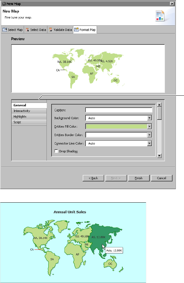
Formatting a map . . . . . . . . . . . . . . . . . . . . . . . . . . . . . . . . . . . . . . . . . . . . . . . . . . . . . . . . . . . . . . . .132
General properties . . . . . . . . . . . . . . . . . . . . . . . . . . . . . . . . . . . . . . . . . . . . . . . . . . . . . . . . . . . . .132
Highlights properties . . . . . . . . . . . . . . . . . . . . . . . . . . . . . . . . . . . . . . . . . . . . . . . . . . . . . . . . . . .135
Rendering platform . . . . . . . . . . . . . . . . . . . . . . . . . . . . . . . . . . . . . . . . . . . . . . . . . . . . . . . . . . . .136
Adding scripts to a map . . . . . . . . . . . . . . . . . . . . . . . . . . . . . . . . . . . . . . . . . . . . . . . . . . . . . . . . . . .137
v
Writing event handlers that respond to user interactions . . . . . . . . . . . . . . . . . . . . . . . . . . . . 138
Adding tooltips to a map . . . . . . . . . . . . . . . . . . . . . . . . . . . . . . . . . . . . . . . . . . . . . . . . . . . . 138
Using event handlers before map generation . . . . . . . . . . . . . . . . . . . . . . . . . . . . . . . . . . . . . . 140
About the map functions . . . . . . . . . . . . . . . . . . . . . . . . . . . . . . . . . . . . . . . . . . . . . . . . . . . . . 141
Setting map options through scripting . . . . . . . . . . . . . . . . . . . . . . . . . . . . . . . . . . . . . . . . . 141
Using map markers and connection lines . . . . . . . . . . . . . . . . . . . . . . . . . . . . . . . . . . . . . . . 144
Formatting a gadget . . . . . . . . . . . . . . . . . . . . . . . . . . . . . . . . . . . . . . . . . . . . . . . . . . . . . . . . . . . . . . 146
General properties . . . . . . . . . . . . . . . . . . . . . . . . . . . . . . . . . . . . . . . . . . . . . . . . . . . . . . . . . . . . . 146
Scale properties . . . . . . . . . . . . . . . . . . . . . . . . . . . . . . . . . . . . . . . . . . . . . . . . . . . . . . . . . . . . . . . 149
Needle properties . . . . . . . . . . . . . . . . . . . . . . . . . . . . . . . . . . . . . . . . . . . . . . . . . . . . . . . . . . . . . 150
Needle base or pivot properties . . . . . . . . . . . . . . . . . . . . . . . . . . . . . . . . . . . . . . . . . . . . . . . . . 152
Number formatting properties . . . . . . . . . . . . . . . . . . . . . . . . . . . . . . . . . . . . . . . . . . . . . . . . . . 154
Region properties . . . . . . . . . . . . . . . . . . . . . . . . . . . . . . . . . . . . . . . . . . . . . . . . . . . . . . . . . . . . . 155
Tick properties . . . . . . . . . . . . . . . . . . . . . . . . . . . . . . . . . . . . . . . . . . . . . . . . . . . . . . . . . . . . . . . . 156
Threshold properties . . . . . . . . . . . . . . . . . . . . . . . . . . . . . . . . . . . . . . . . . . . . . . . . . . . . . . . . . . . 158
Anchor properties . . . . . . . . . . . . . . . . . . . . . . . . . . . . . . . . . . . . . . . . . . . . . . . . . . . . . . . . . . . . . 161
Plot properties . . . . . . . . . . . . . . . . . . . . . . . . . . . . . . . . . . . . . . . . . . . . . . . . . . . . . . . . . . . . . . . . 162
Value indicator properties . . . . . . . . . . . . . . . . . . . . . . . . . . . . . . . . . . . . . . . . . . . . . . . . . . . . . . 164
Tooltip properties . . . . . . . . . . . . . . . . . . . . . . . . . . . . . . . . . . . . . . . . . . . . . . . . . . . . . . . . . . . . . 165
Font properties . . . . . . . . . . . . . . . . . . . . . . . . . . . . . . . . . . . . . . . . . . . . . . . . . . . . . . . . . . . . . . . . 166
Padding and margin properties . . . . . . . . . . . . . . . . . . . . . . . . . . . . . . . . . . . . . . . . . . . . . . . . . 166
AddOn properties . . . . . . . . . . . . . . . . . . . . . . . . . . . . . . . . . . . . . . . . . . . . . . . . . . . . . . . . . . . . . 167
Chapter 8
Building an interactive chart . . . . . . . . . . . . . . . . . . . . . . . . . . . . . . . . . . . 173
About interactive charts . . . . . . . . . . . . . . . . . . . . . . . . . . . . . . . . . . . . . . . . . . . . . . . . . . . . . . . . . . 174
Comparing HTML5 and BIRT charts . . . . . . . . . . . . . . . . . . . . . . . . . . . . . . . . . . . . . . . . . . . . . 174
Rendering platform . . . . . . . . . . . . . . . . . . . . . . . . . . . . . . . . . . . . . . . . . . . . . . . . . . . . . . . . . . . . 174
Creating an interactive chart . . . . . . . . . . . . . . . . . . . . . . . . . . . . . . . . . . . . . . . . . . . . . . . . . . . . . . 175
Formatting an interactive chart . . . . . . . . . . . . . . . . . . . . . . . . . . . . . . . . . . . . . . . . . . . . . . . . . . . . 176
Applying a chart theme . . . . . . . . . . . . . . . . . . . . . . . . . . . . . . . . . . . . . . . . . . . . . . . . . . . . . . . . 177
Creating a chart theme . . . . . . . . . . . . . . . . . . . . . . . . . . . . . . . . . . . . . . . . . . . . . . . . . . . . . . . . . 178
Creating a general chart theme . . . . . . . . . . . . . . . . . . . . . . . . . . . . . . . . . . . . . . . . . . . . . . . . 179
Creating a JavaScript chart theme . . . . . . . . . . . . . . . . . . . . . . . . . . . . . . . . . . . . . . . . . . . . . 180
Adding scripts to a chart . . . . . . . . . . . . . . . . . . . . . . . . . . . . . . . . . . . . . . . . . . . . . . . . . . . . . . . . . . 182
Writing event handlers that respond to user interactions . . . . . . . . . . . . . . . . . . . . . . . . . . . . 184
Writing event handlers that respond to chart events . . . . . . . . . . . . . . . . . . . . . . . . . . . . . . . . 186
About the HTML5 chart events . . . . . . . . . . . . . . . . . . . . . . . . . . . . . . . . . . . . . . . . . . . . . . . 186
Setting chart options through scripting . . . . . . . . . . . . . . . . . . . . . . . . . . . . . . . . . . . . . . . . . 187
Scripting example 1 . . . . . . . . . . . . . . . . . . . . . . . . . . . . . . . . . . . . . . . . . . . . . . . . . . . . . . . . . 189
Scripting example 2 . . . . . . . . . . . . . . . . . . . . . . . . . . . . . . . . . . . . . . . . . . . . . . . . . . . . . . . . . 190
Scripting example 3 . . . . . . . . . . . . . . . . . . . . . . . . . . . . . . . . . . . . . . . . . . . . . . . . . . . . . . . . . 193
vi
Chapter 9
Building a template . . . . . . . . . . . . . . . . . . . . . . . . . . . . . . . . . . . . . . . . . . 195
About report templates . . . . . . . . . . . . . . . . . . . . . . . . . . . . . . . . . . . . . . . . . . . . . . . . . . . . . . . . . . . .196
Design considerations . . . . . . . . . . . . . . . . . . . . . . . . . . . . . . . . . . . . . . . . . . . . . . . . . . . . . . . . . . . . .196
Separating or combining visual and data elements . . . . . . . . . . . . . . . . . . . . . . . . . . . . . . . . . .196
Designing themes . . . . . . . . . . . . . . . . . . . . . . . . . . . . . . . . . . . . . . . . . . . . . . . . . . . . . . . . . . . . . .196
Improving usability . . . . . . . . . . . . . . . . . . . . . . . . . . . . . . . . . . . . . . . . . . . . . . . . . . . . . . . . . . . .197
Creating a report template . . . . . . . . . . . . . . . . . . . . . . . . . . . . . . . . . . . . . . . . . . . . . . . . . . . . . . . . .198
Providing data with a report template . . . . . . . . . . . . . . . . . . . . . . . . . . . . . . . . . . . . . . . . . . . . . . .200
Using a CSV file as a data source . . . . . . . . . . . . . . . . . . . . . . . . . . . . . . . . . . . . . . . . . . . . . . . . .200
Excluding a data set . . . . . . . . . . . . . . . . . . . . . . . . . . . . . . . . . . . . . . . . . . . . . . . . . . . . . . . . . . . .201
Creating themes for a report template . . . . . . . . . . . . . . . . . . . . . . . . . . . . . . . . . . . . . . . . . . . . . . .201
Publishing a template . . . . . . . . . . . . . . . . . . . . . . . . . . . . . . . . . . . . . . . . . . . . . . . . . . . . . . . . . . . . .204
Setting the default template category . . . . . . . . . . . . . . . . . . . . . . . . . . . . . . . . . . . . . . . . . . . . . . . .206
Part 4
Enhancing application components
Chapter 10
Writing expressions using EasyScript . . . . . . . . . . . . . . . . . . . . . . . . . . 211
About EasyScript . . . . . . . . . . . . . . . . . . . . . . . . . . . . . . . . . . . . . . . . . . . . . . . . . . . . . . . . . . . . . . . . .212
Choosing between EasyScript and JavaScript . . . . . . . . . . . . . . . . . . . . . . . . . . . . . . . . . . . . . .212
Syntax rules . . . . . . . . . . . . . . . . . . . . . . . . . . . . . . . . . . . . . . . . . . . . . . . . . . . . . . . . . . . . . . . . . . .212
Using the EasyScript expression builder . . . . . . . . . . . . . . . . . . . . . . . . . . . . . . . . . . . . . . . . . . . . .213
Changing the default expression syntax . . . . . . . . . . . . . . . . . . . . . . . . . . . . . . . . . . . . . . . . . . . . .214
Chapter 11
Adding web interactivity to a report . . . . . . . . . . . . . . . . . . . . . . . . . . . . 215
About HTML buttons . . . . . . . . . . . . . . . . . . . . . . . . . . . . . . . . . . . . . . . . . . . . . . . . . . . . . . . . . . . . .216
Creating an HTML button . . . . . . . . . . . . . . . . . . . . . . . . . . . . . . . . . . . . . . . . . . . . . . . . . . . . . . . . .217
Writing code for an HTML button . . . . . . . . . . . . . . . . . . . . . . . . . . . . . . . . . . . . . . . . . . . . . . . . . .219
Accessing report data . . . . . . . . . . . . . . . . . . . . . . . . . . . . . . . . . . . . . . . . . . . . . . . . . . . . . . . . . . .220
Using the Actuate JavaScript API . . . . . . . . . . . . . . . . . . . . . . . . . . . . . . . . . . . . . . . . . . . . . . . . .224
Testing an HTML button . . . . . . . . . . . . . . . . . . . . . . . . . . . . . . . . . . . . . . . . . . . . . . . . . . . . . . . .225
Changing the appearance of an HTML button . . . . . . . . . . . . . . . . . . . . . . . . . . . . . . . . . . . . . . . .225
Chapter 12
Implementing data security . . . . . . . . . . . . . . . . . . . . . . . . . . . . . . . . . . . 229
About the security model . . . . . . . . . . . . . . . . . . . . . . . . . . . . . . . . . . . . . . . . . . . . . . . . . . . . . . . . . .230
About access control lists and security IDs . . . . . . . . . . . . . . . . . . . . . . . . . . . . . . . . . . . . . . . . .230
ACL expression syntax . . . . . . . . . . . . . . . . . . . . . . . . . . . . . . . . . . . . . . . . . . . . . . . . . . . . . . . . . .231
vii
Controlling user access to report pages . . . . . . . . . . . . . . . . . . . . . . . . . . . . . . . . . . . . . . . . . . . . . 231
Adding page-level security to a report . . . . . . . . . . . . . . . . . . . . . . . . . . . . . . . . . . . . . . . . . . . 235
Enabling and disabling page-level security . . . . . . . . . . . . . . . . . . . . . . . . . . . . . . . . . . . . . . . 238
Configuring page numbers . . . . . . . . . . . . . . . . . . . . . . . . . . . . . . . . . . . . . . . . . . . . . . . . . . . . . 239
Testing page-level security . . . . . . . . . . . . . . . . . . . . . . . . . . . . . . . . . . . . . . . . . . . . . . . . . . . . . . 240
Controlling user access to data . . . . . . . . . . . . . . . . . . . . . . . . . . . . . . . . . . . . . . . . . . . . . . . . . . . . . 241
Adding security to a data object . . . . . . . . . . . . . . . . . . . . . . . . . . . . . . . . . . . . . . . . . . . . . . . . . 241
Adding security to a data set . . . . . . . . . . . . . . . . . . . . . . . . . . . . . . . . . . . . . . . . . . . . . . . . . 241
Adding security to a cube . . . . . . . . . . . . . . . . . . . . . . . . . . . . . . . . . . . . . . . . . . . . . . . . . . . . 246
Enabling and disabling data security . . . . . . . . . . . . . . . . . . . . . . . . . . . . . . . . . . . . . . . . . . . . . 250
Testing data security . . . . . . . . . . . . . . . . . . . . . . . . . . . . . . . . . . . . . . . . . . . . . . . . . . . . . . . . . . . 250
Chapter 13
Linking and scripting gadgets . . . . . . . . . . . . . . . . . . . . . . . . . . . . . . . . . 253
About linking gadgets together . . . . . . . . . . . . . . . . . . . . . . . . . . . . . . . . . . . . . . . . . . . . . . . . . . . . 254
Building gadget links . . . . . . . . . . . . . . . . . . . . . . . . . . . . . . . . . . . . . . . . . . . . . . . . . . . . . . . . . . . . . 255
Understanding automatic linking . . . . . . . . . . . . . . . . . . . . . . . . . . . . . . . . . . . . . . . . . . . . . . . . 255
Selecting a field to receive link data . . . . . . . . . . . . . . . . . . . . . . . . . . . . . . . . . . . . . . . . . . . . . . 256
Scripting linked gadgets . . . . . . . . . . . . . . . . . . . . . . . . . . . . . . . . . . . . . . . . . . . . . . . . . . . . . . . . . . 257
Using JavaScript objects to retrieve values . . . . . . . . . . . . . . . . . . . . . . . . . . . . . . . . . . . . . . . . 259
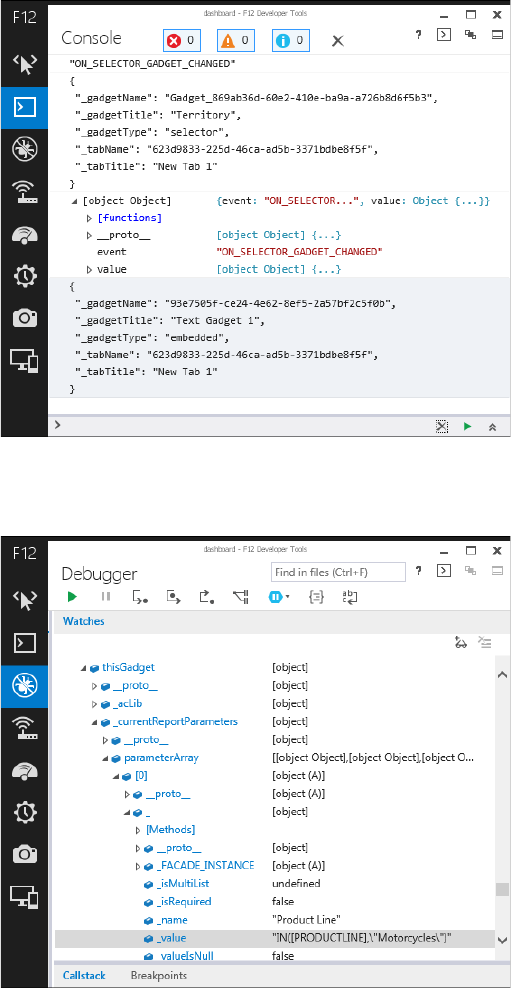
Displaying values in a JavaScript console . . . . . . . . . . . . . . . . . . . . . . . . . . . . . . . . . . . . . . 261
Displaying values in Internet Explorer . . . . . . . . . . . . . . . . . . . . . . . . . . . . . . . . . . . . . . . . . 261
Displaying selected values . . . . . . . . . . . . . . . . . . . . . . . . . . . . . . . . . . . . . . . . . . . . . . . . . . . 263
Using linked values . . . . . . . . . . . . . . . . . . . . . . . . . . . . . . . . . . . . . . . . . . . . . . . . . . . . . . . . . . . . 263
Reading and writing parameter values . . . . . . . . . . . . . . . . . . . . . . . . . . . . . . . . . . . . . . . . . . . 264
Chapter 14
Building Google gadgets . . . . . . . . . . . . . . . . . . . . . . . . . . . . . . . . . . . . . . 265
About Google gadgets . . . . . . . . . . . . . . . . . . . . . . . . . . . . . . . . . . . . . . . . . . . . . . . . . . . . . . . . . . . . 266
Creating Google gadgets . . . . . . . . . . . . . . . . . . . . . . . . . . . . . . . . . . . . . . . . . . . . . . . . . . . . . . . . . . 266
About gadget views . . . . . . . . . . . . . . . . . . . . . . . . . . . . . . . . . . . . . . . . . . . . . . . . . . . . . . . . . . . 267
About gadget features . . . . . . . . . . . . . . . . . . . . . . . . . . . . . . . . . . . . . . . . . . . . . . . . . . . . . . . . . 268
Using the Flash feature . . . . . . . . . . . . . . . . . . . . . . . . . . . . . . . . . . . . . . . . . . . . . . . . . . . . . . 269
Using the minimessage feature . . . . . . . . . . . . . . . . . . . . . . . . . . . . . . . . . . . . . . . . . . . . . . . 269
Using the pubsub feature . . . . . . . . . . . . . . . . . . . . . . . . . . . . . . . . . . . . . . . . . . . . . . . . . . . . 270
Using the tabs feature . . . . . . . . . . . . . . . . . . . . . . . . . . . . . . . . . . . . . . . . . . . . . . . . . . . . . . . 270
Linking Google gadgets . . . . . . . . . . . . . . . . . . . . . . . . . . . . . . . . . . . . . . . . . . . . . . . . . . . . . . . . . . 271
Linking an import gadget . . . . . . . . . . . . . . . . . . . . . . . . . . . . . . . . . . . . . . . . . . . . . . . . . . . . . . 271
Linking multiple Google gadgets . . . . . . . . . . . . . . . . . . . . . . . . . . . . . . . . . . . . . . . . . . . . . . . . 272
Linking Google gadgets together . . . . . . . . . . . . . . . . . . . . . . . . . . . . . . . . . . . . . . . . . . . . . . . . 274
Linking public Google gadgets . . . . . . . . . . . . . . . . . . . . . . . . . . . . . . . . . . . . . . . . . . . . . . . . . . 275
viii
Part 5
Using Actuate JavaScript API in an application
Chapter 15
Creating dynamic report content using
the Actuate JavaScript API . . . . . . . . . . . . . . . . . . . . . . . . . . . . . . . . . . 279
About Actuate JavaScript API scripting in a BIRT report design . . . . . . . . . . . . . . . . . . . . . . . . .280
Using the Actuate JavaScript API in an HTML button . . . . . . . . . . . . . . . . . . . . . . . . . . . . . . . . .281
Tutorial 4: Adding scripted chart controls to a BIRT design . . . . . . . . . . . . . . . . . . . . . . . . . . . . 282
Task 1: Add HTML buttons . . . . . . . . . . . . . . . . . . . . . . . . . . . . . . . . . . . . . . . . . . . . . . . . . . . . . .282
Task 2: Script the chart sub_type controls . . . . . . . . . . . . . . . . . . . . . . . . . . . . . . . . . . . . . . . . . .284
Task 3: Script the chart size controls . . . . . . . . . . . . . . . . . . . . . . . . . . . . . . . . . . . . . . . . . . . . . .285
Task 4: Test the scripts . . . . . . . . . . . . . . . . . . . . . . . . . . . . . . . . . . . . . . . . . . . . . . . . . . . . . . . . . .285
Tutorial 5: Using HTML buttons to apply filters to a chart . . . . . . . . . . . . . . . . . . . . . . . . . . . . . 287
Task 1: Add a filter button to the report . . . . . . . . . . . . . . . . . . . . . . . . . . . . . . . . . . . . . . . . . . .287
Task 2: Add HTML buttons for the remaining product lines . . . . . . . . . . . . . . . . . . . . . . . . .289
Task 3: Add the final HTML button to the report . . . . . . . . . . . . . . . . . . . . . . . . . . . . . . . . . . .291
Task 4: Test the report . . . . . . . . . . . . . . . . . . . . . . . . . . . . . . . . . . . . . . . . . . . . . . . . . . . . . . . . . .292
Using the Actuate JavaScript API in chart interactive features . . . . . . . . . . . . . . . . . . . . . . . . . .293
Tutorial 6: Adding an interactive chart filter to a BIRT report . . . . . . . . . . . . . . . . . . . . . . . . . . 298
Task 1: Add bookmarks . . . . . . . . . . . . . . . . . . . . . . . . . . . . . . . . . . . . . . . . . . . . . . . . . . . . . . . . .298
Task 2: Add a filter script to chart interactivity . . . . . . . . . . . . . . . . . . . . . . . . . . . . . . . . . . . . .299
Using the Actuate JavaScript API in chart themes . . . . . . . . . . . . . . . . . . . . . . . . . . . . . . . . . . . . .300
Tutorial 7: Adding scripted HTML5 Chart controls to a BIRT design . . . . . . . . . . . . . . . . . . . . 301
Task 1: Adding HTML buttons . . . . . . . . . . . . . . . . . . . . . . . . . . . . . . . . . . . . . . . . . . . . . . . . . . .302
Task 2: Scripting the client chart controls . . . . . . . . . . . . . . . . . . . . . . . . . . . . . . . . . . . . . . . . . .303
Task 3: Scripting the client option controls . . . . . . . . . . . . . . . . . . . . . . . . . . . . . . . . . . . . . . . . .304
Task 4: Testing the scripts . . . . . . . . . . . . . . . . . . . . . . . . . . . . . . . . . . . . . . . . . . . . . . . . . . . . . . .304
Chapter 16
Working with Interactive Crosstabs . . . . . . . . . . . . . . . . . . . . . . . . . . . . . 307
About cross tabs . . . . . . . . . . . . . . . . . . . . . . . . . . . . . . . . . . . . . . . . . . . . . . . . . . . . . . . . . . . . . . . . . .308
Tutorial 8: Viewing and pivoting a cross tab . . . . . . . . . . . . . . . . . . . . . . . . . . . . . . . . . . . . . . . . . 309
About cubes . . . . . . . . . . . . . . . . . . . . . . . . . . . . . . . . . . . . . . . . . . . . . . . . . . . . . . . . . . . . . . . . . . . . .310
Handling Interactive Crosstabs viewer events . . . . . . . . . . . . . . . . . . . . . . . . . . . . . . . . . . . . . . . .312
Working with dimensions, measures, and levels . . . . . . . . . . . . . . . . . . . . . . . . . . . . . . . . . . . . . .312
Adding a dimension with levels . . . . . . . . . . . . . . . . . . . . . . . . . . . . . . . . . . . . . . . . . . . . . . . . . .313
Removing a dimension . . . . . . . . . . . . . . . . . . . . . . . . . . . . . . . . . . . . . . . . . . . . . . . . . . . . . . . . .313
Adding and removing measures . . . . . . . . . . . . . . . . . . . . . . . . . . . . . . . . . . . . . . . . . . . . . . . . .313
Changing measures and dimensions . . . . . . . . . . . . . . . . . . . . . . . . . . . . . . . . . . . . . . . . . . . . . .314
Working with totals . . . . . . . . . . . . . . . . . . . . . . . . . . . . . . . . . . . . . . . . . . . . . . . . . . . . . . . . . . . . . . .315
Sorting and filtering cross tab data . . . . . . . . . . . . . . . . . . . . . . . . . . . . . . . . . . . . . . . . . . . . . . . . . .316
ix
Drilling down within a cross tab . . . . . . . . . . . . . . . . . . . . . . . . . . . . . . . . . . . . . . . . . . . . . . . . . . . 317
Controlling the Interactive Crosstabs viewer user interface . . . . . . . . . . . . . . . . . . . . . . . . . . . . 318
Chapter 17
Actuate JavaScript API classes . . . . . . . . . . . . . . . . . . . . . . . . . . . . . . . . 321
Actuate JavaScript API overview . . . . . . . . . . . . . . . . . . . . . . . . . . . . . . . . . . . . . . . . . . . . . . . . . . 322
About the actuate namespace . . . . . . . . . . . . . . . . . . . . . . . . . . . . . . . . . . . . . . . . . . . . . . . . . . . 322
Using the Actuate library . . . . . . . . . . . . . . . . . . . . . . . . . . . . . . . . . . . . . . . . . . . . . . . . . . . . . . . 322
Actuate JavaScript API classes quick reference . . . . . . . . . . . . . . . . . . . . . . . . . . . . . . . . . . . . . . . 322
Actuate JavaScript API reference . . . . . . . . . . . . . . . . . . . . . . . . . . . . . . . . . . . . . . . . . . . . . . . . . . . 325
Class actuate . . . . . . . . . . . . . . . . . . . . . . . . . . . . . . . . . . . . . . . . . . . . . . . . . . . . . . . . . . . . . . . . . . . . 326
Class actuate.AuthenticationException . . . . . . . . . . . . . . . . . . . . . . . . . . . . . . . . . . . . . . . . . . . . 333
Class actuate.ConnectionException . . . . . . . . . . . . . . . . . . . . . . . . . . . . . . . . . . . . . . . . . . . . . . . . 335
Class actuate.Dashboard . . . . . . . . . . . . . . . . . . . . . . . . . . . . . . . . . . . . . . . . . . . . . . . . . . . . . . . . . 336
Class actuate.dashboard.DashboardDefinition . . . . . . . . . . . . . . . . . . . . . . . . . . . . . . . . . . . . . 346
Class actuate.dashboard.EventConstants . . . . . . . . . . . . . . . . . . . . . . . . . . . . . . . . . . . . . . . . . . . 347
Class actuate.dashboard.GadgetScript . . . . . . . . . . . . . . . . . . . . . . . . . . . . . . . . . . . . . . . . . . . . . 348
Class actuate.dashboard.Tab . . . . . . . . . . . . . . . . . . . . . . . . . . . . . . . . . . . . . . . . . . . . . . . . . . . . . . 351
Class actuate.data.Filter . . . . . . . . . . . . . . . . . . . . . . . . . . . . . . . . . . . . . . . . . . . . . . . . . . . . . . . . . . 353
Class actuate.data.ReportContent . . . . . . . . . . . . . . . . . . . . . . . . . . . . . . . . . . . . . . . . . . . . . . . . . 358
Class actuate.data.Request . . . . . . . . . . . . . . . . . . . . . . . . . . . . . . . . . . . . . . . . . . . . . . . . . . . . . . . 359
Class actuate.data.ResultSet . . . . . . . . . . . . . . . . . . . . . . . . . . . . . . . . . . . . . . . . . . . . . . . . . . . . . . 364
Class actuate.data.Sorter . . . . . . . . . . . . . . . . . . . . . . . . . . . . . . . . . . . . . . . . . . . . . . . . . . . . . . . . . 366
Class actuate.DataService . . . . . . . . . . . . . . . . . . . . . . . . . . . . . . . . . . . . . . . . . . . . . . . . . . . . . . . . 369
Class actuate.Exception . . . . . . . . . . . . . . . . . . . . . . . . . . . . . . . . . . . . . . . . . . . . . . . . . . . . . . . . . . 371
Class actuate.Parameter . . . . . . . . . . . . . . . . . . . . . . . . . . . . . . . . . . . . . . . . . . . . . . . . . . . . . . . . . . 374
Class actuate.parameter.Constants . . . . . . . . . . . . . . . . . . . . . . . . . . . . . . . . . . . . . . . . . . . . . . . . . 385
Class actuate.parameter.ConvertUtility . . . . . . . . . . . . . . . . . . . . . . . . . . . . . . . . . . . . . . . . . . . . 386
Class actuate.parameter.EventConstants . . . . . . . . . . . . . . . . . . . . . . . . . . . . . . . . . . . . . . . . . . . 389
Class actuate.parameter.NameValuePair . . . . . . . . . . . . . . . . . . . . . . . . . . . . . . . . . . . . . . . . . . . 390
Class actuate.parameter.ParameterData . . . . . . . . . . . . . . . . . . . . . . . . . . . . . . . . . . . . . . . . . . . . 392
Class actuate.parameter.ParameterDefinition . . . . . . . . . . . . . . . . . . . . . . . . . . . . . . . . . . . . . . . 400
Class actuate.parameter.ParameterValue . . . . . . . . . . . . . . . . . . . . . . . . . . . . . . . . . . . . . . . . . . . 416
Class actuate.report.Chart . . . . . . . . . . . . . . . . . . . . . . . . . . . . . . . . . . . . . . . . . . . . . . . . . . . . . . . . 424
Class actuate.report.DataItem . . . . . . . . . . . . . . . . . . . . . . . . . . . . . . . . . . . . . . . . . . . . . . . . . . . . . 432
Class actuate.report.FlashObject . . . . . . . . . . . . . . . . . . . . . . . . . . . . . . . . . . . . . . . . . . . . . . . . . . 436
Class actuate.report.Gadget . . . . . . . . . . . . . . . . . . . . . . . . . . . . . . . . . . . . . . . . . . . . . . . . . . . . . . . 440
Class actuate.report.HTML5Chart.ClientChart . . . . . . . . . . . . . . . . . . . . . . . . . . . . . . . . . . . . . . 445
Class actuate.report.HTML5Chart.ClientOption . . . . . . . . . . . . . . . . . . . . . . . . . . . . . . . . . . . . 452
Class actuate.report.HTML5Chart.ClientPoint . . . . . . . . . . . . . . . . . . . . . . . . . . . . . . . . . . . . . . 456
Class actuate.report.HTML5Chart.ClientSeries . . . . . . . . . . . . . . . . . . . . . . . . . . . . . . . . . . . . . 459
Class actuate.report.HTML5Chart.Highcharts . . . . . . . . . . . . . . . . . . . . . . . . . . . . . . . . . . . . . . 464
Class actuate.report.HTML5Chart.Renderer . . . . . . . . . . . . . . . . . . . . . . . . . . . . . . . . . . . . . . . . 465
x
Class actuate.report.Label . . . . . . . . . . . . . . . . . . . . . . . . . . . . . . . . . . . . . . . . . . . . . . . . . . . . . . . . .471
Class actuate.report.Table . . . . . . . . . . . . . . . . . . . . . . . . . . . . . . . . . . . . . . . . . . . . . . . . . . . . . . . . .475
Class actuate.report.TextItem . . . . . . . . . . . . . . . . . . . . . . . . . . . . . . . . . . . . . . . . . . . . . . . . . . . . . .483
Class actuate.ReportExplorer . . . . . . . . . . . . . . . . . . . . . . . . . . . . . . . . . . . . . . . . . . . . . . . . . . . . . .487
Class actuate.reportexplorer.Constants . . . . . . . . . . . . . . . . . . . . . . . . . . . . . . . . . . . . . . . . . . . . .494
Class actuate.reportexplorer.EventConstants . . . . . . . . . . . . . . . . . . . . . . . . . . . . . . . . . . . . . . . .495
Class actuate.reportexplorer.File . . . . . . . . . . . . . . . . . . . . . . . . . . . . . . . . . . . . . . . . . . . . . . . . . . .496
Class actuate.reportexplorer.FileCondition . . . . . . . . . . . . . . . . . . . . . . . . . . . . . . . . . . . . . . . . . .503
Class actuate.reportexplorer.FileSearch . . . . . . . . . . . . . . . . . . . . . . . . . . . . . . . . . . . . . . . . . . . . .505
Class actuate.reportexplorer.FolderItems . . . . . . . . . . . . . . . . . . . . . . . . . . . . . . . . . . . . . . . . . . . .514
Class actuate.reportexplorer.PrivilegeFilter . . . . . . . . . . . . . . . . . . . . . . . . . . . . . . . . . . . . . . . . .516
Class actuate.RequestOptions . . . . . . . . . . . . . . . . . . . . . . . . . . . . . . . . . . . . . . . . . . . . . . . . . . . . .520
Class actuate.Viewer . . . . . . . . . . . . . . . . . . . . . . . . . . . . . . . . . . . . . . . . . . . . . . . . . . . . . . . . . . . . .524
Class actuate.viewer.BrowserPanel . . . . . . . . . . . . . . . . . . . . . . . . . . . . . . . . . . . . . . . . . . . . . . . . .546
Class actuate.viewer.EventConstants . . . . . . . . . . . . . . . . . . . . . . . . . . . . . . . . . . . . . . . . . . . . . . .547
Class actuate.viewer.PageContent . . . . . . . . . . . . . . . . . . . . . . . . . . . . . . . . . . . . . . . . . . . . . . . . . .548
Class actuate.viewer.ParameterValue . . . . . . . . . . . . . . . . . . . . . . . . . . . . . . . . . . . . . . . . . . . . . . .552
Class actuate.viewer.RenderOptions . . . . . . . . . . . . . . . . . . . . . . . . . . . . . . . . . . . . . . . . . . . . . . .554
Class actuate.viewer.ScrollPanel . . . . . . . . . . . . . . . . . . . . . . . . . . . . . . . . . . . . . . . . . . . . . . . . . . .556
Class actuate.viewer.SelectedContent . . . . . . . . . . . . . . . . . . . . . . . . . . . . . . . . . . . . . . . . . . . . . .558
Class actuate.viewer.UIConfig . . . . . . . . . . . . . . . . . . . . . . . . . . . . . . . . . . . . . . . . . . . . . . . . . . . . .560
Class actuate.viewer.UIOptions . . . . . . . . . . . . . . . . . . . . . . . . . . . . . . . . . . . . . . . . . . . . . . . . . . . .562
Class actuate.viewer.ViewerException . . . . . . . . . . . . . . . . . . . . . . . . . . . . . . . . . . . . . . . . . . . . . .576
Chapter 18
BIRT Interactive Crosstabs API classes . . . . . . . . . . . . . . . . . . . . . . . . . 579
About the BIRT Interactive Crosstabs JavaScript API . . . . . . . . . . . . . . . . . . . . . . . . . . . . . . . . . .580
Interactive Crosstabs API reference . . . . . . . . . . . . . . . . . . . . . . . . . . . . . . . . . . . . . . . . . . . . . . . . .581
Interactive Crosstabs JavaScript classes quick reference . . . . . . . . . . . . . . . . . . . . . . . . . . . . . . . .583
Class actuate.XTabAnalyzer . . . . . . . . . . . . . . . . . . . . . . . . . . . . . . . . . . . . . . . . . . . . . . . . . . . . . . .584
Class actuate.xtabanalyzer.Crosstab . . . . . . . . . . . . . . . . . . . . . . . . . . . . . . . . . . . . . . . . . . . . . . . .601
Class actuate.xtabanalyzer.Dimension . . . . . . . . . . . . . . . . . . . . . . . . . . . . . . . . . . . . . . . . . . . . . .615
Class actuate.xtabanalyzer.Driller . . . . . . . . . . . . . . . . . . . . . . . . . . . . . . . . . . . . . . . . . . . . . . . . . .621
Class actuate.xtabanalyzer.EventConstants . . . . . . . . . . . . . . . . . . . . . . . . . . . . . . . . . . . . . . . . . .624
Class actuate.xtabanalyzer.Exception . . . . . . . . . . . . . . . . . . . . . . . . . . . . . . . . . . . . . . . . . . . . . . . 625
Class actuate.xtabanalyzer.Filter . . . . . . . . . . . . . . . . . . . . . . . . . . . . . . . . . . . . . . . . . . . . . . . . . . .628
Class actuate.xtabanalyzer.GrandTotal . . . . . . . . . . . . . . . . . . . . . . . . . . . . . . . . . . . . . . . . . . . . . .635
Class actuate.xtabanalyzer.Level . . . . . . . . . . . . . . . . . . . . . . . . . . . . . . . . . . . . . . . . . . . . . . . . . . .638
Class actuate.xtabanalyzer.LevelAttribute . . . . . . . . . . . . . . . . . . . . . . . . . . . . . . . . . . . . . . . . . . .641
Class actuate.xtabanalyzer.Measure . . . . . . . . . . . . . . . . . . . . . . . . . . . . . . . . . . . . . . . . . . . . . . . .642
Class actuate.xtabanalyzer.MemberValue . . . . . . . . . . . . . . . . . . . . . . . . . . . . . . . . . . . . . . . . . . .647
Class actuate.xtabanalyzer.Options . . . . . . . . . . . . . . . . . . . . . . . . . . . . . . . . . . . . . . . . . . . . . . . . .650
Class actuate.xtabanalyzer.PageContent . . . . . . . . . . . . . . . . . . . . . . . . . . . . . . . . . . . . . . . . . . . .657
xi
Class actuate.xtabanalyzer.ParameterValue . . . . . . . . . . . . . . . . . . . . . . . . . . . . . . . . . . . . . . . . . 659
Class actuate.xtabanalyzer.Sorter . . . . . . . . . . . . . . . . . . . . . . . . . . . . . . . . . . . . . . . . . . . . . . . . . . 662
Class actuate.xtabanalyzer.SubTotal . . . . . . . . . . . . . . . . . . . . . . . . . . . . . . . . . . . . . . . . . . . . . . . 666
Class actuate.xtabanalyzer.Total . . . . . . . . . . . . . . . . . . . . . . . . . . . . . . . . . . . . . . . . . . . . . . . . . . . 670
Class actuate.xtabanalyzer.UIOptions . . . . . . . . . . . . . . . . . . . . . . . . . . . . . . . . . . . . . . . . . . . . . 674
Part 6
Deploying applications
Chapter 19
Deploying and sharing applications . . . . . . . . . . . . . . . . . . . . . . . . . . . . . 681
About deploying and sharing applications and files . . . . . . . . . . . . . . . . . . . . . . . . . . . . . . . . . . 682
Editing the landing page . . . . . . . . . . . . . . . . . . . . . . . . . . . . . . . . . . . . . . . . . . . . . . . . . . . . . . . . . . 684
Sharing applications . . . . . . . . . . . . . . . . . . . . . . . . . . . . . . . . . . . . . . . . . . . . . . . . . . . . . . . . . . . . . 687
Sharing project files . . . . . . . . . . . . . . . . . . . . . . . . . . . . . . . . . . . . . . . . . . . . . . . . . . . . . . . . . . . . . . 690
Publishing a resource file to iHub . . . . . . . . . . . . . . . . . . . . . . . . . . . . . . . . . . . . . . . . . . . . . . . . . . 691
Downloading files . . . . . . . . . . . . . . . . . . . . . . . . . . . . . . . . . . . . . . . . . . . . . . . . . . . . . . . . . . . . . . . 694
Managing permissions . . . . . . . . . . . . . . . . . . . . . . . . . . . . . . . . . . . . . . . . . . . . . . . . . . . . . . . . . . . 695
Deploying Java classes used in BIRT reports . . . . . . . . . . . . . . . . . . . . . . . . . . . . . . . . . . . . . . . . . 697
Installing a custom JDBC driver . . . . . . . . . . . . . . . . . . . . . . . . . . . . . . . . . . . . . . . . . . . . . . . . . . . 699
Installing custom ODA drivers and custom plug-ins . . . . . . . . . . . . . . . . . . . . . . . . . . . . . . . . . . 699
Chapter 20
Working with BIRT encryption in iHub . . . . . . . . . . . . . . . . . . . . . . . . . . . 701
About BIRT encryption . . . . . . . . . . . . . . . . . . . . . . . . . . . . . . . . . . . . . . . . . . . . . . . . . . . . . . . . . . . 702
About the BIRT default encryption plug-in . . . . . . . . . . . . . . . . . . . . . . . . . . . . . . . . . . . . . . . . . . 702
About supported encryption algorithms . . . . . . . . . . . . . . . . . . . . . . . . . . . . . . . . . . . . . . . . . . 703
About the components of the BIRT default encryption plug-in . . . . . . . . . . . . . . . . . . . . . . . 703
About acdefaultsecurity.jar . . . . . . . . . . . . . . . . . . . . . . . . . . . . . . . . . . . . . . . . . . . . . . . . . . . . . 703
About encryption.properties . . . . . . . . . . . . . . . . . . . . . . . . . . . . . . . . . . . . . . . . . . . . . . . . . . . . 704
About META-INF/MANIFEST.MF . . . . . . . . . . . . . . . . . . . . . . . . . . . . . . . . . . . . . . . . . . . . . . 706
About plugin.xml . . . . . . . . . . . . . . . . . . . . . . . . . . . . . . . . . . . . . . . . . . . . . . . . . . . . . . . . . . . . . 706
Creating a BIRT report that uses the default encryption . . . . . . . . . . . . . . . . . . . . . . . . . . . . . . . 707
Deploying multiple encryption plug-ins . . . . . . . . . . . . . . . . . . . . . . . . . . . . . . . . . . . . . . . . . . . . 709
Deploying encryption plug-ins to iHub . . . . . . . . . . . . . . . . . . . . . . . . . . . . . . . . . . . . . . . . . . . . . 712
Generating encryption keys . . . . . . . . . . . . . . . . . . . . . . . . . . . . . . . . . . . . . . . . . . . . . . . . . . . . . . . 713
Creating a custom encryption plug-in . . . . . . . . . . . . . . . . . . . . . . . . . . . . . . . . . . . . . . . . . . . . . . 715
Using encryption API methods . . . . . . . . . . . . . . . . . . . . . . . . . . . . . . . . . . . . . . . . . . . . . . . . . . . . 715
Chapter 21
Configuring data source connections in iHub . . . . . . . . . . . . . . . . . . . . 717
About data source connection properties . . . . . . . . . . . . . . . . . . . . . . . . . . . . . . . . . . . . . . . . . . . . 718
xii
Using a connection profile . . . . . . . . . . . . . . . . . . . . . . . . . . . . . . . . . . . . . . . . . . . . . . . . . . . . . . . . .718
Creating a connection profile . . . . . . . . . . . . . . . . . . . . . . . . . . . . . . . . . . . . . . . . . . . . . . . . . . . .718
Managing a connection profile . . . . . . . . . . . . . . . . . . . . . . . . . . . . . . . . . . . . . . . . . . . . . . . . . . .726
Exporting connection profiles . . . . . . . . . . . . . . . . . . . . . . . . . . . . . . . . . . . . . . . . . . . . . . . . .726
Importing connection profiles . . . . . . . . . . . . . . . . . . . . . . . . . . . . . . . . . . . . . . . . . . . . . . . . .727
Editing connection profile properties . . . . . . . . . . . . . . . . . . . . . . . . . . . . . . . . . . . . . . . . . . .728
Deploying a connection profile . . . . . . . . . . . . . . . . . . . . . . . . . . . . . . . . . . . . . . . . . . . . . . . . . . .729
Encrypting connection profile properties . . . . . . . . . . . . . . . . . . . . . . . . . . . . . . . . . . . . . . . . . .730
Binding connection profile properties . . . . . . . . . . . . . . . . . . . . . . . . . . . . . . . . . . . . . . . . . . . . .731
Binding the Connection Profile Store URL property . . . . . . . . . . . . . . . . . . . . . . . . . . . . . .732
Binding a connection profile name to a report parameter . . . . . . . . . . . . . . . . . . . . . . . . . .732
Accessing BIRT report design and BIRT resource path in custom ODA plug-ins . . . . . . . . . . .737
Accessing resource identifiers in the run-time ODA driver . . . . . . . . . . . . . . . . . . . . . . . . . . .737
Accessing resource identifiers in the design ODA driver . . . . . . . . . . . . . . . . . . . . . . . . . . . . .738
Chapter 22
Using custom emitters in iHub . . . . . . . . . . . . . . . . . . . . . . . . . . . . . . . . . 741
About custom emitters . . . . . . . . . . . . . . . . . . . . . . . . . . . . . . . . . . . . . . . . . . . . . . . . . . . . . . . . . . . .742
Deploying custom emitters to iHub and BIRT Visualization Platform . . . . . . . . . . . . . . . . . . . .743
Rendering in custom formats . . . . . . . . . . . . . . . . . . . . . . . . . . . . . . . . . . . . . . . . . . . . . . . . . . . . . . .744
Configuring the default export options for a BIRT report . . . . . . . . . . . . . . . . . . . . . . . . . . . . . . .748
Index . . . . . . . . . . . . . . . . . . . . . . . . . . . . . . . . . . . . . . . . . . . . . . . . . . . . . . 751

About Actuate BIRT Application Developer Guide
xiii
About Actuate BIRT
Application Developer
Guide
Actuate BIRT Application Developer Guide provides information about using the
Actuate BIRT Designer Professional report design tool. This material explains
how to design, configure, customize, and deploy applications, gadgets, and
reports.
■
About Actuate BIRT Application Developer Guide. This chapter provides an
overview of this guide.
■
Part 1. Getting started using BIRT Designer Professional. This part describes the
tasks that users complete to design a BIRT application.
■
Chapter 1. Planning a BIRT application. This chapter introduces BIRT
applications, their file structure and how to access the content once you have
deployed the application.
■
Chapter 2. Designing and deploying an application. This chapter describes how to
how to build a BIRT application for use in web pages and includes a tutorial to
demonstrate the process.
■
Part 2. Designing applications. This part describes the tasks necessary to build a
BIRT application using dashboards and reports.
■
Chapter 3. Designing a dashboard. This chapter explains how to personalize the
layout of a dashboard
■
Chapter 4. Displaying a file on a dashboard. This chapter explains how to display
files such as BIRT documents and web content such as images, videos and web
pages on a dashboard.
■
Chapter 5. Visualizing data on a dashboard. This chapter explains how to display
data using visualizations such as charts, gadgets, tables and cross tabs.
xiv
Actuate BIRT Application Developer Guide
■
Chapter 6. Designing a report. This chapter describes how to format BIRT reports
and documents.
■
Part 3. Building application components. This part describes how to use BIRT
Designer Professional to add interactive components to a BIRT application.
■
Chapter 7. Building interactive maps and gadgets. This chapter explains how to
visualize data in maps and measurement gadgets using BIRT Designer
Professional.
■
Chapter 8. Building an interactive chart. This chapter describes the requirements
and methods for adding interactive charts with BIRT Designer Professional.
■
Chapter 9. Building a template. This chapter describes how to build templates of
BIRT designs using BIRT Designer Professional.
■
Part 4. Enhancing application components. This part describes the tasks that can
enhance BIRT application data using interactivity, scripts, and security.
■
Chapter 10. Writing expressions using EasyScript. This chapter describes how to
write expressions using EasyScript, which is an expression syntax similar to
the syntax used in Excel formulas. The chapter also provides a reference to the
EasyScript functions and operators.
■
Chapter 11. Adding web interactivity to a report. This chapter describes how to
use HTML buttons to run JavaScript code.
■
Chapter 12. Implementing data security. This chapter describes how to use the
page-level security and data security features in Actuate iHub to control user
access to particular sections in a report and a particular set of data in a data
object.
■
Chapter 13. Linking and scripting gadgets. This chapter provides information
about linking and scripting gadgets on a dashboard.
■
Chapter 14. Building Google gadgets. This chapter provides information about
building Google gadgets for use with BIRT dashboards.
■
Part 5. Using Actuate JavaScript API in an application. This part describes how a
report developer uses Actuate JavaScript API to enhance report interactivity
and data presentation.
■
Chapter 15. Creating dynamic report content using the Actuate JavaScript API. This
chapter describes using Actuate JavaScript API code in a BIRT report.
■
Chapter 16. Working with Interactive Crosstabs. This chapter describes how to use
Actuate JavaScript API code to access and manipulate Interactive Crosstabs.
■
Chapter 17. Actuate JavaScript API classes. This chapter lists all of the standard
Actuate JavaScript API classes and their methods.
■
Chapter 18. BIRT Interactive Crosstabs API classes. This chapter lists all of the
cross tab classes and their methods.
About Actuate BIRT Application Developer Guide
xv
■
Part 6. Deploying applications. This part describes the tasks that an application
developer completes to deploy applications and configuration components,
such as data connections and encryption required by those applications.
■
Chapter 19. Deploying and sharing applications. This chapter explains the
different options for sharing dashboard and report files and describes how to
run and distribute BIRT applications to an Actuate iHub.
■
Chapter 20. Working with BIRT encryption in iHub. This chapter describes the
extension framework that supports users registering their own encryption
strategy with BIRT and how to deploy custom encryption to BIRT iHub.
■
Chapter 21. Configuring data source connections in iHub. This chapter describes
how to set up and use a data source configuration file using BIRT iHub.
■
Chapter 22. Using custom emitters in iHub. This chapter describes how to
provide custom output formats for BIRT reports on BIRT iHub.
xvi
Actuate BIRT Application Developer Guide

Part 1
Getting started using
BIRT Designer Professional
Part One
1

4
Actuate BIRT Application Developer Guide
Introducing BIRT applications
A BIRT application is a self-contained package that includes all the files and data
of a BIRT project. This package enables developers to quickly deploy secure and
interactive applications to an iHub server or cloud instance. After deployment,
the application is accessible from a web browser and includes an HTML landing
page to describe or navigate the application files.
When a project is published as a BIRT application, developers can offer uniform
resource locator (URL) entry points to the content of the application using a
unique URL for each BIRT or dashboard file in the project. These URLs can also
link the application content together, such as drill down reports or hyperlinks to
additional content.
Developers use BIRT Designer Professional to build and preview all components
of the application before deployment such as data objects, data stores,
dashboards, BIRT design and document files, BIRT libraries, HTML files,
JavaScript libraries, and other standard web content. All of these components
work together in a relational structure.
For example, the landing page of a BIRT application can contain a description and
URL link to a dashboard file in the BIRT application. The dashboard can display
BIRT documents or display charts from BIRT data objects that are stored in the
BIRT application.
About BIRT application file structure
Each BIRT application is stored in its own project folder in the developer’s
workspace. This folder includes all the BIRT files and BIRT data objects necessary
to view the application. Table 1-1 lists the files required to deploy a BIRT project
as a BIRT application. These files exist in the root of BIRT project.
Table 1-1 BIRT application files
File name File use Description
.project Project
description file An XML file used by BIRT Designer Professional
to describe a project and the resources it needs.
BIRTApplication.xml Application
definition file An XML file containing the application name and
access permissions
index.html Application
landing page An HTML file to store a description of the
application, embed content from the application
using Actuate JSAPI, or to list and navigate to files
in the application.

Chapter 1, Planning a BIRT application
5
You can organize files in the BIRT application using folders. Use the following
predefined folder structure to enable URL access to the files in the application:
■
Dashboards folder
■
Data Objects folder
■
Report Designs folder
■
Report Libraries folder
■
Report Templates folder
■
BIRTApplication.xml
■
Index.html
■
.project
Each BIRT application is self-contained and is stored inside an iHub volume in
the Applications folder. You cannot reuse content from a BIRT application outside
the application it is stored in.
For example, you add a dashboard gadget file to the Dashboards folder of a BIRT
application. You can use this gadget file in a dashboard that is in the same BIRT
application. If you want to use the same gadget file in a different application,
upload or copy the gadget file and any resources it requires, such as a data object,
to a location inside the new application folder.
The iHub administrator can hide the Application folder from view. When hidden,
the Application folder is not visible to users of Visualization Platform but users
can still use the URL to view the contents of a BIRT application.
Accessing BIRT application content
Each BIRT application supports multiple entry points depending on the files
included in the BIRT application. Each entry point is a URL that gives users access
to a file in the BIRT application. Table 1-2 lists the URL conventions supported
when a BIRT application is deployed.
Table 1-2 URL conventions
URL address Opens file in the BIRT application
/apps/<appname>/ index.html
/apps/<appname>/report index.rptdesign
/apps/<appname>/dashboard index.dashboard
/apps/<appname>/<folder>/<file> the selected file in the selected folder

6
Actuate BIRT Application Developer Guide
Each URL starts with the URL of Visualization Platform.
http://<host>:<port>/iportal/
For example, to open the index.html file in the BIRT application use the URL:
http://<host>:<port>/iportal/apps/<appname>/
■
<host> is the name or IP address of the web server hosting the Visualization
Platform web application.
■
<port> is the TCP port assigned to the Visualization Platform web application.
■
<appname>/ is the name of the BIRT application. The / after the application
name is required.
To open a file in the BIRT application use the following URL:
http://<host>:<port>/iportal/apps/<appname>/<folder>/<file>
■
<folder> is the name of the folder or folders where the selected file is located.
No folder name is necessary if the file is in the BIRT application root.
■
<file> is the name of the file to open or download.
Table 1-3 lists the actions triggered when opening a file in a BIRT application.
Other file types are opened in the web browser as downloaded files.
Table 1-3 File type actions
File extension File type Action
.rptdesign BIRT design File is run and results open in BIRT Viewer
.rptdocument BIRT document Opens in BIRT Viewer
.dashboard BIRT dashboard Opens as a dashboard

8
Actuate BIRT Application Developer Guide
Overview of the BIRT application design process
Designing a BIRT application involves the following tasks. You do not have to
perform all the tasks in the order in which they are presented here, but if you are
new to designing BIRT data objects and dashboards in BIRT Designer
Professional, you can use the following task list as a starting point:
■
Plan the application.
■
Add content to the project.
■
Add a BIRT data object.
■
Add a dashboard.
■
Add a BIRT design.
■
Publish to a server.
■
Edit the landing page.
■
Publish as a BIRT application.
■
Preview and test the BIRT application.
For more information about starting BIRT Designer Professional, navigating the
interface, and how to create a BIRT report, see BIRT: A Field Guide.
Planning the BIRT application
Before creating a BIRT application, identify the information and files that you
want the application to provide and decide how a user should navigate this
content. Your application enables users to visualize and interact with data sources
using various components such as BIRT designs, dashboards, and web pages.
These components are linked together using hyperlinks.
Add content to the BIRT project
You can add static files such as a PDF or an image file or dynamic files such as a
BIRT data object, dashboard or report design file. These files are stored in your
BIRT Designer Professional project folder until you publish them to an iHub
server. Once you publish the project as a BIRT application, you can access the
application’s HTML landing page or any of the files using URLs.
Using a BIRT data object to access data
After creating a new project to organize your application components you create
a BIRT data object to access your data source. The BIRT data object can access data
from a wide variety of sources, including databases, text files, XML documents,
Chapter 2, Designing and deploying an application
9
and web services. Dashboards and BIRT designs display interactive
visualizations of this data, such as charts and tables.
Using a dashboard to display data
There are many ways to present data with a dashboard. A dashboard uses
gadgets to display information such as a tabular list, a cross tab, a bar chart, a web
page. These different gadgets can link together to enable data searches and
display of external web services.
Different gadgets support features, such as zooming into chart data, timeline
selection in charts, cross tab analysis with Interactive Crosstabs, and interactive
table usage. Laying out a dashboard requires you to organize these gadgets in a
way that helps the user to understand and analyze the information.
Using a BIRT design for custom presentations
BIRT design files include scripting and layout options that are not available in a
dashboard. You can also use additional content such as HTML5 maps, using
HTML5 tags and advanced layout options such as a grid in a BIRT design. These
designs can contain multiple pages that can use include a table of contents. Users
can export the design file to multiple formats such as Adobe PDF, Microsoft
Excel, and Microsoft Word. Advanced parameter choices enable users to request
specific information in their report and developers to link multiple design files
together.
Publishing to a server
Publishing a BIRT applications make it accessible to a large number of users. A
published application is available to manage, meaning you can schedule data
object or BIRT design update its content from the data source. Use permissions to
limit user access to application content and data. When you publish a BIRT
application, the contents of the previous application are overwritten so all the
previous content is replaced.
Editing the landing page
Each BIRT application can include a landing page written in HTML. This landing
page is accessible using a URL and contains information about your project, such
as a description of the BIRT application, hyperlinks to the application content,
online help and BIRT content embedded using the Actuate JavaScript API.
Publishing as a BIRT application
Publishing the BIRT project as an application requires you to select the project,
select the server and choose publish.

10
Actuate BIRT Application Developer Guide
Previewing and testing the BIRT application
It is important to preview and test your BIRT application as you design it and
after you deploy it. Verify that the data retrieved from the data source is what you
expect. As you lay out and format the dashboard, confirm the visualization
throughout the design process. If you add code, test and debug it as you go. After
you deploy the BIRT application, verify the URL hyperlinks to the landing and to
any other content work as expected.
Tutorial 1: Building a data object
This section provides step-by-step instructions for building a BIRT data design
file that contains customer and order data. The data object uses data from the
sample database that is supplied with BIRT Report Designer Professional,
Classic Models, Inc. This data object is used to build visualizations on a
dashboard.
In this tutorial, you perform the following tasks:
■
Create a project.
■
Build a data object.
■
Build a data set.
■
Build a data model.
Task 1: Create a project
BIRT Report Designer Professional organizes files by projects. You can create one
project to organize all your reports or create multiple projects to organize your
reports by categories. For each project that you create, BIRT Report Designer
Professional creates a folder in your computer’s file system and adds default
content such as a BIRTApplication.xml file and an HTML landing page. The
contents of this project become the BIRT Application.
1Choose File➛New➛Project. New Project, which appears in Figure 2-1,
displays the types of projects that you can create.
2If necessary, expand Actuate BIRT, select BIRT Project, then choose Next.
3In New BIRT Project, select Blank Project. In Project name, type the following
text, as shown in Figure 2-2:
My Application
4To create the project, choose Finish. You can now see the project in the
Navigator view, as shown in Figure 2-3.
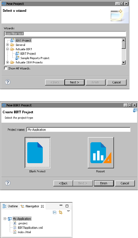
Chapter 2, Designing and deploying an application
11
Figure 2-1 New Project
Figure 2-2 New Blank Project
Figure 2-3 A project in the Navigator view
Task 2: Build a data object
You typically use one or more data objects in your BIRT designs and dashboards.
The data object contains information to connect to a database or other type of data
source. This information typically contains a driver class, data source name, and
other connection information that is specific to the type of data source.
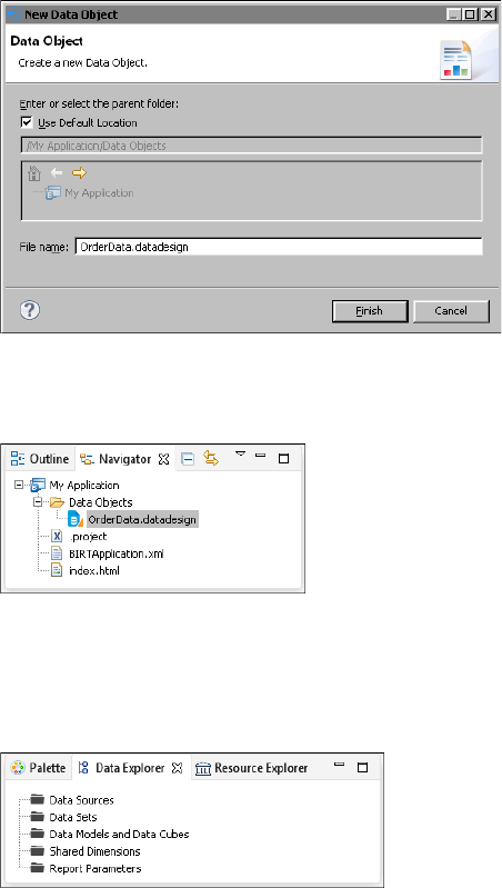
12
Actuate BIRT Application Developer Guide
For this tutorial, you use the sample database, Classic Models, that is already
configured for use with BIRT Report Designer. You do not need to specify the
connection information for this sample database.
1Choose File➛New➛Data Object. New Data Object, displays possible locations
for your new data object.
2In File name, type the following text, as shown in Figure 2-4:
OrderData.datadesign
Figure 2-4 New data object design
3To add the data object to the project, choose Finish. You can now see the data
object in the Navigator view, as shown in Figure 2-5.
Figure 2-5 A data object in the Navigator view
4Select the OrderData.datadesign file in the Navigator view. Choose Data
Explorer. If you use the default report design perspective, Data Explorer is to
the left of the layout editor, next to Palette, as shown in Figure 2-6. If Data
Explorer is not open, choose Window➛Show View➛Data Explorer.
Figure 2-6 Data Explorer
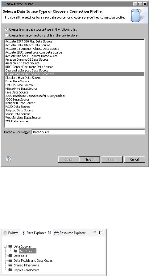
Chapter 2, Designing and deploying an application
13
5Right-click Data Sources, then choose New Data Source from the context
menu. New Data Source displays the types of data sources you can create, as
shown in Figure 2-7.
Figure 2-7 New Data Source
6Select Classic Models Inc. Sample Database from the list of data sources. Use
the default data source name, then choose Next. Connection information
about the new data source appears.
7Choose Finish. BIRT Report Designer Professional creates a new data source
that connects to the sample database. It appears within Data Sources in Data
Explorer, shown in Figure 2-8.
Figure 2-8 Data Sources in Data Explorer
8Choose File➛Save to save your changes.
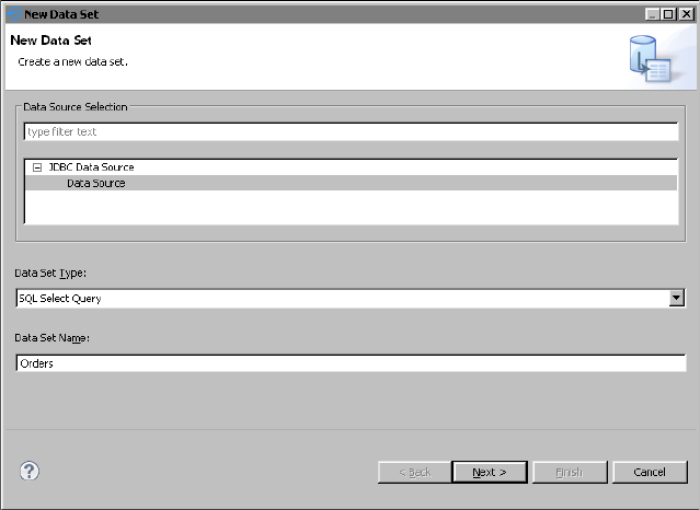
14
Actuate BIRT Application Developer Guide
Task 3: Build a data set
Now, you are ready to build your data set. A data set identifies the data to retrieve
from the data source. If your report connects to a JDBC data source, such as the
sample database, you use a SQL SELECT statement to specify the data to retrieve.
1In Data Explorer, right-click Data Sets, and choose New Data Set from the
context menu.
2In New Data Set, in Data Set Name, type the following text, as shown in
Figure 2-9:
Orders
Figure 2-9 New Data Set
Use the default values for the other fields.
■
Data Source Selection shows the type and name of the data source that you
created earlier.
■
Data Set Type indicates that the data set uses a SQL SELECT query.
3Choose Next.
The Query page displays information to help you create a SQL query.
Available Items lists all the schemas in the data source, including
CLASSICMODELS, which you use for this tutorial. You can click the plus (+)
sign next to CLASSICMODELS to display the data tables. The text area on the
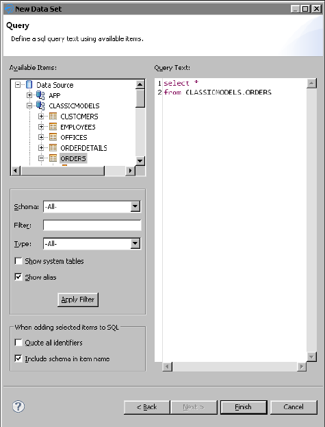
Chapter 2, Designing and deploying an application
15
right side of this dialog shows the following required keywords of a SQL
SELECT statement:
select
from
4In the text area, type the following SQL SELECT statement to specify the data
to retrieve:
select *
from CLASSICMODELS.ORDERS
The SELECT statement that you created, which is shown in Figure 2-10,
retrieves all of the columns of data in the ORDERS table.
Figure 2-10 SQL SELECT statement in Edit Data Set
5Choose Finish to save the data set. If you typed the query correctly, Edit Data
Set appears. If you made a mistake, an error message appears before Edit
Data Set opens. Edit Data Set displays the columns you specified in the query,
and provides options for editing the data set.
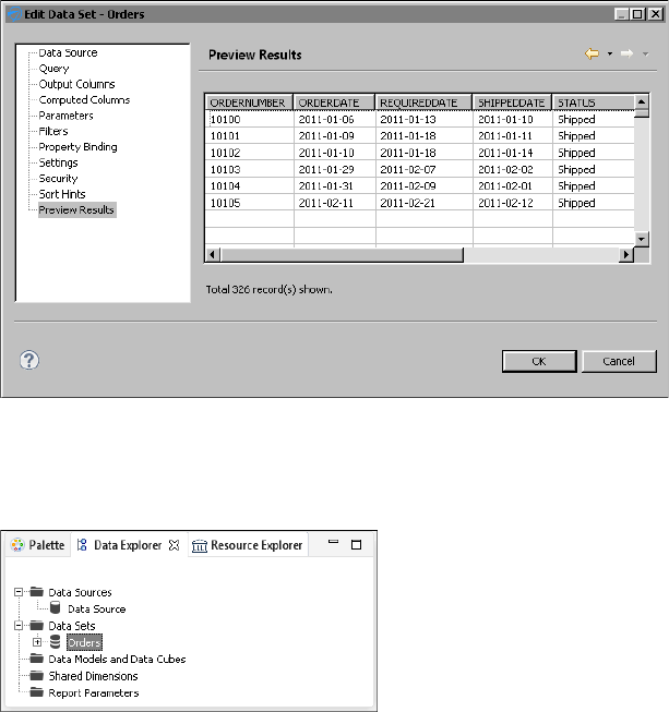
16
Actuate BIRT Application Developer Guide
6Choose Preview Results to make sure the query is valid and that it returns
the correct data. Figure 2-11 shows some of the data rows that the query
returns.
Figure 2-11 Data rows returned by a SQL SELECT statement
7Choose OK. BIRT Report Designer Professional creates a new data set that
connects to the sample database. It appears within Data Sets in Data Explorer,
shown in Figure 2-12.
Figure 2-12 Data Sets in Data Explorer
8Repeat the previous steps to make a second data set with the following values:
■
The Data Set name is:
Customers
■
The SQL SELECT statement:
select *
from CLASSICMODELS.CUSTOMERS
The new data set appears within Data Sets in Data Explorer, shown in
Figure 2-13. You can click the plus (+) sign next to the Customers data set to
display the available data columns.
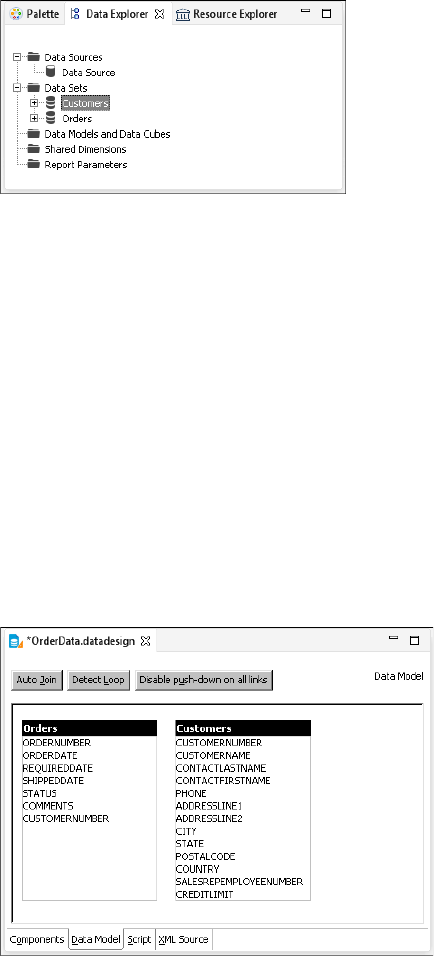
Chapter 2, Designing and deploying an application
17
Figure 2-13 Additional Data Set in Data Explorer
9Choose File➛Save to save your changes.
Task 4: Build a data model
Now, you are ready to build your data model. A data model joins data sets and
enables users to aggregate data for summarizing information. Once you have
added the data model you will generate a data object store in the BIRT application
that contains the data taken from the data source. This file is bigger than the data
object design file because it contains the data from the data source.
Use the data object file to avoid making additional queries to a data source and to
enable use of the BIRT application content without accessing the original data
source. You can use the data object design file but each use will make a new query
to the data source.
1In Data Explorer, right-click Data Models and Data Cubes, and choose New
Data Model from the context menu. Data Model appears showing the
available data set tables and column names, as shown in Figure 2-14.
Figure 2-14 New Data Model
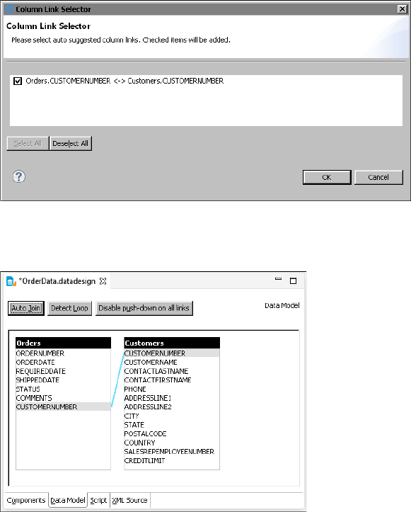
18
Actuate BIRT Application Developer Guide
2In OrdersData.datadesign, in Data Model, choose Auto Join to search the
two data sets for possible column names to join the data.
3In Column Link Selector, select Orders.CUSTOMERNUMBER <-> Customers
.CUSTOMERNUMBER to join the orders data set and the customers data set
using the column name CUSTOMERNUMBER, as shown in Figure 2-15.
Figure 2-15 New data set join using the selected columns
4Choose OK to link the two data sets together. Figure 2-16 shows the updated
data model.
Figure 2-16 Verifying the layout of the data model
5Choose File➛Save to save your changes.
The new data model appears within Data Models and Data Cubes in Data
Explorer, as shown in Figure 2-17.
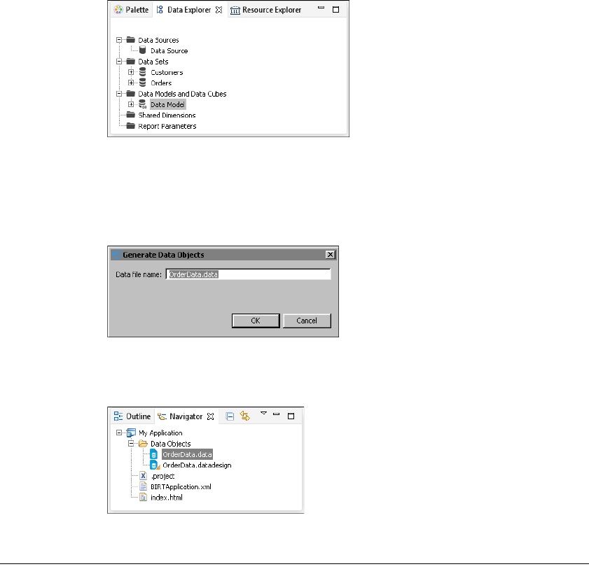
Chapter 2, Designing and deploying an application
19
Figure 2-17 Data Model in Data Explorer
6In the Navigator view, right-click OrderData.datadesign and choose Generate
Data Objects from the context menu.
7In Generate Data Objects, choose OK to accept the data file name and generate
a data object, as shown in Figure 2-18.
Figure 2-18 Generating a data object
You can now see the new data object in the Navigator view, as shown in
Figure 2-19.
Figure 2-19 A data object in the Navigator view
Tutorial 2: Building a simple dashboard
This section provides step-by-step instructions for building a dashboard to
display data from the data object you finished in the previous tutorial. In this
tutorial, you perform the following tasks:
■
Create a dashboard.
■
Add a table.
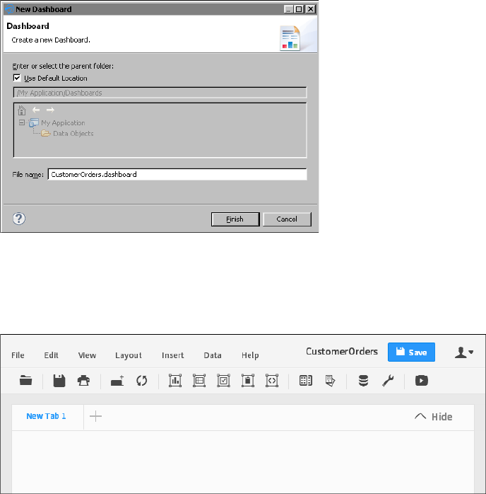
20
Actuate BIRT Application Developer Guide
■
Add a chart.
■
Add a data selection gadget.
Task 1: Create a dashboard
1Choose File➛New➛Dashboard. New Dashboard displays possible locations
for the dashboard.
2In File name, type the following text, as shown in Figure 2-20:
CustomerOrders.dashboard
Figure 2-20 New dashboard
3To add the dashboard to the project, choose Finish. The dashboard editor
appears, as shown in Figure 2-21. If you configured BIRT Designer
Professional to use an external web browser to display reports and
dashboards, the dashboard editor appears in your selected web browser.
Figure 2-21 Dashboard editor
Choose Data➛Manage Data. The available data objects in your project are
displayed, as shown in Figure 2-22.
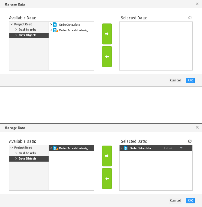
Chapter 2, Designing and deploying an application
21
Figure 2-22 Available data objects
Select OrderData.data and choose Add to use this data object in the
dashboard. The selected data object appears in Selected Data, as shown in
Figure 2-23.
Figure 2-23 Selected data objects
4Choose OK to close Manage Data.
5Choose File➛Save to save your latest changes to the dashboard file.
Task 2: Add a table
Now that the dashboard is created and data is assigned to it, you can choose
gadgets to display the data. When you choose a table gadget, data is either listed
row by row or summarized in groups. For this tutorial we use a summary table to
provide an overview of the data.
1Choose Insert➛Table➛Table to open the Table Builder.
2In Available Data, select Customers➛COUNTRY, and choose Add to add it to
Current Column Selections.
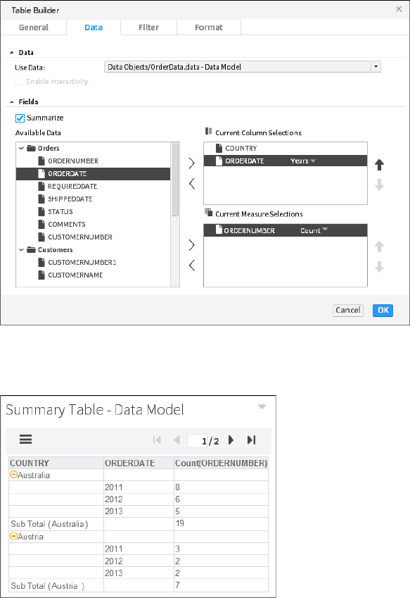
22
Actuate BIRT Application Developer Guide
3In Available Data, select Orders➛ORDERDATE, and choose Add to add it to
Current Column Selections. In Date Value, select Years.
In Available Data, select Orders➛ORDERNUMBER, and choose Add to add it
to Current Measure Selections. In Sum, select Count. Figure 2-24 shows table
builder after these changes.
Figure 2-24 Building a table
Choose OK to add the table to the dashboard. The table appears on the
dashboard, as shown in Figure 2-25.
Figure 2-25 New table gadget
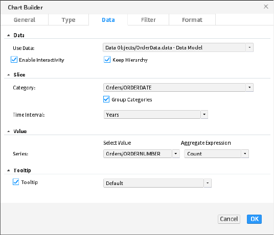
Chapter 2, Designing and deploying an application
23
4Choose File➛Save to save your latest changes to the dashboard file.
Task 3: Add a chart
Charts help users quickly visualize data. You can choose the chart that best
presents your data and enable interactive features such as drill down, zoom and
time selection. You can also filter and format data presented in your chart. In this
tutorial we are using a pie chart to display data.
1Choose Insert➛Chart➛Pie Chart to open the chart builder.
2In Slice—Category, select Orders➛ORDERDATE. In Slice—Time Interval,
select Years.
3In Value—Select Value, select Orders➛ORDERNUMBER. In
Value—Aggregate Expression, select Count. Figure 2-26 shows Chart Builder
after these changes.
Figure 2-26 Building a chart
4Choose Format.
5Expand Legend and select Show Legend. In Position, select Below, as shown
in Figure 2-27.
Choose OK to add the chart to the dashboard. The chart appears on the
dashboard, as shown in Figure 2-28.
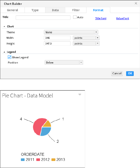
24
Actuate BIRT Application Developer Guide
Figure 2-27 Displaying a legend
Figure 2-28 New chart gadget
6Choose File➛Save to save your latest changes to the dashboard file.
Task 4: Add a data selection gadget
Use a data selection gadget such as a list to enable users to search for data on a
dashboard. One or more gadgets can link to the data selection so that a single user
selection can update multiple charts and tables on the dashboard. In this tutorial
we add a list of countries for a user to select. After the user selects a country, the
other gadgets update and display data about the selected country.
1Choose Insert➛Data Selector➛List to open the Data Selector Gadget Wizard.
2In Field, choose Customers➛COUNTRY, as shown in Figure 2-29.
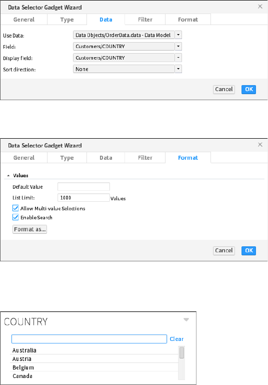
Chapter 2, Designing and deploying an application
25
Figure 2-29 Building a data selector
3Choose Format and select Enable Search, as shown in Figure 2-30.
Figure 2-30 Enabling user search
Choose OK to add the list of countries to the dashboard. The list appears on
the dashboard, as shown in Figure 2-31.
Figure 2-31 New list gadget
4Click on the Pie Chart title. Drag the chart and drop it to the right side of the
list gadget.
5Resize the bottom of the chart gadget so that it matches the bottom of the table
gadget.
6In the COUNTRY list, choose Canada. Your dashboard should look similar to
Figure 2-32.
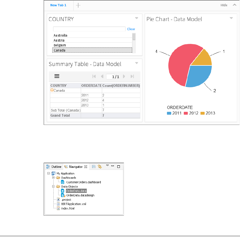
26
Actuate BIRT Application Developer Guide
Figure 2-32 Using a list to filter data
7Choose File➛Save to save your latest changes to the dashboard file.
8Close the dashboard editor. You can now see the dashboard in the Navigator
view, as shown in Figure 2-33.
Figure 2-33 A data object in the Navigator view
Designing a landing page
BIRT Designer Professional creates an index.html page with every BIRT project.
This file displays in a web browser when the project is deployed as an application
on iHub. The default URL for a BIRT application includes the project name, as
shown below:
http://host:port/iportal/apps/appname/
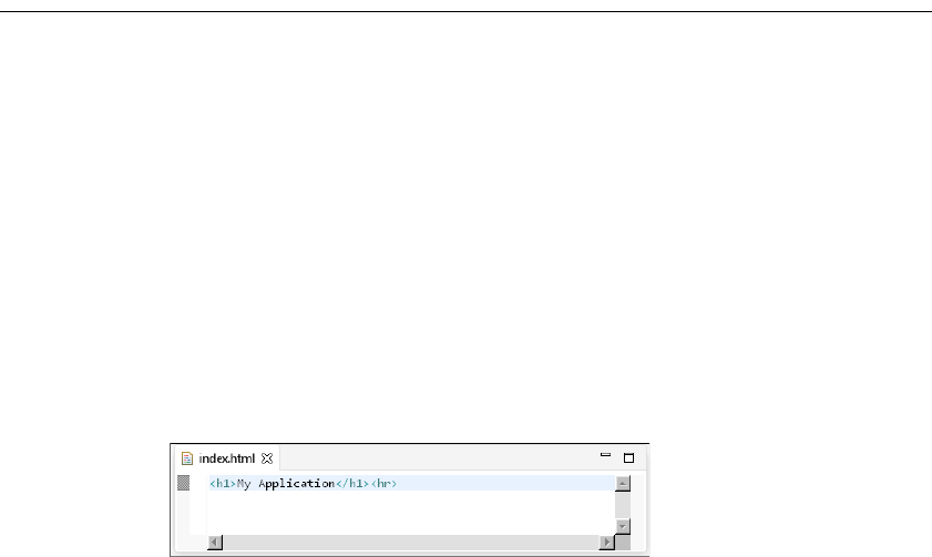
Chapter 2, Designing and deploying an application
27
■
host is the name of the application or web host running BIRT Services.
■
port is the Actuate application services port set in the application or web
server.
■
iportal is the default context root for Actuate application services. if you have
a custom context root, use that in place of iportal.
■
apps is the application directory in the BIRT iHub repository.
■
appname is the name of you project as it is packaged for BIRT iHub. Set the
appname by changing the Application Name attribute in BIRTApplication.xml
before deploying the application to iHub.
The landing page is an HTML page.
Tutorial 3: Deploy the BIRT application
This section provides step-by-step instructions for editing a BIRT application
landing page and deploying the finished BIRT application to a server.
In this tutorial, you perform the following tasks:
■
Edit the landing page.
■
Deploy the BIRT application.
■
Test the URL entry points.
Task 1: Edit the landing page
1In Navigator, expand your project and open index.html. Index.html appears in
the editor with the Project Name as an H1 title, as shown in as shown in
Figure 2-34.
Figure 2-34 Viewing the default H1 title in index.html
2Type the following text under the first line.
This application contains the following content:
<ul>
<li>
<a href="Dashboards/CustomerOrders.dashboard">Customer Order
Dashboard</a>
</li>
</ul>
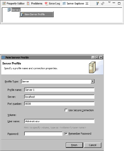
28
Actuate BIRT Application Developer Guide
3Choose File➛Save to save your latest changes to the landing page.
Task 2: Deploy the BIRT application
Now that you have added data and visualizations to your BIRT project, you can
deploy the entire project as a BIRT application to an iHub server. After the BIRT
application is deployed, users can access the content using URLs to the landing
page or to the files included in the BIRT application.
1In BIRT Report Designer Professional, open Server Explorer. If you do not see
the Server Explorer view in the designer, select Windows➛Show view
➛Server Explorer.
2In Server Explorer, right-click Servers, and choose New Server Profile, as
shown in Figure 2-35.
Figure 2-35 Adding a new server profile
3In New Server Profile, specify the connection information. Figure 2-36
displays an example of connection properties provided for a server named
localhost that is installed on the same computer as BIRT Designer Professional.
Figure 2-36 Setting properties in a new Server profile
1In Profile type, select Server.
2In Profile name, type a unique name that identifies the new profile.

Chapter 2, Designing and deploying an application
29
3In Server, type the name or IP address of the BIRT iServer server.
4In Port number, type the port number to access BIRT iServer.
5In Volume, select the iHub Encyclopedia volume if multiple volumes exist.
6In User name, type the user name required to access the volume.
7In Password, type the password required to access the volume.
8Select Remember Password, if you want to save the password.
4Choose Finish to save the Server profile. The Server profile appears in the
Server Explorer. You can expand the server profile to see the content of the
volume, as shown in Figure 2-37.
Figure 2-37 Expanding a server profile
5Select the My Application project in Navigator, as shown in Figure 2-38.
Figure 2-38 Selecting a BIRT project to publish as an application
6Choose File—Publish. In Publish, select Publish Project if it is not already
selected.
7Select a server profile and choose Publish. Figure 2-39 shows the BIRT
application named My Application set to publish to the server profile Server 1.
Figure 2-39 Selecting a server profile to publish to
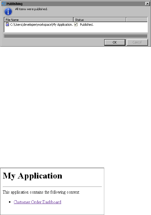
30
Actuate BIRT Application Developer Guide
8After all items have been published choose OK. Figure 2-40 shows that all files
were successfully published.
Figure 2-40 Verifying all items were published
9Choose Close to return to BIRT Designer Professional.
Task 3: Test the URL entry points
BIRT applications include a URL for the landing page and additional URLs for
each file included in the BIRT application. For more information about URLs that
can access your BIRT application content, see Chapter 1, “Planning a BIRT
application.”
1Verify that the application’s landing page is accessible by using a web browser
to visit the URL of the application. For example, the server name in this
tutorial is localhost so the URL to the application is the following:
http://localhost:8700/iportal/apps/My Application/
If you are asked to log in to the iHub Visualization Platform, type your user
name and password. Your landing page should look similar to Figure 2-41.
Figure 2-41 Visiting the landing page
2Verify that URL links displayed in the landing page function as expected.
3Verify that the content in the application is accessible. This tutorial includes
one dashboard file named CustomerOrders.dashboard in the folder named
Dashboards. If the server name was localhost, then the URL to the dashboard
is the following:
http://localhost:8700/iportal/apps/My Application/Dashboards
/CustomerOrders.dashboard

Part 2
Designing applications
Part Two
2
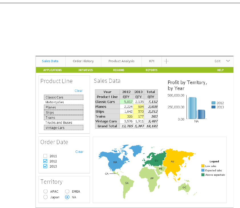
34
Actuate BIRT Application Developer Guide
About dashboard applications
A dashboard is a self-contained web application which delivers business
performance data in interactive charts, cross tab tables, BIRT documents and
external web services. Dashboards are quickly built using gadgets that display
data driven visualizations, files, or enable user choices. These gadgets can link
together to display data related to user requests, as shown in Figure 3-1.
Figure 3-1 Displaying a sample dashboard layout
When you build a dashboard you add gadgets to one or more tab pages of a
dashboard, similar to web pages. You choose the content to display in each
gadget and users of the dashboard can interact with that content, such as a chart
or table of data. The following gadget types are available:
■
Report gadgets display BIRT content such as BIRT documents, libraries, and
user input parameters from BIRT documents.
■
Chart gadgets organize and display data using symbols such as bars and lines.
■
Table gadgets display data values in cross tabs and in a row and column
format.

Chapter 3, Designing a dashboard
35
■
Data selector gadgets show values for users to query data in other gadgets.
■
Extras gadgets display external content such as web applications, video,
HTML, JavaScript code, and Google gadgets.
You can create dashboards using the BIRT Designer Professional desktop
application. Finished dashboards are deployed to a BIRT iHub or cloud server,
such as BIRT onDemand and available to users in the following formats:
■
A dashboard file in Visualization Platform
■
A URL address when deployed as a BIRT application
■
A web page using Actuate JavaScript API (JSAPI) to embed the dashboard
Users can then interact with, export, or print data displayed in existing
dashboards or include your published dashboard as a page in their own
dashboard file when using Visualization Platform.
Planning dashboard layout
Planning dashboard usage assures that users receive and interact with the
expected data. After choosing the content and data to display on the dashboard
select the gadgets to display this information. Verify that user permissions, such
as file permissions necessary to view BIRT documents or BIRT data objects,
enable target users to access this information. Then consider how you want users
to interact with these gadgets. For example, do you filter the displayed data for
the user or do you enable users to select filter values with data selection gadgets.
Finally, determine the dashboard layout for the expected web browser and screen
size. Each dashboard supports four different layout formats; one column, two
column, three column and freeform. You can change gadget placement on the
dashboard to find the best balance of presentation and interaction. For example,
keep related user interaction gadgets together. Users can also view any gadget,
except the data selection gadgets at full screen.
Creating a dashboard
You create a new dashboard file using the dashboard editor in BIRT Designer
Professional. These files are stored in the project folder. If you plan to display
charts verify that your BIRT data object file exists in the project.
How to create a new dashboard
1In BIRT Designer Professional choose File➛New➛Dashboard.
New Dashboard appears as shown in Figure 3-2.
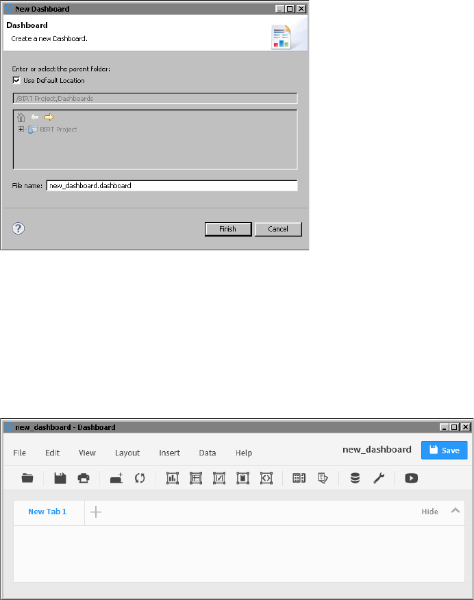
36
Actuate BIRT Application Developer Guide
Figure 3-2 Displaying the dashboard editor
2The current project and the default folder for dashboards is selected.
■
If you want to use a different project or folder to store the dashboard file,
remove the selection Use Default Location to access the tree view of the
available folders.
■
If you want to change the dashboard file name, type the new name in File
name.
3Choose Finish. The dashboard editor appears, as shown in Figure 3-3.
Figure 3-3 Displaying the dashboard editor
4Choose Save to save the new dashboard file to the project.
Chapter 3, Designing a dashboard
37
Adding a dashboard tab
A dashboard is divided into one or more pages called tabs. These tab pages
enable you to organize the gadgets. For example, one tab page contains gadgets
necessary to make a new customer order and another tab page can contain
gadgets displaying a customer’s order history. You can name each tab page to
identify its contents and change the order that the tab appears in relation to other
tabs.
How to add a dashboard tab
1In the dashboard editor, choose Edit➛New Tab to create an empty, new tab
page.
2Choose Edit➛Rename Tab to change the tab name.
Choosing a dashboard layout
Dashboard layout defines how gadgets appear on a dashboard. Each gadget uses
either a column or freeform layout. Gadgets in column layouts do not overlap
and appear either above or below another gadget in the same column. You can
place gadgets in freeform layout anywhere on the dashboard. If a freeform gadget
overlaps another gadget, the user can move the gadget to the front or back of the
other gadgets.
Dashboards support a one-, two-, or three-column layout in addition to a
freeform layout. You can use the columns to organize gadgets on the dashboard.
Dashboard columns are a percentage of the user’s web browser size. If the web
browser changes size, the dashboard columns are resized. Gadgets in a resized
column also resize to match the new width of the column.
Choose the freeform layout if you need to move or resize gadgets anywhere on
the dashboard. Freeform layout supports overlapping gadgets and changing the
width of individual gadgets.
For example, a single-column dashboard expands to fill the width of the web
browser, and the gadgets in the column are resized accordingly. Floating gadgets,
such as gadgets in a freeform layout, do not change their width or location on the
dashboard when the browser size changes.
For complex visualization layout, use BIRT design features available in BIRT
Designer Professional. For example, use BIRT Designer Professional to put
multiple charts into a grid element or cross tab container. You can display the
finished BIRT design file on a dashboard using a report gadget.
How to change a dashboard layout
In the dashboard editor, choose Layout➛Two Columns, as shown in Figure 3-4.

38
Actuate BIRT Application Developer Guide
Figure 3-4 Configuring gadget layout in columns and freeform
How to resize a column in a dashboard
This example begins with a dashboard that uses a two-column layout.
1In the dashboard editor, hover the mouse pointer over the vertical space
between two gadgets, as shown in Figure 3-5. The column bar appears.
Figure 3-5 Resizing a column in a dashboard
2Drag the bar to the left, to a new location, as shown in Figure 3-6.
Figure 3-6 Choosing a new column width in a dashboard
Existing gadgets are resized to fit within the new column widths.
Column bar
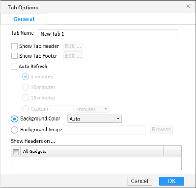
Chapter 3, Designing a dashboard
39
Formatting a dashboard tab
You can personalize the tab page of a dashboard with the following formatting
options:
■
Auto refresh, to refresh the dashboard at a selected interval
■
Background color, to set the background color of the dashboard page
■
Background image, to display an image as the background of the dashboard
page
■
Show Headers On, to show headers on selected gadgets
■
Show Tab Footer, to include HTML text at the bottom of the dashboard page
■
Show Tab Header, to include HTML text at the top of the dashboard page
■
Tab Name, to customize the name of the dashboard tab
For example, you can add a row of HTML hyperlinks to the top of your
dashboard or other HTML content with customized CSS styles inside the tab
header.
Activating auto refresh sets the dashboard to refresh at the selected interval. Data
and reports update at the selected interval. Set refresh settings to a speed that
your BIRT iHub supports. Each refresh requests an update for all content on the
dashboard tab page. Check with your BIRT iHub administrator for the supported
refresh frequency.
These formatting options are available from the dashboard editor when you
choose Edit➛Options, as shown in Figure 3-7.
Figure 3-7 Setting dashboard options
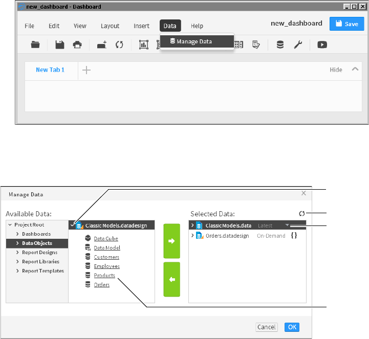
40
Actuate BIRT Application Developer Guide
Adding data objects to a dashboard
When you add a BIRT data object to a dashboard, all new gadgets added to that
dashboard can use the data object. This can save time when adding multiple
gadgets that use the same data object. If you add multiple data objects to a
dashboard, each time you add a new gadget, the data objects you have added
appear in the category Current Data Selection.
How to add a data object to a dashboard
1In the dashboard editor, Choose Data➛Manage Data to select data objects to
assign to the dashboard, as shown in Figure 3-8.
Figure 3-8 Displaying Opening Manage Data to add data objects
2In Available Data, select a data object inside the project and choose the right
arrow. The selected data object appears in Selected Data, as shown in
Figure 3-9.
Figure 3-9 Selecting a data object to use in a dashboard
If multiple versions of a BIRT data object are available, you can select which
version to use in the dashboard. You can browse the contents of a data object
to verify it contains the data you require.
Data
object
version
Refresh
Data
preview
Data
object
contents
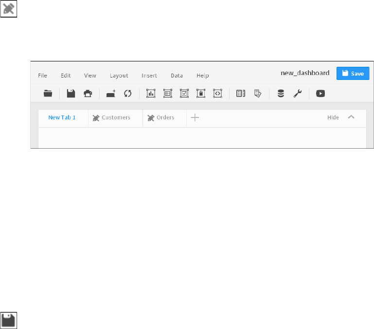
Chapter 3, Designing a dashboard
41
Importing an existing dashboard
You can add a shared dashboard file to a dashboard that you are editing. Choose
Insert➛Dashboard From Gallery to import a dashboard file into your new
dashboard. This enables you to quickly add existing dashboards as new pages in
your own dashboard file.
Imported dashboards appear on your dashboard as tab pages with a share icon in
the tab title. You cannot edit the content of a shared dashboard. Dashboard tabs
with the shared icon link to the original dashboard file and changes to the original
dashboard file appear in the imported dashboard when it is refreshed. Figure 3-10
shows two imported tabs called Customers and Orders.
Figure 3-10 Importing dashboard tabs
To change the content of imported tab pages, either duplicate the tab pages or edit
the original dashboard file. Choose Edit➛Duplicate Tab to copy the selected tab
into a new tab page. You can edit a copied tab page because it is no longer linked
to changes in the original dashboard file.
For example, you want to include an existing dashboard file in your new
dashboard but you want to also change the layout and replace a chart gadget
with a table gadget. After importing the existing dashboard, you then duplicate
it. A new tab page appears in your dashboard with the same content as the
imported dashboard. You can edit the duplicated tab page. Finally, you do not
need the imported tab page with the share icon and can delete it.
Saving a dashboard
Save changes to a dashboard by choosing File➛Save. To save the dashboard with
a new name, choose File➛Save as, navigate to a new location and give a new
name for the dashboard file, as shown in Figure 3-11.
When you save a dashboard file using BIRT Designer Professional, you save the
file to a folder in a BIRT project or a BIRT application. You can then deploy the
project or application to a BIRT iHub or cloud server, such as BIRT onDemand or
export the dashboard file.
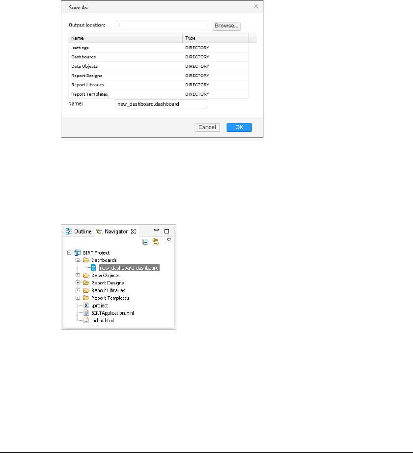
42
Actuate BIRT Application Developer Guide
Figure 3-11 Saving a dashboard file to a new folder
Opening a dashboard file
You can open a dashboard file in a BIRT project or BIRT application using the
Navigator. Navigate to the folder containing the file and double-click the
dashboard file, as shown in Figure 3-12.
Figure 3-12 Navigating to a dashboard file
Dashboard files require additional files such as BIRT data objects and BIRT
documents. These files must exist where the dashboard file expects to find them.
If you need to send dashboard files for editing or review to someone that does not
have access to your iHub server, put the dashboard and its resources into a BIRT
application file. The recipient of the BIRT application file can then open the
dashboard in BIRT Designer Professional or their BIRT onDemand account to
view and edit the dashboard file.
Adding gadgets to a dashboard
Use the dashboard editor to add new or existing gadgets to the dashboard.
Choose Insert and select a gadget category, such as charts. Then choose the type
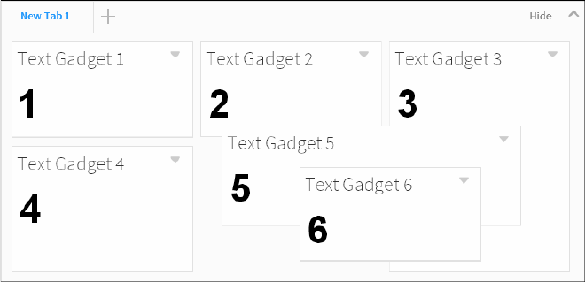
Chapter 3, Designing a dashboard
43
of chart gadget, such as a bar chart. The gadget builder for the selected gadget
type appears for you to select content to display in the gadget.
If you have existing gadget files in your BIRT application folder, choose
Insert➛Gadget Gallery to display the file browser and search for the gadget file to
add to the dashboard. After the gadget appears on the dashboard, you can place
it where you want and edit the gadget options to change the format and other
settings of the gadget. You can save dashboard gadgets as gadget files using
Visualization Platform.
Placing a gadget
New gadgets use the dashboard layout when added. You can move existing
gadgets on the dashboard to a different column or set the gadget to float when the
dashboard uses the column layout. You can place floating gadgets anywhere on
the dashboard while other gadgets remain in the column layout. Select Dock from
the gadget menu to return a floating gadget to the column layout of the
dashboard.
If the dashboard uses a column layout, you can move the gadgets above or below
other gadgets in the same column. Gadgets in a column layout do not overlap
and have an adjustable height. If the dashboard uses a freeform layout, all
gadgets are floating. Floating gadgets have an adjustable height and width. When
the freeform grid is displayed, you can snap gadgets to a grid for precise
placement. Figure 3-13 shows gadgets in a three-column layout with two floating
gadgets. Gadget 5 and gadget 6 are floating, in this example.
Figure 3-13 Gadgets in a three-column layout with floating gadgets
How to add a new gadget to a dashboard
BIRT Designer Professional includes gadget templates to quickly add visual
content to your dashboard. Use BIRT iHub to create your own gadgets that you
can import into your project.
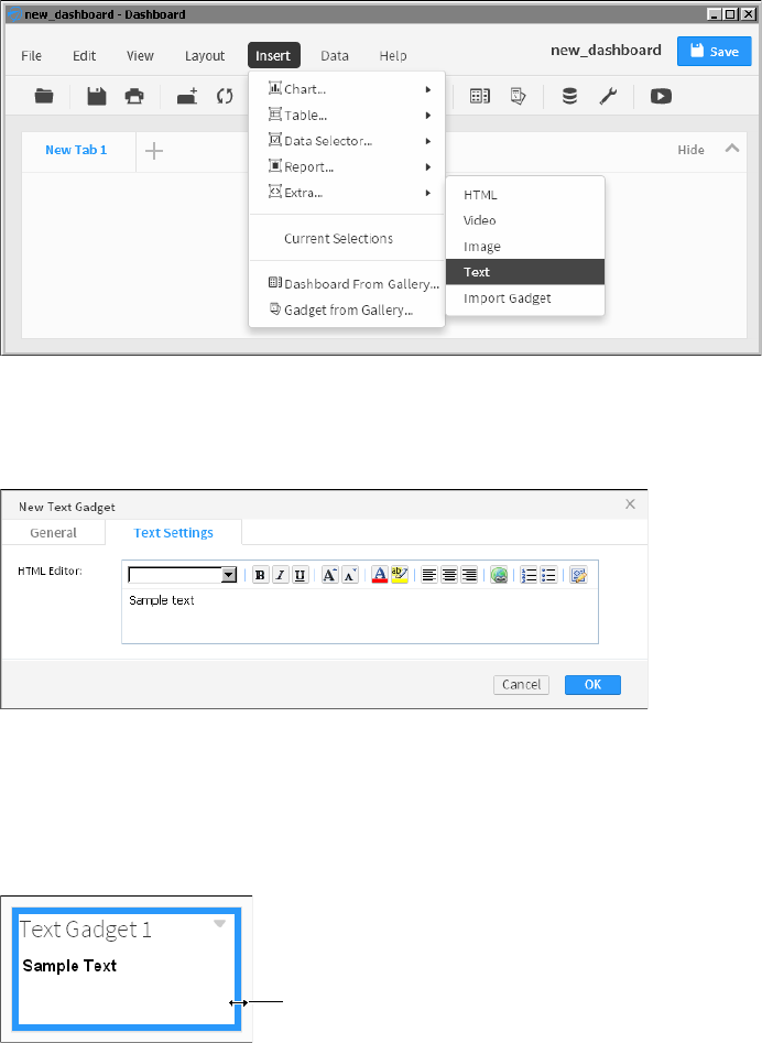
44
Actuate BIRT Application Developer Guide
1In the dashboard editor, choose Insert➛Extra➛Text to open the gadget
builder, as shown in Figure 3-14.
Figure 3-14 Adding a gadget to the dashboard
2Complete the gadget configuration depending on the gadget you choose. This
example uses a text gadget. Choose OK when you are finished configuring the
gadget, as shown in as shown in Figure 3-15.
Figure 3-15 Configuring a new gadget
The selected gadget appears on the dashboard.
How to change the size of a gadget
1Hover the mouse pointer over the border of a gadget. A solid line appears,
highlighting the borders that you can modify, as shown in Figure 3-16.
Figure 3-16 Selecting a gadget border to change
Mouse pointer
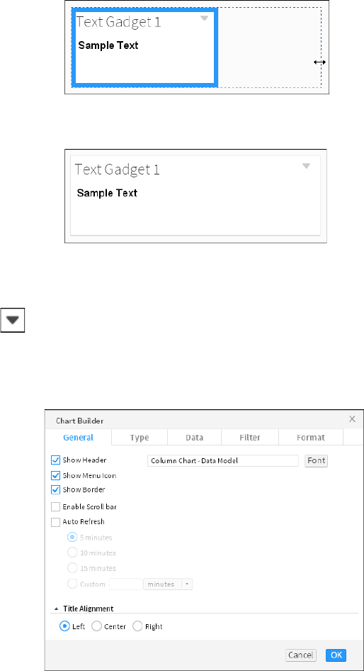
Chapter 3, Designing a dashboard
45
2Drag the border and drop it at a new position to resize the gadget, as shown in
Figure 3-17.
Figure 3-17 Changing the size of a gadget
3The gadget resizes to the new dimension, as shown in Figure 3-18.
Figure 3-18 Displaying the new gadget dimensions
Formatting a gadget
Gadget formatting options are available in the general properties of a gadget. To
reach the general properties of a gadget, choose Edit. Then, choose General.
Figure 3-19 shows the general gadget properties of a column chart gadget. Each
gadget type includes additional formatting options, depending on the content of
the gadget.
Figure 3-19 Navigating to a dashboard file

46
Actuate BIRT Application Developer Guide
You can personalize gadgets with the following formatting options:
■
Auto Refresh, to refresh the gadget at a selected interval
■
Dimensions, to set the width and height of the gadget after it is added to the
dashboard
■
Enable Scroll Bar, to display a scrollbar if the gadget is too small for the
content it displays
■
Font, to select a font for the gadget title
■
Gadget Title, to customize the name of the gadget
■
Show Border, to display the gadget border
■
Show Header, to display the header
■
Show Menu Icon, to display a gadget’s editing icon
■
Show Toolbar, to display a toolbar for a cross tab, parameter, report, or table
gadget
■
Title Alignment, to set the alignment of the gadget title
Testing dashboard content
After adding the gadgets you require, it is important to verify that the dashboard
meets your expectations. In the dashboard editor you can choose View➛Run to
open the dashboard in a read-only mode.
The following considerations assist in optimizing a dashboard:
■
Avoid long queries when on-demand data is not required by using data object
store files instead of data object design files. Object store files are cached in the
BIRT iHub, enabling multiple users to quickly access data.
■
Avoid delays in rendering BIRT content by using BIRT report document files
in place of BIRT report design files when possible. This avoids the additional
time necessary for data population of a report design file.
■
If you are showing only selected parts of a BIRT design file, consider using a
BIRT library. A BIRT design file renders every item in the file, even if only part
of the file is being used, such as content displayed in a Reportlet gadget. A
BIRT library only renders the requested content.
■
Activate dashboard auto refresh only when necessary to monitor changing
data.
■
If you display data selection gadgets, such as a list, consider using data objects
with optimized indexes for quick population of the gadget.
■
Consider building data cubes to aggregate data before the data is displayed.
For example, a table gadget that aggregates values requires the browser to
Chapter 3, Designing a dashboard
47
load all values before it can calculate the aggregate values. If a cross tab was
used to display a data cube of the same data, there is less network traffic and
less processing done by the web browser.
48
Actuate BIRT Application Developer Guide

50
Actuate BIRT Application Developer Guide
About files on a dashboard
You can display external content on a dashboard and link this content to other
gadgets to build interactive applications. For example, display your company
logo in an image gadget. Use an HTML gadget to display your company web chat
application and use a Google gadget to display map locations of customer orders
and to verify order delivery status.
Use report gadgets to display and interact with BIRT content, such as report files,
BIRT library files, and parameters. Extra gadgets display content that does not
reside on a BIRT iHub server, such as web applications, HTML files, Google
gadget files, image and video files. These gadgets enable developers to bring
external content that is stored on external servers into their dashboard.
If you use Actuate Metrics Management, you can display the scorecards in
performance gadgets.
Displaying BIRT documents
BIRT design files contain many features to enhance chart types, document layout
and scripting. BIRT document files are created using BIRT Designer Professional
and Report Studio. These files and their content are displayed in dashboards
using report and Reportlet gadgets.
Use report gadgets to display entire BIRT files. If the document contains multiple
pages, the user can navigate through those pages or use the table of contents in
the BIRT document to find the information they need. The BIRT document retains
the file access permissions of the original BIRT document and users can interact
with the report using the same features as Interactive Viewer.
Use Reportlet gadgets to display a report element from a BIRT document that is
identified by a bookmark. For example, a single element such as a BIRT map or
multiple elements in a BIRT report grid such as a chart, a table, a map, and some
dynamic text.
Report gadgets support drill-through of charts when the BIRT developer enables
this functionality. Figure 4-1 shows a report gadget’s toolbar menu.
Users can interactively change the appearance, content and layout of a BIRT
document when the user maximizes the report gadget. Figure 4-2 shows a
maximized report gadget. Maximize the report by choosing Analyze from the
gadget menu.
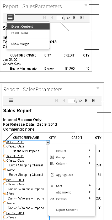
Chapter 4, Displaying a file on a dashboard
51
Figure 4-1 Exporting content from a report gadget
Figure 4-2 Opening the context menu of a maximized report gadget
How to add a Reportlet gadget
This procedure requires a dashboard you can edit and a BIRT document with
bookmarks added using BIRT Designer Professional. Create a new dashboard if
one does not already exist.
Gadget menu
Report content
Toolbar menu
Toolbar
Report
content
Context
menu
Toolbar
Group detail
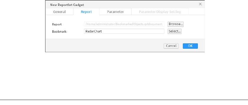
52
Actuate BIRT Application Developer Guide
To create a Reportlet gadget, complete the following steps:
1In the dashboard editor, choose Insert➛Report➛Reportlet.
2Choose Browse to display available reports.
3Select a BIRT report document or report design file to display and choose OK.
4Choose Select to display available bookmarks in the document.
5Select a bookmark to display and choose OK, as shown in Figure 4-3.
Figure 4-3 Creating a Reportlet gadget
6Select default values for any parameters in New Reportlet Gadget—
Parameter.
7In New Reportlet Gadget, choose OK to create the new gadget.
Displaying BIRT report items from a library
Use report library gadgets to display visual report items from a BIRT library.
Report items include interactive viewing options for users to explore and
customize the data presentation. A BIRT library file is created in BIRT Designer
Professional and contains customized report elements, such as data sources,
visual report items, styles, images, scripts and parameters.
For example, a report library file contains a chart, a cross tab, a Flash object, a
grid, a map, and an image. You can add a separate report library gadget for the
chart and the map items to the dashboard. Each of the report items you selected
appear in their own gadget and can link to data selection gadgets.
When adding report items from the BIRT library, these items are copied to the
dashboard. When the report library gadget is displayed, only the selected report
items are rendered. If a report library is updated and you want to display the new
version of the report item in the library, you must add a new report library gadget
to the dashboard.
The report items in a BIRT library file are only generated if they are displayed on
the dashboard. When using a Reportlet gadget to display items in a BIRT design
file, the entire BIRT design is generated, if any part of the design is displayed on
the dashboard. Large reports can cause a delay to retrieve the content of a
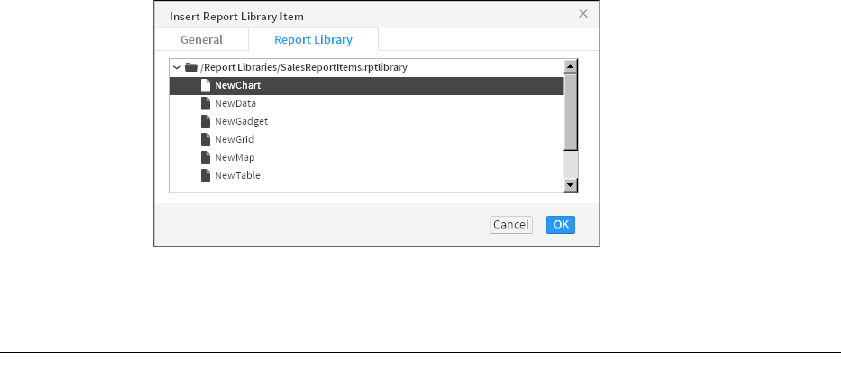
Chapter 4, Displaying a file on a dashboard
53
Reportlet gadget. If the developer uses a BIRT library, only the requested content
is delivered, offering better performance and a shorter delay to display the
desired content.
How to add a report library gadget
This procedure requires a dashboard you can edit and a BIRT library file with
report items added using BIRT Designer Professional. Create a new dashboard if
one does not already exist.
To create a report library gadget, complete the following steps:
1In the dashboard editor, choose Insert➛Report➛Report Library.
2Select a report item in a BIRT library file to display and choose OK. Figure 4-4
shows the report items available in the SalesReportItems BIRT library file.
Figure 4-4 Selecting a report item in a BIRT library
The report item appears in a gadget on the dashboard.
Displaying BIRT parameters
Parameters in a BIRT document prompt users to type or select values to pass into
the BIRT document. These values are used to add, change or filter data in the
BIRT document. You can set default parameter values in the gadget
configuration, display the parameters in the gadget for the user to select values,
or use a data selection or parameter gadget that is already on the dashboard to
send parameter values to the BIRT document.
For example, a BIRT design file displays order history for each customer and uses
parameters to prompt the user for a customer name before generating the
document. Other possible uses of parameters include requesting a report in a
specific language or adding comments into a final report.
When you display a BIRT document in a report or Reportlet gadget you can set
default values for any parameters in the BIRT document. To enable users to
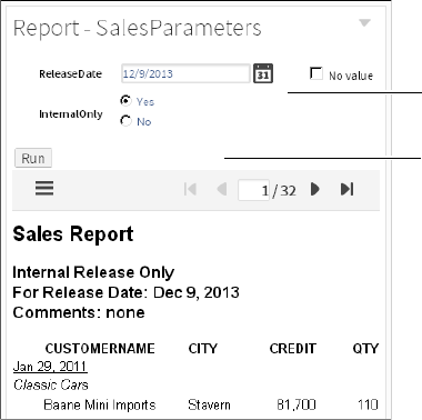
54
Actuate BIRT Application Developer Guide
change parameter values and update the BIRT document, display the parameters
on the dashboard.
When using a report or Reportlet gadget you can display parameters in the
following ways:
■
Do not display parameter.
The parameter is not displayed on the dashboard. A default value is selected
when creating or editing the gadget. Users cannot change this value.
■
Display parameter as part of the gadget.
The parameter is displayed as part of the report or Reportlet gadget. A user
selects a value for the parameter, then chooses Run to update the BIRT
document. Figure 4-5 shows a report gadget with parameters displayed in the
gadget.
Figure 4-5 Displaying parameters as part of a gadget
■
Display parameter as a new selector.
Create a new data selection gadget that displays the parameter. Other report
and Reportlet gadgets can use this gadget. Figure 4-6 shows a report gadget
with a parameter displayed as a new selector gadget. When a user changes the
value, the linked document updates.
■
Link to this selector.
Use an existing parameter or data selection gadget to send parameter values
to the BIRT document.
Run report
Report
parameters
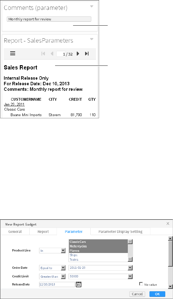
Chapter 4, Displaying a file on a dashboard
55
Figure 4-6 Displaying parameters as a separate gadget
How to set default parameter values
This procedure requires a dashboard you can edit and a BIRT document that uses
parameter values. Create a new dashboard if one does not already exist.
To set default parameter values in a gadget, complete the following steps:
1In the dashboard editor, choose Insert➛Report➛Report.
2Choose Browse to display available reports.
3Select a BIRT report document or report design file to display and choose OK.
4In Parameter, set default values for the report’s parameters and choose OK.
Figure 4-7 shows default values set for a sample report.
Figure 4-7 Setting default parameter values in a report gadget
5In New Report Gadget, choose OK to add the new gadget to the dashboard.
Report with
parameters
Report
parameter

56
Actuate BIRT Application Developer Guide
Displaying parameters in a data selector gadget
Use data selector gadgets to display parameters when you want to use the user’s
selected value in other gadgets, such as a chart. You can display parameters from
BIRT design and BIRT data object files.
When you choose to display a parameter as a new data selector, the Data Selector
Gadget Wizard launches. Use this wizard to build a data selection gadget using
the parameter choices in the BIRT file as a data source. You can choose the selector
type, such as list or check box, you can choose the formatting options, such as
formatting the displayed values, and you can link other gadgets to the user
selections.
Once the data selection gadget appears on the dashboard, you can edit it like
other data selection gadgets except that you cannot change the data source or
filter settings.
You can also link a report gadget with parameters to data selection gadgets from
other data sources. For example, a BIRT document displays customer invoices
and uses a parameter named Customer to generate the invoice of specific
customers. The dashboard includes a list for users to select customer names. You
create a report gadget to display the BIRT document. In the gadget’s Parameter
Display Settings, select the list of customer names in the section Link to this
selector. Now, each user selection from the list updates the BIRT document.
How to create a new selector for a parameter
This procedure requires a dashboard you can edit and a BIRT document that uses
parameter values. Create a new dashboard if one does not already exist.
To display parameter values in a separate gadget, complete the following steps:
1In the dashboard editor, choose Insert➛Report➛Report.
2Choose Browse to display available reports.
3Select a BIRT report document or report design file to display, and choose OK.
4In New Report Gadget—Parameter Display Settings, select Display parameter
as a new selector. Figure 4-8 shows the parameter display settings for an
example report.
Figure 4-8 Configuring parameter display settings for a report gadget
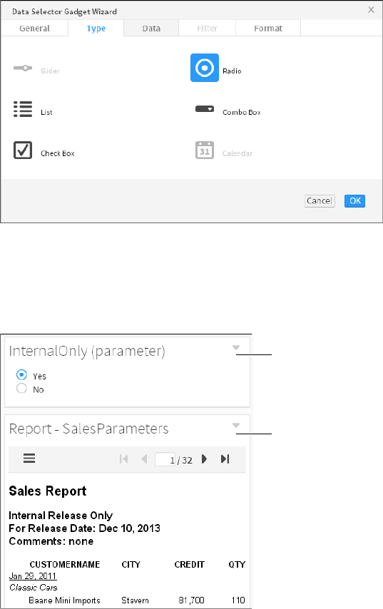
Chapter 4, Displaying a file on a dashboard
57
Data Selector Gadget Wizard appears.
5In Data Selector Gadget Wizard—Type, select a gadget type. The example in
Figure 4-9 shows a radio data selector.
Figure 4-9 Selecting a radio gadget
6Choose OK. New Report Gadget—Parameter Display Setting appears.
7Choose OK. The data selection gadget and report gadget appear, displaying
the default value for the parameter, as shown in Figure 4-10. Other gadgets
can now link to the new data selection gadget.
Figure 4-10 Displaying a parameter for a report in a data selection gadget
Report
gadget
Data
selection
gadget
58
Actuate BIRT Application Developer Guide
Displaying parameters in a parameter gadget
Use parameter gadgets to display cascading or dynamic filter parameters from a
BIRT document on a dashboard. There are two types of parameters, values and
conditions (sometimes called dynamic filters). Values are used when the BIRT
report requires only a single value. When conditions are also used, as in the case
of dynamic filter parameters, the user can select a condition like less than, greater
than, equal to in addition to a value.
Parameter gadgets enable users to send values to BIRT documents displayed in
one or more report or Reportlet gadgets. These gadgets display all or selected
parameter choices in a BIRT document file. You can also assign default parameter
values and if the parameter includes filter conditions, such as a dynamic filter
parameter you can also assign default conditions, such as greater than. User
selections in the parameter gadget update the linked BIRT document when the
user chooses Apply Changes.
For example, two report gadgets contain a parameter to select a credit limit for
potential clients. The parameter gadget displays the filter condition and value of
the credit limit. The user selects less than for the filter condition and enters a
value of 80,000. When the user chooses Apply Changes, both report gadgets
update and use the credit limit parameter of less than 80,000.
Parameter gadgets are also used to create data selection gadgets on a dashboard
using a BIRT file as the data source instead of a BIRT data object. Other dashboard
visualization gadgets that do not use conditions, such as a chart, can link to the
parameter gadgets but require additional scripting when conditions and values
appear in the parameter. Data visualization gadgets expect only values, not
conditions. For more information about data selection gadgets see Chapter 5,
“Visualizing data on a dashboard.”
How to create a parameter gadget
This procedure requires a dashboard you can edit and a BIRT document that uses
parameter values. Create a new dashboard if one does not already exist.
To create a parameter gadget, complete the following steps:
1In the dashboard editor, choose Insert➛Report➛Parameter.
2Choose Browse to display available reports.
3Select a BIRT report document or report design file to display and choose OK.
4Select which report parameters to display in the parameter gadget and
choose OK. Figure 4-11 shows three selected parameters to display from an
example report.
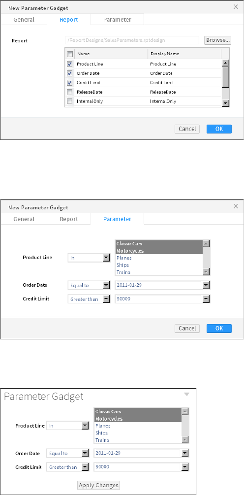
Chapter 4, Displaying a file on a dashboard
59
Figure 4-11 Configuring parameter display settings for a report gadget
5Select default values for any parameters in New Parameter Gadget—
Parameter. Figure 4-12 shows three selected parameters to display from the
example report.
Figure 4-12 Configuring default values for a parameter gadget
6Choose OK to create the new parameter gadget on the dashboard. Figure 4-13
shows the new parameter gadget created from the example report.
Figure 4-13 Configuring default values for a parameter gadget

60
Actuate BIRT Application Developer Guide
Displaying web content
Display external files, such as images, web pages, videos and Google gadgets on a
dashboard using gadgets from the Extra category. This category includes the
following gadget types:
■
HTML
■
Image
■
Import gadget
■
Text
■
Video
Displaying HTML content
Display a URL of external web content or embed HTML code on a dashboard
using an HTML gadget. When using a URL, the content of the external web site
displays in the HTML gadget. If the displayed web page is bigger than the
gadget, the user can maximize the gadget to see more of the web page or enable
scroll bars in the gadget.
You can also embed HTML, CSS, and JavaScript code directly in the HTML
gadget instead of using a URL address.
Displaying content from a URL
You can display a web site or web application on the dashboard using an HTML
gadget. For example, using a URL such as http://www.actuate.com loads the
Actuate web site into the HTML gadget, as shown in Figure 4-14.
Figure 4-14 Adding a URL to display in an HTML gadget
Figure 4-15 displays the content of the http://www.actuate.com URL in an
HTML gadget.
Chapter 4, Displaying a file on a dashboard
61
Figure 4-15 Displaying the HTML gadget on the dashboard
Some web sites and web applications support receiving additional parameters in
the URL. If the additional parameters in the URL require special encoding you
can encode the URL or consider using JavaScript redirection with the same URL
in the HTML gadget.
To use an unencoded URL in an HTML gadget, replace the unencoded characters
as shown in Table 4-1.
For example, the following URL does not work in an HTML gadget:
http://localhost:8700/iportal/iv?__report=\Home
\US sales.rptdocument&__page=3
The following rewritten URL works in an HTML gadget:
http://localhost:8700/iportal/
iv?__report=%5CHome%5CUS%20sales.rptdocument&__page=3
Similarly, to use a URL inside a JavaScript redirection, replace any backslashes
with a slash or the URL encoding of %5C. The following code shows JavaScript
redirection used to display a URL:
<script type="text/javascript">
<!--
window.location = "URL"
//-->
</script>
Place this code in the HTML section of the HTML gadget, replacing URL with the
URL that retrieves the Actuate document. For example, the URL to a BIRT report
document file is:
Table 4-1 Encoding URL characters for an HTML gadget
Character Replacement text
Backslash (\) Slash (/) or the URL encoding of %5C
Space ( ) The URL encoding %20
Ampersand (&) The HTML character entity &
62
Actuate BIRT Application Developer Guide
http://localhost:8700/iportal/iv?__report=\Home
\US Sales.rptdocument&__page=3
The following JavaScript redirection script loads the BIRT report document into
an HTML gadget:
<script type="text/javascript">
<!--
window.location = "http://localhost:8700/iportal/iv?__report=
/Home/US sales.rptdocument&__page=3"
//-->
</script>
Some web sites do not permit embedding their content in another web site or
attempt to control the browser display to present their content.
Displaying embedded HTML code
You can display embedded HTML such as HTML, CSS, and JavaScript code on a
dashboard. Verify that your JavaScript code does not use "parent" or "top" to
access HTML components.
If you need to interact with the HTML content consider embedding it in a Google
gadget. Import gadgets can link to data selection gadgets and pass the value to
the Google gadgets that they display.
Web applications that require special network ports or protocols, such as a video
chat application, require access to those ports from the user’s computer.
Displaying Adobe Flash content
Adobe Flash content often appears above other content such as a gadget menu,
when displayed in a web browser. If a dashboard developer has access to the
source code of the HTML or Google gadget that displays the Adobe Flash
content, the developer can add the wmode parameter to enable other content to
appear above the Adobe Flash content. Verify that the wmode parameter is in the
object tag that displays the Adobe Flash content and has a value of opaque or
transparent. Opaque is less processor-intensive on the user’s web browser than
transparent.
The following code shows an example of setting the wmode parameter to opaque
for embedded Adobe Flash content:
<object type="application/x-shockwave-flash" width="100%"
height="100%" id="flash" data="/iportal/testing/test.swf">
<param name="movie" value="/iportal/testing/test.swf" />
<param name="quality" value="best" />
<param name="wmode" value="opaque" />
<param name="bgcolor" value="ffffff" />
</object>
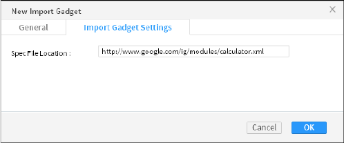
Chapter 4, Displaying a file on a dashboard
63
If you do not have access to the source code where the Adobe Flash content
appears, contact the web site administrator and ask them to set the wmode
parameter to transparent in the object tag displaying the Adobe Flash content.
Displaying images
Display images on a web server or from the internet using the image gadget.
This location starts with http:// or https:// in the URL address to the image,
such as http://www.actuate.com/logo.jpg, where logo.jpg is the name of the
image file.
If the image is larger than the gadget, the user can maximize the gadget or enable
scroll bars to see more of the image.
The image gadget supports the following image formats:
■
GIF
■
JPG
■
PNG
■
ICO
Displaying Google gadgets
Google gadgets display dynamic web content using HTML and JavaScript.
Google gadgets can also receive user selections on a dashboard. Display Google
gadgets on a dashboard using the import gadget. The Google gadget is stored
on a connected network like the internet. This location starts with
http:// or https:// in the URL address to the Google gadget, such as
http://www.google.com/ig/modules/calculator.xml, where calculator.xml is
the name of the Google gadget file, as shown in Figure 4-16.
Figure 4-16 Adding a URL to display in an import gadget
Figure 4-17 displays the content of the http://www.google.com/ig/modules
/calculator.xml URL in an import gadget.
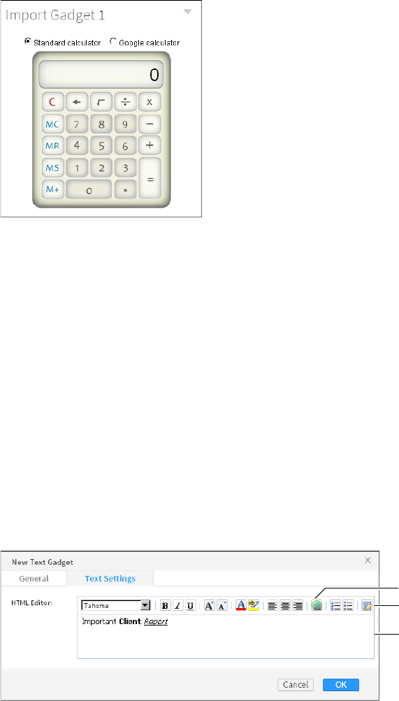
64
Actuate BIRT Application Developer Guide
Figure 4-17 Displaying the import gadget on the dashboard
You can create a custom URL with JavaScript and link that to a user selection.
With this URL you can request a map, video, or other file when the user makes a
selection on the dashboard. For example, a Google gadget uses JavaScript to
generate a map of service routes for a company that delivers packages. The
Google gadget is displayed on the dashboard using an import gadget. When you
link the import gadget to a list displaying customer names, the Google gadget can
access the selected customer location, and generates a map using the customer’s
address.
For more information about creating and using Google gadgets, see Chapter 14,
“Building Google gadgets.”
Displaying text
When you need to display text on a dashboard, use the text gadget. This gadget
enables you to add text such as explanations, online help, and hyperlinks
anywhere on a dashboard.
When you add a text gadget to a dashboard, an HTML text editor appears,
providing text formatting options, as shown in Figure 4-18.
Figure 4-18 Adding text to a text gadget
Add link
Edit code
Text
preview

Chapter 4, Displaying a file on a dashboard
65
You can type and format text directly in the HTML editor. Along with text
formatting options, the HTML editor supports adding HTML links to text and
editing the HTML source code of the text.
If you need to add JavaScript, custom HTML code or CSS code, use an HTML
gadget.
Displaying video
Display video files from a URL address or embedded HTML code on a dashboard
using a video gadget. The video content is stored on a connected network like the
internet. This location starts with http:// or https:// in the URL address to the
video content, such as http://www.youtube.com/watch?v=kxAMwt0hZDQ, as
shown in Figure 4-19.
Figure 4-19 Adding a URL to a video gadget
Figure 4-20 displays the content of the
http://www.youtube.com/watch?v=kxAMwt0hZDQ URL in a video gadget.
Figure 4-20 Displaying a video file in a video gadget
66
Actuate BIRT Application Developer Guide
You can also add HTML code and JavaScript code directly in the video gadget.
For example, some video web sites embed video with options that display
playback controls, a related video list, and video size. You set these options using
the HTML code that embeds the video in the gadget.

Chapter 5, Visualizing data on a dashboard
67
Chapter
5
Chapter 5
Visualizing data
on a dashboard
This chapter contains the following topics:
■
About displaying data on a dashboard
■
Displaying data in a chart
■
Displaying data in a table or cross tab
■
Displaying data in measurement gadgets
■
Enabling data selection
■
Organizing multiple user selections

68
Actuate BIRT Application Developer Guide
About displaying data on a dashboard
You can display and summarize data on a dashboard using many gadget types
such as charts, cross tabs, lists, and tables. These gadgets support rich interaction
to help users analyze information and identify root causes. Link these gadgets
together to present synchronized visualizations, helping users explore data
scenarios and find and compare the data they need.
Users can perform the following actions using data visualization gadgets:
■
Explore data, for example, by drilling up to see summaries, or drilling down
or zooming in to see data details.
■
Export data and visual content into multiple file formats.
■
Interact with data using filters to select data, and hyperlinks to see related
information.
Some gadgets offer special user interaction. For example, chart gadgets support
zooming in to one or more axes, and users can launch Interactive Crosstabs to
explore and edit cross tab gadgets. You can link these gadgets to data selection
gadgets, such as a list, to enable users to select and filter data.
Visualization gadgets display data from BIRT data object files. These data object
files connect to, organize, and store data from external data sources such as a
database. BIRT Designer Professional is required to create data object files.
Displaying data in a chart
Chart gadgets are graphical representations of data from a BIRT data object.
Charts are useful for summarizing numeric data and showing the relationship
between sets of values, called series. For example, a chart can show sales by
region, average temperatures by month, or the price of a stock over three months.
Because a chart presents a picture, it reveals trends that are not apparent in a
table.
When adding a chart to a dashboard, you perform the following tasks:
■
Choose a chart type.
■
Specify the data to present in the chart.
■
Format the chart.
■
Choose a location for the chart on the dashboard.
Chapter 5, Visualizing data on a dashboard
69
How to create a chart gadget
This procedure requires a dashboard you can edit and a BIRT data object. Create a
new dashboard if one does not already exist. To create a chart gadget, complete
the following steps:
1Choose a chart type in the dashboard editor by selecting Insert➛Chart and
choosing a chart type. In this example, choose Insert➛Chart➛Bar Chart.
2Select the data to display in the chart by completing the following steps:
1In Chart Builder—Data—Use Data, select a data source. If no data source
appears, choose New Data to select a BIRT data object from available data
objects in the BIRT project.
2Select a data column to display in the chart category axis.
3Select a data column to display in the chart value axis.
3Group and aggregate the data if it is not already aggregated in a data cube by
completing the following steps:
1Enable Group Categories to aggregate data on the value axis.
If you use date values to group categories, select a time interval by which
to group the dates, such as years or months.
2Specify data aggregations for each data column on the value axis.
3To display a legend, set group legend items to the name of a data column.
If you use date values to group legend items, select a time interval by
which to group the dates, such as years or months.
4The following optional tasks are available when you create the chart or after
the chart has been added to the dashboard:
■
Specify gadget appearance, such as name and size, in Chart Builder—
General.
■
Limit displayed data with filter conditions, in Chart Builder—Filter.
■
Format the chart, in Chart Builder—Format. For example, select a chart
theme and a chart subtype, enable zoom, enable the timeline range selector,
or customize the display of each axis.
Figure 5-1 shows the data configuration of a finished chart.
5Choose OK to create the new gadget on the dashboard. Figure 5-2 shows the
data configuration of a finished bar chart.
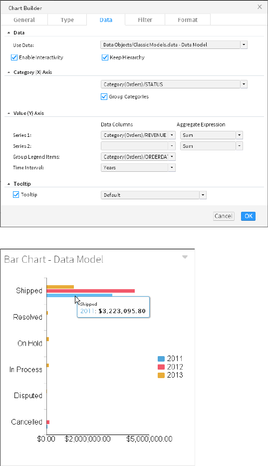
70
Actuate BIRT Application Developer Guide
Figure 5-1 Configuring data to display in a chart
Figure 5-2 Displaying the finished chart on the dashboard
Enable interactive filtering, if desired, by linking the chart to a data selection
gadget. After the chart is placed on the dashboard, it links to data selection
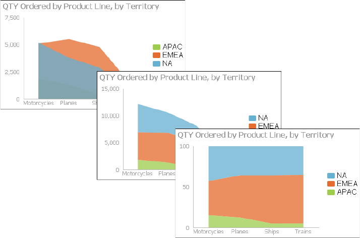
Chapter 5, Visualizing data on a dashboard
71
gadgets that use the same data source. You can remove these links or add
new ones.
Selecting a chart type
BIRT dashboards provide several chart types. The following sections describe the
chart types BIRT dashboards support. Several of the chart types include subtypes.
About area charts
An area chart displays data values as a set of points, connected by a line, with the
area below the line filled. You typically use an area chart to present data that
occurs over a continuous period of time. There are three subtypes of area charts:
overlay, stacked, and percent stacked.
In an overlay area chart, shown on the left in Figure 5-3, the areas of multiple
series overlap. Use the overlay area chart to show only one series, for example,
only sales for Asia. The overlay chart subtype is not suitable for showing multiple
series if the data values overlap. For example, in a chart displaying sales values
for global territories, if the values in one territory, the U.S., are the highest for
every quarter, the data for the U.S. obscures the data for Europe and Asia.
Figure 5-3 Overlay, stacked, and percent stacked area charts
In a stacked area chart, multiple series are stacked vertically, as shown in the chart
at the center in Figure 5-3. The example shows that the stacked area chart is
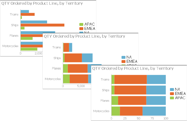
72
Actuate BIRT Application Developer Guide
suitable for multiple series of data because the chart displays totals for all series
and displays the proportion that each series contributes to the total. The height of
the top line shows the total value for each quarter. Each shaded area represents
the sales amount for a specific region.
In a percent stacked area chart, as shown on the right in Figure 5-3, multiple series
are stacked vertically, and the values appear as a percentage of the whole. As the
chart in Figure 5-3 shows, the sales values are displayed in percentages instead of
the actual numbers, as shown in the previous area charts. The percent stacked
area chart is meaningful only when displaying and comparing multiple series.
About bar charts
A bar chart, by default, displays data values as a set of horizontal bars, but you
can transpose the axes to display vertical bars. A bar chart is useful for displaying
data side by side for easy comparison. There are three subtypes of bar charts:
side-by-side, stacked, and percent stacked. The stacked and percent stacked bar
charts are functionally similar to the stacked area chart and percent stacked area
chart subtypes.
In a side-by-side bar chart, multiple series appear as side-by-side bars, as shown
in the chart on the left in Figure 5-4. This bar chart uses the same data as the area
charts shown in earlier sections.
Figure 5-4 Side-by-side, stacked, and percent stacked bar charts
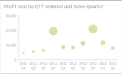
Chapter 5, Visualizing data on a dashboard
73
In a stacked bar chart, multiple series are stacked vertically, as shown in the chart
in the center in Figure 5-4. The stacked bar chart shows totals for each category, as
well as the proportion that each series contributes to the total.
In a percent stacked bar chart, multiple series are stacked vertically, and the
values are shown as a percentage of the whole. As seen in the chart on the right in
Figure 5-4, the sales values are shown in percentages instead of actual numbers,
as shown in the previous bar charts.
Like the percent stacked area chart, the percent stacked bar chart is meaningful
only when displaying and comparing multiple series. This chart subtype is
typically not used if you are displaying only one series, for example, only sales
for Asia.
About bubble charts
A bubble chart displays three sets of numeric data values at a time, two values are
data points with x-y coordinates on the axes. The third value defines the size of
the bubble at each point. A typical use of a bubble chart is to present financial
data such as quantity sold, profit margin, and total profit sales of multiple
product lines. Figure 5-5 shows a bubble chart where the size of the circle
indicates the quantity sold.
Figure 5-5 A bubble chart
About column charts
A column chart displays data values as a set of vertical bars, with categories on
the horizontal axis and values on the vertical axis. This layout is useful for
displaying data side by side for easy comparison, as shown in the chart on the left
in Figure 5-6.
This chart supports a stacked or percent stacked chart subtype that also shows the
relationships of values in each category to the whole, as shown in the charts in the
center and on the right in Figure 5-6.

74
Actuate BIRT Application Developer Guide
Figure 5-6 Side-by-side, stacked, and percent stacked column charts
About difference charts
A difference chart displays the variation between two values by shading the
area between those values. Figure 5-7 shows profit by displaying the difference
between the revenue and the cost of goods sold, for cities in France. You typically
use a difference chart to show deviation between two sets of values, such as the
high and low temperature for each day.
Figure 5-7 A difference chart

Chapter 5, Visualizing data on a dashboard
75
About doughnut charts
A doughnut chart is a circular chart that is divided into sectors or slices. Each
sector represents a value that is proportional to the total value, as shown in
Figure 5-8.
Figure 5-8 A doughnut chart
About Gantt charts
A Gantt chart graphically presents project scheduling information by displaying
the duration of tasks. One axis contains the time series, and the other contains
tasks. You can use color-coded bars to show the planned duration of the stages to
complete the tasks. Bars can use multiple colors to differentiate between stages.
Gantt charts use symbols on bars to mark beginning and ending dates. The colors
of the bars represent the task status. Optionally, markers designate the start and
end dates of tasks. Figure 5-9 shows a Gantt chart.
Figure 5-9 A Gantt chart
About line charts
A line chart displays data values as a set of points that are connected by a line.
You typically use line charts to present large amounts of data that occur over a
continuous period of time. A line chart is the most basic type of chart in finance.
The chart on the left in Figure 5-10 shows an example of an overlay line chart.
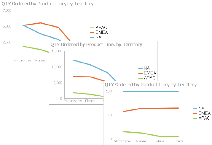
76
Actuate BIRT Application Developer Guide
Figure 5-10 Overlay, stacked, and percent stacked line charts
A line chart is similar to an area chart, except that the line chart does not fill in the
area below the line. In an overlay line chart, multiple series appear as overlapping
lines, as shown in the chart on the left in Figure 5-10. The line chart supports
stacked and percent stacked subtypes.
In a stacked line chart, multiple series are stacked vertically, as shown in the chart
in the center in Figure 5-10. The stacked line chart shows totals for each series, as
well as the proportion that each series contributes to the total.
In addition, as the example shows, a user can easily misinterpret the data in a
stacked line chart. There is no obvious indication that the top line shows the total
sales amount for each quarter, and the middle line shows the difference in the
sales amount between EMEA and APAC. Verify that the title of the chart or other
text describing the chart explains the purpose of the chart.
In a percent stacked line chart, multiple series are stacked vertically and the
values are shown as a percentage of the whole. As shown in the chart on the right
in Figure 5-10, the sales values appear in percentages instead of numbers. Like the
percent stacked area chart, the percent stacked line chart makes sense only when
displaying and comparing multiple series. If you are displaying only one series,
such as sales for EMEA, an overlay subtype is the most effective line chart. Both
the stacked line chart and the percent stacked line chart are not as effective as
their area chart counterparts.
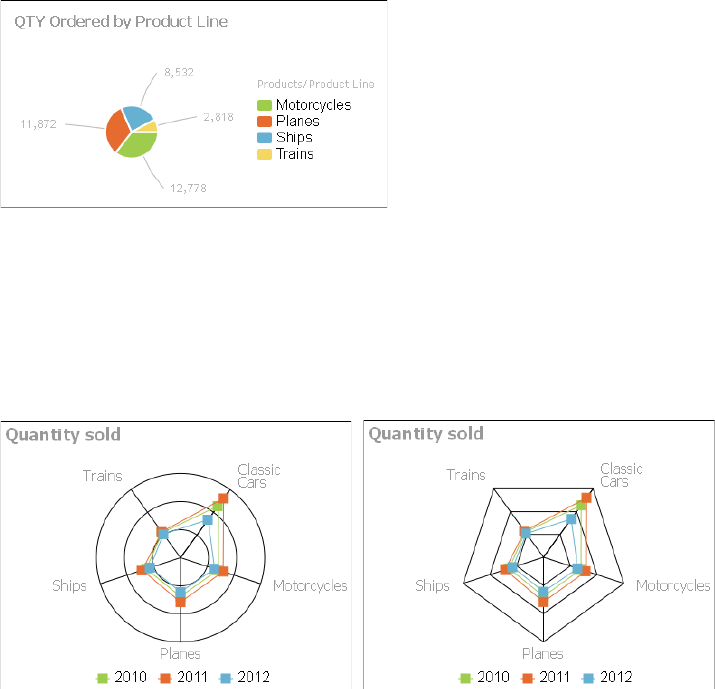
Chapter 5, Visualizing data on a dashboard
77
About pie charts
A pie chart is a circular chart that is divided into sectors or slices. Each sector
represents a value that is proportional to the sum of the values. Use a pie chart to
show the relationship of parts to the whole, for example, the order quantity each
product line contributes to the total, as shown in Figure 5-11.
Figure 5-11 A pie chart
About radar charts
Radar charts compare the aggregate values of one or more series of data. A
separate spoke from the chart center is shown for each category and each spoke is
connected by an arc. A line is drawn connecting the data values for each spoke,
giving the chart a star-like appearance. Radar charts have two subtypes: standard
radar charts and spider radar charts, as shown in Figure 5-12.
Figure 5-12 Standard and spider radar charts
A spider radar chart connects the outer spokes using lines and a standard radar
chart uses arcs, as shown in the chart on the left in Figure 5-12. Radar charts are
most effective for small data sets containing only a few hundred data rows. For
larger data sets, or those containing a time series, use a line chart.
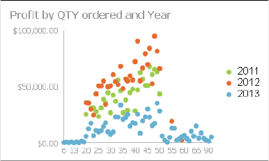
78
Actuate BIRT Application Developer Guide
About scatter charts
A scatter chart presents data as x-y coordinates by displaying two sets of numeric
values as single data points. A scatter chart typically displays scientific and
statistical data, because it shows if there is a relationship between two sets of
measurements. For example, use a scatter chart to compare salaries and years of
experience or weight and exercise. The more data values you include in a scatter
chart, the clearer the trends the data reveals.
The scatter chart in Figure 5-13 shows the relationship between quantity ordered
and profit over three years. Each pair of values, quantity ordered and profit, is
plotted as a single x-y value.
Figure 5-13 A scatter chart
About stock charts
A stock chart displays a stock’s open, close, high, and low values for a set of
trading dates. A stock chart can show the data for one stock or for multiple stocks.
Although a stock chart is typically used to display stock data, you can also use it
to chart other values such as four daily temperature values for a set of dates: high,
low, sunrise, sunset. The stock chart has two subtypes: the candlestick and bar
stick stock charts.
A candlestick stock chart consists of a series of boxes with lines extending up and
down from the ends, as shown in the chart on the left in Figure 5-14. The top and
bottom points of each line indicate the high and low values, respectively. The top
and bottom of each box indicate the open and close values. If the close value is
higher than the open value, the box is white. If the open value is higher than the
close value, the box is shaded. This style enables you to see immediately whether
a value posted a gain or a loss for a given day.
A bar stick stock chart consists of a series of vertical bars with horizontal tick
marks, as shown in the chart on the right in Figure 5-14. The top and bottom
points of each bar indicate the high and low values, respectively. The horizontal
tick marks indicate the open and close values. The tick mark on the left of the bar
is the open value. The tick mark on the right of the bar is the close value. A bar
stick stock chart typically shows the change in price over a period of time. The
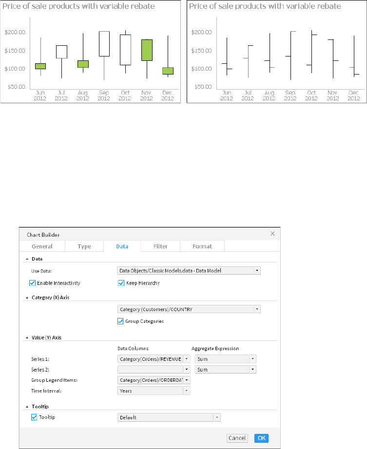
Chapter 5, Visualizing data on a dashboard
79
candlestick stock chart shows the gain or loss pattern more clearly than the bar
stick stock chart.
Selecting data for charts
You can select, filter, group, and aggregate data when you create the chart.
Adding a chart gadget to a dashboard displays Chart Builder—Data, where the
developer selects data to display in the chart. Choose a BIRT data object and
select a data set, data cube, or data model. Then, assign the data columns to the
different parts of the chart. Figure 5-15 displays an example bar chart’s data
configuration.
Figure 5-15 Selecting data to display in a bar chart
Figure 5-14 A candlestick and bar stick stock chart
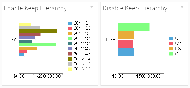
80
Actuate BIRT Application Developer Guide
You can select one data column from the data source to display on the category
axis of the chart and up to two data columns to display as series on the value axis
of the chart. The pie and doughnut chart only support a single series.
If hyperlinks exist in the data object file, they can appear in the chart by selecting
Chart Builder➛Data➛Enable Interactivity. Hyperlinks enable users to open a URI
or drill through to another BIRT document file when choosing a value such as a
customer name in a table. This is similar to a hyperlink on a web page.
Data cubes and data models can include a hierarchy structure. This enables users
to drill into the chart categories for details by selecting a part of the chart, such as
sales activity for a specific month in a specific year. You can break this hierarchy if
you want to aggregate values without their parent level.
For example, if you keep a data cube’s hierarchy and group legend items by a
time interval of quarters, the legend displays an each quarter of each year. If you
disable Keep Hierarchy in the chart, then the legend groups values only by the
quarter and not by year.
Figure 5-16 displays an example bar chart’s data configuration.
Figure 5-16 Grouping by quarters with and without hierarchy
Using category groups
Data sets and data models displayed in charts support grouping by category,
typically shown on the horizontal axis. When a category is grouped, values for
the selected category are aggregated. For example, a chart about customer orders
groups data by country and displays the total sum of sales orders. The resulting
chart displays each country name once with a sum of all sales for each country.
Using legend groups
You can display subgroups of values using legend items. When legend items are
grouped by a data column, the different values in that data column appear next to
the chart as legend items. For example, you have a bar chart that already groups

Chapter 5, Visualizing data on a dashboard
81
the data series by product line. If you group legend items by order date and
choose an interval of years, each product line category displays an additional bar
for each year of sales.
If you choose to also display the legend, each year appears as a legend item next
to the chart. When the chart data source is a data set or a data model, users can
select a legend item to hide the values in the selected legend group. The pie and
doughnut chart do not support legend groups.
When the chart data source is a data cube, users can select a legend item to drill
down into the data hierarchy. Users can drill down into both the category and
series data at the same time.
For example, consider a bar chart that displays data from a data cube. The
category axis displays country names and the value axis displays the quantity of
goods sold. The chart also displays a legend that groups the axis of values by the
year of the sales data. If a user views the chart and selects the bar for a country,
they drill down into details of the country category and the chart displays cities in
the country. If the user selects the legend item for one of the displayed years, they
drill down into the chart and see details of the selected year, such as data by the
months of the year.
Using aggregate expressions
You can create aggregate expressions to summarize values from a data set or data
model and display the results in a chart. Table 5-1 shows the functions available
in chart gadgets.
Formatting charts
Once a chart is selected, you can format and enhance your chart in Chart
Builder—Format. You can replace the automatic title, change fonts, change the
chart size, select a chart theme, display a legend, change the label presentation,
Table 5-1 Aggregate functions for charts
Function Description
Average Returns the average of the values
Count Returns the number of values, including duplicate values
Distinct Count Returns the number of values, excluding duplicate values
First Returns the first value among the values
Last Returns the last value among the values
Max Returns the largest value among the values
Min Returns the smallest value among the values
Sum Returns the sum of the values
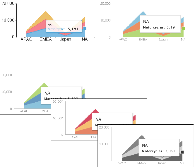
82
Actuate BIRT Application Developer Guide
and add titles to the axis. Different charts include additional features such as
subtypes and zoom in to axis.
When a chart title is set to auto, the title is based on the values displayed, and
updates when a user changes the displayed values, such as drilling down into
details of a data cube. To set a fixed title that does not change, remove the auto
title selection and type a new title.
Choosing a chart theme
Chart themes customize the appearance of a chart and can change color, font, and
display properties for charts. These themes are created in BIRT Designer
Professional.
The following section shows examples of themes used in area charts:
■
The chart on the left uses no theme and the one on the right uses the modern
theme, as shown in Figure 5-17.
Figure 5-17 Area charts using no theme and the modern chart theme
■
The example shown in Figure 5-18 displays area charts using the clean blue,
warm red, and grayscale themes.
Figure 5-18 Area charts using the clean blue, warm red, and grayscale
themes
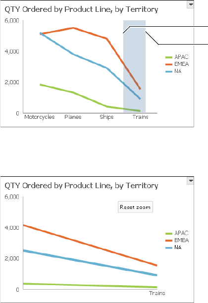
Chapter 5, Visualizing data on a dashboard
83
Chart themes customize the appearance of a chart and can contain custom
JavaScript for enhanced interactivity. Each theme changes a chart’s colors, fonts,
and display. These themes are created in BIRT Designer Professional. Themes are
stored in a BIRT design file when they are used in a single report. You can store a
theme in a BIRT library file to enable multiple chart gadgets and BIRT design files
to use the same theme.
Enabling chart zoom
Chart users can zoom in to the chart to view details of the selected data when
zoom is enabled for categories or values. Zoom is available in area, bar, bubble,
column, difference, Gantt, line, scatter, and stock charts. Zoom options are set in
Chart Builder—Format.
Users can zoom in to charts to see greater detail by selecting a start point on the
x-axis, dragging the mouse to the end point, and then releasing the mouse button,
as shown in Figure 5-19.
Figure 5-19 Zooming on the x-axis
Figure 5-20 shows the results of an x-axis zoom. Choose Reset zoom to return the
chart to the default display or continue to zoom in to view additional detail.
Figure 5-20 Finished zoom on the x-axis
End
Start
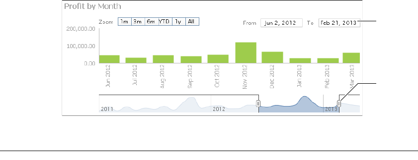
84
Actuate BIRT Application Developer Guide
Enabling a timeline
When the category is a time field, you can select the time range selector and
bottom slider. You can enable a time range selector and a timeline slider for users
to select time intervals in area, bar, column, difference, line, scatter, and stock
charts. Timeline options are set in Chart Builder—Format.
The time range selector appears under the chart title and enables a user to zoom
in to 1-, 3-, or 6-month intervals, year to date, 1 year, and all values on the chart.
The time range slider appears at the bottom of the chart and enables users to
select a time period by sliding a bar to the beginning and end of the period.
Figure 5-21 shows a chart displaying the time range selector and bottom slider.
Figure 5-21 Displaying a time range selector and bottom slider on a chart
Displaying data in a table or cross tab
Table and cross tab gadgets display tabular data on a dashboard. These gadgets
organize values into a row-and-column matrix that appears in a table format,
similar to a spreadsheet. Tables and cross tabs are useful to present detailed
evidence to justify a conclusion and to display reports containing specific values
such as the exchange value of multiple currencies. Users can interact with tables
to format and export data using the table context menu.
You can aggregate data to create a concise summary overview of your data. For
example, a detailed table displays a row for each order number, order date, and
the total profit of the order. This creates a large table if you have many orders, and
is difficult to identify trends. When you aggregate this data with a monthly time
interval and an aggregate function such as sum, the table groups values by month
to show the monthly sum of order profit. If you change the aggregate function to
average, then the table displays the average order profit for each month. You can
display multiple aggregations together, such as creating a table of orders,
grouped by month, that displays the total sales and average sales for each month.
Cross tabs display a data source that is already aggregated, such as a data cube.
You can display grand totals and subtotals in a cross tab and users can open the
Timeline
range
selectors
Timeline
bottom
slider

Chapter 5, Visualizing data on a dashboard
85
cross tab in the Interactive Crosstabs tool to analyze the aggregated data and add
an optional chart. If your data source is a data model, you can also use a cross tab
to build aggregations. Calculations are typically faster using data cubes than in a
data set because the data is aggregated when the data object is created. Users can
drill down into the data displayed in cross tabs. For example, in a cross tab of
order status, the user can drill down to see the order numbers for a selected
status, such as canceled orders.
If you designed your data objects to include links, you can select the values in the
table to open the link. For example, a data object of orders includes a link on each
order number to the invoice for the order.
Choosing a table type
The following tabular data formats are available:
■
Cross tab
A cross tab displays data cubes and data models in a row-and-column matrix
that has a spreadsheet-like appearance. The cross tab is ideal for summarizing
data in a compact and concise format, and displays summary, or aggregate
values such as sums, counts, or averages. The cross tab groups these values by
one set of data listed down the left side of the matrix and another set of data
listed across the top of the matrix. If your data source is a data model, you can
select aggregation functions while building the cross tab. If your data source is
a data cube, you use the aggregation functions that are included in the data
cube when it was created. Figure 5-22 shows a cross tab gadget.
Figure 5-22 Displaying data in a cross tab gadget
Users can open and edit cross tabs in Interactive Crosstabs for additional
analysis and to add a chart view to the cross tab. Users can format displayed
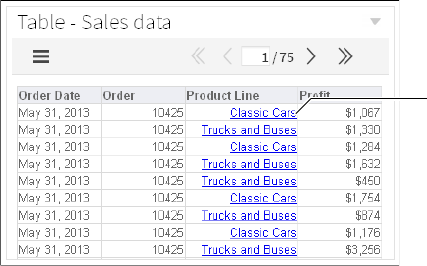
86
Actuate BIRT Application Developer Guide
values, export content, and export data using the context menu. Exporting
cross tabs to Microsoft Excel pivot tables is also supported.
■
Table
A table displays data sets and data models in a row-and-column format. You
can display data row by row, as in the data set or you can summarize the table
data. Summarizing table data presents aggregate data information in a report,
providing users with an overview of the data. For example, a table can display
order dates, order numbers, and the total value of every order or group of
values by month to show the monthly sum of orders. Figure 5-23 shows a table
gadget.
Figure 5-23 Displaying data in a table gadget
If you want to offer table users options for interacting with tabular data,
display the data details in the table without summarizing the data. For
example, conditional formatting, grouping, sorting, aggregation, and
computed column creation are available to users when the tabular data is not
already aggregated into summary data. If you want to offer the users concise
summaries of the data but with fewer interaction options, display the data in a
summary table.
Using a table
How to create a table gadget
This procedure requires a dashboard you can edit. Create a new dashboard if one
does not already exist. To create a table gadget, complete the following steps:
1In the dashboard editor, choose Insert➛Table➛Table.
2To select the data to display in the table gadget, complete the following steps:
1In Table Builder—Data—Data—Use Data, select a data source. If no data
source appears, choose New Data to select a BIRT data object from
available data objects in the BIRT project.
Hyperlink in
data object
Chapter 5, Visualizing data on a dashboard
87
2In Available Data, select fields to display in tabular format and choose the
Add arrow to add to Current Column Selections.
3If your data source includes links in the data, select Enable Interactivity to
display the links in the table.
3Group and aggregate the data as a summary table, if desired, by completing
the following steps:
1Select Summarize.
2If you have a date field in Current Column Selections, choose to group the
values by a time period such as years or weeks.
3Select any fields that you want to aggregate and choose Add to Current
Measure Selections.
4In Current Measure Selections, select an aggregation method for each data
field.
4The following optional tasks are available when you create the table or after
the table is added to the dashboard:
■
Specify gadget appearance, such as title and gadget size, in
Table Builder—General. Display a border, header, menu icon, scroll bar,
and toolbar.
■
Limit displayed data with filter conditions, in Table Builder—Filter.
■
Format the table, in Table Builder—Format. For example, set the
background color, border, font, and the table alignment for the header and
the table body. Set a page break interval to break the table rows into pages
of data.
5Choose OK to create the new gadget.
Enable interactive filtering by linking the table to a data selection gadget. After
the table is placed on the dashboard, it links to data selection gadgets that use the
same data source. You can remove these links or add new ones.
Selecting data for tabular display
A table gadget displays tabular data on a dashboard. Adding a table gadget to a
dashboard or editing it displays Table Builder—Data.
After choosing an available BIRT data object, choose a data set or data model.
Next, select data fields to display in the table columns. To select multiple values,
press Ctrl as you select each value. A typical table displays a row for every row in
the data source. Figure 5-24 shows the data source of a table gadget.
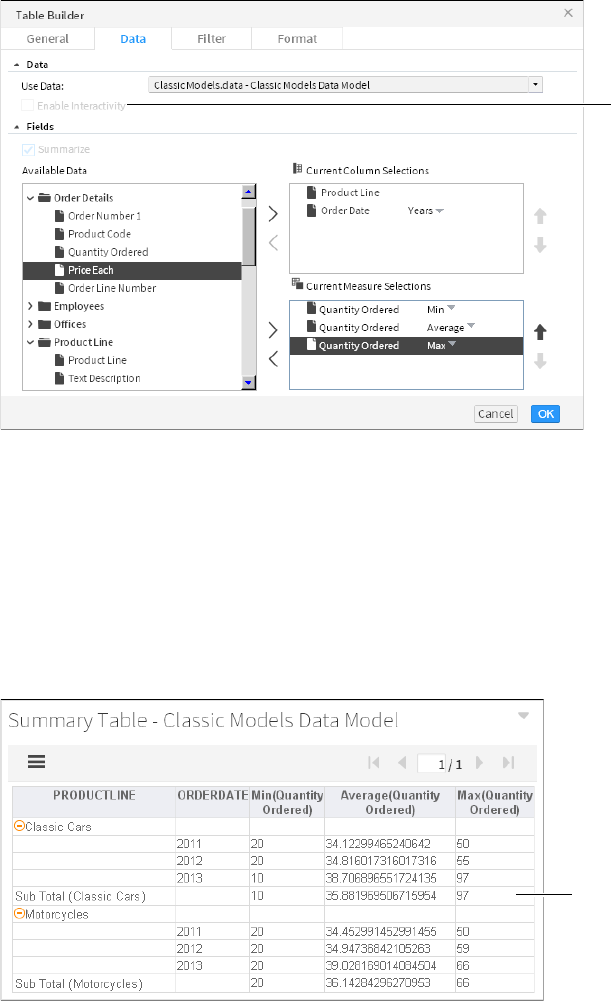
88
Actuate BIRT Application Developer Guide
Figure 5-24 Selecting data to display in a table gadget
Table gadgets can display hyperlinks from data objects. If hyperlinks exist in the
data object file, they can appear in the table by selecting Table Builder➛Data
➛Enable Interactivity. Hyperlinks enable users to open a URI or drill through to
another BIRT document file when choosing a value such as a customer name in a
table. This is similar to a hyperlink on a web page.
Aggregating tabular data
To aggregate data in a table gadget, choose Summarize in Table Builder—Data.
Figure 5-25 shows a table gadget that summarizes values from a data model.
Figure 5-25 Aggregating data in a table gadget
Enable
interactive
hyperlinks in
data object
Aggregated
values

Chapter 5, Visualizing data on a dashboard
89
Use Summarize to aggregate numeric values in the data set or data model, such
as displaying the total sales for each month instead of each order. Table 5-2 shows
the aggregation functions you can select for values displayed in a table.
Formatting tabular gadgets
You can customize the background, border, and font attributes used in the table
rows, such as alignment, color, font, and size. You can also define how many rows
to display before creating a page break using Page Break Interval.
Table gadgets also support formatting, conditional formatting, grouping, sorting,
aggregation, and computed column creation using the interactive context menu.
These features enable users to explore and personalize the data for display or
export. Figure 5-26 shows a table gadget that summarizes values from a data
model.
Table 5-2 Aggregate functions for tables
Function Description
Average Returns the average of the values.
Count Returns the number of values, including duplicate values.
Distinct Count Returns the number of values, excluding duplicate values.
First Returns the first value among the values.
Last Returns the last value among the values.
Max Returns the largest value among the values.
Median Returns the median, or middle value among the values.
Min Returns the smallest value among the values.
Mode Returns the mode, or the value that occurs most frequently
among the values.
Standard
Deviation
Returns the standard deviation of a set of values. Standard
deviation is a statistic that shows how widely values disperse
from the mean value. If a set of values contains 50, 75, 80, 90,
and 95, standard deviation returns 17.536.
Sum Returns the sum of the values.
Variance Returns the variance of a set of values. Variance is a statistical
measure expressing the size of the differences between the
values. The variance increases as the differences between the
numbers increase. If a set of values contains 50, 75, 80, 90, and
95, variance returns 307.5. If a set of values contains 5, 2, 5, 7,
and 10, variance returns 8.7.
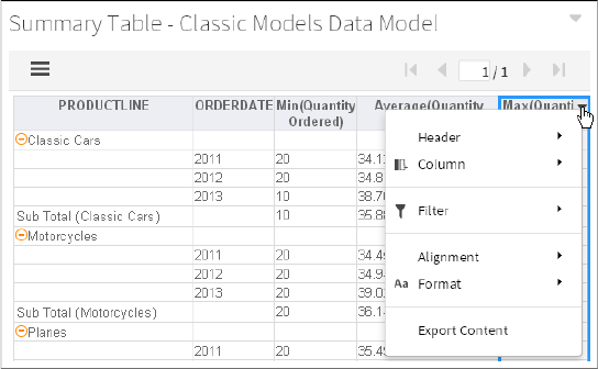
90
Actuate BIRT Application Developer Guide
Figure 5-26 Displaying the interactive context menu in a table gadget
Using a cross tab
How to create a cross tab gadget
This procedure requires a dashboard you can edit. Create a new dashboard if one
does not already exist. To create a cross tab gadget, complete the following steps:
1In the dashboard editor, choose Insert➛Table➛Crosstab.
2To select the data to display in the cross tab gadget, complete the following
steps:
1In Crosstab Builder—Data—Data Models and Cubes—Use Data, select a
data source. If no data source appears, choose New Data to select a BIRT
data object from available data objects in the BIRT project.
2If your data source includes links in the data, select Enable Interactivity to
display the links in the table.
3In Available Data, select fields to display as rows, and choose the Add
arrow to add to Row.
4In Available Data, select fields to display as columns, and choose the Add
arrow to add to Column.
5If you display a date in a row or column, select the date groups such as
years and quarters.
6In Available Data, select fields to display as aggregated summary fields,
and choose the Add arrow to add to Summary Fields.
7If your data source is a data model, select an aggregation method for each
data field in Summary Fields.
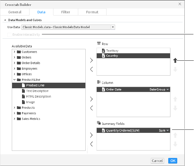
Chapter 5, Visualizing data on a dashboard
91
3The following optional tasks are available when you create the cross tab or
after the cross tab is added to the dashboard:
■
Specify gadget appearance, such as title and gadget size, in Crosstab
Builder—General. Display a border, header, menu icon, scroll bar, and
toolbar.
■
Limit displayed data with filter conditions in Crosstab Builder—Filter.
■
Format the cross tab in Crosstab Builder—Format. For example, enable
grand totals and subtotals for rows and columns. Set a page break interval
to break the cross tab row and column content into multiple pages.
4Choose OK to create the new cross tab gadget.
Enable interactive filtering by linking the cross tab to a data selection gadget.
After the cross tab is placed on the dashboard, it links to data selection gadgets
that use the same data source. You can remove these links or add new ones.
Selecting data for cross tab gadgets
Adding a cross tab gadget to a dashboard or editing it displays Crosstab Builder.
Figure 5-27 shows an example of Crosstab Builder.
Figure 5-27 Selecting data to display in a cross tab gadget
Move
selection
up
Aggregate
expression
Enable
interactive
hyperlinks
in data

92
Actuate BIRT Application Developer Guide
After choosing an available BIRT data object, choose a data cube or data model.
Next, select data fields to display in the cross tab columns, rows, and summary
fields. To select multiple values, press Ctrl as you select each value. For example,
if the columns display the fields order date, order number, order value, and order
status, these are the columns that display in the table.
Each data field in a row displays horizontally in a cross tab and each field in a
column displays vertically on a cross tab. Measure fields display aggregated
totals in each intersection of a column and row. You can enable grand totals and
subtotals for columns and rows in Crosstab Builder—Format.
Cross tab gadgets can display hyperlinks from data objects. If hyperlinks exist in
the data object file, they can appear in the cross tab by selecting Crosstab Builder
➛Data➛Enable Interactivity. Hyperlinks enable users to open a URI or drill
through to another BIRT document file when choosing a value such as a customer
name displayed in a table. This is similar to a hyperlink on a web page.
Aggregating cross tab data
When you display a data cube in a cross tab, you select from existing
aggregations that are included in the data cube. These aggregated fields are called
measures, and were added to the data cube when it was created in BIRT Designer
Professional.
When you display a data model in a cross tab, you can aggregate any field by
adding it to Summary Fields in Crosstab Builder—Data. In the final step you
select an aggregation function. Table 5-3 shows the aggregation functions you can
select for values displayed in a cross tab.
Table 5-3 Aggregate functions for cross tabs
Function Measure Dimension Description
Average Returns the average of the values.
Count ✓✓Returns the number of values,
including duplicate values.
Count Distinct ✓✓Returns the number of values,
excluding duplicate values.
First ✓✓Returns the first value among the
values.
Last ✓✓Returns the last value among the
values.
Max ✓✓Returns the largest value among the
values.
Median ✓Returns the median, or middle value
among the values.

Chapter 5, Visualizing data on a dashboard
93
Formatting cross tab gadgets
Cross tab formatting supports the display of grand totals and subtotals for all
rows and columns that contain two or more dimensions. You can minimize
loading time of large tables by enabling page breaks at the selected column and
row intervals.
Users can open a cross tab in Interactive Crosstabs to add an alternative chart
display, apply conditional formatting, apply advanced filters such as relative
time, pivot the table display, and apply drill up or drill down to selected fields in
the cross tab. You can also open the cross tab in Interactive Crosstabs to select a
visual theme for the cross tab.
Choose Analyze from the gadget menu to open the cross tab in Interactive
Crosstabs for additional analysis and formatting. You can also double-click the
title of the cross tab gadget to open the cross tab in Interactive Crosstabs.
Figure 5-28 shows a table gadget that summarizes values from a data model.
Min ✓✓Returns the smallest value among
the values.
Mode ✓Returns the mode, or the value that
occurs most frequently among the
values.
Standard
Deviation
✓Returns the standard deviation of a
set of values. Standard deviation is a
statistic that shows how widely
values disperse from the mean value.
If a set of values contains 50, 75, 80,
90, and 95, standard deviation
returns 17.536.
Sum ✓Returns the sum of the values.
Variance ✓Returns the variance of a set of
values. Variance is a statistical
measure expressing the size of the
differences between the values. The
variance increases as the differences
between the numbers increase. If a
set of values contains 50, 75, 80, 90,
and 95, variance returns 307.5. If a set
of values contains 5, 2, 5, 7, and 10,
variance returns 8.7.
Table 5-3 Aggregate functions for cross tabs
Function Measure Dimension Description
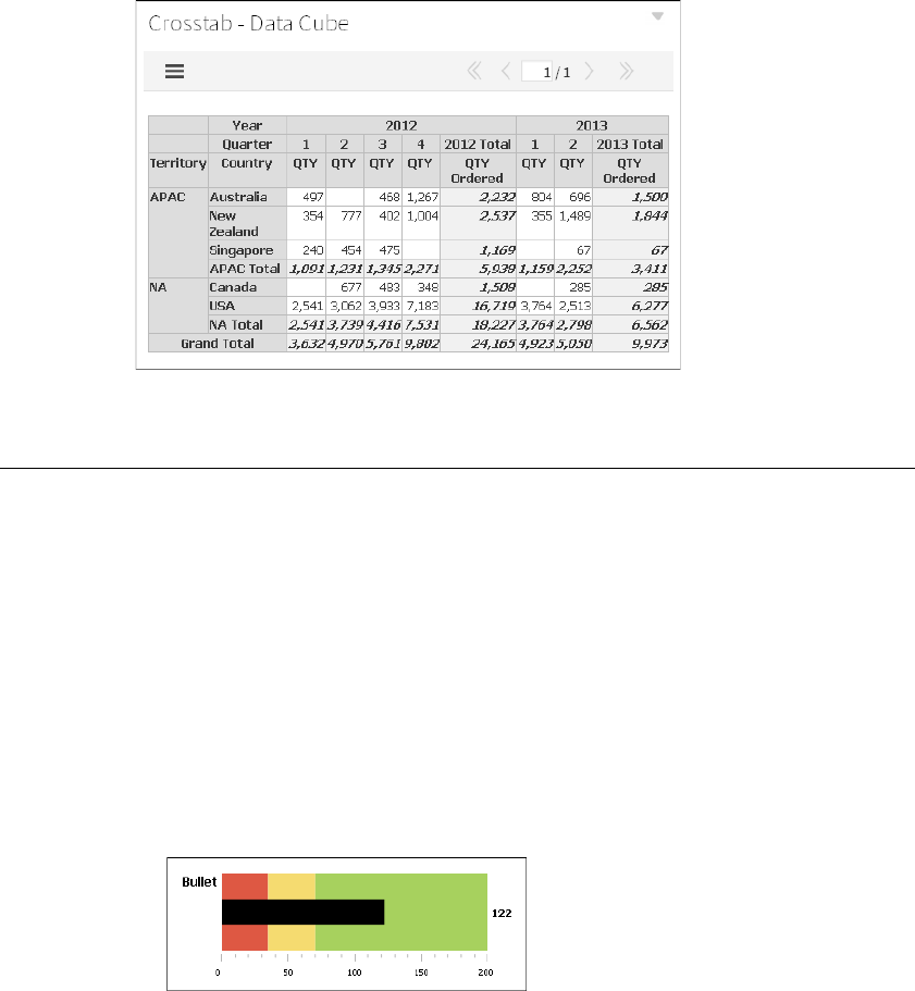
94
Actuate BIRT Application Developer Guide
Figure 5-28 Reviewing a cross tab gadget after formatting in
Interactive Crosstabs
Displaying data in measurement gadgets
Measurement gadgets are visualizations that typically measure a value in a visual
range. These visualizations display values from a BIRT data object and are
typically smaller than a multi-axis chart.
Choosing a measurement type
The following types of measurement gadgets are available in the dashboard
editor:
■
Bullet
A bullet gadget is a variation of a bar chart that measures the value of a single
data column in a horizontal or vertical orientation. You can display colored
regions for comparison. Figure 5-29 shows a bullet gadget.
Figure 5-29 Displaying a horizontal bullet gadget
■
Cylinder
A cylinder gadget displays the value of a single data column as the fill level of
a vertical cylinder. Figure 5-30 shows a cylinder gadget.
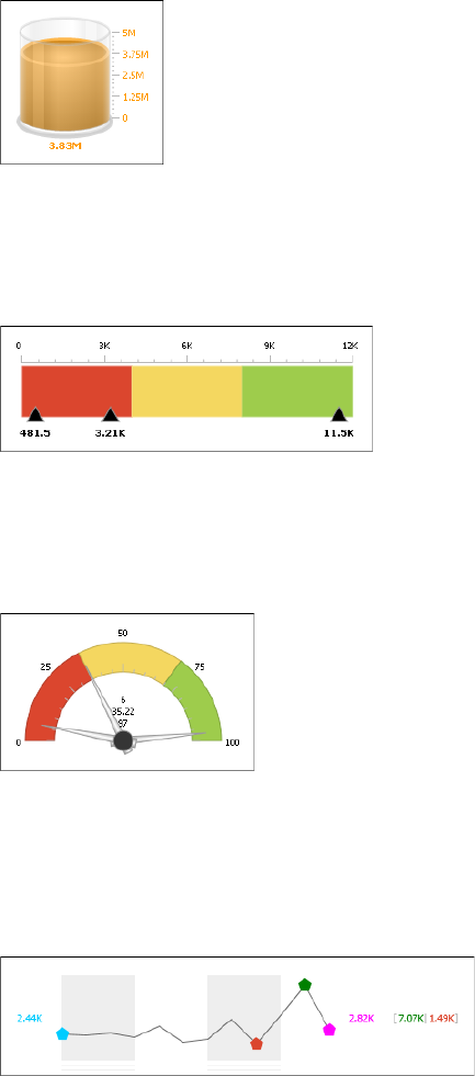
Chapter 5, Visualizing data on a dashboard
95
Figure 5-30 Displaying a cylinder gadget
■
Linear gauge
A linear gauge gadget displays the value of one or more data columns as
needles on a horizontal scale. You can display colored regions for comparison.
Figure 5-31 shows a linear gauge gadget.
Figure 5-31 Displaying a linear gauge gadget
■
Meter
A meter gadget is an angular gauge that displays the value of one or more
data columns as dial values on a radial scale. You can display colored regions
for comparison. Figure 5-32 shows a meter gadget.
Figure 5-32 Displaying a meter gadget
■
Sparkline
A sparkline gadget is a small variation of a line chart that displays the value of
a numeric data column and highlights the high, low, open, and close values.
You can group values with a second data column when displaying a data
cube. Figure 5-33 shows a sparkline gadget.
Figure 5-33 Displaying a sparkline gadget

96
Actuate BIRT Application Developer Guide
■
Thermometer
A thermometer gadget displays the value from a single data column as the fill
level of a vertical thermometer. Figure 5-34 shows a thermometer gadget.
Figure 5-34 Displaying a thermometer gadget
Selecting data for measurement gadgets
You select data to display in Gadget Builder—Data when you create or edit a
measurement gadget. Choose a BIRT data object and select a data set, data model,
or data cube. Next, select a data column to display in the measurement gadget.
Meter and linear gauges can display one, two, or three different data columns.
Sparklines support using a second data column to group the primary data
column values. Figure 5-35 shows the data sources for a linear gauge gadget.
Figure 5-35 Selecting data to display in a linear gauge gadget
If hyperlinks exist in the data object file, they can appear in the measurement
gadget by selecting Gadget Builder➛Data➛Enable Interactivity. Hyperlinks
enable users to open a URI or drill through to another BIRT document file when

Chapter 5, Visualizing data on a dashboard
97
choosing a value in the measurement gadget. This is similar to a hyperlink on a
web page.
Aggregating measurement data
When you display a data cube in a measurement gadget, you select from
aggregations that are included in the data cube. These aggregated fields are called
measures and were added to the data cube when it was created in BIRT Designer
Professional.
When you display a data set or a data model in a measurement gadget, you can
aggregate the field by selecting an aggregation function. You can use the count
and distinct count aggregate functions for data columns that contain non-numeric
values such as strings and dates. Table 5-4 shows the aggregation functions
available for numeric data displayed in a measurement gadget.
Formatting measurement gadgets
You can format and enhance your gadget in Gadget Builder—Format. You can
show values on the measurement, change the size of the measurement, and
control the scale of the visualization by setting minimum and maximum values.
You can also change the number of tick marks to display and their position on the
visualization, except for the sparkline gadget, which displays open, close, high,
and low plot points in place of tick marks.
You can also change the font, font size, and font color used to display values in
measurement gadgets. Enable tooltips to display values when a mouse hovers
over points in the visualization.
Using regions
The bullet, linear gauge, and meter gadgets support highlighting multiple ranges
of values using regions. Regions is a formatting option where you determine the
Table 5-4 Aggregate functions for measurement gadgets
Function Description
Average Returns the average of the values
Count Returns the number of values, including duplicate values
Distinct Count Returns the number of values, excluding duplicate values
First Returns the first value among the values
Last Returns the last value among the values
Max Returns the largest value among the values
Min Returns the smallest value among the values
Sum Returns the sum of the values
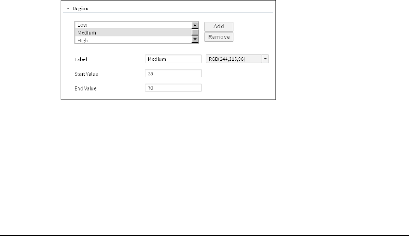
98
Actuate BIRT Application Developer Guide
start and end value, color, and name of each region. If a region overlaps another,
the last region that you create takes precedence. Figure 5-36 shows settings for the
Medium region.
Figure 5-36 Defining region values and color
Changing color
You can change the color of the bullet, cylinder, and thermometer gadgets.
Using pointers
The linear gauge gadget uses needles and a meter gadget uses dials as pointers to
indicate values. You can display the value next to these pointers and for linear
gauge gadgets, you can choose the position of these pointers on the gadget.
Enabling data selection
To enable interactive filtering, add data selection gadgets. Data selection gadgets
display unique values in a data set, data cube, or data model. These gadgets
enable users to select and search for data to display on the dashboard.
Link other gadgets to a data selection gadget to use the selected value as a filter of
the displayed data or to process the value with JavaScript code. For example, link
a chart gadget to a data selection gadget showing customer names. When the user
selects a customer name in the data selection gadget, the chart updates to show
the values related to the selected customer.
The following data selection gadgets are available:
■
Calendar
Calendar gadgets display dates from a data object as a calendar, where a user
can select day, month, or year. You can set a start and end date to limit user
selection to a specific time period. Calendar gadgets do not require a BIRT
data object to display choices to the user. You can choose default dates when
you create the calendar gadget. Figure 5-37 shows a calendar gadget.

Chapter 5, Visualizing data on a dashboard
99
Figure 5-37 Displaying dates in a calendar gadget
■
Check box
Check box gadgets display values from a data object with a check box next to
each value. Users can select multiple values. Figure 5-38 shows a check box
gadget.
Figure 5-38 Displaying data in a check box gadget
■
Combo box
Combo box gadgets display values from a data object in a drop-down box.
This gadget supports manual typing and autosuggestion of values.
Figure 5-39 shows a combo box gadget.
Figure 5-39 Displaying data in a combo box gadget
■
Data version
Data version gadgets display available versions of BIRT data stores for a user
to choose. Changing a data store version causes gadgets to display values
from the selected data store. Figure 5-40 shows a data version gadget.
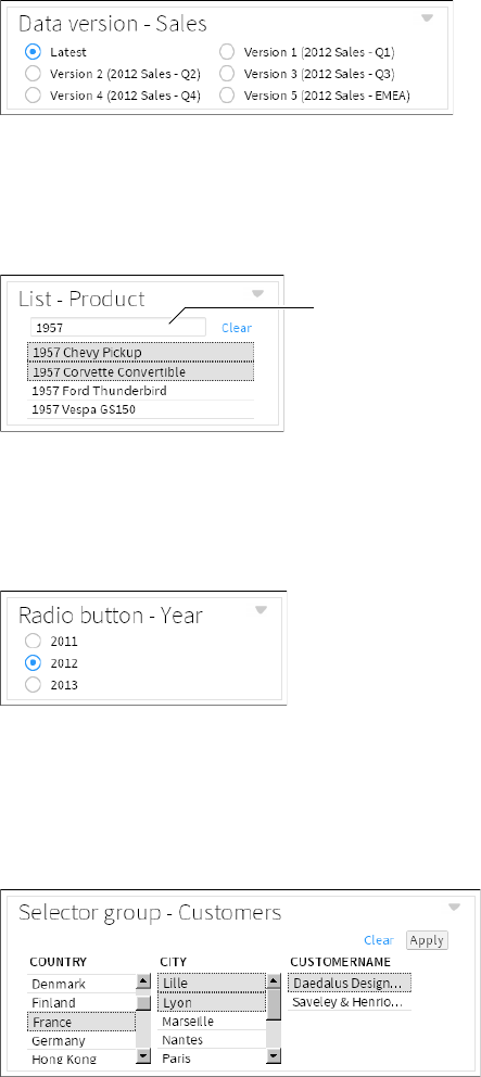
100
Actuate BIRT Application Developer Guide
Figure 5-40 Displaying versions of a data store file in a data version gadget
■
List
List gadgets display data object values in rows. Users can search and select
multiple values. Press Ctrl while selecting multiple non-adjacent values. Press
Shift while selecting multiple adjacent values. Figure 5-41 shows a list gadget.
Figure 5-41 Displaying data in a list gadget
■
Radio button
Radio button gadgets display values from a data object with a radio button
next to each value. Users can select a single value to include. Figure 5-42
shows a radio button gadget.
Figure 5-42 Displaying data in a radio button gadget
■
Selector group
Selector group gadgets enable users to select cascading values from multiple
fields and apply all their selected values at the same time. Each selection filters
the values displayed in the next field. Figure 5-43 shows a selector group
gadget.
Figure 5-43 Displaying data in a selector group gadget
Search
values

Chapter 5, Visualizing data on a dashboard
101
■
Slider
Slider gadgets display a range of values from a data object as a sliding bar
with tick marks next to known values. This gadget supports single and dual
selections using thumb selectors. Sliders do not require a BIRT data object to
display choices to the user. You can choose default values when you create the
slider. Figure 5-44 shows a slider gadget.
Figure 5-44 Displaying data in a slider gadget
Multiple data selection gadgets can link to each other to enable users to select
cascading information. For example, a list gadget showing customer names and a
list gadget showing order numbers can link together. When a user selects a
customer name, the order numbers from the selected customer appear in the list
gadget showing order numbers.
You can also link a report gadget to a data selection gadget if the displayed
report uses parameter values. For more information about linking options, see
Chapter 13, “Linking and scripting gadgets.”
How to create a data selection gadget
This procedure requires a dashboard you can edit. Create a new dashboard if one
does not already exist. To add a data selection gadget, complete these steps:
1In the dashboard editor, select Insert➛Data Selector, and choose a data
selection gadget type. In this example, choose Insert➛Data Selector➛List.
2Select the data to display in the data selection gadget by completing the
following steps:
1In Data Selector Gadget Wizard—Data—Use Data, select a data source. If
no data source appears, choose New Data to select a BIRT data object from
available data objects in the BIRT project.
2In Field, select a data column to display in the data selection gadget.
3In Display field, select a data column to display in the data selection gadget
if it is different from the Field value.
4In Sort direction, choose None, Ascending, or Descending to sort the data
in the gadget.
3The following optional tasks are available when you create the data selection
gadget or after the gadget is added to the dashboard:
■
Specify gadget appearance, such as title and gadget size, in Data Selector
Gadget Wizard—General. Display a border, header, and menu icon.
Thumb
selector
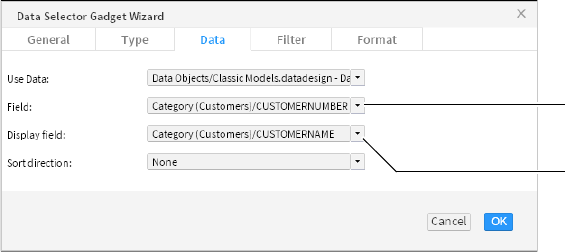
102
Actuate BIRT Application Developer Guide
■
Limit displayed data with filter conditions in Data Selector Gadget
Wizard—Filter.
■
Format the cross tab in Data Selector Gadget Wizard—Format. Each data
selection gadget has different formatting options. For example, in a list
gadget you can set a default value, limit the entries in the list, enable
multiple value selections, enable search, and format the values that appear
in the list.
4Choose OK to create the new data selection gadget.
Enable interactive filtering by linking other gadgets to the data selection gadget.
After the data selection gadget is placed on the dashboard, it links to gadgets that
use the same data source. You can remove these links or add new ones.
Displaying data for user selection
A data selection gadget displays values from a BIRT data object. When you add
or edit a data selection gadget, you select data to display. Choose a BIRT data
object and select a data set, data cube, or data model. Next, select the name of a
data column to display in the data selection gadget. When you create a data
selection gadget, you can choose a default value. This value appears when the
dashboard is opened.
You can display a different value than what is published to the dashboard. This
can link different data sources together on the dashboard. For example, you add a
list gadget to display customer names from a client database. Next, set the list to
publish the customer’s account number instead of the customer’s name. A report
gadget displays orders from a sales database and links to the list gadget. When
the user selects a customer name, the report gadget runs a report using the
customer’s account number and displays the customer’s order history.
Figure 5-45 shows the data source setting for a list gadget that displays a list of
customer names but sends the customer number when a name is selected.
Figure 5-45 Selecting data to display in a list gadget
Figure 5-46 shows the finished list gadget on the dashboard.
Value published
to linked gadgets
Value displayed
in gadget

Chapter 5, Visualizing data on a dashboard
103
Figure 5-46 Reviewing values in a list gadget
Formatting data selection gadgets
Each gadget type includes different formatting options to assist users in finding
and selecting values. You can format the displayed data values, set default values,
select a vertical or horizontal orientation, and limit the displayed values.
A combo box gadget supports autosuggest and allows typing options that can
assist users to type partial values and find possible value matches. For example,
when the allow typing and autosuggest options are enabled, a user can type the
letters po in a combo box displaying countries. The values Poland and Portugal
appear for the user to select from because both values start with the letters po.
A list gadget supports multi-value selections and searching for values in the
gadget.
Formatting number values
Using Format as, you can change the look of displayed values. Number values
support the following formatting options: general number, currency, fixed,
percent, scientific, and custom options.
Formatting date-and-time values
You can display date-and-time values in different formats such as short, medium,
long, and custom formats.
Formatting string values
String values support uppercase, lowercase, and custom formatting options.
Using a data version gadget
Data version gadgets display the version number and version name of multiple
BIRT data object store files for a user to select. When a user selects one of the
versions, gadgets displaying values from the same BIRT data object store file
display values from the selected version of the BIRT data object.
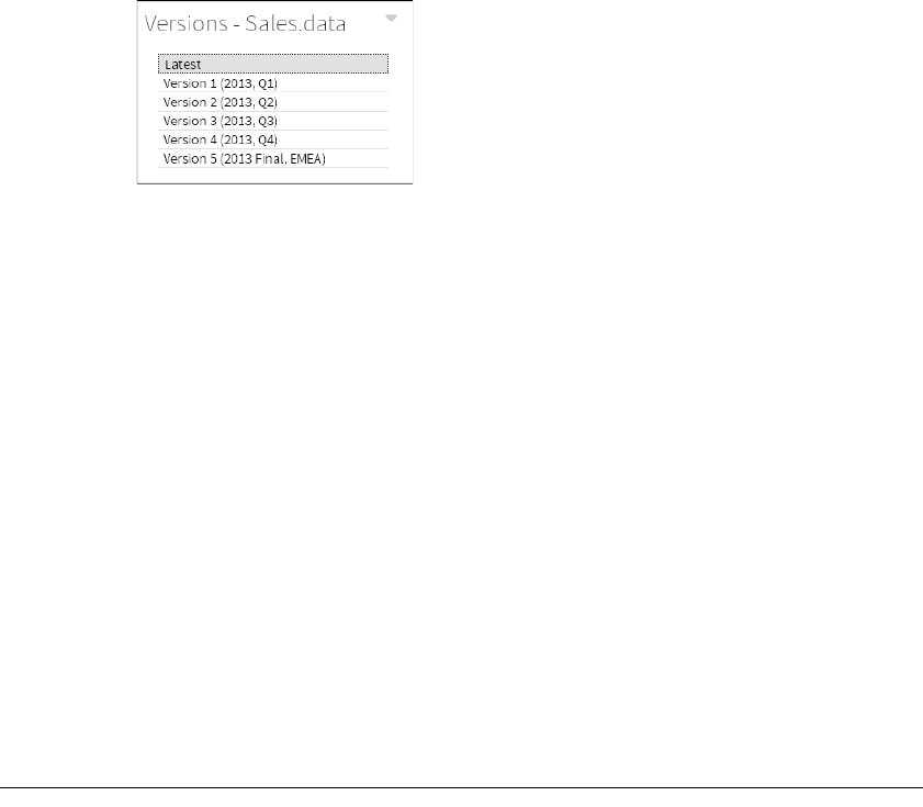
104
Actuate BIRT Application Developer Guide
For example, a dashboard displays sales results in a chart and table from a data
object of this year’s sales data. When the user selects last year’s data object in the
data version gadget, the dashboard displays the data from last year in the chart
and table. Figure 5-47 shows a finished data version gadget on the dashboard.
Figure 5-47 Displaying versions of a data store file as a list
Multiple versions of the same data object are supported only on an iHub server.
Selecting a data object
When you select a BIRT data object store file to display in a data version gadget,
the version number and version name of each version of that file appears in the
data version gadget. For example, if you choose to display the data store file
Sales.data in a data version gadget, all versions of the Sales.data file are displayed
in the data version gadget.
Choosing a selector type
You can display data version gadgets in combo box or list types using Data
Selector Gadget Wizard. Choose Type to select how the data version gadget is
displayed.
Formatting a data version gadget
When a data version gadget displays radio buttons, you can format the content of
the gadget. Select the number of choices per row and whether the gadget displays
choices in a horizontal or a vertical display. You can also limit how many different
versions are displayed.
Organizing multiple user selections
Gadgets can combine multiple user selections on a dashboard in the following
ways:
■
Cascade
■
Group
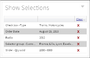
Chapter 5, Visualizing data on a dashboard
105
■
Apply button
■
Parameter
The current selections gadget from the dashboard menu can display or clear all
data selections on the dashboard at the same time or clear selected values, as
shown in Figure 5-48.
Figure 5-48 Displaying a current selections gadget
Building cascade selections
You can link data selection gadgets together so that choices in one gadget filter
the available choices in another gadget. Each user selection is published to all
linked gadgets, and users can make selections in any order. Selection gadgets
update the dashboard after each user selection in the gadget.
For example, if you have three lists, one for country, city, and customer name on a
dashboard with a chart, selecting a country updates the chart. Selecting a city
updates the chart, and selecting a customer name also updates the chart. The
following solutions avoids unnecessary updates to the dashboard:
■
Remove the links in the country list to the city and customer names. Selections
in the other gadgets do not update the country list.
■
Remove the links in the chart to the country and city gadget. Leave only the
link to the customer name. The chart only updates when a customer name is
chosen.
You can also use a selector group or apply gadget to send multiple values at the
same time and avoid unnecessary dashboard updates.
Building group selections
Use the selector group gadget to display related user selections and enable users
to finish all selections before updating linked gadgets. Users must make their
selections in a fixed order. When the user chooses Apply, the dashboard updates
to display data related to the user selection. This gadget displays values from a
single BIRT data object.
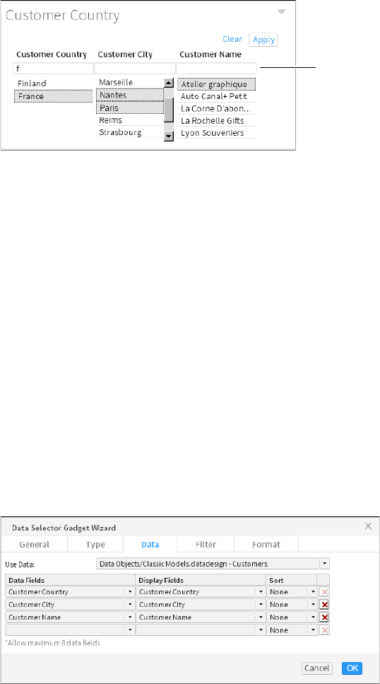
106
Actuate BIRT Application Developer Guide
Figure 5-49 shows a finished selector group gadget on the dashboard.
Figure 5-49 Displaying a selector group gadget on the dashboard
Using a selector group gadget
Selector group gadgets display multiple values as cascading choices for users. A
user picks from related values, one after the other in the order displayed, and
publishes those values to linked gadgets when all selections are finished. When
the user chooses Apply, gadgets that are linked to the selector group update to
display data related to the user selection. This avoids unnecessary updates to the
dashboard. Other data selection gadgets apply the changes each time a user
makes a selection.
Selecting fields to display
All data displayed in a selector group gadget comes from a single BIRT data
object. After selecting the data object, you can select one or more data fields to
display together. You can sort and format each data field differently. Each data
field filters the values displayed from the next field.
For example, if the first data field is country and the second is city, the gadget
displays countries for a user to select. Each selected country displays city names
from the selected countries.
Figure 5-50 shows the selection of data to display in a selector group gadget.
Figure 5-50 Selecting data to display in a selector group gadget
Search fields

Chapter 5, Visualizing data on a dashboard
107
Choosing a selector type
You can display selector group gadgets in combo box or list types using Data
Selector Gadget Wizard. Choose Type to select how the selector group gadget is
displayed.
Formatting a selector group gadget
Use Format from Data Selector Gadget Wizard to change the selector group
orientation, set a limit to the quantity of displayed values, and change the format
of each displayed field. A list type also supports multi-value selections and
searching for values in the gadget, as shown in Figure 5-51.
Figure 5-51 Formatting a selector group gadget using the list type
Each displayed field also supports formatting, depending on the content of the
field. For example, country names can display in capital letters and phone
numbers can display using the regional phone number format.
Using an apply button gadget
Data selection gadgets update all linked gadgets after each user selection. Use the
apply button gadget to collect and hold user selections from multiple data
selection gadgets. When the user makes selections, the selections are held by the
apply button gadget until the user chooses the apply button. Other gadgets link
to the apply button and receive the user selections only when the user chooses to
apply their selected values.
After adding data selection gadgets and one or more apply button gadgets to a
dashboard, you use Link from the gadget menu to choose which apply button to
forward user selections. Figure 5-52 shows a chart using an apply button with the
name Send.
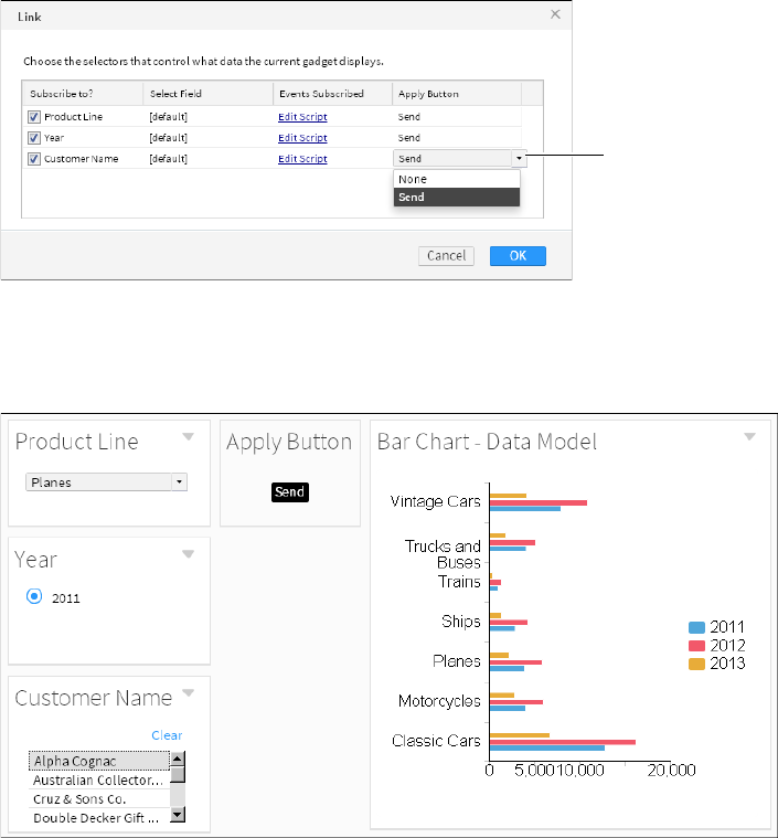
108
Actuate BIRT Application Developer Guide
Figure 5-52 Setting a gadget to use an apply button
Figure 5-53 shows an apply button gadget holding user selections until the user
chooses the apply button. The chart updates only after the user chooses the apply
button.
Figure 5-53 Using an apply button gadget with multiple data selection gadgets
You can set the button name and change the general options of the apply button
gadget to display it with or without a gadget header and border.
For more information about linking gadgets together, see Chapter 13, “Linking
and scripting gadgets.”
Using parameter selections
Link to a parameter gadget to receive user-selected parameter values. Parameter
gadgets display parameters from BIRT design files. If the parameter includes
filter conditions such as from a dynamic filter parameter, then you must process
Select an apply
button for the
selected link
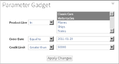
Chapter 5, Visualizing data on a dashboard
109
the selected condition using JavaScript. The BIRT document that contains this
parameter can already process the selected condition but a visualization gadget,
such as a chart, requires additional JavaScript to handle the selected condition.
For example, a user selects the following values from a parameter gadget: the
filter condition greater than, and the value 300. A chart is linked to this parameter
gadget and receives the selected condition and value, but chart gadgets require
only a value, not a filter condition. Figure 5-54 shows a parameter gadget
displaying parameters from a BIRT design file.
Figure 5-54 Displaying report parameters in a parameter gadget
Add JavaScript to the chart gadget to extract the value from the user selection and
to optionally process or remove the selected filter condition. For more
information about parameter gadgets, see Chapter 4, “Displaying a file on
adashboard.”
110
Actuate BIRT Application Developer Guide

Chapter 6, Designing a report
111
Chapter
6
Chapter 6
Designing a report
This chapter contains the following topics:
■
Formatting features in BIRT Designer Professional
■
Creating an accessible PDF
■
Selecting features for interactive viewing
■
Removing the default themes
■
Hiding columns in a table
■
Using a Quick Response code to link to content
■
Designing for optimal viewer performance

112
Actuate BIRT Application Developer Guide
Formatting features in BIRT Designer Professional
BIRT Designer Professional supports all the formatting features available in the
open-source version, and provides additional features. The reports you create
using BIRT Designer Professional are typically published to the BIRT iHub, where
they can be viewed in Interactive Viewer, opened in Report Studio, or added to a
dashboard. Often, when designing a report, you consider how the report is
viewed and used by these applications.
This chapter describes the additional report formatting options in BIRT Designer
Professional. For information about other formatting options, see BIRT: A Field
Guide. This chapter also describes the design issues to consider when designing
reports that users view in the web viewer.
Creating an accessible PDF
BIRT Designer Professional supports the creation of accessible PDF content based
on the ISO 14289-1 (PDF/UA-1) specification. When this feature is enabled in a
report design file, PDF files created from the design file are appropriately tagged
for use with assistive reading technology for the visually impaired. The
appropriate license is required to generate accessible PDF on the iHub server.
Report items include the following accessible properties:
■
Reading order
Indicates the order the report item is read in relation to other elements on the
page
■
Alternate text
■
Tag types
■
Language
■
URL links for images and charts
The following accessible tags types are set by the BIRT developer:
■
artifact elements that do not fit into other tags
■
div for division elements for generic block-level
■
figure for images
■
H1 for level 1 headings
■
H2 for level 2 headings
■
H3 for level 3 headings
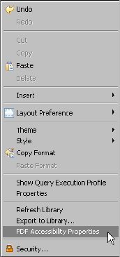
Chapter 6, Designing a report
113
■
H4 for level 4 headings
■
H5 for level 5 headings
■
H6 for level 6 headings
■
p for text as a paragraph
■
sect for containers of other elements and items
■
table for text in a table format
See the following web site for additional information about accessible PDF
documents:
http://adobe.com/accessibility
http://www.adobe.com/enterprise/accessibility/pdfs/acro7_pg_ue.pdf
How to enable accessible PDF output
1Right-click in the report design and choose PDF Accessibility Properties, as
shown in Figure 6-1.
Figure 6-1 Choosing PDF Accessibility Properties
If PDF accessibility is currently disabled and you are asked to enable it,
choose Yes.
2Verify the reading order of the report items in the BIRT design using Up,
Down, Top, Bottom. Choose Reorder to reset the order of the report items.
3Select root document node and set a language and title for the entire
document.
4Select each report item in the BIRT design and set the accessibility properties.
Figure 6-2 shows the accessibility properties for a text item.
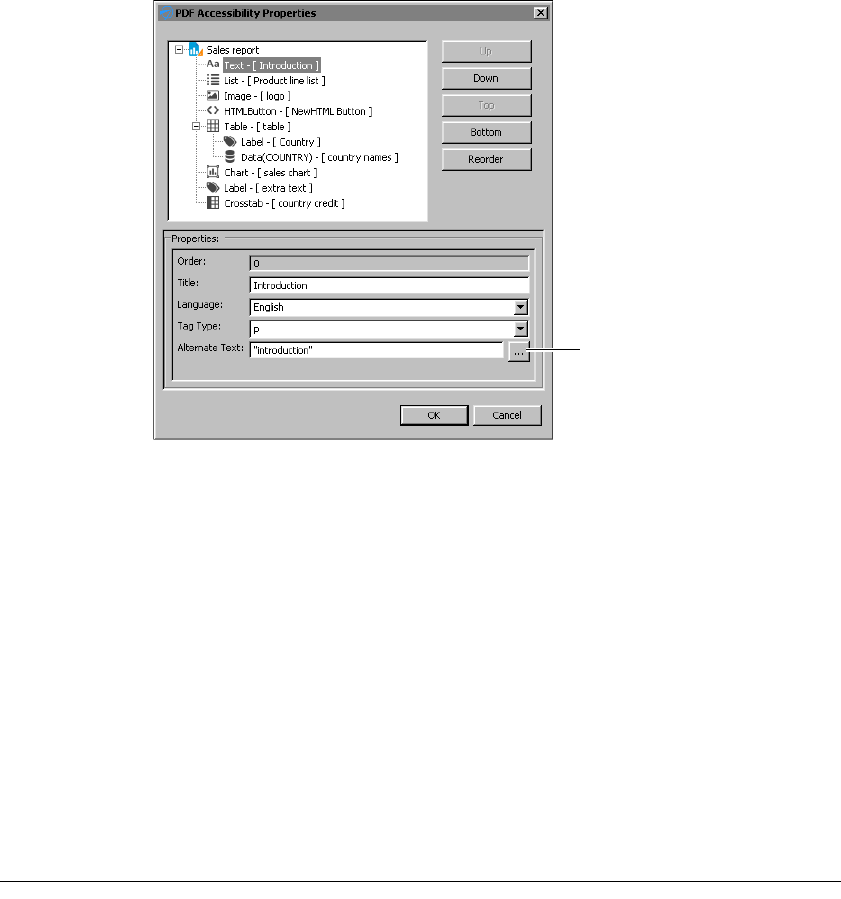
114
Actuate BIRT Application Developer Guide
Figure 6-2 Setting PDF accessibility properties
If a report item has a language value, this value takes precedence over the
language setting for the entire document.
Use the Expression builder to create a dynamic value for the alternate text. If
you choose to use a static value, type the value between a beginning and
ending quotation mark.
5Choose OK.
6Create a sample PDF to verify that the accessibility features are enabled. Use
one of the following methods to verify that the PDF file is accessible:
■
Load the PDF into a screen reader software, such as JAWS or NVDA.
■
Load the PDF into Adobe Acrobat Professional and run the Accessibility
check.
■
Load the PDF into a PDF checking software, such as PDF Accessibility
Checker, to verify that the PDF meets accessibility requirements.
Selecting features for interactive viewing
You can select which interactive features are available when a BIRT design file is
displayed in Interactive Viewer. For example, you can limit editing, exporting, or
filtering options in a report. A user cannot see disabled interactive features when
Expression
builder
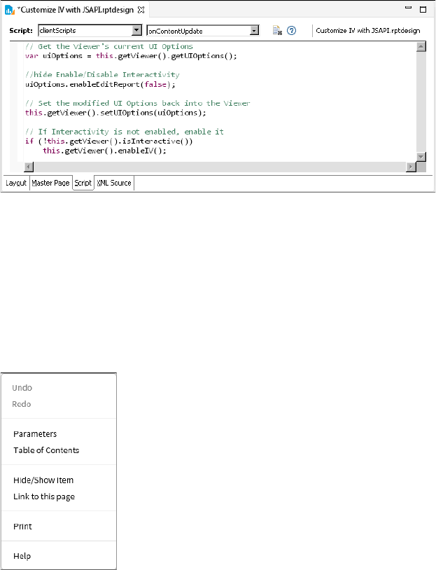
Chapter 6, Designing a report
115
viewing a report. You can also start a report in interactive mode and remove the
option to disable it.
Using the onContentUpdate event in client scripts, you can add script using the
uiOptions class to change the interactive options of a report. This event is visible
in the Script page of a BIRT design, as shown in Figure 6-3.
Figure 6-3 Customizing interactive features
Interactive scripting sample 1
The interactive viewer menu shown in Figure 6-4 shows the following scripts
changing interactive features:
■
A script removes the user option to enable interactivity.
■
A script removes the user option to export report content and data.
■
A script enables interactivity when the BIRT design is viewed.
Figure 6-4 Custom interactive viewer menu
The script written to change the toolbar menu appears in Listing 6-1.
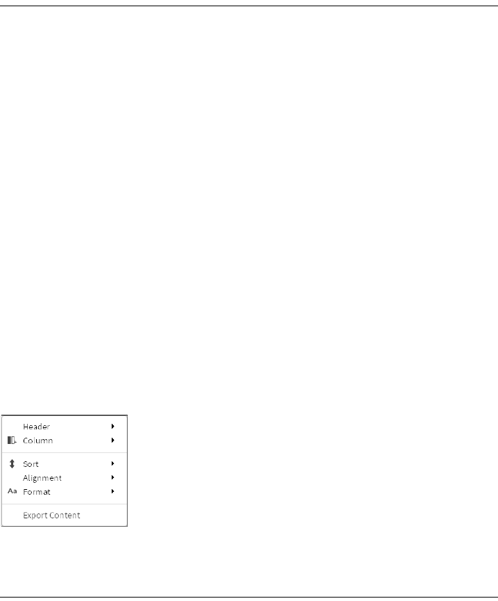
116
Actuate BIRT Application Developer Guide
Listing 6-1 Removing edit report and export options
// Get the Viewer's current UI Options
var uiOptions = this.getViewer().getUIOptions();
// Remove ability for user to export, extract,
// and change interactivity options
uiOptions.enableExportReport(false);
uiOptions.enableDataExtraction(false);
uiOptions.enableEditReport(false);
// Set the modified UI Options back into the Viewer
this.getViewer().setUIOptions(uiOptions);
// If Interactivity is not enabled, enable it
if (!this.getViewer().isInteractive())
this.getViewer().enableIV();
Interactive scripting sample 2
The interactive context menu shown in Figure 6-5 shows the following scripts
changing interactive features:
■
A script removes the user option to enable interactivity.
■
A script removes the user option to filter, group, and aggregate values in the
report.
■
A script enables interactivity when the BIRT design is viewed.
Figure 6-5 Custom interactive context menu
The script written to change the context menu appears in Listing 6-2.
Listing 6-2 Removing filter, group, and aggregation options
// Get the Viewer's current UI Options
var uiOptions = this.getViewer().getUIOptions();
// For security reasons, enable Interactive Viewer with only a
// fixed set of interactive functionality to the users.
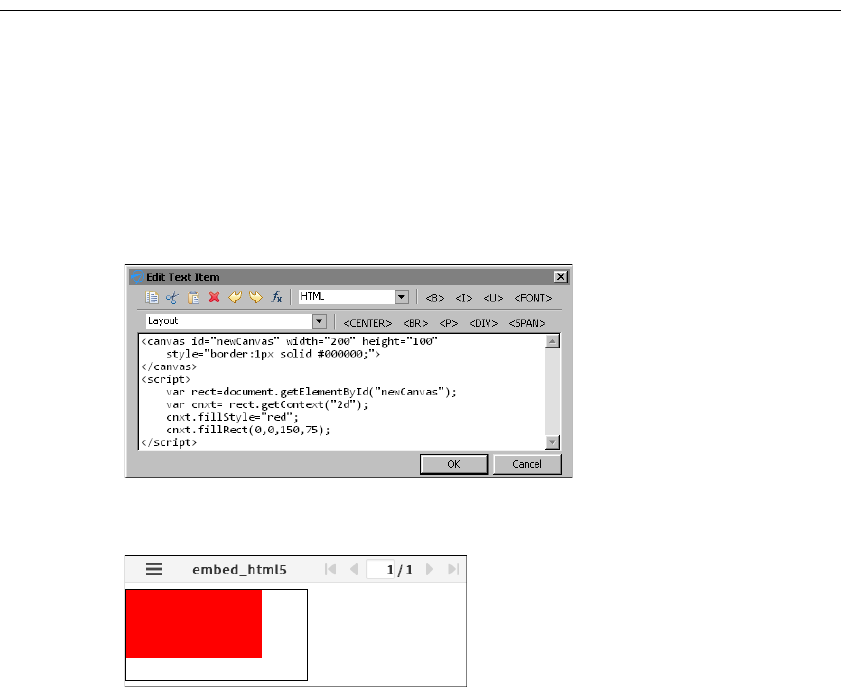
Chapter 6, Designing a report
117
//hide Enable/Disable Interactivity
uiOptions.enableEditReport(false); //hide interactivity option
uiOptions.enableGroupEdit(false); //hide move/add/delete Group
uiOptions.enablePageBreak(false); //hide page break
uiOptions.enableAggregation(false); //hide Aggregation
uiOptions.enableFilter(false); //hide Filter
// Set the modified UI Options back into the Viewer
this.getViewer().setUIOptions(uiOptions);
// If Interactivity is not enabled, enable it
if (!this.getViewer().isInteractive())
this.getViewer().enableIV();
Embedding HTML5 content
You can display HTML5 tags in a BIRT design using a text item or a dynamic text
item. These tags are used when the BIRT design is viewed or output as HTML.
For example, HTML5 tags that display a canvas tag are used when the design file
is displayed or output as HTML but are not displayed when the design file is
output as a PDF or Word document.
This content appears in web browsers that support HTML5.
Figure 6-6 shows the HTML5 canvas tag receiving formatting using JavaScript.
Figure 6-6 Embedding HTML5 tags in a text item
Figure 6-7 shows the HTML5 content in Interactive Viewer.
Figure 6-7 Viewing HTML5 content in Interactive Viewer
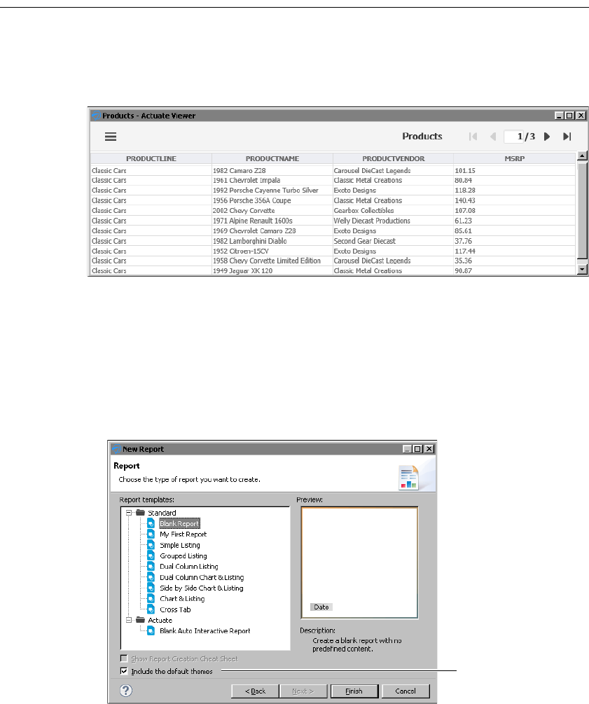
118
Actuate BIRT Application Developer Guide
Removing the default themes
By default, new reports that you create use a set of themes that apply formatting
to charts, gadgets, tables, and cross tabs. Figure 6-8 shows a table with the default
formats.
Figure 6-8 Table with the default formats
The themes are defined in a library, ThemesReportItems3.rptlibrary, which is
added to every new report.
To apply your own themes or styles in a report, disable the default themes by
doing one of the following:
■
When creating a new report using the New Report wizard, remove the
selection for Include the default themes. Figure 6-9 shows this option selected,
which is the default.
Figure 6-9 Include the default themes selected by default
Option to include or
exclude default themes
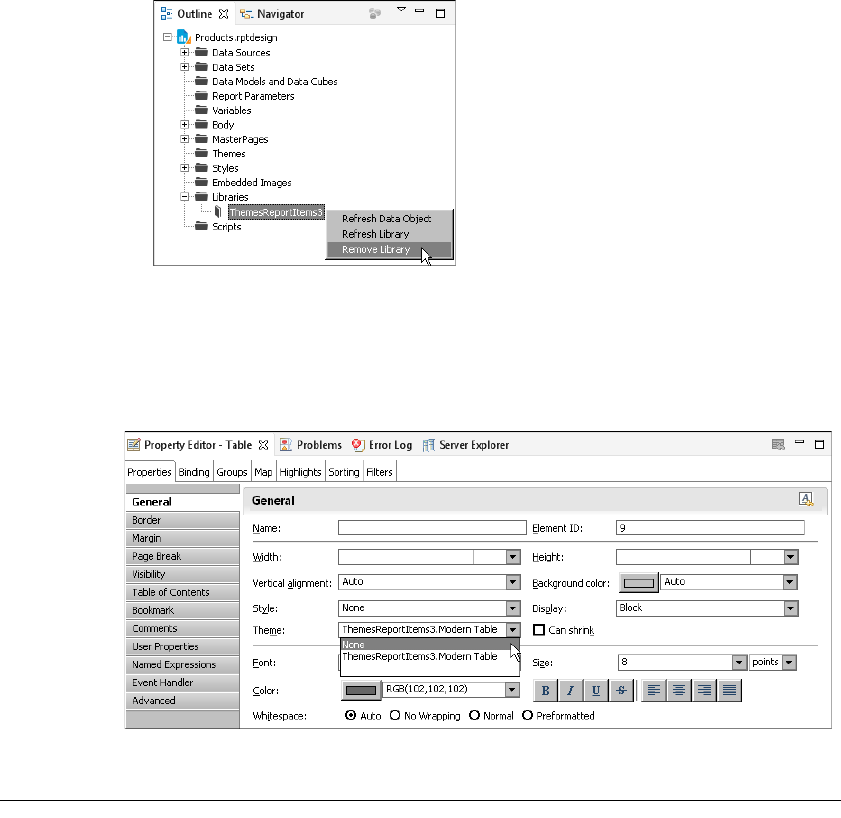
Chapter 6, Designing a report
119
■
If a report already includes the default themes, in the Outline view, expand
Libraries, then right-click ThemesReportItems3 and choose Remove Library,
as shown in Figure 6-10.
Figure 6-10 Removing ThemesReportItems3.rptlibrary from a report
The previous procedures remove all the default themes from a report. You can,
however, choose to remove themes from specific report elements while
maintaining default themes for other report elements. Figure 6-11 shows an
example of removing a default theme, ThemesReportItems3.default-table, from a
table by setting the Theme property to None.
Figure 6-11 Setting a table’s Theme property to None
Hiding columns in a table
There are two ways to hide a column in a table. You can:
■
Set the column’s Display property to No Display.
■
Set the column’s Visibility property to Hide.
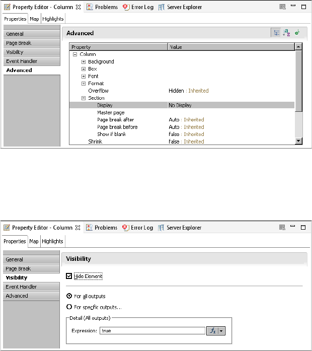
120
Actuate BIRT Application Developer Guide
Use the Display property if you are designing a report for Interactive Viewer and
you want to hide one or more columns when the report is first displayed in
Interactive Viewer. After selecting a column, the Display property is available
under Advanced properties in Property Editor, as shown in Figure 6-12.
Figure 6-12 Display property of a table column set to No Display
Use the Visibility property to hide a column based on the output format or on a
specific condition. For example, you can hide a column in all formats except PDF,
or hide a column if it contains no values. The Visibility property is available
under Properties in the Property Editor, as shown in Figure 6-13.
Figure 6-13 Visibility property of a table column set to Hide Element
In releases prior to 11SP1, columns hidden by the Visibility property were
available for display in the Interactive Viewer. In releases 11SP1 and later, they are
not. Reports created in a release prior to 11SP1 and which used the Visibility
property to hide or display a column now exhibit different behavior in Interactive
Viewer. To restore the original behavior, change the report to use the Display
property instead of the Visibility property.
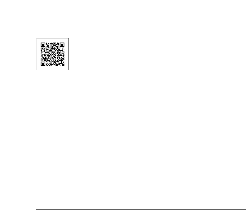
Chapter 6, Designing a report
121
Using a Quick Response code to link to content
A Quick Response (QR) code is a type of two-dimensional bar code that contains
encoded information. Figure 6-14 shows an example of a QR code.
Figure 6-14 A QR code
QR codes are used by a wide range of applications targeted to document
management and mobile phone users. QR codes can store URLs, business card
information, contact details, meeting schedules or any kind of text. Use a QR code
in a report to provide contact information or links to other reports. Mobile phone
users who have a QR code reader on their phone can scan the image of a QR code
to display the contact information or open a report.
BIRT Designer Professional includes a QR code generator, for generating
QR codes. To insert a QR code in a report, insert an image element to display the
QR code. In the image’s onCreate or onRender event, write code to dynamically
create the QR code.
To test QR code generation in BIRT Designer Professional, add core.jar or the
most recent version of it to your Resources folder. This JAR file is available from
the ZXing library at following URL:
http://code.google.com/p/zxing/
The code example in Listing 6-3 creates a QR code that, when scanned, opens a
report, qrreport.rptdesign, on a BIRT iHub.
Listing 6-3 Code to create a QR code that opens a report
var size = 350; // image width and height in pixels
var bgnd = new Packages.java.awt.Color(1.0, 1.0, 1.0); // white
background
var fgnd = new Packages.java.awt.Color(0, 0, 0); // black
foreground
// Report URL to encode.
var message = "http://athena:8700/iportal/
executereport.do?__executablename=/
qrreport.rptdesign&invokeSubmit=true;"
var writer = new Packages.com.google.zxing.qrcode.QRCodeWriter();
var matrix = writer.encode(message,
Packages.com.google.zxing.BarcodeFormat.QR_CODE, size, size);

122
Actuate BIRT Application Developer Guide
var bi = new Packages.java.awt.image.BufferedImage(size, size,
Packages.java.awt.image.BufferedImage.TYPE_INT_RGB);
var g = bi.getGraphics();
g.setColor(bgnd);
g.fillRect(0,0,size,size);
g.setColor(fgnd);
for (var y = 0; y < size; y++) {
for (var x = 0; x < size; x++) {
if (matrix.get(x, y)) {
g.fillRect(x, y, 1, 1);
}
}
}
baos = new Packages.java.io.ByteArrayOutputStream();
Packages.javax.imageio.ImageIO.write(bi, "png", baos);
this.data = baos.toByteArray();
QR codes support up to 4,296 characters. The higher the number of characters,
the higher the resolution of the QR code. Note, however, that low-resolution
mobile phone cameras might have difficulty reading high-resolution codes.
Designing for optimal viewer performance
Actuate BIRT viewers support a feature called progressive viewing, which
displays the first few pages as soon as they are generated instead of waiting until
the entire report is generated. For long reports, this feature can significantly
reduce the amount of time a user waits before the first page appears.
The design and functionality of a report affect the time it takes for BIRT to
generate the initial pages. A major factor that hinders performance is the retrieval
of data from an underlying data source, and the storage and processing of all that
data before BIRT can render the first report page. Optimal viewing performance
occurs when BIRT renders a page as soon as the data for that page has been
retrieved, before data for the entire report is processed.
To achieve optimal progressive viewing performance, observe the following
guidelines:
■
Ensure that data sets return only the data that you want to display in each
report element (tables, lists, or charts).
For example, if you must filter, group, sort or aggregate table data, perform
these tasks at the data source level. To manipulate data at the table level, BIRT
not only has to retrieve and store more data, it also has to spend more time
processing the data.
Chapter 6, Designing a report
123
■
If, as recommended in the previous point, you create a data set to return data
rows that are already grouped, disable the group sorting in BIRT, which
otherwise occurs when you create a group using the group editor.
To disable group sorting in BIRT, select the table in which grouping is defined.
In Property Editor, choose Advanced, then set the Sort By Groups property to
false.
■
If creating nested tables (a table in another table) as is common in master detail
reports, create a data set for each table instead of creating a single data set that
both the outer and inner tables use.
■
Avoid the following items:
■
Top n or bottom n filters. These filters require that BIRT process an entire
set of data to determine the subset of data to display.
■
Aggregations that require multiple passes through data, for example,
subtotals as a percentage of a grand total.
■
Summary tables. Even though these tables do not display detail rows, BIRT
must still process all the detail rows to calculate and display the summary
data.
124
Actuate BIRT Application Developer Guide

Part 3
Building application components
Part Three
3
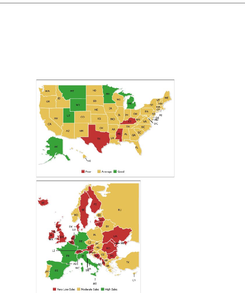
128
Actuate BIRT Application Developer Guide
About maps and gadgets
BIRT Designer Professional supports the creation of maps and gadgets. Maps
enable you to visualize geographic data. Gadgets are visualizations that measure
a value in a visual range.
Maps are vector maps suitable for displaying data by geographical divisions,
such as population distribution, electoral results, office locations, survey results,
weather patterns, and real-estate sales. BIRT Designer Professional provides
hundreds of maps, including maps of the world, continents, countries, European
regions, USA states, and so on. Figure 7-1 shows examples of maps.
Figure 7-1 US map and Europe map
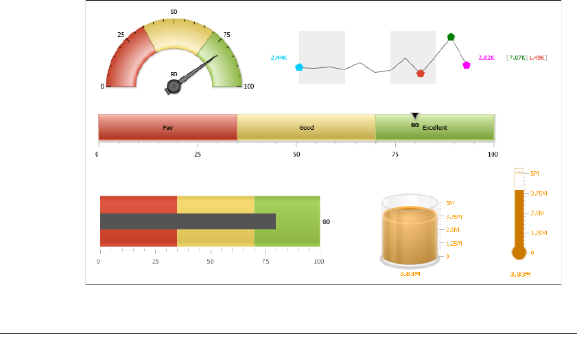
Chapter 7, Building interactive maps and gadgets
129
Like charts, measurement gadgets display data graphically and with animation.
The difference between the two elements is that a gadget typically displays a
single value whereas a chart plots multiple values for comparison. The supported
gadgets, shown in Figure 7-2, are meter, linear gauge, sparkline, cylinder,
thermometer, and bullet.
Figure 7-2 Measurement gadgets
Adding a gadget or map
The procedure for creating a gadget or map is the same as the procedure for
creating a BIRT chart. To create a gadget or map, perform the following tasks:
■
Drag the map or gadget element from the palette and drop it in the report.
■
Choose a map or gadget type.
■
Specify the data to present.
■
Format the gadget or map.
The formatting options available to the gadgets are different from the formatting
options available to BIRT charts. While many of the chart parts and formatting
attributes are the same, a measurement gadget supports visual effects to parts of
the gadget. A map enables you to highlight locations and values on the map.
Figure 7-3 shows an example of the Select Map page.
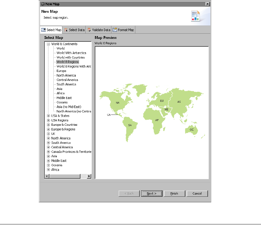
130
Actuate BIRT Application Developer Guide
Figure 7-3 Previewing a selected map
Providing data to a map
Each map defines different location entities depending on the map. The names of
these entities must match location names in your data for the values to display
correctly. Check with your database administrator if you need assistance to find
your location data. Each map is made up of smaller location entities. For example,
a world map displays continent entities, a map of Europe displays country
entities, and a country map displays different entities such as provinces, counties,
regions and states, depending on the structure of the country. Each location entity
displays numeric and color values using values from your data source.
After you match location data to the location entity of the map you select a value
to display on map locations.

Chapter 7, Building interactive maps and gadgets
131
Figure 7-4 shows an example of the Select Data page.
Validating map data
Use the Validate Data page to match your location data to location entity names
in a map and to verify if the map displays any entities that are not in your data.
For example, if your data uses foreign names or alternate names for a location,
you can match these to a location in the map.
Entity
Figure 7-4 Showing available data to display on the map
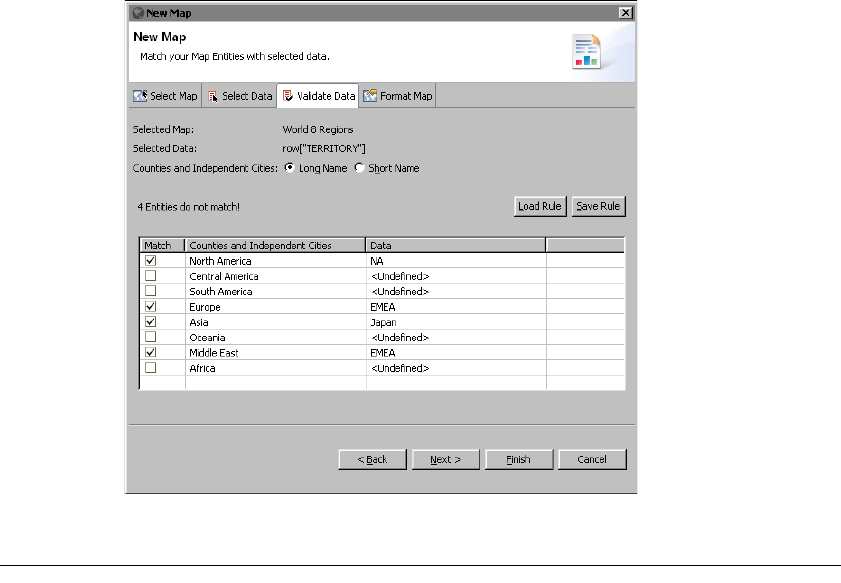
132
Actuate BIRT Application Developer Guide
You can export matching entity values to a text file using Save Rule and import
matching entity rules from a text file using Load Rule. Figure 7-5 shows an
example of the Validate Data page.
Figure 7-5 Matching data columns with map locations
Formatting a map
Like the standard chart builders the map builder provides a separate page for
formatting tasks. Figure 7-6 shows an example of the Format Map page
displaying the general properties for a map.
Format Map lists formatting properties for each visual part of a map.
General properties
The general properties of a map control overall appearance, such as location
colors, hover style, background and border style. General properties can also
define the connector line, the number format, and the map legend. For example,
Figure 7-7 shows custom background, outline, connector line, and hover effect
color.

134
Actuate BIRT Application Developer Guide
Table 7-1 General properties
Property Usage
Background Color Sets the background color of the map.
Canvas Border Color Specifies the color of the border around the entire map.
Caption Adds a caption to the map.
Connector Line Color Specifies the color of the line between the entity name and the
entity location.
Drop Shadow Enables or disables the appearance of a shadow below the map.
Entities Border Color Specifies the color of the border around the location entities.
Entities Fill Color Specifies the color in the border of an entity location.
Font Color Specifies the color of the text.
Font Faces Specifies the name of the font.
Font Size Specifies the font size in points.
Format Number Enables or disables number formatting.
Format Number Scale Abbreviates a number to an appropriate number factor. For
example, 10,000 becomes 10K.
Fraction Digits Specifies the number of digits displayed after the decimal point.
Hover Effect Color Specifies the color of the location entity under the mouse pointer.
Include Name in Labels Enables or disables the display of location entity names.
Include Value in Labels Enables or disables the display of the location entity’s value.
Legend Caption Specifies the name displayed above the map legend.
Legend Position Specifies the position of legend in relation to the map.
Number Prefix Specifies a text value to display before a number.
Number Suffix Specifies a text value to display after a number.
Short Name in Tool Tip Enables or disables the display of the short name of a location
entity in a tooltip. For example, NA is the short name of North
America.
Show Border Enables or disables the border around the map.
Show Entity Tool Tip Enables or disables the display of a tooltips when a mouse pointer
is placed over the entity.
Show Labels Enables or disables the display of labels.
Show Legend Enables or disables the display of a legend when highlight ranges
exist.
Use Hover Effect Enables or disables the highlighting of a location entity when the
mouse pointer moves over the entity.
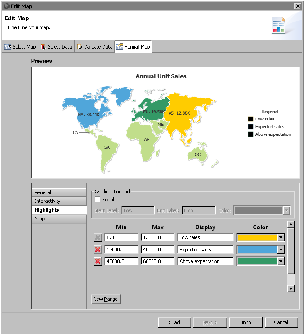
Chapter 7, Building interactive maps and gadgets
135
Highlights properties
Use highlights to change the color of map entities based on defined ranges of
values. For example, sales values in a certain range can display as yellow for low
sales and green for expected sales. When ranges are defined for highlights, the
color assigned to a range can display in a legend with the range description or
value range. The legend name and its position are defined in the general
properties of the map.
Figure 7-8 shows highlights properties set for a map.
Figure 7-8 A map and its highlights formatting properties
When ranges are defined, you can display an interactive gradient legend that
enables users to highlight map location entities using a start and an end needle.
Location entities with values between the two needles display on the map, other
location entities are hidden.
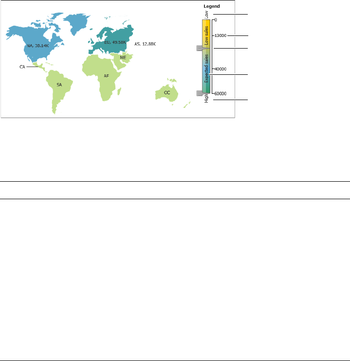
136
Actuate BIRT Application Developer Guide
Figure 7-9 shows a gradient legend with multiple ranges of values.
Figure 7-9 Using an interactive gradient legend with value ranges
Table 7-2 shows all the highlight properties and lists the gadgets to which they
apply.
Rendering platform
BIRT Designer Professional uses a third-party map library from Fusion Charts, to
render maps. This map library is integrated into BIRT Designer Professional’s
standard map builder, where you create maps using the familiar user interface.
Fusion Charts also provides a full API, which you can use to programmatically
add, remove, or modify map elements after creating the map in the map builder.
Access to the Fusion Charts API is through the map builder’s script editor.
Table 7-2 Highlights properties
Property Usage
Color Specifies the color of the region.
Display Specifies the name of the region to display in
the legend.
Enable Gradient Legend Enable the gradient legend.
End Label Specifies the name to display at the end of the
gradient legend.
Gradient Legend Color Specifies a starting color for the gradient
legend.
Max Specifies the value where the range ends.
Min Specifies the value where the range starts.
Start Label Specifies the name to display at the start of the
gradient legend.
Start label
End label
Needle
Range value
Range
display name
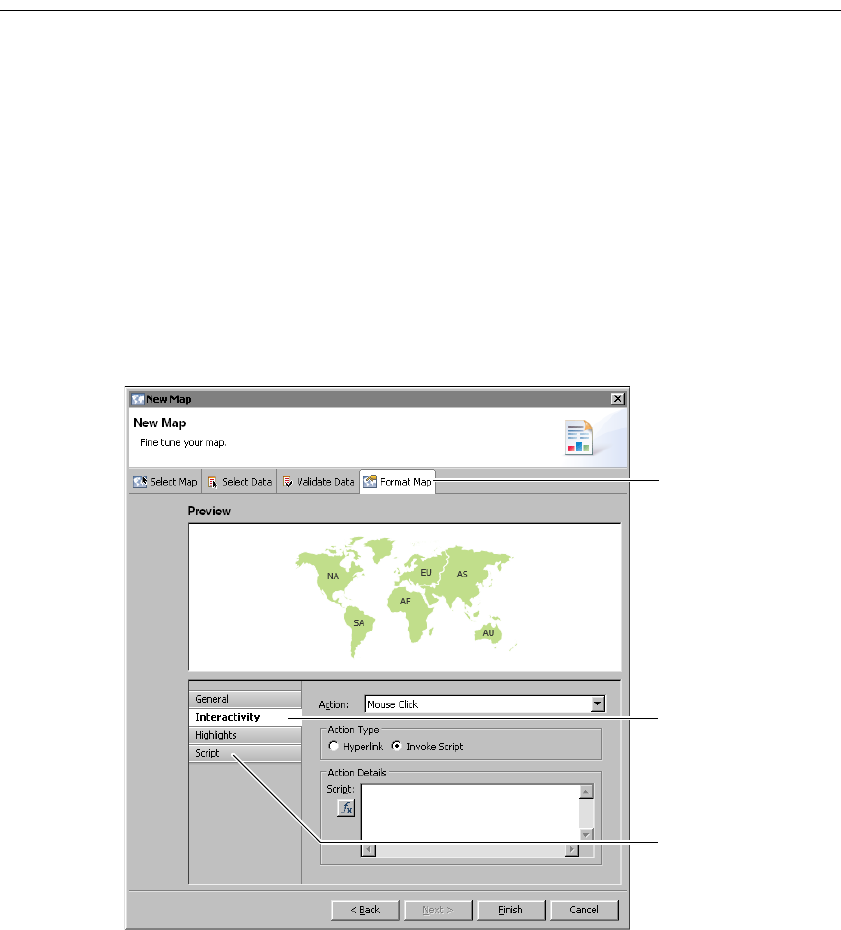
Chapter 7, Building interactive maps and gadgets
137
Adding scripts to a map
You can write scripts in JavaScript that specify the task to perform when a
particular event occurs. This type of script is called an event handler. Like BIRT
and HTML5 charts, maps support two types of event handlers:
■
Event handlers that respond to user interactions, such as a mouse click on a
location when viewing the map. For example, you can create an event handler
to link to a report when a user selects a location in a map.
■
Event handlers that occur before BIRT renders the map. Use this type of event
handler to conditionally change map elements before the map is generated.
For example, you can add markers and connection lines to cities where you
have offices.
For both types of event handlers, you use the script editor in the chart builder, as
shown in Figure 7-10. To launch the script editor, choose the Format Map tab.
Figure 7-10 Script editor displaying the UI for writing a user action handler
To create an event handler that responds to a user interaction, choose
Interactivity. To create an event handler that responds to a chart event, choose
Script, as shown in Figure 7-10.
Choose Format
Map to open
the script editor
Choose Script
to write an
event handler
for a map event
Choose
Interactivity to
write an event
handler for a
user action
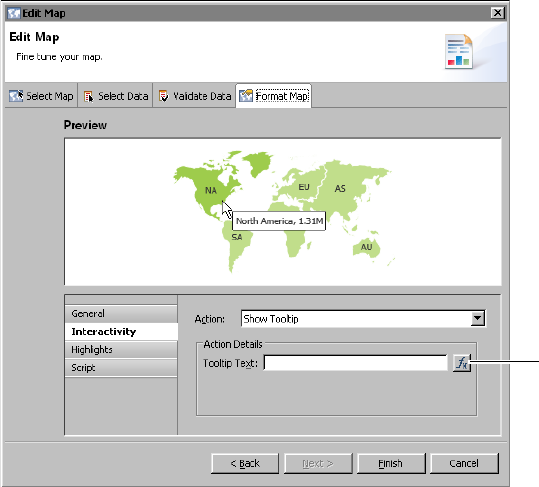
138
Actuate BIRT Application Developer Guide
Writing event handlers that respond to user
interactions
Depending on what you want to accomplish, you can create some of these
interactivity event handlers without scripting. For typical event handlers, the
script editor in the map builder simplifies the process by providing a list of
actions. Choose an action, such as Show Tooltip or Mouse Click. Selecting Mouse
Click enables the action types Hyperlink or Invoke Script. Select Hyperlink to link
to a URI, internal bookmark or drill-through report. To implement a custom
action, choose Invoke Script, then write JavaScript code. For maps, this code can
use the Fusion Charts Map API.
Adding tooltips to a map
Tooltips display values when the user places the mouse pointer over a map
location. This can display additional information about a location such as its full
name and the value displayed in the location.
Figure 7-11 shows an example of an event handler that manages the Show Tooltip
action. In this example, the tooltip is set to display the data value, which is
typical. You can change the Tooltip Text to create your own tooltip values using
the expression builder.
Figure 7-11 Script editor displaying the tooltip event handler
Expression
builder
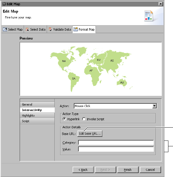
Chapter 7, Building interactive maps and gadgets
139
Adding hyperlinks to a map
You can create hyperlinks to external content such as a document or web page, to
a different section in the same report, and to a section in a different report. For
example, you can create a hyperlink that opens a new map of country locations
when a user selects a continent.
Choose Edit base URL to access all hyperlink options. These options are the same
as hyperlink options for charts. For more information about adding hyperlinks to
BIRT report items, see BIRT: A Field Guide.
Figure 7-12 shows an example of a mouse click event handler that creates
hyperlinks for locations on the map.
Figure 7-12 Adding hyperlinks to map locations
You can also add query string fields to any URL created by the mouse click action.
This enables you to create custom URLs for each location on the map. When you
type a field name for the category and value of the selected location a query string
using the selected name and value are appended to the base URL. The base URL
is defined in Edit base URL.
Query string
field names
Edit hyperlink
options
140
Actuate BIRT Application Developer Guide
For example, if you type location in Category and you type sold in Value, then
any URL that is generated from the mouse click event includes location and sold
in the URL as a query string in the following format:
?location=<category>&sold=<value>
When the user selects a location, <category> is replaced with the name of the
location and <value> is replaced with the value of the location. If the user selects
the North American continent which is displaying 10,000 units sold, the
following query string is generated and appended to the base URL:
?location=NA&sold=10000
If the base URL is http://webserver.com/ then the URL created for the user
selection in this example is:
http://webserver.com/?location=NA&sold=10000
If you need to create more complex URLs, such as to open another BIRT
document or file, you can leave the query string names empty and choose Edit
base URL for additional hyperlink options.
Adding interactive script to a map
You can add your own JavaScript that runs at the selected map action. Figure 7-13
shows an example of an event handler that adds interactive script to locations on
the map. You can add JavaScript that starts when a user selects a location on the
map.
Using event handlers before map generation
Unlike event handlers that respond to user interactions with the map, the event
handlers that you write require programming in JavaScript. You also have to
learn the Fusion Charts API to know what map options you can manipulate and
how.
In the script editor, you select a map function, such as handleMap( ) or
handleData( ), then you write code that performs a specific task or tasks before
the map is rendered. These event handlers execute on the client-side.
Write client-side scripts using the script editor accessible from the Format Map
tab in the map builder. Write server-side scripts using the script editor accessible
from the Script tab in the report editor. Only the following server-side event
functions are supported for maps: onPrepare( ), onCreate( ), onRender(), and
onPageBreak( )
This section provides information about writing client-side event handlers for
map events. For information about writing server-side event handlers, see
Integrating and Extending BIRT.
For documentation about the Fusion Charts API, go to the following location:
http://docs.fusioncharts.com/maps/Contents/DataFormats/XML.html
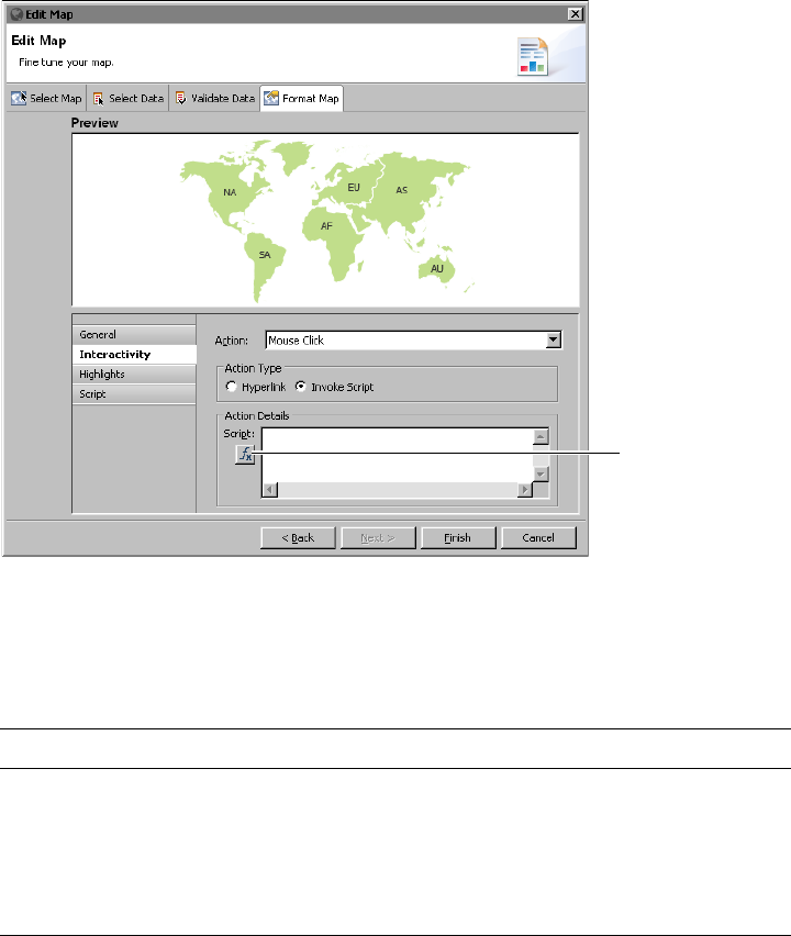
Chapter 7, Building interactive maps and gadgets
141
Figure 7-13 Adding interactive script to the mouse click action
About the map functions
Table 7-3 lists the map functions available before the map is rendered.
Setting map options through scripting
The map event functions are called after BIRT generates the static JavaScript
options, which are based on the map’s data and formatting options set in the map
builder. Use the map event functions to add map options that Fusion Charts
provides, but that are not available through the map builder’s format page, such
as adding custom markers or changing the name of location entities.
Table 7-3 Map event functions
Map functions Description
handleMap(map) Called to change map formats
handleData(data) Called to change data
handleMarkers(markers) Called to add markers or pins
handleColorRange(colorrange) Called to add color ranges
handleEntityDef(entitydef) Called to change entity definitions
Expression
builder
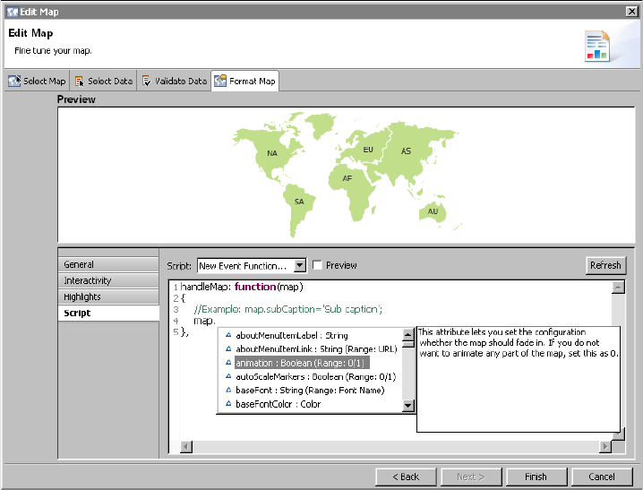
142
Actuate BIRT Application Developer Guide
For example, Fusion Charts provides an option to change the background of a
legend on a map. To remove the legend’s background color set the transparency
value to zero using the following code:
handleMap: function(map)
{
map.legendBgAlpha = 0;
},
As the code example shows, handleMap( ) receives a map object. You use this
map object to configure map options. When you type the word, map, followed by
a period (.), the script editor displays a list of options, as shown in Figure 7-14.
Click an option to view summary information about it. Double-click an option to
add it to your code.
Figure 7-14 The script editor displaying the available options
How to preview formatting changes on a map
You can preview your formatting changes in Format Map. This example uses a
world map and changes the location entity names displayed in the map.
1In Format Map, choose Script to add scripts to the map.
2In Script, choose handleEntityDef, as shown in Figure 7-15.
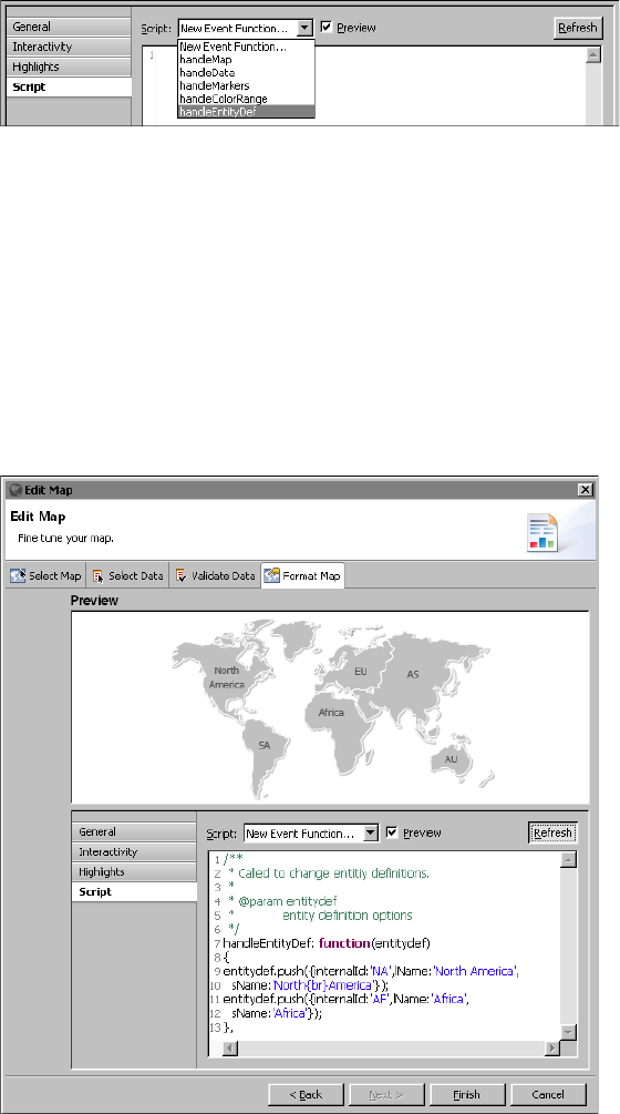
Chapter 7, Building interactive maps and gadgets
143
Figure 7-15 Adding script to a map
3Delete the following text:
//Example:
entitydef.push({internalId:'AU',lName:'Oceania',sName:'OC'});
4Type the following script where the example script was removed:
entitydef.push({internalId:'NA',lName:'North America',
sName:'North{br}America'});
entitydef.push({internalId:'AF',lName:'Africa',
sName:'Africa'});
5Select Preview and choosing Refresh in the Format Map tab, as shown in
Figure 7-16. The new labels appear in the map preview.
Figure 7-16 Previewing the map after adding scripts
144
Actuate BIRT Application Developer Guide
6Choose Finish to save the map or Cancel to delete it.
Using map markers and connection lines
You can create your own custom defined markers on a map using scripts. Custom
markers include changing the color and size of a default marker like a circle or
triangle. Custom markers can also display images. After defining the shape of the
map marker, you can define the x-axis and y-axis location of the marker on the
map and give it a label. Any two markers can also display a connection line
between the markers.
The following script enables custom markers, assigns each one a different shape,
and draws a connector line between the two markers:
handleMarkers: function(markers)
{
markers.shapes = [];
markers.shapes.push({id: 'Airplane', type: 'image', url: 'http:/
/urup:8700/iportal/resources/airport.png', labelpadding:
'10'});
markers.shapes.push({id: 'myCustomShape', type: 'circle',
fillcolor: 'FFFFFF,333333', fillpattern: 'radial', radius:
'3'});
markers.definition.push({id: '1', x: 233, y: 205, label:
'Seattle', labelpos: "top"});
markers.definition.push({id: '2', x: 719, y: 192, label:
'Spokane', labelpos: "top"});
markers.application.push( {id: '1', shapeid: 'Airplane'});
markers.application.push( {id: '2', shapeid: 'myCustomShape'});
markers.connectors = [];
markers.connectors.push({from: '1', to: '2', dashed: '1', color:
'00577F', alpha: '40'});
}
Using images for a custom marker requires a URL address to the image location.
Use an absolute path URL for the marker image enables PDF exports of the map
to include the marker image. Using an absolute path URL also enables the marker
image to display in the BIRT Designer Professional map preview. Using a relative
path URL enables deployment of the marker image inside a BIRT application but
limits preview and export options.
Figure 7-17 shows an example of using script to add custom markers to a map.
This example uses an absolute path URL to display the custom marker image. In
this example http://urup:8700/iportal/resources/airport.png is the URL
address to an image file that is copied directly to the a folder in Visualization
Platform. This image is not in a volume.
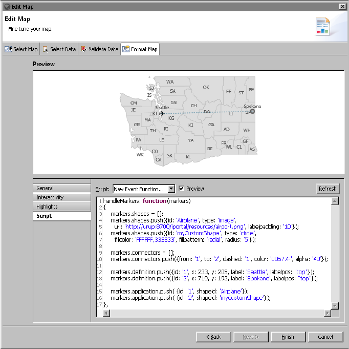
Chapter 7, Building interactive maps and gadgets
145
Figure 7-17 Adding custom markers to a map
If your map is part of a BIRT application you can save the image inside the same
application folder and use a relative URL to the image. In this case you can only
preview the image when viewing the map as a BIRT application, either in BIRT
Designer Professional or in Visualization Platform.
For example, you have an airport.png image file that you want to display as a
marker on a map. The image is in an images folder inside the application. Using
the BIRT application URL conventions, the relative URL path to the image is:
apps/MapMarkers/images/airport.png
The following script loads an image as a custom map marker using a relative
URL:
markers.shapes.push({id: 'Airplane', type: 'image', url: 'apps/
MapMarkers/airport.png'})
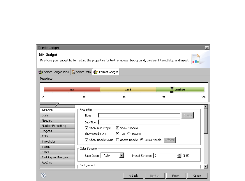
146
Actuate BIRT Application Developer Guide
Formatting a gadget
Like the standard chart builders the gadget builder provides a separate page for
formatting tasks. Figure 7-18 shows an example of the Format Gadget page
displaying the general properties for a linear gauge.
Figure 7-18 A linear gauge and its general formatting properties
Format Gadget lists formatting properties of each visual part of a gadget. As
Figure 7-18 shows, for a linear gauge, you can format its scale, needle, numbers,
regions, ticks, thresholds, and so on. Each gadget has a different set of formatting
properties, which change specific aspects of the gadget’s appearance.
General properties
The general properties of a gadget control overall appearance, such as color
scheme, background and border style, and whether animation is enabled. General
properties can also define the radius of a cylinder, the needle position of a linear
gauge, or the start and end angles of a meter gauge. For example, Figure 7-19
shows how changing the Radius, Height, and Viewing Angle properties affects
the view of a cylinder gadget. Radius and Height values are expressed as
percentages of the gadget area.
Categories
of formatting
properties
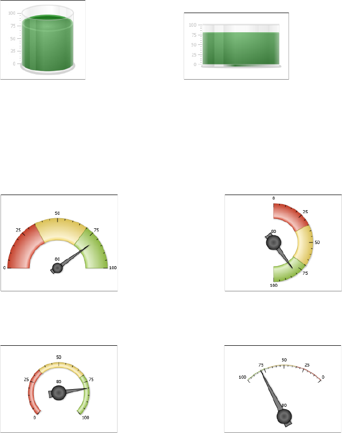
Chapter 7, Building interactive maps and gadgets
147
Figure 7-19 Examining results of setting properties for a cylinder
Figure 7-20 shows examples of setting the Start Angle and End Angle properties
to change the shape and orientation of a meter. The examples also show how to
use the Outer Radius and Inner Radius properties to set the thickness of the arc in
the gauge.
Figure 7-20 Examining results of setting properties for a meter gadget
Table 7-4 shows all the general properties and lists the gadgets to which they
apply. Some properties appear for only one type of gadget. Other properties are
common to multiple types of gadgets.
Radius: 20%(default)
Height: 0% (default)
Viewing Angle: 30 (default) Radius: 30%
Height: 50%
Viewing Angle: 0
Start Angle: 180 (default)
End Angle: 0 (default)
Outer Radius: 70% of Radius (default)
Inner Radius: 40% of Radius (default)
Start Angle: 90
End Angle: -90
Outer Radius: 40% of Radius
Inner Radius: 25% of Radius
Start Angle: 225
End Angle: -45
Outer Radius: 30% of Radius
Inner Radius: 25% of Radius
Start Angle:45
End Angle: 135
Outer Radius: 50% of Radius
Inner Radius: 50% of Radius

148
Actuate BIRT Application Developer Guide
Table 7-4 General properties
Property Gadget Usage
Backgroun
d Color
All Sets the background color of the gadget.
Base Color All Sets the color scheme of the gauge. You can use
either a base color or a preset color scheme. All
other selections derive from this selection.
Center X
Coordinate
Meter Specifies the x coordinate of the gauge center.
Center Y
Coordinate
Meter Specifies the y coordinate of the gauge center.
Color All Specifies the color of the border around the
gadget.
Connect
Missing
Data
Sparkline Connects a line between missing points of data.
End Angle Meter Specifies the angle where the gauge ends
drawing.
Fill color Cylinder,
thermometer
Specifies the internal color of a gadget, such as a
cylinder or thermometer.
Height Cylinder,
thermometer
Specifies the percentage of the gadget area that
the gadget image height occupies.
Inner
Radius
Meter Specifies the radius of the inner portion of the
gauge.
Outer
Radius
Meter Specifies the radius of the outer portion of the
gauge.
Preset
Scheme
All Selects a preset color scheme for the gauge. You
can use either a base color or a preset color
scheme. All other selections derive from this
selection.
Radius
(or Bulb
Radius)
Cylinder,
thermometer
Species the percentage of the gadget area that the
gadget image radius occupies.
Show
Border
All Enables or disables the border around the gadget.
Show Dial
Values
Meter Enables or disables the value display on the dial.
Set dial position above or below the dial.
Show
Needle On
Linear gauge Set to top to have needles appear on top of the
gadget, set to bottom to have them appear on the
bottom.

Chapter 7, Building interactive maps and gadgets
149
Scale properties
Scale properties define the range of values and the number of tick marks that a
gadget displays. The scale properties affect the numbers displayed on the gadget,
not its size. Minimum Value and Maximum Value specify the lowest and highest
numbers, respectively. If the data set value (represented by the needle value) is
lower than the minimum value or higher than the maximum value, the minimum
or maximum value is ignored.
Figure 7-21 shows scale properties set for a linear gauge.
Show
Needle
Value
Linear gauge Enables or disables the display of the value at the
needle. If enabled, set to Above Needle to display
the value above the needle, or set to Below
Needle to display the value below the needle.
Show
Value
Cylinder,
thermometer
Enables or disables the display of the value the
gadget is illustrating.
Start Angle Meter Specifies the angle where the gauge begins
drawing.
Start X
Coordinate
Cylinder Chooses a starting x coordinate percentage that
positions the image in the gadget. Selecting 0
starts the image at the left side of the gadget.
Start Y
Coordinate
Cylinder Chooses a starting y coordinate percentage that
positions the image in the gadget. Selecting 0
places the starting y coordinate at the top of the
gadget, selecting 100 places it at the bottom.
Style All Supports adding a style to the gadget.
Sub-Title All Adds a subtitle to the gadget.
Title All Adds a title to the gadget.
Turn Off
All
Animation
All Enables or disables all animation effects.
Turn Off
Default
Animation
All Enables or disables default animation.
Viewing
angle
Cylinder Specifies the angle at which the gadget is viewed.
Valid values are 0 through 50. 0 appears flat, 50 is
tilted toward the viewer.
Width All Specifies the thickness of the border around the
gadget.
Table 7-4 General properties
Property Gadget Usage
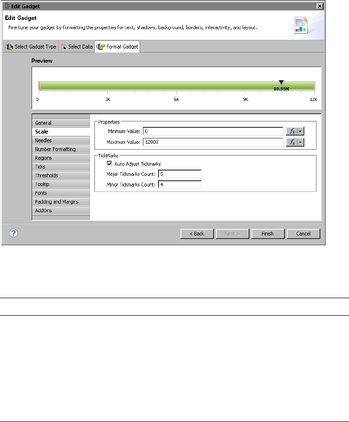
150
Actuate BIRT Application Developer Guide
Figure 7-21 A linear gauge and its scale formatting properties
Table 7-5 shows all the scale properties and lists the gadgets to which they apply.
Needle properties
Needle properties define the shape, size, and color of a needle. A needle points to
a data value and appears only in a linear gauge and in a meter gauge. Figure 7-22
shows the needle properties set for a meter gauge.
Table 7-5 Scale properties
Property Gadget Usage
Auto Adjust
Tickmarks
All but
sparkline
Enables or disables tick marks created
evenly across the scale
Major Tickmarks
Count
All but
sparkline
Specifies the number of major tick marks
to display on the scale
Maximum Value All Sets the highest value of the scale
Minimum Value All Sets the lowest value of the scale
Minor Tickmarks
Count
All but
sparkline
Specifies the number of minor tick marks
to display between major tick marks
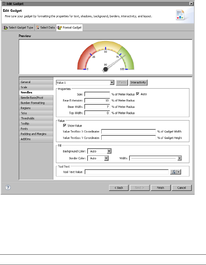
Chapter 7, Building interactive maps and gadgets
151
Figure 7-22 Selecting options for the needle of a meter gauge gadget
For a meter gauge, the needles properties apply only to the pointer part of the
needle. To format the base, or pivot, of the needle (represented by the circle),
choose Needle Base/Pivot.
Table 7-6 shows all the needle properties and lists the gadgets to which they
apply.
Table 7-6 Needle properties
Property Gadget Usage
Base Width Meter Sets the size of the bottom part of the
needle, as a percent of the size of the
gadget.
(continues)

152
Actuate BIRT Application Developer Guide
Needle base or pivot properties
Needle base or pivot properties define the appearance of a needle base, or pivot.
Drawn as a circle, the base is the point around which the needle rotates. A needle
base appears only for a meter gauge. Figure 7-23 shows the needle base
properties set for a meter gauge. The size of the needle base is larger than the
default size, and the fill color is set to a radial gradient.
Border Color Linear gauge,
meter
Sets the border color of the needle.
Border Width Linear gauge,
meter
Sets the thickness of the needle border.
Fill Background
Color
Meter Sets the background color of needle.
Fill Color Linear gauge Sets the interior color of the needle.
Rear Extension Meter Sets the size of the portion of the needle
behind the pivot as a percent of the size of
the gadget.
Shape Linear gauge Sets the shape of the needle.
Show Value Meter Enables or disables the display of the
value to which the needle points.
Size Linear gauge,
meter
Sets the size in pixels, or in percent of
gadget width, of the needle.
Tooltip Linear gauge,
meter
Specifies text for the tooltip.
Top Width Meter Sets the size of the tip of the needle as a
percent of the size of the gadget.
Value Linear gauge,
meter
Sets which needle to format. Several
needles can co-exist, based on the data
used to create the gadget.
Value Textbox
X Co-ordinate
Meter Sets the x coordinate of the value text, as a
percent of gadget width.
Value Textbox
Y Co-ordinate
Meter Sets the y coordinate of the value text, as a
percent of gadget height.
Table 7-6 Needle properties (continued)
Property Gadget Usage
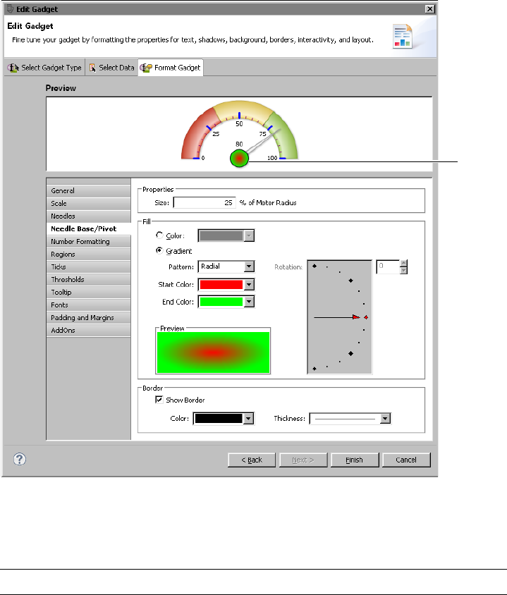
Chapter 7, Building interactive maps and gadgets
153
Figure 7-23 Selecting options for the needle base of a meter gauge
Table 7-7 shows all the needle base or pivot properties. These properties are used
only in a meter gauge.
Table 7-7 Needle base/pivot properties
Property Usage
Border Color Sets the border color of the needle base.
Border Thickness Sets the width of the needle base border.
End Color Sets the ending color to use in a fill gradient.
(continues)
Needle
base

154
Actuate BIRT Application Developer Guide
Number formatting properties
Number formatting properties define how numbers are displayed in a gadget.
Use these properties to abbreviate numbers, to add text before or after a number,
or to specify the number of digits to display after a decimal point. Figure 7-24
shows the number formatting properties set for a bullet gauge. Numbers display
with the dollar symbol ($) before the number and they appear in abbreviated
format, such as $30K instead of $30,000.
Table 7-8 shows all the number formatting properties. These properties are used
in all the gadgets.
Fill Color Sets the interior color of the needle base to a solid
color.
Fill Gradient Sets the interior color of the needle base to a color
gradient.
Pattern Specifies the pattern of the fill gradient. Choose
Radial or Linear.
Rotation Sets the angle of a linear fill gradient.
Show Border Displays or hides the border around the needle base.
Size Sets the size of the needle base as a percent of the
meter radius.
Start Color Sets the starting color to use in a fill gradient.
Table 7-8 Number formatting properties
Property Usage
Auto Abbreviation Abbreviates a number to an appropriate number
factor. For example, 10,000 becomes 10K.
Force Trailing Zeros Enables or disables the display of trailing zeros after
the decimal point.
Format Numbers Enables and disables number formatting.
Fraction Digits Specifies the number of digits displayed after the
decimal point.
Prefix Specifies a text value to display before a number.
Suffix Specifies a text value to display after a number.
Table 7-7 Needle base/pivot properties (continued)
Property Usage

Chapter 7, Building interactive maps and gadgets
155
Figure 7-24 Examining a bullet gadget and its number formatting properties
Region properties
Region properties enable the division of the data plot into regions. Use regions to
provide more information about values in a gadget. Compare the linear gauges in
the following figures. The gauge in Figure 7-25 does not show regions. The gauge
in Figure 7-26 displays three regions, labeled Fair, Good, and Excellent.
Figure 7-25 Linear gauge without regions
Figure 7-26 Linear gauge with three regions
Figure 7-27 shows the properties set for the region labeled Fair in Figure 7-26.
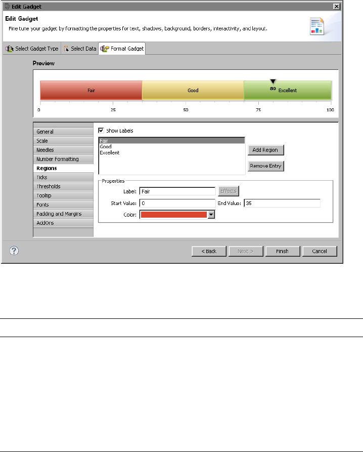
156
Actuate BIRT Application Developer Guide
Figure 7-27 Properties specified for a region labeled Fair
Table 7-9 shows all region properties and lists the gadgets to which they apply.
Tick properties
Tick properties define the size, color, and position of tick marks on a gadget.
Figure 7-28 shows the tick properties set for a linear gauge. Tick marks appear at
Table 7-9 Region properties
Property Gadget Usage
Color Linear gauge, meter, bullet Specifies the color of the region.
End Value Linear gauge, meter, bullet Specifies where the region ends.
Label Linear gauge, meter, bullet Specifies the name of the region.
Region Linear gauge, meter, bullet Chooses the region for which the
settings apply. You can also add
or remove a region from the list.
Show Labels Linear gauge Display or hide the region labels.
Start Value Linear gauge, meter, bullet Specifies where the region starts.
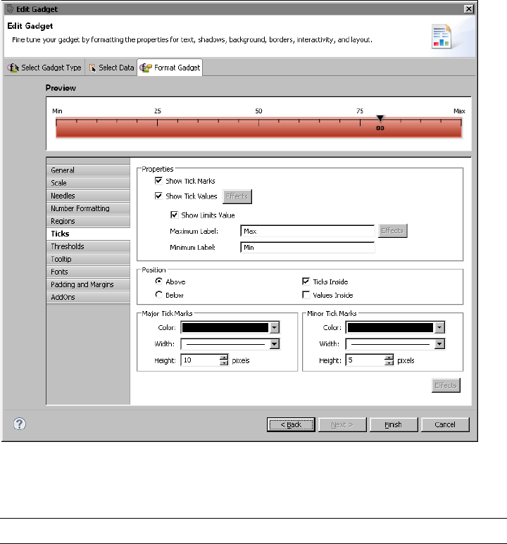
Chapter 7, Building interactive maps and gadgets
157
the top and inside the gauge. The first and last tick values display Min and Max
instead of numbers.
Figure 7-28 Format Gadget displaying a linear gauge and its tick properties
Table 7-10 shows all the tick properties and lists the gadgets to which they apply.
Table 7-10 Tick properties
Property Gadget Usage
Major Tick
Marks Color
Linear gauge, meter, bullet,
cylinder, thermometer
Sets the color of major tick marks.
Major Tick
Marks Height
Linear gauge, meter, bullet,
cylinder, thermometer
Sets the height of major tick
marks.
Major Tick
Marks Width
Linear gauge, meter, bullet,
cylinder, thermometer
Sets the width of major tick
marks.
(continues)

158
Actuate BIRT Application Developer Guide
Threshold properties
Threshold properties define thresholds, which you use to identify meaningful
values. For example, in a linear gauge that displays a sales total, you can add a
threshold that identifies the target sales amount, as shown in Figure 7-29. By
displaying this threshold value, the gauge shows whether the actual sales total is
over or under the sales target.
Figure 7-29 also shows the threshold properties set to create the threshold. You
can specify a label, create a threshold line or a threshold zone, specify a threshold
Maximum
Label
Linear gauge, meter, bullet,
cylinder, thermometer
Sets the highest tick mark value.
Text replaces the numeric value.
Minimum
Label
Linear gauge, meter, bullet,
cylinder, thermometer
Sets the lowest tick mark value.
Text replaces the numeric value.
Minor Tick
Marks Color
Linear gauge, meter, bullet,
cylinder, thermometer
Sets the color of minor tick marks.
Minor Tick
Marks Height
Linear gauge, meter, bullet,
cylinder, thermometer
Sets the height of minor tick
marks.
Minor Tick
Marks Width
Linear gauge, meter, bullet,
cylinder, thermometer
Sets the width of minor tick
marks.
Position
Above
Linear gauge, bullet Sets tick marks to appear above
the gadget.
Position
Below
Linear gauge, bullet Sets tick marks to appear below
the gadget.
Position Left Cylinder, thermometer Positions tick marks on the left
side of the gadget.
Position
Right
Cylinder, thermometer Positions tick marks on the right
side of the gadget.
Show Limits
Value
Linear gauge, meter, bullet,
cylinder, thermometer
Enables or disables the display of
the first and last values.
Show Tick
Marks
Linear gauge, meter, bullet,
cylinder, thermometer
Enables or disables the display of
tick marks on the gadget.
Show Tick
Values
Linear gauge, meter, bullet,
cylinder, thermometer
Enables or disables the display of
values on tick marks.
Ticks Inside Linear gauge, meter Sets tick marks to appear inside
or outside of the gadget.
Values Inside Linear gauge, meter Sets tick mark values to appear
inside or outside of the gadget.
Table 7-10 Tick properties (continued)
Property Gadget Usage
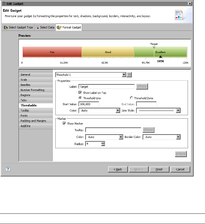
Chapter 7, Building interactive maps and gadgets
159
value or range of values, and format the line and marker. You can create multiple
thresholds for a gadget.
Figure 7-29 Examining a linear gauge and its threshold properties
Table 7-11 shows all the threshold properties and lists the gadgets to which they
apply.
Table 7-11 Threshold properties
Property Gadget Usage
Arc Inner Radius Meter Specifies the inner radius of arc for
the threshold area
Arc Outer Radius Meter Specifies the outer radius of arc for
the threshold area
(continues)

160
Actuate BIRT Application Developer Guide
Border Color Linear gauge, meter Sets the border color of the
threshold marker
Color Linear gauge, meter,
sparkline, bullet
Sets the color of the threshold area
on the gadget
End Value Linear gauge, meter,
sparkline
Sets the end value of the threshold
zone
Label Linear gauge, meter Specifies the text to apply to the
threshold
Length Bullet Specifies the length of the threshold
as a percent of gadget size
Line Style Linear gauge, meter,
sparkline
Sets the line style of the threshold
Marker Color Linear gauge, meter Sets the color of the threshold
marker
Radius Linear gauge Sets the size of the threshold
marker
Show as Zone Sparkline Enables or disables display of the
threshold as a zone
Show Border Meter Enables or disables display of a
border around the threshold
Show Marker Linear gauge, meter Enables or disables display of the
marker on the threshold
Show Threshold Sparkline, bullet Enables or disables display of the
threshold
Show Label Meter Enables or disables display of the
threshold value
Show Label
Inside
Meter Displays value inside or outside of
the arc on the gadget
Show Label on
Top
Linear gauge Enables or disables display of the
threshold value
Size Meter Sets the size of the threshold
marker
Start Value Linear gauge, meter,
sparkline
Sets start value of the threshold
zone
Threshold Linear gauge, meter Sets which threshold the settings
affect
Table 7-11 Threshold properties (continued)
Property Gadget Usage

Chapter 7, Building interactive maps and gadgets
161
Anchor properties
Anchor properties control the shape, size, color, and visibility of markers, or
anchors, in a sparkline gadget. Unlike other gadgets that display only one or two
data values, a sparkline gadget plots multiple values and, by default, uses
anchors to highlight the first, last, lowest, and highest values. Figure 7-30 shows
the anchor properties set for a sparkline gadget.
Figure 7-30 Examining a sparkline gadget and its anchor properties
Threshold Line/
Threshold Zone
Linear gauge, meter Sets whether the threshold is a
single line or a zone
Tooltip Linear gauge, meter Sets tooltip text for the marker on
the threshold
Width Sparkline, bullet Sets the width of the threshold
Table 7-11 Threshold properties (continued)
Property Gadget Usage
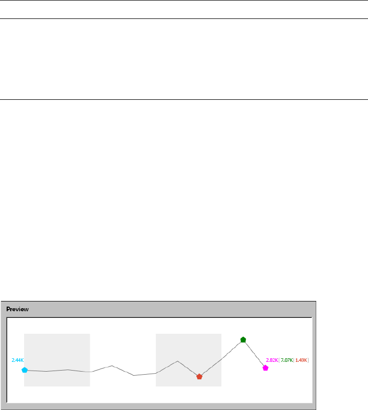
162
Actuate BIRT Application Developer Guide
Table 7-12 shows all the anchor properties. These properties are used only in a
sparkline gadget.
Plot properties
Plot properties control the appearance of elements in the data plot area of bullet
and sparkline gadgets. For a bullet gadget, you can add a border around the
gadget or a shadow below it. You can also specify whether to display the value
label and whether to display the value indicator as a line or as a dot.
For a sparkline gadget, you can specify whether to display the first, last, lowest,
or highest values, change the color and width of the data line, and add bars in the
background to represent period blocks. For example, if a sparkline displays daily
stock quotes over a year, you can show period blocks that have a length of 3 to
divide the stock values into quarters. The value of 3 assumes that each quarter
has three months.
For example, Figure 7-31 shows the preview of a sparkline gadget. The gadget
displays period bars where each period contains three values. Alternate bars
appear in color.
Figure 7-31 Format Gadget displaying a sparkline gadget
Figure 7-32 shows the plot properties specified for the plot that appears in the
sparkline gadget example shown in Figure 7-31.
Table 7-12 Anchor properties
Setting Usage
Shape Sets the shape of the anchors.
Size Sets the size of the anchor in pixels.
Visibilities Sets the visibility and color of the anchors. Open,
Close, High, and Low anchors are visible by default.
To display anchors for all the other values, select
Other Anchors.
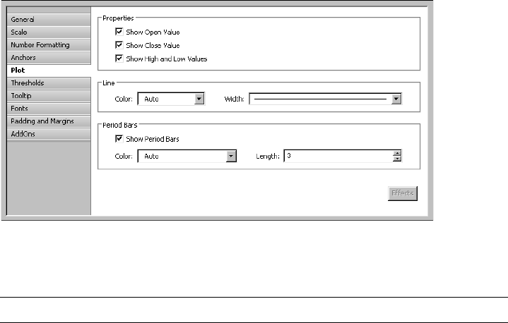
Chapter 7, Building interactive maps and gadgets
163
Figure 7-32 Examining the plot properties for a sparkline gadget
Table 7-13 shows all the plot properties.
Table 7-13 Plot properties
Property Gadget Usage
Border Bullet Enables or disables the border around the
gadget.
Border Color Bullet Sets the color of the border around the
gadget.
Border Width Bullet Sets the thickness of the border around the
gadget.
Line Color Sparkline Sets the color of the plot line.
Line Width Sparkline Sets the thickness of the plot line.
Period Bars Color Sparkline Sets the color of the period bars. The color
is applied to alternate bars.
Period Bars Length Sparkline Sets the number of values that each period
bar highlights.
Show as Dot Bullet Enables or disables the display of the
value indicator as a dot instead of a solid
line.
Show Close Value Sparkline Enables and disables the display of the
close value.
Show High and Low
Values
Sparkline Enables and disables the display of the
high and low values.
(continues)
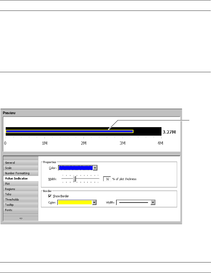
164
Actuate BIRT Application Developer Guide
Value indicator properties
Value indicator properties control the size, color, and border of the value indicator
in a bullet gadget, as shown in Figure 7-33.
Figure 7-33 Examining a bullet gadget and its value indicator properties
Table 7-14 shows the value indicator properties. These properties are used only in
a bullet gadget.
Show Open Value Sparkline Enables and disables the display of the
open value.
Show Period Bars Sparkline Enables and disables the display of period
bars.
Show Shadow Bullet Enables or disables the appearance of a
shadow below the gadget.
Show Value Label Bullet Enables or disables the display of the
value on the gadget.
Table 7-14 Value indicator properties
Property Gadget Usage
Border Color Bullet Sets the color of the border
Border Width Bullet Sets the thickness of the border
Table 7-13 Plot properties (continued)
Property Gadget Usage
Value
indicator
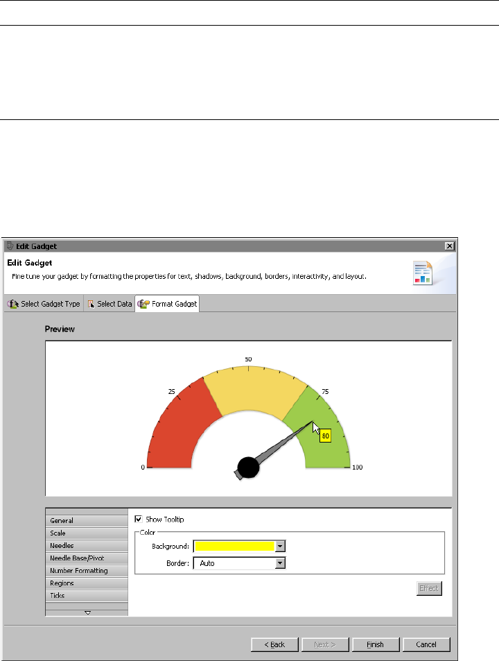
Chapter 7, Building interactive maps and gadgets
165
Tooltip properties
Tooltip properties control the visibility and appearance of tooltips in a gadget. A
tooltip displays a data value when the mouse pointer is placed over a value
marker. Figure 7-34 shows a meter gadget that displays a tooltip and the
properties set for the tooltip.
Figure 7-34 Format Gadget displaying a meter gadget and its tooltip properties
Color Bullet Sets the color of the value indicator
Show Border Bullet Enables or disables a border around the
value indicator
Width Bullet Sets the value indicator width as a percent
of the plot thickness
Table 7-14 Value indicator properties
Property Gadget Usage
166
Actuate BIRT Application Developer Guide
Table 7-15 shows the tooltip properties. These properties are available to all the
gadgets.
Font properties
Font properties define the type, size, and color of the font used for any text in a
gadget. Table 7-16 shows the font properties. These properties are available to all
the gadgets.
Padding and margin properties
Padding and margin properties support the addition of space on all sides of a
gadget, between a title and the plot, and between a data value and the plot.
Compare the sparkline gadgets in Figure 7-35 and Figure 7-36. The gadget in
Figure 7-35 uses default values for all the padding and margin properties.
The gadget in Figure 7-36 uses the margin and padding properties to add extra
space between the elements in the gadget.
Table 7-17 shows the padding and margin properties.
Table 7-15 Tooltip properties
Property Usage
Show Tooltip Enables and disables the display of a tooltip
Background Sets the background color for the tooltip
Border Sets the border color for the tooltip
Table 7-16 Font properties
Property Usage
Font Specifies the name of the font
Size Specifies the font size in points
Color Specifies the color of the text
Table 7-17 Padding and margin properties
Property Gadget Usage
Padding Title All Adds space, in pixels, between the title
and the element next to it
Padding Value All Adds space, in pixels, between the data
value and the element next to it
Margins Left,
Right, Top,
Bottom
All Adds space, in pixels, around the entire
gadget on the left, right, top, and bottom
sides
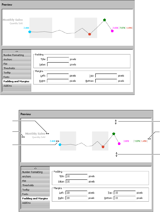
Chapter 7, Building interactive maps and gadgets
167
Figure 7-35 Format Gadget displaying a sparkline gadget and its default padding
and margin property settings
AddOn properties
AddOn properties support the creation of custom objects, called AddOns, to add
to a gadget. You can add rectangles, polygons, circles, arcs, lines, text, and images
Margin
Left
Padding
Title
Padding
Value
Margin
Right
Margin
Top
Margin
Bottom
Figure 7-36 Format Gadget displaying a sparkline gadget that uses padding
and margin properties to add extra space between elements
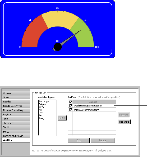
168
Actuate BIRT Application Developer Guide
to any gadget to enhance its appearance. You can create any number of objects
and arrange objects on top of or behind one another.
Figure 7-37 shows an example of adding two rectangles with rounded corners
behind a meter gauge. To create this image, create one rectangle with a white
border, then create another rectangle that is slightly larger. Use the same fill color
for both rectangles. Place the larger rectangle behind the smaller rectangle.
Figure 7-37 AddOn objects used to enhance a meter gadget
Figure 7-38 shows the AddOns page. AddOns lists the two rectangles added to
the meter gauge. The objects are listed in z order, which is the order from front
to back.
Figure 7-38 Format Gadget displaying a meter gauge and its AddOn properties
Figure 7-39 shows the properties set for the larger rectangle. Notice that the size
of the rectangle is not fixed. Rather, the size is a percentage of the gadget’s size.
You define an AddOn’s size by specifying values for these four properties:
Start X coordinate, Start Y coordinate, End X coordinate, and End Y coordinate.
By using a relative size, AddOns adjust to the size of the gadget area.
Objects
listed in
z order
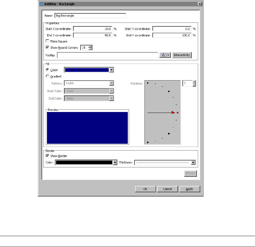
Chapter 7, Building interactive maps and gadgets
169
Figure 7-39 Properties of an AddOn object
Table 7-18 shows the properties for creating the different types of objects that you
can add to a gadget.
Table 7-18 AddOn properties
Property Object Type Usage
Center X
coordinate
Polygon, Circle, Arc Specifies the location, as a percentage of the size
of the gadget, of the x coordinate of the object.
Center Y
coordinate
Polygon, Circle, Arc Specifies the location, as a percentage of the size
of the gadget, of the y coordinate of the object.
Color Line, Text Specifies the color of the line.
(continues)

170
Actuate BIRT Application Developer Guide
Dash Gap Line Specifies the length of gaps between dashes, in
pixels.
Dash Length Line Specifies the length of dashes, in pixels.
End Angle Circle, Arc Specifies the end angle of the object.
End Color Rectangle, Polygon,
Circle, Arc
Specifies the end color of the gradient fill.
End X coordinate Rectangle, Line Specifies the location, as a percentage of the size
of the gadget, of the end x value of the object.
End Y coordinate Rectangle, Line Specifies the location, as a percentage of the size
of the gadget, of the end y value of the object.
Fill Color Rectangle, Polygon,
Circle, Arc
Select to use a solid fill color for the object. Select a
color from the associated drop-down list box.
Font Text Specifies the font for the object. You can also select
Bold, Italic, or Underline.
Font Size Text Specifies the font size in points.
Horizontal Text Supports the selection of horizontal text
alignment in the gadget.
Inner Radius Arc Specifies the radius of the inner portion of the
object, as a percent of the size of the gadget.
Gradient Rectangle, Polygon,
Circle, Arc
Select to have a gradient type of fill. Choose a
Radial or Linear pattern.
Label Text Specifies the text that appears on the object.
Name All Specifies the name of the object. This name
appears in the list on AddOns options.
Outer Radius Arc Specifies the radius of the outer portion of the
object, as a percent of the size of the gadget.
Radius Circle Specifies the radius, as a percent of the gadget, of
the object.
Rotation Rectangle, Polygon,
Circle, Arc
Specifies the rotation angle for the fill in the
object.
Rotation Angle Polygon Specifies the rotation angle of the object.
Scale Image Image Enables or disables image scaling. Adjust the
height and width of the image by percent.
Show as Dashed Line Enables or disables dashed lines.
Table 7-18 AddOn properties (continued)
Property Object Type Usage

Chapter 7, Building interactive maps and gadgets
171
Show Border Rectangle, Polygon,
Circle, Arc
Enables or disables the drawing of a border line
around the object. Select the color and thickness of
the border with the Color and Thickness
drop-down menus.
Show Round
Corners
Rectangle Enables or disables rounded corners. Type the
percent of a circle to round the corner.
Sides Polygon Specifies the number of sides on the object.
Size Polygon Specifies the size, as a percent of the gadget, of the
object.
Start Angle Circle, Arc Specifies the beginning angle of the object.
Start Color Rectangle, Polygon,
Circle, Arc
Specifies the start color of the gradient fill.
Start X coordinate Rectangle, Line,
Text, Image
Specifies the location, as a percentage of the size
of the gadget, of the beginning x value of the
object.
Start Y coordinate Rectangle, Line,
Text, Image
Specifies the location, as a percentage of the size
of the gadget, of the beginning y value of the
object.
TextBox
Background Color
Text Specifies the background color of the text box.
TextBox Border
Color
Text Sets the border color of the text box.
Text Wrap Text Disables or enables text wrap. Choose, by percent
of the gadget, the maximum height and width for
the wrap.
Thickness Line Specifies the thickness of the line.
Tooltip All Specifies text for the tooltip.
Transparent Image Specifies the amount of transparency, in percent,
of the image.
URL Image Specifies the location of the image for AddOn file
types of .gif, .jpg, .png, or .swf.
Vertical Text Supports the selection of vertical text alignment in
the gadget.
Table 7-18 AddOn properties (continued)
Property Object Type Usage
172
Actuate BIRT Application Developer Guide

174
Actuate BIRT Application Developer Guide
About interactive charts
BIRT Designer Professional supports BIRT charts and HTML5 charts. BIRT charts
generate images in the following formats; SVG, BMP, JPG, and PNG using the
BIRT chart engine and are used for static, print-based documents. BIRT charts
support extensive scripting, but not animation.
HTML5 charts use an open standard for structuring and presenting content for
the World Wide Web, and is increasingly regarded as the alternative to Flash for
creating interactive and animated content for traditional and mobile devices. You
can control chart presentation, design-time and generation-time properties
through the user interface and scripting. For example, an HTML5 column chart
can highlight a column with the highest value and display an overlay on each
column that defines a 10% chance of error.
Comparing HTML5 and BIRT charts
Use the information in Table 8-1 to decide which chart format to use in a report.
Table 8-1 does not list the chart types or chart properties supported by each chart
format because that list is too long. As you design HTML5 charts, you discover
that many of the properties available to BIRT charts are also available to HTML5
charts.
If creating animated charts, use HTML5 charts. If you need to present data in a
chart that is not available in HTML5 (for example, complex combination charts),
use a BIRT chart. For information about building BIRT charts, see BIRT: A Field
Guide.
Rendering platform
BIRT Designer Professional uses Highcharts, a third-party charting library, to
render HTML5 charts. This charting library, written in JavaScript, is integrated
Table 8-1 Features available in HTML5 and BIRT charts
Feature HTML5 BIRT
Displays in the web viewer ✓✓
Displays in PDF ✓✓
Displays in other document formats (DOC, PPT, XLS,
etc.) as a static image
✓✓
Supported on mobile devices ✓✓
Provides animation ✓–
Supports customization through scripting ✓✓

Chapter 8, Building an interactive chart
175
into BIRT Designer Professional’s standard chart builder, where you create
HTML5 charts using the familiar user interface.
Highcharts also provides a full API, which you can use to programmatically add,
remove, or modify chart elements after creating the chart in the chart builder.
Access to the Highcharts API is through the chart builder’s script editor and
through the JavaScript chart theme editor.
Creating an interactive chart
The procedure for creating an HTML5 chart is the same as the procedure for
creating a BIRT chart. To create an HTML5 chart, perform the following tasks:
■
Drag the chart element from the palette and drop it in the report.
■
In the chart builder, choose a chart type, and set Output Format to HTML5, as
shown in Figure 8-1. This is the default format if you select a chart type
supported by HTML5.
Figure 8-1 Select Chart Type page showing the HTML5 output format
selected
Select
HTML5
format

176
Actuate BIRT Application Developer Guide
■
Specify the data to present in the chart.
■
Format the chart.
This chapter describes the features that are unique to HTML5 charts, for example,
scripting with the Highcharts API and designing chart themes using JavaScript.
For information about specifying data for a chart, see BIRT: A Field Guide.
Formatting an interactive chart
As with a BIRT chart, you format an HTML5 chart using one or both of the
following methods:
■
Use the chart builder’s Format Chart page to set style properties for the
different parts of the chart.
■
Apply a chart theme, which defines styles for the different parts of a chart.
Themes provide a flexible way to define and maintain styles in one place and
reuse them for any chart that you create. BIRT Designer Professional provides
several predefined themes for HTML5 charts. For a custom look, create your
own chart themes.
If using both methods to format a chart, the properties in the chart theme function
as the basis for the chart’s appearance. Properties that you set in the Format Chart
page override properties set by the theme.
The user interface indicates clearly whether a property is set by a theme or set in
the chart builder. Properties presented as a list box or as radio buttons display the
value Auto for default values that are set by a theme or by the software. These
properties display a specific value if set in the chart builder.
Properties set through check boxes have three states—on, off, and default. A
check mark indicates the on state, an empty check box indicates the off state, and
a check box with a gray check mark or a blue square indicates the default state.
The symbol for the default state changes depending on the Windows theme that
your machine uses.
A default state is set by a theme or the software, and the default state is either on
or off. Even though it can appear counter-intuitive, a gray check mark does not
necessarily mean that a property is on by default. For example, the Use Glass
Style property, available in the Format Chart page, as shown in Figure 8-2, is set
to the default state, and the software’s default value is off. To apply the glass style
to the chart, you would click the check box until it displays a check mark.
Similarly, the property below it, Turn Off Animation, is set to the default state,
which is off. In other words, animation is turned on by default. To disable
animation, you would click the check box until it displays a check mark. For
information about standard chart formatting options, see BIRT: A Field Guide.
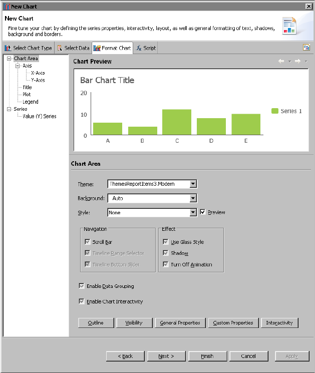
Chapter 8, Building an interactive chart
177
Figure 8-2 Selecting themes and effects for a bar chart
Applying a chart theme
On the Format Chart page, Theme displays the theme currently applied to the
chart, or None, if a theme is not applied. To change the theme or apply one, select
a theme from the drop-down list. The list displays all the predefined themes, as
well as, the themes that you created. When you select a theme, the chart
previewer shows the changes instantly.
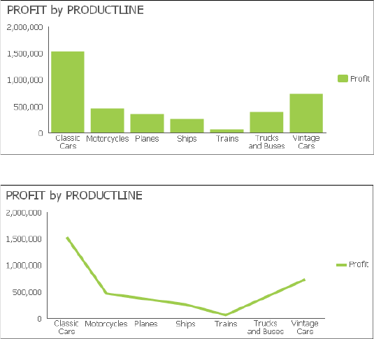
178
Actuate BIRT Application Developer Guide
Creating a chart theme
HTML5 charts support two types of chart themes:
■
A general chart theme that you create with the graphical chart theme builder,
and which you can apply to both BIRT and HTML5 charts.
■
A JavaScript theme that you can apply to HTML5 charts only. These themes
use JavaScript and the Highcharts API. Use this programming option to define
chart attributes that are not available through the graphical chart theme
builder, or if you are more comfortable writing scripts and prefer to view all
attributes in text format on a single page.
A typical approach to designing chart themes, whether general or JavaScript, is to
create one theme for all chart types. Use this approach to design a consistent
presentation style for all chart types, one that uses corporate styles, for example.
Such a theme can define general attributes, such as color schemes for the chart
background and plot areas, font styles for chart titles, value labels, or axis labels,
border styles, and legend styles.
The charts in Figure 8-3 and Figure 8-4 are examples of how a bar chart and a line
chart appear in a consistent style when the same theme is applied. The charts use
the same color schemes, fonts, grid, border and legend styles. In these examples,
the charts use a predefined chart theme, ThemesReportItems3.Modern. You can
use the same design principles when creating custom themes.
Figure 8-3 Bar chart using a predefined theme, ThemesReportItems3.Modern
Figure 8-4 Line chart using the same theme, ThemesReportItems3.Modern

Chapter 8, Building an interactive chart
179
You can create a chart theme in a report design or in a library. Create a chart
theme in a library—the typical approach—to share the theme with other report
developers or to use the theme in other reports. A chart theme defined in a report
design is available only to charts in that report.
If an existing chart contains the formatting attributes you want to set in a theme,
export the attributes to a theme. To do so, open the chart in the chart builder, then
click the button at the top right side of the chart builder, and specify a name for
the new theme. BIRT creates a theme that contains all the formatting attributes
from the chart. The theme is created in the report that contains the source chart
and is accessible through the Outline view for the report design. To place this
theme in a library, copy it from the Outline view and paste it into a library.
The predefined chart themes included with BIRT Designer Professional are
defined in a library, ThemesReportItems3.rptlibrary. You can download this
library from the Resources folder in Actuate BIRT iServer to use as an example
when creating your own library of themes.
Creating a general chart theme
The chart theme builder, which you use to create a general chart theme, organizes
and presents properties in a similar way as the Format Chart page of the chart
builder. Figure 8-5 shows the Format Chart Theme page where you set formatting
attributes for the different parts of a chart. The preview section shows your
formatting changes for the selected chart type, which you choose in the Preview
Type page.
Use the Script page to write event-handling code for a theme. This code applies
only to HTML5 charts. It is ignored when the theme is applied to a BIRT chart.
Information about writing event handlers is provided later in this chapter.
How to create a general chart theme
1In Outline, right-click Themes and choose New Report Item Theme.
2In New Report Item Theme, specify the following information:
■
In Name, type a name for the theme.
■
In Type, select Chart.
Choose OK.
3In Chart Theme Wizard, select the first option, General, to define a theme.
Choose Next.
4In the chart theme builder, shown in Figure 8-5, define the style properties for
the chart theme.
5Choose Finish.
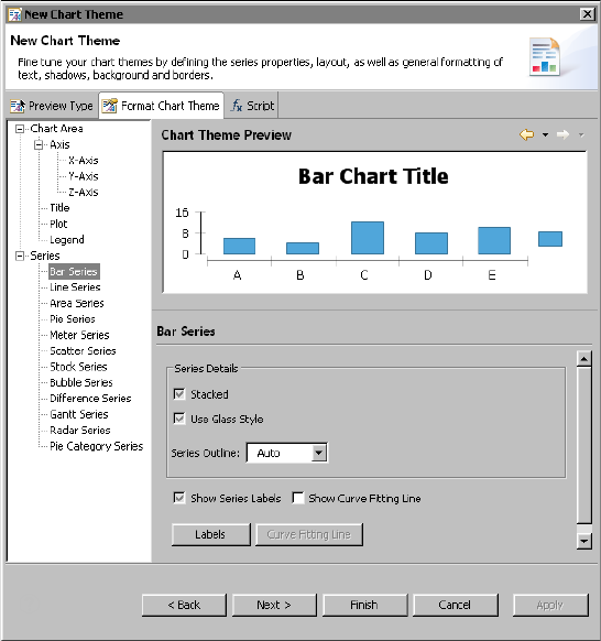
180
Actuate BIRT Application Developer Guide
Figure 8-5 Format Chart Theme page of the chart theme builder
Creating a JavaScript chart theme
As mentioned earlier, BIRT Designer Professional uses Highcharts, a third-party
charting library, to render HTML5 charts. To create a JavaScript chart theme, you
set the Highcharts chart options to values that provide the visual attributes you
desire. Every option has a default value. You define attributes only to change
default settings, or to add items that do not appear by default.
Listing 8-1 shows the JavaScript code for the tooltips of predefined chart theme,
Modern. The charts in Figure 8-3 and Figure 8-4 use this theme. As the code
shows, options are set using a JavaScript object notation structure. Keys and
values are connected by colons, separated by commas, and grouped by curly
brackets.
For a complete reference of the options and their descriptions, see the Highcharts
documentation at the following location:
http://api.highcharts.com/highcharts

Chapter 8, Building an interactive chart
181
The Highcharts reference contains two sections, the Configuration options and
Methods and properties. Look at the Configuration options for information about
the options you can set in a chart theme.
Listing 8-1 JavaScript code for the chart theme Modern
//You can change options here.
options.tooltip={
animation:false,
backgroundColor: "#fff",
borderRadius: 0,
borderColor: "#e1e1e1",
borderWidth: 1,
style: {
color:"#363636",
fontSize: "16px",
fontWeight: 400,
padding: "12px"
},
useHTML: true,
headerFormat: '<div style=" color:#363636;font-size: 16px;
font-weight: 400;">{point.key}</div>',
pointFormat: '<div style=" font-size: 12px;font-weight: 600;
margin-top: 4px;">{series.name}: {point.y}</div>'
}
How to create a JavaScript chart theme
1In Outline, right-click Themes and choose New Report Item Theme.
2In New Report Item Theme, specify the following information:
■
In Name, type a name for the theme.
■
In Type, select Chart.
Choose OK.
3In Chart Theme Wizard, select the second option, HTML5, to define a theme.
Choose Next.
4In the JavaScript chart theme builder, shown in Figure 8-6, write code that
defines the desired style properties for the chart theme. The Preview section
displays the results of your code for a selected chart type.
5To write event-handling code, described in the next section, choose the Script
tab. Choose Finish to close the theme editor.
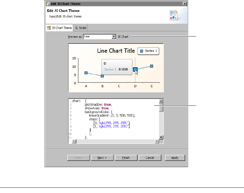
182
Actuate BIRT Application Developer Guide
Figure 8-6 Example of JavaScript code and preview of a bar chart
Adding scripts to a chart
You can write scripts in JavaScript that specify the task to perform when a
particular event occurs. This type of script is called an event handler. Like BIRT
charts, HTML5 charts support two types of event handlers:
■
Event handlers that respond to user interactions, such as a mouse click on a
legend or a mouse over a series, when viewing the report. For example, you
can create an event handler to link to another report when a user clicks a bar in
a bar chart or reorders values displayed in a tooltip from highest to lowest.
■
Event handlers that respond to chart events, which occur when BIRT renders
an HTML5 chart. Use this type of event handler to conditionally change or
add chart elements as the chart is being generated. For example, you can write
an event handler to calculate an average value and display this value as a
marker line.
Type your JavaScript
code here
Select the type of
chart in which to
preview the results
of your code
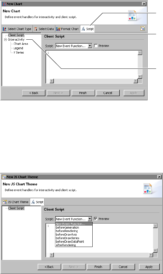
Chapter 8, Building an interactive chart
183
For both types of event handlers, you use the script editor in the chart builder, as
shown in Figure 8-7. To launch the script editor, choose the Script tab.
Figure 8-7 Script editor displaying the UI for writing a chart event handler
To create an event handler that responds to a user interaction, choose
Interactivity. To create an event handler that responds to a chart event, choose
Client Script, as shown in Figure 8-7.
Scripts that you write using Client Script apply to HTML5 charts only. If you later
change a chart’s output format from HTML5 to SVG, BIRT ignores these
client-side scripts when generating the chart. You can also add Client Scripts to
the JavaScript chart theme to share the script among multiple HTML5 charts
using the script editor in the Chart Theme Wizard, as shown in Figure 8-8.
Figure 8-8 Script editor displaying the chart event handler interface
Choose Client
Script to write an
event handler for
a chart event
Choose Script
to open the
script editor
Choose Interactivity
to write an event
handler for a user
action
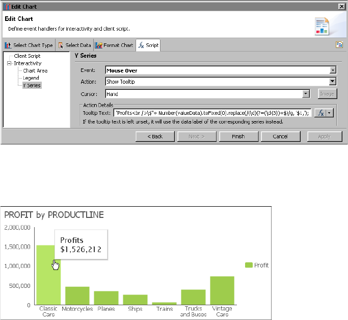
184
Actuate BIRT Application Developer Guide
Writing event handlers that respond to user
interactions
Depending on what you want to accomplish, you can create some of these
interactivity event handlers without scripting. For typical event handlers, the
script editor in the chart builder simplifies the process by providing a list of chart
elements, a list of events, and a list of actions. Select the chart element you want to
make interactive, select an event, such as Mouse Click or Mouse Over, then select
an action, such as Show Tooltip or Hyperlink. To implement a custom action,
choose Invoke Script, then write JavaScript code. For HTML5 charts, this code can
use the Highcharts API.
Figure 8-9 shows an example of an event handler defined for a chart’s Y series.
The event handler runs when the Mouse Over event is triggered. When triggered,
the Show Tooltip action runs. In this example, the tooltip is set to display the
series data, which is typical.
Figure 8-9 Script editor displaying an interactivity event handler
Figure 8-10 shows the results of the previous event handler. When the user places
the mouse pointer over the first bar in the bar chart, a tooltip displays the series
data value.
Figure 8-10 A tooltip displays a bar’s data value when the user places the mouse
pointer over the bar
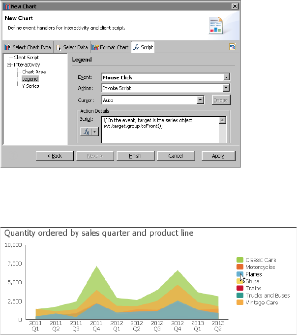
Chapter 8, Building an interactive chart
185
Figure 8-11 shows an example of an event handler defined for a chart’s legend.
The event handler runs when the Mouse Click event is triggered. When triggered,
the Invoke Script action runs. In this example, the following script brings a series
in an area chart to the front when the user clicks the series name in the legend:
evt.target.group.toFront();
This line of code calls a method in the Highcharts API.
Figure 8-11 Script editor displaying an event handler that runs a script
Figure 8-12 shows the results of the previous event handler. When the user clicks
the In Process value in the area chart’s legend, the corresponding series in the
chart displays in front of the other overlapping series.
Figure 8-12 In Process series displayed in front when the user clicks the series
name in the legend
Compared to BIRT charts, HTML5 charts support fewer events and actions, and
fewer chart elements on which to define event handlers. The additional events
that BIRT charts support, but that HTML5 charts do not, include Mouse Down,
Mouse Up, Mouse Move, Key Down, and Key Up. The additional chart elements
for which you can define event handlers in a BIRT chart, but not an HTML5 chart,
include the chart title, y-axis, and x-axis.

186
Actuate BIRT Application Developer Guide
If you begin by creating a BIRT chart, then later change the output format to
HTML5, BIRT ignores the event handlers defined for events that are specific to a
BIRT chart when generating the chart. This behavior provides the flexibility of
creating and maintaining event handlers for either chart format with the option of
changing the chart format at any time without any additional changes to the
design.
Writing event handlers that respond to chart events
Unlike event handlers that respond to user interactions with the chart, the event
handlers that you write for chart events require programming in JavaScript. You
also have to review the Highcharts API to know what chart options you can
manipulate and how.
In the script editor, you select an event function, such as beforeRendering( ) or
beforeDrawAxis( ), then you write code that performs a specific task or tasks
when the chart event occurs. The event handlers that you write for HTML5 chart
events differ from the event handlers for BIRT charts in several important aspects,
as described in Table 8-2.
Write client-side scripts using the script editor accessible from the Script tab in the
chart builder. Write server-side scripts using the script editor accessible from the
Script tab in the report editor. Only the following server-side event functions are
supported for HTML5 charts: beforeDataSetFilled( ), afterDataSetFilled( ), and
beforeGeneration( )
This section provides information about writing client-side event handlers for
HTML5 chart events. For information about writing server-side event handlers,
see Integrating and Extending BIRT.
For documentation about the Highcharts API, go to the following location:
http://api.highcharts.com/highcharts
About the HTML5 chart events
The set of events for an HTML5 chart is much smaller than the set of events for a
BIRT chart. Table 8-3 lists the HTML5 chart event functions and describes when
they are called.
Table 8-2 Comparison of event handlers in HTML5 charts and BIRT charts
Event handlers in HTML5 charts Event handlers in BIRT charts
Support only JavaScript Support JavaScript and Java
Use client-side scripting and limited
server-side scripting
Use server-side scripting only
Use the Highcharts API Use BIRT charting API

Chapter 8, Building an interactive chart
187
Setting chart options through scripting
The before functions are called after BIRT generates the static JavaScript options,
which are based on the chart’s data and formatting options set in the chart
builder. The beforeGeneration( ) function is the first function called after the
generation of the static JavaScript options, but before a chart object is created. Use
beforeGeneration( ) to add chart options that Highcharts provides, but that are
not available through the chart builder’s format page.
For example, Highcharts provides a credits option to display a credits label in the
chart. To add this label to the lower right corner of the chart (the default position),
you would write code as follows:
beforeGeneration: function(options)
{
options.credits = {
enabled: true,
text: 'Acme Inc.'
};
},
As the code example shows, beforeGeneration( ) receives an options object. You
use this options object to configure chart options. When you type the word,
options, followed by a period (.), the script editor displays a list of options, as
shown in Figure 8-13. Click an option to view summary information about it.
Double-click an option to add it to your code.
The other before functions also receive an options object, for example,
axisOptions or seriesOptions, which is specific to the associated chart element.
Your code typically makes changes to the options object to change the appearance
of an axis, series, or data point. The following code example shows how to use
Table 8-3 HTML5 chart event functions
Event function Called
afterRendering(chart) After the chart is rendered
beforeDrawAxis(axis, axisOptions, chart,
axisIndex)
Before rendering each axis
beforeDrawDataPoint(point,
pointOptions, chart, seriesIndex,
pointIndex)
Before drawing each data point
graphical representation or marker
beforeDrawSeries(series, seriesOptions,
chart, seriesIndex)
Before rendering the series
beforeGeneration(options) Before the chart is created
beforeRendering(options, chart) Before the chart is rendered
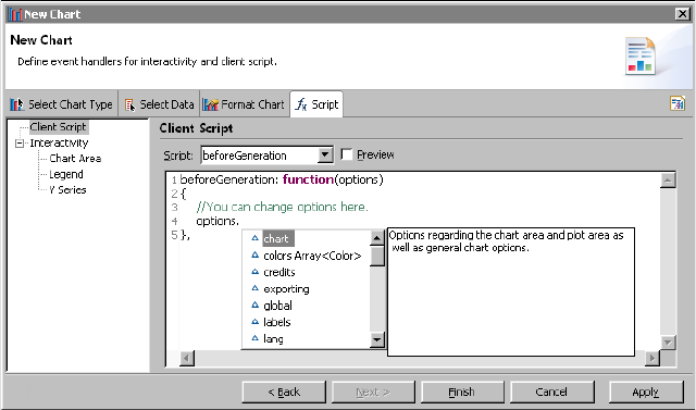
188
Actuate BIRT Application Developer Guide
beforeDrawSeries( ) and the seriesOptions object to display a legend for all series
types except pie:
beforeDrawSeries: function(series, seriesOptions, chart,
seriesIndex)
{
if ( series.type == "pie" )
{
seriesOptions.showInLegend = false;
}
else
{
seriesOptions.showInLegend = true;
}
},
Figure 8-13 The script editor displaying the available options
All the before functions, except beforeGeneration( ), also receive the chart object,
which represents the chart that is created based on the original static options and
any options created with beforeGeneration( ). With the exception of
beforeGeneration( ), your code can query the chart object to determine what
changes to make to the options. You typically use these before functions to
dynamically add, change, or remove a chart element based on specified
conditions. Avoid making make any changes with your code to the chart object
itself because it is a temporary object. Changes to this temporary chart are
discarded along with the chart.
After the before functions run, BIRT passes the original options and your scripted
options into a constructor to create a new chart object. The afterRendering( )
function provides the final opportunity to make changes to this new chart object.
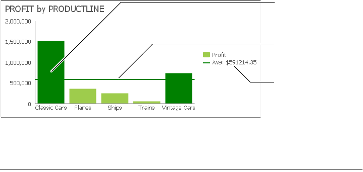
Chapter 8, Building an interactive chart
189
To get the chart object, use the getCore( ) method, as shown in the following code
snippet:
afterRendering: function(Chart)
{
myChart=Chart.getCore();
...
Scripting example 1
The bar chart in Figure 8-14 shows the following custom options that are added
through scripting:
■
A script in beforeDrawSeries( ) calculates the average sales total, and changes
the color of bars that show data values above the average value.
■
A script in afterRendering( ) draws a plot line on the y-axis to show the
average value, and adds a legend item to display the average value.
Figure 8-14 Customized options in a bar chart
The event handlers written for the bar chart appear in Listing 8-2.
Listing 8-2 Event-handling script for the bar chart with customized options
beforeDrawSeries: function(series, seriesOptions, tempChart,
seriesIndex)
{
var totalValue = 0;
// First, find the average value for the series
for ( var i = 0; i < series.data.length; i++ )
{
totalValue += series.data[i].y;
}
aveValue = totalValue / series.data.length;
for ( var j = 0; j < series.data.length; j++ )
{
// Find out if this data point is above average
if ( series.data[j].y <= aveValue )
Custom legend item
added to display the
average sales value
Bars that display data
values above the
average value appear
in a different color
Plot line added to
show the average
sales value
190
Actuate BIRT Application Developer Guide
{
continue;
}
// The data point is above average. Color it green
var pointOptions = seriesOptions.data[j];
pointOptions.color = 'green';
}
},
afterRendering: function(myChart)
{
var chart=myChart.getCore();
var mySeries = chart.series[0];
// Assuming aveValue was set in the beforeDrawSeries function,
// draw a plot line at the average value.
mySeries.yAxis.addPlotLine({
color: 'green',
width: 2,
value: aveValue,
id: 'averageValuePlotLine',
zIndex: 2
});
// Add a legend item that labels the plot line
// Do this by adding an empty series
chart.addSeries({
color: 'green',
name: 'Ave: $' + aveValue.toFixed(2),
marker: {
enabled: false
}
});
},
Scripting example 2
The bar chart in Figure 8-15 shows custom objects, stars, that are added through
scripting. Each star indicates the highest value for each order status series.
A script in afterRendering( ) performs the following tasks:
■
Calculates the highest (max) value for each y-series
■
Draws a star based on the width of the bar
■
Positions the stars at the top of the appropriate bars
This script showcases Highchart’s renderer object, which supports drawing
shapes, such as circles, rectangles, and stars, and adding images and text to a
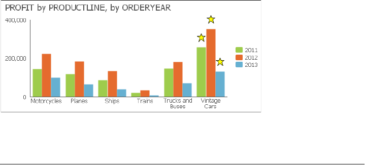
Chapter 8, Building an interactive chart
191
chart. The renderer is useful for adding annotations to a chart. For example,
instead of a star, you can annotate the max value by creating text and enclosing it
in a rectangle.
Figure 8-15 Bar chart with custom objects
The JavaScript code written for this bar chart appears in Listing 8-3.
Listing 8-3 Event-handling script for the bar chart with custom objects
afterRendering: function(myChart)
{
// Annotate the max value in each series with a
// star drawn above the column
var chart=myChart.getCore();
// Loop through each series
for ( var i = 0; i < chart.series.length; i++ )
{
var mySeries = chart.series[i];
var maxValue = mySeries.data[0].y;
var maxValueIdx = 0;
if ( !maxValue )
{
maxValue = 0;
}
// First, find the max value for this series
for ( var j = 1; j < mySeries.data.length; j++ )
{
var curValue = mySeries.data[j].y;
if ( !curValue )
{
continue;
}
if ( maxValue < mySeries.data[j].y )
{
maxValue = mySeries.data[j].y;
maxValueIdx = j;
192
Actuate BIRT Application Developer Guide
}
}
var maxPoint = mySeries.data[maxValueIdx];
// Now that we have the max value, annotate its column
// with a star. Create a group to hold each annotation.
var group = chart.renderer.g().add();
var barW = maxPoint.shapeArgs.width;
var barX = maxPoint.shapeArgs.x;
var barY = maxPoint.shapeArgs.y;
// Draw a star based on the width of the column,
// and add it to the group
var star = chart.renderer.path(['M', barW/2, 0,
'L',
barW*.4, barW/4,
barW*.05, barW/4,
barW*.325, barW*.475,
barW*.2, barW*.85,
barW/2, barW*.6,
barW*.8, barW*.85,
barW*.675, barW*.475,
barW*.95, barW/4,
barW*.6, barW/4,
'Z'])
.attr({
fill : 'yellow',
stroke: 'black',
'stroke-width': 1
}).add(group);
// The following tags add interactivites to the star using SMIL
// animation. SMIL is a subset of SVG that is not supported in
// all browser environments. These tags are added to
// demonstrate additional interactivity and animation that can
// be added via SVG tags - best previewed using Firefox.
// Add jump animation on mouse over.
var jump = chart.renderer.createElement('animateMotion')
.attr({
begin : 'mouseover;touchstart',
calcMode : 'paced',
path : "M 0 0 L 0 -25 L 0 0",
dur : '1s',
fill : 'freeze',
additive : 'sum'
}).add(star);
// Add rotate animation on mouse over
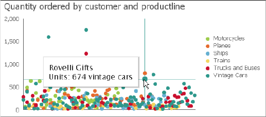
Chapter 8, Building an interactive chart
193
var rotate = chart.renderer.createElement('animateTransform')
.attr({
begin : 'mouseover;touchstart',
attributeName : 'transform',
type : 'rotate',
from : '0 ' + barW/2 + ' ' + barW/2,
to : "360 " + barW/2 + " " + barW/2,
dur : '1s',
additive : 'sum'
}).add(star);
// Add turn to red fill to the star on mouse click
var turnToRed = chart.renderer.createElement('set')
.attr({
begin : 'click',
attributeName : 'fill',
to : 'red'
}).add(star);
// Move the group to the top of the correct bar,
// and set it to draw in front of everything in the chart
group.attr({
translateX: barX + chart.plotLeft,
translateY: barY + chart.plotTop - barW - 10
});
group.toFront();
}
},
Scripting example 3
The scatter chart in Figure 8-16 shows a vertical and horizontal plot line and
tooltip that appear when the mouse pointer is placed over a data point. The plot
line and tooltip disappear when the mouse pointer is moved away from a data
point.
Figure 8-16 Scatter chart displaying a dynamic plot line and tooltip

194
Actuate BIRT Application Developer Guide
The event-handling script to display and remove the plot line dynamically
appears in Listing 8-4.
Listing 8-4 Event-handling script to display a plot line dynamically
beforeGeneration: function(options)
{
options.xAxis.maxZoom = 3600000*24*90;
},
beforeRendering: function(options, chart)
{
options.plotOptions = {
series : {
point : {
events : {
mouseOver: function() {
this.series.xAxis.addPlotLine({
color: this.series.color,
width: 1,
value: this.x,
id: 'dynamicVerticalPlotLine'
});
this.series.yAxis.addPlotLine({
color: this.series.color,
width: 1,
value: this.y,
id: 'dynamicHorizontalPlotLine'
});
},
mouseOut: function() {
this.series.xAxis.removePlotLine('dynamicVerticalPlotLine');
this.series.yAxis.removePlotLine('dynamicHorizontalPlotLine');
}
}
}
}
};
},

Chapter 9, Building a template
195
Chapter
9
Chapter 9
Building a template
This chapter contains the following topics:
■
About report templates
■
Design considerations
■
Creating a report template
■
Providing data with a report template
■
Creating themes for a report template
■
Publishing a template
■
Setting the default template category

196
Actuate BIRT Application Developer Guide
About report templates
A report template defines the basic report structure for all new reports. Templates
are used by applications such as Actuate BIRT Designer Professional and Report
Studio.
Users sometimes need custom templates that are more appropriate for the data
they want to present. An organization typically also requires that reports have a
specific look and feel. You create templates using the Report Design perspective
in Actuate BIRT Designer Professional, an Eclipse-based application for creating
reports.
Design considerations
A template typically contains visual elements, such as tables, charts, and labels,
and can also contain defined data sets which provide the data for a report. A
template can also be a complete report that presents professionally formatted
data. As you create a template, consider what data the user needs to use in the
report, how the user wants to present the data, and what the user needs as a
starting point for the report. The following section provides tips for creating
effective templates.
Separating or combining visual and data elements
When designing a template, you can either include both visual and data elements
in the template or keep them separate. Templates that contain only visual
elements are more versatile. The user can mix and match data objects or
information objects with these templates. Separating presentation from data can
be efficient and optimal, if developers with design and data-retrieval expertise
closely collaborate to ensure that the templates and data are suitable for use
together.
Designing themes
A theme is a collection of styles that can specify the colors used in a report, the
font used for different text, label, or data items, the spacing or alignment of items,
border styles, and so on. Designers create a theme to apply a consistent style or
appearance to a report.
When you create a template, consider creating different themes, so that the user
can choose from multiple styles. The creation of a theme is optional. Themes are
stored in a BIRT library file, separate from the template file.
Defining all the styles in a theme within a library makes it easier to maintain and
update the appearance of a template. When a user requests new or modified
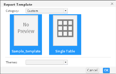
Chapter 9, Building a template
197
styles to use with a particular template, update the theme in the library, then
publish the latest version of the library to the server. You do not need to modify
the template file each time.
Improving usability
A template should enable the user to quickly determine how to use and freely
edit most elements in it. The following guidelines enable you to improve the
usability of a template:
■
Set the following optional template properties:
■
The display name of the template
The display name should represent the purpose of the template, such as a
list or cross tab. If you do not specify a display name, the name of the
template file is used.
■
A brief description of the template
A description provides additional information that helps the user decide
which template to use, appearing as a tooltip when the user hovers the
mouse pointer over the thumbnail image of the template.
■
The image to use as the thumbnail image of the template
An image provides a graphical preview of the template. If you do not
provide an image, a gray box appears displaying the text, “No preview”.
Report Template, shown in Figure 9-1, compares two template images in
Report Studio. The first thumbnail image shows a template for which
properties are not specified. The next one shows a template for which general
properties are set. As shown in Figure 9-1, it is easier for a user to decide
which template to select if you specify properties when creating the template.
Figure 9-1 Displaying two templates: one without properties set and the
other with properties set
■
Decide which report elements in the template are editable. Examples of
editable elements include labels for displaying report titles, section titles, or
column headings, and empty tables into which users insert data. Examples of
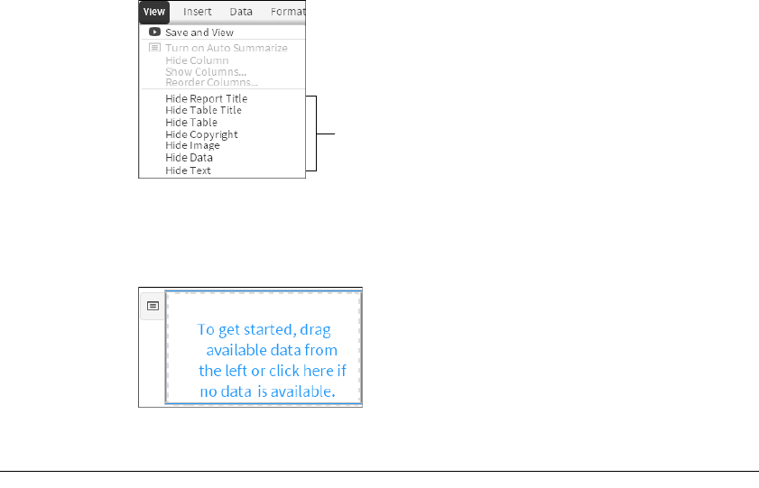
198
Actuate BIRT Application Developer Guide
non-editable elements include company logos and standard copyright
statements.
■
Provide meaningful names for each report element, so the user can easily
identify the element. If you do not specify a name, Report Studio displays the
name of the element type, such as Text or Label. The View menu, shown in
Figure 9-2, lists all the elements in one of the default templates, so users can
choose whether to display or hide the elements in the report.
Figure 9-2 Report items listing all the template elements
■
Provide instructions for using each editable element. For example, a table can
display a message, such as “To get started, drag available data from the left or
click here if no data is available,” shown in Figure 9-3.
Figure 9-3 Template table with instructions
Creating a report template
You design a template in the same way that you design a BIRT report. You can
also create a BIRT design and save it as a template. The file-name extension for a
template file is .rpttemplate. To create globally usable templates, localize the text
in the templates as you would in a BIRT design.
This section describes the key steps for creating a template but does not provide
information about the report elements you can use in a template. For information
about designing BIRT reports and templates, see BIRT: A Field Guide.
How to create a report template
1To create a new template, in BIRT Designer Professional, in the Report Design
perspective, complete the following steps:
List of elements in the template
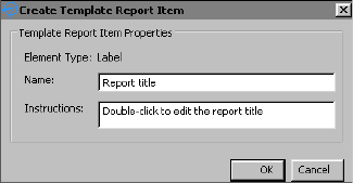
Chapter 9, Building a template
199
1Choose File➛New➛Template.
2In New Template—Template:
1Select the folder in which to create the template file.
2Specify a file name.
Choose Next.
3In New Template—Set Template Property:
1In Display Name, specify a display name for the template.
2In Description, provide a description of the template.
3In Template Image, browse to the thumbnail image of the template. This
step assumes that you have created the image you want to use as the
thumbnail image and placed it in the Shared Resources folder.
Choose Finish. A blank report page appears in the layout editor.
2From the palette, drag the elements you want to include in the template and
drop them in the layout editor.
3Identify elements that you want to allow Report Studio users to edit as
template report items. Only labels and tables can be edited in Report Studio:
1Right-click the element, then choose Create Template Report Item.
2Specify a descriptive name for the element, so the Report Studio user can
easily identify the purpose of the element.
3Provide instructions for using the element. The instructions appear in the
report item in the template.
Figure 9-4 shows an example of an element name and instructions for using
the element.
Figure 9-4 Specifying name and instructions for an editable element
4For elements that you do not want the Report Studio user to edit, also specify
a descriptive name. Figure 9-5 shows setting a label’s name as Copyright.
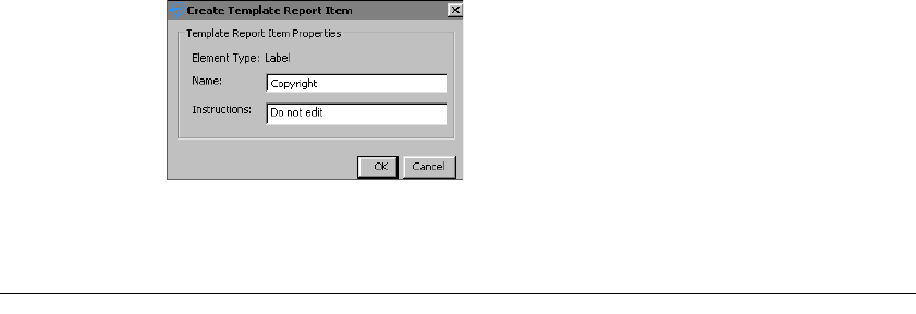
200
Actuate BIRT Application Developer Guide
Figure 9-5 Specifying a name for a label element that users cannot edit
Choose OK.
Providing data with a report template
To enable the Report Studio user to use a template with an information object or a
data object, add an editable table element to the template. When a user selects a
template containing an editable table element, Report Studio prompts the user to
select a data object or information object data source. Report Studio then prompts
the user to select the data fields to display in the report table.
If you are creating a template that includes data, create a data source and data set
that specifies the data that the Report Studio user can display in the report. You
can define multiple data sources and multiple data sets in a template. When the
user selects a template with multiple data sets, Report Studio prompts the user to
select one of the data sets to use for the report. For information about defining
data sources and data sets, see BIRT: A Field Guide.
Using a CSV file as a data source
A Report Studio report design can use a comma-separated values (CSV) file as a
data source if the CSV file is a predefined data set in a report template. To use the
file as a data source, copy the CSV file to the appropriate directory. To determine
which directory to use, download the report template (.rpttemplate) file to a local
directory and save it as an XML file. In the XML code, locate the <data-sources>
element, shown in the following example:
<data-sources>
<oda-data-source
extensionID="org.eclipse.datatools.connectivity.oda.flatfile"
name="Data Source" id="266">
<text-property name="displayName">Data Source
</text-property>
<property name="HOME">C:\</property>
<property name="CHARSET">UTF-8</property>
<property name="INCLTYPELINE">YES</property>
</oda-data-source>
</data-sources>

Chapter 9, Building a template
201
The HOME or URI property shows the directory in which to place the CSV file.
Excluding a data set
You can exclude a data set in a template from the Select Data dialog in Report
Studio. For example, you want to display stock quote data from a web service in
the report, but you do not want the user to manipulate the data. To exclude a data
set from the Select Data dialog, set the data set’s UsageInBRS property to
excluded in the template’s XML representation. For example, the following code
excludes the Orders data set:
<oda-data-set extensionID="org.eclipse.birt.report.data.oda.jdbc
.JdbcSelectDataSet" name="Orders" id="8">
<list-property name="userProperties">
<structure>
<property name="name">UsageInBRS</property>
<property name="type">string</property>
<property name="isVisible">true</property>
</structure>
</list-property>
<property name="UsageInBRS">excluded</property>
Creating themes for a report template
A library can contain any number of themes, and a theme can contain any
number of styles. You create themes in a library, then associate the library with a
template. Actuate BIRT Designer Professional provides support for the following
two types of styles:
■
Create a custom style, and apply it to a report element. For example, you can
create a style named Report Title, then apply the style to a label that displays
the report title.
■
Apply style properties to predefined style names, or selectors. These
predefined style names correspond to the different types of report elements.
For example, you can apply style properties to a predefined style named
table-header, and all table headers in the report are formatted accordingly.
This technique is similar to defining styles in CSS where you associate styles
with HTML elements, such as <H1> or <P>.
How to create a theme
1Create a library:
1Choose File➛New➛Other.
2In New, in Select a wizard, expand Actuate BIRT, then select Library.
Choose Next.
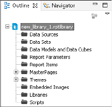
202
Actuate BIRT Application Developer Guide
3In New Library, specify the folder in which to create the library, specify a
file name, then choose Finish. If a warning message appears, choose OK.
2Choose Outline view. Outline view, shown in Figure 9-6, displays the types of
report elements you can add to a library.
Figure 9-6 Outline view
3In Outline view, expand Themes.
4Right-click defaultTheme, and choose Rename to change the name of the
theme.
5Right-click the theme, and choose New Style to create a style for the theme.
6On New Style, select one of the following options:
■
To apply style properties to a specific type of report element, select
Predefined Style, and select a style from the drop-down list.
■
To create a user-named style, select Custom Style, and specify a unique
descriptive name, such as Report Title or Copyright.
7Set the desired properties for the style by selecting a property category on the
left and specifying property values.
8When you finish setting style properties, choose OK to save the style.
9Repeat steps 5 to 8 to create additional styles for the theme.
10 To create a new theme, right-click Themes, and choose New Theme.
How to associate a library with a template
1If the BIRT resource folder is not the current project folder, place the library in
the BIRT resource folder, so that it is available to the template. To specify a
folder as the resource folder:
1Choose Window➛Preferences.
2In Preferences, shown in Figure 9-7, expand Actuate BIRT, and
choose Resource.
3Choose File System to select a folder to use as the resource folder.
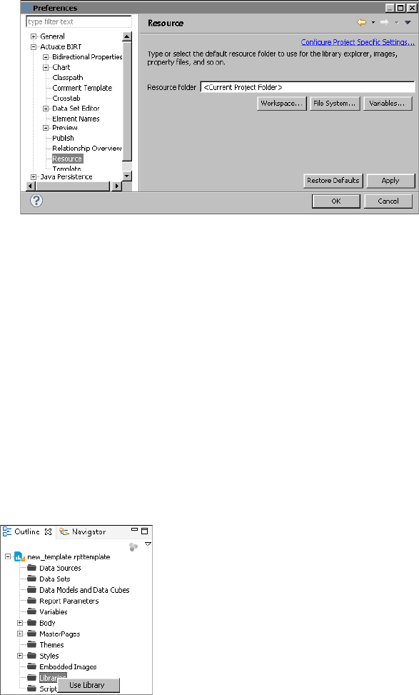
Chapter 9, Building a template
203
Figure 9-7 Specifying the location of the resource folder in Preferences
4On Directory Selection, navigate to a folder on your computer or on the
network, or choose Make New Folder to create a new folder.
5Choose OK to confirm your folder selection. Preferences displays the path
to the resource folder.
6Choose OK to save the resource folder location information, and close the
Preferences window.
7In Navigator, select the library, then choose File➛Copy Library to Shared
Resource Folder. Share Library displays the library name and the location
of the resource folder.
8Choose Finish to confirm placing a copy of the library in the resource
folder.
2Open the template file, and choose Outline view.
3In Outline view, shown in Figure 9-8, right-click Libraries and choose
Use Library.
Figure 9-8 Choosing Use Library in the Outline view
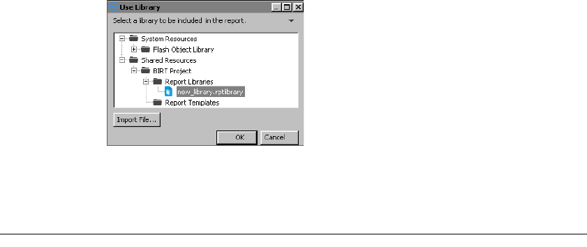
204
Actuate BIRT Application Developer Guide
4In Use Library, expand Shared Resources to display the libraries in the BIRT
resource folder. Figure 9-9 shows an example of Use Library.
Figure 9-9 Displaying libraries in the resource folder
5Select the library that contains the themes you want to use with the template,
then choose OK.
Publishing a template
Templates must be published in specific locations for Report Studio to be able to
display them. BIRT Designer Professional publishes the templates to the
BizRDTemplates folder that it creates in the Resources folder of the volume.
Report Studio displays templates by categories. When you publish a template,
you can create a new category or select an existing category in which to display
your template.
You can, for example, organize templates by report types (budget reports,
expense reports, stock purchase plan reports) or by departments in your
organization (Human Resources, Sales, Customer Support). Figure 9-10 shows an
example of Report Studio displaying additional categories by report types. The
Standard category appears at the top of the list because it is the default category
supplied with Report Studio. All other categories that you create are listed in
alphabetical order. You can designate a different template category as the default
category, as described later in this section.
Typically, each template uses the following external resources that you must also
publish to a specific location:
■
An image file that functions as the thumbnail image of the template
■
A library file containing the themes available to the report
If a template contains localized text and you have created resource files that
translate text into different languages, you must also publish these (.properties)
files. You publish all resources associated with a template when publishing the
template. BIRT Designer Professional publishes these files to specific locations
from which Report Studio can access them.
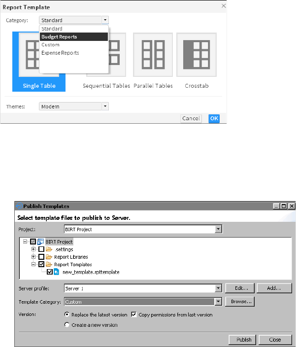
Chapter 9, Building a template
205
Figure 9-10 Displaying available template categories in Report Studio
How to publish a report template
1In Actuate BIRT Designer Professional, in Navigator, right-click the template
file, then choose Publish➛Publish Templates. Publish Templates appears with
the template file selected, as shown in Figure 9-11.
Figure 9-11 Publishing templates using BIRT Designer Professional
2In Publish Templates, select Report Libraries to publish the themes and images
associated with the template.
3Select a server profile from the drop-down list. A server profile specifies the
connection properties to connect to a specific Encyclopedia volume. To create
a new server profile, complete the following steps:
1Choose Add.
Server Profile appears. In Server Profile, complete the following steps:
2In Server Type, select one of the following:
❏
Server
If you select this option, complete steps 3 to 8.

206
Actuate BIRT Application Developer Guide
❏
Cloud Server
If you select this option, complete steps 9 to 13.
3In Profile name, type a unique name that identifies the new profile.
4In Server, type the name or IP address of the computer on which Actuate
BIRT iHub is installed.
5In Port number, type the number of the port to access Actuate BIRT iHub.
6If necessary, select the option to use a secure connection.
7In User name, type the user name for accessing the volume.
8In Password, type the password for accessing the volume.
Choose Finish. Proceed to step 4.
9In Profile name, type a unique name that identifies the Cloud profile.
10 In Cloud Service URL, type the address for your cloud service.
11 Choose Login.
12 In Server Name, select the server to log in to.
13 In Volume, select a volume.
Choose Finish.
4In Publish Templates, in Template Category, select an existing category from
the drop-down list in which to publish the template. Alternatively, create a
new category by choosing Browse, then specifying the name of the new
category.
5In Version, select a version option. To copy the privileges from the last
published version of the template, select Copy permissions from last version.
6Choose Publish, then after the file is published, choose Close.
The first time you publish a template to an Encyclopedia volume, you must grant
users access to the appropriate template folders and files. For more information
about assigning privileges for folders and files on an Actuate BIRT iHub
Encyclopedia volume, see Managing Volumes and Users.
Setting the default template category
To select a custom template, select a different category from the Category
drop-down list. You can configure Report Studio so that the Report Template
dialog displays a different template category as the default category.
Chapter 9, Building a template
207
How to set the default template category
1Navigate to the WEB-INF directory of your Actuate web application. By
default, the file path is:
<context root>\WEB-INF
2Open web.xml for editing.
3Change the value of the DEFAULT_REPORT_TEMPLATE_CATEGORY
_NAME parameter from Standard to the name of the category whose
templates you want the Report Template dialog to display by default. The
following example shows the Sales category set as the default template
category:
<param-name>DEFAULT_REPORT_TEMPLATE_CATEGORY_NAME
</param-name>
<param-value>Sales</param-value>
4Restart the web or application service for your Actuate web application to
apply the changes you made.
208
Actuate BIRT Application Developer Guide

Part 4
Enhancing application components
Part Four
4

212
Actuate BIRT Application Developer Guide
About EasyScript
EasyScript is an expression syntax similar to the syntax used in Excel formulas.
Like Excel, EasyScript provides functions for performing calculations on report
data. In BIRT Designer Professional, EasyScript is supported in most places an
expression is required. For example, when specifying an expression for a
computed column, a column binding, a filter condition, or a map rule, you can
use either JavaScript or EasyScript.
Choosing between EasyScript and JavaScript
You can use both JavaScript and EasyScript expressions in a report. For simple
expressions or common calculations, the choice is often based on syntax
familiarity or simplicity. Users who work with Excel functions will find
EasyScript syntax familiar and easy to use.
The following example is an EasyScript expression that rounds values in a Price
field to the nearest integer:
ROUND([Price])
The following example is the equivalent JavaScript expression:
Math.round(row["Price"])
Both expressions are straightforward, although one could argue that the
EasyScript syntax is simpler. Now, compare the expressions used to round the
Price values to 2 decimal places. In the following expressions, the first shows
EasyScript syntax, and the second shows JavaScript syntax:
ROUND([Price], 2)
Math.round(row["Price"]*100)/100
In this case, the EasyScript syntax is clearly simpler and more intuitive. The
EasyScript ROUND( ) function provides a second argument that lets you specify
the number of decimal places to which to round the number. The JavaScript
round( ) function does not, and, therefore, requires additional mathematical
operations.
If a report needs complex calculations that require lines of code or calculations
that cannot be done with EasyScript, use JavaScript. For information about
writing JavaScript expressions, see BIRT: A Field Guide.
Syntax rules
When writing an EasyScript expression, observe the following rules:
■
Enclose field names within square brackets ([ ]), for example, [CustomerID].
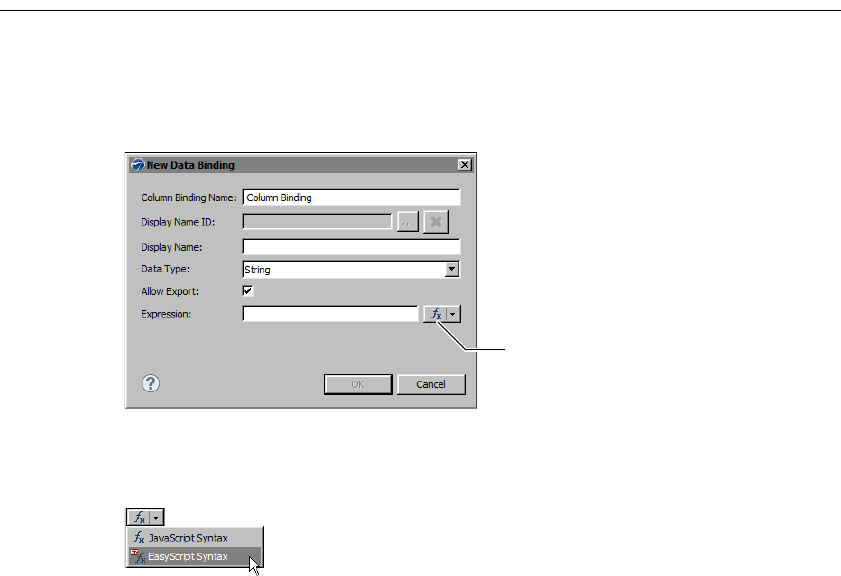
Chapter 10, Writing expressions using EasyScript
213
■
Field names and function names are case-sensitive. All function names are
uppercase.
■
When creating an expression that contains a literal date, always type the date
according to the conventions of the US English locale. For example, if working
in the French locale, type 07/10/2010 to represent July 10, 2010. Do not type
10/07/2010, which is the convention for dates in the French locale. The
following expression, which calculates the number of days from the current
date to Christmas, includes a literal date:
DIFF_DAY(TODAY(), "12/25/10")
■
When creating an expression that contains a literal number, always type the
number according to the conventions of the US English locale. Use a period (.),
not a comma (,) as the decimal separator.
Using the EasyScript expression builder
When specifying an expression, the JavaScript syntax is the default. Figure 10-1
shows the icon that represents JavaScript syntax. Clicking on this icon opens the
JavaScript expression builder.
Figure 10-1 An expression property set to use a JavaScript expression
To switch to EasyScript syntax, click the arrow button next to the JavaScript
syntax icon and choose EasyScript Syntax, as shown in Figure 10-2.
Figure 10-2 Switching to EasyScript
This action opens the EasyScript expression builder, shown in Figure 10-3.
Icon representing JavaScript
syntax
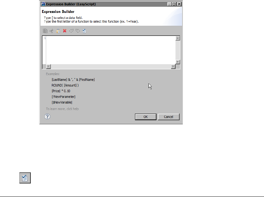
214
Actuate BIRT Application Developer Guide
Figure 10-3 EasyScript expression builder
Like the JavaScript expression builder, the EasyScript expression builder provides
help selecting functions and fields to use in an expression. To use a function in an
expression, type the first letter of the function, then select a function from the list
that appears. To use a field, type the left square bracket ([), then select a field from
the list.
When you finish creating an expression, choose Validate to verify the expression.
Changing the default expression syntax
If you consistently use EasyScript or use it more than JavaScript, you can change
the Default Syntax property in Preferences to EasyScript syntax. To access this
property, select Window➛Preferences, and choose Report Design—Expression
Syntax. After changing the default syntax, the EasyScript syntax icon appears by
default every time you create a new expression.
The Default Syntax property does not convert existing JavaScript expressions to
EasyScript expressions, and vice versa. To change the syntax of an expression,
you must select the syntax type and edit the expression accordingly.
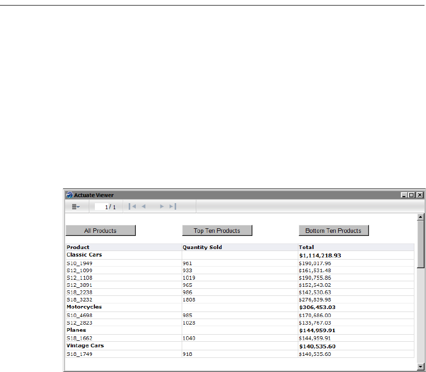
216
Actuate BIRT Application Developer Guide
About HTML buttons
In a BIRT report, an HTML button is a report element that provides the same
functionality as a button defined with the HTML <button> tag in a web page. The
HTML button can execute client-side JavaScript code associated with button
events, such as a button click or double-click.
You can use HTML buttons to provide users with custom interactive reporting
functionality. For example, you can create HTML buttons that, when clicked,
filter data, hide or show data, sort data, link to another report, or perform
calculations.
Figure 11-1 shows Actuate Viewer displaying a product sales report that contains
three buttons at the top. Each button provides a different data filtering option.
The user can choose to view all product sales, the top ten products, or the bottom
ten products. The report in Figure 11-1 shows the top ten products.
Figure 11-1 Report with HTML buttons that provide different data filtering options
You can also use HTML buttons to integrate a report with other enterprise
applications. Figure 11-2 shows an example of a report that uses Check Inventory
and Process Order buttons to link to business processes that run in a different
application.
The HTML button is supported in HTML reports only. It does not work in other
output formats, such as PDF or Excel, and appears as static text in those
documents. If a report is to be viewed in formats other than HTML, use the
Visibility property to hide HTML buttons in all output formats, except HTML.
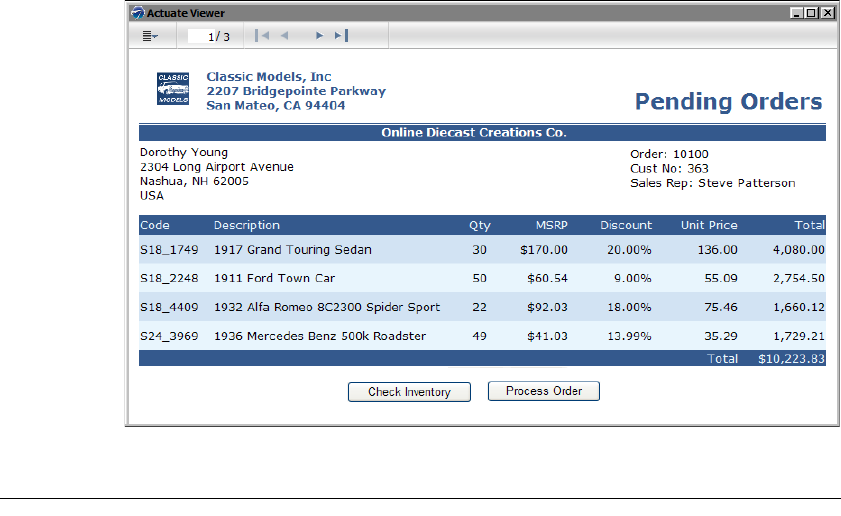
Chapter 11, Adding web interactivity to a report
217
Figure 11-2 Report with HTML buttons that link to business processes
Creating an HTML button
Creating a functional HTML button entails inserting the HTML button element in
the desired location in the report, specifying the text to display on the button,
then programming the button’s action. You can place an HTML button in the
report page, a grid, table, list, and cross tab.
How to create an HTML button
1Drag an HTML button element from the palette and drop it in the desired
location in the report.
2In HTML Button, specify the following values:
1In Name, type a different name for the element if you do not want to use
the default name. Each HTML button must have a unique name.
2In Value, type the text to display on the button. Alternatively, select
JavaScript Syntax or EasyScript Syntax to create an expression to display a
dynamic or calculated value. Figure 11-3 shows an example of text
specified for Value.
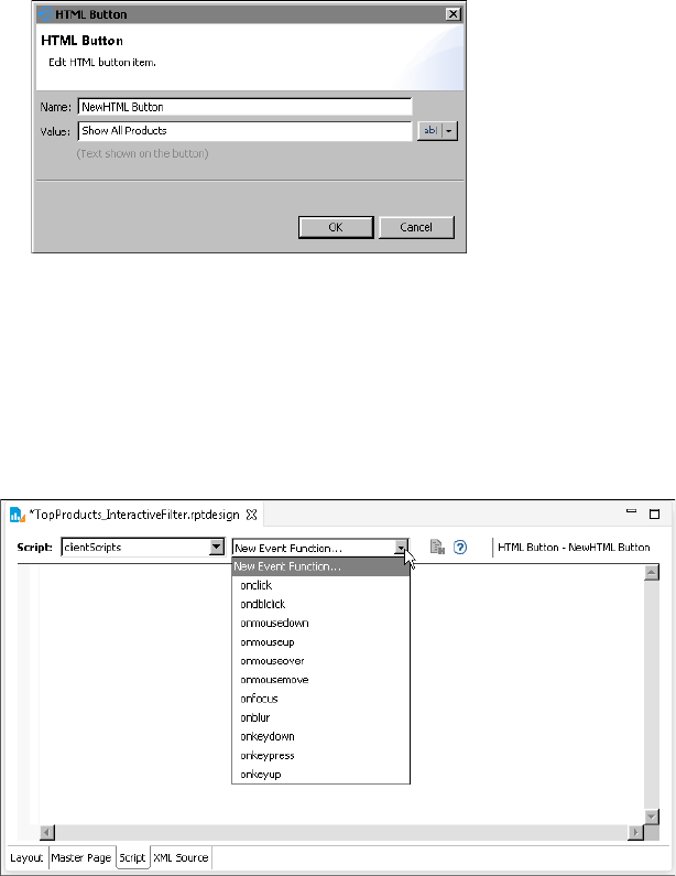
218
Actuate BIRT Application Developer Guide
Figure 11-3 Definition of an HTML button
3Choose OK. A message appears, providing information about writing code
for the button. Choose OK.
The HTML button appears in the report.
3While the button is selected, choose the Script tab.
4In the script editor, click New Event Function and select a button event from
the drop-down list, shown in Figure 11-4.
Figure 11-4 Click New Event Function to display the list of button events
5Write JavaScript code to program the button’s action for the selected event.
The next section provides information about this task.
6Run the report in the web viewer to test the button’s functionality. If you do
not receive expected results, or if you receive an error, verify that the event
handler script does not contain any problems.

Chapter 11, Adding web interactivity to a report
219
Writing code for an HTML button
After inserting an HTML button in a report, you use the script editor to write
JavaScript code that specifies the task to perform when a particular button event
occurs. This type of code is called an event handler. HTML button event handlers
can consist of any valid JavaScript code, and typically access report data and the
Actuate JavaScript API to provide interactive viewing functionality.
The HTML button supports multiple events, and you can write multiple event
handlers for a single button to execute different routines based on the event that
occurs. For example, you can write an event handler that displays help
information when the user moves the mouse pointer over a button, and a second
event handler to run a business process when the user clicks the button.
Table 11-1 lists and describes the events that the HTML button supports and for
which you can write code.
When you select an event for which to write code, the script editor provides a
JavaScript code template, as shown in Figure 11-5.
The following line of code in the template instructs the software to execute the
code in the braces that follow when a click, or button press, event occurs:
this.onclick = function(event)
Do not modify this line of code. Write your JavaScript code in the braces
following that line.
Table 11-1 Supported events
Event Description
onblur Occurs when the button loses focus, or stops being active
onclick Occurs when the button is clicked
ondblclick Occurs when the button is double-clicked
onfocus Occurs when the button gets focus, or becomes active
onkeydown Occurs when a keyboard key is pressed
onkeypress Occurs when a keyboard key is pressed and released
onkeyup Occurs when a keyboard key is released
onmousedown Occurs when a mouse button is pressed
onmousemove Occurs when a mouse pointer moves when it is over the
button
onmouseover Occurs when a mouse pointer moves onto the button
onmouseup Occurs when a mouse button is released
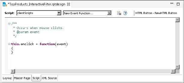
220
Actuate BIRT Application Developer Guide
Figure 11-5 Script editor displaying a script template
If you write multiple event handlers for an HTML button, the script editor places
all the event handlers serially, as shown in the following code example:
/**
* Occurs when mouse clicks.
* @param event */
this.onclick = function(event)
{
/* onclick code here */
}
/**
* Occurs when a mouse button is released.
* @param event */
this.onmouseup = function(event)
{
/* onmouseup code here */
}
Accessing report data
It is common to use HTML buttons to perform calculations on demand or to
present additional information. For example, rather than display customer notes
that take up space in a report or that users view infrequently, you can create an
HTML button that, when clicked, displays the information when users want to
view the information.
These types of event handlers typically require access to data in the report, such
as row data, aggregate data, or report parameter values. To provide event
handlers with access to report data, you must do the following:
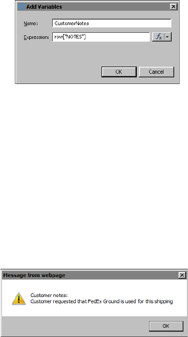
Chapter 11, Adding web interactivity to a report
221
1Insert the HTML button in a container, such as a table, that provides access to
data.
2For each type of data, create a variable for the HTML button using the
Variables page on Property Editor. Figure 11-6 shows an HTML button
variable named CustomerNotes whose value is set to the Notes column.
Figure 11-6 Variable associated with an HTML button
After you create a variable, use dataObject to access the variable in an event
handler. For example, to access the variable CustomerNotes, use
dataObject.CustomerNotes, as shown in the following event handler code:
/**
* Occurs when mouse clicks.
* @param event */
this.onclick = function(event)
{
alert("Customer notes: " +
"\n" + dataObject.CustomerNotes );
}
This example uses the JavaScript alert function to display customer notes in a
message box, as shown in Figure 11-7.
Figure 11-7 Message box displaying a note when the HTML button is clicked
The next example shows how to use an HTML button to calculate the price of a
product after applying a discount specified by the user at report view time.
Figure 11-8 shows the report in the web viewer. The report lists the products and
their manufacturer’s suggested retail price (MSRP). Each product row contains a
Discounted Price button for calculating the discounted price for that product.

222
Actuate BIRT Application Developer Guide
Figure 11-8 Product report using HTML buttons to calculate discounted prices
When the user clicks a button, a window prompts the user to type a discount
percent, as shown in Figure 11-9.
Figure 11-9 Window prompting for a discount percent
After the user enters a value, such as 10, and chooses OK, another window
displays the product’s discounted price, as shown in Figure 11-10.
Figure 11-10 Window displaying the discounted price
To create this HTML button, a button labeled Discounted Price is inserted in the
detail row of a table. The HTML button’s event handler code requires the MSRP
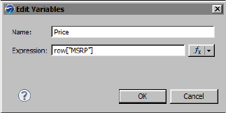
Chapter 11, Adding web interactivity to a report
223
values to calculate the discounted price, so a variable is created. Figure 11-11
shows the definition of a variable named Price.
Figure 11-11 Price variable defined for the HTML button
The event handler code for the HTML button is as follows:
this.onclick = function(event)
{
Discount = window.prompt('Enter the discount percent: ','');
DiscountedPrice = dataObject.Price - (dataObject.Price *
(Discount/100));
alert("Discounted price: " + DiscountedPrice);
}
The first line after the opening brace prompts the user for a discount value and
stores the value in the Discount variable. The second line calculates the
discounted price using the values in the Price and Discount variables. The third
line displays the results in a message box. Note that this event handler code
covers only the main tasks. A more complete event handler would also perform
data validation to ensure that the input value is a number, and handle the case if
the user chooses Cancel at the prompt.
How to add a variable to an HTML button
1In the layout editor, select the HTML button to which to add a variable.
2Choose Property Editor, then choose the Variables tab.
3In Variables, choose Add.
4In Add Variables, specify the following values:
1In Name, type a unique name for the variable. JavaScript event handlers
use the name to access the variable’s information through dataObject. For
example, the event handler accesses a variable named credit as
dataObject.credit.
2In Expression, type the value that the variable contains. You can also use
Expression Builder to create a value. Choose OK.
Variables displays the variable you created, as shown in Figure 11-12.
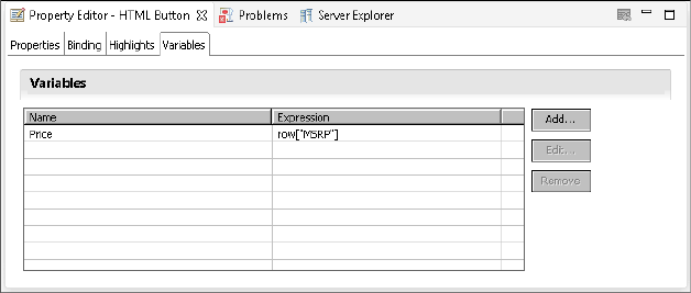
224
Actuate BIRT Application Developer Guide
Figure 11-12 Variable defined for an HTML button
Using the Actuate JavaScript API
Actuate provides a JavaScript API (JSAPI) to support the integration of Actuate
technology with web applications. Application developers can use the API to
embed entire reports or individual report elements, such as charts or tables, into
existing web pages.
HTML button event handlers can also use JSAPI to access report elements,
manipulate data, and refresh a report in the Actuate viewer. For example, you can
use the JSAPI to implement interactive functionality in the viewer, such as sorting
and filtering data, linking to other report elements, and displaying or hiding
report elements.
The three HTML buttons in the report shown in Figure 11-1, which provide three
data filtering options, use methods in the JSAPI to get the current viewer, create
the filters, and reload the report with new data each time the user clicks one of the
buttons. The following is the event handler code for the Top Ten Products button:
this.onclick = function(event)
{
//Get the current viewer object and the table with the
//bookmark DetailTable on the current page.
var viewer = this.getViewer();
var pagecontents = viewer.getCurrentPageContent();
var table = pagecontents.getTableByBookmark("DetailTable");
//Create a top 10 filter on the table
table.setFilters(new actuate.data.Filter("PRICE",
actuate.data.Filter.TOP_N, "10"));
//Reload the table
table.submit();
}

Chapter 11, Adding web interactivity to a report
225
The following is the event handler code for the All Products button:
this.onclick = function(event)
{
var viewer = this.getViewer();
var pagecontents = viewer.getCurrentPageContent();
var table = pagecontents.getTableByBookmark("DetailTable");
table.clearFilters("PRICE");
table.submit();
}
The JSAPI provides many classes and methods that are useful for adding
functionality to HTML buttons. For more information about using the JSAPI, see
Using Actuate JavaScript API.
Testing an HTML button
As mentioned previously, HTML buttons are supported in HTML reports only. To
test the functionality of an HTML button, run the report in the web viewer.
Changing the appearance of an HTML button
As with other report elements, you can modify an HTML button by changing
property values, such as its name, its value, or aspects of its appearance. The tabs
on the property sheet for the element support altering the appearance, visibility,
and other features.
The general properties page provides the ability to change the size, color, and the
appearance of the text of the button. By default, the button’s size adjusts to the
length of the text on the button. If a report contains multiple buttons and you
want all the buttons displaying at the same size, specify values for the Width and
Height properties.
The general properties page also supports adding an image to the face of the
button. Use the Upload button next to the Image property to add an image.
Before doing so, verify the image file is the appropriate size for the button. A
button expands to display the image in its full size unless you specify Width and
Height values. If an image is large, and you use the default auto-sizing feature,
the button is large. If you use explicit Width and Height values, and the image is
larger than the specified button size, the image is truncated. To change the size of
an image, you must edit the image using a graphic editing tool.
Figure 11-13 shows the general properties for an HTML button.
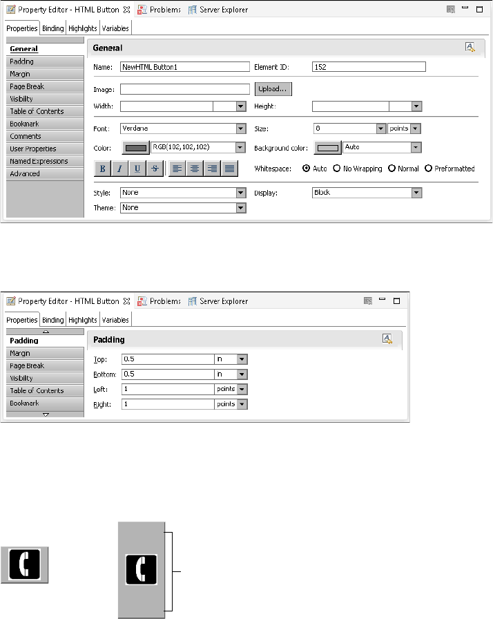
226
Actuate BIRT Application Developer Guide
Figure 11-13 General properties for an HTML button
Use the padding settings, as shown in Figure 11-14, to add extra space around the
text or image on the face of the HTML button.
Figure 11-14 Padding properties for an HTML button
Padding supports the use of different units, such as inches or points. When you
add padding, it affects the HTML button as shown in Figure 11-15. The button on
the left uses the default padding values. The button on the right uses padding
values of 0.5 inch at the top and bottom.
Figure 11-15 Padding added to an HTML button using an image
Use the margin settings to increase the space around the entire button. Specifying
margin values is similar to specifying padding values, as shown in Figure 11-16.
Padding of 0.5 inch at the
top and bottom of button

Chapter 11, Adding web interactivity to a report
227
Figure 11-16 Margin properties for an HTML button
Whereas padding modifies the size of the HTML button, margins modify the
space around the button and do not change the button size. Figure 11-17 shows
two buttons, each in a cell. The button on the left uses the default margin values.
The button on the right uses margin values of 0.5 at the top and bottom.
Figure 11-17 Margin space around an HTML button in a table
Visibility, Page Break, Table of Contents, and other properties operate in the same
manner as they do for other report elements.
How to change the name or value of an HTML button
1Double-click the HTML button.
2In HTML Button, in Name, type the new button name. In Value, type the new
value.
3Choose OK. The HTML button displays the new value.
Margin of 0.5 inch at the
top and bottom of button
228
Actuate BIRT Application Developer Guide

230
Actuate BIRT Application Developer Guide
About the security model
All files stored in a BIRT iHub volume are subject to a standard security
procedure, which restricts file access to authorized users. The iHub security
model is based on roles and privileges. The iHub administrator creates roles for
various job functions in an organization, such as finance, marketing, and sales.
The privileges, or permissions, to perform certain operations, such as read,
write, and execute, are assigned to roles. Users are assigned roles, and, through
these roles, acquire the privileges to perform particular operations on folders and
files.
With this level of security, each user has access to files and folders on a
need-to-know basis. For security at a more detailed level, iHub provides the
following types of security:
■
Page-level security, which controls user access to particular sections or pages
in a report. This security feature requires the Page Level Security option on
iHub. The published report must be assigned the Secure Read privilege.
■
Data security, which controls user access to a particular set of data provided
by a BIRT data object. This security feature is part of the core iHub
functionality. The published data object must be assigned the Secure Read
privilege.
The security procedure that applies to files and folders in an iHub volume is
implemented entirely in iHub. Page-level security and data security, however,
require implementation in BIRT Designer Professional as well.
About access control lists and security IDs
Page-level and data security use the same security mechanism in BIRT Designer
Professional: access control lists (ACLs).
An ACL is a list of security IDs that tells iHub which users have access to a
particular item in a report or data object. A security ID can be either a user name
or a role defined in iHub. Typically, you use roles because they are more
permanent than user names. A role can be assigned to different users at different
times as employees leave or change positions.
To implement page-level and data security in BIRT Designer Professional,
perform the following tasks:
■
In the report or data object, select the item to which to apply security.
■
For the item’s Access Control List Expression property, specify an expression
that evaluates to a security ID or a list of security IDs.

Chapter 12, Implementing data security
231
ACL expression syntax
The ACL expression must evaluate to a string, and can be either a JavaScript or
EasyScript expression. If specifying multiple security IDs, separate each with a
comma.
The following expressions are examples of ACL expressions in JavaScript. The
first expression specifies a literal role name. The second expression specifies two
literal role names. The third expression evaluates to role names, such as Sales
Manager France or Sales Manager Canada. The fourth expression specifies two
literal role names and an expression that evaluates to role names.
"CFO"
"CFO" + "," + "Sales VP"
"Sales Manager " + row["Country"]
"CFO" + "," + "Sales VP" + "," + "Sales Manager " + row["COUNTRY"]
The following ACL expressions are the EasyScript equivalent:
"CFO"
"CFO" & "," & "Sales VP"
"Sales Manager " & [Country]
"CFO" & "," & "Sales VP" & "," & "Sales Manager " & [Country]
Controlling user access to report pages
In a report that uses page-level security, report users can view only pages to
which they have access. You can design a single report that meets the needs of a
range of users. The most common case is to create a hierarchy of ACLs where
each successive level has access to more information. The ACL hierarchy can
match the organizational hierarchy of a company.
For example, in a report that provides worldwide sales data by region and
country, you can restrict user access to the content as follows:
■
Each country sales manager can view only the pages that display sales data for
her country.
■
Each regional sales manager can view all the pages that display sales data for
the countries in her region.
■
The vice president of sales can view the entire report.
Figure 12-1 shows the single page that the sales manager in France can view. Note
that the page number is 1.
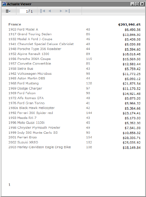
232
Actuate BIRT Application Developer Guide
Figure 12-1 Page that the sales manager in France can view
Figure 12-2 shows the pages that the regional sales manager for Europe can view.
The pages are numbered 1 through 5. Here, the sales data for France is on page 4,
whereas, it is on page 1 in the report that the sales manager of France sees, as
shown in Figure 12-1. The report displays page numbers sequentially in the order
that they appear to a user.
Figure 12-3 shows the full report, which only the vice president of sales can view.
Without page-level security, you would need to create multiple reports—one
report for each user—and the iHub administrator would then have to define
different security rules for each report, and manage multiple reports. In the sales
report example, which presents data for three regions and eight countries, you
would have to create twelve reports. For large companies, which typically have
more hierarchical levels and more users, the number of reports increases.
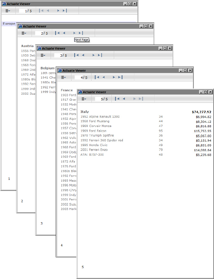
Chapter 12, Implementing data security
233
Figure 12-2 Pages that the regional sales manager for Europe can view
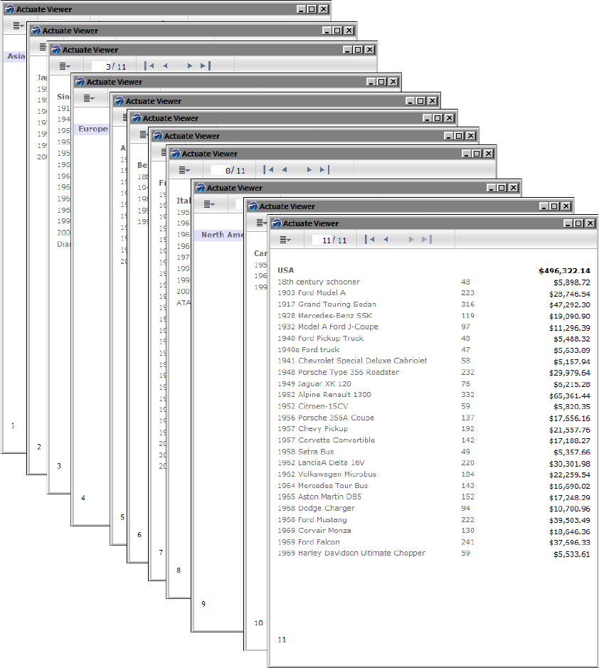
234
Actuate BIRT Application Developer Guide
Figure 12-3 Pages that the vice president of sales can view
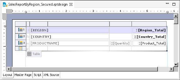
Chapter 12, Implementing data security
235
Adding page-level security to a report
To implement page-level security in a report, perform the following tasks:
■
Identify the sections that require security.
The most common elements to which to apply security are tables, lists, grids,
and groups defined in a table.
■
Identify the users that can view each section.
Obtain the security IDs, typically roles, from the iHub volume administrator.
■
Set security.
For each element that requires security, right click the element, then select
Security from the context menu. Set the Access Control List Expression
property to the security ID or IDs to which to grant access to the element’s
content.
Example 1
Figure 12-4 shows the design for the sales report shown in the previous section.
The report design consists of a single table that groups data by region, country,
and product.
Figure 12-4 Design of report that groups sales data by region and country
Page-level security is applied to these elements: the table, the Region group,
and the Country group. Figure 12-5 shows the Security dialog for the table
element.
■
The Access Control List Expression property is set to the value "Sales VP".
■
The Cascade ACL option is selected. This setting propagates the specified
ACL to all the elements in the table.
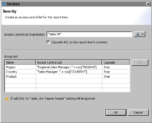
236
Actuate BIRT Application Developer Guide
Figure 12-5 Page-level security applied to the table and two of its groups
These settings specify that only the Sales VP has access to all of the table’s
contents:
■
For the Region group:
■
The Access Control List expression is:
"Regional Sales Manager: " + row["REGION"]
This expression specifies that data for each region is restricted to a specific
regional sales manager role. For example, only a user with the Regional
Sales Manager: Europe role can view the sales data for Europe.
■
Cascade is set to True. This value propagates the ACL to the elements in the
Region group, providing the regional sales manager access to all the data
within the Region group.
■
For the Country group:
■
The Access Control List expression is:
"Sales Manager: " + row["COUNTRY"]
This expression specifies that data for each country is restricted to a specific
sales manager role. For example, only a user with the Sales Manager:
France role can view the sales data for France.
■
Cascade is set to True. This value propagates the ACL to the elements in the
Country group, providing the sales manager access to all the data within
the Country group.

Chapter 12, Implementing data security
237
Example 2
This example shows how to implement page-level security in a report that
contains multiple tables. Figure 12-6 shows a report design that contains four
tables and identifies the roles that can view each table. The last table shows
detailed sales data grouped by country and product. The CEO, Sales VP, and
Sales Director can view all the content in this table. Each sales manager can view
only the sales data for her country.
Figure 12-6 Design of report that contains four tables and the roles that can
access each table
There are several ways to implement page-level security in this report. You can:
■
Select each table and set each table’s Access Control List Expression property
to the roles identified in Figure 12-6.
The ACL for the first, second, and third tables would be:
"CEO" + "," + "Sales VP"
The ACL for the first fourth table would be:
"CEO" + "," + "Sales VP" + "," + "Sales Director"
The ACL for the Country group in the fourth table would be:
"CEO" + "," + "Sales VP" + "," + "Sales Director" + "," +
"Sales Manager of " + row["COUNTRY"]
CEO, Sales VP
CEO, Sales VP
CEO, Sales VP
CEO, Sales VP,
Sales Director
CEO, Sales VP,
Sales Director,
Sales Manager of
[COUNTRY]
238
Actuate BIRT Application Developer Guide
■
Use the Cascade ACL option to cascade security IDs from a container element
to its contents. Because the CEO and Sales VP roles can view the entire report,
it is more efficient to specify the ACL once at the topmost container, the report
element, than it is to specify the same ACL multiple times.
The ACL for the report element would be:
"CEO" + "," + "Sales VP"
The ACL for the fourth table would be:
"Sales Director"
The ACL for the Country group in the fourth table would be:
"Sales Manager of " + row["COUNTRY"]
■
Add a grid to the report, place all the tables in the grid, and cascade the
"CEO" + "," + "Sales VP" ACL expression from the grid instead of from the
report element. This design is more versatile than the previous one because it
is often practical to leave the ACL at the report level blank to grant all users
access to the report. Later, if you add new sections, such as a title page, for a
broader range of users, it is easier to start with the rule that all users can view
all the content in a report, and then restrict access to particular sections.
The report examples in this section illustrate several key concepts about
page-level security, which are summarized next. Understanding these concepts
can help you design a report to use page-level security.
■
When an element’s ACL expression property is blank, there are no viewing
restrictions for that element, except those restrictions (determined by the
ACLs) that the element inherits from its container.
■
An element inherits the ACLs from its container when the container’s Cascade
ACL option is selected. This option, selected by default, means that a user who
is permitted to view a container can also view all elements within the
container.
■
The report element is the topmost container. If its ACL expression property is
blank, BIRT assigns an internal ACL of "__all" to the report. This setting
combined with the selected Cascade ACL option ensures that a report created
initially is accessible to all users.
■
BIRT generates one report document, inserting a page break between elements
that have different ACLs. This concept explains why some pages display
just a group header, as Figure 12-3 shows, when groups in a table have
different ACLs.
Enabling and disabling page-level security
For ACLs to take effect when the report is run on iHub, you must enable
page-level security in the report design. When enabled, BIRT generates a report
that consists of pages, which are restricted to users with specified security IDs. If
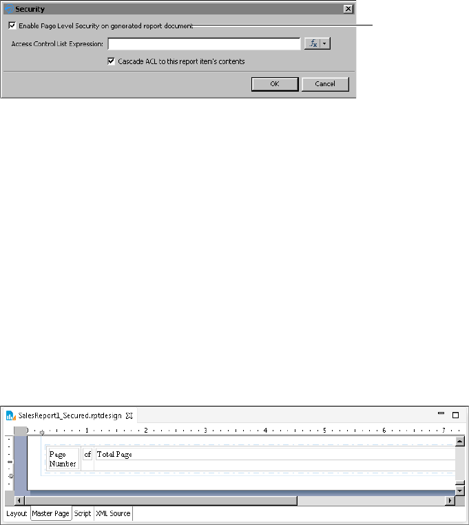
Chapter 12, Implementing data security
239
you decide later to make the entire report available to users, all you do is disable
the page-level security option. You do not have to remove the ACLs.
How to turn page-level security on or off
1In the layout editor, right-click a blank area of the report, then select Security.
2In Security, shown in Figure 12-7, either select or deselect Enable Page Level
Security on generated report document.
Figure 12-7 Enabling page-level security
Configuring page numbers
A report that uses page-level security provides two options for displaying page
numbers. The report can display page numbers sequentially in the order that they
appear to a user. For example, if a user can view pages 1, 5, 6, and 8 of a report,
the page numbers that the user sees are 1, 2, 3, and 4. Alternatively, the report can
display the actual page numbers 1, 5, 6, and 8.
Similarly, for page number formats that include the total page count, such as
1 of 4, the total page count can be the number of pages visible to the user or the
number of pages in the report.
How to configure page numbers
This procedure assumes that the report already contains page number elements.
1Choose Master Page to view the page number elements. Figure 12-8 shows an
example of a master page where the footer contains three elements to display
page numbers in the format 1 of 10.
Figure 12-8 Master page containing page number elements
2Right-click the Page Number element and choose Security.
Option to enable
or disable
page-level security
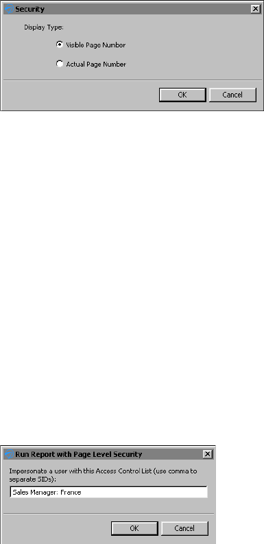
240
Actuate BIRT Application Developer Guide
3In Security, shown in Figure 12-9, select a display option, then choose OK.
■
Select Visible Page Number to display numbers sequentially in the order
that the pages appear to the user.
■
Select Actual Page Number to display the numbers as they appear in the
entire report.
Figure 12-9 Selecting a page numbering option
4If the page number format includes a total page count, as shown in the sample
master page in Figure 12-8, use the instructions in the previous step to select a
display option for the Total Page element.
Testing page-level security
BIRT Designer Professional supports the simulation of secure report viewing, so
that you can test page-level security without having to publish the report to iHub,
log in with different user credentials, run the report and verify its output.
How to test page-level security
1Make sure page-level security is enabled. This procedure is described earlier in
this chapter.
2Choose Run➛View Report with Page Security, and select the output format in
which to view the report.
3In Run Report with Page Level Security, shown in Figure 12-10, type a security
ID specified in an ACL. For example:
Sales Manager: France
Figure 12-10 Using a specified security ID
Choose OK. The report runs and displays only the page or pages that the
specified security ID can view.

Chapter 12, Implementing data security
241
4Repeat the previous step until you finish testing all the security IDs used in the
report.
Controlling user access to data
In addition to page-level security, iHub also supports data security, which
controls user access to a particular set of data provided by a BIRT data object. For
example, you can design a data object that returns one set of data rows for one
group of dashboard or report users, and a different set for another group of users.
You can limit access to the following items in a data object:
■
A data set, its rows and columns
■
A cube, its measures, dimensions, dimension levels, and dimension members
After designing the data object, generate a data object store (a .data file) and
publish this file to an iHub volume. iHub supports data security on .data files, but
not on .datadesign files.
A user can only see and use the data items to which she is granted access. The
security rules apply to users designing a dashboard in Dashboards or a report in
Report Studio, as well as, users running a dashboard or report.
Unlike page-level security, the concept of cascading, or inherited, ACLs does not
apply to data security. A cube does not inherit the ACL specified for the data set
that the cube uses. Similarly, a joined data set does not inherit ACLs specified for
the underlying data sets.
Adding security to a data object
To implement security in a data object, perform the following tasks:
■
Identify the data items that require security.
■
Identify the users that can view each item. Obtain the security IDs, typically
roles, from the iHub volume administrator.
■
In the data object design (.datadesign), for each item that requires security, set
the item’s Access Control List Expression property to the security ID or IDs to
which to grant access to the item.
Adding security to a data set
To apply security to a data set, select Security, then specify the security IDs in
Access Control List Expression. Figure 12-11 shows an example where the
expression specified for the data set’s Access Control List Expression property is:
"CEO" + "," + "CFO"
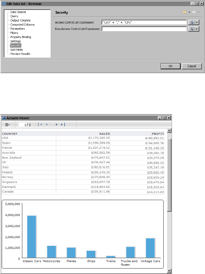
242
Actuate BIRT Application Developer Guide
Figure 12-11 Data security applied to the data set
In the example, only users with the CEO or CFO role can access the data set. For
example, in a report that contains a table that uses the secured data set, only the
CEO and CFO can view the data in the table, as shown in Figure 12-12. Other
users see an empty table, as shown in Figure 12-13.
Figure 12-12 Preview of the report for the CEO and CFO roles
As Figure 12-13 shows, the table does not display data from the secured data set,
but the labels in the table’s header appear. To hide the entire table if there is no
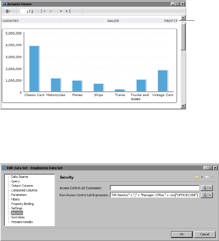
Chapter 12, Implementing data security
243
data, use the table’s Visibility property. Specify an expression, as shown in the
following example, as the condition for hiding the table. In the expression,
Row_Count is a column binding that uses the COUNT function to return the
number of rows in the table.
row["Row_Count"] == null
Figure 12-13 Preview of the report for roles other than CEO or CFO
You can also apply security to rows in a data set, which is a typical approach. To
do so, specify the security IDs in Row Access Control List Expression.
Figure 12-14 shows an example where the expression specified for the Row
Access Control List Expression property is:
"HR Director" + "," + "Manager: Office " + row["OFFICECODE"]
Figure 12-14 Data security applied to data set rows
Security applied to data set rows acts as a filter. In the example shown in
Figure 12-14, the HR Director can view all rows in the data set. Managers can
view only rows that pertain to their department as specified by the office code.
Table
displays
header
labels, but
no data
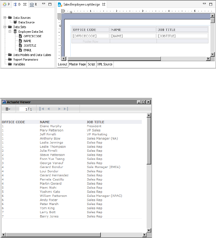
244
Actuate BIRT Application Developer Guide
Figure 12-15 shows a report design that uses the secured data object. In the
design, a table contains data elements that access the data set columns in the data
object.
Figure 12-15 Report design that uses data from a data set in a secured data object
When run and viewed by the HR Director, the report displays all the rows in the
data set, as shown in Figure 12-16.
Figure 12-16 Preview of the report for the HR Director role
When run and viewed by the manager of a specific office code, the report
displays only the rows for that office. Figure 12-17 shows the report that
Manager: Office 4 sees.
As the example shows, applying security to data set rows is useful for creating a
single data set that provides different data to different users.
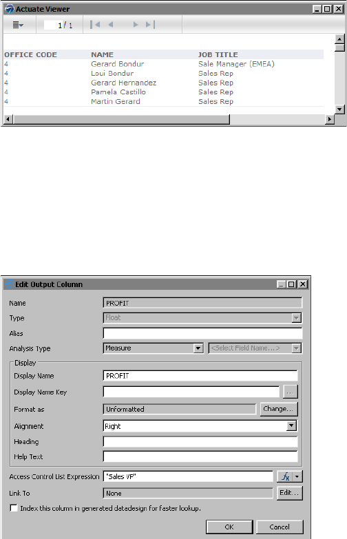
Chapter 12, Implementing data security
245
Figure 12-17 Preview of the report for the Manager: Office 4 role
You can also apply security to each column in a data set. For example, you can
restrict a profit/loss column or a salary column to users with executive-level
roles. To do so, select Output Columns, select the column, then specify the
security IDs in Access Control List Expression. Figure 12-18 shows an example
where the expression specified for a column’s Access Control List Expression
property is:
"Sales VP"
Figure 12-18 Data security applied to a column in a data set
In the example, only users with the Sales VP role can access data in the PROFIT
column. Figure 12-19 shows a report using the PROFIT column and how the
report appears to a user with the Sales VP role.
Figure 12-20 shows the same report, but as viewed by a user without the Sales VP
role. There is no data in the PROFIT column; only the PROFIT label appears in the
table header. To hide the entire column if there is no data, set the column’s
Visibility property to an expression, such as the following:
row["PROFIT"] == null
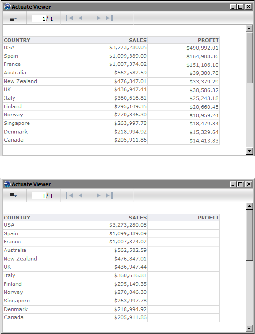
246
Actuate BIRT Application Developer Guide
Figure 12-19 Preview of the report for the Sales VP role
Figure 12-20 Preview of the report for roles other than Sales VP
Security at the column level also controls the availability of certain columns to
users designing a dashboard in Dashboards or a report in Report Studio.
Adding security to a cube
To apply security to a cube, in the cube builder, choose Security, then specify the
security IDs in Access Control List Expression. Figure 12-21 shows an example
where the expression specified for the Access Control List Expression property is:
"CEO" + "," + "CFO" + "," + "Sales VP"
Only users with the CEO, CFO, or Sales VP role have access to the cube. For
example, in a report that contains a cross tab that uses the secured cube, only the
CEO, CFO, and Sales VP can view the data in the cross tab. Other users see an
empty cross tab. Similarly, in Report Studio or Dashboards, only users with those
roles can see and use the secured cube in their report designs or dashboards.
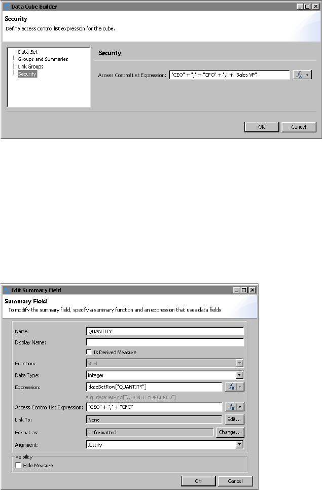
Chapter 12, Implementing data security
247
Figure 12-21 Data security applied to a cube
Within a cube, you can limit access to each measure and dimension. For example,
you can restrict a profit measure to users with executive-level roles. In the cube
builder, choose Groups and Summaries, select the dimension or measure, then
specify the security IDs in the Access Control List Expression property.
Figure 12-22 shows an example where the expression specified for a measure’s
Access Control List Expression property is:
"CEO" + "," + "CFO"
In a report that contains a cross tab that uses this cube, only the CEO and CFO can
view the QUANTITY data in the cross tab.
Figure 12-22 Data security applied to a cube measure
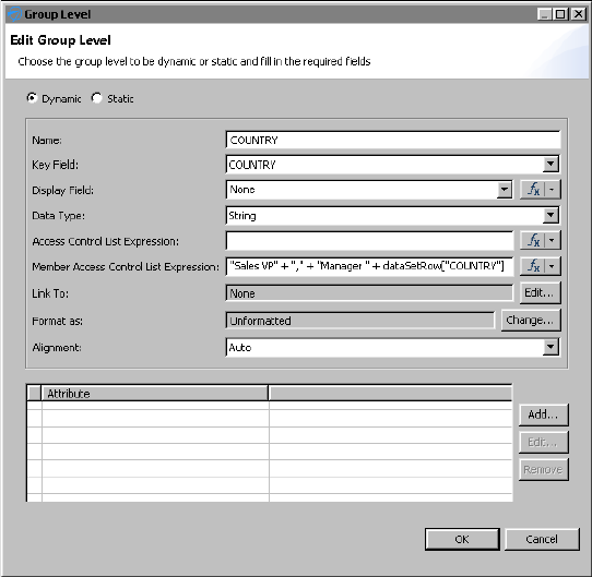
248
Actuate BIRT Application Developer Guide
With a dimension, you can also restrict access according to the dimension’s
values, or members. For example, you can provide executives access to sales data
for all countries and restrict managers to sales data for their respective countries.
Figure 12-23 shows security applied to the members of a Country dimension. The
expression specified for the Member Access Control List Expression property is:
"Sales VP" + "," + "Manager " + dataSetRow["COUNTRY"]
In this example, the Sales VP can view data for all countries. Managers can view
only data for their country.
Figure 12-23 Data security applied to members of a dimension
Notice that the Group Level dialog box, as shown in Figure 12-23, displays two
ACL properties. Access Control List Expression controls access to the dimension
(users either have access to the entire dimension or not at all), whereas, Member
Access Control List Expression controls access to specific data within the
dimension.
Figure 12-24 shows a report design, which uses the data object that contains the
cube with security applied to its country dimension. In the report design, a cross
tab uses data from the cube to display sales totals by country and by quarter.
When the report is run and viewed by a user with the Sales VP role, the cross tab
displays sales data for all countries, as shown in Figure 12-25.
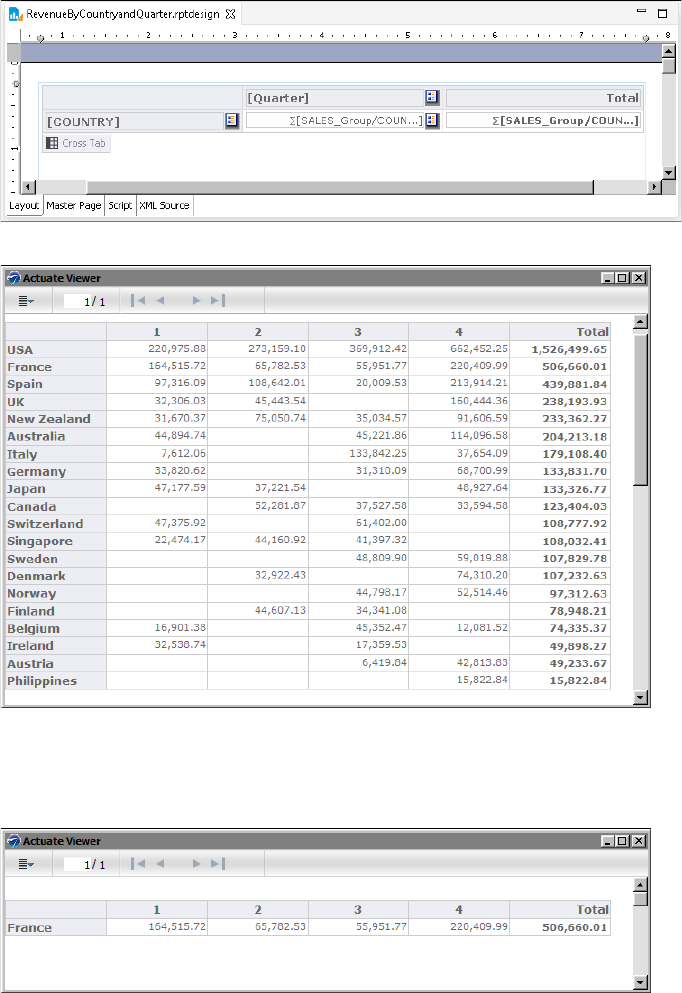
Chapter 12, Implementing data security
249
Figure 12-24 Report design that uses data from the secured cube
Figure 12-25 Preview of the cross tab for the Sales VP role
When the report is run and viewed by the manager of a specific country, the cross
tab displays only sales data for his or her specific country. Figure 12-26 shows the
cross tab that the Manager France role sees.
Figure 12-26 Preview of the cross tab for the Manager France role

250
Actuate BIRT Application Developer Guide
Enabling and disabling data security
For ACLs to take effect, you must enable data security in the data object. If you
decide later to make all the data in the data object available to users, all you do is
disable data security. You do not have to remove the ACLs.
How to turn data security on or off
1In the layout editor, right-click in an empty area of the data object design, then
select Security.
2In Security, shown in Figure 12-27, either select or deselect
Enable Data Security.
Figure 12-27 Enabling data security
Testing data security
BIRT Designer Professional supports the simulation of viewing reports with data
security. You can test data security in a report without having to publish the
report to iHub, log in with different user credentials, run the report and verify its
output.
To test data security from the perspective of a user designing a dashboard in
Dashboards or a report in Report Studio, you need to run tests on the iHub. The
testing procedure entails the following steps:
■
Publishing the data object (.data file) to an BIRT iHub volume
■
Sharing the data object with selected users or roles, and assigning the Secure
Read privilege
■
Logging in with each user credential
■
Launching the dashboard design tool or Report Studio, and using the data
object as a source of data for the dashboard or report
How to test data security in a report in BIRT Designer Professional
1Using BIRT Designer Professional, build a report that uses a secure data object
store (.data) as its data source.
2When you finish building the report, choose Run➛View Report with Data
Security, and select the output format in which to view the report.
Option to
enable or
disable
data security
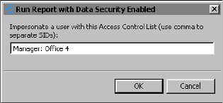
Chapter 12, Implementing data security
251
3In Run Report with Data Security Enabled, shown in Figure 12-28, type a
security ID specified in an ACL in the data object. For example:
Manager: Office 4
Figure 12-28 Running a report with data security using a specified security ID
Choose OK.
The report runs and displays only the content that the specified security ID
can view.
4Repeat the previous step until you finish testing all the security IDs used in the
report.
252
Actuate BIRT Application Developer Guide
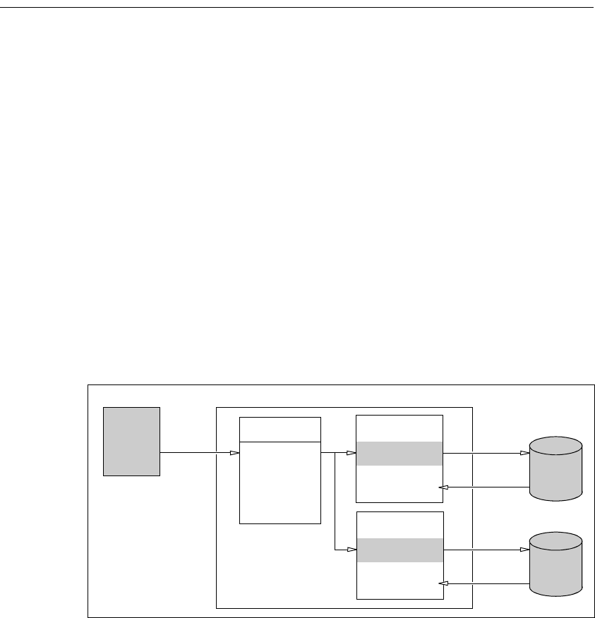
254
Actuate BIRT Application Developer Guide
About linking gadgets together
Gadgets on a dashboard can link together to respond to user selected values. A
data selection gadget displays values for a user to choose. Another gadget
subscribes to the data selection gadget, linking the gadgets together. Subscribed
gadgets receive the user selected value and use it to filter displayed data.
For example, you add a list gadget to display country names. This gadget
publishes the country name selected by a user. You then add a chart gadget and
link it to the list. When a user selects a country name, the chart updates to show
values for the selected country.
This process supports the following data scenarios:
■
Filtering visual displays based on parameter selection by a user
■
Cascading choices, selections in one data selection gadget populate choices
displayed in another data selection gadget
■
Interlinking data sources, changes in a data selection gadget can affect gadgets
using data from different data objects
■
User selection triggers scripts that execute JavaScript code
Figure 13-1 shows linking gadgets receiving filtered data based on user selection.
The filtered data is then displayed to the user.
Figure 13-1 Gadgets linking to a list gadget
Linked gadgets do not need to have the same data sources. For example, a list of
cities from a customer database can display the cities where customers live. You
link a chart showing monthly sales from a sales database to the list. When a user
selects a location, the chart of monthly sales updates to show values for the
selected city.
REPORT
LIST
Data
source
Web
browser
Gadgets on a dashboard
User
selection
Remote user
Filtered
data
Data object
USA
France
Japan
Linked to list
Displays BIRT
design file
Data
source
BIRT
iHub
CHART
Linked to list
Displays data
object values
Filtered
data

Chapter 13, Linking and scripting gadgets
255
Building gadget links
Use the gadget menu to add or remove links to other gadgets. Gadgets on a BIRT
dashboard link together automatically when they use the same data source.
Gadgets that do not use the same data source are linked by manual configuration.
If you need to process the selected values before they are used to filter data in a
gadget, add JavaScript to the linked gadget.
The following gadgets filter data when linked to data selection gadgets:
■
Data visualization gadgets
■
Other data selection gadgets
■
Report gadgets
For example, you display a chart of stock prices on a dashboard with a list of
stock names and a calendar to select dates. When a user selects a stock name, the
chart displays prices for the stock on the chart. When the user selects a date in the
calendar, the chart displays the selected stock name on the selected date.
Import gadgets can link together using JavaScript to create new content or
retrieve external content from a user selected value. For example, one import
gadget can show a world map and publish the name of a user selected country.
You can link a second import gadget to the first and generate a report about the
user selected country.
In the gadget menu, choose Link to display gadgets on the dashboard that accept
links.
Understanding automatic linking
When a gadget is added to a dashboard, it is automatically linked to any other
gadgets on the dashboard that use the same data source. If an existing gadget’s
data source changes to one matching other gadgets on the dashboard, it also links
to those gadgets.
For example, you create a new dashboard and add a bar chart gadget showing
customer orders by country. You then add a list gadget displaying territory names
from the same data source as the chart. The chart gadget automatically links to
the new list gadget. When a user selects a territory in the list gadget, the chart
shows countries in the selected territory.
If you add a list of product lines from the same data source as the territory list and
the chart, the gadgets link together. When the user selects a territory, the product
lines sold in that territory appear in the list. When a product line is selected,
territories where that product line is sold appear in the list. The chart displays
data from the selected territory and product lines.
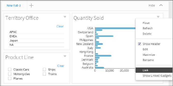
256
Actuate BIRT Application Developer Guide
Developers can change or remove the automatic links. Users can enable Current
Selections from the dashboard menu to see or clear all data selections on the
dashboard.
Selecting a field to receive link data
When you link two gadgets together that use different data objects, you must
match the published data field from the data selection gadget to a data field in the
subscribing gadget.
For example, a list gadget shows product line names from a data set. A chart
gadget shows sales results from a data cube in a different data object. The
developer matches the different field names when linking the chart gadget to the
list. This enables the list gadget to filter product line data in the chart gadget.
How to link to a data selection gadget
1In a gadget menu choose link. Figure 13-2 shows the gadget menu of a bar
chart.
Figure 13-2 Opening link options for a chart gadget
2In Link, choose the data selection gadgets to link to.
■
If the linked gadget displays values from the same data object as the chart,
it links automatically to the default field.
■
If the linked gadget displays values from a different data object than the
chart, you can select the field to filter when data is selected.
Figure 13-3 shows the chart linked to the Territory Office gadget and the
Product Line gadget.
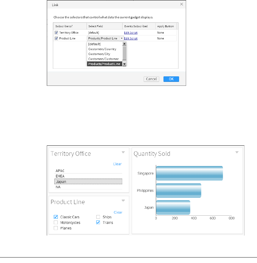
Chapter 13, Linking and scripting gadgets
257
Figure 13-3 Selecting a field to filter when the data selection gadget sends a
value
3Choose OK.
4Select a value in each data selection gadget. The linked chart updates when the
data selection value changes. Figure 13-4 shows a chart linked to two data
selection gadgets. Selections in the Territory Office gadget and the Product
Line gadget filter the values displayed in the chart.
Figure 13-4 Selecting a value to display in a chart
Scripting linked gadgets
Use JavaScript to process or change a user-selected values before it is used with
report, Reportlet, and import gadgets. You can also use JavaScript to interact with
global variables on the dashboard and change default report parameters. For
example, you can validate or change user selections, display custom dialogs, or
send values to a JavaScript function.
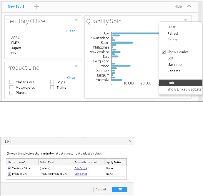
258
Actuate BIRT Application Developer Guide
When a user selects or changes a value in a data selection gadget, such as a list, an
onChange event is published to the dashboard. This onChange event triggers
gadgets subscribing to this list to update their contents with the new selection.
Use the onChange function to access gadget messages sent by data selection
gadgets. This enables you to use JavaScript to access and process user selections.
You can also view these values in a JavaScript debug console of your web browser
or in JavaScript alerts.
How to add JavaScript to a gadget
1In a gadget menu choose link. Figure 13-5 shows the gadget menu of a bar
chart.
Figure 13-5 Opening link options for a chart gadget
2In Link, choose Edit Script in the same row as the selected data selection
gadget. Figure 13-6 shows two linked gadgets that you can use with
JavaScript. Choose Edit Script in the row of the Product Line gadget.
Figure 13-6 Adding JavaScript to a data selection gadget
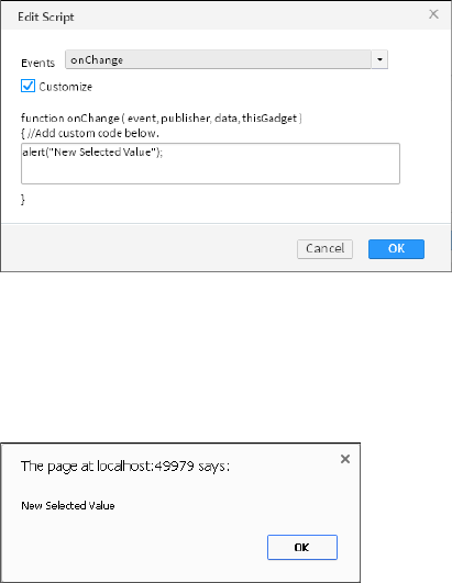
Chapter 13, Linking and scripting gadgets
259
3In Edit Script, select Customize and type the following text as shown in
Figure 13-7:
alert("New Selected Value");
Figure 13-7 Customizing the onChange event for a data selection gadget
4Choose OK.
5Test the new script by making a change in the data selection gadget that uses
the link. Figure 13-8 shows an example of a JavaScript alert that is created each
time a use selects a value in a data selection gadget.
Figure 13-8 Testing the new onChange JavaScript event
Choose OK to close the JavaScript alert.
Using JavaScript objects to retrieve values
JavaScript objects are used by gadgets to send and receive values. You can access
these objects to read and edit the values. Scripts interact with the following
JavaScript object data:
■
event
The event name, for example:
"ON_SELECTOR_GADGET_CHANGED"
■
data
The data object that includes the entire message published by the data
selection gadget. The following example of a data object message is sent by a
list gadget named PRODUCTLINE with Trains and Ships selected:
260
Actuate BIRT Application Developer Guide
{value:{
entry:{
'Gadget_f10549d7-b2b0-43f2-9f0a-387e0e2c2560':{
name:"PRODUCTLINE",
publisherRealName:"Gadget_f10549d7-b2b0-43f2-9f0a-
387e0e2c2560",
values:["Trains", "Ships" ],
namevalues:[
{value:"Trains", display:"Trains"},
{value:"Ships", display:"Ships"}
],
semantic:"SEMANTIC_filter"}
},
size:1
},
event:"ON_SELECTOR_GADGET_CHANGED"
}
■
publisher
The name of the gadget that published information, such as a list gadget that
publishes user selected values. For example:
{
"_gadgetName": "Gadget_f10549d7-b2b0-43f2-9f0a-387e0e2c2560",
"_gadgetTitle": "PRODUCTLINE",
"_gadgetType": "selector",
"_tabName": "823a17bc-c0a7-4d46-84d2-a4726ad624ce",
"_tabTitle": "New Tab 1"
}
■
thisGadget
This object refers to the report or Reportlet gadget receiving the published
message. You can use this data to verify values in parameters and set
conditions for updating a linking gadget.
The following example shows the value of thisGadget for a BIRT report design
file with a customer name parameter:
{
_gadgetName:"Gadget_95497566-9ce3-4fc6-8bde-3159ca69c173",
_gadgetTitle:"Report - Customer Order History",
_gadgetType:"viewer",
_tabName:"823a17bc-c0a7-4d46-84d2-a4726ad624ce",
_tabTitle:"New Tab 1",
_currentReportParameters:[
{
:{initialize:(function (){} ),
FACADE_INSTANCE:{},
name:"Customer",
Chapter 13, Linking and scripting gadgets
261
value:"Saveley & Henriot, Co.",
valueIsNull:false,
isRequired:true,
isMultiList:false,
dataType:"String"
}
}
]
}
Displaying values in a JavaScript console
You can view a user selection using a web browser’s JavaScript console. The
following JavaScript code displays the publisher of a linked gadget event in a
JavaScript console that supports the JSON method, such as Internet Explorer:
console.log(JSON.stringify(publisher,"",1));
The following JavaScript code displays the publisher object of a linked gadget
event to a JavaScript console that supports the toSource method, such as Firefox:
console.log(publisher.toSource());
In both Internet Explorer, Firefox, and Chrome you can inspect the JavaScript
object using the following code:
console.dir(publisher);
This code writes the data exchanged between gadgets to the JavaScript console of
the web browser. JavaScript code gives different results depending on the web
browser. For example the toSource( ) method works in Firefox but not in the
Internet Explorer or Safari web browser. Check your web browser’s
documentation for supported JavaScript debug tools.
Displaying values in Internet Explorer
Starting in Internet Explorer 9, the Developer Tools can view JavaScript values in
the console pane. For example, the following code in a chart gadget’s link
configuration runs when a user changes the list that the chart links to:
console.log(JSON.stringify(event,"",1));
console.log(JSON.stringify(publisher,"",1));
console.dir(data);
console.log(JSON.stringify(thisGadget,"",1));
Figure 13-9 shows the console result of a user selecting a value in the list gadget.
This console is in Developer Tools of Internet Explorer 11.
Some JavaScript objects only display the word [object Object]. For example,
JSON.stringify( ) works in Internet Explorer but it does not display JavaScript
objects in the Developer Tools console.
Chapter 13, Linking and scripting gadgets
263
Displaying selected values
You can extract specific parts of the message, for example:
alert(publisher._gadgetTitle);
This example creates a JavaScript alert displaying the name of the gadget that
published the message.
Using linked values
Scripts can process the value received from a linked gadget and execute
additional JavaScript code. For example, to display a JavaScript alert containing
the values arriving at a gadget, add the following script to the link:
var key = data.value.keys();
alert("Published value: " + data.value.get(key).values);
To display only the first selected value, use:
alert("Published value: " + data.value.get(key).values[0]);
JavaScript can change user selected values, such as changing the selection value
of France to FR. This enables you to select parts of a user selection, such as,
extracting a tracking number or part of a phone number, and apply additional
changes to the selection.
Scripts can read and change selection values before those values are used by
report gadgets or import gadgets. Scripts can also write user selection values to a
global variable on the dashboard page.
For example, a script on an HTML gadget can write the value of a user selection
to a global variable using the following code:
var key = data.value.keys();
var received = data.value.get(key).values[0];
window.tracking = received;
An HTML gadget can retrieve the global variable with the following HTML code:
<script type="text/javascript">
var message = parent.tracking;
document.write(message)
</script>
Refresh the HTML gadget to load the global variable. You can refresh a gadget by
selecting Refresh from the gadget menu. If you need an event to trigger
additional JavaScript code, put the code into a Google gadget and trigger the code
with the pubsub feature.

264
Actuate BIRT Application Developer Guide
Reading and writing parameter values
You can use scripts to read and write parameter values for report and Reportlet
gadgets. The thisGadget object supports a getCurrentReportParameters( )
function to view and change report parameters.
Scripts support the following actions:
■
Set conditions for using a data selection value.
■
Change the value of the linked data selection.
■
Change the parameter value of the report or Reportlet gadget.
For example, a dashboard developer makes a report gadget to display country
information in a BIRT design file. The developer expects users to select a country
from a linked list gadget. The BIRT design file has parameters for Country, State,
and City but the developer only wants to show country information. Listing 13-1
shows a script to remove current parameter values for State and City.
Listing 13-1 Example script for reading and writing report parameters
var params = thisGadget.getCurrentReportParameters();
for ( var i = 0; i < params.length; i++ )
{
var param = params[i];
if ((param.getName() == 'State') || (param.getName() ==
'City'))
{
param.setValue('');
param.setValueIsNull(true);
data.runReport = false;
}
}

266
Actuate BIRT Application Developer Guide
About Google gadgets
Google gadgets display dynamic web content using HTML and JavaScript. A
Google gadget resides on a web server as an XML file. BIRT iHub uses Apache
Shindig to render Google gadgets to HTML code for display in a web browser.
After you have the URL location of a Google gadget, use the import gadget to
display the Google gadget on a dashboard.
The URL location of the Google gadget file must resolve from BIRT iHub server
for the gadget to display content. The following URL locations are examples of
Google gadgets that can load into an import gadget to appear on a dashboard:
■
http://www.google.com/ig/modules/calculator.xml
■
http://www.google.com/ig/modules/calendar-for-your-site.xml
■
http://www.google.com/ig/modules/driving_directions.xml
Google gadgets must follow the Google gadget specifications. These gadgets
appear on a dashboard inside HTML iframe tags, and can link to Actuate gadgets
to receive data. Figure 14-1 shows a Google gadget displayed in an import gadget
on the dashboard.
Figure 14-1 Viewing a Google gadget
Creating Google gadgets
A Google gadget file typically includes the following components:
■
Module tag
This tag includes all gadget contents except the XML file declaration that
begins the file.
■
ModulePrefs tag
This tag contains gadget characteristics and required features.
■
Content tag
This tag contains CSS, HTML, and JavaScript code used in the gadget.
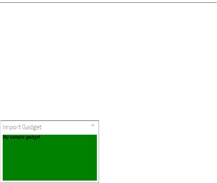
Chapter 14, Building Google gadgets
267
■
CDATA section
This section avoids XML parsing and the escape of special characters in HTML
and JavaScript code.
Listing 14-1 shows an example Google gadget that displays HTML content.
Listing 14-1 Example Google gadget displaying HTML code <<img>>
<?xml version="1.0" encoding="UTF-8" ?>
<Module>
<ModulePrefs height="300" title="gadget example"/>
<Content type="html"><![CDATA[
<script type="text/javascript">
<!-- JavaScript code -->
</script>
<!-- HTML code -->
<div id="my_div"
style="background-color:green;height:100%">
<b>My sample gadget</b>
</div>]]>
</Content>
</Module>
Figure 14-2 shows the result of the previous code when displayed in an import
gadget on the dashboard.
Figure 14-2 Viewing a sample Google gadget
You can use CSS, HTML, and JavaScript content that normally goes inside BODY
tags of an HTML file in a Google gadget. Google gadgets generate their own
HTML, HEAD, and BODY tags so it is not necessary for a gadget developer to use
these tags in the gadget. If external files such as JavaScript libraries and images
are required in the gadget, use the URI of the external file.
About gadget views
Google gadgets can optionally use views to match content with the location the
gadget is viewed. For example, the default view can contain content to appear
when the gadget is in a column layout with other gadgets and the canvas view
268
Actuate BIRT Application Developer Guide
can contain different content or CSS styles to appear when the gadget expands to
fill the screen.
The view parameter is part of the content element, as shown in the following
code:
<Content type="html" view="default">
The following Google gadget views are supported:
■
default
■
canvas
If a view is not defined, the default view is used. Dashboards requires at least one
content element with a supported view or one content element without any view
defined. For example, if the following code is the only content element in a
Google gadget, the Google gadget does not load in the import gadget:
<Content type="html" view="home">
For more information about building Google gadgets with these features, see the
Google Gadget Developer’s Guide at the following URL:
https://developers.google.com/gadgets/docs/ui
About gadget features
Google gadgets use features to request a special API that enables the gadget to
function. The code for these APIs are stored on the server displaying the Google
gadget, in this case on BIRT iHub. The gadget developer uses less code because
the requested feature is loaded by BIRT iHub. For example, instead of adding
JavaScript code to parse data, the parse function can load as a feature.
The Google gadget must contain a <require> element with the feature name, as
shown in the following code:
<Require feature="pubsub" />
This code requests the pubsub feature, which enables Google gadgets to
communicate between each other and enables Google gadgets to receive
user-selected values from Actuate gadgets.
When the feature is available, the gadget loads the API associated with the
feature from BIRT iHub. If the requested feature is not available, an error message
appears. If an externally hosted Google gadgets does not appear in the import
gadget, check if required features are available in BIRT iHub.
The following Google gadget features are supported along with the Google
gadget Core JavaScript API:
■
Flash
■
Minimessage

Chapter 14, Building Google gadgets
269
■
Pubsub
■
Tabs
For more information about building Google gadgets with these features, see the
Google Gadget API reference at the following URL:
http://developers.google.com/gadgets/docs/reference/
Using the Flash feature
Use the Flash feature to embed Flash movies in Google gadgets. The following
code shows the Flash feature being used in a Google gadget:
<?xml version="1.0" encoding="UTF-8" ?>
<Module>
<ModulePrefs title="Flash demo" height="300">
<Require feature="flash" />
</ModulePrefs>
<Content type="html">
<![CDATA[
<div id="flashcontainer"></div>
<script type="text/javascript">
var url = "http://www.mywebsite.com/swfs/main.swf";
gadgets.flash.embedFlash(url, "flashcontainer", {
swf_version: 6,
id: "flashid"
})
</script>
]]>
</Content>
</Module>
Optionally, gadget developers can use the object tag to embed the Adobe
Flash content in HTML code. For more information about using Adobe Flash,
see “Displaying Adobe Flash content” in Chapter 4, “Displaying a file on
adashboard.”
Using the minimessage feature
Use the minimessage feature to display a temporary message to users. Figure 14-3
shows the minimessage feature in a gadget.
Figure 14-3 Using the minimessage feature

270
Actuate BIRT Application Developer Guide
The following code shows the minimessage feature used in a Google gadget:
<?xml version="1.0" encoding="UTF-8" ?>
<Module>
<ModulePrefs title="minimessage demo">
<Require feature="minimessage" />
</ModulePrefs>
<Content type="html">
<![CDATA[
<form>
<input type="button" value="Click" onClick="Changer()">
</form>
<script type="text/javascript">
var msg = new gadgets.MiniMessage(__MODULE_ID__);
function Changer(){
msg.createDismissibleMessage("test message");
}
</script>
]]>
</Content>
</Module>
Using the pubsub feature
The pubsub feature of a Google gadget is also called the publish and subscribe
gadget framework. This framework enables gadgets to send and receive
messages from one Google gadget to another and to link Google gadgets to
Actuate gadgets. For more information about linking gadgets, see “Linking
Google gadgets,” later in this chapter.
Using the tabs feature
Use the tabs feature to organize the gadget content with tabs. Figure 14-4 shows
the tabs feature in a gadget.
Figure 14-4 Using the tabs feature
The following code shows the tabs feature in a Google gadget:
<?xml version="1.0" encoding="UTF-8" ?>
<Module>
<ModulePrefs title="tabs demo">
<Require feature="tabs" />
</ModulePrefs>

Chapter 14, Building Google gadgets
271
<Content type="html">
<![CDATA[
<script type="text/javascript">
var tabs = new gadgets.TabSet(__MODULE_ID__, "Two");
function init() {
tabs.addTab("One", {
contentContainer: document.getElementById("id_1")});
tabs.addTab("Two", {
contentContainer: document.getElementById("id_2")});
tabs.addTab("Three", {
contentContainer: document.getElementById("id_3")});
}
gadgets.util.registerOnLoadHandler(init);
</script>
<div id="id_1" style="display:none">Content, tab One.</div>
<div id="id_2" style="display:none">Content, tab Two.</div>
<div id="id_3" style="display:none">Content, tab Three.</div>
]]>
</Content>
</Module>
Linking Google gadgets
Google gadgets display on the dashboard using import gadgets. Google gadgets
link to other gadgets to share values in the following ways:
■
Link to a data selection gadget by choosing Link from the import gadget
menu.
■
Link to another Google gadget using the Google publish subscribe framework.
Link Google gadgets to data selection gadgets to receive user selections. The
value of the user selection is processed using JavaScript and displays in the
import gadget using HTML. For example, a list gadget can send a user selection
to a Google gadget. After the Google gadget processes the value it displays a
JavaScript alert that contains the user selected value.
If you need to process the linked values before the value is passed to the Google
gadget, add JavaScript to the link configuration of the import gadget. For more
information about scripting, see Chapter 4, “Displaying a file on a dashboard.”
Linking an import gadget
Link an import gadget to a data selection gadget, such as a list, to receive user
selection values. You can now use the Google gadget pubsub feature to receive
and process the user selection. Use the gadgets.pubsub.subscribe(channelName,

272
Actuate BIRT Application Developer Guide
callback) method in the Google gadget to receive the linked value and send it to
a callback function, as shown in the following code:
gadgets.pubsub.subscribe("ON_SELECTOR_GADGET_CHANGED",
callbackFunction);
The callback function in the Google gadget XML file processes the received value.
For example, a callback function reads the incoming message and extracts a
value, such as a customer’s address. The callback function then sends the address
to an external web service such as Google maps. When the web service responds,
the gadget updates with the map showing the location of the address.
Listing 14-2 shows an example Google gadget that displays changes from a
linked data selection gadget. After saving the Google gadget code as an XML file
and placing it on a web server, load the file into an import gadget. Link the
import gadget to a data selection gadget on the dashboard. Each time the linked
data selection gadget changes, the selected value displays in the Google gadget.
Listing 14-2 Example Google gadget with linking enabled
<?xml version="1.0" encoding="UTF-8" ?>
<Module>
<ModulePrefs title="linking example" height="500">
<Require feature="pubsub" />
</ModulePrefs>
<Content type="html">
<![CDATA[
<script type="text/javascript">
function onEventChange(sender, message) {
document.getElementById('changeme').innerHTML=message;
}
gadgets.pubsub.subscribe("ON_SELECTOR_GADGET_CHANGED",
onEventChange);
</script>
<div id="changeme">DEFAULT TEXT</div> <br />
<div>The above text changes according to the current
selection of the gadgets it is linked to.</div>
]]>
</Content>
</Module>
Linking multiple Google gadgets
BIRT dashboards support displaying multiple Google gadgets on the same
dashboard. When an import gadget links to a data selection gadget, the
message sent by the user selection is a global message. This global message is
published across the dashboard on the ON_SELECTOR_GADGET_CHANGED
channel and all subscribing import gadgets that listen on the
ON_SELECTOR_GADGET_CHANGED channel receive the same message.
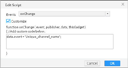
Chapter 14, Building Google gadgets
273
Google gadgets must listen on unique channel names unless you want them to
receive the same user selected values.
For example, a dashboard developer adds an import gadget to show a map of
customer addresses and another import gadget to show shipping status on
orders. When a user selects the order number from a list gadget that links to both
import gadgets, then those import gadgets receive the value and process it. The
import gadget that shows shipping status can process the value. The import
gadget showing a map expects an address and is unable to retrieve a valid map
from an order number.
The issue is resolved when both import gadgets listen on different channels for
user selections. Once each Google gadget listens for a unique channel event
name, messages go to the correct gadget.
To use a unique channel name in a Google gadget, change the channel name
when calling the gadgets.pubsub.subscribe( ) method. The following code shows
the channel name changed to Unique_channel_name:
gadgets.pubsub.subscribe("Unique_channel_name", onEventChange);
Only data arriving on the unique channel name triggers the onEventChange
function of the Google gadget. Once the Google gadget is listening for a unique
channel name, the channel name used to send the value must also change to
match the unique channel name.
Add a script to the link settings of the import gadget to match the channel name
used in the embedded Google gadget. The following code shows an example of
JavaScript that changes the channel event name to Unique_channel_name.
data.event = 'Unique_channel_name';
This script overrides the default channel name before the import gadget passes
the information to the Google gadget. The unique channel name must match the
name that the embedded Google gadget is listening for.
Figure 14-5 shows JavaScript in a link event for an import gadget.
Figure 14-5 Changing the channel event name
All import gadgets listening for the new channel name receive messages from the
list gadget. In this example the new channel name is Unique_channel_name.

274
Actuate BIRT Application Developer Guide
For more information about adding script to a linking gadget, see “Scripting
linked gadgets” in Chapter 13, “Linking and scripting gadgets.”
Linking Google gadgets together
Gadget developers can build Google gadgets that communicate with one to
another using Google’s publish subscribe framework API. One gadget can
publish a message and another gadget can subscribe to it. For example, one
Google gadget can offer choices to users and another Google gadget can process
and display the user’s selections.
Google gadgets that communicate with each other on a dashboard must display
inside an import gadget and communicate on the same channel name. The
dashboard developer does not link the two import gadgets together because the
Google gadget contains all the necessary code to publish and to receive the
messages.
Listing 14-3 shows an example Google gadget that publishes the current date to a
custom channel when a user selects the HTML button.
Listing 14-3 Example of a publishing Google gadget
<?xml version="1.0" encoding="UTF-8" ?>
<Module>
<ModulePrefs title="Sample PubSub Publisher">
<Require feature="pubsub"/>
</ModulePrefs>
<Content type="html">
<![CDATA[
Published date: <div id="output">...</div><br>
<script type="text/javascript">
function myEvent() {
var message=new Date();
gadgets.pubsub.publish("MY_CHANNEL_NAME", message);
document.getElementById('output').innerHTML = message;
}
</script>
<div>
<input type="button" value="Publish date and time"
onclick="myEvent()"/>
</div>
]]>
</Content>
</Module>
Create a second import gadget using the code from Listing 14-2. Change the
channel that the new Google gadget subscribes to so that it matches the channel
name of the publishing Google gadget. In the previous example, the channel

Chapter 14, Building Google gadgets
275
name was MY_CHANNEL_NAME. Change the subscribe method to use this
channel name, as shown in the following code:
gadgets.pubsub.subscribe("MY_CHANNEL_NAME", onEventChange);
Use import gadgets to add both Google gadgets to the same dashboard. When the
user chooses the HTML button, the subscribing Google gadget receives the
published message. Figure 14-6 shows the two gadgets communicating.
Figure 14-6 Communicating between Google gadgets
You do not need to link the two import gadgets together because the Google
gadget contains all the necessary code to communicate, to publish, and to receive
the message.
Linking public Google gadgets
Google gadgets that the dashboard developer does not own and cannot modify,
can receive user selections if the gadget uses the pubsub feature. The dashboard
developer adds a script to the import gadget that displays the Google gadget.
This script changes the link channel name to match the channel name of the
Google gadget. For example, you look at the source code of a Google gadget and
see the following code:
gadgets.pubsub.subscribe("MY_PERSONAL_GOOGLE_GADGET",
onEventChange);
The channel name used by this Google gadget is
MY_PERSONAL_GOOGLE_GADGET.
After linking to a data selection gadget, such as a list gadget, add a script to the
link configuration of the import gadget to match the channel name required by
the public Google gadget. The following code shows an example of this script,
changing the name of the event to MY_PERSONAL_GOOGLE_GADGET:
data.event = "MY_PERSONAL_GOOGLE_GADGET";
When the user makes a selection from the list, the import gadget changes the
channel name and passes the message to the Google gadget. For more
information about adding script to a linked gadget, see “Scripting linked
gadgets” in Chapter 13, “Linking and scripting gadgets.”
276
Actuate BIRT Application Developer Guide

Part 5
Using Actuate JavaScript API
in an application
Part Five
5

Chapter 15, Creating dynamic report content using the Actuate JavaScript API
279
Chapter
15
Chapter 15
Creating dynamic
report content using the
Actuate JavaScript API
This chapter contains the following topics:
■
About Actuate JavaScript API scripting in a BIRT report design
■
Using the Actuate JavaScript API in an HTML button
■
Using the Actuate JavaScript API in chart interactive features
■
Using the Actuate JavaScript API in chart themes
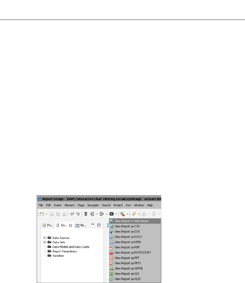
280
Actuate BIRT Application Developer Guide
About Actuate JavaScript API scripting in a BIRT report
design
The scripting features of the BIRT designers support using the JSAPI for the
following operations:
■
Using the Actuate JavaScript API in an HTML button
■
Using the Actuate JavaScript API in chart interactive features
■
Using the Actuate JavaScript API in chart themes
Most Actuate JavaScript API functions run when an event occurs. The report
element defines the events that it supports. For example, the onRender event
occurs when the report renders in the viewer or on a page.
A BIRT report or Reportlet renders in the following ways:
■
In BIRT Viewer or Interactive Viewer
■
In BIRT Studio
■
In Actuate BIRT Designer
■
In an Actuate JavaScript API viewer object on a mashup page
All of these products load the actuate.Viewer and actuate.Dialog classes when
they render a report, except for the preview functionality in BIRT Designer. Use
the View Report in Web Viewer function to view and test Actuate JavaScript API
scripts with BIRT Designer, as shown in Figure 15-1.
Figure 15-1 Accessing Web Viewer in Actuate BIRT Designer
Most of the classes and functions in the actuate.Viewer class can be used in a BIRT
report design without loading or initializing the actuate.Viewer class and. Most of
the viewers also load the actuate.Parameters and actuate.DataService classes by
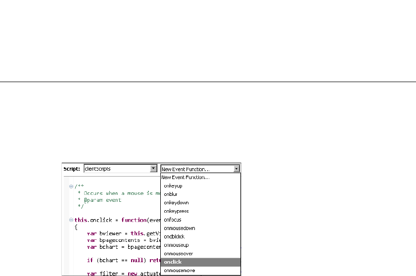
Chapter 15, Creating dynamic report content using the Actuate JavaScript API
281
default. Define the classes loaded for Actuate JavaScript API mashup page
explicitly. Load the DataService, Parameters, and Viewer classes before the API
initializes the connection to the reporting web service.
Using the Actuate JavaScript API in an HTML button
The HTML button element can execute client-side JavaScript code based on
button events. Access the HTML button in the BIRT designer by selecting a
button element, choosing the script tag, and selecting the event from the event
drop-down list, as shown in Figure 15-2.
Figure 15-2 Choosing HTML button event handlers
Use event functions to add JavaScript functionality to HTML buttons. For
example, a button that swaps columns of data, filters data, sorts data, hides
information, or groups the rows of a table by some data column can be created
with event functions. The following script groups the rows of a table by the
quantity of items in each order when the HTML button is clicked:
this.onclick = function(event){
var btable = this.getViewer( ).getCurrentPageContent( )
.getTableByBookmark("TableBookmark");
btable.groupBy("QUANTITYORDERED");
btable.submit( );
}
When the HTML button triggers the example event above, the table grouping
changes and the display refreshes, as shown in Figure 15-3.
HTML buttons can be arranged into sets of controls for the user to use once a
report runs. For example, when these buttons are used in the header for a table,
the header can provide controls similar to those in the header shown in
Figure 15-4.
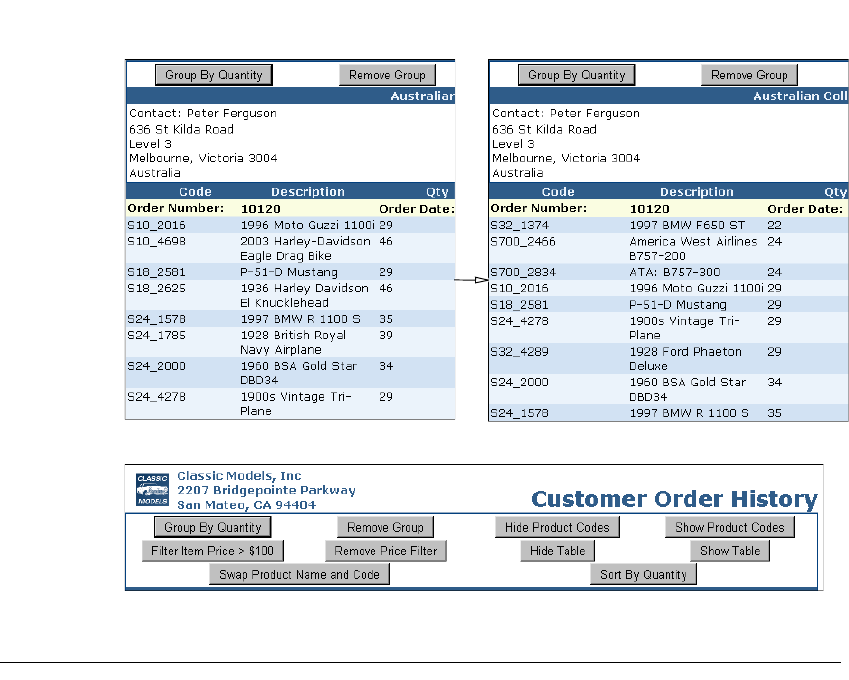
282
Actuate BIRT Application Developer Guide
Figure 15-3 Using a GroupBy HTMLButton control
Figure 15-4 HTML button header
Tutorial 4: Adding scripted chart controls to a BIRT
design
In this tutorial, you add HTML buttons to a BIRT design that implement controls
for a chart in the BIRT design. You perform the following tasks:
■
Add bookmarks.
■
Add a filter script to chart interactivity.
■
Script the chart size controls.
■
Test the scripts.
Task 1: Add HTML buttons
In this task, you review a BIRT report design called
ChartWithHTMLButtons.rptdesign and create a grid of HTML buttons.
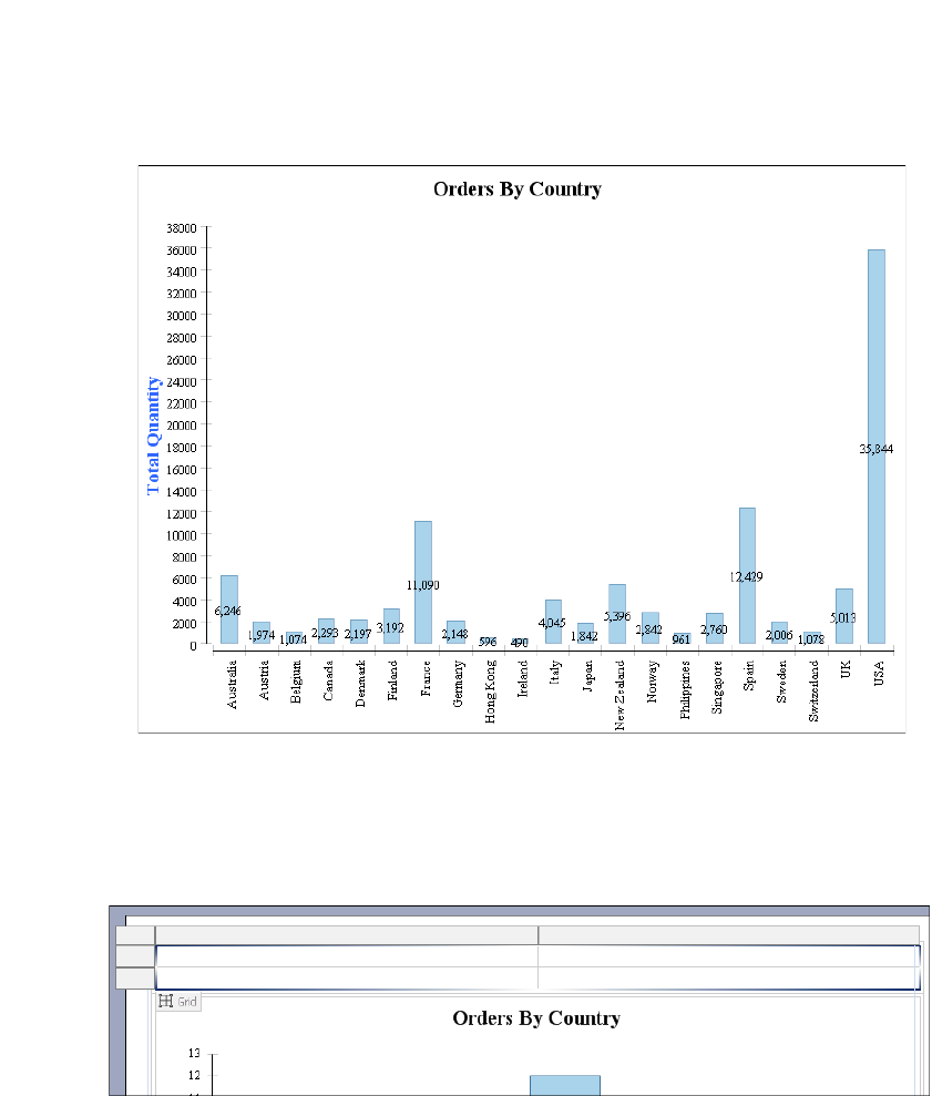
Chapter 15, Creating dynamic report content using the Actuate JavaScript API
283
1Open BIRT Designer Professional. In Navigator, navigate to and open
ChartWithHTMLButtons.rptdesign.
2Preview the report, as shown in Figure 15-5.
Figure 15-5 Previewing the report
3Choose Layout to return to the layout editor.
4Right-click the first cell of the table. Choose Insert➛Grid. On Insert Grid, set
Number of columns to 2 and Number of rows to 2, then choose OK. A new
grid appears above the chart, as shown in Figure 15-6.
Figure 15-6 Inserting a grid
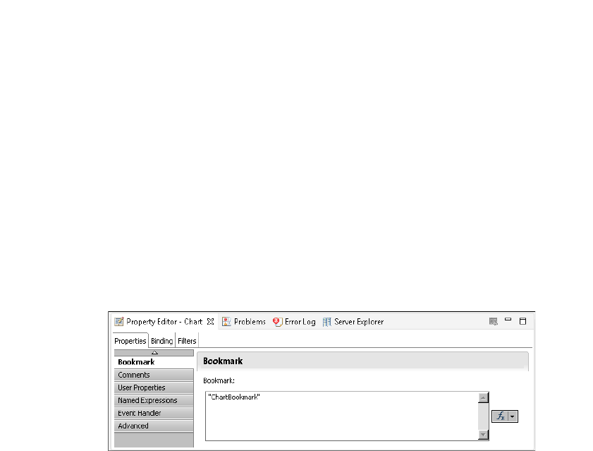
284
Actuate BIRT Application Developer Guide
5To create HTML buttons for the report, perform the following steps:
1Right-click the first cell of the grid. Choose Insert➛HTML Button.
2On HTML Button, type "2D with Depth" into the value field.
3Choose OK. If a warning message appears, choose OK.
6Repeating the process of step 6, create an HTML button in the remaining
empty cells of the grid with the values "2D", "resize 400x600", and "resize
600x400".
Task 2: Script the chart sub_type controls
In this task, you add event handler scripts to HTML buttons that change the
subtype controls of the chart.
1Select the chart. In the property editor, open Properties➛Bookmark. Set the
bookmark value to "ChartBookmark" as shown in Figure 15-7.
Figure 15-7 Setting the chart bookmark property
2Select the 2D with Depth HTML button and choose Script.
3In the New Event Function drop-down list, select onclick. The onclick event
handler appears in the script editor text box.
4After the first curly brace ({), add the following code:
var bchart = this.getViewer().getCurrentPageContent()
.getChartByBookmark("ChartBookmark");
bchart.setChartTitle("Orders by Country (2D with Depth)");
bchart.setDimension(actuate.report.Chart
.CHART_DIMENSION_2D_WITH_DEPTH );
bchart.submit();
5Return to the layout editor. Select the 2D HTML button and choose Script.
6In the New Event Function drop-down list, select onclick. The onclick event
handler appears in the script editor text box.
7After the first curly brace ({), add the following code:
var bchart = this.getViewer().getCurrentPageContent()

Chapter 15, Creating dynamic report content using the Actuate JavaScript API
285
.getChartByBookmark("ChartBookmark");
bchart.setChartTitle("Orders by Country");
bchart.setDimension(actuate.report.Chart.CHART_DIMENSION_2D );
bchart.submit();
Task 3: Script the chart size controls
In this task, you add event handler scripts to HTML buttons that change the
display dimensions of the chart.
1Select the Resize 400x600 HTML button and choose Script.
2In the New Event Function drop-down list, select onclick. The onclick event
handler appears in the script editor text box.
3After the first curly brace ({), add the following code:
var bchart = this.getViewer().getCurrentPageContent()
.getChartByBookmark("ChartBookmark");
bchart.setChartTitle("Orders by Country (400x600)");
bchart.setSize(400,600);
bchart.submit();
4Return to the layout editor. Select the Resize 600x400 HTML button and
choose Script.
5In the New Event Function drop-down list, select onclick. The onclick event
handler appears in the script editor text box.
6After the first curly brace ({), add the following code:
var bchart = this.getViewer().getCurrentPageContent()
.getChartByBookmark("ChartBookmark");
bchart.setChartTitle("Orders by Country (600x400)");
bchart.setSize(600,400);
bchart.submit();
Task 4: Test the scripts
In this task, you run the report and test the HTML button scripts.
1Save the report.
2View the report by choosing Run➛View Report➛In Web Viewer.
3In the Actuate viewer, choose Resize 600x400. The report title changes and the
report changes size, as shown in Figure 15-8.
4In the Actuate viewer, choose 2D with Depth. The report title changes and the
report subtype changes to 2D with depth, as shown in Figure 15-9.
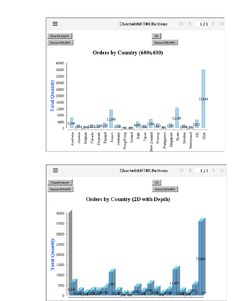
286
Actuate BIRT Application Developer Guide
Figure 15-8 A chart displaying 600x400 size
Figure 15-9 A chart with a 2D with Depth subtype
5Choose other buttons to test scripted changes to the report display.
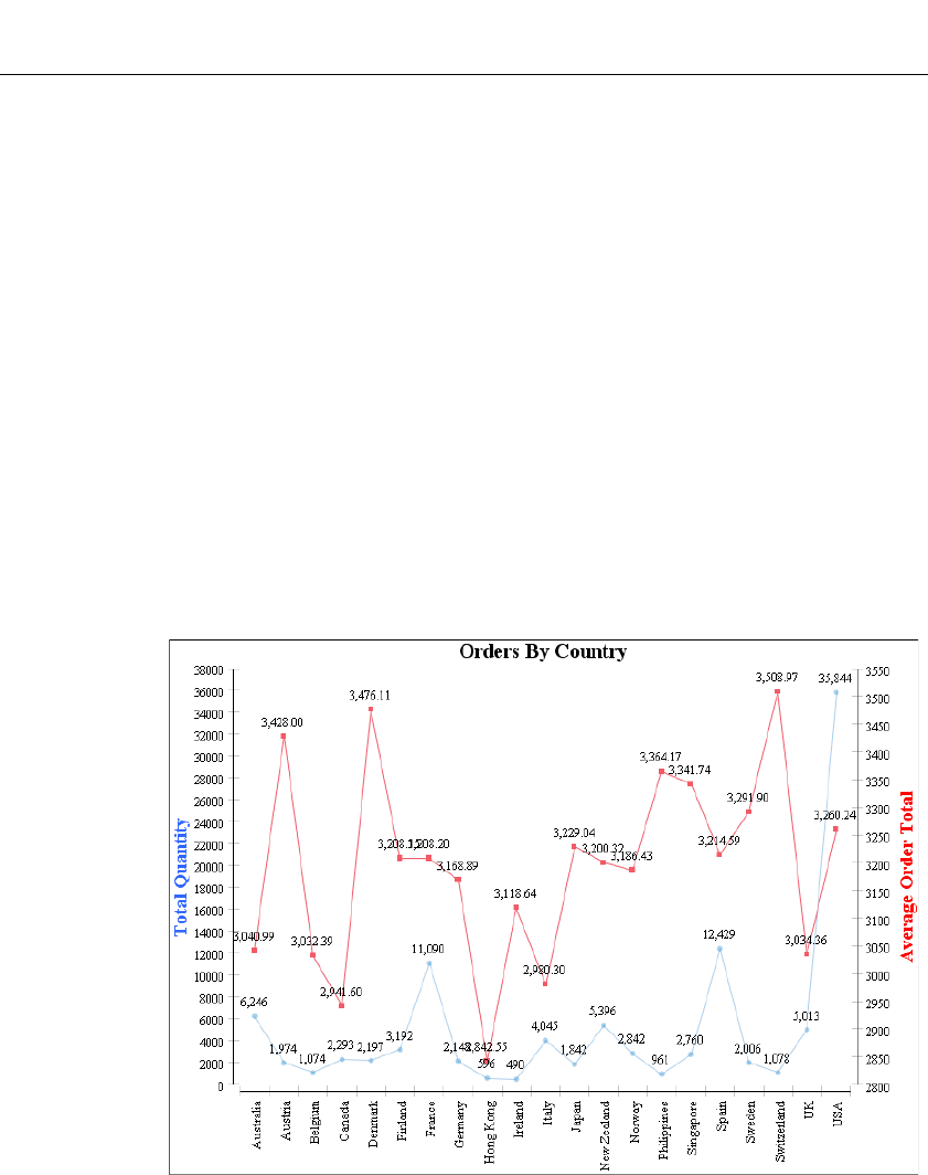
Chapter 15, Creating dynamic report content using the Actuate JavaScript API
287
Tutorial 5: Using HTML buttons to apply filters to a
chart
In this tutorial, you add multiple HTML buttons to an existing report that each
add a filter for a different product line. An additional HTML button removes all
filters to display data for all product lines.You perform the following tasks:
■
Add a filter button to the report.
■
Add HTML buttons for the remaining product lines.
■
Add the final HTML button to the report.
■
Test the report.
Task 1: Add a filter button to the report
In this task, you preview a report called ButtonFilterChart.rptdesign and add the
first HTML button that implements event handlers to apply a filter to the chart.
1In Navigator, open ButtonFilterChart.rptdesign.
2Choose Run➛View Report➛In Web Viewer to view the report, as shown in
Figure 15-10.
Figure 15-10 Previewing the line chart report
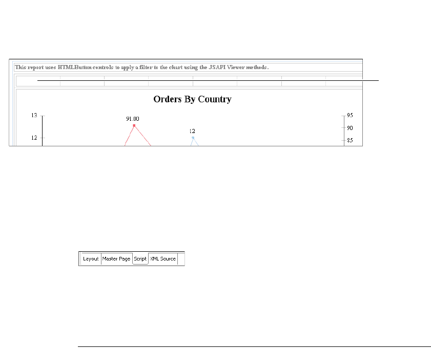
288
Actuate BIRT Application Developer Guide
3Close the Web Viewer window. From Palette, drag an HTML button element
into the first grid cell, as shown in Figure 15-11.
4In HTML Button, type the following text for Value:
Classic Cars
5Choose OK. If a warning appears displaying a message about adding
functionality, choose OK.
6Choose Script, as shown in Figure 15-12, to access the script editor.
Figure 15-12 Choosing Script
7In New Event Function, select onclick.
8In the function body for the onclick event handler, copy the code for the
Classic Cars button shown in Listing 15-1.
Listing 15-1 Classic Cars JSAPI code
var bviewer = this.getViewer( );
var bpagecontents = bviewer.getCurrentPageContent( );
var bchart = bpagecontents.getChartByBookmark("ChartBookmark");
if (bchart == null) return;// unable to get handle to chart in
case where chart becomes hidden
var filter = new actuate.data.Filter("PRODUCTLINE",
actuate.data.Filter.EQ, "Classic Cars");
var filters = new Array( );
filters.push(filter);
bchart.setFilters(filters);
bchart.setChartTitle("Orders By Country (Classic Cars)");
bchart.submit( );
9Preview the report in the web viewer by choosing Run➛View Report
➛In Web Viewer. Click on the Classic Cars HTML button that appears in the
top left corner and the filtered chart appears as shown in Figure 15-13.
Place button
in grid cell
Figure 15-11 Viewing the location of the first HTML button
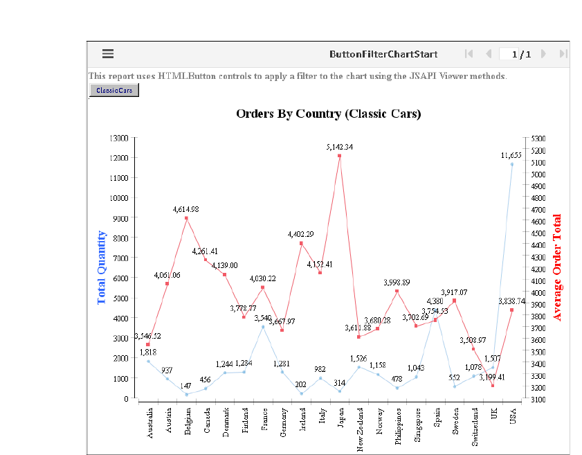
Chapter 15, Creating dynamic report content using the Actuate JavaScript API
289
Figure 15-13 Previewing the report with the Classic Cars data
10 Close Actuate Viewer.
Task 2: Add HTML buttons for the remaining
product lines
In this task, you add six HTML buttons, one for each of the remaining product
lines.
1Choose Layout to return to the layout editor. From Palette, drag an HTML
button element into the next available grid cell. In HTML Button, for Value,
type:
Motorcycles
Choose OK. If a warning appears displaying a message about adding
functionality, choose OK. The HTML button appears in the layout editor.
2Choose the Script tab. In New Event Function, select onclick.

290
Actuate BIRT Application Developer Guide
3Copy the code for the Classic Cars button shown in Listing 15-1, and paste the
code in the function body of the onclick event handler.
4In Script, replace Classic Cars with Motorcycles in the following two lines:
var filter = new actuate.data.Filter("PRODUCTLINE",
actuate.data.Filter.EQ, "Classic Cars");
and:
bchart.setChartTitle("Orders By Country (Classic Cars)");
The edited event handler appears as shown in Listing 15-2.
Listing 15-2 Motorcycles JSAPI code
var bviewer = this.getViewer( );
var bpagecontents = bviewer.getCurrentPageContent( );
var bchart = bpagecontents.getChartByBookmark("ChartBookmark");
if (bchart == null) return;// unable to get handle to chart in
case where chart becomes hidden
var filter = new actuate.data.Filter("PRODUCTLINE",
actuate.data.Filter.EQ, "Motorcycles");
var filters = new Array( );
filters.push(filter);
bchart.setFilters(filters);
bchart.setChartTitle("Orders By Country (Motorcycles)");
bchart.submit( );
5Repeat steps 1 through 4 of this task for the following five buttons and data
values:
■
Planes
■
Ships
■
Trains
■
Trucks and Buses
■
Vintage Cars
When complete, the report layout appears as shown in Figure 15-14.
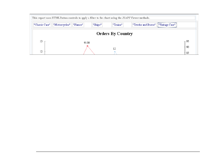
Chapter 15, Creating dynamic report content using the Actuate JavaScript API
291
Figure 15-14 Viewing filter buttons in Layout
Task 3: Add the final HTML button to the report
In this task, you add the final filter button to the report. This button is different
from the previous buttons, in that it will clear any filter and display summary
data for all product lines.
1From Palette, drag an HTML button element into the remaining grid cell. In
HTML Button, in Value, type:
Show All
Choose OK.
2Choose Script. In New Event Function, select onclick.
3In the function body for the onclick event handler, copy the code for the
Show All button shown in Listing 15-3.
Listing 15-3 JSAPI code to remove filters from charts
var bviewer = this.getViewer( );
var bpagecontents = bviewer.getCurrentPageContent( );
var bchart = bpagecontents.getChartByBookmark("ChartBookmark");
if (bchart == null) return;// unable to get handle to chart in
case where chart becomes hidden
bchart.clearFilters("PRODUCTLINE");
bchart.setChartTitle("Orders By Country");
bchart.submit( );
4Choose Layout. The Show All button appears as shown in Figure 15-15.
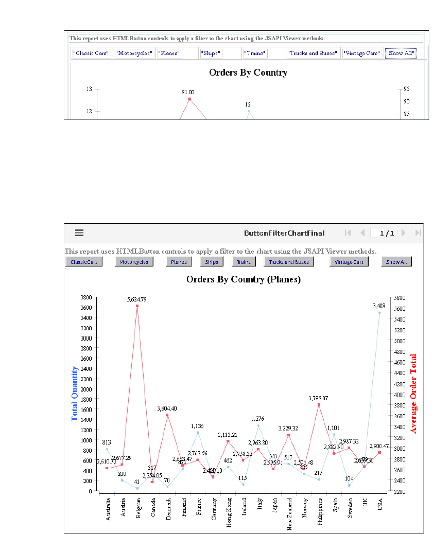
292
Actuate BIRT Application Developer Guide
Figure 15-15 Viewing all buttons in Layout
Task 4: Test the report
In this task, you test the report by selecting the various product line buttons.
1Choose Run➛View Report➛In Web Viewer.
2Choose the Planes HTML button. The chart changes, as shown in Figure 15-16.
Figure 15-16 Viewing the report after selecting the Planes HTML button
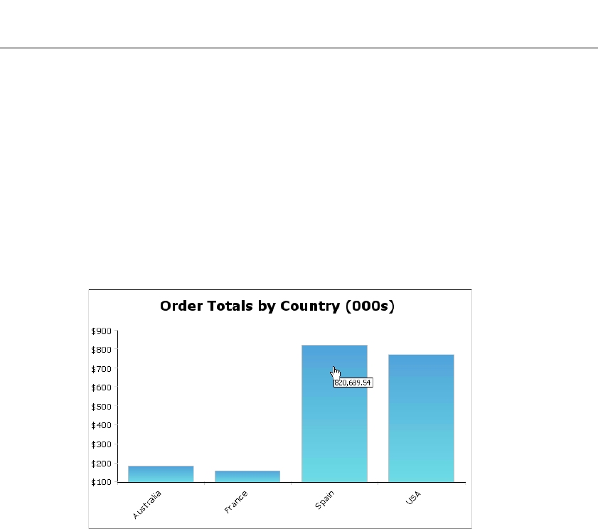
Chapter 15, Creating dynamic report content using the Actuate JavaScript API
293
Using the Actuate JavaScript API in chart interactive
features
BIRT reports support adding interactive features to a chart to enhance the
behavior of a chart in the viewer. The interactive chart features are available
through the chart builder. Implement Actuate JavaScript API functions within
interactive features.
An interactive chart feature supports a response to an event, such as the report
user choosing an item or moving the mouse pointer over an item. The response
can trigger an action, such as opening a web page, drilling to a detail report, or
changing the appearance of the chart. For example, use a tooltip to display the
series total when a user places the mouse over a bar in a bar chart, as shown in
Figure 15-17.
Figure 15-17 Chart showing a tooltip
Interactive features can be added to a value series, the chart area, a legend,
marker lines, the x- and y-axis, or a title. Figure 15-18 identifies these elements.
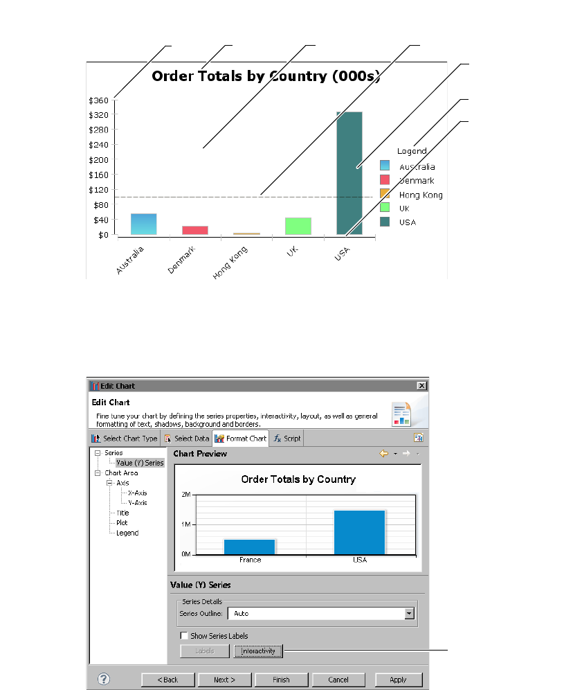
294
Actuate BIRT Application Developer Guide
Figure 15-18 Elements selectable for chart interactivity
To add an interactive feature to a chart, either choose Format Chart in the chart
builder and select a chart element to make interactive, or choose Script in the
chart builder and select the chart element to make interactive. Figure 15-19 shows
the location of the Interactivity button for a value series.
Figure 15-19 Accessing interactivity for a value series
Figure 15-20 shows the elements accessible using the script feature.
Y Axis Chart Title Marker Line
Chart Area
Value Series
X Axis
Legend
Interactivity
button
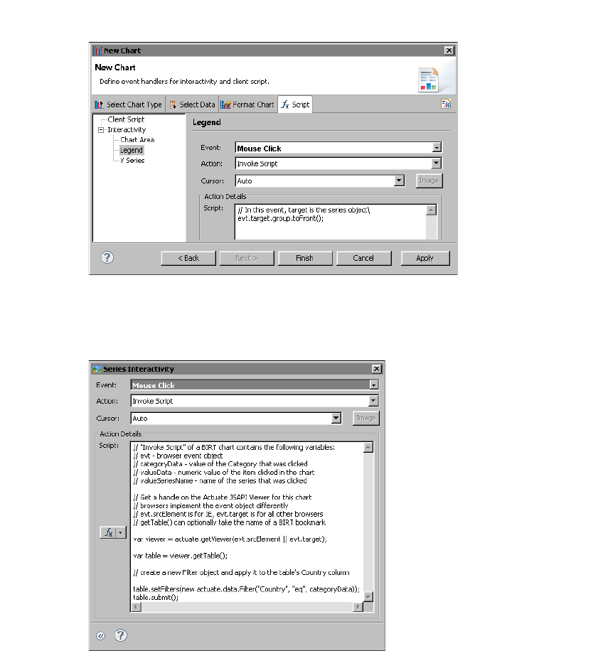
Chapter 15, Creating dynamic report content using the Actuate JavaScript API
295
Figure 15-20 Accessing interactivity for a legend
The location of the Interactivity button varies by chart element. Click the
Interactivity button to display the interactivity editor. Figure 15-21 shows the
interactivity editor.
Figure 15-21 Interactivity editor
The Action Details window displays a script that runs when the user clicks an
item in the series. The script adds a filter to the table that displays below the chart.
The filter restricts the data by the selected element. The code performs the
following three tasks to handle this interactivity:
■
Obtains the bookmark for the table when the event occurs:

296
Actuate BIRT Application Developer Guide
var viewer = actuate.getViewer(evt.srcElement ||
evt.originalTarget)
var table = viewer.getTable( );
The event is taken from the Invoke Script action of a BIRT chart. Set the Invoke
Script action in the second field of the interactivity editor. The Invoke Script
action contains the following variables:
■
evt: browser event object
■
categoryData: value of the selected category
■
valueData: numeric value of the selected item
■
valueSeriesName: name of the selected series
The code above uses getViewer and the evt object to obtain a handle for the
viewer when an event occurs. The Firefox and Internet Explorer browsers
implement the event differently. For Firefox, evt.originalTarget contains the
name of the viewer object. For Internet Explorer, evt.srcElement contains
the name of the viewer object.
The getTable( ) function retrieves the Table object for the first table in the
viewer. To target a different table, use a specific table bookmark as the input
parameter for getTableByBookmark( ).
■
Performs an operation on the target:
table.setFilters(new actuate.data.Filter("Country",
actuate.data.Filter.EQ, categoryData));
This code example creates a new filter using the actuate.data.Filter
constructor. The constructor takes three arguments:
■
column name: The column name is the name of the series. In this case, the
y-axis is a list of countries, so a mouse click filters the table according to the
Country column.
■
operator: actuate.data.Filter.EQ is the constant definition for the equal to
operator.
■
value: the value of the categoryData object generated by the event, which is
a country. The filter returns rows with a Country value that matches the
value selected by the user.
■
Submits the action for processing:
table.submit( );
The Actuate JavaScript API processes operations asynchronously. Actions are
performed when submit( ) is called.
Figure 15-22 shows the chart before interaction.
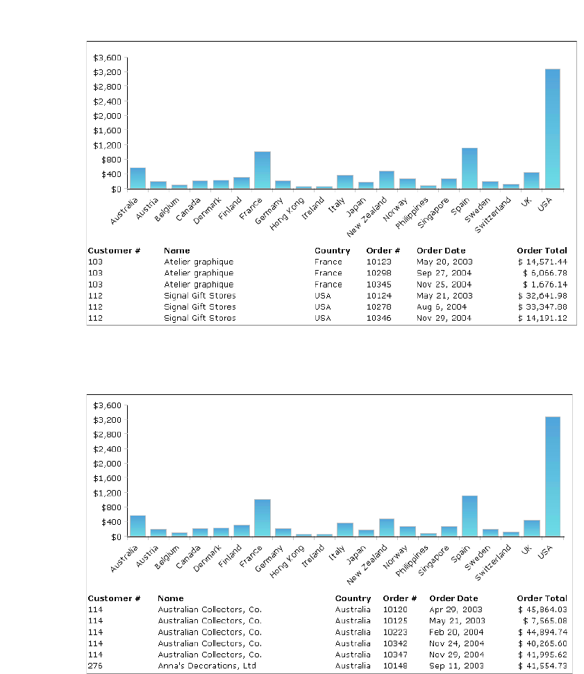
Chapter 15, Creating dynamic report content using the Actuate JavaScript API
297
Figure 15-22 An interactive chart and table before any user action
When the user selects the bar for Australia in the value series, the table is filtered
for Australia, as shown in Figure 15-23.
Figure 15-23 An interactive chart and table after the user selects Australia
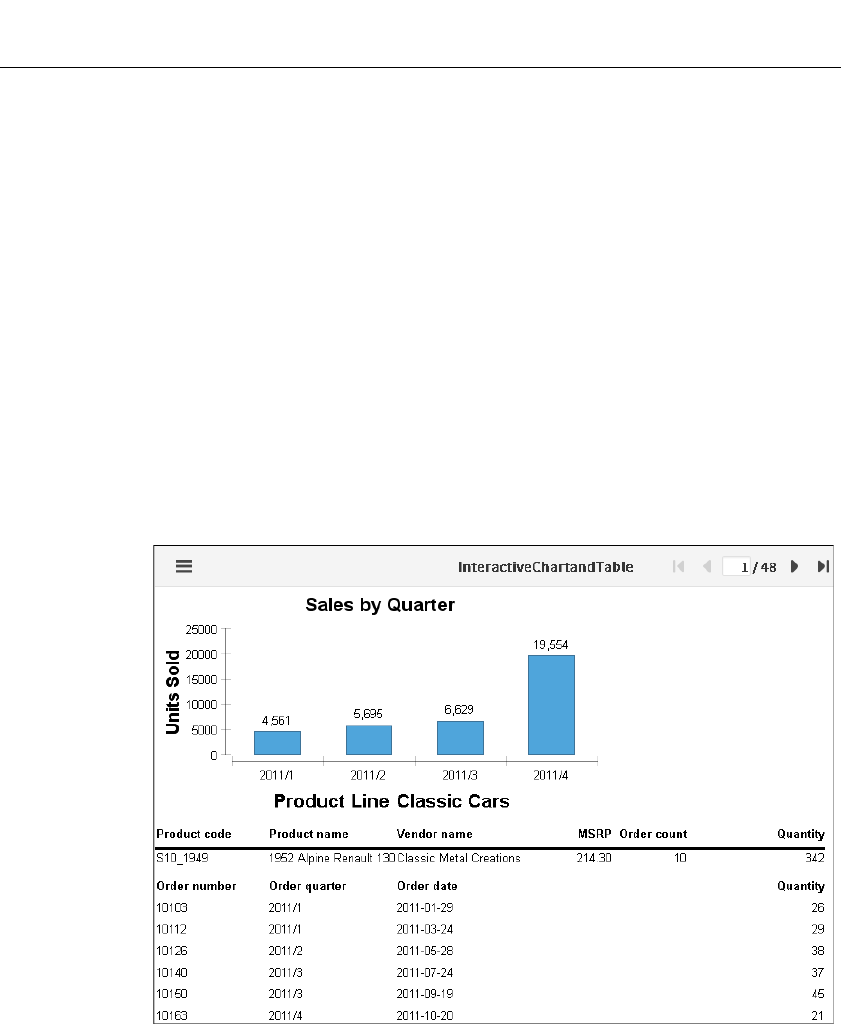
298
Actuate BIRT Application Developer Guide
Tutorial 6: Adding an interactive chart filter to a BIRT
report
In this tutorial, you add an interactive chart control to a BIRT report design that
implements a filter on the other charts in the report design. You perform the
following tasks:
■
Add bookmarks.
■
Add a filter script to chart interactivity.
Task 1: Add bookmarks
In this task, you preview a report called InteractiveChartandTable.rptdesign and
add a bookmark to the chart and table.
1In Navigator, open InteractiveChartandTable.rptdesign.
2Choose Run➛View Report➛In Web Viewer to view the report, as shown in
Figure 15-24.
3Choose Layout to return to the layout editor.
Figure 15-24 Previewing the report
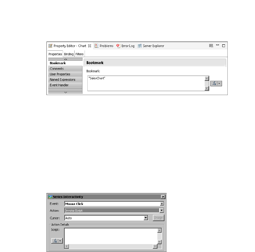
Chapter 15, Creating dynamic report content using the Actuate JavaScript API
299
4Select the chart entitled Sales by Quarter. In the property editor, open
Properties➛Bookmark. Set the bookmark value to "SalesChart", as shown in
Figure 15-25.
Figure 15-25 Setting the chart bookmark property
5Repeating the process of step 5, for the table entitled Product Line, set the
bookmark value to "ProductTable".
Task 2: Add a filter script to chart interactivity
In this task, you add a filter script to the Sales by Quarter chart to affect the other
charts.
1Double-click on the Sales by Quarter chart. In Edit Chart, select Format Chart
➛Series➛Value (Y) Series. Then choose Interactivity.
2On Series Interactivity, select Mouse Click for event, and Invoke Script for
action, as shown in Figure 15-26.
Figure 15-26 Interactivity settings for invoking a script on mouse click
3In the Script text box, add the following code:
var atable = actuate.getViewer(evt.srcElement || evt.target)
.getCurrentPageContent( ).getTableByBookmark("ProductTable" );
atable.setFilters(new actuate.data.Filter("QUANTITYORDERED",
actuate.data.Filter.GREATER_THAN, valueData/200));
atable.submit();
In Edit Chart, choose Finish.
4View the report by choosing Run➛View Report➛In Web Viewer.
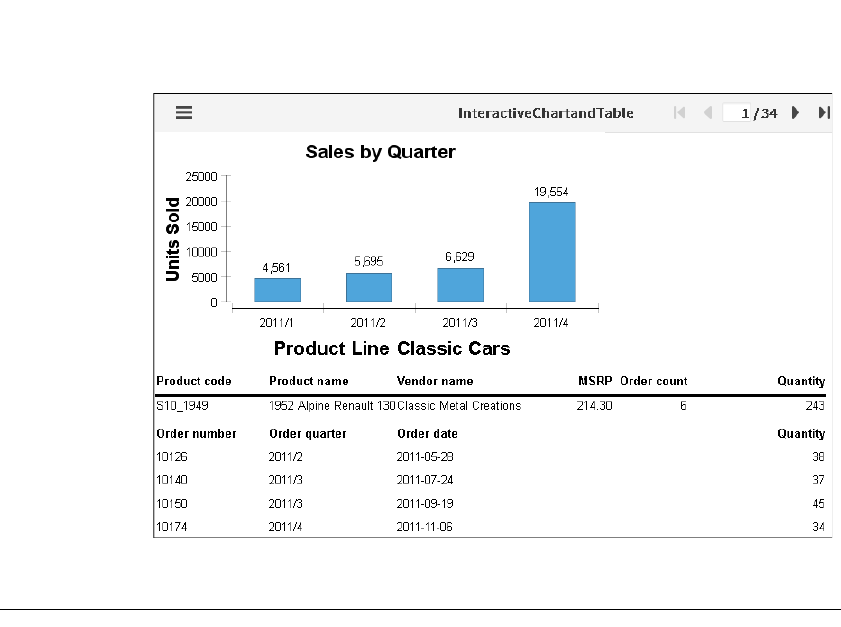
300
Actuate BIRT Application Developer Guide
5Select a bar in the table to activate the filter, as shown in Figure 15-27.
Figure 15-27 Filtered product table after selecting a chart value
Using the Actuate JavaScript API in chart themes
BIRT reports support adding themes to a chart to apply common elements to
similar charts. Access chart themes by exporting and then editing a theme or by
creating a new theme. Implement Actuate JavaScript API functions within
specific theme elements or in the script feature of the theme.
A chart theme supports executing a script before or after certain events, such
as before rendering the chart. For example, you can add scripts for
beforeGeneration, beforeRendering, beforeDrawAxis, beforeDrawSeries,
beforeDrawDataPoint, and afterRendering when editing a chart theme, as shown
in Figure 15-28.
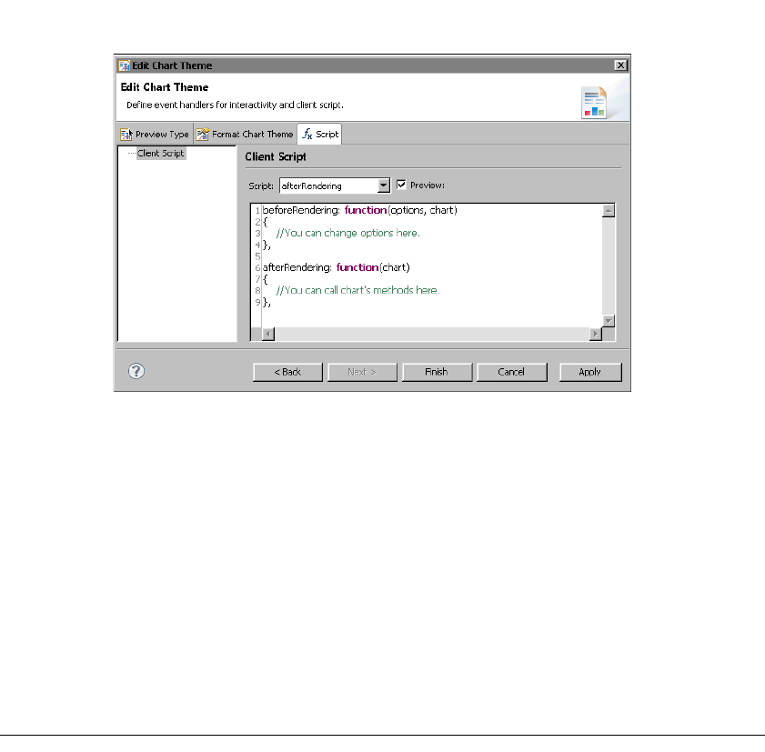
Chapter 15, Creating dynamic report content using the Actuate JavaScript API
301
Figure 15-28 Adding script elements in edit chart theme
In an HTML5 chart, you can use the actuate.report.HTML5Chart classes to alter
the report display. For example, to render every data point in the series that is
greater than avgValue in a green color, use code similar to the following:
beforeDrawSeries: function(series, seriesOptions, tempChart,
seriesIndex){
for ( var i = 0; i < series.data.length; i++ ){
// Find out if this data point is above average
if ( series.data[i].y <= aveValue ){
// The data point is above average. Color it green
var pointOptions = seriesOptions.data[i];
pointOptions.color = 'green';
}
}
Tutorial 7: Adding scripted HTML5 Chart controls to a
BIRT design
In this tutorial, you add HTML buttons to a BIRT design that implement controls
for an HTML5 chart in the BIRT design. You perform the following tasks:
■
Adding HTML buttons
■
Scripting the client chart controls
■
Scripting the client option controls
■
Testing the scripts
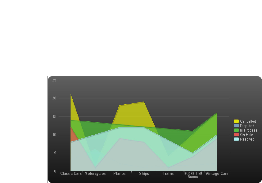
302
Actuate BIRT Application Developer Guide
Task 1: Adding HTML buttons
In this task, you preview a report called
HTML5ChartWithHTMLButtons.rptdesign and create a grid of HTML buttons.
1Open BIRT Designer Professional. In Navigator, navigate to and open
HTML5ChartWithHTMLButtons.rptdesign.
2Preview the report, as shown in Figure 15-29.
Figure 15-29 Previewing the HTML5 Chart report
3Choose Layout to return to the layout editor.
4Right-click the first cell of the table. Choose Insert➛Grid. On Insert Grid, set
the Number of columns to 2 and Number of rows to 2, then choose OK. A new
grid appears at the top of the table, as shown in Figure 15-30.
5To create HTML buttons for the report, perform the following steps:
1Right-click the first cell of the grid. Choose Insert➛HTML Button.
2On HTML Button, type "Hide On Hold" into the value field.
3Choose OK. If a warning message appears, choose OK.
6Repeating the process of step 6, create an HTML button in the remaining
empty cells of the grid with the values "Show On Hold", "Line Chart", and
"Area Chart".
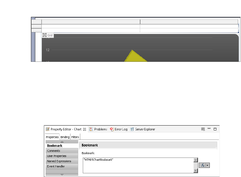
Chapter 15, Creating dynamic report content using the Actuate JavaScript API
303
Task 2: Scripting the client chart controls
In this task, you add event handler scripts to HTML buttons that change the client
chart series of the HTML5 chart.
1Select the chart. In the property editor, open Properties➛Bookmark. Set the
bookmark value to "HTML5ChartBookmark" as shown in Figure 15-31.
Figure 15-31 Setting the chart bookmark property
2Select the Hide On Hold HTML button and choose Script.
3In the New Event Function drop-down list, select onclick. The onclick event
handler appears in the script editor text box.
4After the first curly brace ({), add the following code:
var bchart = this.getViewer().getCurrentPageContent()
.getChartByBookmark("HTML5ChartBookmark");
var clientChart = bchart.getClientChart();
clientChart.setTitle("HTML5 Chart: On Hold series is
invisible");
clientChart.setSeriesVisibile('On Hold', false);
5Return to the layout editor. Select the Show On Hold HTML button and
choose Script.
6In the New Event Function drop-down list, select onclick. The onclick event
handler appears in the script editor text box.
7After the first curly brace ({), add the following code:
var bchart = this.getViewer().getCurrentPageContent()
Figure 15-30 Inserting a grid

304
Actuate BIRT Application Developer Guide
.getChartByBookmark("HTML5ChartBookmark");
var clientChart = bchart.getClientChart();
clientChart.setTitle("HTML5 Chart: On Hold series is visible");
clientChart.setSeriesVisibile('On Hold', true);
Task 3: Scripting the client option controls
In this task, you add event handler scripts to HTML buttons that change the chart
type using the client options of the HTML5 chart.
1Select the Line Chart HTML button and choose Script.
2In the New Event Function drop-down list, select onclick. The onclick event
handler appears in the script editor text box.
3After the first curly brace ({), add the following code:
var bchart = this.getViewer().getCurrentPageContent()
.getChartByBookmark("HTML5ChartBookmark");
var clientChart = bchart.getClientChart();
clientChart.getClientOptions().setChartType('line');
clientChart.getClientOptions().setTitle('Line chart');
clientChart.redraw();
4Return to the layout editor. Select the Area Chart HTML button and choose
Script.
5In the New Event Function drop-down list, select onclick. The onclick event
handler appears in the script editor text box.
6After the first curly brace ({), add the following code:
var bchart = this.getViewer().getCurrentPageContent()
.getChartByBookmark("HTML5ChartBookmark");
var clientChart = bchart.getClientChart();
clientChart.getClientOptions().setChartType('area');
clientChart.getClientOptions().setTitle('Area chart');
clientChart.redraw();
Task 4: Testing the scripts
In this task, you run the report and test the HTML button scripts.
1Save the report.
2View the report by choosing Run➛View Report➛In Web Viewer.
3In the Actuate viewer, choose Line Chart. The chart title changes and the
HTML5 chart type changes to line, as shown in Figure 15-32.
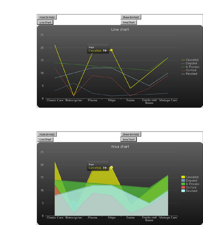
Chapter 15, Creating dynamic report content using the Actuate JavaScript API
305
Figure 15-32 An HTML5 chart displayed as a line chart
4In the Actuate viewer, choose Area Chart. The chart title changes and the
HTML5 chart type changes to area, as shown in Figure 15-33.
Figure 15-33 An HTML5 chart displayed as an area chart
5Choose other buttons to test scripted changes to the HTML5 chart display.

306
Actuate BIRT Application Developer Guide

Chapter 16, Working with Interactive Crosstabs
307
Chapter
16
Chapter 16
Working with
Interactive Crosstabs
This chapter contains the following topics:
■
About cross tabs
■
About cubes
■
Handling Interactive Crosstabs viewer events
■
Working with dimensions, measures, and levels
■
Working with totals
■
Sorting and filtering cross tab data
■
Drilling down within a cross tab
■
Controlling the Interactive Crosstabs viewer user interface
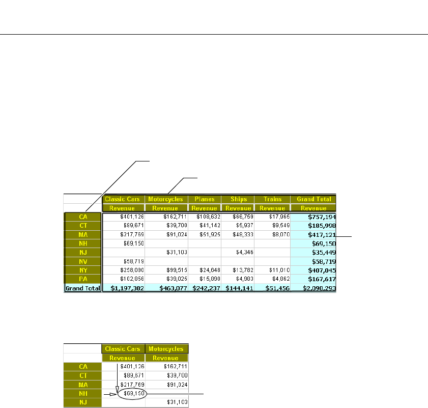
308
Actuate BIRT Application Developer Guide
About cross tabs
A cross tab, or cross tabulation, displays data in a row-and-column matrix similar
to a spreadsheet. A cross tab is ideal for concisely summarizing data. A cross tab
displays aggregate values such as averages, counts, or sums in the cross tab’s
cells.
Figure 16-1 shows a cross tab that organizes state groups in the row area and
product line groups in the column area. Aggregate revenue values appear in the
cells of the data area.
Figure 16-1 Viewing a cross tab
A cell displays a revenue value by product line and by state, as shown in
Figure 16-2.
Figure 16-2 A cell displaying a revenue total
A cross tab uses data from at least three fields. The cross tab in Figure 16-1 uses
the following data fields:
■
One field provides the values for column headings in the cross tab. The cross
tab displays one column for each unique value in the field. In Figure 16-1, the
cross tab displays five unique values from the productline field: Classic Cars,
Motorcycles, Planes, Ships, and Trains.
■
One field provides the values for row headings in the cross tab. The cross tab
displays one row for each unique value in the field. In Figure 16-1, the cross
tab displays eight unique values from the state field: CA, CT, MA, NH, NJ, NV,
NY, and PA.
Data area displays
aggregate revenue
values
Column area displays product line groups
Row area displays state groups
The revenue total for Classic Cars
for New Hampshire

Chapter 16, Working with Interactive Crosstabs
309
■
Interactive Crosstabs aggregates one field’s values, and displays these values
in the cross tab cells. In this example, each cell displays a revenue total by
product line and state. Interactive Crosstabs calculates the revenue total using
the SUM function on the values in the extendedprice field.
Tutorial 8: Viewing and pivoting a cross tab
This tutorial provides step-by-step instructions for authoring a web page that
displays a cross tab and provides controls to the user. The file in this tutorial that
contains a cross tab is Sales by Territory.rptdesign.In this task, you open or create
a copy of JSAPITemplate.html and edit its contents to open a cross tab Reportlet
and display it in Interactive Crosstabs Viewer.
1Using a code editor, open or create a JSAPITemplate.html file that contains the
essential components for any web page that implements the JSAPI.
<!DOCTYPE html PUBLIC "-//W3C//DTD HTML 4.01//EN" "http://
www.w3.org/TR/html4/strict.dtd">
<html>
<head>
<meta http-equiv="content-type" content="text/html;
charset=utf-8" />
<title>JSAPI Template</title>
</head>
<body onload="init( )">
<div id="sample">
<script type="text/javascript" language="JavaScript"
src="http://127.0.0.1:8700/iportal/jsapi"></script>
<script type="text/javascript" language="JavaScript">
<!-- Insert code here -->
</script>
</div>
</body>
2Navigate to the following line:
<title>JSAPI Template</title>
In title, change:
JSAPI Template
to:
CrossTab Analyzer Page
3Navigate to the following line:
<div id="sample">

310
Actuate BIRT Application Developer Guide
In id, change:
sample
to:
analyzer
4Navigate to the empty line after the following line:
<script type="text/javascript" language="JavaScript">
5Add the following code:
var tabviewer;
function init(){
actuate.load("xtabAnalyzer");
actuate.initialize( "http://127.0.0.1:8700/iportal", null,
"administrator", "", runAnalyzer);
}
function runAnalyzer(){
var tabviewer = new actuate.XTabAnalyzer("analyzer");
tabviewer.setReportName("/Applications/BIRT Sample App
/Crosstab Sample Revenue.rptdesign");
tabviewer.setXTabBookmark("SampleRevenue");
tabviewer.submit();
}
6Save the file as interactivecrosstab.html.
7In Internet Explorer, open interactivecrosstab.html.
If you receive a security warning that Internet Explorer has restricted this page
from running scripts or ActiveX controls that could access your computer,
right-click on the message and select Allow Blocked Content.
About cubes
A cube is a multidimensional data structure that is optimized for analysis. A cube
supports applications that perform complex analyses without performing
additional queries on the underlying data source. A cube organizes data into the
following categories:
■
Measures
Measures are aggregate, or summary, values, such as sales revenues or units of
products.
■
Dimensions
Dimensions are groups, such as customers, product lines, or time periods,
which aggregate measures. For example, a sales revenue cube contains data
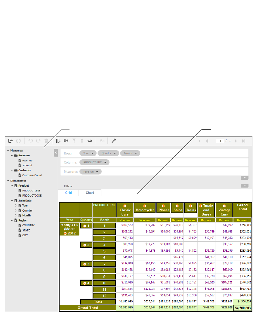
Chapter 16, Working with Interactive Crosstabs
311
that enables viewing sales volume and revenues, both of which are measures,
by customers, product lines, and time periods, all of which are dimensions.
Dimensions can contain levels, which organize data into hierarchies. For
example, a region dimension can contain a hierarchy of the country, state, and city
levels. A time dimension can contain a hierarchy of the year, quarter, month, and
day levels. Cubes frequently include time dimensions because displaying
measures by time dimensions is useful in data analysis. The time dimension in a
cube is a special dimension that supports storing data in developer-defined time
periods.
Use Actuate BIRT Designer Professional to create a cube using data from one or
more data sources, then create a cross tab that uses the cube data and specifies the
cross tab appearance. The initial cross tab that appears in Interactive Crosstabs
typically displays a portion of the available cube data in a simple layout.
Figure 16-3 shows a cross tab and all of the cube measures and dimensions that
are available for analysis.
Available cube measures and dimensions Cross tab
Figure 16-3 Interactive Crosstabs displaying a cross tab and available measures
and dimensions
312
Actuate BIRT Application Developer Guide
See BIRT: A Field Guide for more information about data cubes and cross tabs.
Handling Interactive Crosstabs viewer events
The Interactive Crosstabs viewer triggers events to indicate changes in status.
These events include notifications of data changes or errors. Use the
registerEventHandler function found in XTabAnalyzer to handle events, as
shown in the following code:
ctViewer.registerEventHandler(actuate.xtabanalyzer.EventConstants
.ON_EXCEPTION,errorHandler);
This code registers the event handler errorHandler to be called when an
ON_EXCEPTION event occurs.
The XTabAnalyzer class supports the following events:
■
ON_CONTENT_CHANGED
■
ON_CONTENT_SELECTED
■
ON_EXCEPTION
■
ON_SESSION_TIMEOUT
To remove an event handler, call removeEventHandler( ).
ctViewer.removeEventHandler(actuate.xtabanalyzer.EventConstants
.ON_EXCEPTION,errorHandler);
The actuate.xtabanalyzer.Exception class handles exceptions. For more
information about events, see the section describing the
actuate.xtabanalyzer.EventsConstants class.
Working with dimensions, measures, and levels
The actuate.xtabanalyzer.Crosstab class represents the cross tab element. Use
this cross tab class when working with Interactive Crosstabs and the
XTabAnalyzer viewer. Use the functions in the actuate.xtabanalyzer.Dimension
class to add, remove, or modify dimensions. Use the functions in the
actuate.xtabanalyzer.Measure class to add, remove, or modify measures. Use the
functions in the actuate.xtabanalyzer.Level class to add, remove, or modify levels.
These classes contain functions that support the creation and modification of the
dimensions, measures, and levels in the cross tab. These functions work with
information from a data cube that is created with BIRT Designer Professional.

Chapter 16, Working with Interactive Crosstabs
313
Adding a dimension with levels
To add a dimension to the cross tab, use Crosstab.addDimension( ) to add an
actuate.xtabanalyzer.Dimension object to the cross tab. The following code
requires that the dimensions and levels already exist within a data cube:
var crosstab = new actuate.xtabanalyzer.Crosstab( );
var dimension = new actuate.xtabanalyzer.Dimension( );
// Set dimension to be in the zero location.
dimension.setIndex(0);
dimension.setAxisType(actuate.xtabanalyzer.Dimension
.COLUMN_AXIS_TYPE);
dimension.setDimensionName("dates");
var level = new actuate.xtabanalyzer.Level( );
level.setLevelName("year");
dimension.addLevel(level);
var level = new actuate.xtabanalyzer.Level( );
level.setLevelName("quarter");
dimension.addLevel(level);
var level = new actuate.xtabanalyzer.Level( );
level.setLevelName("month");
dimension.addLevel(level);
crosstab.addDimension(dimension);
crosstab.submit( );
Removing a dimension
To remove a dimension from a cross tab, use Crosstab.removeDimension( ). In
this example, levelNames is an array of strings containing the names of the levels
to remove:
crosstab.removeDimension("dates",null,levelNames);
crosstab.submit( );
Adding and removing measures
To add a measure to the cross tab, use Crosstab.addMeasure( ). The
addMeasure( ) function accepts an actuate.xtabanalyzer.Measure object as a
parameter. This example creates a new measure and adds it to a cross tab:
var measure = new actuate.xtabanalyzer.Measure( );
measure.setIndex(1);
measure.setMeasureName("Quarter Rate");
measure.setExpression("[revenue]/[revenue_SalesDate/year_Product
/PRODUCTLINE]");
crosstab.addMeasure(measure);
crosstab.submit( );

314
Actuate BIRT Application Developer Guide
The measure.setExpression( ) function dynamically sets the measure to display
the revenue received for sales data, organized by year and product line. In this
example, the expression is in EasyScript. EasyScript is described in Using Actuate
BIRT Designer Professional. The expression in the example is the database field
that contains the sales revenue value. Interactive Crosstabs aggregates the sales
revenue value for each year for each product line. The [revenue_SalesDate
/year_Product/PRODUCTLINE] string specifies that the expression applies to
the revenue by sales date and then by year for the product line.
The Actuate JavaScript API combined with standard JavaScript functionality
enables the creation of web pages that allow for interactive manipulation of cross
tabs. In this example, the measure name and the measure expression are retrieved
from HTML elements with the names of measureName and measureExpression.
As coded, these elements can be an item such as a text entry field. The values of
any used elements then go into the new measure for the cross tab.
var measureName = document.getElementById("measureName").value;
var measureExpression =
document.getElementById("measureExpression").value;
var measure = new actuate.xtabanalyzer.Measure( );
measure.setIndex(1);
measure.setMeasureName(measureName);
measure.setExpression(measureExpression);
crosstab.addMeasure(measure);
crosstab.submit( );
The web page must contain elements with the IDs of measureName and
measureExpression. Use the following HTML code to create these elements:
<INPUT TYPE="text" SIZE="60" ID="measureName" VALUE="Quarter
Rate">
<INPUT type="text" SIZE="60" ID="measureExpression"
VALUE="[revenue]/[revenue_SalesDate/year_Product/PRODUCTLINE]">
Use removeMeasure( ) to remove a measure. Pass the name of the measure to
remove to removeMeasure( ).
crosstab.removeMeasure("Quarter Rate");
crosstab.submit( );
Changing measures and dimensions
Edit measures with Crosstab.editMeasure( ). In this example, the measureName
measure named measureName takes on a new value:
var measure = new actuate.xtabanalyzer.Measure( );
measure.setMeasureName("measureName");
measure.setExpression("measureExpression");

Chapter 16, Working with Interactive Crosstabs
315
crosstab.editMeasure(measure);
crosstab.submit( );
Use Crosstab.changeMeasureDirection( ) to change the measure direction. Pivot
the cross tab with Crosstab.pivot( ).
Use Crosstab.reorderDimension( ) to change the order or axis type of a dimension
within a cross tab. This example moves the index of a dimension within a cross
tab from 1 to 5. The dimension’s axis type changes from a row axis to a column
axis.
var dimIdx = 1;
var newDimIdx = 5
var axis = actuate.xtabanalyzer.Dimension.ROW_AXIS_TYPE;
var newAxis = actuate.xtabanalyzer.Dimension.COLUMN_AXIS_TYPE;
crosstab.reorderDimension(dimIdx,axis,newDimIdx,newAxis );
crosstab.submit( );
The measure placement order can be altered using Crosstab.reorderMeasure( ). In
this example, a measure’s index changes from position 1 in the cross tab to
position 5:
crosstab.reorderMeasure(1,5);
crosstab.submit
()
;
Measures and dimensions can also be changed with the functions in the measure
and dimension classes. In this example, a dimension axis changes from column
to row:
var currentAxis = dimension.getAxisType( )
if (currentAxis ==
actuate.xtabanalyzer.Dimension.COLUMN_AXIS_TYPE){
dimension.setNewAxisType(
actuate.xtabanalyzer.Dimension.ROW_AXIS_TYPE);
}
Working with totals
Each dimension within a cross tab and each level within a multilevel dimension
can have a total associated with that dimension or level. A row or column with a
single dimension can only have a grand total. Each level in a multilevel
dimension can have a subtotal. Subtotals are only available for multilevel
dimensions.
A total requires a measure and an aggregation function. To add a grand total to
a measure, use the actuate.xtabanalyzer.GrandTotal class. Subtotals are added
with the actuate.xtabanalyzer.SubTotal class. Both classes use the
actuate.xtabanalyzer.Total class. The Total class supports creating aggregated
values on a measure, calculated on either a row or a column. This example creates

316
Actuate BIRT Application Developer Guide
a total and places the SUM aggregation function on the measure located at
measure index 0:
var grandTotal = new actuate.xtabanalyzer.GrandTotal( );
grandTotal.setAxisType(actuate.xtabanalyzer.Dimension
.ROW_AXIS_TYPE );
// Create a total object containing a measure and aggregation.
var total = new actuate.xtabanalyzer.Total( );
total.setMeasureIndex(0);
total.setAggregationFunction("SUM");
total.setEnabled(true);
// Add the total to the cross tab.
grandTotal.addTotal(total);
crosstab.setTotals(grandTotal);
crosstab.submit( );
The actuate.xtabanalyzer.Total class uses a measure index and an aggregation
function to create a Total object that is added to a SubTotal or GrandTotal object
for placement within the cross tab. A total must be enabled for that total to be
active on the cross tab.
To remove a total from a cross tab, use setEnabled( ) and pass false as a parameter,
as shown in the following code:
total.setEnabled(false);
grandTotal.addTotal(total);
crosstab.setTotals(grandTotal);
crosstab.submit( );
Sorting and filtering cross tab data
Data within levels can be filtered and sorted. To sort data within a level, use the
actuate.xtabanalyzer.Sorter class. Add an instance of the Sorter class to the cross
tab with Crosstab.setSorters( ).
var sorter = new actuate.xtabanalyzer.Sorter("sortLevelName");
sorter.setAscending(false);
// Add the sort to the cross tab.
crosstab.setSorters(sorter);
crosstab.submit( );
Use the actuate.xtabanalyzer.Filter class to filter data within a
level. A filter requires an operator and values to filter. Use
Crosstab.setFilters( ) to place the filter within the cross
tab.
var filter = new actuate.xtabanalyzer.Filter
("levelName",actuate.xtabanalyzer.Filter.BETWEEN);

Chapter 16, Working with Interactive Crosstabs
317
// Filter between the values of 1000 and 2000.
var filterValue = "1000;2000";
filter.setValues(filterValue.split(";"));
crosstab.setFilters(filter);
crosstab.submit( );
To remove a filter from a level, use
actuate.xtabanalyzer.Crosstab.clearFilters( ).
crosstab.clearFilters("levelName");
crosstab.submit( );
Drilling down within a cross tab
Drilling supports the ability to expand or collapse a member value within a
specific level. Construct a XTabAnalyzer.Driller object as shown in the following
code:
var driller = new actuate.xtabanalyzer.Driller
()
;
To drill up or down, use actuate.xtabanalyzer.Crosstab.drill( ) with the
actuate.xtabanalyzer.Driller and actuate.xtabanalyzer.MemberValue classes. In
this example, a cross tab has a dimension named Region with three levels:
Country, State, and City. The actuate.xtabanalyzer.Driller object updates the cross
tab to display the requested information, as shown in the following code:
driller.setAxisType(
actuate.xtabanalyzer.Dimension.ROW_AXIS_TYPE);
var levelName1 = "Region/Country";
var levelValue1 = "Australia";
var levelName2 = "Region/State";
var levelValue2 = "NSW";
// Create member value objects, and place them in the driller.
var memberValue1 = new
actuate.xtabanalyzer.MemberValue(levelName1);
memberValue1.setValue(levelValue1);
var memberValue2 = new
actuate.xtabanalyzer.MemberValue(levelName2);
memberValue2.setValue(levelValue2);
memberValue1.addMember(memberValue2);
driller.addMember(memberValue1);
crosstab.drill(driller);
crosstab.submit( );
To reset the drill, use a Driller object with no level names or member values.
var driller = new actuate.xtabanalyzer.Driller( );
driller.setAxisType(actuate.xtabanalyzer.Dimension.ROW_AXIS_TYPE);
crosstab.drill(driller);
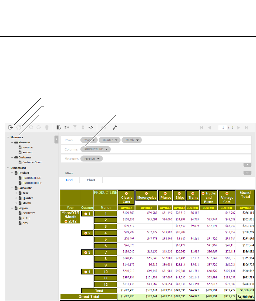
318
Actuate BIRT Application Developer Guide
crosstab.submit( );
Controlling the Interactive Crosstabs viewer user
interface
Show or hide Interactive Crosstabs viewer features with the
actuate.xtabanalyzer.UIOptions class. The UIOptions class includes functions that
support the ability to hide or show different features of the viewer. Figure 16-4
shows what functions affect the viewer display.
enableCrosstabView
enableToolbarSave/enableLinkToThisPage
enableToolbar
enableCubeView
Figure 16-4 Interactive Crosstabs viewer showing areas altered with UIOptions
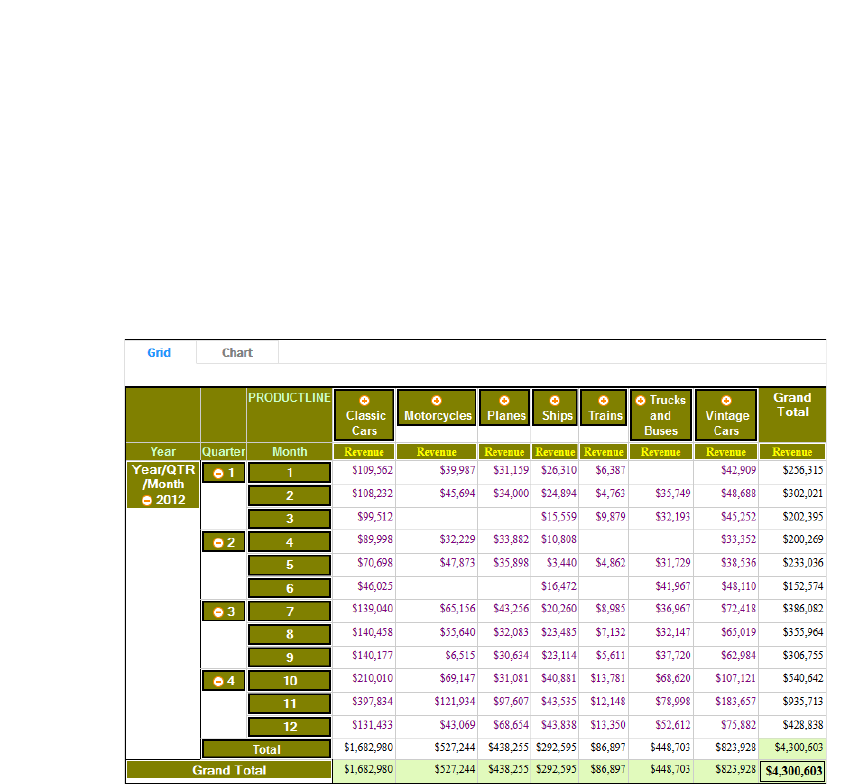
Chapter 16, Working with Interactive Crosstabs
319
Pass true or false values to the UIOptions functions to display or hide the portion
of the viewer that is associated with that particular function, as shown in the
following code:
var uiOptions = new actuate.xtabanalyzer.UIOptions( );
uiOptions.enableToolbar(false);
uiOptions.enableCubeView(false);
uiOptions.enableCrosstabView(false);
// ctViewer is an instance of the XTabAnalyzer class.
ctViewer.setUIOptions( uiOptions );
This code produces a viewer similar to Figure 16-5.
Figure 16-5 Interactive Crosstabs viewer with settable UIOptions off
In addition to the UIOptions class, some details shown within the viewer can be
hidden with Crosstab.showDetail( ) and Crosstab.hideDetail( ).
For example, the cross tab in Figure 16-5 has a SalesDate dimension consisting
of three levels: year, quarter, and month. The following code hides the detail
from the quarter level of the dimension. In this example, crosstab is an
actuate.xtabanalyzer.Crosstab object:
crosstab.hideDetail("SalesDate/quarter");
crosstab.submit( );
The code in this example modifies the cross tab so it longer shows the month
detail level, as shown in Figure 16-6.

320
Actuate BIRT Application Developer Guide
Figure 16-6 Cross tab with level detail hidden
To display the detail again, use showDetail( ).
var axisType = actuate.xtabanalyzer.Dimension.ROW_AXIS_TYPE;
crosstab.showDetail(axisType,"SalesDate/quarter");
crosstab.submit( );

322
Actuate BIRT Application Developer Guide
Actuate JavaScript API overview
The Actuate JavaScript API is a set of JavaScript classes used to create custom web
content that contains Actuate BIRT reports and report elements.
An HTML-based JSDoc JavaScript API class reference is provided for iPortal and
Actuate Java Components in the following file:
<Context Root>\help\jsapi\index.html
About the actuate namespace
All of the Actuate JavaScript API classes are in the actuate namespace. To use the
viewer element, call the actuate.Viewer class.
In addition, the Actuate JavaScript API has a static class:
actuate
This class handles connections to Actuate web applications and is the only static
class in the Actuate JavaScript API.
Using the Actuate library
The Actuate JavaScript library is available from any iPortal installation or Actuate
Deployment Kit for BIRT reports. The URL for the library is:
http://127.0.0.1:8700/iportal/jsapi
■
127.0.0.1:8700 is the host name and TCP port for an available Actuate web
application host.
■
/iportal is the context root for the web application.
■
/jsapi is the default location of the Actuate JavaScript API libraries.
A script tag loads the Actuate JavaScript API library, as shown in the following
code:
<script type="text/javascript" src="http://127.0.0.1:8700
/iportal/jsapi">
</script>
To call JavaScript functions, use additional script tags after the script tag that adds
these libraries for the page.
Actuate JavaScript API classes quick reference
Table 17-1 lists the Actuate JavaScript API classes.

Chapter 17, Actuate JavaScript API classes
323
Table 17-1 Actuate JavaScript API classes
JavaScript class Description
actuate Entry point to the Actuate
JavaScript API library
actuate.AuthenticationException Exception caused by failed
authentication
actuate.ConnectionException Exception caused by a failed
connection
actuate.Dashboard Dashboard class
actuate.dashboard.DashboardDefinition Dashboard wrapper class
actuate.dashboard.EventConstants Global constants for the dashboard
events class
actuate.dashboard.GadgetScript Dashboard gadget script class
actuate.dashboard.Tab Dashboard tab class
actuate.data.Filter Conditions to filter data
actuate.data.ReportContent Represents downloaded content
actuate.data.Request Represents and processes a request
for report data
actuate.data.ResultSet Results retrieved from a report
document in response to a request
actuate.data.Sorter Sort conditions to sort data
actuate.DataService Data services to retrieve data from
a report document
actuate.Exception Exception object passed to a
callback function or exception
handler
actuate.Parameter Parameters from a report
actuate.parameter.Constants Global navigation and layout
constants used for the Parameter
class
actuate.parameter.ConvertUtility Converts parameters into specific
and generic formats
actuate.parameter.EventConstants Defines the events for parameters
this API library supports
actuate.parameter.NameValuePair Display name and the associated
value
(continues)

324
Actuate BIRT Application Developer Guide
actuate.parameter.ParameterData A high-level wrapper for an
actuate.parameter
.ParameterDefinition object
actuate.parameter.ParameterDefinition Qualities, options, name, and
format for a parameter as the
parameter displays and accepts
values
actuate.parameter.ParameterValue The parameter’s value as processed
by a report
actuate.report.Chart A report chart
actuate.report.DataItem A report data item
actuate.report.FlashObject A report Flash object
actuate.report.Gadget A report gadget
actuate.report.HTML5Chart.ClientChart An HTML5 enabled chart
actuate.report.HTML5Chart.ClientOption Options for an HTML5 enabled
chart
actuate.report.HTML5Chart.ClientPoint A data point for an HTML5
enabled chart
actuate.report.HTML5Chart.ClientSeries A data series for an HTML5
enabled chart
actuate.report.HTML5Chart.Highcharts A Highcharts object
actuate.report.HTML5Chart.Renderer A Highcharts renderer object
actuate.report.Label A report label element
actuate.report.Table A report table element
actuate.report.TextItem A report text element
actuate.ReportExplorer The report explorer general
container
actuate.reportexplorer.Constants Global constants used for
ReportExplorer class
actuate.reportexplorer.EventConstants Global EventConstants used for
ReportExplorer class
actuate.reportexplorer.File A file listed in the ReportExplorer
and the file’s properties
actuate.reportexplorer.FileCondition A JavaScript version of
com.actuate.schemas.FileCondition
Table 17-1 Actuate JavaScript API classes (continued)
JavaScript class Description

Chapter 17, Actuate JavaScript API classes
325
Actuate JavaScript API reference
This section provides an alphabetical listing of the JavaScript API classes.
actuate.reportexplorer.FileSearch A JavaScript version of
com.actuate.schemas.FileSearch
actuate.reportexplorer.FolderItems A JavaScript version of com.actuate
.schemas.GetFolderItemsResponse
actuate.reportexplorer.PrivilegeFilter A JavaScript version of com.actuate
.schemas.PrivilegeFilter
actuate.RequestOptions URL parameters for requests to an
iHub volume
actuate.Viewer A report viewer component that
can be embedded in an HTML page
actuate.viewer.BrowserPanel A non-scrolling panel display
actuate.viewer.EventConstants Defines the events for the viewer
this API library supports
actuate.viewer.PageContent Content shown on the viewer
actuate.viewer.ParameterValue Parameter values in the viewer
actuate.viewer.RenderOptions Options for downloading reports
actuate.viewer.ScrollPanel A scrolling panel display
actuate.viewer.SelectedContent Selected report element
actuate.viewer.UIConfig Enables UI elements of the scrolling
panel display
actuate.viewer.UIOptions Enables UI elements of the viewer
actuate.viewer.ViewerException Exception constants supported for
the viewer
Table 17-1 Actuate JavaScript API classes (continued)
JavaScript class Description

326
Actuate BIRT Application Developer Guide
actuate
Class actuate
Description
The entry point to the Actuate JavaScript API library. The actuate class uses
load( ) to generate data, viewer, cross tab, parameter, explorer, and other
components. The actuate class uses initialize( ) and authenticate( ) to connect to
an Actuate web application service.
Use actuate.load( ) before calling actuate.initialize( ). The actuate.initialize( )
function loads all of the components added with load( ).
The initialize( ) function connects to an initial Actuate web application service. To
connect to additional services simultaneously, use authenticate( ). Call initialize( )
before calling authenticate( ).
Constructor
The static actuate class loads when the a <script> element loads the Actuate
JavaScript API.
Function summary
Table 17-2 lists actuate functions.
Table 17-2 actuate functions
Function Description
authenticate( ) Connects to an Actuate web application service
and authenticates
getDefaultIportalUrl( ) Returns the default service URL
getDefaultRequestOptions( ) Returns the default request options
getVersion( ) Returns the Actuate web application version
getViewer( ) Returns a viewer instance containing the given
bookmark element
initialize( ) Connects to an initial Actuate web application
service, loads an initial component, and invokes
a callback function
isConnected( ) Reports whether a given Actuate web
application is connected
isInitialized( ) Returns whether a library is initialized
load( ) Loads the library for an additional component
logout( ) Logs a user out of an Actuate web application
service

Chapter 17, Actuate JavaScript API classes
327
actuate
authenticate
Syntax
void authenticate(string iPortalURL, actuate.RequestOptions requestOptions,
string userid, string password, function callback, string credentials, function
errorCallback)
Connects to the Actuate web application service that is addressed by iPortalURL
and authenticates the connection.
Parameters iPortalURL
The iPortalURL parameter is a required string parameter that specifies the target
Actuate web application URL.
requestOptions
The requestOptions parameter is an optional actuate.RequestOptions object. The
requestOptions parameter defines the URL parameters to send with the
authentication request, such as the iHub URL, volume, or repository type.
Functions in the RequestOptions class enable the addition of custom parameters
to the URL. When requestOptions is null, authenticate( ) uses the default
parameter values for the target Actuate web application URL. These default
parameter values are defined in the Actuate web application’s web.xml file.
userid
The userid parameter is an optional string parameter that contains the login user
id when the login user id is not provided in the session.
password
The password parameter is an optional string parameter that contains the login
password when the login password is not provided in the session.
credentials
The credentials parameter is an optional string parameter. This parameter holds
information that supports checking user credentials with an externalized system
such as LDAP. The credentials parameter supports additional credential
information for any additional security systems in place on the application server
where the web service is deployed.
callback
The callback parameter is an optional function to call after initialization. The
actuate.authenticate( ) function passes the following variables to the callback
function:
■
iportalURL: The iportal URL passed in from the iPortalURL parameter
■
userid: The authenticated user ID
■
iserverURL: The BIRT iHub URL
■
volume: The volume name

328
Actuate BIRT Application Developer Guide
actuate
errorCallback
The errorCallback parameter is an optional function that specifies a function to
call when an error occurs. The possible errors are actuate.ConnectionException,
actuate.AuthenticationException, and actuate.Exception. The callback function
must take an exception as an argument.
Example
To connect to an additional Actuate web service called digits, use code similar to
the following:
actuate.authenticate("http://digits:8700/iportal", null, myname,
mypassword, null, null, null);
getDefaultIportalUrl
Syntax
String getDefaultIportalUrl( )
Returns the default service URL.
Returns
String. The default service URL.
Example
This example calls actuate.getDefaultIportalUrl( ) to return the default service
URL:
alert ("The default service URL is " +
actuate.getDefaultIportalUrl( ));
getDefaultRequestOptions
Syntax
actuate.RequestOptions getDefaultRequestOptions( )
Returns the default request options.
Returns
actuate.RequestOptions object that contains the default request options.
Example
This example calls actuate.getDefaultRequestOptions( ) to return the default
iHub URL:
alert ("The default iHub URL is " +
actuate.getDefaultRequestOptions( ).getServerUrl( ));
getVersion
Syntax
string getVersion( )
Returns the Actuate web application version.
Returns
String. The string contains the Actuate web application version in the format
"#version# (Build #buildnumber#)".
Example
The following sample code displays the version in an alert box:
alert("Version: " + actuate.getVersion( ));

Chapter 17, Actuate JavaScript API classes
329
actuate
getViewer
Syntax
actuate.Viewer getViewer(string bookmark)
actuate.Viewer getViewer(htmlelement viewer)
Returns a viewer instance containing the given bookmark element. Load the
viewer module before calling actuate.getViewer( ).
Parameters bookmark
This string parameter contains the name of the bookmark to retrieve or the name
of an HTML <div> element.
viewer
This parameter is the DOM htmlelement object for the HTML <div> element that
contains a viewer.
Returns
An actuate.Viewer object that contains a viewer. When actuate.getViewer( ) does
not find a viewer, the function returns null.
Example
To retrieve the viewer assigned to the first_viewer <div> element on the page, use
code similar to the following:
currentViewer = actuate.getViewer("first_viewer");
initialize
Syntax
void initialize(string iPortalURL, actuate.RequestOptions requestOptions,
reserved, reserved, function callback, function errorCallback)
Connects to an initial Actuate web application service, loads all of the
components added with load( ), and invokes a callback function.
Authentication is optional in initialize( ).
When using more than one service in one mashup page, use
actuate.authenticate( ) to connect to additional services.
Parameters iPortalURL
String. The target Actuate web application URL.
requestOptions
actuate.RequestOptions object. Optional. requestOptions defines URL
parameters to send in the authentication request, such as the iHub URL, volume,
or repository type. It can also add custom parameters to the URL. If
requestOptions is null, initialize( ) uses the default parameter values for the
target Actuate web application URL. These default parameter values are defined
in Actuate web application’s web.xml file. Loading performance is improved if
you create a requestOptions object to pass to initialize().
reserved
Set to null.

330
Actuate BIRT Application Developer Guide
actuate
reserved
Set to null.
callback
Function. The callback function called after the initialization is done. The
following variables are passed to the callback function:
■
iportalUrl: The iportal URL passed in from the iPortalURL parameter
■
userId: The authenticated user ID
■
iserverUrl: The BIRT iHub URL
■
volume: The volume name
errorCallback
Function. The function to call when an error occurs. The possible errors are
actuate.ConnectionException, actuate.AuthenticationException, and
actuate.Exception. errorCallback must take an exception as an argument.
Example
To initialize the client connection to a web service on myhost and then run the
init( ) function, use the following code:
actuate.initialize("http://myhost:8700/iportal", null, null, null,
init, null);
isConnected
Syntax
boolean isConnected(string iportalUrl, actuate.RequestOptions requestOptions)
Returns whether a given Actuate web application URL is connected.
Parameters iPortalURL
String. The target Actuate web application URL.
requestOptions
actuate.RequestOptions object. Optional. requestOptions defines URL
parameters to send with the authentication request, such as the iHub URL,
volume, or repository type. It can also add custom parameters to the URL. If
requestOptions is null, initialize( ) uses the default parameter values for the target
Actuate web application URL. These default parameter values are defined in
Actuate web application’s web.xml file.
Returns
Boolean. True if there is a connection to the given Actuate web application, False
if there is no connection or if it is pending.
Example
The following sample code connects to the digits service using authenticate if not
currently connected:
if (!actuate.isConnected("http://digits:8700/iportal", null)){
actuate.authenticate("http://digits:8700/iportal", null,
myname, mypassword, null, null, null);
}

Chapter 17, Actuate JavaScript API classes
331
actuate
isInitialized
Syntax
boolean isInitialized( )
Returns whether the library is already initialized.
Returns
Boolean. True if the library is already initialized.
Example
The following sample code initializes a connection with the Actuate web service
if one is not already initialized:
if (!actuate.isInitialized( )){
actuate.initialize("http://myhost:8700/iportal", null, null,
null, init, null);
}
load
Syntax
void load(string componentName)
Specifies a component to be loaded by actuate.initialize( ). The available
components are:
■
dashboard: The dashboard component including the actuate.Dashboard
package
■
dialog: The dialog component including the actuate.Dialog class
■
parameter: The parameter page component including the actuate.Parameter
package
■
reportexplorer: The report explorer component including the
actuate.ReportExplorer package
■
viewer: The viewer component including the actuate.Viewer and
actuate.DataService packages
■
xtabAnalyzer: The interactive crosstab component, including the
actuate.XTabAnalyzer package
Parameter componentName
String. componentName is a case-sensitive parameter. Valid component names
are listed above.
Example
To enable a page to use viewer, dialog, and parameters, call actuate.load( ) three
times, as shown in the following code:
actuate.load("viewer");
actuate.load("dialog");
actuate.load("parameter");

332
Actuate BIRT Application Developer Guide
actuate
logout
Syntax
void logout(string iPortalURL, actuate.RequestOptions requestOptions, function
callback, function errorCallback)
Logs out from the given Actuate web application URL and removes
authentication information from the session. If the application was previously not
logged in to this Actuate web application, it generates no errors but still calls the
callback function.
Parameters iPortalURL
String. The target Actuate web application URL.
requestOptions
actuate.RequestOptions object. Optional. requestOptions defines URL
parameters to send with the authentication request, such as the iHub URL,
volume, or repository type. It can also add custom parameters to the URL. If
requestOptions is null, initialize( ) uses the default parameter values for the target
Actuate web application URL. These default parameter values are defined in
Actuate web application’s web.xml file.
callback
Function. Optional. The callback function called after the logout is done.
errorCallback
Function. The function called when an error occurs. The possible errors are
actuate.ConnectionException, actuate.AuthenticationException, and
actuate.Exception. errorCallback must take an exception as an argument.
Example
The following sample code disconnects to the digits service if currently
connected:
if (actuate.isConnected("http://digits:8700/iportal", null)){
actuate.logout("http://digits:8700/iportal", null, null, null);
}

Chapter 17, Actuate JavaScript API classes
333
actuate.AuthenticationException
Class actuate.AuthenticationException
Description
AuthenticationException provides an object to pass to a error callback function
when an authentication exception occurs. The AuthenticationException object
contains references to the URL, the UserId, and the request options used in the
authentication attempt.
Constructor
The AuthenticationException object is constructed when actuate.Authenticate( )
fails.
Function summary
Table 17-3 lists actuate.AuthenticationException functions.
getIportalUrl
Syntax
string AuthenticationException.getIportalUrl( )
Returns the Deployment Kit for BIRT reports or iPortal URL.
Returns
String.
Example
The following sample code retrieves the URL from an exception:
return AuthenticationException.getIportalUrl( );
getRequestOptions
Syntax
actuate.RequestOptions AuthenticationException.getRequestOptions( )
Returns an instance of the RequestOptions that modified the URL that caused the
exception, if applicable.
Returns
actuate.RequestOptions object. A RequestOptions object defines URL parameters
sent in the authentication request, such as the iHub URL, volume, or repository
type. The RequestOptions object can also add custom parameters to the URL.
Table 17-3 actuate.AuthenticationException functions
Function Description
getIportalUrl( ) Returns the web service URL
getRequestOptions( ) Returns the request options
getUserId( ) Returns the user ID

334
Actuate BIRT Application Developer Guide
actuate.AuthenticationException
Example
The following sample code retrieves the RequestOptions object that caused the
exception:
var exceptReqOpts = AuthenticationException.getRequestOptions( );
getUserId
Syntax
string AuthenticationException.getUserId( )
Returns the UserId used in the failed authentication attempt.
Returns
String.
Example
The following sample code retrieves the UserId from an exception:
return AuthenticationException.getUserId( );

Chapter 17, Actuate JavaScript API classes
335
actuate.ConnectionException
Class actuate.ConnectionException
Description
A container for a connection exception. ConnectionException provides an object
to pass to a error callback function when an exception occurs.
Constructor
The ConnectionException object is constructed when there is a connection issue.
For example, actuate.ConnectionException is created when a wrong URL is given
in actuate.initialize( ) or actuate.authenticate( ), or if the server was unreachable.
Function summary
Table 17-4 describes actuate.ConnectionException functions.
getUrl
Syntax
string ConnectionException.getUrl( )
Returns the complete URL sent with the connection request.
Returns
String. The complete URL that was sent with the connection request.
Example
This example calls ConnectionException.getUrl( ) to return the complete URL
from a connection request:
alert ("Connection Error at " + ConnectionException.getUrl( ));
Table 17-4 actuate.ConnectionException function
Function Description
getUrl( ) Returns the whole URL

336
Actuate BIRT Application Developer Guide
actuate.Dashboard
Class actuate.Dashboard
Description
Represents a dashboard object.
Constructor
Syntax
actuate.Dashboard(string container)
Constructs a dashboard object.
Parameter container
String. Optional. Container object or name of a container in the current document
ID of container where controls are to be rendered.
Function summary
Table 17-5 describes actuate.Dashboard functions.
Table 17-5 actuate.Dashboard functions
Function Description
downloadDashboard( ) Downloads the dashboard definitions.
embedTemplate( ) The personal dashboard uses an embedded
template file.
getActiveTab( ) Returns the active tab name.
getDashboardName( ) Returns the dashboard name used by the
dashboard object.
getTemplate( ) Returns the iHub volume repository path.
isAutoSaveEnabled( ) Returns whether autosave is enabled.
isSavingNeeded( ) Returns whether there are unsaved changes on
the dashboard.
isUsingPersonalDashboard( ) Returns whether the dashboard is a personal
dashboard.
onUnload( ) Unloads JavaScript variables that are no longer
needed by the dashboard.
registerEventHandler( ) Registers an event handler.
removeEventHandler( ) Removes an event handler.
renderContent( ) Renders the dashboard.
save( ) Saves the dashboard as a .dashboard file.
saveAs( ) Saves the dashboard in non-default location.
setActiveTab( ) Sets a specific tab as the active tab.

Chapter 17, Actuate JavaScript API classes
337
actuate.Dashboard
downloadDashboard
Syntax
void Dashboard.downloadDashboard(function callback)
Downloads the dashboard metadata definitions.
Parameter callback
Function. The callback function to use after the dashboard finishes downloading.
This function must take the returned dashboard object as an input parameter.
Example
This example specifies a function to call after the dashboard object finishes
downloading:
myDashboard.downloadDashboard(runNext);
function runNext(dashobject){
mydashboard.getDashboardName(dashobject);
}
embedTemplate
Syntax
void Dashboard.embedTemplate(boolean isEmbedded)
A personal dashboard can use a shared template file or embed a template file.
setAutoSaveDelay( ) Sets the time interval before executing an
automatic save for a personal dashboard.
setContainer( ) Sets the container for rendering the dashboard
page HTML fragment.
setDashboardName( ) Sets the dashboard name to view.
setHeight( ) Sets the dashboard height.
setService( ) Sets the connection to the Actuate web service.
setSize( ) Sets the dashboard size.
setTemplate( ) Sets the template path.
setWidth( ) Sets the dashboard width.
showTabNavigation( ) Shows the tab toolbar.
submit( ) Submits the dashboard page component
request.
usePersonalDashboard( ) Forces the dashboard framework to use a
personal dashboard.
Table 17-5 actuate.Dashboard functions
Function Description

338
Actuate BIRT Application Developer Guide
actuate.Dashboard
Parameter isEmbedded
Boolean. When the isEmbedded parameter is true, the personal dashboard uses
an embedded template file. The default value is false.
Example
This example specifies that the personal dashboard myDashboard uses an
embedded template file:
myDashboard.embedTemplate(true);
getActiveTab
Syntax
string Dashboard.getActiveTab
Returns the name of the current active tab for the dashboard.
Returns
String. The name of the current active dashboard tab.
Example
This example displays the name of the active tab for the myDashboard dashboard
object in an alert box:
alert(myDashboard.getActiveTab( ));
getDashboardName
Syntax
string Dashboard.getDashboardName( )
Returns the dashboard name used by the dashboard object.
Returns
String. The dashboard’s name.
Example
This example displays the dashboard object’s dashboard name in an alert box:
alert(myDashboard.getDashboardName( ));
getTemplate
Syntax
string Dashboard.getTemplate( )
Returns the repository path for the iHub volume.
Returns
String. The repository path for the iHub volume.
Example
This example displays the repository path for the iHub volume in an alert box:
alert(myDashboard.getTemplate( ));
isAutoSaveEnabled
Syntax
boolean Dashboard.isAutoSaveEnabled( )
Returns whether the autosave feature is enabled.
Returns
Boolean. True indicates that autosave is enabled.

Chapter 17, Actuate JavaScript API classes
339
actuate.Dashboard
Example
This example informs the user of the status of the autosave feature:
if (dashboard.isAutoSavEnabled()){
alert("Autosave is enabled.");
}else{
alert("Autosave is disabled.");
}
isSavingNeeded
Syntax
boolean Dashboard.isSavingNeeded( )
Returns whether there are unsaved changes on the dashboard.
Returns
Boolean. True indicates that there are unsaved changes on the dashboard.
Example
This example informs the user of unsaved changed:
if (dashboard.isSavingNeeded()){
alert("The dashboard contains unsaved changes.");
}
isUsingPersonalDashboard
Syntax
boolean Dashboard.isUsingPersonalDashboard( )
Returns whether this dashboard is a personal dashboard.
Returns
Boolean. True indicates that this dashboard is a personal dashboard.
Example
This example informs the user that they are using a personal dashboard:
if (dashboard.isUsingPersonalDashboard)){
alert("This is a personal dashboard.");
}
onUnload
Syntax
void Dashboard.onUnload( )
Unloads JavaScript variables that are no longer needed by the dashboard.
Example
This example unloads JavaScript variables and displays the dashboard object’s
dashboard name in an alert box:
myDashboard.onUnload;
alert("JS variables unloaded for " +
myDashboard.getDashboardName( ));
registerEventHandler
Syntax
void Dashboard.registerEventHandler(string eventName, function handler)

340
Actuate BIRT Application Developer Guide
actuate.Dashboard
Registers an event handler to activate for parameter eventName. This function
can assign several handlers to a single event.
Parameters eventName
String. Event name to capture.
handler
Function. The function to execute when the event occurs. The handler must take
two arguments: The dashboard instance that fired the event and an event object
specific to the event type.
Example
This example registers the errorHandler( ) function to respond to the
ON_EXCEPTION event:
myDashboard.registerEventHandler(actuate.dashboard.EventConstants
.ON_EXCEPTION, errorHandler);
removeEventHandler
Syntax
void Dashboard.removeEventHandler(string eventName, function handler)
Removes an event handler to activate for parameter eventName.
Parameters eventName
String. Event name to remove from the internal list of registered events.
handler
Function. The function to disable.
Example
This example removes the errorHandler( ) function from responding to the
ON_EXCEPTION event:
myDashboard.removeEventHandler(actuate.dashboard.EventConstants
.ON_EXCEPTION, errorHandler);
renderContent
Syntax
void Dashboard.renderContent(object[ ] dashboardDefinitions, function callback)
Renders the dashboard definitions content to the container. The submit API calls
the renderContent API internally. The renderContent( ) function assumes that the
user has already a list of DashboardDefinition to process.
Parameters dashboardDefinitions
Array of objects. Each object is some piece of dashboard metadata and as many
can be added as needed. Typically, this array contains the following metadata:
■
Number of tabs in a dashboard file
■
Number of sections/columns in a dashboard tab
■
Number of gadgets in each section/column

Chapter 17, Actuate JavaScript API classes
341
actuate.Dashboard
■
Attributes of each gadget
■
Attributes of each tab
■
Dependency information between gadgets to support publishing and
subscribing mechanism
callback
Function. The callback function to call after renderContent( ) finishes.
Example
This example renders the myDash dashboard object using the
dashboardDefinition array defs and calls afterRender( ) once complete:
myDash.renderContent(defs, afterRender);
save
Syntax
void Dashboard.save(function callback, boolean flag)
Saves the dashboard as a .dashboard file.
Parameters callback
Function. Optional. The function to execute after the save operation completes.
flag
Boolean. Optional. True indicates a synchronous save operation.
Example
This example saves the dashboard as a .dashboard file:
myDash.save( );
saveAs
Syntax
void Dashboard.saveAs(function callback, string saveAsPath, boolean replace,
boolean flag)
Saves the dashboard as a .dashboard file to a specific path.
Parameters callback
Function. Optional. The function to execute after the save operation completes.
saveAsPath
String. Optional. Fully qualified path in which to save the dashboard. The default
value is the path for the original dashboard file, if one exists, or the path for the
user’s home directory.
replace
Boolean. Optional. True indicates to replace the latest version of the file. False
indicates to create a new version.
flag
Boolean. Optional. True indicates a synchronous save operation.

342
Actuate BIRT Application Developer Guide
actuate.Dashboard
Example
This example saves the dashboard as a .dashboard file, replacing the latest
version:
myDash.saveAs(null, null, true, true);
setActiveTab
Syntax
void Dashboard.setActiveTab(string tabName)
Sets a specified tab as the active tab. Only one tab can be active at a time.
Parameter tabName
String. The name of the tab to set as the active tab.
Example
This example sets the Files tab as the active tab for this dashboard:
myDash.setActiveTab("Files");
setAutoSaveDelay
Syntax
void Dashboard.setAutoSaveDelay(integer seconds)
Sets the amount of time before executing an automatic save for a personal
dashboard.
Parameter seconds
Integer. The number of seconds to delay the automatic save.
Example
This example sets the delay for the automatic save for dashboard myDash to
5minutes:
myDash.setAutoSaveDelay(300);
setContainer
Syntax
void Dashboard.setContainer(string containerID)
The container that will be used for rendering the dashboard page HTML
fragment.
Parameter containerID
String. The container ID.
Example
This example sets the container where the myDash dashboard object renders:
myDash.setContainer("leftpane");
setDashboardName
Syntax
void Dashboard.setDashboardName(string dashboardName)
Sets the dashboard name to view.

Chapter 17, Actuate JavaScript API classes
343
actuate.Dashboard
Parameter dashboardName
String. A fully qualified repository path and file name.
Example
This example sets the path for the myDash dashboard object:
myDash.setDashboardName("/Dashboard/Contents/Hello.DASHBOARD");
setHeight
Syntax
void Dashboard.setHeight(integer height)
Sets the dashboard’s startup height.
Parameter height
Integer. Specifies the height in pixels.
Example
To set the dashboard height to 400 pixels, use code similar to the following:
myDashboard.setHeight(400);
setService
Syntax
void Dashboard.setService(string iportalURL, actuate.RequestOptions
requestOptions)
Sets the web service this dashboard component connects to.
Parameters iportalURL
String. The URL of the web service to connect to.
requestOptions
actuate.RequestOptions object. Request options, if any, to apply to the connection.
See actuate.RequestOptions for details on the options that this parameter can set.
Example
This example connects a dashboard component to the iPortal service and adds a
custom URL parameter:
function setDashboardService( ){
myDashboard.setService("http://127.0.0.1:8700/iportal",
myRequestOptions.setCustomParameters({myParam: "myValue"});
}
setSize
Syntax
void Dashboard.setSize(integer height, integer width)
Sets the dashboard’s startup size.
Parameters height
Integer. Height in pixels.
width
Integer. Width in pixels.

344
Actuate BIRT Application Developer Guide
actuate.Dashboard
Example
To set the dashboard height to 400 pixels and the width to 800 pixels, use code
similar to the following:
myDashboard.setSize(400, 800);
setTemplate
Syntax
void Dashboard.setTemplate(string path)
Sets the template path. This function overwrites the template path that is used by
iPortal.
Parameter path
String. Specifies a new template path. Use an iHub volume repository path.
Example
This example sets the template path for myDashboard to /iportal/jsapi
/template/path:
myDashboard.setTemplate("/iportal/jsapi/template/path");
setWidth
Syntax
void Dashboard.setWidth(integer width)
Sets the dashboard’s startup width.
Parameter width
Integer. Specifies the width in pixels.
Example
To set the dashboard width to 800 pixels, use code similar to the following:
myDashboard.setWidth(800);
showTabNavigation
Syntax
void Dashboard.showTabNavigation(boolean show)
Shows the tab toolbar.
Parameter show
Boolean. The tab toolbar is visible when this parameter is set to true.
Example
To show the tab toolbar for the myDashboard dashboard object, use code similar
to the following:
myDashboard.showTabNavigation(true);
submit
Syntax
void Dashboard.submit(function callback)
Submits requests to the server for the dashboard. When this function is called, an
AJAX request is triggered to submit all pending operations. When the server

Chapter 17, Actuate JavaScript API classes
345
actuate.Dashboard
finishes the processing, it returns a response and the results are rendered on the
page in the dashboard container.
Parameter callback
Function. The function to execute after the asynchronous call processing is done.
Example
This example submits the dashboard name that was set with
setDashboardName( ):
dash.setDashboardName("/Dashboard/Contents/Hello.DASHBOARD");
dash.submit( );
usePersonalDashboard
Syntax
void Dashboard.usePersonalDashboard(boolean true|false)
Forces the dashboard framework to use the user’s personal dashboard.
Parameter true|false
Boolean. A value of true sets the dashboard framework to ignore any value set by
the setDashboardName( ) method. The dashboard framework creates a new
personal dashboard file for the logged in user when no personal dashboard file is
present.
Example
To force the use of a personal dashboard for the myDashboard object, use code
similar to the following:
myDashboard.usePersonalDashboard(true);

346
Actuate BIRT Application Developer Guide
actuate.dashboard.DashboardDefinition
Class actuate.dashboard.DashboardDefinition
Description
The DashboardDefinition class is a wrapper class for a dashboard file definition.
Constructor
Syntax
actuate.dashboard.DashboardDefinition( )
Constructs a new DashboardDefinition object.
Function summary
Table 17-6 lists the actuate.dashboard.DashboardDefinition functions.
getDefaultActiveTab
Syntax
string DashboardDefinition.getDefaultActivetab( )
Returns the name of the default active tab for this dashboard definition.
Returns
String. The name of the default active tab.
Example
This example displays the default active tab for the myDashDef
DashboardDefinition object in an alert box:
alert(myDashboard.getDefaultActiveTab( ));
getTabs
Syntax
array DashboardDefinition.getTabs( )
Returns an array of the tabs in this dashboard definition.
Returns
Array. An array of actuate.dashboard.Tab objects.
Example
This example assigns the array of tabs to the mytabs variable:
var mytabs = new Array[myDashDef.getTabs( )];
Table 17-6 actuate.dashboard.DashboardDefinition functions
Function Description
getDefaultActiveTab( ) Returns the name of the default active tab for this
dashboard definition
getTabs( ) Returns an array of the tabs in this dashboard
definition
Chapter 17, Actuate JavaScript API classes
347
actuate.dashboard.EventConstants
Class actuate.dashboard.EventConstants
Description
Defines the event constants supported by the Dashboard class. Table 17-7 lists the
dashboard event constants.
Table 17-7 Actuate JavaScript API dashboard event constants
Event Description
ON_EXCEPTION Event triggered when an exception occurs.
The event handler takes an actuate.Exception
object as an input parameter.
ON_SESSION_TIMEOUT Session time-out event.
Whenever a session time-out event occurs and the
user tries to perform any operation on the
explorer, a prompt dialog appears to ask whether
the user wants to log in again. If the user clicks
yes, the ON_SESSION_TIMEOUT event fires. If
no handler has been registered for this event, the
viewer displays a default login dialog.
The event handler takes the current
actuate.Dashboard object as an input parameter.

348
Actuate BIRT Application Developer Guide
actuate.dashboard.GadgetScript
Class actuate.dashboard.GadgetScript
Description
The actuate.dashboard.GadgetScript class is a container for the information
passed to the onChange event function.
Constructor
Syntax
onChange( string event, actuate.dashboard.GadgetScript publisher, object data,
actuate.dashboard.GadgetScript thisGadget )
Constructs a new GadgetScript object. This object contains the publisher and
thisGadget for an onChange event signature.
Parameters event
String. An event name.
publisher
actuate.dashboard.GadgetScript object. The publisher gadget.
data
Object. Data to pass to the subscriber.
thisGadget
actuate.dashboard.GadgetScript object. thisGadget is this script gadget.
Function summary
Table 17-8 lists the actuate.dashboard.GadgetScript functions.
Table 17-8 actuate.dashboard.GadgetScript functions
Function Description
getCurrentReportParameters( ) Gets the current report parameter values for
thisGadget
getGadgetName( ) Returns thisGadget’s name
getGadgetTitle( ) Returns thisGadget’s title
getGadgetType( ) Returns thisGadget’s type
getTabName( ) Returns the name of the tab containing
thisGadget
getTabTitle( ) Returns the title of the tab containing
thisGadget

Chapter 17, Actuate JavaScript API classes
349
actuate.dashboard.GadgetScript
getCurrentReportParameters
Syntax
actuate.parameter.ParameterValue[ ]
GadgetScript.getCurrentReportParameters( )
Returns the current report parameter values for report and Reportlet gadgets.
Returns
Array of actuate.parameter.ParameterValue objects. Parameter values assigned to
this gadget.
getGadgetName
Syntax
string GadgetScript.getGadgetName( )
Returns this gadget’s name.
Returns
String. The name of this gadget.
Example
This example displays this gadget’s name in an alert box:
alert(myGadgetScript.getGadgetName( ));
getGadgetTitle
Syntax
string GadgetScript.getGadgetTitle( )
Returns this gadget’s title.
Returns
String. The title of this gadget.
Example
This example displays this gadget’s title in an alert box:
alert(myGadgetScript.getGadgetTitle( ));
getGadgetType
Syntax
string GadgetScript.getGadgetType( )
Returns this gadget’s type.
Returns
String. This gadget’s type.
Example
This example displays this gadget’s type in an alert box:
alert(myGadgetScript.getGadgetType( ));
getTabName
Syntax
string GadgetScript.getTabName( )
Returns the name of the tab containing this gadget.
Returns
String. The name of the tab containing this gadget.

350
Actuate BIRT Application Developer Guide
actuate.dashboard.GadgetScript
Example
This example displays the name of the tab containing this gadget in an alert box:
alert(myGadgetScript.getTabName( ));
getTabTitle
Syntax
string GadgetScript.getTabTitle( )
Returns the title of the tab containing this gadget.
Returns
String. The title of the tab containing this gadget.
Example
This example displays the title of the tab containing this gadget in an alert box:
alert(myGadgetScript.getTabTitle( ));
Chapter 17, Actuate JavaScript API classes
351
actuate.dashboard.Tab
Class actuate.dashboard.Tab
Description
A wrapper class for the raw definition of a tab in a dashboard file.
Constructor
Syntax
actuate.dashboard.Tab( )
Constructs a new tab object.
Function summary
Table 17-9 lists the actuate.dashboard.Tab functions.
getName
Syntax
string Tab.getName( )
Returns the tab’s name.
Returns
String. The name of the tab.
Example
This example displays the tab object’s name in an alert box:
alert(myTab.getName( ));
getTabType
Syntax
string Tab.getTabType( )
Returns the tab’s type.
Returns
String. The tab’s type. The legal type values are ISystemTabHandle and
ITabHandle.
Example
This example displays the tab object’s type in an alert box:
alert(myTab.getTabType( ));
Table 17-9 actuate.dashboard.Tab functions
Function Description
getName( ) Returns the tab’s name
getTabType( ) Returns the tab’s type
getTitle( ) Returns the tab’s title

352
Actuate BIRT Application Developer Guide
actuate.dashboard.Tab
getTitle
Syntax
string Tab.getTitle( )
Returns the tab’s title.
Returns
String. The title of the tab.
Example
This example displays the tab object’s title in an alert box:
alert(myTab.getTitle( ));

Chapter 17, Actuate JavaScript API classes
353
actuate.data.Filter
Class actuate.data.Filter
Description
Specifies filter conditions to be used by other classes when processing data. A
filter has three components: a column, an operator, and a value or set of values.
The condition is expressed as "value1 operator value2". For some operators, like
"IN", the expression will be "value1 IN value2" where value2 is an array of strings.
Format numbers and date/time values in a locale neutral format, for example,
"2.5" or "09/31/2008 01:02:03 AM".
Constructor
Syntax
actuate.data.Filter(string columnName, string operator, string[ ] value1,
string[ ] value2)
Constructs a filter object.
Parameters columnName
String. The column name.
operator
String. The operator can be any operator. Table 17-10 lists the valid filter operators
and the number of arguments to pass to the constructor or setValues( ).
Table 17-10 Filter operators
Operator Description
Number of
arguments
BETWEEN Between an inclusive range 2
BOTTOM_N Matches the bottom n values 1
BOTTOM_PERCENT Matches the bottom percent of
the values
1
EQ Equal 1
FALSE Matches false Boolean values 0
GREATER_THAN Greater than 1
GREATER_THAN_OR_EQUAL Greater than or equal 1
IN Matches any value in a set of
values
1+
LESS_THAN Less than 1
LESS_THAN_OR_EQUAL Less than or equal 1
LIKE Search for a pattern 1
(continues)

354
Actuate BIRT Application Developer Guide
actuate.data.Filter
value1
String or array of strings. The first value to compare to the column value for the
BETWEEN or NOT_BETWEEN operators.
value2
String or array of strings. This parameter is only required for the BETWEEN or
NOT_BETWEEN operators.
Example
To select all of the rows matching a list of countries in their country fields, use
code similar to the following:
var filter = new actuate.data.Filter("COUNTRY",
actuate.data.Filter.IN,["Canada" , "USA", "UK", "Australia"]);
To create a filter to display only entries with a CITY value of NYC, use the
following code:
var cityfilter = new actuate.data.Filter("CITY",
actuate.data.Filter.EQ, "NYC");
MATCH Matches a pattern 1
NOT_BETWEEN Not between an inclusive
range
2
NOT_EQ Not equal 1
NOT_IN Does not match any value in a
set of values
1+
NOT_LIKE Search for values that do not
match a pattern
1
NOT_MATCH Does not match a pattern 1
NOT_NULL Is not null 0
NULL Is null 0
TOP_N Matches the top n values 1
TOP_PERCENT Matches the top percent of the
values
1
TRUE Matches true Boolean values 0
Table 17-10 Filter operators (continued)
Operator Description
Number of
arguments

Chapter 17, Actuate JavaScript API classes
355
actuate.data.Filter
Function summary
Table 17-11 lists actuate.data.Filter functions.
getColumnName
Syntax
string Filter.getColumnName( )
Returns the column name.
Returns
String. The name of the column.
Example
This example retrieves the name of the column:
function retrieveColumnName(myFilter){
var colname = myFilter.getColumnName( );
return colname;
}
getOperator
Syntax
string Filter.getOperator( )
Returns the filter operator.
Returns
String. Table 17-10 lists the legal filter operator values.
Example
This example retrieves the name of the filter operator:
function retrieveFilterOperator(myFilter){
var myOp = myFilter.getOperator( );
return myOp;
}
Table 17-11 actuate.data.Filter functions
Function Description
getColumnName( ) Returns the column name
getOperator( ) Returns the filter operator
getValues( ) Returns the value or values of the filter
setColumnName( ) Sets the name of the column to filter
setOperator( ) Sets the operator for the filter
setValues( ) Sets string values for the filter

356
Actuate BIRT Application Developer Guide
actuate.data.Filter
getValues
Syntax
string Filter.getValues( )
string[ ] Filter.getValues( )
Returns the evaluated results of this filter. When the filter is constructed or set
with a single argument, the returned value corresponds to the single argument.
When two arguments or an array are set in the filter, the return value is an array
of values.
Returns
String or array of strings. Returns the value or values from the filter.
Example
This example retrieves the name of the filter operator:
function retrieveValues(myFilter){
var myVals = myFilter.getValues( );
return myVals;
}
setColumnName
Syntax
void Filter.setColumnName(columnName)
Sets the name of the column to filter.
Parameter columnName
String. The column name.
Example
This example sets the name of the column to filter to Sales:
function setFilterSales( myfilter ){
myfilter.setColumnName("Sales");
}
setOperator
Syntax
void Filter.setOperator(string operator)
Sets filter operator. The operator determines the comparison made between the
data in the column and the value or values set in the filter.
Parameter operator
String. The operator can be any valid operator. Table 17-10 lists the valid filter
operators and the number of arguments to pass to Filter.setValues( ).
Example
This example sets the filter to retrieve the bottom five values:
function setFilterBot5( ){
myfilter.setOperator(actuate.data.Filter.BOTTOM_N);
myfilter.setValues("5");
}

Chapter 17, Actuate JavaScript API classes
357
actuate.data.Filter
setValues
Syntax
void Filter.setValues(string value)
void Filter.setValues(string value1, string value2)
void Filter.setValues(string[ ] values)
Sets string values for the filter to compare to the data in the column according to
the operator. Table 17-10 lists the valid filter operators and the values they use.
Takes either one or two values, or one array of values.
Parameters value
String. The value to compare to the column value.
value1
String. The first value to compare to the column value for the BETWEEN
operator.
value2
String. The second value to compare to the column value for the BETWEEN
operator.
values
Array of strings. The values to compare to the column value for the IN operator.
Example
This example sets the filter to retrieve values between 10 and 35:
function setFilter( myfilter ){
myfilter.setOperator(actuate.data.Filter.BETWEEN);
myfilter.setValues("10","35");
}

358
Actuate BIRT Application Developer Guide
actuate.data.ReportContent
Class actuate.data.ReportContent
Description
The ReportContent class is a container for downloadable report content.
Constructor
Syntax
actuate.data.ReportContent(data)
Constructs a ReportContent object.
Parameter data
String. Content text.
Function summary
Table 17-12 describes actuate.data.ReportContent functions.
getTextContent
Syntax
string ReportContent.getTextContent( )
Returns the text in the downloaded content.
Returns
String. The text in the downloaded content.
Example
To make a callback function that prints back the first line of text from some
downloaded content back onto the page, use code similar to the following:
function callback(data1){
var rcontent = data1.ReportContent.getTextContent( );
var contentArray = rcontent.split("\n");
var items = contentArray.length
document.write("<P>\n")
document.write(listItems.arguments[o] + "\n</P>")
}
Table 17-12 actuate.data.ReportContent function
Function Description
getTextContent( ) Returns the text in the downloaded content

Chapter 17, Actuate JavaScript API classes
359
actuate.data.Request
Class actuate.data.Request
Description
Specifies a request for retrieving data and the conditions for that request. This
class provides the scope for a request by defining a target element and a range of
rows. The scope of the request determines what goes into a ResultSet. Functions
that use request can only retrieve ResultSets from report elements that have an
explicit bookmark.
Constructor
Syntax
actuate.data.Request(string bookmark, integer startRow, integer maxRow)
Constructs a request object that other classes use to retrieve data.
Parameters bookmark
String. A bookmark that identifies an Actuate report element. The
actuate.data.Request object uses the bookmark to identify the report element to
request information from. If null, Request uses the first bookmark. Functions that
use request can only retrieve actuate.data.ResultSet objects from report elements
that have an explicit bookmark.
startRow
Integer. The numerical index of the requested first row. The smallest value is 0.
maxRow
Integer. The numerical index of the requested last row. 0 indicates no limit.
Function summary
Table 17-13 lists actuate.data.Request functions.
Table 17-13 actuate.data.Request functions
Function Description
getBookmark( ) Returns the bookmark name
getColumns( ) Returns the column names
getFilters( ) Returns filters defined in this data condition
getMaxRows( ) Returns the max row number
getSorters( ) Returns sorters defined in this data condition
getStartRow( ) Returns the start row number
setBookmark( ) Sets the bookmark name
setColumns( ) Sets the columns to return
(continues)

360
Actuate BIRT Application Developer Guide
actuate.data.Request
getBookmark
Syntax
string Request.getBookmarkName( )
Returns the bookmark name for this request.
Returns
String. The bookmark used in the request object’s constructor.
Example
This example retrieves the bookmark set in the myRequest object:
return myRequest.getBookmarkName( );
getColumns
Syntax
string[ ] Request.getColumns( )
Returns a list of column names that match the request.
Returns
Array of strings. The column names.
Example
This example retrieves the first, third, and fifth column names from the request
object myRequest:
function get135Columns(myRequest){
var columns = myRequest.getColumns( );
return columns[0];
return columns[2];
return columns[4];
}
getFilters
Syntax
actuate.data.Filter[ ] Request.getfilters( )
Returns filters set for this request.
Returns
Array of actuate.data.Filter objects.
getMaxRows
Syntax
integer Request.getMaxRows( )
setFilters( ) Sets the filters for the returned data
setMaxRows( ) Sets the max row number
setSorters( ) Sets the sorters for the returned data
setStartRow( ) Sets the start row number
Table 17-13 actuate.data.Request functions (continued)
Function Description

Chapter 17, Actuate JavaScript API classes
361
actuate.data.Request
Returns the maximum number of rows to retrieve.
Returns
Integer. The index of the last row in the request. 0 means no limit.
getSorters
Syntax
actuate.data.Sorter[ ] Request.getSorters( )
Returns sorters assigned to this request.
Returns
Array of actuate.data.Sorter objects.
getStartRow
Syntax
Integer Request.getStartRow( )
Returns the index of the starting row as an integer.
Returns
Integer. The startRow value. The first row in a column has an index of 0.
setBookmark
Syntax
void Request.setBookmark(string bookmark)
Sets the bookmark of the element from which to request values.
Parameter bookmark
String. A bookmark.
Example
This example sets the bookmark for the myRequest object to the string
myRequestStart:
function setMyRequestBookmark(myRequest){
myRequest.setBookmark("myRequestStart");
}
setColumns
Syntax
void Request.setColumns(string[ ] columns)
Sets the request column names.
Parameter columns
An array of strings designating the columns of requested data. Use an array for
this argument, even if there is only one value.
setFilters
Syntax
void Request.setFilters(actuate.data.Filter[ ] filters)

362
Actuate BIRT Application Developer Guide
actuate.data.Request
Adds filters to a request. Filters further refine the set of data provided by a
request. Using setFilter removes the previous filters from the request object. All of
the filters set in a request are applied when the request is used.
Parameter filters
An array of actuate.data.Filter objects or a single actuate.data.Filter object to
refine the request. Use an array for this argument, even if there is only one value.
setMaxRows
Syntax
void Request.setMaxRows(integer maxrow)
Sets the maximum number of rows to retrieve.
Parameter maxrow
Integer. The numerical value of the index for the last row to request. 0 indicates
no limit.
Example
This example sets the index of the last row for the myRequest request object to 50:
myRequest.setMaxRows(50);
setSorters
Syntax
void Request.setSorts(actuate.data.Sorter[ ] sorters)
Adds sorters to a request to sort the set of data that a request provides. Sorting the
data increases the effectiveness of requests by providing the data in a relevant
order. Using setSorters removes the previous sorter objects from the request
object. All of the sorters set in a request are applied when the request is used.
Sorters are applied in the order that they occur in the array. For example, if the
first sorter specifies sorting on a state column and the second sorter specifies
sorting on a city column, the result set is sorted by city within each state.
Parameter sorters
An array of actuate.data.Sorter objects or a single actuate.data.Sorter object to sort
the result of the request. Use an array for this argument, even if there is only one
value.
Example
This example sets the alphaNumericSorterSet array in myRequest:
myRequest.setSorters(alphaNumericSorterSet);
setStartRow
Syntax
void Request.setStartRow(integer startrow)
Sets the requested first row.

Chapter 17, Actuate JavaScript API classes
363
actuate.data.Request
Parameter startrow
Integer. The numerical value of the index for the first row to request. The first row
in a column has an index of 0.
Example
This example sets the index of the first row for the myRequest request object
to 10:
myRequest.setStartRow(10);

364
Actuate BIRT Application Developer Guide
actuate.data.ResultSet
Class actuate.data.ResultSet
Description
The actuate.data.ResultSet class represents the data retrieved from a report
document. The functions in the actuate.data.ResultSet class access the data by
row. The actuate.data.ResultSet class keeps an internal reference to the current
row and increments the current row with next( ).
Constructor
There is no public constructor for actuate.data.ResultSet. The
actuate.DataService.downloadResultSet and actuate.Viewer.downloadResultSet
functions instantiate the ResultSet object. Set the reference to the ResultSet object
in the callback function. For example, when the result set is used as the input
parameter for the callback function, result becomes the label for the ResultSet, as
shown below:
viewer.downloadResultSet(request, parseRS)
function parseRS(resultset){
// do something with resultset
}
Function summary
Table 17-14 lists actuate.data.ResultSet functions.
getColumnNames
Syntax
string[ ] Request.getColumnNames( )
Returns a list of column names.
Returns
Array of strings. The column names.
Example
This example retrieves the first, third, and fifth column names from the ResultSet
object myResult:
function get135Columns(myResult){
var columns = myResult.getColumns( );
return columns[0];
return columns[2];
Table 17-14 actuate.data.ResultSet functions
Function Description
getColumnNames( ) Returns the column names
getValue( ) Returns the data by the given column index
next( ) Increments the current row

Chapter 17, Actuate JavaScript API classes
365
actuate.data.ResultSet
return columns[4];
}
getValue
Syntax
string ResultSet.getValue(integer columnIndex)
Returns the value of the specified column from the current row. Specify the
column by its numerical index. Use next( ) before using getValue( ) to set the
cursor to the first record.
Parameter columnIndex
Integer. The numerical index of the column from which to retrieve data.
Returns
String. The field value.
Example
This example returns the value for the column with an index value of 4 from the
current row in the ResultSet object myResult:
return myResult.getValue(4);
next
Syntax
boolean next( )
Increments the current row for the ResultSet. When no current row is set, next( )
sets the current row to the first row in the ResultSet. When no next row exists,
next( ) returns false.
Returns
Boolean. True indicates a successful row increment. False indicates that there are
no further rows.
Example
This example returns the value for the column with an index value of 4 from all of
the rows in the ResultSet object myResult:
function getColumn4Rows(myResult){
var nextrow = myResult.next( );
while (nextrow){
return myResult.getValue(4);
nextrow = myResult.next( );
}
}

366
Actuate BIRT Application Developer Guide
actuate.data.Sorter
Class actuate.data.Sorter
Description
Specifies the conditions for sorting data as it is returned by a request or stored
temporarily in a local ResultSet object. The sort arranges rows based on the value
of a specified column.
Constructor
Syntax
actuate.data.Sorter(string columnName, boolean ascending)
Constructs a sorter object.
Parameters columnName
String. The name of the column to sort.
ascending
Boolean. True sets sorting to ascending. False sets sorting to descending.
Function summary
Table 17-15 lists actuate.data.Sorter functions.
getColumnName
Syntax
string Sorter.getColumnName( )
Returns the name of the column to sort on.
Returns
String. The column name.
Example
This example displays an alert box that contains the column name currently being
sorted on:
function showMyColumnName(mySorter){
var sortColName = mySorter.getColumnName( );
alert(sortColName);
}
Table 17-15 actuate.data.Sorter functions
Function Description
getColumnName( ) Returns the column name
isAscending( ) Returns true if the current sorting is ascending
setAscending( ) Sets the sort order to ascending or descending
setColumnName( ) Sets the column to which this sorter applies

Chapter 17, Actuate JavaScript API classes
367
actuate.data.Sorter
isAscending
Syntax
boolean Sorter.isAscending( )
Returns true if the current sort order is ascending. Returns false if the current
order is descending.
Returns
Boolean. True indicates ascending. False indicates descending.
Example
This example checks if the current sort order is ascending. When the current sort
order is descending, this code sets the order to ascending:
function makeAscending(mySort){
if (mySort.isAscending( )) {
return;
} else {
mySort.setAscending(true);
}
}
setAscending
Syntax
void Sorter.setAscending(boolean ascending)
Sets the sort order to ascending or descending.
Parameter ascending
Boolean. True sets the sort order to ascending. False sets the sort order to
descending.
Example
This example checks if the current sort order is descending. When the current sort
order is ascending, this code sets the order to descending:
function makeAscending(mySort){
if (mySort.isAscending( )) {
return;
} else {
mySort.setAscending(true);
}
}
setColumnName
Syntax
void Sorter.setColumnName(string columnName)
Sets the column to sort on.
Parameter columnName
String. The column name.
Example
This example makes the current sorter arrange the result set ascending by the
Sales column:

368
Actuate BIRT Application Developer Guide
actuate.data.Sorter
+
function makeAscendingOnSales(mySort){
mySort.setColumnName("Sales");
if (mySort.isAscending( )) {
return;
} else {
mySort.setAscending(true);
}
}

Chapter 17, Actuate JavaScript API classes
369
actuate.DataService
Class actuate.DataService
Description
Connects to an Actuate web application service to retrieve data from Actuate
BIRT reports as a ResultSet.
Constructor
Syntax
actuate.DataService(string iportalUrl, actuate.RequestOptions requestOptions)
Constructs a DataService object.
Parameters iportalUrl
String. Optional. The URL of an Actuate web application service. The DataService
uses the web application service set in actuate.initialize if one is not specified.
requestOptions
actuate.RequestOptions object. Optional. Specifies the request options for the
iportal web service connection. The DataService uses the options set in
actuate.initialize if one is not specified.
Function summary
Table 17-16 lists actuate.DataService functions.
downloadResultSet
Syntax
void DataService.downloadResultSet(string datasource, actuate.data.Request
request, function callback, function errorCallback)
Returns data from an Actuate BIRT report document managed by an Actuate web
application. The actuate.data.ResultSet object that downloadResultSet( ) returns
is used by the callback function.
Parameters datasource
String. The repository path and name of the file from which to retrieve data.
request
actuate.data.Request object. Specifies the request for the report.
callback
Function. The callback function to use after the ResultSet finishes downloading.
This function must take the returned ResultSet object as an input parameter.
Table 17-16 actuate.DataService functions
Function Description
downloadResultSet( ) Retrieves data from a report in a ResultSet object

370
Actuate BIRT Application Developer Guide
actuate.DataService
errorCallback
Function. Optional. The function to call when an error occurs. The possible errors
are actuate.Exception objects. The errorCallback( ) function must take an
exception as an argument.
Example
This example retrieves a result set as specified by the myRequest request object,
and calls the makeAscendingSales function, which must take a
actuate.data.ResultSet object as an input parameter:
var myRequest = new actuate.data.Request("Top_5_Customers", 1, 0);
var myDataService =
new actuate.DataService( "http://127.0.0.1:8900/iportal" );
myDataService.downloadResultSet("/Public
/BIRT and BIRT Studio Examples/Customer Dashboard.rptdocument",
myRequest, makeAscendingSales, errorCallback);

Chapter 17, Actuate JavaScript API classes
371
actuate.Exception
Class actuate.Exception
Description
A container for an uncategorized exceptions that also supports specific
exceptions. Exception provides an object to pass to a callback function or event
handler when an exception occurs. The Exception object contains references to the
exception’s origin, description, and messages.
Constructor
The Exception object is constructed when unspecified exceptions occur. The
exceptions are divided into three types, which determine the contents of the
Exception object. These types are:
■
ERR_CLIENT: Exception type for a client-side error
■
ERR_SERVER: Exception type for a server error
■
ERR_USAGE: Exception type for a JSAPI usage error
Function summary
Table 17-17 lists actuate.Exception functions.
getDescription
Syntax
string Exception.getDescription( )
Returns exception details as provided by the Server, Client, and User objects.
Returns
String. A detailed description of the error. Information is provided according to
the type of exception generated, as shown below:
■
Server error: The SOAP string
■
Client error: For the Firefox browser, a list comprised of
fileName+number+stack
■
Usage error: Any values set in the object generating the exception
Table 17-17 actuate.Exception functions
Function Description
getDescription( ) Returns details of the exception
getErrCode( ) Returns error code for server-side exceptions
getMessage( ) Returns a short message about the exception
getType( ) Returns the type of exception error
isExceptionType( ) Confirms exception type

372
Actuate BIRT Application Developer Guide
actuate.Exception
Example
This example displays the server error description in an alert box:
alert("Server error: " + Exception.getDescription( ));
getErrCode
Syntax
string Exception.getErrCode( )
Returns the error code for server exceptions.
Returns
String. A server error code.
Example
This example displays the server error code in an alert box:
alert("Server error: " + Exception.getErrCode( ));
getMessage
Syntax
string Exception.getMessage( )
Returns a short message about the exception. This message is set for an
actuate.Exception object with the actuate.Exception.initJSException( ) function.
Returns
String. A server error code.
Example
This example displays the error’s short message code in an alert box:
alert("Error Message: " + Exception.getMessage( ));
getType
Syntax
string Exception.getType( )
Returns the type of the exception:
■
ERR_CLIENT: Exception type for a client-side error
■
ERR_SERVER: Exception type for a server error
■
ERR_USAGE: Exception type for a Actuate JavaScript API usage error
Returns
String. A server error code.
Example
This example displays the error type in an alert box:
alert("Error type: " + Exception.getType( ));
isExceptionType
Syntax
boolean Exception.isExceptionType(object exceptionType)
Compares the input object to the exception contained in this actuate.Exception
object to the exceptionType object argument.

Chapter 17, Actuate JavaScript API classes
373
actuate.Exception
Parameter exceptionType
Object. Either an Exception object, such as an instance of
actuate.Viewer.ViewerException, or the name of an Exception class as a string.
Returns
Boolean. Returns true if the exception contained in this actuate.Exception object
matches the exceptionType object argument.
Example
To alert the user when the exception e is a usage error, use code similar to the
following:
if (e.isExceptionType(actuate.exception.ERR_USAGE)){
alert('Usage error occurred!');
}

374
Actuate BIRT Application Developer Guide
actuate.Parameter
Class actuate.Parameter
Description
The actuate.Parameter class retrieves and displays Actuate BIRT report
parameters in an HTML container. Users can interact with the parameters on the
page and pass parameter values to an actuate.Viewer object, but not to the server
directly.
The actuate.Parameter class displays the parameters by page. The
actuate.parameters.navigate( ) function changes the page display or changes the
current position on the page.
Constructor
Syntax
actuate.Parameter(string container)
Constructs a parameter object for a page, initializing the parameter component.
Parameter container
String. The name of the HTML element that displays the rendered parameter
component or a container object. The constructor initializes the parameter
component but does not render it.
Function summary
Table 17-18 lists actuate.Parameter functions.
Table 17-18 actuate.Parameter functions
Function Description
downloadParameters( ) Returns an array of ParameterDefinition
objects
downloadParameterValues( ) Returns an array list of ParameterValue
objects
getLayout( ) Returns the parameter layout
getParameterGroupNames( ) Returns the names of the groups of
parameters
getReportName( ) Returns the name of the report file
getTransientDocumentName( ) Returns the name of the transient document
hideNavBar( ) Hides the navigation bar
hideParameterGroup( ) Hides report parameters by group
hideParameterName( ) Hides parameters by name
navigate( ) Navigates the parameter page
onUnload( ) Unloads unused JavaScript variables

Chapter 17, Actuate JavaScript API classes
375
actuate.Parameter
downloadParameters
Syntax
void Parameter.downloadParameters(function callback)
Retrieves an array of actuate.parameter.ParameterDefinition objects that contain
the report parameters for the report and sends the array to the callback function,
which must take the array as an input parameter.
Parameter callback
Function. The function to execute after the report parameters finish downloading.
Parameter.downloadParameters( ) sends an array of
actuate.parameter.ParameterDefinition objects to the callback function as an
input argument.
Example
This example retrieves a set of report parameters and sends them to a callback
function.
function getChartParams(myParameter){
myParameter.downloadParameters(callback( ));
registerEventHandler( ) Registers an event handler
removeEventHandler( ) Removes an event handler
renderContent( ) Renders the parameter content to the
container
setAutoSuggestDelay( ) Sets the auto suggest delay time
setAutoSuggestFetchSize( ) Sets the fetch size of the auto suggestion list
setAutoSuggestListSize( ) Sets the size of the auto suggestion list
setExpandedGroups( ) Sets the groups to expand by default
setFont( ) Sets the font of the parameter page
setGroupContainer( ) Sets the HTML container for the group
setLayout( ) Sets the parameter layout type
setReadOnly( ) Sets the parameter UI to read-only
setReportName( ) Sets the remote report path and name
setService( ) Sets the Actuate web application service
setShowDisplayType( ) Sets the parameter page to display localized
content
submit( ) Submits all the asynchronous operations that
the user has requested on this Parameter
object and renders the parameter component
on the page
Table 17-18 actuate.Parameter functions
Function Description

376
Actuate BIRT Application Developer Guide
actuate.Parameter
}
downloadParameterValues
Syntax
void Parameter.downloadParameterValues(function callback)
Returns an array of the actuate.parameter.ParameterValue objects for the
parameter object. If no values have been set, the parameter object downloads the
default values from the server.
Parameter callback
Function. The function to execute after the report parameters finish downloading.
Parameter.downloadParameterValues( ) sends an array of
actuate.parameter.ParameterValue objects to the callback function as an input
argument.
Example
To download the parameter values and add them to the viewer, the callback
function must use the values as an input parameter, as shown in the following
code:
paramObj.downloadParameterValues(runNext);
function runNext(values){
viewer.setParameterValues(values);
}
getLayout
Syntax
string Parameter.getLayout( )
Returns the parameter layout type.
Returns
String. The parameter layout, which will match one of the layout constants in
actuate.parameter.Constants:
■
actuate.parameter.Constants.LAYOUT_NONE
■
actuate.parameter.Constants.LAYOUT_GROUP
■
actuate.parameter.Constants.LAYOUT_COLLAPSIBLE
Example
This example calls getLayout( ) to display the parameter layout type in an alert
box:
alert(paramObj.getLayout( ));
getParameterGroupNames
Syntax
string[ ] Parameter.getParameterGroupNames( )
Returns all the group names for the parameter page as an array of strings.
Returns
Array of strings. Each string is a group name.

Chapter 17, Actuate JavaScript API classes
377
actuate.Parameter
Example
This example displays an alert box with the name of the first group for the
parameter page:
var groupNames = paramObj.getParameterGroupNames( );
alert("First Group Name: " + groupNames[0]);
getReportName
Syntax
string Parameter.getReportName( )
Returns the name of the report file currently referenced by this Parameter object.
Returns
String. The report file name.
Example
This example displays an alert box with the name of the report file:
alert("Report file: " + paramObj.getReportName( ));
getTransientDocumentName
Syntax
string Parameter.getTransientDocumentName( )
Returns the name of the transient document generated by running the report
currently referenced by this Parameter object.
Returns
String.
Example
This example displays an alert box with the name of the transient document:
alert("Transient document: " + paramObj.getTransientDocumentName
( ));
hideNavBar
Syntax
void Parameter.hideNavBar( )
Hides the navigation bar for the parameter component in the LAYOUT_GROUP
layout.
Example
This example hides the navigation bar:
paramObj.hideNavBar( );
alert("Navigation bar is hidden");
hideParameterGroup
Syntax
void Parameter.hideParameterGroup(string[ ] groupNames)
Hides all report parameters that belongs to a group or to a list of groups.
Parameter groupNames
String or array of strings. Hides any groups listed.

378
Actuate BIRT Application Developer Guide
actuate.Parameter
Example
This example hides the report parameters that belong to the groups that are listed
in the myGroups string array:
var myGroups = ["Group1", "Group2", "Group3"];
paramObj.hideParameterGroup(myGroups);
alert("Groups are hidden");
hideParameterName
Syntax
void Parameter.hideParameterName(string[ ] parameterNames)
Hides report parameters as specified by name.
Parameter parameterNames
String or array of strings.
Example
This example hides the parameters that are listed in the myParams string array:
var myParams = ["Parameter1", "Parameter2", "Parameter3"];
paramObj.hideParameterName(myParams);
alert("Parameters are hidden");
navigate
Syntax
void Parameter.navigate(string containerId, string navTarget)
Changes the current page of the parameter component. The navTarget determines
the new location to display the parameter container.
Parameters containerId
String. The value of the id parameter for the HTML <div> element that holds the
parameter component.
navTarget
String constant. Which navigation button to trigger. Possible values from
actuate.parameter.Constants are NAV_FIRST, NAV_PREV, NAV_NEXT,
NAV_LAST.
Example
This example displays the last page of the parameter component in the HTML
<div> element with the myParams ID:
function myParamsLast(myParameter){
myParameter.navigate("myParams", NAV_LAST);
}
onUnload
Syntax
void Parameter.onUnload( )
Performs garbage collection for the parameter object and unloads JavaScript
variables that are no longer needed by Parameter.

Chapter 17, Actuate JavaScript API classes
379
actuate.Parameter
Example
This example unloads JavaScript variables and displays an alert box:
myParameter.onUnload();
alert("JS variables unloaded.");
registerEventHandler
Syntax
void Parameter.registerEventHandler(actuate.parameter.EventConstants event,
function handler)
Registers an event handler to activate for parameter events. This function can
assign several handlers to a single event.
Parameters event
actuate.parameter.EventConstants. A constant corresponding to a supported
event. actuate.Parameter supports the following two events:
■
actuate.parameter.EventConstants.ON_CHANGED
■
actuate.parameter.EventConstants.ON_SELECTION_CHANGED
handler
Function. The function to execute when the event occurs. The handler must take
two arguments: the parameter instance that fired the event and an event object
specific to the event type.
Example
To register an event handler to catch exceptions, call
actuate.Parameter.registerEventHandler using the ON_CHANGED constant after
creating the viewer object, as shown in the following example:
function initParameter( ){
parameter = new actuate.Parameter("acparameter");
parameter.registerEventHandler(actuate.parameter.EventConstants
.ON_CHANGED, errorHandler);
}
removeEventHandler
Syntax
void Parameter.removeEventHandler(actuate.viewer.EventConstants event,
function handler)
Removes an event handler.
Parameters event
actuate.parameter.EventConstants. A constant corresponding to a supported
event. actuate.Parameter supports the following two events:
■
actuate.parameter.EventConstants.ON_CHANGED
■
actuate.parameter.EventConstants.ON_SELECTION_CHANGED

380
Actuate BIRT Application Developer Guide
actuate.Parameter
handler
Function. A handler function registered for the event.
Example
To remove an event handler, call actuate.Parameter.removeEventHandler with a
legal event constant, as shown in the following example:
function cleanupParameter( ){
parameter.removeEventHandler(actuate.parameter.EventConstants
.ON_CHANGED, errorHandler);
}
renderContent
Syntax
void Parameter.renderContent(actuate.parameter.ParameterDefinition[ ]
paramDefs, function callback)
Renders the parameter component to the container.
Parameters paramDefs
Array of actuate.parameter.ParameterDefinition objects.
callback
Function. The function to execute after the rendering is done.
Example
This example calls renderContent( ) after hiding parameter groups:
function showNoGroups(myParameter){
myParameter.hideParameterGroup(zipcodes);
myParameter.renderContent(myParameterArray,
cleanupParameter(myParameter));
}
setAutoSuggestDelay
Syntax
void Parameter.setAutoSuggestDelay(long delay)
Sets the auto suggest delay time.
Parameter delay
Long. Interpreted as milliseconds.
Example
This example implements a custom auto suggest list. The list is 10 suggestions
long and displays 3 suggestions at a time after a delay of 250 milliseconds.
function myCustomAutoSuggest(myParameter){
myParameter.setAutoSuggestFetchSize(10);
myParameter.setAutoSuggestListSize(3);
myParameter.setAutoSuggestDelay(250);
}

Chapter 17, Actuate JavaScript API classes
381
actuate.Parameter
setAutoSuggestFetchSize
Syntax
void Parameter.setAutoSuggestFetchSize(integer size)
Sets the fetch size of the auto suggestion list. AutoSuggest fetches all suggestions
from the server when the fetch size is not set.
Parameter size
Integer. The number of suggestions to fetch at a time.
Example
This example implements a custom auto suggest list. The list is 10 suggestions
long and displays 3 suggestions at a time after a delay of 250 milliseconds.
function myCustomAutoSuggest(myParameter){
myParameter.setAutoSuggestFetchSize(10);
myParameter.setAutoSuggestListSize(3);
myParameter.setAutoSuggestDelay(250);
}
setAutoSuggestListSize
Syntax
void Parameter.setAutoSuggestListSize(integer size)
Sets the length of the auto suggestion list. AutoSuggest shows all of the
suggestions from the server when the list length is not set.
Parameter size
Integer. The number of suggestions to display.
Example
This example implements a custom auto suggest list. The list is 10 suggestions
long and displays 3 suggestions at a time after a delay of 250 milliseconds.
function myCustomAutoSuggest(myParameter){
myParameter.setAutoSuggestFetchSize(10);
myParameter.setAutoSuggestListSize(3);
myParameter.setAutoSuggestDelay(250);
}
setExpandedGroups
Syntax
void Parameter.setExpandedGroups(groupNames)
Defines a set of groups that are expanded by default.
Parameter groupNames
Array of strings. The group names to expand by default.
Example
This example sets the "Motorcycles", "Trucks", and "Airplanes" groups as
expanded by default:
var myGroups = new Array["Motorcycles", "Trucks", "Airplanes"];
paramObj.setExpandedGroups(myGroups);

382
Actuate BIRT Application Developer Guide
actuate.Parameter
setFont
Syntax
void Parameter.setFont(string fontStyleString)
Sets the font of the parameter page content after the page is rendered.
Parameter fontStyleString
String. The name of a font.
Example
This example sets the font to Arial for the parameters page:
paramObj.setFont("arial");
setGroupContainer
Syntax
void Parameter.setGroupContainer(string[ ] groupNames, string containerId)
Sets the HTML element container for the provided group. All parameter objects
listed in groupNames are assigned to the container.
Parameters groupNames
Array of strings. The group names to be assigned.
containerID
String. The name of the HTML element that displays the group of rendered
parameter components.
Example
This example assigns the group names in the myGroups string array to the
leftpane HTML element:
var myGroups = ["Group1", "Group2", "Group3"];
paramObj.setGroupContainer(myGroups, "leftpane");
setLayout
Syntax
void Parameter.setLayout(string layoutName)
Sets the parameter layout.
Parameter layoutName
String constant. Possible values are:
■
actuate.parameter.Constants.LAYOUT_GROUP
■
actuate.parameter.Constants.LAYOUT_NONE
■
actuate.parameter.Constants.LAYOUT_COLLAPSIBLE
Example
This example sets the parameter object’s layout type to LAYOUT_COLLAPSIBLE:
paramObj.setLayout("LAYOUT_COLLAPSIBLE");

Chapter 17, Actuate JavaScript API classes
383
actuate.Parameter
setReadOnly
Syntax
void Parameter.setReadOnly(boolean readOnly)
Sets the parameters to read-only.
Parameter readOnly
Boolean. True indicates that the parameters are read-only.
Example
This example makes the parameters read-only:
paramObj.setReadOnly(true);
setReportName
Syntax
void Parameter.setReportName(string reportFile)
Sets the report file from which to get report parameters.
Parameter reportFile
String. The report file path and name. The report file can be a report design file or
a report document file.
Example
To set the name using an HTML input tag with an ID of Selector, use the
following code:
myViewer.setReportName(document.getElementById("Selector").value);
setService
Syntax
void Parameter.setService(string iPortalURL, actuate.RequestOptions
requestOptions)
Sets the target service URL to which the Parameter object links. If the service URL
is not set, this Parameter object links to the default service URL set on the actuate
object.
Parameters iPortalURL
String. The target Actuate web application URL.
requestOptions
actuate.RequestOptions object. Optional. requestOptions defines URL
parameters to send with the authentication request, such as the iHub URL,
volume, or repository type. The URL can also include custom parameters.
Example
This example sets the URL for the Actuate iPortal web application service:
paramObj.setService("http://127.0.0.1:8700
/iportal",myRequestOptions);

384
Actuate BIRT Application Developer Guide
actuate.Parameter
setShowDisplayType
Syntax
void Parameter.setShowDisplayType(boolean showDisplayType)
Sets whether localized data is shown or not.
Parameter showDisplayType
Boolean. True indicates that localized data is shown.
Example
This example hides localized data:
paramObj.setShowDisplayType(false);
paramObj.submit(alert("Localized data hidden.");
submit
Syntax
void Parameter.submit(function callback)
Submits requests to the server for the report parameters. When this function is
called, an AJAX request is triggered to submit all the operations. When the server
finishes the processing, it returns a response and the results are rendered on the
page in the parameter container.
Parameter callback
Function. The function to execute after the asynchronous call processing is done.
Example
This example calls submit( ) after hiding localized data:
paramObj.setShowDisplayType(false);
paramObj.submit(alert("Localized data hidden."));

Chapter 17, Actuate JavaScript API classes
385
actuate.parameter.Constants
Class actuate.parameter.Constants
Description
Global constants used for Parameter class. Table 17-19 lists the constants used for
the parameter class.
Table 17-19 Actuate iPortal JavaScript API parameter constants
Event Description
ERR_CLIENT Constants used to tell JSAPI user that there was
a client-side error
ERR_SERVER Constants used to tell JSAPI user that there was
a server-side error
ERR_USAGE Constants used to tell JSAPI user that there was
a usage API error
LAYOUT_COLLAPSIBLE Constants to set layout of parameter component
to collapsible group
LAYOUT_GROUP Constants to set layout of parameter component
to group
LAYOUT_NONE Constants to set layout of parameter component
to none
NAV_FIRST Constants to programmatically control the first
page navigation link
NAV_LAST Constants to programmatically control the last
page navigation link
NAV_NEXT Constants to programmatically control the next
page navigation link
NAV_PREV Constants to programmatically control the
previous page navigation link
386
Actuate BIRT Application Developer Guide
actuate.parameter.ConvertUtility
Class actuate.parameter.ConvertUtility
Description
actuate.parameter.ConvertUtility encodes multiple
actuate.parameter.ParameterValue objects into an array of generic objects. For
multi-clue or dynamic filter parameters, use the array of generic objects as the
input parameter for actuate.Viewer.setParameterValues.
Constructor
Syntax
actuate.parameter.ConvertUtility(actuate.parameter.ParameterValue[ ]
aParamVals)
Constructs a new ConvertUtility object.
Parameter aParamVals
Array of actuate.parameter.ParameterValue objects to convert.
Function summary
Table 17-20 lists actuate.parameter.ConvertUtility functions.
convert
Syntax
void ConvertUtility.convert(function callback)
Converts ParameterValues into an array of generic objects. The callback function
takes the array as an argument.
Parameter callback
Function. The callback function to call after converting the results. The callback
function must take the generic array of objects as an argument.
Example
This example stores the name-value pair array for myParamValues in a variable
called nameValueArray:
var nameValueArray = new Array( );
var converter = new actuate.ConvertUtility(myParamValues)
Table 17-20 actuate.parameter.ConvertUtility functions
Function Description
convert( ) Converts the ParameterValues to an array of generic
objects
convertDate( ) Converts locale-neutral parameter values to the user’s
login locale
getParameterMap( ) Returns the ParameterValues as an associative array
getParameterValues( ) Returns an array of ParameterValues

Chapter 17, Actuate JavaScript API classes
387
actuate.parameter.ConvertUtility
converter.convert(callback);
function callback (values){
nameValueArray = values;
}
convertDate
Syntax
void ConvertUtility.convertDate(function callback)
Converts locale-neutral parameter values to the user’s login locale.
Parameter callback
Function. An optional function to call when this function completes. The callback
function receives an array of actuate.parameter.ParameterValue objects as a
parameter.
Example
This example converts the name-value pair array for myParamValues and stores
the results in a variable called nameValueArray:
var nameValueArray = new Array( );
var converter = new actuate.ConvertUtility(myParamValues)
converter.convertDate(callback);
function callback (values){
nameValueArray = values;
}
getParameterMap
Syntax
object ConvertUtility.getParameterMap( )
Returns the parameters as an associative array. This function makes the name of
each parameter an object property and sets the value of that property to the
associated parameter value.
Returns
Object.
Example
This example stores the associative array for myParamValues in a variable called
nameValueArray:
var paramMap = new Object( );
var converter = new actuate.ConvertUtility(myParamValues)
paramMap = converter.getParameterMap( );

388
Actuate BIRT Application Developer Guide
actuate.parameter.ConvertUtility
getParameterValues
Syntax
actuate.parameter.ParameterValue[ ] ConvertUtility.getParameterValues( )
Returns the array of ParameterValue objects.
Returns
Array of actuate.parameter.ParameterValue objects.
Example
This example stores the array of ParameterValue objects for myParamValues in a
variable called paramValues:
var paramValues = new Array( );
var converter = new actuate.ConvertUtility(myParamValues)
paramValues = converter.getParameterMap( );
Chapter 17, Actuate JavaScript API classes
389
actuate.parameter.EventConstants
Class actuate.parameter.EventConstants
Description
Defines the supported event constants for parameters. Table 17-21 lists the
parameter event constants.
Table 17-21 Actuate JavaScript API parameter event constants
Event Description
ON_CHANGE_COMPLETED Event name triggered when the action is complete and no
internal actions are triggered automatically. For example,
when a cascading parameter is changed, its child
parameter is changed automatically. This event is triggered
when its child parameters are updated. The event handler
takes the following arguments:
■
actuate.Parameter: parameter component for which the
event occurred
ON_CHANGED Event triggered when a changed event occurs. For
example, this event triggers if the value of a parameter
control changes. The event handler takes the following
arguments:
■
actuate.Parameter: parameter component for which the
event occurred
ON_EXCEPTION Event triggered when an exception occurs. The event
handler must take an actuate.Exception object as an input
argument. The Exception object contains the exception
information.
ON_SELECTION_CHANGED Event triggered when a selection change occurs. For
example, this event triggers if the value of a parameter list
control changes. The event handler must take an
actuate.Parameter object as an input argument. This input
argument is the parameter component for which the event
occurred.
ON_SESSION_TIMEOUT Session time-out event. Whenever a session time-out event
occurs and the user tries to perform any operation on
parameter component, a prompt dialog will be shown to
ask whether the user wants to log in again or not. If the
user clicks yes, the ON_SESSION_TIMEOUT event will be
fired. If no handler has been registered for this event, a
default built-in login dialog will be displayed.
The event handler takes the following arguments:
■
actuate.Parameter: component for which the event
occurred

390
Actuate BIRT Application Developer Guide
actuate.parameter.NameValuePair
Class actuate.parameter.NameValuePair
Description
The NameValuePair object contains a display name associated with a value. The
actuate.parameterDefinition.setSelectNameValueList( ) function takes an array of
actuate.parameter.NameValuePair objects to use in a selection list. In this way, a
ParameterDefinition can display a list of names and map them to values used
internally. For example, set the name "My Default Country" for a NameValuePair
to display "My Default Country" in the drop-down list in the interface, and set the
value to "United States" internally for a US user.
Constructor
Syntax
actuate.parameter.NameValuePair(string name, string value)
Constructs a new NameValuePair object.
Parameters name
String. The name to display in the selection list.
value
String. The value that selecting the name sets internally.
Function summary
Table 17-22 lists actuate.parameter.NameValuePair functions.
getName
Syntax
string NameValuePair.getName( )
Returns the name for this NameValuePair.
Returns
String.
Example
This sample code returns the name component of the myNVPair NameValuePair
object:
alert("Name component is " + myNVPair.getName( ));
Table 17-22 actuate.parameter.NameValuePair functions
Function Description
getName( ) Gets the name for this NameValuePair
getValue( ) Gets the value for this NameValuePair
setName( ) Sets the name for this NameValuePair
setValue( ) Sets the value for this NameValuePair

Chapter 17, Actuate JavaScript API classes
391
actuate.parameter.NameValuePair
getValue
Syntax
string NameValuePair.getValue( )
Returns the value for this NameValuePair.
Returns
String.
Example
This sample code returns the value component of the myNVPair NameValuePair
object:
alert("Value component is " + myNVPair.getValue( ));
setName
Syntax
void NameValuePair.setName(string name)
Sets the name for the NameValuePair.
Parameter name
String.
Example
This sample code sets the name component of the myNVPair NameValuePair
object to "My hometown":
myNVPair.setName("My hometown");
setValue
Syntax
void NameValuePair.setValue(string value)
Sets the value for the NameValuePair.
Parameter value
String.
Example
This sample code sets the value component of the myNVPair NameValuePair
object to "Cleveland":
myNVPair.setValue("Cleveland");

392
Actuate BIRT Application Developer Guide
actuate.parameter.ParameterData
Class actuate.parameter.ParameterData
Description
The ParameterData class is a high-level wrapper for an
actuate.parameter.ParameterDefinition object.
Constructor
Syntax
string actuate.parameter.ParameterData(string reportName,
actuate.parameter.ParameterDefinition pd)
Constructs a new ParameterData object.
Parameters reportName
String. The name of the report where the parameter definition originates.
pd
actuate.parameter.ParameterDefinition object. The parameter definition set for
this ParameterData object.
Function summary
Table 17-23 lists the actuate.parameter.ParameterData functions.
Table 17-23 actuateparameter.ParameterData functions
Function Description
getCascadingParentValues( ) Returns the cascading parent value
getChildData( ) Returns the child ParameterData object
getControlType( ) Returns the controlType UI value
getCurrentValue( ) Returns the current UI value set by the UI
control
getDefaultValue( ) Returns the default value for this
ParameterData object
getHelpText( ) Returns the help text for this ParameterData
object
getNameValueList( ) Returns the list of name-value pairs for this
ParameterData object
getParameterName( ) Returns the parameter name for this
ParameterData object
getParentData( ) Returns the parent ParameterData object
getPickList( ) Returns the pick list for the child ParameterData
object

Chapter 17, Actuate JavaScript API classes
393
actuate.parameter.ParameterData
getCascadingParentValues
Syntax
actuate.parameter.ParameterValue[ ]
ParameterData.getCascadingParentValues(
actuate.parameter.ParameterValue[ ] parentValues)
Returns the cascading parent value.
Parameter parentValues
An array of actuate.parameter.ParameterValue objects. This array is the one to be
populated.
Returns
An array of actuate.parameter.ParameterValue objects. This is the input array
populated with the cascading parent values.
Example
This sample code returns a storage array of actuate.parameter.ParameterValue
objects representing the cascading parent values:
var parentValues = new Array( );
parentValues = myParamData.getCascadingParentValues(parentValues);
getChildData
Syntax
actuate.parameter.ParameterData ParameterData.getChildData( )
getPromptText( ) Returns the prompt text for this ParameterData
object
getSuggestionList( ) Returns the filter-based suggestion list for this
ParameterData object
isAdhoc( ) Returns true when this parameter is ad hoc
isCascadingParameter( ) Returns true when this parameter is a cascading
parameter
isDynamicFilter( ) Returns true when this parameter is a dynamic
filter
isMultiList( ) Returns true when this parameter is a multi-list
isRequired( ) Returns true when this parameter is required
setChildData( ) Indicates that the parameter data contains a
child
setCurrentValue( ) Sets the UI value of the UI control
setParentData( ) Indicates that the parameter data contains a
parent
setWebService( ) Defines a web service to send SOAP messages
Table 17-23 actuateparameter.ParameterData functions
Function Description

394
Actuate BIRT Application Developer Guide
actuate.parameter.ParameterData
Returns the child ParameterData object.
Returns
actuate.parameter.ParameterData object.
Example
This example assigns the child ParameterData object to a myChildData variable:
var myChildData = myParameterData.getChildData( );
getControlType
Syntax
string ParameterData.getControlType( )
Returns the controlType UI value for this ParameterData object.
Returns
String. The controlType UI value. Legal controlType UI values are:
■
null
■
AutoSuggest
■
ControlRadioButton
■
ControlList
■
ControlListAllowNew
■
ControlCheckBox
Example
This sample code displays the controlType UI value for the myParamData object
in an alert box:
alert(myParamData.getControlType( ));
getCurrentValue
Syntax
actuate.parameter.ParameterValue ParameterData.getCurrentValue( )
Returns the current UI value set by the UI control.
Returns
actuate.parameter.ParameterValue. Returns null when the UI control has not set a
value.
Example
This sample code assigns the current UI value to the myCurrVal variable:
var myCurrVal = myParameterData.getCurrentValue( );
getDefaultValue
Syntax
string ParameterData.getDefaultValue( )
Returns the default value for this ParameterData object.
Returns
String. The default value. Returns null when the default value is null.
Example
This sample code displays the default value for myParamData in an alert box:

Chapter 17, Actuate JavaScript API classes
395
actuate.parameter.ParameterData
alert(myParamData.getDefaultValue( ));
getHelpText
Syntax
string ParameterData.getHelpText( )
Returns the help text for this ParameterData object.
Returns
String. The help text.
Example
This example displays the help text for the myParamData object in an alert box:
alert(myParamData.getHelpText( ));
getNameValueList
Syntax
actuate.parameter.NameValuePair[ ] ParameterData.getNameValueList( )
Returns the list of name-value pairs for this ParameterData object.
Returns
Array of actuate.parameter.NameValuePair objects.
Example
This example stores the array of NameValuePair objects for the myParamValues
object in a variable called myNVList:
var myNVList = new Array( );
myNVList = myParamValues.getNameValueList( );
getParameterName
Syntax
string ParameterData.getParameterName( )
Returns the parameter name for this ParameterData object.
Returns
String. The parameter name.
Example
This sample code displays the parameter name for the myParamData object in an
alert box:
alert(myParamData.getParameterName( ));
getParentData
Syntax
actuate.parameter.ParameterData ParameterData.getParentData( )
Returns the parent ParameterData object.
Returns
actuate.parameter.ParameterData object.

396
Actuate BIRT Application Developer Guide
actuate.parameter.ParameterData
Example
This sample code assigns this ParameterData object’s parent ParameterData
object to the myParentData variable:
var myParentData = myParameterData.getParentData( );
getPickList
Syntax
actuate.parameter.ParameterValue[ ] ParameterData.getPickList(function
callback)
Gets the pick list for the child of this parameter data.
Parameter callback
Function. An optional function to call when this function completes. This
function receives the following parameters:
■
An array of actuate.parameter.NameValuePair objects
■
An integer that represents the pick list’s total leftover count
Returns
An array of actuate.parameter.ParameterValue objects.
Example
This sample code uses the callback function runNext( ) to display the pick list’s
total leftover count in an alert box and assigns the array of NameValuePair objects
to the pickListNVPairs variable:
paramObj.getPickList(runNext);
function runNext(pairs, leftover){
alert(leftover);
var pickListNVPairs = new Array( );
pickListNVPairs = pairs;
}
getPromptText
Syntax
string ParameterData.getPromptText( )
Returns the prompt text for this ParameterData object.
Returns
String. The prompt text.
Example
This sample code displays the prompt text for the myParamData object in an alert
box:
alert(myParamData.getPromptText( ));
getSuggestionList
Syntax
string[ ] ParameterData.getSuggestionList(function callback, string filter)
Returns the filter-based suggestion list for this ParameterData object.

Chapter 17, Actuate JavaScript API classes
397
actuate.parameter.ParameterData
Parameters callback
Function. An optional function to call when this function completes. This
function receives an array of actuate.parameter.NameValuePair objects as a
parameter.
filter
String. The filter for the suggestion list.
Example
This sample code uses the string "Trucks" to call back function runNext( ) to filter
the suggestion list and assigns the filtered NameValuePair objects to the
mySuggestions variable:
paramObj.getSuggestionList(runNext, "Trucks");
function runNext(suggested){
var mySuggestions = new Array( );
mySuggestions = suggested;
}
isAdhoc
Syntax
boolean ParameterData.isAdhoc( )
Returns true when this parameter is a dynamic filter parameter.
Returns
Boolean. True when this parameter is a dynamic filter.
Example
This example displays the dynamic filter status of a parameter in an alert box:
alert(paramData.isAdhoc( ));
isCascadingParameter
Syntax
boolean ParameterData.isCascadingParameter( )
Returns true when this parameter is a cascading parameter.
Returns
Boolean. True when this parameter is a cascading parameter.
Example
This example displays the cascading parameter status of a parameter in an alert
box:
alert(paramData.isCascadingParameter( ));
isDynamicFilter
Syntax
boolean ParameterData.isDynamicFilter( )
Returns true when this parameter is a dynamic filter.
Returns
Boolean. True when this parameter is a dynamic filter.

398
Actuate BIRT Application Developer Guide
actuate.parameter.ParameterData
Example
This example displays the dynamic filter status of a parameter in an alert box:
alert(paramData.isDynamicFilter( ));
isMultiList
Syntax
boolean ParameterData.isMultiList( )
Returns true when this parameter is shown as a multi-list UI element.
Returns
Boolean. True when this parameter is shown as a multi-list UI element.
Example
This example displays the multi-list UI element status of a parameter in an alert
box:
alert(paramData.isMultiList( ));
isRequired
Syntax
boolean ParameterData.isRequired( )
Returns true when this parameter is required.
Returns
Boolean. True when this parameter is required.
Example
This example displays the required status of a parameter in an alert box:
alert(paramData.isRequired( ));
setChildData
Syntax
void ParameterData.setChildData(actuate.parameter.ParameterData childData)
Adds a child parameter to this parameter.
Parameter childData
An actuate.parameter.ParameterData object that contains the child for this
ParameterData object.
Example
This sample code sets the ParameterData object myChildData as the child of the
ParameterData object myParamData:
myParamData.setChildData(myChildData);
setCurrentValue
Syntax
void ParameterData.setCurrentValue(actuate.parameter.ParameterValue value)
Sets the UI value of the UI control. When a UI value changes, UIControl calls this
method to update the ParameterData object.
Parameter value
An actuate.parameter.ParameterValue object set by the UI.

Chapter 17, Actuate JavaScript API classes
399
actuate.parameter.ParameterData
Example
This sample code sets the ParameterValue object myValue as the value of the
ParameterData object myParamData:
myParamData.setCurrentValue(myValue);
setParentData
Syntax
void ParameterData.setParentData(actuate.parameter.ParameterData
parentData)
Sets a parent ParameterData object, making this ParameterData object its child.
Parameter parentData
An actuate.parameter.ParameterData object that contains the parent for this
ParameterData object.
Example
This sample code sets the ParameterData object myParentData as the parent of
the ParameterData object myParamData:
myParamData.setParentData(myParentData);
setWebService
Syntax
void ParameterData.setWebService(object webService)
Defines a web service to use to send SOAP messages.
Parameter webService
Object. A web service to send SOAP messages.

400
Actuate BIRT Application Developer Guide
actuate.parameter.ParameterDefinition
Class actuate.parameter.ParameterDefinition
Description
The ParameterDefinition object contains all of the qualities, values, names, and
conditions for a parameter. A ParameterDefinition object can display options to
the user and respond to user-generated events. The actuate.Parameter class
downloads an array of ParameterDefinition objects with downloadParameters( ).
The order of this array is also the order in which the parameters are displayed.
Parameters can be grouped to divide the parameters on the page into logical sets
under a heading.
This class requires significant memory and bandwidth resources. ParameterValue
is much smaller than ParameterDefinition. ParameterValue is the more efficient
way to communicate to the server that a parameter value has changed.
Constructor
Syntax
actuate.parameter.ParameterDefinition( )
Constructs a new ParameterDefinition object.
Function summary
Table 17-24 lists actuate.parameter.ParameterDefinition functions.
Table 17-24 actuate.parameter.ParameterDefinition functions
Function Description
getAutoSuggestThreshold( ) Gets the auto suggest threshold value for this
ParameterDefinition
getCascadingParentName( ) Gets the cascadingParentName value for this
ParameterDefinition
getColumnName( ) Gets the columnName value for this
ParameterDefinition
getColumnType( ) Gets the columnType value for this
ParameterDefinition
getControlType( ) Gets the controlType value for this
ParameterDefinition
getCurrentDisplayName( ) Gets the auto suggest current display name for
the current value of this ParameterDefinition
getDataType( ) Gets the dataType value for this
ParameterDefinition
getDefaultValue( ) Gets the defaultValue value for this
ParameterDefinition

Chapter 17, Actuate JavaScript API classes
401
actuate.parameter.ParameterDefinition
getDefaultValueIsNull( ) Gets a flag if the default value is null for this
ParameterDefinition
getDisplayName( ) Gets the displayName value for this
ParameterDefinition
getGroup( ) Gets the group value for this
ParameterDefinition
getHelpText( ) Gets the helpText value for this
ParameterDefinition
getName( ) Gets the name value for this
ParameterDefinition
getOperatorList( ) Gets the list of valid operators
getPosition( ) Gets the position value for this
ParameterDefinition
getSelectNameValueList( ) Gets the selectNameValueList value for this
ParameterDefinition
getSelectValueList( ) Gets the selectValueList value for this
ParameterDefinition
isAdHoc( ) Returns whether the parameter is a dynamic
filter
isHidden( ) Gets the isHidden value for this
ParameterDefinition
isPassword( ) Gets the isPassword value for this
ParameterDefinition
isRequired( ) Gets the isRequired value for this
ParameterDefinition
isViewParameter( ) Gets the isViewParameter value for this
ParameterDefinition
setAutoSuggestThreshold( ) Sets the auto suggest threshold value for this
ParameterDefinition
setCascadingParentName( ) Sets the cascadingParentName value for this
ParameterDefinition
setColumnName( ) Sets the columnName value for this
ParameterDefinition
setColumnType( ) Sets the columnType value for this
ParameterDefinition
(continues)
Table 17-24 actuate.parameter.ParameterDefinition functions (continued)
Function Description

402
Actuate BIRT Application Developer Guide
actuate.parameter.ParameterDefinition
setControlType( ) Sets the controlType value for this
ParameterDefinition
setCurrentDisplayName( ) Sets the current display name for this
ParameterDefinition
setDataType( ) Sets the dataType value for this
ParameterDefinition
setDefaultValue( ) Sets the defaultValue value for this
ParameterDefinition
setDefaultValueIsNull( ) Sets the defaultValue to null for this
ParameterDefinition
setDisplayName( ) Sets the displayName value for this
ParameterDefinition
setGroup( ) Sets the group value for this
ParameterDefinition
setHelpText( ) Sets the helpText value for this
ParameterDefinition
setIsAdHoc( ) Sets whether the parameter is a dynamic filter
setIsHidden( ) Sets the isHidden value for this
ParameterDefinition
setIsMultiSelectControl( ) Sets the isMultiSelectControl value for this
ParameterDefinition
setIsPassword( ) Sets the isPassword value for this
ParameterDefinition
setIsRequired( ) Sets the isRequired value for this
ParameterDefinition
setIsViewParameter( ) Sets the isViewParameter value for this
ParameterDefinition
setName( ) Sets the name value for this
ParameterDefinition
setPosition( ) Sets the position value for this
ParameterDefinition
setSelectNameValueList( ) Sets the selectNameValueList value for this
ParameterDefinition
setSelectValueList( ) Sets the selectValueList value for this
ParameterDefinition
Table 17-24 actuate.parameter.ParameterDefinition functions (continued)
Function Description

Chapter 17, Actuate JavaScript API classes
403
actuate.parameter.ParameterDefinition
getAutoSuggestThreshold
Syntax
integer ParameterDefinition.getAutoSuggestThreshold( )
Gets the auto suggest threshold value for this ParameterDefinition. The
auto suggest threshold determines the number of characters a user types in before
they are given suggestions from auto suggest.
Returns
Integer.
Example
To store the auto suggest threshold of the parameter definition paramdef in a
variable called threshold, use code similar to the following:
var threshold = paramdef.getAutoSuggestThreshold( );
getCascadingParentName
Syntax
string ParameterDefinition.getCascadingParentName( )
Gets the cascadingParentName value for this ParameterDefinition. A cascading
parent parameter is only used when one parameter depends upon another.
Returns
String.
Example
To store the cascading parent name of the parameter definition paramdef in a
variable called parentname, use code similar to the following:
var parentname = paramdef.getCascadingParentName( );
getColumnName
Syntax
string ParameterDefinition.getColumnName( )
Gets the columnName value for this ParameterDefinition. This setting sets the
column to retrieve data from for a dynamic filter parameter that performs a
query.
This setting has no effect on other types of parameters.
Returns
String.
Example
To store the column name of the parameter definition paramdef in a variable
called columnname, use code similar to the following:
var columnname = paramdef.getColumnName( );
getColumnType
Syntax
string ParameterDefinition.getColumnType( )
Gets the columnType value for this ParameterDefinition. This setting sets the data
type queried by an ad hoc parameter that performs a query.

404
Actuate BIRT Application Developer Guide
actuate.parameter.ParameterDefinition
This setting has no effect on other types parameters.
Returns
String. Possible values are: null, "Currency", "Date", "DateOnly", "Time",
"Double", "Integer", "String", "Boolean", "Structure", "Table", and "Unknown".
Example
To store the column type of the parameter definition paramdef in a variable called
columntype, use code similar to the following:
var columntype = paramdef.getColumnType( );
getControlType
Syntax
string ParameterDefinition.getControlType( )
Gets the controlType value for this ParameterDefinition. It determines the form
element displayed for the user to set the parameter value.
Returns
String. Possible values are: null, "", "ControlRadioButton", "ControlList",
"ControlListAllowNew", and "ControlCheckBox".
Example
To store the control type string for the parameter definition paramdef in a
variable called controltype, use code similar to the following:
var controltype = paramdef.getControlType( );
getCurrentDisplayName
Syntax
string ParameterDefinition.getCurrentDisplayName( )
Gets the current display name for this ParameterDefinition.
Returns
String.
Example
To store the current display name of the parameter definition paramdef in a
variable called displayname, use code similar to the following:
var displayname = paramdef.getDisplayName( );
getDataType
Syntax
string ParameterDefinition.getDataType( )
Gets the dataType value for this ParameterDefinition.
Returns
String. Possible values are: "Currency", "Date", "DateOnly", "Time", "Double",
"Integer", "String", "Boolean", "Structure", "Table", and "Unknown".
Example
To store the data type of the parameter definition paramdef in a variable called
type, use code similar to the following:
var type = paramdef.getDataType( );

Chapter 17, Actuate JavaScript API classes
405
actuate.parameter.ParameterDefinition
getDefaultValue
Syntax
string ParameterDefinition.getDefaultValue( )
Gets the defaultValue value for this ParameterDefinition, if applicable.
Returns
String.
Example
To store the default value as a string for the parameter definition paramdef in a
variable called default, use code similar to the following:
var default = paramdef.getDefaultValue( );
getDefaultValueIsNull
Syntax
boolean ParameterDefinition.getDefaultValueIsNull( )
Returns true when the parameter’s default value is null.
Returns
Boolean.
Example
To alert the user that the default value is null for the parameter definition
paramdef, use code similar to the following:
if (paramdef.getDefaultValueIsNull( )){
alert('Default value is null!');
}
getDisplayName
Syntax
string ParameterDefinition.getDisplayName( )
Gets the displayName for this ParameterDefinition.
Returns
String.
Example
To store the displayed name for the parameter definition paramdef in a variable
called displayname, use code similar to the following:
var displayname = paramdef.getDisplayName( );
getGroup
Syntax
string ParameterDefinition.getGroup( )
Gets the group for this ParameterDefinition, indicating if it is a member of a
group.
Returns
String. A group name, or null if there is no group.
Example
To print the group name for the parameter definition paramdef to the current
document, use code similar to the following:
document.write(paramdef.getGroup( ));

406
Actuate BIRT Application Developer Guide
actuate.parameter.ParameterDefinition
getHelpText
Syntax
string ParameterDefinition.getHelpText( )
Gets the helpText for this ParameterDefinition.
Returns
String. The help text.
Example
To store the help text for the parameter definition paramdef in a variable called
helptext, use code similar to the following:
var helptext = paramdef.getHelpText( );
getName
Syntax
string ParameterDefinition.getName( )
Gets the name for this ParameterDefinition.
Returns
String. The parameter name.
Example
To store the name for the parameter definition paramdef in a variable called
paramname, use code similar to the following:
var paramname = paramdef.getName( );
getOperatorList
Syntax
string[ ] ParameterDefinition.getOperatorList( )
Gets the operator list for this ParameterDefinition.
Returns
An array of strings containing the operator list.
Example
To store the list of operators for the parameter definition paramdef in a variable
called ops, use code similar to the following:
var ops = new Array( );
ops = paramdef.getOperatorList( );
getPosition
Syntax
Integer ParameterDefinition.getPosition( )
Gets the position in the array for this ParameterDefinition.
Returns
Integer.
Example
To store the position of the parameter definition paramdef in a variable called
position, use code similar to the following:
var position = paramdef.getPosition( );

Chapter 17, Actuate JavaScript API classes
407
actuate.parameter.ParameterDefinition
getSelectNameValueList
Syntax
selectNameValueList[ ] ParameterDefinition.getSelectNameValueList( )
Gets the selectNameValueList for this ParameterDefinition. This list applies if the
parameter is set with a selection list.
Returns
Array of actuate.parameter.NameValuePair objects.
Example
To retrieve the name-value pair list for the parameter definition paramdef and
put it into a new array, use code similar to the following:
var namevalues = new array( );
namevalues = paramdef.getSelectNameValueList( ).slice( );
getSelectValueList
Syntax
string[ ] ParameterDefinition.getSelectValueList( )
Gets the selectValueList for this ParameterDefinition. This list applies when the
parameter is set with a selection list.
Returns
An array of strings containing the select value list.
Example
To retrieve the list of values selectable for the parameter definition paramdef and
put it into a new array, use code similar to the following:
var selectvalues = new array( );
selectvalues = paramdef.getSelectValueList( ).slice( );
isAdHoc
Syntax
boolean ParameterDefinition.isAdHoc( )
Returns true when this parameter is a dynamic filter parameter.
Returns
Boolean. True when this parameter is a dynamic filter.
Example
To set the default value to null for the parameter definition paramdef if it is a
dynamic filter parameter, use code similar to the following:
if (paramdef.isAdHoc( )){
paramdef.setDefaultValueIsNull(true);
}
isHidden
Syntax
boolean ParameterDefinition.isHidden( )
Gets the isHidden value for this ParameterDefinition.
Returns
Boolean. True indicates that this parameter is hidden.

408
Actuate BIRT Application Developer Guide
actuate.parameter.ParameterDefinition
Example
To reveal a parameter with the parameter definition paramdef if it is hidden, use
code similar to the following:
if (paramdef.isHidden( )){
paramdef.setIsHidden(false);
}
isPassword
Syntax
boolean ParameterDefinition.isPassword( )
Gets the isPassword value for this ParameterDefinition.
Returns
Boolean. True indicates that the parameter is a password.
Example
To set the parameter definition paramdef as required if it is a password
parameter, use code similar to the following:
if (paramdef.isPassword( )){
paramdef.setIsRequired(true);
}
isRequired
Syntax
boolean ParameterDefinition.isRequired( )
Gets the isRequired value for this ParameterDefinition.
Returns
Boolean. True indicates that the parameter is required.
Example
To set specific help text for the parameter definition paramdef if it is a required
parameter, use code similar to the following:
if (paramdef.isRequired( )){
paramdef.setHelpText("This parameter is required.");
}
isViewParameter
Syntax
boolean ParameterDefinition.isViewParameter( )
Gets the isViewParameter value for this ParameterDefinition.
Returns
Boolean. True indicates that the parameter is a view-time parameter. False
indicates that the parameter is a run-time parameter.
Example
To set specific help text for the parameter definition paramdef if it is a view-time
parameter, use code similar to the following:
if (paramdef.isViewParameter( )){
paramdef.setHelpText("This is a view-time parameter.");
}

Chapter 17, Actuate JavaScript API classes
409
actuate.parameter.ParameterDefinition
setAutoSuggestThreshold
Syntax
void ParameterDefinition.setAutoSuggestThreshold(integer threshold)
Sets the auto suggest threshold for this ParameterDefinition. The auto suggest
threshold determines the number of characters a user types in before they are
given suggestions from auto suggest.
Parameter threshold
Integer.
Example
To always show the auto suggest dialog for the parameter definition paramdef,
use code similar to the following:
paramdef.setAutoSuggestThreshold(0);
setCascadingParentName
Syntax
void ParameterDefinition.setCascadingParentName(string
cascadingParentName)
Sets the cascadingParentName for this ParameterDefinition. This sets another
parameter as this parameter’s parent.
Parameter cascadingParentName
String.
Example
To set the parent name of the parameter definition paramdef to "Clark", use code
similar to the following:
paramdef.setCascadingParentName("Clark");
setColumnName
Syntax
void ParameterDefinition.setColumnName(string columnName)
Sets the columnName for this ParameterDefinition. Used for queries.
Parameter columnName
String.
Example
To set the parameter definition paramdef to access the ProductName column, use
code similar to the following:
paramdef.setColumnName("ProductName");
setColumnType
Syntax
void ParameterDefinition.setColumnType(string columnType)
Sets the columnType for this ParameterDefinition. Used for queries.

410
Actuate BIRT Application Developer Guide
actuate.parameter.ParameterDefinition
Parameter columnType
String. Possible values are null, "Currency", "Date", "DateOnly", "Time", "Double",
"Integer", "String", "Boolean", "Structure", "Table", and "Unknown".
Example
To allow the parameter definition paramdef to interpret a column as untyped
data, use code similar to the following:
paramdef.setColumnType("Unknown");
setControlType
Syntax
void ParameterDefinition.setControlType(string controlType)
Sets the control type of this ParameterDefinition.
Parameter controlType
String. Possible values are null, "", "AutoSuggest", "ControlRadioButton",
"ControlList", "ControlListAllowNew", and "ControlCheckBox".
Example
To set the parameter definition paramdef to use a control list, use code similar to
the following:
paramdef.setControlType("ControlList");
setCurrentDisplayName
Syntax
void ParameterDefinition.setCurrentDisplayName(string currentDiplayName)
Sets the displayed name for this parameter.
Parameter currentDisplayName
String.
Example
To set the display name for the parameter definition paramdef to "Year", use code
similar to the following:
paramdef.setCurrentDisplayName("Year");
setDataType
Syntax
void ParameterDefinition.setDataType(string dataType)
Sets the dataType for this ParameterDefinition.
Parameter dataType
String. Possible values are "Currency", "Date", "DateOnly", "Time", "Double",
"Integer", "String", "Boolean", "Structure", "Table", and "Unknown".
Example
To set the parameter definition paramdef data type to date, use code similar to the
following:
paramdef.setDataType("Date");

Chapter 17, Actuate JavaScript API classes
411
actuate.parameter.ParameterDefinition
setDefaultValue
Syntax
void ParameterDefinition.setDefaultValue(string defaultValue)
Sets the default value for this ParameterDefinition.
Parameter defaultValue
String.
Example
To set the default value of parameter definition paramdef to "2010", use code
similar to the following:
paramdef.setDefaultValue("2010");
setDefaultValueIsNull
Syntax
void ParameterDefinition.setDefaultValue(boolean value)
When true, sets the default value for this ParameterDefinition to null. Sets the
default value to no value in all other cases.
Parameter value
Boolean.
Example
To set the default value of parameter definition paramdef to null, use code similar
to the following:
paramdef.setDefaultValueIsNull(true);
setDisplayName
Syntax
void ParameterDefinition.setDisplayName(string displayName)
Sets the name to display on the parameter page for this ParameterDefinition.
Parameter displayName
String.
Example
To set the displayed name of parameter definition paramdef to "Year", use code
similar to the following:
paramdef.setDisplayName("Year");
setGroup
Syntax
void ParameterDefinition.setGroup(string group)
Sets the group value for this ParameterDefinition.
Parameter group
String.
Example
To assign the parameter definition paramdef to the "Customer Details" parameter
group, use code similar to the following:

412
Actuate BIRT Application Developer Guide
actuate.parameter.ParameterDefinition
paramdef.setGroup("Customer Details");
setHelpText
Syntax
void ParameterDefinition.setHelpText(string helpText)
Sets the helpText value for this ParameterDefinition.
Parameter helpText
String.
Example
To set specific help text for the parameter definition paramdef if it is a required
parameter, use code similar to the following:
if (paramdef.isRequired( )){
paramdef.setHelpText("This parameter is required.");
}
setIsAdHoc
Syntax
void ParameterDefinition.setIsAdHoc(boolean isAdHoc)
Sets this parameter as a dynamic filter parameter.
Parameter isAdHoc
Boolean. True makes this parameter into a dynamic filter.
Example
To enable the parameter definition paramdef to accept dynamic filter values, use
code similar to the following:
paramdef.setIsAdHoc(true);
setIsHidden
Syntax
void ParameterDefinition.setIsHidden(boolean isHidden)
Sets the parameter to hidden.
Parameter isHidden
Boolean. True hides the parameter.
Example
To hide a parameter defined by a parameter definition called paramdef, use code
similar to the following:
paramdef.setIsHidden(true);
setIsMultiSelectControl
Syntax
void ParameterDefinition.setIsMultiSelectControl(boolean isMultiSelect)
Sets the parameter to accept multiple selected values.

Chapter 17, Actuate JavaScript API classes
413
actuate.parameter.ParameterDefinition
Parameter isMultiSelect
Boolean. True allows multiple selected values to be set for this parameter.
Example
To allow a parameter defined by a parameter definition called paramdef to accept
multiple selected values, use code similar to the following:
paramdef.setIsMultiSelectControl(true);
setIsPassword
Syntax
void ParameterDefinition.setIsPassword(boolean isPassword)
Sets this parameter to treat its value as a password, which hides the input on the
page and encrypts the value.
Parameter isPassword
Boolean. True indicates a password value.
Example
To set the parameter type accepted by the parameter definition paramdef to
password, use code similar to the following:
paramdef.setIsPassword(true);
setIsRequired
Syntax
void ParameterDefinition.setIsRequired(boolean isRequired)
Sets the parameter to required.
Parameter isRequired
Boolean. True indicates a mandatory parameter.
Example
To make the parameter defined by the parameter definition paramdef mandatory,
use code similar to the following:
paramdef.setIsRequired(true);
setIsViewParameter
Syntax
void ParameterDefinition.setIsViewParameter(boolean isViewParameter)
Sets the isViewParameter value for this ParameterDefinition.
Parameter isViewParameter
Boolean.
Example
To make the parameter defined by the parameter definition paramdef a
view-time parameter, use code similar to the following:
paramdef.setIsViewParameter(true);

414
Actuate BIRT Application Developer Guide
actuate.parameter.ParameterDefinition
setName
Syntax
void ParameterDefinition.setName(string name)
Sets the name to use internally for this ParameterDefinition.
Parameter name
String.
Example
To set the internal name of the parameter definition paramdef to Year, use code
similar to the following:
paramdef.setName("Year");
setPosition
Syntax
void ParameterDefinition.setPosition(integer position)
Sets the position value for this ParameterDefinition. The index indicates the
position in the array of the ParameterDefinition.
Parameter position
Integer.
Example
To shift the parameter definition paramdef down on position in the parameter
array, use code similar to the following:
paramdef.setPosition(++paramdef.getPosition( ));
setSelectNameValueList
Syntax
void ParameterDefinition.setSelectNameValueList
(actuate.parameter.NameValuePair[ ] selectNameValueList)
Sets the selectNameValueList value for this ParameterDefinition.
Parameter selectNameValueList
Array of actuate.parameter.NameValuePair objects.
Example
To set the parameter definition paramdef to select the same name-value list as the
parameter definition nparam, use code similar to the following:
paramdef.setSelectNameValueList(nparam.getSelectNameValueList( ));
setSelectValueList
Syntax
void ParameterDefinition.setSelectValueList(array[ ] selectValueList)
Sets the selectValueList value for this ParameterDefinition.
Parameter selectValueList
Array.

Chapter 17, Actuate JavaScript API classes
415
actuate.parameter.ParameterDefinition
Example
To set the parameter definition paramdef to select the values 2007-2009, use code
similar to the following:
var values = new Array("2007", "2008", "2009");
paramdef.setSelectValueList(values);

416
Actuate BIRT Application Developer Guide
actuate.parameter.ParameterValue
Class actuate.parameter.ParameterValue
Description
ParameterValue is a container for the value of Parameter to be passed to a report
for processing. When a user sets a value in the interface, the corresponding
ParameterValue must change.
Because ParameterValue is much smaller that ParameterDefinition, it is the
recommended means of communicating to the server that a parameter value has
changed or passing a parameter value to a viewer element. Sending an entire
ParameterDefinition has a larger effect on system performance.
Constructor
Syntax
actuate.parameter.ParameterValue( )
Constructs a new ParameterValue object.
Function summary
Table 17-25 lists actuate.parameter.ParameterValue functions.
Table 17-25 actuate.parameter.ParameterValue functions
Function Description
getColumnName( ) Gets the name of the column in this
ParameterValue
getColumnType( ) Gets the data type value of the column for this
ParameterValue
getDataType( ) Gets the dataType value for this ParameterValue
getDisplayName( ) Gets the displayed name for this ParameterValue
getGroup( ) Gets the group value for this ParameterValue
getName( ) Gets the name value for this ParameterValue
getPosition( ) Gets the position value for this ParameterValue
getPromptParameter( ) Gets the promptParameter value for this
ParameterValue
getValue( ) Gets the value or values for this ParameterValue
getValueIsNull( ) Gets the valueIsNull value for this
ParameterValue
isViewParameter( ) Gets the isViewParameter value for this
ParameterValue
(continues)

Chapter 17, Actuate JavaScript API classes
417
actuate.parameter.ParameterValue
getColumnName
Syntax
string ParameterValue.getColumnName( )
Gets the column name value for this ParameterValue. Columns are supported as
part of ad hoc parameters.
Returns
String. The name of the column.
Example
To store the column name for the parameter value pvalue in a variable called
columnname, use code similar to the following:
var columnname = pvalue.getColumnName( );
getColumnType
Syntax
string ParameterValue.getColumnType( )
Gets the data type value of the column for this ParameterValue. Columns are
supported as part of ad hoc parameters.
Returns
String. Possible values are null, "", "Currency", "Date", "DateOnly", "Time",
"Double", "Integer", "String", "Boolean", "Structure", "Table", and "Unknown".
setColumnName( ) Sets the name of the column in this
ParameterValue
setColumnType( ) Sets the data type value of the column for this
ParameterValue
setDataType( ) Sets the dataType value for this ParameterValue
setDisplayName( ) Sets the displayed name for this ParameterValue
setGroup( ) Sets the group value for this ParameterValue
setIsViewParameter( ) Sets the isViewParameter value for this
ParameterValue
setName( ) Sets the name value for this ParameterValue
setPosition( ) Sets the position value for this ParameterValue
setPromptParameter( ) Sets the promptParameter value for this
ParameterValue
setValue( ) Sets the value for this ParameterValue
setValueIsNull( ) Sets the valueIsNull value for this
ParameterValue
Table 17-25 actuate.parameter.ParameterValue functions (continued)
Function Description

418
Actuate BIRT Application Developer Guide
actuate.parameter.ParameterValue
Example
To store the column type for the parameter value pvalue in a variable called
columntype, use code similar to the following:
var columntype = pvalue.getColumnType( );
getDataType
Syntax
string ParameterValue.getDataType( )
Gets the dataType value for this ParameterValue.
Returns
String. Possible values are null, "", "Currency", "Date", "DateOnly", "Time",
"Double", "Integer", "String", "Boolean", "Structure", "Table", and "Unknown".
Example
To store the data type for the parameter value pvalue in a variable called type, use
code similar to the following:
var type = pvalue.getDataType( );
getDisplayName
Syntax
string ParameterValue.getDisplayName( )
Gets the displayed name for this ParameterValue.
Returns
String. The displayed name.
Example
To store the displayed name of the parameter value pvalue in a variable called
displayedName, use code similar to the following:
var displayedName = pvalue.getDisplayName( );
getGroup
Syntax
string ParameterValue.getGroup( )
Gets the group value for this ParameterValue.
Returns
String.
Example
To store the group that the parameter value pvalue belongs to in a variable called
group, use code similar to the following:
var group = pvalue.getGroup( );
getName
Syntax
string ParameterValue.getName( )
Gets the name value for this ParameterValue.
Returns
String.

Chapter 17, Actuate JavaScript API classes
419
actuate.parameter.ParameterValue
Example
To store the name of the parameter value pvalue in a variable called name, use
code similar to the following:
var name = pvalue.getName( );
getPosition
Syntax
integer ParameterValue.getPosition( )
Gets the position value for this ParameterValue.
Returns
Integer.
Example
To save the position of the parameter value pvalue in the parameter list to a
variable called pos, use code similar to the following:
var pos = pvalue.getPosition( );
getPromptParameter
Syntax
boolean ParameterValue.getPromptParameter( )
Gets the promptParameter value for this ParameterValue.
Returns
Boolean.
Example
To store the prompt parameter of the parameter value pvalue in a variable called
prompt, use code similar to the following:
var prompt = pvalue.getPromptParameter( );
getValue
Syntax
string[ ] ParameterValue.getValue( )
Gets the value values for this ParameterValue.
Returns
String or array of strings. The value or values of this ParameterValue object.
Example
To store the value of the parameter value pvalue in a variable called value, use
code similar to the following:
var value = pvalue.getValue( );
getValueIsNull
Syntax
boolean ParameterValue.getValueIsNull( )
Gets the valueIsNull value for this ParameterValue.
Returns
Boolean. True indicates that this ParameterValue is null.
Example
To alert the user that the value of the parameter value pvalue is null, use code
similar to the following:

420
Actuate BIRT Application Developer Guide
actuate.parameter.ParameterValue
if (pavalue.getValueIsNull( )){
alert('Default value is null!');
}
isViewParameter
Syntax
boolean ParameterValue.isViewParameter( )
Gets the isViewParameter value for this ParameterValue.
Returns
Boolean. True indicates that this ParameterValue is visible.
Example
To set specific help text for the parameter value pvalue if it is a view-time
parameter, use code similar to the following:
if (pvalue.isViewParameter( )){
pvalue.setHelpText("This is a view-time parameter.");
}
setColumnName
Syntax
void ParameterValue.setColumnName(string columnName)
Sets the column name value for this ParameterValue.
Parameter columnName
String. The name of the column.
Example
To set the column name for the parameter value pvalue to Year, use code similar
to the following:
pvalue.setColumnName("Year");
setColumnType
Syntax
void ParameterValue.setColumnType(string columnType)
Sets the data type of the column for this ParameterValue. Used for queries.
Parameter columnType
String. Possible values are "Currency", "Date", "DateOnly", "Time", "Double",
"Integer", "String", "Boolean", "Structure", "Table", and "Unknown".
Example
To set the column type for the parameter value pvalue to Date, use code similar to
the following:
pvalue.setColumnType("Date");
setDataType
Syntax
void ParameterValue.setDataType(string dataType)

Chapter 17, Actuate JavaScript API classes
421
actuate.parameter.ParameterValue
Sets the dataType value for this ParameterValue.
Parameter dataType
String. Possible values are "Currency", "Date", "DateOnly", "Time", "Double",
"Integer", "String", "Boolean", "Structure", "Table", and "Unknown".
Example
To set the data type for the parameter value pvalue to Date, use code similar to
the following:
pvalue.setDataType("Date");
setDisplayName
Syntax
void ParameterValue.setDisplayName(string name)
Sets the displayed name value for this ParameterValue.
Parameter name
String. A displayed parameter name.
Example
To set the display name of the parameter value pvalue to Year, use code similar to
the following:
pvalue.setDisplayName("Year");
setGroup
Syntax
void ParameterValue.setGroup(string group)
Sets the group value for this ParameterValue.
Parameter group
String. The name of the group.
Example
To set the group for the parameter value pvalue to Customer Details, use code
similar to the following:
pvalue.setGroup("Customer Details");
setIsViewParameter
Syntax
void ParameterValue.setIsViewParameter(boolean isViewParameter)
Sets the isViewParameter value for this ParameterValue.
Parameter isViewParameter
Boolean. True indicates a view-time parameter.
Example
To make the parameter value pvalue into a view-time parameter, use code similar
to the following:
pvalue.setIsViewParameter(true);

422
Actuate BIRT Application Developer Guide
actuate.parameter.ParameterValue
setName
Syntax
void ParameterValue.setName(string name)
Sets the name value for this ParameterValue.
Parameter name
String. A parameter name.
Example
To set the name of the parameter value pvalue to Year, use code similar to the
following:
pvalue.setName("Year");
setPosition
Syntax
void ParameterValue.setPosition(integer position)
Sets the position value for this ParameterValue.
Parameter position
Integer. The position from the top of the parameter list.
Example
To move the parameter value pvalue one place farther down in the parameter list,
use code similar to the following:
pvalue.setPosition(++pvalue.getPosition( ));
setPromptParameter
Syntax
void ParameterValue.setPromptParameter(boolean promptParameter)
Sets the promptParameter value for this ParameterValue.
Parameter promptParameter
Boolean. True indicates that this parameter prompts the user.
Example
To set the parameter value pvalue to not prompt the user, use code similar to the
following:
pvalue.setPromptParameter(false);
setValue
Syntax
void ParameterValue.setValue(string[ ] value)
Sets the value or values for this ParameterValue.
Parameter value
String or array of strings. The value or values of this ParameterValue object.
Example
To set the value of the parameter value pvalue to 2010, use code similar to the
following:

Chapter 17, Actuate JavaScript API classes
423
actuate.parameter.ParameterValue
pvalue.setValue("2010");
To set the values of the ParameterValue object pvalues to 2008, 2009, and 2010, use
code similar to the following:
pvalue.setValue({"2008", "2009", "2010"});
setValueIsNull
Syntax
void ParameterValue.setValueIsNull(boolean valueIsNull)
Sets the valueIsNull value for this ParameterValue.
Parameter valueIsNull
Boolean. True indicates that this ParameterValue is null.
Example
To set the value of parameter value pvalue to null, use code similar to the
following:
pvalue.setValueIsNull(true);

424
Actuate BIRT Application Developer Guide
actuate.report.Chart
Class actuate.report.Chart
Description
Provides functions to operate on a chart element, such as changing its format or
retrieving data from specific elements.
Constructor
The actuate.report.Chart object is created when
actuate.viewer.PageContent.getChartByBookmark( ) is called.
Function summary
Table 17-26 lists actuate.report.Chart functions.
Table 17-26 actuate.report.Chart functions
Function Description
clearFilters( ) Clears the filters applied to the given column
drillDownCategory( ) Drills down into a chart by category
drillDownSeries( ) Drills down into a chart by series
drillUpCategory( ) Drills up one level by category
drillUpSeries( ) Drills up one level by series
getBookmark( ) Returns the report element bookmark name
getClientChart( ) Returns an HTML5 instance of this chart
getHtmlDom( ) Returns the HTML element DOM object
getInstanceId( ) Returns the report element instance id
getPageContent( ) Returns the page content to which this element
belongs
getType( ) Returns the report element type
hide( ) Hides this element
setChartTitle( ) Sets the title for this chart
setDimension( ) Sets the number of dimensions for the chart
element
setFilters( ) Applies filters to this chart element
setSize( ) Sets the width and height of the chart element
setSubType( ) Sets a chart subtype to the chart element
show( ) Shows this element
(continues)

Chapter 17, Actuate JavaScript API classes
425
actuate.report.Chart
clearFilters
Syntax
void Chart.clearFilters(string columnName)
Clears the filters for a given column.
Parameter columnName
String. The name of the column.
Example
This example clears existing filters from the PRODUCTLINE column of a chart
and changes the chart title:
function resetFilter(bchart){
bchart.clearFilters("PRODUCTLINE");
bchart.setChartTitle("Orders By Country");
bchart.submit( );
}
drillDownCategory
Syntax
void Chart.drillDownCategory(string categoryData)
Drills down into a chart by category.
Parameter categoryData
String. The name of the data category to drill down to.
drillDownSeries
Syntax
void Chart.drillDownSeries(string seriesName)
Drills down into a chart by series.
Parameter seriesName
String. The name of the data series to drill down to.
drillUpCategory
Syntax
void Chart.drillUpCategory( )
Drills up into a chart by one data category level.
submit( ) Submits all the asynchronous operations that the
user has requested on this report and renders the
chart component on the page
Table 17-26 actuate.report.Chart functions (continued)
Function Description

426
Actuate BIRT Application Developer Guide
actuate.report.Chart
drillUpSeries
Syntax
void Chart.drillUpSeries( )
Drills up into a chart by one series level.
getBookmark
Syntax
string Chart.getBookmark( )
Returns the chart’s bookmark name.
Returns
String. The chart’s bookmark name.
Example
This example sets the chart’s title to the bookmark name:
function titleBookmark(bchart){
bchart.setChartTitle(bchart.getBookmark( ));
bchart.submit( );
}
getClientChart
Syntax
actuate.report.HTML5Chart.ClientChart Chart.getClientChart( )
Returns the HTML5 Chart instance if this chart has an HTML5 Chart output
format, otherwise returns null.
Returns
actuate.report.HTML5Chart.ClientChart. The HTML5 formatted chart or null.
Example
This example displays the chart ID of the HTML5 chart in an alert box:
function showHTML5ChartID(myChart){
var myHTML5Chart = myChart.getClientChart( );
var HTML5ChartID = myHTML5Chart.getViewerId( );
alert (HTML5ChartID);
}
getHtmlDom
Syntax
HTMLElement Chart.getHtmlDom( )
Returns the HTML element for this chart.
Returns
HTMLElement. The HTML DOM element.
Example
This example displays the HTML DOM element for this chart inside a red border:
function showHtmlDom(myChart){
var domNode = myChart.getHtmlDom( );
var box = document.createElement('div');

Chapter 17, Actuate JavaScript API classes
427
actuate.report.Chart
box.style.border = '2px solid red';
var label = document.createElement('h2');
label.innerHTML = 'The HTML DOM:';
box.appendChild(label);
box.appendChild(domNode);
document.body.appendChild(box);
}
getInstanceId
Syntax
string Chart.getInstanceId( )
Returns the instance id of this report element.
Returns
String. The instance id.
Example
This example displays the instance ID of the report element in an alert box:
function showID(myChart){
var elementID = myChart.getInstanceId( );
alert (elementID);
}
getPageContent
Syntax
actuate.viewer.PageContent Chart.getPageContent( )
Returns the content of the page to which this chart belongs.
Returns
actuate.report.PageContent. The report content.
Example
This example displays the viewer ID of the page content in an alert box:
function showViewID(myChart){
var pageContent = myChart.getPageContent( );
var pageViewerID = pageContent.getViewerId( );
alert (pageViewerID);
}
getType
Syntax
string Chart.getType( )
Returns the chart’s report element type.
Returns
String. This method returns the string "Chart" when the type is
actuate.report.Chart.CHART and the string "Flash Chart" when the type is
actuate.report.Chart.FLASH_CHART.
Example
This example displays the chart type in an alert box:
alert ("Chart is of type " + myChart.getType( ));

428
Actuate BIRT Application Developer Guide
actuate.report.Chart
hide
Syntax
void Chart.hide( )
Hides this element.
Example
To hide the chart bchart, use code similar to the following:
alert("Hiding chart" + bchart.getBookmark( ));
bchart.hide( );
bchart.submit( );
setChartTitle
Syntax
void Chart.setChartTitle(string title)
Sets the title for this chart element.
Parameter title
String. The title for the chart.
Example
This example sets the chart’s title to the bookmark name:
function titleBookmark(bchart){
bchart.setChartTitle(bchart.getBookmark( ));
bchart.submit( );
}
setDimension
Syntax
void Chart.setDimension(actuate.report.Chart dimension)
Sets the number of dimensions for the chart element. The chart dimension only
works if supported by the chart’s type. A 3D chart does not support multiple
value axes. Remove all of the y-axes after the first before converting a chart to 3D.
Parameter dimension
actuate.report.Chart. The number of dimensions in which to display the chart
element. Supported values are 2D and 2D with depth. The constants defined for
this argument are:
■
actuate.report.Chart.CHART_DIMENSION_2D
■
actuate.report.Chart.CHART_DIMENSION_2D_WITH_DEPTH
Example
This example changes the chart bchart’s dimension to 2D with depth:
bchart.setChartTitle(bchart.getBookmark( ) + ": 2D with Depth");
bchart.setDimension(actuate.report.Chart
.CHART_DIMENSION_2D_WITH_DEPTH );
bchart.submit( );

Chapter 17, Actuate JavaScript API classes
429
actuate.report.Chart
setFilters
Syntax
void Chart.setFilters(actuate.data.Filter filter)
void Chart.setFilters(actuate.data.Filter[ ] filters)
Applies filters to this chart element. To apply more than one filter to a chart
element, call this function multiple times, once for each filter object.
Parameters filter
An actuate.data.Filter object. A single filter condition to apply to this chart
element.
filters
An array of actuate.data.Filter objects. Filter conditions to apply to this chart
element.
Example
This example applies a filter to the chart and changes the chart’s title to reflect the
filter:
function chartFilter(bchart){
var filter = new actuate.data.Filter("PRODUCTLINE", "=",
"Trucks and Buses");
var filters = new Array( );
filters.push(filter);
bchart.setFilters(filters);
bchart.setChartTitle("Orders By Country (Trucks and Buses)");
bchart.submit( );
}
setSize
Syntax
void Chart.setSize(integer width, integer height)
Sets the width and height of the chart element displayed.
Parameters width
Integer. The width in pixels.
height
Integer. The height in pixels.
Example
To set the chart bchart to be 600 pixels wide by 800 pixels high, use code similar to
the following:
alert("Resizing " + bchart.getBookmark( ) + " to 600x800");
bchart.setSize(600,800);
bchart.submit( );

430
Actuate BIRT Application Developer Guide
actuate.report.Chart
setSubType
Syntax
void Chart.setSubType(string chartType)
Sets a subtype for this chart element. When the report calls submit( ), the report
redraws the chart element as the requested type.
Parameter chartType
String. The format in which to redraw the chart element. The constants that define
the chart subtypes are:
■
CHART_SUBTYPE_PERCENTSTACKED
■
CHART_SUBTYPE_SIDEBYSIDE
■
CHART_SUBTYPE_STACKED
Example
To change the subtype of the chart bchart to side-by-side, use code similar to the
following:
bchart.setChartTitle("Side by Side Chart");
bchart.setSubType(actuate.report.Chart.CHART_SUBTYPE_SIDEBYSIDE);
bchart.submit( );
show
Syntax
void Chart.show( )
Shows this element.
Example
To reveal the hidden chart bchart, use code similar to the following:
alert("Showing chart" + bchart.getBookmark( ));
bchart.show( );
bchart.submit( );
submit
Syntax
void Chart.submit(function callback)
Submits all the asynchronous operations for this chart. The submit( ) function
triggers an AJAX request for all asynchronous operations. When the server
finishes the processing, it returns a response and the results are rendered on the
page in the chart container.
Parameter callback
Function. Optional. A function to execute after the asynchronous call processing
is done. Submit passes the current actuate.Viewer object to the callback as an
input parameter.
Example
This example sets the chart’s title to the bookmark name and pops up an alert box
after calling submit( ):

Chapter 17, Actuate JavaScript API classes
431
actuate.report.Chart
function titleBookmark(bchart){
bchart.setChartTitle(bchart.getBookmark( ));
bchart.submit(alert("Title Changed"));
}

432
Actuate BIRT Application Developer Guide
actuate.report.DataItem
Class actuate.report.DataItem
Description
A container for a data element in a report. DataItem provides functions to operate
on a data element, such as retrieving the data value and getting the HTML DOM
element from the report data element.
Constructor
The DataItem object is constructed by
actuate.viewer.PageContent.getDataItemByBookmark( ).
Function summary
Table 17-27 lists actuate.report.DataItem functions.
getBookmark
Syntax
string DataItem.getBookmark( )
Returns the bookmark name for this data item.
Returns
String.
Example
This example displays the data item’s bookmark in an alert box:
alert(myDataItem.getBookmark( ));
Table 17-27 actuate.report.DataItem functions
Function Description
getBookmark( ) Returns the bookmark name for this data item
getData( ) Returns the data value on this data element
getHtmlDom( ) Returns the HTML element for this data item
getInstanceId( ) Returns the instance id of this report element.
getPageContent( ) Returns the page content to which this element
belongs
getType( ) Returns the report element type
hide( ) Hides this element
show( ) Shows this element
submit( ) Applies the changes made to this DataItem

Chapter 17, Actuate JavaScript API classes
433
actuate.report.DataItem
getData
Syntax
string DataItem.getData( )
Returns the data value of this data element.
Returns
String. The data value.
Example
This example displays the data element’s data value in an alert box:
alert(myDataItem.getData( ));
getHtmlDom
Syntax
HTMLElement DataItem.getHtmlDom( )
Returns the HTML element for this data item.
Returns
HTMLElement.
Example
This example displays the HTML DOM element for this data item inside a red
border:
function showHtmlDom(myDataItem){
var domNode = myDataItem.getHtmlDom( );
var box = document.createElement('div');
box.style.border = '2px solid red';
var label = document.createElement('h2');
label.innerHTML = 'The HTML DOM:';
box.appendChild(label);
box.appendChild(domNode);
document.body.appendChild(box);
}
getInstanceId
Syntax
string DataItem.getInstanceId( )
Returns the instance id of this report element.
Returns
String. The instance id.
Example
This example displays the instance ID of the report element in an alert box:
function showID(myDataItem){
var elementID = myDataItem.getInstanceId( );
alert (elementID);
}
getPageContent
Syntax
actuate.viewer.PageContent DataItem.getPageContent( )

434
Actuate BIRT Application Developer Guide
actuate.report.DataItem
Returns the page content to which this data item belongs.
Returns
actuate.report.PageContent. report content.
Example
This example displays the viewer ID of the page content in an alert box:
function showViewID(myDataItem){
var pageContent = myDataItem.getPageContent( );
var pageViewerID = pageContent.getViewerId( );
alert (pageViewerID);
}
getType
Syntax
string DataItem.getType( )
Returns the report element type of this object, which is data.
Returns
String. "Data".
Example
This example checks the report element type and displays an alert if the type is
not "Data":
if (myDataItem.getType( ) != "Data"){
alert("Type mismatch, report element type is not data");
}
hide
Syntax
void DataItem.hide( )
Hides this element.
Example
Use hide( ) to hide a data item object, as shown in the following code:
myDataItem.hide( );
show
Syntax
void DataItem.show( )
Shows this element.
Example
Use show( ) to reveal a hidden data item object, as shown in the following code:
myDataItem.show( );
submit
Syntax
void DataItem.submit(function callback)
Submits all the asynchronous operations for this DataItem. Submit( ) triggers an
AJAX request for all asynchronous operations. When the server finishes the

Chapter 17, Actuate JavaScript API classes
435
actuate.report.DataItem
processing, it returns a response and the results are rendered on the page in the
DataItem container.
Parameter callback
Function. The function to execute after the asynchronous call processing is done.
Example
Use submit( ) to execute changes on a data item object, as shown in the following
code:
myDataItem.submit( );

436
Actuate BIRT Application Developer Guide
actuate.report.FlashObject
Class actuate.report.FlashObject
Description
A container for a Flash object in a report. FlashObject provides functions to
operate on a Flash object, such as retrieving content and getting the HTML DOM
element from the report Flash element.
Constructor
The FlashObject object is constructed by
actuate.viewer.PageContent.getFlashObjectByBookmark( ).
Function summary
Table 17-28 lists actuate.report.FlashObject functions.
clearFilters
Syntax
void FlashObject.clearFilters(string columnName)
Clears the filters of a given column.
Parameter columnName
String. The name of the column from which to clear the filters.
Example
This example clears existing filters from the PRODUCTLINE column:
function resetFilter(flashobj){
flashobj.clearFilters("PRODUCTLINE");
Table 17-28 actuate.report.FlashObject functions
Function Description
clearFilters( ) Removes filters from this FlashObject
getBookmark( ) Returns the bookmark name for this FlashObject
getHtmlDom( ) Returns the HTML element for this FlashObject
getInstanceId( ) Returns the report element instance id
getPageContent( ) Returns the page content to which this element
belongs
getType( ) Returns the FlashObject’s element type
hide( ) Hides this element
setFilters( ) Adds filters to this FlashObject
show( ) Shows this element
submit( ) Applies changes made to this FlashObject

Chapter 17, Actuate JavaScript API classes
437
actuate.report.FlashObject
flashobj.submit( );
}
getBookmark
Syntax
string FlashObject.getBookmark( )
Returns the bookmark of this FlashObject element.
Returns
String.
Example
This example displays the Flash object’s bookmark in an alert box:
function alertBookmark(myFlashobj){
alert(myFlashobj.getBookmark( ));
}
getHtmlDom
Syntax
HTMLElement FlashObject.getHtmlDom( )
Returns the HTML element for this FlashObject.
Returns
HTMLElement.
Example
This example displays the HTML DOM element for this data item inside a red
border:
function showHtmlDom(myFlashobj){
var domNode = myFlashobj.getHtmlDom( );
var box = document.createElement('div');
box.style.border = '2px solid red';
var label = document.createElement('h2');
label.innerHTML = 'The HTML DOM:';
box.appendChild(label);
box.appendChild(domNode);
document.body.appendChild(box);
}
getInstanceId
Syntax
string FlashObject.getInstanceId( )
Returns the instance id of this report element.
Returns
String. The instance id.
Example
This example displays the instance ID of the report element in an alert box:
function showID(myFlashObject){
var elementID = myFlashObject.getInstanceId( );
alert (elementID);

438
Actuate BIRT Application Developer Guide
actuate.report.FlashObject
}
getPageContent
Syntax
actuate.viewer.PageContent FlashObject.getPageContent( )
Returns the page content to which this FlashObject belongs.
Returns
actuate.viewer.PageContent. report content.
Example
This example displays the viewer ID of the page content in an alert box:
function showViewID(myFlashobj){
var pageContent = myFlashobj.getPageContent( );
var pageViewerID = pageContent.getViewerId( );
alert (pageViewerID);
}
getType
Syntax
string FlashObject.getType( )
Returns the report element type of this object, which is FlashObject.
Returns
String. "FlashObject".
Example
This example checks the report element type and displays an alert if the type is
not "FlashObject":
if (myFlashObject.getType( ) != "FlashObject"){
alert("Type mismatch, report element type is not FlashObject");
}
hide
Syntax
void FlashObject.hide( )
Hides this element.
Example
Use hide( ) to hide the Flash object, as shown in the following code:
myFlashobj.hide( );
setFilters
Syntax
void FlashObject.setFilters(actuate.data.Filter[ ] filters)
Sets the given filters.
Parameter filters
An array of actuate.data.Filter objects. The filter conditions to apply to this chart
element.

Chapter 17, Actuate JavaScript API classes
439
actuate.report.FlashObject
Example
This example applies a filter to the Flash object:
function newFilter(myFlashobj){
var filter = new
actuate.data.Filter("PRODUCTLINE", "=", "Trucks and Buses");
var filters = new Array( );
filters.push(filter);
myFlashobj.setFilters(filters);
}
show
Syntax
void FlashObject.show( )
Shows this element.
Example
Use show( ) to reveal a hidden Flash object, as shown in the following code:
myFlashobj.show( );
submit
Syntax
void FlashObject.submit(function callback)
Submits all the asynchronous operations for this FlashObject. Submit( ) triggers
an AJAX request for all asynchronous operations. When the server finishes the
processing, it returns a response and the results are rendered on the page in the
FlashObject container.
Parameter callback
Function. The function to execute after the asynchronous call processing is done.
Example
This example clears existing filters from the PRODUCTLINE column and pops
up an alert box:
function alertResetFilter(flashobj){
flashobj.clearFilters("PRODUCTLINE");
flashobj.submit(alert("Filters Cleared"));
}

440
Actuate BIRT Application Developer Guide
actuate.report.Gadget
Class actuate.report.Gadget
Description
A container for a Flash gadget object in a report. The Gadget class provides
functions to operate on a Flash gadget object, such as retrieving content and
getting the HTML DOM element from the report Flash element.
Constructor
The Gadget object is constructed by
viewer.PageContent.getGadgetByBookmark( ).
Function summary
Table 17-29 lists actuate.report.Gadget functions.
clearFilters
Syntax
void Gadget.clearFilters(string columnName)
Clears the filters of a given column.
Parameter columnName
String. The name of the column from which to clear the filters.
Table 17-29 actuate.report.Gadget functions
Function Description
clearFilters( ) Removes filters from this gadget
getBookmark( ) Returns the bookmark name for this gadget
getHtmlDom( ) Returns the HTML element for this gadget
getInstanceId( ) Returns the report element instance id
getPageContent( ) Returns the page content to which this element
belongs
getType( ) Returns the gadget’s element type, which is
gadget
hide( ) Hides this element
setFilters( ) Adds filters to this gadget
setGadgetType( ) Sets the gadget type
setSize( ) Resizes the gadget’s width and height
show( ) Shows this element
submit( ) Applies changes made to this gadget

Chapter 17, Actuate JavaScript API classes
441
actuate.report.Gadget
Example
This example clears existing filters from the PRODUCTLINE column:
function resetFilter(myGadget){
myGadget.clearFilters("PRODUCTLINE");
myGadget.submit( );
}
getBookmark
Syntax
string Gadget.getBookmark( )
Returns the bookmark of this Gadget element.
Returns
String. The gadget’s bookmark.
Example
This example displays the gadget’s bookmark in an alert box:
function alertBookmark(myGadget){
alert(myGadget.getBookmark( ));
}
getHtmlDom
Syntax
HTMLElement Gadget.getHtmlDom( )
Returns the HTML element for this gadget.
Returns
HTMLElement.
Example
This example displays the HTML DOM element for this gadget inside a red
border:
function showHtmlDom(myGadget){
var domNode = myGadget.getHtmlDom( );
var box = document.createElement('div');
box.style.border = '2px solid red';
var label = document.createElement('h2');
label.innerHTML = 'The HTML DOM:';
box.appendChild(label);
box.appendChild(domNode);
document.body.appendChild(box);
}
getInstanceId
Syntax
string Gadget.getInstanceId( )
Returns the instance id of this report element.
Returns
String. The instance id.
Example
This example displays the instance ID of the report element in an alert box:

442
Actuate BIRT Application Developer Guide
actuate.report.Gadget
function showID(myGadget){
var elementID = myGadget.getInstanceId( );
alert (elementID);
}
getPageContent
Syntax
actuate.viewer.PageContent Gadget.getPageContent( )
Returns the page content to which this gadget belongs.
Returns
actuate.viewer.PageContent. report content.
Example
This example displays the viewer ID of the page content in an alert box:
function showViewID(myGadget){
var pageContent = myGadget.getPageContent( );
var pageViewerID = pageContent.getViewerId( );
alert (pageViewerID);
}
getType
Syntax
string Gadget.getType( )
Returns the report element type of this object, which is Gadget.
Returns
String. "Gadget".
Example
This example checks the report element type and displays an alert if the type is
not "Gadget":
if (myGadget.getType( ) != "Gadget"){
alert("Type mismatch, report element type is not Gadget");
}
hide
Syntax
void Gadget.hide( )
Hides this element.
Example
Use hide( ) to hide a gadget, as shown in the following code:
myGadget.show( );
setFilters
Syntax
void Gadget.setFilters(actuate.data.Filter[ ] filters)
Sets the given filters.

Chapter 17, Actuate JavaScript API classes
443
actuate.report.Gadget
Parameter filters
An array of actuate.data.Filter objects. The filter conditions to apply to this chart
element.
Example
This example applies a filter to the gadget:
function newFilter(myGadget){
var filter = new
actuate.data.Filter("PRODUCTLINE", "=", "Trucks and Buses");
var filters = new Array( );
filters.push(filter);
myGadget.setFilters(filters);
}
setGadgetType
Syntax
void Gadget.setGadgetType(string chartType)
Specifies the gadget type for the Gadget element. The chart type is a constant.
Parameter chartType
String. The possible values are constants as listed below:
■
GADGET_TYPE_BULLET: Bullet gadget subtype
■
GADGET_TYPE_CYLINDER: Cylinder gadget subtype
■
GADGET_TYPE_LINEARGAUGE: LinearGauge gadget subtype
■
GADGET_TYPE_METER: Meter gadget subtype
■
GADGET_TYPE_SPARK: Spark gadget subtype
■
GADGET_TYPE_THERMOMETER: Thermometer gadget subtype
Example
To change the gadget type to a meter, use code similar to the following:
myGadget.setGadgetType(actuate.report.Gadget.GADGET_TYPE_METER);
setSize
Syntax
void Gadget.setSize(integer width, integer height)
Specifies the width and height of a gadget in pixels.
Parameters width
Integer. The width in pixels.
height
Integer. The height in pixels.
Example
To set the gadget to a 300-by-300-pixel square area, use code similar to the
following:

444
Actuate BIRT Application Developer Guide
actuate.report.Gadget
myGadget.setSize(300, 300);
show
Syntax
void Gadget.show( )
Shows this element.
Example
Use show( ) to reveal a hidden gadget, as shown in the following code:
myGadget.show( );
submit
Syntax
void Gadget.submit(function callback)
Submits all the asynchronous operations for this gadget. Submit( ) triggers an
AJAX request for all asynchronous operations. When the server finishes the
processing, it returns a response and the results are rendered on the page in the
gadget container.
Parameter callback
Function. The function to execute after the asynchronous call processing is done.
Example
This example clears existing filters from the PRODUCTLINE column and pops
up an alert box:
function alertResetFilter(myGadget){
myGadget.clearFilters("PRODUCTLINE");
myGadget.submit(alert("Filters Cleared"));
}

Chapter 17, Actuate JavaScript API classes
445
actuate.report.HTML5Chart.ClientChart
Class actuate.report.HTML5Chart.ClientChart
Description
A container for an HTML5-enabled chart element in a report. ClientChart
provides functions to operate on a ClientChart element on the client side only,
such as retrieving the chart size or setting the title and series values for the
currently displayed chart.
Constructor
The ClientChart object is constructed by actuate.report.Chart.getClientChart( ).
Function summary
Table 17-30 lists actuate.report.HTML5Chart.ClientChart functions.
Table 17-30 actuate.report.HTML5Chart.ClientChart functions
Function Description
addSeries( ) Adds a series to the chart
getCategoryCount( ) Returns the number of categories in the chart
getChartHeight( ) Returns the height of the chart in pixels
getChartWidth( ) Returns the width of the chart in pixels
getClientOptions( ) Returns the chart options
getCore( ) Returns the core Highcharts object
getSeriesCount( ) Returns the number of run-time series in the chart
getXAxisMax( ) Returns the maximum value of X-axis series
getXAxisMin( ) Returns the minimum value of X-axis series
getYAxisMax( ) Returns the maximum value of Y-axis series
getYAxisMin( ) Returns the minimum value of Y-axis series
isChartWithAxes( ) Returns whether chart has axes
redraw( ) Redraws the chart according to chart options
removeSeries( ) Removes specified series
setSeriesVisible( ) Hides or displays specified series
setTitle( ) Updates chart title
setValues( ) Updates values of specified series
setXAxisRange( ) Changes the minimum and maximum of the
X-axis and zooms in on the new data range
(continues)

446
Actuate BIRT Application Developer Guide
actuate.report.HTML5Chart.ClientChart
addSeries
Syntax
void ClientChart.addSeries(string seriesName, Array values)
Adds a data series to this ClientChart.
Parameters seriesName
String. A name for the series.
values
Array. The values for the series, defining X and Y value pairs.
Example
This example adds the monthly revenue series as an array of numbers:
myClientChart.addSeries('monthly revenue', [1,5.5, 2,4.5, 3,7.8,
4,7.7, 5,1.2, 6,8.5 7,1.9, 8,4.5, 9,12, 10,9.1, 11,4, 12,6.6]);
getCategoryCount
Syntax
integer ClientChart.getCategoryCount( )
Returns the number of categories in this ClientChart.
Returns
Integer. The number of categories.
Example
This example displays the number of categories in myClientChart as an alert:
alert("This HTML5 client chart has" +
myClientChart.getCategoryCount( ) + "categories.");
getChartHeight
Syntax
integer ClientChart.getChartHeight( )
Returns the height of this ClientChart in pixels.
Returns
Integer. The height of the chart in pixels.
Example
This example displays the height of myClientChart as an alert:
alert("Height: " + myClientChart.getHeight( ));
getChartWidth
Syntax
integer ClientChart.getChartWidth( )
setYAxisRange( ) Changes the minimum and maximum of the
Y-axis and zooms in on the new data range
Table 17-30 actuate.report.HTML5Chart.ClientChart functions (continued)
Function Description

Chapter 17, Actuate JavaScript API classes
447
actuate.report.HTML5Chart.ClientChart
Returns the width of this ClientChart in pixels.
Returns
Integer. The width of the chart in pixels.
Example
This example displays the width of myClientChart as an alert:
alert("Width: " + myClientChart.getChartWidth( ));
getClientOptions
Syntax
actuate.report.HTML5Chart.ClientOption ClientChart.getClientOptions( )
Returns the ClientOptions set for this ClientChart.
Returns
actuate.report.HTML5Chart.ClientOption object. The client options.
Example
This example retrieves the client options for myClientChart and stores them in
the myClientOptions variable:
var myClientOptions = myClientChart.getClientOptions( );
getCore
Syntax
actuate.report.HTML5Chart.Highcharts ClientChart.getCore( )
Returns the Highcharts object contained in this ClientChart.
Returns
actuate.report.HTML5Chart.Highcharts object. A Highcharts object.
Example
This example retrieves the Highcharts object from myClientChart and stores it in
the myHighchart variable:
var myHighchart = myClientChart.getCore( );
getSeriesCount
Syntax
integer ClientChart.getSeriesCount( )
Returns the number of run-time series in this ClientChart.
Returns
Integer. The number of series.
Example
This example displays the number of run-time series in myClientChart as an
alert:
alert("Runtime Series: " + myClientChart.getSeriesCount( ));
getXAxisMax
Syntax
float ClientChart.getXAxisMax( )
Returns the maximum value of the series associated with the X-axis in this
ClientChart.

448
Actuate BIRT Application Developer Guide
actuate.report.HTML5Chart.ClientChart
Returns
Float. The axis series’ maximum.
Example
This example displays the maximum value of the series associated with the X-axis
in myClientChart as an alert:
alert("Max for X-axis series: " + myClientChart.getXAxisMax( ));
getXAxisMin
Syntax
float ClientChart.getXAxisMin( )
Returns the minimum value of the series associated with the X-axis in this
ClientChart.
Returns
Float. The axis series’ minimum.
Example
This example displays the minimum value of the series associated with the X-axis
in myClientChart as an alert:
alert("Min for X-axis series: " + myClientChart.getXAxisMin( ));
getYAxisMax
Syntax
float ClientChart.getYAxisMax( integer axisIndex)
Returns the maximum value of a series associated with the Y-axis in this
ClientChart.
Parameter axisIndex
Integer. Optional. Axis index. The minimum value is 0, which is the default value,
indicating the first Axis.
Returns
Float. The axis series’ maximum.
Example
This example displays the maximum value of the series associated with the Y-axis
in myClientChart as an alert:
alert("Max for Y-axis series: " + myClientChart.getYAxisMax( ));
getYAxisMin
Syntax
float ClientChart.getYAxisMin( integer axisIndex)
Returns the minimum value of a series associated with the Y-axis in this
ClientChart.
Parameter axisIndex
Integer. Optional. Axis index. The minimum value is 0, which is the default value,
indicating the first Axis.
Returns
Float. The axis series’ minimum.
Example
This example displays the minimum value of the series associated with the Y-axis
in myClientChart as an alert:

Chapter 17, Actuate JavaScript API classes
449
actuate.report.HTML5Chart.ClientChart
alert("Min for Y-axis series: " + myClientChart.getYAxisMin( ));
isChartWithAxes
Syntax
boolean ClientChart.isChartWithAxes( )
Returns whether this chart has axes.
Returns
Boolean. True indicates axes, false otherwise.
Example
This example displays whether myClientChart has axes:
alert("Chart has axes: " + myClientChart.isChartWithAxes( ));
redraw
Syntax
void ClientChart.redraw(actuate.report.HTML5Chart.ClientOption chartOptions)
Redraws this ClientChart with options.
Parameter chartOptions
actuate.report.HTML5Chart.ClientOption object. Optional. The chart options.
Example
This example redraws myClientChart with the default options:
myClientChart.redraw( );
removeSeries
Syntax
void ClientChart.removeSeries(string seriesName, boolean redraw)
Removes a series by name.
Parameters seriesName
String. The name of the series to remove.
redraw
Boolean. Optional. Specifies whether to redraw the chart. Default is true.
Example
This example removes the series monthly revenue from myClientChart and
redraws the chart:
myClientChart.removeSeries('monthly revenue', true);
setSeriesVisible
Syntax
void ClientChart.setSeriesVisible(string seriesName, boolean visible)
Makes a series visible.
Parameters seriesName
String. The name of the series to change.

450
Actuate BIRT Application Developer Guide
actuate.report.HTML5Chart.ClientChart
visible
Boolean. Optional. True indicates visible. Default is true.
Example
This example sets the series monthly revenue as visible for myClientChart:
myClientChart.setSeriesVisible('monthly revenue', true);
setTitle
Syntax
void ClientChart.setTitle(string title)
Sets the title of this ClientChart.
Parameter title
String. Chart title text.
Example
This example sets the title of myClientChart to 'Annual Report':
myClientChart.setTitle('Annual Report');
setValues
Syntax
void ClientChart.setValues(string seriesName, float[ ] values, boolean redraw)
Sets the value for a series.
Parameters seriesName
String. Name of the series to change.
values
Array of float. The values for the series, defining X and Y value pairs.
redraw
Boolean. Optional. Specifies whether to redraw the chart. Default is true.
Example
This example adds the monthly revenue series as an array of numbers:
myClientChart.setValues('monthly revenue', [1,5.5, 2,4.5, 3,7.8,
4,7.7, 5,1.2, 6,8.5 7,1.9, 8,4.5, 9,12, 10,9.1, 11,4, 12,6.6]);
setXAxisRange
Syntax
void ClientChart.setXAxisRange(float min, float max, boolean redraw)
Sets the value range for the X-axis.
Parameters min
Float. A new minimum value.
max
Float. A new maximum value.

Chapter 17, Actuate JavaScript API classes
451
actuate.report.HTML5Chart.ClientChart
redraw
Boolean. Optional. Specifies whether to redraw the chart. Default is true.
Example
This example sets the X-axis range to 1 through 3 and redraws the chart:
myClientChart.setXAxisRange(1,3);
setYAxisRange
Syntax
void ClientChart.setYAxisRange(float min, float max, boolean redraw, integer
axisIndex)
Sets the value range for the Y-axis.
Parameters min
Float. A new minimum value.
max
Float. A new maximum value.
redraw
Boolean. Optional. Specifies whether to redraw the chart. Default is true.
axisIndex
Integer. Optional. Axis index. The minimum value is 0, which is the default value,
indicating the first Axis.
Example
This example sets the Y-axis range to 0 through 15 and redraws the chart:
myClientChart.setYAxisRange(0,15);

452
Actuate BIRT Application Developer Guide
actuate.report.HTML5Chart.ClientOption
Class actuate.report.HTML5Chart.ClientOption
Description
A container for a ClientOption element in a report. ClientOption provides
functions to change ClientChart features, such as orientation, type, and title.
Constructor
Syntax
void actuate.report.HTML5Chart.ClientOption( )
Generates a new ClientOption object to manage the chart options for a
ClientChart.
Function summary
Table 17-31 lists actuate.report.HTML5Chart.ClientOption functions.
addSeries
Syntax
void ClientOption.addSeries(string seriesName, float[ ] values)
Adds a data series to this ClientOption.
Parameters seriesName
String. A name for the series.
values
Array of float. The values for the series, defining X and Y value pairs.
Example
This example adds the monthly revenue series as an array of numbers:
myClientOption.addSeries('monthly revenue', [1,5.5, 2,4.5, 3,7.8,
4,7.7, 5,1.2, 6,8.5 7,1.9, 8,4.5, 9,12, 10,9.1, 11,4, 12,6.6]);
Table 17-31 actuate.report.HTML5Chart.ClientOption functions
Function Description
addSeries( ) Adds a series to the chart
explodePieSlice( ) Explodes specified pie’s slice
isChartWithAxes( ) Checks if current chart is chart with axes
pivotChart( ) Inverts chart
setChartType( ) Updates chart type
setSeriesVisible( ) Hides or shows specified series
setTitle( ) Updates chart title
setXAxisTitle( ) Updates X-axis title
setYAxisTitle( ) Updates Y-axis title

Chapter 17, Actuate JavaScript API classes
453
actuate.report.HTML5Chart.ClientOption
explodePieSlice
Syntax
void ClientOption.explodePieSlice(string categoryName, boolean sliced)
Explodes the specified pie chart’s slice.
Parameters categoryName
String. The name of a category.
sliced
Boolean. Optional. True means the chart is sliced. Default is true.
Example
This example explodes the Q1 category from a chart with myClientOption:
myClientOption.explodePieSlice('Q1');
isChartWithAxes
Syntax
boolean ClientChart.isChartWithAxes( )
Returns whether this chart has axes.
Returns
Boolean.
Example
This example displays whether myClientOption has axes:
alert("Options has axes: " + myClientOption.isChartWithAxes( ));
pivotChart
Syntax
void ClientChart.pivotChart( )
Switches the axes of the chart, if the chart has axes.
Example
This example switches the axes in myClientOption and then redraws
myClientChart with the switched axes:
var myClientOption = myClientChart.getClientOption( )
myClientOption.pivotChart( );
myClientChart.redraw(myClientOption);
setChartType
Syntax
void ClientOption.setChartType(string chartType, boolean isCurve)
Sets the chart type in this ClientOption.
Parameters chartType
String. The chart type. Valid values are line, area, bar, scatter, and pie.
isCurve
Boolean. Optional. Indicates if line or area chart is curve. Default value is false.
Example
This example changes the chart type to pie in myClientOption:

454
Actuate BIRT Application Developer Guide
actuate.report.HTML5Chart.ClientOption
myClientOption.setChartType('pie');
setSeriesVisible
Syntax
void ClientOption.setSeriesVisible(string seriesName, boolean visible)
Makes a series visible.
Parameters seriesName
String. The name of the series to change.
visible
Boolean. Optional. Default is true.
Example
This example sets the series months as visible for myClientOption:
myClientOption.setSeriesVisible('monthly revenue', true);
setTitle
Syntax
void ClientOption.setTitle(string title)
Sets the title of this ClientOption.
Parameter title
String. Chart title text.
Example
This example sets the title of myClientOption to 'Annual Report':
myClientOption.setTitle('Annual Report');
setXAxisTitle
Syntax
void ClientOption.setTitle(string title)
Sets the X-axis title of this ClientOption.
Parameter title
String. X-axis title text.
Example
This example sets the title of the X-axis in myClientOption to 'Month':
myClientOption.setXAxisTitle('Month');
setYAxisTitle
Syntax
void ClientOption.setTitle(string title, integer ChartOptions)
Sets the Y-axis title of this ClientOption.
Parameters title
String. Y-axis title text.

Chapter 17, Actuate JavaScript API classes
455
actuate.report.HTML5Chart.ClientOption
chartOptions
Integer. Optional. Axis index. The minimum value is 0, which is the default value,
indicating the first Axis.
Example
This example sets the title of the Y-axis in myClientOption to 'Dollars, in millions':
myClientOption.setYAxisTitle('Dollars, in millions');

456
Actuate BIRT Application Developer Guide
actuate.report.HTML5Chart.ClientPoint
Class actuate.report.HTML5Chart.ClientPoint
Description
Represents a data point in a chart. ClientPoint provides functions to manage a
point in a series on an individual basis, including selections, options, and events.
The options for ClientPoint are defined in the Highcharts point class, which is
documented at the following URL:
http://www.actuate.com/documentation/R11SP4/actuatebirt
/highcharts/Highcharts-Options-Reference.htm
Constructor
Syntax
void actuate.report.HTML5Chart.ClientPoint( )
Generates a new ClientPoint object to manage a data point for a ClientChart.
Function summary
Table 17-32 lists actuate.report.HTML5Chart.ClientPoint functions.
applyOptions
Syntax
void ClientPoint.applyOptions({float | object} options)
Applies the options containing the x and y data and possibly some extra
properties. This is called on point initialization or from point.update.
Parameter options
Float, array of float, or object. The point options. If options is a single number, the
point gets that number as the Y value. If options is an array, the point gets the first
two numbers as an X and Y value pair. If options is an object, advanced options as
outlined in the Highcharts options.point are applied. The fields include color,
events, id, marker, legend, Index (pie chart only), name, sliced (pie chart only), x,
and y.
Example
This example changes the Y value of myClientPoint to 12:
myClientPoint.applyOptions(12);
Table 17-32 actuate.report.HTML5Chart.ClientPoint functions
Function Description
applyOptions( ) Changes the point values or options
destroy( ) Destroys a point to clear memory
remove( ) Removes a point
select( ) Toggles the selection of a point
update( ) Updates the point with new options

Chapter 17, Actuate JavaScript API classes
457
actuate.report.HTML5Chart.ClientPoint
destroy
Syntax
void ClientPoint.destroy( )
Destroys a point to clear memory. Its reference still stays in series.data.
Example
This example destroys the options and values for myClientPoint:
myClientPoint.destroy( );
remove
Syntax
void ClientPoint.remove(boolean redraw, {boolean | object} animation)
Removes this point and optionally redraws the series and axes.
Parameters redraw
Boolean. Optional. Specifies whether to redraw the chart. Default is true.
animation
Boolean or object. Optional. Whether to apply animation, and optionally
animation configuration. Default is true.
Example
This example removes myClientPoint from a series, and redraws the chart with
animation to display the changed series:
myClientPoint.remove( );
select
Syntax
void ClientPoint.select(boolean selected, boolean accumulate)
Selects this point.
Parameters selected
Boolean. Specifies whether to select or deselect the point.
accumulate
Boolean. Whether to add this point to the previous selection. By default, this is
true when the Ctrl (PC) or Cmd (Macintosh) key is held during selection.
Example
This example selects MyClientPoint and deselects all other points:
myClientPoint.select(true, false);
update
Syntax
void ClientPoint.update({float|float[ ]|object} options, boolean redraw, {boolean |
object} animation)
Updates this point and optionally redraws the series and axes.

458
Actuate BIRT Application Developer Guide
actuate.report.HTML5Chart.ClientPoint
Parameters options
Float, array of float, or object. The point options. If options is a single number, the
point gets that number as the Y value. If options is an array, the point gets the first
two numbers as an X and Y value pair. If options is an object, advanced options as
outlined in the Highcharts options.point are applied. The fields include color,
events, id, marker, legend, Index (pie chart only), name, sliced (pie chart only), x,
and y.
redraw
Boolean. Optional. Specifies whether to redraw the chart. Default is true.
animation
Boolean or object. Optional. Whether to apply animation, and optionally
animation configuration. Default is true.
Example
This example updates myClientPoint with an X value of 1 and a Y value of 12,
then redraws the point:
myClientPoint.update([1,12]);

Chapter 17, Actuate JavaScript API classes
459
actuate.report.HTML5Chart.ClientSeries
Class actuate.report.HTML5Chart.ClientSeries
Description
A container for a ClientSeries in a ClientChart. ClientSeries provides functions to
manage a series and the graph of that series. In the ClientSeries object, all the
points are accessible from the ClientSeries.data array.
Constructor
Syntax
void actuate.report.HTML5Chart.ClientSeries( )
Generates a new ClientSeries object to manage a series for a ClientChart.
Function summary
Table 17-33 lists actuate.report.HTML5Chart.ClientSeries functions.
addPoint
Syntax
void ClientSeries.addPoint({float | object} options, boolean redraw, boolean shift,
{boolean | object} animation)
Adds a point dynamically to the series.
Parameters options
Object. The point options. If options is a single number, the point gets that
number as the Y value. If options is an array, the point gets the first two numbers
as an X and Y value pair. If options is an object, advanced options as outlined in
Table 17-33 actuate.report.HTML5Chart.ClientSeries functions
Function Description
addPoint( ) Adds a point to the series
cleanData( ) Sorts the data and removes duplicates
destroy( ) Clears DOM objects and frees up memory
hide( ) Hides the series graph
redraw( ) Redraws the series after an update in the axes
remove( ) Removes a series and optionally redraws the chart
render( ) Renders the series graph and markers
select( ) Sets the selected state of the series graph
setData( ) Replaces the series data with a new set of data
setVisible( ) Sets the visibility of the series graph
show( ) Shows the series graph

460
Actuate BIRT Application Developer Guide
actuate.report.HTML5Chart.ClientSeries
the Highcharts options.point are applied. The fields include color, events, id,
marker, legend, Index (pie chart only), name, sliced (pie chart only), x, and y.
redraw
Boolean. Optional. Specifies whether to redraw the chart. Default is true.
shift
Boolean. When shift is true, the graph of the series shifts one point toward the end
of the series and a point added to the beginning of the series. Default is false.
animation
Boolean or object. Optional. Whether to apply animation, and optionally
animation configuration. Default is true.
Example
This example adds a point of value 12 to the end of myClientSeries:
myClientSeriesaddPoint(12);
cleanData
Syntax
void ClientSeries.cleanData( )
Sorts the series and removes duplicate points or values.
Example
This example sorts myClientSeries and removes its duplicate points and values:
myClientSeries.cleanData( );
destroy
Syntax
void ClientSeries.destroy( )
Clears DOM series objects and frees memory.
Example
This example clears the memory of myClientSeries and its member objects:
myClientSeries.destroy( );
hide
Syntax
void ClientSeries.hide( )
Hides the graph of this series.
Example
This example hides myClientSeries graph from the chart:
myClientSeries.hide( );
redraw
Syntax
void ClientSeries.redraw( )

Chapter 17, Actuate JavaScript API classes
461
actuate.report.HTML5Chart.ClientSeries
Redraws the graph of this series after updating the data and axes.
Example
This example redraws the graph of myClientSeries:
myClientSeries.redraw( );
remove
Syntax
void ClientSeries.remove(boolean redraw, {boolean | object} animation)
Removes this series and optionally redraws the chart.
Parameters redraw
Boolean. Optional. Specifies whether to redraw the chart. Default is true.
animation
Boolean or object. Optional. Whether to apply animation, and optionally
animation configuration. Default is true.
Example
This example removes the graph of myClientSeries from the chart:
myClientSeries.remove( );
render
Syntax
void ClientSeries.render( )
Renders the graph of this series and its markers.
Example
This example renders the graph of myClientSeries to the chart:
myClientSeries.render( );
select
Syntax
void ClientSeries.select(boolean selected)
Selects this series.
Parameter selected
Boolean. Optional. Specifies whether to select or deselect the series. If undefined,
toggles selection.
Example
This example selects myClientSeries:
myClientSeries.select(true);
setData
Syntax
void ClientSeries.setData({float | object}[ ] data, boolean redraw)
Replaces the series data with a new set of data.

462
Actuate BIRT Application Developer Guide
actuate.report.HTML5Chart.ClientSeries
Parameters data
Array of float and/or object. An array of data points for the series. The points can
be given in three ways:
1A list of numerical values, which are assigned as Y values, paired with
X values starting with 0 and incrementing by 1 for each additional number.
For example:
[0, 5, 3, 5]
2A list of arrays with two values, which are assigned as X and Y value pairs. If
the first value is a string, it is applied as the name of the point, and the x value
is incremented following the above rules. For example:
[[4, 2], [6, 3], [8, 2]]
3A list of objects with named values, which are assigned to points using the
Highcharts point configuration specification options.point. For example:
[{name: 'Point 1',
color: '#00FF00',
y: 0
},
{name: 'Point 2',
color: '#FF00FF',
y: 5
}]
redraw
Boolean. Optional. Specifies whether to redraw the chart. Default is true.
Example
This example replaces the points in myClientSeries with three new points:
myClientSeries.setData([[4, 2], [6, 3], [8, 2]]);
setVisible
Syntax
void ClientSeries.setVisible(boolean vis, boolean redraw)
Sets the visibility of this series.
Parameters vis
Boolean. Optional. Specifies whether to display the series. True displays the
series, false hides it. If no value is provided, the visibility changes to false if
visibility is true, and true if visibility is false.
redraw
Boolean. Optional. Specifies whether to redraw the chart. Default is true.
Example
This example sets myClientSeries to visible and redraws it:
myClientSeries.setVisible(true);

Chapter 17, Actuate JavaScript API classes
463
actuate.report.HTML5Chart.ClientSeries
show
Syntax
void ClientSeries.show( )
Displays the graph of this series.
Example
This example displays the graph of myClientSeries:
myClientSeries.show( );

464
Actuate BIRT Application Developer Guide
actuate.report.HTML5Chart.Highcharts
Class actuate.report.HTML5Chart.Highcharts
Description
A container for a Highcharts element in a ClientChart. For reference material for
Highcharts, consult the BIRT Designer Professional help or access the Highcharts
documentation at the following URL:
http://www.actuate.com/documentation/R11SP4/actuatebirt
/highcharts/Highcharts-Options-Reference.htm
Constructor
Syntax
void actuate.report.HTML5Chart.Highcharts( )
Generates a new Highcharts object to manage the Highcharts for a ClientChart.

Chapter 17, Actuate JavaScript API classes
465
actuate.report.HTML5Chart.Renderer
Class actuate.report.HTML5Chart.Renderer
Description
A container for a Highcharts renderer object. Directly accesses the Highcharts
rendering layer to draw primitive shapes like circles, rectangles, paths or text
directly. The renderer represents a wrapper object for SVG in modern browsers
and VML in older versions of Microsoft Internet Explorer.
Constructor
Syntax
void actuate.report.HTML5Chart.Renderer( )
Generates a new Renderer object to manage the Highcharts rendering options for
a ClientChart.
Function summary
Table 17-34 lists actuate.report.HTML5Chart.Renderer functions.
arc
Syntax
object Renderer.arc(integer x, integer y, integer r, integer innerR, float start,
float end)
Generates and draws an arc on the chart.
Parameters x
Integer. The X position of the arc’s center, measured in pixels from the left edge of
the rendering area.
Table 17-34 actuate.report.HTML5Chart.Renderer functions
Function Description
arc( ) Draws and returns an arc
circle( ) Draws a Scalable Vector Graphic circle
clipRect( ) Defines a clipping rectangle
destroy( ) Destroys the renderer and its allocated members
g( ) Creates a group
image( ) Displays an image
path( ) Draws a path
rect( ) Draws and returns a rectangle
setSize( ) Resizes the box and re-aligns all aligned elements
text( ) Adds text to the Scalable Vector Graphic object

466
Actuate BIRT Application Developer Guide
actuate.report.HTML5Chart.Renderer
y
Integer. The Y position of the arc’s center, measured in pixels from the top edge of
the rendering area.
r
Integer. The outer radius, measured in pixels.
innerR
Integer. The inner radius, measure in pixels.
start
Float. The starting angle of the arc, measured in radians, where 0 is directly right
and -Math.PI/2 is directly upward. The arc is drawn clockwise from start to end.
end
Float. The ending angle of the arc, measured in radians, where 0 is directly right
and -Math.PI/2 is directly upward.
Returns
Highcharts element object. The Element class is a JavaScript wrapper for SVG
elements used in the rendering layer of Highcharts. For reference material for
Highcharts, consult the BIRT Designer Professional help or access the Highcharts
documentation at the following URL:
http://www.actuate.com/documentation/R11SP4/actuatebirt
/highcharts/Highcharts-Options-Reference.htm#element
Example
This example draws a 50-pixel wide half-circle arc, concave down, with a center
200 pixels from the left edge and 150 pixels from the top edge of the chart area:
myRenderer.arc(200, 150, 100, 50, -Math.PI, 0);
circle
Syntax
object Renderer.circle(integer x, integer y, integer r)
Generates and draws a Scalable Vector Graphic circle on the chart.
Parameters x
Integer. The X position of the circle’s center, measured in pixels from the left edge
of the rendering area.
y
Integer. The Y position of the circle’s center, measured in pixels from the top edge
of the rendering area.
r
Integer. The radius, measured in pixels.
Returns
Highcharts element object. The Element class is a JavaScript wrapper for SVG
elements used in the rendering layer of Highcharts. For reference material for
Highcharts, consult the BIRT Designer Professional help.

Chapter 17, Actuate JavaScript API classes
467
actuate.report.HTML5Chart.Renderer
Example
This example draws a circle with a center 200 pixels from the left edge and
150 pixels from the top edge of the chart area:
myRenderer.circle(200, 150, 100);
clipRect
Syntax
object Renderer.clipRect(string id, integer x, integer y, integer width,
integer height)
Generates and draws a clipping rectangle on the chart.
Parameters id
String. A string to identify the element.
x
Integer. The X position of the rectangle’s upper left corner, measured in pixels
from the left edge of the rendering area.
y
Integer. The Y position of the rectangle’s upper left corner, measured in pixels
from the top edge of the rendering area.
width
Integer. The width, in pixels.
height
Integer. The height, in pixels.
Returns
Highcharts element object. The Element class is a JavaScript wrapper for SVG
elements used in the rendering layer of Highcharts. For reference material for
Highcharts, consult the BIRT Designer Professional help.
Example
This example draws a 100-pixel-by-100-pixel rectangle 100 pixels from the left
and top edges of chart area:
myRenderer.cliprect('myClipRect', 100, 100, 100, 100);
destroy
Syntax
void Renderer.destroy( )
Destroys this renderer and its allocated elements.
Example
This example destroys the myRenderer object and frees its memory:
myRenderer.destroy( );
g
Syntax
object Renderer.g(string name)

468
Actuate BIRT Application Developer Guide
actuate.report.HTML5Chart.Renderer
Adds an SVG/VML group to the Renderer object.
Parameter name
String. The name of the group. Used in the class name, which will be
“highcharts-”+ name. Other Element objects are added to the group by using this
group as the first parameter in .add( ) for the element wrappers.
Returns
Highcharts element object. The Highchart.Element class is a JavaScript wrapper
for SVG elements used in the rendering layer of Highcharts. For reference
material for Highcharts, consult the BIRT Designer Professional help.
Example
This example creates a new group called myGroup:
myRenderer.g('myGroup');
image
Syntax
object Renderer.image(string src, integer x, integer y, integer width,
integer height)
Generates and draws a image on the chart.
Parameters src
String. A URL for the image.
x
Integer. The X position of the image’s upper left corner, measured in pixels from
the left edge of the rendering area.
y
Integer. The Y position of the image’s upper left corner, measured in pixels from
the top edge of the rendering area.
width
Integer. The width, in pixels.
height
integer. The height, in pixels.
Returns
Highcharts element object. The Highchart.Element class is a JavaScript wrapper
for SVG elements used in the rendering layer of Highcharts. For reference
material for Highcharts, consult the BIRT Designer Professional help.
Example
This example adds the sun.png image to the chart 100 pixels from the left and top
of the edge of the chart:
myRenderer.image('http://highcharts.com/demo/gfx/sun.png', 100,
100, 30, 30);
path
Syntax
object Renderer.path(object[ ] path)

Chapter 17, Actuate JavaScript API classes
469
actuate.report.HTML5Chart.Renderer
Adds a path to the renderer based on SVG’s path commands. In SVG-capable
browsers, all path commands are supported, but in VML only a subset is
supported, including the moveTo, lineTo, and curve commands.
Parameter path
Array of string and integer objects. An SVG path with attributes split up in array
form.
Returns
Highcharts element object. The Highchart.Element class is a JavaScript wrapper
for SVG elements used in the rendering layer of Highcharts. For reference
material for Highcharts, consult the BIRT Designer Professional help.
Example
This example draws a path from the upper left corner of the rendering area (0, 0)
to the points (100, 100), (200, 50), and (300, 100), where the first number represents
the distance from the left edge of the rendering area and the second number
represents the distance from the top edge of the rendering area:
myRenderer.path(['M', 0, 0, 'L', 100, 100, 200, 50, 300, 100]);
rect
Syntax
object Renderer.rect(integer x, integer y, integer width, integer height, integer r,
integer strokeWidth)
Generates and draws a rectangle on the chart.
Parameters x
Integer. The X position of the rectangle’s upper left corner, measured in pixels
from the left edge of the rendering area.
y
Integer. The Y position of the rectangle’s upper left corner, measured in pixels
from the top edge of the rendering area.
width
Integer. The width, in pixels.
height
Integer. The height, in pixels.
r
Integer. The corner radius, measured in pixels.
strokeWidth
Integer. Stroke measurement to support crisp drawing.
Returns
Highcharts element object. The Highchart.Element class is a JavaScript wrapper
for SVG elements used in the rendering layer of Highcharts. For reference
material for Highcharts, consult the BIRT Designer Professional help.
Example
This example draws a 100-pixel-by-100-pixel rectangle 100 pixels from the left
and top edges of chart area with 5-pixel-radius quarter-circles as edges:

470
Actuate BIRT Application Developer Guide
actuate.report.HTML5Chart.Renderer
myRenderer.rect(100, 100, 100, 100, 5);
setSize
Syntax
void Renderer.setSize(integer width, integer height, boolean animate)
Resizes the rendering area and re-aligns all aligned elements.
Parameters width
Integer. The width, in pixels.
height
Integer. The height, in pixels.
animate
Boolean. Optional. Whether to animated the resize. Default is true.
Example
This example resizes the renderer area to 500 pixels by 500 pixels:
myRenderer.setSize(500, 500);
text
Syntax
object Renderer.text(string str, integer x, integer y, boolean useHTML)
Adds text to the Scalable Vector Graphic object.
Parameters str
String. The text in this text element.
x
Integer. The X position of the text’s lower left corner, measured in pixels from the
left edge of the rendering area.
y
Integer. The Y position of the text’s lower left corner, measured in pixels from the
top edge of the rendering area.
useHTML
Boolean. Specifies whether to use HTML to render the text.
Returns
Highcharts element object. The Highchart.Element class is a JavaScript wrapper
for SVG elements used in the rendering layer of Highcharts. For reference
material for Highcharts, consult the BIRT Designer Professional help.
Example
This example adds a text graphic that reads “Series 1” 140 pixels from the left
edge of the rendering area and 150 pixels from the top edge of the rendering area:
myRenderer.text('Series 1', 140, 150, false);

Chapter 17, Actuate JavaScript API classes
471
actuate.report.Label
Class actuate.report.Label
Description
A container for a Label element in a report. Label provides functions to operate
on a Label element, such as retrieving the label text and getting the HTML DOM
element from the report label.
Constructor
The Label object is constructed by viewer.PageContent.getLabelByBookmark( ).
Function summary
Table 17-35 lists actuate.report.Label functions.
getBookmark
Syntax
string Label.getBookmark( )
Returns the bookmark name for this Label.
Returns
String. The Label’s bookmark.
Example
This example displays the Label’s bookmark in an alert box:
alert(myLabel.getBookmark( ));
getHtmlDom
Syntax
HTMLElement Label.getHtmlDom( )
Table 17-35 actuate.report.Label functions
Function Description
getBookmark( ) Returns the bookmark name for this Label
getHtmlDom( ) Returns the HTML element for this Label
getInstanceId( ) Returns the report element instance id
getLabel( ) Returns the text of this Label element
getPageContent( ) Returns the page content to which this element
belongs
getType( ) Returns the Label’s element type
hide( ) Hides this element
show( ) Shows this element
submit( ) Applies changes made to this gadget

472
Actuate BIRT Application Developer Guide
actuate.report.Label
Returns the HTML element for this Label.
Returns
HTMLElement.
Example
This example displays the HTML DOM element for this Label inside a red border
:
function showHtmlDom(myLabel){
var domNode = myLabel.getHtmlDom( );
var box = document.createElement('div');
box.style.border = '2px solid red';
var label = document.createElement('h2');
label.innerHTML = 'The HTML DOM:';
box.appendChild(label);
box.appendChild(domNode);
document.body.appendChild(box);
}
getInstanceId
Syntax
string Label.getInstanceId( )
Returns the instance id of this report element.
Returns
String. The instance id.
Example
This example displays the instance ID of the report element in an alert box:
function showID(myLabel){
var elementID = myLabel.getInstanceId( );
alert (elementID);
}
getLabel
Syntax
string Label.getLabel( )
Returns the text of this Label element.
Returns
String. The Label text.
Example
This example displays the text of the myLabel object in an alert box:
alert("Label element text is " + myLabel.getLabel( ));
getPageContent
Syntax
actuate.viewer.PageContent Label.getPageContent( )
Returns the page content to which this Label belongs.
Returns
actuate.viewer.PageContent. report content.
Example
This example displays the viewer ID of the page content in an alert box:

Chapter 17, Actuate JavaScript API classes
473
actuate.report.Label
function showViewID(myLabel){
var pageContent = myLabel.getPageContent( );
var pageViewerID = pageContent.getViewerId( );
alert (pageViewerID);
}
getType
Syntax
string Label.getType( )
Returns the report element type of this object, which is Label.
Returns
String. "Label".
Example
This example checks the report element type and displays an alert if the type is
not "Label":
if (myElement.getType( ) != "Label"){
alert("Type mismatch, report element type is not Label")
}
hide
Syntax
void Label.hide( )
Hides this element.
Example
Use hide( ) to hide a report label, as shown in the following code:
myLabel.hide( );
show
Syntax
void Label.show( )
Shows this element.
Example
Use show( ) to reveal a report label, as shown in the following code:
myLabel.show( );
submit
Syntax
void Label.submit(function callback)
Submits all the asynchronous operations for this Label. Submit( ) triggers an
AJAX request for all asynchronous operations. When the server finishes the
processing, it returns a response and the results are rendered on the page in the
label container.
Parameter callback
Function. The function to execute after the asynchronous call processing is done.

474
Actuate BIRT Application Developer Guide
actuate.report.Label
Example
Use submit( ) to execute changes on a Label object, as shown in the following
code:
myLabel.submit( );

Chapter 17, Actuate JavaScript API classes
475
actuate.report.Table
Class actuate.report.Table
Description
A container for a Table element in a report. Table provides functions to operate on
a Table element, such as manipulating columns, groups, and data.
Constructor
The Table object is constructed by viewer.PageContent.getTableByBookmark( ).
Function summary
Table 17-36 lists actuate.report.Table functions.
Table 17-36 actuate.report.Table functions
Function Description
clearFilters( ) Clears the filters from the given column
getBookmark( ) Returns the bookmark name for this Table
getColumn( ) Gets the Table data by column index and returns
only the data from the current visible page
getHtmlDom( ) Returns the HTML element for this Table
getInstanceId( ) Returns the report element instance id
getPageContent( ) Returns the page content to which this element
belongs
getRow( ) Gets the Table data by row index
getType( ) Returns the report element type
groupBy( ) Adds an inner group to this Table
hide( ) Hides this element
hideColumn( ) Hides a Table column by specifying the column
name
hideDetail( ) Hides detailed information for displayed groups
removeGroup() Removes an inner group
setFilters( ) Applies filters to this Table
setSorters( ) Adds sorters to this Table
show( ) Shows this element
showColumn( ) Shows a Table column by specifying the column
name
(continues)

476
Actuate BIRT Application Developer Guide
actuate.report.Table
clearFilters
Syntax
void Table.clearFilters(string columnName)
Clears the filters of a given column.
Parameter columnName
String. The name of the column.
Example
This example clears existing filters from the PRODUCTLINE column:
function resetFilter(myTable){
myTable.clearFilters("PRODUCTLINE");
myTable.submit( );
}
getBookmark
Syntax
string Table.getBookmark( )
Returns the Table’s name.
Returns
String. The name of the Table.
Example
This example displays the Table’s bookmark in an alert box:
function alertBookmark(myTable){
alert(myTable.getBookmark( ));
}
getColumn
Syntax
array[ ] Table.getColumn(integer columnIndex)
Gets the Table data by column index. Returns the data from the current visible
page.
Parameter columnIndex
Integer. Optional. The numerical index of the column from which to retrieve data.
The getColumn( ) function returns the values for the first column when no value
is provided for columnIndex.
showDetail( ) Shows detailed information for displayed groups
submit( ) Submits all the asynchronous operations that the
user has requested on this report and renders the
Table component on the page
swapColumns( ) Swaps two columns, reordering the columns
Table 17-36 actuate.report.Table functions (continued)
Function Description

Chapter 17, Actuate JavaScript API classes
477
actuate.report.Table
Returns
Array. A list of data in the format of the column.
Example
This example returns the first column in myTable:
function getMyColumn(myTable) {
return myTable.getColumn( );
}
getHtmlDom
Syntax
HTMLElement Table.getHtmlDom( )
Returns the Table’s name.
Returns
String. The name of the Table.
Example
This example displays the HTML DOM element for this Table inside a red border:
function showHtmlDom(myTable){
var domNode = myTable.getHtmlDom( );
var box = document.createElement('div');
box.style.border = '2px solid red';
var label = document.createElement('h2');
label.innerHTML = 'The HTML DOM:';
box.appendChild(label);
box.appendChild(domNode);
document.body.appendChild(box);
}
getInstanceId
Syntax
string Table.getInstanceId( )
Returns the instance id of this report element.
Returns
String. The instance id.
Example
This example displays the instance ID of the report element in an alert box:
function showID(myTable){
var elementID = myTable.getInstanceId( );
alert (elementID);
}
getPageContent
Syntax
actuate.viewer.PageContent Table.getPageContent( )
Returns the page content to which this Table belongs.
Returns
actuate.viewer.PageContent. report content.

478
Actuate BIRT Application Developer Guide
actuate.report.Table
Example
This example displays the viewer ID of the page content in an alert box:
function showViewID(myTable){
var pageContent = myTable.getPageContent( );
var pageViewerID = pageContent.getViewerId( );
alert (pageViewerID);
}
getRow
Syntax
array[ ] Table.getRow(integer rowIndex)
Gets the Table data by row index. Returns the data from the current visible page.
Parameter rowIndex
Integer. Optional. The numerical index of the row from which to retrieve data.
The getRow( ) function returns the values for the first row when no value for
rowIndex is provided.
Returns
Array. A list of data in the format of the columns that cross the row.
Example
This example retrieves the first row in myTable:
function getMyRow(myTable) {
return myTable.getRow( );
}
getType
Syntax
string Table.getType( )
Returns the report element type of this object, which is Table.
Returns
String. "Table".
Example
This example returns the report element type of this object in an alert box:
function getTableType(myTable) {
alert("Element type is: " + myTable.getType( ));
}
groupBy
Syntax
void Table.groupBy(string columnName)
Groups the data in a table by the values in a given column. If there is an existing
group, this operation will add the new group after the existing group.
Parameter columnName
String. The name of the column to use for the innermost group to the Table.
Example
This example groups the data in myTable by the values in the TOTAL column:

Chapter 17, Actuate JavaScript API classes
479
actuate.report.Table
function groupByColumn(myTable) {
myTable.groupBy("TOTAL");
}
hide
Syntax
void Table.hide( )
Hides this element.
Example
This example hides myTable:
myTable.hide( );
hideColumn
Syntax
void Table.hideColumn(string columnName)
Hides a table column by specifying the column name.
Parameter columnName
String. The data binding name for the column to hide.
Example
This example hides the TOTAL column from myTable:
function myHiddenColumn(myTable) {
myTable.hideColumn("TOTAL");
myTable.submit( );
}
hideDetail
Syntax
void Table.hideDetail(string columnName)
Hides information for a column from the grouped data displayed on the page. If
every column is hidden, only the group name is visible.
Parameter columnName
String. The data binding name for the column to hide.
Example
This example hides the TOTAL column from the grouped data visible for
myTable:
function hideMyDetail(myTable) {
myTable.hideDetail("TOTAL");
myTable.submit( );
}
removeGroup
Syntax
void Table.removeGroup()

480
Actuate BIRT Application Developer Guide
actuate.report.Table
Removes the innermost group.
Example
This example removes the innermost group from myTable and displays an alert
box after calling submit( ):
function removeMyGroup(myTable) {
myTable.removeGroup();
myTable.submit(alert("Group removed"));
}
setFilters
Syntax
void Table.setFilters(actuate.data.Filter filter)
void Table.setFilters(actuate.data.Filter[ ] filters)
Applies a filter or filters to this Table element.
Parameters filter
actuate.data.Filter object. A single filter condition to apply to this Table.
filters
An array of actuate.data.Filter objects. Filter conditions to apply to this Table.
Example
To add a filter to the Table to display only entries with a CITY value of NYC, use
the following code:
var filters = new Array( );
var city_filter = new actuate.data.Filter("CITY",
actuate.data.Filter.EQ, "NYC");
filters.push(city_filter);
table.setFilters(filters);
setSorters
Syntax
void Table.setSorters(actuate.data.Sorter sorter)
void Table.setSorters(actuate.data.Sorter[ ] sorters)
Applies a sorter or sorters to this Table.
Parameters sorter
actuate.data.Sorter object. A single sort condition to apply to this Table.
sorters
An array of actuate.data.Sorter objects. Sort conditions to apply to this Table.
Example
This example adds the myStateSorter and myCitySorter sorters to myTable:
function setAllMySorters(myTable) {
myTable.setSorters(["myStateSorter", "myCitySorter"]);
}

Chapter 17, Actuate JavaScript API classes
481
actuate.report.Table
show
Syntax
void Table.show( )
Shows this element.
Example
Use show( ) to reveal a report Table, as shown in the following code:
myTable.show( );
showColumn
Syntax
void Table.showColumn(string columnName)
Shows the Table column by specifying the column name.
Parameter enabled
String. The data binding name for the column to display.
Example
This example shows the PRODUCTLINE column in myTable:
function showMyColumn(myTable) {
myTable.showColumn("PRODUCTLINE");
myTable.submit( );
}
showDetail
Syntax
void Table.showDetail(string columnName)
Displays information for a column from the grouped data displayed on the page.
If every column is hidden, only the group name is visible.
Parameter columnName
String. The data binding name for the column to display.
Example
This example shows the information from the PRODUCTLINE column in the
grouped data that is displayed for myTable:
function showMyDetail(myTable) {
myTable.showDetail("PRODUCTLINE");
myTable.submit( );
}
submit
Syntax
void Table.submit(function callback)
Submits all the asynchronous operations for this Table element. The submit( )
function triggers an AJAX request to submit all the asynchronous operations.
When the server finishes the processing, it returns a response and the results are
rendered on the page in the table container.

482
Actuate BIRT Application Developer Guide
actuate.report.Table
Parameter callback
Function. The function called after the asynchronous call processing finishes.
Example
This example clears existing filters from the PRODUCTLINE column and pops
up an alert box:
function alertResetFilter(myTable){
myTable.clearFilters("PRODUCTLINE");
myTable.submit(alert("Filters Cleared"));
}
swapColumns
Syntax
void Table.swapColumns(string columnName1, string columnName2)
Swaps the columns to reorder to column sequence of the Table.
Parameters columnName1
String. The first column to swap in the column order.
columnName2
String. The second column to swap in the column order.
Example
This example swaps the TOTAL and PRODUCTLINE columns in myTable:
function swapMyColumns(myTable){
myTable.swapColumns("TOTAL", "PRODUCTLINE");
myTable.submit( );
}

Chapter 17, Actuate JavaScript API classes
483
actuate.report.TextItem
Class actuate.report.TextItem
Description
A container for a Text element in a report. TextItem provides functions to operate
on a Text element, such as retrieving the text value and getting the HTML DOM
element from the report Text element.
Constructor
The TextItem object is constructed by viewer.PageContent.getTextByBookmark( ).
Function summary
Table 17-37 lists actuate.report.TextItem functions.
getBookmark
Syntax
string TextItem.getBookmark( )
Returns the bookmark name for this Text item.
Returns
String.
Example
This example displays the table’s bookmark in an alert box:
function alertBookmark(myTextItem){
alert(myTextItem.getBookmark( ));
}
Table 17-37 actuate.report.TextItem functions
Function Description
getBookmark( ) Returns the bookmark name for this Text
getHtmlDom( ) Returns the HTML element for this Text
getInstanceId( ) Returns the report element instance id
getPageContent( ) Returns the page content to which this element
belongs
getText( ) Returns the text in this Text element
getType( ) Returns the Text element’s type
hide( ) Hides this element
show( ) Shows this element
submit( ) Applies changes made to this element

484
Actuate BIRT Application Developer Guide
actuate.report.TextItem
getHtmlDom
Syntax
HTMLElement TextItem.getHtmlDom( )
Returns the HTML element for this Text.
Returns
HTMLElement.
Example
This example displays the HTML DOM element for this Text item inside a red
border:
function showHtmlDom(myTextItem){
var domNode = myTextItem.getHtmlDom( );
var box = document.createElement('div');
box.style.border = '2px solid red';
var label = document.createElement('h2');
label.innerHTML = 'The HTML DOM:';
box.appendChild(label);
box.appendChild(domNode);
document.body.appendChild(box);
}
getInstanceId
Syntax
string TextItem.getInstanceId( )
Returns the instance id of this report element.
Returns
String. The instance id.
Example
This example displays the instance ID of the report element in an alert box:
function showID(myTextItem){
var elementID = myTextItem.getInstanceId( );
alert (elementID);
}
getPageContent
Syntax
actuate.viewer.PageContent TextItem.getPageContent( )
Returns the page content to which this Text belongs.
Returns
actuate.viewer.PageContent. report content.
Example
This example displays the viewer ID of the page content in an alert box:
function showViewID(myTextItem){
var pageContent = myTextItem.getPageContent( );
var pageViewerID = pageContent.getViewerId( );
alert (pageViewerID);
}

Chapter 17, Actuate JavaScript API classes
485
actuate.report.TextItem
getText
Syntax
string TextItem.getText( )
Returns the text of this Text element.
Returns
String. The content text.
Example
This example displays the text of the myTextItem object in an alert box:
alert("Text content for myTextItem is " + myTextItem.getText( ));
getType
Syntax
string TextItem.getType( )
Returns the report element type of this object, which is Text.
Returns
String. "Text".
Example
This example checks the report element type and displays an alert if the type is
not "Text":
if (myTextItem.getType( ) != "Text"){
alert("Type mismatch, report element type is not Text");
}
hide
Syntax
void TextItem.hide( )
Hides this element.
Example
This example hides myTextItem:
myTextItem.hide( );
myTextItem.submit( );
show
Syntax
void TextItem.show( )
Shows this element.
Example
This example shows myTextItem:
myTextItem.show( );
myTextItem.submit( );
submit
Syntax
void TextItem.submit(function callback)

486
Actuate BIRT Application Developer Guide
actuate.report.TextItem
Submits all the asynchronous operations for this TextItem. The submit( ) function
triggers an AJAX request for all asynchronous operations. The server returns a
response after processing. The results render on the page in the TextItem
container.
Parameter callback
Function. The function to execute after the asynchronous call processing is done.
Example
This example uses submit( ) after calling show( ) to show myTextItem:
myTextItem.show( );
myTextItem.submit( );

Chapter 17, Actuate JavaScript API classes
487
actuate.ReportExplorer
Class actuate.ReportExplorer
Description
The actuate.ReportExplorer class retrieves and displays a navigable repository or
file system interface that enables users to navigate folders and select files. This
generic user interface enables the user to browse and select repository contents.
Constructor
Syntax
actuate.ReportExplorer(string container)
Constructs a ReportExplorer object, initializing the ReportExplorer component.
Parameter container
String. The name of the HTML element that displays the rendered
ReportExplorer component or a container object. The constructor initializes
the ReportExplorer component but does not render it.
Function summary
Table 17-38 lists actuate.ReportExplorer functions.
Table 17-38 actuate.ReportExplorer functions
Function Description
getFolderName( ) Gets the root folder name
getLatestVersionOnly( ) Gets the latestVersionOnly flag
getResultDef( ) Gets the resultDef value for this GetFolderItems
getSearch( ) Gets the search value for this GetFolderItems
onUnload( ) Unloads unused JavaScript variables
registerEventHandler( ) Registers the event handler
removeEventHandler( ) Removes the event handler
setContainer() Sets the div container
setFolderName( ) Sets the root folder name
setLatestVersionOnly( ) Sets the latestVersionOnly flag
setResultDef( ) Sets the resultDef value for this GetFolderItems
setSearch( ) Sets the search value for this GetFolderItems
setService() Sets the JSAPI web service
setStartingFolder( ) Sets the path for the initial folder selection
setUseDescriptionAsLabel( ) Sets flag to use descriptions as file/folder labels
(continues)

488
Actuate BIRT Application Developer Guide
actuate.ReportExplorer
getFolderName
Syntax
string ReportExplorer.getFolderName( )
Returns the name of the root folder for this ReportExplorer.
Returns
String. The folder name.
Example
This example displays the root folder’s name in an alert box:
function alertRootFolder(myReportExplorer){
alert(myReportExplorer.getFolderName( ));
}
getLatestVersionOnly
Syntax
boolean ReportExplorer.getLatestVersionOnly( )
Returns the latest version only flag for this ReportExplorer.
Returns
Boolean. True indicates that ReportExplorer displays only the latest version of
each report.
Example
This example displays the latest version only flag in an alert box:
function alertLatestVersionFlag(myReportExplorer){
alert(myReportExplorer.getLatestVersionOnly( ));
}
getResultDef
Syntax
string[ ] ReportExplorer.getResultDef( )
Returns the results definition.
Returns
Array of strings. Valid values are: "Name", "FileType", "Version", "VersionName",
"Description", "Timestamp", "Size", and "PageCount".
Example
This example displays the results definition an alert box:
function alertResultsDefinition(myReportExplorer){
alert(myReportExplorer.getResultDef( ));
}
showFoldersOnly( ) Sets the flag to only display folders
submit( ) Applies changes made to this element
Table 17-38 actuate.ReportExplorer functions (continued)
Function Description

Chapter 17, Actuate JavaScript API classes
489
actuate.ReportExplorer
getSearch
Syntax
actuate.ReportExplorer.FileSearch ReportExplorer.getSearch( )
Returns the FileSearch object assigned to this ReportExplorer.
Returns
actuate.reportexplorer.FileSearch object. The file search settings.
Example
This example sets the FileSearch setting for reportexplorer1 to the FileSearch
settings of reportexplorer2:
reportexplorer1.setSearch(reportexplorer2.getSearch( ));
onUnload
Syntax
void ReportExplorer.onUnload( )
Unloads JavaScript variables that are no longer needed by ReportExplorer.
Example
This example cleans up unused JavaScript variables for myReportExplorer:
myReportExplorer.onUnload( );
registerEventHandler
Syntax
void ReportExplorer.registerEventHandler(string eventName, function handler)
Registers an event handler to activate for parameter eventName. This function
can assign several handlers to a single event.
Parameters eventName
String. Event name to capture.
handler
Function. The function to execute when the event occurs. The handler must take
two arguments: the ReportExplorer instance that fired the event and an event
object specific to the event type.
Example
This example registers the errorHandler( ) function to respond to the
ON_EXCEPTION event:
myReportExplorer.registerEventHandler(actuate.ReportExplorer
.EventConstants.ON_EXCEPTION, errorHandler);
removeEventHandler
Syntax
void ReportExplorer.removeEventHandler(string eventName, function handler)
Removes an event handler to activate for parameter eventName.
Parameters eventName
String. Event name to remove from the internal list of registered events.

490
Actuate BIRT Application Developer Guide
actuate.ReportExplorer
handler
Function. The function to disable.
Example
This example removes the errorHandler( ) function from responding to the
ON_EXCEPTION event:
myReportExplorer.removeEventHandler(actuate.ReportExplorer
.EventConstants.ON_EXCEPTION, errorHandler);
setContainer
Syntax
void ReportExplorer.setContainer(string containerId)
Sets the HTML element container for the ReportExplorer content.
Parameter containerID
String. The name of the HTML element that displays the group of rendered
ReportExplorer components.
Example
This example sets MyReportExplorer to render the <div> element labeled
"History":
myReportExplorer.setContainer("History");
setFolderName
Syntax
void ReportExplorer.setFolderName(string folderName)
Sets the name of the root folder for this ReportExplorer.
Parameter folderName
String. The name of the repository folder to use as the root folder. Use a repository
path to use subfolders for the root folder. The string '~/' maps to the current
user’s home folder.
Example
This example sets the report explorer root folder to /Public:
myReportExplorer.setFolderName("/Public");
setLatestVersionOnly
Syntax
void ReportExplorer.setLatestVersionOnly(boolean latestVersionOnly)
Sets the latest version only flag for this ReportExplorer.
Parameter latestVersionOnly
Boolean. True removes all but the latest versions from the report explorer.
Example
This example sets ReportExplorer to display only the latest versions of all files:
myReportExplorer.setLatestVersionOnly( true );

Chapter 17, Actuate JavaScript API classes
491
actuate.ReportExplorer
setResultDef
Syntax
void ReportExplorer.setResultDef(string[ ] resultDef)
Sets the results definition.
Parameter resultDef
Array of strings. Valid values are: "Name", "FileType", "Version", "VersionName",
"Description", "Timestamp", "Size", and "PageCount". iHub requires the Name,
FileType, and Version fields in the results definition array to identify all files.
Example
This example sets the result set to five columns of data including name, file type,
version, version name, and description:
var resultDef = "Name|FileType|Version|VersionName|Description";
myReportExplorer.setResultDef( resultDef.split("|") );
setSearch
Syntax
void ReportExplorer.setSearch(actuate.ReportExplorer.FileSearch search)
Assigns a FileSearch object to this ReportExplorer.
Parameter search
actuate.reportexplorer.FileSearch object. The file search settings.
Example
This example sets the FileSearch setting for reportexplorer1 to the FileSearch
settings of reportexplorer2:
reportexplorer1.setSearch(reportexplorer2.getSearch( ));
setService
Syntax
void ReportExplorer.setService(string iportalURL, actuate.RequestOptions
requestOptions)
Sets the target service URL to which this explorer links. When the service URL is
not set, this viewer links to the default service URL which is set on the actuate
object.
Parameters iPortalURL
String. The target Actuate web application URL, either a Java Component or
iPortal.
requestOptions
actuate.RequestOptions object. Optional. requestOptions defines URL
parameters to send with the authentication request, such as the iHub URL,
volume, or repository type. The URL can also include custom parameters.
Example
This example sets the URL for the Actuate iPortal web application service:
myExplorer.setService("http://127.0.0.1:8700
/iportal", myRequestOptions);

492
Actuate BIRT Application Developer Guide
actuate.ReportExplorer
setStartingFolder
Syntax
void ReportExplorer.setStartingFolder(string strfoldername)
Sets the fully qualified path of the initially selected folder in the explorer tree.
Parameter strfoldername
String. The fully qualified path of a folder.
Example
This example sets the initially selected folder to Public in the local repository:
myExplorer.setStartingFolder("C:\Program Files\Actuate11\iHub2
\servletcontainer\iportal\WEB-INF\repository\Public");
setUseDescriptionAsLabel
Syntax
void ReportExplorer.setUseDescriptionAsLabel(boolean useDescription)
Sets the explorer to display the folder description as the folder label instead of the
folder name.
Parameter useDescription
Boolean. True displays descriptions for folders instead of folder names.
Example
This example displays descriptions for folders instead of folder names:
myExplorer.setUseDescriptionAsLabel(true);
showFoldersOnly
Syntax
void ReportExplorer.showFoldersOnly(boolean flag)
Sets ReportExplorer to display folders but not files.
Parameter flag
Boolean. True displays folders but not files.
Example
This example displays folders in ReportExplorer but not files:
myExplorer.showFoldersOnly(true);
submit
Syntax
void ReportExplorer.submit(function callback)
Submits requests to the server for ReportExplorer. When this function is called, an
AJAX request is triggered to submit all the operations. When the server finishes
the processing, it returns a response and the results are rendered on the page in
the ReportExplorer container.
Parameter callback
Function. The function to execute after the asynchronous call processing is done.

Chapter 17, Actuate JavaScript API classes
493
actuate.ReportExplorer
Example
This example submits ReportExplorer with a root folder that set with
setStartingFolder( ) and result definition set with setResultDef( ):
myExplorer.setStartingFolder("/Dashboard/Contents");
var resultDef = "Name|FileType|Version|VersionName|Description";
myExplorer.setResultDef( resultDef.split("|") );
myExplorer.submit( );
494
Actuate BIRT Application Developer Guide
actuate.reportexplorer.Constants
Class actuate.reportexplorer.Constants
Description
Global constants used for ReportExplorer class. Table 17-39 lists the constants
used for the ReportExplorer class.
Table 17-39 Actuate JavaScript API ReportExplorer constants
Event Description
ERR_CLIENT Constant used to tell JSAPI user that there was a
client-side error
ERR_SERVER Constant used to tell JSAPI user that there was a
server-side error
ERR_USAGE Constant used to tell JSAPI user that there was a
usage API error
NAV_FIRST Constant reference for the first page navigation
link
NAV_LAST Constant reference for the last page navigation
link
NAV_NEXT Constant reference for the next page navigation
link
NAV_PREV Constant reference for the previous page
navigation link

Chapter 17, Actuate JavaScript API classes
495
actuate.reportexplorer.EventConstants
Class actuate.reportexplorer.EventConstants
Description
Defines the event constants supported by this API for report explorers.
Table 17-40 lists the ReportExplorer event constants.
Table 17-40 Actuate JavaScript API ReportExplorer event constants
Event Description
ON_EXCEPTION Event triggered when an exception occurs.
An event handler registered to this event must
take an actuate.Exception object as an input
argument. The Exception object contains the
exception information.
ON_SELECTION_CHANGED Event triggered when a selection change
occurs.
For example, this event triggers if the value of
a ReportExplorer list control changes.
An event handler registered to this event must
take an actuate.ReportExplorer.File object
corresponding to the file object in which the
selection occurred and a string that contains a
repository path as input arguments.
ON_SESSION_TIMEOUT Event triggered when a user attempts to
perform any operation after a session has
timed out and chooses yes on a prompt dialog
asking whether or not to reload the page
content.
An event handler registered to this event takes
no input arguments.

496
Actuate BIRT Application Developer Guide
actuate.reportexplorer.File
Class actuate.reportexplorer.File
Description
A reference object for displaying and controlling a file reference.
Constructor
Syntax
actuate.reportexplorer.File( )
Constructs a new File object.
Function summary
Table 17-41 lists actuate.reportexplorer.File functions.
Table 17-41 actuate.reportexplorer.File functions
Function Description
getAccessType( ) Gets the accessType value for this File
getDescription( ) Gets the description value for this File
getFileType( ) Gets the fileType value for this File
getId( ) Gets the id value for this File
getName( ) Gets the name value for this File
getOwner( ) Gets the owner value for this File
getPageCount( ) Gets the pageCount value for this File
getSize( ) Gets the size value for this File
getTimeStamp( ) Gets the timeStamp value for this File
getUserPermissions( ) Gets the userPermissions value for this File
getVersion( ) Gets the version value for this File
getVersionName( ) Gets the versionName value for this File
setAccessType( ) Sets the accessType value for this File
setDescription( ) Sets the description value for this File
setFileType( ) Sets the fileType value for this File
setId( ) Sets the id value for this File
setName( ) Sets the name value for this File
setOwner( ) Sets the owner value for this File
setPageCount( ) Sets the pageCount value for this File
setSize( ) Sets the size value for this File
setTimeStamp( ) Sets the timeStamp value for this File

Chapter 17, Actuate JavaScript API classes
497
actuate.reportexplorer.File
getAccessType
Syntax
string File.getAccessType( )
Gets the access type.
Returns
String. Either "private" or "shared" according to whether the file has been shared
or not.
Example
To stop a script from running if a file is private, use code similar to the following:
if(file.getAccessType( ) == "private"){ return;}
getDescription
Syntax
string File.getDescription( )
Gets the description from the file.
Returns
String. The description.
Example
To stop a script from running if a file does not have a description, use code similar
to the following:
if(file.getDescription( ) == (null || "")){ return;}
getFileType
Syntax
string File.getFileType( )
Gets the file extension for this File.
Returns
String. The file type.
Example
To store the file extension of the File object file in a variable called type, use code
similar to the following:
var type = file.getFileType( );
getId
Syntax
integer File.getId( )
Gets the file ID value.
setUserPermissions( ) Sets the userPermissions value for this File
setVersion( ) Sets the version value for this File
setVersionName( ) Sets the versionName value for this File
Table 17-41 actuate.reportexplorer.File functions
Function Description

498
Actuate BIRT Application Developer Guide
actuate.reportexplorer.File
Returns
Integer. The file ID.
Example
To store the file id of the File object file in a variable called id, use code similar to
the following:
var id = file.getFileId( );
getName
Syntax
string File.getName( )
Gets the name of the file.
Returns
String. The file name.
Example
To store the name of the File object file in a variable called name, use code similar
to the following:
var name = file.getName( );
getOwner
Syntax
string File.getOwner( )
Gets the name of the File’s owner.
Returns
String. The owner’s name
Example
To store the name of the owner of the File object file in a variable called owner, use
code similar to the following:
var owner = file.getOwner( );
getPageCount
Syntax
integer File.getPageCount( )
Gets the number pages in the file, if applicable.
Returns
Integer. The number of pages.
Example
To halt a script if the number of pages exceeds 100 in the file referenced by the File
object largefile, use code similar to the following:
if (largefile.getPageCount( ) > 100) {return;}
getSize
Syntax
integer File.getSize( )
Gets the size value for this File.
Returns
Integer.

Chapter 17, Actuate JavaScript API classes
499
actuate.reportexplorer.File
Example
To store a File object size in a variable called size, use code similar to the
following:
var size = file.getSize( );
getTimeStamp
Syntax
string File.getTimeStamp( )
Gets the time stamp for this file.
Returns
String. A date and time of the file’s creation or last modification.
Example
To store the time stamp for the file referenced by the File object oldfile in a
variable called timestamp, use code similar to the following:
var timestamp = oldfile.getTimeStamp( );
getUserPermissions
Syntax
string File.getUserPermissions( )
Gets the user permissions.
Returns
String. The current user’s permissions for this file.
Example
To store a file’s permissions in the permissions variable, use code similar to the
following:
var permissions = file.getUserPermissions( );
getVersion
Syntax
integer File.getVersion( )
Gets the version of the file.
Returns
Integer. The version.
Example
To store the file version in the version variable, use code similar to the following:
var version = file.getVersion( );
getVersionName
Syntax
string File.getVersionName( )
Gets the version name.
Returns
String. The version name.
Example
To store a version name in the version variable, use code similar to the following:
var version = file.getVersionName( );

500
Actuate BIRT Application Developer Guide
actuate.reportexplorer.File
setAccessType
Syntax
void File.setAccessType(string accessType)
Sets the access type.
Parameter accessType
String. "private" or "shared" indicating whether the file has been shared or not.
Example
To make a file private, use code similar to the following:
file.setAccessType("private")
setDescription
Syntax
void File.setDescription(string description)
Sets the description from the file.
Parameter description
String. The description.
Example
To clear a file’s description, use code similar to the following:
file.setDescription("");
setFileType
Syntax
void File.setFileType(string fileType)
Sets the file type for this file.
Parameter fileType
String. The file type, which is a file extension.
Example
To assign a file’s type if none is assigned, use code similar to the following:
if (file.getFileType == null) {file.setFileType("txt");}
setId
Syntax
void File.setId(integer id)
Sets the file ID value.
Parameter id
Integer. A file ID number.
Example
To set a file’s ID to 42, use code similar to the following:
file.setId("42");

Chapter 17, Actuate JavaScript API classes
501
actuate.reportexplorer.File
setName
Syntax
void File.setName(string name)
Sets the name of the file.
Parameter name
String. The name.
Example
To set a file’s name to releasedates, use code similar to the following:
file.setName("releasedates");
setOwner
Syntax
void File.setOwner(string owner)
Sets the name of the owner.
Parameter owner
String. A user name.
Example
To set a file’s owner to Administrator, use code similar to the following:
file.setOwner("Administrator");
setPageCount
Syntax
void File.setPageCount(integer pageCount)
Sets the number pages in the file.
Parameter pageCount
Integer. The number of pages, which must be less than the current number of
pages.
Example
To set a File object’s page to 100 if available, use code similar to the following:
if(file.getPageCount( ) > 100) {file.setPageCount(100);}
setSize
Syntax
void File.setSize(integer size)
Sets the size of the file.
Parameter size
Integer. File size in bytes.
Example
To set a file’s size to 0, use code similar to the following:
file.setSize(0);

502
Actuate BIRT Application Developer Guide
actuate.reportexplorer.File
setTimeStamp
Syntax
void File.setTimeStamp(string timeStamp)
Sets the time stamp.
Parameter timeStamp
String. A date and time of the file’s creation or last modification.
Example
To set a file’s time stamp to the current time, use code similar to the following:
var currenttime = new Date( );
file.setTimeStamp(currenttime.toLocaleString( ));
setUserPermissions
Syntax
void File.setUserPermissions(string userPermissions)
Sets the user permissions.
Parameter userPermissions
String. The current user’s permissions for this file.
Example
To apply the user permissions for file1 to file2, use code similar to the following:
file2.setUserPermissions(file1.getUserPermissions( ));
setVersion
Syntax
void File.setVersion(integer version)
Sets the version of the file.
Parameter version
Integer. The version.
Example
To set the file’s version to 1 for the first version, use code similar to the following:
file.setVersion(1);
setVersionName
Syntax
void File.setVersionName(string versionName)
Sets the version name.
Parameter versionName
String. A version name.
Example
To set a file’s version name to 2004, use code similar to the following:
file.setVersionName("2004");

Chapter 17, Actuate JavaScript API classes
503
actuate.reportexplorer.FileCondition
Class actuate.reportexplorer.FileCondition
Description
Used in actuate.reportexplorer.FileSearch objects for comparison. Contains a
display field associated with a filter string called a match. This can be used for the
purposes of comparing field values for searching, filtering, or batch operations.
For example, a file condition can match the FileType field with rptdesign to
identify all the rptdesign files for a filter.
Constructor
Syntax
actuate.reportexplorer.FileCondition( )
Constructs a new FileCondition object.
Function summary
Table 17-42 lists actuate.reportexplorer.FileCondition functions.
getField
Syntax
string FileCondition.getField( )
Returns the field for this FileCondition.
Returns
String. Possible values are "Name", "FileType", "Description", "PageCount", "Size",
"TimeStamp", "Version", "VersionName", and "Owner".
Example
To store the display field of fcondition in a variable called field, use code similar
to the following:
var field = fcondition.getField( );
getMatch
Syntax
string FileCondition.getMatch( )
Returns the match value for this FileCondition.
Returns
String. A string for comparison.
Table 17-42 actuate.reportexplorer.FileCondition functions
Function Description
getField( ) Gets the field for this FileCondition
getMatch( ) Gets the match value for this FileCondition
setField( ) Sets the field for this FileCondition
setMatch( ) Sets the match value for this FileCondition

504
Actuate BIRT Application Developer Guide
actuate.reportexplorer.FileCondition
Example
To store the matching condition of fcondition in a variable called match, use code
similar to the following:
var match = fcondition.getMatch( );
setField
Syntax
void FileCondition.setField(string field)
Sets the field for the FileCondition.
Parameter field
String. Possible values are "Name", "FileType", "Description", "PageCount", "Size",
"TimeStamp", "Version", "VersionName", and "Owner".
Example
To set the display field to FileType for fcondition, use code similar to the
following:
fcondition.setField("FileType");
setMatch
Syntax
void FileCondition.setMatch(string match)
Sets the match value for the FileCondition.
Parameter match
String. A string for comparison.
Example
To set the match value for fcondition to rptdesign, use code similar to the
following:
fcondition.setField("rptdesign");

Chapter 17, Actuate JavaScript API classes
505
actuate.reportexplorer.FileSearch
Class actuate.reportexplorer.FileSearch
Description
Searches the contents of files according to one or more file conditions. FileSearch
represents a JavaScript version of com.actuate.schemas.FileSearch.
Constructor
Syntax
actuate.reportexplorer.FileSearch( )
Constructs a new FileSearch object.
Function summary
Table 17-43 lists actuate.reportexplorer.FileSearch functions.
Table 17-43 actuate.reportexplorer.FileSearch functions
Function Condition
getAccessType( ) Gets the accessType value for this FileSearch
getCondition( ) Gets the condition value for this FileSearch
getConditionArray( ) Gets the ConditionArray value for this FileSearch
getCountLimit( ) Gets the countLimit value for this FileSearch
getDependentFileId( ) Gets the id value for this FileSearch
getDependentFileName( ) Gets the file name value for this FileSearch
getFetchDirection( ) Gets the fetch direction for this FileSearch
getFetchHandle( ) Gets the fetchHandle value for this FileSearch
getFetchSize( ) Gets the fetchSize value for this FileSearch
getIncludeHiddenObject( ) Gets the includeHiddenObject value for this
FileSearch
getOwner( ) Gets the owner
getPrivilegeFilter( ) Gets the privilegeFilter value for this FileSearch
getRequiredFileId( ) Gets the requiredFileId for this FileSearch
getRequiredFileName( ) Gets the requiredFileName value for this
FileSearch
setAccessType( ) Sets the accessType value for this FileSearch
setCondition( ) Sets the condition value for this FileSearch
setConditionArray( ) Sets the ConditionArray value for this FileSearch
setCountLimit( ) Sets the id value for this FileSearch
(continues)
506
Actuate BIRT Application Developer Guide
actuate.reportexplorer.FileSearch
getAccessType
Syntax
string FileSearch.getAccessType( )
Gets the access type.
Returns
String. Either "private" or "shared" according to whether the FileSearch has been
shared or not.
Example
To halt a script if a FileSearch is private, use code similar to the following:
if(fsearch.getAccessType( ) == "private"){ return;}
getCondition
Syntax
actuate.reportexplorer.FileCondition FileSearch.getCondition( )
Gets the condition from the FileSearch.
Returns
actuate.reportexplorer.FileCondition object. A condition to apply in a search.
Example
To halt a script if a FileSearch does not have a condition, use code similar to the
following:
if(fsearch.getCondition( ) == null){ return;}
getConditionArray
Syntax
actuate.reportexplorer.FileCondition[ ] FileSearch.getConditionArray( )
Gets the file condition array for this FileSearch.
setDependentFileId( ) Sets the id value for this FileSearch
setDependentFileName( ) Sets the file name value for this FileSearch
setFetchDirection( ) Sets the owner value for this FileSearch
setFetchHandle( ) Sets the fetchHandle value for this FileSearch
setFetchSize( ) Sets the fetchSize value for this FileSearch
setIncludeHiddenObject( ) Sets the includeHiddenObject value for this
FileSearch
setOwner() Sets the Owner
setPrivilegeFilter( ) Sets the PrivilegeFilter value for this FileSearch
setRequiredFileId( ) Sets the requiredFileId for this FileSearch
setRequiredFileName( ) Sets the requiredFileName value for this
FileSearch
Table 17-43 actuate.reportexplorer.FileSearch functions (continued)
Function Condition

Chapter 17, Actuate JavaScript API classes
507
actuate.reportexplorer.FileSearch
Returns
Array of actuate.reportexplorer.FileCondition objects. Multiple conditions to
apply in a search.
Example
To retrieve the array of file conditions from the FileSearch object fsearch, use code
similar to the following:
var conditions = new Array( );
conditions = fsearch.getConditionArray( );
getCountLimit
Syntax
integer FileSearch.getCountLimit( )
Gets the maximum number of match results to display set for this file search.
Returns
Integer. The maximum number of match results to display. 0 indicates unlimited.
Example
To retrieve the count limit from the FileSearch object fsearch, use code similar to
the following:
var limit = fsearch.getCountLimit( );
getDependentFileId
Syntax
string FileSearch.getDependentFileId( )
Gets the file ID of the FileSearch, identifying the file it is set to search.
Returns
String. The file ID.
Example
To retrieve the file Id from the FileSearch object fsearch, use code similar to the
following:
var id = fsearch.getDependantFileId( );
getDependentFileName
Syntax
string FileSearch.getDependentFileName( )
Gets the file name of the FileSearch.
Returns
String. The file name.
Example
To retrieve the file name from the FileSearch object fsearch, use code similar to the
following:
var name = fsearch.getDependantFileName( );
getFetchDirection
Syntax
boolean FileSearch.getFetchDirection( )
Gets the fetch direction of the FileSearch.

508
Actuate BIRT Application Developer Guide
actuate.reportexplorer.FileSearch
Returns
Boolean. True indicates ascending order.
Example
To switch the fetch direction for the FileSearch object fsearch, use code similar to
the following:
fsearch.setFetchDirection(!fsearch.getFetchDirection( ));
getFetchHandle
Syntax
string FileSearch.getFetchHandle( )
Gets the fetch handle.
Returns
String. The fetch handle.
Example
To retrieve the fetch handle from the FileSearch object fsearch, use code similar to
the following:
var handle = fsearch.getFetchHandle( );
getFetchSize
Syntax
integer FileSearch.getFetchSize( )
Gets the fetch size.
Returns
Integer. The fetch size.
Example
To halt a script if a FileSearch has a fetch size of 0, use code similar to the
following:
if(fsearch.getFetchSize( ) == 0){ return;}
getIncludeHiddenObject
Syntax
boolean FileSearch.getIncludeHiddenObject( )
Gets the includeHiddenObject value for this FileSearch.
Returns
Boolean. True includes hidden object.
Example
To alert the user that hidden objects are enabled for a FileSearch, use code similar
to the following:
if(fsearch.getIncludeHiddenObejct( )){
alert("Hidden objects are enabled.");
}
getOwner
Syntax
string FileSearch.getOwner( )
Gets the owner’s name.

Chapter 17, Actuate JavaScript API classes
509
actuate.reportexplorer.FileSearch
Returns
String. The owner’s user name.
Example
To retrieve the owner of fsearch, use code similar to the following:
var owner = fsearch.getOwner( );
getPrivilegeFilter
Syntax
actuate.reportexplorer.PrivilegeFilter FileSearch.getPrivilegeFilter( )
Gets the privilege filter.
Returns
actuate.reportexplorer.PrivilegeFilter object. A privilege filter.
Example
To retrieve the privilege filter for fsearch, use code similar to the following:
var privileges = fsearch.getPrivilegeFilter( );
getRequiredFileId
Syntax
integer FileSearch.getRequiredFileId( )
Gets the requiredFileId of FileSearch.
Returns
Integer. A field ID.
Example
To retrieve the required field ID assigned to fsearch, use code similar to the
following:
var id = fsearch.getRequiredFileId( );
getRequiredFileName
Syntax
string FileSearch.getRequiredFileName( )
Gets the requiredFileName name.
Returns
String. A file name.
Example
To retrieve the file name assigned to fsearch, use code similar to the following:
var id = fsearch.getRequiredFileName( );
setAccessType
Syntax
void FileSearch.setAccessType(string accessType)
Sets the access type.
Parameter accessType
String. Either "private" or "shared" according to whether FileSearch has been
shared or not.
Example
To make a FileSearch fsearch private, use code similar to the following:

510
Actuate BIRT Application Developer Guide
actuate.reportexplorer.FileSearch
fsearch.setAccessType("private");
setCondition
Syntax
void FileSearch.setCondition(actuate.reportExplorer.FileCondition condition)
Sets a search condition for this FileSearch.
Parameter condition
actuate.reportexplorer.FileCondition object. A condition to apply to this search.
Example
To clear FileSearch fsearch’s condition, use code similar to the following:
fsearch.setCondition(null);
setConditionArray
Syntax
void FileSearch.setConditionArray(actuate.reportExplorer.FileCondition[ ]
ConditionArray)
Sets multiple search conditions for this FileSearch.
Parameter ConditionArray
Array of actuate.reportexplorer.FileCondition objects. Conditions to apply to this
search.
Example
To clear FileSearch fsearch’s condition array, use code similar to the following:
fsearch.setConditionArray(null);
setCountLimit
Syntax
void FileSearch.setCountLimit(integer countlimit)
Sets the maximum number of match results to display.
Parameter countlimit
Integer. The maximum number of match results to display. 0 indicates unlimited.
Example
To set FileSearch fsearch to stop searching after finding 100 matches, use code
similar to the following:
fsearch.setCountLimit(100);
setDependentFileId
Syntax
void FileSearch.setDependentFileId(string dependentFileId)
Sets the file ID of the FileSearch.
Parameter dependentFileId
String. A file ID.

Chapter 17, Actuate JavaScript API classes
511
actuate.reportexplorer.FileSearch
Example
To set FileSearch fsearch’s File ID to current, use code similar to the following:
fsearch.setDependentFileId("current");
setDependentFileName
Syntax
void FileSearch.setDependentFileName(string dependentFileName)
Sets the file name of FileSearch.
Parameter dependentFileName
String. A file name.
Example
To set FileSearch fsearch’s file name to current, use code similar to the following:
fsearch.setDependentFileName("current");
setFetchDirection
Syntax
void FileSearch.setFetchDirection(boolean fetchDirection)
Sets the fetch direction for this FileSearch.
Parameter fetchDirection
Boolean. True indicates ascending order.
Example
To switch the fetch direction for the FileSearch object fsearch, use code similar to
the following:
fsearch.setFetchDirection(!fsearch.getFetchDirection( ));
setFetchHandle
Syntax
void FileSearch.setFetchHandle(string fetchHandle)
Sets the fetch handle for FileSearch.
Parameter fetchHandle
String. A fetch handle.
Example
To set FileSearch fsearch’s fetch handle to ezsearch, use code similar to the
following:
fsearch.setFetchHandle("ezsearch");
setFetchSize
Syntax
void FileSearch.setFetchSize(integer fetchSize)
Sets the fetch size.
Parameter fetchSize
Integer. The fetch size.

512
Actuate BIRT Application Developer Guide
actuate.reportexplorer.FileSearch
Example
To set FileSearch fsearch’s fetch size to 12, use code similar to the following:
fsearch.setFetchSize(12);
setIncludeHiddenObject
Syntax
void FileSearch.setIncludeHiddenObject(boolean includeHiddenObject)
Sets the includeHiddenObject value for this FileSearch.
Parameter includeHiddenObject
Boolean. True includes hidden object.
Example
To prohibit FileSearch fsearch from including hidden objects, use code similar to
the following:
fsearch.setIncludeHiddenObject(false);
setOwner
Syntax
void FileSearch.setOwner(string owner)
Sets the owner for this FileSearch.
Parameter owner
String. The owner’s user name.
Example
To set the FileSearch fsearch owner to administrator, use code similar to the
following:
fsearch.setOwner("administrator");
setPrivilegeFilter
Syntax
void FileSearch.setPrivilegeFilter(actuate.reportexplorer.PrivilegeFilter
privilegeFilter)
Sets the privilege filter.
Parameter privilegeFilter
actuate.reportexplorer.PrivilegeFilter object. The privilege filter.
Example
To assign the privilege filter pfilter to the FileSearch fsearch, use code similar to
the following:
fsearch.setPrivilegeFilter(pfilter);
setRequiredFileId
Syntax
void FileSearch.setRequiredFileId(string requiredFileId)
Sets the requiredFileId for this FileSearch.

Chapter 17, Actuate JavaScript API classes
513
actuate.reportexplorer.FileSearch
Parameter requiredFileId
String. A file ID.
Example
To set the FileSearch fsearch file ID to permanent, use code similar to the
following:
fsearch.setRequiredFileId("permanent");
setRequiredFileName
Syntax
void FileSearch.setRequiredFileName(string requiredFileName)
Sets the required file name.
Parameter requiredFileName
String. A file name.
Example
To set the FileSearch fsearch file name to permanent, use code similar to the
following:
fsearch.setRequiredFileName("permanent");

514
Actuate BIRT Application Developer Guide
actuate.reportexplorer.FolderItems
Class actuate.reportexplorer.FolderItems
Description
A container for the contents of a folder. FolderItems represents a JavaScript
version of com.actuate.schemas.GetFolderItemsResponse.
Constructor
Syntax
actuate.reportexplorer.FolderItems( )
Constructs a new FolderItems object.
Function summary
Table 17-44 lists actuate.reportexplorer.FolderItems functions.
getFetchHandle
Syntax
string FolderItems.getFetchHandle( )
Retrieves the fetch handle for this folder’s contents.
Returns
String. The fetch handle.
Example
To retrieve the fetch handle from fitems, use code similar to the following:
var handle = fitems.getFetchHandle( );
getItemList
Syntax
actuate.reportexplorer.File[ ] FolderItems.getItemList( )
Gets the list of file contents for the folder.
Returns
Array of actuate.reportexplorer.File objects. A list of the folder contents.
Example
To store the fitems item list in the files variable, use code similar to the following:
Table 17-44 actuate.reportexplorer.FolderItems functions
Function Description
getFetchHandle( ) Gets the fetchHandle value for GetFolderItemsResponse
getItemList( ) Gets the itemList value for GetFolderItemsResponse
getTotalCount( ) Gets the totalCount value for GetFolderItemsResponse
setFetchHandle( ) Sets the fetchHandle value for GetFolderItemsResponse
setItemList( ) Sets the itemList value for GetFolderItemsResponse
setTotalCount( ) Sets the totalCount value for GetFolderItemsResponse

Chapter 17, Actuate JavaScript API classes
515
actuate.reportexplorer.FolderItems
files = fitems.getItemList( );
getTotalCount
Syntax
string FolderItems.getTotalCount( )
Returns the maximum number of list items to retrieve from this folder.
Returns
String. The total count.
Example
To retrieve the total count from fitems, use code similar to the following:
var count = fitems.getTotalCount( );
setFetchHandle
Syntax
void FolderItems.setFetchHandle(string fetchHandle)
Sets the fetch handle value for this FolderItems object.
Parameter fetchHandle
String. The fetch handle.
Example
To set the FolderItems fitems fetch handle to dir, use code similar to the following:
fitems.setFetchHandle("dir");
setItemList
Syntax
void FolderItems.setItemList(ctuate.reportexplorer.File[ ] itemList)
Sets the list of contents for this folder.
Parameter itemList
Array of actuate.reportexplorer.File objects. A list of the folder contents.
Example
To assign the item list from fitems1 to fitems2, use code similar to the following:
fitems2.setItemList(fitems1.getItemList( ));
setTotalCount
Syntax
void FolderItems.setDataType(string totalCount)
Sets the maximum number of list items to retrieve from this folder.
Parameter totalCount
String. The total count.
Example
To reset the count total for fitems, use code similar to the following:
fitems.setTotalCount("0");

516
Actuate BIRT Application Developer Guide
actuate.reportexplorer.PrivilegeFilter
Class actuate.reportexplorer.PrivilegeFilter
Description
The PrivilegeFilter class contains a set of user-identifying information and access
rights that are associated with identified users. PrivilegeFilter represents a
JavaScript version of com.actuate.schemas.PrivilegeFilter.
Constructor
Syntax
actuate.reportexplorer.PrivilegeFilter( )
Constructs a new PrivilegeFilter object.
Function summary
Table 17-45 lists actuate.reportexplorer.PrivilegeFilter functions.
Table 17-45 actuate.reportexplorer.PrivilegeFilter functions
Function Description
getAccessRights( ) Gets the accessRights value for this
PrivilegeFilter
getGrantedRoleId( ) Gets the grantedRoleId value for this
PrivilegeFilter
getGrantedRoleName( ) Gets the grantedRoleName value for this
PrivilegeFilter
getGrantedUserId( ) Gets the grantedUserId value for this
PrivilegeFilter
getGrantedUserName( ) Gets the grantedUserName value for this
PrivilegeFilter
setAccessRights( ) Sets the accessRights value for this
PrivilegeFilter
setGrantedRoleId( ) Sets the grantedRoleId value for this
PrivilegeFilter
setGrantedRoleName( ) Sets the grantedRoleName value for this
PrivilegeFilter
setGrantedUserId( ) Sets the grantedUserId value for this
PrivilegeFilter
setGrantedUserName( ) Sets the grantedUserName value for this
PrivilegeFilter

Chapter 17, Actuate JavaScript API classes
517
actuate.reportexplorer.PrivilegeFilter
getAccessRights
Syntax
string privilegeFilter.getAccessRights( )
Gets the repository access rights value for this PrivilegeFilter.
Returns
String. Repository access rights.
Example
To halt a script if the access rights of a PrivilegeFilter pfilter are null, use code
similar to the following:
if(pfilter.getAccessRights( ) == null){ return;}
getGrantedRoleId
Syntax
string PrivilegeFilter.getGrantedRoleId( )
Gets the grantedRoleId value for this PrivilegeFilter.
Returns
String. A role ID.
Example
To retrieve the granted role ID for a PrivilegeFilter pfilter, use code similar to the
following:
var roleid = pfilter.getGrantedRoleId( );
getGrantedRoleName
Syntax
string PrivilegeFilter.getGrantedRoleName( )
Gets the grantedRoleName value for this PrivilegeFilter.
Returns
String. A role name.
Example
To retrieve the granted role name for a PrivilegeFilter pfilter, use code similar to
the following:
var rolename = pfilter.getGrantedRoleName( );
getGrantedUserId
Syntax
string PrivilegeFilter.getGrantedUserId( )
Gets the grantedUserId value for this PrivilegeFilter.
Returns
String. A user ID.
Example
To retrieve the granted user ID for a PrivilegeFilter pfilter, use code similar to the
following:
var userid = pfilter.getGrantedUserId( );

518
Actuate BIRT Application Developer Guide
actuate.reportexplorer.PrivilegeFilter
getGrantedUserName
Syntax
string PrivilegeFilter.getGrantedUserName( )
Gets the grantedUserName value for this PrivilegeFilter.
Returns
String. A user name.
Example
To retrieve the granted user name for a PrivilegeFilter pfilter, use code similar to
the following:
var username = pfilter.getGrantedUserName( );
setAccessRights
Syntax
void PrivilegeFilter.setAccessRights(string accessRights)
Sets the repository access rights value for this PrivilegeFilter.
Parameter accessRights
String. The access rights.
Example
To copy the set of access rights from PrivilegeFilter pfilter1 to PrivilegeFilter
pfilter2, use code similar to the following:
pfilter2.setAccessRights(pfilter1.getAccessRights( ));
setGrantedRoleId
Syntax
void PrivilegeFilter.setGrantedRoleId(string grantedRoleId)
Sets the grantedRoleId of the column for this PrivilegeFilter.
Parameter grantedRoleId
String. A role ID.
Example
To set the granted role ID of the PrivilegeFilter pfilter to All, use code similar to
the following:
pfilter.setGrantedRoleId("All");
setGrantedRoleName
Syntax
void PrivilegeFilter.setGrantedRoleName(string grantedRoleName)
Sets the grantedRoleName value for this PrivilegeFilter.
Parameter grantedRoleName
String. A role name.
Example
To set the granted role name of the PrivilegeFilter pfilter to Everyone, use code
similar to the following:
pfilter.setGrantedRoleName("Everyone");

Chapter 17, Actuate JavaScript API classes
519
actuate.reportexplorer.PrivilegeFilter
setGrantedUserId
Syntax
void PrivilegeFilter.setGrantedUserId(string grantedUserId)
Sets the grantedUserId value for this PrivilegeFilter.
Parameter grantedUserId
String. A user ID.
Example
To set the granted user ID of the PrivilegeFilter pfilter to administrator, use code
similar to the following:
pfilter.setGrantedRoleId("Administrator");
setGrantedUserName
Syntax
void PrivilegeFilter.setGrantedUserName(string grantedUserName)
Sets the grantedUserName value for this PrivilegeFilter.
Parameter grantedUserName
String. A user name.
Example
To set the granted user name of the PrivilegeFilter pfilter to administrator, use
code similar to the following:
pfilter.setGrantedRoleId("Administrator");
520
Actuate BIRT Application Developer Guide
actuate.RequestOptions
Class actuate.RequestOptions
Description
The request options that loginServlet requires to authenticate requests.
RequestOptions is used by other classes to provide authentication information. It
also adds any customized options to the request URL.
Constructor
Syntax
actuate.RequestOptions( actuate.RequestOptions requestOptions)
Constructs a new RequestOptions object.
Parameter requestOptions
actuate.RequestOptions object. Optional. Provides request option settings to copy
into this RequestOptions object.
Function summary
Table 17-46 lists actuate.RequestOptions functions.
getIServerUrl
Syntax
string RequestOptions.getIserverurl( )
Returns the BIRT iHub URL.
Returns
String. The URL for BIRT iHub.
Table 17-46 actuate.RequestOptions functions
Function Description
getIServerUrl( ) Returns the BIRT iHub URL value
getLocale( ) Returns the current locale
getRepositoryType( ) Returns the repository type
getVolume( ) Returns the volume
getVolumeProfile( ) Returns the volume profile
setCustomParameters( ) Appends custom parameters to the request URL
setIServerUrl( ) Sets the BIRT iHub URL value
setLocale( ) Sets the locale
setRepositoryType( ) Sets the repository type: enterprise or
workgroup
setVolume( ) Sets the volume
setVolumeProfile( ) Sets the volume profile

Chapter 17, Actuate JavaScript API classes
521
actuate.RequestOptions
Example
To retrieve the BIRT iHub URL from the RequestOptions object reqOpts, use code
similar to the following:
var iHubUrl = reqOpts.getIServerUrl( );
getLocale
Syntax
string RequestOptions.getLocale( )
Returns the current locale or null if no locale is set.
Returns
String. The locale value; null for default.
Example
This example pops up an alert box if the locale value is set to the default:
var locale = reqOpts.getLocale( );
if (locale == null){
alert("Locale value is default");
}
getRepositoryType
Syntax
string RequestOptions.getRepositoryType( )
Returns the repository type: enterprise or workgroup.
Returns
String. Valid repository type values are enterprise or workgroup.
Example
To retrieve the repository type for the RequestOptions object reqOpts, use code
similar to the following:
var repositorytype = reqOpts.getRepositoryType( );
getVolume
Syntax
string RequestOptions.getVolume( )
Returns the volume.
Returns
String. The name of the volume.
Example
To retrieve the volume for the RequestOptions object reqOpts, use code similar to
the following:
var encyVol = reqOpts.getVolume( );
getVolumeProfile
Syntax
string RequestOptions.getVolumeProfile( )
Returns the volume profile by name. Valid volume profile names are listed in the
service’s WEB-INF\volumeProfile.xml file.

522
Actuate BIRT Application Developer Guide
actuate.RequestOptions
Returns
String. The volume profile.
Example
To retrieve the volume profile for the RequestOptions object reqOpts, use code
similar to the following:
var volProfile = reqOpts.getVolumeProfile( );
setCustomParameters
Syntax
void RequestOptions.setCustomParameters(object parameters)
Returns a custom parameter in the request URL.
Parameter parameters
Object. An associative array of name:value pairs for URL parameters.
Example
To add "&myParam=myValue" in a request URL derived from RequestOptions
object, use code similar to the following:
MyRequestOptions.setCustomParameters({myParam: "myValue"});
setIServerUrl
Syntax
void RequestOptions.setIServerUrl(string iServerUrl)
Sets the BIRT iHub URL.
Parameter Iserverurl
String. The BIRT iHub URL value.
Example
This example sets the BIRT iHub URL for the reqOpts RequestOptions object:
reqOpts.setIserverUrl("http://127.0.0.1:8700");
setLocale
Syntax
void RequestOptions.setLocale(string Locale)
Sets the locale.
Parameter Locale
String. Optional. The locale value. Null indicates the default locale.
Example
This example resets the locale for the reqOpts RequestOptions object to the
default value provided by the actuate web service to which the JSAPI connects:
reqOpts.setLocale( );
This example resets the locale for the reqOpts RequestOptions object to Spain
using the Spanish locale code listed in <context root>\WEB-INF\localemap.xml:
reqOpts.setLocale("es_ES");

Chapter 17, Actuate JavaScript API classes
523
actuate.RequestOptions
setRepositoryType
Syntax
void RequestOptions.setRepositoryType(string repositoryType)
Sets the repository type, either enterprise or workgroup.
Parameter repositoryType
String. Valid repository type values are enterprise or standalone, as designated by
the Actuate web application service with which to connect. Use the following
constants:
■
actuate.RequestOptions.REPOSITORY_ENCYCLOPEDIA
■
actuate.RequestOptions.REPOSITORY_STANDALONE
Example
This example sets the repository to workgroup:
reqOpts.setRepositoryType(
actuate.RequestOptions.REPOSITORY_STANDALONE);
setVolume
Syntax
void RequestOptions.setVolume(string volume)
Sets the volume.
Parameter volume
String. The volume.
Example
To set the volume to marcom if the RequestOptions object reqOpts volume is null,
use code similar to the following:
if( reqOpts.getVolume( ) == null){
reqOpts.setVolume("marcom");
}
setVolumeProfile
Syntax
void RequestOptions.setVolumeProfile(string volumeProfile)
Sets the volume profile to use. Valid volume profile names are listed in the
service’s WEB-INF\volumeProfile.xml file.
Parameter volumeProfile
String. The volume profile.
Example
To set the volume profile to myServer if the RequestOptions object reqOpts
volume profile is null, use code similar to the following:
if( reqOpts.getVolume( ) == null){
reqOpts.setVolumeProvile("myServer");
}

524
Actuate BIRT Application Developer Guide
actuate.Viewer
Class actuate.Viewer
Description
The actuate.Viewer class retrieves and displays Actuate BIRT report contents in
an HTML container. The actuate.Viewer class displays the report by page. The
goto functions of this class change the current position and page displayed in the
viewer.
Constructor
Syntax
actuate.Viewer(object viewContainer)
actuate.Viewer(string viewContainerId)
Constructs a new viewer object. The container is an HTML object defined on the
HTML page.
Parameters viewContainer
Object. A document object that references the <div> element that holds the
viewer.
viewContainerId
String. The value of the id parameter for the <div> element that holds the viewer.
Example
To assign the viewer to display in a <div id='containerName' /> tag on the page,
use the following constructor call:
var myViewer = new actuate.Viewer("containerName");
Function summary
Table 17-47 lists actuate.Viewer functions.
Table 17-47 actuate.Viewer functions
Function Description
disableIV( ) Disables Interactive Viewer features
downloadReport( ) Exports a report using the specified format
downloadResultSet( ) Exports data to an external file
enableIV( ) Enables Interactive Viewer features
getChart( ) Retrieves a chart by bookmark
getClientHeight( ) Gets the viewer’s height
getClientWidth( ) Gets the viewer’s width
getContentByBookmark( ) Gets the report content by bookmark
getContentByPageRange( ) Gets the report content by page range

Chapter 17, Actuate JavaScript API classes
525
actuate.Viewer
getContentMargin( ) Gets the margin dimensions of the content
in pixels
getCurrentPageContent( ) Returns the report content displayed in the
viewer
getCurrentPageNum( ) Returns the current page number
getDataItem( ) Retrieves a data item by bookmark
getFlashObject( ) Retrieves a Flash object by bookmark
getGadget( ) Retrieves a gadget by bookmark
getHeight( ) Returns the viewer height setting
getLabel( ) Retrieves a label by bookmark
getReportletBookmark( ) Returns the bookmark of a Reportlet
displayed in the viewer
getReportName( ) Returns the report file displayed in the
viewer
getTable( ) Retrieves a table by bookmark
getText( ) Retrieves a text element by bookmark
getTotalPageCount( ) Returns the total number of pages
getUIConfig( ) Gets the UIConfig object assigned to the
viewer
getUIOptions( ) Returns the UIOptions object
getViewer( ) Returns a viewer object containing the
given bookmarked element
getWidth( ) Returns the viewer width setting
gotoBookmark( ) Goes to the position in the report specified
by the bookmark
gotoPage( ) Goes to the specified page
isInteractive( ) Returns whether interactive viewing
features are enabled
saveReportDesign( ) Saves a report design to the repository
saveReportDocument( ) Saves a report document to the repository
setContentMargin( ) Sets the viewer content margin
setFocus( ) Sets the focus element of the viewer
setHeight( ) Sets the viewer height
(continues)
Table 17-47 actuate.Viewer functions (continued)
Function Description

526
Actuate BIRT Application Developer Guide
actuate.Viewer
disableIV
Syntax
void Viewer.disableIV(function callback)
Disables the Interactive Viewer features of this viewer object. This is an
asynchronous setting committed by submit( ).
Parameter callback
Function. The callback function to call after the Interactive Viewer is disabled.
setParameters( ) Sets the parameters to run a report using a
list of literal string pairs
setParameterValues( ) Sets the parameters to run a report using a
generated object
setReportDocument( ) Sets the report document to render within
this Viewer
setReportletBookmark( ) Sets bookmark name for a Reportlet
setReportName( ) Sets the report file to render within this
Viewer
setService( ) Sets the target service URL
setSize( ) Sets the size of the viewer
setSupportSVG( ) Sets the Scalable Vector Graphic support
flag to enable Scalable Vector Graphics
content
setUIOptions( ) Sets UIOptions using a UIOptions object
setViewingMode( ) Sets the dashboard viewing mode
setWidth( ) Sets the width of the viewer
showDownloadReportDialog( ) Enables the export report dialog window
showDownloadResultSetDialog( ) Enables the download data dialog window
showFacebookCommentPanel( ) Shows the Facebook comments panel
showParameterPanel( ) Shows the parameter panel
showPrintDialog( ) Enables the print dialog window
showTocPanel( ) Shows the table of contents panel
submit( ) Submits all the asynchronous operations
that the user has requested on this Viewer
and renders the viewer component on the
page
Table 17-47 actuate.Viewer functions (continued)
Function Description

Chapter 17, Actuate JavaScript API classes
527
actuate.Viewer
Example
To disable the Interactive Viewer option for myViewer, use code similar to the
following:
myViewer.disableIV(function alertUser( ){alert("IV disabled");});
downloadReport
Syntax
void Viewer.downloadReport(string format, string pages,
actuate.viewer.RenderOptions renderoption)
Exports the report with a specified format. The downloadReport function does
not return any object. The report is exported to the client side. Then the browser
opens a download window for the user to specify a location for the report.
Parameters format
String. The format in which to export the report. Valid values and their
corresponding formats are:
■
doc: Word
■
docx: Word 2007
■
html: HTML-encoded web page
■
ppt: PowerPoint
■
pptx: PowerPoint 2007
■
pdf: Adobe PDF
■
ps: PostScript
■
xls: Excel
■
xlsx: Excel 2007
pages
String. The pages to retrieve. Indicate page ranges by using the first page number
of the range and the last page number separated by a dash. To use more than one
value, separate individual page numbers or page ranges with commas.
renderoption
actuate.viewer.RenderOptions object. Optional. Sets the rendering options for the
download, which currently only applies to multisheet xls format reports.
Example
To download the first five pages of the report in the viewer, use the following
code:
viewer.downloadReport("pdf", "1-5", null);
downloadResultSet
Syntax
void Viewer.downloadResultSet(actuate.data.Request request, function callback)

528
Actuate BIRT Application Developer Guide
actuate.Viewer
Gets all the data from the report as specified by the request. This function makes
an AJAX call to the server for the data that is not in the current page. Write a
callback function to process the result set. The callback must take an
actuate.data.ResultSet object as an argument.
Parameters request
actuate.data.Request object. The request to generate the result set.
callback
Function. The callback function to call after retrieving the results. The callback
function must take an actuate.data.ResultSet object as an argument.
Example
This example creates an actuate.data.ResultSet object from the report in
myViewer as specified by myRequest and passes it to a callback function:
myViewer.downloadResultSet(myRequest, callback);
enableIV
Syntax
void Viewer.enableIV(function callback)
Enables interactive viewing features for this Viewer, which enables the selection
and modification of report content. This function must be used in the callback of
viewer.submit( ) as shown in the following example:
function runInteractive(){
myviewer.setReportName("/Public/BIRT and BIRT Studio Examples
/Sales by Customer.rptdesign");
myviewer.submit(function() {myviewer.enableIV(callback);});
}
Parameter callback
Function. The callback function to call after enabling the Interactive Viewer
features.
Example
This function must be used in the callback of viewer.submit( ) as shown in the
following example:
function runInteractive(){
myviewer.setReportName("/Public/BIRT and BIRT Studio Examples
/Sales by Customer.rptdesign");
myviewer.submit(function() {myviewer.enableIV(callback);});
}
getChart
Syntax
actuate.report.Chart Viewer.getChart(string bookmark)
Returns an instance of the chart referenced by a bookmark.
Parameter bookmark
String. The bookmark name.

Chapter 17, Actuate JavaScript API classes
529
actuate.Viewer
Returns
actuate.report.Chart object.
Example
This example returns the chart with the bookmark ChartBookmark:
function getMyChartByBookmark(myReport) {
var bviewer = myReport.getViewer("Chart");
var bpagecontents = bviewer.getCurrentPageContent( );
return bpagecontents.getChart("ChartBookmark");
}
getClientHeight
Syntax
integer Viewer.getClientHeight( )
Gets the browser window’s height.
Returns
Integer. Height in pixels.
Example
To reset the viewer height to 20 pixels less than the browser window if it is larger
than the browser window, use code similar to the following:
if(myViewer.getClientHeight( ) < myViewer.getHeight( )){
myViewer.setHeight(myViewer.getClientHeight( ) - 20);
}
getClientWidth
Syntax
integer Viewer.getClientWidth( )
Gets the browser window’s width.
Returns
Integer. Width in pixels.
Example
To reset the viewer width to 20 pixels less than the browser window if it is larger
than the browser window, use code similar to the following:
if(myViewer.getClientWidth( ) < myViewer.getWidth( )){
myViewer.setWidth(myViewer.getClientWidth( ) - 20);
}
getContentByBookmark
Syntax
void Viewer.getContentByBookmark(string bookmark, string format,
function callback)
Gets the report content by bookmark and passes the content as data to a callback.

530
Actuate BIRT Application Developer Guide
actuate.Viewer
Parameters bookmark
String. The bookmark of a report element to retrieve.
format
String. The output format, which is either html or xhtml.
callback
Function. Callback to be called once the operation is finished. The callback must
take actuate.data.ReportContent object as an argument.
Example
To retrieve the content with the bookmark FirstChart as html, use code similar to
the following:
myViewer.getContentByBookmark("FirstChart", "html", processChart);
getContentByPageRange
Syntax
void Viewer.getContentByPageRange(string PageRange, string format,
function callback)
Gets the report content by page range and passes the content as data to a callback.
Parameters PageRange
String. Page range to retrieve the report content, separated by a dash.
format
String. The output format, which is either html or xhtml.
callback
Function. Callback to be called once the operation is finished. The callback must
take actuate.data.ReportContent object as an argument.
Example
To retrieve the content from pages 3 through 5 as html, use code similar to the
following:
myViewer.getContentByPageRange("3-5", "html", processPages);
getContentMargin
Syntax
integer | object Viewer.getContentMargin( )
Gets the viewer content margin.
Returns
Integer or Object. An integer indicates the same margin on all sides, in pixels. The
object contains the pixel values for the top, bottom, left, and right margins of the
viewer in an array. For example, a 25-pixel top content margin and no margin in
the other directions would be the object array {top:25, left:0, right:0, bottom:0}.
Example
To set the margin of the viewer newViewer to match the margin of myViewer, use
code similar to the following:
newViewer.setContentMargin(myViewer.getContentMargin( ));

Chapter 17, Actuate JavaScript API classes
531
actuate.Viewer
getCurrentPageContent
Syntax
actuate.viewer.Content Viewer.getCurrentPageContent( )
Returns the report content displayed in the viewer. This function is the entry
point for retrieving the report elements from this viewer object.
Returns
actuate.viewer.PageContent object.
Example
Use this function to access the bookmarks for specific elements in the page
content. For example, to access the table "mytable" on the page loaded in the
myViewer viewer object, use the following code:
var element = myViewer.getCurrentPageContent( )
.getTableByBookmark("mytable");
getCurrentPageNum
Syntax
integer Viewer.getCurrentPageNum( )
Returns the page number for the page currently being displayed.
Returns
Integer. The current page number.
Example
This function is useful to move to another page relative to the current page. To go
to the next page in a document, use the following code:
viewer.gotoPage(viewer.getCurrentPageNum( ) + 1);
getDataItem
Syntax
actuate.report.DataItem Viewer.getDataItem(string bookmark)
Returns an instance of report data referenced by a bookmark.
Parameter bookmark
String. The bookmark name.
Returns
actuate.report.DataItem object.
Example
To get the report data with the bookmark FirstDataItem and store it in the
variable myDataItem, use code similar to the following:
var myDataItem = myViewer.getDataItem("FirstDataItem");
getFlashObject
Syntax
actuate.report.FlashObject Viewer.getFlashObject(string bookmark)
Returns an instance of the Flash object referenced by a bookmark.
Parameter bookmark
String. The bookmark name.

532
Actuate BIRT Application Developer Guide
actuate.Viewer
Returns
actuate.report.FlashObject object.
Example
To get the Flash object with the bookmark FirstFlashObject and store it in the
variable myFlashObject, use code similar to the following:
var myFlashObject = myViewer.getFlashObject("FirstFlashObject");
getGadget
Syntax
actuate.report.Gadget Viewer.getGadget(string bookmark)
Returns an instance of the gadget referenced by a bookmark.
Parameter bookmark
String. The bookmark name.
Returns
actuate.report.Gadget object.
Example
To get the gadget with the bookmark FirstGadget and store it in the variable
myGadget, use code similar to the following:
var myGadget = myViewer.getGadget("FirstGadget");
getHeight
Syntax
string Viewer.getHeight( )
Returns the height value of the viewer.
Returns
String.
Example
This example decreases the viewer’s height by 10:
var height = myViewer.getHeight( );
myViewer.setHeight(height - 10);
getLabel
Syntax
actuate.report.Label Viewer.getLabel(string bookmark)
Returns an instance of the label referenced by a bookmark.
Parameter bookmark
String. The bookmark name.
Returns
actuate.report.Label object.
Example
To get the label with the bookmark FirstLabel and store it in the variable myLabel,
use code similar to the following:
var myLabel = myViewer.getLabel("FirstLabel");

Chapter 17, Actuate JavaScript API classes
533
actuate.Viewer
getReportletBookmark
Syntax
string Viewer.getReportletBookmark( )
Returns the bookmark of the current report page or element.
Returns
String. Bookmark.
Example
This example displays the bookmark of the current report page in an alert box:
alert ("Report bookmark is " + myViewer.getReportletBookmark( ));
getReportName
Syntax
string Viewer.getReportName( )
Returns the name of the report file, either a report design file or report document
file, that is currently displayed in this Viewer.
Returns
String.
Example
This example displays the currently displayed report file name in an alert box:
alert ("Currently displaying " + myViewer.getReportName( ));
getTable
Syntax
actuate.report.Table Viewer.getTable(string bookmark)
Returns an instance of the table referenced by a bookmark.
Parameter bookmark
String. The bookmark name.
Returns
actuate.report.Table object.
Example
To get the table with the bookmark FirstTable and store it in the variable myTable,
use code similar to the following:
var myTable = myViewer.getTable("FirstTable");
getText
Syntax
actuate.report.Text Viewer.getText(string bookmark)
Returns an instance of the Text object referenced by a bookmark.
Parameter bookmark
String. The bookmark name.
Returns
actuate.report.Text object.
Example
To get the Text object with the bookmark Title and store it in the variable myText,
use code similar to the following:

534
Actuate BIRT Application Developer Guide
actuate.Viewer
var myText = myViewer.getText("Title");
getTotalPageCount
Syntax
integer Viewer.getTotalPageCount( )
Returns the total number of pages in the report being viewed.
Returns
Integer.
Example
This function is useful to move to the last page of a document. To go to the last
page in a document, use the following code:
viewer.gotoPage(viewer.getTotalPageCount( ));
getUIConfig
Syntax
actuate.viewer.UIConfig Viewer.getUIConfig( )
Returns the current UI configuration.
Returns
actuate.viewer.UIConfig object. This function returns null when no UIConfig
object is set.
Example
To retrieve and store the content pane from the viewer, use the following code:
var contentpane = viewer.getUIConfig( ).getContentPane( );
getUIOptions
Syntax
actuate.viewer.UIOptions Viewer.getUIOptions( )
Returns the UIOptions set in this viewer object.
Returns
actuate.viewer.UIOptions object. This function returns null when no UIOptions
object is set.
Example
To retrieve and store the uiOptions for the viewer, use the following code:
var options = myViewer.getUIOptions( );
getViewer
Syntax
actuate.Viewer Viewer.getViewer(string bookmark)
actuate.Viewer Viewer.getViewer(object elementID)
Returns a viewer object containing the report element that is associated with a
bookmark or contained in an HTML element.
Parameters bookmark
String. The bookmark of the report element to view.

Chapter 17, Actuate JavaScript API classes
535
actuate.Viewer
elementID
Object. An HTML element that contains the viewer.
Returns
actuate.Viewer object or null if the viewer is not found.
Example
This example uses getViewer( ) to retrieve a report element and return the
bookmark of the chart in that report:
function chartBookmark(myReport){
var bviewer = myReport.getViewer("Chart");
var bpagecontents = bviewer.getCurrentPageContent( );
return bpagecontents.getChartByBookmark("ChartBookmark");
}
getWidth
Syntax
string Viewer.getWidth( )
Returns the width value of the viewer.
Returns
String.
Example
This example decreases the viewer’s width by 10:
var width = myViewer.getWidth( );
myViewer.setWidth(width - 10);
gotoBookmark
Syntax
void Viewer.gotoBookmark(string bookmark)
Goes to the page position by the specified bookmark. The viewer displays to the
first page when the bookmark is not found.
Parameter bookmark
String. The bookmark of a report element.
Example
To move the viewer to the page position specified by the value of the 'bookmark'
parameter, use this code:
viewer.gotoBookmark(document.getElementById('bookmark').value);
gotoPage
Syntax
void Viewer.gotoPage(integer pageNumber)
Goes to the specified page. The viewer throws an exception when the page is not
found.
Parameter pageNumber
Integer. A page number in the report.
Example
To go to the first page of a report, use the following code:

536
Actuate BIRT Application Developer Guide
actuate.Viewer
viewer.gotoPage(1);
isInteractive
Syntax
boolean Viewer.isInteractive( )
Returns the interactive viewing status of the viewer. Enables or disables the
interactive viewing features with actuate.Viewer.enableIV( ).
Returns
Boolean. True when interactive viewing features are enabled.
Example
This example displays an alert box with the interactive status of the viewer:
alert("Interactivity of this viewer is set to " +
myViewer.isInteractive( ));
saveReportDesign
Syntax
void Viewer.saveReportDesign(string filename, function callback)
Saves the current viewer content as a report design. The viewer must enable
interactive viewing with enableIV( ) prior to saving a report design.
Parameters filename
String. Sets the name of the saved file. The current file name is used if null. The
file name must be a path relative to the viewer’s repository.
callback
Function. Optional. The function to execute after the asynchronous call
processing is done. The callback takes the current actuate.Viewer object as an
input parameter.
Example
To save the content of the viewer as the report design called NewDesign, use the
following code:
myViewer.saveReportDesign("NewDesign");
saveReportDocument
Syntax
void Viewer.saveReportDocument(string filename, function callback)
Saves the current viewer content as a report document. The viewer must enable
interactive viewing with enableIV( ) prior to saving a report design.
Parameters filename
String. Sets the name of the saved file. The current file name is used if null. The
file name must be a path relative to the viewer’s repository.

Chapter 17, Actuate JavaScript API classes
537
actuate.Viewer
callback
Function. Optional. The function to execute after the asynchronous call
processing is done. The callback takes the current actuate.Viewer object as an
input parameter.
Example
To save the content of the viewer as the report document called NewDocument,
use the following code:
myViewer.saveReportDocument("NewDocument");
setContentMargin
Syntax
void Viewer.setContentMargin(string[ ] margin)
void Viewer.setContentMargin(int margin)
Sets the viewer content margin.
Parameter margin
Array of strings or integer. Each member of the array is the margin for the top,
left, right, and bottom internal margins for the viewer. An integer sets all margins
to that value.
Example
To set the internal margin of the viewer to a 10-pixel buffer, use the following
code:
myViewer.setContentMargin(10);
setFocus
Syntax
void setFocus(boolean focus)
Sets the focus for the viewer.
Parameter focus
Boolean. The viewer’s context menu is in focus when this parameter is set to true.
Example
This example blurs the context menu for the viewer:
viewer.setFocus(false);
setHeight
Syntax
void Viewer.setHeight(integer height)
Sets the viewer height.
Parameter height
Integer. The height in pixels.
Example
To set the height of the viewer to 600 pixels, use the following code:
viewer.setHeight(600);

538
Actuate BIRT Application Developer Guide
actuate.Viewer
setParameters
Syntax
void Viewer.setParameters(string[ ] params)
Sets parameters for executing report using literal string pairs.
Parameter params
Array of strings. Each string in the array is constructed of name:"value" pairs. Use
a literal list, such as {param1:"value1", param2:"value2", … }.
Example
To set the value of a parameter, city, to the value, New York, use the following
object literal:
viewer.setParameters({ city:"New York"});
setParameterValues
Syntax
void Viewer.setParameterValues(actuate.parameter.ParameterValue[ ]
parameters)
Sets parameter values for executing a report using ParameterValue objects.
Parameter parameters
Array of actuate.parameter.ParameterValue objects. An array of this kind is
returned by actuate.Parameter.downloadParameterValues( ) and is the
recommended function for creating the parameters input.
Example
To set the parameter values for a report to the parameters in the pvs array, use this
code:
viewer.setParameterValues(pvs);
setReportDocument
Syntax
void Viewer.setReportName(string reportFile, string connectionHandle)
Sets the report document to render in this Viewer.
Parameters reportFile
String. The report file path for a report document file. To set the version for the
report, add a semicolon and the version number. For example, “/Public/BIRT
and BIRT Studio Examples/Customer Dashboard.rptdocument;1” retrieves
version 1 of Customer Dashboard.rptdocument.
connectionHandle
String. Optional. The unique identifier generated by iHub for a temporary report.
Example
To open the Top 5 Sales Performers report, set the report by name and then call
submit( ), as shown in the following example:
viewer.setReportDocument("/Public/BIRT and BIRT Studio Examples
/Top 5 Sales Performers.rptdocument");
viewer.submit( );

Chapter 17, Actuate JavaScript API classes
539
actuate.Viewer
setReportletBookmark
Syntax
void Viewer.setReportletBookmark(string bookmark)
Sets the bookmark for the Reportlet rendered.
Parameter bookmark
String. The bookmark ID used to render the Reportlet. Viewer requires a
bookmark to render a Reportlet. Viewer does not support automatically
generated generic bookmarks from a BIRT report.
Example
To open the Top 5 Customers Reportlet of the Customer Dashboard, set the
Reportlet bookmark by name and then call viewer.submit, as shown in the
following example:
viewer.setReportName("/Public/BIRT and BIRT Studio Examples
/Customer Dashboard.rptdocument");
viewer.setReportletBookmark("Top 5 Customers");
viewer.submit( );
setReportName
Syntax
void Viewer.setReportName(string reportFile)
Sets the report file, either a report design or report document, to render in this
Viewer.
Parameter reportFile
String. The report file path for a report design file or report document file. To set
the version for the report, add a semicolon and the version number. For example,
“/Public/BIRT and BIRT Studio Examples/Customer Dashboard.rptdesign;1”
retrieves version 1 of Customer Dashboard.rptdesign.
Example
To open the Top 5 Sales Performers report, set the report by name and then call
submit( ), as shown in the following example:
viewer.setReportName("/Public/BIRT and BIRT Studio Examples
/Top 5 Sales Performers.rptdesign");
viewer.submit( );
setService
Syntax
void Viewer.setService(string iPortalURL, actuate.RequestOptions
requestOptions)
Sets the target service URL to which this Viewer links. When the service URL is
not set, this Viewer links to the default service URL, which is set on the actuate
object.

540
Actuate BIRT Application Developer Guide
actuate.Viewer
Parameters iPortalURL
String. The target Actuate web application URL, either a Java Component or
iPortal.
requestOptions
actuate.RequestOptions object. Optional. requestOptions defines URL
parameters to send with the authentication request, such as the iHub URL,
volume, or repository type. The URL can also include custom parameters.
Example
This example sets the URL for the Actuate iPortal web application service:
myViewer.setService("http://127.0.0.1:8700/iportal",
myRequestOptions);
setSize
Syntax
void Viewer.setSize(integer width, integer height)
Resizes the viewer’s width and height.
Parameters width
Integer. The new width is specified in pixels.
height
Integer. The new height is specified in pixels.
Example
To set the viewer’s size to 300 pixels by 300 pixels, use code similar to the
following:
myViewer.setSize(300, 300);
setSupportSVG
Syntax
void Viewer.setSupportSVG(boolean usvgFlag)
Controls Scalable Vector Graphics support for the viewer.
Parameter svgFlag
Boolean. True enables Scalable Vector Graphic support.
Example
To disable Scalable Vector Graphic support for the myViewer viewer, use code
similar to the following:
myViewer.setSupportSVG(false);
setUIOptions
Syntax
void Viewer.setUIOptions(actuate.viewer.UIOptions options)
Sets the UI options for the viewer using an actuate.viewer.UIOptions object.

Chapter 17, Actuate JavaScript API classes
541
actuate.Viewer
Parameter options
actuate.viewer.UIOptions object. Enables or disables various controls and
features.
Example
To hide the toolbar for the viewer, use the following code:
uioptions.enableToolBar(false);
viewer.setUIOptions(uioptions);
viewer.submit( );
setViewingMode
Syntax
void Viewer.setViewingMode(string viewer)
Sets the dashboard viewing mode.
Parameter viewer
actuate.Constant.ViewingMode constant. Legal values are NON_DASHBOARD,
DASHBOARD_NORMAL, and DASHBOARD_MAX.
Example
To display content without dashboard features, use the following code:
viewer.setViewingMode(actuate.Constant.ViewingMode.NON_DASHBOARD);
setWidth
Syntax
void Viewer.setWidth(string width)
Sets the viewer width.
Parameter width
String.
Example
To set the width of the viewer to 800 pixels, use the following code:
viewer.setWidth(800);
showDownloadReportDialog
Syntax
void Viewer.showDownloadReportDialog( )
Displays the export report dialog window.
Example
Use this code to display the report dialog window:
myViewer.showDownloadReportDialog( );
showDownloadResultSetDialog
Syntax
void Viewer.showDownloadResultSetDialog( )
Displays the export data dialog window.

542
Actuate BIRT Application Developer Guide
actuate.Viewer
Example
Use this code to display the result set download dialog window:
viewer.showDownloadResultSetDialog( );
showFacebookCommentPanel
Syntax
void Viewer.showFacebookCommentPanel( )
Displays the Facebook comments panel.
Example
Use this code to display the Facebook comments panel:
viewer.showFacebookCommentPanel( );
showParameterPanel
Syntax
void Viewer.showParameterPanel( )
Displays the parameter panel.
Example
Use this code to display the parameter panel:
viewer.showParameterPanel( );
showPrintDialog
Syntax
void Viewer.showPrintDialog( )
Displays the print dialog window.
Example
Use this code to display the print dialog window:
viewer.showPrintDialog( );
showTocPanel
Syntax
void Viewer.showTocPanel( )
Displays the table of contents panel.
Example
Use this code to display the table of contents panel:
viewer.showTocPanel( );
submit
Syntax
void Viewer.submit(function callback, boolean rerun)
Updates and reloads the viewer after submitting requests for the viewer. The
submit( ) function triggers an AJAX request for all asynchronous operations.
When the server finishes the processing, it returns a response and the results are

Chapter 17, Actuate JavaScript API classes
543
actuate.Viewer
rendered on the page in the viewer container. Calling submit( ) when a previous
submit( ) is pending throws an exception.
Parameters callback
Function. Optional. The function to execute after the asynchronous call
processing is done.
rerun
Boolean. Optional. Indicates whether to re-run the report design when refreshing.
Default to true.
Example
To open the Top 5 Sales Performers report, set the report by name and then call
submit( ), as shown in the following example:
viewer.setReportName("/Public/BIRT and BIRT Studio Examples
/Top 5 Sales Performers.rptdesign");
viewer.submit( );

544
Actuate BIRT Application Developer Guide
actuate.viewer.BrowserPanel
Class actuate.viewer.BrowserPanel
Description
A container for a browser content panel in a viewer. This class defines the default
scroll bars for a content panel.
Constructor
Syntax
actuate.Viewer.BrowserPanel( )
Constructs a new BrowserPanel object for the parent viewer. The browser panel
has vertical and horizontal scroll bars for navigation.

Chapter 17, Actuate JavaScript API classes
545
actuate.viewer.EventConstants
Class actuate.viewer.EventConstants
Description
Defines the event constants supported by this API. Table 17-48 lists the viewer
event constants.
Table 17-48 Actuate JavaScript API viewer event constants
Event Description
ON_CONTENT_CHANGED Calls a registered event handler when the report content is
reloaded.
The event handler must take the viewer instance that fired
the event as an input argument.
ON_CONTENT_SELECTED Calls a registered event handler when the relevant part of
the report content is selected. Supported selected contents
are:
■
Column
■
Table
■
Data
■
Label
■
Text
When the content is selected, the corresponding object is
passed into user’s event handler function. For example, if
the table area is selected in a viewer, actuate.Viewer.Table is
passed into the event handler.
The event handler must take the viewer instance that fired
the event and an instance of actuate.viewer.SelectedContent
as input arguments.
ON_DIALOG_OK This event fires when the user clicks the OK button in a
dialog.
The event handler must take the viewer object that fired the
event and a dialog.AdvancedFilterDialog object as input
parameters.
ON_EXCEPTION An exception event is broadcast when an error occurs.
The event handler must take the viewer instance that fired
the event and an instance of actuate.viewer.Exception as
input arguments.
ON_SESSION_TIMEOUT Calls a registered event handler when the session expires.
The event handler must take the viewer instance that fired
the event as an input argument.
546
Actuate BIRT Application Developer Guide
actuate.viewer.PageContent
Class actuate.viewer.PageContent
Description
A container for the content of a report document file. actuate.Viewer.PageContent
contains a comprehensive list of report elements, such as tables, charts, labels,
and data items.
Constructor
The PageContent object is constructed by
actuate.viewer.getCurrentPageContent( ).
Function summary
Table 17-49 lists actuate.viewer.PageContent functions.
getChartByBookmark
Syntax
actuate.report.Chart PageContent.getChartByBookmark(string bookmark)
Returns the chart element specified by the given bookmark.
Parameter bookmark
String. A bookmark to identify a chart element. When the bookmark value is not
given, this function returns the first chart element found in the report content.
Table 17-49 actuate.viewer.PageContent functions
Function Description
getChartByBookmark( ) Returns a chart element specified by the given
bookmark
getDataItemByBookmark( ) Returns a data element specified by the given
bookmark
getFlashObjectByBookmark( ) Returns a Flash object specified by the given
bookmark
getGadgetByBookmark( ) Returns a Flash gadget specified by the given
bookmark
getLabelByBookmark( ) Returns a label element specified by the given
bookmark
getTableByBookmark( ) Returns a table element specified by the given
bookmark
getTextByBookmark( ) Returns a text element specified by the given
bookmark
getViewerId( ) Returns the viewer ID

Chapter 17, Actuate JavaScript API classes
547
actuate.viewer.PageContent
Returns
actuate.report.Chart object.
Example
This example retrieves the Chart object and changes the chart title:
this.onclick = function(event){
var bviewer = this.getViewer( );
var bpagecontents = bviewer.getCurrentPageContent( );
var bchart = bpagecontents.getChartByBookmark("ChartBookmark");
bchart.setChartTitle("Orders By Country (Classic Cars)");
bchart.submit( );
}
getDataItemByBookmark
Syntax
actuate.report.DataItem PageContent.getDataItemByBookmark(string bookmark)
Returns the data element specified by the given bookmark.
Parameter bookmark
String. A bookmark to identify a data element. When the bookmark value is not
given, the first data element found in the report content is returned.
Returns
actuate.report.DataItem object.
Example
Use this function to access the bookmarks for specific elements in the page
content. For example, to access the data element "myDataItem" on the page
loaded in the myViewer viewer object, use the following code:
var element = myViewer.getCurrentPageContent( )
.getDataItemByBookmark("myDataItem");
getFlashObjectByBookmark
Syntax
actuate.report.FlashObject PageContent.getFlashObjectByBookmark(string
bookmark)
Returns the Flash object specified by the given bookmark.
Parameter bookmark
String. A bookmark to identify a Flash object. When the bookmark value is not
given, the first data element found in the report content is returned.
Returns
actuate.report.FlashObject object.
Example
Use this function to access the bookmarks for specific elements in the page
content. For example, to access the Flash object "myFlashObj" on the page loaded
in the myViewer viewer object, use the following code:
var element = myViewer.getCurrentPageContent( )
.getFlashObjectByBookmark("myFlashObj");

548
Actuate BIRT Application Developer Guide
actuate.viewer.PageContent
getGadgetByBookmark
Syntax
actuate.report.Gadget PageContent.getGadgetByBookmark(string bookmark)
Returns the gadget element specified by the given bookmark.
Parameter bookmark
String. A bookmark to identify a gadget element. When the bookmark value is
not given, the first data element found in the report content is returned.
Returns
actuate.report.Gadget object.
Example
Use this function to access the bookmarks for specific elements in the page
content. For example, to access the gadget "myGadget" on the page loaded in the
myViewer viewer object, use the following code:
var element = myViewer.getCurrentPageContent( )
.getGadgetByBookmark("myGadget");
getLabelByBookmark
Syntax
actuate.report.Label PageContent.getLabelByBookmark(string bookmark)
Returns the label element specified by the given bookmark.
Parameter bookmark
String. A bookmark to identify a label element. When the bookmark value is not
given, the first label element found in the report content is returned.
Returns
actuate.report.Label object.
Example
Use this function to access the bookmarks for specific elements in the page
content. For example, to access the label "LabelOne" on the page loaded in the
myViewer viewer object, use the following code:
var element = myViewer.getCurrentPageContent( )
.getLabelByBookmark("LabelOne");
getTableByBookmark
Syntax
actuate.report.Table PageContent.getTableByBookmark(string bookmark)
Returns the table element specified by the given bookmark.
Parameter bookmark
String. A bookmark to identify a table element. When the bookmark value is not
given, the first table element found in the report content is returned.
Returns
actuate.report.Table object.
Example
Use this function to access the bookmarks for specific elements in the page
content. For example, to access the table mytable on the page loaded in the
myViewer viewer object, use the following code:

Chapter 17, Actuate JavaScript API classes
549
actuate.viewer.PageContent
var element = myViewer.getCurrentPageContent( )
.getTableByBookmark("mytable");
getTextByBookmark
Syntax
actuate.report.TextItem PageContent.getTextByBookmark(string bookmark)
Returns the text element specified by the given bookmark.
Parameter bookmark
String. A bookmark to identify a text element. If the bookmark value is not given,
the first text element found in the report content is returned.
Returns
actuate.report.TextItem object.
Example
Use this function to access the bookmarks for specific elements in the page
content. For example, to access the text item "myTextItem" on the page loaded in
the myViewer viewer object, use the following code:
var element = myViewer.getCurrentPageContent( )
.getTextByBookmark("myTextItem");
getViewerId
Syntax
string PageContent.getViewerId( )
Returns the viewer ID.
Returns
String. The viewer ID.
Example
This example displays the viewer ID in an alert box:
alert("The Viewer ID is " + myViewer.getViewerId( ));
550
Actuate BIRT Application Developer Guide
actuate.viewer.ParameterValue
Class actuate.viewer.ParameterValue
Description
The ParameterValue class is a JavaScript version of the
com.actuate.schemas.ParameterValue class.
Constructor
Syntax
actuate.parameter.ParameterValue( )
Constructs a new ParameterValue object.
Function summary
Table 17-50 lists the actuate.viewer.ParameterValue functions.
getName
Syntax
string ParameterValue.getName( )
Returns the name value.
Returns
String. The name value.
Example
To store the name of a viewer.ParameterValue object in a variable called
vPVname, use code similar to the following:
var vPVname = myParamValue.getName( );
getValue
Syntax
object ParameterValue.getValue( )
Returns the value value.
Returns
Object. The value value, a string or array of strings.
Example
To store a ParameterValue’s value in vPVvalue, use the following code:
Table 17-50 actuate.viewer.ParameterValue functions
Function Description
getName() Returns the name value
getValue( ) Returns the value value
getValueIsNull( ) Returns the valueIsNull value
setColumnName( ) Sets the name value
setValue( ) Sets the value value
setValueIsNull( ) Sets the valueIsNull value

Chapter 17, Actuate JavaScript API classes
551
actuate.viewer.ParameterValue
var vPVvalue = myParamValue.getValue( );
getValueIsNull
Syntax
boolean ParameterValue.getValueIsNull( )
Returns the valueIsNull value.
Returns
Boolean. The valueIsNull value.
Example
This example displays an alert with the valueIsNull of the ParameterValue object:
alert("Value is null: " + myParamValue.getValueIsNull( ));
setColumnName
Syntax
void ParameterValue.setColumnName(string columnName)
Sets the columnName value.
Parameter columnName
String. The column name.
Example
To set the column name to "Motorcycles", use code similar to the following:
myParamValue.setColumnName("Motorcycles");
setValue
Syntax
void ParameterValue.setValue(object value)
Sets the value. A value can be a string or an array of strings.
Parameter value
Object. The value for this ParameterValue object, a string or an array of strings.
Example
To set the value for a ParameterValue to myValues, use the following code:
var myValues = myParamValue.setValue(myValues);
setValueIsNull
Syntax
void ParameterValue.setValueIsNull(boolean valueIsNull)
Sets the valueIsNull value.
Parameter valueIsNull
Boolean. The valueIsNull value.
Example
To set a ParameterValue’s setValueIsNull to true, use the following code:
myParamValue.setValueIsNull(true);

552
Actuate BIRT Application Developer Guide
actuate.viewer.RenderOptions
Class actuate.viewer.RenderOptions
Description
The RenderOptions class specifies render options for the
actuate.Viewer.downloadReport( ) function. Currently, the only supported option
is multisheet.
Constructor
Syntax
actuate.Viewer.RenderOptions( )
Constructs a new RenderOptions object for the parent viewer.
Function summary
Table 17-51 lists actuate.viewer.RenderOptions functions.
getOptions
Syntax
Object[ ] RenderOptions.getOptions( )
Returns the render options map.
Returns
Array, arranged in string and object pairs corresponding to option names and
option values.
Example
This example displays an alert box with the options status of render options:
alert("Rendering Options: " + options.getOptions( ));
setOption
Syntax
void RenderOptions.setOption(string option, boolean value)
Specifies a render option and its setting.
Parameters option
String. The permitted value is actuate.viewer.RenderOptions.IS_MULTISHEET,
which is used for xls format download only.
value
Boolean. Enabled value for IS_MULTISHEET. True indicates that the xls format
file has multiple worksheets.
Table 17-51 actuate.viewer.RenderOptions functions
Function Description
getOptions( ) Returns the render options map
setOption( ) Specifies a render option and its setting

Chapter 17, Actuate JavaScript API classes
553
actuate.viewer.RenderOptions
Example
To disable multisheet for the options object, use code similar to the following:
options.setOption(actuate.viewer.RenderOptions.IS_MULTISHEET,
false);
554
Actuate BIRT Application Developer Guide
actuate.viewer.ScrollPanel
Class actuate.viewer.ScrollPanel
Description
A container for a scrolling content panel in a viewer, which includes the scroll
panel control, as shown in Figure 17-1.
Figure 17-1 Scroll panel control
A ScrollPanel object enhances the viewer with scroll controls, such as mouse
wheel scrolling.
Constructor
Syntax
actuate.Viewer.ScrollPanel( )
Constructs a new ScrollPanel object for the parent viewer enabled scroll controls.
Function summary
Table 17-52 lists actuate.viewer.ScrollPanel functions.
getMouseScrollingEnabled
Syntax
boolean ScrollPanel.getMouseScrollingEnabled( )
Returns true when mouse scrolling is enabled.
Returns
Boolean.
Example
This example displays an alert with the mouse scrolling status of a scroll panel:
alert("Mouse scrolling enabled: " +
sPanel.getMouseScrollingEnabled( ));
Table 17-52 actuate.viewer.ScrollPanel functions
Function Description
getMouseScrollingEnabled( ) Returns whether mouse scrolling is enabled
getPanInOutEnabled( ) Returns whether mouse panning is enabled
setMouseScrollingEnabled( ) Enables mouse scrolling
setPanInOutEnabled( ) Enables panning

Chapter 17, Actuate JavaScript API classes
555
actuate.viewer.ScrollPanel
getPanInOutEnabled
Syntax
boolean ScrollPanel.getPanInOutEnabled( )
Returns true when panning in and out is enabled.
Returns
Boolean.
Example
This example displays an alert with the panning in and out status of a scroll
panel:
alert("Panning enabled: " + scrollPanel.getPanInOutEnabled( ));
setMouseScrollingEnabled
Syntax
void ScrollPanel.setMouseScrollingEnabled(boolean enabled)
Enables mouse scrolling for this scroll panel.
Parameter enabled
Boolean.
Example
To disable mouse scrolling for sPanel, use code similar to the following:
sPanel.setMouseScrollingEnabled(false);
setPanInOutEnabled
Syntax
void ScrollPanel.setPanInOutEnabled(boolean enabled)
Enables panning in and out for this scroll panel.
Parameter enabled
Boolean.
Example
To disable panning for the sPanel object, use code similar to the following:
sPanel.setPanInOutEnabled(false);

556
Actuate BIRT Application Developer Guide
actuate.viewer.SelectedContent
Class actuate.viewer.SelectedContent
Description
A container for content selected in the viewer. SelectedContent provides an
object to pass to a handler when the user-defined ON_CONTENT_SELECTED
event occurs. This object contains an instance of the element selected in the
viewer.
Constructor
The SelectedContent object is constructed when an ON_CONTENT_SELECTED
event occurs.
Function summary
Table 17-53 lists actuate.viewer.SelectedContent functions.
getColumnIndex
Syntax
integer SelectedContent.getColumnIndex( )
Returns the numerical index for the currently selected column. Returns null when
the user selects a non-table element.
Returns
Integer.
Example
To retrieve the index of a selected column, use the following code:
var index = selected.getColumnIndex( );
getSelectedElement
Syntax
object SelectedContent.getSelectedElement( )
Returns an instance of the currently selected element. The instance can be one of
the following objects:
■
actuate.report.Chart
■
actuate.report.DataItem
Table 17-53 actuate.viewer.SelectedContent functions
Function Description
getColumnIndex( ) Returns the currently selected table column
index number
getSelectedElement( ) Returns a copy of the currently selected
element

Chapter 17, Actuate JavaScript API classes
557
actuate.viewer.SelectedContent
■
actuate.report.Label
■
actuate.report.Table
■
actuate.report.TextItem
To determine the object type, use the Object.getType( ) function. The type strings
for the above objects are ''Chart'', ''Data'', ''Label'', ''Table'', or ''Text'', respectively.
Returns
Object. An instance of the currently selected element.
Example
To retrieve and store a label bookmark if a selected element is a label, use the
following code:
var selected = selected.getColumnIndex( );
if (selected.getType( ) == "Label"){
var bmark = Object.getBookmark( );
}

558
Actuate BIRT Application Developer Guide
actuate.viewer.UIConfig
Class actuate.viewer.UIConfig
Description
The UIConfig class specifies feature availability for the viewer.
Constructor
Syntax
void actuate.viewer.UIConfig( )
Generates a new UIConfig object to manage the content panel for the viewer. By
default, the content panel is an actuate.viewer.ScrollPanel object with
ScrollControl, PanInOut, and MouseScrolling enabled.
Function summary
Table 17-54 lists actuate.viewer.UIConfig functions.
getContentPanel
Syntax
object UIConfig.getContentPanel( )
Returns the content panel object.
Returns
Object. Valid objects are actuate.viewer.BrowserPanel, actuate.viewer.ScrollPanel,
and null. A null value indicates a content panel configured with the browser
scroll bar enabled.
Example
To retrieve and store the content panel from the viewer, use the following code:
var contentpanel = viewer.getUIConfig( ).getContentPanel( );
getShowToc
Syntax
boolean UIConfig.getShowToc( )
Returns the showToc flag.
Returns
Boolean.
Example
To determine if the showToc flag is set to true, use the following code:
Table 17-54 actuate.viewer.UIConfig functions
Function Description
getContentPanel( ) Returns the content panel configuration
getShowToc( ) Gets the showToc flag
setContentPanel( ) Sets the content panel configuration
setShowToc( ) Sets the showToc flag

Chapter 17, Actuate JavaScript API classes
559
actuate.viewer.UIConfig
if (!viewer.getUIConfig( ).getShowToc( )){ ...}
setContentPanel
Syntax
void UIConfig.setContentPanel(objectcontentPanel)
Sets the content panel for the viewer.
Parameter contentPanel
Object. Valid objects are actuate.viewer.BrowserPanel, actuate.viewer.ScrollPanel,
and null. A null value sets a content panel configured with the browser scroll bar
enabled.
Example
To set the content panel to BrowserPanel if it is null, use the following code:
var contentpanel = viewer.getUIConfig( ).getContentPanel( );
if (contentpanel == null){
var newconfig = viewer.getUIConfig( );
newconfig.setContentPanel(new actuate.viewer.BrowserPanel( ));
viewer.setUIConfig(newconfig);
}
setShowToc
Syntax
void UIConfig.setShowToc(boolean showToc)
Sets the showToc flag.
Parameter showToc
Boolean.
Example
To hide the Toc in the UI, use the following code:
var newconfig = viewer.getUIConfig( );
newconfig.setShowToc(false);
viewer.setUIConfig(newconfig);

560
Actuate BIRT Application Developer Guide
actuate.viewer.UIOptions
Class actuate.viewer.UIOptions
Description
The UIOptions class specifies feature availability for the viewer object.
Constructor
Syntax
void actuate.viewer.UIOptions( )
Generates a new UIOptions object to manage the features of the viewer.
Function summary
Table 17-55 lists actuate.viewer.UIOptions functions.
Table 17-55 actuate.viewer.UIOptions functions
Function Description
enableAdvancedSort( ) Enables the advanced sort feature
enableAggregation( ) Enables the aggregation feature
enableCalculatedColumn( ) Enables the calculated column feature
enableChartProperty( ) Enables the chart properties feature
enableChartSubType( ) Enables the chart subtype selection
enableCollapseExpand( ) Enables the collapse/expand feature
enableColumnEdit( ) Enables the column editing feature
enableColumnResize( ) Enables the column resizing feature
enableContentMargin( ) Enables the content margin feature
enableDataAnalyzer( ) Enables the Interactive Crosstabs feature
enableDataExtraction( ) Enables the data extraction feature
enableEditReport( ) Enables the report editing feature
enableExportReport( ) Enables the export report feature
enableFacebookComments( ) Enables the Facebook comments feature
enableFilter( ) Enables the filter feature
enableFlashGadgetType( ) Enables the Flash gadget type change feature
enableFormat( ) Enables the format editing feature
enableGroupEdit( ) Enables the group editing feature
enableHideShowItems( ) Enables the hide/show item feature
enableHighlight( ) Enables the highlight feature
(continues)

Chapter 17, Actuate JavaScript API classes
561
actuate.viewer.UIOptions
enableAdvancedSort
Syntax
void UIOptions.enableAdvancedSort(boolean enabled)
Enables or disables the advanced sort feature.
Parameter enabled
Boolean. True enables this option.
enableHoverHighlight( ) Enables the hover highlight feature
enableLaunchViewer( ) Enables the launch viewer feature
enableLinkToThisPage( ) Enables the "link to this page" feature
enableMainMenu( ) Enables the main menu feature
enableMoveColumn( ) Enables column moving
enablePageBreak( ) Enables the page break editing feature
enablePageNavigation( ) Enables the page navigation feature
enableParameterPage( ) Enables the parameter page feature
enablePrint( ) Enables the print feature
enableReorderColumns( ) Enables the column reordering
enableRowResize( ) Enables row resizing
enableSaveDesign( ) Enables the report design save feature
enableSaveDocument( ) Enables the report document save feature
enableShowToolTip( ) Enables the show tooltip feature
enableSort() Enables the sort feature
enableSuppressDuplicate( ) Enables the duplication suppression feature
enableSwitchView( ) Enables the switch view feature
enableTextEdit( ) Enables the text editing feature
enableTOC( ) Enables the table of contents feature
enableToolBar( ) Enables the toolbar feature
enableToolbarContextMenu( ) Enables the toolbar context menu feature
enableToolbarHelp( ) Enables the toolbar help feature
enableTopBottomNFilter( ) Enables the top N and bottom N filter feature
enableUndoRedo( ) Enables the undo and redo feature
getFeatureMap( ) Returns a list of enabled and disabled features
Table 17-55 actuate.viewer.UIOptions functions (continued)
Function Description

562
Actuate BIRT Application Developer Guide
actuate.viewer.UIOptions
Example
To disable the advanced sort feature, use code similar to the following:
viewerOpts.enableAdvancedSort(false);
enableAggregation
Syntax
void UIOptions.enableAggregation(boolean enabled)
Enables or disables the aggregation feature.
Parameter enabled
Boolean. True enables this option.
Example
To disable the aggregation feature, use code similar to the following:
viewerOpts.enableAggregation(false);
enableCalculatedColumn
Syntax
void UIOptions.enableCalculatedColumn(boolean enabled)
Enables or disables the calculated column feature.
Parameter enabled
Boolean. True enables this option.
Example
To disable the calculated column feature, use code similar to the following:
viewerOpts.enableCalculatedColumn(false);
enableChartProperty
Syntax
void UIOptions.enableChartProperty(boolean enabled)
Enables or disables the chart properties feature.
Parameter enabled
Boolean. True enables this option.
Example
To disable the chart properties feature, use code similar to the following:
viewerOpts.enableChartProperty(false);
enableChartSubType
Syntax
void UIOptions.enableChartSubType(boolean enabled)
Enables or disables the chart subtype selection feature.
Parameter enabled
Boolean. True enables this option.
Example
To disable the chart subtype selection feature, use code similar to the following:

Chapter 17, Actuate JavaScript API classes
563
actuate.viewer.UIOptions
viewerOpts.enableChartSubType(false);
enableCollapseExpand
Syntax
void UIOptions.enableCollapseExpand(boolean enabled)
Enables or disables the collapse/expand feature.
Parameter enabled
Boolean. True enables this option.
Example
To disable the collapse/expand feature, use code similar to the following:
viewerOpts.enableCollapseExpand(false);
enableColumnEdit
Syntax
void UIOptions.enableColumnEdit(boolean enabled)
Enables or disables the column editing feature.
Parameter enabled
Boolean. True enables this option.
Example
To disable the column editing feature, use code similar to the following:
viewerOpts.enableColumnEdit(false);
enableColumnResize
Syntax
void UIOptions.enableColumnResize(boolean enabled)
Enables or disables the column resizing feature.
Parameter enabled
Boolean. True enables this option.
Example
To disable the column resizing feature, use code similar to the following:
viewerOpts.enableColumnResize(false);
enableContentMargin
Syntax
void UIOptions.enableContentMargin(boolean enabled)
Enables or disables the content margin feature.
Parameter enabled
Boolean. True enables this option.
Example
To disable the content margin feature, use code similar to the following:
viewerOpts.enableContentMargin(false);

564
Actuate BIRT Application Developer Guide
actuate.viewer.UIOptions
enableDataAnalyzer
Syntax
void UIOptions.enableDataAnalyzer(boolean enabled)
Enables or disables the Interactive Crosstabs feature.
Parameter enabled
Boolean. True enables this option.
Example
To disable the Interactive Crosstabs feature, use code similar to the following:
viewerOpts.enableDataAnalyzer(false);
enableDataExtraction
Syntax
void UIOptions.enableDataExtraction(boolean enabled)
Enables or disables the data extraction feature.
Parameter enabled
Boolean. True enables this option.
Example
To disable the data extraction feature, use code similar to the following:
viewerOpts.enableDataExtraction(false);
enableEditReport
Syntax
void UIOptions.enableEditReport(boolean enabled)
Enables or disables the report editing feature.
Parameter enabled
Boolean. True enables this option.
Example
To disable the report editing feature, use code similar to the following:
viewerOpts.enableEditReport(false);
enableExportReport
Syntax
void UIOptions.enableExportReport(boolean enabled)
Enables or disables the export report feature.
Parameter enabled
Boolean. True enables this option.
Example
To disable the export report feature, use code similar to the following:
viewerOpts.enableExportReport(false);

Chapter 17, Actuate JavaScript API classes
565
actuate.viewer.UIOptions
enableFacebookComments
Syntax
void UIOptions.enableFacebookComments(boolean enabled)
Enables or disables the Facebook comments feature.
Parameter enabled
Boolean. True enables this option.
Example
To disable the Facebook comments feature, use code similar to the following:
viewerOpts.enableFacebookComments(false);
enableFilter
Syntax
void UIOptions.enableFilter(boolean enabled)
Enables or disables the filter feature.
Parameter enabled
Boolean. True enables this option.
Example
To disable the filter feature, use code similar to the following:
viewerOpts.enableFilter(false);
enableFlashGadgetType
Syntax
void UIOptions.enableFlashGadgetType(boolean enabled)
Enables or disables the Flash gadget type change control.
Parameter enabled
Boolean. True enables this option.
Example
To disable the Flash gadget type change control, use code similar to the following:
viewerOpts.enableFlashGadgetType(false);
enableFormat
Syntax
void UIOptions.enableFormat(boolean enabled)
Enables or disables the format editing feature.
Parameter enabled
Boolean. True enables this option.
Example
To disable the format editing feature, use code similar to the following:
viewerOpts.enableFormat(false);

566
Actuate BIRT Application Developer Guide
actuate.viewer.UIOptions
enableGroupEdit
Syntax
void UIOptions.enableGroupEdit(boolean enabled)
Enables or disables the group editing feature.
Parameter enabled
Boolean. True enables this option.
Example
To disable the group editing feature, use code similar to the following:
viewerOpts.enableGroupEdit(false);
enableHideShowItems
Syntax
void UIOptions.enableHideShowItems(boolean enabled)
Enables or disables the hide/show item feature.
Parameter enabled
Boolean. True enables this option.
Example
To disable the hide/show feature, use code similar to the following:
viewerOpts.enableHideShowItems(false);
enableHighlight
Syntax
void UIOptions.enableHighlight(boolean enabled)
Enables or disables the highlight feature.
Parameter enabled
Boolean. True enables this option.
Example
To disable the highlight feature, use code similar to the following:
viewerOpts.enableHighlight(false);
enableHoverHighlight
Syntax
void UIOptions.enableHoverHighlight(boolean enabled)
Enables or disables the hover highlight feature.
Parameter enabled
Boolean. True enables this option.
Example
To disable the hover highlight feature, use code similar to the following:
viewerOpts.enableHoverHighlight(false);

Chapter 17, Actuate JavaScript API classes
567
actuate.viewer.UIOptions
enableLaunchViewer
Syntax
void UIOptions.enableLaunchViewer(boolean enabled)
Enables or disables the launch viewer feature.
Parameter enabled
Boolean. True enables this option.
Example
To disable the launch viewer feature, use code similar to the following:
viewerOpts.enableLaunchViewer(false);
enableLinkToThisPage
Syntax
void UIOptions.enableLinkToThisPage(boolean enabled)
Enables or disables the "link to this page" feature.
Parameter enabled
Boolean. True enables this option.
Example
To disable the "link to this page" feature, use code similar to the following:
viewerOpts.enableLinkToThisPage(false);
enableMainMenu
Syntax
void UIOptions.enableMainMenu(boolean enabled)
Enables or disables the main menu feature.
Parameter enabled
Boolean. True enables this option.
Example
To disable the main menu feature, use code similar to the following:
viewerOpts.enableMainMenu(false);
enableMoveColumn
Syntax
void UIOptions.enableMoveColumn(boolean enabled)
Enables or disables the option to move columns.
Parameter enabled
Boolean. True enables this option.
Example
To disable the option to move columns, use code similar to the following:
viewerOpts.enableMoveColumn(false);

568
Actuate BIRT Application Developer Guide
actuate.viewer.UIOptions
enablePageBreak
Syntax
void UIOptions.enablePageBreak(boolean enabled)
Enables or disables the page break editing feature.
Parameter enabled
Boolean. True enables this option.
Example
To disable the page break editing feature, use code similar to the following:
viewerOpts.enablePageBreak(false);
enablePageNavigation
Syntax
void UIOptions.enablePageNavigation(boolean enabled)
Enables or disables the page navigation feature.
Parameter enabled
Boolean. True enables this option.
Example
To disable the page navigation feature, use code similar to the following:
viewerOpts.enablePageNavigation(false);
enableParameterPage
Syntax
void UIOptions.enableParameterPage(boolean enabled)
Enables or disables the parameter page feature.
Parameter enabled
Boolean. True enables this option.
Example
To disable the parameter page feature, use code similar to the following:
viewerOpts.enableParameterPage(false);
enablePrint
Syntax
void UIOptions.enablePrint(boolean enabled)
Enables or disables the print feature.
Parameter enabled
Boolean. True enables this option.
Example
To disable the print feature, use code similar to the following:
viewerOpts.enablePrint(false);

Chapter 17, Actuate JavaScript API classes
569
actuate.viewer.UIOptions
enableReorderColumns
Syntax
void UIOptions.enableReorderColumns(boolean enabled)
Enables or disables the column reordering feature.
Parameter enabled
Boolean. True enables this option.
Example
To disable the column reordering feature, use code similar to the following:
viewerOpts.enableReorderColumns(false);
enableRowResize
Syntax
void UIOptions.enableRowResize(boolean enabled)
Enables or disables row resizing.
Parameter enabled
Boolean. True enables this option.
Example
To disable row resizing, use code similar to the following:
viewerOpts.enableRowResize(false);
enableSaveDesign
Syntax
void UIOptions.enableSaveDesign(boolean enabled)
Enables or disables the report design save feature.
Parameter enabled
Boolean. True enables this option.
Example
To disable the report design save feature, use code similar to the following:
viewerOpts.enableSaveDesign(false);
enableSaveDocument
Syntax
void UIOptions.enableSaveDocument(boolean enabled)
Enables or disables the report document save feature.
Parameter enabled
Boolean. True enables this option.
Example
To disable the report document save feature, use code similar to the following:
viewerOpts.enableSaveDocument(false);

570
Actuate BIRT Application Developer Guide
actuate.viewer.UIOptions
enableShowToolTip
Syntax
void UIOptions.enableShowToolTip(boolean enabled)
Enables or disables the showing of tooltips.
Parameter enabled
Boolean. True enables this option.
Example
To disable the showing of tooltips, use code similar to the following:
viewerOpts.enableShowToolTip(false);
enableSort
Syntax
void UIOptions.enableSort(boolean enabled)
Enables or disables the sort feature.
Parameter enabled
Boolean. True enables this option.
Example
To disable the sort feature, use code similar to the following:
viewerOpts.enableSort(false);
enableSuppressDuplicate
Syntax
void UIOptions.enableSuppressDuplicate(boolean enabled)
Enables or disables the duplication suppression feature.
Parameter enabled
Boolean. True enables this option.
Example
To disable the duplication suppression feature, use code similar to the following:
viewerOpts.enableSuppressDuplicate(false);
enableSwitchView
Syntax
void UIOptions.enableSwitchView(boolean enabled)
Enables or disables the switch view feature.
Parameter enabled
Boolean. True enables this option.
Example
To disable the switch view feature, use code similar to the following:
viewerOpts.enableSwitchView(false);

Chapter 17, Actuate JavaScript API classes
571
actuate.viewer.UIOptions
enableTextEdit
Syntax
void UIOptions.enableTextEdit(boolean enabled)
Enables or disables the text editing feature.
Parameter enabled
Boolean. True enables this option.
Example
To disable the text editing feature, use code similar to the following:
viewerOpts.enableTextEdit(false);
enableTOC
Syntax
void UIOptions.enableTOC(boolean enabled)
Enables or disables the table of contents feature.
Parameter enabled
Boolean. True enables this option.
Example
To disable the table of contents feature, use code similar to the following:
viewerOpts.enableTOC(false);
enableToolBar
Syntax
void UIOptions.enableToolBar(boolean enabled)
Enables or disables the toolbar feature.
Parameter enabled
Boolean. True enables this option.
Example
To disable the toolbar feature, use code similar to the following:
viewerOpts.enableToolBar(false);
Example
This code initializes a new viewer display, using enableToolBar(false) to disable
the toolbar:
function initDisplay( ){
var uioptions = new actuate.viewer.UIOptions( );
viewer = new actuate.Viewer("viewerpane");
var viewerwidth = 800;
var viewerheight = 600;
viewer.setWidth(viewerwidth);
viewer.setHeight(viewerheight);
uioptions.enableToolBar(false);
viewer.setUIOptions(uioptions);
document.getElementById("display").disabled = false;
}

572
Actuate BIRT Application Developer Guide
actuate.viewer.UIOptions
enableToolbarContextMenu
Syntax
void UIOptions.enableToolbarContextMenu(boolean enabled)
Enables or disables the context menu feature.
Parameter enabled
Boolean. True enables this option.
Example
This code initializes a new viewer display, using enableToolbarHelp(true) to
enable the toolbar help feature:
function initDisplay( ){
var uioptions = new actuate.viewer.UIOptions( );
viewer = new actuate.Viewer("viewerpane");
var viewerwidth = 800;
var viewerheight = 600;
viewer.setWidth(viewerwidth);
viewer.setHeight(viewerheight);
uioptions.enableToolBar(true);
uioptions.enableToolbarHelp(true);
viewer.setUIOptions(uioptions);
document.getElementById("display").disabled = false;
}
enableToolbarHelp
Syntax
void UIOptions.enableToolbarHelp(boolean enabled)
Enables or disables the toolbar help feature.
Parameter enabled
Boolean. True enables this option.
Example
To disable the toolbar help feature, use code similar to the following:
viewerOpts.enableToolbarHelp(false);
enableTopBottomNFilter
Syntax
void UIOptions.enableTopBottomNFilter(boolean enabled)
Enables or disables the top N and bottom N filter feature.
Parameter enabled
Boolean. True enables this option.
Example
To disable the top N and bottom N filter feature, use code similar to the following:
viewerOpts.enableTopBottomNFilter(false);

Chapter 17, Actuate JavaScript API classes
573
actuate.viewer.UIOptions
enableUndoRedo
Syntax
void UIOptions.enableUndoRedo(boolean enabled)
Enables or disables the undo and redo feature.
Parameter enabled
Boolean. True enables this option.
Example
To disable the undo and redo feature, use code similar to the following:
viewerOpts.enableUndoRedo(false);
getFeatureMap
Syntax
object UIOptions.getFeatureMap( )
Returns the features and their Boolean values as an associative array. This
function makes the name of each feature an object property and sets the value of
that property to the associated enabled Boolean value.
Returns
Object.

574
Actuate BIRT Application Developer Guide
actuate.viewer.ViewerException
Class actuate.viewer.ViewerException
Description
A container for an exception. ViewerException provides an object to pass to a
handler when the user-defined ON_EXCEPTION event occurs. It contains a
reference to the element that generated the exception.
Constructor
The ViewerException object is constructed when an ON_EXCEPTION event
occurs. The exceptions are divided into three types, which determine the contents
of the Exception object. These types are:
■
ERR_CLIENT: Exception type for a client-side error
■
ERR_SERVER: Exception type for a server error
■
ERR_USAGE: Exception type for a JSAPI usage error
Function summary
Table 17-56 lists actuate.viewer.ViewerException functions.
getElement
Syntax
object ViewerException.getElement( )
Returns an instance of the element that caused the exception, if applicable. The
instance can be an object of one of following types:
■
actuate.report.Chart
■
actuate.report.DataItem
■
actuate.report.Label
■
actuate.report.Table
■
actuate.report.TextItem
To determine the object type, use the Object.getType( ) function. The type strings
for the above objects are "Chart", "Data", "Label", "Table", or "Text", respectively.
Returns
Object. An instance of the element that generated the exception.
Table 17-56 actuate.viewer.ViewerException functions
Function Description
getElement( ) Returns the element for which the exception
occurred
getErrorMessage( ) Returns the exception message

Chapter 17, Actuate JavaScript API classes
575
actuate.viewer.ViewerException
Example
This example displays the type of element that generated the exception in an alert
box:
alert("Exception in " + vException.getElement.getType( ));
getErrorMessage
Syntax
string ViewerException.getErrorMessage( )
Returns the error message for the exception.
Returns
String. A server error message.
Example
This example displays the server error code in an alert box:
alert("Server error message: " + vException.getErrorMessage( ));

576
Actuate BIRT Application Developer Guide
actuate.viewer.ViewerException

580
Actuate BIRT Application Developer Guide
About the BIRT Interactive Crosstabs JavaScript API
The Interactive Crosstabs portion of the Actuate JavaScript API is a set of
JavaScript classes that modify, analyze, and display data within cross tab
elements. These classes are available to users of iPortal. The Actuate JavaScript
API functions that are described in this chapter invoke and control the Interactive
Crosstabs viewer and elements that are associated with the viewer. The
Interactive Crosstabs JavaScript can be placed within a web page or any other
location where the Actuate JavaScript API interfaces with a cross tab.
The actuate.xtabAnalyzer class represents the Interactive Crosstabs viewer that
contains cross tab information. Load the analyzer with actuate.load( ).
actuate.load("xtabAnalyzer");
Load support for dialog boxes from the Actuate JavaScript API with
actuate.load( ), as shown in the following code:
actuate.load("dialog");
Load the XTabAnalyzer and dialog components to prepare the
actuate.XTabAnalyzer component for use within a web page. Call
actuate.XTabAnalyzer functions to create and prepare an analytics cross tab. Call
the XTabAnalyzer submit( ) function to display an existing cross tab in a specified
HTML <div> element on a web page.
Use the following JavaScript code to create an instance of an Interactive Crosstabs
viewer:
var ctViewer = new actuate.XTabAnalyzer("cTab");
In this example, cTab is the name value for the <div> element that holds the cross
tab content. The web page body must contain a <div> element with an ID value
of cTab, as shown in the following code:
<DIV ID="cTab"></DIV>
When no <div> element with the correct ID value exists in the web page body, the
Interactive Crosstabs viewer launches in a pop-up window.
To load a cross tab or a data cube, use setReportName( ).
ctViewer.setReportName("/Public/BIRT and BIRT Studio Examples
/Crosstab Sample Revenue.rptdocument");
The example code loads a report document that consists of a single data cube and
cross tab. The report document can be loaded into the Interactive Crosstabs
viewer directly.

Chapter 18, BIRT Interactive Crosstabs API classes
581
To access a cross tab element that is part of a larger report, use the cross tab
element’s bookmark after setting the report name. A bookmark is set in a report
designer or by an external function. Retrieve a cross tab element with
actuate.xtabanalyzer.PageContent.getCrosstabByBookmark( ). For example, the
following code retrieves a cross tab with the bookmark SampleRevenue:
var content = ctViewer.getCurrentPageContent( );
var crosstab = content.getCrosstabByBookmark("SampleRevenue");
The code in this example retrieves the current page content and the cross tab
element within that page, returning an actuate.xtabanalyzer.Crosstab object. This
cross tab object supports the modification of the cross tab with the functions in
the XTabAnalyzer subclasses.
To set the bookmark for a cross tab element, create a bookmark for the element
within BIRT Designer Professional or call setXTabBookmark( ), as shown in the
following code:
ctViewer.setXTabBookmark("SampleRevenue");
This example code assigns the bookmark SampleRevenue to the cross tab.
The XTabAnalyzer.submit( ) function triggers an AJAX request to display the
report with all the asynchronous operations that previous viewer functions have
prepared. Call submit( ) as shown in the following code:
ctViewer.submit
()
;
Upon executing submit( ), the Actuate web application returns the report with the
cross tab in the assigned <div> element.
Interactive Crosstabs API reference
This section provides an alphabetic listing of the Interactive Crosstabs API
classes.
The examples in this section consist of JavaScript functions usable by a typical
web page. These examples use a sample report document called
reportfile.rptdocument. The sample report document contains a cross tab that has
been bookmarked within BIRT Designer Professional with the value of Sample
Revenue. Use any equivalent file of that design. Place the Interactive Crosstabs
viewer in the acviewer container. The acviewer container is a <div> tag in the
HTML page with the following code:
<DIV ID="acviewer" STYLE="border-width: 1px; border-style:
solid;display:none;"></DIV>

582
Actuate BIRT Application Developer Guide
The JavaScript setup for the examples includes the initialization of the Data
Analytics module and the setup of variables for use by the examples, as shown in
the following code:
<HTML>
...
<SCRIPT TYPE="text/javascript" LANGUAGE="JavaScript">
<!-- Load the xtabAnalyzer viewer component-->
actuate.load("xtabAnalyzer");
actuate.load("dialog");
actuate.initialize("../../",null,null,null,run)
var content;
var crosstab;
var viewer;
var container;
function run( ){
container = document.getElementById("acviewer");
viewer = new actuate.XTabAnalyzer(container);
viewer.setReportName("reportfile.rptdocument");
viewer.setXTabBookmark("Sample Revenue");
viewer.submit( );
content = viewer.getCurrentPageContent( );
crosstab = content.getCrosstabByBookmark( );
}
<!-- JavaScript application functions -->
</SCRIPT>
<!-- Other HTML code -->
...
</HTML>
The viewer variable points to the XTabAnalyzer object. The content variable
points to the data within the web page. The crosstab variable points to the cross
tab. These variables are used throughout the examples as needed.
Place example functions in the area marked "JavaScript application functions".
The section marked "Other HTML code" contains <div> and other tags necessary
for the web page.
Call the examples as any other JavaScript function. For example, the following
HTML code creates a button with the label "Job 1" on it. When a user clicks that
button, the page runs the JavaScript function Job1.
<INPUT TYPE="button" CLASS="btn" VALUE="Job 1" ONCLICK="Job1( );">

Chapter 18, BIRT Interactive Crosstabs API classes
583
Interactive Crosstabs JavaScript classes quick
reference
Table 18-1 lists the Interactive Crosstabs JavaScript classes.
Table 18-1 Actuate Interactive Crosstabs JavaScript classes
JavaScript class Description
actuate.XTabAnalyzer An Interactive Crosstabs viewer
component that can be embedded in an
HTML page
actuate.xtabanalyzer.Crosstab A cross tab element
actuate.xtabanalyzer.Dimension A data dimension
actuate.xtabanalyzer.Driller A helper class for drilling down
through cross tab data
actuate.xtabanalyzer.EventConstants Global constants for Interactive
Crosstabs events class
actuate.xtabanalyzer.Exception Exception object sent to calling function
actuate.xtabanalyzer.Filter Filter conditions to filter data
actuate.xtabanalyzer.GrandTotal A cross tab grand total
actuate.xtabanalyzer.Level A cross tab level
actuate.xtabanalyzer.LevelAttribute An attribute for a level
actuate.xtabanalyzer.Measure A data measure
actuate.xtabanalyzer.MemberValue Data as a member value
actuate.xtabanalyzer.Options Options for the cross tab
actuate.xtabanalyzer.PageContent The content shown in the Interactive
Crosstabs viewer
actuate.xtabanalyzer.ParameterValue A cross tab parameter value
actuate.xtabanalyzer.Sorter Conditions for sorting data
actuate.xtabanalyzer.SubTotal A cross tab subtotal
actuate.xtabanalyzer.Total A cross tab total
actuate.xtabanalyzer.UIOptions Enables UI elements of Interactive
Crosstabs

584
Actuate BIRT Application Developer Guide
actuate.XTabAnalyzer
Class actuate.XTabAnalyzer
Description
The XTabAnalyzer class represents an Interactive Crosstabs viewer, used to view
and operate a cross tab.
Constructor
Syntax
actuate.XTabAnalyzer()
Constructs a new Interactive Crosstabs object.
actuate.XTabAnalyzer(object xtabContainer, actuate.xtabanalyzer.UIOptions
uiOptions)
actuate.XTabAnalyzer(string xtabContainerId, actuate.xtabanalyzer.UIOptions
uiOptions)
Constructs a new Interactive Crosstabs object in the specified container.
Parameters xtabContainer
Object. A document object referencing the HTML <div> element that contains the
XTabAnalyzer viewer.
xtabContainerId
String. The value of the ID parameter for an HTML <div> element to hold the
XTabAnalyzer viewer. For example, with 'containerName' as the xtabContainer
parameter, a <DIV ID='containerName' /> tag on the page displays the viewer at
the location of the <div> element.
uiOptions
actuate.xtabanalyzer.UIOptions object. Optional. UIOptions references display
options for the viewer.
Function summary
Table 18-2 lists actuate.XTabAnalyzer functions.
Table 18-2 actuate.XTabAnalyzer functions
Function Description
commit( ) Commits all changes to the report design
forceSoftRestart( ) Forces the viewer to restart
getCurrentPageContent( ) Returns the Current Page Content object
}getCurrentPageNum( ) Returns the current page number
getGadgetId Returns the gadget ID of the shown cross tab
getHeight( ) Returns the viewer height

Chapter 18, BIRT Interactive Crosstabs API classes
585
actuate.XTabAnalyzer
getLeft( ) Returns the viewer left margin
getParameterValues( ) Returns the parameter values
getPosition( ) Returns the CSS position attribute value
getTop( ) Returns the viewer top margin
getTotalPageCount( ) Returns the total page count
getUIOptions( ) Returns the actuate.xtabanalyzer.UIOptions
object assigned to this viewer
getViewer( ) Gets a viewer within a container
getWidth( ) Returns the viewer width
getXTabBookmark( ) Returns the bookmark of the cross tab
displayed in the viewer
getXTabIid( ) Returns the instance ID of the cross tab
displayed in the viewer
isActive( ) Checks if current viewer pop-up is active
isDashboard( ) Checks if the current viewer pop-up is a
dashboard
isInteractive( ) Checks if the current viewer is interactive
registerEventHandler( ) Registers an event handler
removeEventHandler( ) Removes an event handler
reset( ) Resets the viewer object
resizeTo( ) Resizes the viewer
rollback( ) Rolls back all changes in the viewer and
refreshes its content
setGadgetId Sets the gadget id of the cross tab
setHeight( ) Sets the viewer height
setIVMode( ) Sets whether the viewer is in IV mode
setLeft( ) Sets the viewer left margin
setOnClosed( ) Sets callback when the pop-up window is
closed
setPageNum( ) Sets the page number
setParameterValues( ) Sets the parameter values
setPosition( ) Sets the CSS position attribute
(continues)
Table 18-2 actuate.XTabAnalyzer functions (continued)
Function Description

586
Actuate BIRT Application Developer Guide
actuate.XTabAnalyzer
commit
Syntax
void XTabAnalyzer.commit(function callback)
Commits all design changes to a generated document as a single operation. If
ivMode is not set to true, call setIVMode( ) to set the value of ivMode to true
before calling commit( ).
Parameter callback
Function. The callback function called after commit finishes.
Example
This example opens a design with a cross tab and pivots the cross tab:
function pivot( ){
// make a change to the cross tab.
crosstab.pivot( );
crosstab.submit( );
viewer.commit( );
}
forceSoftRestart
Syntax
void XTabAnalyzer.forceSoftRestart( )
Forces the viewer to restart.
setReportletDocumentMode( ) Sets a Reportlet to document mode
setReportName( ) Sets the report to load into the interactive
cross tab
setService( ) Sets the BIRT iServer System and request
options
setSupportSVG( ) Sets whether or not the client browser
supports SVG
setTop( ) Sets the top margin
setUIOptions( ) Sets the user interface options for the viewer
setWidth( ) Sets the viewer width
setXTabBookmark( ) Sets a bookmark for the cross tab
setXTabIid( ) Sets the instance ID of the cross tab
submit( ) Submits asynchronous operations and renders
the requested components
Table 18-2 actuate.XTabAnalyzer functions (continued)
Function Description

Chapter 18, BIRT Interactive Crosstabs API classes
587
actuate.XTabAnalyzer
Example
This example restarts the viewer:
this.onclick = function(event){
forceSoftRestart( );
}
getCurrentPageContent
Syntax
actuate.xtabanalyzer.PageContent XTabAnalyzer.getCurrentPageContent( )
Returns the Current Page Content object.
Returns
actuate.xtabanalyzer.PageContent object. Content from the current page.
Example
This example retrieves the cross tab from the current page:
function getCrosstab(analyzerViewer){
var content = analyzerViewer.getCurrentPageContent( );
return content.getCrosstabByBookmark( );
}
}
getCurrentPageNum
Syntax
integer XTabAnalyzer.getCurrentPageNum( )
Returns the current page number.
Returns
Integer. The current page number.
Example
This example retrieves the page number:
function retrievePageNum( ){
return analyzerViewer.getCurrentPageNum( );
}
getGadgetId
Syntax
string XTabAnalyzer.getGadgetId( )
Returns the gadget ID of the shown cross tab. This function is used for dashboard
integration.
Returns
String. A gadget ID.
Example
This example retrieves the gadget ID:
function retrieveGadgetID( ){
return analyzerViewer.getGadgetId( );
}

588
Actuate BIRT Application Developer Guide
actuate.XTabAnalyzer
getHeight
Syntax
integer XTabAnalyzer.getHeight( )
Returns the height of the viewer.
Returns
Integer. The height in pixels.
Example
This example retrieves the current height of the viewer and doubles the height if
the current height is lower than 630 pixels:
function doubleHeight( ){
var height = viewer.getHeight( );
if (height < 630){
viewer.setHeight(height * 2);
viewer.submit( );
}
}
getLeft
Syntax
integer XTabAnalyzer.getLeft( )
Returns the left margin of the viewer.
Returns
Integer. The left margin in pixels.
Example
This example retrieves the position of the viewer’s left margin and moves the
margin 20 pixels to the right if the left margin is fewer than 45 pixels from the left
edge of the screen:
function moveLeftMargin( ){
var left = viewer.getLeft( );
if (left < 45){
viewer.setLeft(left + 20);
viewer.submit( );
}
}
getParameterValues
Syntax
actuate.xtabanalyzer.ParameterValue[ ] XTabAnalyzer.getParameterValues( )
Returns the parameter values.
Returns
actuate.xtabanalyzer.ParameterValue[ ] or actuate.parameter.ParameterValue[ ].
An array of parameter values.
getPosition
Syntax
string XTabAnalyzer.getPosition( )

Chapter 18, BIRT Interactive Crosstabs API classes
589
actuate.XTabAnalyzer
Returns the CSS position attribute for the viewer.
Returns
String. The CSS position attribute.
Example
This example changes the CSS positioning type from relative to absolute:
function changePosition( ){
if (viewer.getPosition( ) == 'relative'){
viewer.setPosition('absolute');
viewer.submit( );
}
}
getTop
Syntax
integer XTabAnalyzer.getTop( )
Returns the top margin of the viewer.
Returns
Integer. The top margin in pixels.
Example
This example retrieves the value for the viewer’s top margin and moves the
margin 20 pixels down the screen if the margin was fewer than 45 pixels from the
top of the screen:
function moveTopMargin( ){
var top = viewer.getTop( );
if (top < 45){
viewer.setTop(top + 20);
viewer.submit( );
}
}
getTotalPageCount
Syntax
integer XTabAnalyzer.getTotalPageCount( )
Returns the total page count.
Returns
Integer. The total number of pages.
Example
This example displays an alert with the total page count from viewer:
alert("Total pages: " + viewer.getTotalPageCount( ));
getUIOptions
Syntax
actuate.xtabanalyzer.UIOptions getUIOptions( )
Returns the user interface options object for the cross tab analyzer. The UIOptions
object specifies what features are used within the viewer.

590
Actuate BIRT Application Developer Guide
actuate.XTabAnalyzer
Returns
actuate.xtabanalyzer.UIOptions object. Interactive Crosstabs user interface
options.
Example
This example retrieves the user interface options and sets one of the UIOptions
values:
function resetUIOptions( ){
var options = viewer.getUIOptions( );
options.enableToolbar(false);
viewer.setUIOptions(options);
}
getViewer
Syntax
static XTabAnalyzer.getViewer(HTMLElement container)
Returns a viewer by container. To retrieve the viewer for the current object, do not
specify a container. This function is useful to retrieve the instance ID for a specific
viewer when there are multiple viewers on a page.
Parameter container
HTMLElement. The container instance ID from which to retrieve the viewer.
Returns
XTabAnalyzer object. The Interactive Crosstabs viewer.
Example
This example retrieves the viewer:
function retrieveViewer( ){
return viewer.getViewer( );
}
getWidth
Syntax
string XTabAnalyzer.getWidth( )
Returns the width value of the viewer.
Returns
String. The width in pixels.
Example
This example retrieves the width of the viewer, then alters it based on the size:
function doubleWidth( ){
var width = viewer.getWidth( );
if (width < 630){
viewer.setWidth(width * 2);
viewer.submit( );
}
}
getXTabBookmark
Syntax
string XTabAnalyzer.getXTabBookmark( )

Chapter 18, BIRT Interactive Crosstabs API classes
591
actuate.XTabAnalyzer
Returns the bookmark name for the cross tab set to render in the viewer.
Returns
String. The bookmark for a cross tab.
Example
This example retrieves the bookmark that the cross tab is associated with, changes
the bookmark, and resets the bookmark. This functionality supports the use of
multiple cross tab elements within a single design.
function changeBookmark( ){
var oldBookMark = viewer.getXTabBookmark( );
viewer.setXTabBookmark("crosstab2");
viewer.submit( );
}
getXTabIid
Syntax
string XTabAnalyzer.getXTabIid( )
Returns the current instance ID of the interactive cross tab. This function is useful
in integration with Interactive Viewer and supports the ability of Interactive
Viewer to obtain and use the interactive cross tab instance ID.
Returns
String. An interactive cross tab instance ID.
Example
This example retrieves the interactive cross tab instance ID:
function retrieveXTablid( myviewer ){
return myviewer.getXTablid( );
}
isActive
Syntax
boolean XTabAnalyzer.isActive( )
Returns true when a pop-up containing an interactive cross tab is active and false
in all other cases.
Returns
Boolean. True indicates an active interactive cross tab pop-up window.
Example
This example checks if a viewer exists by checking two conditions: the viewer
variable exists, or isActive( ) returns true. When both conditions fail, the example
code creates a new viewer object within a container:
function checkViewer( ){
if(!viewer || !viewer.isActive( )){
viewer = new actuate.XTabAnalyzer(container);
}
}

592
Actuate BIRT Application Developer Guide
actuate.XTabAnalyzer
isDashboard
Syntax
boolean XTabAnalyzer.isDashboard( )
Returns true when dashboard mode is active and false in all other cases.
Returns
Boolean. True indicates dashboard mode.
isInteractive
Syntax
boolean XTabAnalyzer.isInteractive( )
Returns whether this Interactive Crosstabs Viewer is in Interactive mode.
Returns
Boolean. True indicates dashboard mode.
Example
This example displays whether myDataAnalyzer is interactive:
alert("Interactive mode: " + myDataAnalyzer.isInteractive( ));
registerEventHandler
Syntax
void XTabAnalyzer.registerEventHandler(string viewerEvent, function handler)
Registers an event handler for the specified event. This function throws
actuate.xtabanalyzer.Exception when invalid arguments are passed.
Parameters viewerEvent
String. Specifies the event that triggers the handler call. For a list of supported
events, see actuate.xtabanalyzer.EventConstants.
handler
Function. Called when the event occurs.
Example
This example changes an event handler from one function to another:
function changeEventHandler( event ){
viewer.removeEventHandler(actuate.xtabanalyzer.EventConstants
.ON_CONTENT_CHANGED,
oldChangedHandler);
viewer.registerEventHandler(actuate.xtabanalyzer
.EventConstants.ON_CONTENT_CHANGED,
newChangedHandler);
}
removeEventHandler
Syntax
void XTabAnalyzer.removeEventHandler(string viewerEvent, function handler)
Removes an event handler from the specified event. This function throws
actuate.xtabanalyzer.Exception when invalid arguments are passed.

Chapter 18, BIRT Interactive Crosstabs API classes
593
actuate.XTabAnalyzer
Parameters viewerEvent
String. Specifies the event from which to remove the event handler. For a list of
supported events, see actuate.xtabanalyzer.EventConstants.
handler
Function. The function to deregister from the event.
Example
This example changes an event handler from one function to another:
function changeEventHandler( event ){
viewer.removeEventHandler(actuate.xtabanalyzer.EventConstants
.ON_CONTENT_CHANGED,
oldChangedHandler);
viewer.registerEventHandler(actuate.xtabanalyzer
.EventConstants.ON_CONTENT_CHANGED,
newChangedHandler);
}
reset
Syntax
void XTabAnalyzer.reset()
Resets the viewer to its initial state.
Example
This example resets the viewer. All changes to the viewer made prior to this call
are lost:
function resetViewer( ){
viewer.reset( );
}
resizeTo
Syntax
void XTabAnalyzer.resizeTo(integer width, integer height)
Resizes the viewer to the specified height and width.
Parameters width
Integer. The width in pixels.
height
Integer. The height in pixels.
Example
This example resizes the viewer when the new width is fewer than 1000 pixels
and the new height is fewer than 650 pixels:
function resizeViewer(width,height){
if ((width < 1000) && (height < 650)){
viewer.resizeTo(width,height);
}
}

594
Actuate BIRT Application Developer Guide
actuate.XTabAnalyzer
rollback
Syntax
void XTabAnalyzer.rollback(function callback)
Rolls back all changes in the viewer since the last commit( ) call and refreshes the
viewer’s content. The value of ivMode must be true for rollback( ) to function.
Parameter callback
Function. The callback function called after rollback finishes.
Example
This example rolls back all changes to the viewer made since the last commit or
submit function call:
function rollbackViewer( ){
viewer.rollback( );
}
setGadgetId
Syntax
void XTabAnalyzer.setGadgetId(string gadgetId)
Sets the cross tab gadget ID. This function is used for dashboard integration.
Parameter gadgetId
String. The gadget ID used to render the cross tab.
Example
This example sets the gadget ID:
function setGadgetID(id){
viewer.setGadgetId(id);
}
setHeight
Syntax
void XTabAnalyzer.setHeight(integer height)
Changes the height of the viewer.
Parameter height
Integer. The height in pixels.
Example
This example retrieves the viewer’s current height. When the current height is
fewer than 630 pixels, the example code doubles the viewer’s height.
function doubleHeight( ){
var height = viewer.getHeight( );
if (height < 630){
height = height * 2;
viewer.setHeight(height);
viewer.submit( );
}
}

Chapter 18, BIRT Interactive Crosstabs API classes
595
actuate.XTabAnalyzer
setIVMode
Syntax
void XTabAnalyzer.setIVMode(boolean ivMode)
Sets IVMode for the viewer. Integrating a Data Analytics viewer with the
Interactive Viewer affects the undo/redo feature. When set to true, all changes to
the Data Analytics viewer must be committed as one transaction. The Interactive
Viewer can undo or redo the entire batch.
Parameter ivMode
Boolean. Set to true if using IV mode.
Example
This example sets IVMode for the viewer:
function setViewerMode(mode){
viewer.setIVMode(mode);
}
setLeft
Syntax
void XTabAnalyzer.setLeft(integer left)
Sets the position of the viewer’s left margin.
Parameter left
Integer. The left margin for the viewer in pixels.
Example
This example retrieves the left margin of the viewer and moves the margin
20 pixels to the right when the margin is less than 45 pixels from the edge of the
screen:
function moveLeftMargin( ){
var left = viewer.getLeft( );
if (left < 45){
viewer.setLeft(left + 20);
viewer.submit( );
}
}
setOnClosed
Syntax
void XTabAnalyzer.setOnClosed(function callback)
Sets a callback function to call when a viewer pop-up closes.
Parameter callback
Function. The function to call when the pop-up closes.
Example
This example checks to see if a pop-up window is active and sets a callback
function to trigger when the pop-up closes:
function setPopupCloser( ){

596
Actuate BIRT Application Developer Guide
actuate.XTabAnalyzer
if(viewer.isActive( )){
viewer.setOnClosed(closerCallbackFunctionName);
}
}
setPageNum
Syntax
void XTabAnalyzer.setPageNum(function pageNum)
Sets the page number.
Parameter pageNum
Integer. The page number.
Example
This example sets the sets the page number to the first page:
function setPageNumberToFirst( ){
if(viewer.isActive( )){
viewer.setPageNum(1);
}
}
setParameterValues
Syntax
void XTabAnalyzer.setParameterValues(actuate.xtabanalyzer.ParameterValue[ ]
parameterValues)
Sets the parameter values.
Parameter parameterValues
actuate.xtabanalyzer.ParameterValue[ ] or actuate.parameter.ParameterValue[ ].
An array of parameter values.
setPosition
Syntax
void XTabAnalyzer.setPosition(string position)
Sets the CSS position attribute.
Parameter position
String. The value for the CSS position attribute.
Example
This example changes the type of CSS positioning in use:
function changePosition( ){
var pos = viewer.getPosition( );
if (pos == 'relative'){
viewer.setPosition('absolute');
viewer.submit( );
}
}

Chapter 18, BIRT Interactive Crosstabs API classes
597
actuate.XTabAnalyzer
setReportletDocumentMode
Syntax
void XTabAnalyzer.setReportletDocumentMode(boolean reportletMode)
Sets whether the viewer displays documents as Reportlets.
Parameter reportletMode
Boolean. True indicates Reportlet display mode.
setReportName
Syntax
void XTabAnalyzer.setReportName(string reportName, string connectionHandle)
Sets the report file name for the viewer. The file must be a report document file or
report design file.
Parameters reportName
String. The name of the report file.
connectionHandle
String. Optional. The unique identifier generated by iHub for a temporary report.
Example
This example sets the report name to reportfile.rptdocument and reloads the
Interactive Crosstabs viewer with its content:
function run( ){
container = document.getElementById("acviewer");
viewer = new actuate.XTabAnalyzer(container);
viewer.setReportName("reportfile.rptdocument");
viewer.submit( );
}
setService
Syntax
void XTabAnalyzer.setService(string iPortalURL, actuate.RequestOptions
requestOptions)
Sets the Actuate web application URL. This function can request options for
that URL.
Parameters iPortalURL
String. The URL of the Actuate web application.
requestOptions
actuate.RequestOptions object. Request options for the web application. This
parameter is optional.
Example
This example sets the service and request options:
function setServerOptions(URL,options){
viewer.setService(URL,options);
}

598
Actuate BIRT Application Developer Guide
actuate.XTabAnalyzer
setSupportSVG
Syntax
void XTabAnalyzer.setSupportSVG(boolean svgFlag)
Sets a flag indicating whether or not the browser supports SVG.
Parameter svgFlag
Boolean. Flag indicating SVG support in the browser. This parameter’s value is
true when the browser supports SVG and false in all other cases.
Example
This example sets the browser’s level of SVG support:
function setSVG(flag){
viewer.setSupportSVG(flag);
}
setTop
Syntax
void XTabAnalyzer.setTop(integer top)
Sets the top margin for the viewer.
Parameter top
Integer. The top margin for the viewer in pixels.
Example
This example retrieves the current top margin for the viewer and moves the
margin 20 pixels down the screen when the current position of the margin is
fewer than 45 pixels from the top of the screen:
function moveTopMargin( ){
var top = viewer.getTop( );
if (top < 45){
top = top + 20;
viewer.setTop(top);
viewer.submit( );
}
}
setUIOptions
Syntax
void XTabAnalyzer.setUIOptions(actuate.xtabanalyzer.uioptions options)
Sets the user interface options enabled for the viewer.
Parameter options
Actuate.xtabanalyzer.uioptions object. The options object for the viewer.
Example
This example retrieves the user interface options and sets one of the UIOptions
values:
function resetUIOptions( ){
var options = viewer.getUIOptions( );

Chapter 18, BIRT Interactive Crosstabs API classes
599
actuate.XTabAnalyzer
options.enableToolbar(false);
viewer.setUIOptions(options);
}
setWidth
Syntax
void XTabAnalyzer.setWidth(integer width)
Sets the width for the viewer.
Parameter width
Integer. The width for the viewer in pixels.
Example
This example retrieves the width of the viewer. When the viewer is fewer than
630 pixels wide, the example code doubles the viewer’s width:
function doubleWidth( ){
var width = viewer.getWidth( );
if (width < 630){
viewer.setWidth(width * 2);
viewer.submit( );
}
}
setXTabBookmark
Syntax
void XTabAnalyzer.setXTabBookmark(string bookmark)
Sets the bookmark for a cross tab to render in the viewer.
Parameter bookmark
String. The bookmark for a cross tab.
Example
This example retrieves the bookmark for the cross tab the viewer is associated
with, changes the bookmark, and reloads the bookmark. This functionality
enables the use of multiple cross tab elements within a single design.
function changeBookmark( ){
var oldBookMark = viewer.getXTabBookmark( );
viewer.setXTabBookmark("crosstab2");
viewer.submit( );
}
setXTabIid
Syntax
void XTabAnalyzer.setXTabIid(string iid)
Sets the instance ID for viewer rendering. This function is useful in integration
with Interactive Viewer, and supports the ability of Interactive Viewer to obtain
and use the cross tab instance ID.

600
Actuate BIRT Application Developer Guide
actuate.XTabAnalyzer
Parameter iid
String. The instance ID.
Example
This example sets the cross tab instance ID:
function setxtabInstance(id){
viewer.setXTablid(id);
}
submit
Syntax
void XTabAnalyzer.submit(function callback, boolean rerun)
Submits requests to the server for the Interactive Crosstabs viewer. This method
triggers an AJAX request to submit all pending operations for this object. The
server returns a response after processing the pending operations. The results
render on the page in the Interactive Crosstabs container. The submit( ) function
throws an exception when another submit( ) operation is pending. A
CONTENT_CHANGED event fires when the Interactive Crosstabs content
changes.
Parameters callback
Function. Optional. A function called when submit completes. This function
receives the current XTabAnalyzer object as an input parameter.
rerun
Boolean. Optional. Indicates whether re-run the report design when it refreshes.
Default to true.
Example
This example retrieves the left margin of the viewer and expands the margin. The
change does not take effect until submit( ) executes. The submit( ) function calls
the function in the submitCallback parameter when submit( ) finishes executing.
The callback function contains any processing that must occur after submit( )
finishes. Do not place code after the submit( ) call in the same function because
submit( ) is asynchronous.
function moveLeftMargin( ){
var left = viewer.getLeft( );
if (left < 45){
viewer.setLeft(left + 20);
viewer.submit(submitCallback);
}
}

Chapter 18, BIRT Interactive Crosstabs API classes
601
actuate.xtabanalyzer.Crosstab
Class actuate.xtabanalyzer.Crosstab
Description
The actuate.xtabanalyzer.Crosstab class represents a cross tab report element.
Constructor
Syntax
actuate.xtabanalyzer.Crosstab( )
Constructs a new cross tab object.
Function summary
Table 18-3 lists actuate.xtabanalyzer.Crosstab functions.
Table 18-3 actuate.xtabanalyzer.Crosstab functions
Function Description
addDimension( ) Adds a dimension to the cross tab
addMeasure( ) Adds a measure to the cross tab
applyOptions( ) Sets options for the cross tab
changeMeasureDirection( ) Switches measure direction
clearFilters( ) Clears cross tab filters
drill( ) Drills up or down measure levels, replacing drill
and filter conditions
drillDown( ) Drills down a measure level, updating drill
conditions
drillUp( ) Drills up a measure level, updating drill
conditions
editMeasure( ) Edits a measure
getBookmark( ) Retrieves the cross tab element bookmark
getColumn( ) Retrieves table data by column index
getData( ) Returns the data from a cross tab
getHtmlDom( ) Retrieves the HTML DOM object
getPageContent( ) Retrieves the content of the page the cross tab
belongs to
getRow( ) Retrieves table data by row index
getType( ) Retrieves the report element type
hideDetail( ) Hides the detail of a specified level
(continues)
602
Actuate BIRT Application Developer Guide
actuate.xtabanalyzer.Crosstab
addDimension
Syntax
void Crosstab.addDimension(actuate.xtabanalyzer.Dimension dimension)
Adds a dimension to the cross tab object.
Parameter dimension
actuate.xtabanalyzer.Dimension object. The dimension to add.
Example
This example adds a date-based, multi-level dimension to a cross tab:
function addDimension( ){
// Create a dimension for dates in the first column
var dimension = new actuate.xtabanalyzer.Dimension( );
dimension.setIndex(0);
dimension.setAxisType(actuate.xtabanalyzer.Dimension
.COLUMN_AXIS_TYPE);
dimension.setDimensionName("dates");
// Create levels using levels from the data cube.
var level = new actuate.xtabanalyzer.Level( );
level.setLevelName("year");
dimension.addLevel(level);
var level = new actuate.xtabanalyzer.Level( );
level.setLevelName("quarter");
dimension.addLevel(level);
// Add the dimension to the cross tab.
crosstab.addDimension(dimension);
crosstab.submit( );
}
pivot( ) Pivots the cross tab
removeDimension( ) Removes a dimension from the cross tab
removeMeasure( ) Removes a measure from the cross tab
reorderDimension( ) Reorders a dimension
reorderMeasure( ) Reorders a measure
setFilters( ) Sets the cross tab’s filters
setSorters( ) Sets the cross tab’s sorters
setTotals( ) Sets the cross tab’s totals
showDetail( ) Shows details to the lower level
submit( ) Applies changes made to the cross tab
Table 18-3 actuate.xtabanalyzer.Crosstab functions (continued)
Function Description

Chapter 18, BIRT Interactive Crosstabs API classes
603
actuate.xtabanalyzer.Crosstab
addMeasure
Syntax
void Crosstab.addMeasure(actuate.xtabanalyzer.Measure measure, integer
options)
Adds a measure to the cross tab object.
Parameters measure
actuate.xtabanalyzer.Measure object. The measure to add.
options
Integer. The options for the add measure operation. These options distinguish the
origin of the function call, which can be from another dialog or directly from the
Actuate JavaScript API.
Example
This example adds a measure to a cross tab:
function addMeasure( ){
//Create a measure for revenue organized by date and product line.
var measure = new actuate.xtabanalyzer.Measure( );
measure.setIndex(1);
measure.setMeasureName("Quarter Rate");
measure.setExpression("[revenue]/[revenue_SalesDate
/year_Product/PRODUCTLINE]");
// Apply the measure to the cross tab
crosstab.addMeasure(measure);
crosstab.submit( );
}
In this example, the expression set with setExpression( ) is in EasyScript, which is
described in Using Actuate BIRT Designer Professional.
applyOptions
Syntax
void Crosstab.applyOptions(string | actuate.xtabanalyzer.Options
measureDirection, string rowMirrorStartingLevel, string
columnMirrorStartingLevel, string emptyCellValue)
Sets measure direction, empty settings, row mirror starting level, column mirror
starting level, and empty cell value.
Parameters measureDirection
String or actuate.xtabanalyzer.Options object. When measureDirection is a string,
measureDirection is set to horizontal or vertical and the other parameters set
options individually. When an actuate.xtabanalyzer.Options object is specified, all
the options are set using settings from this object and applyOptions ignores all
subsequent parameters.

604
Actuate BIRT Application Developer Guide
actuate.xtabanalyzer.Crosstab
rowMirrorStartingLevel
String. Sets the mirror starting level empty setting for a row.
columnMirrorStartingLevel
String. Sets the mirror starting level empty setting for a column.
emptyCellValue
String. Sets the value of an empty cell.
changeMeasureDirection
Syntax
void Crosstab.changeMeasureDirection( )
Switches the measure direction between horizontal and vertical.
Example
This example changes the measure direction:
function changeMeasureDirection( ){
if( crosstab ){
crosstab.changeMeasureDirection( );
crosstab.submit( );
}
}
clearFilters
Syntax
void Crosstab.clearFilters(actuate.xtabanalyzer.Level level, String filterType)
Clears the filters from a level.
Parameters level
actuate.xtabanalyzer.Level object. Optional. The level from which to clear the
filters. To clear all filters, do not specify a level.
filterType
String. Optional. The filter type. To clear all filter types, do not specify a filter
type.
Example
This example clears the filters from the level filterLevel:
function clearLevelFilters( ){
if( crosstab ){
crosstab.clearFilters("filterLevel");
crosstab.submit( );
}
}
drill
Syntax
void Crosstab.drill(actuate.xtabanalyzer.Driller driller)

Chapter 18, BIRT Interactive Crosstabs API classes
605
actuate.xtabanalyzer.Crosstab
Drills up or down a dimension level. Removes all drill/filter conditions defined
on specified dimension first, then adds new drill/filter conditions.
Parameter driller
actuate.xtabanalyzer.Driller object. The driller object specifies drill conditions on
a dimension.
Example
This example drills to a level within a dimension. Any existing drill conditions
are replaced.
function drillToDimension(memberVal){
var driller = new actuate.xtabanalyzer.Driller( );
driller.setAxisType(actuate.xtabanalyzer.Dimension
.ROW_AXIS_TYPE);
driller.addMember(memberVal);
myCrosstab.drill(driller);
myCrosstab.submit( );
}
drillDown
Syntax
void Crosstab.drillDown(actuate.xtabanalyzer.Driller driller)
Drills down a dimension level. This method updates the drill conditions specified
in the Driller object and leaves all other conditions in place.
Parameter driller
actuate.xtabanalyzer.Driller object. A drill condition object.
Example
This example drills down a level within a dimension. Any existing drill
conditions are unchanged.
function drillToDimension(memberVal){
var driller = new actuate.xtabanalyzer.Driller( );
driller.setAxisType(actuate.xtabanalyzer.Dimension
.ROW_AXIS_TYPE);
driller.addMember(memberVal);
myCrosstab.drillDown(driller);
myCrosstab.submit( );
}
drillUp
Syntax
void Crosstab.drillUp(actuate.xtabanalyzer.Driller driller)
Drills up a dimension level. This method updates the drill conditions specified in
the Driller object and leaves all other conditions in place.
Parameter driller
A drill condition object.

606
Actuate BIRT Application Developer Guide
actuate.xtabanalyzer.Crosstab
Example
This example drills up a level within a dimension. Any existing drill conditions
are unchanged.
function drillToDimension( ){
var driller = new actuate.xtabanalyzer.Driller( );
driller.setAxisType(actuate.xtabanalyzer.Dimension
.ROW_AXIS_TYPE);
// Add the member list to the Driller. Add the Driller to the
// crosstab.
driller.addMember(memberVal);
myCrosstab.drillUp(driller);
myCrosstab.submit( );
}
editMeasure
Syntax
void Crosstab.editMeasure(actuate.xtabanalyzer.Meaure Measure, integer opts)
Edits a measure in the Computed Measure view.
Parameters Measure
actuate.xtabanalyzer.Measure object. A measure to change.
opts
Integer. Optional. Options for the editMeasure function. These options
distinguish the origin of the function call, which can be from another dialog or
directly from the Actuate JavaScript API.
Example
This example edits a measure:
function editComputedMeasure( ){
if( crosstab ){
var measure = new actuate.xtabanalyzer.Measure( );
measure.setMeasureName("measureName");
measure.setExpression("measureExpression");
crosstab.editMeasure(measure);
crosstab.submit( );
}
}
getBookmark
Syntax
string Crosstab.getBookmark( )
Returns the bookmark that is associated with the cross tab element.
Returns
String. The cross tab bookmark.
Example
The following code retrieves the bookmark that is associated with the cross tab
object:

Chapter 18, BIRT Interactive Crosstabs API classes
607
actuate.xtabanalyzer.Crosstab
function getCrosstabBookmark( ){
var crosstabBookmark = crosstab.getBookmark( );
if( !crosstabBookmark ){
alert( "No cross tab bookmark found!" )
return null;
}
return crosstabBookmark;
}
getColumn
Syntax
string[ ] Crosstab.getColumn(integer columnIndex)
Returns the table data by column index.
Parameter columnIndex
Integer. The column index, starting with 1.
Returns
String[ ]. The column data as an array of strings. This function returns null when
the value of columnIndex is out of range. This function only returns data from the
current visible page.
Example
The following code retrieves data from a data column:
function getColumnData(index,value){
var columnData = crosstab.getColumn(index);
if( !columnData ){
alert( "Invalid column index!" )
return null;
}
return columnData[value];
}
getData
Syntax
String[ ] Crosstab.getData(boolean forceReparse)
Returns the data in a cross tab.
Parameter forceReparse
Boolean. Forces a cache refresh when true.
Returns
String[ ]. The data from the cross tab as an array of strings.
getHtmlDom
Syntax
HTMLElement Crosstab.getHtmlDom( )
Returns the HTML element DOM object.
Returns
HTMLElement. The DOM element containing the cross tab.

608
Actuate BIRT Application Developer Guide
actuate.xtabanalyzer.Crosstab
Example
The following code retrieves the DOM object and uses the DOM object to retrieve
an element within the document:
function getContainer(containerName){
var HTMLDom = crosstab.getHtmlDom( );
var container = HTMLDom.getElementById(containerName);
return container;
}
getPageContent
Syntax
actuate.xtabanalyzer.PageContent Crosstab.getPageContent( )
Returns the page content from the current page to which this cross tab belongs.
This function returns the same information as
XTabAnalyzer.getCurrentPageContent( ).
Returns
actuate.xtabanalyzer.PageContent. The report content.
Example
This example retrieves the page content:
function retrievePageContent( ){
return crosstab.getPageContent( );
}
getRow
Syntax
string[ ] Crosstab.getRow(integer rowIndex)
Returns table data based on row index.
Parameter rowIndex
Integer. The row index, starting with 1.
Returns
String[ ]. The row data as an array of string values. This function returns null
when the value of rowIndex is out of range. This function only returns data from
the current visible page.
Example
The following code retrieves data from a data row:
function getRowData(index,value){
var rowData = crosstab.getRow(index);
if( !rowData ){
alert( "Invalid row index!" )
return null;
}
return rowData[value];
}

Chapter 18, BIRT Interactive Crosstabs API classes
609
actuate.xtabanalyzer.Crosstab
getType
Syntax
string Crosstab.getType( )
Returns the report element type.
Returns
String containing the value "Crosstab".
hideDetail
Syntax
void Crosstab.hideDetail(string levelName)
Hides details of the specified level.
Parameter levelName
String. The full name of a dimension level to hide.
Example
This example hides lower level details in a level:
function hideDetail( ){
if(crosstab){
var levelName = "rollLevelName";
crosstab.hideDetail(levelName);
crosstab.submit( );
}
}
pivot
Syntax
void Crosstab.pivot( )
Pivots the cross tab.
Example
This example pivots a cross tab:
function pivot(crosstab){
crosstab.pivot( );
crosstab.submit( );
}
removeDimension
Syntax
void Crosstab.removeDimension(object dimension, integer axisType,
integer[ ] levels)
Removes a dimension from the cross tab.
Parameters dimension
actuate.xtabanalyzer.dimension object, a dimension index, or a dimension name.
The dimension to remove.

610
Actuate BIRT Application Developer Guide
actuate.xtabanalyzer.Crosstab
axisType
Integer. The dimension axis type. Axis type can be one of the following values:
■
actuate.xtabanalyzer.Dimension.COLUMN_AXIS_TYPE
■
actuate.xtabanalyzer.Dimension.ROW_AXIS_TYPE
levels
The levels assigned in the dimension, as an array of actuate.xtabanalyzer.Level
objects, a level index array, or a level name array.
Example
This example removes a dimension with several layers. The level names are in a
text control named levelNames and are separated by semicolons.
function removeDimension( ){
if(crosstab){
crosstab.removeDimension("dimensionName",null,"levelName";);
crosstab.submit( );
}
}
removeMeasure
Syntax
void Crosstab.removeMeasure(actuate.xtabanalyzer.Measure measure)
void Crosstab.removeMeasure(integer measure)
void Crosstab.removeMeasure(string measure)
Removes a measure from the cross tab.
Parameter measure
actuate.xtabanalyzer.measure object, index, or name. The measure to remove.
Example
This example removes a measure from a cross tab:
function removeMeasure( ){
crosstab.removeMeasure("measureName");
crosstab.submit( );
}
reorderDimension
Syntax
void Crosstab.reorderDimension(actuate.xtabanalyzer.Dimension dimension,
integer axisType, integer newIndex, integer newAxisType)
Reorders a dimension within a cross tab. This function can change a dimension’s
index or axis type.
Parameters dimension
actuate.xtabanalyzer.dimension object, or a dimension index or a dimension
name. The dimension to reorder.

Chapter 18, BIRT Interactive Crosstabs API classes
611
actuate.xtabanalyzer.Crosstab
axisType
Integer. The dimension axis type. Axis type can be one of the following values:
■
actuate.xtabanalyzer.Dimension.
COLUMN_AXIS_TYPE
■
actuate.xtabanalyzer.Dimension.ROW_AXIS_TYPE
newIndex
The new index for the dimension.
newAxisType
The new axis type.
Example
This example changes the index and axis type of a dimension:
function changeDimensionOrder( ){
var dimensionIndex = 5;
var newDimensionIndex = 2;
var axisType = actuate.xtabanalyzer.Dimension.ROW_AXIS_TYPE;
var newAxisType = actuate.xtabanalyzer.Dimension
.COLUMN_AXIS_TYPE;
crosstab.reorderDimension(dimensionIndex, axisType,
newDimensionIndex, newAxisType);
crosstab.submit( );
}
reorderMeasure
Syntax
void Crosstab.reorderMeasure(actuate.xtabanalyzerMeasure measure,
integer newIndex)
void Crosstab.reorderMeasure(integer measure,integer newIndex)
void Crosstab.reorderMeasure(string measure,integer newIndex)
Reorders a measure within a cross tab.
Parameters measure
actuate.xtabanalyzer.Measure object, or a measure index or a measure name. The
measure to reorder.
newIndex
The new index for the measure.
Example
This example reorders a measure:
function changeMeasureOrder( ){
var index = 6;
var newIndex = 3;
crosstab.reorderMeasure(index,newIndex);

612
Actuate BIRT Application Developer Guide
actuate.xtabanalyzer.Crosstab
crosstab.submit( );
}
setFilters
Syntax
void Crosstab.setFilters(actuate.xtabanalyzer.Filter[ ] filters)
Sets an array of filters for the cross tab.
Parameter filters
Array of actuate.xtabanalyzer.Filter objects. The filter conditions.
Example
This example creates a Filter object and then places it into the cross tab:
function filterLevel( ){
var levelName = "levelName";
var operator = actuate.xtabanalyzer.Filter.BETWEEN;
var filterValue = "20000;50000";
var filter = new actuate.xtabanalyzer.Filter(levelName,
operator);
filter.setValues(filterValue.split(";"));
crosstab.setFilters(filter);
crosstab.submit( );
}
setSorters
Syntax
void Crosstab.setSorters(actuate.xtabanalyzer.Sorter[ ] sorters)
Sets an array of sorters for the cross tab.
Parameter sorters
Array of actuate.xtabanalyzer.Sorter objects. The sort settings.
Example
This example creates a sorter and adds it to the cross tab:
function sortLevel( ){
var levelName = "levelName";
var sortAscending = true;
var sorter = new actuate.xtabanalyzer.Sorter(levelName);
sorter.setAscending(sortAscending);
crosstab.setSorters(sorter);
crosstab.submit( );
}
setTotals
Syntax
void Crosstab.setTotals(actuate.xtabanalyzer.GrandTotal[ ] grandTotals,
actuate.xtabanalyzer.SubTotal[ ] subTotals)
Sets totals for the cross tab.

Chapter 18, BIRT Interactive Crosstabs API classes
613
actuate.xtabanalyzer.Crosstab
Parameters grandTotals
Array of actuate.xtabanalyzer.GrandTotal objects. Grand totals. To set a subtotal,
set this parameter to null.
subTotals
Array of actuate.xtabanalyzer.SubTotal objects. Subtotals.
Example
This example adds a grand total to a cross tab:
function addGrandTotal( ){
var grandTotal = new actuate.xtabanalyzer.GrandTotal( );
grandTotal.setAxisType(
actuate.xtabanalyzer.Dimension.ROW_AXIS_TYPE);
var total = new actuate.xtabanalyzer.Total( );
total.setMeasureIndex(1);
total.setAggregationFunction("SUM");
total.setEnabled(true);
grandTotal.addTotal(total);
crosstab.setTotals(grandTotal);
crosstab.submit( );
}
showDetail
Syntax
void Crosstab.showDetail(string axisType)
Shows a level of detail within a cross tab.
Parameter axisType
String. The dimension axis type. Axis type can be one of the following values:
■
actuate.xtabanalyzer.Dimension.COLUMN_AXIS_TYPE
■
actuate.xtabanalyzer.Dimension.ROW_AXIS_TYPE
Example
This example uses showDetail to expose extra detail on a level:
function showDetail( ){
var axisType = actuate.xtabanalyzer.Dimension.ROW_AXIS_TYPE;
crosstab.showDetail(axisType);
crosstab.submit( );
}
submit
Syntax
void Crosstab.submit(function callback)
Applies the changes made to this element. This is an asynchronous operation.

614
Actuate BIRT Application Developer Guide
actuate.xtabanalyzer.Crosstab
Parameter callback
Function. Optional. The function called when submit( ) completes. This function
receives the current XTabAnalyzer object as an input parameter.
Example
This example uses submit( ) to confirm changes to the cross tab:
function showDetail(crosstab){
var axisType = actuate.xtabanalyzer.Dimension.ROW_AXIS_TYPE;
crosstab.showDetail(axisType);
crosstab.submit( );
}

Chapter 18, BIRT Interactive Crosstabs API classes
615
actuate.xtabanalyzer.Dimension
Class actuate.xtabanalyzer.Dimension
Description
The Dimension class specifies a cross tab Dimension object.
Constructor
Syntax
actuate.xtabanalyzer.Dimension( )
The Dimension class is used to specify a Dimension object.
Function summary
Table 18-4 lists actuate.xtabanalyzer.Dimension functions.
addLevel
Syntax
void Dimension.addLevel(actuate.xtabanalyzer.Level level)
Adds a level to the dimension.
Parameter level
actuate.xtabanalyzer.Level object. A level to add to the dimension.
Example
This example adds a level to a dimension:
function addLvl(dimension,levelName){
Table 18-4 actuate.xtabanalyzer.Dimension functions
Function Description
addLevel( ) Adds the level to the dimension
getAxisType( ) Returns the axis type
getDimensionName( ) Returns the dimension name
getIndex( ) Returns the index of the dimension
getLevels( ) Returns cross tab levels
getNewAxisType( ) Returns the new axis type
getNewIndex( ) Returns the new index
setAxisType( ) Sets the axis type
setDimensionName( ) Sets the dimension name
setIndex( ) Sets the index
setLevels( ) Sets the levels
setNewAxisType( ) Sets the new axis type
setNewIndex( ) Sets the new index axis type

616
Actuate BIRT Application Developer Guide
actuate.xtabanalyzer.Dimension
var level = new actuate.xtabanalyzer.Level( );
level.setLevelName(levelName);
dimension.addLevel(level);
}
getAxisType
Syntax
integer Dimension.getAxisType( )
Returns the axis type for the dimension.
Returns
Integer. The axis type can be one of the following values:
■
actuate.xtabanalyzer.Dimension.COLUMN_AXIS_TYPE
■
actuate.xtabanalyzer.Dimension.ROW_AXIS_TYPE
Example
This example retrieves and sets the axis type:
function swapAxis(dimension){
if (dimension.getAxisType( ) ==
actuate.xtabanalyzer.Dimension.ROW_AXIS_TYPE){
dimension.setNewAxisType(
actuate.xtabanalyzer.Dimension.COLUMN_AXIS_TYPE);
else {
dimension.setNewAxisType(
actuate.xtabanalyzer.Dimension.ROW_AXIS_TYPE);
}
}
getDimensionName
Syntax
string Dimension.getDimensionName( )
Returns the name of this dimension.
Returns
String. The dimension name.
Example
This example retrieves the dimension name:
function getDimName(dimension){
if(dimension){
return dimension.getDimensionName( );
}
return null;
}
getIndex
Syntax
integer Dimension.getIndex( )

Chapter 18, BIRT Interactive Crosstabs API classes
617
actuate.xtabanalyzer.Dimension
Returns the dimension index.
Returns
Integer. The dimension index.
Example
This example retrieves and increments the index:
function incrementIndex(dimension){
var newIndex = dimension.getIndex( ) + 1;
dimension.setNewIndex(newIndex);
}
getLevels
Syntax
actuate.xtabanalyzer.Level[ ] Dimension.getLevels( )
Returns the dimension levels.
Returns
actuate.xtabanalyzer.Level[ ]. Array of dimension levels.
Example
This example retrieves the dimension levels:
function getDimLevels(dimension){
if(dimension){
return dimension.getLevels( );
}
return null;
}
getNewAxisType
Syntax
integer Dimension.getNewAxisType( )
Returns the new axis type.
Returns
Integer containing the new axis type.
Example
This example retrieves the new axis type:
function getNewDimAxis(dimension){
if(dimension){
return dimension.getNewAxisType( );
}
return null;
}
getNewIndex
Syntax
integer Dimension.getNewIndex( )
Returns the new index.
Returns
Integer. The new index.

618
Actuate BIRT Application Developer Guide
actuate.xtabanalyzer.Dimension
Example
This example retrieves the new index:
function getNewDimIndex(dimension){
if(dimension){
return dimension.getNewIndex( );
}
return null;
}
setAxisType
Syntax
void Dimension.setAxisType(integer axisType)
Sets the axis type when creating a new dimension. Use setNewAxisType( ) to
change a dimension that already exists.
Parameter axisType
The axis type for the dimension. The axis type has the following legal values:
■
actuate.xtabanalyzer.Dimension.COLUMN_AXIS_TYPE
■
actuate.xtabanalyzer.Dimension.ROW_AXIS_TYPE
Example
This example sets the axis type for a new dimension:
function setRowAxis(dimension){
dimension.setAxisType(
actuate.xtabanalyzer.Dimension.ROW_AXIS_TYPE);
}
setDimensionName
Syntax
void Dimension.setDimensionName(string dimensionName)
Sets the name for a dimension during its creation.
Parameter dimensionName
String. The name of the dimension.
Example
This example sets the dimension name to a value taken from a page element:
function setDimensionName(dimension){
var dimensionName = document.getElementById("dimensionName")
.value;
dimension.setDimensionName(dimensionName);
}
setIndex
Syntax
void Dimension.setIndex(integer index)
Sets the index for the dimension.

Chapter 18, BIRT Interactive Crosstabs API classes
619
actuate.xtabanalyzer.Dimension
Parameter index
The index of the dimension.
Example
This example sets the dimension index to a value taken from a page element:
function setDimensionIndex(dimension){
var dimensionIndex = document.getElementById("dimensionIndex")
.value;
dimension.setIndex(dimensionIndex);
}
setLevels
Syntax
void Dimension.setLevels(xtabanalyzer.Level[ ] levels)
Sets levels for the dimension.
Parameter levels
Array of xtabanalyzer.Level objects representing the levels for the dimension.
Example
This example sets the dimension levels:
function setDimensionLevels(dimension,levels){
if (dimension && levels){
dimension.setLevels(levels);
}
}
setNewAxisType
Syntax
void Dimension.setNewAxisType(integer newAxisType)
Sets the new axis type.
Parameter newAxisType
Integer. The new axis type.
Example
This example retrieves and changes the axis type:
function swapAxis(dimension){
if (dimension.getAxisType( ) ==
actuate.xtabanalyzer.Dimension.ROW_AXIS_TYPE){
dimension.setNewAxisType(
actuate.xtabanalyzer.Dimension.COLUMN_AXIS_TYPE);
} else {
dimension.setNewAxisType(
actuate.xtabanalyzer.Dimension.ROW_AXIS_TYPE);
}
}

620
Actuate BIRT Application Developer Guide
actuate.xtabanalyzer.Dimension
setNewIndex
Syntax
void Dimension.setNewtIndex(integer newIndex)
Sets the new index.
Parameter newIndex
Integer. The new index.
Example
This example retrieves and increments the index:
function incrementIndex(dimension){
var newIndex = dimension.getIndex( ) + 1;
dimension.setNewIndex(newIndex);
}

Chapter 18, BIRT Interactive Crosstabs API classes
621
actuate.xtabanalyzer.Driller
Class actuate.xtabanalyzer.Driller
Description
The Driller class enables an application to drill down or up levels on a member
within a dimension.
Constructor
Syntax
actuate.xtabanalyzer.Driller( )
Creates a Driller object.
Function summary
Table 18-5 lists actuate.xtabanalyzer.Driller functions.
addMember
Syntax
void Driller.addMember(actuate.xtabanalyzer.MemberValue member)
Adds a dimension member to the drill condition. Functional candidates are
Dimension members with levels.
Parameter member
actuate.xtabanalyzer.MemberValue object. A member value to add.
Example
This example adds a member to a Driller object:
function drillDownDimension( ){
var driller = new actuate.xtabanalyzer.Driller( );
driller.setDimension(actuate.xtabanalyzer.Dimension
.ROW_AXIS_TYPE);
var memberValue = new actuate.xtabanalyzer
.MemberValue("drillLevelName");
memberValue.setValue("drillLevelValue");
driller.addMember(memberValue);
crosstab.drill( driller );
Table 18-5 actuate.xtabanalyzer.Driller functions
Function Description
addMember( ) Adds a member to the drill condition
getDimension( ) Retrieves the driller dimension
getMembers( ) Retrieves the members used by the drill
setDimension( ) Sets the driller dimension
setMembers( ) Adds an array of members to the drill condition

622
Actuate BIRT Application Developer Guide
actuate.xtabanalyzer.Driller
crosstab.submit( );
}
getDimension
Syntax
string Driller.getDimension( )
Returns the dimension name for the drill condition.
Returns
String. A dimension name.
Example
This example retrieves the dimension of the driller:
function getDrillerAxis(driller){
if (driller){
return driller.getDimension( );
}
return null;
}
getMembers
Syntax
actuate.xtabanalyzer.MemberValue[ ] Driller.getMembers( )
returns the list of members assigned to the driller.
Returns
Array of actuate.xtabanalyzer.MemberValue. A dimension member.
Example
This example retrieves the members that a driller uses:
function getDrillerMembers(driller){
if (driller){
return driller.getMembers( );
}
return null;
}
setDimension
Syntax
void Driller.setDimension(string dimension)
Sets the dimension for the driller by name.
Parameter dimension
String. A dimension name.
Example
This example sets the dimension name for the driller:
function setRowAxis(driller){
if (driller){
dimension.setDimension("Row");

Chapter 18, BIRT Interactive Crosstabs API classes
623
actuate.xtabanalyzer.Driller
}
}
setMembers
Syntax
void Driller.setMembers(actuate.xtabanalyzer.MemberValue[ ] member)
Sets an array of members to the drill condition.
Parameter member
Array of actuate.xtabanalyzer.MemberValue objects. An array of members.
Example
This example sets the axis type for the driller:
function setDrillerMembers(driller,members){
if (driller && members){
driller.setMembers(members);
}
}

624
Actuate BIRT Application Developer Guide
actuate.xtabanalyzer.EventConstants
Class actuate.xtabanalyzer.EventConstants
Description
Defines constants for xtabanalyzer events. Table 18-6 lists the cross tab analyzer
event constants.
Table 18-6 actuate.xtabanalyzer.Dimension constants
Constant Description
ON_CONTENT_CHANGED Content changed event. Triggers when the
displayed content has changed, for example
when changing cross tab report content. The
event handler takes an actuate.XTabAnalyzer
object that represents the viewer for which the
event occurred, as the only parameter.
ON_CONTENT_SELECTED Content selected event. Triggers when a user
clicks on report elements. The event handler
takes the following parameters:
■
actuate.XTabAnalyzer: object viewer for
which event occurred
■
actuate.xtabanalyzer.SelectedContent: the
SelectedContent object
ON_EXCEPTION Exception event. Triggers when an exception
occurs during an asynchronous operation. The
event handler takes the following arguments:
■
actuate.XTabAnalyzer: viewer for which the
event occurred
■
actuate.Exception: Exception object
ON_SESSION_TIMEOUT Session time-out event. When a session
time-out event occurs and the user tries to
perform any operation on a viewer, a prompt
dialog appears asking the user whether or not
to log in again. When the user chooses to log in
again, the ON_SESSION_TIMEOUT event
triggers. When no handler is registered for this
event, a default built-in login dialog will be
displayed.
The event handler takes one parameter: an
actuate.XTabAnalyzer object, representing the
viewer where the event occurred.
Chapter 18, BIRT Interactive Crosstabs API classes
625
actuate.xtabanalyzer.Exception
Class actuate.xtabanalyzer.Exception
Description
A container for an XTabAnalyzer exception that supports specific exceptions. The
Exception class provides an object to pass to a callback function or event handler
when an exception occurs. The Exception class contains references to the
exception’s origin, description, and messages.
Constructor
The Exception object is constructed when unspecified exceptions occur. The
exceptions are divided into three types, which determine the contents of the
Exception object. These types are:
■
ERR_CLIENT: Exception type for a client-side error
■
ERR_SERVER: Exception type for a server error
■
ERR_USAGE: Exception type for a JSAPI usage error
Function summary
Table 18-7 lists actuate.xtabanalyzer.Exception functions.
getDescription
Syntax
string Exception.getDescription( )
Returns exception details as provided by the Server, Client, and User objects.
Returns
String. A detailed description of the error. Information is provided according to
the type of exception generated, as shown below:
■
ERR_SERVER: The SOAP string
Table 18-7 actuate.xtabanalyzer.Exception functions
Function Description
getDescription( ) Returns details of the exception
getElement( ) Returns the report element for which the
exception occurred, if available
getErrCode( ) Returns the error code for ERR_SERVER
getMessage( ) Returns a short message about the error
getType( ) Returns the type of error exception
isExceptionType( ) Returns Boolean indicating whether exception is
of certain type

626
Actuate BIRT Application Developer Guide
actuate.xtabanalyzer.Exception
■
ERR_CLIENT: For the Firefox browser, a list comprised of
fileName+number+stack
■
ERR_USAGE: Any value set when the object was created
Example
This example consists of a function that registerEventHandler( ) set as a callback.
The callback function takes an instance of the Exception class. Each of the
functions for the Exception class can be called with the results formatted to create
a message or for some other use.
function errorHandler(viewerInstance, exception){
alert(exception.getDescription( ));
}
getElement
Syntax
string Exception.getElement( )
Returns the report element for which the exception occurred, if available.
Returns
String. The report element for which the exception occurred.
Example
This example uses getElement( ):
function errorHandler(viewerInstance, exception){
alert("Error in " + exception.getElement( ));
}
getErrCode
Syntax
string Exception.getErrCode( )
Returns the error code for ERR_SERVER.
Returns
String. The error code for ERR_SERVER.
Example
This example uses getErrCode( ):
function errorHandler(viewerInstance, exception){
alert(exception.getErrCode( ));
}
getMessage
Syntax
string Exception.getMessage( )
Returns a short message about the error.
Returns
String. A short message about the exception.
Example
This example uses getMessage( ):
function errorHandler(viewerInstance, exception){

Chapter 18, BIRT Interactive Crosstabs API classes
627
actuate.xtabanalyzer.Exception
alert(exception.getMessage( ));
}
getType
Syntax
string Exception.getType( )
Returns the type of exception error.
Returns
String. The errType exception type.
Example
This example uses getType( ):
function errorHandler(viewerInstance, exception){
alert(exception.getType( ));
}
isExceptionType
Syntax
boolean Exception.isExceptionType(object exceptionType)
Checks an exception’s type for a match against a specified type.
Parameter exceptionType
An exception type as string, or exception class. For example,
"actuate.viewer.ViewerException" or actuate.viewer.ViewerException.
Returns
True if the exception is of the stated type, false otherwise.
Example
This example checks to see if the exception is a client error type:
function errorHandler(viewerInstance, exception){
if (exception.isExceptionType(ERR_CLIENT){
alert("CLIENT ERROR");
}
}

628
Actuate BIRT Application Developer Guide
actuate.xtabanalyzer.Filter
Class actuate.xtabanalyzer.Filter
Description
The Filter class creates a filter condition on a cross tab dimension level. The
condition is expressed as value1 operator value2. The values can either be a single
value, or an array of values, depending on the operator. For example, IN can be
expressed as value1 IN value2 value3 ... valueN.
Constructor
Syntax
actuate.xtabanalyzer.Filter(string levelName, string levelAttributeName, string
operator, string value, string filterType)
actuate.xtabanalyzer.Filter(string levelName, string levelAttributeName, string
operator, string value1, string value2, string filterType)
actuate.xtabanalyzer.Filter(string levelName, string levelAttributeName, string
operator, string[ ] values, string filterType)
Constructs a cross tab Filter object.
Parameters levelName
String. The dimension level full name.
levelAttributeName
String. The dimension level attribute name.
operator
String. The operator can be any operator. Table 18-8 lists the valid filter operators
and the number of arguments to pass to the constructor or setValues( ).
Table 18-8 Filter operators
Operator Description
Number of
arguments
BETWEEN Between an inclusive range 2
BOTTOM_N Matches the bottom n
values
1
BOTTOM_PERCENT Matches the bottom percent
of the values
1
EQ Equal 1
FALSE Matches false Boolean
values
0
GREATER_THAN Greater than 1
GREATER_THAN_OR_EQUAL Greater than or equal 1

Chapter 18, BIRT Interactive Crosstabs API classes
629
actuate.xtabanalyzer.Filter
value
String. The value to compare to the column value.
value1
String. The first value to compare to the column value for the BETWEEN or
NOT_BETWEEN operators.
value2
String. The second value to compare to the column value for the BETWEEN or
NOT_BETWEEN operators.
values
Array of strings. The values to compare to the column value for the IN and
NOT_IN operators.
IN Matches any value in a set
of values
1+
LESS_THAN Less than 1
LESS_THAN_OR_EQUAL Less than or equal 1
LIKE Search for a pattern 1
MATCH Equal 1
NOT_BETWEEN Not between an inclusive
range
2
NOT_EQ Not equal 1
NOT_IN Does not match any value in
a set of values
1+
NOT_LIKE Searches for values that do
not match a pattern
1
NOT_MATCH Not equal 1
NOT_NULL Is not null 0
NULL Is null 0
TOP_N Matches the top n values 1
TOP_PERCENT Matches the top percent of
the values
1
TRUE Matches true Boolean
values
0
Table 18-8 Filter operators
Operator Description
Number of
arguments

630
Actuate BIRT Application Developer Guide
actuate.xtabanalyzer.Filter
filterType
String. The filter type.
Function summary
Table 18-9 lists actuate.xtabanalyzer.Filter functions.
getFilterType
Syntax
string Filter.getFilterType( )
Returns the filter type.
Returns
String. The filter type.
Example
This example retrieves the filter type for a filter:
function getType(filter){
if(filter){
return filter.getFilterType( );
}else{
return null;
}
}
getLevelAttributeName
Syntax
string Filter.getLevelAttribute Name( )
Returns the name of the dimension level attribute to which this filter applies.
Table 18-9 actuate.xtabanalyzer.Filter functions
Function Description
getFilterType( ) Returns the filter type
getLevelAttributeName( ) Returns the dimension level attribute name
getLevelName( ) Returns the name of the filtered level
getOperator( ) Returns the filter operator
getValues( ) Returns the set of values the filter is using
setFilterType( ) Sets the filter type
setLevelAttributeName( ) Sets the dimension level attribute name
setLevelName( ) Sets the dimension level name
setOperator( ) Sets the filter operator
setValues( ) Sets the values for the filter

Chapter 18, BIRT Interactive Crosstabs API classes
631
actuate.xtabanalyzer.Filter
Returns
String. The level attribute name.
Example
This example retrieves the filter level attribute name for a filter:
function getLevelAttribute(filter){
if(filter){
return filter.getLevelAttributeName( );
}else{
return null;
}
}
getLevelName
Syntax
string Filter.getLevelName( )
Returns the name of the dimension level to which this filter applies.
Returns
String. A level name.
Example
This example retrieves the filter level name for a filter:
function getLevel(filter){
if(filter){
return filter.getLevelName( );
}else{
return null;
}
}
getOperator
Syntax
string Filter.getOperator( )
Returns the filter operator.
Returns
String. The filter operator.
Example
This example retrieves the filter operator:
function getFilterOp(filter){
if(filter){
return filter.getOperator( );
}else{
return null;
}
}
getValues
Syntax
string[ ] Filter.getValues( )

632
Actuate BIRT Application Developer Guide
actuate.xtabanalyzer.Filter
Returns an array containing the values used in the filter.
Returns
Array of strings. The values for the filter.
Example
This example retrieves the filter level name for a filter:
function getFilterOp(filter){
if(filter){
return filter.getValues( );
}else{
return null;
}
}
setFilterType
Syntax
void Filter.setFilterType(string filterType)
Sets the filter type to filter.
Parameter filterType
String. The type of filter.
Example
This example sets the filter type to equality:
function filterLevel( ){
var filterType = "equality";
var filter = new actuate.xtabanalyzer.Filter("levelName",
"attributeName",actuate.xtabanalyzer.Filter.EQ,
"2000","blank");
filter.setFilterType(filterType);
crosstab.setFilters( filter );
crosstab.submit( );
}
setLevelAttributeName
Syntax
void Filter.setLevelAttributeName(string levelAttributeName)
Sets the dimension level attribute to filter on by name.
Parameter levelAttributeName
String. The name of the level attribute to filter.
Example
This example sets the level attribute name to attributeName:
function filterLevel( ){
var attributeName = "attributeName";
var filter = new actuate.xtabanalyzer.Filter("levelName",
"blank",actuate.xtabanalyzer.Filter.EQ,
"2000","equality");
filter.setLevelAttributeName(attributeName);

Chapter 18, BIRT Interactive Crosstabs API classes
633
actuate.xtabanalyzer.Filter
crosstab.setFilters( filter );
crosstab.submit( );
}
setLevelName
Syntax
void Filter.setLevelName(string level)
Sets the level to filter by name.
Parameter level
String. The name of the level to filter.
Example
This example sets the filter level name to levelName:
function filterLevel( ){
var levelName = "levelName";
var filter = new actuate.xtabanalyzer.Filter("blank",
"attributeName",actuate.xtabanalyzer.Filter.EQ,
"2000","equality");
filter.setLevelName(levelName);
crosstab.setFilters( filter );
crosstab.submit( );
}
setOperator
Syntax
void Filter.setOperator(string operator)
Sets the filter operator.
Parameter operator
String. The filter operator.
Example
This example sets the filter operator to EQ:
function filterLevel( ){
var operator = "EQ";
var filter = new actuate.xtabanalyzer.Filter("levelName",
"attributeName",actuate.xtabanalyzer.Filter.NOT,
"2000","equality");
filter.setOperator(operator);
crosstab.setFilters( filter );
crosstab.submit( );
}
setValues
Syntax
void Filter.setValues(string[ ] value1, string[ ] value2)
Sets the values for the filter.

634
Actuate BIRT Application Developer Guide
actuate.xtabanalyzer.Filter
Parameters value1
String or array of strings. The first value of the filter.
value2
String or array of strings. Optional. The second value of the filter.
Example
This example sets the filter values to 2000 and 2004:
function filterLevel( ){
if(crosstab){
var filterValue = "2000;2004";
var filter = new actuate.xtabanalyzer.Filter
("levelName","attributeName",
actuate.xtabanalyzer.Filter.BETWEEN);
filter.setValues(filterValue.split(";") );
crosstab.setFilters( filter );
crosstab.submit( );
}
}
Chapter 18, BIRT Interactive Crosstabs API classes
635
actuate.xtabanalyzer.GrandTotal
Class actuate.xtabanalyzer.GrandTotal
Description
The GrandTotal class specifies a cross tab GrandTotal object.
Constructor
Syntax
actuate.xtabanalyzer.GrandTotal( )
Constructs a new GrandTotal object.
Function summary
Table 18-10 lists actuate.xtabanalyzer.GrandTotal functions.
addTotal
Syntax
void GrandTotal.addTotal(object total)
Adds a total to the cross tab.
Parameter total
actuate.xtabanalyzer.total. The total to add to the cross tab.
Example
This example adds totals to a grand total:
function addTotal(grandTotal){
// The indexStr can be set from a web page or other source as
// necessary.
var indexStr = "0;1;2;3;4";
var indexs = indexsStr.split(";");
var count = indexs.length;
var measureIndexs = [ ];
for(var i = 0;i < count;i++){
measureIndexs.push(parseInt(indexs[i]));
}
for( var i = 0; i < measureIndexs.length; i++){
Table 18-10 actuate.xtabanalyzer.GrandTotal functions
Function Description
addTotal( ) Adds a total
getAxisType( ) Returns the axis type
getTotals( ) Returns the totals array
getType( ) Returns the grand total type
setAxisType( ) Sets the axis type
setTotals( ) Sets the totals array

636
Actuate BIRT Application Developer Guide
actuate.xtabanalyzer.GrandTotal
var total = new actuate.xtabanalyzer.Total( );
total.setMeasureIndex(measureIndexs[i]);
total.setAggregationFunction("SUM");
total.setEnabled(true);
grandTotal.addTotal(total);
}
}
getAxisType
Syntax
integer GrandTotal.getAxisType( )
Returns the axis type for the total.
Returns
Integer. The following values are legal axis types:
■
actuate.xtabanalyzer.Dimension.COLUMN_AXIS_TYPE
■
actuate.xtabanalyzer.Dimension.ROW_AXIS_TYPE
Example
This example retrieves and sets the axis type:
function swapAxis(grandtotal){
if (grandtotal.getAxisType( ) ==
actuate.xtabanalyzer.Dimension.ROW_AXIS_TYPE){
grandtotal.setNewAxisType(
actuate.xtabanalyzer.Dimension.COLUMN_AXIS_TYPE);
} else {
grandtotal.setNewAxisType(
actuate.xtabanalyzer.Dimension.ROW_AXIS_TYPE);
}
}
getTotals
Syntax
object[ ] GrandTotal.getTotals( )
Returns an array containing the totals.
Returns
Array of Total objects. The totals.
Example
This example retrieves totals from a GrandTotal object:
var totalsArray = [ ];
function getTotals(grandTotal,totalsArray){
totalsArray = grandTotal.getTotals( );
}
getType
Syntax
string GrandTotal.getType( )

Chapter 18, BIRT Interactive Crosstabs API classes
637
actuate.xtabanalyzer.GrandTotal
Returns the type for the total.
Returns
String. The total type.
setAxisType
Syntax
void GrandTotal.setAxisType(integer axisType)
Sets the axis type for the total.
Parameter axisType
Integer. Axis type for the total.
Example
This example retrieves and sets the axis type:
function swapAxis(grandtotal){
if (grandtotal.getAxisType( ) ==
actuate.xtabanalyzer.Dimension.ROW_AXIS_TYPE){
grandtotal.setNewAxisType(
actuate.xtabanalyzer.Dimension.COLUMN_AXIS_TYPE);
} else {
grandtotal.setNewAxisType(
actuate.xtabanalyzer.Dimension.ROW_AXIS_TYPE);
}
}
setTotals
Syntax
void GrandTotal.setTotals(actuate.xtabanalyzer.Total[ ] totals)
Sets totals as an array.
Parameter totals
Array of actuate.xtabanalyzer.Total objects to add to the grand total.
Example
This example copies the totals from grandtotal1 into grandtotal2:
grandtotal2.setTotals(grandtotal1.getTotals( ));

638
Actuate BIRT Application Developer Guide
actuate.xtabanalyzer.Level
Class actuate.xtabanalyzer.Level
Description
Defines a cross tab dimension level, its controls, and content.
Constructor
Syntax
actuate.xtabanalyzer.Level( )
Creates a cross tab Level object.
Function summary
Table 18-11 lists actuate.xtabanalyzer.Level functions.
addAttribute
Syntax
void Level.addAttribute(actuate.xtabanalyzer.LevelAttribute attr)
Adds the level attribute.
Parameter index
actuate.xtabanalyzer.LevelAttribute object. A level attribute.
Example
This example sets a name for newly created level attribute and assigns the
attribute to a level:
var attribute = new actuate.xtabanalyzer.LevelAttribute( );
attribute.setName("pounds");
level.addLevelAttribute( attribute );
getAttributes
Syntax
actuate.xtabanalyzer.LevelAttribute[ ] Level.getAttributes( )
Returns the level attributes.
Table 18-11 actuate.xtabanalyzer.Level functions
Function Description
addAttribute( ) Adds the level attribute
getAttributes( ) Returns the level attributes
getIndex( ) Returns the index of the level
getLevelName( ) Returns the level name
setIndex( ) Sets the index level
setLevelName( ) Sets the level name

Chapter 18, BIRT Interactive Crosstabs API classes
639
actuate.xtabanalyzer.Level
Returns
Array of actuate.xtabanalyzer.LevelAttribute objects. The level attributes.
Example
This example retrieves the level index and stores it in a variable called lattributes:
var lattributes = new actuate,xtabanalyzer.LevelAttribute[ ];
lattributes = level.getAttributes( );
getIndex
Syntax
integer Level.getIndex( )
Returns the level index.
Returns
Integer. The level index.
Example
This example retrieves the level index:
function levelIndex(level){
if (level){
return level.getIndex( );
}
return null;
}
getLevelName
Syntax
string Level.getLevelName( )
Returns the level name.
Returns
String. The level name.
Example
This example retrieves the level name:
function levelName(level){
if (level){
return level.getLevelName( );
}
return null;
}
setIndex
Syntax
void Level.setIndex(integer index)
Sets the level index.
Parameter index
Integer. The level index.
Example
This example sets the level index:
function assignIndex(level,index){

640
Actuate BIRT Application Developer Guide
actuate.xtabanalyzer.Level
if (level){
return level.setIndex(index);
}
}
setLevelName
Syntax
void Level.setLevelName(string levelName)
Sets the level name.
Parameter levelName
String. The level name.
Example
This example sets level names for newly created levels:
var levelNames ="year;month;day";
...
function addLevels(dimension,levelNames);{
var levelNamesArray = levelNames.split(";");
for( var i = 0; i < levelNames.length; i++ ){
var level = new actuate.xtabanalyzer.Level( );
level.setLevelName(levelNames[i]);
dimension.addLevel( level );
}
}

Chapter 18, BIRT Interactive Crosstabs API classes
641
actuate.xtabanalyzer.LevelAttribute
Class actuate.xtabanalyzer.LevelAttribute
Description
Defines an attribute for a level.
Constructor
Syntax
actuate.xtabanalyzer.LevelAttribute( )
Creates a cross tab level attribute object.
Function summary
Table 18-12 lists actuate.xtabanalyzer.LevelAttribute functions.
getName
Syntax
string LevelAttribute.getName( )
Returns the level attribute name.
Returns
String. A level attribute name.
Example
This example retrieves the level attribute name and stores it in a variable attname:
var attname = levelattribute.getName( );
setName
Syntax
void LevelAttribute.setName(string attributeName)
Sets the level attribute name.
Parameter attributeName
String. The level attribute name.
Example
This example sets a name for newly created level attribute and assigns the
attribute to a level:
var attribute = new actuate.xtabanalyzer.LevelAttribute( );
attribute.setName("pounds");
level.addLevelAttribute( attribute );
Table 18-12 actuate.xtabanalyzer.Level functions
Function Description
getName( ) Returns the level attribute name
setName( ) Sets the level attribute name

642
Actuate BIRT Application Developer Guide
actuate.xtabanalyzer.Measure
Class actuate.xtabanalyzer.Measure
Description
Defines a cross tab measure.
Constructor
Syntax
actuate.xtabanalyzer.Measure( )
Creates a cross tab measure object.
Function summary
Table 18-13 lists actuate.xtabanalyzer.Measure functions.
getAggregationFunction
Syntax
string Measure.getAggregationFunction( )
Returns the aggregation function name.
Returns
String. An aggregation function name.
Example
This example changes the aggregation function:
function swapMeasureAggregation(measure){
if (measure.getAggregation( ) == "EQ"){
measure.setAggregation("NE");
Table 18-13 actuate.xtabanalyzer.Measure functions
Function Description
getAggregationFunction( ) Returns the aggregation function name
getDataType( ) Returns the computed column data type
getExpression( ) Returns the computed measure expression
getIndex( ) Returns the measure index
getMeasureName( ) Returns the measure name
getNewIndex( ) Returns the new index
setAggregationFunction( ) Sets the aggregation function name
setDataType( ) Sets the computed column data type
setExpression( ) Sets the computed measure expression
setIndex( ) Sets the measure index
setMeasureName( ) Sets the measure name
setNewIndex( ) Sets the new index

Chapter 18, BIRT Interactive Crosstabs API classes
643
actuate.xtabanalyzer.Measure
}else{
measure.setAggregation("EQ");
}
}
getDataType
Syntax
string Measure.getDataType( )
Returns the computed column data type.
Returns
String. The data type.
Example
This example retrieves the computed column data type:
function getColumnDataType(measure){
if (measure){
return measure.getDataType( );
}
return null;
}
getExpression
Syntax
string Measure.getExpression( )
Returns the computed measure expression.
Returns
String. An expression.
Example
This example retrieves the computed measure expression:
function getMeasureExpression(measure){
if (measure){
return measure.getExpression( );
}
return null;
}
getIndex
Syntax
integer Measure.getIndex( )
Returns the measure index.
Returns
Integer. The measure index.
Example
This example retrieves the measure index:
function getMeasureIndex(measure){
if (measure){
return measure.getIndex( );

644
Actuate BIRT Application Developer Guide
actuate.xtabanalyzer.Measure
}
return null;
}
getMeasureName
Syntax
string Measure.getMeasureName( )
Returns the measure name.
Returns
String. The name of the measure.
Example
This example retrieves the measure name:
function getMeasureName(measure){
if (measure){
return measure.getMeasureName( );
}
return null;
}
getNewIndex
Syntax
integer Measure.getNewIndex( )
Retrieves the new index. The new index is set by setNewIndex and represents the
index value the measure has after submit( ) finishes executing.
Returns
Integer. The new index.
Example
This example retrieves the new measure index:
function getNewMeasureIndex(measure){
if (measure){
return measure.getNewIndex( );
}
return null;
}
setAggregationFunction
Syntax
void Measure.setAggregationFunction(string aggregationFunction)
Sets the aggregation function name.
Parameter aggregationFunction
String. The aggregation function name.
Example
This example changes the aggregation function:
function swapMeasureAggregation(measure){
if (measure.getAggregation( ) == "EQ"){

Chapter 18, BIRT Interactive Crosstabs API classes
645
actuate.xtabanalyzer.Measure
measure.setAggregation("NE");
}else{
measure.setAggregation("EQ");
}
}
setDataType
Syntax
void Measure.setDataType(string dataType)
Sets the computed column data type name.
Parameter dataType
String. The data type.
setExpression
Syntax
void Measure.setExpression(string expression)
Sets the computed measure expression.
Parameter expression
String. The computed measure expression.
Example
This example uses setExpression:
function addMeasure(viewer){
var crosstab = getCrosstab(viewer);
if(crosstab){
var measureName = "measureName";
var measureExpression =
"[revenue]/[revenue_SalesDate/year_Product/PRODUCTLINE]";
var measure = new actuate.xtabanalyzer.Measure( );
measure.setIndex(1);
measure.setMeasureName(measureName);
measure.setExpression(measureExpression);
crosstab.addMeasure(measure);
crosstab.submit( );
}
}
setIndex
Syntax
void Measure.setIndex(integer index)
Sets the index.

646
Actuate BIRT Application Developer Guide
actuate.xtabanalyzer.Measure
Parameter index
Integer. The index of this measure.
Example
This example uses setIndex to add a new measure to a cross tab:
function setIndex(measure, index){
measure.setIndex(index);
}
setMeasureName
Syntax
void Measure.setMeasureName(string measureName)
Sets the measure name.
Parameter measureName
String. The measureName.
Example
This example sets the measure name which is taken from a page element:
function renameMeasure(measure){
var measureName = document.getElementById("measureName").value;
measure.setMeasureName(measureName);
}
setNewIndex
Syntax
void Measure.setNewIndex(integer newIndex)
Sets a new measure index.
Parameter newIndex
Integer. The new measure index.
Example
This example changes the index for the measure:
function changeIndex(measure,index){
if (measure){
measure.setNewIndex(index);
}
}
Chapter 18, BIRT Interactive Crosstabs API classes
647
actuate.xtabanalyzer.MemberValue
Class actuate.xtabanalyzer.MemberValue
Description
Defines a member value used for sort, filter, or drill functionality.
Constructor
Syntax
actuate.xtabanalyzer.MemberValue(levelName, value, (MemberValue))
Creates a MemberValue object for a given level and value. The object can contain
multiple member values.
Parameters levelName
String. Dimension level name of member.
value
String. Value for the member to contain.
MemberValue
Optional actuate.xtabanalyzer.MemberValue object. MemberValue object to add
during construction.
Function summary
Table 18-14 lists actuate.xtabanalyzer.MemberValue functions.
addMember
Syntax
void MemberValue.addMember(actuate.xtabanalyzer.MemberValue member)
Adds a member value.
Parameter member
actuate.xtabanalyzer.MemberValue object. A member value.
Example
MemberValue is an embedded class that can be a single value or an array of
values. This example has a single member that contains four members:
Table 18-14 actuate.xtabanalyzer.MemberValue functions
Function Description
addMember( ) Adds a member value object
getLevelName( ) Retrieves the level name
getMembers( ) Retrieves an array of members
getValue( ) Returns the level value
setLevelName( ) Sets the level name
setValue( ) Sets the member value

648
Actuate BIRT Application Developer Guide
actuate.xtabanalyzer.MemberValue
function addMembers(memberData){
var mv1 = new MemberValue('dim/state','CA');
var mv2 = new MemberValue('dim/state','CN');
var mv3 = new MemberValue(memberData);
var mv = new MemberValue('dim/country','USA');
mv.addMember(mv1);
mv.addMember(mv2);
mv.addMember(mv3);
return mv;
}
getLevelName
Syntax
string MemberValue.getLevelName( )
Returns the level name of the member.
Returns
String. The level name.
Example
This example retrieves the level name for the member value:
function getLevelName(level){
if (level){
return level.getLevelName( );
}
return null;
}
getMembers
Syntax
actuate.xtabanalyzer.MemberValue[ ] MemberValue.getMembers( )
Returns all the member value objects contained in this member value object.
Returns
Array of actuate.xtabanalyzer.MemberValue. An array of MemberValue objects.
Example
This example returns the number of members in a member object:
function getMemberCount(members){
if (members){
var membersArray[] = members.getMembers( );
return membersArray.length;
}
return null;
}
getValue
Syntax
string MemberValue.getValue( )

Chapter 18, BIRT Interactive Crosstabs API classes
649
actuate.xtabanalyzer.MemberValue
Returns the level value.
Returns
String. The level value.
Example
This example returns the value for the level:
function getMemberValue(members){
if (members){
return members.getValue( );
}
return null;
}
setLevelName
Syntax
void MemberValue.setLevelName(string level)
Sets the level name.
Parameter level
String. The name of the level.
Example
This example sets the level name:
function getMemberValue(members){
if (members){
return members.getValue( );
}
return null;
}
setValue
Syntax
void MemberValue.setValue(string level)
Sets the level value.
Parameter level
String. The value for the level.
Example
This example sets the level value:
function setMemberLevelValue(member,lvlValue){
if (member){
member.setValue(lvlValue);
}
}

650
Actuate BIRT Application Developer Guide
actuate.xtabanalyzer.Options
Class actuate.xtabanalyzer.Options
Description
The Options class specifies options for the cross tab.
Constructor
Syntax
actuate.xtabanalyzer.Options(string measureDirection, string
rowMirrorStartingLevel, string columnMirrorStartingLevel, string
emptyCellValue, boolean enablePageBreak, integer rowPageBreakInterval,
integer columnPageBreakInterval)
Creates an options object that contains options for how the cross tab displays
data.
Parameters measureDirection
String. The measure direction. Legal values for measure direction are:
■
DIRECTION_HORIZONTAL
■
DIRECTION_VERTICAL
rowMirrorStartingLevel
String. Row mirror starting level name.
columnMirrorStartingLevel
String. Column mirror starting level name.
emptyCellValue
String. Value to display for an empty cell.
enablePageBreak
Boolean. Enables page breaks when true.
rowPageBreakInterval
Integer. Row page break interval.
columnPageBreakInterval
Integer. Column page break interval.
grandTotalsDisplayOption
String. Grand totals display option. Legal values for total display options are:
■
DIRECTION_HORIZONTAL
■
DIRECTION_VERTICAL
subtotalsDisplayOption
String. Subtotals display option. Legal values for total display options are:
■
DIRECTION_HORIZONTAL
■
DIRECTION_VERTICAL

Chapter 18, BIRT Interactive Crosstabs API classes
651
actuate.xtabanalyzer.Options
Function summary
Table 18-15 lists actuate.xtabanalyzer.Options functions.
getColumnMirrorStartingLevel
Syntax
string Options.getColumnMirrorStartingLevel( )
Returns the column mirror starting level name.
Returns
String. Column mirror starting level name.
Example
This example retrieves the column mirror starting level:
function getColumnMirrorStart(options){
if (options){
return options.getColumnMirrorStartinglevel( );
}
return null;
}
Table 18-15 actuate.xtabanalyzer.Options functions
Function Description
getColumnMirrorStartingLevel( ) Returns the column mirror starting level
full name
getColumnPageBreakInterval( ) Returns the column page break interval
getEmptyCellValue( ) Returns the empty cell value
getEnablePageBreak( ) Returns the page break enabled or disabled
status
getMeasureDirection( ) Returns the measure direction
getRowMirrorStartingLevel( ) Returns the row mirror starting level full
name
getRowPageBreakInterval( ) Returns the row page break interval
setColumnMirrorStartingLevel( ) Sets the column mirror starting level full
name
setColumnPageBreakInterval( ) Sets the column page break interval
setEmptyCellValue( ) Sets the empty cell value
setEnablePageBreak( ) Sets the flag to enable page breaks
setMeasureDirection( ) Sets the measure direction
setRowMirrorStartingLevel( ) Sets the row mirror starting level full name
setRowPageBreakInterval( ) Sets the row page break interval

652
Actuate BIRT Application Developer Guide
actuate.xtabanalyzer.Options
getColumnPageBreakInterval
Syntax
integer Options.getColumnPageBreakInterval( )
Returns the column page break interval.
Returns
Integer. The column page break interval.
Example
This example retrieves the column page break interval:
function getColumnPBInterval(options){
if (options){
return options.getColumnPageBreakInterval( );
}
return null;
}
getEmptyCellValue
Syntax
string Options.getEmptyCellValue( )
Returns the empty cell value.
Returns
String. Value to display for an empty cell.
Example
This example retrieves the empty cell:
function getEmptyCell(options){
if (options){
return options.getEmptyCellValue( );
}
return null;
}
getEnablePageBreak
Syntax
boolean Options.getEnablePageBreak( )
Returns the page break status.
Returns
Boolean. Page breaks are enabled when the value is true.
Example
This example retrieves the column page break interval when page breaks are
enabled:
function getColumnPBEnabled(options){
if (options.getEnablePageBreak( ))
return options.getColumnPageBreakInterval( );
else
alert ("Page Breaks Not Enabled.");
return null;
}

Chapter 18, BIRT Interactive Crosstabs API classes
653
actuate.xtabanalyzer.Options
getMeasureDirection
Syntax
string Options.getMeasureDirection( )
Returns the measure direction.
Returns
String. The measure direction. Legal values for measure direction are:
■
DIRECTION_HORIZONTAL
■
DIRECTION_VERTICAL
Example
This example retrieves the measure direction:
function getMeasureDirection(options){
if (options){
return options.getMeasureDirection( );
}
return null;
}
getRowMirrorStartingLevel
Syntax
string Options.getRowMirrorStartingLevel( )
Returns the row mirror starting level name.
Returns
String. Row mirror starting level name.
Example
This example retrieves the row mirror starting level:
function getRowMirrorStart(options){
if (options){
return options.getRowMirrorStartinglevel( );
}
return null;
}
getRowPageBreakInterval
Syntax
integer Options.getRowPageBreakInterval( )
Returns the row page break interval.
Returns
Integer. The row page break interval.
Example
This example retrieves the row page break interval:
function getRowPBInterval(options){
if (options){
return options.getRowPageBreakInterval( );
}

654
Actuate BIRT Application Developer Guide
actuate.xtabanalyzer.Options
return null;
}
setColumnMirrorStartingLevel
Syntax
void Options.setColumnMirrorStartingLevel(string levelName)
Sets the column mirror starting level name.
Parameter levelName
String. The column mirror starting level name.
Example
This example sets the column mirror starting level:
function setColumnMirrorLevel(options,level)(
if (options){
options.setColumnMirrorStartingLevel(level);
}
}
setColumnPageBreakInterval
Syntax
void Options.setColumnPageBreakInterval(integer columnPageBreakInterval)
Sets the column page break interval.
Parameter columnPageBreakInterval
Integer. The column page break interval.
Example
This example sets the column page break interval:
function setColumnPBInterval(options,interval)(
if (options){
options.setColumnPageBreakInterval(interval);
}
}
setEmptyCellValue
Syntax
void Options.setEmptyCellValue(string emptyCellValue)
Sets the empty cell value.
Parameter emptyCellValue
String. The empty cell value.
Example
This example sets the empty cell value:
function setEmptyCell(options, cellValue)(
if (options){
options.setEmptyCellValue(cellValue);

Chapter 18, BIRT Interactive Crosstabs API classes
655
actuate.xtabanalyzer.Options
}
}
setEnablePageBreak
Syntax
void Options.setEnablePageBreak(boolean enablePageBreak)
Enables or disables page breaks.
Parameter enablePageBreak
Boolean. Enables page breaks when true.
Example
This example enables page breaks and sets the row page break interval:
function enablesetRowPBInterval(options,interval)(
if (options){
options.setEnablePageBreak(true);
options.setRowPageBreakInterval(interval);
}
}
setMeasureDirection
Syntax
void Options.setMeasureDirection(string measureDirection)
Sets the measure direction.
Parameter measureDirection
String. The measure direction. The measure direction. Legal values for measure
direction are:
■
DIRECTION_HORIZONTAL
■
DIRECTION_VERTICAL
Example
This example sets the measure direction:
function setMeasureDirection(options,direction){
if (options){
options.setMeasureDirection(direction);
}
}
setRowMirrorStartingLevel
Syntax
void Options.setRowMirrorStartingLevel(string levelName)
Sets the row mirror starting level.
Parameter levelName
String. Row mirror starting level name.

656
Actuate BIRT Application Developer Guide
actuate.xtabanalyzer.Options
Example
This example sets the row mirror starting level:
function setRowMirrorLevel(options,level){
if (options){
options.setRowMirrorStartingLevel(level);
}
}
setRowPageBreakInterval
Syntax
void Options.setRowPageBreakInterval(integer rowPageBreakInterval)
Sets the row page break interval.
Parameter rowPageBreakInterval
Integer. The row page break interval.
Example
This example sets the row page break interval:
function setRowPBInterval(options,interval)(
if (options){
options.setRowPageBreakInterval(interval);
}
}
Chapter 18, BIRT Interactive Crosstabs API classes
657
actuate.xtabanalyzer.PageContent
Class actuate.xtabanalyzer.PageContent
Description
A container for the content of a cross tab page. It contains a comprehensive list of
report elements, such as tables, charts, labels, and data items.
Constructor
Syntax
actuate.xtabanalyzer.PageContent()
Creates a PageContent object that represents the report content that is generated
by a report design file or document file.
Function summary
Table 18-16 lists actuate.xtabanalyzer.PageContent functions.
getCrosstabByBookmark
Syntax
actuate.xtabanalyzer.crosstab PageContent.getCrosstabByBookmark(string
bookmark)
Returns a cross tab object associated with a bookmark.
Parameter bookmark
The bookmark name of the item requested.
Returns
actuate.xtabanalyzer.crosstab object.
Example
This example retrieves the viewer ID, then retrieves the cross tab:
function getCrosstab( ){
var viewer = PageContent.getViewerId( );
var content = viewer.getCurrentPageContent( );
var crosstab = content.getCrosstabByBookmark( );
return crosstab;
}
getViewerId
Syntax
string PageContent.getViewerId( )
Returns the XTabAnalyzer ID. The XTabAnalyzer is the cross tab viewer element.
Table 18-16 actuate.xtabanalyzer.PageContent functions
Function Description
getCrosstabByBookmark( ) Returns a report cross tab object
getViewerId( ) Returns the cross tab viewer ID

658
Actuate BIRT Application Developer Guide
actuate.xtabanalyzer.PageContent
Returns
String. The XTabAnalyzer ID.
Example
This example retrieves the viewer ID, then retrieves the cross tab:
function getCrosstab( ){
var viewer = PageContent.getViewerId( );
var content = viewer.getCurrentPageContent( );
var crosstab = content.getCrosstabByBookmark( );
return crosstab;
}

Chapter 18, BIRT Interactive Crosstabs API classes
659
actuate.xtabanalyzer.ParameterValue
Class actuate.xtabanalyzer.ParameterValue
Description
A container for the ParameterValue in the xtabanalyzer.
Constructor
Syntax
actuate.xtabanalyzer.ParameterValue(string name, string value, boolean
valueIsNull)
The ParameterValue class is used to specify a cross tab ParameterValue object.
Parameters name
String. The parameter name.
value
String. The parameter value.
valueIsNull
Boolean. Whether the value is null.
Function summary
Table 18-17 lists actuate.xtabanalyzer.ParameterValue functions.
getName
Syntax
string ParameterValue.getName( )
Returns the name for the parameter.
Returns
String. The parameter name.
Example
This example retrieves the parameter name:
function getParameterName(parametervalue){
if (parametervalue){
return parametervalue.getName( );
Table 18-17 actuate.xtabanalyzer.ParameterValue functions
Function Description
getName( ) Returns the parameter name
getValue( ) Returns the parameter value
getValueIsNull( ) Returns whether the parameter has a null value
setName( ) Sets the parameter name
setValue( ) Sets the parameter value
setValueIsNull( ) Sets whether the parameter has a null value

660
Actuate BIRT Application Developer Guide
actuate.xtabanalyzer.ParameterValue
}
return null;
}
getValue
Syntax
String[ ] Dimension.getValue( )
Returns the name for the ParameterValue.
Returns
String or array of strings. The parameter value or values.
Example
This example retrieves the parameter value:
function getParameterValue(parametervalue){
if (parametervalue){
return parametervalue.getValue( );
}
return null;
}
getValueIsNull
Syntax
boolean ParameterValue.getValueIsNull( )
Returns whether the parameter value is null.
Returns
Boolean. True indicates the parameter value is null.
Example
This example switches whether the parameter value is null:
if (parametervalue){
if (parametervalue.getValueIsNull){
parametervalue.setValueIsNull(false);
} else {
parametervalue.setValueIsNull(true);
}
}
setName
Syntax
void ParameterValue.setName(string name)
Sets the parameter name.
Parameter name
String. The parameter name.
Example
This example sets the parameter name:

Chapter 18, BIRT Interactive Crosstabs API classes
661
actuate.xtabanalyzer.ParameterValue
function setParameterName(parametervalue, name){
parametervalue.setName(name);
}
setValue
Syntax
void ParameterValue.setValue(string[ ] value)
Sets the parameter value.
Parameter value
String. The parameter value.
Example
This example sets the parameter value:
function setParameterValue(parametervalue, value){
parametervalue.setValue(value);
}
setValueIsNull
Syntax
void ParameterValue.setValueIsNull(boolean valueIsNull)
Sets the valueIsNull for the ParameterValue.
Parameter valueIsNull
Boolean. True switches the value to null. False disables the null value setting.
Example
This example switches whether the parameter value is null:
if (parametervalue){
if (parametervalue.getValueIsNull){
parametervalue.setValueIsNull(false);
} else {
parametervalue.setValueIsNull(true);
}
}

662
Actuate BIRT Application Developer Guide
actuate.xtabanalyzer.Sorter
Class actuate.xtabanalyzer.Sorter
Description
Defines a sort condition used to sort on a dimension level or measure.
Constructor
Syntax
actuate.xtabanalyzer.Sorter(string levelName)
Constructs a new sorter object.
Function summary
Table 18-18 lists actuate.xtabanalyzer.Sorter functions.
getKey
Syntax
string Sorter.getKey( )
Returns the sort key. This is the name of the measure or dimension level to sort
the cross tab on.
Returns
String. The key to sort on.
Example
This example retrieves the sort key:
function getSortKey(sorter){
if (sorter){
return sorter.getKey( );
}
return null;
}
Table 18-18 actuate.xtabanalyzer.Sorter functions
Function Description
getKey( ) Returns the sort key
getLevelName( ) Returns the level name
getMember( ) Returns the sort member
isAscending( ) Returns the sort direction
setAscending( ) Sets ascending or descending sort
setKey( ) Sets the sort key
setLevelName( ) Sets the level name
setMember( ) Sets the sort member

Chapter 18, BIRT Interactive Crosstabs API classes
663
actuate.xtabanalyzer.Sorter
getLevelName
Syntax
string Sorter.getLevelName( )
Returns dimension level to sort on.
Returns
String. The name of a dimension level.
Example
This example retrieves the level name associated with the sorter:
function getSortLevel(sorter){
if (sorter){
return sorter.getLevelName( );
}
return null;
}
getMember
Syntax
actuate.xtabanalyzer.MemberValue Sorter.getMember( )
Returns the member value to sort on.
Returns
actuate.xtabanalyzer.MemberValue object. A member value.
Example
This example retrieves the sort member:
function getSortMember(sorter){
if (sorter){
return sorter.getMember( );
}
return null;
}
isAscending
Syntax
boolean Sorter.isAscending( )
Returns the sort order.
Returns
Boolean. True when the sorter is ascending and false in all other cases.
Example
This example retrieves the level name that is associated with the sorter:
function ascending(sorter){
if (sorter){
return sorter.isAscending( );
}
return null;
}

664
Actuate BIRT Application Developer Guide
actuate.xtabanalyzer.Sorter
setAscending
Syntax
void Sorter.setAscending(boolean ascending)
Sets the sort order to ascending or descending.
Parameter ascending
Boolean. Set to true for ascending, set to false for descending.
Example
This example swaps the sort direction:
sorter.setAscending(!(sorter.isAscending));
setKey
Syntax
void Sorter.setSortKey(string sortKey)
Sets the key to sort on.
Parameter sortKey
String. The sort key.
Example
This example sets the sort key:
function setSortKey(sorter,key){
sorter.setKey(key);
}
setLevelName
Syntax
void Sorter.setLevelName(string levelName)
Sets the dimension level name to sort on.
Parameter levelName
String. A dimension level name.
Example
This example sets the level name to sort:
function setSortLevel(sorter,level){
sorter.setLevelName(level);
}
setMember
Syntax
void Sorter.setMember(actuate.xtabanalyzer.MemberValue member)
Sets the member value to sort on.
Parameter member
actuate.xtabanalyzer.MemberValue object. A member value.
Example
This example sets the sort member:

Chapter 18, BIRT Interactive Crosstabs API classes
665
actuate.xtabanalyzer.Sorter
function setSortMember(sorter,member){
sorter.setMember(member);
}
666
Actuate BIRT Application Developer Guide
actuate.xtabanalyzer.SubTotal
Class actuate.xtabanalyzer.SubTotal
Description
A SubTotal object.
Constructor
Syntax
actuate.xtabanalyzer.SubTotal( )
Constructs a new SubTotal object.
Function summary
Table 18-19 lists actuate.xtabanalyzer.SubTotal functions.
addTotal
Syntax
void SubTotal.addTotal(actuate.xtabanalyzer.Total total)
Adds a total to the subtotal.
Parameter total
actuate.xtabanalyzer.Total. The total object being added.
Example
This example uses addTotal( ) to create a subtotal:
function addSubTotal( ){
var subTotal = new actuate.xtabanalyzer.SubTotal( );
subTotal.setLevelName("year");
subTotal.setLocation("after");
var indexStr = "0;1;2;3;4";
var indexs = indexsStr.split(";");
var measureIndexs = [ ];
for(var i = 0;i < indexs.length;i++){
Table 18-19 actuate.xtabanalyzer.SubTotal functions
Function Description
addTotal( ) Add a total
getLevelName( ) Returns the full level name
getLocation( ) Returns the location
getTotals( ) Returns the totals array
getType( ) Returns the type string
setLevelName( ) Sets the full level name
setLocation( ) Sets the location
setTotals( ) Sets the totals array

Chapter 18, BIRT Interactive Crosstabs API classes
667
actuate.xtabanalyzer.SubTotal
measureIndexs.push(parseInt(indexs[i]));
}
for( var i = 0; i < measureIndexs.length; i++){
var total = new actuate.xtabanalyzer.Total( );
total.setMeasureIndex(measureIndexs[i]);
total.setAggregationFunction("SUM");
total.setEnabled(true);
subTotal.addTotal(total);
}
crosstab.setTotals(null,subTotal);
crosstab.submit( );
}
getLevelName
Syntax
string SubTotal.getLevelName( )
Returns the level for the subtotal.
Returns
String. The level name for the subtotal.
Example
This example retrieves the level name from the subtotal:
function getLevelName(subTotal){
if (subTotal){
return subTotal.getLevelName( );
}
return null;
}
getLocation
Syntax
string SubTotal.getLocation( )
Returns the location name for the subtotal.
Returns
String. The location name.
Example
This example retrieves the level name from the subtotal:
function getLocation(subTotal){
if (subTotal){
return subTotal.getLocation( );
}
return null;
}
getTotals
Syntax
object[ ] SubTotal.getTotals( )

668
Actuate BIRT Application Developer Guide
actuate.xtabanalyzer.SubTotal
Returns the totals used to calculate the subtotal.
Returns
actuate.xtabanalyzer.Total[ ]. An array of total objects.
Example
This example retrieves the totals from a SubTotal object:
var totalsArray = [ ];
function getTotals(subTotal,totalsArray){
totalsArray = subTotal.getTotals( );
}
getType
Syntax
string SubTotal.getType( )
Returns the type for the subtotal.
Returns
String. The type for the subtotal.
Example
This example retrieves the type from the subtotal:
function getLevelName(subTotal){
if (subTotal){
return subTotal.getType( );
}
return null;
}
setLevelName
Syntax
void SubTotal.setLevelName(string levelName)
Sets the level for the subtotal by name.
Parameter levelName
String. The level name.
Example
This example sets the level name for a subtotal:
function subTotalLevel(subTotal,levelName){
if(subTotal){
subTotal.setLevelName(levelName);
}
}
setLocation
Syntax
void SubTotal.setLocation(string location)
Sets the location for the subtotal.
Parameter location
String. The location. Value can be either before or after.

Chapter 18, BIRT Interactive Crosstabs API classes
669
actuate.xtabanalyzer.SubTotal
Example
This example sets the location for a subtotal:
function subTotalLocation(subTotal,location){
if(subTotal){
subTotal.setLocation(location);
}
}
setTotals
Syntax
void SubTotal.setTotals(actuate.xtabanalyzer.Total[ ] totals)
Sets the totals using an array.
Parameter totals
Array of actuate.xtabanalyzer.Total objects to add to the subtotal.
Example
This example uses setTotals( ) to create a subtotal:
function addSubTotal( ){
var subTotal = new actuate.xtabanalyzer.SubTotal( );
subTotal.setLevelName("year");
subTotal.setLocation("after");
var indexStr = "0;1;2;3;4";
var indexs = indexsStr.split(";");
var count = indexs.length;
var measureIndexs = [ ];
for(var i = 0;i < count;i++){
measureIndexs.push(parseInt(indexs[i]));
}
var totals = Array(count);
for( var i = 0; i < measureIndexs.length; i++){
var total = new actuate.xtabanalyzer.Total( );
total.setMeasureIndex( measureIndexs[i] );
total.setAggregationFunction( "SUM" );
total.setEnabled(true);
totals[i] = total;
}
subTotal.setTotals(totals);
crosstab.setTotals( null, subTotal );
crosstab.submit( );
}

670
Actuate BIRT Application Developer Guide
actuate.xtabanalyzer.Total
Class actuate.xtabanalyzer.Total
Description
A container for a total in the xtabanalyzer. Total handles numeric aggregation
functions for a measure.
Constructor
Syntax
actuate.xtabanalyzer.Total( )
The Total class is used to specify a cross tab total object.
Function summary
Table 18-20 lists actuate.xtabanalyzer.Total functions.
getAggregationFunction
Syntax
string Total.getAggregationFunction( )
Returns the aggregation function for the total.
Returns
String. An aggregation function.
Example
This example changes the aggregation function:
function swapTotalAggregation(total){
if (total.getAggregationFunction( ) == "SUM"){
total.setAggregationFunction("COUNT");
} else {
total.setAggregationFunction("SUM");
}
}
Table 18-20 actuate.xtabanalyzer.Total functions
Function Description
getAggregationFunction( ) Returns the aggregation function name
getMeasureIndex( ) Returns the measure index
isEnabled( ) Returns whether or not the total is enabled
setAggregationFunction( ) Sets the aggregation function name
setEnabled( ) Sets the enabled flag
setMeasureIndex( ) Sets the index for the total

Chapter 18, BIRT Interactive Crosstabs API classes
671
actuate.xtabanalyzer.Total
getMeasureIndex
Syntax
integer Dimension.getMeasureIndex( )
Retrieves the measure index for the total.
Returns
Integer. The measure index.
Example
This example retrieves the measure index:
function getMeasureIndex(total){
if (total){
return total.getIndex( );
}
return null;
}
isEnabled
Syntax
boolean Total.isEnabled( )
Returns whether the total is enabled.
Returns
Boolean. True indicates this total is enabled.
Example
This example enables and disables a total:
if (total){
if (total.isEnabled){
total.setEnabled(false);
} else {
total.setEnabled(true);
}
}
setAggregationFunction
Syntax
void Total.setAggregationFunction(string aggregationFunction)
Sets the aggregation function name.
Parameter aggregationFunction
String. The aggregation function name.
Example
This example changes the aggregation function:
function swapTotalAggregation(total){
if (total.getAggregationFunction( ) == "SUM"){
total.setAggregationFunction("COUNT");
} else {
total.setAggregationFunction("SUM");

672
Actuate BIRT Application Developer Guide
actuate.xtabanalyzer.Total
}
}
setEnabled
Syntax
void Total.setEnabled(boolean enabled)
Sets whether total is enabled or disabled.
Parameter enabled
Boolean. True if the total is enabled. False for disabled.
Example
This example enables and disables a total:
if (total){
if (total.isEnabled){
total.setEnabled(false);
} else {
total.setEnabled(true);
}
}
setMeasureIndex
Syntax
void Total.setMeasureIndex(integer measureIndex)
Sets the measure index for the total.
Parameter measureIndex
Integer. The measure index for the total.
Example
This example uses setMeasureIndex( ) to create a subtotal:
function addSubTotal( ){
var subTotal = new actuate.xtabanalyzer.SubTotal( );
subTotal.setLevelName("year");
subTotal.setLocation("after");
var indexStr = "0;1;2;3;4";
var indexs = indexsStr.split(";");
var count = indexs.length;
var measureIndexs = [];
for(var i = 0;i < count;i++){
measureIndexs.push(parseInt(indexs[i]));
}
for( var i = 0; i < measureIndexs.length; i++) {
var total = new actuate.xtabanalyzer.Total( );
total.setMeasureIndex(measureIndexs[i]);
total.setAggregationFunction("SUM");
total.setEnabled(true);
subTotal.addTotal(total);

Chapter 18, BIRT Interactive Crosstabs API classes
673
actuate.xtabanalyzer.Total
}
crosstab.setTotals(null,subTotal);
crosstab.submit( );
}

674
Actuate BIRT Application Developer Guide
actuate.xtabanalyzer.UIOptions
Class actuate.xtabanalyzer.UIOptions
Description
Specifies feature availability for the Interactive Crosstabs viewer.
Constructor
Syntax
void actuate.xtabanalyzer.UIOptions( )
Generates a new UIOptions object to manage the features of the xtabanalyzer.
Function summary
Table 18-21 lists actuate.xtabanalyzer.UIOptions functions.
enableCrosstabView
Syntax
void UIOptions.enableCrosstabView(boolean enabled)
Enables or disables the cross tab layout view.
Parameter enabled
Boolean. True enables this option.
Example
This example enables or disables the cross tab view:
function setCrosstabView(flag){
var uiOptions = new actuate.xtabanalyzer.UIOptions( );
uiOptions.enableCrosstabView(flag);
myXTabAnalyzer.setUIOptions(uiOptions);
}
Table 18-21 actuate.xtabanalyzer.UIOptions functions
Function Description
enableCrosstabView( ) Enables the cross tab layout view feature
enableCubeView( ) Enables the cube view feature
enableFilterSummaryView( ) Enables the filter summary view
enableToolBar( ) Enables the toolbar feature
enableToolbarHelp( ) Enables the toolbar help feature
enableToolbarSave( ) Enables the toolbar save feature
enableToolbarSaveDesign( ) Enables the toolbar save design feature
enableToolbarSaveDocument( ) Enables the toolbar save document feature
getFeatureMap( ) Returns a list of enabled and disabled features

Chapter 18, BIRT Interactive Crosstabs API classes
675
actuate.xtabanalyzer.UIOptions
enableCubeView
Syntax
void UIOptions.enableCubeView(boolean enabled)
Enables or disables the cube view.
Parameter enabled
Boolean. A value of true enables this option.
Example
This example enables or disables the cube view:
function setCubeView(flag){
var uiOptions = new actuate.xtabanalyzer.UIOptions( );
uiOptions.enableCubeView(flag);
myXTabAnalyzer.setUIOptions(uiOptions);
}
enableFilterSummaryView
Syntax
void UIOptions.enableFilterSummaryView(boolean enabled)
Enables or disables the filter summary view.
Parameter enabled
Boolean. A value of true enables this option.
Example
This example enables or disables the filter summary view:
function setFilterSummary(flag) {
var uiOptions = new actuate.xtabanalyzer.UIOptions( );
uiOptions.enableFilterSummaryView(enabled);
myXTabAnalyzer.setUIOptions(uiOptions);
}
enableToolBar
Syntax
void UIOptions.enableToolBar(boolean enabled)
Enables or disables the toolbar feature.
Parameter enabled
Boolean. A value of true enables this option.
Example
This example enables or disables the toolbar:
function setToolbar(flag){
var uiOptions = new actuate.xtabanalyzer.UIOptions( );
uiOptions.enableToolBar(flag);
myXTabAnalyzer.setUIOptions(uiOptions);
}

676
Actuate BIRT Application Developer Guide
actuate.xtabanalyzer.UIOptions
enableToolbarHelp
Syntax
void UIOptions.enableToolbarHelp(boolean enabled)
Enables or disables the toolbar help feature.
Parameter enabled
Boolean. A value of true enables this option.
Example
This example enables or disables toolbar help:
function setToolbarHelp(flag){
var uiOptions = new actuate.xtabanalyzer.UIOptions( );
uiOptions.enableToolbarHelp(flag);
myXTabAnalyzer.setUIOptions(uiOptions);
}
enableToolbarSave
Syntax
void UIOptions.enableToolbarSave(boolean enabled)
Enables or disables the toolbar save feature.
Parameter enabled
Boolean. A value of true enables this option.
Example
This example enables or disables toolbar save:
function setToolbarSave(flag){
var uiOptions = new actuate.xtabanalyzer.UIOptions( );
uiOptions.enableToolbarSave(flag);
myXTabAnalyzer.setUIOptions(uiOptions);
}
enableToolbarSaveDesign
Syntax
void UIOptions.enableToolbarSaveDesign(boolean enabled)
Enables or disables the toolbar save design feature.
Parameter enabled
Boolean. A value of true enables this option.
Example
This example enables or disables toolbar save design:
function setToolbarSave(flag){
var uiOptions = new actuate.xtabanalyzer.UIOptions( );
uiOptions.enableToolbarSaveDesign(flag);
myXTabAnalyzer.setUIOptions(uiOptions);
}

Chapter 18, BIRT Interactive Crosstabs API classes
677
actuate.xtabanalyzer.UIOptions
enableToolbarSaveDocument
Syntax
void UIOptions.enableToolbarSaveDocument(boolean enabled)
Enables or disables the toolbar save document feature.
Parameter enabled
Boolean. A value of true enables this option.
Example
This example enables or disables toolbar save document:
function setToolbarSave(flag){
var uiOptions = new actuate.xtabanalyzer.UIOptions( );
uiOptions.enableToolbarSaveDocument(flag);
myXTabAnalyzer.setUIOptions(uiOptions);
}
getFeatureMap
Syntax
Object UIOptions.getFeatureMap( )
Returns the features and their Boolean values as an associative array. This
function makes the name of each feature an object property and sets the value of
that property to the associated enabled Boolean value.
Returns
Object. An associative array of string name and Boolean value pairs.
Example
This example retrieves the feature map:
function retrieveFeatureMap( ){
var uiOptions = new actuate.xtabanalyzer.UIOptions( );
var features = uiOptions.getFeatureMap( );
return features;
}

678
Actuate BIRT Application Developer Guide
actuate.xtabanalyzer.UIOptions

Part 6
Deploying applications
Part Six
6

Chapter 19, Deploying and sharing applications
681
Chapter
19
Chapter 19
Deploying and sharing
applications
This chapter contains the following topics:
■
About deploying and sharing applications and files
■
Editing the landing page
■
Sharing applications
■
Sharing project files
■
Publishing a resource file to iHub
■
Downloading files
■
Managing permissions
■
Deploying Java classes used in BIRT reports
■
Installing a custom JDBC driver
■
Installing custom ODA drivers and custom plug-ins
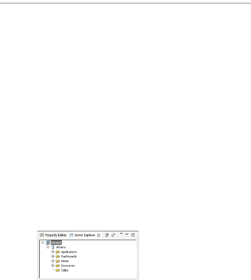
682
Actuate BIRT Application Developer Guide
About deploying and sharing applications and files
This chapter describes how to export and publish BIRT applications in the
Actuate business reporting system. You can also download files from an iHub
server to use in a BIRT application.
The purpose of publishing a BIRT application to iHub is to make it accessible to a
large number of users. A published application is available to manage. For
example, you can schedule running a report to include updates from the data
sources. You can also use permissions to control access to the application.
To publish BIRT applications, you need to understand the environment in which
the reports run. BIRT iHub provides a central location from which business users
can access, run, and view reports. You can also use Actuate BIRT Visualization
Platform to run report executables, and to manage, generate, view, and print
report documents.
BIRT Designer Professional, the tool that you use to develop BIRT applications,
has built-in capabilities that facilitate the deployment process. The BIRT Designer
Professional integrates with iHub in several important ways to support
performing the following tasks:
■
Use an open data access (ODA) information object data source that resides on
a volume.
■
Publish a BIRT application and its components to a volume.
■
Publish a resource to a volume.
■
Install a custom JDBC driver for use by BIRT reports running in the iHub
environment.
BIRT Designer Professional connects directly to an iHub server and deploys the
files to selected iHub folders. The designer provides a Server Explorer view for
managing iHub connections. Using Server Explorer, you can create connection
profiles to store the connection properties to a specific Encyclopedia volume.
Figure 19-1 shows Server Explorer displaying a server profile.
Figure 19-1 Server Explorer view

Chapter 19, Deploying and sharing applications
683
How to create a new server profile
1In BIRT Designer Professional, open Server Explorer. If you do not see the
Server Explorer view in the designer, select Windows➛Show view
➛Server Explorer.
2In Server Explorer, right-click Servers, and choose New Server Profile.
3In New Server Profile, specify the connection information. Figure 19-2
displays an example of connection properties provided for a server named
Athena.
Figure 19-2 Setting properties in a new Server profile
1In Profile type, select Server.
2In Profile name, type a unique name that identifies the new profile.
3In Server, type the name or IP address of the iHub server.
4In Port number, type the port number to access iHub.
5In Volume, select the iHub Encyclopedia volume if multiple volumes exist.
6In User name, type the user name required to access the volume.
7In Password, type the password required to access the volume.
8Select Remember Password, if you want to save the password.
4Choose Finish to save the Server profile. The Server profile appears in the
Server Explorer.

684
Actuate BIRT Application Developer Guide
Editing the landing page
Each BIRT application has an HTML landing page that is accessible from a web
browser. You can use this page to include additional content for your application
such as a description of the application, online help, and HTML links to the
contents of the application. You can run a project as a BIRT application to test how
the application responds when published.
How to edit the application landing page
While you can put any HTML code into the landing page, this example adds a
link to a dashboard and a report file in the BIRT application.
To edit the landing page using BIRT Designer Professional, complete the
following steps:
1Use Navigator to right-click the index.html file in the BIRT project, as shown
in Figure 19-3.
Figure 19-3 Selecting the landing page
2Choose Open With➛HTML Editor, as shown in Figure 19-4.
Figure 19-4 Opening the landing page in the HTML editor
3In the HTML editor type the following text on the second line of the landing
page:
<a href=
Figure 19-5 shows the new line in the landing page.
4In the Navigator, drag a dashboard file and drop it at the end of the new line in
the landing page, as shown in Figure 19-6.
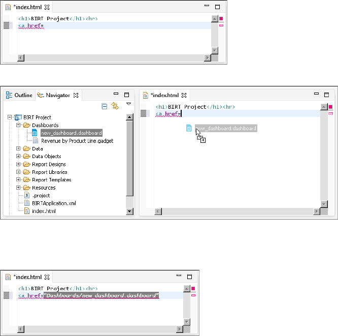
Chapter 19, Deploying and sharing applications
685
Figure 19-5 Editing the landing page
Figure 19-6 Selecting a file to add to the landing page
The relative location of the file is added to the HTML page, as shown in
Figure 19-7.
Figure 19-7 Adding a link to a file in the BIRT application
5Finish the HTML link by closing the a tag and adding text for the link. Verify
your finished link is similar to the code below:
<a href="Dashboards/new_dashboard.dashboard">
Sales dashboard</a>
6Add another line to the landing page and type the text:
<br><a href=
7Repeat step 4 and use a BIRT report design file.
8Finish the new HTML link by closing the a tag and adding text for the link.
Verify your finished link is similar to the code below:
<br><a href="Report Designs/new_report.rptdesign">
First quarter sales report</a>
9Choose File➛Save to save your changes to the landing page.

686
Actuate BIRT Application Developer Guide
How to run a project as a BIRT application
To test how a BIRT application runs using BIRT Designer Professional, complete
the following steps:
1Right-click the BIRT project that you want to deploy as a BIRT application in
Navigator, as shown in Figure 19-8.
Figure 19-8 Selecting a BIRT project to test
2Choose Run As➛BIRT Application, as shown in Figure 19-9.
Figure 19-9 Running a project as a BIRT application
If prompted to save any unsaved resources, choose OK.
3In Device Chooser, select the local browser device and choose OK, as shown in
Figure 19-10.
Figure 19-10 Selecting the default viewer
The landing page of the BIRT application appears in a local browser. Edit the
landing page file in BIRT Designer Professional to display links to files in the
BIRT application, as shown in Figure 19-11.
Figure 19-11 Displaying the BIRT application landing page
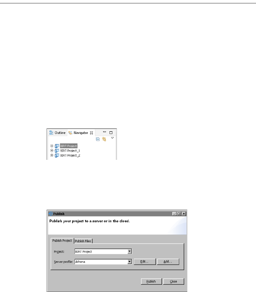
Chapter 19, Deploying and sharing applications
687
Sharing applications
To share a BIRT application you either publish a BIRT project to an iHub or
archive it to send to another person as a file. BIRT applications contain all
resources necessary to display BIRT dashboards and documents included in the
application.
When a BIRT application is published to an iHub server, other users can access
the application and its contents using URL addresses. When a BIRT application is
exported to an archive file, you can send it to another developer who loads the
archive into their BIRT Designer Professional to edit and preview the application.
How to publish a BIRT application
To publish a project as a BIRT application to an iHub server, complete the
following steps:
1Select the BIRT project that you want to deploy as a BIRT application in
Navigator, as shown in Figure 19-12.
Figure 19-12 Selecting a BIRT project to publish as an application
2Choose File➛Publish.
3In Publish, select Publish Project if it is not already selected.
4Select a server profile and choose Publish. Figure 19-13 shows the BIRT
application named BIRT Project set to publish to the server profile Athena.
Figure 19-13 Selecting a server profile to publish to
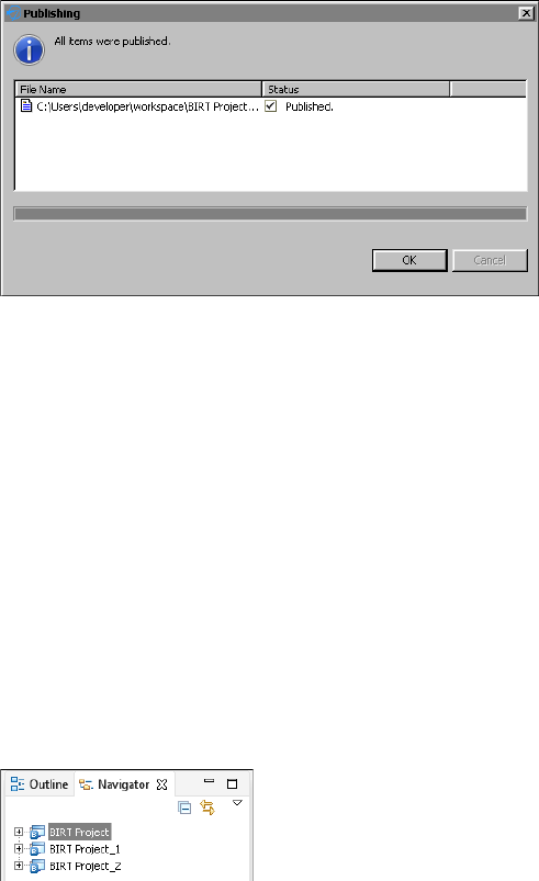
688
Actuate BIRT Application Developer Guide
5After all items have been published, choose OK. Figure 19-14 shows that all
files were successfully published.
Figure 19-14 Verifying all items were published
6Choose Close to return to BIRT Designer Professional.
7Verify that the application is accessible by using a web browser to visit the
URL of the application. For example, if the server name was Athena, then
the URL to the application is the following:
http://athena:8700/iportal/apps/BIRT Project/
For more information about URL access to BIRT application content, see
“Accessing BIRT application content” in Chapter 1, “Planning a BIRT
application.”
How to export a BIRT application
To archive a BIRT application, export the entire BIRT project that contains the
BIRT application as an archive file. This retains the file structure and packages all
files into a .zip archive file.
1Select the BIRT project that contains the BIRT application in Navigator, as
shown in Figure 19-15.
Figure 19-15 Selecting a BIRT project to export
2Choose File➛Export.
3In Export, select General➛Archive File. Choose Next, as shown in
Figure 19-16.
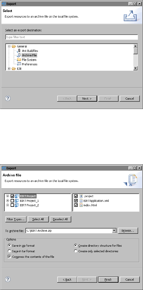
Chapter 19, Deploying and sharing applications
689
Figure 19-16 Selecting a method to export the BIRT project
4Verify that the correct project is selected. Choose Browse.
5In Export to archive file, select a file name and location for the project archive.
Choose Save when you are finished.
6Verify that the options are set for the file format and directory structure of the
project archive. Choose Finish, as shown in Figure 19-17.
Figure 19-17 Exporting the BIRT project as a .zip compressed file
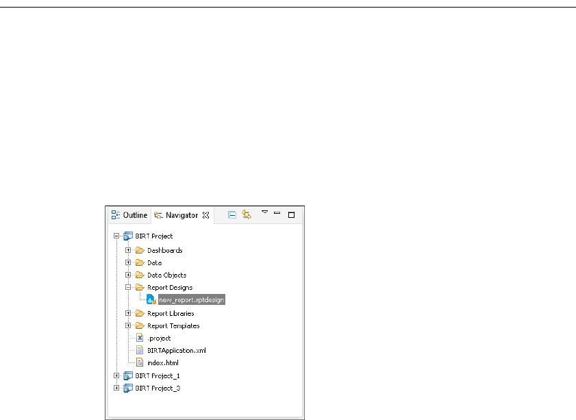
690
Actuate BIRT Application Developer Guide
Sharing project files
You can publish project files to locations on the iHub server such as a user folder
or a folder for a specific department. You can also update selected files in a
published BIRT application, such as dashboards, libraries, reports, and templates.
How to publish a file to iHub
To publish a file, such as a dashboard or report design, to an iHub server,
complete the following steps:
1Select the file in the BIRT project that you want to deploy in Navigator.
Figure 19-18 shows the selection of a report design in the BIRT Project folder.
Figure 19-18 Selecting a file to publish
2Choose File➛Publish.
3In Publish, select Publish Files if it is not already selected.
4Select a server profile. If there is no appropriate profile in the iHub profile list,
create a new profile by choosing Add.
5Select Publish Files.
6In Destination, type or browse for the location on the volume in which to
publish the file, as shown in Figure 19-19.
7Choose Publish. A window showing the file upload status appears.
In Publishing, wait until the upload finishes, then choose OK, as shown in
Figure 19-20.
8In Publish, choose Close.
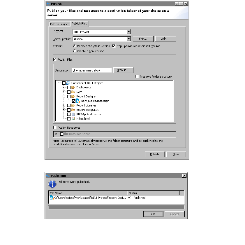
Chapter 19, Deploying and sharing applications
691
Figure 19-19 Selecting a server and location
Figure 19-20 Confirming the report publishing
Publishing a resource file to iHub
BIRT dashboards and reports frequently use files with additional information to
present report data to the users. A BIRT resource is any of the following items:
■
Static image that a BIRT report design uses
■
Report library
■
Properties file

692
Actuate BIRT Application Developer Guide
■
Report template
■
Data object
■
CSS file
■
External JavaScript file
■
SWF file of a Flash object
■
Java event handler class packaged as a Java archive (JAR) file
The location of resource files in the iHub’s volume depends on how the resources
are used. Table 19-1 shows these locations.
A BIRT application can only use resources in its own application folder. For
example, a dashboard in a BIRT application cannot use data objects stored in the
central resource folder of an iHub’s volume because that folder is outside the
application folder. Files that are not in a BIRT application, such as reports and
dashboards in a user’s home folder, use a single, shared resource folder in the
volume.
You can publish BIRT resources from the BIRT Designer Professional’s local
resource folder to an iHub server. By default, the local resource folder is the
current report project folder. If you use shared resources with other developers
and the resource files for your reports are stored in a different folder, you can
change the default Resource folder used in your project. Use the Window—
Preferences—Actuate BIRT—Resource menu to set the resource folder.
In the volume, the Resource folder is set to /Resources by default.
How to publish a local resource to an iHub resource folder
To publish a resource, such as a data object or report library, to an iHub server,
complete the following steps:
1Choose File➛Publish.
2In Publish, select Publish Files if it is not already selected.
3In Project, select the BIRT project where the local resources are located.
4Select a server profile. If there is no appropriate profile in the iHub profile list,
create a new profile by choosing Add.
5Select Publish Resources.
Table 19-1 Resource file locations
Resource usage Publish method Location in iHub volume
Used in a BIRT application Publish Project Same application folder
Not used in a BIRT application Publish Resources Volume resource folder
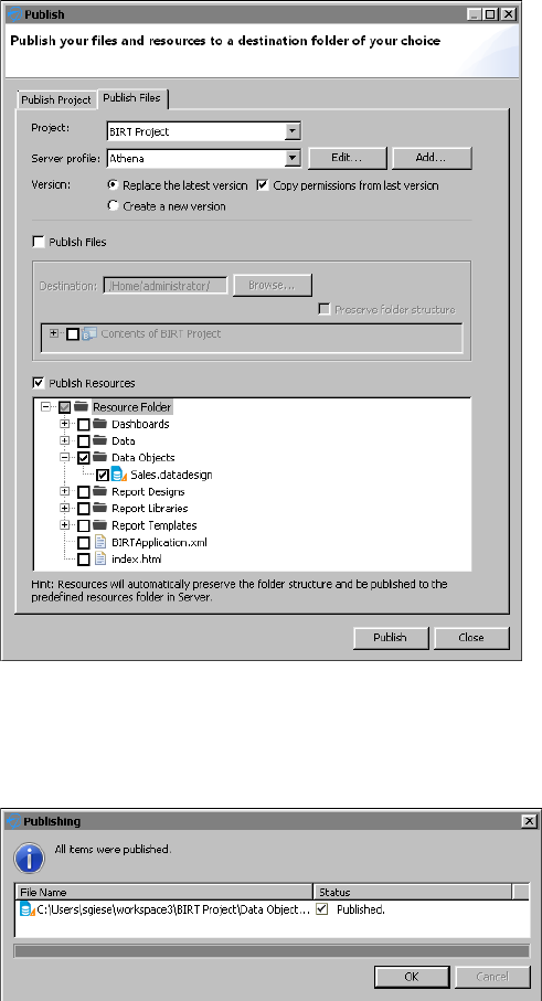
Chapter 19, Deploying and sharing applications
693
6In Publish Resources, select the resources that you want to publish, as shown
in Figure 19-21.
Figure 19-21 Selecting a resource
7Choose Publish. A window showing the file upload status appears.
In Publishing, wait until the upload finishes, then choose OK, as shown in
Figure 19-22.
Figure 19-22 Confirming the resource publishing
8In Publish, choose Close.
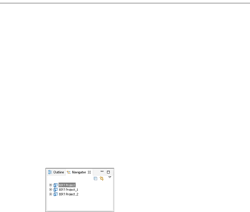
694
Actuate BIRT Application Developer Guide
Downloading files
You can use published BIRT files such as dashboards, reports and data objects
in BIRT applications by downloading these files from an iHub server. After
downloading the file into your BIRT project, you can edit it using the tools of
BIRT Designer Professional. If the file uses a data object, you must also download
the data object into the BIRT application and put it in the same location in the
BIRT application.
For example, a dashboard gadget displays data from a data design file named
Sales.datadesign. This file is located in the iHub’s volume, inside a folder named
Resources. In the BIRT application, you make a folder named Resources and copy
the Sales.datadesign file into that folder. Now that the gadget and data source
files are in the correct locations, you can make dashboards in the BIRT application
that use the gadget file.
Resources are downloaded to the root of the BIRT application. You can change
this location in the BIRT Designer Professional preferences.
How to download a file from an iHub server
To download a file, such as a dashboard gadget file, to an iHub server, complete
the following steps:
1In Navigator, select the BIRT project that you want to receive the dashboard
gadget, as shown in Figure 19-23.
Figure 19-23 Selecting a BIRT project to receive a file
2Choose File➛Download.
3Select a server profile.
4Select Download file.
5In Download Location, type or browse for the location in the BIRT project
folder in which to download the file.
6In the server tree, select the files on the volume to copy to the local download
location. Figure 19-24 shows a dashboard gadget selected for download to the
dashboard folder of a local BIRT project.
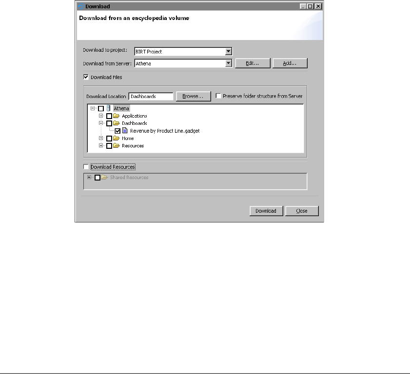
Chapter 19, Deploying and sharing applications
695
Figure 19-24 Selecting a file to download into a BIRT application
7Choose Download.
How to change the location of downloaded resource files
1Choose Window➛Preferences➛Actuate BIRT➛Resource.
2In Resource Folder, type the default location to store resource files.
For example, change <Current Project Folder> to
<Current Project Folder>/Resources to download all resources in the
project to a folder named Resources.
3Choose OK.
Managing permissions
You can set user permissions based on user roles to manage access to a BIRT
application. These permissions are stored in the BIRTApplication.xml file in the
BIRT application. The user roles are the BIRT iHub Visualization Platform user
groups.
Table 19-2 lists and describes all supported permissions and the task that each
permission allows a user to perform.
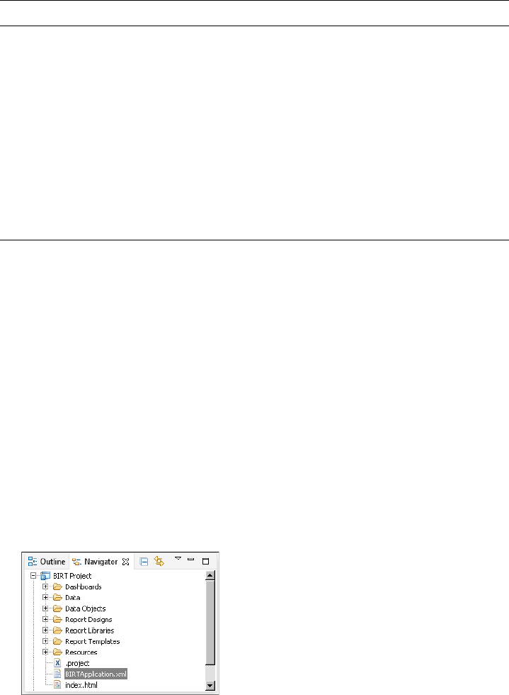
696
Actuate BIRT Application Developer Guide
For information about how an administrator manages user privileges and
permissions on a volume, see Managing Volumes and Users.
Check with your iHub administrator for the user group names used on your iHub
server and for the default permissions of the applications folder on the iHub
volume. For example, if your iHub administrator has hidden the Application
folder where all BIRT applications are stored, you must grant the Read
permission to a user role for the BIRT application URL to function.
After a BIRT application is published to an iHub server, you can change the
permissions of each file in the BIRT application. Permissions are overwritten each
time you publish a BIRT application. For example, after publishing an application
to an iHub server, you remove the Read permissions on a BIRT data object so that
users cannot download the data object file. Each time that you publish the BIRT
application, you must again change the permissions on the iHub server.
How to add permissions to a BIRT application
1Using Navigator, right-click the BIRTApplication.xml file in the BIRT project
that you want to deploy, as shown in Figure 19-25.
Figure 19-25 Selecting the BIRT application file
Table 19-2 Permission and allowed tasks for a BIRT application
Permission Symbol Allowed task
Delete D Delete the folder or file.
Execute E Run a design, dashboard, or executable file. Only an
administrator can set this privilege. The Execute
privilege does not apply to folders or document files.
Grant G Change privileges for a file or folder. An administrator
has Grant privileges on all files and folders by default.
Read R View and print a report. Privilege to view the contents
of a folder. Requires the Visible permission.
Secure read S View and print only restricted parts of a document.
Visible V See a folder or a file in a list.
Write W Modify a file or the contents of a folder.
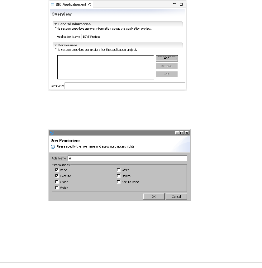
Chapter 19, Deploying and sharing applications
697
2Choose File➛Open.
3In Permissions, choose Add, as shown in Figure 19-26.
Figure 19-26 Adding a user group permission to a BIRT application
4Type the name of a user role. Select the permissions to apply to the user role.
In this example, the user role All is given the Read and the Execute
permissions, as shown in Figure 19-27.
Figure 19-27 Assigning permissions to a user group
Choose OK.
5To add additional permissions, return to step 3.
6Choose File➛Save. The next time you publish this BIRT application to an iHub
server, these permissions become active.
Deploying Java classes used in BIRT reports
A BIRT report uses scripts to implement custom functionality. For example, you
can use scripts to create a scripted data set or to provide custom processing for a
report element. When you deploy a BIRT report to a volume, you must provide
698
Actuate BIRT Application Developer Guide
iHub with access to the Java classes that the scripts reference. You package these
classes as JAR files so an iHub Java factory process can recognize and process
them.
There are two ways to deploy Java classes:
■
Deploy the JAR files to the volume.
This method supports creating specific implementations for each volume in
iHub. This method of deployment requires packaging the Java classes as a JAR
file and attaching the JAR file as a resource to the report design file. You treat a
JAR file as a resource in the same way as a library or image. Using this
method, you publish the JAR file to iHub every time you make a change in the
Java classes.
■
Deploy the JAR files to the following iHub subdirectory:
$ACTUATE_HOME\iHub\resources
This method uses the same implementation for all volumes in iHub. Actuate
does not recommend deploying JAR files to an iHub /resources folder
because you must restart the iHub after deploying the JAR file. Another
disadvantage of this deployment technique is that the JAR file, deployed in
the iHub /resources directory, is shared across all volumes, which can cause
conflicts if you need to have different implementations for different volumes.
When using this method, you do not have to add the JAR file to the report
design’s Resource property.
iHub uses Java 1.6 compliance settings by default. A Java event handler deployed
to iHub requires the same of lower level of Java compliance in the compiled class
file.
How to configure BIRT to use a compliance level of Java 1.6 in an event handler
1Open the Java event handler in BIRT Designer Professional.
2Choose Window➛Preferences.
3In Preferences, in the navigation tree, expand Java and select Compiler.
4In Compiler, in JDK Compliance, in compiler compliance level, select 1.6, as
shown in Figure 19-28.
Choose OK.
5Recompile the event handler classes.
How to configure BIRT reports and deploy a JAR file to a volume
1Package the Java classes as a JAR file and copy the JAR file to the BIRT
Designer Professional resource folder.
2Open the report design in BIRT Designer Professional.
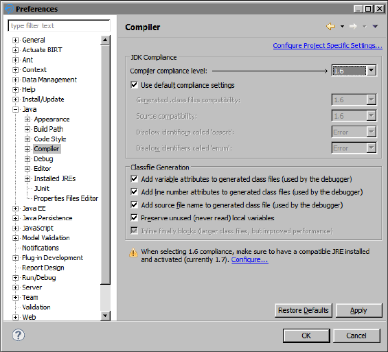
Chapter 19, Deploying and sharing applications
699
Figure 19-28 Setting the Java compiler compliance level
3In Outline, select the root report design slot. Select the Resources property
group in the Property Editor window.
4In Resources, in JAR files, choose Add, and navigate through the Resource
folder to select the JAR file, as shown in Figure 19-29.
When the report executes, the engine searches for the required classes and
methods only in this JAR file.
How to deploy a JAR file to an iHub /resources folder
1Copy the JAR file to the following iHub subdirectory:
$ACTUATE_HOME\iHub\resources
$ACTUATE_HOME is the folder where Actuate products install.
2Publish the report to iHub, as described in “Sharing applications,” earlier in
this chapter.
3Restart iHub.
4Run the report from BIRT iHub Visualization Platform.

700
Actuate BIRT Application Developer Guide
Figure 19-29 Add JAR file as a resource to a report
Installing a custom JDBC driver
In order to run a BIRT application in the iHub environment when the BIRT
application uses a custom JDBC driver, you must install the JDBC driver in the
following location:
$ACTUATE_HOME\iHub\Jar\BIRT\platform\plugins
\org.eclipse.birt.report.data.oda.jdbc_<VERSION>\drivers
Installing custom ODA drivers and custom plug-ins
BIRT Designer Professional loads plug-ins from the following folder:
<installation folder>\BDPro\eclipse\plugins
BIRT iHub and BIRT Visualization Platform load custom plug-ins from the
following folder:
$ACTUATE_HOME\iHub\MyClasses\eclipse\plugins

Chapter 19, Deploying and sharing applications
701
BIRT iHub and BIRT Visualization Platform load custom ODA drivers from the
following folder:
$ACTUATE_HOME\iHub\oda\eclipse\plugins
Install all custom ODA drivers and custom plug-ins in the folder corresponding
to your Actuate product
If your application uses a different location to store custom plug-ins, you must
set this location in a link file for each Actuate product. Actuate products use link
files to locate the folder where the custom drivers or plug-ins are deployed. The
name of the link files are customODA.link and customPlugins.link. Use the
customODA.link file to store the path for custom ODA drivers, and use the
customPlugins.link file for all plug-ins used by BIRT reports and the BIRT engine,
such as custom emitters, or Flash object library plug-ins. For example, if you store
custom plug-ins at C:\BIRT\MyPlugins\eclipse\plugins, then the contents of the
customPlugins.link file is the following:
path=C:/BIRT/MyPlugins
Link files are typically stored in a \links subfolder of the Eclipse instance of the
product. Create the links folder if it does not exist. For example, if BIRT Designer
Professional for Windows is stored in the root of the C: drive, it looks for link files
in the following location:
C:\BDPro\eclipse\links
The locations of the link files for each Actuate product are listed in Table 19-3.
After adding the link file to your Actuate product, deploy the plug-ins to the new
location described in the link file.
Table 19-3 Locations to store .link files
Product Paths to store .link files
BIRT Designer
Professional Windows
<installation folder>\BDPro\eclipse\links
BIRT Designer
Professional Mac OS X
<installation folder>\BRDPro\eclipse\links
BIRT iHub $ACTUATE_HOME\iHub\Jar\BIRT\platform\links
702
Actuate BIRT Application Developer Guide

Chapter 20, Working with BIRT encryption in iHub
701
Chapter
20
Chapter 20
Working with BIRT
encryption in iHub
This chapter contains the following topics:
■
About BIRT encryption
■
About the BIRT default encryption plug-in
■
Creating a BIRT report that uses the default encryption
■
Deploying multiple encryption plug-ins
■
Deploying encryption plug-ins to iHub
■
Generating encryption keys
■
Creating a custom encryption plug-in
■
Using encryption API methods

702
Actuate BIRT Application Developer Guide
About BIRT encryption
BIRT provides an extension framework to support users registering their own
encryption strategy with BIRT. The model implements the Java™ Cryptography
Extension (JCE). The Java encryption extension framework provides multiple
popular encryption algorithms, so the user can just specify the algorithm and key
to have a high security level encryption. The default encryption extension plug-in
supports customizing the encryption implementation by copying the BIRT
default plug-in, and giving it different key and algorithm settings.
JCE provides a framework and implementations for encryption, key generation
and key agreement, and message authentication code (MAC) algorithms. Support
for encryption includes symmetric, asymmetric, block, and stream ciphers. The
software also supports secure streams and sealed objects.
A conventional encryption scheme has the following five major parts:
■
Plaintext, the text to which an algorithm is applied.
■
Encryption algorithm, the mathematical operations to conduct substitutions
on and transformations to the plaintext. A block cipher is an algorithm that
operates on plaintext in groups of bits, called blocks.
■
Secret key, the input for the algorithm that dictates the encrypted outcome.
■
Ciphertext, the encrypted or scrambled content produced by applying the
algorithm to the plaintext using the secret key.
■
Decryption algorithm, the encryption algorithm in reverse, using the
ciphertext and the secret key to derive the plaintext content.
About the BIRT default encryption plug-in
BIRT’s default encryption algorithm is implemented as a plug-in named:
com.actuate.birt.model.defaultsecurity_<Release>
Table 20-1 shows the location of this plug-in folder in the supported BIRT
environments.
Table 20-1 Locations of the default encryption plug-in folder
Environment Font configuration file folder location
BIRT Designer Professional $BDPro\eclipse\plugins
iHub $iHub\modules\BIRTiHub\iHub\Jar\BIRT
\platform\plugins
Chapter 20, Working with BIRT encryption in iHub
703
About supported encryption algorithms
Two different cryptographic methods, private-key and public-key encryptions,
solve computer security problems. Private-key encryption is also known as
symmetric encryption. In private-key encryption, the sender and receiver of
information share a key that is used for both encryption and decryption. In
public-key encryption, two different mathematically related keys, known as a key
pair, are used to encrypt and decrypt data. Information encrypted using one key
can only be decrypted by using the other member of the key pair. The BIRT
default encryption plug-in supports the following algorithms within these two
methods:
■
Private-key encryption
■
DES is the Digital Encryption Standard as described in FIPS PUB 46-2 at
http://www.itl.nist.gov/fipspubs/fip46-2.htm. The DES algorithm is the
most widely used encryption algorithm in the world. This algorithm is
the default encryption that BIRT uses.
■
DESede, triple DES encryption
Triple-DES or DESede is an improvement over DES. This algorithm uses
three DES keys: k1, k2, and k3. A message is encrypted using k1 first, then
decrypted using k2, and encrypted again using k3. This technique is called
DESencryptiondecryptionencryption. Two or three keys can be used in
DESede. This algorithm increases security as the key length effectively
increases from 56 to 112 or 168.
■
Public-key encryption supports the RSA algorithm
RSA uses both a public key and a private key. The public key can be known to
everyone and is used for encrypting messages. Messages encrypted with the
public key can only be decrypted using the private key.
About the components of the BIRT default encryption
plug-in
The BIRT default encryption plug-in consists of the following main modules:
■
acdefaultsecurity.jar
■
encryption.properties file
■
META-INF/MANIFEST.MF
■
plugin.xml
About acdefaultsecurity.jar
This JAR file contains the encryption classes. The default encryption plug-in also
provides key generator classes that can be used to create different encryption
keys.

704
Actuate BIRT Application Developer Guide
About encryption.properties
This file specifies the encryption settings. BIRT loads the encryption type,
encryption algorithm, and encryption keys from the encryption.properties file to
do the encryption. The file contains pre-generated default keys for each of the
supported algorithms.
You define the following properties in the encryption.properties file:
■
Encryption type
Type of algorithm. Specify one of the two values, symmetric encryption or
public encryption. The default type is symmetric encryption.
■
Encryption algorithm
The name of the algorithm. You must specify the correct encryption type for
each algorithm. For the symmetric encryption type, BIRT supports DES and
DESede. For public encryption type, BIRT supports RSA.
■
Encryption mode
In cryptography, a block cipher algorithm operates on blocks of fixed length,
which are typically 64 or 128 bits. Because messages can be of any length, and
because encrypting the same plaintext with the same key always produces the
same output, block ciphers support several modes of operation to provide
confidentiality for messages of arbitrary length. Table 20-2 shows all
supported modes.
■
Encryption padding
Because a block cipher works on units of a fixed size, but messages come in a
variety of lengths, some modes, for example CBC, require that the final block
be padded before encryption. Several padding schemes exist. The supported
Table 20-2 Supported encryption modes
Mode Description
None No mode
CBC Cipher Block Chaining Mode, as defined in the
National Institute of Standards and Technology
(NIST) Federal Information Processing Standard
(FIPS) PUB 81, “DES Modes of Operation,” U.S.
Department of Commerce, Dec 1980
CFB Cipher Feedback Mode, as defined in FIPS PUB 81
ECB Electronic Codebook Mode, as defined in FIPS
PUB 81
OFB Output Feedback Mode, as defined in FIPS PUB 81
PCBC Propagating Cipher Block Chaining

Chapter 20, Working with BIRT encryption in iHub
705
paddings are shown in Table 20-3. All padding settings are applicable to all
algorithms.
■
Encryption keys
Actuate provides pre-generated keys for all algorithms.
Listing 20-1 shows the default contents of encryption.properties.
Listing 20-1 Default encryption.properties
#message symmetric encryption , public encryption.
type=symmetric encryption
#private encryption: DES(default), DESede
#public encryption: RSA
algorithm=DES
# NONE , CBC , CFB , ECB( default ) , OFB , PCBC
mode=ECB
# NoPadding , OAEP , PKCS5Padding( default ) , SSL3Padding
padding=PKCS5Padding
#For key , support default key value for algorithm
#For DESede ,DES we only need to support private key
#private key value of DESede algorithm : 20b0020…
#private key value of DES algorithm: 527c2qI
#for RSA algorithm , there is key pair. you should support
private-public key pair
#private key value of RSA algorithm: 30820…
#public key value of RSA algorithm: 30819…
Table 20-3 Supported encryption paddings
Mode Description
NoPadding No padding.
OAEP Optimal Asymmetric Encryption Padding (OAEP) is
a padding scheme that is often used with RSA
encryption.
PKCS5Padding The padding scheme described in RSA Laboratories,
“PKCS #5: Password-Based Encryption Standard,”
version 1.5, November 1993. This encryption
padding is the default.
SSL3Padding The padding scheme defined in the SSL Protocol
Version 3.0, November 18, 1996, section 5.2.3.2.

706
Actuate BIRT Application Developer Guide
#private key
symmetric-key=527c23…
#public key
public-key=
About META-INF/MANIFEST.MF
META-INF/MANIFEST.MF is a text file that is included inside a JAR to specify
metadata about the file. Java’s default ClassLoader reads the attributes defined in
MANIFEST.MF and appends the specified dependencies to its internal classpath.
The encryption plug-in ID is the value of the Bundle-SymbolicName property in
the manifest file for the encryption plug-in. You need to change this property
when you deploy multiple instances of the default encryption plug-in, as
described later in this chapter. Listing 20-2 shows the contents of the default
MANIFEST.MF.
Listing 20-2 Default MANIFEST.MF
Manifest-Version: 1.0
Bundle-ManifestVersion: 2
Bundle-Name: Actuate Default Security Plug-in
Bundle-SymbolicName:
com.actuate.birt.model.defaultsecurity;singleton:=true
Bundle-Version: <release><version>
Require-Bundle: org.eclipse.birt.report.model,
org.eclipse.core.runtime,org.eclipse.birt.core;
bundle-version="3.7.0"
Export-Package: com.actuate.birt.model.defaultsecurity.api
Bundle-ClassPath: acdefaultsecurity.jar
Bundle-Vendor: Actuate Corporation
Eclipse-LazyStart: true
Bundle-Activator:
com.actuate.birt.model.defaultsecurity.properties
.SecurityPlugin
Bundle-RequiredExecutionEnvironment: JavaSE-1.6
About plugin.xml
plugin.xml is the plug-in descriptor file. This file describes the plug-in to the
Eclipse platform. The platform reads this file and uses the information to
populate and update, as necessary, the registry of information that configures the
whole platform. The <plugin> tag defines the root element of the plug-in
descriptor file. The <extension> element within the <plugin> element specifies
the Eclipse extension point that this plug-in uses, org.eclipse.birt.report
.model.encryptionHelper. This extension point requires a sub-element,
<encryptionHelper>. This element uses the following attributes:

Chapter 20, Working with BIRT encryption in iHub
707
■
class
The qualified name of the class that implements the interface
IEncryptionHelper. The default class name is
com.actuate.birt.model.defaultsecurity.api.DefaultEncryptionHelper.
■
extensionName
The unique internal name of the extension. The default extension name is jce.
■
isDefault
The field indicating whether this encryption extension is the default for all
encryptable properties. This property is valid only in a BIRT Designer
Professional environment. When an encryption plug-in sets the value of this
attribute to true, BIRT Designer Professional uses this encryption method as
the default to encrypt data. There is no default encryption mode in iHub and
BIRT Visualization Platform. The encryption model that BIRT uses supports
implementing and using several encryption algorithms. The default
encryption plug-in is set as default using this isDefault attribute. If you
implement several encryptionHelpers, set this attribute to true for only one of
the implementations. If you implement multiple encryption algorithms and
set isDefault to true to more than one instance, BIRT treats the first loaded
encryption plug-in as the default algorithm.
Listing 20-3 shows the contents of the default encryption plug-in’s plugin.xml.
Listing 20-3 Default plugin.xml
<?xml version="1.0" encoding="UTF-8"?>
<?eclipse version="3.2"?>
<plugin>
<extension
id="encryption"
name="default encryption helper"
point="org.eclipse.birt.report.model.encryptionHelper">
<encryptionHelper
class="com.actuate.birt.model.defaultsecurity.api
.DefaultEncryptionHelper"
extensionName="jce" isDefault="true" />
</extension>
</plugin>
Creating a BIRT report that uses the default encryption
This section describes an example that shows how the entire mechanism works.
This example uses BIRT Designer Professional to create a report design. The
report design connects to a MySQL Enterprise database server using the user,
root, and password, root, as shown in Figure 20-1.
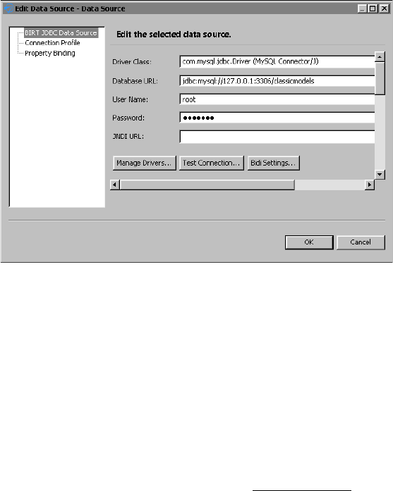
708
Actuate BIRT Application Developer Guide
Figure 20-1 Data source properties for the encryption example
The encryption model stores the encrypted value of the database password in the
report design file. Along with the value, the model stores the encryptionID. In
this way, it identifies the encryption mechanism used to encrypt the password, as
shown in the <encrypted-property> element in the following code:
<data-sources>
<oda-data-source
extensionID="org.eclipse.birt.report.data.oda.jdbc" name="Data
Source" id="6">
<property name="odaDriverClass">
com.mysql.jdbc.Driver
</property>
<property name="odaURL">
jdbc:mysql://127.0.0.1:3306/classicmodels
</property>
<property name="odaUser">root</property>
<encrypted-property name="odaPassword" encryptionID="jce">
10e52…
</encrypted-property>
</oda-data-source>
</data-sources>
BIRT iHub uses the encryptionID attribute of the <encrypted-property> element
to identify the algorithm to decrypt the password. After using the algorithm on
the value of <encrypted-property>, BIRT iHub connects to the database and
generates the report.

Chapter 20, Working with BIRT encryption in iHub
709
Deploying multiple encryption plug-ins
In some cases, you need to use an encryption mechanism other than the Data
Source Explorer default in your report application. For example, some
applications need to create an encryption mechanism using the RSA algorithm
that the default encryption plug-in supports. In this case, you must create an
additional encryption plug-in instance. For use within BIRT Designer
Professional, you can set this plug-in as the default encryption mechanism. If you
change the default encryption mechanism, you must take care when you work
with old report designs. For example, if you change an existing password field in
the designer, the designer re-encrypts the password with the current default
encryption algorithm regardless of the original algorithm that the field used.
How to create a new instance of the default encryption plug-in
1Make a copy of the default encryption plug-in:
1Copy the folder:
$ACTUATE_HOME\BRDPro\eclipse\plugins
\com.actuate.birt.model.defaultsecurity_<Release>
2Paste the copied folder in the same folder:
$ACTUATE_HOME\BRDPro\eclipse\plugins
3Rename:
$ACTUATE_HOME\BRDPro\eclipse\plugins\Copy of
com.actuate.birt.model.defaultsecurity_<Release>
to a new name, such as:
$ACTUATE_HOME\BRDPro\eclipse\plugins
\com.actuate.birt.model.defaultsecurity_<Release>_rsa
2Modify the new plug-in’s manifest file:
1Open:
$ACTUATE_HOME\BRDPro\eclipse\plugins
\com.actuate.birt.model.defaultsecurity_<Release>_rsa
\META-INF\MANIFEST.MF
2Change:
Bundle-SymbolicName:
com.actuate.birt.model.defaultsecurity
to:
Bundle-SymbolicName:
com.actuate.birt.model.defaultsecurity.rsa
MANIFEST.MF now looks similar to the one in Listing 20-4.

710
Actuate BIRT Application Developer Guide
Listing 20-4 Modified MANIFEST.MF for the new encryption plug-in
Manifest-Version: 1.0
Bundle-ManifestVersion: 2
Bundle-Name: Actuate Default Security Plug-in
Bundle-SymbolicName:
com.actuate.birt.model.defaultsecurity.rsa;singleton:=true
Bundle-Version: <release><version>
Require-Bundle: org.eclipse.birt.report.model,
org.eclipse.core.runtime,org.eclipse.birt.core;
bundle-version="3.7.0"
Export-Package: com.actuate.birt.model.defaultsecurity.api
Bundle-ClassPath: acdefaultsecurity.jar
Bundle-Vendor: Actuate Corporation
Eclipse-LazyStart: true
Bundle-Activator:
com.actuate.birt.model.defaultsecurity.properties
.SecurityPlugin
3Save and close MANIFEST.MF.
3Modify the new plug-in’s descriptor file to be the default encryption plug-in:
1Open:
$ACTUATE_HOME\BRDPro\eclipse\plugins
\com.actuate.birt.model.defaultsecurity_<Release>_rsa
\plugin.xml
2Change:
extensionName="jce"
to:
extensionName="rsa"
plugin.xml now looks similar to the one in Listing 20-5.
3Save and close plugin.xml.
Listing 20-5 Modified plugin.xml for the new encryption plug-in
<?xml version="1.0" encoding="UTF-8"?>
<?eclipse version="<Version>"?>
<plugin>
<extension
id="encryption"
name="default encryption helper"
point="org.eclipse.birt.report.model.encryptionHelper">
<encryptionHelper
class="com.actuate.birt.model.defaultsecurity.api
.DefaultEncryptionHelper"
extensionName="rsa" isDefault="true" />

Chapter 20, Working with BIRT encryption in iHub
711
</extension>
</plugin>
4Modify the original plug-in’s descriptor file, so that it is no longer the default
encryption plug-in:
1Open:
$ACTUATE_HOME\BRDPro\eclipse\plugins
\com.actuate.birt.model.defaultsecurity_<Release>
\plugin.xml
2Change:
isDefault="true"
to:
isDefault="false"
3Save and close plugin.xml.
5Set the encryption type in the new plug-in to RSA:
1Open:
$ACTUATE_HOME\BRDPro\eclipse\plugins
\com.actuate.birt.model.defaultsecurity_<Release>_rsa
\encryption.properties
2Change the encryption type to public encryption:
type=public encryption
3Change the algorithm type to RSA:
algorithm=RSA
4Copy the pre-generated private and public keys for RSA to the
symmetric-key and public-key properties. encryption.properties now looks
similar to the one in Listing 20-6.
5Save and close encryption.properties.
Listing 20-6 Modified encryption.properties file for the new encryption
plug-in
#message symmetric encryption , public encryption
type=public encryption
#private encryption: DES(default), DESede
#public encryption: RSA
algorithm=RSA
# NONE , CBC , CFB , ECB( default ) , OFB , PCBC
mode=ECB
#NoPadding , OAEP , PKCS5Padding( default ) , SSL3Padding
padding=PKCS5Padding
#For key , support default key value for algorithm

712
Actuate BIRT Application Developer Guide
#For DESede ,DES we only need to support private key
#private key value of DESede algorithm : 20b0020e918..
#private key value of DES algorithm: 527c23ea...
# RSA algorithm uses a key pair. You should support
#private-public key pair
#private key value of RSA algorithm: 308202760201003....
#public key value of RSA algorithm: 30819f300d0....
#private key
symmetric-key=308202760....
#public key
public-key=30819f300d0.....
6To test the new default RSA encryption, open BIRT Designer Professional and
create a new report design. Create a data source and type the password.
7View the XML source of the report design file. Locate the data source
definition code. The encryptionID is rsa, as shown in the following sample:
<data-sources>
<oda-data-source name="Data Source" id="6"
extensionID="org.eclipse.birt.report.data.oda.jdbc" >
<text-property name="displayName"></text-property>
<property name="odaDriverClass">
com.mysql.jdbc.Driver
</property>
<property name="odaURL">
jdbc:mysql://192.168.218.225:3306/classicmodels
</property>
<property name="odaUser">root</property>
<encrypted-property name="odaPassword"
encryptionID="rsa">
36582dc88.....
</encrypted-property>
</oda-data-source>
</data-sources>
8Create a data set and a simple report design. Preview the report to validate
that BIRT connects successfully to the database server using the encrypted
password. Before trying to connect to the data source the report engine
decrypts the password stored in the report design using the default RSA
encryption plug-in. Then the engine submits the decrypted value to the
database server.
Deploying encryption plug-ins to iHub
If you deploy your report designs to BIRT iHub, you need to deploy the report
and the new encryption plug-in to BIRT iHub. BIRT iHub loads all encryption

Chapter 20, Working with BIRT encryption in iHub
713
plug-ins at start up. During report execution, BIRT iHub reads the encryptionID
property from the report design file and uses the corresponding encryption
plug-in to decrypt the encrypted property. Every time you create reports using a
new encryption plug-in, make sure you deploy the plug-in to BIRT iHub,
otherwise the report execution on the server will fail.
When using BIRT iHub, you do not need to deploy the encryption plug-ins to
BIRT Visualization Platform.
How to deploy a new encryption plug-in instance to BIRT iHub
1Copy:
$ACTUATE_HOME\BRDPro\eclipse\plugins
\com.actuate.birt.model.defaultsecurity_2.3.2_rsa
to:
$ACTUATE_HOME\iHub2\Jar\BIRT\platform\plugins
2Publish your report design to BIRT iHub.
3Restart BIRT iHub to load the new encryption plug-in.
4Log in to BIRT iHub using BIRT Visualization Platform and run the report.
BIRT iHub now uses the new encryption plug-in to decrypt the password.
Generating encryption keys
The default encryption plug-in provides classes that can be used to generate
different encryption keys. The classes names are SymmetricKeyGenerator and
PublicKeyPairGenerator. SymmetricKeyGenerator generates private keys, which
are also known as symmetric keys. PublicKeyPairGenerator generates public
keys. Both classes require acdefaultsecurity.jar in the classpath.
Both classes take two parameters, the encryption algorithm and the output file,
where the generated encrypted key is written. The encryption algorithm is a
required parameter. The output file is an optional parameter. If you do not
provide the second parameter, the output file is named key.properties and is
saved in the current folder. The encryption algorithm values are shown in
Table 20-4.
Table 20-4 Key-generation classes and parameters
Class name
Encryption algorithm
parameter
com.actuate.birt.model.defaultsecurity.api
.keygenerator.SymmetricKeyGenerator
des
(continues)
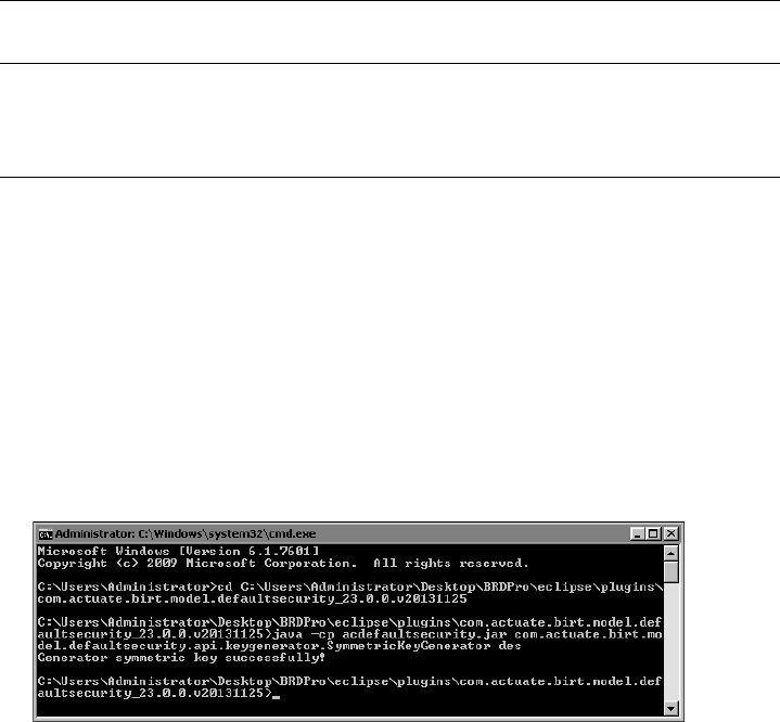
714
Actuate BIRT Application Developer Guide
How to generate a symmetric encryption key
Run the main function of SymmetricKeyGenerator.
1To navigate to the default security folder, open a command prompt window
and navigate to the default security plugin directory using a command similar
to the following:
cd C:\Program Files\BRDPro\eclipse\plugins
\com.actuate.birt.model.defaultsecurity_<Release>
2To generate the key, as shown in Figure 20-2, type:
java -cp acdefaultsecurity.jar
com.actuate.birt.model.defaultsecurity.api.keygenerator
.SymmetricKeyGenerator des
Figure 20-2 Symmetric key generation
3The generated key is saved in the file, key.properties. The content of the file
looks like this one:
#Key Generator
#Fri Dec 20 12:03:03 PST 2013
symmetric-key=fbbf1f91028...
4Copy the key from the generated key file to the encryption.properties file.
How to generate a public key using RSA encryption
Run the main function of PublicKeyPairGenerator.
1To navigate to the default security folder, open a command prompt window
and navigate to the default security plugin directory using a command similar
to the following:
com.actuate.birt.model.defaultsecurity.api
.keygenerator.SymmetricKeyGenerator
desede
com.actuate.birt.model.defaultsecurity.api
.keygenerator.PublicKeyPairGenerator
rsa
Table 20-4 Key-generation classes and parameters (continued)
Class name
Encryption algorithm
parameter

Chapter 20, Working with BIRT encryption in iHub
715
cd C:\Program Files\BRDPro\eclipse\plugins
\com.actuate.birt.model.defaultsecurity_<Release>
2In the command prompt window, type:
java -cp acdefaultsecurity.jar
com.actuate.birt.model.defaultsecurity.api.keygenerator
.PublicKeyPairGenerator rsa
The class generates a pair of keys saved in the key.properties file:
#Key Generator
#Fri Dec 20 12:05:18 PST 2013
public-key=30819f300d06092a86...
symmetric-key=3082027...
3Copy the key from the generated key file to the encryption.properties file.
Creating a custom encryption plug-in
To create a custom encryption plug-in, you need to extend the following
extension point:
org.eclipse.birt.report.model.encryptionHelper
The interface IEncryptionHelper defines two methods, as shown in the following
code:
public interface IEncryptionHelper
{
public String encrypt( String string );
public String decrypt( String string );
}
You need to implement these methods and program your encryption and
decryption logic there.
To install the custom encryption plug-in, copy the plug-in to the product’s
plugins folder, where the default plug-in resides. Change the isDefault property
in plugin.xml to true. Change the isDefault properties of the rest of the encryption
plug-ins to false.
Using encryption API methods
You can call the API methods in the default encryption plug-in when you have to
set the encryptionID property, or encrypt data programmatically. The following
list describes these methods and shows their signatures:
716
Actuate BIRT Application Developer Guide
■
IEncryptionHelper::encrypt encrypts the given string, and returns the
encrypted string:
String IEncryptionHelper::encrypt( String value )
■
IEncryptionHelper::decrypt decrypts the given encrypted string, and returns
the original string:
public String IEncryptionHelper::decrypt( String string )
■
MetaDataDictionary::getEncryptionHelper returns the encryption helper with
the extension ID:
public IEncryptionHelper
MetaDataDictionary
::
getEncryptionHelper( String id )
■
MetaDataDictionary::getEncryptionHelpers gets all the encryption helpers:
public List MetaDataDictionary
::
getEncryptionHelpers( )

Chapter 21, Configuring data source connections in iHub
717
Chapter
21
Chapter 21
Configuring data source
connections in iHub
This chapter contains the following topics:
■
About data source connection properties
■
Using a connection profile
■
Accessing BIRT report design and BIRT resource path in custom ODA plug-ins

718
Actuate BIRT Application Developer Guide
About data source connection properties
Every BIRT data source object specifies the connection properties required to
connect to an underlying data source. Typically, many report designs access the
same data source. Rather than typing the same connection properties for each
design, you can create a connection profile to reuse the same connection
properties across multiple designs. Usually you change database connection
properties used in the development environment when you publish the reports to
BIRT iHub.
To change the connection properties dynamically when you design or deploy
your reports, you can use one of two approaches, connection configuration file or
connection profile. The connection profile approach is the recommended method
of managing database connections. The following sections describe these two
approaches.
Using a connection profile
The connection profile includes information about the database driver, a user ID,
password, port, host, and other properties related to the type of data source. BIRT
supports using a connection profile when creating a data source in a report
design. When a connection profile changes, the BIRT report picks up those
changes. This behavior makes migration from a test to a production environment
straightforward.
You can use connection profiles for all data source types, except SQL Query
Builder data sources. If you have to use connection profiles for this type of data
source, you must define a unique connection profile in each report.
Creating a connection profile
There are two ways to create a connection profile in BIRT Designer Professional.
You can create a connection profile in Data Explorer, when you create a data
source, or in Data Source Explorer view. You use Data Source Explorer to modify,
import and export connection profiles.
Connection profiles are stored in text files called connection profile stores.
Connection profile stores can contain multiple connection definitions for various
ODA data sources. The default connection profile store is ServerProfiles.dat,
located in the .metadata folder in your workspace.
You can also define your own connection profile store, and choose an absolute or
a relative file path to store it. It is a good practice to create and use your own
profile store file, instead of the default store. Using the default store requires
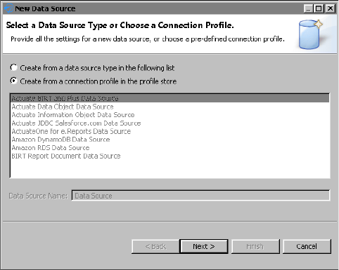
Chapter 21, Configuring data source connections in iHub
719
using absolute file paths for a profile location and involves additional procedures
of exporting a profile.
Using the Data Source Explorer to create a connection profile limits the
connection profile location definition to an absolute file path only, while Data
Explorer allows a relative and absolute file path definition. When using a
relative file path, the Resource folders in the designer and iHub are used as the
base folders. At design time, the BIRT Resource folder points to either the project
root or a folder on the file system set in BIRT Designer Preferences under
Actuate BIRT—Resources. At run time, the BIRT Resource folder points to the
Resource folder set for iHub.
Like other BIRT resource files, you must deploy the connection profile store to the
iHub when you deploy the report that uses it. By default, BIRT Designer deploys
relative path connection profiles to the iHub Resource folder.
The connection profile store file can be encrypted using BIRT secured encryption
framework. The default extension for the connection profile is .acconnprofiles.
This extension is tightly integrated with the default out-of-the-box encryption.
How to create a connection profile using Data Explorer
1In Data Explorer, right-click Data Sources, and choose New Data Source.
2In New Data Source, choose Create from a connection profile in the profile
store, as shown in Figure 21-1.
Figure 21-1 Create a new data source
3Choose Next. Connection Profile appears, as shown in Figure 21-2.
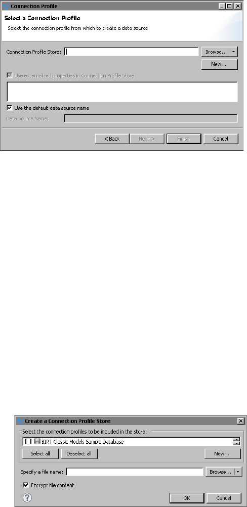
720
Actuate BIRT Application Developer Guide
Figure 21-2 Connection Profile
4In Connection Profile Store, perform one of the following steps:
■
To use an existing profile store, choose Browse.
1In Browse, narrow down your selection by choosing Relative Path or
Absolute Path for the connection profile store. Relative Path lists all the
connection profile stores in the Resource folder. Absolute Path opens a
browser window to the file system.
Selecting a connection profile store displays the connection profile store
content in the text box below Use externalized properties in Connection
Profile Store.
2Select Use externalized properties in Connection Profile Store to
maintain the link to the profile instance in the external profile store file.
It is enabled by default. Disabling it removes the external reference link,
and copies the properties from the selected profile to the data source
local properties.
3Deselect Use the default data source name, if you wish to specify a data
source name different from the default.
■
To create a new connection profile store, choose New. Create a Connection
Profile Store appears, as shown in Figure 21-3.
Figure 21-3 Create a connection profile store
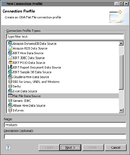
Chapter 21, Configuring data source connections in iHub
721
1In Create a Connection Profile Store, select an existing profile from the
list or choose New to create a new connection profile.
New Connection Profile appears, as shown in Figure 21-4, and lists the
data source types for which you can create connection profiles.
Figure 21-4 New Connection Profile
2Choose a data source type and specify a name for the new connection
profile. In this example, as shown in Figure 21-4, Flat File Data Source is
selected.
3Choose Next. A new window for defining the data source properties
appears.
4Specify the required information to connect to the data source. For a flat
file data source, as shown in Figure 21-5, you must enter:
❏
flat file home folder, or file URI
❏
flat file character set format
❏
flat file style
❏
file format details, such as Use first line as column name indicator,
Use second line as data type indicator, and Use trailing null
columns.

722
Actuate BIRT Application Developer Guide
Figure 21-5 Defining a folder for a flat file data source profile
The connection properties are the same as the properties displayed by
the data source wizard.
5Select Test Connection to verify the connectivity.
6Choose Finish.
The new connection profile appears in the list of connection profiles, as
shown in Figure 21-6.
Figure 21-6 Selecting a connection profile
7In Create a Connection Profile Store, select the connection profile,
Products.
8Specify a file name for the store file.
9Choose Browse to select a location for the profile store, or choose the
arrow icon next to Browse, and choose Relative Path or Absolute Path.
By default, profile store files are saved in a relative file path. Try to use a
relative path unless your implementation requires an absolute path.
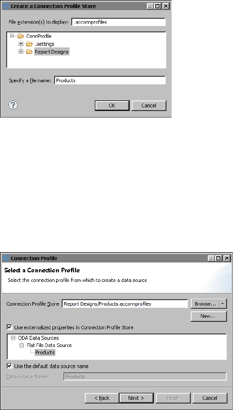
Chapter 21, Configuring data source connections in iHub
723
The relative path selection brings up a window like the one in
Figure 21-7. The default file extension is .acconnprofiles and the
displayed location is the Resource folder in your workspace.
Figure 21-7 Specifying a store file name
10 Select a folder in the suggested location and specify the file name, if you
have not entered it in the previous step. Choose OK.
11 Deselect Encrypt file content if you wish not to encrypt. The option to
encrypt is the default.
12 In Create a Connection Profile Store, choose OK.
The selected relative path appears in Connection Profile Store. In this
example, Report Designs/Products.acconnprofiles, as shown in
Figure 21-8.
Figure 21-8 Selecting the store path
13 Choose Next.
5If you see a window such as the one shown in Figure 21-9, choose Test
Connection. If the connection is successful, choose Finish to save the
connection profile.

724
Actuate BIRT Application Developer Guide
Figure 21-9 Testing the connection
How to create a connection profile from Data Source Explorer
1Choose Window➛Show View➛Other.
2In Show View, expand Data Management and select Data Source Explorer,
then choose OK.
Data Source Explorer lists the data source types for which you can create
connection profiles, and any previously defined connection profiles, as shown
in Figure 21-10.
Figure 21-10 Data Source Explorer
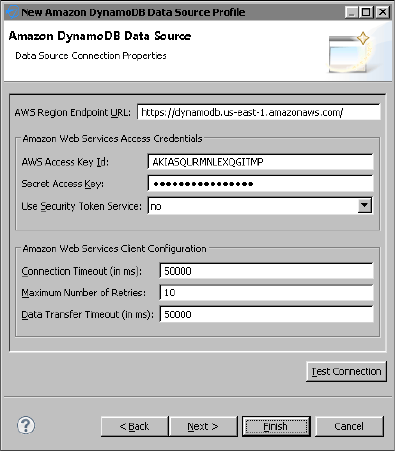
Chapter 21, Configuring data source connections in iHub
725
Database Connections supports creating profiles to connect to databases using
drivers shipped with Actuate BIRT Designer Professional. These database
drivers provide access to the graphical SQL query builder. Creating a database
connection profile is equivalent to creating a data source by selecting JDBC
Database Connection for Query Builder in the data source wizard. ODA Data
Sources supports creating profiles to connect to all the other types of data
sources.
3Right-click the data source type for which to create a connection profile.
Choose New.
4Specify a name for the connection profile. Use a name that describes the data
source, so that you or other report developers can identify it when selecting
the profile later.
5Specify the information to connect to the data source. The connection
properties are the same as the properties displayed by the data source wizard.
Figure 21-11 shows an example of connection properties for Amazon
DynamoDB.
Figure 21-11 Connection properties for Amazon DynamoDB
6Choose Test Connection to verify the connection to the data source.
7Choose Finish. The connection profile appears under the data source type in
Data Source Explorer. Figure 21-12 shows a connection profile,
ProductsDatabase-DynamoDB, under Amazon DynamoDB Data Source.
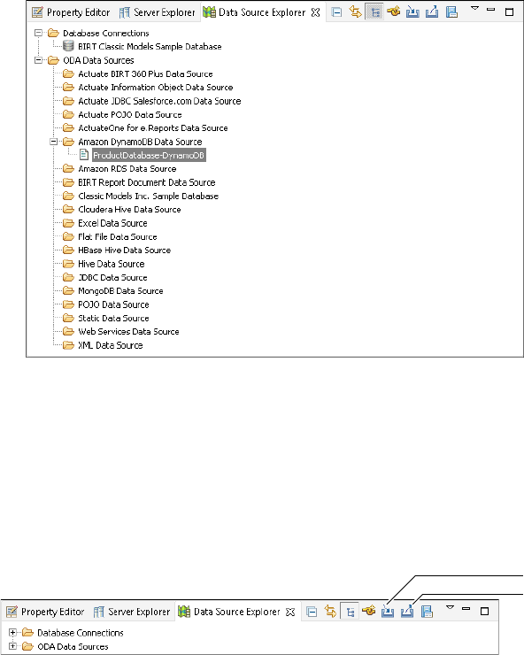
726
Actuate BIRT Application Developer Guide
Figure 21-12 Data Source Explorer displaying a connection profile for Amazon
DynamoDB
Managing a connection profile
You can create connection profiles for different purposes. Data Source Explorer
provides import and export functionality to support multiple connection profiles.
This functionality supports creating and maintaining separate profiles with
connection properties valid for different environments. Figure 21-13 shows Data
Source Explorer, and the Import and Export buttons.
Figure 21-13 Importing and exporting connection profiles
Exporting connection profiles
Connection profiles are exported as text files, either plain or encrypted. Use the
exported feature to:
■
Move reports from development to production environments.
■
Plan to create a new workspace or upgrade to a newer version.
■
Reuse existing connection profiles.
■
Share a common set of connection profiles across a workgroup.
Export
Import
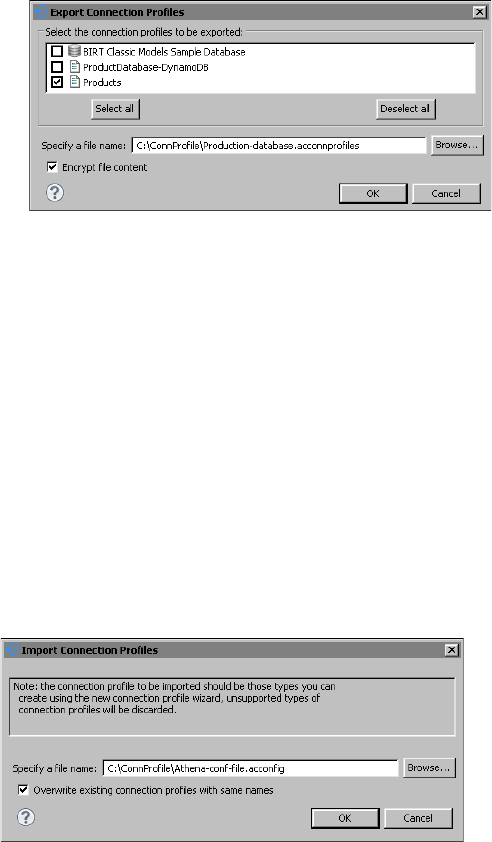
Chapter 21, Configuring data source connections in iHub
727
■
Deploy a set of connection profiles to a server environment whose application
can work directly with the exported file.
How to export a connection profile
1In Data Source Explorer, choose Export.
2Select the connection profiles you want to export, as shown in Figure 21-14.
Figure 21-14 Exporting a connection profile
3Enter a fully qualified path to create a new file, or choose Browse to overwrite
an existing file.
Use the default .acconnprofiles extension if you plan to encrypt the connection
profile and use the default out-of-the-box encryption mechanism for it.
4Deselect Encrypt File Content if the connection profiles do not contain
passwords or any other content that pose a security risk.
5Choose OK.
Importing connection profiles
You might import a connection profile if you created connection profiles in a
previous version of the product and want to reuse them in the current version, or
want to share a common set of connection profiles across a workgroup.
Importing connection profiles, as shown in Figure 21-15, involves a profile
selection. You can overwrite an existing profile if you choose to.
Figure 21-15 Importing a connection profile

728
Actuate BIRT Application Developer Guide
How to import a connection profile
1In Data Source Explorer, choose Import.
2Enter the fully qualified path to the connection profile file, or choose Browse.
3Choose Overwrite Existing Connection Profiles with Same Names, if you
wish.
4Choose OK.
The connection profile appears under its data source category.
Editing connection profile properties
You can use Data Source Explorer or Console Editor Application to edit
connection profile properties. Console Editor Application works from a
command line and is useful in environments where you do not have BIRT
Designer Professional installed. Use this application for editing connection profile
store files.
How to edit connection profile properties
1Open Data Source Explorer.
2Expand the category for the connection profile that you want to edit.
3Right-click the data source and select Properties.
4Edit the connection profile properties as necessary.
Figure 21-16 shows an example of the properties for a flat file data source.
Figure 21-16 Modifying connection profile properties
Editing connection profile store files using Console Editor
Application
You can also view and edit connection profile properties in connection profile
store files using Console Editor Application, which is an application you can
launch outside the Eclipse Workbench. Console Editor Application is a system
console application to make minor changes to an exported connection profile,
such as the file path to the JDBC driver JARs, a connection URL or an ODA data
source file path.

Chapter 21, Configuring data source connections in iHub
729
When you copy an exported file to a server environment for deployment, you can
use this editor tool to quickly adjust the connection profile properties without
having to open Data Source Explorer in the Eclipse Workbench. The updates are
saved in a separate file for all the connection profiles. If the connection profile is
deployed on iHub, you must download the profile first, make the changes, and
then upload it to iHub again.
Before you can use Console Editor Application, you must install
org.eclipse.datatools.connectivity.console.profile_<version>.jar in your Eclipse
environment, along with the other DTP plug-ins. The plug-in is installed with the
BIRT Designer Professional installation.
From within your Eclipse home directory, enter the command:
eclipse[c] -nosplash -application
org.eclipse.datatools.connectivity.console.profile.
StorageFileEditor
[ -? | -in <connectionProfileFile> | -out <saveAsFile> | -profile
<profileName> ]
For Windows platforms, indicate eclipsec. For other platforms, use eclipse. The
command line options are presented in Table 21-1.
If you do not specify an argument value, Console Editor prompts you for an input
value.
Deploying a connection profile
Connection profiles that use relative paths are deployed the same way as report
resources, and by default they are saved to the iHub Resource folder. For more
details on how to publish resources to iHub, see “Publishing a resource file to
iHub” in Chapter 19, “Deploying and sharing applications.”
Table 21-1 Optional command line options
Option Description
-? Displays help.
-in <connectionProfileFile> Enter the name of the connection profile storage
file to view and/or change.
-out <saveAsFile> Enter the name of the output file to save your
changes.
-profile <profileName> Enter the name of a connection profile to view
and/or change. If you do not specify a
connection profile name, Console Editor steps
through all the profiles found in the input file.

730
Actuate BIRT Application Developer Guide
When deploying reports that use absolute connection profiles, you must
deploy the connection profile to the correct folder in the file system on the iHub
machine. For example, if a report uses a connection profile stored in folder
C:\ConnProfile\MySQL.acconnprofiles, you must manually create the same
folder C:\ConnProfile on the iHub machine and copy the MySQL.dat file there.
Encrypting connection profile properties
BIRT supports encrypting the connection profile properties by using the
cipherProvider extension point. To define a new encryption method, you must
extend org.eclipse.datatools.connectivity.cipherProvider extension point.
To define a new encryption plug-in, you must define the file extension and its
corresponding provider of javax.crypto.Cipher class for the encryption of
connection profile store files. Listing 21-1 shows an example of such a definition.
■
fileExtension—The file extension of connection profile store files that shall
be encrypted and decrypted using the cipher provider class specified in the
class attribute. The out-of-the-box encryption implementation defines
.acconnprofiles as a default extension.
The fileExtension attribute value may include an optional dot (.) before the file
extension, for example, you can define profiles or .profiles. A keyword default
may be specified as an attribute value to match files with no file extension.
■
class—The concrete class that implements the org.eclipse.datatools
.connectivity.security.ICipherProvider interface to provide the javax.crypto
.Cipher instances for the encryption and decryption of connection profile store
files. The custom class may optionally extend the org.eclipse.datatools
.connectivity.security.CipherProviderBase base class, which reads a secret
(symmetric) key specification from a bundled resource. The base
implementation class of the org.eclipse.datatools.connectivity.security
.ICipherProvider interface is org.eclipse.datatools.connectivity.security
.CipherProviderBase. The class uses a default bundled encryption key as its
javax.crypto.spec.SecretKeySpec.
The example in Listing 21-1 registers org.company.connectivity.security
.ProfileStoreCipherProvider as the provider for files with the extension .profile
and for those with no file extension.
Listing 21-1 Example of javax.crypto.Cipher extension
<extension
id="org.company.connectivity.security.cipherProvider"
point="org.eclipse.datatools.connectivity.cipherProvider">
<cipherProvider fileExtension="profile"
class="org.company.connectivity.security.
ProfileStoreCipherProvider">
</cipherProvider>

Chapter 21, Configuring data source connections in iHub
731
<cipherProvider fileExtension="default"
class="org.company.connectivity.security.
ProfileStoreCipherProvider">
</cipherProvider>
</extension>
Listing 21-2 shows an example implementation of
org.company.connectivity.security.ProfileStoreCipherProvider class.
Listing 21-2 org.eclipse.datatools.connectivity.security.ICipherProvider interface
implementation example
import
org.eclipse.datatools.connectivity.security.CipherProviderBase;
import
org.eclipse.datatools.connectivity.security.ICipherProvider;
import org.osgi.framework.Bundle;
public class ProfileStoreCipherProvider extends CipherProviderBase
implements ICipherProvider
{
/* (non-Javadoc)
* @see
org.eclipse.datatools.connectivity.security.CipherProviderBase#
getKeyResource()
*/
@Override
protected URL getKeyResource()
{
Bundle bundle = Platform.getBundle(
"org.company.connectivity.security" );
return bundle != null ?
bundle.getResource( "cpkey" ) : //$NON-NLS-1$
super.getKeyResource();
}
}
Binding connection profile properties
There are two connection profile properties, Connection Profile Store URL and
Connection Profile Name, that can be bound to report parameters or expressions
and updated when the report is generated.
The next section shows how to bind a parameter to change Connection Profile
Store URL.
732
Actuate BIRT Application Developer Guide
Binding the Connection Profile Store URL property
The Connection Profile Store URL property is the path and name of the
connection profile store file that contains the connection profile used in a report.
The report developer can use the property binding feature in the BIRT data source
editor to assign a dynamic file path or URL to Connection Profile Store URL
property. This can be done at report run time without changing the report design
itself. You can create multiple connection profile store files for different purposes
and pass them to a report as parameters at run time.
For example, you have two JDBC connection profiles to the same database using
different user names and passwords. These profiles are stored in two separate
profile store files. At run time, you can select the profile store you want to use to
connect to the database.
The Connection Profile Store URL property name is OdaConnProfileStorePath.
You can also use the property binding feature to specify a JavaScript expression
for the value of OdaConnProfileStorePath. This feature provides the flexibility to
define a different root path for different file properties. For example, the
JavaScript expression can include a variable to control the root path:
config[ "birt.viewer.working.path" ].substring(0,2) +
"../../data/ProfileStore.acconnprofiles"
Alternatively, you can use a reportContext object to pass session information and
build the path expression.
Binding a connection profile name to a report parameter
You can also externalize a connection profile name for a data source by binding
it to a report parameter. The next example shows how to create a report
design that uses a CSV file as a data source, using Actuate BIRT Designer
Professional. At design time, the report design uses the CSV file in the folder,
C:\ConnProfile\Testing. Typically, the design-time CSV file contains only a few
records. In the production environment, the CSV file, which contains more
records, is in the folder, C:\ConnProfile\Production. You create two connection
profiles, one for the testing database and one for the production database, and
pass the name of the connection profile as a parameter at run time. In this way,
the report runs as expected in development and production environments.
How to bind the Connection Profile Store URL property to a report parameter
1In BIRT Designer Professional, create a new BIRT report.
2In Data Sources, create a new data source and choose Create from a connection
profile in the profile store. Choose Next.
3In Connection Profile, choose New.
4In Create a Connection Profile Store, select New.
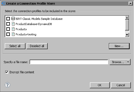
Chapter 21, Configuring data source connections in iHub
733
5In New Connection Profile, choose Flat File Data Source and enter
Products-testing as a profile name.
6In Description, type Testing database. Choose Next.
7In New Flat File Data Source Profile, choose Enter File URI.
Choose Browse to select the testing database file, in this example,
C:\ConnProfile\Testing\csvTestODA.csv.
8Choose Test Connection to validate the connection, and select Finish.
The Products-testing profile appears in the Create a Connection Profile Store
list, as shown in Figure 21-17.
Figure 21-17 Create a connection profile for testing
9In Create a Connection Profile, choose New to create a connection profile for
the production database.
10 In New Connection Profile, choose Flat File Data Source and enter
Products-production as a connection profile name.
11 Choose Next.
12 In New Flat File Data Source Profile, enter the file URI:
C:\ConnProfile\Production\csvTestODA.csv.
13 Select Test Connection to validate the connection.
14 Choose Finish.
Products-production appears in Create a Connection Profile Store list.
15 In Select the connection profiles, select Products-testing and
Products-production, as shown in Figure 21-18.
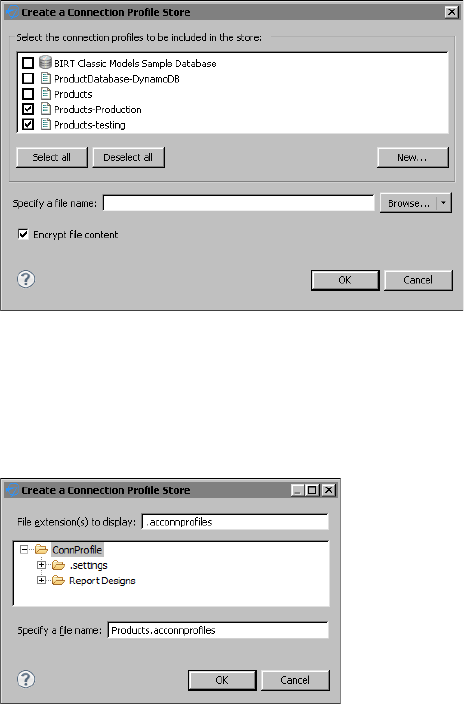
734
Actuate BIRT Application Developer Guide
Figure 21-18 Creating a relative path connection profile store
16 In Specify a file name, choose Browse.
Create a Connection Profile store appears, showing Resources folder.
17 In Create a Connection Profile Store, choose the root project folder,
ConnProfile, as shown in Figure 21-19.
Figure 21-19 Specifying a store file name and location
18 Enter ProductsDB as a file name, and choose OK.
19 In Create a Connection Profile Store, choose OK.
Select Connection Profile appears, as shown in Figure 21-20, prompting you
to select a connection profile for the data source.
20 In Connection Profile, select the testing database connection profile,
Products-testing, as shown in Figure 21-20.
21 Deselect Use the default data source name, and change the data source name
to ProductsDB.
22 Choose Next.
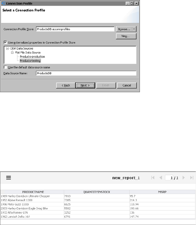
Chapter 21, Configuring data source connections in iHub
735
Figure 21-20 Selecting a connection profile
23 Choose Finish. ProductsDB data source appears in Data Explorer.
24 In Data Explorer, create a new data set named Products from the ProductsDB
data source.
25 In Select Columns, select all columns by choosing >>, and then choose Finish.
26 In Edit Data Set - Products, choose OK.
27 Add the Products data set to the layout and choose Run➛View Report
➛in Web Viewer. In the example, the report displays only six rows of data, as
shown in Figure 21-21.
Figure 21-21 Previewing the report with testing data
28 Select Layout, and create a new report parameter in Data Explorer.
29 Name the parameter ConnProfileName, as shown in Figure 21-22.
30 In Prompt text, enter:
Select the connection profile name:
31 Choose OK to create the parameter.
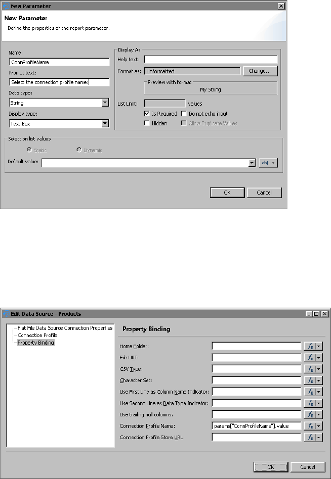
736
Actuate BIRT Application Developer Guide
Figure 21-22 Creating a report parameter
32 In Data Explorer, double-click ProductsDB data source to open the properties.
33 Choose Property Binding, as shown in Figure 21-23, and enter the expression:
params["ConnProfileName"].value
Alternatively, you can select Fx to use Expression Builder to create the
expression.
Figure 21-23 Binding a connection profile name to a report parameter
Choose OK.
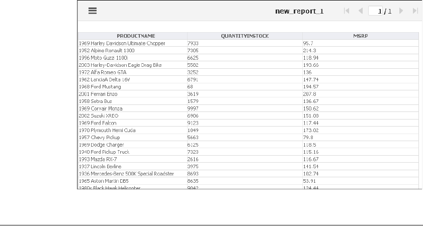
Chapter 21, Configuring data source connections in iHub
737
34 Choose Run➛View Report➛in Web Viewer. In Parameters, enter
Products-Production to choose the production database as a data source. The
report displays a large set of data, as shown in Figure 21-24.
Figure 21-24 Previewing the report with the production data
Accessing BIRT report design and BIRT resource path
in custom ODA plug-ins
ODA providers often need to obtain information about a resource path defined
in ODA consumer applications. For example, if you develop an ODA flat file data
source, you can implement an option to look up the data files in a path relative to
a resource folder managed by its consumer. Such resource identifiers are needed
in both design-time and run-time drivers.
ODA consumer applications are able to specify:
■
The run-time resource identifiers and pass them to the ODA run-time driver in
an application context map
■
The design-time resource identifiers in a DataSourceDesign, as defined in an
ODA design session model
Accessing resource identifiers in the run-time ODA
driver
For run time, the BIRT ODA run-time consumer passes its resource location
information in the org.eclipse.datatools.connectivity.oda.util.ResourceIdentifiers

738
Actuate BIRT Application Developer Guide
instance in the appContext map. ODA run-time drivers can get the instance in
any one of the setAppContext methods, such as IDriver.setAppContext:
■
To get the instance from the appContext map, pass the map key
ResourceIdentifiers.ODA_APP_CONTEXT_KEY_CONSUMER_RESOURCE
_IDS, defined by the class as a method argument.
■
To get the BIRT resource folder URI, call the getApplResourceBaseURI( )
method.
■
To get the URI of the associated report design file folder, call the
getDesignResourceBaseURI( ) method. The URI is application-dependent and
it can be absolute or relative. If your application maintains relative URLs, call
the getDesignResourceURILocator.resolve( ) method to get the absolute URI.
The code snippet on Listing 21-3 shows how to access the resource identifiers
through the application context.
Listing 21-3 Accessing resource identifiers at run time
URI resourcePath = null;
URI absolutePath = null;
Object obj = this.appContext.get
( ResourceIdentifiers.ODA_APP_CONTEXT_KEY_CONSUMER_RESOURCE
_IDS );
if ( obj != null )
{
ResourceIdentifiers identifier = (ResourceIdentifiers)obj;
if ( identifier.getDesignResourceBaseURI( ) != null )
{ resourcePath = identifier.getDesignResourceBaseURI();
if ( ! resourcePath.isAbsolute() )
absolutePath =
identifier.getDesignResourceURILocator().resolve(
resourcePath );
else
absolutePath = resourcePath;
}
}
Accessing resource identifiers in the design ODA
driver
The resource identifiers are available to the custom ODA designer UI driver. The
designer driver provides the user interface for the custom data source and data
set. Typically, to implement a custom behavior, the data source UI driver extends
the following class:
Chapter 21, Configuring data source connections in iHub
739
org.eclipse.datatools.connectivity.oda.design.ui.wizards
.DataSourceWizardPage
The DataSourceWizardPage class has an inherited method,
getHostResourceIdentifiers( ), which provides access to the resource and report
paths. The extended DataSourceWizardPage just needs to call the base method to
get the ResourceIdentifiers for its path’s information. Similarly, if the custom
driver implements a custom data source editor page, it extends:
org.eclipse.datatools.connectivity.oda.design.ui.wizards
.DataSourceEditorPage
The DataSourceEditorPage class has an inherited method,
getHostResourceIdentifiers( ). The extended class just needs to call the base class
method to get the ResourceIdentifiers object for the two resource and report path
base URIs. Related primary methods in the org.eclipse.datatools.connectivity
.oda.design.ResourceIdentifiers class are:
■
getDesignResourceBaseURI( );
■
getApplResourceBaseURI( );
740
Actuate BIRT Application Developer Guide

Chapter 22, Using custom emitters in iHub
741
Chapter
22
Chapter 22
Using custom emitters
in iHub
This chapter contains the following topics:
■
About custom emitters
■
Deploying custom emitters to iHub and BIRT Visualization Platform
■
Rendering in custom formats
■
Configuring the default export options for a BIRT report
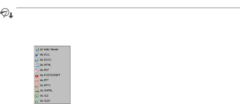
742
Actuate BIRT Application Developer Guide
In Actuate BIRT Designer Professional or Interactive Viewer, you can choose to
render BIRT reports in several different formats, as shown in Figure 22-1.
Figure 22-1 Rendering formats
Actuate provides out-of-the-box report rendering for the following file formats:
■
DOC—Microsoft Word document
■
DOCX—Microsoft Word document, introduced in Windows 7
■
HTML—HyperText Markup Language document, a standard format used for
creating and publishing documents on the World Wide Web
■
PDF—Created by Adobe, a portable file format intended to facilitate
document exchange, that also supports the ISO 14289-1 standard for Universal
Accessibility
■
POSTSCRIPT—A page description language document for medium- to
high-resolution printing devices
■
PPT—Microsoft PowerPoint document
■
PPTX—Microsoft PowerPoint document for Windows 7
■
XHTML—Extensible Hypertext Markup Language document, the next
generation of HTML, compliant with XML standards
■
XLS/XLSX—MS-Excel Document
If you need to export your document to a format not directly supported by
Actuate, such as CSV and XML, you need to develop a custom emitter. Actuate
supports using custom emitters to export reports to custom formats. After a
system administrator places custom emitters in the designated folder in BIRT
Visualization Platform or iHub, and registers the emitters with iHub, he must
restart the product. Users then are able to use the emitters as output formats
when scheduling BIRT report jobs in iHub or exporting BIRT reports in BIRT
About custom emitters
Chapter 22, Using custom emitters in iHub
743
Visualization Platform. Custom emitters are also supported as e-mail attachment
formats.
iHub uses the custom emitter format type as a file extension for the output file
when doing the conversion. When you develop custom emitters, always use the
same name for a format type and an output file extension type. Actuate BIRT
Visualization Platform for iHub displays the options of each emitter for the user
to choose when exporting a report.
The Integrating and Extending BIRT book, published by Addison-Wesley, provides
detailed information about how to develop custom emitters in BIRT.
The custom emitters in BIRT are implemented as plug-ins and packaged as JAR
files. To make them available to the Actuate products that support them, copy the
emitters to the MyClasses folder. The MyClasses folder appears at different levels
on different platforms and but it is always available at the product’s installation
folder. For iHub the folder is at the following location:
<Actuate installion folder>/BIRTiHub/iHub/MyClasses/eclipse
/plugins
When you install InformationConsole.war file to your own J2EE application
server, the shared folder MyClasses is not available. In this case, custom emitter
plug-ins should be copied to the following folder:
<context-root>/WEB-INF/platform/plugins
Plug-ins depend on other plug-ins to function properly. It is a good practice to
verify all required plug-ins are installed in the system. To get the list of all
required plug-ins open MANIFEST.MF file of your custom plug-in, as shown in
Listing 22-1. Depending on the way the plug-ins are developed, Import-Package
or Require-Bundle entries declare plug-in dependencies on a package or bundle
level.
Listing 22-1 MANIFEST.MF
Manifest-Version: 1.0
Require-Bundle: org.eclipse.birt.core;bundle-version="3.7.0",
org.eclipse.birt.report.model;bundle-version="3.7.0",
org.eclipse.birt.report.e ngine;bundle-version="3.7.0",
org.eclipse.birt.data;bundle-version="3.7.0"
Bundle-ActivationPolicy: lazy
Bundle-Version: 1.0.0.201110121016
Bundle-Name: BIRT CSV Emitter
Deploying custom emitters to iHub and BIRT
Visualization Platform

744
Actuate BIRT Application Developer Guide
Bundle-Activator:
org.eclipse.birt.report.engine.emitter.csv.CsvPlugin
Bundle-ManifestVersion: 2
Import-Package: org.osgi.framework;version="1.3.0"
Bundle-SymbolicName: org.eclipse.birt.report.engine.emitter.csv;
Bundle-RequiredExecutionEnvironment: JavaSE-1.6
Every time you deploy a custom emitter you need to restart the product. This
ensures the emitter JAR is added to the classpath and the product can discover
the new rendering format. For iHub deployment you must execute an extra step
to register the emitter with iHub.
The following tools and products support custom emitters:
■
Actuate BIRT Designer Professional
■
Actuate BIRT Studio
■
BIRT Interactive Viewer for iHub
■
BIRT Visualization Platform for iHub
■
iHub
After deploying the custom emitter, you can see the new rendering formats
displayed along with built-in emitters in the following places:
■
Preview report in Web Viewer in Actuate BIRT Designer
■
Output page of schedule job in BIRT Visualization Platform
■
Attachment notification page of schedule job in BIRT Visualization Platform
■
Export content in Actuate BIRT Viewer and Actuate BIRT Interactive Viewer
The following examples show the deployment and usage of a custom CSV
emitter. The CSV emitter renders a report as a comma-separated file. The JAR file
name is org.eclipse.birt.report.engine.emitter.csv.jar. The custom format type is
MyCSV.
To test the emitter functionality with BIRT Visualization Platform, you schedule
any BIRT report design or report document from the examples in the
Documents/Applications/BIRT Sample App folder. The examples that follow
use the report from the sample volume for an iHub:
Documents/Applications/BIRT Sample App/CustomerList.rptdesign
Rendering in custom formats
Chapter 22, Using custom emitters in iHub
745
How to deploy a custom emitter to iHub
1Copy org.eclipse.birt.report.engine.emitter.csv.jar to:
<Actuate installion folder>/BIRTiHub/iHub/MyClasses/eclipse
/plugins
2Register the emitter with iHub.
1Open the following file:
<Actuate installion folder>\BIRTiHub\iHub\etc
\jfctsrvrconfig.xml
JREM uses this configuration file at startup to load the registered emitters.
2Navigate to the end of the file to find the following entry:
<node name="BIRTReportRenderOption">
The entry contains a list of emitter descriptions separated by a semicolon.
The emitter description must have the format type and the emitter id
separated by a colon. For example, the PDF emitter is described as:
pdf:org.eclipse.birt.report.engine.emitter.pdf;
3Add your emitter description to the beginning of the
<entry name="RenderFormatEmitterIdMapping"> tag:
MyCSV:org.eclipse.birt.report.engine.emitter.csv;
The whole tag would look like this:
<node name="BIRTReportRenderOption">
<!-- The value is "render_format:emitter_ID" separated by ";",
for example, pdf:org.eclipse.birt.report.engine.emitter.pdf;
xml:org.eclipse.birt.report.engine.emitter.xml -->
<entry name="RenderFormatEmitterIdMapping">
MyCSV:org.eclipse.birt.report.engine.emitter.csv;
html:org.eclipse.birt.report.engine.emitter.html;
xhtml:com.actuate.birt.report.engine.emitter.xhtml;
pdf:org.eclipse.birt.report.engine.emitter.pdf;
postscript:org.eclipse.birt.report.engine.emitter.postscript;
xls:com.actuate.birt.report.engine.emitter.xls;
ppt:org.eclipse.birt.report.engine.emitter.ppt;
pptx:com.actuate.birt.report.engine.emitter.pptx;
doc:org.eclipse.birt.report.engine.emitter.word;
docx:com.actuate.birt.report.engine.emitter.docx
</entry>
</node>
3Restart the iHub to make it load the new plug-in in its classpath:
■
Restart Actuate iHub from Start➛Settings➛Control Panel
➛Administrative Tools➛Services, as shown in Figure 22-2.
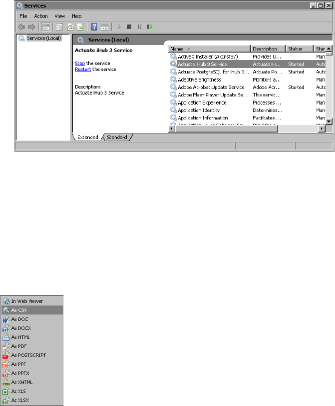
746
Actuate BIRT Application Developer Guide
■
If you use a separately deployed BIRT Visualization Platform, you must
also restart the Web or Application Server.
Figure 22-2 Services
The following procedures show how to export a BIRT report to a custom format
in different products. The procedures use an example format, CSV.
How to deploy and use a custom emitter in Actuate BIRT Designer
1Copy the emitter to:
<BIRT Designer installation directory>\eclipse\plugins
2Reopen the designer.
3Open a report design and choose Run➛View Report. The new CSV format
appears in the list of formats, as shown in Figure 22-3.
Figure 22-3 List of available formats in BIRT Designer
How to export a BIRT report from iHub
Schedule a BIRT report to run by choosing Save As on the Schedule page. The
new CSV format appears in the document format list. You can also select to attach
the output report to an e-mail notification, as shown in Figure 22-4.
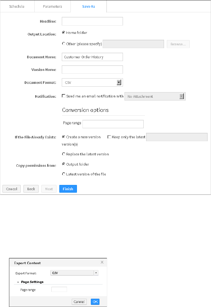
Chapter 22, Using custom emitters in iHub
747
Figure 22-4 Save As tab in the Schedule Jobs page in BIRT Visualization
Platform
How to export a BIRT report from Actuate BIRT Viewer or Actuate BIRT Interactive
Viewer
1Open a BIRT report in Actuate BIRT Viewer or Interactive Viewer.
2Select Export Content from the viewer menu. The new CSV format shows up
in Export Format, as shown in Figure 22-5.
Figure 22-5 Export Content in Actuate BIRT Viewer
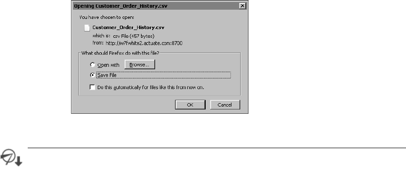
748
Actuate BIRT Application Developer Guide
3Choose OK.
A file download window appears, as shown in Figure 22-6. You can choose to
open or save the file. The default file name is Customer Order History.csv.
Figure 22-6 File Download
You can export a BIRT report to various formats from the Web Viewer. These
formats include docx, pptx, xls, xlsx, pdf, ps, doc, and ppt. You can configure the
default export options by creating a RenderDefaults.cfg file that contains
name-value pairs for the appropriate options. You must create a separate
RenderDefaults.cfg file for each format. For example, when you export a BIRT
report to XLSX, RenderDefaults.cfg can set Enable pivot table to false by default.
Place RenderDefaults.cfg in the following locations:
■
For iHub, place RenderDefaults.cfg in:
<iHUB-HOME>\Jar\BIRT\platform\plugins
\com.actuate.birt.report.engine.emitter.config
.<EMITTER_TYPE>_<RELEASE_NUMBER>.jar
When you create or modify RenderDefaults.cfg, you must restart iHub.
■
For BIRT Designer, place RenderDefaults.cfg in:
<BDPRO_HOME>\eclipse\plugins
\com.actuate.birt.report.engine.emitter.config
.<EMITTER_TYPE>_<RELEASE_NUMBER>.jar
The configuration file format should follow these rules:
■
All settings should be entered in key = value format.
■
Key names are case-sensitive.
■
String and Boolean values are not case-sensitive.
Configuring the default export options for a BIRT
report

Chapter 22, Using custom emitters in iHub
749
■
The values true and false are acceptable for Boolean properties.
■
Any other value, different than true and false is interpreted as false.
Listing 22-2 shows an example of RenderDefaults.cfg for a print stream emitter.
Listing 22-2 RenderDefaults.cfg for print stream emitter
# This file contains the default values to use when emitting print
# stream content.
# All settings are entered in 'key = value' format.
# Key names are case sensitive, but string and boolean values are
# not.
# The values 'true' and 'false' are acceptable for booleans.
# Any other value specified will be interpreted as false.
# Omitting any setting from this file causes the emitter to fall
# back to internal defaults.
# The plex mode for the print job.
# Valid values are Simplex, Duplex, and Tumble.
# Default: Simplex
xifRenderOption.plexMode = Simplex
# The DPI to use for rendered pages. Valid values are 240,300,600,
# and 1440.
# Default: 240
afpRenderOption.pageDPI = 240
# Option to allow black and white images.
# Default: True
afpRenderOption.allowBlackAndWhiteImg = true
# Option to allow single color images.
# Default: True
afpRenderOption.allowSingleColorImg = true
# Option to allow grayscale images.
# Default: True
afpRenderOption.allowGrayscaleImg = true
# Option to allow full color RBG images.
# Default: True
afpRenderOption.allowFullColorRGBImg = true
# Option to allow full color CMYK images.
# Default: True
afpRenderOption.allowFullColorCMYKImg = true
For information about creating a RenderDefaults.cfg file, see Using Visualization
Platform.
750
Actuate BIRT Application Developer Guide

Index
751
Index
Symbols
^ (caret) character 214
, (comma) character 213, 231
; (semicolon) character 745
: (colon) character 745
? (question mark) character 214
. (period) character
decimal separators 213
pattern matching 214
.zip archive files 688
" (double quotation mark) character
pattern matching and 214
[] (square brackets) characters 212
* (asterisk) character
pattern matching 214
search expressions 214
/ (forward slash) character 214
\ (backslash) character 61, 214
& (ampersand) character 61
% (percent) character 214
_ (underscore) character
pattern matching 214
Numerics
3D charts 428
A
absolute file paths 719
Access Control List Expression property
data cubes 246, 247, 248
data objects 230, 241
data sets 241, 245
report elements 235, 238
report files 230
access control lists
creating 230, 231
defining data security and 241, 250
defining page-level security and 231, 235,
238
propagating across report elements 235,
238
testing 240, 251
access restrictions 230, 231, 241
access rights 517, 518
access types
getting 497, 506
setting 500, 509
accessing
BIRT Interactive Crosstabs 580
chart builder 79
chart themes 179, 300
cross tab elements 581
dashboard editor 35
dashboard files 42
data 220, 718
Data Explorer 12
encryption plug-in 702
expression builder 213
external data sources 68
gadget builder 44
gadget files 43
Highcharts API 175
HTML buttons 281
HTML editor 684
Java classes 697
JavaScript API class libraries 322
reports 682
resources 737
script editor 137, 183
shared resources 204
SQL query builder 725
.acconnprofiles files 723
See also connection profile stores
acdefaultsecurity.jar 703, 713
ACLs. See access control lists
Action Details window 295
actions
completing 389
performing 296
triggering 293
actions (interactive features) 138, 184
active tab (dashboards) 342
active tabs (dashboards) 346
Actual Page Number property 240
actuate class 322, 326
752
Actuate BIRT Application Developer Guide
Actuate JavaScript API 224
Actuate namespace 322
Actuate Viewer. See report viewer
$ACTUATE_HOME variable 698
acviewer container 581
ad hoc parameters
generating query output and 403
testing for 397, 407
ad hoc queries 403
Add Variables dialog 223
addAttribute function 638
addDimension function 313, 602
adding
animated charts 174
chart elements 188
chart themes 178–181
chart titles 428
computed fields 212
cross tabs 601
custom report emitters 742
dashboard gadgets 37, 42, 44, 255
dashboard tabs 37
dashboards 34, 35, 41, 336
data cubes 311
data items 432
data selectors 56
data service components 369
data sets 14, 17
data sorters 316, 366, 662
expressions 212, 213
filter conditions 353, 628
filters 70, 296, 353
Flash movies 269
Flash objects 436, 440
Google gadgets 266
HTML buttons 216, 217, 281
HTML5 charts 175, 445
iHub profiles 205, 683, 690
informational messages 64
interactive charts 175, 184
interactive features 293, 294, 314, 528
label elements 471
maps 129
page breaks 89, 652, 655
parameter components 374
parameter groups 400, 411, 421
passwords 413
privilege filters 516
QR codes 121, 122
rendering options 554
report components 326
report elements 548
to libraries 202
to templates 196, 197, 199
Report Explorer components 487
report viewer components 524
resource folders 202
scroll panels 556
security IDs 230, 231
sort conditions 366, 662
standard charts 424
styles 202
tables 475
text elements 483
text file data sources 200
themes 196, 201–204
addLevel function 615
addMeasure function 313, 603
addMember function 621, 647
add-on properties 169
add-ons 167, 168
AddOns page (Format Gadget) 168
addPoint function 459, 460
addSeries function 446, 452
addTotal function 635, 666
administrators 696
Adobe Flash content. See Flash content
advanced sort feature 563
afterDataSetFilled method 186
afterRendering method 187, 188, 189, 190
aggregate data
adding dashboard gadgets and 88, 92, 97
creating 84
plotting values 77, 81
progressive viewing performance and 123
aggregate expressions
creating 81
aggregate functions
adding to cross tabs 92
adding to dashboard gadgets 81, 89, 97
charting data and 81
aggregation
building cross tabs and 308, 315
building data cubes and 310
Index
753
enabling or disabling 564
aggregation functions
adding totals and 315
changing 642
getting 642, 670
setting 644, 671
alerts 221, 259, 263, 373
aligning
text in gadgets 46, 170, 171
alphaNumericSorterSet array 362
ampersand (&) character 61
analyzing data 310, 580
anchor properties (gadgets) 161, 162
anchors (gadgets) 161, 162
animation (charts) 174, 176, 460
animation (gadgets) 149
Apache Shindig application 266
Apache Tomcat servers 746
appContext objects 738
application context maps 738
application programming interfaces (APIs)
charts and 175, 181
Google gadgets and 268, 274
maps and 136, 140
web applications and 224
application servers 700, 743, 746
applications
accessing BIRT resources for 692
adding interactive features to 50, 216, 224
archiving 688
building dashboards and 34
deploying 682
developing 224
displaying data and 310
downloading files for 694
editing landing page for 684
embedding web content and 62
encrypting data and 709
getting version information for 328
loading custom plug-ins for 700
logging out of 332
mobile devices and 121, 174
publishing 682, 687, 696
running 699, 737
sharing 687
testing 686
testing connections for 330
apply button gadgets 107
applyOptions function 456, 603
arc function 465
Arc Inner Radius property 159
Arc Outer Radius property 159
archiving BIRT applications 688
arcs (gadgets) 147, 159
area chart subtypes 71
area charts 453
See also charts
adding 71
applying themes to 82
ascending sort order 366, 367, 664
asterisk (*) character
pattern matching 214
search expressions 214
asymmetric encryption 705
asynchronous operations 296
attachments 743, 746
authenticate function
actuate class 327
authentication
logging in to web services and 327
authentication algorithms 702
authentication exceptions 333
authentication information
requesting 520
unloading 332
authentication requests 333
AuthenticationException class 333
AuthenticationException objects 333
Auto Abbreviation property 154
Auto Adjust Tickmarks property 150
auto refresh (dashboards) 39, 46
auto suggest delays 380
auto suggest threshold values 403, 409
auto suggestion list controls 410
auto suggestion lists 381, 396
automatic linking (gadgets) 255
autosave feature 338, 342
Average function 81, 89, 92, 97
axes values
changing appearance 187
displaying data as 80
axes values (charts)
data points and 462
multiple series and 428
754
Actuate BIRT Application Developer Guide
axes values (charts) (continued)
testing for 449, 453
axis labels (charts) 454
axis type values (cross tabs) 618
axis types (cross tabs)
changing 315, 619
getting 617, 636
setting 618, 619, 637
B
Background Color property 134, 148
background colors
gadgets 148, 152
maps 134, 142
Background property 166
backslash (\) character 61, 214
bandwidth 400
bar chart gadgets 255, 256
bar chart subtypes 72
bar charts 453
See also charts
adding 72
scripting 189, 190
bar stick stock chart subtypes 78
barcodes (QR code readers) 121
Base Color property 148
Base Width property 151
batch operations 503
beforeDataSetFilled method 186
beforeDrawAxis method 187
beforeDrawDataPoint method 187
beforeDrawSeries method 187, 189
beforeGeneration method 186, 187
beforeRendering method 187
BETWEEN operator 353, 628
BIRT 360 application 246, 250
BIRT design files. See report designs
BIRT Designer 280
BIRT Designer Professional 311
applying security settings for 230
creating charts and 174, 179
creating connection profiles and 718
creating expressions and 212, 214
creating maps and 128, 136
creating themes and 201
deploying reports and 682
designing dashboards and 35, 40, 44
disabling default themes for 113, 119
encrypting data and 702, 709
formatting data and 112
integrating with iHub 682
link files for 700
QR codes and 121
rendering reports and 742, 744
testing security settings for 240, 250
viewing reports and 122
BIRT document files. See report documents
BIRT reports
See also reports
BIRT resources 691
BIRT Studio
designing dashboards and 246, 250
BIRT Viewer 744, 747
BIRT Web Viewer 744, 748
BizRDRptTemplates folder 205
block cipher algorithm 704
block ciphers 702, 704
bookmark names 360, 471, 483
bookmarks
accessing cross tabs and 581, 591, 606, 657
adding Flash objects and 437, 531, 549
displaying report elements and 361, 535
displaying Reportlets and 534, 541
getting chart instance for 528, 548
getting chart names for 426
getting data item for 432, 531, 549
getting gadgets associated with 441, 533,
550
getting labels associated with 471, 533, 550
getting report content for 529, 531, 534
getting text element for 483, 534, 551
navigating through reports and 537
retrieving result sets and 359
returning table objects for 296, 476, 534,
550
returning viewer objects for 535
sending requests for 360, 361
Boolean expressions 353, 354, 628, 629
Border Color property
gadgets 163
needle base 153
needles 152
thresholds 160
Index
755
value indicators 164
Border property 163, 166
Border Thickness property 153
Border Width property 152, 163, 164
borders
adding to gadgets 148, 149, 163
adding to maps 134
displaying gadget 46
enabling or disabling add-on 171
setting tooltip 166
bottom N filter feature 574
BOTTOM_N operator 353, 628
BOTTOM_PERCENT operator 353, 628
branding 178, 196
BrowserPanel class 546
bubble charts
adding 73
Bulb Radius property 148
bullet gadgets 94, 97, 98, 154, 162, 164, 443
Bundle-SymbolicName property 706
button constants (navigation) 378
button elements 281, 378, 410
button events 216, 218, 219, 281
button names 217
buttons
assigning values to 176
C
calculated columns 564
calculations
data cubes and 85
EasyScript expressions and 212
HTML buttons and 220
calculator gadget 266
calendar gadget 255, 266
calendar gadgets 98
callback functions 272
closing Interactive Crosstabs and 595
connecting to web services and 330
downloading parameters and 375
handling exceptions and 333, 335, 371
retrieving parameters and 376, 386
retrieving result sets and 364, 369, 528
callback parameter 327, 330
candlestick stock chart subtypes 78
Canvas Border Color property 134
canvas view (Google gadgets) 267
Caption property 134
caret (^) character 214
Cascade ACL option 235, 238
cascading ACLs 235, 238, 241
cascading parameter names 403, 409
cascading parameters
changing 389
getting values 393
testing for 397
cascading selections 105, 106
cascading style sheets
accessing custom 39
adding to Google gadgets 267
case sensitivity (EasyScript) 213
categories (templates) 206
category series
selecting data for 80
category series (charts)
drilling through 425
getting maximum value of 447
getting minimum value of 448
setting value range for 450
categoryData variable 296
CBC encryption mode 704
cells (empty) 604, 652, 654
Center X Coordinate property 148
Center X coordinate property 169
Center Y Coordinate property 148
Center Y coordinate property 169
CFB encryption mode 704
changeMeasureDirection function 315, 604
changes, undoing or redoing 575
changing
aggregation functions 642
channel event names 273, 275
chart elements 188
chart subtype 430
chart themes 300
chart titles 425, 429
connection profiles 718, 728
connection properties 718
cross tabs 312, 314, 581
dashboard content 41
dashboard file names 36, 41
dashboard layouts 37, 41
data 565
756
Actuate BIRT Application Developer Guide
changing (continued)
data cubes 312
data selector gadgets 56
data series 449
default encryption 709
expression builder preference 214
file paths 728
gadget types 567
HTML code 65
image size 225
Java classes 698
label elements 474
maps 142
parameters 374, 389, 400
passwords 709
report designs 586
report parameters 257, 264
reports 50, 566
resource folders 692
styles 196
text 138
text elements 573
themes 118, 177
user selection values 258, 263, 271, 275
channel names 273, 275
character patterns
filter expressions 353, 354
characters
adding QR codes and 122
displaying URLs and 61
JavaScript object notation and 180
chart annotations 191
chart areas 293
chart bookmarks 426, 528, 548
chart builder 293
adding interactive features and 176
creating charts and 175
formatting charts and 81
opening 79
Chart class 424
chart dimension constants 428
chart elements
adding 424, 445
determining type 427
displaying 430
enabling interactive features for 175, 184
getting bookmarks for 528, 548
hiding 428
scripting and 188
setting size 429
chart event functions (HTML5 charts) 186
chart event handlers
changing output formats and 183, 186
creating BIRT charts and 186
creating chart themes and 179
creating HTML5 charts and 182, 186
chart events 185
chart formatting attributes 179, 180
chart gadgets 443
adding to dashboards 34, 68
creating 69
filtering data for 70
linking to 254, 255, 256
chart IDs 426, 427
chart interactive features 293
chart legends 293
chart objects 424
event handlers and 188
getting 189
chart options 187
chart options objects 187
chart properties
enabling or disabling 564
chart scripting examples 189, 190, 193
chart subtypes 430, 564
chart subtypes. See specific chart subtype
chart theme builder 178, 179, 181
chart themes 300
applying 176, 177
creating 178–181
exporting formats to 179
overriding 176
selecting 82
setting options for 181
sharing 179, 183
chart titles 425, 426, 428, 429
formatting as auto 82
chart types 453
selecting 71
setting 175
CHART_DIMENSION_2D constant 428
CHART_DIMENSION_2D_WITH_DEPTH
constant 428
Index
757
CHART_SUBTYPE_PERCENTSTACKED
constant 430
CHART_SUBTYPE_SIDEBYSIDE
constant 430
CHART_SUBTYPE_STACKED constant 430
charting library 174, 180
charts
accessing themes for 300
adding interactive features to 174, 175,
184, 293, 294
adding to dashboards 37, 68, 81, 129
adding to designs 174
aggregate data and 77, 81
changing output formats for 183, 186
changing subtype of 430
changing titles for 425, 429
clearing data filters for 425
comparing multiple series in 72, 73, 76
creating 424
displaying 430
displaying data in 68
displaying timelines in 71, 75, 84
drilling through 425, 426
drilling through values in 50, 80, 81
formatting values in 118
getting bookmark name for 426
getting HTML element for 426
getting page associated with 427
grouping data and 80
overlapping series in 71, 76
selecting data for 79
selecting subtypes for 564
selecting type 71
setting display properties for 82
setting filters for 429
setting number of dimensions for 428
setting title for 428
setting zoom levels for 83
showing high and low temperatures in 74,
78
showing percentages in 72, 73, 76
showing scientific or statistical data 78
stacking series in 71, 73, 76
submitting requests for 430
tracking financial data and 73, 75, 78
tracking scheduling information and 75
tracking stock values with 78, 255
chat applications 62
check box gadgets 99
check boxes 176, 410
Cipher Block Chaining (CBC) Mode 704
Cipher class 730
Cipher Feedback (CFB) Mode 704
cipherProvider extension point 730
CipherProviderBase class 730
ciphers 702, 704
ciphertext 702
circle function 466
class attribute 707
class libraries 322, 331
class property 730
class reference 322, 325, 583
classes
accessing Java 697
building mashup pages and 281
changing 698
connecting to web applications and 322
deploying 698
developing with 581
encryption and 703, 707, 713, 730
HTML buttons and 225
ODA UI driver and 739
Classic Models demo database
building data objects and 10
connecting to 12
retrieving data from 14, 17
viewing tables in 14
classpaths 706, 713, 744
clearFilters function
Chart class 425
FlashObject class 436
Gadget class 440
Table class 476
XTabAnalyzer class 604
clearing data selections 256
click events 219
Client Script option 183
ClientChart class 445
ClientChart objects 445
ClientOption class 452
ClientOption objects 452
ClientPoint class 456
ClientSeries class 459
client-side error constants 385, 494
758
Actuate BIRT Application Developer Guide
client-side errors 371, 626
client-side scripts 140, 183, 186, 216
clipping rectangles 467
clipRect function 467
closing values (charts) 78
closing values (gadgets) 163
code
adding chart interactive features and 295
adding chart themes and 179, 180, 181
adding Google gadgets and 266, 268
adding HTML buttons and 218, 219
adding HTML5 charts and 184, 186, 187,
188
adding interactive maps and 138, 140
changing HTML 65
changing user selection values and 257,
263, 271, 275
creating QR codes and 121
customizing report emitters and 745
displaying cross tabs and 313, 317, 580
displaying embedded HTML 62
displaying user selection values and 261
enabling user interface options and 319
hiding user interface options and 319
linking to dashboard gadgets and 257,
263, 275
linking to Google gadgets and 273, 275
registering event handlers and 312
retrieving gadget content and 259
running 281
code templates 219
collapse/expand feature 565
colon (:) character 745
Color property
borders 148
lines 169
regions (gadgets) 156
regions (maps) 136
text 166
threshold areas 160
value indicators 165
colors
add-on objects 169, 170
gadget regions 156
gadget threshold areas 160
gadget tick marks 157, 158
gadgets 148, 153, 163
maps 130, 134, 135
needles 152
column bars (dashboards) 38
column chart subtypes 73
column charts 73
column editing feature 565
column headings 308
column index values
accessing result sets and 365
displaying cross tabs and 607
getting 365, 476, 558
column layouts (gadgets) 37, 38, 43
column mirror starting level
getting 651
setting 604, 650, 654
column name parameter 296
column names
displaying charts and 296
displaying parameters and 403, 417, 420,
553
filtering data and 355, 356
getting list of 360, 364
running queries and 409
sorting data and 366, 367
column types
parameter definitions and 403, 410
parameter value objects and 417, 420
COLUMN_AXIS_TYPE constant 618
columnMirrorStartingLevel parameter 604,
650
columnPageBreakInterval parameter 650
columns
adding to cross tabs 651
changing data in 565
creating expressions for 212
filtering values in 425
getting 476, 607
hiding 119–120, 479
matching top or bottom values in 353
moving 569
reordering 482, 571
resizing 38, 565
retrieving data values in 365, 403
retrieving index values for 365, 476, 558
retrieving result sets and 361, 365
selecting 558
setting page breaks on 652, 654, 655
Index
759
showing calculated values in 564, 645
showing summary data in 315
showing table 481
sorting on 366, 367
combination charts 174
combo box gadgets 99, 103, 104, 107
comma (,) character 213, 231
command line editor 728
comma-separated values files 200
comments (templates) 198
commit function 586
component names (reports) 331
computed columns 212, 643, 645
computed measures 643, 645
configuration files
exporting reports and 748
loading custom emitters and 745
configurations
accessing text file data and 200
running BIRT reports and 698
specifying default template category
and 207
Connect Missing Data property 148
connection exceptions 335
connection parameters 329
Connection Profile dialog 720
Connection Profile Name property 731
connection profile names 732
Connection Profile Store URL property 731,
732
connection profile stores
creating 718, 720, 732
deploying 719
editing 728
encrypting and decrypting 719, 723, 730
selecting 720
connection profiles
binding to reports 731, 732
changing 718, 728
creating 718, 719, 724, 726
deploying 729
encrypting 730
exporting 718, 726
externalizing names 732
iHub servers 683, 690
importing 718, 727
naming 725
setting for specific volumes 205
connection properties
changing 718
reusing 718
ConnectionException class 335
ConnectionException objects 335
connections
accessing data and 718
accessing databases and 725
accessing sample database and 12
authenticating users and 327
closing 332
displaying dashboards and 343
handling errors for 335
iHub servers and 682
loading JavaScript classes and 281
logging in to web applications and 369
opening 329
testing 330, 725
Connector Line Color property 134
Console Editor Application 728
Console Editor command line options 729
Constants class 385, 494
content components 358
content panels (viewer) 546, 556, 560, 561
content variable 582
context menus 574
context objects 732, 738
control type UI values 394
control types 404, 410
controls (HTML buttons) 281
convert function 386
convertDate function 387
ConvertUtility class 386
Copy Library to Shared Resource Folder
command 203
copying
access rights 518
chart themes 179
dashboard tabs 41
Information Console directory
structures 309
libraries 203
privileges 206
report emitter plug-in files 743
copyright statements 199
Count Distinct function 92
760
Actuate BIRT Application Developer Guide
Count function 81, 89, 92, 97
counting
pages in files 498
pages in reports 535, 589
Create Connection Profile Store dialog 721,
722
Create Template Report Item command 199
creating
access control lists 230, 231
aggregate expressions 81
animated charts 174
auto suggestion lists 381
chart gadgets 69
chart themes 178–181
computed fields 212
connection profile stores 718, 720, 732
connection profiles 718, 719, 724, 726
cross tab gadgets 90
cross tabs 311, 601
dashboard gadgets 129
dashboards 34, 35, 41, 336
data cubes 311
data selection gadgets 56, 58, 101
data service components 369
data sets 14, 17
data sorters 316, 366, 662
data sources 718, 732
EasyScript expressions 212, 213
encryption keys 703, 713, 714
encryption plug-ins 715, 730
filter conditions 353, 628
filters 70, 296, 353
Flash gadgets 440
Flash objects 436
Google gadgets 266
HTML buttons 216, 217, 281
HTML5 charts 175, 445
iHub profiles 205, 683, 690
informational messages 64
interactive charts 175, 184
interactive web pages 224
label elements 471
libraries 201
maps 129
mobile device applications 121, 174
parameter components 374
parameter gadgets 58
parameter groups 400, 411, 421
passwords 413
privilege filters 516
report designs 309
report explorer 487
report templates 198–199
Reportlet gadgets 52
reports 713
resource folders 202
result sets 364
scroll panels 556
sort conditions 366, 662
standard charts 424
styles 202
table gadgets 86
tables 475
template categories 206
text elements 483
text file data sources 200
themes 196, 201–204
viewer components 524
web-based applications 322
credentials
external users 327
credentials parameter 327
cross tab bookmarks 581, 591, 606, 657
cross tab elements 312, 580, 581, 609
cross tab filter objects 628
cross tab gadgets 84, 90, 91, 93, 587, 594
cross tab layout view 674
cross tab objects 581, 601
cross tab report elements 581, 601
cross tab Reportlets 597
cross tabs
accessing 580
adding dimensions to 313, 602, 615
adding measures to 313, 603, 642
adding to reports 85
changing 312, 314, 581
creating 311, 601
displaying 308, 312, 580, 657
drilling through 317, 605, 621
enabling interactive features for 314
filtering data in 604, 612, 628
getting bookmarks for 591, 606
getting columns in 607
getting empty cell values for 652
Index
761
getting level values in 649
getting measure direction for 653
getting page breaks for 652, 653
getting rows in 608
handling errors for 625
handling events for 312, 592, 624
hiding detail data in 319, 609
loading 580
pivoting elements in 315, 609
removing default themes 118
removing dimensions from 313, 609
removing measures from 610
removing summary data in 316
rendering 599
reordering elements in 315, 610, 611
retrieving data for 311, 314, 607, 608
selecting elements in 624
setting display options for 603, 650
setting empty cell values in 604, 654
setting level values for 649
setting measure direction for 655
setting page breaks for 654, 655, 656
sorting data in 316, 612, 662
submitting changes to 613
switching measure direction in 604
updating 317
viewing detail data in 613
viewing summary data in 315, 635, 666,
670
Crosstab Builder 91
Crosstab class 312, 601
Crosstab objects 581, 601
crosstab variable 582
cryptographic methods 703
CSS code 62
CSS position attribute 589, 596
CSS styles 39, 267
CSV custom emitter 744
CSV file data sources 200
CSV files 732
CSV formats 742
cube view 675
cubes
analyzing data and 310
changing 312
creating 311
loading 580
cubes. See data cubes
currency values
adding to gadgets 154
Current Selections command 256
current selections gadget option 105
custom drivers 699, 700
custom emitter descriptions 745
custom emitter IDs 745
custom emitters
deploying 743
developing 743
loading 700
rendering reports and 742
testing 744
custom plug-ins 700, 715, 743
customizing
auto suggestion lists 381
encryption plug-in 702, 715, 730
HTML buttons 225–227
HTML5 charts 176, 178
maps 140, 141, 142
reports 697
styles 201, 202
URL parameters 327
user interfaces 562, 674
customODA.link file 700
customPlugins.link file 700
cylinder gadgets 94, 98, 146, 443
D
Dash Gap property 170
Dash Length property 170
dashboard applications. See dashboards
Dashboard class 336
dashboard components 331
dashboard definitions 337, 340, 346
dashboard editor 35, 36
dashboard event constants 347
dashboard files 36, 41, 42, 50
dashboard layouts 35, 37, 41
dashboard metadata 340
dashboard names 338, 342
dashboard objects 336
dashboard page fragment (HTML) 342
dashboard tab names 346, 349, 351
dashboard tab objects 351
762
Actuate BIRT Application Developer Guide
dashboard tab toolbar 344
dashboard tab type constants 351
dashboard tabs
adding 37
constructing 351
determining gadget specific 350
formatting 39
getting active 346
getting array of 346
getting names 349, 351, 352
getting type 351
importing dashboards and 41
renaming 37
setting as active 342
dashboard templates 338, 344
DASHBOARD_MAX constant 543
DASHBOARD_NORMAL constant 543
DashboardDefinition class 346
dashboards
adding tabs to 351
changing content 41
changing gadgets in 348
changing layouts for 37, 41
changing user selection values on 258,
263, 271, 275
clearing data selections on 256
clearing values on 105
closing 339
controlling access to 241
creating 34, 35, 41, 336
deploying 35, 41, 42
designing 35, 37, 46
determining status of 592
displaying data on 40, 43, 50, 68, 84
displaying external content on 35, 39, 50,
60
displaying Google gadgets on 63, 266, 268,
272, 275
displaying text on 64
downloading 337
filtering values on 105
getting active tab for 338, 346
getting content for 340
getting tabs in 346
handling events for 340, 347, 348
linking to gadgets on 254, 255, 256, 258,
271
linking to values on 64, 80, 88, 92, 96
opening 42, 46
optimizing 46
plotting data for 68, 71, 79, 81
publishing 690
refreshing gadgets on 263
renaming 36, 41
saving 36, 41, 338, 339, 341
selecting unique values for 98
setting active tab for 341, 342
setting auto save delay for 342
setting size of 343, 344
setting viewing mode for 543
setting web service connection for 343
showing personal 345
showing tab toolbar in 344
submitting requests for 344
testing content 46
testing data security for 250
updating content 39, 52
viewing cross tabs and 587
viewing gadgets and 350, 594
data
See also values
accessing 220, 718
aggregating. See aggregation
analyzing 310, 580
changing 565
controlling access to 230, 241
displaying 216, 650
downloading 358
encrypting 707, 709, 715
hiding 201, 216, 319, 434, 609
including in templates 196, 200
plotting 68, 79
prompting for 400, 419, 422
refreshing 39
returning from web services 369
returning subsets of 364
selecting 558
submitting requests for 359
summarizing 308
updating 398
viewing as tasks 75
viewing external 60
viewing trends in 68
Data Analytics module 582
Index
763
Data Analytics viewer 595
Data Analyzer
enabling or disabling 566
data analyzer component 331
data cubes
building charts and 80, 81
building cross tabs and 92
calculations and 85
controlling access to 241, 246–249
linking to gadgets and 256
returning unique values in 98
selecting aggregate values in 92, 97
data elements
adding 432
creating 309
getting 549
Data Explorer 718, 719
accessing 12
adding data sets to 14, 17
adding data sources to 12
data extraction operations 566
data fields 308
data fields. See data set fields
data filters. See filters
data hierarchies (cubes) 311, 312, 315
data item IDs 433
data item objects 432
data items 241, 432, 433, 434
data models
aggregating values in 85, 89, 92, 97
creating charts and 80
creating cross tabs and 92
returning unique values in 98
data object files 68, 241
data object stores 103
data objects 10
building dashboards and 40, 259
controlling access to 230, 241, 244
downloading 694
linking to gadgets and 256
linking to values in 80, 88, 92, 96
retrieving data from 200
selecting 104
data point arrays 462
data point options 456, 459
data points
changing appearance 187
data points (charts) 456, 459
data ranges. See range of values
data repositories
displaying content 487
data repository access rights 517, 518
data repository file paths 338
data repository type constants 523
data repository types 521, 523
data rows
setting page breaks for 89
data security 230, 250
data selection gadget types 98, 104
data selection gadgets
accessing messages from 258
adding 58, 101
displaying parameters in 54, 56
enabling interactive filtering and 70, 98
formatting 103
linking to 70, 256, 271, 272, 275
retrieving values for 102
See also data selector gadgets
Data Selector Gadget Wizard 56, 57, 102, 104
data selector gadgets 35, 56
data series
See also charts
comparing multiple 72, 73, 76
displaying percentage of whole 72, 73, 76
displaying relationship between 78
displaying relationship to whole 72, 73,
75, 77
enabling user interactions for 185
grouping data for 80
overlapping multiple 71, 76
plotting side-by-side 72, 73
setting appearance 187
showing high and low values 78
showing open and close values 78
stacking multiple 71, 73, 76
data series (charts)
adding 446, 452, 459
changing 449
deleting 449, 460
displaying values 293
drilling through 425, 426
getting number of run-time 447
getting values for 447, 448
managing 459
764
Actuate BIRT Application Developer Guide
data series (charts) (continued)
removing 461
replacing 461
setting values for 450, 451
setting visibility of 449, 454, 462
data series names 296
data series objects 459, 460
data service class 280, 369
data service components 331
data service objects 369
data services 369
data set field names 212
data set fields
adding to expressions 214
hiding 245
linking dashboard gadgets and 256
restricting access to 245
selecting 106
data sets
adding to templates 196, 200
aggregating values in 89, 97
calculations and 85
controlling access to 230, 241, 244
creating 14, 17
displaying needle values and 149
displaying query output for 16
hiding 201
linking to gadgets and 256
progressive viewing performance and 122
retrieving 200
returning unique values in 98
selecting 200
Data Source Explorer 718, 724, 726, 728
data source objects 718
data sources
accessing data in 718
accessing external 68
creating 718, 732
creating templates and 200
linking dashboard gadgets and 254, 255
progressive viewing performance and 122
setting up CSV flies as 200
testing connections to 725
data stores. See data object stores
data types
computed columns 643, 645
parameter definitions 403, 404, 410
report parameters 418, 421
data version gadgets 99, 103, 104
data visualization gadgets 58, 68
Database Connections folder (BIRT
Designer) 725
database drivers 725
database schemas 14
DataExtraction operations 566
DataItem class 432
dataObject class 221
DataService class 280, 369
DataSourceEditorPage class 739
data-sources element 200
DataSourceWizardPage class 739
date values 353, 387
as literals 213
building Google gadgets and 274
formatting 103
date-and-time formats (gadgets) 103
decimal separators 213
decimal values
adding to gadgets 154
rounding 212
decrypt method 716
decryption 708, 713, 716, 730
decryption algorithms 702
decryption keys 703
default animation state 176
default encryption 707, 709
default encryption algorithm 707
default encryption extension 707
default encryption keys 704
default export options 748
default expression builder 214
default iHub server URL 328
default parameters 327
default report parameters 257
default request options 328
default security api packages 713
default state (UI elements) 176
Default Syntax property 214
default template category 204
default themes 118, 119
default values
assigning to parameters 55
downloading 376
formatting interactive charts and 176
Index
765
getting 405
setting 411
default view (Google gadgets) 267, 268
default web service URL 328
DEFAULT_REPORT_TEMPLATE_
CATEGORY_NAME parameter 207
DefaultEncryptionHelper class 707
delays 380
delete privileges 696
deleting
authentication information 332
chart elements 188
data groups 479
data series 449, 460, 461
dimensions 313, 609
duplicate values 460
event handlers 312, 379, 592
measures 610
summary data 316
theme libraries 113, 119
dependencies 743
deploying
applications 682
connection profile stores 719
connection profiles 729
dashboards 35, 41, 42
encryption plug-in 706, 709, 712, 713
JAR files 698
Java classes 698
report designs 712
report emitter plug-in 743
reports 697, 730
Deployment Kit 333
DES encryption 703, 704
des encryption parameter 713
descending sort order 366, 367, 664
Description property 199
DESede encryption 703, 704
desede encryption parameter 714
design files 50
getting URIs for 738
naming 540, 541, 597
designer ODA driver 738
designing
chart themes 178
dashboards 35, 37, 46, 250
report templates 196, 198
reports 122, 238
designs
accessing data sources for 718
adding charts to 174
changing connection properties for 718
changing default encryption for 709
committing changes to 586
creating 309
creating data sources in 718
defining chart themes in 179
deploying 712
enabling page-level security in 238
generating 707
publishing 690
saving 571
saving viewer content as 538
viewing in dashboards 50
destroy function
ClientPoint class 457
ClientSeries class 460
HTML5Chart Renderer class 467
detail data 319, 481, 609, 613
developers 692
developing
Flash content 62
Google gadgets 266, 274, 275
HTML buttons 219–225
HTML5 chart themes 178, 179, 180, 181
HTML5 charts 175, 182, 186
mobile device applications 121, 174
report emitters 742, 743
reports 682
web applications 224, 322
deviation 74, 89
dial values (gadgets) 148
dialog boxes
displaying cross tabs and 580
exporting data and 543
loading 280, 331
printing reports and 544
viewing result sets and 543
Dialog class 280
dialog components 331
dialog event constants 547
dials (meter gadgets) 98
difference charts 74
Dimension class 312, 315, 615
766
Actuate BIRT Application Developer Guide
dimension index values 315, 611, 618, 620
dimension names 616, 618
dimension objects 615
dimensions
access restrictions and 247, 248
adding levels to 615, 619, 638, 641
adding to cross tabs 313, 602, 615
changing axis type 315, 611, 619
creating data cubes and 310
drilling through 317, 605, 621
expanding or collapsing members in 317,
613
filtering 630, 632, 633
generating summary values for 315
getting level values in 649
getting levels 617, 631
hiding detail data in 319, 609
naming 618
removing 313, 609
reordering 315, 610
setting axis type for 618, 619
setting index values for 618, 620
sorting values 662, 663, 664
viewing charts and 428
DIRECTION_HORIZONTAL value 650, 653,
655
DIRECTION_VERTICAL value 650, 653, 655
directories
copying 309
directory paths
changing 728
connection profile stores 718
connection profiles 732
defining root 732
getting 739
link files 700
ODA data sources 737
ODA drivers 700
text file data sources 200
disableIV function 526
Display Name property 199
display names
parameter definitions 404, 405, 410, 411
parameter values 390, 418, 421
report templates and 199
Display parameter as new selector setting 56
Display property 120, 136
displaying
aggregate values 308
columns 481
cross tabs 308, 312, 580, 657
dashboard gadgets 35
data 216, 650
data cubes 310, 675
data items 434
data series 449, 454, 462
database schemas 14
external content 50, 60
Flash content 62
Flash objects 436, 439, 444
folders 492
HTML5 charts 463
image files 63
Interactive Crosstabs features 318
label elements 473, 533
libraries 204
output formats 746
page number elements 239
parameter groups 382
plug-ins 743
QR barcodes 121, 122
report designs 50
report documents 50
report elements 50, 198, 202
report items 568
report parameters 54, 108, 264, 374, 400
report templates 204
Reportlets 534
reports 122, 682
source code 62
standard charts 430
summary data 315, 635, 666, 670
table elements 481
table of contents 560, 561, 573
tables 296, 475
temporary messages 269
text 484, 485, 534
threshold values 158, 160
toolbars 573, 675
tooltips 572
URLs 60
user selections 254, 261, 271, 275
video files 65
displayname variable 404
Index
767
Distinct Count function 81, 89, 97
div tag 580
DOC formats 742
document files 50
getting names 377
naming 383, 540, 541, 597
document output formats (Word) 527
documentation xiii, 466
documents
changing 50
displaying 50, 682
printing 682
running Interactive Crosstabs and 580
saving 538, 571
selecting parameters for 58
DOCX formats 742
double quotation mark (") character
pattern matching and 214
doughnut charts 75
download result set dialog 543
downloadDashboard function 337
downloading
dashboards 337
data 358
data objects 694
predefined chart themes 179
report files 694, 748
report parameters 375, 376
reports 358, 527
result sets 369, 528, 543
downloadParameters function 375
downloadParameterValues function 376
downloadReport function 527
downloadResultSet function
DataService class 369
Viewer class 527
drawing elements (Highcharts) 465
drill function 317, 604
drillDown function 605
drillDownCategory function 425
drillDownSeries function 425
Driller class 621
Driller objects 317, 621
drilling 317
drill-through functionality 50
drillUp function 605
drillUpCategory function 425
drillUpSeries function 426
drivers
adding ODA resource identifiers to 737,
738
installing custom 699, 700
retrieving data and 725
running BIRT applications and 699
driving_directions gadget 266
Drop Shadow property 134
drop shadows 134, 164
duplicate values 81, 460
duplication suppression feature 572
dynamic data 266
dynamic filter parameters
converting values 386
defining 412
getting column names for 403, 417
getting column type for 403, 417
dynamic filter queries 403
dynamic filters 397
E
EasyScript 314
EasyScript expression builder 213, 214
EasyScript expressions 212, 214, 231
ECB encryption mode 704
Eclipse platform 706
Edit base URL option 139
Edit Data Set dialog
creating queries and 15
editing data sets and 15
Edit Script dialog 259
editable report elements 197, 199, 200
editMeasure function 314, 606
Electronic Codebook (ECB) Mode 704
e-mail 743, 746
embedTemplate function 337
emitters
loading 700
empty cells 604, 652, 654
emptyCellValue parameter 604, 650
Enable Data Security property 250
Enable Gradient Legend property 136
enableAdvancedSort function 563
enableAggregation function 564
enableCalculatedColumn function 564
768
Actuate BIRT Application Developer Guide
enableChartProperty function 564
enableChartSubType function 564
enableCollapseExpand function 565
enableColumnEdit function 565
enableColumnResize function 565
enableContentMargin function 565
enableCrosstabView function 674
enableCubeView function 675
enableDataAnalyzer function 566
enableDataExtraction function 566
enableEditReport function 566
enableExportReport function 566
enableFacebookComments function 567
enableFilter function 567
enableFilterSummaryView function 675
enableFlashGadgetType function 567
enableFormat function 567
enableGroupEdit function 568
enableHideShowItems function 568
enableHighlight function 568
enableHoverHighlight function 568
enableIV function 528
enableLaunchViewer function 569
enableLinkToThisPage function 569
enableMainMenu function 569
enableMoveColumn function 569
enablePageBreak function 570
enablePageBreak parameter 650
enablePageNavigation function 570
enableParameterPage function 570
enablePrint function 570
enableReorderColumns function 571
enableRowResize function 571
enableSaveDesign function 571
enableSaveDocument function 571
enableShowToolTip function 572
enableSort function 572
enableSuppressDuplicate function 572
enableSwitchView function 572
enableTextEdit function 573
enableTOC function 573
enableToolBar function
Viewer.UIOptions class 573
XTabAnalyzer.UIOptions class 675
enableToolbarContextMenu function 574
enableToolbarHelp function 574, 676
enableToolbarSave function 676
enableToolbarSaveDesign function 676
enableToolbarSaveDocument function 677
enableTopBottomNFilter function 574
enableUndoRedo function 575
encrypt method 716
encrypted-property tag 708
encryption
BIRT reports 702, 707, 716
changing default 709
connection profile properties 730
encryption algorithm parameters 713
Encryption algorithm property 704
encryption algorithm type 711
encryption algorithms 702, 703, 704, 707
encryption API methods 715
encryption classes 703
encryption extensions 707
encryption IDs 708
encryption keys
accessing pre-generated 705
cryptographic methods and 702, 703
generating 703, 713, 714
loading 704
reading 730
Encryption keys property 705
Encryption mode property 704
Encryption padding property 704
encryption paddings 704
encryption plug-in
accessing 702
customizing 702, 715, 730
deploying 706, 709, 712, 713
generating encryption keys and 713
installing 715
instantiating 709
overview 703
RSA encryption algorithms and 709
setting default 707
supported algorithms for 703
encryption plug-in IDs 706
encryption properties file 704, 705
encryption settings 704, 723
encryption type 704, 711
Encryption type property 704
encryptionHelper extension point 706, 707,
715
Index
769
encryptionHelper tag 706
encryptionID property 713, 715
Encyclopedia volumes
connecting to 205
deploying reports to 697
publishing Java classes to 698
publishing report designs to 690
publishing templates to 205
securing 230
sharing resources and 692
End Angle property 147, 148, 170
End Color property 153, 170
End Label property 136
End Value property 156, 160
End X coordinate property 170
End Y coordinate property 170
enterprise applications 216
enterprise repository type 523
Entities Border Color property 134
Entities Fill Color property 134
environments 726
EQ operator 296, 353, 628
ERR_CLIENT constant
parameter class 385
ReportExplorer class 494
ERR_CLIENT exception type
actuate.Exception class 371
ViewerException class 576
XTabAnalyzer.Exception class 625
ERR_SERVER constant
parameter class 385
ReportExplorer class 494
ERR_SERVER exception type
actuate.Exception class 371
ViewerException class 576
XTabAnalyzer.Exception class 625
ERR_USAGE constant
parameter class 385
ReportExplorer class 494
ERR_USAGE exception type
actuate.Exception class 371
ViewerException class 576
XTabAnalyzer.Exception class 625
error callback functions 333, 335, 370
error codes 372, 626
error constants 385, 494
error descriptions 371, 625
error messages
Interactive Crosstabs 626
uncategorized exceptions 372
viewer 577
errorCallback parameter 328, 330
errors
web service requests and 328, 330
event functions 281
event handlers
accessing data and 220
calculating values and 223
creating HTML buttons and 219–225, 281
creating interactive charts and 295
creating maps and 137–144
creating QR codes and 121
designing reports and 280
displaying cross tabs and 312, 592, 624
displaying dashboards and 340, 347, 348
displaying parameters and 379
displaying reports and 547
exceptions and 371
filtering data and 224, 225
navigating repository content and 489, 495
registering 379, 592
removing 312, 379, 592
responding to user interactions and 183,
184
selecting report elements and 558
writing multiple 220
event objects 259
EventConstants class
Dashboard class 347
Parameter class 389
ReportExplorer class 495
Viewer class 547
XTabAnalyzer class 624
events
adding to HTML buttons 281
displaying user selection values and 258,
261, 263
HTML buttons 216, 218, 219
HTML5 charts 183, 185, 186
interactive charts and 293
linking Google gadgets and 272, 275
running Interactive Crosstabs and 312
running JavaScript API scripts and 280
updating gadget content and 258
770
Actuate BIRT Application Developer Guide
events (continued)
user interactions and 184
evt variable 296
example event handlers (charts) 189, 190, 193
Excel formats 527, 742, 748
Excel functions 212
Excel spreadsheets 554
Exception class 312, 371, 625
exception classes 333, 335, 576
exception objects 371
exception types
constructing exception objects and 371
getting 372, 627
testing for 372, 627
exceptions
authentication and 333
connections and 335
cross tabs and 312, 624, 625
report parameters and 389
viewer and 547, 576
execute privileges 696
explodePieSlice function 453
Explorer view 682
Export Content command 747
export options (default) 748
export report dialog 543
exporting
BIRT projects 688
chart formatting attributes 179
connection profiles 718, 726
map locations 132
reports 742, 747, 748
exporting reports 527, 543, 566
expression builder
accessing 213
creating expressions and 214
setting scripting preferences for 214
Expression Syntax command 214
expressions
See also JavaScript expressions
access control lists and 231
aggregating data values and 314
aggregation and 81
binding connection profiles to 731, 732
calculating data values and 212
computing cross tab values and 314, 643,
645
creating 212
creating EasyScript 314
filtering data and 353, 628
HTML buttons and 217
literal values in 213
validating 214
variables and 223
writing EasyScript 212, 213
extension names 707
extension points 706
extension tag 706
extensionName attribute 707
external content 35, 139
external user credentials 327
externalizing
connections 732
extras gadgets 35, 60
F
Facebook comments 567
Facebook comments panel 544
failed connections 335
failed requests 333
FALSE operator 353, 628
feature maps 575, 677
feature names (Google gadgets) 268
features 560, 562, 674
features (Google gadgets) 268, 269, 270
fetch direction (FileSearch) 507, 511
fetch handles
file searches 508, 511
folder items 514, 515
fetch size (FileSearch) 508, 511
field names 212
fields 308
adding to expressions 214
hiding 245
linking dashboard gadgets and 256
restricting access to 245
selecting 106
file access types
getting 497, 506
setting 500, 509
File class 496
file dependencies 743
getting 507
Index
771
searching for 511
file descriptions 497, 500
file IDs 497, 500, 507, 510
file lists 503
file name extensions 497
connection profile stores 723
output files 743
file names 743
getting 377, 498, 509, 534
saving report designs and 538
saving report documents and 538
setting 501, 513
viewing reports and 540, 541
File objects 496
file owners
getting 498, 508
setting 501, 512
file search objects 489, 491, 505
file size 498, 501
file system interface 487
file types 171
getting extensions 497
setting 500
FileCondition class 503
fileExtension property 730
files
accessing external data sources and 68
controlling access to 230, 241
counting pages in 498
deploying custom plug-ins and 700
deploying Java classes and 698
downloading 748
importing dashboard 41
navigating through 487
referencing 496
searching 505
selecting specific version 103
setting number of pages in 501
uploading to HTML buttons 225
viewing external 50, 60, 63
FileSearch class 505
FileSearch objects 489, 491, 505
Fill Background Color property 152
Fill Color property 148, 152, 154, 170
Fill Gradient property 154
fill patterns (gadgets) 154, 170, 171
Filter class 353, 628
filter conditions
adding 353, 628
getting operator in 631
getting values of 356, 632
matching character patterns and 353, 354
setting operator in 356, 633
setting values for 357, 633
filter expressions 353, 628
creating 212
filter objects 296, 353, 628
filter operators 353, 355, 356, 628
Filter page (Data Selector) 102
Filter page (Table Builder) 87
filter strings 503
filter summary view 675
filtering
file lists 503, 509, 512
filters
adding gadgets and 440, 442
adding table elements and 476, 480
clearing 436, 476
creating 296, 353
determining if dynamic 397
displaying charts and 295, 425, 429
displaying cross tabs and 604, 612, 628
displaying Flash objects and 436, 438
enabling or disabling 567, 574
getting column names for 355
getting type for 630
HTML buttons and 216, 224
linked gadgets and 255, 256
progressive viewing performance and 123
retrieving data and 98, 353
selecting cascading values and 105
setting column names for 356
setting level names for 632, 633
submitting requests and 360, 362
financial data 73, 75, 78
Firefox browsers 296, 371
First function 81, 89, 92, 97
Flash charts 427, 438, 443
Flash content 62, 269
Flash feature (Google gadgets) 269
Flash object elements 438
Flash object library plug-ins 700
Flash objects 436, 437, 531, 549
FlashObject class 436
772
Actuate BIRT Application Developer Guide
flat file data sources 721, 732, 737
floating gadgets 43
focus 539
folder labels 492
folder lists 515
folder names 488
FolderItems class 514
folders
accessing encryption plug-in in 702
accessing ODA data sources and 737
changing resource 692, 695
controlling access to 230
copying custom emitters to 743
creating resource 202
deploying connection profiles and 730
deploying JAR files to 698
displaying 492
getting names 488
getting URIs for 738
installing custom drivers and 699, 700
installing custom plug-ins and 700
naming 490
navigating through 487
publishing BIRT resources and 692
storing connection profile stores in 719
viewing library files in 204
Font Color property 134
Font Faces property 134
font properties (gadgets) 166
Font property 166, 170
Font Size property 134, 170
fonts 382
footers
adding page numbers to 239
Force Trailing Zeros property 154
forceSoftRestart function 586
Format Chart page
interactive charts and 176
Format Chart Theme page 179
format editing feature 567
Format Gadget page 146
Format Map page 132, 141
Format Number property 134
Format Number Scale property 134
Format Numbers property 154
Format page (Chart Builder) 69
Format page (Data Selector) 102
Format page (Table Builder) 87
formats
downloading reports and 527
localizing data and 353
formatting
cross tab gadgets 93
dashboard tabs 39
data selection gadgets 103
data version gadgets 104
gadgets 45, 46, 118, 146
HTML5 charts 176, 179, 180, 187
maps 132
measurement gadgets 97
numbers 103, 134, 154
reports 112
selector group gadgets 107
tabular gadgets 89
formatting options 46
forward slash (/) character 214
Fraction Digits property 134, 154
freeform grid (gadgets) 43
freeform layouts (gadgets) 37, 43
function names 213
functions
See also methods
Actuate JavaScript API 280, 325
aggregating data and 81, 89, 92, 97
calculating data values and 212, 214
customizing maps and 140, 141
Interactive Crosstabs JavaScript API 580
linking Google gadgets and 272
Fusion Charts API 136, 140
FusionCharts library 136
G
g function 467
gadget builder 43, 44, 96
Gadget class 440
gadget elements 440, 550
gadget files 694
gadget IDs 587
gadget names 349
gadget objects 440
gadget properties
add-ons 169
anchors 161, 162
Index
773
fonts 166
general 146, 147
needle base 152, 153
needles 150, 151
number formatting 154
padding and margins 166
pivot 152, 153
plot 162, 163
regions 155, 156
scale 149, 150
thresholds 158, 159
tick marks 156, 157
tooltips 165
value indicators 164
gadget script objects 348
gadget templates 43
gadget titles 149
gadget type change control 567
gadget types 34, 57, 60, 129, 443
GADGET_TYPE_BULLET constant 443
GADGET_TYPE_CYLINDER constant 443
GADGET_TYPE_LINEARGAUGE
constant 443
GADGET_TYPE_METER constant 443
GADGET_TYPE_SPARK constant 443
GADGET_TYPE_THERMOMETER
constant 443
gadgets
See also Flash gadgets; Google gadgets;
HTML gadgets
adding custom objects to 167
adding report parameters to 264
adding styles to 149
adding to dashboards 37, 42, 44, 255, 340
adjusting column size for 38
adjusting spacing in 166
aligning text in 46, 170, 171
analyzing data and 68
changing 348, 567
creating 129
disabling or enabling animation for 149
disabling values in 149, 152, 158, 160, 164
displaying 444
displaying data in 128, 150, 154, 155, 161
displaying external images in 63
displaying threshold values in 159, 160
displaying user selections in 104, 254, 261,
271, 275
filtering 440, 442
formatting 45, 46, 118, 146
getting instance of 441, 533
getting title of 349
getting type 349
hiding 442
interfacing with Google 268, 271, 275
laying out 37
linking to 254, 255, 256, 258, 271
moving 43
naming 46
refreshing 263
resizing 37, 44, 46
retrieving bookmarks for 441
retrieving values for 259
rotating add-on objects in 170
saving 43
scaling images in 170
selecting data sources for 35, 40, 58
selecting external files for 60
selecting parameters and 56
selecting type 57
setting parameter values in 53, 55
setting size 443
showing tick marks on 149, 157
specifying type 443
tilting 149
updating report items and 52
updating user selections on 258
viewing 35
GadgetScript class 348
Gantt charts 75
garbage collection 378
gauge (meter gadgets) 148, 149
general properties (gadgets) 146, 147
general properties (HTML buttons) 225
general properties (maps) 132, 133
generating
BIRT reports 742
encryption keys 703, 713, 714
HTML5 charts 174
maps 136
QR codes 121
query output 403, 409, 420
report components 326
774
Actuate BIRT Application Developer Guide
generating (continued)
report designs 707
Reportlets 280
reports 122, 682
geographical data 128
getAccessRights function 517
getAccessType function 497, 506
getActiveTab function 338
getAggregationFunction function 642, 670
getApplResourceBaseURI method 738
getAttributes function 638
getAutoSuggestThreshold function 403
getAxisType function 616, 636
getBookmark function
Chart class 426
Crosstab class 606
DataItem class 432
FlashObject class 437
Gadget class 441
Label class 471
Request class 360
Table class 476
TextItem class 483
getCascadingParentName function 403
getCascadingParentValues function 393
getCategoryCount function 446
getChart function 528
getChartByBookmark function 548
getChartHeight function 446
getChartWidth function 446
getChildData function 394
getClientChart function 426
getClientHeight function 529
getClientOptions function 447
getClientWidth function 529
getColumn function 476, 607
getColumnIndex function 558
getColumnMirrorStartingLevel function 651
getColumnName function
Filter class 355
ParameterDefinition class 403
ParameterValue class 417
Sorter class 366
getColumnNames function 364
getColumnPageBreakInterval function 652
getColumns function 360
getColumnType function 403, 417
getCondition function 506
getConditionArray function 506
getContentByBookmark function 529
getContentByPageRange function 530
getContentMargin function 530
getContentPanel function 560
getControlType function 394, 404
getCore function 447
getCore method 189
getCountLimit function 507
getCrosstabByBookmark function 657
getCurrentDisplayName function 404
getCurrentPageContent function
Viewer class 531
XTabAnalyzer class 587
getCurrentPageNum function 531, 587
getCurrentReportParameters function 349
getCurrentReportParameters method 264
getCurrentValue function 394
getDashboardName function 338
getData function 433, 607
getDataItem function 531
getDataItemByBookmark function 549
getDataType function
Measure class 643
ParameterDefinition class 404
ParameterValue class 418
getDefaultActiveTab function 346
getDefaultIportalUrl function 328
getDefaultRequestOptions function 328
getDefaultValue function 394, 405
getDefaultValueIsNull function 405
getDependentFileId function 507
getDependentFileName function 507
getDescription function
actuate.Exception class 371
ReportExplorer.File class 497
XTabAnalyzer.Exception class 625
getDesignResourceBaseURI method 738
getDimension function 622
getDimensionName function 616
getDisplayName function 405, 418
getElement function 576, 626
getEmptyCellValue function 652
getEnablePageBreak function 652
getEncryptionHelper method 716
getEncryptionHelpers method 716
Index
775
getErrCode function 372, 626
getErrorMessage function 577
getExpression function 643
getFeatureMap function 575, 677
getFetchDirection function 507
getFetchHandle function 508, 514
getFetchSize function 508
getField function 503
getFileType function 497
getFilters function 360
getFilterType function 630
getFlashObject function 531
getFlashObjectByBookmark function 549
getFolderName function 488
getGadget function 533
getGadgetByBookmark function 550
getGadgetId function 587
getGadgetName function 349
getGadgetTitle function 349
getGadgetType function 349
getGrantedRoleId function 517
getGrantedRoleName function 517
getGrantedUserId function 517
getGrantedUserName function 518
getGroup function 405, 418
getHeight function 533, 588
getHelpText function 395, 406
getHostResourceIdentifiers method 739
getHtmlDom function
Chart class 426
Crosstab class 607
DataItem class 433
FlashObject class 437
Gadget class 441
Label class 471
Table class 477
TextItem class 484
getId function 497
getIncludeHiddenObject function 508
getIndex function 616, 639, 643
getInstanceId function
Chart class 427
DataItem class 433
FlashObject class 437
Gadget class 441
Label class 472
Table class 477
TextItem class 484
getIportalUrl function 333
getIServerUrl function 520
getItemList function 514
getKey function 662
getLabel function 472, 533
getLabelByBookmark function 550
getLatestVersionOnly function 488
getLayout function 376
getLeft function 588
getLevelAttributeName function 630
getLevelName function
Filter class 631
Level class 639
MemberValue class 648
Sorter class 663
SubTotal class 667
getLevels function 617
getLocale function 521
getLocation function 667
getMatch function 503
getMaxRows function 360
getMeasureDirection function 653
getMeasureIndex function 671
getMeasureName function 644
getMember function 663
getMembers function 622, 648
getMessage function 372, 626
getMouseScrollingEnabled function 556
getName function
File class 498
LevelAttribute class 641
NameValuePair class 390
ParameterDefinition class 406
ParameterValue class 418, 552, 659
Tab class 351
getNameValueList function 395
getNewAxisType function 617
getNewIndex function 617, 644
getOperator function 355, 631
getOperatorList function 406
getOptions function 554
getOwner function 498, 508
getPageContent function
Chart class 427
Crosstab class 608
DataItem class 433
776
Actuate BIRT Application Developer Guide
getPageContent function (continued)
FlashObject class 438
Gadget class 442
Label class 472
Table class 477
TextItem class 484
getPageCount function 498
getPanInOutEnabled function 557
getParameterGroupNames function 376
getParameterMap function 387
getParameterName function 395
getParameterValues function 388, 588
getParentData function 395
getPickList function 396
getPosition function 406, 419, 588
getPrivilegeFilter function 509
getPromptParameter function 419
getPromptText function 396
getReportletBookmark function 534
getReportName function 377, 534
getRepositoryType function 521
getRequestOptions function 333
getRequiredFileId function 509
getRequiredFileName function 509
getResultDef function 488
getRow function 478, 608
getRowMirrorStartingLevel function 653
getRowPageBreakInterval function 653
getSearch function 489
getSelectedElement function 558
getSelectNameValueList function 407
getSelectValueList function 407
getSeriesCount function 447
getShowToc function 560
getSize function 498
getSorters function 361
getStartRow function 361
getSuggestionList function 396
getTable function 534
getTableByBookmark function 296, 550
getTabName function 349
getTabs function 346
getTabTitle function 350
getTabType function 351
getTemplate function 338
getText function 485, 534
getTextByBookmark function 551
getTextContent function 358
getTimeStamp function 499
getTitle function 352
getTop function 589
getTotalCount function 515
getTotalPageCount function 535, 589
getTotals function 636, 667
getTransientDocumentName function 377
getType function
Chart class 427
Crosstab class 609
DataItem class 434
Exception class 372, 627
FlashObject class 438
Gadget class 442
GrandTotal class 636
Label class 473
SubTotal class 668
Table class 478
TextItem class 485
getUIConfig function 535
getUIOptions function 535, 589
getUrl function 335
getUserId function 334
getUserPermissions function 499
getValue function
MemberValue class 648
NameValuePair class 391
ParameterValue class 419, 552, 660
ResultSet class 365
getValueIsNull function 419, 553, 660
getValues function 356, 631
getVersion function 328, 499
getVersionName function 499
getViewer function
actuate class 296, 329
Viewer class 535
XTabAnalyzer class 590
getViewerId function 551, 657
getVolume function 521
getVolumeProfile function 521
getWidth function 537, 590
getXAxisMax function 447
getXAxisMin function 448
getXTabBookmark function 590
getXTabIid function 591
getYAxisMax function 448
Index
777
getYAxisMin function 448
glass styles (charts) 176
global constants 385, 494
global variables 263
Google Gadget API 268
Google Gadget API reference 269
Google Gadget Developer’s Guide 268
Google gadget features 268, 269, 270
Google gadget views 267
Google gadgets 62, 63, 266, 271
Google maps 272
gotoBookmark function 537
gotoPage function 537
Gradient Legend Color property 136
Gradient property 170
grand totals 315, 635
GrandTotal class 315, 635
grant privileges 696
grantedRoleId value 517, 518
grantedRoleName value 517, 518
grantedUserId value 517, 519
grantedUserName value 518, 519
graphical query builder 725
graphics elements 468
graphs. See charts
gray check marks 176
GREATER_THAN operator 353, 628
GREATER_THAN_OR_EQUAL
operator 353, 628
group editing feature 568
groupBy function 478
grouping data
charts and 80
legend items and 80
grouping data rows 281, 478
groups
removing in tables 479
H
handleColorRange method 141
handleData method 141
handleEntityDef method 141
handleMap method 141
handleMarkers method 141
headers
displaying gadget 46
headers (HTML) 281
Height property
gadgets 146, 148
HTML buttons 225
help 64, 198, 199, 574, 676
help text 395, 406, 412
hidden files 508, 512
hide function
Chart class 428
ClientSeries class 460
DataItem class 434
FlashObject class 438
Gadget class 442
Label class 473
Table class 479
TextItem class 485
hide/show item feature 568
hideColumn function 479
hideDetail function 319, 479, 609
hideNavBar function 377
hideParameterGroup function 377
hideParameterNames function 378
hiding
chart elements 428
columns 119–120, 479
data 201, 216, 319, 434, 609
data set fields 245
Flash objects 438, 442
HTML buttons 216
HTML5 charts 460
Interactive Crosstabs features 318
label elements 473
navigation bars 377
region labels 156
report parameters 377, 378, 407, 412
table of contents 561
tables 242, 479
text items 485
Highchart renderer objects 190
Highcharts API 175, 181, 186
Highcharts charting library 174, 180
Highcharts class 464
Highcharts documentation 466
Highcharts drawing elements 465
Highcharts objects 447, 464
Highcharts point class 456
Highcharts point configurations 462
778
Actuate BIRT Application Developer Guide
Highcharts renderer objects 465, 467, 470
highlight properties (maps) 135, 136
highlighting 568
HOME property 201
horizontal bar charts 72
Horizontal property 170
Hover Effect Color property 134
hover highlight feature 568
HTML Button dialog 217, 227
HTML button elements 217
HTML button names 217
HTML buttons 281
accessing report elements and 224
adding 216, 217
calculating data values and 221
changing values for 227
creating event handlers for 219–225
customizing 225–227
displaying data and 220, 221, 224, 274
filtering data and 216, 224
hiding 216
linking to reports and 216
renaming 227
resizing 227
setting size of 225
testing 218, 225
HTML code 470
adding to landing pages 684
displaying web content and 266, 269
editing 65
embedding on dashboards 60, 62
playing video files and 66
HTML content 39, 60, 267
HTML editor 684
HTML elements
adding Flash objects to 437, 441
adding table elements to 477
adding text elements to 472, 484
creating cross tabs and 580, 607
displaying charts and 426
displaying data and 433, 524
displaying Interactive Crosstabs and 581,
584
displaying parameters and 374
HTML formats 527, 742
HTML forms 374, 382
HTML gadgets 60, 263
HTML landing page 684
HTML text editor 64
HTML5 chart scripting examples 189, 190,
193
HTML5 charts
adding animation feature to 460
adding data series to 446, 452, 459
adding to designs 174
applying themes to 177–181, 301
changing data series in 449
changing output formats for 183
changing themes for 177
converting BIRT charts to 186
creating 175
customizing 176, 178
disabling animation for 176
displaying 463
drawing functions for 465
enabling interactivity for 184–186
formatting 176, 179, 180, 187
getting number of run-time series in 447
getting options for 447
getting series values for 447, 448
getting size of 446, 447
getting specific instance of 426
hiding 460
instantiating 445
labeling axes values 454
pivoting axes values in 453
redrawing 449, 461, 462
removing data points in 457
removing duplicate values for 460
removing series from 449, 460, 461
rendering 174, 461
replacing data series in 461
resizing drawing area for 470
selecting data points in 457
selecting series for 461
setting data point properties for 456
setting options for 452
setting properties for 174
setting series values for 450, 451
setting series visibility in 462
setting title of 450, 454
setting type 453
updating data points in 458
viewing data series in 449, 454
Index
779
writing event handlers for 182, 186
HTML5 technology 174
HTTP sessions
running Interactive Crosstabs and 624
hyperlinks
adding to charts 80
adding to gadgets 64, 88, 92, 96
adding to maps 139–140
enabling or disabling 569
I
i character in search expressions 214
ICipherProvider interface 730
IEncryptionHelper interface 707, 715, 716
iHub profile property 205
iHub security model 230
iHub server URLs
getting 328, 520
setting 522
iHub servers
accessing files on 696
adding Google gadgets and 268
changing connection profile stores on 729
creating profiles for 205, 683, 690
deploying connection profiles to 730
deploying custom emitters to 743
deploying Java classes to 698
deploying report designs to 712
deploying reports to 697
downloading files from 694
encrypting data and 707, 708
exporting reports and 748
getting URLs for 328, 520
installing custom plug-ins to 700
managing connections to 682
publishing applications to 682
publishing JAR files to 698
publishing project files to 690
publishing resource files to 691, 692
publishing shared resources to 719
publishing templates to 205
rendering reports for 742, 743, 744
restarting 745
running BIRT reports and 699
setting URLs for 522
storing connection profile stores on 719
iHub System 682
image elements 468
displaying QR codes and 121
image file types 63, 171
image files
accessing external 63
publishing 204
image function 468
image gadgets 63
Image property 225
images
adding to charts 190
adding to gadgets 167, 171
adding to HTML buttons 225
formatting gadget 148, 149
resizing 225
scaling 170
setting transparency 171
template thumbnails and 199, 204
import gadgets 255, 271, 272, 274, 275
importing
connection profiles 718, 726, 727
dashboard files 41
IN operator 353, 629
Include Name in Labels property 134
Include Value in Labels property 134
includeHiddenObject value 512
inclusive range operators 353, 354
index values
accessing result sets and 365
changing axis type and 315, 611
creating total objects and 316
displaying cross tabs and 607, 608
displaying tables and 478
getting column 365, 476, 558
getting data row 361
getting level 639
getting measure 643, 644, 671
incrementing 620
setting data row 362, 363
setting dimension 618, 620
setting level 639
setting measure 645, 646, 672
setting parameter position and 414
index.html file 684
indexes 617, 620
780
Actuate BIRT Application Developer Guide
Information Console
deploying custom emitters for 743
encrypting data and 702, 707, 713
managing reports and 682
rendering reports for 742, 743, 744
restarting application server for 746
running reports and 746
Information Console URL 333
Information Console web application
copying directory structures for 309
informational messages 64
informational text 198
InformationConsole.war file 743
inherited ACLs 241
initialize function 329
Inner Radius property 147, 148, 170
input 400
input parameters
callback functions and 364
generic objects as 386
installation
Console Editor Application 729
custom plug-ins 700, 715, 743
JDBC drivers 699
ODA drivers 700
interactive chart event handlers 184
interactive charts 174, 175, 184
Interactive Crosstabs
accessing 580
building user interface for 318
changing CSS position attribute for 596
closing 595
determining status of 591, 592
displaying cross tabs and 309, 311, 312,
584, 657
displaying data cubes and 675
displaying specific object in 590
enabling driller for 317, 621
enabling filter summary view 675
getting content for 587, 657
getting CSS position attribute for 589
getting current instance 591
getting feature map for 677
getting ID for 657
getting margins for 588, 589
getting parameters for 659
getting size 588, 590
getting UI options for 589
handling errors for 625
handling events for 312, 624
hiding features of 319
initializing 581
instantiating 580, 584
integrating with Interactive Viewer 591,
595, 599
loading 580
resizing 593, 594, 599
restarting 586
restoring initial state 593
rolling back changes to 594
saving documents 676, 677
sessions timing out and 624
setting display options for 603, 650
setting margins for 595, 598
setting UI options for 598, 674
submitting requests for 581, 600
Interactive Crosstabs API 580
Interactive Crosstabs API class reference 583
Interactive Crosstabs API classes 581
Interactive Crosstabs API error constants 625
Interactive Crosstabs API event
constants 624
Interactive Crosstabs objects 584
Interactive Crosstabs tool 85, 93
Interactive Crosstabs toolbars
enabling or disabling 675
help feature for 676
save design feature for 676
save document feature for 677
save feature for 676
Interactive Crosstabs viewer 580, 584, 590
Interactive Crosstabs viewer ID 657
interactive features 293, 314, 528
interactive maps 137, 138, 140
Interactive mode (Data Analytics) 595
Interactive mode (Interactive Crosstabs) 592
interactive reports 216, 224
Interactive Viewer 120, 742, 744, 747
disabling 526
enabling 528
integrating crosstab analyzer with 591,
595, 599
interactive viewing status 538
interactivity editor 295
Index
781
internal ACLs 238
Internet Explorer 261, 296
Invoke Script action 185, 296
iportal URL 328, 333
iportal web service connection 369
iPortalURL parameter 327, 329
iportalURL variable 327, 330
IS_MULTISHEET constant 554
isActive function 591
isAdHoc function 397, 407
isAscending function 367, 663
isAutoSaveEnabled function 338
isCascadingParameter function 397
isChartWithAxes function 449, 453
isConnected function 330
isDashboard function 592
isDefault attribute 707
isDefault property 715
isDynamicFilter function 397
isEnabled function 671
iserverURL parameter 522
iserverURL variable 327, 330
isExceptionType function 372, 627
isHidden function 407
isInitialized function 331
isInteractive function 538, 592
isMultiList function 398
isPassword function 408
isRequired function 398, 408
isSavingNeeded function 339
isUsingPersonalDashboard function 339
isViewParameter function 408, 420
isViewParameter value 413
ivMode parameter 595
J
J2EE application servers 700, 743
.jar files
deploying Java classes and 698
deploying to iHub 698
publishing 698
running reports and 698
JAR files
Console Editor Application and 729
generating encryption keys and 713
report emitters and 743, 744
Java classes
accessing 697
changing 698
deploying 698
encryption and 703, 707, 713, 730
HTML buttons and 225
ODA UI driver and 739
Java Cryptography Extension 702
JavaScript API
designing cross tabs and 580, 582
designing reports and 280
developing with 322
JavaScript API class libraries 322, 331
JavaScript API class reference 322, 325, 583
JavaScript API classes 281, 322, 581
JavaScript API function reference 325
JavaScript API functions
Interactive Crosstabs 580
report designs 280
JavaScript API usage error constants 385, 494
JavaScript API usage errors 371, 626
JavaScript APIs 224, 268
JavaScript chart theme builder 181
JavaScript code
accessing HTML components and 62
adding Google gadgets and 266, 267, 268
adding interactive maps and 138, 140
adding report parameters and 264
changing user selection values and 257,
263, 271, 275
creating chart themes and 178, 180, 181
displaying URLs and 61
displaying user selection values and 261
executing from HTML buttons 216
linking to dashboard gadgets and 257,
263, 275
linking to Google gadgets and 273, 275
retrieving gadget content and 259
JavaScript code templates 219
JavaScript console 261
JavaScript debugger 261
JavaScript event handlers
building HTML5 charts and 182, 186
building maps and 137–144
JavaScript expression builder 213
JavaScript expressions
adding to reports 212, 213
782
Actuate BIRT Application Developer Guide
JavaScript expressions (continued)
binding connection profiles to 732
converting to EasyScript 214
creating access control lists and 231
HTML buttons and 217
syntax for 180
JavaScript functions
customizing maps and 140, 141
JavaScript object notation syntax 180
JavaScript objects 259, 261, 263
JDBC data sources
connecting to 732
JDBC drivers 699
jfctsrvrconfig.xml 745
jobs 746
joined data sets 241
K
key generator classes 703
key pairs (encryption) 703
key.properties file 713
keyboard events 219
L
Label class 471
label elements 471, 533, 550
Label objects 471
Label property 156, 160, 170
labels
enabling or disabling map 134
hiding region 156
labels (report explorer) 492
landing page 684
Last function 81, 89, 92, 97
launch viewer feature 569
layout type constants (parameters) 376, 382
LAYOUT_COLLAPSIBLE event 385
LAYOUT_GROUP event 385
LAYOUT_NONE constant 385
layouts
designing dashboards and 35, 37, 41
Legend Caption property 134
Legend Position property 134
legends
adding to maps 134, 135, 142
generating 187
grouping data for 80
legends (chart) 293
Length property 160
LESS_THAN operator 353, 629
LESS_THAN_OR_EQUAL operator 353, 629
level attribute names 641
level attribute objects 641
level attributes 638
Level class 312, 638
level index values 639
level names
getting 631, 639, 648, 667
setting 633, 640, 649, 668
level objects 638
LevelAttribute class 641
libraries
accessing default themes in 118
associating with templates 202
copying chart themes to 179
determining if initialized 331
loading JavaScript API class 322
removing from BIRT Designer 113, 119
rendering HTML5 charts and 174
rendering maps and 136
sharing chart themes and 179
Library command 201
library files 52, 204
library gadgets (reports) 52, 53
LIKE operator 353, 629
line chart subtypes 76
line charts 75, 453
See also charts
adding 75
Line Color property 163
Line Style property 160
Line Width property 163
linear gauge gadgets 443
adding pointers to 98
adding regions to 97, 155
displaying data and 95, 96
scaling 149
setting threshold values for 158
link channel names 273, 275
Link command 255
link files 700
linking dashboard gadgets 254, 255, 256, 258,
271
Index
783
linking Google gadgets 271, 272, 274, 275
linking to
data selection gadgets 70
external content 139
import gadgets 255, 271, 273, 274, 275
links 121, 255, 720
See also hyperlinks
list boxes 410
interactive charts and 176
list controls 410
list gadgets
adding 100
data version gadgets and 104
maps and 254, 255, 273
multiple data objects and 256
user selections and 107, 271
listing reports 19, 27
lists
enabling page-level security for 235
filtering file 503
searching 503
selecting repository contents and 487
setting items for folder 515
literal strings 540
literal values 213
load function
actuate class 331
loading
class libraries 322
cross tabs 580
data cubes 580
dialog boxes 280, 331
Interactive Crosstabs 580
JavaScript API library 322
report components 326, 331
report viewers 280
locales
converting parameters for 387
creating date expressions and 213
formatting data for 353
getting current 521
selecting templates for 198, 204
setting 522
showing data for 384
location entities (maps) 130, 134, 135
location entity names 130, 134
logout function 332
M
MAC algorithms 702
main menu 569
Major Tick Marks Color property 157
Major Tick Marks Height property 157
Major Tick Marks Width property 157
Major Tickmarks Count property 150
Management Console
rendering reports for 744
manifest files 706, 743
map builder 136
map keys (application context) 738
map legends 134, 135, 142
map library 136
map objects 142
map properties
general 132, 133
highlights 135, 136
map rules 212
maps
adding hyperlinks to 139–140
adding interactive features to 137, 138, 140
configuring options for 142
creating 129
customizing 140, 141, 142
displaying data in 128, 130
formatting 132
generating reports from 255
previewing changes to 142
rendering platform for 136
user selection values and 272, 273
validating data for 131
writing event handlers for 137–144
margin properties (gadgets) 166
margin properties (HTML buttons) 226, 227
margins
enabling or disabling 565
getting Interactive Crosstabs 588, 589
getting viewer 530
setting Interactive Crosstabs 595, 598
setting viewer 539
Margins property 166
Marker Color property 160
marker lines (charts) 293
mashup page 281
master detail reports 123
784
Actuate BIRT Application Developer Guide
Master Page tab 239
master pages
displaying page numbers on 239
MATCH operator 354, 629
Max function 81, 89, 92, 97
Max property 136
Maximum Label property 158
Maximum Value property 149, 150
maximum values 149
Measure class 312, 315, 642
measure index values
adding totals and 316
changing axis type and 315
getting 643, 644, 671
setting 645, 646, 672
measure names 314, 644, 646
measure objects 642
measureDirection parameter 603, 650
measureExpression variable 314
measurement gadget types 94
measurement gadgets 94, 96, 97, 129
measureName variable 314
measures
adding to cross tabs 313, 603, 642
changing direction of 315, 604
changing order of 315, 611
deleting 610
editing 314, 606
entering expressions for 645
filtering data in 633
generating summary values for 315
getting aggregate functions for 642
getting data type of 643
getting direction for 653
getting expressions for 643
getting index for 643, 644, 671
getting level values in 649
getting names 644
limiting access to 247
naming 646
retrieving 314
setting aggregate function for 644
setting data type of 645
setting direction of 603, 655
setting index values for 645, 646, 672
sorting values 662
viewing data cubes and 310
Median function 89, 92
Member Access Control List Expression
property 248
member value objects 647, 648
members (cross tabs)
defining values for 647
drilling through 621, 623
getting level names for 648
sorting values 663, 664
MemberValue class 647
memory 400
menus
enabling or disabling 569, 574
message authentication code algorithms 702
message boxes 221
messages 703, 704
Google gadgets and 269
templates and 198
metadata 706
creating dashboards and 340
MetaDataDictionary class 716
META-INF/MANIFEST.MF file 706
meter gadgets 443
adding objects to 168
adding pointers to 98
adding regions to 97
customizing 147, 151, 152
displaying data and 95, 96
methods 715
See also functions
HTML buttons and 225
HTML5 chart events 186
Metrics Management 50
Min function 81, 89, 93, 97
Min property 136
minimessage feature (Google gadgets) 269
Minimum Label property 158
Minimum Value property 149, 150
minimum values 149
Minor Tick Marks Color property 158
Minor Tick Marks Height property 158
Minor Tick Marks Width property 158
Minor Tickmarks Count property 150
mirror column starting level
getting 651
setting 604, 650, 654
Index
785
mirror row starting level
getting 653
setting 604, 650, 655
missing data points 148
mobile devices 121, 122, 174
Mode function 89, 93
mouse events 219
mouse scrolling 556, 557
move columns feature 569
movies 269
See also Google gadgets
moving
dashboard gadgets 43
multi-clue parameters 386
multidimensional data structures 310
multilevel dimensions 315
multi-list UI elements 398
multiple encryption algorithms 707
multi-select parameters 412
multisheet render option 554
MyClasses folder 743
MySQL databases 707
N
Name property 170
names
applying styles and 201
changing channel event 273, 275
creating maps and location 130, 134
namespace 322
nameValueArray variable 386
NameValuePair class 390
naming
chart themes 179
connection profiles 725
dashboard files 36, 41
dashboard tabs 37
editable report items 199
folders 490
gadget regions 156
gadgets 46
HTML buttons 217
non-editable report items 199
plug-in extensions 707
projects 10
report designs 540, 541, 597
report documents 383, 540, 541, 597
report elements 198
report files 501, 513
report templates 199
variables 223
NAV_FIRST constant 385, 494
NAV_LAST constant 385, 494
NAV_NEXT constant 385, 494
NAV_PREV constant 385, 494
navigate function 378
navigation bars 377
navigation buttons 378
navigation constants 385, 494
navigation feature (page) 570
navigation links 385, 494
needle base (gadgets) 152
needle base properties (gadgets) 152, 153
needle properties (gadgets) 150, 151
needle shapes (gadgets) 152
needle size (gadgets) 152
needles (gadgets) 148, 149, 150, 152
needles (linear gauges) 98
needles (maps) 135
nested tables 123
New Connection Profile dialog 721
New Dashboard dialog 35
New Data Set wizard
accessing sample database and 14
New Data Source dialog 719
New Data Source wizard
accessing sample database and 13
New Library wizard 202
New Parameter Gadget dialog 59
New Project command 10, 12, 19, 20, 21, 22,
23, 24, 26, 28, 35, 37, 39, 40, 41, 43, 44, 46, 52,
53, 55, 56, 58
New Project dialog 10, 12, 20
New Report Gadget dialog 56
New Report Item Theme dialog 179, 181
New Report Project dialog 10
New Server Profile command 28, 683
New Server Profile dialog 28, 683
New Style command 202
New Style wizard 202
New Template wizard 199
New Theme wizard 202
next function 365
786
Actuate BIRT Application Developer Guide
NON_DASHBOARD constant 543
non-editable report elements 198, 199
NoPadding mode (encryption) 705
NOT_BETWEEN operator 354, 629
NOT_EQ operator 354, 629
NOT_IN operator 354, 629
NOT_LIKE operator 354, 629
NOT_MATCH operator 354, 629
NOT_NULL operator 354, 629
notifications 746
NULL operator 354, 629
null values
assigning to parameters 411, 423, 553, 661
authentication and 327
getting 405, 419, 553
subtotals and 612
testing for 354, 629, 660
number formatting properties (gadgets) 103,
154
Number Prefix property 134
Number Suffix property 134
numbering report pages 239
numeric values
abbreviating 134, 154
adding to gadgets 149, 154
adding to maps 130, 134
aggregating. See aggregation
as literals 213
displaying text with 154
filtering 353
formatting 103, 134, 154
plotting sets of 73, 78
rounding 212
O
OAEP encryption mode 705
object names 170
object types 559, 576
objects 702
as input parameters 386
customizing 167
inspecting JavaScript 261, 263
retrieving gadget content and 259
selecting viewer content and 558, 590
ODA connection profiles 718, 732
ODA consumer applications 737
ODA data sets 738
ODA data source editor pages 739
ODA data source wizard pages 739
ODA data sources 737, 738
ODA Data Sources folder (BIRT
Designer) 725
ODA drivers 700
adding resource identifiers to 738
ODA providers 737
ODA user interfaces 738
ODA_APP_CONTEXT_KEY_CONSUMER_
RESOURCE_IDS key 738
OdaConnProfileStorePath property 732
OFB encryption mode 704
ON_CHANGE_COMPLETED constant 389
ON_CHANGED constant 389
ON_CONTENT_CHANGED constant 547,
624
ON_CONTENT_SELECTED constant 547,
624
ON_CONTENT_SELECTED event 558
ON_DIALOG_OK constant 547
ON_EXCEPTION constant
Dashboard class 347
Parameter class 389
ReportExplorer class 495
Viewer class 547
XTabAnalyzer class 624
ON_EXCEPTION event 576
ON_SELECTION_CHANGED constant 389,
495
ON_SELECTOR_GADGET_CHANGED
event 272
ON_SESSION_TIMEOUT constant
Dashboard class 347
Parameter class 389
ReportExplorer class 495
Viewer class 547
XTabAnalyzer class 624
onblur events 219
onChange events 258
onChange method 258
onclick events 219
ondblclick events 219
onEventChange method 273
onfocus events 219
onkeydown events 219
Index
787
onkeypress events 219
onkeyup events 219
online documentation xiii
online help 64
onmousedown events 219
onmousemove events 219
onmouseover events 219
onmouseup events 219
onUnload function
Dashboard class 339
Parameter class 378
ReportExplorer class 489
opening
chart builder 79
connections 329
dashboard editor 35
dashboard files 42, 46
Data Explorer 12
EasyScript expression builder 213
gadget builder 44
gadget files 43
HTML editor 684
JavaScript expression builder 213
report files 230
reports 540, 541
script editor 137, 183
opening values (charts) 78
opening values (gadgets) 164
operations
processing 296
operator lists 406
operators (filter expressions) 353, 355, 356,
628
Optimal Asymmetric Encryption
Padding 705
Options class 650
options objects (Highcharts) 187
Outer Radius property 147, 148, 170
Outline view (BIRT Report Designer) 202
output 704
testing data security and 250
testing page-level security and 240
Output Feedback (OFB) Mode 704
output files 713, 743
output formats
export operations and 742, 747, 748
exporting reports and 527
HTML buttons and 216
HTML5 charts and 183, 186
report emitters and 743
reports 742, 744
viewing 746
overlapping gadgets 37
overlapping regions (gadgets) 98
overlay chart subtypes 71, 76
P
packaging Java classes 698
padding properties (gadgets) 166
padding properties (HTML buttons) 226, 227
Padding Title property 166
Padding Value property 166
page break editing feature 570
page break intervals 652, 653, 654
page break status 652
page breaks 89, 652, 655
access control lists and 238
adding 89
page components
accessing report elements in 548
adding Flash objects to 438, 442
adding tables to 477, 481
adding text elements to 472, 484
creating cross tabs and 587, 608, 657
displaying charts and 427, 429, 460
displaying data and 434
getting content from 531, 587
getting current number for 531
getting Flash objects in 549, 550
linking to 569
navigating to specific 385, 494, 537, 570
page content objects 548, 657
page counts
files 498, 501
reports 535, 589
page headers and footers
adding page numbers to 239
page navigation constants 385, 494
page navigation feature 570
page number elements 239
page numbers 239, 531
page position (viewer) 537
page ranges 527, 530
788
Actuate BIRT Application Developer Guide
PageContent class 548, 657
page-level security
described 230
disabling 239
displaying reports and 231–232, 238
enabling 230, 235, 238, 239
testing 240
page-level security examples 235, 237
pages
counting file 498
counting report 535, 589
Parameter class 374, 385
parameter components 331, 374
parameter control type UI values 394
parameter control types 404, 410
parameter convert utility class 386
parameter definition names 406
parameter definition objects 375, 392, 400
parameter definitions
creating 400
displaying parameters and 390, 416
entering passwords and 408, 413
getting auto suggest threshold for 403
getting column names for 403
getting control type for 404
getting data type for 404
getting default values for 405
getting display names for 404, 405
getting help text for 406
getting name-value pair for 407
getting operator list for 406
getting required parameters for 408
getting values for 407
naming 414
selecting report parameters and 407, 414
setting auto suggest threshold for 409
setting column names for 409
setting column type for 409
setting control type for 410
setting data type for 410
setting display names for 410, 411
setting help text for 412
setting multiple values for 412
setting name-value pairs for 414
setting required parameters for 413
specifying data type returned by 403
specifying default values for 411
storing position of 406, 414
Parameter Display Settings page 56
parameter events 379
parameter gadgets 58, 108
parameter global constants 385
parameter group names 376, 382
parameter groups
creating 400, 411, 421
displaying 382
expanding 381
hiding parameters in 377
returning 405, 418
parameter index values 414
parameter layout type constants 376
parameter lists
changing values in 389
defining name-value pairs for 390, 414
getting auto suggest threshold for 403
getting name-value pair for 407
getting parameter position in 419
setting auto suggest delays for 380
setting auto suggest threshold for 409
setting column names for 420, 553
setting column type for 420
setting fetch size of 381
setting length of 381
setting parameter position in 422
parameter maps 387
parameter names
getting cascading 403
getting for specific value 418, 552
getting from cross tabs 659
getting from data objects 395
setting 409, 422, 660
parameter objects 374, 378, 383
parameter page components 331
parameter pages
changing 378
displaying parameter definitions and 411
displaying parameters and 374, 385, 400
enabling 570
getting group names for 376
getting layout type for 376
hiding navigation bar for 377
loading 331
navigating through 378, 385
rendering content for 374, 380
Index
789
setting fonts for 382
setting layout of 382
parameter panels 544
parameter value objects 416, 552, 659
ParameterData class 392
ParameterDefinition class 400
ParameterDefinition objects 375, 392, 400
parameters
accessing result sets and 364
adding to HTML containers 374
adding to viewer component 386
authenticating web services and 327
binding connection profiles to 731, 732
changing default 257, 264
converting values 386
creating dashboards and 53, 56, 58
customizing 327
determining type 397, 407, 408
displaying tables and 296
filtering data and 353
generating encryption keys and 713
generating query output and 409, 420
getting cross tab 588
getting custom URL 522
getting viewer 552, 553
handling events for 379, 389
initializing HTTP sessions and 329
linking to web services 383
localizing 384
performing garbage collection for 378
prompting for input and 400, 419, 422
retrieving data and 392
retrieving external content and 61
returning Interactive Crosstabs 659
running report documents and 58
running reports and 377, 540
submitting requests for 384, 416
Parameters class 280
ParameterValue class 416, 552, 659
ParameterValue objects 388
paramValues variable 388
parent parameters 403
parentname variable 403
password parameter 327
passwords
changing 709
encrypting 413
encrypting and decrypting 708
getting 408
JDBC data sources 732
path commands (SVG) 469
path function 468
paths
changing 728
connection profile stores 718
connection profiles 732
dashboard templates 338, 344
defining root 732
getting 739
link files 700
ODA data sources 737
ODA drivers 700
Report Explorer 492
text file data sources 200
pattern operators 353, 354
Pattern property 154
PCBC encryption mode 704
PDF formats 527, 742
PDF report emitter 745
percent (%) character 214
percent stacked chart subtypes 72, 73, 76
performance 400
displaying reports and 53, 122
performance gadgets 50
period (.) character
as decimal separator 213
pattern matching 214
period bars (gadgets) 163
Period Bars Color property 163
Period Bars Length property 163
personal dashboards 339, 345
pie chart sectors 453
pie charts 453
adding 77
pivot function 315, 609
pivot properties (gadgets) 152, 153
pivot tables 86
pivotChart function 453
pixel values (viewer) 530
PKCS5Padding encryption mode 705
plaintext component (encryption) 702
playing video files 66
plot properties (gadgets) 162, 163
plug-in dependencies 743
790
Actuate BIRT Application Developer Guide
plug-in descriptor files 706
plug-in extension names 707
plug-in extension points 706
plugin tag 706
plugin.xml 706
plug-ins
customizing report emitters and 743
deploying 709, 712, 713, 743
editing connection profiles and 729
encrypting reports and 702
getting deployment location for 700
installing custom 700, 715, 743
viewing required 743
ports 62
Position Above property 158
Position Below property 158
Position Left property 158
Position Right property 158
PostScript formats 527, 742
PowerPoint documents 742
PowerPoint formats 527
PPT formats 742
PPTX formats 742
predefined chart themes 177, 179
predefined styles 201, 202
Prefix property 154
Preset Scheme property 148
Preview Type page (chart theme builder) 179
previewing
HTML button functionality 225
HTML5 charts 179
maps 142
query output 16
reports 280
print dialog 544
printing 682, 742
reports 544, 570
private files 497, 500
private-key encryptions 703, 713
privilege filter objects 516
privilege filters
creating 516
getting 509
setting 512
PrivilegeFilter class 516
privileges 35, 206, 230, 695, 696
assigning to users or groups 502
getting user 499
profiles (volume) 521, 523
ProfileStoreCipherProvider class 730
programmers 692
programming interfaces. See application
programming interfaces
progressive viewing 122–123
project files
publishing 690
project types 10, 12, 20
projects
downloading files for 694
exporting 688
naming 10
opening dashboard files and 36
running 686
sharing BIRT applications and 687
prompt text 396
prompts 400, 419, 422
Propagating Cipher Block Chaining (PCBC)
Mode 704
properties
chart theme builder 179
chart themes 176, 179, 181
charting applications and 564
encrypting 730
encryption 704, 706, 707
gadgets 146
HTML buttons 225
HTML5 charts 174
maps 132
report parameters 387
report template 199
styles
applying 201
setting 202
.properties files 204
public encryption type 704, 711
public keys 713, 714
public-key encryption 703
PublicKeyPairGenerator class 713
PublicPairGenerator class 714
Publish dialog 29, 687, 690, 692
publish subscribe framework 270
publish subscribe framework API 274
See also pubsub feature (Google gadgets)
Publish Templates dialog 205
Index
791
Publish Templates to iHub command 205
publisher objects 260, 261
publishing
BIRT applications 682, 687, 696
JAR files 698
project files 690
report files 690, 694
resources 691, 692, 719
templates 204–206
pubsub feature (Google gadgets) 268, 270,
271, 275
Q
QR code generator 121
QR code readers 121
QR codes 121, 122
qrreport.rptdesign 121
queries
building data cubes and 310
previewing result sets for 16
retrieving data with 15
running ad hoc 403
running dynamic filter 403
setting column names for 409
setting column types for 409, 420
query builder data sources 718
query builders 725
Query page 14
question mark (?) character 214
Quick Response (QR) codes 121, 122
R
radar chart subtypes 77
radar charts 77
radio button gadgets 100, 104
radio buttons 410
interactive charts and 176
Radius property
circle gadgets 170
dashboard gadgets (general) 146, 148
gadget threshold markers 160
range of values
adding gadgets and 97, 149
creating maps and 135, 136
read privileges 696
read-only parameters 383
Rear Extension property 152
rect function 469
rectangles 467, 469
redirection 61
redo feature 575
redraw function 449, 460
referencing
report files 496
refresh settings 39
refreshing data 39
refreshing gadgets 263
region names 156
region properties 155, 156
Region property 156
regions (gadgets) 97, 155
registerEventHandler function
Dashboard class 339
Parameter class 379
ReportExplorer class 489
XTabAnalyzer class 312, 592
relational databases
See also databases
relative file paths 719
remove function 457, 461
removeDimension function 313, 609
removeEventHandler function
Dashboard class 340
Parameter class 379
ReportExplorer class 489
XTabAnalyzer class 312, 592
removeGroup function 479
removeMeasure function 610
removeSeries function 449
renaming
dashboard tabs 37
dashboards 36, 41
HTML buttons 227
renaming themes 202
render function 461
render options 554
render options map 554
renderContent function 340, 380
RenderDefaults.cfg 748, 749
Renderer class 465
Renderer objects 465, 467, 470
renderer objects (Highchart) 190
792
Actuate BIRT Application Developer Guide
rendering
cross tabs 599
dashboard content 340
HTML5 charts 461
parameter components 374, 380
reports 280
rendering formats 744
rendering reports 742, 744
RenderOptions class 554
reorderDimension function 315, 610
reorderMeasure function 315, 611
report classes 324
report content objects 358
report context objects 732
report design files 50
getting URIs for 738
naming 540, 541, 597
Report Design perspective 196, 198
report design save feature 571
report designs
accessing data sources for 718
adding charts to 174
changing connection properties for 718
changing default encryption for 709
committing changes to 586
creating 309
creating data sources in 718
defining chart themes in 179
deploying 712
enabling page-level security in 238
generating 707
publishing 690
saving 198, 571
saving viewer content as 538
viewing in dashboards 50
report document files 50
getting names 377
naming 383, 540, 541, 597
report document save feature 571
report documents
changing 50
displaying 50, 682
exporting 742
printing 682
running Interactive Crosstabs and 580
saving 538, 571
selecting parameters for 58
report element IDs 433
report element types 559
report elements
adding 548
adding QR codes and 121
adding to libraries 202
adding to templates 196, 197, 199
applying styles to 202
changing default themes for 119
displaying 50, 198
displaying charts and 424, 445, 464
displaying data and 434
displaying text and 471, 483
embedding in web pages 224
getting bookmarks for 531, 535
getting from viewer 531
getting type 559
handling events for 280
handling exceptions for 576, 626
naming 198, 199
retrieving result sets and 359
selecting 558
setting bookmarks for 361
setting page-level security for 235, 238
submitting requests for 473, 486
report emitter descriptions 745
report emitter IDs 745
report emitters
deploying 743
developing 743
loading 700
rendering reports and 742
testing 744
report engine
accessing classes for 698
report engine plug-in 700
report files 230, 694
downloading 748
getting names 377, 498, 534
searching for 505
selecting 487
report gadgets 34, 50, 54, 58, 260, 264, 349
report items
adding to dashboards 52
adding to templates 199
displaying 568
report library files 52, 204
Index
793
report library gadgets 52, 53
report parameters
assigning data types to 410, 421
binding connection profiles to 731, 732
changing 374, 389, 400
determining if required 398, 408
displaying 54, 108, 264
downloading 375, 376
getting control type for 394
getting data type of 404, 418
getting display names for 418
getting file names for 377
getting values for 349, 419
hiding 377, 378, 407, 412
naming 660
prompting for 419
retrieving 383
selecting 56, 381, 396, 407, 414
setting default values for 55
setting display names for 421
setting properties for 387
setting values for 416, 552, 661
specifying as read-only 383
specifying default values for 411
specifying multiple values for 412
specifying null values for 423, 553, 661
specifying required 413
testing for null values in 660
viewing 374, 400
Report Studio
creating text file data sources for 200
report template categories in 204, 206
report template categories 206
Report Template dialog 197
report template files 198, 199, 337
report templates
accessing resources for 204
adding report elements to 196, 197, 199
adding themes to 196, 201–204
associating libraries with 202
changing styles in 196
creating 198–199
designing reports and 197
excluding data sets in 201
localizing 198, 204
naming 199
providing data with 200
providing descriptions for 199
providing images for 199
publishing 204–206
setting properties for 199
specifying default category for 206
specifying editable report elements for 199
specifying non-editable report elements
for 199
viewing 204
report titles 535
report viewer
getting current 224
ReportContent class 358
ReportContent objects 358
reportContext objects 732
ReportExplorer class 487
ReportExplorer components
getting file descriptions for 497
getting files for 497, 498, 499
getting folders for 488
getting latest items 488
getting results definitions for 488
getting timestamps for 499
getting user information for 516
handling events for 489, 495
instantiating 487
loading 331
retrieving data for 491
searching for items for 489, 491, 503, 505
setting container for 490
setting file descriptions for 500
setting file names for 501
setting file types for 500
setting file version for 502
setting folder names for 490
setting folder paths for 492
setting items displayed in 492
setting labels for 492
setting latest version flag for 490
setting results definitions for 491
setting target service URL for 491
setting timestamps for 502
submitting requests for 492
viewing report items and 487
ReportExplorer event constants 495
ReportExplorer global constants 494
794
Actuate BIRT Application Developer Guide
Reportlet gadgets 349
adding parameters to 58, 260, 264
adding to dashboards 52
displaying data and 50
displaying parameters in 54
displaying report items in 46, 52
Reportlets
generating 280
getting bookmarks for 534
setting bookmarks for 541
setting document mode for 597
reports
accessing data for 220
adding data items to 432
adding Flash objects to 436
adding interactive features to 50, 216, 224
adding QR codes to 121
changing 566
changing connection properties for 718
changing default themes for 118
counting pages in 535, 589
creating 713
customizing 697
deploying 697, 730
designing 122, 238
developing 682
displaying 122, 682
downloading 358, 527
embedding in web pages 224
enabling page-level security for 235–240
exporting 527, 543, 566, 742, 747, 748
formatting 112
generating 122, 682, 742
getting name of transient 377
getting parameters for 374
getting user information for 516
getting version of 499
hiding content in 120
hiding data in 434
including in templates 196
linking to 121, 216
navigating through 537, 546, 570
opening 540, 541
previewing 280
printing 544, 570
reloading 547
rendering 280, 742, 744
restricting access to 230, 231
retrieving content from bookmarks 529
retrieving data from 369
retrieving parameters from 377, 383
retrieving specific pages 527, 530, 531, 537
running 682, 746
selecting content in 547, 558
setting locale for 522
setting page breaks for 570
setting parameters for 540
setting version information for 502
standardizing 196
structuring 197
suppressing duplicate values in 572
testing data security for 250
testing page-level security for 240
viewing data in 216
viewing hidden elements in 439
viewing page numbers in 239, 240
viewing table of contents for 560, 561, 573
repositories
displaying content 487
repository access rights 517, 518
repository file paths 338
repository types 521, 523
REPOSITORY_ENCYCLOPEDIA
constant 523
REPOSITORY_STANDALONE constant 523
Request class 359
request objects 359
RequestOptions class 520
RequestOptions objects 333, 520
requestOptions parameter 327, 329
requests
adding filters to 362
adding Flash objects and 439, 444
adding sorters to 362
authenticating 520
displaying charts and 430
displaying cross tabs and 581
displaying dashboards and 344
displaying reports and 544
displaying tables and 481
downloading result sets and 528
failing 333
getting bookmarks for 360
getting options for 328
Index
795
retrieving data and 359, 434
retrieving parameters and 384, 416
retrieving report elements and 473, 486
running Interactive Crosstabs and 600
required parameters 398, 408, 413
requiredFileId value 509, 512
requiredFileName value 509, 513
reset function 593
resetting driller objects 317
resizeTo function 593
resizing
columns 38, 565
dashboard gadgets 37, 44, 46
HTML buttons 227
images 225
Interactive Crosstabs 593, 594, 599
rows 571
viewers 344, 529, 533, 542
resolve method 738
resource files
downloading 694, 695
publishing 691, 692
setting location of 692, 695
resource folder
deploying JAR files to 698
publishing BIRT resources and 692, 695
publishing templates and 202
resource folder URIs 738
resource identifiers 737, 738
resource paths 737, 739
ResourceIdentifiers class 739
ResourceIdentifiers objects 737
resources
accessing 204, 737
BIRT environments and 691
deploying JAR files and 698
publishing 719
thumbnail images and 199
result set objects 364, 528
result sets
accessing data in 364
creating 364
downloading 369, 528, 543
getting content in 365
incrementing data rows for 365
previewing data in 16
referencing 364
retrieving data for 359, 364, 369
sorting values in 362, 366
ResultSet class 364
ResultSet objects 364, 528
role IDs 517, 518
role names 231, 517, 518
roles 230, 695
rollback function 594
Rotation Angle property 170
Rotation property 154, 170
ROUND function 212
round function 212
rounded corners (gadgets) 171
rounding 212
Row Access Control List Expression
property 243
row headings 308
row index values
getting 361
retrieving table data and 478, 608
setting 362, 363
row mirror starting level
getting 653
setting 604, 650, 655
ROW_AXIS_TYPE constant 618
rowMirrorStartingLevel parameter 604, 650
rowPageBreakInterval parameter 650
rows
adding to cross tabs 608, 653
adding to tables 478
controlling access to 243
creating tables and 87
getting first 361
getting index values for 361
getting last 361
getting number of 243
grouping 281, 478
iterating through 365
resizing 571
retrieving result sets and 362, 365
retrieving specific sets of 296, 354
setting index values for 362
setting page breaks for 89, 655
setting page breaks on 653, 656
viewing summary data in 315
.rpttemplate files 198
796
Actuate BIRT Application Developer Guide
RSA algorithms 703, 704, 709
RSA encryption 711, 714
RSA encryption padding 705
rsa encryption parameter 714
rules
accessing data and 241
EasyScript expressions and map 212
running
applications 699, 737
BIRT projects 686
Interactive Crosstabs 580
JavaScript API library 322
reports 682, 746
run-time parameters 408
S
sample event handlers (charts) 189, 190, 193
sample report document 581
save function 341
saveReportDesign function 538
saveReportDocument function 538
saving
connection profile stores 722
connection profiles 729
dashboard gadgets 43
dashboards 36, 41, 338, 339, 341
encryption keys 714
iHub profiles 29, 683
report designs 198, 571
report documents 538, 571
viewer content 538
Scalable Vector Graphics 542, 598
Scalable Vector Graphics elements 465, 466,
468
Scale Image property 170
scale properties (gadgets) 149, 150
scatter charts 453
See also charts
adding 78
scripting 193
scheduling information 75
scheduling report jobs 746
schemas
databases and 14
scientific data 78
scorecards 50
script editor
adding HTML buttons and 219
adding HTML5 charts and 175
handling chart events and 183, 184
interactive features and 138
opening 137, 183
rendering maps and 136, 137
script tag 322
scripting 280
scripts
adding report parameters and 264
BIRT designers and 280
building charts and 182
building maps and 137, 140, 141, 142
building reports and 697
changing user selections and 263, 271, 275
displaying Flash content and 62
linking dashboard gadgets and 257, 263,
275
linking Google gadgets and 273, 275
retrieving gadget content and 259
writing client-side 183, 186
writing server-side 186
scroll bars 546
scroll bars (gadgets) 46
scroll controls 556
scroll panels 556
scrolling 556, 560
ScrollPanel class 556
sealed objects 702
search conditions
getting 506
retrieving files and 503
setting 510
specifying multiple 510
search operations
assigning FileSearch objects to 491
comparing field values and 503
getting FileSearch objects for 489
searching
files 505
list items 503
secret keys 702, 730
sectors (charts) 75, 77
secure read privileges 696
security
accessing data and 241
Index
797
accessing reports and 230, 712
connecting to data sources and 730
disabling or enabling 250
implementing 230, 241
setting on data cubes 246–249
setting on data sets 241–246
testing 240, 250
Security command 235, 239
Security dialog 239, 240, 250
security IDs
adding 230, 231
cascading 238
testing 240, 251
security model (iHub) 230
security role names 231
security roles 230, 695
security rules 241
security types 230
Select Data dialog 201
select function 457, 461
SelectedContent class 558
selection lists 396
selector gadgets. See data selector gadgets
selector group gadgets 100, 105, 106, 107
semicolon (;) character 745
sending e-mail attachments 743
series
See also charts
comparing multiple 72, 73, 76
displaying percentage of whole 72, 73, 76
displaying relationship between 78
displaying relationship to whole 72, 73,
75, 77
enabling user interactions for 185
grouping data for 80
overlapping multiple 71, 76
plotting side-by-side 72, 73
setting appearance 187
showing high and low values 78
showing open and close values 78
stacking multiple 71, 73, 76
series (charts)
adding 446, 452, 459
changing 449
deleting 449, 460
displaying values 293
drilling through 425, 426
getting number of run-time 447
getting values for 447, 448
managing 459
removing 461
replacing 461
setting values for 450, 451
setting visibility of 449, 454, 462
series names 296
series objects 459, 460
server error constants 385, 494
server errors 371, 625
Server Explorer 28, 682, 683
server URLs
getting 328, 520
setting 522
ServerProfiles.dat file 718
servers 743, 746
See also iHub servers
installing custom ODA resources to 700
server-side scripts 140, 186
session information 732
Set Template Property page 199
setAccessRights function 518
setAccessType function 500, 509
setActiveTab function 342
setAggregationFunction function 644, 671
setAppContext method 738
setAscending function 367, 664
setAutoSaveDelay function 342
setAutoSuggestDelay function 380
setAutoSuggestFetchSize function 381
setAutoSuggestListSize function 381
setAutoSuggestThreshold function 409
setAxisType function 618, 637
setBookmark function 361
setCascadingParentName function 409
setChartTitle function 428
setChartType function 453
setChildData function 398
setColumnMirrorStartingLevel function 654
setColumnName function
Data.Filter class 356
Data.Sorter class 367
ParameterDefinition class 409
ParameterValue class 420, 553
setColumnPageBreakInterval function 654
setColumns function 361
798
Actuate BIRT Application Developer Guide
setColumnType function 409, 420
setCondition function 510
setConditionArray function 510
setContainer function 342, 490
setContentMarg function 539
setContentPanel function 561
setControlType function 410
setCountLimit function 510
setCurrentDisplayName function 410
setCurrentValue function 398
setCustomParameter function 522
setDashboardName function 342
setData function 461
setDataType function
Measure class 645
ParameterDefinition class 410
ParameterValue class 420
setDefaultValue function 411
setDefaultValueIsNull function 411
setDependentFileId function 510
setDependentFileName function 511
setDescription function 500
setDimension function 428, 622
setDimensionName function 618
setDisplayName function 411, 421
setEmptyCellValue function 654
setEnabled function 672
setEnablePageBreak function 655
setExpandedGroups function 381
setExpression function 314, 645
setFetchDirection function 511
setFetchHandle function 511, 515
setFetchSize function 511
setField function 504
setFileType function 500
setFilters function
Chart class 429
Crosstab class 612
FlashObject class 438
Gadget class 442
Request class 361
Table class 480
setFilterType function 632
setFocus function 539
setFolderName function 490
setFont function 382
setGadgetId function 594
setGadgetType function 443
setGrantedRoleId function 518
setGrantedRoleName function 518
setGrantedUserId function 519
setGrantedUserName function 519
setGroup function 411, 421
setGroupContainer function 382
setHeight function
Dashboard class 343
Viewer class 539
XTabAnalyzer class 594
setHelpText function 412
setId function 500
setIncludeHiddenObject function 512
setIndex function
Dimension class 618
Level class 639
Measure class 645
setIsAdHoc function 412
setIServerUrl function 522
setIsHidden function 412
setIsMultiSelectControl function 412
setIsPassword function 413
setIsRequired function 413
setIsViewParameter function 413, 421
setItemList function 515
setIVMode function 595
setKey function 664
setLatestVersionOnly function 490
setLayout function 382
setLeft function 595
setLevelAttributeName function 632
setLevelName function
Filter class 633
Level class 640
MemberValue class 649
Sorter class 664
SubTotal class 668
setLevels function 619
setLocale function 522
setLocation function 668
setMatch function 504
setMaxRows function 362
setMeasureDirection function 655
setMeasureIndex function 672
setMeasureName function 646
setMember function 664
Index
799
setMembers function 623
setMouseScrollingEnabled function 557
setName function
File class 501
LevelAttribute class 641
NameValuePair class 391
ParameterDefinition class 414
ParameterValue class 422, 660
setNewAxisType function 619
setNewIndex function 620, 646
setOnClosed function 595
setOperator function 356, 633
setOption function 554
setOwner function 501, 512
setPageCount function 501
setPageNum function 596
setPanInOutEnabled function 557
setParameters function 539
setParameterValues function
Viewer class 540
XTabAnalyzer class 596
setParentData function 399
setPosition function
ParameterDefinition class 414
ParameterValue class 422
XTabAnalyzer class 596
setPrivilegeFilter function 512
setPromptParameter function 422
setReadOnly function 383
setReportDocument function
Viewer class 540
setReportletBookmark function 541
setReportletDocumentMode function 597
setReportName function
Parameter class 383
Viewer class 541
XTabAnalyzer class 580, 597
setRepositoryType function 523
setRequiredFileId function 512
setRequiredFileName function 513
setResultDef function 491
setRowMirrorStartingLevel function 655
setRowPageBreakInterval function 656
setSearch function 491
setSelectNameValueList function 414
setSelectValueList function 414
setSeriesVisible function 449, 454
setService function
Dashboard class 343
Parameter class 383
ReportExplorer class 491
Viewer class 541
XTabAnalyzer class 597
setShowDisplayType function 384
setShowToc function 561
setSize function
Chart class 429
Dashboard class 343
File class 501
Gadget class 443
HTML5Chart Renderer class 470
Viewer class 542
setSorters function
Crosstab class 316, 612
Request class 362
Table class 480
setStartingFolder function 492
setStartRow function 362
setSubType function 430
setSupportSVG function 542, 598
setTemplate function 344
setTimeStamp function 502
setTitle function 450, 454
setTop function 598
setTotalCount function 515
setTotals function
Crosstab class 612
GrandTotal class 637
SubTotal class 669
setUIOptions function
Viewer class 542
XTabAnalyzer class 598
setUseDescriptionAsLabel function 492
setUserPermissions function 502
setValue function
NameValuePair class 391
ParameterValue class 422
viewer.ParameterValue class 553
XTabAnalyzer.MemberValue class 649
XTabAnalyzer.ParameterValue class 661
setValueIsNull function
ParameterValue class 423, 661
viewer class 553
800
Actuate BIRT Application Developer Guide
setValues function
ClientChart class 450
Data.Filter class 357
XTabAnalyzer.Filter class 633
setVersion function 502
setVersionName function 502
setViewingMode function 543
setVisible function 462
setVolume function 523
setVolumeProfile function 523
setWebService function 399
setWidth function
Dashboard class 344
Viewer class 543
XTabAnalyzer class 599
setXAxisRange function 450
setXAxisTitle function 454
setXTabBookmark function 599
setXTabIid function 599
setYAxisRange function 451
setYAxisTitle function 454
shadows
dashboard gadgets 164
maps 134
shadows. See drop shadows
Shape property 152, 162
shapes (add-ons) 167
shapes (charts) 190
shared icon (dashboards) 41
shared resources 204, 692
Shindig application 266
Short Name in Tool Tip property 134
Show as Dashed property 170
Show as Dot property 163
Show as Zone property 160
Show Border property
add-on objects 171
gadgets 148, 154
maps 134
meter thresholds 160
value indicators 165
Show Close Value property 163
Show Dial Values property 148
Show Entity Tool Tip property 134
show function
Chart class 430
ClientSeries class 463
DataItem class 434
FlashObject class 439
Gadget class 444
Label class 473
Table class 480
TextItem class 485
Show High and Low Values property 163
Show Labels property 134, 156
Show Legend property 134
Show Limits Value property 158
Show Marker property 160
Show Needle On property 148
Show Needle Value property 149
Show Open Value property 164
Show Period Bars property 164
Show Round Corners property 171
Show Shadow property 164
Show Threshold property 160
Show Tick Marks property 158
Show Tick Values property 158
Show Tooltip property 166
Show Value Inside property 160
Show Value Label property 164
Show Value on Top property 160
Show Value property 149, 152, 160
showColumn function 481
showDetail function
Crosstab class 319, 613
Table class 481
showDownloadReportDialog function 543
showDownloadResultSetDialog function 543
showFacebookCommentPanel function 544
showFoldersOnly function 492
showParameterPanel function 544
showPrintDialog function 544
showTabNavigation function 344
showToc flag 560, 561
showTocPanel function 544
side-by-side chart subtypes 72
Sides property 171
Size property
add-ons 171
anchors 162
fonts 166
needle base 154
needles 152
threshold markers 160
Index
801
slider gadgets 101
SOAP message error descriptions 371, 625
SOAP messages
binding to web service operations 399
sort conditions 366, 662
sort feature 563, 572
sort keys 662, 664
sort order
setting 366, 367, 664
testing for 367, 663
Sorter class 316, 366, 662
sorter object arrays 362, 612
sorter objects 316, 362, 366, 662
sorters
creating 316, 366, 662
getting column names for 366
sending requests for 361, 362
setting column names for 367
setting sort order for 367, 664
sorting data and 316
specifying specific tables for 480
testing sort order for 367, 663
sorting data 316, 362
by groups 123
HTML buttons and 216
source code
adding chart interactive features and 295
adding chart themes and 179, 180, 181
adding Google gadgets and 266, 268
adding HTML buttons and 218, 219
adding HTML5 charts and 184, 186, 187,
188
adding interactive maps and 138, 140
changing HTML 65
changing user selection values and 257,
263, 271, 275
creating QR codes and 121
customizing report emitters and 745
displaying cross tabs and 313, 317
displaying embedded HTML 62
displaying user selection values and 261
hiding user interface options and 319
linking to dashboard gadgets and 257,
263, 275
linking to Google gadgets and 273, 275
registering event handlers and 312
retrieving gadget content and 259
running 281
space characters 61
spark gadgets 443
sparkline gadgets 95, 96, 161, 162, 166
spider radar charts 77
SQL query builder 725
SQL statements
See also queries
validating 16
square brackets ([]) characters 212
SSL3Padding encryption mode 705
stacked chart subtypes 71, 73, 76
Standard Deviation function 89, 93
Start Angle property 147, 149, 171
Start Color property 154, 171
Start Label property 136
Start Value property 156, 160
Start X Coordinate property 149
Start X coordinate property 171
Start Y Coordinate property 149
Start Y coordinate property 171
static text
creating HTML buttons and 216
statistical data 78
stock chart gadgets 255
stock chart subtypes 78
stock charts 78
adding 78
stocks, tracking value of 255
string pattern operators 353, 354
strings
filtering files and 503
formatting values 103
running reports and 540
style properties
chart themes 179
interactive charts 176
Style property 149
style sheets
accessing custom 39
adding to Google gadgets 267
styles
applying 118
creating 202
designing themes and 196, 201, 202
802
Actuate BIRT Application Developer Guide
submit function
actions and 296
Chart class 430
Crosstab class 613
Dashboard class 344
DataItem class 434
FlashObject class 439
Gadget class 444
Label class 473
Parameter class 384
ReportExplorer class 492
Table class 481
TextItem class 485
Viewer class 544
XTabAnalyzer class 600
subscribe method 271, 273
Sub-Title property 149
SubTotal class 315, 666
subtotals 315, 612, 666, 669
Suffix property 154
Sum function 81, 89, 93, 97
summary data
adding 308, 310, 315
deleting 316
generating 81
generating grand totals and 315, 635
generating subtotals and 315, 612, 666
getting aggregate function for 670
getting level names for 667
getting location name for 667
getting type names for 668
setting aggregation function for 671
setting level names for 668
setting location of 668
summary tables 123
summary values
See also aggregation
SVG elements 465, 466, 468
SVG flag 542, 598
SVG path commands 469
swapColumns function 482
switch view feature 572
symmetric encryption 703, 704
symmetric encryption keys 713, 714
symmetric encryption types 704
SymmetricKeyGenerator class 713, 714
T
Tab class 351
tab objects 351
tab type constants 351
table bookmarks 296, 476
Table Builder 87
Table class 475
table elements 475
placing in templates 200
table gadgets
adding 34, 86
displaying data in 84, 87
formatting 89
linking to data selection gadgets 87
setting display options for 87
table headers 281
table names 476, 477
table objects 475
table of contents (reports)
displaying 560, 561
enabling or disabling 573
table of contents panel 544
tables
adding page breaks to 652, 655
creating reports and 123
displaying 296, 475
displaying data in 84, 86
enabling page-level security for 235, 237
filtering data in 295, 476, 480
formatting 118
getting columns in 476
getting instance ID of 477
getting number of rows in 243
getting rows for 478
grouping rows in 281, 478
hiding 242, 479
hiding columns in 479
hiding columns or rows in 119
hiding data in 479
linking to data in 88
removing groups from 479
reordering columns in 482, 569, 571
resizing columns in 565
resizing rows in 571
retrieving 296, 534, 550
showing columns in 481
Index
803
showing groups in 481
submitting requests for 481
suppressing duplicate values in 572
tabs feature (Google gadgets) 270
tabs. See dashboard tabs
tabular data formats 85
target service URL 491, 541
temperature data 74, 78
template categories 206
Template Category property 206
template files 198, 199, 337
Template Image property 199
Template page 199
template paths 344
templates
accessing resources for 204
adding report elements to 196, 197, 199
adding themes to 196, 201–204
associating libraries with 202
building dashboards and 43
changing styles in 196
creating 198–199
designing reports and 197
excluding data sets in 201
localizing 198, 204
naming 199
providing data with 200
providing descriptions for 199
providing images for 199
publishing 204–206
setting properties for 199
specifying default category for 206
specifying editable report elements for 199
specifying non-editable report elements
for 199
viewing 204
temporary messages 269
testing
BIRT applications 686
connection profiles 722
connections 330, 725
data security 250
HTML buttons 218, 225
page-level security 240
report emitters 744
scripts 280
security IDs 240, 251
text
adding QR codes and 121
adding to charts 190
adding to dashboards 64
adding to gadgets 154, 166, 167
adding to HTML buttons 217, 225
adding to maps 134
adding to numeric values 154
creating tooltips and 138
displaying 534
getting from downloaded content 358
getting from text elements 485
getting label 472
HTML buttons appearing as 216
localizing 204
providing informational 198
setting color of 166
wrapping 171
text alignment (gadgets) 46, 170, 171
text boxes 152, 171
text editing feature 573
text elements 483, 485, 551
text file data sources 200
text files 718, 726
building maps and 132
text function 470
text gadgets 64
text graphic elements 470
text item objects 483
text items 483, 484, 485
text objects 534
Text Wrap property 171
TextBox Background Color property 171
TextBox Border Color property 171
TextItem class 483
theme builder (charts) 178, 179, 181
theme names 179
Theme property 119, 177
themes
creating 196, 201–204
dashboard charts 82
HTML5 charts 176, 177, 179
renaming 202
standardizing reports and 118, 119
updating 196
Themes list 202
ThemesReportItems3.rptlibrary 118, 179
804
Actuate BIRT Application Developer Guide
thermometer gadgets 96, 98, 443
Thickness property 171
thisGadget objects 260, 264
3D charts 428
Threshold Line property 161
threshold markers (gadgets) 160
threshold properties (gadgets) 158, 159
Threshold property 160
threshold values (gadgets) 158
Threshold Zone property 161
thumbnail images (templates) 199, 204
tick marks (gadgets) 149, 156
tick properties (gadgets) 156, 157
tick values (gadgets) 157
Ticks Inside property 158
time dimensions (cubes) 311
time range selector 84
time stamps
getting 499
setting 502
time values 353
formatting 103
plotting 71, 75, 84
timeline sliders 84
Title property 149
titles
charts 425, 426, 428, 429
formatting chart 82
reports 535
Tomcat servers 746
toolbar help feature 574
toolbar save feature 676
toolbars
disabling 675
Interactive Crosstabs 675
viewers 573
toolbars (gadgets) 46, 50
tooltip properties (gadgets) 165
Tooltip property 152, 161, 171
tooltips 293, 572
chart series 184
chart themes 180
gadget add-ons 171
gadgets 152, 161, 165
maps 134, 138
top N filter feature 574
Top Width property 152
TOP_N operator 354, 629
TOP_PERCENT operator 354, 629
Total class 315, 670
total objects 316, 668, 670
Total Page element 240
totals
adding grand totals and 635, 637
adding to subtotals 612, 666, 669
enabling or disabling 671, 672
getting 636, 668
returning axis type for 636
returning index values for 671
returning type 637
setting axis type for 637
setting index values for 672
threshold values and 158
viewing in charts 293
viewing in cross tabs 315, 670
trailing zeros 154
transient files
getting names 377
Transparent property 171
trends 68
triple-DES encryption 703
TRUE operator 354, 629
truncated images 225
Turn Off All Animations property 149
Turn Off Default Animations property 149
tutorials
building dashboards 19–26
building data objects 10–19
deploying the BIRT application 27–30
U
UI configuration objects 535, 560
UI elements 398
UIConfig class 560
UIOptions class
Viewer 562
XTabAnalyzer 318, 674
uncategorized exceptions 371
underscore (_) character
pattern matching 214
undo feature 575
unique values 98
update function 458
Index
805
updating
connection profiles 718, 729, 731
cross tabs 317
dashboard gadgets 52
dashboards 39
data 398
Java classes 698
themes 196
user selections 258, 272
uploading image files 225
URIs 738, 739
URL parameters
authentication requests and 327, 383
returning custom parameters in 522
URL property 171
URLs
accessing JavaScript library and 322
accessing web services and 597
connection profile stores 732
displaying 60
external image files and 63
external web content and 60, 63, 64
getting 328, 335, 520
Google Gadget API reference 269
Google Gadget Developer’s Guide 268
Google gadget files 266
Highcharts documentation 180
image files 171
map event handlers and 139
retrieving parameters and 383
returning default web service 328
returning failed requests for 333
returning from exception objects 333
setting server 522
setting target service 491, 541
storing 121
testing connections for 330
video files and 65
usage error constants 385, 494
usage errors 371, 626
UsageInBRS property 201
Use Glass Style property 176
Use Hover Effect property 134
Use Library command 203
Use Library dialog 203, 204
usePersonalDashboard function 345
user credentials 327
user groups 241, 696
user IDs
authentication and 327, 334
privilege filters and 517, 519
user information 516
user interface configuration objects 535, 560
user interface elements 398
user interface options
enabling 562
getting 535, 589
hiding 319
setting Interactive Crosstabs 598, 674
setting viewer 542
user interfaces 738
browsing repository contents and 487
enabling or disabling Interactive Crosstabs
viewer 318
user names 230
connection profiles and 732
filtering privileges and 518, 519
userID parameter 327
userid variable 327, 330
users
assigning privileges 35, 230, 695, 696
assigning roles 230
obtaining security information for 241
providing tooltips for 199
restricting access to 230, 231, 241
user-selection values
changing 258, 263, 271, 275
displaying 254, 261, 271
organizing 104
setting default parameters for 53
updating 258, 272
V
Validate Data page 131
validating expressions 214
value indicator (gadgets) 163, 164
value indicator properties (gadgets) 164
value parameter 296
Value property (gadgets) 152
value series
selecting data for 80
value series (charts)
getting maximum values 448
806
Actuate BIRT Application Developer Guide
value series (charts) (continued)
getting minimum values 448
interactive features and 293
setting value range for 451
three-dimensional charts and 428
Value Textbox X Co-ordinate property 152
Value Textbox Y Co-ordinate property 152
valueData variable 296
valueIsNull value 419, 553
values
See also data
abbreviating numeric 134, 154
aggregating. See aggregation
averaging 81
cascading 105, 106
changing HTML button 227
changing parameter 389, 400
changing user selection 258, 263, 271, 275
converting 386
counting 81
creating tooltips for 199
disabling gadget 149, 152, 158, 160, 164
disabling or enabling location 134
displaying first or last 81, 161
displaying highest or lowest 74, 78, 81,
150, 158, 161, 163
displaying open or close 78, 163
displaying small sets of 77
downloading parameters and 376
filtering cross tabs and 628
filtering locale-specific data and 353
filtering top or bottom 574
generating summary 315
getting default 405
getting empty cell 652
getting level 649
getting list of 407
getting parameter 419, 552, 553, 588
getting series 447, 448
matching set of 353, 354
matching top or bottom 353
plotting over time 71, 75, 84
plotting percentages to whole 72, 73, 76
plotting relationship to whole 72, 73, 75,
77, 78
prompting for 400, 419, 422
removing duplicate 460
returning specific 365, 433
returning sum of 81
returning unique 98
rounding 212
selecting 412
selecting multiple 87, 92, 106, 107
selecting non-adjacent 100
setting default 55, 411
setting display names for 390
setting empty cell 604, 654
setting level 649
setting parameter 416, 552, 661
setting series 450
showing deviation among 74, 89
showing differences between 89
showing most frequently occurring 89
specifying null 423, 553, 661
suppressing duplicate 572
testing for null 354, 629, 660
tracking stock 255
updating user selection 258, 272
viewing as bubbles 73
viewing threshold 158, 160
viewing user selection 254, 261, 271, 272
Values Inside property 158
valueSeriesName variable 296
variables
accessing event handler 221
HTML buttons and 221, 223
linking to dashboard gadgets and 257
naming 223
unloading JavaScript 378, 489
writing user selection values to 263
Variables page 223
Variance function 89, 93
vector graphics elements 465, 466, 468
Vector Markup Language graphics
elements 465, 468, 469
version gadgets. See data version gadgets
version information 499, 502
version names 502
Version prop erty 206
versioning options 206
Vertic al p roperty 171
video files 65
video gadgets 65
view parameter 268
Index
807
view parameters
setting 413
View Report with Data Security
command 250
View Report with Page Security
command 240
Viewer class 280, 524
viewer classes 325
viewer components 331, 524
viewer event constants 547
viewer IDs 551, 657
viewer objects 524, 590
viewer variable 582
ViewerException class 576
viewers
accessing report content for 528
adding interactive features to 293
building user interface for 487
determining status of 538
disabling 526
displaying charts in 296, 528, 548
displaying reports in 524
enabling interactive features for 528, 560,
562
getting browser size for 529
getting content for 528, 529, 530, 531
getting file names for 534
getting margins for 530
getting size 533, 537
getting specific instance 329, 535
getting UI options for 535
handling events for 547
handling exceptions for 576
launching 569
loading 280
reloading 544
resizing 344, 529, 533, 542
saving contents 538
scrolling in 546, 556, 560
selecting content in 558
sessions timing out and 624
setting focus for 539
setting margins for 539
setting size 539, 542, 543
setting UI options for 542
showing main menu in 569
showing toolbar help in 574
showing toolbars in 573
submitting requests for 544
switching views 572
viewing
aggregate values 308
columns 481
cross tabs 308, 312, 580, 657
dashboard gadgets 35
data 216, 650
data cubes 310, 675
data items 434
data series 449, 454, 462
database schemas 14
external content 50, 60
Flash content 62
Flash objects 436, 439, 444
folders 492
HTML5 charts 463
image files 63
Interactive Crosstabs features 318
label elements 473, 533
libraries 204
output formats 746
page number elements 239
parameter groups 382
plug-ins 743
QR barcodes 121, 122
report designs 50
report documents 50
report elements 50, 198, 202
report items 568
report parameters 54, 108, 264, 374, 400
report templates 204
Reportlets 534
reports 122, 682
source code 62
standard charts 430
summary data 315, 635, 666, 670
table elements 481
table of contents 560, 561, 573
tables 296, 475
temporary messages 269
text 484, 485, 534
threshold values 158, 160
toolbars 573, 675
tooltips 572
URLs 60
808
Actuate BIRT Application Developer Guide
viewing (continued)
user selections 254, 261, 271, 275
video files 65
Viewing Angle property 149
viewing mode (dashboards) 543
viewing mode constants 543
viewing restrictions 238
views (Google gadgets) 267
views, switching 572
view-time parameters 408, 420, 421
Visibilities property 162
Visibility property
table columns 120
Visible Page Number property 240
visible privileges 696
visual report elements 196
visualization gadgets. See data visualization
gadgets
VML graphics elements 465, 468, 469
volume file paths 338
volume profiles 521, 523
volume variable 327, 330
volumes
getting specific 521
setting profiles for 523
specifying 523
W
war files 700
web applications 60, 174
customizing content for 322
web browser content panels 546
web browser exceptions 371
web browser windows 529
web browsers 261
getting exception descriptions for 371
rendering output for 465
viewer events and 296
web page redirection 61
web pages
accessing class libraries for 322
adding interactive features to 314
adding report components to 326
displaying content from 60, 63
displaying cross tabs in 580
displaying reports as 331, 524
embedding reports in 224
enabling SVG support for 542, 598
retrieving data for 358
web service connections 369
web services
closing connections to 332
displaying dashboards and 343
getting default URL for 328
linking parameters to 383
opening connections for 329
sending SOAP messages over 399
setting URLs for 491, 541, 597
web sites 60
Web Viewer (BIRT) 744, 748
Width property
gadget borders 149
gadgets 161, 165
HTML buttons 225
Windows systems 729
wmode parameter 62
Word document output formats 527
Word documents 742
workgroup repository type 523
worksheets 554
world map 255
wrapping text 171
write privileges 696
X
x-axis labels (charts) 454
x-axis values (charts)
adding interactive features to 293
returning maximum value for 447
returning minimum value for 448
setting data points for 462
setting range for 450
x-axis values. See axes values
XHTML formats 742
XLS formats 742
XLSX formats 742
XML documents 742
XML files 200
XML formats 742
XTabAnalyzer class 312, 580, 584
xtabAnalyzer components 331
XTabAnalyzer event constants 624
Index
809
XTabAnalyzer exception objects 625
Y
y-axis labels (charts) 454
y-axis values (charts)
adding interactive features to 293
converting chart dimensions and 428
returning maximum value for 448
returning minimum value for 448
setting data points for 462
setting value range for 451
y-axis values. See axes values
Z
z order 168
zoom settings (charts) 83
zooming 557
ZXing QR code generator 121
810
Actuate BIRT Application Developer Guide


