Stata Press Publication A Visual Guide To Graphics
User Manual:
Open the PDF directly: View PDF ![]() .
.
Page Count: 409 [warning: Documents this large are best viewed by clicking the View PDF Link!]
- Dedication
- Acknowledgments
- Preface
- Introduction
- Twoway graphs
- Scatterplot matrix graphs
- Bar graphs
- Box plots
- Dot plots
- Pie graphs
- Options available for most graphs
- Changing the look of markers
- Creating and controlling marker labels
- Connecting points and markers
- Setting and controlling axis titles
- Setting and controlling axis labels
- Controlling axis scales
- Selecting an axis
- Graphing by groups
- Controlling legends
- Adding text to markers and positions
- More options for text and textboxes
- Standard options available for all graphs
- Styles for changing the look of graphs
- Appendix
- Subject index

i
i
i
i
i
i
i
i
A Visual Guide to Stata Graphics
The electronic form of this book is solely for direct use at UCLA and only by faculty, students, and staff of UCLA.
All rights reserved on the copyright page apply to this document and specifically neither the electronic nor
published form of the book may be distributed or reproduced, either electronically or in printed form.

i
i
i
i
i
i
i
i
A Visual Guide to Stata Graphics
MICHAEL N. MITCHELL
University of California, Los Angeles
A Stata Press Publication
StataCorp LP
College Station, Texas
The electronic form of this book is solely for direct use at UCLA and only by faculty, students, and staff of UCLA.
All rights reserved on the copyright page apply to this document and specifically neither the electronic nor
published form of the book may be distributed or reproduced, either electronically or in printed form.

i
i
i
i
i
i
i
i
Stata Press, 4905 Lakeway Drive, College Station, Texas 77845
Copyright c
2004 by StataCorp LP
All rights reserved
Typeset in L
A
T
E
X2
ε
Printed in the United States of America
10987654321
ISBN 1-881228-85-1
This book is protected by copyright. All rights are reserved. No part of this book may be re-
produced, stored in a retrieval system, or transcribed, in any form or by any means—electronic,
mechanical, photocopying, recording, or otherwise—without the prior written permission of
StataCorp LP.
Stata is a registered trademark of StataCorp LP. L
A
T
E
X2
εis a trademark of the American Mathe-
matical Society.
The electronic form of this book is solely for direct use at UCLA and only by faculty, students, and staff of UCLA.
All rights reserved on the copyright page apply to this document and specifically neither the electronic nor
published form of the book may be distributed or reproduced, either electronically or in printed form.

i
i
i
i
i
i
i
i
Dedication
I would like to dedicate this book to Paul Hoffman. Although he was my supervisor for
the last nine years, it always felt much more like he was a trusted friend always there to
help me do the best work that I could. I am so sorry he had so leave us so soon. In my own
way, I hope that I can give to others the same kinds of things he gave to me. I am really
going to miss you, Paul.
The electronic form of this book is solely for direct use at UCLA and only by faculty, students, and staff of UCLA.
All rights reserved on the copyright page apply to this document and specifically neither the electronic nor
published form of the book may be distributed or reproduced, either electronically or in printed form.

i
i
i
i
i
i
i
i
Acknowledgments
Although there is a single name on the cover of this book, many people have helped to
make this book possible. Without them, this book would have remained a dream, and I
could have never shared it with you. I want to thank those people who helped that dream
become the book you are now holding.
I want to thank the warm people at Stata, who were very generous in their assistance
and who always find a way to be friendly and helpful. In particular, I wish to thank Vince
Wiggins for his generosity of time, insightful advice, boundless enthusiasm, and commitment
to help make this book the best that it could be. I am very grateful to Jeff Pitblado, who
created the L
A
T
EX tools that made the layout of this book possible. Without the benefit of
his time and talent, I would still be learning L
A
T
EX instead of writing these acknowledgments.
Also, I would like to thank the Stata technical support team, especially Derek Wagner, for
patiently working with me on my numerous questions. I am also very grateful to John
Williams for his thoroughness and alacrity in editing the book and to Chinh Nguyen for his
creative and clever cover design.
I also want to thank, in alphabetical order, Xiao Chen, Phil Ender, Frauke Kreuter, and
Christine Wells for their support and suggestions.
Last, and certainly not least, I would like to thank the teachers who have added to my
life in very special ways. I have been very fortunate to have been touched by many special
teachers, and I will always be grateful for what they kindly gave to me. I want to thank
(in order of appearance) Larry Grossman, Fred Perske, Rosemary Sheridan, Donald Butler,
Jim Torcivia, Richard O’Connell, Linda Fidell, and Jim Sidanius. These teachers all left me
gifts of knowledge and life lessons that help me every day. Even if they do not all remember
me, I will always remember them.
The electronic form of this book is solely for direct use at UCLA and only by faculty, students, and staff of UCLA.
All rights reserved on the copyright page apply to this document and specifically neither the electronic nor
published form of the book may be distributed or reproduced, either electronically or in printed form.

i
i
i
i
i
i
i
i
Contents
Dedication v
Acknowledgments vii
Preface xiii
1 Introduction 1
1.1 Usingthisbook ................................. 1
1.2 Types of Stata graphs .............................. 4
1.3 Schemes ..................................... 14
1.4 Options ...................................... 20
1.5 Buildinggraphs ................................. 29
2 Twoway graphs 35
2.1 Scatterplots ................................... 35
2.2 Regressionfitsandsplines ........................... 49
2.3 Regression confidence interval (CI) fits . ................... 50
2.4 Line plots .................................... 54
2.5 Area plots .................................... 61
2.6 Bar plots ..................................... 62
2.7 Range plots ................................... 64
2.8 Distribution plots ................................ 74
2.9 Options ...................................... 82
2.10 Overlaying plots ................................. 87
3 Scatterplot matrix graphs 95
3.1 Marker options ................................. 95
3.2 Controlling axes ................................. 98
3.3 Matrix options .................................. 102
The electronic form of this book is solely for direct use at UCLA and only by faculty, students, and staff of UCLA.
All rights reserved on the copyright page apply to this document and specifically neither the electronic nor
published form of the book may be distributed or reproduced, either electronically or in printed form.

i
i
i
i
i
i
i
i
xContents
3.4 Graphingbygroups............................... 103
4 Bar graphs 107
4.1 Y-variables.................................... 107
4.2 Graphingbarsovergroups........................... 111
4.3 Options for groups, over options ........................ 117
4.4 Controlling the categorical axis ........................ 123
4.5 Controlling legends ............................... 130
4.6 Controlling the y-axis . . . ........................... 143
4.7 Changing the look of bars, lookofbar options ................. 147
4.8 Graphingbygroups............................... 151
5 Box plots 157
5.1 Specifyingvariablesandgroups,yvarsandover ............... 157
5.2 Options for groups, over options ........................ 163
5.3 Controlling the categorical axis ........................ 168
5.4 Controlling legends ............................... 174
5.5 Controlling the y-axis . . . ........................... 179
5.6 Changing the look of boxes, boxlook options ................. 183
5.7 Graphingbygroups............................... 189
6 Dot plots 193
6.1 Specifyingvariablesandgroups,yvarsandover ............... 193
6.2 Options for groups, over options ........................ 198
6.3 Controlling the categorical axis ........................ 202
6.4 Controlling legends ............................... 205
6.5 Controlling the y-axis . . . ........................... 207
6.6 Changing the look of dot rulers, dotlook options ............... 210
6.7 Graphingbygroups............................... 214
7 Pie graphs 217
7.1 Typesofpiegraphs............................... 217
7.2 Sortingpieslices................................. 219
7.3 Changing the look of pie slices, colors, and exploding ............ 221
The electronic form of this book is solely for direct use at UCLA and only by faculty, students, and staff of UCLA.
All rights reserved on the copyright page apply to this document and specifically neither the electronic nor
published form of the book may be distributed or reproduced, either electronically or in printed form.

i
i
i
i
i
i
i
i
Contents xi
7.4 Slicelabels.................................... 224
7.5 Controlling legends ............................... 228
7.6 Graphingbygroups............................... 232
8 Options available for most graphs 235
8.1 Changingthelookofmarkers ......................... 235
8.2 Creating and controlling marker labels . ................... 247
8.3 Connecting points and markers ........................ 250
8.4 Setting and controlling axis titles ....................... 254
8.5 Setting and controlling axis labels ....................... 256
8.6 Controlling axis scales ............................. 265
8.7 Selectinganaxis................................. 269
8.8 Graphingbygroups............................... 272
8.9 Controlling legends ............................... 287
8.10 Adding text to markers and positions . . ................... 299
8.11 More options for text and textboxes . . . ................... 303
9 Standard options available for all graphs 313
9.1 Creating and controlling titles ......................... 313
9.2 Usingschemestocontrolthelookofgraphs ................. 318
9.3 Sizinggraphsandtheirelements........................ 322
9.4 Changing the look of graph regions . . . ................... 324
10 Styles for changing the look of graphs 327
10.1 Angles ...................................... 327
10.2 Colors ...................................... 328
10.3 Clock position .................................. 330
10.4 Compass direction ................................ 331
10.5 Connecting points ................................ 332
10.6 Line patterns .................................. 336
10.7 Line width .................................... 337
10.8 Margins ..................................... 338
10.9 Marker size ................................... 340
10.10 Orientation .................................... 341
The electronic form of this book is solely for direct use at UCLA and only by faculty, students, and staff of UCLA.
All rights reserved on the copyright page apply to this document and specifically neither the electronic nor
published form of the book may be distributed or reproduced, either electronically or in printed form.

i
i
i
i
i
i
i
i
xii Contents
10.11 Marker symbols ................................. 342
10.12 Text size ..................................... 344
11 Appendix 345
11.1 Overview of statistical graph commands, stat graphs ............ 345
11.2 Common options for statistical graphs, stat graph options ......... 352
11.3 Saving and combining graphs, save/redisplay/combine ........... 358
11.4 Putting it all together, more examples .................... 366
11.5 Common mistakes ................................ 376
11.6 Customizing schemes . . . ........................... 379
11.7 Online supplements ............................... 382
Subject index 383
The electronic form of this book is solely for direct use at UCLA and only by faculty, students, and staff of UCLA.
All rights reserved on the copyright page apply to this document and specifically neither the electronic nor
published form of the book may be distributed or reproduced, either electronically or in printed form.

i
i
i
i
i
i
i
i
Preface
It is obvious to say that graphics are a visual medium for communication. This book
takes a visual approach to help you learn about how to use Stata graphics. While you can
read this book in a linear fashion or use the table of contents to find what you are seeking, it
is designed to be “thumbed through” and visually scanned. For example, the right margin
of each right page has what I call a Visual Table of Contents to guide you through the
chapters and sections of the book. Generally, each page has three graphs on it, allowing
you to see and compare as many as six graphs at a time on facing pages. For a given graph,
you can see the command that produced it, and next to each graph is some commentary.
But don’t feel compelled to read the commentary; often, it may be sufficient just to see the
graph and the command that made it.
This is an informal book and is written in an informal style. As I write this, I picture
myself sitting at the computer with you, and I am showing you examples that illustrate
how to use Stata graphics. The comments are written very much as if we were sitting down
together and I had a couple of points to make about the graph that I thought you might
find useful. Sometimes, the comments might seem obvious, but since I am not there to hear
your questions, I hope it is comforting to have the obvious stated just in case there was a
bit of doubt.
While this book does not spend much time discussing the syntax of the graph commands
(since you will be able to infer the rules for yourself after seeing a number of examples),
the Intro : Options (20) section discusses some of the unique ways that options are used in
Stata graph commands and compares them to the way that options are used in other Stata
commands.
I strived to find a balance to make this book comprehensive but not overwhelming. As
a result, I have omitted some options I thought would be seldom used. So, just because a
feature is not illustrated in this book, this does not mean that Stata cannot do that task,
and I would refer to [G]graph for more details. I try to include frequent cross-references
to [G]graph; for example, see also [G]axis options. I view this book as a complement to
the Stata Graphics Reference Manual, and I hope that these cross-references will help you
use these two books in a complementary manner. Note that, whenever you see references to
[G]xyz, you can either find “xyz” in the Stata Graphics Reference Manual or type whelp
xyz within Stata. The manual and the help have the same information, although the help
may be more up to date and allows hyperlinking to related topics.
Each chapter is broken into a number of sections showing different features and options
for the particular kind of graph being discussed in the chapter. The examples illustrate how
these options or features can be used, focusing on examples that isolate these features so you
are not distracted by irrelevant aspects of the Stata command or graph. While this approach
improves the clarity of presentation, it does sacrifice some realism since graphs frequently
have many options used together. To address this, there is a section addressing strategies for
The electronic form of this book is solely for direct use at UCLA and only by faculty, students, and staff of UCLA.
All rights reserved on the copyright page apply to this document and specifically neither the electronic nor
published form of the book may be distributed or reproduced, either electronically or in printed form.

i
i
i
i
i
i
i
i
xiv Preface
building up more complicated graphs, Intro : Building graphs (29), and a section giving tips
on creating more complicated graphs, Appendix : More examples (366). These sections are
geared to help you see how you can combine options to make more complex and feature-rich
graphs.
While this book is printed in color, this does not mean that it ignores how to create
monochrome (black & white) graphs. Some of the examples are shown using monochrome
graphs illustrating how you can vary colors using multiple shades of gray and how you
can vary other attributes, such as marker symbol and size, line width, and pattern, and so
forth. I have tried to show options that would appeal to those creating color or monochrome
graphs.
The graphs in this book were created using a set of schemes specifically created for this
book. Despite differences in their appearance, all the schemes increase the size of textual
and other elements in the graphs (e.g., titles) to make them more readable, given the small
size of the graphs in this book. You can see more about the schemes in Intro : Schemes
(14) and how to obtain them in Appendix : Online supplements (382). While one purpose of
the different schemes is to aid in your visual enjoyment of the book, they are also used to
illustrate the utility of schemes for setting up the look and default settings for your graphs.
See Appendix : Online supplements (382) for information about how you can obtain these
schemes.
Stata has a number of graph commands for producing special-purpose statistical graphs.
Examples include graphs for examining the distributions of variables (e.g., kdensity,pnorm,
or gladder), regression diagnostic plots (e.g., rvfplot or lvr2plot), survival plots (e.g.,
sts or ltable), time series plots (e.g., ac or pac), and ROC plots (e.g., roctab or lsens). To
cover these graphs in enough detail to add something worthwhile would have expanded the
scope and size of this book and detracted from its utility. Instead, I have included a section,
Appendix : Stat graphs (345), that illustrates a number of these kinds of graphs to help you see
the kinds of graphs these commands create. This is followed by Appendix : Stat graph options
(352), which illustrates how you can customize these kinds of graphs using the options
illustrated in this book.
If I may close on a more personal note, writing this book has been very rewarding and
exciting. While writing, I kept thinking about the kind of book you would want to help you
take full advantage of the powerful, but surprisingly easy to use, features of Stata graphics.
I hope you like it!
Simi Valley, California
February 2004
The electronic form of this book is solely for direct use at UCLA and only by faculty, students, and staff of UCLA.
All rights reserved on the copyright page apply to this document and specifically neither the electronic nor
published form of the book may be distributed or reproduced, either electronically or in printed form.

i
i
i
i
i
i
i
i
1 Introduction
This chapter starts off by telling you a little bit about the organization of this book and
giving you tips to help you use it most effectively. The next section gives a brief overview
of the different kinds of Stata graphs we will be examining in this book, followed by an
overview of the different kinds of schemes that will be used for showing the graphs in this
book. The fourth section illustrates the structure of options in Stata graph commands. In
a sense, the second to fourth sections of this chapter are a thumbnail preview of the entire
book, showing the types of graphs covered, how you can control their overall look, and the
general structure of options used within those graphs. By contrast, the final section is about
the process of creating graphs.
1.1 Using this book
I hope that you are eager to start reading this book but will take just a couple of minutes
to read this section to get some suggestions that will make the book more useful to you.
First of all, there are many ways you might read this book, but perhaps I can suggest
some tips:
•Please consider reading this chapter before reading the other chapters, as it provides
key information that will make the rest of the book more understandable.
•While you might read a traditional book cover to cover, this book has been written
so that the chapters stand on their own. You should feel free to dive into any chapter
or section of any chapter.
•Sometimes you might find it useful to visually scan the graphs rather than to read. I
think this is a good way to familiarize yourself with the kinds of features available in
Stata graphs. If a certain feature catches your eye, you can stop and see the command
that made the graph and perhaps even read the text explaining the command.
•Likewise, you might scan a chapter just by looking at the graphs and the part of the
command in red, which is the part of the command we are discussing for that graph.
For example, scanning the chapter on bar charts in this way would quickly familiarize
you with the kinds of features available for bar graphs and show you how to obtain
those features.
As you have probably noticed, the right margin contains what I call the Visual Table
of Contents. I hope you will find it a useful tool for quickly finding the information you
seek. I frequently use the Visual Table of Contents to cross-reference information within
the book. By design, Stata graphs share many features in common. For example, you use
the same kinds of options to control legends across different types of graphs. It would be
Introduction Twoway Matrix Bar Box Dot Pie Options Standard options Styles Appendix
Using this book Types of Stata graphs Schemes Options Building graphs
1
The electronic form of this book is solely for direct use at UCLA and only by faculty, students, and staff of UCLA.
All rights reserved on the copyright page apply to this document and specifically neither the electronic nor
published form of the book may be distributed or reproduced, either electronically or in printed form.
i
i
i
i
i
i
i
i
2Chapter 1. Introduction
repetitive to go into detail about legends for bar charts, box plots, and so on. Within each
kind of graph, legends are briefly described and illustrated, but the details are described in
the Options chapter in the section titled Legend. This is cross-referenced in the book by
saying something like “for more details, see Options : Legend (287)”, which indicates that
you should look to the Visual Table of Contents and thumb to the Options chapter and
then to the Legend section, which begins on page 287.
Sometimes it may take an extra cross-reference to get the information you need. Say
that you want to make the ytitle() large for a bar chart, so you first consult Bar : Y-axis
(143). This gives you some information about using ytitle(), but then that section refers
you to Options : Axis titles (254), where more details about axis titles are described. This
section then refers you to Options : Textboxes (303) for more complete details about options
you can use to control the display of text. That section shows more details but then refers to
Styles : Textsize (344), where all of the possible text sizes are described. I know this sounds
like a lot of jumping around, but I hope that it feels more like drilling down for additional
detail, that you feel you are in control of the level of detail that you want, and that the
Visual Table of Contents eases the process of getting the additional details.
Most pages of this book have three graphs per page, each graph being composed of
the graph itself, the command that produced it, and some descriptive text. An example is
shown below, followed by some points to note.
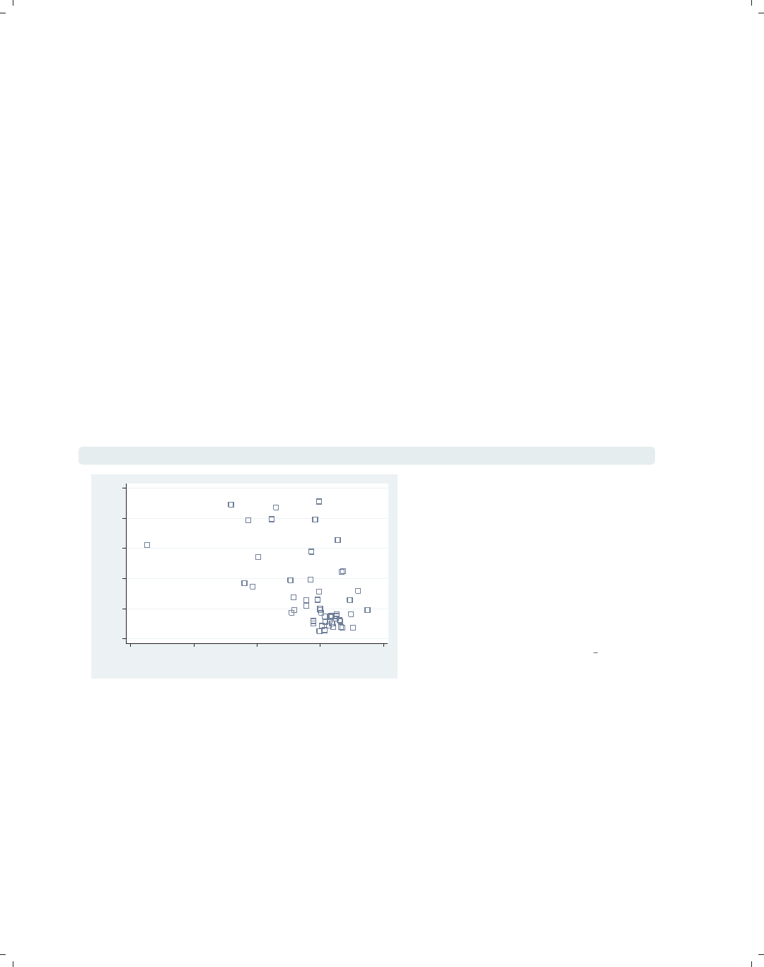
graph twoway scatter propval100 ownhome, msymbol(Sh)
0 20 40 60 80 100
% homes cost $100K+
40 50 60 70 80
% who own home
In this example, we use the msymbol()
(marker symbol) option to make the
symbols large hollow squares; see
Options : Markers (235) for more details.
Note that the msymbol() option is only
useful for the types of graphs that have
marker symbols, and Stata will ignore
this option if you use it with a
command like the graph twoway
histogram command.
Uses allstates.dta & scheme vg s2c
•Note that the command itself is displayed in a typewriter font, and the part of
the command we are discussing (i.e., msymbol(Sh))isinthis color, both in the
command and when referenced in the descriptive text.
•When commands or parts of commands are given in the descriptive text (e.g., graph
twoway histogram), they are displayed in typewriter font.
•Many of the descriptions contain cross-references, for example, Options : Markers (235),
which means to flip to the Options chapter and then to the section Markers. Equiva-
lently, go to page 235.
•The names of some options are shorthand for two or more words that are sometimes
explained; for instance, “we use the msymbol() (marker symbol) option to make ...”.
The electronic form of this book is solely for direct use at UCLA and only by faculty, students, and staff of UCLA.
All rights reserved on the copyright page apply to this document and specifically neither the electronic nor
published form of the book may be distributed or reproduced, either electronically or in printed form.

i
i
i
i
i
i
i
i
1.1 Using this book 3
•The descriptive text always concludes by telling you the name of the data file and
scheme used for making the graph. In this case, the data file was allstates.dta, and the
scheme was vg s2c.scheme. You can read the data file over the Internet by using the
vguse command, a command added to Stata when you install the online supplements;
see Appendix : Online supplements (382). If you are connected to the Internet, and your
Stata is fully up to date, you can simply type vguse allstates to use that file over
the Internet, and you can run the graph command shown to create the graph.
If you want your graphs to look like the ones in the book, you can display them using
the same schemes. See Appendix : Online supplements (382) for information about how to
download the schemes used in this book. Once you have downloaded the schemes, you can
then type the following in the Stata Command window:
.set scheme vg s2c
. vguse allstates
. graph twoway scatter propval100 ownhome, msymbol(Sh)
After you issue the set scheme vg s2c command, subsequent graph commands will
show graphs using the vg s2c scheme. If you prefer, you could add the scheme(vg sc2)
option to the graph command to specify the scheme used just for that graph; for example,
. graph twoway scatter propval100 ownhome, msymbol(Sh) scheme(vg s2c)
In general, all commands and options are provided in their complete form. Commands
and options are generally not abbreviated. However, for purposes of typing, you may wish
to use abbreviations. The previous example could have been abbreviated to
. gr tw sc propval100 ownhome, m(Sh)
and even the gr could have been omitted, leaving
. tw sc propval100 ownhome, m(Sh)
The tw could also have been omitted, leaving
. sc propval100 ownhome, m(Sh)
For guidance on appropriate abbreviations, consult [G]graph.
I should note that, while this book is designed for creating graphs in Stata version 8 and
beyond, many of the examples take advantage of numerous enhancements that have been
released as online updates subsequent to the initial version 8 release. As a result, some
features will either look different or may not work at all in Stata 8.0 or 8.1. Therefore, it is
very important that your copy of Stata be fully up to date. Please verify that your copy of
Stata is up to date and obtain any free updates; to do this, enter Stata, type
. update query
and follow the instructions. After the update is complete, you can use the help whatsnew
command to learn about the updates you have just received, as well as prior updates
documenting the evolution of Stata. Because Stata sometimes evolves beyond the printed
manual, you might find that some commands or options are documented via the online help
but not in your manual. For example, graph twoway tsline was released after the printed
manual and, as of the first printing of this book, is only documented via the online help
(help tsline).
Introduction Twoway Matrix Bar Box Dot Pie Options Standard options Styles Appendix
Using this book Types of Stata graphs Schemes Options Building graphs
The electronic form of this book is solely for direct use at UCLA and only by faculty, students, and staff of UCLA.
All rights reserved on the copyright page apply to this document and specifically neither the electronic nor
published form of the book may be distributed or reproduced, either electronically or in printed form.

i
i
i
i
i
i
i
i
4Chapter 1. Introduction
What if you are using a newer version of Stata than version 8.2? It is possible that, in
the future, Stata may evolve to make the behavior of some of these commands change. If
this happens, you can use the version command to ask Stata to run the graph commands
as though they were run under version 8.2. For example, if you were running Stata version 9
but wanted a graph command to run as though you were running Stata 8.2, you could type
. version 8.2 : graph twoway scatter propval100 ownhome
and the command would be executed as if you were running version 8.2.
This book has a number of associated online resources to complement the book. Ap-
pendix : Online supplements (382) has more information about these online resources and how
to access them. I strongly suggest that you install the online supplements, which make it
easier to run the examples from the book. To install the supplemental programs, schemes,
and help files, just type from within Stata
. net from http://www.stata-press.com/data/vgsg
. net install vgsg
For an overview of what you have installed, type whelp vgsg within Stata. Then, with the
vguse command, you can use any dataset from the book. Likewise, all the custom schemes
used in the book will be installed into your copy of Stata and can be used to display the
graphs, as described earlier in this section.
1.2 Types of Stata graphs
Stata has a wide variety of graph types. This section introduces the types of graphs
Stata produces and covers twoway plots (including scatterplots, line plots, fit plots, fit plots
with confidence intervals, area plots, bar plots, range plots, and distribution plots), scat-
terplot matrices, bar charts, box plots, dot plots, and pie charts. We will start off with a
section showing the variety of twoway plots that can be created with graph twoway.For
this introduction, we have combined them into six families of related plots: scatterplots and
fit plots, line plots, area plots, bar plots, range plots, and distribution plots. We will start
by illustrating scatterplots and fit plots.
The electronic form of this book is solely for direct use at UCLA and only by faculty, students, and staff of UCLA.
All rights reserved on the copyright page apply to this document and specifically neither the electronic nor
published form of the book may be distributed or reproduced, either electronically or in printed form.
i
i
i
i
i
i
i
i
1.2 Types of Stata graphs 5
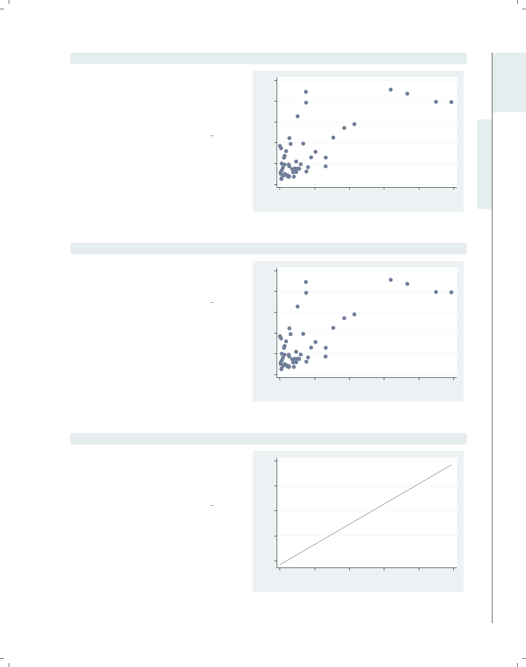
graph twoway scatter propval100 popden
Here is a basic scatterplot. The variable
propval100 is placed on the y-axis, and
popden is placed on the x-axis. See
Twoway : Scatter (35) for more details
about these kinds of plots.
Uses allstates.dta & scheme vg s2c
0 20 40 60 80 100
% homes cost $100K+
0 2000 4000 6000 8000 10000
Pop/10 sq. miles
twoway scatter propval100 popden
We can start this command with just
twoway, and Stata understands that
this is shorthand for graph twoway.
Uses allstates.dta & scheme vg s2c
0 20 40 60 80 100
% homes cost $100K+
0 2000 4000 6000 8000 10000
Pop/10 sq. miles
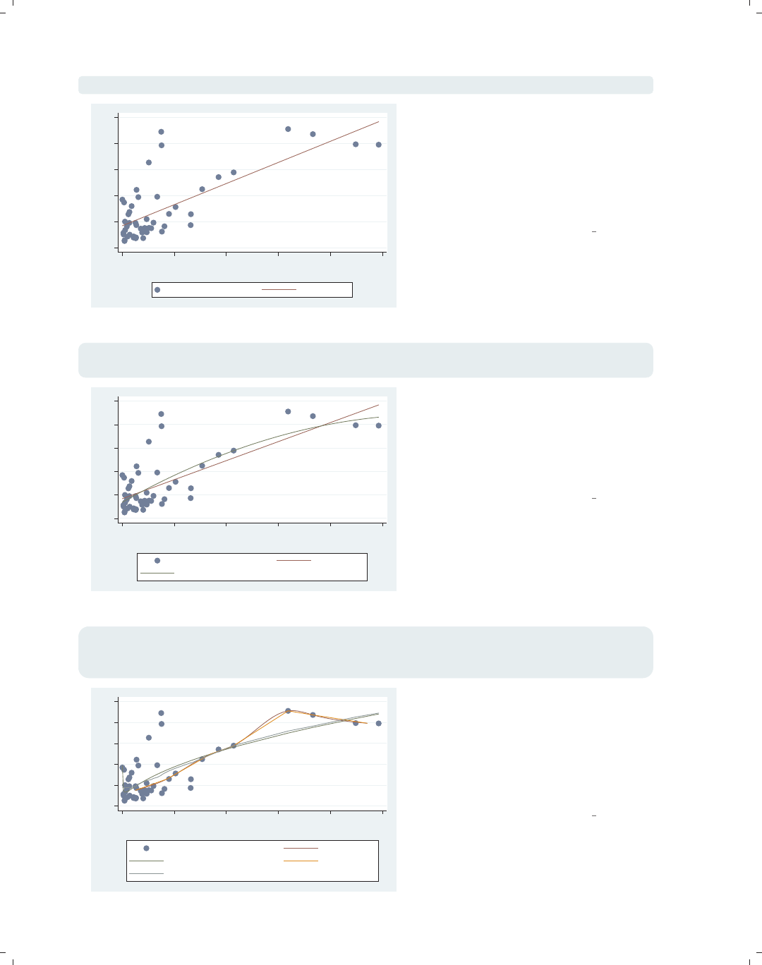
twoway lfit propval100 popden
We can make a linear fit line (lfit)
predicting propval100 from popden.
See Twoway : Fit (49) for more
information about these kinds of plots.
Uses allstates.dta & scheme vg s2c
20 40 60 80 100
Fitted values
0 2000 4000 6000 8000 10000
Pop/10 sq. miles
Introduction Twoway Matrix Bar Box Dot Pie Options Standard options Styles Appendix
Using this book Types of Stata graphs Schemes Options Building graphs
The electronic form of this book is solely for direct use at UCLA and only by faculty, students, and staff of UCLA.
All rights reserved on the copyright page apply to this document and specifically neither the electronic nor
published form of the book may be distributed or reproduced, either electronically or in printed form.
i
i
i
i
i
i
i
i
6Chapter 1. Introduction
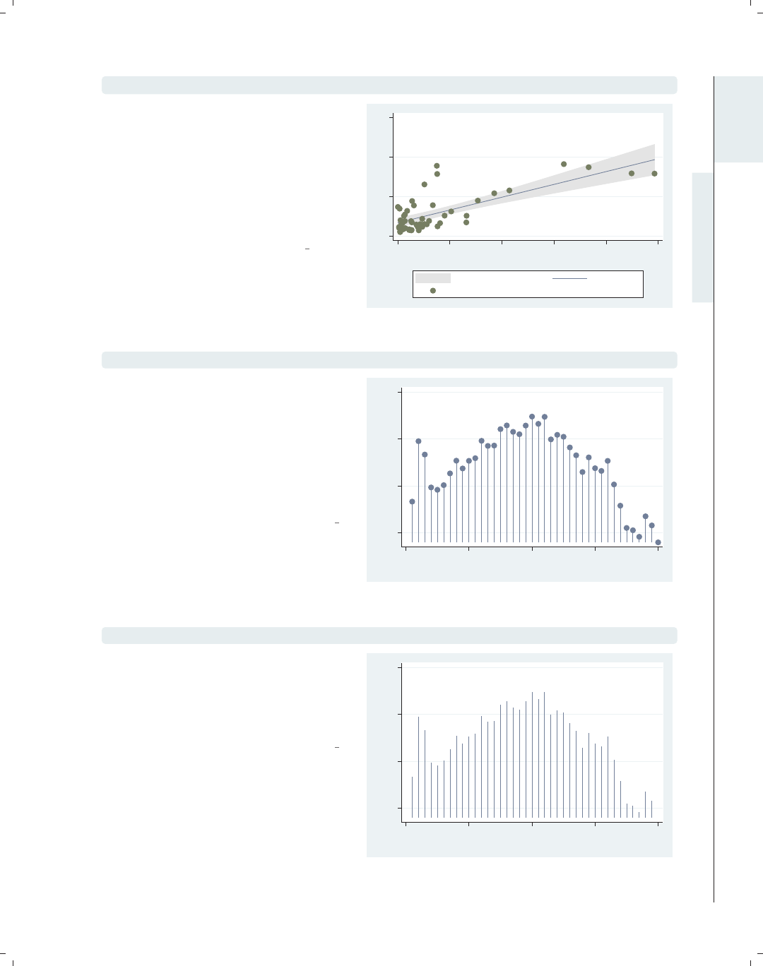
twoway (scatter propval100 popden) (lfit propval100 popden)
0 20 40 60 80 100
0 2000 4000 6000 8000 10000
Pop/10 sq. miles
% homes cost $100K+ Fitted values
Stata allows us to overlay twoway
graphs. In this case, we make a classic
plot showing a scatterplot overlaid with
a fit line using the scatter and lfit
commands. For more details about
overlaying graphs, see
Twoway : Overlaying (87).
Uses allstates.dta & scheme vg s2c
twoway (scatter propval100 popden) (lfit propval100 popden)
(qfit propval100 popden)
0 20 40 60 80 100
0 2000 4000 6000 8000 10000
Pop/10 sq. miles
% homes cost $100K+ Fitted values
Fitted values
The ability to combine twoway plots is
not limited to just overlaying two plots;
we can overlay multiple plots. Here, we
overlay a scatterplot with a linear fit
line (lfit) and a quadratic fit line
(qfit).
Uses allstates.dta & scheme vg s2c
twoway (scatter propval100 popden) (mspline propval100 popden)
(fpfit propval100 popden) (mband propval100 popden)
(lowess propval100 popden)
0 20 40 60 80 100
0 2000 4000 6000 8000 10000
Pop/10 sq. miles
% homes cost $100K+ Median spline
predicted propval100 Median bands
lowess propval100 popden
Stata has other kinds of fit methods in
addition to linear and quadratic fits.
This example includes a median spline
(mspline), fractional polynomial fit
(fpfit), median band (mband), and
lowess (lowess). For more details, see
Twoway : Fit (49).
Uses allstates.dta & scheme vg s2c
The electronic form of this book is solely for direct use at UCLA and only by faculty, students, and staff of UCLA.
All rights reserved on the copyright page apply to this document and specifically neither the electronic nor
published form of the book may be distributed or reproduced, either electronically or in printed form.
i
i
i
i
i
i
i
i
1.2 Types of Stata graphs 7
twoway (lfitci propval100 popden) (scatter propval100 popden)
In addition to being able to plot a fit
line, we can also plot a linear fit line
with a confidence interval using the
lfitci command. We also overlay the
linear fit and confidence interval with a
scatterplot. See Twoway : CI fit (50) for
more information about fit lines with
confidence intervals.
Uses allstates.dta & scheme vg s2c
0 50 100 150
0 2000 4000 6000 8000 10000
Pop/10 sq. miles
95% CI Fitted values
% homes cost $100K+
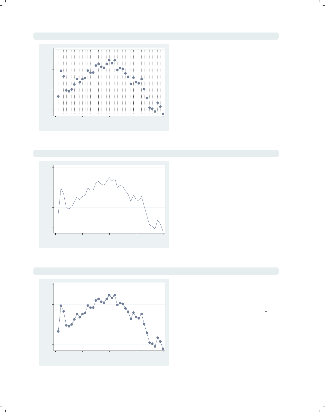
twoway dropline close tradeday
This dropline graph shows the closing
prices of the S&P 500 by trading day
for the first 40 days of 2001. A
dropline graph is like a scatter plot
since each data point is shown with a
marker, but a dropline for each marker
is shown as well. For more details, see
Twoway : Scatter (35).
Uses spjanfeb2001.dta & scheme vg s2c
1250 1300 1350 1400
Closing price
0 10 20 30 40
Trading day number
twoway spike close tradeday
Here, we use a spike graph to show the
same graph as the previous graph. It is
like the dropline plot, but no markers
are put on the top. For more details,
see Twoway : Scatter (35).
Uses spjanfeb2001.dta & scheme vg s2c
1250 1300 1350 1400
Closing price
0 10 20 30 40
Trading day number
Introduction Twoway Matrix Bar Box Dot Pie Options Standard options Styles Appendix
Using this book Types of Stata graphs Schemes Options Building graphs
The electronic form of this book is solely for direct use at UCLA and only by faculty, students, and staff of UCLA.
All rights reserved on the copyright page apply to this document and specifically neither the electronic nor
published form of the book may be distributed or reproduced, either electronically or in printed form.
i
i
i
i
i
i
i
i
8Chapter 1. Introduction
twoway dot close tradeday
1250 1300 1350 1400
Closing price
0 10 20 30 40
Trading day number
The dot plot, like the scatter
command, shows markers for each data
point but also adds a dotted line for
each of the x-values. For more details,
see Twoway : Scatter (35).
Uses spjanfeb2001.dta & scheme vg s2c
twoway line close tradeday, sort
1250 1300 1350 1400
Closing price
0 10 20 30 40
Trading day number
The line command is used in this
example to make a simple line graph.
See Twoway : Line (54) for more details
about line graphs.
Uses spjanfeb2001.dta & scheme vg s2c
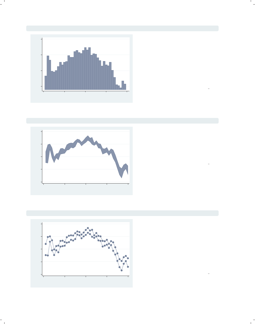
twoway connected close tradeday, sort
1250 1300 1350 1400
Closing price
0 10 20 30 40
Trading day number
The twoway connected graph is similar
to twoway line, except that a symbol
is shown for each data point. For more
information, see Twoway : Line (54).
Uses spjanfeb2001.dta & scheme vg s2c
The electronic form of this book is solely for direct use at UCLA and only by faculty, students, and staff of UCLA.
All rights reserved on the copyright page apply to this document and specifically neither the electronic nor
published form of the book may be distributed or reproduced, either electronically or in printed form.
i
i
i
i
i
i
i
i
1.2 Types of Stata graphs 9
twoway tsline close, sort
The tsline (time-series line) command
makes a line graph where the x-variable
is a date variable that has previously
been declared using tsset;see
[TS]tsset. This example shows the
closing price of the S&P 500 by trading
date. For more information, see
Twoway : Line (54).
Uses sp2001ts.dta & scheme vg s2c
1000 1100 1200 1300 1400
Closing price
1Jan01 1Apr01 1Jul01 1Oct01 1Jan02
Date
twoway tsrline high low, sort
This command uses tsrline (time
series range line) to make a line graph
showing the high and low prices of the
S&P 500 by trading date. For more
information, see Twoway : Line (54).
Uses sp2001ts.dta & scheme vg s2c
900 1000 1100 1200 1300 1400
High price/Low price
1Jan01 1Apr01 1Jul01 1Oct01 1Jan02
Date
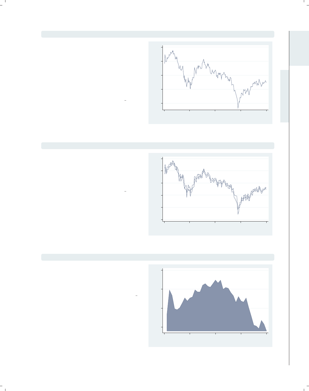
twoway area close tradeday, sort
An area plot is similar to a line plot,
but the area under the line is shaded.
See Twoway : Area (61) for more
information about area plots.
Uses spjanfeb2001.dta & scheme vg s2c
1250 1300 1350 1400
Closing price
0 10 20 30 40
Trading day number
Introduction Twoway Matrix Bar Box Dot Pie Options Standard options Styles Appendix
Using this book Types of Stata graphs Schemes Options Building graphs
The electronic form of this book is solely for direct use at UCLA and only by faculty, students, and staff of UCLA.
All rights reserved on the copyright page apply to this document and specifically neither the electronic nor
published form of the book may be distributed or reproduced, either electronically or in printed form.
i
i
i
i
i
i
i
i
10 Chapter 1. Introduction
twoway bar close tradeday
1250 1300 1350 1400
Closing price
0 10 20 30 40
Trading day number
Here is an example of a twoway bar
plot. For each x-value, a bar is shown
corresponding to the height of the
y-variable. Note that this shows a
continuous x-variable as compared with
the graph bar command, which would
be useful when we have a categorical
x-variable. See Twoway : Bar (62) for
more details about bar plots.
Uses spjanfeb2001.dta & scheme vg s2c
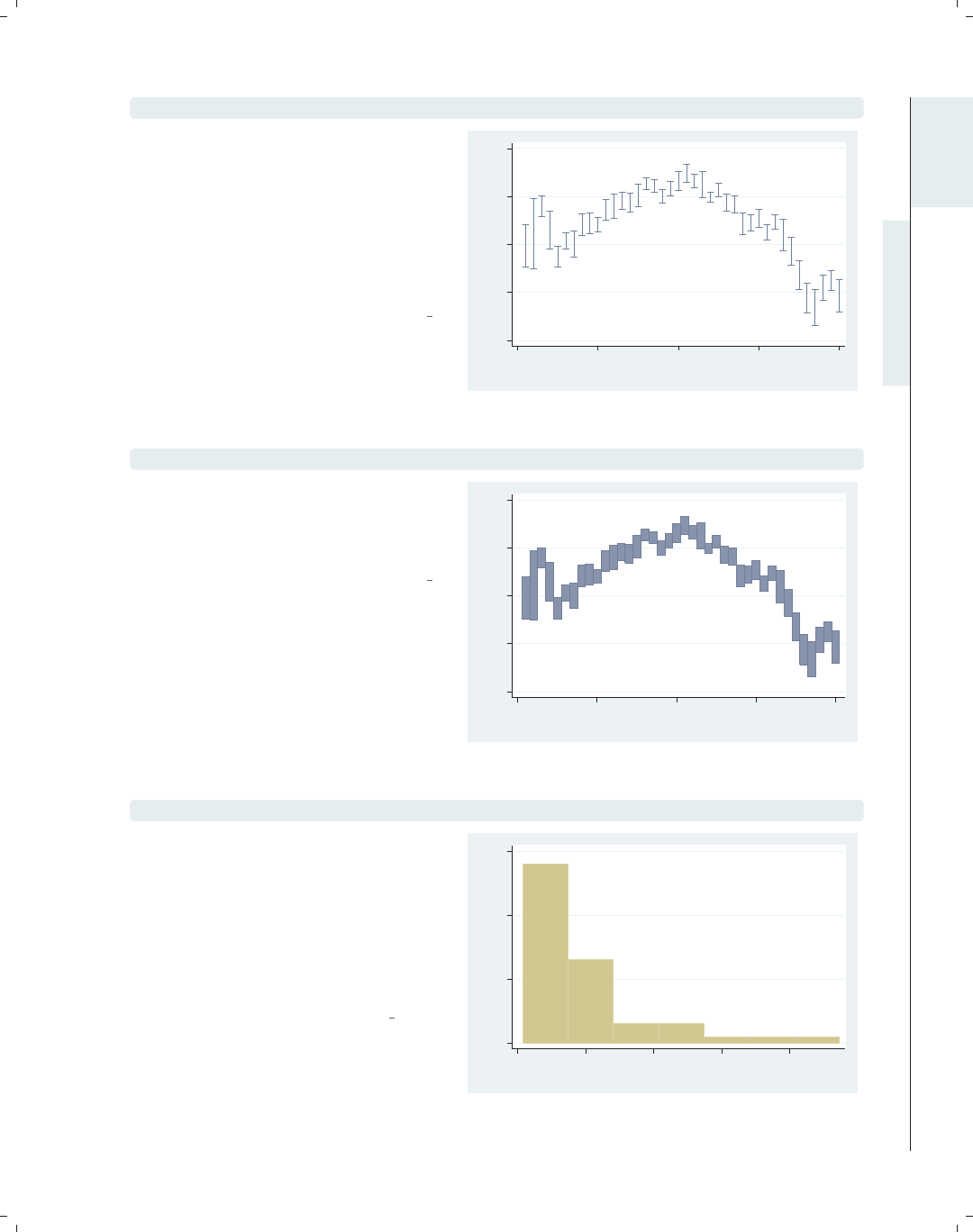
twoway rarea high low tradeday, sort
1200 1250 1300 1350 1400
High price/Low price
0 10 20 30 40
Trading day number
This example illustrates the use of
rarea (range area) to graph the high
and low prices with the area filled. If
we used rline (range line), the area
would not be filled. See Twoway : Range
(64) for more details.
Uses spjanfeb2001.dta & scheme vg s2c
twoway rconnected high low tradeday, sort
1200 1250 1300 1350 1400
High price/Low price
0 10 20 30 40
Trading day number
The rconnected (range connected)
command makes a graph similar to the
previous one, except that a marker is
shown at each value of the x-variable
and the area in between is not filled. If
we instead used rscatter (range
scatter), the points would not be
connected. See Twoway : Range (64) for
more details.
Uses spjanfeb2001.dta & scheme vg s2c
The electronic form of this book is solely for direct use at UCLA and only by faculty, students, and staff of UCLA.
All rights reserved on the copyright page apply to this document and specifically neither the electronic nor
published form of the book may be distributed or reproduced, either electronically or in printed form.
i
i
i
i
i
i
i
i
1.2 Types of Stata graphs 11
twoway rcap high low tradeday, sort
Here, we use rcap (range cap) to graph
the high and low prices with a spike and
a cap at each value of the x-variable. If
you used rspike instead, spikes would
be displayed but not caps. If we used
rcapsym, the caps would be symbols
and you could modify the symbol. See
Twoway : Range (64) for more details.
Uses spjanfeb2001.dta & scheme vg s2c
1200 1250 1300 1350 1400
High price/Low price
0 10 20 30 40
Trading day number
twoway rbar high low tradeday, sort
Here, we use the rbar to graph the
high and low prices with bars at each
value of the x-variable. See
Twoway : Range (64) for more details.
Uses spjanfeb2001.dta & scheme vg s2c
1200 1250 1300 1350 1400
High price/Low price
0 10 20 30 40
Trading day number
twoway histogram popk, freq
The twoway histogram command can
be used to show the distribution of a
single variable. It is often useful when
overlaid with other twoway plots;
otherwise, the histogram command
would be preferable. See
Twoway : Distribution (74) for more
details.
Uses allstates.dta & scheme vg s2c
0 10 20 30
Frequency
0 5000 10000 15000 20000
Pop/1,000
Introduction Twoway Matrix Bar Box Dot Pie Options Standard options Styles Appendix
Using this book Types of Stata graphs Schemes Options Building graphs
The electronic form of this book is solely for direct use at UCLA and only by faculty, students, and staff of UCLA.
All rights reserved on the copyright page apply to this document and specifically neither the electronic nor
published form of the book may be distributed or reproduced, either electronically or in printed form.
i
i
i
i
i
i
i
i
12 Chapter 1. Introduction
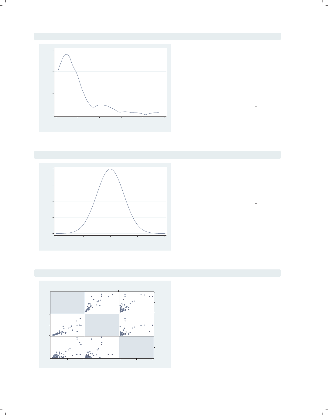
twoway kdensity popk
0 .00005 .0001 .00015
kdensity popk
0 5000 10000 15000 20000 25000
x
The twoway kdensity command shows
a kernel-density plot and is useful for
examining the distribution of a single
variable. It can be overlaid with other
twoway plots; otherwise, the kdensity
command would be preferable. See
Twoway : Distribution (74) for more
details.
Uses allstates.dta & scheme vg s2c
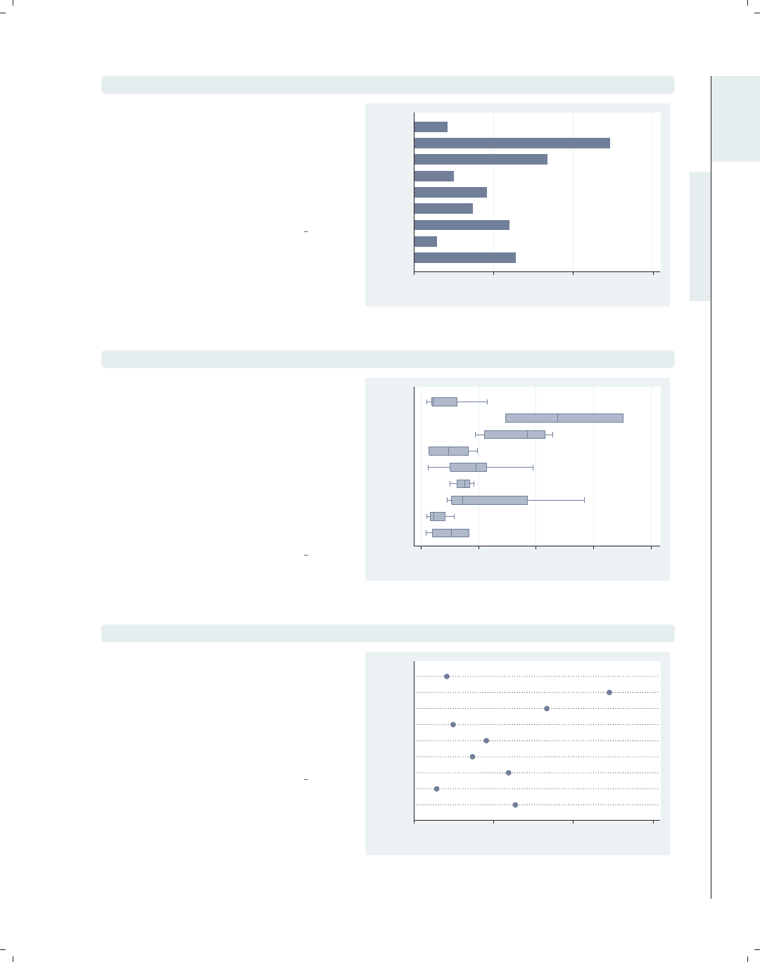
twoway function y=normden(x), range(-4 4)
0 .1 .2 .3 .4
y
−4−2 0 2 4
x
The twoway function command allows
us to graph an arbitrary function over a
range of values we specify. See
Twoway : Distribution (74) for more
details.
Uses allstates.dta & scheme vg s2c
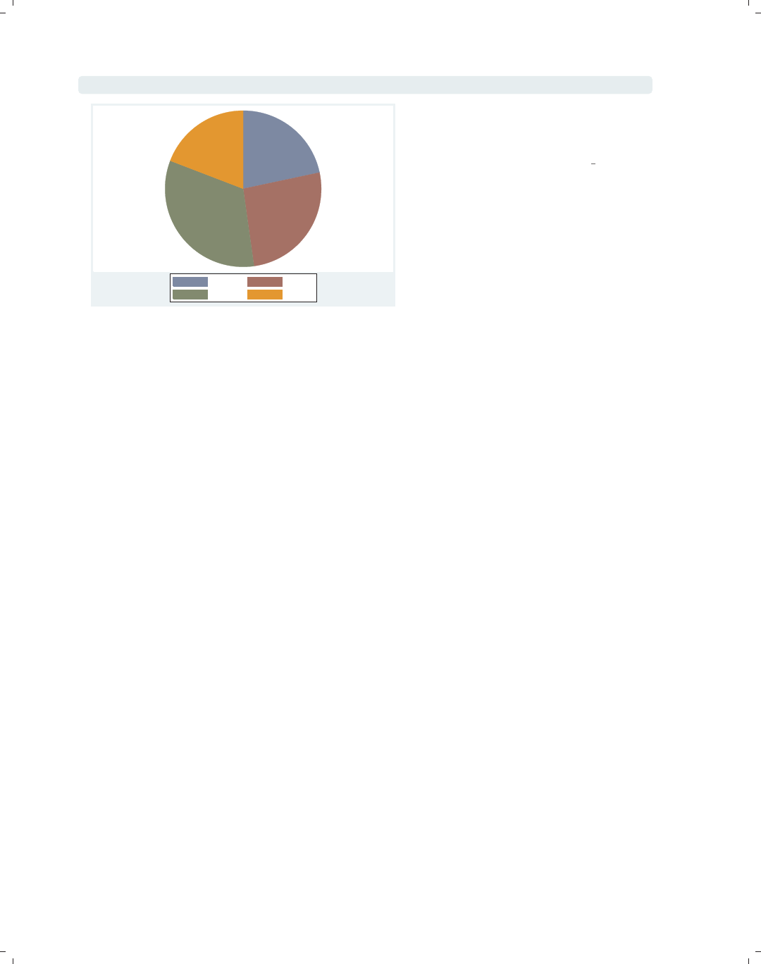
graph matrix propval100 rent700 popden
% homes
cost
$100K+
% rents
$700+/mo
Pop/10
sq.
miles
0
50
100
0 50 100
0
20
40
0 20 40
0
5000
10000
0 5000 10000
We can use the graph matrix
command to show a scatterplot matrix.
See Matrix (95) for more details.
Uses allstates.dta & scheme vg s2c
The electronic form of this book is solely for direct use at UCLA and only by faculty, students, and staff of UCLA.
All rights reserved on the copyright page apply to this document and specifically neither the electronic nor
published form of the book may be distributed or reproduced, either electronically or in printed form.
i
i
i
i
i
i
i
i
1.2 Types of Stata graphs 13
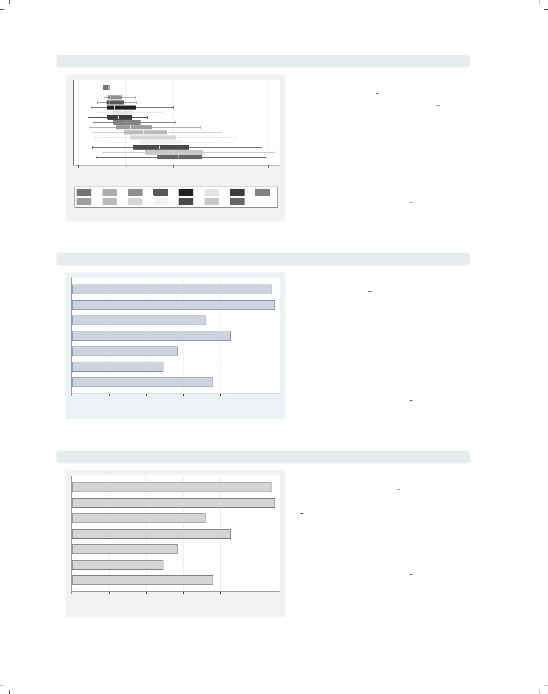
graph hbar popk, over(division)
The graph hbar (horizontal bar)
command is often used to show the
values of a continuous variable broken
down by one or more categorical
variables. Note that graph hbar is
merely a rotated version of graph bar.
See Bar (107) for more details.
Uses allstates.dta & scheme vg s2c
0 5,000 10,000 15,000
mean of popk
Pacific
Mountain
W.S.C.
E.S.C.
S. Atl.
W.N.C.
E.N.C.
Mid Atl
N. Eng.
graph hbox popk, over(division)
We can show the previous graph as a
box plot using the graph hbox
(horizontal box) command. The graph
hbox command is commonly used for
showing the distribution of one or more
continuous variables, broken down by
one or more categorical variables. Note
that graph hbox is merely a rotated
version of graph box. See Box (157) for
more details.
Uses allstates.dta & scheme vg s2c 0 5,000 10,000 15,000 20,000
Pop/1,000
Pacific
Mountain
W.S.C.
E.S.C.
S. Atl.
W.N.C.
E.N.C.
Mid Atl
N. Eng.
graph dot popk, over(division)
The previous plot could also be shown
as a dot plot using graph dot.Dot
plots are often used to show one or
more summary statistics for one or
more continuous variables, broken down
by one or more categorical variables.
See Dot (193) for more details.
Uses allstates.dta & scheme vg s2c
0 5,000 10,000 15,000
mean of popk
Pacific
Mountain
W.S.C.
E.S.C.
S. Atl.
W.N.C.
E.N.C.
Mid Atl
N. Eng.
Introduction Twoway Matrix Bar Box Dot Pie Options Standard options Styles Appendix
Using this book Types of Stata graphs Schemes Options Building graphs
The electronic form of this book is solely for direct use at UCLA and only by faculty, students, and staff of UCLA.
All rights reserved on the copyright page apply to this document and specifically neither the electronic nor
published form of the book may be distributed or reproduced, either electronically or in printed form.
i
i
i
i
i
i
i
i
14 Chapter 1. Introduction
graph pie popk, over(region)
NE N Cntrl
South West
The graph pie command can be used
to show pie charts. See Pie (217) for
more details.
Uses allstates.dta & scheme vg s2c
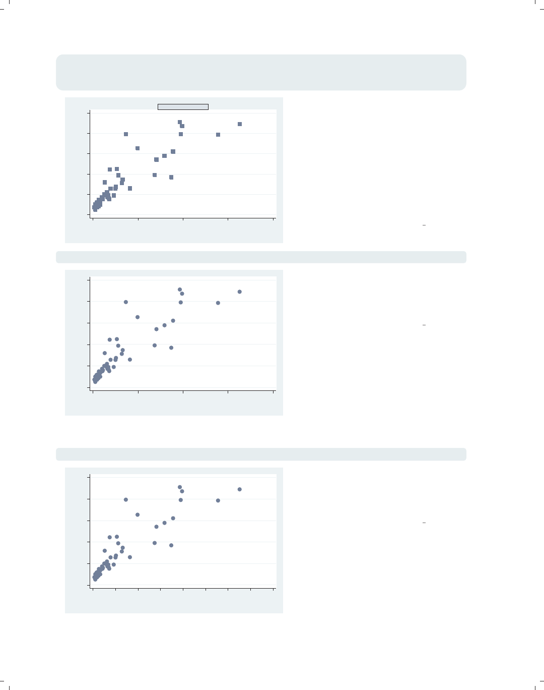
1.3 Schemes
While the previous section was about the different types of graphs Stata can make, this
section is about the different kinds of looks that you can have for Stata graphs. The basic
starting point for the look of a graph is a scheme, which controls just about every aspect
of the look of the graph. A scheme sets the stage for the graph, but you can use options
to override the settings in a scheme. As you might surmise, if you choose (or develop) a
scheme that produces graphs similar to the final graph you wish to make, you can reduce
the need to customize your graphs using options. Here, we give you a basic flavor of what
schemes can do and introduce you to the schemes you will be seeing throughout the book.
See Intro : Using this book (1) for more details about how to select and use schemes and
Appendix : Online supplements (382) for more information about how to download them.
The electronic form of this book is solely for direct use at UCLA and only by faculty, students, and staff of UCLA.
All rights reserved on the copyright page apply to this document and specifically neither the electronic nor
published form of the book may be distributed or reproduced, either electronically or in printed form.

i
i
i
i
i
i
i
i
1.3 Schemes 15
twoway scatter propval100 rent700 ownhome
This scatterplot illustrates the vg s1c
scheme. It is based on the s1color
scheme but increases the sizes of
elements in the graph to make them
more readable. This scheme is in color
and has a white background, both
inside the plot region and in the
surrounding area.
Uses allstates.dta & scheme vg s1c
0 20 40 60 80 100
40 50 60 70 80
% who own home
% homes cost $100K+ % rents $700+/mo
twoway scatter propval100 rent700 ownhome
This scatterplot is similar to the last
one but uses the vg s1m scheme, the
monochrome equivalent of the vg s1c
scheme. It is based on the s1mono
scheme but increases the sizes of
elements in the graph to make them
more readable. This scheme is in black
and white and has a white background,
both inside the plot region and in the
surrounding area.
Uses allstates.dta & scheme vg s1m
0 20 40 60 80 100
40 50 60 70 80
% who own home
% homes cost $100K+ % rents $700+/mo
graph hbox wage, over(grade) asyvar nooutsides legend(rows(2))
This box plot shows an example of the
vg s2c scheme. It is based on the
s2color scheme but increases the sizes
of elements in the graph to make them
more readable. When we use this
scheme, the plot region has a white
background, but the surrounding area
(the graph region) is light blue.
Uses nlsw.dta & scheme vg s2c 0 5 10 15 20
hourly wage
excludes outside values
4 5 6 7 8 9 10 11
12 13 14 15 16 17 18
Introduction Twoway Matrix Bar Box Dot Pie Options Standard options Styles Appendix
Using this book Types of Stata graphs Schemes Options Building graphs
The electronic form of this book is solely for direct use at UCLA and only by faculty, students, and staff of UCLA.
All rights reserved on the copyright page apply to this document and specifically neither the electronic nor
published form of the book may be distributed or reproduced, either electronically or in printed form.
i
i
i
i
i
i
i
i
16 Chapter 1. Introduction
graph hbox wage, over(grade) asyvar nooutsides legend(rows(2))
0 5 10 15 20
hourly wage
excludes outside values
4 5 6 7 8 9 10 11
12 13 14 15 16 17 18
This box plot is similar to the previous
one but uses the vg s2m scheme, the
monochrome equivalent of the vg s2c
scheme. This scheme is based on the
s2mono scheme but increases the sizes
of elements in the graph to make them
more readable. This scheme is in black
and white and has a white background
in the plot region but is light gray in
the surrounding graph region.
Uses nlsw.dta & scheme vg s2m
graph hbar wage, over(occ7, label(nolabels)) blabel(group, position(base))
Other
Labor
Operat.
Cler.
Sales
Mgmt
Prof
0 2 4 6 8 10
mean of wage
This horizontal bar chart shows an
example of the vg palec scheme. It is
basedonthes2color scheme but
makes the colors of the
bars/boxes/markers paler by decreasing
the intensity of the colors. As shown in
this example, one use of this scheme is
to make the colors of the bars pale
enough to include text labels inside of
bars.
Uses nlsw.dta & scheme vg palec
graph hbar wage, over(occ7, label(nolabels)) blabel(group, position(base))
Other
Labor
Operat.
Cler.
Sales
Mgmt
Prof
0 2 4 6 8 10
mean of wage
This example is the same as the last
example but uses the vg palem scheme,
the monochrome equivalent of the
vg palec scheme. This scheme is based
on the s2mono scheme but makes the
colors of the bars/boxes/markers paler
by decreasing the intensity of the
colors.
Uses nlsw.dta & scheme vg palem
The electronic form of this book is solely for direct use at UCLA and only by faculty, students, and staff of UCLA.
All rights reserved on the copyright page apply to this document and specifically neither the electronic nor
published form of the book may be distributed or reproduced, either electronically or in printed form.
i
i
i
i
i
i
i
i
1.3 Schemes 17
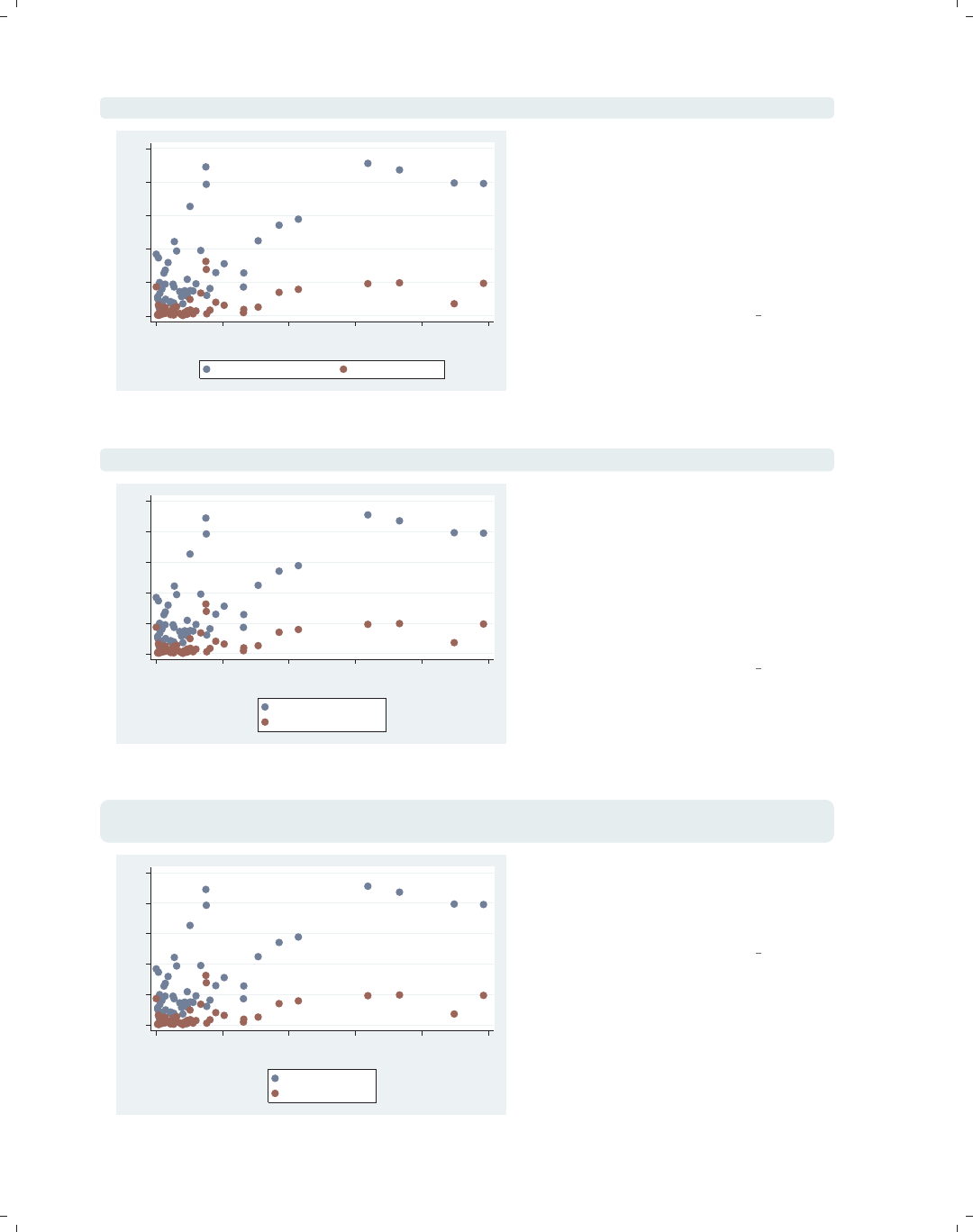
scatter propval100 rent700 ownhome
This scatterplot illustrates the vg outc
scheme. It is based on the s2color
scheme but makes the fill color of the
bars/boxes/markers white, so they
appear hollow. The plot region is a
light blue to contrast with the white fill
color. In this case, this scheme is useful
to help us see number of markers
present where numerous markers are
close or partially overlapping.
Uses allstates.dta & scheme vg outc
0 20 40 60 80 100
40 50 60 70 80
% who own home
% homes cost $100K+ % rents $700+/mo
scatter propval100 rent700 ownhome
This example is similar to the previous
one but illustrates the vg outm scheme,
the monochrome equivalent of the
vg outc scheme. It is based on the
s2mono scheme but makes the fill color
of the bars/boxes/markers white, so
they appear hollow.
Uses allstates.dta & scheme vg outm
0 20 40 60 80 100
40 50 60 70 80
% who own home
% homes cost $100K+ % rents $700+/mo
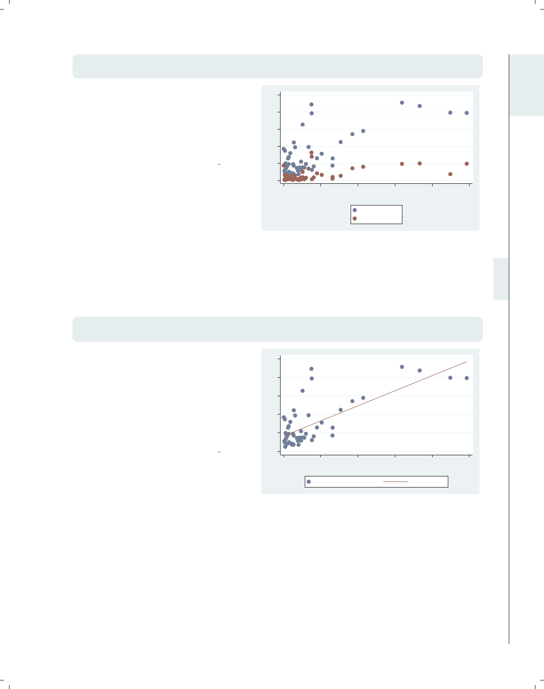
twoway (scatter ownhome borninstate if stateab=="DC", mlabel(stateab))
(scatter ownhome borninstate), legend(off)
This is an example of the vg samec
scheme, based on s2color, and makes
all of the markers, lines, bars, etc., the
same color, shape, and pattern. Here,
the second scatter command labels
Washington, DC, which normally would
be shown in a different color, but with
this scheme, the marker is the same.
This scheme has a monochrome
equivalent called vg samem that is not
illustrated.
Uses allstates.dta & scheme vg samec
DC
40 50 60 70 80
% who own home
20 40 60 80
% born in state of residence
Introduction Twoway Matrix Bar Box Dot Pie Options Standard options Styles Appendix
Using this book Types of Stata graphs Schemes Options Building graphs
The electronic form of this book is solely for direct use at UCLA and only by faculty, students, and staff of UCLA.
All rights reserved on the copyright page apply to this document and specifically neither the electronic nor
published form of the book may be distributed or reproduced, either electronically or in printed form.

i
i
i
i
i
i
i
i
18 Chapter 1. Introduction
graph hbar commute, over(division) asyvar
0 5 10 15 20 25
mean of commute
N. Eng.
Mid Atl
E.N.C.
W.N.C.
S. Atl.
E.S.C.
W.S.C.
Mountain
Pacific
This horizontal bar chart shows an
example of the vg lgndc scheme. It is
basedonthes2color scheme but
changes the default attributes of the
legend, namely, showing the legend in
one column to the left of the plot
region, with the key and symbols
placed atop each other. This can be an
efficient way to place the legend to the
left of the graph. There is also a
vg lgndm scheme, which is monochrome
and is not illustrated here.
Uses allstates.dta & scheme vg lgndc
graph bar commute, over(division) asyvar legend(rows(3))
0 5 10 15 20 25
mean of commute
N. Eng. Mid Atl E.N.C.
W.N.C. S. Atl. E.S.C.
W.S.C. Mountain Pacific
This bar chart shows an example of the
vg past scheme. It is based on the
s2color scheme but selects subdued
pastel colors and provides a sand
background for the surrounding graph
region and an eggshell color for the
inner plot region and legend area.
Uses allstates.dta & scheme vg past
twoway scatter rent700 propval100
0
10
20
30
40
% rents $700+/mo
0 20 40 60 80 100
% homes cost $100K+
This bar chart shows an example of the
vg rose scheme. It is based on the
s2color scheme but uses a different set
of colors, having an eggshell
background and a light rose color for
the plot area. The grid lines are
omitted by default, and the labels for
the y-axis are horizontal by default.
Uses allstates.dta & scheme vg rose
The electronic form of this book is solely for direct use at UCLA and only by faculty, students, and staff of UCLA.
All rights reserved on the copyright page apply to this document and specifically neither the electronic nor
published form of the book may be distributed or reproduced, either electronically or in printed form.
i
i
i
i
i
i
i
i
1.3 Schemes 19
graph bar commute, over(division) asyvar legend(rows(3))
This bar chart shows an example of the
vg blue scheme. It is based on the
s2color scheme but uses a set of blue
colors, with a light blue background
and a light blue-gray color for the plot
area. The grid lines are omitted by
default, and the labels for the y-axis are
horizontal by default.
Uses allstates.dta & scheme vg blue 0
5
10
15
20
25
mean of commute
N. Eng. Mid Atl E.N.C.
W.N.C. S. Atl. E.S.C.
W.S.C. Mountain Pacific
graph bar commute, over(division) asyvar legend(rows(3))
This is an example using the vg teal
scheme. This scheme is also based on
the s2color scheme but uses an
olive–teal background. It also
suppresses the display of grid lines and
makes the labels for the y-axis display
horizontally by default.
Uses allstates.dta & scheme vg teal
0
5
10
15
20
25
mean of commute
N. Eng. Mid Atl E.N.C.
W.N.C. S. Atl. E.S.C.
W.S.C. Mountain Pacific
graph bar commute, over(division) asyvar legend(rows(3))
This bar chart shows an example of the
vg brite scheme. It is based on the
s2color scheme but selects a bright set
of colors and changes the background
to light khaki.
Uses allstates.dta & scheme vg brite
0 5 10 15 20 25
mean of commute
N. Eng. Mid Atl E.N.C.
W.N.C. S. Atl. E.S.C.
W.S.C. Mountain Pacific
Introduction Twoway Matrix Bar Box Dot Pie Options Standard options Styles Appendix
Using this book Types of Stata graphs Schemes Options Building graphs
The electronic form of this book is solely for direct use at UCLA and only by faculty, students, and staff of UCLA.
All rights reserved on the copyright page apply to this document and specifically neither the electronic nor
published form of the book may be distributed or reproduced, either electronically or in printed form.
i
i
i
i
i
i
i
i
20 Chapter 1. Introduction
This section has just scratched the surface of all there is to know about schemes in Stata,
but I hope that it helps you see how schemes create a starting point for your graph and
that, by choosing a scheme that is most similar to the look you want, you can save time
and effort in customizing your graphs.
1.4 Options
Learning to create effective Stata graphs is ultimately about using options to customize
the look of a graph until you are pleased with it. This section illustrates the general rules
and syntax for Stata graph commands, starting with their general structure, followed by
illustrations showing how options work in the same way across different kinds of commands.
Stata graph options work much like other options in Stata; however, there are additional
features that extend their power and functionality. While we will use the twoway scatter
command for illustration, most of the principles illustrated extend to all kinds of Stata
graph commands.
twoway scatter propval100 rent700
0 20 40 60 80 100
% homes cost $100K+
0 10 20 30 40
% rents $700+/mo
Consider this basic scatterplot. To add
a title to this graph, we can use the
title() option as illustrated in the
next example.
Uses allstates.dta & scheme vg s2c
The electronic form of this book is solely for direct use at UCLA and only by faculty, students, and staff of UCLA.
All rights reserved on the copyright page apply to this document and specifically neither the electronic nor
published form of the book may be distributed or reproduced, either electronically or in printed form.
i
i
i
i
i
i
i
i
1.4 Options 21
twoway scatter propval100 rent700,
title("This is a title for the graph")
Just as with any Stata command, the
title() option comes after a comma,
and in this case, it contains a quoted
string that becomes the title of the
graph.
Uses allstates.dta & scheme vg s2c
0 20 40 60 80 100
% homes cost $100K+
0 10 20 30 40
% rents $700+/mo
This is a title for the graph
twoway scatter propval100 rent700,
title("This is a title for the graph", box)
Starting with Stata 8, options can have
options of their own. Let’s put a box
around the title of the graph. We can
use title(, box), placing box as an
option within title(). If the default
for the current scheme had included a
box, then we could have used the nobox
option to suppress it.
Uses allstates.dta & scheme vg s2c
0 20 40 60 80 100
% homes cost $100K+
0 10 20 30 40
% rents $700+/mo
This is a title for the graph
twoway scatter propval100 rent700,
title("This is a title for the graph", box size(small))
Let’s take the last graph and modify
the title to make it small. We can add
another option to the title() option
by adding the size(small) option.
Here, we see that one of the options is a
keyword (box) and that another option
allows us to supply a value
(size(small)).
Uses allstates.dta & scheme vg s2c
0 20 40 60 80 100
% homes cost $100K+
0 10 20 30 40
% rents $700+/mo
This is a title for the graph
Introduction Twoway Matrix Bar Box Dot Pie Options Standard options Styles Appendix
Using this book Types of Stata graphs Schemes Options Building graphs
The electronic form of this book is solely for direct use at UCLA and only by faculty, students, and staff of UCLA.
All rights reserved on the copyright page apply to this document and specifically neither the electronic nor
published form of the book may be distributed or reproduced, either electronically or in printed form.
i
i
i
i
i
i
i
i
22 Chapter 1. Introduction
twoway scatter propval100 rent700,
title("This is a title for the graph", box size(small))
msymbol(S)
0 20 40 60 80 100
% homes cost $100K+
0 10 20 30 40
% rents $700+/mo
This is a title for the graph Say that we want the symbols to be
displayed as squares. We can add
another option called msymbol(S) to
indicate that we want the marker
symbol to be displayed as a square (S
for square). Adding one option at a
time is a common way to build a Stata
graph. In the next graph, we will
change gears and start building a new
graph to show other aspects of options.
Uses allstates.dta & scheme vg s2c
twoway scatter propval100 rent700
0 20 40 60 80 100
% homes cost $100K+
0 10 20 30 40
% rents $700+/mo
Let’s return to this simple scatterplot.
Say that we want the labels for the
x-axistochangefrom010203040to
0 5 10 15 20 25 30 35 40.
Uses allstates.dta & scheme vg s2c
twoway scatter propval100 rent700, xlabel(0(5)40)
0 20 40 60 80 100
% homes cost $100K+
0 5 10 15 20 25 30 35 40
% rents $700+/mo
Here, we add the xlabel() option to
label the x-axis from 0 to 40,
incrementing by 5. But say that we
want the labels to be displayed larger.
Uses allstates.dta & scheme vg s2c
The electronic form of this book is solely for direct use at UCLA and only by faculty, students, and staff of UCLA.
All rights reserved on the copyright page apply to this document and specifically neither the electronic nor
published form of the book may be distributed or reproduced, either electronically or in printed form.

i
i
i
i
i
i
i
i
1.4 Options 23
twoway scatter propval100 rent700, xlabel(0(5)40, labsize(huge))
Here, we add the labsize() (label size)
option to increase the size of the labels
for the x-axis. Say that we were happy
with the original numbering (0 10 20 30
40) but wanted the labels to be huge.
How would we do that?
Uses allstates.dta & scheme vg s2c
0 20 40 60 80 100
% homes cost $100K+
0 5 10 15 20 25 30 35 40
% rents $700+/mo
twoway scatter propval100 rent700, xlabel(, labsize(huge))
The xlabel() option we use here
indicates that we are content with the
numbers chosen for the label of the
x-axis because we have nothing before
the comma. After the comma, we add
the labsize() option to increase the
size of the labels for the x-axis.
Uses allstates.dta & scheme vg s2c
0 20 40 60 80 100
% homes cost $100K+
0 10 20 30 40
% rents $700+/mo
Let’s consider some examples using the legend() option to show that some options do
not require or permit the use of commas within them. Also, this allows us to show a case
where you might properly specify an option over and over again.
Introduction Twoway Matrix Bar Box Dot Pie Options Standard options Styles Appendix
Using this book Types of Stata graphs Schemes Options Building graphs
The electronic form of this book is solely for direct use at UCLA and only by faculty, students, and staff of UCLA.
All rights reserved on the copyright page apply to this document and specifically neither the electronic nor
published form of the book may be distributed or reproduced, either electronically or in printed form.
i
i
i
i
i
i
i
i
24 Chapter 1. Introduction
twoway scatter propval100 rent700 popden
0 20 40 60 80 100
0 2000 4000 6000 8000 10000
Pop/10 sq. miles
% homes cost $100K+ % rents $700+/mo
Here, we show two y-variables,
propval100 and rent700, graphed
against population density, popden.
Note that Stata has created a legend,
helping us see which symbols
correspond to which variables. We can
use the legend() option to customize
it.
Uses allstates.dta & scheme vg s2c
twoway scatter propval100 rent700 popden, legend(cols(1))
0 20 40 60 80 100
0 2000 4000 6000 8000 10000
Pop/10 sq. miles
% homes cost $100K+
% rents $700+/mo
Using the legend(cols(1)) option, we
make the legend display in a single
column. Note that we did not use a
comma because, with the legend()
option, there is no natural default
argument. If we had included a comma
within the legend() option, Stata
would have reported this as an error.
Uses allstates.dta & scheme vg s2c
twoway scatter propval100 rent700 popden,
legend(cols(1) label(1 "Property Value"))
0 20 40 60 80 100
0 2000 4000 6000 8000 10000
Pop/10 sq. miles
Property Value
% rents $700+/mo
This example adds another option
within the legend() option, label(),
which changes the label for the first
variable.
Uses allstates.dta & scheme vg s2c
The electronic form of this book is solely for direct use at UCLA and only by faculty, students, and staff of UCLA.
All rights reserved on the copyright page apply to this document and specifically neither the electronic nor
published form of the book may be distributed or reproduced, either electronically or in printed form.
i
i
i
i
i
i
i
i
1.4 Options 25
twoway scatter propval100 rent700 popden,
legend(cols(1) label(1 "Property Value") label(2 "Rent"))
Here, we add another label() option
for the legend() option, but in this
case, we change the label for the second
variable. Note that we can use the
label() option repeatedly to change
the label for the different variables.
Uses allstates.dta & scheme vg s2c
0 20 40 60 80 100
0 2000 4000 6000 8000 10000
Pop/10 sq. miles
Property Value
Rent
Finally, let’s consider an example that shows how to use the twoway command to over-
lay two plots, how each graph can have its own options, and how options can apply to the
overall graph.
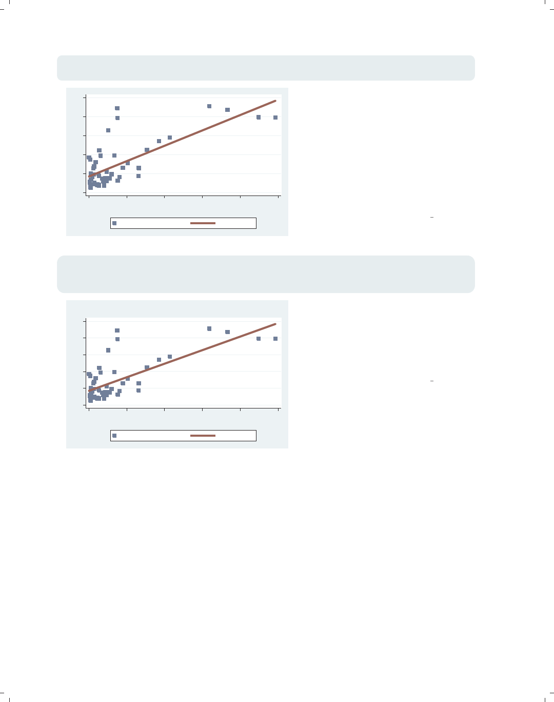
twoway (scatter propval100 popden)
(lfit propval100 popden)
Consider this graph, which shows a
scatterplot predicting property value
from population density and shows a
linear fit between these two variables.
Say that we wanted to change the
symbol displayed in the scatterplot and
the thickness of the line for the linear
fit.
Uses allstates.dta & scheme vg s2c
0 20 40 60 80 100
0 2000 4000 6000 8000 10000
Pop/10 sq. miles
% homes cost $100K+ Fitted values
Introduction Twoway Matrix Bar Box Dot Pie Options Standard options Styles Appendix
Using this book Types of Stata graphs Schemes Options Building graphs
The electronic form of this book is solely for direct use at UCLA and only by faculty, students, and staff of UCLA.
All rights reserved on the copyright page apply to this document and specifically neither the electronic nor
published form of the book may be distributed or reproduced, either electronically or in printed form.
i
i
i
i
i
i
i
i
26 Chapter 1. Introduction
twoway (scatter propval100 popden, msymbol(S))
(lfit propval100 popden, clwidth(vthick))
0 20 40 60 80 100
0 2000 4000 6000 8000 10000
Pop/10 sq. miles
% homes cost $100K+ Fitted values
Note that we add the msymbol() option
to the scatter command to change the
symbol to a square, and we add the
clwidth() (connect line width) option
to the lfit command to make the line
very thick. When we overlay two plots,
each plot can have its own options that
operate on its respective parts of the
graph. However, some parts of the
graph are shared, for example, the title.
Uses allstates.dta & scheme vg s2c
twoway (scatter propval100 popden, msymbol(S))
(lfit propval100 popden, clwidth(vthick)),
title("This is the title of the graph")
0 20 40 60 80 100
0 2000 4000 6000 8000 10000
Pop/10 sq. miles
% homes cost $100K+ Fitted values
This is the title of the graph Note that we add the title() option
to the very end of the command placed
after a comma. That final comma
signals that options concerning the
overall graph are to follow, in this case,
the title() option.
Uses allstates.dta & scheme vg s2c
One of the beauties of Stata graph commands is the way that different graph commands
share common options. If we want to customize the display of a legend, we do it using the
same options, whether we are using a bar graph, a box plot, a scatterplot, or any other
kind of Stata graph. Once we learn how to control legends with one type of graph, we have
learned how to control legends for all types of graphs. Let’s look at a couple of examples.
The electronic form of this book is solely for direct use at UCLA and only by faculty, students, and staff of UCLA.
All rights reserved on the copyright page apply to this document and specifically neither the electronic nor
published form of the book may be distributed or reproduced, either electronically or in printed form.
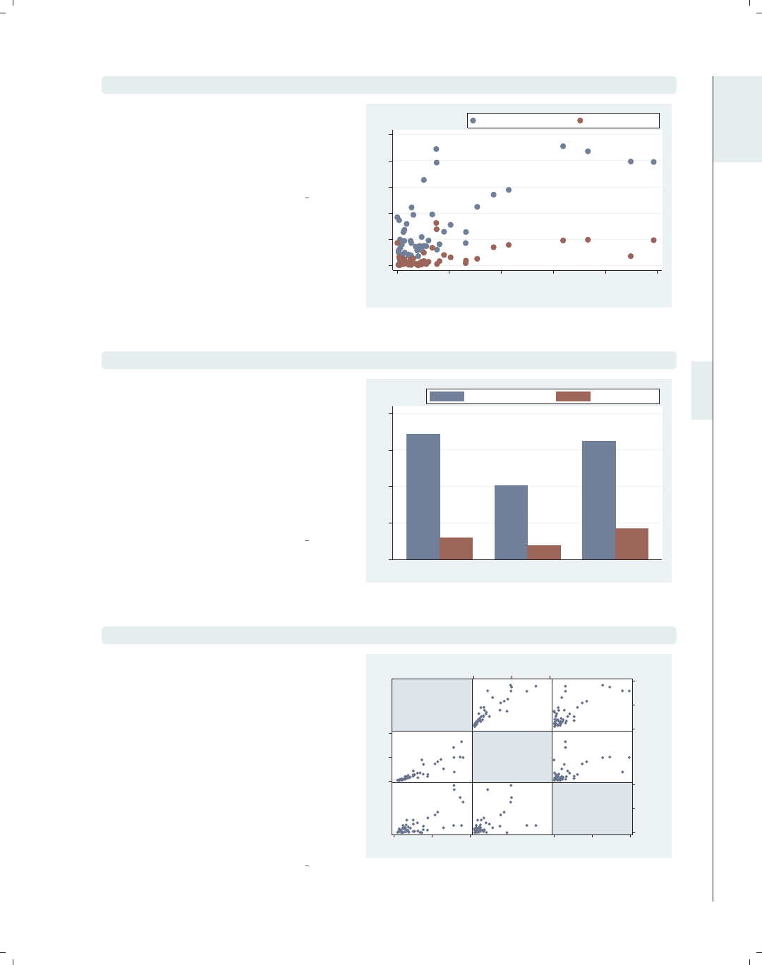
i
i
i
i
i
i
i
i
1.4 Options 27
twoway scatter propval100 rent700 popden, legend(position(1))
Consider this scatterplot. We have
added a legend() option to make the
legend display in the one o’clock
position on the graph, putting the
legend in the top right corner.
Uses allstates.dta & scheme vg s2c
0 20 40 60 80 100
0 2000 4000 6000 8000 10000
Pop/10 sq. miles
% homes cost $100K+ % rents $700+/mo
graph bar propval100 rent700, over(nsw) legend(position(1))
Here, we use the graph bar command,
which is a completely different
command from the previous one. Even
though the graphs are different, the
legend() option we supply is the same
and has the same effect. Many (but not
all) options function in this way,
sharing a common syntax and having
common effects.
Uses allstates.dta & scheme vg s2c
0 10 20 30 40
North South West
mean of propval100 mean of rent700
graph matrix propval100 rent700 popden, legend(position(1))
Contrast this example with the previous
two. The graph matrix command does
not support the legend() option
because this graph does not need or
produce legends. In the Matrix (95)
chapter, for example, there are no
references to legends, an indication that
this is not a relevant option for this
kind of graph. Note that, even though
we included this additional irrelevant
option, Stata ignored it and produced
an appropriate graph anyway.
Uses allstates.dta & scheme vg s2c
% homes
cost
$100K+
% rents
$700+/mo
Pop/10
sq.
miles
0
50
100
0 50 100
0
20
40
0 20 40
0
5000
10000
0 5000 10000
Introduction Twoway Matrix Bar Box Dot Pie Options Standard options Styles Appendix
Using this book Types of Stata graphs Schemes Options Building graphs
The electronic form of this book is solely for direct use at UCLA and only by faculty, students, and staff of UCLA.
All rights reserved on the copyright page apply to this document and specifically neither the electronic nor
published form of the book may be distributed or reproduced, either electronically or in printed form.

i
i
i
i
i
i
i
i
28 Chapter 1. Introduction
Because legends work the same way with different types of Stata graph commands, we
can save pages by describing legends in detail in one place: Options : Legend (287). However,
it is useful to see examples of legends for each type of graph that uses them. Each chapter,
therefore, provides a brief section describing legends for each type of graph discussed in
that chapter. Likewise, most options are described in detail in Options (235) with a brief
section in every chapter discussing how each option works in specific types of graphs. As
we saw in the case of legends, some options are not appropriate for some types of graphs,
so those options will not be discussed with the commands that do not support them.
While an option like legend() can be used with many, but not all, kinds of Stata graph
commands, other kinds of options can be used with almost every kind of Stata graph.
These are called Standard Options. To help you differentiate these kinds of options, they
are discussed in their own chapter, Standard options (313). Since these options can be used
with most types of graph commands, they are generally not discussed in the chapters about
the different types of graphs, except when their usage interacts with the options illustrated.
For example, subtitle() is a Standard Option, but its behavior takes on a special meaning
when used with the legend() option, so the subtitle() option is discussed in the context of
legends. Consistent with what we have seen before, the syntax of Standard Options follows
the same kinds of rules we have illustrated, and their usage and behavior are uniform across
the many types of Stata graph commands.
To recap, this section was not about any particular options, but about some of the rules
for using these options and how they behave. Some options permit options. In some cases,
you may want to specify only options. Some options allow you to include one or more
options, but no comma is required. When you overlay multiple graphs using twoway,you
may have options that go along with each graph, as well as overall options that appear at
the end of the command. Finally, the syntax of a certain option is the same across the
different graph commands that use the options, but not all options are useful for all kinds
of graph commands.
The electronic form of this book is solely for direct use at UCLA and only by faculty, students, and staff of UCLA.
All rights reserved on the copyright page apply to this document and specifically neither the electronic nor
published form of the book may be distributed or reproduced, either electronically or in printed form.

i
i
i
i
i
i
i
i
1.5 Building graphs 29
1.5 Building graphs
I have three agendas in writing this section. First, I will show the process of building
complex graphs a little bit at a time. At the same time, I illustrate how to use the resources
of this book to get the bits of information needed to build these graphs. Finally, I show that,
even though a complete Stata graph command might look complicated and overwhelming,
the process of building it slowly is actually very straightforward and logical. Let’s first build
a bar chart that looks at property values broken down by region of the country. Then, we
will modify the legend and bar characteristics, add titles, and so forth.
graph display
Say that we want to create this graph.
For now, the syntax is concealed, just
showing the graph display command
to show the previously drawn graph. It
might be overwhelming at first to
determine all of the options needed to
make this graph. To ease our task, we
will build it one bit at a time, refining
the graph and fixing any problems we
find.
Uses allstates.dta & scheme vg past
66.57
53.00
18.46
10.01
28.91
11.60 11.35
19.85
52.46
0
10
20
30
40
50
60
70
80
% homes over $100K
N. Eng.
Mid Atl
E.N.C.
W.N.C.
S. Atl.
E.S.C.
W.S.C.
Mountain
Pacific
Region
North South West
graph bar propval100, over(nsw) over(division)
We begin by seeing that this is a bar
chart and look at Bar : Y-variables (107)
and Bar : Over (111). We take our first
step towards making this graph by
making a bar chart showing
propval100 and adding over(nsw) and
over(division) to break the means
down by nsw and division.
Uses allstates.dta & scheme vg past
0 20 40 60 80
mean of propval100
N. Eng.Mid AtlE.N.C.W.N.C.S. Atl.E.S.C.W.S.C.MountainPacific
NorthSouthWestNorthSouthWestNorthSouthWestNorthSouthWestNorthSouthWestNorthSouthWestNorthSouthWestNorthSouthWestNorthSouthWest
Introduction Twoway Matrix Bar Box Dot Pie Options Standard options Styles Appendix
Using this book Types of Stata graphs Schemes Options Building graphs
The electronic form of this book is solely for direct use at UCLA and only by faculty, students, and staff of UCLA.
All rights reserved on the copyright page apply to this document and specifically neither the electronic nor
published form of the book may be distributed or reproduced, either electronically or in printed form.

i
i
i
i
i
i
i
i
30 Chapter 1. Introduction
graph bar propval100, over(nsw) over(division) nofill
0 20 40 60 80
mean of propval100
N. Eng.Mid AtlE.N.C.W.N.C.S. Atl.E.S.C.W.S.C.MountainPacific
North North North North South South South West West
The previous graph is not quite what
we want because we see every division
shown with every nsw, but for example,
the Pacific region only appears in the
West. In Bar : Over (111), we see that
we can add the nofill option to show
only the combinations of nsw and
division that exist in the data file.
Next, we will look at the colors of the
bars.
Uses allstates.dta & scheme vg past
graph bar propval100, over(nsw) over(division) nofill asyvars
0 20 40 60 80
mean of propval100
N. Eng. Mid Atl E.N.C. W.N.C. S. Atl. E.S.C. W.S.C.MountainPacific
North South
West
The last graph is getting closer, but we
want the bars for North, South, and
West to be displayed in different colors
and labeled with a legend. In
Bar : Y-variables (107), we see that the
asyvars option will accomplish this.
Next, we will change the title for the
y-axis.
Uses allstates.dta & scheme vg past
graph bar propval100, over(nsw) over(division) nofill asyvars
ytitle("% homes over $100K")
0 20 40 60 80
% homes over $100K
N. Eng. Mid Atl E.N.C. W.N.C. S. Atl. E.S.C. W.S.C.MountainPacific
North South
West
Now, we want to put a title on the
y-axis. In Bar : Y-axis (143), we see
examples illustrating the use of
ytitle() for putting a title on the
y-axis. Here, we put a title on the
y-axis, but now we want to change the
labels for the y-axis to go from 0 to 80,
incrementing by 10.
Uses allstates.dta & scheme vg past
The electronic form of this book is solely for direct use at UCLA and only by faculty, students, and staff of UCLA.
All rights reserved on the copyright page apply to this document and specifically neither the electronic nor
published form of the book may be distributed or reproduced, either electronically or in printed form.
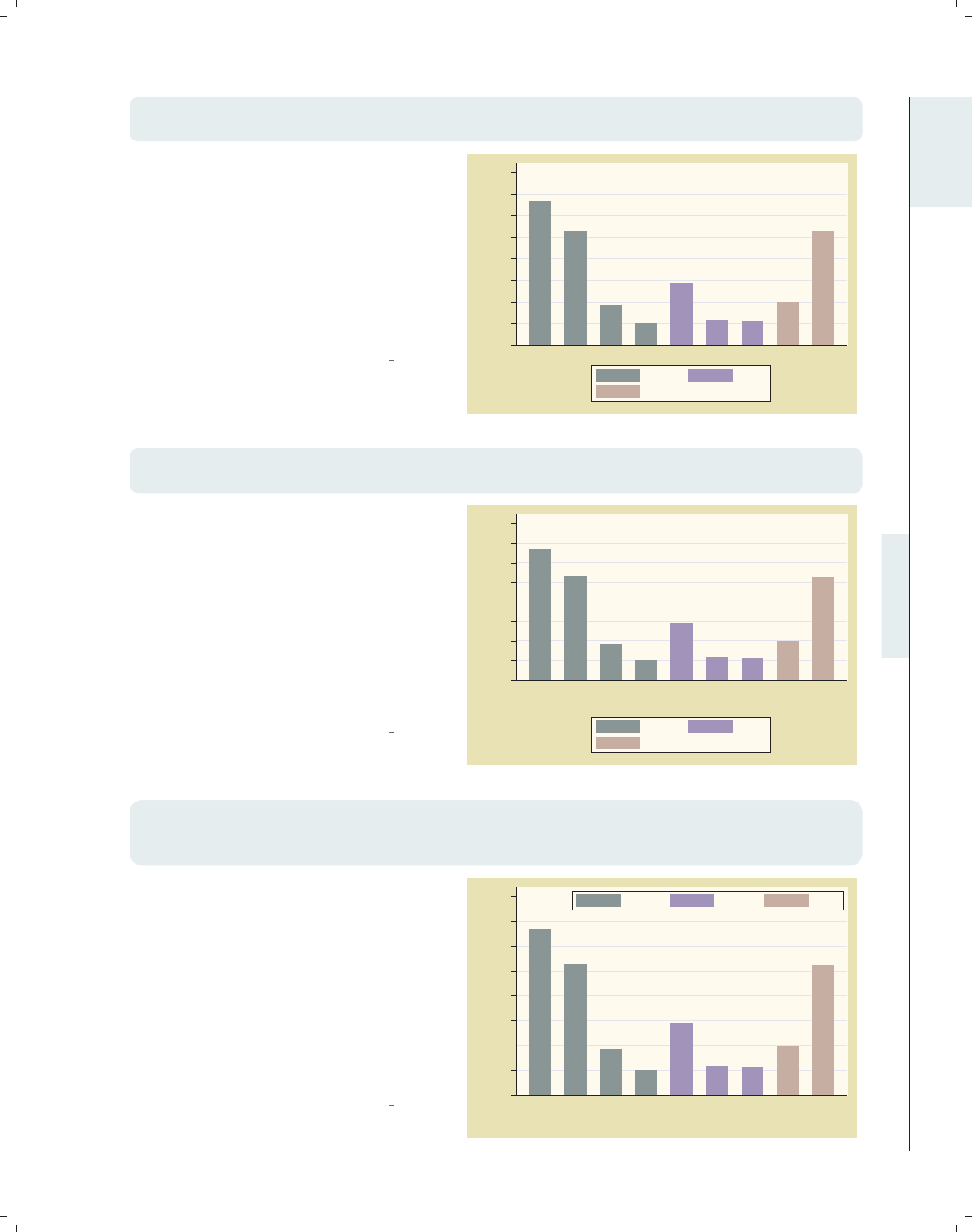
i
i
i
i
i
i
i
i
1.5 Building graphs 31
graph bar propval100, over(nsw) over(division) nofill asyvars
ytitle("% homes over $100K") ylabel(0(10)80, angle(0))
The Bar : Y-axis (143) section also tells
us about the ylabel() option. In
addition to changing the labels, we also
want to change the angle of the labels,
and in that section, we see that we can
use the angle() option to change the
angle of the labels. Now that we have
the y-axis labeled as we wish, let’s next
look at the title for the x-axis.
Uses allstates.dta & scheme vg past 0
10
20
30
40
50
60
70
80
% homes over $100K
N. Eng. Mid Atl E.N.C. W.N.C. S. Atl. E.S.C. W.S.C.MountainPacific
North South
West
graph bar propval100, over(nsw) over(division) nofill asyvars
ytitle("% homes over $100K") ylabel(0(10)80, angle(0)) b1title(Region)
After having used the ytitle() option
to label the y-axis, we might be
tempted to use the xtitle() option to
label the x-axis, but this axis is a
categorical variable. In Bar : Cat axis
(123), we see that this axis is treated
quite differently because of that. To
put a title below the graph, we use the
b1title() option. Now, let’s turn our
attention to formatting the legend.
Uses allstates.dta & scheme vg past
0
10
20
30
40
50
60
70
80
% homes over $100K
N. Eng. Mid Atl E.N.C. W.N.C. S. Atl. E.S.C. W.S.C.MountainPacific
Region
North South
West
graph bar propval100, over(nsw) over(division) nofill asyvars
ytitle("% homes over $100K") ylabel(0(10)80, angle(0)) b1title(Region)
legend(rows(1) position(1) ring(0))
Here, we want to use the legend()
option to make the legend have one row
in the top right corner within the plot
area. In Bar : Legend (130), we see that
the rows(1) option makes the legend
appear in one row and that the
position(1) option puts the legend in
the 1 o’clock position. The ring(0)
option puts the legend inside the plot
region. Next, let’s label the bars.
Uses allstates.dta & scheme vg past 0
10
20
30
40
50
60
70
80
% homes over $100K
N. Eng. Mid Atl E.N.C. W.N.C. S. Atl. E.S.C. W.S.C.MountainPacific
Region
North South West
Introduction Twoway Matrix Bar Box Dot Pie Options Standard options Styles Appendix
Using this book Types of Stata graphs Schemes Options Building graphs
The electronic form of this book is solely for direct use at UCLA and only by faculty, students, and staff of UCLA.
All rights reserved on the copyright page apply to this document and specifically neither the electronic nor
published form of the book may be distributed or reproduced, either electronically or in printed form.
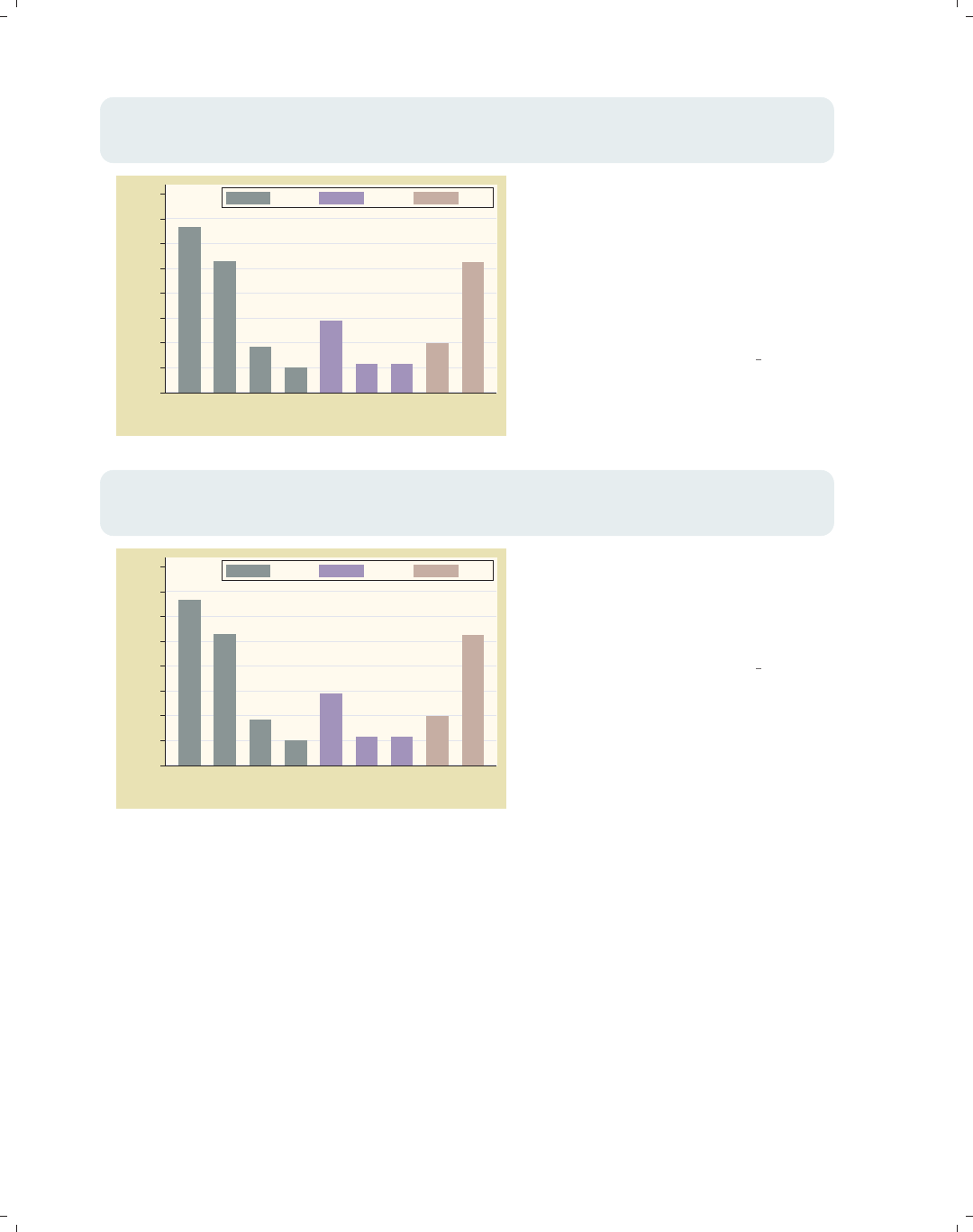
i
i
i
i
i
i
i
i
32 Chapter 1. Introduction
graph bar propval100, over(nsw) over(division) nofill asyvars
ytitle("% homes over $100K") ylabel(0(10)80, angle(0)) b1title(Region)
legend(rows(1) position(1) ring(0)) blabel(bar)
66.5667
53
18.46
10.0143
28.9125
11.6 11.35
19.85
52.46
0
10
20
30
40
50
60
70
80
% homes over $100K
N. Eng. Mid Atl E.N.C. W.N.C. S. Atl. E.S.C. W.S.C.MountainPacific
Region
North South West
We want each bar to be labeled with
the height of the bar, and Bar : Legend
(130) shows how we can do this. This
section shows how to use the blabel()
(bar label) option to label the bars in
lieu of legends. blabel() also can label
the bars with their height, using
blabel(bar).
Uses allstates.dta & scheme vg past
graph bar propval100, over(nsw) over(division) nofill asyvars
ytitle("% homes over $100K") ylabel(0(10)80, angle(0)) b1title(Region)
legend(rows(1) position(1) ring(0)) blabel(bar, format(%4.2f))
66.57
53.00
18.46
10.01
28.91
11.60 11.35
19.85
52.46
0
10
20
30
40
50
60
70
80
% homes over $100K
N. Eng. Mid Atl E.N.C. W.N.C. S. Atl. E.S.C. W.S.C.MountainPacific
Region
North South West
We want the labels for each bar to end
in two decimal places, and we see in
Bar : Legend (130) that we can use the
format() option to format these
numbersaswewish.
Uses allstates.dta & scheme vg past
The electronic form of this book is solely for direct use at UCLA and only by faculty, students, and staff of UCLA.
All rights reserved on the copyright page apply to this document and specifically neither the electronic nor
published form of the book may be distributed or reproduced, either electronically or in printed form.
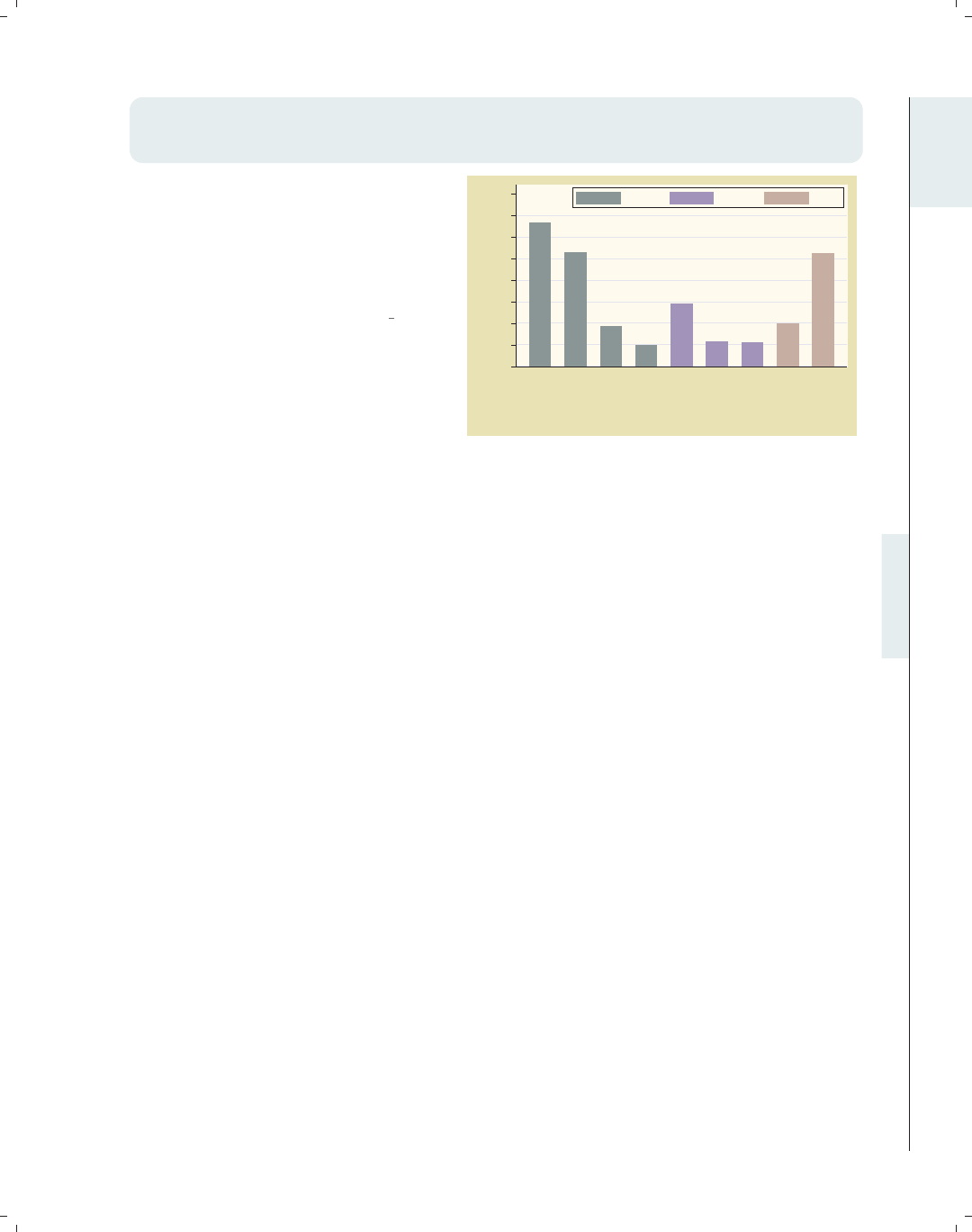
i
i
i
i
i
i
i
i
1.5 Building graphs 33
graph bar propval100, over(nsw) over(division, label(angle(45))) nofill
ytitle("% homes over $100K") ylabel(0(10)80, angle(0)) b1title(Region)
legend(rows(1) position(1) ring(0)) blabel(bar, format(%4.2f)) asyvars
Finally, in Bar : Cat axis (123), we see
that we can add the label(angle(45))
option to the over() option to specify
that labels for that variable be shown
at a 45-degree angle so they do not
overlap each other.
Uses allstates.dta & scheme vg past
66.57
53.00
18.46
10.01
28.91
11.60 11.35
19.85
52.46
0
10
20
30
40
50
60
70
80
% homes over $100K
N. Eng.
Mid Atl
E.N.C.
W.N.C.
S. Atl.
E.S.C.
W.S.C.
Mountain
Pacific
Region
North South West
This section has shown that it is not that difficult to create a complex graph by building
it one step at a time. You can use the resources in this book to seek out each piece of
information you need and then put those pieces together the way you want to create your
own graphs. For more information about how to integrate options to create complex Stata
graphs, see Appendix : More examples (366).
Introduction Twoway Matrix Bar Box Dot Pie Options Standard options Styles Appendix
Using this book Types of Stata graphs Schemes Options Building graphs
The electronic form of this book is solely for direct use at UCLA and only by faculty, students, and staff of UCLA.
All rights reserved on the copyright page apply to this document and specifically neither the electronic nor
published form of the book may be distributed or reproduced, either electronically or in printed form.

i
i
i
i
i
i
i
i
The electronic form of this book is solely for direct use at UCLA and only by faculty, students, and staff of UCLA.
All rights reserved on the copyright page apply to this document and specifically neither the electronic nor
published form of the book may be distributed or reproduced, either electronically or in printed form.
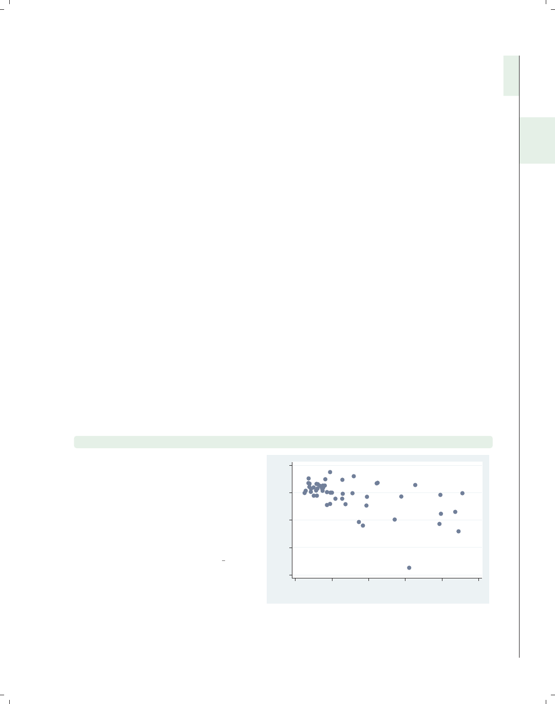
i
i
i
i
i
i
i
i
2 Twoway graphs
The graph twoway command represents not just a single kind of graph but actually
over thirty different kinds of graphs. Many of these graphs are similar in appearance and
function, so I have grouped them into eight families, which form the first eight sections
of this chapter. These first eight sections, which cover scatterplots to distribution plots,
cover the general features of these plots and briefly mention some important options. These
are followed by a section giving an overview of the options that can be used with twoway
graphs. (For further details about the options that can be used with twoway graphs, see
Options (235) and the sections within that chapter.) The chapter concludes with a section
illustrating how you can overlay twoway graphs. For more details about graph twoway,see
[G]graph twoway.
2.1 Scatterplots
This section covers the use of scatterplots. Because scatterplots are so commonly used,
this section will cover more details about the use of these graphs than subsequent sections.
Also, this section will introduce some of the kinds of options that can be used with many
kinds of twoway plots, with cross-references to Options (235).
graph twoway scatter ownhome propval100
Here is a basic scatterplot. Note that
this command starts with graph
twoway, which indicates that this is a
twoway graph. scatter indicates that
we are creating a twoway scatterplot.
These are followed by the variable to be
placed on the y-axis and then the
variable for the x-axis.
Uses allstates.dta & scheme vg s2c
40 50 60 70 80
% who own home
0 20 40 60 80 100
% homes cost $100K+
Introduction Twoway Matrix Bar Box Dot Pie Options Standard options Styles Appendix
Scatter Fit CI fit Line Area Bar Range Distribution Options Overlaying
35
The electronic form of this book is solely for direct use at UCLA and only by faculty, students, and staff of UCLA.
All rights reserved on the copyright page apply to this document and specifically neither the electronic nor
published form of the book may be distributed or reproduced, either electronically or in printed form.
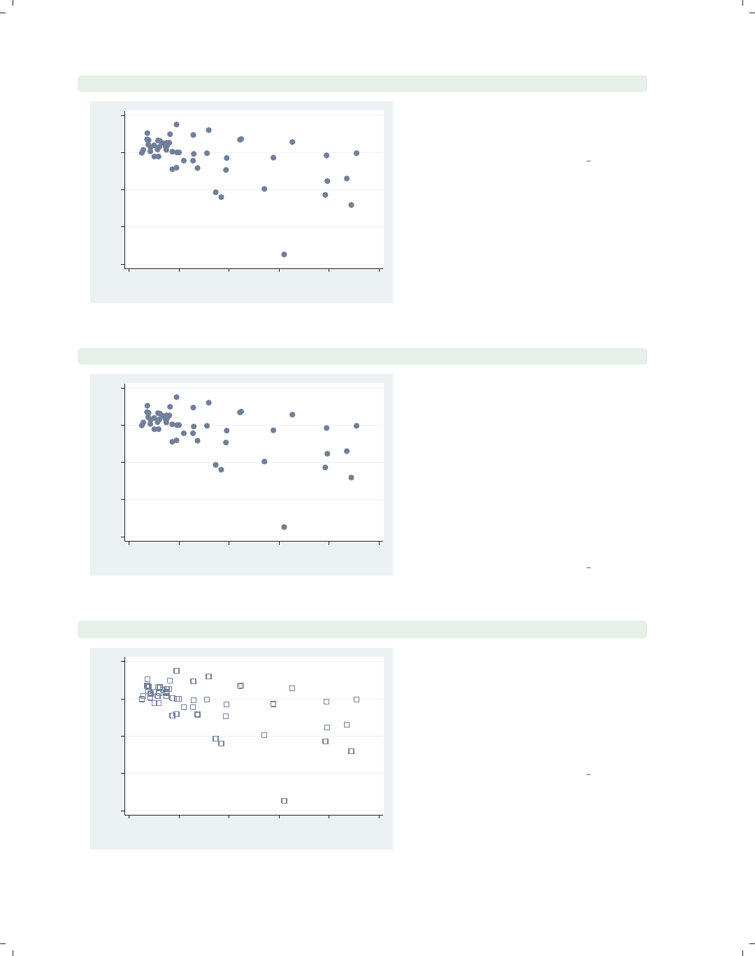
i
i
i
i
i
i
i
i
36 Chapter 2. Twoway graphs
twoway scatter ownhome propval100
40 50 60 70 80
% who own home
0 20 40 60 80 100
% homes cost $100K+
Since it can be cumbersome to type
graph twoway scatter, Stata allows
you to shorten this to twoway scatter.
Uses allstates.dta & scheme vg s2c
scatter ownhome propval100
40 50 60 70 80
% who own home
0 20 40 60 80 100
% homes cost $100K+
In fact, some graph twoway commands
are so frequently used that Stata
permits you to omit the graph twoway,
as we have done here, and just start the
command with scatter. While this
can save some typing, this can
sometimes conceal the fact that the
command is really a twoway graph and
that these are a special class of graphs.
For clarity, I will generally present
these graphs starting with twoway.
Uses allstates.dta & scheme vg s2c
twoway scatter ownhome propval100, msymbol(Sh)
40 50 60 70 80
% who own home
0 20 40 60 80 100
% homes cost $100K+
You can control the marker symbol with
the msymbol() option. Here, we make
the symbols large, hollow squares. See
Options : Markers (235) for more details
about controlling the marker symbol,
size, and color, and see Styles : Symbols
(342) for the symbols you can select.
Uses allstates.dta & scheme vg s2c
The electronic form of this book is solely for direct use at UCLA and only by faculty, students, and staff of UCLA.
All rights reserved on the copyright page apply to this document and specifically neither the electronic nor
published form of the book may be distributed or reproduced, either electronically or in printed form.
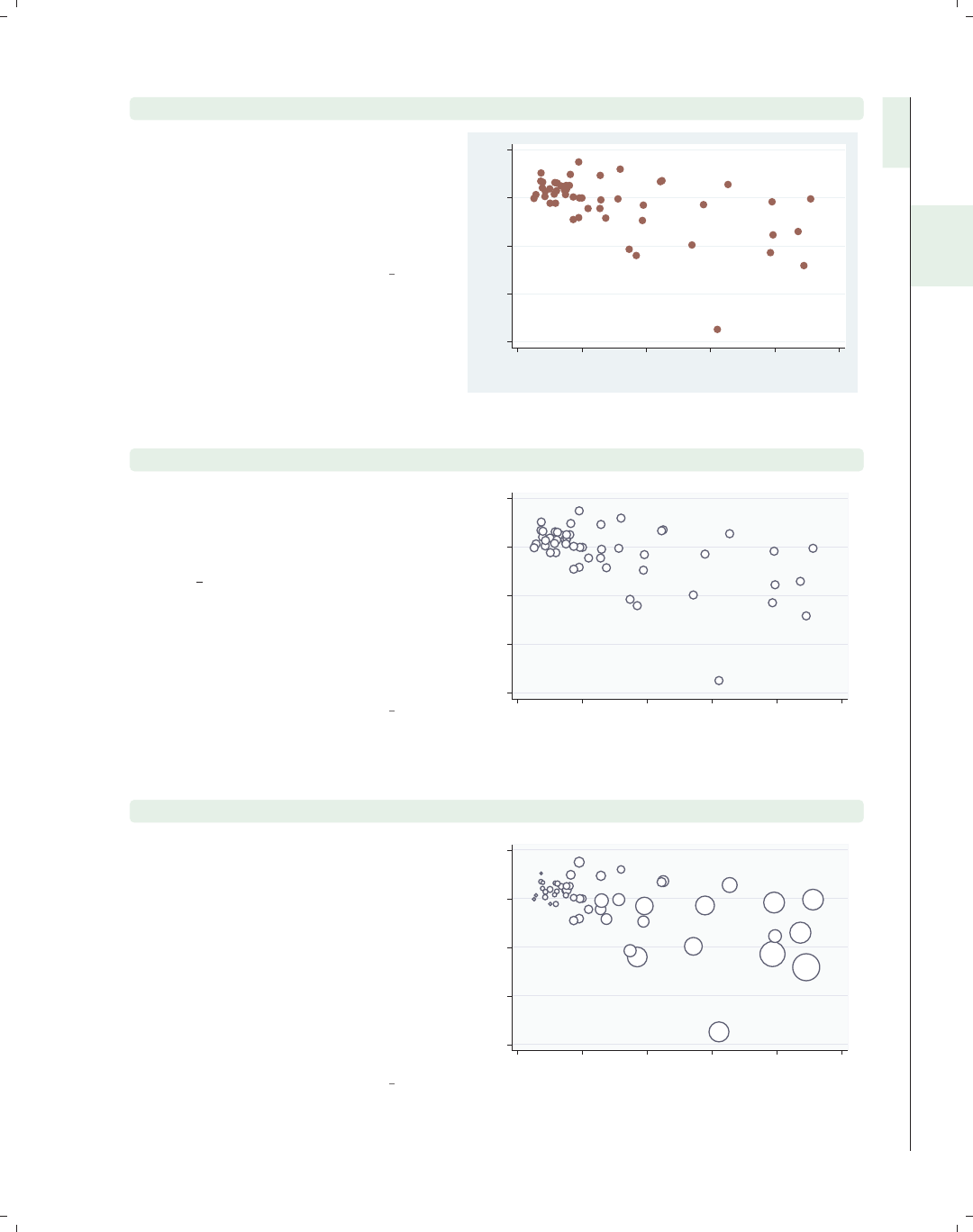
i
i
i
i
i
i
i
i
2.1 Scatterplots 37
twoway scatter ownhome propval100, mcolor(maroon)
You can control the marker color with
the mcolor() option. Here, we make
the markers maroon. See Styles : Colors
(328) for other colors you could choose
and also Options : Markers (235) for
more details.
Uses allstates.dta & scheme vg s2c
40 50 60 70 80
% who own home
0 20 40 60 80 100
% homes cost $100K+
twoway scatter ownhome propval100, msize(vlarge)
You can control the marker size with
the msize() option. Using
msize(vlarge), we make the markers
very large. Note that we switched to
the vg outc scheme, showing
white-filled markers, which can be
useful when the markers are large. See
Styles : Markersize (340) for other sizes
you could choose and also
Options : Markers (235) for more details.
Uses allstates.dta & scheme vg outc
40 50 60 70 80
% who own home
0 20 40 60 80 100
% homes cost $100K+
twoway scatter ownhome propval100 [aweight=rent700], msize(small)
You can also use a weight variable to
determine the size of the symbols.
Using [aweight=rent700],wesizethe
symbols according to the proportion of
rents that exceed 700 dollars per
month, allowing us to graph three
variables at once. We add the
msize(small) option to shrink the size
of all the markers so they do not get
too large. See Options : Markers (235)
for more details.
Uses allstates.dta & scheme vg outc
40 50 60 70 80
% who own home
0 20 40 60 80 100
% homes cost $100K+
Introduction Twoway Matrix Bar Box Dot Pie Options Standard options Styles Appendix
Scatter Fit CI fit Line Area Bar Range Distribution Options Overlaying
The electronic form of this book is solely for direct use at UCLA and only by faculty, students, and staff of UCLA.
All rights reserved on the copyright page apply to this document and specifically neither the electronic nor
published form of the book may be distributed or reproduced, either electronically or in printed form.
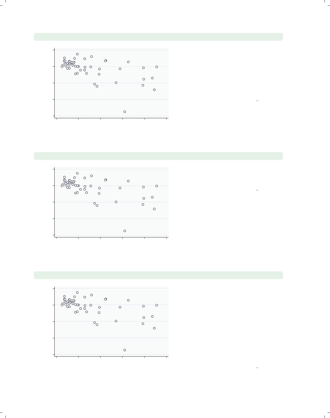
i
i
i
i
i
i
i
i
38 Chapter 2. Twoway graphs
twoway scatter ownhome propval100, mlabel(stateab)
AL
AK
AZ
AR
CA
CO
CT
DE
DC
FL
GA
HI
ID
IL
IN
IA
KS
KY
LA
ME
MD
MA
MI
MN
MS MO
MT
NE
NV
NH
NJ
NM
NY
NC
ND OH
OK
OR
PA
RI
SC
SD TN
TX
UT VT
VA
WA
WV WI
WY
40 50 60 70 80
% who own home
0 20 40 60 80 100
% homes cost $100K+
The mlabel(stateab) option can be
used to add a marker label with the
state abbreviation. See
Options : Marker labels (247) for more
details about how you can control the
size, position, color, and angle of
marker labels.
Uses allstates.dta & scheme vg outc
twoway scatter ownhome propval100, mlabel(stateab) mlabsize(vlarge)
AL
AK
AZ
AR
CA
CO
CT
DE
DC
FL
GA
HI
ID IL
IN
IA
KS
KY
LA
ME
MD
MA
MI
MN
MSMO
MT
NE
NV
NH
NJ
NM
NY
NC
ND OH
OK
OR
PA
RI
SC
SD TN
TX
UT VT
VA
WA
WV WI
WY
40 50 60 70 80
% who own home
0 20 40 60 80 100
% homes cost $100K+
The mlabsize(vlarge) option controls
the marker label size. Here, we make
the marker label very large.
Uses allstates.dta & scheme vg outc
twoway scatter ownhome propval100, mlabel(stateab) mlabposition(12)
AL
AK
AZ
AR
CA
CO
CT
DE
DC
FL
GA
HI
ID
IL
IN
IA
KS
KY
LA
ME
MD
MA
MI
MN
MS MO
MT
NE
NV
NH
NJ
NM
NY
NC
ND OH
OK
OR
PA
RI
SC
SD TN
TX
UT VT
VA
WA
WV WI
WY
40 50 60 70 80
% who own home
0 20 40 60 80 100
% homes cost $100K+
The mlabposition() option controls
the marker label position with respect
to the marker. Here, we place the
marker labels at the 12 o’clock position
with respect to the markers, placing the
labels directly above the points they
label. See Options : Marker labels (247)
for examples illustrating the
mlabvposition() option, which
permits different marker label positions
for different observations.
Uses allstates.dta & scheme vg outc
The electronic form of this book is solely for direct use at UCLA and only by faculty, students, and staff of UCLA.
All rights reserved on the copyright page apply to this document and specifically neither the electronic nor
published form of the book may be distributed or reproduced, either electronically or in printed form.
i
i
i
i
i
i
i
i
2.1 Scatterplots 39
twoway scatter ownhome propval100, mlabel(stateab)
mlabposition(0) msymbol(i)
The mlabposition(0) option places
the marker label in the center position.
To keep it from being obscured by the
marker symbol, we also add the
msymbol(i) option to make the marker
symbol invisible. In effect, the marker
symbols have been replaced by the
marker labels.
Uses allstates.dta & scheme vg outc
AL
AK
AZ
AR
CA
CO
CT
DE
DC
FL
GA
HI
ID
IL
IN
IA
KS
KY
LA
ME
MD
MA
MI
MN
MS MO
MT
NE
NV
NH
NJ
NM
NY
NC
ND OH
OK
OR
PA
RI
SC
SD TN
TX
UT VT
VA
WA
WV WI
WY
40 50 60 70 80
% who own home
0 20 40 60 80 100
% homes cost $100K+
twoway scatter fv propval100
Say that we ran the following
commands:
. regress ownhome propval100
. predict fv
The variable fv represents the fit
values, and here we graph fv against
propval100. As we expect, all of the
points fall along a line, but they are not
connected. The next few examples will
consider options you can use to connect
points; see Options : Connecting (250)
for more details. For variety, we have
switched to the vg past scheme.
Uses allstates.dta & scheme vg past
60 65 70 75
yhat ownhome|propval100
0 20 40 60 80 100
% homes cost $100K+
twoway scatter fv propval100, connect(l) sort
We add the connect(l) option to
indicate that the points should be
connected with a line. We also add the
sort option, which is generally
recommended when you connect
observations and the data are not
already sorted on the x-variable.
Uses allstates.dta & scheme vg past
60 65 70 75
yhat ownhome|propval100
0 20 40 60 80 100
% homes cost $100K+
Introduction Twoway Matrix Bar Box Dot Pie Options Standard options Styles Appendix
Scatter Fit CI fit Line Area Bar Range Distribution Options Overlaying
The electronic form of this book is solely for direct use at UCLA and only by faculty, students, and staff of UCLA.
All rights reserved on the copyright page apply to this document and specifically neither the electronic nor
published form of the book may be distributed or reproduced, either electronically or in printed form.
i
i
i
i
i
i
i
i
40 Chapter 2. Twoway graphs
twoway scatter fv ownhome propval100, connect(l i) sort
40 50 60 70 80
0 20 40 60 80 100
% homes cost $100K+
yhat ownhome|propval100 % who own home
We can show both the observations and
the fit values in one graph. The
connect(l i) option specifies that the
first y-variable should be connected
with straight lines (lfor line) and the
second y-variable should not be
connected (ifor invisible connection).
Uses allstates.dta & scheme vg past
twoway scatter fv ownhome propval100, msymbol(i .) connect(l i)
sort
40 50 60 70 80
0 20 40 60 80 100
% homes cost $100K+
yhat ownhome|propval100 % who own home
The msymbol(i .) option specifies
that the first y-variable should not have
symbols displayed (ifor invisible
symbol) and that the second y-variable
should have the default symbols
displayed.
Uses allstates.dta & scheme vg past
twoway scatter fv ownhome propval100, msymbol(i .) connect(l i)
sort legend(label(1 Pred. Perc. Own))
40 50 60 70 80
0 20 40 60 80 100
% homes cost $100K+
Pred. Perc. Own % who own home
The legend() option can be used to
control the legend. We use the label()
option to specify the contents of the
first item in the legend. See
Options : Legend (287) for more details
on legends.
Uses allstates.dta & scheme vg past
The electronic form of this book is solely for direct use at UCLA and only by faculty, students, and staff of UCLA.
All rights reserved on the copyright page apply to this document and specifically neither the electronic nor
published form of the book may be distributed or reproduced, either electronically or in printed form.
i
i
i
i
i
i
i
i
2.1 Scatterplots 41
twoway scatter fv ownhome propval100, msymbol(i .) connect(l i)
sort legend(label(1 Pred. Perc. Own) order(2 1))
The order() option can be used to
specify the order in which the items in
the legend are displayed.
Uses allstates.dta & scheme vg past
40 50 60 70 80
0 20 40 60 80 100
% homes cost $100K+
% who own home Pred. Perc. Own
twoway scatter fv ownhome propval100, msymbol(i .) connect(l i)
sort legend(label(1 Pred. Perc. Own) order(2 1) cols(1))
The cols(1) option makes the items in
the legend display in a single column.
Uses allstates.dta & scheme vg past
40 50 60 70 80
0 20 40 60 80 100
% homes cost $100K+
% who own home
Pred. Perc. Own
twoway scatter ownhome propval100,
xtitle("Percent homes over $100K") ytitle("Percent who own home")
The xtitle() and ytitle() option
can be used to specify the titles for the
x-andy-axes. See Options : Axis titles
(254) for more details about how to
control the display of axes. Note that
we are now using the vg s2m scheme,
one you might favor for graphs that will
be printed in black and white.
Uses allstates.dta & scheme vg s2m
40 50 60 70 80
Percent who own home
0 20 40 60 80 100
Percent homes over $100K
Introduction Twoway Matrix Bar Box Dot Pie Options Standard options Styles Appendix
Scatter Fit CI fit Line Area Bar Range Distribution Options Overlaying
The electronic form of this book is solely for direct use at UCLA and only by faculty, students, and staff of UCLA.
All rights reserved on the copyright page apply to this document and specifically neither the electronic nor
published form of the book may be distributed or reproduced, either electronically or in printed form.

i
i
i
i
i
i
i
i
42 Chapter 2. Twoway graphs
twoway scatter ownhome propval100,
ytitle("Percent who own home", size(huge))
40 50 60 70 80
Percent who own home
0 20 40 60 80 100
% homes cost $100K+
Here, we use the size(huge) option to
make the title on the y-axis huge. For
other text sizes you could choose, see
Styles : Textsize (344).
Uses allstates.dta & scheme vg s2m
twoway scatter ownhome propval100, xlabel(0(10)100) ylabel(40(5)80)
40 45 50 55 60 65 70 75 80
% who own home
0 10 20 30 40 50 60 70 80 90 100
% homes cost $100K+
We use the ylabel() and xlabel()
options to control the labeling of the x-
and y-axes. We label the x-axis from 0
to 100, incrementing by 10, and the
y-axis from 40 to 80, incrementing by 5.
See Options : Axis labels (256) for more
details on labeling axes.
Uses allstates.dta & scheme vg s2m
twoway scatter ownhome propval100, xlabel(#10) ylabel(#5)
40 50 60 70 80
% who own home
0 10 20 30 40 50 60 70 80 90
% homes cost $100K+
In this example, we use the
xlabel(#10) option to ask Stata to use
approximately 10 nice labels and the
ylabel(#5) option to use
approximately 5 nice labels. In this
case, our gentle request was observed
exactly, but in some cases, Stata will
choose somewhat different values to
create axis labels it believes are logical.
Uses allstates.dta & scheme vg s2m
The electronic form of this book is solely for direct use at UCLA and only by faculty, students, and staff of UCLA.
All rights reserved on the copyright page apply to this document and specifically neither the electronic nor
published form of the book may be distributed or reproduced, either electronically or in printed form.
i
i
i
i
i
i
i
i
2.1 Scatterplots 43
twoway scatter ownhome propval100, xlabel(#10) ylabel(#5, nogrid)
Using the nogrid option, we can
suppress the display of the grid. Note
that this option is placed within the
ylabel() option, thus suppressing the
grid for the y-axis. If the grid were
absent, and we wished to include it, we
could add the grid option. (You can
also specify grid or nogrid within the
xlabel() option to control grids for the
x-axis.) For more details, see
Options : Axis labels (256).
Uses allstates.dta & scheme vg s2m
40 50 60 70 80
% who own home
0 10 20 30 40 50 60 70 80 90
% homes cost $100K+
twoway scatter ownhome propval100, xlabel(#10) ylabel(#5, nogrid)
yline(55 75, lwidth(thin) lcolor(black) lpattern(dash))
The yline() option is used to add a
thin, black, dashed line to the graph
where yequals 55 and 75.
Uses allstates.dta & scheme vg s2m
40 50 60 70 80
% who own home
0 10 20 30 40 50 60 70 80 90
% homes cost $100K+
twoway scatter ownhome propval100, xscale(alt)
Here, we use the xscale() option to
request that the x-axis be placed in its
alternate position, in this case at the
top instead of at the bottom. To learn
more about axis scales, including
suppressing, extending, or relocating
them, see Options : Axis scales (265).
Uses allstates.dta & scheme vg s2m
40 50 60 70 80
% who own home
0 20 40 60 80 100
% homes cost $100K+
Introduction Twoway Matrix Bar Box Dot Pie Options Standard options Styles Appendix
Scatter Fit CI fit Line Area Bar Range Distribution Options Overlaying
The electronic form of this book is solely for direct use at UCLA and only by faculty, students, and staff of UCLA.
All rights reserved on the copyright page apply to this document and specifically neither the electronic nor
published form of the book may be distributed or reproduced, either electronically or in printed form.
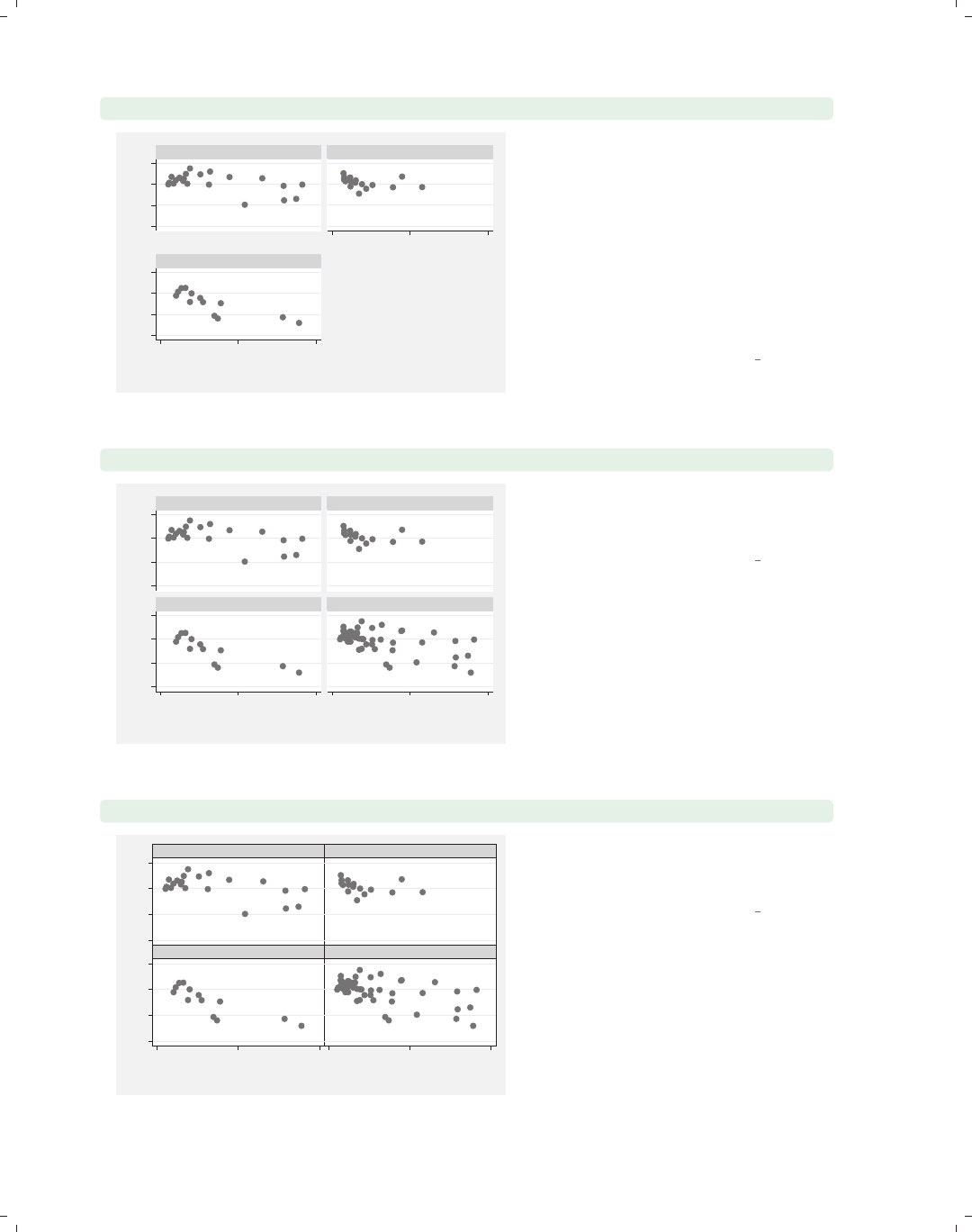
i
i
i
i
i
i
i
i
44 Chapter 2. Twoway graphs
twoway scatter ownhome propval100, by(nsw)
50 60 70 8050 60 70 80
0 50 100
0 50 100
North South
West
% who own home
% homes cost $100K+
Graphs by Region North, South, or West
The by(nsw) option is used here to
make separate graphs for states in the
North, South, and West. At the bottom
left corner, you can see a note that
describes how the separate graphs
arose. This is based on the variable
label for nsw; if this variable had not
been labeled, it would have read Graphs
by nsw. See Options : By (272) for more
details about using the by() option.
Uses allstates.dta & scheme vg s2m
twoway scatter ownhome propval100, by(nsw, total)
50 60 70 8050 60 70 80
0 50 100 0 50 100
North South
West Total
% who own home
% homes cost $100K+
Graphs by Region North, South, or West
The total option can be used within
the by() option to add an additional
graph showing all the observations.
Uses allstates.dta & scheme vg s2m
twoway scatter ownhome propval100, by(nsw, total compact)
50 60 70 8050 60 70 80
0 50 1000 50 100
North South
West Total
% who own home
% homes cost $100K+
Graphs by Region North, South, or West
The compact option can be used to
make the graphs display more
compactly.
Uses allstates.dta & scheme vg s2m
The electronic form of this book is solely for direct use at UCLA and only by faculty, students, and staff of UCLA.
All rights reserved on the copyright page apply to this document and specifically neither the electronic nor
published form of the book may be distributed or reproduced, either electronically or in printed form.
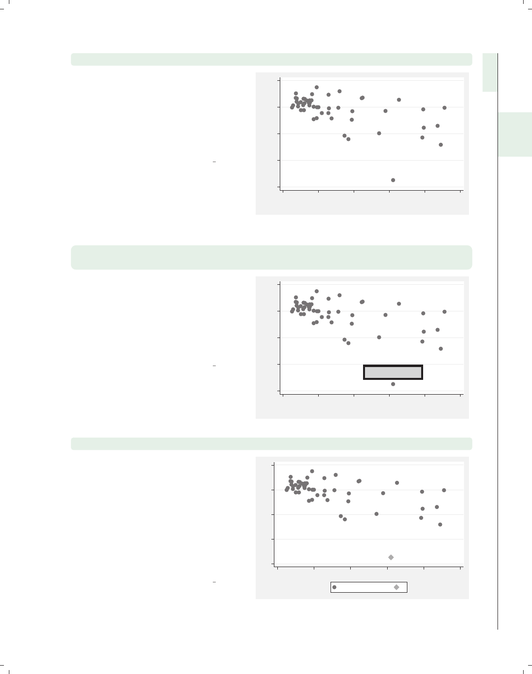
i
i
i
i
i
i
i
i
2.1 Scatterplots 45
twoway scatter ownhome propval100, text(47 62 "Washington, DC")
We can use the text() option to add
text to the graph. We add text to label
the observation belonging to
Washington, DC. See
Options : Adding text (299) for more
information about adding text in the
section.
Uses allstates.dta & scheme vg s2m
Washington, DC
40 50 60 70 80
% who own home
0 20 40 60 80 100
% homes cost $100K+
twoway scatter ownhome propval100, text(47 62 "Washington, DC", size(large)
margin(medsmall) blwidth(vthick) box)
Stata gives you considerable control
over the display of text you add to the
graph, as well as the ability to enclose
the text in a box and control the
characteristics of the box. See
Options : Textboxes (303) for more
details.
Uses allstates.dta & scheme vg s2m
Washington, DC
40 50 60 70 80
% who own home
0 20 40 60 80 100
% homes cost $100K+
twoway (scatter ownhome propval100) (scatteri 42.6 62.1 "DC")
This graph uses the scatteri (scatter
immediate) command to plot and label
a point for Washington, DC. The values
42.6 and 62.1 are the values for
ownhome and propval100 for
Washington, DC, and are followed by
"DC", which acts as a marker label for
that point. If we had instead specified
(9) "DC", then “DC” would have been
plotted at the 9 o’clock position.
Uses allstates.dta & scheme vg s2m
DC
40 50 60 70 80
0 20 40 60 80 100
% who own home y
Introduction Twoway Matrix Bar Box Dot Pie Options Standard options Styles Appendix
Scatter Fit CI fit Line Area Bar Range Distribution Options Overlaying
The electronic form of this book is solely for direct use at UCLA and only by faculty, students, and staff of UCLA.
All rights reserved on the copyright page apply to this document and specifically neither the electronic nor
published form of the book may be distributed or reproduced, either electronically or in printed form.

i
i
i
i
i
i
i
i
46 Chapter 2. Twoway graphs
twoway (scatter ownhome propval100)
(scatteri 42.6 62.1 "DC" 55.9 89 (8) "HI"),legend(off)
DC
HI
40 50 60 70 80
0 20 40 60 80 100
This graph extends the previous
example by adding a second point for
Hawaii and providing a position for the
marker label for Hawaii, placing it at
the 8 o’clock position. In addition, the
legend(off) option suppresses the
legend. Finally, this graph uses the
vg samec scheme, so the markers
created via scatteri look identical to
the other markers.
Uses allstates.dta & scheme vg samec
This section concludes by looking at some additional graph commands that make graphs
similar to twoway scatter, namely, twoway spike,twoway dropline,andtwoway dot.
Most of the options we have illustrated before apply to these graphs as well, so they will
not be repeated here. We will switch to using the vg blue scheme for the rest of the graphs
in this section.
twoway scatter r yhat
−40
−20
0
20
40
60
resid propval100|urban
0 20 40 60
yhat propval100|urban
Imagine that we ran a regression
predicting propval100 from urban and
generated the residual, calling it r,and
the predicted value, calling it yhat.
Consider this graph using the scatter
command to display the residual by the
predicted value.
Uses allstates.dta & scheme vg blue
The electronic form of this book is solely for direct use at UCLA and only by faculty, students, and staff of UCLA.
All rights reserved on the copyright page apply to this document and specifically neither the electronic nor
published form of the book may be distributed or reproduced, either electronically or in printed form.
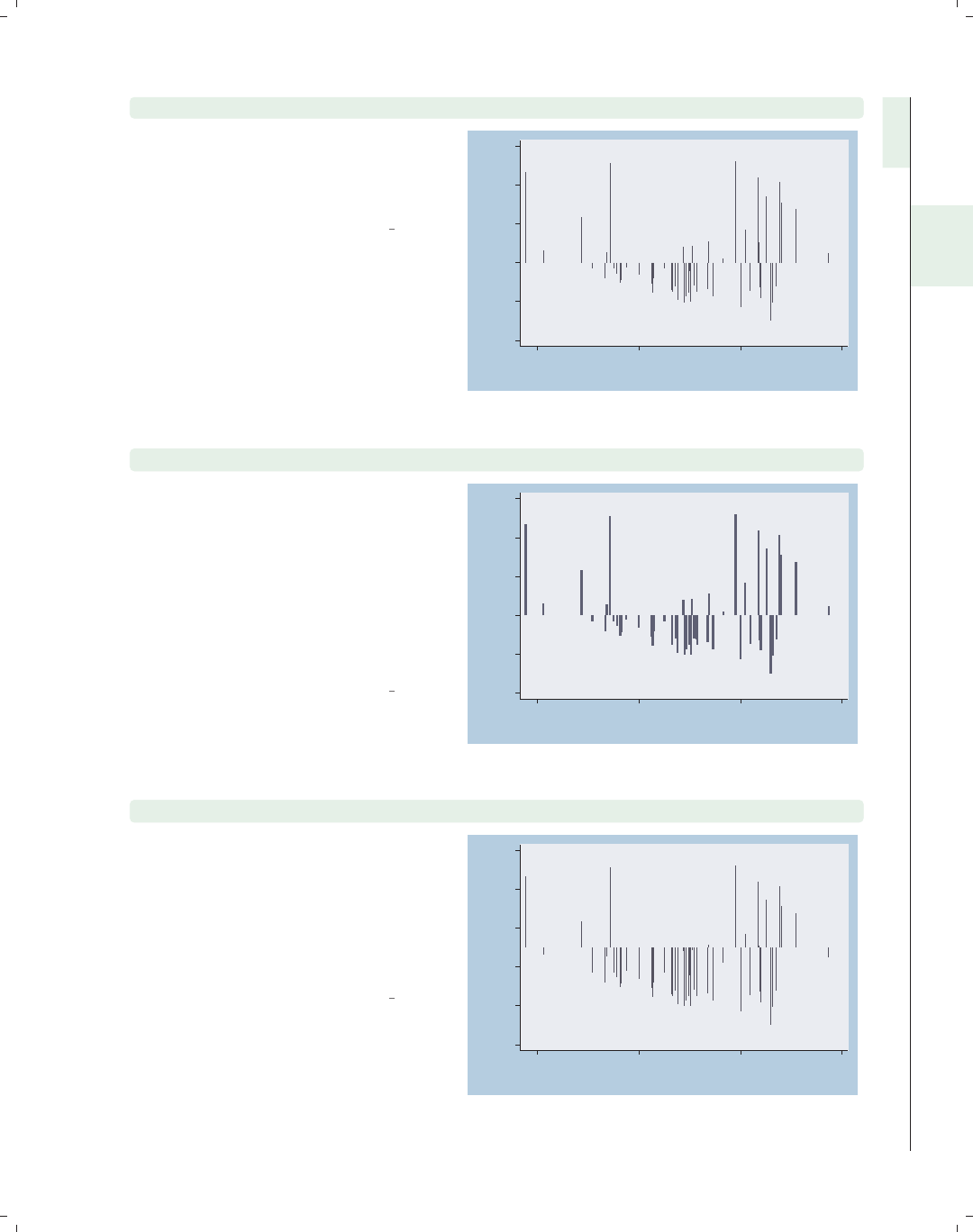
i
i
i
i
i
i
i
i
2.1 Scatterplots 47
twoway spike r yhat
This same graph could be shown using
the spike command. This produces a
spike plot, and each spike, by default,
originates from 0.
Uses allstates.dta & scheme vg blue
−40
−20
0
20
40
60
resid propval100|urban
0 20 40 60
yhat propval100|urban
twoway spike r yhat, blcolor(navy) blwidth(thick)
You can use the blcolor() (bar line
color) option to set the color of the
spikes and the blwidth() (bar line
width) option to set the width of the
spikes. Here, we make the spikes thick
and navy. See Styles : Colors (328) for
more details about specifying colors
and see Styles : Linewidth (337) for more
details about specifying line widths.
Uses allstates.dta & scheme vg blue −40
−20
0
20
40
60
resid propval100|urban
0 20 40 60
yhat propval100|urban
twoway spike r yhat, base(10)
By default, the base is placed at 0,
which is a very logical choice when
displaying residuals since our interest is
in deviations from 0. For illustration,
we use the base(10) option to set the
base of the y-axis to be 10, and the
spikes are displayed with respect to 10.
Uses allstates.dta & scheme vg blue
−40
−20
0
20
40
60
resid propval100|urban
0 20 40 60
yhat propval100|urban
Introduction Twoway Matrix Bar Box Dot Pie Options Standard options Styles Appendix
Scatter Fit CI fit Line Area Bar Range Distribution Options Overlaying
The electronic form of this book is solely for direct use at UCLA and only by faculty, students, and staff of UCLA.
All rights reserved on the copyright page apply to this document and specifically neither the electronic nor
published form of the book may be distributed or reproduced, either electronically or in printed form.
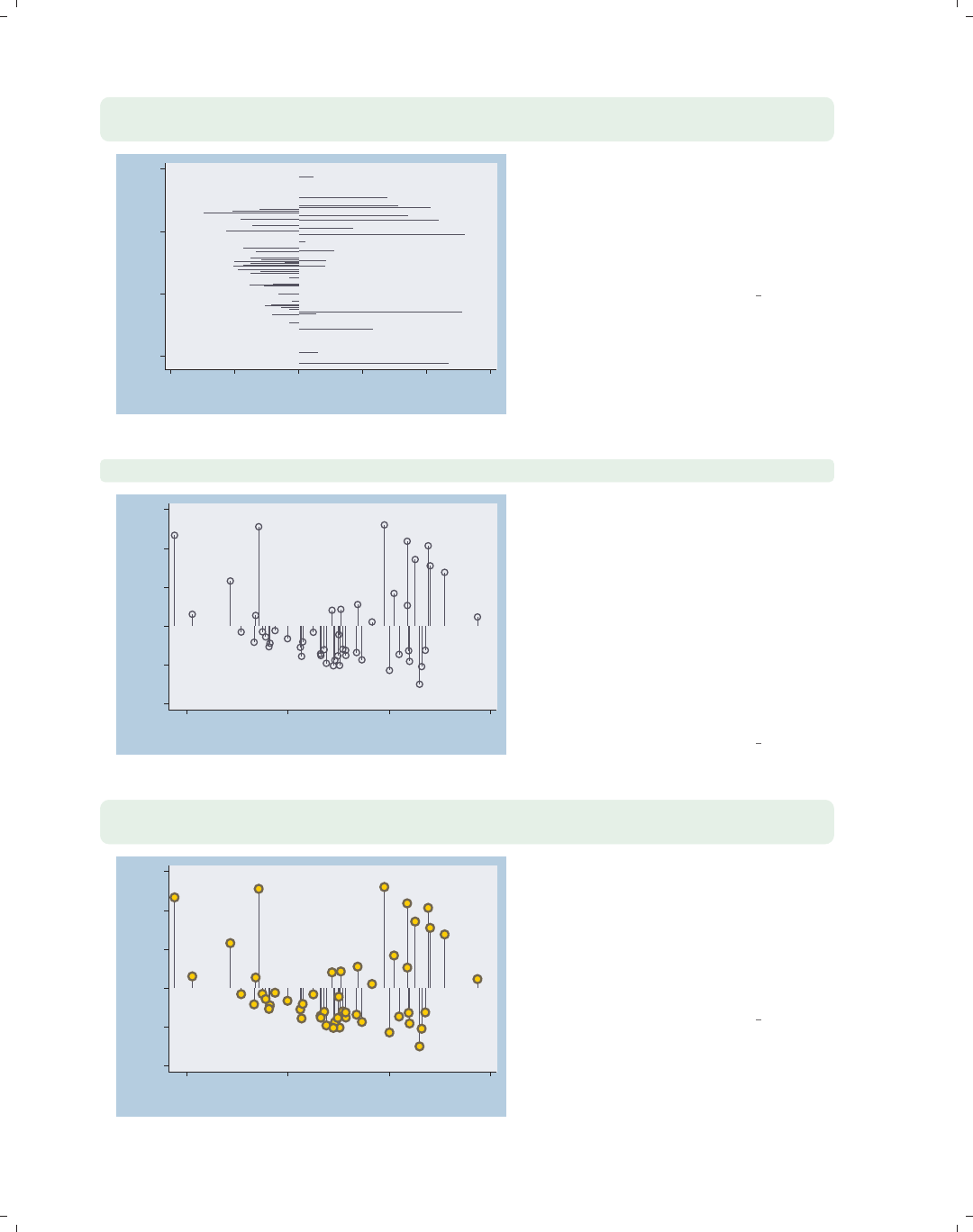
i
i
i
i
i
i
i
i
48 Chapter 2. Twoway graphs
twoway spike r yhat, horizontal xtitle(Title for x-axis)
ytitle(Title for y-axis)
0
20
40
60
Title for y−axis
−40 −20 0 20 40 60
Title for x−axis
The spike command supports the
horizontal option, which swaps the
position of the rand yhat variables.
Note that the x-axis still remains at the
bottom and the y-axis still remains at
the left.
Uses allstates.dta & scheme vg blue
twoway dropline r yhat, msymbol(Oh)
−40
−20
0
20
40
60
resid propval100|urban
0 20 40 60
yhat propval100|urban
Atwoway dropline plot is much like a
spike plot but permits a symbol, as
well. It supports the horizontal,
base(),blcolor(),andblwidth()
options just like twoway spike, so these
are not illustrated. But you can use
marker symbol options to control the
symbol. Here, we add the msymbol(Oh)
option to obtain hollow circles as the
symbols; see Options : Markers (235) for
more details.
Uses allstates.dta & scheme vg blue
twoway dropline r yhat, msymbol(O) msize(vlarge)
mfcolor(gold) mlcolor(olive) mlwidth(thick)
−40
−20
0
20
40
60
resid propval100|urban
0 20 40 60
yhat propval100|urban
Here, we make the symbols very large
circles and use mfcolor() to make the
marker fill color gold, mlcolor() to
make the marker line color olive, and
mlwidth() to make the marker line
width thick. For more information, see
Options : Markers (235).
Uses allstates.dta & scheme vg blue
The electronic form of this book is solely for direct use at UCLA and only by faculty, students, and staff of UCLA.
All rights reserved on the copyright page apply to this document and specifically neither the electronic nor
published form of the book may be distributed or reproduced, either electronically or in printed form.
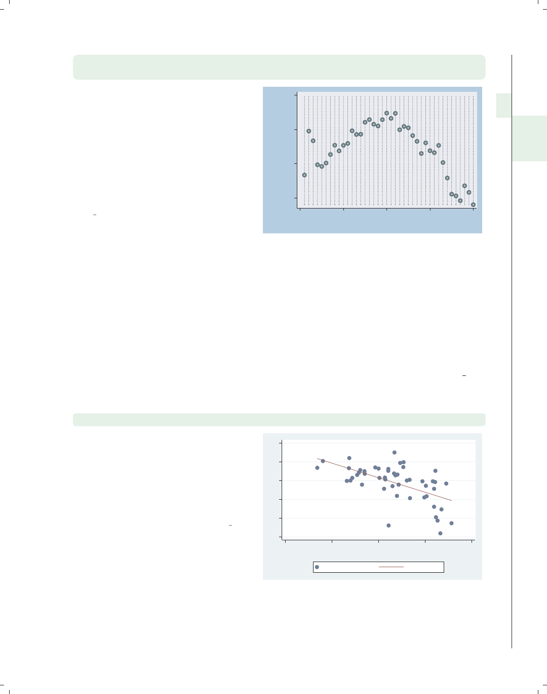
i
i
i
i
i
i
i
i
2.2 Regression fits and splines 49
twoway dot close tradeday, msize(large) msymbol(O)
mfcolor(eltgreen) mlcolor(emerald) mlwidth(thick)
The dot command is similar to a
scatterplot but shows dotted lines for
each value of the x-variable, making it
more useful when the x-values are
equally spaced. In this example, we
look at the closing price of the S&P 500
by trading day and make the markers
filled with eltgreen with thick emerald
outlines.
Uses spjanfeb2001.dta & scheme
vg blue
1250
1300
1350
1400
Closing price
0 10 20 30 40
Trading day number
2.2 Regression fits and splines
This section focuses on the twoway commands that are used for displaying fit values:
lfit,qfit,fpfit,mband,mspline,andlowess. For more information, see [G]graph
twoway lfit,[
G]graph twoway qfit,[G]graph twoway fpfit,[G]graph twoway
mband,[
G]graph twoway mspline, and [G]graph twoway lowess.Weusethe
allstates data file, omitting Washington, DC, and show the graphs using the vg s2c
scheme.
twoway (scatter ownhome pcturban80) (lfit ownhome pcturban80)
Here, we show a scatterplot of ownhome
by pcturban80. In addition, we overlay
a linear fit lfit predicting ownhome
from pcturban80. See
Twoway : Overlaying (87) if you would
like more information about overlaying
twoway graphs.
Uses allstatesdc.dta & scheme vg s2c
55 60 65 70 75 80
20.0 40.0 60.0 80.0 100.0
Percent urban
% who own home Fitted values
Introduction Twoway Matrix Bar Box Dot Pie Options Standard options Styles Appendix
Scatter Fit CI fit Line Area Bar Range Distribution Options Overlaying
The electronic form of this book is solely for direct use at UCLA and only by faculty, students, and staff of UCLA.
All rights reserved on the copyright page apply to this document and specifically neither the electronic nor
published form of the book may be distributed or reproduced, either electronically or in printed form.
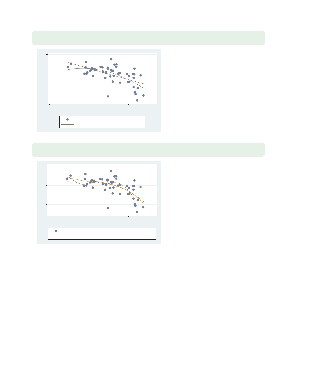
i
i
i
i
i
i
i
i
50 Chapter 2. Twoway graphs
twoway (scatter ownhome pcturban80) (lfit ownhome pcturban80)
(qfit ownhome pcturban80)
55 60 65 70 75 80
20.0 40.0 60.0 80.0 100.0
Percent urban
% who own home Fitted values
Fitted values
It is sometimes useful to overlay fit
plots to compare the fit values. In this
example, we overlay a linear fit lfit
and quadratic fit qfit and can see
some discrepancies between them.
Uses allstatesdc.dta & scheme vg s2c
twoway (scatter ownhome pcturban80) (mspline ownhome pcturban80)
(fpfit ownhome pcturban80) (lowess ownhome pcturban80)
55 60 65 70 75 80
20.0 40.0 60.0 80.0 100.0
Percent urban
% who own home Median spline
predicted ownhome lowess ownhome pcturban80
Stata supports a number of other fit
methods. Here, we show an mspline
(median spline) overlaid with fpfit
(fractional polynomial fit) and lowess.
Another similar command, not shown,
is mband (median band).
Uses allstatesdc.dta & scheme vg s2c
2.3 Regression confidence interval (CI) fits
This section focuses on the twoway commands that are used for displaying confidence
intervals around fit values: lfitci,qfitci,andfpfitci. The options permitted by these
three commands are virtually identical so we will use lfitci to illustrate these options.
(Note, however, that fpfitci does not permit the options stdp,stdf,andstdr.) For
more information, see [G]graph twoway lfitci,[G]graph twoway qfitci, and [G]graph
twoway fpfitci.
The electronic form of this book is solely for direct use at UCLA and only by faculty, students, and staff of UCLA.
All rights reserved on the copyright page apply to this document and specifically neither the electronic nor
published form of the book may be distributed or reproduced, either electronically or in printed form.

i
i
i
i
i
i
i
i
2.3 Regression confidence interval (CI) fits 51
twoway (lfitci ownhome pcturban80) (scatter ownhome pcturban80)
This graph uses the lfitci command
to produce a linear fit with confidence
interval. The confidence interval, by
default, is computed using the standard
error of prediction. We overlay this
with a scatterplot.
Uses allstatesdc.dta & scheme vg rose
55
60
65
70
75
80
20 40 60 80 100
Percent urban
95% CI Fitted values
% who own home
twoway (scatter ownhome pcturban80) (lfitci ownhome pcturban80)
This example is the same as the
previous example; however, the order of
the scatter and lfitci commands is
reversed. Note that the order matters
since the points that fell within the
confidence interval are not displayed
because they are masked by the
shading of the confidence interval.
Uses allstatesdc.dta & scheme vg rose 55
60
65
70
75
80
20.0 40.0 60.0 80.0 100.0
Percent urban
% who own home 95% CI
Fitted values
twoway (lfitci ownhome pcturban80, stdf)
(scatter ownhome pcturban80)
Here, we add the stdf option, which
computes the confidence intervals using
the standard error of forecast. If
samples were drawn repeatedly, this
confidence interval would capture 95%
of the observations. With 50
observations, we would expect 2 or 3
observations to fall outside of the
confidence interval, and this
corresponds to the data shown here.
Uses allstatesdc.dta & scheme vg rose
50
60
70
80
90
20 40 60 80 100
Percent urban
95% CI Fitted values
% who own home
Introduction Twoway Matrix Bar Box Dot Pie Options Standard options Styles Appendix
Scatter Fit CI fit Line Area Bar Range Distribution Options Overlaying
The electronic form of this book is solely for direct use at UCLA and only by faculty, students, and staff of UCLA.
All rights reserved on the copyright page apply to this document and specifically neither the electronic nor
published form of the book may be distributed or reproduced, either electronically or in printed form.
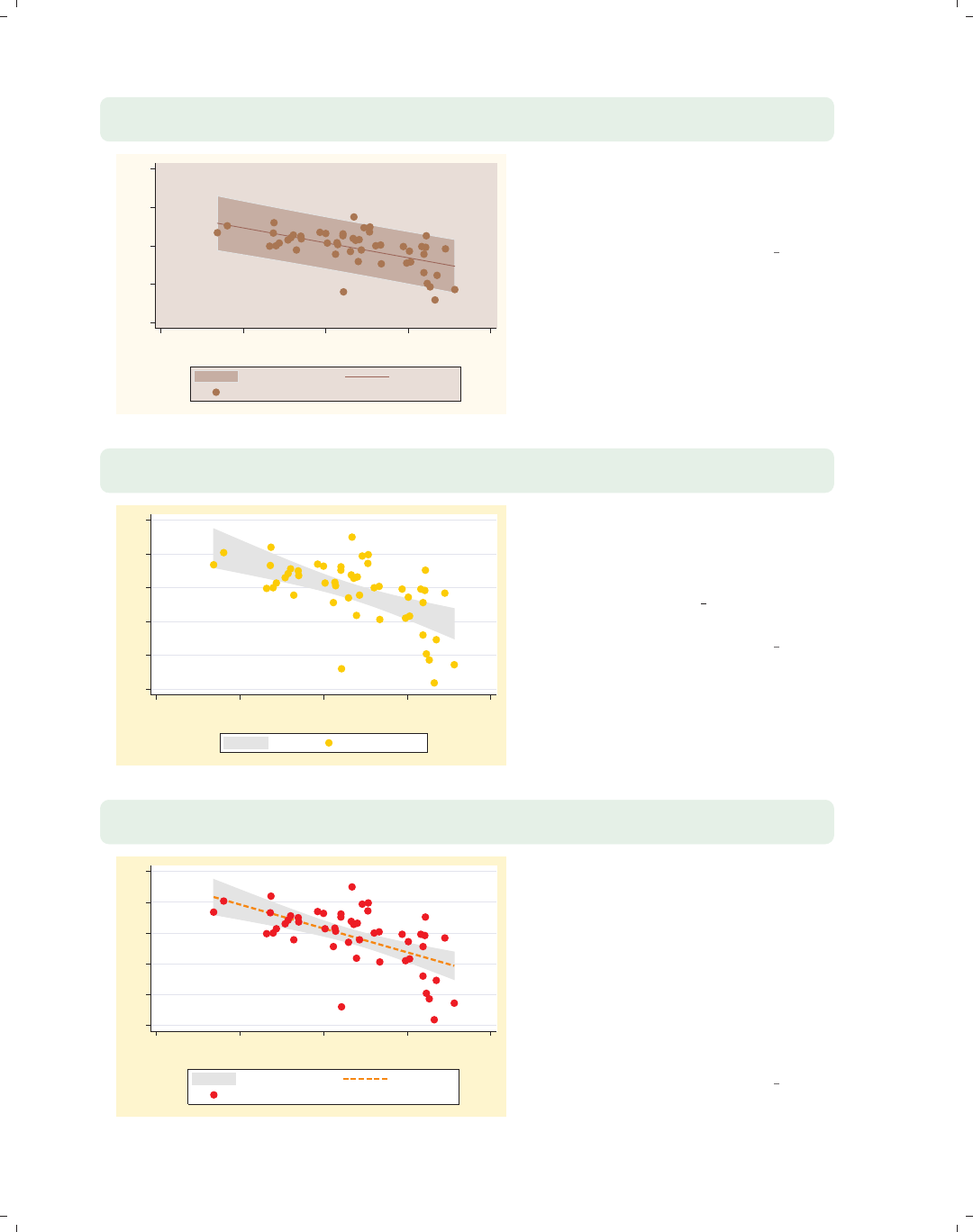
i
i
i
i
i
i
i
i
52 Chapter 2. Twoway graphs
twoway (lfitci ownhome pcturban80, stdf level(90))
(scatter ownhome pcturban80)
50
60
70
80
90
20 40 60 80 100
Percent urban
90% CI Fitted values
% who own home
We can use the level() option to set
the confidence level for the confidence
interval. Here, we make the confidence
level 90%.
Uses allstatesdc.dta & scheme vg rose
twoway (lfitci ownhome pcturban80, nofit)
(scatter ownhome pcturban80)
55 60 65 70 75 80
20 40 60 80 100
Percent urban
95% CI % who own home
We now look at how you can control
the display of the fit line. We can use
the nofit option to suppress the
display of the fit line. Note that we
have switched to the vg brite scheme
for a different look for the graphs.
Uses allstatesdc.dta & scheme vg brite
twoway (lfitci ownhome pcturban80, clpattern(dash) clwidth(thick))
(scatter ownhome pcturban80)
55 60 65 70 75 80
20 40 60 80 100
Percent urban
95% CI Fitted values
% who own home
You can supply options like connect(),
clpattern() (connect line pattern),
clwidth() (connect line width), and
clcolor() (connect line color) to
control how the fit line will be
displayed. Here, we use the
clpattern(dash) and clwidth(thick)
options to make the fit line dashed and
thick. See Options : Connecting (250) for
more details.
Uses allstatesdc.dta & scheme vg brite
The electronic form of this book is solely for direct use at UCLA and only by faculty, students, and staff of UCLA.
All rights reserved on the copyright page apply to this document and specifically neither the electronic nor
published form of the book may be distributed or reproduced, either electronically or in printed form.
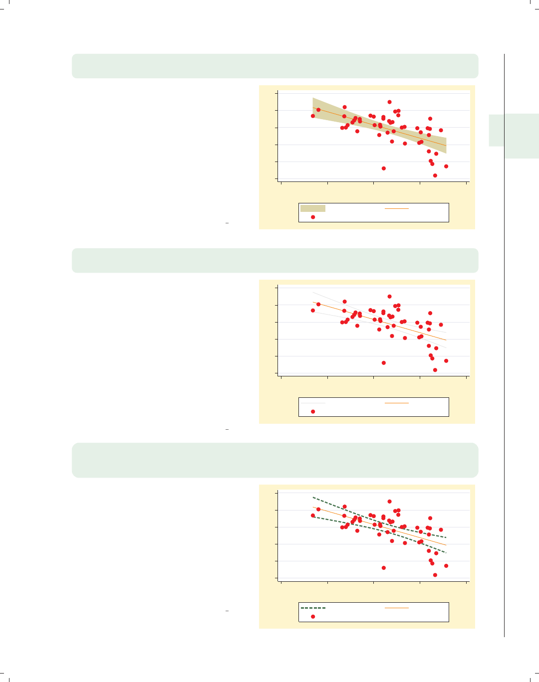
i
i
i
i
i
i
i
i
2.3 Regression confidence interval (CI) fits 53
twoway (lfitci ownhome pcturban80, bcolor(stone))
(scatter ownhome pcturban80)
We use the bcolor(stone) option to
change the color of the area and outline
of the confidence interval. You can use
the options illustrated with twoway
rarea to control the display of the area
encompassing the confidence interval,
namely, bcolor(),bfcolor(),
blcolor(),blwidth(),and
blpattern(). See Twoway : Range (64)
and [G]graph twoway rarea for more
details.
Uses allstatesdc.dta & scheme vg brite
55 60 65 70 75 80
20 40 60 80 100
Percent urban
95% CI Fitted values
% who own home
twoway (lfitci ownhome pcturban80, ciplot(rline))
(scatter ownhome pcturban80)
The ciplot() option can be used to
select a different command for
displaying the confidence interval. The
default command is twoway rarea and
can be selected via the ciplot(rarea)
option. Here, we use the
ciplot(rline) option, which displays
the confidence interval as two lines
without any filled area. The valid
options include rarea,rbar,rspike,
rcap,rcapsym,rscatter,rline,and
rconnected.
Uses allstatesdc.dta & scheme vg brite
55 60 65 70 75 80
20 40 60 80 100
Percent urban
95% CI Fitted values
% who own home
twoway
(lfitci ownhome pcturban80, ciplot(rline) blcolor(green) blpattern(dash)
blwidth(thick)) (scatter ownhome pcturban80)
By choosing the rline command for
displaying the confidence interval, we
can then use options appropriate for
the twoway rline command. Here, we
make the line green, dashed, and thick.
See Styles : Colors (328),
Styles : Linepatterns (336), and
Styles : Linewidth (337) for more details
about colors, line patterns, and line
widths.
Uses allstatesdc.dta & scheme vg brite
55 60 65 70 75 80
20 40 60 80 100
Percent urban
95% CI Fitted values
% who own home
Introduction Twoway Matrix Bar Box Dot Pie Options Standard options Styles Appendix
Scatter Fit CI fit Line Area Bar Range Distribution Options Overlaying
The electronic form of this book is solely for direct use at UCLA and only by faculty, students, and staff of UCLA.
All rights reserved on the copyright page apply to this document and specifically neither the electronic nor
published form of the book may be distributed or reproduced, either electronically or in printed form.

i
i
i
i
i
i
i
i
54 Chapter 2. Twoway graphs
2.4 Line plots
This section focuses on the twoway commands for creating line plots, including the
twoway line and twoway connected commands. The line command is the same as
scatter, except that the points are connected by default and marker symbols are not
permitted, whereas the twoway connected command permits marker symbols. This sec-
tion also illustrates twoway tsline and twoway tsrline, which are useful for drawing line
plots when the x-variable is a date variable. Since all these commands are related to the
twoway scatter command, they support most of the options you would use with twoway
scatter. For more information, see [G]graph twoway line,[G]graph twoway con-
nected,andhelp graph tsline.
twoway line close tradeday, sort
1250 1300 1350 1400
Closing price
0 10 20 30 40
Trading day number
Here, we show an example using
twoway line showing the closing price
across trading days. Note the inclusion
of the sort option, which is
recommended when you have points
connected in a Stata graph.
Uses spjanfeb2001.dta & scheme vg s2c
twoway line close tradeday, sort clwidth(vthick) clcolor(maroon)
1250 1300 1350 1400
Closing price
0 10 20 30 40
Trading day number
Here, we show options controlling the
width and color of the lines. Using
clwidth(vthick) (connect line width)
and clcolor(maroon) (connect line
color), we make the line very thick and
maroon. See Options : Connecting (250)
for more examples. Note that you
cannot use options that control marker
symbols with graph twoway line.
Uses spjanfeb2001.dta & scheme vg s2c
The electronic form of this book is solely for direct use at UCLA and only by faculty, students, and staff of UCLA.
All rights reserved on the copyright page apply to this document and specifically neither the electronic nor
published form of the book may be distributed or reproduced, either electronically or in printed form.

i
i
i
i
i
i
i
i
2.4 Line plots 55
twoway connected close tradeday, sort
This twoway connected graph is
similar to the twoway line graphs we
saw before, except that when you use
connected, a marker is shown for each
data point.
Uses spjanfeb2001.dta & scheme vg s2c
1250 1300 1350 1400
Closing price
0 10 20 30 40
Trading day number
twoway scatter close tradeday, connect(l) sort
This graph is identical to the previous
graph, except this graph is made with
the scatter command using the
connect(l) option. This illustrates the
convenience of using connected since
you do not need to manually specify
the connect() option.
Uses spjanfeb2001.dta & scheme vg s2c
1250 1300 1350 1400
Closing price
0 10 20 30 40
Trading day number
twoway connected close tradeday, sort
msymbol(Dh) mcolor(blue) msize(large)
We can use marker symbol options,
such as msymbol(),mcolor(),and
msize() to control the marker symbols.
Here, we make the symbols large, blue,
hollow diamonds. See Options : Markers
(235) for more examples.
Uses spjanfeb2001.dta & scheme vg s2c
1250 1300 1350 1400
Closing price
0 10 20 30 40
Trading day number
Introduction Twoway Matrix Bar Box Dot Pie Options Standard options Styles Appendix
Scatter Fit CI fit Line Area Bar Range Distribution Options Overlaying
The electronic form of this book is solely for direct use at UCLA and only by faculty, students, and staff of UCLA.
All rights reserved on the copyright page apply to this document and specifically neither the electronic nor
published form of the book may be distributed or reproduced, either electronically or in printed form.
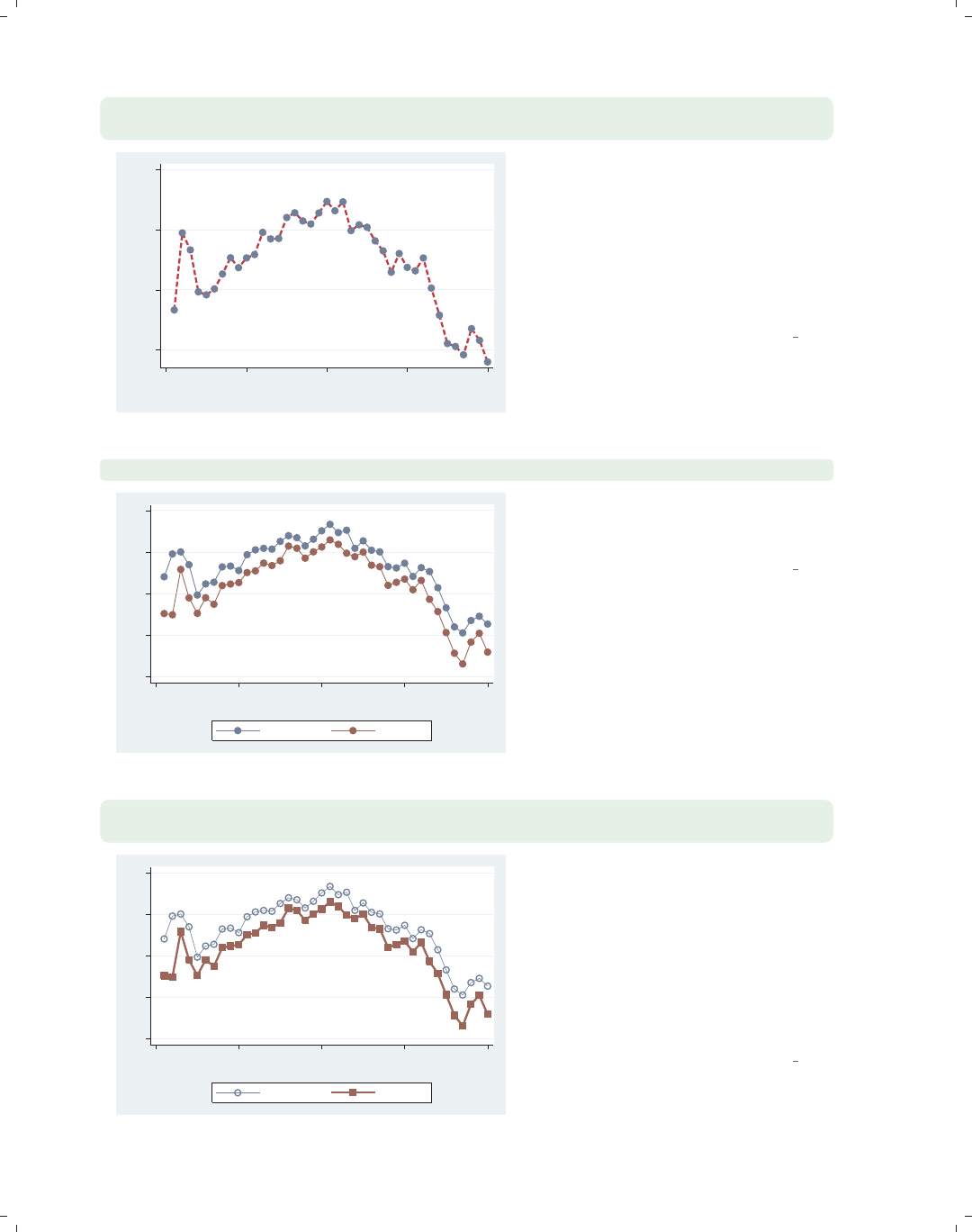
i
i
i
i
i
i
i
i
56 Chapter 2. Twoway graphs
twoway connected close tradeday, sort
clcolor(cranberry) clpattern(dash) clwidth(thick)
1250 1300 1350 1400
Closing price
0 10 20 30 40
Trading day number
You can control the look of the lines
with connect options such as
clwidth(),clcolor(),and
clpattern() (connect line pattern). In
this example, we make the line
cranberry, dashed, and thick. See
Options : Connecting (250) for more
details on connecting points.
Uses spjanfeb2001.dta & scheme vg s2c
twoway connected high low tradeday, sort
1200 1250 1300 1350 1400
0 10 20 30 40
Trading day number
High price Low price
You can graph multiple variables at
once. In this case, we graph the high
and low prices across trading days.
Uses spjanfeb2001.dta & scheme vg s2c
twoway connected high low tradeday, sort
clwidth(thin thick) msymbol(Oh S)
1200 1250 1300 1350 1400
0 10 20 30 40
Trading day number
High price Low price
When graphing multiple variables, you
can specify connect and marker symbol
options to control each line. In this
case, we use a thin line for the high
price and a thick line for the low price.
We also differentiate the two lines by
using different marker symbols, hollow
circles for the high price and squares for
the low price.
Uses spjanfeb2001.dta & scheme vg s2c
The electronic form of this book is solely for direct use at UCLA and only by faculty, students, and staff of UCLA.
All rights reserved on the copyright page apply to this document and specifically neither the electronic nor
published form of the book may be distributed or reproduced, either electronically or in printed form.
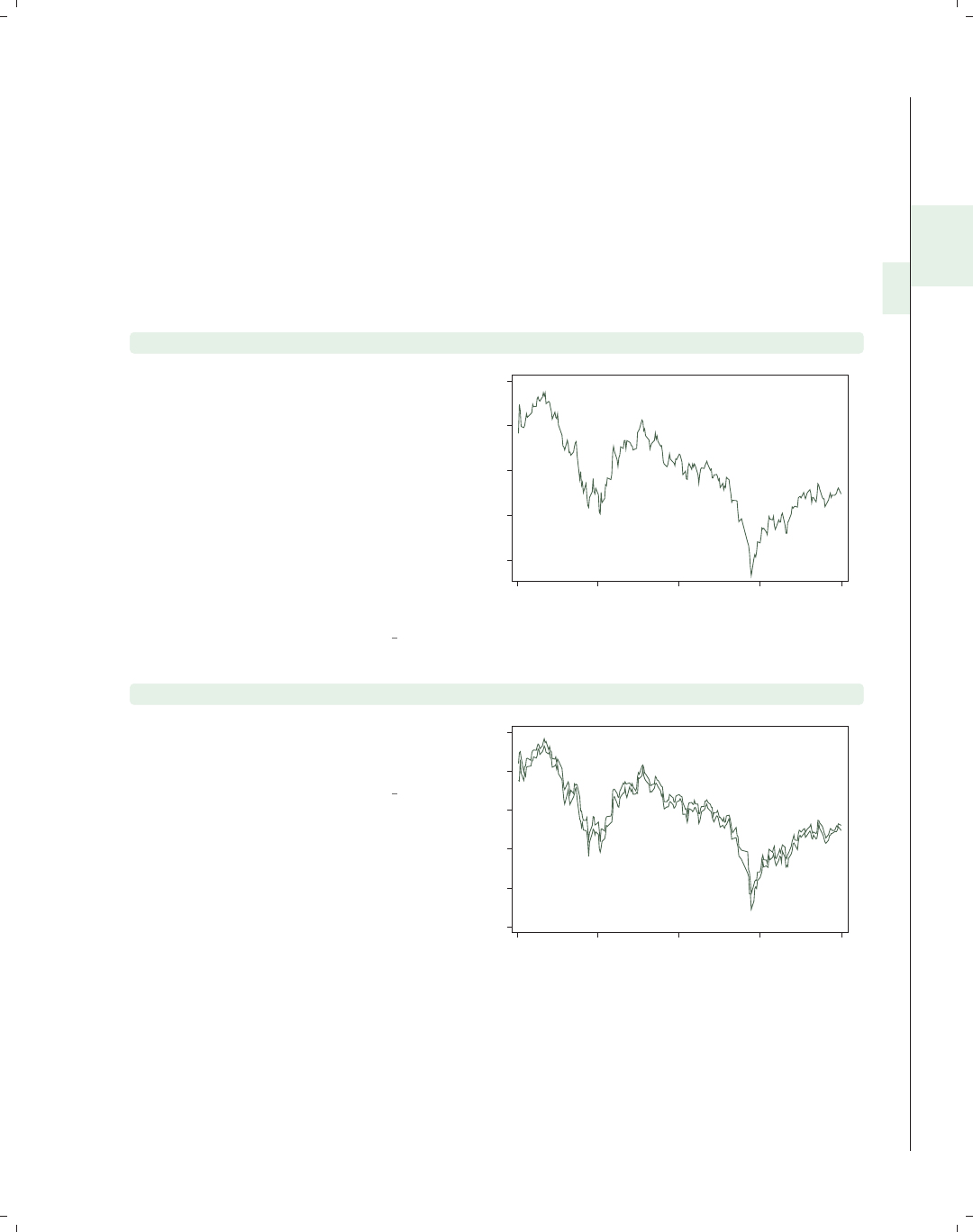
i
i
i
i
i
i
i
i
2.4 Line plots 57
Stata has additional commands for creating line plots where the x-variable is a date
variable, namely, twoway tsline and twoway tsrline.Thetsline command is similar
to the line command, and the tsrline is similar to the rline command, but both of these
ts commands offer extra features, making it easier to reference the x-variable in terms of
dates. Note that these commands are not currently documented in [G]graph but are doc-
umented via help tsline. We will use the sp2001ts data file, which has the prices for
the S&P 500 index for 2001 with the trading date stored as a date variable named date.
Before saving the file sp2001ts,thetsset date, daily command was used to tell Stata
that the variable date represents the time variable and that it represents daily data.
twoway tsline close
The tsline (time-series line) graph
shows the closing price on the y-axis
and the date on the x-axis. Note that
we did not specify the x-variable in the
graph command. Stata knew the
variable representing time because we
previously issued the tsset date,
daily command before saving the
sp2001ts file. Note that if you save the
data file, Stata remembers the time
variable, and you do not need to set it
again.
Uses sp2001ts.dta & scheme vg s1c
1000 1100 1200 1300 1400
Closing price
1Jan01 1Apr01 1Jul01 1Oct01 1Jan02
Date
twoway tsrline low high
We can also use the tsrline
(time-series range) graph to show the
low price and high price for each day.
Uses sp2001ts.dta & scheme vg s1c
900 1000 1100 1200 1300 1400
Low price/High price
1Jan01 1Apr01 1Jul01 1Oct01 1Jan02
Date
Introduction Twoway Matrix Bar Box Dot Pie Options Standard options Styles Appendix
Scatter Fit CI fit Line Area Bar Range Distribution Options Overlaying
The electronic form of this book is solely for direct use at UCLA and only by faculty, students, and staff of UCLA.
All rights reserved on the copyright page apply to this document and specifically neither the electronic nor
published form of the book may be distributed or reproduced, either electronically or in printed form.

i
i
i
i
i
i
i
i
58 Chapter 2. Twoway graphs
twoway tsline close, clwidth(thick) clcolor(navy)
1000 1100 1200 1300 1400
Closing price
1Jan01 1Apr01 1Jul01 1Oct01 1Jan02
Date
As with twoway line,youcanuse
connect options to control the line.
Here, we make the line thick and navy.
Uses sp2001ts.dta & scheme vg s1c
twoway tsline close
if (date >= mdy(1,1,2001)) & (date <= mdy(3,31,2001))
1100 1200 1300 1400
Closing price
1Jan01 1Feb01 1Mar01 1Apr01
Date
You can use if to subset cases to
graph. Here, we graph the closing
prices between January 1, 2001, and
March 31, 2001. See the next example
for an easier way of doing this.
Uses sp2001ts.dta & scheme vg s1c
twoway tsline close if tin(01jan2001,31mar2001)
1100 1200 1300 1400
Closing price
1Jan01 1Feb01 1Mar01 1Apr01
Date
When using the tsline command, you
can use tin() (time in between) to
specify that you want to graph just the
cases between January 1, 2001, and
March 31, 2001, inclusively.
Uses sp2001ts.dta & scheme vg s1c
The electronic form of this book is solely for direct use at UCLA and only by faculty, students, and staff of UCLA.
All rights reserved on the copyright page apply to this document and specifically neither the electronic nor
published form of the book may be distributed or reproduced, either electronically or in printed form.
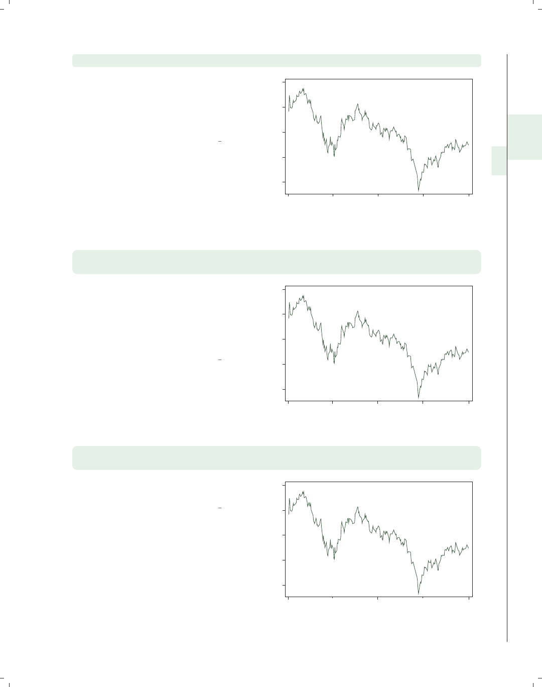
i
i
i
i
i
i
i
i
2.4 Line plots 59
twoway tsline close, ttitle(Day of Year)
We can use the ttitle() (time title)
option to give a title to the time
variable. We specify this as a ttitle()
instead of xtitle() since this refers to
the axis with the time variable.
Uses sp2001ts.dta & scheme vg s1c
1000 1100 1200 1300 1400
Closing price
1Jan01 1Apr01 1Jul01 1Oct01 1Jan02
Day of Year
twoway tsline close,
tlabel(01jan2001 31mar2001 30jun2001 30sep2001 01jan2002)
We can use the tlabel() option to
label the time points on the time axis.
Note that we specified these dates using
date literals, and Stata knew how to
interpret these and appropriately label
the graph with these values.
Uses sp2001ts.dta & scheme vg s1c
1000 1100 1200 1300 1400
Closing price
1Jan01 31Mar01 30Jun01 30Sep01 1Jan02
Date
twoway tsline close,
tlabel(01jan2001 30jun2001 01jan2002 ) tmlabel(31mar2001 30sep2001)
We can use the tmlabel() option to
include minor labels.
Uses sp2001ts.dta & scheme vg s1c
1000 1100 1200 1300 1400
Closing price
31Mar01 30Sep01
1Jan01 30Jun01 1Jan02
Date
Introduction Twoway Matrix Bar Box Dot Pie Options Standard options Styles Appendix
Scatter Fit CI fit Line Area Bar Range Distribution Options Overlaying
The electronic form of this book is solely for direct use at UCLA and only by faculty, students, and staff of UCLA.
All rights reserved on the copyright page apply to this document and specifically neither the electronic nor
published form of the book may be distributed or reproduced, either electronically or in printed form.
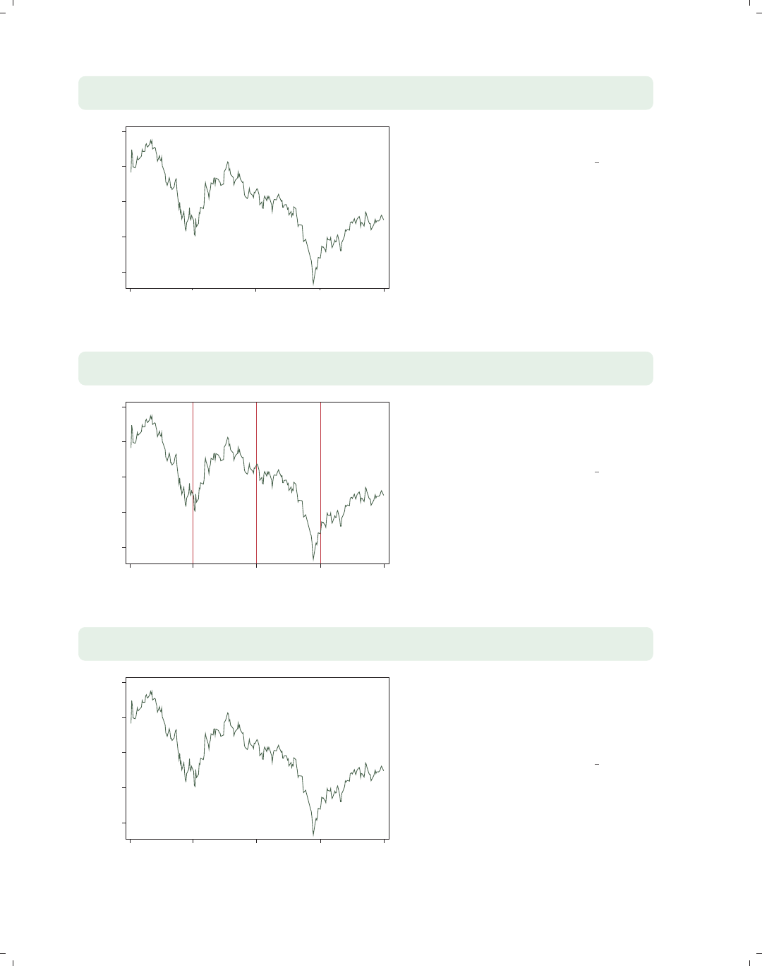
i
i
i
i
i
i
i
i
60 Chapter 2. Twoway graphs
twoway tsline close,
tlabel(01jan2001 30jun2001 01jan2002 ) tmtick(31mar2001 30sep2001)
1000 1100 1200 1300 1400
Closing price
1Jan01 30Jun01 1Jan02
Date
We can use the tmtick() option to
include minor ticks instead.
Uses sp2001ts.dta & scheme vg s1c
twoway tsline close,
tline(01apr2001 01jul2001 01oct2001)
1000 1100 1200 1300 1400
Closing price
1Jan01 1Apr01 1Jul01 1Oct01 1Jan02
Date
The tline() option can be used to
include lines at certain time points.
Here, we place lines at the start of the
second, third, and fourth quarters.
Uses sp2001ts.dta & scheme vg s1c
twoway tsline close,
ttext(1035 01apr2001 "Start of Q2", orientation(vertical))
Start of Q2
1000 1100 1200 1300 1400
Closing price
1Jan01 1Apr01 1Jul01 1Oct01 1Jan02
Date
We can use the ttext() option to add
text to the graph. The first coordinate
refers to the position on the y-axis, and
the second coordinate is the position on
the time axis in terms of the date.
Uses sp2001ts.dta & scheme vg s1c
The electronic form of this book is solely for direct use at UCLA and only by faculty, students, and staff of UCLA.
All rights reserved on the copyright page apply to this document and specifically neither the electronic nor
published form of the book may be distributed or reproduced, either electronically or in printed form.
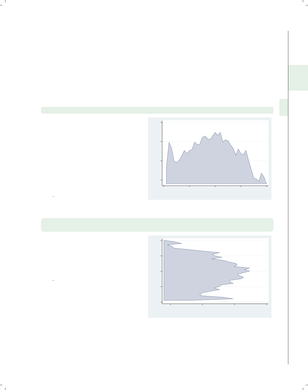
i
i
i
i
i
i
i
i
2.5 Area plots 61
2.5 Area plots
This section illustrates the use of area graphs using twoway area. These graphs are
similar to twoway line graphs, except that the area under the line is shaded. As a result,
many of the options that you would use with twoway line are applicable; see Twoway : Line
(54) for more details. For even more details, see [G]graph twoway area. We will use
the spjanfeb2001 data file, which has the prices for the S&P 500 index for January and
February 2001.
twoway area close tradeday, sort
This is an example of a twoway area
graph. Because this graph is composed
of connected points, the sort option is
recommended in case the data are not
already sorted by tradeday. If the data
are not sorted, and the sort option is
not specified, then the points are
connected in the order they appear in
the data file and will generally not be
the graph you desire.
Uses spjanfeb2001.dta & scheme
vg palec
1250 1300 1350 1400
Closing price
0 10 20 30 40
Trading day number
twoway area close tradeday, horizontal sort
xtitle(Title for x-axis) ytitle(Title for y-axis)
The horizontal option swaps the
position of the close and tradeday
variables. Note that the x-axis remains
at the bottom and the y-axis remains
at the left.
Uses spjanfeb2001.dta & scheme
vg palec
0 10 20 30 40
Title for y−axis
1250 1300 1350 1400
Title for x−axis
Introduction Twoway Matrix Bar Box Dot Pie Options Standard options Styles Appendix
Scatter Fit CI fit Line Area Bar Range Distribution Options Overlaying
The electronic form of this book is solely for direct use at UCLA and only by faculty, students, and staff of UCLA.
All rights reserved on the copyright page apply to this document and specifically neither the electronic nor
published form of the book may be distributed or reproduced, either electronically or in printed form.
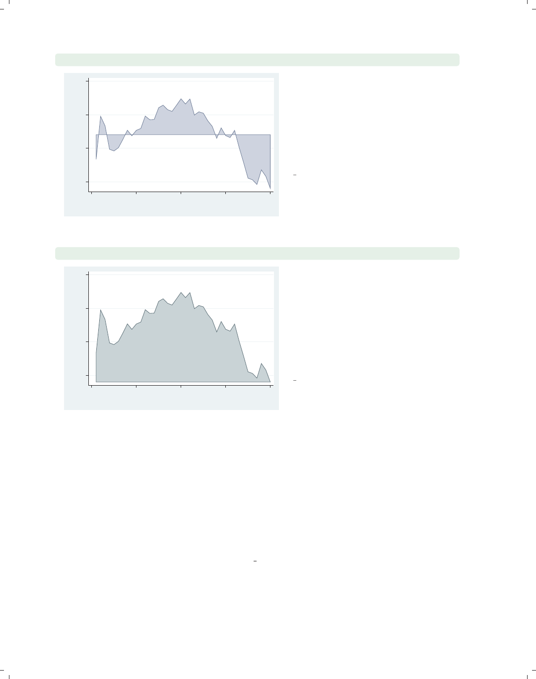
i
i
i
i
i
i
i
i
62 Chapter 2. Twoway graphs
twoway area close tradeday, sort base(1320.28)
1250 1300 1350 1400
Closing price
0 10 20 30 40
Trading day number
You can use the base() option to
indicate a base from which the area is
to be shaded. In this example, the base
is the closing price on the first trading
day, and thus all the subsequent points
are a kind of deviation from the first
day’s closing price.
Uses spjanfeb2001.dta & scheme
vg palec
twoway area close tradeday, sort bcolor(emerald)
1250 1300 1350 1400
Closing price
0 10 20 30 40
Trading day number
The bcolor() option sets the color of
the shaded area and the line. Here, we
make the shaded area and line emerald.
Although it is not shown, you can also
use the bfcolor() and blcolor()
options to control the fill color and line
color and the blwidth() option to
control the thickness of the outline.
Uses spjanfeb2001.dta & scheme
vg palec
2.6 Bar plots
This section illustrates the use of twoway bar graphs using twoway bar. These graphs
show a bar for each x-value where the height of the bar corresponds to the value of the
y-variable. For more details, see [G]graph twoway bar. We will continue to use the
spjanfeb2001 data file, which has the prices for the S&P 500 index for January and Febru-
ary, 2001, but show the graphs using the vg s1m scheme. twoway bar is useful for creating
bar graphs with overlays of lines, points, or other plot types and can be useful with evenly
spaced x-variable data. graph bar is more useful for creating bar graphs with categorical
data.
The electronic form of this book is solely for direct use at UCLA and only by faculty, students, and staff of UCLA.
All rights reserved on the copyright page apply to this document and specifically neither the electronic nor
published form of the book may be distributed or reproduced, either electronically or in printed form.
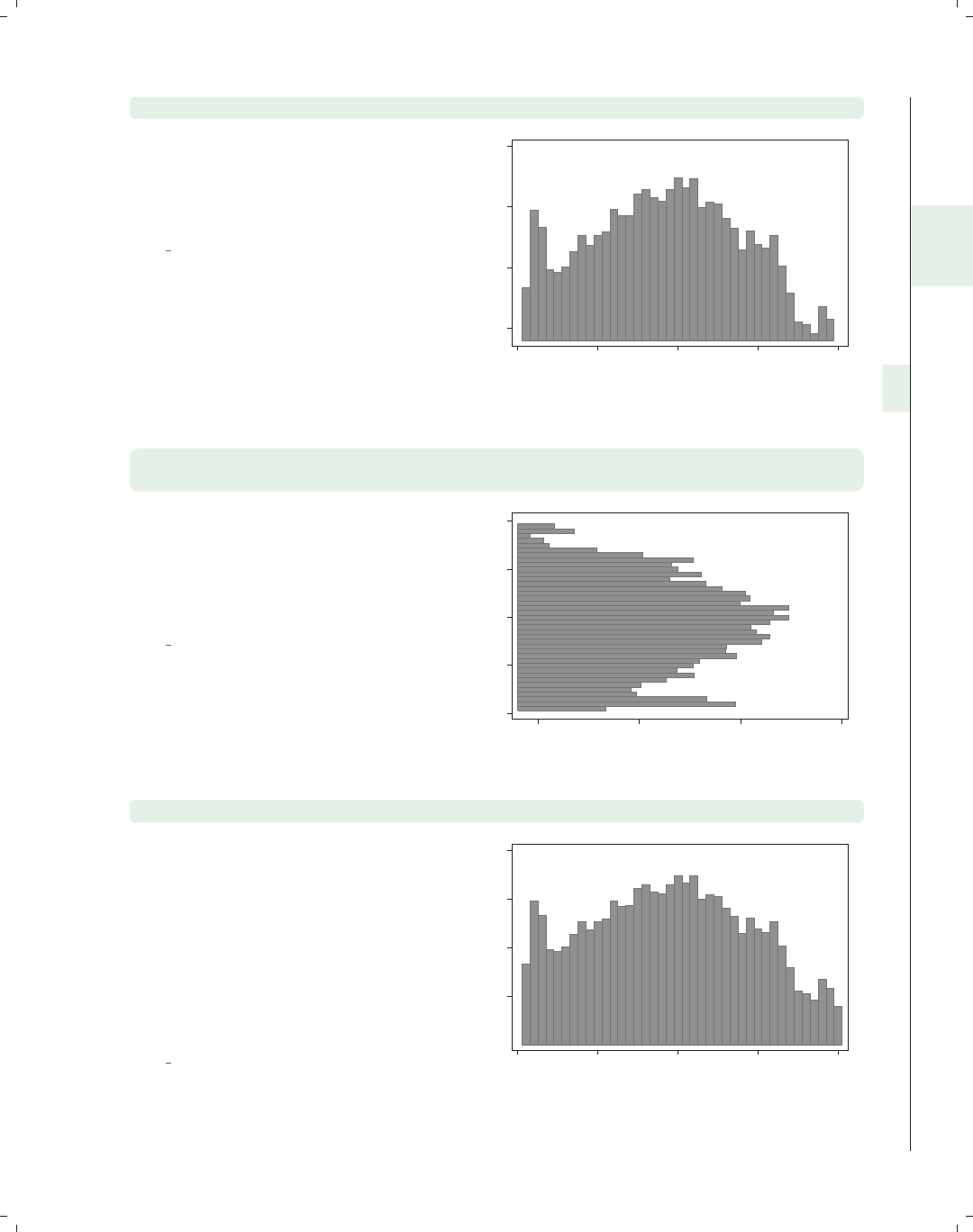
i
i
i
i
i
i
i
i
2.6 Bar plots 63
twoway bar close tradeday
Consider this bar chart, which shows
the closing prices of the S&P 500
broken down by the trading day of the
year.
Uses spjanfeb2001.dta & scheme
vg s1m
1250 1300 1350 1400
Closing price
0 10 20 30 40
Trading day number
twoway bar close tradeday, horizontal
xtitle(Title for x-axis) ytitle(Title for y-axis)
We can make the close and tradeday
variables trade places with the
horizontal option. Note that the
x-axis still remains at the bottom and
the y-axis still remains at the left.
Uses spjanfeb2001.dta & scheme
vg s1m
0 10 20 30 40
Title for y−axis
1250 1300 1350 1400
Title for x−axis
twoway bar close tradeday, base(1200)
Unless we specify otherwise, the base
forthebarchartsisthetradingday
with the lowest price. In this example,
the closing price on day 40 was 1239.94,
so unless we specify the base() option,
the base would be 1239.94. As a result,
the bar for day 40 would have a zero
height. Here, we change the base to
1200 to give this bar a height.
Uses spjanfeb2001.dta & scheme
vg s1m
1250 1300 1350 1400
Closing price
0 10 20 30 40
Trading day number
Introduction Twoway Matrix Bar Box Dot Pie Options Standard options Styles Appendix
Scatter Fit CI fit Line Area Bar Range Distribution Options Overlaying
The electronic form of this book is solely for direct use at UCLA and only by faculty, students, and staff of UCLA.
All rights reserved on the copyright page apply to this document and specifically neither the electronic nor
published form of the book may be distributed or reproduced, either electronically or in printed form.
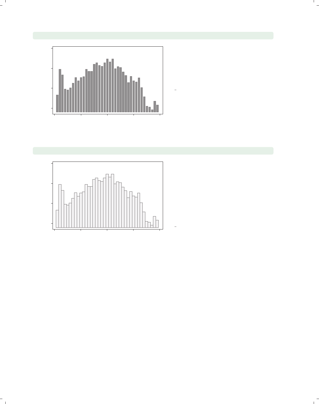
i
i
i
i
i
i
i
i
64 Chapter 2. Twoway graphs
twoway bar close tradeday, barwidth(.7)
1250 1300 1350 1400
Closing price
0 10 20 30 40
Trading day number
Unless otherwise specified, the width of
each bar is one x-unit (in this case, one
day). By making the width of the bars
.7, we can obtain a small gap between
the bars.
Uses spjanfeb2001.dta & scheme
vg s1m
twoway bar close tradeday, bfcolor(gs15) blcolor(gs5)
1250 1300 1350 1400
Closing price
0 10 20 30 40
Trading day number
We can use the bfcolor() (bar fill
color) option to set the color of the
inside of the bars and the blcolor (bar
line color) option to set the color of the
bar outlines. Here, we make the bars
light gray on the inside and dark gray
on the outside. See Styles : Colors (328)
for more colors you can choose.
Uses spjanfeb2001.dta & scheme
vg s1m
2.7 Range plots
This section focuses on twoway commands that display range plots. The major charac-
teristic these graphs share is that, for each x-value, there are two corresponding y-values. A
common example is a confidence interval where, for each x-value, there are upper and lower
confidence limits. We first show examples of all of these types of graphs and then consider
the options that can be used to customize them. For more information, see [G]graph
twoway rarea,[
G]graph twoway rbar,[G]graph twoway rspike,[G]graph twoway
rcap,[
G]graph twoway rcapsym,[G]graph twoway rscatter,[G]graph twoway
rline, and [G]graph twoway rconnected. We will start by looking at the rconnected,
rscatter,rline,andrarea graphs, which use combinations of lines, symbols, and shading
to display range plots. These examples use the spjanfeb2001 data file.
The electronic form of this book is solely for direct use at UCLA and only by faculty, students, and staff of UCLA.
All rights reserved on the copyright page apply to this document and specifically neither the electronic nor
published form of the book may be distributed or reproduced, either electronically or in printed form.
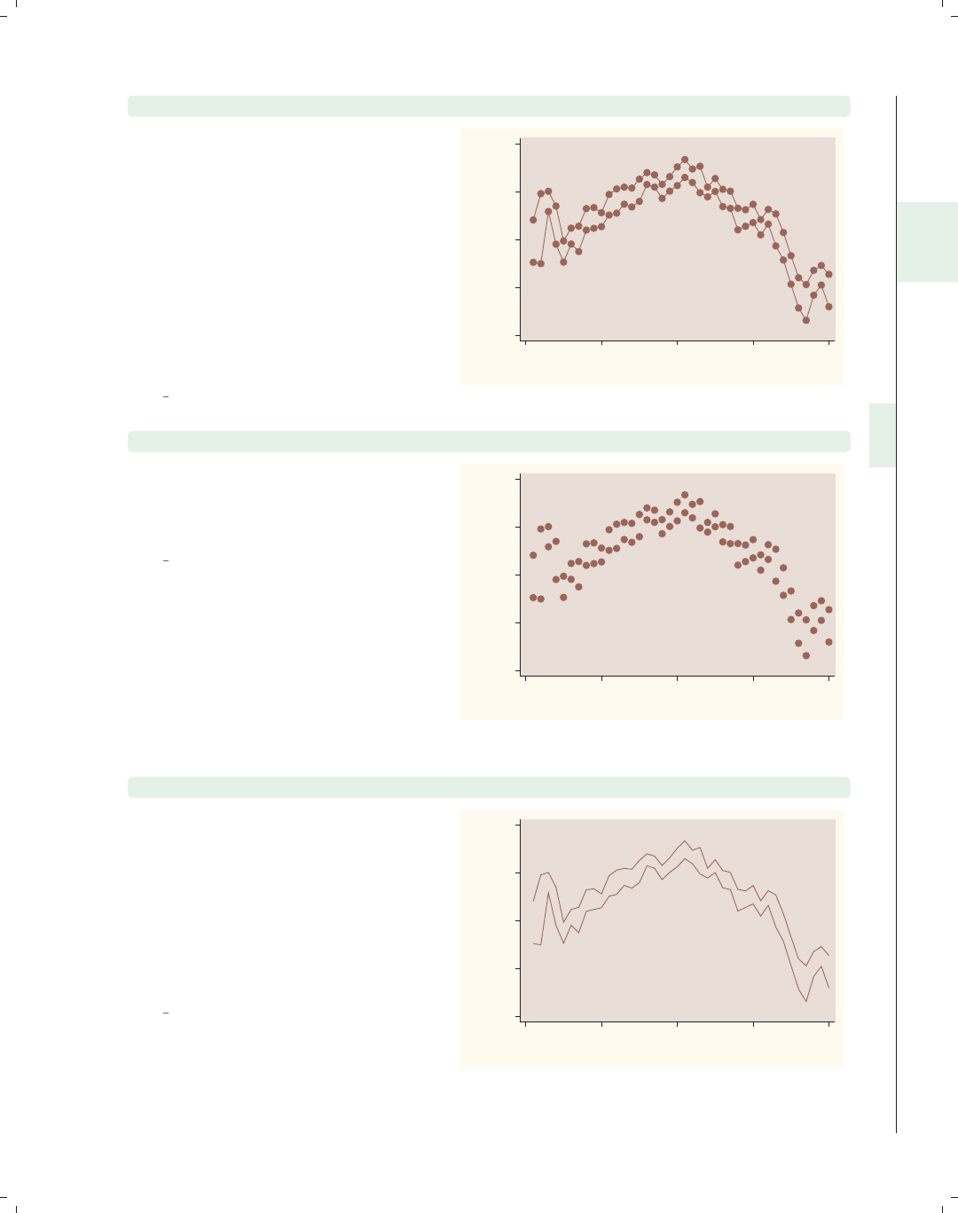
i
i
i
i
i
i
i
i
2.7 Range plots 65
twoway rconnected high low tradeday, sort
The rconnected (range connected)
graph shows the high and low prices by
tradeday, the number of days stocks
have been traded in the year. The
rconnected plot shows a separate line
for the high and low prices, and a
marker appears for each x-value. The
sort option is recommended because
the points are connected by lines and is
needed if the data were not already
sorted on tradeday.
Uses spjanfeb2001.dta & scheme
vg rose
1200
1250
1300
1350
1400
High price/Low price
0 10 20 30 40
Trading day number
twoway rscatter high low tradeday
The rscatter graph is similar to the
rconnected graph, except that lines
connecting the symbols are not plotted.
Uses spjanfeb2001.dta & scheme
vg rose
1200
1250
1300
1350
1400
High price/Low price
0 10 20 30 40
Trading day number
twoway rline high low tradeday, sort
The rline graph is similar to the
rconnected graph, except that symbols
are not plotted at each level of x. Note
the inclusion of the sort option. This
option is recommended because the
points are connected by lines and is
needed if the data were not already
sorted on tradeday.
Uses spjanfeb2001.dta & scheme
vg rose 1200
1250
1300
1350
1400
High price/Low price
0 10 20 30 40
Trading day number
Introduction Twoway Matrix Bar Box Dot Pie Options Standard options Styles Appendix
Scatter Fit CI fit Line Area Bar Range Distribution Options Overlaying
The electronic form of this book is solely for direct use at UCLA and only by faculty, students, and staff of UCLA.
All rights reserved on the copyright page apply to this document and specifically neither the electronic nor
published form of the book may be distributed or reproduced, either electronically or in printed form.
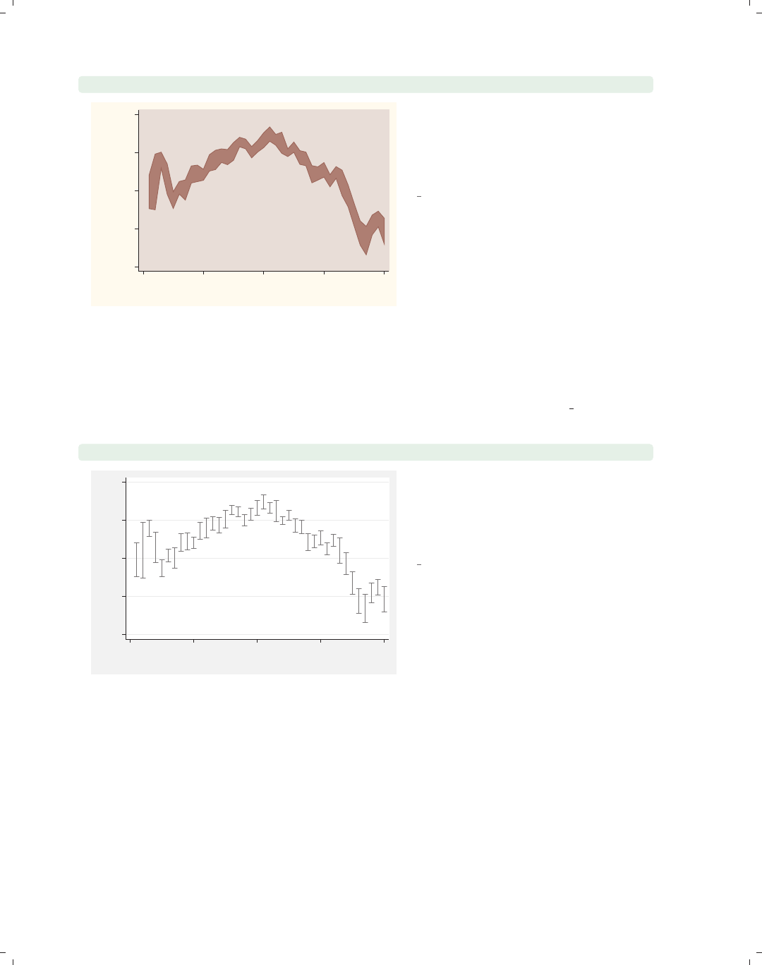
i
i
i
i
i
i
i
i
66 Chapter 2. Twoway graphs
twoway rarea high low tradeday, sort
1200
1250
1300
1350
1400
High price/Low price
0 10 20 30 40
Trading day number
The rarea graph is similar to the
rline graph, except that you can
control the fill color of the area between
the high and low values.
Uses spjanfeb2001.dta & scheme
vg rose
Next, we discuss the rcap,rspike,andrcapsym graphs, which use combinations of
spikes, caps, and symbols to display range plots. These plots are followed by rbar,which
uses bars to display range plots. These next examples are shown using the vg s2m scheme.
twoway rcap high low tradeday
1200 1250 1300 1350 1400
High price/Low price
0 10 20 30 40
Trading day number
The rcap graph shows a spike ranging
from the low to high values and puts a
cap at the top and bottom of each
spike.
Uses spjanfeb2001.dta & scheme
vg s2m
The electronic form of this book is solely for direct use at UCLA and only by faculty, students, and staff of UCLA.
All rights reserved on the copyright page apply to this document and specifically neither the electronic nor
published form of the book may be distributed or reproduced, either electronically or in printed form.
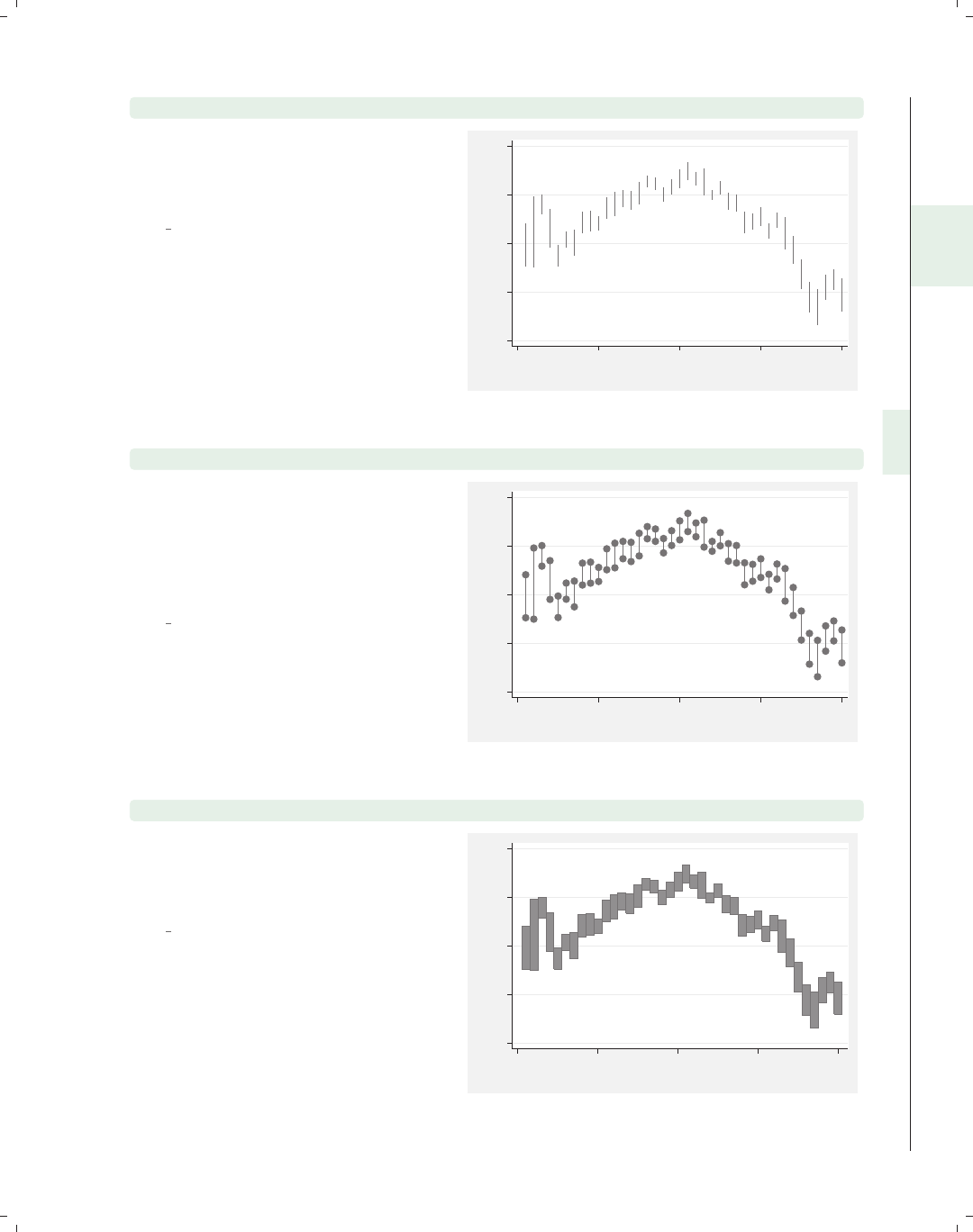
i
i
i
i
i
i
i
i
2.7 Range plots 67
twoway rspike high low tradeday
The rspike graph is similar to the
rcap graph, except that no caps are
placed on the spikes.
Uses spjanfeb2001.dta & scheme
vg s2m
1200 1250 1300 1350 1400
High price/Low price
0 10 20 30 40
Trading day number
twoway rcapsym high low tradeday
The rcapsym graph is similar to the
rcap graph, except that instead of
caps, symbols are placed at the end of
the spikes. You can choose among the
symbols to use for a scatterplot.
Uses spjanfeb2001.dta & scheme
vg s2m
1200 1250 1300 1350 1400
High price/Low price
0 10 20 30 40
Trading day number
twoway rbar high low tradeday
The rbar graph uses bars for each
value of xto show the high and low
values of y.
Uses spjanfeb2001.dta & scheme
vg s2m
1200 1250 1300 1350 1400
High price/Low price
0 10 20 30 40
Trading day number
Introduction Twoway Matrix Bar Box Dot Pie Options Standard options Styles Appendix
Scatter Fit CI fit Line Area Bar Range Distribution Options Overlaying
The electronic form of this book is solely for direct use at UCLA and only by faculty, students, and staff of UCLA.
All rights reserved on the copyright page apply to this document and specifically neither the electronic nor
published form of the book may be distributed or reproduced, either electronically or in printed form.
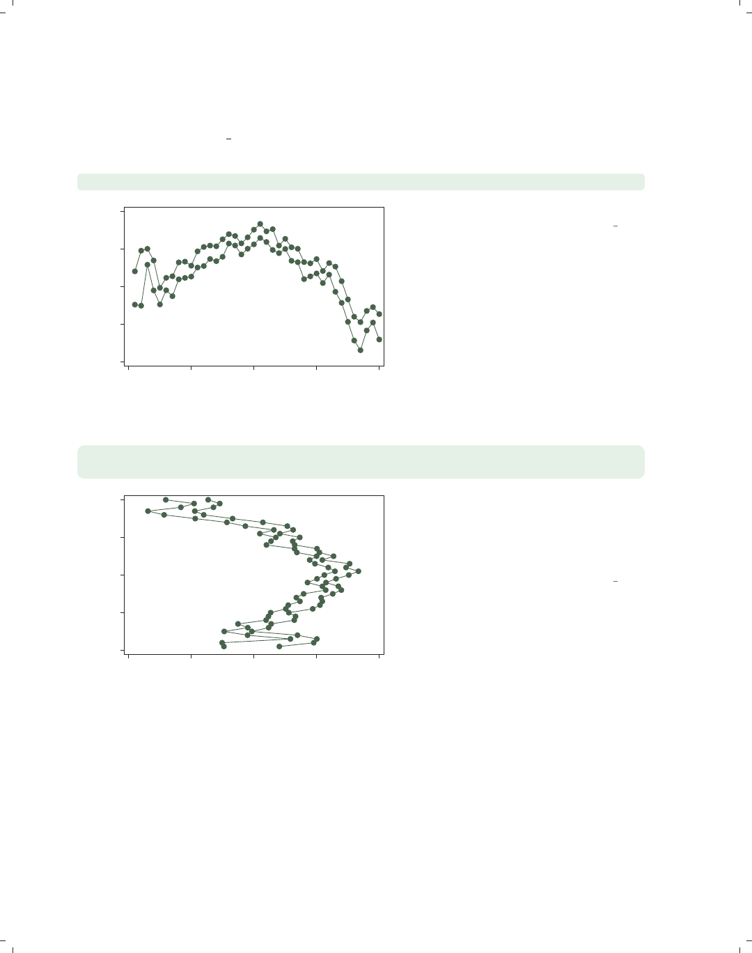
i
i
i
i
i
i
i
i
68 Chapter 2. Twoway graphs
Let’s now consider options you can use with the rconnected,rscatter,rline,and
rarea graphs. We will start by looking at rconnected plots since many of the options used
in that kind of graph also apply to rscatter,rline,andrarea graphs. These graphs will
be shown using the vg s1c scheme.
twoway rconnected high low tradeday, sort
1200 1250 1300 1350 1400
High price/Low price
0 10 20 30 40
Trading day number
Here is a general rconnected graph.
Uses spjanfeb2001.dta & scheme vg s1c
twoway rconnected high low tradeday, sort horizontal
xtitle(Title for x-axis) ytitle(Title for y-axis)
0 10 20 30 40
Title for y−axis
1200 1250 1300 1350 1400
Title for x−axis
With the horizontal option, you can
swap the axes where high/low and
tradeday appear. Note that the x-axis
remains at the bottom and the y-axis
remains at the left.
Uses spjanfeb2001.dta & scheme vg s1c
The electronic form of this book is solely for direct use at UCLA and only by faculty, students, and staff of UCLA.
All rights reserved on the copyright page apply to this document and specifically neither the electronic nor
published form of the book may be distributed or reproduced, either electronically or in printed form.
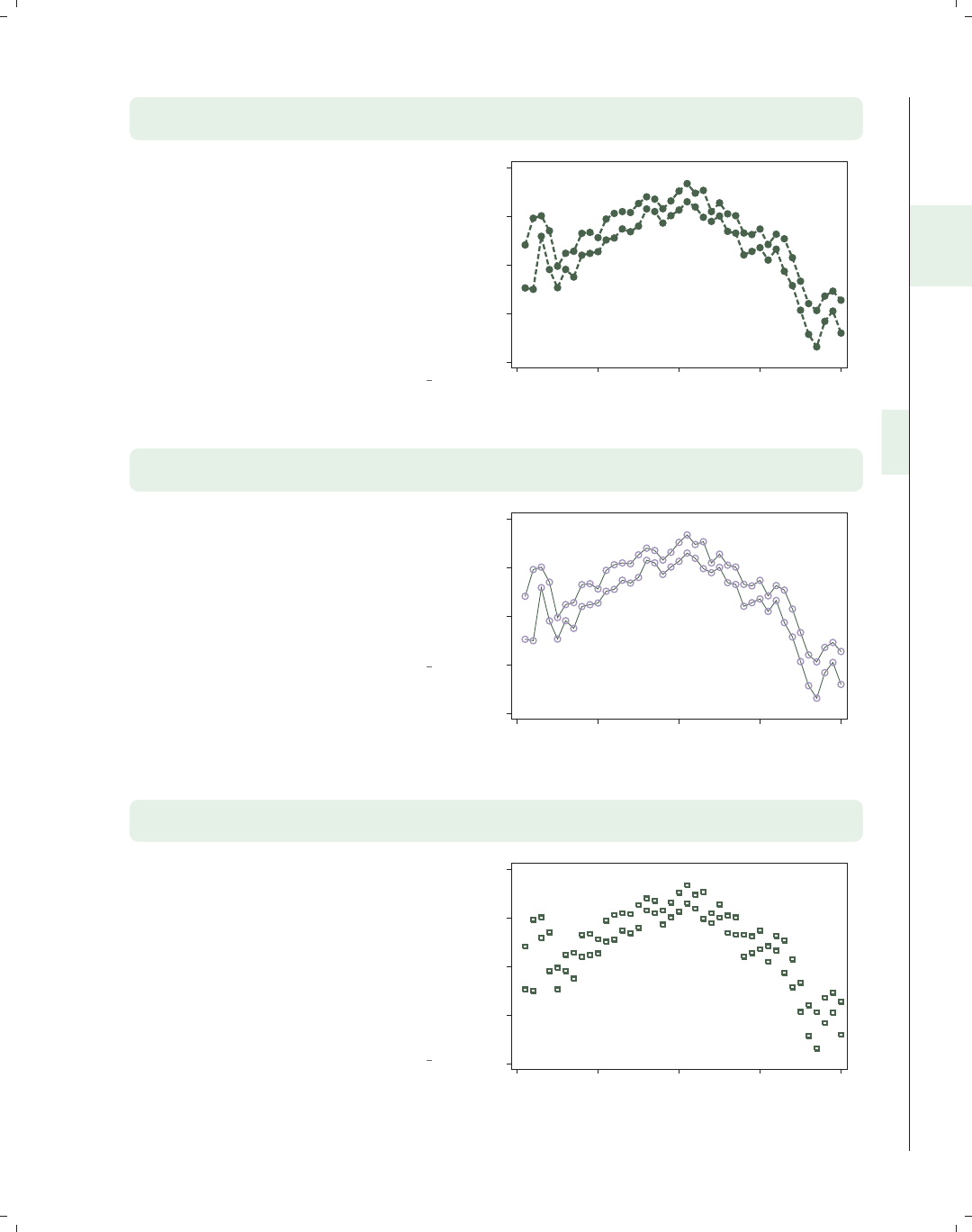
i
i
i
i
i
i
i
i
2.7 Range plots 69
twoway rconnected high low tradeday, sort
blwidth(thick) blcolor(dkgreen) blpattern(dash)
You can control the look of the lines
with connect options such as
connect(),blwidth(),blcolor(),
and blpattern(). Here, we make the
lines thick, dark green, and dashed. See
Options : Connecting (250) for more
examples, and see more details in
Styles : Connect (332), Styles : Linewidth
(337), Styles : Colors (328), and
Styles : Linepatterns (336).
Uses spjanfeb2001.dta & scheme vg s1c
1200 1250 1300 1350 1400
High price/Low price
0 10 20 30 40
Trading day number
twoway rconnected high low tradeday, sort
msymbol(Oh) msize(large) mcolor(lavender)
You can control the look of the marker
symbols with options such as
msymbol(),msize(),andmcolor().
Here, we make the marker symbols
large, hollow, lavender circles. For more
details about options related to
symbols, see Options : Markers (235).
Uses spjanfeb2001.dta & scheme vg s1c
1200 1250 1300 1350 1400
High price/Low price
0 10 20 30 40
Trading day number
twoway rscatter high low tradeday, sort msymbol(Sh) msize(medium)
mlwidth(thick)
The options you can use with rscatter
are just a subset of those you would use
with rconnected, where the connecting
options would not be relevant. Here, we
use the marker options to make the
symbols medium, hollow squares with
thick outlines. For more details about
options related to marker symbols, see
Options : Markers (235).
Uses spjanfeb2001.dta & scheme vg s1c
1200 1250 1300 1350 1400
High price/Low price
0 10 20 30 40
Trading day number
Introduction Twoway Matrix Bar Box Dot Pie Options Standard options Styles Appendix
Scatter Fit CI fit Line Area Bar Range Distribution Options Overlaying
The electronic form of this book is solely for direct use at UCLA and only by faculty, students, and staff of UCLA.
All rights reserved on the copyright page apply to this document and specifically neither the electronic nor
published form of the book may be distributed or reproduced, either electronically or in printed form.
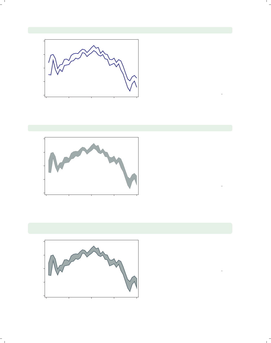
i
i
i
i
i
i
i
i
70 Chapter 2. Twoway graphs
twoway rline high low tradeday, sort blwidth(thick) blcolor(blue)
1200 1250 1300 1350 1400
High price/Low price
0 10 20 30 40
Trading day number
The options you can use with rline are
a subset of those you would use with
rconnected; namely, the marker
symbol and marker label options are
not relevant. Here, we show the use of
connect options to make the lines thick
and blue. For more details about
connect options, see
Options : Connecting (250).
Uses spjanfeb2001.dta & scheme vg s1c
twoway rarea high low tradeday, sort bcolor(teal)
1200 1250 1300 1350 1400
High price/Low price
0 10 20 30 40
Trading day number
The rarea graph is similar to the
rline graph, but in addition to being
able to control the characteristics of the
line, you can also control the color of
the area between the low and high
lines. Here, we use the bcolor() option
to make the color of the line and the
area teal.
Uses spjanfeb2001.dta & scheme vg s1c
twoway rarea high low tradeday, sort
blcolor(emerald) bfcolor(teal) blwidth(thick)
1200 1250 1300 1350 1400
High price/Low price
0 10 20 30 40
Trading day number
Here, we make the color of the line
emerald with the blcolor() option,
the fill color teal with the bfcolor()
option, and the line thick with the
blwidth() option.
Uses spjanfeb2001.dta & scheme vg s1c
The electronic form of this book is solely for direct use at UCLA and only by faculty, students, and staff of UCLA.
All rights reserved on the copyright page apply to this document and specifically neither the electronic nor
published form of the book may be distributed or reproduced, either electronically or in printed form.
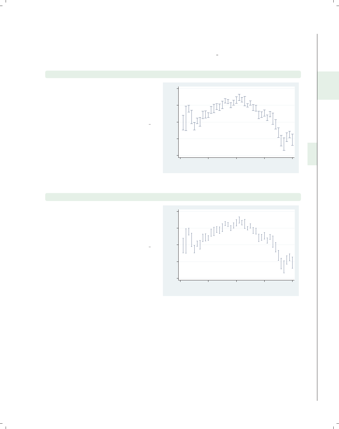
i
i
i
i
i
i
i
i
2.7 Range plots 71
Now, let’s look at options that can be used with the rcap,rspike,andrcapsym graphs.
The options permitted by the rcap option are similar to the options used with the rspike
and rcapsym graphs. For these examples, we will use the vg s2c scheme.
twoway rcap high low tradeday
Here is an rcap graph with the default
options. The rcap command supports
the horizontal option, which would
make the variables high/low and
tradeday swap positions.
Uses spjanfeb2001.dta & scheme vg s2c
1200 1250 1300 1350 1400
High price/Low price
0 10 20 30 40
Trading day number
twoway rcap high low tradeday, msize(small)
The msize() option usually is used to
control the size of a marker and is
adapted for this kind of graph to
control the size of the cap. In this case,
the cap is made small.
Uses spjanfeb2001.dta & scheme vg s2c
1200 1250 1300 1350 1400
High price/Low price
0 10 20 30 40
Trading day number
Introduction Twoway Matrix Bar Box Dot Pie Options Standard options Styles Appendix
Scatter Fit CI fit Line Area Bar Range Distribution Options Overlaying
The electronic form of this book is solely for direct use at UCLA and only by faculty, students, and staff of UCLA.
All rights reserved on the copyright page apply to this document and specifically neither the electronic nor
published form of the book may be distributed or reproduced, either electronically or in printed form.

i
i
i
i
i
i
i
i
72 Chapter 2. Twoway graphs
twoway rcap high low tradeday, blcolor(cranberry) blwidth(thick)
1200 1250 1300 1350 1400
High price/Low price
0 10 20 30 40
Trading day number
The blcolor() option is used to
control the color of the line, in this case
making the line cranberry. The
blwidth() option is used to set the
width of the line; in this case, the line is
made thick. Although it is not shown
here, you could also control the pattern
of the line with the blpattern()
option. See Options : Connecting (250)
for more details.
Uses spjanfeb2001.dta & scheme vg s2c
twoway rspike high low tradeday, blcolor(red) blwidth(thin)
1200 1250 1300 1350 1400
High price/Low price
0 10 20 30 40
Trading day number
The options used for rspike are
basically the same as those for rcap,
except that the msize() option is not
appropriate since there are no markers
to size. Here, for example, we use
blcolor() and blwidth() to make the
lines red and thin.
Uses spjanfeb2001.dta & scheme vg s2c
twoway rcapsym high low tradeday, msymbol(Oh) msize(large)
1200 1250 1300 1350 1400
High price/Low price
0 10 20 30 40
Trading day number
The options used for rcapsym are
basically the same as for rcap, except
that you can use marker options to
select the marker that goes at the top
and bottom of each spike, and you can
also use marker label options to label
the markers (however, this is probably
not very useful and is not illustrated).
In this case, we use the msymbol()
option to place hollow circles at the end
of the spikes and the msize() option to
make the symbols large.
Uses spjanfeb2001.dta & scheme vg s2c
The electronic form of this book is solely for direct use at UCLA and only by faculty, students, and staff of UCLA.
All rights reserved on the copyright page apply to this document and specifically neither the electronic nor
published form of the book may be distributed or reproduced, either electronically or in printed form.
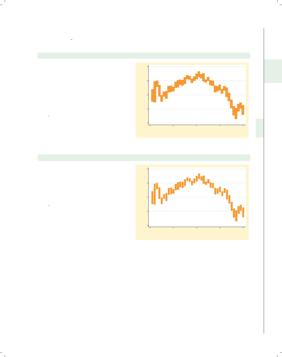
i
i
i
i
i
i
i
i
2.7 Range plots 73
We will now explore options that can be used with twoway rbar, and we will switch to
using the vg brite scheme.
twoway rbar high low tradeday
Here is a basic rbar graph with the
default options. As with the other
graphs in this family, we could have
added the horizontal option to switch
the position of the high/low and
tradeday variables, but this is not
shown.
Uses spjanfeb2001.dta & scheme
vg brite
1200 1250 1300 1350 1400
High price/Low price
0 10 20 30 40
Trading day number
twoway rbar high low tradeday, barwidth(.7)
The barwidth() option can be used to
set the width of the bar. This width is
in units of the x-variable. We set the
bars to be .7 units wide, so they no
longer touch each other.
Uses spjanfeb2001.dta & scheme
vg brite
1200 1250 1300 1350 1400
High price/Low price
0 10 20 30 40
Trading day number
Introduction Twoway Matrix Bar Box Dot Pie Options Standard options Styles Appendix
Scatter Fit CI fit Line Area Bar Range Distribution Options Overlaying
The electronic form of this book is solely for direct use at UCLA and only by faculty, students, and staff of UCLA.
All rights reserved on the copyright page apply to this document and specifically neither the electronic nor
published form of the book may be distributed or reproduced, either electronically or in printed form.
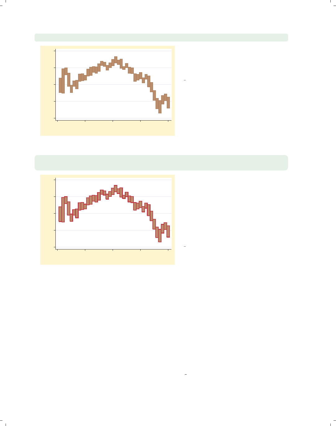
i
i
i
i
i
i
i
i
74 Chapter 2. Twoway graphs
twoway rbar high low tradeday, bcolor(sienna)
1200 1250 1300 1350 1400
High price/Low price
0 10 20 30 40
Trading day number
The bcolor() (bar color) option sets
the color of the bar and the outline,
making the color sienna.
Uses spjanfeb2001.dta & scheme
vg brite
twoway rbar high low tradeday, bfcolor(sienna)
blcolor(cranberry) blwidth(thick)
1200 1250 1300 1350 1400
High price/Low price
0 10 20 30 40
Trading day number
With the bfcolor() (bar fill color)
option, we set the fill color of the bar to
be sienna and then use the blcolor()
(bar line color) option to set the color
of the outline to be cranberry. We also
use the blwidth() (bar line width)
option to make the lines surrounding
the bars thick.
Uses spjanfeb2001.dta & scheme
vg brite
2.8 Distribution plots
This section describes the use of twoway histogram and twoway kdensity for showing
the distribution of a single variable. In addition, this section also shows the use of twoway
function for showing the relationship between xand yusing a function that you specify.
See [G]graph twoway histogram,[G]graph twoway kdensity, and [G]graph twoway
function for more information. We will start by showing the twoway histogram command
and consider options that allow you to control such things as the number of bins, the width
of the bins, and the starting point for the bins. Then, we will show options that control the
scaling of the y-axis. The next few graphs use the vg past scheme.
The electronic form of this book is solely for direct use at UCLA and only by faculty, students, and staff of UCLA.
All rights reserved on the copyright page apply to this document and specifically neither the electronic nor
published form of the book may be distributed or reproduced, either electronically or in printed form.
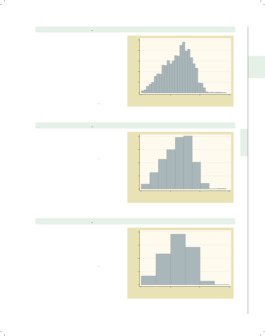
i
i
i
i
i
i
i
i
2.8 Distribution plots 75
twoway histogram ttl exp
We begin by showing a histogram of
the variable total work experience.
Note that, unlike many other twoway
plots, this command takes only one
variable that is graphed on the x-axis.
The y-axis represents the density, such
that the sum of the areas of the bars
equals 1. If you are not going to
combine this graph with other twoway
graphs, the histogram command may
be preferable to twoway histogram.
Uses nlsw.dta & scheme vg past
0 .02 .04 .06 .08 .1
Density
0 10 20 30
Tot. work exper.
twoway histogram ttl exp, bin(10)
We can control the number of bins that
are used to display the histogram using
the bin() option. Here, we request
that 10 bins be used.
Uses nlsw.dta & scheme vg past
0 .02 .04 .06 .08
Density
0 10 20 30
Tot. work exper.
twoway histogram ttl exp, width(5)
We can control the width of each bar
using the width() option. Here, we
make each bar 5 units wide. As you
might imagine, you can use either the
bin() option or the width() option
but not both.
Uses nlsw.dta & scheme vg past
0 .02 .04 .06 .08
Density
0 10 20 30
Tot. work exper.
Introduction Twoway Matrix Bar Box Dot Pie Options Standard options Styles Appendix
Scatter Fit CI fit Line Area Bar Range Distribution Options Overlaying
The electronic form of this book is solely for direct use at UCLA and only by faculty, students, and staff of UCLA.
All rights reserved on the copyright page apply to this document and specifically neither the electronic nor
published form of the book may be distributed or reproduced, either electronically or in printed form.
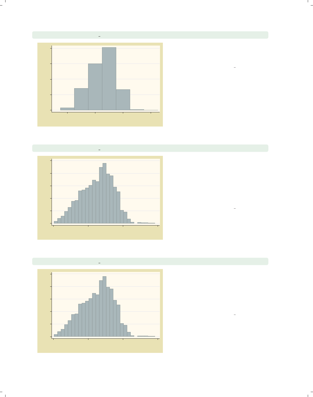
i
i
i
i
i
i
i
i
76 Chapter 2. Twoway graphs
twoway histogram ttl exp, start(-2.5) width(5)
0 .02 .04 .06 .08
Density
0 10 20 30
Tot. work exper.
We add the start() option to indicate
that we want the lower limit of the first
bintostartat−2.5.
Uses nlsw.dta & scheme vg past
twoway histogram ttl exp, fraction width(1)
0 .02 .04 .06 .08 .1
Fraction
0 10 20 30
Tot. work exper.
If we use the fraction option, the
y-axis is scaled such that the height of
each bar is the probability of falling
within the range of x-values represented
by the bar. Thus, if we specify the
width of bars to be 1, the sum of the
heights of the bars is 1.
Uses nlsw.dta & scheme vg past
twoway histogram ttl exp, percent width(1)
0 2 4 6 8 10
Percent
0 10 20 30
Tot. work exper.
The percent option is similar to the
fraction option, except that the y-axis
is represented as a percentage instead
of a proportion. If we also specify a bar
width of 1, the sum of the heights of
the bars is 100%.
Uses nlsw.dta & scheme vg past
The electronic form of this book is solely for direct use at UCLA and only by faculty, students, and staff of UCLA.
All rights reserved on the copyright page apply to this document and specifically neither the electronic nor
published form of the book may be distributed or reproduced, either electronically or in printed form.
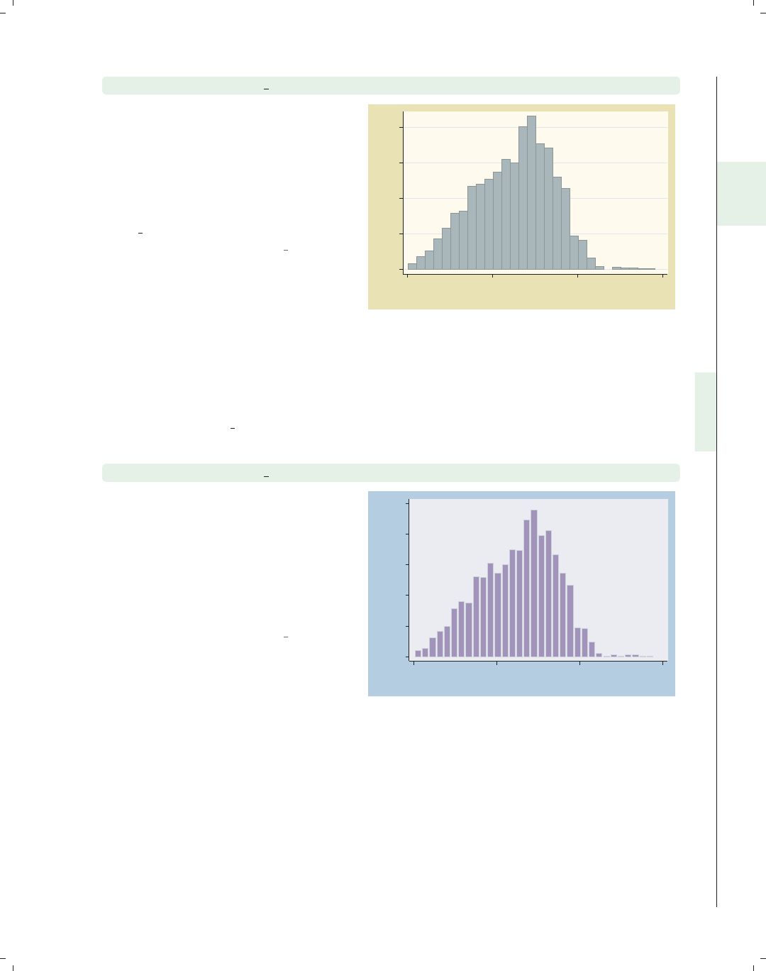
i
i
i
i
i
i
i
i
2.8 Distribution plots 77
twoway histogram ttl exp, frequency width(1)
The frequency option changes the
scaling of the y-axis to represent the
number of cases that fall within the
range of x-values represented by the
bar. If we specify a bar width of 1, the
sum of the heights of the bars equals
the number of nonmissing values for
ttl exp.
Uses nlsw.dta & scheme vg past
0 50 100 150 200
Frequency
0 10 20 30
Tot. work exper.
Let’s now consider options that control the width of the bars and other characteristics
of the bars, such as color. Then, we will show you how to display the graph as a horizontal
histogram and demonstrate options that allow you to treat varname as a discrete variable.
We will use the vg blue scheme for these graphs.
twoway histogram ttl exp, gap(20)
The gap() option specifies the gap
between each of the bars. The gap is
created by reducing the width of the
bars. By default, the gap is 0, meaning
that the bars touch exactly and the
bars are reduced by 0%. Here, we
reduce the size of the bars by 20%,
making a small gap between the bars.
Uses nlsw.dta & scheme vg blue
0
.02
.04
.06
.08
.1
Density
0 10 20 30
Tot. work exper.
Introduction Twoway Matrix Bar Box Dot Pie Options Standard options Styles Appendix
Scatter Fit CI fit Line Area Bar Range Distribution Options Overlaying
The electronic form of this book is solely for direct use at UCLA and only by faculty, students, and staff of UCLA.
All rights reserved on the copyright page apply to this document and specifically neither the electronic nor
published form of the book may be distributed or reproduced, either electronically or in printed form.
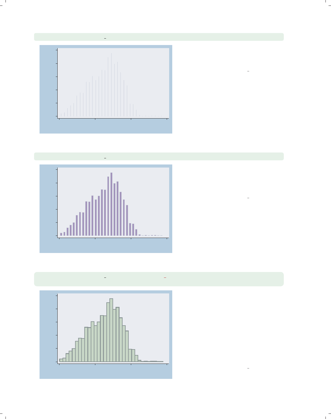
i
i
i
i
i
i
i
i
78 Chapter 2. Twoway graphs
twoway histogram ttl exp, gap(99.99)
0
.02
.04
.06
.08
.1
Density
0 10 20 30
Tot. work exper.
Here, we reduce the size of the bars
99.99%, making the bars 0.01% of their
normal size.
Uses nlsw.dta & scheme vg blue
twoway histogram ttl exp, barwidth(.5)
0
.02
.04
.06
.08
.1
Density
0 10 20 30
Tot. work exper.
Another way you can control the width
of the bars is though the barwidth()
option. Here, we indicate that we wish
each bar to be .5 x-units wide.
Uses nlsw.dta & scheme vg blue
twoway histogram ttl exp, bfcolor(olive teal) blcolor(teal)
blwidth(thick)
0
.02
.04
.06
.08
.1
Density
0 10 20 30
Tot. work exper.
We use the bfcolor() (bar fill color)
option to make the fill color of the bar
olive–teal and the blcolor() (bar line
color) option to make the bar line color
teal. The blwidth() (bar line width)
option makes the line around the bar
thick. The section Styles : Colors (328)
shows more about colors, and
Styles : Linewidth (337) shows more
about line widths.
Uses nlsw.dta & scheme vg blue
The electronic form of this book is solely for direct use at UCLA and only by faculty, students, and staff of UCLA.
All rights reserved on the copyright page apply to this document and specifically neither the electronic nor
published form of the book may be distributed or reproduced, either electronically or in printed form.

i
i
i
i
i
i
i
i
2.8 Distribution plots 79
We will now briefly consider some other options that can be used with twoway histogram,
showing how you can swap the position of the x-andy-axes, and the discrete option for
use with discrete variables. We will use the vg s1m scheme for the next set of graphs.
twoway histogram ttl exp, horizontal
We can use the horizontal option to
swap the position of ttl exp and its
density, making a horizontal display of
the histogram.
Uses nlsw.dta & scheme vg s1m
0 10 20 30
Tot. work exper.
0 .02 .04 .06 .08 .1
Density
twoway histogram grade, discrete
Here, we use the discrete option to
tell Stata that the variable grade is a
discrete variable and can take on only
integer values. In this example, each
bin has a width of 1, and the bars are
toonarrowtobeuseful.
Uses nlsw.dta & scheme vg s1m
0 .1 .2 .3 .4
Density
5 10 15 20
current grade completed
Introduction Twoway Matrix Bar Box Dot Pie Options Standard options Styles Appendix
Scatter Fit CI fit Line Area Bar Range Distribution Options Overlaying
The electronic form of this book is solely for direct use at UCLA and only by faculty, students, and staff of UCLA.
All rights reserved on the copyright page apply to this document and specifically neither the electronic nor
published form of the book may be distributed or reproduced, either electronically or in printed form.

i
i
i
i
i
i
i
i
80 Chapter 2. Twoway graphs
twoway histogram grade, discrete width(2)
0 .05 .1 .15 .2 .25
Density
5 10 15 20
current grade completed
We add the width() option, and the
bars have a width of 2.
Uses nlsw.dta & scheme vg s1m
We will now consider kernel-density plots that can be created using twoway kdensity.
For more details, see [G]graph twoway kdensity. As with histograms, if you are not going
to combine the kernel-density plot with other twoway plots, and sometimes even when you
are, the kdensity command is preferable to twoway kdensity. We will explore a handful
of options that are useful for controlling the display of these graphs. These graphs will use
the vg s2c scheme.
twoway kdensity ttl exp
0 .02 .04 .06 .08
kdensity ttl_exp
0 10 20 30
x
Here is a kernel-density plot of total
work experience. We could have added
the horizontal option to display the
graph as a horizontal plot, but this
option is not shown.
Uses nlsw.dta & scheme vg s2c
The electronic form of this book is solely for direct use at UCLA and only by faculty, students, and staff of UCLA.
All rights reserved on the copyright page apply to this document and specifically neither the electronic nor
published form of the book may be distributed or reproduced, either electronically or in printed form.
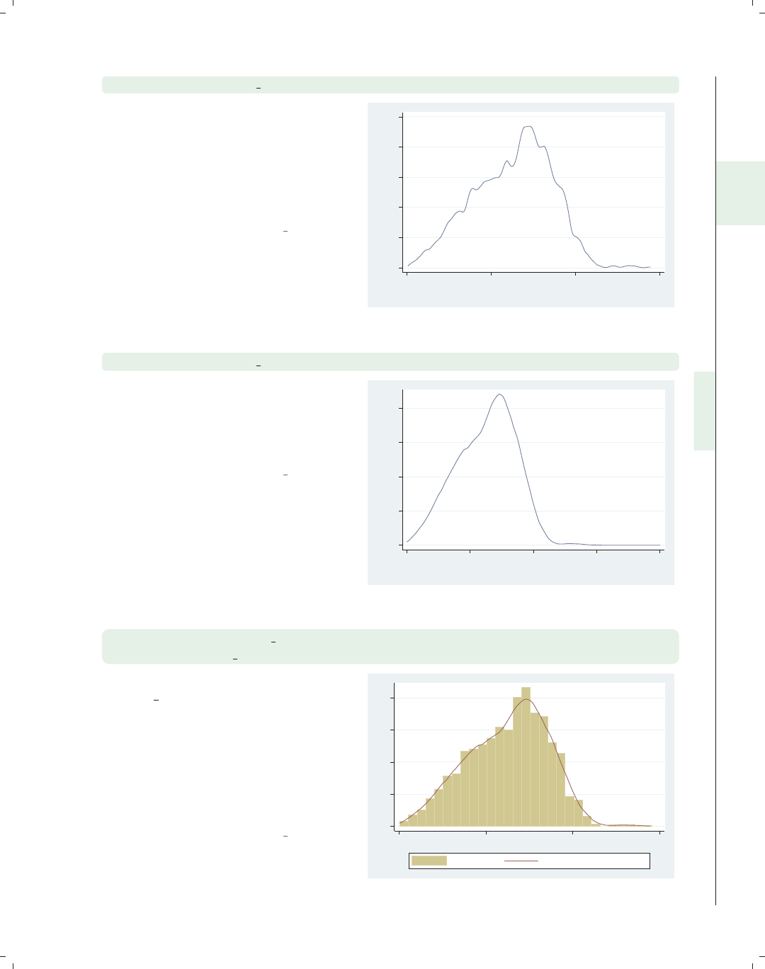
i
i
i
i
i
i
i
i
2.8 Distribution plots 81
twoway kdensity ttl exp, biweight
By default, Stata uses a Epanechnikov
kernel for computing the density
estimates. Here, we use the biweight
option to use the biweight kernel for
computing the densities. Other
methods include cosine,gauss,
parzen,rectangle,andtriangle.
Uses nlsw.dta & scheme vg s2c
0 .02 .04 .06 .08 .1
kdensity ttl_exp
0 10 20 30
x
twoway kdensity ttl exp, range(0 40)
You can use the range() option to
specify the range of the x-values at
which the kernel density is computed
and displayed. Here, we expand the
rangetospanfrom0to40.
Uses nlsw.dta & scheme vg s2c
0 .02 .04 .06 .08
kdensity ttl_exp
0 10 20 30 40
x
twoway (histogram ttl exp, width(1) frequency)
(kdensity ttl exp, area(2246))
In this example, we overlay a histogram
of ttl exp, scaling the y-axis as the
frequency of values in each bin. We
overlay this with a kdensity plot but
want to scale the y-axis in a
commensurate manner. By using the
area() option, we can specify that the
sum of the area of the kernel density
should sum to 2246, the sample size.
Uses nlsw.dta & scheme vg s2c
0 50 100 150 200
0 10 20 30
Frequency kdensity ttl_exp, area=2246
Introduction Twoway Matrix Bar Box Dot Pie Options Standard options Styles Appendix
Scatter Fit CI fit Line Area Bar Range Distribution Options Overlaying
The electronic form of this book is solely for direct use at UCLA and only by faculty, students, and staff of UCLA.
All rights reserved on the copyright page apply to this document and specifically neither the electronic nor
published form of the book may be distributed or reproduced, either electronically or in printed form.
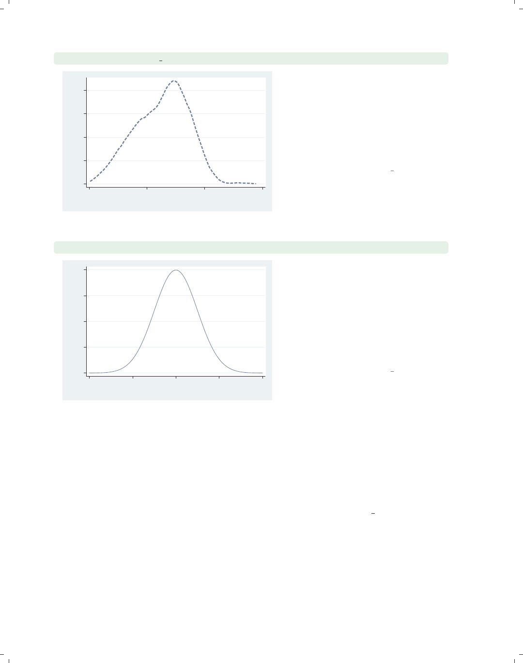
i
i
i
i
i
i
i
i
82 Chapter 2. Twoway graphs
twoway kdensity ttl exp, clwidth(thick) clpattern(dash)
0 .02 .04 .06 .08
kdensity ttl_exp
0 10 20 30
x
We can use options such as clcolor(),
clwidth(),andclpattern() to alter
the characteristics of the line. Here, we
use the clwidth() and clpattern()
options to make the line thick and
dashed. See Styles : Linewidth (337),
Styles : Linepatterns (336), and
Styles : Colors (328) for more details.
Uses nlsw.dta & scheme vg s2c
twoway function y=normden(x), range(-4 4)
0 .1 .2 .3 .4
y
−4−2 0 2 4
x
We conclude by showing how you can
use twoway function to graph an
arbitrary function. We graph the
function y=normden(x) to show a
normal curve. We add the range(-4
4) to specify that we want the x-values
to range from −4 to 4. Otherwise, the
graph would show the x-values ranging
from 0 to 1.
Uses nlsw.dta & scheme vg s2c
2.9 Options
This section discusses the use of options with twoway, showing the types of options you
can use. For more details, see Options (235). This section uses the vg outm scheme for
displaying the graphs.
The electronic form of this book is solely for direct use at UCLA and only by faculty, students, and staff of UCLA.
All rights reserved on the copyright page apply to this document and specifically neither the electronic nor
published form of the book may be distributed or reproduced, either electronically or in printed form.
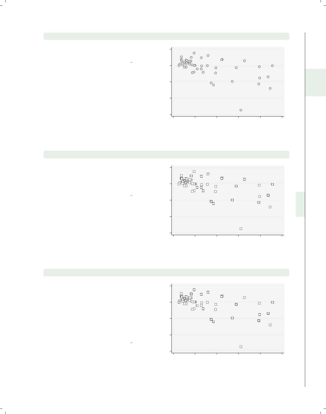
i
i
i
i
i
i
i
i
2.9 Options 83
twoway scatter ownhome propval100
Consider this basic scatterplot. We will
use this for illustrating options.
Uses allstates.dta & scheme vg outm
40 50 60 70 80
% who own home
0 20 40 60 80 100
% homes cost $100K+
twoway scatter ownhome propval100, msymbol(S)
We can use the msymbol() option to
control the marker symbols. Here, we
use squares as symbols. See
Options : Markers (235) for more details.
Uses allstates.dta & scheme vg outm
40 50 60 70 80
% who own home
0 20 40 60 80 100
% homes cost $100K+
twoway scatter ownhome propval100, msymbol(S) mlabel(stateab)
We can use the mlabel() option to
control the marker labels. Here, we
label each of the markers with the
variable stateab showing the two-letter
abbreviation for each state next to each
marker. See Options : Marker labels
(247) for more information about
marker labels.
Uses allstates.dta & scheme vg outm
AL
AK
AZ
AR
CA
CO
CT
DE
DC
FL
GA
HI
ID
IL
IN
IA
KS
KY
LA
ME
MD
MA
MI
MN
MS MO
MT
NE
NV
NH
NJ
NM
NY
NC
ND OH
OK
OR
PA
RI
SC
SD TN
TX
UT VT
VA
WA
WV WI
WY
40 50 60 70 80
% who own home
0 20 40 60 80 100
% homes cost $100K+
Introduction Twoway Matrix Bar Box Dot Pie Options Standard options Styles Appendix
Scatter Fit CI fit Line Area Bar Range Distribution Options Overlaying
The electronic form of this book is solely for direct use at UCLA and only by faculty, students, and staff of UCLA.
All rights reserved on the copyright page apply to this document and specifically neither the electronic nor
published form of the book may be distributed or reproduced, either electronically or in printed form.
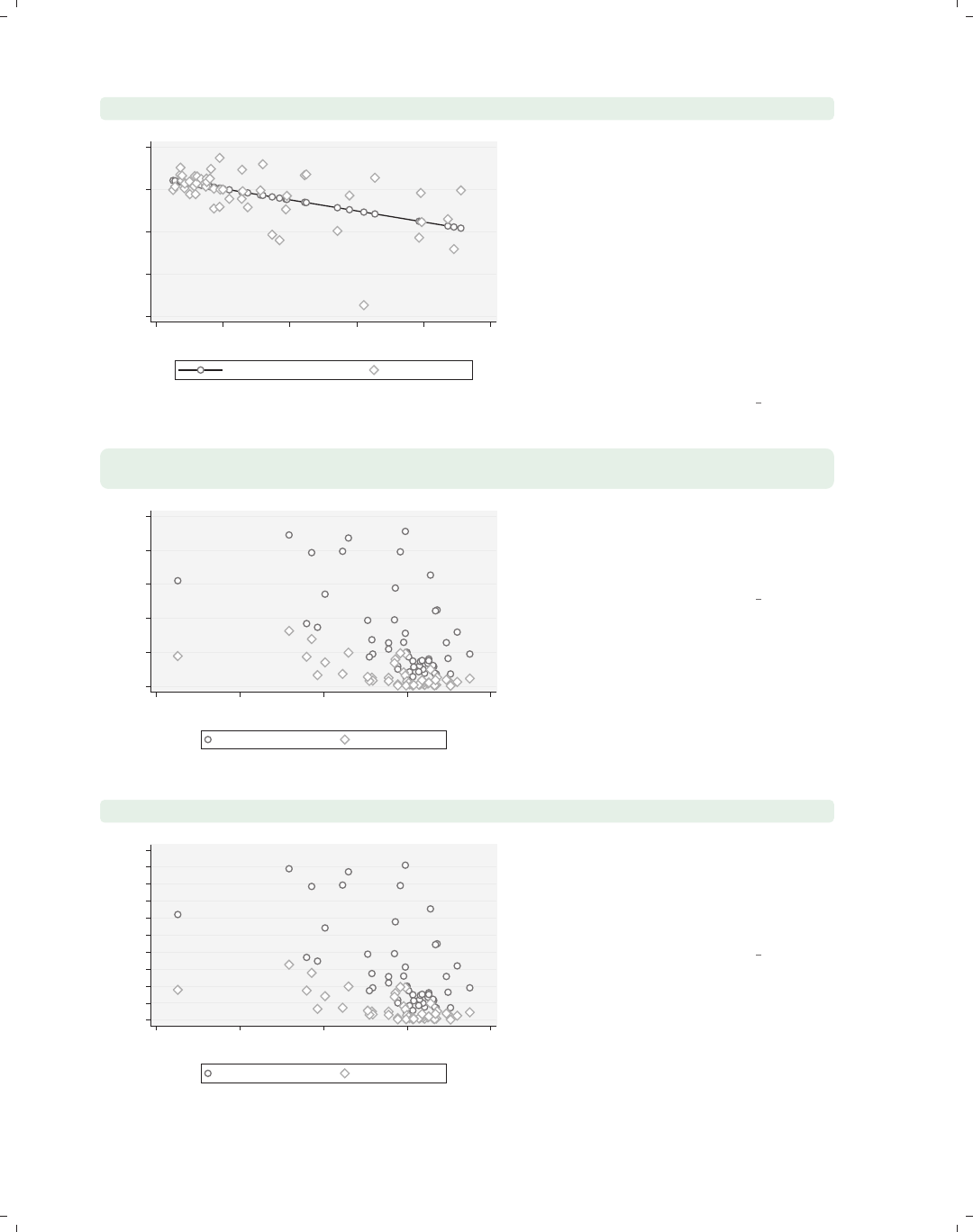
i
i
i
i
i
i
i
i
84 Chapter 2. Twoway graphs
twoway scatter fv ownhome propval100, connect(l .) sort
40 50 60 70 80
0 20 40 60 80 100
% homes cost $100K+
yhat ownhome|propval100 % who own home
Say that we regressed ownhome on
propval100 and generated predicted
values named fv. Here, we make a
scatterplot and fit line in the same
graph using the connect(l .) option
to connect the values of fv but not the
values of ownhome. We also add the
sort option, which is generally
recommended when using the
connect() option. See
Options : Connecting (250) for more
details.
Uses allstates.dta & scheme vg outm
twoway scatter propval100 rent700 ownhome,
xtitle(Percent of households that own their own home)
0 20 40 60 80 100
40 50 60 70 80
Percent of households that own their own home
% homes cost $100K+ % rents $700+/mo
We can add a title to the x-axis using
the xtitle() option, as illustrated
here. See Options : Axis titles (254) for
more details about titles.
Uses allstates.dta & scheme vg outm
twoway scatter propval100 rent700 ownhome, ylabel(0(10)100)
0 10 20 30 40 50 60 70 80 90 100
40 50 60 70 80
% who own home
% homes cost $100K+ % rents $700+/mo
We can label the y-axis from 0 to 100,
incrementing by 10, using the
ylabel(0(10)100) option as shown
here. See Options : Axis labels (256) for
more information about labeling axes.
Uses allstates.dta & scheme vg outm
The electronic form of this book is solely for direct use at UCLA and only by faculty, students, and staff of UCLA.
All rights reserved on the copyright page apply to this document and specifically neither the electronic nor
published form of the book may be distributed or reproduced, either electronically or in printed form.
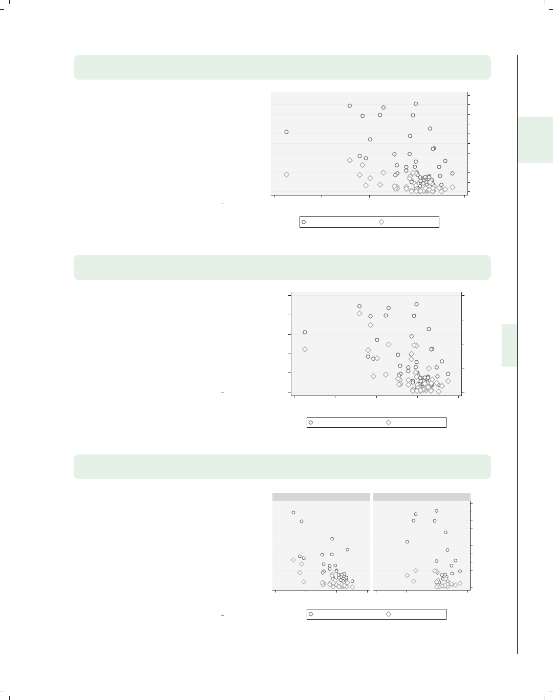
i
i
i
i
i
i
i
i
2.9 Options 85
twoway scatter propval100 rent700 ownhome,
ylabel(0(10)100) yscale(alt)
Stata gives you a number of options
that you can use to control the axis
scale for both the x-andy-axes. For
example, here we use yscale(alt) to
move the y-axis to its alternate
position, moving it from the left to the
right. See Options : Axis scales (265) for
more details about the options for
controlling the axis scales.
Uses allstates.dta & scheme vg outm
0 10 20 30 40 50 60 70 80 90 100
40 50 60 70 80
% who own home
% homes cost $100K+ % rents $700+/mo
twoway (scatter propval100 ownhome)
(scatter rent700 ownhome, yaxis(2))
In this example, we show propval100
by ownhome and also rent700 by
ownhome, but for this second plot, we
put the y-axis on the second y-axis with
the yaxis(2) option. See
Options : Axis selection (269) for more
information about using and controlling
additional axes.
Uses allstates.dta & scheme vg outm
0 10 20 30 40
% rents $700+/mo
0 20 40 60 80 100
% homes cost $100K+
40 50 60 70 80
% who own home...
% homes cost $100K+ % rents $700+/mo
twoway scatter propval100 rent700 ownhome,
ylabel(0(10)100) yscale(alt) by(north)
The by() option allows you to see a
graph broken down by one or more
by() variables. Here, we show the
graph from above further broken down
by whether the state was part of the
North, making two graphs that are
combined together into a single graph.
The section Options : By (272) shows
more details and examples about the
use of the by() option.
Uses allstates.dta & scheme vg outm
0 10 20 30 40 50 60 70 80 90 100
50 60 70 80 50 60 70 80
S & W North
% homes cost $100K+ % rents $700+/mo
% who own home
Graphs by Region North or Not
Introduction Twoway Matrix Bar Box Dot Pie Options Standard options Styles Appendix
Scatter Fit CI fit Line Area Bar Range Distribution Options Overlaying
The electronic form of this book is solely for direct use at UCLA and only by faculty, students, and staff of UCLA.
All rights reserved on the copyright page apply to this document and specifically neither the electronic nor
published form of the book may be distributed or reproduced, either electronically or in printed form.
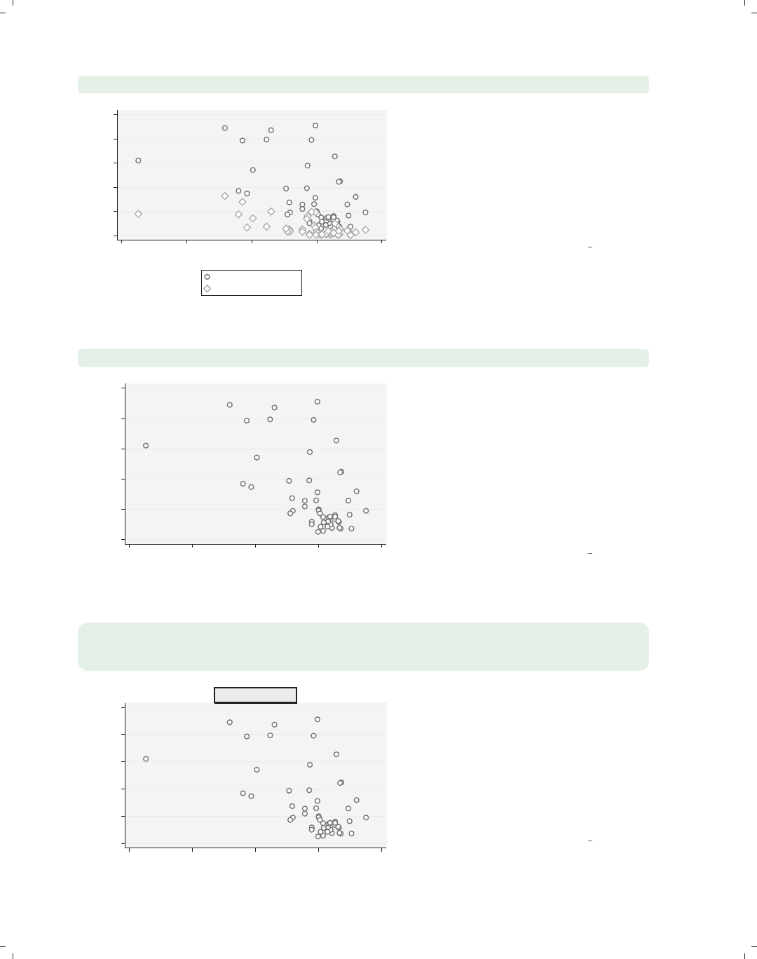
i
i
i
i
i
i
i
i
86 Chapter 2. Twoway graphs
twoway scatter propval100 rent700 ownhome, legend(cols(1))
0 20 40 60 80 100
40 50 60 70 80
% who own home
% homes cost $100K+
% rents $700+/mo
The legend() option allows you to
control the contents and display of the
legend. Here, we use the
legend(cols(1)) option to indicate
that we want the legend to display as a
single column. See Options : Legend
(287) for more details about the
legend() option.
Uses allstates.dta & scheme vg outm
twoway scatter propval100 ownhome, text(62 45 "DC")
DC
0 20 40 60 80 100
% homes cost $100K+
40 50 60 70 80
% who own home
In this graph, there is a single
observation that stands out from the
rest. Rather than use the mlabel()
option to label all of the markers, we
may want to label just the outlying
point. Here, we use the text() option
to add the text DC at the (y,x)
coordinates of (62,45), in effect labeling
that point; see Options : Adding text
(299) for more details.
Uses allstates.dta & scheme vg outm
twoway scatter propval100 ownhome,
title(This is a Title, box bfcolor(dimgray)
blcolor(black) blwidth(thick))
0 20 40 60 80 100
% homes cost $100K+
40 50 60 70 80
% who own home
This is a Title Most items of text on a Stata graph
actually display within a box. We
illustrate this with the title() option
showing how we can place a box around
this text. We make the background
color of the box light gray and the
outline thick and black. These options
are described in more detail in
Options : Textboxes (303).
Uses allstates.dta & scheme vg outm
The electronic form of this book is solely for direct use at UCLA and only by faculty, students, and staff of UCLA.
All rights reserved on the copyright page apply to this document and specifically neither the electronic nor
published form of the book may be distributed or reproduced, either electronically or in printed form.
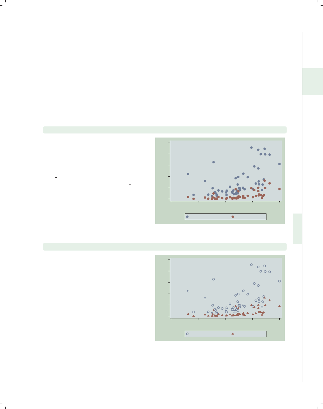
i
i
i
i
i
i
i
i
2.10 Overlaying plots 87
2.10 Overlaying plots
One of the terrific features of twoway graphs is the ability to overlay them, giving you
the flexibility to create more complex graphs. This section shows two strategies you can
use. The first strategy is graphing multiple y-variables against a single x-variable in a sin-
gle twoway command. The second strategy is specifying multiple commands within a single
twoway command, thus overlaying these graphs atop each other. It is also possible to create
separate graphs and glue them together using the graph combine command, which is dis-
cussed in Appendix : Save/Redisplay/Combine (358). We first start by illustrating how you
can specify multiple y-variables against a single x-variable using a single twoway command.
twoway scatter propval100 rent700 urban
We can use twoway scatter to graph
multiple y-variables against a single
x-variable in a single plot. Here, we
show propval100 and rent700 against
urban. Note that we are now using the
vg teal scheme.
Uses allstates.dta & scheme vg teal
0
20
40
60
80
100
20 40 60 80 100
Percent urban 1990
% homes cost $100K+ % rents $700+/mo
twoway scatter propval100 rent700 urban, msymbol(Oh t)
The msymbol() option can be used to
select the marker symbols for the
multiple y-variables. Here, we plot the
variable propval100 with hollow
circles, and rent700 is plotted with
triangles.
Uses allstates.dta & scheme vg teal
0
20
40
60
80
100
20 40 60 80 100
Percent urban 1990
% homes cost $100K+ % rents $700+/mo
Introduction Twoway Matrix Bar Box Dot Pie Options Standard options Styles Appendix
Scatter Fit CI fit Line Area Bar Range Distribution Options Overlaying
The electronic form of this book is solely for direct use at UCLA and only by faculty, students, and staff of UCLA.
All rights reserved on the copyright page apply to this document and specifically neither the electronic nor
published form of the book may be distributed or reproduced, either electronically or in printed form.
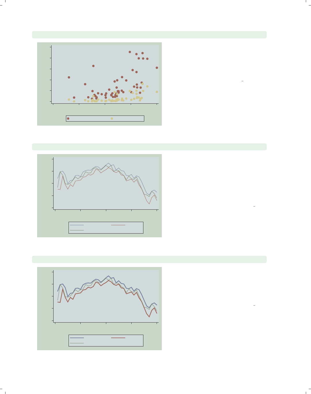
i
i
i
i
i
i
i
i
88 Chapter 2. Twoway graphs
twoway scatter propval100 rent700 urban, mstyle(p2 p8)
0
20
40
60
80
100
20 40 60 80 100
Percent urban 1990
% homes cost $100K+ % rents $700+/mo
The mstyle() (marker style) option
can be used to choose among marker
styles. These composite styles set the
symbol, size, fill, color, outline color,
and outline width for the markers.
Uses allstates.dta & scheme vg teal
twoway line high low close tradeday, sort
1200
1250
1300
1350
1400
0 10 20 30 40
Trading day number
High price Low price
Closing price
We will briefly switch to using the
spjanfeb2001 data file. You can also
graph multiple y-variables against a
single x-variable with a line graph.
This works with twoway line,as
illustrated here, as well as with twoway
connected and twoway tsline.
Uses spjanfeb2001.dta & scheme vg teal
twoway line high low close tradeday, sort clwidth(thick thick .)
1200
1250
1300
1350
1400
0 10 20 30 40
Trading day number
High price Low price
Closing price
Here, we use the clwidth() option to
change the width of the lines, making
the lines for the high and low prices
thick and leaving the line for the
closing price at the default width.
Uses spjanfeb2001.dta & scheme vg teal
The electronic form of this book is solely for direct use at UCLA and only by faculty, students, and staff of UCLA.
All rights reserved on the copyright page apply to this document and specifically neither the electronic nor
published form of the book may be distributed or reproduced, either electronically or in printed form.
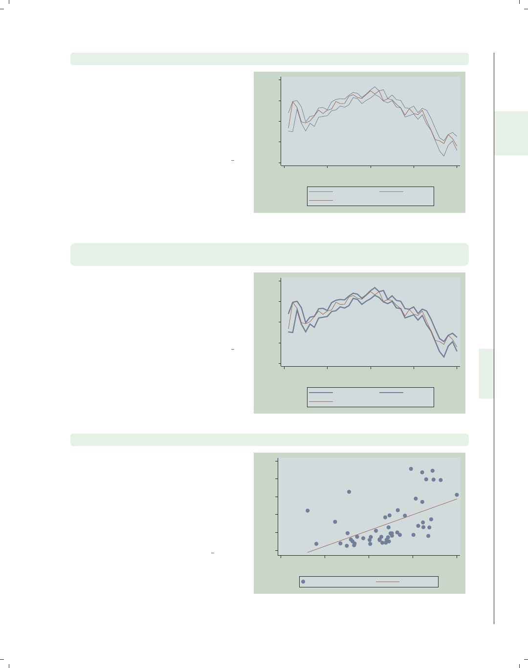
i
i
i
i
i
i
i
i
2.10 Overlaying plots 89
twoway line high low close tradeday, sort clstyle(p1 p1 p2)
When we graph multiple y-variables, we
can use clstyle() (connect line style)
to control many characteristics of the
lines at once. Here, we plot the high
and low prices with the same style, p1,
and the closing price printed with a
second style, p2.
Uses spjanfeb2001.dta & scheme vg teal 1200
1250
1300
1350
1400
0 10 20 30 40
Trading day number
High price Low price
Closing price
twoway line high low close tradeday, sort clstyle(p1 p1 p2)
clwidth(thick thick .)
Here, we combine clstyle() and
clwidth() to make the lines for the
high and low prices the same style and
make them both thick. The third line is
drawn with the p2 style, and the
thickness is left at its default value.
Uses spjanfeb2001.dta & scheme vg teal
1200
1250
1300
1350
1400
0 10 20 30 40
Trading day number
High price Low price
Closing price
twoway (scatter propval100 urban) (lfit propval100 urban)
We return to the allstates data file.
We can overlay multiple twoway
graphs. Here, we show a common kind
of overlay: scatterplot overlaid with a
linear fit between the two variables.
Note that both the scatter command
and the lfit command are surrounded
by parentheses.
Uses allstates.dta & scheme vg teal 0
20
40
60
80
100
20 40 60 80 100
Percent urban 1990
% homes cost $100K+ Fitted values
Introduction Twoway Matrix Bar Box Dot Pie Options Standard options Styles Appendix
Scatter Fit CI fit Line Area Bar Range Distribution Options Overlaying
The electronic form of this book is solely for direct use at UCLA and only by faculty, students, and staff of UCLA.
All rights reserved on the copyright page apply to this document and specifically neither the electronic nor
published form of the book may be distributed or reproduced, either electronically or in printed form.
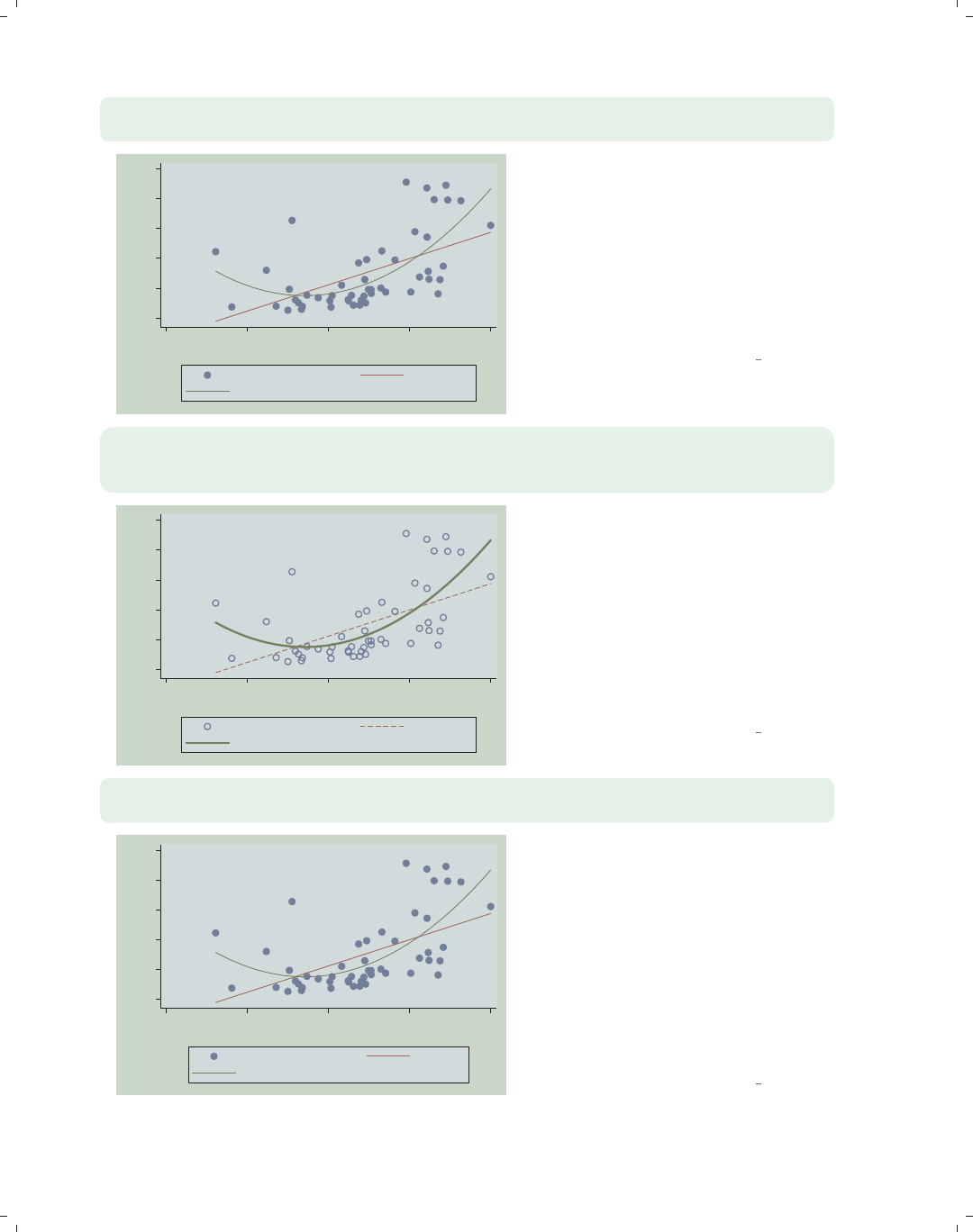
i
i
i
i
i
i
i
i
90 Chapter 2. Twoway graphs
twoway (scatter propval100 urban) (lfit propval100 urban)
(qfit propval100 urban)
0
20
40
60
80
100
20 40 60 80 100
Percent urban 1990
% homes cost $100K+ Fitted values
Fitted values
We can add a quadratic fit to the
previous graph by adding a qfit
command, so we can compare a linear
fit and quadratic fit to see if there are
nonlinearities in the fit. Note that the
legend does not clearly differentiate
between the linear and quadratic fit; we
will show you how to modify the legend
to label this more clearly below.
Uses allstates.dta & scheme vg teal
twoway (scatter propval100 urban, msymbol(Oh))
(lfit propval100 urban, clpattern(dash))
(qfit propval100 urban, clwidth(thick))
0
20
40
60
80
100
20 40 60 80 100
Percent urban 1990
% homes cost $100K+ Fitted values
Fitted values
We add the msymbol(Oh) option to the
scatter command, placing it after the
comma, as it normally would be placed,
but before the closing parenthesis that
indicates the end of the scatter
command. We also add the
clpattern(dash) option to the lfit
command to make the line dashed and
add the clwidth(thick) option to the
qfit command to make the line thick.
Uses allstates.dta & scheme vg teal
twoway (scatter propval100 urban) (lfit propval100 urban)
(qfit propval100 urban), legend(label(2 Linear Fit) label(3 Quad Fit))
0
20
40
60
80
100
20 40 60 80 100
Percent urban 1990
% homes cost $100K+ Linear Fit
Quad Fit
While each graph subcommand can
have its own options, some options can
apply to the entire graph. As
illustrated here, we add a legend to the
graph to clarify the difference in the fit
values, and this option appears
following a comma after the closing
parenthesis following the qfit
command. The legend() option
appears at the end of the command
since it applies to the entire graph.
Uses allstates.dta & scheme vg teal
The electronic form of this book is solely for direct use at UCLA and only by faculty, students, and staff of UCLA.
All rights reserved on the copyright page apply to this document and specifically neither the electronic nor
published form of the book may be distributed or reproduced, either electronically or in printed form.
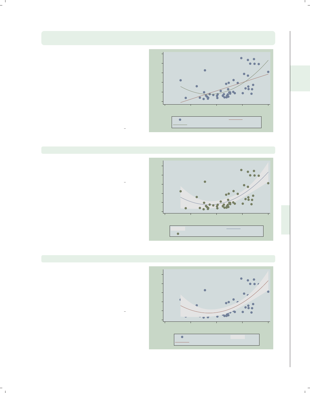
i
i
i
i
i
i
i
i
2.10 Overlaying plots 91
twoway (scatter propval100 urban) (lfit propval100 urban)
(qfit propval100 urban, legend(label(2 Linear Fit) label(3 Quad Fit)))
We can make the previous graph in a
different, but less appropriate, way.
The legend() option is given as an
option of the qfit() command, not at
the very end as in the previous graph
command. But Stata is forgiving of
this, and even when such options are
inappropriately given within a
particular command, it treats them as
though they were given at the end of
the command.
Uses allstates.dta & scheme vg teal
0
20
40
60
80
100
20 40 60 80 100
Percent urban 1990
% homes cost $100K+ Linear Fit
Quad Fit
twoway (qfitci propval100 urban) (scatter propval100 urban)
Another common example of overlaying
graphs is to overlay a fit line with
confidence interval and a scatterplot.
Uses allstates.dta & scheme vg teal
0
20
40
60
80
100
20 40 60 80 100
Percent urban 1990
95% CI Fitted values
% homes cost $100K+
twoway (scatter propval100 urban) (qfitci propval100 urban)
However, note the order in which you
overlay these two kinds of graphs. In
this example, the qfitci was drawn
after the scatter, and as a result, the
points are obscured by the confidence
interval.
Uses allstates.dta & scheme vg teal
0
20
40
60
80
100
20 40 60 80 100
Percent urban 1990
% homes cost $100K+ 95% CI
Fitted values
Introduction Twoway Matrix Bar Box Dot Pie Options Standard options Styles Appendix
Scatter Fit CI fit Line Area Bar Range Distribution Options Overlaying
The electronic form of this book is solely for direct use at UCLA and only by faculty, students, and staff of UCLA.
All rights reserved on the copyright page apply to this document and specifically neither the electronic nor
published form of the book may be distributed or reproduced, either electronically or in printed form.
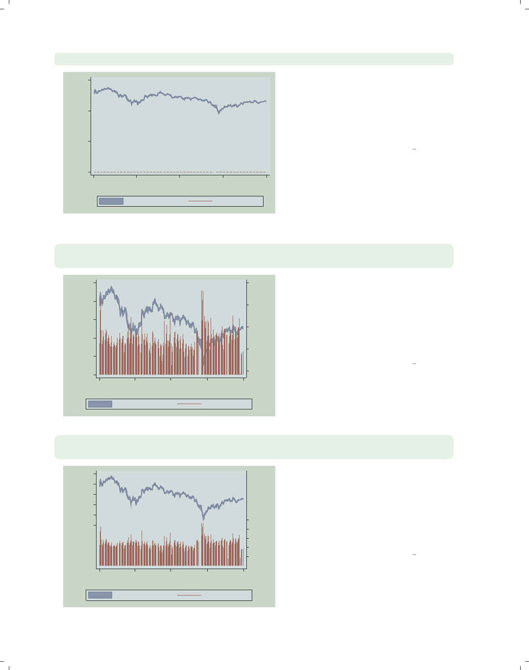
i
i
i
i
i
i
i
i
92 Chapter 2. Twoway graphs
twoway (rarea high low date) (spike volmil date)
0
500
1000
1500
1Jan01 1Apr01 1Jul01 1Oct01 1Jan02
Date
High price/Low price Volume (millions)
We now switch to the sp2001ts data
file. Here, we overlay the high and low
closing prices with the volume of shares
sold. But, since both are placed on the
same y-axis, it is difficult to see the
spikes of volmil, volume in millions.
Uses sp2001ts.dta & scheme vg teal
twoway (rarea high low date) (spike volmil date, yaxis(2)),
legend(span)
.5
1
1.5
2
2.5
Volume (millions)
900
1000
1100
1200
1300
1400
High price/Low price
1Jan01 1Apr01 1Jul01 1Oct01 1Jan02
Date...
High price/Low price Volume (millions)
By placing volmil on the second y-axis
using the yaxis(2) option, we can now
see the volume, but it obstructs the
stock prices. Note that we added the
option legend(span) to allow the
legend to be wider than the plot region
of the graph.
Uses sp2001ts.dta & scheme vg teal
twoway (rarea high low date) (spike volmil date, yaxis(2)),
legend(span) yscale(range(500 1400) axis(1)) yscale(range(0 5) axis(2))
.5
1
1.5
2
2.5
Volume (millions)
900
1000
1100
1200
1300
1400
High price/Low price
1Jan01 1Apr01 1Jul01 1Oct01 1Jan02
Date...
High price/Low price Volume (millions)
We use the yscale() option to modify
the range for the first y-axis to lift its
range into the top third of the graph,
and another yscale() option to modify
the range for the second y-axis, pushing
the stock market volume down to the
bottom third.
Uses sp2001ts.dta & scheme vg teal
The electronic form of this book is solely for direct use at UCLA and only by faculty, students, and staff of UCLA.
All rights reserved on the copyright page apply to this document and specifically neither the electronic nor
published form of the book may be distributed or reproduced, either electronically or in printed form.
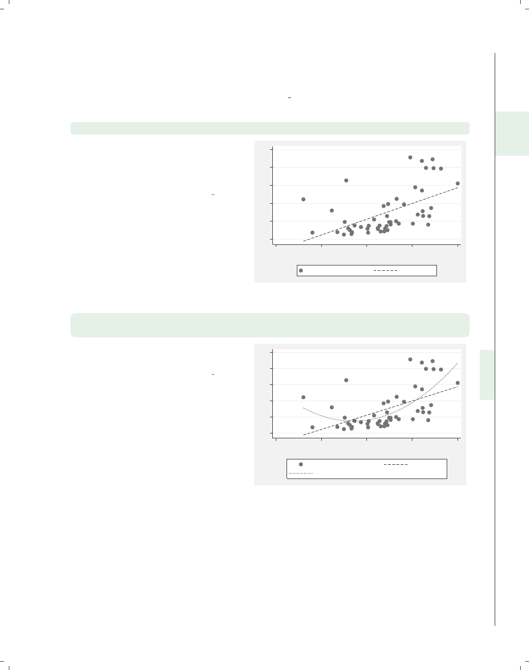
i
i
i
i
i
i
i
i
2.10 Overlaying plots 93
While the previous examples (and other examples in this book) have used the parenthet-
ical notation for overlaid graphs, Stata also permits double vertical bars (||) for separating
graphs. To illustrate this, some of the graphs from above will be repeated using this nota-
tion. These examples will be shown using the vg s2m scheme.
twoway scatter propval100 urban || lfit propval100 urban
We switch back to the allstates data
file. Here, the || notation is used to
separate the scatter command from
the lfit command.
Uses allstates.dta & scheme vg s2m
0 20 40 60 80 100
20 40 60 80 100
Percent urban 1990
% homes cost $100K+ Fitted values
twoway scatter propval100 urban || lfit propval100 urban ||
qfit propval100 urban
Here, we create three overlaid graphs
using the || notation.
Uses allstates.dta & scheme vg s2m
0 20 40 60 80 100
20 40 60 80 100
Percent urban 1990
% homes cost $100K+ Fitted values
Fitted values
Introduction Twoway Matrix Bar Box Dot Pie Options Standard options Styles Appendix
Scatter Fit CI fit Line Area Bar Range Distribution Options Overlaying
The electronic form of this book is solely for direct use at UCLA and only by faculty, students, and staff of UCLA.
All rights reserved on the copyright page apply to this document and specifically neither the electronic nor
published form of the book may be distributed or reproduced, either electronically or in printed form.
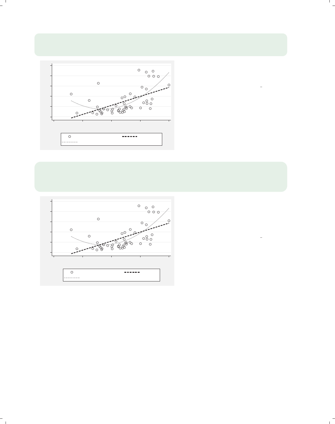
i
i
i
i
i
i
i
i
94 Chapter 2. Twoway graphs
twoway scatter propval100 urban, msymbol(Oh) ||
lfit propval100 urban, clwidth(thick) ||
qfit propval100 urban, clwidth(medium)
0 20 40 60 80 100
20 40 60 80 100
Percent urban 1990
% homes cost $100K+ Fitted values
Fitted values
This example shows how to use the ||
notation with options for each of the
commands.
Uses allstates.dta & scheme vg s2m
twoway scatter propval100 urban, msymbol(Oh) ||
lfit propval100 urban, clwidth(thick) ||
qfit propval100 urban, clwidth(medium) ||,
legend(label(2 Linear Fit) label(3 Quad Fit))
0 20 40 60 80 100
20 40 60 80 100
Percent urban 1990
% homes cost $100K+ Linear Fit
Quad Fit
This is another example using the ||
notation, in this case illustrating how to
have options on each of the commands,
along with the legend() as an overall
option.
Uses allstates.dta & scheme vg s2m
The electronic form of this book is solely for direct use at UCLA and only by faculty, students, and staff of UCLA.
All rights reserved on the copyright page apply to this document and specifically neither the electronic nor
published form of the book may be distributed or reproduced, either electronically or in printed form.
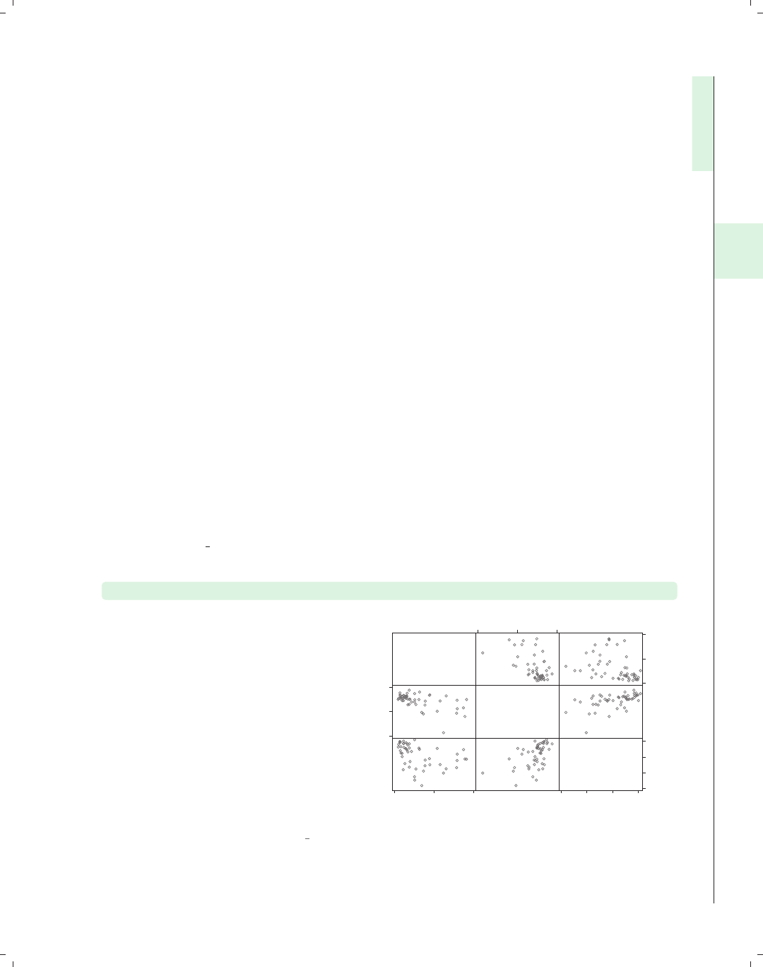
i
i
i
i
i
i
i
i
3 Scatterplot matrix graphs
This chapter will explore the use of the graph matrix command for creating scatterplot
matrices among two or more variables. Many of the options that you can use with graph
twoway scatter apply to these kinds of graphs, as well; see Twoway : Scatter (35) and
Options (235) for related information. This chapter illustrates the use of marker options
and marker labels, as well as options for controlling the display of axes. It also includes
options specific to the graph matrix command, as well as the use of the by() option. For
more details about scatterplot matrices, see [G]graph matrix.
3.1 Marker options
This section looks at controlling and labeling the markers in scatterplot matrices. This
section will show how to change the marker symbol, size, and color (both fill and out-
line color) and how to label the markers. You can label markers using the graph matrix
command just as you could when using the graph twoway scatter command. See also
Options : Markers (235) and Options : Marker labels (247) for more details. These examples
will use the vg s1m scheme.
graph matrix propval100 ownhome borninstate, msymbol(Oh)
You can control the marker symbol
with the msymbol() (marker symbol)
option. Here, we make the symbols
hollow circles. Other values that we
could specify include D(diamond), T
(triangle), S(square), and X(x). Using
a lowercase letter (dinstead of D)
makes the symbol smaller. For circles,
diamonds, triangles, and squares, you
can append an h(e.g., Oh) to indicate
that the symbol should be hollow; see
Styles : Symbols (342) for more
examples.
Uses allstates.dta & scheme vg s1m
% homes
cost
$100K+
% who
own
home
% born in
state of
residence
0
50
100
0 50 100
40
60
80
40 60 80
20
40
60
80
20 40 60 80
Introduction Twoway Matrix Bar Box Dot Pie Options Standard options Styles Appendix
Marker options Axes Matrix options By
95
The electronic form of this book is solely for direct use at UCLA and only by faculty, students, and staff of UCLA.
All rights reserved on the copyright page apply to this document and specifically neither the electronic nor
published form of the book may be distributed or reproduced, either electronically or in printed form.
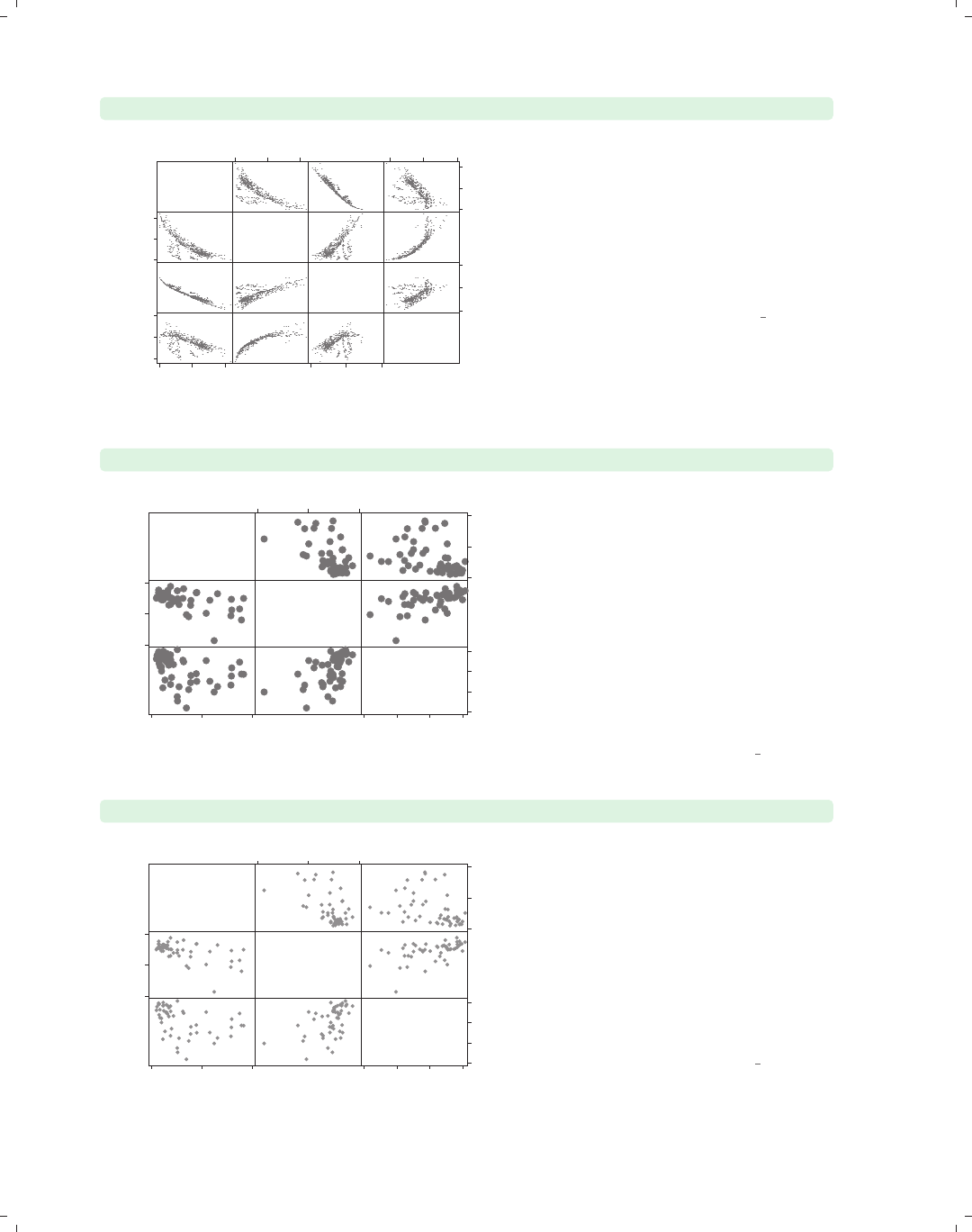
i
i
i
i
i
i
i
i
96 Chapter 3. Scatterplot matrix graphs
graph matrix heatdd cooldd tempjan tempjuly, msymbol(p)
Heating
degree
days
Cooling
degree
days
Average
January
temperature
Average
July
temperature
0
5000
10000
0 5000 10000
0
2000
4000
0 2000 4000
0
50
100
0 50 100
60
80
100
60 80 100 When you have a large number of
observations, the msymbol(p) option
can be very useful since it displays a
very small point for each observation
and can help you to see the overall
relationships among the variables.
Here, we switch to the citytemp data
file to illustrate this.
Uses citytemp.dta & scheme vg s1m
graph matrix propval100 ownhome borninstate, msize(vlarge)
% homes
cost
$100K+
% who
own
home
% born in
state of
residence
0
50
100
0 50 100
40
60
80
40 60 80
20
40
60
80
20 40 60 80
The size of the markers can be changed
using the msize() (marker size) option.
Here, we make the markers very large.
Other values we could have chosen
include vtiny,tiny,vsmall,small,
medsmall,medium,medlarge,large,
vlarge,huge,vhuge,andehuge;see
Styles : Markersize (340) for more details.
We also could have specified the size as
a multiple of the original size of the
marker; e.g., msize(*2) makes the
marker twice as big.
Uses allstates.dta & scheme vg s1m
graph matrix propval100 ownhome borninstate, mcolor(gs8)
% homes
cost
$100K+
% who
own
home
% born in
state of
residence
0
50
100
0 50 100
40
60
80
40 60 80
20
40
60
80
20 40 60 80
The mcolor() (marker color) option
can be used to control the color of the
symbols. Among the colors you can
choose are 16 gray-scale colors named
gs0 (black) to gs16 (white). We show a
graph using symbols that are in the
middle of this scale using the
mcolor(gs8) option; see Styles : Colors
(328) for more information about
specifying colors.
Uses allstates.dta & scheme vg s1m
The electronic form of this book is solely for direct use at UCLA and only by faculty, students, and staff of UCLA.
All rights reserved on the copyright page apply to this document and specifically neither the electronic nor
published form of the book may be distributed or reproduced, either electronically or in printed form.
i
i
i
i
i
i
i
i
3.1 Marker options 97
graph matrix propval100 ownhome borninstate, msize(vlarge)
mfcolor(gs13) mlcolor(gs0)
The mfcolor() (marker fill color) and
mlcolor() (marker line color) options
allow you to control the fill color (inside
color) and outline color (periphery
color) of the markers. Below, we make
the fill color light gray by specifying
mfcolor(gs13) and the line color black
by specifying mlcolor(gs0).Weuse
the msize() option to make the
markers very large to help see the effect
of these options.
Uses allstates.dta & scheme vg s1m
% homes
cost
$100K+
% who
own
home
% born in
state of
residence
0
50
100
0 50 100
40
60
80
40 60 80
20
40
60
80
20 40 60 80
graph matrix propval100 ownhome borninstate, mlabel(stateab)
We can label the markers using the
mlabel() (marker label) option. In this
example, we label the markers with the
two-letter postal abbreviation by
supplying the option mlabel(stateab).
Even though many of the labels
overlap, the most interesting
observations are those that stand out
and have readable labels, such as DC
and NV. For additional details, see
Options : Marker labels (247).
Uses allstates.dta & scheme vg s1m
AL
AK AZ
AR
CA
CO
CT
DE
DC
FL
GA
HI
ID
IL
IN
IA
KS
KY
LA
ME
MD
MA
MI
MN
MS
MO
MT
NE
NV
NH
NJ
NM
NY
NC
ND
OH
OK
OR PA
RI
SC
SD
TN
TX UT
VT
VA
WA
WV
WI
WY AL
AK
AZ
AR
CA
CO
CT
DE
DC
FL GA
HI
ID
IL
IN IA
KS KY
LA
ME
MD
MA
MI
MN
MS
MO
MT NE
NV
NH
NJ
NM
NY
NC
ND
OH
OK
OR PA
RI
SC
SD
TN
TX
UT
VT
VA
WA
WV
WI
WY
AL
AK
AZ
AR
CA
CO CT
DE
DC
FL
GA
HI
ID IL
IN
IA
KS
KY
LA
ME
MD
MA
MI
MN
MS
MO
MT
NE
NV
NH NJ
NM
NY
NC
NDOH
OK
OR
PA
RI
SC
SDTN
TX
UT VT
VA
WA
WV
WI
WY AL
AK
AZ AR
CA
CO CT
DE
DC
FL GA
HI
ID IL
IN IA
KS KY
LA
ME
MD
MA
MI
MN
MS
MO
MT NE
NV
NH NJ
NM
NY
NC
ND
OH
OK
OR
PA
RI
SC
SD
TN
TX
UT
VT
VA
WA
WV
WI
WY
AL
AK
AZ
AR
CA
CO
CT
DE
DC
FL
GA
HI
ID
IL
IN
IA
KS
KY
LA
ME
MD
MA
MI
MN
MS
MO
MT
NE
NV
NH
NJ
NM
NY
NC
NDOH
OK
OR
PA
RI
SC
SDTN
TX
UT
VT
VA
WA
WV
WI
WY
AL
AK AZ
AR
CA CO
CTDE
DC
FL
GA
HI ID
IL IN
IA
KS
KY
LA
ME
MD
MA
MI
MN
MS
MO
MT
NE
NV
NH
NJ
NM
NY NC
ND
OH
OK
OR
PA
RI SC
SD
TN
TX UT
VT
VA
WA
WV
WI
WY
% homes
cost
$100K+
% who
own
home
% born in
state of
residence
0
50
100
0 50 100
40
60
80
40 60 80
20
40
60
80
20 40 60 80
graph matrix propval100 ownhome borninstate, mlabel(stateab)
mlabsize(large)
You can use the mlabsize() (marker
label size) option to control the size of
the marker label. Here, we indicate
that the marker labels should be large.
You can also specify the size of the
marker label as a multiple of the
original size of the marker label; e.g.,
specifying mlabsize(*1.5) would make
the labels 1.5 times their normal size.
Uses allstates.dta & scheme vg s1m
AL
AK AZ
AR
CA
CO
CT
DE
DC
FL
GA
HI
ID
IL
IN
IA
KS
KY
LA
ME
MD
MA
MI
MN
MS
MO
MT
NE
NV
NH
NJ
NM
NY
NC
ND
OH
OK
OR PA
RI
SC
SD
TN
TX UT
VT
VA
WA
WV
WI
WY AL
AK
AZ
AR
CA
CO
CT
DE
DC
FL GA
HI
ID
IL
IN IA
KS KY
LA
ME
MD
MA
MI
MN
MS
MO
MT NE
NV
NH NJ
NM
NY
NC
ND
OH
OK
OR PA
RI
SC
SD
TN
TX
UT
VT
VA
WA
WV
WI
WY
AL
AK
AZ
AR
CA
CO CT
DE
DC
FL
GA
HI
ID IL
IN
IA
KS
KY
LA
ME
MD MA
MI
MN
MS
MO
MT
NE
NV
NHNJ
NM
NY
NC
ND
OH
OK
OR
PA
RI
SC
SD
TN
TX
UT VT
VA
WA
WV
WI
WY AL
AK
AZ AR
CA
CO CT
DE
DC
FL GA
HI
ID IL
IN IA
KS KY
LA
ME
MD MA
MI
MN
MS
MO
MT NE
NV
NH NJ
NM
NY
NC
ND
OH
OK
OR
PA
RI
SC
SD
TN
TX
UT
VT
VA
WA
WV
WI
WY
AL
AK
AZ
AR
CA
CO
CT
DE
DC
FL
GA HI
ID
IL
IN
IA
KS
KY
LA
ME
MD
MA
MI
MN
MS
MO
MT
NE
NV
NH
NJ
NM
NY
NC
ND
OH
OK
OR
PA
RI
SC
SD
TN
TX
UT
VT
VA
WA
WV
WI
WY
AL
AK AZ
AR
CA CO
CT
DE
DC FL
GA
HI ID
ILIN
IA
KS
KY
LA
ME
MD
MA MI
MN
MS
MO
MT
NE
NV
NH
NJ
NM
NY NC
ND
OH
OK
OR
PA
RI SC
SD
TN
TX UT
VT
VA
WA
WV
WI
WY
% homes
cost
$100K+
% who
own
home
% born in
state of
residence
0
50
100
0 50 100
40
60
80
40 60 80
20
40
60
80
20 40 60 80
Introduction Twoway Matrix Bar Box Dot Pie Options Standard options Styles Appendix
Marker options Axes Matrix options By
The electronic form of this book is solely for direct use at UCLA and only by faculty, students, and staff of UCLA.
All rights reserved on the copyright page apply to this document and specifically neither the electronic nor
published form of the book may be distributed or reproduced, either electronically or in printed form.
i
i
i
i
i
i
i
i
98 Chapter 3. Scatterplot matrix graphs
3.2 Controlling axes
This section looks at labeling axes in scatterplot matrices. It shows how to label axes of
scatterplots, control the scale of axes, and insert titles along the diagonal. For more details,
see Options : Axis labels (256), Options : Axis scales (265) and [G]axis options. This section
uses the vg s2c scheme.
graph matrix urban propval100 borninstate
Percent
urban
1990
% homes
cost
$100K+
% born in
state of
residence
40
60
80
100
40 60 80 100
0
50
100
0 50 100
20
40
60
80
20 40 60 80
Let’s look at a scatterplot matrix of
three variables: urban,propval100,
and borninstate.
Uses allstates.dta & scheme vg s2c
graph matrix urban propval100 borninstate,
xlabel(30(10)100, axis(1)) ylabel(30(10)100, axis(1))
Percent
urban
1990
% homes
cost
$100K+
% born in
state of
residence
30
40
50
60
70
80
90
100
30 40 50 60 70 80 90 100
0
50
100
0 50 100
20
40
60
80
20 40 60 80
The way you control the axis labels
with a scatterplot matrix is somewhat
different than with other kinds of
graphs. Here, we use the xlabel() and
ylabel() options to control the x-and
y-labels for the first variable, urban,to
be scaled 30 to 100 in increments of 10.
This applies to the first variable
because we specified the axis(1)
option.
Uses allstates.dta & scheme vg s2c
The electronic form of this book is solely for direct use at UCLA and only by faculty, students, and staff of UCLA.
All rights reserved on the copyright page apply to this document and specifically neither the electronic nor
published form of the book may be distributed or reproduced, either electronically or in printed form.
i
i
i
i
i
i
i
i
3.2 Controlling axes 99
graph matrix urban propval100 borninstate,
xlabel(0(20)100, axis(2)) ylabel(0(20)100, axis(2))
We can change the label for the second
variable, propval100, in a similar
manner, but we need to specify
axis(2). In this example, we label the
second variable ranging from 0 to 100
in increments of 20.
Uses allstates.dta & scheme vg s2c
Percent
urban
1990
% homes
cost
$100K+
% born in
state of
residence
40
60
80
100
40 60 80 100
0
20
40
60
80
100
0 20 40 60 80 100
20
40
60
80
20 40 60 80
graph matrix urban propval100 borninstate,
xlabel(0(20)100, axis(1)) ylabel(0(20)100, axis(1))
xlabel(0(20)100, axis(2)) ylabel(0(20)100, axis(2))
xlabel(0(20)100, axis(3)) ylabel(0(20) 100, axis(3))
Let’s label all these variables using the
same scale, from 0 to 100 in increments
of 20. As you can see, this involves
quite a bit of typing, applying the
xlabel() and ylabel() for axis(1),
axis(2),andaxis(3), which applies
this to the first, second, and third
variables. However, the next example
shows a more efficient way to do this.
Uses allstates.dta & scheme vg s2c
Percent
urban
1990
% homes
cost
$100K+
% born in
state of
residence
0
20
40
60
80
100
0 20 40 60 80 100
0
20
40
60
80
100
0 20 40 60 80 100
0
20
40
60
80
100
0 20 40 60 80 100
Introduction Twoway Matrix Bar Box Dot Pie Options Standard options Styles Appendix
Marker options Axes Matrix options By
The electronic form of this book is solely for direct use at UCLA and only by faculty, students, and staff of UCLA.
All rights reserved on the copyright page apply to this document and specifically neither the electronic nor
published form of the book may be distributed or reproduced, either electronically or in printed form.
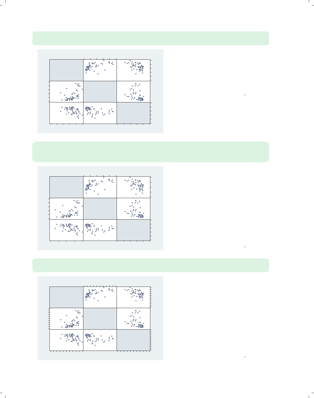
i
i
i
i
i
i
i
i
100 Chapter 3. Scatterplot matrix graphs
graph matrix urban propval100 borninstate,
maxes(xlabel(0(20)100) ylabel(0(20)100))
Percent
urban
1990
% homes
cost
$100K+
% born in
state of
residence
0
20
40
60
80
100
0 20 40 60 80 100
0
20
40
60
80
100
0 20 40 60 80 100
0
20
40
60
80
100
0 20 40 60 80 100
Stata has a simpler way of applying the
same labels to all the variables in the
scatterplot matrix by using the maxes()
(multiple axes) option. This example
labels the x-andy-axes from 0 to 100
with increments of 20 for all variables.
Uses allstates.dta & scheme vg s2c
graph matrix urban propval100 borninstate,
maxes(xlabel(0(20)100) ylabel(0(20)100))
xlabel(20(20)100, axis(1)) ylabel(20(20)100, axis(1))
Percent
urban
1990
% homes
cost
$100K+
% born in
state of
residence
20
40
60
80
100
20 40 60 80 100
0
20
40
60
80
100
0 20 40 60 80 100
0
20
40
60
80
100
0 20 40 60 80 100
You might want to label most of the
variables in the scatterplot matrix the
same way but with one or more
exceptions in a different way. In this
example, we label all the variables from
0 to 100, incrementing by 20, but then
override the labeling for urban to make
it 20 to 100, incrementing by 20. We do
this by adding additional xlabel() and
ylabel() options that apply just for
axis(1).
Uses allstates.dta & scheme vg s2c
graph matrix urban propval100 borninstate,
maxes(xlabel(0(20)100) ylabel(0(20)100) xtick(0(10)100) ytick(0(10)100))
Percent
urban
1990
% homes
cost
$100K+
% born in
state of
residence
0
20
40
60
80
100
0 20 40 60 80 100
0
20
40
60
80
100
0 20 40 60 80 100
0
20
40
60
80
100
0 20 40 60 80 100
Here, we label all of the variables from
0 to 100, in increments of 20, and also
add ticks from 0 to 100, in increments
of 10. Note that the xtick() and
ytick() options work the same way as
the xlabel() and ylabel() options.
We place these options within the
maxes() option, and they apply to all
of the axes. See Options : Axis labels
(256) and Options : Axis scales (265) for
more details.
Uses allstates.dta & scheme vg s2c
The electronic form of this book is solely for direct use at UCLA and only by faculty, students, and staff of UCLA.
All rights reserved on the copyright page apply to this document and specifically neither the electronic nor
published form of the book may be distributed or reproduced, either electronically or in printed form.

i
i
i
i
i
i
i
i
3.2 Controlling axes 101
graph matrix urban propval100 borninstate,
diagonal("% Urban" "% Homes Over $100K" "% Born in State")
When you use twoway scatter,you
can use xtitle() and ytitle() to
control the titles for the axes. By
contrast, when using graph matrix,
you can control the titles that are
displayed along the diagonal with the
diagonal() option. We use the
diagonal() option to change the titles
for all variables.
Uses allstates.dta & scheme vg s2c
%
Urban
% Homes
Over
$100K
% Born
in
State
40
60
80
100
40 60 80 100
0
50
100
0 50 100
20
40
60
80
20 40 60 80
graph matrix urban propval100 borninstate,
diagonal("% Urban" ."% Born in State")
We do not have to change all the titles.
If we want to change just some of the
titles, we can place a period (.) for the
labels where we want the label to stay
the same. In this example, we change
the titles for the first and third
variables but leave the second as is.
Uses allstates.dta & scheme vg s2c
%
Urban
% homes
cost
$100K+
% Born
in
State
40
60
80
100
40 60 80 100
0
50
100
0 50 100
20
40
60
80
20 40 60 80
graph matrix urban propval100 borninstate,
diagonal("% Urban" . "% Born in State", bfcolor(eggshell))
We can control the display of the text
on the diagonal using textbox options.
For example, we make the background
color of the text area eggshell using the
bfcolor(eggshell) option. See
Options : Textboxes (303) for more
examples of textbox options.
Uses allstates.dta & scheme vg s2c
%
Urban
% homes
cost
$100K+
% Born
in
State
40
60
80
100
40 60 80 100
0
50
100
0 50 100
20
40
60
80
20 40 60 80
Introduction Twoway Matrix Bar Box Dot Pie Options Standard options Styles Appendix
Marker options Axes Matrix options By
The electronic form of this book is solely for direct use at UCLA and only by faculty, students, and staff of UCLA.
All rights reserved on the copyright page apply to this document and specifically neither the electronic nor
published form of the book may be distributed or reproduced, either electronically or in printed form.
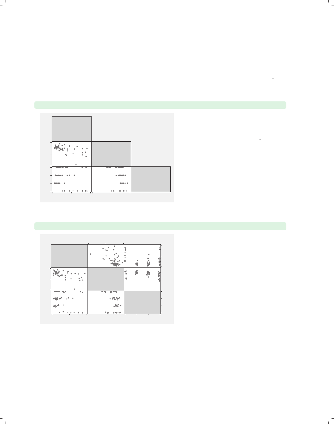
i
i
i
i
i
i
i
i
102 Chapter 3. Scatterplot matrix graphs
3.3 Matrix options
This section shows options that you can use to control the look of the scatterplot matrix,
including showing just the lower half of the matrix, jittering markers, and scaling the size
of marker text. For more details, see [G]graph matrix. These graphs use the vg s2m
scheme.
graph matrix propval100 ownhome region, half
% homes
cost
$100K+
% who
own
home
Census
region
0 50 100
40
60
80
40 60 80
1
2
3
4
You can use the half option to display
just the lower diagonal of the
scatterplot matrix.
Uses allstates.dta & scheme vg s2m
graph matrix propval100 ownhome region, jitter(3)
% homes
cost
$100K+
% who
own
home
Census
region
0
50
100
0 50 100
40
60
80
40 60 80
1
2
3
4
1 2 3 4
You can use the jitter() option to
add random noise to the points; the
higher the value given, the more
random noise is added. This is
especially useful when numerous
observations have the same (x,y)
values, so a number of observations can
appear as a single point.
Uses allstates.dta & scheme vg s2m
The electronic form of this book is solely for direct use at UCLA and only by faculty, students, and staff of UCLA.
All rights reserved on the copyright page apply to this document and specifically neither the electronic nor
published form of the book may be distributed or reproduced, either electronically or in printed form.
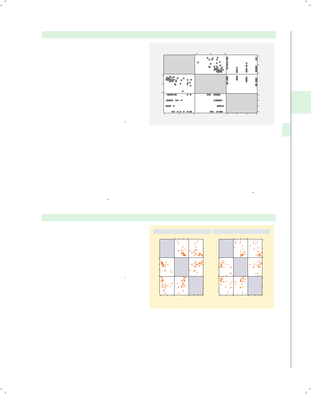
i
i
i
i
i
i
i
i
3.4 Graphing by groups 103
graph matrix propval100 ownhome region, scale(1.5)
The scale() option can be used to
magnify the contents of the graph,
including the markers, labels, and lines,
but not the overall size of the graph.
Here, we increase the size of these
items, making them 1.5 times their
normal size. Note that, unlike other
similar options, this option does not
take an asterisk preceding the
multiplier; i.e., we specify 1.5 but not
*1.5.
Uses allstates.dta & scheme vg s2m
% homes
cost
$100K+
% who
own
home
Census
region
0
50
100
0 50 100
40
60
80
40 60 80
1
2
3
4
1 2 3 4
3.4 Graphing by groups
This section looks at the use of the by() option for showing separate graphs based on the
levels of a by() variable. For more information, see Options : By (272) and [G]by option.
This section uses the vg brite scheme.
graph matrix propval100 ownhome borninstate, by(north)
The by() option can be used with
graph matrix to show separate
scatterplot matrices by a particular
variable. Here, we show separate
scatterplot matrices for households in
northern states and non-northern
states.
Uses allstates.dta & scheme vg brite
% homes
cost
$100K+
% who
own
home
% born in
state of
residence
0
50
100
0 50 100
50
60
70
80
50 60 70 80
20
40
60
80
20 40 60 80
% homes
cost
$100K+
% who
own
home
% born in
state of
residence
0
50
100
0 50 100
60
70
80
60 70 80
40
60
80
40 60 80
S & W North
Graphs by Region North or Not
Introduction Twoway Matrix Bar Box Dot Pie Options Standard options Styles Appendix
Marker options Axes Matrix options By
The electronic form of this book is solely for direct use at UCLA and only by faculty, students, and staff of UCLA.
All rights reserved on the copyright page apply to this document and specifically neither the electronic nor
published form of the book may be distributed or reproduced, either electronically or in printed form.
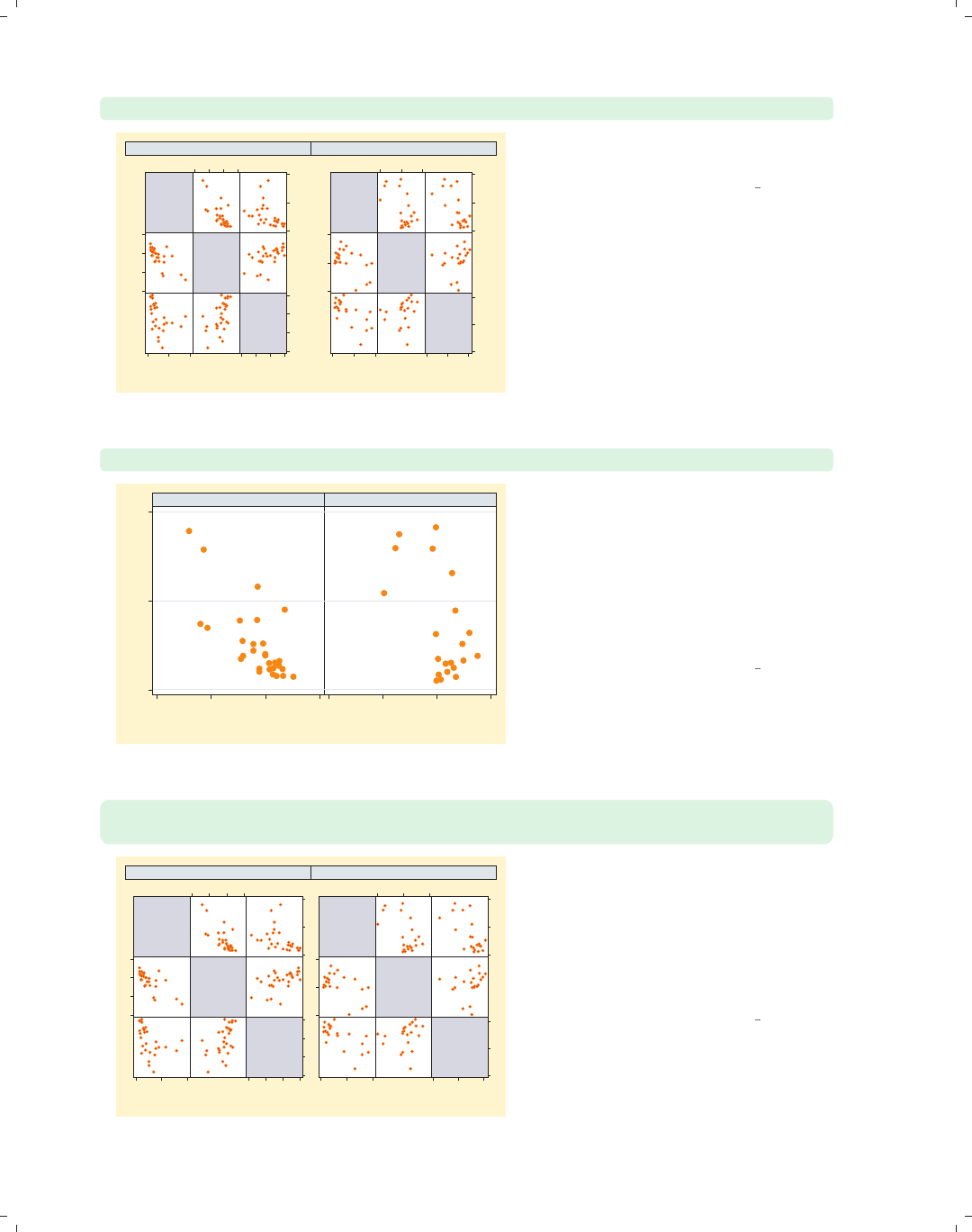
i
i
i
i
i
i
i
i
104 Chapter 3. Scatterplot matrix graphs
graph matrix propval100 ownhome borninstate, by(north, compact)
% homes
cost
$100K+
% who
own
home
% born in
state of
residence
0
50
100
0 50 100
50
60
70
80
50 60 70 80
20
40
60
80
20 40 60 80
% homes
cost
$100K+
% who
own
home
% born in
state of
residence
0
50
100
0 50 100
60
70
80
60 70 80
40
60
80
40 60 80
S & W North
Graphs by Region North or Not
To display the graphs closer together,
you can use the compact option.
Uses allstates.dta & scheme vg brite
twoway scatter propval100 ownhome, by(north, compact)
0 50 100
50 60 70 8050 60 70 80
S & W North
% homes cost $100K+
% who own home
Graphs by Region North or Not
If we compare the previous scatterplot
matrix to this twoway scatterplot, we
see that the compact option does not
make the scatterplot matrix as compact
as it does with a regular twoway
scatter command, which joins the two
graphs on their edges by omitting the
y-labels between the two graphs.
Uses allstates.dta & scheme vg brite
graph matrix propval100 ownhome borninstate, by(north, compact)
maxes(ylabel(, nolabels))
% homes
cost
$100K+
% who
own
home
% born in
state of
residence
0 50 100
50 60 70 80
20 40 60 80
% homes
cost
$100K+
% who
own
home
% born in
state of
residence
0 50 100
60 70 80
40 60 80
S & W North
Graphs by Region North or Not
We can make the graph matrix display
more compactly with the by() option
by using the maxes(ylabel(,
nolabels)) option to suppress the
labels on all of the y-axes. Then, when
we use the compact option, the edges of
the plots are pushed closer together.
Uses allstates.dta & scheme vg brite
The electronic form of this book is solely for direct use at UCLA and only by faculty, students, and staff of UCLA.
All rights reserved on the copyright page apply to this document and specifically neither the electronic nor
published form of the book may be distributed or reproduced, either electronically or in printed form.
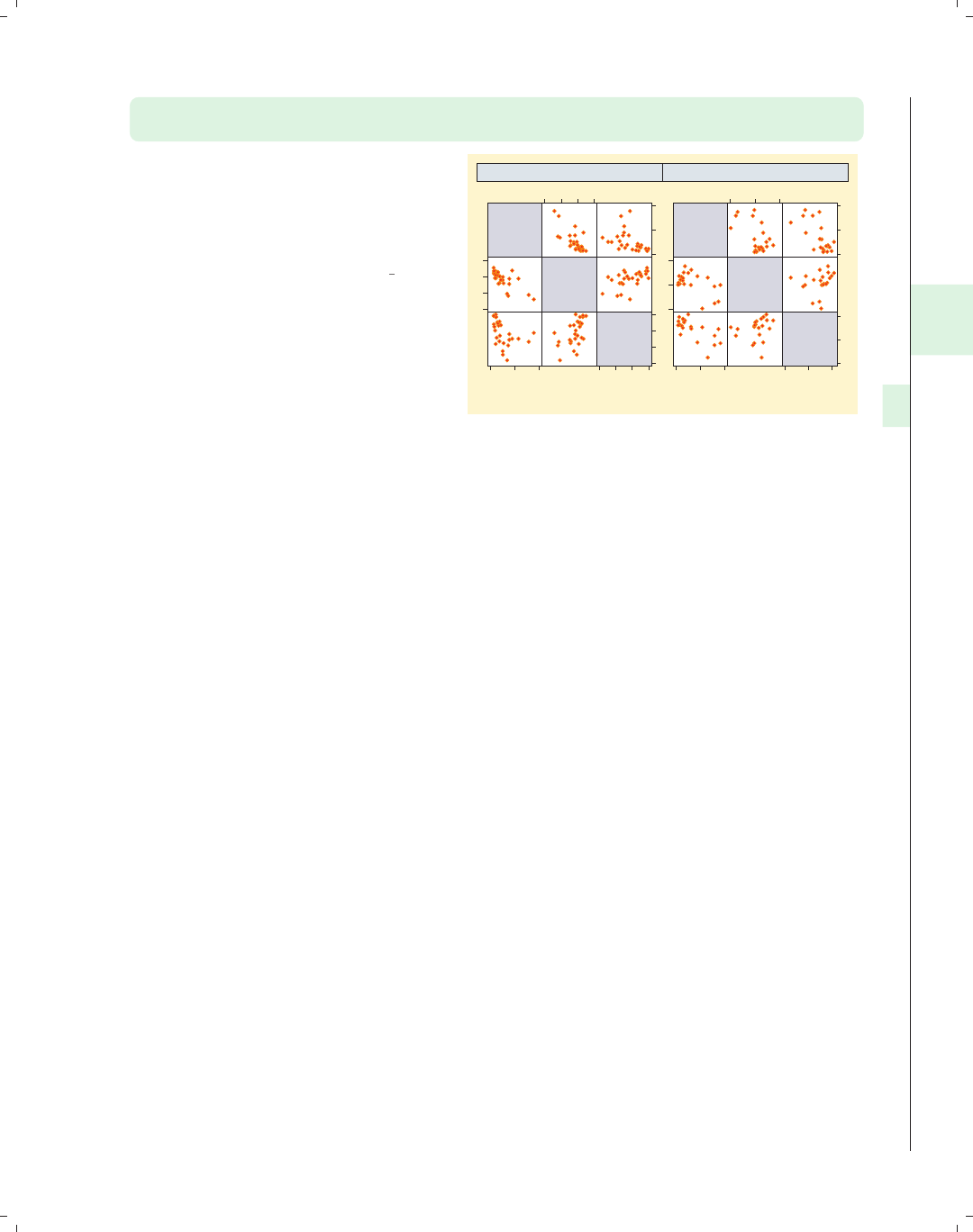
i
i
i
i
i
i
i
i
3.4 Graphing by groups 105
graph matrix propval100 ownhome borninstate, by(north, compact scale(*1.3))
maxes(ylabel(, nolabels))
We can use the scale() option to
increase the size of the markers, labels,
and text to make them more readable.
This is especially useful when graphs
get small.
Uses allstates.dta & scheme vg brite
% homes
cost
$100K+
% who
own
home
% born in
state of
residence
0 50 100
50 60 70 80
20 40 60 80
% homes
cost
$100K+
% who
own
home
% born in
state of
residence
0 50 100
60 70 80
40 60 80
S & W North
Graphs by Region North or Not
Introduction Twoway Matrix Bar Box Dot Pie Options Standard options Styles Appendix
Marker options Axes Matrix options By
The electronic form of this book is solely for direct use at UCLA and only by faculty, students, and staff of UCLA.
All rights reserved on the copyright page apply to this document and specifically neither the electronic nor
published form of the book may be distributed or reproduced, either electronically or in printed form.

i
i
i
i
i
i
i
i
The electronic form of this book is solely for direct use at UCLA and only by faculty, students, and staff of UCLA.
All rights reserved on the copyright page apply to this document and specifically neither the electronic nor
published form of the book may be distributed or reproduced, either electronically or in printed form.
i
i
i
i
i
i
i
i
4 Bar graphs
This chapter will explore how to create bar charts using the graph bar command. It
will show how you can use graph bar to graph one or more continuous y-variables and how
you can break them down by one or more categorical variables. In addition, this chapter
will illustrate how you can control the display of each of the axes, the legend, and the look of
the bars, and how to use the by() option. We will start this chapter by looking at features
related to graphing one or more y-variables. For this entire chapter, we will use the nlsw
data file.
4.1 Y-variables
A bar chart graphs one or more continuous variables broken down by one or more cat-
egorical variables. The continuous variables are graphed on the y-axis and are referred to
as y-variables. This section shows you how to specify the y-variables using the graph bar
command, how to include one or more y-variables, and how to obtain different summary
statistics for the y-variables. For more information, see [G]graph bar. This section begins
using the vg past scheme.
graph bar ttl exp
This is probably the most basic bar
chart that you can make (and perhaps
the most boring, as well). It shows the
average total work experience for all
observations in the file. It graphs a
single y-variable using the default
summary statistic, the mean.
Uses nlsw.dta & scheme vg past
0 5 10 15
mean of ttl_exp
Introduction Twoway Matrix Bar Box Dot Pie Options Standard options Styles Appendix
Y-variables Over Over options Cat axis Legend Y-axis Lookofbar options By
107
The electronic form of this book is solely for direct use at UCLA and only by faculty, students, and staff of UCLA.
All rights reserved on the copyright page apply to this document and specifically neither the electronic nor
published form of the book may be distributed or reproduced, either electronically or in printed form.
i
i
i
i
i
i
i
i
108 Chapter 4. Bar graphs
graph bar prev exp tenure ttl exp
0 5 10 15
mean of prev_exp mean of tenure
mean of ttl_exp
You can specify multiple y-variables to
be plotted at one time. Here, we graph
the mean of previous, current, and total
work experience in the same plot. The
bars are plotted touching each other,
and a legend indicates which bar
corresponds to which variable.
Uses nlsw.dta & scheme vg past
graph bar (median) prev exp tenure ttl exp
0 5 10 15
p 50 of prev_exp p 50 of tenure
p 50 of ttl_exp
This graph is much like the last one,
but it shows the median of these
y-variables. Note that we only specified
(median) before prev exp but it
applied to all the y-variables that
follow. You can summarize the
y-variables using any of the summary
statistics permitted by the collapse
command (e.g., mean,sd,sum,median,
and p10); see [R]collapse.
Uses nlsw.dta & scheme vg past
graph bar (median) prev exp tenure (mean) ttl exp
0 5 10 15
p 50 of prev_exp p 50 of tenure
mean of ttl_exp
In this example, we get the median of
the first two y-variables and then the
mean of the last y-variable. I don’t
know, however, how often you would do
this.
Uses nlsw.dta & scheme vg past
The electronic form of this book is solely for direct use at UCLA and only by faculty, students, and staff of UCLA.
All rights reserved on the copyright page apply to this document and specifically neither the electronic nor
published form of the book may be distributed or reproduced, either electronically or in printed form.
i
i
i
i
i
i
i
i
4.1 Y-variables 109
graph bar (mean) meanwage=wage (median) medwage=wage
You can plot different summary
statistics for the same y-variable, but
you must specify a target name for the
statistic being created. Here, we create
meanwage for the mean of wage and
medwage for the median of wage.Ifwe
omitted the meanwage= and medwage=
from this command, Stata would return
an error indicating that the name for
the mean of wage conflicts with the
median of wage.
Uses nlsw.dta & scheme vg past
0 2 4 6 8
mean of wage p 50 of wage
We now consider a handful of options that are useful when you have multiple y-variables.
These options allow you to display the y-variables as though they were categories of the
same variable, to create stacked bar charts, and to display the y-variables as percentages of
the total y-variables. These options are illustrated in the following graphs using the vg s1m
scheme.
graph bar prev exp tenure ttl exp hours
First, consider this bar chart showing
four y-variables. Each y-variable is
shown with a different colored bar and
with a legend indicating which
y-variable corresponds to which bar.
See the next example for another way
to differentiate these four bars.
Uses nlsw.dta & scheme vg s1m
0 10 20 30 40
mean of prev_exp mean of tenure
mean of ttl_exp mean of hours
Introduction Twoway Matrix Bar Box Dot Pie Options Standard options Styles Appendix
Y-variables Over Over options Cat axis Legend Y-axis Lookofbar options By
The electronic form of this book is solely for direct use at UCLA and only by faculty, students, and staff of UCLA.
All rights reserved on the copyright page apply to this document and specifically neither the electronic nor
published form of the book may be distributed or reproduced, either electronically or in printed form.
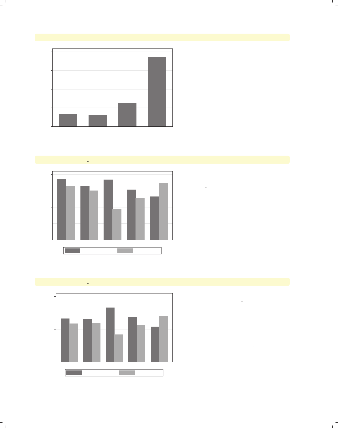
i
i
i
i
i
i
i
i
110 Chapter 4. Bar graphs
graph bar prev exp tenure ttl exp hours, ascategory
0 10 20 30 40
mean of prev_exp mean of tenure mean of ttl_exp mean of hours
You can use the ascategory option to
indicate that you want Stata to graph
multiple y-variables using the style that
would be used for the levels of an
over() variable. Comparing this graph
with the previous graph, note how the
bars for the different variables are the
same color and labeled on the x-axis
rather than using a legend.
Uses nlsw.dta & scheme vg s1m
graph bar prev exp tenure, over(occ5)
0 2 4 6 8
Prof/Mgmt Sales Clerical Labor/Ops Other
mean of prev_exp mean of tenure
Consider this graph, where we show
work experience prior to one’s current
job (prev exp) and work experience at
one’s current job (tenure)brokendown
by occ5. The total of previous and
current work experience represents
total work experience, and you might
want to show each bar as a percent of
total work experience. The next
example shows how you can do that.
Uses nlsw.dta & scheme vg s1m
graph bar prev exp tenure, over(occ5) percentages
0 20 40 60 80
percent
Prof/Mgmt Sales Clerical Labor/Ops Other
mean of prev_exp mean of tenure
Here, we show the time worked before
one’s current job, prev exp, and time
at the current job, tenure, in terms of
their percentage of the total (i.e.,
percentage of total work experience).
We can view the bars in this way using
the percentages option.
Uses nlsw.dta & scheme vg s1m
The electronic form of this book is solely for direct use at UCLA and only by faculty, students, and staff of UCLA.
All rights reserved on the copyright page apply to this document and specifically neither the electronic nor
published form of the book may be distributed or reproduced, either electronically or in printed form.
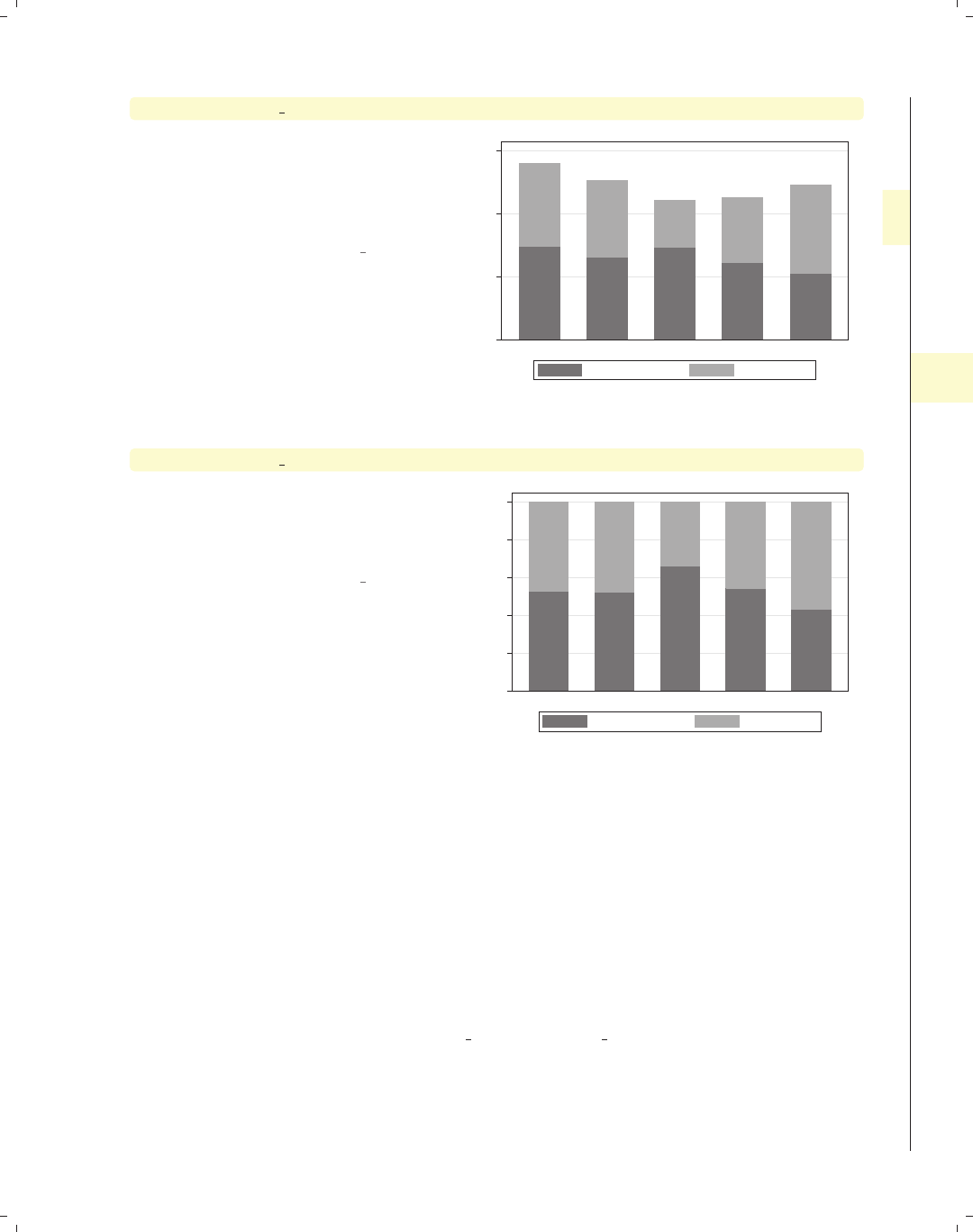
i
i
i
i
i
i
i
i
4.2 Graphing bars over groups 111
graph bar prev exp tenure, over(occ5) stack
The stack option shows the y-variables
as a stacked bar chart. This allows you
to see the mean of each y-variable, as
well as the mean of the total
y-variables.
Uses nlsw.dta & scheme vg s1m
0 5 10 15
Prof/Mgmt Sales Clerical Labor/Ops Other
mean of prev_exp mean of tenure
graph bar prev exp tenure, over(occ5) percentages stack
We can also combine the stack and
percentages options to create a
stacked bar chart in terms of
percentages.
Uses nlsw.dta & scheme vg s1m
0 20 40 60 80 100
percent
Prof/Mgmt Sales Clerical Labor/Ops Other
mean of prev_exp mean of tenure
4.2 Graphing bars over groups
This section focuses on the use of the over() option for showing bar charts by one
or more categorical variables. It illustrates the use of the over() option with a single
y-variable and with multiple y-variables. We also look at some basic options, including
options for displaying the over() variable as though its levels were multiple y-variables,
including missing values on the over() variable, and suppressing empty combinations of
multiple over() variables. See the group options and over subopts tables of [G]graph bar
for more details.
Introduction Twoway Matrix Bar Box Dot Pie Options Standard options Styles Appendix
Y-variables Over Over options Cat axis Legend Y-axis Lookofbar options By
The electronic form of this book is solely for direct use at UCLA and only by faculty, students, and staff of UCLA.
All rights reserved on the copyright page apply to this document and specifically neither the electronic nor
published form of the book may be distributed or reproduced, either electronically or in printed form.
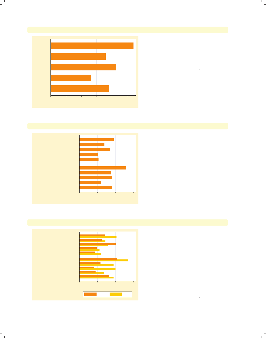
i
i
i
i
i
i
i
i
112 Chapter 4. Bar graphs
graph hbar wage, over(occ5)
0 2 4 6 8 10
mean of wage
Other
Labor/Ops
Clerical
Sales
Prof/Mgmt
Here, we use the over() option to show
the average wages broken down by
occupation. Note that we are using
graph hbar to produce horizontal,
rather than vertical, bar charts.
Uses nlsw.dta & scheme vg brite
graph hbar wage, over(occ5) over(collgrad)
0 5 10 15
mean of wage
college grad
not college grad
Other
Labor/Ops
Clerical
Sales
Prof/Mgmt
Other
Labor/Ops
Clerical
Sales
Prof/Mgmt
Here, we use the over() option twice to
show the wages broken down by
occupation and whether one graduated
college. Note the appropriate way to
produce this graph is to use two over()
options, rather than using a single
over() option with two variables. As
we will see later, each over() can have
its own options, allowing you to
customize the display of each over()
variable.
Uses nlsw.dta & scheme vg brite
graph hbar wage, over(urban2) over(occ5) over(collgrad)
0 5 10 15
mean of wage
college grad
not college grad
Other
Labor/Ops
Clerical
Sales
Prof/Mgmt
Other
Labor/Ops
Clerical
Sales
Prof/Mgmt
Rural Metro
We can even add a third over()
option, in this case using over(urban2)
to compare those living in rural versus
urban areas. Note the change in the
look of the graph when we add the
third over() variable. This is because
Stata is now treating the first over()
variable as though it were multiple
y-variables. Because of this, you can
only specify one y-variable when you
have three over() options.
Uses nlsw.dta & scheme vg brite
The electronic form of this book is solely for direct use at UCLA and only by faculty, students, and staff of UCLA.
All rights reserved on the copyright page apply to this document and specifically neither the electronic nor
published form of the book may be distributed or reproduced, either electronically or in printed form.
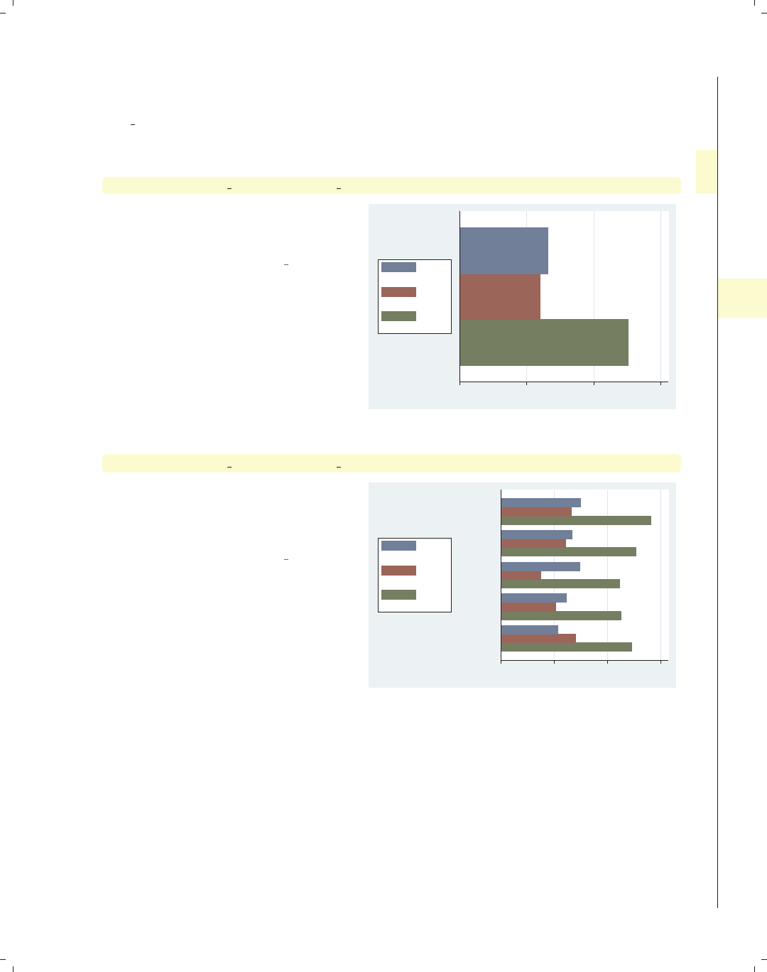
i
i
i
i
i
i
i
i
4.2 Graphing bars over groups 113
Now, let’s look at examples of using multiple y-variables with the over() option. We
first consider a simple bar graph with multiple y-variables. These examples will use the
vg lgndc scheme, which places the legend to the left of the graph and displays it in a sin-
gle, stacked column.
graph hbar prev exp tenure ttl exp
This graph shows the overall mean of
previous, current, and total work
experience.
Uses nlsw.dta & scheme vg lgndc
0 5 10 15
mean of prev_exp
mean of tenure
mean of ttl_exp
graph hbar prev exp tenure ttl exp, over(occ5)
We can take the graph from above and
break the means down by whether one
graduated from college by adding the
over(occ5) option.
Uses nlsw.dta & scheme vg lgndc
0 5 10 15
Other
Labor/Ops
Clerical
Sales
Prof/Mgmt
mean of prev_exp
mean of tenure
mean of ttl_exp
Introduction Twoway Matrix Bar Box Dot Pie Options Standard options Styles Appendix
Y-variables Over Over options Cat axis Legend Y-axis Lookofbar options By
The electronic form of this book is solely for direct use at UCLA and only by faculty, students, and staff of UCLA.
All rights reserved on the copyright page apply to this document and specifically neither the electronic nor
published form of the book may be distributed or reproduced, either electronically or in printed form.
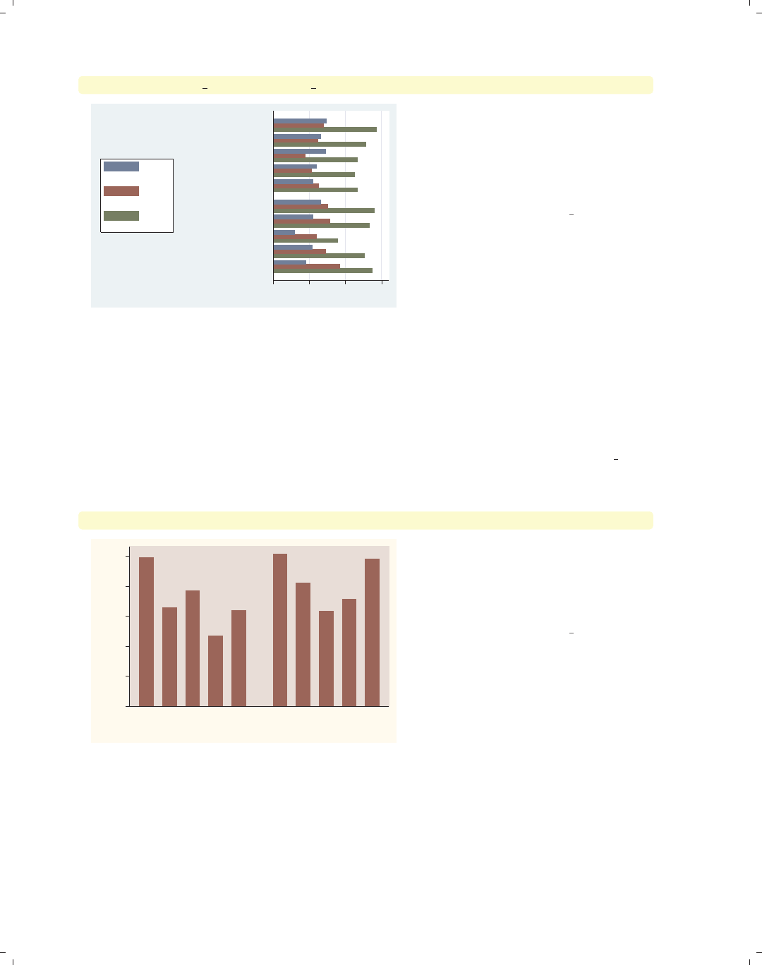
i
i
i
i
i
i
i
i
114 Chapter 4. Bar graphs
graph hbar prev exp tenure ttl exp, over(occ5) over(union)
0 5 10 15
union
nonunion
Other
Labor/Ops
Clerical
Sales
Prof/Mgmt
Other
Labor/Ops
Clerical
Sales
Prof/Mgmt
mean of prev_exp
mean of tenure
mean of ttl_exp
We can take the previous graph and
further break the results down by
whether one belongs to a union. Note,
however, that we cannot add a third
over() option when we have multiple
y-variables.
Uses nlsw.dta & scheme vg lgndc
Now let’s consider options that may be used in combination with the over() option to
customize the behavior of the graphs. We show how you can treat the levels of the variable
in the first over() option as though they were multiple y-variables and can even graph
those levels as percentages or stacked bar charts. You can also request that missing values
for the levels of the over() variables be displayed, and you can suppress empty levels when
multiple over() options are used. These examples are shown below using the vg rose
scheme.
graph bar wage, over(occ5) over(union)
0
2
4
6
8
10
mean of wage
nonunion union
Prof/MgmtSalesClericalLabor/OpsOther Prof/MgmtSalesClericalLabor/OpsOther
Consider this graph, where we show
wages broken down by occupation and
whether one belongs to a union. The
labels for the levels of occ5 overlap, but
this is mended in the next example.
Uses nlsw.dta & scheme vg rose
The electronic form of this book is solely for direct use at UCLA and only by faculty, students, and staff of UCLA.
All rights reserved on the copyright page apply to this document and specifically neither the electronic nor
published form of the book may be distributed or reproduced, either electronically or in printed form.
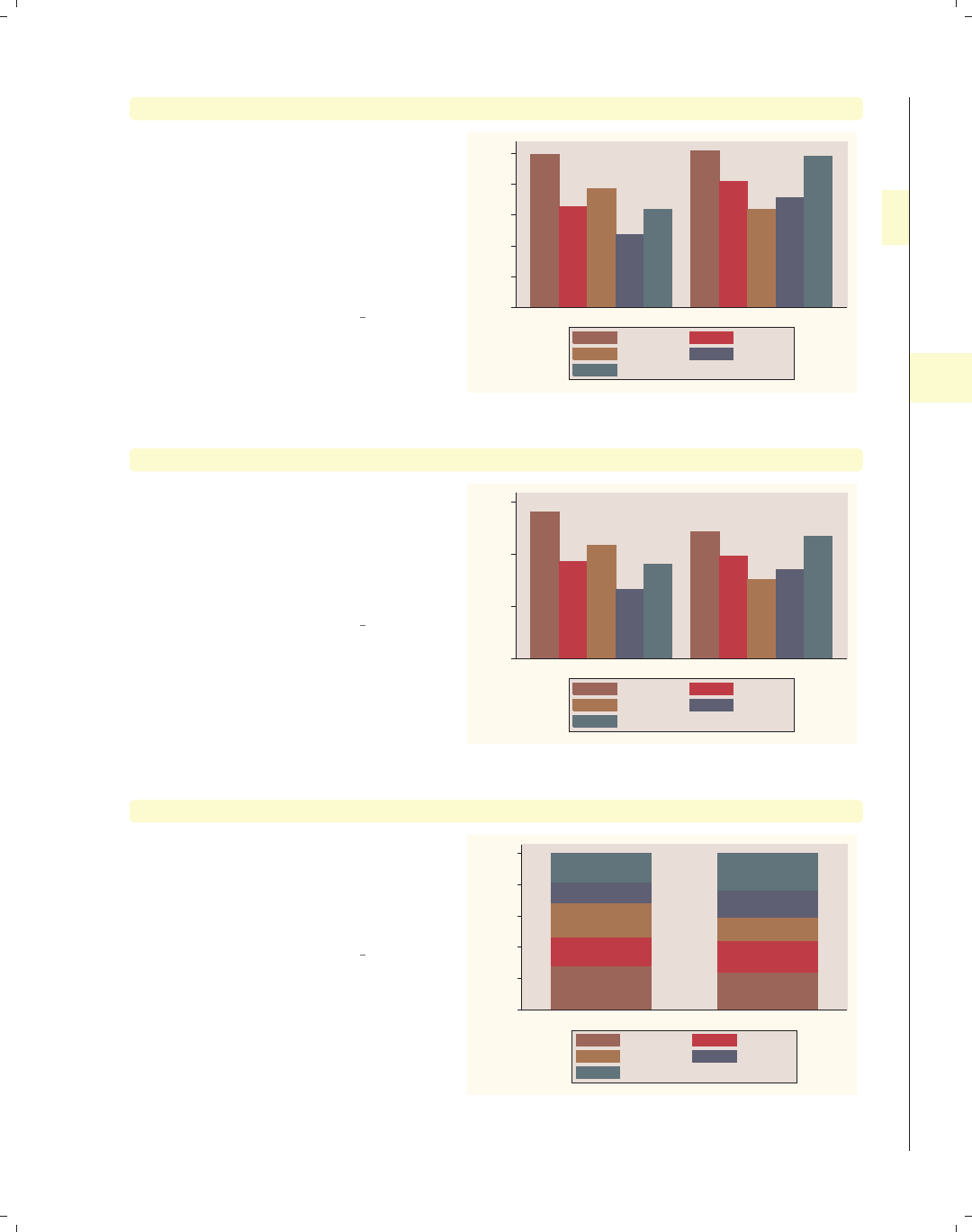
i
i
i
i
i
i
i
i
4.2 Graphing bars over groups 115
graph bar wage, over(occ5) over(union) asyvars
If we add the asyvars option, then the
first over() variable (occ5) is graphed
as if there were five y-variables
corresponding to the five levels of occ5.
The levels of occ5 are shown as
differently colored bars pushed next to
each other and labeled using the
legend.
Uses nlsw.dta & scheme vg rose 0
2
4
6
8
10
mean of wage
nonunion union
Prof/Mgmt Sales
Clerical Labor/Ops
Other
graph bar wage, over(occ5) over(union) asyvars percentages
With the levels of occ5 considered as
y-variables, we can use some of the
options that apply when we have
multiple y-variables. Here, we request
that the values be plotted as
percentages.
Uses nlsw.dta & scheme vg rose
0
10
20
30
percent of mean of wage
nonunion union
Prof/Mgmt Sales
Clerical Labor/Ops
Other
graph bar wage, over(occ5) over(union) asyvars percentages stack
Again, because we are treating the
levels of occ5 as though they were
multiple y-variables, we can add the
stack option to view the graph as a
stacked bar chart.
Uses nlsw.dta & scheme vg rose
0
20
40
60
80
100
percent of mean of wage
nonunion union
Prof/Mgmt Sales
Clerical Labor/Ops
Other
Introduction Twoway Matrix Bar Box Dot Pie Options Standard options Styles Appendix
Y-variables Over Over options Cat axis Legend Y-axis Lookofbar options By
The electronic form of this book is solely for direct use at UCLA and only by faculty, students, and staff of UCLA.
All rights reserved on the copyright page apply to this document and specifically neither the electronic nor
published form of the book may be distributed or reproduced, either electronically or in printed form.
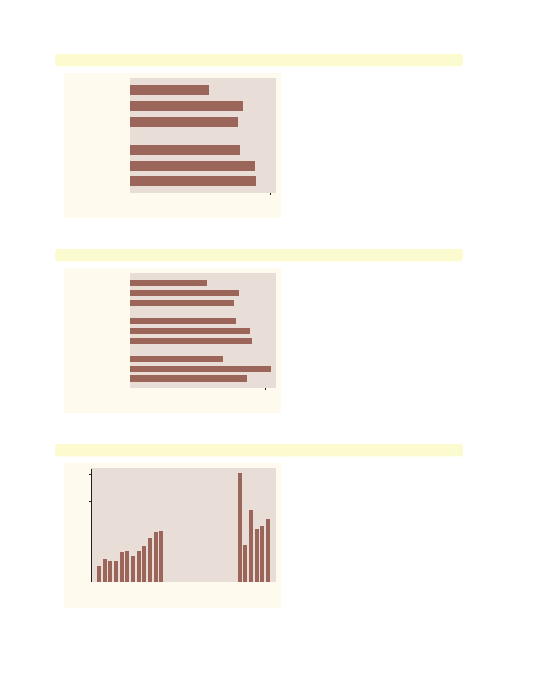
i
i
i
i
i
i
i
i
116 Chapter 4. Bar graphs
graph hbar wage, over(urban3) over(union)
0 2 4 6 8 10
mean of wage
union
nonunion
Urban
Suburb
Rural
Urban
Suburb
Rural
Consider this graph, where we use the
over(union) option to compare the
mean wages of union workers with
nonunion workers. One aspect this
graph hides is that there are a number
of missing values on the variable union.
Uses nlsw.dta & scheme vg rose
graph hbar wage, over(urban3) over(union) missing
0 2 4 6 8 10
mean of wage
.
union
nonunion
Urban
Suburb
Rural
Urban
Suburb
Rural
Urban
Suburb
Rural
By adding the missing option, we then
see a category for those who are
missing on the union variable, shown as
the third set of bars. The label for this
bar is a single dot, which is the Stata
indicator of missing values. The section
Bar : Cat axis (123) shows how you can
give this bar a more meaningful label.
Uses nlsw.dta & scheme vg rose
graph bar wage, over(grade) over(collgrad)
0
5
10
15
20
mean of wage
not college grad college grad
4 5 6 7 8 9 101112131415161718 4 5 6 7 8 9 101112131415161718
Consider this bar chart, which breaks
wages down by two variables: the last
grade that one completed and whether
one is a college graduate. By default,
Stata shows all possible combinations
for these two variables. In most cases,
all combinations are possible, but not
in this case.
Uses nlsw.dta & scheme vg rose
The electronic form of this book is solely for direct use at UCLA and only by faculty, students, and staff of UCLA.
All rights reserved on the copyright page apply to this document and specifically neither the electronic nor
published form of the book may be distributed or reproduced, either electronically or in printed form.
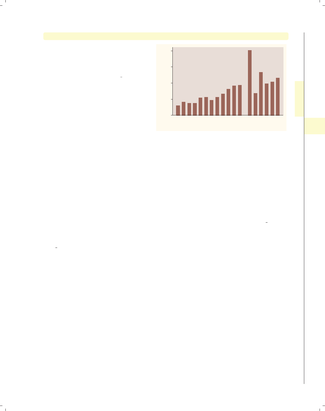
i
i
i
i
i
i
i
i
4.3 Options for groups, over options 117
graph bar wage, over(grade) over(collgrad) nofill
If you only want to display the
combinations of the over() variables
that exist in the data, use the nofill
option.
Uses nlsw.dta & scheme vg rose
0
5
10
15
20
mean of wage
not college grad college grad
4 5 6 7 8 9 10 11 12 13 14 15 13 14 15 16 17 18
4.3 Options for groups, over options
This section considers some of the options that can be used with the over() and
yvaroptions() options for customizing the display of the bars. We will focus on controlling
the spacing between the bars and the order in which the bars are displayed. Other options
that control the display of the x-axis (such as the labels) are covered in Bar : Cat axis (123).
For more information on the over() options covered in this section, see the over subopts
table in [G]graph bar.
We first consider options that control the spacing among the bars and switch to the
vg s2m scheme.
Introduction Twoway Matrix Bar Box Dot Pie Options Standard options Styles Appendix
Y-variables Over Over options Cat axis Legend Y-axis Lookofbar options By
The electronic form of this book is solely for direct use at UCLA and only by faculty, students, and staff of UCLA.
All rights reserved on the copyright page apply to this document and specifically neither the electronic nor
published form of the book may be distributed or reproduced, either electronically or in printed form.
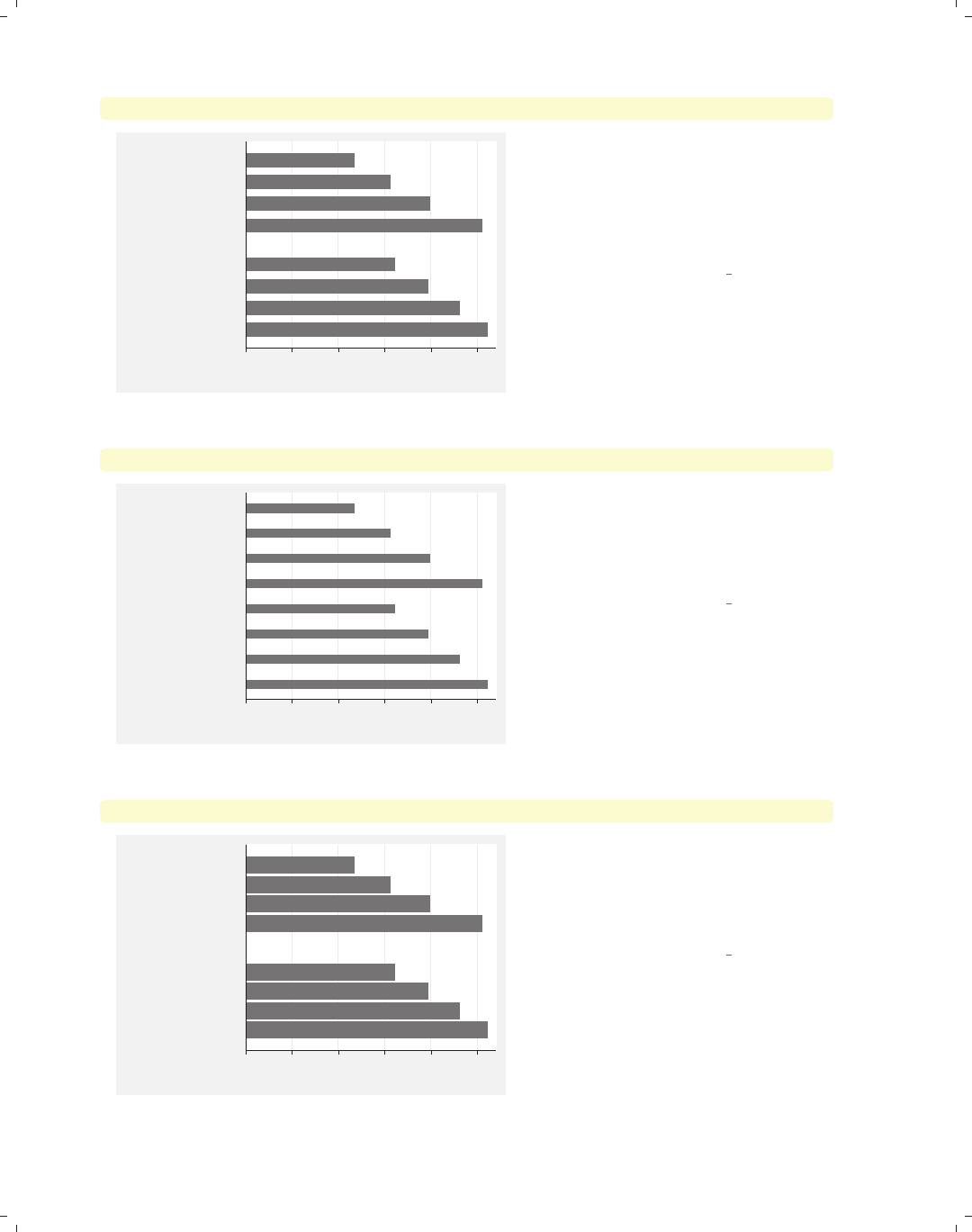
i
i
i
i
i
i
i
i
118 Chapter 4. Bar graphs
graph hbar wage, over(grade4) over(union)
0 2 4 6 8 10
mean of wage
union
nonunion
Coll Grad
Some Coll
HS Grad
Not HS
Coll Grad
Some Coll
HS Grad
Not HS
Consider this graph, where we show the
mean wages broken down by grade4
and union.Usinggraph hbar displays
the chart as a horizontal bar chart,
which can be useful when you have
many categories to compare.
Uses nlsw.dta & scheme vg s2m
graph hbar wage, over(grade4, gap(*3)) over(union)
0 2 4 6 8 10
mean of wage
union
nonunion
Coll Grad
Some Coll
HS Grad
Not HS
Coll Grad
Some Coll
HS Grad
Not HS
We can change the gap between the
levels of grade4. Here, we make that
gap three times as large as it normally
would have been. This leads to thinner
bars with a greater gap between them.
Uses nlsw.dta & scheme vg s2m
graph hbar wage, over(grade4, gap(*.3)) over(union)
0 2 4 6 8 10
mean of wage
union
nonunion
Coll Grad
Some Coll
HS Grad
Not HS
Coll Grad
Some Coll
HS Grad
Not HS
Here, we shrink the gap between the
levels of grade4, making the gaps 30%
of the size they normally would have
been. This leads to wider bars with a
smaller gap between them.
Uses nlsw.dta & scheme vg s2m
The electronic form of this book is solely for direct use at UCLA and only by faculty, students, and staff of UCLA.
All rights reserved on the copyright page apply to this document and specifically neither the electronic nor
published form of the book may be distributed or reproduced, either electronically or in printed form.

i
i
i
i
i
i
i
i
4.3 Options for groups, over options 119
graph hbar wage, over(grade4, gap(*.2)) over(union, gap(*3))
We can control the gap with respect to
each of the over() variables at the
same time. In this example, we make
the gap among the grade4 categories
smaller (20% their original size) and
the gap between the levels of union
larger (three times the normal size).
Uses nlsw.dta & scheme vg s2m
0 2 4 6 8 10
mean of wage
union
nonunion
Coll Grad
Some Coll
HS Grad
Not HS
Coll Grad
Some Coll
HS Grad
Not HS
So far, we have let Stata control the order in which the bars are displayed. By default,
the bars formed by over() variables are ordered in ascending sequence according to the
values of the over() variable. However, Stata gives you considerable flexibility in the or-
dering of the bars, as illustrated in the following examples using the vg s2c scheme.
graph hbar wage, over(occ7, descending)
Consider this graph showing average
wages broken down by the seven levels
of occupation. The bars are normally
ordered by the levels of occ7, going
from 1 to 7, where 1 is Prof and 7 is
Other. Using the descending option
switches the order of the bars. They
still are ordered according to the seven
levels of occupation, but the bars are
ordered going from 7 to 1.
Uses nlsw.dta & scheme vg s2c 0 2 4 6 8 10
mean of wage
Prof
Mgmt
Sales
Cler.
Operat.
Labor
Other
Introduction Twoway Matrix Bar Box Dot Pie Options Standard options Styles Appendix
Y-variables Over Over options Cat axis Legend Y-axis Lookofbar options By
The electronic form of this book is solely for direct use at UCLA and only by faculty, students, and staff of UCLA.
All rights reserved on the copyright page apply to this document and specifically neither the electronic nor
published form of the book may be distributed or reproduced, either electronically or in printed form.
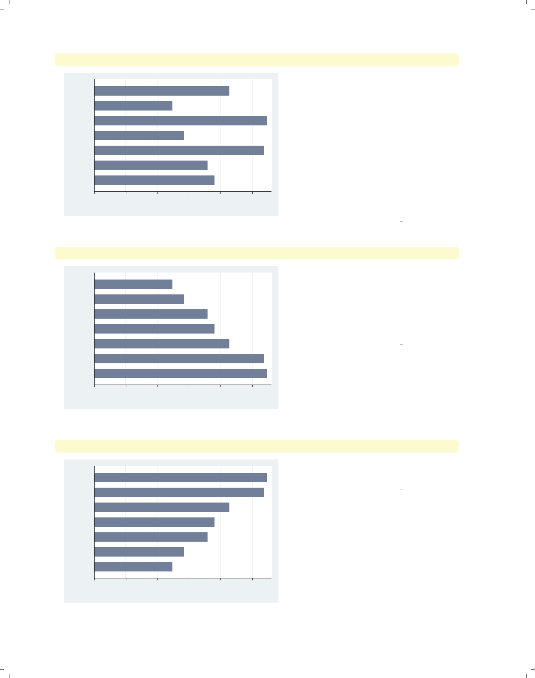
i
i
i
i
i
i
i
i
120 Chapter 4. Bar graphs
graph hbar wage, over(occ7, sort(occ7alpha))
0 2 4 6 8 10
mean of wage
Other
Sales
Prof
Operat.
Mgmt
Labor
Cler.
We might want to put these bars in
alphabetical order (but with Other still
appearing last). We can do this by
recoding occ7 into a new variable (say
occ7alpha) such that as occ7alpha
goes from 1 to 7, the occupations are
alphabetical. We recoded occ7 with
these assignments: 4 = 1, 6 = 2, 2 = 3,
5=4,1=5,3=6,and7=7;see
[R]recode. Then, the
sort(occ7alpha) option has the effect
of alphabetizing the bars.
Uses nlsw.dta & scheme vg s2c
graph hbar wage, over(occ7, sort(1))
0 2 4 6 8 10
mean of wage
Mgmt
Prof
Cler.
Other
Sales
Operat.
Labor
Here, we sort the variables on the
height of the bars (in ascending order).
The sort(1) means to sort the bars
according to the height of the first
y-variable, in this case, the mean of
wage.
Uses nlsw.dta & scheme vg s2c
graph hbar wage, over(occ7, sort(1) descending)
0 2 4 6 8 10
mean of wage
Labor
Operat.
Sales
Other
Cler.
Prof
Mgmt
Adding the descending option yields
bars in descending order.
Uses nlsw.dta & scheme vg s2c
The electronic form of this book is solely for direct use at UCLA and only by faculty, students, and staff of UCLA.
All rights reserved on the copyright page apply to this document and specifically neither the electronic nor
published form of the book may be distributed or reproduced, either electronically or in printed form.
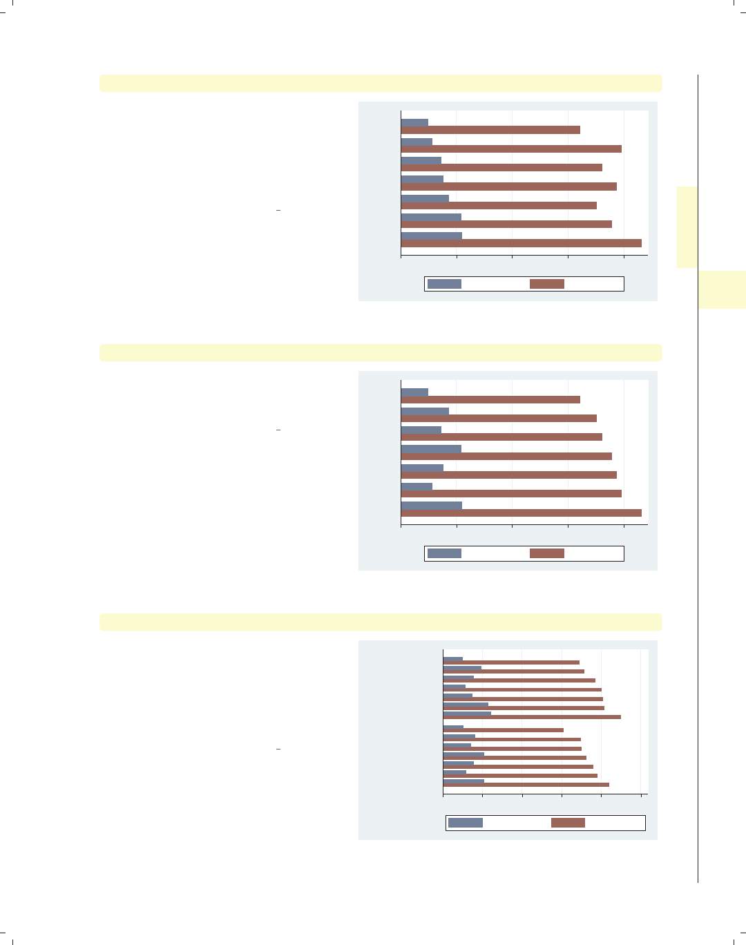
i
i
i
i
i
i
i
i
4.3 Options for groups, over options 121
graph hbar wage hours, over(occ7, sort(1))
Here, we plot two y-variables. In
addition to wages, we also show the
average hours worked per week.
Including the sort(1) option sorts the
bars according to the mean of wage
since that is the first y-variable.
Uses nlsw.dta & scheme vg s2c
0 10 20 30 40
Mgmt
Prof
Cler.
Other
Sales
Operat.
Labor
mean of wage mean of hours
graph hbar wage hours, over(occ7, sort(2))
Changing sort(1) to sort(2) sorts the
bars according to the second y-variable,
the mean of hours.
Uses nlsw.dta & scheme vg s2c
0 10 20 30 40
Mgmt
Operat.
Other
Prof
Sales
Cler.
Labor
mean of wage mean of hours
graph hbar wage hours, over(occ7, sort(2)) over(married)
We can use the sort() option when
there are additional over() variables.
Here, the sort(2) option orders the
bars according to the mean number of
hours worked within each level of
married.
Uses nlsw.dta & scheme vg s2c
0 10 20 30 40 50
married
single
Mgmt
Operat.
Other
Prof
Sales
Cler.
Labor
Mgmt
Prof
Other
Operat.
Sales
Cler.
Labor
mean of wage mean of hours
Introduction Twoway Matrix Bar Box Dot Pie Options Standard options Styles Appendix
Y-variables Over Over options Cat axis Legend Y-axis Lookofbar options By
The electronic form of this book is solely for direct use at UCLA and only by faculty, students, and staff of UCLA.
All rights reserved on the copyright page apply to this document and specifically neither the electronic nor
published form of the book may be distributed or reproduced, either electronically or in printed form.
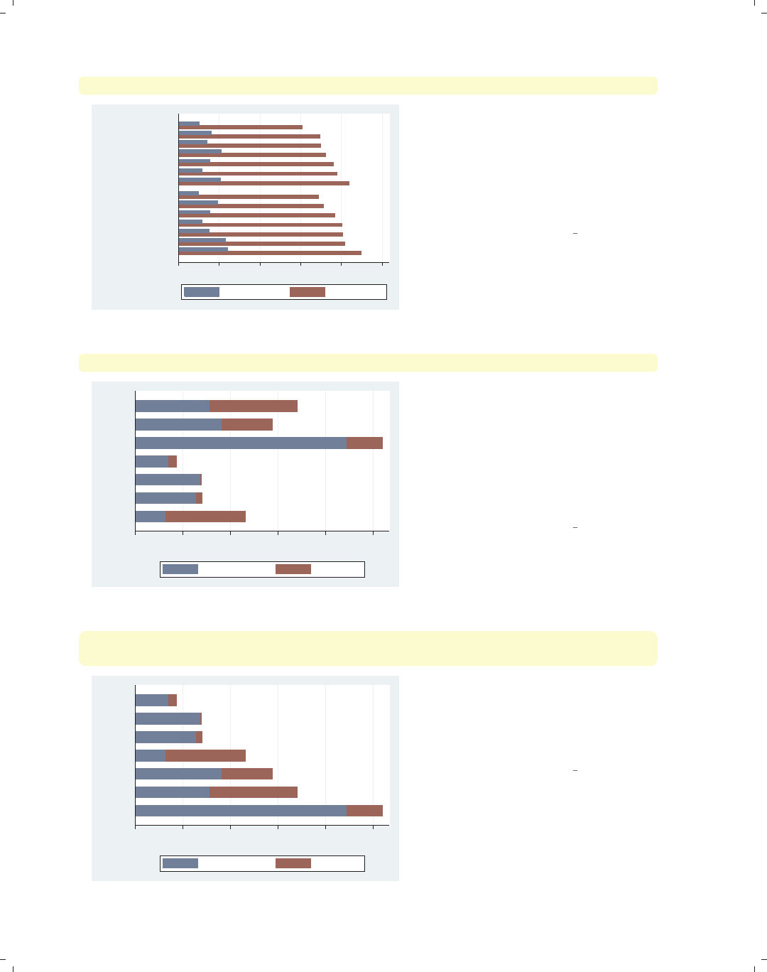
i
i
i
i
i
i
i
i
122 Chapter 4. Bar graphs
graph hbar wage hours, over(occ7, sort(2)) over(married, descending)
0 10 20 30 40 50
single
married
Mgmt
Prof
Other
Operat.
Sales
Cler.
Labor
Mgmt
Operat.
Other
Prof
Sales
Cler.
Labor
mean of wage mean of hours
Each over() option can have its own
separate sorting options. In this
example, we add the descending
option to the second over() option,
and the levels of married are now
shown with those who are married
appearing first.
Uses nlsw.dta & scheme vg s2c
graph hbar (sum) wage, over(collgrad) over(occ7) asyvars stack
0 1,000 2,000 3,000 4,000 5,000
sum of wage
Other
Labor
Operat.
Cler.
Sales
Mgmt
Prof
not college grad college grad
Say that we were to graph the sum of
wage broken down by collgrad and
occ7. We further treat the levels of
collgrad as y-variables and form a
stacked bar chart. We might want to
sort these bars based on the sum of
wages for each occupation. See the next
example for how we can do that.
Uses nlsw.dta & scheme vg s2c
graph hbar (sum) wage,
over(collgrad) over(occ7, sort((sum) wage)) asyvars stack
0 1,000 2,000 3,000 4,000 5,000
sum of wage
Sales
Prof
Mgmt
Other
Labor
Operat.
Cler.
not college grad college grad
Here, we add sort((sum) wage) to the
over() option for occ7, and then the
bars are sorted on the sum of wages at
each level of occ7, sorting the bars on
their total height.
Uses nlsw.dta & scheme vg s2c
The electronic form of this book is solely for direct use at UCLA and only by faculty, students, and staff of UCLA.
All rights reserved on the copyright page apply to this document and specifically neither the electronic nor
published form of the book may be distributed or reproduced, either electronically or in printed form.
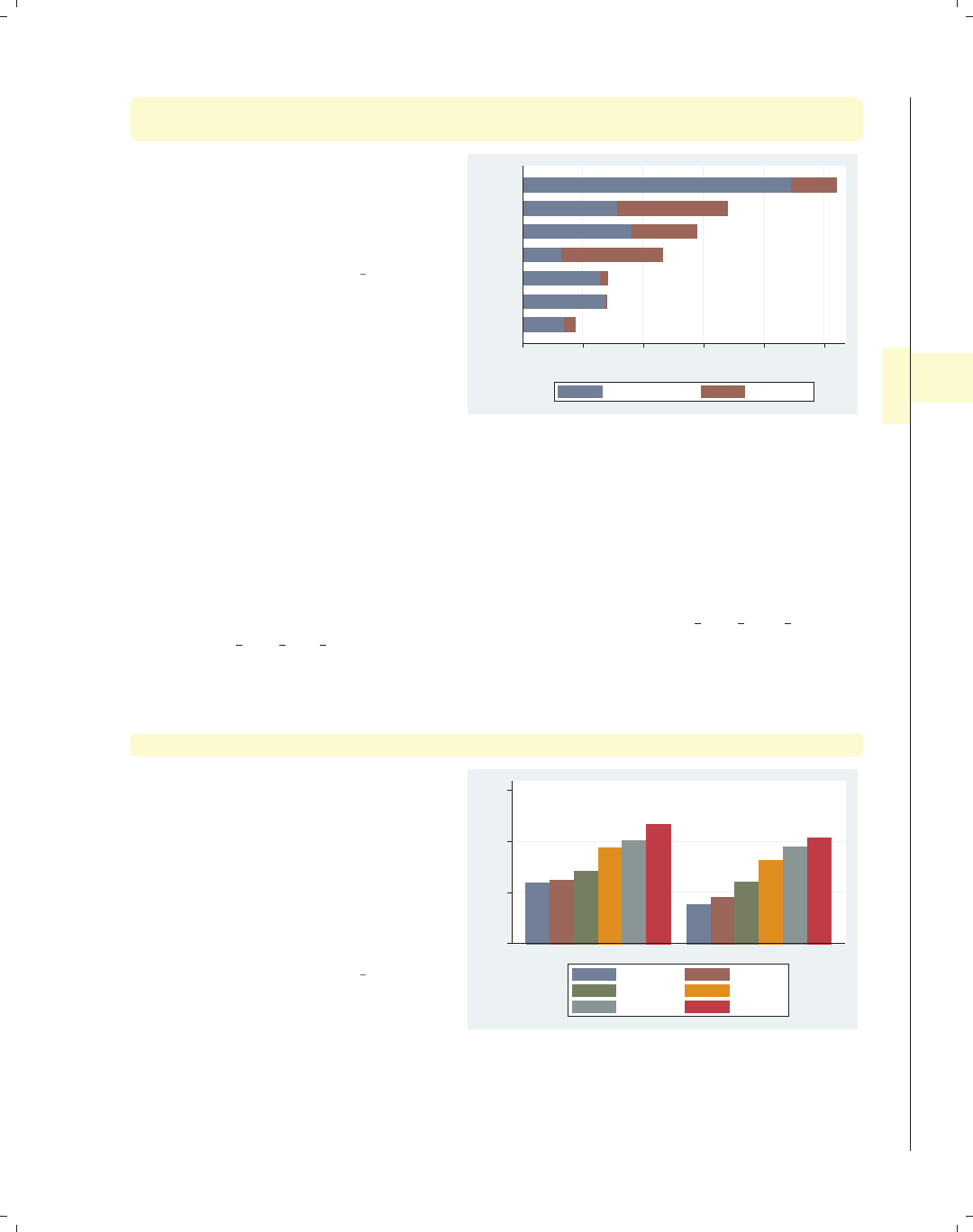
i
i
i
i
i
i
i
i
4.4 Controlling the categorical axis 123
graph hbar (sum) wage,
over(collgrad) over(occ7, sort((sum) wage) descending) asyvars stack
Here, we add the descending option to
change the sort order from highest to
lowest. Note the placement of the
descending option outside of the
sort() option.
Uses nlsw.dta & scheme vg s2c
0 1,000 2,000 3,000 4,000 5,000
sum of wage
Cler.
Operat.
Labor
Other
Mgmt
Prof
Sales
not college grad college grad
4.4 Controlling the categorical axis
This section describes ways that you can label categorical axes. Bar charts are special
since their x-axis is formed by categorical variables. This section describes options you can
use to customize these categorical axes. For more details, see [G]cat axis label options
and [G]cat axis line options.
We will start by exploring how you can change the labels for the bars on the x-axis.
graph bar wage, over(grade6) over(south) asyvars
This bar chart breaks wages down by
education level and whether one lives in
the South. Adding the asyvars option
graphs the levels of education level as
differently colored bars, as though they
were different y-variables. More
importantly, note that the variable
south is coded 0/1 and has no labels,
leaving the x-axis poorly labeled.
Uses nlsw.dta & scheme vg s2c
0 5 10 15
mean of wage
0 1
No HS Some HS
HS Grad Some Coll
Coll Grad Post Grad
Introduction Twoway Matrix Bar Box Dot Pie Options Standard options Styles Appendix
Y-variables Over Over options Cat axis Legend Y-axis Lookofbar options By
The electronic form of this book is solely for direct use at UCLA and only by faculty, students, and staff of UCLA.
All rights reserved on the copyright page apply to this document and specifically neither the electronic nor
published form of the book may be distributed or reproduced, either electronically or in printed form.
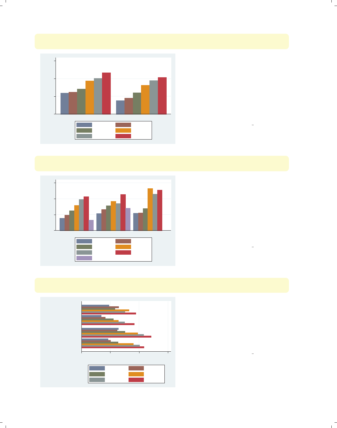
i
i
i
i
i
i
i
i
124 Chapter 4. Bar graphs
graph bar wage, over(grade6) over(south, relabel(1 "N & W" 2 "South"))
asyvars
0 5 10 15
mean of wage
N & W South
No HS Some HS
HS Grad Some Coll
Coll Grad Post Grad
The relabel() option is used to
change the labels displayed for the
levels of south, giving the x-axis more
meaningful labels. Note that we wrote
relabel(1 "N & W") and not
relabel(0 "N & W") since these
numbers do not represent the actual
levels of south but the ordinal position
of the levels, i.e., first and second.
Uses nlsw.dta & scheme vg s2c
graph bar wage, over(grade6) over(union, relabel(3 "missing"))missing
asyvars
0 5 10 15
mean of wage
nonunion union missing
No HS Some HS
HS Grad Some Coll
Coll Grad Post Grad
.
Consider this example, where we show
wages broken down by education and
union membership with the missing
option to show a separate category for
missing values. Normally, the bar for
the missing category would be labeled
with a dot, but here we add the
relabel() option to label that
category with the word “missing”.
Uses nlsw.dta & scheme vg s2c
graph hbar wage, over(grade6) over(south, relabel(1 "N & W" 2 "South"))
over(smsa, relabel(1 "Non Metro" 2 "Metro"))
0 5 10 15
mean of wage
Metro
Non Metro
South
N & W
South
N & W
No HS Some HS
HS Grad Some Coll
Coll Grad Post Grad
This is an example of a bar chart with
three over() variables, two of which we
relabel. The relabel() option is used
to change the labels for the levels of
south and smsa. Note each over()
option can have its own relabel()
option.
Uses nlsw.dta & scheme vg s2c
The electronic form of this book is solely for direct use at UCLA and only by faculty, students, and staff of UCLA.
All rights reserved on the copyright page apply to this document and specifically neither the electronic nor
published form of the book may be distributed or reproduced, either electronically or in printed form.
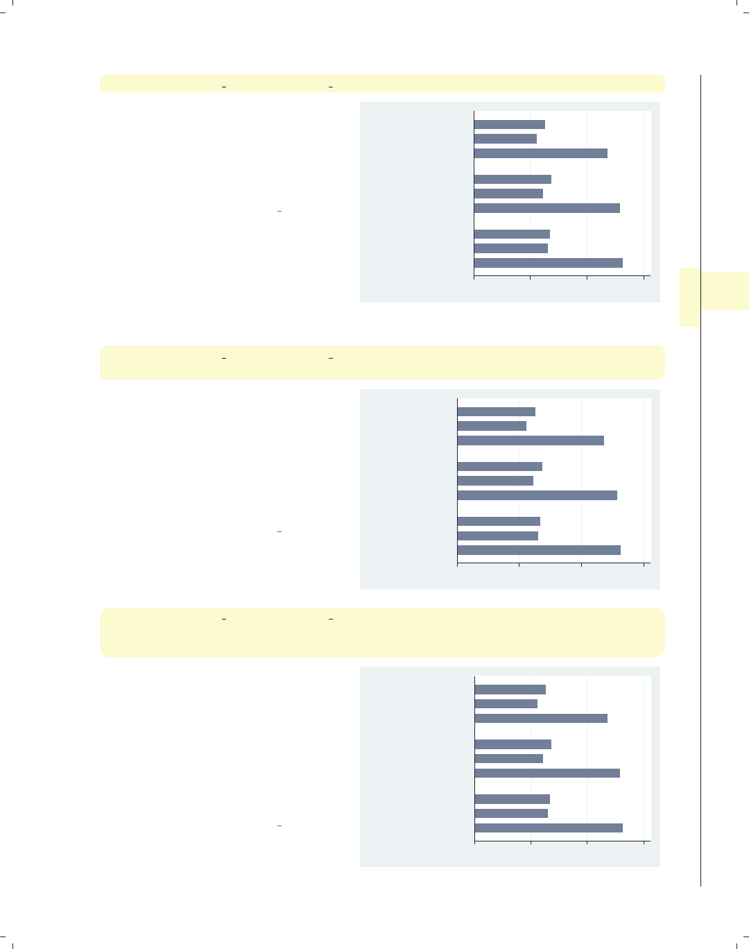
i
i
i
i
i
i
i
i
4.4 Controlling the categorical axis 125
graph hbar prev exp tenure ttl exp, ascategory over(age3)
This bar chart shows three y-variables,
but we use the ascategory option to
plot the different y-variables as
categorical variables on the x-axis. The
default labels on the x-axis are not bad,
but we might want to change them.
Uses nlsw.dta & scheme vg s2c
0 5 10 15
42/46
38/41
34/37
mean of ttl_exp
mean of tenure
mean of prev_exp
mean of ttl_exp
mean of tenure
mean of prev_exp
mean of ttl_exp
mean of tenure
mean of prev_exp
graph hbar prev exp tenure ttl exp, ascategory over(age3)
yvaroptions(relabel(1 "Previous Exp" 2 "Current Exp" 3 "Total Exp"))
If the three level-of-experience variables
were indicated by an over() option, we
would use the over(, relabel())
option to change the labels. Instead,
since we have treated the multiple
y-variables as categories, we then use
yvaroptions(relabel()) to modify
the labels on the x-axis.
Uses nlsw.dta & scheme vg s2c
0 5 10 15
42/46
38/41
34/37
Total Exp
Current Exp
Previous Exp
Total Exp
Current Exp
Previous Exp
Total Exp
Current Exp
Previous Exp
graph hbar prev exp tenure ttl exp, ascategory
over(age3, relabel(1 "34-37 yrs" 2 "38-41 yrs" 3 "42-46 yrs"))
yvaroptions(relabel(1 "Previous Exp" 2 "Current Exp" 3 "Total Exp"))
This example is similar to the previous
example, but we have added a
relabel() option to the over()
variable as well. As before, we use
yvaroptions(relabel()) to modify
the labels for the multiple y-variables,
and then we also use the relabel()
option within the over() option to
change the labels for age.
Uses nlsw.dta & scheme vg s2c
0 5 10 15
42−46 yrs
38−41 yrs
34−37 yrs
Total Exp
Current Exp
Previous Exp
Total Exp
Current Exp
Previous Exp
Total Exp
Current Exp
Previous Exp
Introduction Twoway Matrix Bar Box Dot Pie Options Standard options Styles Appendix
Y-variables Over Over options Cat axis Legend Y-axis Lookofbar options By
The electronic form of this book is solely for direct use at UCLA and only by faculty, students, and staff of UCLA.
All rights reserved on the copyright page apply to this document and specifically neither the electronic nor
published form of the book may be distributed or reproduced, either electronically or in printed form.
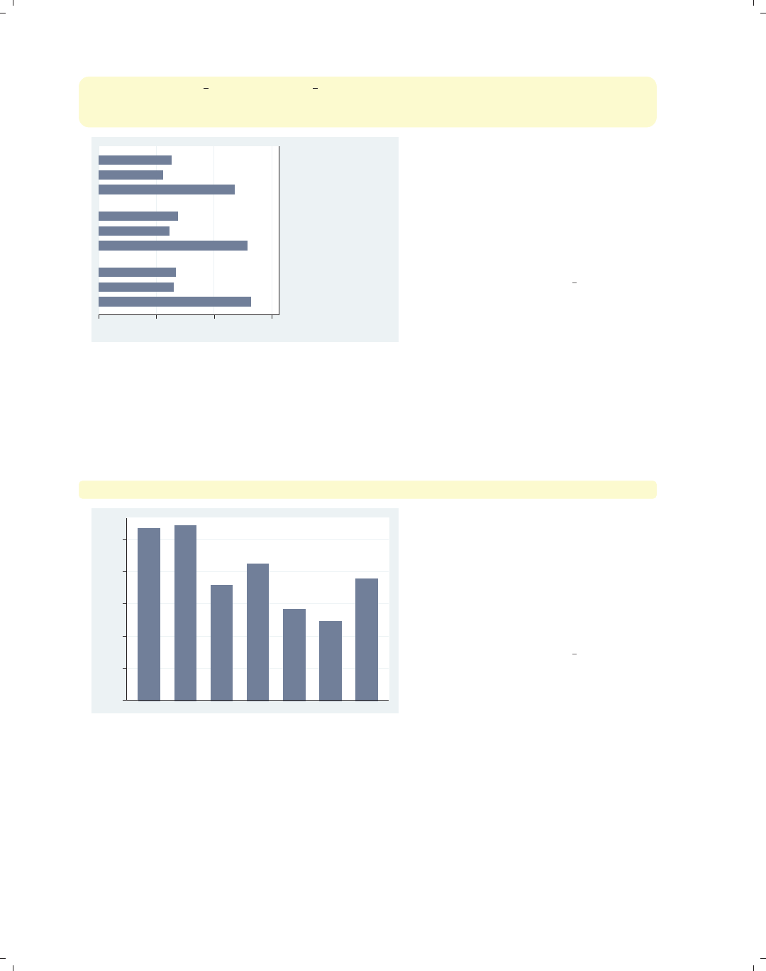
i
i
i
i
i
i
i
i
126 Chapter 4. Bar graphs
graph hbar prev exp tenure ttl exp, ascategory xalternate
over(age3, relabel(1 "34-37 yrs" 2 "38-41 yrs" 3 "42-46 yrs"))
yvaroptions(relabel(1 "Previous Exp" 2 "Current Exp" 3 "Total Exp"))
0 5 10 15
42−46 yrs
38−41 yrs
34−37 yrs
Total Exp
Current Exp
Previous Exp
Total Exp
Current Exp
Previous Exp
Total Exp
Current Exp
Previous Exp
If we wish, we can move the x-axis to
the opposite side of the graph. Here, we
add the xalternate option, which
moves the labels for the x-axis to the
opposite side, in this case from the left
to the right. You can also use the
yalternate option to move the y-axis
to its opposite side.
Uses nlsw.dta & scheme vg s2c
In the previous examples, we saw that the relabel option can be used in the over()
option to control the labeling of over() variables and can be used within yvaroptions()
to control the labeling of multiple y-variables (provided that the ascategory option is used
to convert the multiple y-variables into categories). We will further explore other over()
options, which can be used with either over() or yvaroptions().
graph bar wage, over(occ7, label(nolabels))
0 2 4 6 8 10
mean of wage
We can use the label(nolabels)
option to suppress the display of the
labels associated with the levels of
occ7.Thelabel(nolabels) option is
generally not useful alone but is very
useful in combination with other means
to label the bars. Consider the next
example.
Uses nlsw.dta & scheme vg s2c
The electronic form of this book is solely for direct use at UCLA and only by faculty, students, and staff of UCLA.
All rights reserved on the copyright page apply to this document and specifically neither the electronic nor
published form of the book may be distributed or reproduced, either electronically or in printed form.
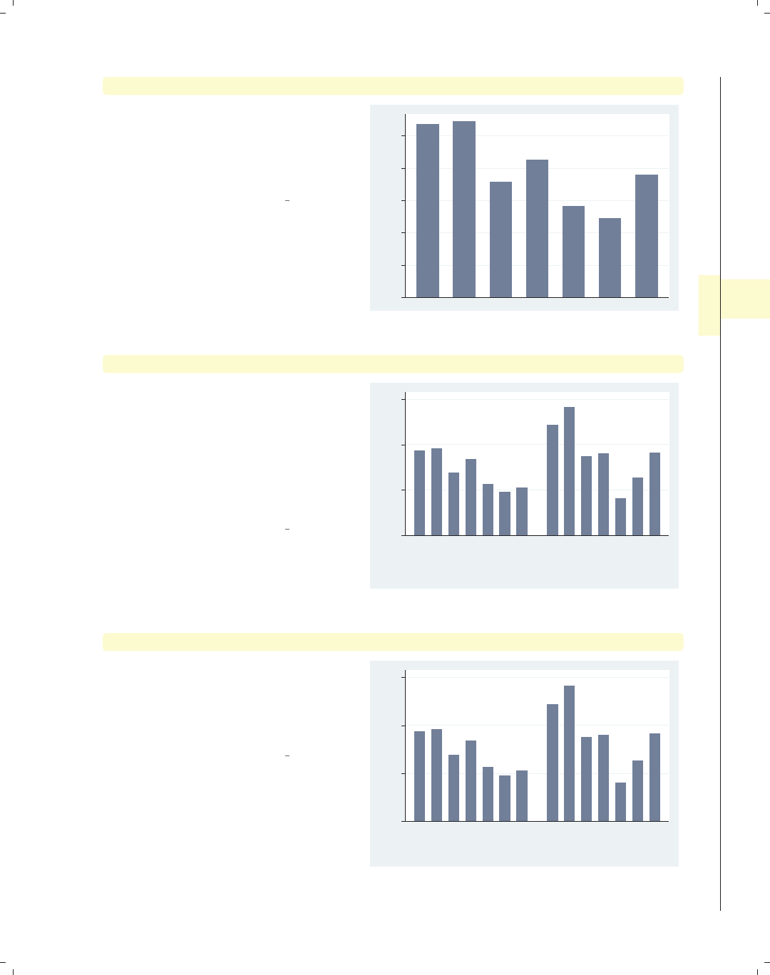
i
i
i
i
i
i
i
i
4.4 Controlling the categorical axis 127
graph bar wage, over(occ7, label(nolabels)) blabel(group)
By adding the blabel(group) (bar
label) option, the bars are labeled with
the name of the group to which the bar
belongs. See Bar : Legend (130) for more
about blabel().
Uses nlsw.dta & scheme vg s2c
Prof Mgmt
Sales
Cler.
Operat.
Labor
Other
0 2 4 6 8 10
mean of wage
graph bar wage, over(occ7, label(angle(45))) over(collgrad)
This graph shows wages broken down
by occupation and by whether one
graduated college. The
label(angle(45)) option is added to
rotate the labels for occupation by 45
degrees. If this had been omitted, the
labels would have overlapped each
other.
Uses nlsw.dta & scheme vg s2c
0 5 10 15
mean of wage
not college grad college grad
Prof
Mgmt
Sales
Cler.
Operat.
Labor
Other
Prof
Mgmt
Sales
Cler.
Operat.
Labor
Other
graph bar wage, over(occ7, label(alternate)) over(collgrad)
Compare this graph with the previous
example. This example uses the
label(alternate) strategy to avoid
overlapping by alternating the labels for
occupation.
Uses nlsw.dta & scheme vg s2c
0 5 10 15
mean of wage
not college grad college grad
Prof
Mgmt
Sales
Cler.
Operat.
Labor
Other
Prof
Mgmt
Sales
Cler.
Operat.
Labor
Other
Introduction Twoway Matrix Bar Box Dot Pie Options Standard options Styles Appendix
Y-variables Over Over options Cat axis Legend Y-axis Lookofbar options By
The electronic form of this book is solely for direct use at UCLA and only by faculty, students, and staff of UCLA.
All rights reserved on the copyright page apply to this document and specifically neither the electronic nor
published form of the book may be distributed or reproduced, either electronically or in printed form.

i
i
i
i
i
i
i
i
128 Chapter 4. Bar graphs
graph bar wage hours ttl exp, ascategory over(collgrad)
yvaroptions(label(alternate))
0 10 20 30 40
not college grad college grad
mean of wage
mean of hours
mean of ttl_exp
mean of wage
mean of hours
mean of ttl_exp
This is another example of using the
label(alternate) option, but in this
case, it is used in the context of
alternating labels created by multiple
y-variables converted to categories
using the ascategory option. In such a
case, the option is specified as
yvaroptions(label(alternate)).
Uses nlsw.dta & scheme vg s2c
graph bar wage hours ttl exp, ascategory over(union) nolabel
0 10 20 30 40
nonunion union
wage hours ttl_exp wage hours ttl_exp
If we add the nolabel option, the
names of the variables are shown
instead of the value labels.
Uses nlsw.dta & scheme vg s2c
graph hbar wage, over(occ5, label(labcolor(green)))
over(collgrad, label(labcolor(maroon) labsize(small)))
0 5 10 15
mean of wage
college grad
not college grad
Other
Labor/Ops
Clerical
Sales
Prof/Mgmt
Other
Labor/Ops
Clerical
Sales
Prof/Mgmt
We can change the color of the labels
using the labcolor() option. Here, we
make the label for occ5 green and the
label for collgrad maroon. We also
use labsize(small) to make the labels
for collgrad small. See Styles : Colors
(328) and Styles : Textsize (344) for more
details about other values you could
choose.
Uses nlsw.dta & scheme vg s2c
The electronic form of this book is solely for direct use at UCLA and only by faculty, students, and staff of UCLA.
All rights reserved on the copyright page apply to this document and specifically neither the electronic nor
published form of the book may be distributed or reproduced, either electronically or in printed form.
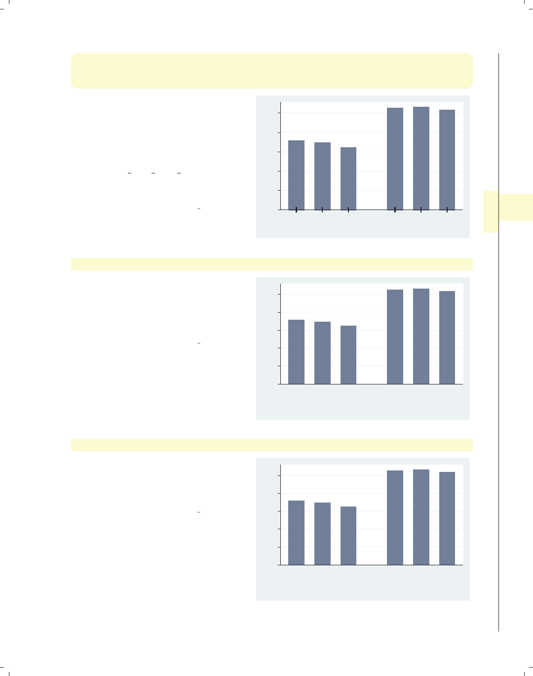
i
i
i
i
i
i
i
i
4.4 Controlling the categorical axis 129
graph bar wage,
over(age3, label(ticks tlwidth(thick) tlength(*2) tposition(crossing)))
over(collgrad)
Stata permits you to add ticks using
the ticks option. At the same time, we
modify the attributes of the ticks,
making the tick line width thick, the
tick length twice as long as normal, and
the tick position crossing the x-axis.
See [G]cat axis label options for
more details and other options for
controlling ticks.
Uses nlsw.dta & scheme vg s2c
0 2 4 6 8 10
mean of wage
not college grad college grad
34/37 38/41 42/46 34/37 38/41 42/46
graph bar wage, over(age3, label(labgap(*5))) over(collgrad)
The labgap(*5) option increases the
gap between the label and the axis,
making the gap between the labels for
the levels of age3 and the axis five
times their normal size.
Uses nlsw.dta & scheme vg s2c
0 2 4 6 8 10
mean of wage
not college grad college grad
34/37 38/41 42/46 34/37 38/41 42/46
graph bar wage, over(age3) over(collgrad, label(labgap(*5)))
We use the label(labgap(*5)) option
to control the gap between the labels
for age3 and collgrad, making that
gap five times the normal size.
Uses nlsw.dta & scheme vg s2c
0 2 4 6 8 10
mean of wage
not college grad college grad
34/37 38/41 42/46 34/37 38/41 42/46
Introduction Twoway Matrix Bar Box Dot Pie Options Standard options Styles Appendix
Y-variables Over Over options Cat axis Legend Y-axis Lookofbar options By
The electronic form of this book is solely for direct use at UCLA and only by faculty, students, and staff of UCLA.
All rights reserved on the copyright page apply to this document and specifically neither the electronic nor
published form of the book may be distributed or reproduced, either electronically or in printed form.
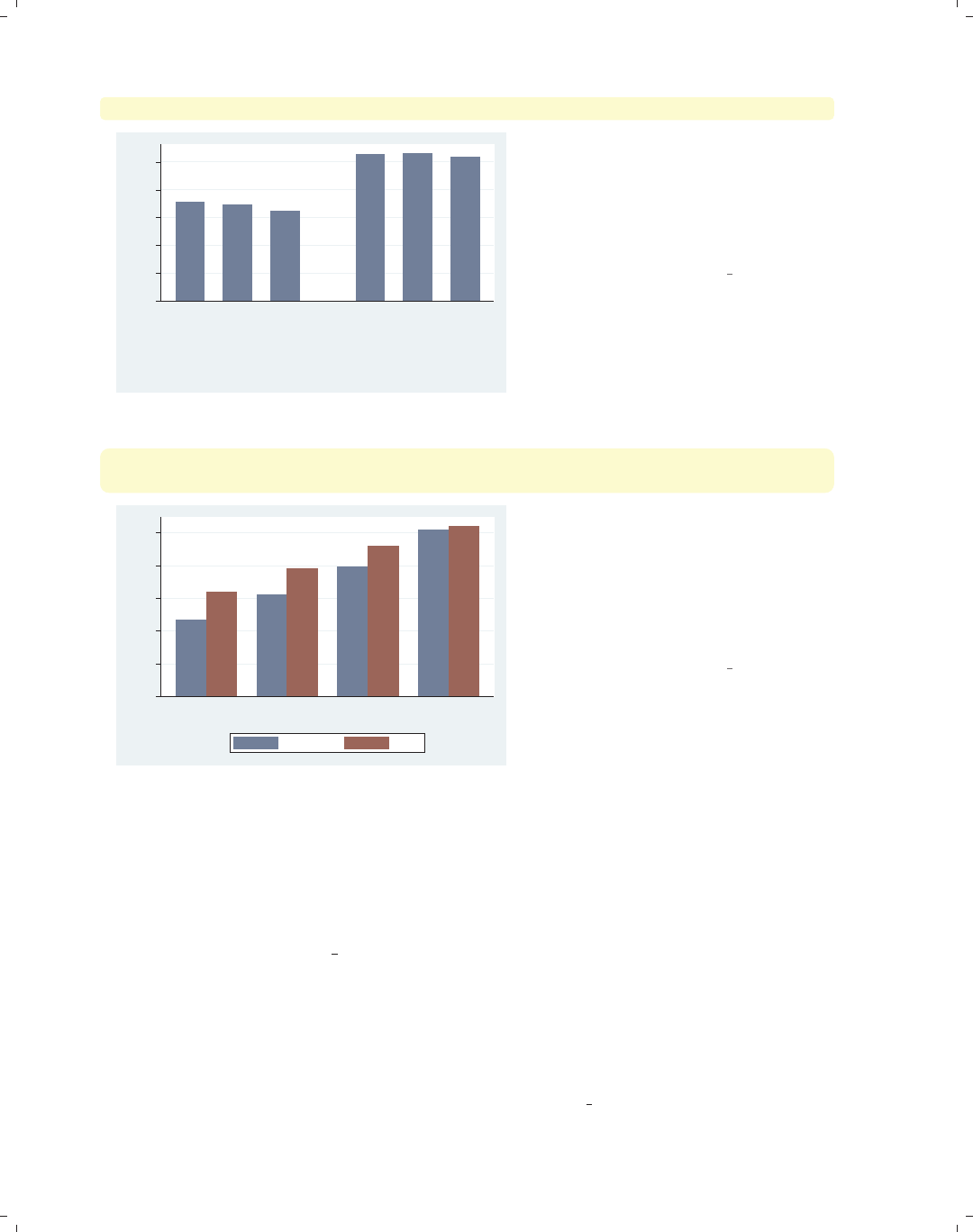
i
i
i
i
i
i
i
i
130 Chapter 4. Bar graphs
graph bar wage, over(age3) over(collgrad, axis(outergap(*20)))
0 2 4 6 8 10
mean of wage
not college grad college grad
34/37 38/41 42/46 34/37 38/41 42/46
The axis(outergap(*20)) option
controls the gap between the labels of
the x-axis and the outside of the graph.
As you can see, this increases the space
below the labels for collgrad and the
bottom of the graph.
Uses nlsw.dta & scheme vg s2c
graph bar wage, over(union) over(grade4) asyvars
b1title("Education Level in Four Categories")
0 2 4 6 8 10
mean of wage
Not HS HS Grad Some Coll Coll Grad
Education Level in Four Categories
nonunion union
The b1title() option adds a title to
the bottom of the graph, in effect
labeling the x-axis. We can add a
second title below that using the
b2title() option. If we used graph
hbox, we could label the left axis using
the l1title() and l2title() options.
Uses nlsw.dta & scheme vg s2c
4.5 Controlling legends
This section discusses the use of legends for bar charts, emphasizing the features that
are unique to bar charts. The section Options : Legend (287) goes into great detail about
legends, as does [G]legend option. Legends can be used for multiple y-variables or when
the first over() variable is treated as a y-variable via the asyvars option. See Bar : Y-
variables (107) for more information about the use of multiple y-variables and Bar : Over
(111) for more examples of treating the first over() variable as a y-variable. Next, we
will consider examples that show the different kinds of labels that you can create using the
blabel() option. You can create labels that display the name of y-variable, the name of
the first over() group, the height of the bar, or the overall height of the bar (when used
with the stack option). These examples begin using the vg s1c scheme.
The electronic form of this book is solely for direct use at UCLA and only by faculty, students, and staff of UCLA.
All rights reserved on the copyright page apply to this document and specifically neither the electronic nor
published form of the book may be distributed or reproduced, either electronically or in printed form.
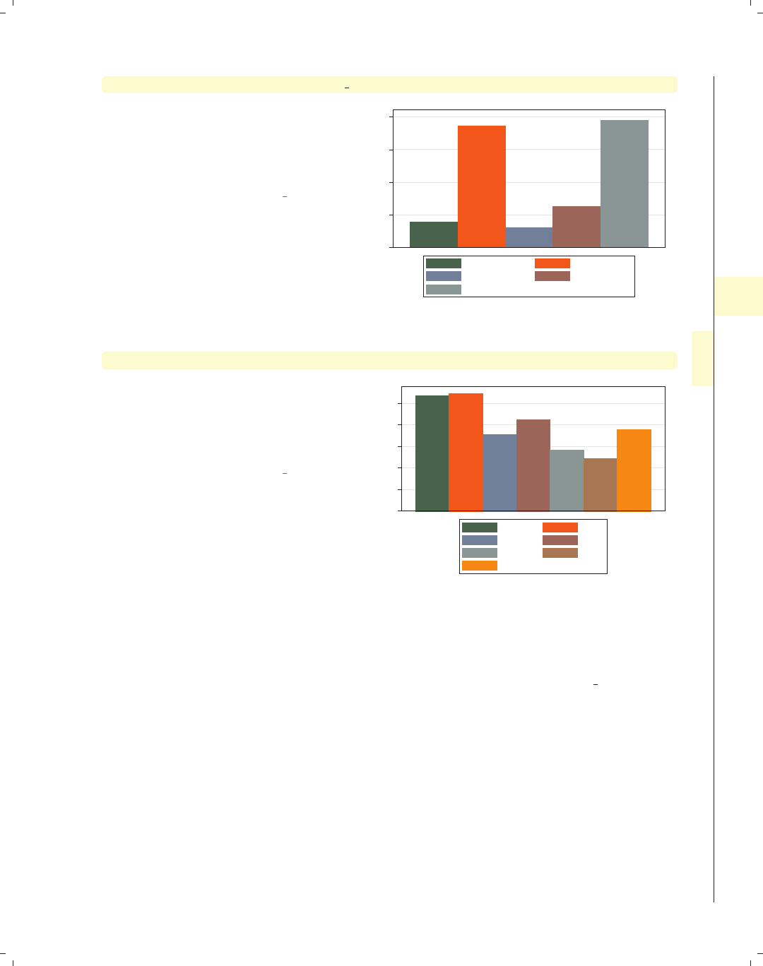
i
i
i
i
i
i
i
i
4.5 Controlling legends 131
graph bar wage hours tenure ttl exp age
Consider this bar graph of five different
y-variables. The bars for the different
y-variables are shown with different
colors, and a legend is used to identify
the y-variables.
Uses nlsw.dta & scheme vg s1c
0 10 20 30 40
mean of wage mean of hours
mean of tenure mean of ttl_exp
mean of age
graph bar wage, over(occ7) asyvars
This is another example of where a
legend can arise in a Stata bar graph by
specifying the asyvars option, which
treats an over() variable as though the
levels were different y-variables.
Uses nlsw.dta & scheme vg s1c
0 2 4 6 8 10
mean of wage
Prof Mgmt
Sales Cler.
Operat. Labor
Other
Unless otherwise mentioned, the legend options described below work the same regard-
less of whether the legend was derived from multiple y-variables or from an over() variable
that was combined with the asyvars option. These next examples use the vg s2m scheme.
Introduction Twoway Matrix Bar Box Dot Pie Options Standard options Styles Appendix
Y-variables Over Over options Cat axis Legend Y-axis Lookofbar options By
The electronic form of this book is solely for direct use at UCLA and only by faculty, students, and staff of UCLA.
All rights reserved on the copyright page apply to this document and specifically neither the electronic nor
published form of the book may be distributed or reproduced, either electronically or in printed form.
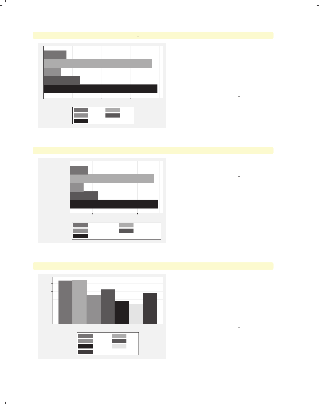
i
i
i
i
i
i
i
i
132 Chapter 4. Bar graphs
graph hbar wage hours tenure ttl exp age, nolabel
0 10 20 30 40
wage hours
tenure ttl_exp
age
The nolabel option only works when
you have multiple y-variables. When it
is used, the variable names (not the
variable labels) are used in the legend.
For example, instead of showing the
variable label hourly wage,itshows
the variable name wage.
Uses nlsw.dta & scheme vg s2m
graph hbar wage hours tenure ttl exp age, showyvars
0 10 20 30 40
mean of age
mean of ttl_exp
mean of tenure
mean of hours
mean of wage
mean of wage mean of hours
mean of tenure mean of ttl_exp
mean of age
The showyvars option puts the labels
on the axis, beside or “under” the bars.
Uses nlsw.dta & scheme vg s2m
graph bar wage, over(occ7) asyvars showyvars
0 2 4 6 8 10
mean of wage
Prof Mgmt Sales Cler. Operat. Labor Other
Prof Mgmt
Sales Cler.
Operat. Labor
Other
Even though the showyvars option
sounds like it would work only with
multiple y-variables, it also works when
you combine the over() and asyvars
options. As you can see, the legend is
now redundant and could be
suppressed.
Uses nlsw.dta & scheme vg s2m
The electronic form of this book is solely for direct use at UCLA and only by faculty, students, and staff of UCLA.
All rights reserved on the copyright page apply to this document and specifically neither the electronic nor
published form of the book may be distributed or reproduced, either electronically or in printed form.
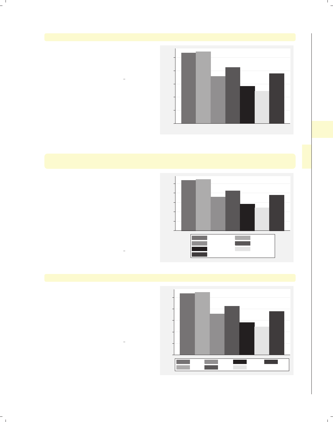
i
i
i
i
i
i
i
i
4.5 Controlling legends 133
graph bar wage, over(occ7) asyvars showyvars legend(off)
This example is similar to the previous
example, but we use the legend(off)
option to suppress the display of the
legend.
Uses nlsw.dta & scheme vg s2m
0 2 4 6 8 10
mean of wage
Prof Mgmt Sales Cler. Operat. Labor Other
graph bar wage, over(occ7) asyvars legend(label(1 "Professional")
label(2 "Management"))
We can use legend(label()) to change
the labels for one or more of the bars in
the graph. Here, we change the labels
for the first and second bars in the
legend. Note that you use a separate
label() option for each bar. This is in
contrast to the relabel() option,
where all of the label assignments were
placed in one relabel() option; see
Bar : Cat axis (123).
Uses nlsw.dta & scheme vg s2m
0 2 4 6 8 10
mean of wage
Professional Management
Sales Cler.
Operat. Labor
Other
graph bar wage, over(occ7) asyvars legend(rows(2) colfirst)
In this example, we use the rows(2)
option combined with colfirst to
display the legend in two rows and to
order the keys by column (instead of
the default, which is by row). This
yields keys that are more adjacent to
the bars that they label.
Uses nlsw.dta & scheme vg s2m
0 2 4 6 8 10
mean of wage
Prof
Mgmt
Sales
Cler.
Operat.
Labor
Other
Introduction Twoway Matrix Bar Box Dot Pie Options Standard options Styles Appendix
Y-variables Over Over options Cat axis Legend Y-axis Lookofbar options By
The electronic form of this book is solely for direct use at UCLA and only by faculty, students, and staff of UCLA.
All rights reserved on the copyright page apply to this document and specifically neither the electronic nor
published form of the book may be distributed or reproduced, either electronically or in printed form.
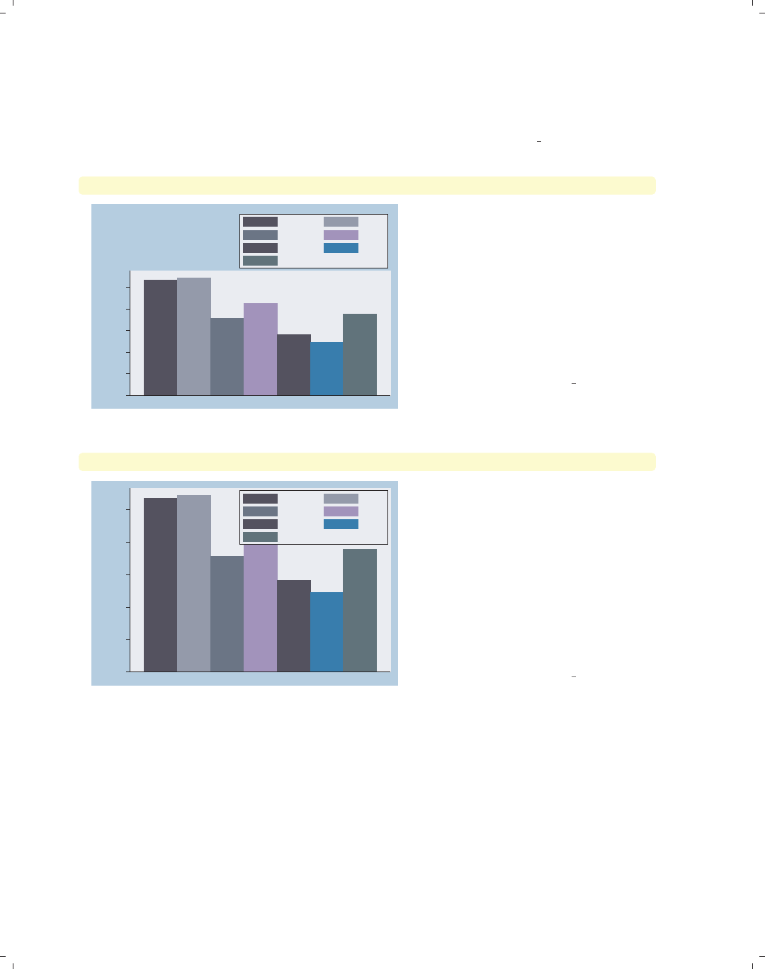
i
i
i
i
i
i
i
i
134 Chapter 4. Bar graphs
As you can see, the default placement for the legend is below the x-axis. However, Stata
gives you tremendous flexibility in the placement of the legend. We now consider options
that control the placement of the legend, along with options useful for controlling the place-
ment of the items within the legend. The following examples use the vg blue scheme.
graph bar wage, over(occ7) asyvars legend(position(1))
0
2
4
6
8
10
mean of wage
Prof Mgmt
Sales Cler.
Operat. Labor
Other
We can use the legend(position(1))
option to place the legend in the top
right corner of the graph. The values
you supply for position() are like the
numbers on a clock face, where 12
o’clock is the top, 6 o’clock is the
bottom, and 0 represents the center of
the clock face. Specifying 1 o’clock
places the legend in the top right; see
Styles : Clockpos (330) for more details.
Uses nlsw.dta & scheme vg blue
graph bar wage, over(occ7) asyvars legend(position(1) ring(0))
0
2
4
6
8
10
mean of wage
Prof Mgmt
Sales Cler.
Operat. Labor
Other
Adding the ring(0) option, we can try
to tuck the legend inside the top right
corner of the plot area. Think of the
ring() option as specifying concentric
rings around the graph, where 0 is a
position inside the plot region, 1 is just
outside the plot region, and increasing
values are farther and farther from the
center of the plot region. Unfortunately,
the legend touches one of the bars, but
we will fix that in the next example.
Uses nlsw.dta & scheme vg blue
The electronic form of this book is solely for direct use at UCLA and only by faculty, students, and staff of UCLA.
All rights reserved on the copyright page apply to this document and specifically neither the electronic nor
published form of the book may be distributed or reproduced, either electronically or in printed form.
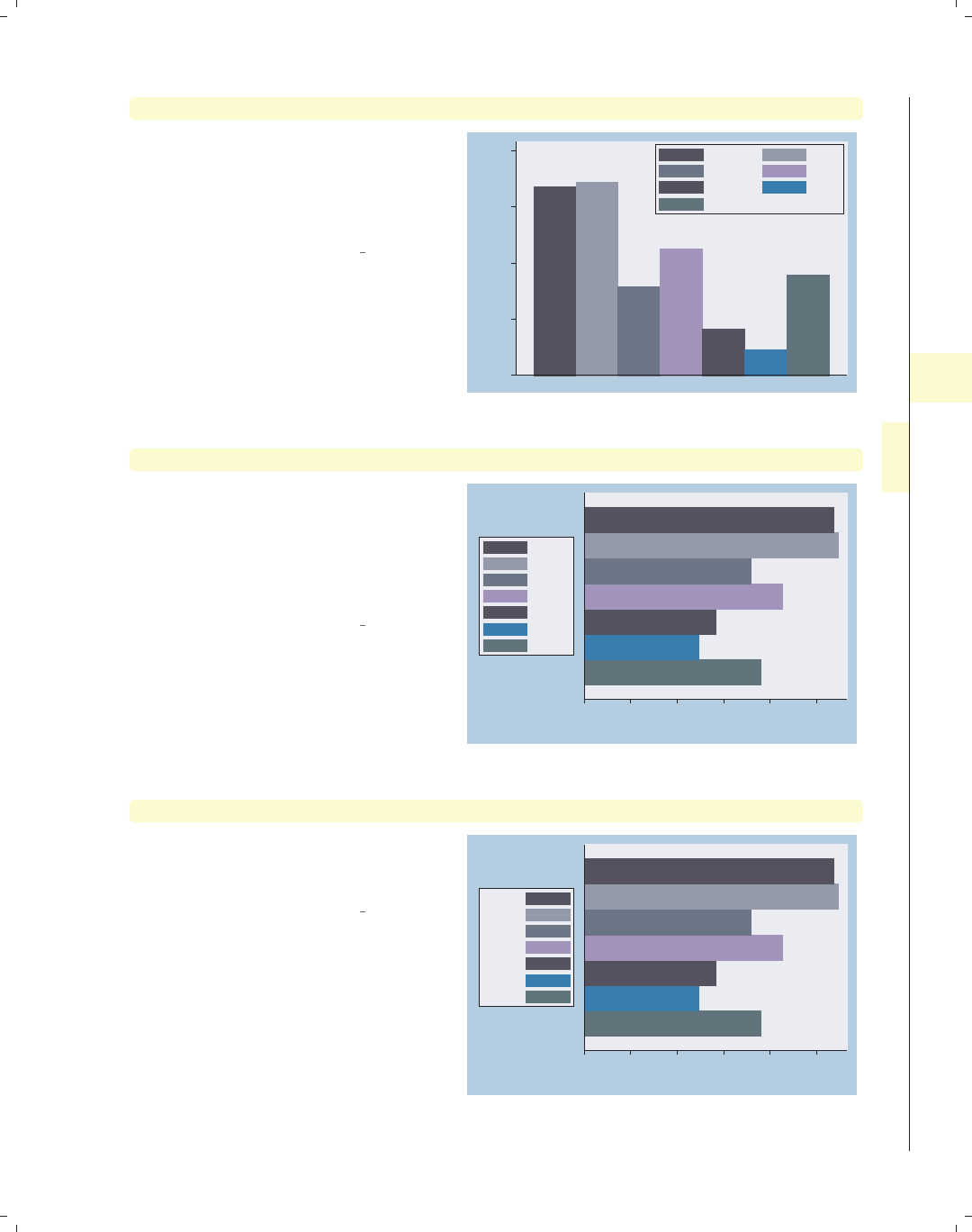
i
i
i
i
i
i
i
i
4.5 Controlling legends 135
graph bar wage, over(occ7) asyvars legend(position(1) ring(0)) exclude0
Adding exclude0 no longer forces the
y-axis to start at 0 and makes room in
the top corner of the plot region for the
legend. See Bar : Y-axis (143) for more
details about the exclude0 option.
Uses nlsw.dta & scheme vg blue
4
6
8
10
12
mean of wage
Prof Mgmt
Sales Cler.
Operat. Labor
Other
graph hbar wage, over(occ7) asyvars legend(cols(1) position(9))
We switch to making this a horizontal
bar chart and move the legend using
the position(9) option to place the
legend in the 9 o’clock position. We
also use the cols(1) option to display
the legend as a single column.
Uses nlsw.dta & scheme vg blue
0 2 4 6 8 10
mean of wage
Prof
Mgmt
Sales
Cler.
Operat.
Labor
Other
graph hbar wage, over(occ7) asyvars legend(cols(1) position(9) textfirst)
Adding the textfirst option places
the description of the key before the
symbol in the legend.
Uses nlsw.dta & scheme vg blue
0 2 4 6 8 10
mean of wage
Prof
Mgmt
Sales
Cler.
Operat.
Labor
Other
Introduction Twoway Matrix Bar Box Dot Pie Options Standard options Styles Appendix
Y-variables Over Over options Cat axis Legend Y-axis Lookofbar options By
The electronic form of this book is solely for direct use at UCLA and only by faculty, students, and staff of UCLA.
All rights reserved on the copyright page apply to this document and specifically neither the electronic nor
published form of the book may be distributed or reproduced, either electronically or in printed form.
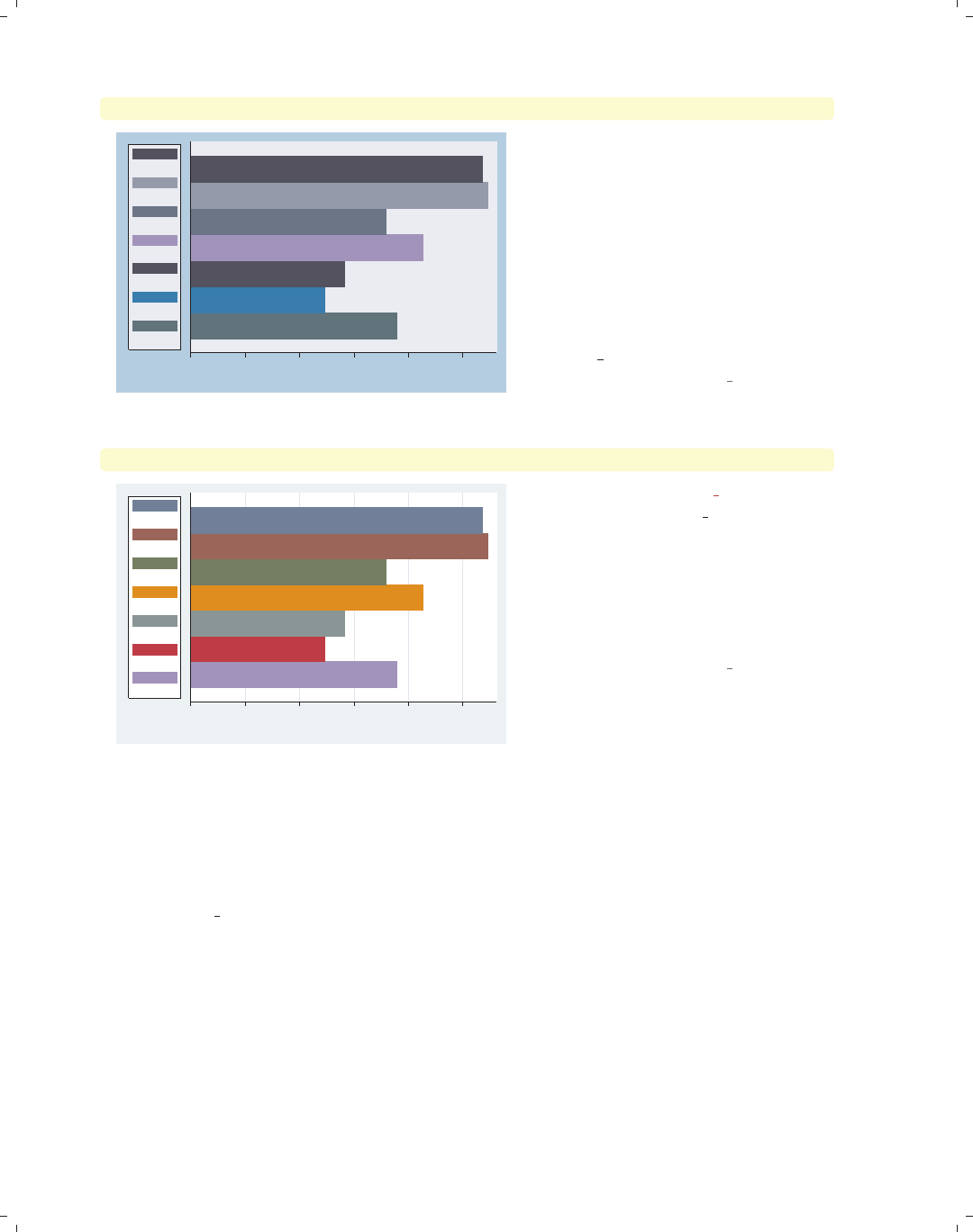
i
i
i
i
i
i
i
i
136 Chapter 4. Bar graphs
graph hbar wage, over(occ7) asyvars legend(cols(1) position(9) stack)
0 2 4 6 8 10
mean of wage
Prof
Mgmt
Sales
Cler.
Operat.
Labor
Other
With the stack option, the keys and
their labels are placed on top of each
other to form an even narrower legend,
leaving more room to plot the bars.
You have considerable control over the
elements within the legend using other
options, such as rowgap(),keygap(),
symxsize(),symysize(),
textwidth(),andsymplacement().
See Options : Legend (287) and
[G]legend option for more details.
Uses nlsw.dta & scheme vg blue
graph hbar wage, over(occ7) asyvars
0 2 4 6 8 10
mean of wage
Prof
Mgmt
Sales
Cler.
Operat.
Labor
Other
This example uses the vg lgndc
scheme, set scheme vg lgndc. Notice
how it positions and customizes the
legend, as in the previous example.
With this scheme, the legend defaults
to the 9 o’clock position, in a single
column, with the keys and symbols
stacked.
Uses nlsw.dta & scheme vg lgndc
Let’s now look at how we can use the blabel() (bar label) option to add labels to the
bars. These labels can show the name of the over() option, the name of y-variables, or
the height of the bar. These options are illustrated below along with other related options
you might use in conjunction with blabel() for identifying the bars. These examples begin
using the vg past scheme.
The electronic form of this book is solely for direct use at UCLA and only by faculty, students, and staff of UCLA.
All rights reserved on the copyright page apply to this document and specifically neither the electronic nor
published form of the book may be distributed or reproduced, either electronically or in printed form.
i
i
i
i
i
i
i
i
4.5 Controlling legends 137
graph bar wage hours tenure, over(collgrad)
Consider this graph, where we look at
wage,hours,andtenure broken down
by the levels of collgrad. The legend
identifies the bars for us. In addition to
the legend, Stata offers us other ways
we can label these bars, as we shall see
in the upcoming examples.
Uses nlsw.dta & scheme vg past
0 10 20 30 40
not college grad college grad
mean of wage mean of hours
mean of tenure
graph bar wage hours tenure, over(collgrad) blabel(name)
We can add the blabel(name) (bar
label) option, and it places labels on
each of the bars with the name of
y-variables. Here, each of these labels is
preceded with “mean of” since each bar
represents the mean of y-variable.
Uses nlsw.dta & scheme vg past
mean of wage
mean of hours
mean of tenure
mean of wage
mean of hours
mean of tenure
0 10 20 30 40
not college grad college grad
mean of wage mean of hours
mean of tenure
graph bar wage hours tenure, over(collgrad) blabel(name) nolabel
If we use the nolabel option, just the
name y-variable is shown. For example,
instead of showing the variable label
hourly wage, it shows the variable
name wage.
Uses nlsw.dta & scheme vg past
wage
hours
tenure
wage
hours
tenure
0 10 20 30 40
not college grad college grad
wage hours
tenure
Introduction Twoway Matrix Bar Box Dot Pie Options Standard options Styles Appendix
Y-variables Over Over options Cat axis Legend Y-axis Lookofbar options By
The electronic form of this book is solely for direct use at UCLA and only by faculty, students, and staff of UCLA.
All rights reserved on the copyright page apply to this document and specifically neither the electronic nor
published form of the book may be distributed or reproduced, either electronically or in printed form.
i
i
i
i
i
i
i
i
138 Chapter 4. Bar graphs
graph bar wage hours tenure, over(collgrad) blabel(name) nolabel
legend(off)
wage
hours
tenure
wage
hours
tenure
0 10 20 30 40
not college grad college grad
In this case, the legend is no longer
needed, so we can suppress the display
of the legend with the legend(off)
option. See Options : Legend (287) for
more information about legend options.
Uses nlsw.dta & scheme vg past
graph bar tenure, over(occ7) exclude0 blabel(group)
Prof
Mgmt
Sales
Cler.
Operat.
Labor
Other
3 4 5 6 7
mean of tenure
Prof Mgmt Sales Cler. Operat. Labor Other
Using the blabel(group) option shows
the label for the first over() group at
the top of each bar. In this case, the
label at the bottom of the bar becomes
unnecessary.
Uses nlsw.dta & scheme vg past
graph bar tenure, over(occ7, label(nolabels)) exclude0
blabel(group) yscale(range(7.2))
Prof
Mgmt
Sales
Cler.
Operat.
Labor
Other
3 4 5 6 7
mean of tenure
We can add the label(nolabels)
option to suppress the display of the
labels below each bar. Note that we
have also used the option
yscale(range(7.2)) to provide more
room within the plot area to label the
bar for the Other category.
Uses nlsw.dta & scheme vg past
The electronic form of this book is solely for direct use at UCLA and only by faculty, students, and staff of UCLA.
All rights reserved on the copyright page apply to this document and specifically neither the electronic nor
published form of the book may be distributed or reproduced, either electronically or in printed form.
i
i
i
i
i
i
i
i
4.5 Controlling legends 139
graph bar tenure, over(occ5, label(nolabels)) exclude0 blabel(group)
yscale(range(7.2)) over(union)
Even if we add a second over() option,
the levels of the first over() variable
are labeled at the top of each bar due to
the blabel() option, and the levels of
the second over() variable are labeled,
as usual, at the bottom of the bars.
Note that the blabel() option does
not work this way when you have three
over() options or multiple y-variables.
Uses nlsw.dta & scheme vg past
Prof/Mgmt
Sales
Clerical
Labor/Ops
Other
Prof/Mgmt
Sales
Clerical
Labor/Ops
Other
4 5 6 7 8 9
mean of tenure
nonunion union
graph hbar prev exp tenure ttl exp, over(grade4) blabel(bar)
Consider this graph showing previous,
current, and total work experience
broken down by education. In this
example, the blabel(bar) option is
used to display the bar height (in this
case, the mean of y-variables).
Uses nlsw.dta & scheme vg past
13.441
6.81536
6.64236
13.2673
6.21637
7.06569
12.4683
5.84232
6.64033
10.347
4.7191
5.66887
0 5 10 15
Coll Grad
Some Coll
HS Grad
Not HS
mean of prev_exp mean of tenure
mean of ttl_exp
graph bar (sum) prev exp tenure, stack over(grade4) blabel(bar)
Using the (sum) function, this graph
shows the sum of experience for all
individuals in a grade level before their
current job (prev exp) and the sum of
experience for all individuals in a grade
level in their current job (tenure)and
then uses stack to stack these two
totals. With the blabel(bar) option,
the bar labels are the sums for each
y-variables broken down by grade4.
Uses nlsw.dta & scheme vg past
1865.06
1552.58
6221.99
5474.25
3186.63
2803.58
3387.6
3475.83
0 5,000 10,000 15,000
Not HS HS Grad Some Coll Coll Grad
sum of prev_exp sum of tenure
Introduction Twoway Matrix Bar Box Dot Pie Options Standard options Styles Appendix
Y-variables Over Over options Cat axis Legend Y-axis Lookofbar options By
The electronic form of this book is solely for direct use at UCLA and only by faculty, students, and staff of UCLA.
All rights reserved on the copyright page apply to this document and specifically neither the electronic nor
published form of the book may be distributed or reproduced, either electronically or in printed form.
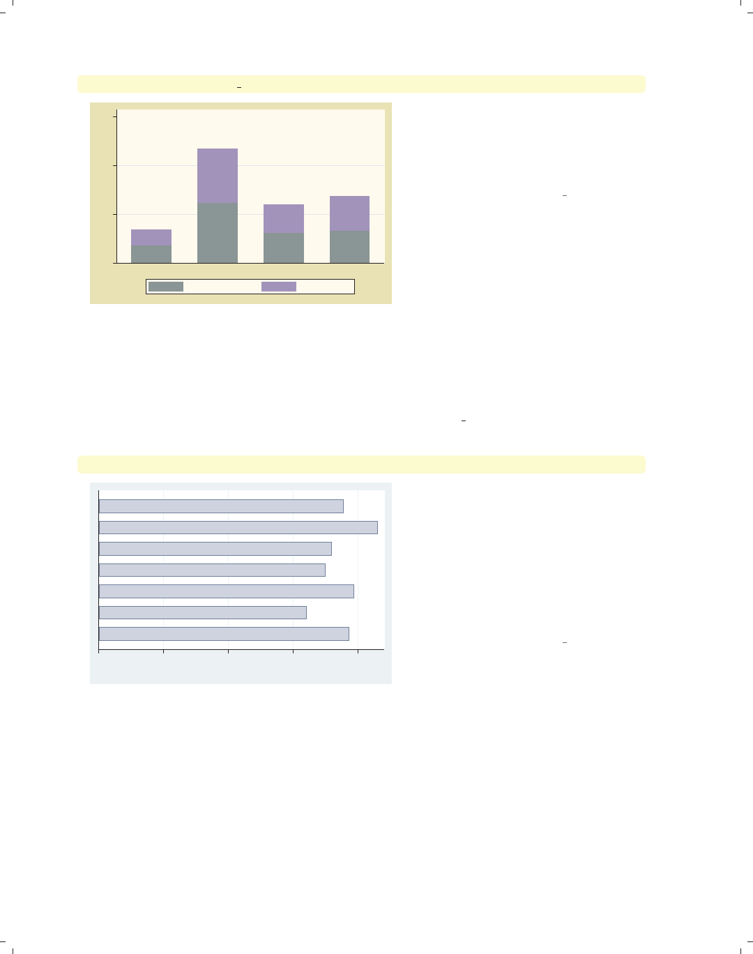
i
i
i
i
i
i
i
i
140 Chapter 4. Bar graphs
graph bar (sum) prev exp tenure, stack over(grade4) blabel(total)
1865.06
3417.64
6221.99
11696.2
3186.63
5990.21
3387.6
6863.44
0 5,000 10,000 15,000
Not HS HS Grad Some Coll Coll Grad
sum of prev_exp sum of tenure
As compared with the prior example,
this example uses the blabel(total)
option to display the results as totals.
Now, the labels represent the
cumulative total height of the bar.
Uses nlsw.dta & scheme vg past
We have seen a variety of ways that you can use the blabel() option to label the bars.
In addition, Stata offers a variety of options you can use to control the display of these
labels. Below, we will consider some of these options that allow you to customize the way
these labels are displayed. These example begin using the vg palec scheme.
graph hbar hours, over(occ7, label(nolabels)) blabel(group)
Other
Labor
Operat.
Cler.
Sales
Mgmt
Prof
0 10 20 30 40
mean of hours
Consider this graph of the average
hours worked by occupation. We add
labels of the occupation at the top of
each bar but suppress the label at the
bottom of each bar. The label for the
second bar runs off the right of the
graph. Fortunately, Stata offers us a
number of options to control where
these labels are displayed.
Uses nlsw.dta & scheme vg palec
The electronic form of this book is solely for direct use at UCLA and only by faculty, students, and staff of UCLA.
All rights reserved on the copyright page apply to this document and specifically neither the electronic nor
published form of the book may be distributed or reproduced, either electronically or in printed form.
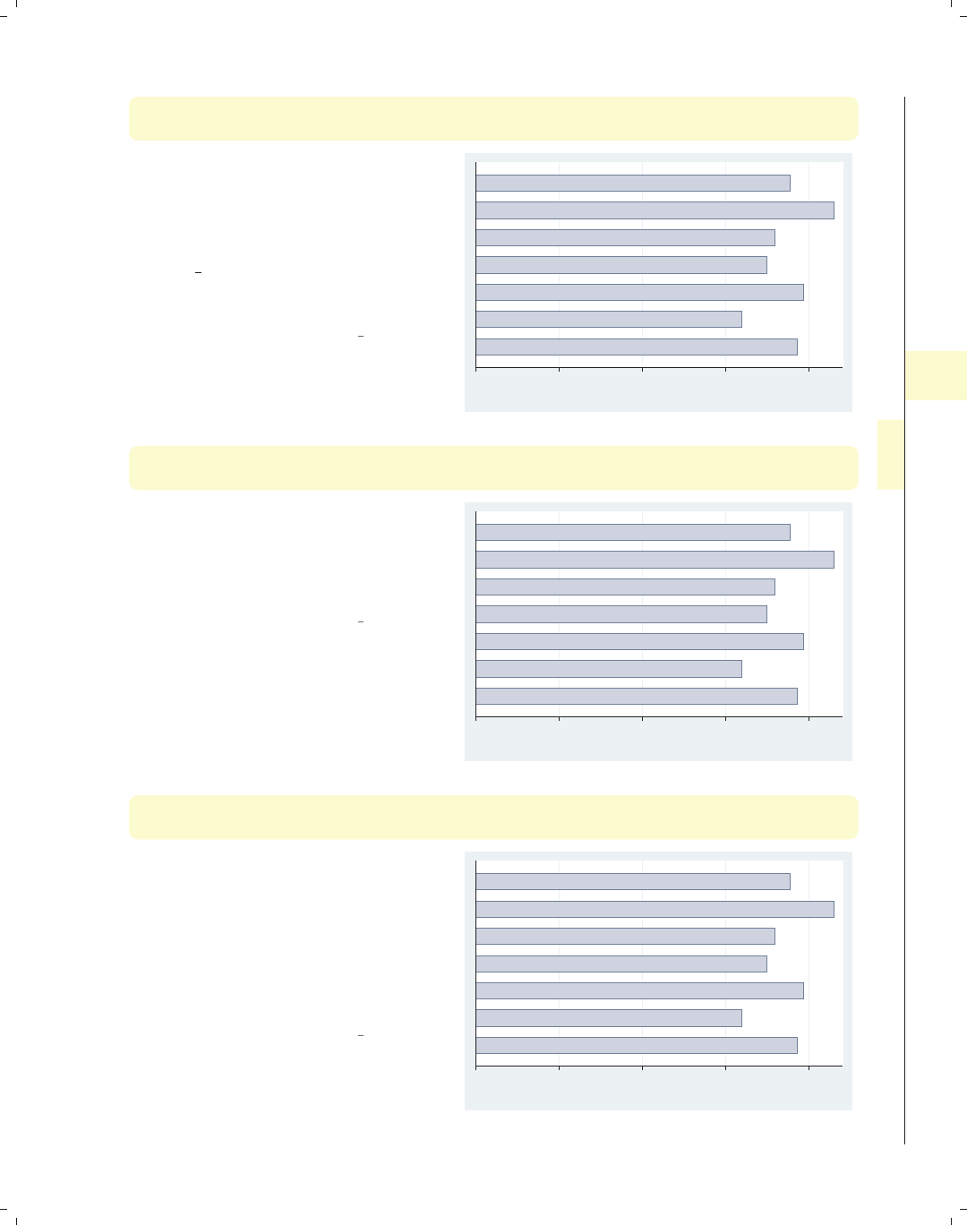
i
i
i
i
i
i
i
i
4.5 Controlling legends 141
graph hbar hours, over(occ7, label(nolabels))
blabel(group, position(inside))
With the position(inside) option, we
can place the group label inside the
bar. By default, inside refers to the
very “top” of the bar but on the inside
of the bar. Note that, because we chose
the vg palec scheme, the bar colors are
pale, so the labels within the bars are
readable.
Uses nlsw.dta & scheme vg palec
Other
Labor
Operat.
Cler.
Sales
Mgmt
Prof
0 10 20 30 40
mean of hours
graph hbar hours, over(occ7, label(nolabels))
blabel(group, position(base))
With the position(inside) option, we
can place the label inside the bar, but
at the base of the bar. You can also
specify position(center) to place the
label in the center of the bar.
Uses nlsw.dta & scheme vg palec
Other
Labor
Operat.
Cler.
Sales
Mgmt
Prof
0 10 20 30 40
mean of hours
graph hbar hours, over(occ7, label(nolabels))
blabel(group, position(base) gap(*10))
The gap() option can be used to
fine-tune the placement of the label.
Here, we position the label at the base
but increase the gap between the label
and the base to be 10 times its normal
size. You can also use the gap() option
with position(inside) to position the
label with respect to the top of the bar.
Uses nlsw.dta & scheme vg palec
Other
Labor
Operat.
Cler.
Sales
Mgmt
Prof
0 10 20 30 40
mean of hours
Introduction Twoway Matrix Bar Box Dot Pie Options Standard options Styles Appendix
Y-variables Over Over options Cat axis Legend Y-axis Lookofbar options By
The electronic form of this book is solely for direct use at UCLA and only by faculty, students, and staff of UCLA.
All rights reserved on the copyright page apply to this document and specifically neither the electronic nor
published form of the book may be distributed or reproduced, either electronically or in printed form.
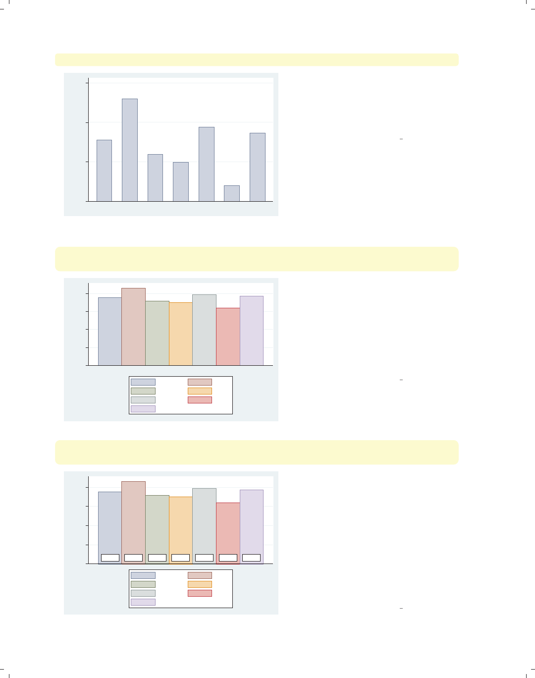
i
i
i
i
i
i
i
i
142 Chapter 4. Bar graphs
graph bar hours, over(occ7) blabel(bar, position(outside)) exclude0
37.7603
42.9886
35.9284
34.9804
39.3862
31.9754
38.6349
30 35 40 45
mean of hours
Prof Mgmt Sales Cler. Operat. Labor Other
This graph is similar to the previous
ones, but the bars are vertical, and we
now are labeling the bars with the
height of the bar. The label is placed
just outside the bar.
Uses nlsw.dta & scheme vg palec
graph bar hours, over(occ7, axis(outergap(*5))) asyvars
blabel(bar, position(base) gap(-4))
37.7603 42.9886 35.9284 34.9804 39.3862 31.9754 38.6349
0 10 20 30 40
mean of hours
Prof Mgmt
Sales Cler.
Operat. Labor
Other
To put the labels just under the bars,
we use position(base) to put the
labels at the base but also specify
gap(-4) to move the labels below the
bars. Adding the axis(outergap(*5))
option (see Bar : Cat axis (123)), we
make enough room so the labels do not
bump into the legend.
Uses nlsw.dta & scheme vg palec
graph bar hours, over(occ7) asyvars
blabel(bar, position(base) box bfcolor(white) size(large) format(%5.2f))
37.76 42.99 35.93 34.98 39.39 31.98 38.63
0 10 20 30 40
mean of hours
Prof Mgmt
Sales Cler.
Operat. Labor
Other
Here, we show more options that you
can use to customize the display of the
labels. We add a number of options to
place a box around the label, make the
background fill color white, increase the
size of the text to be large, and display
the means with a width of 5 and 2
decimal places. See Options : Textboxes
(303) for additional examples of how to
use textbox options to control the
displayoftext.
Uses nlsw.dta & scheme vg palec
The electronic form of this book is solely for direct use at UCLA and only by faculty, students, and staff of UCLA.
All rights reserved on the copyright page apply to this document and specifically neither the electronic nor
published form of the book may be distributed or reproduced, either electronically or in printed form.
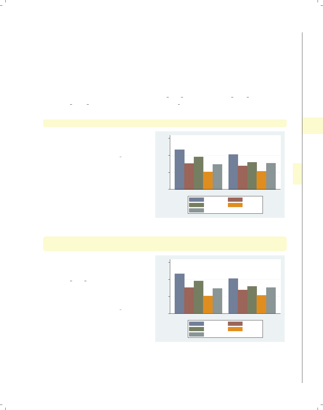
i
i
i
i
i
i
i
i
4.6 Controlling the y-axis 143
4.6 Controlling the y-axis
This section describes options you can use to control the y-axis in bar charts. To be
precise, when Stata refers to the y-axis on a bar chart, it refers to the axis with the con-
tinuous variable, whether the left axis when using graph bar or the bottom axis when
using graph hbar. This section emphasizes the features that are particularly relevant to
bar charts. For more details, see Options : Axis titles (254), Options : Axis labels (256), and
Options : Axis scales (265). Also see [G]axis title options,[G]axis label options,and
[G]axis scale options. This section uses the vg s2c scheme.
graph bar wage, over(occ5) over(married) asyvar
Consider this graph showing the mean
hourly wage broken down by
occupation and marital status.
Uses nlsw.dta & scheme vg s2c
0 5 10 15
mean of wage
single married
Prof/Mgmt Sales
Clerical Labor/Ops
Other
graph bar wage, over(occ5) over(married) asyvar
ytitle("Years of experience")
We can use the ytitle() option to add
a title to the y-axis. See
Options : Axis titles (254) and
[G]axis title options for more details,
but please disregard any references to
xtitle() since that option is not valid
when using graph bar.
Uses nlsw.dta & scheme vg s2c
0 5 10 15
Years of experience
single married
Prof/Mgmt Sales
Clerical Labor/Ops
Other
Introduction Twoway Matrix Bar Box Dot Pie Options Standard options Styles Appendix
Y-variables Over Over options Cat axis Legend Y-axis Lookofbar options By
The electronic form of this book is solely for direct use at UCLA and only by faculty, students, and staff of UCLA.
All rights reserved on the copyright page apply to this document and specifically neither the electronic nor
published form of the book may be distributed or reproduced, either electronically or in printed form.
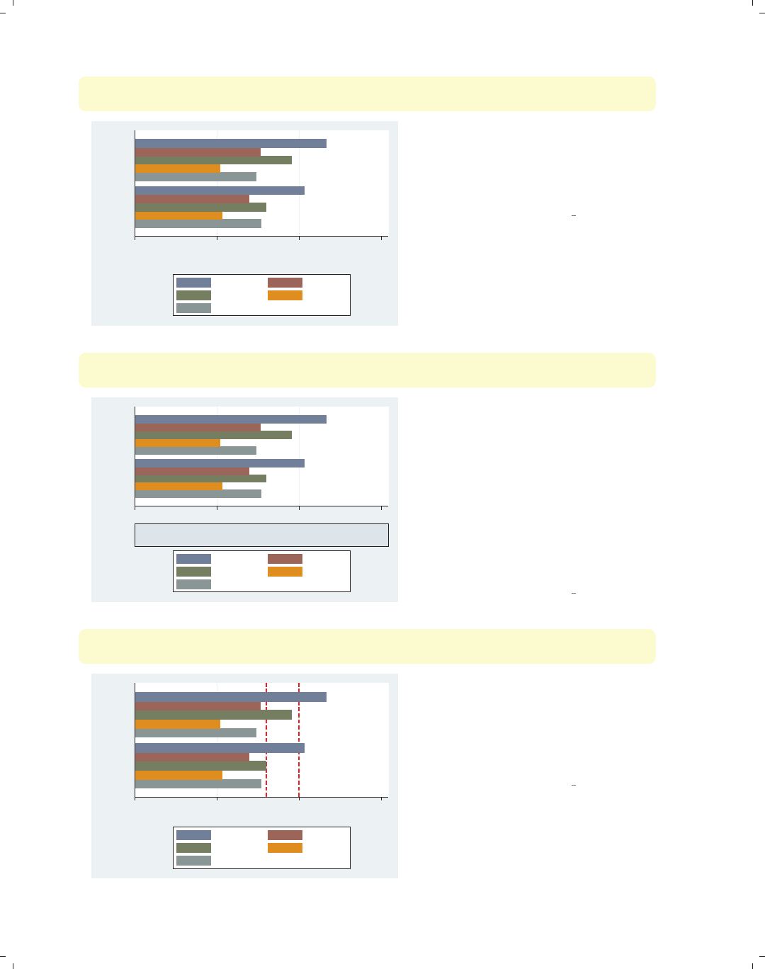
i
i
i
i
i
i
i
i
144 Chapter 4. Bar graphs
graph hbar wage, over(occ5) over(married) asyvar
ytitle("Years of" "experience")
0 5 10 15
Years of
experience
married
single
Prof/Mgmt Sales
Clerical Labor/Ops
Other
Splitting the title into two separate
quoted strings displays the title on
separate lines. Note that, when using
graph hbar, the title of the y-axis now
appears at the bottom.
Uses nlsw.dta & scheme vg s2c
graph hbar wage, over(occ5) over(married) asyvar
ytitle("Years of" "experience", size(vlarge) box bexpand)
0 5 10 15
Years of
experience
married
single
Prof/Mgmt Sales
Clerical Labor/Ops
Other
Because this title is considered to be a
textbox, you can use a variety of
textbox options to control the look of
the title. In this example, the title is
made large with a box around it, and
the bexpand (box expand) makes the
box expand to fill the width of the plot
area. See Options : Textboxes (303) for
additional examples of how to use
textbox options to control the display
of text.
Uses nlsw.dta & scheme vg s2c
graph hbar wage, over(occ5) over(married) asyvar
yline(8 10, lwidth(thick) lcolor(red) lpattern(dash))
0 5 10 15
mean of wage
married
single
Prof/Mgmt Sales
Clerical Labor/Ops
Other
The yline() option is used to place a
thick, red, dashed line on the graph
where yequals 8 and 10. Note that this
option is still called yline() since the
y-axis is the axis with the continuous
variable.
Uses nlsw.dta & scheme vg s2c
The electronic form of this book is solely for direct use at UCLA and only by faculty, students, and staff of UCLA.
All rights reserved on the copyright page apply to this document and specifically neither the electronic nor
published form of the book may be distributed or reproduced, either electronically or in printed form.
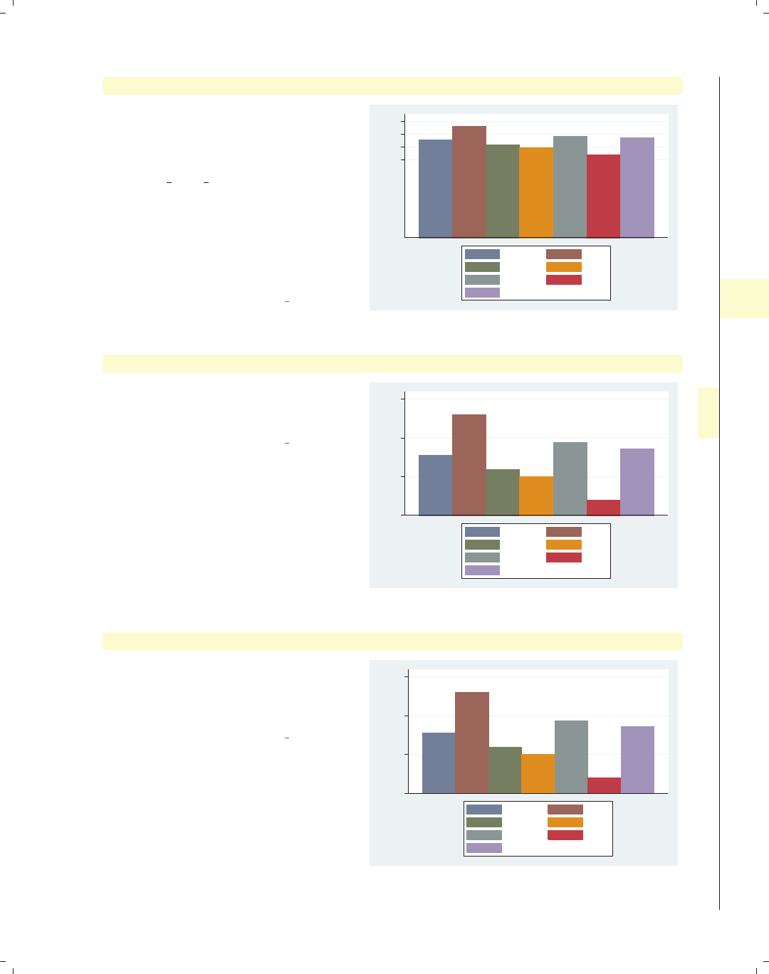
i
i
i
i
i
i
i
i
4.6 Controlling the y-axis 145
graph bar hours, over(occ7) asyvar ylabel(30(5)45)
We can use the ylabel() option to
label the y-axis. In this case, we label
the y-axis from 30 to 45 by increments
of 5. See Options : Axis labels (256) and
[G]axis label options for more
details. Please disregard any references
to xlabel() since that option is not
valid when using graph bar. Note that
the y-axis still begins at 0. See the
following example to see how you can
control that.
Uses nlsw.dta & scheme vg s2c
30 35 40 45
mean of hours
Prof Mgmt
Sales Cler.
Operat. Labor
Other
graph bar hours, over(occ7) asyvar ylabel(30(5)45) exclude0
By default, bar charts include 0 on the
y-axis, unless you specify the exclude0
option, as we do here.
Uses nlsw.dta & scheme vg s2c
30 35 40 45
mean of hours
Prof Mgmt
Sales Cler.
Operat. Labor
Other
graph bar hours, over(occ7) asyvar ylabel(30(5)45, angle(0)) exclude0
We can add the angle() option to
modify the angle of the y-label, making
the labels for the y-axis horizontal (zero
degrees).
Uses nlsw.dta & scheme vg s2c
30
35
40
45
mean of hours
Prof Mgmt
Sales Cler.
Operat. Labor
Other
Introduction Twoway Matrix Bar Box Dot Pie Options Standard options Styles Appendix
Y-variables Over Over options Cat axis Legend Y-axis Lookofbar options By
The electronic form of this book is solely for direct use at UCLA and only by faculty, students, and staff of UCLA.
All rights reserved on the copyright page apply to this document and specifically neither the electronic nor
published form of the book may be distributed or reproduced, either electronically or in printed form.

i
i
i
i
i
i
i
i
146 Chapter 4. Bar graphs
graph bar hours, over(occ7) asyvar ylabel(30(5)45, nogrid) exclude0
30 35 40 45
mean of hours
Prof Mgmt
Sales Cler.
Operat. Labor
Other
The nogrid option suppresses the
display of the grid. Note that this
option is placed within the ylabel()
option, thus suppressing the grid for
the y-axis. (With bar charts, there is
never a grid with respect to the x-axis.)
If the grid were absent, and we wanted
to include it, we could add the grid
option. For more details, see
Options : Axis labels (256).
Uses nlsw.dta & scheme vg s2c
graph bar prev exp tenure, over(occ7) yscale(off)
Prof Mgmt Sales Cler. Operat. Labor Other
mean of prev_exp mean of tenure
If you want to suppress the display of
the y-axis entirely, you can use the
yscale(off) option. See
Options : Axis scales (265) and
[G]axis scale options for more
details. Please disregard any references
to xscale() since that option is not
valid when using graph bar.
Uses nlsw.dta & scheme vg s2c
graph bar prev exp tenure, over(occ7) yalternate
0 2 4 6 8
Prof Mgmt Sales Cler. Operat. Labor Other
mean of prev_exp mean of tenure
We can use the yalternate option to
put the y-axis on the opposite side, in
this case on the right side of the graph.
Uses nlsw.dta & scheme vg s2c
The electronic form of this book is solely for direct use at UCLA and only by faculty, students, and staff of UCLA.
All rights reserved on the copyright page apply to this document and specifically neither the electronic nor
published form of the book may be distributed or reproduced, either electronically or in printed form.
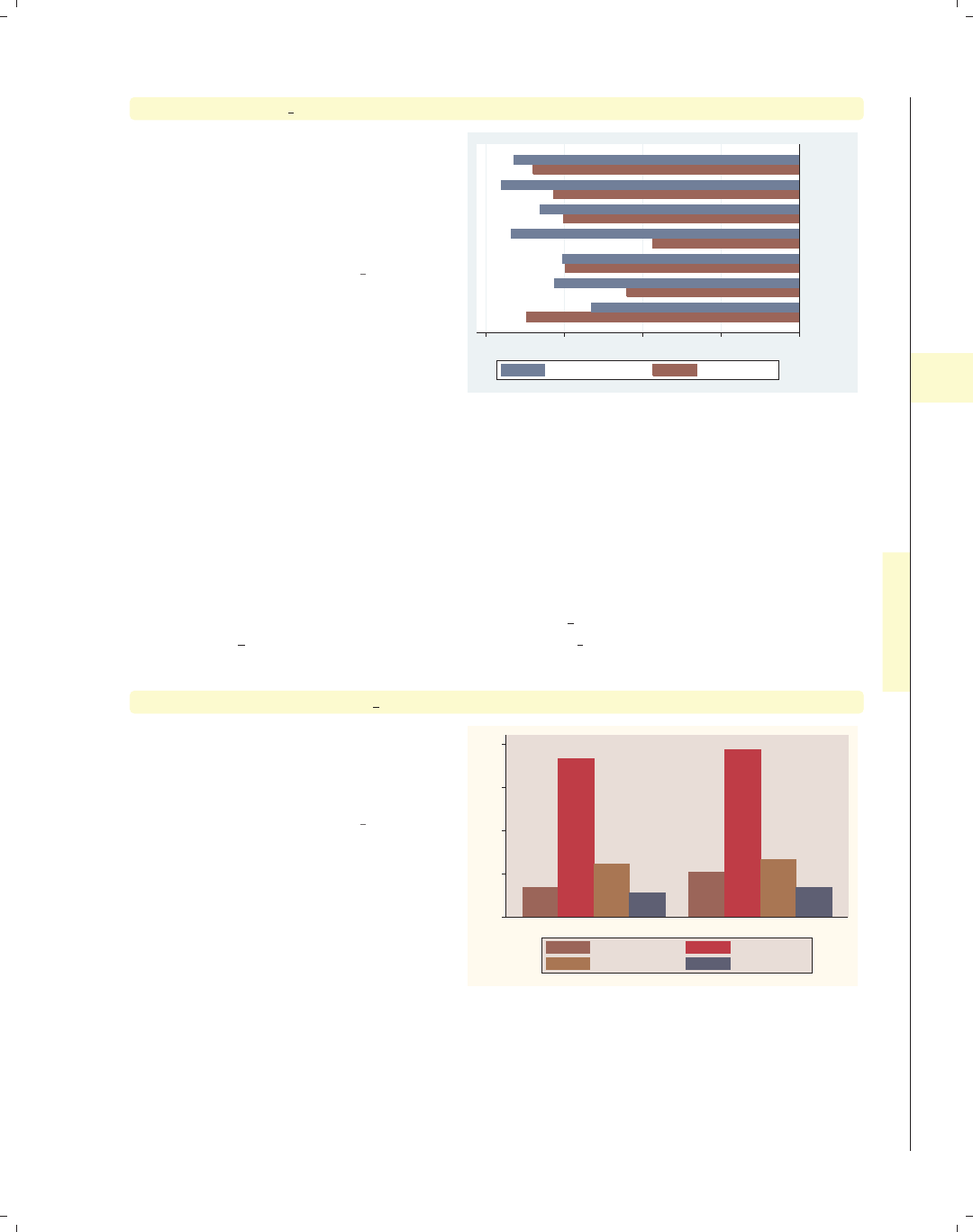
i
i
i
i
i
i
i
i
4.7 Changing the look of bars, lookofbar options 147
graph hbar prev exp tenure, over(occ7) xalternate yreverse
You can reverse the direction of the
y-axis with the yreverse option. We
combine this with the xalternate
option to place the labels for the bars
on the alternate (right) side of the
graph.
Uses nlsw.dta & scheme vg s2c
02468
Other
Labor
Operat.
Cler.
Sales
Mgmt
Prof
mean of prev_exp mean of tenure
4.7 Changing the look of bars, lookofbar options
This section shows how you can control the look of the bars in your bar charts: the
space between the bars, the color of the bars, and the characteristics of the line outlin-
ing the bars. For more information, see the lookofbar options table in [G]graph bar and
[G]barlook options. This section begins using the vg rose scheme.
graph bar wage hours ttl exp tenure, over(collgrad)
Consider this bar chart. It shows the
mean wages, hours worked per week,
total experience, and job tenure broken
down by whether one graduated college.
Uses nlsw.dta & scheme vg rose
0
10
20
30
40
not college grad college grad
mean of wage mean of hours
mean of ttl_exp mean of tenure
Introduction Twoway Matrix Bar Box Dot Pie Options Standard options Styles Appendix
Y-variables Over Over options Cat axis Legend Y-axis Lookofbar options By
The electronic form of this book is solely for direct use at UCLA and only by faculty, students, and staff of UCLA.
All rights reserved on the copyright page apply to this document and specifically neither the electronic nor
published form of the book may be distributed or reproduced, either electronically or in printed form.
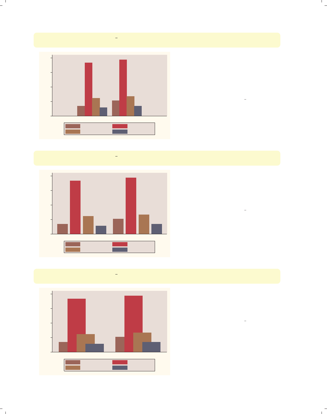
i
i
i
i
i
i
i
i
148 Chapter 4. Bar graphs
graph bar wage hours ttl exp tenure, over(collgrad)
outergap(*15)
0
10
20
30
40
not college grad college grad
mean of wage mean of hours
mean of ttl_exp mean of tenure
We can change the outer gap between
the bars and the edge of the plot area
with the outergap() option. Here, the
gap is fifteen times its normal size. You
can also supply values less than 1 to
shrink the size of the gap.
Uses nlsw.dta & scheme vg rose
graph bar wage hours ttl exp tenure, over(collgrad)
bargap(25)
0
10
20
30
40
not college grad college grad
mean of wage mean of hours
mean of ttl_exp mean of tenure
The bargap() option controls the size
of the gap between the bars. The
default value is 0, meaning that the
bars touch exactly. Here, we make the
gap 25% of the width of the bars.
Uses nlsw.dta & scheme vg rose
graph bar wage hours ttl exp tenure, over(collgrad)
bargap(-50)
0
10
20
30
40
not college grad college grad
mean of wage mean of hours
mean of ttl_exp mean of tenure
The bargap() option permits negative
values to indicate that you want the
bars to overlap. Here, we make the bars
overlap by 50% of the size of the bars.
Uses nlsw.dta & scheme vg rose
The electronic form of this book is solely for direct use at UCLA and only by faculty, students, and staff of UCLA.
All rights reserved on the copyright page apply to this document and specifically neither the electronic nor
published form of the book may be distributed or reproduced, either electronically or in printed form.
i
i
i
i
i
i
i
i
4.7 Changing the look of bars, lookofbar options 149
graph bar wage hours ttl exp tenure, over(collgrad)
intensity(*.5)
The intensity option is used to
control the intensity of the color within
the bars. Here, we request that the
color be 50% as intense as it normally
would be.
Uses nlsw.dta & scheme vg rose
0
10
20
30
40
not college grad college grad
mean of wage mean of hours
mean of ttl_exp mean of tenure
graph bar wage hours ttl exp tenure, over(collgrad)
intensity(*1.4)
In this example, we use the
intensity() option to make the colors
within the bars 1.4 times more intense
than they would normally be. Note
that Stata also has an option called
lintensity() that works the same way
but controls the intensity of the line
surrounding the bar. (This option is
not illustrated.)
Uses nlsw.dta & scheme vg rose 0
10
20
30
40
not college grad college grad
mean of wage mean of hours
mean of ttl_exp mean of tenure
So far, all these options that we have examined determine the overall behavior and look
over all of the bars as a group. Using the bar() option, you can control the look of the
bars for each y-variable, as illustrated below. These graphs use the vg s2c scheme.
Introduction Twoway Matrix Bar Box Dot Pie Options Standard options Styles Appendix
Y-variables Over Over options Cat axis Legend Y-axis Lookofbar options By
The electronic form of this book is solely for direct use at UCLA and only by faculty, students, and staff of UCLA.
All rights reserved on the copyright page apply to this document and specifically neither the electronic nor
published form of the book may be distributed or reproduced, either electronically or in printed form.

i
i
i
i
i
i
i
i
150 Chapter 4. Bar graphs
graph bar wage hours ttl exp tenure, over(collgrad)
bar(1, bcolor(dkgreen))
0 10 20 30 40
not college grad college grad
mean of wage mean of hours
mean of ttl_exp mean of tenure
Here, we use the bar() option to make
the color of the first bar dark green.
See Styles : Colors (328) for more
information about colors you can select.
Uses nlsw.dta & scheme vg s2c
graph bar wage hours ttl exp tenure, over(collgrad)
bar(1, bfcolor(ltblue) blcolor(blue) blwidth(vthick))
0 10 20 30 40
not college grad college grad
mean of wage mean of hours
mean of ttl_exp mean of tenure
In this example, we make the fill color
of the first bar light blue and the
outline very thick and blue. See
Styles : Linewidth (337) for more details
on controlling the thickness of lines.
You could also use the blpattern()
option to control the pattern of the line
surrounding the bar; see
Styles : Linepatterns (336) for more
details.
Uses nlsw.dta & scheme vg s2c
graph bar wage hours ttl exp tenure, over(collgrad)
0 10 20 30 40
not college grad college grad
mean of wage mean of hours
mean of ttl_exp mean of tenure
While you can use the bar() option to
control the look of each bar, selecting a
different scheme allows you to control
the look of all of the bars. For example,
this graph is drawn using the vg palec
scheme. See Intro : Schemes (14) for
some other schemes you could try and
Appendix : Customizing schemes (379) for
tips on customizing your own schemes.
Uses nlsw.dta & scheme vg palec
The electronic form of this book is solely for direct use at UCLA and only by faculty, students, and staff of UCLA.
All rights reserved on the copyright page apply to this document and specifically neither the electronic nor
published form of the book may be distributed or reproduced, either electronically or in printed form.
i
i
i
i
i
i
i
i
4.8 Graphing by groups 151
4.8 Graphing by groups
This section discusses the use of the by() option in combination with graph bar.Nor-
mally, you would use the over() option instead of the by() option, but there are cases
where the by() option is either necessary or more advantageous. For example, a by() op-
tion is useful if you exceed the maximum number of over() options (three if you have a
single y-variable or two if you have multiple y-variables). In such cases, the by() option
allows you to break your data down by additional categorical variables. Also, by() gives
you more flexibility in the placement of the separate panels. For more information about
the by() option, see Options : By (272); for more information about the over() option, see
Bar : Over (111). These examples are shown using the vg s1c scheme.
graph bar wage, over(urban2) over(married) over(union)
Consider this bar graph that breaks
wages down by three categorical
variables. If we wanted to further break
this down by another categorical
variable, we could not use another
over() option since we can have a
maximum of three over() options with
a single y-variable.
Uses nlsw.dta & scheme vg s1c
0 2 4 6 8 10
mean of wage
nonunion union
single married single married
Rural Metro
graph bar wage, over(urban2) over(married) over(union) by(collgrad)
If we want to show the previous graph
separately by collgrad, we can use the
by() option. This gives us two graphs
side by side: one for those who are not
college graduates and one for college
graduates.
Uses nlsw.dta & scheme vg s1c
0 5 10 15
nonunion union nonunion union
single married single married single married single married
not college grad college grad
Rural Metro
mean of wage
Graphs by college graduate
Introduction Twoway Matrix Bar Box Dot Pie Options Standard options Styles Appendix
Y-variables Over Over options Cat axis Legend Y-axis Lookofbar options By
The electronic form of this book is solely for direct use at UCLA and only by faculty, students, and staff of UCLA.
All rights reserved on the copyright page apply to this document and specifically neither the electronic nor
published form of the book may be distributed or reproduced, either electronically or in printed form.
i
i
i
i
i
i
i
i
152 Chapter 4. Bar graphs
graph bar ttl exp tenure, over(married) over(urban2)
0 5 10 15
Rural Metro
single married single married
mean of ttl_exp mean of tenure
Consider this bar graph with multiple
y-variables broken down by two
categorical variables using two over()
options. When you have multiple
y-variables, you can only have a
maximum of two over() options.
Uses nlsw.dta & scheme vg s1c
graph bar ttl exp tenure, over(married) over(urban2)
by(union)
0 5 10 15
Rural Metro Rural Metro
single married single married single married single married
nonunion union
mean of ttl_exp mean of tenure
Graphs by union worker
If we want to further show the previous
graph by another categorical variable,
say union,wecanusetheby() option.
Uses nlsw.dta & scheme vg s1c
graph bar ttl exp tenure, over(married) over(urban2)
by(union, missing)
0 5 10 150 5 10 15
Rural Metro Rural Metro
Rural Metro
single married single married single married single married
single married single married
nonunion union
(missing)
mean of ttl_exp mean of tenure
Graphs by union worker
We can add the missing option to
include a panel for the missing values of
union.
Uses nlsw.dta & scheme vg s1c
The electronic form of this book is solely for direct use at UCLA and only by faculty, students, and staff of UCLA.
All rights reserved on the copyright page apply to this document and specifically neither the electronic nor
published form of the book may be distributed or reproduced, either electronically or in printed form.
i
i
i
i
i
i
i
i
4.8 Graphing by groups 153
graph bar ttl exp tenure, over(married) over(urban2)
by(union, missing total)
We can add the total option to include
a panel for all observations.
Uses nlsw.dta & scheme vg s1c
0 5 10 150 5 10 15
Rural Metro Rural Metro
Rural Metro Rural Metro
single married single married single married single married
single married single married single married single married
nonunion union
(missing) Total
mean of ttl_exp mean of tenure
Graphs by union worker
graph hbar ttl exp tenure, over(married) over(urban2)
by(union, cols(1))
We remove the total and missing
options and flip the graph to make a
horizontal bar chart. We then use the
cols(1) option to show these graphs in
one column. This makes the graph
pretty cramped. Let’s explore a number
of options we can add to this graph to
make it less cramped, adding the
options just a small number at a time.
Uses nlsw.dta & scheme vg s1c 0 5 10 15
Metro
Rural
Metro
Rural
married
single
married
single
married
single
married
single
nonunion
union
mean of ttl_exp mean of tenure
Graphs by union worker
graph hbar ttl exp tenure, over(married) over(urban2)
by(union, cols(1) note(""))
We add the note("") option within the
by() option, and that suppresses the
note in the left corner, leaving more
room for the graph.
Uses nlsw.dta & scheme vg s1c
0 5 10 15
Metro
Rural
Metro
Rural
married
single
married
single
married
single
married
single
nonunion
union
mean of ttl_exp mean of tenure
Introduction Twoway Matrix Bar Box Dot Pie Options Standard options Styles Appendix
Y-variables Over Over options Cat axis Legend Y-axis Lookofbar options By
The electronic form of this book is solely for direct use at UCLA and only by faculty, students, and staff of UCLA.
All rights reserved on the copyright page apply to this document and specifically neither the electronic nor
published form of the book may be distributed or reproduced, either electronically or in printed form.
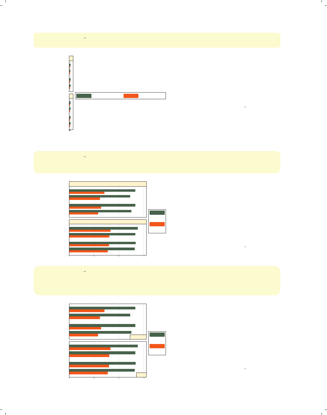
i
i
i
i
i
i
i
i
154 Chapter 4. Bar graphs
graph hbar ttl exp tenure, over(married) over(urban2)
by(union, cols(1) note("") legend(position(3)))
051015
Metro
Rural
Metro
Rural
married
single
married
single
married
single
married
single
nonunion
union mean of ttl_exp mean of tenure
We add the legend(position(3))
option to put the legend at the right.
Note that this is contained within the
by() option because it changes the
position of the legend. If we could make
the legend narrow (instead of wide), it
would work well in this position.
Uses nlsw.dta & scheme vg s1c
graph hbar ttl exp tenure, over(married) over(urban2)
by(union, cols(1) note("") legend(position(3)))
legend(cols(1) stack label(1 "Tot Exp") label(2 "Curr Exp"))
0 5 10 15
Metro
Rural
Metro
Rural
married
single
married
single
married
single
married
single
nonunion
union Tot Exp
Curr Exp
We add the legend(cols(1) stack)
to make the legend narrow and the
label() option to change the labels in
the legend. Note that this legend()
option appears outside of the by()
option. See Options : By (272) and
Options : Legend (287) for more
information about the interactions of
by() and legend().
Uses nlsw.dta & scheme vg s1c
graph hbar ttl exp tenure, over(married) over(urban2)
by(union, cols(1) note("") legend(position(3)))
legend(cols(1) stack label(1 "Tot Exp") label(2 "Curr Exp"))
subtitle(, position(5) ring(0) nobexpand)
0 5 10 15
Metro
Rural
Metro
Rural
married
single
married
single
married
single
married
single
nonunion
union
Tot Exp
Curr Exp
We can add the subtitle() option to
position the title for each separate
graph in the lower right corner. The
position(5) option puts the title in
the 5 o’clock position, and the ring(0)
option puts the title inside the plot
area. The nobexpand (no box expand)
option keeps the title from expanding
to fill the entire plot area.
Uses nlsw.dta & scheme vg s1c
The electronic form of this book is solely for direct use at UCLA and only by faculty, students, and staff of UCLA.
All rights reserved on the copyright page apply to this document and specifically neither the electronic nor
published form of the book may be distributed or reproduced, either electronically or in printed form.

i
i
i
i
i
i
i
i
4.8 Graphing by groups 155
graph bar ttl exp tenure, over(married) over(urban2)
by(union collgrad)
You can include multiple variables
within the by() option. Here, in
addition to breaking these variables
down by two over() variables, we
break them down by two additional
variables using the by(union
collgrad) option.
Uses nlsw.dta & scheme vg s1c
0 5 10 150 5 10 15
Rural Metro Rural Metro
Rural Metro Rural Metro
single married single married single married single married
single married single married single married single married
nonunion, not college grad nonunion, college grad
union, not college grad union, college grad
mean of ttl_exp mean of tenure
Graphs by union worker and college graduate
Introduction Twoway Matrix Bar Box Dot Pie Options Standard options Styles Appendix
Y-variables Over Over options Cat axis Legend Y-axis Lookofbar options By
The electronic form of this book is solely for direct use at UCLA and only by faculty, students, and staff of UCLA.
All rights reserved on the copyright page apply to this document and specifically neither the electronic nor
published form of the book may be distributed or reproduced, either electronically or in printed form.

i
i
i
i
i
i
i
i
5 Box plots
A box plot displays box(es) bordered at the 25th and 75th percentiles of the y-variable
with a median line at the 50th percentile. Whiskers extend from the box to the upper and
lower adjacent values and are capped with an adjacent line. Values exceeding the upper and
lower adjacent values are called outside values and are displayed as markers. This chapter
starts by showing the use of the over() option to break box plots down by categorical
variables and then showing how you can specify multiple y-variables to display plots for
multiple variables. Next, we see further options that can be used to customize the display
of over() option, followed by options that control the display of categorical axes. Next,
we discuss options for legends, followed by options that control the display of the y-axis.
Finally, we cover options that control the look of boxes and the by() option.
5.1 Specifying variables and groups, yvars and over
This section introduces the use of box plots, illustrating the use of the over() option
for showing box plots by one or more grouping variables. Next, we give examples showing
how you can graph multiple variables at once by specifying additional y-variables, followed
by some general options for controlling the display of multiple y-variables and the behavior
of over() options. See the group options table in [G]graph box for more details. This
section begins with the vg s2c scheme.
graph box wage, over(grade4)
This is a box plot of wages broken
down by education. The over(grade4)
option breaks down wages by education
level (in four categories). By default,
the separate levels of grade4 are
graphed using the same color, and the
levels are labeled on the x-axis. The
graph shows a large number of outside
values that are displayed as markers
beyond the whiskers. The following
example shows how we can suppress the
display of the outside values.
Uses nlsw.dta & scheme vg s2c
0 10 20 30 40
hourly wage
Not HS HS Grad Some Coll Coll Grad
Introduction Twoway Matrix Bar Box Dot Pie Options Standard options Styles Appendix
Yvars and over Over options Cat axis Legend Y-axis Boxlook options By
157
The electronic form of this book is solely for direct use at UCLA and only by faculty, students, and staff of UCLA.
All rights reserved on the copyright page apply to this document and specifically neither the electronic nor
published form of the book may be distributed or reproduced, either electronically or in printed form.
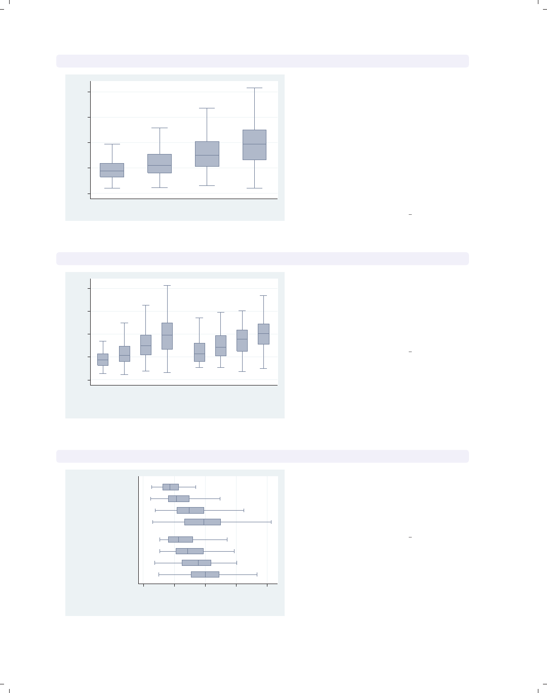
i
i
i
i
i
i
i
i
158 Chapter 5. Box plots
graph box wage, over(grade4) nooutsides
0 5 10 15 20
hourly wage
Not HS HS Grad Some Coll Coll Grad
excludes outside values
By adding the nooutsides option, we
suppress the display of the outside
values. Graphs using this option have a
note in the bottom left corner
indicating that the outside values have
been excluded from display in the
graph. For most of the graphs in this
chapter, there would be a large number
of outside values, which would make the
graphs very cluttered, so many of the
graphs will use the nooutsides option.
Uses nlsw.dta & scheme vg s2c
graph box wage, nooutsides over(grade4) over(union)
0 5 10 15 20
hourly wage
nonunion union
Not HSHS GradSome CollColl Grad Not HS HS GradSome CollColl Grad
excludes outside values
Here, we add the over(union) option
to show wages broken down by
education and whether one is a member
of a union. Note, however, that the
labels for grade4 overlap each other.
See the next example for one solution.
Uses nlsw.dta & scheme vg s2c
graph hbox wage, nooutsides over(grade4) over(union)
0 5 10 15 20
hourly wage
union
nonunion
Coll Grad
Some Coll
HS Grad
Not HS
Coll Grad
Some Coll
HS Grad
Not HS
excludes outside values
Here, we use graph hbox to make a
horizontal box plot. Note that this
eliminates the overlapping of the labels
for grade4. The next example will
show another possible solution.
Uses nlsw.dta & scheme vg s2c
The electronic form of this book is solely for direct use at UCLA and only by faculty, students, and staff of UCLA.
All rights reserved on the copyright page apply to this document and specifically neither the electronic nor
published form of the book may be distributed or reproduced, either electronically or in printed form.
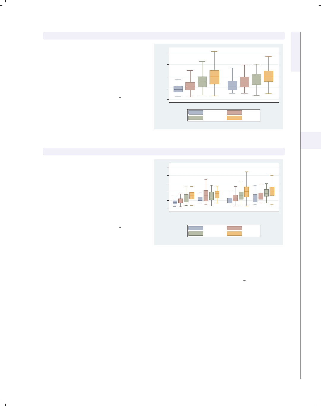
i
i
i
i
i
i
i
i
5.1 Specifying variables and groups, yvars and over 159
graph box wage, nooutsides over(grade4) over(union) asyvars
Using the asyvars option, the first
over() variable, grade4, is treated as
though it were multiple y-variables. As
a result, the levels of grade4 are shown
in multiple colors and labeled via a
legend. You can only use asyvars when
youhaveasingley-variable.
Uses nlsw.dta & scheme vg s2c
0 5 10 15 20
hourly wage
nonunion union
excludes outside values
Not HS HS Grad
Some Coll Coll Grad
graph box wage, nooutsides over(grade4) over(union) over(urban2)
In this example, we add a third over()
option, in this case comparing people
who live in rural and metropolitan
areas. Note that the first over()
variable, grade4, is now treated as
though it were multiple y-variables.
Because of this, you can only specify
one y-variable when you have three
over() options.
Uses nlsw.dta & scheme vg s2c
0 5 10 15 20 25
hourly wage
Rural Metro
nonunion union nonunion union
excludes outside values
Not HS HS Grad
Some Coll Coll Grad
Now, let’s look at examples of using multiple y-variables with the over() option. We
first consider a graph with multiple y-variables. These examples use the vg outc scheme.
Introduction Twoway Matrix Bar Box Dot Pie Options Standard options Styles Appendix
Yvars and over Over options Cat axis Legend Y-axis Boxlook options By
The electronic form of this book is solely for direct use at UCLA and only by faculty, students, and staff of UCLA.
All rights reserved on the copyright page apply to this document and specifically neither the electronic nor
published form of the book may be distributed or reproduced, either electronically or in printed form.
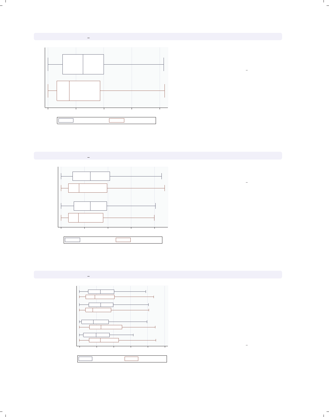
i
i
i
i
i
i
i
i
160 Chapter 5. Box plots
graph hbox prev exp tenure, nooutsides
0 5 10 15 20
excludes outside values
Prev. work exper. Curr. work exper.
This graph shows work experience
before one’s current job and work
experience at one’s current job.
Uses nlsw.dta & scheme vg outc
graph hbox prev exp tenure, nooutsides over(married)
0 5 10 15 20
married
single
excludes outside values
Prev. work exper. Curr. work exper.
We can further break these variables
down by marital status.
Uses nlsw.dta & scheme vg outc
graph hbox prev exp tenure, nooutsides over(married) over(union)
0 5 10 15 20 25
union
nonunion
married
single
married
single
excludes outside values
Prev. work exper. Curr. work exper.
We can take the last graph and add
another over() option to even further
break these variables down by whether
one belongs to a union. Note, however,
that we cannot add a third over()
option when we have multiple
y-variables, but we could add the by()
option; see Box : By (189).
Uses nlsw.dta & scheme vg outc
The electronic form of this book is solely for direct use at UCLA and only by faculty, students, and staff of UCLA.
All rights reserved on the copyright page apply to this document and specifically neither the electronic nor
published form of the book may be distributed or reproduced, either electronically or in printed form.
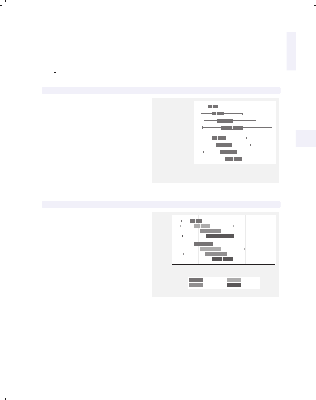
i
i
i
i
i
i
i
i
5.1 Specifying variables and groups, yvars and over 161
Now, let’s consider options that may be used in combination with the over() option
to customize the behavior of the graphs. We show how you can treat the levels of the first
over() option as though they were multiple y-variables. You can also request that missing
values for the levels of the over() variables be displayed, and you can suppress empty cat-
egories when multiple over() options are used. These examples are shown below using the
vg s2m scheme.
graph hbox wage, nooutsides over(grade4) over(union)
Consider this graph where we show
wages broken down by education level
and whether one belongs to a union.
Uses nlsw.dta & scheme vg s2m
0 5 10 15 20
hourly wage
union
nonunion
Coll Grad
Some Coll
HS Grad
Not HS
Coll Grad
Some Coll
HS Grad
Not HS
excludes outside values
graph hbox wage, nooutsides over(grade4) over(union) asyvars
If we add the asyvars option, then the
first over() variable (grade4)is
graphed as if there were four y-variables
corresponding to each level of grade4.
Each level of grade4 is shown as a
differently colored/shaded box and
labeled using the legend.
Uses nlsw.dta & scheme vg s2m 0 5 10 15 20
hourly wage
union
nonunion
excludes outside values
Not HS HS Grad
Some Coll Coll Grad
Introduction Twoway Matrix Bar Box Dot Pie Options Standard options Styles Appendix
Yvars and over Over options Cat axis Legend Y-axis Boxlook options By
The electronic form of this book is solely for direct use at UCLA and only by faculty, students, and staff of UCLA.
All rights reserved on the copyright page apply to this document and specifically neither the electronic nor
published form of the book may be distributed or reproduced, either electronically or in printed form.
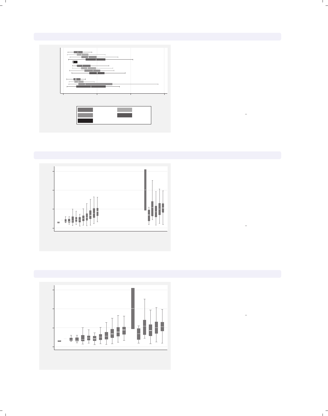
i
i
i
i
i
i
i
i
162 Chapter 5. Box plots
graph hbox wage, nooutsides over(grade4) over(union) asyvars missing
0 10 20 30
hourly wage
.
union
nonunion
excludes outside values
Not HS HS Grad
Some Coll Coll Grad
.
By adding the missing option to the
previous graph, we see a category for
those who are missing on the union
variable, shown as the third group,
which is labeled with a dot to indicate
that those values are missing; see
Box : Cat axis (168) to see how you
could label this differently (e.g.,
labeling it with the word “Missing”).
Uses nlsw.dta & scheme vg s2m
graph box wage, nooutsides over(grade) over(collgrad)
0 10 20 30
hourly wage
not college grad college grad
4 5 6 7 8 9 101112131415161718 4 5 6 7 8 9 101112131415161718
excludes outside values
Consider this box chart that breaks
wages down by two variables: the last
grade that one completed and whether
one is a college graduate. By default,
Stata shows all possible combinations
for these two variables. In most cases,
all combinations are possible, but not
in this case.
Uses nlsw.dta & scheme vg s2m
graph box wage, nooutsides over(grade) over(collgrad) nofill
0 10 20 30
hourly wage
not college grad college grad
4 5 6 7 8 9 10 11 12 13 14 15 13 14 15 16 17 18
excludes outside values
If you only want to display the
combinations of the over() variables
that exist in the data, then you can use
the nofill option.
Uses nlsw.dta & scheme vg s2m
The electronic form of this book is solely for direct use at UCLA and only by faculty, students, and staff of UCLA.
All rights reserved on the copyright page apply to this document and specifically neither the electronic nor
published form of the book may be distributed or reproduced, either electronically or in printed form.
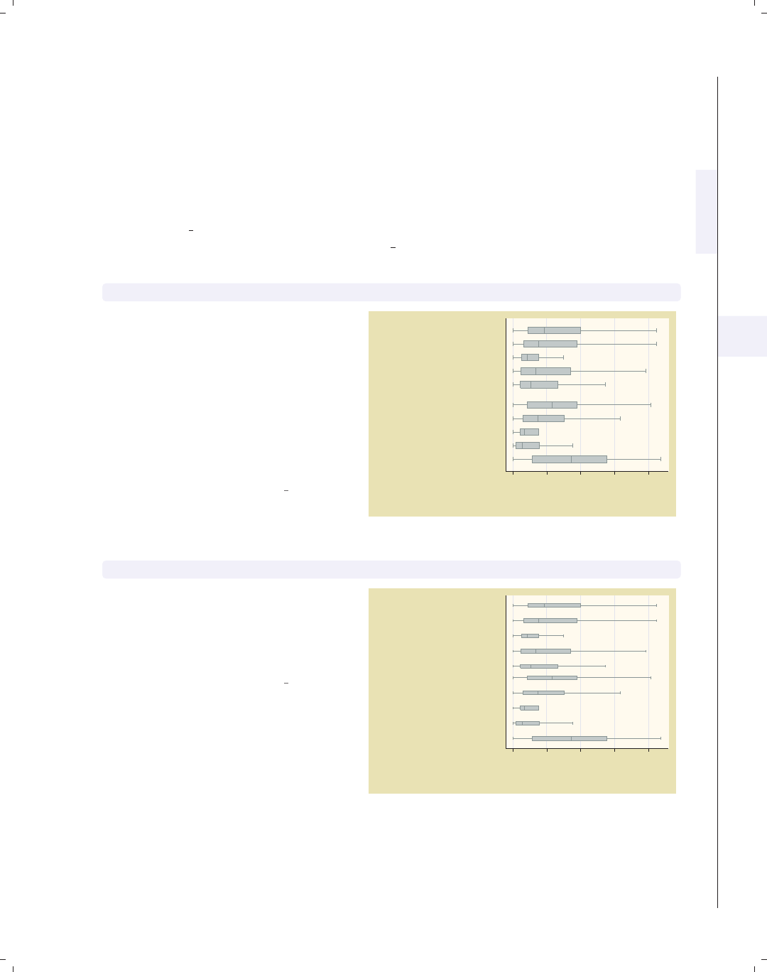
i
i
i
i
i
i
i
i
5.2 Options for groups, over options 163
5.2 Options for groups, over options
This section considers some of the options that can be used with the over() and
yvaroptions() options for customizing the display of the boxes. We will focus on con-
trolling the spacing between the boxes and the order in which the boxes are displayed.
Other options that control the display of the x-axis, such as the labels, are covered in
Box : Cat axis (168). For more information on the over() options covered in this section,
see the over subopts table in [G]graph box. We begin by considering options that control
the spacing among the boxes and use the vg past scheme.
graph hbox tenure, nooutsides over(occ5) over(collgrad)
Consider this graph that shows box
plots of tenure broken down by occ5
and collgrad.Weusethenooutsides
option to suppress the display of
outside values. For the rest of the
graphs in this section, there would be a
large number of outside values, which
would make the graphs very cluttered,
so we will include the nooutsides
option for each example.
Uses nlsw.dta & scheme vg past 0 5 10 15 20
Curr. work exper.
college grad
not college grad
Other
Labor/Ops
Clerical
Sales
Prof/Mgmt
Other
Labor/Ops
Clerical
Sales
Prof/Mgmt
excludes outside values
graph hbox tenure, nooutsides over(occ5, gap(*3)) over(collgrad)
We can change the gap between the
levels of occ5. Here, we make that gap
twice as large as it normally would.
This leads to narrow boxes with a
sizable gap between them.
Uses nlsw.dta & scheme vg past
0 5 10 15 20
Curr. work exper.
college grad
not college grad
Other
Labor/Ops
Clerical
Sales
Prof/Mgmt
Other
Labor/Ops
Clerical
Sales
Prof/Mgmt
excludes outside values
Introduction Twoway Matrix Bar Box Dot Pie Options Standard options Styles Appendix
Yvars and over Over options Cat axis Legend Y-axis Boxlook options By
The electronic form of this book is solely for direct use at UCLA and only by faculty, students, and staff of UCLA.
All rights reserved on the copyright page apply to this document and specifically neither the electronic nor
published form of the book may be distributed or reproduced, either electronically or in printed form.
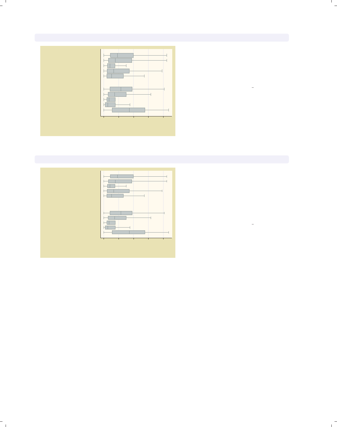
i
i
i
i
i
i
i
i
164 Chapter 5. Box plots
graph hbox tenure, nooutsides over(occ5, gap(*.2)) over(collgrad)
0 5 10 15 20
Curr. work exper.
college grad
not college grad
Other
Labor/Ops
Clerical
Sales
Prof/Mgmt
Other
Labor/Ops
Clerical
Sales
Prof/Mgmt
excludes outside values
Here, we shrink the gap between the
levels of collgrad, making the gaps
20% of the size they normally would.
This yields boxes that are wider than
they normally would.
Uses nlsw.dta & scheme vg past
graph hbox tenure, nooutsides over(occ5, gap(*.4)) over(collgrad, gap(*2))
0 5 10 15 20
Curr. work exper.
college grad
not college grad
Other
Labor/Ops
Clerical
Sales
Prof/Mgmt
Other
Labor/Ops
Clerical
Sales
Prof/Mgmt
excludes outside values
We can control the gap with respect to
each of the over() variables. In this
example, we make the gap among the
occ5 categories small (40% of their
original size) and the gap between the
levels of collgrad larger (two times the
normal size).
Uses nlsw.dta & scheme vg past
By default, the boxes formed by over() variables are ordered in ascending sequence
according to the values of the over() variable. Stata allows us to control the order of the
boxes by allowing us to put them in descending order, order them according to the values of
another variable, or sort the boxes according to their medians. These options are illustrated
in the following examples.
The electronic form of this book is solely for direct use at UCLA and only by faculty, students, and staff of UCLA.
All rights reserved on the copyright page apply to this document and specifically neither the electronic nor
published form of the book may be distributed or reproduced, either electronically or in printed form.
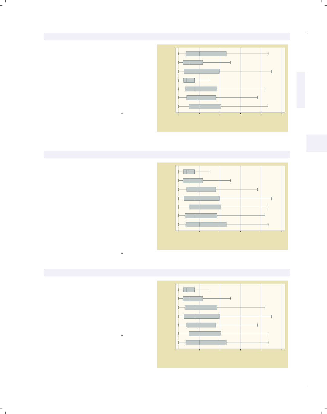
i
i
i
i
i
i
i
i
5.2 Options for groups, over options 165
graph hbox tenure, nooutsides over(occ7, descending)
Consider this graph showing tenure
broken down by the seven levels of
occupation. The boxes would normally
be ordered by levels of occ7, going from
1to7.Thedescending option
switches the order of the boxes. They
still are ordered according to the seven
levels of occupation, but the boxes are
ordered going from 7 to 1.
Uses nlsw.dta & scheme vg past 0 5 10 15 20 25
Curr. work exper.
Prof
Mgmt
Sales
Cler.
Operat.
Labor
Other
excludes outside values
graph hbox tenure, nooutsides over(occ7, sort(occ7alpha))
We might want to put these boxes in
alphabetical order, but with Other still
appearing last. We can do this by
recoding occ7 into a new variable (say
occ7alpha) such that, as occ7alpha
goes from 1 to 7, the occupations
alphabetically ordered. We recoded
occ7 with these assignments: 4 = 1,
6=2,2=3,5=4,1=5,3=6,and
7 = 7. Then, the sort(occ7alpha)
option alphabetizes the boxes (but with
Other still appearing last).
Uses nlsw.dta & scheme vg past
0 5 10 15 20 25
Curr. work exper.
Other
Sales
Prof
Operat.
Mgmt
Labor
Cler.
excludes outside values
graph hbox tenure, nooutsides over(occ7, sort(1))
Here, we sort the variables based on the
median of tenure, yielding boxes with
medians in ascending order. The
sort(1) option sorts the boxes
according to the median of the first
y-variable, meaning to sort on the
median of tenure.
Uses nlsw.dta & scheme vg past
0 5 10 15 20 25
Curr. work exper.
Other
Prof
Mgmt
Operat.
Sales
Labor
Cler.
excludes outside values
Introduction Twoway Matrix Bar Box Dot Pie Options Standard options Styles Appendix
Yvars and over Over options Cat axis Legend Y-axis Boxlook options By
The electronic form of this book is solely for direct use at UCLA and only by faculty, students, and staff of UCLA.
All rights reserved on the copyright page apply to this document and specifically neither the electronic nor
published form of the book may be distributed or reproduced, either electronically or in printed form.
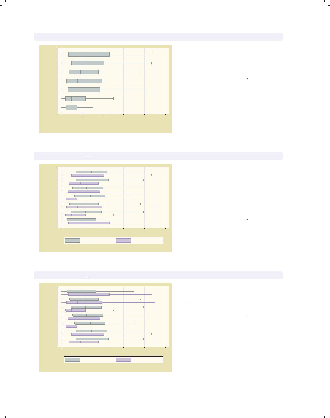
i
i
i
i
i
i
i
i
166 Chapter 5. Box plots
graph hbox tenure, nooutsides over(occ7, sort(1) descending)
0 5 10 15 20 25
Curr. work exper.
Cler.
Labor
Sales
Operat.
Mgmt
Prof
Other
excludes outside values
Adding the descending option yields
boxes in descending order, going from
highest median tenure to lowest
median tenure.
Uses nlsw.dta & scheme vg past
graph hbox prev exp tenure, nooutsides over(occ7)
0 5 10 15 20 25
Other
Labor
Operat.
Cler.
Sales
Mgmt
Prof
excludes outside values
Prev. work exper. Curr. work exper.
Here, we plot two y-variables: the
number of years of work experience
before one’s current job and the years
in one’s current job. Since we have
removed any sort() options, the boxes
are sorted according to the values of
occ7.
Uses nlsw.dta & scheme vg past
graph hbox prev exp tenure, nooutsides over(occ7, sort(1))
0 5 10 15 20 25
Mgmt
Prof
Cler.
Sales
Labor
Operat.
Other
excludes outside values
Prev. work exper. Curr. work exper.
Adding the sort(1) option now sorts
the boxes according to the median of
prev exp since that is the first
y-variable.
Uses nlsw.dta & scheme vg past
The electronic form of this book is solely for direct use at UCLA and only by faculty, students, and staff of UCLA.
All rights reserved on the copyright page apply to this document and specifically neither the electronic nor
published form of the book may be distributed or reproduced, either electronically or in printed form.
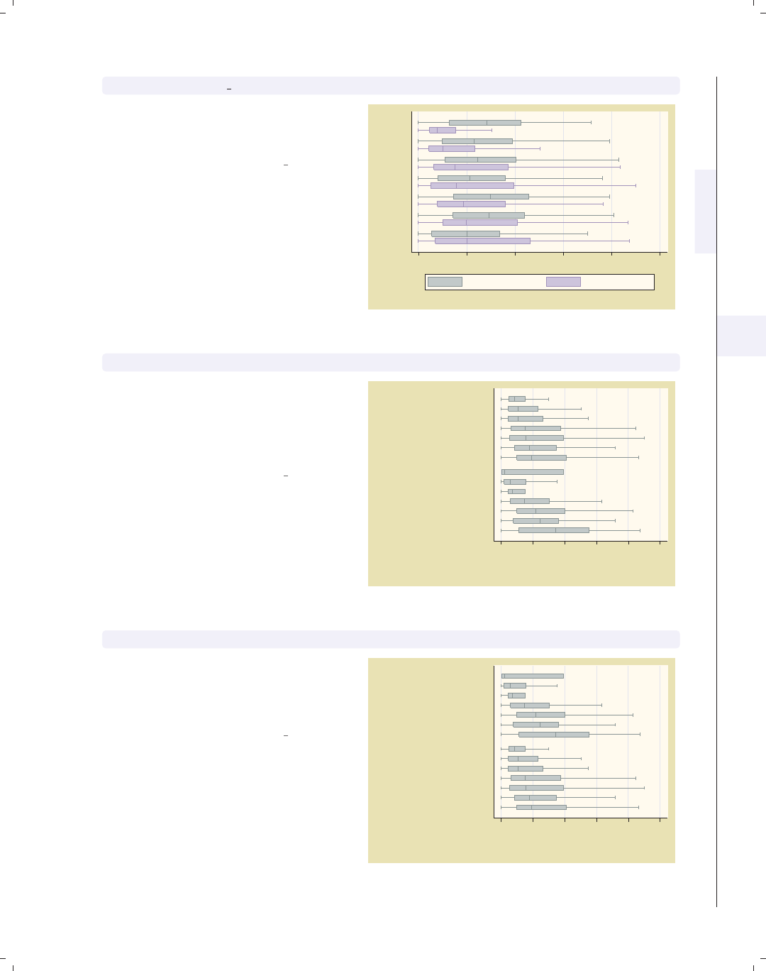
i
i
i
i
i
i
i
i
5.2 Options for groups, over options 167
graph hbox prev exp tenure, nooutsides over(occ7, sort(2))
Changing sort(1) to sort(2) then
sorts the boxes according to the median
of the second y-variable, tenure.
Uses nlsw.dta & scheme vg past
0 5 10 15 20 25
Other
Prof
Mgmt
Operat.
Sales
Labor
Cler.
excludes outside values
Prev. work exper. Curr. work exper.
graph hbox tenure, nooutsides over(occ7, sort(1)) over(collgrad)
We can use the sort() option when
there are additional over() variables.
Here, the boxes are ordered according
to the median of tenure across occ7
but within each level of collgrad.
Uses nlsw.dta & scheme vg past
0 5 10 15 20 25
Curr. work exper.
college grad
not college grad
Other
Mgmt
Prof
Sales
Cler.
Labor
Operat.
Prof
Mgmt
Operat.
Sales
Other
Labor
Cler.
excludes outside values
graph hbox tenure, nooutsides over(occ7, sort(1)) over(collgrad, descending)
We add the descending option to the
second over() option, and the levels of
collgrad are now shown with college
graduates appearing first.
Uses nlsw.dta & scheme vg past
0 5 10 15 20 25
Curr. work exper.
not college grad
college grad
Prof
Mgmt
Operat.
Sales
Other
Labor
Cler.
Other
Mgmt
Prof
Sales
Cler.
Labor
Operat.
excludes outside values
Introduction Twoway Matrix Bar Box Dot Pie Options Standard options Styles Appendix
Yvars and over Over options Cat axis Legend Y-axis Boxlook options By
The electronic form of this book is solely for direct use at UCLA and only by faculty, students, and staff of UCLA.
All rights reserved on the copyright page apply to this document and specifically neither the electronic nor
published form of the book may be distributed or reproduced, either electronically or in printed form.
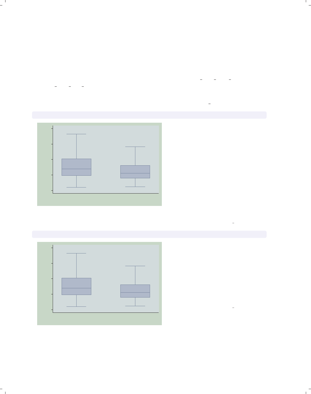
i
i
i
i
i
i
i
i
168 Chapter 5. Box plots
5.3 Controlling the categorical axis
This section describes ways that you can label categorical axes. Box plots are similar
to bar charts, but they are different from other graphs because their x-axes are repre-
sented by categorical variables. This section describes options you can use to customize
these categorical axes. For more details on this, see [G]cat axis label options and
[G]cat axis line options.
We will start by showing examples of how you can change the labels for the x-axis for
these categorical variables. The next set of examples will use the vg teal scheme.
graph box wage, nooutsides over(south)
0
5
10
15
20
hourly wage
0 1
excludes outside values
This is an example of a box plot with
one over() variable graphing wages
broken down by whether one lives in
the South. The variable south is a
dummy variable that does not have any
value labels, so the x-axis is not labeled
very well. We use the nooutsides
option to suppress the display of
outside values. For the rest of the
graphs in this section, there would be a
large number of outside values, which
would make the graphs very cluttered,
so we will include the nooutsides
option for each example.
Uses nlsw.dta & scheme vg teal
graph box wage, nooutsides over(south, relabel(1 "N & W" 2 "South"))
0
5
10
15
20
hourly wage
N & W South
excludes outside values
We can use the relabel() option to
change the labels displayed for the
levels of south, giving the x-axis more
meaningful labels. Note that we wrote
relabel(1 "N & W"),notrelabel(0
"N & W"), since these numbers do not
represent the actual levels of south but
the ordinal position of the levels, i.e.,
first and second.
Uses nlsw.dta & scheme vg teal
The electronic form of this book is solely for direct use at UCLA and only by faculty, students, and staff of UCLA.
All rights reserved on the copyright page apply to this document and specifically neither the electronic nor
published form of the book may be distributed or reproduced, either electronically or in printed form.
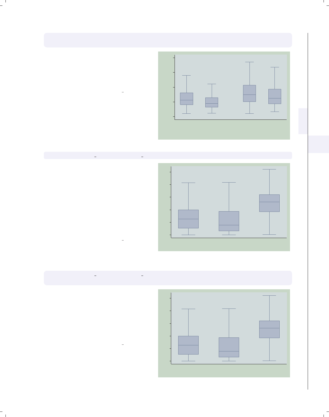
i
i
i
i
i
i
i
i
5.3 Controlling the categorical axis 169
graph box wage, nooutsides over(south, relabel(1 "N & W" 2 "South"))
over(smsa, relabel(1 "Non Metro" 2 "Metro"))
This is an example of a box plot with
two over() variables. Here, we use the
relabel() option to change the labels
displayed for the levels of south and
smsa.
Uses nlsw.dta & scheme vg teal
0
5
10
15
20
hourly wage
Non Metro Metro
N & W South N & W South
excludes outside values
graph box prev exp tenure ttl exp, nooutsides ascategory
This shows a box plot with multiple
y-variables but uses the ascategory
option to plot the different y-variables
as if they were categorical variables.
The boxes for the different variables are
the same color, and the categories are
labeled on the x-axis rather than with a
legend. The default labels on the x-axis
are not bad, but we might want to
change them.
Uses nlsw.dta & scheme vg teal 0
5
10
15
20
25
Prev. work exper. Curr. work exper. Tot. work exper.
excludes outside values
graph box prev exp tenure ttl exp, nooutsides ascategory
yvaroptions(relabel(1 "Prev Exp" 2 "Curr Exp" 3 "Tot Exp"))
If we had an over() option, we would
use the relabel() option to change the
labels on the x-axis. But since we had
multiple y-variables that we have
treated as categories, we then use the
yvaroptions(relabel()) option to
modify the labels on the x-axis.
Uses nlsw.dta & scheme vg teal
0
5
10
15
20
25
Prev Exp Curr Exp Tot Exp
excludes outside values
Introduction Twoway Matrix Bar Box Dot Pie Options Standard options Styles Appendix
Yvars and over Over options Cat axis Legend Y-axis Boxlook options By
The electronic form of this book is solely for direct use at UCLA and only by faculty, students, and staff of UCLA.
All rights reserved on the copyright page apply to this document and specifically neither the electronic nor
published form of the book may be distributed or reproduced, either electronically or in printed form.
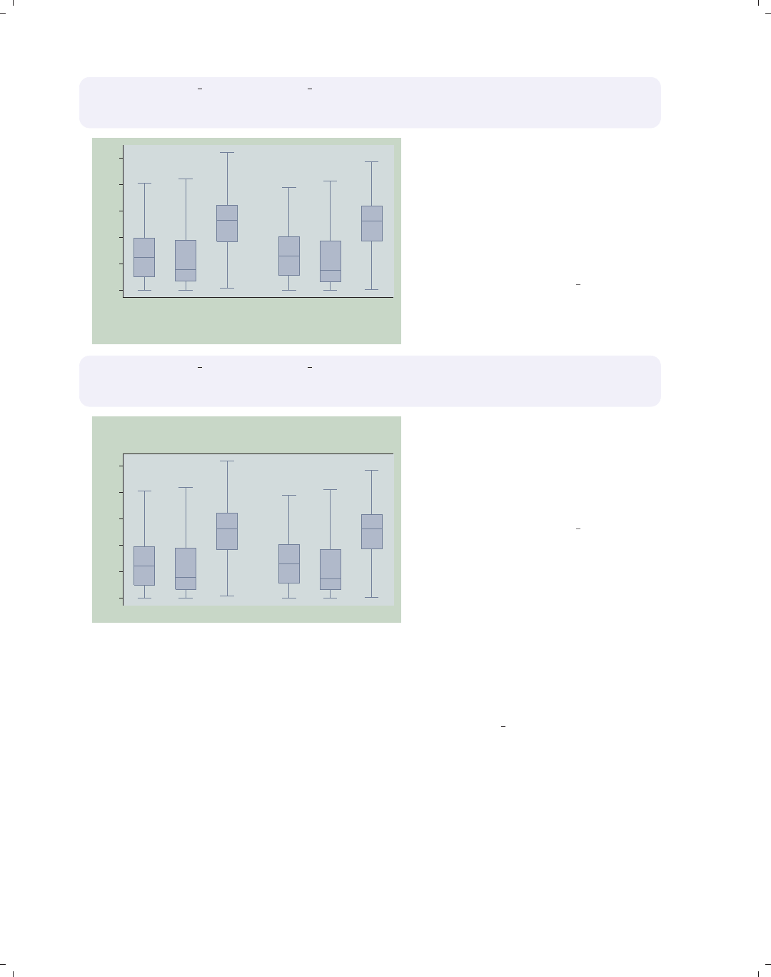
i
i
i
i
i
i
i
i
170 Chapter 5. Box plots
graph box prev exp tenure ttl exp, nooutsides ascategory
over(south, relabel(1 "N & W" 2 "South"))
yvaroptions(relabel(1 "Prev Exp" 2 "Curr Exp" 3 "Tot Exp"))
0
5
10
15
20
25
N & W South
Prev Exp Curr Exp Tot Exp Prev Exp Curr Exp Tot Exp
excludes outside values
This example is similar to the previous
example, but we have added an over()
variable as well. As before, we use
yvaroptions(relabel()) to modify
the labels for the multiple y-variables,
and then we also use the relabel()
option within the over() option to
change the labels for south.
Uses nlsw.dta & scheme vg teal
graph box prev exp tenure ttl exp, nooutsides ascategory xalternate
over(south, relabel(1 "N & W" 2 "South"))
yvaroptions(relabel(1 "Prev Exp" 2 "Curr Exp" 3 "Tot Exp"))
0
5
10
15
20
25
N & W South
Prev Exp Curr Exp Tot Exp Prev Exp Curr Exp Tot Exp
excludes outside values
We add the xalternate option, which
moves the labels for the x-axis to the
opposite side, in this case from the
bottom to the top. You can also use
the yalternate option to move the
y-axis to its opposite side.
Uses nlsw.dta & scheme vg teal
In the examples above, we have seen that, even though the relabel() option is called
an over() option, it can be used within yvaroptions() to control the labeling of multiple
y-variables (provided that the ascategory option is used to convert the multiple y-variables
into categories). We will next explore other over() options, which also can be used with
either over() or yvaroptions(). These examples will use the vg rose scheme.
The electronic form of this book is solely for direct use at UCLA and only by faculty, students, and staff of UCLA.
All rights reserved on the copyright page apply to this document and specifically neither the electronic nor
published form of the book may be distributed or reproduced, either electronically or in printed form.
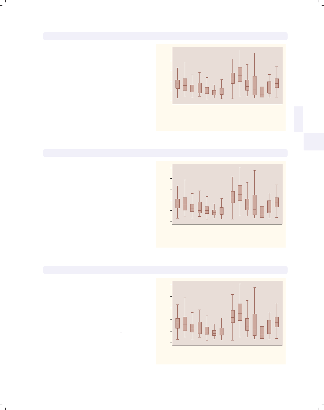
i
i
i
i
i
i
i
i
5.3 Controlling the categorical axis 171
graph box wage, nooutsides over(occ7, label(angle(45))) over(collgrad)
In this example, the levels of occ7
might overlap each other. Using the
label(angle(45)) option makes the
angle of the labels for occ7 45 degrees,
and they do not overlap.
Uses nlsw.dta & scheme vg rose
0
5
10
15
20
25
hourly wage
not college grad college grad
Prof
Mgmt
Sales
Cler.
Operat.
Labor
Other
Prof
Mgmt
Sales
Cler.
Operat.
Labor
Other
excludes outside values
graph box wage, nooutsides over(occ7, label(alternate)) over(collgrad)
Another way we can avoid overlapping
is by adding the label(alternate)
option. As you can see, the labels
alternate in height, avoiding
overlapping.
Uses nlsw.dta & scheme vg rose
0
5
10
15
20
25
hourly wage
not college grad college grad
Prof
Mgmt
Sales
Cler.
Operat.
Labor
Other
Prof
Mgmt
Sales
Cler.
Operat.
Labor
Other
excludes outside values
graph box wage, nooutsides over(occ7, label(labsize(small))) over(collgrad)
We can instead make the size of the
labels smaller to make them fit without
overlapping. Here, we make the label
size small using the
label(labsize(small)) option. See
Styles : Textsize (344) for other values
you could choose for labsize().
Uses nlsw.dta & scheme vg rose
0
5
10
15
20
25
hourly wage
not college grad college grad
Prof Mgmt Sales Cler. Operat.Labor Other Prof Mgmt Sales Cler. Operat. Labor Other
excludes outside values
Introduction Twoway Matrix Bar Box Dot Pie Options Standard options Styles Appendix
Yvars and over Over options Cat axis Legend Y-axis Boxlook options By
The electronic form of this book is solely for direct use at UCLA and only by faculty, students, and staff of UCLA.
All rights reserved on the copyright page apply to this document and specifically neither the electronic nor
published form of the book may be distributed or reproduced, either electronically or in printed form.

i
i
i
i
i
i
i
i
172 Chapter 5. Box plots
graph hbox wage, nooutsides over(occ5, label(labcolor(maroon)))
over(collgrad)
0 5 10 15 20 25
hourly wage
college grad
not college grad
Other
Labor/Ops
Clerical
Sales
Prof/Mgmt
Other
Labor/Ops
Clerical
Sales
Prof/Mgmt
excludes outside values
Using the label(labcolor(maroon))
option, we change the label color for
occ5 to maroon. See Styles : Colors
(328) for more details about other
colors you could choose.
Uses nlsw.dta & scheme vg rose
graph hbox wage, nooutsides
over(occ5, label(ticks tlwidth(thick) tlength(*2) tposition(crossing)))
over(collgrad)
0 5 10 15 20 25
hourly wage
college grad
not college grad
Other
Labor/Ops
Clerical
Sales
Prof/Mgmt
Other
Labor/Ops
Clerical
Sales
Prof/Mgmt
excludes outside values
We can use the label(ticks) option
to place ticks under each box. We also
modify the attributes of the ticks,
making the tick thick, twice as long as
normal, and crossing the x-axis. See
[G]cat axis label options for more
details and other options for controlling
ticks.
Uses nlsw.dta & scheme vg rose
graph hbox wage, nooutsides over(occ5, label(labgap(*5))) over(collgrad)
0 5 10 15 20 25
hourly wage
college grad
not college grad
Other
Labor/Ops
Clerical
Sales
Prof/Mgmt
Other
Labor/Ops
Clerical
Sales
Prof/Mgmt
excludes outside values
The label(labgap(*5)) option
controls the gap between the label and
the ticks. Here, we increase the gap
between the label for the levels of occ5
and the axis line to five times its
normal size.
Uses nlsw.dta & scheme vg rose
The electronic form of this book is solely for direct use at UCLA and only by faculty, students, and staff of UCLA.
All rights reserved on the copyright page apply to this document and specifically neither the electronic nor
published form of the book may be distributed or reproduced, either electronically or in printed form.
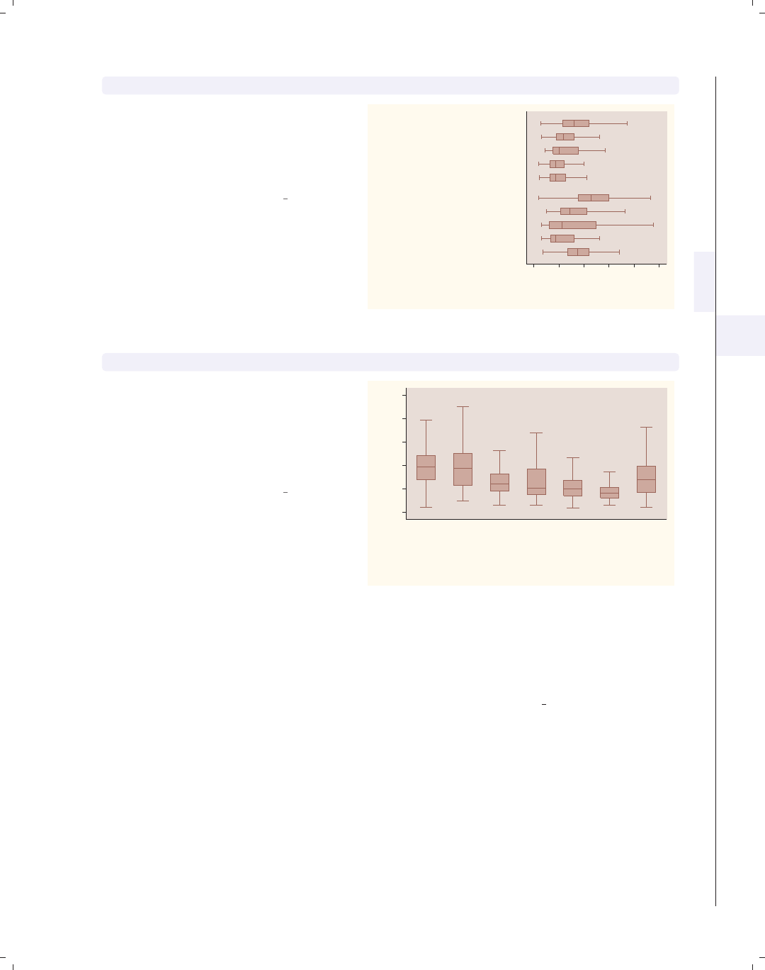
i
i
i
i
i
i
i
i
5.3 Controlling the categorical axis 173
graph hbox wage, nooutsides over(occ5) over(collgrad, label(labgap(*7)))
Using the label(labgap(*7)) option,
we increase the gap associated with
collgrad. This example makes the gap
between collgrad and occ5 seven
times its normal size.
Uses nlsw.dta & scheme vg rose
0 5 10 15 20 25
hourly wage
college grad
not college grad
Other
Labor/Ops
Clerical
Sales
Prof/Mgmt
Other
Labor/Ops
Clerical
Sales
Prof/Mgmt
excludes outside values
graph box wage, nooutsides over(occ7, axis(outergap(*20)))
We use the axis(outergap()) option
to increase the gap between the labels
of the x-axis and the outside of the
graph. As you can see, this increases
the space between the labels for occ7
and the bottom of the graph.
Uses nlsw.dta & scheme vg rose
0
5
10
15
20
25
hourly wage
Prof Mgmt Sales Cler. Operat. Labor Other
excludes outside values
So far, we have focused on labeling the values on the categorical x-axis, but we have not
yet looked at how to add a title to that axis. We might be tempted to use xtitle(), but
that option is not valid for a categorical axis. Instead, we can use other means for giving
titles to these axes, as illustrated in the examples below using the vg s1c scheme.
Introduction Twoway Matrix Bar Box Dot Pie Options Standard options Styles Appendix
Yvars and over Over options Cat axis Legend Y-axis Boxlook options By
The electronic form of this book is solely for direct use at UCLA and only by faculty, students, and staff of UCLA.
All rights reserved on the copyright page apply to this document and specifically neither the electronic nor
published form of the book may be distributed or reproduced, either electronically or in printed form.
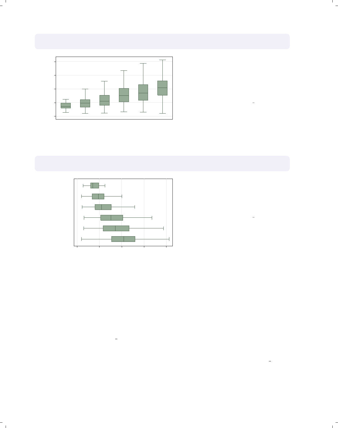
i
i
i
i
i
i
i
i
174 Chapter 5. Box plots
graph box wage, over(grade6) nooutsides
b1title("Level of Education") b2title("in six categories")
0 5 10 15 20
hourly wage
No HS Some HS HS Grad Some Coll Coll Grad Post Grad
Level of Education
in six categories
excludes outside values
In this example, the categorical axis
represents the level of education, and
we can use the b1title() and
b2title() options to add titles to the
bottom of the graph. See Standard
options : Titles (313) for more details.
Uses nlsw.dta & scheme vg s1c
graph hbox wage, over(grade6) nooutsides
l1title("Level of Education" "in six categories")
0 5 10 15 20
hourly wage
Post Grad
Coll Grad
Some Coll
HS Grad
Some HS
No HS
Level of Education
in six categories
excludes outside values
By using graph hbox, the categorical
axis is now on the left axis, so we then
use the l1title() to add a title to the
x-axis. We could also use the
l2title() to add a second title as well.
Uses nlsw.dta & scheme vg s1c
5.4 Controlling legends
This section discusses the use of legends for box charts, emphasizing the features that
are unique to box charts. The section Options : Legend (287) goes into great detail about
legends, as does [G]legend option. Legends can be used for multiple y-variables or when
the first over() variable is treated as a y-variable via the asyvars option. See Box : Yvars
and over (157) for more information about using multiple y-variables and more examples
of treating the first over() variable as a y-variable. These first examples use the vg brite
scheme.
The electronic form of this book is solely for direct use at UCLA and only by faculty, students, and staff of UCLA.
All rights reserved on the copyright page apply to this document and specifically neither the electronic nor
published form of the book may be distributed or reproduced, either electronically or in printed form.
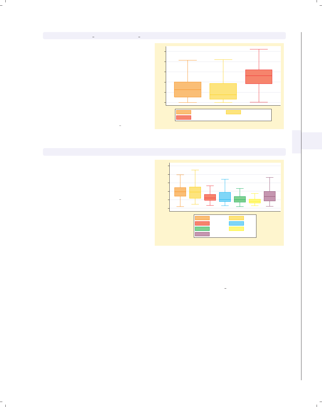
i
i
i
i
i
i
i
i
5.4 Controlling legends 175
graph box prev exp tenure ttl exp, nooutsides
Consider this box plot of three different
variables. These variables are shown
with different colors, and a legend is
used to identify the variables. We use
the nooutsides option to suppress the
display of outside values. For the rest
of the graphs in this section, there
would be a large number of outside
values, which would make the graphs
very cluttered, so we will include the
nooutsides option for each example.
Uses nlsw.dta & scheme vg brite
0 5 10 15 20 25
excludes outside values
Prev. work exper. Curr. work exper.
Tot. work exper.
graph box wage, nooutsides over(occ7) asyvars
This is another example of where a
legend can arise in a Stata box plot by
using the asyvars option, which treats
an over() variable as though the levels
were different y-variables.
Uses nlsw.dta & scheme vg brite
0 5 10 15 20 25
hourly wage
excludes outside values
Prof Mgmt
Sales Cler.
Operat. Labor
Other
Unless otherwise mentioned, the legend() options described below work the same
whether the legend was derived from multiple y-variables or from an over() option that
was combined with the asyvars option. These examples use the vg teal scheme.
Introduction Twoway Matrix Bar Box Dot Pie Options Standard options Styles Appendix
Yvars and over Over options Cat axis Legend Y-axis Boxlook options By
The electronic form of this book is solely for direct use at UCLA and only by faculty, students, and staff of UCLA.
All rights reserved on the copyright page apply to this document and specifically neither the electronic nor
published form of the book may be distributed or reproduced, either electronically or in printed form.
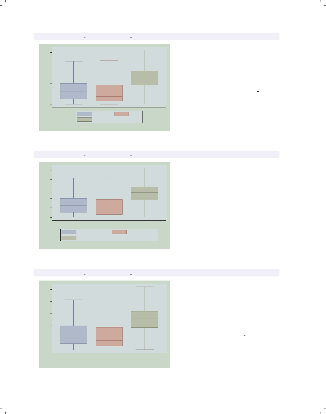
i
i
i
i
i
i
i
i
176 Chapter 5. Box plots
graph box prev exp tenure ttl exp, nooutsides nolabel
0
5
10
15
20
25
excludes outside values
prev_exp tenure
ttl_exp
The nolabel option only works when
you have multiple y-variables. When
this option is used, the variable names
(not the variable labels) are used in the
legend. For example, instead of showing
the variable label Prev. work exper.,
it shows the variable name prev exp.
Uses nlsw.dta & scheme vg teal
graph box prev exp tenure ttl exp, nooutsides showyvars
0
5
10
15
20
25
Prev. work exper. Curr. work exper. Tot. work exper.
excludes outside values
Prev. work exper. Curr. work exper.
Tot. work exper.
The showyvars option puts the labels
under the boxes.
Uses nlsw.dta & scheme vg teal
graph box prev exp tenure ttl exp, nooutsides showyvars legend(off)
0
5
10
15
20
25
Prev. work exper. Curr. work exper. Tot. work exper.
excludes outside values
One instance when the showyvars
option would be useful is when you
want separately colored boxes labeled
at the bottom. Here, we use showyvars
to show the labels at the bottom of the
boxes and the legend(off) option to
suppress the display of the legend.
Uses nlsw.dta & scheme vg teal
The electronic form of this book is solely for direct use at UCLA and only by faculty, students, and staff of UCLA.
All rights reserved on the copyright page apply to this document and specifically neither the electronic nor
published form of the book may be distributed or reproduced, either electronically or in printed form.
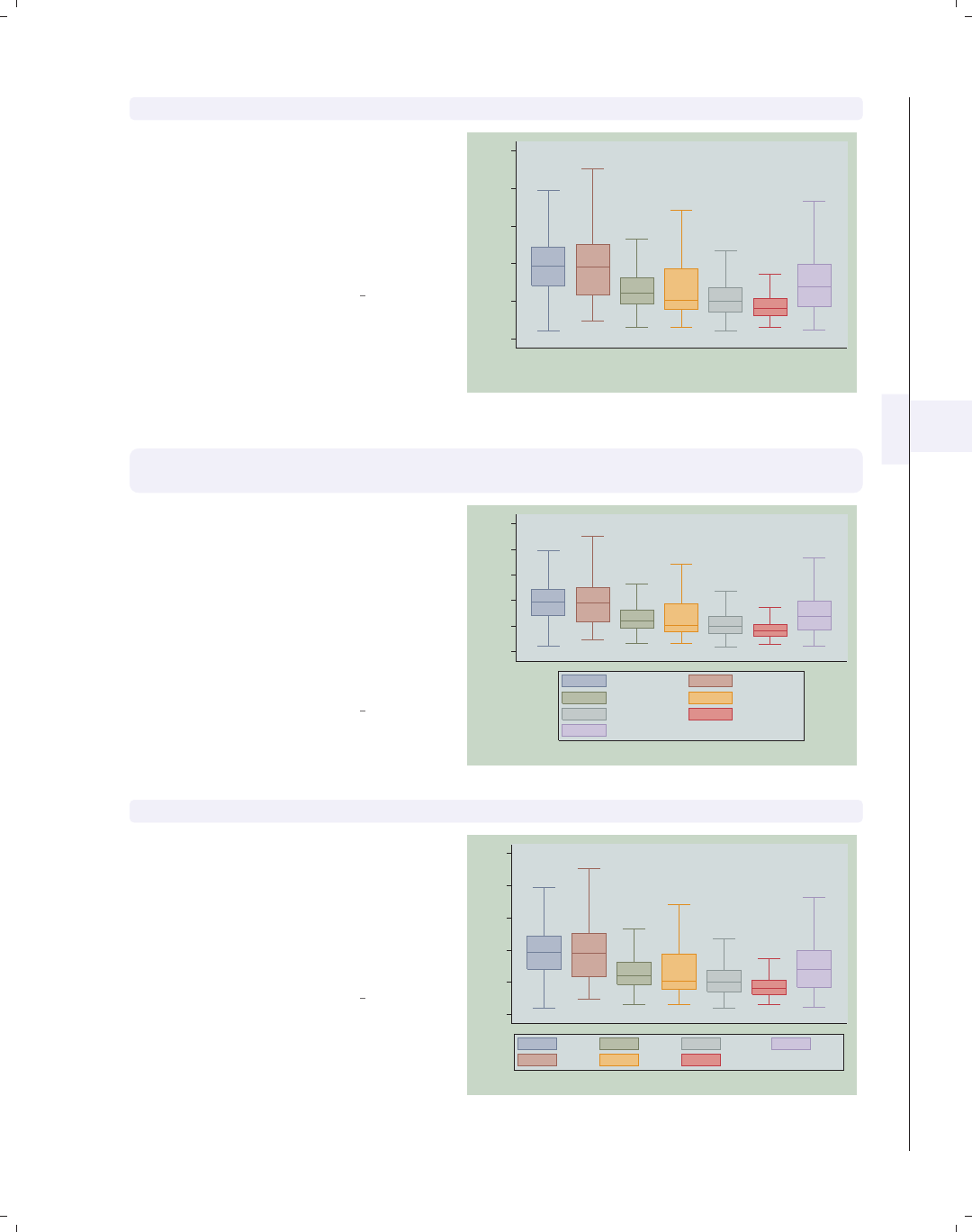
i
i
i
i
i
i
i
i
5.4 Controlling legends 177
graph box wage, nooutsides over(occ7) asyvars showyvars legend(off)
Even though the showyvars option
sounds like it would work only with
multiple y-variables, it also works when
you combine the over() and asyvars
options. As before, we suppress the
legend in this example using the
legend(off) option.
Uses nlsw.dta & scheme vg teal
0
5
10
15
20
25
hourly wage
Prof Mgmt Sales Cler. Operat. Labor Other
excludes outside values
graph box wage, nooutsides over(occ7) asyvars
legend(label(1 "Professional") label(2 "Management"))
We use the legend(label()) option to
change the labels for the first and
second variables in the legend. Note
that you use a separate label() option
for each bar. This is in contrast to the
relabel() option, where all the label
assignments were placed in one
relabel() option; see Box : Cat axis
(168).
Uses nlsw.dta & scheme vg teal
0
5
10
15
20
25
hourly wage
excludes outside values
Professional Management
Sales Cler.
Operat. Labor
Other
graph box wage, nooutsides over(occ7) asyvars legend(rows(2) colfirst)
In this example, we use the
legend(rows(2) colfirst) options to
display the legend in two rows and to
order the keys by column (instead of
the default, which is by row). This
yields keys that are more adjacent to
the boxes that they label.
Uses nlsw.dta & scheme vg teal
0
5
10
15
20
25
hourly wage
excludes outside values
Prof
Mgmt
Sales
Cler.
Operat.
Labor
Other
Introduction Twoway Matrix Bar Box Dot Pie Options Standard options Styles Appendix
Yvars and over Over options Cat axis Legend Y-axis Boxlook options By
The electronic form of this book is solely for direct use at UCLA and only by faculty, students, and staff of UCLA.
All rights reserved on the copyright page apply to this document and specifically neither the electronic nor
published form of the book may be distributed or reproduced, either electronically or in printed form.
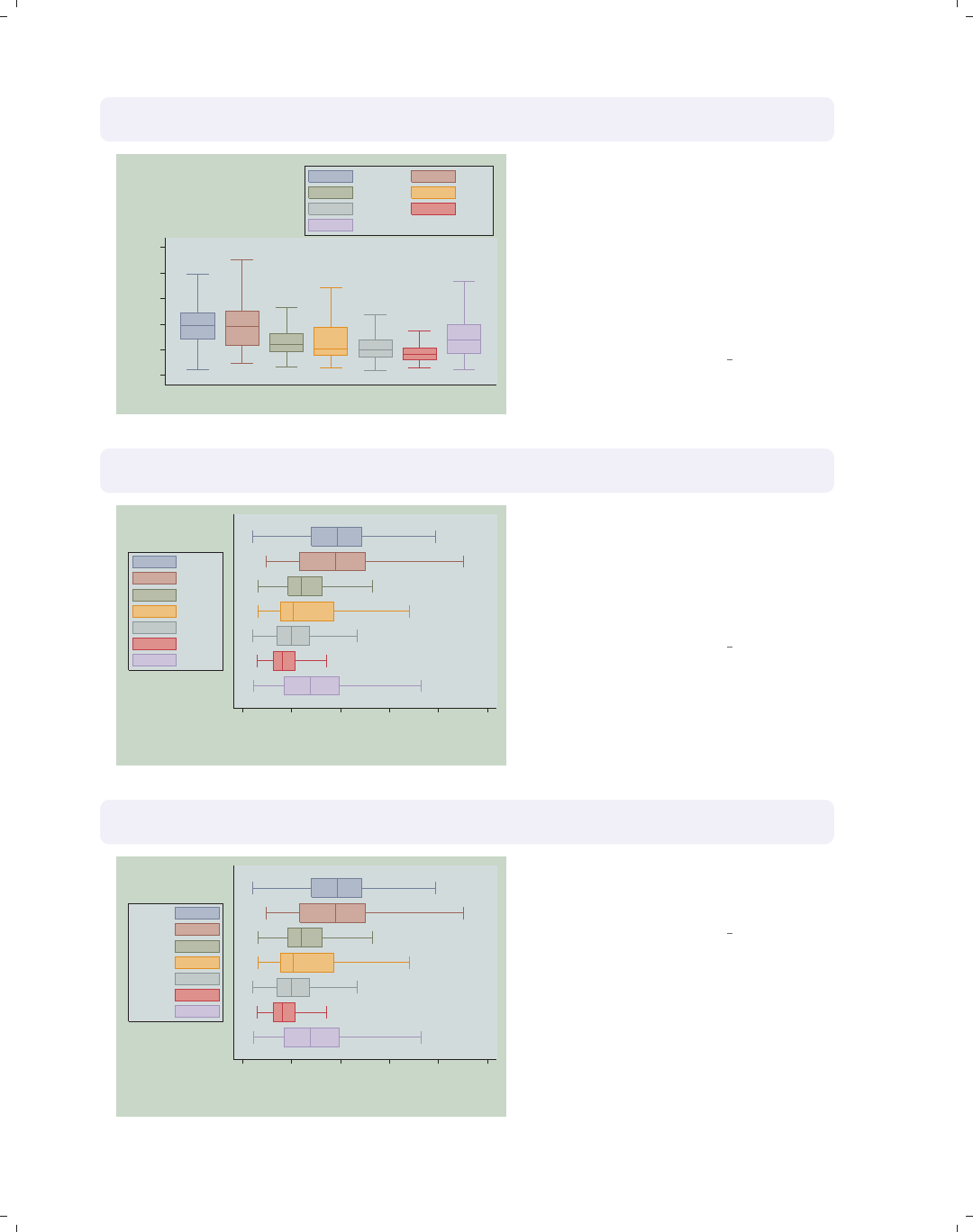
i
i
i
i
i
i
i
i
178 Chapter 5. Box plots
graph box wage, nooutsides over(occ7) asyvars
legend(position(1))
0
5
10
15
20
25
hourly wage
excludes outside values
Prof Mgmt
Sales Cler.
Operat. Labor
Other
We can put the legend up in the top
right corner of the graph with the
legend(position(1)) option. The
values you supply for position() are
like the numbers on a clock face, where
12 o’clock is the top, 6 o’clock is the
bottom, and 0 represents the center of
the clock face; see Styles : Clockpos (330)
for more details.
Uses nlsw.dta & scheme vg teal
graph hbox wage, nooutsides over(occ7) asyvars
legend(cols(1) position(9))
0 5 10 15 20 25
hourly wage
excludes outside values
Prof
Mgmt
Sales
Cler.
Operat.
Labor
Other
We switch to making this a horizontal
box chart and then move the legend
using the legend(position(9))
option. The legend is now placed in the
9 o’clock position and is displayed as a
single column.
Uses nlsw.dta & scheme vg teal
graph hbox wage, nooutsides over(occ7) asyvars
legend(cols(1) position(9) textfirst)
0 5 10 15 20 25
hourly wage
excludes outside values
Prof
Mgmt
Sales
Cler.
Operat.
Labor
Other
We can add the textfirst option to
put the key description before the key
in the legend.
Uses nlsw.dta & scheme vg teal
The electronic form of this book is solely for direct use at UCLA and only by faculty, students, and staff of UCLA.
All rights reserved on the copyright page apply to this document and specifically neither the electronic nor
published form of the book may be distributed or reproduced, either electronically or in printed form.
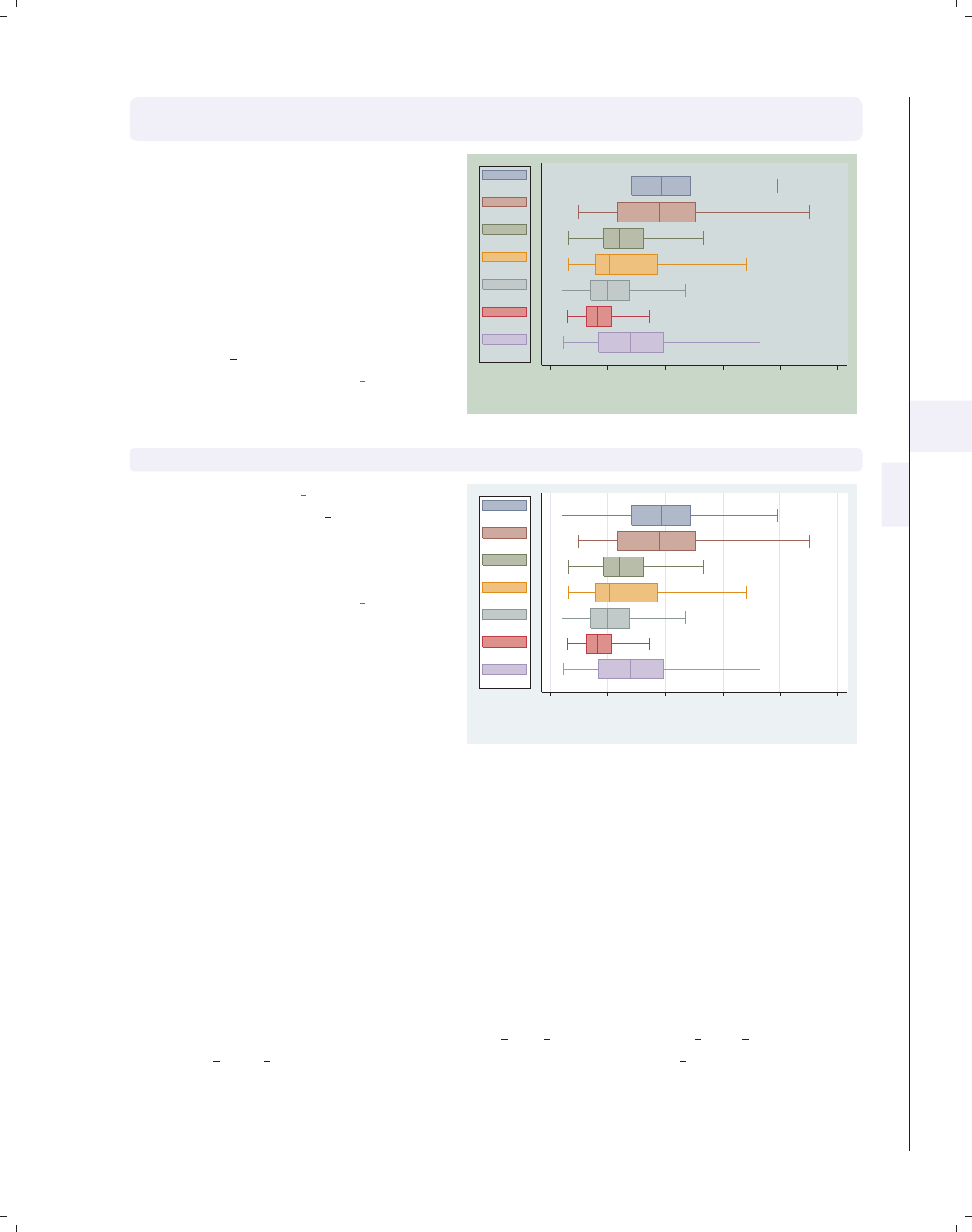
i
i
i
i
i
i
i
i
5.5 Controlling the y-axis 179
graph hbox wage, nooutsides over(occ7) asyvars
legend(cols(1) position(9) stack)
With the stack option, we can place
the keys and their labels on top of each
other to form an even more compact
column. You have considerable control
over the elements within the legend
using other options like rowgap(),
keygap(),symxsize(),symysize(),
textwidth(),andsymplacement().
See Options : Legend (287) and
[G]legend option for more details.
Uses nlsw.dta & scheme vg teal 0 5 10 15 20 25
hourly wage
excludes outside values
Prof
Mgmt
Sales
Cler.
Operat.
Labor
Other
graph hbox wage, nooutsides over(occ7) asyvars
Switching to the vg lgndc scheme, by
typing set scheme vg lgndc, positions
the legend at the left in a single
column, by default, without the need to
specify options.
Uses nlsw.dta & scheme vg lgndc
0 5 10 15 20 25
hourly wage
excludes outside values
Prof
Mgmt
Sales
Cler.
Operat.
Labor
Other
5.5 Controlling the y-axis
This section describes options you can use with respect to the y-axis with box charts.
To be precise, when Stata refers to the y-axis on a box chart, it refers to the axis with the
continuous variable, whether the left axis when using graph box or the bottom axis when
using graph hbox. This section emphasizes the features that are particularly relevant to
box charts. For more details, see Options : Axis titles (254), Options : Axis labels (256), and
Options : Axis scales (265). See also [G]axis title options,[G]axis label options,and
[G]axis scale options. These examples are shown using the vg lgndc scheme, which
places the legend to the left in a single column.
Introduction Twoway Matrix Bar Box Dot Pie Options Standard options Styles Appendix
Yvars and over Over options Cat axis Legend Y-axis Boxlook options By
The electronic form of this book is solely for direct use at UCLA and only by faculty, students, and staff of UCLA.
All rights reserved on the copyright page apply to this document and specifically neither the electronic nor
published form of the book may be distributed or reproduced, either electronically or in printed form.
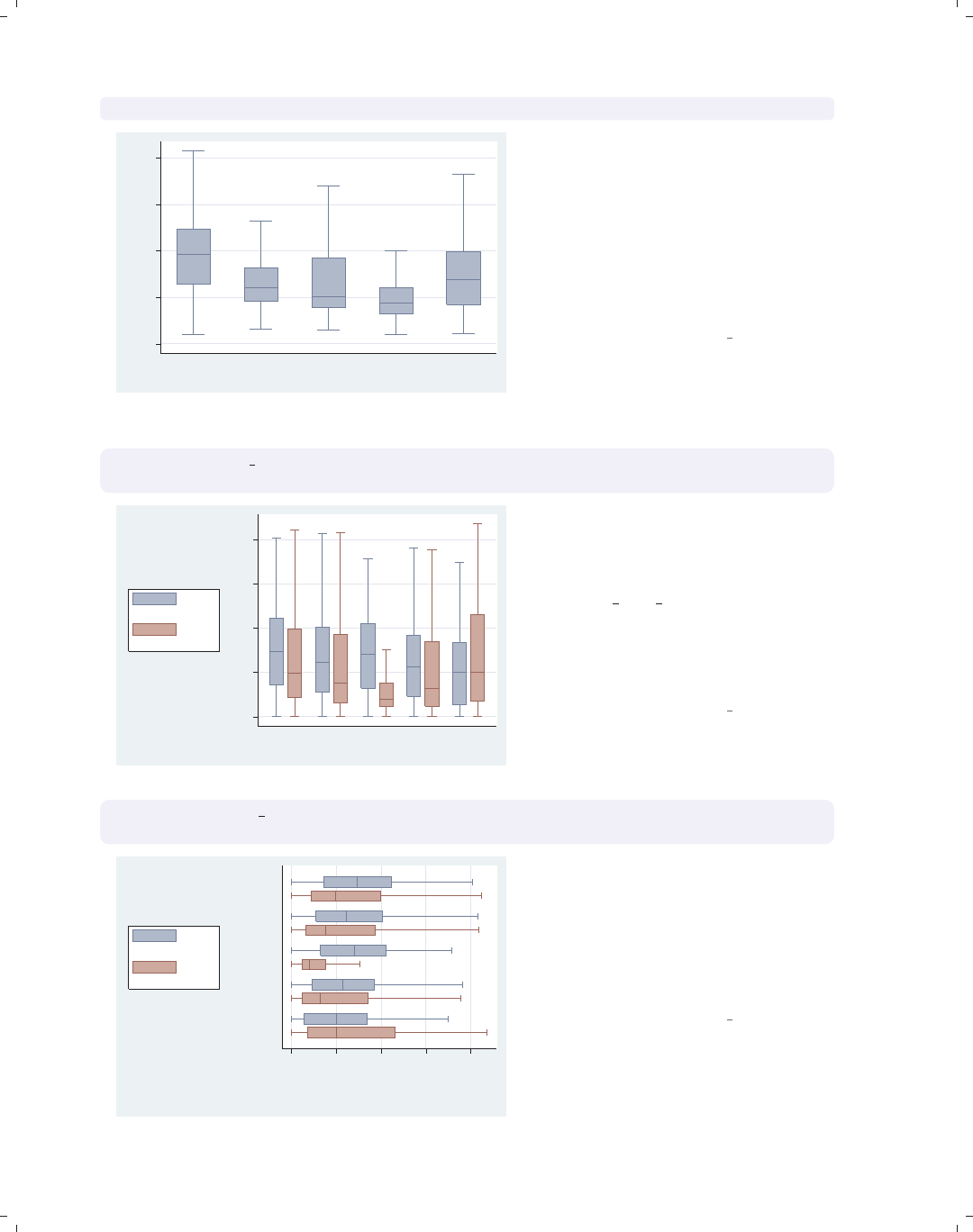
i
i
i
i
i
i
i
i
180 Chapter 5. Box plots
graph box wage, nooutside over(occ5)
0 5 10 15 20
hourly wage
Prof/Mgmt Sales Clerical Labor/Ops Other
excludes outside values
Consider this graph showing the hourly
wages broken down by occupation. We
use the nooutsides option to suppress
the display of outside values. For the
rest of the graphs in this section, there
would be a large number of outside
values, which would make the graphs
very cluttered, so we will include the
nooutsides option for each example.
Uses nlsw.dta & scheme vg lgndc
graph box prev exp tenure, nooutside over(occ5)
ytitle("Years of experience")
0 5 10 15 20
Years of experience
Prof/Mgmt Sales Clerical Labor/Ops Other
excludes outside values
Prev. work exper.
Curr. work exper.
Looking at previous and current work
experience over occupations, we can use
the ytitle() option to add a title to
the y-axis. See Options : Axis titles (254)
and [G]axis title options for more
details, but please disregard any
references to xtitle() there since that
option is not valid when using graph
box.
Uses nlsw.dta & scheme vg lgndc
graph hbox prev exp tenure, nooutside over(occ5)
ytitle("Years of" "experience")
0 5 10 15 20
Years of
experience
Other
Labor/Ops
Clerical
Sales
Prof/Mgmt
excludes outside values
Prev. work exper.
Curr. work exper.
In this example, we place the title
across two lines by using two separate
quoted strings. Note that, even though
we have used graph hbox to place the
y-axis on the bottom axis, we still
should use ytitle() to change the title
of that axis.
Uses nlsw.dta & scheme vg lgndc
The electronic form of this book is solely for direct use at UCLA and only by faculty, students, and staff of UCLA.
All rights reserved on the copyright page apply to this document and specifically neither the electronic nor
published form of the book may be distributed or reproduced, either electronically or in printed form.
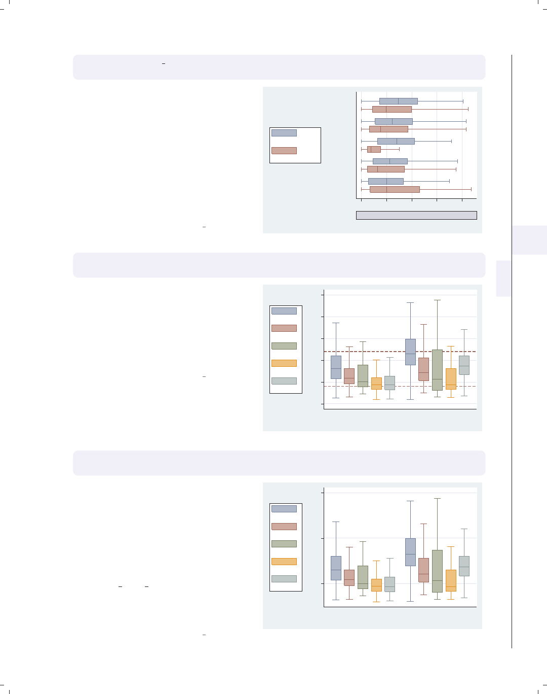
i
i
i
i
i
i
i
i
5.5 Controlling the y-axis 181
graph hbox prev exp tenure, nooutside over(occ5)
ytitle("Years of experience", size(vlarge) box bexpand)
Because this title is considered to be a
textbox, you can use a variety of
textbox options to control the look of
the title. This example makes the title
very large, surrounds it with a box, and
uses the bexpand (box expand) option
to stretch the box to fill the width of
the plot area. See Options : Textboxes
(303) for additional examples of how to
use textbox options to control the
display of text.
Uses nlsw.dta & scheme vg lgndc
0 5 10 15 20
Years of experience
Other
Labor/Ops
Clerical
Sales
Prof/Mgmt
excludes outside values
Prev. work exper.
Curr. work exper.
graph box wage, nooutside over(occ5) over(collgrad) asyvar
yline(4 12, lwidth(medthick) lcolor(maroon) lpattern(dash))
In this example, we use the yline()
option to add a medium-thick, maroon,
dashed line to the points in the graph
where wages equal 4 and 12. Note that
we would still use yline(),evenifwe
used graph hbox, placing the y-axis at
the bottom.
Uses nlsw.dta & scheme vg lgndc
0 5 10 15 20 25
hourly wage
not college grad college grad
excludes outside values
Prof/Mgmt
Sales
Clerical
Labor/Ops
Other
graph box wage, nooutside over(occ5) over(collgrad) asyvar
ylabel(5(10)25)
We can use the ylabel() option to
label the y-axis. In this case, we use the
labels going from 5 to 25 by increments
of 10. Note that the y-axis still starts
at 0, and we would have to supply the
exclude0 option, so 0 is not necessarily
the starting point for the y-axis. See
Options : Axis labels (256) and
[G]axis label options for more
details. Please disregard any references
to xlabel() since that option is not
valid when using graph box.
Uses nlsw.dta & scheme vg lgndc
5 15 25
hourly wage
not college grad college grad
excludes outside values
Prof/Mgmt
Sales
Clerical
Labor/Ops
Other
Introduction Twoway Matrix Bar Box Dot Pie Options Standard options Styles Appendix
Yvars and over Over options Cat axis Legend Y-axis Boxlook options By
The electronic form of this book is solely for direct use at UCLA and only by faculty, students, and staff of UCLA.
All rights reserved on the copyright page apply to this document and specifically neither the electronic nor
published form of the book may be distributed or reproduced, either electronically or in printed form.
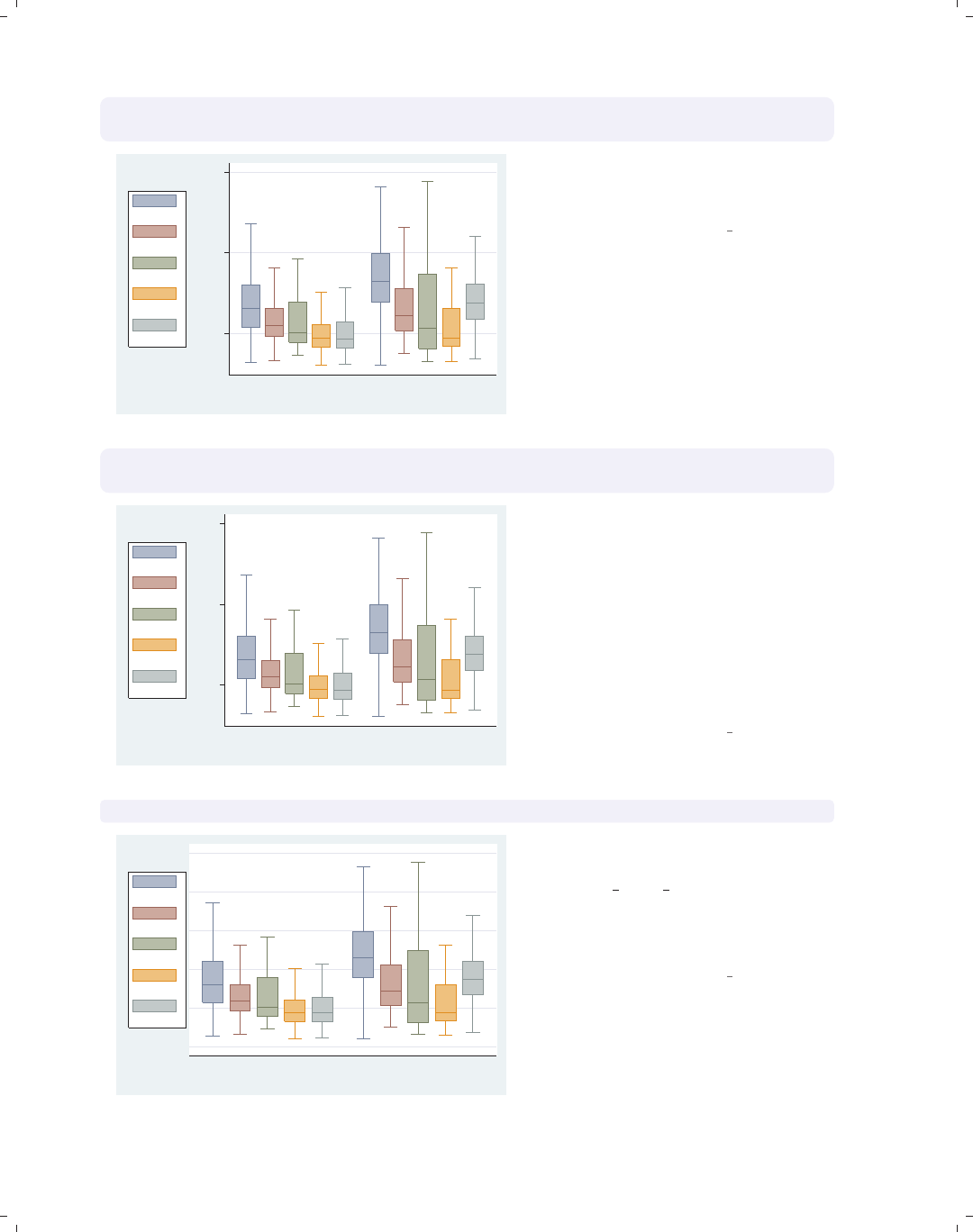
i
i
i
i
i
i
i
i
182 Chapter 5. Box plots
graph box wage, nooutside over(occ5) over(collgrad) asyvar
ylabel(5(10)25, angle(0))
5
15
25
hourly wage
not college grad college grad
excludes outside values
Prof/Mgmt
Sales
Clerical
Labor/Ops
Other
We can add the angle(0) option to
modify the angle of the y-labels, in this
case making them display horizontally.
Uses nlsw.dta & scheme vg lgndc
graph box wage, nooutside over(occ5) over(collgrad) asyvar
ylabel(5(10)25, nogrid)
5 15 25
hourly wage
not college grad college grad
excludes outside values
Prof/Mgmt
Sales
Clerical
Labor/Ops
Other
The nogrid option suppresses the
display of the grid. Note that this
option is placed within the ylabel()
option, thus suppressing the grid for
the y-axis. (With box plots, there is
never a grid with respect to the x-axis.)
If the grid were absent and we wanted
to include it, we could add the grid
option. For more details, see
Options : Axis labels (256).
Uses nlsw.dta & scheme vg lgndc
graph box wage, nooutside over(occ5) over(collgrad) asyvar yscale(off)
not college grad college grad
excludes outside values
Prof/Mgmt
Sales
Clerical
Labor/Ops
Other
We can use yscale(off) to turn off the
y-axis. See Options : Axis scales (265)
and [G]axis scale options for more
details. Please disregard any references
to xscale(), since that option is not
valid when using graph box.
Uses nlsw.dta & scheme vg lgndc
The electronic form of this book is solely for direct use at UCLA and only by faculty, students, and staff of UCLA.
All rights reserved on the copyright page apply to this document and specifically neither the electronic nor
published form of the book may be distributed or reproduced, either electronically or in printed form.
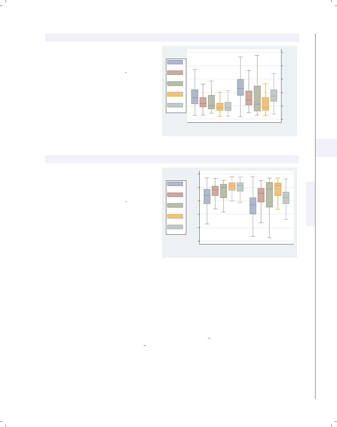
i
i
i
i
i
i
i
i
5.6 Changing the look of boxes, boxlook options 183
graph box wage, nooutside over(occ5) over(collgrad) asyvar yalternate
We can put the y-axis on the opposite
side, in this case on the right side of the
graph, using the yalternate option.
Uses nlsw.dta & scheme vg lgndc
0 5 10 15 20 25
hourly wage
not college grad college grad
excludes outside values
Prof/Mgmt
Sales
Clerical
Labor/Ops
Other
graph box wage, nooutside over(occ5) over(collgrad) asyvar yreverse
You can reverse the direction of the
y-axis, in effect turning your boxes
upside down, with the yreverse
option.
Uses nlsw.dta & scheme vg lgndc
0510152025
hourly wage
not college grad college grad
excludes outside values
Prof/Mgmt
Sales
Clerical
Labor/Ops
Other
5.6 Changing the look of boxes, boxlook options
This section shows how you can control the look of the boxes in your box charts: con-
trol the space between the boxes, the color of the boxes, and the characteristics of the line
outlining the boxes. For more information, see the boxlook options table in [G]graph box.
These examples begin with the vg blue scheme.
Introduction Twoway Matrix Bar Box Dot Pie Options Standard options Styles Appendix
Yvars and over Over options Cat axis Legend Y-axis Boxlook options By
The electronic form of this book is solely for direct use at UCLA and only by faculty, students, and staff of UCLA.
All rights reserved on the copyright page apply to this document and specifically neither the electronic nor
published form of the book may be distributed or reproduced, either electronically or in printed form.
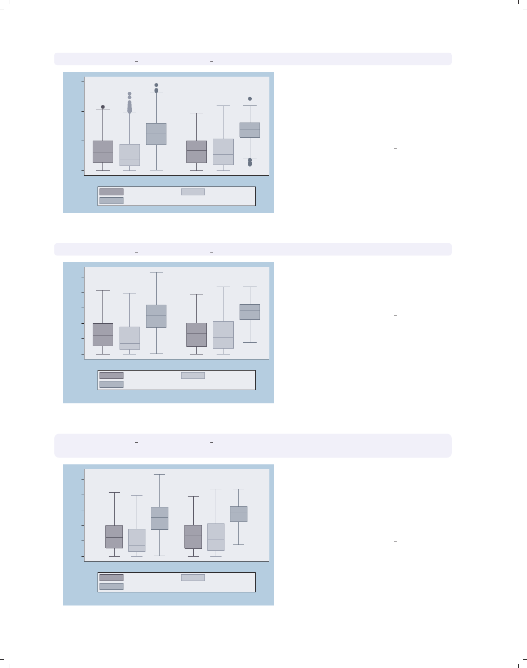
i
i
i
i
i
i
i
i
184 Chapter 5. Box plots
graph box prev exp tenure ttl exp, over(collgrad)
0
10
20
30
not college grad college grad
Prev. work exper. Curr. work exper.
Tot. work exper.
Consider this box chart, which shows
the distribution of previous work
experience, current work experience,
and total work experience. These three
variables are broken down by whether
one graduated college.
Uses nlsw.dta & scheme vg blue
graph box prev exp tenure ttl exp, nooutsides over(collgrad)
0
5
10
15
20
25
not college grad college grad
excludes outside values
Prev. work exper. Curr. work exper.
Tot. work exper.
We add the nooutsides option to
suppress the display of outside values.
We will use this option for most of the
graphs in this section.
Uses nlsw.dta & scheme vg blue
graph box prev exp tenure ttl exp, nooutsides over(collgrad)
outergap(*5)
0
5
10
15
20
25
not college grad college grad
excludes outside values
Prev. work exper. Curr. work exper.
Tot. work exper.
We can change the outer gap between
the boxes and the edge of the plot area
with the outergap() option. Here, the
gap is five times its normal size. You
could also supply a value less than 1 to
shrink the size of the outer gap.
Uses nlsw.dta & scheme vg blue
The electronic form of this book is solely for direct use at UCLA and only by faculty, students, and staff of UCLA.
All rights reserved on the copyright page apply to this document and specifically neither the electronic nor
published form of the book may be distributed or reproduced, either electronically or in printed form.
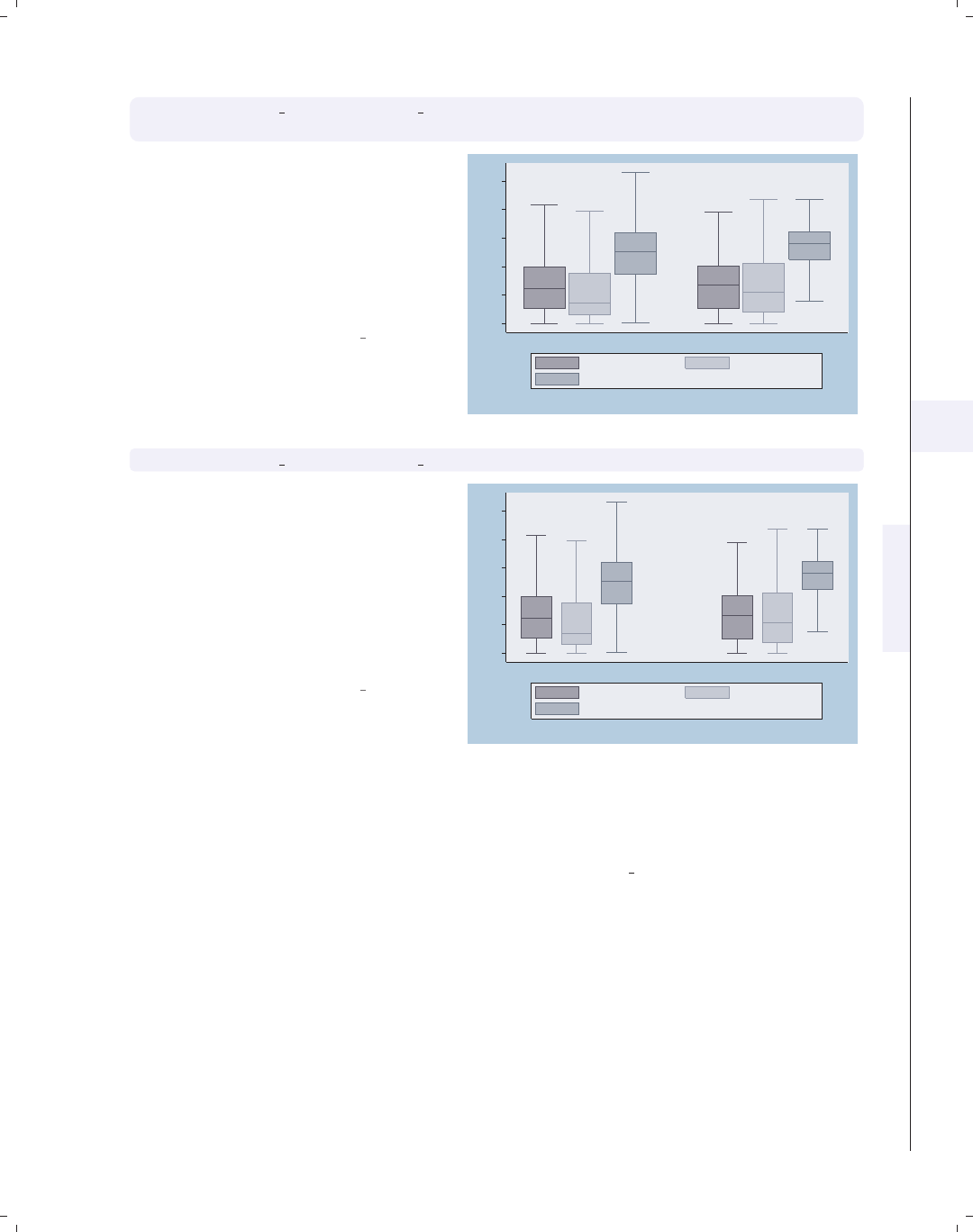
i
i
i
i
i
i
i
i
5.6 Changing the look of boxes, boxlook options 185
graph box prev exp tenure ttl exp, nooutsides over(collgrad)
boxgap(10)
The boxgap() option controls the size
of the gap among the boxes formed by
the multiple y-variables. The default
value is 33, meaning that the distance
between the boxes is 33% of the width
of the boxes. Here, we make the gap
smaller, making the boxes for the
y-variables closer to each other.
Uses nlsw.dta & scheme vg blue 0
5
10
15
20
25
not college grad college grad
excludes outside values
Prev. work exper. Curr. work exper.
Tot. work exper.
graph box prev exp tenure ttl exp, nooutsides over(collgrad, gap(*3))
Here, we use the gap() option to
control the gap between the college
graduate group and the noncollege
graduate group. Here, we make the gap
three times the width of a box. See
Box : Over options (163) for more
information about controlling the gap
among boxes created by the over()
option.
Uses nlsw.dta & scheme vg blue
0
5
10
15
20
25
not college grad college grad
excludes outside values
Prev. work exper. Curr. work exper.
Tot. work exper.
Let’s now look at options that allow us to control the color of the boxes. We will first
look at options that control the overall intensity of the color for all the boxes and then show
how you can control the color of each box. We will use the vg s2c scheme for the following
examples.
Introduction Twoway Matrix Bar Box Dot Pie Options Standard options Styles Appendix
Yvars and over Over options Cat axis Legend Y-axis Boxlook options By
The electronic form of this book is solely for direct use at UCLA and only by faculty, students, and staff of UCLA.
All rights reserved on the copyright page apply to this document and specifically neither the electronic nor
published form of the book may be distributed or reproduced, either electronically or in printed form.
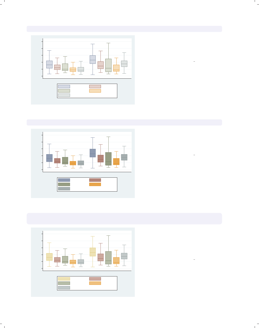
i
i
i
i
i
i
i
i
186 Chapter 5. Box plots
graph box wage, over(occ5) over(collgrad) asyvars nooutsides intensity(*.5)
0 5 10 15 20 25
hourly wage
not college grad college grad
excludes outside values
Prof/Mgmt Sales
Clerical Labor/Ops
Other
The intensity option controls the
intensity of the color within the boxes.
Here, we request that the color be 50%
as intense as it normally would be.
Uses nlsw.dta & scheme vg s2c
graph box wage, over(occ5) over(collgrad) asyvars nooutsides intensity(*1.5)
0 5 10 15 20 25
hourly wage
not college grad college grad
excludes outside values
Prof/Mgmt Sales
Clerical Labor/Ops
Other
In this example, we use the intensity
option to make the colors within the
boxes 1.5 times more intense than they
would normally.
Uses nlsw.dta & scheme vg s2c
graph box wage, over(occ5) over(collgrad) asyvars nooutsides
box(1, bcolor(sand))
0 5 10 15 20 25
hourly wage
not college grad college grad
excludes outside values
Prof/Mgmt Sales
Clerical Labor/Ops
Other
Here, we add box(1, bcolor(sand))
to make the box color for the first bar a
sand color. See Styles : Colors (328) for
more information about colors you can
select.
Uses nlsw.dta & scheme vg s2c
The electronic form of this book is solely for direct use at UCLA and only by faculty, students, and staff of UCLA.
All rights reserved on the copyright page apply to this document and specifically neither the electronic nor
published form of the book may be distributed or reproduced, either electronically or in printed form.
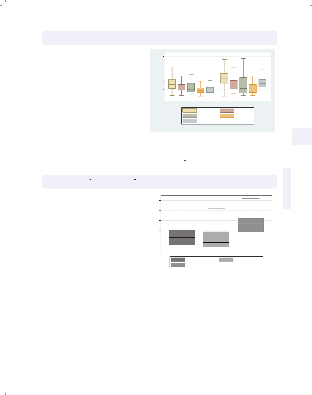
i
i
i
i
i
i
i
i
5.6 Changing the look of boxes, boxlook options 187
graph box wage, over(occ5) over(collgrad) asyvars nooutsides
box(1, bcolor(sand) blcolor(brown) blwidth(thick))
We add the blcolor() (box line color)
and blwidth() (box line width) options
to make the outline for the first box
brown and thick. Note that, while you
can control the color of the boxes and
outline characteristics via the box()
option, if you want to extensively
change these characteristics for many
graphs, you might consider making
your own scheme. See Intro : Schemes
(14) and Appendix : Customizing schemes
(379).
Uses nlsw.dta & scheme vg s2c
0 5 10 15 20 25
hourly wage
not college grad college grad
excludes outside values
Prof/Mgmt Sales
Clerical Labor/Ops
Other
Now, let’s consider options that allow us to control the display of the median, whiskers,
caps, and outside markers. These examples use the vg s1m scheme.
graph box prev exp tenure ttl exp, nooutsides
medtype(cline) medline(lwidth(thick) lcolor(black))
The medtype(cline) option sets the
median type to be a custom line. We
then customize the median line using
the medline() option to specify that
the line width be thick and the line
color be black.
Uses nlsw.dta & scheme vg s1m
0 5 10 15 20 25
excludes outside values
Prev. work exper. Curr. work exper.
Tot. work exper.
Introduction Twoway Matrix Bar Box Dot Pie Options Standard options Styles Appendix
Yvars and over Over options Cat axis Legend Y-axis Boxlook options By
The electronic form of this book is solely for direct use at UCLA and only by faculty, students, and staff of UCLA.
All rights reserved on the copyright page apply to this document and specifically neither the electronic nor
published form of the book may be distributed or reproduced, either electronically or in printed form.
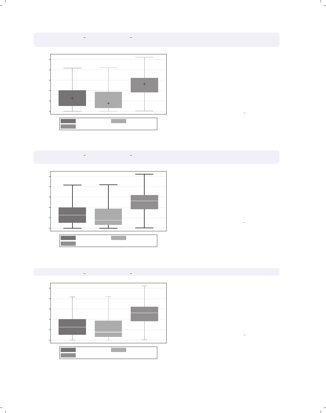
i
i
i
i
i
i
i
i
188 Chapter 5. Box plots
graph box prev exp tenure ttl exp, nooutsides
medtype(marker) medmarker(msymbol(+) msize(large))
0 5 10 15 20 25
excludes outside values
Prev. work exper. Curr. work exper.
Tot. work exper.
We can use the medtype(marker)
option to tell Stata that we want to use
a marker symbol to label the median
and then use the medmarker() option
to control the display of the median
marker. In this case, we make the
marker symbol a plus sign and make
the marker size large.
Uses nlsw.dta & scheme vg s1m
graph box prev exp tenure ttl exp, nooutsides
cwhiskers lines(lwidth(thick) lcolor(black))
0 5 10 15 20 25
excludes outside values
Prev. work exper. Curr. work exper.
Tot. work exper.
To customize the whiskers, we need to
specify the cwhiskers (customize
whiskers) option, and then we can add
the lines() option to specify how we
want the whiskers customized. In this
case, we make the whiskers thick and
black.
Uses nlsw.dta & scheme vg s1m
graph box prev exp tenure ttl exp, nooutsides alsize(20)
0 5 10 15 20 25
excludes outside values
Prev. work exper. Curr. work exper.
Tot. work exper.
The alsize() (adjacent line size)
option allows you to control the size
(width) of the adjacent line. By
default, the adjacent line is 67% of the
width of the box. Here, we make the
adjacent line much smaller, 20% of the
width of the box.
Uses nlsw.dta & scheme vg s1m
The electronic form of this book is solely for direct use at UCLA and only by faculty, students, and staff of UCLA.
All rights reserved on the copyright page apply to this document and specifically neither the electronic nor
published form of the book may be distributed or reproduced, either electronically or in printed form.
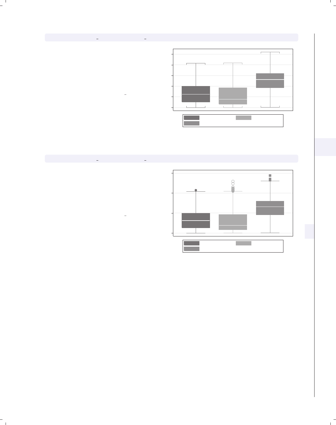
i
i
i
i
i
i
i
i
5.7 Graphing by groups 189
graph box prev exp tenure ttl exp, nooutsides capsize(5)
The capsize() option allows you to
specify the size of the caps (if any) on
the adjacent line. The default value is
0, meaning that no cap is displayed.
Here, we add a small cap to the
adjacent line.
Uses nlsw.dta & scheme vg s1m
0 5 10 15 20 25
excludes outside values
Prev. work exper. Curr. work exper.
Tot. work exper.
graph box prev exp tenure ttl exp, marker(2, msymbol(Oh) msize(vlarge))
The marker() option allows you to
control the markers used to display the
outside values. You can control this
separately for each y-variable. Here, we
make the outside value for tenure
display as large, hollow circles.
Uses nlsw.dta & scheme vg s1m
0 10 20 30
Prev. work exper. Curr. work exper.
Tot. work exper.
5.7 Graphing by groups
This section discusses the use of the by() option in combination with graph box.Nor-
mally, you would use the over() option instead of the by() option, but in some cases the
by() option is either necessary or more advantageous. For example, a by() option is useful
if you exceed the maximum number of over() options (three if you have a single y-variable
or two if you have multiple y-variables). In such cases, the by() option allows you to break
your data down by additional categorical variables. Also, by() gives you more flexibility
in the placement of the separate panels. For more information about the by() option, see
Options : By (272); for more information about the over() option, see Box : Yvars and over
(157).
Introduction Twoway Matrix Bar Box Dot Pie Options Standard options Styles Appendix
Yvars and over Over options Cat axis Legend Y-axis Boxlook options By
The electronic form of this book is solely for direct use at UCLA and only by faculty, students, and staff of UCLA.
All rights reserved on the copyright page apply to this document and specifically neither the electronic nor
published form of the book may be distributed or reproduced, either electronically or in printed form.
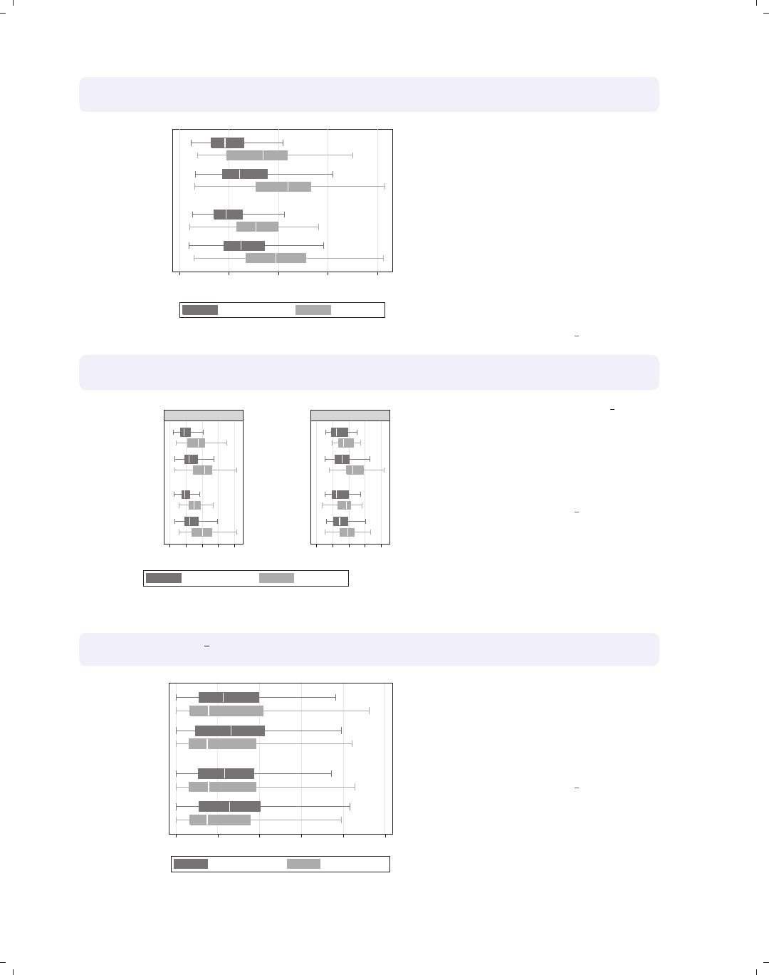
i
i
i
i
i
i
i
i
190 Chapter 5. Box plots
graph hbox wage, nooutsides note("")
over(collgrad) over(urban2) over(married)
0 5 10 15 20
hourly wage
married
single
Metro
Rural
Metro
Rural
not college grad college grad
Consider this box graph, which breaks
wages down by three categorical
variables. If we wanted to further break
this down by another categorical
variable, we could not use another
over() option since we can have a
maximum of three over() options with
a single y-variable. We use the
nooutsides option to suppress the
display of outside values for this graph
and the rest of the graphs in this
section.
Uses nlsw.dta & scheme vg s1m
graph hbox wage, nooutsides note("")
over(collgrad) over(urban2) over(married) by(union)
0 5 10 15 20 0 5 10 15 20
married
single
married
single
Metro
Rural
Metro
Rural
Metro
Rural
Metro
Rural
nonunion union
not college grad college grad
hourly wage
Graphs by union worker
If we want to further break prev exp
down by union, we can use the
by(union) option to do this. We also
add the note("") option to suppress
the note saying that the outside values
have been omitted.
Uses nlsw.dta & scheme vg s1m
graph hbox prev exp tenure, nooutsides note("")
over(urban2) over(married)
0 5 10 15 20 25
married
single
Metro
Rural
Metro
Rural
Prev. work exper. Curr. work exper.
Consider this box graph with multiple
y-variables breaking them down by two
categorical variables using two over()
options. When you have multiple
y-variables, you can only have a
maximum of two over() options.
Uses nlsw.dta & scheme vg s1m
The electronic form of this book is solely for direct use at UCLA and only by faculty, students, and staff of UCLA.
All rights reserved on the copyright page apply to this document and specifically neither the electronic nor
published form of the book may be distributed or reproduced, either electronically or in printed form.
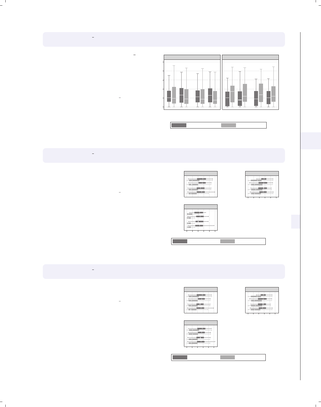
i
i
i
i
i
i
i
i
5.7 Graphing by groups 191
graph box prev exp tenure, nooutsides note("")
over(urban2) over(married) by(union)
If we want to further break prev exp
down by another categorical variable,
say union,wecanusetheby(union)
option. We can include multiple
variables within by(), although this can
make some very small graphs.
Uses nlsw.dta & scheme vg s1m
0 5 10 15 20 25
single married single married
Rural Metro Rural Metro Rural Metro Rural Metro
nonunion union
Prev. work exper. Curr. work exper.
Graphs by union worker
graph hbox ttl exp tenure, nooutsides note("")
over(urban2) over(married) by(union, missing)
We can use the missing option to
include a panel for the missing values of
union.
Uses nlsw.dta & scheme vg s1m
0 5 10 15 20 25
0 5 10 15 20 25
married
single
married
single
married
single
Metro
Rural
Metro
Rural
Metro
Rural
Metro
Rural
Metro
Rural
Metro
Rural
nonunion union
(missing)
Tot. work exper. Curr. work exper.
Graphs by union worker
graph hbox ttl exp tenure, nooutsides note("")
over(urban2) over(married) by(union, total)
We can add the total option to include
a panel for all observations.
Uses nlsw.dta & scheme vg s1m
0 5 10 15 20 25
0 5 10 15 20 25
married
single
married
single
married
single
Metro
Rural
Metro
Rural
Metro
Rural
Metro
Rural
Metro
Rural
Metro
Rural
nonunion union
Total
Tot. work exper. Curr. work exper.
Graphs by union worker
Introduction Twoway Matrix Bar Box Dot Pie Options Standard options Styles Appendix
Yvars and over Over options Cat axis Legend Y-axis Boxlook options By
The electronic form of this book is solely for direct use at UCLA and only by faculty, students, and staff of UCLA.
All rights reserved on the copyright page apply to this document and specifically neither the electronic nor
published form of the book may be distributed or reproduced, either electronically or in printed form.

i
i
i
i
i
i
i
i
192 Chapter 5. Box plots
graph hbox ttl exp tenure, nooutsides note("")
over(urban2) over(married) by(union, total row(1))
0510152025 0510152025 0510152025
married
single
married
single
married
single
Metro
Rural
Metro
Rural
Metro
Rural
Metro
Rural
Metro
Rural
Metro
Rural
nonunion union Total
Tot. work exper. Curr. work exper.
Graphs by union worker
Switching to a vertical box chart, we
can use the rows(1) option to show the
multiple graphs in one row.
Uses nlsw.dta & scheme vg s1m
graph hbox ttl exp tenure, nooutsides note("")
over(urban2) over(married) by(union, cols(1))
0 5 10 15 20 25
married
single
married
single
Metro
Rural
Metro
Rural
Metro
Rural
Metro
Rural
nonunion
union
Tot. work exper. Curr. work exper.
Graphs by union worker
Here, we flip the graph back to a
horizontal box chart and use the
cols(1) option to show both graphs in
one column.
Uses nlsw.dta & scheme vg s1m
graph hbox ttl exp tenure, nooutsides note("")
over(urban2) over(married) by(union, cols(1) legend(position(9)))
legend(cols(1) stack)
0 5 10 15 20 25
married
single
married
single
Metro
Rural
Metro
Rural
Metro
Rural
Metro
Rural
nonunion
union
Tot. work exper.
Curr. work exper.
Graphs by union worker
To make the last graph more readable,
we can add the legend(pos(9)) within
the by() option to put the legend at 9
o’clock and legend(cols(1) stack) to
make the legend one stacked column.
Adding note("") suppresses the note
about outside values being omitted.
Uses nlsw.dta & scheme vg s1m
The electronic form of this book is solely for direct use at UCLA and only by faculty, students, and staff of UCLA.
All rights reserved on the copyright page apply to this document and specifically neither the electronic nor
published form of the book may be distributed or reproduced, either electronically or in printed form.
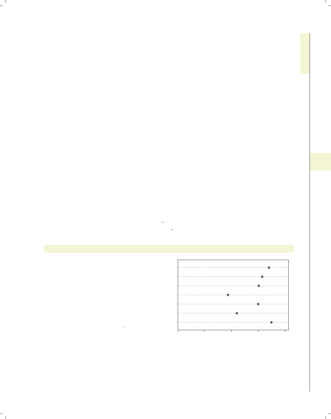
i
i
i
i
i
i
i
i
6 Dot plots
This chapter discusses the use of dot plots in Stata. We start by showing how you can
specify multiple y-variables to display plots for multiple variables and how you can use the
over() option to break dot plots down by categorical variables. Then, we discuss over()
options that can be used to customize the display of these categorical variables, followed by
options concerning the display of display of categorical axes. Next, we cover options that
control legends, followed by options that control the y-axis. Finally, we discuss options that
control the look of the lines and dots that form the dot plot and, lastly, the by() option.
6.1 Specifying variables and groups, yvars and over
This section introduces the use of dot plots. It shows how you can use the over()
option for displaying dot plots by one or more grouping variables. It then shows how you
can specify one or more y-variables in a plot and control the summary statistic used for
collapsing the y-variable(s). See the group options table in [G]graph dot for more details.
The graphs in this section begin using the vg s1c scheme.
graph dot tenure, over(occ7)
Here, we use the over() option to show
the average current work experience
broken down by occupation. By
default, the y-variable (tenure)is
placed on the bottom axis and is
considered to be the y-axis. Likewise,
the levels of occ7 are placed on the left
axis and are considered to form the
x-axis, or categorical axis.
Uses nlsw.dta & scheme vg s1c
0 2 4 6 8
mean of tenure
Other
Labor
Operat.
Cler.
Sales
Mgmt
Prof
Introduction Twoway Matrix Bar Box Dot Pie Options Standard options Styles Appendix
Yvars and over Over options Cat axis Legend Y-axis Dotlook options By
193
The electronic form of this book is solely for direct use at UCLA and only by faculty, students, and staff of UCLA.
All rights reserved on the copyright page apply to this document and specifically neither the electronic nor
published form of the book may be distributed or reproduced, either electronically or in printed form.

i
i
i
i
i
i
i
i
194 Chapter 6. Dot plots
graph dot tenure, over(occ7) over(collgrad)
0 2 4 6 8
mean of tenure
college grad
not college grad
Other
Labor
Operat.
Cler.
Sales
Mgmt
Prof
Other
Labor
Operat.
Cler.
Sales
Mgmt
Prof
Here, we use a second over() option to
show the mean of work experience
broken down by occupation and
whether one graduated college.
Uses nlsw.dta & scheme vg s1c
graph dot tenure, over(occ7) over(collgrad) over(married)
0 2 4 6 8 10
mean of tenure
married
single
college grad
not college grad
college grad
not college grad
Prof Mgmt
Sales Cler.
Operat. Labor
Other
We can add a third over() option, in
this case further breaking the tenure
down by whether one is married. Note
that the first over() variable (occ7)is
now treated as multiple y-variables.
When you use three over() options,
the first variable is then treated as
multiple y-variables, as though you had
specified the asyvars option. This
graph can be difficult to read with occ7
forming the multiple y-variables.
Uses nlsw.dta & scheme vg s1c
graph dot tenure, over(married) over(occ7) over(collgrad)
0 2 4 6 8 10
mean of tenure
college grad
not college grad
Other
Labor
Operat.
Cler.
Sales
Mgmt
Prof
Other
Labor
Operat.
Cler.
Sales
Mgmt
Prof
single married
This graph shows the same data as the
last one, except we have switched the
order of the over() options, making
over(married) come first and thus
forming the multiple y-variables. This
might be easier to read than the
previous graph.
Uses nlsw.dta & scheme vg s1c
The electronic form of this book is solely for direct use at UCLA and only by faculty, students, and staff of UCLA.
All rights reserved on the copyright page apply to this document and specifically neither the electronic nor
published form of the book may be distributed or reproduced, either electronically or in printed form.
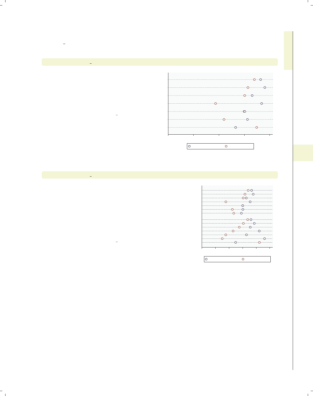
i
i
i
i
i
i
i
i
6.1 Specifying variables and groups, yvars and over 195
Let’s now consider examples with multiple y-variables. These examples are shown using
the vg outc scheme.
graph dot prev exp tenure, over(occ7)
This graph shows the average previous
experience and average current tenure
broken down by occupation. While you
do not need to use the over() option,
omitting it may make a fairly boring
graph.
Uses nlsw.dta & scheme vg outc
0 2 4 6 8
Other
Labor
Operat.
Cler.
Sales
Mgmt
Prof
mean of prev_exp mean of tenure
graph dot prev exp tenure, over(occ7) over(collgrad)
This graph adds whether one is a
college graduate as an additional
grouping level. Because the command
has multiple y-variables, we cannot
include another over() option since
dot plots support three levels of nesting
and the multiple y-variables account for
a level.
Uses nlsw.dta & scheme vg outc
0 2 4 6 8 10
college grad
not college grad
Other
Labor
Operat.
Cler.
Sales
Mgmt
Prof
Other
Labor
Operat.
Cler.
Sales
Mgmt
Prof
mean of prev_exp mean of tenure
Introduction Twoway Matrix Bar Box Dot Pie Options Standard options Styles Appendix
Yvars and over Over options Cat axis Legend Y-axis Dotlook options By
The electronic form of this book is solely for direct use at UCLA and only by faculty, students, and staff of UCLA.
All rights reserved on the copyright page apply to this document and specifically neither the electronic nor
published form of the book may be distributed or reproduced, either electronically or in printed form.
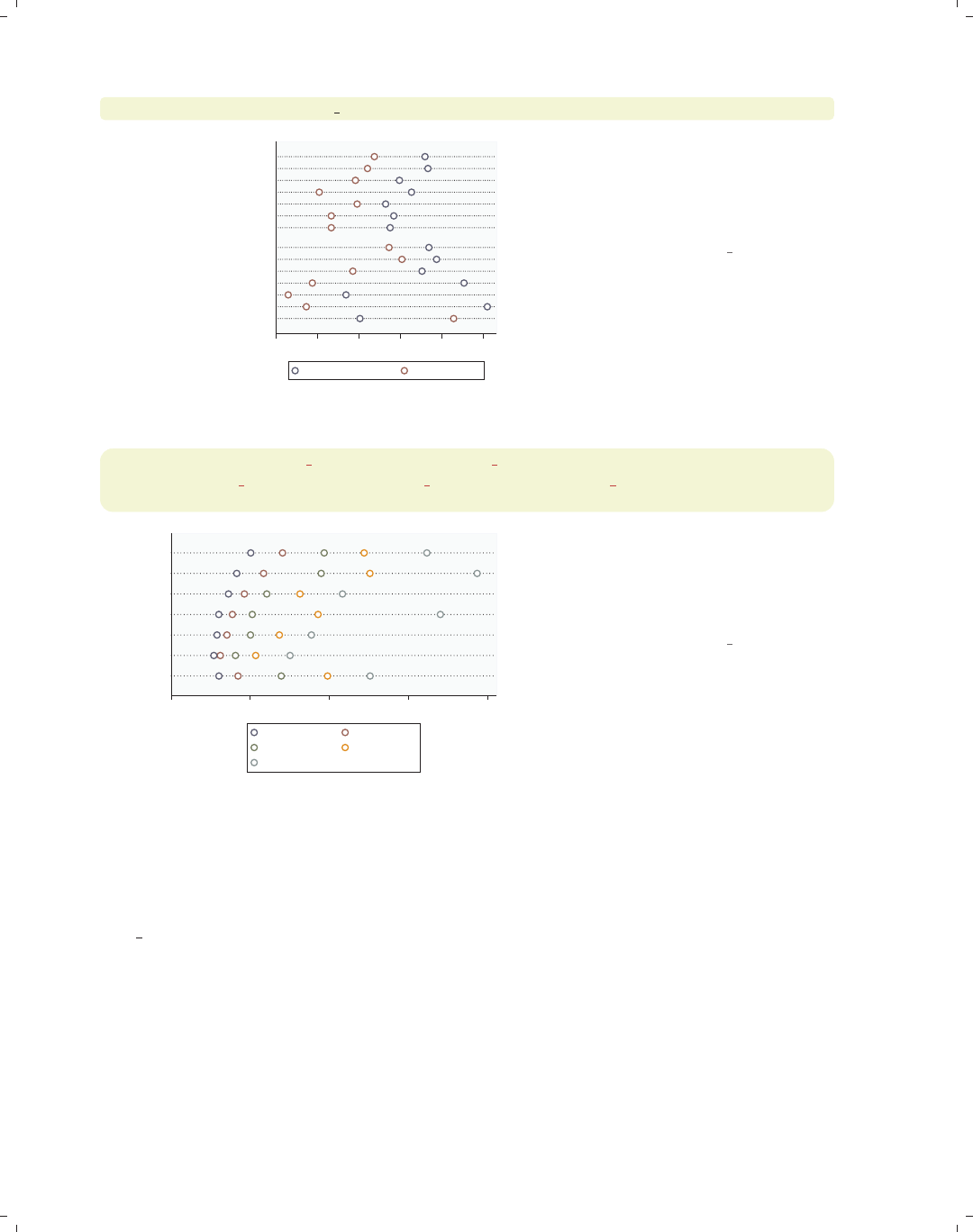
i
i
i
i
i
i
i
i
196 Chapter 6. Dot plots
graph dot (median) prev exp tenure, over(occ7) over(collgrad)
0 2 4 6 8 10
college grad
not college grad
Other
Labor
Operat.
Cler.
Sales
Mgmt
Prof
Other
Labor
Operat.
Cler.
Sales
Mgmt
Prof
p 50 of prev_exp p 50 of tenure
So far, all the examples we have seen
have graphed the mean of y-variable(s).
Here, we preface the y-variables with
(median), plotting the median for each
y-variable.
Uses nlsw.dta & scheme vg outc
graph dot (p10) wage p10=wage (p25) wage p25=wage
(p50) wage p50=wage (p75) wage p75=wage (p90) wage p90=wage,
over(occ7)
0 5 10 15 20
Other
Labor
Operat.
Cler.
Sales
Mgmt
Prof
p 10 of wage p 25 of wage
p 50 of wage p 75 of wage
p 90 of wage
You can request different statistics for
the same variable, such as in this
example, which shows the 10th, 25th,
50th, 75th, and 90th percentiles of
wages broken down by occupation.
Uses nlsw.dta & scheme vg outc
Now, let’s consider options that can be used in combination with the over() option to
customize the behavior of the graphs. We show how you can treat the levels of the first
over() option as though they were multiple y-variables. You can also request that missing
values for the levels of the over() variables be displayed, and you can suppress empty cat-
egories when multiple over() options are used. These examples are shown below using the
vg s2m scheme.
The electronic form of this book is solely for direct use at UCLA and only by faculty, students, and staff of UCLA.
All rights reserved on the copyright page apply to this document and specifically neither the electronic nor
published form of the book may be distributed or reproduced, either electronically or in printed form.
i
i
i
i
i
i
i
i
6.1 Specifying variables and groups, yvars and over 197
graph dot tenure, over(collgrad) over(occ7)
Consider this graph, which shows the
average current work experience broken
down by whether one is a college
graduate and by occupation.
Uses nlsw.dta & scheme vg s2m
0 2 4 6 8
mean of tenure
Other
Labor
Operat.
Cler.
Sales
Mgmt
Prof
college grad
not college grad
college grad
not college grad
college grad
not college grad
college grad
not college grad
college grad
not college grad
college grad
not college grad
college grad
not college grad
graph dot tenure, over(collgrad) over(occ7) asyvars
If we add the asyvars option, the first
over() variable (collgrad) is graphed
as if there were two y-variables. The
two levels of collgrad are shown as
different markers on the same line, and
they are labeled using the legend.
Uses nlsw.dta & scheme vg s2m
0 2 4 6 8
mean of tenure
Other
Labor
Operat.
Cler.
Sales
Mgmt
Prof
not college grad college grad
graph dot tenure, over(occ5) over(union) missing
Consider this graph in which we use the
over() option to show tenure broken
down by occ5 and union. By including
the missing option, we then see the
category for those who are missing on
the union variable, shown as the third
group labeled with a dot. See
Dot : Cat axis (202) for examples
showing how you could change the label
(.) to something more meaningful, e.g.,
“Missing”.
Uses nlsw.dta & scheme vg s2m
0 2 4 6 8 10
mean of tenure
.
union
nonunion
Other
Labor/Ops
Clerical
Sales
Prof/Mgmt
Other
Labor/Ops
Clerical
Sales
Prof/Mgmt
Other
Labor/Ops
Clerical
Sales
Prof/Mgmt
Introduction Twoway Matrix Bar Box Dot Pie Options Standard options Styles Appendix
Yvars and over Over options Cat axis Legend Y-axis Dotlook options By
The electronic form of this book is solely for direct use at UCLA and only by faculty, students, and staff of UCLA.
All rights reserved on the copyright page apply to this document and specifically neither the electronic nor
published form of the book may be distributed or reproduced, either electronically or in printed form.
i
i
i
i
i
i
i
i
198 Chapter 6. Dot plots
graph dot tenure, over(grade) over(collgrad)
0 2 4 6 8
mean of tenure
college grad
not college grad
18
17
16
15
14
13
12
11
10
9
8
7
6
5
4
18
17
16
15
14
13
12
11
10
9
8
7
6
5
4Consider this dot plot, which breaks
tenure down by two variables: the last
grade that one completed and whether
one is a college graduate. By default,
Stata shows all possible combinations
for these two variables. In most cases,
all combinations are possible, but not
in this case, and including them has
caused the labels for grade to overlap.
Uses nlsw.dta & scheme vg s2m
graph dot tenure, over(grade) over(collgrad) nofill
0 2 4 6 8
mean of tenure
college grad
not college grad
18
17
16
15
14
13
15
14
13
12
11
10
9
8
7
6
5
4
If you only want to display only the
combinations of the over() variables
that exist in the data, you can use the
nofill option.
Uses nlsw.dta & scheme vg s2m
6.2 Options for groups, over options
This section considers some of the options that can be used with the over() and
yvaroptions() options for customizing the display of the markers. We will focus on con-
trolling the spacing between the markers and the order in which the markers are displayed.
Other options that control the display of the x-axis (such as the labels) are covered in
Dot : Cat axis (202). For more information on the over() options covered in this section, see
the over subopts table in [G]graph dot. We first consider options that control the spacing
among the markers and then options that change the order in which the markers are sorted.
These examples begin with the vg blue scheme.
The electronic form of this book is solely for direct use at UCLA and only by faculty, students, and staff of UCLA.
All rights reserved on the copyright page apply to this document and specifically neither the electronic nor
published form of the book may be distributed or reproduced, either electronically or in printed form.
i
i
i
i
i
i
i
i
6.2 Options for groups, over options 199
graph dot tenure, over(occ5) over(collgrad)
Consider this graph in which we show a
dot plot of tenure broken down by
occ5 and collgrad.
Uses nlsw.dta & scheme vg blue
0 2 4 6 8
mean of tenure
college grad
not college grad
Other
Labor/Ops
Clerical
Sales
Prof/Mgmt
Other
Labor/Ops
Clerical
Sales
Prof/Mgmt
graph dot tenure, over(occ7) over(collgrad, gap(*5))
Suppose that we wanted to make the
gap between the levels of collgrad
larger. Here, we use the gap(*5) option
to make this gap five times as large as
it normally would be.
Uses nlsw.dta & scheme vg blue
0 2 4 6 8
mean of tenure
college grad
not college grad
Other
Labor
Operat.
Cler.
Sales
Mgmt
Prof
Other
Labor
Operat.
Cler.
Sales
Mgmt
Prof
graph dot tenure, over(occ7)
Consider this graph showing tenure
broken down by the seven levels of
occupation. The markers are ordered
by levels of occ7, going from 1 to 7.
Uses nlsw.dta & scheme vg blue
0 2 4 6 8
mean of tenure
Other
Labor
Operat.
Cler.
Sales
Mgmt
Prof
Introduction Twoway Matrix Bar Box Dot Pie Options Standard options Styles Appendix
Yvars and over Over options Cat axis Legend Y-axis Dotlook options By
The electronic form of this book is solely for direct use at UCLA and only by faculty, students, and staff of UCLA.
All rights reserved on the copyright page apply to this document and specifically neither the electronic nor
published form of the book may be distributed or reproduced, either electronically or in printed form.
i
i
i
i
i
i
i
i
200 Chapter 6. Dot plots
graph dot tenure, over(occ7, descending)
0 2 4 6 8
mean of tenure
Prof
Mgmt
Sales
Cler.
Operat.
Labor
Other
The descending option switches the
order of the markers. They still are
ordered according to the seven levels of
occupation, but the markers are
ordered from 7 to 1.
Uses nlsw.dta & scheme vg blue
graph dot tenure, over(occ7, sort(occ7alpha))
0 2 4 6 8
mean of tenure
Other
Sales
Prof
Operat.
Mgmt
Labor
Cler.
We might want to put these markers in
alphabetical order (but with Other
appearing last). We can do this by
recoding occ7 into a new variable (say
occ7alpha), such that, as occ7alpha
goes from 1 to 7, the occupations are
alphabetical. We recoded occ7 with
these assignments: 4 = 1, 6 = 2, 2 = 3,
5=4,1=5,3=6,and7=7;see
[R]recode. Then, the
sort(occ7alpha) option alphabetizes
the markers (but with Other still
appearing last).
Uses nlsw.dta & scheme vg blue
graph dot tenure, over(occ7, sort(1))
0 2 4 6 8
mean of tenure
Other
Prof
Mgmt
Sales
Operat.
Labor
Cler.
Here, we sort the variables based on the
mean of tenure, yielding markers with
means in ascending order. The sort(1)
option sorts the markers according to
the mean of the first y-variable, the
mean of tenure. In this case, there is
only one variable.
Uses nlsw.dta & scheme vg blue
The electronic form of this book is solely for direct use at UCLA and only by faculty, students, and staff of UCLA.
All rights reserved on the copyright page apply to this document and specifically neither the electronic nor
published form of the book may be distributed or reproduced, either electronically or in printed form.
i
i
i
i
i
i
i
i
6.2 Options for groups, over options 201
graph dot tenure, over(occ7, sort(1) descending)
Adding the descending option yields
markers in descending order, going
from highest mean tenure to lowest
mean tenure.
Uses nlsw.dta & scheme vg blue
0 2 4 6 8
mean of tenure
Cler.
Labor
Operat.
Sales
Mgmt
Prof
Other
graph dot tenure prev exp, over(occ7, sort(2))
Adding a second y-variable and
changing sort(1) to sort(2) sorts the
markers according to the second
y-variable, the mean of prev exp.
Uses nlsw.dta & scheme vg blue
0 2 4 6 8
Mgmt
Cler.
Prof
Sales
Labor
Operat.
Other
mean of tenure mean of prev_exp
graph dot tenure prev exp, over(occ7, sort(1)) over(collgrad)
We can use the sort() option when
there are additional over() variables.
Here, the markers are ordered
according to the mean of tenure within
each level of collgrad.
Uses nlsw.dta & scheme vg blue
0 2 4 6 8 10
college grad
not college grad
Other
Prof
Mgmt
Sales
Cler.
Operat.
Labor
Prof
Mgmt
Sales
Operat.
Other
Labor
Cler.
mean of tenure mean of prev_exp
Introduction Twoway Matrix Bar Box Dot Pie Options Standard options Styles Appendix
Yvars and over Over options Cat axis Legend Y-axis Dotlook options By
The electronic form of this book is solely for direct use at UCLA and only by faculty, students, and staff of UCLA.
All rights reserved on the copyright page apply to this document and specifically neither the electronic nor
published form of the book may be distributed or reproduced, either electronically or in printed form.
i
i
i
i
i
i
i
i
202 Chapter 6. Dot plots
graph dot tenure prev exp, over(occ7, sort(1)) over(collgrad, descending)
0 2 4 6 8 10
not college grad
college grad
Prof
Mgmt
Sales
Operat.
Other
Labor
Cler.
Other
Prof
Mgmt
Sales
Cler.
Operat.
Labor
mean of tenure mean of prev_exp
We add the descending option to the
second over() option, and the levels of
collgrad are now shown with college
graduates appearing first.
Uses nlsw.dta & scheme vg blue
6.3 Controlling the categorical axis
This section describes ways that you can label the categorical axis in dot plots. Dot plots,
like bar and box plots, are different from other plots since their x-axis is formed by categori-
cal variables. (Remember that Stata calls the axis with the categorical variable(s) the x-axis,
even though it may be placed on the left axis.) This section describes options you can use
to customize the categorical axis. For more details on this, see [G]cat axis label options
and [G]cat axis line options. We will start by showing how you can change the labels
used for the categorical axis. These examples use the vg past scheme.
graph dot tenure, over(occ7) over(south)
0 2 4 6 8
mean of tenure
1
0
Other
Labor
Operat.
Cler.
Sales
Mgmt
Prof
Other
Labor
Operat.
Cler.
Sales
Mgmt
Prof
This is an example of a dot plot with
two over() variables graphing the
average tenure broken down by
occupation and whether one lives in the
South. The variable south is a dummy
variable that does not have any value
labels, so the x-axis is not labeled very
well.
Uses nlsw.dta & scheme vg past
The electronic form of this book is solely for direct use at UCLA and only by faculty, students, and staff of UCLA.
All rights reserved on the copyright page apply to this document and specifically neither the electronic nor
published form of the book may be distributed or reproduced, either electronically or in printed form.

i
i
i
i
i
i
i
i
6.3 Controlling the categorical axis 203
graph dot wage, over(occ7) over(south, relabel(1 "N & W" 2 "South"))
We can use the relabel() option to
change the labels displayed for the
levels of south, giving the x-axis more
meaningful labels. Note that we wrote
relabel(1 "N & W"),notrelabel(0
"N & W"), since these numbers do not
represent the actual levels of south but
the ordinal position of the levels, i.e.,
first and second.
Uses nlsw.dta & scheme vg past
0 5 10 15
mean of wage
South
N & W
Other
Labor
Operat.
Cler.
Sales
Mgmt
Prof
Other
Labor
Operat.
Cler.
Sales
Mgmt
Prof
graph dot prev exp tenure ttl exp, over(occ5) ascategory
This graph dot command has multiple
y-variables but uses the ascategory
option to plot the different y-variables
as if they were categorical variables.
The dots for the different y-variables
are plotted on different lines using the
same symbol, and each line is labeled
on the x-axis rather than using a
legend. The default labels on the x-axis
are not bad, but we might want to
change them.
Uses nlsw.dta & scheme vg past 0 5 10 15
Other
Labor/Ops
Clerical
Sales
Prof/Mgmt
mean of ttl_exp
mean of tenure
mean of prev_exp
mean of ttl_exp
mean of tenure
mean of prev_exp
mean of ttl_exp
mean of tenure
mean of prev_exp
mean of ttl_exp
mean of tenure
mean of prev_exp
mean of ttl_exp
mean of tenure
mean of prev_exp
graph dot prev exp tenure ttl exp, over(occ5) ascategory
yvaroptions(relabel(1 "Previous" 2 "Current" 3 "Total"))
If we had an over() option, we could
use the relabel() option to change the
labels on the x-axis. But since we have
multiple y-variables that we have
treated as categories, we then use the
yvaroptions(relabel()) option to
modify the labels on the x-axis.
Uses nlsw.dta & scheme vg past
0 5 10 15
Other
Labor/Ops
Clerical
Sales
Prof/Mgmt
Total
Current
Previous
Total
Current
Previous
Total
Current
Previous
Total
Current
Previous
Total
Current
Previous
Introduction Twoway Matrix Bar Box Dot Pie Options Standard options Styles Appendix
Yvars and over Over options Cat axis Legend Y-axis Dotlook options By
The electronic form of this book is solely for direct use at UCLA and only by faculty, students, and staff of UCLA.
All rights reserved on the copyright page apply to this document and specifically neither the electronic nor
published form of the book may be distributed or reproduced, either electronically or in printed form.

i
i
i
i
i
i
i
i
204 Chapter 6. Dot plots
graph dot prev exp tenure ttl exp, ascategory
over(south, relabel(1 "N & W" 2 "South"))
yvaroptions(relabel(1 "Previous" 2 "Current" 3 "Total"))
0 5 10 15
South
N & W
Total
Current
Previous
Total
Current
Previous
In this example, we have multiple
y-variables that are converted into
categorical variables via the
ascategory option, and an over()
variable, as well. The relabel() option
within the over() option changes the
labels for south, and the relabel()
option within yvaroptions() changes
the labels for the multiple y-variables.
Uses nlsw.dta & scheme vg past
graph dot prev exp tenure ttl exp, ascategory xalternate
over(south, relabel(1 "N & W" 2 "South"))
yvaroptions(relabel(1 "Previous" 2 "Current" 3 "Total"))
0 5 10 15
South
N & W
Total
Current
Previous
Total
Current
Previous
We add the xalternate option, which
moves the labels for the x-axis to the
opposite side, in this case, from the left
to the right. We could also use the
yalternate option to move the y-axis
to its opposite side.
Uses nlsw.dta & scheme vg past
graph dot wage, over(occ7)
l1title("Occupations recoded" "into seven categories")
0 2 4 6 8 10
mean of wage
Other
Labor
Operat.
Cler.
Sales
Mgmt
Prof
Occupations recoded
into seven categories
In this example, the categorical axis
represents the occupation after recoding
it into seven categories. We can use the
l1title() option to add a title to the
left of the graph labeling this axis. Note
that we broke the title into two quoted
strings that appear on the graph as two
lines. We could also add a second title
to the left with l2title();seeStandard
options : Titles (313) for more details.
Uses nlsw.dta & scheme vg past
The electronic form of this book is solely for direct use at UCLA and only by faculty, students, and staff of UCLA.
All rights reserved on the copyright page apply to this document and specifically neither the electronic nor
published form of the book may be distributed or reproduced, either electronically or in printed form.

i
i
i
i
i
i
i
i
6.4 Controlling legends 205
6.4 Controlling legends
This section discusses the use of legends for dot plots, emphasizing the features that are
unique to dot plots. The section Options : Legend (287) goes into great detail about legends,
as does [G]legend option. Legends can be used for multiple y-variables or when the first
over() variable is treated as a y-variable via the asyvars option. See Dot : Yvars and over
(193) for more information about using multiple y-variables and more examples of treating
the first over() variable as a y-variable. These following examples use the vg rose scheme.
graph dot prev exp tenure ttl exp, over(occ7)
Consider this dot plot of three different
variables. These variables are shown
with different markers, and a legend is
used to identify the variables.
Uses nlsw.dta & scheme vg rose
0 5 10 15
Other
Labor
Operat.
Cler.
Sales
Mgmt
Prof
mean of prev_exp mean of tenure
mean of ttl_exp
graph dot wage, over(collgrad) over(occ7) asyvars
This is another example of how a
legend can arise in a Stata dot plot if
you use the over() variable with the
asyvars option. Stata treats the levels
of the over() variable as if they were
really multiple y-variables.
Uses nlsw.dta & scheme vg rose
0 5 10 15
mean of wage
Other
Labor
Operat.
Cler.
Sales
Mgmt
Prof
not college grad college grad
Introduction Twoway Matrix Bar Box Dot Pie Options Standard options Styles Appendix
Yvars and over Over options Cat axis Legend Y-axis Dotlook options By
The electronic form of this book is solely for direct use at UCLA and only by faculty, students, and staff of UCLA.
All rights reserved on the copyright page apply to this document and specifically neither the electronic nor
published form of the book may be distributed or reproduced, either electronically or in printed form.
i
i
i
i
i
i
i
i
206 Chapter 6. Dot plots
Unless otherwise mentioned, the legend options described below work the same whether
the legend was derived from multiple y-variables or from an over() variable that was com-
bined with the asyvars option.
graph dot prev exp tenure ttl exp, over(occ7) nolabel
0 5 10 15
Other
Labor
Operat.
Cler.
Sales
Mgmt
Prof
prev_exp tenure
ttl_exp
The nolabel option only works when
you have multiple y-variables. When
this option is used, the variable names
(not the variable labels) are used in the
legend. For example, instead of showing
the variable label Prev. work exper.,
this option shows the variable name
prev exp.
Uses nlsw.dta & scheme vg rose
graph dot prev exp tenure ttl exp, over(occ7)
legend(label(1 "Previous") label(2 "Current") label(3 "Total")
title("Work Experience"))
0 5 10 15
Other
Labor
Operat.
Cler.
Sales
Mgmt
Prof
Previous Current
Total
Work Experience
We use the legend(label()) option to
change the labels for the variables in
the legend and the title() option to
add a title to the legend.
Uses nlsw.dta & scheme vg rose
The electronic form of this book is solely for direct use at UCLA and only by faculty, students, and staff of UCLA.
All rights reserved on the copyright page apply to this document and specifically neither the electronic nor
published form of the book may be distributed or reproduced, either electronically or in printed form.
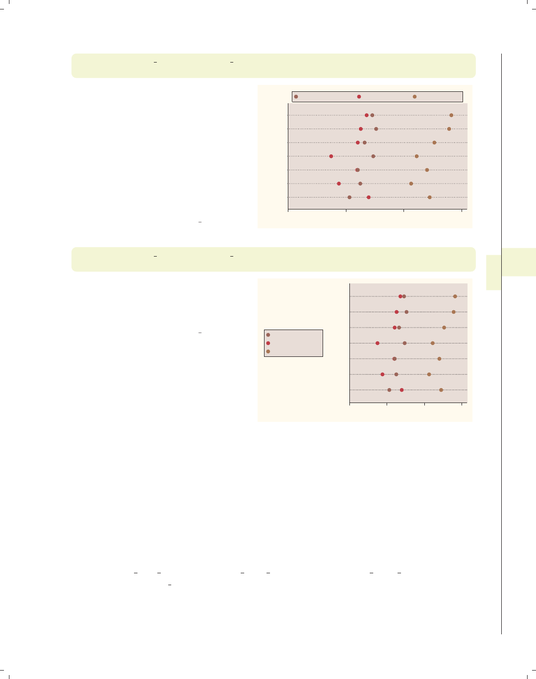
i
i
i
i
i
i
i
i
6.5 Controlling the y-axis 207
graph dot prev exp tenure ttl exp, over(occ7)
legend(position(12) rows(1))
We can put the legend at the top of the
graph with the legend(position(12))
option. The values you supply for
position() are similar to the numbers
on a clock face, where 12 o’clock is the
top, 6 o’clock is the bottom, and 0
represents the center of the clock face;
see Styles : Clockpos (330) for more
details. We also add the rows(1)
option to make the legend display as
one row.
Uses nlsw.dta & scheme vg rose 0 5 10 15
Other
Labor
Operat.
Cler.
Sales
Mgmt
Prof
mean of prev_exp mean of tenure mean of ttl_exp
graph dot prev exp tenure ttl exp, over(occ7)
legend(cols(1) position(9))
Here, the legend is moved to the left
and displayed in a single column using
the legend(cols(1) position(9))
options.
Uses nlsw.dta & scheme vg rose
0 5 10 15
Other
Labor
Operat.
Cler.
Sales
Mgmt
Prof
mean of prev_exp
mean of tenure
mean of ttl_exp
6.5 Controlling the y-axis
This section describes options to customize the y-axis with dot plots. To be precise,
when Stata refers to the y-axis on a dot plot, it refers to the axis with the continuous vari-
able, which is placed on the bottom (where the x-axis would traditionally be placed). This
section emphasizes the features that are particularly relevant to dot plots. For more details,
see Options : Axis titles (254), Options : Axis labels (256), and Options : Axis scales (265). Also,
see [G]axis title options,[G]axis label options, and [G]axis scale options. These
examples use the vg teal scheme.
Introduction Twoway Matrix Bar Box Dot Pie Options Standard options Styles Appendix
Yvars and over Over options Cat axis Legend Y-axis Dotlook options By
The electronic form of this book is solely for direct use at UCLA and only by faculty, students, and staff of UCLA.
All rights reserved on the copyright page apply to this document and specifically neither the electronic nor
published form of the book may be distributed or reproduced, either electronically or in printed form.
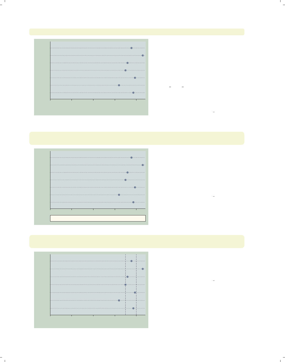
i
i
i
i
i
i
i
i
208 Chapter 6. Dot plots
graph dot hours, over(occ7) ytitle("Hours Worked" "Per Week")
0 10 20 30 40
Hours Worked
Per Week
Other
Labor
Operat.
Cler.
Sales
Mgmt
Prof
Consider this graph showing the mean
hourly wage broken down by
occupation. We use the ytitle()
option to add a title to the y-axis. We
place the title across two lines by using
two separate, quoted strings. See
Options : Axis titles (254) and
[G]axis title options for more details,
but please disregard any references to
xtitle(), since that option is not valid
when using graph dot.
Uses nlsw.dta & scheme vg teal
graph dot hours, over(occ7)
ytitle("Hours Worked" "Per Week", bfcolor(eggshell) box bexpand)
0 10 20 30 40
Hours Worked
Per Week
Other
Labor
Operat.
Cler.
Sales
Mgmt
Prof
Because the title is considered to be a
textbox, you can use textbox options as
illustrated here to control the look of
the title. See Options : Textboxes (303)
for additional examples of how to use
textbox options to control the display
of text.
Uses nlsw.dta & scheme vg teal
graph dot hours, over(occ7)
yline(35 40, lwidth(thin) lcolor(navy) lpattern(dash))
0 10 20 30 40
mean of hours
Other
Labor
Operat.
Cler.
Sales
Mgmt
Prof
This example uses the yline() option
to add a thin, navy, dashed line to the
graph where the hours worked equal 35
and 40.
Uses nlsw.dta & scheme vg teal
The electronic form of this book is solely for direct use at UCLA and only by faculty, students, and staff of UCLA.
All rights reserved on the copyright page apply to this document and specifically neither the electronic nor
published form of the book may be distributed or reproduced, either electronically or in printed form.
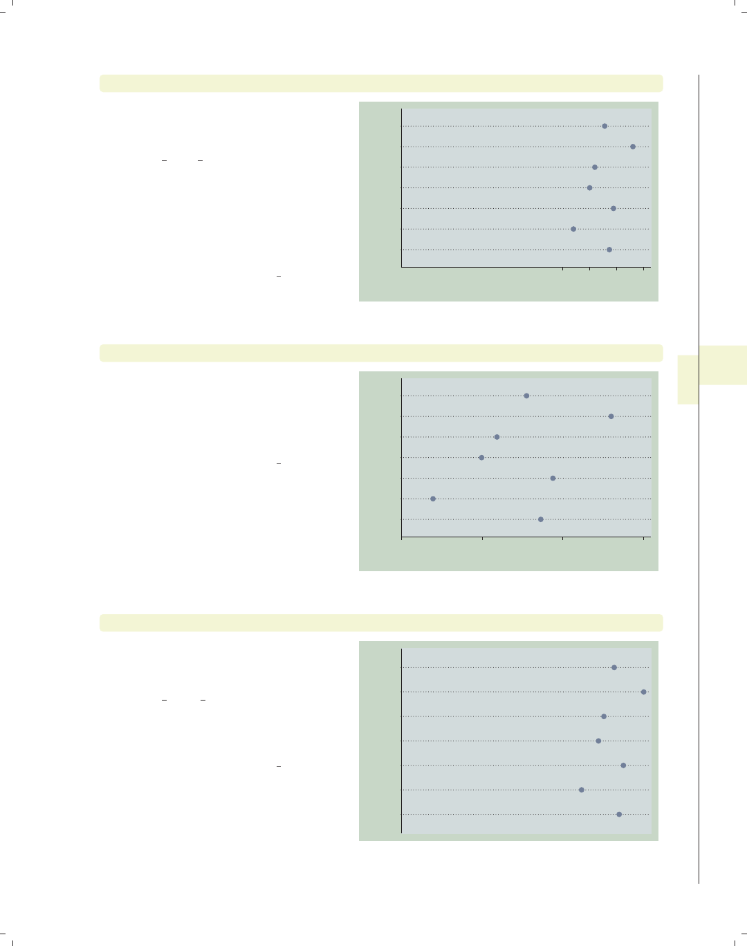
i
i
i
i
i
i
i
i
6.5 Controlling the y-axis 209
graph dot hours, over(occ7) ylabel(30(5)45)
We use the ylabel() option to label
the y-axis from 30 to 45 by increments
of 5. See Options : Axis labels (256) and
[G]axis label options for more
details. Please disregard any references
to xlabel() since that option is not
valid when using graph dot. Note that
the y-axis still begins at 0, but see the
next example for how you can override
this.
Uses nlsw.dta & scheme vg teal 30 35 40 45
mean of hours
Other
Labor
Operat.
Cler.
Sales
Mgmt
Prof
graph dot hours, over(occ7) ylabel(30(5)45) exclude0
When we add the exclude0 option, the
dot plot does not automatically begin
at 0. In this case, it starts at 30 since
that is the value we specified as the
starting point on the ylabel() option.
Uses nlsw.dta & scheme vg teal
30 35 40 45
mean of hours
Other
Labor
Operat.
Cler.
Sales
Mgmt
Prof
graph dot hours, over(occ7) yscale(off)
We can use the yscale(off) option to
turn off the y-axis. See
Options : Axis scales (265) and
[G]axis scale options for more
details. Please disregard any references
to xscale() since that option is not
valid when using graph dot.
Uses nlsw.dta & scheme vg teal
Other
Labor
Operat.
Cler.
Sales
Mgmt
Prof
Introduction Twoway Matrix Bar Box Dot Pie Options Standard options Styles Appendix
Yvars and over Over options Cat axis Legend Y-axis Dotlook options By
The electronic form of this book is solely for direct use at UCLA and only by faculty, students, and staff of UCLA.
All rights reserved on the copyright page apply to this document and specifically neither the electronic nor
published form of the book may be distributed or reproduced, either electronically or in printed form.
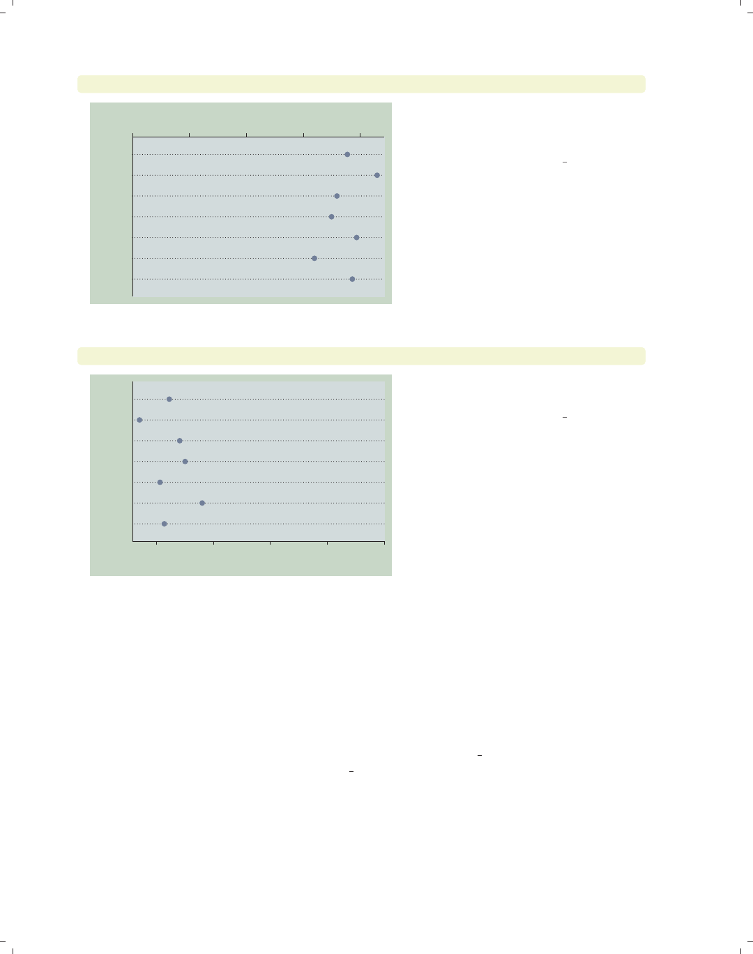
i
i
i
i
i
i
i
i
210 Chapter 6. Dot plots
graph dot hours, over(occ7) yalternate
0 10 20 30 40
mean of hours
Other
Labor
Operat.
Cler.
Sales
Mgmt
Prof
The yalternate option puts the y-axis
on the opposite side, in this case on the
top side of the graph.
Uses nlsw.dta & scheme vg teal
graph dot hours, over(occ7) yreverse
010203040
mean of hours
Other
Labor
Operat.
Cler.
Sales
Mgmt
Prof
You can reverse the direction of the
y-axis with the yreverse option.
Uses nlsw.dta & scheme vg teal
6.6 Changing the look of dot rulers, dotlook options
This section shows how you can control the look of the lines in your dot plots. We
show how you can control the space between the lines, the color of the lines, and other
characteristics of the line. For more information, see the linelook options table in [G]graph
dot. These graphs are shown using the vg s2c scheme.
The electronic form of this book is solely for direct use at UCLA and only by faculty, students, and staff of UCLA.
All rights reserved on the copyright page apply to this document and specifically neither the electronic nor
published form of the book may be distributed or reproduced, either electronically or in printed form.

i
i
i
i
i
i
i
i
6.6 Changing the look of dot rulers, dotlook options 211
graph dot prev exp tenure, over(occ7)
Consider this dot plot showing previous
and current work experience broken
down by occupation. Each dot plot has
a series of small dots that forms a line
on which the symbols are plotted.
Uses nlsw.dta & scheme vg s2c
0 2 4 6 8
Other
Labor
Operat.
Cler.
Sales
Mgmt
Prof
mean of prev_exp mean of tenure
graph dot prev exp tenure, over(occ7)
ndots(50) dots(msymbol(Oh) msize(medium) mcolor(dkgreen))
By default, each line would be
composed of 100 small dots, but here
we use the ndots(50) option to display
50 small dots. Further, using the
dots() option, the small dots are
displayed as medium-sized, dark green,
hollow circles. See Styles : Symbols
(342), Styles : Markersize (340), and
Styles : Colors (328) for more
information.
Uses nlsw.dta & scheme vg s2c 0 2 4 6 8
Other
Labor
Operat.
Cler.
Sales
Mgmt
Prof
mean of prev_exp mean of tenure
graph dot prev exp tenure, over(occ7) linetype(line)
lines(lwidth(thick) lcolor(erose))
Using the linetype(line) option, the
dots are instead displayed as lines.
Further, we use the lines() option to
make the line width thick and the line
color rose. We could also add the
lpattern() option to control the line
pattern. See Styles : Linewidth (337),
Styles : Colors (328), and
Styles : Linepatterns (336) for more
information.
Uses nlsw.dta & scheme vg s2c 0 2 4 6 8
Other
Labor
Operat.
Cler.
Sales
Mgmt
Prof
mean of prev_exp mean of tenure
Introduction Twoway Matrix Bar Box Dot Pie Options Standard options Styles Appendix
Yvars and over Over options Cat axis Legend Y-axis Dotlook options By
The electronic form of this book is solely for direct use at UCLA and only by faculty, students, and staff of UCLA.
All rights reserved on the copyright page apply to this document and specifically neither the electronic nor
published form of the book may be distributed or reproduced, either electronically or in printed form.
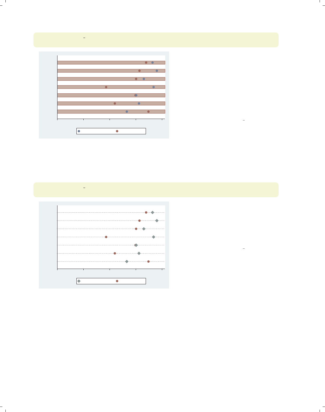
i
i
i
i
i
i
i
i
212 Chapter 6. Dot plots
graph dot prev exp tenure, over(occ7) linetype(rectangle)
rwidth(3) rectangles(fcolor(erose) lcolor(maroon))
0 2 4 6 8
Other
Labor
Operat.
Cler.
Sales
Mgmt
Prof
mean of prev_exp mean of tenure
Here, we change the linetype() to be
a rectangle. The rwidth(3) sets the
rectangle width to be three times its
normal width. In addition, the
rectangle() option is used to
customize it, using the fcolor() (fill
color) and lcolor() (line color)
options to make the rectangle rose on
the inside with a maroon outline.
Uses nlsw.dta & scheme vg s2c
Let’s now look at options that allow us to control the markers and whether the markers
are displayed on the same line.
graph dot prev exp tenure, over(occ7)
marker(1, msymbol(D) mcolor(teal) msize(large))
0 2 4 6 8
Other
Labor
Operat.
Cler.
Sales
Mgmt
Prof
mean of prev_exp mean of tenure
Here, we use the marker() option to
control the marker used for the first
y-variable, making it a large
teal-colored diamond. See
Options : Markers (235) for more details
on how you can control markers.
Uses nlsw.dta & scheme vg s2c
The electronic form of this book is solely for direct use at UCLA and only by faculty, students, and staff of UCLA.
All rights reserved on the copyright page apply to this document and specifically neither the electronic nor
published form of the book may be distributed or reproduced, either electronically or in printed form.
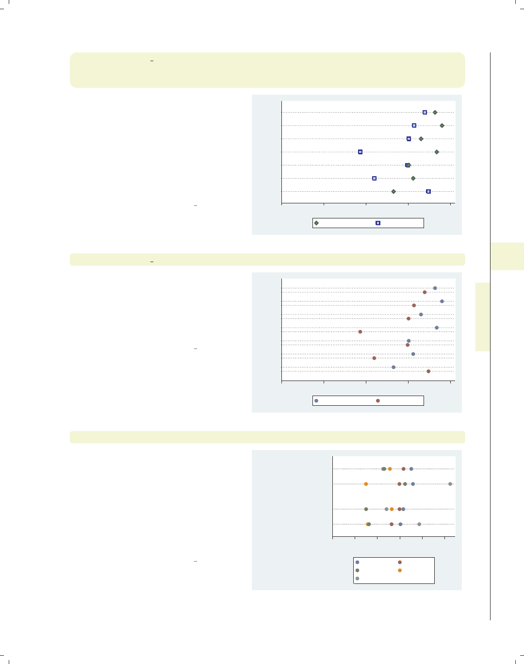
i
i
i
i
i
i
i
i
6.6 Changing the look of dot rulers, dotlook options 213
graph dot prev exp tenure, over(occ7)
marker(1, msymbol(d) mfcolor(teal) mlcolor(dkgreen) mlwidth(thick))
marker(2, msymbol(S) mfcolor(ltblue) mlcolor(blue) mlwidth(thick))
In this example, we use two marker()
options, so we can control both
markers. The first marker is now a
diamond with a teal fill and a thick,
dark green outline. The second marker
is a square, light blue on the inside with
a thick blue outline. The section
Options : Markers (235) has more details
on controlling markers.
Uses nlsw.dta & scheme vg s2c 0 2 4 6 8
Other
Labor
Operat.
Cler.
Sales
Mgmt
Prof
mean of prev_exp mean of tenure
graph dot prev exp tenure, over(occ7) linegap(45)
We can use the linegap() option to
display the y-variables on different lines
and specify the gap between these lines.
The default value is 0, meaning that all
y-variables are displayed on the same
line.
Uses nlsw.dta & scheme vg s2c
0 2 4 6 8
Other
Labor
Operat.
Cler.
Sales
Mgmt
Prof
mean of prev_exp mean of tenure
graph dot tenure, over(occ5) over(collgrad) over(married)
Consider this graph. Since we have
used three over() options, the levels of
the first over() variable are displayed
as though they were different
y-variables. We may want to use the
linegap() option to display the
different y-variables on different lines to
make the graph more readable; see the
next example.
Uses nlsw.dta & scheme vg s2c
0 2 4 6 8 10
mean of tenure
married
single
college grad
not college grad
college grad
not college grad
Prof/Mgmt Sales
Clerical Labor/Ops
Other
Introduction Twoway Matrix Bar Box Dot Pie Options Standard options Styles Appendix
Yvars and over Over options Cat axis Legend Y-axis Dotlook options By
The electronic form of this book is solely for direct use at UCLA and only by faculty, students, and staff of UCLA.
All rights reserved on the copyright page apply to this document and specifically neither the electronic nor
published form of the book may be distributed or reproduced, either electronically or in printed form.
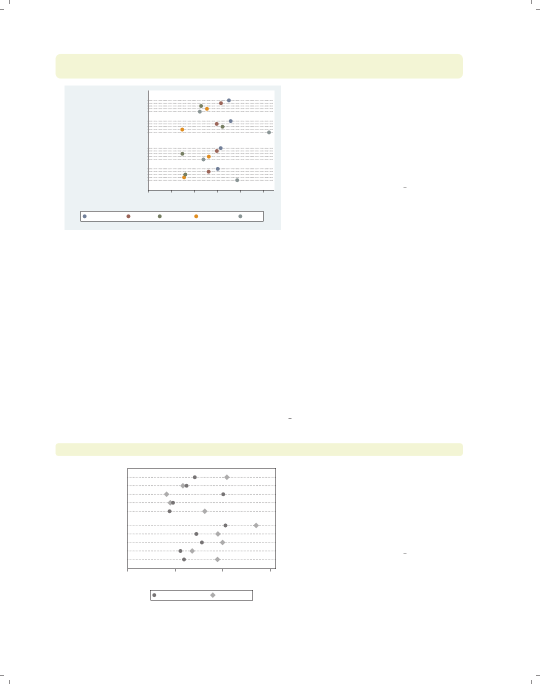
i
i
i
i
i
i
i
i
214 Chapter 6. Dot plots
graph dot tenure, over(occ5) over(collgrad) over(married) linegap(30)
legend(rows(1) span)
0 2 4 6 8 10
mean of tenure
married
single
college grad
not college grad
college grad
not college grad
Prof/Mgmt Sales Clerical Labor/Ops Other
This example is the similar to the
previous one, but we have added the
linegap(30) option to make the levels
of occ5 display on separate lines,
making the results more readable. We
have also added a legend() option to
make the legend display in one line and
span the width of the graph.
Uses nlsw.dta & scheme vg s2c
6.7 Graphing by groups
This section discusses the use of the by() option in combination with graph dot.Nor-
mally, you would use the over() option instead of the by() option, but in some cases, the
by() option is either necessary or more advantageous. For example, a by() option is useful
if you exceed the maximum number of over() options (three if you have a single y-variable
or two if you have multiple y-variables). In such cases, the by() option allows you to break
your data down by additional categorical variables. by() also gives you more flexibility in
the placement of the separate panels. For more information about the by() option, see
Options : By (272), and for more information about the over() option, see Dot : Yvars and
over (193). The examples in this section use the vg s1m scheme.
graph dot wage, over(collgrad) over(occ5) over(urban2)
0 5 10 15
mean of wage
Metro
Rural
Other
Labor/Ops
Clerical
Sales
Prof/Mgmt
Other
Labor/Ops
Clerical
Sales
Prof/Mgmt
not college grad college grad
Consider this dot graph breaking wages
down by three categorical variables. If
we wanted to break this down further
by another categorical variable, we
could not use another over() option
since we can have a maximum of three
over() options with a single y-variable.
Uses nlsw.dta & scheme vg s1m
The electronic form of this book is solely for direct use at UCLA and only by faculty, students, and staff of UCLA.
All rights reserved on the copyright page apply to this document and specifically neither the electronic nor
published form of the book may be distributed or reproduced, either electronically or in printed form.
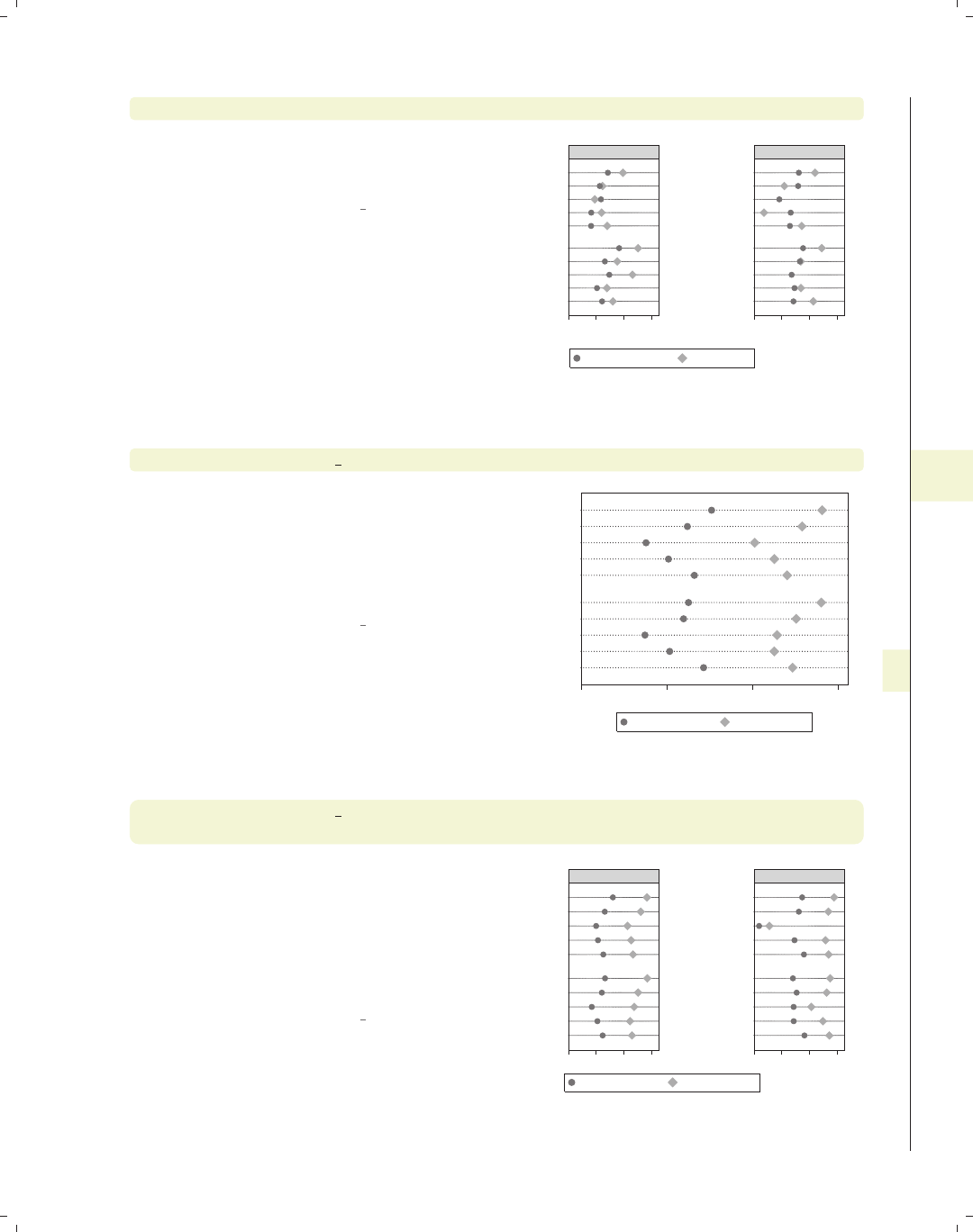
i
i
i
i
i
i
i
i
6.7 Graphing by groups 215
graph dot wage, over(collgrad) over(occ5) over(urban2) by(union)
If we want to break wage down further
by union, we can use the by(union)
option.
Uses nlsw.dta & scheme vg s1m
0 5 10 15 0 5 10 15
Metro
Rural
Metro
Rural
Other
Labor/Ops
Clerical
Sales
Prof/Mgmt
Other
Labor/Ops
Clerical
Sales
Prof/Mgmt
Other
Labor/Ops
Clerical
Sales
Prof/Mgmt
Other
Labor/Ops
Clerical
Sales
Prof/Mgmt
nonunion union
not college grad college grad
mean of wage
Graphs by union worker
graph dot tenure ttl exp, over(occ5) over(urban2)
Consider this dot graph with multiple
y-variables breaking them down by two
categorical variables using two over()
options. When you have multiple
y-variables, you can have a maximum
of two over() options.
Uses nlsw.dta & scheme vg s1m
0 5 10 15
Metro
Rural
Other
Labor/Ops
Clerical
Sales
Prof/Mgmt
Other
Labor/Ops
Clerical
Sales
Prof/Mgmt
mean of tenure mean of ttl_exp
graph dot tenure ttl exp, over(occ5) over(urban2)
by(union)
If we want to break tenure down
further by another categorical variable,
say union,wecanusetheby(union)
option. Although this example shows
only a single variable in the by()
option, you can specify multiple
variables.
Uses nlsw.dta & scheme vg s1m
0 5 10 15 0 5 10 15
Metro
Rural
Metro
Rural
Other
Labor/Ops
Clerical
Sales
Prof/Mgmt
Other
Labor/Ops
Clerical
Sales
Prof/Mgmt
Other
Labor/Ops
Clerical
Sales
Prof/Mgmt
Other
Labor/Ops
Clerical
Sales
Prof/Mgmt
nonunion union
mean of tenure mean of ttl_exp
Graphs by union worker
Introduction Twoway Matrix Bar Box Dot Pie Options Standard options Styles Appendix
Yvars and over Over options Cat axis Legend Y-axis Dotlook options By
The electronic form of this book is solely for direct use at UCLA and only by faculty, students, and staff of UCLA.
All rights reserved on the copyright page apply to this document and specifically neither the electronic nor
published form of the book may be distributed or reproduced, either electronically or in printed form.
i
i
i
i
i
i
i
i
216 Chapter 6. Dot plots
graph dot ttl exp tenure, over(married) over(urban2)
by(union, missing)
0 5 10 15
0 5 10 15
Metro
Rural
Metro
Rural
Metro
Rural
married
single
married
single
married
single
married
single
married
single
married
single
nonunion union
(missing)
mean of ttl_exp mean of tenure
Graphs by union worker
We can use the missing option to
include a panel for the missing values of
union. Note that we changed the first
over() variable to be over(married)
to make an example that was more
readable.
Uses nlsw.dta & scheme vg s1m
graph dot ttl exp tenure, over(married) over(collgrad)
by(union, total)
0 5 10 15
0 5 10 15
college grad
not college grad
college grad
not college grad
college grad
not college grad
married
single
married
single
married
single
married
single
married
single
married
single
nonunion union
Total
mean of ttl_exp mean of tenure
Graphs by union worker
We can add the total option to include
a panel for all observations.
Uses nlsw.dta & scheme vg s1m
graph dot ttl exp tenure, over(married) over(collgrad)
by(union, total cols(1))
0 5 10 15
college grad
not college grad
college grad
not college grad
college grad
not college grad
married
single
married
single
married
single
married
single
married
single
married
single
nonunion
union
Total
mean of ttl_exp mean of tenure
Graphs by union worker
We can use the cols(1) option to show
the graphs in one column.
Uses nlsw.dta & scheme vg s1m
The electronic form of this book is solely for direct use at UCLA and only by faculty, students, and staff of UCLA.
All rights reserved on the copyright page apply to this document and specifically neither the electronic nor
published form of the book may be distributed or reproduced, either electronically or in printed form.
i
i
i
i
i
i
i
i
7 Pie graphs
This chapter discusses the use of pie charts in Stata. We start by illustrating the different
kinds of ways that you can create pie charts in Stata, followed by showing how you can sort
the slices in your pie charts. Next, we show how you can customize the display of individual
slices, as well as control the colors of the pie chart. Then, we demonstrate different ways
you can label the pie slices and then how you can control the legends for pie charts. Finally,
we discuss how to use the by() option.
7.1 Types of pie graphs
This section describes different ways to produce pie charts using Stata. Stata allows you
to produce pie charts based on multiple y-variables, with each y-variable corresponding to
a slice. You can also create a pie chart based on a single y-variable broken down by a single
over() variable. Finally, you can create a pie chart with no y-variables broken down by
an over() variable, which counts the number of observations by each level of the over()
variable. For more details, see [G]graph pie. This section uses the vg s1c scheme.
graph pie poplt5 pop5 17 pop18 64 pop65p
In this syntax, you supply multiple
y-variables, and each y-variable
corresponds to a slice in the pie. The
first y-variable is the population in the
state that is younger than 5 years old,
the next the population 5 to 17 years
old, the next 18 to 64 years old, and the
last 65 years and older. The entire pie
would correspond to the sum of all of
these variables across all states. The
first slice then corresponds to the
percentage of the total population that
is younger than 5 years old.
Uses allstates.dta & scheme vg s1c
Pop, < 5 year Pop, 5 to 17 years
Pop, 18 to 64 years Pop, 65 and older
Introduction Twoway Matrix Bar Box Dot Pie Options Standard options Styles Appendix
Types of pie graphs Sorting Colors and exploding Labels Legend By
217
The electronic form of this book is solely for direct use at UCLA and only by faculty, students, and staff of UCLA.
All rights reserved on the copyright page apply to this document and specifically neither the electronic nor
published form of the book may be distributed or reproduced, either electronically or in printed form.
i
i
i
i
i
i
i
i
218 Chapter 7. Pie graphs
graph pie pop, over(division)
N. Eng. Mid Atl
E.N.C. W.N.C.
S. Atl. E.S.C.
W.S.C. Mountain
Pacific
In this syntax, you supply a single
y-variable and an over() option. In
this case, the y-variable corresponds to
the population of the state, the entire
pie corresponds to the entire
population, and each slice corresponds
to the percentage of the population for
each level of division.
Uses allstates.dta & scheme vg s1c
graph pie, over(occ7)
Prof Mgmt
Sales Cler.
Operat. Labor
Other
For this third example, we switch to the
nlsw data file. In this syntax, an
over() option is supplied, but no
y-variable is supplied (in a sense, the
observation itself serves as the
y-variable). This pie chart is much like
a visual frequency distribution of occ7,
where the size of each slice corresponds
to the proportion of women in each
occupation.
Uses nlsw.dta & scheme vg s1c
graph pie, over(union) missing
nonunion union
.
This example shows the proportion of
women in union and nonunion jobs. We
add the missing option, and another
pie slice is added for the observations in
which union is missing.
Uses nlsw.dta & scheme vg s1c
The electronic form of this book is solely for direct use at UCLA and only by faculty, students, and staff of UCLA.
All rights reserved on the copyright page apply to this document and specifically neither the electronic nor
published form of the book may be distributed or reproduced, either electronically or in printed form.
i
i
i
i
i
i
i
i
7.2 Sorting pie slices 219
7.2 Sorting pie slices
This section describes how you can sort and arrange slices in pie charts. For more de-
tails, see [G]graph pie. This section uses the vg lgndc scheme, which places the legend
at the left in a single column.
graph pie, over(occ7)
Consider this pie chart showing the
number of women who work in these
seven different occupations. The slices
are ordered according to the levels of
occ7 from 1 to 7, rotating clockwise,
starting with the first slice, which is
positioned at 90 degrees.
Uses nlsw.dta & scheme vg lgndc
Prof
Mgmt
Sales
Cler.
Operat.
Labor
Other
graph pie, over(occ7) noclockwise
With the noclockwise option, you can
display the slices in counterclockwise
order.
Uses nlsw.dta & scheme vg lgndc
Prof
Mgmt
Sales
Cler.
Operat.
Labor
Other
Introduction Twoway Matrix Bar Box Dot Pie Options Standard options Styles Appendix
Types of pie graphs Sorting Colors and exploding Labels Legend By
The electronic form of this book is solely for direct use at UCLA and only by faculty, students, and staff of UCLA.
All rights reserved on the copyright page apply to this document and specifically neither the electronic nor
published form of the book may be distributed or reproduced, either electronically or in printed form.
i
i
i
i
i
i
i
i
220 Chapter 7. Pie graphs
graph pie, over(occ7) angle0(0)
Prof
Mgmt
Sales
Cler.
Operat.
Labor
Other
With the angle0() option, you can set
the angle of the line that begins the
first pie slice. Here, we make the first
pie slice begin at 0 degrees.
Uses nlsw.dta & scheme vg lgndc
graph pie, over(occ7) sort
Cler.
Operat.
Mgmt
Labor
Other
Prof
Sales
The sort option sorts the slices
according to their size, from smallest to
largest.
Uses nlsw.dta & scheme vg lgndc
graph pie, over(occ7) sort descending
Sales
Prof
Other
Labor
Mgmt
Operat.
Cler.
Adding the descending option to the
sort option orders the slices from
largest to smallest.
Uses nlsw.dta & scheme vg lgndc
The electronic form of this book is solely for direct use at UCLA and only by faculty, students, and staff of UCLA.
All rights reserved on the copyright page apply to this document and specifically neither the electronic nor
published form of the book may be distributed or reproduced, either electronically or in printed form.
i
i
i
i
i
i
i
i
7.3 Changing the look of pie slices, colors, and exploding 221
graph pie, over(occ7) sort(occ7alpha)
Say that we wanted to sort the slices
(alphabetically) by occupation name.
We have created a new variable,
occ7alpha, that is a recoded version of
occ7. It is recoded such that, as
occ7alpha goesfrom1to7,the
occupations are alphabetized (except
for Other, which is placed last). We
add sort(occ7alpha), and the slices
are ordered alphabetically.
Uses nlsw.dta & scheme vg lgndc
Cler.
Labor
Mgmt
Operat.
Prof
Sales
Other
7.3 Changing the look of pie slices, colors, and exploding
This section describes how to change the color of pie slices, explode pie slices, control
the overall intensity of colors, and control the characteristics of lines surrounding the pie
slices. For more details, see [G]graph pie. This section uses the vg rose scheme.
graph pie, over(occ7)
Consider this pie chart showing the
number of women who work in these
seven different occupations. The slices
are colored using the colors indicated
by the scheme. None of the slices are
exploded, and no lines surround the
slices.
Uses nlsw.dta & scheme vg rose
Prof Mgmt
Sales Cler.
Operat. Labor
Other
Introduction Twoway Matrix Bar Box Dot Pie Options Standard options Styles Appendix
Types of pie graphs Sorting Colors and exploding Labels Legend By
The electronic form of this book is solely for direct use at UCLA and only by faculty, students, and staff of UCLA.
All rights reserved on the copyright page apply to this document and specifically neither the electronic nor
published form of the book may be distributed or reproduced, either electronically or in printed form.
i
i
i
i
i
i
i
i
222 Chapter 7. Pie graphs
graph pie, over(occ7) pie(3, explode)
Prof Mgmt
Sales Cler.
Operat. Labor
Other
In this example, we use the pie()
option to explode the third pie slice,
calling attention to this slice. By
default, it is exploded by 3.8 units.
Uses nlsw.dta & scheme vg rose
graph pie, over(occ7) pie(3, explode(5) color(cyan))
Prof Mgmt
Sales Cler.
Operat. Labor
Other
Here, we specify explode(5) to
increase the distance this slice is
exploded to 5 units. We also make the
third slice cyan to make it more
noticeable. See Styles : Colors (328) for
other colors you could choose.
Uses nlsw.dta & scheme vg rose
graph pie, over(occ7) pie(3, color(cyan) explode(5))
pie(1, color(gold) explode(2.5))
Prof Mgmt
Sales Cler.
Operat. Labor
Other
You can use the pie() option
repeatedly. Here, we change the color
and explode slices 1 and 3.
Uses nlsw.dta & scheme vg rose
The electronic form of this book is solely for direct use at UCLA and only by faculty, students, and staff of UCLA.
All rights reserved on the copyright page apply to this document and specifically neither the electronic nor
published form of the book may be distributed or reproduced, either electronically or in printed form.
i
i
i
i
i
i
i
i
7.3 Changing the look of pie slices, colors, and exploding 223
graph pie, over(occ7) intensity(*1.5)
Using the intensity() option, we
make the colors of all of the slices 1.5
times their normal intensity.
Uses nlsw.dta & scheme vg rose
Prof Mgmt
Sales Cler.
Operat. Labor
Other
graph pie, over(occ7) intensity(*.6)
In this example, we make the intensity
of the colors 60% of the normal color.
Uses nlsw.dta & scheme vg rose
Prof Mgmt
Sales Cler.
Operat. Labor
Other
graph pie, over(occ7) line(lcolor(sienna) lwidth(thick))
The line() option can be used to
change the characteristics of the lines
surrounding the pie slices. Here, we add
the lcolor() (line color) and lwidth()
(line width) options to make the line
sienna and thick.
Uses nlsw.dta & scheme vg rose
Prof Mgmt
Sales Cler.
Operat. Labor
Other
Introduction Twoway Matrix Bar Box Dot Pie Options Standard options Styles Appendix
Types of pie graphs Sorting Colors and exploding Labels Legend By
The electronic form of this book is solely for direct use at UCLA and only by faculty, students, and staff of UCLA.
All rights reserved on the copyright page apply to this document and specifically neither the electronic nor
published form of the book may be distributed or reproduced, either electronically or in printed form.
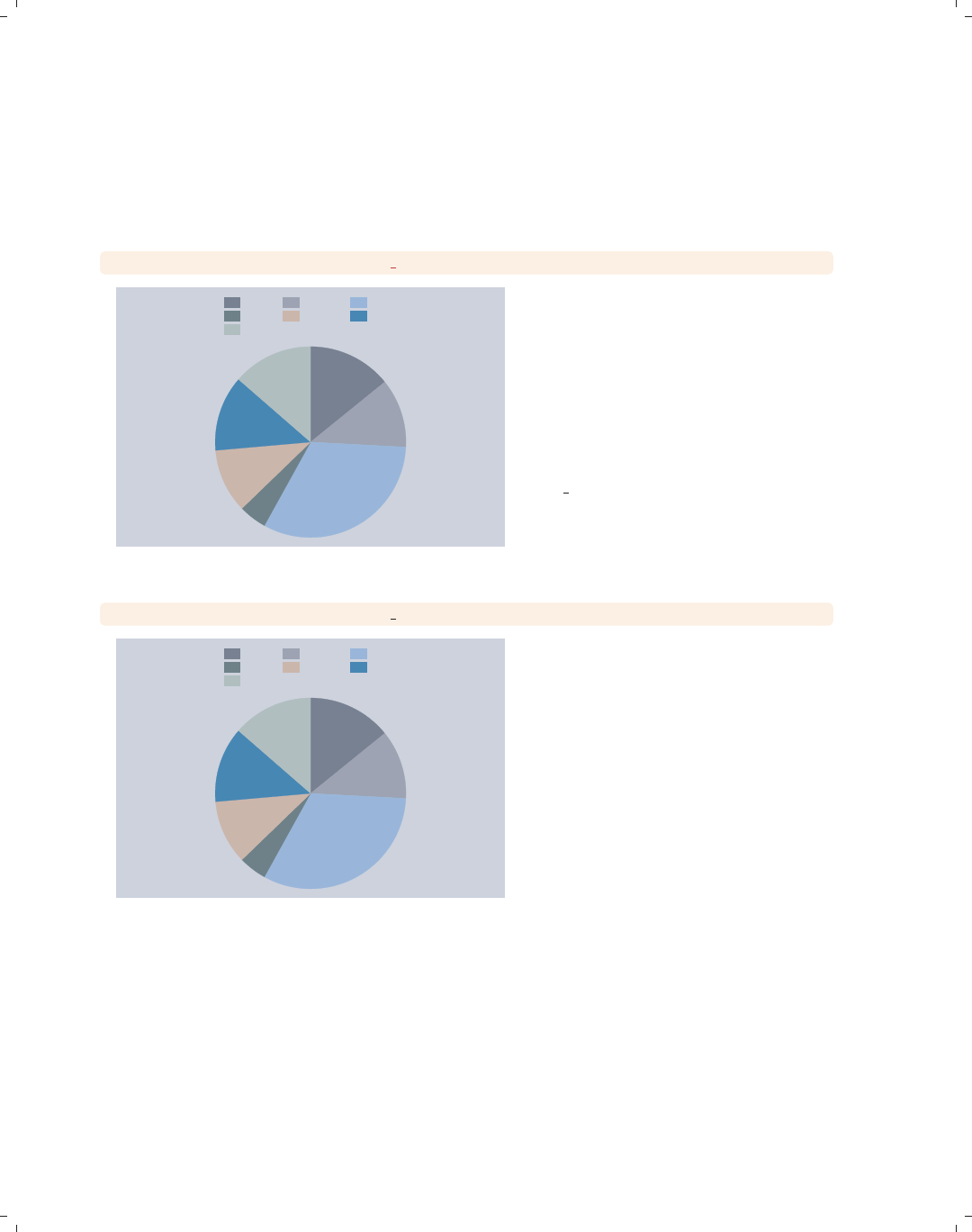
i
i
i
i
i
i
i
i
224 Chapter 7. Pie graphs
7.4 Slice labels
This section describes how you can label the pie slices. For more details, see [G]graph
pie. For this section, we will use the economist scheme.
graph pie, over(occ7) plabel( all sum)
317
264
726
102
246
286
305
Prof Mgmt Sales
Cler. Operat. Labor
Other
Consider this pie chart showing the
number of women who work in these
seven different occupations. Here, we
use the plabel() (pie label) option to
label all slices with the sum, in this
case the frequency of women who work
in each occupation. Notice how
readable the labels are because of the
pale colors of the pie slices selected by
the vg past scheme. Other schemes
with more intense colors would have
made these labels hard to read.
Uses nlsw.dta & scheme economist
graph pie, over(occ7) plabel( all percent)
14.11%
11.75%
32.32%
4.541%
10.95%
12.73%
13.58%
Prof Mgmt Sales
Cler. Operat. Labor
Other
Using the percent option, we can show
the percent of women who work in each
occupation.
Uses nlsw.dta & scheme economist
The electronic form of this book is solely for direct use at UCLA and only by faculty, students, and staff of UCLA.
All rights reserved on the copyright page apply to this document and specifically neither the electronic nor
published form of the book may be distributed or reproduced, either electronically or in printed form.
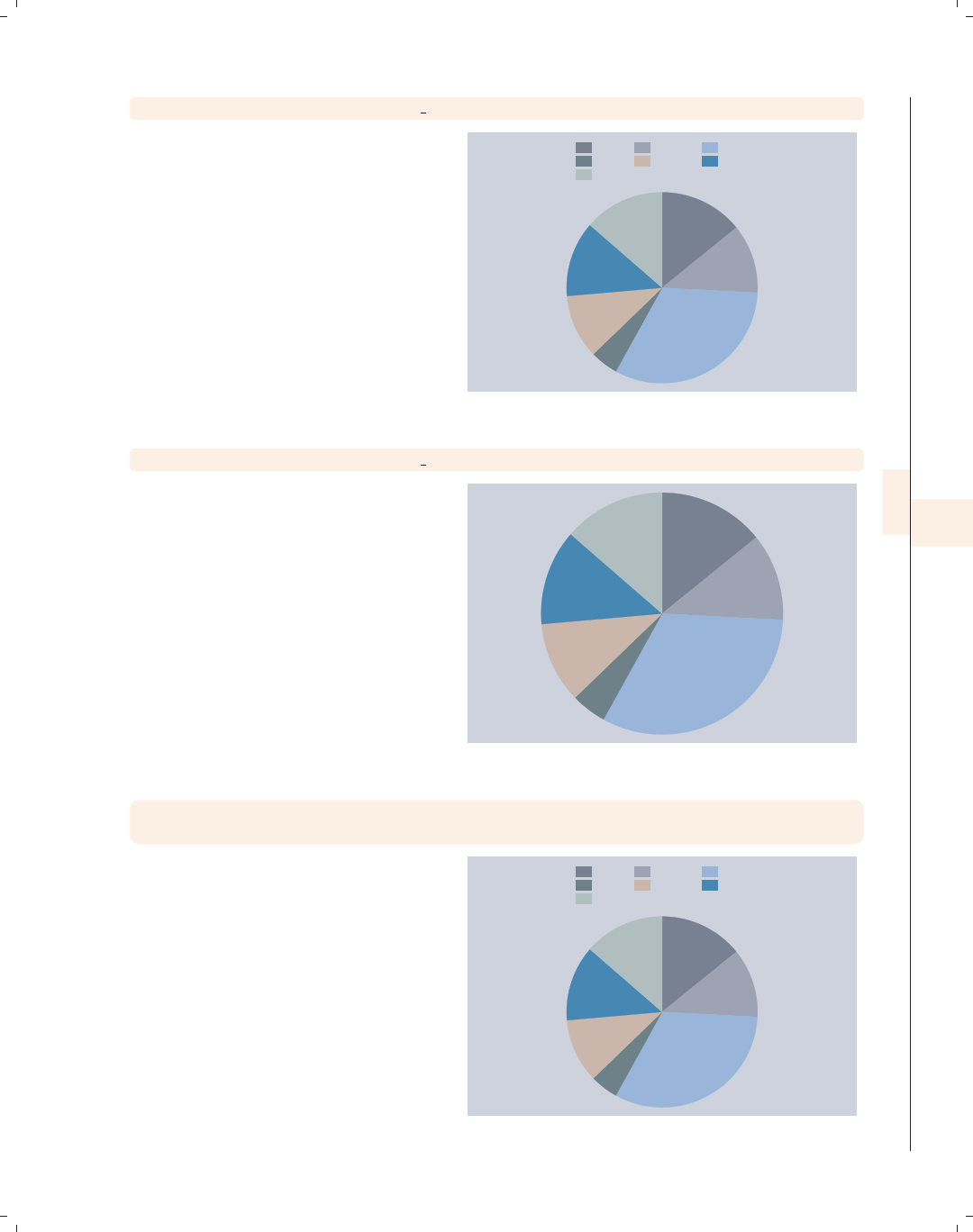
i
i
i
i
i
i
i
i
7.4 Slice labels 225
graph pie, over(occ7) plabel( all name)
The name option adds a label that is
the name of the occupation.
Uses nlsw.dta & scheme economist
Prof
Mgmt
Sales
Cler.
Operat.
Labor
Other
Prof Mgmt Sales
Cler. Operat. Labor
Other
graph pie, over(occ7) plabel( all name) legend(off)
When the name option is used, the
legend is not as necessary and can be
suppressed using the legend(off)
option.
Uses nlsw.dta & scheme economist
Prof
Mgmt
Sales
Cler.
Operat.
Labor
Other
graph pie, over(occ7) plabel(1 "Prof=14.11")
plabel(3 "Sales=32.32%")
The plabel() option can also be used
to put any text that you want into all
slices or into individual slices. Here, we
add text to the first and third slices.
Uses nlsw.dta & scheme economist Prof=14.11
Sales=32.32%
Prof Mgmt Sales
Cler. Operat. Labor
Other
Introduction Twoway Matrix Bar Box Dot Pie Options Standard options Styles Appendix
Types of pie graphs Sorting Colors and exploding Labels Legend By
The electronic form of this book is solely for direct use at UCLA and only by faculty, students, and staff of UCLA.
All rights reserved on the copyright page apply to this document and specifically neither the electronic nor
published form of the book may be distributed or reproduced, either electronically or in printed form.

i
i
i
i
i
i
i
i
226 Chapter 7. Pie graphs
graph pie, over(occ7) plabel( all percent, format("%2.0f"))
14%
12%
32%
5%
11%
13%
14%
Prof Mgmt Sales
Cler. Operat. Labor
Other
When you use plabel to label slices
with a sum or percent, you can use the
format() option to control the format
of the numeric values displayed. Here,
we display the percentages as whole
numbers.
Uses nlsw.dta & scheme economist
graph pie, over(occ7) plabel( all percent, gap(-5))
14.11%
11.75%
32.32%
4.541%
10.95%
12.73%
13.58%
Prof Mgmt Sales
Cler. Operat. Labor
Other
You can use the gap() option to adjust
the position of the label with respect to
the center of the pie. A positive number
pushes the label away from the center
of the pie, and a negative value pushes
the label closer to the center of the pie.
Uses nlsw.dta & scheme economist
graph pie, over(occ7) plabel( all percent, size(large) color(maroon))
14.11%
11.75%
32.32%
4.541%
10.95%
12.73%
13.58%
Prof Mgmt Sales
Cler. Operat. Labor
Other
You can use textbox options to modify
the display of the text labeling the pie
slices. Here, we increase the size of the
text and change its color to maroon.
See Options : Textboxes (303) for more
options you can use.
Uses nlsw.dta & scheme economist
The electronic form of this book is solely for direct use at UCLA and only by faculty, students, and staff of UCLA.
All rights reserved on the copyright page apply to this document and specifically neither the electronic nor
published form of the book may be distributed or reproduced, either electronically or in printed form.
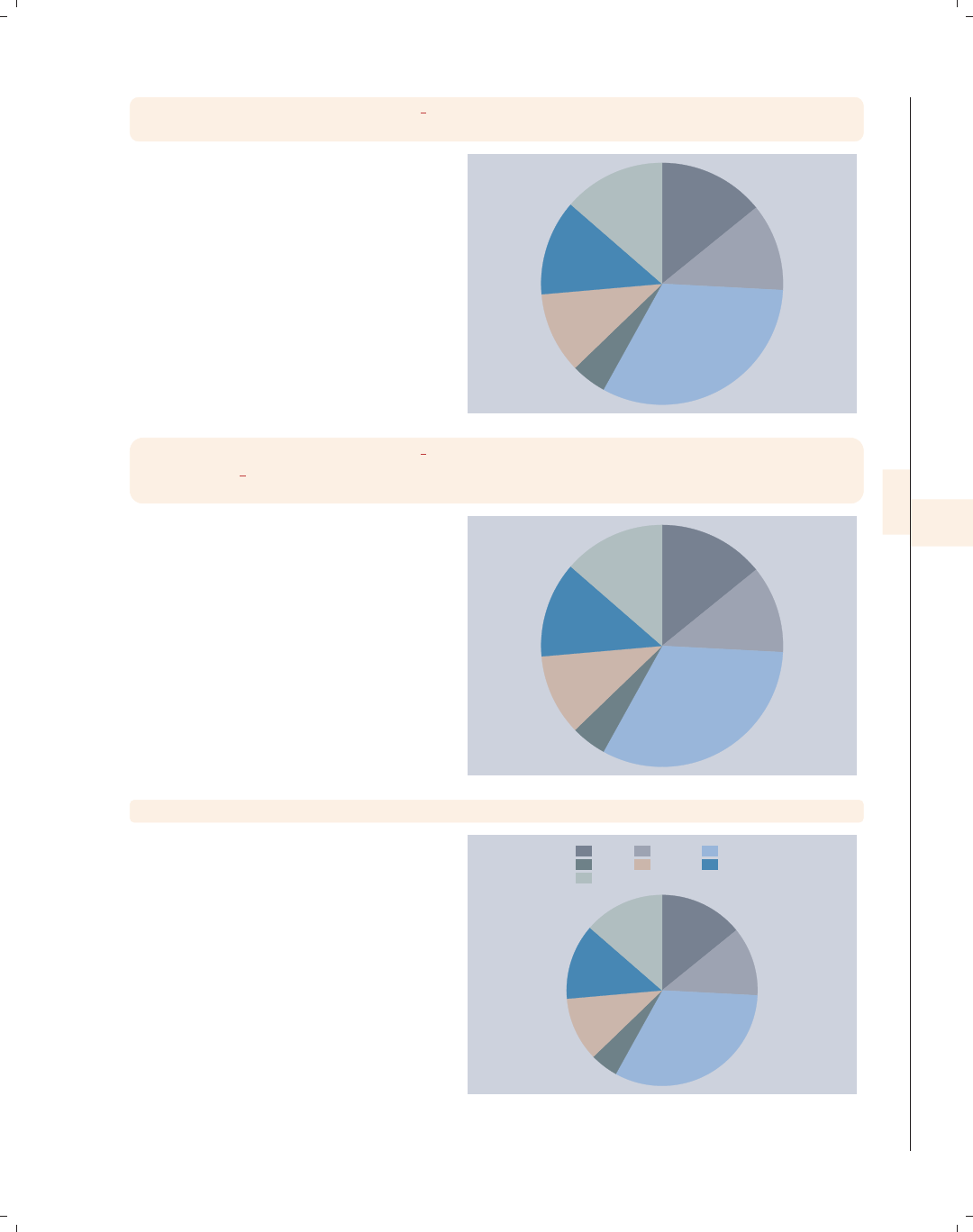
i
i
i
i
i
i
i
i
7.4 Slice labels 227
graph pie, over(occ7) plabel( all name, gap(-5))
plabel(1 "32%", gap(5)) legend(off)
We can include multiple plabel()
options. In this example, the first
plabel() option assigns the occupation
names to all the slices and moves the
names 5 units inward. The second
plabel() option assigns text to the
second slice and displays it 5 more
units from the center. Since the legend
was not needed, we suppressed it with
the legend(off) option.
Uses nlsw.dta & scheme economist
Prof
Mgmt
Sales
Cler.
Operat.
Labor
Other
32%
graph pie, over(occ7) plabel( all name, gap(-5))
plabel( all percent, gap(5) format("%2.0f"))
legend(off)
Here, we use the plabel() option twice
to label the slices with the occupation
name and with the percentage. We use
the gap() option to move the names
closer to the center by 5 extra units and
move the percentage 5 extra units from
the center.
Uses nlsw.dta & scheme economist
Prof
Mgmt
Sales
Cler.
Operat.
Labor
Other
14%
12%
32%
5%
11%
13%
14%
graph pie, over(occ7) ptext(0 30 "This is some text")
The ptext() (pie text) option can be
used to add text to the pie chart. Polar
coordinates are used to determine the
location of the text by specifying the
angle and distance from the center.
Here, the angle is 0, and the distance
from the center is 30.
Uses nlsw.dta & scheme economist This is some text
Prof Mgmt Sales
Cler. Operat. Labor
Other
Introduction Twoway Matrix Bar Box Dot Pie Options Standard options Styles Appendix
Types of pie graphs Sorting Colors and exploding Labels Legend By
The electronic form of this book is solely for direct use at UCLA and only by faculty, students, and staff of UCLA.
All rights reserved on the copyright page apply to this document and specifically neither the electronic nor
published form of the book may be distributed or reproduced, either electronically or in printed form.
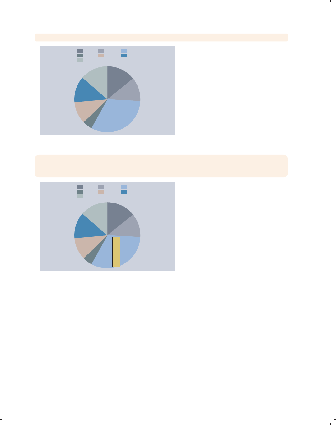
i
i
i
i
i
i
i
i
228 Chapter 7. Pie graphs
graph pie, over(occ7) ptext(-10 10 "This is some text")
This is some text
Prof Mgmt Sales
Cler. Operat. Labor
Other
Here, we choose an angle of −10
(putting it 10 degrees below 0) and a
distance of 10 units from the center.
Note that the angle determines only the
position of the text but not its actual
angle of display, which is controlled
with the orientation() option. See
the next example for more details.
Uses nlsw.dta & scheme economist
graph pie, over(occ7)
ptext(-10 10 "This is some text", orientation(rvertical)
placement(s) box margin(medsmall) bfcolor(sand))
This is some text
Prof Mgmt Sales
Cler. Operat. Labor
Other
Here, we choose an angle of −10
degrees and a distance of 10 units. We
also add a number of textbox options to
make the text reverse vertical, meaning
that it is placed to the south of the
given coordinates, within a box that
has with a medium-small margin and is
filled with a sand color. For more
information on these kinds of textbox
options, see Options : Textboxes (303).
Uses nlsw.dta & scheme economist
7.5 Controlling legends
This section illustrates some of the options that you can use to control the display of
legends with pie charts. While this section illustrates the use of legends, it emphasizes
options that may be particularly useful with pie charts. See Options : Legend (287) for more
details about legends; those details apply well to pie charts, even if the examples use other
kinds of graphs. Also, see [G]legend option for more details. We begin this section using
the vg brite scheme.
The electronic form of this book is solely for direct use at UCLA and only by faculty, students, and staff of UCLA.
All rights reserved on the copyright page apply to this document and specifically neither the electronic nor
published form of the book may be distributed or reproduced, either electronically or in printed form.
i
i
i
i
i
i
i
i
7.5 Controlling legends 229
graph pie, over(occ7)
Consider this pie graph showing the
frequencies of women in these seven
occupational categories.
Uses nlsw.dta & scheme vg brite
Prof Mgmt
Sales Cler.
Operat. Labor
Other
graph pie, over(occ7) legend(label(1 "Professional"))
We can use the legend(label())
option to change the label for the first
occupation.
Uses nlsw.dta & scheme vg brite
Professional Mgmt
Sales Cler.
Operat. Labor
Other
graph pie, over(occ7) legend(title(Occupation))
We can add the title() option to the
legend() option to add a title to the
legend. In fact, we can also use
subtitle(),note(),andcaption()
options as well, much as we would for
adding titles to a graph; see Standard
options : Titles (313) for more details.
Uses nlsw.dta & scheme vg brite
Prof Mgmt
Sales Cler.
Operat. Labor
Other
Occupation
Introduction Twoway Matrix Bar Box Dot Pie Options Standard options Styles Appendix
Types of pie graphs Sorting Colors and exploding Labels Legend By
The electronic form of this book is solely for direct use at UCLA and only by faculty, students, and staff of UCLA.
All rights reserved on the copyright page apply to this document and specifically neither the electronic nor
published form of the book may be distributed or reproduced, either electronically or in printed form.
i
i
i
i
i
i
i
i
230 Chapter 7. Pie graphs
graph pie, over(occ7) legend(title(Occupation, position(6)))
Prof Mgmt
Sales Cler.
Operat. Labor
Other
Occupation
We can use the position() option
within the title() option to control
the position of the title. Here, we put
the title in the 6 o’clock position,
placing it at the bottom of the legend.
Uses nlsw.dta & scheme vg brite
graph pie, over(occ7) legend(colfirst)
Prof
Mgmt
Sales
Cler.
Operat.
Labor
Other
We can use the legend(colfirst)
option to order the items in the legend
by columns instead of rows.
Uses nlsw.dta & scheme vg brite
graph pie, over(occ7) legend(colfirst order(7 651234)holes(1))
Other
Labor
Operat.
Prof
Mgmt
Sales
Cler.
The pie wedges rotate clockwise, and
here we make the items within the
legend rotate in a similar clockwise
fashion, starting from the top right.
The order() option puts the items in
the legend in a clockwise order, and the
holes(1) option leaves the first
position empty.
Uses nlsw.dta & scheme vg brite
The electronic form of this book is solely for direct use at UCLA and only by faculty, students, and staff of UCLA.
All rights reserved on the copyright page apply to this document and specifically neither the electronic nor
published form of the book may be distributed or reproduced, either electronically or in printed form.
i
i
i
i
i
i
i
i
7.5 Controlling legends 231
graph pie, over(occ7) legend(position(12) rows(2))
We can use the position() option to
control the position of the legend,
indicating its position like the numbers
on a clock face; see Styles : Clockpos
(330). Here, we put the legend at the
12 o’clock position, placing it at the top
of the chart, and also add the rows(2)
option to make the legend display in
two rows.
Uses nlsw.dta & scheme vg brite
Prof Mgmt Sales Cler.
Operat. Labor Other
graph pie, over(occ7) legend(position(9) cols(1) stack)
Here, we use the same options as those
in the last example but use them to
place the legend to the left of the graph
(in the 9 o’clock position) and make the
legend display in a single column. We
also add the stack option to the
previous example to stack the symbol
and descriptive text above each other.
This makes an even narrower column,
leaving more room for the pie chart.
Uses nlsw.dta & scheme vg brite
Prof
Mgmt
Sales
Cler.
Operat.
Labor
Other
graph pie, over(occ7)
Here, we use the vg lgndc scheme.
Using this scheme places the legend to
the left in a single column with the
symbol stacked above the description.
Uses nlsw.dta & scheme vg lgndc
Prof
Mgmt
Sales
Cler.
Operat.
Labor
Other
Introduction Twoway Matrix Bar Box Dot Pie Options Standard options Styles Appendix
Types of pie graphs Sorting Colors and exploding Labels Legend By
The electronic form of this book is solely for direct use at UCLA and only by faculty, students, and staff of UCLA.
All rights reserved on the copyright page apply to this document and specifically neither the electronic nor
published form of the book may be distributed or reproduced, either electronically or in printed form.
i
i
i
i
i
i
i
i
232 Chapter 7. Pie graphs
7.6 Graphing by groups
This section describes the use of the by() option with pie charts, focusing on features
that are specifically relevant to pie charts. For more details, see Options : By (272) and
[G]by option.
graph pie, over(occ7)
Prof Mgmt
Sales Cler.
Operat. Labor
Other
Here, we see a basic pie chart showing
the distribution of occupations.
Uses nlsw.dta & scheme vg s2c
graph pie, over(occ7) by(union)
nonunion union
Prof Mgmt
Sales Cler.
Operat. Labor
Other
Graphs by union worker
In this graph, the occupations are
broken down by whether one belongs to
a union.
Uses nlsw.dta & scheme vg s2c
The electronic form of this book is solely for direct use at UCLA and only by faculty, students, and staff of UCLA.
All rights reserved on the copyright page apply to this document and specifically neither the electronic nor
published form of the book may be distributed or reproduced, either electronically or in printed form.
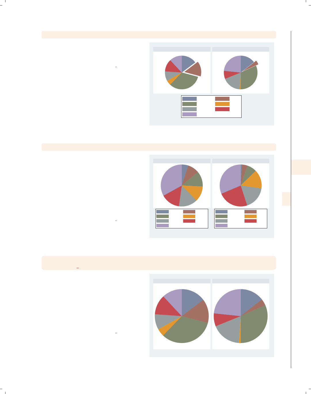
i
i
i
i
i
i
i
i
7.6 Graphing by groups 233
graph pie, over(occ7) by(union) pie(2, explode)
If we add the pie(2, explode) option,
the second slice is exploded in both
graphs.
Uses nlsw.dta & scheme vg s2c
nonunion union
Prof Mgmt
Sales Cler.
Operat. Labor
Other
Graphs by union worker
graph pie, over(occ7) by(union) sort
Here, we sort the slices from least
frequent to most frequent. Note that
separate legends are shown for each
chart. This is because the slices can be
ordered differently in the two different
graphs when sorted. Thus, when you
use the sort option for pie charts,
Stata shows two separate legends to
assure proper labeling of the slices.
Uses nlsw.dta & scheme vg s2c
Cler. Operat.
Other Labor
Mgmt Prof
Sales
Cler. Mgmt
Labor Prof
Operat. Other
Sales
nonunion union
Graphs by union worker
graph pie, over(occ7) by(union, legend(off))
plabel( all name)
Here, we add the plabel() option to
label the inside of each slice with the
name of the slice, so the legend is no
longer needed. We suppress the legend
with the legend(off) option, which is
placed within the by() option because
it, in a way, determines the placement
of the legend by turning it off.
Uses nlsw.dta & scheme vg s2c
Prof
Mgmt
Sales
Cler.
Operat.
Labor
Other Prof
Mgmt
Sales
Cler.
Operat.
Labor
Other
nonunion union
Graphs by union worker
Introduction Twoway Matrix Bar Box Dot Pie Options Standard options Styles Appendix
Types of pie graphs Sorting Colors and exploding Labels Legend By
The electronic form of this book is solely for direct use at UCLA and only by faculty, students, and staff of UCLA.
All rights reserved on the copyright page apply to this document and specifically neither the electronic nor
published form of the book may be distributed or reproduced, either electronically or in printed form.
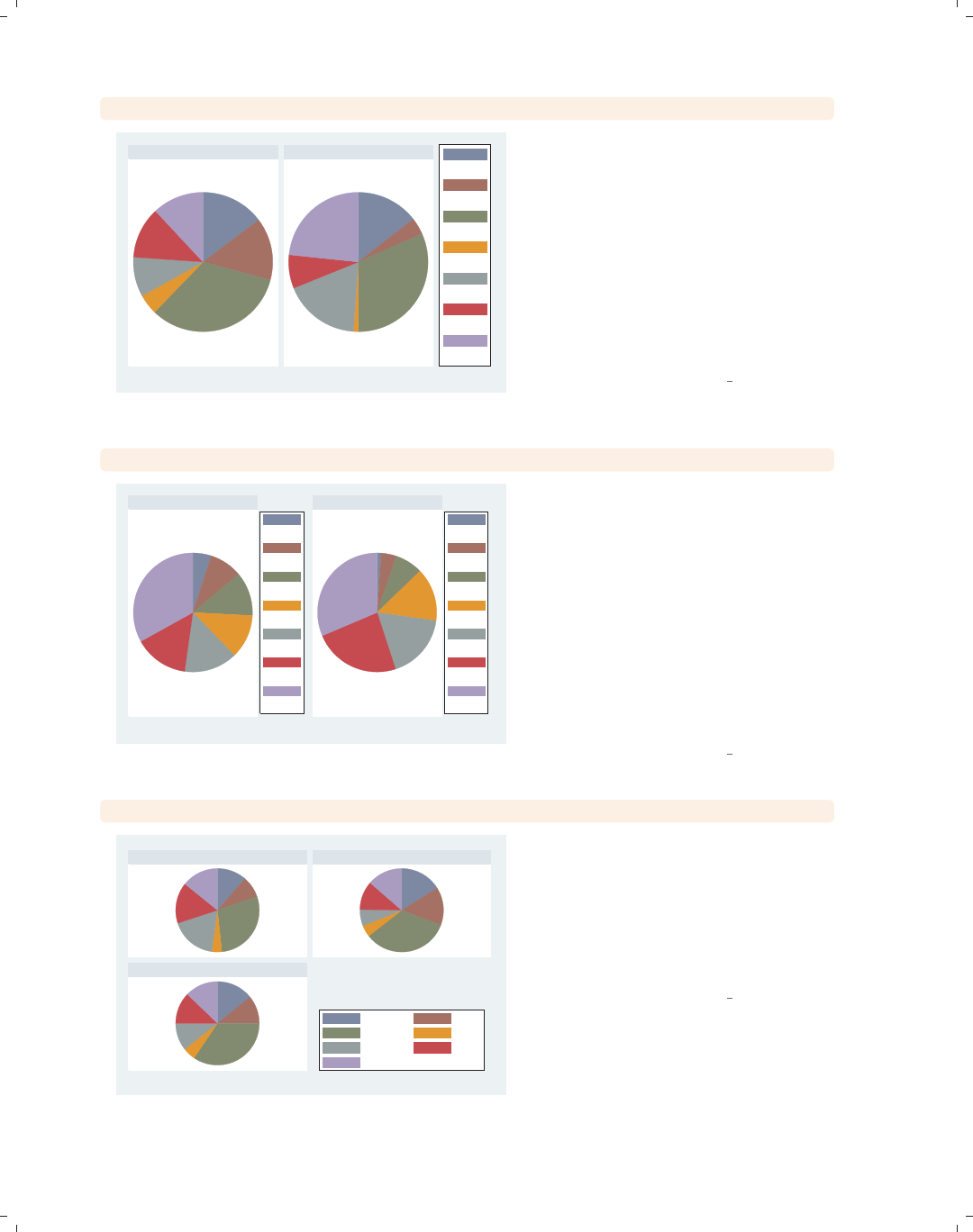
i
i
i
i
i
i
i
i
234 Chapter 7. Pie graphs
graph pie, over(occ7) by(union, legend(pos(3)))legend(cols(1) stack)
nonunion union
Prof
Mgmt
Sales
Cler.
Operat.
Labor
Other
Graphs by union worker
Here, we place the legend to the right
using the legend(pos(3)) option.
Note that this option is contained
within the by() option because it alters
the position of the legend. We also
make the legend a single column with
the legend symbols and labels stacked
with the legend(cols(1) stack)
option. Note this option is outside of
the by() option since it does not
determine the position of the legend.
Uses nlsw.dta & scheme vg s2c
graph pie, over(occ7) by(union) legend(pos(3) cols(1) stack) sort
Cler.
Operat.
Other
Labor
Mgmt
Prof
Sales
Cler.
Mgmt
Labor
Prof
Operat.
Other
Sales
nonunion union
Graphs by union worker
This example is similar to the previous
example, but we have added the sort
option. Note that, when we add the
sort option, we need to move the
pos() option from within the by()
option to outside of the by() option.
This is an exception to the general rule
that legend options that control the
position of the legend are placed within
the by() option. Here, we get the
legends that we desire, each to the right
of the pie.
Uses nlsw.dta & scheme vg s2c
graph pie, over(occ7) by(urban3, legend(at(4)))
Rural Suburb
Urban
Prof Mgmt
Sales Cler.
Operat. Labor
Other
Graphs by Rural vs. Suburb vs. Urban
Here, we break down occupation by a
three-level variable, leaving a fourth
position open. We can specify the
legend(at(4)) option within the by()
option to place the legend in the space
in the fourth position, conserving space
on the graph.
Uses nlsw.dta & scheme vg s2c
The electronic form of this book is solely for direct use at UCLA and only by faculty, students, and staff of UCLA.
All rights reserved on the copyright page apply to this document and specifically neither the electronic nor
published form of the book may be distributed or reproduced, either electronically or in printed form.

i
i
i
i
i
i
i
i
8 Options available for most graphs
This chapter discusses options that are used in many, but not all, kinds of graphs in
Stata, as compared with the Standard options (313) chapter, which covers options that are
standard in all Stata graphs. This chapter goes into greater detail about how to use these
options to customize your graphs. As you can see from the Visual Table of Contents at
the right, this chapter covers markers, connecting, axis titles, labels, scales, selection, using
the by() option, legends, added text, and textboxes. For further details, the examples will
frequently refer to sections of Styles (327) and to [G]graph.
8.1 Changing the look of markers
This section looks at options that we can use for controlling markers. While the ex-
amples in this section focus on twoway scatter, these options apply to any graph where
you have markers and can control them. This section will show how to change the marker
symbol, marker size, and color (both fill and outline color). For more information, see
[G]marker options. We will start this section using the vg s2c scheme.
twoway scatter ownhome borninstate
Consider this scatterplot showing the
relationship between the percentage of
people in a state who own their home
and the percentage of people born in
their state of residence. The markers
used in this plot are filled circles.
Uses allstates.dta & scheme vg s2c
40 50 60 70 80
% who own home
20 40 60 80
% born in state of residence
Introduction Twoway Matrix Bar Box Dot Pie Options Standard options Styles Appendix
Markers Marker labels Connecting Axis titles Axis labels Axis scales Axis selection By Legend Adding text Textboxes
235
The electronic form of this book is solely for direct use at UCLA and only by faculty, students, and staff of UCLA.
All rights reserved on the copyright page apply to this document and specifically neither the electronic nor
published form of the book may be distributed or reproduced, either electronically or in printed form.
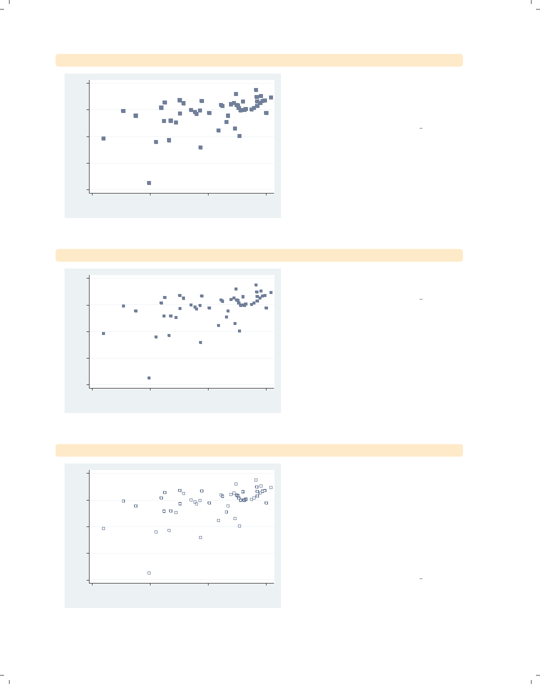
i
i
i
i
i
i
i
i
236 Chapter 8. Options available for most graphs
twoway scatter ownhome borninstate, msymbol(S)
40 50 60 70 80
% who own home
20 40 60 80
% born in state of residence
We can control the shape of the marker
with the msymbol() (marker symbol)
option. Here, we make the symbols
large squares.
Uses allstates.dta & scheme vg s2c
twoway scatter ownhome borninstate, msymbol(s)
40 50 60 70 80
% who own home
20 40 60 80
% born in state of residence
Specifying msymbol(s), which uses a
lowercase s, displays smaller squares.
Uses allstates.dta & scheme vg s2c
twoway scatter ownhome borninstate, msymbol(sh)
40 50 60 70 80
% who own home
20 40 60 80
% born in state of residence
We can append an h(i.e.,
msymbol(sh)) to yield hollow squares.
In addition to choosing Sfor larger
squares and sfor small squares, we can
specify D(large diamond), T(large
triangle), and O(large circles). We can
specify lowercase letters to get smaller
versions of these symbols and append
the hfor hollow versions.
Uses allstates.dta & scheme vg s2c
The electronic form of this book is solely for direct use at UCLA and only by faculty, students, and staff of UCLA.
All rights reserved on the copyright page apply to this document and specifically neither the electronic nor
published form of the book may be distributed or reproduced, either electronically or in printed form.
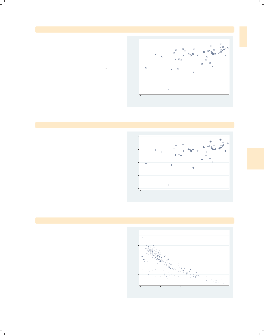
i
i
i
i
i
i
i
i
8.1 Changing the look of markers 237
twoway scatter ownhome borninstate, msymbol(X)
We can also specify msymbol(X) to use
a large X shape for the markers. We
could also use a lowercase xfor smaller
markers. We cannot append an hsince
we cannot make a hollow X.
Uses allstates.dta & scheme vg s2c
40 50 60 70 80
% who own home
20 40 60 80
% born in state of residence
twoway scatter ownhome borninstate, msymbol(+)
Specifying msymbol(+) yields a plus
sign shape for the markers. As with the
X, we cannot make these hollow, nor is
there a symbol for a smaller version of
plus signs.
Uses allstates.dta & scheme vg s2c
40 50 60 70 80
% who own home
20 40 60 80
% born in state of residence
twoway scatter heatdd cooldd, msymbol(p)
Here, we switch to the citytemp data
file to illustrate the use of the
msymbol(p) option to plot very small
points. Although each point is hard to
see because they are so small, we can
see the overall pattern of the data
because of the large number of points
and the strong trend in the data. See
Styles : Symbols (342) for more
information about symbols.
Uses citytemp.dta & scheme vg s2c
0 2000 4000 6000 8000 10000
Heating degree days
0 1000 2000 3000 4000
Cooling degree days
Introduction Twoway Matrix Bar Box Dot Pie Options Standard options Styles Appendix
Markers Marker labels Connecting Axis titles Axis labels Axis scales Axis selection By Legend Adding text Textboxes
The electronic form of this book is solely for direct use at UCLA and only by faculty, students, and staff of UCLA.
All rights reserved on the copyright page apply to this document and specifically neither the electronic nor
published form of the book may be distributed or reproduced, either electronically or in printed form.

i
i
i
i
i
i
i
i
238 Chapter 8. Options available for most graphs
twoway scatter ownhome propval100 borninstate
0 20 40 60 80 100
20 40 60 80
% born in state of residence
% who own home % homes cost $100K+
Aside from aesthetics, choosing
different marker symbols is useful to
differentiate multiple markers displayed
in the same plot. In this example, we
plot two y-variables, and Stata displays
both as solid circles, differing in color.
Uses allstates.dta & scheme vg s2c
twoway scatter ownhome propval100 borninstate,
msymbol(t Oh)
0 20 40 60 80 100
20 40 60 80
% born in state of residence
% who own home % homes cost $100K+
To further differentiate the symbols, we
add the msymbol(t Oh) option to
control both markers. Here, we make
the first marker a small triangle and the
second a larger hollow circle.
Uses allstates.dta & scheme vg s2c
twoway scatter ownhome propval100 borninstate,
msymbol(. Oh)
0 20 40 60 80 100
20 40 60 80
% born in state of residence
% who own home % homes cost $100K+
Using the msymbol(. Oh) option, we
can leave the first symbol unchanged
(as indicated by the dot) and change
the second symbol to a hollow circle.
We might think that the dot indicates a
small point, but that is indicated by the
poption.
Uses allstates.dta & scheme vg s2c
The electronic form of this book is solely for direct use at UCLA and only by faculty, students, and staff of UCLA.
All rights reserved on the copyright page apply to this document and specifically neither the electronic nor
published form of the book may be distributed or reproduced, either electronically or in printed form.
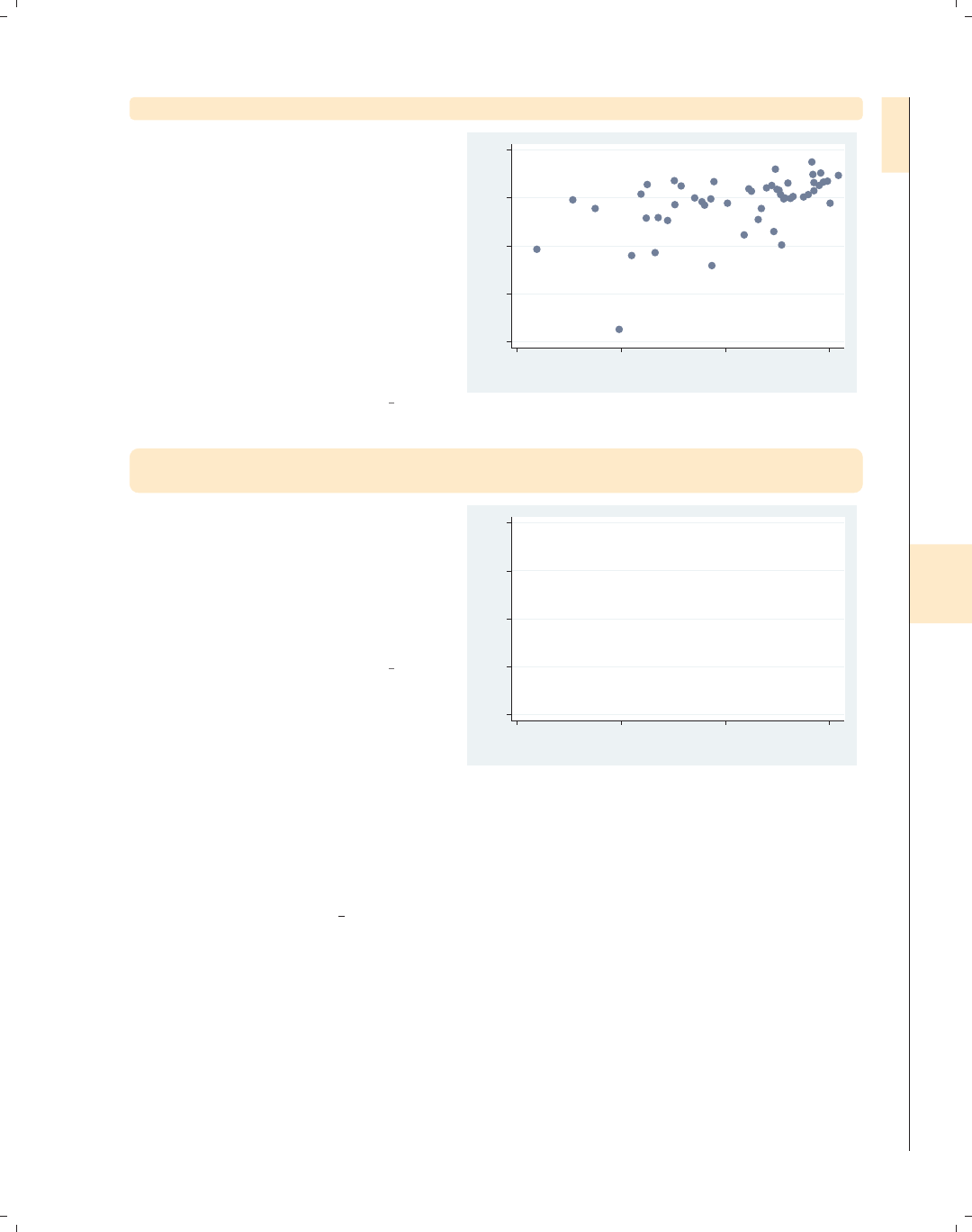
i
i
i
i
i
i
i
i
8.1 Changing the look of markers 239
twoway scatter ownhome borninstate, mlabel(stateab) mlabpos(center)
One last marker symbol is ifor
invisible, allowing us to hide the marker
symbol. In this example, we use the
mlabel(stateab) (marker label)
option to display a marker label with
the state abbreviation for each
observation and the mlabpos(center)
(marker label position) option to center
the marker label. However, the marker
symbol (the circle) and the marker
label (the abbreviation) are right on
top of each other.
Uses allstates.dta & scheme vg s2c
AL
AK
AZ
AR
CA
CO
CT
DE
DC
FL GA
HI
ID
IL
IN IA
KS KYLA
ME
MD
MA
MI
MN
MS
MO
MT NE
NV
NH
NJ
NM
NY
NC ND
OH
OK
OR
PA
RI
SC
SD
TN
TX
UT
VT
VA
WA
WV
WI
WY
40 50 60 70 80
% who own home
20 40 60 80
% born in state of residence
twoway scatter ownhome borninstate, mlabel(stateab) mlabpos(center)
msymbol(i)
If we use msymbol(i) to make the
marker symbol invisible, the marker
label (the state abbreviation) can be
displayed without being obscured by
the marker symbol. See Styles : Symbols
(342) for more information about
symbols.
Uses allstates.dta & scheme vg s2c
AL
AK
AZ
AR
CA
CO
CT
DE
DC
FL GA
HI
ID
IL
IN IA
KS KYLA
ME
MD
MA
MI
MN
MS
MO
MT NE
NV
NH
NJ
NM
NY
NC ND
OH
OK
OR
PA
RI
SC
SD
TN
TX
UT
VT
VA
WA
WV
WI
WY
40 50 60 70 80
% who own home
20 40 60 80
% born in state of residence
So far, we have seen that the msymbol() option can be used to control the marker sym-
bol and, to a certain extent, can be used to control the marker size (e.g., using Oyields
large circles, and using oyields small circles). As the following examples show, the msize()
option can be used to exert more flexible control over the size of the markers. The following
examples will use the vg s1m scheme.
Introduction Twoway Matrix Bar Box Dot Pie Options Standard options Styles Appendix
Markers Marker labels Connecting Axis titles Axis labels Axis scales Axis selection By Legend Adding text Textboxes
The electronic form of this book is solely for direct use at UCLA and only by faculty, students, and staff of UCLA.
All rights reserved on the copyright page apply to this document and specifically neither the electronic nor
published form of the book may be distributed or reproduced, either electronically or in printed form.

i
i
i
i
i
i
i
i
240 Chapter 8. Options available for most graphs
twoway scatter ownhome borninstate, msymbol(+) msize(small)
40 50 60 70 80
% who own home
20 40 60 80
% born in state of residence
Previously, we saw that the size of the
symbols created using O,D,S,andT
could be modified using an uppercase
or lowercase letter. Here, we use the
msize() (marker size) option to control
the size of the marker symbol, making
the marker symbol small. Other values
we could have chosen include vtiny,
tiny,vsmall,small,medsmall,
medium,medlarge,large,vlarge,
huge,vhuge,andehuge.
Uses allstates.dta & scheme vg s1m
twoway scatter ownhome borninstate, msymbol(Oh) msize(*2)
40 50 60 70 80
% who own home
20 40 60 80
% born in state of residence
We can specify the sizes as multiples of
the original size of the marker. In this
example, we make the markers twice
their original size by specifying
msize(*2). Specifying a value less than
one reduces the marker size; e.g.,
msize(*.5), would make the marker
half its normal size. See
Styles : Markersize (340) for more details.
Uses allstates.dta & scheme vg s1m
twoway scatter ownhome borninstate [aweight=propval100],
msymbol(oh)
40 50 60 70 80
% who own home
20 40 60 80
% born in state of residence
Stata even allows us to size the symbols
based on the values of another variable
in your data file. This allows us, in a
sense, to graph three variables at once.
Here, we look at the relationship
between borninstate and ownhome and
then size the markers based on
propval100 using
[aweight=propval100], weighting the
markers by propval100.
Uses allstates.dta & scheme vg s1m
The electronic form of this book is solely for direct use at UCLA and only by faculty, students, and staff of UCLA.
All rights reserved on the copyright page apply to this document and specifically neither the electronic nor
published form of the book may be distributed or reproduced, either electronically or in printed form.
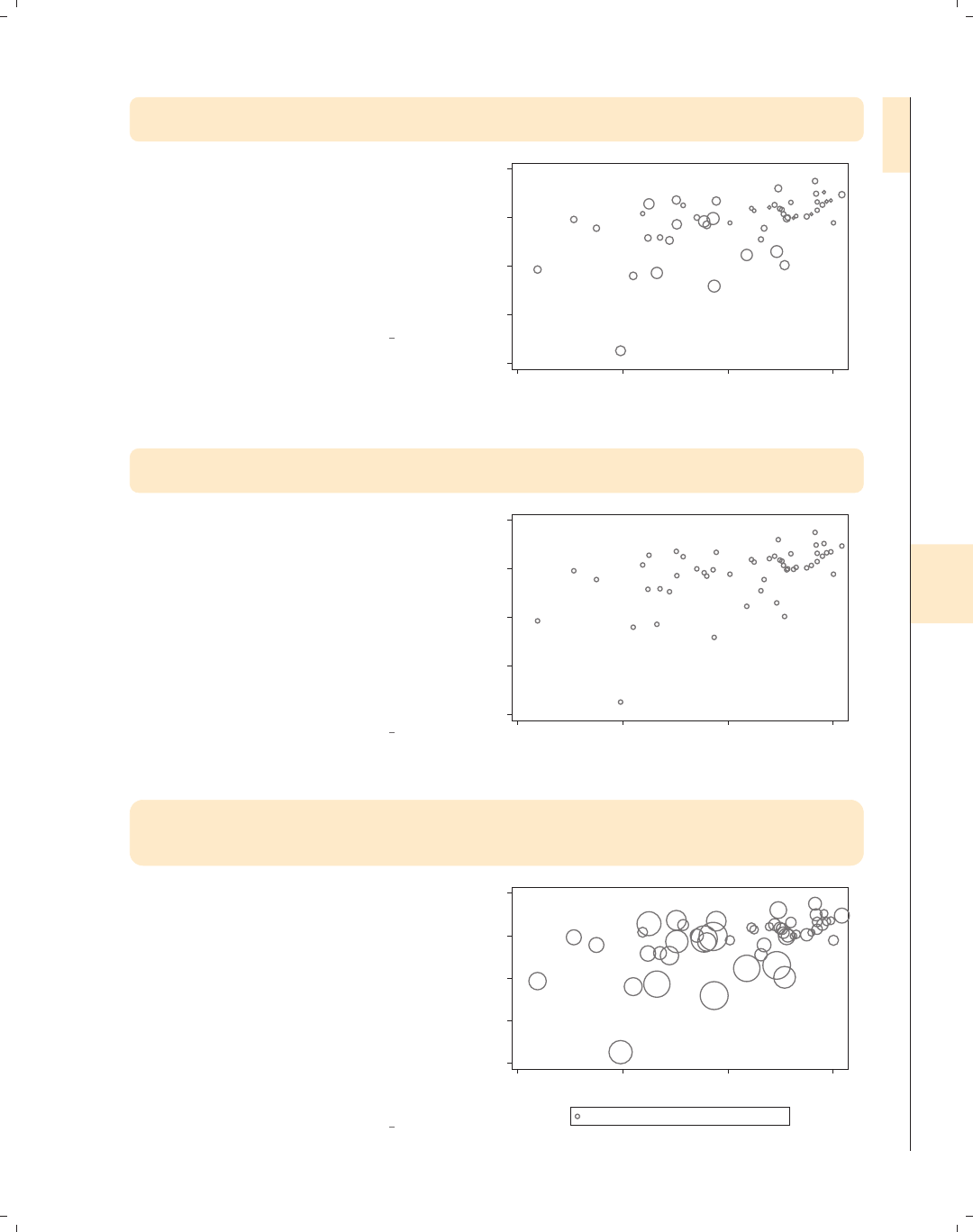
i
i
i
i
i
i
i
i
8.1 Changing the look of markers 241
twoway scatter ownhome borninstate [aweight=propval100],
msymbol(oh) msize(small)
Even if we weight the size of the
markers using aweight, we can still
control the general size of the markers.
Here, we make all markers smaller
using the msize(small) option. The
markers are smaller than they were
previously but are still sized according
to the value of propval100.
Uses allstates.dta & scheme vg s1m
40 50 60 70 80
% who own home
20 40 60 80
% born in state of residence
twoway scatter ownhome borninstate [aweight=propval100],
msymbol(oh) msize(large) mlabel(stateab)
We might try to even graph a fourth
variable in the plot by using the
mlabel() (marker label) option. Here,
we try to use the mlabel(stateab)
option to label each marker with the
abbreviation of the state. However,
note that when we add the mlabel()
option, the weights no longer affect the
size of the markers. See the following
example for a solution to this.
Uses allstates.dta & scheme vg s1m
AL
AK
AZ
AR
CA
CO
CT
DE
DC
FL GA
HI
ID
IL
IN IA
KS KYLA
ME
MD
MA
MI
MN
MS
MO
MT NE
NV
NH
NJ
NM
NY
NC ND
OH
OK
OR
PA
RI
SC
SD
TN
TX
UT
VT
VA
WA
WV
WI
WY
40 50 60 70 80
% who own home
20 40 60 80
% born in state of residence
twoway (scatter ownhome borninstate [aweight=propval100],
msymbol(oh) msize(large))
(scatter ownhome borninstate, mlabel(stateab) msymbol(i) mlabpos(center))
We can solve the problem from the
previous example by overlaying a
scatterplot that has the symbols
weighted by propval100 with a
scatterplot that shows just the marker
labels. The second scatterplot uses the
mlabel(stateab) msymbol(i)
mlabpos(center) options to label the
markers with the state abbreviation.
See Options : Marker labels (247) for
more details.
Uses allstates.dta & scheme vg s1m
AL
AK
AZ
AR
CA
CO
CT
DE
DC
FL GA
HI
ID IL
IN IA
KS KYLA
ME
MD
MA
MI
MN
MS
MO
MT NE
NV
NH
NJ
NM
NY
NC ND
OH
OK
OR
PA
RI
SC
SD
TN
TX
UT
VT
VA
WA
WV
WI
WY
40 50 60 70 80
% who own home
20 40 60 80
% born in state of residence
% who own home % who own home
Introduction Twoway Matrix Bar Box Dot Pie Options Standard options Styles Appendix
Markers Marker labels Connecting Axis titles Axis labels Axis scales Axis selection By Legend Adding text Textboxes
The electronic form of this book is solely for direct use at UCLA and only by faculty, students, and staff of UCLA.
All rights reserved on the copyright page apply to this document and specifically neither the electronic nor
published form of the book may be distributed or reproduced, either electronically or in printed form.
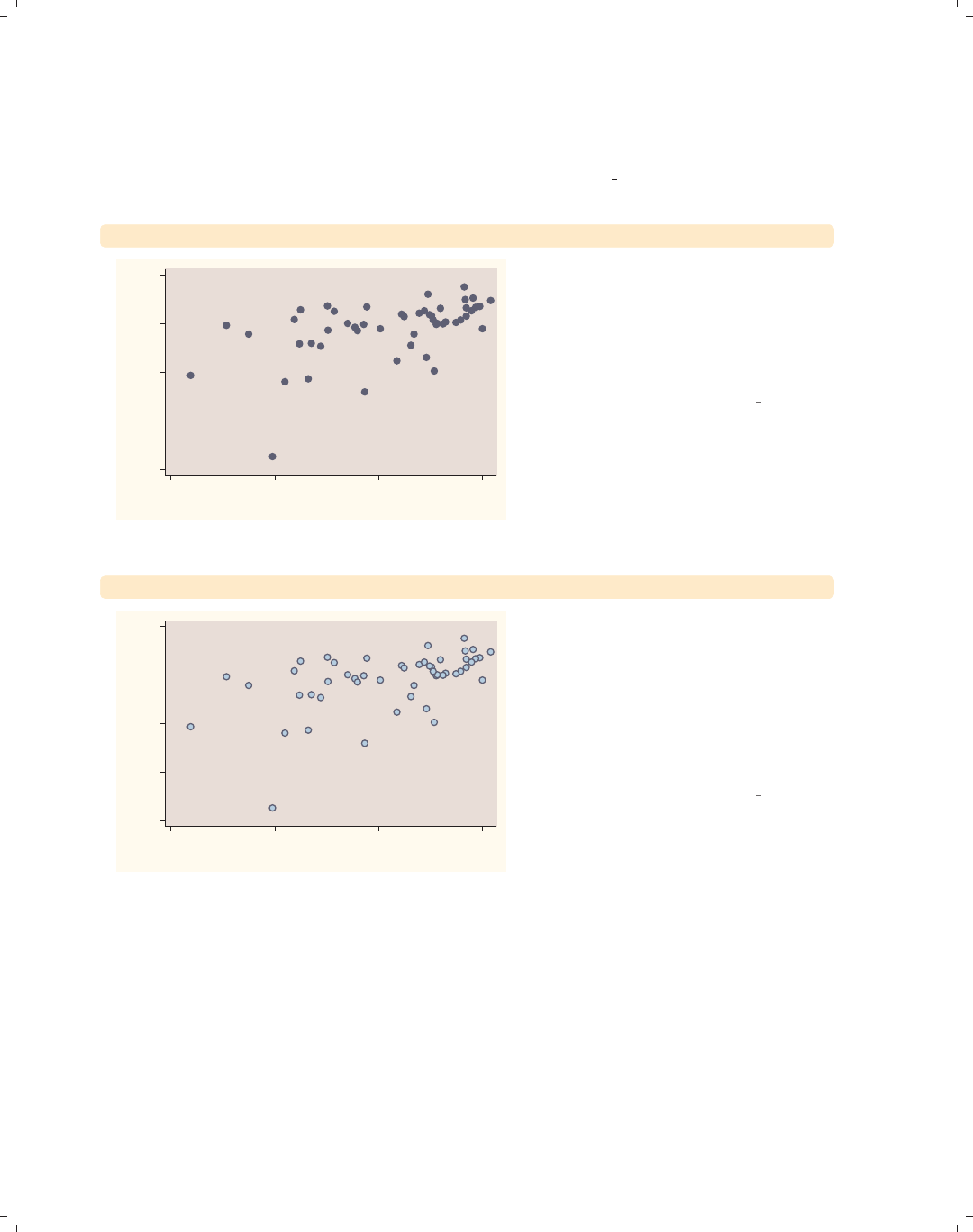
i
i
i
i
i
i
i
i
242 Chapter 8. Options available for most graphs
Stata also allows us to control the color of the markers. We can control the overall color
of the marker, create a solid color, or make the inner part of the marker one color (called a
fill color) and the outline of the marker a different color. We can also vary the thickness of
the outline of the marker. These next examples will use the vg rose scheme.
twoway scatter ownhome borninstate, mcolor(navy)
40
50
60
70
80
% who own home
20 40 60 80
% born in state of residence
The mcolor() (marker color) option
can be used to control the color of the
markers. Here, we make the markers
navy blue using the mcolor(navy)
option. See Styles : Colors (328) for more
information about specifying colors
Uses allstates.dta & scheme vg rose
twoway scatter ownhome borninstate, mfcolor(ltblue) mlcolor(navy)
40
50
60
70
80
% who own home
20 40 60 80
% born in state of residence
We can separately control the fill color
(inside color) and outline color with the
mfcolor() (marker fill color) and
mlcolor() (marker line color) options,
respectively. Here, we make the fill
color light blue by specifying
mfcolor(ltblue) and the line color
navy by specifying mlcolor(navy).
Uses allstates.dta & scheme vg rose
The electronic form of this book is solely for direct use at UCLA and only by faculty, students, and staff of UCLA.
All rights reserved on the copyright page apply to this document and specifically neither the electronic nor
published form of the book may be distributed or reproduced, either electronically or in printed form.
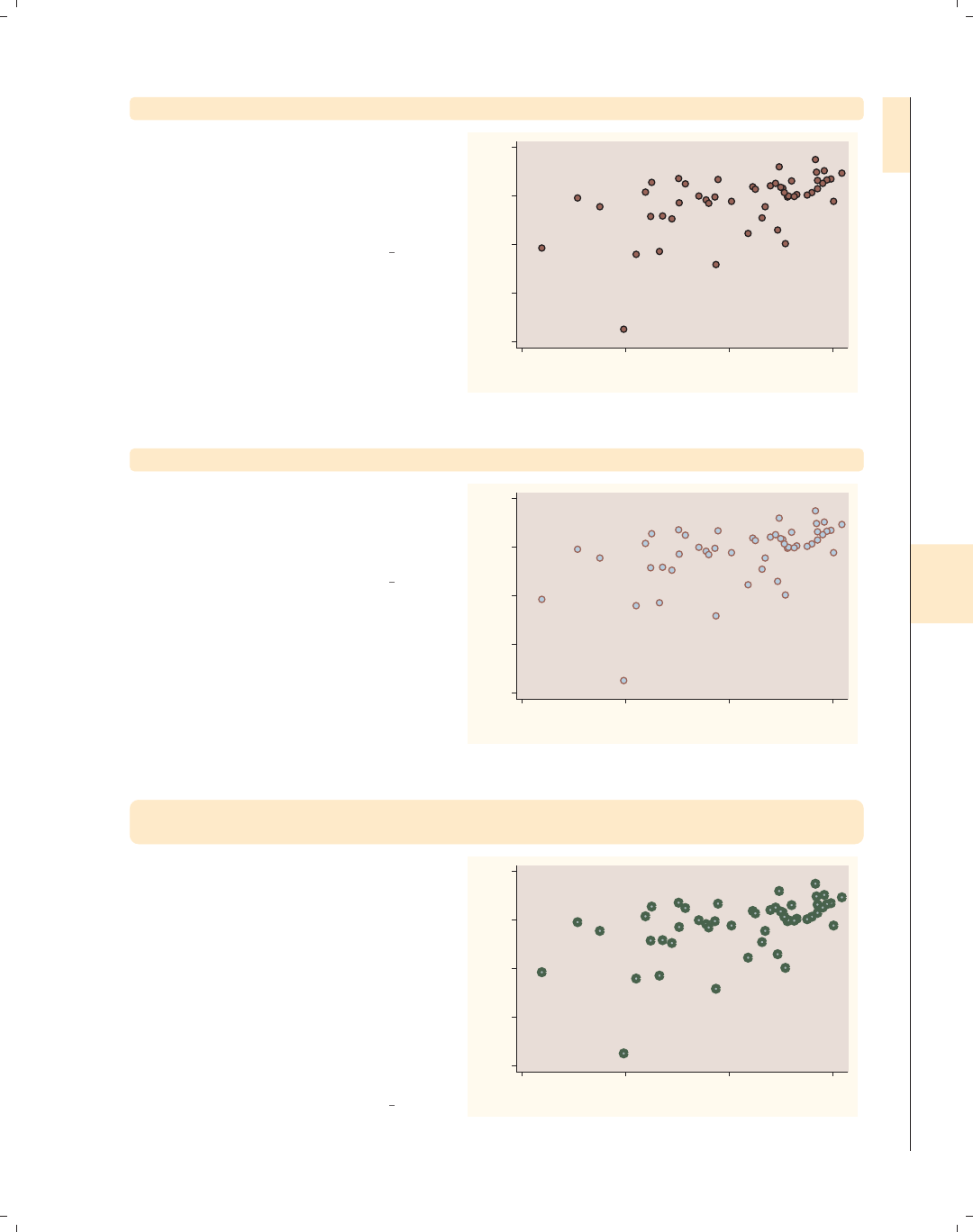
i
i
i
i
i
i
i
i
8.1 Changing the look of markers 243
twoway scatter ownhome borninstate, mlcolor(black)
We can change the line color
surrounding the marker with the
mlcolor() option. Here, we specify
mlcolor(black) to make the line
surrounding the markers black.
Uses allstates.dta & scheme vg rose
40
50
60
70
80
% who own home
20 40 60 80
% born in state of residence
twoway scatter ownhome borninstate, mfcolor(ltblue)
We can also separately control the fill
color using the mfcolor() option. If we
choose mfcolor(ltblue), the fill color
is light blue.
Uses allstates.dta & scheme vg rose
40
50
60
70
80
% who own home
20 40 60 80
% born in state of residence
twoway scatter ownhome borninstate, mfcolor(eltgreen)
mlcolor(dkgreen) mlwidth(vthick)
We can control the width of the line
that surrounds the marker using the
mlwidth() option. Here, we make the
width very thick by specifying the
mlwidth(vthick) (marker line width)
option. We can also indicate the
thickness as a multiple of the original
thickness; e.g., mlwidth(*3) indicates
the line should be three times as thick
as it would normally be. See
Styles : Linewidth (337) for more details.
Uses allstates.dta & scheme vg rose
40
50
60
70
80
% who own home
20 40 60 80
% born in state of residence
Introduction Twoway Matrix Bar Box Dot Pie Options Standard options Styles Appendix
Markers Marker labels Connecting Axis titles Axis labels Axis scales Axis selection By Legend Adding text Textboxes
The electronic form of this book is solely for direct use at UCLA and only by faculty, students, and staff of UCLA.
All rights reserved on the copyright page apply to this document and specifically neither the electronic nor
published form of the book may be distributed or reproduced, either electronically or in printed form.
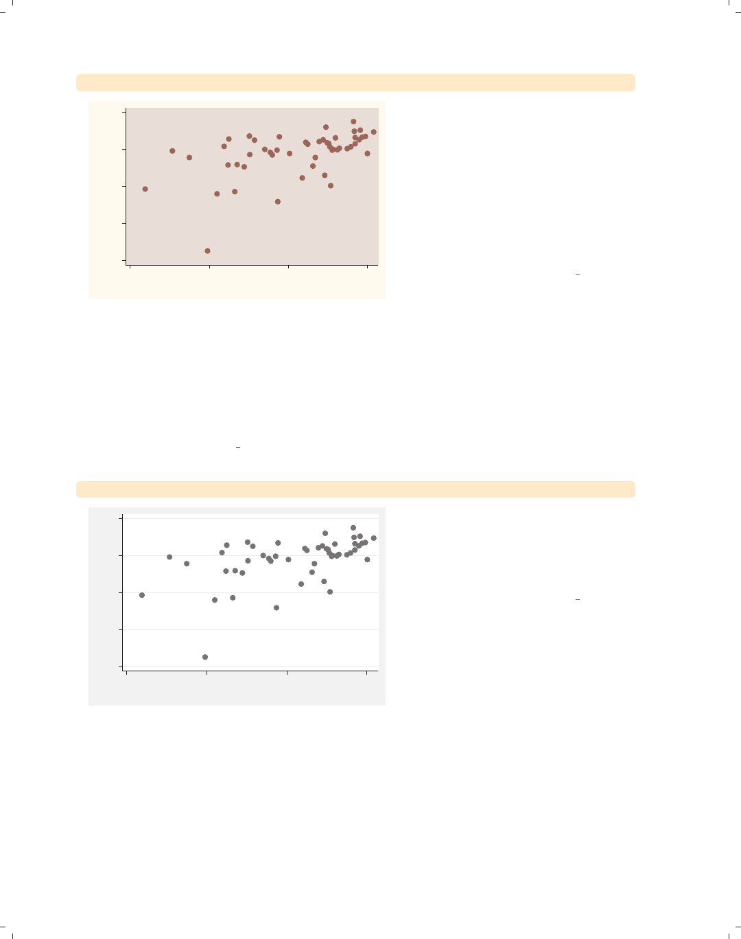
i
i
i
i
i
i
i
i
244 Chapter 8. Options available for most graphs
twoway scatter ownhome borninstate, mlwidth(medthick)
40
50
60
70
80
% who own home
20 40 60 80
% born in state of residence
If we do not specify a different color for
the line that outlines the marker (e.g.,
via the mlcolor() option), we may not
see any effect in specifying the
mlwidth() option. This is because the
color of the line surrounding the marker
is the same as the fill color, so we
cannot see the effect of modifying the
width of the line surrounding the
marker, as illustrated here.
Uses allstates.dta & scheme vg rose
So far, we have focused on controlling the individual elements of markers, the marker
symbol, color, size, fill color, line color, and so forth. There is another way to change the
appearance of a marker, and that is by specifying a marker style. The marker style controls
all these attributes at once, and in some situations, it can be more efficient to use a marker
style to control the elements individually, as we will see in the following examples. The next
examples will use the vg s2m scheme.
twoway scatter ownhome borninstate
40 50 60 70 80
% who own home
20 40 60 80
% born in state of residence
The marker styles are named/numbered
p1 to p15. The markers in this example
are displayed using the p1 style because
we are plotting only one y-variable and
have not specified a marker style.
Uses allstates.dta & scheme vg s2m
The electronic form of this book is solely for direct use at UCLA and only by faculty, students, and staff of UCLA.
All rights reserved on the copyright page apply to this document and specifically neither the electronic nor
published form of the book may be distributed or reproduced, either electronically or in printed form.
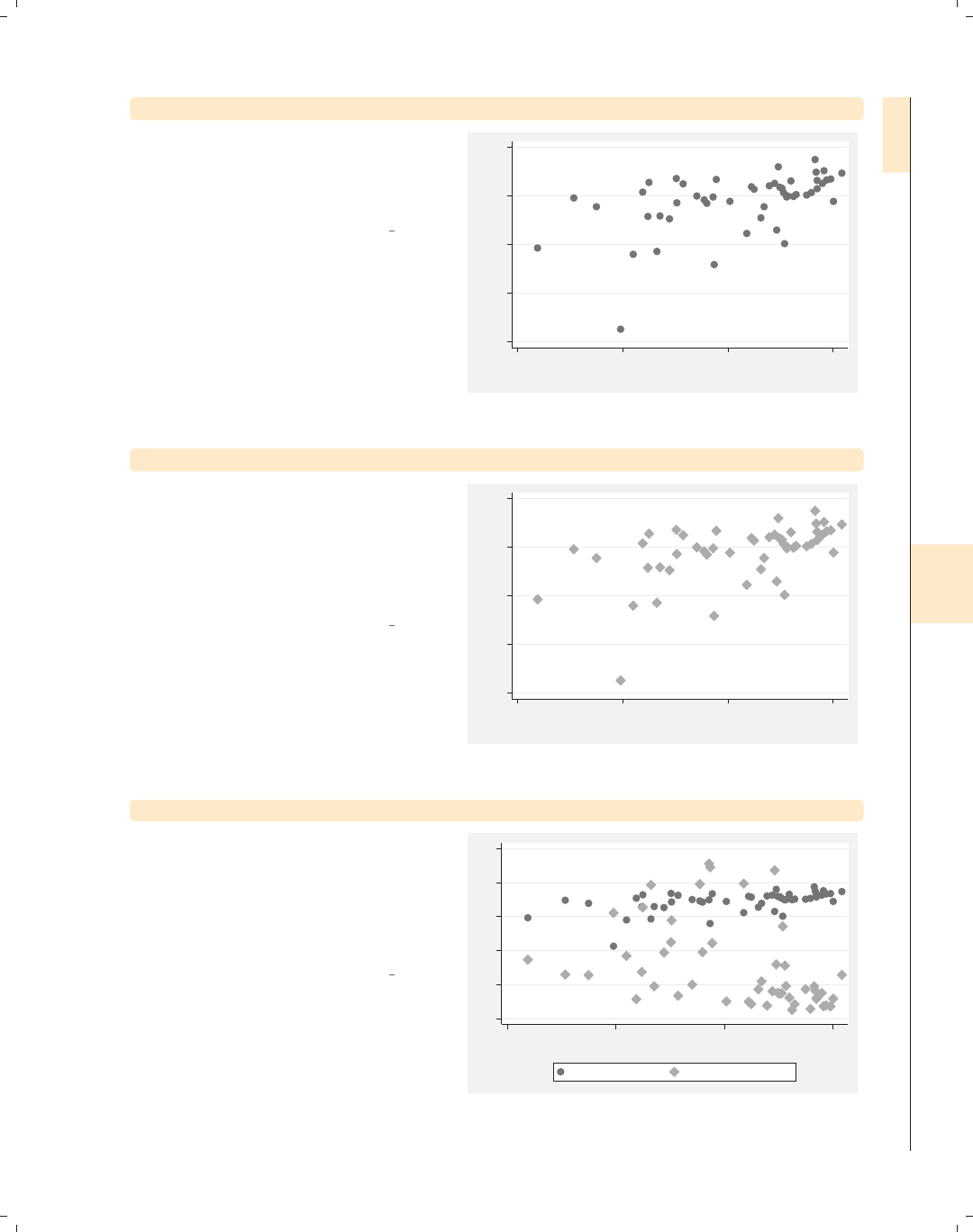
i
i
i
i
i
i
i
i
8.1 Changing the look of markers 245
twoway scatter ownhome borninstate, mstyle(p1)
Here, we explicitly select the default
marker style using the mstyle(p1)
(marker style) option, and the markers
look identical to the previous graph.
Uses allstates.dta & scheme vg s2m
40 50 60 70 80
% who own home
20 40 60 80
% born in state of residence
twoway scatter ownhome borninstate, mstyle(p2)
Here, we use mstyle(p2) to explicitly
select the p2 style for displaying the
markers, and now the markers are
different in size, shape, and color. The
markers are now larger diamonds that
are a middle-level gray color.
Uses allstates.dta & scheme vg s2m
40 50 60 70 80
% who own home
20 40 60 80
% born in state of residence
twoway scatter ownhome propval100 borninstate
Now, if we plot two variables, notice
how the first variable is plotted using
the p1 style and the second variable is
plotted using the p2 style. We would
have gotten the same result if we had
specified the option mstyle(p1 p2).
Uses allstates.dta & scheme vg s2m
0 20 40 60 80 100
20 40 60 80
% born in state of residence
% who own home % homes cost $100K+
Introduction Twoway Matrix Bar Box Dot Pie Options Standard options Styles Appendix
Markers Marker labels Connecting Axis titles Axis labels Axis scales Axis selection By Legend Adding text Textboxes
The electronic form of this book is solely for direct use at UCLA and only by faculty, students, and staff of UCLA.
All rights reserved on the copyright page apply to this document and specifically neither the electronic nor
published form of the book may be distributed or reproduced, either electronically or in printed form.
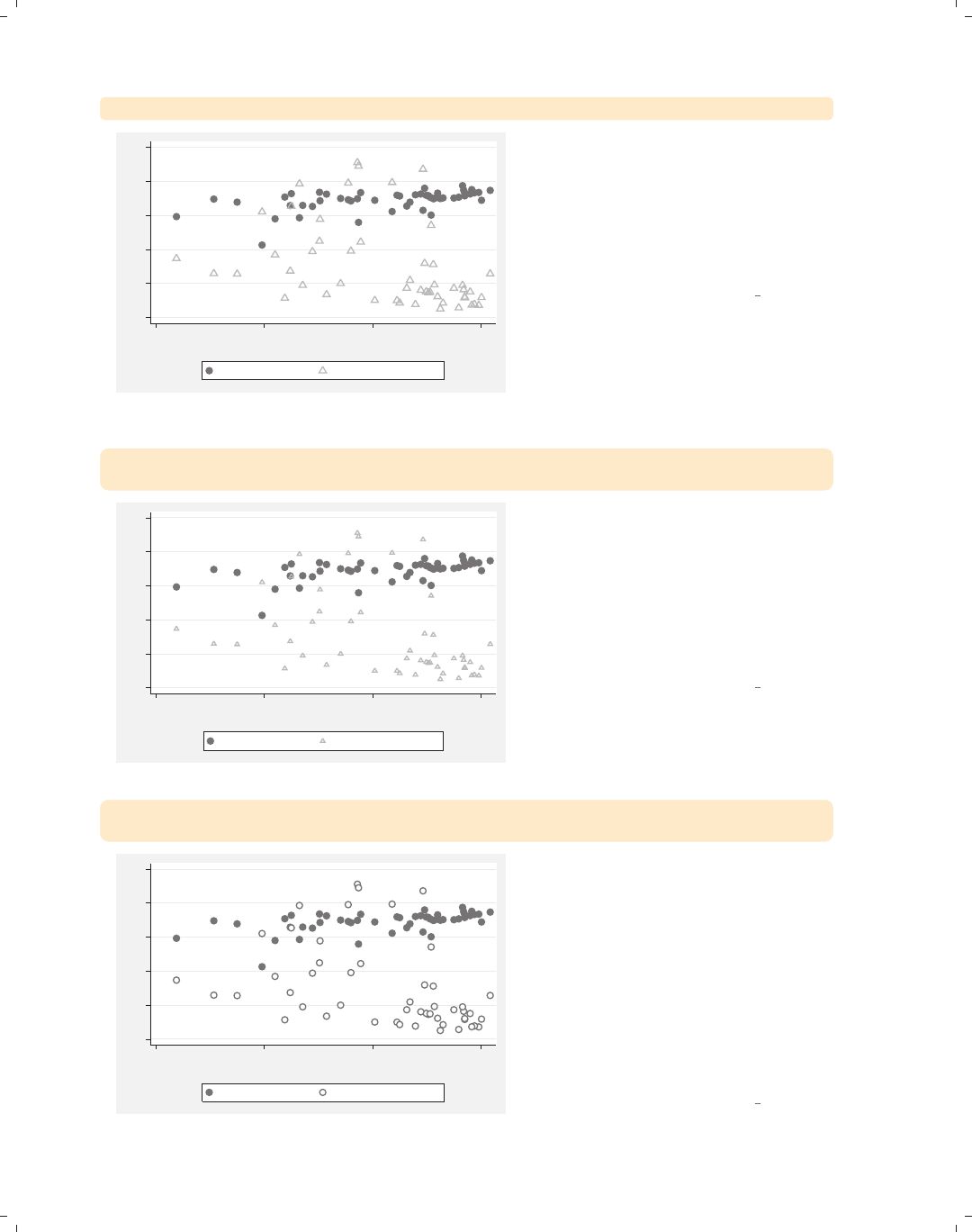
i
i
i
i
i
i
i
i
246 Chapter 8. Options available for most graphs
twoway scatter ownhome propval100 borninstate, mstyle(p1 p10)
0 20 40 60 80 100
20 40 60 80
% born in state of residence
% who own home % homes cost $100K+
In this graph, we use the mstyle(p1
p10) option to request that the first
variable be plotted with the p1 style
and the second be plotted with the p10
style. A style is just a starting point,
and we can use additional options to
modify the markers to suit our taste.
Uses allstates.dta & scheme vg s2m
twoway scatter ownhome propval100 borninstate, mstyle(p1 p10)
msize(. medium)
0 20 40 60 80 100
20 40 60 80
% born in state of residence
% who own home % homes cost $100K+
Say that in the previous graph you
wanted medium-sized triangles. We can
add the msize(. medium) option to
control the size of the second marker,
leaving the first unchanged. So, even
though a style chooses a number of
characteristics for the markers, we can
override them.
Uses allstates.dta & scheme vg s2m
twoway scatter ownhome propval100 borninstate, mstyle(p1 p1)
mfcolor(. white)
0 20 40 60 80 100
20 40 60 80
% born in state of residence
% who own home % homes cost $100K+
In this example, we use the p1 style for
both the first and second markers,
which are small, dark gray, filled circles.
If no other options are specified, the
markers for the first variable will be
identical to those for the second. But
adding the mfcolor(. white) option,
the fill color for the first variable was
left alone, and the second was changed
to white. This easily gave us solid and
white-filled circles for the two markers.
Uses allstates.dta & scheme vg s2m
The electronic form of this book is solely for direct use at UCLA and only by faculty, students, and staff of UCLA.
All rights reserved on the copyright page apply to this document and specifically neither the electronic nor
published form of the book may be distributed or reproduced, either electronically or in printed form.
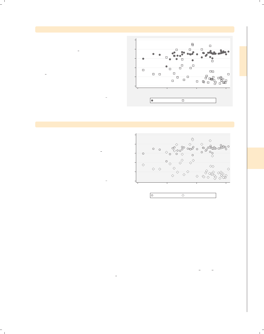
i
i
i
i
i
i
i
i
8.2 Creating and controlling marker labels 247
twoway scatter ownhome propval100 borninstate, msymbol(. Sh)
Another strategy for controlling the
marker symbols is choosing or creating
a scheme. The vg samem scheme makes
all markers the same size, shape, color,
etc., allowing you to customize them all
from a common base. Here, we use the
vg samem scheme, making all markers
solid, dark gray circles, but use the
msymbol(. Sh) option to make the
second symbol hollow squares.
Uses allstates.dta & scheme vg samem
0 20 40 60 80 100
20 40 60 80
% born in state of residence
% who own home % homes cost $100K+
twoway scatter ownhome propval100 borninstate
Say that you wanted the markers to be
displayed as outlines filled with white.
Rather than specifying the mfcolor()
option, you could use the vg outm
scheme, as shown here. Even if you
overlaid multiple commands, using this
scheme would display the markers, by
default, as white-filled outlines.
Uses allstates.dta & scheme vg outm
0 20 40 60 80 100
20 40 60 80
% born in state of residence
% who own home % homes cost $100K+
8.2 Creating and controlling marker labels
This section looks at the details of using marker labels. Marker labels can be used to
identify the markers with graph twoway but also can be used with other types of graphs,
such as graph matrix and graph box, affecting the outside values. You can even use
marker labels in lieu of markers. For more information, see [G]marker label options.
For this section, we will use the vg s2c scheme and the allstates3 file, which keeps the
states that are in the South, i.e., if region is equal to 3.
Introduction Twoway Matrix Bar Box Dot Pie Options Standard options Styles Appendix
Markers Marker labels Connecting Axis titles Axis labels Axis scales Axis selection By Legend Adding text Textboxes
The electronic form of this book is solely for direct use at UCLA and only by faculty, students, and staff of UCLA.
All rights reserved on the copyright page apply to this document and specifically neither the electronic nor
published form of the book may be distributed or reproduced, either electronically or in printed form.
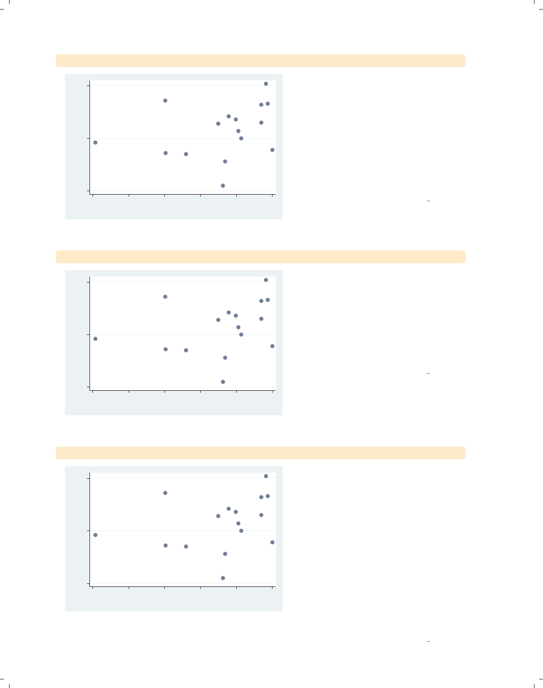
i
i
i
i
i
i
i
i
248 Chapter 8. Options available for most graphs
twoway scatter ownhome borninstate, mlabel(stateab)
AL
AR
DE
FL
GA
KY
LA
MD
MS
NC
OK SC
TN
TX
VA
WV
65 70 75
% who own home
30 40 50 60 70 80
% born in state of residence
Consider this scatterplot showing the
relationship between the percentage of
people in a state who own their home
and the percentage of people born in
their state of residence. We might want
to be able to identify some of the
observations, and we can use the
mlabel() (marker label) option to label
the markers with the two-letter
abbreviation of the state.
Uses allstates3.dta & scheme vg s2c
twoway scatter ownhome borninstate, mlabel(stateab) mlabpos(12)
AL
AR
DE
FL
GA
KY
LA
MD
MS
NC
OK SC
TN
TX
VA
WV
65 70 75
% who own home
30 40 50 60 70 80
% born in state of residence
In the previous graph, the marker labels
were all at the 3 o’clock position with
respect to the markers. We can use the
mlabpos() (marker label position)
option to give the marker labels a
different position. In this example, we
place the marker labels in the 12
o’clock position above the markers.
Uses allstates3.dta & scheme vg s2c
twoway scatter ownhome borninstate, mlabel(stateab) mlabvpos(pos)
AL
AR
DE
FL
GA
KY
LA
MD
MS
NC
OK SC
TN
TX
VA
WV
65 70 75
% who own home
30 40 50 60 70 80
% born in state of residence
There are a few markers whose
corresponding marker labels overlap
each other. The mlabvpos() (marker
label variable position) option allows us
to assign a different marker label
position for each observation via a
variable in the data file. The variable
pos has a value of 3, except for states
AL,MS,AR,andLA, where pos is 9, 12,
12, and 6, respectively. Note how the
markers are in the 3 o’clock position,
except for AL,MS,AR,andLA,which
are in the 9, 12, 12, and 6 o’clock
positions, respectively.
Uses allstates3.dta & scheme vg s2c
The electronic form of this book is solely for direct use at UCLA and only by faculty, students, and staff of UCLA.
All rights reserved on the copyright page apply to this document and specifically neither the electronic nor
published form of the book may be distributed or reproduced, either electronically or in printed form.
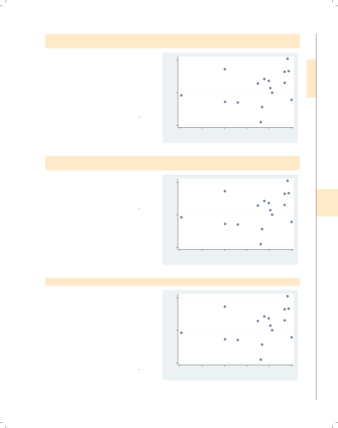
i
i
i
i
i
i
i
i
8.2 Creating and controlling marker labels 249
twoway scatter ownhome borninstate, mlabel(stateab) mlabvpos(pos)
mlabsize(small)
We can use the mlabsize() (marker
label size) option to control the size of
the markers. In this example, we make
the markers small. Some of the sizes
you could choose include small,
medsmall,medium,medlarge,large,
and vlarge;seeStyles : Textsize (344)
for more options.
Uses allstates3.dta & scheme vg s2c
AL
AR
DE
FL
GA
KY
LA
MD
MS
NC
OK
SC
TN
TX
VA
WV
65 70 75
% who own home
30 40 50 60 70 80
% born in state of residence
twoway scatter ownhome borninstate, mlabel(stateab) mlabvpos(pos)
mlabsize(*.6)
We can also specify the mlabsize() as
a relative size, a multiple of the original
size. In this example, the labels are .6
times their normal size.
Uses allstates3.dta & scheme vg s2c
AL
AR
DE
FL
GA
KY
LA
MD
MS
NC
OK SC
TN
TX
VA
WV
65 70 75
% who own home
30 40 50 60 70 80
% born in state of residence
twoway scatter ownhome borninstate, mlabel(stateab) mlabangle(45)
The mlabangle() (marker label angle)
option can be used to control the angle
of the marker label. 0 degrees indicates
horizontal text, 90 degrees vertical text,
180 degrees reverse horizontal text, and
270 degrees reverse vertical text. You
can also specify negative degrees (for
example, −90 degrees is the same as
270 degrees). See Styles : Angles (327)
for more details.
Uses allstates3.dta & scheme vg s2c
AL
AR
DE
FL
GA KY
LA
MD
MS
NC
OK
SC
TN
TX
VA WV
65 70 75
% who own home
30 40 50 60 70 80
% born in state of residence
Introduction Twoway Matrix Bar Box Dot Pie Options Standard options Styles Appendix
Markers Marker labels Connecting Axis titles Axis labels Axis scales Axis selection By Legend Adding text Textboxes
The electronic form of this book is solely for direct use at UCLA and only by faculty, students, and staff of UCLA.
All rights reserved on the copyright page apply to this document and specifically neither the electronic nor
published form of the book may be distributed or reproduced, either electronically or in printed form.
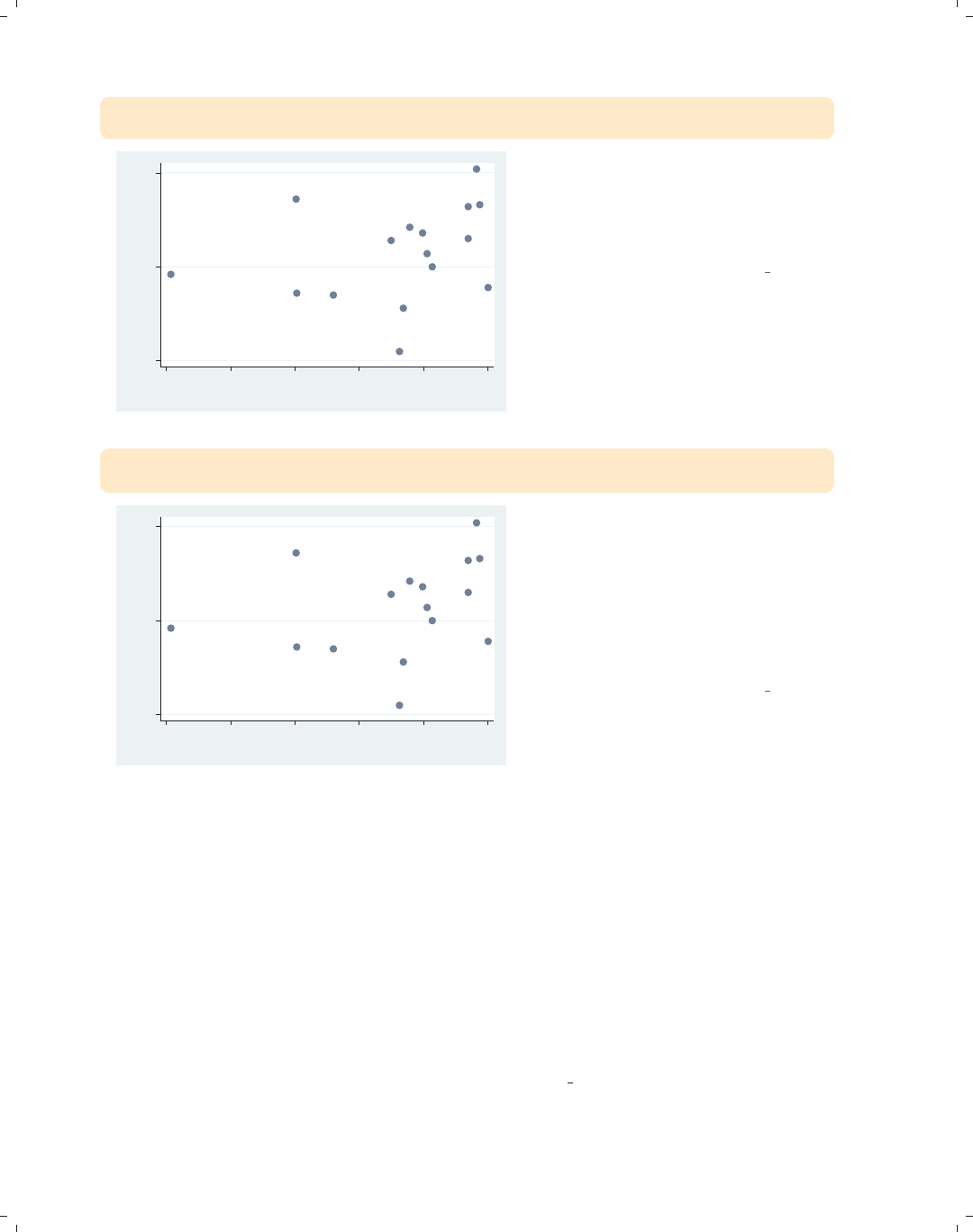
i
i
i
i
i
i
i
i
250 Chapter 8. Options available for most graphs
twoway scatter ownhome borninstate, mlabel(stateab) mlabpos(7)
mlabcolor(red)
AL
AR
DE
FL
GA
KY
LA
MD
MS
NC
OK SC
TN
TX
VA
WV
65 70 75
% who own home
30 40 50 60 70 80
% born in state of residence
The mlabcolor() (marker label color)
option controls the color of the marker
labels. In this example, we make the
marker labels red. See Styles : Colors
(328) for more details.
Uses allstates3.dta & scheme vg s2c
twoway scatter ownhome borninstate, mlabel(stateab) mlabpos(7)
mlabgap(*3)
AL
AR
DE
FL
GA
KY
LA
MD
MS
NC
OK SC
TN
TX
VA
WV
65 70 75
% who own home
30 40 50 60 70 80
% born in state of residence
The mlabgap() (marker label gap)
option controls the gap between the
marker and the marker label. In this
example, we make the gap three times
the size that it would normally. You
can also specify a value less than 1 to
place the marker label closer to the
marker.
Uses allstates3.dta & scheme vg s2c
8.3 Connecting points and markers
Stata supports a variety of methods for connecting points using different values for the
connectstyle. These include lto connect with a straight line, Lto connect with a straight
line only if the current x-value is greater than the prior x-value, Jfor stairstep, stepstair
for step then stair, and ifor invisible connections. For the next few examples, let’s switch
to using the spjanfeb2001 data file, keeping just the data for January and February of
2001. These examples of connect styles do not demonstrate how you would normally use
these styles but illustrate the different ways you can connect points. See [G]connectstyle
for more information. For this section, we will use the vg blue scheme.
The electronic form of this book is solely for direct use at UCLA and only by faculty, students, and staff of UCLA.
All rights reserved on the copyright page apply to this document and specifically neither the electronic nor
published form of the book may be distributed or reproduced, either electronically or in printed form.
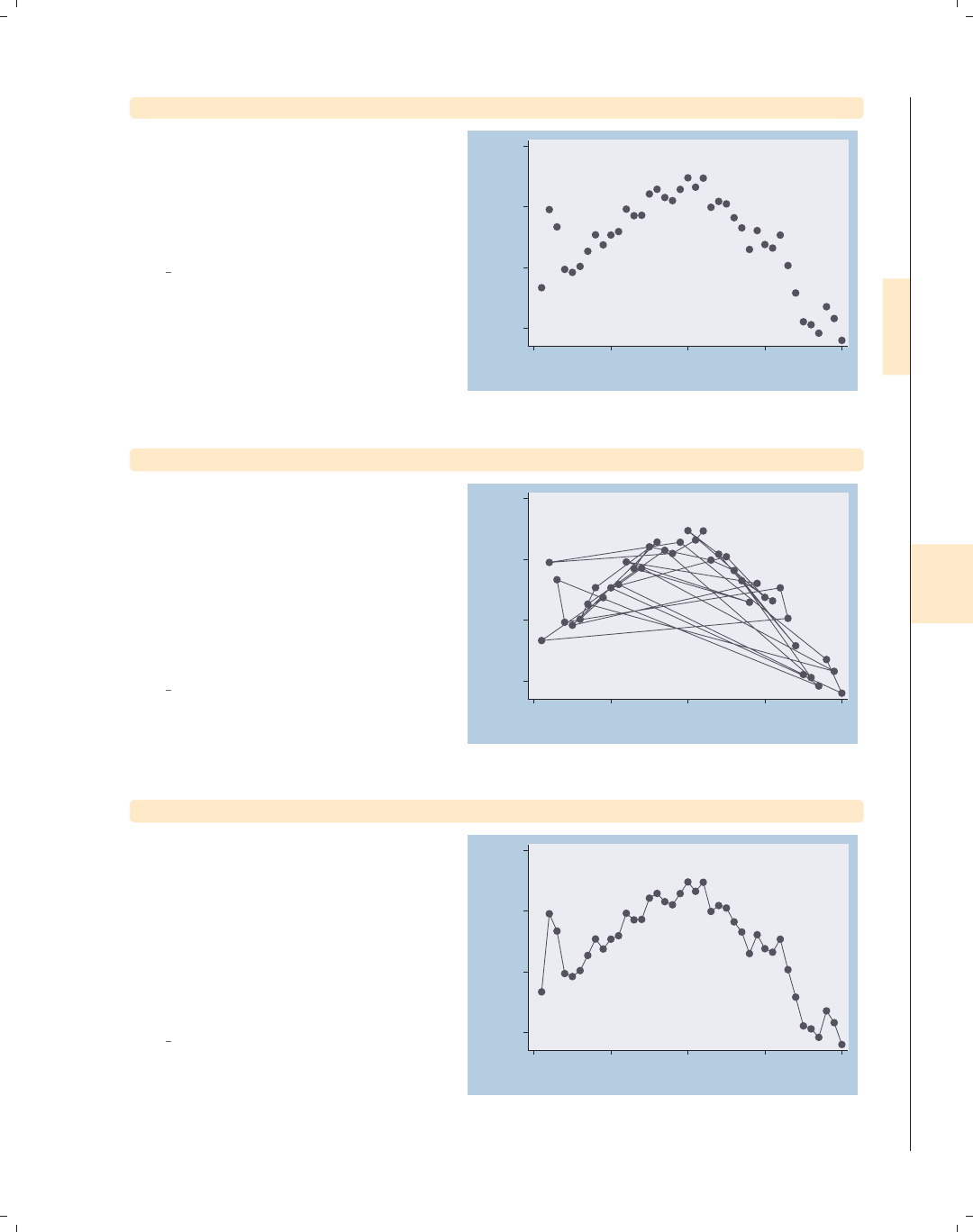
i
i
i
i
i
i
i
i
8.3 Connecting points and markers 251
twoway scatter close tradeday
Consider this graph, which shows the
closing price of the S&P 500 index for
January and February of 2001 by
tradeday, the trading day numbered
from 1 to 40.
Uses spjanfeb2001.dta & scheme
vg blue
1250
1300
1350
1400
Closing price
0 10 20 30 40
Trading day number
twoway scatter close tradeday, connect(l)
We use connect(l) to connect the
points, but this does not lead to the
kind of graph we really wanted to
create. This is because the observations
in the data file are not sorted according
to tradeday, yet the observations are
connected based on the order in which
they appear in the data file.
Uses spjanfeb2001.dta & scheme
vg blue 1250
1300
1350
1400
Closing price
0 10 20 30 40
Trading day number
twoway scatter close tradeday, connect(l) sort
If we add the sort option, the
observations are connected after sorting
them by tradeday, which leads to the
kind of graph we wanted to create.
Alternatively, we could have typed
sort tradeday, and all ensuing graphs
would have been ordered on tradeday,
even without the sort option.
Uses spjanfeb2001.dta & scheme
vg blue 1250
1300
1350
1400
Closing price
0 10 20 30 40
Trading day number
Introduction Twoway Matrix Bar Box Dot Pie Options Standard options Styles Appendix
Markers Marker labels Connecting Axis titles Axis labels Axis scales Axis selection By Legend Adding text Textboxes
The electronic form of this book is solely for direct use at UCLA and only by faculty, students, and staff of UCLA.
All rights reserved on the copyright page apply to this document and specifically neither the electronic nor
published form of the book may be distributed or reproduced, either electronically or in printed form.
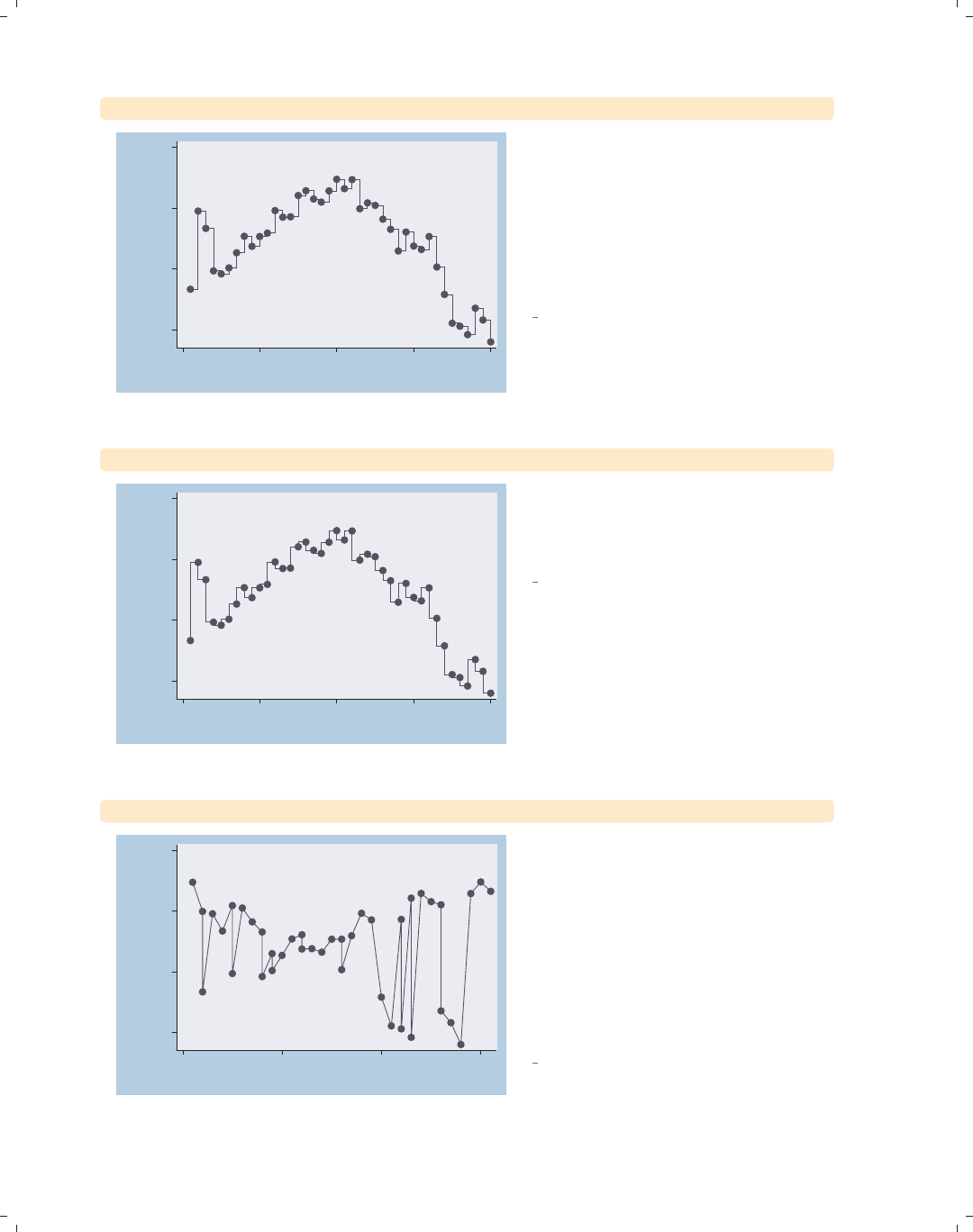
i
i
i
i
i
i
i
i
252 Chapter 8. Options available for most graphs
twoway scatter close tradeday, connect(J) sort
1250
1300
1350
1400
Closing price
0 10 20 30 40
Trading day number
You would not normally connect
observations for this kind of graph
using a stairstep pattern. This
connection method, obtained by using
the connect(J) option, would more
normally be used in a graph showing a
survival function over time.
Uses spjanfeb2001.dta & scheme
vg blue
twoway scatter close tradeday, connect(stepstair) sort
1250
1300
1350
1400
Closing price
0 10 20 30 40
Trading day number
A connection method related to the one
above can be obtained using the
connect(stepstair) option.
Uses spjanfeb2001.dta & scheme
vg blue
twoway scatter close dom, connect(l) sort
1250
1300
1350
1400
Closing price
0 10 20 30
Day of month
Say that we wanted to show the closing
price as a function of the day of the
month for the two months for which we
have data. In this example, we have the
variable dom (day of the month) on the
x-axis. If we include the sort option,
the data are shown as one continuous
line, as opposed to having one line for
January and a second line for February.
Uses spjanfeb2001.dta & scheme
vg blue
The electronic form of this book is solely for direct use at UCLA and only by faculty, students, and staff of UCLA.
All rights reserved on the copyright page apply to this document and specifically neither the electronic nor
published form of the book may be distributed or reproduced, either electronically or in printed form.
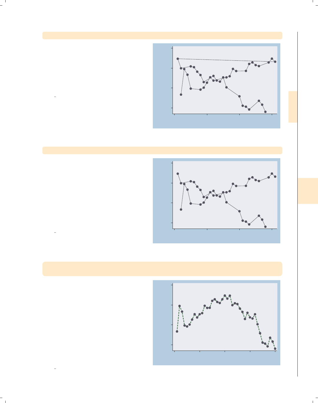
i
i
i
i
i
i
i
i
8.3 Connecting points and markers 253
twoway scatter close dom, connect(l) sort(tradeday)
We need to sort the observations by
tradeday, using the sort(tradeday)
option. This graph is almost what we
want, but the observation for January
31 is connected to the observation for
February 1.
Uses spjanfeb2001.dta & scheme
vg blue
1250
1300
1350
1400
Closing price
0 10 20 30
Day of month
twoway scatter close dom, connect(L) sort(tradeday)
This graph is what we wanted to create.
The connect(L) option avoids the line
connecting January 31 and February 1
because it connects points only as long
as dom is increasing. When dom
decreases from 31 to 1, the connect(L)
option does not connect those two
points. See Styles : Connect (332) for
more details on connect() options.
Uses spjanfeb2001.dta & scheme
vg blue
1250
1300
1350
1400
Closing price
0 10 20 30
Day of month
twoway scatter close tradeday, connect(l) sort
clcolor(green) clwidth(thick) clpattern(dash)
The connect() option determines how
the markers are connected but not the
color, width, or pattern of the line.
Here, we use the clcolor() (connect
line color), clwidth() (connect line
width), and clpattern() (connect line
pattern) options to make the line green,
thick, and dashed. See Styles : Colors
(328), Styles : Linewidth (337), and
Styles : Linepatterns (336) for more
information.
Uses spjanfeb2001.dta & scheme
vg blue
1250
1300
1350
1400
Closing price
0 10 20 30 40
Trading day number
Introduction Twoway Matrix Bar Box Dot Pie Options Standard options Styles Appendix
Markers Marker labels Connecting Axis titles Axis labels Axis scales Axis selection By Legend Adding text Textboxes
The electronic form of this book is solely for direct use at UCLA and only by faculty, students, and staff of UCLA.
All rights reserved on the copyright page apply to this document and specifically neither the electronic nor
published form of the book may be distributed or reproduced, either electronically or in printed form.
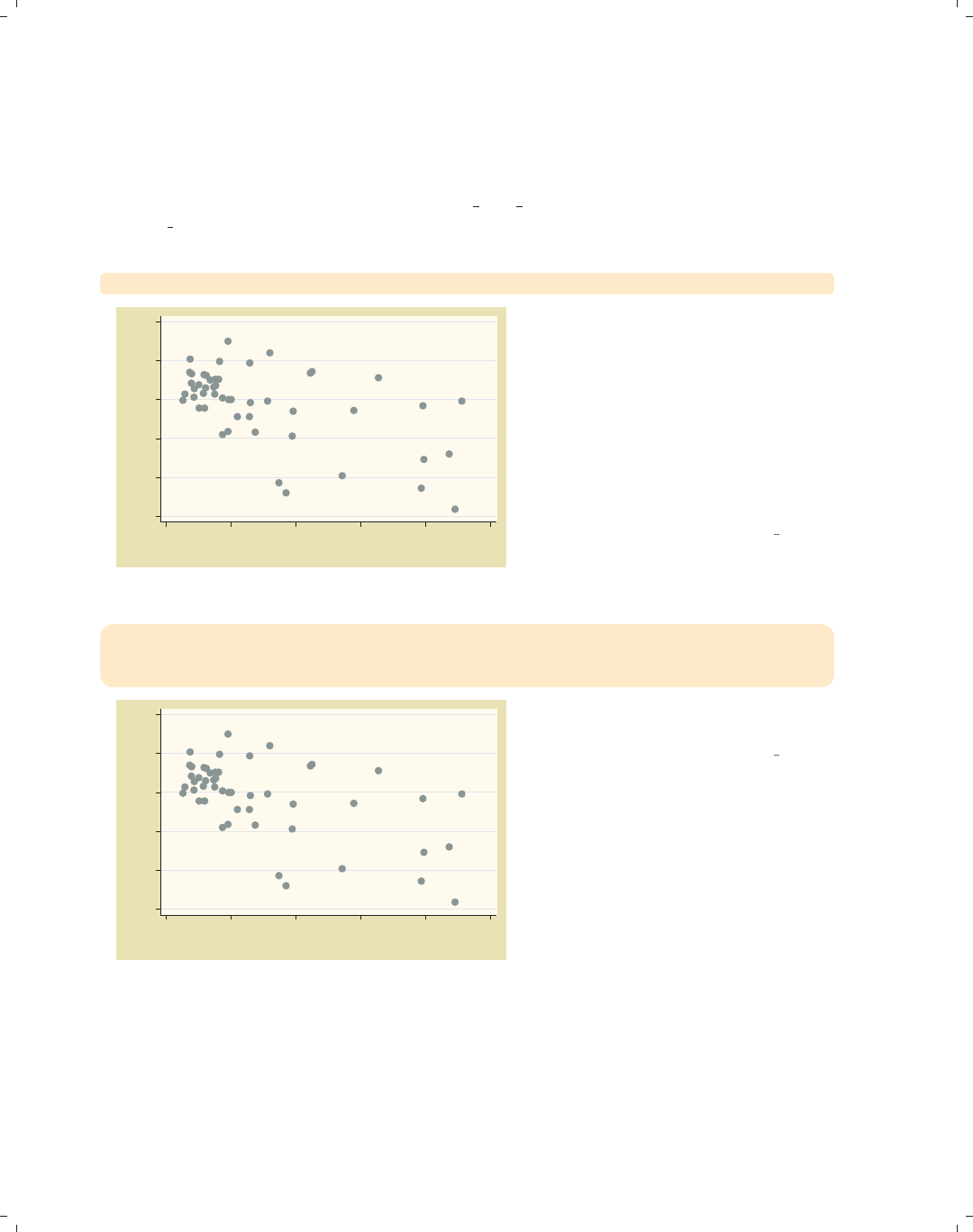
i
i
i
i
i
i
i
i
254 Chapter 8. Options available for most graphs
8.4 Setting and controlling axis titles
This section provides more details about the use of axis title options for providing titles
for axes. For more information, see [G]axis title options. For this section, we will use
the vg past scheme.
twoway scatter ownhome propval100
55 60 65 70 75 80
% who own home
0 20 40 60 80 100
% homes cost $100K+
Consider this graph of the percentage
of home owners by the percentage of
homes that cost over one hundred
thousand dollars. The titles of the x-
and y-axes are the names of the
variables, unless the variables are
labeled, in which case the default title
is the variable label. In this example,
the axes are labeled with the variable
labels.
Uses allstatesdc.dta & scheme vg past
twoway scatter ownhome propval100,
ytitle("Percent of households that own their homes")
xtitle("Percent of homes that cost over $100,000")
55 60 65 70 75 80
Percent of households that own their homes
0 20 40 60 80 100
Percent of homes that cost over $100,000
We can use the xtitle() and ytitle()
options to supply our own titles.
Uses allstatesdc.dta & scheme vg past
The electronic form of this book is solely for direct use at UCLA and only by faculty, students, and staff of UCLA.
All rights reserved on the copyright page apply to this document and specifically neither the electronic nor
published form of the book may be distributed or reproduced, either electronically or in printed form.
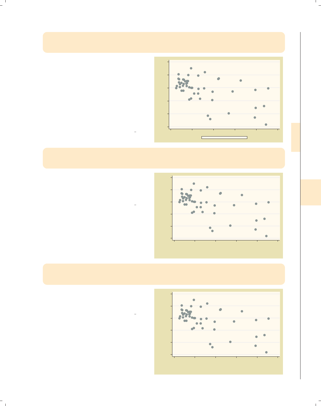
i
i
i
i
i
i
i
i
8.4 Setting and controlling axis titles 255
twoway scatter ownhome propval100,
ytitle("Percent of households that own their homes")
xtitle("Percent of homes that cost over $100,000", size(small) box)
Because an axis title is considered a
textbox, you can use textbox options,
as illustrated here, to control the look
of the axis title. Here, we add the
size() and box options to xtitle() to
make the x-axis title small with a box
around it. See Options : Textboxes (303)
for additional examples of how to use
textbox options to control the display
of text.
Uses allstatesdc.dta & scheme vg past
55 60 65 70 75 80
Percent of households that own their homes
0 20 40 60 80 100
Percent of homes that cost over $100,000
twoway scatter ownhome propval100,
ytitle("Percent of households" "that own their homes")
xtitle("Percent of homes" "that cost over $100,000")
In this example, we supply the same
titles but divide them into two separate
quoted strings, which then are
displayed on separate lines.
Uses allstatesdc.dta & scheme vg past
55 60 65 70 75 80
Percent of households
that own their homes
0 20 40 60 80 100
Percent of homes
that cost over $100,000
twoway scatter ownhome propval100,
ytitle("1990 Census Data", suffix)
xtitle("In 1990 dollars", prefix)
We can use the prefix and suffix
options to add information before or
after the existing title, respectively.
Uses allstatesdc.dta & scheme vg past
55 60 65 70 75 80
% who own home
1990 Census Data
0 20 40 60 80 100
In 1990 dollars
% homes cost $100K+
Introduction Twoway Matrix Bar Box Dot Pie Options Standard options Styles Appendix
Markers Marker labels Connecting Axis titles Axis labels Axis scales Axis selection By Legend Adding text Textboxes
The electronic form of this book is solely for direct use at UCLA and only by faculty, students, and staff of UCLA.
All rights reserved on the copyright page apply to this document and specifically neither the electronic nor
published form of the book may be distributed or reproduced, either electronically or in printed form.
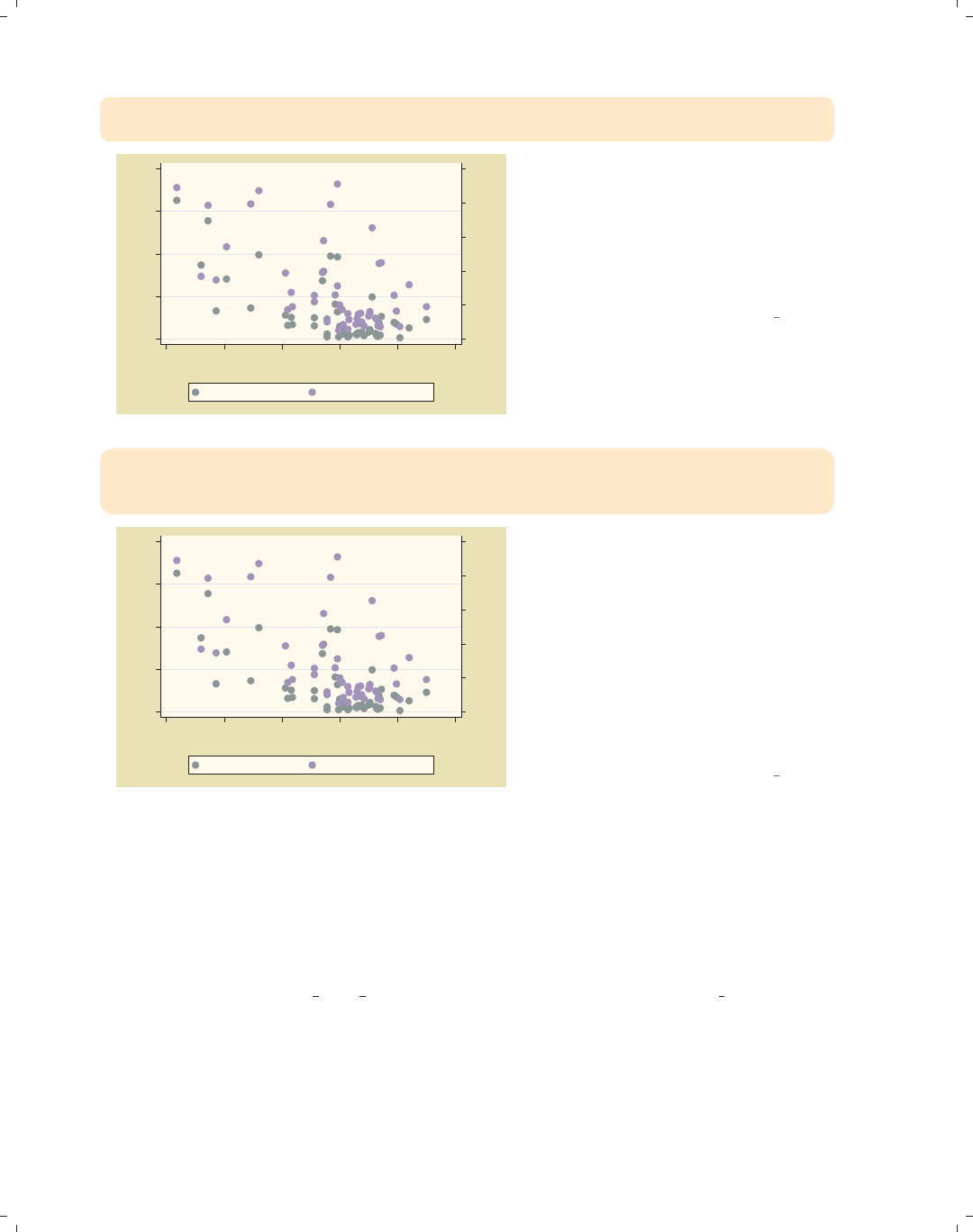
i
i
i
i
i
i
i
i
256 Chapter 8. Options available for most graphs
twoway (scatter rent700 ownhome )
(scatter propval100 ownhome, yaxis(2))
0 20 40 60 80 100
% homes cost $100K+
0 10 20 30 40
% rents $700+/mo
55 60 65 70 75 80
% who own home...
% rents $700+/mo % homes cost $100K+
Consider this overlaid twoway graph.
The two y-variables are both scaled in
percentages, but they have different
ranges. We use the yaxis(2) option on
the second scatter command to place
that axis on the second y-axis, which is
then placed on the right axis.
Uses allstatesdc.dta & scheme vg past
twoway (scatter rent700 ownhome) (scatter propval100 ownhome, yaxis(2)),
ytitle("Percent rents over $700", axis(1))
ytitle("Percent homes over $100,000", axis(2))
0 20 40 60 80 100
Percent homes over $100,000
0 10 20 30 40
Percent rents over $700
55 60 65 70 75 80
% who own home...
% rents $700+/mo % homes cost $100K+
Now that we have two y-axes, the
ytitle() option would change the
y-title for the first y-axis, unless we
specify otherwise. In this example, we
supply a ytitle() option with the
axis(1) option to indicate that the
title belongs to the first y-axis, and a
second ytitle() option using the
axis(2) option to indicate that the
second title belongs to the second
y-axis.
Uses allstatesdc.dta & scheme vg past
8.5 Setting and controlling axis labels
This section describes more details about axis labels, including major and minor (nu-
meric) labels, major and minor tick marks, and grid lines. This section also shows how
to control the appearance of these objects (e.g., size, color, thickness, or angle). For more
information, see [G]axis label options. For this section, we will use the vg s1c scheme.
The electronic form of this book is solely for direct use at UCLA and only by faculty, students, and staff of UCLA.
All rights reserved on the copyright page apply to this document and specifically neither the electronic nor
published form of the book may be distributed or reproduced, either electronically or in printed form.
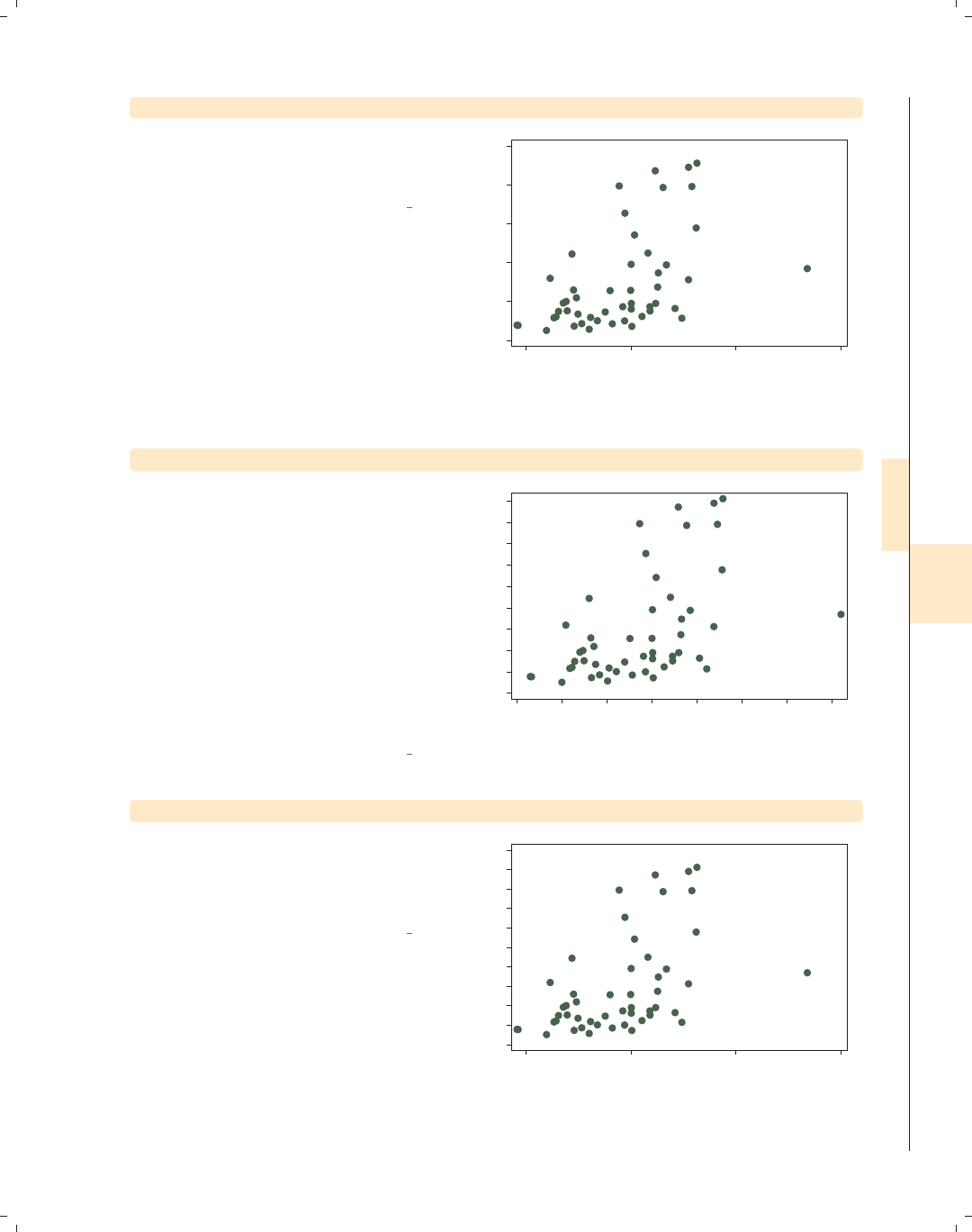
i
i
i
i
i
i
i
i
8.5 Setting and controlling axis labels 257
twoway scatter propval100 faminc
Let’s start with a basic graph showing
the percent of homes costing over
$100,000 by the median family income.
Uses allstatesdc.dta & scheme vg s1c
0 20 40 60 80 100
% homes cost $100K+
15000 20000 25000 30000
1979 Median Family Inc.
twoway scatter propval100 faminc, xlabel(#10) ylabel(#10)
Using the xlabel(#10) and
ylabel(#10) options, we ask for about
10 values to be labeled on each axis.
Stata chose to use 10 values for the
y-axis, labeling it from 0 to 90,
incrementing by 10, and 8 values for
the x-axis going from 14,000 to 28,000,
incrementing by 2,000. As you can see
from this example, sometimes Stata
follows your suggestion exactly, and
sometimes it chooses a different number
of values to make more logical labels.
Uses allstatesdc.dta & scheme vg s1c
0 10 20 30 40 50 60 70 80 90
% homes cost $100K+
14000 16000 18000 20000 22000 24000 26000 28000
1979 Median Family Inc.
twoway scatter propval100 faminc, ylabel(0(10)100)
We can change the major labels for the
y-variable to range from 0 to 100,
incrementing by 10, using the
ylabel(0(10)100) option.
Uses allstatesdc.dta & scheme vg s1c
0 10 20 30 40 50 60 70 80 90 100
% homes cost $100K+
15000 20000 25000 30000
1979 Median Family Inc.
Introduction Twoway Matrix Bar Box Dot Pie Options Standard options Styles Appendix
Markers Marker labels Connecting Axis titles Axis labels Axis scales Axis selection By Legend Adding text Textboxes
The electronic form of this book is solely for direct use at UCLA and only by faculty, students, and staff of UCLA.
All rights reserved on the copyright page apply to this document and specifically neither the electronic nor
published form of the book may be distributed or reproduced, either electronically or in printed form.

i
i
i
i
i
i
i
i
258 Chapter 8. Options available for most graphs
twoway scatter propval100 faminc, xlabel(minmax) ylabel(none)
% homes cost $100K+
14591 28395
1979 Median Family Inc.
Here, we use the xlabel(minmax)
option to label the x-axis only with the
minimum and maximum and use
ylabel(none),sothatthey-axis will
have no major labels or ticks.
Uses allstatesdc.dta & scheme vg s1c
twoway scatter propval100 faminc, ymlabel(10(20)90)
10 30 50 70 90
0 20 40 60 80 100
% homes cost $100K+
15000 20000 25000 30000
1979 Median Family Inc.
The default graph had major labels for
the y-axis at 0, 20, 40, 60, 80, and 100.
We could add minor labels for the
y-variable at 10, 30, 50, 70, and 90
using the ymlabel(10(20)90) option.
The min ymlabel() stands for minor.
Uses allstatesdc.dta & scheme vg s1c
twoway scatter propval100 faminc, ytick(10(10)90)
0 20 40 60 80 100
% homes cost $100K+
15000 20000 25000 30000
1979 Median Family Inc.
The default graph had major ticks for
the y-axis at 0, 20, 40, 60, 80, and 100.
We can add major ticks ranging from
10 to 90, incrementing by 10, using the
ytick(10(10)90) option.
Uses allstatesdc.dta & scheme vg s1c
The electronic form of this book is solely for direct use at UCLA and only by faculty, students, and staff of UCLA.
All rights reserved on the copyright page apply to this document and specifically neither the electronic nor
published form of the book may be distributed or reproduced, either electronically or in printed form.
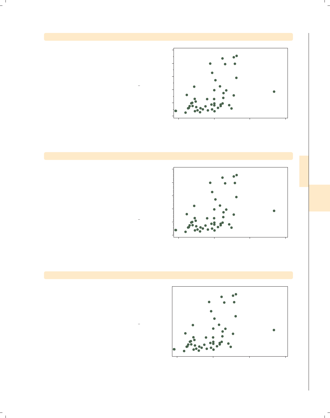
i
i
i
i
i
i
i
i
8.5 Setting and controlling axis labels 259
twoway scatter propval100 faminc, ymtick(10(20)90)
We can use the ymtick() option to add
minor ticks to the graph. For example,
here we add minor ticks at 10, 30, 50,
70, and 90. The min ymtick() stands
for minor.
Uses allstatesdc.dta & scheme vg s1c
0 20 40 60 80 100
% homes cost $100K+
15000 20000 25000 30000
1979 Median Family Inc.
twoway scatter propval100 faminc, ymtick(##10)
The default graph had major labels for
the y-axis at 0, 20, 40, 60, 80, and 100.
We can place 9 minor ticks between
major ticks with the ymtick(##10)
option. Note that the value of 10
includes the 9 minor ticks plus the 10th
major tick.
Uses allstatesdc.dta & scheme vg s1c
0 20 40 60 80 100
% homes cost $100K+
15000 20000 25000 30000
1979 Median Family Inc.
twoway scatter propval100 faminc, ylabel(0(10)100, noticks)
If we wanted to label the y-axis using
values ranging from 0 to 100,
incrementing by 10 but suppressing the
display of ticks, we could use the
noticks option.
Uses allstatesdc.dta & scheme vg s1c
0 10 20 30 40 50 60 70 80 90 100
% homes cost $100K+
15000 20000 25000 30000
1979 Median Family Inc.
Introduction Twoway Matrix Bar Box Dot Pie Options Standard options Styles Appendix
Markers Marker labels Connecting Axis titles Axis labels Axis scales Axis selection By Legend Adding text Textboxes
The electronic form of this book is solely for direct use at UCLA and only by faculty, students, and staff of UCLA.
All rights reserved on the copyright page apply to this document and specifically neither the electronic nor
published form of the book may be distributed or reproduced, either electronically or in printed form.
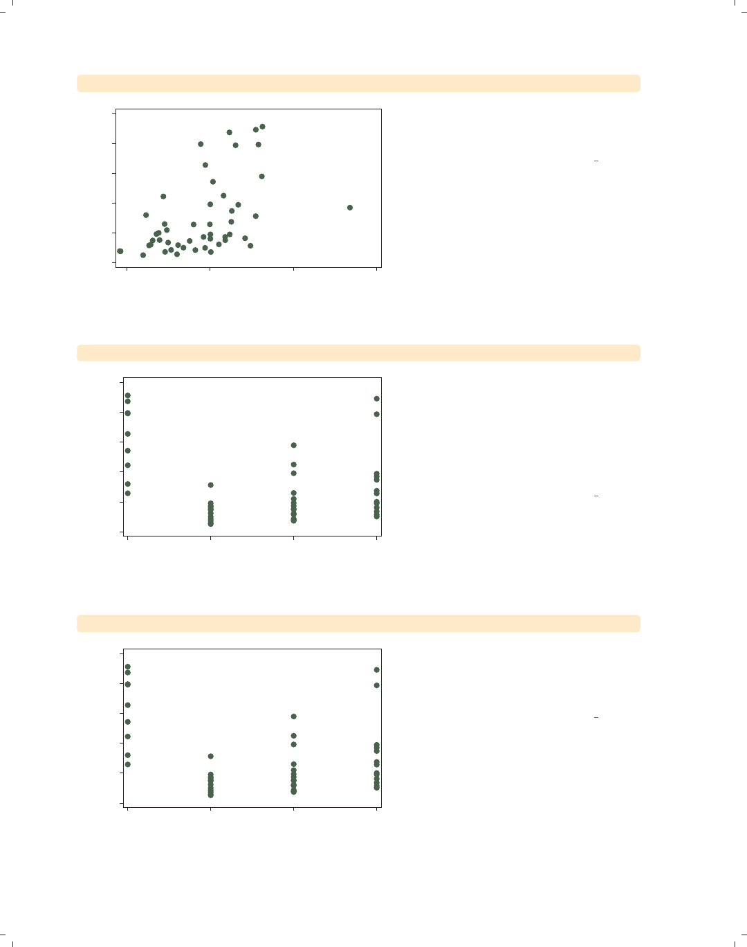
i
i
i
i
i
i
i
i
260 Chapter 8. Options available for most graphs
twoway scatter propval100 faminc, ylabel(, nolabel)
% homes cost $100K+
15000 20000 25000 30000
1979 Median Family Inc.
We could suppress the labels using the
nolabel option, and only the ticks
would be shown.
Uses allstatesdc.dta & scheme vg s1c
twoway scatter propval100 region
0 20 40 60 80 100
% homes cost $100K+
1 2 3 4
Census region
If a variable has meaningful value
labels, we can display the value labels
in place of the values. For example, we
can look at the propval100 broken
down by census region, but we do not
know which regions correspond to the
values1to4.
Uses allstatesdc.dta & scheme vg s1c
twoway scatter propval100 region, xlabel(, valuelabels)
0 20 40 60 80 100
% homes cost $100K+
NE N Cntrl South West
Census region
If we include the xlabel(,
valuelabels) option, the value labels
are displayed instead, making the graph
much easier to understand.
Uses allstatesdc.dta & scheme vg s1c
The electronic form of this book is solely for direct use at UCLA and only by faculty, students, and staff of UCLA.
All rights reserved on the copyright page apply to this document and specifically neither the electronic nor
published form of the book may be distributed or reproduced, either electronically or in printed form.
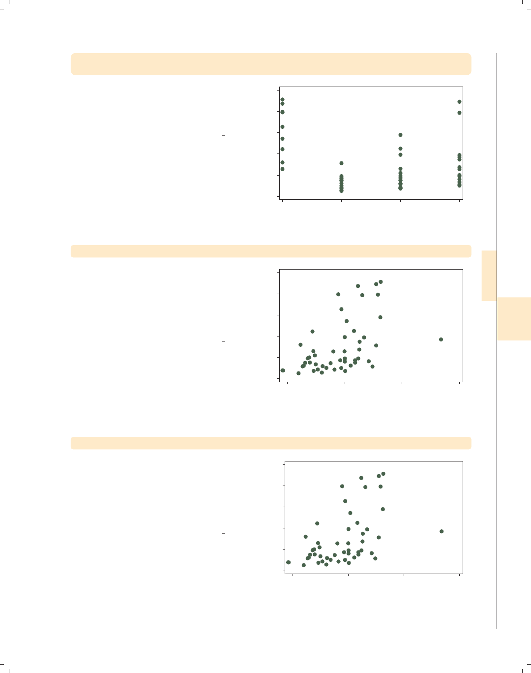
i
i
i
i
i
i
i
i
8.5 Setting and controlling axis labels 261
twoway scatter propval100 region,
xlabel(1 "NorthEast" 2 "NorthCentral" 3 "South" 4 "West")
If region were not labeled, or if we
wanted different labels, we could
indicate those labels using the
xlabel() option, as illustrated here.
Uses allstatesdc.dta & scheme vg s1c
0 20 40 60 80 100
% homes cost $100K+
NorthEast NorthCentral South West
Census region
twoway scatter propval100 faminc, xlabel(, format(%8.0gc))
We can change the formatting of the
labels using the format() option, just
as we would using a format statement.
In this example, we format income
using a comma format to make the
larger numbers more readable.
Uses allstatesdc.dta & scheme vg s1c
0 20 40 60 80 100
% homes cost $100K+
15,000 20,000 25,000 30,000
1979 Median Family Inc.
twoway scatter propval100 faminc, ylabel(, angle(0))
We can change the angles of the labels
from their default orientation. By
default, the values on the y-axis are
shown at a 90-degree angle, but we can
use the ylabel(, angle(0)) to display
the labels without rotation.
Uses allstatesdc.dta & scheme vg s1c
0
20
40
60
80
100
% homes cost $100K+
15000 20000 25000 30000
1979 Median Family Inc.
Introduction Twoway Matrix Bar Box Dot Pie Options Standard options Styles Appendix
Markers Marker labels Connecting Axis titles Axis labels Axis scales Axis selection By Legend Adding text Textboxes
The electronic form of this book is solely for direct use at UCLA and only by faculty, students, and staff of UCLA.
All rights reserved on the copyright page apply to this document and specifically neither the electronic nor
published form of the book may be distributed or reproduced, either electronically or in printed form.
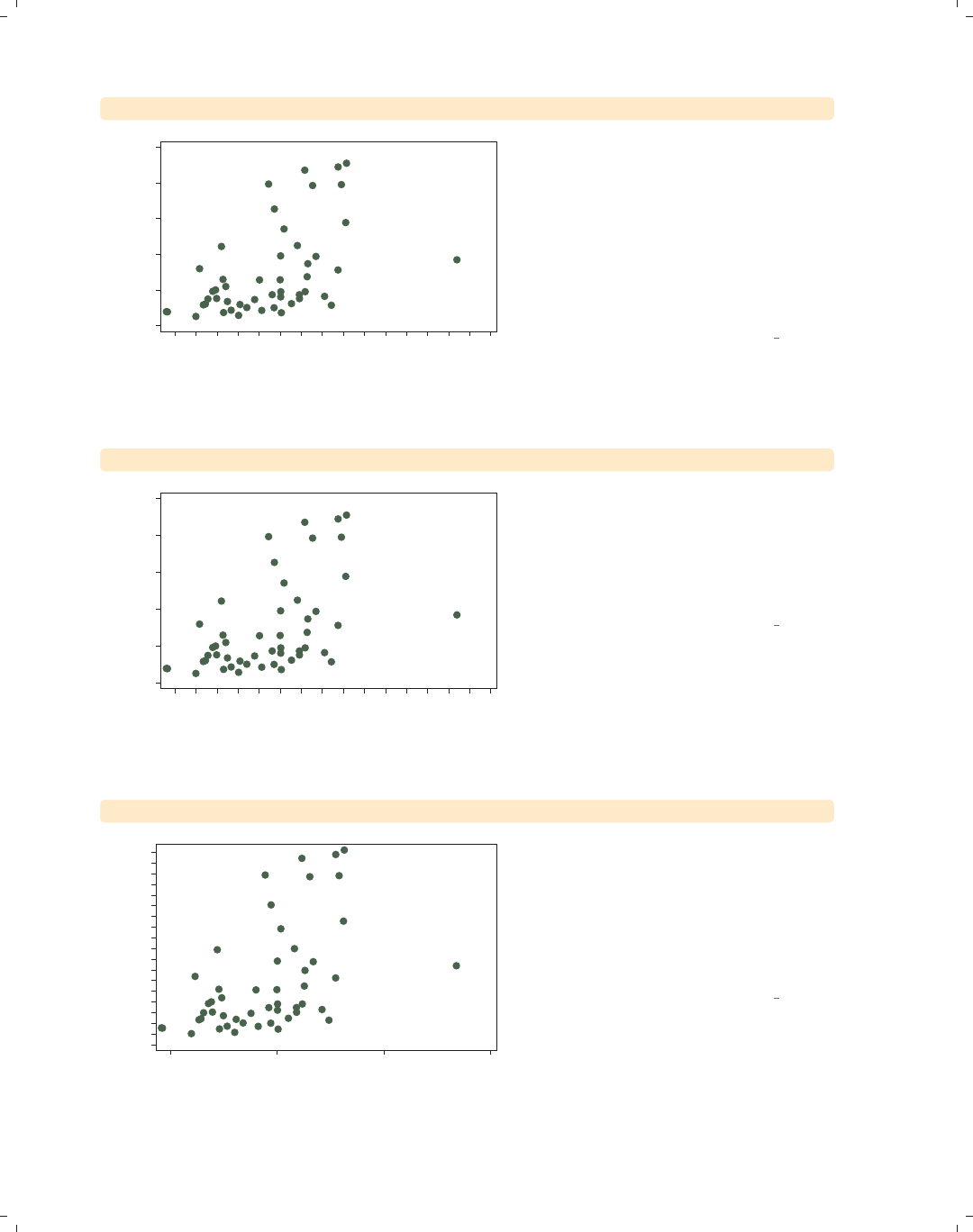
i
i
i
i
i
i
i
i
262 Chapter 8. Options available for most graphs
twoway scatter propval100 faminc, xlabel(15000(1000)30000, angle(45))
0 20 40 60 80 100
% homes cost $100K+
15000
16000
17000
18000
19000
20000
21000
22000
23000
24000
25000
26000
27000
28000
29000
30000
1979 Median Family Inc.
If we label an axis with a large number
of values (and especially with wide
values), the labels may crowd each
other and overlap. Here, we label the
x-axis from 15000 to 30000 in
increments of 1000. To avoid
overlapping, we add the angle(45)
option to show the labels at a 45-degree
angle.
Uses allstatesdc.dta & scheme vg s1c
twoway scatter propval100 faminc, xlabel(15000(1000)30000, alternate)
0 20 40 60 80 100
% homes cost $100K+
15000
16000
17000
18000
19000
20000
21000
22000
23000
24000
25000
26000
27000
28000
29000
30000
1979 Median Family Inc.
We can also avoid overlapping the axis
labels by adding the alternate option
to xlabel(). The labels are now
displayed in two rows in alternating
rows, so they are not crowded or
overlapped.
Uses allstatesdc.dta & scheme vg s1c
twoway scatter propval100 faminc, ylabel(0(5)90, labsize(vsmall))
0 5 10 15 20 25 30 35 40 45 50 55 60 65 70 75 80 85 90
% homes cost $100K+
15000 20000 25000 30000
1979 Median Family Inc.
We can control the size of labels with
the labsize() option. For example, we
might want to label our y-axis from 0
to 90, incrementing by 5. The labels
would ordinarily overlap, but if we add
the labsize(vsmall) option, the very
small labels no longer overlap.
Uses allstatesdc.dta & scheme vg s1c
The electronic form of this book is solely for direct use at UCLA and only by faculty, students, and staff of UCLA.
All rights reserved on the copyright page apply to this document and specifically neither the electronic nor
published form of the book may be distributed or reproduced, either electronically or in printed form.
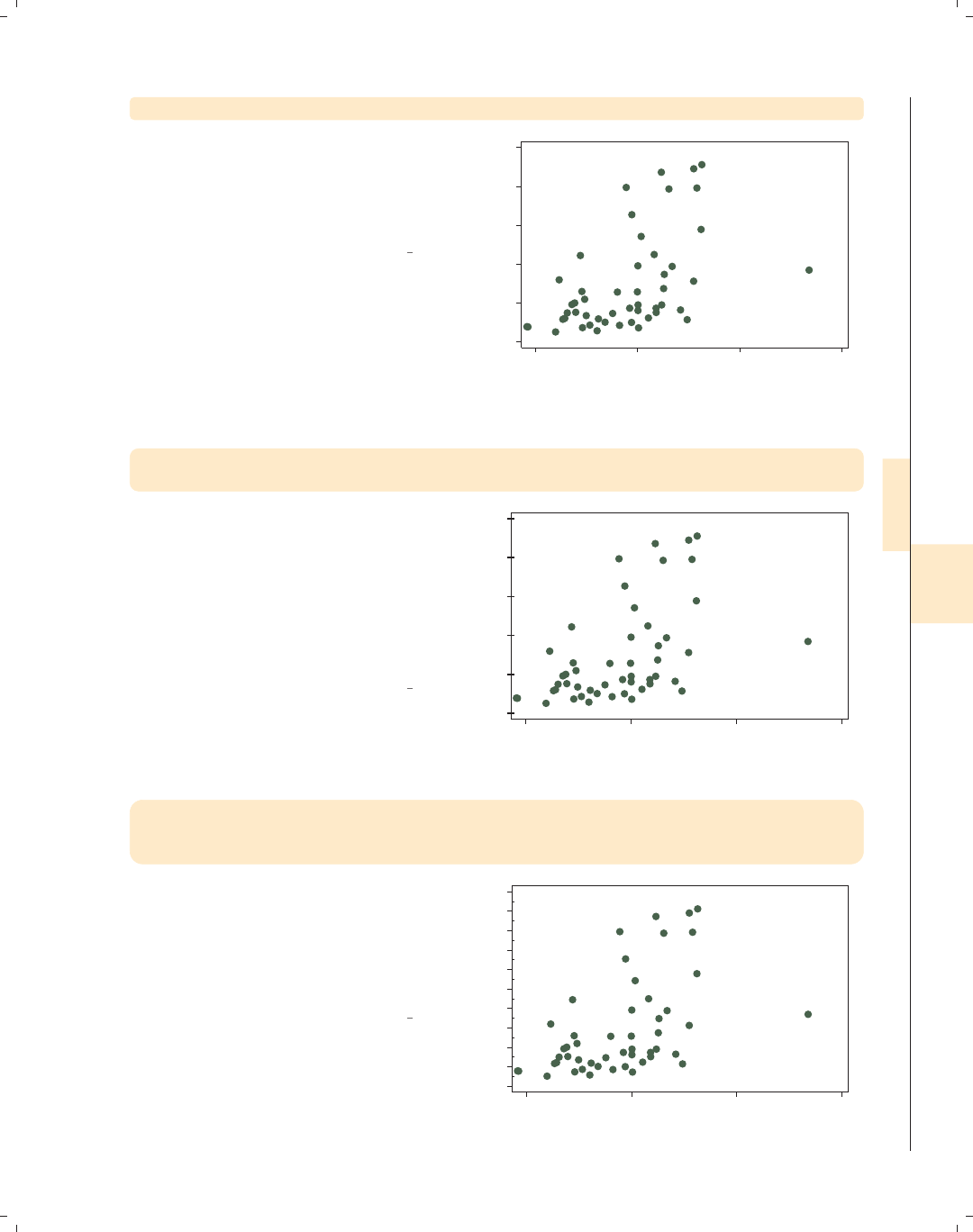
i
i
i
i
i
i
i
i
8.5 Setting and controlling axis labels 263
twoway scatter propval100 faminc, ylabel(, labgap(*5))
We can control the gap between the
label and the tick with the labgap()
option. In this example, we increase the
gap between the y-labels and the
y-ticks to five times the original size.
Uses allstatesdc.dta & scheme vg s1c
0 20 40 60 80 100
% homes cost $100K+
15000 20000 25000 30000
1979 Median Family Inc.
twoway scatter propval100 faminc,
ylabel(, tlength(*1.5) tlwidth(*3) tposition(crossing))
You can control the tick length with
the tlength() option, the tick line
width with the tlwidth() option, and
the tick position with the tposition()
option. In this example, we make the
tick length 1.5 times normal and the
width three times normal, with the
ticks crossing the y-axis.
Uses allstatesdc.dta & scheme vg s1c
0 20 40 60 80 100
% homes cost $100K+
15000 20000 25000 30000
1979 Median Family Inc.
twoway scatter propval100 faminc,
ytick(0(10)100, tposition(outside))
ymtick(5(10)95, tposition(inside))
In this example, we place major ticks
from 0 to 100, incrementing by 10,
locating the ticks on the outside of the
plot, and place minor ticks from 5 to
95, incrementing by 10, placing the
ticks on the inside of the plot region.
Uses allstatesdc.dta & scheme vg s1c
0 20 40 60 80 100
% homes cost $100K+
15000 20000 25000 30000
1979 Median Family Inc.
Introduction Twoway Matrix Bar Box Dot Pie Options Standard options Styles Appendix
Markers Marker labels Connecting Axis titles Axis labels Axis scales Axis selection By Legend Adding text Textboxes
The electronic form of this book is solely for direct use at UCLA and only by faculty, students, and staff of UCLA.
All rights reserved on the copyright page apply to this document and specifically neither the electronic nor
published form of the book may be distributed or reproduced, either electronically or in printed form.

i
i
i
i
i
i
i
i
264 Chapter 8. Options available for most graphs
twoway scatter propval100 faminc, ylabel(, nogrid)
0 20 40 60 80 100
% homes cost $100K+
15000 20000 25000 30000
1979 Median Family Inc.
We can use the grid and nogrid
options to display or suppress the
display of grid lines corresponding to
the labels and ticks associated with the
ylabel(),ymlabel(),ytick(),or
ymtick() options (this also applies to
xlabel(),xmlabel(),xtick(),or
xmtick()). Say that we want to
suppress the grid on the y-axis. We can
do this with the ylabel(, nogrid)
option.
Uses allstatesdc.dta & scheme vg s1c
twoway scatter propval100 faminc, ylabel(, grid) xlabel(, grid)
0 20 40 60 80 100
% homes cost $100K+
15000 20000 25000 30000
1979 Median Family Inc.
If we want a grid to be displayed for
the values that correspond to the
ylabel() and the xlabel() options,
we can specify the grid option, as
shown in this example. Depending on
the scheme you choose, grids may be
included or omitted by default.
Uses allstatesdc.dta & scheme vg s1c
twoway scatter propval100 faminc,
ylabel(, grid glwidth(vthin) glcolor(gs10) glpattern(shortdash))
0 20 40 60 80 100
% homes cost $100K+
15000 20000 25000 30000
1979 Median Family Inc.
You can control the grid line width,
grid line color, and grid line pattern
with the glwidth(),glcolor(),and
glpattern() options. In this example,
we make the grid line very thin, the
color gray (gs10), and the pattern of
the lines short dashes. See
Styles : Linewidth (337), Styles : Colors
(328), and Styles : Linepatterns (336) for
additional details.
Uses allstatesdc.dta & scheme vg s1c
The electronic form of this book is solely for direct use at UCLA and only by faculty, students, and staff of UCLA.
All rights reserved on the copyright page apply to this document and specifically neither the electronic nor
published form of the book may be distributed or reproduced, either electronically or in printed form.
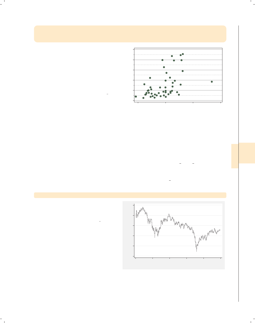
i
i
i
i
i
i
i
i
8.6 Controlling axis scales 265
twoway scatter propval100 faminc,
ylabel(0(20)100, grid glcolor(gs8) glpattern(solid))
ymlabel(10(20)90, grid glcolor(gs11) glpattern(shortdash))
We can use different kinds of grid lines
for the major and minor axis labels. In
this example, we have a solid, darker
gray line for the major axis labels and a
lighter gray, short, dashed line for the
minor axis labels. We include the grid
option to ensure that the grid is
displayed.
Uses allstatesdc.dta & scheme vg s1c
10 30 50 70 90
0 20 40 60 80 100
% homes cost $100K+
15000 20000 25000 30000
1979 Median Family Inc.
8.6 Controlling axis scales
This section provides more details about axis scale options, which allow us to control
whether an axis is displayed, where it is displayed, the direction it is displayed, and the scale
of the axis. For more information about these options, see [G]axis scale options. This
section begins by using data on the S&P 500 from January 2, 2001, to December 31, 2001,
stored in the file sp2001. For simplicity, we will use tradeday on the x-axis, representing
the trading day of the year. For this section, we will use the vg s2m scheme.
twoway rspike high low tradeday
First, consider this rspike graph,
which shows the high and low prices
across 248 trading days.
Uses sp2001.dta & scheme vg s2m
900 1000 1100 1200 1300 1400
High price/Low price
0 50 100 150 200 250
Trading day number
Introduction Twoway Matrix Bar Box Dot Pie Options Standard options Styles Appendix
Markers Marker labels Connecting Axis titles Axis labels Axis scales Axis selection By Legend Adding text Textboxes
The electronic form of this book is solely for direct use at UCLA and only by faculty, students, and staff of UCLA.
All rights reserved on the copyright page apply to this document and specifically neither the electronic nor
published form of the book may be distributed or reproduced, either electronically or in printed form.
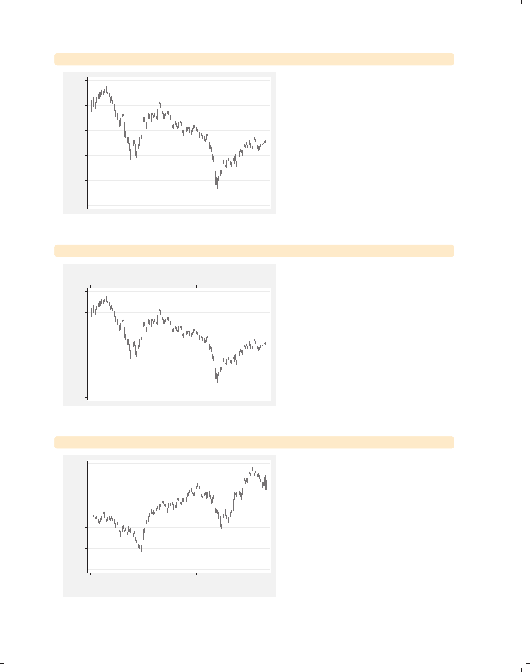
i
i
i
i
i
i
i
i
266 Chapter 8. Options available for most graphs
twoway rspike high low tradeday, xscale(off)
900 1000 1100 1200 1300 1400
High price/Low price
If we wish, we could remove the display
of the x-axis entirely with the
xscale(off) option. Although it is not
shown, the same could be done for the
y-axis if we were to use the
yscale(off) option. This is not
normally an option we would use, but it
can be useful for combining multiple
graphs on the same scale without
having to show the scale on some of the
graphs.
Uses sp2001.dta & scheme vg s2m
twoway rspike high low tradeday, xscale(alt)
900 1000 1100 1200 1300 1400
High price/Low price
0 50 100 150 200 250
Trading day number We could shift the display of the x-axis
from the bottom of the graph to the
top of the graph with the xscale(alt)
option. Likewise, we could have chosen
to supply the yscale(alt) option to
shift the y-axis from the left to the
right.
Uses sp2001.dta & scheme vg s2m
twoway rspike high low tradeday, xscale(reverse)
900 1000 1100 1200 1300 1400
High price/Low price
050100150200250
Trading day number
We can reverse the scale of the x-axis
by specifying the xscale(reverse)
option, as illustrated here. We can
reverse the y-axis by indicating the
yscale(reverse) option.
Uses sp2001.dta & scheme vg s2m
The electronic form of this book is solely for direct use at UCLA and only by faculty, students, and staff of UCLA.
All rights reserved on the copyright page apply to this document and specifically neither the electronic nor
published form of the book may be distributed or reproduced, either electronically or in printed form.
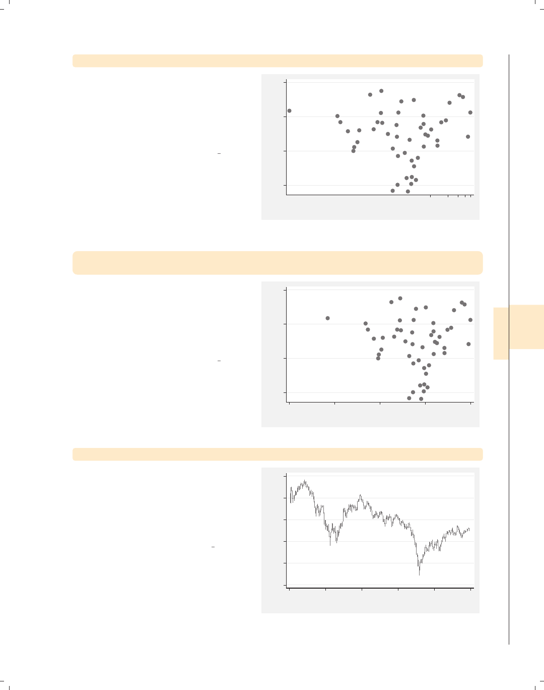
i
i
i
i
i
i
i
i
8.6 Controlling axis scales 267
twoway scatter educ popden, xscale(log)
We briefly return to the allstates file
to illustrate the xscale(log) option.
The xscale(log) option indicates that
the x-axis should be displayed on a log
scale. Note that the labels for the
x-axis overlap each other.
Uses allstates.dta & scheme vg s2m
9.5 10 10.5 11
average education level
2000 40006000800010000
Pop/10 sq. miles
twoway scatter educ popden, xscale(log)
xlabel(1 10 100 1000 10000)
Here, we use the xlabel() option to
change the labels for the x-axis using
the values 1, 10, 100, 1000, and 10,000,
and you can see how these powers of 10
are more equally spaced, reflecting the
log scale of the x-axis.
Uses allstates.dta & scheme vg s2m
9.5 10 10.5 11
average education level
1 10 100 1000 10000
Pop/10 sq. miles
twoway rspike high low tradeday, xscale(lwidth(thick))
We now return to the sp2001 data.
You can use the xscale() and
yscale() options to control the axis
lines. In this example, we make the
x-axis line thick by specifying
xscale(lwidth(thick)).
Uses sp2001.dta & scheme vg s2m
900 1000 1100 1200 1300 1400
High price/Low price
0 50 100 150 200 250
Trading day number
Introduction Twoway Matrix Bar Box Dot Pie Options Standard options Styles Appendix
Markers Marker labels Connecting Axis titles Axis labels Axis scales Axis selection By Legend Adding text Textboxes
The electronic form of this book is solely for direct use at UCLA and only by faculty, students, and staff of UCLA.
All rights reserved on the copyright page apply to this document and specifically neither the electronic nor
published form of the book may be distributed or reproduced, either electronically or in printed form.
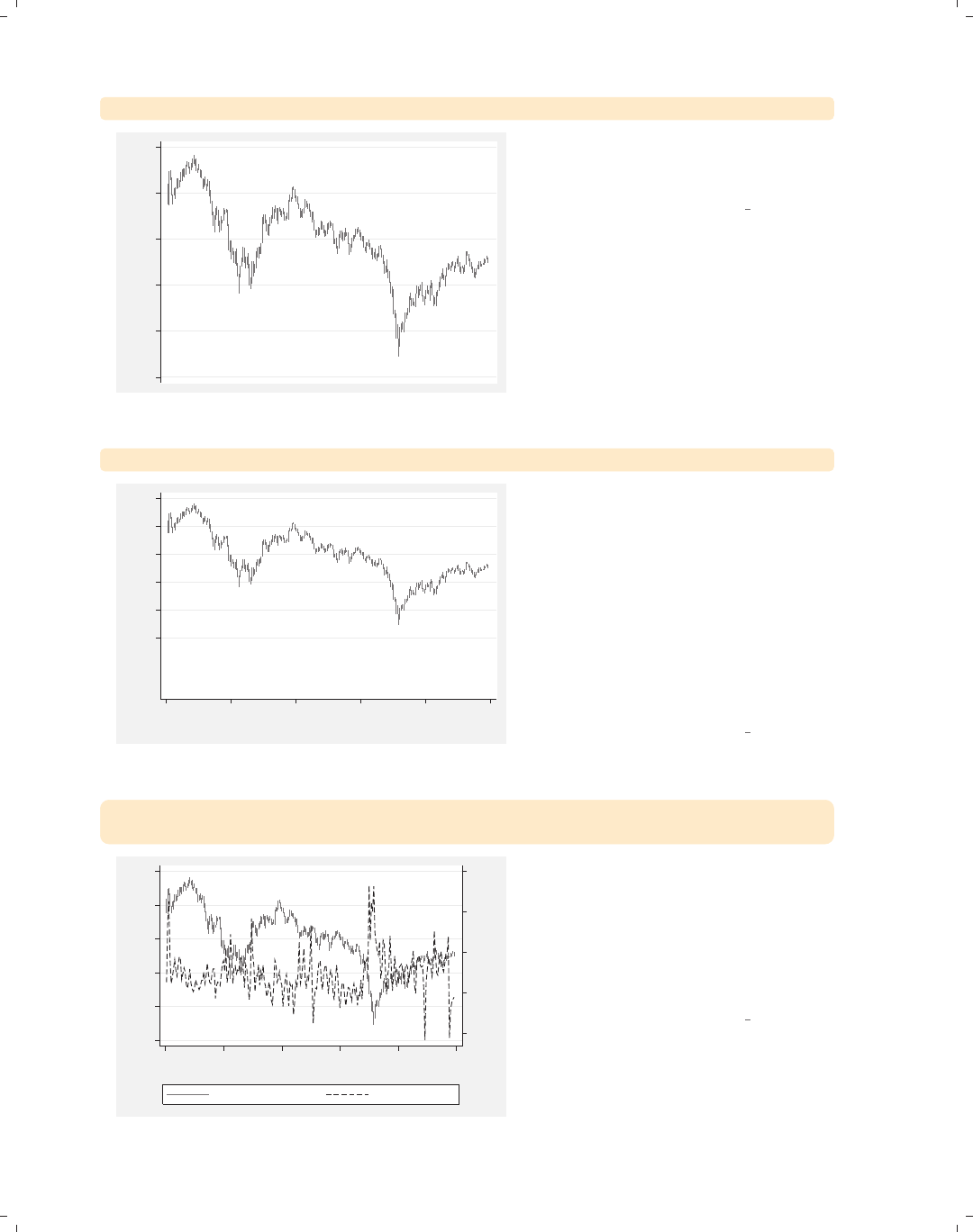
i
i
i
i
i
i
i
i
268 Chapter 8. Options available for most graphs
twoway rspike high low tradeday, xscale(off noline)
900 1000 1100 1200 1300 1400
High price/Low price
We could suppress the display of the
x-axis line completely by using the
xscale(noline) option.
Uses sp2001.dta & scheme vg s2m
twoway rspike high low tradeday, yscale(range(700 1400))
900 1000 1100 1200 1300 1400
High price/Low price
0 50 100 150 200 250
Trading day number
The yscale(range()) option can be
used to expand the scale of the y-axis
without needing to expand the labels
for the axis (as the ylabel() option
would). In this example, we have
expanded the range of the y-axis from
700 to 1400. However, this example
does not show the real utility of this
option. Note that range() can only be
used to expand the scale, not contract
it.
Uses sp2001.dta & scheme vg s2m
twoway (rspike high low tradeday)
(line volmil tradeday, sort yaxis(2))
.5 1 1.5 2 2.5
Volume (millions)
900 1000 1100 1200 1300 1400
High price/Low price
0 50 100 150 200 250
Trading day number...
High price/Low price Volume (millions)
Consider that, in addition to the spike
graph that shows the high and low
values for a given trading day, we wish
to see the volume for a given trading
day. We can combine the plots into a
single graph, but this is difficult to read
because the two plots overlap.
Uses sp2001.dta & scheme vg s2m
The electronic form of this book is solely for direct use at UCLA and only by faculty, students, and staff of UCLA.
All rights reserved on the copyright page apply to this document and specifically neither the electronic nor
published form of the book may be distributed or reproduced, either electronically or in printed form.
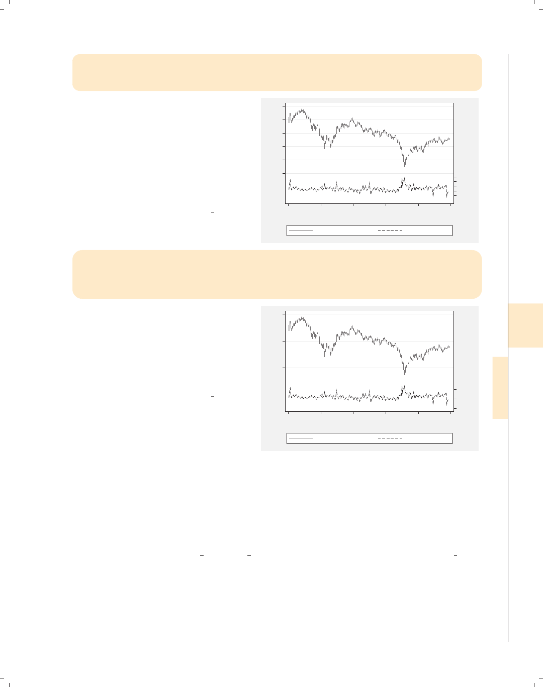
i
i
i
i
i
i
i
i
8.7 Selecting an axis 269
twoway (rspike high low tradeday)
(line volmil tradeday, sort yaxis(2)),
yscale(range(700 1400) axis(1)) yscale(range(0 10) axis(2))
This example shows the utility of the
yscale(range()) option. The
yscale(range(700 1400) axis(1))
option sets the range of price to be
from 700 to 1400, shifting that series up
to the upper third of the graph. The
yscale(range(0 10) axis(2)) option
sets the range of volume to occupy the
lower third of the graph.
Uses sp2001.dta & scheme vg s2m
.511.522.5
Volume (millions)
900 100011001200 13001400
High price/Low price
0 50 100 150 200 250
Trading day number...
High price/Low price Volume (millions)
twoway (rspike high low tradeday)
(line volmil tradeday, sort yaxis(2)),
yscale(range(700 1400) axis(1)) yscale(range(0 10) axis(2))
ylabel(1000 1200 1400, axis(1)) ylabel(0 1 2, axis(2))
Because we manipulated the scale of
the y-axes, the labels were pushed
together. We can add the ylabel(1000
1200 1400, axis(1)) and ylabel(0 1
2, axis(2)) options to the previous
example to make the labels for the
y-axes more readable.
Uses sp2001.dta & scheme vg s2m
012
Volume (millions)
1000 1200 1400
High price/Low price
0 50 100 150 200 250
Trading day number...
High price/Low price Volume (millions)
8.7 Selecting an axis
This section provides more details about how to select different axes and modify them.
By default, any modifications you make to an axis are applied to the first axis, so you need
to take extra action to modify other axes that you may create. For more information about
these options, see [G]axis selection options. For this section, we will use the vg outc
scheme.
Introduction Twoway Matrix Bar Box Dot Pie Options Standard options Styles Appendix
Markers Marker labels Connecting Axis titles Axis labels Axis scales Axis selection By Legend Adding text Textboxes
The electronic form of this book is solely for direct use at UCLA and only by faculty, students, and staff of UCLA.
All rights reserved on the copyright page apply to this document and specifically neither the electronic nor
published form of the book may be distributed or reproduced, either electronically or in printed form.
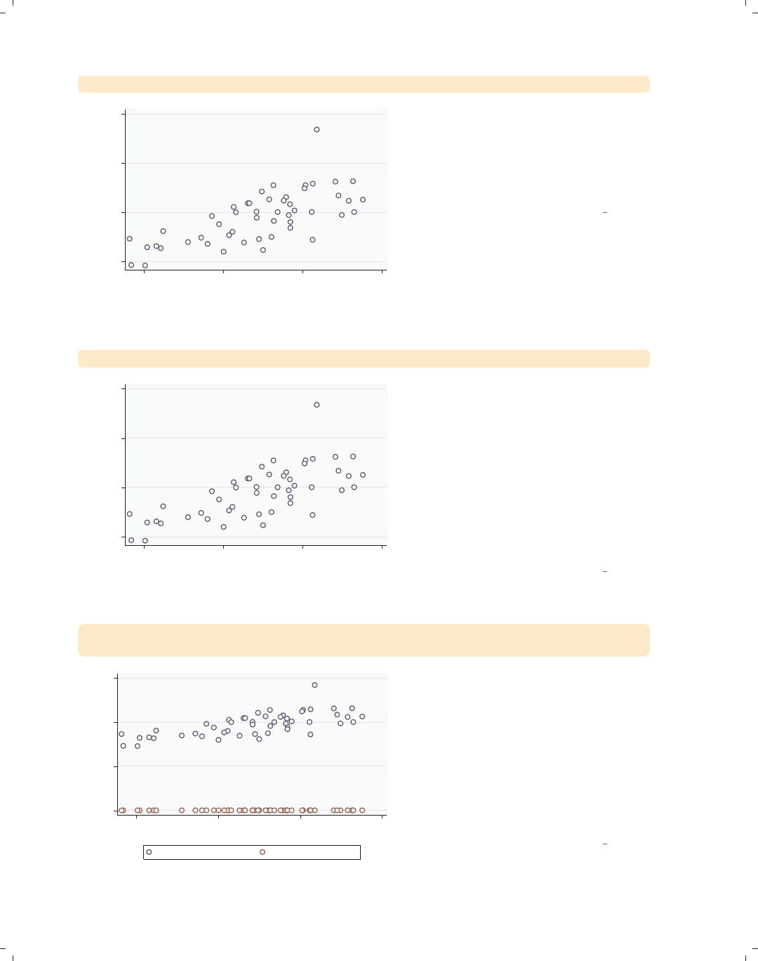
i
i
i
i
i
i
i
i
270 Chapter 8. Options available for most graphs
twoway scatter faminc educ
15000 20000 25000 30000
1979 Median Family Inc.
9.5 10 10.5 11
average education level
This section focuses on the options that
we can use to select axes and shows
examples of graphing multiple variables
in a single graph. This graph shows the
relationship between one x-variable,
educ, and one y-variable, faminc.
Uses allstatesdc.dta & scheme vg outc
twoway (scatter faminc educ, xaxis(1) yaxis(1))
15000 20000 25000 30000
1979 Median Family Inc.
9.5 10 10.5 11
average education level
By default, the x-variable is placed on
the first x-axis, and the y-variable is
placed on the first y-axis. It is as
though you had added the options
xaxis(1) and yaxis(1), as illustrated
here. Note that we add parentheses to
emphasize that the options xaxis(1)
and yaxis(1) belong to the scatter
command and are not general options
for the overall graph, which would
appear after the parentheses.
Uses allstatesdc.dta & scheme vg outc
twoway (scatter faminc educ)
(scatter workers2 educ)
0 10000 20000 30000
9.5 10 10.5 11
average education level
1979 Median Family Inc. % HHs with 2+ workers
Now let’s overlay a second scatterplot
showing workers2 by educ, which has
the effect of adding a second variable to
the y-axis. Stata assumes that all
variables are on the first (and thus, the
same) axis, unless we specify otherwise.
As a result, this graph is hard to read
because faminc is scaled very
differently from workers2 but scaled on
the same axis.
Uses allstatesdc.dta & scheme vg outc
The electronic form of this book is solely for direct use at UCLA and only by faculty, students, and staff of UCLA.
All rights reserved on the copyright page apply to this document and specifically neither the electronic nor
published form of the book may be distributed or reproduced, either electronically or in printed form.
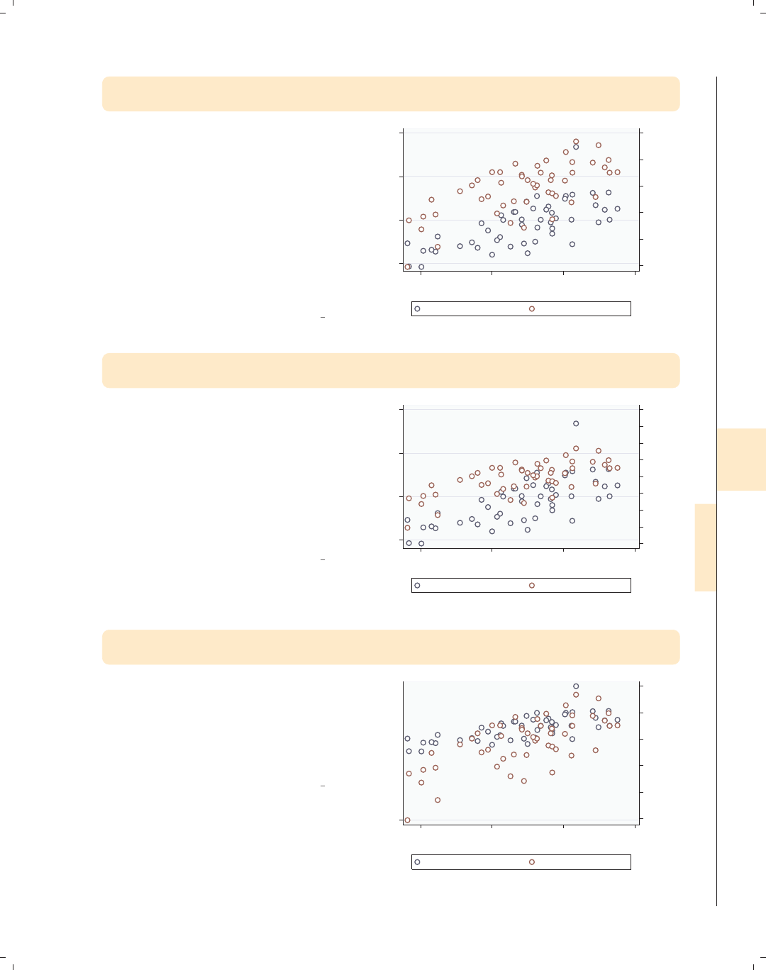
i
i
i
i
i
i
i
i
8.7 Selecting an axis 271
twoway (scatter faminc educ, yaxis(1))
(scatter workers2 educ, yaxis(2))
Stata permits you to have multiple axes
for the x-variables and the y-variables.
In this example, we use the yaxis(1)
option to place faminc on the first
y-axis and the yaxis(2) option to
place workers2 on the second y-axis.
To make the graph more readable,
Stata moved the second y-axis over to
the right side. Note that the yaxis(1)
option was not needed but was included
for clarity.
Uses allstatesdc.dta & scheme vg outc
45 50 55 60 65 70
% HHs with 2+ workers
15000 20000 25000 30000
1979 Median Family Inc.
9.5 10 10.5 11
average education level...
1979 Median Family Inc. % HHs with 2+ workers
twoway (scatter faminc educ)
(scatter workers2 educ, yaxis(2)), ylabel(40(5)80, axis(2))
Say that you wished to label workers2
starting at 40, incrementing by 5 until
80. Since workers2 is on the second
y-axis, you would specify
ylabel(40(5)80, axis(2)). Without
the axis(2) option, Stata would
assume that you are referring to the
first y-axis and would change the
scaling of faminc.
Uses allstatesdc.dta & scheme vg outc
40 45 50 55 60 65 70 75 80
% HHs with 2+ workers
15000 20000 25000 30000
1979 Median Family Inc.
9.5 10 10.5 11
average education level...
1979 Median Family Inc. % HHs with 2+ workers
twoway (scatter faminc educ)
(scatter workers2 educ, yaxis(2) ylabel(40(5)80))
You might be tempted to enter the
ylabel() option as an option of the
second scatter statement and expect
the ylabel() to modify the scaling of
workers2. However, we can see in this
example that this does not work.
Uses allstatesdc.dta & scheme vg outc
45 50 55 60 65 70
% HHs with 2+ workers
404550556065707580
1979 Median Family Inc.
9.5 10 10.5 11
average education level...
1979 Median Family Inc. % HHs with 2+ workers
Introduction Twoway Matrix Bar Box Dot Pie Options Standard options Styles Appendix
Markers Marker labels Connecting Axis titles Axis labels Axis scales Axis selection By Legend Adding text Textboxes
The electronic form of this book is solely for direct use at UCLA and only by faculty, students, and staff of UCLA.
All rights reserved on the copyright page apply to this document and specifically neither the electronic nor
published form of the book may be distributed or reproduced, either electronically or in printed form.
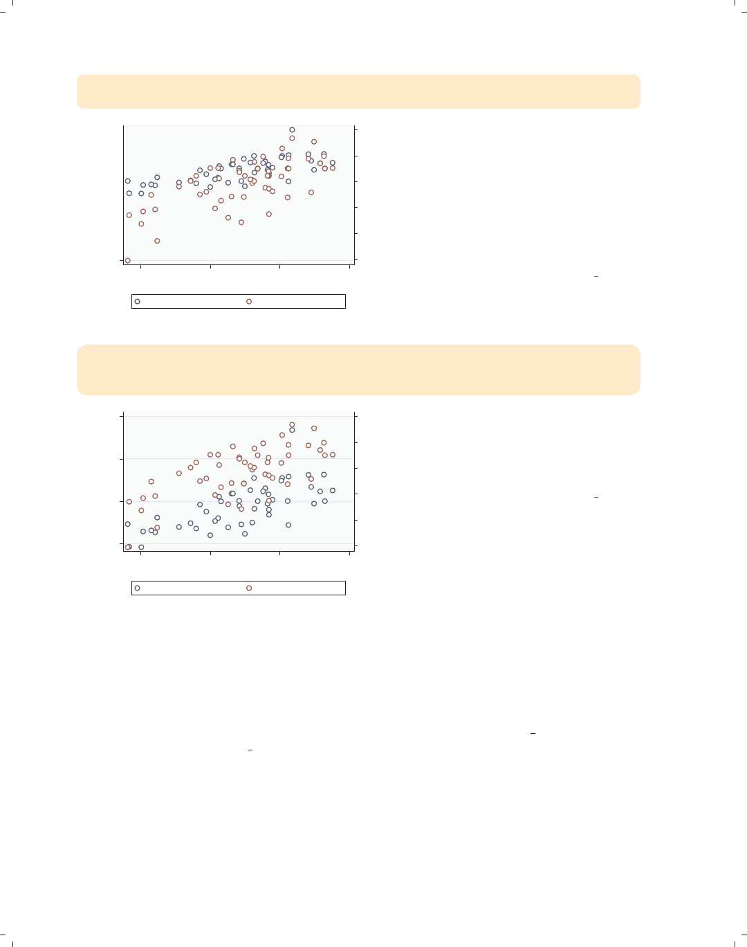
i
i
i
i
i
i
i
i
272 Chapter 8. Options available for most graphs
twoway (scatter faminc educ)
(scatter workers2 educ, yaxis(2)), ylabel(40(5)80, axis(1))
45 50 55 60 65 70
% HHs with 2+ workers
404550556065707580
1979 Median Family Inc.
9.5 10 10.5 11
average education level...
1979 Median Family Inc. % HHs with 2+ workers
ylabel() is really an overall option,
but Stata is willing to pretend that you
specified this option globally, as though
you had typed ylabel() as a global
option as specified in this example. To
make this clearer, we have added the
default axis(1) to ylabel() to
illustrate why this usage does not
change the second y-axis.
Uses allstatesdc.dta & scheme vg outc
twoway (scatter faminc educ)
(scatter workers2 educ, yaxis(2)),
ytitle("Family income", axis(1)) ytitle("Two+ workers", axis(2))
45 50 55 60 65 70
Two+ workers
15000 20000 25000 30000
Family income
9.5 10 10.5 11
average education level...
1979 Median Family Inc. % HHs with 2+ workers
These same rules apply to modifying
the axis titles and labeling. In this
example, we use the ytitle() option
to change the titles for the first and
second y-axes.
Uses allstatesdc.dta & scheme vg outc
8.8 Graphing by groups
This section provides more details about repeating graphs using the by() option to
show separate graphs for each by-group. For more information, see [G]by option. For this
section, we will use the vg brite scheme.
The electronic form of this book is solely for direct use at UCLA and only by faculty, students, and staff of UCLA.
All rights reserved on the copyright page apply to this document and specifically neither the electronic nor
published form of the book may be distributed or reproduced, either electronically or in printed form.
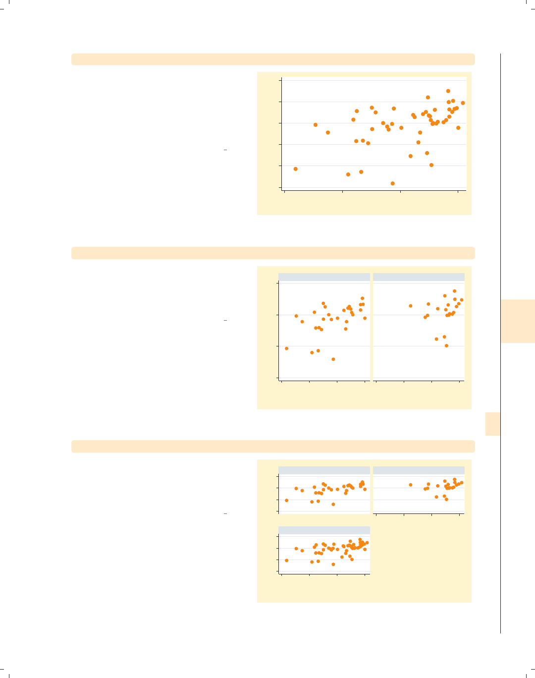
i
i
i
i
i
i
i
i
8.8 Graphing by groups 273
twoway scatter ownhome borninstate
We start by looking at a scatterplot of
ownhome and borninstate, and we see
a general positive relationship such that
the higher the percentage of those who
were born in the state, the higher the
percentage of home owners in the state.
Uses allstatesdc.dta & scheme vg brite
55 60 65 70 75 80
% who own home
20 40 60 80
% born in state of residence
twoway scatter ownhome borninstate, by(north)
We can use the by(north) option to
look at this relationship broken down
by whether the state is considered to be
in the North.
Uses allstatesdc.dta & scheme vg brite
50 60 70 80
20 40 60 80 20 40 60 80
S & W North
% who own home
% born in state of residence
Graphs by Region North or Not
twoway scatter ownhome borninstate, by(north, total)
We can use the total option to see the
overall relationship for all 50 states, as
well as the two plots separately, by the
levels of north.
Uses allstatesdc.dta & scheme vg brite
50 60 70 8050 60 70 80
20 40 60 80
20 40 60 80
S & W North
Total
% who own home
% born in state of residence
Graphs by Region North or Not
Introduction Twoway Matrix Bar Box Dot Pie Options Standard options Styles Appendix
Markers Marker labels Connecting Axis titles Axis labels Axis scales Axis selection By Legend Adding text Textboxes
The electronic form of this book is solely for direct use at UCLA and only by faculty, students, and staff of UCLA.
All rights reserved on the copyright page apply to this document and specifically neither the electronic nor
published form of the book may be distributed or reproduced, either electronically or in printed form.
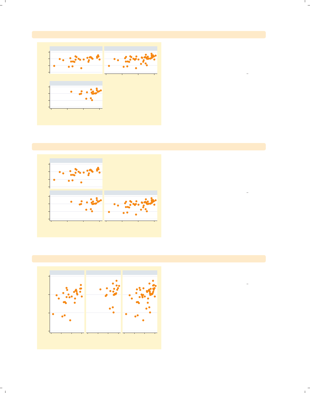
i
i
i
i
i
i
i
i
274 Chapter 8. Options available for most graphs
twoway scatter ownhome borninstate, by(north, total colfirst)
50 60 70 8050 60 70 80
20 40 60 80
20 40 60 80
S & W
North
Total
% who own home
% born in state of residence
Graphs by Region North or Not
We can add the colfirst option to
show the graphs going down columns
first rather than going across rows first,
which is the default.
Uses allstatesdc.dta & scheme vg brite
twoway scatter ownhome borninstate, by(north, total holes(2))
50 60 70 8050 60 70 80
20 40 60 80 20 40 60 80
S & W
North Total
% who own home
% born in state of residence
Graphs by Region North or Not
The holes(2) option leaves the second
position empty. Here, we specify a
single position to leave empty, but you
can specify multiple positions within
the holes() option.
Uses allstatesdc.dta & scheme vg brite
twoway scatter ownhome borninstate, by(north, total rows(1))
50 60 70 80
20 40 60 80 20 40 60 80 20 40 60 80
S & W North Total
% who own home
% born in state of residence
Graphs by Region North or Not
The rows(1) option indicates that the
graph should be displayed in one row.
Uses allstatesdc.dta & scheme vg brite
The electronic form of this book is solely for direct use at UCLA and only by faculty, students, and staff of UCLA.
All rights reserved on the copyright page apply to this document and specifically neither the electronic nor
published form of the book may be distributed or reproduced, either electronically or in printed form.
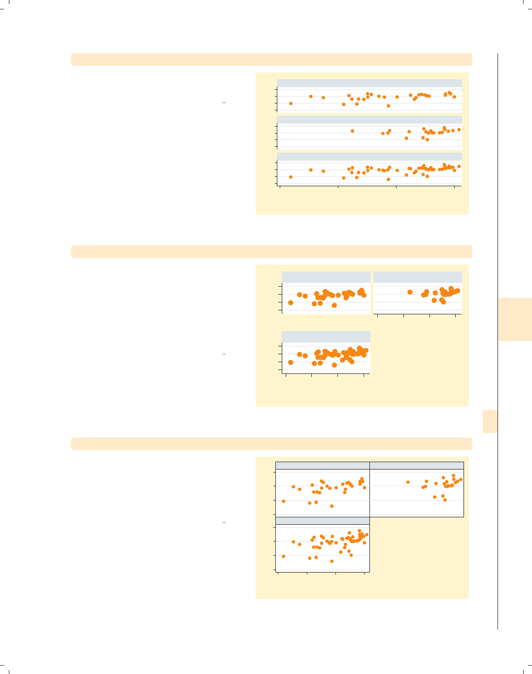
i
i
i
i
i
i
i
i
8.8 Graphing by groups 275
twoway scatter ownhome borninstate, by(north, total cols(1))
The cols(1) option shows the graph in
a single column.
Uses allstatesdc.dta & scheme vg brite
50 60 70 8050 60 70 8050 60 70 80
20 40 60 80
S & W
North
Total
% who own home
% born in state of residence
Graphs by Region North or Not
twoway scatter ownhome borninstate, by(north, total iscale(*1.5))
Sometimes when you use the by()
option, the graph can become small,
making the text and symbols difficult to
see. You can use the iscale() option
to magnify the size of these elements.
In this example, we increase the size of
these elements by a factor of 1.5.
Uses allstatesdc.dta & scheme vg brite
5060708050607080
20 40 60 80
20 40 60 80
S & W North
Total
% who own home
% born in state of residence
Graphs by Region North or Not
twoway scatter ownhome borninstate, by(north, total compact)
The compact option displays the graph
using a compact style, pushing the
graphs tightly together. This is almost
the same as specifying
style(compact).
Uses allstatesdc.dta & scheme vg brite
50 60 70 8050 60 70 80
20 40 60 80
S & W North
Total
% who own home
% born in state of residence
Graphs by Region North or Not
Introduction Twoway Matrix Bar Box Dot Pie Options Standard options Styles Appendix
Markers Marker labels Connecting Axis titles Axis labels Axis scales Axis selection By Legend Adding text Textboxes
The electronic form of this book is solely for direct use at UCLA and only by faculty, students, and staff of UCLA.
All rights reserved on the copyright page apply to this document and specifically neither the electronic nor
published form of the book may be distributed or reproduced, either electronically or in printed form.

i
i
i
i
i
i
i
i
276 Chapter 8. Options available for most graphs
twoway scatter ownhome borninstate, by(north, total noedgelabel)
50 60 70 8050 60 70 80
20 40 60 80
S & W North
Total
% who own home
% born in state of residence
Graphs by Region North or Not
The noedgelabel option suppresses the
displayofthex-axis for the graphs that
do not appear on the bottom row, in
this case the graph for the North.
Uses allstatesdc.dta & scheme vg brite
twoway scatter ownhome borninstate, by(north, yrescale)
55 60 65 70 75
60 65 70 75 80
20 40 60 80 20 40 60 80
S & W North
% who own home
% born in state of residence
Graphs by Region North or Not
The yrescale option allows the
y-variables to be scaled independently
for each by-group.
Uses allstatesdc.dta & scheme vg brite
twoway scatter ownhome borninstate, by(north, xrescale)
50 60 70 80
20 40 60 80 40 50 60 70 80
S & W North
% who own home
% born in state of residence
Graphs by Region North or Not
Likewise, the xrescale option allows
the x-variable to be scaled differently
across all the by-groups.
Uses allstatesdc.dta & scheme vg brite
The electronic form of this book is solely for direct use at UCLA and only by faculty, students, and staff of UCLA.
All rights reserved on the copyright page apply to this document and specifically neither the electronic nor
published form of the book may be distributed or reproduced, either electronically or in printed form.
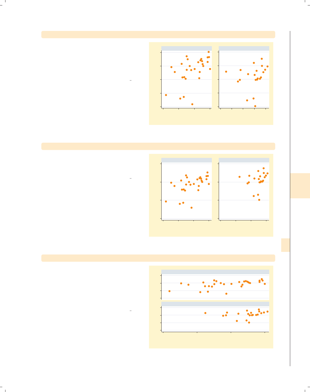
i
i
i
i
i
i
i
i
8.8 Graphing by groups 277
twoway scatter ownhome borninstate, by(north, rescale)
If you want both the x-variable and
y-variable to be scaled differently across
the by-groups, you can use the rescale
option, and both axes are separately
rescaled.
Uses allstatesdc.dta & scheme vg brite
55 60 65 70 75
60 65 70 75 80
20 40 60 80 40 50 60 70 80
S & W North
% who own home
% born in state of residence
Graphs by Region North or Not
twoway scatter ownhome borninstate, by(north, iyaxes)
You can use the iyaxes option so the
y-axes for each individual graph will be
displayed.
Uses allstatesdc.dta & scheme vg brite
50 60 70 80
50 60 70 80
20 40 60 80 20 40 60 80
S & W North
% who own home
% born in state of residence
Graphs by Region North or Not
twoway scatter ownhome borninstate, by(north, cols(1))
Likewise, the ixaxes option will display
the x-axis for all graphs. In this graph,
we omit this option. If we display two
graphs in a single column, Stata
displays the top graph, omitting the
x-axis.
Uses allstatesdc.dta & scheme vg brite
50 60 70 8050 60 70 80
20 40 60 80
S & W
North
% who own home
% born in state of residence
Graphs by Region North or Not
Introduction Twoway Matrix Bar Box Dot Pie Options Standard options Styles Appendix
Markers Marker labels Connecting Axis titles Axis labels Axis scales Axis selection By Legend Adding text Textboxes
The electronic form of this book is solely for direct use at UCLA and only by faculty, students, and staff of UCLA.
All rights reserved on the copyright page apply to this document and specifically neither the electronic nor
published form of the book may be distributed or reproduced, either electronically or in printed form.

i
i
i
i
i
i
i
i
278 Chapter 8. Options available for most graphs
twoway scatter ownhome borninstate, by(north, ixaxes cols(1))
50 60 70 8050 60 70 80
20 40 60 80
20 40 60 80
S & W
North
% who own home
% born in state of residence
Graphs by Region North or Not
We now include the ixaxes option and
see that the x-axis is now displayed on
the top graph.
Uses allstatesdc.dta & scheme vg brite
twoway scatter ownhome borninstate, by(north, total iytitle)
50 60 70 80
% who own home
50 60 70 80
% who own home
20 40 60 80
20 40 60 80
S & W North
Total
% who own home
% born in state of residence
Graphs by Region North or Not
We can display the title for each y-axis
using the iytitle option.
Uses allstatesdc.dta & scheme vg brite
twoway scatter ownhome borninstate, by(north, total iyaxes iytitle)
50 60 70 80
% who own home
50 60 70 80
% who own home
50 60 70 80
% who own home
20 40 60 80
20 40 60 80
S & W North
Total
% who own home
% born in state of residence
Graphs by Region North or Not
Note that the y-title is not displayed for
the North since the y-axis is omitted for
that graph. If we include the iyaxes
and iytitle options, the y-axis and
y-title are displayed for that graph as
well.
Uses allstatesdc.dta & scheme vg brite
The electronic form of this book is solely for direct use at UCLA and only by faculty, students, and staff of UCLA.
All rights reserved on the copyright page apply to this document and specifically neither the electronic nor
published form of the book may be distributed or reproduced, either electronically or in printed form.
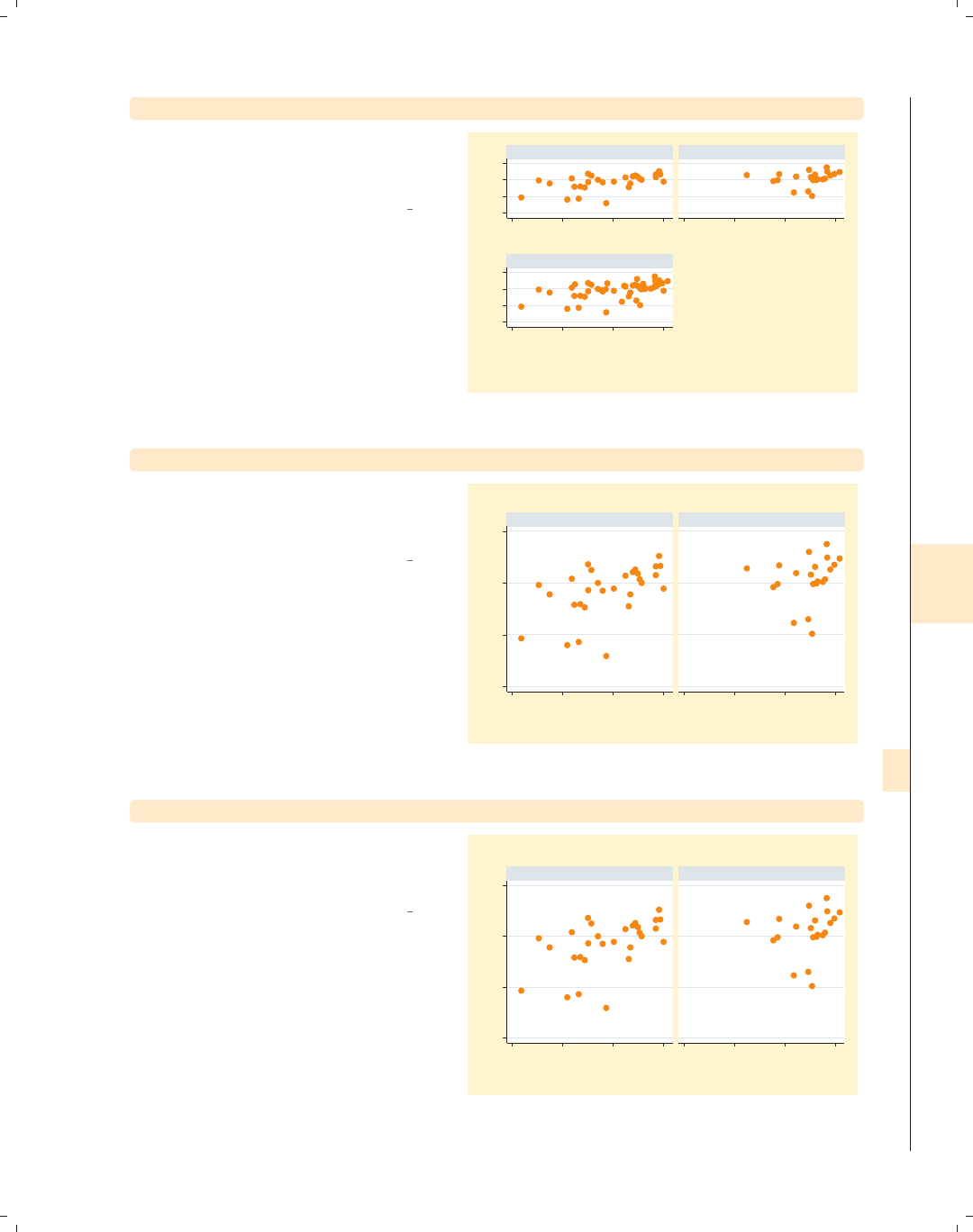
i
i
i
i
i
i
i
i
8.8 Graphing by groups 279
twoway scatter ownhome borninstate, by(north, total ixaxes ixtitle)
Likewise, we can display the x-title on
each graph using the ixaxes and
ixtitle options.
Uses allstatesdc.dta & scheme vg brite
50 60 70 8050 60 70 80
20 40 60 80
% born in state of residence
20 40 60 80
% born in state of residence
20 40 60 80
% born in state of residence
S & W North
Total
% who own home
% born in state of residence
Graphs by Region North or Not
twoway scatter ownhome borninstate, by(north) title("My title")
If we include a title() option with
by(), Stata creates each graph
separately using the title we specify.
Uses allstatesdc.dta & scheme vg brite
50 60 70 80
20 40 60 80 20 40 60 80
S & W North
My title My title
% who own home
% born in state of residence
Graphs by Region North or Not
twoway scatter ownhome borninstate, by(north, title("My title"))
If we make the title() an option
within the by() option, Stata will make
this an overall title for the graph.
Uses allstatesdc.dta & scheme vg brite
50 60 70 80
20 40 60 80 20 40 60 80
S & W North
% who own home
% born in state of residence
Graphs by Region North or Not
My title
Introduction Twoway Matrix Bar Box Dot Pie Options Standard options Styles Appendix
Markers Marker labels Connecting Axis titles Axis labels Axis scales Axis selection By Legend Adding text Textboxes
The electronic form of this book is solely for direct use at UCLA and only by faculty, students, and staff of UCLA.
All rights reserved on the copyright page apply to this document and specifically neither the electronic nor
published form of the book may be distributed or reproduced, either electronically or in printed form.
i
i
i
i
i
i
i
i
280 Chapter 8. Options available for most graphs
twoway scatter ownhome borninstate, by(north, title("By title"))
title("Regular title")
50 60 70 80
20 40 60 80 20 40 60 80
S & W North
Regular title Regular title
% who own home
% born in state of residence
Graphs by Region North or Not
By title This example should help you to
understand how these two types of
titles work. When the title() is used
overall, it applies to all graphs that are
created because it is repeated via the
by() option. The by(title()) is
applied after all smaller graphs are
created, providing an overall title for
the graph.
Uses allstatesdc.dta & scheme vg brite
twoway scatter ownhome borninstate, by(north)
caption("Regular caption")
50 60 70 80
20 40 60 80 20 40 60 80
Regular caption Regular caption
S & W North
% who own home
% born in state of residence
Graphs by Region North or Not
Stata treats the caption() option the
same way that it treats titles. Here, we
include an overall caption, which is
displayed with each graph.
Uses allstatesdc.dta & scheme vg brite
twoway scatter ownhome borninstate, by(north, caption("By caption"))
50 60 70 80
20 40 60 80 20 40 60 80
S & W North
% who own home
% born in state of residence
Graphs by Region North or Not
By caption
When we include the caption() inside
the by() option, it is displayed as a
caption for the full graph.
Uses allstatesdc.dta & scheme vg brite
The electronic form of this book is solely for direct use at UCLA and only by faculty, students, and staff of UCLA.
All rights reserved on the copyright page apply to this document and specifically neither the electronic nor
published form of the book may be distributed or reproduced, either electronically or in printed form.
i
i
i
i
i
i
i
i
8.8 Graphing by groups 281
twoway scatter ownhome borninstate, by(north)
subtitle("This is a subtitle")
Stata treats the subtitle() option
differently than the title() and
caption() options. Here, we include a
subtitle() option, and we see that it
has replaced the title above each graph
that represented the names of the
by-group.
Uses allstatesdc.dta & scheme vg brite
50 60 70 80
20 40 60 80 20 40 60 80
This is a subtitle This is a subtitle
% who own home
% born in state of residence
Graphs by Region North or Not
twoway scatter ownhome borninstate, by(north)
subtitle("Region of state", prefix)
We can use the subtitle() option to
add more labeling to the by-group
names. Here, we use the prefix option
to insert text that appears in the
subtitle before the name of the
by-group.
Uses allstatesdc.dta & scheme vg brite
50 60 70 80
20 40 60 80 20 40 60 80
Region of state
S & W
Region of state
North
% who own home
% born in state of residence
Graphs by Region North or Not
twoway scatter ownhome borninstate, by(north)
subtitle("Region of state", suffix)
We can use the suffix option to insert
text that appears in the subtitle after
the name of the by-group.
Uses allstatesdc.dta & scheme vg brite
50 60 70 80
20 40 60 80 20 40 60 80
S & W
Region of state
North
Region of state
% who own home
% born in state of residence
Graphs by Region North or Not
Introduction Twoway Matrix Bar Box Dot Pie Options Standard options Styles Appendix
Markers Marker labels Connecting Axis titles Axis labels Axis scales Axis selection By Legend Adding text Textboxes
The electronic form of this book is solely for direct use at UCLA and only by faculty, students, and staff of UCLA.
All rights reserved on the copyright page apply to this document and specifically neither the electronic nor
published form of the book may be distributed or reproduced, either electronically or in printed form.
i
i
i
i
i
i
i
i
282 Chapter 8. Options available for most graphs
twoway scatter ownhome borninstate, by(north)
subtitle("State’s location", prefix)
subtitle("Based on Region", suffix)
50 60 70 80
20 40 60 80 20 40 60 80
State’s location
S & W
Based on Region
State’s location
North
Based on Region
% who own home
% born in state of residence
Graphs by Region North or Not
We can even combine the prefix and
suffix option to insert text before and
after the label of the by-group.
Uses allstatesdc.dta & scheme vg brite
twoway scatter ownhome borninstate,
by(north, subtitle("This is a subtitle"))
50 60 70 80
20 40 60 80 20 40 60 80
S & W North
% who own home
% born in state of residence
Graphs by Region North or Not
This is a subtitle When used as an option within the
by() option, the subtitle() option
works just like the title() and
caption() options, placing a subtitle
on the overall graph.
Uses allstatesdc.dta & scheme vg brite
twoway scatter ownhome borninstate, by(north) note("Regular note")
50 60 70 80
20 40 60 80 20 40 60 80
Regular note Regular note
S & W North
% who own home
% born in state of residence
Graphs by Region North or Not
Stata treats the note() option much as
it does the title(),caption(),and
subtitle() options. Here, we include a
note() option and see that it is shown
beneath both graphs.
Uses allstatesdc.dta & scheme vg brite
The electronic form of this book is solely for direct use at UCLA and only by faculty, students, and staff of UCLA.
All rights reserved on the copyright page apply to this document and specifically neither the electronic nor
published form of the book may be distributed or reproduced, either electronically or in printed form.
i
i
i
i
i
i
i
i
8.8 Graphing by groups 283
twoway scatter ownhome borninstate, by(north, note("By note"))
If we include the note() option within
the by() option, we see that our note
overrides the note that Stata provided
to indicate that the graphs were
separated by the variable north.
Uses allstatesdc.dta & scheme vg brite
50 60 70 80
20 40 60 80 20 40 60 80
S & W North
% who own home
% born in state of residence
By note
twoway scatter ownhome borninstate,
by(north, note("North N=21, Not North N=29", suffix))
As with the subtitle() option, we can
use the prefix or suffix option to add
our own text before or after the existing
note.
Uses allstatesdc.dta & scheme vg brite
50 60 70 80
20 40 60 80 20 40 60 80
S & W North
% who own home
% born in state of residence
Graphs by Region North or Not
North N=21, Not North N=29
twoway scatter ownhome borninstate,
by(north, total) subtitle(, position(11))
Previously, we saw that the
subtitle() option could be used to
modify the by-group names above each
graph. We can also use the subtitle(,
position()) option to modify the
placement of this text. Here, we move
the text to appear in the 11 o’clock
position.
Uses allstatesdc.dta & scheme vg brite
50 60 70 8050 60 70 80
20 40 60 80
20 40 60 80
S & W North
Total
% who own home
% born in state of residence
Graphs by Region North or Not
Introduction Twoway Matrix Bar Box Dot Pie Options Standard options Styles Appendix
Markers Marker labels Connecting Axis titles Axis labels Axis scales Axis selection By Legend Adding text Textboxes
The electronic form of this book is solely for direct use at UCLA and only by faculty, students, and staff of UCLA.
All rights reserved on the copyright page apply to this document and specifically neither the electronic nor
published form of the book may be distributed or reproduced, either electronically or in printed form.

i
i
i
i
i
i
i
i
284 Chapter 8. Options available for most graphs
twoway scatter ownhome borninstate,
by(north, total) subtitle(, pos(5) ring(0) nobexpand)
50 60 70 8050 60 70 80
20 40 60 80
20 40 60 80
S & W North
Total
% who own home
% born in state of residence
Graphs by Region North or Not
We can place the name of the by-group
in the bottom right corner of each
graph using the subtitle() option.
The options pos(5) and ring(0) move
the subtitle to the 5 o’clock position
and inside the plot region. The
nobexpand (no box expand) option
prevents the by-group name from
expanding to consume the entire plot
region.
Uses allstatesdc.dta & scheme vg brite
twoway scatter ownhome borninstate,
by(north, total title("My title", ring(0) position(5)))
50 60 70 8050 60 70 80
20 40 60 80
20 40 60 80
S & W North
Total
% who own home
% born in state of residence
Graphs by Region North or Not
My title
We can also use the ring() and pos()
options with title(),note(),and
caption() to alter their placement.
Here, we use position(5) to put the
title in the bottom right corner and
ring(0) to locate it inside the plot
region.
Uses allstatesdc.dta & scheme vg brite
twoway scatter ownhome borninstate,
by(north, total title("My title", position(5)))
50 60 70 8050 60 70 80
20 40 60 80
20 40 60 80
S & W North
Total
% who own home
% born in state of residence
Graphs by Region North or Not
My title
The previous graph is repeated with
the position(5) option but not the
ring(0) option to illustrate the impact
of ring(0). Without ring(0), the title
is placed outside the plot region.
Uses allstatesdc.dta & scheme vg brite
The electronic form of this book is solely for direct use at UCLA and only by faculty, students, and staff of UCLA.
All rights reserved on the copyright page apply to this document and specifically neither the electronic nor
published form of the book may be distributed or reproduced, either electronically or in printed form.
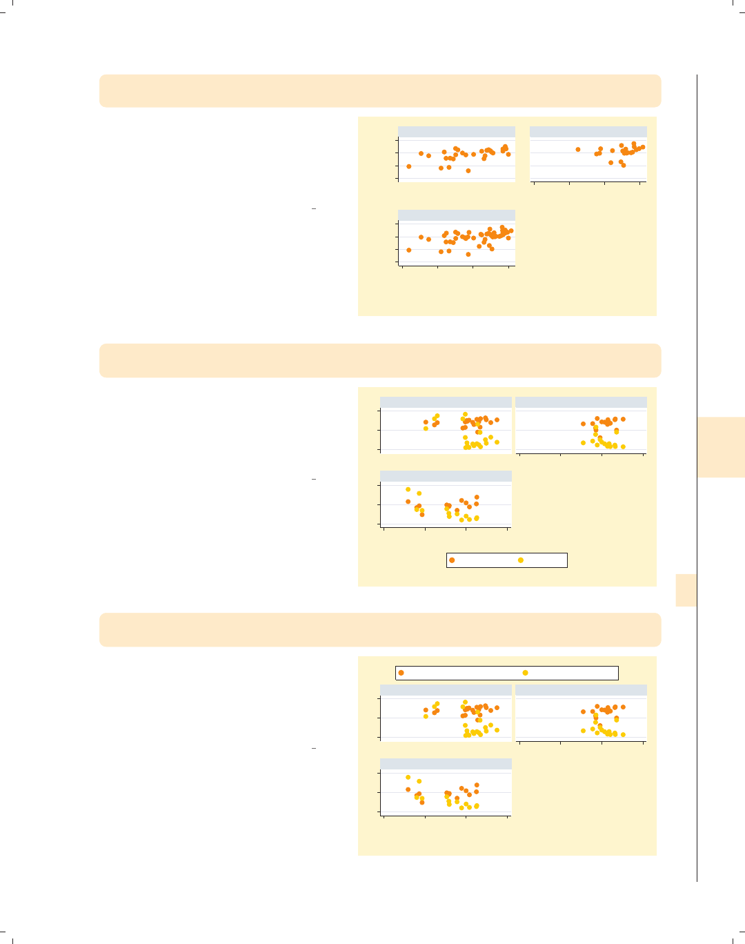
i
i
i
i
i
i
i
i
8.8 Graphing by groups 285
twoway scatter ownhome borninstate,
by(north, total) l1title("left title") b1title("bottom title")
Including the l1title() option adds a
title to the left (on the y-axis) of each
of the graphs. Likewise, the b1title()
option adds a title to the bottom (on
the x-axis) of each of the graphs.
Uses allstatesdc.dta & scheme vg brite
50 60 70 8050 60 70 80
20 40 60 80
20 40 60 80
left title
left title
left title
bottom title bottom title
bottom title
S & W North
Total
% who own home
% born in state of residence
Graphs by Region North or Not
twoway scatter (borninstate propval100 ownhome), by(nsw)
legend(label(1 "Born in state") label(2 "% > 100K"))
Here, we use the legend() option to
change the labels associated with the
first two keys. These options modify the
contents of the legend, so they should
appear outside of the by() option.
Uses allstatesdc.dta & scheme vg brite
0 50 1000 50 100
50 60 70 80
50 60 70 80
North South
West
Born in state % > 100K
% who own home
Graphs by Region North, South, or West
twoway scatter (borninstate propval100 ownhome),
by(nsw, legend(position(12)))
In this graph, we use the position()
option to modify the position of the
legend. Such options that modify the
position of the legend must be placed as
an option within the by() option.
Uses allstatesdc.dta & scheme vg brite
0 50 1000 50 100
50 60 70 80
50 60 70 80
North South
West
% born in state of residence % homes cost $100K+
% who own home
Graphs by Region North, South, or West
Introduction Twoway Matrix Bar Box Dot Pie Options Standard options Styles Appendix
Markers Marker labels Connecting Axis titles Axis labels Axis scales Axis selection By Legend Adding text Textboxes
The electronic form of this book is solely for direct use at UCLA and only by faculty, students, and staff of UCLA.
All rights reserved on the copyright page apply to this document and specifically neither the electronic nor
published form of the book may be distributed or reproduced, either electronically or in printed form.

i
i
i
i
i
i
i
i
286 Chapter 8. Options available for most graphs
twoway scatter (borninstate propval100 ownhome),
by(nsw, legend(pos(12)))
legend(label(1 "Born in state") label(2 "% > 100K"))
0 50 1000 50 100
50 60 70 80
50 60 70 80
North South
West
Born in state % > 100K
% who own home
Graphs by Region North, South, or West
Here, we use both of the options from
the previous two graphs, and the
legend() option is used twice: inside
the by() option to modify the position
and outside the by() option to modify
its contents. The use of legend() with
the by() option is covered more
thoroughly in Options : Legend (287).
Uses allstatesdc.dta & scheme vg brite
twoway scatter ownhome borninstate,
by(north, title("% own home" "by % born in state"))
title("Region of state")
50 60 70 80
20 40 60 80 20 40 60 80
S & W North
Region of state Region of state
% who own home
% born in state of residence
Graphs by Region North or Not
% own home
by % born in state
We can use the title() option on its
own to make a title that is displayed
with each graph, and the title()
option within the by() option to make
an overall title.
Uses allstatesdc.dta & scheme vg brite
twoway scatter ownhome borninstate,
by(north, total rescale ixtitle iytitle b1title("") l1title(""))
55 60 65 70 75
% who own home
60 65 70 75 80
% who own home
50 60 70 80
% who own home
20 40 60 80
% born in state of residence
40 50 60 70 80
% born in state of residence
20 40 60 80
% born in state of residence
S & W North
Total
Graphs by Region North or Not
Here, we obtain separate graphs for the
three groups, using rescale to obtain
different x-andy-axis labels and scales,
ixtitle and iytitle to title the
graphs separately, and b1title() and
l1title() to suppress the overall titles
for the x-andy-axes.
Uses allstatesdc.dta & scheme vg brite
The electronic form of this book is solely for direct use at UCLA and only by faculty, students, and staff of UCLA.
All rights reserved on the copyright page apply to this document and specifically neither the electronic nor
published form of the book may be distributed or reproduced, either electronically or in printed form.

i
i
i
i
i
i
i
i
8.9 Controlling legends 287
8.9 Controlling legends
This section describes more details about using legends. Legends can be useful in a
number of situations, and this section shows how to customize them. For more information
about legend options, see [G]legend option. Also, for controlling the text and textbox of
the legend, see Options : Textboxes (303) and Options : Adding text (299). We will use the
vg s2c scheme.
twoway scatter ownhome propval100 urban
Legends can be created in a variety of
ways. For example, here we have two
y-variables, ownhome and propval100,
on the same plot, and Stata creates a
legend labeling the different points.
The default legend, in this case, is quite
useful.
Uses allstatesdc.dta & scheme vg s2c
0 20 40 60 80 100
20 40 60 80 100
Percent urban 1990
% who own home % homes cost $100K+
twoway (scatter ownhome urban) (lfit ownhome urban)
(qfit ownhome urban)
Legends are also created when you
overlay plots. Here, Stata adds a legend
entry for each of the overlaid plots. The
default legend, in this case, is less useful
since it does not help us differentiate
between the kinds of fit values.
Uses allstatesdc.dta & scheme vg s2c
55 60 65 70 75 80
20 40 60 80 100
Percent urban 1990
% who own home Fitted values
Fitted values
Introduction Twoway Matrix Bar Box Dot Pie Options Standard options Styles Appendix
Markers Marker labels Connecting Axis titles Axis labels Axis scales Axis selection By Legend Adding text Textboxes
The electronic form of this book is solely for direct use at UCLA and only by faculty, students, and staff of UCLA.
All rights reserved on the copyright page apply to this document and specifically neither the electronic nor
published form of the book may be distributed or reproduced, either electronically or in printed form.
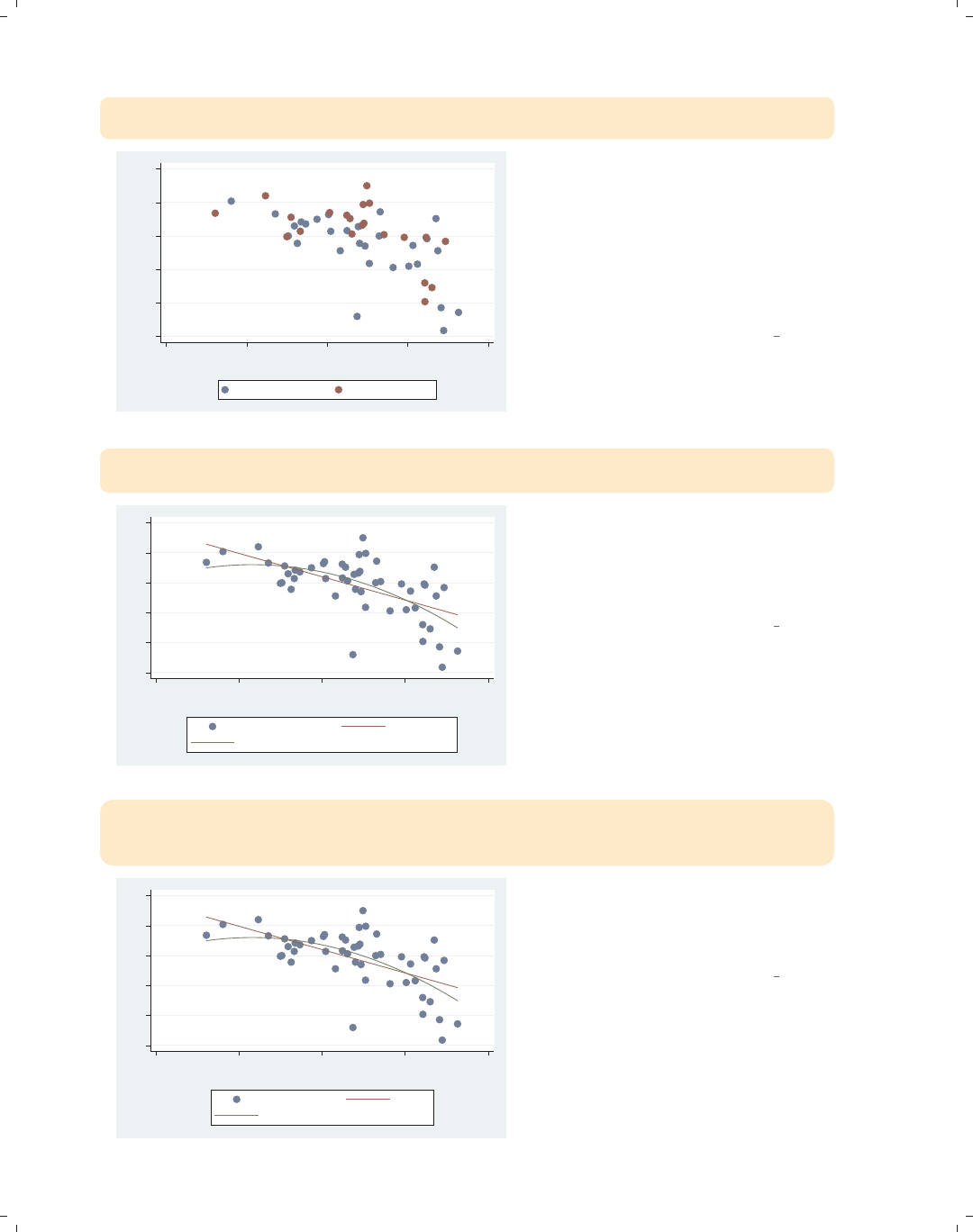
i
i
i
i
i
i
i
i
288 Chapter 8. Options available for most graphs
twoway (scatter ownhome urban if north==0)
(scatter ownhome urban if north==1)
55 60 65 70 75 80
% who own home
20 40 60 80 100
Percent urban 1990
% who own home % who own home
A third example is when you overlay
two plots using if to display the same
variables but for different observations.
Here, we show the same scatterplot
separately for states in the North and
for those not in the North. Here, the
legend does not help us at all to
differentiate the kinds of values.
Uses allstatesdc.dta & scheme vg s2c
twoway (scatter ownhome urban) (lfit ownhome urban)
(qfit ownhome urban)
55 60 65 70 75 80
20 40 60 80 100
Percent urban 1990
% who own home Fitted values
Fitted values
Regardless of the graph command(s)
that generated the legend, it can be
customized the same way. For many of
the examples, we will use this graph for
customizing the legend.
Uses allstatesdc.dta & scheme vg s2c
twoway (scatter ownhome urban) (lfit ownhome urban)
(qfit ownhome urban),
legend(label(1 "% Own home") label(2 "Lin. Fit") label(3 "Quad. Fit"))
55 60 65 70 75 80
20 40 60 80 100
Percent urban 1990
% Own home Lin. Fit
Quad. Fit
You can use the label() option to
assign labels for the keys. Note that
you use a separate label() option for
each key that you wish to modify.
Uses allstatesdc.dta & scheme vg s2c
The electronic form of this book is solely for direct use at UCLA and only by faculty, students, and staff of UCLA.
All rights reserved on the copyright page apply to this document and specifically neither the electronic nor
published form of the book may be distributed or reproduced, either electronically or in printed form.
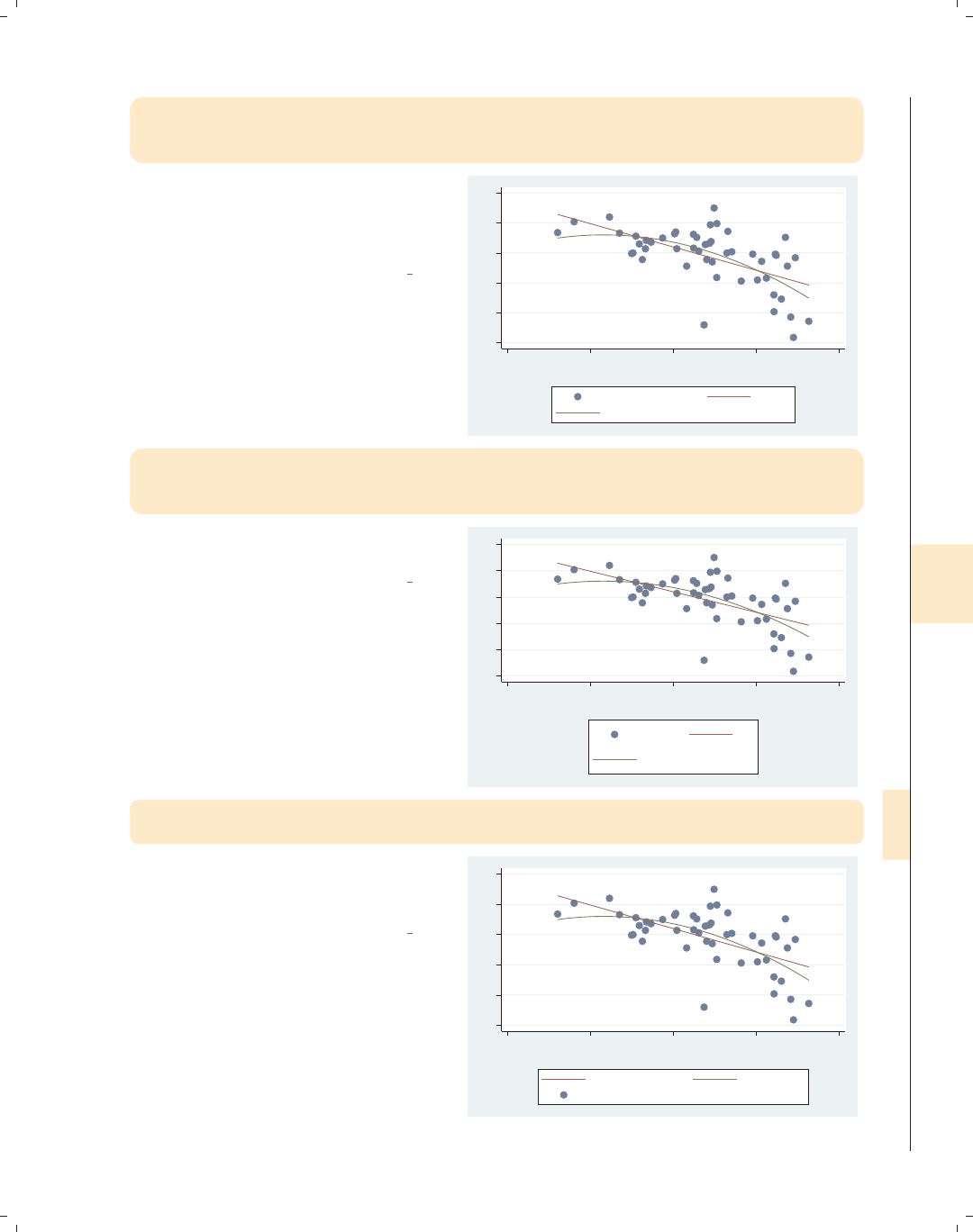
i
i
i
i
i
i
i
i
8.9 Controlling legends 289
twoway (scatter ownhome urban) (lfit ownhome urban)
(qfit ownhome urban),
legend(label(2 "Lin. Fit") label(3 "Quad. Fit"))
You can use the label() option to
modify just some of the keys; for
example, here we just modify the
second and third key.
Uses allstatesdc.dta & scheme vg s2c
55 60 65 70 75 80
20 40 60 80 100
Percent urban 1990
% who own home Lin. Fit
Quad. Fit
twoway (scatter ownhome urban) (lfit ownhome urban)
(qfit ownhome urban),
legend(label(1 "%own" "home") label(2 "Lin" "Fit") label(3 "Qd" "Fit"))
You can put the label on multiple lines
by including multiple quoted strings.
Uses allstatesdc.dta & scheme vg s2c
55 60 65 70 75 80
20 40 60 80 100
Percent urban 1990
%own
home
Lin
Fit
Qd
Fit
twoway (scatter ownhome urban) (lfit ownhome urban)
(qfit ownhome urban), legend(order(2 3 1))
You can use the order() option to
change the order of the keys in the
legend.
Uses allstatesdc.dta & scheme vg s2c
55 60 65 70 75 80
20 40 60 80 100
Percent urban 1990
Fitted values Fitted values
% who own home
Introduction Twoway Matrix Bar Box Dot Pie Options Standard options Styles Appendix
Markers Marker labels Connecting Axis titles Axis labels Axis scales Axis selection By Legend Adding text Textboxes
The electronic form of this book is solely for direct use at UCLA and only by faculty, students, and staff of UCLA.
All rights reserved on the copyright page apply to this document and specifically neither the electronic nor
published form of the book may be distributed or reproduced, either electronically or in printed form.

i
i
i
i
i
i
i
i
290 Chapter 8. Options available for most graphs
twoway (scatter ownhome urban) (lfit ownhome urban)
(qfit ownhome urban), legend(order(2 3))
55 60 65 70 75 80
20 40 60 80 100
Percent urban 1990
Fitted values Fitted values
We can also omit keys from the
order() option to suppress their
display in the legend. Here, we suppress
the display of the first key.
Uses allstatesdc.dta & scheme vg s2c
twoway (scatter ownhome urban) (lfit ownhome urban)
(qfit ownhome urban), legend(order(2 "Lin. fit" 3 "Quad. fit" 1))
55 60 65 70 75 80
20 40 60 80 100
Percent urban 1990
Lin. fit Quad. fit
% who own home
You can also insert and replace text for
the keys when using the order()
option. Here, we order the keys 2, 3,
and 1, and at the same time, replace
the text for keys 2 and 3.
Uses allstatesdc.dta & scheme vg s2c
twoway (scatter ownhome urban) (lfit ownhome urban)
(qfit ownhome urban),
legend(order(- "Fitted" 2 "Lin. fit" 3 "Quad. fit" - "Observed" 1))
55 60 65 70 75 80
20 40 60 80 100
Percent urban 1990
Fitted Lin. fit
Quad. fit Observed
% who own home
We use - "Fitted" to insert the word
Fitted and - "Observed" to insert the
word Observed. Due to the
organization of the keys in the legend,
this is hard to follow.
Uses allstatesdc.dta & scheme vg s2c
The electronic form of this book is solely for direct use at UCLA and only by faculty, students, and staff of UCLA.
All rights reserved on the copyright page apply to this document and specifically neither the electronic nor
published form of the book may be distributed or reproduced, either electronically or in printed form.
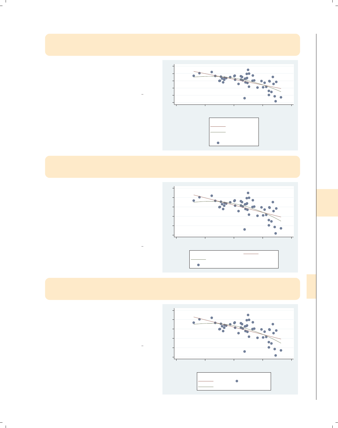
i
i
i
i
i
i
i
i
8.9 Controlling legends 291
twoway (scatter ownhome urban) (lfit ownhome urban) (qfit ownhome urban),
legend(order(- "Fitted" 2 "Lin. fit" 3 "Quad. fit" - "Observed" 1)
cols(1))
We can use the cols() option to
display the legend in a single column.
Here, the added text makes more sense,
but the legend uses quite a bit of space.
Uses allstatesdc.dta & scheme vg s2c
55 60 65 70 75 80
20 40 60 80 100
Percent urban 1990
Fitted
Lin. fit
Quad. fit
Observed
% who own home
twoway (scatter ownhome urban) (lfit ownhome urban) (qfit ownhome urban),
legend(order(- "Fitted" 2 "Lin. fit" 3 "Quad. fit" - "Observed" 1)
rows(3))
We can use the rows() option to
display the legend in three rows. If we
want to display the fitted keys in the
left column and the observed keys in
the right column, we can order the keys
according to columns instead of
according to rows. See the next
example.
Uses allstatesdc.dta & scheme vg s2c
55 60 65 70 75 80
20 40 60 80 100
Percent urban 1990
Fitted Lin. fit
Quad. fit Observed
% who own home
twoway (scatter ownhome urban) (lfit ownhome urban) (qfit ownhome urban),
legend(order(- "Fitted" 2 "Lin. fit" 3 "Quad. fit" - "Observed" 1)
rows(3) colfirst)
Adding the colfirst option displays
the keys in column order instead of row
order, with the Fitted keys in the left
column and the Observed keys in the
right column.
Uses allstatesdc.dta & scheme vg s2c
55 60 65 70 75 80
20 40 60 80 100
Percent urban 1990
Fitted
Lin. fit
Quad. fit
Observed
% who own home
Introduction Twoway Matrix Bar Box Dot Pie Options Standard options Styles Appendix
Markers Marker labels Connecting Axis titles Axis labels Axis scales Axis selection By Legend Adding text Textboxes
The electronic form of this book is solely for direct use at UCLA and only by faculty, students, and staff of UCLA.
All rights reserved on the copyright page apply to this document and specifically neither the electronic nor
published form of the book may be distributed or reproduced, either electronically or in printed form.
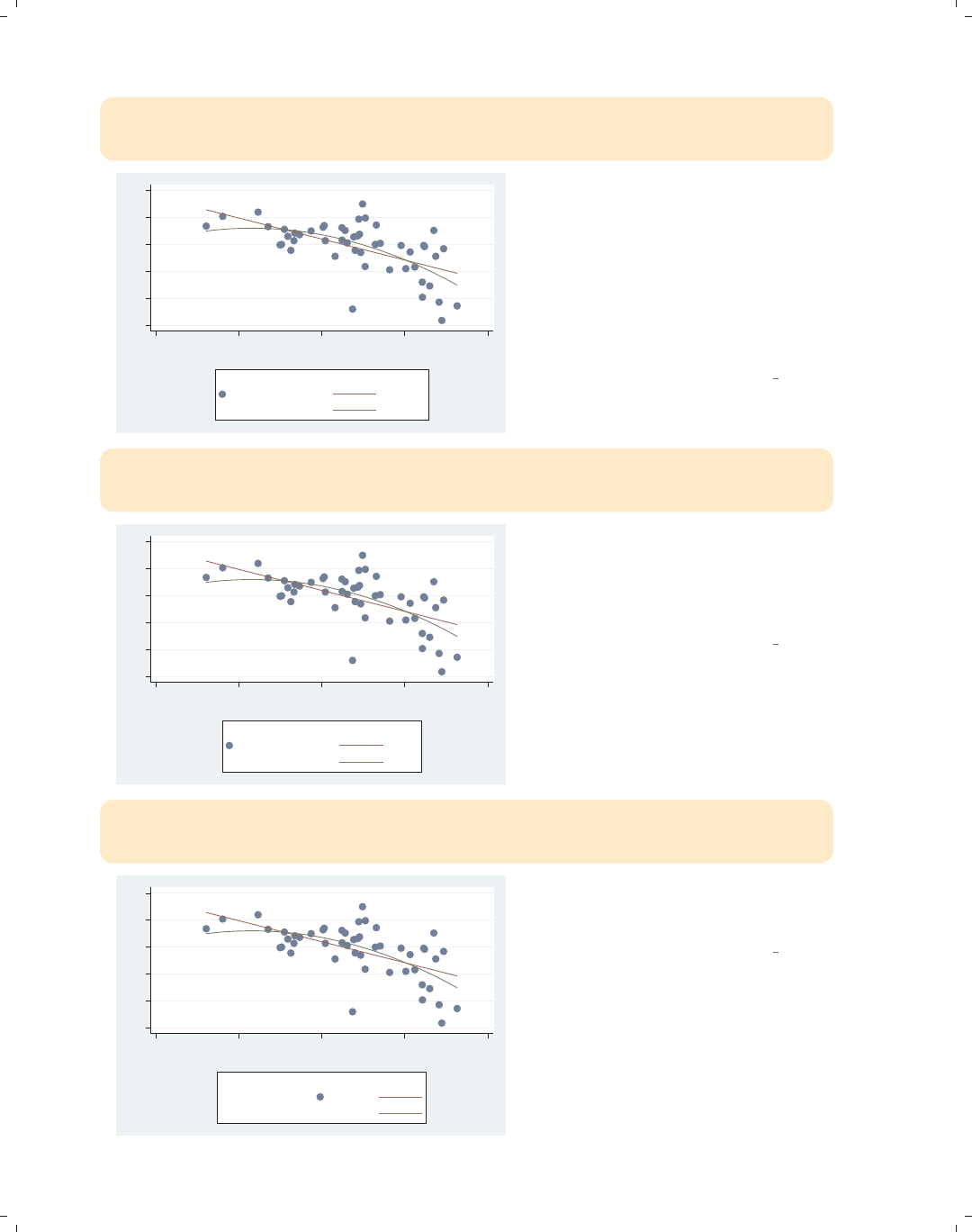
i
i
i
i
i
i
i
i
292 Chapter 8. Options available for most graphs
twoway (scatter ownhome urban) (lfit ownhome urban) (qfit ownhome urban),
legend(order(- "Observed" 1 - "Fitted" 2 "Lin. fit" 3 "Quad. fit")
rows(3) holes(3) colfirst)
55 60 65 70 75 80
20 40 60 80 100
Percent urban 1990
Observed
% who own home
Fitted
Lin. fit
Quad. fit
This legend is the same as the one in
the previous example but places the
Observed keys in the left column and
the Fitted keys in the right column. To
do this, we changed the order of the
keys but also added the holes(3)
option so that Fitted would be in the
fourth position at the top of the second
column.
Uses allstatesdc.dta & scheme vg s2c
twoway (scatter ownhome urban) (lfit ownhome urban) (qfit ownhome urban),
legend(order(- "Observed" 1 -""- "Fitted" 2 "Lin fit" 3 "Qd fit")
rows(3) colfirst)
55 60 65 70 75 80
20 40 60 80 100
Percent urban 1990
Observed
% who own home
Fitted
Lin fit
Qd fit
Referring to the last graph, instead of
using holes(), we can put in a blank
key, -"",intheorder() option,
which pushes the word Fitted over to
the next column.
Uses allstatesdc.dta & scheme vg s2c
twoway (scatter ownhome urban) (lfit ownhome urban) (qfit ownhome urban),
legend(order(- "Observed" 1 - " " - "Fitted" 2 "Lin fit" 3 "Qd fit")
rows(3) colfirst textfirst)
55 60 65 70 75 80
20 40 60 80 100
Percent urban 1990
Observed
% who own home
Fitted
Lin fit
Qd fit
Using the textfirst option, we can
make the text for the key appear first,
followed by the symbol.
Uses allstatesdc.dta & scheme vg s2c
The electronic form of this book is solely for direct use at UCLA and only by faculty, students, and staff of UCLA.
All rights reserved on the copyright page apply to this document and specifically neither the electronic nor
published form of the book may be distributed or reproduced, either electronically or in printed form.
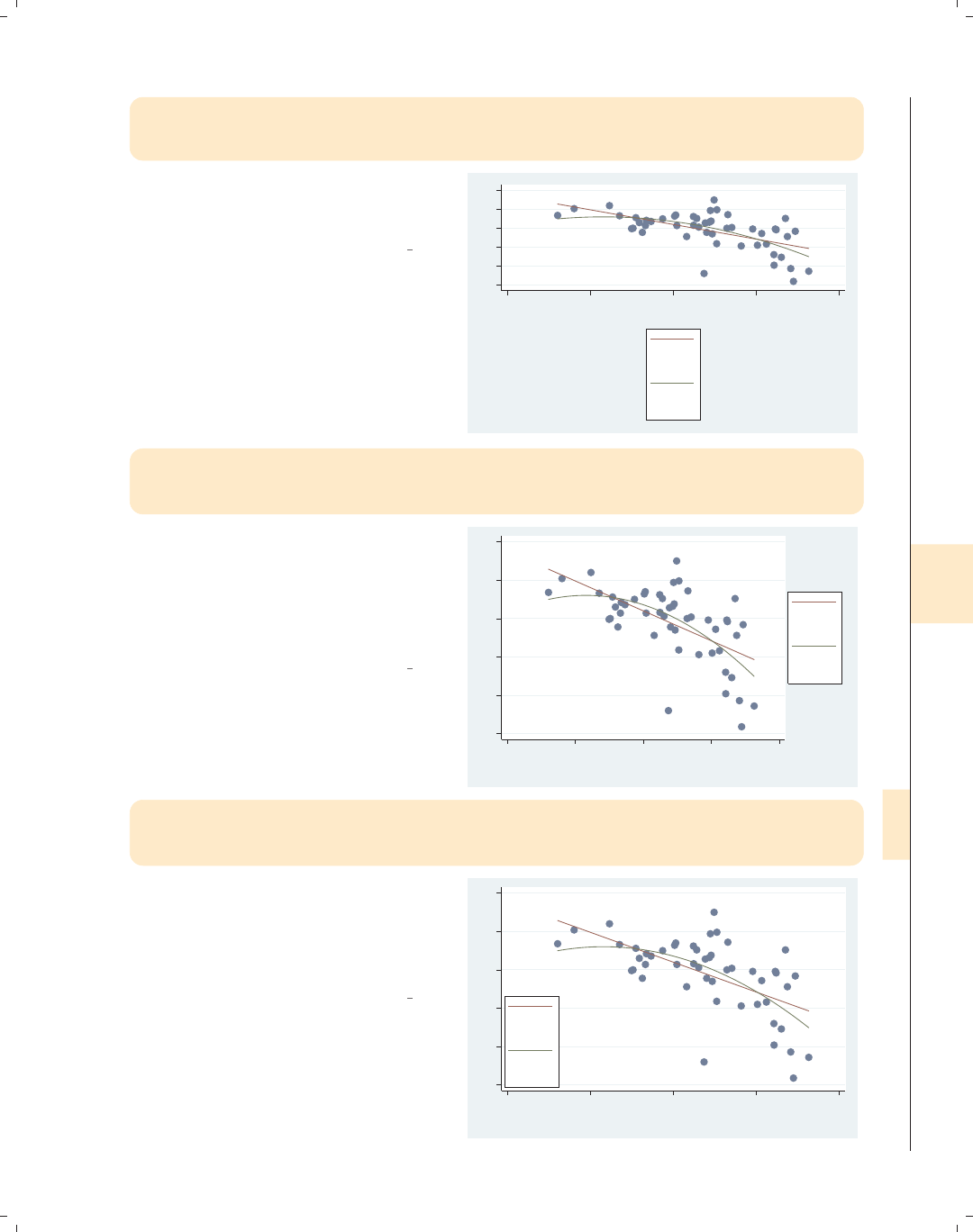
i
i
i
i
i
i
i
i
8.9 Controlling legends 293
twoway (scatter ownhome urban) (lfit ownhome urban) (qfit ownhome urban),
legend(order(2 "Linear" "Fit" 3 "Quadratic" "Fit")
stack cols(1))
Using the stack option, we can stack
the symbols above the labels. We use
this here to make a tall, narrow legend.
Uses allstatesdc.dta & scheme vg s2c
55 60 65 70 75 80
20 40 60 80 100
Percent urban 1990
Linear
Fit
Quadratic
Fit
twoway (scatter ownhome urban) (lfit ownhome urban) (qfit ownhome urban),
legend(order(2 "Linear" "Fit" 3 "Quadratic" "Fit")
stack cols(1) position(3))
We can use the position() option to
change where the legend is displayed.
Here, we take the narrow legend from
the previous graph and put it to the
right of the graph, making good use of
space.
Uses allstatesdc.dta & scheme vg s2c
55 60 65 70 75 80
20 40 60 80 100
Percent urban 1990
Linear
Fit
Quadratic
Fit
twoway (scatter ownhome urban) (lfit ownhome urban) (qfit ownhome urban),
legend(order(2 "Linear" "Fit" 3 "Quadratic" "Fit")
stack cols(1) ring(0) position(7))
We can use the ring(0) option to place
the legend inside the plot area and use
position(7) to put it in the bottom
left corner, using the empty space in
the plot for the legend.
Uses allstatesdc.dta & scheme vg s2c
55 60 65 70 75 80
20 40 60 80 100
Percent urban 1990
Linear
Fit
Quadratic
Fit
Introduction Twoway Matrix Bar Box Dot Pie Options Standard options Styles Appendix
Markers Marker labels Connecting Axis titles Axis labels Axis scales Axis selection By Legend Adding text Textboxes
The electronic form of this book is solely for direct use at UCLA and only by faculty, students, and staff of UCLA.
All rights reserved on the copyright page apply to this document and specifically neither the electronic nor
published form of the book may be distributed or reproduced, either electronically or in printed form.
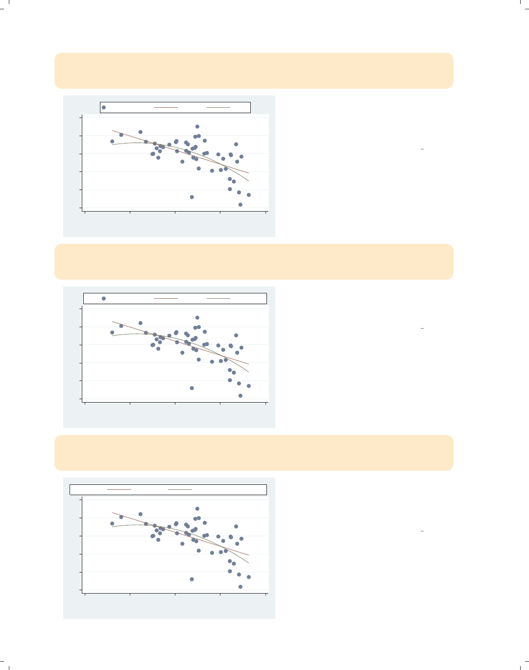
i
i
i
i
i
i
i
i
294 Chapter 8. Options available for most graphs
twoway (scatter ownhome urban) (lfit ownhome urban) (qfit ownhome urban),
legend(order(1 "% Own Home" 2 "Linear" 3 "Quad")
rows(1) position(12))
55 60 65 70 75 80
20 40 60 80 100
Percent urban 1990
% Own Home Linear Quad
Here, we make the legend a thin row
using the rows(1) option and then use
the position(12) option to put it at
the top of the graph.
Uses allstatesdc.dta & scheme vg s2c
twoway (scatter ownhome urban) (lfit ownhome urban) (qfit ownhome urban),
legend(order(1 "% Own Home" 2 "Linear" 3 "Quad")
rows(1) position(12) bexpand)
55 60 65 70 75 80
20 40 60 80 100
Percent urban 1990
% Own Home Linear Quad
We can expand the width of the legend
to the width of the plot area using the
bexpand (box expand) option.
Uses allstatesdc.dta & scheme vg s2c
twoway (scatter ownhome urban) (lfit ownhome urban) (qfit ownhome urban),
legend(order(2 "Linear Fit" 3 "Quadratic Fit")
rows(1) position(12) bexpand span)
55 60 65 70 75 80
20 40 60 80 100
Percent urban 1990
Linear Fit Quadratic Fit
If we wanted to expand the legend to
the entire width of the graph area (not
just the plot area), we would add the
span option.
Uses allstatesdc.dta & scheme vg s2c
The electronic form of this book is solely for direct use at UCLA and only by faculty, students, and staff of UCLA.
All rights reserved on the copyright page apply to this document and specifically neither the electronic nor
published form of the book may be distributed or reproduced, either electronically or in printed form.
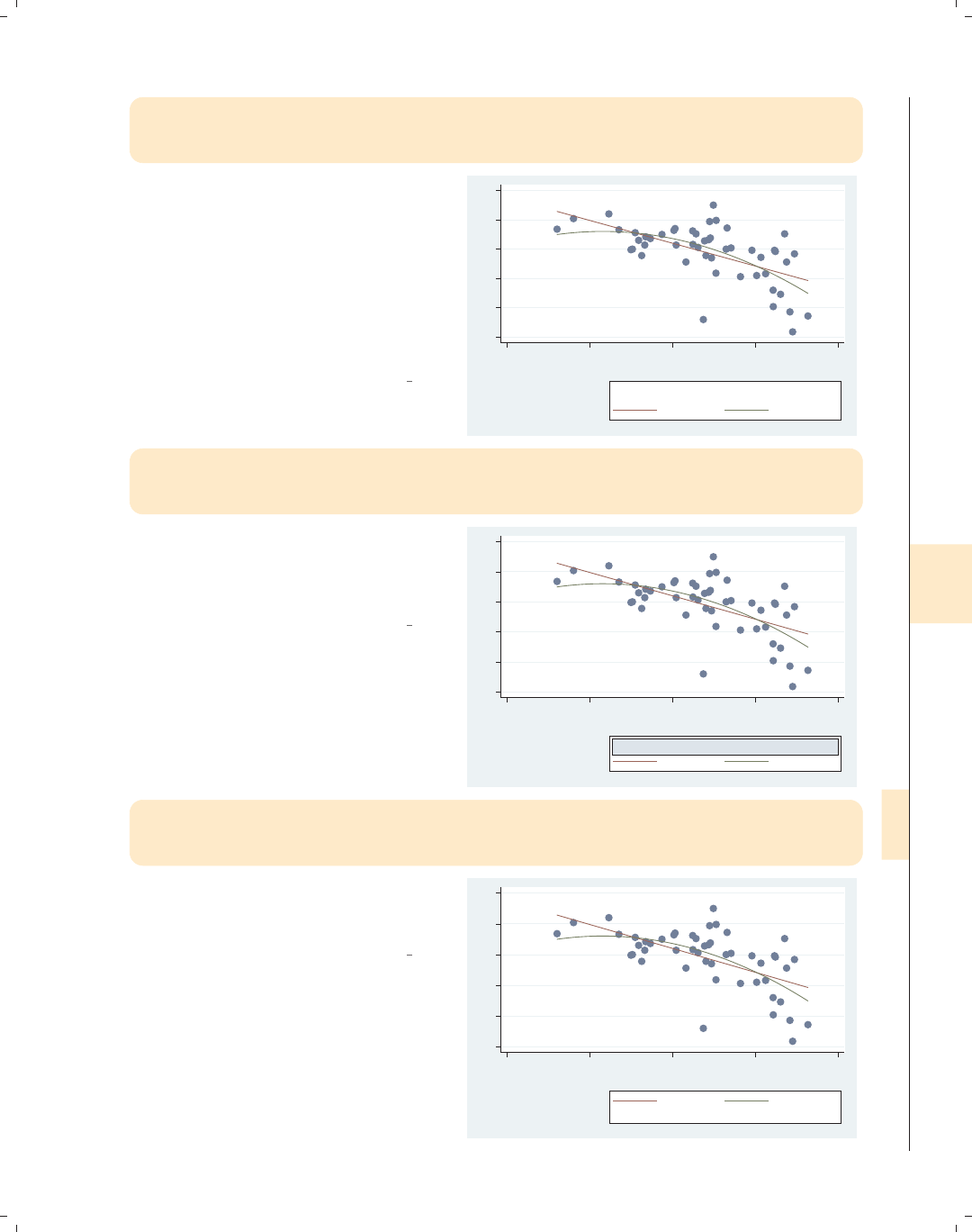
i
i
i
i
i
i
i
i
8.9 Controlling legends 295
twoway (scatter ownhome urban) (lfit ownhome urban) (qfit ownhome urban),
legend(order(2 "Linear Fit" 3 "Quadratic Fit")
rows(1) pos(5) title("Legend", position(11)))
We can add a title, subtitle, note, or
caption to the legend using all the
features described in Standard
options : Titles (313). Here, we add a
title() and use the position()
option to position it in the top left
corner. A simple way to get a smaller
title is to use the subtitle() option
instead.
Uses allstatesdc.dta & scheme vg s2c
55 60 65 70 75 80
20 40 60 80 100
Percent urban 1990
Linear Fit Quadratic Fit
Legend
twoway (scatter ownhome urban) (lfit ownhome urban) (qfit ownhome urban),
legend(order(2 "Linear Fit" 3 "Quadratic Fit")
rows(1) pos(5) subtitle("Legend", box bexpand))
To emphasize all the control we have,
we could put the subtitle for the legend
in a box and use bexpand to make it
expand to the width of the legend.
Uses allstatesdc.dta & scheme vg s2c
55 60 65 70 75 80
20 40 60 80 100
Percent urban 1990
Linear Fit Quadratic Fit
Legend
twoway (scatter ownhome urban) (lfit ownhome urban) (qfit ownhome urban),
legend(order(2 "Linear Fit" 3 "Quadratic Fit")
rows(1) pos(5) note("Fit obtained with lfit and qfit"))
Here, we use the note() option,
showing that we can even add a note to
the legend.
Uses allstatesdc.dta & scheme vg s2c
55 60 65 70 75 80
20 40 60 80 100
Percent urban 1990
Linear Fit Quadratic Fit
Fit obtained with lfit and qfit
Introduction Twoway Matrix Bar Box Dot Pie Options Standard options Styles Appendix
Markers Marker labels Connecting Axis titles Axis labels Axis scales Axis selection By Legend Adding text Textboxes
The electronic form of this book is solely for direct use at UCLA and only by faculty, students, and staff of UCLA.
All rights reserved on the copyright page apply to this document and specifically neither the electronic nor
published form of the book may be distributed or reproduced, either electronically or in printed form.
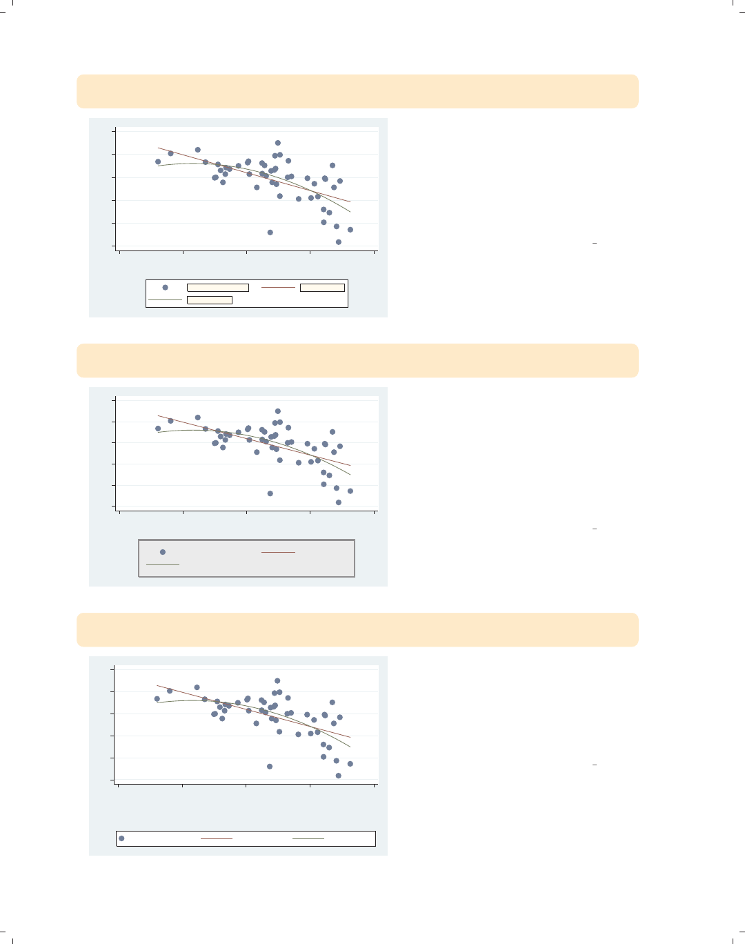
i
i
i
i
i
i
i
i
296 Chapter 8. Options available for most graphs
twoway (scatter ownhome urban) (lfit ownhome urban) (qfit ownhome urban),
legend(size(medium) color(maroon) bfcolor(eggshell) box)
55 60 65 70 75 80
20 40 60 80 100
Percent urban 1990
% who own home Fitted values
Fitted values
The legend() option permits us to
supply options that control the display
of the labels for the keys. Here, we
request that those labels be maroon,
medium in size, displayed with an
eggshell background, and surrounded
by a box.
Uses allstatesdc.dta & scheme vg s2c
twoway (scatter ownhome urban) (lfit ownhome urban) (qfit ownhome urban),
legend(region(fcolor(dimgray) lcolor(gs8) lwidth(thick) margin(medium)))
55 60 65 70 75 80
20 40 60 80 100
Percent urban 1990
% who own home Fitted values
Fitted values
The region() option can be used to
control the overall box in which the
legend is placed. Here, we specify the
fill color to be a dim gray, the line color
to be a medium gray
(gs8 = gray scale 8), the line to be
thick, and the margin between the text
and the box to be medium.
Uses allstatesdc.dta & scheme vg s2c
twoway (scatter ownhome urban) (lfit ownhome urban) (qfit ownhome urban),
legend(rows(1) bmargin(t=10))
55 60 65 70 75 80
20 40 60 80 100
Percent urban 1990
% who own home Fitted values Fitted values
We can adjust the margin around the
box of the legend with the bmargin()
option. Here, we use t=10 to make the
margin 10 at the top, increasing the
gap between the legend and the title of
the x-axis.
Uses allstatesdc.dta & scheme vg s2c
The electronic form of this book is solely for direct use at UCLA and only by faculty, students, and staff of UCLA.
All rights reserved on the copyright page apply to this document and specifically neither the electronic nor
published form of the book may be distributed or reproduced, either electronically or in printed form.
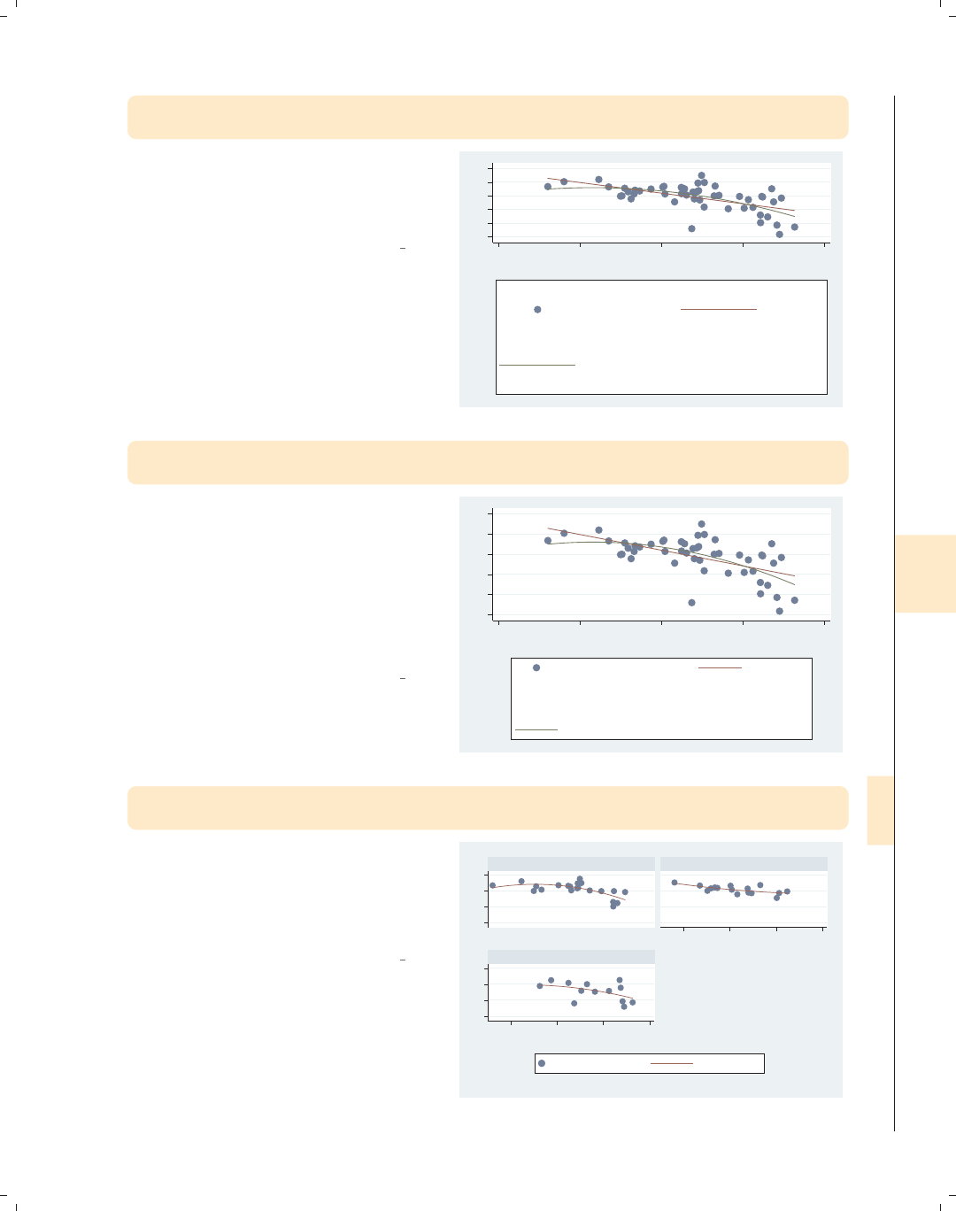
i
i
i
i
i
i
i
i
8.9 Controlling legends 297
twoway (scatter ownhome urban) (lfit ownhome urban) (qfit ownhome urban),
legend(symxsize(30) symysize(20))
We can control the width allocated to
symbols with the symxsize() option
and the height with the symysize()
option.
Uses allstatesdc.dta & scheme vg s2c
55 60 65 70 75 80
20 40 60 80 100
Percent urban 1990
% who own home Fitted values
Fitted values
twoway (scatter ownhome urban) (lfit ownhome urban) (qfit ownhome urban),
legend(colgap(20) rowgap(20))
We can control the space between
columns of the legend with the
colgap() option and the space between
the rows with the rowgap() option.
Note that the rowgap() option does
not affect the border between the top
row and the box or the border between
the bottom row and the box.
Uses allstatesdc.dta & scheme vg s2c
55 60 65 70 75 80
20 40 60 80 100
Percent urban 1990
% who own home Fitted values
Fitted values
twoway (scatter ownhome urban) (qfit ownhome urban),
by(nsw)
Consider this graph, which shows two
overlaid scatterplots shown separately
by the location of the state. We will
explore how to modify the legend for
this kind of graph.
Uses allstatesdc.dta & scheme vg s2c
50 60 70 8050 60 70 80
40 60 80 100
40 60 80 100
North South
West
% who own home Fitted values
Percent urban 1990
Graphs by Region North, South, or West
Introduction Twoway Matrix Bar Box Dot Pie Options Standard options Styles Appendix
Markers Marker labels Connecting Axis titles Axis labels Axis scales Axis selection By Legend Adding text Textboxes
The electronic form of this book is solely for direct use at UCLA and only by faculty, students, and staff of UCLA.
All rights reserved on the copyright page apply to this document and specifically neither the electronic nor
published form of the book may be distributed or reproduced, either electronically or in printed form.
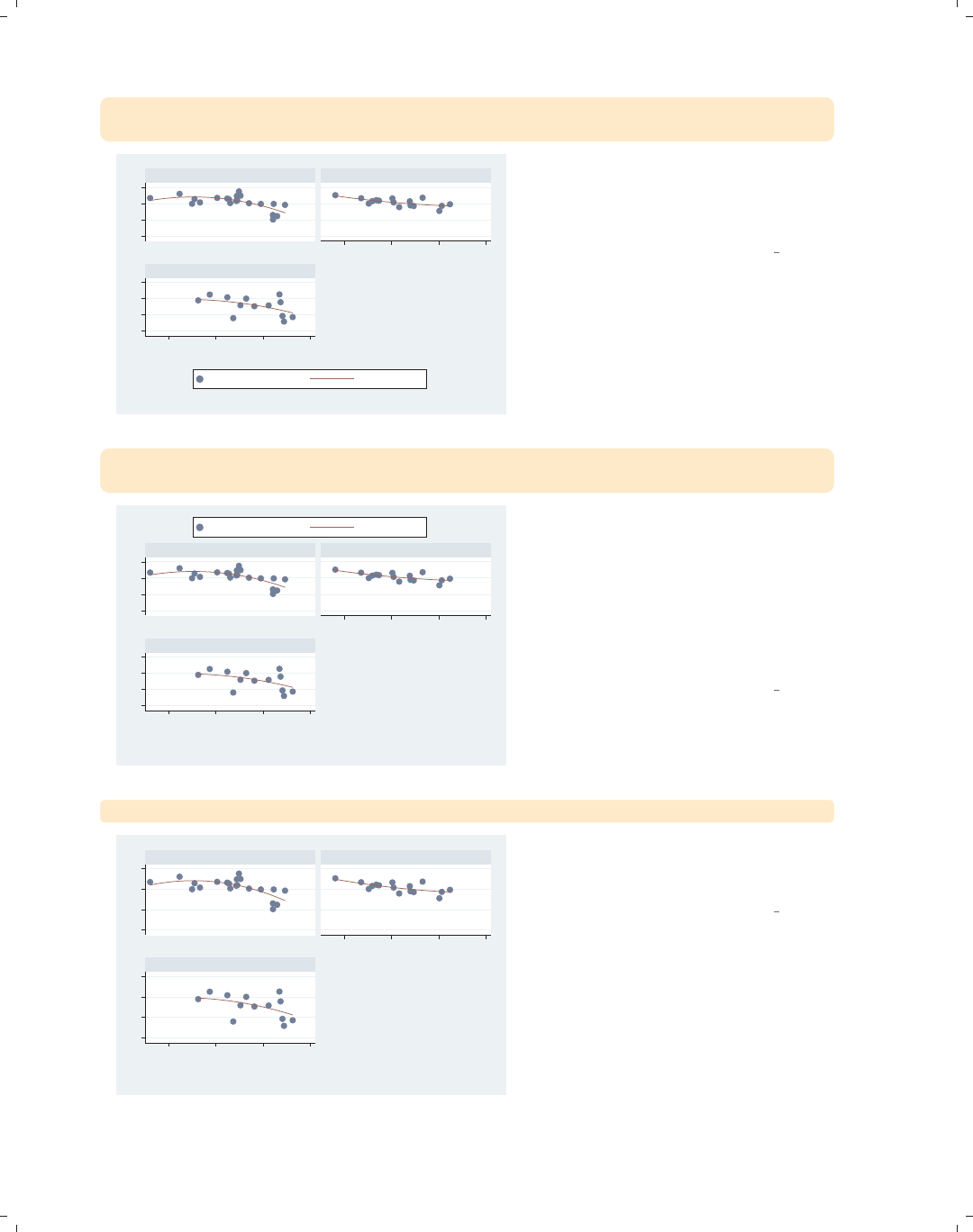
i
i
i
i
i
i
i
i
298 Chapter 8. Options available for most graphs
twoway (scatter ownhome urban) (qfit ownhome urban),
by(nsw) legend(position(12) label(2 "Quadratic Fit"))
50 60 70 8050 60 70 80
40 60 80 100
40 60 80 100
North South
West
% who own home Quadratic Fit
Percent urban 1990
Graphs by Region North, South, or West
Here, we add a legend() option, but
the position() option does not seem
to have any effect since it does not
move the position of the legend.
Uses allstatesdc.dta & scheme vg s2c
twoway (scatter ownhome urban) (qfit ownhome urban),
by(nsw, legend(position(12))) legend(label(2 "Quadratic Fit"))
50 60 70 8050 60 70 80
40 60 80 100
40 60 80 100
North South
West
% who own home Quadratic Fit
Percent urban 1990
Graphs by Region North, South, or West
The graph command from the last
example did not change the position of
the legend because options for
positioning the legend must be placed
within the by() option. Here, we place
the legend(position()) option within
the by() option, and the legend is now
placed above the graph.
Uses allstatesdc.dta & scheme vg s2c
twoway (scatter ownhome urban) (qfit ownhome urban), by(nsw, legend(off))
50 60 70 8050 60 70 80
40 60 80 100
40 60 80 100
North South
West
Percent urban 1990
Graphs by Region North, South, or West
Likewise, if we wish to turn the legend
off, we must place legend(off) within
the by() option.
Uses allstatesdc.dta & scheme vg s2c
The electronic form of this book is solely for direct use at UCLA and only by faculty, students, and staff of UCLA.
All rights reserved on the copyright page apply to this document and specifically neither the electronic nor
published form of the book may be distributed or reproduced, either electronically or in printed form.
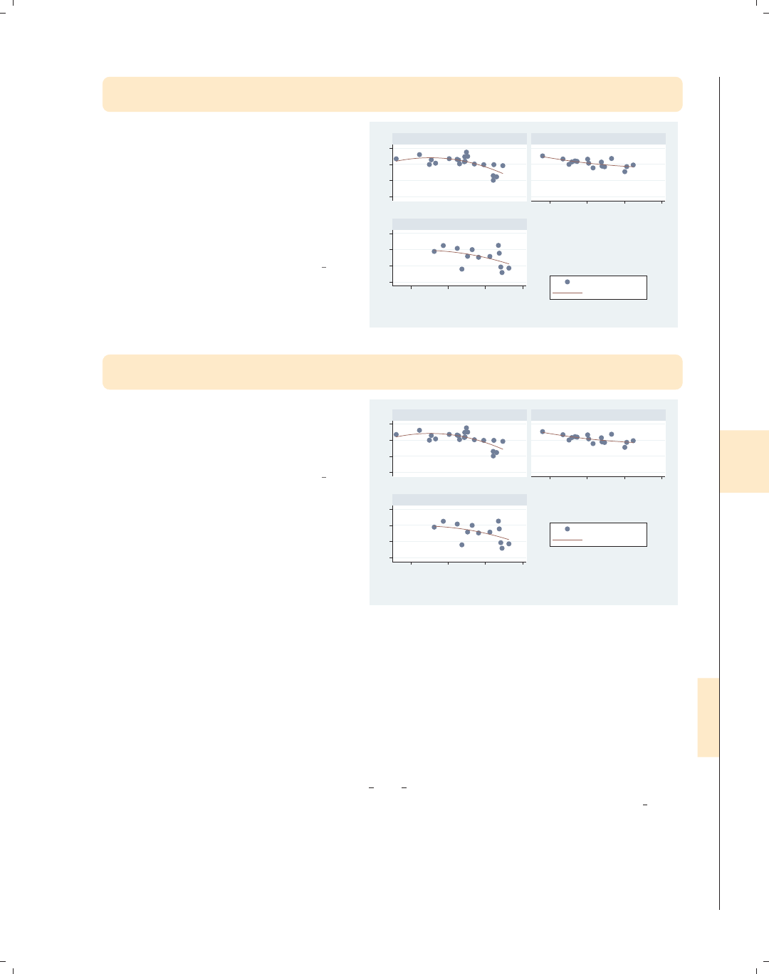
i
i
i
i
i
i
i
i
8.10 Adding text to markers and positions 299
twoway (scatter ownhome urban) (qfit ownhome urban),
by(nsw, legend(at(4))) legend(cols(1))
To place the legend in one of the holes,
we can use the at() option within the
by() option. Here, the legend is placed
inside the fourth position. To display
the legend in one column, we use the
legend(cols(1)) option outside of the
by() option since this does not control
the position of the legend.
Uses allstatesdc.dta & scheme vg s2c
50 60 70 8050 60 70 80
40 60 80 100
40 60 80 100
North South
West
% who own home
Fitted values
Percent urban 1990
Graphs by Region North, South, or West
twoway (scatter ownhome urban) (qfit ownhome urban),
by(nsw, legend(position(center) at(4))) legend(cols(1))
To position the legend, we can add the
position(center) option within the
by() option to make the legend appear
in the center of the fourth position.
Uses allstatesdc.dta & scheme vg s2c
50 60 70 8050 60 70 80
40 60 80 100
40 60 80 100
North South
West
% who own home
Fitted values
Percent urban 1990
Graphs by Region North, South, or West
8.10 Adding text to markers and positions
This section provides more details about the text() option for adding text to a graph.
Although added text can be used in a wide variety of situations, we will focus on how it can
be used to label points and lines and to add descriptive text to your graph. For more infor-
mation about this option, see [G]added text option. To learn more about how the text
can be customized, see Options : Textboxes (303). For this section, we will use the vg teal
scheme.
Introduction Twoway Matrix Bar Box Dot Pie Options Standard options Styles Appendix
Markers Marker labels Connecting Axis titles Axis labels Axis scales Axis selection By Legend Adding text Textboxes
The electronic form of this book is solely for direct use at UCLA and only by faculty, students, and staff of UCLA.
All rights reserved on the copyright page apply to this document and specifically neither the electronic nor
published form of the book may be distributed or reproduced, either electronically or in printed form.
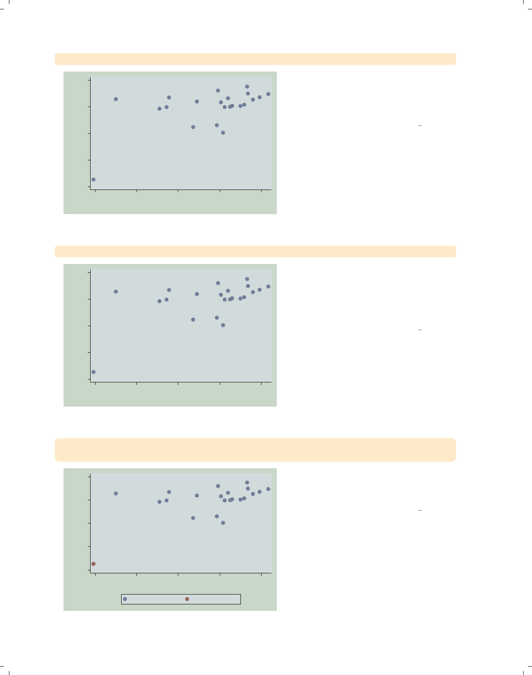
i
i
i
i
i
i
i
i
300 Chapter 8. Options available for most graphs
twoway scatter ownhome borninstate
40
50
60
70
80
% who own home
40 50 60 70 80
% born in state of residence
In this scatterplot, one point appears to
be an outlier from the rest, but since it
is not labeled, we cannot tell from
which state it originates.
Uses allstatesn.dta & scheme vg teal
scatter ownhome borninstate, mlabel(stateab)
CT
DC
IL
IN IA
KS
ME
MA
MI
MN
MONE
NH
NJ
NY
ND
OH
PA
RI
SD
VT WI
40
50
60
70
80
% who own home
40 50 60 70 80
% born in state of residence
We can use the mlabel(stateab) to
label all points, which helps us see that
the outlying point comes from
Washington, DC. However, this plot is
rather cluttered by all the labels.
Uses allstatesn.dta & scheme vg teal
twoway (scatter ownhome borninstate)
(scatter ownhome borninstate if stateab == "DC", mlabel(stateab))
DC
40
50
60
70
80
% who own home
40 50 60 70 80
% born in state of residence
% who own home % who own home
We could repeat a second scatterplot
just to label DC, but this is a bit
cumbersome.
Uses allstatesn.dta & scheme vg teal
The electronic form of this book is solely for direct use at UCLA and only by faculty, students, and staff of UCLA.
All rights reserved on the copyright page apply to this document and specifically neither the electronic nor
published form of the book may be distributed or reproduced, either electronically or in printed form.
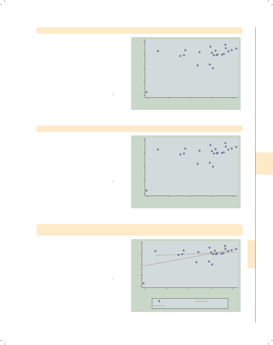
i
i
i
i
i
i
i
i
8.10 Adding text to markers and positions 301
twoway scatter ownhome borninstate, text(43 40 "DC")
Instead, we can use the text() option
to add text to our graph. Looking at
the values of ownhome and borninstate
for DC, we see that their values are
about 43 and 40, respectively. We use
these as coordinates to label the point,
but the text() option places the label
at the center of the specified yx
coordinate, sitting right over the point.
Uses allstatesn.dta & scheme vg teal DC
40
50
60
70
80
% who own home
40 50 60 70 80
% born in state of residence
twoway scatter ownhome borninstate, text(43 40 "DC", placement(ne))
Adding the placement(ne) option
places the label above and to the right
(northeast) of the point. Other options
you could choose include n,ne,e,se,s,
sw,w,nw,andc(center); see
Styles : Compassdir (331) for more
details.
Uses allstatesn.dta & scheme vg teal
DC
40
50
60
70
80
% who own home
40 50 60 70 80
% born in state of residence
twoway (scatter ownhome borninstate, text(43 40 "DC", placement(e)))
(lfit ownhome borninstate) (lfit ownhome borninstate if stateab !="DC")
Consider this scatterplot showing a
linear fit between the two variables: one
including Washington, DC, and one
omitting Washington, DC. See the next
graph, which uses the text() option to
label the graph instead of the legend.
Uses allstatesn.dta & scheme vg teal
DC
40
50
60
70
80
40 50 60 70 80
% born in state of residence
% who own home Fitted values
Fitted values
Introduction Twoway Matrix Bar Box Dot Pie Options Standard options Styles Appendix
Markers Marker labels Connecting Axis titles Axis labels Axis scales Axis selection By Legend Adding text Textboxes
The electronic form of this book is solely for direct use at UCLA and only by faculty, students, and staff of UCLA.
All rights reserved on the copyright page apply to this document and specifically neither the electronic nor
published form of the book may be distributed or reproduced, either electronically or in printed form.
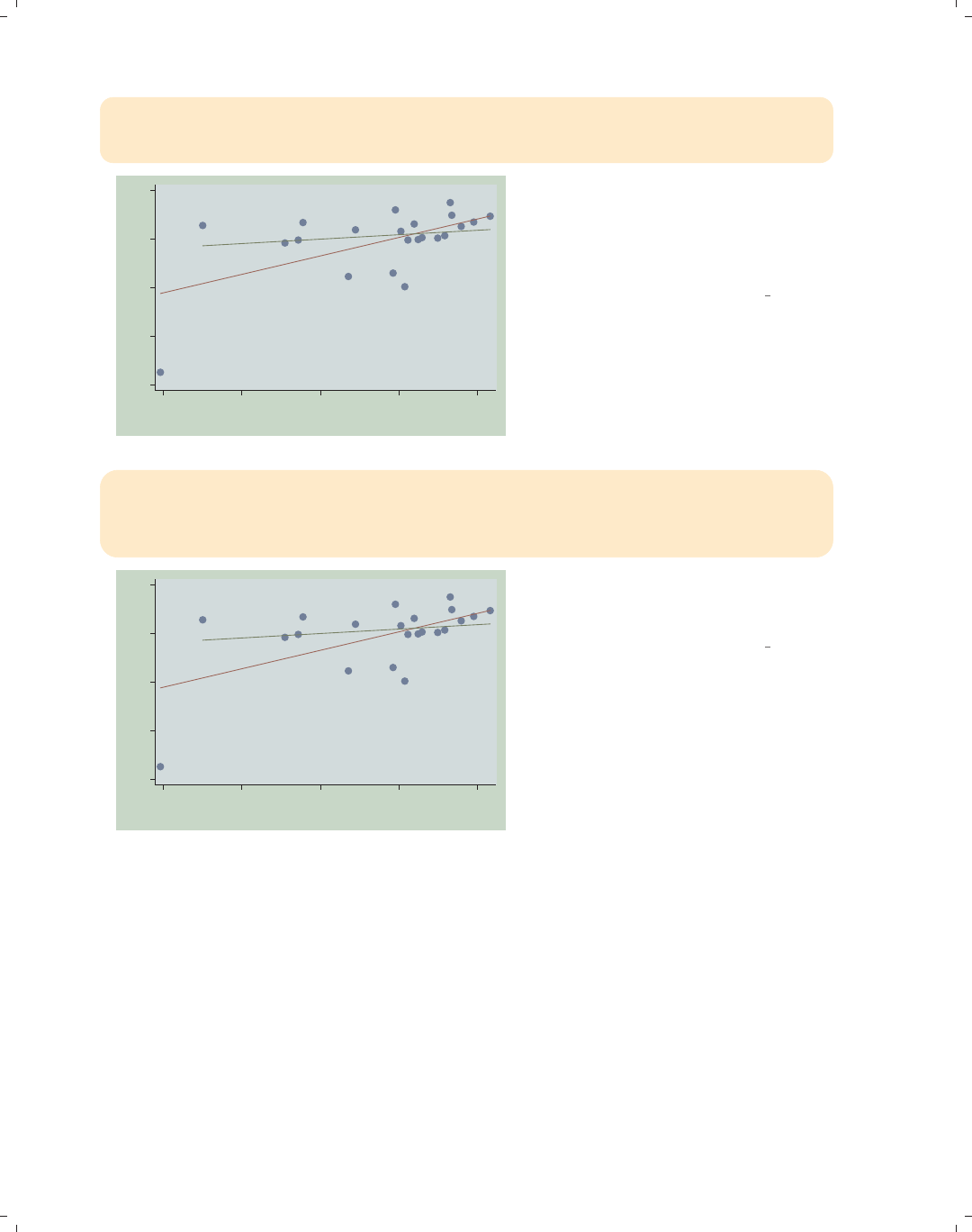
i
i
i
i
i
i
i
i
302 Chapter 8. Options available for most graphs
twoway (scatter ownhome borninstate, text(43 40 "DC", placement(ne)))
(lfit ownhome borninstate) (lfit ownhome borninstate if stateab !="DC",
text(72 50 "Without DC") text(60 50 "With DC")), legend(off)
DC
Without DC
With DC
40
50
60
70
80
40 50 60 70 80
% born in state of residence
This graph turns the legend off and
uses the text() option to label each
regression line to indicate which
regression line includes DC and which
excludes DC.
Uses allstatesn.dta & scheme vg teal
twoway (scatter ownhome borninstate, text(43 40 "DC", placement(ne)))
(lfit ownhome borninstate) (lfit ownhome borninstate if stateab !="DC",
text(71 50 "Without DC") text(60 50 "With DC")
text(50 70 "Coef with DC .16" "Coef without DC .44")), legend(off)
DC
Without DC
With DC
Coef with DC .16
Coef without DC .44
40
50
60
70
80
40 50 60 70 80
% born in state of residence
This graph adds explanatory text
showing the regression coefficient with
and without DC.
Uses allstatesn.dta & scheme vg teal
The electronic form of this book is solely for direct use at UCLA and only by faculty, students, and staff of UCLA.
All rights reserved on the copyright page apply to this document and specifically neither the electronic nor
published form of the book may be distributed or reproduced, either electronically or in printed form.
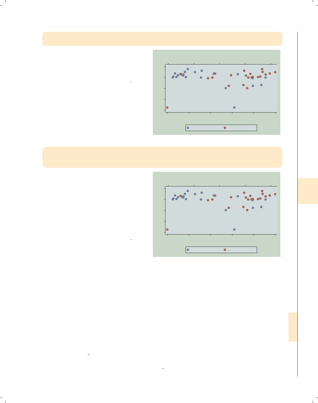
i
i
i
i
i
i
i
i
8.11 More options for text and textboxes 303
twoway (scatter ownhome propval100, xaxis(1) mlabel(stateab))
(scatter ownhome borninstate, xaxis(2) mlabel(stateab))
Consider this graph in which we overlay
two scatterplots. We place propval100
on the first x-axis and borninstate on
the second x-axis.
Uses allstatesn.dta & scheme vg teal CT
DC
IL
IN
IA
KS
ME
MA
MI
MN
MO
NE NH NJ
NY
ND OH
PA
RI
SD VT
WI CT
DC
IL
IN IA
KS
ME
MA
MI
MN
MONE
NH NJ
NY
ND
OH
PA
RI
SD
VT WI
40
50
60
70
80
40 50 60 70 80
% born in state of residence
0 20 40 60 80 100
% homes cost $100K+
% who own home % who own home
twoway (scatter ownhome propval100, xaxis(1))
(scatter ownhome borninstate, xaxis(2)),
text(43 66 "DC") text(43 42 "DC", xaxis(2))
Rather than labeling all the points, we
can label just the point for DC.We
have to be very careful because we have
two different x-axes. The first text()
option uses the first x-axis, so no
special option is required. The second
text() option uses the second x-axis,
so we must specify the xaxis(2)
option.
Uses allstatesn.dta & scheme vg teal
DCDC
40
50
60
70
80
40 50 60 70 80
% born in state of residence
0 20 40 60 80 100
% homes cost $100K+
% who own home % who own home
8.11 More options for text and textboxes
This section describes more options for modifying textbox elements: titles, captions,
notes, added text, and legends. Technically, all text in a graph is displayed within a textbox.
We can modify the box’s attributes, such as its size and color, the margin around the box,
and the outline; and we can modify the attributes of the text within the box, such as its
size, color, justification, and margin. We sometimes use the box option to see how both
the textbox and its text are being displayed. This helps us to see if we should modify the
attributes of the box containing the text or the text within the box. For more information,
see [G]textbox options and Options : Adding text (299). In this section, we will begin by
showing examples illustrating how to control the placement, size, color, and orientation of
text. We will begin this section using the vg s1m scheme.
Introduction Twoway Matrix Bar Box Dot Pie Options Standard options Styles Appendix
Markers Marker labels Connecting Axis titles Axis labels Axis scales Axis selection By Legend Adding text Textboxes
The electronic form of this book is solely for direct use at UCLA and only by faculty, students, and staff of UCLA.
All rights reserved on the copyright page apply to this document and specifically neither the electronic nor
published form of the book may be distributed or reproduced, either electronically or in printed form.
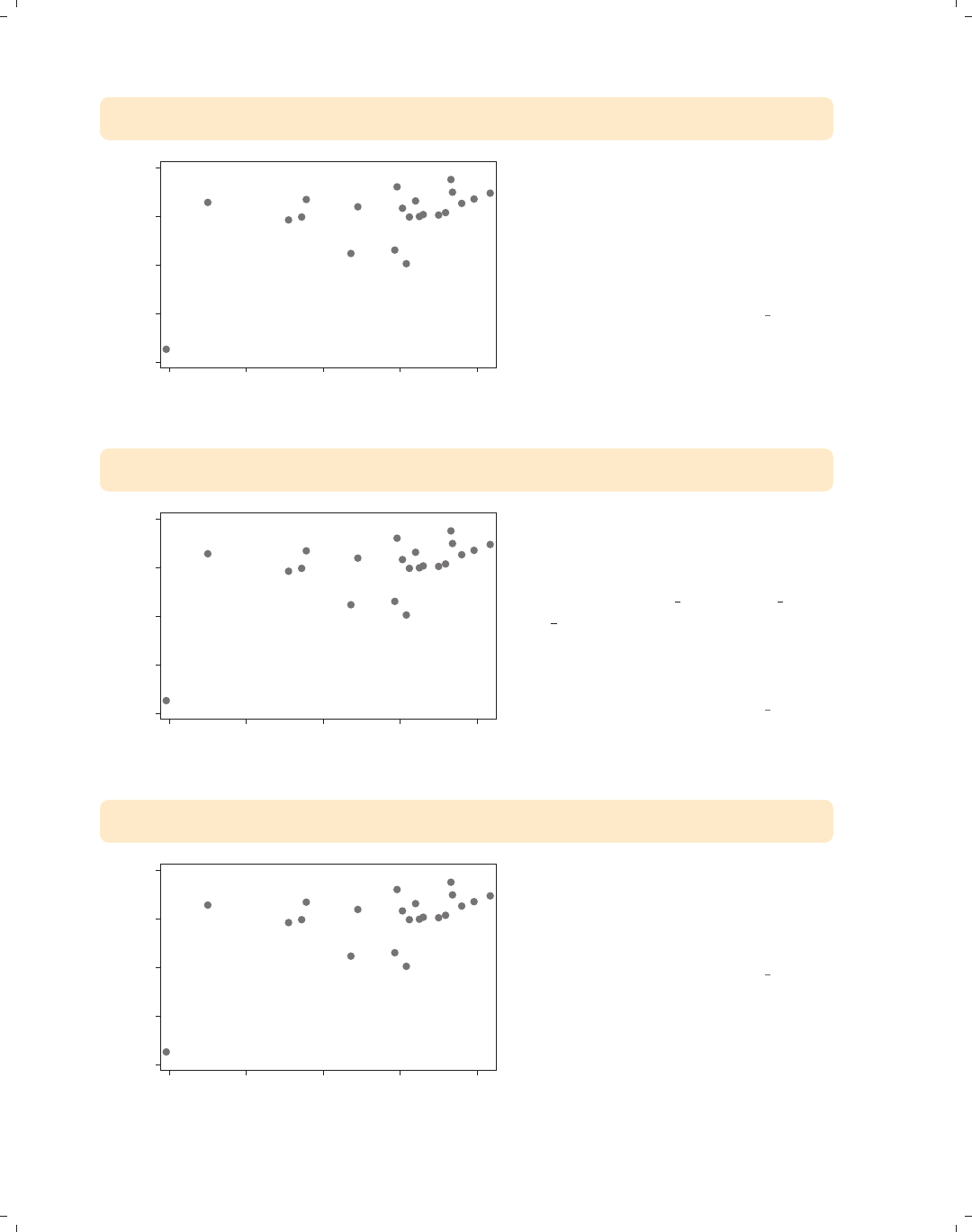
i
i
i
i
i
i
i
i
304 Chapter 8. Options available for most graphs
twoway scatter ownhome borninstate,
text(43 40 "Washington, DC", placement(ne))
Washington, DC
40 50 60 70 80
% who own home
40 50 60 70 80
% born in state of residence
Consider this scatterplot, which has a
dramatic outlying point. We have used
the text() option to label that point,
but, perhaps, we might want to control
the size of the text for this label. See
the next example for an illustration of
howtodothis.
Uses allstatesn.dta & scheme vg s1m
twoway scatter ownhome borninstate,
text(43 40 "Washington, DC", placement(ne) size(vlarge))
Washington, DC
40 50 60 70 80
% who own home
40 50 60 70 80
% born in state of residence
We can alter the size of the text using
the size() option. Here, we make the
text large. Other values we could use
with the size() option include zero,
miniscule,quarter tiny,third tiny,
half tiny,tiny,vsmall,small,
medsmall,medium,medlarge,large,
vlarge,huge,andvhuge;see
Styles : Textsize (344) for more details.
Uses allstatesn.dta & scheme vg s1m
twoway scatter ownhome borninstate,
text(43 40 "Washington, DC", placement(ne) color(gs9))
Washington, DC
40 50 60 70 80
% who own home
40 50 60 70 80
% born in state of residence
We can alter the color of the text using
the color() option. Here, we make the
text a middle-level gray. See
Styles : Colors (328) for other colors you
could select.
Uses allstatesn.dta & scheme vg s1m
The electronic form of this book is solely for direct use at UCLA and only by faculty, students, and staff of UCLA.
All rights reserved on the copyright page apply to this document and specifically neither the electronic nor
published form of the book may be distributed or reproduced, either electronically or in printed form.
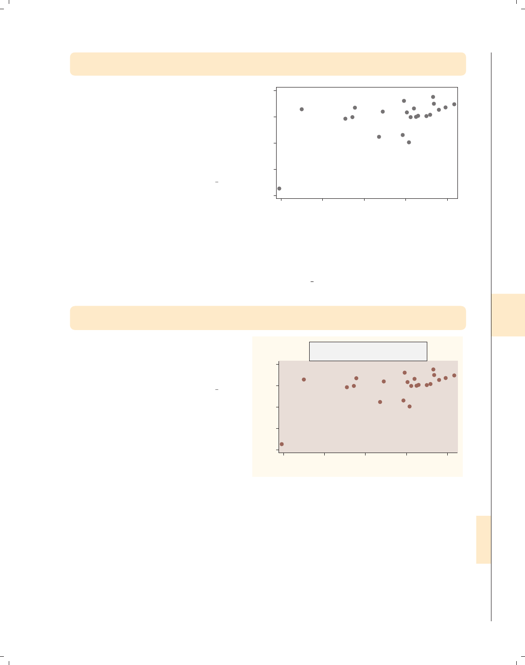
i
i
i
i
i
i
i
i
8.11 More options for text and textboxes 305
twoway scatter ownhome borninstate,
text(43 40 "Washington, DC", placement(ne) orientation(vertical))
We can use the orientation() option
to change the direction of the text.
Other values you can choose are
horizontal for 0 degrees, vertical for
90 degrees, rhorizontal for 180
degrees, and rvertical for 270
degrees, see Styles : Orientation (341) for
more details.
Uses allstatesn.dta & scheme vg s1m
Washington, DC
40 50 60 70 80
% who own home
40 50 60 70 80
% born in state of residence
This next set of examples considers options for justifying text within a box, sizing the
box, and creating margins around the box. This is followed by options that control margins
within the textbox. This next set of graphs use the vg rose scheme
twoway (scatter ownhome borninstate),
title("% who own home by" "% that reside in state of birth", box)
Consider this example where we place a
title on our graph. To help show how
the options work, we will put a box
around the title.
Uses allstatesn.dta & scheme vg rose
40
50
60
70
80
% who own home
40 50 60 70 80
% born in state of residence
% who own home by
% that reside in state of birth
Introduction Twoway Matrix Bar Box Dot Pie Options Standard options Styles Appendix
Markers Marker labels Connecting Axis titles Axis labels Axis scales Axis selection By Legend Adding text Textboxes
The electronic form of this book is solely for direct use at UCLA and only by faculty, students, and staff of UCLA.
All rights reserved on the copyright page apply to this document and specifically neither the electronic nor
published form of the book may be distributed or reproduced, either electronically or in printed form.
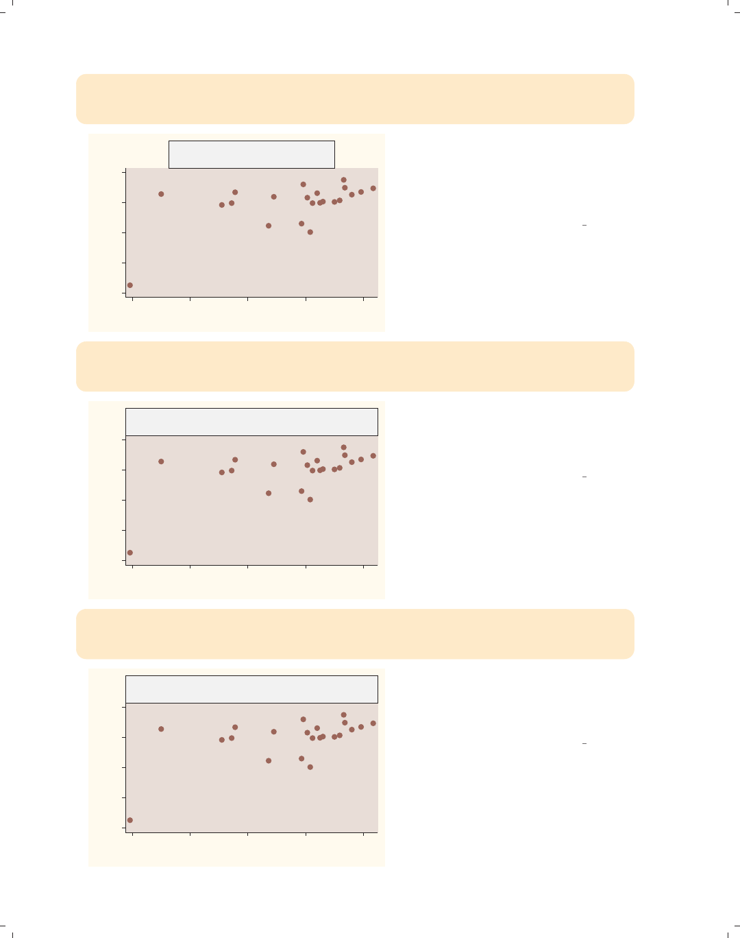
i
i
i
i
i
i
i
i
306 Chapter 8. Options available for most graphs
twoway (scatter ownhome borninstate),
title("% who own home by" "% that reside in state of birth", box
justification(left))
40
50
60
70
80
% who own home
40 50 60 70 80
% born in state of residence
% who own home by
% that reside in state of birth
We can left-justify the text using the
justification() option. Note that
the title is justified within the textbox,
not with respect to the entire graph
area.
Uses allstatesn.dta & scheme vg rose
twoway (scatter ownhome borninstate),
title("% who own home by" "% that reside in state of birth", box
bexpand)
40
50
60
70
80
% who own home
40 50 60 70 80
% born in state of residence
% who own home by
% that reside in state of birth
If we use the bexpand (box expand)
option, the textbox containing the title
expands to fill the width of the plot
area.
Uses allstatesn.dta & scheme vg rose
twoway (scatter ownhome borninstate),
title("% who own home by" "% that reside in state of birth", box
bexpand justification(left))
40
50
60
70
80
% who own home
40 50 60 70 80
% born in state of residence
% who own home by
% that reside in state of birth
With the box expanded, the
justification(left) option now
makes the title flush left with the plot
area.
Uses allstatesn.dta & scheme vg rose
The electronic form of this book is solely for direct use at UCLA and only by faculty, students, and staff of UCLA.
All rights reserved on the copyright page apply to this document and specifically neither the electronic nor
published form of the book may be distributed or reproduced, either electronically or in printed form.
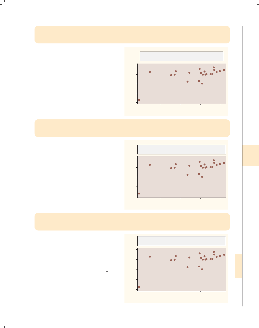
i
i
i
i
i
i
i
i
8.11 More options for text and textboxes 307
twoway (scatter ownhome borninstate),
title("% who own home by" "% that reside in state of birth",
box bexpand justification(left) bmargin(medium))
We can change the size of the margin
around the outside of the box using the
bmargin(medium) (box margin) option,
making the margin a medium size at all
four edges: left, right, top, and bottom.
Uses allstatesn.dta & scheme vg rose
40
50
60
70
80
% who own home
40 50 60 70 80
% born in state of residence
% who own home by
% that reside in state of birth
twoway (scatter ownhome borninstate),
title("% who own home by" "% that reside in state of birth",
box bexpand justification(left) bmargin(0 0 3 3))
If we wanted the margin for the left and
right to be 0 and for the top and
bottom to be 3, we could use the
bmargin(0 0 3 3) option. The order
of the margins is bmargin(#left #right
#top #bottom).
Uses allstatesn.dta & scheme vg rose
40
50
60
70
80
% who own home
40 50 60 70 80
% born in state of residence
% who own home by
% that reside in state of birth
twoway (scatter ownhome borninstate),
title("% who own home by" "% that reside in state of birth",
box bexpand justification(left) bmargin(b=3))
To make only the bottom margin 3, we
could specify bmargin(b=3), where b=3
means to change the bottom margin to
3. The top, left, bottom, and top
margins can be changed individually
using t=,l=,b=,andt=, respectively.
Uses allstatesn.dta & scheme vg rose
40
50
60
70
80
% who own home
40 50 60 70 80
% born in state of residence
% who own home by
% that reside in state of birth
Introduction Twoway Matrix Bar Box Dot Pie Options Standard options Styles Appendix
Markers Marker labels Connecting Axis titles Axis labels Axis scales Axis selection By Legend Adding text Textboxes
The electronic form of this book is solely for direct use at UCLA and only by faculty, students, and staff of UCLA.
All rights reserved on the copyright page apply to this document and specifically neither the electronic nor
published form of the book may be distributed or reproduced, either electronically or in printed form.

i
i
i
i
i
i
i
i
308 Chapter 8. Options available for most graphs
twoway (scatter ownhome borninstate) (lfit ownhome borninstate)
(lfit ownhome borninstate if stateab !="DC",
text(45 70 "Coef with DC .16" "Coef without DC .44", box))
Coef with DC .16
Coef without DC .44
40
50
60
70
80
40 50 60 70 80
% born in state of residence
% who own home Fitted values
Fitted values
Consider this graph, which uses the
text() option to place an annotation
in the middle of the plot region. The
text might look better if we increased
the margin around the text.
Uses allstatesn.dta & scheme vg rose
twoway (scatter ownhome borninstate) (lfit ownhome borninstate)
(lfit ownhome borninstate if stateab !="DC",
text(45 70 "Coef with DC .16" "Coef without DC .44", box margin(medium)))
Coef with DC .16
Coef without DC .44
40
50
60
70
80
40 50 60 70 80
% born in state of residence
% who own home Fitted values
Fitted values
We can expand the margin between the
text and the box with the margin()
option. Note the difference between this
and the bmargin() option (illustrated
previously), which increased the margin
around the outside of the box.
Uses allstatesn.dta & scheme vg rose
twoway (scatter ownhome borninstate) (lfit ownhome borninstate)
(lfit ownhome borninstate if stateab !="DC",
text(45 70 "Coef with DC .16" "Coef w/out DC .44", box margin(5 5 2 2)))
Coef with DC .16
Coef w/out DC .44
40
50
60
70
80
40 50 60 70 80
% born in state of residence
% who own home Fitted values
Fitted values
As with the bmargin() option, we can
more precisely modify the margin
around the text. Here, we use the
margin() option to make the size of the
margin 5, 5, 2, and 2 for the left, right,
top, and bottom, respectively.
Uses allstatesn.dta & scheme vg rose
The electronic form of this book is solely for direct use at UCLA and only by faculty, students, and staff of UCLA.
All rights reserved on the copyright page apply to this document and specifically neither the electronic nor
published form of the book may be distributed or reproduced, either electronically or in printed form.
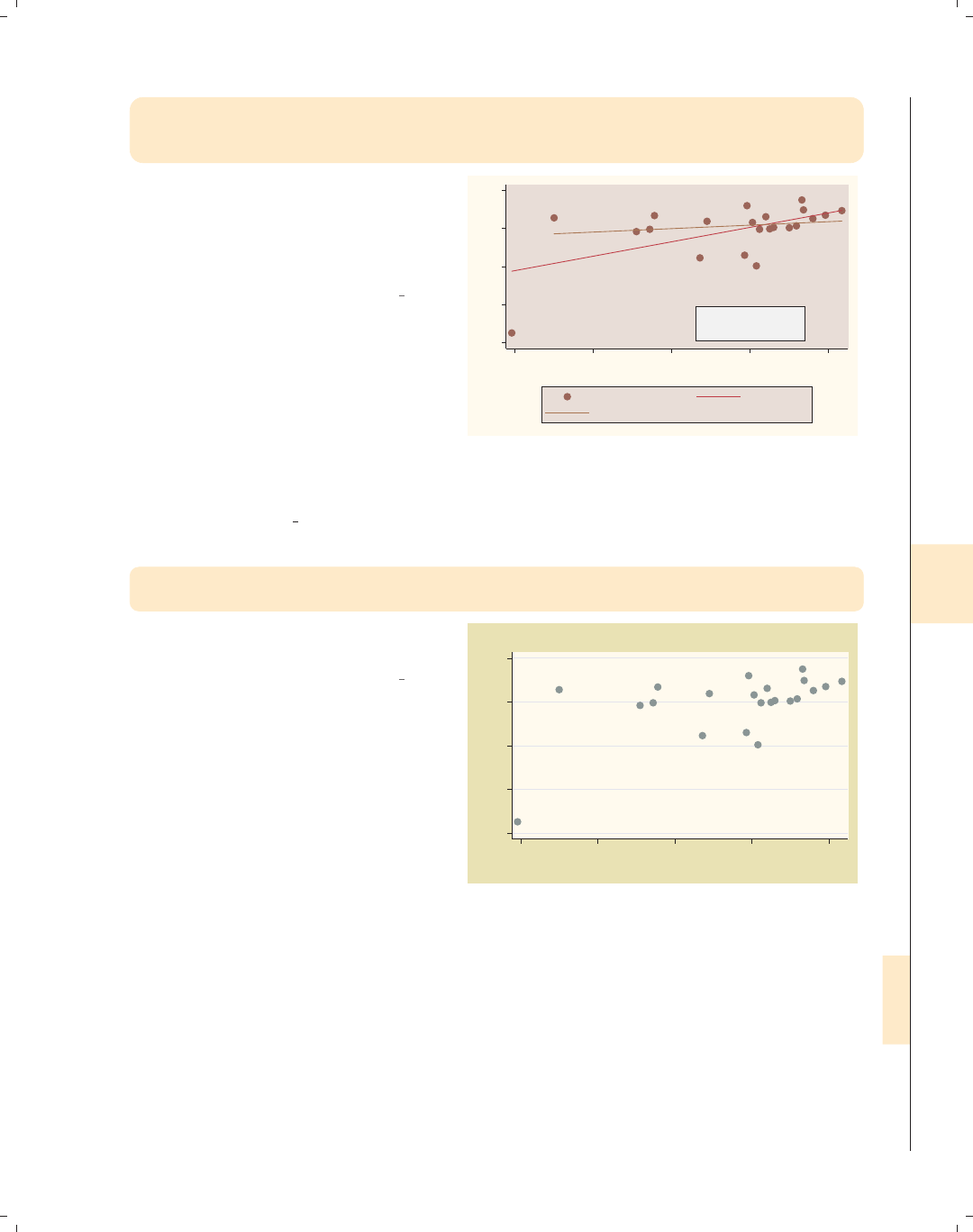
i
i
i
i
i
i
i
i
8.11 More options for text and textboxes 309
twoway (scatter ownhome borninstate) (lfit ownhome borninstate)
(lfit ownhome borninstate if stateab !="DC",
text(45 70 "Coef with DC .16" "Coef without DC .44", box linegap(4)))
We can change the gap between the
lines with the linegap() option. Here,
we make the gap larger than it
normally would be. See Styles : Margins
(338) for more details.
Uses allstatesn.dta & scheme vg rose
Coef with DC .16
Coef without DC .44
40
50
60
70
80
40 50 60 70 80
% born in state of residence
% who own home Fitted values
Fitted values
Let’s now consider options that control the color of the textbox and the characteristics
of the outline of the box (including the color, thickness, and pattern). This next set of
graphs uses the vg past scheme.
twoway (scatter ownhome borninstate),
title("% own home by % reside in state")
Consider this graph with a title at the
top.
Uses allstatesn.dta & scheme vg past
40 50 60 70 80
% who own home
40 50 60 70 80
% born in state of residence
% own home by % reside in state
Introduction Twoway Matrix Bar Box Dot Pie Options Standard options Styles Appendix
Markers Marker labels Connecting Axis titles Axis labels Axis scales Axis selection By Legend Adding text Textboxes
The electronic form of this book is solely for direct use at UCLA and only by faculty, students, and staff of UCLA.
All rights reserved on the copyright page apply to this document and specifically neither the electronic nor
published form of the book may be distributed or reproduced, either electronically or in printed form.
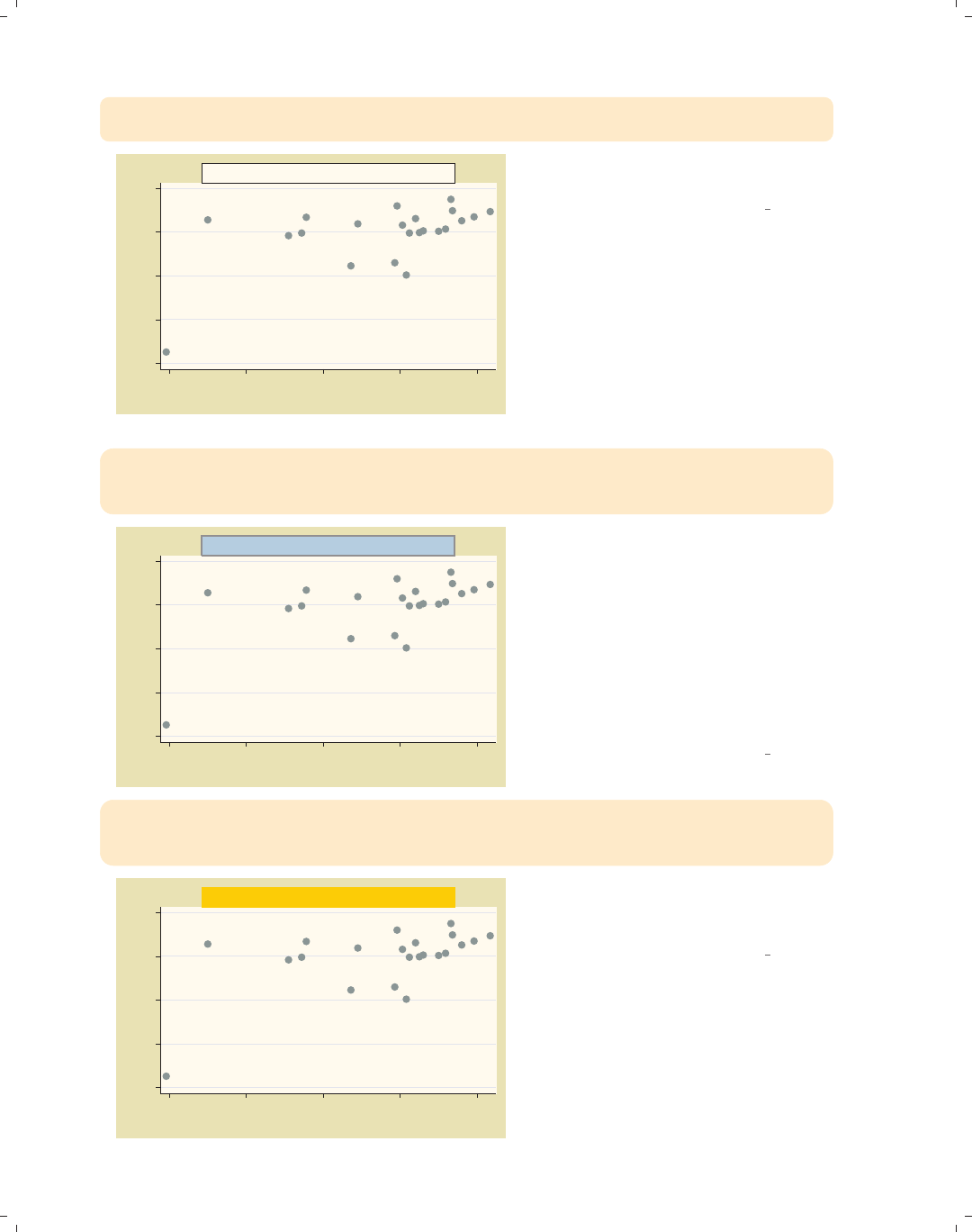
i
i
i
i
i
i
i
i
310 Chapter 8. Options available for most graphs
twoway (scatter ownhome borninstate),
title("% own home by % reside in state", box)
40 50 60 70 80
% who own home
40 50 60 70 80
% born in state of residence
% own home by % reside in state We can add the box option now for
aesthetic purposes.
Uses allstatesn.dta & scheme vg past
twoway (scatter ownhome borninstate),
title("% own home by % reside in state",
box bfcolor(ltblue) blcolor(gray) blwidth(thick))
40 50 60 70 80
% who own home
40 50 60 70 80
% born in state of residence
% own home by % reside in state We can change the box fill color with
the bfcolor() option, the color of the
line around the box with blcolor(),
and the width of the surrounding box
line with blwidth(). See Styles : Colors
(328) for other possible values you
could use with the bfcolor() and
blcolor() options and
Styles : Linewidth (337) for other values
you could choose for blwidth().
Uses allstatesn.dta & scheme vg past
twoway (scatter ownhome borninstate),
title("% own home by % reside in state",
box bcolor(gold))
40 50 60 70 80
% who own home
40 50 60 70 80
% born in state of residence
% own home by % reside in state We can change the box color with the
bcolor() option. Here, we make the fill
and outline color of the title box gold.
Uses allstatesn.dta & scheme vg past
The electronic form of this book is solely for direct use at UCLA and only by faculty, students, and staff of UCLA.
All rights reserved on the copyright page apply to this document and specifically neither the electronic nor
published form of the book may be distributed or reproduced, either electronically or in printed form.
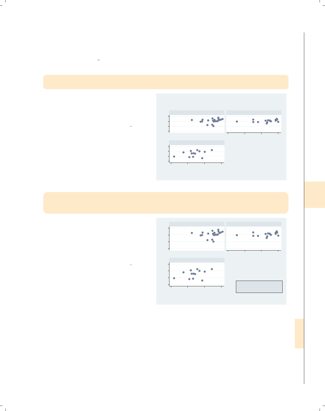
i
i
i
i
i
i
i
i
8.11 More options for text and textboxes 311
Let’s now use the allstates file and consider some examples in which we use the by()
option to display multiple graphs broken down by the location of the state. We will look at
options for placing and aligning text in graphs that use the by() option. This next set of
graphs uses the vg s2c scheme.
scatter ownhome borninstate,
by(nsw, title("% own home" "by % born in state"))
Consider this graph in which we use the
by() option to show this scatterplot
separately for states in the North,
South, and West.
Uses allstates.dta & scheme vg s2c
50 60 70 8050 60 70 80
20 40 60 80
20 40 60 80
North South
West
% who own home
% born in state of residence
Graphs by Region North, South, or West
% own home
by % born in state
scatter ownhome borninstate,
by(nsw, title("% own home" "by % born in state",
ring(0) position(5) box))
Let’s put the title in the open hole in
the right corner of the graph using the
ring(0) and position(5) options. We
include the box option only to show the
outline of the textbox, not for
aesthetics.
Uses allstates.dta & scheme vg s2c
50 60 70 8050 60 70 80
20 40 60 80
20 40 60 80
North South
West
% who own home
% born in state of residence
Graphs by Region North, South, or West
% own home
by % born in state
Introduction Twoway Matrix Bar Box Dot Pie Options Standard options Styles Appendix
Markers Marker labels Connecting Axis titles Axis labels Axis scales Axis selection By Legend Adding text Textboxes
The electronic form of this book is solely for direct use at UCLA and only by faculty, students, and staff of UCLA.
All rights reserved on the copyright page apply to this document and specifically neither the electronic nor
published form of the book may be distributed or reproduced, either electronically or in printed form.

i
i
i
i
i
i
i
i
312 Chapter 8. Options available for most graphs
scatter ownhome borninstate,
by(nsw, title("% own home" "by % born in state",
ring(0) position(5) box width(65) height(40)))
50 60 70 8050 60 70 80
20 40 60 80
20 40 60 80
North South
West
% who own home
% born in state of residence
Graphs by Region North, South, or West
% own home
by % born in state
We can make the area for the textbox
bigger using the width() and height()
options. We change the value to make
the box approximately as tall as the
graph for the West and as wide as the
graph for the South.
Uses allstates.dta & scheme vg s2c
scatter ownhome borninstate,
by(nsw, title("% own home" "by % born in state", ring(0) position(5)
box width(65) height(40) justification(left) alignment(top)))
50 60 70 8050 60 70 80
20 40 60 80
20 40 60 80
North South
West
% who own home
% born in state of residence
Graphs by Region North, South, or West
% own home
by % born in state
We can left-justify the text and align it
with the top using the
justification(left) and
alignment(top) options. These
options make the title appear in the top
left corner of the empty hole.
Uses allstates.dta & scheme vg s2c
scatter ownhome borninstate,
by(nsw, title("% own home" "by % born in state", ring(0) position(5)
width(65) height(40) justification(left) alignment(top)))
50 60 70 8050 60 70 80
20 40 60 80
20 40 60 80
North South
West
% who own home
% born in state of residence
Graphs by Region North, South, or West
% own home
by % born in state
Now that we have aligned the text as
we would like, we can take away the
box by omitting the box option.
Uses allstates.dta & scheme vg s2c
The electronic form of this book is solely for direct use at UCLA and only by faculty, students, and staff of UCLA.
All rights reserved on the copyright page apply to this document and specifically neither the electronic nor
published form of the book may be distributed or reproduced, either electronically or in printed form.

i
i
i
i
i
i
i
i
9 Standard options available for all
graphs
This chapter discusses a class of options Stata refers to as standard options, because
these options can be used in most graphs. This chapter will begin by discussing options
that allow you to add or change the titles in the graph and then showing you how to use
schemes to control the overall look and style of your graph. Next, we demonstrate options
for controlling the size of the graph and the scale of items within graphs. The chapter
will conclude by illustrating options that allow you to control the colors of the plot region,
the graph region, and the borders that surround these regions. For further details, see
[G]std options.
9.1 Creating and controlling titles
Titles are useful for providing additional information that explains the contents of a
graph. Stata includes four standard options for adding explanatory text to graphs: title(),
subtitle(),note(),andcaption(). This section will illustrate how to use these ti-
tles and how to customize their content and their placement. For further information
about customizing the appearance of such titles (e.g., color, size, orientation, etc.), see
Options : Textboxes (303). For more information about titles, see [G]title options. This
section uses the vg s1m scheme.
Introduction Twoway Matrix Bar Box Dot Pie Options Standard options Styles Appendix
Titles Schemes Sizing graphs Graph regions
313
The electronic form of this book is solely for direct use at UCLA and only by faculty, students, and staff of UCLA.
All rights reserved on the copyright page apply to this document and specifically neither the electronic nor
published form of the book may be distributed or reproduced, either electronically or in printed form.
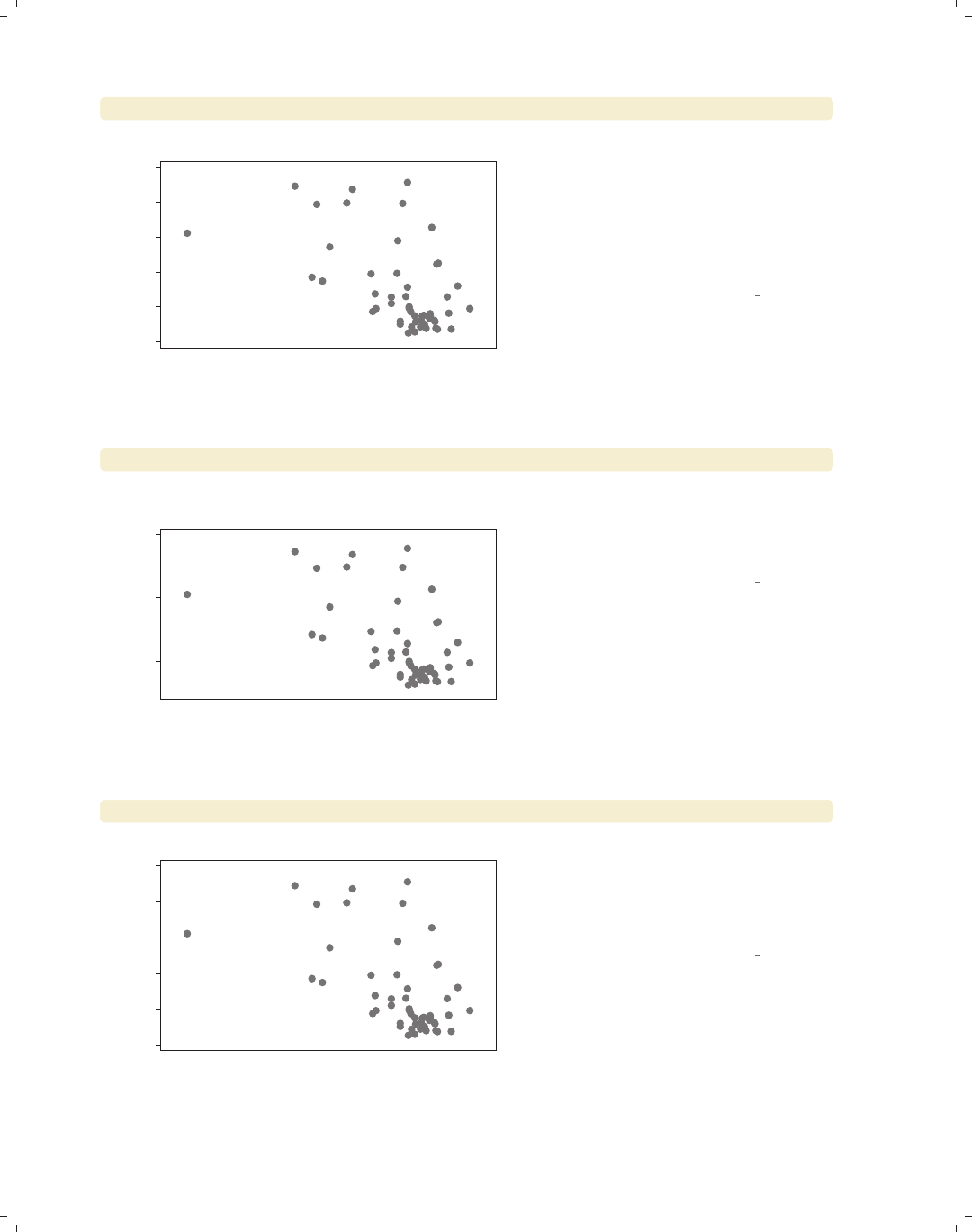
i
i
i
i
i
i
i
i
314 Chapter 9. Standard options available for all graphs
scatter propval100 ownhome, title("My title")
0 20 40 60 80 100
% homes cost $100K+
40 50 60 70 80
% who own home
My title The title() option adds a title to a
graph. Here, we add a simple title to
the graph. Although the title includes
quotes, we could have omitted them in
this case. Later, we will see examples
where the quotes become very
important.
Uses allstates.dta & scheme vg s1m
scatter propval100 ownhome, title("My title") subtitle("My subtitle")
0 20 40 60 80 100
% homes cost $100K+
40 50 60 70 80
% who own home
My subtitle
My title The subtitle() option adds a subtitle
to a graph. The subtitle, by default,
appears below the title in a smaller
font.
Uses allstates.dta & scheme vg s1m
scatter propval100 ownhome, subtitle("My smaller title")
0 20 40 60 80 100
% homes cost $100K+
40 50 60 70 80
% who own home
My smaller title We do not have to specify a title() to
specify a subtitle(). For example, we
might want a title that is smaller in size
than a regular title, so we could specify
a subtitle alone.
Uses allstates.dta & scheme vg s1m
The electronic form of this book is solely for direct use at UCLA and only by faculty, students, and staff of UCLA.
All rights reserved on the copyright page apply to this document and specifically neither the electronic nor
published form of the book may be distributed or reproduced, either electronically or in printed form.
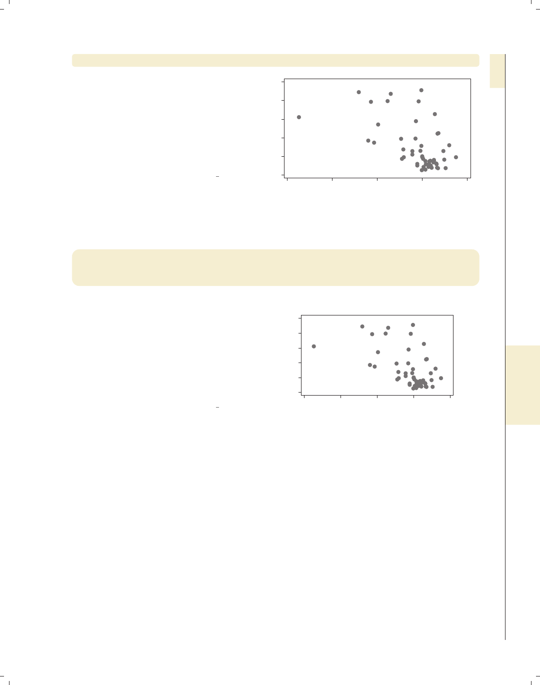
i
i
i
i
i
i
i
i
9.1 Creating and controlling titles 315
scatter propval100 ownhome, caption("My caption") note("My note")
In this example, the caption() option
adds a small-sized caption in the lower
corner, and the note() option places a
smaller-sized note in the bottom left
corner. If both options are specified,
the note appears above the caption. We
do not need to include both of these
options in the same graph.
Uses allstates.dta & scheme vg s1m
0 20 40 60 80 100
% homes cost $100K+
40 50 60 70 80
% who own home
My note
My caption
scatter propval100 ownhome, t1title("My t1title") t2title("My t2title")
b1title("My b1title") b2title("My b2title") l1title("My l1title")
l2title("My l2title") r1title("My r1title") r2title("My r2title")
Although these are not as commonly
used, Stata offers a number of
additional title options for titling the
top of the graph (t1title() and
t2title()), the bottom of the graph
(b1title() and b2title()), the left
side of the graph (l1title() and
l2title()), and the right side of the
graph (r1title() and r2title()).
Uses allstates.dta & scheme vg s1m
0 20 40 60 80 100
% homes cost $100K+
40 50 60 70 80
% who own home
My r1title
My r2title
My l1title
My l2title
My t1title
My t2title
My b1title
My b2title
Stata gives you considerable flexibility in the placement of these titles, notes, and cap-
tions, as well as controlling the size, color, and orientation of the text. This is illustrated
below using the title() option, but the same options apply equally to the subtitle(),
note(),andcaption() options.
Introduction Twoway Matrix Bar Box Dot Pie Options Standard options Styles Appendix
Titles Schemes Sizing graphs Graph regions
The electronic form of this book is solely for direct use at UCLA and only by faculty, students, and staff of UCLA.
All rights reserved on the copyright page apply to this document and specifically neither the electronic nor
published form of the book may be distributed or reproduced, either electronically or in printed form.
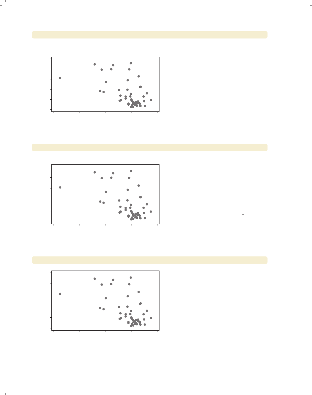
i
i
i
i
i
i
i
i
316 Chapter 9. Standard options available for all graphs
scatter propval100 ownhome, title("My" "title")
0 20 40 60 80 100
% homes cost $100K+
40 50 60 70 80
% who own home
My
title
In this example, we use multiple sets of
quotes in the title() option to tell
Stata that we want the title to appear
on two separate lines.
Uses allstates.dta & scheme vg s1m
scatter propval100 ownhome, title(‘"A "title" with quotes"’)
0 20 40 60 80 100
% homes cost $100K+
40 50 60 70 80
% who own home
A "title" with quotes This example illustrates that we can
have quotation marks in the title()
option, as long as we open the title
with ‘" and close it with "’. (The open
single quote is often located below the
tilde on your keyboard, and the close
single quote is often located below the
double quote on your keyboard.)
Uses allstates.dta & scheme vg s1m
scatter propval100 ownhome, title("My title", position(7))
0 20 40 60 80 100
% homes cost $100K+
40 50 60 70 80
% who own home
My title
The position() option can be used to
change the position of the title. Here,
we place the title in the bottom left
corner of the graph by indicating that it
should be at the 7 o’clock position. See
Styles : Clockpos (330) for more details.
Uses allstates.dta & scheme vg s1m
The electronic form of this book is solely for direct use at UCLA and only by faculty, students, and staff of UCLA.
All rights reserved on the copyright page apply to this document and specifically neither the electronic nor
published form of the book may be distributed or reproduced, either electronically or in printed form.
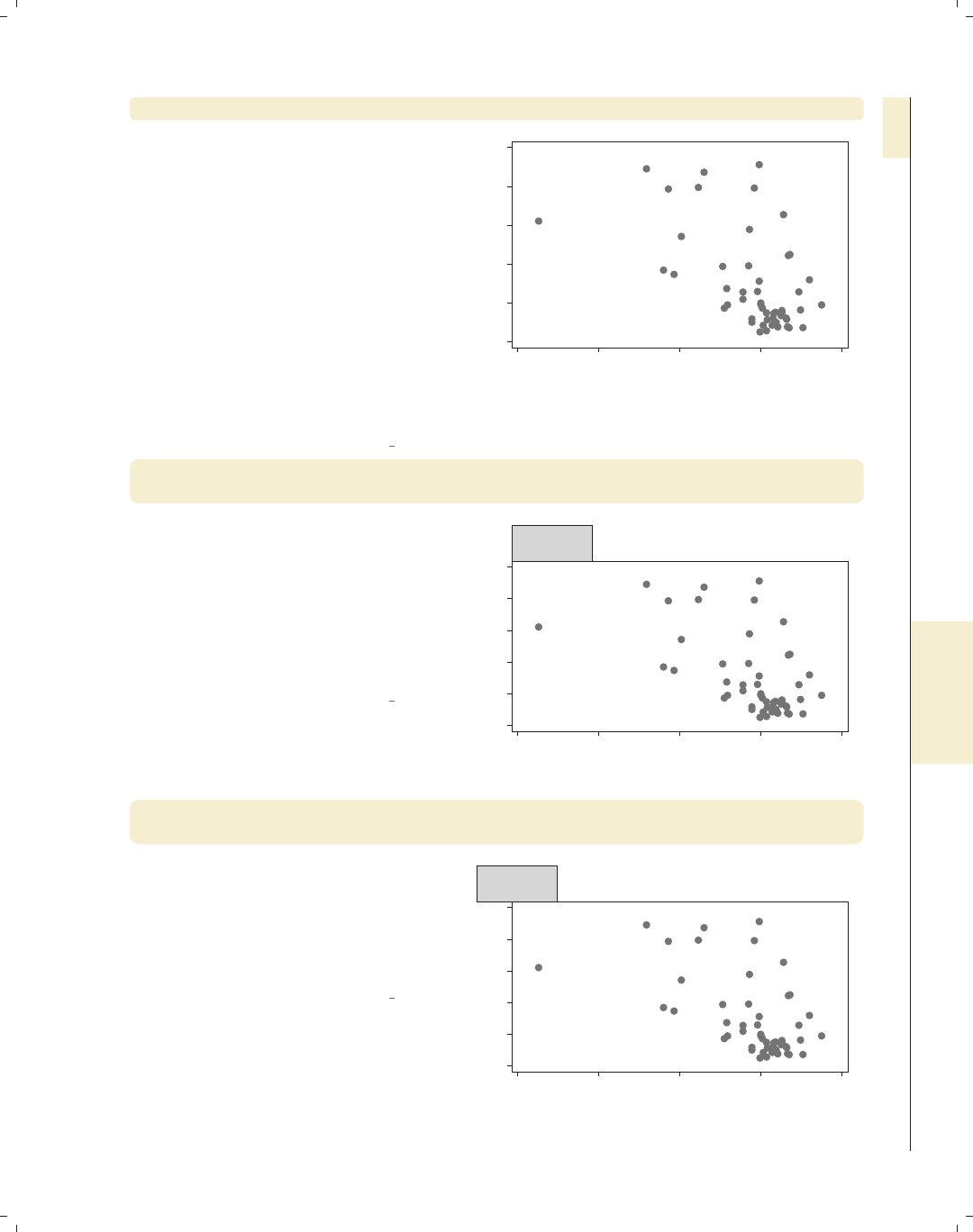
i
i
i
i
i
i
i
i
9.1 Creating and controlling titles 317
scatter propval100 ownhome, title("My title", position(1) ring(0))
As we saw in the last example, we can
use the position() option to control
the placement of the title, but this
option does not control the distance
between the title and center of the plot
region. That is controlled by the
ring() option. ring(0) means that
the item is inside the plot region, and
higher values for ring() place the item
farther away from the plot region.
Imagine concentric rings around the
plot area with higher values
corresponding to the rings that are
farther from the center.
Uses allstates.dta & scheme vg s1m
0 20 40 60 80 100
% homes cost $100K+
40 50 60 70 80
% who own home
My title
scatter propval100 ownhome, title("This is my" "title",
position(11) box)
Because titles, subtitles, notes, and
captions are considered textboxes, you
can use the options associated with
textboxes to customize their display.
Here, we place a box around the title
using the box option. We also use the
position(11) option to place the title
in the 11 o’clock position.
Uses allstates.dta & scheme vg s1m
0 20 40 60 80 100
% homes cost $100K+
40 50 60 70 80
% who own home
This is my
title
scatter propval100 ownhome, title("This is my" "title",
position(11) box span)
Here, we add the span option, so the
title spans the width of the graph,
positioning the title flush left at the 11
o’clock position. Note that now the
title partly obscures the 100 labeling
the y-axis.
Uses allstates.dta & scheme vg s1m
0 20 40 60 80 100
% homes cost $100K+
40 50 60 70 80
% who own home
This is my
title
Introduction Twoway Matrix Bar Box Dot Pie Options Standard options Styles Appendix
Titles Schemes Sizing graphs Graph regions
The electronic form of this book is solely for direct use at UCLA and only by faculty, students, and staff of UCLA.
All rights reserved on the copyright page apply to this document and specifically neither the electronic nor
published form of the book may be distributed or reproduced, either electronically or in printed form.
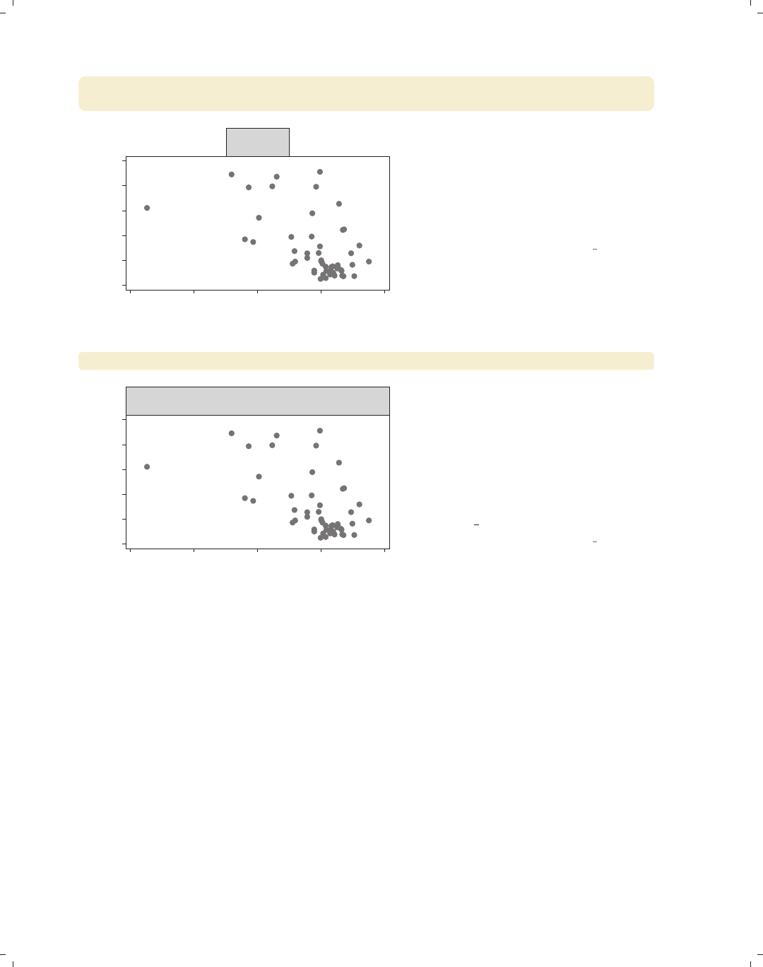
i
i
i
i
i
i
i
i
318 Chapter 9. Standard options available for all graphs
scatter propval100 ownhome, title("This is my" "title", box
justification(right))
0 20 40 60 80 100
% homes cost $100K+
40 50 60 70 80
% who own home
This is my
title
We can use the justification(right)
option to right-justify the text inside
the box. Note the difference between
the position() option, which positions
the textbox, and the justification()
option, which justifies the text within
the textbox.
Uses allstates.dta & scheme vg s1m
scatter propval100 ownhome, title("This is my" "title", box bexpand)
0 20 40 60 80 100
% homes cost $100K+
40 50 60 70 80
% who own home
This is my
title
We can expand the box to fill the width
of the plot region using the bexpand
option. If we wanted the box to span
the entire width of the graph, we could
add the span option (not shown).
There are numerous other textbox
options than can be used with titles;
see Options : Textboxes (303) and
[G]textbox options for more details.
Uses allstates.dta & scheme vg s1m
9.2 Using schemes to control the look of graphs
Schemes control the overall look of Stata graphs by providing default values for numer-
ous graph options. You can accept these defaults or override them using graph options. This
section first examines the kinds of schemes available in Stata, discuss different methods for
selecting schemes, and then show how to obtain additional schemes. For more information
about schemes, see [G]schemes. Stata has two basic families of schemes, the s2 family
and the s1 family, each sharing similar characteristics. There are also other specialized
schemes, including the sj scheme for making graphs like those in the Stata Journal and the
economist scheme for making graphs like those that appear in The Economist. We will
look at these schemes below.
The electronic form of this book is solely for direct use at UCLA and only by faculty, students, and staff of UCLA.
All rights reserved on the copyright page apply to this document and specifically neither the electronic nor
published form of the book may be distributed or reproduced, either electronically or in printed form.
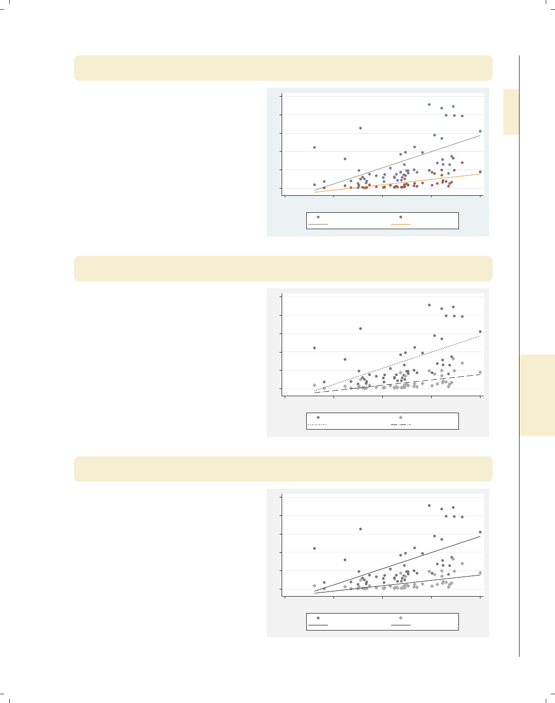
i
i
i
i
i
i
i
i
9.2 Using schemes to control the look of graphs 319
twoway (scatter propval100 urban) (scatter rent700 urban)
(lfit propval100 urban) (lfit rent700 urban), scheme(s2color)
This example uses the
scheme(s2color) option to create a
graph using the s2color scheme. Using
the scheme() option, we can manually
select which scheme to use for
displaying the graph we wish to create.
The s2color scheme is the default
scheme for Stata graphs.
Uses allstates.dta & scheme s2color
0 20 40 60 80 100
20 40 60 80 100
Percent urban 1990
% homes cost $100K+ % rents $700+/mo
Fitted values Fitted values
twoway (scatter propval100 urban) (scatter rent700 urban)
(lfit propval100 urban) (lfit rent700 urban), scheme(s2mono)
The s2mono scheme is a
black-and-white version of the s2color
scheme. In this example, the symbols
differ in gray scale and size, and the
lines differ in their patterns.
Uses allstates.dta & scheme s2mono
0 20 40 60 80 100
20 40 60 80 100
Percent urban 1990
% homes cost $100K+ % rents $700+/mo
Fitted values Fitted values
twoway (scatter propval100 urban) (scatter rent700 urban)
(lfit propval100 urban) (lfit rent700 urban), scheme(s2manual)
Here is an example using the s2manual
scheme, which is very similar to the
s2mono scheme. One difference is that
the lines of the fit values are the same
pattern (solid) in this graph, but they
have different patterns when we use
s2mono.
Uses allstates.dta & scheme s2manual
0 20 40 60 80 100
20 40 60 80 100
Percent urban 1990
% homes cost $100K+ % rents $700+/mo
Fitted values Fitted values
Introduction Twoway Matrix Bar Box Dot Pie Options Standard options Styles Appendix
Titles Schemes Sizing graphs Graph regions
The electronic form of this book is solely for direct use at UCLA and only by faculty, students, and staff of UCLA.
All rights reserved on the copyright page apply to this document and specifically neither the electronic nor
published form of the book may be distributed or reproduced, either electronically or in printed form.

i
i
i
i
i
i
i
i
320 Chapter 9. Standard options available for all graphs
twoway (scatter propval100 urban) (scatter rent700 urban)
(lfit propval100 urban) (lfit rent700 urban), scheme(s1color)
0 20 40 60 80 100
20 40 60 80 100
Percent urban 1990
% homes cost $100K+ % rents $700+/mo
Fitted values Fitted values
This is an example of a graph using the
s1color scheme. Note how the lines
and markers are only differentiated by
their color. Both the plot area and the
border around the plot are white. Also,
note the absence of grid lines. (Stata
also has an s1rcolor scheme, in which
the plot area and border area are black.
This is not shown since it would be
difficult to read in print.)
Uses allstates.dta & scheme s1color
twoway (scatter propval100 urban) (scatter rent700 urban)
(lfit propval100 urban) (lfit rent700 urban), scheme(s1mono)
0 20 40 60 80 100
20 40 60 80 100
Percent urban 1990
% homes cost $100K+ % rents $700+/mo
Fitted values Fitted values
The s1mono scheme is similar to the
s1color scheme in that the plot area
and border are white and the grid is
omitted. In a mono scheme, the
markers differ in gray scale and size,
and the lines differ in their pattern.
Uses allstates.dta & scheme s1mono
twoway (scatter propval100 urban) (scatter rent700 urban)
(lfit propval100 urban) (lfit rent700 urban), scheme(s1manual)
0 20 40 60 80 100
20 40 60 80 100
Percent urban 1990
% homes cost $100K+ % rents $700+/mo
Fitted values Fitted values
The s1manual is similar to s1mono, but
the sizes of the markers and text are
increased. This is useful if you are
making a small graph and want these
small elements to be magnified to be
more easily seen.
Uses allstates.dta & scheme s1manual
The electronic form of this book is solely for direct use at UCLA and only by faculty, students, and staff of UCLA.
All rights reserved on the copyright page apply to this document and specifically neither the electronic nor
published form of the book may be distributed or reproduced, either electronically or in printed form.
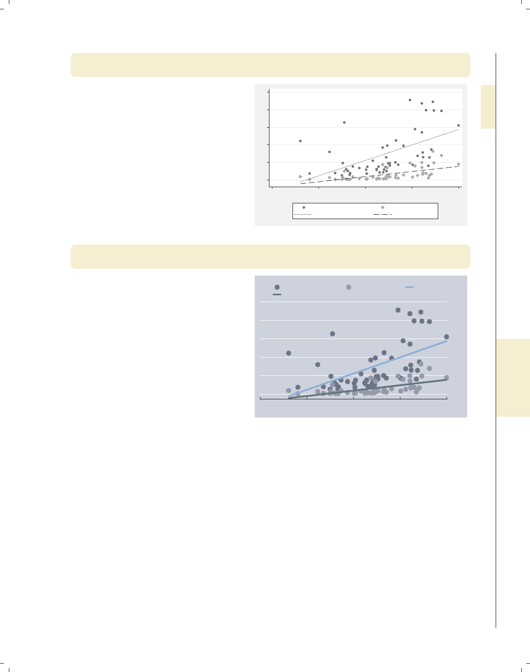
i
i
i
i
i
i
i
i
9.2 Using schemes to control the look of graphs 321
twoway (scatter propval100 urban) (scatter rent700 urban)
(lfit propval100 urban) (lfit rent700 urban), scheme(sj)
The sj scheme is very similar to the
s2mono scheme. In fact, a comparison
of this graph with an earlier graph that
used the s2mono scheme shows no
visible differences. The sj scheme is
basedonthes2mono scheme and only
alters xsize() and ysize(). See
Appendix : Customizing schemes (379) for
more information about how to inspect
(and alter) the contents of graph
schemes.
Uses allstates.dta & scheme sj
0 20 40 60 80 100
20 40 60 80 100
Percent urban 1990
% homes cost $100K+ % rents $700+/mo
Fitted values Fitted values
twoway (scatter propval100 urban) (scatter rent700 urban)
(lfit propval100 urban) (lfit rent700 urban), scheme(economist)
The economist scheme is quite
different from all the other schemes and
is a very good example of how much
can be controlled with a scheme. Using
this scheme modifies the colors of the
plot area, border, markers, lines, the
position of the y-axis, and the legend.
It also removes the line on the y-axis
and changes the angle of the labels on
the y-axis.
Uses allstates.dta & scheme economist 0
20
40
60
80
100
20 40 60 80 100
Percent urban 1990
% homes cost $100K+ % rents $700+/mo Fitted values
Fitted values
As these examples have shown, we can change the scheme of a graph by supplying the
scheme() option on a graph command. If we want to use the same scheme over and over,
we can use the set scheme command to set the default scheme. For example, if we typed
. set scheme economist
the default scheme would become economist until we quit Stata. Or, we could type
. set scheme economist, permanently
Introduction Twoway Matrix Bar Box Dot Pie Options Standard options Styles Appendix
Titles Schemes Sizing graphs Graph regions
The electronic form of this book is solely for direct use at UCLA and only by faculty, students, and staff of UCLA.
All rights reserved on the copyright page apply to this document and specifically neither the electronic nor
published form of the book may be distributed or reproduced, either electronically or in printed form.

i
i
i
i
i
i
i
i
322 Chapter 9. Standard options available for all graphs
The economist scheme would be our default scheme, even after we quit and start Stata
again. If we will be creating a series of graphs that we want to have a common look, then
schemes are a very powerful tool for accomplishing this. Even though Stata has a variety
of built-in schemes, we may want to obtain other schemes. The findit command can be
used to search for information about schemes and to download schemes that others have
developed. To search for schemes, type
. findit scheme
and Stata will list web pages and packages associated with the word scheme.
See Intro : Schemes (14) for an overview of the schemes used in this book and Appendix : Online sup-
plements (382) for instructions for obtaining the schemes for this book.
Seeing how powerful and flexible schemes are, we might be interested in creating our
own schemes. Stata gives us complete control over creating schemes. The section Ap-
pendix : Customizing schemes (379) provides tips for getting started.
9.3 Sizing graphs and their elements
This section illustrates how to use the xsize() and ysize() options to control the size
and aspect ratio of graphs. It also illustrates the use of the scale() option for controlling
the size of the text and markers. This section uses the vg s1c scheme.
scatter propval100 ownhome
0 20 40 60 80 100
% homes cost $100K+
40 50 60 70 80
% who own home
Let’s first consider this graph. The
graphs in this book have been sized to
be 3 inches wide by 2 inches tall.
Although we do not see it, some graphs
are sized via an xsize() and ysize()
option, and some are sized via schemes.
Uses allstates.dta & scheme vg s1c
The electronic form of this book is solely for direct use at UCLA and only by faculty, students, and staff of UCLA.
All rights reserved on the copyright page apply to this document and specifically neither the electronic nor
published form of the book may be distributed or reproduced, either electronically or in printed form.

i
i
i
i
i
i
i
i
9.3 Sizing graphs and their elements 323
scatter propval100 ownhome, xsize(3) ysize(1)
Here, we make a graph to illustrate how
to use xsize() and ysize() to control
the aspect ratio of the graph, as well as
the size. Note that when we do this,
the size of the graph will not change on
the screen but the aspect ratio will.
Although we can size the graph on the
screen, when we export the graph, it
will have both the size and aspect ratio
we chose using xsize() and ysize().
Uses allstates.dta & scheme vg s1c
0 20 40 60 80 100
% homes cost $100K+
40 50 60 70 80
% who own home
scatter propval100 ownhome, xsize(2) ysize(2)
Here, we make just one more graph to illustrate that we
can use xsize() and ysize() to control the aspect
ratio of the graph, as well as the size. Here, we make
the graph square by making the graph 2 inches high by
2 inches tall.
Uses allstates.dta & scheme vg s1c
0 20 40 60 80 100
% homes cost $100K+
40 50 60 70 80
% who own home
scatter propval100 ownhome, scale(1.7)
In this example, we add the
scale(1.7) option to magnify the sizes
of the text and markers in the graph,
making them 1.7 times their normal
sizes. This can be useful when we make
small graphs and want to increase the
sizes of the text and markers to make
them easier to see.
Uses allstates.dta & scheme vg s1c
0 20 40 60 80 100
% homes cost $100K+
40 50 60 70 80
% who own home
Introduction Twoway Matrix Bar Box Dot Pie Options Standard options Styles Appendix
Titles Schemes Sizing graphs Graph regions
The electronic form of this book is solely for direct use at UCLA and only by faculty, students, and staff of UCLA.
All rights reserved on the copyright page apply to this document and specifically neither the electronic nor
published form of the book may be distributed or reproduced, either electronically or in printed form.
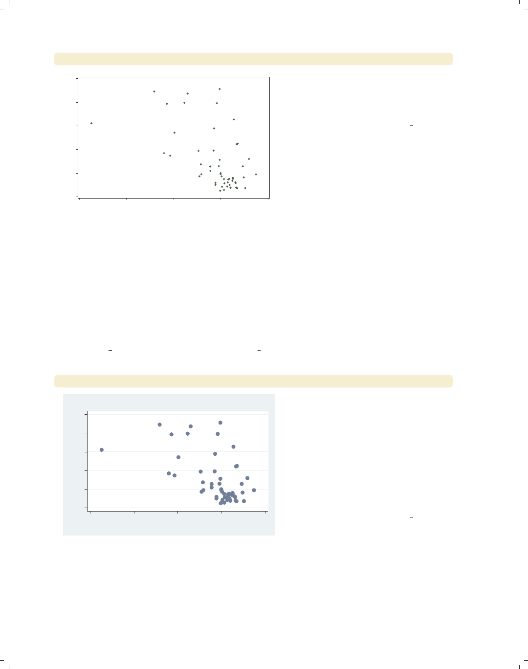
i
i
i
i
i
i
i
i
324 Chapter 9. Standard options available for all graphs
scatter propval100 ownhome, scale(.5)
0 20 40 60 80 100
% homes cost $100K+
40 50 60 70 80
% who own home
We can also use the scale() option to
decrease the size of the text and
markers. Here, we make the size of
these elements half their normal size.
Uses allstates.dta & scheme vg s1c
9.4 Changing the look of graph regions
This section discusses the region options that can be controlled via the plotregion()
and graphregion() options. These allow we to control the color of the plot region and
graph region, as well as the lines that border these regions. For more information, see
[G]region options. This section uses the vg s2c scheme.
scatter propval100 ownhome, title("My title")
0 20 40 60 80 100
% homes cost $100K+
40 50 60 70 80
% who own home
My title Consider this scatterplot. In general,
Stata sees this graph as having two
overall regions. The area inside the x-
and y-axes where the data are plotted
is called the plot region. In this graph,
the plot region is white. The area
surrounding the plot region, where the
axes and titles are placed, is called the
graph region. In this graph, the graph
region is shaded light blue.
Uses allstates.dta & scheme vg s2c
The electronic form of this book is solely for direct use at UCLA and only by faculty, students, and staff of UCLA.
All rights reserved on the copyright page apply to this document and specifically neither the electronic nor
published form of the book may be distributed or reproduced, either electronically or in printed form.
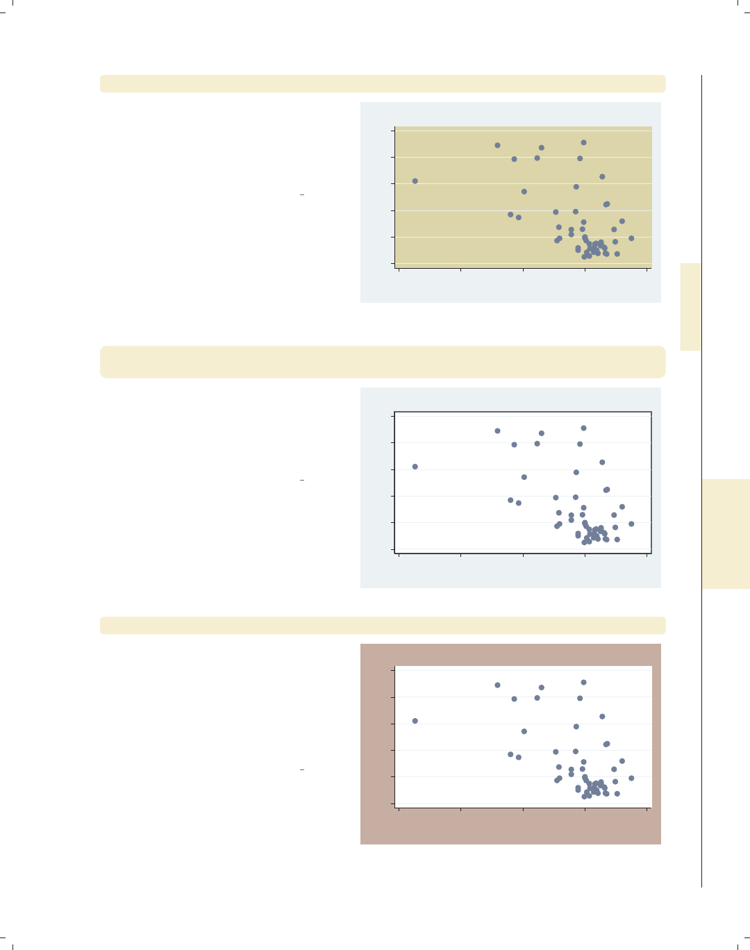
i
i
i
i
i
i
i
i
9.4 Changing the look of graph regions 325
scatter propval100 ownhome, title("My title") plotregion(color(stone))
Here, we use
plotregion(color(stone)) to make
the color of the plot region stone. The
color() option controls the color of the
plot region.
Uses allstates.dta & scheme vg s2c
0 20 40 60 80 100
% homes cost $100K+
40 50 60 70 80
% who own home
My title
scatter propval100 ownhome, title("My title") plotregion(lcolor(navy)
lwidth(thick) )
In this graph, we put a thick, navy blue
line around the plot region using the
lcolor() and lwidth() options. This
puts a bit of a frame around the plot
region.
Uses allstates.dta & scheme vg s2c
0 20 40 60 80 100
% homes cost $100K+
40 50 60 70 80
% who own home
My title
scatter propval100 ownhome, title("My title") graphregion(color(erose))
Here, we use the
graphregion(color(erose)) option to
modify the color of the graph region to
be erose, a light rose color. The graph
region is the area outside of the plot
region where the titles and axes are
displayed.
Uses allstates.dta & scheme vg s2c
0 20 40 60 80 100
% homes cost $100K+
40 50 60 70 80
% who own home
My title
Introduction Twoway Matrix Bar Box Dot Pie Options Standard options Styles Appendix
Titles Schemes Sizing graphs Graph regions
The electronic form of this book is solely for direct use at UCLA and only by faculty, students, and staff of UCLA.
All rights reserved on the copyright page apply to this document and specifically neither the electronic nor
published form of the book may be distributed or reproduced, either electronically or in printed form.

i
i
i
i
i
i
i
i
326 Chapter 9. Standard options available for all graphs
scatter propval100 ownhome, title("My title")
graphregion(ifcolor(erose) fcolor(maroon))
0 20 40 60 80 100
% homes cost $100K+
40 50 60 70 80
% who own home
My title The graph region is actually composed
of an inner part and an outer part.
Here, we use the ifcolor(erose)
option to make the inner graph region
light rose and the fcolor(maroon)
option to make the outer graph region
maroon. This has the effect of putting a
maroon frame around the entire graph.
Uses allstates.dta & scheme vg s2c
scatter propval100 ownhome, title("My title")
graphregion(lcolor(navy) lwidth(vthick))
0 20 40 60 80 100
% homes cost $100K+
40 50 60 70 80
% who own home
My title We can put a somewhat different frame
around the graph by altering the size
and color of the line that surrounds the
graph region. Using the lcolor(navy)
lwidth(vthick) options gives this
graph a very thick, navy blue border.
Uses allstates.dta & scheme vg s2c
This section omitted numerous options that we could use to control the plot region and
graph region, including further control of the inner and outer regions and further control of
the lines that surround these regions. Stata gives us more control than we generally need,
so rather than covering these options here, I refer you to [G]region options.
The electronic form of this book is solely for direct use at UCLA and only by faculty, students, and staff of UCLA.
All rights reserved on the copyright page apply to this document and specifically neither the electronic nor
published form of the book may be distributed or reproduced, either electronically or in printed form.

i
i
i
i
i
i
i
i
10 Styles for changing the look of
graphs
This section focuses on frequently used styles that arise in making graphs, such as
linepatternstyle,linewidthstyle,ormarkerstyle. The styles are covered in alphabetical order,
providing more details about the values you can choose. Each section refers to the appro-
priate section of [G]graph to provide complete details on each style. We begin by using
the allstates file and omitting Washington, DC.
10.1 Angles
An anglestyle specifies the angle for displaying an item (or group of items) in the graph.
Common examples include specifying the angle for marker labels with mlabangle() or the
angle of the labels on the y-axis with ylabel(, angle()). We can specify an anglestyle as
a number of degrees of rotation (negative values are permitted, so for example, −90 can be
used instead of 270). We can also use the keywords horizontal for 0 degrees, vertical
for 90 degrees, rhorizontal for 180 degrees, and rvertical for 270 degrees. See [G]an-
glestyle for more information.
scatter workers2 faminc, mlabel(stateab) mlabangle(45)
Here, we use the mlabangle(45)
(marker label angle) to change the angle
of the marker labels to 45 degrees.
Uses allstatesdc.dta & scheme vg s2c
AL
AK
AZ
AR
CA
CO
CT
DE
FL
GA
HI
ID
IL
IN
IA
KS
KY
LA
ME
MD
MA
MI
MN
MS
MO
MT
NE
NV
NH
NJ
NM
NY
NC ND
OH
OK
OR
PA
RI
SC
SD
TN
TX
UT
VT
VA
WA
WV
WI
WY
45 50 55 60 65 70
% HHs with 2+ workers
15000 20000 25000 30000
1979 Median Family Inc.
Introduction Twoway Matrix Bar Box Dot Pie Options Standard options Styles Appendix
Angles Colors Clockpos Compassdir Connect Linepatterns Linewidth Margins Markersize Orientation Symbols Textsize
327
The electronic form of this book is solely for direct use at UCLA and only by faculty, students, and staff of UCLA.
All rights reserved on the copyright page apply to this document and specifically neither the electronic nor
published form of the book may be distributed or reproduced, either electronically or in printed form.
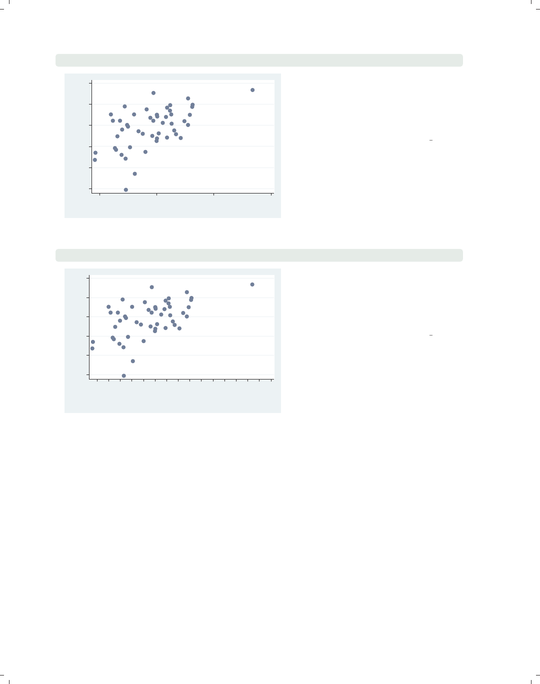
i
i
i
i
i
i
i
i
328 Chapter 10. Styles for changing the look of graphs
scatter workers2 faminc, ylabel(, angle(0))
45
50
55
60
65
70
% HHs with 2+ workers
15000 20000 25000 30000
1979 Median Family Inc.
Here, we change the angle of the labels
of the y-axis so that they read
horizontally by using the angle(0)
option. We could also have used
horizontal to obtain the same effect.
Uses allstatesdc.dta & scheme vg s2c
scatter workers2 faminc, xlabel(15000(1000)30000, angle(45))
45 50 55 60 65 70
% HHs with 2+ workers
15000
16000
17000
18000
19000
20000
21000
22000
23000
24000
25000
26000
27000
28000
29000
30000
1979 Median Family Inc.
In this example, we label the x-axis
from 15,000 to 30,000 incremented by
1,000. When we have so many labels,
we can use the angle(45) option to
display the labels at a 45-degree angle.
Uses allstatesdc.dta & scheme vg s2c
10.2 Colors
Acolorstyle allows us to modify the color of an object, be it a title, a marker, a marker
label, a line around a box, a fill color of a box, or practically any other object in graphs.
The two main ways to specify a color are either by giving a name of color (e.g., red,pink,
teal) or by supplying an RGB value giving the amount of red, green, and blue to be mixed
to form a custom color. See [G]colorstyle for more information.
The electronic form of this book is solely for direct use at UCLA and only by faculty, students, and staff of UCLA.
All rights reserved on the copyright page apply to this document and specifically neither the electronic nor
published form of the book may be distributed or reproduced, either electronically or in printed form.
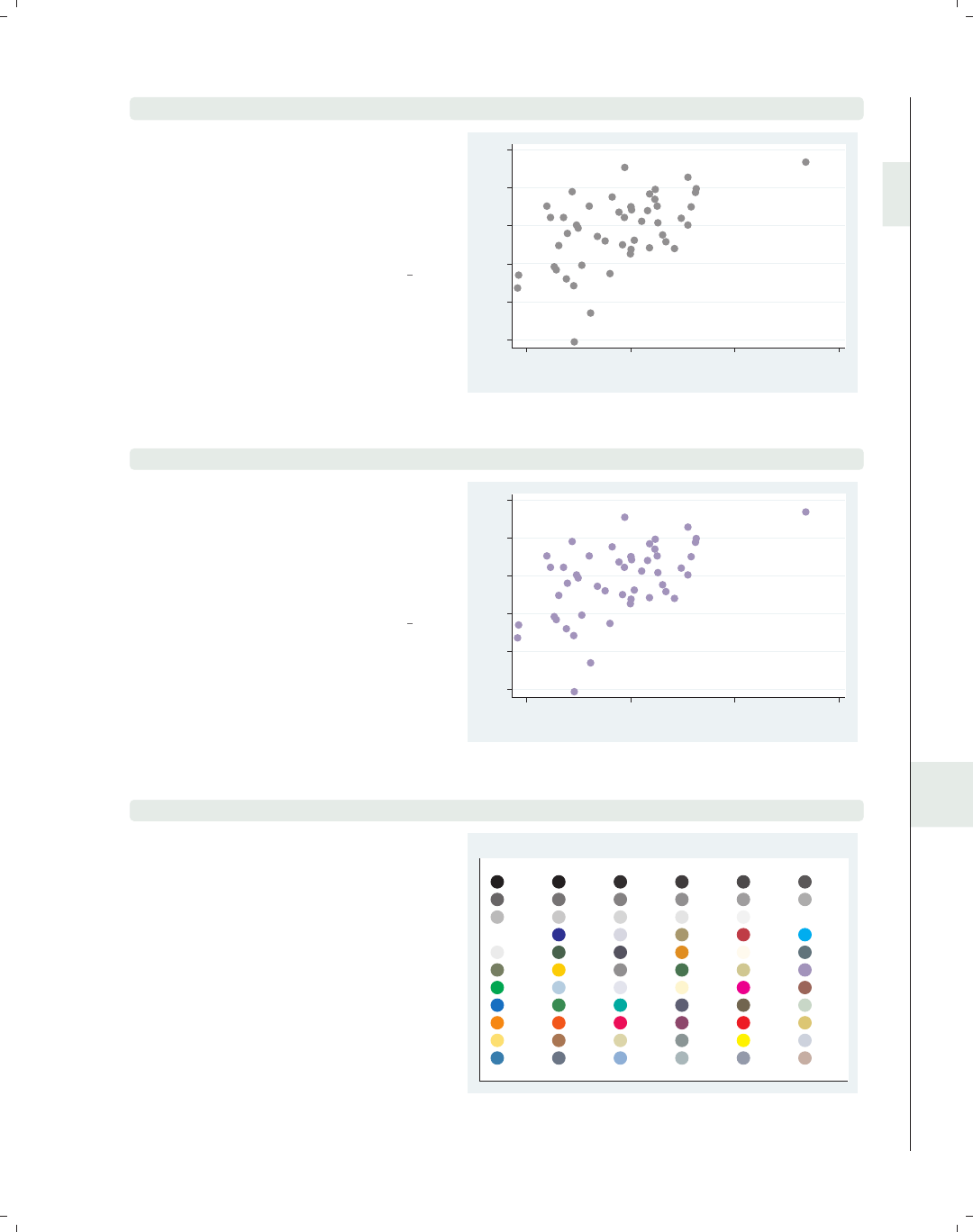
i
i
i
i
i
i
i
i
10.2 Colors 329
scatter workers2 faminc, mcolor(gs8)
The mcolor() (marker color) option is
used here to make the marker a middle
gray. Stata provides 17 levels of gray
named gs0 to gs16. The darkest is gs0
(a synonym for black), and the lightest
is gs16 (a synonym for white).
Uses allstatesdc.dta & scheme vg s2c
45 50 55 60 65 70
% HHs with 2+ workers
15000 20000 25000 30000
1979 Median Family Inc.
scatter workers2 faminc, mcolor(lavender)
Here, we use the mcolor(lavender)
option to make the markers lavender,
one of the predefined colors created by
Stata. The next example illustrates
more of the colors from which you can
choose.
Uses allstatesdc.dta & scheme vg s2c
45 50 55 60 65 70
% HHs with 2+ workers
15000 20000 25000 30000
1979 Median Family Inc.
vgcolormap, quietly
This vgcolormap command is a
command that I wrote to show the
different standard colors available in
Stata all at once. We simply issue the
command vgcolormap, and it creates a
scatterplot that shows the colors we can
choose from and their names. See the
list of colors available in [G]colorstyle,
and see how to get vgcolormap in
Appendix : Online supplements (382).
Uses allstatesdc.dta & scheme s2color
black gs0 gs1 gs2 gs3 gs4
gs5 gs6 gs7 gs8 gs9 gs10
gs11 gs12 gs13 gs14 gs15 gs16
white blue bluishgray brown cranberry cyan
dimgray dkgreen dknavy dkorange eggshell emerald
forest_green gold gray green khaki lavender
lime ltblue ltbluishgray ltkhaki magenta maroon
midblue midgreen mint navy olive olive_teal
orange orange_red pink purple red sand
sandb sienna stone teal yellow ebg
ebblue edkblue eltblue eltgreen emidblue erose
Color Map of Standard Stata Colors
Introduction Twoway Matrix Bar Box Dot Pie Options Standard options Styles Appendix
Angles Colors Clockpos Compassdir Connect Linepatterns Linewidth Margins Markersize Orientation Symbols Textsize
The electronic form of this book is solely for direct use at UCLA and only by faculty, students, and staff of UCLA.
All rights reserved on the copyright page apply to this document and specifically neither the electronic nor
published form of the book may be distributed or reproduced, either electronically or in printed form.
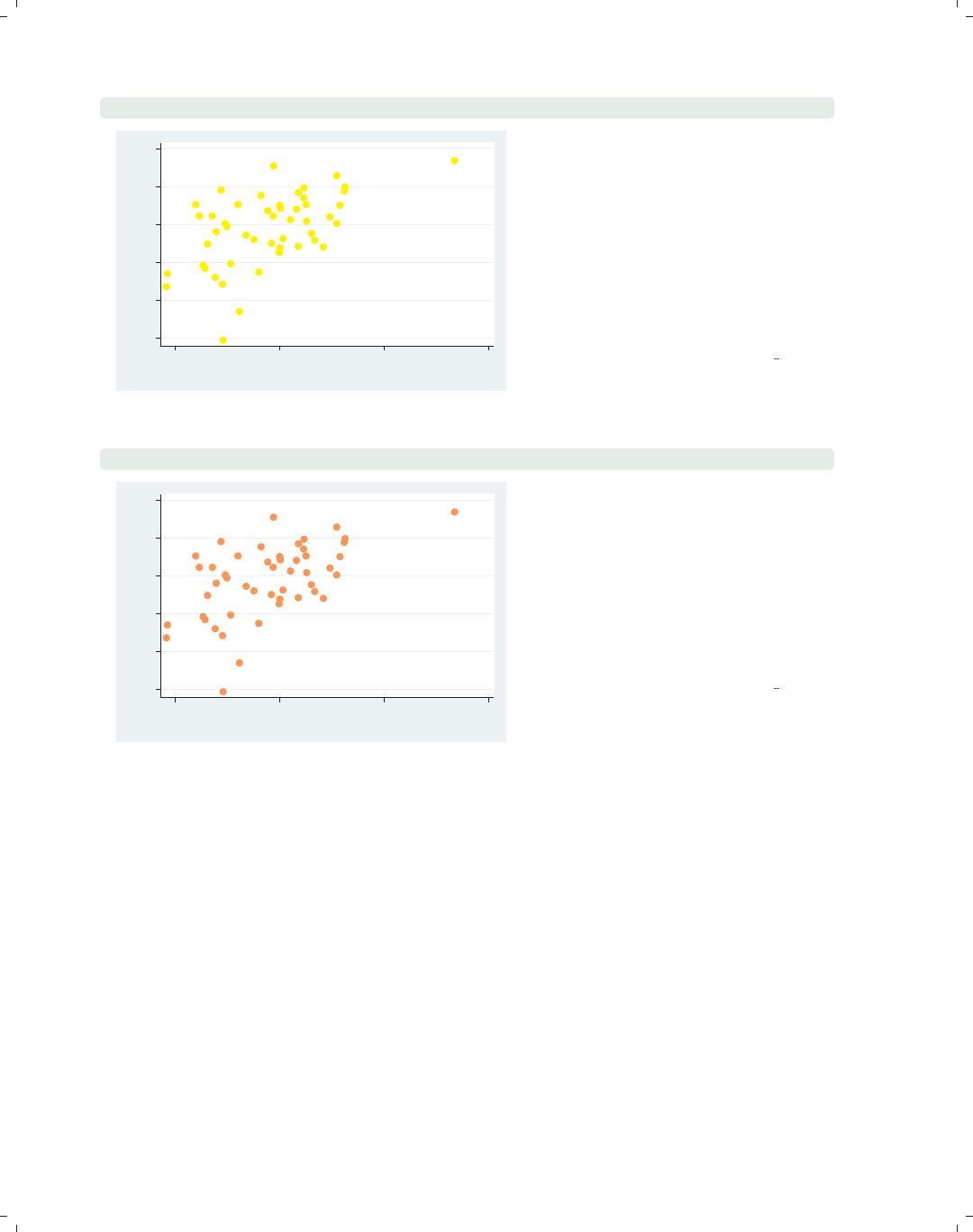
i
i
i
i
i
i
i
i
330 Chapter 10. Styles for changing the look of graphs
scatter workers2 faminc, mcolor("255 255 0")
45 50 55 60 65 70
% HHs with 2+ workers
15000 20000 25000 30000
1979 Median Family Inc.
Despite all the standard color choices,
we may want to mix our own colors by
specifying how much red, green, and
blue that we want mixed together. We
can mix between 0 and 255 units of
each color. Mixing 0 units of each
yields black, and 255 units of each
yields white. Here, we mix 255 units of
red, 255 units of green, and 0 units of
blue to get a shade of yellow.
Uses allstatesdc.dta & scheme vg s2c
scatter workers2 faminc, mcolor("255 150 100")
45 50 55 60 65 70
% HHs with 2+ workers
15000 20000 25000 30000
1979 Median Family Inc.
By mixing 255 parts red, 150 parts
green, and 100 parts blue, we get a
peach color. Since colors for web pages
use this same principle of mixing red,
green, and blue, we can do a web search
using terms like color mixing html and
find numerous web pages to help us find
the right mixture for the colors that we
want to make.
Uses allstatesdc.dta & scheme vg s2c
10.3 Clock position
A clock position refers to a location using the numbers on an analog clock to indicate
the location, with 12 o’clock being above the center, 3 o’clock to the right, 6 o’clock below
the center, and 9 o’clock to the left. A value of 0 refers to the center but may not always
be valid. See [G]clockpos for more information.
The electronic form of this book is solely for direct use at UCLA and only by faculty, students, and staff of UCLA.
All rights reserved on the copyright page apply to this document and specifically neither the electronic nor
published form of the book may be distributed or reproduced, either electronically or in printed form.
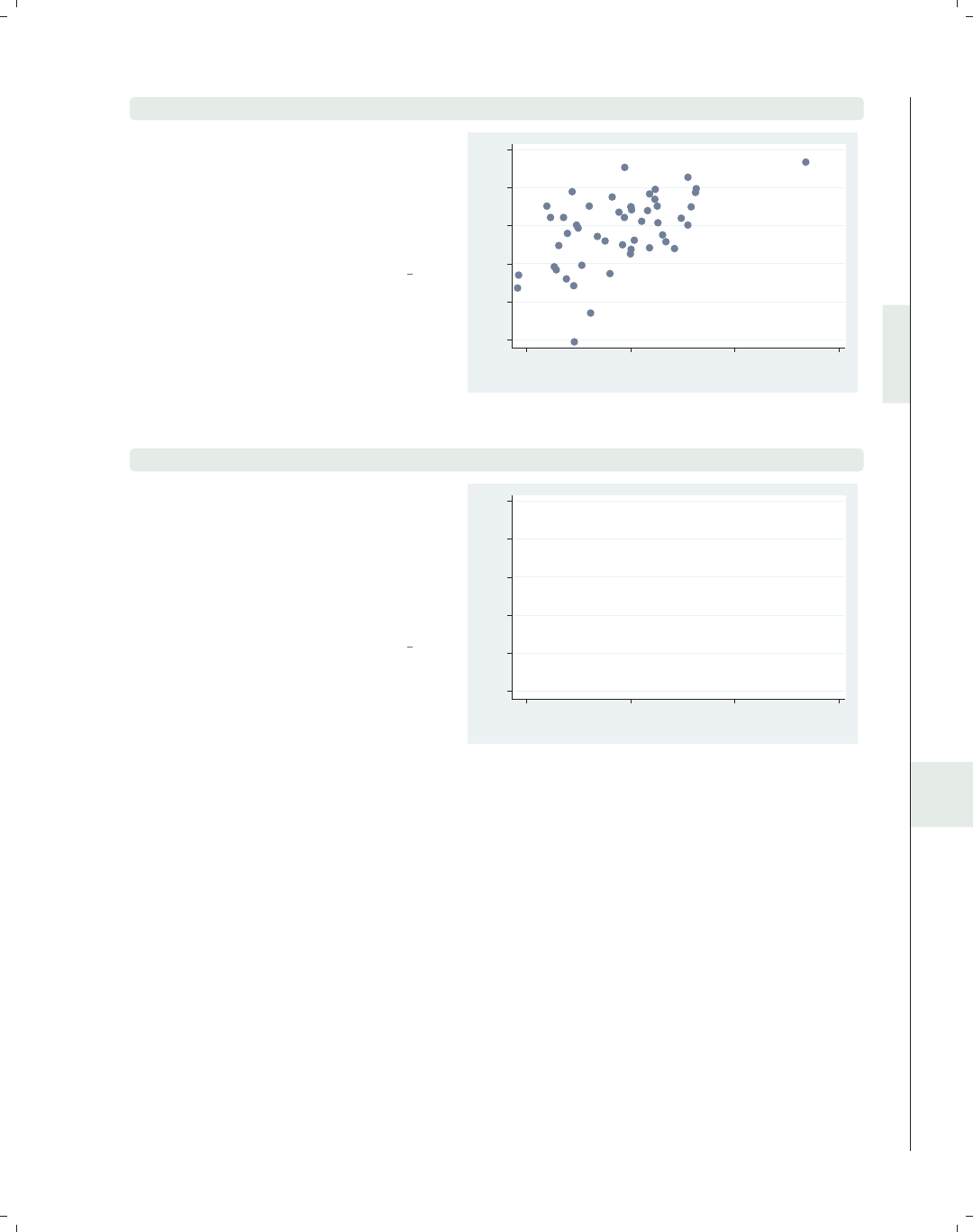
i
i
i
i
i
i
i
i
10.4 Compass direction 331
scatter workers2 faminc, mlabel(stateab) mlabposition(5)
In this example, we add marker labels
to a scatterplot and use the
mlabposition(5) (marker label
position) option to place the marker
labels in the 5 o’clock position with
respect to the markers.
Uses allstatesdc.dta & scheme vg s2c AL
AK
AZ
AR
CA
CO
CT
DE
FL
GA
HI
ID IL
IN
IA
KS
KY
LA
ME
MD
MA
MI
MN
MS
MO
MT
NE
NV
NH
NJ
NM
NY
NC ND
OH
OK
OR
PA
RI
SC
SD
TN TX
UT
VT
VA
WA
WV
WI
WY
45 50 55 60 65 70
% HHs with 2+ workers
15000 20000 25000 30000
1979 Median Family Inc.
scatter workers2 faminc, mlabel(stateab) mlabposition(0) msymbol(i)
In this example, we place the markers
in the center position using the
mlabposition(0) option. We also
make the symbols invisible using the
msymbol(i) option. Otherwise, the
markers and marker labels would be
atop each other.
Uses allstatesdc.dta & scheme vg s2c
AL
AK
AZ
AR
CA
CO
CT
DE
FL
GA
HI
ID IL
IN
IA
KS
KY
LA
ME
MD
MA
MI
MN
MS
MO
MT
NE
NV
NH
NJ
NM
NY
NC ND
OH
OK
OR
PA
RI
SC
SD
TN TX
UT
VT
VA
WA
WV
WI
WY
45 50 55 60 65 70
% HHs with 2+ workers
15000 20000 25000 30000
1979 Median Family Inc.
10.4 Compass direction
Acompassdirstyle is much like clockpos, but where a clockpos has 12 possible outer po-
sitions, like a clock, the compassdirstyle has only 9 possible outer positions, like the major
labels on a compass: north,neast,east,seast,south,swest,west,nwest,andcenter.
These can be abbreviated as n,ne,e,se,s,sw,w,nw,andc. Stata permits us to use
aclockpos even when a compassdirstyle is called for and makes intuitive translations; for
example, 12 is translated to north,or2is translated to neast. See [G]compassdirstyle
for more information.
Introduction Twoway Matrix Bar Box Dot Pie Options Standard options Styles Appendix
Angles Colors Clockpos Compassdir Connect Linepatterns Linewidth Margins Markersize Orientation Symbols Textsize
The electronic form of this book is solely for direct use at UCLA and only by faculty, students, and staff of UCLA.
All rights reserved on the copyright page apply to this document and specifically neither the electronic nor
published form of the book may be distributed or reproduced, either electronically or in printed form.
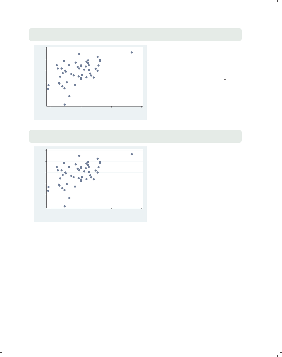
i
i
i
i
i
i
i
i
332 Chapter 10. Styles for changing the look of graphs
scatter workers2 faminc, title("Work Status and Income",
ring(0) placement(se))
45 50 55 60 65 70
% HHs with 2+ workers
15000 20000 25000 30000
1979 Median Family Inc.
Work Status and Income
In this example, we use placement() to
position the title in the southeast
(bottom right corner) of the plot
region. The ring(0) option moves the
title inside the plot region.
Uses allstatesdc.dta & scheme vg s2c
scatter workers2 faminc, title("Work Status and Income",
ring(0) placement(4))
45 50 55 60 65 70
% HHs with 2+ workers
15000 20000 25000 30000
1979 Median Family Inc.
Work Status and Income
If we instead specify the placement(4)
option (using a clockpos instead of
compassdir), Stata makes a suitable
substitution, and the title is placed in
the bottom right corner.
Uses allstatesdc.dta & scheme vg s2c
10.5 Connecting points
Stata supports a variety of methods for connecting points using different values for the
connectstyle. These include l(lowercase L, as in line) to connect with a straight line, Lto
connect with a straight line only if the current x-value is greater than the prior x-value, J
for stairstep, stepstair for step then stair, and ifor invisible connections. For the next
few examples, let’s switch to using the spjanfeb2001 data file, keeping only the data for
January and February of 2001. See [G]connectstyle for more information.
The electronic form of this book is solely for direct use at UCLA and only by faculty, students, and staff of UCLA.
All rights reserved on the copyright page apply to this document and specifically neither the electronic nor
published form of the book may be distributed or reproduced, either electronically or in printed form.

i
i
i
i
i
i
i
i
10.5 Connecting points 333
scatter close tradeday
Here, we make a scatterplot showing
the closing price on the y-axis and the
trading day (numbered 1 to 40) on the
x-axis. Normally, we would connect
these points.
Uses spjanfeb2001.dta & scheme vg s2c
1250 1300 1350 1400
Closing price
0 10 20 30 40
Trading day number
scatter close tradeday, connect(l)
Here, we add the connect(l) option,
but this is probably not the kind of
graph we wanted to create. The
problem is that the observations are in
a random order, but the observations
are connected in the same order as they
appear in the data. We really want the
points to be connected based on the
order of tradeday.
Uses spjanfeb2001.dta & scheme vg s2c
1250 1300 1350 1400
Closing price
0 10 20 30 40
Trading day number
scatter close tradeday, connect(l) sort
To fix the previous graph, we can either
first use the sort command to sort the
data on tradeday or, as we do here, use
the sort option to tell Stata to sort the
data on tradeday before connecting the
points. We also could have specified
sort(tradeday), and it would have
had the same effect.
Uses spjanfeb2001.dta & scheme vg s2c
1250 1300 1350 1400
Closing price
0 10 20 30 40
Trading day number
Introduction Twoway Matrix Bar Box Dot Pie Options Standard options Styles Appendix
Angles Colors Clockpos Compassdir Connect Linepatterns Linewidth Margins Markersize Orientation Symbols Textsize
The electronic form of this book is solely for direct use at UCLA and only by faculty, students, and staff of UCLA.
All rights reserved on the copyright page apply to this document and specifically neither the electronic nor
published form of the book may be distributed or reproduced, either electronically or in printed form.
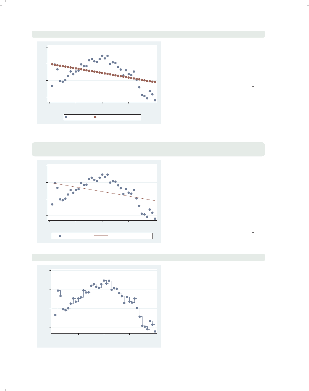
i
i
i
i
i
i
i
i
334 Chapter 10. Styles for changing the look of graphs
scatter close predclose tradeday
1250 1300 1350 1400
0 10 20 30 40
Trading day number
Closing price Lin. Fit close from tradeday
Say that we used the regress
command to predict close from
tradeday and generated a predicted
value called predclose. Here, we plot
the actual closing prices and the
predicted closing prices.
Uses spjanfeb2001.dta & scheme vg s2c
scatter close predclose tradeday, connect(i l) sort
msymbol(. i)
1250 1300 1350 1400
0 10 20 30 40
Trading day number
Closing price Lin. Fit close from tradeday
We use the connect(i l) option to
connect the predicted values and leave
the observed values unconnected. The i
option with close indicates that the
closing values are not connected, and
the l(letter l) option indicates that the
predclose values should be connected
with a straight line. We also add
msymbol(. i) to make the symbols
invisible for the fit values.
Uses spjanfeb2001.dta & scheme vg s2c
scatter close tradeday, connect(J) sort
1250 1300 1350 1400
Closing price
0 10 20 30 40
Trading day number
In other contexts (such as survival
analysis), we might want to connect
points using a stairstep pattern. Here,
we connect the observed closing prices
with the Joption (which can also be
specified as stairstep) to get a
stairstep effect.
Uses spjanfeb2001.dta & scheme vg s2c
The electronic form of this book is solely for direct use at UCLA and only by faculty, students, and staff of UCLA.
All rights reserved on the copyright page apply to this document and specifically neither the electronic nor
published form of the book may be distributed or reproduced, either electronically or in printed form.
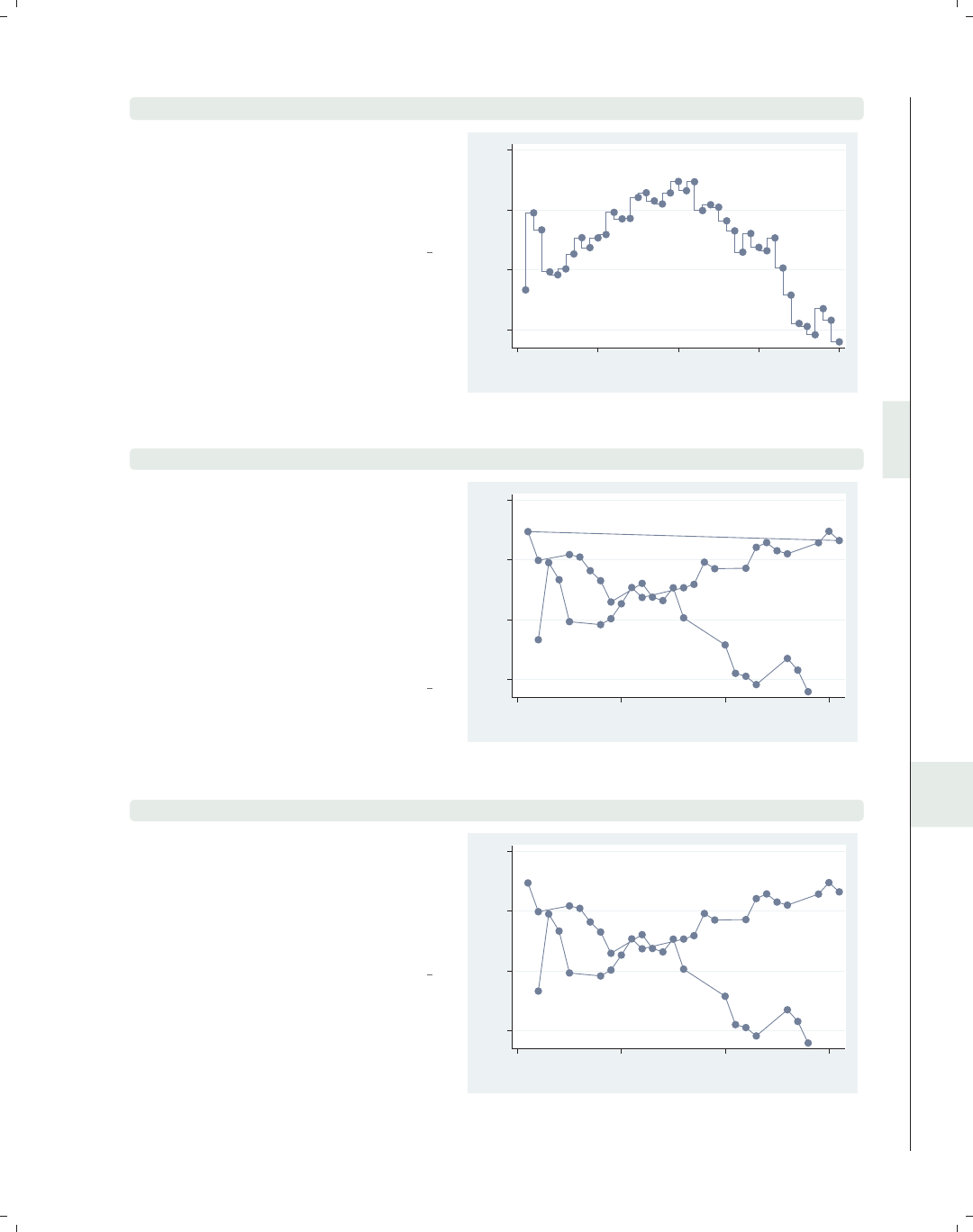
i
i
i
i
i
i
i
i
10.5 Connecting points 335
scatter close tradeday, connect(stepstair) sort
In other contexts, we might want to
connect points using a stepstair
pattern. Here, we connect the observed
closing prices with the stepstair
option to get a stepstair effect.
Uses spjanfeb2001.dta & scheme vg s2c
1250 1300 1350 1400
Closing price
0 10 20 30 40
Trading day number
scatter close dom, connect(l) sort(date)
Say that we created a variable called
dom that represented the day of month
and wanted to graph the closing prices
for January and February against the
day of the month. Using the
sort(date) option combined with
connect(l), we almost get what we
want, but we get a line that swoops
back connecting January 31 to Feb 1.
Uses spjanfeb2001.dta & scheme vg s2c
1250 1300 1350 1400
Closing price
0 10 20 30
Day of month
scatter close dom, connect(L) sort(date)
This kind of example calls for the
connect(L) option, which avoids the
line that swoops back by connecting
points with a straight line, except when
the x-value (dom) decreases (e.g., goes
from 31 to 1).
Uses spjanfeb2001.dta & scheme vg s2c
1250 1300 1350 1400
Closing price
0 10 20 30
Day of month
Introduction Twoway Matrix Bar Box Dot Pie Options Standard options Styles Appendix
Angles Colors Clockpos Compassdir Connect Linepatterns Linewidth Margins Markersize Orientation Symbols Textsize
The electronic form of this book is solely for direct use at UCLA and only by faculty, students, and staff of UCLA.
All rights reserved on the copyright page apply to this document and specifically neither the electronic nor
published form of the book may be distributed or reproduced, either electronically or in printed form.
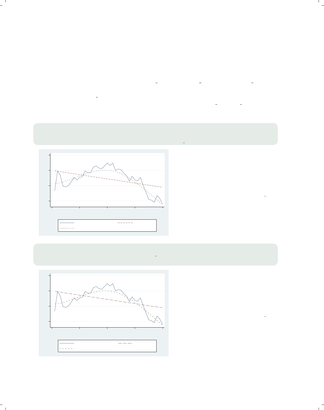
i
i
i
i
i
i
i
i
336 Chapter 10. Styles for changing the look of graphs
10.6 Line patterns
We can specify the pattern we want for a line in three ways. We can specify a word that
selects among a set of predefined styles, including solid (solid line), dash (a dashed line),
dot (a dotted line), shortdash (short dashes), longdash (long dashes), and blank (invisi-
ble). There are also combination styles dash dot,shortdash dot,andlongdash dot.We
can also use a formula that combines the following five elements in any way that we wish:
l(letter l, solid line), (underscore, long dash), -(hyphen, medium dash), .(period, short
dash), and #(small amount of space). We could specify longdash dot or ".", and they
would be equivalent. See [G]linepatternstyle for more information.
twoway (line close tradeday, clpattern(solid) sort)
(lfit close tradeday, clpattern(dash))
(lowess close tradeday, clpattern(shortdash dot))
1250 1300 1350 1400
0 10 20 30 40
Trading day number
Closing price Fitted values
lowess close tradeday
In this example, we make a line plot
and use the clpattern() (connect line
pattern) option to obtain a solid
pattern for the observed data, a dash
for the linear fit line, and a short dash
and dot line for a lowess fit.
Uses spjanfeb2001.dta & scheme vg s2c
twoway (line close tradeday, clpattern("l") sort)
(lfit close tradeday, clpattern(". "))
(lowess close tradeday, clpattern("-###"))
1250 1300 1350 1400
0 10 20 30 40
Trading day number
Closing price Fitted values
lowess close tradeday
We can use the clpattern() option
specifying a formula to indicate the
pattern for the lines. Here, we specify a
solid line for the line plot, a dot and
dash for the lfit plot, and a dash and
three spaces for the lowess fit.
Uses spjanfeb2001.dta & scheme vg s2c
The electronic form of this book is solely for direct use at UCLA and only by faculty, students, and staff of UCLA.
All rights reserved on the copyright page apply to this document and specifically neither the electronic nor
published form of the book may be distributed or reproduced, either electronically or in printed form.
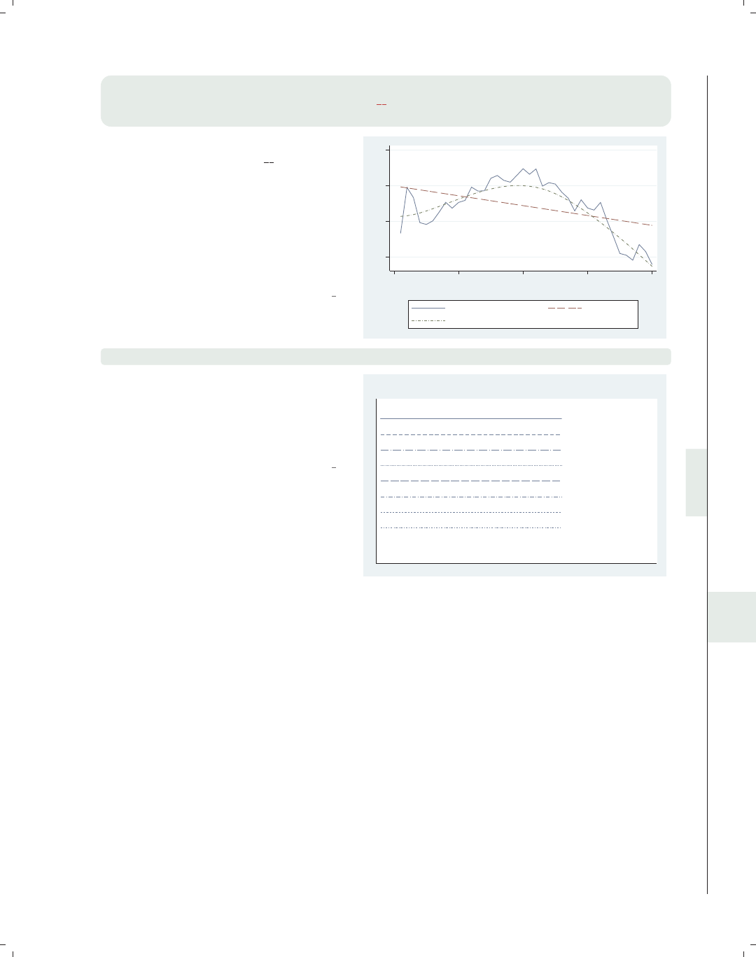
i
i
i
i
i
i
i
i
10.7 Line width 337
twoway (line close tradeday, clpattern("l") sort)
(lfit close tradeday, clpattern("##"))
(lowess close tradeday, clpattern("-.#"))
This example shows other formulas we
could create, including "##",which
yields long dashes with short and then
long breaks in the middle, and "-.#",
which yields a short dash, a dot, and a
space. Using these formulas, we can
create a wide variety of line patterns for
those instances where we need to
differentiate multiple lines.
Uses spjanfeb2001.dta & scheme vg s2c
1250 1300 1350 1400
0 10 20 30 40
Trading day number
Closing price Fitted values
lowess close tradeday
palette linepalette
We can use the built-in Stata command
palette linepalette to view a
variety of line patterns that are
available within Stata to help us choose
a pattern to our liking.
Uses spjanfeb2001.dta & scheme vg s2c
solid
dash
longdash_dot
dot
longdash
dash_dot
shortdash
shortdash_dot
blank
Line pattern palette
10.7 Line width
We can indicate the width of a line in two ways. We can indicate a linewidthstyle,
which allows us to use a word to specify the width of a line, including none (no width,
invisible), vvthin,vthin,thin,medthin,medium,medthick,thick,vthick,vvthick,and
even vvvthick. We can also specify a relativesize, which is a multiple of the line’s normal
thickness (e.g., *2 is twice as thick, or *.7 is .7 times as thick). See [G]linewidthstyle for
more information.
Introduction Twoway Matrix Bar Box Dot Pie Options Standard options Styles Appendix
Angles Colors Clockpos Compassdir Connect Linepatterns Linewidth Margins Markersize Orientation Symbols Textsize
The electronic form of this book is solely for direct use at UCLA and only by faculty, students, and staff of UCLA.
All rights reserved on the copyright page apply to this document and specifically neither the electronic nor
published form of the book may be distributed or reproduced, either electronically or in printed form.
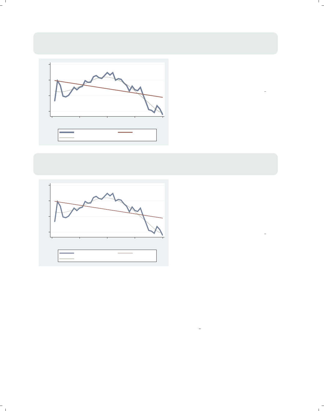
i
i
i
i
i
i
i
i
338 Chapter 10. Styles for changing the look of graphs
twoway (line close tradeday, clwidth(vthick) sort)
(lfit close tradeday, clwidth(thick))
(lowess close tradeday, bwidth(.5) clwidth(thin))
1250 1300 1350 1400
0 10 20 30 40
Trading day number
Closing price Fitted values
lowess close tradeday
Now, we plot the same three lines but
this time differentiate them by line
thickness using the clwidth() (connect
line width) option.
Uses spjanfeb2001.dta & scheme vg s2c
twoway (line close tradeday, clwidth(*4) sort)
(lfit close tradeday, clwidth(*2))
(lowess close tradeday, bwidth(.5) clwidth(*.5))
1250 1300 1350 1400
0 10 20 30 40
Trading day number
Closing price Fitted values
lowess close tradeday
We could create a similar graph using
the clwidth() option and specify the
widths as relative sizes, making the line
four times as wide for the line plot,
two times as wide for the lfit
command, and half as wide for the line
for the lowess command.
Uses spjanfeb2001.dta & scheme vg s2c
10.8 Margins
We can specify the size of a margin in three different ways. We can use a word that rep-
resents a predefined margin. These include zero,vtiny,tiny,vsmall,small,medsmall,
medium,medlarge,large,andvlarge. They also include top bottom to indicate a medium
margin at the top and bottom, and sides to indicate a medium margin at the left and right.
A second method is to give four numbers giving the margins at the left, right, top, and bot-
tom. A third method is to use expressions such as b=5 to modify one or more of the margins.
These are illustrated below. See [G]marginstyle for more information.
The electronic form of this book is solely for direct use at UCLA and only by faculty, students, and staff of UCLA.
All rights reserved on the copyright page apply to this document and specifically neither the electronic nor
published form of the book may be distributed or reproduced, either electronically or in printed form.
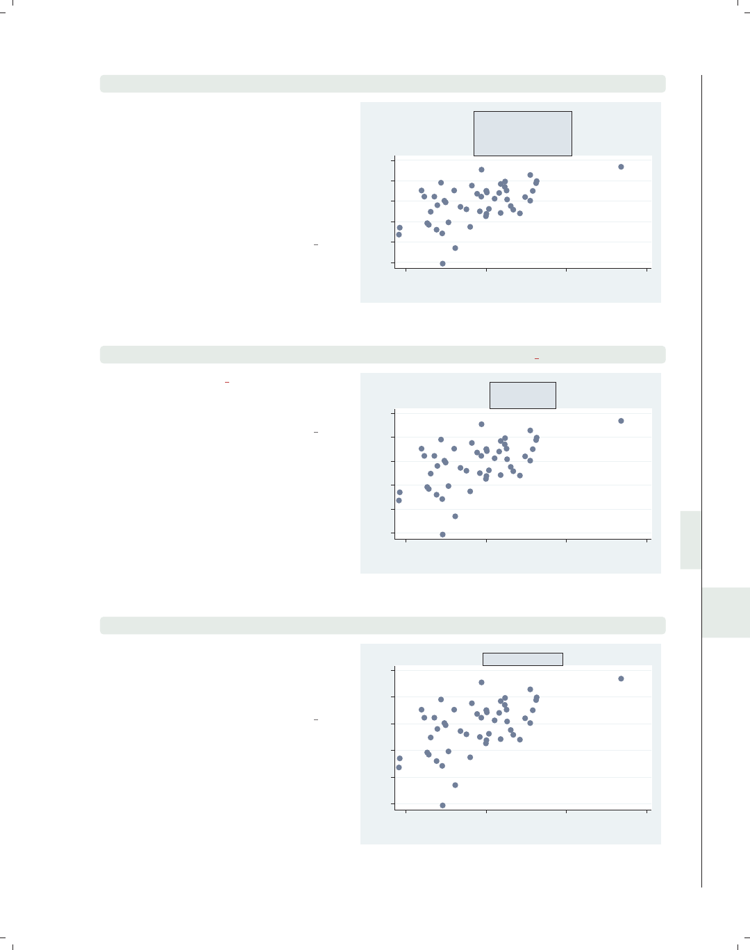
i
i
i
i
i
i
i
i
10.8 Margins 339
scatter workers2 faminc, title("Overall title", margin(large) box)
We illustrate the control of margins by
adding a title to this scatterplot and
putting a box around it. We can then
see the effect of the margin() option:
the gap between the title and the box
changes. Here, we specify a large
margin, and the margin on all four
sides is now large.
Uses allstatesdc.dta & scheme vg s2c
45 50 55 60 65 70
% HHs with 2+ workers
15000 20000 25000 30000
1979 Median Family Inc.
Overall title
scatter workers2 faminc, title("Overall title", margin(top bottom) box)
Using margin(top bottom), we obtain
a margin that is medium on the top and
bottom but zero on the left and right.
Uses allstatesdc.dta & scheme vg s2c
45 50 55 60 65 70
% HHs with 2+ workers
15000 20000 25000 30000
1979 Median Family Inc.
Overall title
scatter workers2 faminc, title("Overall title", margin(sides) box)
Using the margin(sides) option, we
obtain a margin that is medium on the
left and right but zero on the top and
bottom.
Uses allstatesdc.dta & scheme vg s2c
45 50 55 60 65 70
% HHs with 2+ workers
15000 20000 25000 30000
1979 Median Family Inc.
Overall title
Introduction Twoway Matrix Bar Box Dot Pie Options Standard options Styles Appendix
Angles Colors Clockpos Compassdir Connect Linepatterns Linewidth Margins Markersize Orientation Symbols Textsize
The electronic form of this book is solely for direct use at UCLA and only by faculty, students, and staff of UCLA.
All rights reserved on the copyright page apply to this document and specifically neither the electronic nor
published form of the book may be distributed or reproduced, either electronically or in printed form.
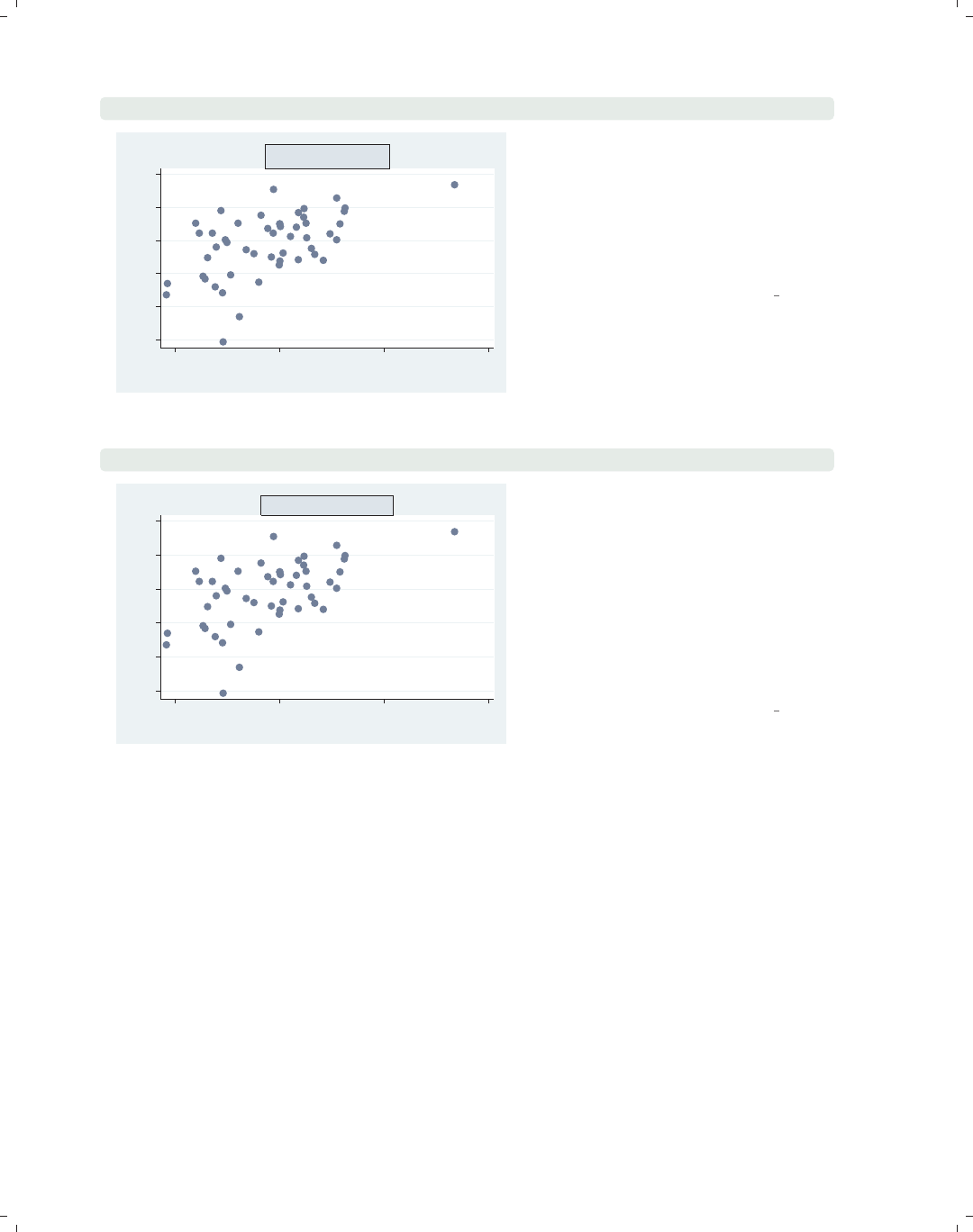
i
i
i
i
i
i
i
i
340 Chapter 10. Styles for changing the look of graphs
scatter workers2 faminc, title("Overall title", margin(9 6 3 0) box)
45 50 55 60 65 70
% HHs with 2+ workers
15000 20000 25000 30000
1979 Median Family Inc.
Overall title In addition to the words describing
margins, we can manually specify the
margin for the left, right, bottom, and
top. In this example, we specify
margin(9 6 3 0) and make the margin
for the left 9, for the right 6, for the
bottom 3, and for the top 0.
Uses allstatesdc.dta & scheme vg s2c
scatter workers2 faminc, title("Overall title", margin(l=9 r=9) box)
45 50 55 60 65 70
% HHs with 2+ workers
15000 20000 25000 30000
1979 Median Family Inc.
Overall title We can also manually change some of
the margins without specifying all four
margins (as in the previous example).
By specifying margin(l=9 r=9),we
can make the margin at the left and
right 9 units, leaving the top and
bottom unchanged. We can specify one
or more of the expressions l=,r=,t=,
or b= to modify the left, right, top, or
bottom margins, respectively.
Uses allstatesdc.dta & scheme vg s2c
10.9 Marker size
We can control the size of the markers by specifying a markersizestyle or a relativesize.
The markersizestyle is a word that describes the size of a marker, including vtiny,tiny,
vsmall,small,medsmall,medium,medlarge,large,vlarge,huge,vhuge,andehuge.We
could also specify the sizes as a relativesize, which is either an absolute size or a multiple
of the original size of the marker (e.g., *2 is twice as large, or *.7 is .7 times as large). See
[G]markersizestyle for more information.
The electronic form of this book is solely for direct use at UCLA and only by faculty, students, and staff of UCLA.
All rights reserved on the copyright page apply to this document and specifically neither the electronic nor
published form of the book may be distributed or reproduced, either electronically or in printed form.
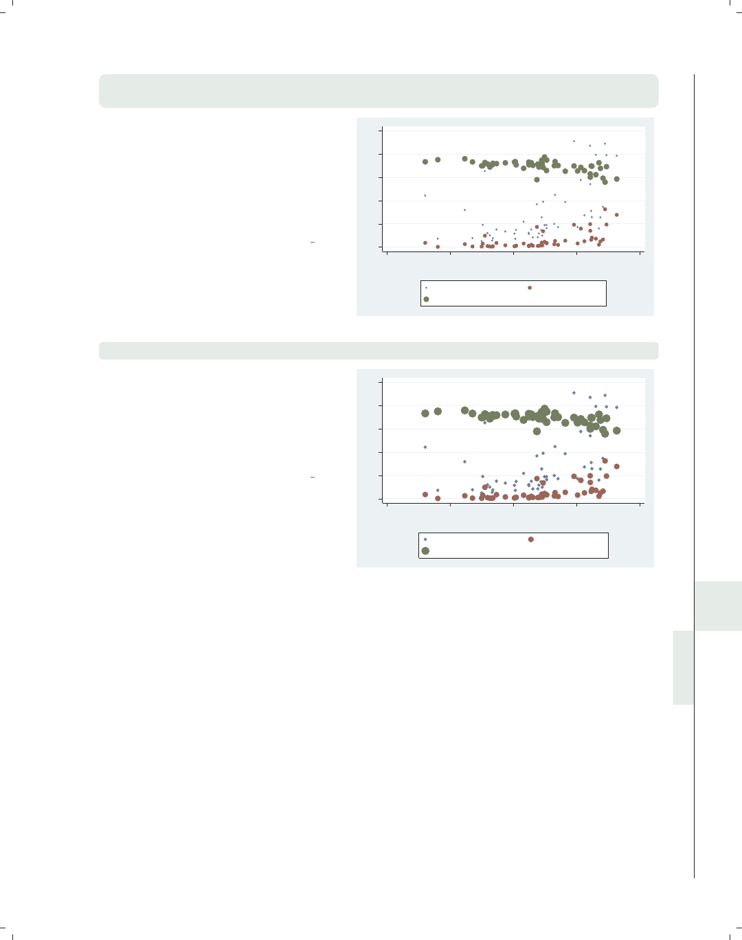
i
i
i
i
i
i
i
i
10.10 Orientation 341
twoway (scatter propval100 rent700 ownhome urban,
msize(vsmall medium large))
Here, we have an overlaid scatterplot
where we graph three variables on the
y-axis (propval100,rent700,and
ownhome) and use the msize(vsmall
medium large) option to make the
sizes of these markers very small,
medium, and large, respectively.
Uses allstatesdc.dta & scheme vg s2c
0 20 40 60 80 100
20 40 60 80 100
Percent urban 1990
% homes cost $100K+ % rents $700+/mo
% who own home
twoway (scatter propval100 rent700 ownhome urban, msize(*.5 *1 *1.5))
We can repeat the previous graph but
use relative sizes within the msize()
option to control the sizes of the
markers, making them, respectively,
half the normal size, regular size, and
half again the normal size.
Uses allstatesdc.dta & scheme vg s2c
0 20 40 60 80 100
20 40 60 80 100
Percent urban 1990
% homes cost $100K+ % rents $700+/mo
% who own home
10.10 Orientation
An orientationstyle is used to change the orientation of text, such as a y-axis title, an
x-axis title, or added text. An orientationstyle is similar to an anglestyle (see Styles : Angles
(327)). We can only specify four different orientations using the keywords horizontal for
0 degrees, vertical for 90 degrees, rhorizontal for 180 degrees, and rvertical for 270
degrees. See [G]orientationstyle for more information.
Introduction Twoway Matrix Bar Box Dot Pie Options Standard options Styles Appendix
Angles Colors Clockpos Compassdir Connect Linepatterns Linewidth Margins Markersize Orientation Symbols Textsize
The electronic form of this book is solely for direct use at UCLA and only by faculty, students, and staff of UCLA.
All rights reserved on the copyright page apply to this document and specifically neither the electronic nor
published form of the book may be distributed or reproduced, either electronically or in printed form.
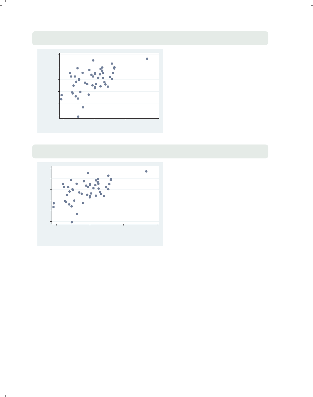
i
i
i
i
i
i
i
i
342 Chapter 10. Styles for changing the look of graphs
scatter workers2 faminc,
ytitle("Family" "Worker" "Status", orientation(horizontal))
45 50 55 60 65 70
Family
Worker
Status
15000 20000 25000 30000
1979 Median Family Inc.
This example shows how we can rotate
the title for the y-axis using the
orientation(horizontal) option to
make the title horizontal.
Uses allstatesdc.dta & scheme vg s2c
scatter workers2 faminc,
xtitle("Family" "Income", orientation(vertical))
45 50 55 60 65 70
% HHs with 2+ workers
15000 20000 25000 30000
Family
Income
This example shows how we can rotate
the title for the x-axis to be vertical
using the orientation(vertical)
option.
Uses allstatesdc.dta & scheme vg s2c
10.11 Marker symbols
Stata allows a wide variety of marker symbols. We can specify O(circle), D(diamond),
T(triangle), S(square), +(plus sign), X(x), p(a tiny point), and i(invisible). We can also
use lowercase letters o,d,t,s,andxto indicate smaller symbols. For circles, diamonds,
triangles, and squares, we can append an hto indicate that the symbol should be displayed
as hollow (e.g., Oh is a hollow circle). See [G]symbolstyle for more information.
The electronic form of this book is solely for direct use at UCLA and only by faculty, students, and staff of UCLA.
All rights reserved on the copyright page apply to this document and specifically neither the electronic nor
published form of the book may be distributed or reproduced, either electronically or in printed form.
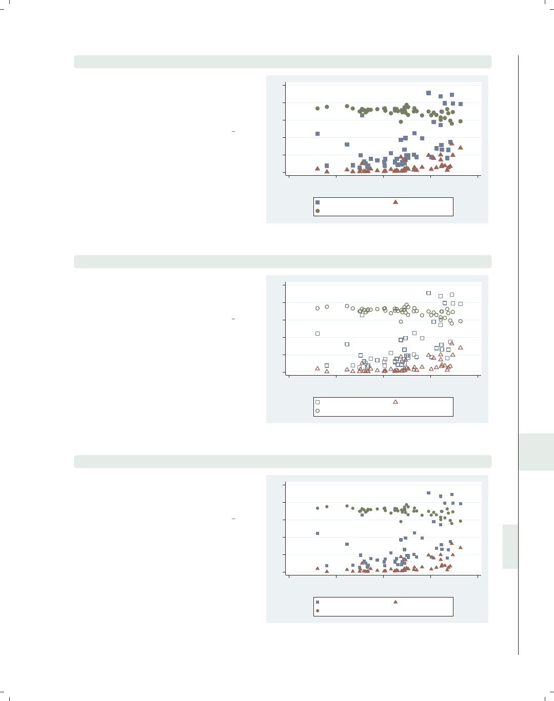
i
i
i
i
i
i
i
i
10.11 Marker symbols 343
twoway (scatter propval100 rent700 ownhome urban, msymbol(S T O))
In this example, we use the msymbol(S
TO)(marker symbol) option to plot
the three symbols in this graph using
squares, triangles, and circles.
Uses allstatesdc.dta & scheme vg s2c
0 20 40 60 80 100
20 40 60 80 100
Percent urban 1990
% homes cost $100K+ % rents $700+/mo
% who own home
twoway (scatter propval100 rent700 ownhome urban, msymbol(Sh Th Oh))
We append an hto each marker symbol
option to indicate that the symbol
should be displayed as hollow.
Uses allstatesdc.dta & scheme vg s2c
0 20 40 60 80 100
20 40 60 80 100
Percent urban 1990
% homes cost $100K+ % rents $700+/mo
% who own home
twoway (scatter propval100 rent700 ownhome urban, msymbol(s t o))
In this example, we use the msymbol(s
to)option to specify small squares,
small triangles, and small circles.
Uses allstatesdc.dta & scheme vg s2c
0 20 40 60 80 100
20 40 60 80 100
Percent urban 1990
% homes cost $100K+ % rents $700+/mo
% who own home
Introduction Twoway Matrix Bar Box Dot Pie Options Standard options Styles Appendix
Angles Colors Clockpos Compassdir Connect Linepatterns Linewidth Margins Markersize Orientation Symbols Textsize
The electronic form of this book is solely for direct use at UCLA and only by faculty, students, and staff of UCLA.
All rights reserved on the copyright page apply to this document and specifically neither the electronic nor
published form of the book may be distributed or reproduced, either electronically or in printed form.
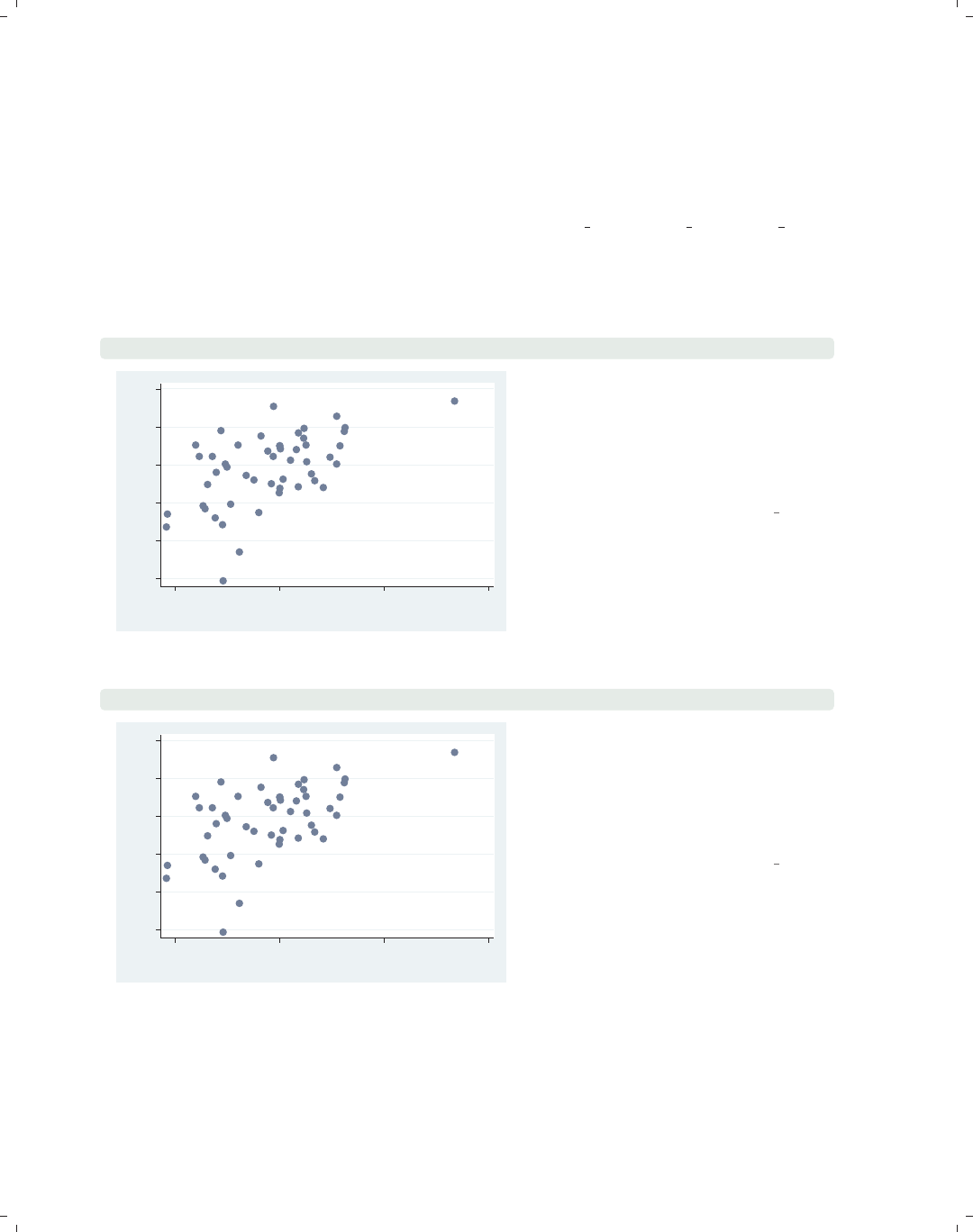
i
i
i
i
i
i
i
i
344 Chapter 10. Styles for changing the look of graphs
10.12 Text size
The textsizestyle is used to control the size of text, either by specifying a keyword
that corresponds to a particular size or by specifying a number representing a relative size.
The predefined keywords include zero,miniscule,quarter tiny,third tiny,half tiny,
tiny,vsmall,small,medsmall,medium,medlarge,large,vlarge,huge,andvhuge.We
could also specify the sizes as a relative size, which is a multiple of the original size of the
text. See [G]textsizestyle for more information.
scatter workers2 faminc, mlabel(stateab) mlabsize(small)
AL
AK
AZ
AR
CA
CO
CT
DE
FL
GA
HI
ID IL
IN
IA
KS
KY
LA
ME
MD
MA
MI
MN
MS
MO
MT
NE
NV
NH
NJ
NM
NY
NC
ND
OH
OK
OR
PA
RI
SC
SD
TN TX
UT
VT
VA
WA
WV
WI
WY
45 50 55 60 65 70
% HHs with 2+ workers
15000 20000 25000 30000
1979 Median Family Inc.
This example uses mlabel(stateab) to
add marker labels with the state
abbreviation labeling each point. We
use the mlabsize(small) (marker label
size) option to modify the size of the
marker labels to make the labels small.
Uses allstatesdc.dta & scheme vg s2c
scatter workers2 faminc, mlabel(stateab) mlabsize(*1.5)
AL
AK
AZ
AR
CA
CO CT
DE
FL
GA
HI
ID IL
IN
IA
KS
KY
LA
ME
MD
MA
MI
MN
MS
MO
MT
NE
NV
NH
NJ
NM
NY
NCND
OH
OK OR
PA
RI
SC
SD
TN TX
UT
VT VA
WA
WV
WI
WY
45 50 55 60 65 70
% HHs with 2+ workers
15000 20000 25000 30000
1979 Median Family Inc.
In addition to using the keywords, we
can specify a relative size that is a
multiple of the normal size. Here, we
use the mlabsize(*1.5) option to
make the marker labels 1.5 times as
large as they would normally be.
Uses allstatesdc.dta & scheme vg s2c
The electronic form of this book is solely for direct use at UCLA and only by faculty, students, and staff of UCLA.
All rights reserved on the copyright page apply to this document and specifically neither the electronic nor
published form of the book may be distributed or reproduced, either electronically or in printed form.
i
i
i
i
i
i
i
i
11 Appendix
The appendix contains a hodgepodge of material that did not fit well in any of the previ-
ous chapters. We begin by illustrating some of the other kinds of graphs Stata can produce
that were not covered in this book and how to use the options illustrated in this book to
make them. Next, we look at how to save graphs, redisplay graphs, and combine multiple
graphs into a single graph. This is followed by a section with more realistic examples that
require a combination of multiple options or data manipulation to create the graph. We
review some common mistakes in writing graph commands and showing how to fix them,
followed by a brief look at creating custom schemes. This chapter and the book conclude
by describing the online supplements to the book and how to get them.
11.1 Overview of statistical graph commands, stat graphs
This section illustrates some of the Stata commands for producing specialized statistical
graphs. Unlike other sections of this book, this section merely illustrates these kinds of
graphs but does not further explain the syntax of the commands used to create them. The
graphs are illustrated on the following six pages, with multiple graphs on each page. The
title of each graph is the name of the Stata command that produced the graph. We can use
the help command to find out more about that command or look up more information in
the appropriate Stata manual. The figures are described below.
•Figure 11.1 illustrates a number of graphs used to examine the univariate distribution
of variables.
•Figure 11.2 illustrates the gladder and qladder commands, which show the dis-
tribution of a variable according to the ladder of powers to help visually identify
transformations for achieving normality.
•Figure 11.3 shows a number of graphs that can be used to assess how your data meets
the assumptions of linear regression.
•Figure 11.4 shows some plots that help to illustrate the results of a survival analysis.
•Figure 11.5 shows a number of different plots used to understand the nature of time-
series data and to select among different time-series models.
•Figure 11.6 shows plots associated with Receiver Operating Characteristic (ROC) anal-
yses, which can also be used with logistic regression analysis.
Introduction Twoway Matrix Bar Box Dot Pie Options Standard options Styles Appendix
Stat graphs Stat graph options Save/Redisplay/Combine More examples Common mistakes Customizing schemes Online supplements
345
The electronic form of this book is solely for direct use at UCLA and only by faculty, students, and staff of UCLA.
All rights reserved on the copyright page apply to this document and specifically neither the electronic nor
published form of the book may be distributed or reproduced, either electronically or in printed form.
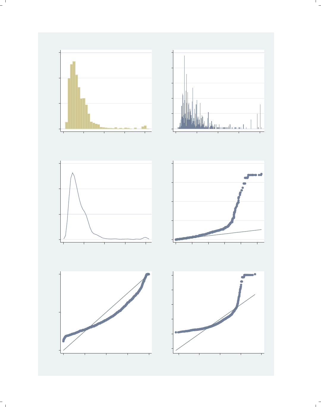
i
i
i
i
i
i
i
i
346 Chapter 11. Appendix
0 .05 .1 .15
Density
0 10 20 30 40
hourly wage
histogram
0 10 20 30 40 50
Frequency
0 10 20 30 40
hourly wage
spikeplot
0 .05 .1 .15
Density
0 10 20 30 40
hourly wage
kdensity
0 10 20 30 40
Distance above median
0 1 2 3 4 5
Distance below median
symplot
0.00 0.50 1.00
Normal F[(wage−m)/s]
0.00 0.25 0.50 0.75 1.00
Empirical P[i] = i/(N+1)
pnorm
−10 0 10 20 30 40
hourly wage
−10 0 10 20 30
Inverse Normal
qnorm
Figure 11.1: Distribution graphs
The electronic form of this book is solely for direct use at UCLA and only by faculty, students, and staff of UCLA.
All rights reserved on the copyright page apply to this document and specifically neither the electronic nor
published form of the book may be distributed or reproduced, either electronically or in printed form.
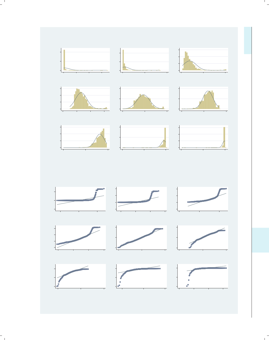
i
i
i
i
i
i
i
i
11.1 Overview of statistical graph commands, stat graphs 347
0 2.0e−044.0e−04
0 20000 40000 60000
cubic
0 .005 .01
0 1000 2000
square
0 .05 .1 .15
0 20 40
identity
0 .2 .4 .6
0 2 4 6
sqrt
0 .5 1
0 2 4
log
0 2 4
−1−.5 0
1/sqrt
0 2 4 6
−1−.5 0
inverse
0 10 20
−1−.5 0
1/square
0 10 20 30
−1−.5 0
1/cubic
Density
hourly wage
Histograms by transformation
gladder
−50000 0 50000
−20000 0 20000
cubic
−1000 0 1000 2000
−500 0 500 1000
square
−20 0 20 40
−20 0 20
identity
0 2 4 6
0 2 4 6
sqrt
0 2 4
0 2 4
log
−1−.5 0
−1−.5 0
1/sqrt
−1−.5 0
−.5 0 .5
inverse
−1−.5 0
−.2 0 .2
1/square
−1−.5 0
−.2 −.1 0 .1
1/cubic
hourly wage
Quantile−Normal plots by transformation
qladder
Figure 11.2: Ladder of power graphs
Introduction Twoway Matrix Bar Box Dot Pie Options Standard options Styles Appendix
Stat graphs Stat graph options Save/Redisplay/Combine More examples Common mistakes Customizing schemes Online supplements
The electronic form of this book is solely for direct use at UCLA and only by faculty, students, and staff of UCLA.
All rights reserved on the copyright page apply to this document and specifically neither the electronic nor
published form of the book may be distributed or reproduced, either electronically or in printed form.
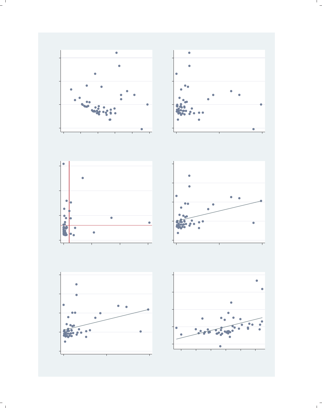
i
i
i
i
i
i
i
i
348 Chapter 11. Appendix
−10 0 10 20
Residuals
−5 0 5 10 15 20
Fitted values
rvfplot
−10 0 10 20
Residuals
0 5000 10000
Pop/10 sq. miles
rvpplot
0 .1 .2 .3
Leverage
0 .1 .2 .3
Normalized residual squared
lvr2plot
−10 0 10 20 30
Component plus residual
0 5000 10000
Pop/10 sq. miles
cprplot
−10 0 10 20 30
Aug Comp Plus Res
0 5000 10000
Pop/10 sq. miles
acprplot
−10 0 10 20 30
e( rent700 | X )
−30 −20 −10 0 10 20
e( urban | X )
coef = .21476037, se = .06342317, t = 3.39
avplot
Figure 11.3: Regression diagnostics graphs
The electronic form of this book is solely for direct use at UCLA and only by faculty, students, and staff of UCLA.
All rights reserved on the copyright page apply to this document and specifically neither the electronic nor
published form of the book may be distributed or reproduced, either electronically or in printed form.
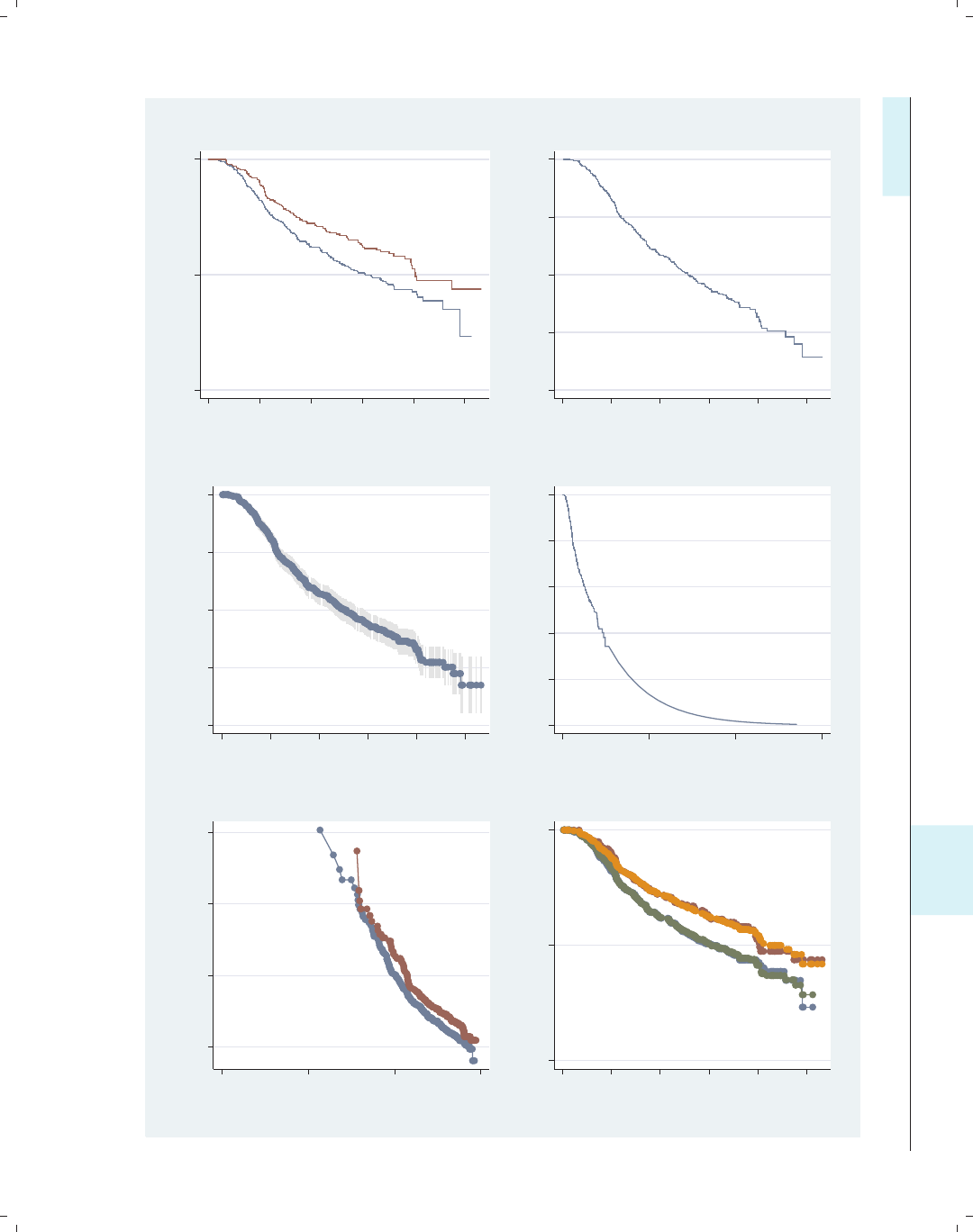
i
i
i
i
i
i
i
i
11.1 Overview of statistical graph commands, stat graphs 349
0.00 0.50 1.00
0 500 1000 1500 2000 2500
analysis time
sts graph, by()
.2 .4 .6 .8 1
Survival
0 500 1000 1500 2000 2500
analysis time
stcurve, surv
.2 .4 .6 .8 1
Proportion Surviving
0 500 1000 1500 2000 2500
recurrence free survival time,
ltable, graph
0 .2 .4 .6 .8 1
Survival probability
0 5000 10000 15000
analysis time
stci, graph
0 2 4 6
−ln[−ln(Survival Probability)]
2 4 6 8
ln(analysis time)
stphplot
0.00 0.50 1.00
Survival Probability
0 500 1000 1500 2000 2500
analysis time
stcoxkm
Figure 11.4: Survival graphs
Introduction Twoway Matrix Bar Box Dot Pie Options Standard options Styles Appendix
Stat graphs Stat graph options Save/Redisplay/Combine More examples Common mistakes Customizing schemes Online supplements
The electronic form of this book is solely for direct use at UCLA and only by faculty, students, and staff of UCLA.
All rights reserved on the copyright page apply to this document and specifically neither the electronic nor
published form of the book may be distributed or reproduced, either electronically or in printed form.
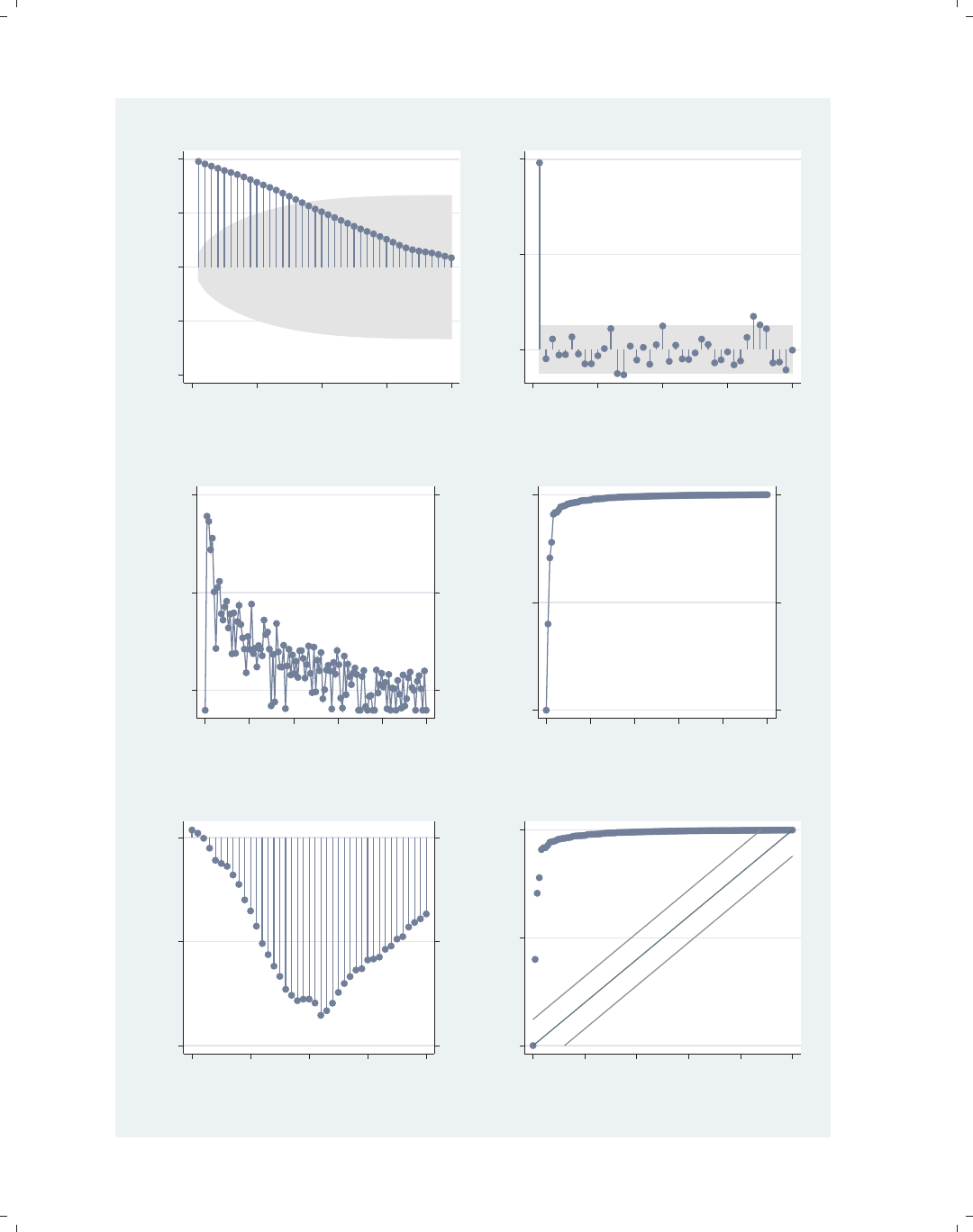
i
i
i
i
i
i
i
i
350 Chapter 11. Appendix
−1.00 −0.50 0.00 0.50 1.00
Autocorrelations of close
0 10 20 30 40
Lag
ac
0.00 0.50 1.00
Partial autocorrelations of close
0 10 20 30 40
Lag
pac
−5.00 0.00 5.00
−5.00 0.00 5.00
Closing price
Log Periodogram
0.00 0.10 0.20 0.30 0.40 0.50
Frequency
pergram
0.00 0.50 1.00
0.00 0.50 1.00
Closing price
Cumulative spectral distribution
0.00 0.10 0.20 0.30 0.40 0.50
Frequency
cumsp
−0.40 −0.20 0.00
−0.40 −0.20 0.00
Cross−correlations of close and volume
−20 −10 0 10 20
Lag
xcorr
0.00 0.50 1.00
Cumulative periodogram for close
0.00 0.10 0.20 0.30 0.40 0.50
Frequency
wntestb
Figure 11.5: Time-series graphs
The electronic form of this book is solely for direct use at UCLA and only by faculty, students, and staff of UCLA.
All rights reserved on the copyright page apply to this document and specifically neither the electronic nor
published form of the book may be distributed or reproduced, either electronically or in printed form.
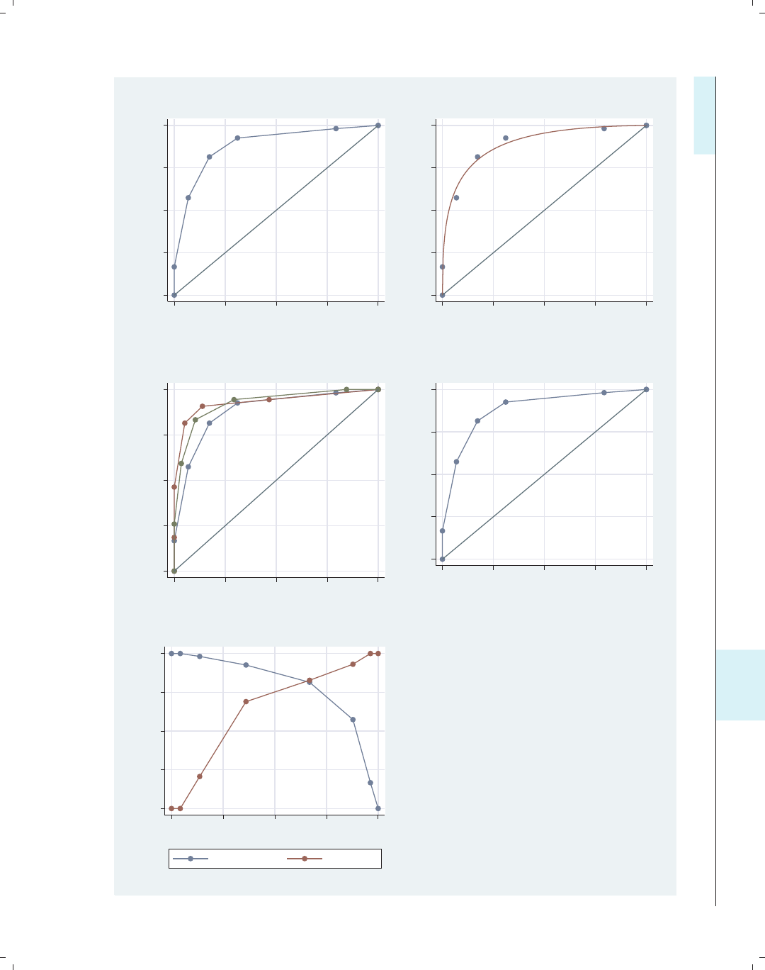
i
i
i
i
i
i
i
i
11.1 Overview of statistical graph commands, stat graphs 351
0.00 0.25 0.50 0.75 1.00
Sensitivity
0.00 0.25 0.50 0.75 1.00
1 − Specificity
Area under ROC curve = 0.8828
roctab, graph
0 .25 .5 .75 1
Sensitivity
0 .25 .5 .75 1
1 − Specificity
Area under curve = 0.8945 se(area) = 0.0305
rocplot
0.00 0.25 0.50 0.75 1.00
Sensitivity
0.00 0.25 0.50 0.75 1.00
1−Specificity
roccomp, graph
0.00 0.25 0.50 0.75 1.00
Sensitivity
0.00 0.25 0.50 0.75 1.00
1 − Specificity
Area under ROC curve = 0.8828
lroc
0.00 0.25 0.50 0.75 1.00
Sensitivity/Specificity
0.00 0.25 0.50 0.75 1.00
Probability cutoff
Sensitivity Specificity
lsens
Figure 11.6: ROC graphs
Introduction Twoway Matrix Bar Box Dot Pie Options Standard options Styles Appendix
Stat graphs Stat graph options Save/Redisplay/Combine More examples Common mistakes Customizing schemes Online supplements
The electronic form of this book is solely for direct use at UCLA and only by faculty, students, and staff of UCLA.
All rights reserved on the copyright page apply to this document and specifically neither the electronic nor
published form of the book may be distributed or reproduced, either electronically or in printed form.
i
i
i
i
i
i
i
i
352 Chapter 11. Appendix
11.2 Common options for statistical graphs, stat graph op-
tions
This section illustrates how to use Stata graph options with specialized statistical graph
commands. Many of the examples will assume that we have run the command
. regress propval100 popden pcturban
and will illustrate subsequent commands with options to customize those specialized statis-
tics graphs.
lvr2plot
0 .1 .2 .3
Leverage
0 .05 .1 .15 .2
Normalized residual squared
Consider this regression analysis, which
predicts propval100 from two
variables, popden and pcturban.We
can use the lvr2plot command to
produce a leverage-versus-residual
squared plot.
Uses allstates.dta & scheme vg s2c
Before running the graph command,
type
reg propval100 popden pcturban
lvr2plot, msymbol(Oh) msize(vlarge)
0 .1 .2 .3
Leverage
0 .05 .1 .15 .2
Normalized residual squared
We can add options such as msymbol()
and msize() to control the display of
the markers in the graph. See
Options : Markers (235) for more details.
Uses allstates.dta & scheme vg s2c
Before running the graph command,
type
reg propval100 popden pcturban
The electronic form of this book is solely for direct use at UCLA and only by faculty, students, and staff of UCLA.
All rights reserved on the copyright page apply to this document and specifically neither the electronic nor
published form of the book may be distributed or reproduced, either electronically or in printed form.
i
i
i
i
i
i
i
i
11.2 Common options for statistical graphs, stat graph options 353
lvr2plot, mlabel(stateab)
We can add the mlabel() option to add
marker labels to the graph. We could
also add further options to control the
size, color, and position of the marker
labels; see Options : Marker labels (247)
for more details.
Uses allstates.dta & scheme vg s2c
Before running the graph command,
type
reg propval100 popden pcturban AL AK
AZ
AR
CA
CO
CT
DE
FL
GA
HI
ID
IL
IN
IA
KS
KY
LA
ME
MD
MA
MI
MN
MS
MO
MT
NE
NV
NH
NJ
NM
NY
NC
ND
OH
OK
OR
PA
RI
SC
SD
TN
TX
UT
VT
VA
WA
WV
WI
WY
0 .1 .2 .3
Leverage
0 .05 .1 .15 .2
Normalized residual squared
kdensity propval100
Consider this kernel-density plot for the
variable propval100. We could add
options to control the display of the
line. See the following example.
Uses allstates.dta & scheme vg s2c
0 .005 .01 .015 .02 .025
Density
0 20 40 60 80 100
% homes cost $100K+
kdensity propval100, clwidth(thick) clpattern(dash)
The section Options : Connecting (250)
shows a number of options we could
add to control the display of the line.
Here, we add the clwidth() and
clpattern() options to make the line
thick and dashed.
Uses allstates.dta & scheme vg s2c
0 .005 .01 .015 .02 .025
Density
0 20 40 60 80 100
% homes cost $100K+
Introduction Twoway Matrix Bar Box Dot Pie Options Standard options Styles Appendix
Stat graphs Stat graph options Save/Redisplay/Combine More examples Common mistakes Customizing schemes Online supplements
The electronic form of this book is solely for direct use at UCLA and only by faculty, students, and staff of UCLA.
All rights reserved on the copyright page apply to this document and specifically neither the electronic nor
published form of the book may be distributed or reproduced, either electronically or in printed form.
i
i
i
i
i
i
i
i
354 Chapter 11. Appendix
avplot popden
−40 −20 0 20 40 60
e( propval100 | X )
−2000 0 2000 4000 6000
e( popden | X )
coef = .00673009, se = .00120878, t = 5.57
Consider this added-variable plot. We
can modify the axis titles as illustrated
in the following examples.
Uses allstates.dta & scheme vg s2c
Before running the graph command,
type
reg propval100 popden pcturban
avplot popden, xtitle("popden adjusted for percent urban")
ytitle("property value adjusted for percent urban")
−40 −20 0 20 40 60
property value adjusted for percent urban
−2000 0 2000 4000 6000
popden adjusted for percent urban
coef = .00673009, se = .00120878, t = 5.57
Here, we use the xtitle() and
ytitle() options to change the titles of
the x-andy-axes. See
Options : Axis titles (254) for more
details.
Uses allstates.dta & scheme vg s2c
Before running the graph command,
type
reg propval100 popden pcturban
avplot popden, note("Regression statistics for popden", prefix)
−40 −20 0 20 40 60
e( propval100 | X )
−2000 0 2000 4000 6000
e( popden | X )
Regression statistics for popden
coef = .00673009, se = .00120878, t = 5.57
The prefix option can be used with
the different title options to add a prefix
to an existing title. In the note()
option, for example, we add text before
the existing note. In this way, we add
additional descriptive information to an
existing title, subtitle, note, or caption.
We could also use the suffix option to
add information after an existing title.
Uses allstates.dta & scheme vg s2c
Before running the graph command,
type
reg propval100 popden pcturban
The electronic form of this book is solely for direct use at UCLA and only by faculty, students, and staff of UCLA.
All rights reserved on the copyright page apply to this document and specifically neither the electronic nor
published form of the book may be distributed or reproduced, either electronically or in printed form.
i
i
i
i
i
i
i
i
11.2 Common options for statistical graphs, stat graph options 355
avplot popden, xtitle(, size(huge))
We can modify the look of the existing
title without changing the text. For
example, we add the size(huge)
option to make the existing title huge
in size. See Options : Axis titles (254)
and Options : Textboxes (303) for more
details.
Uses allstates.dta & scheme vg s2c
Before running the graph command,
type
reg propval100 popden pcturban
−40 −20 0 20 40 60
e( propval100 | X )
−2000 0 2000 4000 6000
e( popden | X )
coef = .00673009, se = .00120878, t = 5.57
rvfplot
Consider this residual-versus-fit plot.
We often hope to see an even
distribution of points around zero on
the y-axis. To help evaluate this
distribution, we might want to label the
y-axis identically for the values above 0
and below 0.
Uses allstates.dta & scheme vg s2c
Before running the graph command,
type
reg propval100 popden pcturban
−20 0 20 40 60
Residuals
0 20 40 60 80 100
Fitted values
rvfplot, ylabel(-60(20)60, nogrid) yline(-20 20)
Here, we add the ylabel() option to
label the y-axis from −60 to 60,
incrementing by 20, and suppress the
grid. Further, we use the yline()
option to add a y-lineat20and−20.
For more information about labeling
and scaling axes, see Options : Axis labels
(256) and Options : Axis scales (265).
Uses allstates.dta & scheme vg s2c
Before running the graph command,
type
reg propval100 popden pcturban
−60 −40 −20 0 20 40 60
Residuals
0 20 40 60 80 100
Fitted values
Introduction Twoway Matrix Bar Box Dot Pie Options Standard options Styles Appendix
Stat graphs Stat graph options Save/Redisplay/Combine More examples Common mistakes Customizing schemes Online supplements
The electronic form of this book is solely for direct use at UCLA and only by faculty, students, and staff of UCLA.
All rights reserved on the copyright page apply to this document and specifically neither the electronic nor
published form of the book may be distributed or reproduced, either electronically or in printed form.
i
i
i
i
i
i
i
i
356 Chapter 11. Appendix
sts graph, by(hormon)
0.00 0.25 0.50 0.75 1.00
0 500 1000 1500 2000 2500
analysis time
hormon = 0 hormon = 1
Kaplan−Meier survival estimates, by hormon This graph shows survival-time
estimates broken down by whether one
is in the treatment group or the control
group. The legend specifies the groups,
but we might want to modify the labels
as shown in the next example.
Uses hormone.dta & scheme vg s2c
sts graph, by(hormon) legend(label(1 Control) label(2 Treatment))
0.00 0.25 0.50 0.75 1.00
0 500 1000 1500 2000 2500
analysis time
Control Treatment
Kaplan−Meier survival estimates, by hormon We can use the legend() option to use
different labels within the legend. See
Options : Legend (287) for more details.
Uses hormone.dta & scheme vg s2c
sts graph, by(hormon) legend(off)
text(.5 800 "Control", box) text(.8 1500 "Treatment", box)
Control
Treatment
0.00 0.25 0.50 0.75 1.00
0 500 1000 1500 2000 2500
analysis time
Kaplan−Meier survival estimates, by hormon To suppress the display of the legend,
we can use the legend(off) option.
Instead, we can use the text() option
to add text directly to the graph to
label the two lines; see
Options : Adding text (299) for more
information. We also use the box
option to surround the text with a box;
see Options : Textboxes (303) for more
details.
Uses hormone.dta & scheme vg s2c
The electronic form of this book is solely for direct use at UCLA and only by faculty, students, and staff of UCLA.
All rights reserved on the copyright page apply to this document and specifically neither the electronic nor
published form of the book may be distributed or reproduced, either electronically or in printed form.
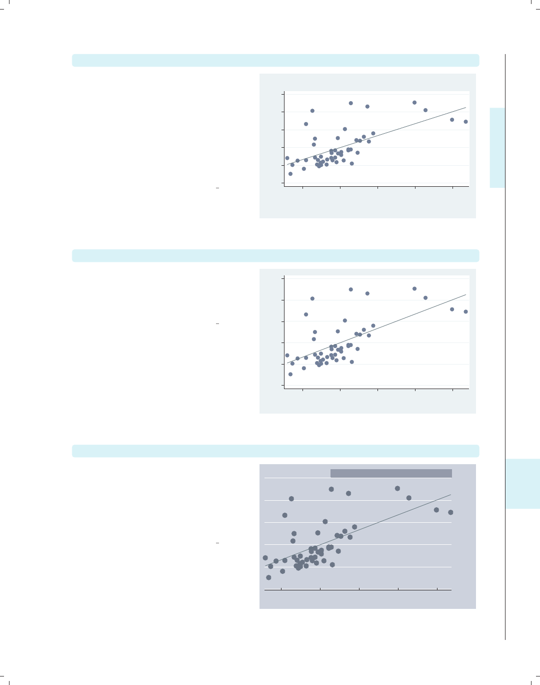
i
i
i
i
i
i
i
i
11.2 Common options for statistical graphs, stat graph options 357
avplot popden, title("Added variable plot")
We return to the regression analysis
predicting propval100 from two
variables, popden and pcturban. Here,
we show an added-variable plot with
the title() option to add a title. We
could also add a subtitle(),
caption(),ornote() to the graph, as
well; see Standard options : Titles (313)
for more details.
Uses allstates.dta & scheme vg s2c
Before running the graph command,
type
reg propval100 popden pcturban
−40 −20 0 20 40 60
e( propval100 | X )
−2000 0 2000 4000 6000
e( popden | X )
coef = .00673009, se = .00120878, t = 5.57
Added variable plot
avplot popden, note("")
Here, we add the note("") option,
which suppresses the display of the note
at the bottom showing the coefficients
for the regression model.
Uses allstates.dta & scheme vg s2c
Before running the graph command,
type
reg propval100 popden pcturban
−40 −20 0 20 40 60
e( propval100 | X )
−2000 0 2000 4000 6000
e( popden | X )
avplot popden, scheme(economist)
We can change the look of the graph by
selecting a different scheme. Here, we
use scheme(economist) to display the
graph using the economist scheme. See
Standard options : Schemes (318) for
more details.
Uses allstates.dta & scheme vg s2c
Before running the graph command,
type
reg propval100 popden pcturban
−40
−20
0
20
40
60
e( propval100 | X )
−2000 0 2000 4000 6000
e( popden | X )
coef = .00673009, se = .00120878, t = 5.57
Introduction Twoway Matrix Bar Box Dot Pie Options Standard options Styles Appendix
Stat graphs Stat graph options Save/Redisplay/Combine More examples Common mistakes Customizing schemes Online supplements
The electronic form of this book is solely for direct use at UCLA and only by faculty, students, and staff of UCLA.
All rights reserved on the copyright page apply to this document and specifically neither the electronic nor
published form of the book may be distributed or reproduced, either electronically or in printed form.
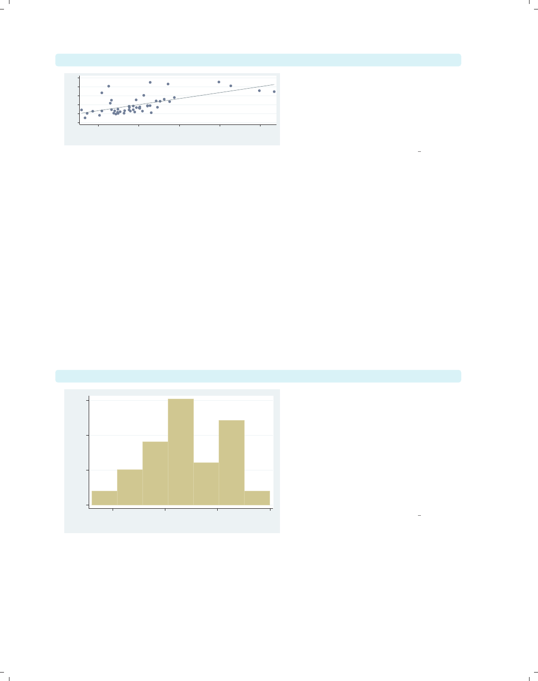
i
i
i
i
i
i
i
i
358 Chapter 11. Appendix
avplot popden, xsize(3) ysize(1) scale(1.3)
−40 −20 0 20 40 60
e( propval100 | X )
−2000 0 2000 4000 6000
e( popden | X )
coef = .00673009, se = .00120878, t = 5.57
The section Standard options : Sizing
graphs (322) describes options we can
use to control the size of the graph and
the scale of the contents of the graph.
Here, we show the xsize(),ysize(),
and scale() options.
Uses allstates.dta & scheme vg s2c
Before running the graph command,
type
reg propval100 popden pcturban
11.3 Saving and combining graphs, save/redisplay/combine
This section shows how to save, redisplay, and combine Stata graphs. We begin by
showing how to save graphs either to disk or in memory. We also show how to redisplay
the graph and, when we redisplay the graph, control the look of the graph.
twoway histogram urban, saving(hist1)
0 .01 .02 .03
Density
40 60 80 100
Percent urban 1990
Most, if not all, Stata graph commands
allow us to use the saving() option to
save the graph as a Stata .gph file. We
save this graph, naming it hist1.gph,
and store it in the current directory.
We will assume in these examples that
all graphs are stored in the current
directory, but we can precede the
filename with a directory name and
store it wherever we wish.
Uses allstates.dta & scheme vg s2c
The electronic form of this book is solely for direct use at UCLA and only by faculty, students, and staff of UCLA.
All rights reserved on the copyright page apply to this document and specifically neither the electronic nor
published form of the book may be distributed or reproduced, either electronically or in printed form.
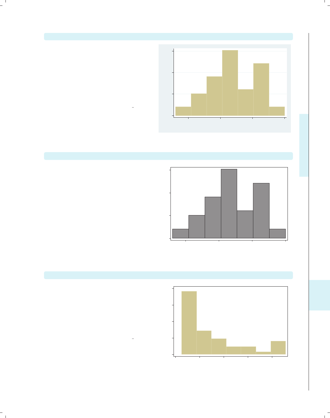
i
i
i
i
i
i
i
i
11.3 Saving and combining graphs, save/redisplay/combine 359
graph use hist1.gph
At a later time (including after quitting
and restarting Stata), we can view the
saved graph with the graph use
command. If hist1.gph had been
stored in a different directory, we would
have to precede it with the directory
where it was saved or use the cd
command to change to that directory.
Uses allstates.dta & scheme vg s2c
0 .01 .02 .03
Density
40 60 80 100
Percent urban 1990
graph use hist1.gph, scheme(s1mono)
When we view the graph, we can add
the scheme() option to view the same
graph using a different scheme. Here,
we view the last graph but use the
s1mono scheme.
Uses allstates.dta & scheme s1mono
0 .01 .02 .03
Density
40 60 80 100
Percent urban 1990
twoway histogram propval100, name(hist2)
The name() option is much like the
saving() option, except that the graph
is saved in memory instead of on disk.
We can then view the graph later
within the same Stata session, but once
we quit Stata, the graph in memory
will be gone.
Uses allstates.dta & scheme vg s1c
0 .01 .02 .03 .04
Density
0 20 40 60 80
% homes cost $100K+
Introduction Twoway Matrix Bar Box Dot Pie Options Standard options Styles Appendix
Stat graphs Stat graph options Save/Redisplay/Combine More examples Common mistakes Customizing schemes Online supplements
The electronic form of this book is solely for direct use at UCLA and only by faculty, students, and staff of UCLA.
All rights reserved on the copyright page apply to this document and specifically neither the electronic nor
published form of the book may be distributed or reproduced, either electronically or in printed form.
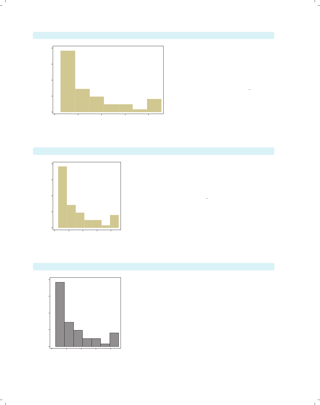
i
i
i
i
i
i
i
i
360 Chapter 11. Appendix
graph display hist2
0 .01 .02 .03 .04
Density
0 20 40 60 80
% homes cost $100K+
The graph display command is
similar to the graph use command,
except that it redisplays graphs saved
in memory. Here, we redisplay the
graph we created with the name(hist2)
option.
Uses allstates.dta & scheme vg s1c
graph display hist2, xsize(2) ysize(2)
0 .01 .02 .03 .04
Density
0 20 40 60 80
% homes cost $100K+
The graph display command allows us to use the
xsize() and ysize() options to change the size and
aspect ratio of the graph. Here, we redisplay the graph
we named hist2 and make the graph 2 inches tall by 2
inches wide.
Uses allstates.dta & scheme vg s1c
graph display hist2, scheme(s1mono)
0 .01 .02 .03 .04
Density
0 20 40 60 80
% homes cost $100K+
We can also use the scheme() option to view the same
graph using a different scheme. Here, we view the
previous graph but use the s1mono scheme.
Uses allstates.dta & scheme s1mono
The electronic form of this book is solely for direct use at UCLA and only by faculty, students, and staff of UCLA.
All rights reserved on the copyright page apply to this document and specifically neither the electronic nor
published form of the book may be distributed or reproduced, either electronically or in printed form.

i
i
i
i
i
i
i
i
11.3 Saving and combining graphs, save/redisplay/combine 361
Let’s look at some examples to show how to combine graphs once they have been cre-
ated and saved. First, we will see how to show two scatterplots side by side rather than
overlaying them.
twoway scatter propval100 urban, name(scat1)
Using the name(scat1) option saves
this scatterplot in memory with the
name scat1.
Uses allstates.dta & scheme vg s2c
0 20 40 60 80 100
% homes cost $100K+
20 40 60 80 100
Percent urban 1990
twoway scatter rent700 urban, name(scat2)
We save this second scatterplot with
the name scat2.
Uses allstates.dta & scheme vg s2c
0 10 20 30 40
% rents $700+/mo
20 40 60 80 100
Percent urban 1990
Introduction Twoway Matrix Bar Box Dot Pie Options Standard options Styles Appendix
Stat graphs Stat graph options Save/Redisplay/Combine More examples Common mistakes Customizing schemes Online supplements
The electronic form of this book is solely for direct use at UCLA and only by faculty, students, and staff of UCLA.
All rights reserved on the copyright page apply to this document and specifically neither the electronic nor
published form of the book may be distributed or reproduced, either electronically or in printed form.
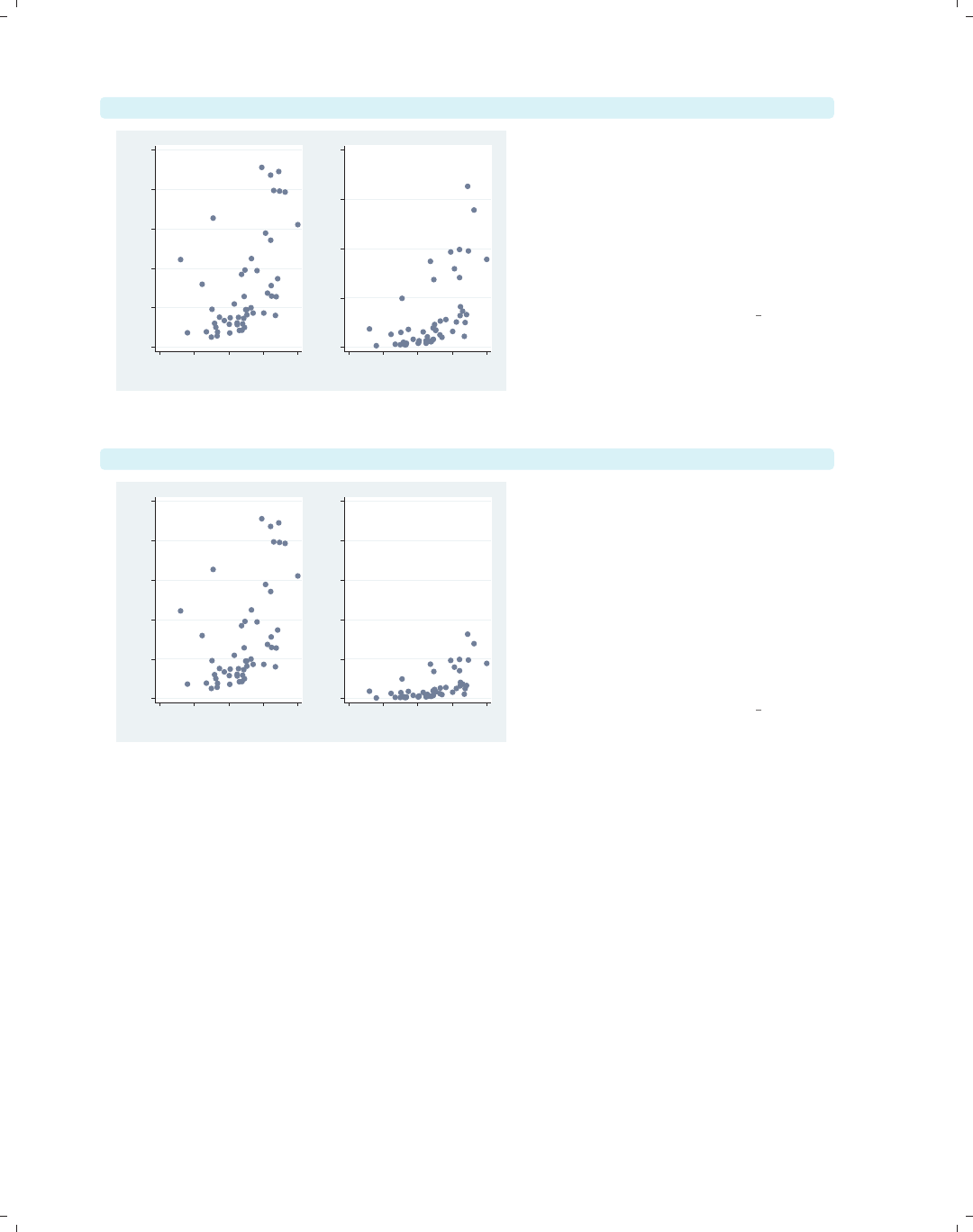
i
i
i
i
i
i
i
i
362 Chapter 11. Appendix
graph combine scat1 scat2
0 20 40 60 80 100
% homes cost $100K+
20 40 60 80 100
Percent urban 1990
0 10 20 30 40
% rents $700+/mo
20 40 60 80 100
Percent urban 1990
Using the graph combine command,
we can see these two scatterplots side
by side. In a sense, the y-axis is on a
different scale for these two graphs
since they are different variables.
However, in another sense, the scale for
the two y-axes is the same since they
are both measured in percents.
Uses allstates.dta & scheme vg s2c
graph combine scat1 scat2, ycommon
0 20 40 60 80 100
% homes cost $100K+
20 40 60 80 100
Percent urban 1990
0 20 40 60 80 100
% rents $700+/mo
20 40 60 80 100
Percent urban 1990
This graph is the same as the last one,
except that the y-axes are placed on a
common scale by using the ycommon
option. This makes it easy to compare
the two y-variables by forcing them to
be on the same metric. Note that the
ycommon option does not work when the
graphs have been made using different
kinds of commands, e.g., graph bar
and graph box.
Uses allstates.dta & scheme vg s2c
Let’s look at more detailed examples showing how we can combine graphs and at options
we can use in creating the graphs. The next set of examples uses the sp2001ts data file.
The electronic form of this book is solely for direct use at UCLA and only by faculty, students, and staff of UCLA.
All rights reserved on the copyright page apply to this document and specifically neither the electronic nor
published form of the book may be distributed or reproduced, either electronically or in printed form.
i
i
i
i
i
i
i
i
11.3 Saving and combining graphs, save/redisplay/combine 363
twoway rarea high low date, name(hilo)
We make a graph showing the high and
low closing price of the S&P 500 for
2001 and save this graph in memory,
naming it hilo.
Uses sp2001ts.dta & scheme vg s2c
900 1000 1100 1200 1300 1400
High price/Low price
1Jan01 1Apr01 1Jul01 1Oct01 1Jan02
Date
twoway spike volmil date, name(vol)
We can make another graph that shows
the volume (millions of shares sold per
day) for 2001 and save this graph in
memory, naming it vol.
Uses sp2001ts.dta & scheme vg s2c
.5 1 1.5 2 2.5
Volume (millions)
1Jan01 1Apr01 1Jul01 1Oct01 1Jan02
Date
graph combine hilo vol
We can now use the graph combine
command to combine these two graphs
into a single graph. The graphs are
displayed as a single row, but say that
we would like to display them in a
single column.
Uses sp2001ts.dta & scheme vg s2c
900 1000 1100 1200 1300 1400
High price/Low price
1Jan01 1Apr01 1Jul01 1Oct01 1Jan02
Date
.5 1 1.5 2 2.5
Volume (millions)
1Jan01 1Apr01 1Jul01 1Oct01 1Jan02
Date
Introduction Twoway Matrix Bar Box Dot Pie Options Standard options Styles Appendix
Stat graphs Stat graph options Save/Redisplay/Combine More examples Common mistakes Customizing schemes Online supplements
The electronic form of this book is solely for direct use at UCLA and only by faculty, students, and staff of UCLA.
All rights reserved on the copyright page apply to this document and specifically neither the electronic nor
published form of the book may be distributed or reproduced, either electronically or in printed form.
i
i
i
i
i
i
i
i
364 Chapter 11. Appendix
graph combine hilo vol, cols(1)
90010001100120013001400
High price/Low price
1Jan01 1Apr01 1Jul01 1Oct01 1Jan02
Date
.5 1 1.5 2 2.5
Volume (millions)
1Jan01 1Apr01 1Jul01 1Oct01 1Jan02
Date
Using the cols(1) option, we can
display the price above the volume.
However, because the x-axes of these
two graphs are scaled the same, we
could save space and remove the x-axis
scale from the top graph.
Uses sp2001ts.dta & scheme vg s2c
twoway rarea high low date, xscale(off) name(hilo, replace)
900 1000 1100 1200 1300 1400
High price/Low price
Here, we use the xscale(off) option
to suppress the display of the x-axis,
including the space that would be
allocated for the labels. We name this
graph hilo again but need to use the
replace option to replace the existing
graph named hilo.
Uses sp2001ts.dta & scheme vg s2c
graph combine hilo vol, cols(1)
900 1000 1100 1200 1300 1400
High price/Low price
.5 1 1.5 2 2.5
Volume (millions)
1Jan01 1Apr01 1Jul01 1Oct01 1Jan02
Date
We combine these two graphs; however,
we might want to push the graphs a bit
closer together.
Uses sp2001ts.dta & scheme vg s2c
The electronic form of this book is solely for direct use at UCLA and only by faculty, students, and staff of UCLA.
All rights reserved on the copyright page apply to this document and specifically neither the electronic nor
published form of the book may be distributed or reproduced, either electronically or in printed form.

i
i
i
i
i
i
i
i
11.3 Saving and combining graphs, save/redisplay/combine 365
graph combine hilo vol, cols(1) imargin(b=1 t=1)
Here, we use the imargin(b=1 t=1)
option to make the margin at the top
and bottom of the graphs to be very
small before combining them. However,
we might want the lower graph of
volume to be smaller.
Uses sp2001ts.dta & scheme vg s2c
900 1000 1100 1200 1300 1400
High price/Low price
.5 1 1.5 2 2.5
Volume (millions)
1Jan01 1Apr01 1Jul01 1Oct01 1Jan02
Date
twoway spike volmil date, ylabel(1 2) fysize(25) name(vol, replace)
Using the fysize() (force ysize)
option makes the graph 25% of its
normal size. We use this instead of
ysize() because the graph combine
command does not respect the ysize()
or xsize() options. For aesthetics, we
also reduce the number of labels. We
save this graph in memory, replacing
the existing graph named vol.
Uses sp2001ts.dta & scheme vg s2c
1 2
Volume (millions)
1Jan01 1Apr01 1Jul01 1Oct01 1Jan02
Date
graph combine hilo vol, cols(1) imargin(b=1 t=1)
We combine these graphs again, and
the combined graph looks pretty good.
We might further tinker with the graph,
changing the xtitle() for the volume
graph to be shorter or modifying the
xlabel() for the volume graph.
Uses sp2001ts.dta & scheme vg s2c
900 1000 1100 1200 1300 1400
High price/Low price
1 2
Volume (millions)
1Jan01 1Apr01 1Jul01 1Oct01 1Jan02
Date
Introduction Twoway Matrix Bar Box Dot Pie Options Standard options Styles Appendix
Stat graphs Stat graph options Save/Redisplay/Combine More examples Common mistakes Customizing schemes Online supplements
The electronic form of this book is solely for direct use at UCLA and only by faculty, students, and staff of UCLA.
All rights reserved on the copyright page apply to this document and specifically neither the electronic nor
published form of the book may be distributed or reproduced, either electronically or in printed form.
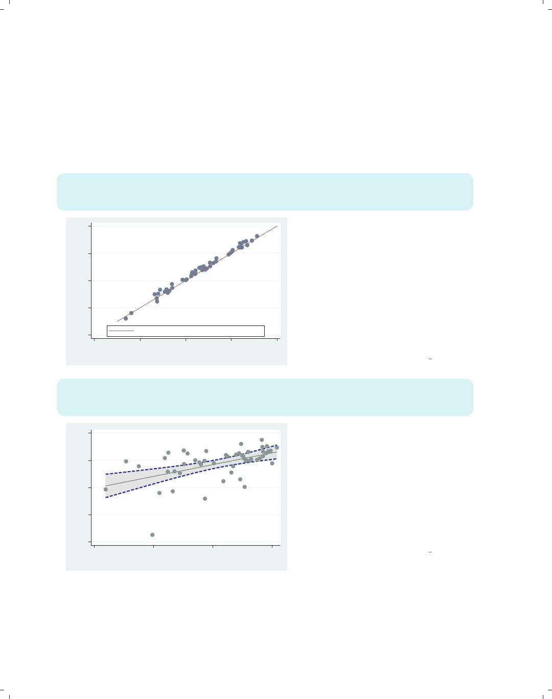
i
i
i
i
i
i
i
i
366 Chapter 11. Appendix
11.4 Putting it all together, more examples
Most of the examples in this book have focused on the impact of a single option or a
small number of options, using datasets that required no manipulation prior to making the
graph. In reality, many graphs use multiple options together, and some require prior data
management. This section addresses this issue by showing some examples that combine
numerous options and require some data manipulation before making the graph.
twoway (scatter urban pcturban80) (function y=x, range(30 100)),
xtitle(Percent Urban 1980) ytitle(Percent Urban 1990)
legend(order(2 "Line where % Urban 1980 = % Urban 1990") pos(6) ring(0))
20 40 60 80 100
Percent Urban 1990
20.0 40.0 60.0 80.0 100.0
Percent Urban 1980
Line where % Urban 1980 = % Urban 1990
This graph shows the percentage of
population living in an urban area of a
state in 1990 against that of 1980. If
there had been no changes from 1980 to
1990, the values would fall along a
45-degree line, where the value of y
equals the value of x.Overlaying
(function y=x),wecanseeany
discrepancies from 1980 to 1990. The
range(30 100) option makes the line
span from 30 to 100 on the x-axis.
Uses allstates.dta & scheme vg s2c
twoway (lfitci ownhome borninstate) (lfitci ownhome borninstate,
ciplot(rline) blcolor(blue) blwidth(thick) blpattern(dash))
(scatter ownhome borninstate), legend(off) ytitle("% Own Home")
40 50 60 70 80
% Own Home
20 40 60 80
% born in state of residence
This example shows how we can make a
scatterplot, a regression line, and a
confidence interval for the fit shown as
an area. We also add a thick, blue,
dashed line showing the upper and
lower confidence limits. The first
lfitci makes the fit line and area; the
second lfitci makes a thick, blue,
dashed outline for the area; and
scatter overlays the scatterplot.
Uses allstates.dta & scheme vg s2c
The electronic form of this book is solely for direct use at UCLA and only by faculty, students, and staff of UCLA.
All rights reserved on the copyright page apply to this document and specifically neither the electronic nor
published form of the book may be distributed or reproduced, either electronically or in printed form.
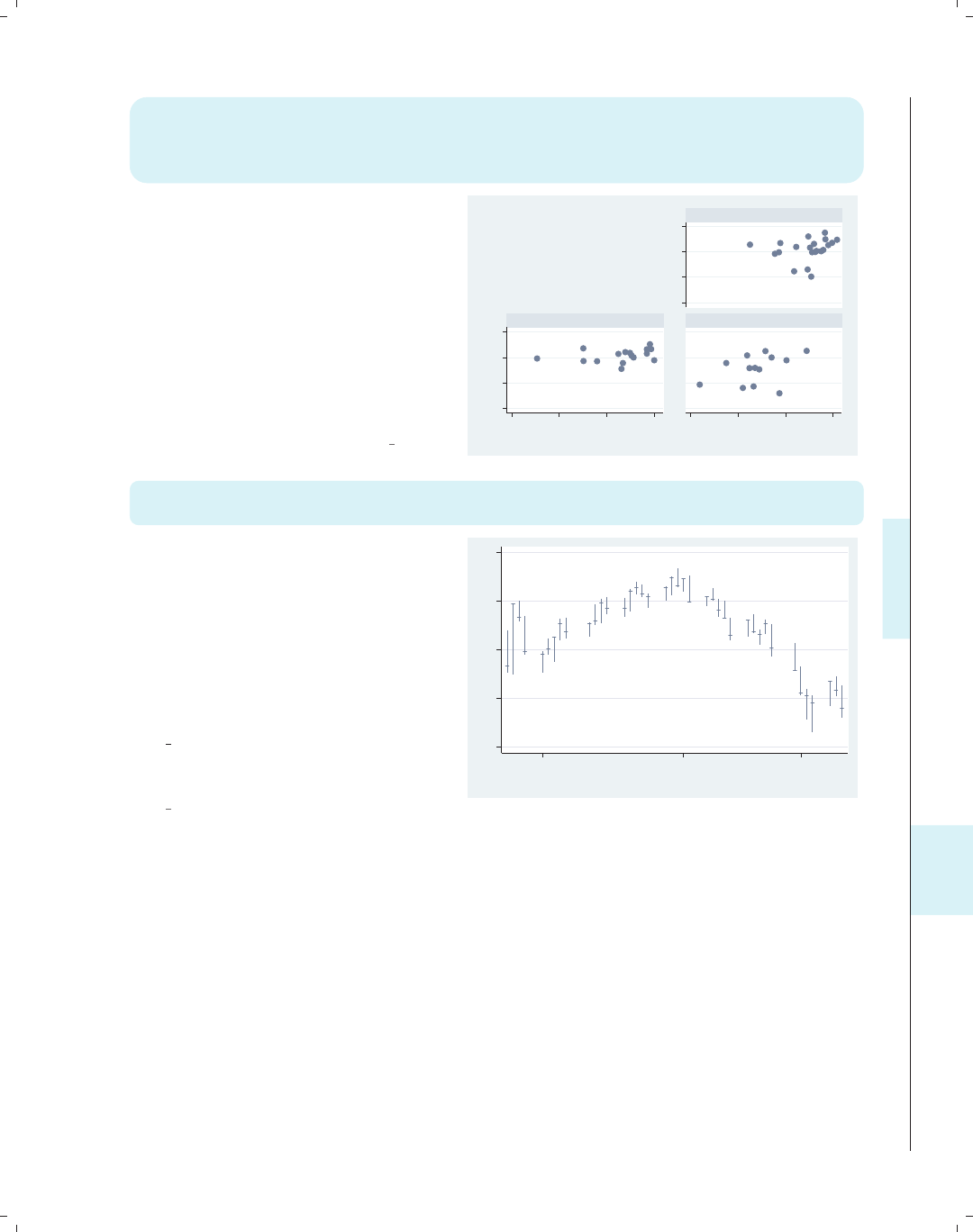
i
i
i
i
i
i
i
i
11.4 Putting it all together, more examples 367
twoway scatter ownhome borninstate,
by(nsw, hole(1) title("%Own home by" "%born in St." "by region",
pos(11) ring(0) width(65) height(35) justification(center)
alignment(middle)) note(""))
The hole(1) option leaves the first
position empty when creating the
graphs, and the title is placed there
using pos(11) and ring(0).Weuse
width() and height() to adjust the
size of the textbox and
justification() and alignment() to
center the textbox horizontally and
vertically. The note("") option
suppresses the note in the bottom
corner of the graph.
Uses allstates.dta & scheme vg s2c
50 60 70 80
50 60 70 80
20 40 60 80 20 40 60 80
North
South West
% who own home
% born in state of residence
%Own home by
%born in St.
by region
twoway (rspike hi low date) (rcap close close date, msize(medsmall)),
tlabel(08jan2001 01feb2001 21feb2001) legend(off)
Before making this high/low/close
graph, we first type tsset date,
daily to tell Stata that date should be
treated as a date in the tlabel()
option. The rcap command uses close
for both the high and the low values,
making the tick line for the closing
price, and the legend(off) option
suppresses the legend. Using the
vg samec scheme makes the spikes and
closes the same color.
Uses spjanfeb2001.dta & scheme
vg samec
1200 1250 1300 1350 1400
08jan2001 01feb2001 21feb2001
Date
Introduction Twoway Matrix Bar Box Dot Pie Options Standard options Styles Appendix
Stat graphs Stat graph options Save/Redisplay/Combine More examples Common mistakes Customizing schemes Online supplements
The electronic form of this book is solely for direct use at UCLA and only by faculty, students, and staff of UCLA.
All rights reserved on the copyright page apply to this document and specifically neither the electronic nor
published form of the book may be distributed or reproduced, either electronically or in printed form.
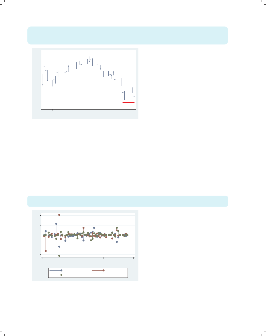
i
i
i
i
i
i
i
i
368 Chapter 11. Appendix
twoway (rspike hi low date) (rcap close close date, msize(medsmall))
(scatteri 1220 15027 1220 15034, recast(line) clwid(vthick) clcol(red)),
tlabel(08jan2001 01feb2001 21feb2001) legend(off)
1200 1250 1300 1350 1400
08jan2001 01feb2001 21feb2001
This example is the same as above,
except that this one uses scatteri() to
draw a support-level line. Two yxpairs
are given after the scatteri, and the
recast(line) option draws them as a
line instead of two points. The x-values
were calculated beforehand using
display d(21feb2001) and
display d(28feb2001) to compute the
elapsed date values.
Uses spjanfeb2001.dta & scheme
vg samec
The rest of the examples in this section involve some data management before we create
the graph. For the next few examples, we use the allstates data file and run a regression
command,
. vguse allstates
. regress ownhome propval100 workers2 popden
and then issue the
. dfbeta
command, creating DFBETAs for each predictor: DFpropval100,DFworkers2,andDFurban,
which are used in the following graph.
twoway dropline DFpropval100 DFworkers2 DFurban statefips,
mlabel(stateab stateab stateab)
AL
AK
AZ
AR
CA
CO
CT
DE
DC
FL
GA
HI
ID
IL
IN
IA
KS
KY
LA
ME
MD
MA
MI
MN
MS
MO
MT
NE
NV
NH
NJ
NM
NY
NC
ND
OH
OK
OR
PA
RI
SC
SD
TN
TX
UT
VT
VA
WA
WV
WI
WY
AL
AK
AZ
AR
CA
CO
CT
DE
DC
FL
GA
HI
ID
IL
IN
IA
KS
KY
LA
ME
MD
MA
MI
MN
MS
MO
MT
NE
NV
NH
NJ
NM
NY
NC
ND
OH
OK
OR
PA
RI
SC
SD
TN
TX
UT
VT
VA
WA
WV
WI
WY
AL
AK
AZ
AR
CA
CO
CT
DE
DC
FL
GA
HI
ID
IL
IN
IA
KS
KY
LA
ME
MD
MA
MI
MN
MS
MO
MT
NE
NV
NH
NJ
NM
NY
NC
ND
OH
OK
OR
PA
RI
SC
SD
TN
TX
UT
VT
VA
WA
WV
WI
WY
−1−.5 0 .5 1
0 20 40 60
state code
Dfbeta propval100 Dfbeta workers2
Dfbeta urban
In this example, we show each of the
DFBETAsasadropline plot. We add
the mlabel() option to label each point
with the state abbreviation.
Uses allstates.dta & scheme vg s2c
The electronic form of this book is solely for direct use at UCLA and only by faculty, students, and staff of UCLA.
All rights reserved on the copyright page apply to this document and specifically neither the electronic nor
published form of the book may be distributed or reproduced, either electronically or in printed form.
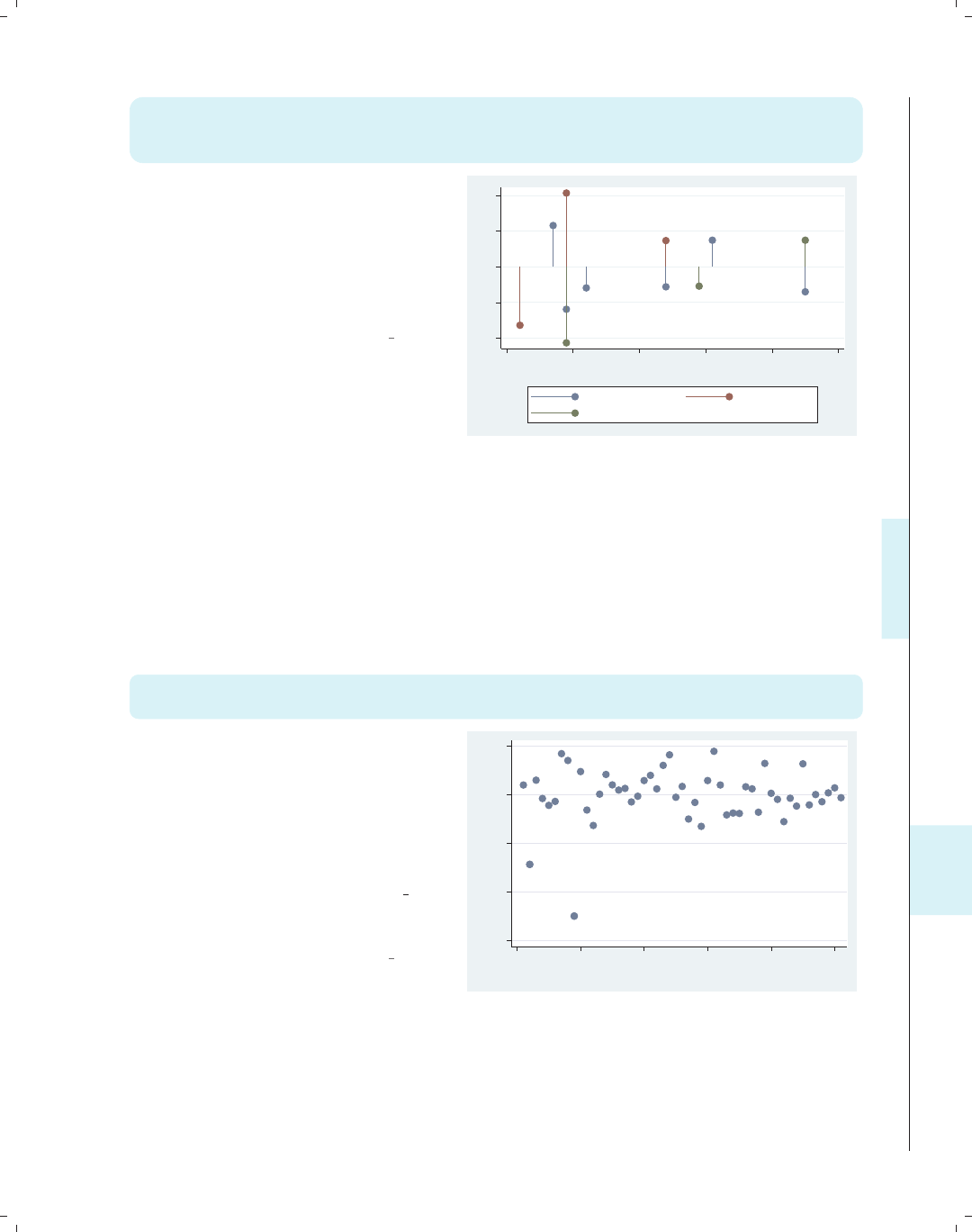
i
i
i
i
i
i
i
i
11.4 Putting it all together, more examples 369
twoway (dropline DFpropval100 id if abs(DFpropval100)>.25, mlabel(stateab))
(dropline DFworkers2 id if abs(DFworkers2)>.25, mlabel(stateab))
(dropline DFurban id if abs(DFurban)>.25, mlabel(stateab))
This example is similar to the one above
but simplifies the graph by showing
only the points where the DFBETA
exceeds .25. Note that we have taken
the example from above and converted
it into three overlaid dropline plots,
each of which has an if condition.
Uses allstates.dta & scheme vg s2c
CT
DC
HI MN
NJ
UT
AK
DC
MN
DC
NV
UT
−1−.5 0 .5 1
0 10 20 30 40 50
id
Dfbeta propval100 Dfbeta workers2
Dfbeta urban
Before making the next graph, we need to issue three predict commands to generate
variables that contain the Cook’s distance, the studentized residual, and the leverage based
on the previous regression command:
. predict cd, cook
. predict rs, rstudent
. predict l, leverage
We are then ready to run the next graph.
twoway (scatter rs id) (scatter rs id if abs(rs) > 2, mlabel(stateab)),
legend(off)
This graph uses scatter rs id to
make an index plot of the studentized
residuals. It also overlays a second
scatter command with an if
condition showing only studentized
residuals that have an absolute value
exceeding 2 and showing the labels for
those observations. Using the vg samec
scheme makes the markers the same for
both scatter commands.
Uses allstates.dta & scheme vg samec
AK
DC
−6−4−2 0 2
Studentized residuals
0 10 20 30 40 50
id
Introduction Twoway Matrix Bar Box Dot Pie Options Standard options Styles Appendix
Stat graphs Stat graph options Save/Redisplay/Combine More examples Common mistakes Customizing schemes Online supplements
The electronic form of this book is solely for direct use at UCLA and only by faculty, students, and staff of UCLA.
All rights reserved on the copyright page apply to this document and specifically neither the electronic nor
published form of the book may be distributed or reproduced, either electronically or in printed form.
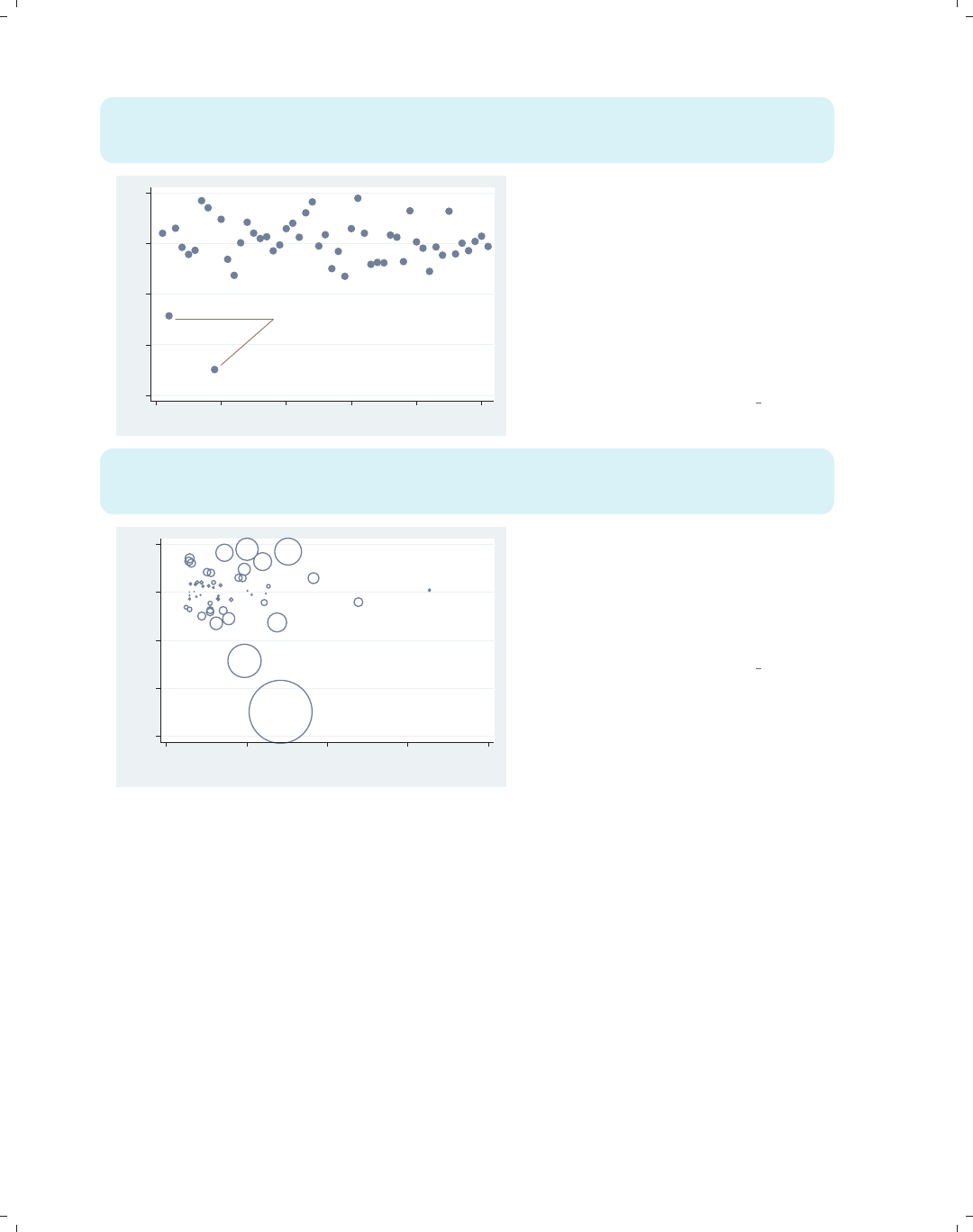
i
i
i
i
i
i
i
i
370 Chapter 11. Appendix
twoway (scatter rs id, text( -3 27 "Possible Outliers", size(vlarge)))
(scatteri -3 18 -4.8 10, recast(line))
(scatteri -3 18 -3 3, recast(line)), legend(off)
Possible Outliers
−6−4−2 0 2
0 10 20 30 40 50
This graph is similar to the one above
but uses the text() option to add text
to the graph. Two scatteri commands
are used to draw a line from the text
Possible Outliers to the markers for
those points. The yxcoordinates are
given for the starting and ending
positions, and recast(line) makes
scatteri behave like a line plot,
connecting the points to the text.
Uses allstates.dta & scheme vg s2c
twoway (scatter rs l [aw=cd], msymbol(Oh))
(scatter rs l if cd > .1, msymbol(i) mlabel(stateab) mlabpos(0))
(scatter rs l if cd > .1, msymbol(i) mlabel(cd) mlabpos(6)), legend(off)
AK
CT
DC
.1903994
.1235647
.6812371
−6−4−2 0 2
Studentized residuals
0 .1 .2 .3 .4
Leverage
This graph shows the
leverage-versus-studentized residuals,
weighting the symbols by Cook’s D
(cd). We overlay it with a scatterplot
showing the marker labels if cd exceeds
.1, with the cd value placed underneath.
Uses allstates.dta & scheme vg s2c
Imagine that we have a data file called comp2001ts that contains variables representing
the stock prices of four hypothetical companies: pricealpha,pricebeta,pricemu,and
pricesigma, as well as a variable date. To compare the performance of these companies,
let’s make a line plot for each company and stack them. We can do this using twoway
tsline with the by(company) option, but we first need to reshape the data into a long
format. We do so with the following commands:
. vguse comp2001ts
. reshape long price, i(date) j(compname) string
We now have variables price and company and can graph the prices by company.
The electronic form of this book is solely for direct use at UCLA and only by faculty, students, and staff of UCLA.
All rights reserved on the copyright page apply to this document and specifically neither the electronic nor
published form of the book may be distributed or reproduced, either electronically or in printed form.
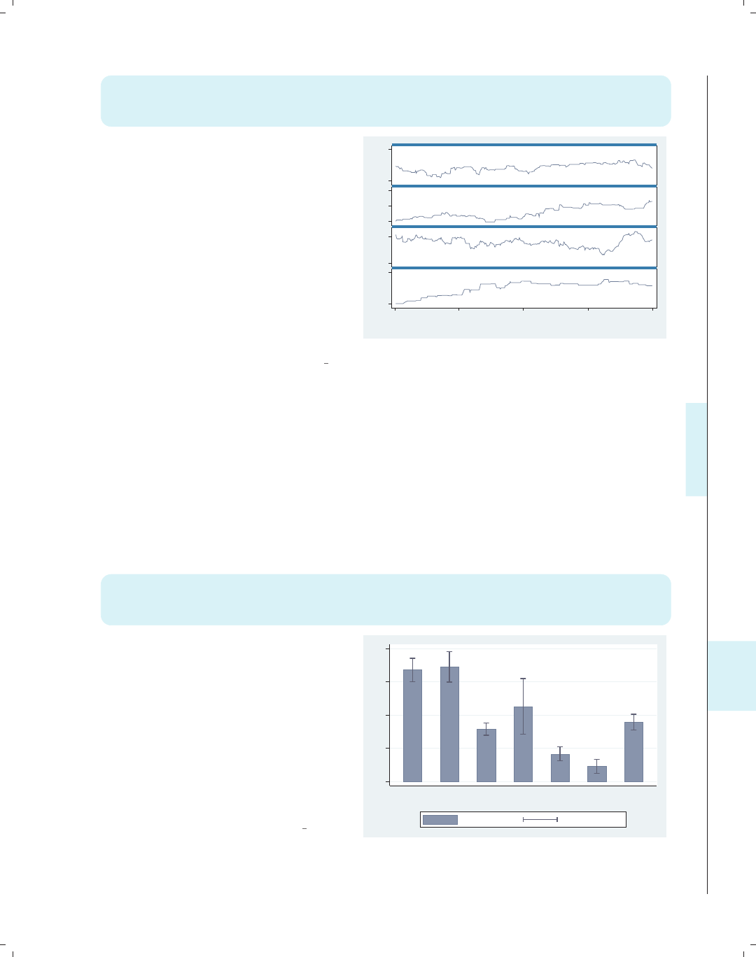
i
i
i
i
i
i
i
i
11.4 Putting it all together, more examples 371
twoway tsline price, by(compname, cols(1) yrescale note("") compact)
ylabel(#2, nogrid) subtitle(, pos(5) ring(0) nobexpand nobox color(red))
title(" ", box width(130) height(.001) bcolor(ebblue))
We graph price for the different
companies with the by() option.
Further, cols(1) puts the graphs in
one column. yrescale and ylabel(#2)
allow the y-axes to be scaled
independently and labeled with about 2
values. The subtitle() option puts
the name of the company in the
bottom, right corner of each graph. The
title() option creates an empty title
that is thin, wide, and blue. Combined
with the compact option, the title
creates a border between the graphs.
Uses comp2001ts.dta & scheme vg s2c
0 2040 50 6040 6020 40
1Jan01 1Apr01 1Jul01 1Oct01 1Jan02
alpha
beta
mu
sigma
price
Date
For the next graph, we want to create a bar chart that shows the mean of wages by
occupation with error bars showing a 95% confidence interval for each mean. To do this,
we first collapse the data across the levels of occupation, creating the mean, standard devi-
ation, and count. Next, we create the variables wageucl and wagelcl, which are the upper
and lower confidence limits, as shown below.
. vguse allstates
. collapse (mean) mwage=wage (sd) sdwage=wage (count) nwage=wage, by(occ7)
. generate wageucl = mwage + invttail(nwage,0.025)*sdwage/sqrt(nwage)
. generate wagelcl = mwage - invttail(nwage,0.025)*sdwage/sqrt(nwage)
After this, we are ready to execute the following command:
twoway (bar mwage occ7, barwidth(.5))
(rcap wageucl wagelcl occ7, blwid(medthick) blcolor(navy) msize(large)),
xlabel(1(1)7, valuelabel noticks) xscale(range(.5 7.5))
This bar chart is overlaid with a range
plot showing the upper and lower
confidence limits. The xlabel() option
labels the values from 1 to 7,
incrementing by 1. The valuelabel
option indicates that the value labels
for occ7 will be used to label the
x-axis. The xscale() option adds a
margin to the outer bars, and the
barwidth() option creates the gap
between the bars.
Uses allstates.dta & scheme vg s2c
4 6 8 10 12
Prof Mgmt Sales Cler. Operat. Labor Other
Occupation recoded into 7 categories
(mean) wage wageucl/wagelcl
Introduction Twoway Matrix Bar Box Dot Pie Options Standard options Styles Appendix
Stat graphs Stat graph options Save/Redisplay/Combine More examples Common mistakes Customizing schemes Online supplements
The electronic form of this book is solely for direct use at UCLA and only by faculty, students, and staff of UCLA.
All rights reserved on the copyright page apply to this document and specifically neither the electronic nor
published form of the book may be distributed or reproduced, either electronically or in printed form.
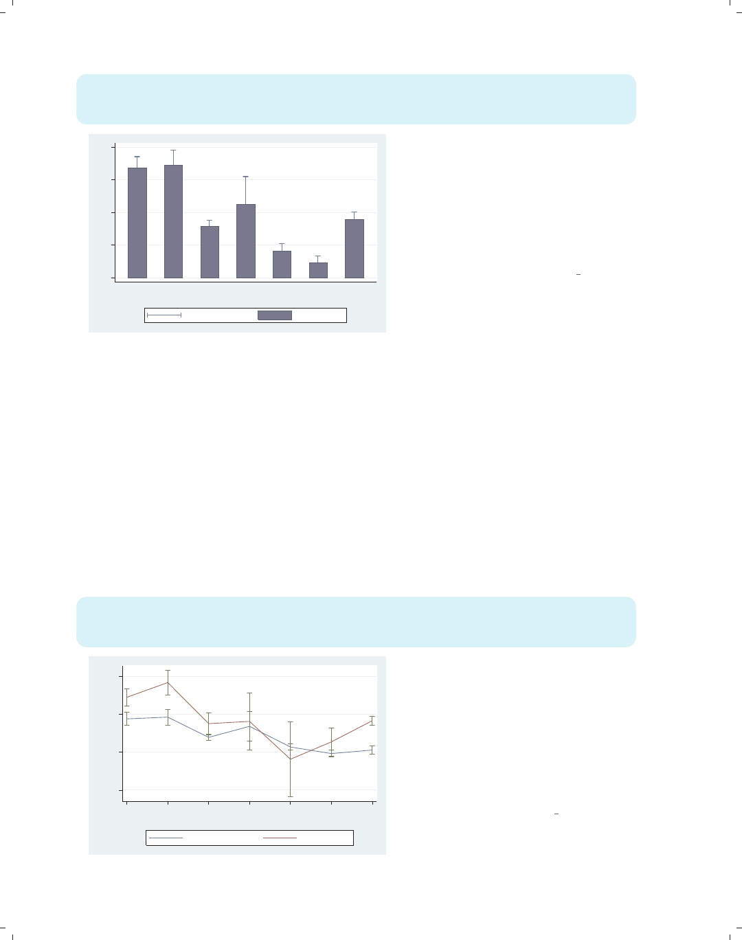
i
i
i
i
i
i
i
i
372 Chapter 11. Appendix
twoway (rcap wageucl wagelcl occ7, blwidth(medthick) msize(large))
(bar mwage occ7, barwidth(.5) bcolor(navy)),
xlabel(1(1)7, valuelabel noticks) xscale(range(.5 7.5))
4 6 8 10 12
Prof Mgmt Sales Cler. Operat. Labor Other
Occupation recoded into 7 categories
wageucl/wagelcl (mean) wage
This graph is similar to the previous
graph, except that we have reversed the
order of the commands, placing the
rcap command first, followed by the
bar command. As a result, only the top
half of the error bar is shown. As in the
previous example, the xlabel() option
determines the labels on the x-axis.
Uses allstates.dta & scheme vg s2c
Suppose that we wanted to show the mean wages with confidence intervals broken down
by occupation and whether one graduated college. We use the collapse command to create
the mean, standard deviation, and count by the levels of occ7 and collgrad, and then we
create the upper and lower confidence limits. Finally, the separate command makes sepa-
rate variables for mwage based on whether one graduated college, creating mwage0 (wages for
noncollege grad) and mwage1 (wages for college grad). These commands are shown below,
followed by the command to create the graph.
. vguse nlsw
. collapse (mean) mwage=wage (sd) sdwage=wage
(count) nwage=wage, by(occ7 collgrad)
. generate wageucl = mwage + invttail(nwage,0.025)*sdwage/sqrt(nwage)
. generate wagelcl = mwage - invttail(nwage,0.025)*sdwage/sqrt(nwage)
. separate mwage, by(collgrad)
twoway (line mwage0 mwage1 occ7) (rcap wageucl wagelcl occ7),
xlabel( 1(1)7, valuelabel) xtitle(Occupation) ytitle(Wages)
legend(order(1 "Not College Grad" 2 "College Grad"))
0 5 10 15
Wages
Prof Mgmt Sales Cler. Operat. Labor Other
Occupation
Not College Grad College Grad
Here, we make a line graph showing the
mean wages for the noncollege
graduates, mwage0, and the college
graduates, mwage1, by occupation. We
overlay that with a range plot showing
the confidence interval. The xlabel()
option labels the x-axis with value
labels, and the legend() option labels
the legend.
Uses nlsw.dta & scheme vg s2c
The electronic form of this book is solely for direct use at UCLA and only by faculty, students, and staff of UCLA.
All rights reserved on the copyright page apply to this document and specifically neither the electronic nor
published form of the book may be distributed or reproduced, either electronically or in printed form.
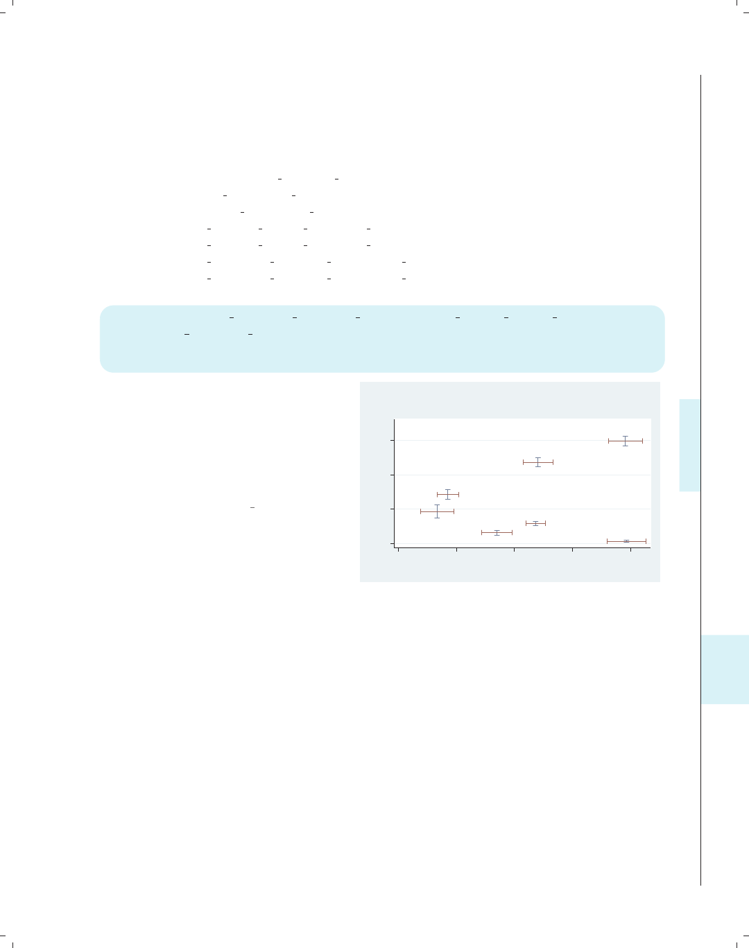
i
i
i
i
i
i
i
i
11.4 Putting it all together, more examples 373
This next graph shows a kind of scatterplot of the mean and confidence interval for
union and collgrad for each level of occ7. To do this, we collapse the data file by occ7
and use those summary statistics to compute the confidence intervals below, followed by
the command to create the graph.
. vguse nlsw
. collapse (mean) pct un=un pct coll=collgrad
(sd) sd un=union sd coll=collgrad
(count) ct un=union ct coll=collgrad, by(occ7)
. gen lci un = pct un - sd un/sqrt(ct un)
. gen uci un = pct un + sd un/sqrt(ct un)
. gen lci coll = pct coll - sd coll/sqrt(ct coll)
. gen uci coll = pct coll + sd coll/sqrt(ct coll)
twoway (rcap lci coll uci coll pct un) (rcap lci un uci un pct coll, hor)
(sc pct coll pct un, msymbol(i) mlabel(occ7) mlabpos(10) mlabgap(5)),
ylabel(0(.2).7) xtitle(% Union) ytitle(% Coll Grads) legend(off)
titl e("% Union and % college graduates" "(with CIs) by occupation")
The overlaid rcap commands show the
confidence intervals for both union and
collgrad for each occupation. The
scatter command uses an invisible
marker and labels each occupation at
the 10 o’clock position with a larger
gap than normal.
Uses .dta & scheme vg s2c
Prof
Mgmt
Sales
Cler.
Operat.
Labor
Other
0 .2 .4 .6
% Coll Grads
0 .1 .2 .3 .4
% Union
% Union and % college graduates
(with CIs) by occupation
This section concludes with a graph adapted from an example on the Stata web site.
The graph combines numerous tricks, so rather than show it all at once, let’s build it up a
piece at a time. Below is the ultimate graph we would like to create. It shows the population
(in millions) for males and females in 17 different age groups, ranging from “Under 5” up
to “80 to 84”. The blue bar represents the males, and the red bar represents the females.
Introduction Twoway Matrix Bar Box Dot Pie Options Standard options Styles Appendix
Stat graphs Stat graph options Save/Redisplay/Combine More examples Common mistakes Customizing schemes Online supplements
The electronic form of this book is solely for direct use at UCLA and only by faculty, students, and staff of UCLA.
All rights reserved on the copyright page apply to this document and specifically neither the electronic nor
published form of the book may be distributed or reproduced, either electronically or in printed form.
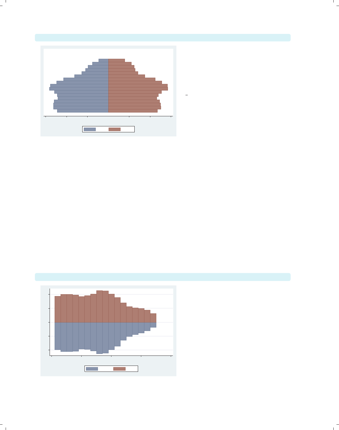
i
i
i
i
i
i
i
i
374 Chapter 11. Appendix
graph display
Under 5
5 to 9
10 to 14
15 to 19
20 to 24
25 to 29
30 to 34
35 to 39
40 to 44
45 to 49
50 to 54
55 to 59
60 to 64
65 to 69
70 to 74
75 to 79
80 to 84
12 8 4 4 8 12
Population in millions
Male Female
This is the graph that we wish to
create. For now, we simply use the
graph display command to display
the graph. Because this is displayed
using the s2color scheme, the size of
the text is not enlarged as in the other
vg schemes, so the text may be hard to
read.
Uses pop2000mf.dta & scheme s2color
To build this graph, we first use the data file pop2000mf, which contains 17 observa-
tions corresponding to 17 age groups (for example, “Under 5”, “5 to 9”, “10 to 14”, and so
forth). The variables femtotal and maletotal contain the number of females and males in
each age group. After using the file, we create femmil, which is the number of females per
million, and malmil, which is the number of males per million, but this is made negative so
that the male (blue) bar will be scaled in the negative direction. We also make a variable
zero, which contains 0 for all observations.
. vguse pop2000mf
. gen femmil = femtotal/1000000
. gen malmil = -maletotal/1000000
. gen zero = 0
We now take the first step in making this graph.
twoway (bar malmil agegrp) (bar femmil agegrp)
−10 −5 0 5 10
0 5 10 15 20
Age category
malmil femmil
This is our first attempt to make this
graph by overlaying the bar chart for
the males with the bar chart for the
females. The agegrp variable ranges
from1to17andformsthex-axis, but
we can rotate this as shown in the next
example.
Uses pop2000mf.dta & scheme s2color
The electronic form of this book is solely for direct use at UCLA and only by faculty, students, and staff of UCLA.
All rights reserved on the copyright page apply to this document and specifically neither the electronic nor
published form of the book may be distributed or reproduced, either electronically or in printed form.
i
i
i
i
i
i
i
i
11.4 Putting it all together, more examples 375
twoway (bar malmil agegrp, horizontal) (bar femmil agegrp, horizontal)
Adding the horizontal option to each
bar chart, we can see the graph taking
shape. However, we would like the age
categories to appear inside of the red
(female) bars.
Uses pop2000mf.dta & scheme s2color
0 5 10 15 20
Age category
−10 −5 0 5 10
malmil femmil
twoway (bar malmil agegrp, horizontal) (bar femmil agegrp, horizontal)
(scatter agegrp zero, msymbol(i) mlabel(agegrp) mlabcolor(black))
This scatter command uses agegrp
(ranging from 1–17) as the y-value and
zero (0) for the x-value, leading to the
stack of 17 observations. Using the
msymbol(i) and mlabel() options
suppresses the symbol but displays the
name of the age group from the labeled
value of agegrp. Next, we will fix the
label and title for the x-axis.
Uses pop2000mf.dta & scheme s2color
Under 5
5 to 9
10 to 14
15 to 19
20 to 24
25 to 29
30 to 34
35 to 39
40 to 44
45 to 49
50 to 54
55 to 59
60 to 64
65 to 69
70 to 74
75 to 79
80 to 84
0 5 10 15 20
Age category
−10 −5 0 5 10
malmil femmil
Age category
twoway (bar malmil agegrp, horizontal) (bar femmil agegrp, horizontal)
(scatter agegrp zero, msymbol(i) mlabel(agegrp) mlabcolor(black)),
xlabel(-12 "12" -8 "8" -4 "4" 4 8 12) xtitle("Population in millions")
We use the xlabel() to change −12 to
12, −8to8,−4 to 4, and to label the
positive side of the x-axis as 4, 8, and
12. We also add a title for the x-axis.
Next, let’s fix the y-axis and the legend.
Uses pop2000mf.dta & scheme s2color
Under 5
5 to 9
10 to 14
15 to 19
20 to 24
25 to 29
30 to 34
35 to 39
40 to 44
45 to 49
50 to 54
55 to 59
60 to 64
65 to 69
70 to 74
75 to 79
80 to 84
0 5 10 15 20
Age category
12 8 4 4 8 12
Population in millions
malmil femmil
Age category
Introduction Twoway Matrix Bar Box Dot Pie Options Standard options Styles Appendix
Stat graphs Stat graph options Save/Redisplay/Combine More examples Common mistakes Customizing schemes Online supplements
The electronic form of this book is solely for direct use at UCLA and only by faculty, students, and staff of UCLA.
All rights reserved on the copyright page apply to this document and specifically neither the electronic nor
published form of the book may be distributed or reproduced, either electronically or in printed form.

i
i
i
i
i
i
i
i
376 Chapter 11. Appendix
twoway (bar malmil agegrp, horizontal) (bar femmil agegrp, horizontal)
(scatter agegrp zero, msymbol(i) mlabel(agegrp) mlabcolor(black)),
xlabel(-12 "12" -8 "8" -4 "4" 4 8 12) xtitle("Population in millions")
y scale(off) ylabel(, nogrid) legend(order(1 "Male" 2 "Female"))
Under 5
5 to 9
10 to 14
15 to 19
20 to 24
25 to 29
30 to 34
35 to 39
40 to 44
45 to 49
50 to 54
55 to 59
60 to 64
65 to 69
70 to 74
75 to 79
80 to 84
12 8 4 4 8 12
Population in millions
Male Female
We suppress the display of the y-axis
using the yscale(off) option and
suppress the grid lines with the
ylabel(, nogrid) option. Finally, we
use the legend() option to label the
bars and suppress the display of the
third symbol in the legend.
Uses pop2000mf.dta & scheme s2color
11.5 Common mistakes
This section discusses mistakes that are frequently made when creating Stata graphs.
Using Stata 7 syntax
No matter how long we have been using Stata 8 (or later), we might revert back to old
habits and type a graph command in Stata 7 style. Consider this example:
. graph propval100 rent700
Stata replies with this error message:
propval100graph g.new rent700: class member function not found
r(4023);
Clearly, the easiest solution is to convert the command to the proper Stata 8 syntax.
Commas with graph options
With Stata 8, graph options can accept their own options (sometimes referred to as
suboptions); for example,
. twoway scatter propval100 popden rent700, xtitle("My Title", box)
Note that the xtitle() option allows us to specify the x-title followed by a comma and
a further suboption that places a box around the x-title. If we had been content with the
existing x-title, we could have issued this command:
. twoway scatter propval100 popden rent700, xtitle( , box)
The electronic form of this book is solely for direct use at UCLA and only by faculty, students, and staff of UCLA.
All rights reserved on the copyright page apply to this document and specifically neither the electronic nor
published form of the book may be distributed or reproduced, either electronically or in printed form.
i
i
i
i
i
i
i
i
11.5 Common mistakes 377
The box option places a box around the title. Note that we place a comma before the
box option. Now, suppose that we are content with the existing legend but wish to make
the legend display in a single column.
. twoway scatter propval100 popden rent700, xtitle( , box) legend(cols(1))
Based on the syntax from the title() option, we might have been tempted to have
typed legend( , cols(1)), but that would have led to an error. Some options, like the
legend() option, simply take a list of options with no comma permitted.
Using options in the wrong context
Consider the example below. Our goal is to move the labels for the x-axis from their
default position at the bottom of the graph to the alternate position at the top of the graph.
. twoway scatter propval100 rent700, xlabel( , alternate)
This command executes, but it does not have the desired effect. Instead, it staggers the
labels of the x-axis, alternating between the upper and lower positions. In this context,
the alternate option means something different than we had intended. What we really
wanted to specify was xscale(alternate):
. twoway scatter propval100 rent700, xscale(alternate)
This command moves the entire scale of the x-axis to the alternate position and has the
desired effect. Another mistake we might have made was to put the alternate option as
an overall option. This command is shown below with the result:
. twoway scatter propval100 rent700, alternate
option alternate not allowed
invalid syntax
r(198);
In this case, we are half-right. There is an option alternate, but we have used it in the
wrong context, yielding the syntax error. In such cases, remember that the option we are
specifying may be right, but we just need to put it into the right context.
Options appear to have no effect
When we add an option to a graph, we generally expect to see the effect of adding the
option. However, sometimes adding an option has no effect. Consider this example:
. twoway scatter propval100 rent700, mlabpos(12)
This command executes, but nothing changes as a result of including the mlabpos(12)
option, which would change the position of the marker labels to the 12 o’clock position.
There are no marker labels in the graph, so adding this option has no effect. We would have
to use the mlabel() option to add marker labels before we saw the effect of this option.
Consider another example, which is a bit more subtle. We would like to make the line
(periphery) of the marker thick. When we run the following command, we do not see any
effect from adding the mlwidth(thick) option:
. twoway scatter propval100 rent700, mlwidth(thick)
Introduction Twoway Matrix Bar Box Dot Pie Options Standard options Styles Appendix
Stat graphs Stat graph options Save/Redisplay/Combine More examples Common mistakes Customizing schemes Online supplements
The electronic form of this book is solely for direct use at UCLA and only by faculty, students, and staff of UCLA.
All rights reserved on the copyright page apply to this document and specifically neither the electronic nor
published form of the book may be distributed or reproduced, either electronically or in printed form.

i
i
i
i
i
i
i
i
378 Chapter 11. Appendix
The reason for this is that the marker has a line color and a fill color, and by default,
they are the same color, so it is impossible to see the effect of changing the thickness of the
line around the marker. However, if we make the line and fill colors different, as in the
following example, we can see the effect of the mlwidth() option:
. twoway scatter propval100 rent700, mlwidth(thick)
mlcolor(black) mfcolor(gs13)
Options when using by()
Using the by() option changes the meaning of some options. Consider the following
example:
. twoway scatter propval100 rent700, by(north) title(My title)
We might think that the title() option will provide an overall title for the graph, as it
would when the by() option is not included. However, actually, each graph will have “My
title” as the title; the graph as a whole will not. Instead, to provide an overall title for the
graph, we would specify the command this way:
. twoway scatter propval100 rent700, by(north, title(My title))
When using the legend() option combined with the by() option, we should place
options that affect the position of the legend within the by() option. Consider this example:
. twoway scatter propval100 popden rent700,
by(north, legend(pos(12))) legend(cols(1))
Here, the legend(pos(12)) option controls the position of the legend, placing it at
the 12 o’clock position, so we place it within the by() option. On the other hand, the
legend(cols(1)) option does not affect the position of the legend, so we place it outside
of the by() option. For more details on this, see Options : By (272).
Altering the wrong axis
When we use multiple x-ory-axes, it is easy to modify the wrong axis. Consider this
example:
. twoway (scatter propval100 ownhome)
(scatter rent700 ownhome, yaxis(2) ytitle(Rents over 700))
We might think that the ytitle() option will change the title for the second y-axis,
but it will actually change the first axis. Because ytitle() is an option that concerns the
overall graph, we should place it at the very end of the graph command, as shown below.
. twoway (scatter propval100 ownhome)
(scatter rent700 ownhome, yaxis(2)), ytitle(Rents over 700, axis(2))
Note that we use the axis(2) option to indicate that ytitle() should be modified for the
second y-axis.
The electronic form of this book is solely for direct use at UCLA and only by faculty, students, and staff of UCLA.
All rights reserved on the copyright page apply to this document and specifically neither the electronic nor
published form of the book may be distributed or reproduced, either electronically or in printed form.

i
i
i
i
i
i
i
i
11.6 Customizing schemes 379
When all else fails
I hope that, by describing these errors, I can help you avoid some common errors. Here
are some additional ideas and resources to help you when you are struggling:
•Build graphs slowly. Rather than trying to make a final graph all at once, try
to build the graph slowly adding, one option at a time. This is illustrated in In-
tro : Building graphs (29), where we took a complex graph and built it one piece at a
time. Building slowly helps us isolate problems to a particular option, which we can
then further investigate.
•When possible, model graphs from existing examples. This book strives to provide
examples to model from. For additional online examples, see Appendix : Online sup-
plements (382) for the companion web site for the book, which links to additional
examples.
•For more detailed information about the syntax of Stata graphics, see [G]graph.
Please remember that some of the graph commands available in Stata were added
after the printing of [G]graph but are documented via the help graph command.
See also Appendix : Online supplements (382), which has links to the online help that
are organized according to the table of contents of this book.
•Reach out to fellow Stata users, either local friends, friends at Statalist, or friends at
Stata tech support. See http://www.stata.com/support/ for more details.
11.6 Customizing schemes
This section shows how to customize your own schemes. Although schemes can look
complicated, it is possible to easily create some simple schemes on our own. Let’s look at
the vg lgndc scheme as an example. This scheme is based on the s2color scheme but
changes the legend to display at the 9 o’clock position, in a single column, with the keys
stacked on top of the symbols. Here are the contents of that scheme:
#include s2color // start with the s2color scheme
clockdir legend position 9 // put the legend in the 9 o’clock position
numstyle legend cols 1 // make the legend display in 1 column
yesno legend stacked yes // stack the keys & symbols on top of each other
gsize legend_key_gap half_tiny // very, very small gap between key and label
gsize legend_row_gap small // somewhat larger gap between key/label pairs
Rather than creating the vg lgndc scheme from scratch, which would be very laborious,
we use the #include s2color statement to base this new scheme on the s2color scheme.
The subsequent statements change the position of the legend and the number of columns
in the legend and stack the legend keys and symbols upon each other.
Say that we liked the vg lgndc scheme but wanted to make our own version in which
the legend is in the 3 o’clock position instead of the 9 o’clock position, naming our version
legend3. To do this, we would start the Stata do-file editor, for example, by typing doedit
and then type the following into it: (Of course, the scheme will work fine if we omit
comments after the double slashes.)
Introduction Twoway Matrix Bar Box Dot Pie Options Standard options Styles Appendix
Stat graphs Stat graph options Save/Redisplay/Combine More examples Common mistakes Customizing schemes Online supplements
The electronic form of this book is solely for direct use at UCLA and only by faculty, students, and staff of UCLA.
All rights reserved on the copyright page apply to this document and specifically neither the electronic nor
published form of the book may be distributed or reproduced, either electronically or in printed form.
i
i
i
i
i
i
i
i
380 Chapter 11. Appendix
#include s2color // start with the s2color scheme
clockdir legend position 3// put the legend in the 3 o’clock position
numstyle legend cols 1 // make the legend display in 1 column
yesno legend stacked yes // stack the keys & symbols on top of each other
gsize legend_key_gap half_tiny // very, very small gap between key and label
gsize legend_row_gap small // somewhat larger gap between key/label pairs
We can then save the file as scheme-legend3.scheme, and we are ready to use it. We
can then use the scheme(legend3) option at the end of a graph command or type set
scheme legend3, and Stata will use that scheme for displaying our graph. Below, we show
an example using this scheme. (Note that the legend3 scheme is not included among the
downloadable schemes.)
twoway (scatter propval100 rent700) (lfit propval100 rent700),
scheme(legend3)
0 20 40 60 80 100
0 10 20 30 40
% rents $700+/mo
% homes cost $100K+
Fitted values
Here, we see an example using our
newly created legend3 scheme, and
indeed, we see the legend in the 3
o’clock position, in a single column,
with the legend stacked.
Uses allstates.dta & scheme legend3
So far, things are going great. However, note that Stata will only know how to find
the newly created scheme-legend3.scheme while we are working in the directory where we
saved that scheme. If we change to a different directory, Stata will not know where to find
scheme-legend3.scheme. If, however, we save the scheme into our PERSONAL directory,
Stata would know where to find it regardless of the directory we were in. For example, on
my computer, I used the sysdir command, and it showed me the following information:
. sysdir
STATA: C:\Stata8\
UPDATES: C:\Stata8\ado\updates\
BASE: C:\Stata8\ado\base\
SITE: C:\Stata8\ado\site\
PLUS: c:\ado\plus\
PERSONAL: c:\ado\personal\
OLDPLACE: c:\ado\
From this, I know that my PERSONAL directory is located in c:\ado\personal\,soifI
store either .ado files or .scheme files there, Stata will be able to find them. So, if instead
The electronic form of this book is solely for direct use at UCLA and only by faculty, students, and staff of UCLA.
All rights reserved on the copyright page apply to this document and specifically neither the electronic nor
published form of the book may be distributed or reproduced, either electronically or in printed form.
i
i
i
i
i
i
i
i
11.6 Customizing schemes 381
of saving scheme-legend3.scheme into the current directory, we save it into our PERSONAL
directory, Stata will be able to find it. (If we have already saved scheme-legend3.scheme
to the current directory and also save it to the PERSONAL directory, we may want to remove
the copy from the current directory.)
So far, this section has really focused on the mechanics of creating a scheme but has not
said much about the possible content that could be placed inside a scheme. This is beyond
the scope of this little introduction, but here are three other places where you can find this
kind of information:
First, the help for schemes via help schemes will tell us about schemes in general. Also,
help scheme files contains documentation about scheme files and what we can change
using schemes.
Second, looking at other schemes can help us find ideas, for example, the downloaded
schemes for this book (see Appendix : Online supplements (382)). Say that we wanted to look
at the vg rose scheme. We could type which scheme-vg rose.scheme, and that would
tell us where that scheme is located. Then, we could use any editor (including the do-file
editor) to view that scheme for ideas.
Third, we can look at the built-in Stata schemes, such as s1color,s2color,oreconomist.
Looking at these schemes shows us the menu of items that we can fiddle with in our own
schemes, but these schemes should never be modified directly. We can use the strategy
outlined above where we make our own scheme and use #include to read in a scheme, and
then we can add our own statements to modify the scheme as desired.
Schemes that other people have created and the schemes built into Stata will contain
statements that control some aspect of a graph, but we may not know which aspect they
control. For example, in the vg rose scheme there is the statement
color background eggshell
which obviously controls the color of some kind of background element, but we might not
be sure which element it controls. We can find out by making a copy of the scheme and
then changing eggshell to some other nonsubtle value, such as red, and then make a graph
using this new scheme (using scheme(schemename),notset scheme schemename). The
part of the graph that becomes red will indicate the part that is controlled by the color
background statement.
Of course, we have just scratched the surface of how to create and customize schemes.
However, this should provide the basic tools needed for making a basic scheme, storing
it in the personal directory, and then playing with the scheme. Because schemes are so
powerful, they can appear complicated, but if built slowly and methodically, the process
can be straightforward, logical, and, actually, quite a bit of fun.
Introduction Twoway Matrix Bar Box Dot Pie Options Standard options Styles Appendix
Stat graphs Stat graph options Save/Redisplay/Combine More examples Common mistakes Customizing schemes Online supplements
The electronic form of this book is solely for direct use at UCLA and only by faculty, students, and staff of UCLA.
All rights reserved on the copyright page apply to this document and specifically neither the electronic nor
published form of the book may be distributed or reproduced, either electronically or in printed form.

i
i
i
i
i
i
i
i
382 Chapter 11. Appendix
11.7 Online supplements
This book has a number of online resources associated with it. I encourage all readers
to take advantage of these online extras by visiting the web site for the book at
http://www.stata-press.com/books/vgsg.html
Resources on the web site include
•Programs and help files. You can easily download and install the programs and help
files associated with this book. To install these programs and help files, just type
. net from http://www.stata-press.com/data/vgsg
. net install vgsg
After installing the programs and help, type whelp vgsg foranoverviewofwhathas
been installed.
•Data files. All the data files used in the book are available at the web site for down-
loading. I encourage you to download the data files used in this book, play with these
examples, and try variations on your own to solidify and extend your understanding.
If you visit the website, you can download and save all the data files at once. You
can quickly download all the datasets into your current working directory from within
Stata by typing
. net from http://www.stata-press.com/data/vgsg
. net get vgsg
If you prefer, you can obtain any of the data files over the Internet with the vguse
command. Each example concludes by indicating the data file and scheme that was
used to make the graph. For example, a graph may conclude by saying
Uses allstates.dta & scheme vg s2c
This indicates that you can type vguse allstates and Stata will download and use
the data file over the Internet for you (assuming that you have installed the programs).
•Schemes. This book uses a variety of schemes, and when you download the programs
and help files (see above), the schemes used in this book are downloaded as well,
allowing you to use them to reproduce the look of the graphs in this book.
•Hopefully, a very short or empty Errata will be found at the web site. Although I
have tried very hard to make this book true and accurate, I know that some errors
will be found, and they will be listed there.
•Links to the online Stata Graphics Reference Manual, which are organized according
to the structure of the table of contents of this book.
•Other resources that may be placed on the site after this book goes to press, so visit
the site to see what else may appear there.
The electronic form of this book is solely for direct use at UCLA and only by faculty, students, and staff of UCLA.
All rights reserved on the copyright page apply to this document and specifically neither the electronic nor
published form of the book may be distributed or reproduced, either electronically or in printed form.

i
i
i
i
i
i
i
i
Subject index
A
ac ...................................350
acprplot............................348
added-variable plot ..........see avplot
adjacent lines................see alsize
alsize ..............................188
alternate ..........................171
alternate axes ........see axes, alternate
angle ...........................327–328
axis labels........see xlabel() and
ylabel()
label.....31, 127, 145, 171, 182, 261
marker labels. . . . . .see mlabangle()
angle0()............................220
area() ...............................81
area graphs............see twoway area
color . ............................62
horizontal........................61
setting the base . . ................62
shading..........................62
sorting...........................61
ascategory . . 110, 125–126, 169–170, 203
aspect ratio . ....................323–324
asyvars . . 30–33, 115, 122, 123, 131–136,
159, 161–162, 175, 177–179, 194,
197, 205
augmented component-plus-residual plot
.........see acprplot
avplot ...........348, 354–355, 357–358
aweight .........................37, 240
axes
alternate . . . . 126, 127, 146, 171, 204,
210, 266
bar graphs........123–130, 143–147
base ............................. 47
box plots. .........168–174, 179–183
categorical
bar graphs...............123–130
box plots. ................168–174
dot plots . ................202–204
titles .......................... 31
axes, continued
displaying for multiple graphs . . . 277
dot plots . . ........202–204, 207–210
label gap........................129
labels . . see xlabel() and ylabel()
lines......see xline() and yline()
log scale........................267
multiple . .......85, 92, 98–100, 256,
271–272, 303
options . . ..............254–256, 272
reverse scale....................266
scale . . . see xscale() and yscale()
scaling independently . ..........276
selecting....................271–272
size ........................ 323–324
suppressing............146, 182, 266
titles . . . see xtitle() and ytitle()
axis() ..........................99, 256
B
b1title() .....31–33, 130, 174, 285, 315
b2title() .................130, 174, 315
bar() ..........................149, 150
bcolor() .......................150
bfcolor() ......................150
blcolor() ......................150
blwidth() ......................150
bar graphs . . . see graph bar and twoway
bar
axes............see axes, bar graphs
bar height ...................... 139
bar width........................64
base ............................. 63
by() .......................151–155
categorical axes............see axes,
categorical, bar graphs
color. . . . ................30, 149–150
confidence intervals . ............366
descending . . . ..............119–123
excluding missing bars. . .see nofill
fill color. .........................64
The electronic form of this book is solely for direct use at UCLA and only by faculty, students, and staff of UCLA.
All rights reserved on the copyright page apply to this document and specifically neither the electronic nor
published form of the book may be distributed or reproduced, either electronically or in printed form.

i
i
i
i
i
i
i
i
384 Subject index
bar graphs, continued
format...........................32
gaps............................118
horizontal..........see graph hbar
labels.......................32, 136
legend......................130–142
line color. ........................64
lines.............................47
look........................147–150
ordering....................119–123
overlaying.......................148
placing labels below bars........142
placing labels inside bars........141
placing labels outside bars......142
reverse order....................123
sorting.....................120–122
stacked .................... 111, 115
titles . ......................143–144
vertical separators ............93–94
y-variables.................107–111
bargap()............................148
barwidth() ...................64, 73, 78
base() ........................47, 62, 63
bcolor() .....................53, 70, 74
bexpand() ......................306–307
bfcolor() .............62, 64, 70, 74, 78
bin() ................................75
bins
lower limit . ......................76
number..........................75
biweight .............................81
blabel() ...........32–33, 127, 136–142
bfcolor() ......................142
box .............................142
format() ................32–33, 142
gap() ......................141–142
position() ................141–142
size() .........................142
blcolor() .....47, 53, 62, 64, 69, 70, 72,
74, 78
blpattern() ..................... 53, 69
blwidth(). . . . . .47, 53, 69, 70, 72, 74, 78
box()...........................186–187
bcolor() .................. 186–187
blcolor() ......................187
blwidth() ......................187
box..................................356
box plots . ................see graph box
adjacent lines ........... see alsize
box plots, continued
alphabetical order...............165
axes.............see axes, box plots
by() ............see by(), box plots
categorical axes............see axes,
categorical, box plots
descending order ................165
excluding missing categories.....see
nofill
horizontal..........see graph hbox
legend......................174–179
lines............................181
look........................183–189
median values.......see medtype(),
medmarker(),andmedline()
ordering....................165–167
over() .......see over(), box plots
patterns ........................181
sorting..........................165
titles. ...........................180
whiskers customized . ............see
cwhiskers
y-variables.................157–162
boxgap() .......................185, 186
bubble plots. . . . .............37, 240–241
building a graph..................29–33
by() ........ 103–105, 191–192, 215–216,
232–234, 272–287, 297–299
alignment() ...................312
b1title() ......................286
bar graphs ................. 151–155
box ........................311–312
box plots . ..................189–193
caption() ......................280
colfirst .......................274
cols() ......153, 192, 216, 275, 277
combining options . . . ........... 286
compact ...........44, 104–105, 275
dot plots . ..................214–217
errors...........................378
height() .......................312
holes() ........................274
iscale() .......................275
ixaxes .....................278–279
ixtitle ...................279, 286
iyaxes.....................277, 278
iytitle ...................278, 286
justification() ...............312
l1title() ......................286
The electronic form of this book is solely for direct use at UCLA and only by faculty, students, and staff of UCLA.
All rights reserved on the copyright page apply to this document and specifically neither the electronic nor
published form of the book may be distributed or reproduced, either electronically or in printed form.

i
i
i
i
i
i
i
i
Subject index 385
by(),continued
legend() . . . 154, 192, 233–234, 285,
286, 297–299
at() .....................234, 299
position() . . . 154, 192, 234, 285,
286, 299
missing ..........152–153, 191, 216
noedgelabel ...................276
note().....................153, 283
suffix .......................283
pie charts ..................232–235
position() ................311–312
rescale ...................277, 286
ring() .....................311–312
row()...........................192
rows() .........................274
scale() ........................105
scatterplot matrices. . . .....103–105,
273–286
sts graph ....................... 356
subtitle().....................282
textboxes...................311–312
title. ............................273
title() ...............279–280, 286
title...........................284
position() ..................284
ring() .......................284
total . . . 44, 153, 191–192, 216, 273,
286
twoway . . . ................44–45, 85
width() ........................312
xrescale .......................276
yrescale .......................276
C
caps......................see capsize()
capsize() ..........................189
caption()......................280, 315
categorical axes.....see axes, categorical
ciplot ...............................53
clcolor() ............54, 56, 58, 82, 253
clock position . ..................330–331
clpattern() .........52, 56, 82, 90, 253,
336–337, 353
clstyle()............................89
clwidth(). .26, 52, 54, 56, 58, 82, 88–90,
94, 253, 338, 353
color
area graphs......................62
color, continued
axis lines.........................43
bar fill...........................64
bar graphs......................150
bar lines......................47, 64
box plots . ..................186–187
confidence level ..................52
connecting lines ......... 54, 69, 253
graph region . . . . see graphregion()
histogram bars ...................78
intensity...................149, 186
labels......................128, 172
legend..........................296
lines....................82, 208, 211
marker fill...................48, 242
marker outline . .................242
marker symbols..................37
markers . . . 55, 69, 211–213, 242–244
median line.....................187
pie charts ..................221–223
plot region . ......see plotregion()
schemes.........................319
styles.......................328–330
textbox....................304, 310
cols() .........................364–365
columns.............................230
combining graphs...............361–365
commas with graph options. . . . ......376
compass direction . ..............331–332
component-plus-residual plot.........see
cprplot
confidence interval
fit (regression predictions) . . . . 50–54
for means and percentils of survival
time . . . ............... see stci
selecting display command . ......53
setting level . .....................51
confidence level
color . ............................52
pattern . ......................... 52
width............................52
connect() .......39–41, 55, 84, 251–253,
333–335
connect lines width . ........see clwidth
connected plots . . see twoway connected
connecting
lines...........see lines, connecting
points........................39–41
styles.......................332–335
The electronic form of this book is solely for direct use at UCLA and only by faculty, students, and staff of UCLA.
All rights reserved on the copyright page apply to this document and specifically neither the electronic nor
published form of the book may be distributed or reproduced, either electronically or in printed form.

i
i
i
i
i
i
i
i
386 Subject index
correlogram . .............see ac and pac
cprplot .............................348
cross-correlogram . ............see xcorr
cumsp ...............................350
cumulative spectral distribution graph . .
...........see cumsp
cwhiskers ..........................188
D
dates..............................58–59
density . . . .....see kdensity and twoway
kdensity
descending ....................122, 220
diagonal............................101
bfcolor() ......................101
discrete .............................79
displaying named graphs ............359
distribution graphs ..................346
distribution plots. . ................74–82
dot plots . ....see graph dot and twoway
dot
alphabetical order...............200
axes ............. see axes, dot plots
by() ........... see by(), dots plots
categorical axes............see axes,
categorical, dot plots
descending order . . ..............200
excluding missing categories.....see
nofill
legend......................205–207
look........................210–214
ordering........................200
over()........see over(), dot plots
reverse order....................202
sorting..........................200
dots() ..............................211
mcolor() .......................211
msize() ........................211
msymbol() ......................211
dropped-line plots. ...........see twoway
dropline
E
exclude() ..........................135
exclude0 ..................145–146, 209
exploding pie slices..................222
F
fits (regression predictions)
fractional polynomial . . . . see twoway
fpfit and twoway fpfitci
linear.........see twoway lfit and
twoway lfitci
quadratic . ....see twoway qfit and
twoway qfitci
formatting numbers
axis labels......................261
bar graphs......................142
bar labels........................32
pie slices...................226–227
forty-five degree lines................362
fraction() ..........................76
fractional polynomial fits.....see twoway
fpfit and twoway fpfitci
frequency() .........................77
frequency............................81
function, line plot of . ........see twoway
function
fysize()............................365
G
gap
between bars....................148
between bars and edge of plot . . . 148
between boxes..................185
between boxes and edge of plot. .184
between columns................297
between groups.................185
between labels and outside of graph
..............173
between labels and ticks........172
between lines ...................213
between marker and label.......250
between rows...................297
box plots . ..................163–164
dot plots . .......................199
textboxes.......................309
gap() .............................77–78
gladder .............................347
glcolor .............................265
graph bar ...........27, 29–33, 107–155
graph box ......................157–193
graph combine .................362–363
graph display ..................29, 360
graph dot ..................13, 193–217
graph hbar .............13, 63, 107–155
The electronic form of this book is solely for direct use at UCLA and only by faculty, students, and staff of UCLA.
All rights reserved on the copyright page apply to this document and specifically neither the electronic nor
published form of the book may be distributed or reproduced, either electronically or in printed form.

i
i
i
i
i
i
i
i
Subject index 387
graph hbox .................13, 157–193
graph matrix ............12, 27, 95–105
graph pie ..................14, 217–235
graph use ..........................359
graphing a function . .........see twoway
function
graphregion() .................325–326
color() ........................325
fcolor() .......................326
ifcolor() ......................326
lcolor() .......................326
lwidth() .......................326
graphs, specialized. . . . ....see specialized
graphs
grids
displaying..................264–265
suppressing. ...........146, 182, 264
groups.............see by() and over()
H
half ................................102
height
bar.............................139
histogram bar ....see histogram, bar
height
symbol..........................297
hi-lo graphs..............see range plots
histogram . . . . ....see twoway histogram
bar color . ........................78
bar height....................75–77
bar width....................78, 80
gap between bars ................ 77
horizontal........................79
overlaying........................81
horizontal ........48, 61, 63, 68, 79, 80
I
if .................see samples, selecting
imargin() ..........................365
immediate graphs . . . .........see twoway
scatteri
in .................see samples, selecting
intensity() ..............149, 186, 223
J
jitter()............................102
jittering ........see scatterplot matrices,
jittering
justification
textboxes...................305–307
titles . . see title(),justification
K
kdensity ........................12, 353
kernel density . ........see kdensity and
twoway kdensity
horizontal........................80
lines.............................82
methods.........................81
overlaying........................81
L
l1title() . . . . . . . 130, 174, 204, 285, 315
l2title() ............130, 174, 204, 315
label() ........................298, 356
labels.............................22–23
alternate . ..................127, 171
angles...............see angle, label
axes....see xlabel() and ylabel()
bar graphs..................32, 136
changing . . . . 124–126, 133, 168, 177,
203
color . ......................128, 172
gap from axis..............129, 130
gap from outside edge of graph. .173
gap from ticks..................172
legend.............see legend, labels
marker symbols...............38–39
markers.............83, 97, 247–250
matrix. ......................98–100
missing values .................. 124
pie charts..............224–228, 233
placing below bars..............142
placing inside bars..............141
placing outside bars.............142
points .......................... 300
position. ..........140–142, 226, 301
scale............................105
size................97, 128, 171, 226
suppressing ......104, 126, 128, 132,
137, 176–177, 206, 260
ticks............................172
time series . ......................59
titles . ............................84
ladder of power graphs ..............347
legend ..................... 23–25, 40–41
bar graphs ................. 130–142
The electronic form of this book is solely for direct use at UCLA and only by faculty, students, and staff of UCLA.
All rights reserved on the copyright page apply to this document and specifically neither the electronic nor
published form of the book may be distributed or reproduced, either electronically or in printed form.

i
i
i
i
i
i
i
i
388 Subject index
legend, continued
box plots . ..................174–179
columns . . . . . 135, 154, 178, 230, 291
dot plots . . . ................205–207
key ........................ 289, 292
labels........154, 206, 288–289, 296
margins.........................296
options . ....................287–299
overlaid graphs ...............90–92
pie charts..............228–231, 234
placing within plot regions . .....134
position. .31, 134–136, 154, 178, 231,
234, 293–294
rows..........31, 133, 177, 207, 291
stacked................136, 179, 293
subtitle . ........................154
suppressing ................133, 225
text.............................290
titles. . . . ........................295
twoway ..........................86
width...........................294
legend() . . . 23–25, 27–29, 31–33, 40–41,
46, 86, 90–94, 133–136, 138, 154,
177–179, 206–207, 225, 229–231,
234, 285, 288–299, 356
bexpand ........................294
bfcolor() ......................296
bmargin() ......................296
box .............................296
by() ..............see by(),legend
colfirst . . . . 133, 177, 230, 291–292
colgap() .......................297
color() ........................296
cols() . . . . 24, 41, 86, 135, 154, 178,
207, 231, 234, 291, 293, 299
holes() ...................230, 292
label() .....................24–25,
40–41, 90–91, 94, 133, 154, 177,
206, 229, 285–286, 288–289
legend() .......................192
cols() .......................192
note() .........................295
order() ...........41, 230, 289–295
position() .....27, 31–33, 134–136,
178, 207, 293–295, 298
region() .......................296
fcolor() .....................296
lcolor() .....................296
lwidth() .....................296
region(),continued
margin() .....................296
ring() .........31–33, 134–135, 293
rowgap() .......................297
rows() . . . 31–33, 133, 177, 207, 231,
291–296
size() .........................296
span ............................294
stack . . 136, 154, 179, 192, 231, 234,
293
subtitle()
bexpand ......................295
box ...........................295
symxsize().....................297
symysize().....................297
textfirst ............135, 178, 292
title() ..........206, 229–230, 295
position() .........230–231, 295
level() ..............................52
leverage-versus-squared-residual plot . . . .
.........see lvr2plot
life tables for survival data . . . see ltable
line() ..............................223
lcolor() .......................223
lwidth() .......................223
line plots .............. see twoway line
sorting...........................54
line,twoway ..........see twoway line
linear fits..........see lfit and lfitci
linear regression diagnostics graphs . . 348
linegap() ......................213–214
lines
adjacent........................188
axes
color. ..........................43
width..........................43
box plots . . ..................... 181
color .............. 82, 181, 208, 211
connecting . . . 52, 54, 69, 84, 250–253
fit............................52–53
gap between....................213
graph region . . . . see graphregion()
median .........................187
overlaying........................89
patterns . ......43, 82, 181, 208, 211,
336–338
plot region . . . . . . . see plotregion()
styles............................89
textbox outlines............309–310
The electronic form of this book is solely for direct use at UCLA and only by faculty, students, and staff of UCLA.
All rights reserved on the copyright page apply to this document and specifically neither the electronic nor
published form of the book may be distributed or reproduced, either electronically or in printed form.

i
i
i
i
i
i
i
i
Subject index 389
lines, continued
whiskers.....see box plots, whiskers
width...............82, 88, 181, 208
lines() ........................188, 211
lcolor() ..................188, 211
lwidth() ..................188, 211
linetype().....................211–212
loading graphs . . ......... see graph use
local linear smooth plots . ....see twoway
lowess
lroc ................................351
lsens ...............................351
ltable ..............................349
lvr2plot ..................348, 352–353
M
margins
graph region . . . . see graphregion()
legend..........................296
plot region . . . . . . . see plotregion()
styles.......................338–340
textboxes.......................308
marker() ..................189, 212–213
mcolor() .......................212
mfcolor() ......................213
mlcolor() ......................213
mlwidth() ......................213
msize() ...............189, 212–213
msymbol() ............ 189, 212–213
markers
fill color. .........................48
box plots . . . .................... 189
color . .......55, 69, 96–97, 211–213,
242–244
displaying for data points........55
fill color ........................ 242
invisible ........................ 239
label gap........................250
label size.........................97
labels........38–39, 83, 97, 247–250
line width........................48
median line.....................188
options . .............95–97, 235–250
outline color . ...................242
outline width ...................243
overlaying........................90
plus sign........................237
schemes.........................247
markers, continued
size....55, 69, 96, 211–213, 240–241,
340–341
squares.........................236
styles..........88, 244–246, 340–343
symbols.......25–27, 36–38, 83, 87,
95–96, 342–343
width............................69
matrix
axis labels...................98–100
scatterplot . . see scatterplot matrices
titles. ...........................101
maxes() ...................100, 104–105
xlabel() .......................100
xtick() ........................100
ylabel() ..............100, 104–105
ytick() ........................100
mcolor(). . . .37, 55, 69, 96, 242, 329–330
mean ................................108
median .........................108, 196
median band plots . . . . see twoway mband
median line
color . ...........................187
markers.........................188
width...........................187
median points...........see medtype(),
medmarker(),andmedline()
median spline plots ..........see twoway
mspline
medline() ..........................187
lcolor() .......................187
lwidth() .......................187
medmarker() ........................188
msize() ........................188
msymbol() ......................188
medtype() ......................187–188
mfcolor() ......48–49, 97, 242–243, 246
missing..........116, 124, 162, 197, 218
mlabangle() ...................249, 327
mlabcolor() ........................250
mlabel() ........38–39, 83, 97, 239, 241,
248–250, 300, 303, 327, 344, 353
mlabpos() ..........................248
mlabgap() ..........................250
mlabposition() . . . . 38–39, 239, 241, 331
mlabsize() .............38, 97, 249, 344
mlabvposition() ...............248–249
mlcolor() ...........48–49, 97, 242–243
mlwidth() ...............48–49, 243–244
The electronic form of this book is solely for direct use at UCLA and only by faculty, students, and staff of UCLA.
All rights reserved on the copyright page apply to this document and specifically neither the electronic nor
published form of the book may be distributed or reproduced, either electronically or in printed form.

i
i
i
i
i
i
i
i
390 Subject index
mountain plots. ........see twoway area
msize() . . . . 37–38, 48–49, 55, 69, 71, 72,
96, 240–241, 246, 341, 352
mstyle() ...................88, 244–246
msymbol() .....22, 26, 36, 39–41, 48–49,
55, 56, 69, 72, 83, 87, 90, 94–96,
236–241, 247, 331, 343, 352
multiple axes ..........see axes, multiple
multiple plots . ............see overlaying
N
name() ................359, 361, 363–365
naming graphs . . .............see name()
ndots() .............................211
noclockwise ........................219
nofill .............30–33, 117, 162, 198
nofit ................................52
nogrid ..............................355
nolabel..........128, 132, 137, 176, 206
nooutsides.....................157–193
note() ......190–192, 282, 315, 354, 357
O
options. . . .........................20–29
adding text.................299–303
axes...................254–256, 272
labels.........................22–23
legend........................23–25
marker symbols...............25–27
markers....................235–250
region . .....................324–326
scatterplot matrices ........102–103
specialized graphs ..........352–358
standard...................324–326
textboxes...................303–313
titles . . .......................20–22
using in the wrong context . . . . . . 377
ordering
bars........see bar graphs, ordering
boxes........see box plots, ordering
orientation
textboxes.......................305
titles . ......................341–342
outergap() ....................148, 184
outside values
color . ...........................189
size.............................189
suppressing . ....................180
over() .........29–33, 111–150, 157–235
asyvars ....................161–162
axis() ................130, 142, 173
outergap() .........130, 142, 173
bar graphs........111–123, 151–155
box plots. .........157–162, 193–202
descending ...........119–121, 123,
165–167, 200–202
display only existing variables . . . 117
dot plots . ..................193–202
gap() . . . 118–119, 163–164, 185, 199
label() . . 33, 126–130, 138, 171–173
angle() ............. 33, 127, 171
labcolor()..............128, 172
labgap() ...........129, 172–173
labsize() ...............128, 171
ticks....................129, 172
tlength() ...............129, 172
tlwidth() ...............129, 172
tposition() ............129, 172
missing.........................116
pie charts.......................218
relabel() .......124–126, 168–170,
203–204
sort() . . 120–123, 165–167, 200–202
sum() ........................122
y-variables.................110–111
overlaying..................49–50, 87–94
bar graphs..........see bar graphs,
overlaying
connected marker plots. . . ........56
fits, CIs, smooths, and scatters . . 49–
54, 89–90
histograms . . .........see histogram,
overlaying
kernel density . . . . see kernel density,
overlaying
legends . . see legend, overlaid graphs
lines............see lines, overlaying
markers.....see markers, overlaying
mixed plot types...........6, 25–26
scatterplots ........ see scatterplots,
overlaying
P
pac..................................350
patterns
axis lines.........................43
box plots . . ..................... 181
The electronic form of this book is solely for direct use at UCLA and only by faculty, students, and staff of UCLA.
All rights reserved on the copyright page apply to this document and specifically neither the electronic nor
published form of the book may be distributed or reproduced, either electronically or in printed form.

i
i
i
i
i
i
i
i
Subject index 391
patterns, continued
confidence level ..................52
connecting lines ......... 52, 69, 253
lines......82, 181, 208, 211, 336–338
percent()............................76
percent .............................226
percentages...............110–111, 115
pergram .............................350
periodogram . . see pergram and wntestb
pie() ..........................222, 233
color() ........................222
explode ...................222, 233
pie charts................see graph pie
adding text.................227–228
angles .......................... 220
by()............see by(), pie charts
color . ......................221–223
counterclockwise................219
descending order ................220
exploding slices.............222–223
labels..................224–228, 233
legend.................228–231, 234
over() .......see over(), pie charts
slices.......................221–223
sorting ................ 219–221, 233
titles. ...........................229
types.......................217–218
plabel() ..................224–227, 233
color() ........................226
format() .................. 226–227
gap() ......................226–227
legend() .......................227
name ............................233
size() .........................226
plotregion() .......................325
color() ........................325
lcolor() .......................325
lwidth() .......................325
pnorm ...............................346
points, connecting . .......see connecting
points
population pyramid . . ...........367–368
position
labels.........38, 140–142, 226, 301
legend . . . 31, 134–136, 154, 178, 231,
234, 293–294
marker labels...............248–249
standard options ...........330–332
ticks.......................129, 263
position, continued
titles . .......see title(),position
prefix...................see titles, prefix
ptext() ........................227–228
bfcolor() ......................228
box .............................228
margin() .......................228
orientation() .................228
placement() ................... 228
Q
qladder .............................347
qnorm ...............................346
quadratic fits ......see twoway qfit and
twoway qfitci
R
r1title() ..........................315
r2title() ..........................315
range() ..........................81, 82
range plots
with area shading . . . ....see twoway
rarea
with bars . . ........see twoway rbar
with capped spikes ......see twoway
rcap
with capped spikes and marker sym-
bols ................ see twoway
rcapsym
with connected lines .....see twoway
rconnected
with lines ........see twoway rline
with markers ............see twoway
rscatter
with spikes ......see twoway rspike
rectangles() .......................212
fcolor() .......................212
lcolor() .......................212
reference lines ........see lines, axes and
yline()
region . . . ....................... 324–326
replace ........................364, 365
rescheming graphs..........see schemes,
rescheming graphs
residual-versus-fit plot......see rvfplot
residual-versus-predictor plot.........see
rvpplot
restoring graphs..........see graph use
reusing graphs..................359–360
The electronic form of this book is solely for direct use at UCLA and only by faculty, students, and staff of UCLA.
All rights reserved on the copyright page apply to this document and specifically neither the electronic nor
published form of the book may be distributed or reproduced, either electronically or in printed form.
i
i
i
i
i
i
i
i
392 Subject index
reversing axes.....see axes, reverse scale
ROC analysis........................351
roccomp .............................351
rocplot .............................351
roctab ..............................351
rvfplot ........................348, 355
rvpplot .............................348
rwidth()............................212
S
samples, selecting.....................58
saving()............................358
saving graphs........................358
scale ................................ 182
adjusting...................322–324
axes...............85, 209, 265–269
labels...........................105
markers.........................105
scale()...............103, 323–324, 358
scatter with immediate arguments. . . .see
twoway scatteri
scatter,twoway ...see twoway scatter
scatterplot matrices. ..................12
by()..see by(), scatterplot matrices
displaying lower half............102
jittering. ........................102
options . ....................102–103
scale............................103
scatterplots ........ see twoway scatter
overlaying.............39–40, 84–86
scheme() .......................359–360
schemes..................14–20, 318–321
colors ...........................319
customizing ................379–381
economist .................321, 357
markers.........................247
rescheming named graphs ....... see
scheme()
s1color ........................320
s1manual .......................320
s1mono .........................320
s2color ........................319
s2manual .......................319
s2mono .........................319
sj ..............................321
vg blue ..........................19
vg brite ........................ 19
vg lgndc ........................ 18
vg outc ..........................17
schemes, continued
vg outm ..........................17
vg palec ........................ 16
vg palem ........................ 16
vg past ..........................18
vg rose ..........................18
vg s1c ...........................15
vg s1m ...........................15
vg s2c ...........................15
vg s2m ...........................16
vg samec ........................ 17
vg teal ..........................19
vg lgndc .......................179
separating graphs . ....................44
shading area graphs .................. 62
showyvars ............ 132–133, 176–177
size
adjacent line....................188
adjusting...................322–324
axes........................323–324
caps............................189
labels..............38, 128, 171, 226
marker symbols...............37–38
markers.....55, 69, 96–97, 211–213,
240–241, 340–341
text.............................344
textbox....................144, 304
titles . ......................144, 181
slices ........................... 221–223
sort . . 39–41, 54–56, 61, 65, 84, 220–221,
233–234, 251–253, 333–335
sorting
area graphs.........see area graphs,
sorting
box plots......see box plots, sorting
line plots . .....see line plots, sorting
pie charts.....see pie charts, sorting
spacing.........................see gaps
specialized graphs...............345–358
spike plots . ...........see twoway spike
splines......................see mspline
stack .................111, 115, 122, 139
stacking bars..................see stack
standard error of forecast.......see stdf
standard options . . . .............324–326
standardized normal probability graphs. .
..............346
start() ..............................76
Stata 7 syntax. ......................376
The electronic form of this book is solely for direct use at UCLA and only by faculty, students, and staff of UCLA.
All rights reserved on the copyright page apply to this document and specifically neither the electronic nor
published form of the book may be distributed or reproduced, either electronically or in printed form.

i
i
i
i
i
i
i
i
Subject index 393
statistical function graphs....see twoway
function
stci ................................349
stcoxkm .............................349
stcurve .............................349
stdf ................................. 51
stepstair......................252, 335
storing graphs...........see graph save
stphplot............................349
strip plots. .................277–278, 371
sts graph......................349, 356
styles...........................327–345
angles......................327–328
clock position ..............330–331
color . ......................328–330
compass direction . .........331–332
lines.............................89
margins....................338–340
marker symbols ............ 342–343
markers.......88, 244–246, 340–343
orientation . ................341–342
text size........................344
subtitle() ...........154, 281–284, 314
nobexpand ......................154
position() ...........154, 283–284
prefix .....................281–282
ring().....................154, 284
suffix .....................281–282
suffix....................see titles, suffix
sum..................................139
survival graphs......................349
symbols
height .......................... 297
margin .............. see msymbol()
width...........................297
symmetry plots . .....................346
symplot .............................346
T
t1title() ..........................315
t2title() ..........................315
text
adding..............45, 86, 299–303
legend..........................290
orientation . .....................101
pie charts ..................227–228
scale............................105
size.............................344
text() .............45, 86, 299–313, 356
blwidth() .......................45
box ..............................45
color() ........................304
linegap() ......................309
margin() ...................45, 308
orientation() .................305
placement(). . . . . .301–302, 304–305
size() ......................45, 304
textboxes.......................303–313
annotations . . ...................308
by() ............see by(), textboxes
color . ......................304, 310
interline gaps...................309
justification . ...............305–307
margins.........................308
orientation . .....................305
outline . ....................309–310
size........................144, 304
thickness......................see width
ticks
controlling ................. 258–265
labels...........................172
length .......................... 263
matrix . .........................100
position. ........................263
suppressing .....................259
time series . ......................60
time series
labels............................59
line plots . ....................57–60
minor labels ..................... 59
ticks.............................60
titles . ............................59
time-series line. .see tsline and tsrline
tin() ................................58
title() ....20–22, 26, 86, 279, 309–318,
357
bcolor() .......................310
bexpand ........................318
bfcolor() ..................86, 310
blcolor() ..................86, 310
blwidth() ..................86, 310
bmargin() ......................307
box ....21–22, 86, 305–312, 317–318
justification() .....306–307, 318
margin() .................. 339–340
nobox ............................21
placement() ................... 332
The electronic form of this book is solely for direct use at UCLA and only by faculty, students, and staff of UCLA.
All rights reserved on the copyright page apply to this document and specifically neither the electronic nor
published form of the book may be distributed or reproduced, either electronically or in printed form.

i
i
i
i
i
i
i
i
394 Subject index
title(),continued
position() ................316–317
ring() .........................317
size() .......................21–22
span ............................317
titles . . . .............20–22, 130, 313–318
axes.................see axes, titles
bar graphs.....see bar graphs, titles
box plots. .......see box plots, titles
categorical axes............see axes,
categorical, titles
justification ........... see title(),
justification
legend..........................295
matrix . .........................101
multiple lines . ..................316
orientation . ................341–342
pie charts.......................229
placing in a box . . . see title(),box
placing inside a plot region . .....see
title(),placement
position . ....see title(),position
prefix.............255, 281–282, 354
size..............see title(),size
suffix...........1, 255, 281–282, 354
time series . ......................59
width......................317–318
tlabel() .............................59
tline() ..............................60
tmlabel()............................59
tmtick() .........................54, 60
ttext() ..............................60
orientation() ..................60
ttitle() .............................59
twoway
adding text......................86
by() ..............see by(), twoway
graphs........................35–94
legend ........................... 86
options . ......................82–86
overlaying....................87–94
titles . ........................26, 86
twoway area ...................9, 61–62
twoway bar ...................10, 62–64
twoway connected..........8, 55–56, 88
twoway dot ........................8, 49
twoway dropline ..............7, 48–49
twoway fpfit .....................6, 50
twoway fpfitci ..................50–54
twoway function .................12, 82
twoway histogram . . 11, 75–81, 346, 358
twoway kdensity ........ 12, 80–82, 346
twoway lfit . . 5–6, 25–26, 49–50, 89–91,
93–94, 287–297
twoway lfitci .................7, 50–54
twoway line . . . 8, 54–60, 88–89, 268–269
twoway lowess ....................6, 50
twoway mband.......................6, 7
twoway mspline ...................6, 50
twoway qfit ........6, 50, 90–91, 93–94,
287–299
twoway qfitci ............50–54, 91–92
twoway rarea ......10–11, 66, 70, 92–93
twoway rbar ..............11, 67, 73–74
twoway rcap ..............11, 66, 71–72
twoway rcapsym ..............11, 67, 72
twoway rconnected .......10, 65, 68–69
twoway rline.................10, 65, 70
twoway rscatter .............10, 65, 69
twoway rspike ......11, 67, 72, 265–269
twoway scatter......5–7, 20–26, 35–54,
83–94, 104, 235–313
twoway scatteri .................45–46
twoway spike ......7, 47–48, 92–93, 346
twoway tsline .............9, 57–60, 88
twoway tsrline ...................9, 57
types of graphs.....................4–14
U
using graphs ............. see graph use
W
whiskers .........see box plots, whiskers
width
axes............................267
bars..............................64
box plot lines...............185–187
confidence level ..................52
connecting lines . .....52, 54, 69, 253
histogram bars............75, 78, 80
legend..........................294
lines................82, 88, 181, 208
marker outline . .................243
markers..........................69
median line.....................187
symbols.........................297
ticks............................129
titles . . . ....................317–318
The electronic form of this book is solely for direct use at UCLA and only by faculty, students, and staff of UCLA.
All rights reserved on the copyright page apply to this document and specifically neither the electronic nor
published form of the book may be distributed or reproduced, either electronically or in printed form.

i
i
i
i
i
i
i
i
Subject index 395
width() ...................75–77, 80, 81
wntestb .............................350
X
xalternate................126, 170, 204
xaxis() ........................270, 303
xcorr ...............................350
xlabel() .........22–23, 42–43, 98–100,
257–258, 260–262, 267, 328
alternate ......................262
angle() ........................262
axis() ......................98–100
format() .......................261
grid ............................264
labsize() .......................23
nogrid .........................264
valuelabels ...................260
xline() ..................see lines, axes
xscale()...............43, 266–268, 364
lwidth() .......................267
xsize() ...................323, 358, 360
xtitle() ......41, 84, 254–256, 354–355
box .............................255
orientation() .................342
prefix .........................255
size().....................255, 355
Y
y-variables
bar graphs..........see bar graphs,
y-variables
multiple . ...................109–111
yalternate................146, 183, 210
yaxis() .........85, 92–93, 256, 270–272
ycommon .............................362
ylabel() . . 31–33, 42–43, 84–86, 98–100,
145–146, 181–182, 209, 257–265,
269, 271–272, 328, 355, 365
angle() . . . 31–33, 145, 182, 261, 328
axis().............98–100, 271–272
glcolor ........................264
glpattern .................264–265
glwidth ........................264
grid....................43, 264–265
labgap() .......................263
labsize() ......................262
nogrid ............43, 146, 182, 264
nolabel ........................260
noticks ........................259
ylabel(),continued
tlength() ......................263
tlwidth() ......................263
tposition() ................... 263
yline() ...........43, 144, 181, 208, 355
lcolor() ..........43, 144, 181, 208
lpattern() .......43, 144, 181, 208
lwidth() ..........43, 144, 181, 208
ymlabel()......................258, 265
glcolor() ......................265
glpattern() ................... 265
grid ............................265
ymtick() .......................259, 263
tposition() ................... 263
yreverse ..................147, 183, 210
yscale() .....85, 92, 138, 146, 182, 209,
268–269
axis() ......................92, 269
range() ...........92, 138, 268–269
ysize() ...................323, 358, 360
ytick() ........................258, 263
tposition() ................... 263
ytitle() . . . 30–33, 41–42, 144, 180–181,
254–256, 272, 354
axis() .........................272
bexpand...............144, 181, 208
bfcolor() ......................208
box ...................144, 181, 208
orientation() .................342
size() .................42, 144, 181
suffix .........................255
ytitle ..............................208
yvaroptions() . . 125–126, 128, 163–167,
169–170, 203–204
label() ........................128
relabel() .......125–126, 169–170,
203–204
The electronic form of this book is solely for direct use at UCLA and only by faculty, students, and staff of UCLA.
All rights reserved on the copyright page apply to this document and specifically neither the electronic nor
published form of the book may be distributed or reproduced, either electronically or in printed form.
