Edf Infographic Style Guide
edf_infographic_style_guide
edf_infographic_style_guide
User Manual:
Open the PDF directly: View PDF ![]() .
.
Page Count: 34

© 2010 ENVIRONMENTAL DEFENSE FUND / 257 PARK AVENUE SOUTH / NEW YORK, NY 10010 / 212 505 2100
A Visual Language is a set of guidelines and recommendations essential
for maintaining consistency and professionalism across visual extensions
of a corporate brand. Creative professionals (designers, developers, data
scientists, publicists, etc.), both internal and external, should be familiar
with the material herein and use it as a reference when producing visual
content on behalf of EDF and its programs. These designs may be pulled
in vector form from the Visual Language or re-designed independently in
accordance with the guidelines set forth in this document.
Best Practices guidelines are derived from industry data visualization
standards with considerations for storytelling appeal, ease of
communication, optical interpretation, and data science. They have been
developed over years of industry discussion and optimization and are
therefore strong recommendations. When the data at hand absolutely
necessitates flexibility of these rules, a designer should be mindful of the
narrative losses that occur as a result and should make sure in all instances
to maintain data integrity and accuracy.
EDF Visual Language
INFOGRAPHICS
Program Icons
Icon Sets
Bar Graphs
Stacked Bar Graphs
Bubble Charts
Line Graphs
Area Graphs
Difference Graphs
Pie Graphs
Donut Graphs
Maps
Timelines
1
2
3
13
15
17
20
22
24
25
26
28
32
Table of Contents
Note: All logo, font, template les and other assets are available on the style guide disc
1INFOGRAPHICS
General Usage
Infographics should:
• be cleanly and legibly designed to
facilitate understanding of complex
data and information.
• be graphically bold and simple. Use
flat, solid shapes of color whenever
possible.
• follow the thematic color palette
set up in the templates whenever
applicable. Otherwise, use colors from
the EDF palette as specified on pages
17–19 of the main EDF Branding Style
Guide.
DO NOT copy and paste information
graphics from one document to
another without reformatting if needed
to fit the latter document style.
INFOGRAPHICS

2
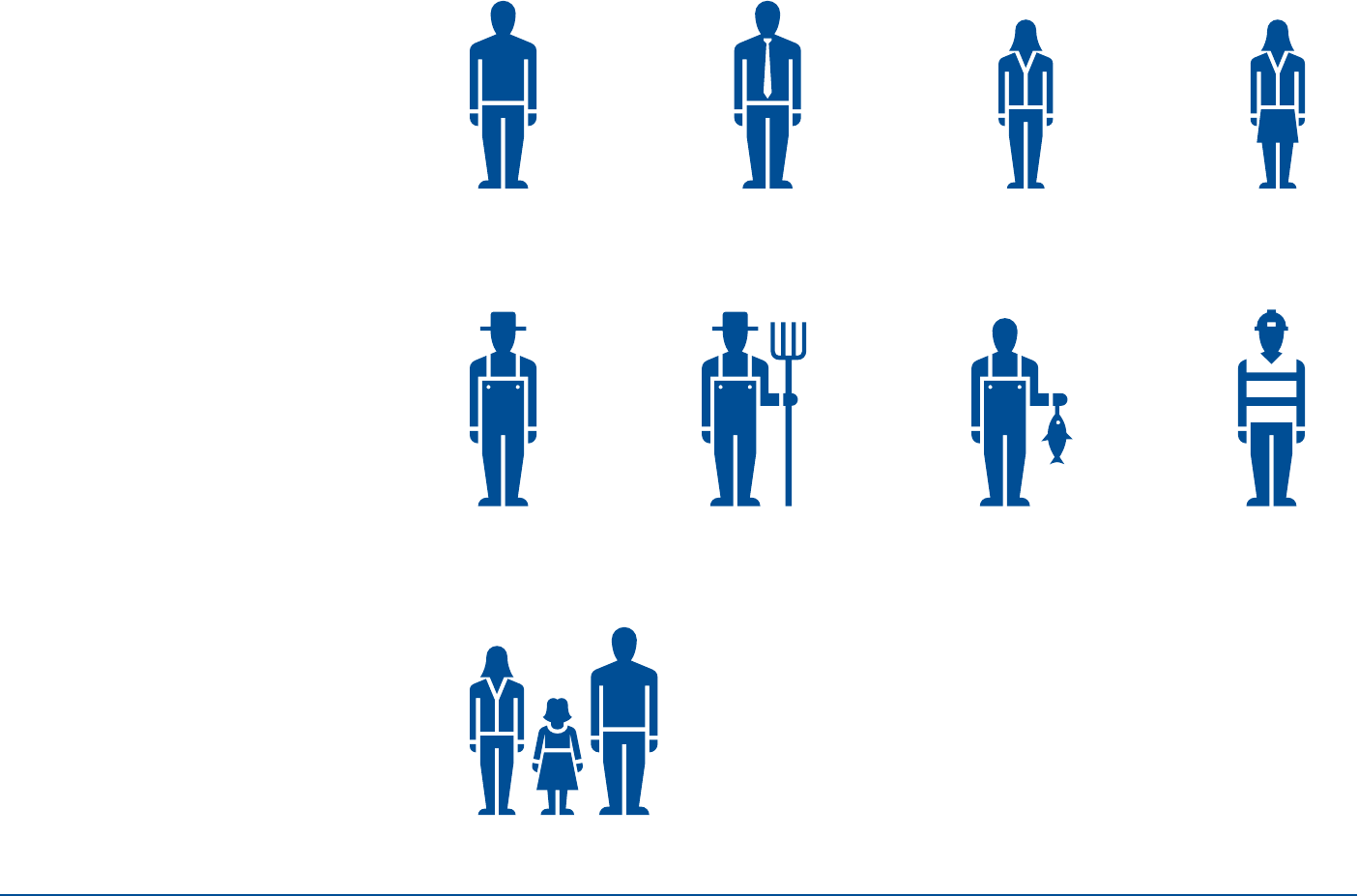
Program Icons
These icons represent the Climate and
Energy, Ecosystems, Oceans, and Health
programs respectively.
INFOGRAPHICS
3
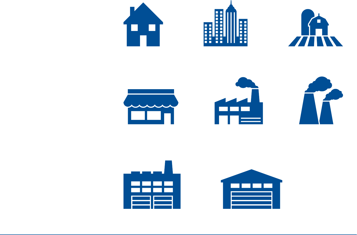
Icon Set (1 of 10)
INFOGRAPHICS
Icons should not be shrunk to the point
where they begin to lose legibility.
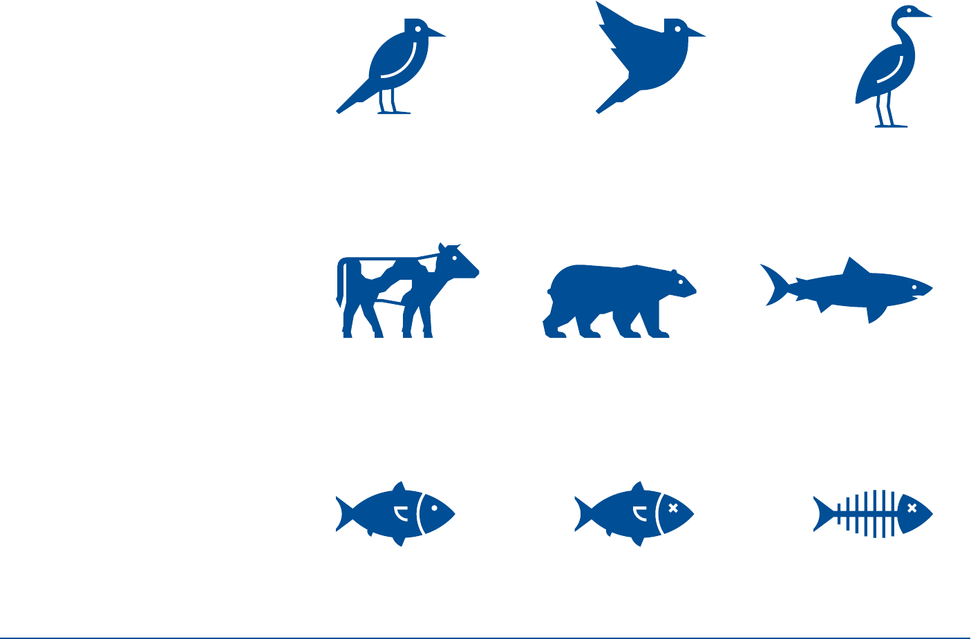
4
Icon Set (2 of 10)
INFOGRAPHICS
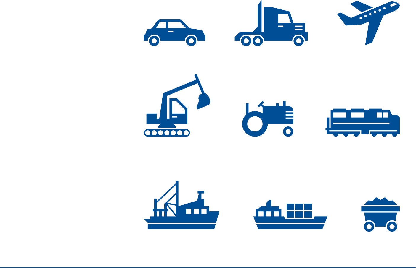
5
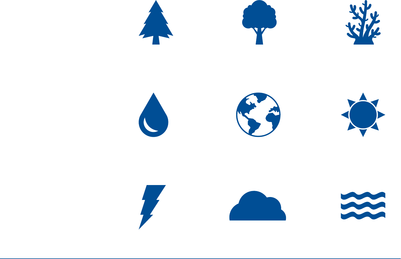
Icon Set (3 of 10)
INFOGRAPHICS
6
Icon Set (4 of 10)
INFOGRAPHICS
7
Icon Set (5 of 10)
INFOGRAPHICS
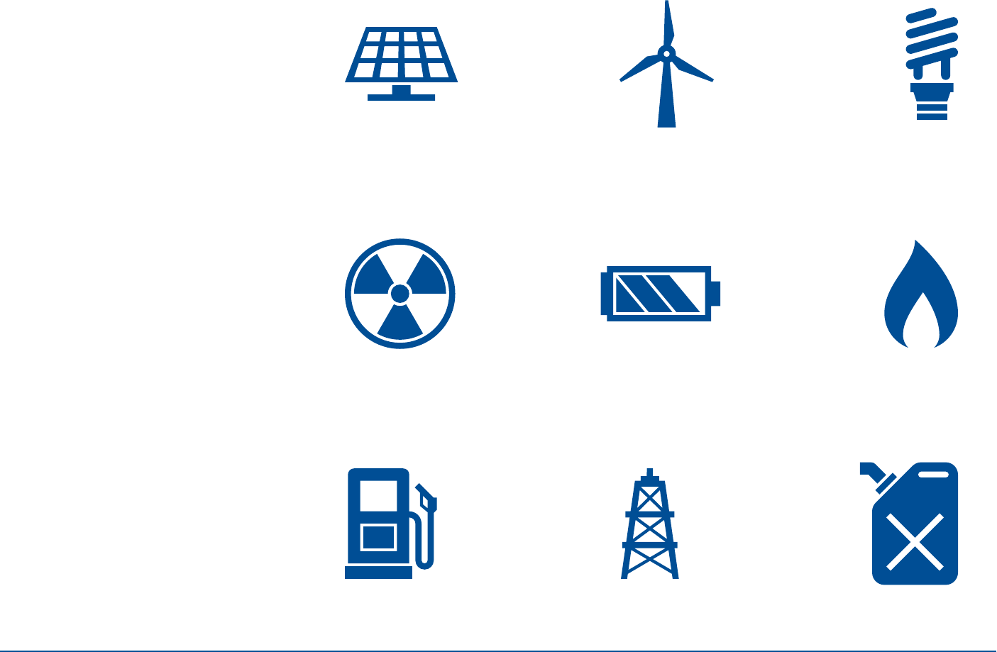
8
Icon Set (6 of 10)
INFOGRAPHICS
9
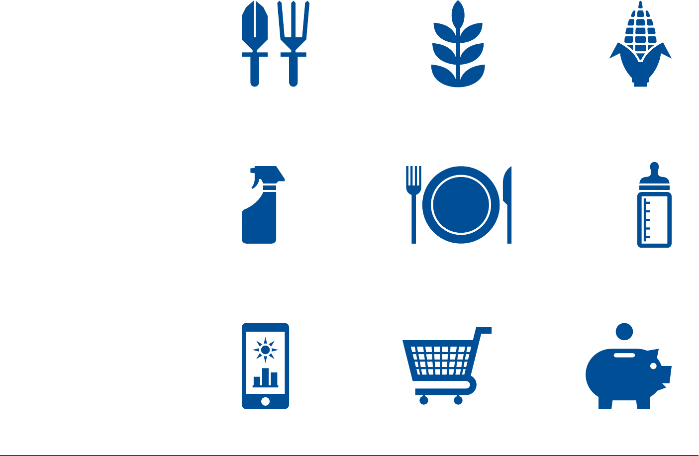
Icon Set (7 of 10)
INFOGRAPHICS
10
Icon Set (8 of 10)
INFOGRAPHICS
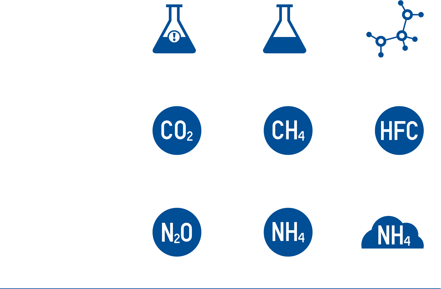
All chemical icons can also
be used in cloud form
*

11
Icon Set (9 of 10)
INFOGRAPHICS
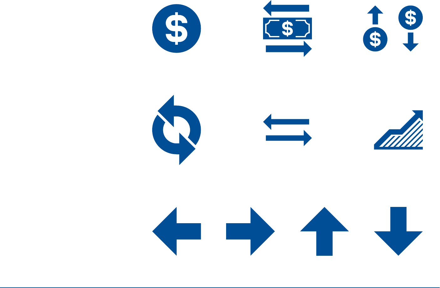
12
Icon Set (10 of 10)
INFOGRAPHICS
13
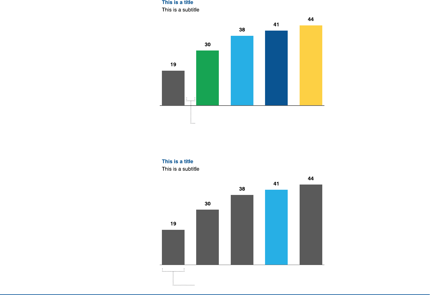
Bar Graphs
Do not add horizontal lines unless
necessary for multiple sets of overlaid
data.
The bars should always be bold.
Only use multiple colored bars when
necessary to understand the subject
matter.
Use numbers and/or percentages at the
end of each bar when appropriate.
Use a border or a few rules to ground and
define information.
INFOGRAPHICS
Example 1
Example 2
Minimum bar width: 15px/5mm
Ratio of bars to space between bars: 2:1
14
Bar Graphs
best practices
INFOGRAPHICS
Example 3
Example 2Example 1
Do not use horizontal bars to show
chronological data.
If most values are negative, avoid
using horizontal bar graphs.
Avoid data samples that are extremely large
or extremely small, relative to each other.
15INFOGRAPHICS
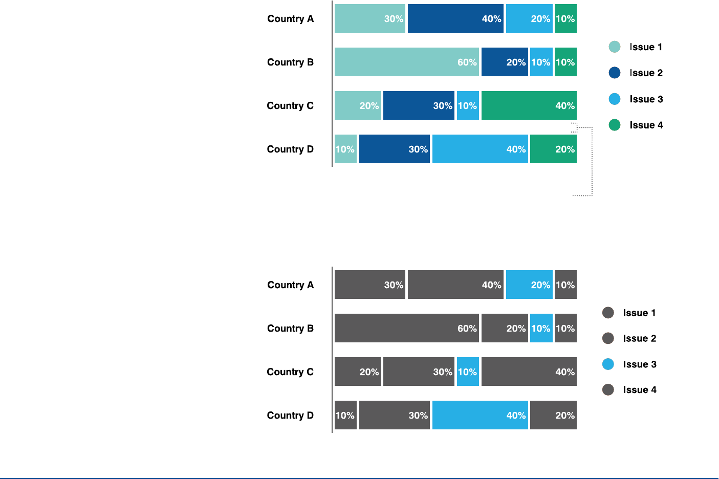
Example 1
Example 2
Stacked
Bar Graphs
Stacked bar graphs should be used to
portray parts of a whole and cumulative
data. Minimum space
between bars:
15px/5mm
16
Stacked Bar Graphs
best practices
INFOGRAPHICS
Example 4Example 3
Example 2Example 1
Label small data points outside the
bar chart.
Order colors consistently on each
chart when positioning similar data
sets for comparison.
Only chart data sets that add up to
100% (part-to-whole relationships).
Shorter text is recommended when
using a key.
17
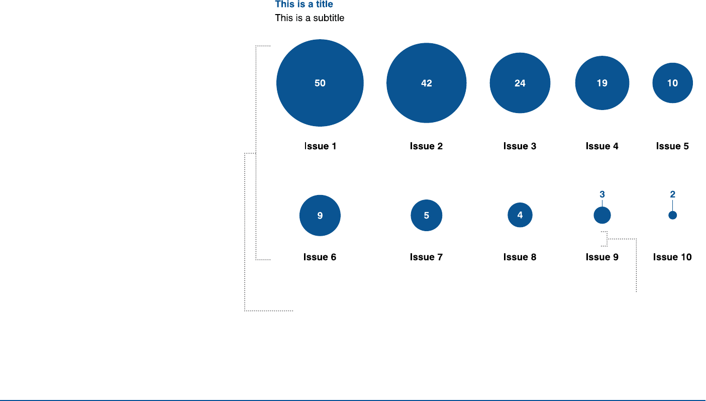
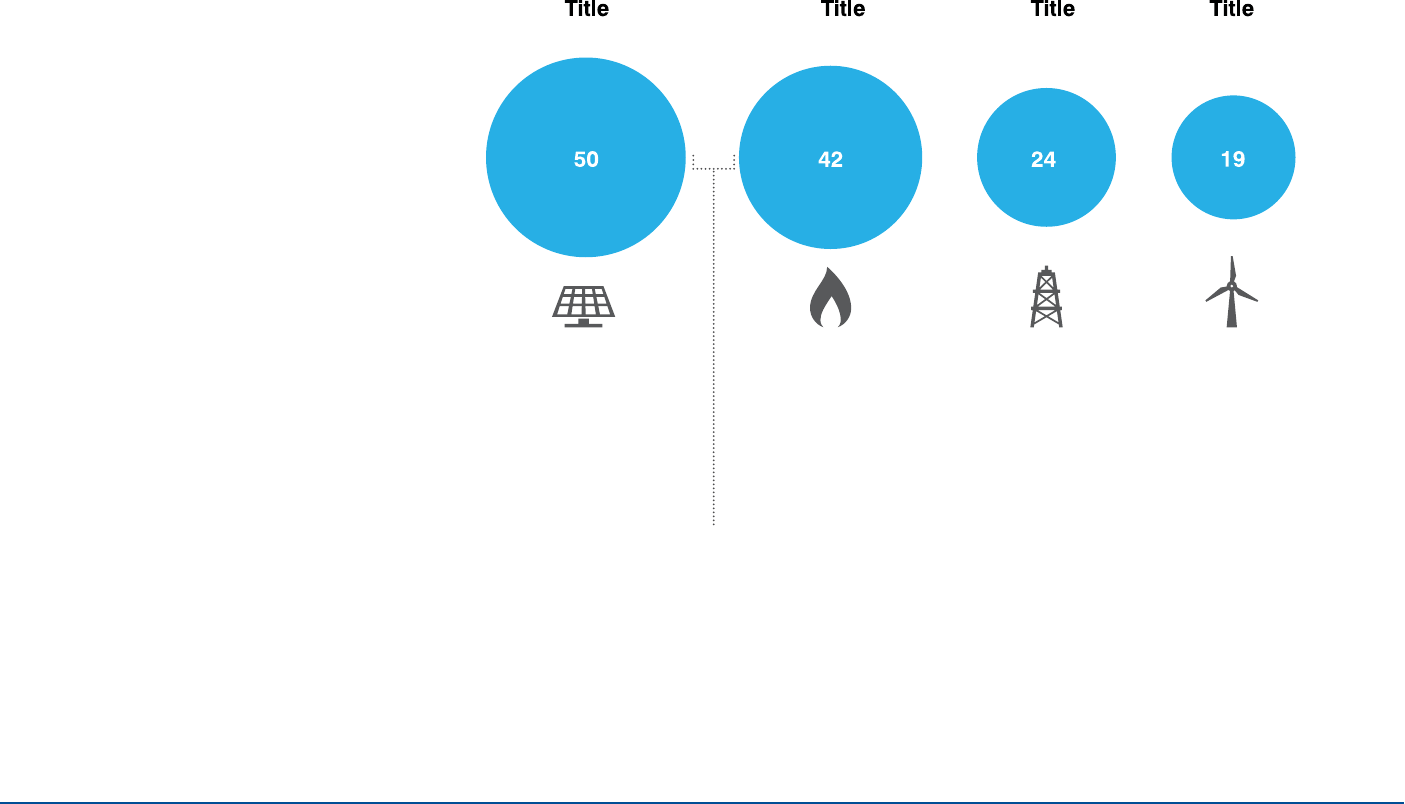
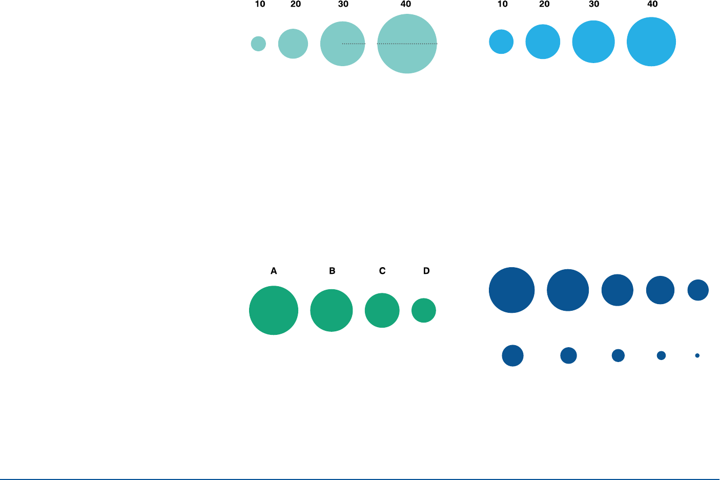
Bubble Charts
INFOGRAPHICS
Example 1
Minimum space between
label and bubble: 15px/5mm*
Order bubbles top to bottom,
starting each row with the
largest value to the left and
vertically aligning each column.
Stacked bar graphs should be used to
portray parts of a whole and cumulative
data.
18
Bubble Charts
(continued)
INFOGRAPHICS
Example 2
Minimum space
between bubbles: 25px/9mm*
*Maintain these spacing rules
independent of bubble sizes.
19
Bubble Charts
best practices
INFOGRAPHICS
Example 4Example 3
Example 2Example 1
Do not calculate bubble size based
on radius or diameter.
Calculate bubble size based on area (value = π * r2).
Always use meaningful ordering
from left to right.
With multiple rows, order bubbles from
left to right, starting with the largest on
the left.
20
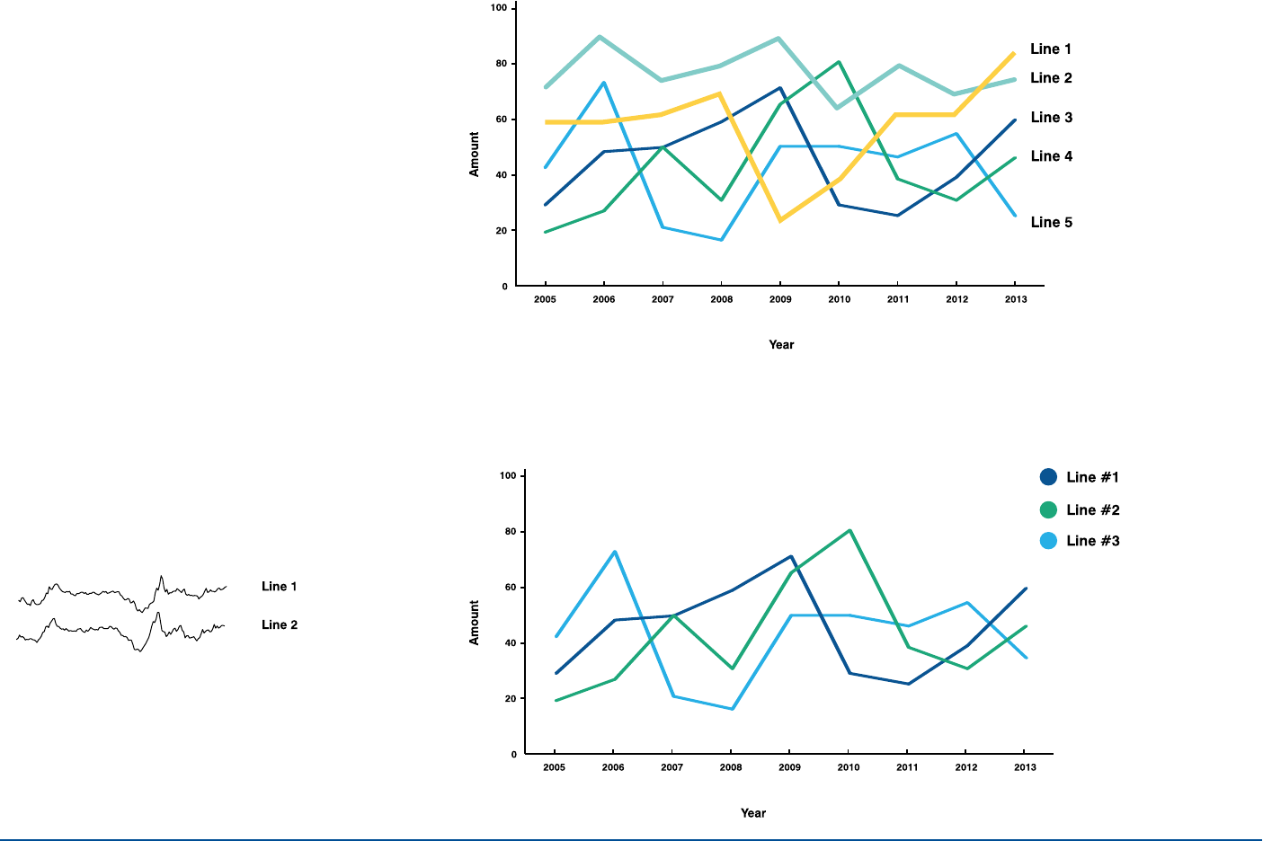
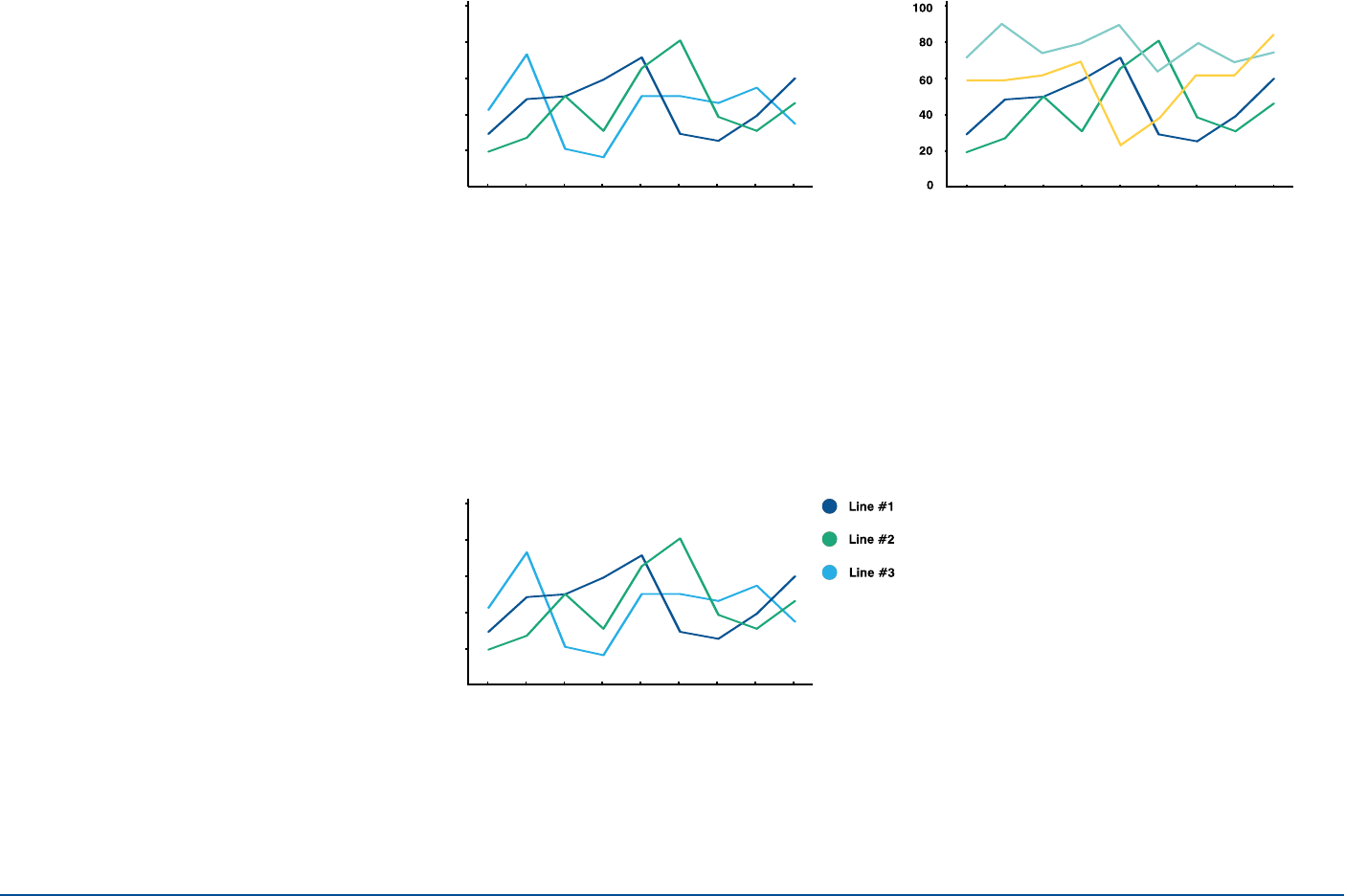
Line graphs should be airy. They should
not include unnecesary lines that clutter
and make them less legible.
Line Graphs
INFOGRAPHICS
Example 1
Example 2
When using line graphs containing more that seven data points:
1. Find ways to consolidate and categorize data.
2. Use spark lines: very small line charts without
axes or coordinates that present the data in a highly
condensed format
21
Line Graphs
best practices
INFOGRAPHICS
Example 3
Example 2Example 1
Use a key to label lines when space
is tight.
Choose a y-axis height that enables
the lines to occupy roughly 2/3 of
the chart area. The y-axis scale should
encompass all relevant reference points
to avoid misrepresentation of trends.
Use even axis increments.
Do not use a line stroke greater
than 2px, to ensure data points
are not obscured.
22
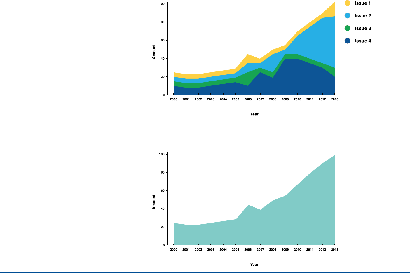
Area Graphs
INFOGRAPHICS
Example 2
Example 1
Area graphs should be used to display
cumulative data over time.
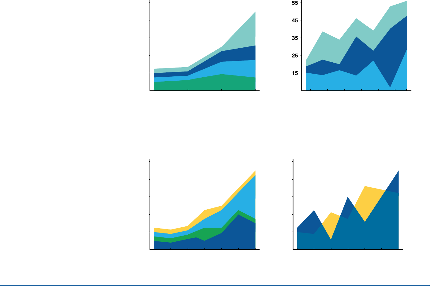
23
Area Graphs
best practices
INFOGRAPHICS
Example 4Example 3
Example 2Example 1
Minimize overlap as much as
possible (consider a difference
graph if overlapping is unavoidable).
Use contrasting color combinations
to clearly display data.
Use even axis increments.
Use no more than four lines to ensure
maximum clarity and comparison.
24
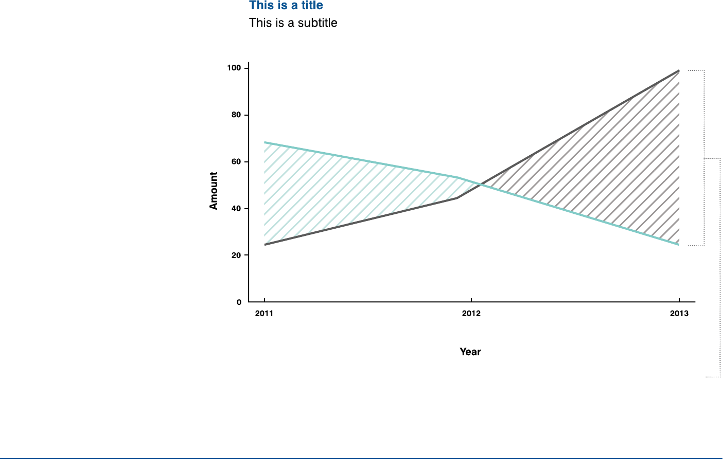
Difference graphs should be used when
highlighting the difference between two
data sets (e.g., revenue minus costs).
Difference Graphs
INFOGRAPHICS
Area denoting difference
should shade downward,
matching the color
of the line with the
greater value.
25INFOGRAPHICS
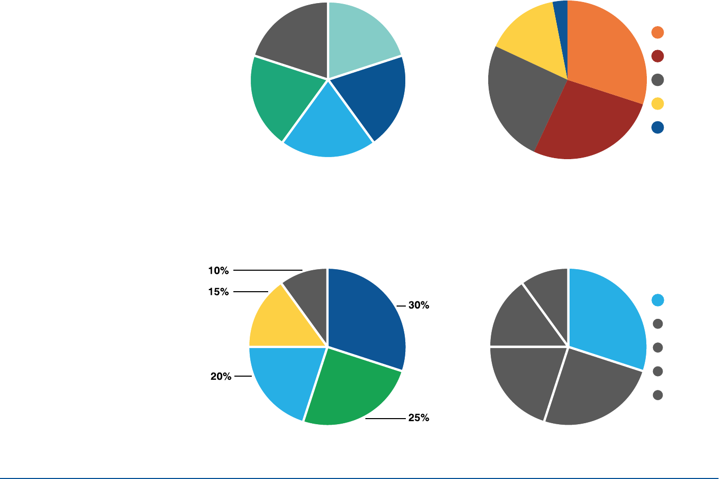
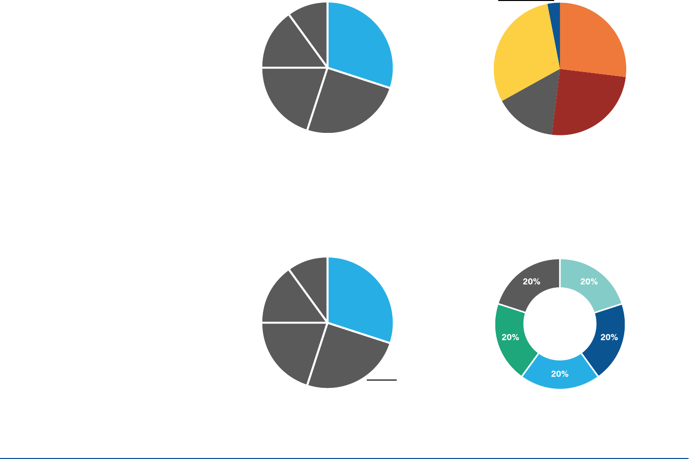
Pie Charts
Arrange call outs for the pie slices in
order of size as shown here. Organize
slices accordingly.
Example 4Example 3
Example 2Example 1
Item #1
Item #2
Item #3
Item #4
Item #5
10%
35%
25%
20%
15%
Item #1
Item #2
Item #3
Item #4
Item #5
20% 20%
20%
20%
20%
26
Example 1
INFOGRAPHICS
Example 2
Example 3 Example 4
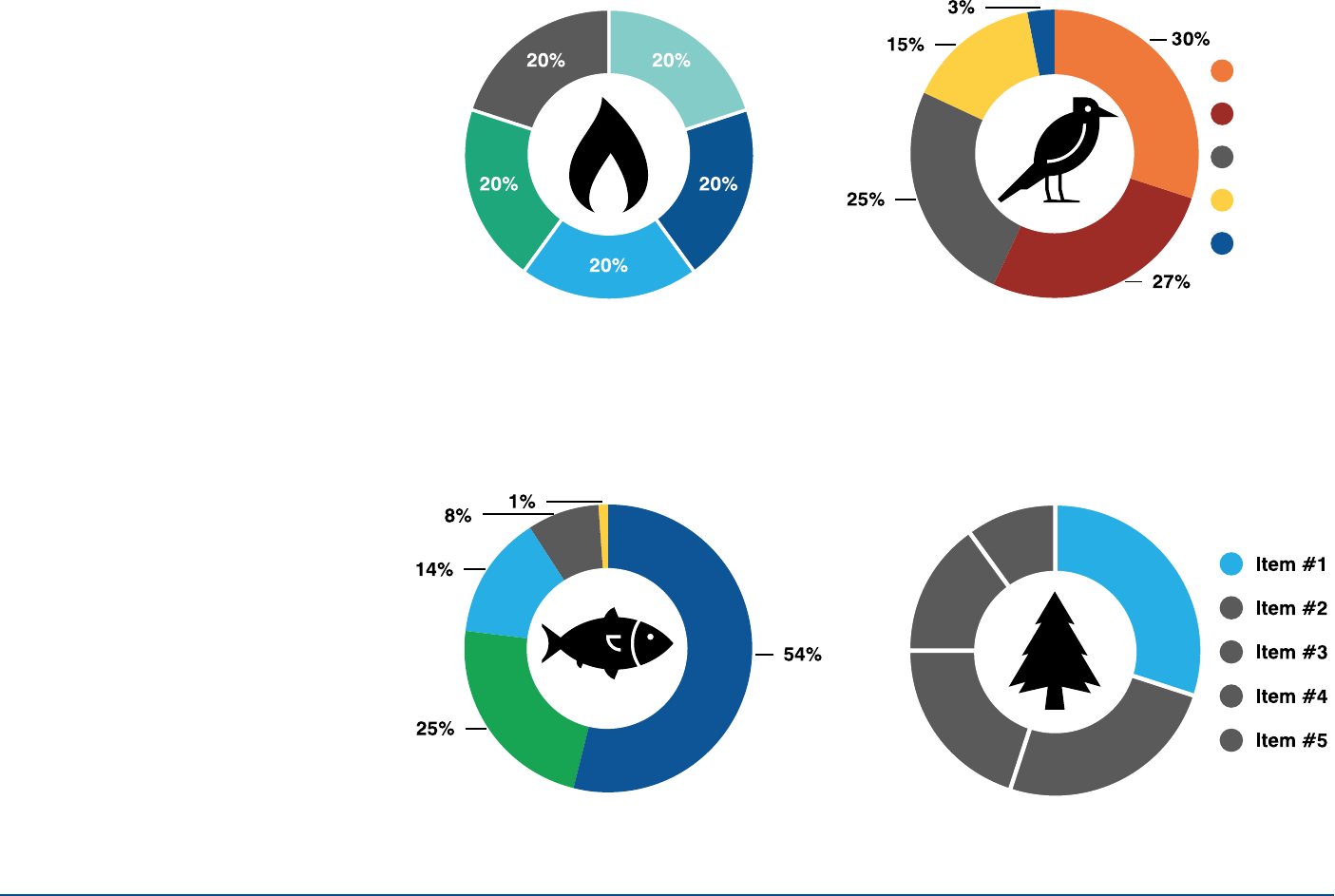
Donut Charts
Arrange call outs for the pie slices in
order of size as shown here. Organize
slices accordingly.
Item #1
Item #2
Item #3
Item #4
Item #5
27
Example 1
INFOGRAPHICS
Example 2
Example 3 Example 4
Pie & Donut Charts
best practices
Data labeled on a pie chart should be white, while
data labeled outside the chart should be in a color
that contrasts with the background.
35%
25%
To avoid clutter, label small data points outside a chart
with no white borders.
3%
Order segments from largest to smallest,
starting at 12 o’clock and rotating clockwise.
Only chart data sets that add up to 100%
(part-to-whole relationships).
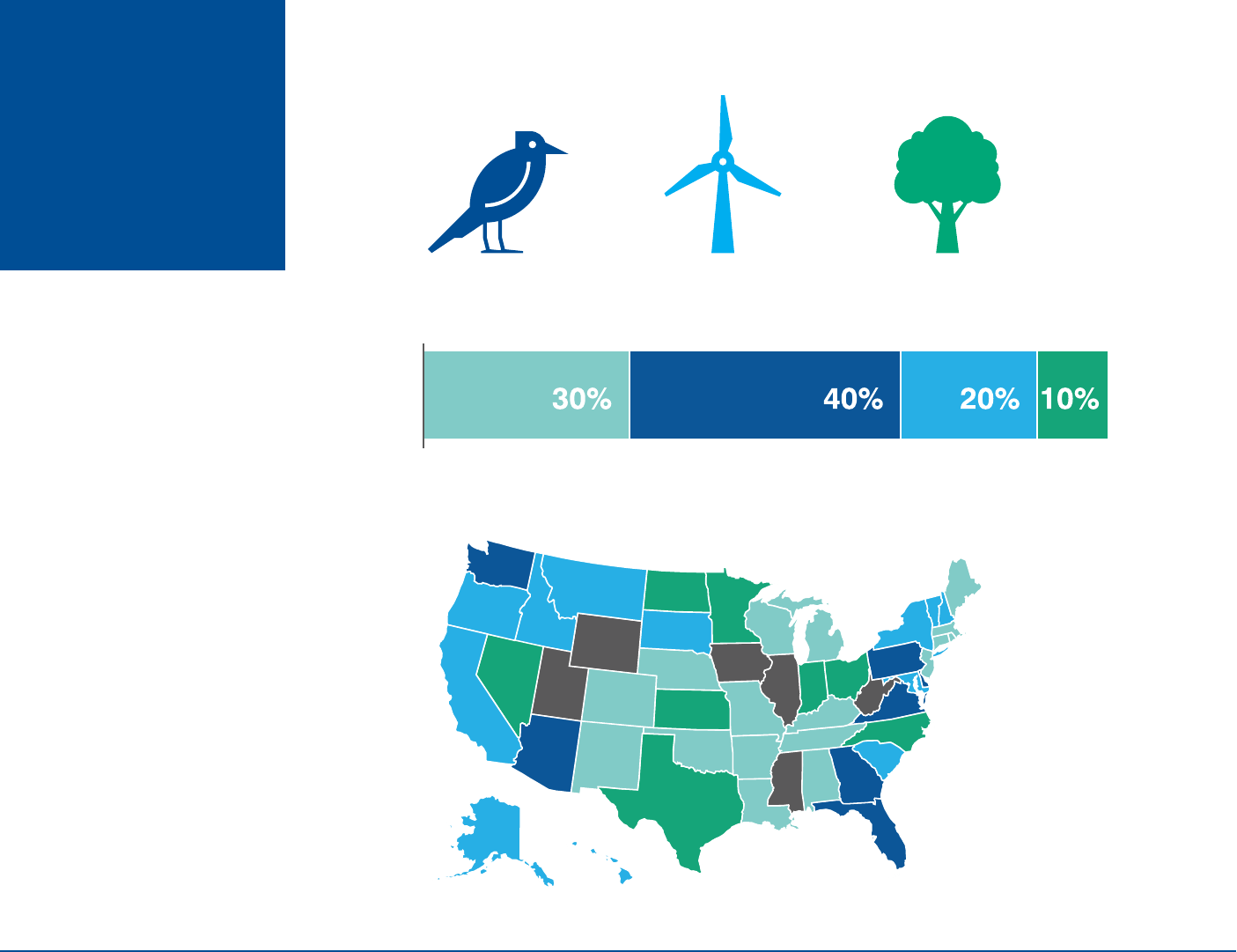
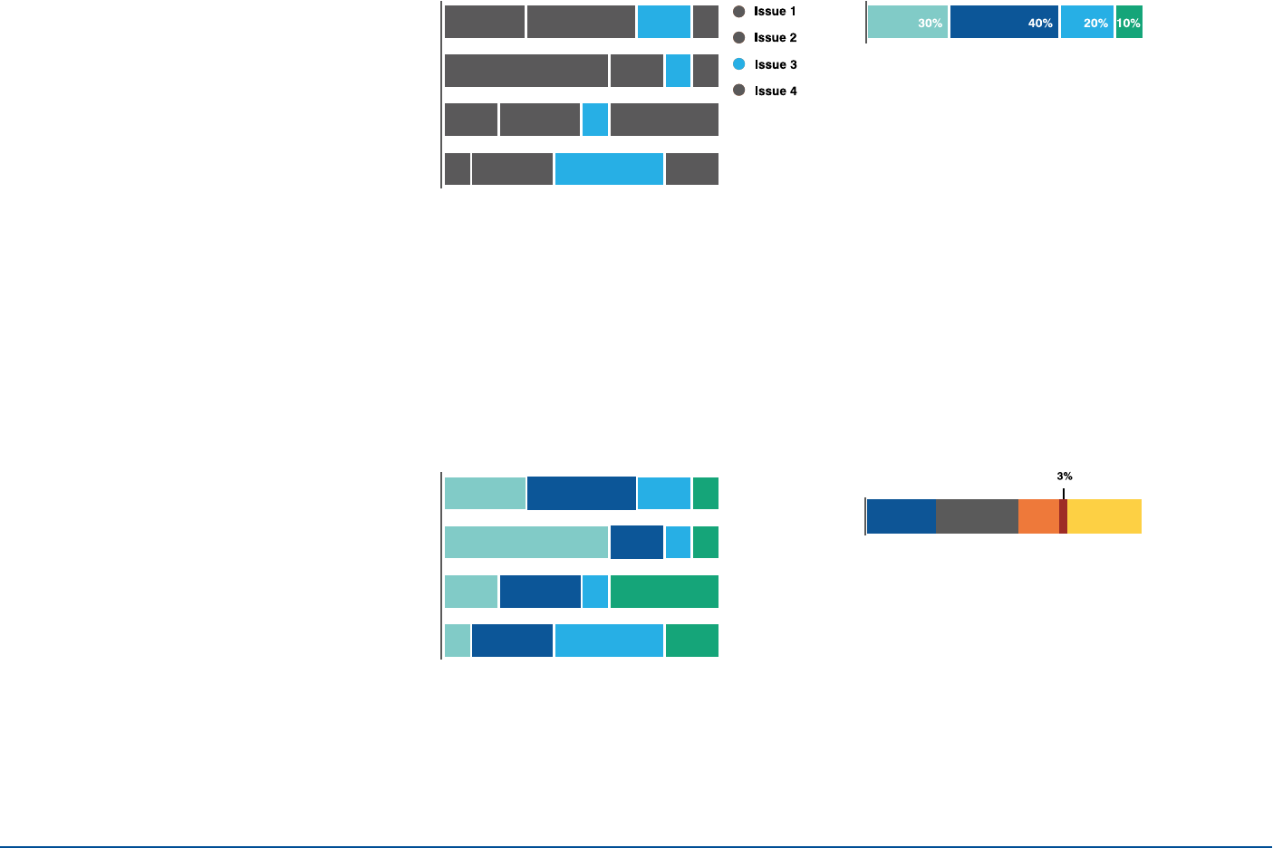
28INFOGRAPHICS
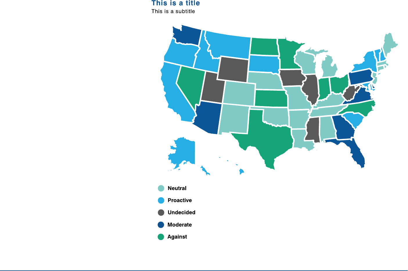
Example 1
Maps
Maps need to be bold and clear.
Do not include information that does
not directly relate to the data.
Labeling of maps must be clean and
clear.
29INFOGRAPHICS
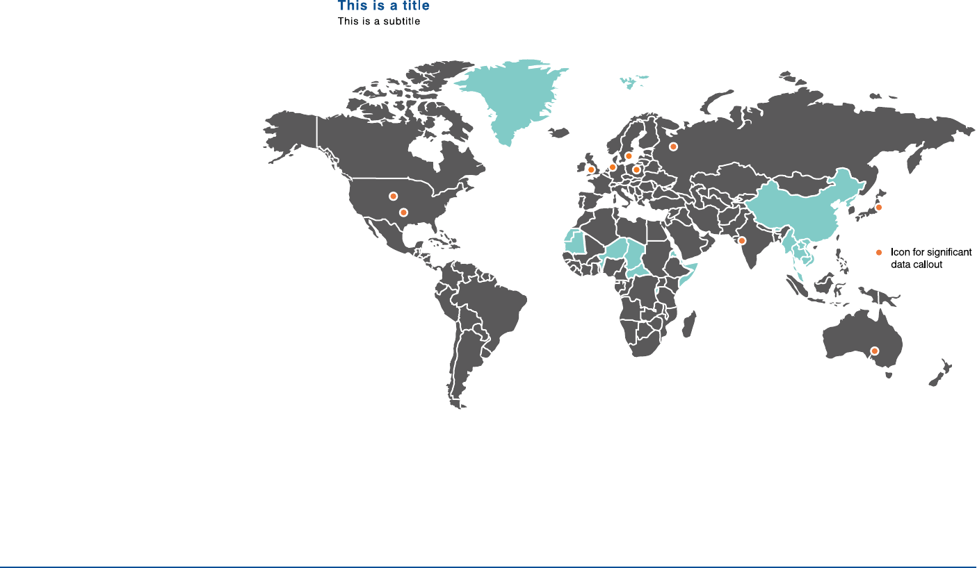
Example 2
Maps (continued)
Dots, labels and other information
needs to contrast well against
background map color for maximum
legibility.
30
Example 1
INFOGRAPHICS
Example 2
Example 3 Example 4
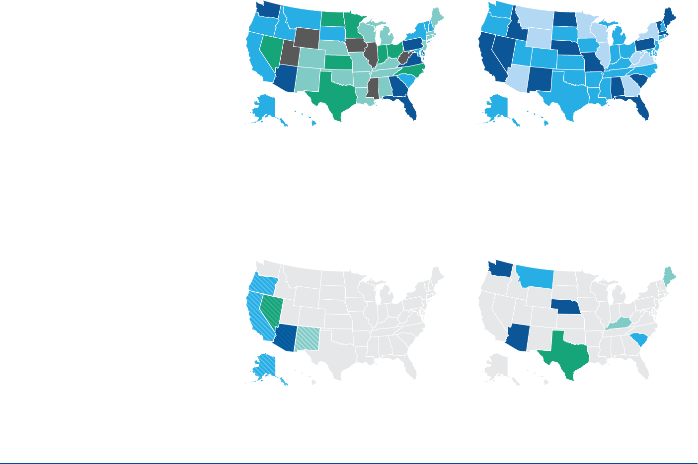
Maps
best practices
Choose a theme that best suits the
display of data (maximum five colors).
Do not use unequal ranges for heat maps.
Use solid colors only. Do not use patterns
or cross-hatching to highlight an area in a
map UNLESS multiple data points must be
shown in the same state.
Do not use a map with sparse data
or one with unimportant geographical
relationships.
31
Example 5
INFOGRAPHICS
Example 6
Example 7 Example 8
Maps
best practices
(continued)
Choose contrasting colors to achieve
full legibility.
Do not use more than five colors in the
same map visualization.
Choose a single color for dealing with
positive values of one metric in a heat map.
Choose two to three colors for dealing with both positive
and negative values in a heat map (the third color should
be a pale color such as gray to represent neutrality).
32INFOGRAPHICS
Timelines
Timelines should be presented in
chronological order, with appropriate
icons that support each event.
33
Example 1
INFOGRAPHICS
Example 2
Example 3
Timelines
best practices Leave approximately two
circles’ width spacing
between each event.
Use no more than two circles’
width per event description.
In winding timelines, leave
approximately two circles’ width
spacing between the bottom of an
event description and the row below.
