SciViz_Book.tex 172487 Eng403 Chap4 Contourplts
User Manual: 172487
Open the PDF directly: View PDF ![]() .
.
Page Count: 33
Chapter 4
Contour (Isoline) Plots
4.1 Contour Plot
Definition 10 (Contour Plot) A two-dimensional plot which shows the one-dimensional
curves on which the plotted quantity qis a constant. These curves are defined by
q(x, y)=qj,j=1,2,... ,N
c(4.1)
where Ncis the number of contours that are plotted. These curves of constant qare known
as the “contours” of qor as the “isolines” of qor as the “level surfaces” of q.
Alternative Names: ISOLINE PLOT, LEVEL SURFACE PLOT
Competitors:
1. Pseudocolor plot pcolor
Much clearer in color than grayscale, but color is expensive
2. Mesh plot, alias “fishnet”, alias “wireframe” mesh
Good for visualizing broad features, but inferior to contour plot for precision.
3. Surface plot surf, surfl
Best in color or with high-resolution grayscale. Good for visualizing
broad features, but inferior to contour plot for precision.
4. Surface plot with contour plot surfc
Has the advantages of both surface and contour plots, but contour plot must
be depicted with a slant and can be obscured by the surface plot above.
5. Filled contour plot (superimposed pseudocolor and contour map) contourf
Much clearer in color than grayscale, but color is expensive
6. Three-dimensional contour plot contour3
Visually interesting, but the rings (closed contours) usually overlap,
making the image sometimes difficult to decode.
7. Three-dimensional bar plot bar3
Most useful when (x, y) is defined only for discrete values.
8. Three-dimensional stem plot stem3
Good for data which is defined only for discrete values of (x, y).
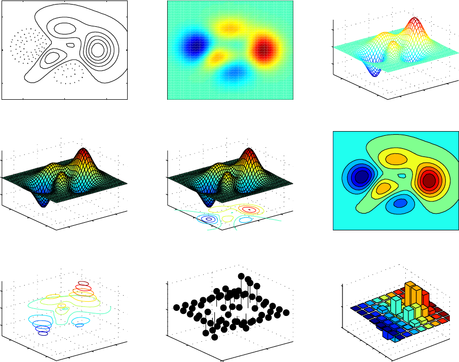
Fig. 4.1 shows a comparison between a standard contour plot and these alternatives.
109
110 CHAPTER 4. CONTOUR (ISOLINE) PLOTS
Contour Pseudocolor Mesh
Surf Surfc Filled-Contour
Contour3 Stem3 Bar3
Figure 4.1: A comparison of a standard contour plot with alternatives. Name of the plot is
given just above the graph.
4.2. THE CENTRAL PROBLEM OF CONTOUR PLOTS: CODING THE ISOLINES111
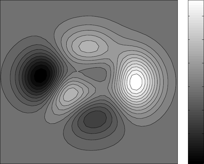
4.2 The Central Problem of Contour Plots: Coding the
Isolines
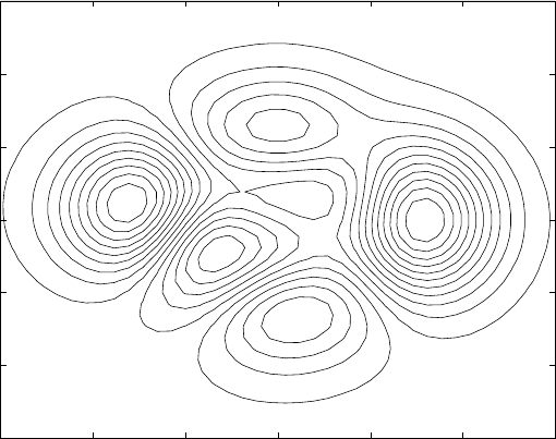
To summarize, the central problem of the contour plot is that if the contour lines are not
somehow labelled with additional text, color, or linestyle, it is not very informative.
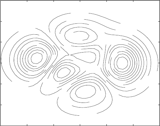
Fig. 4.2 is such a label-free/color-free/style-free plot. Try to answer the following ques-
tions:
•How many peaks are there?
•How many local minima are there?
•Where are the regions of maximum slope? [Caution: the values of the contour lines
need not be evenly spaced.]
The answer is that these questions are unanswerable from this plot. Without isoline-coding,
one cannot even distinguish the local highs from the lows. This plot is really quite useless.
In later sections, we shall describe a variety of strategies
-3 -2 -1 0 1 2 3
-3
-2
-1
0
1
2
3
Unlabeled, Uncoded Contour Plot
x
y
Figure 4.2: Unlabelled (and therefore useless ) contour plot.
112 CHAPTER 4. CONTOUR (ISOLINE) PLOTS
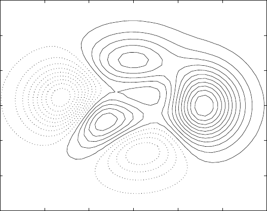
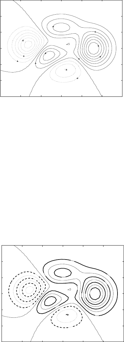
4.3 Solid Positive-Valued/Dashed Negative-Valued Con-
tour Plot
In meteorology, it is customary to plot positive valued-contours as solid lines and isolines
where qj<0 as dashed lines. This convention is very useful because one can distinguish
the hills from the valleys at a glance, which is very difficult when all isolines are plotted as
solid lines.
In meteorology, it is conventional to plot the letter “H” at the maximum of a function
and “L” at the minimum. NCAR Graphics, a FORTRAN library developed for atmospheric
applications, offers this as an automatic option.
The H/L labels can be added in Matlab by (i) calculating the maximum of the array of
grid point values of the function which is being contoured, which can be done by Matlab’s
built-in max function that optionally returns the indices of the value which is maximum
and (ii) feeding the coordinates of the maximum to Matlab’s text statement, which will put
a string of letters or numbers at the chosen point on the graph.
The H/L labels provide only redundant information. The center of a set of solid contours
is always a local maximum; the center of a set of dashed contours is always a local minimum.
Therefore, the labels add no information that is not inherent in the solid/dashed contour
convention.
-3 -2 -1 0 1 2 3
-3
-2
-1
0
1
2
3
Meteorological Convention: Negative Contours Dashed
H
H
H
L
L
Figure 4.3: Contour plots in the meteorological convention: dashed lines for contours where
u(x, y)<0, solid for positive-valued isolines. Peaks are marked with “H” and valleys with
“L”. (Highs and Lows on a weather map.)
4.4. HACHURE LINES 113
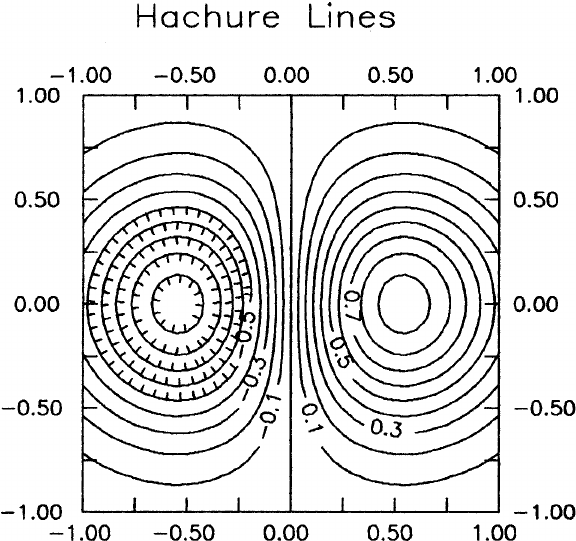
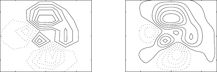
4.4 Hachure Lines
Geological survey maps often add little tick marks on one side of each contour, pointing
towards the low. These are commonly called “hachure lines”. The Surfer package from
Golden Software for PCs offers this as a simple, automatic option. (Oil prospectors, who
prompted the creation of this software, are enthusiastic hachure-users.) However, Matlab
and most scientific packages do not offer hachure lines. It is fairly easy to add the ticks
manually using a drawing program like Adobe Illustrator, however.
Meteorologists use a different way of distinguishing peaks and valleys: the valleys (“lows”)
are marked with the letter “L” and the peaks (“highs”) by the letter “H”.
The hachure/H-L controversy emphasizes an important theme: different fields of science
and engineering have developed different graphical conventions. If your field has a standard
convention for marking peaks and valleys, it is best to follow it. (Your readers will thank
you!) If your field doesn’t have a convention, then (i) do what is most convenient and (ii)
clearly explain the convention in the caption. It is not necessary to explain the meaning of
“H” and “L” on a contour plot in an article in the Bulletin of the American Meteorological
Society, but it is important to explain this convention in a chemical engineering paper.
Figure 4.4: Right half is a standard contour plot; the left depicts a contour plot with hachure
lines. The tick marks point to a valley. An equivalent indication is given in meteorology
by marking valleys and peaks with the letters “L” and “H”, respectively.

114 CHAPTER 4. CONTOUR (ISOLINE) PLOTS
4.5 Filled Contour Plot
This is a contour plot in which the gaps between each pair of neighboring contour lines is
filled with a color. This can make it easier to identify the important features at a glance.
In Matlab, this is done through contourf.m. The space between two contour lines
is always filled with a single color or grayscale shade, even when interpolated shading is
specified. This makes it easy to identify the isolines.
The filled contour plot has the disadvantage, shared with pseudocolor images, that the
color scheme can inadvertently emphasize or deemphasize various features. Furthermore,
color plots are expensive to publish. Grayscale plots may not reproduce very well in the
sense that the publisher’s typesetting equipment may do a rather poor job of reproducing the
shades of gray. (Submitting electronic Postscript files to the publisher can largely alleviate
this problem because the intermediate step of scanning a laserprinted image is eliminated.)
-3 -2 -1 0 1 2 3
-3
-2
-1
0
1
2
3
Filled Contour Plot: colormap(gray)
-6
-4
-2
0
2
4
6
Figure 4.5: Filled contour plot of the Matlab “peaks” function.
4.5. FILLED CONTOUR PLOT 115
In the lower image, we employed a Matlab option to define a new colormap which
enhances the contrast. The “contrast” command assigns color or gray shades to various
intervals so that each interval spans roughly the same number of grid point values of the
function which is plotted. For the “peaks” function illustrated in Fig. 4.6, the improvement
is marginal, but enhanced contrast can be quite useful for some images.
A filled contour plot has the minor disadvantage that it is less natural-looking than
either a unfilled contour plot or a pseudocolor graph. Because contour plots are widely
used in black-and-white graphics, most scientists are used to them. Pseudocolor plots with
interpolated shading also seem familiar since the colors vary smoothly from point to point
as in natural objects.
A more serious disadvantage is that filled-contour maps look best in color, and color
publication is expensive.
Even so, the filled contour plot has most of the advantages of both contour and pseudo-
color images.
-3 -2 -1 0 1 2 3
-3
-2
-1
0
1
2
3
Filled Contour Plot: Enhanced Contrast
cmap=contrast(Z); colormap(cmap)
-6
-4
-2
0
2
4
6
Figure 4.6: Same as previous figure, but with a different, contrast-enhancing grayscale
“colormap”.
116 CHAPTER 4. CONTOUR (ISOLINE) PLOTS
4.6 Scalloping
The New Century Dictionary defines the verb “scallop” as meaning to “to mark or cut the
border into scallops; to ornament with scallops” where the noun “scallop” is a generic term
for seashells, or more formally bivalve mollusks. A common form of garden decoration, at
least in coastal regions, is to mark the border between grass and flowerbed with a line of
side-by-side seashells. Adding such decoration was said to be “scalloping” the garden. In
graphics, it is convenient to extend these general uses of the term as follows:
Definition 11 (Scalloping) Rapid oscillations in isolines in a contour plot, especially if
caused or exaggerated by poor visualization.
Of course, one could equally well describe such small-scale oscillations in contour lines
as “noise”. Computational hydrodynamicists, who often see such small oscillations appear
whose wavelength is twice the grid-spacing h, call such wiggles “2 −h” waves; this is said
with a shudder because it is usually a sign that nonlinear aliasing or other numerical in-
stability is corrupting the computation. It is convenient to have a special, graphical term
because sometimes the reason that isolines wiggle like the outline of an ornamental border of
seashells is because of defects in graphing or graphing software, rather than a computational
instability that is amplifying 2 −hwaves.
Fig. 4.7 shows scalloping in all four corners of the contour plot. The function which is
graphed is
q(x, y) = exp −(x2+y2)+0.01rand (4.2)
where rand is a random number, varying from point to point, between -1 and 1. The noise
fluctuations are real, but small: why does noise dominate the plot when it has an amplitude
only 1% of the height of the peak?
The answer is that in the corners, the Gaussian has decayed to a negligible amplitude, so
the noise dominates those regions. This would not matter except that the zero isoline is one
of the specified contours. The random perturbations of this very flat part of the function
turn the zero contour into a confused mass of little islands and straits.
The remedy is to simply omit the zero contour. Fig. 4.8 shows the same figure except
that the zero contour is not graphed. Now, only the Gaussian is visible, and the small-scale
noise has (visually!) disappeared.
4.6. SCALLOPING 117
-3 -2 -1 0 1 2 3
-3
-2
-1
0
1
2
3
Scalloping: Gaussian Plus 1% Noise
Figure 4.7: Contour plot of a Gaussian function plus a small perturbation which is a random
function of location. The plotted contour lines are those where the function qis equal to 0,
0.2, 0.4, 0.6, or 0.8.
-3 -2 -1 0 1 2 3
-3
-2
-1
0
1
2
3
Zero Contour Omitted: Gaussian Plus 1% Noise
Figure 4.8: Same as previous graph, but only the isolines where q=0.2,0.4,0.6,0.8 are
graphed.
118 CHAPTER 4. CONTOUR (ISOLINE) PLOTS
4.7 Choosing the Number of Contour Lines
One user-choosable option is the number of different levels Ncof the function q(x, y) which
will be plotted. Fig. 4.9 illustrates the significance of the choice. When Ncis small, the
shapes of the function are rather coarsely resolved even if the underlying grid is very fine.
When Ncis large, some of the contours may be so close that they blend into solid blotches
of not-very-informative color. Further, there may be no room to insert numerical labels for
the contours.
The Matlab contour command allows to choose the number of contour lines Nc. First,
make no choice, and Matlab will set Nc= 10, the default. Second, one may explicitly specify
Ncby adding an optional fourth argument:
[clabelhandle,lineorpatchhandles]=contour(X,Y,Z,Nc)
Third, one may replace the fourth argument by a vector Vof levels qjto be plotted;
Nc= length(V).
-2 0 2
-2
0
2
Five Contours
-2 0 2
-2
0
2
Ten Contours
-2 0 2
-2
0
2
Twenty Contours
-2 0 2
-2
0
2
Forty Contours
Figure 4.9: Same function as depicted using four different numbers of contour lines.
4.8. WHAT TO CONTOUR: VARIABLE ISOLINE-SPACING AND ISOLINES OF LOGARITHMS119
4.8 What to Contour: Variable Isoline-Spacing and Iso-
lines of Logarithms
The default option is to plot isolines qjsuch these values are equally spaced in q. This
default simplifies the visual interpretation of the graph (good!). However, regions of small
slope will be regions almost devoid of contours, making it very difficult to observe what the
function is doing in such nearly-flat regions. Fortunately, almost all contouring software
allows one to specify an explicit vector of qj. For example, in Matlab, one can issue the
command:
[contourhandle, hhh, levels]=contourBoyd(X,Y,Z’,[-5 -3 -1 -0.5 -0.25 0
0.25 0.5 1 3 5]);
When the contour levels are unevenly spaced, it is very important to explicitly label the
contours on the graph itself. Since the on-graph labels are usually hard to read, it is sound
practice to also state the contour levels in the figure caption.
Another reason for explicitly specifying the contours is not to space them unevenly, but
simply to choice nice numbers such as qj= integer. Most contouring software will pick its
own levels, scaled to say ten levels between the maximum and minimum of q, but some levels
may be odd numbers like q5=3.172487. Such numbers require long labels that clutter up
the graph with digits, assuming that they can be read at all.
Sometimes a better strategy is not change the level spacing by hand, but instead to
simple choose a different quantity to plot. In a study of two-dimensional turbulence, for
example, Jim McWilliams and collaborators plotted the logarithm of the vorticity. The
contours of the vorticity itself show only that the end state of the turbulent cascade is that
most of the vorticity is concentrated in a few large, nearly axisymmetric vortices with great
voids of emptiness. The plot of the logarithm of vorticity shows that the voids are filled
with long, stringy filaments of weak vorticity. In spite of their small magnitude, however,
these filaments are important because it is in them, with their narrow length scales in the
cross-filament direction, that most of the viscous dissipation of vorticity occurs.
A second example is the Rosenbrock “banana” function, which is defined by
qBanana(x, y)≡100 y−x22+(1−x)2(4.3)
It is widely used as a test for optimization routines because the global minimum at x=y=1
where qBanana = 0 lies at the bottom of a long, curving thin valley.
It is possible in principle to locate the minimum of a two-dimensional function merely
by plotting its contours. However, the derivatives of a function are zero at a local minimum
or maximum, and therefore is very flat. When the contoured values qjare evenly spaced
in q, the contour nearest the local extrema will be rather far away from it in general.
Fig. 4.10 (left panel) shows that plotting the contours of the banana function is indeed
rather uninformative.
If the contours of the logarithm of qare plotted, however, then the minimum of zero
is transformed into a minimum of negative infinity. The dashed contours where log(q)<
0↔q<1 clearly delineate the valley where the banana function is small, and the densest
contours are packed around the minima itself.
Of course, it is possible to identify the minima without the aid of the graph by using the
minimum function built in to most compilers. The standard Matlab function min returns
the minimum of a vector along with the positive integer which is the index of the element
which has the smallest value: [smallestvalue, index]=min(y). Oddly, there is no two-
dimensional function which performs this operation for two-dimensional arrays, but it is
easy enough to write one:
120 CHAPTER 4. CONTOUR (ISOLINE) PLOTS
0 1 2
0
0.5
1
1.5
2
Rosenbrock Banana
012
0
0.5
1
1.5
2
Log(Abs(Banana))
⋅
Figure 4.10: Two contour plots of the Rosenbrock “banana” function. The left panel is a
plot of the (evenly spaced) isolines. Right panel is the same except that the logarithms of
the absolute value of the “banana” are plotted. The black dot marks the global minimum
as found by the “min2” function described in the text.
function [smallestvalue,indexi,indexj]=min2(Z);
[vector of minima,vector of row indices]=min(Z);
[smallestvalue,indexj]=min(vector of minima);
indexi=vector of row indices(indexj).
We can mark the minima of the gridded values with a disk by executing the following:
[conthandle,ccc,levela]=contourBoyd(Xb,Yb,log(abs(Banana))’,20);
[globalmin,indexi,indexj]=min2(log(abs(Banana)));
texthandle=text(X(indexi,indexj),Y(indexi,indexj),’cdot’,’FontSize’,72);
set(texthandle,’HorizontalAlignment’,’center’,’VerticalAlignment’,’cap’)
(Note that the “cdot” should have a backslash in front of it, but there is no simple way to
explicitly display this in Latex.)
4.9. CONTOURING IN IRREGULAR REGIONS 121
4.9 Contouring in Irregular Regions
When the geometry is complicated, most contouring software is useless because it is re-
stricted to contours over rectangular domains. There are some exceptions, however. In
Matlab, one simple workaround is to define a rectangular array which is sufficiently large
to enclose the actual, irregular domain. The array of values of qis then filled with the
real values of qwithin the domain and the Matlab NaN at all points outside the domain.
Matlab will then ignore the NaN’s so that the plot will show only the contours within the
domain.
There are some caveats. First, one must necessarily waste some storage on lots and lots
of NaN’s. Second, one must use a fine grid, or otherwise the boundary will appear jagged,
approximated by Matlab as a union of line segments which are vertical or horizontal only
even at a curving boundary. Third, it is usually desirable to show the boundary explicitly.
The boundary can be marked in Matlab by executing a hold command and plotting the
boundary through the usual linegraph command, plot. If these limitations are accepted,
then Fig. 4.11 shows that the results can be quite satisfactory.
The code to generate this plot is very brief:
[cout,hand,levela]=contourBoyd(X100,Y100,Zbip,10);
axis([-3 3 -1.5 1.5])
set(gca,’FontSize’,18); ’Contour Within Two Disks’)
hold on;
theta=linspace(0,2*pi,100);
xdisk1=-1.5 + 1.5*cos(theta); ydisk1=1.5*sin(theta);
xdisk2=1.5 + 1.5*cos(theta); ydisk2=1.5*sin(theta);
plot(xdisk1,ydisk1,’k-’,xdisk2,ydisk2,’k-’); % Plot boundary disks
axis([-3 3 -1.5 1.5])
set(gca,’PlotBoxAspectRatio’,[2 1 0.01]); % For convenience
& geometric fidelity, make twice as wide as tall
-3 -2 -1 0 1 2 3
-1.5
-1
-0.5
0
0.5
1
1.5
Contour Within Two Disks
Figure 4.11: Contour plots of the Matlab “peaks” function on a domain restricted to the
union of two disks. The plot was accomplished by contouring the function over a square
domain where all values of q(x, y) outside the disks was set equal to NaN, the Matlab “Not-
a-Number”. The boundary circles were then added through a hold command followed by
aplot command.
122 CHAPTER 4. CONTOUR (ISOLINE) PLOTS
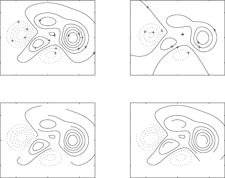
4.10 Label Troubles
It can be very difficult to effectively label contours of a function qwith the qj, the values
associated with each line. Fig. 4.12 shows a plot with illegible labels (upper left) and three
strategies for coping: integer labels, manual placement of labels, and in-line labels. Other
helpful tactics will be described later in this section.
Why is labelling hard? The short answer is: a contour plot is crowded with the contour
lines themselves. Worse still, the plot is almost useless unless the levels associated with each
curve are coded in some way. To label a contour plot is to crowd many digits into a space
already occupied by many lines.
However, the value of a contour can be coded in ways other than by writing out the digits
of its value. We can therefore divide isoline-coding strategies into broad groups: explicit
alphanumeric labels and implicit, label-by-color-or-style schemes.
-2 0 2
-2
0
2
Many-Digit Labels
-5.22
-3.9
-2.57
-2.57
-1.24
-1.24
0
0.0862
1.41
1.41
2.74
2.74
2.74
4.07
5.39
6.72
-2 0 2
-2
0
2
Integer Labels
-6
-4 -2
-2
0
0
02
24
6
-2 0 2
-2
0
2
Inline Labels: clabel(c,h)
0.086212
0.086212
0.086212
1.4134
2.7406
-2 0 2
-2
0
2
clabel(c,h,'manual')
2.7406
2.7406
-1.241
-5.2225
6.7221
1.4134
0.086212
Figure 4.12: Four contour plots of the “peaks” function, each panel with different labelling
strategy. Upper left: default labelling (Matlab chooses the levels to contour and automat-
ically places the labels). Upper right: one strategy for better labels: integer labels. Lower
left: when the Matlab labelling command is called with two arguments, it automatically
generates “in-line” labels that erase part of the contour, and insert themselves in the space
so created. Lower right: if called with an optional third argument, ‘manual’, the labels will
be placed only where the user clicks on the screen.
4.10. LABEL TROUBLES 123
Color-coding has the defect that subtle differences in hue, such as between dark blue
and very dark blue, are most easily perceived when the colors are patches or areas.Inan
ordinary contour plot, the colored elements are lines separated by gaps of white. The gaps
between the lines makes it much difficult to successfully compare them.
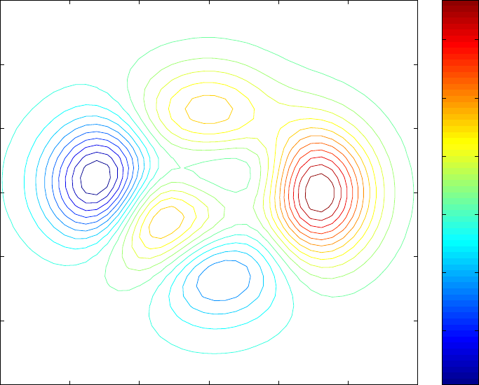
If we inspect an example of a color-coded contour plot, such as Fig. 4.13, we find that the
colors are indeed useful. The tallest peak is marked with red contours, the two smaller peaks
with yellow, and the valleys are blue. However, in black-and-white graphics, the positive-
lines-are-solid-and-negative-lines-are-dashed convention conveys the same information (at
much less cost to the publisher): which rings of contours are peaks and which are depressions.
Other colormaps are possible. However, using a rainbow spectrum revives the problem
that, in Tufte’s term, the sequence red-green-yellow-purple-blue (or whatever) is not easily
mind-mapped to the contour values; one has to study the colorbar with almost religious
intensity to learn the key. It is far better to just add numerical labels, and then the colorbar
(and colors) are redundant.
-3 -2 -1 0 1 2 3
-3
-2
-1
0
1
2
3
Color-coded Isolines: colormap(jet)
x
y
-4
-2
0
2
4
6
Figure 4.13: Contour plot with isoline-values coded only by color.
124 CHAPTER 4. CONTOUR (ISOLINE) PLOTS
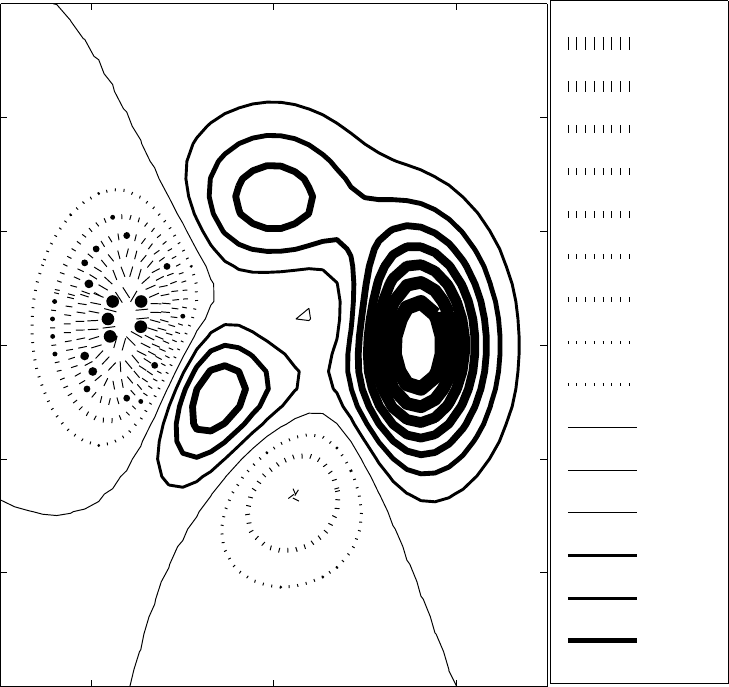
An alternative implicit coding strategy is to code by line width instead. Fig. 4.14 is
an example. Unfortunately, it is not completely successful. It is not easy to precisely
compare small relative differences in line widths when there are gaps of white between the
curves being compared. Furthermore, the very thick lines have merged into solid blobs of
indecipherable black. One could perhaps obtain some improvement by playing around with
the line widths, but line width-coding is clearly limited.
-2 0 2
-3
-2
-1
0
1
2
3
Width of Line = |Contour Value|+0.5
-7
-6
-5
-4
-3
-2
-1
0
1
2
3
4
5
6
7
Figure 4.14: Contour plot with isoline-values coded only by linewidth. This is not a standard
Matlab option, so glitches occurred. The legend box claims that qj= 1 is represented by a
thin dashed line when it is actually graphed as a thin solid line. Such glitches are a common
price for hacking one’s way to non-standard visual representations.
4.10. LABEL TROUBLES 125
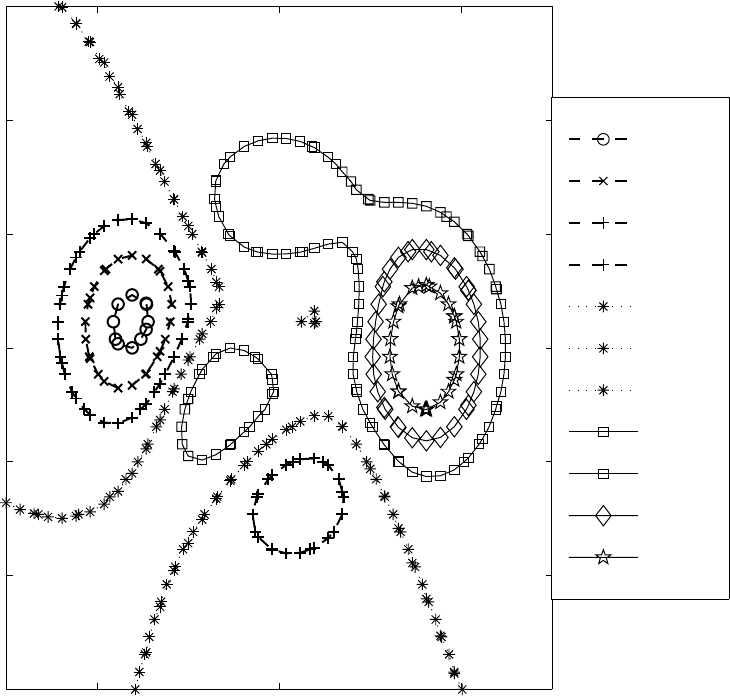
Isoline values can also be labelled by the type of marker symbol as in Fig. 4.15. This
strategy has two advantages. First, color is unnecessary since the triangles, squares, penta-
grams, etc., are quite distinct even in black-and-white if the marker sizes are not excessively
small. Second, marker symbols are precise: lines with pentagrams have q= 6; one need
not make qualitative judgments about whether the line is dark blue or very dark blue or is
a five-point-wide line versus a six-point-wide line.
The disadvantage is that there is no natural or obvious association between particular
marker symbols and high or low values. The choice that the highest qvalue in Fig 4.15 is
labelled with the pentagram is completely arbitrary. The reader is therefore forced to shift
back and forth between the legend and the isolines, a strain of both eyes and mind.
However, a compromise is possible: labelling a small subset of the contour lines with
either symbols or with different widths may be useful in organizing the visual impression.
In a bathymetric map, for example, distinguishing the zero contour with marker disks to
thus delineate the coastline might be useful.
A strategy of marker-labelling of all contours does not seem too promising.
-2 0 2
-3
-2
-1
0
1
2
3
Symbol Markers for Isolines
-6
-4
-2
-2
0
0
0
2
2
4
6
Figure 4.15: Contour plot with isoline-values coded by marker symbols.

126 CHAPTER 4. CONTOUR (ISOLINE) PLOTS
4.10.1 Numerical Labels
Because of the difficulties of fitting both a lot of numerical labels and a large number of
contour lines together, one must employ various combinations of strategies to make it all fit.
Some of these strategies violate earlier recommendations for text-in-graphs, but one may
have no option. These strategies include:
•Integer labels
a. Manual specification of isolines to be contoured
b. Scaling of qby a constant before plotting
c. Modifying the label format to round to the nearest digit
•In-line labels
•Manual placement of labels
•Shifting to smaller font size
•Reducing Nc, the number of isolines plotted
•Partial labelling (some isolines unlabelled)
The first three of these strategies have already been illustrated in Fig. 4.12.
Most contouring routines (including Matlab’s) will choose a default number Ncof con-
tours and a set of default values, qj,j =1,2,... ,N
c, which evenly fill the range between
the minima and maxima of the array of values of q. Although these defaults are very useful
for exploratory graphics — the computer does the work of graphing, and the user only has
to think about science — these defaults often result in isolines with strange q-values like
2.138943 and 7.0472. These non-integral, multi-digit values are not only hard to remember,
but all those digits take up space on the graph that may not be available. If the isoline
values are integers, then the plot will not drown in digits even if there are a lot of isolines
on the graph.
There are at least three ways to simplify the labels. If, by dumb luck, the range of qon
the domain of the plot is limited to single digits, then manual specification of the plotted
isolines to be the integers may be fine. In Matlab, this is accomplished by adding an optional
fourth argument such as [-4 -3 -2 -1 0 1 2 3 4].
If the data range is unkind, then one may first need to modify the plotted quantity to
˜q≡q
S(4.4)
where Sis a constant scaling factor that is chosen so that the range of ˜qwill be (approxi-
mately) ˜q∈[−9,9]. This has the disadvantage that what is plotted is different, by the scaling
factor, from what is meant, and this puts extra cognitive work on the reader. Further, one
must be careful to clear specify Sin the caption and, if possible, in the title,too, as, for
example, “A Contour Plot of Vorticity Divided by Twenty”. It is best to choose Sso that
it is a nice, round number; S= 8 is better than S=7.2.
Some contouring routines allow one to specify the number of digits in the label. However,
many do not. In any event, labelling the isoline q=0.4 with the label “0” is probably a
bad idea.
It is usually best to label all data curves with horizontal text just above the curve. How-
ever, desperate times call for desperate remedies, and a contour plot is almost by definition
a visualization battle zone. “In-line” labels are plotted by erasing part of the isoline, and
insert the label, rotated to parallel the contour, in its place. Because the in-label is literally
surrounded by the curve it labels, it is difficult to become confused about which set of digits
4.10. LABEL TROUBLES 127
is associated with a given isoline. Furthermore, because one no longer needs whitespace
between the lines for labels, one can crowd a higher density of contours with in-line labels.
There are two disadvantages to in-line labels. First, many contouring routines do not
allow such labels. (Matlab does, however, merely by supplying two arguments to the clabel
command.) Second, the rotated text is harder to read than horizontal labels.
Contouring routines do a reasonable job of automatically finding places for the labels.
However, one can usually improve upon automation by manually placing the labels. (Matlab
allows this by specifying the optional keyword ‘manual’ in the argument of the clabel
command.) Automatic placement often leaves the labels scattered all over the place —
q= 5 labelled at the far left of the plot, q= 6 at the right, q= 7 in the middle. It can
be rather confusing to trace a winding isoline from one end of the graph to its label at the
other.
It is usually a bad idea to reduce font size because a figure will often be reduced by
the publisher, or its resolution enormously degraded when distributed through a Web site.
However, for contour plots, one must sometimes sigh deeply and use a small font size.
In Matlab, the font size of the labels is changed by calling the labelling routine in the form
htext=clabel(ccc). The left-hand side of the call to clabel will be returned as a vector of
handles to the text objects which are the line labels. The command set(htext,’FontSize’,18)
will then specify 18-point type. (One can choose any size that one wishes.) Other properties
can be changed the same way: set(htext,’FontName’,’Palatino’) will change the font to
Palatino.
Fig. 4.16 illustrates two of the difficulties described earlier: multi-digit labels and labels
in too large a font size.
-3 -2 -1 0 1 2 3
-3
-2
-1
0
1
2
3
Drowning in Digits: 24-point Labels
x
y
-5.1593
-3.7689
-3.0737
-3.0737
-2.3785
-1.6834
-1.6834
-0.98817
-0.98817
-0.98817
-0.29298
-0.29298
-0.29298
-0.29298
-0.29298
0.402
21
0.40221
0.40221
0.40221
0.40221
0.40221
0.40221
1.0974
1.0974
1.0974
1.0974
1.0974
1.0974
1.0974
1.7926
1.7926
1.7926
1.7926
1.7926
2.4878
2.4878
3.183
3.183
3.183
3.8781
4.5733
5.2685
5.9637
Figure 4.16: A doubly-awful contour plot. First, the labels have many digits. Specify isoline
values with one or two digits instead! Second, the labels are in very large, 24-point type.
When the contours will not be labelled, one can choose a large number Ncof contours to
be plotted. Large Ncbrings out even small features of q(x, y). However, when the isolines
will be labelled, clarity can be greatly improved by reducing Nc. “Fewer-is-better” for a
128 CHAPTER 4. CONTOUR (ISOLINE) PLOTS
-3 -2 -1 0 1 2 3
-3
-2
-1
0
1
2
3
Partial Labelling: clabel(cout,[-7 -5 -3 -1 1 3 5 7])
-5
-3
-3
-1
-1
1
1
3
3
3
5
7
Figure 4.17: A contour plot in which only half the isolines are labelled, permitting a less
crowded diagram. The labels have been printed in an almost illegible font size to illustrate
the perils of using a font size that is too small relative to the final printed size of the graph.
crowded graph.
Another strategy is to label only some of the contours. If the isolines are evenly spaced
in q, the values of unlabelled contours can be inferred from its neighbors. This might be
dubbed the “what comes between two and four strategy”.
In Matlab, partial labelling can be implemented by simply calling clabel with a right-
most argument that is a vector of numbers. The command clabel(ccc,[-5 -3 -1 1]) will
label only those contours for which q= -5 or -3 or -1 or 1 as illustrated in Fig. 4.17.
Cleveland (1993) prefers to combine this strategy with differential line widths: the la-
belled contours are thicker than unlabelled contours. This artificially deemphasizes the
unlabelled isolines (bad!) but it does make it easier to associate labels with the correct
contour, especially when the labels are above-the-curve rather than in-line. His style of
partial-labelling-with-variable-line-width is illustrated in Fig. 4.18.
-3 -2 -1 0 1 2 3
-3
-2
-1
0
1
2
3
Partial Labelling: Thicker Labelled Contours
-3
-1
-1
-1
-1
1
1
1
1
1
1
3
3
3
5
7
Figure 4.18: Same as the previous figure except that the labelled contours are thicker than
the unlabelled isolines, a device favored by Cleveland(1993).
4.11. JAGGIES OR PIECEWISE LINEAR PLOTS OF CONTOURS 129
4.11 Jaggies or Piecewise Linear Plots of Contours
Contouring software usually approximates the isolines by piecewise linear functions. If the
points of the rectangular grid are connected by lines, then the contours are continuous
across these grid lines, but the slopes are usually discontinuous. (In mathematical jargon,
the isolines are graphed as functions with C0but not C1continuity.)
On a coarse grid, the slope discontinuities are very evident. A plot with obvious discon-
tinuities is said to “have the jaggies”. (Fig. 4.19).
The easiest remedy for the jaggies is to a fine grid. What is one to do if the data is
available only on a grid of unsatisfactorily low resolution?
The answer is to first interpolate from the coarse grid to a finer grid, and then supply the
interpolated values to the contouring software. Most software libraries have good routines
for two-dimensional interpolation, so this preprocessing step does not require writing a lot
of code.
In Matlab, the procedure takes just a few lines. Let X, Y, Q denote the coarse grid,
such as might be produced by a statement like [X,Y,Z]=peaks(ncoarse). Let the one-
dimensional arrays of points on the high-resolution grid be denoted by xf, yf. Matlab has a
built-in command for forming a two-dimensional tensor grid from such vectors meshgrid:
xf=linspace(xmin,xmax,nfinex); yf=linspace(ymin,ymax,nfiney); % vectors
[Xfine, Yfine]=meshgrid(xf,yf); % Xfine is an (nfiney x nfinex) matrix with
each of its nfiney rows containing xf
% Yfine is an (nfiney x nfinex) matrix with each of its nfinex columns
containing yf
The values of q(x, y) on the fine grid are generated by
Qfine=interp2(X,Y,Q,Xfine,Yfine,’cubic’)
where the optional last argument specifies bivariate cubic interpolation. The function can
now be contoured on the fine grid through
[ccc,hhh,levela]=contour(Xfine,Yfine,Qfine,Nc)
The high resolution plot on the right in Fig. 4.19 was computed through this sort of two-
dimensional interpolation from the 8 x 8 grid.
Jaggies: 8 x 8 Grid Jaggie-Free: 40 x 40 Grid
Figure 4.19: Two contour plots of the Matlab “peaks” function, identical except for the
grid. The plot on the low resolution 8 x 8 grid shows noticeable discontinuities in the slope
of the isolines (“jaggies”). The higher resolution plot has very smooth contour lines.
130 CHAPTER 4. CONTOUR (ISOLINE) PLOTS
4.12 Contouring Algorithms
An isoline of a function q(x, y) is by definition the solution of the algebraic equation
q(x, y)=Q(4.5)
where Qis the desired value of qon the contour line. The isoline computation is challenging
because Eq. (4.5) is a nonlinear equation for all but the most trivial case. It follows that
it may have multiple solutions, that is, the isoline may be a set of multiple, non-connected
curves.
The usual rememdy is to compute a local, linear approximation to q(x, y) by inter-
polation. The isolines of the approximation will then be straight lines in the x−yplane.
Only that portion of the contour which lies within the domain of validity of the local, linear
approximation is accepted and graphed; the rest is discarded. By computing many local
approximations, and drawing many line segments, the contours of qover the entire region
of interest can be graphed.
The usual input to a contouring subroutine is a rectangular array of the values of qat a
set of points (“grid points”) in the (x, y) plane:
qij =q(xi,y
j),i=1,2,... ,M;j=1,2,... ,N (4.6)
For simplicity, we assume in the formula that the two-dimensional array of grid points is the
tensor product of two one-dimensional grids. If we draw parallel and vertical lines connecting
the grid points, the diagram will resemble a checkerboard, divided into rectangular “grid
boxes”, each with a grid point at its four corners. Some subroutines require that the grid
boxes be rectangular.
However, this is only to simplify programming. The underlying algorithm is based on
subdividing the grid boxes into triangles. It therefore causes no complications if the
grid boxes are general quadrilaterals, as shown in our schematic diagram, or even more
complicated shapes.
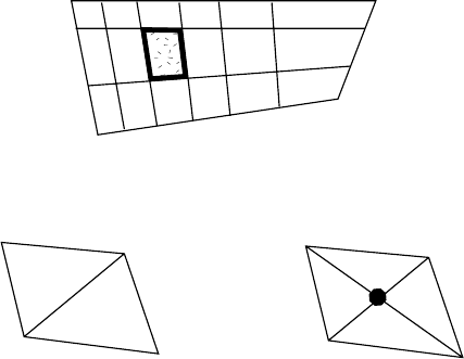
The first step in contouring is to identify a particular quadrilateral. The second step
is to subdivide the box into triangles as shown in Fig. 4.20. The simpler subdivision is to
Step One: Choose a quadrilateral
Step Two: Divide Into Triangles
or
Figure 4.20: First two steps in contouring an array of values of qon a set of quadrilaterals.
The solid disk on the right denotes a triangle vertex where q(x, y) must be obtained by
interpolation before processing the triangles.
4.12. CONTOURING ALGORITHMS 131
split the quadrilateral into two by a single diagonal line. The more complicated but more
accurate procedure is to subdivide into four triangles using two diagonals. In order that qis
known at all vertices of the triangles, it is necessary to compute a value for qby interpolation
at the point where the diagonals intersect (solid disk), which is a common vertex for all four
triangles.
The rest of the algorithm is to plot the contours for a single triangle. Repeating this
procedure over all triangles within a quadrilateral, and then over all quadrilaterals in the
array, completes the contour plot. The fundamental geometrical unit of the algorithm is a
triangle.
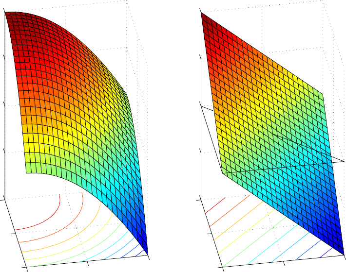
The reason that the triangle is fundamental is that there is a unique linear polynomial
which interpolates q(x, y) at the three vertices of the triangle:
q=a+bx +cy (4.7)
where, defining
q1≡q(x1,y
1),q
2≡q(x2,y
2),q
3≡q(x3,y
3) (4.8)
the coefficients are
∆=−x3y2+y3x2−x1y3+x1y2+y1x3−y1x2(4.9)
a=((y3x2−x3y2)q1+(y1x3−x1y3)q2+(y2x1−x2y1)q3)/∆ (4.10)
b=((y2−y3)q1+(y3−y1)q2+(y1−y2)q3)/∆ (4.11)
c=((x3−x2)q1+(x1−x3)q2+(x2−x1)q3)/∆ (4.12)
In the language of geometry, a polynomial which is linear in xand ydefines a plane in
the x−y−qspace. The interpolating polynomial is an analytic expression of the geometric
assertion that a plane in three-dimensional space is uniquely determined by specifying any
three non-collinear points on the plane.
The contours of q(x, y) as given by the bilinear polynomial approximation are all straight
lines, all parallel to each other with slope dy/dx =−b/c (Fig. 4.21). The isolines of all
more complicated functions are curved. However, if the triangles are sufficiently small,orto
put it another way, if the grid points are sufficiently dense, then the linear approximation to
the contour lines will be accurate within the triangle as shown schematically in Fig. 4.22.
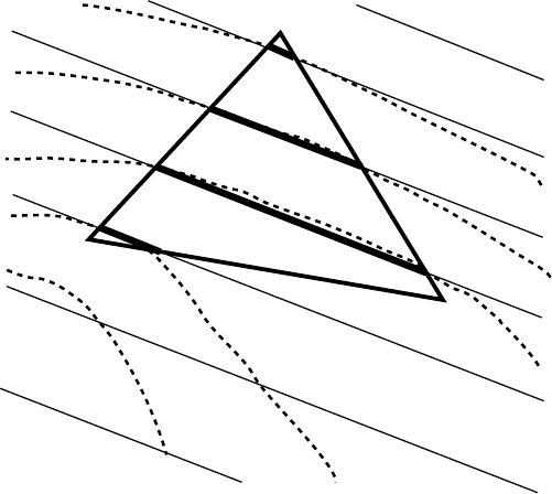
It is straightforward to compute the intersection of a given contour line with q=Q
with each of the three lines which bound the triangle. One can then draw those portions of
the contour which lie within the triangle. It is a very bad idea to extend the plotted lines
beyond the triangle because the true lines will curve increasingly far from the approximating
straight lines as one moves farther from the triangle. We will approximate the contours in
neighboring triangles by using different bilinear approximations, a different polynomial for
each different triangle.
To show the simplicity of the necessary mathematics, the intersection of the line con-
necting the first and second vertices with a contour where q=Qis given by defining
µ≡b(x2−x1)+c(y2−y1) (4.13)
x={(a−Q)(x1−x2)+c(x1y2−x2y1)}/µ (4.14)
y={(a−Q)(y1−y2)+b(x2y1−x1y2)}/µ (4.15)
The formula for the other two sides can be obtained by permuting the indices. In other
words, the intersections along the side between vertices two and three are obtained by the
132 CHAPTER 4. CONTOUR (ISOLINE) PLOTS
0
0.5
100.5 1
-1
-0.5
0
0.5
1
y
Exact q
x
0
0.5
100.5 1
-1
-0.5
0
0.5
1
y
Plane Approximation
x
Figure 4.21: Left panel: the true surface q(x, y). The curved isolines of qare shown on
the plane q=−1. Right: the plane which interpolates the surface of qat three vertices of
the triangle which is marked in black on the q= 0 horizontal plane. The contours of the
interpolating polynomial, shown below, are straight, parallel lines.
substitutions x2→x3,x
1→x2,y
2→y3,y
1→y2. Similarly, the third side is obtained by
replacing 3 →1,2→3 in all subscripts.
Each solution must be checked to see if it lies within the side of the triangle. In general,
only two of the three intersections will lie on the boundaries of the triangle; a straight line is
plotted between these intersections to approximate the isoline. If none of the intersections
lies with a side of the triangle, then the contour q=Qlies outside the triangle and should
not be plotted while processing this triangle. (We may find true pieces of the isoline q=Q
while processing other triangles.)
One worry might be that line segments plotted in adjacent triangles might not match
up so that the algorithm would plot contour lines that zig-zagged at the boundaries of
each triangle. Fortunately, this fear is groundless. A theorem, proved in Young and Gre-
gory(1972) and many other numerical analysis texts, shows that interpolation by piecewise
linear polynomials in continguous (that is, touching but non-overlapping) triangles, is al-
ways continuous across the common boundaries between triangles). (The first derivatives
of q, however, are generally discontinuous across the triangle walls). Therefore, the iso-
lines as plotted triangle-by-triangle will be continuous, too, although the slopes will not be
continuous.
Several articles and books describe contouring algorithms. Three examples are the fol-
4.12. CONTOURING ALGORITHMS 133
lowing.
•Simons(1983)
Each rectangular grid box is split by many fine lines, some parallel to one pair of sides,
others parallel to the other pair of sides. Bilinear interpolation on these segments
results in the plotting of a dot wherever a contour crosses one of these auxiliary line
segments. When the network of auxiliary lines is sufficiently fine, the pattern of dots
will blur into continuous isolines.
•Bourke(1987)
Each rectangle is subdivided into four triangles through a pair of diagonal lines running
from each corner to the opposite corner of the rectangle. Bilinear interpolation supplies
a value for qat the center of the box where the diagonals intersect and the four triangles
have a common vertex. Bilinear interpolation within each triangle then supplies line
segments that approximate the contours within each triangle. (This is the algorithm
described above.)
•Cleveland(1993)
Bilinear interpolation within each quadrilateral is combined with Gross’ rules for re-
solving ambiguity in contour orientation within a quadrilateral.
Figure 4.22: The thin, parallel lines are the contours of qas given by a bilinear polynomial
approximation which interpolates qat the three vertices of the indicated triangle in the x−y
plane. The last step in the contouring algorithm is to identify which contours intersect the
walls of the triangle and then draw these lines on the interior of the triangle only (heavy
solid line segments connecting two sides). The straight lines are good approximations to the
true contours (dashed curves) within the triangle, but increasingly poor approximations to
the isolines away from the triangle.
134 CHAPTER 4. CONTOUR (ISOLINE) PLOTS
These brief summaries show that there are some variations in contouring strategies.
Nevertheless, the basic unit of analysis is always a grid box or triangle; the fundamental
tool is to approximate q(x, y) by a bilinear polynomial in a given subdomain, and draw
the contours within that rectangle or triangle as given by the polynomial. Because of
the piecewise linear character of contouring algorithms, the “jaggies” are almost inevitable
unless the function is contoured using a dense grid of points.
There are a few contouring routines that decrease the jaggies. If the line segments
that are approximate a given isoline are identified by searching through the list of plotted
segments to find pairs that share a common endpoint, one can then apply splines or other
higher order approximations to smooth the contours. The NCAR Graphics package, for
example, has offered such options for more than a quarter of century. Matlab graphics, alas,
does not.
4.13. CONTOURING IN NON-RECTANGULAR DOMAINS, II 135
4.13 Contouring in Non-Rectangular Domains, II
Because the contouring is performed one grid box or grid triangle at a time, it is not necessary
that the input array Q(i, j) represent the values of q(x, y) at the points of a rectangular
grid in the x−yplane. Instead, for many subroutines including Matlab’s, it is sufficient
that the input array be logically rectangular. What is meant by this is the matrix
Qmust have a rectangular array of indices, i. e., Q(i, j) such that i=1,2,... ,M and
j=1,2,... ,N where iand jvary independently. The corresponding values of xand ysuch
that
Q(i, j)≡q(X(i, j),Y(i, j)) (4.16)
can be almost arbitrary.
An example will make this clearer. Define an evenly spaced grid in polar coordinates
(r, θ) through
ri≡(i−1)/(M−1); i=1,2,... ,M θ
j≡2π(j−1),j=1,2,... ,N (4.17)
In Cartesian coordinates (x, y), the grid points are
X(i, j)≡ricos(θj); Y(i, j)≡risin(θj),i=1,2,... ,M;j=1,2,... ,N (4.18)
Let q(x, y) be the function as expressed in terms of Cartesian coordinates. Define array Q
by substituting x→X(i, j),y →Y(i, j) as in Eq. 4.16. The Matlab command contour-
Boyd(X,Y,Q) will then work just fine as illustrated in Fig. 4.23.
For the special case of polar coordinates, one can exploit special routines, not necessar-
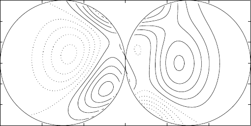
ily associated with contour plots per se. In Matlab, linehandle=polar([0 2*pi],[0 1]);
delete(linehandle); hold on will plot a polar axis and then delete the dummy line which
had to be plotted and erased in order to put the polar command to a non-standard use.
contour will graph the isolines as in Fig. 4.23.
Real
Imaginary
|q| on Circular Domain
0.2
0.4
0.6
0.8
1
30
210
60
240
90
270
120
300
150
330
180 0
0.9
1
1
1
1
1
1
1
1
1
1.1
1.1
Figure 4.23: Contour plot in polar coordinates. f(x, y)≡(z4−1)1/4where z≡x+iy.
136 CHAPTER 4. CONTOUR (ISOLINE) PLOTS
To plot a contour in elliptical coordinates, one can use the following:
[th,mu]=meshgrid((0:0.02:2)*pi,0:0.01:0.5); % 2D arrays,
% equi-spaced in elliptical coordinates.
X=cos(th).*cosh(mu); Y=sin(th).*sinh(mu); % Convert to Cartesian (X,Y)
Q = cos(3*th).*cosh(3*mu) + i*sin(3*th) .* sinh(3*mu);
[labelhandles,linehandles]=contour(X,Y,abs(Q),[0.2:0.2:2.2]);
axis equal; % forces the elliptical domain to look elliptical instead of square.
% To plot the boundary ellipse, add the next two lines:
Xb=cos((0:0.02:2)*pi)*cosh(max(max(mu)); Yb=sin((0:0.02:2)*pi)*sinh(mas(max(mu));
hold on; plot(Xb,Yb,’g-’)
Fig. 4.24 shows the result. Note that numerical labels have been added using the standard
clabel command without difficulty.
-1 -0.5 0 0.5 1
-0.5
0
0.5
Real
Imaginary
Contours on Elliptical Domain
0.6
0.6
0.6
0.8
0.8
1
1
1
1
1
1
1
1
1.2
1.2
1.2
1.2
1.2
1.2
1.2
1.4
1.4
1.4
1.4
1.4
1.4
1.4
1.6
1.6
1.6
1.6
1.6
1.6
1.6
1.6
1.8
1.8
1.8
1.8
1.8
1.8
1.8
2
2
2
2
2
2
2
2
2.2
Figure 4.24: A contour plot in elliptical coordinates. q(x, y)≡T3(x+iy) where T3is the
Chebyshev polynomial of degree three.
4.13. CONTOURING IN NON-RECTANGULAR DOMAINS, II 137
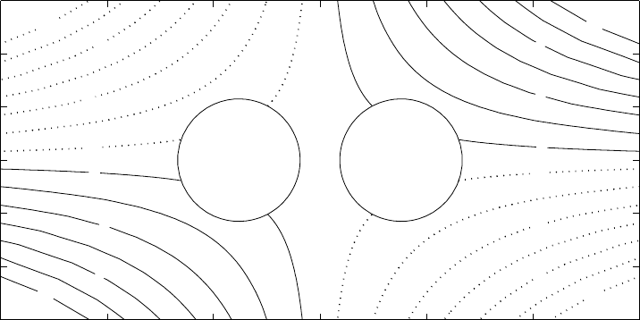
An even more exotic example is to use bipolar coordinates to contour a function on
the exterior of a domain with two disks. Because the quasi-radial coefficient ranges from
ξ∈[0,π/4] in the right half-plane and ξ∈[0,−pi/4], it is necessary to define arrays for
the right and left-half planes separately and then combine them into a single logically-
rectangular array.
Even so, the Matlab code is very simple and quite similar to the example for elliptical
coordinates above:
[th,xi]=meshgrid((0.01:0.02:1.99)*pi,(5*0.0025:0.0025:0.25)*pi);
X=sinh(xi) ./ ( cosh(xi) + cos(th)); Y= sin(th) ./ ( cosh(xi) + cos(th)); q = X .* Y;
[thn,xin]=meshgrid((0.01:0.02:1.99)*pi,(5*0.0025:0.0025:0.25)*(-pi));
Xn=sinh(xin) ./ ( cosh(xin) + cos(thn)); Yn= sin(thn) ./ (cosh(xin)+cos(thn)); qn=Xn .* Yn;
[m,n]=size(q); Xboth=zeros(2*m,n); Yboth=zeros(2*m,n); qboth=zeros(2*m,n);
for ii=1:m, for j=1:n, Xboth(m+1-ii,j) = Xneg(ii,j); Xboth(ii+m,j) = X(ii,j);
Yboth(m+1-ii,j) = Yn(ii,j); Yboth(ii+m,j) = Y(ii,j);
qboth(m+1-ii,j)=qn(ii,j); qboth(ii+m,j)=q(ii,j); end, end
vect=[-13 -11 -9 -7 -5 -3 -1 1 35791113];
[labelhandles,linehandles,levela]=contourBoyd(Xboth,Yboth,qboth,vect);
axis equal; axis([-6 6 -3 3]);
hold on;
xi0=max(max(xi)); thb= pi*linspace(0,2,100);
Xb=ones(1,length(thb))*sinh(xi0) ./(ones(1,length(thb))*cosh(xi0)+cos(thb));
Yb=sin(thb) ./ (ones(1,length(thb))*cosh(xi0)+cos(thb));
xi0=-max(max(xi)); thb= pi*linspace(0,2,100);
Xbn=ones(1,length(thb))*sinh(xi0) ./(ones(1,length(thb))*cosh(xi0)+cos(thb));
Ybn=sin(thb) ./ (ones(1,length(thb))*cosh(xi0)+cos(thb));
plot(Xb,Yb,’k-’,Xbn,Ybn,’k-’);
-6 -4 -2 0 2 4 6
-3
-2
-1
0
1
2
3
x
y
Bipolar Domain
1
5
9
-1
-5
-9
-13
13
-1
-5
-9
-13
13
9
5
1
Figure 4.25: A contour plot on the exterior of two disks (bipolar coordinates). In Cartesian
coordinates, the function contoured is q(x, y)≡xy.
138 CHAPTER 4. CONTOUR (ISOLINE) PLOTS
4.14 Summary
Merits:
1. Pseudocolor plots are very expensive to reproduce in journals and therefore must be
used sparingly.
2. Mesh plots hide some low-lying, remote features behind nearer peaks. Even without
such obstructed views, mesh plots are less precise than contour plots in the sense that
the visual system has more trouble identifying small features and their shapes on a
mesh plot than on a contour plot.
Problems:
1. Difficulty in distinguishing hills from valleys. The best remedy is to graph the positive
contours as solid, the negative-valued contours as dashed.
2. Illegible labels. There is no simple remedy, but playing around with the font size and
label positioning can help. Reducing Nc, the number of contours on the graph, gives
more room to each label. Another trick is to control the qj. If these are integers, then
each label is only one digit (plus perhaps a sign). In contrast, a label like 3.143873945
will take a lot of space.
3. Contours all clustered in one small region of the domain. Remedy: plot contours of
the logarithm of q.
4. “Scalloping”. This denotes a pattern of zig-zag contours that fill a wide area where
q≈0. Tiny numerical errors can cause sign fluctuations between, say, -0.0001 and
0.0001, causing the zero contour to appear in the shape of a maze with many zigzags.
One remedy is to the zero contour if the software allows this. Another remedy is to
apply small-scale smoothing to filter the noise before plotting the function. A third
remedy is to add a small constant to qso that even with the noise, the function q(x, y)
is always one-signed.
5. “Jaggies”: isolines that should be smooth and continuous look like line segments with
discontinuous slopes. Remedies: (i) use higher resolution for making the contour
plot or (ii) smooth the contour lines, which is an option in some library contouring
routines. It may be necessary to use high order interpolation to create areas for
plotting that are denser than those of the original calculation. The reason is that most
contouring algorithms take each box defined by four gridpoints and apply piecewise
linear interpolation within each rectangle. Thus, the contouring algorithm is usually
less accurate than the underlying calculation.
4.14. SUMMARY 139
Appendix: Quick and Dirty Contour Manipulation in
Matlab
The next appendix describes a modified contouring routine that, with a single function call,
provides access to the handles of individual contour lines so that these can be manipulated
any way one wishes. Although the function contourBoyd is not very long, it is possible to
manipulate contours in an even simpler way at the expense of many function calls instead
of one.
The key ideas embodied in this simpler approach are: (i) contour can plot a single
isoline, q=qjand (ii) multiple contour plots can be superimposed using the hold command.
The simpler strategy is illustrated by the loop. The usual contouring routine contour is
called Nctimes where Ncis the number of contour levels. The fifth argument ’k’ is a dummy
that forces the contours to be drawn as “line objects” rather than as “patch objects”. At
each call, the properties of the isoline can be altered through the set(linehandles, ...)
where the ellipsis stands for any line property, such as width, linestyle or color.
qj=[-7 -6 -5 -4 -3 -2 -101234567]; Nc=length(qj);
for ii=1:Nc
[clabelstuff,linehandles]=contour(X,Y,Z’,[qj(ii) qj(ii)],’k’);
set(linehandles,’Color’,[abs(qj(ii))/7 (1-abs(qj(ii)/7)) 0]);
if ii==1, hold on; end % if
end%ii
A disadvantage of both the one-call and many-call methods for changing the plotted
characteristics of the isoline is that there is no simple way to provide an analogue of the
color or legend. A second difficulty is that is difficult to encode the contour labels as linestyle
or markertype only; a label-less plot with many linestyles, marker types or colors will be
slow reading.
140 CHAPTER 4. CONTOUR (ISOLINE) PLOTS
Appendix: Matlab function contourBoyd
function [cout,hand,levela]=contourBoyd(varargin)
%function OK=contourBoyd(x,y,z,nc)
% The twist from the standard procedure is that contours
% of negative values of z are dotted.
%CONTOUR Contour plot.
% CONTOUR(Z) is a contour plot of matrix Z treating the values in Z
% as heights above a plane. A contour plot are the level curves
% of Z for some values V. The values V are chosen automatically.
% CONTOUR(X,Y,Z) X and Y specify the (x,y) coordinates of the
% surface as for SURF.
% CONTOUR(Z,N) and CONTOUR(X,Y,Z,N) draw N contour lines,
% overriding the automatic value.
% CONTOUR(Z,V) and CONTOUR(X,Y,Z,V) draw LENGTH(V) contour lines
% at the values specified in vector V. Use CONTOUR(Z,[v v]) or
% CONTOUR(X<Y,Z,[v v]) to compute a single contour at the level v.
% [C,H] = CONTOUR(...) returns contour matrix C as described in
% CONTOURC and a column vector H of handles to LINE or PATCH
% objects, one handle per line. Both of these can be used as
% input to CLABEL.
%
% The contours are normally colored based on the current colormap
% and are drawn as PATCH objects. You can override this behavior
% with the syntax CONTOUR(...,’LINESPEC’) to draw the contours as
% LINE objects with the color and linetype specified.
%
% Example:
% [c,h] = contour(peaks); clabel(c,h), colorbar
%
% See also CONTOUR3, CONTOURF, CLABEL, COLORBAR.
% CONTOUR uses CONTOUR3 to do most of the contouring. Unless
% a linestyle is specified, CONTOUR will draw PATCH objects
% with edge color taken from the current colormap. When a linestyle
% is specified, LINE objects are drawn. To produce the same results
% as v4, use CONTOUR(...,’-’).
% This contours z(i,j) on the grid which is the tensor
% product of the one-dimensional arrays specified by x,y.
% The fourth input argument specifies the number of contour
% levels.
if (nargin==1)
zlengthdamn=size(varargin{1})
z=varargin{1};
[cs,hs]=contour(z,’k-’)
elseif (nargin==2)
z=varargin{1};
[cs,hs]=contour(z,nc,’k-’);
4.14. SUMMARY 141
elseif (nargin==3)
x=varargin{1}; y=varargin{2}; z=varargin{3};
[cs,hs]=contour(x,y,z,’k-’);
else
x=varargin{1}; y=varargin{2}; z=varargin{3}; nc=varargin{4};
[cs,hs]=contour(x,y,z,nc,’k-’);
end % of if
% Next bit analyzes cs to identify the contour labels.
% Input: nc=number of contour levels
% cs, hs from
% [cs, hs]=contour(x,y,z,nc)
%
% hs stores the handles of the contour lines
% ncs=number of contours
% mcs=numbers of columns in cs
% levela(1, 2, ... ncs) stores the contour levels
% associated with each contour line
zscale=max(abs(z));
[dummy, mcs] = size(cs);
[ncs,dummy]=size(hs);
klevel=0; npairs=0; ihandles=1;
while (klevel+npairs+1) < mcs
klevel=klevel+npairs+1;
contourlevel=cs(1,klevel);
npairs=cs(2,klevel);
levela(ihandles)=contourlevel;
ihandles=ihandles+1;
end
% Array levela contains the nc values of the contours. We
% can change the linestyles, width, and color
% of each level by the set command.
% The next line alters the linetype to dotted line whenever
% levela(ii) is negative.
for ii=1:length(levela)
if levela(ii) < 0
set(hs(ii),’LineStyle’,’:’,’LineWidth’,[1],’Color’,’k’)
% change ii-th contour to dotted line
end
end
cout=cs; hand=hs; % returns cs [array needed by clabel(cs)] and
% hs, the array of handles to each contour segment
set(gca,’Xgrid’,’off’,’Ygrid’,’off’)
