The Definitive Guide To Java Swing: Creating Based Graphical User Interfaces Using J2SE 5 Swing Component Set, Third Ed Gui
User Manual:
Open the PDF directly: View PDF  .
.
Page Count: 913 [warning: Documents this large are best viewed by clicking the View PDF Link!]


The Definitive Guide to
Java Swing
Third Edition
JOHN ZUKOWSKI
The Definitive Guide to Java Swing, Third Edition
Copyright © 2005 by John Zukowski
All rights reserved. No part of this work may be reproduced or transmitted in any form or by any means,
electronic or mechanical, including photocopying, recording, or by any information storage or retrieval
system, without the prior written permission of the copyright owner and the publisher.
ISBN (pbk): 1-59059-447-9
Printed and bound in the United States of America 9 8 7 6 5 4 3 2 1
Trademarked names may appear in this book. Rather than use a trademark symbol with every occurrence
of a trademarked name, we use the names only in an editorial fashion and to the benefit of the trademark
owner, with no intention of infringement of the trademark.
Lead Editor: Steve Anglin
Technical Reviewer: Robert Castaneda
Editorial Board: Steve Anglin, Dan Appleman, Ewan Buckingham, Gary Cornell, Tony Davis, Jason Gilmore,
Jonathan Hassell, Chris Mills, Dominic Shakeshaft, Jim Sumser
Assistant Publisher: Grace Wong
Project Manager: Beth Christmas
Copy Edit Manager: Nicole LeClerc
Copy Editor: Marilyn Smith
Production Manager: Kari Brooks-Copony
Production Editor: Ellie Fountain
Compositor: Susan Glinert
Proofreaders: Linda Seifert, Liz Welch
Indexer: Michael Brinkman
Artist: Kinetic Publishing Services, LLC
Cover Designer: Kurt Krames
Manufacturing Manager: Tom Debolski
Distributed to the book trade in the United States by Springer-Verlag New York, Inc., 233 Spring Street,
6th Floor, New York, NY 10013, and outside the United States by Springer-Verlag GmbH & Co. KG,
Tiergartenstr. 17, 69112 Heidelberg, Germany.
In the United States: phone 1-800-SPRINGER, fax 201-348-4505, e-mail orders@springer-ny.com, or visit
http://www.springer-ny.com. Outside the United States: fax +49 6221 345229, e-mail orders@springer.de,
or visit http://www.springer.de.
For information on translations, please contact Apress directly at 2560 Ninth Street, Suite 219, Berkeley, CA
94710. Phone 510-549-5930, fax 510-549-5939, e-mail info@apress.com, or visit http://www.apress.com.
The information in this book is distributed on an “as is” basis, without warranty. Although every precaution
has been taken in the preparation of this work, neither the author(s) nor Apress shall have any liability to
any person or entity with respect to any loss or damage caused or alleged to be caused directly or indirectly
by the information contained in this work.
The source code for this book is available to readers at http://www.apress.com in the Downloads section.

iii
Contents at a Glance
About the Author . . . . . . . . . . . . . . . . . . . . . . . . . . . . . . . . . . . . . . . . . . . . . . . . . . . . . . . . . . . . . . . xix
About the Technical Reviewers . . . . . . . . . . . . . . . . . . . . . . . . . . . . . . . . . . . . . . . . . . . . . . . . . . . xxi
Acknowledgments . . . . . . . . . . . . . . . . . . . . . . . . . . . . . . . . . . . . . . . . . . . . . . . . . . . . . . . . . . . . xxiii
Introduction . . . . . . . . . . . . . . . . . . . . . . . . . . . . . . . . . . . . . . . . . . . . . . . . . . . . . . . . . . . . . . . . . . xxv
CHAPTER 1 Swing Overview . . . . . . . . . . . . . . . . . . . . . . . . . . . . . . . . . . . . . . . . . . . . . . 1
CHAPTER 2 Event Handling with the Swing Component Set . . . . . . . . . . . . . . . . 17
CHAPTER 3 The Model-View-Controller Architecture . . . . . . . . . . . . . . . . . . . . . . 59
CHAPTER 4 Core Swing Components . . . . . . . . . . . . . . . . . . . . . . . . . . . . . . . . . . . . . 67
CHAPTER 5 Toggle Buttons . . . . . . . . . . . . . . . . . . . . . . . . . . . . . . . . . . . . . . . . . . . . . 115
CHAPTER 6 Swing Menus and Toolbars . . . . . . . . . . . . . . . . . . . . . . . . . . . . . . . . . 151
CHAPTER 7 Borders . . . . . . . . . . . . . . . . . . . . . . . . . . . . . . . . . . . . . . . . . . . . . . . . . . . . 211
CHAPTER 8 Root Pane Containers . . . . . . . . . . . . . . . . . . . . . . . . . . . . . . . . . . . . . . . 235
CHAPTER 9 Pop-Ups and Choosers . . . . . . . . . . . . . . . . . . . . . . . . . . . . . . . . . . . . . . 267
CHAPTER 10 Layout Managers . . . . . . . . . . . . . . . . . . . . . . . . . . . . . . . . . . . . . . . . . . . 343
CHAPTER 11 Advanced Swing Containers . . . . . . . . . . . . . . . . . . . . . . . . . . . . . . . . . 377
CHAPTER 12 Bounded Range Components . . . . . . . . . . . . . . . . . . . . . . . . . . . . . . . . 419
CHAPTER 13 List Model Controls . . . . . . . . . . . . . . . . . . . . . . . . . . . . . . . . . . . . . . . . . 451
CHAPTER 14 Spinner Model Controls . . . . . . . . . . . . . . . . . . . . . . . . . . . . . . . . . . . . . 509
CHAPTER 15 Basic Text Components . . . . . . . . . . . . . . . . . . . . . . . . . . . . . . . . . . . . . 521
CHAPTER 16 Advanced Text Capabilities . . . . . . . . . . . . . . . . . . . . . . . . . . . . . . . . . . 585
CHAPTER 17 Trees . . . . . . . . . . . . . . . . . . . . . . . . . . . . . . . . . . . . . . . . . . . . . . . . . . . . . . 623
CHAPTER 18 Tables . . . . . . . . . . . . . . . . . . . . . . . . . . . . . . . . . . . . . . . . . . . . . . . . . . . . . 675
CHAPTER 19 Drag-and-Drop Support . . . . . . . . . . . . . . . . . . . . . . . . . . . . . . . . . . . . . 729
CHAPTER 20 The Pluggable Look and Feel Architecture . . . . . . . . . . . . . . . . . . . 741
CHAPTER 21 The Undo Framework . . . . . . . . . . . . . . . . . . . . . . . . . . . . . . . . . . . . . . . 783
iv ■CONTENTS AT A GLANCE
CHAPTER 22 Accessibility . . . . . . . . . . . . . . . . . . . . . . . . . . . . . . . . . . . . . . . . . . . . . . . 805
APPENDIX UI Manager Properties . . . . . . . . . . . . . . . . . . . . . . . . . . . . . . . . . . . . . . 813
INDEX . . . . . . . . . . . . . . . . . . . . . . . . . . . . . . . . . . . . . . . . . . . . . . . . . . . . . . . . . . . . . . . . . . . . . . 847

v
Contents
About the Author . . . . . . . . . . . . . . . . . . . . . . . . . . . . . . . . . . . . . . . . . . . . . . . . . . . . . . . . . . . . . . . xix
About the Technical Reviewers . . . . . . . . . . . . . . . . . . . . . . . . . . . . . . . . . . . . . . . . . . . . . . . . . . . xxi
Acknowledgments . . . . . . . . . . . . . . . . . . . . . . . . . . . . . . . . . . . . . . . . . . . . . . . . . . . . . . . . . . . . xxiii
Introduction . . . . . . . . . . . . . . . . . . . . . . . . . . . . . . . . . . . . . . . . . . . . . . . . . . . . . . . . . . . . . . . . . . xxv
■CHAPTER 1 Swing Overview . . . . . . . . . . . . . . . . . . . . . . . . . . . . . . . . . . . . . . . . . . . . 1
Getting to Know the Swing Components . . . . . . . . . . . . . . . . . . . . . . . . . . . 2
AWT Component Replacements . . . . . . . . . . . . . . . . . . . . . . . . . . . . . . 3
Non-AWT Upgraded Components . . . . . . . . . . . . . . . . . . . . . . . . . . . . . 5
Event Handling and Layout Management . . . . . . . . . . . . . . . . . . . . . . . . . 10
Undo Framework . . . . . . . . . . . . . . . . . . . . . . . . . . . . . . . . . . . . . . . . . . . . . 11
SwingSet Demonstration . . . . . . . . . . . . . . . . . . . . . . . . . . . . . . . . . . . . . . . 11
Swing Component to Chapter Mapping . . . . . . . . . . . . . . . . . . . . . . . . . . . 12
Summary . . . . . . . . . . . . . . . . . . . . . . . . . . . . . . . . . . . . . . . . . . . . . . . . . . . . 15
■CHAPTER 2 Event Handling with the Swing Component Set . . . . . . . . . 17
Delegation-Based Event Handling . . . . . . . . . . . . . . . . . . . . . . . . . . . . . . . . 17
Event Delegation Model . . . . . . . . . . . . . . . . . . . . . . . . . . . . . . . . . . . . 17
Event Listeners As Observers . . . . . . . . . . . . . . . . . . . . . . . . . . . . . . . 19
Multithreaded Swing Event Handling . . . . . . . . . . . . . . . . . . . . . . . . . . . . . 21
Using SwingUtilities for Mouse Button Identification . . . . . . . . . . . . 23
Using Property Change Listeners As Observers . . . . . . . . . . . . . . . . 26
Managing Listener Lists. . . . . . . . . . . . . . . . . . . . . . . . . . . . . . . . . . . . 29
Timer Class . . . . . . . . . . . . . . . . . . . . . . . . . . . . . . . . . . . . . . . . . . . . . . 34
Swing-Specific Event Handling . . . . . . . . . . . . . . . . . . . . . . . . . . . . . . . . . . 37
Action Interface. . . . . . . . . . . . . . . . . . . . . . . . . . . . . . . . . . . . . . . . . . . 37
AbstractAction Class. . . . . . . . . . . . . . . . . . . . . . . . . . . . . . . . . . . . . . . 38
KeyStroke Class . . . . . . . . . . . . . . . . . . . . . . . . . . . . . . . . . . . . . . . . . . 41
Using Mnemonics and Accelerators . . . . . . . . . . . . . . . . . . . . . . . . . . 46
Contents
vi ■CONTENTS
Swing Focus Management . . . . . . . . . . . . . . . . . . . . . . . . . . . . . . . . . . . . . 46
Moving the Focus . . . . . . . . . . . . . . . . . . . . . . . . . . . . . . . . . . . . . . . . . 48
Examining Focus Cycles . . . . . . . . . . . . . . . . . . . . . . . . . . . . . . . . . . . 50
FocusTraversalPolicy Class . . . . . . . . . . . . . . . . . . . . . . . . . . . . . . . . . 52
KeyboardFocusManager Class . . . . . . . . . . . . . . . . . . . . . . . . . . . . . . 55
Verifying Input During Focus Traversal . . . . . . . . . . . . . . . . . . . . . . . 56
Summary . . . . . . . . . . . . . . . . . . . . . . . . . . . . . . . . . . . . . . . . . . . . . . . . . . . . 57
■CHAPTER 3 The Model-View-Controller Architecture . . . . . . . . . . . . . . . . . 59
Understanding the Flow of MVC . . . . . . . . . . . . . . . . . . . . . . . . . . . . . . . . . 59
MVC Communication . . . . . . . . . . . . . . . . . . . . . . . . . . . . . . . . . . . . . . 59
UI Delegates for Swing Components . . . . . . . . . . . . . . . . . . . . . . . . . 60
Sharing Data Models . . . . . . . . . . . . . . . . . . . . . . . . . . . . . . . . . . . . . . . . . . 61
Understanding the Predefined Data Models . . . . . . . . . . . . . . . . . . . . . . . 63
Summary . . . . . . . . . . . . . . . . . . . . . . . . . . . . . . . . . . . . . . . . . . . . . . . . . . . . 65
■CHAPTER 4 Core Swing Components . . . . . . . . . . . . . . . . . . . . . . . . . . . . . . . . . 67
JComponent Class . . . . . . . . . . . . . . . . . . . . . . . . . . . . . . . . . . . . . . . . . . . . 67
Component Pieces . . . . . . . . . . . . . . . . . . . . . . . . . . . . . . . . . . . . . . . . 69
JComponent Properties . . . . . . . . . . . . . . . . . . . . . . . . . . . . . . . . . . . . 74
Handling JComponent Events . . . . . . . . . . . . . . . . . . . . . . . . . . . . . . . 80
JToolTip Class . . . . . . . . . . . . . . . . . . . . . . . . . . . . . . . . . . . . . . . . . . . . . . . . 84
Creating a JToolTip. . . . . . . . . . . . . . . . . . . . . . . . . . . . . . . . . . . . . . . . 84
Creating Customized JToolTip Objects . . . . . . . . . . . . . . . . . . . . . . . 84
Displaying Positional Tooltip Text . . . . . . . . . . . . . . . . . . . . . . . . . . . . 85
Customizing a JToolTip Look and Feel. . . . . . . . . . . . . . . . . . . . . . . . 86
ToolTipManager Class . . . . . . . . . . . . . . . . . . . . . . . . . . . . . . . . . . . . . 86
ToolTipManager Properties . . . . . . . . . . . . . . . . . . . . . . . . . . . . . . . . . 87
JLabel Class . . . . . . . . . . . . . . . . . . . . . . . . . . . . . . . . . . . . . . . . . . . . . . . . . 88
Creating a JLabel . . . . . . . . . . . . . . . . . . . . . . . . . . . . . . . . . . . . . . . . . 89
JLabel Properties . . . . . . . . . . . . . . . . . . . . . . . . . . . . . . . . . . . . . . . . . 89
JLabel Event Handling . . . . . . . . . . . . . . . . . . . . . . . . . . . . . . . . . . . . . 91
Customizing a JLabel Look and Feel . . . . . . . . . . . . . . . . . . . . . . . . . 92
Interface Icon . . . . . . . . . . . . . . . . . . . . . . . . . . . . . . . . . . . . . . . . . . . . . . . . . 92
Creating an Icon . . . . . . . . . . . . . . . . . . . . . . . . . . . . . . . . . . . . . . . . . . 93
Using an Icon. . . . . . . . . . . . . . . . . . . . . . . . . . . . . . . . . . . . . . . . . . . . . 94
ImageIcon Class . . . . . . . . . . . . . . . . . . . . . . . . . . . . . . . . . . . . . . . . . . 94
GrayFilter Class . . . . . . . . . . . . . . . . . . . . . . . . . . . . . . . . . . . . . . . . . . . 97
■CONTENTS vii
AbstractButton Class . . . . . . . . . . . . . . . . . . . . . . . . . . . . . . . . . . . . . . . . . . 98
AbstractButton Properties . . . . . . . . . . . . . . . . . . . . . . . . . . . . . . . . . . 98
Handling AbstractButton Events . . . . . . . . . . . . . . . . . . . . . . . . . . . . 102
JButton Class . . . . . . . . . . . . . . . . . . . . . . . . . . . . . . . . . . . . . . . . . . . . . . . 104
Creating a JButton . . . . . . . . . . . . . . . . . . . . . . . . . . . . . . . . . . . . . . . 104
JButton Properties . . . . . . . . . . . . . . . . . . . . . . . . . . . . . . . . . . . . . . . 105
Handling JButton Events . . . . . . . . . . . . . . . . . . . . . . . . . . . . . . . . . . 106
Customizing a JButton Look and Feel . . . . . . . . . . . . . . . . . . . . . . . 108
JPanel Class . . . . . . . . . . . . . . . . . . . . . . . . . . . . . . . . . . . . . . . . . . . . . . . . 110
Creating a JPanel . . . . . . . . . . . . . . . . . . . . . . . . . . . . . . . . . . . . . . . . 110
Using a JPanel . . . . . . . . . . . . . . . . . . . . . . . . . . . . . . . . . . . . . . . . . . 110
Customizing a JPanel Look and Feel . . . . . . . . . . . . . . . . . . . . . . . . 112
Summary . . . . . . . . . . . . . . . . . . . . . . . . . . . . . . . . . . . . . . . . . . . . . . . . . . . 112
■CHAPTER 5 Toggle Buttons . . . . . . . . . . . . . . . . . . . . . . . . . . . . . . . . . . . . . . . . . . . 115
ToggleButtonModel Class . . . . . . . . . . . . . . . . . . . . . . . . . . . . . . . . . . . . . 115
ButtonGroup Class . . . . . . . . . . . . . . . . . . . . . . . . . . . . . . . . . . . . . . . . . . . 116
JToggleButton Class . . . . . . . . . . . . . . . . . . . . . . . . . . . . . . . . . . . . . . . . . . 119
Creating JToggleButton Components. . . . . . . . . . . . . . . . . . . . . . . . 119
JToggleButton Properties. . . . . . . . . . . . . . . . . . . . . . . . . . . . . . . . . . 120
Handling JToggleButton Selection Events . . . . . . . . . . . . . . . . . . . . 121
Customizing a JToggleButton Look and Feel. . . . . . . . . . . . . . . . . . 124
JCheckBox Class . . . . . . . . . . . . . . . . . . . . . . . . . . . . . . . . . . . . . . . . . . . . 125
Creating JCheckBox Components. . . . . . . . . . . . . . . . . . . . . . . . . . . 126
JCheckBox Properties . . . . . . . . . . . . . . . . . . . . . . . . . . . . . . . . . . . . 127
Handling JCheckBox Selection Events . . . . . . . . . . . . . . . . . . . . . . . 130
Customizing a JCheckBox Look and Feel . . . . . . . . . . . . . . . . . . . . 133
JRadioButton Class . . . . . . . . . . . . . . . . . . . . . . . . . . . . . . . . . . . . . . . . . . . 134
Creating JRadioButton Components. . . . . . . . . . . . . . . . . . . . . . . . . 135
JRadioButton Properties . . . . . . . . . . . . . . . . . . . . . . . . . . . . . . . . . . 136
Grouping JRadioButton Components in a ButtonGroup . . . . . . . . . 136
Handling JRadioButton Selection Events . . . . . . . . . . . . . . . . . . . . . 139
Customizing a JRadioButton Look and Feel . . . . . . . . . . . . . . . . . . 147
Summary . . . . . . . . . . . . . . . . . . . . . . . . . . . . . . . . . . . . . . . . . . . . . . . . . . . 149
■CHAPTER 6 Swing Menus and Toolbars . . . . . . . . . . . . . . . . . . . . . . . . . . . . . . 151
Working with Menus . . . . . . . . . . . . . . . . . . . . . . . . . . . . . . . . . . . . . . . . . . 152
Menu Class Hierarchy . . . . . . . . . . . . . . . . . . . . . . . . . . . . . . . . . . . . 156
JMenuBar Class . . . . . . . . . . . . . . . . . . . . . . . . . . . . . . . . . . . . . . . . . 157
viii ■CONTENTS
SingleSelectionModel Interface. . . . . . . . . . . . . . . . . . . . . . . . . . . . . 161
JMenuItem Class . . . . . . . . . . . . . . . . . . . . . . . . . . . . . . . . . . . . . . . . 162
JMenu Class . . . . . . . . . . . . . . . . . . . . . . . . . . . . . . . . . . . . . . . . . . . . 168
JSeparator Class. . . . . . . . . . . . . . . . . . . . . . . . . . . . . . . . . . . . . . . . . 175
JPopupMenu Class . . . . . . . . . . . . . . . . . . . . . . . . . . . . . . . . . . . . . . . 176
JCheckBoxMenuItem Class . . . . . . . . . . . . . . . . . . . . . . . . . . . . . . . . 184
JRadioButtonMenuItem Class . . . . . . . . . . . . . . . . . . . . . . . . . . . . . . 189
Creating Custom MenuElement Components:
The MenuElement Interface. . . . . . . . . . . . . . . . . . . . . . . . . . . . . . . . 195
Working with Pop-Ups: The Popup Class . . . . . . . . . . . . . . . . . . . . . . . . . 200
Creating Pop-Up Components . . . . . . . . . . . . . . . . . . . . . . . . . . . . . . 200
A Complete Popup/PopupFactory Usage Example . . . . . . . . . . . . . 200
Working with Toolbars: The JToolBar Class . . . . . . . . . . . . . . . . . . . . . . 202
Creating JToolBar Components. . . . . . . . . . . . . . . . . . . . . . . . . . . . . 202
Adding Components to a JToolBar . . . . . . . . . . . . . . . . . . . . . . . . . . 202
JToolBar Properties . . . . . . . . . . . . . . . . . . . . . . . . . . . . . . . . . . . . . . 203
Handling JToolBar Events . . . . . . . . . . . . . . . . . . . . . . . . . . . . . . . . . 205
Customizing a JToolBar Look and Feel . . . . . . . . . . . . . . . . . . . . . . 205
A Complete JToolBar Usage Example . . . . . . . . . . . . . . . . . . . . . . . 206
JToolBar.Separator Class. . . . . . . . . . . . . . . . . . . . . . . . . . . . . . . . . . 208
Summary . . . . . . . . . . . . . . . . . . . . . . . . . . . . . . . . . . . . . . . . . . . . . . . . . . . 208
■CHAPTER 7 Borders . . . . . . . . . . . . . . . . . . . . . . . . . . . . . . . . . . . . . . . . . . . . . . . . . . . 211
Some Basics on Working with Borders . . . . . . . . . . . . . . . . . . . . . . . . . . 211
Exploring the Border Interface. . . . . . . . . . . . . . . . . . . . . . . . . . . . . . 212
Introducing BorderFactory . . . . . . . . . . . . . . . . . . . . . . . . . . . . . . . . . 215
Starting with AbstractBorder . . . . . . . . . . . . . . . . . . . . . . . . . . . . . . . 216
Examining the Predefined Borders . . . . . . . . . . . . . . . . . . . . . . . . . . . . . . 218
EmptyBorder Class . . . . . . . . . . . . . . . . . . . . . . . . . . . . . . . . . . . . . . . 218
LineBorder Class. . . . . . . . . . . . . . . . . . . . . . . . . . . . . . . . . . . . . . . . . 219
BevelBorder Class. . . . . . . . . . . . . . . . . . . . . . . . . . . . . . . . . . . . . . . . 220
SoftBevelBorder Class . . . . . . . . . . . . . . . . . . . . . . . . . . . . . . . . . . . . 222
EtchedBorder Class . . . . . . . . . . . . . . . . . . . . . . . . . . . . . . . . . . . . . . 223
MatteBorder Class . . . . . . . . . . . . . . . . . . . . . . . . . . . . . . . . . . . . . . . 224
CompoundBorder Class . . . . . . . . . . . . . . . . . . . . . . . . . . . . . . . . . . . 226
TitledBorder Class. . . . . . . . . . . . . . . . . . . . . . . . . . . . . . . . . . . . . . . . 227
Creating Your Own Borders . . . . . . . . . . . . . . . . . . . . . . . . . . . . . . . . . . . . 232
Summary . . . . . . . . . . . . . . . . . . . . . . . . . . . . . . . . . . . . . . . . . . . . . . . . . . . 234
■CONTENTS ix
■CHAPTER 8 Root Pane Containers . . . . . . . . . . . . . . . . . . . . . . . . . . . . . . . . . . . . 235
JRootPane Class . . . . . . . . . . . . . . . . . . . . . . . . . . . . . . . . . . . . . . . . . . . . . 235
Creating a JRootPane. . . . . . . . . . . . . . . . . . . . . . . . . . . . . . . . . . . . . 236
JRootPane Properties . . . . . . . . . . . . . . . . . . . . . . . . . . . . . . . . . . . . . 236
Customizing a JRootPane Look and Feel . . . . . . . . . . . . . . . . . . . . . 238
RootPaneContainer Interface. . . . . . . . . . . . . . . . . . . . . . . . . . . . . . . 239
JLayeredPane Class . . . . . . . . . . . . . . . . . . . . . . . . . . . . . . . . . . . . . . 239
JFrame Class . . . . . . . . . . . . . . . . . . . . . . . . . . . . . . . . . . . . . . . . . . . . . . . . 242
Creating a JFrame . . . . . . . . . . . . . . . . . . . . . . . . . . . . . . . . . . . . . . . 243
JFrame Properties . . . . . . . . . . . . . . . . . . . . . . . . . . . . . . . . . . . . . . . 243
Adding Components to a JFrame . . . . . . . . . . . . . . . . . . . . . . . . . . . 245
Handling JFrame Events . . . . . . . . . . . . . . . . . . . . . . . . . . . . . . . . . . 245
Extending JFrame. . . . . . . . . . . . . . . . . . . . . . . . . . . . . . . . . . . . . . . . 246
JWindow Class . . . . . . . . . . . . . . . . . . . . . . . . . . . . . . . . . . . . . . . . . . . . . . 247
Creating a JWindow . . . . . . . . . . . . . . . . . . . . . . . . . . . . . . . . . . . . . . 247
JWindow Properties . . . . . . . . . . . . . . . . . . . . . . . . . . . . . . . . . . . . . . 248
Handling JWindow Events . . . . . . . . . . . . . . . . . . . . . . . . . . . . . . . . . 248
Extending JWindow . . . . . . . . . . . . . . . . . . . . . . . . . . . . . . . . . . . . . . 248
JDialog Class . . . . . . . . . . . . . . . . . . . . . . . . . . . . . . . . . . . . . . . . . . . . . . . . 248
Creating a JDialog . . . . . . . . . . . . . . . . . . . . . . . . . . . . . . . . . . . . . . . 248
JDialog Properties. . . . . . . . . . . . . . . . . . . . . . . . . . . . . . . . . . . . . . . . 250
Handling JDialog Events . . . . . . . . . . . . . . . . . . . . . . . . . . . . . . . . . . 250
Extending JDialog . . . . . . . . . . . . . . . . . . . . . . . . . . . . . . . . . . . . . . . . 252
JApplet Class . . . . . . . . . . . . . . . . . . . . . . . . . . . . . . . . . . . . . . . . . . . . . . . . 252
Working with a Desktop . . . . . . . . . . . . . . . . . . . . . . . . . . . . . . . . . . . . . . . 252
JInternalFrame Class . . . . . . . . . . . . . . . . . . . . . . . . . . . . . . . . . . . . . 253
JDesktopPane Class. . . . . . . . . . . . . . . . . . . . . . . . . . . . . . . . . . . . . . 262
Summary . . . . . . . . . . . . . . . . . . . . . . . . . . . . . . . . . . . . . . . . . . . . . . . . . . . 266
■CHAPTER 9 Pop-Ups and Choosers . . . . . . . . . . . . . . . . . . . . . . . . . . . . . . . . . . 267
JOptionPane Class . . . . . . . . . . . . . . . . . . . . . . . . . . . . . . . . . . . . . . . . . . . 267
Creating a JOptionPane . . . . . . . . . . . . . . . . . . . . . . . . . . . . . . . . . . . 268
Displaying a JOptionPane . . . . . . . . . . . . . . . . . . . . . . . . . . . . . . . . . 271
Automatically Creating a JOptionPane in a Pop-Up Window . . . . . 274
JOptionPane Properties . . . . . . . . . . . . . . . . . . . . . . . . . . . . . . . . . . . 280
Customizing a JOptionPane Look and Feel . . . . . . . . . . . . . . . . . . . 287
x■CONTENTS
ProgressMonitor Class . . . . . . . . . . . . . . . . . . . . . . . . . . . . . . . . . . . . . . . . 291
Creating a ProgressMonitor. . . . . . . . . . . . . . . . . . . . . . . . . . . . . . . . 292
Using a ProgressMonitor . . . . . . . . . . . . . . . . . . . . . . . . . . . . . . . . . . 293
ProgressMonitor Properties . . . . . . . . . . . . . . . . . . . . . . . . . . . . . . . . 296
Customizing a ProgressMonitor Look and Feel . . . . . . . . . . . . . . . . 297
ProgressMonitorInputStream Class . . . . . . . . . . . . . . . . . . . . . . . . . . . . . 297
Creating a ProgressMonitorInputStream . . . . . . . . . . . . . . . . . . . . . 297
Using a ProgressMonitorInputStream. . . . . . . . . . . . . . . . . . . . . . . . 298
ProgressMonitorInputStream Properties . . . . . . . . . . . . . . . . . . . . . 299
JColorChooser Class . . . . . . . . . . . . . . . . . . . . . . . . . . . . . . . . . . . . . . . . . . 300
Creating a JColorChooser . . . . . . . . . . . . . . . . . . . . . . . . . . . . . . . . . 301
Using JColorChooser . . . . . . . . . . . . . . . . . . . . . . . . . . . . . . . . . . . . . 302
JColorChooser Properties . . . . . . . . . . . . . . . . . . . . . . . . . . . . . . . . . 307
Customizing a JColorChooser Look and Feel . . . . . . . . . . . . . . . . . 320
JFileChooser Class . . . . . . . . . . . . . . . . . . . . . . . . . . . . . . . . . . . . . . . . . . . 322
Creating a JFileChooser . . . . . . . . . . . . . . . . . . . . . . . . . . . . . . . . . . . 323
Using JFileChooser . . . . . . . . . . . . . . . . . . . . . . . . . . . . . . . . . . . . . . . 323
JFileChooser Properties . . . . . . . . . . . . . . . . . . . . . . . . . . . . . . . . . . . 326
Working with File Filters . . . . . . . . . . . . . . . . . . . . . . . . . . . . . . . . . . 328
Customizing a JFileChooser Look and Feel . . . . . . . . . . . . . . . . . . . 336
Summary . . . . . . . . . . . . . . . . . . . . . . . . . . . . . . . . . . . . . . . . . . . . . . . . . . . 341
■CHAPTER 10 Layout Managers . . . . . . . . . . . . . . . . . . . . . . . . . . . . . . . . . . . . . . . . 343
Layout Manager Responsibilities . . . . . . . . . . . . . . . . . . . . . . . . . . . . . . . 343
LayoutManager Interface . . . . . . . . . . . . . . . . . . . . . . . . . . . . . . . . . . . . . . 344
Exploring the LayoutManager Interface . . . . . . . . . . . . . . . . . . . . . . 344
Exploring the LayoutManager2 Interface . . . . . . . . . . . . . . . . . . . . . 345
FlowLayout Class . . . . . . . . . . . . . . . . . . . . . . . . . . . . . . . . . . . . . . . . . . . . 345
BorderLayout Class . . . . . . . . . . . . . . . . . . . . . . . . . . . . . . . . . . . . . . . . . . . 347
GridLayout Class . . . . . . . . . . . . . . . . . . . . . . . . . . . . . . . . . . . . . . . . . . . . . 349
GridBagLayout Class . . . . . . . . . . . . . . . . . . . . . . . . . . . . . . . . . . . . . . . . . 350
GridBagLayout Rows and Columns. . . . . . . . . . . . . . . . . . . . . . . . . . 353
GridBagConstraints Class . . . . . . . . . . . . . . . . . . . . . . . . . . . . . . . . . 353
CardLayout Class . . . . . . . . . . . . . . . . . . . . . . . . . . . . . . . . . . . . . . . . . . . . 357
BoxLayout Class . . . . . . . . . . . . . . . . . . . . . . . . . . . . . . . . . . . . . . . . . . . . . 357
Creating a BoxLayout . . . . . . . . . . . . . . . . . . . . . . . . . . . . . . . . . . . . . 358
Laying Out Components. . . . . . . . . . . . . . . . . . . . . . . . . . . . . . . . . . . 359
OverlayLayout Class . . . . . . . . . . . . . . . . . . . . . . . . . . . . . . . . . . . . . . . . . . 365
SizeRequirements Class . . . . . . . . . . . . . . . . . . . . . . . . . . . . . . . . . . . . . . . 370
■CONTENTS xi
ScrollPaneLayout Class . . . . . . . . . . . . . . . . . . . . . . . . . . . . . . . . . . . . . . . 370
ViewportLayout Class . . . . . . . . . . . . . . . . . . . . . . . . . . . . . . . . . . . . . . . . . 371
SpringLayout Class . . . . . . . . . . . . . . . . . . . . . . . . . . . . . . . . . . . . . . . . . . . 371
Summary . . . . . . . . . . . . . . . . . . . . . . . . . . . . . . . . . . . . . . . . . . . . . . . . . . . 375
■CHAPTER 11 Advanced Swing Containers . . . . . . . . . . . . . . . . . . . . . . . . . . . . 377
Box Class . . . . . . . . . . . . . . . . . . . . . . . . . . . . . . . . . . . . . . . . . . . . . . . . . . . 377
Creating a Box. . . . . . . . . . . . . . . . . . . . . . . . . . . . . . . . . . . . . . . . . . . 378
Box Properties . . . . . . . . . . . . . . . . . . . . . . . . . . . . . . . . . . . . . . . . . . . 379
Working with Box.Filler . . . . . . . . . . . . . . . . . . . . . . . . . . . . . . . . . . . 380
Creating Areas That Grow . . . . . . . . . . . . . . . . . . . . . . . . . . . . . . . . . 380
Creating Rigid Areas. . . . . . . . . . . . . . . . . . . . . . . . . . . . . . . . . . . . . . 382
JSplitPane Class . . . . . . . . . . . . . . . . . . . . . . . . . . . . . . . . . . . . . . . . . . . . . 383
Creating a JSplitPane . . . . . . . . . . . . . . . . . . . . . . . . . . . . . . . . . . . . . 384
JSplitPane Properties . . . . . . . . . . . . . . . . . . . . . . . . . . . . . . . . . . . . . 385
Listening for JSplitPane Property Changes . . . . . . . . . . . . . . . . . . . 390
Customizing a JSplitPane Look and Feel . . . . . . . . . . . . . . . . . . . . . 393
JTabbedPane Class . . . . . . . . . . . . . . . . . . . . . . . . . . . . . . . . . . . . . . . . . . 394
Creating a JTabbedPane . . . . . . . . . . . . . . . . . . . . . . . . . . . . . . . . . . 395
Adding and Removing Tabs. . . . . . . . . . . . . . . . . . . . . . . . . . . . . . . . 397
JTabbedPane Properties . . . . . . . . . . . . . . . . . . . . . . . . . . . . . . . . . . 398
Listening for Changing Tab Selection. . . . . . . . . . . . . . . . . . . . . . . . 399
Customizing a JTabbedPane Look and Feel . . . . . . . . . . . . . . . . . . 401
JScrollPane Class . . . . . . . . . . . . . . . . . . . . . . . . . . . . . . . . . . . . . . . . . . . . 403
Creating a JScrollPane . . . . . . . . . . . . . . . . . . . . . . . . . . . . . . . . . . . . 404
Changing the Viewport View . . . . . . . . . . . . . . . . . . . . . . . . . . . . . . . 406
Scrollable Interface. . . . . . . . . . . . . . . . . . . . . . . . . . . . . . . . . . . . . . . 406
JScrollPane Properties . . . . . . . . . . . . . . . . . . . . . . . . . . . . . . . . . . . . 407
Customizing a JScrollPane Look and Feel . . . . . . . . . . . . . . . . . . . . 410
JViewport Class . . . . . . . . . . . . . . . . . . . . . . . . . . . . . . . . . . . . . . . . . . . . . . 412
Creating a JViewport . . . . . . . . . . . . . . . . . . . . . . . . . . . . . . . . . . . . . 412
JViewport Properties . . . . . . . . . . . . . . . . . . . . . . . . . . . . . . . . . . . . . 412
Customizing a JViewport Look and Feel . . . . . . . . . . . . . . . . . . . . . 417
Summary . . . . . . . . . . . . . . . . . . . . . . . . . . . . . . . . . . . . . . . . . . . . . . . . . . . 417
■CHAPTER 12 Bounded Range Components . . . . . . . . . . . . . . . . . . . . . . . . . . . . 419
BoundedRangeModel Interface . . . . . . . . . . . . . . . . . . . . . . . . . . . . . . . . . 419
DefaultBoundedRangeModel Class . . . . . . . . . . . . . . . . . . . . . . . . . . . . . . 420
xii ■CONTENTS
JScrollBar Class . . . . . . . . . . . . . . . . . . . . . . . . . . . . . . . . . . . . . . . . . . . . . 421
Creating JScrollBar Components . . . . . . . . . . . . . . . . . . . . . . . . . . . 422
Handling Scrolling Events . . . . . . . . . . . . . . . . . . . . . . . . . . . . . . . . . 423
JScrollBar Properties . . . . . . . . . . . . . . . . . . . . . . . . . . . . . . . . . . . . . 426
Customizing a JScrollBar Look and Feel . . . . . . . . . . . . . . . . . . . . . 427
JSlider Class . . . . . . . . . . . . . . . . . . . . . . . . . . . . . . . . . . . . . . . . . . . . . . . . 428
Creating JSlider Components . . . . . . . . . . . . . . . . . . . . . . . . . . . . . . 428
Handling JSlider Events . . . . . . . . . . . . . . . . . . . . . . . . . . . . . . . . . . . 430
JSlider Properties . . . . . . . . . . . . . . . . . . . . . . . . . . . . . . . . . . . . . . . . 431
Customizing a JSlider Look and Feel . . . . . . . . . . . . . . . . . . . . . . . . 435
JSlider Client Properties. . . . . . . . . . . . . . . . . . . . . . . . . . . . . . . . . . . 438
JProgressBar Class . . . . . . . . . . . . . . . . . . . . . . . . . . . . . . . . . . . . . . . . . . . 439
Creating JProgressBar Components. . . . . . . . . . . . . . . . . . . . . . . . . 439
JProgressBar Properties . . . . . . . . . . . . . . . . . . . . . . . . . . . . . . . . . . 440
Handling JProgressBar Events . . . . . . . . . . . . . . . . . . . . . . . . . . . . . 445
Customizing a JProgressBar Look and Feel . . . . . . . . . . . . . . . . . . 446
JTextField Class and BoundedRangeModel Interface . . . . . . . . . . . . . . . 447
Summary . . . . . . . . . . . . . . . . . . . . . . . . . . . . . . . . . . . . . . . . . . . . . . . . . . . 449
■CHAPTER 13 List Model Controls . . . . . . . . . . . . . . . . . . . . . . . . . . . . . . . . . . . . . . 451
ListModel Interface . . . . . . . . . . . . . . . . . . . . . . . . . . . . . . . . . . . . . . . . . . . 451
AbstractListModel Class. . . . . . . . . . . . . . . . . . . . . . . . . . . . . . . . . . . 452
DefaultListModel Class. . . . . . . . . . . . . . . . . . . . . . . . . . . . . . . . . . . . 453
Listening for ListModel Events with a ListDataListener . . . . . . . . . 454
ComboBoxModel Interface. . . . . . . . . . . . . . . . . . . . . . . . . . . . . . . . . 460
MutableComboBoxModel Interface. . . . . . . . . . . . . . . . . . . . . . . . . . 460
DefaultComboBoxModel Class . . . . . . . . . . . . . . . . . . . . . . . . . . . . . 460
JList Class . . . . . . . . . . . . . . . . . . . . . . . . . . . . . . . . . . . . . . . . . . . . . . . . . . 463
Creating JList Components . . . . . . . . . . . . . . . . . . . . . . . . . . . . . . . . 463
JList Properties . . . . . . . . . . . . . . . . . . . . . . . . . . . . . . . . . . . . . . . . . . 464
Scrolling JList Components . . . . . . . . . . . . . . . . . . . . . . . . . . . . . . . . 466
Rendering JList Elements . . . . . . . . . . . . . . . . . . . . . . . . . . . . . . . . . 468
Selecting JList Elements . . . . . . . . . . . . . . . . . . . . . . . . . . . . . . . . . . 473
Displaying Multiple Columns . . . . . . . . . . . . . . . . . . . . . . . . . . . . . . . 479
Customizing a JList Look and Feel . . . . . . . . . . . . . . . . . . . . . . . . . . 480
Creating a Dual List Box. . . . . . . . . . . . . . . . . . . . . . . . . . . . . . . . . . . 481
Adding Element-Level Tooltips to List Items . . . . . . . . . . . . . . . . . . 488
■CONTENTS xiii
JComboBox Class . . . . . . . . . . . . . . . . . . . . . . . . . . . . . . . . . . . . . . . . . . . . 490
Creating JComboBox Components . . . . . . . . . . . . . . . . . . . . . . . . . . 491
JComboBox Properties. . . . . . . . . . . . . . . . . . . . . . . . . . . . . . . . . . . . 491
Rendering JComboBox Elements . . . . . . . . . . . . . . . . . . . . . . . . . . . 493
Selecting JComboBox Elements . . . . . . . . . . . . . . . . . . . . . . . . . . . . 493
Editing JComboBox Elements . . . . . . . . . . . . . . . . . . . . . . . . . . . . . . 497
Customizing a JComboBox Look and Feel. . . . . . . . . . . . . . . . . . . . 503
Sharing the Data Model for a JComboBox and JList . . . . . . . . . . . . . . . 506
Summary . . . . . . . . . . . . . . . . . . . . . . . . . . . . . . . . . . . . . . . . . . . . . . . . . . . 508
■CHAPTER 14 Spinner Model Controls . . . . . . . . . . . . . . . . . . . . . . . . . . . . . . . . . . 509
JSpinner Class . . . . . . . . . . . . . . . . . . . . . . . . . . . . . . . . . . . . . . . . . . . . . . 509
Creating JSpinner Components . . . . . . . . . . . . . . . . . . . . . . . . . . . . 510
JSpinner Properties . . . . . . . . . . . . . . . . . . . . . . . . . . . . . . . . . . . . . . 510
Listening for JSpinner Events with a ChangeListener . . . . . . . . . . 511
Customizing a JSpinner Look and Feel . . . . . . . . . . . . . . . . . . . . . . 512
SpinnerModel Interface . . . . . . . . . . . . . . . . . . . . . . . . . . . . . . . . . . . . . . . 513
AbstractSpinnerModel Class . . . . . . . . . . . . . . . . . . . . . . . . . . . . . . . . . . . 513
SpinnerDateModel Class . . . . . . . . . . . . . . . . . . . . . . . . . . . . . . . . . . 514
SpinnerListModel Class . . . . . . . . . . . . . . . . . . . . . . . . . . . . . . . . . . . 515
SpinnerNumberModel Class . . . . . . . . . . . . . . . . . . . . . . . . . . . . . . . 516
Custom Models . . . . . . . . . . . . . . . . . . . . . . . . . . . . . . . . . . . . . . . . . . 517
JSpinner Editors . . . . . . . . . . . . . . . . . . . . . . . . . . . . . . . . . . . . . . . . . . . . . 518
JSpinner.DefaultEditor Class . . . . . . . . . . . . . . . . . . . . . . . . . . . . . . . 518
JSpinner.DateEditor Class . . . . . . . . . . . . . . . . . . . . . . . . . . . . . . . . . 519
JSpinner.ListEditor Class . . . . . . . . . . . . . . . . . . . . . . . . . . . . . . . . . . 519
JSpinner.NumberEditor Class . . . . . . . . . . . . . . . . . . . . . . . . . . . . . . 520
Summary . . . . . . . . . . . . . . . . . . . . . . . . . . . . . . . . . . . . . . . . . . . . . . . . . . . 520
■CHAPTER 15 Basic Text Components . . . . . . . . . . . . . . . . . . . . . . . . . . . . . . . . . 521
Overview of the Swing Text Components . . . . . . . . . . . . . . . . . . . . . . . . 521
JTextComponent Class . . . . . . . . . . . . . . . . . . . . . . . . . . . . . . . . . . . . . . . . 523
JTextComponent Properties . . . . . . . . . . . . . . . . . . . . . . . . . . . . . . . 523
JTextComponent Operations . . . . . . . . . . . . . . . . . . . . . . . . . . . . . . . 526
JTextField Class . . . . . . . . . . . . . . . . . . . . . . . . . . . . . . . . . . . . . . . . . . . . . 526
Creating a JTextField . . . . . . . . . . . . . . . . . . . . . . . . . . . . . . . . . . . . . 527
Using JLabel Mnemonics. . . . . . . . . . . . . . . . . . . . . . . . . . . . . . . . . . 527
JTextField Properties . . . . . . . . . . . . . . . . . . . . . . . . . . . . . . . . . . . . . 529
xiv ■CONTENTS
JTextComponent Operations with a JTextField . . . . . . . . . . . . . . . . 530
Document Interface . . . . . . . . . . . . . . . . . . . . . . . . . . . . . . . . . . . . . . 537
DocumentListener and DocumentEvent Interfaces. . . . . . . . . . . . . 546
Caret and Highlighter Interfaces . . . . . . . . . . . . . . . . . . . . . . . . . . . . 547
CaretListener Interface and CaretEvent Class . . . . . . . . . . . . . . . . . 550
NavigationFilter Class. . . . . . . . . . . . . . . . . . . . . . . . . . . . . . . . . . . . . 552
Keymap Interface . . . . . . . . . . . . . . . . . . . . . . . . . . . . . . . . . . . . . . . . 554
JTextComponent.KeyBinding Class . . . . . . . . . . . . . . . . . . . . . . . . . 556
Handling JTextField Events . . . . . . . . . . . . . . . . . . . . . . . . . . . . . . . . 556
Customizing a JTextField Look and Feel . . . . . . . . . . . . . . . . . . . . . 562
JPasswordField Class . . . . . . . . . . . . . . . . . . . . . . . . . . . . . . . . . . . . . . . . . 563
Creating a JPasswordField . . . . . . . . . . . . . . . . . . . . . . . . . . . . . . . . 563
JPasswordField Properties . . . . . . . . . . . . . . . . . . . . . . . . . . . . . . . . 564
Customizing a JPasswordField Look and Feel . . . . . . . . . . . . . . . . 565
JFormattedTextField Class . . . . . . . . . . . . . . . . . . . . . . . . . . . . . . . . . . . . 566
Creating a JFormattedTextField . . . . . . . . . . . . . . . . . . . . . . . . . . . . 566
JFormattedTextField Properties . . . . . . . . . . . . . . . . . . . . . . . . . . . . 567
Customizing a JFormattedTextField Look and Feel . . . . . . . . . . . . 569
JTextArea Class . . . . . . . . . . . . . . . . . . . . . . . . . . . . . . . . . . . . . . . . . . . . . 570
Creating a JTextArea . . . . . . . . . . . . . . . . . . . . . . . . . . . . . . . . . . . . . 570
JTextArea Properties . . . . . . . . . . . . . . . . . . . . . . . . . . . . . . . . . . . . . 571
Handling JTextArea Events . . . . . . . . . . . . . . . . . . . . . . . . . . . . . . . . 572
Customizing a JTextArea Look and Feel . . . . . . . . . . . . . . . . . . . . . 572
JEditorPane Class . . . . . . . . . . . . . . . . . . . . . . . . . . . . . . . . . . . . . . . . . . . . 574
Creating a JEditorPane. . . . . . . . . . . . . . . . . . . . . . . . . . . . . . . . . . . . 575
JEditorPane Properties. . . . . . . . . . . . . . . . . . . . . . . . . . . . . . . . . . . . 575
Handling JEditorPane Events. . . . . . . . . . . . . . . . . . . . . . . . . . . . . . . 576
Customizing a JEditorPane Look and Feel. . . . . . . . . . . . . . . . . . . . 579
JTextPane Class . . . . . . . . . . . . . . . . . . . . . . . . . . . . . . . . . . . . . . . . . . . . . 580
Creating a JTextPane . . . . . . . . . . . . . . . . . . . . . . . . . . . . . . . . . . . . . 580
JTextPane Properties . . . . . . . . . . . . . . . . . . . . . . . . . . . . . . . . . . . . . 580
Customizing a JTextPane Look and Feel . . . . . . . . . . . . . . . . . . . . . 581
Loading a JTextPane with Content . . . . . . . . . . . . . . . . . . . . . . . . . . 582
Summary . . . . . . . . . . . . . . . . . . . . . . . . . . . . . . . . . . . . . . . . . . . . . . . . . . . 584
■CHAPTER 16 Advanced Text Capabilities . . . . . . . . . . . . . . . . . . . . . . . . . . . . . 585
Using Actions with Text Components . . . . . . . . . . . . . . . . . . . . . . . . . . . . 585
Listing Actions. . . . . . . . . . . . . . . . . . . . . . . . . . . . . . . . . . . . . . . . . . . 586
Using Actions. . . . . . . . . . . . . . . . . . . . . . . . . . . . . . . . . . . . . . . . . . . . 589
Finding Actions . . . . . . . . . . . . . . . . . . . . . . . . . . . . . . . . . . . . . . . . . . 591
■CONTENTS xv
Creating Styled Text . . . . . . . . . . . . . . . . . . . . . . . . . . . . . . . . . . . . . . . . . . 595
StyledDocument Interface and DefaultStyledDocument Class . . . 595
AttributeSet Interface . . . . . . . . . . . . . . . . . . . . . . . . . . . . . . . . . . . . . 597
MutableAttributeSet Interface . . . . . . . . . . . . . . . . . . . . . . . . . . . . . . 597
SimpleAttributeSet Class . . . . . . . . . . . . . . . . . . . . . . . . . . . . . . . . . . 597
StyleConstants Class . . . . . . . . . . . . . . . . . . . . . . . . . . . . . . . . . . . . . 601
TabStop and TabSet Classes. . . . . . . . . . . . . . . . . . . . . . . . . . . . . . . 603
Style Interface . . . . . . . . . . . . . . . . . . . . . . . . . . . . . . . . . . . . . . . . . . . 606
StyleContext Class . . . . . . . . . . . . . . . . . . . . . . . . . . . . . . . . . . . . . . . 606
The Editor Kits . . . . . . . . . . . . . . . . . . . . . . . . . . . . . . . . . . . . . . . . . . . . . . . 607
Loading HTML Documents. . . . . . . . . . . . . . . . . . . . . . . . . . . . . . . . . 607
Iterating Through HTML Documents. . . . . . . . . . . . . . . . . . . . . . . . . 608
JFormattedTextField Formats . . . . . . . . . . . . . . . . . . . . . . . . . . . . . . . . . . 612
Dates and Numbers . . . . . . . . . . . . . . . . . . . . . . . . . . . . . . . . . . . . . . 612
Input Masks. . . . . . . . . . . . . . . . . . . . . . . . . . . . . . . . . . . . . . . . . . . . . 618
DefaultFormatterFactory Class . . . . . . . . . . . . . . . . . . . . . . . . . . . . . 620
Summary . . . . . . . . . . . . . . . . . . . . . . . . . . . . . . . . . . . . . . . . . . . . . . . . . . . 621
■CHAPTER 17 Trees . . . . . . . . . . . . . . . . . . . . . . . . . . . . . . . . . . . . . . . . . . . . . . . . . . . . . 623
Introducing Trees . . . . . . . . . . . . . . . . . . . . . . . . . . . . . . . . . . . . . . . . . . . . 623
JTree Class . . . . . . . . . . . . . . . . . . . . . . . . . . . . . . . . . . . . . . . . . . . . . . . . . 624
Creating a JTree . . . . . . . . . . . . . . . . . . . . . . . . . . . . . . . . . . . . . . . . . 624
Scrolling Trees . . . . . . . . . . . . . . . . . . . . . . . . . . . . . . . . . . . . . . . . . . 627
JTree Properties . . . . . . . . . . . . . . . . . . . . . . . . . . . . . . . . . . . . . . . . . 628
Customizing a JTree Look and Feel . . . . . . . . . . . . . . . . . . . . . . . . . 630
TreeCellRenderer Interface . . . . . . . . . . . . . . . . . . . . . . . . . . . . . . . . . . . . 634
DefaultTreeCellRenderer Class . . . . . . . . . . . . . . . . . . . . . . . . . . . . . 635
DefaultTreeCellRenderer Properties . . . . . . . . . . . . . . . . . . . . . . . . . 635
Creating a Custom Renderer . . . . . . . . . . . . . . . . . . . . . . . . . . . . . . . 637
Working with Tree Tooltips . . . . . . . . . . . . . . . . . . . . . . . . . . . . . . . . 641
Editing Tree Nodes . . . . . . . . . . . . . . . . . . . . . . . . . . . . . . . . . . . . . . . . . . . 643
CellEditor Interface . . . . . . . . . . . . . . . . . . . . . . . . . . . . . . . . . . . . . . . 644
TreeCellEditor Interface . . . . . . . . . . . . . . . . . . . . . . . . . . . . . . . . . . . 644
DefaultCellEditor Class . . . . . . . . . . . . . . . . . . . . . . . . . . . . . . . . . . . . 645
DefaultTreeCellEditor Class . . . . . . . . . . . . . . . . . . . . . . . . . . . . . . . . 647
Creating a Proper ComboBox Editor for a Tree . . . . . . . . . . . . . . . . 648
Creating an Editor Just for Leaf Nodes. . . . . . . . . . . . . . . . . . . . . . . 648
CellEditorListener Interface and ChangeEvent Class . . . . . . . . . . . 650
Creating a Better Check Box Node Editor . . . . . . . . . . . . . . . . . . . . 650
xvi ■CONTENTS
Working with the Nodes of the Tree . . . . . . . . . . . . . . . . . . . . . . . . . . . . . 659
TreeNode Interface . . . . . . . . . . . . . . . . . . . . . . . . . . . . . . . . . . . . . . . 659
MutableTreeNode Interface . . . . . . . . . . . . . . . . . . . . . . . . . . . . . . . . 660
DefaultMutableTreeNode Class. . . . . . . . . . . . . . . . . . . . . . . . . . . . . 661
Traversing Trees . . . . . . . . . . . . . . . . . . . . . . . . . . . . . . . . . . . . . . . . . 664
JTree.DynamicUtilTreeNode Class . . . . . . . . . . . . . . . . . . . . . . . . . . 666
TreeModel Interface . . . . . . . . . . . . . . . . . . . . . . . . . . . . . . . . . . . . . . . . . . 667
DefaultTreeModel Class . . . . . . . . . . . . . . . . . . . . . . . . . . . . . . . . . . . 667
TreeModelListener Interface and TreeModelEvent Class . . . . . . . . 668
TreeSelectionModel Interface . . . . . . . . . . . . . . . . . . . . . . . . . . . . . . . . . . 668
DefaultTreeSelectionModel Class . . . . . . . . . . . . . . . . . . . . . . . . . . . 670
TreeSelectionListener Interface and TreeSelectionEvent Class. . . 671
TreePath Class . . . . . . . . . . . . . . . . . . . . . . . . . . . . . . . . . . . . . . . . . . 671
Additional Expansion Events . . . . . . . . . . . . . . . . . . . . . . . . . . . . . . . . . . . 672
TreeExpansionListener Interface and
TreeExpansionEvent Class. . . . . . . . . . . . . . . . . . . . . . . . . . . . . . . . 672
TreeWillExpandListener Interface and
ExpandVetoException Class. . . . . . . . . . . . . . . . . . . . . . . . . . . . . . 673
Summary . . . . . . . . . . . . . . . . . . . . . . . . . . . . . . . . . . . . . . . . . . . . . . . . . . . 674
■CHAPTER 18 Tables . . . . . . . . . . . . . . . . . . . . . . . . . . . . . . . . . . . . . . . . . . . . . . . . . . . . 675
Introducing Tables . . . . . . . . . . . . . . . . . . . . . . . . . . . . . . . . . . . . . . . . . . . 675
JTable Class . . . . . . . . . . . . . . . . . . . . . . . . . . . . . . . . . . . . . . . . . . . . . . . . 677
Creating a JTable . . . . . . . . . . . . . . . . . . . . . . . . . . . . . . . . . . . . . . . . 677
Scrolling JTable Components . . . . . . . . . . . . . . . . . . . . . . . . . . . . . . 678
Manually Positioning the JTable View . . . . . . . . . . . . . . . . . . . . . . . 679
Removing Column Headers . . . . . . . . . . . . . . . . . . . . . . . . . . . . . . . . 680
JTable Properties . . . . . . . . . . . . . . . . . . . . . . . . . . . . . . . . . . . . . . . . 680
Rendering Table Cells . . . . . . . . . . . . . . . . . . . . . . . . . . . . . . . . . . . . 686
Handling JTable Events . . . . . . . . . . . . . . . . . . . . . . . . . . . . . . . . . . . 689
Customizing a JTable Look and Feel . . . . . . . . . . . . . . . . . . . . . . . . 689
TableModel Interface . . . . . . . . . . . . . . . . . . . . . . . . . . . . . . . . . . . . . . . . . 690
AbstractTableModel Class . . . . . . . . . . . . . . . . . . . . . . . . . . . . . . . . . 691
DefaultTableModel Class . . . . . . . . . . . . . . . . . . . . . . . . . . . . . . . . . . 696
Sorting JTable Elements . . . . . . . . . . . . . . . . . . . . . . . . . . . . . . . . . . 700
TableColumnModel Interface . . . . . . . . . . . . . . . . . . . . . . . . . . . . . . . . . . . 707
DefaultTableColumnModel Class . . . . . . . . . . . . . . . . . . . . . . . . . . . 708
Listening to JTable Events with a TableColumnModelListener . . . 709
TableColumn Class . . . . . . . . . . . . . . . . . . . . . . . . . . . . . . . . . . . . . . . 712
■CONTENTS xvii
JTableHeader Class . . . . . . . . . . . . . . . . . . . . . . . . . . . . . . . . . . . . . . . . . . 715
Creating a JTableHeader . . . . . . . . . . . . . . . . . . . . . . . . . . . . . . . . . . 716
JTableHeader Properties . . . . . . . . . . . . . . . . . . . . . . . . . . . . . . . . . . 716
Using Tooltips in Table Headers . . . . . . . . . . . . . . . . . . . . . . . . . . . . 716
Customizing a JTableHeader Look and Feel . . . . . . . . . . . . . . . . . . 717
Editing Table Cells . . . . . . . . . . . . . . . . . . . . . . . . . . . . . . . . . . . . . . . . . . . 718
TableCellEditor Interface and DefaultCellEditor Class . . . . . . . . . . 718
Creating a Simple Cell Editor. . . . . . . . . . . . . . . . . . . . . . . . . . . . . . . 718
Creating a Complex Cell Editor . . . . . . . . . . . . . . . . . . . . . . . . . . . . . 722
Printing Tables . . . . . . . . . . . . . . . . . . . . . . . . . . . . . . . . . . . . . . . . . . . . . . 724
Summary . . . . . . . . . . . . . . . . . . . . . . . . . . . . . . . . . . . . . . . . . . . . . . . . . . . 728
■CHAPTER 19 Drag-and-Drop Support . . . . . . . . . . . . . . . . . . . . . . . . . . . . . . . . . 729
Built-in Drag-and-Drop Support . . . . . . . . . . . . . . . . . . . . . . . . . . . . . . . . 729
TransferHandler Class . . . . . . . . . . . . . . . . . . . . . . . . . . . . . . . . . . . . . . . . 731
Drag-and-Drop Support for Images . . . . . . . . . . . . . . . . . . . . . . . . . . . . . 733
Summary . . . . . . . . . . . . . . . . . . . . . . . . . . . . . . . . . . . . . . . . . . . . . . . . . . . 740
■CHAPTER 20 The Pluggable Look and Feel Architecture . . . . . . . . . . . . . . 741
LookAndFeel Class . . . . . . . . . . . . . . . . . . . . . . . . . . . . . . . . . . . . . . . . . . . 741
Listing the Installed Look and Feel Classes. . . . . . . . . . . . . . . . . . . 742
Changing the Current Look and Feel . . . . . . . . . . . . . . . . . . . . . . . . 743
Customizing the Current Look and Feel . . . . . . . . . . . . . . . . . . . . . . 747
Creating a New Look and Feel . . . . . . . . . . . . . . . . . . . . . . . . . . . . . . . . . 767
Using the WindowsLookAndFeel on a Non-Windows Machine . . . 767
Adding UI Delegates . . . . . . . . . . . . . . . . . . . . . . . . . . . . . . . . . . . . . . 771
Working with Metal Themes . . . . . . . . . . . . . . . . . . . . . . . . . . . . . . . . . . . 772
MetalTheme Class . . . . . . . . . . . . . . . . . . . . . . . . . . . . . . . . . . . . . . . 772
DefaultMetalTheme and OceanTheme Classes. . . . . . . . . . . . . . . . 774
Using an Auxiliary Look and Feel . . . . . . . . . . . . . . . . . . . . . . . . . . . . . . . 776
SynthLookAndFeel Class . . . . . . . . . . . . . . . . . . . . . . . . . . . . . . . . . . . . . . 777
Configuring Synth . . . . . . . . . . . . . . . . . . . . . . . . . . . . . . . . . . . . . . . . 777
Default Synth Properties . . . . . . . . . . . . . . . . . . . . . . . . . . . . . . . . . . 780
Working with Synth Images. . . . . . . . . . . . . . . . . . . . . . . . . . . . . . . . 780
Summary . . . . . . . . . . . . . . . . . . . . . . . . . . . . . . . . . . . . . . . . . . . . . . . . . . . 781
xviii ■CONTENTS
■CHAPTER 21 The Undo Framework . . . . . . . . . . . . . . . . . . . . . . . . . . . . . . . . . . . . 783
Working with the Undo Framework . . . . . . . . . . . . . . . . . . . . . . . . . . . . . 783
Using the Undo Framework with Swing Text Components . . . . . . . . . . 784
The Command Design Pattern . . . . . . . . . . . . . . . . . . . . . . . . . . . . . . . . . 788
Undo Framework Components . . . . . . . . . . . . . . . . . . . . . . . . . . . . . . . . . 789
UndoableEdit Interface . . . . . . . . . . . . . . . . . . . . . . . . . . . . . . . . . . . . 789
AbstractUndoableEdit Class. . . . . . . . . . . . . . . . . . . . . . . . . . . . . . . . 791
CompoundEdit Class . . . . . . . . . . . . . . . . . . . . . . . . . . . . . . . . . . . . . 791
UndoManager Class . . . . . . . . . . . . . . . . . . . . . . . . . . . . . . . . . . . . . . 792
UndoableEditListener Interface and UndoableEditEvent Class . . . 794
UndoableEditSupport Class . . . . . . . . . . . . . . . . . . . . . . . . . . . . . . . . 794
A Complete Undoable Program Example . . . . . . . . . . . . . . . . . . . . . 795
Using an Outside Object to Manage Undo States . . . . . . . . . . . . . . . . . . 800
StateEditable Interface . . . . . . . . . . . . . . . . . . . . . . . . . . . . . . . . . . . . 800
StateEdit Class . . . . . . . . . . . . . . . . . . . . . . . . . . . . . . . . . . . . . . . . . . 801
A Complete StateEditable/StateEdit Example . . . . . . . . . . . . . . . . . 801
Summary . . . . . . . . . . . . . . . . . . . . . . . . . . . . . . . . . . . . . . . . . . . . . . . . . . . 804
■CHAPTER 22 Accessibility . . . . . . . . . . . . . . . . . . . . . . . . . . . . . . . . . . . . . . . . . . . . . 805
Accessibility Classes . . . . . . . . . . . . . . . . . . . . . . . . . . . . . . . . . . . . . . . . . 805
Accessible Interface . . . . . . . . . . . . . . . . . . . . . . . . . . . . . . . . . . . . . . 806
AccessibleContext Class . . . . . . . . . . . . . . . . . . . . . . . . . . . . . . . . . . 806
Creating Accessible Components . . . . . . . . . . . . . . . . . . . . . . . . . . . . . . . 807
Working with the Java Access Bridge . . . . . . . . . . . . . . . . . . . . . . . . . . . 808
Summary . . . . . . . . . . . . . . . . . . . . . . . . . . . . . . . . . . . . . . . . . . . . . . . . . . . 811
■APPENDIX UI Manager Properties . . . . . . . . . . . . . . . . . . . . . . . . . . . . . . . . . . . 813
■INDEX . . . . . . . . . . . . . . . . . . . . . . . . . . . . . . . . . . . . . . . . . . . . . . . . . . . . . . . . . . . . . . . . . . . . 847

xix
About the Author
■JOHN ZUKOWSKI has been involved with the Java platform since it was just
called Java, pushing ten years now. He currently writes a monthly column for
Sun’s Core Java Technologies Tech Tips (http://java.sun.com/developer/
JDCTechTips/) and IBM’s developerWorks (http://www-136.ibm.com/
developerworks/java/). He has contributed content to numerous other
sites, including jGuru (http://www.jguru.com), DevX (http://www.devx.com/,
Intel (http://www.intel.com/), and JavaWorld (http://www.javaworld.com/).
He is the author of many other popular titles on Java, including Java AWT Reference (O’Reilly and
Associates), Mastering Java 2 (Sybex), Borland’s JBuilder: No Experience Required (Sybex),
Learn Java with JBuilder 6 (Apress), Java Collections (Apress), and Definitive Guide to Swing for
Java 2 (Apress).

xxi
About the Technical
Reviewers
This book was technically reviewed by Daren Klamer, David Vittor, Hido Hasimbegovic,
Charlie Castaneda, and Robert Castaneda, who are all part of the CustomWare Asia Pacific
team working on numerous Java and integration-based projects in Australia and the Asia
Pacific region. Their web site is http://www.customware.net.

xxiii
Acknowledgments
This book has been a long time coming, with various starts and stops, and getting sidetracked
a few times along the way. Now that it is all done, I need to thank those who helped.
For starters, I want to thank everyone at Apress who hung in there and had patience when
dealing with me throughout the project, especially project manager Beth Christmas, who I’m
sure I drove nuts at times, and editor Steve Anglin, who kept nudging me along. On the production
side, I’d like to thank Marilyn Smith for all the input and updates, Ellie Fountain for her hard
work at ensuring little changes got done right, and, of course, my technical reviewer Rob Castaneda
and the team at CustomWare for all the input on my rough work. Congrats on that marriage thing.
Some of the images used in the sample programs were made by Deb Felts, who ran a web
site called the Image Addict’s Attic. The site doesn’t seem to be online any more, but the images
are used with permission and she does retain copyright on them. Sun also maintains the Java
Look and Feel Graphics Repository at http://java.sun.com/developer/techDocs/hi/repository/,
with its own set of images to be used for Java applications.
For all the readers out there, thanks for asking me to do the update. Without your continued
support, you wouldn’t be holding this book in your hands.
For their continued encouragement along the way, I’d like to personally thank the following:
Joe Sam Shirah, thanks for doing that long drive to visit while I was in Florida for the conference; my
Aunt Mary Hamfeldt, congrats on your first grandchild; our Realtor Nancy Moore, thanks for
putting up with us for so long; Miguel Muniz, thanks for all the bug reports at SavaJe; Matthew
B. Doar, thanks for JDiff (http://www.jdiff.org/), a great little Java doclet for reporting API
differences. Happy tenth birthday, Duke and Java.
I am forever grateful to my wife, Lisa, for her support, and our dog , Jaeger, for his playfulness.
Thanks to Dad, too. Good luck at the casinos.

xxv
Introduction
Welcome to Learn Java 5.0 Swing in a Nutshell for Dummies in 21 Days. Since the beginning
of Java time (1995), the component libraries have been actively evolving. What began as a small
set of nine AWT components, plus menus and containers, has grown to a more complete and
complex set of around 50 Swing components—all just to create graphical user interfaces (GUIs)
for your Java client-side programs. That’s where this book comes in. Its purpose is to make your
life easier in creating those GUIs.
Earlier editions of this book took the approach that if the class wasn’t found in the javax.swing
package, it wasn’t covered in the book. This third edition takes a more complete view of creating
GUIs. For instance, instead of just describing the Swing layout managers, there is also material
on the AWT layout managers, since you’re likely to be using them.
The first edition of this book was written for a mix of the Java 1.1 and 1.2 developer. The
second edition hit the 1.3 platform. This edition is wholly for the 5.0 developer. Almost all the
programs will not work on a 1.4 platform, though with a little tweaking, they can be made to do so.
In this book, you’ll find a tutorial-like approach to learning about the Swing libraries and
related capabilities. It is not an API reference book, nor is it a primer that describes how to
install the Java Development Kit (JDK), compile your programs, or run them. If you need help
in those areas, consider using an integrated development environment (IDE)—such as IntelliJ
IDEA, Eclipse, or Borland’s JBuilder—or get one of Apress’s other books, such as Beginning Java
Objects, by Jacquie Barker.
Is this book for you? If you are new to the Java platform, you might want to start with a more
introductory text first, before jumping on the Swing bandwagon. On the other hand, if you’ve
been working with Java for a while and have decided it’s time to start using the Swing component
set, you’ll find this book extremely useful. With this book, you won’t have to drudge through the
countless Swing classes for a way to accomplish that impossible task. You’ll become much more
productive more quickly, and you’ll be able to make the most of the many reusable components
and techniques available with Swing.
Book Structure
This book can be read from cover to cover, but it doesn’t have to be done that way. It’s true that
later sections of the book assume you’ve absorbed knowledge from the earlier sections. However,
if you want to find something on a topic covered in a later chapter, you don’t need to read all
the chapters that precede it first. If you come across something that’s unfamiliar to you, you can
always go back to the earlier chapter or search the index to locate the information you need.
xxvi ■INTRODUCTION
The contents of this book are grouped into three logical sections:
Chapters 1 through 4 provide general knowledge that will prove to be useful as you read
through the remainder of the book. In Chapter 1, you’ll find an overview of the Swing
component set. Chapter 2 details event handling with the Swing component set. It describes
the delegation-based event model and focus management policies used by Swing. In
Chapter 3, you’ll learn about the Model-View-Controller (MVC) architecture. You can
avoid using MVC if you wish, but to take full advantage of everything that Swing has to
offer, it helps to have a good grasp of MVC concepts. In Chapter 4, you’ll find the beginning
coverage of the specific Swing components. All Swing components share many of the same
attributes, and in Chapter 4, you’ll learn the foundation for those common behaviors.
In Chapters 5 through 15, you’ll discover the many aspects of the reusable Swing components.
You’ll find out about menus, toolbars, borders, high-level containers, pop-up dialogs, layout
managers, advanced Swing containers, bounded range components, toggle components,
list model components, spinners, and text components. Most of what you’ll want to accom-
plish with the Swing libraries is discussed in these chapters.
In Chapters 16 through 22, some of the more advanced Swing topics are covered. These
tend to be the areas that even the experienced developers find the most confusing. Chapter 16
goes beyond the basics of text component handling found in Chapter 15. Chapters 17 and
18 deal with the Swing tree and table components. These components allow you to display
hierarchical or tabular data. In Chapter 19, you’ll learn about drag-and-drop support in
Swing. Chapter 20 explores how to customize the appearance of your application. Because
the Swing libraries are completely Java-based, if you don’t like the way something is done
or how it appears, you can change it. In Chapter 21, you’ll learn about the undo framework,
which offers undo and redo support for your applications. Finally, in Chapter 22, you finish
off with a look into the accessibility framework offered by Swing, such as support for screen
readers and magnifying glasses to help those needing assistive technologies.
The Appendix contains a list of about 1,000 settable properties the user interface manager
employs to configure the appearance of the Swing components for the current look and feel.
The Swing components manage various defaults, such as colors and fonts applied to components,
so you don’t need to subclass a component in order to customize its appearance. Appendix A
gathers all of the property settings listed throughout the chapters into one comprehensive list
for easy reference.
Support
You can head to many places online to get technical support for Swing and answers to general
Java questions. Here’s a list of some of the more useful places around:
• The Java Ranch at http://www.javaranch.com/ offers forums for just about everything in
the Big Moose Saloon.
• Java Forums at http://forums.java.sun.com/ are Sun’s online forums for Java develop-
ment issues.
■INTRODUCTION xxvii
• developerWorks at http://www.ibm.com/developerworks/java/ is the IBM’s developer
community for Java with forums and tutorials.
• jGuru at http://www.jguru.com offers a series of FAQs and forums for finding answers.
• Marcus Green’s Java Certification Exam Discussion Forum at http://www.jchq.net/
discus/ provides support for those going the certification route.
While I would love to be able to answer all reader questions, I get swamped with e-mail and
real-life responsibilities. Please consider using these resources to get help.
About Java
Java is one of 13,000 islands that makes up Indonesia, whose capital is Jakarta. It is home to
about 120 million people with an area about 50,000 square miles (132,000 square kilometers).
While on the island, you can hear traditional music such as gamelan or angklung and enjoy
Java’s main export, a coffee that is considered spicy and full-bodied, with a strong, slightly
acidic flavor. The island also has a dangerous volcano named Merapi, which makes up part
of the Pacific “Ring of Fire.” In 1891, on the island, Eugene Dubois discovered fossils from
Pithecanthropus erectus, better known as Java man (homo javanensis).
For more information, see http://encyclopedia.lockergnome.com/s/b/Java_(island).

1
■ ■ ■
CHAPTER 1
Swing Overview
According to Encyclopedia Britannica, Swing was a popular music in the United States, circa
1930–1945. Okay, maybe not in the Java sense. Instead, on May 23, 1995, John Gage, then director
of the Science Office for Sun, introduced Java to the world. With its birth came something called
the Abstract Window Toolkit, or AWT. In turn, with AWT came native widgets, and with this
early native widget set came . . . trouble.
The original component set that came with the Java platform, AWT, was dependent on too
many idiosyncrasies of the underlying platform. Instead of providing a mature-looking compo-
nent set, Java offered the lowest common denominator version. If a feature wasn’t available on
all Java platforms, it wasn’t available on any Java platform. And then you had to deal with all the
browser/platform differences. Each Java runtime environment relied on how the component
set was connected with the underlying platform-specific native widget set. If there were issues
with the connection, first, they were specific to the platform (and/or browser) and second, you
had to code around these problems so your programs could be write-once, run anywhere
(WORA), the Java mantra of the time.
As Java technologies became more popular, users realized AWT was extremely slow and
unreliable, and you couldn’t really do much with the provided components. Very few of them
were available, and you couldn’t use them in a visual programming environment. So, new
technologies were introduced, such as just-in-time (JIT) compilers to improve performance
and, with Borland’s help, JavaBeans for a component-based development.
With these new technologies came more and more widget sets, for the AWT component
set itself was very basic. So, applet download times grew and grew, because these new widget
sets weren’t part of the core Java platform, and Java archive (JAR) files were introduced to
improve delivery time. Eventually, each of the major browser vendors added its favorite
component library to its virtual machine—AFC, IFC, and WFC, to name just a few. Yet all the
libraries used different design models, and there were no true cross-browser standards.
Eventually, Sun Microsystems teamed up with Netscape Communication and other partners
to create yet another library called the Java Foundation Classes, or JFC. Part of JFC is something
called the Swing component set. This Swing component set is what this book is all about.

2CHAPTER 1 ■ SWING OVERVIEW
■Note Later technologies were introduced to help people use the Swing components within a browser and
with web-based application delivery. These include the Java Plug-in (http://java.sun.com/products/
plugin/) and Java Web Start (http://java.sun.com/products/javawebstart/). Alternatives to
Swing, like the SWT component set with Eclipse (http://www.eclipse.org/swt/), have also been
created. These are not discussed here.
This chapter will familiarize you with the various Swing pieces. For starters, there is the
component set. Without these, there is no Swing. Next, you’ll peek at the world of event handling
and layout management common to both AWT and Swing components. After that, you’ll take
a quick look at the undo/redo framework available within the Swing architecture. Then you’ll
explore the SwingSet2 demonstration provided with the Java 2 Platform Standard Edition 5.0
Development Kit (JDK 5.0) so that you can see some of the capabilities. Lastly, I’ll point out
where in the book all these capabilities are discussed in detail.
Getting to Know the Swing Components
The book will serve as a guide to development using the Swing component set. Over the course
of its pages, you’ll look at every package in the javax.swing package hierarchy, as shown in
Figure 1-1.
Figure 1-1. The Swing package hierarchy
■Note The javax.swing.plaf package contains several subpackages and related packages, some of
which are located outside the javax.swing package hierarchy. Plaf stands for pluggable look and feel—
a Swing concept that will be described more fully in Chapter 20.
CHAPTER 1 ■ SWING OVERVIEW 3
The Swing component set is one big group of components. While the JDK 5.0 release
didn’t add any new Swing components to the mix, logically, you can think of them as those
with duplicate components within AWT and those without.
AWT Component Replacements
The Swing component set was originally created because the basic AWT components that came
with the original version of the Java libraries were insufficient for real-world, forms-based
applications. All the basic components were there, but the existing set was too small and far
too restrictive. For instance, you couldn’t even put an image on a button. To alleviate this situ-
ation, the Swing component set offers replacements for each of the AWT components. The
Swing components support all the capabilities of the original set and offer a whole lot more
besides. As such, you should never need to deal with any of the basic AWT components.
■Note Although the Swing components replace the AWT components, you’ll still need to understand
several basic AWT concepts, such as layout managers, event handling, and drawing support. In addition,
you’ll need to grasp the concept that all of Swing is built on top of the core AWT libraries.
The basic distinction between the Swing and equivalent AWT components is, in most cases,
the Swing component class names begin with a J and the AWT ones don’t. Swing’s JButton is a
replacement for the AWT Button component. One exception is the JComboBox, which replaces
the AWT Choice component.
At the application programming interface (API) level, the Swing components are almost
always a superset of the features the AWT components support. While they support additional
capabilities, the basic AWT capabilities are there for everything but the JList component,
whose API is completely unlike that of the AWT List component. Table 1-1 maps the original
AWT components to their replacement Swing components.
Table 1-1. AWT to Swing Component Mapping
AWT Component Nearest Swing Replacement
Button JButton
Canvas JPanel
Checkbox JCheckBox
Checkbox in CheckboxGroup JRadioButton in ButtonGroup
Choice JComboBox
Component JComponent
Container JPanel
Label JLabel
List JList
4CHAPTER 1 ■ SWING OVERVIEW
■Note For most people, the fact that the Swing components replace AWT components is irrelevant.
Just treat the Swing components as an independent component set, and you’ll be perfectly okay.
To help you understand how to use the Swing components, you’ll examine each of the
components in this book. For instance, Chapter 4 looks at how the JButton component works,
with just a single line of text as its label, like an AWT Button, but adds capabilities, such as using
image icons on buttons and working with multiple lines of text. To find out where each compo-
nent is discussed in this book, see the “Swing Component to Chapter Mapping” section later in
this chapter.
In addition to replacing each of the basic components, the Swing component set has a
replacement for the higher-level window objects. Although the only change in most of the
components’ names is the beginning J, you’ll discover in Chapter 8 how the high-level container
objects are much different in the Swing world. Swing’s replacement for the old FileDialog object
differs even more and is discussed in Chapter 9. Table 1-2 maps the high-level window objects
from the AWT component world to the Swing universe.
Menu JMenu
MenuBar JMenuBar
MenuItem JMenuItem
Panel JPanel
PopupMenu JPopupMenu
Scrollbar JScrollBar
ScrollPane JScrollPane
TextArea JTextArea
TextField JTextField
Table 1-2. AWT to Swing Window Mapping
AWT Window Nearest Swing Replacement
Applet JApplet
Dialog JDialog
FileDialog JFileChooser
Frame JFrame
Window JWindow
Table 1-1. AWT to Swing Component Mapping (Continued)
AWT Component Nearest Swing Replacement
CHAPTER 1 ■ SWING OVERVIEW 5
Whereas the AWT components rely on the user’s operating system to provide the actual
component to a Java program, Swing components are all controlled from within the Java
runtime. The AWT approach is called either the heavyweight or the peered approach; most
Swing components are lightweight or peerless. You’ll explore the basics of this approach in
Chapter 4 with the JComponent. Additional features for customizing the look and feel of compo-
nents are discussed in Chapter 20.
Non-AWT Upgraded Components
In addition to offering replacements for all the basic AWT components, the Swing component
set includes twice as many new components.
■Note If you’re new to Java, just think of all of these components—both the AWT component replacements
and those that were not in the AWT—as one big set of components, versus two distinct sets.
Here’s a look at those components that didn’t originate in the AWT world:
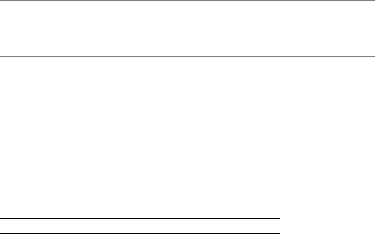
•JPasswordField: This specialized text field is for password entry, as shown in Figure 1-2.
You cannot use cut or copy operations within the component, but you can paste text
into it.
Figure 1-2. The Swing JPasswordField
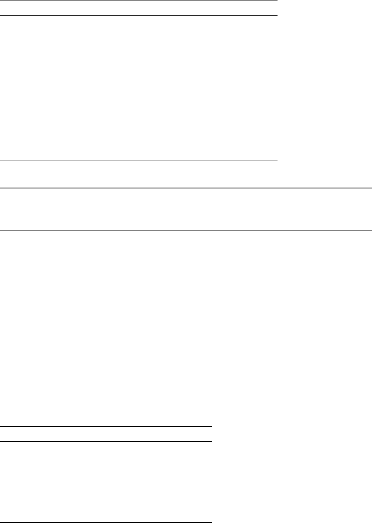
•JEditorPane and JTextPane: These two components provide support for displaying and
editing multiple-attributed content, such as an HTML and RTF viewer. Figure 1-3 shows
aJEditorPane component.
Figure 1-3. The Swing JEditorPane

6CHAPTER 1 ■ SWING OVERVIEW
•JSpinner: This component, shown in Figure 1-4, provides selection from an ordered set
of predefined values, offering arrows to scroll through the next and previous choices.
The predefined values can be an array of strings, a sequential set of numbers, or a date.
Figure 1-4. The Swing JSpinner
•JToggleButton: This component offers a button that stays depressed when selected. In
the example shown in Figure 1-5, the North, East, and South buttons are depressed.
Figure 1-5. The Swing JToggleButton
•JSlider: This component is like the Scrollbar component of AWT (or JScrollBar in the
Swing component set). However, its purpose in Swing is for user input. It offers various
clues to help the user choose a value. Figure 1-6 shows an example of a JSlider component.
Figure 1-6. The Swing JSlider
•JProgressBar: This component allows the user to visually see the progress of an activity.
Some options available include showing static text or percentage done, as shown in
Figure 1-7.
Figure 1-7. The Swing JProgressBar
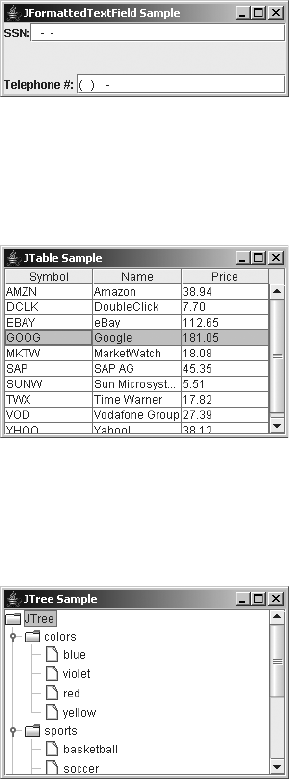
CHAPTER 1 ■ SWING OVERVIEW 7
•JFormattedTextField: This component provides for the input of formatted text, like
numeric values, phone numbers, dates, or social security numbers. Figure 1-8 shows
two examples of this component.
Figure 1-8. The Swing JFormattedTextField
•JTable: This component provides for the display of two-dimensional row and column
information, such as stock quotes, as in the example shown in Figure 1-9.
Figure 1-9. The Swing JTable
•JTree: This component supports the display of hierarchical data. Figure 1-10 shows an
example of a JTree component.
Figure 1-10. The Swing JTree
•JToolTip: Through this component, all Swing components support pop-up text for
offering useful tips. Figure 1-11 shows an example of a JToolTip component added to
aJSlider.

8CHAPTER 1 ■ SWING OVERVIEW
Figure 1-11. The Swing JToolTip
•JToolBar: This container offers a draggable toolbar to be included within any program
window, as shown in Figure 1-12.
Figure 1-12. The Swing JToolBar
•JRadioButtonMenuItem: This component is an addition to the set of menu components.
With it, you can have radio buttons on a menu for mutually exclusive choices, as shown
in the example in Figure 1-13. There’s also a JCheckBoxMenuItem component, for when
you don’t need mutually exclusive choices.
Figure 1-13. The Swing JRadioButtonMenuItem
•JSeparator: The menu’s separator bar is now its own component and can be used
outside of menus, too, as shown in Figure 1-14.
Figure 1-14. The Swing JSeparator
•JDesktopPane and JInternalFrame: This pair of components allows you to develop appli-
cations using the familiar Windows Multiple Document Interface (MDI). Figure 1-15
shows an example.
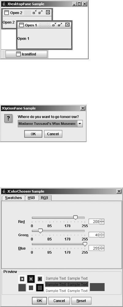
CHAPTER 1 ■ SWING OVERVIEW 9
Figure 1-15. The Swing JDesktopPane and JInternalFrame
•JOptionPane: This component allows you to easily create pop-up windows with varied
content, as shown in Figure 1-16.
Figure 1-16. The Swing JOptionPane
•JColorChooser: This component is for choosing a color, with different views available to
select the color, as shown in Figure 1-17.
Figure 1-17. The Swing JColorChooser
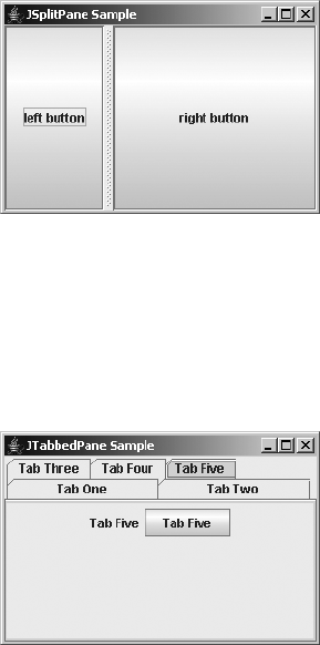
10 CHAPTER 1 ■ SWING OVERVIEW
•JSplitPane: This container allows you to place multiple components in a window. It also
allows the user control over how much of each component is visible. Figure 1-18 shows
an example of a JSplitPane.
Figure 1-18. The Swing JSplitPane
•JTabbedPane: This component is like a container whose layout manager is CardLayout
(discussed in Chapter 10), with labeled tabs automatically provided to allow the user
to swap cards. This provides you with the familiar property-sheet motif, as shown in
Figure 1-19.
Figure 1-19. The Swing JTabbedPane
You’ll learn about all of these components throughout this book. Refer to the “Swing
Component to Chapter Mapping” section later in this chapter to see where each component
is covered.
Event Handling and Layout Management
To use the Swing components successfully, you must understand the underlying parts of the
original AWT component set. For instance, the Swing components all support the delegation-
based event model, which was introduced with JDK 1.1 and is supported by the AWT 1.1
component set. In addition, layout managers control screen layout.

CHAPTER 1 ■ SWING OVERVIEW 11
■Note The Swing components don’t support the original JDK 1.0 event model. They no longer use the
public boolean handleEvent(Event) method and all its helper methods. If you need to convert an
AWT program that uses the JDK 1.0 event model to one that uses the Swing components, you’ll need to
convert the program to use the delegation-based event model, in addition to changing the component set.
Although directly porting old Java AWT programs (or programmers!) to Swing programs is
done most easily by continuing to use the delegation-based event model, this solution is rarely
the best one. Besides supporting the delegation-based event model, the Swing components
provide other, more efficient ways of dealing with events for components. In Chapter 2, you’ll
explore the delegation-based event model and look at the other ways of managing event handling.
In addition to the delegation-based event-handling support, the Swing components use
the Model-View-Controller (MVC) design to separate their user interfaces from their underlying
data models. Using the MVC architecture provides yet another way of event handling with a
Swing component. While MVC might be new to most developers, the basic constructs use the
delegation-based event model. MVC provides the optimal way of working with the Swing
components. You’ll find an overview of the MVC architecture in Chapter 3.
Besides all the support for extended event handling with the Swing classes, these classes
share the need to use a layout manager for positioning components on the screen. In addition
to using the layout managers that come with AWT, you can use other layout managers that
come with the Swing classes. In Chapter 10, you’ll learn about both the AWT and Swing layout
managers.
Undo Framework
Situated within the javax.swing class hierarchy are the javax.swing.undo classes. These classes
offer a framework for supporting undo and redo capabilities within Java programs. Instead of
creating the basic framework yourself, the framework is provided as part of the Swing classes.
Although the undo classes don’t use anything directly outside their package, the Swing text
components use the undo functionality. Chapter 21 provides a detailed explanation of undo.
SwingSet Demonstration
As part of the demo/jfc directory with the Java 2 platform, you have available a Swing demon-
stration program called SwingSet2. This program provides a quick preview of the majority of
the Swing capabilities. All the source code is included, so if you see something you like and are
interested in learning how it was done, just dig through the code to find the appropriate lines.
With the Java 2 platform, you start up this demonstration from the SwingSet2 directory
with the java -jar SwingSet2.jar command. After starting the SwingSet2 demonstration, you
see the opening screen, as shown in Figure 1-20.
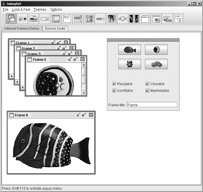
12 CHAPTER 1 ■ SWING OVERVIEW
Figure 1-20. SwingSet2 startup screen
Choose the different buttons and tabs to see many of the features supported by the Swing
components.
Swing Component to Chapter Mapping
The Swing packages contain many classes and components. To help you find where all the
different components are discussed, Table 1-3 provides a handy reference (with the components
listed alphabetically).

CHAPTER 1 ■ SWING OVERVIEW 13
Table 1-3. Mapping of Swing Components to Chapters in This Book
Swing Component Chapter
Box 11
JApplet 8
JButton 4
JCheckBox 5
JCheckBoxMenuItem 6
JColorChooser 9
JComboBox 13
JComponent 4
JDesktopPane 8
JDialog 8
JEditorPane 15
JFileChooser 9
JFormattedTextField 15
JFrame 8
JInternalFrame 8
JLabel 4
JLayeredPane 8
JList 13
JMenu 6
JMenuBar 6
JMenuItem 6
JOptionPane 9
JPanel 4
JPasswordField 15
JPopupMenu 6
JProgressBar 12
JRadioButton 5
JRadioButtonMenuItem 6

14 CHAPTER 1 ■ SWING OVERVIEW
In addition to information about using the different components, the following chapters
feature a table for each component that lists the JavaBeans properties defined by that compo-
nent. Each table notes whether a property has a setter (setPropertyName(newValue)), a getter
(getPropertyName()), or an isPropertyName() method defined by the class, and whether a
property is bound (you can listen for a PropertyChangeEvent). In these property tables, inherited
properties aren’t listed, so even though a property for a component is listed as write-only, the
parent class might still provide a getter method. As an example, Table 1-4 shows the property
table for the JScrollBar component.
JRootPane 8
JScrollBar 12
JScrollPane 11
JSeparator 6
JSlider 12
JSpinner 14
JSplitPane 11
JTabbedPane 11
JTable 18
JTextArea 15
JTextField 15
JTextPane 15
JToggleButton 5
JToolBar 6
JToolTip 4
JTree 17
JViewport 11
JWindow 8
Table 1-4. JScrollBar Properties
Property Name Data Type Access
accessibleContext AccessibleContext Read-only
adjustmentListeners AdjustmentListener[ ] Read-only
blockIncrement int Read-write bound
enabled boolean Write-only
Table 1-3. Mapping of Swing Components to Chapters in This Book (Continued)
Swing Component Chapter

CHAPTER 1 ■ SWING OVERVIEW 15
Besides the property tables, you’ll find information about important aspects of each
component and the techniques for using them.
■Note This book is not intended to be an API reference, nor does it cover everything about each component.
For the lesser-used aspects of a component, see the online javadoc documentation.
Summary
This chapter provided a brief overview of what will be covered in this book, such as the many
essential parts of the Swing component set you need to understand in order to use Swing
components. The combined set of javax.swing packages is larger than the entire first JDK, if
not the first two.
In Chapter 2, you’ll explore how to deal with the many aspects of event handling using the
Swing components. In addition to reviewing the delegation-based event model, you’ll look at
different ways you can deal with events when using Swing components and get a grasp of the
focus traversal policies involved with Swing.
maximum int Read-write
maximumSize Dimension Read-only
minimum int Read-write
minimumSize Dimension Read-only
model BoundedRangeModel Read-write bound
orientation int Read-write bound
UI ScrollBarUI Read-write bound
UIClassID String Read-only
unitIncrement int Read-write bound
value int Read-write bound
valueIsAdjusting boolean Read-write bound
visibleAmount int Read-write
Table 1-4. JScrollBar Properties (Continued)
Property Name Data Type Access

17
■ ■ ■
CHAPTER 2
Event Handling with the Swing
Component Set
Chapter 1 provided a brief overview of the Swing component set. In this chapter, you will
start to look at the details of one aspect of using Swing components: event handling. When
working with the Swing component set, the delegation-based event-handling mechanism is
available, but you can also take advantage of several additional ways to respond to user-initiated
actions (as well as to programmatic events). In this chapter, you’ll explore all these event-handling
response mechanisms. You’ll also learn how Swing manages input focus and some techniques
for controlling how focus is handled.
As you explore event-handling capabilities, you will start to look at some actual Swing
components. In this chapter, you will be using the components in the simplest manner possible.
Feel free to first read up on the components covered in later chapters of this book, and then
come back to this chapter for a general discussion of event handling. The later chapters of this
book also contain specific details on event handling for each component.
Delegation-Based Event Handling
Sun Microsystems introduced the delegation-based event-handling mechanism into the Java
libraries with the release of JDK 1.1 and JavaBeans. Although the Java 1.0 libraries included the
Observer–Observable pair of objects that followed the Observer behavioral design pattern, this
wasn’t an adequate long-term solution for user-interface programming. (The Java 1.0 contain-
ment event-handling mechanism was even worse.)
Event Delegation Model
The delegation-based event-handling mechanism is a specialized form of the Observer design
pattern. The Observer pattern is used when an Observer wants to know when a watched
object’s state changes and what that state change is. In the case of the delegation-based event-
handling mechanism, instead of the Observer listening for a state change, the Observer listens
for events to happen.
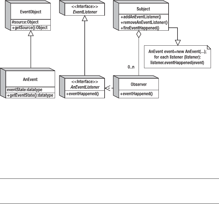
18 CHAPTER 2 ■ EVENT HANDLING WITH THE SWING COMPONENT SET
Figure 2-1 shows the structure of the modified Observer pattern as it relates to the specific
classes within the Java libraries for event handling. The generic Subject participant in the
pattern manages a list (or lists) of generic Observer objects for each event that the subject can
generate. The Observer objects in the list must provide a specific interface through which the
Subject participant can notify them. When an event that the Observer objects are interested in
happens within the Subject participant, all the registered Observer objects are notified. In
the Java world, the specific interface for the Observer objects to implement must extend the
java.util.EventListener interface. The specific event the Subject participant must create
needs to extend the java.util.EventObject class.
Figure 2-1. The modified Observer pattern
To make this a little clearer, let’s take a second look at the delegation-based event-handling
mechanism without all the design pattern terms. GUI components (and JavaBeans) manage
lists of listeners with a pair of methods for each listener type: addXXXListener() and
removeXXXListener(). When an event happens within the subject component, the component
notifies all registered listeners of the event. Any observer class interested in such an event
needs to register with the component an implementer of the appropriate interface. Then each
implementation is notified when the event happens. Figure 2-2 illustrates this sequence.
■Note Some users like to call the event delegation model a publish-subscribe model, in which components
publish a set of available listeners for subscription, and others can subscribe to them.

CHAPTER 2 ■ EVENT HANDLING WITH THE SWING COMPONENT SET 19
Figure 2-2. Event delegation sequence diagram
Event Listeners As Observers
Using event listeners to handle an event is a three-step process:
1. Define a class that implements the appropriate listener interface (this includes
providing implementations for all the methods of the interface).
2. Create an instance of this listener.
3. Register this listener to the component whose events you’re interested in.
Let’s take a look at the three specific steps for creating a simple button that responds to
selection by printing a message.
Defining the Listener
To set up event handling for a selectable button, you need to create an ActionListener, because
the JButton generates ActionEvent objects when selected.
class AnActionListener implements ActionListener {
public void actionPerformed(ActionEvent actionEvent) {
System.out.println("I was selected.");
}
}

20 CHAPTER 2 ■ EVENT HANDLING WITH THE SWING COMPONENT SET
■Note Part of the problem of creating responsive user interfaces is figuring out which event listener to
associate with a component to get the appropriate response for the event you’re interested in. For the most
part, this process becomes more natural with practice. Until then, you can examine the different component
APIs for a pair of add/remove listener methods, or reference the appropriate component material in this book.
Creating an Instance of the Listener
Next, you simply create an instance of the listener you just defined.
ActionListener actionListener = new AnActionListener();
If you use anonymous inner classes for event listeners, you can combine steps 1 and 2:
ActionListener actionListener = new ActionListener() {
public void actionPerformed(ActionEvent actionEvent) {
System.out.println("I was selected.");
}
};
Registering the Listener with a Component
Once you’ve created the listener, you can associate it with the appropriate component. Assuming
the JButton has already been created with a reference stored in the variable button, this would
merely entail calling the button’s addActionListener() method:
button.addActionListener(actionListener);
If the class that you’re currently defining is the class that implements the event listener
interface, you don’t need to create a separate instance of the listener. You just need to associate
your class as the listener for the component. The following source demonstrates this:
public class YourClass implements ActionListener {
... // Other code for your class
public void actionPerformed(ActionEvent actionEvent) {
System.out.println("I was selected.");
}
// Code within some method
JButton button = new JButton(...);
button.addActionListener(this);
// More code within some method
}
Using event handlers such as creating a listener and associating it to a component is the
basic way to respond to events with the Swing components. The specifics of which listener
works with which component are covered in later chapters, when each component is described.
In the following sections, you’ll learn about some additional ways to respond to events.

CHAPTER 2 ■ EVENT HANDLING WITH THE SWING COMPONENT SET 21
■Tip Personally, I don’t like the approach of just associating a class as the event listener, because it doesn’t
scale well when the situation gets more complicated. For instance, as soon as you add another button onto
the screen and want the same event listener to handle its selection, the actionPerformed() method must
figure out which button triggered the event before it can respond. Although creating a separate event listener
for each component adds another class to the set of deliverables, creating separate listeners is more main-
tainable than sharing a listener across multiple components. In addition, most integrated development
environment (IDE) tools, such as Borland’s JBuilder, can automatically create the listener objects as separate
classes.
Multithreaded Swing Event Handling
To increase their efficiency and decrease the complexity, all Swing components were designed
to not be thread-safe. Although this might sound scary, it simply means that all access to Swing
components needs to be done from a single thread—the event-dispatch thread. If you are
unsure that you’re in a particular thread, you can ask the EventQueue class with its public static
boolean isDispatchThread() method or the SwingUtilities class with its public static boolean
isEventDispatchThread() method. The latter just acts as a proxy to the former.
■Note Earlier versions of this book showed one particular way of creating Swing programs. They were
wrong. It was thought that accessing invisible (unrealized) components from outside the event-dispatch
thread was okay. However, that’s not true. Doing something with a Swing component can trigger a reaction
within the component, and that other action would be done on the event-dispatch thread, violating the single-
threaded access.
With the help of the EventQueue class, you create Runnable objects to execute on the event-
dispatch thread to properly access components. If you need to execute a task on the event-dispatch
thread, but you don’t need any results and don’t care exactly when the task finishes, you can
use the public static void invokeLater(Runnable runnable) method of EventQueue. If, on the
other hand, you can’t continue with what you’re doing until the task completes and returns
a value, you can use the public static void invokeAndWait(Runnable runnable) method of
EventQueue. The code to get the value is left up to you and is not the return value to the
invokeAndWait() method.
■Caution The invokeAndWait(Runnable) method can throw an InterruptedException or an
InvocationTargetException.
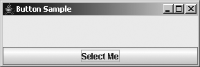
22 CHAPTER 2 ■ EVENT HANDLING WITH THE SWING COMPONENT SET
To demonstrate the proper way to create a Swing-based program, Listing 2-1 shows the
source for a selectable button.
Listing 2-1. Swing Application Framework
import javax.swing.*;
import java.awt.*;
import java.awt.event.*;
public class ButtonSample {
public static void main(String args[]) {
Runnable runner = new Runnable() {
public void run() {
JFrame frame = new JFrame("Button Sample");
frame.setDefaultCloseOperation(JFrame.EXIT_ON_CLOSE);
JButton button = new JButton("Select Me");
// Define ActionListener
ActionListener actionListener = new ActionListener() {
public void actionPerformed(ActionEvent actionEvent) {
System.out.println("I was selected.");
}
};
// Attach listeners
button.addActionListener(actionListener);
frame.add(button, BorderLayout.SOUTH);
frame.setSize(300, 100);
frame.setVisible(true);
}
};
EventQueue.invokeLater(runner);
}
}
This code produces the button shown in Figure 2-3.
Figure 2-3. Button sample
First, let’s look at the invokeLater() method. It requires a Runnable object as its argument.
You just create a Runnable object and pass it along to the invokeLater() method. Some time
after the current event dispatching is done, this Runnable object will execute.

CHAPTER 2 ■ EVENT HANDLING WITH THE SWING COMPONENT SET 23
Runnable runnable = new Runnable() {
public void run() {
// Do work to be done
}
}
EventQueue.invokeLater(runnable);
If you want your Swing GUI creation to be thread-safe, you should follow this pattern with
all of your Swing code. If you need to access the command-line arguments, just add the final
keyword to the argument declaration: public static void main(final String args[]). This
may seem like overkill for a simple example like this, but it does ensure the thread safety of your
program, making sure that all Swing component access is done from the event-dispatch thread.
(However, calls to repaint(),revalidate(), and invalidate() don’t need to be done from the
event-dispatch thread.)
■Note In addition to the invokeLater() and invokeAndWait() methods of the EventQueue class, there
are wrapper methods of the same name in the SwingUtilities class. Since the SwingUtilities calls just
redirect the calls on to the EventQueue class, you should avoid the extra layer of indirection and access
EventQueue directly. These wrapper methods were created for an early Swing version, prior to the existence
of the EventQueue class.
One additional line from Listing 2-1 requires some extra explanation:
frame.setDefaultCloseOperation(JFrame.EXIT_ON_CLOSE);
By default, if you click the little X in the title bar of the window shown in Figure 2-3, the
application does not close; instead, the frame is made invisible. Setting the default close oper-
ation to JFrame.EXIT_ON_CLOSE, as in Listing 2-1, causes the application to exit if the user clicks
the X. You’ll learn more about this behavior in Chapter 8, which explores the JFrame class.
Using SwingUtilities for Mouse Button Identification
The Swing component set includes a utility class called SwingUtilities that provides a collection
of generic helper methods. You will look at this class periodically throughout this book when a
particular set of methods for this class seems useful. For the button example in Listing 2-1, the
methods of interest are related to determining which mouse button has been selected.
The MouseInputListener interface consists of seven methods: mouseClicked(MouseEvent),
mouseEntered(MouseEvent),mouseExited(MouseEvent),mousePressed(MouseEvent), and
mouseReleased(MouseEvent) from MouseListener; and mouseDragged(MouseEvent) and
mouseMoved(MouseEvent) from MouseMotionListener. If you need to determine which buttons
on the mouse were selected (or released) when the event happened, check the modifiers prop-
erty of MouseEvent and compare it to various mask-setting constants of the InputEvent class.
For instance, to check if a middle mouse button is pressed for a mouse press event, you
could use the following code in your mouse listener’s mousePressed() method:
24 CHAPTER 2 ■ EVENT HANDLING WITH THE SWING COMPONENT SET
public void mousePressed(MouseEvent mouseEvent) {
int modifiers = mouseEvent.getModifiers();
if ((modifiers & InputEvent.BUTTON2_MASK) == InputEvent.BUTTON2_MASK) {
System.out.println("Middle button pressed.");
}
}
Although this works fine and dandy, the SwingUtilities class has three methods to make
this process much simpler:
SwingUtilities.isLeftMouseButton(MouseEvent mouseEvent)
SwingUtilities.isMiddleMouseButton(MouseEvent mouseEvent)
SwingUtilities.isRightMouseButton(MouseEvent mouseEvent)
Now, instead of needing to manually get the modifiers and compare them against the
mask, you can simply ask the SwingUtilities, as follows:
if (SwingUtilities.isMiddleMouseButton(mouseEvent)) {
System.out.println("Middle button released.");
}
This makes your code much more readable and easier to maintain.
Listing 2-2 contains an updated ButtonSample that adds another listener to detect which
mouse button was pressed.
Listing 2-2. Button Sample with Mouse Button Detection
import javax.swing.*;
import java.awt.*;
import java.awt.event.*;
public class ButtonSample {
public static void main(String args[]) {
Runnable runner = new Runnable() {
public void run() {
JFrame frame = new JFrame("Button Sample");
frame.setDefaultCloseOperation(JFrame.EXIT_ON_CLOSE);
JButton button = new JButton("Select Me");
// Define ActionListener
ActionListener actionListener = new ActionListener() {
public void actionPerformed(ActionEvent actionEvent) {
System.out.println("I was selected.");
}
};
CHAPTER 2 ■ EVENT HANDLING WITH THE SWING COMPONENT SET 25
// Define MouseListener
MouseListener mouseListener = new MouseAdapter() {
public void mousePressed(MouseEvent mouseEvent) {
int modifiers = mouseEvent.getModifiers();
if ((modifiers & InputEvent.BUTTON1_MASK) ==
InputEvent.BUTTON1_MASK) {
System.out.println("Left button pressed.");
}
if ((modifiers & InputEvent.BUTTON2_MASK) ==
InputEvent.BUTTON2_MASK) {
System.out.println("Middle button pressed.");
}
if ((modifiers & InputEvent.BUTTON3_MASK) ==
InputEvent.BUTTON3_MASK) {
System.out.println("Right button pressed.");
}
}
public void mouseReleased(MouseEvent mouseEvent) {
if (SwingUtilities.isLeftMouseButton(mouseEvent)) {
System.out.println("Left button released.");
}
if (SwingUtilities.isMiddleMouseButton(mouseEvent)) {
System.out.println("Middle button released.");
}
if (SwingUtilities.isRightMouseButton(mouseEvent)) {
System.out.println("Right button released.");
}
System.out.println();
}
};
// Attach listeners
button.addActionListener(actionListener);
button.addMouseListener(mouseListener);
frame.add(button, BorderLayout.SOUTH);
frame.setSize(300, 100);
frame.setVisible(true);
}
};
EventQueue.invokeLater(runner);
}
}
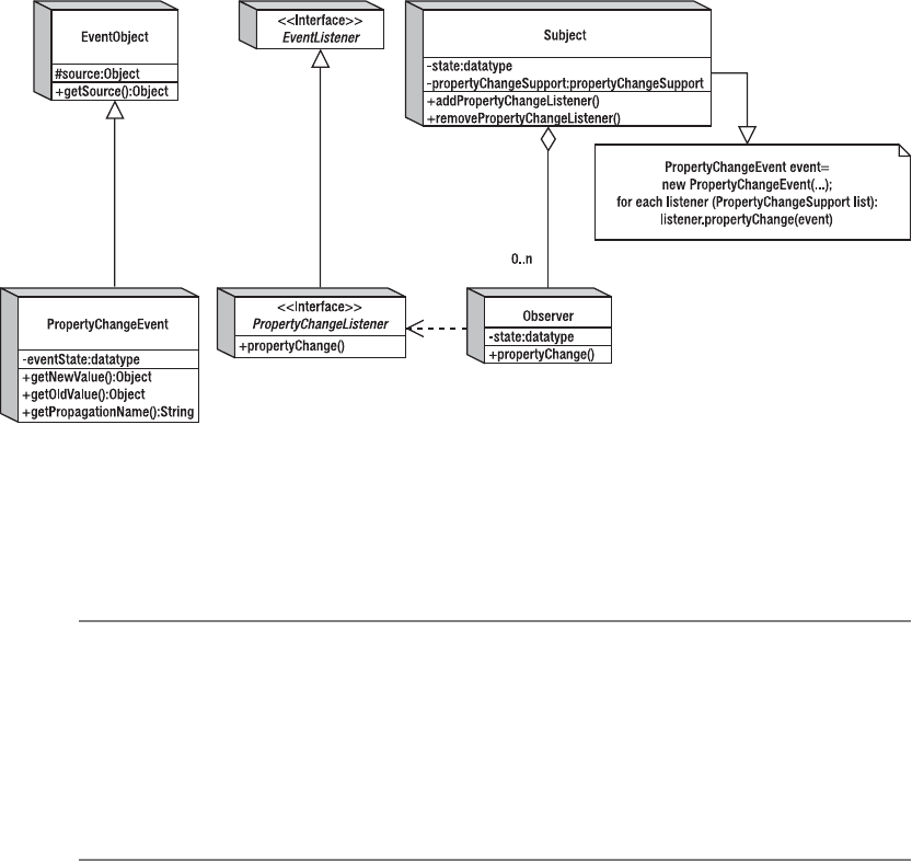
26 CHAPTER 2 ■ EVENT HANDLING WITH THE SWING COMPONENT SET
Using Property Change Listeners As Observers
Besides the basic event-delegation mechanism, the JavaBeans framework introduced yet
another incarnation of the Observer design pattern, this time through the property change
listener. The PropertyChangeListener implementation is a truer representation of the Observer
pattern. Each Observer watches for changes to an attribute of the Subject. The Observer is then
notified of the new state when changed in the Subject. Figure 2-4 shows the structure of this
Observer pattern as it relates to the specific classes within the JavaBeans libraries for property
change handling. In this particular case, the observable Subject has a set of add/remove prop-
erty change listener methods and a property (or properties) whose state is being watched.
Figure 2-4. The property change listener Observer pattern
With a PropertyChangeListener, the registered set of listeners is managed within the
PropertyChangeSupport class. When the watched property value changes, this support class
notifies any registered listeners of the new and old property state values.
■Note Although PropertyChangeListener observers are registered at the class level, not all properties
of the class might be bound. A property is bound when a change to the property causes the registered
listeners to be notified. In addition, although the JavaBeans framework introduced the concept of property
change listeners in JDK 1.1, none of the properties of the AWT components were bound, although this changed
for the Component class in the 1.2 release. The Swing components have many of their properties bound. To
find out which ones are bound, see the property tables for each Swing component that appear in later chap-
ters of this book.

CHAPTER 2 ■ EVENT HANDLING WITH THE SWING COMPONENT SET 27
By registering PropertyChangeListener objects with the various components that support
this type of listener, you can reduce the amount of source code you must generate after the
initial listening setup. For instance, the background color of a Swing component is bound,
meaning someone can register a PropertyChangeListener to a component to be notified when
the background setting changes. When the value of the background property for that component
changes, anyone listening is notified, allowing an Observer to change its background color to
the new setting. Therefore, if you want all the components of your program to have the same
background color, you can register them all with one component. Then, when that single
component changes its background color, all the other components will be notified of the
change and will modify their backgrounds to the new setting.
■Note Although you can use a PropertyChangeListener to “share” a common property setting among
components, you can also map the property of a subject to a different property of the Observer.
The program in Listing 2-3 demonstrates using a PropertyChangeListener. It creates two
buttons. When either button is selected, the background of the selected button is changed to
some random color. The second button is listening for property changes within the first button.
When the background color changes for the first button, the background color of the second
button is changed to that new value. The first button isn’t listening for property changes for the
second button. Therefore, when the second button is selected, changing its background color,
this change doesn’t propagate back to the first button.
Listing 2-3. Property Change Listener Sample
import javax.swing.*;
import java.awt.*;
import java.awt.event.*;
import java.beans.*;
import java.util.Random;
public class BoundSample {
public static void main(String args[]) {
Runnable runner = new Runnable() {
public void run() {
JFrame frame = new JFrame("Button Sample");
frame.setDefaultCloseOperation(JFrame.EXIT_ON_CLOSE);
final JButton button1 = new JButton("Select Me");
final JButton button2 = new JButton("No Select Me");
final Random random = new Random();
28 CHAPTER 2 ■ EVENT HANDLING WITH THE SWING COMPONENT SET
// Define ActionListener
ActionListener actionListener = new ActionListener() {
public void actionPerformed(ActionEvent actionEvent) {
JButton button = (JButton)actionEvent.getSource();
int red = random.nextInt(255);
int green = random.nextInt(255);
int blue = random.nextInt(255);
button.setBackground(new Color(red, green, blue));
}
};
// Define PropertyChangeListener
PropertyChangeListener propertyChangeListener =
new PropertyChangeListener() {
public void propertyChange(PropertyChangeEvent propertyChangeEvent) {
String property = propertyChangeEvent.getPropertyName();
if ("background".equals(property)) {
button2.setBackground((Color)propertyChangeEvent.getNewValue());
}
}
};
// Attach listeners
button1.addActionListener(actionListener);
button1.addPropertyChangeListener(propertyChangeListener);
button2.addActionListener(actionListener);
frame.add(button1, BorderLayout.NORTH);
frame.add(button2, BorderLayout.SOUTH);
frame.setSize(300, 100);
frame.setVisible(true);
}
};
EventQueue.invokeLater(runner);
}
}
Although this example causes only a color change from button selection, imagine if the
background color of the first button could be changed from a couple of hundred different places
other than the one action listener! Without a property change listener, each of those places
would be required to also change the background color of the second button. With the property
change listener, it’s only necessary to modify the background color of the primary object—the
first button, in this case. The change would then automatically propagate to the other components.
The Swing library also uses the ChangeEvent/ChangeListener pair to signify state changes.
Although similar to the PropertyChangeEvent/PropertyChangeListener pair, the ChangeEvent
doesn’t carry with it the new and old data value settings. You can think of it as a lighter-weight
version of a property change listener. The ChangeEvent is useful when more than one property
value changes, because ChangeEvent doesn’t need to package the changes.

CHAPTER 2 ■ EVENT HANDLING WITH THE SWING COMPONENT SET 29
■Tip The Swing components use the SwingPropertyChangeSupport class, instead of the
PropertyChangeSupport class, to manage and notify their PropertyChangeListener list. The Swing
version, SwingPropertyChangeSupport, isn’t thread-safe, but it is faster and takes up less memory.
Assuming it is accessed from only the event-dispatch thread, the lack of thread safety is irrelevant.
Managing Listener Lists
If you’re creating your own components and want those components to fire off events, you
need to maintain a list of listeners to be notified. If the listener list is for AWT events (found in
java.awt.event), you can use the AWTEventMulticaster class for help with list management.
Prior to the Swing libraries, if the event wasn’t a predefined AWT event type, you had to manage this
list of listeners yourself. With the help of the EventListenerList class in the javax.swing.event
package, you no longer need to manually manage the listener list and worry about thread
safety. And, if you ever need to get the list of listeners, you can ask a Component with public
EventListener[ ] getListeners(Class listenerType), or one of the type-specific methods like
the getActionListeners() method of JButton. This allows you to remove listeners from an inter-
nally managed list, which helps with garbage collection.
AWTEventMulticaster Class
Whether you realize it or not, the AWTEventMulticaster class is used by each and every AWT
component to manage event listener lists. The class implements all the AWT event listeners
(ActionListener,AdjustmentListener,ComponentListener,ContainerListener,FocusListener,
HierarchyBoundsListener,HierarchyListener,InputMethodListener,ItemListener,KeyListener,
MouseListener,MouseMotionListener,MouseWheelListener,TextListener,WindowFocusListener,
WindowListener, and WindowStateListener). Whenever you call a component’s method to add
or remove a listener, the AWTEventMulticaster is used for support.
If you want to create your own component and manage a list of listeners for one of these
AWT event/listener pairs, you can use the AWTEventMulticaster. As an example, let’s look at
how to create a generic component that generates an ActionEvent object whenever a key is
pressed within the component. The component uses the public static String getKeyText
(int keyCode) method of KeyEvent to convert the key code to its appropriate text string and
passes this string back as the action command for the ActionEvent. Because the component
is meant to serve as the source for ActionListener observers, it needs a pair of add/remove
methods to handle the registration of listeners. This is where the AWTEventMulticaster comes
in, because it will manage the adding and removing of listeners from your listener list variable:
private ActionListener actionListenerList = null;
public void addActionListener(ActionListener actionListener) {
actionListenerList = AWTEventMulticaster.add(
actionListenerList, actionListener);
}
public void removeActionListener(ActionListener actionListener) {
actionListenerList = AWTEventMulticaster.remove(
actionListenerList, actionListener);
}
30 CHAPTER 2 ■ EVENT HANDLING WITH THE SWING COMPONENT SET
The remainder of the class definition describes how to handle the internal events. An
internal KeyListener needs to be registered in order to send keystrokes to an ActionListener.
In addition, the component must be able to get the input focus; otherwise, all keystrokes will
go to other components. The complete class definition is shown in Listing 2-4. The line of
source code for notification of the listener list is in boldface. That one line notifies all the regis-
tered listeners.
Listing 2-4. Managing Listener Lists with AWTEventMulticaster
import java.awt.*;
import java.awt.event.*;
import javax.swing.*;
public class KeyTextComponent extends JComponent {
private ActionListener actionListenerList = null;
public KeyTextComponent() {
setBackground(Color.CYAN);
KeyListener internalKeyListener = new KeyAdapter() {
public void keyPressed(KeyEvent keyEvent) {
if (actionListenerList != null) {
int keyCode = keyEvent.getKeyCode();
String keyText = KeyEvent.getKeyText(keyCode);
ActionEvent actionEvent = new ActionEvent(
this,
ActionEvent.ACTION_PERFORMED,
keyText);
actionListenerList.actionPerformed(actionEvent);
}
}
};
MouseListener internalMouseListener = new MouseAdapter() {
public void mousePressed(MouseEvent mouseEvent) {
requestFocusInWindow();
}
};
addKeyListener(internalKeyListener);
addMouseListener(internalMouseListener);
}
public void addActionListener(ActionListener actionListener) {
actionListenerList = AWTEventMulticaster.add(
actionListenerList, actionListener);
}
CHAPTER 2 ■ EVENT HANDLING WITH THE SWING COMPONENT SET 31
public void removeActionListener(ActionListener actionListener) {
actionListenerList = AWTEventMulticaster.remove(
actionListenerList, actionListener);
}
public boolean isFocusable() {
return true;
}
}
Figure 2-5 shows the component in use. The top portion of the figure is the component,
and the bottom is a text field. An ActionListener is registered with the KeyTextComponent that
updates the text field in order to display the text string for the key pressed.
Figure 2-5. Demonstrating the KeyTextComponent
The source code for the example shown in Figure 2-5 follows in Listing 2-5.
Listing 2-5. Sample Program with an AWTEventMulticaster Component
import java.awt.*;
import java.awt.event.*;
import javax.swing.*;
public class KeyTextTester {
public static void main(String args[]) {
Runnable runner = new Runnable() {
public void run() {
JFrame frame = new JFrame("Key Text Sample");
frame.setDefaultCloseOperation(JFrame.EXIT_ON_CLOSE);
KeyTextComponent keyTextComponent = new KeyTextComponent();
final JTextField textField = new JTextField();
ActionListener actionListener = new ActionListener() {
public void actionPerformed(ActionEvent actionEvent) {
String keyText = actionEvent.getActionCommand();
textField.setText(keyText);
}
};
32 CHAPTER 2 ■ EVENT HANDLING WITH THE SWING COMPONENT SET
keyTextComponent.addActionListener(actionListener);
frame.add(keyTextComponent, BorderLayout.CENTER);
frame.add(textField, BorderLayout.SOUTH);
frame.setSize(300, 200);
frame.setVisible(true);
}
};
EventQueue.invokeLater(runner);
}
}
EventListenerList Class
Although the AWTEventMulticaster class is easy to use, it doesn’t work for managing lists of
custom event listeners or any of the Swing event listeners found in javax.swing.event. You
could create a custom extension of the class for each type of event listener list you need to
manage (not practical), or you could just store the list in a data structure such as a Vector or
LinkedList. Although using a Vector or LinkedList works satisfactorily, when you use this method,
you need to worry about synchronization issues. If you don’t program the list management
properly, the listener notification may happen with the wrong set of listeners.
To help simplify this situation, the Swing component library includes a special event-listener
support class, EventListenerList. One instance of the class can manage all the different types
of event listeners for a component. To demonstrate the class usage, let’s see how the previous
example can be rewritten to use EventListenerList instead of AWTEventMulticaster. Note that
in this particular example, using the AWTEventMulticaster class is actually the simpler solution.
However, imagine a similar situation in which the event listener isn’t one of the predefined
AWT event listeners or if you need to maintain multiple listener lists.
The adding and removing of listeners is similar to the technique used with the
AWTEventMulticaster in the previous example. You need to create a variable of the appropriate
type—this time EventListenerList—as well as define add and remove listener methods. One
key difference between the two approaches is that the initial EventListenerList is non-null,
whereas the other starts off being null. A reference to an empty EventListenerList must be
created to start. This removes the need for several checks for a null list variable later. The adding
and removing of listeners is also slightly different. Because an EventListenerList can manage
a list of listeners of any type, when you add or remove the listener, you must provide the class
type for the listener being acted on.
EventListenerList actionListenerList = new EventListenerList();
public void addActionListener(ActionListener actionListener) {
actionListenerList.add(ActionListener.class, actionListener);
}
public void removeActionListener(ActionListener actionListener) {
actionListenerList.remove(ActionListener.class, actionListener);
}
CHAPTER 2 ■ EVENT HANDLING WITH THE SWING COMPONENT SET 33
This leaves only the notification of the listeners to be handled. No generic method exists in
the class to notify all the listeners of a particular type that an event has happened, so you must
create the code yourself. A call to the following code (fireActionPerformed(actionEvent)) will
replace the one line of boldfaced source code:
(actionListenerList.actionPerformed(actionEvent)
from the previous example. The code gets a copy of all the listeners of a particular type from the
list as an array (in a thread-safe manner). You then need to loop through the list and notify the
appropriate listeners.
protected void fireActionPerformed(ActionEvent actionEvent) {
EventListener listenerList[] =
actionListenerList.getListeners(ActionListener.class);
for (int i=0, n=listenerList.length; i<n; i++) {
((ActionListener)listenerList[i]).actionPerformed(actionEvent);
}
}
The complete source for the new and improved class follows in Listing 2-6. When using the
EventListenerList class, don’t forget that the class is in the javax.swing.event package. Other
than the component class name, the testing program doesn’t change.
Listing 2-6. Managing Listener Lists with EventListenerList
import java.awt.*;
import java.awt.event.*;
import javax.swing.*;
import javax.swing.event.*;
import java.util.EventListener;
public class KeyTextComponent2 extends JComponent {
private EventListenerList actionListenerList = new EventListenerList();
public KeyTextComponent2() {
setBackground(Color.CYAN);
KeyListener internalKeyListener = new KeyAdapter() {
public void keyPressed(KeyEvent keyEvent) {
if (actionListenerList != null) {
int keyCode = keyEvent.getKeyCode();
String keyText = KeyEvent.getKeyText(keyCode);
ActionEvent actionEvent = new ActionEvent(
this,
ActionEvent.ACTION_PERFORMED,
keyText);
fireActionPerformed(actionEvent);
}
}
};
34 CHAPTER 2 ■ EVENT HANDLING WITH THE SWING COMPONENT SET
MouseListener internalMouseListener = new MouseAdapter() {
public void mousePressed(MouseEvent mouseEvent) {
requestFocusInWindow();
}
};
addKeyListener(internalKeyListener);
addMouseListener(internalMouseListener);
}
public void addActionListener(ActionListener actionListener) {
actionListenerList.add(ActionListener.class, actionListener);
}
public void removeActionListener(ActionListener actionListener) {
actionListenerList.remove(ActionListener.class, actionListener);
}
protected void fireActionPerformed(ActionEvent actionEvent) {
EventListener listenerList[] =
actionListenerList.getListeners(ActionListener.class);
for (int i=0, n=listenerList.length; i<n; i++) {
((ActionListener)listenerList[i]).actionPerformed(actionEvent);
}
}
public boolean isFocusable() {
return true;
}
}
Timer Class
In addition to the invokeAndWait() and invokeLater() methods of EventQueue, you can use the
Timer class to create actions to be executed on the event-dispatch thread. A Timer provides a
way of notifying an ActionListener after a predefined number of milliseconds. The timer can
repeatedly notify the listeners, or just call them once.
Creating Timer Objects
Following is the single constructor for creating a Timer that specifies the millisecond delay time
between calls to the ActionListener:
public Timer(int delay, ActionListener actionListener);
// 1 second interval
Timer timer = new Timer(1000, anActionListener);

CHAPTER 2 ■ EVENT HANDLING WITH THE SWING COMPONENT SET 35
Using Timer Objects
After a Timer object has been created, you need to start() it. Once the Timer is started, the
ActionListener will be notified after the given number of milliseconds. If the system is busy,
the delay could be longer, but it won’t be shorter.
If there comes a time when you want to stop a Timer, call its stop() method. The Timer also
has a restart() method, which calls stop() and start(), restarting the delay period.
To demonstrate, Listing 2-7 defines an ActionListener that simply prints a message. You
then create a Timer to call this listener every half second. After creating the timer, you need to
start it.
Listing 2-7. Swing Timer Sample
import javax.swing.*;
import java.awt.*;
import java.awt.event.*;
public class TimerSample {
public static void main(String args[]) {
Runnable runner = new Runnable() {
public void run() {
ActionListener actionListener = new ActionListener() {
public void actionPerformed(ActionEvent actionEvent) {
System.out.println("Hello World Timer");
}
};
Timer timer = new Timer(500, actionListener);
timer.start();
}
};
EventQueue.invokeLater(runner);
}
}
■Note A Timer doesn’t start up the AWT event-dispatch thread on its own.
Timer Properties
Table 2-1 lists the six properties of Timer. Four allow you to customize the behavior of the timer.
running tells you if a timer has been started but not stopped, and actionListeners gets you the
list of action listeners.

36 CHAPTER 2 ■ EVENT HANDLING WITH THE SWING COMPONENT SET
The delay property is the same as the constructor argument. If you change the delay of a
running timer, the new delay won’t be used until the existing delay runs out.
The initialDelay property allows you to have another startup delay besides the periodic
delay after the first execution. For instance, if you don’t want to initially do a task for an hour,
but then want to do it every 15 minutes thereafter, you need to change the initialDelay setting
before you start the timer. By default, the initialDelay and delay properties are set to the same
setting in the constructor.
The repeats property is true by default, which results in a repeating timer. When false,
the timer notifies action listeners only once. You then need to restart() the timer to trigger the
listener again. Nonrepeating timers are good for onetime notifications that need to happen
after a triggering event.
The coalesce property allows for a busy system to throw away notifications that haven’t
happened yet when a new event needs to be fired to the registered ActionListener objects. By
default, the coalesce value is true. This means if a timer runs every 500 milliseconds, but its
system is bogged down and doesn’t respond for a whole 2 seconds, the timer needs to send
only one message, rather than also sending the missing ones. If the setting were false, four
messages would still need to be sent.
In addition to the properties just listed, you can turn on log messages with the following
line of code:
Timer.setLogTimers(true);
Log messages are good for actions that lack a visual element, allowing you to see when
something happens.
■Tip The java.util.Timer class works in a fashion similar to the javax.swing.Timer class, except that
it doesn’t run the scheduled task in the event-dispatch thread. In addition, it supports executing tasks at a
fixed rate, versus after a fixed delay. The latter scheme permits the repeat rate to drift between executions if
the event-dispatch thread is busy.
Table 2-1. Timer Properties
Property Name Data Type Access
actionListeners ActionListener[ ] Read-only
coalesce boolean Read-write
delay int Read-write
initialDelay int Read-write
repeats boolean Read-write
running boolean Read-only
CHAPTER 2 ■ EVENT HANDLING WITH THE SWING COMPONENT SET 37
Swing-Specific Event Handling
Keeping in mind that the Swing components are built on top of the AWT libraries, the Swing
component library has several improved capabilities to make event handling much easier. The
capabilities improve on several of AWT’s core event-handling features, from basic action listening
to focus management.
To simplify event handling, the Swing library extends the original ActionListener interface
with the Action interface to store visual attributes with the event handler. This allows the creation
of event handlers independent of visual components. Then, when the Action is later associated
with a component, the component automatically gets information (such as a button label)
directly from the event handler. This includes notification of updates for the label when the
Action is modified. The AbstractAction and TextAction classes are implementations of this
concept.
The Swing library also adds a KeyStroke class that allows you to more easily respond to key
events. Instead of watching all key events for a specific key, you can tell a component that when
a specific keystroke sequence is pressed, it must respond with a particular action. These
keystroke-to-action mappings are stored in a combination of InputMap and ActionMap objects.
The InputMap is specifically a ComponentInputMap when the component’s window has the focus. The
Swing text components can use these more readily to store the mapping of keystrokes to actions
with the help of the Keymap interface. The mappings for the TextAction support are described
in more detail in Chapter 16, along with the remainder of the text event-handling capabilities.
The KeyboardFocusManager and DefaultKeyboardFocusManager, along with the help of the
FocusTraversalPolicy and its implementations, manage the focus subsystem. The InputVerifier
helps, too, for validation of user input. These are discussed in the “Swing Focus Management”
section later in this chapter.
Action Interface
The Action interface is an extension to the ActionListener interface that’s very flexible for
defining shared event handlers independent of the components that act as the triggering agents.
The interface implements ActionListener and defines a lookup table data structure whose
keys act as bound properties. Then, when an Action is associated with a component, these
display properties are automatically carried over to it. The following is the interface definition:
public interface Action implements ActionListener {
// Constants
public final static String ACCELERATOR_KEY;
public final static String ACTION_COMMAND_KEY;
public final static String DEFAULT;
public final static String LONG_DESCRIPTION;
public final static String MNEMONIC_KEY;
public final static String NAME;
public final static String SHORT_DESCRIPTION;
public final static String SMALL_ICON;
38 CHAPTER 2 ■ EVENT HANDLING WITH THE SWING COMPONENT SET
// Listeners
public void addPropertyChangeListener(PropertyChangeListener listener);
public void removePropertyChangeListener(PropertyChangeListener listener);
// Properties
public boolean isEnabled();
public void setEnabled(boolean newValue);
// Other methods
public Object getValue(String key);
public void putValue(String key, Object value);
}
Because Action is merely an interface, the Swing libraries offer a class to implement the
interface. That class is AbstractAction.
AbstractAction Class
The AbstractAction class provides a default implementation of the Action interface. This is
where the bound property behavior is implemented.
Using Actions
Once you define an AbstractAction by subclassing and providing a public void actionPerformed
(ActionEvent actionEvent) method, you can then pass it along to some special Swing compo-
nents. JButton,JCheckBox,JRadioButton,JToggleButton,JMenuItem,JCheckBoxMenuItem, and
JRadioButtonMenuItem provide constructors for creating the components from actions, whereas
the Swing text components have their own built-in support for Action objects through their
Keymap,InputMap, and ActionMap.
When the component with the associated Action is added to the respective Swing container,
selection triggers the calling of the actionPerformed(ActionEvent actionEvent) method of the
Action. The display of the component is defined by the property elements added to the internal
data structure. To demonstrate, Listing 2-8 presents an Action with a “Print” label and an
image icon. When this is activated, a “Hello, World” message is printed.
Listing 2-8. Action Usage Example
import java.awt.event.*;
import javax.swing.*;
public class PrintHelloAction extends AbstractAction {
private static final Icon printIcon = new ImageIcon("Print.gif");
PrintHelloAction() {
super("Print", printIcon);
putValue(Action.SHORT_DESCRIPTION, "Hello, World");
}
public void actionPerformed(ActionEvent actionEvent) {
System.out.println("Hello, World");
}
}
CHAPTER 2 ■ EVENT HANDLING WITH THE SWING COMPONENT SET 39
Once the Action has been defined, you can create the Action and associate it with as many
other components as you want.
Action printAction = new PrintHelloAction();
menu.add(new JMenuItem(printAction));
toolbar.add(new JButton(printAction));
After the Action has been associated with the various objects, if you find that you need to
modify the properties of the Action, you need to change the setting in only one place. Because
the properties are all bound, they propagate to any component that uses the Action. For instance,
disabling the Action (printAction.setEnabled(false)) will disable the JMenuItem and JButton
created on the JMenu and JToolBar, respectively. In contrast, changing the name of the Action
with printAction.putValue(Action.NAME, "Hello, World") changes the text label of the asso-
ciated components.
Figure 2-6 shows what the PrintHelloAction might look like on a JToolBar and a JMenu.
Selectable buttons are provided to enable or disable the Action, as well as to change its name.
Figure 2-6. The PrintHelloAction in use
The complete source code for this example follows in Listing 2-9. Don’t worry just yet
about the specifics of creating toolbars and menu bars. They’ll be discussed in more detail
in Chapter 6.
Listing 2-9. PrintHelloAction Example
import java.awt.*;
import java.awt.event.*;
import javax.swing.*;
public class ActionTester {
public static void main(String args[]) {
Runnable runner = new Runnable() {
public void run() {
JFrame frame = new JFrame("Action Sample");
frame.setDefaultCloseOperation(JFrame.EXIT_ON_CLOSE);
final Action printAction = new PrintHelloAction();
JMenuBar menuBar = new JMenuBar();
40 CHAPTER 2 ■ EVENT HANDLING WITH THE SWING COMPONENT SET
JMenu menu = new JMenu("File");
menuBar.add(menu);
menu.add(new JMenuItem(printAction));
JToolBar toolbar = new JToolBar();
toolbar.add(new JButton(printAction));
JButton enableButton = new JButton("Enable");
ActionListener enableActionListener = new ActionListener() {
public void actionPerformed(ActionEvent actionEvent) {
printAction.setEnabled(true);
}
};
enableButton.addActionListener(enableActionListener);
JButton disableButton = new JButton("Disable");
ActionListener disableActionListener = new ActionListener() {
public void actionPerformed(ActionEvent actionEvent) {
printAction.setEnabled(false);
}
};
disableButton.addActionListener(disableActionListener);
JButton relabelButton = new JButton("Relabel");
ActionListener relabelActionListener = new ActionListener() {
public void actionPerformed(ActionEvent actionEvent) {
printAction.putValue(Action.NAME, "Hello, World");
}
};
relabelButton.addActionListener(relabelActionListener);
JPanel buttonPanel = new JPanel();
buttonPanel.add(enableButton);
buttonPanel.add(disableButton);
buttonPanel.add(relabelButton);
frame.setJMenuBar(menuBar);
frame.add(toolbar, BorderLayout.SOUTH);
frame.add(buttonPanel, BorderLayout.NORTH);
frame.setSize(300, 200);
frame.setVisible(true);
}
};
EventQueue.invokeLater(runner);
}
}

CHAPTER 2 ■ EVENT HANDLING WITH THE SWING COMPONENT SET 41
AbstractAction Properties
As Table 2-2 shows, the AbstractAction class has three available properties.
The remainder of the bound properties are placed in the lookup table with putValue
(String key, Object value). Getting the current keys property setting allows you to find out
which ones can be set en masse, instead of asking for each one individually. Table 2-3 describes
the predefined set of Action constants that can be used as the key. You can also add your own
constants, to look up later when the action happens.
Once a property has been placed in the lookup table, you can get it with public Object
getValue(String key). It works similarly to the java.util.Hashtable class or java.util.Map
interface, with one distinction: if you try to put a key/value pair into the table with a null value,
the table removes the key, if it’s present.
KeyStroke Class
The KeyStroke class and the inputMap and actionMap properties of a specific JComponent provide
a simple replacement for registering KeyListener objects to components and watching for
Table 2-2. AbstractAction Properties
Property Name Data Type Access
enabled boolean Read-write bound
keys Object [ ] Read-only
propertyChangeListeners PropertyChangeListener[ ] Read-only
Table 2-3. AbstractAction Lookup Property Keys
Constant Description
NAME Action name, used as button label
SMALL_ICON Icon for the Action, used as button label
SHORT_DESCRIPTION Short description of the Action; could be used as tooltip text, but
not by default
LONG_DESCRIPTION Long description of the Action; could be used for accessibility
(see Chapter 22)
ACCELERATOR KeyStroke string; can be used as the accelerator for the Action
ACTION_COMMAND_KEY InputMap key; maps to the Action in the ActionMap of the associ-
ated JComponent
MNEMONIC_KEY Key code; can be used as mnemonic for action
DEFAULT Unused constant that could be used for your own property

42 CHAPTER 2 ■ EVENT HANDLING WITH THE SWING COMPONENT SET
specific keys to be pressed. The KeyStroke class allows you to define a single combination of
keystrokes, such as Shift-Ctrl-P or F4. You can then activate the keystroke by registering it with
a component and telling the keystroke what to do when the component recognizes it, causing
the ActionListener to be notified.
Before finding out how to create keystrokes, let’s look at the different conditions that can
be activated and thus added to different input maps. Three conditions can activate a registered
keystroke, and there are four constants in JComponent to help. The fourth is for an undefined
state. The four available constants are listed in Table 2-4.
■Note In the special instance in which the keystrokes are supposed to be active only when the component
is in the focused window, the InputMap is actually a ComponentInputMap.
Creating a KeyStroke
The KeyStroke class is a subclass of AWTKeyStroke and has no public constructor. You create a
keystroke by using one of the following methods:
public static KeyStroke getKeyStroke(char keyChar)
public static KeyStroke getKeyStroke(String representation)
public static KeyStroke getKeyStroke(int keyCode, int modifiers)
public static KeyStroke getKeyStroke(int keyCode, int modifiers,
boolean onKeyRelease)
public static KeyStroke getKeyStrokeForEvent(KeyEvent keyEvent)
The first version in this list, public static KeyStroke getKeyStroke(char keyChar), allows
you to create a keystroke from a char variable, such as Z.
KeyStroke space = KeyStroke.getKeyStroke('Z');
Table 2-4. Keystroke Registration Conditions
Constant Description
WHEN_FOCUSED Activates the keystroke when the actual component
has the input focus
WHEN_IN_FOCUSED_WINDOW Activates the keystroke when the window that the
component is in has the input focus
WHEN_ANCESTOR_OF_FOCUSED_COMPONENT Activates the keystroke when pressed in the component
or a container of the component
UNDEFINED_CONDITION For when no condition is defined

CHAPTER 2 ■ EVENT HANDLING WITH THE SWING COMPONENT SET 43
■Note I prefer to avoid using a char variable to create a keystroke, because you don’t know whether to
specify an uppercase or lowercase letter. There is also an outdated, or deprecated, version of this method that
adds a boolean onKeyRelease argument. This, too, should be avoided.
The public static KeyStroke getKeyStroke(String representation) version is the most
interesting of the lot. It allows you to specify a keystroke as a text string, such as "control F4".
The set of modifiers to the string are shift,control,meta,alt,button1,button2, and button3,
and multiple modifiers can be specified. The remainder of the string comes from one of the
many VK_* constants of the KeyEvent class. For example, the following defines a keystroke for
Ctrl-Alt-7:
KeyStroke controlAlt7 = KeyStroke.getKeyStroke("control alt 7");
The public static KeyStroke getKeyStroke(int keyCode, int modifiers) and public
static KeyStroke getKeyStroke(int keyCode, int modifiers, boolean onKeyRelease)
methods are the most straightforward. They allow you to directly specify the VK_* key constant
and the InputEvent masks for the modifiers (or zero for no modifiers). When not specified,
onKeyRelease is false.
KeyStroke enter = KeyStroke.getKeyStroke(KeyEvent.VK_ENTER, 0, true);
KeyStroke shiftF4 = KeyStroke.getKeyStroke(KeyEvent.VK_F4, InputEvent.SHIFT_MASK);
The last version listed, public static KeyStroke getKeyStrokeForEvent(KeyEvent keyEvent),
maps a specific KeyEvent directly to a KeyStroke. This is useful when you want to allow a user to
supply the keystroke to activate an event. You ask the user to press a key for the event, and then
register the KeyEvent so that the next time it happens, the event is activated.
KeyStroke fromKeyEvent = KeyStroke.getKeyStrokeForEvent(keyEvent);
Registering a KeyStroke
After you’ve created the keystroke, you need to register it with a component. When you register
a keystroke with a component, you provide an Action to call when pressed (or released). Regis-
tration involves providing a mapping from keystroke to Action. First, you get the appropriate
InputMap for the component based on the focus activation condition (from Table 2-4) with
getInputMap(condition). If no condition is provided, WHEN_FOCUSED is assumed. You then add a
mapping from keystroke to text string in the InputMap:
component.getInputMap().put(keystroke, string)
If you know the action string for an existing action, you can use that; otherwise, you define
the string. You then work with the ActionMap to map that string to an Action:
component.getActionMap.put(string, action)
44 CHAPTER 2 ■ EVENT HANDLING WITH THE SWING COMPONENT SET
You can share actions between components by sharing ActionMap instances. The example
in Listing 2-10 creates four buttons, each with a different keystroke registered to it and possibly
a different focus-activation condition, as listed in Table 2-4. The button label signifies the
keystroke-activation conditions. The Action simply prints out a message and the activating
button label.
Listing 2-10. KeyStroke Listening
import javax.swing.*;
import java.awt.*;
import java.awt.event.*;
public class KeyStrokeSample {
private static final String ACTION_KEY = "theAction";
public static void main(String args[]) {
Runnable runner = new Runnable() {
public void run() {
JFrame frame = new JFrame("KeyStroke Sample");
frame.setDefaultCloseOperation(JFrame.EXIT_ON_CLOSE);
JButton buttonA =
new JButton("<html><center>FOCUSED<br>control alt 7");
JButton buttonB =
new JButton("<html><center>FOCUS/RELEASE<br>VK_ENTER");
JButton buttonC =
new JButton("<html><center>ANCESTOR<br>VK_F4+SHIFT_MASK");
JButton buttonD =
new JButton("<html><center>WINDOW<br>' '");
// Define ActionListener
Action actionListener = new AbstractAction() {
public void actionPerformed(ActionEvent actionEvent) {
JButton source = (JButton)actionEvent.getSource();
System.out.println("Activated: " + source.getText());
}
};
KeyStroke controlAlt7 = KeyStroke.getKeyStroke("control alt 7");
InputMap inputMap = buttonA.getInputMap();
inputMap.put(controlAlt7, ACTION_KEY);
ActionMap actionMap = buttonA.getActionMap();
actionMap.put(ACTION_KEY, actionListener);
KeyStroke enter = KeyStroke.getKeyStroke(KeyEvent.VK_ENTER, 0, true);
inputMap = buttonB.getInputMap();
inputMap.put(enter, ACTION_KEY);
buttonB.setActionMap(actionMap);
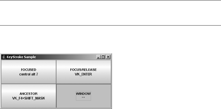
CHAPTER 2 ■ EVENT HANDLING WITH THE SWING COMPONENT SET 45
KeyStroke shiftF4 =
KeyStroke.getKeyStroke(KeyEvent.VK_F4, InputEvent.SHIFT_MASK);
inputMap =
buttonC.getInputMap(JComponent.WHEN_ANCESTOR_OF_FOCUSED_COMPONENT);
inputMap.put(shiftF4, ACTION_KEY);
buttonC.setActionMap(actionMap);
KeyStroke space = KeyStroke.getKeyStroke(' ');
inputMap = buttonD.getInputMap(JComponent.WHEN_IN_FOCUSED_WINDOW);
inputMap.put(space, ACTION_KEY);
buttonD.setActionMap(actionMap);
frame.setLayout(new GridLayout(2,2));
frame.add(buttonA);
frame.add(buttonB);
frame.add(buttonC);
frame.add(buttonD);
frame.setSize(400, 200);
frame.setVisible(true);
}
};
EventQueue.invokeLater(runner);
}
}
■Tip For text components, you can get the Keymap and bind an Action to a KeyStroke in one step with
addActionForKeyStroke(KeyStroke, Action).
Figure 2-7 shows what the running program looks like.
Figure 2-7. KeyStroke listening example
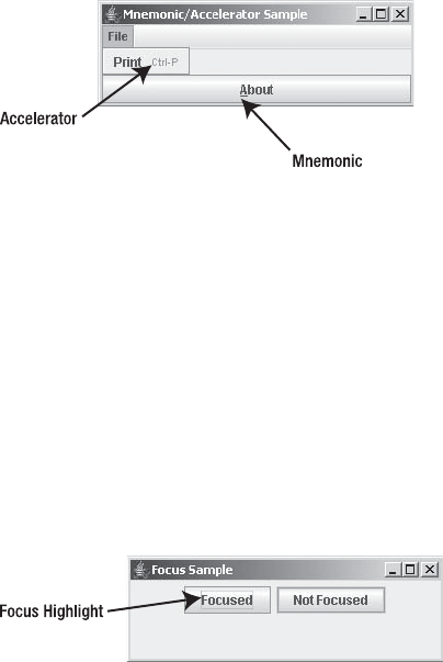
46 CHAPTER 2 ■ EVENT HANDLING WITH THE SWING COMPONENT SET
Using Mnemonics and Accelerators
The Swing libraries also use KeyStroke objects for several internal functions. Two such functions
are component mnemonics and accelerators, which work as follows:
• In a component mnemonic, one character in a label appears underlined. When that
character is pressed along with a platform-specific hotkey combination, the component
is activated. For instance, pressing Alt-A in the window shown in Figure 2-8 would select
the About button on a Windows XP platform.
•A menu accelerator activates a menu item when it is not visible. For instance, pressing
Ctrl-P would select the Print menu item in the window shown in Figure 2-8 when the File
menu isn’t visible.
Figure 2-8. Mnemonics and menu shortcuts
You’ll learn more about mnemonics and accelerators in Chapter 6.
Swing Focus Management
The term focus refers to when a component acquires the input focus. When a component has
the input focus, it serves as the source for all key events, such as text input. In addition, certain
components have some visual markings to indicate that they have the input focus, as shown in
Figure 2-9. When certain components have the input focus, you can trigger selection with a
keyboard key (usually the spacebar or Enter key), in addition to selection with a mouse. For
instance, with a button, pressing the spacebar activates it.
Figure 2-9. A JButton showing it has input focus

CHAPTER 2 ■ EVENT HANDLING WITH THE SWING COMPONENT SET 47
■Note The focus subsystem had a major overhaul with the 1.4 release of J2SE. All the older guts are still
present, but should be avoided. The older stuff didn’t work well and was very buggy. Sun’s fix was to essen-
tially throw everything away and start over, but old APIs are still present. In your quest to work with the focus
subsystem, learn to use only the updated APIs, not the older ones. Classes like javax.swing.FocusManager
and javax.swing.DefaultFocusManager are completely obsolete now.
An important concept in focus management is the focus cycle, which maps the focus traversal
order for the closed set of components within a specific Container. The following classes are
also major players in focus management:
•FocusTraversalPolicy: A java.awt class that defines the algorithm used to determine the
next and previous focusable components.
•KeyboardFocusManager: A java.awt class that acts as the controller for keyboard navigation
and focus changes. To request a focus change, you tell the manager to change focusable
components; you don’t request focus on a particular component.
You can find out when the Swing component gets the input focus by registering a
FocusListener. The listener allows you to find out when a component gains or loses focus,
which component lost focus when another component gained it, and which component got
focus when another component lost focus. Additionally, a temporary focus change can happen
for something like a pop-up menu. The component that lost focus will receive it again when
the menu goes down.
The installed focus traversal policy describes how to move between the focusable compo-
nents of a window. By default, the next component is defined by the order in which components
are added to a container, as shown in Figure 2-10. For Swing applications, this focus traversal
starts at the top left of the figure and goes across each row and down to the bottom right. This is the
default policy, LayoutFocusTraversalPolicy. When all the components are in the same container,
this traversal order is called a focus cycle and can be limited to remain within that container.
■Note A user can press Tab or Shift-Tab to move forward or backward through the components in a
container, thus transferring the input focus.
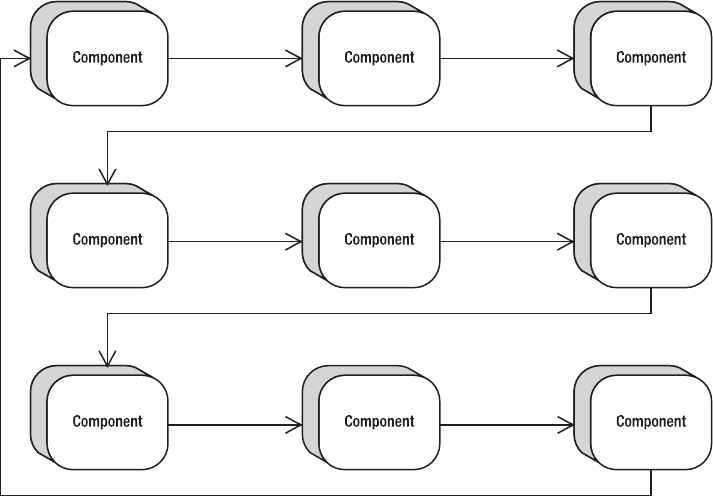
48 CHAPTER 2 ■ EVENT HANDLING WITH THE SWING COMPONENT SET
Figure 2-10. Default focus ordering
Moving the Focus
As an example of some basic capabilities, let’s look at how to create two listeners to handle
input focus: a MouseListener that moves the input focus to a component when the mouse
enters its space, and an ActionListener that transfers the input focus to the next component.
The MouseListener merely needs to call requestFocusInWindow() when the mouse enters
the component.
import java.awt.*;
import java.awt.event.*;
public class MouseEnterFocusMover extends MouseAdapter {
public void mouseEntered(MouseEvent mouseEvent) {
Component component = mouseEvent.getComponent();
if (!component.hasFocus()) {
component.requestFocusInWindow();
}
}
}
For the ActionListener, you need to call the focusNextComponent() method for the
KeyboardFocusManager.
import java.awt.*;
import java.awt.event.*;
CHAPTER 2 ■ EVENT HANDLING WITH THE SWING COMPONENT SET 49
public class ActionFocusMover implements ActionListener {
public void actionPerformed(ActionEvent actionEvent) {
KeyboardFocusManager manager =
KeyboardFocusManager.getCurrentKeyboardFocusManager();
manager.focusNextComponent();
}
}
The ActionFocusMover and MouseEnterFocusMover show two different ways of programmati-
cally moving focus around. The ActionFocusMover uses the KeyboardFocusManager for traversal.
In MouseEnterFocusMover, the call to requestFocusInWindow() says that you would like for the
suggested component to get focus for the window of the application. However, getting focus
can be turned off. If the component isn’t focusable, either because the default setting of the
focusable property is false or you called component.setFocusable(false), then the component
will be skipped over and the next component after it gets focus; the component is removed
from the tab focus cycle. (Think of a scrollbar that isn’t in the focus cycle, but is draggable to
change a setting.)
The program in Listing 2-11 uses the two event handlers for moving focus around. It creates a
3×3 grid of buttons, in which each button has an attached mouse listener and a focus listener.
The even buttons are selectable but aren’t focusable.
Listing 2-11. Focus Traversal Sample
import javax.swing.*;
import java.awt.*;
import java.awt.event.*;
public class FocusSample {
public static void main(String args[]) {
Runnable runner = new Runnable() {
public void run() {
JFrame frame = new JFrame("Focus Sample");
frame.setDefaultCloseOperation(JFrame.EXIT_ON_CLOSE);
ActionListener actionListener = new ActionFocusMover();
MouseListener mouseListener = new MouseEnterFocusMover();
frame.setLayout(new GridLayout(3,3));
for (int i=1; i<10; i++) {
JButton button = new JButton(Integer.toString(i));
button.addActionListener(actionListener);
button.addMouseListener(mouseListener);
if ((i%2) != 0) { // odd - enabled by default
button.setFocusable(false);
}
frame.add(button);
}
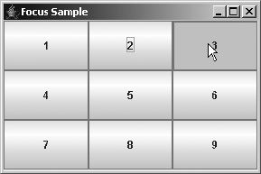
50 CHAPTER 2 ■ EVENT HANDLING WITH THE SWING COMPONENT SET
frame.setSize(300, 200);
frame.setVisible(true);
}
};
EventQueue.invokeLater(runner);
}
}
Figure 2-11 shows the main window of the program.
Figure 2-11. Focus management example
Examining Focus Cycles
One customization option available at the Swing container level is the focus cycle. Remember
that the focus cycle for a container is a map of the focus traversal order for the closed set of
components. You can limit the focus cycle to stay within the bounds of a container by setting
the focusCycleRoot property to be true, thus restricting the focus traversal from going beyond
an inner container. Then, when the Tab key is pressed within the last component of the container,
the focus cycle will wrap back to the first component in the container, instead of moving the
input focus to the first component outside the container. When Shift-Tab is pressed in the first
component, it wraps to the last component of the container, instead of to the prior component
in the outer container.
Figure 2-12 illustrates how the focus ordering would look if you placed the middle three
buttons from Figure 2-10 within a container restricted in this way. In this cycle, you cannot get
to the first component on the third row by pressing the Tab key to move forward. To be able to
tab into the second row container, you need to set the focusTraversalPolicyProvider property
to true. Otherwise, while the panel will keep the traversal policy within the second row, tabbing will
never get you into the third row.
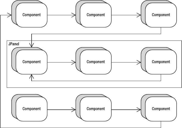
CHAPTER 2 ■ EVENT HANDLING WITH THE SWING COMPONENT SET 51
Figure 2-12. Restrictive focus cycle
The program in Listing 2-12 demonstrates the behavior illustrated in Figure 2-12. The
on-screen program will look just like Figure 2-11; it just behaves differently.
Listing 2-12. Restricting the Focus Cycle
import javax.swing.*;
import java.awt.*;
import java.awt.event.*;
public class FocusCycleSample {
public static void main(String args[]) {
Runnable runner = new Runnable() {
public void run() {
JFrame frame = new JFrame("Focus Cycle Sample");
frame.setDefaultCloseOperation(JFrame.EXIT_ON_CLOSE);
frame.setLayout(new GridBagLayout());
GridBagConstraints constraints = new GridBagConstraints();
constraints.weightx = 1.0;
constraints.weighty = 1.0;
constraints.gridwidth = 1;
constraints.gridheight = 1;
constraints.fill = GridBagConstraints.BOTH;
52 CHAPTER 2 ■ EVENT HANDLING WITH THE SWING COMPONENT SET
// Row One
constraints.gridy=0;
for (int i=0; i<3; i++) {
JButton button = new JButton("" + i);
constraints.gridx=i;
frame.add(button, constraints);
}
// Row Two
JPanel panel = new JPanel();
panel.setFocusCycleRoot(true);
panel.setFocusTraversalPolicyProvider(true);
panel.setLayout(new GridLayout(1,3));
for (int i=0; i<3; i++) {
JButton button = new JButton("" + (i+3));
panel.add(button);
}
constraints.gridx=0;
constraints.gridy=1;
constraints.gridwidth=3;
frame.add(panel, constraints);
// Row Three
constraints.gridy=2;
constraints.gridwidth=1;
for (int i=0; i<3; i++) {
JButton button = new JButton("" + (i+6));
constraints.gridx=i;
frame.add(button, constraints);
}
frame.setSize(300, 200);
frame.setVisible(true);
}
};
EventQueue.invokeLater(runner);
}
}
FocusTraversalPolicy Class
The FocusTraversalPolicy is responsible for determining the focus traversal order. It allows
you to specify the next and previous components in the order. This class offers six methods for
controlling traversal order:

CHAPTER 2 ■ EVENT HANDLING WITH THE SWING COMPONENT SET 53
• getComponentAfter(Container aContainer, Component aComponent)
• getComponentBefore(Container aContainer, Component aComponent)
• getDefaultComponent(Container aContainer)
• getFirstComponent(Container aContainer)
• getInitialComponent(Window window)
•getLastComponent(Container aContainer)
Swing provides five predefined traversal policies, as listed in Table 2-5. By picking the right
traversal policy for your application, or rolling your own, you can determine how users will
navigate around the screens.
To demonstrate, the program in Listing 2-13 reverses the functionality of Tab and Shift-
Tab. When you run the program, it looks the same as the screen shown earlier in Figure 2-11,
with the 3×3 set of buttons. However, with this version, the initial focus starts on the 9 button,
and pressing Tab takes you to 8, then 7, and so on. Shift-Tab goes in the other, more normal,
order.
Table 2-5. Predefined Traversal Policies
Policy Description
ContainerOrderFocusTraversalPolicy The components are traversed in the order they are
added to their container. The component must be
visible, displayable, enabled, and focusable to be
part of the focus cycle.
DefaultFocusTraversalPolicy The default policy for AWT programs, this extends
ContainerOrderFocusTraversalPolicy to check
with the component peer (the operating system) if
the component hasn’t explicitly set focusability.
The focusability of a peer depends on the Java
runtime implementation.
InternalFrameFocusTraversalPolicy Special policy for JInternalFrame, with behavior to
determine initial focusable component based on
the default component of the frame.
SortingFocusTraversalPolicy Here, you provide a Comparator to the policy
constructor to define the focus cycle order.
LayoutFocusTraversalPolicy The default policy for Swing programs, this takes
into account geometric settings of components
(height, width, position), and then goes top down,
left to right to determine navigation order. The top-
down, left-right order is determined by the current
ComponentOrientation setting for your locale. For
instance, Hebrew would be in right-left order instead.
54 CHAPTER 2 ■ EVENT HANDLING WITH THE SWING COMPONENT SET
Listing 2-13. Reversing Focus Traversal
import javax.swing.*;
import java.awt.*;
import java.awt.event.*;
import java.util.Comparator;
import java.util.Arrays;
import java.util.List;
public class NextComponentSample {
public static void main(String args[]) {
Runnable runner = new Runnable() {
public void run() {
JFrame frame = new JFrame("Reverse Sample");
frame.setDefaultCloseOperation(JFrame.EXIT_ON_CLOSE);
frame.setLayout(new GridLayout(3,3));
// for (int i=1; i<10; i++) {
for (int i=9; i>0; i--) {
JButton button = new JButton(Integer.toString(i));
frame.add(button, 0);
}
final Container contentPane = frame.getContentPane();
Comparator<Component> comp = new Comparator<Component>() {
public int compare(Component c1, Component c2) {
Component comps[] = contentPane.getComponents();
List list = Arrays.asList(comps);
int first = list.indexOf(c1);
int second = list.indexOf(c2);
return second - first;
}
};
FocusTraversalPolicy policy = new SortingFocusTraversalPolicy(comp);
frame.setFocusTraversalPolicy(policy);
frame.setSize(300, 200);
frame.setVisible(true);
}
};
EventQueue.invokeLater(runner);
}
}
CHAPTER 2 ■ EVENT HANDLING WITH THE SWING COMPONENT SET 55
KeyboardFocusManager Class
The abstract KeyboardFocusManager class in the AWT library serves as the control mechanism
framework for the input focus behavior of Swing components. The DefaultKeyboardFocusManager
is the concrete implementation. The focus manager allows you to both programmatically
discover who currently has the input focus and to change it.
The component with the current input focus is called the focus owner. This is accessible
via the focusOwner property of KeyboardFocusManager. You can also discover the focusedWindow
and activeWindow properties. The focused window is the window containing the focus owner, and
the active window is either the focused window or the frame or dialog containing the focus owner.
The simple concept of moving to the previous or next component is supported in many
different ways. First, you can use the shortcut API methods of Component and Container:
•Component.transferFocus()
•Component.transferFocusBackward()
•Component.transferFocusUpCycle()
• Container.transferFocusDownCycle()
The first two methods request focus to move to the next or previous component, respec-
tively. The up and down cycle methods request that you move up out of the current focus cycle
or down into the next cycle.
The following methods map directly to methods of the KeyboardFocusManager:
• focusNextComponent()
• focusPreviousComponent()
• upFocusCycle()
• downFocusCycle()
A second set of the same four methods accepts a second parameter of a Component. If the
component isn’t specified, these methods change the focused component based on the current
focus owner. If a component is provided, the change is based on that component.
Tab and Shift-Tab are used for keyboard focus traversal because they are defined as the
default focus traversal keys for most, if not all, components. To define your own traversal keys,
you can replace or append to a key set via the setFocusTraversalKeys() method of Component.
Different sets are available for forward, backward, and up-cycle, as specified by the FORWARD_
TRAVERSAL_KEYS,BACKWARD_TRAVERSAL_KEYS, and UP_CYCLE_TRAVERSAL_KEYS constants of
KeyboardFocusManager. You can set and get key sets for each. For instance, to add the F3 key
as an up-cycle key for a component, use the following code:
Set<AWTKeyStroke> set = component.getFocusTraversalKeys(
KeyboardFocusManager.UP_CYCLE_TRAVERSAL_KEYS);
KeyStroke stroke = KeyStroket.getKeyStroke("F3");
set.add(stroke);
component.setFocusTraversalKeys(KeyboardFocusManager.UP_CYCLE_TRAVERSAL_KEYS, set);
56 CHAPTER 2 ■ EVENT HANDLING WITH THE SWING COMPONENT SET
Verifying Input During Focus Traversal
Swing offers the abstract InputVerifier class for component-level verification during focus
traversal with any JComponent. Just subclass InputVerifier and provide your own public
boolean verify(JComponent) method to verify the contents of the component.
Listing 2-14 provides a simple numeric text field verification example, showing three text
fields, of which only two have verification. Unless fields one and three are valid, you can’t tab
out of them.
Listing 2-14. Numeric Input Verifier
import java.awt.*;
import java.awt.event.*;
import javax.swing.*;
public class VerifierSample {
public static void main(String args[]) {
Runnable runner = new Runnable() {
public void run() {
JFrame frame = new JFrame("Verifier Sample");
frame.setDefaultCloseOperation(JFrame.EXIT_ON_CLOSE);
JTextField textField1 = new JTextField();
JTextField textField2 = new JTextField();
JTextField textField3 = new JTextField();
InputVerifier verifier = new InputVerifier() {
public boolean verify(JComponent comp) {
boolean returnValue;
JTextField textField = (JTextField)comp;
try {
Integer.parseInt(textField.getText());
returnValue = true;
} catch (NumberFormatException e) {
returnValue = false;
}
return returnValue;
}
};
textField1.setInputVerifier(verifier);
textField3.setInputVerifier(verifier);
frame.add(textField1, BorderLayout.NORTH);
frame.add(textField2, BorderLayout.CENTER);
frame.add(textField3, BorderLayout.SOUTH);
frame.setSize(300, 100);
frame.setVisible(true);
}

CHAPTER 2 ■ EVENT HANDLING WITH THE SWING COMPONENT SET 57
};
EventQueue.invokeLater(runner);
}
}
■Tip To make sure that cancel-type buttons get the input focus no matter what when using InputVerifier,
use the setVerifyInputWhenFocusTarget(false) method with the component.
Summary
In this chapter, you looked at the many ways of dealing with event handling when using Swing
components. Because Swing components are built on top of AWT components, you can use the
delegation-based event-handling mechanism common with those components. You then learned
about the multithreading limitations of the Swing components and how to get around them
with the invokeAndWait() and invokeLater() methods of EventQueue. You also explored how
the Swing components use the JavaBeans PropertyChangeListener approach for notification of
bound property changes.
Besides exploring the similarities between the Swing components and AWT components,
you also looked at several of the new features that the Swing library offers. You explored the
Action interface and how it can simplify complex user-interface development by completely
separating the event-handling task from the visual component. You looked at the technique for
registering KeyStroke objects to components to simplify listening for key events. Finally, you
explored Swing’s focus management capabilities and how to customize the focus cycle and use
the FocusTraversalPolicy and KeyboardFocusManager, as well as validating input with the
InputVerifier.
In Chapter 3, you’ll meet the Model-View-Controller (MVC) architecture of the Swing
component set. You’ll learn how MVC can make your user interface development efforts
much easier.

59
■ ■ ■
CHAPTER 3
The Model-View-Controller
Architecture
Chapter 2 explored how to deal with event producers and consumers with regard to Swing
components. We looked at how event handling with Swing components goes beyond the
event-handling capabilities of the original AWT components. In this chapter, we will take the
Swing component design one step further to examine what is called the Model-View-Controller
(MVC) architecture.
Understanding the Flow of MVC
First introduced in Smalltalk in the late 1980s, the MVC architecture is a special form of the
Observer pattern described in Chapter 2. The model part of the MVC holds the state of a
component and serves as the Subject. The view part of the MVC serves as the Observer of the
Subject to display the model’s state. The view creates the controller, which defines how the
user interface reacts to user input.
MVC Communication
Figure 3-1 shows how the MVC elements communicate—in this case, with Swing’s multiline
text component, the JTextArea. In MVC terms, the JTextArea serves as the view part within the
MVC architecture. Displayed within the component is a Document, which is the model for the
JTextArea. The Document stores the state information for the JTextArea, such as the text contents.
Within the JTextArea is the controller, in the form of an InputMap. It maps keyboard input to
commands in an ActionMap, and those commands are mapped to TextAction objects, which
can modify the Document. When the modification happens, the Document creates a
DocumentEvent and sends it back to the JTextArea.
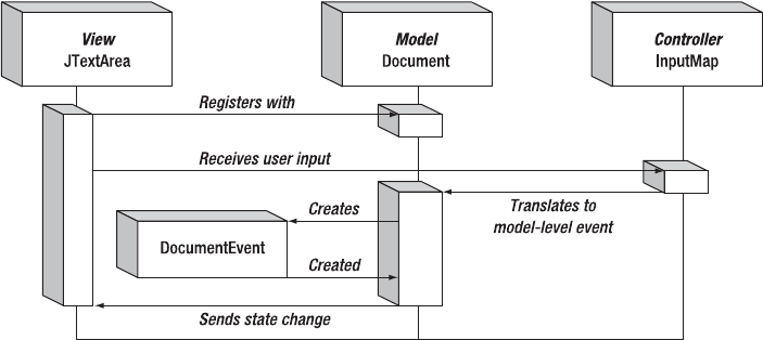
60 CHAPTER 3 ■ THE MODEL-VIEW-CONTROLLER ARCHITECTURE
Figure 3-1. MVC communication mechanism
UI Delegates for Swing Components
This example demonstrates an important aspect of the MVC architecture within the Swing
world. Complex interactions need to happen between the view and the controller. The Swing
design combines these two elements into a delegate object to simplify the overall design. This
results in each Swing component having a UI delegate that is in charge of rendering the current
state of the component and dealing with user input events.
Sometimes, the user events result in changes to the view that don’t affect the model. For
instance, the cursor position is an attribute of the view. The model doesn’t care about the posi-
tion of the cursor, only the text contents. User input that affects the cursor position isn’t passed
along to the model. At other times, user input that affects the contents of the Document (for
example, pressing the Backspace key) is passed along. Pressing the Backspace key results in a
character being removed from the model. Because of this tight coupling, each Swing component
has a UI delegate.
To demonstrate, Figure 3-2 shows the makeup of the JTextArea, with respect to the model
and UI delegate. The UI delegate for the JTextArea starts with the TextUI interface, with
its basic implementation in the BasicTextUI class. In turn, this is specialized with the
BasicTextAreaUI for the JTextArea. The BasicTextAreaUI creates a view that is either a
PlainView or a WrappedPlainView. On the model side, things are much simpler. The Document
interface is implemented by the AbstractDocument class, which is further specialized by the
PlainDocument.
The text components will be explained more fully in Chapters 15 and 16. As the diagram in
Figure 3-2 demonstrates, much is involved in working with the text components. In most cases,
you don’t need to deal with the specifics to the degree shown in this figure. However, all of
these classes are working behind the scenes. The UI-delegate part of the MVC architecture will
be discussed further in Chapter 20, when we explore how to customize delegates.
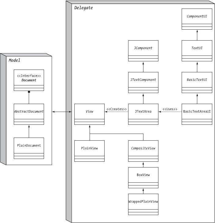
CHAPTER 3 ■ THE MODEL-VIEW-CONTROLLER ARCHITECTURE 61
Figure 3-2. The JTextArea MVC architecture
Sharing Data Models
Because data models store only the state information, you can share a model across multiple
components. Then each component view can be used to modify the model.
In the case of Figure 3-3, three different JTextArea components are used to modify one
Document model. If a user modifies the contents of one JTextArea, the model is changed,
causing the other text areas to automatically reflect the updated document state. It isn’t necessary
for any Document view to manually notify others sharing the model.

62 CHAPTER 3 ■ THE MODEL-VIEW-CONTROLLER ARCHITECTURE
Figure 3-3. Sharing MVC data models
Sharing of a data model can be done in either one of two ways:
• You can create the data model apart from any component and tell each component to
use the data model.
• You can create one component first, get the model from the first component, and then
share it with the other components.
Listing 3-1 demonstrates how to share a data model using the latter technique.
Listing 3-1. Sharing an MVC Model
import java.awt.*;
import javax.swing.*;
import javax.swing.text.*;
public class ShareModel {
public static void main (String args[]) {
Runnable runner = new Runnable() {
public void run() {
JFrame frame = new JFrame("Sharing Sample");
frame.setDefaultCloseOperation(JFrame.EXIT_ON_CLOSE);
Container content = frame.getContentPane();
JTextArea textarea1 = new JTextArea();
Document document = textarea1.getDocument();
JTextArea textarea2 = new JTextArea(document);
JTextArea textarea3 = new JTextArea(document);
content.setLayout(new BoxLayout(content, BoxLayout.Y_AXIS));
content.add(new JScrollPane(textarea1));
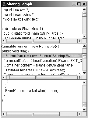
CHAPTER 3 ■ THE MODEL-VIEW-CONTROLLER ARCHITECTURE 63
content.add(new JScrollPane(textarea2));
content.add(new JScrollPane(textarea3));
frame.setSize (300, 400);
frame.setVisible (true);
}
};
EventQueue.invokeLater(runner);
}
}
Figure 3-4 shows how this program might look after editing the shared document. Notice
that the three text areas are capable of viewing (or modifying) different areas of the document.
They aren’t limited to adding text only at the end, for instance. This is because each text area
manages the position and cursor separately. The position and cursor are attributes of the view,
not the model.
Figure 3-4. Sharing a document between JTextArea components
Understanding the Predefined Data Models
When working with Swing components, it’s helpful to understand the data models behind
each of the components because the data models store their state. Understanding the data
model for each component helps you to separate the parts of the component that are visual
(and thus part of the view) from those that are logical (and thus part of the data model). For
example, by understanding this separation, you can see why the cursor position within a
JTextArea isn’t part of the data model, but rather is part of the view.
Table 3-1 provides a complete listing of the Swing components, the interface that describes
the data model for each component, as well as the specific implementations. If a component
isn’t listed, that component inherits its data model from its parent class, most likely

64 CHAPTER 3 ■ THE MODEL-VIEW-CONTROLLER ARCHITECTURE
AbstractButton. In addition, in some cases, multiple interfaces are used to describe a compo-
nent, because the data is stored in one model and the selection of the data is in a second model.
In the case of the JComboBox, the MutableComboBoxModel interface extends from ComboBoxModel.
No predefined class implements the ComboBoxModel interface without also implementing the
MutableComboBoxModel interface.
Table 3-1. Swing Component Models
Component Data Model Interface Implementations
AbstractButton ButtonModel DefaultButtonModel
JColorChooser ColorSelectionModel DefaultColorSelectionModel
JComboBox ComboBoxModel N/A
MutableComboBoxModel DefaultComboBoxModel
JFileChooser ListModel BasicDirectoryModel
JList ListModel AbstractListModel
DefaultListModel
ListSelectionModel DefaultListSelectionModel
JMenuBar SingleSelectionModel DefaultSingleSelectionModel
JPopupMenu SingleSelectionModel DefaultSingleSelectionModel
JProgressBar BoundedRangeModel DefaultBoundedRangeModel
JScrollBar BoundedRangeModel DefaultBoundedRangeModel
JSlider BoundedRangeModel DefaultBoundedRangeModel
JSpinner SpinnerModel AbstractSpinnerModel
SpinnerDateModel
SpinnerListModel
SpinnerNumberModel
JTabbedPane SingleSelectionModel DefaultSingleSelectionModel
JTable TableModel AbstractTableModel
DefaultTableModel
TableColumnModel DefaultTableColumnModel
ListSelectionModel DefaultListSelectionModel
JTextComponent Document AbstractDocument
PlainDocument
StyledDocument
DefaultStyleDocument
HTMLDocument

CHAPTER 3 ■ THE MODEL-VIEW-CONTROLLER ARCHITECTURE 65
When directly accessing the model of a Swing component, if you change the model, all
registered views are automatically notified. This, in turn, causes the views to revalidate them-
selves to ensure that the components display their proper current states. This automatic
propagation of state changes is one reason why MVC has become so popular. In addition,
using the MVC architecture helps programs become more maintainable as they change over
time and their complexity grows. No longer will you need to worry about losing state informa-
tion if you change visual component libraries!
Summary
This chapter provided a quick look at how the Swing components use a modified MVC archi-
tecture. You explored what makes up this modified architecture and how one particular
component, the JTextArea, maps into this architecture. In addition, the chapter discussed the
sharing of data models between components and listed all the data models for the different
Swing components.
In Chapter 4, you’ll start to look at the individual components that make up the Swing
component library. In addition, you’ll explore the Swing component class hierarchy as you
examine the base JComponent component from the Swing library.
JToggleButton ButtonModel JToggleButton
ToggleButtonModel
JTree TreeModel DefaultTreeModel
TreeSelectionModel DefaultTreeSelectionModel
JTree.EmptySelectionModel
Table 3-1. Swing Component Models (Continued)
Component Data Model Interface Implementations

67
■ ■ ■
CHAPTER 4
Core Swing Components
In Chapter 3, you received a quick introduction to the Model-View-Controller (MVC) pattern
used by the components of the JFC/Swing project. In this chapter, you’ll begin to explore how
to use the key parts of the many available components.
All Swing components start with the JComponent class. Although some parts of the Swing
libraries aren’t rooted with the JComponent class, all the components share JComponent as the
common parent class at some level of their ancestry. It’s with this JComponent class that
common behavior and properties are defined. In this chapter, you’ll look at common function-
ality such as component painting, customization, tooltips, and sizing.
As far as specific JComponent descendent classes are concerned, you’ll specifically look at
the JLabel,JButton, and JPanel, three of the more commonly used Swing component classes.
They require an understanding of the Icon interface for displaying images within components,
as well as of the ImageIcon class for when using predefined images and the GrayFilter class for
support. In addition, you’ll look at the AbstractButton class, which serves as the parent class to
the JButton. The data model shared by all AbstractButton subclasses is the ButtonModel inter-
face; you’ll explore that and the specific implementation class, the DefaultButtonModel.
JComponent Class
The JComponent class serves as the abstract root class from which all Swing components
descend. The JComponent class has 42 descendent subclasses, each of which inherits much of
the JComponent functionality. Figure 4-1 shows this hierarchy.
Although the JComponent class serves as the common root class for all Swing components,
many classes in the libraries for the Swing project descend from classes other than JComponent.
Those include all the high-level container objects such as JFrame,JApplet, and JInternalFrame;
all the MVC-related classes; event-handling–related interfaces and classes; and much more.
All of these will be discussed in later chapters.
Although all Swing components extend JComponent, the JComponent class extends the AWT
Container class, which, in turn, extends from the AWT Component class. This means that many
aspects of the JComponent are shared with both the AWT Component and Container classes.
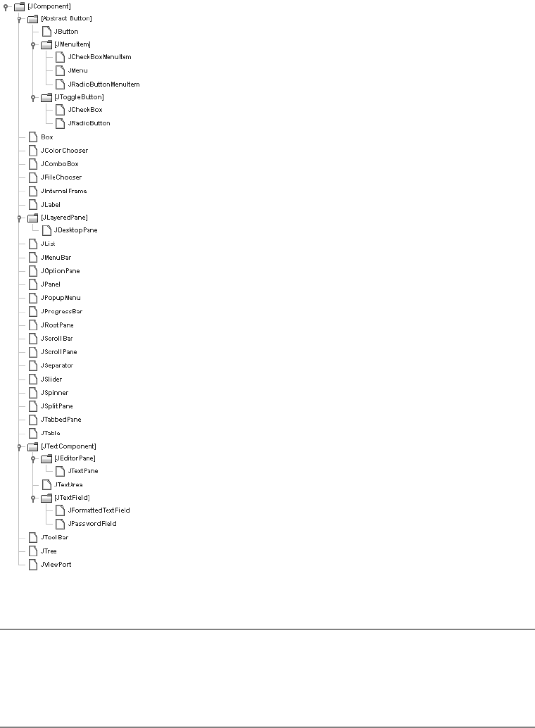
68 CHAPTER 4 ■ CORE SWING COMPONENTS
Figure 4-1. JComponent class hierarchy diagram
■Note JComponent extends from the Container class, but most of the JComponent subclasses aren’t
themselves containers of other components. To see if a particular Swing component is truly a container,
check the BeanInfo for the class to see if the isContainer property is set to true. To get the BeanInfo
for a class, ask the Introspector.

CHAPTER 4 ■ CORE SWING COMPONENTS 69
Component Pieces
The JComponent class defines many aspects of AWT components that go above and beyond the
capabilities of the original AWT component set. This includes customized painting behavior
and several different ways to customize display settings, such as colors, fonts, and any other
client-side settings.
Painting JComponent Objects
Because the Swing JComponent class extends from the Container class, the basic AWT painting
model is followed: All painting is done through the paint() method, and the repaint() method
is used to trigger updates. However, many tasks are done differently. The JComponent class opti-
mizes many aspects of painting for improved performance and extensibility. In addition, the
RepaintManager class is available to customize painting behavior even further.
■Note The public void update(Graphics g) method, inherited from Component, is never invoked
on Swing components.
To improve painting performance and extensibility, the JComponent splits the painting
operation into three tasks. The public void paint(Graphics g) method is subdivided into three
separate protected method calls. In the order called, they are paintComponent(g),paintBorder(g),
and paintChildren(g), with the Graphics argument passed through from the original paint()
call. The component itself is first painted through paintComponent(g). If you want to customize
the painting of a Swing component, you override paintComponent() instead of paint(). Unless
you want to completely replace all the painting, you would call super.paintComponent() first,
as shown here, to get the default paintComponent() behavior.
public class MyComponent extends JPanel {
protected void paintComponent(Graphics g) {
super.paintComponent(g);
// Customize after calling super.paintComponent(g)
}
...
}
■Note When running a program that uses Swing components in Java 5.0, the Graphics argument passed
to the paint() method and on to paintComponent() is technically a Graphics2D argument. Therefore,
after casting the Graphics argument to a Graphics2D object, you could use the Java 2D capabilities of the
platform, as you would when defining a drawing Stroke,Shape, or AffineTransform.

70 CHAPTER 4 ■ CORE SWING COMPONENTS
The paintBorder() and paintChildren() methods tend not to be overridden. The
paintBorder() method draws a border around the component, a concept described more
fully in Chapter 7. The paintChildren() method draws the components within the Swing
container object, if any are present.
To optimize painting, the JComponent class provides three additional painting properties:
opaque,optimizedDrawingEnabled, and doubleBuffered. These work as follows:
•Opacity: The opaque property for a JComponent defines whether a component is trans-
parent. When transparent, the container of the JComponent must paint the background
behind the component. To improve performance, you can leave the JComponent opaque
and let the JComponent draw its own background, instead of relying on the container to
draw the covered background.
•Optimization: The optimizedDrawingEnabled property determines whether immediate
children can overlap. If children cannot overlap, the repaint time is reduced consider-
ably. By default, optimized drawing is enabled for most Swing components, except for
JDesktopPane,JLayeredPane, and JViewport.
•Double buffering: By default, all Swing components double buffer their drawing operations
into a buffer shared by the complete container hierarchy; that is, all the components
within a window (or subclass). This greatly improves painting performance, because
when double buffering is enabled (with the doubleBuffered property), there is only a
single screen update drawn.
■Note For synchronous painting, you can call one of the public void paintImmediately() methods.
(Arguments are either a Rectangle or its parts—position and dimensions.) However, you’ll rarely need to
call this directly unless your program has real-time painting requirements.
The public void revalidate() method of JComponent also offers painting support. When
this method is called, the high-level container of the component validates itself. This is unlike
the AWT approach requiring a direct call to the revalidate() method of that high-level
component.
The last aspect of the Swing component painting enhancements is the RepaintManager
class.
RepaintManager Class
The RepaintManager class is responsible for ensuring the efficiency of repaint requests on the
currently displayed Swing components, making sure the smallest “dirty” region of the screen is
updated when a region becomes invalid.
Although rarely customized, RepaintManager is public and provides a static installation
routine to use a custom manager: public static void setCurrentManager(RepaintManager
manager). To get the current manager, just ask with public static void currentManager
(JComponent). The argument is usually null, unless you’ve customized the manager to provide
component-level support. Once you have the manager, one thing you can do is get the off-
screen buffer for a component as an Image. Because the buffer is what is eventually shown on
CHAPTER 4 ■ CORE SWING COMPONENTS 71
the screen, this effectively allows you to do a screen dump of the inside of a window (or any
JComponent).
Component comp = ...
RepaintManager manager = RepaintManager.currentManager(null);
Image htmlImage = manager.getOffscreenBuffer(comp, comp.getWidth(),
comp.getHeight());
// or
Image volatileImage = manager.getVolatileOffscreenBuffer(comp, comp.getWidth(),
comp.getHeight());
Table 4-1 shows the two properties of RepaintManager. They allow you to disable double
buffering for all drawing operations of a component (hierarchy) and to set the maximum
double buffer size, which defaults to the end user’s screen size.
■Tip To globally disable double-buffered drawing, call RepaintManager.currentManager(aComponent).
setDoubleBufferingEnabled(false).
Although it’s rarely done, providing your own RepaintManager subclass does allow you to
customize the mechanism of painting dirty regions of the screen, or at least track when the
painting is finished. Overriding any of the following four methods allows you to customize the
mechanisms:
public synchronized void addDirtyRegion(JComponent component, int x, int y,
int width, int height)
public Rectangle getDirtyRegion(JComponent component)
public void markCompletelyClean(JComponent component)
public void markCompletelyDirty(JComponent component)
UIDefaults Class
The UIDefaults class represents a lookup table containing the display settings installed for the
current look and feel, such as which font to use within a JList, as well as what color or icon
should be displayed within a JTree node. The use of UIDefaults will be detailed in Chapter 20
with the coverage of Java’s pluggable look and feel architecture. Here, you will get a brief intro-
duction to the UIDefaults table.
Table 4-1. RepaintManager Properties
Property Name Data Type Access
doubleBufferingEnabled boolean Read-write
doubleBufferMaximumSize Dimension Read-write

72 CHAPTER 4 ■ CORE SWING COMPONENTS
Whenever you create a component, the component automatically asks the UIManager to
look in the UIDefaults table for the current settings for that component. Most color- and font-
related component settings, as well as some others not related to colors and fonts, are configurable.
If you don’t like a particular setting, you can simply change it by updating the appropriate entry
in the UIDefaults lookup table.
■Note All predefined resource settings in the UIDefaults table implement the UIResource interface,
which allows the components to monitor which settings have been customized just by looking for those
settings that don’t implement the interface.
First, you need to know the name of the UIDefaults setting you want to change. You can
find the setting names in Appendix A of this book, which contains a complete alphabetical
listing of all known settings for the predefined look and feel types in J2SE 5.0. (These differ a
little from release to release.) In addition, included with the description of each component is
a table containing the UIResource-related property elements. (To find the specific component
section in the book, consult the table of contents or the index.)
Once you know the name of a setting, you can store a new setting with the public static
void put(Object key, Object value) method of UIManager, where key is the key string. For
instance, the following code will change the default background color of newly created buttons
to black and the foreground color to red:
UIManager.put("Button.background", Color.BLACK);
UIManager.put("Button.foreground", Color.RED);
Fetching UIResource Properties
If you’re creating your own components, or just need to find out the current value setting, you
can ask the UIManager. Although the public static Object get(Object key) method is the
most generic, it requires you to cast the return value to the appropriate class type. Alternatively, you
could use one of the more specific getXXX() methods, which does the casting for you, to return
the appropriate type:
public static boolean getBoolean(Object key)
public static Border getBorder(Object key)
public static Color getColor(Object key)
public static Dimension getDimension(Object key)
public static Font getFont(Object key)
public static Icon getIcon(Object key)
public static Insets getInsets(Object key)
public static int getInt(Object key)
public static String getString(Object key)
public static ComponentUI getUI(JComponent target)
There is a second set of overloaded methods that accept a second argument for the Locale.
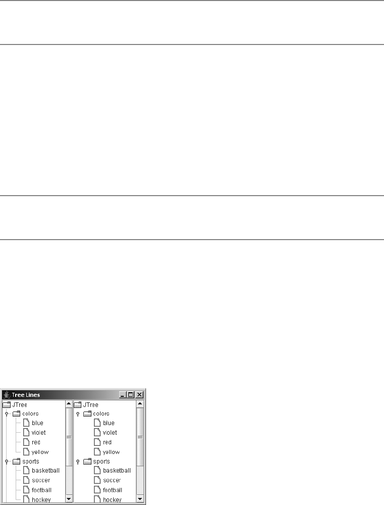
CHAPTER 4 ■ CORE SWING COMPONENTS 73
■Note You can also work with the UIDefaults directly, by calling the public static UIDefaults
getDefaults() method of UIManager.
Client Properties
In addition to the UIManager maintaining a table of key/value pair settings, each instance of
every component can manage its own set of key/value pairs. This is useful for maintaining
aspects of a component that may be specific to a particular look and feel, or for maintaining
data associated with a component without requiring the definition of new classes or methods
to store such data.
public final void putClientProperty(Object key, Object value)
public final Object getClientProperty(Object key)
■Note Calling putClientProperty() with a value of null causes the key to be removed from the client
property table.
For instance, the JTree class has a property with the Metal look and feel for configuring the
line style for connecting or displaying nodes within a JTree. Because the setting is specific to
one look and feel, it doesn’t make sense to add something to the tree API. Instead, you set the
property by calling the following on a particular tree instance:
tree.putClientProperty("JTree.lineStyle", "None")
Then, when the look and feel is the default Metal, lines will connect the nodes of the tree.
If another look and feel is installed, the client property will be ignored. Figure 4-2 shows a tree
with and without lines.
Figure 4-2. A JTree, with and without angled lines

74 CHAPTER 4 ■ CORE SWING COMPONENTS
■Note The list of client properties is probably one of the least documented aspects of Swing. Chapter 20
lists the available properties I was able to determine. Also, while Metal is the default look and feel, what you
see is called Ocean. Ocean is a theme of the Metal look and feel and makes Metal look a bit flashier.
JComponent Properties
You’ve seen some of the pieces shared by the different JComponent subclasses. Now it’s time to
look at the JavaBeans properties. Table 4-2 shows the complete list of properties defined by
JComponent, including those inherited through the AWT Container and Component classes.
Table 4-2. JComponent Properties
Property Name Data Type Component
Access
Container
Access
JComponent
Access
accessibleContext AccessibleContext Read-only N/A Read-only
actionMap ActionMap N/A N/A Read-write
alignmentX float Read-only Read-only Read-write
alignmentY float Read-only Read-only Read-write
ancestorListeners AncestorListener[ ] N/A N/A Read-only
autoscrolls boolean N/A N/A Read-write
background Color Read-write
bound
N/A Write-only
backgroundSet boolean Read-only N/A N/A
border Border N/A N/A Read-write
bound
bounds Rectangle Read-write N/A N/A
colorModel ColorModel Read-only N/A N/A
componentCount int N/A Read-only N/A
componentListeners ComponentListener[ ] Read-only N/A N/A
componentOrientation ComponentOrientation Read-write
bound
N/A N/A
componentPopupMenu JPopupMenu N/A N/A Read-write
components Component[ ] N/A Read-only N/A
containerListeners ContainerListener[ ] N/A Read-only N/A
cursor Cursor Read-write N/A N/A
cursorSet boolean Read-only N/A N/A
debugGraphicsOptions int N/A N/A Read-write
displayable boolean Read-only N/A N/A

CHAPTER 4 ■ CORE SWING COMPONENTS 75
doubleBuffered boolean Read-only N/A Read-write
dropTarget DropTarget Read-write N/A N/A
enabled boolean Read-write N/A Write-only
bound
focusable boolean Read-write
bound
N/A N/A
focusCycleRoot boolean N/A Read-write
bound
N/A
focusCycleRootAncestor Container Read-only N/A N/A
focusListeners FocusListener[ ] Read-only N/A N/A
focusOwner boolean Read-only N/A N/A
focusTraversalKeysEnabled boolean Read-write
bound
N/A N/A
focusTraversalPolicy FocusTraversalPolicy N/A Read-write
bound
N/A
focusTraversalPolicyProvider boolean N/A Read-write
bound
N/A
focusTraversalPolicySet boolean N/A Read-only N/A
font Font Read-write
bound
Write-only Write-only
fontSet boolean Read-only N/A N/A
foreground Color Read-write
bound
N/A Write-only
foregroundSet boolean Read-only N/A N/A
graphics Graphics Read-only N/A Read-only
graphicsConfiguration GraphicsConfiguration Read-only N/A N/A
height int Read-only N/A Read-only
hierarchyBoundsListeners HierarchyBoundsListener[ ] Read-only N/A N/A
hierarchyListeners HierarchyListener[ ] Read-only N/A N/A
ignoreRepaint boolean Read-write N/A N/A
inheritsPopupMenu boolean N/A N/A Read-write
inputContext InputContext Read-only N/A N/A
inputMap InputMap N/A N/A Read-only
inputMethodListeners InputMethodListener[ ] Read-only N/A N/A
inputMethodRequests InputMethodRequests Read-only N/A N/A
Table 4-2. JComponent Properties (Continued)
Property Name Data Type Component
Access
Container
Access
JComponent
Access

76 CHAPTER 4 ■ CORE SWING COMPONENTS
inputVerifier InputVerifier N/A N/A Read-write
bound
insets Insets N/A Read-only Read-only
keyListeners KeyListener[ ] Read-only N/A N/A
layout LayoutManager N/A Read-write N/A
lightweight boolean Read-only N/A N/A
locale Locale Read-write
bound
N/A N/A
location Point Read-write N/A N/A
locationOnScreen Point Read-only N/A N/A
maximumSize Dimension Read-write
bound
Read-only Read-write
maximumSizeSet boolean Read-only N/A N/A
minimumSize Dimension Read-write
bound
Read-only Read-write
minimumSizeSet boolean Read-only N/A N/A
mouseListeners MouseListener[ ] Read-only N/A N/A
mouseMotionListeners MouseMotionListener[ ] Read-only N/A N/A
mousePosition Point Read-only N/A N/A
mouseWheelListeners MouseWheelListener Read-only N/A N/A
name String Read-write
bound
N/A N/A
opaque boolean Read-only N/A Read-write
bound
optimizedDrawingEnabled boolean N/A N/A Read-only
paintingTile boolean N/A N/A Read-only
parent Container Read-only N/A N/A
preferredSize Dimension Read-write
bound
Read-only Read-write
preferredSizeSet boolean Read-only N/A N/A
propertyChangeListeners PropertyChangeListener[ ] Read-only N/A N/A
registeredKeyStrokes KeyStroke[ ] N/A N/A Read-only
requestFocusEnabled boolean N/A N/A Read-write
rootPane JRootPane N/A N/A Read-only
Table 4-2. JComponent Properties (Continued)
Property Name Data Type Component
Access
Container
Access
JComponent
Access

CHAPTER 4 ■ CORE SWING COMPONENTS 77
■Note Additionally, there’s a read-only class property defined at the Object level, the parent of the
Component class.
Including the properties from the parent hierarchy, approximately 92 properties of
JComponent exist. As that number indicates, the JComponent class is extremely well suited for
visual development. There are roughly ten categories of JComponent properties, as described in
the following sections.
Position-Oriented Properties
The x and y properties define the location of the component relative to its parent. The
locationOnScreen is just another location for the component, this time relative to the screen’s
origin (the upper-left corner). The width and height properties define the size of the component.
The visibleRect property describes the part of the component visible within the topLevelAncestor,
whereas the bounds property defines the component’s area, whether visible or not.
showing boolean Read-only N/A N/A
size Dimension Read-write N/A N/A
toolkit Toolkit Read-only N/A N/A
tooltipText String N/A N/A Read-write
topLevelAncestor Container N/A N/A Read-only
transferHandler TransferHandler N/A N/A Read-write
bound
treeLock Object Read-only N/A N/A
uiClassID String N/A N/A Read-only
valid boolean Read-only N/A N/A
validateRoot boolean N/A N/A Read-only
verifyInputWhenFocusTarget boolean N/A N/A Read-write
bound
vetoableChangeListeners VetoableChangeListener[ ] N/A N/A Read-only
visible boolean Read-write N/A Write-only
visibleRect Rectangle N/A N/A Read-only
width int Read-only N/A Read-only
x int Read-only N/A Read-only
y int Read-only N/A Read-only
Table 4-2. JComponent Properties (Continued)
Property Name Data Type Component
Access
Container
Access
JComponent
Access

78 CHAPTER 4 ■ CORE SWING COMPONENTS
Component-Set-Oriented Properties
The components and componentCount properties enable you to find out what the children
components are of the particular JComponent. For each component in the components property
array, the current component would be its parent. In addition to determining a component’s
parent, you can find out its rootPane or topLevelAncestor.
Focus-Oriented Properties
The focusable,focusCycleRoot,focusCycleRootAncestor,focusOwner,focusTraversalKeysEnabled,
focusTraversalPolicy,focusTraversalPolicyProvider,focusTraversablePolicySet,
requestFocusEnabled,verifyInputWhenFocusTarget, and inputVerifier properties define the
set of focus-oriented properties. These properties control the focus behavior of JComponent and
were discussed in Chapter 2.
Layout-Oriented Properties
The alignmentX,alignmentY,componentOrientation,layout,maximumSize,minimumSize,
preferredSize,maximumSizeSet,minimumSizeSet, and preferredSizeSet properties are
used to help with layout management.
Painting Support Properties
The background and foreground properties describe the current drawing colors. The font property
describes the text style to draw. The backgroundSet,foregroundSet, and fontSet properties
describe if the properties are explicitly set. The insets and border properties are intermixed
to describe the drawing of a border around a component. The graphics property permits real-
time drawing, although the paintImmediately() method might now suffice.
To improve performance, there are the opaque (false is transparent), doubleBuffered,
ignoreRepaint, and optimizedDrawingEnabled properties. The colorModel and paintingTile
properties store intermediate drawing information. The graphicsConfiguration property adds
support for virtual devices.
debugGraphicsOption allows you to slow down the drawing of your component if you can’t
figure out why it’s not painted properly. The debugGraphicsOption property is set to one or
more of the settings shown in Table 4-3.
Table 4-3. DebugGraphics Settings
DebugGraphics Settings Description
DebugGraphics.BUFFERED_OPTION Causes a window to pop up, displaying the drawing of
the double-buffered image
DebugGraphics.FLASH_OPTION Causes the drawing to be done more slowly, flashing
between steps
DebugGraphics.LOG_OPTION Causes a message to be printed to the screen as each
step is done
DebugGraphics.NONE_OPTION Disables all options
CHAPTER 4 ■ CORE SWING COMPONENTS 79
You can combine multiple DebugGraphics settings with the bitwise OR (|) operator, as in
this example:
JComponent component = new ...();
component.setDebugGraphicsOptions(DebugGraphics.BUFFERED_OPTION |
DebugGraphics.FLASH_OPTION | DebugGraphics.LOG_OPTION);
Internationalization Support Properties
The inputContext,inputMethodRequests, and locale properties help when creating multilingual
operations.
State Support Properties
To get state information about a component, all you have to do is ask; there’s much you can
discover. The autoscrolls property lets you place a component within a JViewport and it auto-
matically scrolls when dragged. The validateRoot property is used when revalidate() has
been called and returns true when the current component is at the point it should stop. The
remaining seven properties are self-explanatory: displayable,dropTarget,enabled,lightweight,
showing,valid, and visible.
Event Support Properties
The registeredKeyStrokes,inputMap, and actionMap properties allow you to register keystroke
responses with a window. All the getXXXListeners() methods allow you to get the current set
of listeners for a particular listener type.
Pop-Up Support Properties
There are two types of pop-ups associated with a component: tooltips and pop-up menus.
The toolTipText property is set to display pop-up support text over a component. The
componentPopupMenu and inheritsPopupMenu properties are related to automatically showing
pop-up menus associated with the component. The mousePosition property helps to position
these.
Other Properties
The remaining properties don’t seem to have any kind of logical grouping. The accessibleContext
property is for support with the javax.accessibility package. The cursor property lets you
change the cursor to one of the available cursors, where cursorSet is used to recognize when
the property is explicitly set. The toolkit property encapsulates platform-specific behaviors
for accessing system resources. The transferHandler property is there for drag-and-drop
support. The name property gives you the means to recognize a particular instance of a class.
The treelock property is the component tree-synchronization locking resource. The uiClassID
property is new; it allows subclasses to return the appropriate class ID for their specific instance.
80 CHAPTER 4 ■ CORE SWING COMPONENTS
Handling JComponent Events
There are many different types of events that all JComponent subclasses share. Most of these
come from parent classes, like Component and Container. First, you’ll explore the use of
PropertyChangeListener, which is inherited from Container. Then you’ll look at the use of two
event-handling capabilities shared by all JComponent subclasses: VetoableChangeListener and
AncestorListener. Finally, you’ll see the complete set of listeners inherited from Component.
Listening to Component Events with a PropertyChangeListener
The JComponent class has several component bound properties, directly and indirectly. By
binding a PropertyChangeListener to the component, you can listen for particular JComponent
property changes, and then respond accordingly.
public interface PropertyChangeListener extends EventListener {
public void propertyChange(PropertyChangeEvent propertyChangeEvent);
}
To demonstrate, the PropertyChangeListener in Listing 4-1 demonstrates the behavior you
might need when listening for changes to an Action type property within a JButton component.
The property that changes determines which if block is executed.
Listing 4-1. Watching for Changes to a JButton
import java.beans.*;
import javax.swing.*;
public class ActionChangedListener implements PropertyChangeListener {
private JButton button;
public ActionChangedListener(JButton button) {
this.button = button;
}
public void propertyChange(PropertyChangeEvent e) {
String propertyName = e.getPropertyName();
if (e.getPropertyName().equals(Action.NAME)) {
String text = (String)e.getNewValue();
button.setText(text);
button.repaint();
} else if (propertyName.equals("enabled")) {
Boolean enabledState = (Boolean)e.getNewValue();
button.setEnabled(enabledState.booleanValue());
button.repaint();

CHAPTER 4 ■ CORE SWING COMPONENTS 81
} else if (e.getPropertyName().equals(Action.SMALL_ICON)) {
Icon icon = (Icon)e.getNewValue();
button.setIcon(icon);
button.invalidate();
button.repaint();
}
}
}
■Note You can bind a PropertyChangeListener to a specific property by adding the listener with
addPropertyChangeListener(String propertyName, PropertyChangeListener listener).
This allows your listener to avoid having to check for the specific property that changed.
Listening to JComponent Events with a VetoableChangeListener
The VetoableChangeListener is another JavaBeans listener that Swing components use.
It works with constrained properties, whereas the PropertyChangeListener works with
only bound properties. A key difference between the two is that the public void
vetoableChange(PropertyChangeEvent propertyChangeEvent) method can throw a
PropertyVetoException if the listener doesn’t like the requested change.
public interface VetoableChangeListener extends EventListener {
public void vetoableChange(PropertyChangeEvent propertyChangeEvent)
throws PropertyVetoException;
}
■Note Only one Swing class, JInternalFrame, has constrained properties. The listener is meant primarily for
programmers to use with their own newly created components.
Listening to JComponent Events with an AncestorListener
You can use an AncestorListener to find out when a component moves, is made visible, or is
made invisible. It’s useful if you permit your users to customize their screens by moving
components around and possibly removing components from the screens.
public interface AncestorListener extends EventListener {
public void ancestorAdded(AncestorEvent ancestorEvent);
public void ancestorMoved(AncestorEvent ancestorEvent);
public void ancestorRemoved(AncestorEvent ancestorEvent);
}
82 CHAPTER 4 ■ CORE SWING COMPONENTS
To demonstrate, Listing 4-2 associates an AncestorListener with the root pane of a JFrame.
You’ll see the messages Removed,Added, and Moved when the program first starts up. In addition,
you’ll see Moved messages when you drag the frame around.
Listing 4-2. Listening for Ancestor Events
import java.awt.*;
import javax.swing.*;
import javax.swing.event.*;
public class AncestorSampler {
public static void main (String args[]) {
Runnable runner = new Runnable() {
public void run() {
JFrame frame = new JFrame("Ancestor Sampler");
frame.setDefaultCloseOperation(JFrame.EXIT_ON_CLOSE);
AncestorListener ancestorListener = new AncestorListener() {
public void ancestorAdded(AncestorEvent ancestorEvent) {
System.out.println ("Added");
}
public void ancestorMoved(AncestorEvent ancestorEvent) {
System.out.println ("Moved");
}
public void ancestorRemoved(AncestorEvent ancestorEvent) {
System.out.println ("Removed");
}
};
frame.getRootPane().addAncestorListener(ancestorListener);
frame.setSize(300, 200);
frame.setVisible(true);
frame.getRootPane().setVisible(false);
frame.getRootPane().setVisible(true);
}
};
EventQueue.invokeLater(runner);
}
}
Listening to Inherited Events of a JComponent
In addition to the ability to listen for an instance of an AncestorEvent or PropertyChangeEvent
with a JComponent, the JComponent inherits the ability to listen to many other events from its
Container and Component superclasses.

CHAPTER 4 ■ CORE SWING COMPONENTS 83
Table 4-4 lists ten event listeners. You may find yourself using the JComponent listener
interfaces quite a bit, but the older ones work, too. Use the ones most appropriate for the task
at hand.
Table 4-4. JComponent Inherited Event Listeners
Class Event Listener Event Object
Component ComponentListener componentHidden(ComponentEvent)
componentMoved(ComponentEvent)
componentResized(ComponentEvent)
componentShown(ComponentEvent)
Component FocusListener focusGained(FocusEvent)
focusLost(FocusEvent)
Component HierarchyBoundsListener ancestorMoved(HierarchyEvent)
ancestorResized(HierarchyEvent)
Component HierarchyListener hierarchyChanged(HierarchyEvent)
Component InputMethodListener caretPositionChanged
(InputMethodEvent)
inputMethodTextChanged
(InputMethodEvent)
Component KeyListener keyPressed(KeyEvent)
keyReleased(KeyEvent)
keyTyped(KeyEvent)
Component MouseListener mouseClicked(MouseEvent)
mouseEntered(MouseEvent)
mouseExited(MouseEvent)
mousePressed(MouseEvent)
mouseReleased(MouseEvent)
Component MouseMotionListener mouseDragged(MouseEvent)
mouseMoved(MouseEvent)
Component MouseWheelListener mouseWheelMoved(MouseWheelEvent)
Container ContainerListener componentAdded(ContainerEvent)
componentRemoved(ContainerEvent)
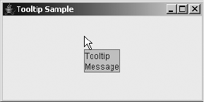
84 CHAPTER 4 ■ CORE SWING COMPONENTS
JToolTip Class
The Swing components support the ability to display brief pop-up messages when the cursor
rests over them. The class used to display pop-up messages is JToolTip.
Creating a JToolTip
Calling the public void setToolTipText(String text) method of JComponent automatically
causes the creation of a JToolTip instance when the mouse rests over a component with the
installed pop-up message. You don’t normally call the JToolTip constructor directly. There’s
only one constructor, and it’s of the no-argument variety.
Tooltip text is normally one line long. However, if the text string begins with <html> (in any
case), then the contents can be any HTML 3.2 formatted text. For instance, the following line
causes the pop-up message shown in Figure 4-3:
component.setToolTipText("<html>Tooltip<br>Message");
Figure 4-3. HTML-based tooltip text
Creating Customized JToolTip Objects
You can easily customize the display characteristics for all pop-up messages by setting UIResource
elements for JToolTip, as shown in the “Customizing a JToolTip Look and Feel” section later in
this chapter.
The JComponent class defines an easy way for you to customize the display characteristics
of the tooltip when it’s placed over a specific component. Simply subclass the component you
want to customize and override its inherited public JToolTip createToolTip() method. The
createToolTip() method is called when the ToolTipManager has determined that it’s time to
display the pop-up message.
To customize the pop-up tooltip appearance, just override the method and customize the
JToolTip returned from the inherited method. For instance, the following source demonstrates
the setting of a custom coloration for the tooltip for a JButton, as shown in Figure 4-4.
JButton b = new JButton("Hello, World") {
public JToolTip createToolTip() {
JToolTip tip = super.createToolTip();
tip.setBackground(Color.YELLOW);
tip.setForeground(Color.RED);
return tip;
}
};
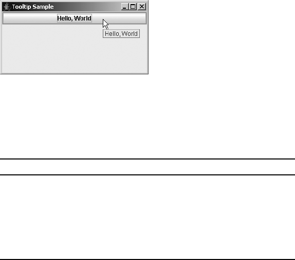
CHAPTER 4 ■ CORE SWING COMPONENTS 85
Figure 4-4. Tooltip text displayed with custom colors
After the JToolTip has been created, you can configure the inherited JComponent properties
or any of the properties specific to JToolTip, as shown in Table 4-5.
Displaying Positional Tooltip Text
Swing components can even support the display of different tooltip text, depending on where
the mouse pointer is located. This requires overriding the public boolean contains(int x, int y)
method, which originates from the Component class.
For instance, after enhancing the customized JButton created in the previous section
(Figure 4-4), the tooltip text will differ, depending on whether or not the mouse pointer is
within 50 pixels from the left edge of the component.
JButton button = new JButton("Hello, World") {
public JToolTip createToolTip() {
JToolTip tip = super.createToolTip();
tip.setBackground(Color.YELLOW);
tip.setForeground(Color.RED);
return tip;
}
public boolean contains(int x, int y) {
if (x < 50) {
setToolTipText("Got Green Eggs?");
} else {
setToolTipText("Got Ham?");
}
return super.contains(x, y);
}
};
Table 4-5. JToolTip Properties
Property Name Data Type Access
accessibleContext AccessibleContext Read-only
component JComponent Read-write
tipText String Read-write
UI ToolTipUI Read-only
UIClassID String Read-only

86 CHAPTER 4 ■ CORE SWING COMPONENTS
Customizing a JToolTip Look and Feel
Each installable Swing look and feel provides a different JToolTip appearance and a set of
default UIResource value settings. Figure 4-5 shows the appearance of the JToolTip component
for the preinstalled set of look and feel types: Motif, Windows, and Ocean.
Figure 4-5. JToolTip under different look and feel types
The available set of UIResource-related properties for a JToolTip is shown in Table 4-6.
For the JToolTip component, there are nine different properties.
As noted earlier in this chapter, the JToolTip class supports the display of arbitrary HTML
content. This permits the display of multiple-column and multiple-row input.
ToolTipManager Class
Although the JToolTip is something of a passive object, in the sense that the JComponent creates
and shows the JToolTip on its own, there are many more configurable aspects of its usage.
However, these configurable aspects are the responsibility of the class that manages tooltips,
not the JToolTip itself. The class that manages tooltip usage is aptly named ToolTipManager.
With the Singleton design pattern, no constructor for ToolTipManager exists. Instead, you have
access to the current manager through the static sharedInstance() method of ToolTipManager.
Motif Windows Ocean
Table 4-6. JToolTip UIResource Elements
Property String Object Type
ToolTip.background Color
ToolTip.backgroundInactive Color
ToolTip.border Border
ToolTip.borderInactive Color
ToolTip.font Font
ToolTip.foreground Color
ToolTip.foregroundInactive Color
ToolTip.hideAccelerator Boolean
ToolTipUI String

CHAPTER 4 ■ CORE SWING COMPONENTS 87
ToolTipManager Properties
Once you have accessed the shared instance of ToolTipManager, you can customize when and
if tooltip text appears. As Table 4-7 shows, there are five configurable properties.
Initially, tooltips are enabled, but you can disable them with ToolTipManager.
sharedInstance().setEnabled(false). This allows you to always associate tooltips with
components, while letting the end user enable and disable them when desired.
There are three timing-oriented properties: initialDelay,dismissDelay, and reshowDelay.
They all measure time in milliseconds. The initialDelay property is the number of milliseconds
the user must rest the mouse inside the component before the appropriate tooltip text appears.
The dismissDelay specifies the length of time the text appears while the mouse remains
motionless; if the user moves the mouse, it also causes the text to disappear. The reshowDelay
determines how long a user must remain outside a component before reentry would cause the
pop-up text to reappear.
The lightWeightPopupEnabled property is used to determine the pop-up window type to
hold the tooltip text. If the property is true and the pop-up text fits entirely within the bounds
of the top-level window, the text appears within a Swing JPanel. If this property is false and the
pop-up text fits entirely within the bounds of the top-level window, the text appears within an
AWT Panel. If part of the text wouldn’t appear within the top-level window no matter what the
property setting is, the pop-up text would appear within a Window.
Although not properties of ToolTipManager, two other methods of ToolTipManager are
worth mentioning:
public void registerComponent(JComponent component)
public void unregisterComponent(JComponent component)
When you call the setToolTipText() method of JComponent, this causes the component to
register itself with the ToolTipManager. There are times, however, when you need to register
a component directly. This is necessary when the display of part of a component is left to
another renderer. With JTree, for instance, a TreeCellRenderer displays each node of the tree.
When the renderer displays the tooltip text, you “register” the JTree and tell the renderer what
text to display.
Table 4-7. ToolTipManager Properties
Property Name Data Type Access
dismissDelay int Read-write
enabled boolean Read-write
initialDelay int Read-write
lightWeightPopupEnabled boolean Read-write
reshowDelay int Read-only
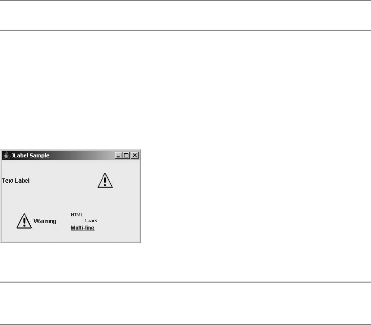
88 CHAPTER 4 ■ CORE SWING COMPONENTS
JTree tree = new JTree(...);
ToolTipManager.sharedInstance().registerComponent(tree);
TreeCellRenderer renderer = new ATreeCellRenderer(...);
tree.setCellRenderer(renderer);
...
public class ATreeCellRenderer implements TreeCellRenderer {
...
public Component getTreeCellRendererComponent(JTree tree, Object value,
boolean selected, boolean expanded, boolean leaf, int row, boolean hasFocus) {
...
renderer.setToolTipText("Some Tip");
return renderer;
}
}
■Note If this sounds confusing, don’t worry. We’ll revisit the JTree in Chapter 17.
JLabel Class
The first real Swing component to examine closely is the simplest, the JLabel. The JLabel
serves as the replacement component for the AWT Label but it can do much more. Whereas the
AWT Label is limited to a single line of text, the Swing JLabel can have text, images, or both. The
text can be a single line of text or HTML. In addition JLabel can support different enabled and
disabled images. Figure 4-6 shows some sample JLabel components.
Figure 4-6. Sample JLabel components
■Note A JLabel subclass is used as the default renderer for each of the JList,JComboBox,JTable,
and JTree components.

CHAPTER 4 ■ CORE SWING COMPONENTS 89
Creating a JLabel
There are six constructors for JLabel:
public JLabel()
JLabel label = new JLabel();
public JLabel(Icon image)
Icon icon = new ImageIcon("dog.jpg");
JLabel label = new JLabel(icon);
public JLabel(Icon image, int horizontalAlignment)
Icon icon = new ImageIcon("dog.jpg");
JLabel label = new JLabel(icon, JLabel.RIGHT);
public JLabel(String text)
JLabel label = new JLabel("Dog");
public JLabel(String text, int horizontalAlignment)
JLabel label = new JLabel("Dog", JLabel.RIGHT);
public JLabel(String text, Icon icon, int horizontalAlignment)
Icon icon = new ImageIcon("dog.jpg");
JLabel label = new JLabel("Dog", icon, JLabel.RIGHT);
With the constructors for JLabel, you can customize any of three properties of the
JLabel:text,icon, or horizontalAlignment. By default, the text and icon properties are empty,
whereas the initial horizontalAlignment property setting depends on the constructor arguments.
These settings can be any of JLabel.LEFT,JLabel.CENTER, or JLabel.RIGHT. In most cases, not
specifying the horizontalAlignment setting results in a left-aligned label. However, if only the
initial icon is specified, then the default alignment is centered.
JLabel Properties
Table 4-8 shows the 14 properties of JLabel. They allow you to customize the content, position,
and (in a limited sense) the behavior of the JLabel.
Table 4-8. JLabel Properties
Property Name Data Type Access
accessibleContext AccessibleContext Read-only
disabledIcon Icon Read-write bound
displayedMnemonic char Read-write bound
displayedMnemonicIndex int Read-write bound
horizontalAlignment int Read-write bound
horizontalTextPosition int Read-write bound

90 CHAPTER 4 ■ CORE SWING COMPONENTS
The content of the JLabel is the text and its associated image. Displaying an image within
aJLabel will be discussed in the “Interface Icon” section later in this chapter. However, you can
display different icons, depending on whether the JLabel is enabled or disabled. By default, the
icon is a grayscaled version of the enabled icon, if the enabled icon comes from an Image object
(ImageIcon, as described later in the chapter). If the enabled icon doesn’t come from an Image,
there’s no icon when JLabel is disabled, unless manually specified.
The position of the contents of the JLabel is described by four different properties:
horizontalAlignment,horizontalTextPosition,verticalAlignment, and verticalTextPosition.
The horizontalAlignment and verticalAlignment properties describe the position of the contents
of the JLabel within the container in which it’s placed.
■Note Alignments have an effect only if there’s extra space for the layout manager to position the compo-
nent. If you’re using a layout manager such as FlowLayout, which sizes components to their preferred size,
these settings will effectively be ignored.
The horizontal position can be any of the JLabel constants LEFT,RIGHT, or CENTER. The
vertical position can be TOP,BOTTOM, or CENTER. Figure 4-7 shows various alignment settings,
with the label reflecting the alignments.
The text position properties reflect where the text is positioned relative to the icon when
both are present. The properties can be set to the same constants as the alignment constants.
Figure 4-8 shows various text position settings, with each label reflecting the setting.
■Note The constants for the different positions come from the SwingConstants interface that the
JLabel class implements.
icon Icon Read-write bound
iconTextGap int Read-write bound
labelFor Component Read-write bound
text String Read-write bound
UI LabelUI Read-write
UIClassID String Read-only
verticalAlignment int Read-write bound
verticalTextPosition int Read-write bound
Table 4-8. JLabel Properties (Continued)
Property Name Data Type Access
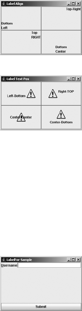
CHAPTER 4 ■ CORE SWING COMPONENTS 91
Figure 4-7. Various JLabel alignments
Figure 4-8. Various JLabel text positions
JLabel Event Handling
No event-handling capabilities are specific to the JLabel. Besides the event-handling capabilities
inherited through JComponent, the closest thing there is for event handling with the JLabel is the
combined usage of the displayedMnemonic,displayedMnemonicIndex, and labelFor properties.
When the displayedMnemonic and labelFor properties are set, pressing the keystroke specified
by the mnemonic, along with the platform-specific hotkey (usually Alt), causes the input focus
to shift to the component associated with the labelFor property. This can be helpful when a
component doesn’t have its own manner of displaying a mnemonic setting, such as with all the
text input components. Here is an example, which results in the display shown in Figure 4-9:
JLabel label = new JLabel("Username");
JTextField textField = new JTextField();
label.setDisplayedMnemonic(KeyEvent.VK_U);
label.setLabelFor(textField);
Figure 4-9. Using a JLabel to display the mnemonic for another component
92 CHAPTER 4 ■ CORE SWING COMPONENTS
The displayedMnemonicIndex property adds the ability for the mnemonic highlighted to
not be the first instance of mnemonic in the label’s text. The index you specify represents the
position in the text, not the instance of the mnemonic. To highlight the second e in Username,
you would specify an index of 7: label.setDisplayedMnemonicIndex(7).
■Note The component setting of the labelFor property is stored as a client property of the JLabel with
the LABELED_BY_PROPERTY key constant. The setting is used for accessibility purposes.
Customizing a JLabel Look and Feel
Each installable Swing look and feel provides a different JLabel appearance and set of default
UIResource value settings. Although appearances differ based on the current look and feel, the
differences are minimal within the preinstalled set of look and feel types. Table 4-9 shows the
available set of UIResource-related properties for a JLabel. There are eight different properties
for the JLabel component.
Interface Icon
The Icon interface is used to associate glyphs with various components. A glyph (like a symbol
on a highway sign that conveys information nonverbally, such as “winding road ahead!”) can
be a simple drawing or a GIF image loaded from disk with the ImageIcon class. The interface
contains two properties describing the size and a method to paint the glyph.
public interface Icon {
// Properties
public int getIconHeight();
public int getIconWidth();
// Other methods
public void paintIcon(Component c, Graphics g, int x, int y);
}
Table 4-9. JLabel UIResource Elements
Property String Object Type
Label.actionMap ActionMap
Label.background Color
Label.border Border
Label.disabledForeground Color
Label.disabledShadow Color
Label.font Font
Label.foreground Color
LabelUI String

CHAPTER 4 ■ CORE SWING COMPONENTS 93
Creating an Icon
Creating an Icon is as simple as implementing the interface. All you need to do is specify the
size of the icon and what to draw. Listing 4-3 shows one such Icon implementation. The icon is
a diamond-shaped glyph in which the size, color, and filled-status are all configurable.
■Tip In implementing the paintIcon() method of the Icon interface, translate the drawing coordinates
of the graphics context based on the x and y position passed in, and then translate them back when the
drawing is done. This greatly simplifies the different drawing operations.
Listing 4-3. Reusable Diamond Icon Definition
import javax.swing.*;
import java.awt.*;
public class DiamondIcon implements Icon {
private Color color;
private boolean selected;
private int width;
private int height;
private Polygon poly;
private static final int DEFAULT_WIDTH = 10;
private static final int DEFAULT_HEIGHT = 10;
public DiamondIcon(Color color) {
this(color, true, DEFAULT_WIDTH, DEFAULT_HEIGHT);
}
public DiamondIcon(Color color, boolean selected) {
this(color, selected, DEFAULT_WIDTH, DEFAULT_HEIGHT);
}
public DiamondIcon(Color color, boolean selected, int width, int height) {
this.color = color;
this.selected = selected;
this.width = width;
this.height = height;
initPolygon();
}
private void initPolygon() {
poly = new Polygon();
int halfWidth = width/2;
int halfHeight = height/2;
poly.addPoint(0, halfHeight);
poly.addPoint(halfWidth, 0);
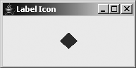
94 CHAPTER 4 ■ CORE SWING COMPONENTS
poly.addPoint(width, halfHeight);
poly.addPoint(halfWidth, height);
}
public int getIconHeight() {
return height;
}
public int getIconWidth() {
return width;
}
public void paintIcon(Component c, Graphics g, int x, int y) {
g.setColor(color);
g.translate(x, y);
if (selected) {
g.fillPolygon(poly);
} else {
g.drawPolygon(poly);
}
g.translate(-x, -y);
}
}
Using an Icon
Once you have your Icon implementation, using the Icon is as simple as finding a component
with an appropriate property. For example, here’s the icon with a JLabel:
Icon icon = new DiamondIcon(Color.RED, true, 25, 25);
JLabel label = new JLabel(icon);
Figure 4-10 shows what such a label might look like.
Figure 4-10. Using an Icon in a JLabel
ImageIcon Class
The ImageIcon class presents an implementation of the Icon interface for creating glyphs from
AWT Image objects, whether from memory (a byte[ ]), off a disk (a file name), or over the
network (a URL). Unlike with regular Image objects, the loading of an ImageIcon is immediately
started when the ImageIcon is created, though it might not be fully loaded when used. In addition,
CHAPTER 4 ■ CORE SWING COMPONENTS 95
unlike Image objects, ImageIcon objects are serializable so that they can be easily used by
JavaBean components.
Creating an ImageIcon
There are nine constructors for an ImageIcon:
public ImageIcon()
Icon icon = new ImageIcon();
icon.setImage(anImage);
public ImageIcon(Image image)
Icon icon = new ImageIcon(anImage);
public ImageIcon(String filename)
Icon icon = new ImageIcon(filename);
public ImageIcon(URL location)
Icon icon = new ImageIcon(url);
public ImageIcon(byte imageData[])
Icon icon = new ImageIcon(aByteArray);
public ImageIcon(Image image, String description)
Icon icon = new ImageIcon(anImage, "Duke");
public ImageIcon(String filename, String description)
Icon icon = new ImageIcon(filename, filename);
public ImageIcon(URL location, String description)
Icon icon = new ImageIcon(url, location.getFile());
public ImageIcon(byte imageData[], String description)
Icon icon = new ImageIcon(aByteArray, "Duke");
The no-argument version creates an uninitialized version (empty). The remaining eight
offer the ability to create an ImageIcon from an Image,byte array, file name String, or URL, with
or without a description.
Using an ImageIcon
Using an ImageIcon is as simple as using an Icon: just create the ImageIcon and associate it with
a component.
Icon icon = new ImageIcon("Warn.gif");
JLabel label3 = new JLabel("Warning", icon, JLabel.CENTER)

96 CHAPTER 4 ■ CORE SWING COMPONENTS
ImageIcon Properties
Table 4-10 shows the six properties of ImageIcon. The height and width of the ImageIcon are the
height and width of the actual Image object. The imageLoadStatus property represents the results of
the loading of the ImageIcon from the hidden MediaTracker, either MediaTracker.ABORTED,
MediaTracker.ERRORED, or MediaTracker.COMPLETE.
Sometimes, it’s useful to use an ImageIcon to load an Image, and then just ask for the Image
object from the Icon.
ImageIcon imageIcon = new ImageIcon(...);
Image image = imageIcon.getImage();
There is one major problem with using ImageIcon objects: They don’t work when the
image and class file using the icon are both loaded in a JAR (Java archive) file, unless you explicitly
specify the full URL for the file within the JAR (jar:http://www.example.com/directory/
foo.jar!/com/example/image.gif). You can’t just specify the file name as a String and let the
ImageIcon find the file. You must manually get the image data first, and then pass the data
along to the ImageIcon constructor.
To help with loading images outside JAR files, Listing 4-4 shows an ImageLoader class that
provides a public static Image getImage(Class relativeClass, String filename) method.
You specify both the base class where the image file relative is found and the file name for the
image file. Then you just need to pass the Image object returned to the constructor of ImageIcon.
Listing 4-4. Image Loading Support Class
import java.awt.*;
import java.io.*;
public final class ImageLoader {
private ImageLoader() {
}
Table 4-10. ImageIcon Properties
Property Name Data Type Access
description String Read-write
iconHeight int Read-only
iconWidth int Read-only
image Image Read-write
imageLoadStatus int Read-only
imageObserver ImageObserver Read-write

CHAPTER 4 ■ CORE SWING COMPONENTS 97
public static Image getImage(Class relativeClass, String filename) {
Image returnValue = null;
InputStream is = relativeClass.getResourceAsStream(filename);
if (is != null) {
BufferedInputStream bis = new BufferedInputStream(is);
ByteArrayOutputStream baos = new ByteArrayOutputStream();
try {
int ch;
while ((ch = bis.read()) != -1) {
baos.write(ch);
}
returnValue = Toolkit.getDefaultToolkit().createImage(baos.toByteArray());
} catch (IOException exception) {
System.err.println("Error loading: " + filename);
}
}
return returnValue;
}
}
Here’s how you use the helper class:
Image warnImage = ImageLoader.getImage(LabelJarSample.class, "Warn.gif");
Icon warnIcon = new ImageIcon(warnImage);
JLabel label2 = new JLabel(warnIcon);
■Tip Keep in mind that the Java platform supports GIF89A animated images.
GrayFilter Class
One additional class worth mentioning here is GrayFilter. Many of the Swing component
classes rely on this class to create a disabled version of an Image to be used as an Icon. The
components use the class automatically, but there might be times when you need an AWT
ImageFilter that does grayscales. You can convert an Image from normal to grayed out with
a call to the one useful method of the class: public static Image createDisabledImage
(Image image).
Image normalImage = ...
Image grayImage = GrayFilter.createDisabledImage(normalImage)
You can now use the grayed-out image as the Icon on a component:
Icon warningIcon = new ImageIcon(grayImage);
JLabel warningLabel = new JLabel(warningIcon);

98 CHAPTER 4 ■ CORE SWING COMPONENTS
AbstractButton Class
The AbstractButton class is an important Swing class that works behind the scenes as the
parent class of all the Swing button components, as shown at the top of Figure 4-1. The
JButton, described in the “JButton Class” section later in this chapter, is the simplest of the
subclasses. The remaining subclasses are described in later chapters.
Each of the AbstractButton subclasses uses the ButtonModel interface to store their
data model. The DefaultButtonModel class is the default implementation used. In addition,
you can group any set of AbstractButton objects into a ButtonGroup. Although this grouping
is most natural with the JRadioButton and JRadioButtonMenuItem components, any of the
AbstractButton subclasses will work.
AbstractButton Properties
Table 4-11 lists the 32 properties (with mnemonic listed twice) of AbstractButton shared by all its
subclasses. They allow you to customize the appearance of all the buttons.
Table 4-11. AbstractButton Properties
Property Name Data Type Access
action Action Read-write bound
actionCommand String Read-write
actionListeners ActionListener[ ] Read-only
borderPainted boolean Read-write bound
changeListeners ChangeListener[ ] Read-only
contentAreaFilled boolean Read-write bound
disabledIcon Icon Read-write bound
disabledSelectedIcon Icon Read-write bound
displayedMnemonicIndex int Read-write bound
enabled boolean Write-only
focusPainted boolean Read-write bound
horizontalAlignment int Read-write bound
horizontalTextPosition int Read-write bound
icon Icon Read-write bound
iconTextGap int Read-write bound
itemListeners ItemListener[ ] Read-only
layout LayoutManager Write-only
margin Insets Read-write bound
mnemonic char Read-write bound

CHAPTER 4 ■ CORE SWING COMPONENTS 99
■Note AbstractButton has a deprecated label property. You should use the equivalent text
property instead.
One property worth mentioning is multiClickThreshhold. This property represents a time,
in milliseconds. If a button is selected with a mouse multiple times within this time period,
additional action events won’t be generated. By default, the value is zero, meaning each press
generates an event. To avoid accidental duplicate submissions from happening in important
dialogs, set this value to some reasonable level above zero.
■Tip Keep in mind that all AbstractButton children can use HTML with its text property to display
HTML content within the label. Just prefix the property setting with the string <html>.
ButtonModel/Class DefaultButtonModel Interface
The ButtonModel interface is used to describe the current state of the AbstractButton component.
In addition, it describes the set of event listeners objects that are supported by all the different
AbstractButton children. Its definition follows:
mnemonic int Write-only
model ButtonModel Read-write bound
multiClickThreshhold long Read-write
pressedIcon Icon Read-write bound
rolloverEnabled boolean Read-write bound
rolloverIcon Icon Read-write bound
rolloverSelectedIcon Icon Read-write bound
selected boolean Read-write
selectedIcon Icon Read-write bound
selectedObjects Object[ ] Read-only
text String Read-write bound
UI ButtonUI Read-write
verticalAlignment int Read-write bound
verticalTextPosition int Read-write bound
Table 4-11. AbstractButton Properties (Continued)
Property Name Data Type Access

100 CHAPTER 4 ■ CORE SWING COMPONENTS
public interface ButtonModel extends ItemSelectable {
// Properties
public String getActionCommand();
public void setActionCommand(String newValue);
public boolean isArmed();
public void setArmed(boolean newValue);
public boolean isEnabled();
public void setEnabled(boolean newValue);
public void setGroup(ButtonGroup newValue);
public int getMnemonic();
public void setMnemonic(int newValue);
public boolean isPressed();
public void setPressed(boolean newValue);
public boolean isRollover();
public void setRollover(boolean newValue);
public boolean isSelected();
public void setSelected(boolean newValue);
// Listeners
public void addActionListener(ActionListener listener);
public void removeActionListener(ActionListener listener);
public void addChangeListener(ChangeListener listener);
public void removeChangeListener(ChangeListener listener);
public void addItemListener(ItemListener listener);
public void removeItemListener(ItemListener listener);
}
The specific implementation of ButtonModel you’ll use, unless you create your own, is the
DefaultButtonModel class. The DefaultButtonModel class defines all the event registration
methods for the different event listeners and manages the button state and grouping within
aButtonGroup. Its set of nine properties is shown in Table 4-12. They all come from the
ButtonGroup interface, except selectedObjects, which is new to the DefaultButtonModel class,
but more useful to the JToggleButton.ToggleButtonModel, which is discussed in Chapter 5.
Table 4-12. DefaultButtonModel Properties
Property Name Data Type Access
actionCommand String Read-write
armed boolean Read-write
enabled boolean Read-write
group ButtonGroup Read-write
mnemonic int Read-write
pressed boolean Read-write
rollover boolean Read-write
selected boolean Read-write
selectedObjects Object[ ] Read-only

CHAPTER 4 ■ CORE SWING COMPONENTS 101
Most of the time, you don’t access the ButtonModel directly. Instead, the components that
use the ButtonModel wrap their property calls to update the model’s properties.
■Note The DefaultButtonModel also lets you get the listeners for a specific type with public
EventListener[ ] getListeners(Class listenerType).
Understanding AbstractButton Mnemonics
Amnemonic is a special keyboard accelerator that when pressed causes a particular action to
happen. In the case of the JLabel discussed earlier in the “JLabel Class” section, pressing the
displayed mnemonic causes the associated component to get the input focus. In the case of an
AbstractButton, pressing the mnemonic for a button causes its selection.
The actual pressing of the mnemonic requires the pressing of a look-and-feel–specific
hotkey (the key tends to be the Alt key). So, if the mnemonic for a button were the B key, you
would need to press Alt-B to activate the button with the B-key mnemonic. When the button is
activated, registered listeners will be notified of appropriate state changes. For instance, with
the JButton, all ActionListener objects would be notified.
If the mnemonic key is part of the text label for the button, you’ll see the character under-
lined. This does depend on the current look and feel and could be displayed differently. In
addition, if the mnemonic isn’t part of the text label, there will not be a visual indicator for
selecting the particular mnemonic key, unless the look and feel shows it in the tooltip text.
Figure 4-11 shows two buttons: one with a W-key mnemonic, and the other with an H-key
mnemonic. The left button has a label with W in its contents, so it shows the first W underlined.
The second component doesn’t benefit from this behavior on the button, but in the Ocean look
and feel, identifies it only if the tooltip text is set and shown.
Figure 4-11. AbstractButton mnemonics
To assign a mnemonic to an abstract button, you can use either one of the setMnemonic()
methods. One accepts a char argument and the other an int. Personally, I prefer the int variety,
in which the value is one of the many VK_* constants from the KeyEvent class. You can also
specify the mnemonic by position via the displayedMnemonicIndex property.
AbstractButton button1 = new JButton("Warning");
button1.setMnemonic(KeyEvent.VK_W);
content.add(button1);

102 CHAPTER 4 ■ CORE SWING COMPONENTS
Understanding AbstractButton Icons
AbstractButton has seven specific icon properties. The natural or default icon is the icon prop-
erty. It is used for all cases unless a different icon is specified or there is a default behavior
provided by the component. The selectedIcon property is the icon used when the button is
selected. The pressedIcon is used when the button is pressed. Which of these two icons is used
depends on the component, because a JButton is pressed but not selected, whereas a
JCheckBox is selected but not pressed.
The disabledIcon and disabledSelectedIcon properties are used when the button has
been disabled with setEnabled(false). By default, if the icon is an ImageIcon, a grayscaled
version of the icon will be used.
The remaining two icon properties, rolloverIcon and rolloverSelectedIcon, allow you to
display different icons when the mouse moves over the button (and rolloverEnabled is true).
Understanding Internal AbstractButton Positioning
The horizontalAlignment,horizontalTextPosition,verticalAlignment, and
verticalTextPosition properties share the same settings and behavior as the JLabel class.
They’re listed in Table 4-13.
Handling AbstractButton Events
Although you do not create AbstractButton instances directly, you do create subclasses.
All of them share a common set of event-handling capabilities. You can register
PropertyChangeListener,ActionListener,ItemListener, and ChangeListener objects with
abstract buttons. The PropertyChangeListener object will be discussed here, and the
remaining objects listed will be discussed in later chapters, with the appropriate components.
Like the JComponent class, the AbstractButton component supports the registering of
PropertyChangeListener objects to detect when bound properties of an instance of the class
change. Unlike the JComponent class, the AbstractButton component provides the following set
of class constants to signify the different property changes:
• BORDER_PAINTED_CHANGED_PROPERTY
• CONTENT_AREA_FILLED_CHANGED_PROPERTY
• DISABLED_ICON_CHANGED_PROPERTY
• DISABLED_SELECTED_ICON_CHANGED_PROPERTY
• FOCUS_PAINTED_CHANGED_PROPERTY
Table 4-13. AbstractButton Position Constants
Position Property Available Settings
horizontalAlignment LEFT,CENTER,RIGHT
horizontalTextPosition LEFT,CENTER,RIGHT
verticalAlignment TOP,CENTER,BOTTOM
verticalTextPosition TOP,CENTER,BOTTOM
CHAPTER 4 ■ CORE SWING COMPONENTS 103
• HORIZONTAL_ALIGNMENT_CHANGED_PROPERTY
• HORIZONTAL_TEXT_POSITION_CHANGED_PROPERTY
• ICON_CHANGED_PROPERTY
• MARGIN_CHANGED_PROPERTY
• MNEMONIC_CHANGED_PROPERTY
• MODEL_CHANGED_PROPERTY
• PRESSED_ICON_CHANGED_PROPERTY
• ROLLOVER_ENABLED_CHANGED_PROPERTY
• ROLLOVER_ICON_CHANGED_PROPERTY
• ROLLOVER_SELECTED_ICON_CHANGED_PROPERTY
• SELECTED_ICON_CHANGED_PROPERTY
• TEXT_CHANGED_PROPERTY
• VERTICAL_ALIGNMENT_CHANGED_PROPERTY
• VERTICAL_TEXT_POSITION_CHANGED_PROPERTY
Therefore, instead of hard-coding specific text strings, you can create a
PropertyChangeListener that uses these constants, as shown in Listing 4-5.
Listing 4-5. Base PropertyChangeListener for AbstractButton
import javax.swing.*;
import java.beans.*;
public class AbstractButtonPropertyChangeListener
implements PropertyChangeListener {
public void propertyChange(PropertyChangeEvent e) {
String propertyName = e.getPropertyName();
if (e.getPropertyName().equals(AbstractButton.TEXT_CHANGED_PROPERTY)) {
String newText = (String) e.getNewValue();
String oldText = (String) e.getOldValue();
System.out.println(oldText + " changed to " + newText);
} else if (e.getPropertyName().equals(AbstractButton.ICON_CHANGED_PROPERTY)) {
Icon icon = (Icon) e.getNewValue();
if (icon instanceof ImageIcon) {
System.out.println("New icon is an image");
}
}
}
}
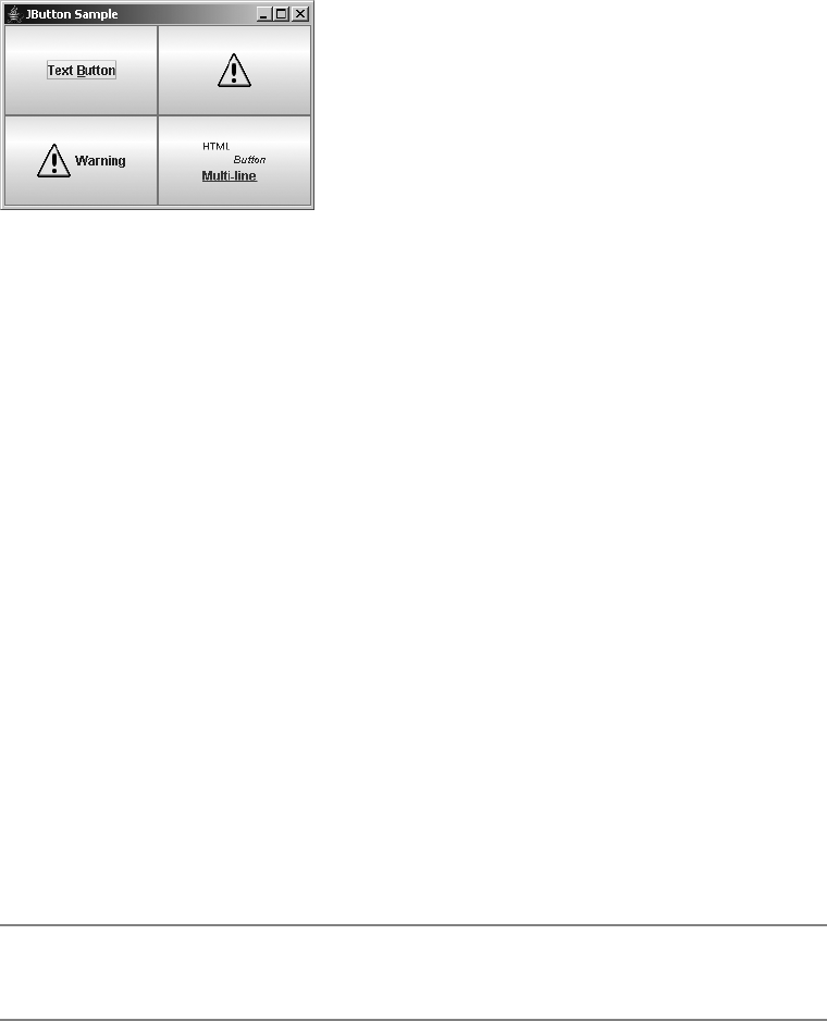
104 CHAPTER 4 ■ CORE SWING COMPONENTS
JButton Class
The JButton component is the basic AbstractButton component that can be selected. It supports
text, images, and HTML-based labels, as shown in Figure 4-12.
Figure 4-12. Sample JButton components
Creating a JButton
The JButton class has five constructors:
public JButton()
JButton button = new JButton();
public JButton(Icon image)
Icon icon = new ImageIcon("dog.jpg");
JButton button = new JButton(icon);
public JButton(String text)
JButton button = new JButton("Dog");
public JButton(String text, Icon icon)
Icon icon = new ImageIcon("dog.jpg");
JButton button = new JButton("Dog", icon);
public JButton(Action action)
Action action = ...;
JButton button = new JButton(action);
You can create a button with or without a text label or icon. The icon represents the default
or selected icon property from AbstractButton.
■Note Creating a JButton from an Action initializes the text label, icon, enabled status, and tooltip text.
In addition, the ActionListener of the Action will be notified upon button selection.
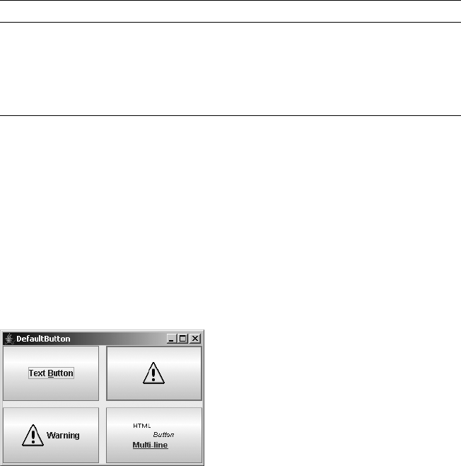
CHAPTER 4 ■ CORE SWING COMPONENTS 105
JButton Properties
The JButton component doesn’t add much to the AbstractButton. As Table 4-14 shows, of the
four properties of JButton, the only new behavior added is enabling the button to be the default.
The default button tends to be drawn with a different and darker border than the remaining
buttons. When a button is the default, pressing the Enter key while in the top-level window
causes the button to be selected. This works only as long as the component with the input
focus, such as a text component or another button, doesn’t consume the Enter key. Because
the defaultButton property is read-only, how (you might be asking) do you set a button as the
default? All top-level Swing windows contain a JRootPane, to be described in Chapter 8. You tell
this JRootPane which button is the default by setting its defaultButton property. Only buttons
whose defaultCapable property is true can be configured to be the default. Figure 4-13 shows
the top-right button set as the default.
Figure 4-13. Setting a default button
Listing 4-6 demonstrates setting the default button component, as well as using a basic
JButton. If the default button appearance doesn’t seem that obvious in Figure 4-13, wait until
the JOptionPane is described in Chapter 9, where the difference in appearance will be more
obvious. Figure 4-13 uses a 2-by-2 GridLayout for the screen. The extra two arguments to the
constructor represent gaps to help make the default button’s appearance more obvious.
Table 4-14. JButton Properties
Property Name Data Type Access
accessibleContext AccessibleContext Read-only
defaultButton boolean Read-only
defaultCapable boolean Read-write bound
UIClassID String Read-only
106 CHAPTER 4 ■ CORE SWING COMPONENTS
Listing 4-6. Configuring a Default Button
import javax.swing.*;
import java.awt.*;
import java.awt.event.*;
public class DefaultButton {
public static void main(String args[]) {
Runnable runner = new Runnable() {
public void run() {
JFrame frame = new JFrame("DefaultButton");
frame.setDefaultCloseOperation(JFrame.EXIT_ON_CLOSE);
frame.setLayout(new GridLayout(2, 2, 10, 10));
JButton button1 = new JButton("Text Button");
button1.setMnemonic(KeyEvent.VK_B);
frame.add(button1);
Icon warnIcon = new ImageIcon("Warn.gif");
JButton button2 = new JButton(warnIcon);
frame.add(button2);
JButton button3 = new JButton("Warning", warnIcon);
frame.add(button3);
String htmlButton = "<html><sup>HTML</sup> <sub><em>Button</em></sub><br>" +
"<font color=\"#FF0080\"><u>Multi-line</u></font>";
JButton button4 = new JButton(htmlButton);
frame.add(button4);
JRootPane rootPane = frame.getRootPane();
rootPane.setDefaultButton(button2);
frame.setSize(300, 200);
frame.setVisible(true);
}
};
EventQueue.invokeLater(runner);
}
}
Handling JButton Events
The JButton component itself has no specific event-handling capabilities. They’re all inherited
from AbstractButton. Although you can listen for change events, item events, and property
change events, the most helpful listener with the JButton is the ActionListener.
CHAPTER 4 ■ CORE SWING COMPONENTS 107
When the JButton component is selected, all registered ActionListener objects are notified.
When the button is selected, an ActionEvent is passed to each listener. This event passes along
the actionCommand property of the button to help identify which button was selected when
a shared listener is used across multiple components. If the actionCommand property hasn’t
been explicitly set, the current text property is passed along instead. The explicit use of the
actionCommand property is helpful with localization. Because the text property of the JButton is
what the user sees, you as the handler of the button selection event listener cannot rely on a
localized text label for determining which button was selected. So, while the text property can
be localized so that a Yes button in English can say Sí in a Spanish version, if you explicitly set
the actionCommand to be the "Yes" string, then no matter which language the user is running in,
the actionCommand will remain "Yes" and not take on the localized text property setting.
Listing 4-7 adds the event-handling capabilities to the default button example in Listing 4-6
(see Figure 4-13). Notice that the default button behavior works properly: press Enter from any
component, and button 2 (the default) will be activated.
Listing 4-7. Watching Button Selection Events
import javax.swing.*;
import java.awt.*;
import java.awt.event.*;
public class ActionButtonSample {
public static void main(String args[]) {
Runnable runner = new Runnable() {
public void run() {
JFrame frame = new JFrame("DefaultButton");
frame.setDefaultCloseOperation(JFrame.EXIT_ON_CLOSE);
ActionListener actionListener = new ActionListener() {
public void actionPerformed(ActionEvent actionEvent) {
String command = actionEvent.getActionCommand();
System.out.println("Selected: " + command);
}
};
frame.setLayout(new GridLayout(2, 2, 10, 10));
JButton button1 = new JButton("Text Button");
button1.setMnemonic(KeyEvent.VK_B);
button1.setActionCommand("First");
button1.addActionListener(actionListener);
frame.add(button1);
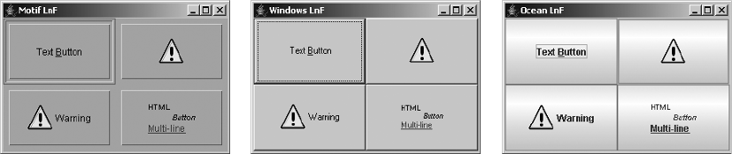
108 CHAPTER 4 ■ CORE SWING COMPONENTS
Icon warnIcon = new ImageIcon("Warn.gif");
JButton button2 = new JButton(warnIcon);
button2.setActionCommand("Second");
button2.addActionListener(actionListener);
frame.add(button2);
JButton button3 = new JButton("Warning", warnIcon);
button3.setActionCommand("Third");
button3.addActionListener(actionListener);
frame.add(button3);
String htmlButton = "<html><sup>HTML</sup> <sub><em>Button</em></sub><br>" +
"<font color=\"#FF0080\"><u>Multi-line</u></font>";
JButton button4 = new JButton(htmlButton);
button4.setActionCommand("Fourth");
button4.addActionListener(actionListener);
frame.add(button4);
JRootPane rootPane = frame.getRootPane();
rootPane.setDefaultButton(button2);
frame.setSize(300, 200);
frame.setVisible(true);
}
};
EventQueue.invokeLater(runner);
}
}
Customizing a JButton Look and Feel
Each installable Swing look and feel provides a different JButton appearance and set of default
UIResource value settings. Figure 4-14 shows the appearance of the JButton component for the
preinstalled set of look and feel types: Motif, Windows, and Ocean.
Figure 4-14. JButton under different look and feel types
Motif Windows Ocean

CHAPTER 4 ■ CORE SWING COMPONENTS 109
The available set of UIResource-related properties for a JButton is shown in Table 4-15. For
the JButton component, there are 34 different properties.
Table 4-15. JButton UIResource Elements
Property String Object Type
Button.actionMap ActionMap
Button.background Color
Button.border Border
Button.contentAreaFilled Boolean
Button.darkShadow Color
Button.dashedRectGapHeight Integer
Button.dashedRectGapWidth Integer
Button.dashedRectGapX Integer
Button.dashedRectGapY Integer
Button.defaultButtonFollowsFocus Boolean
Button.disabledForeground Color
Button.disabledGrayRange Integer[ ]
Button.disabledShadow Color
Button.disabledText Color
Button.disabledToolBarBorderBackground Color
Button.focus Color
Button.focusInputMap InputMap
Button.font Font
Button.foreground Color
Button.gradient List
Button.highlight Color
Button.icon Icon
Button.iconTextGap Integer
Button.light Color
Button.margin Insets
Button.rollover Boolean
Button.rolloverIconType String
Button.select Color
Button.shadow Color
Button.showMnemonics Boolean

110 CHAPTER 4 ■ CORE SWING COMPONENTS
JPanel Class
The last of the basic Swing components is the JPanel component. The JPanel component
serves as both a general-purpose container object, replacing the AWT Panel container, and a
replacement for the Canvas component, for those times when you need a drawable Swing
component area.
Creating a JPanel
There are four constructors for JPanel:
public JPanel()
JPanel panel = new JPanel();
public JPanel(boolean isDoubleBuffered)
JPanel panel = new JPanel(false);
public JPanel(LayoutManager manager)
JPanel panel = new JPanel(new GridLayout(2,2));
public JPanel(LayoutManager manager, boolean isDoubleBuffered)
JPanel panel = new JPanel(new GridLayout(2,2), false);
With the constructors, you can either change the default layout manager from FlowLayout
or change the default double buffering that is performed from true to false.
Using a JPanel
You can use JPanel as your general-purpose container or as a base class for a new component.
For the general-purpose container, the procedure is simple: Just create the panel, set its layout
manager if necessary, and add components using the add() method.
JPanel panel = new JPanel();
JButton okButton = new JButton("OK");
panel.add(okButton);
JButton cancelButton = new JButton("Cancel");
panel.add(cancelButton);
Button.textIconGap Integer
Button.textShiftOffset Integer
Button.toolBarBorderBackground Color
ButtonUI String
Table 4-15. JButton UIResource Elements (Continued)
Property String Object Type
CHAPTER 4 ■ CORE SWING COMPONENTS 111
When you want to create a new component, subclass JPanel and override the public void
paintComponent(Graphics g) method. Although you can subclass JComponent directly, it seems
more appropriate to subclass JPanel. Listing 4-8 demonstrates a simple component that draws
an oval to fit the size of the component; it also includes a test driver.
Listing 4-8. Oval Panel Component
import java.awt.*;
import javax.swing.*;
public class OvalPanel extends JPanel {
Color color;
public OvalPanel() {
this(Color.black);
}
public OvalPanel(Color color) {
this.color = color;
}
public void paintComponent(Graphics g) {
int width = getWidth();
int height = getHeight();
g.setColor(color);
g.drawOval(0, 0, width, height);
}
public static void main(String args[]) {
Runnable runner = new Runnable() {
public void run() {
JFrame frame = new JFrame("Oval Sample");
frame.setDefaultCloseOperation(JFrame.EXIT_ON_CLOSE);
frame.setLayout(new GridLayout(2, 2));
Color colors[] = {Color.RED, Color.BLUE, Color.GREEN, Color.YELLOW};
for (int i=0; i<4; i++) {
OvalPanel panel = new OvalPanel(colors[i]);
frame.add(panel);
}
frame.setSize(300, 200);
frame.setVisible(true);
}
};
EventQueue.invokeLater(runner);
}
}
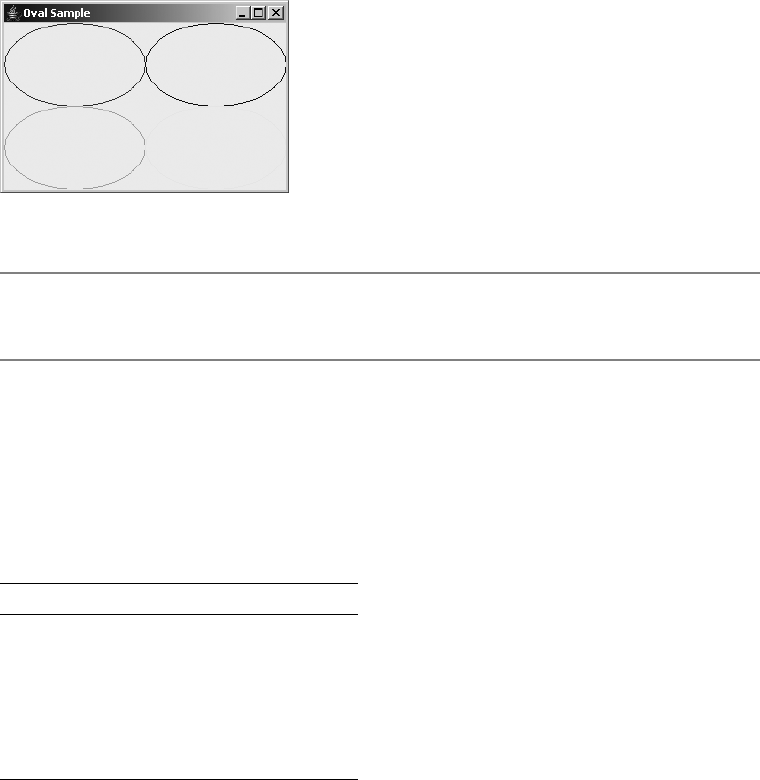
112 CHAPTER 4 ■ CORE SWING COMPONENTS
Figure 4-15 shows the test driver program results.
Figure 4-15. The new OvalPanel component
■Note By default, JPanel components are opaque. This differs from JComponent, whose opacity
property setting by default is false. A false setting for opacity means the component is transparent.
Customizing a JPanel Look and Feel
The available set of UIResource-related properties for a JPanel is shown in Table 4-16. For the
JPanel component, there are five different properties. These settings may have an effect on the
components within the panel.
Summary
In this chapter, you explored the root of all Swing components: the JComponent class. From
there, you looked at some of the common elements of all components, such as tooltips, as well
as specific components such as JLabel. You also learned how to put glyphs (nonverbal images)
on components with the help of the Icon interface and the ImageIcon class, and the GrayFilter
image filter for disabled icons.
Table 4-16. JPanel UIResource Elements
Property String Object Type
Panel.background Color
Panel.border Border
Panel.font Font
Panel.foreground Color
PanelUI String
CHAPTER 4 ■ CORE SWING COMPONENTS 113
You also learned about the AbstractButton component, which serves as the root compo-
nent for all Swing button objects. You looked at its data model interface, ButtonModel, and the
default implementation of this interface, DefaultButtonModel. Next, you looked at the JButton
class, which is the simplest of the AbstractButton implementations. And lastly, you looked at
the JPanel as the basic Swing container object.
In Chapter 5, you’ll start to dig into some of the more complex AbstractButton implemen-
tations: the toggle buttons.

115
■ ■ ■
CHAPTER 5
Toggle Buttons
Now that you’ve seen the capabilities of the relatively simple Swing components JLabel and
JButton, it’s time to take a look at more active components, specifically those that can be toggled.
These so-called toggleable components—JToggleButton,JCheckBox, and JRadioButton—provide
the means for your users to select from among a set of options. These options are either on or
off, or enabled or disabled. When presented in a ButtonGroup, only one of the options in the
group can be selected at a time. To deal with this selection state, the components share a common
data model with ToggleButtonModel. Let’s take a look at the data model, the components’
grouping mechanism with ButtonGroup, and the individual components.
ToggleButtonModel Class
The JToggleButton.ToggleButtonModel class is a public inner class of JToggleButton. The class
customizes the behavior of the DefaultButtonModel class, which, in turn, is an implementation
of the ButtonModel interface.
The customization affects the data models of all AbstractButton components in the
same ButtonGroup—a class explored next. In short, a ButtonGroup is a logical grouping of
AbstractButton components. At any one time, only one of the AbstractButton components
in the ButtonGroup can have the selected property of its data model set to true. The remaining
ones must be false. This does not mean that only one selected component in the group can
exist at a time. If multiple components in a ButtonGroup share a ButtonModel, multiple selected
components in the group can exist. If no components share a model, at most, the user can
select one component in the group. Once the user has selected that one component, the user
cannot interactively deselect the selection. However, programmatically, you can deselect all
group elements.
The definition of JToggleButton.ToggleButtonModel follows.
public class ToggleButtonModel extends DefaultButtonModel {
// Constructors
public ToggleButtonModel();
// Properties
public boolean isSelected();
public void setPressed(boolean newValue);
public void setSelected(boolean newvalue);
}

116 CHAPTER 5 ■ TOGGLE BUTTONS
The ToggleButtonModel class defines the default data model for both the JToggleButton
and its subclasses JCheckBox and JRadioButton, described in this chapter, as well as the
JCheckBoxMenuItem and JRadioButtonMenuItem classes described in Chapter 6.
■Note Internally, Swing’s HTML viewer component uses the ToggleButtonModel for its check box and
radio button input form elements.
ButtonGroup Class
Before describing the ButtonGroup class, let’s demonstrate its usage. The program shown in
Listing 5-1 creates objects that use the ToggleButtonModel and places them into a single group.
As the program demonstrates, in addition to adding the components into the screen’s container,
you must add each component to the same ButtonGroup. This results in a pair of add() method
calls for each component. Furthermore, the container for the button group tends to place
components in a single column and to label the grouping for the user with a titled border,
though neither of these treatments are required. Figure 5-1 shows the output of the program.
Listing 5-1. Odd Collection of Button Components
import javax.swing.*;
import javax.swing.border.*;
import java.awt.*;
public class AButtonGroup {
public static void main(String args[]) {
Runnable runner = new Runnable() {
public void run() {
JFrame frame = new JFrame("Button Group");
frame.setDefaultCloseOperation(JFrame.EXIT_ON_CLOSE);
JPanel panel = new JPanel(new GridLayout(0, 1));
Border border =
BorderFactory.createTitledBorder("Examples");
panel.setBorder(border);
ButtonGroup group = new ButtonGroup();
AbstractButton abstract1 =
new JToggleButton("Toggle Button");
panel.add(abstract1);
group.add(abstract1);
AbstractButton abstract2 =
new JRadioButton("Radio Button");
panel.add(abstract2);
group.add(abstract2);

CHAPTER 5 ■ TOGGLE BUTTONS 117
AbstractButton abstract3 =
new JCheckBox("Check Box");
panel.add(abstract3);
group.add(abstract3);
AbstractButton abstract4 =
new JRadioButtonMenuItem("Radio Button Menu Item");
panel.add(abstract4);
group.add(abstract4);
AbstractButton abstract5 =
new JCheckBoxMenuItem("Check Box Menu Item");
panel.add(abstract5);
group.add(abstract5);
frame.add(panel, BorderLayout.CENTER);
frame.setSize(300, 200);
frame.setVisible(true);
}
};
EventQueue.invokeLater(runner);
}
}
Figure 5-1. ButtonGroup/ToggleButtonModel example
As previously stated, the ButtonGroup class represents a logical grouping of AbstractButton
components. The ButtonGroup is not a visual component; therefore, there’s nothing visual on
screen when a ButtonGroup is used. Any AbstractButton component can be added to the grouping
with public void add(AbstractButton abstractButton). Although any AbstractButton
component can belong to a ButtonGroup, only when the data model for the component is
ToggleButtonModel will the grouping have any effect. The result of having a component with a
data model of ToggleButtonModel in a ButtonGroup is that after the component is selected, the
ButtonGroup deselects any currently selected component in the group.
■Note Technically speaking, the model doesn’t need to be ToggleButtonModel as long as the custom
model exhibits the same behavior of limiting the number of selected component models to one.

118 CHAPTER 5 ■ TOGGLE BUTTONS
Although the add() method is typically the only ButtonGroup method you’ll ever need, the
following class definition shows that it’s not the only method of ButtonGroup in existence:
public class ButtonGroup implements Serializable {
// Constructor
public ButtonGroup();
// Properties
public int getButtonCount();
public Enumeration getElements();
public ButtonModel getSelection();
// Other methods
public void add(AbstractButton aButton);
public boolean isSelected(ButtonModel theModel) ;
public void remove(AbstractButton aButton);
public void setSelected(ButtonModel theModel, boolean newValue);
}
One interesting thing the class definition shows is that given a ButtonGroup, you cannot
directly find out the selected AbstractButton. You can directly ask only which ButtonModel is
selected. However, getElements() returns an Enumeration of all the AbstractButton elements in
the group. You can then loop through all the buttons to find the selected one (or ones) by using
code similar to the following:
Enumeration elements = group.getElements();
while (elements.hasMoreElements()) {
AbstractButton button = (AbstractButton)elements.nextElement();
if (button.isSelected()) {
System.out.println("The winner is: " + button.getText());
break; // Don't break if sharing models -- could show multiple buttons selected
}
}
The other interesting method of ButtonGroup is setSelected(). The two arguments of the
method are a ButtonModel and a boolean. If the boolean value is false, the selection request is
ignored. If the ButtonModel isn’t the model for a button in the ButtonGroup, then the ButtonGroup
deselects the currently selected model, causing no buttons in the group to be selected. The
proper usage of the method is to call the method with a model of a component in the group and
a new state of true. For example, if aButton is an AbstractButton and aGroup is the ButtonGroup,
then the method call would look like aGroup.setSelected(aButton.getModel(), true).
■Note If you add a selected button to a ButtonGroup that already has a previously selected button, the
previous button retains its state and the newly added button loses its selection.
Now, let’s look at the various components whose data model is the ToggleButtonModel.

CHAPTER 5 ■ TOGGLE BUTTONS 119
JToggleButton Class
The JToggleButton is the first of the toggleable components. It’s discussed first because it’s
the parent class of the two other components that are not menu-oriented: JCheckBox and
JRadioButton. The JToggleButton is like a JButton that stays depressed when selected, instead
of bouncing back to an unselected state. To deselect the selected component, you must reselect it.
JToggleButton isn’t a commonly used component, but you might find it useful on a toolbar,
such as in Microsoft Word (for paragraph alignment, among other instances) or in a file dialog
box, as shown in the upper-right corner of Figure 5-2.
Figure 5-2. Sample JToggleButton components from file chooser
Defining the JToggleButton structure are two objects that customize the AbstractButton
parent class: ToggleButtonModel and ToggleButtonUI. The ToggleButtonModel class represents
a customized ButtonModel data model for the component, whereas ToggleButtonUI is the user
interface delegate.
Now that you know about the different pieces of a JToggleButton, let’s find out how to
use them.
Creating JToggleButton Components
Eight constructors are available for JToggleButton:
public JToggleButton()
JToggleButton aToggleButton = new JToggleButton();
public JToggleButton(Icon icon)
JToggleButton aToggleButton = new JToggleButton(new DiamondIcon(Color.PINK))
*4OGGLE"UTTON
120 CHAPTER 5 ■ TOGGLE BUTTONS
public JToggleButton(Icon icon, boolean selected)
JToggleButton aToggleButton = new JToggleButton(new DiamondIcon(Color.PINK), true);
public JToggleButton(String text)
JToggleButton aToggleButton = new JToggleButton("Sicilian");
public JToggleButton(String text, boolean selected)
JToggleButton aToggleButton = new JToggleButton("Thin Crust", true);
public JToggleButton(String text, Icon icon)
JToggleButton aToggleButton = new JToggleButton("Thick Crust",
new DiamondIcon(Color.PINK));
public JToggleButton(String text, Icon icon, boolean selected)
JToggleButton aToggleButton = new JToggleButton("Stuffed Crust",
new DiamondIcon(Color.PINK), true);
public JToggleButton(Action action)
Action action = ...;
JToggleButton aToggleButton = new JToggleButton(action);
Each allows you to customize one or more of the label, icon, or initial selection state.
Unless specified otherwise, the label is empty with no text or icon, and the button initially is
not selected.
■Note Surprisingly, Swing lacks a constructor that accepts only an initial state of a boolean setting.
Lacking this constructor, you need to create a JToggleButton with the no-argument constructor variety,
and then call setSelected(boolean newValue) directly or work with an Action.
JToggleButton Properties
After creating a JToggleButton, you can modify each of its many properties. Although there are
about 100 inherited properties, Table 5-1 shows only the two introduced with JToggleButton.
The remaining properties come from AbstractButton,JComponent,Container, and Component.
You can change one or more of the text,icon, or selected properties set in the constructor,
as well as any of the other AbstractButton properties described in Chapter 4. You configure
Table 5-1. JToggleButton Properties
Property Name Data Type Access
accessibleContext AccessibleContext Read-only
UIClassID String Read-only

CHAPTER 5 ■ TOGGLE BUTTONS 121
the primary three properties with the appropriate getter and setter methods: get/setText(),
get/setIcon(), and is/setSelected(), or setAction(action). The other properties have corre-
sponding getter and setter methods.
The more visual configurable options of JToggleButton (and its subclasses) include the
various icons for the different states of the button. Besides the standard icon, you can display
a different icon when the button is selected, among other state changes. However, if you’re
changing icons based on the currently selected state, then JToggleButton probably isn’t the
most appropriate component to use. You should use one of its subclasses, JCheckBox or
JRadioButton, explored later in this chapter.
■Note Keep in mind that the JButton component ignores the selectedIcon property.
Handling JToggleButton Selection Events
After configuring a JToggleButton, you can handle selection events in one of three ways: with
an ActionListener, an ItemListener, or a ChangeListener. This is in addition to providing an
Action to the constructor, which would be notified like an ActionListener.
Listening to JToggleButton Events with an ActionListener
If you’re interested only in what happens when a user selects or deselects the JToggleButton,
you can attach an ActionListener to the component. After the user selects the button, the
component notifies any registered ActionListener objects. Unfortunately, this isn’t the desired
behavior, because you must then actively determine the state of the button so that you can
respond appropriately for selecting or deselecting. To find out the selected state, you must get
the model for the event source, and then ask for its selection state, as the following sample
ActionListener source shows:
ActionListener actionListener = new ActionListener() {
public void actionPerformed(ActionEvent actionEvent) {
AbstractButton abstractButton = (AbstractButton)actionEvent.getSource();
boolean selected = abstractButton.getModel().isSelected();
System.out.println("Action - selected=" + selected + "\ n");
}
};
Listening to JToggleButton Events with an ItemListener
The better listener to attach to a JToggleButton is the ItemListener. The ItemEvent passed to
the itemStateChanged() method of ItemListener includes the current selection state of the
button. This allows you to respond appropriately, without needing to search for the current
button state.
To demonstrate, the following ItemListener reports the state of a selected ItemEvent-
generating component:
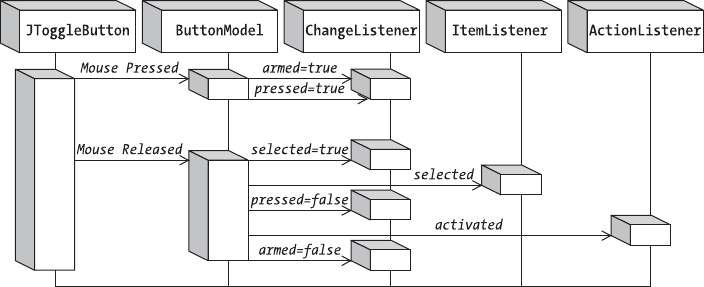
122 CHAPTER 5 ■ TOGGLE BUTTONS
ItemListener itemListener = new ItemListener() {
public void itemStateChanged(ItemEvent itemEvent) {
int state = itemEvent.getStateChange();
if (state == ItemEvent.SELECTED) {
System.out.println("Selected");
} else {
System.out.println("Deselected");
}
}
};
Listening to JToggleButton Events with a ChangeListener
Attaching a ChangeListener to a JToggleButton provides even more flexibility. Any attached
listener will be notified of the data model changes for the button, corresponding to changes in
its armed,pressed, and selected properties. Listening for notification from the three listeners—
ActionListener,ItemListener, and ChangeListener—allows you to react seven different times.
Figure 5-3 shows the sequencing of the ButtonModel property changes, and when the model
notifies each of the listeners.
Figure 5-3. JToggleButton notification sequencing diagram
To demonstrate the ChangeListener notifications, the following code fragment defines a
ChangeListener that reports the state changes to the three properties of the button model:
ChangeListener changeListener = new ChangeListener() {
public void stateChanged(ChangeEvent changeEvent) {
AbstractButton abstractButton = (AbstractButton)changeEvent.getSource();
ButtonModel buttonModel = abstractButton.getModel();
boolean armed = buttonModel.isArmed();
boolean pressed = buttonModel.isPressed();
boolean selected = buttonModel.isSelected();
System.out.println("Changed: " + armed + "/" + pressed + "/" + selected);
}
};
CHAPTER 5 ■ TOGGLE BUTTONS 123
After you attach the ChangeListener to a JToggleButton and select the component by
pressing and releasing the mouse over the component, the following output results:
Changed: true/false/false
Changed: true/true/false
Changed: true/true/true
Changed: true/false/true
Changed: false/false/true
With all three listeners attached to the same button, notification of registered ItemListener
objects would happen after the selected property changes—in other words, between lines 3
and 4. Listing 5-2 demonstrates all three listeners attached to the same JToggleButton. With
regard to the registered ActionListener objects, notification happens after releasing the button,
but before the armed state changes to false, falling between lines 4 and 5.
Listing 5-2. Listening for Toggle Selection
import javax.swing.*;
import javax.swing.event.*;
import java.awt.*;
import java.awt.event.*;
public class SelectingToggle {
public static void main(String args[]) {
Runnable runner = new Runnable() {
public void run() {
JFrame frame = new JFrame("Selecting Toggle");
frame.setDefaultCloseOperation(JFrame.EXIT_ON_CLOSE);
JToggleButton toggleButton = new JToggleButton("Toggle Button");
// Define ActionListener
ActionListener actionListener = new ActionListener() {
public void actionPerformed(ActionEvent actionEvent) {
AbstractButton abstractButton = (AbstractButton)actionEvent.getSource();
boolean selected = abstractButton.getModel().isSelected();
System.out.println("Action - selected=" + selected + "\n");
}
};
// Define ChangeListener
ChangeListener changeListener = new ChangeListener() {
public void stateChanged(ChangeEvent changeEvent) {
AbstractButton abstractButton = (AbstractButton)changeEvent.getSource();
ButtonModel buttonModel = abstractButton.getModel();
boolean armed = buttonModel.isArmed();
boolean pressed = buttonModel.isPressed();
boolean selected = buttonModel.isSelected();
System.out.println("Changed: " + armed + "/" + pressed + "/" +
selected);
}
};
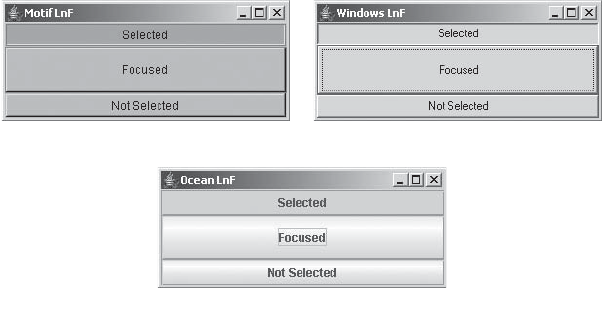
124 CHAPTER 5 ■ TOGGLE BUTTONS
// Define ItemListener
ItemListener itemListener = new ItemListener() {
public void itemStateChanged(ItemEvent itemEvent) {
int state = itemEvent.getStateChange();
if (state == ItemEvent.SELECTED) {
System.out.println("Selected");
} else {
System.out.println("Deselected");
}
}
};
// Attach Listeners
toggleButton.addActionListener(actionListener);
toggleButton.addChangeListener(changeListener);
toggleButton.addItemListener(itemListener);
frame.add(toggleButton, BorderLayout.NORTH);
frame.setSize(300, 125);
frame.setVisible(true);
}
};
EventQueue.invokeLater(runner);
}
}
Customizing a JToggleButton Look and Feel
Each installable Swing look and feel provides a different JToggleButton appearance and set of
default UIResource values. Figure 5-4 shows the appearance of the JToggleButton component
for the preinstalled set of look and feel types: Motif, Windows, and Ocean. As the button labels
might indicate, the first button is selected, the second has the input focus (and isn’t selected),
and the third button isn’t selected.
Figure 5-4. JToggleButton under different look and feel types
-OTIF
/CEAN
7INDOWS

CHAPTER 5 ■ TOGGLE BUTTONS 125
The available set of UIResource-related properties for a JToggleButton is shown in Table 5-2.
The JToggleButton component has 17 different properties.
JCheckBox Class
The JCheckBox class represents the toggle component that, by default, displays a check box
icon next to the text label for a two-state option. The check box icon uses an optional check
mark to show the current state of the object, instead of keeping the button depressed, as with
the JToggleButton. With the JCheckBox, the icon shows the state of the object, whereas with the
JToggleButton, the icon is part of the label and isn’t usually used to show state information.
With the exception of the UI-related differences between JCheckBox and JToggleButton, the
two components are identical. Figure 5-5 demonstrates how check box components might
appear in a pizza-ordering application.
Table 5-2. JToggleButton UIResource Elements
Property String Object Type
ToggleButton.background Color
ToggleButton.border Border
ToggleButton.darkShadow Color
ToggleButton.disabledText Color
ToggleButton.focus Color
ToggleButton.focusInputMap Object[ ]
ToggleButton.font Font
ToggleButton.foreground Color
ToggleButton.gradient List
ToggleButton.highlight Color
ToggleButton.light Color
ToggleButton.margin Insets
ToggleButton.select Color
ToggleButton.shadow Color
ToggleButton.textIconGap Integer
ToggleButton.textShiftOffset Integer
ToggleButtonUI String
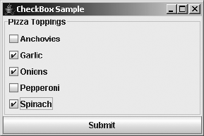
126 CHAPTER 5 ■ TOGGLE BUTTONS
Figure 5-5. Sample JCheckBox components
The JCheckBox is made up of several pieces. Like JToggleButton, the JCheckBox uses a
ToggleButtonModel to represent its data model. The user interface delegate is CheckBoxUI.
Although the ButtonGroup is available to group together check boxes, it isn’t normally appropriate.
When multiple JCheckBox components are within a ButtonGroup, they behave like JRadioButton
components but look like JCheckBox components. Because of this visual irregularity, you
shouldn’t put JCheckBox components into a ButtonGroup.
Now that you’ve seen the different pieces of a JCheckBox, let’s find out how to use them.
Creating JCheckBox Components
Eight constructors exist for JCheckBox:
public JCheckBox()
JCheckBox aCheckBox = new JCheckBox();
public JCheckBox(Icon icon)
JCheckBox aCheckBox = new JCheckBox(new DiamondIcon(Color.RED, false));
aCheckBox.setSelectedIcon(new DiamondIcon(Color.PINK, true));
public JCheckBox(Icon icon, boolean selected)
JCheckBox aCheckBox = new JCheckBox(new DiamondIcon(Color.RED, false), true);
aCheckBox.setSelectedIcon(new DiamondIcon(Color.PINK, true));
public JCheckBox(String text)
JCheckBox aCheckBox = new JCheckBox("Spinach");
public JCheckBox(String text, boolean selected)
JCheckBox aCheckBox = new JCheckBox("Onions", true);
public JCheckBox(String text, Icon icon)
JCheckBox aCheckBox = new JCheckBox("Garlic", new DiamondIcon(Color.RED, false));
aCheckBox.setSelectedIcon(new DiamondIcon(Color.PINK, true));
CHAPTER 5 ■ TOGGLE BUTTONS 127
public JCheckBox(String text, Icon icon, boolean selected)
JCheckBox aCheckBox = new JCheckBox("Anchovies", new DiamondIcon(Color.RED,
false), true);
aCheckBox.setSelectedIcon(new DiamondIcon(Color.PINK, true));
public JCheckBox(Action action)
Action action = ...;
JCheckBox aCheckBox = new JCheckBox(action);
■Note Configuring a JCheckBox from an Action sets the label, state, and tooltip text, but not the icon.
Each allows you to customize either none or up to three properties for the label, icon, or
initial selection state. Unless specified otherwise, there’s no text in the label and the default
selected/unselected icon for the check box appears unselected.
If you do initialize the icon in the constructor, it’s the icon for the unselected state of the
check box, with the same icon displayed when the check box is selected. You must also either
initialize the selected icon with the setSelectedIcon(Icon newValue) method, described later,
or make sure the icon is state-aware and updates itself. If you don’t configure the selected icon
and don’t use a state-aware icon, the same icon will appear for both the selected and unselected
state. Normally, an icon that doesn’t change its visual appearance between selected and unse-
lected states isn’t desirable for a JCheckBox.
■Note A state-aware icon is one that asks the associated component for the value of the selected
property.
JCheckBox Properties
After creating a JCheckBox, you can modify each of its many properties. Two properties specific
to JCheckBox (shown in Table 5-3) override the behavior of its parent JToggleButton. The third
borderPaintedFlat property was introduced in the 1.3 release of the JDK. All the remaining
properties are inherited through parents of JToggleButton.
Table 5-3. JCheckBox Properties
Property Name Data Type Access
accessibleContext AccessibleContext Read-only
borderPaintedFlat boolean Read-write bound
UIClassID String Read-only
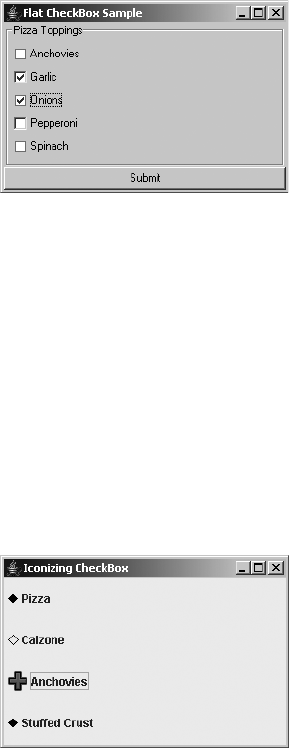
128 CHAPTER 5 ■ TOGGLE BUTTONS
The borderPaintedFlat property permits a look and feel to display the border around
the check icon as two-dimensional (flat) instead of three-dimensional. By default, the
borderPaintedFlat property is false, meaning the border will be three-dimensional. Figure 5-6
shows what a flat border looks like, where the first, third, and fifth borders are flat, and the
second and fourth are not. A look and feel may choose to ignore this property. However, it is
useful for renderers for components such tables and trees, where they show only state and are
not selectable. The Windows and Motif look and feel types take advantage of the property;
Metal (and Ocean) does not.
Figure 5-6. Alternating flat JCheckBox borders for the Windows look and feel: Anchovies, Onions,
and Spinach are flat; Garlic and Pepperoni are not.
As the constructor listing demonstrated, if you choose to set an icon with a constructor,
the constructor sets only one icon for the unselected state. If you want the check box icon to
show the correct state visually, you must use a state-aware icon or associate a different icon for
the selected state with setSelectedIcon(). Having two different visual state representations is
what most users expect from a JCheckBox, so unless you have a good reason to do otherwise, it’s
best to follow the design convention for normal user interfaces.
The fourth button at the bottom of the screen shown in Figure 5-7 demonstrates confusing
icon usage within a JCheckBox. The check box always appears selected. The figure displays what
the screen looks like with Pizza selected, Calzone unselected, Anchovies unselected, and Stuffed
Crust unselected (although the last one appears selected).
Figure 5-7. Multiple JCheckBox components with various icons
CHAPTER 5 ■ TOGGLE BUTTONS 129
Listing 5-3 demonstrates three valid means of creating JCheckBox components with
different icons, one using a state-aware icon. The last check box shows bad icon usage.
Listing 5-3. Sampling JCheckBox
import javax.swing.*;
import java.awt.*;
import java.awt.event.*;
public class IconCheckBoxSample {
private static class CheckBoxIcon implements Icon {
private ImageIcon checkedIcon = new ImageIcon("Plus.gif");
private ImageIcon uncheckedIcon = new ImageIcon("Minus.gif");
public void paintIcon(Component component, Graphics g, int x, int y) {
AbstractButton abstractButton = (AbstractButton)component;
ButtonModel buttonModel = abstractButton.getModel();
g.translate(x,y);
ImageIcon imageIcon = buttonModel.isSelected() ?
checkedIcon : uncheckedIcon;
Image image = imageIcon.getImage();
g.drawImage(image, 0, 0, component);
g.translate(-x,-y);
}
public int getIconWidth() {
return 20;
}
public int getIconHeight() {
return 20;
}
}
public static void main(String args[]) {
Runnable runner = new Runnable() {
public void run() {
JFrame frame = new JFrame("Iconizing CheckBox");
frame.setDefaultCloseOperation(JFrame.EXIT_ON_CLOSE);
Icon checked = new DiamondIcon (Color.BLACK, true);
Icon unchecked = new DiamondIcon (Color.BLACK, false);
JCheckBox aCheckBox1 = new JCheckBox("Pizza", unchecked);
aCheckBox1.setSelectedIcon(checked);
JCheckBox aCheckBox2 = new JCheckBox("Calzone");
aCheckBox2.setIcon(unchecked);
aCheckBox2.setSelectedIcon(checked);
130 CHAPTER 5 ■ TOGGLE BUTTONS
Icon checkBoxIcon = new CheckBoxIcon();
JCheckBox aCheckBox3 = new JCheckBox("Anchovies", checkBoxIcon);
JCheckBox aCheckBox4 = new JCheckBox("Stuffed Crust", checked);
frame.setLayout(new GridLayout(0,1));
frame.add(aCheckBox1);
frame.add(aCheckBox2);
frame.add(aCheckBox3);
frame.add(aCheckBox4);
frame.setSize(300, 200);
frame.setVisible(true);
}
};
EventQueue.invokeLater(runner);
}
}
Handling JCheckBox Selection Events
As with the JToggleButton, you can handle JCheckBox events in any one of three ways: with an
ActionListener, an ItemListener, or a ChangeListener. The constructor that accepts an Action
just adds the parameter as an ActionListener.
Listening to JCheckBox Events with an ActionListener
Subscribing to ActionEvent generation with an ActionListener allows you to find out when the
user toggles the state of the JCheckBox. As with JToggleButton, the subscribed listener is told of
the selection, but not the new state. To find out the selected state, you must get the model for the
event source and ask, as the following sample ActionListener source shows. This listener
modifies the check box label to reflect the selection state.
ActionListener actionListener = new ActionListener() {
public void actionPerformed(ActionEvent actionEvent) {
AbstractButton abstractButton = (AbstractButton)actionEvent.getSource();
boolean selected = abstractButton.getModel().isSelected();
String newLabel = (selected ? SELECTED_LABEL : DESELECTED_LABEL);
abstractButton.setText(newLabel);
}
};
Listening to JCheckBox Events with an ItemListener
For JCheckBox, as with JToggleButton, the better listener to subscribe to is an ItemListener. The
ItemEvent passed to the itemStateChanged() method of ItemListener includes the current
state of the check box. This allows you to respond appropriately, without need to find out the
current button state.
To demonstrate, the following ItemListener swaps the foreground and background colors
based on the state of a selected component. In this ItemListener, the foreground and back-
ground colors are swapped only when the state is selected.

CHAPTER 5 ■ TOGGLE BUTTONS 131
ItemListener itemListener = new ItemListener() {
public void itemStateChanged(ItemEvent itemEvent) {
AbstractButton abstractButton = (AbstractButton)itemEvent.getSource();
Color foreground = abstractButton.getForeground();
Color background = abstractButton.getBackground();
int state = itemEvent.getStateChange();
if (state == ItemEvent.SELECTED) {
abstractButton.setForeground(background);
abstractButton.setBackground(foreground);
}
}
};
Listening to JCheckBox Events with a ChangeListener
The ChangeListener responds to the JCheckBox just as with the JToggleButton. A subscribed
ChangeListener would be notified when the button is armed, pressed, selected, or released.
In addition, the ChangeListener is also notified of changes to the ButtonModel, such as for the
keyboard mnemonic (KeyEvent.VK_S) of the check box. Because there are no ChangeListener
differences to demonstrate between a JToggleButton and a JCheckBox, you could just attach the
same listener from JToggleButton to the JCheckBox, and you’ll get the same selection responses.
The sample program in Listing 5-4 demonstrates all the listeners subscribed to the events
of a single JCheckBox. To demonstrate that the ChangeListener is notified of changes to other
button model properties, a keyboard mnemonic is associated with the component. Given that
the ChangeListener is registered before the mnemonic property is changed, the ChangeListener
is notified of the property change. Because the foreground and background colors and text
label aren’t button model properties, the ChangeListener isn’t told of these changes made by
the other listeners.
■Note If you did want to listen for changes to the foreground or background color properties, you would
need to attach a PropertyChangeListener to the JCheckBox.
Listing 5-4. Listening for JCheckBox Selection
import javax.swing.*;
import javax.swing.event.*;
import java.awt.*;
import java.awt.event.*;
public class SelectingCheckBox {
private static String DESELECTED_LABEL = "Deselected";
private static String SELECTED_LABEL = "Selected";
132 CHAPTER 5 ■ TOGGLE BUTTONS
public static void main(String args[]) {
Runnable runner = new Runnable() {
public void run() {
JFrame frame = new JFrame("Selecting CheckBox");
frame.setDefaultCloseOperation(JFrame.EXIT_ON_CLOSE);
JCheckBox checkBox = new JCheckBox(DESELECTED_LABEL);
// Define ActionListener
ActionListener actionListener = new ActionListener() {
public void actionPerformed(ActionEvent actionEvent) {
AbstractButton abstractButton =
(AbstractButton)actionEvent.getSource();
boolean selected = abstractButton.getModel().isSelected();
String newLabel = (selected ? SELECTED_LABEL : DESELECTED_LABEL);
abstractButton.setText(newLabel);
}
};
// Define ChangeListener
ChangeListener changeListener = new ChangeListener() {
public void stateChanged(ChangeEvent changeEvent) {
AbstractButton abstractButton =
(AbstractButton)changeEvent.getSource();
ButtonModel buttonModel = abstractButton.getModel();
boolean armed = buttonModel.isArmed();
boolean pressed = buttonModel.isPressed();
boolean selected = buttonModel.isSelected();
System.out.println("Changed: " + armed + "/" + pressed + "/" +
selected);
}
};
// Define ItemListener
ItemListener itemListener = new ItemListener() {
public void itemStateChanged(ItemEvent itemEvent) {
AbstractButton abstractButton =
(AbstractButton)itemEvent.getSource();
Color foreground = abstractButton.getForeground();
Color background = abstractButton.getBackground();
int state = itemEvent.getStateChange();
if (state == ItemEvent.SELECTED) {
abstractButton.setForeground(background);
abstractButton.setBackground(foreground);
}
}
};
// Attach Listeners
checkBox.addActionListener(actionListener);
checkBox.addChangeListener(changeListener);
checkBox.addItemListener(itemListener);
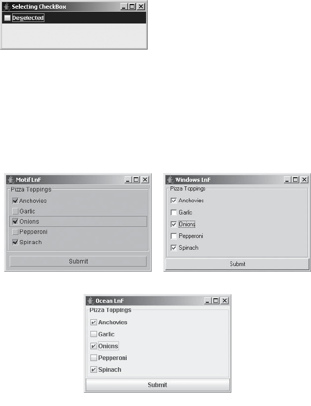
CHAPTER 5 ■ TOGGLE BUTTONS 133
checkBox.setMnemonic(KeyEvent.VK_S);
frame.add(checkBox, BorderLayout.NORTH);
frame.setSize(300, 100);
frame.setVisible(true);
}
};
EventQueue.invokeLater(runner);
}
}
The SelectingCheckBox class produces the screen shown in Figure 5-8, after selecting and
deselecting the JCheckBox.
Figure 5-8. SelectingCheckBox program screen
Customizing a JCheckBox Look and Feel
Each installable Swing look and feel provides a different JCheckBox appearance and set of
default UIResource values. Figure 5-9 shows the appearance of the JCheckBox component for
the preinstalled set of look and feel types: Motif, Windows, and Ocean. The first, third, and fifth
check boxes are selected; the third has the input focus.
Figure 5-9. JCheckBox under different look and feel types
-OTIF
/CEAN
7INDOWS

134 CHAPTER 5 ■ TOGGLE BUTTONS
Table 5-4 shows the set of available UIResource-related properties for a JCheckBox. The
JCheckBox component has 20 different properties.
* Lowercase b is correct.
JRadioButton Class
You use JRadioButton when you want to create a mutually exclusive group of toggleable
components. Although, technically speaking, you could place a group of JCheckBox components
into a ButtonGroup and only one would be selectable at a time, they wouldn’t look quite right.
At least with the predefined look and feel types, JRadioButton and JCheckBox components look
different, as Figure 5-10 shows. This difference in appearance tells the end user to expect
specific behavior from the components.
Table 5-4. JCheckBox UIResource Elements
Property String Object Type
CheckBox.background Color
CheckBox.border Border
CheckBox.darkShadow Color
CheckBox.disabledText Color
CheckBox.focus Color
CheckBox.focusInputMap Object[ ]
CheckBox.font Font
CheckBox.foreground Color
CheckBox.gradient List
CheckBox.highlight Color
CheckBox.icon Icon
CheckBox.interiorBackground Color
CheckBox.light Color
CheckBox.margin Insets
CheckBox.rollover Boolean
Checkbox.select*Color
CheckBox.shadow Color
CheckBox.textIconGap Integer
CheckBox.textShiftOffset Integer
CheckBoxUI String
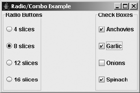
CHAPTER 5 ■ TOGGLE BUTTONS 135
Figure 5-10. Comparing JRadioButton to JCheckBox appearance
The JRadioButton is made up of several pieces. Like JToggleButton and JCheckBox, the
JRadioButton uses a ToggleButtonModel to represent its data model. It uses a ButtonGroup
through AbstractButton to provide the mutually exclusive grouping, and the user interface
delegate is the RadioButtonUI.
Let’s now explore how to use the different pieces of a JRadioButton.
Creating JRadioButton Components
As with JCheckBox and JToggleButton, there are eight constructors for JRadioButton:
public JRadioButton()
JRadioButton aRadioButton = new JRadioButton();
public JRadioButton(Icon icon)
JRadioButton aRadioButton = new JRadioButton(new DiamondIcon(Color.CYAN, false));
aRadioButton.setSelectedIcon(new DiamondIcon(Color.BLUE, true));
public JRadioButton(Icon icon, boolean selected)
JRadioButton aRadioButton = new JRadioButton(new DiamondIcon(Color.CYAN, false),
true);
aRadioButton.setSelectedIcon(new DiamondIcon(Color.BLUE, true));
public JRadioButton(String text)
JRadioButton aRadioButton = new JRadioButton("4 slices");
public JRadioButton(String text, boolean selected)
JRadioButton aRadioButton = new JRadioButton("8 slices", true);
public JRadioButton(String text, Icon icon)
JRadioButton aRadioButton = new JRadioButton("12 slices",
new DiamondIcon(Color.CYAN, false));
aRadioButton.setSelectedIcon(new DiamondIcon(Color.BLUE, true));
public JRadioButton(String text, Icon icon, boolean selected)
JRadioButton aRadioButton = new JRadioButton("16 slices",
new DiamondIcon(Color.CYAN, false), true);
aRadioButton.setSelectedIcon(new DiamondIcon(Color.BLUE, true));
136 CHAPTER 5 ■ TOGGLE BUTTONS
public JRadioButton(Action action)
Action action = ...;
JRadioButton aRadioButton = new JRadioButton(action);
■Note As with a JCheckBox, configuring a JRadioButton from an Action sets the label, state, and
tooltip text, but not the icon.
Each allows you to customize one or more of the label, icon, or initial selection state prop-
erties. Unless specified otherwise, there’s no text in the label, and the default selected/unselected
icon for the check box appears unselected. After creating a group of radio button components,
you need to place each into a single ButtonGroup so that they work as expected, with only
one button in the group selectable at a time. If you do initialize the icon in the constructor,
it’s the icon for the unselected state of the check box, with the same icon displayed when
the check box is selected. You must also either initialize the selected icon with the
setSelectedIcon(Icon newValue) method, described with JCheckBox, or make sure the icon
is state-aware and updates itself.
JRadioButton Properties
JRadioButton has two properties that override the behavior of its parent JToggleButton, as
listed in Table 5-5.
Grouping JRadioButton Components in a ButtonGroup
The JRadioButton is the only JToggleButton subclass that should be placed in a ButtonGroup
in order to work properly. Merely creating a bunch of radio buttons and placing them on the
screen isn’t enough to make them behave appropriately. In addition to adding each radio
button to a container, you need to create a ButtonGroup and add each radio button to the same
ButtonGroup. Once all the JRadioButton items are in a group, whenever an unselected radio
button is selected, the ButtonGroup causes the currently selected radio button to be deselected.
Placing a set of JRadioButton components within a ButtonGroup on the screen is basically
a four-step process:
1. Create a container for the group.
JPanel aPanel = new JPanel(new GridLayout(0, 1));
Table 5-5. JRadioButton Properties
Property Name Data Type Access
accessibleContext AccessibleContext Read-only
UIClassID String Read-only

CHAPTER 5 ■ TOGGLE BUTTONS 137
■Note The Box class described in Chapter 11 serves as a good container for a group of JRadioButton
components.
2. Place a border around the container, to label the grouping. This is an optional step, but
you’ll frequently want to add a border to label the group for the user. You can read more
about borders in Chapter 7.
Border border = BorderFactory.createTitledBorder("Slice Count");
aPanel.setBorder(border);
3. Create a ButtonGroup.
ButtonGroup aGroup = new ButtonGroup();
4. For each selectable option, create a JRadioButton, add it to a container, and then add it
to the group.
JRadioButton aRadioButton = new JRadioButton(...);
aPanel.add(aRadioButton);
aGroup.add(aRadioButton);
You might find the whole process, especially the fourth step, a bit tedious after a while,
especially when you add another step for handling selection events. The helper class shown
in Listing 5-5, with its static createRadioButtonGrouping(String elements[], String title)
method, could prove useful. It takes a String array for the radio button labels as well as the
border title, and then it creates a set of JRadioButton objects with a common ButtonGroup in a
JPanel with a titled border.
Listing 5-5. Initial Support Class for Working with JRadioButton
import javax.swing.*;
import javax.swing.border.*;
import java.awt.*;
public class RadioButtonUtils {
private RadioButtonUtils() {
// Private constructor so you can't create instances
}
public static Container createRadioButtonGrouping (String elements[],
String title) {
JPanel panel = new JPanel(new GridLayout(0, 1));
// If title set, create titled border
if (title != null) {
Border border = BorderFactory.createTitledBorder(title);
panel.setBorder(border);
}
138 CHAPTER 5 ■ TOGGLE BUTTONS
// Create group
ButtonGroup group = new ButtonGroup();
JRadioButton aRadioButton;
// For each String passed in:
// Create button, add to panel, and add to group
for (int i=0, n=elements.length; i<n; i++) {
aRadioButton = new JRadioButton(elements[i]);
panel.add(aRadioButton);
group.add(aRadioButton);
}
return panel;
}
}
Now, you can create the grouping much more easily, as with the sample program in
Listing 5-6.
Listing 5-6. Sampling JRadioButton
import javax.swing.*;
import java.awt.*;
public class GroupRadio {
private static final String sliceOptions[] =
{"4 slices", "8 slices", "12 slices", "16 slices"};
private static final String crustOptions[] =
{"Sicilian", "Thin Crust", "Thick Crust", "Stuffed Crust"};
public static void main(String args[]) {
Runnable runner = new Runnable() {
public void run() {
JFrame frame = new JFrame("Grouping Example");
frame.setDefaultCloseOperation(JFrame.EXIT_ON_CLOSE);
Container sliceContainer =
RadioButtonUtils.createRadioButtonGrouping(
sliceOptions, "Slice Count");
Container crustContainer =
RadioButtonUtils.createRadioButtonGrouping(
crustOptions, "Crust Type");
frame.add(sliceContainer, BorderLayout.WEST);
frame.add(crustContainer, BorderLayout.EAST);
frame.setSize(300, 200);
frame.setVisible(true);
}
};
EventQueue.invokeLater(runner);
}
}
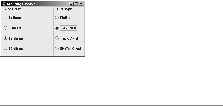
CHAPTER 5 ■ TOGGLE BUTTONS 139
When you run this example, you’ll see the screen shown in Figure 5-11.
Figure 5-11. Grouping JRadioButton components with the RadioButtonUtils helper class
■Note If you’re familiar with the standard AWT library, the JRadioButton/ButtonGroup combination
works exactly like the Checkbox/CheckboxGroup pair.
Handling JRadioButton Selection Events
Like JToggleButton and JCheckBox,JRadioButton supports the registration of an ActionListener,
an ItemListener, and a ChangeListener. And again, their usage with JRadioButton is somewhat
different than with the other components.
Listening to JRadioButton Events with an ActionListener
With a JRadioButton, it’s common to attach the same ActionListener to all the radio buttons in
aButtonGroup. That way, when one of the radio buttons is selected, the subscribed ActionListener
will be notified. By overloading the earlier createRadioButtonGrouping() method, the method
can accept an ActionListener argument and attach the listener object to each of the buttons as
they’re created.
public static Container createRadioButtonGrouping (String elements[], String title,
ActionListener actionListener) {
JPanel panel = new JPanel(new GridLayout(0, 1));
// If title set, create titled border
if (title != null) {
Border border = BorderFactory.createTitledBorder(title);
panel.setBorder(border);
}
// Create group
ButtonGroup group = new ButtonGroup();
JRadioButton aRadioButton;
// For each String passed in:
// Create button, add to panel, and add to group
140 CHAPTER 5 ■ TOGGLE BUTTONS
for (int i=0, n=elements.length; i<n; i++) {
aRadioButton = new JRadioButton (elements[i]);
panel.add(aRadioButton);
group.add(aRadioButton);
if (actionListener != null) {
aRadioButton.addActionListener(actionListener);
}
}
return panel;
}
Now if a group is created with the following source, the same ActionListener will be notified
for each of the JRadioButton components created. Here, the listener prints out only the currently
selected value. How you choose to respond may vary.
ActionListener sliceActionListener = new ActionListener() {
public void actionPerformed(ActionEvent actionEvent) {
AbstractButton aButton = (AbstractButton)actionEvent.getSource();
System.out.println("Selected: " + aButton.getText());
}
};
Container sliceContainer =
RadioButtonUtils.createRadioButtonGrouping(sliceOptions, "Slice Count",
sliceActionListener);
However, note that there are two problems with this approach. First, if a JRadioButton is
already selected and then selected again, any attached ActionListener objects will still be notified
once more. Although you cannot stop the double notification of subscribed ActionListener
objects, with a little work, you can handle it properly. You need to retain a reference to the last
selected item and check for reselection. The following modified ActionListener checks for this:
ActionListener crustActionListener = new ActionListener() {
String lastSelected;
public void actionPerformed(ActionEvent actionEvent) {
AbstractButton aButton = (AbstractButton)actionEvent.getSource();
String label = aButton.getText();
String msgStart;
if (label.equals(lastSelected)) {
msgStart = "Reselected: ";
} else {
msgStart = "Selected: ";
}
lastSelected = label;
System.out.println(msgStart + label);
}
};
The second problem has to do with determining which JRadioButton is selected at any
given time. With the overloaded RadioButtonUtils.createRadioButtonGrouping() helper methods,
neither the ButtonGroup nor the individual JRadioButton components are visible outside the
CHAPTER 5 ■ TOGGLE BUTTONS 141
method. As a result, there’s no direct route to find out which JRadioButton object (or objects) is
selected within the ButtonGroup of the returned container. This may be necessary, for example,
if there were an Order Pizza button on the screen and you wanted to find out which pizza-order
options were selected after the user clicked that button.
The following helper method, public Enumeration getSelectedElements(Container
container), when added to the previously created RadioButtonUtils class (Listing 5-5), will
provide the necessary answer. The helper method will work only if the container passed into
the method is full of AbstractButton objects. This is true for those containers created with the
previously described createRadioButtonGrouping() methods, although the getSelectedElements()
method can be used separately.
public static Enumeration<String> getSelectedElements(Container container) {
Vector<String> selections = new Vector<String>();
Component components[] = container.getComponents();
for (int i=0, n=components.length; i<n; i++) {
if (components[i] instanceof AbstractButton) {
AbstractButton button = (AbstractButton)components[i];
if (button.isSelected()) {
selections.addElement(button.getText());
}
}
}
return selections.elements();
}
To use the getSelectedElements() method, you just need to pass the container returned
from createRadioButtonGrouping() to the getSelectedElements() method to get an Enumeration of
the selected items as String objects. The following example demonstrates this.
final Container crustContainer =
RadioButtonUtils.createRadioButtonGrouping(crustOptions, "Crust Type");
ActionListener buttonActionListener = new ActionListener() {
public void actionPerformed(ActionEvent actionEvent) {
Enumeration selected = RadioButtonUtils.getSelectedElements(crustContainer);
while (selected.hasMoreElements()) {
System.out.println ("Selected -> " + selected.nextElement());
}
}
};
JButton button = new JButton ("Order Pizza");
button.addActionListener(buttonActionListener);
It may be necessary for getSelectedElements() to return more than one value, because if
the same ButtonModel is shared by multiple buttons in the container, multiple components of the
ButtonGroup will be selected. Sharing a ButtonModel between components isn’t the norm. If
you’re sure your button model won’t be shared, then you may want to provide a similar
method that returns only a String.
142 CHAPTER 5 ■ TOGGLE BUTTONS
Listening to JRadioButton Events with an ItemListener
Depending on what you’re trying to do, using an ItemListener with a JRadioButton is usually
not the desired event-listening approach. When an ItemListener is registered, a new JRadioButton
selection notifies the listener twice: once for deselecting the old value and once for selecting
the new value. For reselections (selecting the same choice again), the listener is notified only once.
To demonstrate, the following listener will detect reselections, as the ActionListener did
earlier, and will report the selected (or deselected) element.
ItemListener itemListener = new ItemListener() {
String lastSelected;
public void itemStateChanged(ItemEvent itemEvent) {
AbstractButton aButton = (AbstractButton)itemEvent.getSource();
int state = itemEvent.getStateChange();
String label = aButton.getText();
String msgStart;
if (state == ItemEvent.SELECTED) {
if (label.equals(lastSelected)) {
msgStart = "Reselected -> ";
} else {
msgStart = "Selected -> ";
}
lastSelected = label;
} else {
msgStart = "Deselected -> ";
}
System.out.println(msgStart + label);
}
};
To work properly, some new methods will be needed for RadioButtonUtils to enable you
to attach the ItemListener to each JRadioButton in the ButtonGroup. They’re listed in the
following section with the source for the complete example.
Listening to JRadioButton Events with a ChangeListener
The ChangeListener responds to the JRadioButton just as it does with the JToggleButton and
JCheckBox. A subscribed listener is notified when the selected radio button is armed, pressed,
selected, or released and for various other properties of the button model. The only difference
with JRadioButton is that the ChangeListener is also notified of the state changes of the radio
button being deselected. The ChangeListener from the earlier examples could be attached to
the JRadioButton as well. It will just be notified more frequently.
The sample program shown in Listing 5-7 demonstrates all the listeners registered to the
events of two different JRadioButton objects. In addition, a JButton reports on the selected
elements of one of the radio buttons. Figure 5-12 shows the main window of the program.
CHAPTER 5 ■ TOGGLE BUTTONS 143
Listing 5-7. Radio Button Group Sample
import javax.swing.*;
import javax.swing.event.*;
import java.awt.*;
import java.awt.event.*;
import java.util.Enumeration;
public class GroupActionRadio {
private static final String sliceOptions[] =
{"4 slices", "8 slices", "12 slices", "16 slices"};
private static final String crustOptions[] =
{"Sicilian", "Thin Crust", "Thick Crust", "Stuffed Crust"};
public static void main(String args[]) {
Runnable runner = new Runnable() {
public void run() {
JFrame frame = new JFrame("Grouping Example");
frame.setDefaultCloseOperation(JFrame.EXIT_ON_CLOSE);
// Slice Parts
ActionListener sliceActionListener = new ActionListener() {
public void actionPerformed(ActionEvent actionEvent) {
AbstractButton aButton = (AbstractButton)actionEvent.getSource();
System.out.println("Selected: " + aButton.getText());
}
};
Container sliceContainer =
RadioButtonUtils.createRadioButtonGrouping(sliceOptions,
"Slice Count", sliceActionListener);
// Crust Parts
ActionListener crustActionListener = new ActionListener() {
String lastSelected;
public void actionPerformed(ActionEvent actionEvent) {
AbstractButton aButton = (AbstractButton)actionEvent.getSource();
String label = aButton.getText();
String msgStart;
if (label.equals(lastSelected)) {
msgStart = "Reselected: ";
} else {
msgStart = "Selected: ";
}
lastSelected = label;
System.out.println(msgStart + label);
}
};
144 CHAPTER 5 ■ TOGGLE BUTTONS
ItemListener itemListener = new ItemListener() {
String lastSelected;
public void itemStateChanged(ItemEvent itemEvent) {
AbstractButton aButton = (AbstractButton)itemEvent.getSource();
int state = itemEvent.getStateChange();
String label = aButton.getText();
String msgStart;
if (state == ItemEvent.SELECTED) {
if (label.equals(lastSelected)) {
msgStart = "Reselected -> ";
} else {
msgStart = "Selected -> ";
}
lastSelected = label;
} else {
msgStart = "Deselected -> ";
}
System.out.println(msgStart + label);
}
};
ChangeListener changeListener = new ChangeListener() {
public void stateChanged(ChangeEvent changEvent) {
AbstractButton aButton = (AbstractButton)changEvent.getSource();
ButtonModel aModel = aButton.getModel();
boolean armed = aModel.isArmed();
boolean pressed = aModel.isPressed();
boolean selected = aModel.isSelected();
System.out.println("Changed: " + armed + "/" + pressed + "/" +
selected);
}
};
final Container crustContainer =
RadioButtonUtils.createRadioButtonGrouping(crustOptions,
"Crust Type", crustActionListener, itemListener, changeListener);
// Button Parts
ActionListener buttonActionListener = new ActionListener() {
public void actionPerformed(ActionEvent actionEvent) {
Enumeration<String> selected =
RadioButtonUtils.getSelectedElements(crustContainer);
while (selected.hasMoreElements()) {
System.out.println ("Selected -> " + selected.nextElement());
}
}
};

CHAPTER 5 ■ TOGGLE BUTTONS 145
JButton button = new JButton ("Order Pizza");
button.addActionListener(buttonActionListener);
frame.add(sliceContainer, BorderLayout.WEST);
frame.add(crustContainer, BorderLayout.EAST);
frame.add(button, BorderLayout.SOUTH);
frame.setSize(300, 200);
frame.setVisible(true);
}
};
EventQueue.invokeLater(runner);
}
}
Figure 5-12. The GroupActionRadio program sample screen
A few more changes were made to the RadioButtonUtils class to deal with registering
ChangeListener objects to all the radio buttons in a ButtonGroup. The complete and final class
definition is shown in Listing 5-8.
Listing 5-8. Complete Support Class for Working with JRadioButton
import javax.swing.*;
import javax.swing.event.*;
import javax.swing.border.*;
import java.awt.*;
import java.awt.event.*;
import java.util.Enumeration;
import java.util.Vector;
public class RadioButtonUtils {
private RadioButtonUtils() {
// Private constructor so you can't create instances
}
146 CHAPTER 5 ■ TOGGLE BUTTONS
public static Enumeration<String> getSelectedElements(Container container) {
Vector<String> selections = new Vector<String>();
Component components[] = container.getComponents();
for (int i=0, n=components.length; i<n; i++) {
if (components[i] instanceof AbstractButton) {
AbstractButton button = (AbstractButton)components[i];
if (button.isSelected()) {
selections.addElement(button.getText());
}
}
}
return selections.elements();
}
public static Container createRadioButtonGrouping (String elements[]) {
return createRadioButtonGrouping(elements, null, null, null, null);
}
public static Container createRadioButtonGrouping (String elements[],
String title) {
return createRadioButtonGrouping(elements, title, null, null, null);
}
public static Container createRadioButtonGrouping(String elements[],
String title, ItemListener itemListener) {
return createRadioButtonGrouping(elements, title, null, itemListener, null);
}
public static Container createRadioButtonGrouping(String elements[],
String title, ActionListener actionListener) {
return createRadioButtonGrouping(elements, title, actionListener, null,
null);
}
public static Container createRadioButtonGrouping(String elements[],
String title, ActionListener actionListener, ItemListener itemListener) {
return createRadioButtonGrouping(elements, title, actionListener,
itemListener, null);
}
public static Container createRadioButtonGrouping(String elements[],
String title, ActionListener actionListener, ItemListener itemListener,
ChangeListener changeListener) {
JPanel panel = new JPanel(new GridLayout(0, 1));
// If title set, create titled border

CHAPTER 5 ■ TOGGLE BUTTONS 147
if (title != null) {
Border border = BorderFactory.createTitledBorder(title);
panel.setBorder(border);
}
// Create group
ButtonGroup group = new ButtonGroup();
JRadioButton aRadioButton;
// For each String passed in:
// Create button, add to panel, and add to group
for (int i=0, n=elements.length; i<n; i++) {
aRadioButton = new JRadioButton (elements[i]);
panel.add(aRadioButton);
group.add(aRadioButton);
if (actionListener != null) {
aRadioButton.addActionListener(actionListener);
}
if (itemListener != null) {
aRadioButton.addItemListener(itemListener);
}
if (changeListener != null) {
aRadioButton.addChangeListener(changeListener);
}
}
return panel;
}
}
■Note One thing not shown here but explained in Chapter 4 in the discussion of ButtonModel and
DefaultButtonModel is how to get the ButtonGroup when given a JRadioButton. If you want to find
the ButtonGroup that a JRadioButton is in, you need to ask the DefaultButtonModel:ButtonGroup
group = ((DefaultButtonModel)aJRadioButton.getModel()).getButtonGroup().
Customizing a JRadioButton Look and Feel
Each installable Swing look and feel provides a different JRadioButton appearance and set of
default UIResource values. Figure 5-13 shows the appearance of the JRadioButton component
for the preinstalled set of look and feel types: Motif, Windows, and Ocean. All three screens
show 4 slices of Thin Crust pizza as the order. In addition, the Thick Crust option has the input
focus.
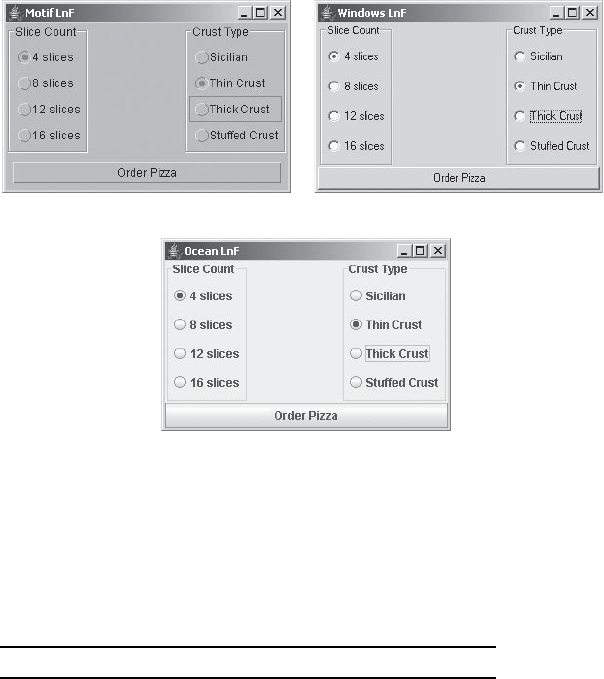
148 CHAPTER 5 ■ TOGGLE BUTTONS
Figure 5-13. JRadioButton under different look and feel types
Table 5-6 shows the set of available UIResource-related properties for a JRadioButton.
The JRadioButton component has 20 different properties available.
Table 5-6. JRadioButton UIResource Elements
Property String Object Type
RadioButton.background Color
RadioButton.border Border
RadioButton.darkShadow Color
RadioButton.disabledText Color
RadioButton.focus Color
RadioButton.focusInputMap Object[ ]
RadioButton.font Font
RadioButton.foreground Color
RadioButton.gradient List
RadioButton.highlight Color
RadioButton.icon Icon
RadioButton.interiorBackground Color
RadioButton.light Color
RadioButton.margin Insets
-OTIF
/CEAN
7INDOWS

CHAPTER 5 ■ TOGGLE BUTTONS 149
Summary
This chapter described the components that can be toggled: JToggleButton,JCheckBox, and
JRadioButton. You’ve seen how each component uses the JToggleButton.ToggleButtonModel
class for its data model and how you can group the components into a ButtonGroup. In addition,
you also saw how to handle selection events for each of the components.
Chapter 6 explains how to work with the various menu-oriented Swing components.
RadioButton.rollover Boolean
RadioButton.select Color
RadioButton.shadow Color
RadioButton.textIconGap Integer
RadioButton.textShiftOffset Integer
RadioButtonUI String
Table 5-6. JRadioButton UIResource Elements (Continued)
Property String Object Type

151
■ ■ ■
CHAPTER 6
Swing Menus and Toolbars
Many of the low-level Swing components were covered in the previous two chapters of this
book. This chapter will delve into Swing’s menu-related components. Menus and toolbars help
make your applications more user-friendly by providing visual command options. Users can
avoid the somewhat archaic multiple-key command sequences that are holdovers from programs
such as the early word processor WordStar and the more current emacs programmer’s editor.
Although Swing menus do support multiple-key command sequences, the menus (and toolbars)
are designed primarily for on-screen graphical selection with a mouse, rather than the keyboard.
The menu components discussed in this chapter are used as follows:
• For each cascading menu, you create a JMenu component and add it to the JMenuBar.
• For the selections available from the JMenu, you create JMenuItem components and add
them to the JMenu.
• To create submenus, you add a new JMenu to a JMenu and place JMenuItem options on the
new menu.
• Then, when a JMenu is selected, the system displays its current set of components within
aJPopupMenu.
In addition to the basic JMenuItem elements, this chapter covers other menu items, such as
JCheckBoxMenuItem and JRadioButtonMenuItem, which you can place within a JMenu. You’ll also
explore the JSeparator class, which serves to divide menu items into logical groups. You’ll find
out how to use the JPopupMenu class for general support of pop-up menus that appear after a
JMenu is selected, or in context for any component. As with abstract buttons (the AbstractButton
class was introduced in Chapter 4), each menu element can have a mnemonic associated with
it for keyboard selection. You’ll also learn about the support for keyboard accelerators, which
allow users to avoid going through all the menuing levels for selection.
Besides the individual menu-related components, in this chapter you’ll look at the JMenuBar
selection model and event-related classes specific to menus. The selection model interface
to examine is the SingleSelectionModel interface, as well as its default implementation
DefaultSingleSelectionModel. You’ll explore the menu-specific listeners and events
MenuListener/MenuEvent,MenuKeyListener/MenuKeyEvent, and MenuDragMouseListener/
MenuDragMouseEvent. In addition, you’ll examine creating other pop-up components with
Popup and PopupFactory, as well as using toolbars with the JToolBar class.

152 CHAPTER 6 ■ SWING MENUS AND TOOLBARS
Working with Menus
Let’s begin with an example that demonstrates how all the menu components fit together.
To start, create a frame with a menu bar, as shown in Figure 6-1.
Figure 6-1. Menu component examples
This simple menuing example has the following features:
• On the menu bar are two ubiquitous menus: File and Edit. Under the File menu, the
familiar options of New, Open, Close, and Exit will appear (although they aren’t shown
in Figure 6-1). Under the Edit menu are options for Cut, Copy, Paste, and Find, and a
submenu of Find options. The Options submenu will contain choices for search direction—
forward or backward—and a toggle for case sensitivity.
• In various places within the different menus, menu separators divide the options into
logical sets.
• Each of the menu options has a mnemonic associated with it to help with keyboard
navigation and selection. The mnemonic allows users to make menu selections via the
keyboard, for instance, by pressing Alt-F on a Windows platform to open the File menu.
• In addition to the keyboard mnemonic, a keystroke associated with several options acts
as a keyboard accelerator. Unlike the mnemonic, the accelerator can directly activate a
menu option, even when the menu option isn’t visible.
• The Options submenu has an icon associated with it. Although only one icon is shown in
Figure 6-1, all menu components can have an icon, except for the JSeparator and
JPopupMenu components.
JMenu
JMenuBar
JRadioButtonMenuIte
m
JSeparator
JCheckBoxMenuItem
JPopupMenu
JMenuItem
Accelerator
Mnemonic
CHAPTER 6 ■ SWING MENUS AND TOOLBARS 153
Note that for this beginning example, none of the menu choices will do anything other
than print which menu choice was selected. For example, selecting the Copy option from the
Edit menu displays Selected: Copy.
Listing 6-1 shows the complete source for the class that generated the example in Figure 6-1.
Listing 6-1. The MenuSample Class Definition
import java.awt.*;
import java.awt.event.*;
import javax.swing.*;
public class MenuSample {
static class MenuActionListener implements ActionListener {
public void actionPerformed (ActionEvent actionEvent) {
System.out.println ("Selected: " + actionEvent.getActionCommand());
}
}
public static void main(final String args[]) {
Runnable runner = new Runnable() {
public void run() {
ActionListener menuListener = new MenuActionListener();
JFrame frame = new JFrame("MenuSample Example");
frame.setDefaultCloseOperation(JFrame.EXIT_ON_CLOSE);
JMenuBar menuBar = new JMenuBar();
// File Menu, F - Mnemonic
JMenu fileMenu = new JMenu("File");
fileMenu.setMnemonic(KeyEvent.VK_F);
menuBar.add(fileMenu);
// File->New, N - Mnemonic
JMenuItem newMenuItem = new JMenuItem("New", KeyEvent.VK_N);
newMenuItem.addActionListener(menuListener);
fileMenu.add(newMenuItem);
// File->Open, O - Mnemonic
JMenuItem openMenuItem = new JMenuItem("Open", KeyEvent.VK_O);
openMenuItem.addActionListener(menuListener);
fileMenu.add(openMenuItem);
// File->Close, C - Mnemonic
JMenuItem closeMenuItem = new JMenuItem("Close", KeyEvent.VK_C);
closeMenuItem.addActionListener(menuListener);
fileMenu.add(closeMenuItem);
154 CHAPTER 6 ■ SWING MENUS AND TOOLBARS
// Separator
fileMenu.addSeparator();
// File->Save, S - Mnemonic
JMenuItem saveMenuItem = new JMenuItem("Save", KeyEvent.VK_S);
saveMenuItem.addActionListener(menuListener);
fileMenu.add(saveMenuItem);
// Separator
fileMenu.addSeparator();
// File->Exit, X - Mnemonic
JMenuItem exitMenuItem = new JMenuItem("Exit", KeyEvent.VK_X);
exitMenuItem.addActionListener(menuListener);
fileMenu.add(exitMenuItem);
// Edit Menu, E - Mnemonic
JMenu editMenu = new JMenu("Edit");
editMenu.setMnemonic(KeyEvent.VK_E);
menuBar.add(editMenu);
// Edit->Cut, T - Mnemonic, CTRL-X - Accelerator
JMenuItem cutMenuItem = new JMenuItem("Cut", KeyEvent.VK_T);
cutMenuItem.addActionListener(menuListener);
KeyStroke ctrlXKeyStroke = KeyStroke.getKeyStroke("control X");
cutMenuItem.setAccelerator(ctrlXKeyStroke);
editMenu.add(cutMenuItem);
// Edit->Copy, C - Mnemonic, CTRL-C - Accelerator
JMenuItem copyMenuItem = new JMenuItem("Copy", KeyEvent.VK_C);
copyMenuItem.addActionListener(menuListener);
KeyStroke ctrlCKeyStroke = KeyStroke.getKeyStroke("control C");
copyMenuItem.setAccelerator(ctrlCKeyStroke);
editMenu.add(copyMenuItem);
// Edit->Paste, P - Mnemonic, CTRL-V - Accelerator, Disabled
JMenuItem pasteMenuItem = new JMenuItem("Paste", KeyEvent.VK_P);
pasteMenuItem.addActionListener(menuListener);
KeyStroke ctrlVKeyStroke = KeyStroke.getKeyStroke("control V");
pasteMenuItem.setAccelerator(ctrlVKeyStroke);
pasteMenuItem.setEnabled(false);
editMenu.add(pasteMenuItem);
// Separator
editMenu.addSeparator();
CHAPTER 6 ■ SWING MENUS AND TOOLBARS 155
// Edit->Find, F - Mnemonic, F3 - Accelerator
JMenuItem findMenuItem = new JMenuItem("Find", KeyEvent.VK_F);
findMenuItem.addActionListener(menuListener);
KeyStroke f3KeyStroke = KeyStroke.getKeyStroke("F3");
findMenuItem.setAccelerator(f3KeyStroke);
editMenu.add(findMenuItem);
// Edit->Options Submenu, O - Mnemonic, at.gif - Icon Image File
JMenu findOptionsMenu = new JMenu("Options");
Icon atIcon = new ImageIcon ("at.gif");
findOptionsMenu.setIcon(atIcon);
findOptionsMenu.setMnemonic(KeyEvent.VK_O);
// ButtonGroup for radio buttons
ButtonGroup directionGroup = new ButtonGroup();
// Edit->Options->Forward, F - Mnemonic, in group
JRadioButtonMenuItem forwardMenuItem =
new JRadioButtonMenuItem("Forward", true);
forwardMenuItem.addActionListener(menuListener);
forwardMenuItem.setMnemonic(KeyEvent.VK_F);
findOptionsMenu.add(forwardMenuItem);
directionGroup.add(forwardMenuItem);
// Edit->Options->Backward, B - Mnemonic, in group
JRadioButtonMenuItem backwardMenuItem =
new JRadioButtonMenuItem("Backward");
backwardMenuItem.addActionListener(menuListener);
backwardMenuItem.setMnemonic(KeyEvent.VK_B);
findOptionsMenu.add(backwardMenuItem);
directionGroup.add(backwardMenuItem);
// Separator
findOptionsMenu.addSeparator();
// Edit->Options->Case Sensitive, C - Mnemonic
JCheckBoxMenuItem caseMenuItem =
new JCheckBoxMenuItem("Case Sensitive");
caseMenuItem.addActionListener(menuListener);
caseMenuItem.setMnemonic(KeyEvent.VK_C);
findOptionsMenu.add(caseMenuItem);
editMenu.add(findOptionsMenu);
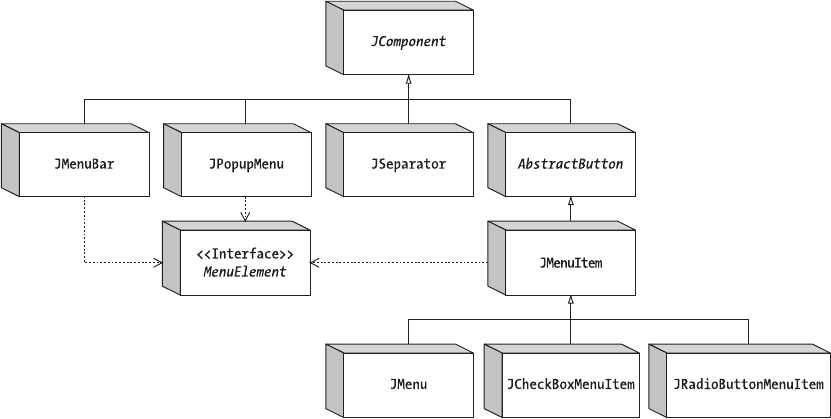
156 CHAPTER 6 ■ SWING MENUS AND TOOLBARS
frame.setJMenuBar(menuBar);
frame.setSize(350, 250);
frame.setVisible(true);
}
};
EventQueue.invokeLater(runner);
}
}
Menu Class Hierarchy
Now that you’ve seen an example of how to create the cascading menus for an application, you
should have an idea of what’s involved in using the Swing menu components. To help clarify,
Figure 6-2 illustrates how all the Swing menu components are interrelated.
Figure 6-2. Swing menu class hierarchy
The most important concept illustrated in Figure 6-2 is that all the Swing menu elements,
as subclasses of JComponent, are AWT components in their own right. You can place JMenuItem,
JMenu, and JMenuBar components anywhere that AWT components can go, not just on a frame.
In addition, because JMenuItem inherits from AbstractButton,JMenuItem and its subclasses
inherit support for various icons and for HTML text labels, as described in Chapter 5.

CHAPTER 6 ■ SWING MENUS AND TOOLBARS 157
■Note Although technically possible, placing menus in locations where users wouldn’t expect them to be
is poor user interface design.
In addition to being part of the basic class hierarchy, each of the selectable menu components
implements the MenuElement interface. The interface describes the menu behavior necessary to
support keyboard and mouse navigation. The predefined menu components already imple-
ment this behavior, so you don’t have to. But if you’re interested in how this interface works,
see the “MenuElement Interface” section later in this chapter.
Now let’s take a look at the different Swing menu components.
JMenuBar Class
Swing’s menu bar component is the JMenuBar. Its operation requires you to fill the menu bar
with JMenu elements that have JMenuItem elements. Then you add the menu bar to a JFrame or
some other user interface component requiring a menu bar. The menu bar then relies on the
assistance of a SingleSelectionModel to determine which JMenu to display or post after it’s selected.
Creating JMenuBar Components
JMenuBar has a single constructor of the no-argument variety: public JMenuBar(). Once you
create the menu bar, you can add it to a window with the setJMenuBar() method of JApplet,
JDialog,JFrame,JInternalFrame, or JRootPane. (Yes, even applets can have menu bars.)
JMenuBar menuBar = new JMenuBar();
// Add items to it
...
JFrame frame = new JFrame("MenuSample Example");
frame.setJMenuBar(menuBar);
With the system-provided look and feel types, the menu bar appears at the top of the
window, below any window title (if present), with setJMenuBar(). Other look and feel types, like
Aqua for the Macintosh, place the menu bar elsewhere.
You can also use the add() method of a Container to add a JMenuBar to a window. When
added with the add() method, a JMenuBar is arranged by the layout manager of the Container.
After you have a JMenuBar, the remaining menu classes all work together to fill the menu bar.
Adding Menus to and Removing Menus from Menu Bars
You need to add JMenu objects to a JMenuBar. Otherwise, the only thing displayed is the border
with nothing in it. There’s a single method for adding menus to a JMenuBar:
public JMenu add(JMenu menu)

158 CHAPTER 6 ■ SWING MENUS AND TOOLBARS
By default, consecutively added menus are displayed from left to right. This makes the first
menu added the leftmost menu and the last menu added the rightmost menu. Menus added in
between are displayed in the order in which they’re added. For instance, in the sample program
from Listing 6-1, the menus were added as follows:
JMenu fileMenu = new JMenu("File");
menuBar.add(fileMenu);
JMenu editMenu = new JMenu("Edit");
menuBar.add(editMenu);
■Note Placing a JMenuBar in the EAST or WEST area of a BorderLayout does not make the menus
appear vertically, stacked one on top of another. You must customize the menu bar if you want menus to
appear this way. See Figure 6-4, later in this chapter, for one implementation of a top-down menu bar.
In addition to the add() method from JMenuBar, several overloaded varieties of the add()
method inherited from Container offer more control over menu positioning. Of particular
interest is the add(Component component, int index) method, which allows you to specify the
position in which the new JMenu is to appear. Using this second variety of add() allows you to
place the File and Edit JMenu components in a JMenuBar in a different order, but with the
same results:
menuBar.add(editMenu);
menuBar.add(fileMenu, 0);
If you’ve added a JMenu component to a JMenuBar, you can remove it with either the
remove(Component component) or remove(int index) method inherited from Container:
bar.remove(edit);
bar.remove(0);
■Tip Adding or removing menus from a menu bar is likely to confuse users. However, sometimes it’s necessary
to do so—especially if you want to have an expert mode that enables a certain functionality that a nonexpert
mode hides. A better approach is to disable/enable individual menu items or entire menus. If you do add or
remove menus, you must then revalidate() the menu bar to display the changes.
JMenuBar Properties
Table 6-1 shows the 11 properties of JMenuBar. Half the properties are read-only, allowing you
only to query the current state of the menu bar. The remaining properties allow you to alter the
appearance of the menu bar by deciding whether the border of the menu bar is painted and
selecting the size of the margin between menu elements. The selected property and selection
model control which menu on the menu bar, if any, is currently selected. When the selected
CHAPTER 6 ■ SWING MENUS AND TOOLBARS 159
component is set to a menu on the menu bar, the menu components appear in a pop-up menu
within a window.
■Caution The helpMenu property, although available with a set-and-get method, is unsupported in the
Swing releases through 5.0. Calling either accessor method will throw an error. With some future release of
Swing, the helpMenu property will likely make a specific JMenu the designated help menu. Exactly what
happens when a menu is flagged as the help menu is specific to the installed look and feel. What tends to
happen is that the menu becomes the last, or rightmost, menu.
■Note The selected property of JMenuBar is nonstandard. The getter method returns a boolean to
indicate if a menu component is selected on the menu bar. The setter method accepts a Component argument
to select a component on the menu bar.
Customizing a JMenuBar Look and Feel
Each predefined Swing look and feel provides a different appearance and set of default UIResource
values for the JMenuBar and each of the menu components. Figure 6-3 shows the appearance
of all these menu components for the preinstalled set of look and feel types: Motif, Windows,
and Ocean.
Table 6-1. JMenuBar Properties
Property Name Data Type Access
accessibleContext AccessibleContext Read-only
borderPainted boolean Read-write
component Component Read-only
helpMenu JMenu Read-write
margin Insets Read-write
menuCount int Read-only
selected boolean/Component Read-write
selectionModel SingleSelectionModel Read-write
subElements MenuElement[ ] Read-only
UI MenuBarUI Read-write
UIClassID String Read-only
160 CHAPTER 6 ■ SWING MENUS AND TOOLBARS
Figure 6-3. Menu components under different look and feel types
In regard to the specific appearance of the JMenuBar, the available set of UIResource-related
properties is shown in Table 6-2. There are 12 properties available for the JMenuBar component.
Table 6-2. JMenuBar UIResource Elements
Property String Object Type
MenuBar.actionMap ActionMap
MenuBar.background Color
MenuBar.border Border
MenuBar.borderColor Color
MenuBar.darkShadow Color
MenuBar.font Font
MenuBar.foreground Color
MenuBar.gradient List
MenuBar.highlight Color
MenuBar.shadow Color
MenuBar.windowBindings Object[ ]
MenuBarUI String
Motif Windows
Ocean
CHAPTER 6 ■ SWING MENUS AND TOOLBARS 161
If you want a vertical menu bar, instead of a horizontal one, simply change the LayoutManager
of the menu bar component. A setup such as a 0 row by 1 column GridLayout does the job, as
shown in the following example, because the number of rows will grow infinitely for each JMenu
added:
import java.awt.*;
import javax.swing.*;
public class VerticalMenuBar extends JMenuBar {
private static final LayoutManager grid = new GridLayout(0,1);
public VerticalMenuBar() {
setLayout(grid);
}
}
Moving the menu bar shown in Figure 6-1 to the east side of a BorderLayout and making it
aVerticalMenuBar instead of a JMenuBar produces the setup shown in Figure 6-4. Although the
vertical menu bar may look a little unconventional here, it’s more desirable to have menu items
appearing stacked vertically, rather than horizontally, on the right (or left) side of a window. You
may, however, want to change the MenuBar.border property to a more appropriate border.
Figure 6-4. Using the VerticalMenuBar
■Note Changing the layout manager of the JMenuBar has one negative side effect: Because top-level menus
are pull-down menus, open menus on a vertical bar will obscure the menu bar. If you want to correct this pop-
up placement behavior, you must extend the JMenu class and override its protected getPopupMenuOrigin()
method in order to make the pop-up menu span out, rather than drop down.
SingleSelectionModel Interface
The SingleSelectionModel interface describes an index into an integer-indexed data structure
where an element can be selected. The data structure behind the interface facade is most likely
an array or vector in which repeatedly accessing the same position is guaranteed to return the
same object. The SingleSelectionModel interface is the selection model for a JMenuBar as well
as a JPopupMenu. In the case of a JMenuBar, the interface describes the currently selected JMenu
that needs to be painted. In the case of a JPopupMenu, the interface describes the currently
selected JMenuItem.

162 CHAPTER 6 ■ SWING MENUS AND TOOLBARS
■Note SingleSelectionModel also serves as the selection model for JTabbedPane, a class described
in Chapter 11.
The interface definition for SingleSelectionModel follows:
public interface SingleSelectionModel {
// Listeners
public void addChangeListener(ChangeListener listener);
public void removeChangeListener(ChangeListener listener);
// Properties
public int getSelectedIndex();
public void setSelectedIndex(int index);
public boolean isSelected();
// Other Methods
public void clearSelection();
}
As you can see, in addition to the selection index, the interface requires maintenance of a
ChangeListener list to be notified when the selection index changes.
The default Swing-provided implementation of SingleSelectionModel is the
DefaultSingleSelectionModel class. For both JMenuBar and JPopupMenu, it’s very unlikely that
you will change their selection model from this default implementation.
The DefaultSingleSelectionModel implementation manages the list of ChangeListener
objects. In addition, the model uses a value of –1 to signify that nothing is currently selected.
When the selected index is –1, isSelected() returns false; otherwise, the method returns true.
When the selected index changes, any registered ChangeListener objects will be notified.
JMenuItem Class
The JMenuItem component is the predefined component that a user selects on a menu bar. As a
subclass of AbstractButton,JMenuItem acts as a specialized button component that behaves
similarly to a JButton. Besides being a subclass of AbstractButton, the JMenuItem class shares
the data model of JButton (ButtonModel interface and DefaultButtonModel implementation).
Creating JMenuItem Components
Six constructors for JMenuItem follow. They allow you to initialize the menu item’s string or icon
label and the mnemonic of the menu item. There’s no explicit constructor permitting you to
set all three options at creation time, unless you make them part of an Action.

CHAPTER 6 ■ SWING MENUS AND TOOLBARS 163
public JMenuItem()
JMenuItem jMenuItem = new JMenuItem();
public JMenuItem(Icon icon)
Icon atIcon = new ImageIcon("at.gif");
JMenuItem jMenuItem = new JMenuItem(atIcon);
public JMenuItem(String text)
JMenuItem jMenuItem = new JMenuItem("Cut");
public JMenuItem(String text, Icon icon)
Icon atIcon = new ImageIcon("at.gif");
JMenuItem jMenuItem = new JMenuItem("Options", atIcon);
public JMenuItem(String text, int mnemonic)
JMenuItem jMenuItem = new JMenuItem("Cut", KeyEvent.VK_T);
public JMenuItem(Action action)
Action action = ...;
JMenuItem jMenuItem = new JMenuItem(action);
The mnemonic allows you to select the menu through keyboard navigation. For instance,
you can simply press Alt-T on a Windows platform to select the Cut menu item if the item
appears on an Edit menu that is already open. The mnemonic for a menu item usually appears
underlined within the text label for the menu. However, if the letter doesn’t appear within the
text label or if there is no text label, the user will have no visual clue as to its setting. Letters are
specified by the different key constants within the java.awt.event.KeyEvent class.
Other platforms might offer other meta-keys for selecting mnemonics. On UNIX, the
meta-key is also an Alt key; on a Macintosh, it’s the Command key.
■Note Adding a JMenuItem with a label of “-” doesn’t create a menu separator as it did with AWT’s
MenuItem.
JMenuItem Properties
The JMenuItem class has many properties. Roughly 100 properties are inherited through its
various superclasses. The 10 properties specific to JMenuItem are shown in Table 6-3.

164 CHAPTER 6 ■ SWING MENUS AND TOOLBARS
One truly interesting property is accelerator. As explained in Chapter 2, KeyStroke is a
factory class that lets you create instances based on key and modifier combinations. For instance,
the following statements, from the example in Listing 6-1 earlier in this chapter, associate Ctrl-X as
the accelerator for one particular menu item:
KeyStroke ctrlXKeyStroke=KeyStroke.getKeyStroke("control X");
cutMenuItem.setAccelerator(ctrlXKeyStroke);
The read-only component and subElements properties are part of the MenuElement interface,
which JMenuItem implements. The component property is the menu item renderer (the JMenuItem
itself). The subElements property is empty (that is, an empty array, not null), because a JMenuItem
has no children.
■Note Swing menus don’t use AWT’s MenuShortcut class.
Handling JMenuItem Events
You can handle events within a JMenuItem in at least five different ways. The component inherits
the ability to allow you to listen for the firing of ChangeEvent and ActionEvent through the
ChangeListener and ActionListener registration methods of AbstractButton. In addition, the
JMenuItem component supports registering MenuKeyListener and MenuDragMouseListener
objects when MenuKeyEvent and MenuDragMouseEvent events happen. These techniques are
discussed in the following sections. A fifth way is to pass an Action to the JMenuItem constructor,
which is like a specialized way of listening with an ActionListener. For more on using Action,
see the discussion of using Action objects with menus, in the “JMenu Class” section a little later
in this chapter.
Table 6-3. JMenuItem Properties
Property Name Data Type Access
accelerator KeyStroke Read-write bound
accessibleContext AccessibleContext Read-only
armed boolean Read-write
component Component Read-only
enabled boolean Write-only bound
menuDragMouseListeners MenuDragMouseListener[ ] Read-only
menuKeyListeners MenuKeyListener[ ] Read-only
subElements MenuElement[ ] Read-only
UI MenuElementUI Write-only bound
UIClassID String Read-only
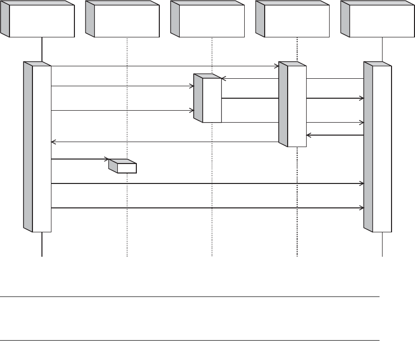
CHAPTER 6 ■ SWING MENUS AND TOOLBARS 165
Listening to JMenuItem Events with a ChangeListener
Normally, you wouldn’t register a ChangeListener with a JMenuItem. However, demonstrating
one hypothetical case helps to clarify the data model changes of the JMenuItem with respect to
its ButtonModel. The changes with regard to arming, pressing, and selecting are the same as
with a JButton. However, their naming might be a little confusing because the selected property of
the model is never set.
AJMenuItem is armed when the mouse passes over the menu choice and it becomes selected.
AJMenuItem is pressed when the user releases the mouse button over it. Immediately after being
pressed, the menu item becomes unpressed and unarmed. Between the menu item being
pressed and unpressed, the AbstractButton is notified of the model changes, causing any regis-
tered ActionListener objects of the menu item to be notified. The button model for a plain
JMenuItem never reports being selected. If you move the mouse to another menu item without
selecting, the first menu item automatically becomes unarmed. To help you better visualize
the different changes, Figure 6-5 shows a sequence diagram.
Figure 6-5. JMenuItem selection sequence diagram
■Note Subclasses of JMenuItem can have their button model selected property set, like a radio button—
but the predefined JMenuItem cannot.
Registers with
JMenuItem
ActionListener
List of
JMenuItem
ChangeListener
List of
JMenuItem
ActionListener
List of
ButtonModel
ButtonModel
Mouse Enters/Menu Selection Changed
Mouse Released
Notifies
Armed
Registers with
Notifies
Pressed
Pressed
No Longer Pressed
No Longer Armed

166 CHAPTER 6 ■ SWING MENUS AND TOOLBARS
Listening to JMenuItem Events with an ActionListener
The better listener to attach to a JMenuItem is the ActionListener, or passing an Action to the
constructor. It allows you to find out when a menu item is selected. Any registered ActionListener
objects would be notified when a user releases the mouse button over a JMenuItem that is part
of an open menu. Registered listeners are also notified if the user employs the keyboard
(whether with arrow keys or mnemonics) or presses the menu item’s keyboard accelerator to
make a selection.
You must add an ActionListener to every JMenuItem for which you want an action to happen
when selected. There’s no automatic shortcut allowing you to register an ActionListener with
aJMenu or JMenuBar and have all their contained JMenuItem objects notify a single ActionListener.
The sample program shown in Listing 6-1 associates the same ActionListener with every
JMenuItem:
class MenuActionListener implements ActionListener {
public void actionPerformed(ActionEvent e) {
System.out.println("Selected: " + e.getActionCommand());
}
}
However, more frequently, you would associate a different action with each item, so that
each menu item can respond differently.
■Tip Instead of creating a custom ActionListener for the component, and adding it as a listener, you
can also create a custom Action and call setAction() on the component.
Listening to JMenuItem Events with a MenuKeyListener
The MenuKeyEvent is a special kind of KeyEvent used internally by the user interface classes for
aJMenu and JMenuItem, allowing the components to listen for when their keyboard mnemonic
is pressed. To listen for this keyboard input, each menu component registers a MenuKeyListener
to pay attention to the appropriate input. If the keyboard mnemonic is pressed, the event is
consumed and not passed to any registered listeners. If the keyboard mnemonic is not pressed,
any registered key listeners (instead of menu key listeners) are notified.
The MenuKeyListener interface definition follows:
public interface MenuKeyListener extends EventListener {
public void menuKeyPressed(MenuKeyEvent e);
public void menuKeyReleased(MenuKeyEvent e);
public void menuKeyTyped(MenuKeyEvent e);
}
Normally, you wouldn’t register objects as this type of listener yourself, although you could
if you wanted to. If you do, and if a MenuKeyEvent happens (that is, a key is pressed/released),
every JMenu on the JMenuBar will be notified, as will every JMenuItem (or subclass) on an open
menu with a registered MenuKeyListener. That includes disabled menu items so that they can
consume a pressed mnemonic. The definition of the MenuKeyEvent class follows:
CHAPTER 6 ■ SWING MENUS AND TOOLBARS 167
public class MenuKeyEvent extends KeyEvent {
public MenuKeyEvent(Component source, int id, long when, int modifiers,
int keyCode, char keyChar, MenuElement path[], MenuSelectionManager mgr);
public MenuSelectionManager getMenuSelectionManager();
public MenuElement[] getPath();
}
It’s the job of the MenuSelectionManager to determine the current selection path. The
selection path is the set of menu elements from the top-level JMenu on the JMenuBar to the
selected components. For the most part, the manager works behind the scenes, and you never
need to worry about it.
Listening to JMenuItem Events with a MenuDragMouseListener
Like MenuKeyEvent, the MenuDragMouseEvent is a special kind of event used internally by the user
interface classes for JMenu and JMenuItem. As its name implies, the MenuDragMouseEvent is a
special kind of MouseEvent. By monitoring when a mouse is moved within an open menu, the
user interface classes use the listener to maintain the selection path, thus determining the
currently selected menu item. Its definition follows:
public interface MenuDragMouseListener extends EventListener {
public void menuDragMouseDragged(MenuDragMouseEvent e);
public void menuDragMouseEntered(MenuDragMouseEvent e);
public void menuDragMouseExited(MenuDragMouseEvent e);
public void menuDragMouseReleased(MenuDragMouseEvent e);
}
As with the MenuKeyListener, normally you don’t listen for this event yourself. If you’re
interested in when a menu or submenu is about to be displayed, the better listener to register
is the MenuListener, which can be registered with the JMenu, but not with an individual JMenuItem.
You’ll look at this in the next section, which describes JMenu.
The definition of the MenuDragMouseEvent class, the argument to each of the
MenuDragMouseListener methods, is as follows:
public class MenuDragMouseEvent extends MouseEvent {
public MenuDragMouseEvent(Component source, int id, long when, int modifiers,
int x, int y, int clickCount, boolean popupTrigger, MenuElement path[],
MenuSelectionManager mgr);
public MenuSelectionManager getMenuSelectionManager();
public MenuElement[] getPath();
}
Customizing a JMenuItem Look and Feel
As with the JMenuBar, the predefined look and feel types each provide a different JMenuItem
appearance and set of default UIResource values. Figure 6-3 showed the appearance of the
JMenuItem component for the preinstalled set: Motif, Windows, and Ocean.
The available set of UIResource-related properties for a JMenuItem are shown in Table 6-4.
The JMenuItem component offers 20 different properties.

168 CHAPTER 6 ■ SWING MENUS AND TOOLBARS
JMenu Class
The JMenu component is the basic menu item container that is placed on a JMenuBar. When a
JMenu is selected, the menu displays the contained menu items within a JPopupMenu. As with
JMenuItem, the data model for the JMenu is an implementation of ButtonModel, or more specifically,
DefaultButtonModel.
Creating JMenu Components
Four constructors for JMenu allow you to initialize the string label of the menu if desired:
Table 6-4. JMenuItem UIResource Elements
Property String Object Type
MenuItem.acceleratorDelimiter String
MenuItem.acceleratorFont Font
MenuItem.acceleratorForeground Color
MenuItem.acceleratorSelectionForeground Color
MenuItem.actionMap ActionMap
MenuItem.arrowIcon Icon
MenuItem.background Color
MenuItem.border Border
MenuItem.borderPainted Boolean
MenuItem.checkIcon Icon
MenuItem.commandSound String
MenuItem.disabledForeground Color
MenuItem.font Font
MenuItem.foreground Color
MenuItem.margin Insets
MenuItem.opaque Boolean
MenuItem.selectionBackground Color
MenuItem.selectionForeground Color
MenuItem.textIconGap Integer
MenuItemUI String

CHAPTER 6 ■ SWING MENUS AND TOOLBARS 169
public JMenu()
JMenu jMenu = new JMenu();
public JMenu(String label)
JMenu jMenu = new JMenu("File");
public JMenu(String label, boolean useTearOffs)
public JMenu(Action action)
Action action = ...;
JMenu jMenu = new JMenu(action);
One constructor is for using a tear-off menu. However, tear-off menus aren’t currently
supported; therefore, the argument is ignored. The fourth constructor pulls the properties of
the menu from an Action.
■Note Tear-off menus are menus that appear in a window and remain open after selection, instead of
automatically closing.
Adding Menu Items to a JMenu
Once you have a JMenu, you need to add JMenuItem objects to it; otherwise, the menu will not
display any choices. There are five methods for adding menu items defined within JMenu and
one for adding a separator:
public JMenuItem add(JMenuItem menuItem);
public JMenuItem add(String label);
public Component add(Component component);
public Component add(Component component, int index);
public JMenuItem add(Action action);
public void addSeparator();
In Listing 6-1 earlier in this chapter, all the JMenuItem components were added to JMenu
components with the first add() method. As a shortcut, you can pass the text label for a JMenuItem
to the add() method of JMenu. This will create the menu item, set its label, and pass back the
new menu item component. You can then bind a menu item event handler to this newly
obtained menu item. The third add() method shows that you can place any Component on a
JMenu, not solely a JMenuItem. The fourth add() lets you position the component. The last add()
variety, with the Action argument, will be discussed in the next section of this chapter.
You can add separator bars with the addSeparator() method of JMenu. For instance, in
Listing 6-1, the File menu was created with code similar to the following:
170 CHAPTER 6 ■ SWING MENUS AND TOOLBARS
JMenu fileMenu = new JMenu("File");
JMenuItem newMenuItem = new JMenuItem("New");
fileMenu.add(newMenuItem);
JMenuItem openMenuItem = new JMenuItem("Open");
fileMenu.add(openMenuItem);
JMenuItem closeMenuItem = new JMenuItem("Close");
fileMenu.add(closeMenuItem);
fileMenu.addSeparator();
JMenuItem saveMenuItem = new JMenuItem("Save");
fileMenu.add(saveMenuItem);
fileMenu.addSeparator();
JMenuItem exitMenuItem = new JMenuItem("Exit");
fileMenu.add(exitMenuItem);
Notice the addSeparator() calls wrapped around the call to add the Save menu item.
In addition to adding menu items at the end of a menu, you can insert them at specific
positions or insert a separator at a specific position, as follows:
public JMenuItem insert(JMenuItem menuItem, int pos);
public JMenuItem insert(Action a, int pos);
public void insertSeparator(int pos);
When a menu item is added to a JMenu, it’s added to an internal JPopupMenu.
Using Action Objects with Menus
The Action interface and its associated classes are described in Chapter 2. An Action is an
extension of the ActionListener interface and contains some special properties for customizing
components associated with its implementations.
With the help of the AbstractAction implementation, you can easily define text labels,
icons, mnemonics, tooltip text, enabled status, and an ActionListener apart from a component.
Then you can create a component with an associated Action and not need to give the component
a text label, icon, mnemonics, tooltip text, enabled status, or ActionListener, because those
attributes would come from the Action. For a more complete description, refer to Chapter 2.
To demonstrate, Listing 6-2 creates a specific implementation of AbstractAction and adds
it to a JMenu multiple times. Once the Action is added to a JMenu, selecting the JMenuItem will
display a pop-up dialog box with the help of the JOptionPane class, a topic covered in Chapter 9.
Listing 6-2. About Action Definition
import java.awt.*;
import java.awt.event.*;
import javax.swing.*;
public class ShowAction extends AbstractAction {
Component parentComponent;
public ShowAction(Component parentComponent) {
super("About");
putValue(Action.MNEMONIC_KEY, new Integer(KeyEvent.VK_A));
this.parentComponent = parentComponent;
}

CHAPTER 6 ■ SWING MENUS AND TOOLBARS 171
public void actionPerformed(ActionEvent actionEvent) {
Runnable runnable = new Runnable() {
public void run() {
JOptionPane.showMessageDialog(
parentComponent, "About Swing",
"About Box V2.0", JOptionPane.INFORMATION_MESSAGE);
}
};
EventQueue.invokeLater(runnable);
}
}
The next source creates a ShowAction and a JMenuItem for the File and Edit menus in the
sample program (Listing 6-1). Without explicitly setting the menu item properties, it will then
have an “About” text label and an A mnemonic, and will perform the defined actionPerformed()
method as its ActionListener. In fact, you can create the Action once, and then associate it
with as many places as necessary (or other components that support adding Action objects).
Action showAction = new ShowAction(aComponent);
JMenuItem fileAbout = new JMenuItem(showAction);
fileMenu.add(fileAbout);
JMenuItem editAbout = new JMenuItem(showAction);
editMenu.add(editAbout);
One complexity-busting side effect when using AbstractAction is that it lets you disable
the Action with setEnabled(false), which, in turn, will disable all components created from it.
JMenu Properties
Besides the 100-plus inherited properties of JMenu, 16 properties are available from JMenu-specific
methods, as shown in Table 6-5. Several of the properties override the behavior of the inherited
properties. For instance, the setter method for the accelerator property throws an error if you
try to assign such a property. In other words, accelerators aren’t supported within JMenu objects.
The remaining properties describe the current state of the JMenu object and its contained menu
components.
Table 6-5. JMenu Properties
Property Name Data Type Access
accelerator KeyStroke Write-only
accessibleContext AccessibleContext Read-only
component Component Read-only
delay int Read-write
itemCount int Read-only
menuComponentCount int Read-only
menuComponents Component[ ] Read-only

172 CHAPTER 6 ■ SWING MENUS AND TOOLBARS
■Tip Keep in mind that many property methods are inherited and that the parent class might offer a getter
method where the current class defines only a new setter method, or vice versa.
The delay property represents the value for the time that elapses between selection
of a JMenu and posting of the JPopupMenu. By default, this value is zero, meaning that the
submenu will appear immediately. Trying to set the value to a negative setting will throw
an IllegalArgumentException.
■Caution Since there is no support for tear-off menus, if you try to access the tearOff property, an error
will be thrown.
Selecting Menu Components
Normally, you don’t need to listen for the selection of JMenu components. You listen for only
selection of individual JMenuItem components. Nevertheless, you may be interested in the
different ways that ChangeEvent works with a JMenu as compared with a JMenuItem. In addition,
aMenuEvent can notify you whenever a menu is posted or canceled.
menuListeners MenuListener[ ] Read-only
model ButtonModel Write-only bound
popupMenu JPopupMenu Read-only
popupMenuVisible boolean Read-write
selected boolean Read-write
subElements MenuElement[ ] Read-only
tearOff boolean Read-only
topLevelMenu boolean Read-only
UIClassID String Read-only
Table 6-5. JMenu Properties (Continued)
Property Name Data Type Access

CHAPTER 6 ■ SWING MENUS AND TOOLBARS 173
Listening to JMenu Events with a ChangeListener
As with a JMenuItem, you can register a ChangeListener with a JMenu if you’re interested in making
changes to the underlying ButtonModel. Surprisingly, the only possible state change to the
ButtonModel with a JMenu is with the selected property. When selected, the JMenu displays its
menu items. When not selected, the pop-up goes away.
Listening to JMenu Events with a MenuListener
The better way to listen for when a pop-up is displayed or hidden is by registering MenuListener
objects with your JMenu objects. Its definition follows:
public interface MenuListener extends EventListener {
public void menuCanceled(MenuEvent e);
public void menuDeselected(MenuEvent e);
public void menuSelected(MenuEvent e);
}
With a registered MenuListener, you’re notified when a JMenu is selected before the pop-up
menu is opened with the menu’s choices. This allows you to customize its menu choices on the
fly at runtime, with some potential interaction performance penalties. Besides being told when
the associated pop-up menu is to be posted, you’re also notified when the menu has been
deselected and when the menu has been canceled. As the following MenuEvent class definition
shows, the only piece of information that comes with the event is the source (the menu):
public class MenuEvent extends EventObject {
public MenuEvent(Object source);
}
■Tip If you choose to customize the items on a JMenu dynamically, be sure to call revalidate(),
because the component waits until you are done before updating the display.
Customizing a JMenu Look and Feel
As with the JMenuBar and JMenuItem, the predefined look and feel classes provide a different
JMenu appearance and set of default UIResource values. Figure 6-3 shows the appearance of the
JMenu object for the preinstalled set of look and feel types.
The available set of UIResource-related properties for a JMenu is shown in Table 6-6. For the
JMenu component, there are 30 different properties.

174 CHAPTER 6 ■ SWING MENUS AND TOOLBARS
Table 6-6. JMenu UIResource Elements
Property String Object Type
menu Color
Menu.acceleratorDelimiter String
Menu.acceleratorFont Font
Menu.acceleratorForeground Color
Menu.acceleratorSelectionForeground Color
Menu.ActionMap ActionMap
Menu.arrowIcon Icon
Menu.background Color
Menu.border Border
Menu.borderPainted Boolean
Menu.checkIcon Icon
Menu.delay Integer
Menu.disabledForeground Color
Menu.font Font
Menu.foreground Color
Menu.margin Insets
Menu.menuPopupOffsetX Integer
Menu.menuPopupOffsetY Integer
Menu.opaque Boolean
Menu.selectionBackground Color
Menu.selectionForeground Color
Menu.shortcutKeys int[ ]
Menu.submenuPopupOffsetX Integer
Menu.submenuPopupOffsetY Integer
Menu.textIconGap Integer
Menu.useMenuBarBackgroundForTopLevel Boolean
menuPressedItemB Color
menuPressedItemF Color
menuText Color
MenuUI String

CHAPTER 6 ■ SWING MENUS AND TOOLBARS 175
JSeparator Class
The JSeparator class is a special component that acts as a separator on a JMenu. The JPopupMenu
and JToolBar classes also support separators, but each uses its own subclass of JSeparator. In
addition to being placed on a menu, the JSeparator can be used anywhere you want to use a
horizontal or vertical line to separate different areas of a screen.
The JSeparator is strictly a visual component; therefore, it has no data model.
Creating JSeparator Components
To create a separator for a JMenu, you don’t directly create a JSeparator, although you can.
Instead, you call the addSeparator() method of JMenu, and the menu will create the separator
and add the separator as its next item. The fact that it’s a JSeparator (which isn’t a JMenuItem
subclass) is hidden. There’s also an insertSeparator(int index) method of JMenu that allows
you to add a separator at a specific position on the menu, that isn’t necessarily the next slot.
If you plan to use a JSeparator away from a menu (for example, to visually separate two
panels in a layout), you should use one of the two constructors for JSeparator:
public JSeparator()
JSeparator jSeparator = new JSeparator();
public JSeparator(int orientation)
JSeparator jSeparator = new JSeparator(JSeparator.VERTICAL);
These constructors allow you to create a horizontal or vertical separator. If an orientation
isn’t specified, the orientation is horizontal. If you want to explicitly specify an orientation, you
use either of the JSeparator constants of HORIZONTAL and VERTICAL.
JSeparator Properties
After you have a JSeparator, you add it to the screen like any other component. The initial
dimensions of the component are empty (zero width and height), so if the layout manager of
the screen asks the component what size it would like to be, the separator will reply that it
needs no space. On the other hand, if the layout manager offers a certain amount of space, the
separator will use the space if the orientation is appropriate. For instance, adding a horizontal
JSeparator to the north side of a BorderLayout panel draws a separator line across the screen.
However, adding a horizontal JSeparator to the east side of the same panel would result in
nothing being drawn. For a vertical JSeparator, the behavior is reversed: The north side would
be empty and a vertical line would appear on the east side.
The four properties of JSeparator are listed in Table 6-7.
Table 6-7. JSeparator Properties
Property Name Data Type Access
accessibleContext AccessibleContext Read-only
orientation int Read-write bound
UI SeparatorUI Read-write bound
UIClassID String Read-only
176 CHAPTER 6 ■ SWING MENUS AND TOOLBARS
■Caution If the orientation property isn’t set to a value equivalent to either JSeparator.HORIZONTAL or
JSeparator.VERTICAL, an IllegalArgumentException is thrown.
Customizing a JSeparator Look and Feel
The appearance of the JSeparator under the preinstalled set of look and feel types is shown
with the other menu components in Figure 6-3.
The available set of UIResource-related properties for a JSeparator is shown in Table 6-8.
For the JSeparator component, five different properties are available.
■Caution Two additional properties, highlight and shadow, are present but deprecated and should not
be used.
JPopupMenu Class
The JPopupMenu component is the container for pop-up menu components, displayable anywhere
and used for support by JMenu. When a programmer-defined triggering event happens, you
display the JPopupMenu, and the menu displays the contained menu components. Like JMenuBar,
JPopupMenu uses the SingleSelectionModel to manage the currently selected element.
Creating JPopupMenu Components
There are two constructors for JPopupMenu:
public JPopupMenu()
JPopupMenu jPopupMenu = new JPopupMenu();
public JPopupMenu(String title)
JPopupMenu jPopupMenu = new JPopupMenu("Welcome");
Table 6-8. JSeparator UIResource Elements
Property String Object Type
Separator.background Color
Separator.foreground Color
Separator.insets Insets
Separator.thickness Integer
SeparatorUI String

CHAPTER 6 ■ SWING MENUS AND TOOLBARS 177
Only one allows you to initialize the title for the menu, if desired. What happens with the
title depends on the installed look and feel. The currently installed look and feel may ignore
the title.
Adding Menu Items to a JPopupMenu
As with a JMenu, once you have a JPopupMenu, you need to add menu item objects to it; other-
wise, the menu will be empty. There are three JPopupMenu methods for adding menu items and
one for adding a separator:
public JMenuItem add(JMenuItem menuItem);
public JMenuItem add(String label);
public JMenuItem add(Action action);
public void addSeparator();
In addition, an add() method is inherited from Container for adding regular AWT
components:
public Component add(Component component);
■Note It generally isn’t wise to mix lightweight Swing components with heavyweight AWT components.
However, because pop-up menus are more apt to be on top, it’s less of an issue in this case.
The natural way of adding menu items is with the first add() method. You create the menu
item independently of the pop-up menu, including defining its behavior, and then you attach it
to the menu. With the second variety of add(), you must attach an event handler to the menu
item returned from the method; otherwise, the menu choice won’t respond when selected. The
following source demonstrates the two approaches. Which you use depends entirely on your
preference. A visual programming environment like JBuilder will use the first. Because the
first approach is inherently less complex, most, if not all, programmers should also use
the first approach.
JPopupMenu popupenu = new JPopupMenu();
ActionListener anActionListener = ...;
// The first way
JMenuItem firstItem = new JMenuItem("Hello");
firstItem.addActionListener(anActionListener);
popupMenu.add(firstItem);
// The second way
JMenuItem secondItem = popupMenu.add("World");
secondItem.addActionListener(anActionListener);
Using an Action to create a menu item works the same with JPopupMenu as it does with
JMenu. However, according to the Javadoc for the JPopupMenu class, using the Action variety of
the add() method is discouraged. Instead, pass the Action to the constructor for JMenuItem, or

178 CHAPTER 6 ■ SWING MENUS AND TOOLBARS
configure it with setAction(), and then add that to the JPopupMenu. Why the method isn’t just
deprecated isn’t clear.
Lastly, you can add a menu separator with the addSeparator() method.
As well as adding menu items at the end of a menu, you can insert them at specific positions or
insert a separator at a specific position:
public JMenuItem insert(Component component, int position);
public JMenuItem insert(Action action, int position);
There’s no insertSeparator() method as there is with JMenu. But you can use the
add(Component component, int position) method inherited from Container. If you want to
remove components, use the remove(Component component) method specific to JPopupMenu.
■Note Accelerators on attached JMenuItem objects are ignored. Mnemonics might also be ignored
depending on the currently installed look and feel.
Displaying the JPopupMenu
Unlike the JMenu, simply populating the pop-up menu isn’t sufficient to use it. You need to
associate the pop-up menu with an appropriate component. Prior to the 5.0 release of Swing,
you needed to add event-handling code to trigger the display of the pop-up menu. Now, all you
need to do is call the setComponentPopupMenu() method for the Swing component you wish to
associate the pop-up menu with. When the platform-specific triggering event happens, the
pop-up menu is automatically displayed.
■Note Why change the way pop-up menu display is triggered? The old code was very tightly tied to mouse
events. It didn’t connect well with the accessibility framework. And the same code was being added every-
where to just show the pop-up menu at the x, y coordinates of the invoker.
You simply need to create an instance of JPopupMenu and attach it to any component you
want to have display the pop-up menu, as follows:
JPopupMenu popupMenu = ...;
aComponent.setComponentPopupMenu(popupMenu);
The methods of JComponent that are important to pop-up menus are
getComponentPopupMenu(),setComponentPopupMenu(),getInheritsPopupMenu(),
setInheritsPopupMenu(), and getPopupLocation(). The setInheritsPopupMenu() method
accepts a boolean argument. When true, and no component pop-up menu has been directly
set for the component, the parent container will be explored for a pop-up.

CHAPTER 6 ■ SWING MENUS AND TOOLBARS 179
JPopupMenu Properties
The 16 properties of JPopupMenu are listed in Table 6-9. Many more properties are also inherited
through JComponent,Container, and Component.
The most interesting property of JPopupMenu is lightWeightPopupEnabled. Normally, the
JPopupMenu tries to avoid creating new heavyweight components for displaying its menu items.
Instead, the pop-up menu uses a JPanel when the JPopupMenu can be displayed completely
within the outermost window boundaries. Otherwise, if the menu items don’t fit, the JPopupMenu
uses a JWindow. If, however, you’re mixing lightweight and heavyweight components on different
window layers, displaying the pop-up within a JPanel might not work, because a heavyweight
component displayed in the layer of the menu will appear in front of the JPanel. To correct this
behavior, the pop-up menu can use a Panel for displaying the menu choices. By default, the
JPopupMenu never uses a Panel.
Table 6-9. JPopupMenu Properties
Property Name Data Type Access
accessibleContext AccessibleContext Read-only
borderPainted boolean Read-write
component Component Read-only
invoker Component Read-only
label String Read-write bound
lightWeightPopupEnabled boolean Read-write
margin Insets Read-only
menuKeyListeners MenuKeyListener[ ] Read-only
popupMenuListeners PopupMenuListener[ ] Read-only
popupSize Dimension Write-only
selected Component Write-only
selectionModel SingleSelectionModel Read-write
subElements MenuElement[ ] Read-only
UI PopupMenuUI Read-write bound
UIClassID String Read-only
visible boolean Read-write

180 CHAPTER 6 ■ SWING MENUS AND TOOLBARS
■Note When the JPopupMenu is displayed in either a JPanel or a Panel, the outermost window relies on
the layering effect of the JRootPane to ensure that the pop-up panel is displayed at the appropriate position
in front of the other components. Chapter 8 describes the JRootPane class in more detail.
If you need to enable the display of a Panel, you can configure it at the individual JPopupMenu
level or for your entire applet or application. At the individual pop-up level, just set the
lightWeightPopupEnabled property to false. At the system level, this is done as follows:
// From now on, all JPopupMenus will be heavyweight
JPopupMenu.setDefaultLightWeightPopupEnabled(false);
The method must be called before creating the pop-up menu. JPopupMenu objects created
before the change will have the original value (the default is true).
Watching for Pop-Up Menu Visibility
Like the JMenu, the JPopupMenu has a special event/listener combination to watch for when the
pop-up menu is about to become visible, invisible, or canceled. The event is PopupMenuEvent,
and the listener is PopupMenuListener. The event class simply references the source pop-up
menu of the event.
public class PopupMenuEvent extends EventObject {
public PopupMenuEvent(Object source);
}
When a JPopupMenu fires the event, any registered PopupMenuListener objects are notified
through one of its three interface methods. This lets you customize the current menu items
based on the system state or who/what the pop-up menu invoker happens to be. The
PopupMenuListener interface definition follows:
public interface PopupMenuListener extends EventListener {
public void popupMenuCanceled(PopupMenuEvent e);
public void popupMenuWillBecomeInvisible(PopupMenuEvent e);
public void popupMenuWillBecomeVisible(PopupMenuEvent e);
}
Customizing a JPopupMenu Look and Feel
Each installable Swing look and feel provides a different JPopupMenu appearance and set of
default UIResource values. Figure 6-6 shows the appearance of the JPopupMenu component for
the preinstalled set of look and feel types: Motif, Windows, and Ocean. Notice that of the
predefined look and feel classes, only Motif uses the title property of the JPopupMenu.

CHAPTER 6 ■ SWING MENUS AND TOOLBARS 181
Figure 6-6. JPopupMenu under different look and feel types
The available set of UIResource-related properties for a JPopupMenu is shown in Table 6-10.
For the JPopupMenu component, there are five different properties.
Table 6-10. JPopupMenu UIResource Elements
Property String Object Type
PopupMenu.actionMap ActionMap
PopupMenu.background Color
PopupMenu.border Border
PopupMenu.consumeEventOnClose Boolean
PopupMenu.font Font
PopupMenu.foreground Color
PopupMenu.popupSound String
PopupMenu.selectedWindowInputMapBindings Object[ ]
PopupMenu.selectedWindowInputMapBindings.RightToLeft Object[ ]
PopupMenuSeparatorUI String
PopupMenuUI String
Motif Windows
Ocean
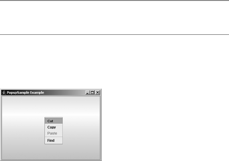
182 CHAPTER 6 ■ SWING MENUS AND TOOLBARS
JPopupMenu.Separator Class
The JPopupMenu class maintains its own separator to permit a custom look and feel for the separator
when it’s on a JPopupMenu. This custom separator is an inner class to the JPopupMenu.
When you call the addSeparator() of JPopupMenu, an instance of this class is automatically
created and added to the pop-up menu. In addition, you can create this separator by calling its
no-argument constructor:
JSeparator popupSeparator = new JPopupMenu.Separator();
Both methods create a horizontal separator.
■Note If you want to change the orientation of the separator, you must call the setOrientation()
method inherited from JSeparator with an argument of JPopupMenu.Separator.VERTICAL. However,
having a vertical separator on a pop-up menu is inappropriate.
A Complete Pop-Up Menu Usage Example
The program in Listing 6-3 puts together all the pieces of using a JPopupMenu, including listening
for selection of all the items on the menu, as well as listening for when it’s displayed. The output for
the program is shown in Figure 6-7, with the pop-up visible.
Figure 6-7. JPopupMenu usage example output
Listing 6-3. PopupSample Class Definition
import java.awt.*;
import java.awt.event.*;
import javax.swing.*;
import javax.swing.event.*;
public class PopupSample {
CHAPTER 6 ■ SWING MENUS AND TOOLBARS 183
// Define ActionListener
static class PopupActionListener implements ActionListener {
public void actionPerformed(ActionEvent actionEvent) {
System.out.println("Selected: " + actionEvent.getActionCommand());
}
}
// Define PopupMenuListener
static class MyPopupMenuListener implements PopupMenuListener {
public void popupMenuCanceled(PopupMenuEvent popupMenuEvent) {
System.out.println("Canceled");
}
public void popupMenuWillBecomeInvisible(PopupMenuEvent popupMenuEvent) {
System.out.println("Becoming Invisible");
}
public void popupMenuWillBecomeVisible(PopupMenuEvent popupMenuEvent) {
System.out.println("Becoming Visible");
}
}
public static void main(final String args[]) {
Runnable runner = new Runnable() {
public void run() {
// Create frame
JFrame frame = new JFrame("PopupSample Example");
frame.setDefaultCloseOperation(JFrame.EXIT_ON_CLOSE);
ActionListener actionListener = new PopupActionListener();
PopupMenuListener popupMenuListener = new MyPopupMenuListener();
// Create popup menu, attach popup menu listener
JPopupMenu popupMenu = new JPopupMenu("Title");
popupMenu.addPopupMenuListener(popupMenuListener);
// Cut
JMenuItem cutMenuItem = new JMenuItem("Cut");
cutMenuItem.addActionListener(actionListener);
popupMenu.add(cutMenuItem);
// Copy
JMenuItem copyMenuItem = new JMenuItem("Copy");
copyMenuItem.addActionListener(actionListener);
popupMenu.add(copyMenuItem);
184 CHAPTER 6 ■ SWING MENUS AND TOOLBARS
// Paste
JMenuItem pasteMenuItem = new JMenuItem("Paste");
pasteMenuItem.addActionListener(actionListener);
pasteMenuItem.setEnabled(false);
popupMenu.add(pasteMenuItem);
// Separator
popupMenu.addSeparator();
// Find
JMenuItem findMenuItem = new JMenuItem("Find");
findMenuItem.addActionListener(actionListener);
popupMenu.add(findMenuItem);
JButton label = new JButton();
frame.add(label);
label.setComponentPopupMenu(popupMenu);
frame.setSize(350, 250);
frame.setVisible(true);
}
};
EventQueue.invokeLater(runner);
}
}
JCheckBoxMenuItem Class
Swing’s JCheckBoxMenuItem component behaves as if you have a JCheckBox on a menu as a
JMenuItem. The data model for the menu item is the ToggleButtonModel, described in Chapter 5.
It allows the menu item to have a selected or unselected state, while showing an appropriate
icon for the state. Because the data model is the ToggleButtonModel, when JCheckBoxMenuItem
is placed in a ButtonGroup, only one component in the group is ever selected. However, this
isn’t the natural way to use a JCheckBoxMenuItem and is likely to confuse users. If you need this
behavior, use JRadioButtonMenuItem, as described later in this chapter.
Creating JCheckBoxMenuItem Components
There are seven constructors for JCheckBoxMenuItem. They allow you to initialize the text label,
icon, and initial state.
public JCheckBoxMenuItem()
JCheckBoxMenuItem jCheckBoxMenuItem = new JCheckBoxMenuItem();
public JCheckBoxMenuItem(String text)
JCheckBoxMenuItem jCheckBoxMenuItem = new JCheckBoxMenuItem("Boy");
CHAPTER 6 ■ SWING MENUS AND TOOLBARS 185
public JCheckBoxMenuItem(Icon icon)
Icon boyIcon = new ImageIcon("boy-r.jpg");
JCheckBoxMenuItem jCheckBoxMenuItem = new JCheckBoxMenuItem(boyIcon);
public JCheckBoxMenuItem(String text, Icon icon)
JCheckBoxMenuItem jCheckBoxMenuItem = new JCheckBoxMenuItem("Boy", boyIcon);
public JCheckBoxMenuItem(String text, boolean state)
JCheckBoxMenuItem jCheckBoxMenuItem = new JCheckBoxMenuItem("Girl", true);
public JCheckBoxMenuItem(String text, Icon icon, boolean state)
Icon girlIcon = new ImageIcon("girl-r.jpg");
JCheckBoxMenuItem jCheckBoxMenuItem = new JCheckBoxMenuItem("Girl", girlIcon, true);
public JCheckBoxMenuItem(Action action)
Action action = ...;
JCheckBoxMenuItem jCheckBoxMenuItem = new JCheckBoxMenuItem(action);
Unlike the JCheckBox, the icon is part of the label and not a separate device to indicate
whether something is checked. If either the text label or the icon isn’t passed to the constructor,
that part of the item label will be set to its default value of empty. By default, a JCheckBoxMenuItem is
unselected.
■Note Creating a JCheckBoxMenuItem with an icon has no effect on the appearance of the check box
next to the menu item. It’s strictly part of the label for the JCheckBoxMenuItem.
JCheckBoxMenuItem Properties
Most of the JCheckBoxMenuItem properties are inherited from the many superclasses of
JCheckBoxMenuItem. Table 6-11 lists the four properties defined by JCheckBoxMenuItem.
Table 6-11. JCheckBoxMenuItem Properties
Property Name Data Type Access
accessibleContext AccessibleContext Read-only
selectedObjects Object[ ] Read-only
state boolean Read-write
UIClassID String Read-only

186 CHAPTER 6 ■ SWING MENUS AND TOOLBARS
Handling JCheckBoxMenuItem Selection Events
With a JCheckBoxMenuItem, you can attach many different listeners for a great variety of events:
•MenuDragMouseListener and MenuKeyListener from JMenuItem
•ActionListener,ChangeListener, and ItemListener from AbstractButton
•AncestorListener and VetoableChangeListener from JComponent
•ContainerListener and PropertyChangeListener from Container
•ComponentListener,FocusListener,HierarchyBoundsListener,HierarchyListener,
InputMethodListener,KeyListener,MouseListener,MouseMotionListener, and
MouseWheelListener from Component
Although you can listen for 18 different types of events, the most interesting are
ActionEvent and ItemEvent, described next.
Listening to JCheckBoxMenuItem Events with an ActionListener
Attaching an ActionListener to a JCheckBoxMenuItem allows you to find out when the menu
item is selected. The listener is told of the selection, but not of the new state. To find out the
selected state, you must get the model for the event source and query the selection state, as the
following sample ActionListener source shows. This listener modifies both the check box text
and the icon label, based on the current selection state.
ActionListener aListener = new ActionListener() {
public void actionPerformed(ActionEvent event) {
Icon girlIcon = new ImageIcon("girl-r.jpg");
Icon boyIcon = new ImageIcon("boy-r.jpg");
AbstractButton aButton = (AbstractButton)event.getSource();
boolean selected = aButton.getModel().isSelected();
String newLabel;
Icon newIcon;
if (selected) {
newLabel = "Girl";
newIcon = girlIcon;
} else {
newLabel = "Boy";
newIcon = boyIcon;
}
aButton.setText(newLabel);
aButton.setIcon(newIcon);
}
};
■Note Keep in mind that you can also associate an Action from the constructor that can do the
same thing.

CHAPTER 6 ■ SWING MENUS AND TOOLBARS 187
Listening to JCheckBoxMenuItem with an ItemListener
If you listen for JCheckBoxMenuitem selection with an ItemListener, you don’t need to query the
event source for the selection state—the event already carries that information. Based on this
state, you respond accordingly. Re-creating the ActionListener behavior with an ItemListener
requires just a few minor changes to the previously listed source, as follows:
ItemListener iListener = new ItemListener() {
public void itemStateChanged(ItemEvent event) {
Icon girlIcon = new ImageIcon("girl-r.jpg");
Icon boyIcon = new ImageIcon("boy-r.jpg");
AbstractButton aButton = (AbstractButton)event.getSource();
int state = event.getStateChange();
String newLabel;
Icon newIcon;
if (state == ItemEvent.SELECTED) {
newLabel = "Girl";
newIcon = girlIcon;
} else {
newLabel = "Boy";
newIcon = boyIcon;
}
aButton.setText(newLabel);
aButton.setIcon(newIcon);
}
};
Customizing a JCheckBoxMenuItem Look and Feel
The appearance of the JCheckBoxMenuItem under the preinstalled set of look and feel types is
shown with the other menu components in Figure 6-3.
The available set of UIResource-related properties for a JCheckBoxMenuItem is shown in
Table 6-12. The JCheckBoxMenuItem component has 19 different properties.
Table 6-12. JCheckBoxMenuItem UIResource Elements
Property String Object Type
CheckBoxMenuItem.acceleratorFont Font
CheckBoxMenuItem.acceleratorForeground Color
CheckBoxMenuItem.acceleratorSelectionForeground Color
CheckBoxMenuItem.actionMap ActionMap
CheckBoxMenuItem.arrowIcon Icon
CheckBoxMenuItem.background Color
CheckBoxMenuItem.border Border
CheckBoxMenuItem.borderPainted Boolean

188 CHAPTER 6 ■ SWING MENUS AND TOOLBARS
The Icon associated with the CheckBoxMenuItem.checkIcon property key is the one displayed on
the JCheckBoxMenuItem. If you don’t like the default icon, you can change it with the following line
of source, assuming the new icon has already been defined and created:
UIManager.put("CheckBoxMenuItem.checkIcon", someIcon);
For this new icon to display an appropriate selected image, the Icon implementation
must check the state of the associated menu component within its paintIcon() method. The
DiamondIcon created in Chapter 4 wouldn’t work for this icon because it doesn’t ask the compo-
nent for its state. Instead, the state is fixed at constructor time. Listing 6-4 shows a class that
represents one icon that could be used.
Listing 6-4. State-Aware Icon Definition
import java.awt.*;
import javax.swing.*;
public class DiamondAbstractButtonStateIcon implements Icon {
private final int width = 10;
private final int height = 10;
private Color color;
private Polygon polygon;
public DiamondAbstractButtonStateIcon(Color color) {
this.color = color;
initPolygon();
}
CheckBoxMenuItem.checkIcon Icon
CheckBoxMenuItem.commandSound String
CheckBoxMenuItem.disabledForeground Color
CheckBoxMenuItem.font Font
CheckBoxMenuItem.foreground Color
CheckBoxMenuItem.gradient List
CheckBoxMenuItem.margin Insets
CheckBoxMenuItem.opaque Boolean
CheckBoxMenuItem.selectionBackground Color
CheckBoxMenuItem.selectionForeground Color
CheckBoxMenuItemUI String
Table 6-12. JCheckBoxMenuItem UIResource Elements (Continued)
Property String Object Type

CHAPTER 6 ■ SWING MENUS AND TOOLBARS 189
private void initPolygon() {
polygon = new Polygon();
int halfWidth = width/2;
int halfHeight = height/2;
polygon.addPoint (0, halfHeight);
polygon.addPoint (halfWidth, 0);
polygon.addPoint (width, halfHeight);
polygon.addPoint (halfWidth, height);
}
public int getIconHeight() {
return width;
}
public int getIconWidth() {
return height;
}
public void paintIcon(Component component, Graphics g, int x, int y) {
boolean selected = false;
g.setColor (color);
g.translate (x, y);
if (component instanceof AbstractButton) {
AbstractButton abstractButton = (AbstractButton)component;
selected = abstractButton.isSelected();
}
if (selected) {
g.fillPolygon (polygon);
} else {
g.drawPolygon (polygon);
}
g.translate (-x, -y);
}
}
■Note If the DiamondAbstractButtonStateIcon icon were used with a component that isn’t an
AbstractButton type, the icon would always be deselected, because the selection state is a property
of AbstractButton.
JRadioButtonMenuItem Class
The JRadioButtonMenuItem component has the longest name of all the Swing components. It
works like a JRadioButton, but resides on a menu. When placed with other JRadioButtonMenuItem
components within a ButtonGroup, only one component will be selected at a time. As with
the JRadioButton, the button model for the JRadioButtonMenuItem is the JToggleButton.
ToggleButtonModel.

190 CHAPTER 6 ■ SWING MENUS AND TOOLBARS
Creating JRadioButtonMenuItem Components
The JRadioButtonMenuItem has seven constructors. They allow you to initialize the text label,
icon, and initial state.
public JCheckBoxMenuItem()
JCheckBoxMenuItem jCheckBoxMenuItem = new JCheckBoxMenuItem();
public JCheckBoxMenuItem(String text)
JCheckBoxMenuItem jCheckBoxMenuItem = new JCheckBoxMenuItem("Boy");
public JCheckBoxMenuItem(Icon icon)
Icon boyIcon = new ImageIcon("boy-r.jpg");
JCheckBoxMenuItem jCheckBoxMenuItem = new JCheckBoxMenuItem(boyIcon);
public JCheckBoxMenuItem(String text, Icon icon)
JCheckBoxMenuItem jCheckBoxMenuItem = new JCheckBoxMenuItem("Boy", boyIcon);
public JCheckBoxMenuItem(String text, boolean state)
JCheckBoxMenuItem jCheckBoxMenuItem = new JCheckBoxMenuItem("Girl", true);
public JCheckBoxMenuItem(String text, Icon icon, boolean state)
Icon girlIcon = new ImageIcon("girl-r.jpg");
JCheckBoxMenuItem jCheckBoxMenuItem = new JCheckBoxMenuItem("Girl", girlIcon, true);
public JCheckBoxMenuItem(Action action)
Action action = ...;
JCheckBoxMenuItem jCheckBoxMenuItem = new JCheckBoxMenuItem(action);
Similar to the JCheckBoxMenuItem component, the icon for the JRadioButtonMenuItem is
part of the label. This is unlike the JRadioButton, in which the icon indicates whether the radio
button is selected. If either the text label or icon isn’t part of the constructor, that part of the
item label will be empty. By default, a JRadioButtonMenuItem is unselected. If you create a
JRadioButtonMenuItem that is selected and then add it to a ButtonGroup, the button group will
deselect the menu item if the group already has a selected item in the group.
■Note After creating JRadioButtonMenuItem instances, remember to add them to a ButtonGroup,
so they will work as a mutually exclusive group.
Handling JRadioButtonMenuItem Selection Events
The JRadioButtonMenuItem shares the same 18 different event/listener pairs with
JCheckBoxMenuItem. To listen for selection, attaching an ActionListener is the normal
approach. In addition, you might want to attach the same listener to all the JRadioButtonMenuItem
objects in a ButtonGroup—after all, they’re in a group for a reason. If you use the same listener,
that listener can employ the current selection to perform some common operation. In other
cases, such as that in Figure 6-1, selection of any JRadioButtonMenuItem option does nothing.
CHAPTER 6 ■ SWING MENUS AND TOOLBARS 191
Only when someone selects the Find menu element would the current selection of the ButtonGroup
for the set of JRadioButtonMenuItem components have any meaning.
Configuring JRadioButtonMenuItem Properties
As with JCheckBoxMenuItem, most of the JRadioButtonMenuItem properties are inherited. The
two shown in Table 6-13 merely override the behavior from the superclass.
Customizing a JRadioButtonMenuItem Look and Feel
The appearance of the JRadioButtonMenuItem under the preinstalled set of look and feel types
is shown with the other menu components in Figure 6-3.
The available set of UIResource-related properties for a JRadioButtonMenuItem is shown in
Table 6-14. For the JRadioButtonMenuItem component, there are 19 different properties.
Table 6-13. JRadioButtonMenuItem Properties
Property Name Data Type Access
accessibleContext AccessibleContext Read-only
UIClassID String Read-only
Table 6-14. JRadioButtonMenuItem UIResource Elements
Property String Object Type
RadioButtonMenuItem.acceleratorFont Font
RadioButtonMenuItem.acceleratorForeground Color
RadioButtonMenuItem.acceleratorSelectionForeground Color
RadioButtonMenuItem.actionMap ActionMap
RadioButtonMenuItem.arrowIcon Icon
RadioButtonMenuItem.background Color
RadioButtonMenuItem.border Border
RadioButtonMenuItem.borderPainted Boolean
RadioButtonMenuItem.checkIcon Icon
RadioButtonMenuItem.commandSound String
RadioButtonMenuItem.disabledForeground Color
RadioButtonMenuItem.font Font
RadioButtonMenuItem.foreground Color
RadioButtonMenuItem.gradient List
RadioButtonMenuItem.margin Insets
RadioButtonMenuItem.opaque Boolean
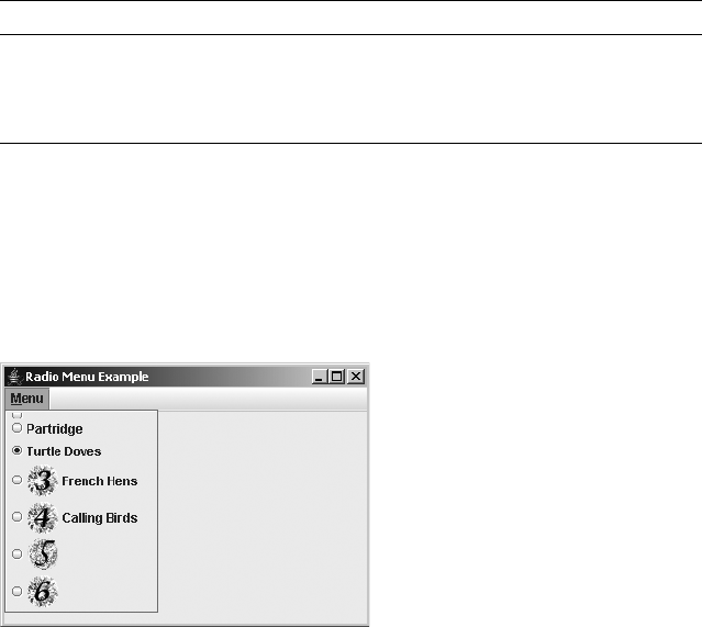
192 CHAPTER 6 ■ SWING MENUS AND TOOLBARS
A Complete JRadioButtonMenuItem Usage Example
To help you understand the JRadioButtonMenuItem usage, the program shown in Listing 6-5
demonstrates how to put everything together, including listening for selection of all the items
on the menu, from either an ActionListener or an ItemListener. The output for the program is
shown in Figure 6-8.
Figure 6-8. JRadioButtonMenuItem usage example output
Listing 6-5. The RadioButtonSample Class Definition
import javax.swing.*;
import java.awt.*;
import java.awt.event.*;
public class RadioButtonSample {
static Icon threeIcon = new ImageIcon("3.gif");
static Icon fourIcon = new ImageIcon("4.gif");
static Icon fiveIcon = new ImageIcon("5.gif");
static Icon sixIcon = new ImageIcon("6.gif");
public static class ButtonActionListener implements ActionListener {
public void actionPerformed (ActionEvent actionEvent) {
AbstractButton aButton = (AbstractButton)actionEvent.getSource();
boolean selected = aButton.getModel().isSelected();
System.out.println (actionEvent.getActionCommand() +
" - selected? " + selected);
}
}
RadioButtonMenuItem.selectionBackground Color
RadioButtonMenuItem.selectionForeground Color
RadioButtonMenuItemUI String
Table 6-14. JRadioButtonMenuItem UIResource Elements (Continued)
Property String Object Type
CHAPTER 6 ■ SWING MENUS AND TOOLBARS 193
public static class ButtonItemListener implements ItemListener {
public void itemStateChanged(ItemEvent itemEvent) {
AbstractButton aButton = (AbstractButton)itemEvent.getSource();
int state = itemEvent.getStateChange();
String selected =
((state == ItemEvent.SELECTED) ? "selected" : "not selected");
System.out.println (aButton.getText() + " - selected? " + selected);
}
}
public static void main(String args[]) {
Runnable runner = new Runnable() {
public void run() {
final ActionListener actionListener = new ButtionActionListener();
final ItemListener itemListener = new ButtonItemListener();
JFrame frame = new JFrame("Radio Menu Example");
frame.setDefaultCloseOperation(JFrame.EXIT_ON_CLOSE);
JMenuBar menuBar = new JMenuBar();
JMenu menu = new JMenu("Menu");
ButtonGroup buttonGroup = new ButtonGroup();
menu.setMnemonic(KeyEvent.VK_M);
JRadioButtonMenuItem emptyMenuItem =
new JRadioButtonMenuItem();
emptyMenuItem.setActionCommand("Empty");
emptyMenuItem.addActionListener(actionListener);
buttonGroup.add(emptyMenuItem);
menu.add(emptyMenuItem);
JRadioButtonMenuItem oneMenuItem =
new JRadioButtonMenuItem("Partridge");
oneMenuItem.addActionListener(actionListener);
buttonGroup.add(oneMenuItem);
menu.add(oneMenuItem);
JRadioButtonMenuItem twoMenuItem =
new JRadioButtonMenuItem("Turtle Doves", true);
twoMenuItem.addActionListener(actionListener);
buttonGroup.add(twoMenuItem);
menu.add(twoMenuItem);

194 CHAPTER 6 ■ SWING MENUS AND TOOLBARS
JRadioButtonMenuItem threeMenuItem =
new JRadioButtonMenuItem("French Hens", threeIcon);
threeMenuItem.addItemListener(itemListener);
buttonGroup.add(threeMenuItem);
menu.add(threeMenuItem);
JRadioButtonMenuItem fourMenuItem =
new JRadioButtonMenuItem("Calling Birds", fourIcon, true);
fourMenuItem.addActionListener(actionListener);
buttonGroup.add(fourMenuItem);
menu.add(fourMenuItem);
JRadioButtonMenuItem fiveMenuItem =
new JRadioButtonMenuItem(fiveIcon);
fiveMenuItem.addActionListener(actionListener);
fiveMenuItem.setActionCommand("Rings");
buttonGroup.add(fiveMenuItem);
menu.add(fiveMenuItem);
JRadioButtonMenuItem sixMenuItem =
new JRadioButtonMenuItem(sixIcon, true);
sixMenuItem.addActionListener(actionListener);
sixMenuItem.setActionCommand("Geese");
buttonGroup.add(sixMenuItem);
menu.add(sixMenuItem);
menuBar.add(menu);
frame.setJMenuBar(menuBar);
frame.setSize(350, 250);
frame.setVisible(true);
}
};
EventQueue.invokeLater(runner);
}
}
■Note Notice that the actionCommand property is set for those menu items lacking text labels. This allows
registered ActionListener objects to determine the selected object. This is only necessary when listeners
are shared across components.

CHAPTER 6 ■ SWING MENUS AND TOOLBARS 195
Creating Custom MenuElement Components:
The MenuElement Interface
One thing all the selectable menu components have in common is that they implement the
MenuElement interface. The JSeparator doesn’t implement the interface, but that’s okay because
it isn’t selectable. The purpose of the MenuElement interface is to allow the MenuSelectionManager
to notify the different menu elements as a user moves around a program’s menu structure.
As the following interface definition shows, the MenuElement interface is made up of
five methods:
public interface MenuElement {
public Component getComponent();
public MenuElement[] getSubElements();
public void menuSelectionChanged(boolean isInclude);
public void processKeyEvent(KeyEvent event, MenuElement path[],
MenuSelectionManager mgr);
public void processMouseEvent(MouseEvent event, MenuElement path[],
MenuSelectionManager mgr);
}
The getComponent() method returns the menu’s rendering component. This is usually the
menu component itself, although that isn’t a requirement. The getSubElements() method
returns an array of any menu elements contained within this element. If this menu element
isn’t the top of a submenu, the method should return a zero-length array of MenuElement
objects, not null.
The menuSelectionChanged() method is called whenever the menu item is placed in or
taken out of the selection path for the menu selection manager.
The two processKeyEvent() and processMouseEvent() methods are for processing a key
event or mouse event that’s generated over a menu. How your menu item processes events
depends on what the component supports. For instance, unless you support accelerators, you
probably want to respond to key events only when your menu item is in the current selection
path.
■Note If, for example, your new menu element was something like a JComboBoxMenuItem, where the
MenuElement acted like a JComboBox, the processKeyEvent() might pass along the key character to
the KeySelectionManager. See Chapter 13 for more on the KeySelectionManager.
To demonstrate the MenuElement interface, Listing 6-6 creates a new menu component
called a JToggleButtonMenuItem. This component will look and act like a JToggleButton, although
it can be on a menu. It’s important to ensure that the menu goes away once the item is selected
and that the component is displayed differently when in the current selection path.

196 CHAPTER 6 ■ SWING MENUS AND TOOLBARS
■Note Although you can add any component to a menu, if the component doesn’t implement the MenuElement
interface, it won’t act properly when a mouse moves over the component or when the component is selected.
Listing 6-6. Toggle Button As Menu Item Class Definition
import java.awt.*;
import java.awt.event.*;
import javax.swing.*;
import javax.swing.event.*;
public class JToggleButtonMenuItem extends JToggleButton implements MenuElement {
Color savedForeground = null;
private static MenuElement NO_SUB_ELEMENTS[] = new MenuElement[0];
public JToggleButtonMenuItem() {
init();
}
public JToggleButtonMenuItem(String label) {
super(label);
init();
}
public JToggleButtonMenuItem(String label, Icon icon) {
super(label, icon);
init();
}
public JToggleButtonMenuItem(Action action) {
super(action);
init();
}
private void init() {
updateUI();
setRequestFocusEnabled(false);
// Borrows heavily from BasicMenuUI
MouseInputListener mouseInputListener = new MouseInputListener() {
// If mouse released over this menu item, activate it
public void mouseReleased(MouseEvent mouseEvent) {
MenuSelectionManager menuSelectionManager =
MenuSelectionManager.defaultManager();
Point point = mouseEvent.getPoint();
if ((point.x >= 0) &&
(point.x < getWidth()) &&
(point.y >= 0) &&
(point.y < getHeight())) {
menuSelectionManager.clearSelectedPath();
// Component automatically handles "selection" at this point
// doClick(0); // not necessary
CHAPTER 6 ■ SWING MENUS AND TOOLBARS 197
} else {
menuSelectionManager.processMouseEvent(mouseEvent);
}
}
// If mouse moves over menu item, add to selection path, so it becomes armed
public void mouseEntered(MouseEvent mouseEvent) {
MenuSelectionManager menuSelectionManager =
MenuSelectionManager.defaultManager();
menuSelectionManager.setSelectedPath(getPath());
}
// When mouse moves away from menu item, disarm it and select something else
public void mouseExited(MouseEvent mouseEvent) {
MenuSelectionManager menuSelectionManager =
MenuSelectionManager.defaultManager();
MenuElement path[] = menuSelectionManager.getSelectedPath();
if (path.length > 1) {
MenuElement newPath[] = new MenuElement[path.length-1];
for(int i=0, c=path.length-1; i<c; i++) {
newPath[i] = path[i];
}
menuSelectionManager.setSelectedPath(newPath);
}
}
// Pass along drag events
public void mouseDragged(MouseEvent mouseEvent) {
MenuSelectionManager.defaultManager().processMouseEvent(mouseEvent);
}
public void mouseClicked(MouseEvent mouseEvent) {
}
public void mousePressed(MouseEvent mouseEvent) {
}
public void mouseMoved(MouseEvent mouseEvent) {
}
};
addMouseListener(mouseInputListener);
addMouseMotionListener(mouseInputListener);
}
// MenuElement methods
public Component getComponent() {
return this;
}
public MenuElement[] getSubElements() {
// No subelements
return NO_SUB_ELEMENTS;
}
198 CHAPTER 6 ■ SWING MENUS AND TOOLBARS
public void menuSelectionChanged(boolean isIncluded) {
ButtonModel model = getModel();
// Only change armed state if different
if(model.isArmed() != isIncluded) {
model.setArmed(isIncluded);
}
if (isIncluded) {
savedForeground = getForeground();
if (!savedForeground.equals(Color.BLUE)) {
setForeground(Color.BLUE);
} else {
// In case foreground blue, use something different
setForeground(Color.RED);
}
} else {
setForeground(savedForeground);
// If null, get foreground from installed look and feel
if (savedForeground == null) {
updateUI();
}
}
}
public void processKeyEvent(KeyEvent keyEvent,
MenuElement path[],
MenuSelectionManager manager) {
// If user presses space while menu item armed, select it
if (getModel().isArmed()) {
int keyChar = keyEvent.getKeyChar();
if (keyChar == KeyEvent.VK_SPACE) {
manager.clearSelectedPath();
System.out.println("Selected: JToggleButtonMenuItem, by KeyEvent");
doClick(0); // inherited from AbstractButton
}
}
}
public void processMouseEvent(MouseEvent mouseEvent, MenuElement path[],
MenuSelectionManager manager) {
// For when mouse dragged over menu and button released
if (mouseEvent.getID() == MouseEvent.MOUSE_RELEASED) {
manager.clearSelectedPath();
System.out.println("Selected: JToggleButtonMenuItem, by MouseEvent");
doClick(0); // inherited from AbstractButton
}
}

CHAPTER 6 ■ SWING MENUS AND TOOLBARS 199
// Borrows heavily from BasicMenuItemUI.getPath()
private MenuElement[] getPath() {
MenuSelectionManager menuSelectionManager =
MenuSelectionManager.defaultManager();
MenuElement oldPath[] = menuSelectionManager.getSelectedPath();
MenuElement newPath[];
int oldPathLength = oldPath.length;
if (oldPathLength == 0)
return new MenuElement[0];
Component parent = getParent();
if (oldPath[oldPathLength-1].getComponent() == parent) {
// Going deeper under the parent menu
newPath = new MenuElement[oldPathLength+1];
System.arraycopy(oldPath, 0, newPath, 0, oldPathLength);
newPath[oldPathLength] = this;
} else {
// Sibling/child menu item currently selected
int newPathPosition;
for (newPathPosition = oldPath.length-1; newPathPosition >= 0;
newPathPosition--) {
if (oldPath[newPathPosition].getComponent() == parent) {
break;
}
}
newPath = new MenuElement[newPathPosition+2];
System.arraycopy(oldPath, 0, newPath, 0, newPathPosition+1);
newPath[newPathPosition+1] = this;
}
return newPath;
}
}
■Note The MouseInputListener defined in the init() method and the getPath() method borrow
heavily from the system BasicMenuUI class. Normally, the user interface delegate deals with what happens
when the mouse moves over a menu component. Because the JToggleButton isn’t a predefined menu
component, its UI class doesn’t deal with it. For better modularity, these two methods should be moved into
an extended ToggleButtonUI.
Once you’ve created this JToggleButtonMenuItem class, you can use it like any other
menu item:
JToggleButtonMenuItem toggleItem = new JToggleButtonMenuItem("Balloon Help");
editMenu.add(toggleItem);
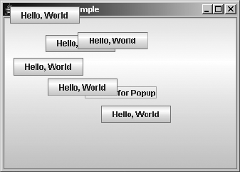
200 CHAPTER 6 ■ SWING MENUS AND TOOLBARS
Working with Pop-Ups: The Popup Class
Not everything you want to pop up needs to be a menu. Through the Popup and PopupFactory
classes, you can pop up any component over another. This is different from tooltips, which are
in a read-only, unselectable label. You can pop up selectable buttons, trees, or tables.
Creating Pop-Up Components
Popup is a simple class with two methods—hide() and show()—with two protected construc-
tors. Instead of creating Popup objects directly, you acquire them from the PopupFactory class.
PopupFactory factory = PopupFactory.getSharedInstance();
Popup popup = factory.getPopup(owner, contents, x, y);
The Popup with the contents component created by PopupFactory will thus be “above”
other components within the owner component.
A Complete Popup/PopupFactory Usage Example
Listing 6-7 demonstrates the usage of Popup and PopupFactory to show a JButton above another
JButton. Selecting the initial JButton will cause the second one to be created above the first, at
some random location. When the second button is visible, each is selectable. Selecting the initially
visible button multiple times will cause even more pop-up buttons to appear, as shown in
Figure 6-9. Each pop-up button will disappear after three seconds. In this example, selecting
the pop-up button just displays a message to the console.
Figure 6-9. Popup/PopupFactory example
Listing 6-7. The ButtonPopupSample Class Definition
import java.awt.*;
import java.awt.event.*;
import javax.swing.*;
import java.util.Random;
public class ButtonPopupSample {
CHAPTER 6 ■ SWING MENUS AND TOOLBARS 201
static final Random random = new Random();
// Define ActionListener
static class ButtonActionListener implements ActionListener {
public void actionPerformed(ActionEvent actionEvent) {
System.out.println("Selected: " + actionEvent.getActionCommand());
}
}
// Define Show Popup ActionListener
static class ShowPopupActionListener implements ActionListener {
private Component component;
ShowPopupActionListener(Component component) {
this.component = component;
}
public synchronized void actionPerformed(ActionEvent actionEvent) {
JButton button = new JButton("Hello, World");
ActionListener listener = new ButtonActionListener();
button.addActionListener(listener);
PopupFactory factory = PopupFactory.getSharedInstance();
int x = random.nextInt(200);
int y = random.nextInt(200);
final Popup popup = factory.getPopup(component, button, x, y);
popup.show();
ActionListener hider = new ActionListener() {
public void actionPerformed(ActionEvent e) {
popup.hide();
}
};
// Hide popup in 3 seconds
Timer timer = new Timer(3000, hider);
timer.start();
}
}
public static void main(final String args[]) {
Runnable runner = new Runnable() {
public void run() {
// Create frame
JFrame frame = new JFrame("Button Popup Sample");
frame.setDefaultCloseOperation(JFrame.EXIT_ON_CLOSE);
ActionListener actionListener = new ShowPopupActionListener(frame);
JButton start = new JButton("Pick Me for Popup");
start.addActionListener(actionListener);
frame.add(start);
202 CHAPTER 6 ■ SWING MENUS AND TOOLBARS
frame.setSize(350, 250);
frame.setVisible(true);
}
};
EventQueue.invokeLater(runner);
}
}
Working with Toolbars: The JToolBar Class
Toolbars are an integral part of the main application windows in a modern user interface.
Toolbars provide users with easy access to the more commonly used commands, which are
usually buried within a hierarchical menuing structure. The Swing component that supports
this capability is the JToolBar.
The JToolBar is a specialized Swing container for holding components. This container can
then be used as a toolbar within your Java applet or application, with the potential for it to
be floating or draggable, outside the main window of the program. JToolBar is a very simple
component to use and understand.
Creating JToolBar Components
There are four constructors for creating JToolBar components:
public JToolBar()
JToolBar jToolBar = new JToolBar();
public JToolBar(int orientation)
JToolBar jToolBar = new JToolBar(JToolBar.VERTICAL);
public JToolBar(String name)
JToolBar jToolBar = new JToolBar("Window Title");
public JToolBar(String name,int orientation)
JToolBar jToolBar = new JToolBar("Window Title", ToolBar.VERTICAL);
By default, a toolbar is created in a horizontal direction. However, you can explicitly set the
orientation by using either of the JToolBar constants of HORIZONTAL and VERTICAL.
Also by default, toolbars are floatable. Therefore, if you create the toolbar with one orien-
tation, the user could change its orientation while dragging the toolbar around outside the
window. When floating, the title will be visible on the toolbar’s frame.
Adding Components to a JToolBar
Once you have a JToolBar, you need to add components to it. Any Component can be added to
the toolbar. When dealing with horizontal toolbars, for aesthetic reasons, it’s best if the toolbar
components are all roughly the same height. For a vertical toolbar, it’s best if they’re roughly
the same width. There’s only one method defined by the JToolBar class for adding toolbar

CHAPTER 6 ■ SWING MENUS AND TOOLBARS 203
items; the remaining methods, such as add(Component), are inherited from Container. In addition,
you can add a separator to a toolbar.
public JButton add(Action action);
public void addSeparator();
public void addSeparator(Dimension size);
When using the add(Action) method of JToolBar, the added Action is encapsulated within
aJButton object. This is different from adding actions to JMenu or JPopupMenu components, in
which JMenuItem objects are added instead. As with JMenu and JPopupMenu, adding an Action in
this fashion is discouraged in the Javadoc for the class. For separators, if you don’t specify the
size, the installed look and feel forces a default size setting.
■Note For more information about dealing with the Action interface, see Chapter 2 or the section “Using
Action Objects with Menus” earlier in this chapter.
To remove components from a toolbar, use the following method:
public void remove(Component component)
JToolBar Properties
The JToolBar class defines nine properties, which are listed in Table 6-15.
By default, the border of a JToolBar is painted. If you don’t want the border painted, you
can set the borderPainted property to false. Without using the borderPainted property,
you would need to change the setting of the border property (inherited from the superclass
JComponent).
Table 6-15. JToolBar Properties
Property Name Data Type Access
accessibleContext AccessibleContext Read-only
borderPainted boolean Read-write bound
floatable boolean Read-write bound
layout LayoutManager Write-only
margin Insets Read-write bound
orientation int Read-write bound
rollover boolean Read-write bound
UI ToolBarUI Read-write
UIClassID String Read-only
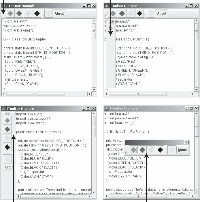
204 CHAPTER 6 ■ SWING MENUS AND TOOLBARS
The orientation property can be set to only one of the HORIZONTAL or VERTICAL constants
of JToolBar. If another nonequivalent value is used, an IllegalArgumentException is thrown.
Changing the orientation changes the layout manager of the toolbar. If you directly change the
layout manager with setLayout(), changing the orientation will undo your layout change.
Consequently, it’s best not to manually change the layout manager of a JToolBar.
As previously mentioned, a toolbar is floatable by default. This means that a user can drag
the toolbar from where you place it and move it elsewhere. To drag a toolbar, the user selects
an empty part of it. The toolbar can than be left outside the original program window, floating
above the main window in its own window, or dropped onto another area of the original
program window. If the layout manager of the original window is BorderLayout, the droppable
areas are the edges of the layout manager without any components. (You can’t drop the toolbar
in the center of the window.) Otherwise, the toolbar would be dropped into the last spot of the
container. Figure 6-10 shows the different phases of the dragging and docking process.
Figure 6-10. JToolBar phases
Dragging Hot Spot Floating
Docked in a Different Area Undocked Floating Toolbar
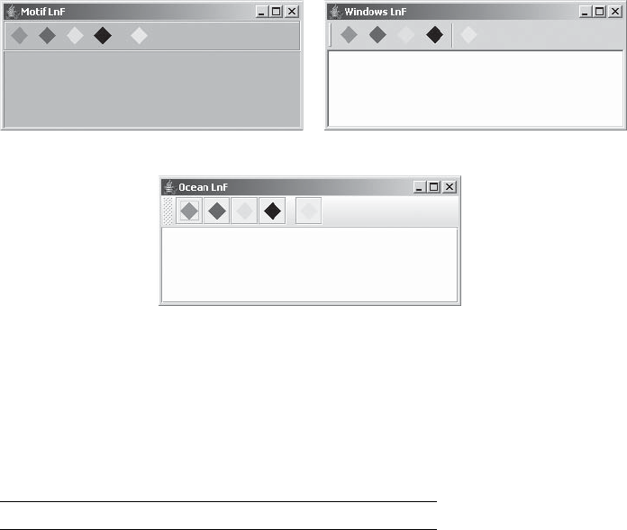
CHAPTER 6 ■ SWING MENUS AND TOOLBARS 205
The rollover property defines a behavior specific to the look and feel for when the user
moves the mouse over the different components within the toolbar. This behavior could
involve coloration or border differences.
Handling JToolBar Events
There are no events specific to the JToolBar. You need to attach listeners to each item on the
JToolBar that you want to respond to user interaction. Of course, JToolBar is a Container, so
you could listen to its events.
Customizing a JToolBar Look and Feel
Each installable Swing look and feel provides its own JToolBar appearance and set of default
UIResource values. Most of this appearance is controlled by the components actually within
the toolbar. Figure 6-11 shows the appearance of the JToolBar component for the preinstalled
set of look and feel types: Motif, Windows, and Ocean. Each toolbar has five JButton compo-
nents, with a separator between the fourth and fifth.
Figure 6-11. JToolBar under different look and feel types
The available set of UIResource-related properties for a JToolBar is shown in Table 6-16.
For the JToolBar component, there are 22 different properties.
Table 6-16. JToolBar UIResource Elements
Property String Object Type
ToolBar.actionMap ActionMap
ToolBar.ancestorInputMap InputMap
ToolBar.background Color
Motif Windows
Ocean
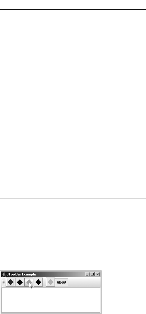
206 CHAPTER 6 ■ SWING MENUS AND TOOLBARS
A Complete JToolBar Usage Example
The program in Listing 6-8 demonstrates a complete JToolBar example that results in a toolbar
with a series of diamonds on the buttons. The program also reuses the ShowAction defined for
the menuing example, presented in Listing 6-2 earlier in this chapter.
The rollover property is enabled to demonstrate the difference for the current look and
feel. See Figure 6-12 for the output as you move your mouse over the different buttons.
Figure 6-12. JToolBar example with isRollover enabled
ToolBar.border Border
ToolBar.borderColor Color
ToolBar.darkShadow Color
ToolBar.dockingBackground Color
ToolBar.dockingForeground Color
ToolBar.floatingBackground Color
ToolBar.floatingForeground Color
ToolBar.font Font
ToolBar.foreground Color
ToolBar.handleIcon Icon
ToolBar.highlight Color
ToolBar.isRollover Boolean
ToolBar.light Color
ToolBar.nonrolloverBorder Border
ToolBar.rolloverBorder Border
ToolBar.separatorSize Dimension
ToolBar.shadow Color
ToolBarSeparatorUI String
ToolBarUI String
Table 6-16. JToolBar UIResource Elements (Continued)
Property String Object Type
CHAPTER 6 ■ SWING MENUS AND TOOLBARS 207
Listing 6-8. The ToolBarSample Class Definition
import java.awt.*;
import java.awt.event.*;
import javax.swing.*;
public class ToolBarSample {
private static final int COLOR_POSITION = 0;
private static final int STRING_POSITION = 1;
static Object buttonColors[][] = {
{Color.RED, "RED"},
{Color.BLUE, "BLUE"},
{Color.GREEN, "GREEN"},
{Color.BLACK, "BLACK"},
null, // separator
{Color.CYAN, "CYAN"}
};
public static class TheActionListener implements ActionListener {
public void actionPerformed (ActionEvent actionEvent) {
System.out.println(actionEvent.getActionCommand());
}
};
public static void main(final String args[]) {
Runnable runner = new Runnable() {
public void run() {
JFrame frame = new JFrame("JToolBar Example");
frame.setDefaultCloseOperation(JFrame.EXIT_ON_CLOSE);
ActionListener actionListener = new TheActionListener();
JToolBar toolbar = new JToolBar();
toolbar.setRollover(true);
for (Object[] color: buttonColors) {
if (color == null) {
toolbar.addSeparator();
} else {
Icon icon = new DiamondIcon((Color)color[COLOR_POSITION], true, 20, 20);
JButton button = new JButton(icon);
button.setActionCommand((String)color[STRING_POSITION]);
button.addActionListener(actionListener);
toolbar.add(button);
}
}
208 CHAPTER 6 ■ SWING MENUS AND TOOLBARS
Action action = new ShowAction(frame);
JButton button = new JButton(action);
toolbar.add(button);
Container contentPane = frame.getContentPane();
contentPane.add(toolbar, BorderLayout.NORTH);
JTextArea textArea = new JTextArea();
JScrollPane pane = new JScrollPane(textArea);
contentPane.add(pane, BorderLayout.CENTER);
frame.setSize(350, 150);
frame.setVisible(true);
}
};
EventQueue.invokeLater(runner);
}
}
JToolBar.Separator Class
The JToolBar class maintains its own separator to permit a custom look and feel for the
separator when on a JToolBar.
This separator is automatically created when you call the addSeparator() method of
JToolBar. In addition, there are two constructors for creating a JToolBar.Separator if you
want to manually create the component.
public JToolBar.Separator()
JSeparator toolBarSeparator = new JToolBar.Separator();
public JToolBar.Separator(Dimension size)
Dimension dimension = new Dimension(10, 10);
JSeparator toolBarSeparator = new JToolBar.Separator(dimension);
Both constructors create a horizontal separator. You can configure the size. If you don’t
specify this, the look and feel decides what size to make the separator.
As with JPopupMenu.Separator, if you want to change the orientation of the separator, you
must call the setOrientation() method inherited from JSeparator, this time with an argument
of JToolBar.Separator.VERTICAL.
Summary
This chapter introduced the many Swing menu-related classes and their interrelationships,
and Swing’s toolbar class. First, you learned about the JMenuBar and its selection model, and
learned how menu bars can be used within applets as well as applications.
Next, you explored the JMenuItem, which is the menu element the user selects, along with two
new event/listener pairs the system uses for dealing with events, MenuKeyEvent/MenuKeyListener
and MenuDragMouseEvent/MenuDragMouseListener. Then, you moved on to the JMenu compo-
nent, upon which JMenuItem instances are placed, along with its new event/listener pair,
MenuEvent/MenuListener, which is used to determine when a menu is about to be posted.
CHAPTER 6 ■ SWING MENUS AND TOOLBARS 209
Next, you learned about the JSeparator component and how you can use it as a menu
separator or as a visual display separator outside of menus.
You then explored the JPopupMenu, which JMenu uses to display its set of JMenuItem compo-
nents. For the JPopupMenu, you learned about the pop-up menu’s own event/listener pair,
PopupMenuEvent/PopupMenuListener.
Then the selectable menu elements in JCheckBoxMenuItem and JRadioButtonMenuItem were
explored with their MenuElement interface, and you saw how to create a custom menu component.
Menus aren’t the only things that might pop up, so you explored Popup and PopupFactory.
Finally, the chapter covered the JToolBar class, a close cousin of Swing’s menu classes.
In Chapter 7, you’ll look at the different classes Swing provides for customizing the border
around a Swing component.

211
■ ■ ■
CHAPTER 7
Borders
Swing components offer the option of customizing the border area surrounding that component.
With great ease, you can use any one of the eight predefined borders (including one compound
border that is a combination of any of the other seven), or you can create your own individual-
ized borders. In this chapter, you’ll learn how to best use each of the existing borders and how
to fashion your own.
Some Basics on Working with Borders
A border is a JComponent property with the standard setBorder() and getBorder() property
methods. Therefore, every Swing component that is a subclass of JComponent can have a border.
By default, a component doesn’t have a custom border associated with it. (The getBorder()
method of JComponent returns null.) Instead, the default border displayed for a component is
the border appropriate for its state, based on the current look and feel. For instance, with a
JButton, the border could appear pressed, unpressed, or disabled, with specific different borders
for each look and feel (Metal, Windows, and so on).
Although the initial border property setting for every component is null, you can change
the border of a component by calling the setBorder(Border newValue) method of JComponent.
Once set, the changed value overrides the border for the current look and feel, and it draws the
new border in the area of the component’s insets. If at a later time, you want to reset the border
back to a border that’s appropriate for the state as well as the look and feel, change the border
property to null, using setBorder(null), and call updateUI() for the component. The updateUI()
call notifies the look and feel to reset the border. If you don’t call updateUI(), the component
will have no border.
■Note Those Swing components that aren’t subclasses of JComponent, such as JApplet and JFrame,
lack a setBorder() method to change their border. If you want them to have a border, you must add a
JPanel or other Swing component to the container, and then change the border of that component.

212 CHAPTER 7 ■ BORDERS
Examine Figure 7-1 to see a sampling of the various border configurations around a JLabel,
with a text label designating the border type. How to create the different borders will be discussed
in later sections of this chapter.
Figure 7-1. Border examples, using a 4-by-2 GridLayout with 5-pixel horizontal and vertical gaps
Exploring the Border Interface
The Border interface can be found in the javax.swing.border package. This interface forms the
basis of all the border classes. The interface is directly implemented by the AbstractBorder
class, which is the parent class of all the predefined Swing border classes: BevelBorder,
CompoundBorder,EmptyBorder,EtchedBorder,LineBorder,MatteBorder,SoftBevelBorder, and
TitledBorder. Of additional interest is the BorderFactory class, found in the javax.swing
package. This class uses the Factory design pattern to create borders, hiding the details of the
concrete implementations and caching various operations to optimize shared usages.
The Border interface shown here consists of three methods: paintBorder(),
getBorderInsets(), and isBorderOpaque(). These methods are described in the following
sections.
paintBorder()
The paintBorder() method is the key method of the interface. It has the following definition:
public void paintBorder(Component c, Graphics g, int x, int y, int
width, int height)
The actual drawing of the border is done in this method. Frequently, the Border imple-
mentation will ask for the Insets dimensions first, and then draw the border in the four
rectangular outer regions, as shown in Figure 7-2. If a border is opaque, the paintBorder()
implementation must fill the entire insets area. If a border is opaque and doesn’t fill the area,
then it’s a bug and needs to be corrected.
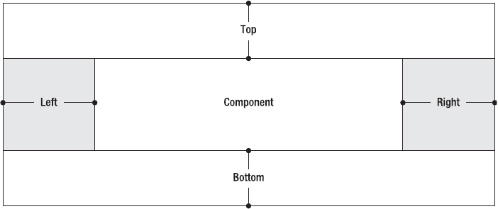
CHAPTER 7 ■ BORDERS 213
Figure 7-2. Areas of border insets
Listing 7-1 shows a simple paintBorder() implementation that fills in the left and right
sides with a brighter color than the top and bottom.
Listing 7-1. Filled-in Border Inset Areas
public void paintBorder(Component c, Graphics g, int x, int y, int width,
int height) {
Insets insets = getBorderInsets(c);
Color color = c.getForeground();
Color brighterColor = color.brighter();
// Translate coordinate space
g.translate(x, y);
// Top
g.setColor(color);
g.fillRect(0, 0, width, insets.top);
// Left
g.setColor(brighterColor);
g.fillRect(0, insets.top, insets.left, height-insets.top-insets.bottom);
// Bottom
g.setColor(color);
g.fillRect(0, height-insets.bottom, width, insets.bottom);

214 CHAPTER 7 ■ BORDERS
// Right
g.setColor(brighterColor);
g.fillRect(width-insets.right, insets.top, insets.right,
height-insets.top-insets.bottom);
// Translate coordinate space back
g.translate(-x, -y);
}
When creating your own borders, you’ll frequently find yourself filling in the same nonover-
lapping rectangular regions. The use of the translate() method of Graphics simplifies the
specification of the drawing coordinates. Without translating the coordinates, you would need
to offset the drawing by the origin (x, y).
■Caution You cannot take a shortcut by inserting g.fillRect(x, y, width, height), because this
would fill in the entire component area, not just the border area.
getBorderInsets()
The getBorderInsets() method returns the space necessary to draw a border around the given
component c as an Insets object. It has the following definition:
public Insets getBorderInsets(Component c)
These inset areas, shown in Figure 7-2, define the only legal area in which a border can be
drawn. The Component argument allows you to use some of its properties to determine the size
of the insets area.
■Caution You can ask the component argument for font-sizing information to determine the insets’ size,
but if you ask about the size of the component, a StackOverflowError occurs because the size of the
component is dependent on the size of the border insets.
isBorderOpaque()
Borders can be opaque or transparent. The isBorderOpaque() method returns true or false, to
indicate which form the border is. It has the following definition:
public boolean isBorderOpaque()
CHAPTER 7 ■ BORDERS 215
When this method returns true, the border needs to be opaque, filling its entire insets
area. When it returns false, any area not drawn will retain the background of the component
in which the border is installed.
Introducing BorderFactory
Now that you have a basic understanding of how the Border interface works, let’s take a quick
look at the BorderFactory class as a means to create borders swiftly and easily. Found in the
javax.swing package, the BorderFactory class offers a series of static methods for creating
predefined borders. Instead of laboriously calling the specific constructors for different borders,
you can create almost all the borders through this factory class. The factory class also caches
the creation of some borders to avoid re-creating commonly used borders multiple times. The
class definition follows.
public class BorderFactory {
public static Border createBevelBorder(int type);
public static Border createBevelBorder(int type, Color highlight,
Color shadow);
public static Border createBevelBorder(int type, Color highlightOuter,
Color highlightInner, Color shadowOuter, Color shadowInner);
public static CompoundBorder createCompoundBorder();
public static CompoundBorder createCompoundBorder(Border outside,
Border inside);
public static Border createEmptyBorder();
public static Border createEmptyBorder(int top, int left, int bottom,
int right);
public static Border createEtchedBorder();
public static Border createEtchedBorder(Color highlight, Color shadow);
public static Border createEtchedBorder(int type);
public static Border createEtchedBorder(int type, Color highlight,
Color shadow);
public static Border createLineBorder(Color color);
public static Border createLineBorder(Color color, int thickness);
public static Border createLoweredBevelBorder();
public static MatteBorder createMatteBorder(int top, int left, int bottom,
int right, Color color);
public static MatteBorder createMatteBorder(int top, int left, int bottom,
int right, Icon icon);

216 CHAPTER 7 ■ BORDERS
public static Border createRaisedBevelBorder();
public static TitledBorder createTitledBorder(Border border);
public static TitledBorder createTitledBorder(Border border, String title);
public static TitledBorder createTitledBorder(Border border, String title,
int justification, int position);
public static TitledBorder createTitledBorder(Border border, String title,
int justification, int position, Font font);
public static TitledBorder createTitledBorder(Border border, String title,
int justification, int position, Font font, Color color);
public static TitledBorder createTitledBorder(String title);
}
I’ll describe the different methods of this class during the process of describing the specific
border types they create. For instance, to create a border with a red line, you can use the following
statement, and then attach the border to a component.
Border lineBorder = BorderFactory.createLineBorder(Color.RED);
■Note Interestingly enough, no factory method exists for creating a SoftBevelBorder.
Starting with AbstractBorder
Before looking at the individual borders available within the javax.swing.border package,
one system border deserves special attention: AbstractBorder. As previously mentioned, the
AbstractBorder class is the parent border of all the other predefined borders.
■Tip When creating your own borders, you should create a subclass of AbstractBorder and just override
the necessary methods, instead of implementing the Border interface directly yourself. There are some
internal optimizations in place for subclasses.
Creating Abstract Borders
There is one constructor for AbstractBorder:
public AbstractBorder()
Because AbstractBorder is the parent class of all the other standard borders, this constructor is
eventually called automatically for all of them.

CHAPTER 7 ■ BORDERS 217
■Note Borders are not meant to be used as JavaBean components. Some border classes even lack a
no-argument (“no-arg” for short) constructor. Nevertheless, those border classes still call this constructor.
Examining AbstractBorder Methods
The AbstractBorder class provides implementations for the three methods of the Border
interface.
public Insets getBorderInsets(Component c)
The insets of an AbstractBorder are zero all around. Each of the predefined subclasses
overrides the getBorderInsets() method.
public boolean isBorderOpaque()
The default opaque property setting of an abstract border is false. This means that if you
were to draw something like dashed lines, the component background would show through.
Many predefined subclasses override the isBorderOpaque() method.
public void paintBorder(Component c, Graphics g, int x, int y,
int width, int height)
The painted border for an AbstractBorder is empty. All subclasses should override this
behavior to actually draw a border, except perhaps EmptyBorder.
In addition to providing default implementations of the Border methods, AbstractBorder
adds two other capabilities that you can take advantage of, or just let the system use. First,
there’s an additional version of getBorderInsets() available that takes two arguments:
Component and Insets:
public Insets getBorderInsets(Component c, Insets insets)
In this version of the method, instead of creating and returning a new Insets object, the
Insets object passed in is first modified and then returned. Use of this method avoids the creation
and later destruction of an additional Insets object each time the border insets is queried.
The second new method available is getInteriorRectangle(), which has both a static and
a nonstatic version. Given the Component,Border, and four integer parameters (for x, y, width,
and height), the method will return the inner Rectangle such that a component can paint itself
only in the area within the border insets. (See the piece labeled “Component” in Figure 7-2,
shown earlier in the chapter.)
■Note Currently, getBorderInsets() is used only once in Sun’s Swing source. That place is the
MotifButtonUI class found in the com.sun.java.swing.plaf.motif package.
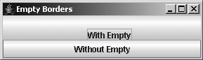
218 CHAPTER 7 ■ BORDERS
Examining the Predefined Borders
Now that the basics have been described, let’s look at the specifics of each of the predefined
border classes, somewhat in order of complexity.
EmptyBorder Class
The empty border, logically enough, is a border with nothing drawn in it. You can use
EmptyBorder where you might have otherwise overridden insets() or getInsets() with a
regular AWT container. It allows you to reserve extra space around a component to spread your
screen components out a little or to alter centering or justification somewhat. Figure 7-3 shows
both an empty border and one that is not empty.
Figure 7-3. EmptyBorder sample, with insets of 20 for top and left, 0 for right and bottom
EmptyBorder has two constructors and two factory methods of BorderFactory:
public static Border createEmptyBorder()
Border emptyBorder = BorderFactory.createEmptyBorder();
public static Border createEmptyBorder(int top, int left, int bottom, int right)
Border emptyBorder = BorderFactory.createEmptyBorder(5, 10, 5, 10);
public EmptyBorder(Insets insets)
Insets insets = new Insets(5, 10, 5, 10);
Border EmptyBorder = new EmptyBorder(insets);
public EmptyBorder(int top, int left, int bottom, int right)
Border EmptyBorder = new EmptyBorder(5, 10, 5, 10);
Each allows you to customize the border insets in its own manner. The no-argument
version creates a truly empty border with zero insets all around; otherwise, you can specify the
insets as either an AWT Insets instance or as the inset pieces. The EmptyBorder is transparent
by default.
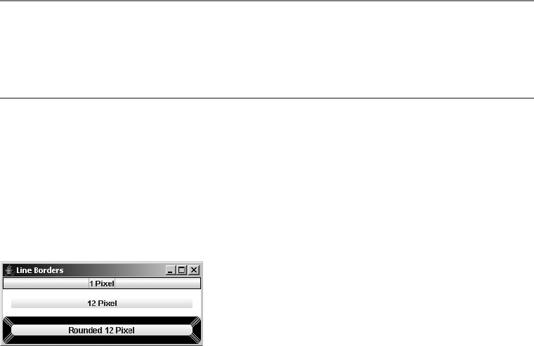
CHAPTER 7 ■ BORDERS 219
■Note When creating an empty border, with zeros all around, you should use the factory method to create
the border, avoiding the direct constructors. This allows the factory to create one truly empty border to be
shared by all. If all you want to do is hide the border, and the component is an AbstractButton subclass,
just call setBorderPainted(false).
LineBorder Class
The line border is a single-color line of a user-defined thickness that surrounds a component.
It can have squared-off or rounded corners. If you want to alter the thickness on different sides,
you’ll need to use MatteBorder, which is described in the section “Matte Border Class” later in
this chapter. Figure 7-4 shows a sampling of using LineBorder, with 1- and 12-pixel line thick-
nesses, with and without rounded corners.
Figure 7-4. LineBorder sample
Creating Line Borders
The LineBorder class has three constructors, two factory methods within it, and two factory
methods of BorderFactory:
public LineBorder(Color color)
Border lineBorder = new LineBorder (Color.RED);
public LineBorder(Color color, int thickness)
Border lineBorder = new LineBorder (Color.RED, 5);
public LineBorder (Color color, int thickness, boolean roundedCorners)
Border lineBorder = new LineBorder (Color.RED, 5, true);
public static Border createBlackLineBorder()
Border blackLine = LineBorder.createBlackLineBorder();
220 CHAPTER 7 ■ BORDERS
public static Border createGrayLineBorder()
Border grayLine = LineBorder.createGrayLineBorder();
public static Border createLineBorder(Color color)
Border lineBorder = BorderFactory.createLineBorder(Color.RED);
public static Border createLineBorder(Color color, int thickness)
Border lineBorder = BorderFactory.createLineBorder(Color.RED, 5);
■Note The LineBorder factory methods work as follows: If you create the same border twice, the same
LineBorder object will be returned. However, as with all object comparisons, you should always use the
equals() method for checking object equality.
Each allows you to customize the border color and line thickness. If a thickness isn’t spec-
ified, a default value of 1 is used. The two factory methods of LineBorder are for the commonly
used colors of black and gray. Because the border fills in the entire insets area, the LineBorder
is opaque, unless there are rounded corners. So, the opacity of the border is the opposite of the
rounded-corner setting.
Configuring Line Border Properties
Table 7-1 lists the inherited borderOpaque property from AbstractBorder and the immutable
properties of LineBorder.
BevelBorder Class
A bevel border draws a border with a three-dimensional appearance, which can appear to be
raised or lowered. When the border is raised, a shadow effect appears along the bottom and
right side of the border. When lowered, the position of the shading is reversed. Figure 7-5
shows raised and lowered bevel borders with default and custom colors.
Table 7-1. LineBorder Properties
Property Name Data Type Access
borderOpaque boolean Read-only
lineColor Color Read-only
roundedCorners boolean Read-only
thickness int Read-only
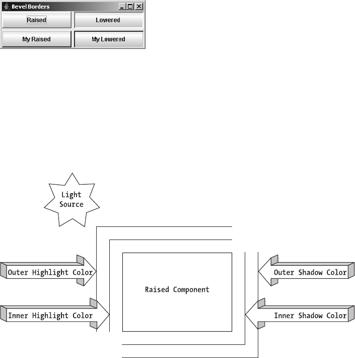
CHAPTER 7 ■ BORDERS 221
Figure 7-5. Raised and lowered BevelBorder sample
Drawing two different pairs of 1-pixel-wide lines around the component produces a simu-
lated three-dimensional appearance. The border sides that aren’t shaded are drawn with what
is called a highlight color, and the other two sides are drawn with a shadow color. The highlight
color and shadow color are each drawn in two different shades for the outer and inner edges of
the bevel. As such, a drawn bevel border uses four different colors in all. Figure 7-6 shows how
these four colors fit together.
Figure 7-6. Bevel color analysis
There are three constructors and one factory method of BevelBorder, as well as five factory
methods by which BorderFactory creates BevelBorder objects:
public BevelBorder(int bevelType)
Border bevelBorder = new BevelBorder(BevelBorder.RAISED);
public static Border createBevelBorder(int bevelType)
Border bevelBorder = BorderFactory.createBevelBorder(BevelBorder.RAISED);
public static Border createLoweredBevelBorder()
Border bevelBorder = BorderFactory.createLoweredBevelBorder();
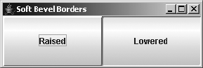
222 CHAPTER 7 ■ BORDERS
public static Border createRaisedBevelBorder()
Border bevelBorder = BorderFactory.createRaisedBevelBorder();
public BevelBorder(int bevelType, Color highlight, Color shadow)
Border bevelBorder = new BevelBorder(BevelBorder.RAISED, Color.PINK, Color.RED);
public static Border createBevelBorder(int bevelType, Color highlight, Color shadow)
Border bevelBorder = BorderFactory.createBevelBorder(BevelBorder.RAISED,
Color.PINK, Color.RED);
public BevelBorder(int bevelType, Color highlightOuter, Color highlightInner,
Color shadowOuter, Color shadowInner)
Border bevelBorder = new BevelBorder(BevelBorder.RAISED, Color.PINK,
Color.PINK.brighter(), Color.RED, Color.RED.darker());
public static Border createBevelBorder(int bevelType, Color highlightOuter,
Color highlightInner, Color shadowOuter, Color shadowInner)
Border bevelBorder = BorderFactory.createBevelBorder(BevelBorder.RAISED,
Color.PINK, Color.PINK.brighter(), Color.RED, Color.RED.darker());
Each allows you to customize both the bevel type and the coloration of the highlighting
and shadowing within the border. The bevel type is specified by one of two values:
BevelBorder.RAISED or BevelBorder.LOWERED. If highlight and shadow colors aren’t specified,
the appropriate colors are generated by examining the background of the component for the
border. If you do specify them, remember that the highlight color should be brighter, possibly
done by calling theColor.brighter(). A BevelBorder is opaque, by default.
SoftBevelBorder Class
The soft bevel border is a close cousin of the bevel border. It rounds out the corners so that
their edges aren’t as sharp, and it draws only one line, using the appropriate outer color for the
bottom and right sides. As Figure 7-7 shows, the basic appearance of the raised and lowered
SoftBevelBorder is roughly the same as that of the BevelBorder.
Figure 7-7. Raised and lowered SoftBevelBorder sample
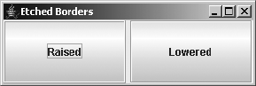
CHAPTER 7 ■ BORDERS 223
SoftBevelBorder has three constructors:
public SoftBevelBorder(int bevelType)
Border softBevelBorder = new SoftBevelBorder(SoftBevelBorder.RAISED);
public SoftBevelBorder(int bevelType, Color highlight, Color shadow)
Border softBevelBorder = new SoftBevelBorder(SoftBevelBorder.RAISED, Color.RED,
Color.PINK);
public SoftBevelBorder(int bevelType, Color highlightOuter, Color highlightInner,
Color shadowOuter, Color shadowInner)
Border softBevelBorder = new SoftBevelBorder(SoftBevelBorder.RAISED, Color.RED,
Color.RED.darker(), Color.PINK, Color.PINK.brighter());
Each allows you to customize both the bevel type and the coloration of the highlighting
and shadowing within the border. The bevel type is specified by one of two values:
SoftBevelBorder.RAISED or SoftBevelBorder.LOWERED. As with BevelBorder, the default colora-
tion is derived from the background color. A soft bevel border doesn’t completely fill in the
given insets area, so a SoftBevelBorder is created to be transparent (not opaque).
There are no static BorderFactory methods to create these borders.
EtchedBorder Class
An EtchedBorder is a special case of a BevelBorder, but it’s not a subclass. When the outer high-
light color of a BevelBorder is the same color as the inner shadow color and the outer shadow
color is the same color as the inner highlight color, you have an EtchedBorder. (See Figure 7-6
earlier in this chapter for a depiction of bevel colors.) Figure 7-8 shows what a raised and
lowered etched border might look like.
Figure 7-8. EtchedBorder samples
There are four constructors for EtchedBorder, as well as four factory methods of
BorderFactory for creating EtchedBorder objects:
224 CHAPTER 7 ■ BORDERS
public EtchedBorder()
Border etchedBorder = new EtchedBorder();
public EtchedBorder(int etchType)
Border etchedBorder = new EtchedBorder(EtchedBorder.RAISED);
public EtchedBorder(Color highlight, Color shadow)
Border etchedBorder = new EtchedBorder(Color.RED, Color.PINK);
public EtchedBorder(int etchType, Color highlight, Color shadow)
Border etchedBorder = new EtchedBorder(EtchedBorder.RAISED, Color.RED,
Color.PINK);
public static Border createEtchedBorder()
Border etchedBorder = BorderFactory.createEtchedBorder();
public static Border createEtchedBorder(Color highlight, Color shadow)
Border etchedBorder = BorderFactory.createEtchedBorder(Color.RED, Color.PINK);
public static Border createEtchedBorder(EtchedBorder.RAISED)
Border etchedBorder = BorderFactory.createEtchedBorder(Color.RED, Color.PINK);
public static Border createEtchedBorder(int type, Color highlight, Color shadow)
Border etchedBorder = BorderFactory.createEtchedBorder(EtchedBorder.RAISED,
Color.RED, Color.PINK);
Each allows you to customize both the etching type and the coloration of the highlighting
and shadowing within the border. If no etching type is specified, the border is lowered. As with
BevelBorder and SoftBevelBorder, you can specify the etching type through one of two constants:
EtchedBorder.RAISED or EtchedBorder.LOWERED. Again, if no colors are specified, they’re derived
from the background color of the component passed into paintBorder(). By default, all
EtchedBorder objects are created to be opaque.
MatteBorder Class
MatteBorder is one of the more versatile borders available. It comes in two varieties. The first is
demonstrated in Figure 7-9 and shows a MatteBorder used like a LineBorder to fill the border
with a specific color, but with a different thickness on each side (something a plain LineBorder
cannot handle).
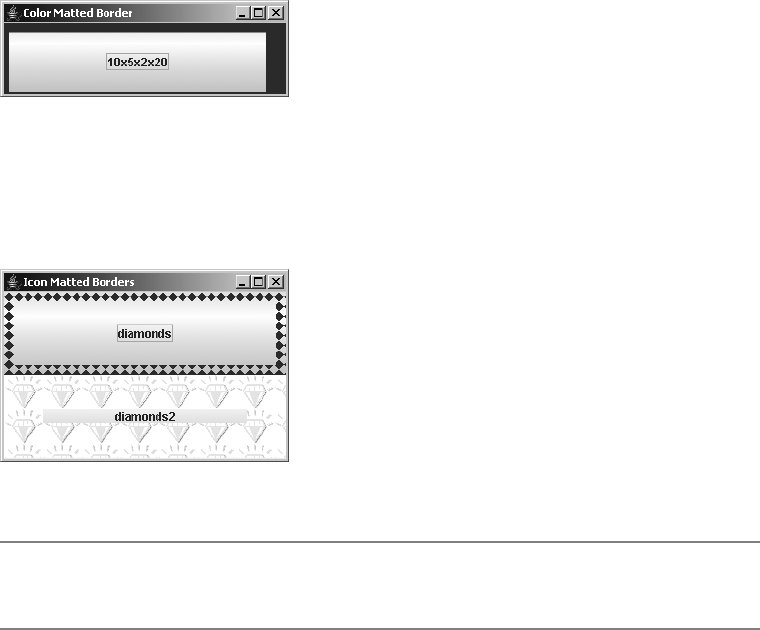
CHAPTER 7 ■ BORDERS 225
Figure 7-9. MatteBorder color sample
The second variety uses an Icon tiled throughout the border area. This Icon could be an
ImageIcon, if created from an Image object, or it could be one you create yourself by imple-
menting the Icon interface. Figure 7-10 demonstrates both implementations.
Figure 7-10. MatteBorder icon samples
■Tip When tiling an icon, the right and bottom areas may not look very attractive if the border size,
component size, and icon size fail to mesh well.
There are seven constructors and two factory methods of BorderFactory for creating
MatteBorder objects:
public MatteBorder(int top, int left, int bottom, int right, Color color)
Border matteBorder = new MatteBorder(5, 10, 5, 10, Color.GREEN);
public MatteBorder(int top, int left, int bottom, int right, Icon icon)
Icon diamondIcon = new DiamondIcon(Color.RED);
Border matteBorder = new MatteBorder(5, 10, 5, 10, diamondIcon);
public MatteBorder(Icon icon)
Icon diamondIcon = new DiamondIcon(Color.RED);
Border matteBorder = new MatteBorder(diamondIcon);
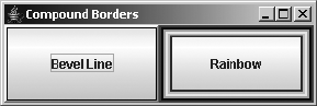
226 CHAPTER 7 ■ BORDERS
public MatteBorder(Insets insets, Color color)
Insets insets = new Insets(5, 10, 5, 10);
Border matteBorder = new MatteBorder(insets, Color.RED);
public MatteBorder(Insets insets, Icon icon)
Insets insets = new Insets(5, 10, 5, 10);
Icon diamondIcon = new DiamondIcon(Color.RED);
Border matteBorder = new MatteBorder(insets, diamondIcon);
public static MatteBorder createMatteBorder(int top, int left, int bottom,
int right, Color color)
Border matteBorder = BorderFactory.createMatteBorder(5, 10, 5, 10, Color.GREEN);
public static MatteBorder createMatteBorder(int top, int left, int bottom,
int right, Icon icon)
Icon diamondIcon = new DiamondIcon(Color.RED);
Border matteBorder = BorderFactory.createMatteBorder(5, 10, 5, 10, diamondIcon);
Each allows you to customize what will be matted within the border area. When tiling an
Icon, if you don’t specify the border insets size, the actual icon dimensions will be used.
CompoundBorder Class
After EmptyBorder, the compound border is probably one of the simplest predefined borders to
use. It takes two existing borders and combines them, using the Composite design pattern, into
a single border. A Swing component can have only one border associated with it, therefore, the
CompoundBorder allows you to combine borders before associating them with a component.
Figure 7-11 shows two examples of CompoundBorder in action. The border on the left is a beveled,
line border. The one on the right is a six-line border, with several borders combined together.
Figure 7-11. CompoundBorder samples
Creating Compound Borders
There are two constructors for CompoundBorder and two factory methods that BorderFactory
offers for creating CompoundBorder objects (the no-argument constructor and factory methods
are completely useless here, because there are no setter methods to later change the compounded
borders, so no source examples are shown for them):
CHAPTER 7 ■ BORDERS 227
public CompoundBorder()
public static CompoundBorder createCompoundBorder()
public CompoundBorder(Border outside, Border inside)
Border compoundBorder = new CompoundBorder(lineBorder, matteBorder);
public static CompoundBorder createCompoundBorder(Border outside, Border inside)
Border compoundBorder = BorderFactory.createCompoundBorder(lineBorder,
matteBorder);
■Tip Keep in mind that CompoundBorder is itself a Border, so you can combine multiple borders into one
border many levels deep.
The opacity of a compound border depends on the opacity of the contained borders.
If both contained borders are opaque, so is the compound border. Otherwise, a compound
border is considered transparent.
Configuring Properties
In addition to the borderOpaque property inherited from AbstractBorder, Table 7-2 lists the two
read-only properties CompoundBorder adds.
TitledBorder Class
Probably the most interesting border, TitledBorder can also be the most complicated to use. The
titled border allows you to place a text string around a component. In addition to surrounding a
single component, you can place a titled border around a group of components, like JRadioButton
objects, as long as they’re placed within a container such as a JPanel. The TitledBorder can be
difficult to use, but there are several ways to simplify its usage. Figure 7-12 shows both a simple
titled border and one that’s a little more complex.
Table 7-2. CompoundBorder Properties
Property Name Data Type Access
borderOpaque boolean Read-only
insideBorder Border Read-only
outsideBorder Border Read-only
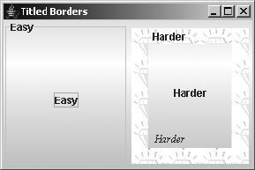
228 CHAPTER 7 ■ BORDERS
Figure 7-12. TitledBorder samples
Creating Titled Borders
Six constructors and six BorderFactory factory methods exist for creating TitledBorder objects.
Each allows you to customize the text, position, and appearance of a title within a specified
border. When unspecified, the current look and feel controls the border, title color, and title
font. The default location for the title is the upper-left corner, while the default title is the
empty string. A titled border is always at least partially transparent because the area beneath
the title text shows through. Therefore, isBorderOpaque() reports false.
If you look at each of the following methods, shown in pairs, this will be easier to understand.
First shown is the constructor method; next shown is the equivalent BorderFactory method.
public TitledBorder(Border border)
Border titledBorder = new TitledBorder(lineBorder);
public static TitledBorder createTitledBorder(Border border)
Border titledBorder = BorderFactory.createTitledBorder(lineBorder);
public TitledBorder(String title)
Border titledBorder = new TitledBorder("Hello");
public static TitledBorder createTitledBorder(String title)
Border titledBorder = BorderFactory.createTitledBorder("Hello");
public TitledBorder(Border border, String title)
Border titledBorder = new TitledBorder(lineBorder, "Hello");
public static TitledBorder createTitledBorder(Border border, String title)
Border titledBorder = BorderFactory.createTitledBorder(lineBorder, "Hello");
public TitledBorder(Border border, String title, int justification, int position)
Border titledBorder = new TitledBorder(lineBorder, "Hello", TitledBorder.LEFT,
TitledBorder.BELOW_BOTTOM);

CHAPTER 7 ■ BORDERS 229
public static TitledBorder createTitledBorder(Border border, String title,
int justification, int position)
Border titledBorder = BorderFactory.createTitledBorder(lineBorder, "Hello",
TitledBorder.LEFT, TitledBorder.BELOW_BOTTOM);
public TitledBorder(Border border, String title, int justification, int position,
Font font)
Font font = new Font("Serif", Font.ITALIC, 12);
Border titledBorder = new TitledBorder(lineBorder, "Hello", TitledBorder.LEFT,
TitledBorder.BELOW_BOTTOM, font);
public static TitledBorder createTitledBorder(Border border, String title,
int justification, int position, Font font)
Font font = new Font("Serif", Font.ITALIC, 12);
Border titledBorder = BorderFactory.createTitledBorder(lineBorder, "Hello",
TitledBorder.LEFT, TitledBorder.BELOW_BOTTOM, font);
public TitledBorder(Border border, String title, int justification, int position,
Font font, Color color)
Font font = new Font("Serif", Font.ITALIC, 12);
Border titledBorder = new TitledBorder(lineBorder, "Hello", TitledBorder.LEFT,
TitledBorder.BELOW_BOTTOM, font, Color.RED);
public static TitledBorder createTitledBorder(Border border, String title,
int justification, int position, Font font, Color color)
Font font = new Font("Serif", Font.ITALIC, 12);
Border titledBorder = BorderFactory.createTitledBorder(lineBorder, "Hello",
TitledBorder.LEFT, TitledBorder.BELOW_BOTTOM, font, Color.RED);
Configuring Properties
Unlike all the other predefined borders, titled borders have six setter methods to modify their
attributes after border creation. As shown in Table 7-3, you can modify a titled border’s under-
lying border, title, drawing color, font, text justification, and text position.
Table 7-3. TitledBorder Properties
Property Name Data Type Access
border Border Read-write
borderOpaque boolean Read-only
title String Read-write
titleColor Color Read-write
titleFont Font Read-write
titleJustification int Read-write
titlePosition int Read-write
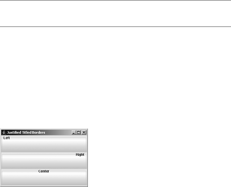
230 CHAPTER 7 ■ BORDERS
■Tip To reduce screen redrawing, it’s better to modify the properties of a titled border prior to placing the
border around a component.
Text justification of the title string within a TitledBorder is specified by one of four class
constants:
•CENTER: Place the title in the center.
•DEFAULT_JUSTIFICATION: Use the default setting to position the text. The value is equivalent
to LEFT.
•LEFT: Place the title on the left edge.
•RIGHT: Place the title on the right edge.
Figure 7-13 shows the same TitledBorder with three different justifications.
Figure 7-13. Title justifications
You can position title strings in any one of six different locations, as specified by one of
seven class constants:
•ABOVE_BOTTOM: Place the title above the bottom line.
•ABOVE_TOP: Place the title above the top line.
•BELOW_BOTTOM: Place the title below the bottom line.
•BELOW_TOP: Place the title below the top line.
•BOTTOM: Place the title on the bottom line.
•DEFAULT_POSITION: Use the default setting to place the text. This value is equivalent to TOP.
•TOP: Place the title on the top line.
Figure 7-14 shows the six different positions available for the title on a TitledBorder.
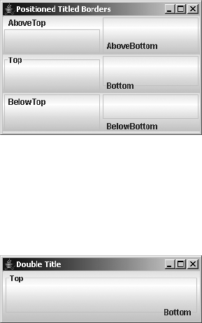
CHAPTER 7 ■ BORDERS 231
Figure 7-14. Title positioning
Because a TitledBorder contains another Border, you can combine more than one border
to place multiple titles along a single border. For example, Figure 7-15 shows a title along the
top and bottom of the border.
Figure 7-15. Showing multiple titles on a TitledBorder
The program used to generate Figure 7-15 is shown in Listing 7-2.
Listing 7-2. Multiple Titles on a TitledBorder
import javax.swing.*;
import javax.swing.border.*;
import java.awt.*;
public class DoubleTitle {
public static void main(String args[]) {
Runnable runner = new Runnable() {
public void run() {
JFrame frame = new JFrame("Double Title");
frame.setDefaultCloseOperation(JFrame.EXIT_ON_CLOSE);
TitledBorder topBorder = BorderFactory.createTitledBorder("Top");
topBorder.setTitlePosition(TitledBorder.TOP);
TitledBorder doubleBorder = new TitledBorder(topBorder, "Bottom",
TitledBorder.RIGHT, TitledBorder.BOTTOM);
JButton doubleButton = new JButton();
doubleButton.setBorder(doubleBorder);
frame.add(doubleButton, BorderLayout.CENTER);
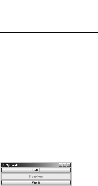
232 CHAPTER 7 ■ BORDERS
frame.setSize(300, 100);
frame.setVisible(true);
}
};
EventQueue.invokeLater(runner);
}
}
Customizing TitledBorder Look and Feel
The available set of UIResource-related properties for a TitledBorder is shown in Table 7-4.
It has three different properties.
Creating Your Own Borders
When you want to create your own distinctive border, you can either create a new class that
implements the Border interface directly or you can extend the AbstractBorder class. As previ-
ously mentioned, extending the AbstractBorder class is the better way to go, because optimizations
are built in to certain Swing classes to take advantage of some of the AbstractBorder-specific
methods. For instance, if a border is an AbstractBorder,JComponent will reuse an Insets object
when getting the Insets of a border. Thus, one fewer object will need to be created and destroyed
each time the insets are fetched.
In addition to thinking about subclassing AbstractBorder versus implementing the Border
interface yourself, you need to consider whether or not you want a static border. If you attach
a border to a button, you want that button to be able to signal selection. You must examine the
component passed into the paintBorder() method and react accordingly. In addition, you
should also draw a disabled border to indicate when the component isn’t selectable. Although
setEnabled(false) disables the selection of the component, if the component has a border
associated with it, the border still must be drawn, even when disabled. Figure 7-16 shows one
border in action that looks at all these options for the component passed into the border’s
paintBorder() method.
Figure 7-16. Active custom border examples
Table 7-4. TitledBorder UIResource Elements
Property String Object Type
TitledBorder.font Font
TitledBorder.titleColor Color
TitledBorder.border Border
CHAPTER 7 ■ BORDERS 233
The source for the custom border and the sample program is shown in Listing 7-3.
Listing 7-3. Custom Colorized Border
import javax.swing.*;
import javax.swing.border.*;
import java.awt.*;
public class RedGreenBorder extends AbstractBorder {
public boolean isBorderOpaque() {
return true;
}
public Insets getBorderInsets(Component c) {
return new Insets(3, 3, 3, 3);
}
public void paintBorder(Component c, Graphics g, int x, int y, int width,
int height) {
Insets insets = getBorderInsets(c);
Color horizontalColor;
Color verticalColor;
if (c.isEnabled()) {
boolean pressed = false;
if (c instanceof AbstractButton) {
ButtonModel model = ((AbstractButton)c).getModel();
pressed = model.isPressed();
}
if (pressed) {
horizontalColor = Color.RED;
verticalColor = Color.GREEN;
} else {
horizontalColor = Color.GREEN;
verticalColor = Color.RED;
}
} else {
horizontalColor = Color.LIGHT_GRAY;
verticalColor = Color.LIGHT_GRAY;
}
g.setColor(horizontalColor);
g.translate(x, y);
// Top
g.fillRect(0, 0, width, insets.top);
// Bottom
g.fillRect(0, height-insets.bottom, width, insets.bottom);

234 CHAPTER 7 ■ BORDERS
g.setColor(verticalColor);
// Left
g.fillRect(0, insets.top, insets.left, height-insets.top-insets.bottom);
// Right
g.fillRect(width-insets.right, insets.top, insets.right,
height-insets.top-insets.bottom);
g.translate(-x, -y);
}
public static void main(String args[]) {
Runnable runner = new Runnable() {
public void run() {
JFrame frame = new JFrame("My Border");
frame.setDefaultCloseOperation(JFrame.EXIT_ON_CLOSE);
Border border = new RedGreenBorder();
JButton helloButton = new JButton("Hello");
helloButton.setBorder(border);
JButton braveButton = new JButton("Brave New");
braveButton.setBorder(border);
braveButton.setEnabled(false);
JButton worldButton = new JButton("World");
worldButton.setBorder(border);
frame.add(helloButton, BorderLayout.NORTH);
frame.add(braveButton, BorderLayout.CENTER);
frame.add(worldButton, BorderLayout.SOUTH);
frame.setSize(300, 100);
frame.setVisible(true);
}
};
EventQueue.invokeLater(runner);
}
}
■Note Another interesting custom border is one that displays an active component instead of a text title in
aTitledBorder. Imagine a border that has a JCheckBox or JRadioButton instead of a text string for the
title. You can also use a JLabel and pass in HTML for the text.
Summary
In this chapter, you learned about the use of the Border interface and its many predefined
implementations. You also learned how to create predefined borders using the Factory design
pattern provided by the BorderFactory class. Lastly, you saw how to define your own borders
and why subclassing AbstractBorder is beneficial.
In Chapter 8, you’ll move beyond low-level components and examine the window-like
container objects available in Swing.

235
■ ■ ■
CHAPTER 8
Root Pane Containers
In Chapter 7, you looked at working with borders around Swing components. In this chapter,
you’ll explore the high-level Swing containers and discover how they differ from their AWT
counterparts.
Working with top-level containers in Swing is a bit different from working with top-level
AWT containers. With the AWT containers of Frame,Window,Dialog, and Applet, you added
components directly to the container, and there was only one place you could add them. In
the Swing world, the top-level containers of JFrame,JWindow,JDialog, and JApplet, plus the
JInternalFrame container, rely on something called a JRootPane. Instead of adding components
directly to the container, you add them to a part of the root pane. The root pane then manages
them all internally.
Why was this indirect layer added? Believe it or not, it was done to simplify things. The root
pane manages its components in layers so that elements such as tooltip text will always appear
above components, and you don’t need to worry about dragging some components around
behind others.
The one container without an AWT counterpart, JInternalFrame, also provides some addi-
tional capabilities when placed within a desktop (within a JDesktopPane to be specific). The
JInternalFrame class can be used as the basis for creating a Multiple Document Interface (MDI)
application architecture within a Swing program. You can manage a series of internal frames
within your program, and they’ll never go beyond the bounds of your main program window.
Let’s begin by exploring the new JRootPane class, which manages the internals of all the
top-level containers.
JRootPane Class
The JRootPane class acts as a container delegate for the top-level Swing containers. Because
the container holds only a JRootPane when you add or remove components from a top-level
container, instead of directly altering the components in the container, you indirectly add or
remove components from its JRootPane instance. In effect, the top-level containers are acting
as proxies, with the JRootPane doing all the work.
The JRootPane container relies on its inner class RootLayout for layout management and
takes up all the space of the top-level container that holds it. There are only two components
within a JRootPane: a JLayeredPane and a glass pane (Component). The glass pane is in front, can
be any component, and tends to be invisible. The glass pane ensures that elements such as
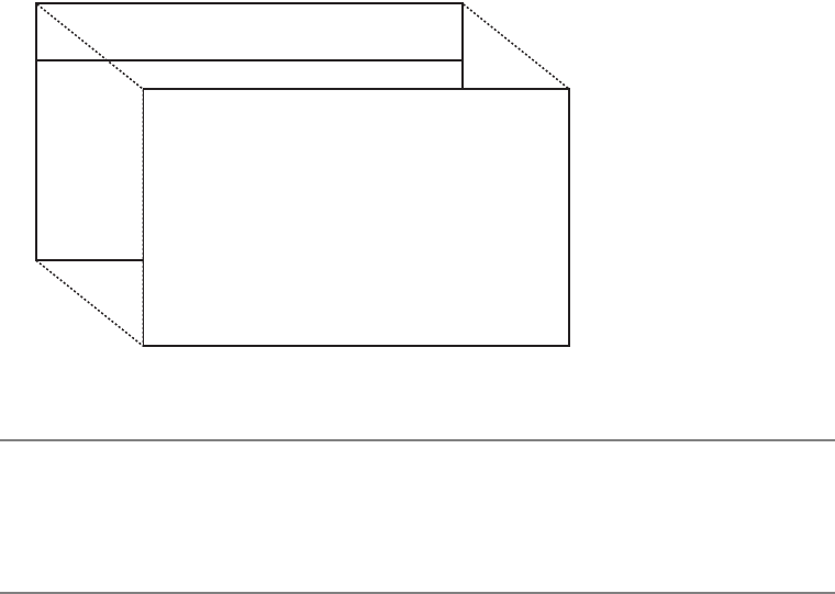
236 CHAPTER 8 ■ ROOT PANE CONTAINERS
tooltip text appear in front of any other Swing components. In the back is the JLayeredPane,
which contains an optional JMenuBar on top and a content pane (Container) below it in another
layer. It is within the content pane that you would normally place components in the
JRootPane. Figure 8-1 should help you visualize how the RootLayout lays out the components.
Figure 8-1. JRootPane containment diagram
■Note A JLayeredPane is just another Swing container (it’s described later in this chapter). It can contain
any components and has a special layering characteristic. The default JLayeredPane used within the
JRootPane pane contains only a JMenuBar and a Container as its content pane. The content pane has
its own layout manager, which is BorderLayout by default.
Creating a JRootPane
Although the JRootPane has a public no-argument constructor, a JRootPane isn’t something
you would normally create yourself. Instead, a class that implements the RootPaneContainer
interface creates the JRootPane. Then, you can get the root pane from that component, through
the RootPaneContainer interface, described shortly.
JRootPane Properties
As Table 8-1 shows, there are 11 properties of JRootPane. In most cases, when you get or set one
of these properties for a top-level container, like JFrame, the container simply passes along the
request to its JRootPane.
The glass pane for a JRootPane must not be opaque. Because the glass pane takes up the
entire area in front of the JLayeredPane, an opaque glass pane would render the menu bar and
content pane invisible. And, because the glass pane and content pane share the same bounds,
the optimizedDrawingEnabled property returns the visibility of the glass pane as its setting.
*-ENU"AR
#ONTENT0ANE#ONTAINER
'LASS0ANE#OMPONENT
*,AYERED0ANE

CHAPTER 8 ■ ROOT PANE CONTAINERS 237
The windowDecorationStyle property is meant to describe the window adornments
(border, title, buttons for closing window) for the window containing the JRootPane. It can
be set to one of the following JRootPane class constants:
•COLOR_CHOOSER_DIALOG
•ERROR_DIALOG
•FILE_CHOOSER_DIALOG
•FRAME
•INFORMATION_DIALOG
•NONE
•PLAIN_DIALOG
•QUESTION_DIALOG
•WARNING_DIALOG
What exactly happens with the windowDecorationStyle setting depends on the current
look and feel. It is just a hint. By default, this setting is NONE. If this setting is not NONE, the
setUndecorated() method of JDialog or JFrame has been called with a value of true, and the
getSupportsWindowDecorations() method of the current look and feel reports true, then the
look and feel, rather than the window manager, will provide the window adornments. This
allows you to have programs with top-level windows that look like they do not come from the
platform the user is working on but from your own environment, though still providing iconify,
maximize, minimize, and close buttons.
Table 8-1. JRootPane Properties
Property Name Data Type Access
accessibleContext AccessibleContext Read-only
contentPane Container Read-write
defaultButton JButton Read-write bound
glassPane Component Read-write
jMenuBar JMenuBar Read-write
layeredPane JLayeredPane Read-write
optimizedDrawingEnabled boolean Read-only
UI RootPaneUI Read-write
UIClassID String Read-only
validateRoot boolean Read-only
windowDecorationStyle int Read-write bound
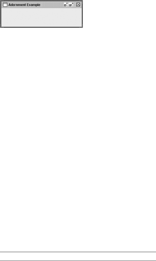
238 CHAPTER 8 ■ ROOT PANE CONTAINERS
For the Metal look and feel (and Ocean theme), getSupportsWindowDecorations() reports
true. The other system-provided look and feel types report false. Figure 8-2 demonstrates
what a frame looks like with the window adornments provided by the Metal look and feel.
Figure 8-2. Metal window adornments for a JFrame
The source to produce Figure 8-2 is shown in Listing 8-1.
Listing 8-1. Setting the Window Decoration Style
import java.awt.*;
import javax.swing.*;
public class AdornSample {
public static void main(final String args[]) {
Runnable runner = new Runnable() {
public void run() {
JFrame frame = new JFrame("Adornment Example");
frame.setDefaultCloseOperation(JFrame.EXIT_ON_CLOSE);
frame.setUndecorated(true);
frame.getRootPane().setWindowDecorationStyle(JRootPane.FRAME);
frame.setSize(300, 100);
frame.setVisible(true);
}
};
EventQueue.invokeLater(runner);
}
}
Customizing a JRootPane Look and Feel
Table 8-2 shows the 12 UIResource-related properties for a JRootPane. Most of these settings have
to do with the default border to use when configuring the window decoration style.
Table 8-2. JRootPane UIResource Elements
Property String Object Type
RootPane.actionMap ActionMap
RootPane.ancestorInputMap InputMap
RootPane.colorChooserDialogBorder Border

CHAPTER 8 ■ ROOT PANE CONTAINERS 239
RootPaneContainer Interface
The RootPaneContainer interface defines the setter/getter methods for accessing the different
panes within the JRootPane, as well as accessing the JRootPane itself.
public interface RootPaneContainer {
// Properties
public Container getContentPane();
public void setContentPane(Container contentPane);
public Component getGlassPane();
public void setGlassPane(Component glassPane);
public JLayeredPane getLayeredPane();
public void setLayeredPane(JLayeredPane layeredPane);
public JRootPane getRootPane();
}
Among the predefined Swing components, the JFrame,JWindow,JDialog,JApplet, and
JInternalFrame classes implement the RootPaneContainer interface. For the most part, these
implementations simply pass along the request to a JRootPane implementation for the high-
level container. The following source code is one such implementation for the glass pane of a
RootPaneContainer implementer:
public Component getGlassPane() {
return getRootPane().getGlassPane();
}
public void setGlassPane(Component glassPane) {
getRootPane().setGlassPane(glassPane);
}
JLayeredPane Class
The JLayeredPane serves as the main component container of a JRootPane. The JLayeredPane
manages the z-order, or layering, of components within itself. This ensures that the correct
RootPane.defaultButtonWindowKeyBindings Object[ ]
RootPane.errorDialogBorder Border
RootPane.fileChooserDialogBorder Border
RootPane.frameBorder Border
RootPane.informationDialogBorder Border
RootPane.plainDialogBorder Border
RootPane.questionDialogBorder Border
RootPane.warningDialogBorder Border
RootPaneUI String
Table 8-2. JRootPane UIResource Elements (Continued)
Property String Object Type

240 CHAPTER 8 ■ ROOT PANE CONTAINERS
component is drawn on top of other components for tasks such as creating tooltip text, pop-up
menus, and dragging for drag-and-drop. You can use the system-defined layers, or you can
create your own layers.
Although initially a JLayeredPane container has no layout manager, there’s nothing to stop
you from setting the layout property of the container, defeating the layering aspect of the
container.
Creating a JLayeredPane
As with the JRootPane, you’ll almost never create an instance of the JLayeredPane class yourself.
When the default JRootPane is created for one of the predefined classes that implement
RootPaneContainer, the JRootPane creates a JLayeredPane for its main component area, adding
an initial content pane.
Adding Components in Layers
A layer setting for each added component manages the z-order of components within a
JLayeredPane. The higher the layer setting, the closer to the top the component will be drawn.
You can set the layer with the layout manager constraints when you add a component to a
JLayeredPane:
Integer layer = new Integer(20);
aLayeredPane.add(aComponent, layer);
You can also call the public void setLayer(Component comp, int layer) or public void
setLayer(Component comp, int layer, int position) method before adding the component
to the JLayeredPane.
aLayeredPane.setLayer(aComponent, 10);
aLayeredPane.add(aComponent);
The JLayeredPane class predefines six constants for special values. In addition, you can
find out the topmost current layer with public int c and the bottom layer with public int
lowestLayer(). Table 8-3 lists the six predefined layer constants.
Table 8-3. JLayeredPane Layer Constants
Constant Description
FRAME_CONTENT_LAYER Level –30,000 for holding the menu bar and content pane;
not normally used by developers
DEFAULT_LAYER Level 0 for the normal component level
PALETTE_LAYER Level 100 for holding floating toolbars and the like
MODAL_LAYER Level 200 for holding pop-up dialog boxes that appear on top
of components on the default layer, on top of palettes, and
below pop-ups
POPUP_LAYER Level 300 for holding pop-up menus and tooltips
DRAG_LAYER Level 400 for ensuring that dragged objects remain on top
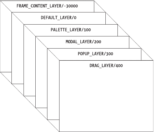
CHAPTER 8 ■ ROOT PANE CONTAINERS 241
Although you can use your own constants for layers, use them with care—because the
system will use the predefined constants for its needs. If your constants don’t fit in properly,
the components may not work as you intended.
To visualize how the different layers fit in, see Figure 8-3.
Figure 8-3. JLayeredPane layers
Working with Component Layers and Positions
Components in a JLayeredPane have both a layer and a position. When a single component is
on a layer, it’s at position 0. When multiple components are on the same layer, components
added later have higher position numbers. The lower the position setting, the closer to the top
the component will appear. (This is the reverse of the layering behavior.) Figure 8-4 shows the
positions for four components on the same layer.
To rearrange components on a single layer, you can use either the public void
moveToBack(Component component) or public void moveToFront(Component component)
method. When you move a component to the front, it goes to position 0 for the layer. When
you move a component to the back, it goes to the highest position number for the layer. You
can also manually set the position with public void setPosition(Component component, int
position). A position of –1 is automatically the bottom layer with the highest position (see
Figure 8-4).
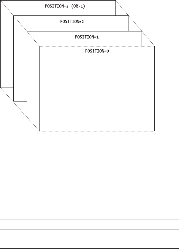
242 CHAPTER 8 ■ ROOT PANE CONTAINERS
Figure 8-4. JLayeredPane positions
JLayeredPane Properties
Table 8-4 shows the two properties of JLayeredPane. The optimizedDrawingEnabled property
determines whether components within the JLayeredPane can overlap. By default, this setting
is true because in the standard usage with JRootPane the JMenuBar and content pane can’t
overlap. However, the JLayeredPane automatically validates the property setting to reflect the
current state of the contents of the pane.
JFrame Class
The JFrame class is the Swing high-level container that uses a JRootPane and implements the
RootPaneContainer interface. In addition, it uses the WindowConstants interface to help manage
closing operations.
Table 8-4. JLayeredPane Properties
Property Name Data Type Access
accessibleContext AccessibleContext Read-only
optimizedDrawingEnabled boolean Read-only

CHAPTER 8 ■ ROOT PANE CONTAINERS 243
Creating a JFrame
The JFrame class provides two primary constructors: one for creating a frame without a title
and one for creating a frame with a title. There are two additional constructors for creating
frames with a specialized GraphicsConfiguration.
public JFrame()
JFrame frame = new JFrame();
public JFrame(String title)
JFrame frame = new JFrame("Title Bar");
public JFrame(GraphicsConfiguration config)
GraphicsEnvironment ge = GraphicsEnvironment.getLocalGraphicsEnvironment();
GraphicsDevice gsd[] = ge.getScreenDevices();
GraphicsConfiguration gc[] = gsd[0].getConfigurations();
JFrame frame = new JFrame(gc[0]);
public JFrame(String title, GraphicsConfiguration config)
GraphicsConfiguration gc = ...;
JFrame frame = new JFrame("Title Bar", gc);
JFrame Properties
Table 8-5 shows the nine properties of the JFrame.
Table 8-5. JFrame Properties
Property Name Data Type Access
accessibleContext AccessibleContext Read-only
contentPane Container Read-write
defaultCloseOperation int Read-write
glassPane Component Read-write
iconImage Image Write-only
jMenuBar JMenuBar Read-write
layeredPane JLayeredPane Read-write
layout LayoutManager Write-only
rootPane JRootPane Read-only

244 CHAPTER 8 ■ ROOT PANE CONTAINERS
Although most properties are the result of implementing the RootPaneContainer interface,
two properties are special: defaultCloseOperation and layout. (You first looked at the
defaultCloseOperation property in Chapter 2.) By default, a JFrame hides itself when the user
closes the window. To change the setting, you can use one of the constants listed in Table 8-6
as arguments when setting the default close operation. The first comes from JFrame directly;
the others are part of the WindowConstants interface.
aFrame.setDefaultCloseOperation(JFrame.DISPOSE_ON_CLOSE);
The layout property is odd. By default, setting the layout manager of the JFrame passes the
call along to the content pane. You can’t change the default layout manager of the JFrame.
■Tip You can use the state property (inherited from Frame) to say whether the JFrame is currently icon-
ified. When using the property, be sure to use one of the additional Frame constants of NORMAL or ICONIFIED to
set its state.
There is an additional static property of JFrame:defaultLookAndFeelDecorated. This works
with the windowDecorationStyle property of JRootPane. When set to true, newly created frames
will be adorned with decorations from the look and feel instead of the window manager. Of
course, this happens only if the current look and feel supports window decorations. Listing 8-2
shows an alternate way to generate the same screen (with the window adornments provided by
the Metal look and feel) as the one shown earlier in Figure 8-2.
Listing 8-2. Alternative Way of Setting the Window Decoration Style
import java.awt.*;
import javax.swing.*;
public class AdornSample2 {
Table 8-6. Close Operation Constants
Constant Description
EXIT_ON_CLOSE Call System.exit(0).
DISPOSE_ON_CLOSE Call dispose() on the frame.
DO_NOTHING_ON_CLOSE Ignore the request.
HIDE_ON_CLOSE Call setVisible(false) on the frame; this is the default.
CHAPTER 8 ■ ROOT PANE CONTAINERS 245
public static void main(final String args[]) {
Runnable runner = new Runnable() {
public void run() {
JFrame.setDefaultLookAndFeelDecorated(true);
JFrame frame = new JFrame("Adornment Example");
frame.setDefaultCloseOperation(JFrame.EXIT_ON_CLOSE);
frame.setSize(300, 100);
frame.setVisible(true);
}
};
EventQueue.invokeLater(runner);
}
}
Adding Components to a JFrame
Because JFrame implements the RootPaneContainer interface and uses a JRootPane, you don’t
add components directly to the JFrame. Instead, you add them to the JRootPane contained
within the JFrame. Prior to J2SE 5.0, you needed to add components like this:
JRootPane rootPane = aJFrame.getRootPane();
Container contentPane = rootPane.getContentPane();
contentPane.add(...);
This can be shortened to the following form:
aJFrame.getContentPane().add(...);
If you tried to add components directly to the JFrame, it resulted in a runtime error being
thrown.
Due to many suggestions (complaints?), Sun finally decided to change the add() method
into a proxy:
// J2SE 5.0
aJFrame.add(...);
With J2SE 5.0, when you add components to the JFrame, they actually are added to the
content pane of the RootPaneContainer.
Handling JFrame Events
The JFrame class supports the registration of eleven different listeners:
•ComponentListener: To find out when the frame moves or is resized.
•ContainerListener: Normally not added to a JFrame because you add components to the
content pane of its JRootPane.
•FocusListener: To find out when the frame gets or loses input focus.
246 CHAPTER 8 ■ ROOT PANE CONTAINERS
•HierarchyBoundsListener: To find out when the frame moves or is resized. This works
similarly to ComponentListener, since the frame is the top-level container of component.
•HierarchyListener: To find out when the frame is shown or hidden.
•InputMethodListener: To work with input methods for internationalization.
•KeyListener: Normally not added to a JFrame. Instead, you register a keyboard action for
its content pane, like this:
JPanel content = (JPanel)frame.getContentPane();
KeyStroke stroke = KeyStroke.getKeyStroke(KeyEvent.VK_ESCAPE, 0);
content.registerKeyboardAction(actionListener, stroke,
JComponent.WHEN_IN_FOCUSED_WINDOW);
•MouseListener and MouseMotionListener: To listen for mouse and mouse motion events.
•PropertyChangeListener: To listen for changes to bound properties.
•WindowListener: To find out when a window is iconified or deiconified or a user is trying
to open or close the window.
With the help of the defaultCloseOperation property, you typically don’t need to add a
WindowListener to help with closing the frame or stopping the application.
Extending JFrame
If you need to extend JFrame, this class has two important protected methods:
protected void frameInit()
protected JRootPane createRootPane()
By overriding either of these methods in a subclass, you can customize the initial appear-
ance and behavior of the frame or that of its JRootPane. For example, in the ExitableJFrame
class shown in Listing 8-3, the default close operation is initialized to the EXIT_ON_CLOSE state.
Instead of calling setDefaultCloseOperation() for every frame created, you can use this class
instead. Because JFrame was subclassed, you don’t need to add a call to the frameInit()
method in either of the constructors. The parent class automatically calls the method.
Listing 8-3. Closing Frames by Default
import javax.swing.JFrame;
public class ExitableJFrame extends JFrame {
public ExitableJFrame () {
}
public ExitableJFrame (String title) {
super (title);
}

CHAPTER 8 ■ ROOT PANE CONTAINERS 247
protected void frameInit() {
super.frameInit();
setDefaultCloseOperation(EXIT_ON_CLOSE);
}
}
■Caution If you do override the frameInit() method of JFrame, remember to call super.frameInit()
first, to initialize the default behaviors. If you forget and don’t reimplement all the default behaviors yourself,
your new frame will look and act differently.
JWindow Class
The JWindow class is similar to the JFrame class. It uses a JRootPane for component management
and implements the RootPaneContainer interface. Basically, it is a top-level window with no
adornments.
Creating a JWindow
The JWindow class has five constructors:
public JWindow()
JWindow window = new JWindow();
public JWindow(Frame owner)
JWindow window = new JWindow(aFrame);
public JWindow(GraphicsConfiguration config)
GraphicsConfiguration gc = ...;
JWindow window = new JWindow(gc);
public JWindow(Window owner)
JWindow window = new JWindow(anotherWindow);
public JWindow(Window owner, GraphicsConfiguration config)
GraphicsConfiguration gc = ...;
JWindow window = new JWindow(anotherWindow, gc);
You can create a window without specifying a parent or by specifying the parent as a Frame
or Window. If no parent is specified, an invisible one is used.

248 CHAPTER 8 ■ ROOT PANE CONTAINERS
JWindow Properties
Table 8-7 lists the six properties of JWindow. These are similar in nature to the JFrame properties,
except that JWindow has no property for a default close operation or a menu bar.
Handling JWindow Events
The JWindow class adds no additional event-handling capabilities beyond those of the JFrame
and Window classes. See the “Handling JFrame Events” section earlier in this chapter for a list of
listeners you can attach to a JWindow.
Extending JWindow
If you need to extend JWindow, the class has two protected methods of importance:
protected void windowInit()
protected JRootPane createRootPane()
JDialog Class
The JDialog class represents the standard pop-up window for displaying information related
to a Frame. It acts like a JFrame, whereby its JRootPane contains a content pane and an optional
JMenuBar, and it implements the RootPaneContainer and WindowConstants interfaces.
Creating a JDialog
There are 11 constructors for creating JDialog windows:
public JDialog()
JDialog dialog = new JDialog();
public JDialog(Dialog owner)
JDialog dialog = new JDialog(anotherDialog);
Table 8-7. JWindow Properties
Property Name Data Type Access
accessibleContext AccessibleContext Read-only
contentPane Container Read-write
glassPane Component Read-write
layeredPane JLayeredPane Read-write
layout LayoutManager Write-only
rootPane JRootPane Read-only

CHAPTER 8 ■ ROOT PANE CONTAINERS 249
public JDialog(Dialog owner, boolean modal)
JDialog dialog = new JDialog(anotherDialog, true);
public JDialog(Dialog owner, String title)
JDialog dialog = new JDialog(anotherDialog, "Hello");
public JDialog(Dialog owner, String title, boolean modal)
JDialog dialog = new JDialog(anotherDialog, "Hello", true);
public JDialog(Dialog owner, String title, boolean modal, GraphicsConfiguration gc)
GraphicsConfiguration gc = ...;
JDialog dialog = new JDialog(anotherDialog, "Hello", true, gc);
public JDialog(Frame owner)
JDialog dialog = new JDialog(aFrame);
public JDialog(Frame owner, String windowTitle)
JDialog dialog = new JDialog(aFrame, "Hello");
public JDialog(Frame owner, boolean modal)
JDialog dialog = new JDialog(aFrame, false);
public JDialog(Frame owner, String title, boolean modal)
JDialog dialog = new JDialog(aFrame, "Hello", true);
public JDialog(Frame owner, String title, boolean modal, GraphicsConfiguration gc)
GraphicsConfiguration gc = ...;
JDialog dialog = new JDialog(aFrame, "Hello", true, gc);
■Note Instead of manually creating a JDialog and populating it, you may find yourself having JOptionPane
automatically create and fill the JDialog for you. You’ll explore the JOptionPane component in Chapter 9.
Each constructor allows you to customize the dialog owner, the window title, and the
modality of the pop-up. When a JDialog is modal, it blocks input to the owner and the rest of
the application. When a JDialog is nonmodal, it allows a user to interact with the JDialog as
well as the rest of your application.
■Caution For modality to work properly among the different Java versions, avoid mixing heavyweight AWT
components with lightweight Swing components in a JDialog.

250 CHAPTER 8 ■ ROOT PANE CONTAINERS
JDialog Properties
Other than the settable icon image, the JDialog class has the same properties as JFrame. These
eight properties are listed in Table 8-8.
The constants to use for specifying the default close operation are the WindowConstants shown
earlier in Table 8-6 (basically all but EXIT_ON_CLOSE). By default, the defaultCloseOperation
property is set to HIDE_ON_CLOSE, which is the desirable default behavior for a dialog pop-up.
Like JFrame,JDialog also has a static defaultLookAndFeelDecorated property. This controls
whether or not dialogs are decorated by the look and feel, by default.
Handling JDialog Events
There are no special JDialog events for you to deal with; it has the same events as those for the
JFrame class.
One thing that you may want to do with a JDialog is specify that pressing the Escape key
cancels the dialog. The easiest way to do this is to register an Escape keystroke to a keyboard
action within the JRootPane of the dialog, causing the JDialog to become hidden when Escape
is pressed. Listing 8-4 demonstrates this behavior. Most of the source duplicates the constructors
of JDialog. The createRootPane() method maps the Escape key to the custom Action.
Listing 8-4. A JDialog That Closes When Escape Is Pressed
import javax.swing.*;
import java.awt.*;
import java.awt.event.*;
public class EscapeDialog extends JDialog {
public EscapeDialog() {
this((Frame)null, false);
}
Table 8-8. JDialog Properties
Property Name Data Type Access
accessibleContext AccessibleContext Read-only
contentPane Container Read-write
defaultCloseOperation int Read-write
glassPane Component Read-write
jMenuBar JMenuBar Read-write
layeredPane JLayeredPane Read-write
layout LayoutManager Write-only
rootPane JRootPane Read-only
CHAPTER 8 ■ ROOT PANE CONTAINERS 251
public EscapeDialog(Frame owner) {
this(owner, false);
}
public EscapeDialog(Frame owner, boolean modal) {
this(owner, null, modal);
}
public EscapeDialog(Frame owner, String title) {
this(owner, title, false);
}
public EscapeDialog(Frame owner, String title, boolean modal) {
super(owner, title, modal);
}
public EscapeDialog(Frame owner, String title, boolean modal,
GraphicsConfiguration gc) {
super(owner, title, modal, gc);
}
public EscapeDialog(Dialog owner) {
this(owner, false);
}
public EscapeDialog(Dialog owner, boolean modal) {
this(owner, null, modal);
}
public EscapeDialog(Dialog owner, String title) {
this(owner, title, false);
}
public EscapeDialog(Dialog owner, String title, boolean modal) {
super(owner, title, modal);
}
public EscapeDialog(Dialog owner, String title, boolean modal,
GraphicsConfiguration gc) {
super(owner, title, modal, gc);
}
protected JRootPane createRootPane() {
JRootPane rootPane = new JRootPane();
KeyStroke stroke = KeyStroke.getKeyStroke("ESCAPE");
Action actionListener = new AbstractAction() {
public void actionPerformed(ActionEvent actionEvent) {
setVisible(false);
}
} ;
InputMap inputMap = rootPane.getInputMap(JComponent.WHEN_IN_FOCUSED_WINDOW);
inputMap.put(stroke, "ESCAPE");
rootPane.getActionMap().put("ESCAPE", actionListener);
return rootPane;
}
}

252 CHAPTER 8 ■ ROOT PANE CONTAINERS
■Note If you use the static creation methods of JOptionPane, the JDialog windows it creates automat-
ically have the Escape key registered to close the dialog.
Extending JDialog
If you need to extend JDialog, the class has two protected methods of importance:
protected void dialogInit()
protected JRootPane createRootPane()
The latter method is demonstrated in the previous example in Listing 8-4.
JApplet Class
The JApplet class is an extension to the AWT Applet class. For event handling to work properly
within applets that use Swing components, your applets must subclass JApplet instead of
Applet.
The JApplet works the same as the other high-level containers by implementing the
RootPaneContainer interface. One important difference between JApplet and Applet is the default
layout manager. Because you add components to the content pane of a JApplet, its default
layout manager is BorderLayout. This is unlike the default layout manager of Applet, which is
FlowLayout. In addition, Swing applets can also have a menu bar, or more specifically a JMenuBar,
which is just another attribute of the JRootPane of the applet.
If you plan to deploy an applet that uses the Swing components, it is best to use the Java
Plug-in from Sun Microsystems, because that will install the Swing libraries with the runtime.
■Tip To make sure you are running the Java Plug-in under Internet Explorer, select Internet Options from
the Tools menu, and then choose the Advanced tab. Scroll down to the Java section immediately above
Microsoft VM and make sure Use JRE [VERSION] for <applet> (requires restart) is selected. If [VERSION] isn’t
recent enough, you’ll need to get a newer version from Sun at http://www.java.com.
If you need to extend the JApplet class, it has only one protected method of importance:
protected JRootPane createRootPane()
Working with a Desktop
Swing provides for the management of a set of frames within a common window or desktop. As
discussed in Chapter 1, this management is commonly called MDI. The frames can be layered
on top of one another or dragged around, and their appearance is specific to the current
look and feel. The frames are instances of the JInternalFrame class, whereas the desktop is a
specialized JLayeredPane called JDesktopPane. The management of the frames within a desktop
is the responsibility of a DesktopManager, in which the default implementation that’s provided
is DefaultDesktopManager. The iconified form of a JInternalFrame on the desktop is represented

CHAPTER 8 ■ ROOT PANE CONTAINERS 253
by the JDesktopIcon inner class of JInternalFrame. There are also an InternalFrameListener,
InternalFrameAdapter, and InternalFrameEvent for event handling.
First, let’s look at the parts that make up the desktop, and then you’ll see a complete example
that uses all the parts.
■Note The Swing libraries provide only those tools necessary to build an application using MDI. You use
these tools in whatever manner you see fit.
JInternalFrame Class
The JInternalFrame class is similar to the JFrame class. It acts as a high-level container, using
the RootPaneContainer interface, but it isn’t a top-level window. You must place internal frames
within another top-level window. When dragged around, internal frames stay within the bounds
of their container, which is usually a JDesktopPane. In addition, internal frames are lightweight
and therefore offer a UI-delegate to make internal frames appear as the currently configured
look and feel.
■Note As with the creation of a JFrame, the JInternalFrame is hidden when first created.
Creating a JInternalFrame
There are six constructors for JInternalFrame:
public JInternalFrame()
JInternalFrame frame = new JInternalFrame();
public JInternalFrame(String title)
JInternalFrame frame = new JInternalFrame("The Title");
public JInternalFrame(String title, boolean resizable)
JInternalFrame frame = new JInternalFrame("The Title", true);
public JInternalFrame(String title, boolean resizable, boolean closable)
JInternalFrame frame = new JInternalFrame("The Title", false, true);
public JInternalFrame(String title, boolean resizable, boolean
closable, boolean maximizable)
JInternalFrame frame = new JInternalFrame("The Title", true, false, true);
public JInternalFrame(String title, boolean resizable, boolean
closable, boolean maximizable, boolean iconifiable)
JInternalFrame frame = new JInternalFrame("The Title", false, true, false, true);

254 CHAPTER 8 ■ ROOT PANE CONTAINERS
These constructors cascade in such a way that each adds a parameter to another constructor.
With no arguments, the created JInternalFrame has no title and can’t be resized, closed,
maximized, or iconified. Internal frames can always be dragged, however.
■Note In addition to your creating a JInternalFrame directly, you can rely on the JOptionPane to
create an internal frame for common pop-up dialog boxes hosted by a JInternalFrame instead of being
hosted by the standard JDialog.
JInternalFrame Properties
The 30 different properties for the JInternalFrame class are listed in Table 8-9. The layer property
is listed twice as it has two setter methods, one for an int and another for an Integer.
Table 8-9. JInternalFrame Properties
Property Name Data Type Access
accessibleContext AccessibleContext Read-only
closable boolean Read-write bound
closed boolean Read-write bound constrained
contentPane Container Read-write bound
defaultCloseOperation int Read-write
desktopIcon JInternalFrame.JDesktopIcon Read-write bound
desktopPane JDesktopPane Read-only
focusCycleRoot boolean Read-write
focusCycleRootAncester Container Read-only
focusOwner Component Read-only
frameIcon Icon Read-write bound
glassPane Component Read-write bound
icon boolean Read-write bound constrained
iconifiable boolean Read-write
internalFrameListeners InternalFrameListener[ ] Read-only
jMenuBar JMenuBar Read-write bound
layer int Read-write
layer Integer Write-only
layeredPane JLayeredPane Read-write bound

CHAPTER 8 ■ ROOT PANE CONTAINERS 255
The initial defaultCloseOperation property setting for a JInternalFrame is DISPOSE_ON_CLOSE
for Java 1.3 releases and later. Earlier releases had a default setting of HIDE_ON_CLOSE. You can
set this property to any of the WindowConstants settings shown earlier in Table 8-6.
The normalBounds property describes where an iconified internal frame would appear
when deiconified. The focusOwner property provides the actual Component with the input focus
when the specific JInternalFrame is active.
The JInternalFrame contains the only four constrained properties within the Swing classes:
closed,icon,maximum, and selected. They’re directly related to the four boolean constructor
parameters. Each allows you to check on the current state of the property as well as change its
setting. However, because the properties are constrained, whenever you try to set one, the
attempt must be in a try-catch block, catching PropertyVetoException:
try {
// Try to iconify internal frame
internalFrame.setIcon(false);
} catch (PropertyVetoException propertyVetoException) {
System.out.println("Rejected");
}
To help you work with some of the bound properties, the JInternalFrame class defines
11 constants, as listed in Table 8-10. They represent the string that should be returned by
getPropertyName() for a PropertyChangeEvent within a PropertyChangeListener.
layout LayoutManager Write-only
maximizable boolean Read-write bound
maximum boolean Read-write bound constrained
mostRecentFocusOwner Component Read-only
normalBounds Rectangle Read-write
resizable boolean Read-write bound
rootPane JRootPane Read-only bound
selected boolean Read-write bound constrained
title String Read-write bound
UI InternalFrameUI Read-write
UIClassID String Read-only
warningString String Read-only
Table 8-9. JInternalFrame Properties (Continued)
Property Name Data Type Access

256 CHAPTER 8 ■ ROOT PANE CONTAINERS
The following class example demonstrates the use of the constants within a
PropertyChangeListener.
import java.beans.*;
import javax.swing.*;
public class InternalFramePropertyChangeHandler implements PropertyChangeListener {
public void propertyChange(PropertyChangeEvent propertyChangeEvent) {
String propertyName = propertyChangeEvent.getPropertyName();
if (propertyName.equals(JInternalFrame.IS_ICON_PROPERTY)) {
System.out.println("Icon property changed. React.");
}
}
}
Handling JInternalFrame Events
To help you use a JInternalFrame as you would use a JFrame, there’s an additional event listener
for responding to internal frame opening- and closing-related events. The interface is
called InternalFrameListener, and its definition follows. It works similarly to the AWT
WindowListener interface, but with a JInternalFrame instead of an AWT Window class.
public interface InternalFrameListener extends EventListener {
public void internalFrameActivated(InternalFrameEvent internalFrameEvent);
public void internalFrameClosed(InternalFrameEvent internalFrameEvent);
public void internalFrameClosing(InternalFrameEvent internalFrameEvent);
public void internalFrameDeactivated(InternalFrameEvent internalFrameEvent);
public void internalFrameDeiconified(InternalFrameEvent internalFrameEvent);
public void internalFrameIconified(InternalFrameEvent internalFrameEvent);
public void internalFrameOpened(InternalFrameEvent internalFrameEvent);
}
Table 8-10. JInternalFrame Property Constants
Property Name Constant Associated Property
CONTENT_PANE_PROPERTY contentPane
FRAME_ICON_PROPERTY frameIcon
GLASS_PANE_PROPERTY glassPane
IS_CLOSED_PROPERTY closed
IS_ICON_PROPERTY icon
IS_MAXIMUM_PROPERTY maximum
IS_SELECTED_PROPERTY selected
LAYERED_PANE_PROPERTY layeredPane
MENU_BAR_PROPERTY jMenuBar
ROOT_PANE_PROPERTY rootPane
TITLE_PROPERTY title

CHAPTER 8 ■ ROOT PANE CONTAINERS 257
In addition, like the WindowAdapter class that has all the WindowListener methods stubbed
out, there is an InternalFrameAdapter class with all the InternalFrameListener methods stubbed
out. If you’re not interested in all the event happenings of a JInternalFrame, you can subclass
InternalFrameAdapter and override only those methods you’re interested in. For instance, the
listener shown in Listing 8-5 is interested in only the iconification methods. Instead of providing
stubs for the other five methods of InternalFrameListener, you would need to subclass only
InternalFrameAdapter and override the two relevant methods.
Listing 8-5. Custom InternalFrameListener
import javax.swing.*;
import javax.swing.event.*;
public class InternalFrameIconifyListener extends InternalFrameAdapter {
public void internalFrameIconified(InternalFrameEvent internalFrameEvent) {
JInternalFrame source = (JInternalFrame)internalFrameEvent.getSource();
System.out.println ("Iconified: " + source.getTitle());
}
public void internalFrameDeiconified(InternalFrameEvent internalFrameEvent) {
JInternalFrame source = (JInternalFrame)internalFrameEvent.getSource();
System.out.println ("Deiconified: " + source.getTitle());
}
}
The InternalFrameEvent class is a subclass of AWTEvent. To define the values returned by
the public int getID() method of AWTEvent, the InternalFrameEvent class defines a constant
for each of the specific event subtypes that can be used. In addition, two other constants desig-
nate the range of valid values. Table 8-11 lists the nine constants. You can also get the actual
JInternalFrame from the event with getInternalFrame().
Customizing a JInternalFrame Look and Feel
Because the JInternalFrame is a lightweight component, it has an installable look and feel.
Each installable Swing look and feel provides a different JInternalFrame appearance and set of
Table 8-11. InternalFrameEvent Event Subtypes
Event Subtype ID Associated Interface Method
INTERNAL_FRAME_ACTIVATED internalFrameActivated
INTERNAL_FRAME_CLOSED internalFrameClosed
INTERNAL_FRAME_CLOSING internalFrameClosing
INTERNAL_FRAME_DEACTIVATED internalFrameDeactivated
INTERNAL_FRAME_DEICONIFIED internalFrameDeiconified
INTERNAL_FRAME_FIRST N/A
INTERNAL_FRAME_ICONIFIED internalFrameIconified
INTERNAL_FRAME_LAST N/A
INTERNAL_FRAME_OPENED internalFrameOpened
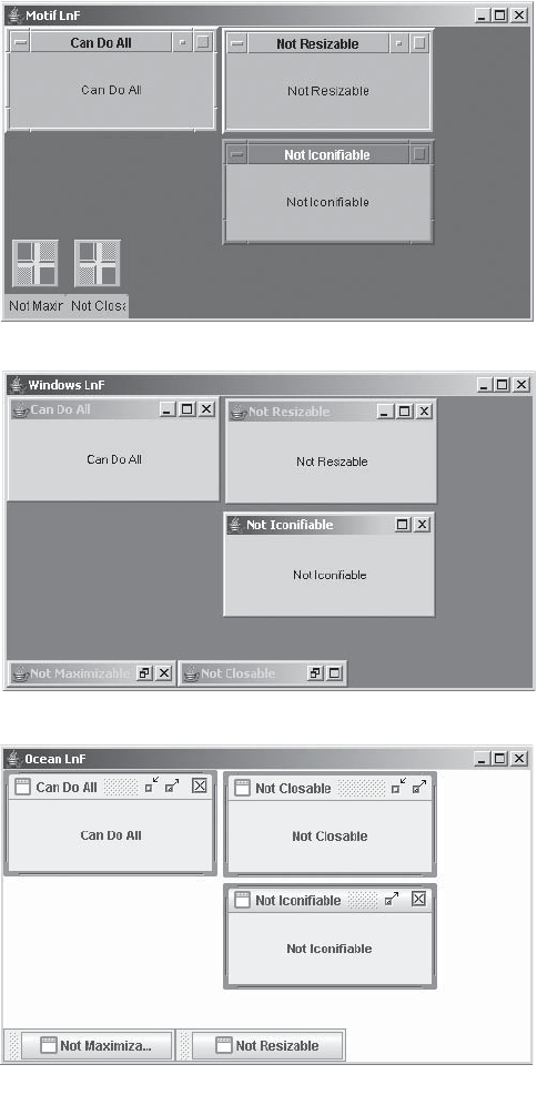
258 CHAPTER 8 ■ ROOT PANE CONTAINERS
default UIResource values. Figure 8-5 shows the appearance of the JWindow container for the
preinstalled set of look and feel types.
Figure 8-5. JInternalFrame under different look and feel types
-OTIF
/CEAN
7INDOWS

CHAPTER 8 ■ ROOT PANE CONTAINERS 259
The available set of UIResource-related properties for a JInternalFrame is shown in
Table 8-12. For the JInternalFrame component, there are 60 different properties, including
those for the internal frame’s title pane.
Table 8-12. JInternalFrame UIResource Elements
Property String Object Type
InternalFrame.actionMap ActionMap
InternalFrame.activeBorderColor Color
InternalFrame.activeTitleBackground Color
InternalFrame.activeTitleForeground Color
InternalFrame.activeTitleGradient List
InternalFrame.border Border
InternalFrame.borderColor Color
InternalFrame.borderDarkShadow Color
InternalFrame.borderHighlight Color
InternalFrame.borderLight Color
InternalFrame.borderShadow Color
InternalFrame.borderWidth Integer
InternalFrame.closeButtonToolTip String
InternalFrame.closeIcon Icon
InternalFrame.closeSound String
InternalFrame.icon Icon
InternalFrame.iconButtonToolTip String
InternalFrame.iconifyIcon Icon
InternalFrame.inactiveBorderColor Color
InternalFrame.inactiveTitleBackground Color
InternalFrame.inactiveTitleForeground Color
InternalFrame.inactiveTitleGradient List
InternalFrame.layoutTitlePaneAtOrigin Boolean
InternalFrame.maxButtonToolTip String
InternalFrame.maximizeIcon Icon
InternalFrame.maximizeSound String
InternalFrame.minimizeIcon Icon
InternalFrame.minimizeIconBackground Color
InternalFrame.minimizeSound String

260 CHAPTER 8 ■ ROOT PANE CONTAINERS
InternalFrame.optionDialogBorder Border
InternalFrame.paletteBorder Border
InternalFrame.paletteCloseIcon Icon
InternalFrame.paletteTitleHeight Integer
InternalFrame.resizeIconHighlight Color
InternalFrame.resizeIconShadow Color
InternalFrame.restoreButtonToolTip String
InternalFrame.restoreDownSound String
InternalFrame.restoreUpSound String
InternalFrame.titleButtonHeight Integer
InternalFrame.titleButtonWidth Integer
InternalFrame.titleFont Font
InternalFrame.titlePaneHeight Integer
InternalFrame.useTaskBar Boolean
InternalFrame.windowBindings Object[ ]
InternalFrameTitlePane.closeButtonAccessibleName String
InternalFrameTitlePane.closeButtonText String
InternalFrameTitlePane.closeIcon Icon
InternalFrameTitlePane.iconifyButtonAccessibleName String
InternalFrameTitlePane.iconifyIcon Icon
InternalFrameTitlePane.maximizeButtonAccessibleName String
InternalFrameTitlePane.maximizeButtonText String
InternalFrameTitlePane.maximizeIcon Icon
InternalFrameTitlePane.minimizeButtonText String
InternalFrameTitlePane.minimizeIcon Icon
InternalFrameTitlePane.moveButtonText String
InternalFrameTitlePane.restoreButtonText String
InternalFrameTitlePane.sizeButtonText String
InternalFrameTitlePane.titlePaneLayout LayoutManager
InternalFrameTitlePaneUI String
InternalFrameUI String
Table 8-12. JInternalFrame UIResource Elements (Continued)
Property String Object Type
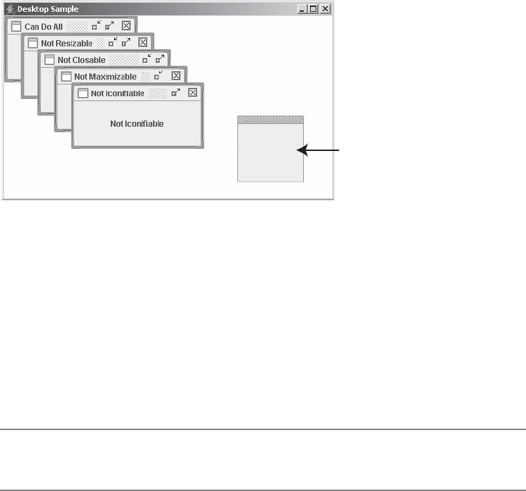
CHAPTER 8 ■ ROOT PANE CONTAINERS 261
In addition to the many configurable properties in Table 8-12, with the Metal look and
feel, you can designate an internal frame to be a “palette” by using a special client property,
JInternalFrame.isPalette. When set to Boolean.TRUE, this internal frame will have a slightly
different appearance from the others and a shorter title bar, as shown in Figure 8-6.
Figure 8-6. A JInternalFrame palette with other frames
If you also add an internal frame to the PALETTE_LAYER of the desktop, the frame will always
appear on top of all the other frames (as noted in Figure 8-6):
JInternalFrame palette = new JInternalFrame("Palette", true, false, true, false);
palette.setBounds(150, 0, 100, 100);
palette.putClientProperty("JInternalFrame.isPalette", Boolean.TRUE);
desktop.add(palette, JDesktopPane.PALETTE_LAYER);
The complete source for creating the program in Figure 8-6 appears in Listing 8-6 later in
this chapter.
■Note If the current look and feel is something other than Metal, the palette layer will still be honored, but
its appearance won’t be quite as distinctive.
Changing the JDesktopIcon
The JInternalFrame relies on an inner class, JDesktopIcon, to provide a UI delegate for the
iconified view of the JInternalFrame. The class is merely a specialized JComponent for providing
this capability, not a specialized Icon implementation, as the name might imply. In fact, the
JDesktopIcon class comments say that the class is temporary, so you shouldn’t try to customize
it directly. (Of course, the class has been around for some time now.)
If you do want to customize the JDesktopIcon, you can change some of the UIResource-
related properties. Table 8-13 lists the eight UIResource-related properties for the JDesktopIcon
component.
0ALETTE

262 CHAPTER 8 ■ ROOT PANE CONTAINERS
JDesktopPane Class
Another class for working with groups of internal frames is the JDesktopPane class. The sole
purpose of the desktop pane is to contain a set of internal frames. When internal frames are
contained within a desktop pane, they delegate most of their behavior to the desktop manager
of the desktop pane. You’ll also learn about the DesktopManager interface in greater detail later
in this chapter.
Creating a JDesktopPane
The JDesktopPane has a single no-argument constructor. Once it’s created, you’d typically
place the desktop in the center of a container managed by a BorderLayout. This ensures that
the desktop takes up all the room in the container.
Adding Internal Frames to a JDesktopPane
The JDesktopPane doesn’t implement RootPaneContainer. Instead of adding components to the
different panes within a JRootPane, you add them directly to the JDesktopPane:
desktop.add(anInternalFrame);
JDesktopPane Properties
As Table 8-14 shows, there are eight properties of JDesktopPane. The JInternalFrame at index 0
of the allFrames property array is the internal frame in front of the desktop (JInternalFrame f
= desktop.getAllFrames()[0]). Besides getting all the frames within the JDesktopPane, you can
get only those within a specific layer: public JInternalFrame[] getAllFramesInLayer(int layer).
(Remember JLayeredPane, covered earlier in this chapter in the “Working with Component Layers
and Positions” section, the parent class of JDesktopPane?)
Valid dragMode property settings are the LIVE_DRAG_MODE and OUTLINE_DRAG_MODE constants
of the class.
Table 8-13. JInternalFrame.DesktopIcon UIResource Elements
Property String Object Type
DesktopIcon.background Color
DesktopIcon.border Border
DesktopIcon.font Font
DesktopIcon.foreground Color
DesktopIcon.icon Icon
DesktopIcon.width Integer
DesktopIcon.windowBindings Object[ ]
DesktopIconUI String

CHAPTER 8 ■ ROOT PANE CONTAINERS 263
■Note There is also a special client property (JDesktopPane.dragMode) for configuring the drawing
mode when dragging an internal frame around. The client property has been replaced by the speedier
versions available with the standard property.
Customizing a JDesktopPane Look and Feel
Back in Figure 8-5 you can see JInternalFrame objects within a JDesktopPane. The basic appear-
ance of JDesktopPane is the same in each look and feel. As Table 8-15 shows, there aren’t many
UIResource-related properties for a JDesktopPane to configure.
Complete Desktop Example
Now that you have the major desktop-related classes under your belt, let’s look at a complete
desktop example. The basic process involves creating a group of JInternalFrame objects and
putting them in a single JDesktopPane. Event handling can be done for individual components
on each of the internal frames, if desired, or for individual frames. In this example, simply use
Table 8-14. JDesktopPane Properties
Property Name Data Type Access
accessibleContext AccessibleContext Read-only
allFrames JInternalFrame[ ] Read-only
desktopManager DesktopManager Read-write
dragMode int Read-write bound
opaque boolean Read-only
selectedFrame JInternalFrame Read-write
UI DesktopPaneUI Read-write
UIClassID String Read-only
Table 8-15. JDesktopPane UIResource Elements
Property String Object Type
desktop Color
Desktop.ancestorInputMap InputMap
Desktop.background Color
Desktop.windowBindings Object[ ]
DesktopPane.actionMap ActionMap
DesktopPaneUI String
264 CHAPTER 8 ■ ROOT PANE CONTAINERS
the InternalFrameIconifyListener class, presented earlier in Listing 8-5, to listen for internal
frames being iconified and deiconified.
Figure 8-6 shows how the program looks when it first starts. One particular internal frame
has been designated a palette, and the outline drag mode is enabled.
The complete source for the example is shown in Listing 8-6.
Listing 8-6. Mixing JInternalFrames and the JDesktopPane
import javax.swing.*;
import javax.swing.event.*;
import java.awt.*;
import java.awt.event.*;
public class DesktopSample {
public static void main(final String[] args) {
Runnable runner = new Runnable() {
public void run() {
String title = (args.length==0 ? "Desktop Sample" : args[0]);
JFrame frame = new JFrame(title);
frame.setDefaultCloseOperation(JFrame.EXIT_ON_CLOSE);
JDesktopPane desktop = new JDesktopPane();
JInternalFrame internalFrames[] = {
new JInternalFrame("Can Do All", true, true, true, true),
new JInternalFrame("Not Resizable", false, true, true, true),
new JInternalFrame("Not Closable", true, false, true, true),
new JInternalFrame("Not Maximizable", true, true, false, true),
new JInternalFrame("Not Iconifiable", true, true, true, false)
};
InternalFrameListener internalFrameListener =
new InternalFrameIconifyListener();
int pos = 0;
for(JInternalFrame internalFrame: internalFrames) {
// Add to desktop
desktop.add(internalFrame);
// Position and size
internalFrame.setBounds(pos*25, pos*25, 200, 100);
pos++;
// Add listener for iconification events
internalFrame.addInternalFrameListener(internalFrameListener);
JLabel label = new JLabel(internalFrame.getTitle(), JLabel.CENTER);
internalFrame.add(label, BorderLayout.CENTER);
CHAPTER 8 ■ ROOT PANE CONTAINERS 265
// Make visible
internalFrame.setVisible(true);
}
JInternalFrame palette =
new JInternalFrame("Palette", true, false, true, false);
palette.setBounds(350, 150, 100, 100);
palette.putClientProperty("JInternalFrame.isPalette", Boolean.TRUE);
desktop.add(palette, JDesktopPane.PALETTE_LAYER);
palette.setVisible(true);
desktop.setDragMode(JDesktopPane.OUTLINE_DRAG_MODE);
frame.add(desktop, BorderLayout.CENTER);
frame.setSize(500, 300);
frame.setVisible(true);
}
};
EventQueue.invokeLater(runner);
}
}
DesktopManager Interface
One remaining piece of the puzzle for working on a desktop is the desktop manager, which is
an implementation of the DesktopManager interface, shown here:
public interface DesktopManager {
public void activateFrame(JInternalFrame frame);
public void beginDraggingFrame(JComponent frame);
public void beginResizingFrame(JComponent frame, int direction);
public void closeFrame(JInternalFrame frame);
public void deactivateFrame(JInternalFrame frame);
public void deiconifyFrame(JInternalFrame frame);
public void dragFrame(JComponent frame, int newX, int newY);
public void endDraggingFrame(JComponent frame);
public void endResizingFrame(JComponent frame);
public void iconifyFrame(JInternalFrame frame);
public void maximizeFrame(JInternalFrame frame);
public void minimizeFrame(JInternalFrame frame);
public void openFrame(JInternalFrame frame);
public void resizeFrame(JComponent frame, int newX, int newY, int newWidth,
int newHeight);
public void setBoundsForFrame(JComponent frame, int newX, int newY, int newWidth,
int newHeight);
}

266 CHAPTER 8 ■ ROOT PANE CONTAINERS
■Note For the DesktopManager methods that accept a JComponent argument, the arguments are
usually a JInternalFrame or another lightweight Swing component.
When JInternalFrame objects are in a JDesktopPane, they shouldn’t attempt operations
such as iconifying or maximizing themselves. Instead, they should ask the desktop manager of
the desktop pane in which they’re installed to perform the operation:
getDesktopPane().getDesktopManager().iconifyFrame(anInternalFrame);
The DefaultDesktopManager class provides one such implementation of a DesktopManager.
If the default isn’t sufficient, a look and feel might provide its own DesktopManager implemen-
tation class, as the Windows look and feel does with the WindowsDesktopManager. You can also
define your own manager, but this usually isn’t necessary.
Summary
In this chapter, you explored the JRootPane class and how implementers of the RootPaneContainer
interface rely on a JRootPane for internal component management. You also learned how in Swing
you work with the JRootPane of a JFrame,JDialog,JWindow,JApplet, or JInternalFrame class.
The root pane can then layer components with the help of a JLayeredPane in such a way that
tooltip text and pop-up menus will always appear above their associated components.
The JInternalFrame can also reside within a desktop environment, in which a JDesktopPane
and DesktopManager manage how and where the internal frames act and appear. You can also
respond to internal frame events by associating InternalFrameListener implementations with
aJInternalFrame.
In Chapter 9, you’ll examine the specialized pop-up components within the Swing libraries:
JColorChooser,JFileChooser,JOptionPane, and ProgressMonitor.

267
■ ■ ■
CHAPTER 9
Pop-Ups and Choosers
In Chapter 8, you looked at the top-level containers such as JFrame and JApplet. In addition,
you explored the JDialog class used to create pop-up windows to display messages or get user
input. Although the JDialog class works perfectly well, the Swing component set also offers
several simpler approaches to get user input from pop-up windows, which you will explore in
this chapter.
The JOptionPane class is useful for displaying messages, obtaining textual user input, or
getting the answer to a question. The ProgressMonitor and ProgressMonitorInputStream
classes enable you to monitor the progress of lengthy tasks. In addition, the JColorChooser and
JFileChooser classes come equipped with feature-filled pop-up windows for getting a color
choice from a user or getting a file or directory name. By using these additional classes, your
user interface development tasks can be accomplished much more quickly and easily.
JOptionPane Class
JOptionPane is a special class for creating a panel to be placed in a pop-up window. The purpose
of the panel is to display a message to a user and get a response from that user. To accomplish
its task, the panel presents content in four areas (see Figure 9-1):
•Icon: The icon area is for the display of an Icon to indicate the type of message being
displayed to the user. It’s the responsibility of the installed look and feel to provide
default icons for certain types of messages, but you can provide your own if you need
to display another icon type.
•Message: The primary purpose of this area is to display a text message. In addition, the
area can contain any optional set of objects to make the message more informational.
•Input: The input area allows a user to provide a response to a message. The response can
be free form, in a text field, or from a pick list in a combo box or list control. For yes or no
type questions, the button area should be used instead.
•Button: The button area is also for getting user input. Selection of a button in this area
signals the end of the usage of the JOptionPane. Default sets of button labels are available,
or you can display any number of buttons, including none, with any labels you desire.

268 CHAPTER 9 ■ POP-UPS AND CHOOSERS
Figure 9-1. JOptionPane parts
All the areas are optional (although having a panel without at least a message and a button
makes the option pane virtually useless).
Besides being a panel with four sections within a pop-up window, the JOptionPane is
capable of automatically placing itself in a pop-up window and managing the acquisition of
the user’s response. It can place itself in either a JDialog or a JInternalFrame, depending on the
type of GUI you’re providing to the user. With the help of an Icon and set of JButton components,
the JOptionPane can easily be configured to show a variety of messages and input dialogs.
■Note Because the JOptionPane can automatically place itself in a JDialog, you might never need to
create a JDialog directly.
Creating a JOptionPane
You can either manually create a JOptionPane through one of its 7 constructors or go through
one of the 25 factory methods discussed later in the chapter, in the “Automatically Creating a
JOptionPane in a Pop-Up Window” section. You have the most control when manually creating the
JOptionPane. However, you then must place it in a pop-up window, show the window, and
finally manage getting the response.
Because of the ease of use provided by the methods that do everything automatically, you
might think you would only use the factory methods when working with JOptionPane. However,
throughout this chapter, you’ll discover several other reasons why you might want to do things
manually. In addition, when you use a visual-programming environment, the environment
treats the JOptionPane as a JavaBean component and will ignore the factory methods.
For the seven constructors, you can have different permutations of six different arguments.
The arguments allow you to configure something in one of the four different areas shown in
Figure 9-1. The six arguments are the message, the message type, an option type, an icon, an
array of options, and an initial option setting. The use of these arguments is shared with the
factory methods.
Let’s first look at the seven constructors, and then explore the different arguments. Notice
that the constructor arguments are cascading and only add additional arguments to the
previous constructor.
CHAPTER 9 ■ POP-UPS AND CHOOSERS 269
public JOptionPane()
JOptionPane optionPane = new JOptionPane();
public JOptionPane(Object message)
JOptionPane optionPane = new JOptionPane("Printing complete");
public JOptionPane(Object message, int messageType)
JOptionPane optionPane = new JOptionPane("Printer out of paper",
JOptionPane.WARNING_MESSAGE);
public JOptionPane(Object message, int messageType, int optionType)
JOptionPane optionPane = new JOptionPane("Continue printing?",
JOptionPane.QUESTION_MESSAGE, JOptionPane.YES_NO_OPTION);
public JOptionPane(Object message, int messageType, int optionType,
Icon icon)
Icon printerIcon = new ImageIcon("printer.jpg");
JOptionPane optionPane = new JOptionPane("Continue printing?",
JOptionPane.QUESTION_MESSAGE, JOptionPane.YES_NO_OPTION, printerIcon);
public JOptionPane(Object message, int messageType, int optionType, Icon icon,
Object options[ ])
Icon greenIcon = new DiamondIcon(Color.GREEN);
Icon redIcon = new DiamondIcon(Color.RED);
Object optionArray[] = new Object[] { greenIcon, redIcon} ;
JOptionPane optionPane = new JOptionPane("Continue printing?",
JOptionPane.QUESTION_MESSAGE, JOptionPane.YES_NO_OPTION, printerIcon,
optionArray);
public JOptionPane(Object message, int messageType, int optionType, Icon icon,
Object options[], Object initialValue)
JOptionPane optionPane = new JOptionPane("Continue printing?",
JOptionPane.QUESTION_MESSAGE, JOptionPane.YES_NO_OPTION, printerIcon,
optionArray, redIcon);
The JOptionPane Message Argument
The message argument is an Object, not a String. While you normally pass only a quoted string
as this argument, with an Object argument, you can basically display anything you want in the
message area. In the “Understanding the Message Property,” section later in this chapter, you’ll
look at the more advanced uses of this argument. Briefly, though, there are four basic rules to
interpret the meaning of an Object-typed message argument. For elements within the Object,
recursively follow these rules:
270 CHAPTER 9 ■ POP-UPS AND CHOOSERS
• If the message is an array of objects (Object[ ]), make the JOptionPane place each entry
onto a separate row.
• If the message is a Component, place the component in the message area.
• If the message is an Icon, place the Icon within a JLabel and display the label in the
message area.
• If the message is an Object, convert it to a String with toString(), place the String in a
JLabel, and display the label in the message area.
The JOptionPane Message Type and Icon Arguments
The messageType constructor argument is used to represent the type of message being displayed
within the JOptionPane. If you don’t provide a custom icon for the JOptionPane, the installed
look and feel will use the messageType argument setting to determine which icon to display
within the icon area. Five different message types are available as JOptionPane constants:
•ERROR_MESSAGE for displaying an error message
•INFORMATION_MESSAGE for displaying an informational message
•QUESTION_MESSAGE for displaying a query message
•WARNING_MESSAGE for displaying a warning message
•PLAIN_MESSAGE for displaying any other type of message
If you’re using a constructor with both messageType and icon arguments and want the
JOptionPane to use the default icon for the messageType, just specify null as the value for the
icon argument. If the icon argument is non-null, the specified icon will be used, no matter
what the message type is.
If the messageType constructor argument isn’t specified, the default message type is
PLAIN_MESSAGE.
The JOptionPane Option Type Argument
The optionType constructor argument is used to determine the configuration for the set of
buttons in the button area. If one of the options argument described next is provided, then the
optionType argument is ignored and configuration for the set of buttons is acquired from the
options argument. Four different option types are available as JOptionPane constants:
•DEFAULT_OPTION for a single OK button
•OK_CANCEL_OPTION for OK and Cancel buttons
•YES_NO_CANCEL_OPTION for Yes, No, and Cancel buttons
•YES_NO_OPTION for Yes and No buttons
If the optionType constructor argument isn’t specified, the default option type is
DEFAULT_OPTION.

CHAPTER 9 ■ POP-UPS AND CHOOSERS 271
The JOptionPane Options and Initial Value Arguments
The options argument is an Object array used to construct a set of JButton objects for the
button area of the JOptionPane. If this argument is null (or a constructor without this argument
is used), the button labels will be determined by the optionType argument. Otherwise, the array
works similarly to the message argument, but without supporting recursive arrays:
•If an options array element is a Component, place the component in the button area.
•If an options array element is an Icon, place the Icon within a JButton and place the
button in the button area.
•If an options array element is an Object, convert it to a String with toString(), place the
String in a JButton, and place the button in the button area.
Normally, the options argument will be an array of String objects. You may want to have
an Icon on the JButton, although the resulting button won’t have a label. If you want to have
both an icon and a text label on the button, you can manually create a JButton and place it in
the array. Alternatively, you can directly include any other Component within the array. There’s
one minor problem with these latter two approaches, however. It’s your responsibility to
handle responding to component selection and tell the JOptionPane when the user selects this
component. The “Adding Components to the Button Area” section later in this chapter shows
how to properly handle this behavior.
When the options argument is non-null, the initialValue argument specifies which of
the buttons will be the default button when the pane is initially displayed. If it’s null, the first
component in the button area will be the default button. In either case, the first button will
have the input focus, unless there is an input component in the message area, in which case,
the input component will have the initial input focus.
■Tip To have no buttons on the option pane, pass an empty array as the options setting: new Object[] { }.
Displaying a JOptionPane
After you’ve created the JOptionPane with one of the constructors, what you have is a panel
filled with components. In other words, the obtained JOptionPane is not yet in a pop-up window.
You need to create a JDialog, a JInternalFrame, or another pop-up window, and then place the
JOptionPane within that. In addition, if you pick this manual style of JOptionPane construction,
you need to handle the closing of the pop-up window. You must listen for selection of a component
in the button area, and then hide the pop-up window after selection.
Because there is so much to do here, the JOptionPane includes two helper methods to
place a JOptionPane within either a modal JDialog or a JInternalFrame and take care of all the
previously described behavior:
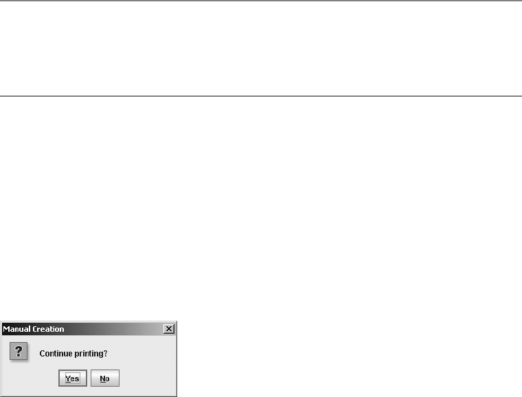
272 CHAPTER 9 ■ POP-UPS AND CHOOSERS
public JDialog createDialog(Component parentComponent, String title)
public JInternalFrame createInternalFrame(Component parentComponent, String title)
■Note When using the createDialog() and createInternalFrame() methods to create a pop-up
window, selection of an automatically created button results in the closing of the created pop-up. You would
then need to ask the JOptionPane which option the user selected with getValue() and, if appropriate, get
the input value with getInputValue().
The first argument to the methods is a component over which the pop-up window will be
centered. The second argument is the title for the pop-up window. Once you create the pop-up
window, whether it’s a JDialog or JInternalFrame, you show it. The pop-up is then closed after
one of the components in the button area is selected, at which point, your program continues.
The following lines of source code show the creation of one such JOptionPane shown within a
JDialog. The resulting pop-up window is shown in Figure 9-2.
JOptionPane optionPane = new JOptionPane("Continue printing?",
JOptionPane.QUESTION_MESSAGE, JOptionPane.YES_NO_OPTION);
JDialog dialog = optionPane.createDialog(source, "Manual Creation");
dialog.setVisible(true);
Figure 9-2. Sample JOptionPane in a JDialog
After you create the JOptionPane, place it in a pop-up window, and show it, and the user
has responded, you need to find out what the user selected. The selection is provided via the
public Object getValue() method of JOptionPane. The value returned by getValue() is
determined by whether an options array was provided to the JOptionPane constructor. If you
provide the array, the argument selected will be returned. If you don’t provide the array, an
Integer object is returned, and its value represents the position of the button selected within
the button area. In another case, getValue() could return null if nothing was selected, such as
when the JDialog is closed by selecting the appropriate window decoration from the title bar
of the pop-up window.
CHAPTER 9 ■ POP-UPS AND CHOOSERS 273
To make this multifaceted response easier to grasp, Listing 9-1 shows an OptionPaneUtils class
that defines the method public static int getSelection(JOptionPane optionPane). Given an
option pane, this method returns the position of the selected value as an int, whether or not an
options array was provided. To indicate that nothing was selected, JOptionPane.CLOSED_OPTION (-1)
is returned.
Listing 9-1. JOptionPane Utility Class
import javax.swing.*;
public final class OptionPaneUtils {
private OptionPaneUtils() {
}
public static int getSelection(JOptionPane optionPane) {
// Default return value, signals nothing selected
int returnValue = JOptionPane.CLOSED_OPTION;
// Get selected value
Object selectedValue = optionPane.getValue();
// If none, then nothing selected
if (selectedValue != null) {
Object options[] = optionPane.getOptions();
if (options == null) {
// Default buttons, no array specified
if(selectedValue instanceof Integer) {
returnValue = ((Integer)selectedValue).intValue();
}
} else {
// Array of option buttons specified
for (int i=0, n = options.length; i < n; i++) {
if(options[i].equals(selectedValue)) {
returnValue = i;
break; // out of for loop
}
}
}
}
return returnValue;
}
}

274 CHAPTER 9 ■ POP-UPS AND CHOOSERS
With the help of this new OptionPaneUtils.getSelection(JOptionPane) helper method,
you can now find out the option pane selection with one line of code, and then act accordingly
based on the response.
int selection = OptionPaneUtils.getSelection(optionPane);
switch (selection) {
case ...: ...
break;
case ...: ...
break;
default: ...
}
If you create a JOptionPane with a null options array, you can use the constants within the
JOptionPane class to indicate the position of the default button labels and their return values
from the OptionPaneUtils.getSelection(JOptionPane) method. These constants are listed in
Table 9-1. Using these constants enables you to avoid hard-coding constants such as 0, 1, 2, or –1.
Automatically Creating a JOptionPane in a Pop-Up Window
You can manually create a JOptionPane, place it in a JDialog or JInternalFrame (or any other
container), and fetch the response. Alternatively, you could use the JOptionPane factory methods
for creating JOptionPane components directly within either a JDialog or a JInternalFrame. Using
the many factory methods, you can create the option pane, place it in a pop-up window, and
get the response with a single line of source code.
There are 25 methods, which are first broken down into two sets: those that create the
JOptionPane and show it within a JDialog and those that show the pane within a JInternalFrame.
Methods that show the JOptionPane within a JInternalFrame are named showInternalXXXDialog(),
and methods that create the pane within a JDialog are named showXXXDialog().
The second grouping of factory methods for JOptionPane is what fills in the XXX part of the
method names. This represents the various message types of option panes that you can create
and display. In addition, the message type defines what is returned after the user selects some-
thing in the option pane. The four different message types are as follows:
Table 9-1. JOptionPane Option Position Constants
Position Description
CANCEL_OPTION Used when the Cancel button is pressed
CLOSED_OPTION Used when the pop-up window closed without the user pressing a button
NO_OPTION Used when the No button is pressed
OK_OPTION Used when the OK button is pressed
YES_OPTION Used when the Yes button is pressed

CHAPTER 9 ■ POP-UPS AND CHOOSERS 275
•Message: With a message pop-up, there’s no return value. Therefore, the method is defined
void show[Internal]MessageDialog(...).
•Input: With an input pop-up, the return value is either what the user typed in a text field
(a String) or what the user picked from a list of options (an Object). Therefore, the
show[Internal]InputDialog(...) methods return either a String or Object, depending
on which version you use.
•Confirm: With the confirm pop-up, the return value signifies which, if any, button the
user picked within the option pane. After a button is picked, the pop-up window is
dismissed, and the returned value is one of the integer constants shown in Table 9-1.
Therefore, the method here is defined as int show[Internal]ConfirmDialog(...).
•Option: With the option pop-up, the return value is an int, the same type as the confirm
pop-up, so the methods are defined int show[Internal]OptionDialog(...). If the
button labels are manually specified with a non-null argument, the integer represents
the selected button position.
The information in Table 9-2 should help you understand the 25 methods and their argu-
ments. The method names (and return types) are found on the left side of the table, and their
argument lists (and data types) are on the right. The numbers that repeat across the columns
for each method name indicate a specific set of arguments for that method. For instance, the
showInputDialog row shows a 3 in the Parent Component column, Message column, Title
column, and Message Type column. Therefore, the showInputDialog method has one version
defined like this:
public static String showInputDialog(Component parentComponent, Object message,
String title, int messageType)
■Note With the exception of two of the showInputDialog() methods, the parent component argument
is required for all method varieties. The message argument is the only one required for all without exception.
What good is a pop-up dialog without a message?
With the way the different showXXXDialog() methods are defined, you don’t need to bother
with discovering the selected button yourself, or even the user input. The return value for the
various methods is one of the following: nothing (void return type), an int from Table 9-1, a
String, or an Object, depending on the type of dialog box shown.
■Caution There is a significant difference between the JOptionPane constructors and the factory
methods: The option type and message type arguments are reversed.

276 CHAPTER 9 ■ POP-UPS AND CHOOSERS
Table 9-2. JOptionPane Static create and show Methods
Method Name/Return Type Parent
Component
Component
Message
Object
Title
String
Option
Type int
Message
Type int
showMessageDialog
Return type: void[123]
123 123 23 23
showInternalMessageDialog
Return type: void[123]
123 123 23 23
showConfirmDialog
Return type: int[1234]
1234 1234 234 234 34
showInternalConfirmDialog
Return type: int
1234 1234 234 234 34
showInputDialog
Return type: String[12356]/Object[4]
2345 123456 34 34
showInternalInputDialog
Return type: String[12]/Object[3]
123 123 23 23
showOptionDialog
Return type: int[1]
1 1111
showInternalOptionDialog
Return type: int[1]
1 1111
JOptionPane Arguments for Factory Methods
Almost all the arguments for the factory methods match the JOptionPane constructor arguments.
Two lists in the “Creating a JOptionPane” section earlier in this chapter describe the acceptable
values for the message type and option type arguments. In addition, the usage of the message,
options, and initial value arguments are also described. The parent component and title
argument are passed along to one of the createDialog() or createInternalFrame() methods,
depending on the type of pop-up in which the JOptionPane is embedded.
You next need to consider the selection values argument and the initial selection value
argument of the showInputDialog() method. With an input dialog box, you can ask the user for
text input and allow the user to type in anything, or you can present the user with a list of
predefined choices. The selection values argument to showInputDialog() determines how you
provide that set of choices. The initial selection value represents the specific option to be chosen
when the JOptionPane first appears. The look and feel will determine the appropriate Swing
component to be used based on the number of choices presented. For small lists, a JComboBox
is used. For larger lists, starting at 20 with the Motif, Metal/Ocean, and Windows look and feel
types, a JList is used.

CHAPTER 9 ■ POP-UPS AND CHOOSERS 277
Table 9-2. JOptionPane Static create and show Methods (Continued)
Icon Icon Options
Object[ ]
Initial Value
Object
Selection Values
Object[ ]
Initial Selection
Object
3
3
4
4
44456
333
111
111
■Note When the parent component argument is null, a hidden frame is used and the pop-up is centered
on the screen. See the getSharedOwnerFrame() method of SwingUtilities for more details on the
hidden frame. There are other focus-related usability issues that you might run into when specifying null as
a parent component, if the hidden frame and dialog box are swapped to the background.
Message Pop-Ups
The showMessageDialog() and showInternalMessageDialog() methods create an
INFORMATION_MESSAGE pop-up with the pop-up title “Message,” unless different argument
settings are specified for the message type and window title. Because the sole purpose of the
message dialog box is to display a message, these dialog boxes provide only an OK button and
return no value. Figure 9-3 shows sample message pop-ups created from the following lines
of source:
JOptionPane.showMessageDialog(parent, "Printing complete");
JOptionPane.showInternalMessageDialog(desktop, "Printing complete");
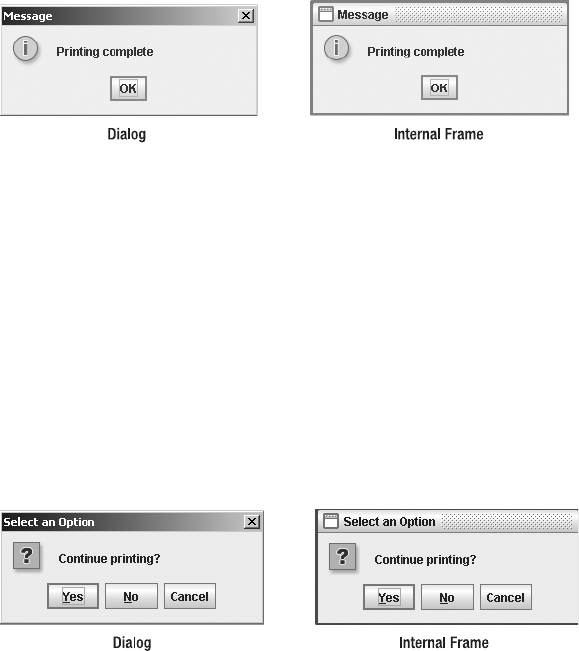
278 CHAPTER 9 ■ POP-UPS AND CHOOSERS
Figure 9-3. Sample JOptionPane message pop-ups
Confirm Pop-Ups
The showConfirmDialog() and showInternalConfirmDialog() methods, by default, create a
pop-up with a QUESTION_MESSAGE type and the pop-up title “Select an Option.” Because confirm
dialog boxes ask a question, their default option type is YES_NO_CANCEL_OPTION, giving them Yes,
No, and Cancel buttons. The return value from a call to any of these methods is one of the
JOptionPane class constants YES_OPTION,NO_OPTION, or CANCEL_OPTION. No prizes for guessing
which constant maps to which option pane button! Figure 9-4 shows sample confirm pop-ups
created from the following lines of source:
JOptionPane.showConfirmDialog(parent, "Continue printing?");
JOptionPane.showInternalConfirmDialog(desktop, "Continue printing?");
Figure 9-4. Sample JOptionPane confirm pop-ups
Input Pop-Ups
By default, the showInputDialog() and showInternalInputDialog() methods create a
QUESTION_MESSAGE pop-up with an “Input” pop-up title. The option type for input dialogs is
OK_CANCEL_OPTION, giving them an OK and a Cancel button, and the option type isn’t changeable.
The return data type for these methods is either a String or an Object. If you don’t specify
selection values, the pop-up prompts the user with a text field and returns the input as a
String. If you do specify selection values, you get back an Object from the selection values
array. Figure 9-5 shows some input pop-ups created from the following lines of source:
JOptionPane.showInputDialog(parent, "Enter printer name:");
// Moons of Neptune
String smallList[] = {
"Naiad", "Thalassa", "Despina", "Galatea", "Larissa", "Proteus",
"Triton", "Nereid"} ;
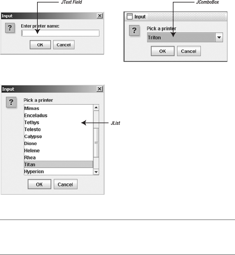
CHAPTER 9 ■ POP-UPS AND CHOOSERS 279
JOptionPane.showInternalInputDialog(desktop, "Pick a printer", "Input",
JOptionPane.QUESTION_MESSAGE, null, smallList, "Triton");
// Twenty of the moons of Saturn
String bigList[] = {"Pan", "Atlas", "Prometheus", "Pandora", "Epimetheus",
"Janus", "Mimas", "Enceladus", "Telesto", "Tethys", "Calypso", "Dione",
"Helene", "Rhea", "Titan", "Hyperion", "Iapetus", "Phoebe", "Skadi",
"Mundilfari"};
JOptionPane.showInputDialog(parent, "Pick a printer", "Input",
JOptionPane.QUESTION_MESSAGE, null, bigList, "Titan");
Figure 9-5. Sample JOptionPane input pop-ups
■Note It is the responsibility of the look and feel to determine the type of input component. A look and feel
can use something other than a JTextField,JComboBox, or JList. It’s just that all the system-provided
look and feel types (from Sun) use these three components.
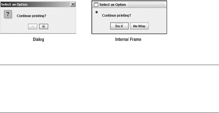
280 CHAPTER 9 ■ POP-UPS AND CHOOSERS
Option Pop-Ups
The showOptionDialog() and showInternalOptionDialog() methods provide the most flexibility
because they allow you to configure all the arguments. There are no default arguments, and the
return value is an int. If an options argument is not specified, the return value will be one of the
constants listed in Table 9-1. Otherwise, the value returned represents the component position
of the selected option from the options argument. Figure 9-6 shows a couple of input pop-ups
created from the following lines of source, in which icons (instead of text) are provided on the
buttons:
Icon greenIcon = new DiamondIcon(Color.GREEN);
Icon redIcon = new DiamondIcon(Color.RED);
Object iconArray[] = { greenIcon, redIcon} ;
JOptionPane.showOptionDialog(source, "Continue printing?", "Select an Option",
JOptionPane.YES_NO_OPTION, JOptionPane.QUESTION_MESSAGE, null, iconArray,
iconArray[1]);
Icon blueIcon = new DiamondIcon(Color.BLUE);
Object stringArray[] = { "Do It", "No Way"} ;
JOptionPane.showInternalOptionDialog(desktop, "Continue printing?",
"Select an Option", JOptionPane.YES_NO_OPTION, JOptionPane.QUESTION_MESSAGE,
blueIcon, stringArray, stringArray[0]);
Figure 9-6. Sample JOptionPane option pop-ups
■Caution When using a factory method to show a JOptionPane within a JDialog, the dialog box is
automatically modal, preventing another window from getting the input focus. When showing the JOptionPane
within a JInternalFrame, the internal frame might be modal, but other windows might not be. Therefore,
a user could do something within one of the other windows of the application, including an action on the
JDesktopPane.
JOptionPane Properties
Table 9-3 shows the 15 properties of JOptionPane. These properties are accessible only if you
don’t use one of the factory methods of JOptionPane. For most of the arguments, their meaning
maps directly to one of the constructor arguments.

CHAPTER 9 ■ POP-UPS AND CHOOSERS 281
The wantsInput property is automatically set to true for the input dialog boxes or when the
selectionValues property is non-null. The inputValue property is the item picked from an
input dialog box. The value property indicates the option selected from the button area.
Displaying Multiline Messages
The maxCharactersPerLineCount property is set to an extremely large value, Integer.MAX_VALUE,
by default. For some strange reason, the Swing developers chose not to provide a setter method
for this property. If you want to change the setting, you must subclass JOptionPane and override the
public int getMaxCharactersPerLineCount() method. This causes a long text message to be
broken up into multiple lines within an option pane. In addition, you cannot use any of the
factory methods because they don’t know about your subclass.
To help you create narrow JOptionPane components, you can add the source shown in
Listing 9-2 to the OptionPaneUtils class definition shown earlier in Listing 9-1. The new method
provides a way of specifying the desired option pane character width.
Table 9-3. JOptionPane Properties
Property Name Data Type Access
accessibleContext AccessibleContext Read-only
icon Icon Read-write bound
initialSelectionValue Object Read-write bound
initialValue Object Read-write bound
inputValue Object Read-write bound
maxCharactersPerLineCount int Read-only
message Object Read-write bound
messageType int Read-write bound
options Object[] Read-write bound
optionType int Read-write bound
selectionValues Object[] Read-write bound
UI OptionPaneUI Read-write bound
UIClassID String Read-only
value Object Read-write bound
wantsInput boolean Read-write bound

282 CHAPTER 9 ■ POP-UPS AND CHOOSERS
Listing 9-2. Helper Method to Create a Narrow JOptionPane
public static JOptionPane getNarrowOptionPane(int maxCharactersPerLineCount) {
// Our inner class definition
class NarrowOptionPane extends JOptionPane {
int maxCharactersPerLineCount;
NarrowOptionPane(int maxCharactersPerLineCount) {
this.maxCharactersPerLineCount = maxCharactersPerLineCount;
}
public int getMaxCharactersPerLineCount() {
return maxCharactersPerLineCount;
}
}
return new NarrowOptionPane(maxCharactersPerLineCount);
}
Once the method and new class are defined, you can create an option pane of a specified
character width, manually configure all the properties, place it in a pop-up window, show it,
and then determine the user’s response. The following source demonstrates using these new
capabilities, with the long message trimmed a bit.
String msg = "this is a really long message ... this is a really long message";
JOptionPane optionPane = OptionPaneUtils.getNarrowOptionPane(72);
optionPane.setMessage(msg);
optionPane.setMessageType(JOptionPane.INFORMATION_MESSAGE);
JDialog dialog = optionPane.createDialog(source, "Width 72");
dialog.setVisible(true);
Figure 9-7 demonstrates what would happen if you didn’t change the
maxCharactersPerLineCount property. Figure 9-7 also shows the new narrow JOptionPane.
Figure 9-7. Default JOptionPane and a narrow JOptionPane
Although this seems like a lot of work, it’s the best way to create multiline option panes,
unless you want to manually parse the message into separate lines.
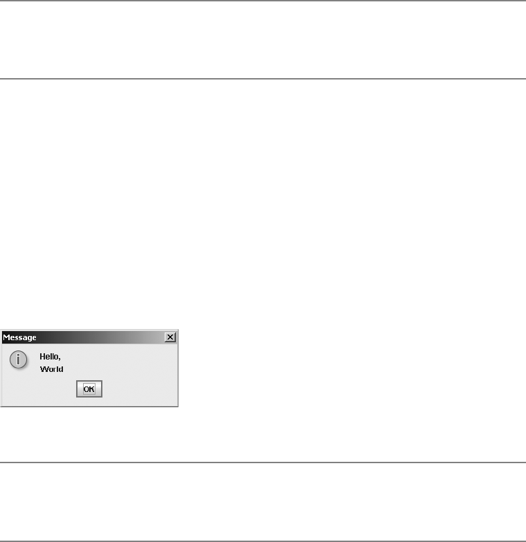
CHAPTER 9 ■ POP-UPS AND CHOOSERS 283
■Note Including the characters \ n in the message text will force the message to be displayed on multiple
lines. Then it’s your responsibility to count the number of characters in each message line. The message text
in a JOptionPane can be formatted with HTML tags, as it can in other Swing components.
Understanding the Message Property
In all the previous examples in this chapter of using the message argument to the JOptionPane
constructors and using the factory methods, the message was a single string. As described
earlier in the “The JOptionPane Message Argument” section, this argument doesn’t need to be
a single string. For instance, if the argument were an array of strings, each string would be on a
separate line. This eliminates the need to use the narrow JOptionPane, but requires you to
count the characters yourself. However, because you’re splitting apart the message, you can
use one of the 25 factory methods. For instance, the following source creates the pop-up
window shown in Figure 9-8.
String multiLineMsg[] = { "Hello,", "World"} ;
JOptionPane.showMessageDialog(source, multiLineMsg);
Figure 9-8. Using JOptionPane with a string array
■Caution If you manually count the characters within a long message to split it into a multiline message,
the output may not be the best. For instance, when using a proportional font in which character widths vary,
a line of 20 w characters would be much wider than a line of 20 i or l characters.
The message argument not only supports displaying an array of strings, but it also can
support an array of any type of object. If an element in the array is a Component, it’s placed
directly into the message area. If the element is an Icon, the icon is placed within a JLabel, and
the JLabel is placed into the message area. All other objects are converted to a String, placed
into a JLabel, and displayed in the message area, unless the object is itself an array; in that case,
these rules are applied recursively.
To demonstrate the possibilities, Figure 9-9 shows off the true capabilities of the JOptionPane.
The actual content isn’t meant to show anything in particular—just that you can display a lot
of different stuff. The message argument is made up of the following array:
Object complexMsg[] = {
"Above Message", new DiamondIcon(Color.RED), new JButton("Hello"),
new JSlider(), new DiamondIcon(Color.BLUE), "Below Message"} ;

284 CHAPTER 9 ■ POP-UPS AND CHOOSERS
Figure 9-9. Using JOptionPane with a complex message property
Adding Components to the Message Area
If you were to display the pop-up in Figure 9-9, you would notice a slight problem. The option
pane doesn’t know about the embedded JSlider setting, unlike the way it automatically knows
about input to the automatic JTextField,JComboBox, or JList components. If you want the
JOptionPane (or for that matter, any input component) to get the JSlider value, you need to
have your input component change the inputValue property of the JOptionPane. When this
value is changed, the option pane tells the pop-up window to close because the JOptionPane
has acquired its input value.
Attaching a ChangeListener to the JSlider component enables you to find out when its
value has changed. Adding yet another method to the OptionPaneUtils class shown earlier in
Listing 9-1 allows you to reuse this specialized JSlider with multiple JOptionPane objects more
easily. The important method call is shown in boldface in Listing 9-3. A similar line would need
to be added for any input component that you wanted to place within a JOptionPane. The line
notifies the option pane when the user has changed the value of the input component.
Listing 9-3. Helper Method for Creating a JSlider for Use in a JOptionPane
public static JSlider getSlider(final JOptionPane optionPane) {
JSlider slider = new JSlider();
slider.setMajorTickSpacing (10);
slider.setPaintTicks(true);
slider.setPaintLabels(true);
ChangeListener changeListener = new ChangeListener() {
public void stateChanged(ChangeEvent changeEvent) {
JSlider theSlider = (JSlider)changeEvent.getSource();
if (!theSlider.getValueIsAdjusting()) {
optionPane.setInputValue(new Integer(theSlider.getValue()));
}
}
};
slider.addChangeListener(changeListener);
return slider;
}
Now that the specialized JSlider is created, you need to place it on a JOptionPane. This
requires the manual creation of a JOptionPane component and, surprisingly, doesn’t require
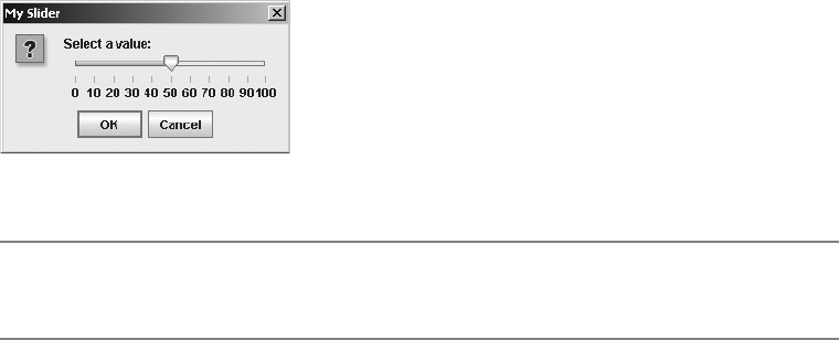
CHAPTER 9 ■ POP-UPS AND CHOOSERS 285
the setting of the wantsInput property. The wantsInput property is set to true only when you
want the JOptionPane to provide its own input component. Because you’re providing one, this
isn’t necessary. The resulting pop-up window is shown in Figure 9-10. (The JSlider component
will be more fully described in Chapter 12.)
JOptionPane optionPane = new JOptionPane();
JSlider slider = OptionPaneUtils.getSlider(optionPane);
optionPane.setMessage(new Object[] { "Select a value: " , slider} );
optionPane.setMessageType(JOptionPane.QUESTION_MESSAGE);
optionPane.setOptionType(JOptionPane.OK_CANCEL_OPTION);
JDialog dialog = optionPane.createDialog(source, "My Slider");
dialog.setVisible(true);
System.out.println ("Input: " + optionPane.getInputValue());
Figure 9-10. Using JOptionPane with a JSlider
■Note If the user doesn’t move the slider, JOptionPane.getInputValue() correctly returns
JOptionPane.UNINITIALIZED_VALUE.
Adding Components to the Button Area
In “The JOptionPane Options and Initial Value Arguments” section earlier in this chapter, you
saw that if you have a Component in the array of options for the JOptionPane, you must configure
the component yourself to handle selection. The same holds true for any components you add
via the options property. When a component is configured to handle selection, the pop-up
window that a JOptionPane is embedded in will disappear when the component is selected.
The default set of buttons works this way. When installing your own components, you must
notify the option pane when one of the components has been selected by setting the value
property of the option pane.
To demonstrate this mechanism, create a JButton with both an icon and a text label that
can be placed in an option pane. Without defining this component yourself, the option pane
supports only the display of a label or an icon on the button. When the button is selected, the
button tells the option pane it was selected by setting the option pane’s value property to the
current text label of the button. Adding yet another method to OptionPaneUtils shown earlier
in Listing 9-1 allows you to create such a button. The boldfaced line in the source shown in
Listing 9-4 is the important method call to add to any other such component that you want to
combine with the component array for the options property of a JOptionPane. The line would
be called after selection of such a component.

286 CHAPTER 9 ■ POP-UPS AND CHOOSERS
Listing 9-4. A JButton for Use on a JOptionPane
public static JButton getButton(
final JOptionPane optionPane, String text, Icon icon) {
final JButton button = new JButton (text, icon);
ActionListener actionListener = new ActionListener() {
public void actionPerformed(ActionEvent actionEvent) {
// Return current text label, instead of argument to method
optionPane.setValue(button.getText());
}
};
button.addActionListener(actionListener);
return button;
}
After the specialized JButton is created, you need to place it in a JOptionPane. Unfortunately,
this, too, requires the long form of the JOptionPane usage. The resulting pop-up window is
shown in Figure 9-11.
JOptionPane optionPane = new JOptionPane();
optionPane.setMessage("I got an icon and a text label");
optionPane.setMessageType(JOptionPane.INFORMATION_MESSAGE);
Icon icon = new DiamondIcon (Color.BLUE);
JButton jButton = OptionPaneUtils.getButton(optionPane, "OK", icon);
optionPane.setOptions(new Object[] {jButton} );
JDialog dialog = optionPane.createDialog(source, "Icon/Text Button");
dialog.setVisible(true);
Figure 9-11. Using JOptionPane with a JButton containing a text label and an icon
■Tip Setting the value of the JOptionPane with setValue() will hide the option pane when a user selects the
button. If you want to prevent users from closing the window without selecting a button, you can set the default
close operation of the dialog containing the JOptionPane to JDialog.DO_NOTHING_ON_CLOSE. Then
users won’t be able to select the close icon from the window adornments. Well, they can select it; it just won’t
do anything.
Listening for Property Changes
The JOptionPane class defines the following 11 constants to assist with listening for bound
property changes:

CHAPTER 9 ■ POP-UPS AND CHOOSERS 287
•ICON_PROPERTY
•INITIAL_SELECTION_VALUE_PROPERTY
•INITIAL_VALUE_PROPERTY
•INPUT_VALUE_PROPERTY
•MESSAGE_PROPERTY
•MESSAGE_TYPE_PROPERTY
•OPTION_TYPE_PROPERTY
•OPTIONS_PROPERTY
•SELECTION_VALUES_PROPERTY
•VALUE_PROPERTY
•WANTS_INPUT_PROPERTY
If you don’t use the factory methods of JOptionPane, you can instead use a
PropertyChangeListener to listen for changes to the bound properties. This would allow
you to passively listen for changes to bound properties, instead of actively getting them
after the change.
Customizing a JOptionPane Look and Feel
Each installable Swing look and feel provides a different JOptionPane appearance and set of
default UIResource values. Figure 9-12 shows the appearance of the JOptionPane container for
the preinstalled set of look and feel types: Motif, Windows, and Ocean.
Figure 9-12. JOptionPane under different look and feel types
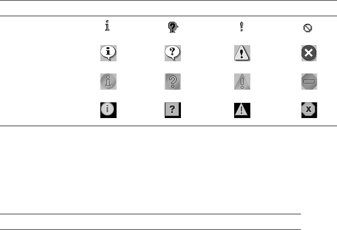
288 CHAPTER 9 ■ POP-UPS AND CHOOSERS
The message type of the JOptionPane helps determine the default icon to display in the
icon area of the option pane. For plain messages, there are no icons. The remaining four default
icons—for informational, question, warning, and error messages—are shown in Table 9-4 for
the different look and feel types.
The available set of UIResource-related properties for a JOptionPane is shown in Table 9-5.
For the JOptionPane component, there are 56 different properties.
Table 9-4. JOptionPane Icons for the Different Look and Feel Types
Look and Feel Informational Question Warning Error
Motif
Windows
Metal
Ocean
Table 9-5. JOptionPane UIResource Elements
Property String Object Type
OptionPane.actionMap ActionMap
OptionPane.background Color
OptionPane.border Border
OptionPane.buttonAreaBorder Border
OptionPane.buttonClickThreshhold Integer
OptionPane.buttonFont Font
OptionPane.buttonOrientation Integer
OptionPane.buttonPadding Integer
OptionPane.cancelButtonMnemonic String
OptionPane.cancelButtonText String
OptionPane.cancelIcon Icon
OptionPane.errorDialog.border.background Color
OptionPane.errorDialog.titlePane.background Color
OptionPane.errorDialog.titlePane.foreground Color
OptionPane.errorDialog.titlePane.shadow Color

CHAPTER 9 ■ POP-UPS AND CHOOSERS 289
OptionPane.errorIcon Icon
OptionPane.errorSound String
OptionPane.font Font
OptionPane.foreground Color
OptionPane.informationIcon Icon
OptionPane.informationSound String
OptionPane.inputDialogTitle String
OptionPane.isYesLast Boolean
OptionPane.messageAnchor Integer
OptionPane.messageAreaBorder Border
OptionPane.messageFont Font
OptionPane.messageForeground Color
OptionPane.messageDialogTitle String
OptionPane.minimumSize Dimension
OptionPane.noButtonMnemonic String
OptionPane.noButtonText String
OptionPane.noIcon Icon
OptionPane.okButtonMnemonic String
OptionPane.okButtonText String
OptionPane.okIcon Icon
OptionPane.questionDialog.border.background Color
OptionPane.questionDialog.titlePane.background Color
OptionPane.questionDialog.titlePane.foreground Color
OptionPane.questionDialog.titlePane.shadow Color
OptionPane.questionIcon Icon
OptionPane.questionSound String
OptionPane.sameSizeButtons Boolean
OptionPane.separatorPadding Integer
OptionPane.setButtonMargin Boolean
OptionPane.titleText String
OptionPane.warningDialog.border.background Color
OptionPane.warningDialog.titlePane.background Color
Table 9-5. JOptionPane UIResource Elements (Continued)
Property String Object Type
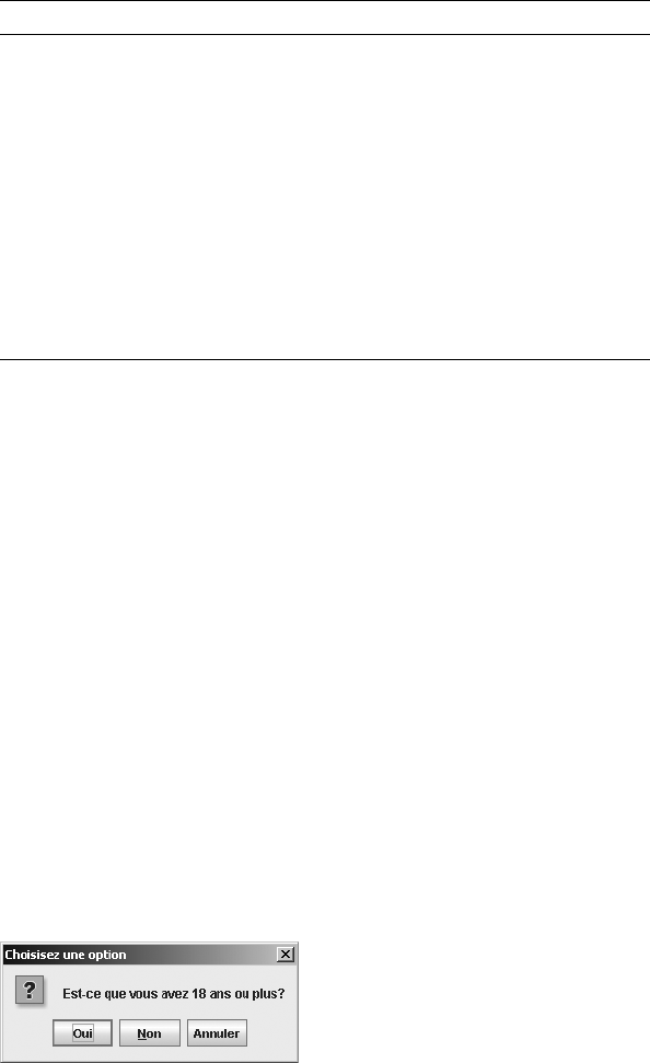
290 CHAPTER 9 ■ POP-UPS AND CHOOSERS
One good use of the resources in Table 9-5 is for customizing default button labels to
match the locale or language of the user. For instance, to change the four labels for the Cancel,
No, OK, and Yes buttons into French, add the following code to your program. (You may be
able to get the translated text from a java.util.ResourceBundle.)
// Set JOptionPane button labels to French
UIManager.put("OptionPane.cancelButtonText", "Annuler");
UIManager.put("OptionPane.noButtonText", "Non");
UIManager.put("OptionPane.okButtonText", "D'accord");
UIManager.put("OptionPane.yesButtonText", "Oui");
Now when you display the option pane, the buttons will have localized button labels. Of
course, this would require translating the messages for the option pane, too. Figure 9-13 shows
how a pop-up would look for the following line of source that asks if the user is 18 or older.
Because the pop-up window title isn’t a property, you must pass the title to every created
dialog box.
int result = JOptionPane.showConfirmDialog(
aFrame, "Est-ce que vous avez 18 ans ou plus?", "Choisisez une option",
JOptionPane.YES_NO_CANCEL_OPTION);
Figure 9-13. A JOptionPane in French
OptionPane.warningDialog.titlePane.foreground Color
OptionPane.warningDialog.titlePane.shadow Color
OptionPane.warningIcon Icon
OptionPane.warningSound String
OptionPane.windowBindings Object[ ]
OptionPane.yesButtonMnemonic String
OptionPane.yesButtonText String
OptionPane.yesIcon Icon
OptionPaneUI String
Table 9-5. JOptionPane UIResource Elements (Continued)
Property String Object Type
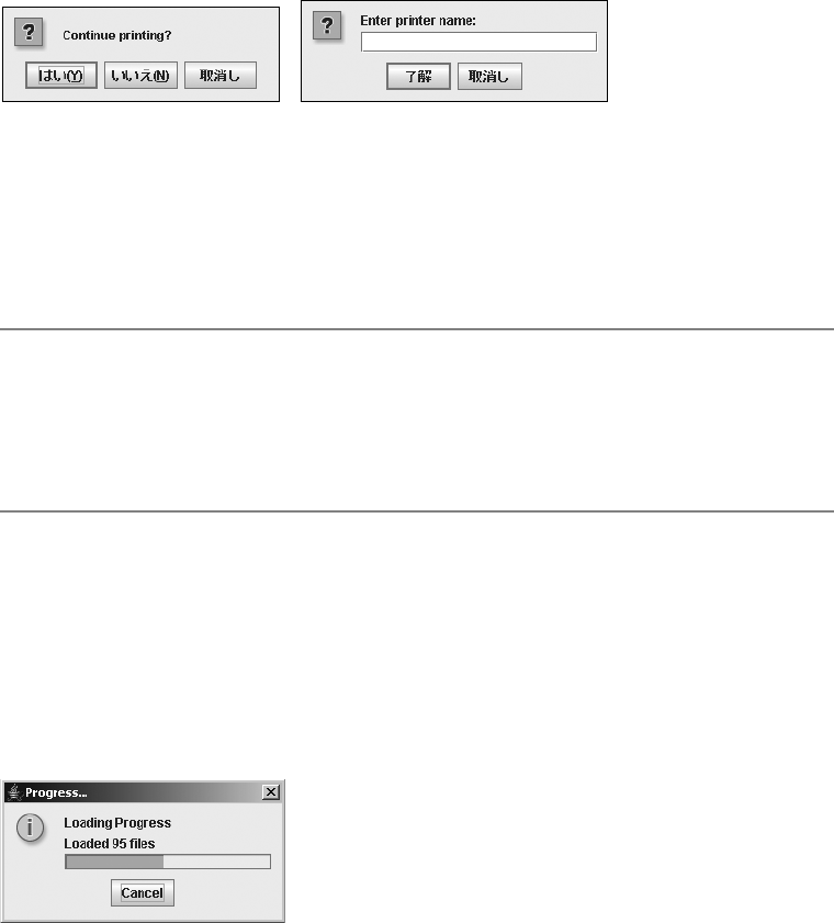
CHAPTER 9 ■ POP-UPS AND CHOOSERS 291
The JOptionPane component supports localized JOptionPane button labels. Out of the box,
the JOptionPane displays Chinese or Japanese button labels for the standard Yes, No, Cancel,
and OK buttons for the appropriate locale. For instance, the left side of Figure 9-14 shows buttons
with Japanese labels for Yes, No, and Cancel, and the right side of Figure 9-14 shows buttons with
Japanese labels for OK and Cancel. Obviously, you would need to change the message in the
option pane, but the buttons are set for you (assuming you have the fonts to support it).
Figure 9-14. A JOptionPane with Japanese-language buttons
Thankfully, the 5.0 release of the JDK includes translations for the standard JOptionPane
(as well as the JFileChooser and JColorChooser) labels. These are available for German (de),
Spanish (es), French (fr), Italian (it), Japanese (ja), Korean (ko), English, Swedish (sv), and
Chinese (Simplified/zh_CN and Traditional/zh_TW).
■Tip To start the Java runtime with a different language, just set the user.language property, as in
java -Duser.language=FR ClassName. Then, whenever you create a JOptionPane, you would get the
French labels for Yes, No, OK, and Cancel. The button labels would be like those shown in Figure 9-14, but
without you needing to manually do the UIManager.put() calls. (Instead of D'accord, Sun chose to leave
OK as OK.)
ProgressMonitor Class
The ProgressMonitor class is used to report on the status of a time-consuming task. The class is
a special Swing class that’s not a GUI component, an option pane, or a JavaBean component.
Instead, you tell the ProgressMonitor when each part of the task is done. If the task is taking an
extended length of time to complete, the ProgressMonitor displays a pop-up window like the
one shown in Figure 9-15.
Figure 9-15. ProgressMonitor sample
292 CHAPTER 9 ■ POP-UPS AND CHOOSERS
After the ProgressMonitor displays the pop-up window, the user can do one of two things.
The user can watch the ProgressMonitor display to see how much of the task has been completed;
when the task is done, the ProgressMonitor’s display automatically disappears. Or, if the user
selects the Cancel button, this tells the ProgressMonitor that the task needs to be canceled. To
detect the cancellation, the task needs to check the ProgressMonitor periodically to see if the
user canceled the task’s operation. Otherwise, the task will continue.
The pop-up window that the ProgressMonitor class displays is a JOptionPane with a
maxCharactersPerLineCount property setting of 60, allowing the option pane to automatically
word wrap any displayed messages. The option pane is embedded within a nonmodal JDialog
whose title is “Progress . . .”. Because the JDialog isn’t modal, a user can still interact with the
main program. The JOptionPane for a ProgressMonitor will always get an informational icon
within its icon area.
In addition, the message area of the option pane consists of three objects:
• At the top of the message area is a fixed message that stays the same throughout the life
of the JOptionPane. The message can be a text string or an array of objects just like the
message property of JOptionPane.
• In the middle of the message area is a note or variable message that can change as the
task progresses.
• At the bottom of the message area is a progress bar (JProgressBar component) that fills
as an increasing percentage of the task is completed.
The button area of the option pane shows a Cancel button.
Creating a ProgressMonitor
When you create a ProgressMonitor, there are five arguments to the single constructor:
public ProgressMonitor(Component parentComponent, Object message, String note,
int minimum, int maximum)
The first argument represents the parent component for the JOptionPane for when the
ProgressMonitor needs to appear. The parent component is the component over which the
pop-up window appears, and acts like the parentComponent argument for the createDialog()
method of JOptionPane. You then provide the static and variable message parts for the message
area of the JOptionPane. Either of these message parts could be null, although null means that
this part of the message area will never appear. Lastly, you provide minimum and maximum values
as the range for the progress bar. The difference between these two values represents the expected
number of operations to be performed, such as the number of files to load or the size of a file to
read. Normally, the minimum setting is zero, but that isn’t required. The number of completed
operations determines how far the progress bar moves.
Initially, the pop-up window isn’t displayed. By default, the progress monitor checks every
half second (500 milliseconds) to see if the task at hand will complete in two seconds. If the task
has shown some progress and it still won’t complete in two seconds, then the pop-up window
appears. The time to completion is configurable by changing the millisToDecideToPopup and
millisToPopup properties of the ProgressMonitor.
The following line of source demonstrates the creation of a ProgressMonitor with 200 steps
in the operation. A reference to the ProgressMonitor would need to be saved so that it can be
notified as the task progresses.

CHAPTER 9 ■ POP-UPS AND CHOOSERS 293
ProgressMonitor monitor = new ProgressMonitor(
parent, "Loading Progress", "Getting Started...", 0, 200);
Using a ProgressMonitor
Once you’ve created the ProgressMonitor, you need to begin the task whose progress is being
monitored. As the task completes one or many steps, the ProgressMonitor needs to be notified of
the task’s progress. Notification is done with a call to the public void setProgress(int newValue)
method, where the argument represents the progress completed thus far and the newValue
needs to be in the minimum...maximum range initially specified. This progress value needs to be
maintained outside the ProgressMonitor, because you can’t ask the monitor how much progress
has been made (no public int getProgress() method of ProgressMonitor exists). If the progress
value were maintained in a variable named progress, the following two lines would update the
progress value and notify the ProgressMonitor.
progress += 5;
monitor.setProgress(progress);
■Note It’s possible that multiple calls to setProgress() may not advance the progress bar in the option
pane. The changes to the progress setting must be enough to make the progress bar advance at least one
pixel in length. For instance, if the minimum and maximum settings were zero and 2 billion, increasing the
progress setting 1,000 times by 5 would have no visible effect on the progress bar, because the fractional
amount would be negligible.
The progress setting could represent the number of files loaded thus far, or the number of
bytes read in from a file. In addition to updating the count, you should update the note to
reflect the progress. If the difference between the minimum and maximum arguments used in the
ProgressMonitor constructor were 100, then the current progress could be viewed as a percentage
of the task. Otherwise, the progress property merely represents the progress completed so far.
monitor.setNote("Loaded " + progress + " files");
It’s the responsibility of the executing task to check whether the user pressed the Cancel
button in the ProgressMonitor dialog box. If the task is canceled, the ProgressMonitor automat-
ically closes the dialog box, but the task must actively check for the change by adding a simple
check at the appropriate place or places in the source:
if (monitor.isCanceled()) {
// Task canceled - cleanup
...
} else {
// Continue doing task
...
}
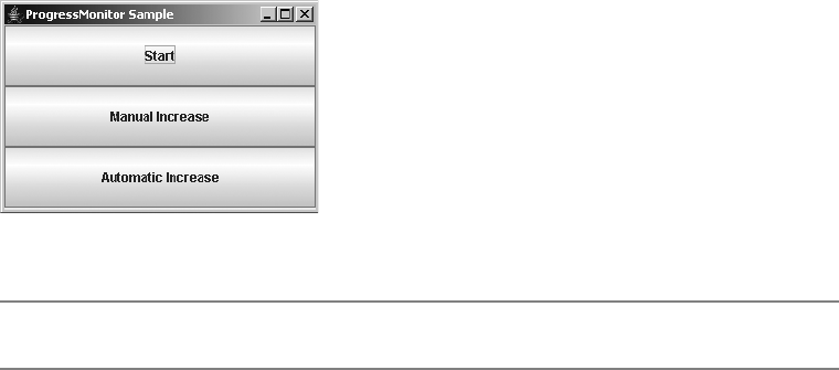
294 CHAPTER 9 ■ POP-UPS AND CHOOSERS
Most tasks requiring a ProgressMonitor will be implemented using separate threads to
avoid blocking the responsiveness of the main program.
Listing 9-5 shows a program that creates a ProgressMonitor and allows you to either manually
or automatically increase its progress property (see the following section for a description of
this property). These tasks are handled by on-screen buttons (see Figure 9-16). Selecting the
Start button creates the ProgressMonitor. Selecting the Manual Increase button causes the
progress to increase by 5. Selecting the Automatic Increase button causes the progress to
increase by 3 every 250 milliseconds (1/4 second). Pressing the Cancel button in the pop-up
window during the automatic increase demonstrates what should happen when the operation
is canceled; the timer stops sending updates.
Figure 9-16. Main ProgressMonitor sample frame
■Note The pop-up window won’t appear until some progress is shown.
The ProgressMonitorHandler inner class at the start of Listing 9-5 is necessary to ensure
that the ProgressMonitor is accessed only from the event thread. Otherwise, the access wouldn’t
be thread-safe in some random thread.
Listing 9-5. Sample ProgressMonitor Usage
import javax.swing.*;
import java.awt.*;
import java.awt.event.*;
public class SampleProgress {
static ProgressMonitor monitor;
static int progress;
static Timer timer;
static class ProgressMonitorHandler implements ActionListener {
// Called by Timer
public void actionPerformed(ActionEvent actionEvent) {
if (monitor == null)
return;
CHAPTER 9 ■ POP-UPS AND CHOOSERS 295
if (monitor.isCanceled()) {
System.out.println("Monitor canceled");
timer.stop();
} else {
progress += 3;
monitor.setProgress(progress);
monitor.setNote("Loaded " + progress + " files");
}
}
}
public static void main(String args[]) {
Runnable runner = new Runnable() {
public void run() {
JFrame frame = new JFrame("ProgressMonitor Sample");
frame.setDefaultCloseOperation(JFrame.EXIT_ON_CLOSE);
frame.setLayout(new GridLayout (0, 1));
// Define Start Button
JButton startButton = new JButton ("Start");
ActionListener startActionListener = new ActionListener() {
public void actionPerformed(ActionEvent actionEvent) {
Component parent = (Component)actionEvent.getSource();
monitor = new ProgressMonitor(parent, "Loading Progress",
"Getting Started...", 0, 200);
progress = 0;
}
};
startButton.addActionListener(startActionListener);
frame.add(startButton);
// Define Manual Increase Button
// Pressing this button increases progress by 5
JButton increaseButton = new JButton ("Manual Increase");
ActionListener increaseActionListener = new ActionListener() {
public void actionPerformed(ActionEvent actionEvent) {
if (monitor == null)
return;
if (monitor.isCanceled()) {
System.out.println("Monitor canceled");
} else {
progress += 5;
monitor.setProgress(progress);
monitor.setNote("Loaded " + progress + " files");
}
}
};

296 CHAPTER 9 ■ POP-UPS AND CHOOSERS
increaseButton.addActionListener(increaseActionListener);
frame.add(increaseButton);
// Define Automatic Increase Button
// Start Timer to increase progress by 3 every 250 ms
JButton autoIncreaseButton = new JButton ("Automatic Increase");
ActionListener autoIncreaseActionListener = new ActionListener() {
public void actionPerformed(ActionEvent actionEvent) {
if (monitor != null) {
if (timer == null) {
timer = new Timer(250, new ProgressMonitorHandler());
}
timer.start();
}
}
};
autoIncreaseButton.addActionListener(autoIncreaseActionListener);
frame.add(autoIncreaseButton);
frame.setSize(300, 200);
frame.setVisible(true);
}
};
EventQueue.invokeLater(runner);
}
}
ProgressMonitor Properties
Table 9-6 shows the eight properties of ProgressMonitor.
Table 9-6. ProgressMonitor Properties
Property Name Data Type Access
accessibleContext AccessibleContext Read-only
canceled boolean Read-only
maximum int Read-write
millisToDecideToPopup int Read-write
millisToPopup int Read-write
minimum int Read-write
note String Read-write
progress int Write-only

CHAPTER 9 ■ POP-UPS AND CHOOSERS 297
The millisToDecideToPopup property represents the number of milliseconds that the
monitor waits before deciding if it needs to display the pop-up window. If the progress property
hasn’t changed yet, the monitor waits for another increment of this time period before checking
again. When the ProgressMonitor checks and the progress property has changed, it estimates
whether the task will be completed in the number of milliseconds in the millisToPopup property.
If the ProgressMonitor thinks the monitored task will complete on time, the pop-up window is
never displayed. Otherwise, the pop-up will display after millisToPopup milliseconds have
passed from the time the task started.
■Caution Although technically possible, it isn’t a good practice to move the minimum and maximum properties
after the pop-up has appeared. This could result in the progress bar increasing and decreasing in an erratic
manner. The same behavior happens if you move the progress setting in a nonlinear fashion.
Customizing a ProgressMonitor Look and Feel
Changing the look and feel of ProgressMonitor requires changing the appearance of both the
JProgressBar and the JLabel, as well as the JOptionPane the ProgressMonitor uses.
The ProgressMonitor has one UIResource-related property:
•ProgressMonitor.progressText of type String
ProgressMonitorInputStream Class
The ProgressMonitorInputStream class represents an input stream filter that uses a
ProgressMonitor to check the progress of the reading of an input stream. If the reading is
taking too long to complete, a ProgressMonitor appears, and the user can select the Cancel
button in the pop-up window, causing the reading to be interrupted and the input stream to
throw an InterruptedIOException.
Creating a ProgressMonitorInputStream
Like other filtering streams, the ProgressMonitorInputStream is created with a reference
to the stream it needs to filter. Besides a reference to this filter, the single constructor for
ProgressMonitorInputStream requires two arguments for its ProgressMonitor: a parent compo-
nent and a message. As seen here, the constructor takes the ProgressMonitor arguments first:
public ProgressMonitorInputStream(
Component parentComponent, Object message, InputStream inputStream)
As with the JOptionPane and ProgressMonitor, the message argument is an Object, not a
String, so you can display an array of components or strings on multiple lines. The following
code creates one ProgressMonitorInputStream.

298 CHAPTER 9 ■ POP-UPS AND CHOOSERS
FileInputStream fis = new FileInputStream(filename);
ProgressMonitorInputStream pmis =
new ProgressMonitorInputStream(parent, "Reading " + filename, fis);
■Note The minimum...maximum range for the ProgressMonitorInputStream ProgressMonitor is
[0...size of stream].
Using a ProgressMonitorInputStream
As with all input streams, once you’ve created a ProgressMonitorInputStream, you need to read
from it. If the input stream isn’t read quickly enough, the underlying ProgressMonitor causes
the progress pop-up window to appear. Once that window appears, a user can monitor the
progress or cancel the reading by selecting the Cancel button. If the Cancel button is selected,
an InterruptedIOException is thrown, and the bytesTransferred field of the exception is set to
the number of bytes successfully read.
Figure 9-17 shows what one ProgressMonitorInputStream pop-up might look like. For a
little variety, the pop-up uses two JLabel components in the message, instead of just one.
Figure 9-17. ProgressMonitorInputStream pop-up
Listing 9-6 shows a complete source example. The boldfaced lines are the keys to using the
ProgressMonitorInputStream. They set up the dialog box’s message and create the input stream.
The program uses a file name specified from the command line, reads the file, and copies the
file to standard output (the console). If the file is large enough, the progress monitor will appear.
If you press the Cancel button, the reading stops and Canceled is printed to standard error.
Listing 9-6. ProgressMonitorInputStream Demonstration
import java.io.*;
import java.awt.*;
import javax.swing.*;
public class ProgressInputSample {
public static final int NORMAL = 0;
public static final int BAD_FILE = 1;
public static final int CANCELED = NORMAL;
public static final int PROBLEM = 2;

CHAPTER 9 ■ POP-UPS AND CHOOSERS 299
public static void main(String args[]) {
int returnValue = NORMAL;
if (args.length != 1) {
System.err.println("Usage:");
System.err.println("java ProgressInputSample filename");
} else {
try {
FileInputStream fis = new FileInputStream(args[0]);
JLabel filenameLabel = new JLabel(args[0], JLabel.RIGHT);
Object message[] = { "Reading:", filenameLabel} ;
ProgressMonitorInputStream pmis =
new ProgressMonitorInputStream(null, message, fis);
InputStreamReader isr = new InputStreamReader(pmis);
BufferedReader br = new BufferedReader(isr);
String line;
while ((line = br.readLine()) != null) {
System.out.println(line);
}
br.close();
} catch (FileNotFoundException exception) {
System.err.println("Bad File " + exception);
returnValue = BAD_FILE;
} catch (InterruptedIOException exception) {
System.err.println("Canceled");
returnValue = CANCELED;
} catch (IOException exception) {
System.err.println("I/O Exception " + exception);
returnValue = PROBLEM;
}
}
// AWT Thread created - must exit
System.exit(returnValue);
}
}
■Note Having a null argument for the parent component to the ProgressMonitorInputStream
constructor causes the pop-up window to appear centered on the screen.
ProgressMonitorInputStream Properties
Table 9-7 shows the single property of ProgressMonitorInputStream. The ProgressMonitor is
created when the input stream is created. You shouldn’t need to modify the ProgressMonitor.

300 CHAPTER 9 ■ POP-UPS AND CHOOSERS
However, you might want to provide a longer or shorter delay (the millisToDecideToPopup
property of ProgressMonitor) before the pop-up window is displayed.
JColorChooser Class
You can think of a JColorChooser as an input-only JOptionPane whose input field asks you to
choose a color. Like a JOptionPane, the JColorChooser is just a bunch of components in a
container, not a ready-to-use pop-up window. Figure 9-18 shows how a JColorChooser might
appear in your own application window. At the top are three selectable color chooser panels;
at the bottom is a preview panel. The “I Love Swing” bit is not part of the chooser, but of the
application that contains the chooser.
Figure 9-18. JColorChooser sample
In addition to appearing within your application windows, the JColorChooser class also
provides support methods for automatically placing the group of components in a JDialog.
Figure 9-19 shows one such automatically created pop-up.
Table 9-7. ProgressMonitorInputStream Property
Property Name Data Type Access
progressMonitor ProgressMonitor Read-only

CHAPTER 9 ■ POP-UPS AND CHOOSERS 301
Figure 9-19. JColorChooser pop-up sample
In support of this behavior, the JColorChooser class requires the help of several support
classes found in the javax.swing.colorchooser package. The data model for the JColorChooser
is an implementation of the ColorSelectionModel interface. The javax.swing.colorchooser
package provides the DefaultColorSelectionModel class as an implementation of the
ColorSelectionModel interface. For the user interface, the JColorChooser class relies on the
ColorChooserComponentFactory to create the default panels from which to choose a color.
These panels are specific subclasses of the AbstractColorChooserPanel class, and if you don’t
like the default set, you can create your own.
By default, when multiple chooser panels are in a JColorChooser, each panel is shown on
a tab of a JTabbedPane. However, the ColorChooserUI can deal with multiple panels in any way
it desires.
Creating a JColorChooser
If you want to create a JColorChooser and place it in your own window, you use one of the
following three constructors for the JColorChooser class:
public JColorChooser()
JColorChooser colorChooser = new JColorChooser();
public JColorChooser(Color initialColor)
JColorChooser colorChooser =
new JColorChooser(aComponent.getBackground());
public JColorChooser(ColorSelectionModel model)
JColorChooser colorChooser = new JColorChooser(aColorSelectionModel);
By default, the initial color for the chooser is white. If you don’t want white as the default,
you can provide the initial color as a Color object or ColorSelectionModel.
302 CHAPTER 9 ■ POP-UPS AND CHOOSERS
Using JColorChooser
Once you’ve created a JColorChooser from a constructor, you can place it in any Container, just
like any other Component. For instance, the source shown in Listing 9-7 created the GUI shown
earlier in Figure 9-18.
Listing 9-7. Using a JColorChooser in Your JFrame
import java.awt.*;
import javax.swing.*;
import javax.swing.event.*;
import javax.swing.colorchooser.*;
public class ColorSample {
public static void main(String args[]) {
Runnable runner = new Runnable() {
public void run() {
JFrame frame = new JFrame("JColorChooser Popup");
frame.setDefaultCloseOperation(JFrame.EXIT_ON_CLOSE);
final JLabel label = new JLabel("I Love Swing", JLabel.CENTER);
label.setFont(new Font("Serif", Font.BOLD | Font.ITALIC, 48));
frame.add(label, BorderLayout.SOUTH);
final JColorChooser colorChooser =
new JColorChooser(label.getBackground());
colorChooser.setBorder(
BorderFactory.createTitledBorder("Pick Foreground Color"));
// More source to come
frame.add(colorChooser, BorderLayout.CENTER);
frame.pack();
frame.setVisible(true);
}
};
EventQueue.invokeLater(runner);
}
}
Although this source code creates the GUI, selecting a different color within the
JColorChooser doesn’t do anything yet. Let’s now look at the code that causes color changes.
CHAPTER 9 ■ POP-UPS AND CHOOSERS 303
Listening for Color Selection Changes
The JColorChooser uses a ColorSelectionModel as its data model. As the following interface
definition shows, the data model includes a single property, selectedColor, for managing the
state of the color chooser.
public interface ColorSelectionModel {
// Listeners
public void addChangeListener(ChangeListener listener);
public void removeChangeListener(ChangeListener listener);
// Properties
public Color getSelectedColor();
public void setSelectedColor(Color newValue);
}
When a user changes the color within the JColorChooser, the selectedColor property changes,
and the JColorChooser generates a ChangeEvent to notify any registered ChangeListener objects.
Therefore, to complete the earlier ColorSample example in the previous section, and have
the foreground color of the label change when the user changes the color selection within the
JColorChooser, you need to register a ChangeListener with the color chooser. This involves
creating a ChangeListener and adding it to the ColorSelectionModel. Placing the source code
shown in Listing 9-8 where the //More source to come comment appears in the Listing 9-7 is
necessary for this example to work properly.
Listing 9-8. Activating the JColorChooser Example
ColorSelectionModel model = colorChooser.getSelectionModel();
ChangeListener changeListener = new ChangeListener() {
public void stateChanged(ChangeEvent changeEvent) {
Color newForegroundColor = colorChooser.getColor();
label.setForeground(newForegroundColor);
}
};
model.addChangeListener(changeListener);
Once this source is added, the example is complete. Running the program brings up
Figure 9-18, and selecting a new color alters the foreground of the label.
Creating and Showing a JColorChooser Pop-Up Window
Although the previous example is sufficient if you want to include a JColorChooser within your
own window, more often than not, you want the JColorChooser to appear in a separate pop-up
window. This window might appear as the result of selecting a button on the screen, or possibly
even selecting a menu item. To support this behavior, the JColorChooser includes the following
factory method:
public static Color showDialog(Component parentComponent,
String title, Color initialColor)
304 CHAPTER 9 ■ POP-UPS AND CHOOSERS
When called, showDialog() creates a modal dialog box with the given parent component
and title. Within the dialog box is a JColorChooser whose initial color is the one provided. As
you can see in Figure 9-18 (shown earlier in the chapter), along the bottom are three buttons:
OK, Cancel, and Reset. When OK is pressed, the pop-up window disappears and the showDialog()
method returns the currently selected color. When Cancel is pressed, null is returned instead
of the selected color or the initial color. Selection of the Reset button causes the JColorChooser
to change its selected color to the initial color provided at startup.
What normally happens with the showDialog() method is that the initial color argument is
some color property of an object. The returned value of the method call then becomes the new
setting for the same color property. This usage pattern is shown in the following lines of code,
where the changing color property is the background for a button. As with JOptionPane, the
null parent-component argument causes the pop-up window to be centered on the screen
instead of over any particular component.
Color initialBackground = button.getBackground();
Color background = JColorChooser.showDialog(
null, "Change Button Background", initialBackground);
if (background != null) {
button.setBackground(background);
}
To place this code in the context of a complete example, Listing 9-9 shows source code
that offers a button that, when selected, displays a JColorChooser. The color selected within the
chooser becomes the background color of the button after the OK button is selected.
Listing 9-9. Using showDialog with the JColorChooser
import java.awt.*;
import java.awt.event.*;
import javax.swing.*;
public class ColorSamplePopup {
public static void main(String args[]) {
Runnable runner = new Runnable() {
public void run() {
JFrame frame = new JFrame("JColorChooser Sample Popup");
frame.setDefaultCloseOperation(JFrame.EXIT_ON_CLOSE);
final JButton button = new JButton("Pick to Change Background");
ActionListener actionListener = new ActionListener() {
public void actionPerformed(ActionEvent actionEvent) {
Color initialBackground = button.getBackground();
Color background = JColorChooser.showDialog(
null, "Change Button Background", initialBackground);
CHAPTER 9 ■ POP-UPS AND CHOOSERS 305
if (background != null) {
button.setBackground(background);
}
}
};
button.addActionListener(actionListener);
frame.add(button, BorderLayout.CENTER);
frame.setSize(300, 100);
frame.setVisible(true);
}
};
EventQueue.invokeLater(runner);
}
}
Providing Your Own OK/Cancel Event Listeners
If the showDialog() method provides too much automatic behavior, you may prefer another
JColorChooser method that allows you to customize the chooser before displaying it and define
what happens when the OK and Cancel buttons are selected:
public static JDialog createDialog(Component parentComponent, String title,
boolean modal, JColorChooser chooserPane, ActionListener okListener,
ActionListener cancelListener)
In createDialog(), the parent component and title arguments are the same as showDialog().
The modal argument allows the pop-up window to be nonmodal, unlike showDialog() in
which the pop-up is always modal. When the pop-up is not modal, the user can still interact
with the rest of the application. The OK and Cancel buttons in the pop-up window automati-
cally have one associated ActionListener that hides the pop-up window after selection. It’s
your responsibility to add your own listeners if you need any additional response from selection.
To demonstrate proper usage of createDialog(), the program shown in Listing 9-10 dupli-
cates the functionality of the program shown in Listing 9-9. However, instead of automatically
accepting the new color, the color change is rejected if the new background is the same color
as the foreground. In addition, if the user selects the Cancel button, the button background
color is set to red.
Listing 9-10. Custom Action Listeners on JColorChooser Buttons
import java.awt.*;
import java.awt.event.*;
import javax.swing.*;
import javax.swing.event.*;
import javax.swing.colorchooser.*;
public class CreateColorSamplePopup {
306 CHAPTER 9 ■ POP-UPS AND CHOOSERS
public static void main(String args[]) {
Runnable runner = new Runnable() {
public void run() {
JFrame frame = new JFrame("JColorChooser Create Popup Sample");
frame.setDefaultCloseOperation(JFrame.EXIT_ON_CLOSE);
final JButton button = new JButton("Pick to Change Background");
ActionListener actionListener = new ActionListener() {
public void actionPerformed(ActionEvent actionEvent) {
Color initialBackground = button.getBackground();
final JColorChooser colorChooser =
new JColorChooser(initialBackground);
// For okay selection, change button background to selected color
ActionListener okActionListener = new ActionListener() {
public void actionPerformed(ActionEvent actionEvent) {
Color newColor = colorChooser.getColor();
if (newColor.equals(button.getForeground())) {
System.out.println("Color change rejected");
} else {
button.setBackground(colorChooser.getColor());
}
}
};
// For cancel selection, change button background to red
ActionListener cancelActionListener = new ActionListener() {
public void actionPerformed(ActionEvent actionEvent) {
button.setBackground(Color.RED);
}
};
final JDialog dialog = JColorChooser.createDialog(null,
"Change Button Background", true, colorChooser,
okActionListener, cancelActionListener);
// Wait for current event dispatching to complete before showing
Runnable showDialog = new Runnable() {
public void run() {
dialog.setVisible(true);
}
};

CHAPTER 9 ■ POP-UPS AND CHOOSERS 307
EventQueue.invokeLater(showDialog);
}
};
button.addActionListener(actionListener);
frame.add(button, BorderLayout.CENTER);
frame.setSize(300, 100);
frame.setVisible(true);
}
};
EventQueue.invokeLater(runner);
}
}
■Note Notice that the actionPerformed() method that shows the color chooser uses the
EventQueue.invokeLater() method to show the chooser. The current event handler needs to finish
before showing the chooser. Otherwise, the previous action event processing won’t complete before the
chooser is shown.
JColorChooser Properties
Table 9-8 lists information on the eight properties of the JColorChooser, including the three
data types of the single property color.
Table 9-8. JColorChooser Properties
Property Name Data Type Access
accessibleContext AccessibleContext Read-only
chooserPanels AbstractColorChooserPanel[] Read-write bound
color Color Read-write
color int rgb Write-only
color int red,int green,int blue Write-only
dragEnabled boolean Read-write
previewPanel JComponent Read-write bound
selectionModel ColorSelectionModel Read-write bound
UI ColorChooserUI Read-write bound
UIClassID String Read-only
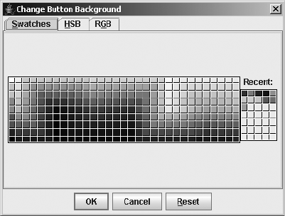
308 CHAPTER 9 ■ POP-UPS AND CHOOSERS
The color property is special in that it has three ways of setting itself:
• Directly from a Color
• From one integer representing its red-green-blue values combined into one int variable
using the nibble allocation 0xAARRGGBB, where A is for alpha value (and is ignored,
using 255 instead)
• From three integers, separating the red, green, and blue color components into three
separate int variables
If you don’t use showDialog(), you can customize the JColorChooser before displaying it.
Besides customizing the color property, which is settable in the JColorChooser constructor,
you can customize the component to be displayed in the preview area and the color chooser
panels.
Changing the Preview Panel
It’s the responsibility of the ColorChooserComponentFactory class to provide the default
component for the preview area of the JColorChooser. For the standard look and feel types,
the preview panel is in the bottom portion of the color chooser.
If you don’t want a preview panel in the color chooser, you must change the previewPanel
property to a component value that isn’t null. When the property is set to null, the default
preview panel for the look and feel is shown. Setting the property to an empty JPanel serves the
purpose of not showing the preview panel.
colorChooser.setPreviewPanel(new JPanel());
Figure 9-20 shows what one such color chooser might look like without the preview panel.
Because the JPanel has no size when nothing is in it, this effectively removes the panel.
Figure 9-20. JColorChooser without a preview panel
If you want the preview panel present, but just don’t like the default appearance, you can
add your own JComponent to the area. Configuration entails placing your new preview panel in

CHAPTER 9 ■ POP-UPS AND CHOOSERS 309
a title-bordered container, and having the foreground of the preview panel change when the
user selects a new color.
■Caution A bug in the ColorChooserUI implementation class (BasicColorChooserUI) requires an
extra step to properly install the preview panel. Besides calling setPreviewPanel(newPanel), you must
set the panel’s size and border to enable the user interface to properly configure the new preview panel.
The exact steps seem to vary with which JDK release you are using. See http://bugs.sun.com/
bugdatabase/view_bug.do?bug_id=5029286 for more details. There are some other related bugs
(search the Bug Parade for setPreviewPanel).
The following source demonstrates the use of a JLabel as the custom preview panel with
the necessary work-around. Figure 9-21 demonstrates what the JColorChooser that uses this
preview panel would look like.
final JLabel previewLabel = new JLabel("I Love Swing", JLabel.CENTER);
previewLabel.setFont(new Font("Serif", Font.BOLD | Font.ITALIC, 48));
previewLabel.setSize(previewLabel.getPreferredSize());
previewLabel.setBorder(BorderFactory.createEmptyBorder(0,0,1,0));
colorChooser.setPreviewPanel(previewLabel);
Figure 9-21. JColorChooser with custom preview panel
■Note Because the initial setting for the foreground of the preview panel is its background color, the panel
will appear to be empty. This is one reason why the default preview panel shows text with contrasting back-
ground colors.
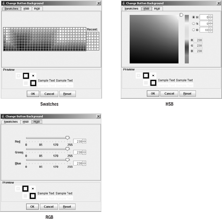
310 CHAPTER 9 ■ POP-UPS AND CHOOSERS
Changing the Color Chooser Panels
The various tabs in the upper part of the JColorChooser represent the AbstractColorChooserPanel
implementations. Each allows the user to pick a color in a different manner. By default, the
ColorChooserComponentFactory provides the JColorChooser with three panels (see Figure 9-22):
• The Swatches panel lets a user pick a color from a set of predefined color swatches, as if
at a paint store.
• The HSB panel allows a user to pick a color using the Hue-Saturation-Brightness
color model.
• The RGB panel is for picking colors using the Red-Green-Blue color model.
Figure 9-22. The default JColorChooser panels
CHAPTER 9 ■ POP-UPS AND CHOOSERS 311
If you don’t like the default chooser panels, or you just want to add other color chooser panels
that work differently, you can create your own by subclassing the AbstractColorChooserPanel
class. To add a new panel to the existing set, call the following method:
public void addChooserPanel(AbstractColorChooserPanel panel)
If you later decide that you no longer want the new panel, you can remove it with this method:
public AbstractColorChooserPanel removeChooserPanel(AbstractColorChooserPanel panel)
To replace the existing set of panels, call this method:
setChooserPanels(AbstractColorChooserPanel panels[ ])
Creating a new panel entails subclassing AbstractColorChooserPanel and filling in the
details of choosing a color for the new panel. The class definition, shown in the following code
lines, includes five abstract methods. These five methods are what must be overridden.
public abstract class AbstractColorChooserPanel extends JPanel {
public AbstractColorChooserPanel();
protected abstract void buildChooser();
protected Color getColorFromModel();
public ColorSelectionModel getColorSelectionModel();
public int getDisplayMnemonicIndex();
public abstract String getDisplayName();
public abstract Icon getLargeDisplayIcon();
public int getMnemonic();
public abstract Icon getSmallDisplayIcon();
public void installChooserPanel(JColorChooser);
public void paint(Graphics);
public void uninstallChooserPanel(JColorChooser);
public abstract void updateChooser();
}
To demonstrate how to work with color chooser panels, let’s look at how to create a new
one that displays a list of colors from the Color and SystemColor class. From this list, the user
must pick one. The panel will use a JComboBox to represent the list of colors. (The details of
using a JComboBox are explained in Chapter 13.) Figure 9-23 shows the finished panel. The panel
is created and added with the following source:
SystemColorChooserPanel newChooser = new SystemColorChooserPanel();
AbstractColorChooserPanel chooserPanels[] = {newChooser};
colorChooser.setChooserPanels(chooserPanels);
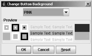
312 CHAPTER 9 ■ POP-UPS AND CHOOSERS
Figure 9-23. Replacing all panels with the new SystemColor chooser panel
The first method to define is public String getDisplayName(). This method returns a text
label to display on the tab when multiple chooser panels are available. If there’s only one chooser
panel, this name isn’t shown.
public String getDisplayName() {
return "SystemColor";
}
The return values for the two Icon methods do nothing with the system look and feel types.
You can return null from them or return an Icon to check that nothing has been done with
them. A custom ColorChooserUI could use the two Icon methods somewhere, possibly for the
icon on a chooser panel tab.
public Icon getSmallDisplayIcon() {
return new DiamondIcon(Color.BLUE);
}
public Icon getLargeDisplayIcon() {
return new DiamondIcon(Color.GREEN);
}
The protected void buildChooser() method is called by the installChooserPanel() method
of AbstractColorChooserPanel when the panel is added to the chooser. You use this method to
add the necessary components to the container. In the sample SystemColorChooserPanel
chooser, this involves creating the JComboBox and adding it to the panel. Because
AbstractColorChooserPanel is a JPanel subclass, you can just add() the combo box. The combo
box must be filled with options and an event handler installed for when the user selects the
component. The specifics of the event handling are described after the following block of
source code.
protected void buildChooser() {
comboBox = new JComboBox(labels);
comboBox.addItemListener(this);
add(comboBox);
}

CHAPTER 9 ■ POP-UPS AND CHOOSERS 313
■Note In addition, if you choose to override uninstallChooserPanel (JColorChooser
enclosingChooser), you need to call super.uninstallChooserPanel (JColorChooser
enclosingChooser) last, instead of first.
When a user changes the color value in an AbstractColorChooserPanel, the panel must
notify the ColorSelectionModel of the change in color. In the SystemColorChooserPanel panel,
this equates to the user selecting a new choice in the JComboBox. Therefore, when the combo
box value changes, find the Color that equates to the choice and tell the model about the change.
public void itemStateChanged(ItemEvent itemEvent) {
int state = itemEvent.getStateChange();
if (state == ItemEvent.SELECTED) {
int position = findColorLabel(itemEvent.getItem());
// Last position is bad (not selectable)
if ((position != NOT_FOUND) && (position != labels.length-1)) {
ColorSelectionModel selectionModel = getColorSelectionModel();
selectionModel.setSelectedColor(colors[position]);
}
}
}
The final AbstractColorChooserPanel method to implement is public void updateChooser().
It, too, is called by installChooserPanel() at setup time. In addition, it’s also called whenever
the ColorSelectionModel of the JColorChooser changes. When updateChooser() is called, the
chooser panel should update its display to show that the current color of the model is selected.
Not all panels show which color is currently selected, so a call may do nothing. (The system-
provided Swatches panel is one that doesn’t display the current color.) In addition, it’s possible that
the current color isn’t displayable on the panel. For instance, on the SystemColorChooserPanel, if
the current selection isn’t a SystemColor or Color constant, you can either do nothing or display
something to signify a custom color. Therefore, in the updateChooser() implementation, you
need to get the current color from the ColorSelectionModel and change the color for the panel.
The actual setting is done in a helper method called setColor(Color newValue).
public void updateChooser() {
Color color = getColorFromModel();
setColor(color);
}
The setColor(Color newColor) method simply looks up the color in a lookup table using
the position returned from findColorPosition(Color newColor).
// Change combo box to match color, if possible
private void setColor(Color newColor) {
int position = findColorPosition(newColor);
comboBox.setSelectedIndex(position);
}

314 CHAPTER 9 ■ POP-UPS AND CHOOSERS
The specifics of the findColorLabel(Object label) and findColorPosition(Color newColor)
methods are shown in the complete source in Listing 9-11, coming up shortly.
If you don’t use the showDialog() means of showing the chooser pop-up window, once the
chooser panel has been defined, and you’ve created a chooser panel, it can be placed within a
JColorChooser with addChooserPanel().
AbstractColorChooserPanel newChooser = new SystemColorChooserPanel();
colorChooser.addChooserPanel(newChooser);
After showing the JColorChooser and picking the appropriate tab, your new chooser will
be available for use, as shown in Figure 9-24.
Figure 9-24. After adding the new SystemColor chooser panel
The complete source for the SystemColorChooserPanel is shown in Listing 9-11. The program
should use the ComboBoxModel to store the labels and colors arrays of the example in one data
model. However, the complexities of using the MVC capabilities of the JComboBox will be saved
for Chapter 13. Feel free to change the example in order to use the appropriate data model for
the JComboBox or some of the other Collections API classes available.
Listing 9-11. Custom AbstractColorChooserPanel
import javax.swing.*;
import javax.swing.colorchooser.*;
import java.awt.*;
import java.awt.event.*;
public class SystemColorChooserPanel
extends AbstractColorChooserPanel
implements ItemListener {
CHAPTER 9 ■ POP-UPS AND CHOOSERS 315
private static int NOT_FOUND = -1;
JComboBox comboBox;
String labels[] = {
"BLACK",
"BLUE",
"CYAN",
"DARK_GRAY",
"GRAY",
"GREEN",
"LIGHT_GRAY",
"MAGENTA",
"ORANGE",
"PINK",
"RED",
"WHITE",
"YELLOW",
"activeCaption",
"activeCaptionBorder",
"activeCaptionText",
"control",
"controlDkShadow",
"controlHighlight",
"controlLtHighlight",
"controlShadow",
"controlText",
"desktop",
"inactiveCaption",
"inactiveCaptionBorder",
"inactiveCaptionText",
"info",
"infoText",
"menu",
"menuText",
"scrollbar",
"text",
"textHighlight",
"textHighlightText",
"textInactiveText",
"textText",
"window",
"windowBorder",
"windowText",
"<Custom>"};
316 CHAPTER 9 ■ POP-UPS AND CHOOSERS
Color colors[] = {
Color.BLACK,
Color.BLUE,
Color.CYAN,
Color.DARK_GRAY,
Color.GRAY,
Color.GREEN,
Color.LIGHT_GRAY,
Color.MAGENTA,
Color.ORANGE,
Color.PINK,
Color.RED,
Color.WHITE,
Color.YELLOW,
SystemColor.activeCaption,
SystemColor.activeCaptionBorder,
SystemColor.activeCaptionText,
SystemColor.control,
SystemColor.controlDkShadow,
SystemColor.controlHighlight,
SystemColor.controlLtHighlight,
SystemColor.controlShadow,
SystemColor.controlText,
SystemColor.desktop,
SystemColor.inactiveCaption,
SystemColor.inactiveCaptionBorder,
SystemColor.inactiveCaptionText,
SystemColor.info,
SystemColor.infoText,
SystemColor.menu,
SystemColor.menuText,
SystemColor.scrollbar,
SystemColor.text,
SystemColor.textHighlight,
SystemColor.textHighlightText,
SystemColor.textInactiveText,
SystemColor.textText,
SystemColor.window,
SystemColor.windowBorder,
SystemColor.windowText,
null};
// Change combo box to match color, if possible
private void setColor(Color newColor) {
int position = findColorPosition(newColor);
comboBox.setSelectedIndex(position);
}
CHAPTER 9 ■ POP-UPS AND CHOOSERS 317
// Given a label, find the position of the label in the list
private int findColorLabel(Object label) {
String stringLabel = label.toString();
int position = NOT_FOUND;
for (int i=0,n=labels.length; i<n; i++) {
if (stringLabel.equals(labels[i])) {
position=i;
break;
}
}
return position;
}
// Given a color, find the position whose color matches
// This could result in a position different from original if two are equal
// Since actual color is same, this is considered to be okay
private int findColorPosition(Color color) {
int position = colors.length-1;
// Cannot use equals() to compare Color and SystemColor
int colorRGB = color.getRGB();
for (int i=0,n=colors.length; i<n; i++) {
if ((colors[i] != null) && (colorRGB == colors[i].getRGB())) {
position=i;
break;
}
}
return position;
}
public void itemStateChanged(ItemEvent itemEvent) {
int state = itemEvent.getStateChange();
if (state == ItemEvent.SELECTED) {
int position = findColorLabel(itemEvent.getItem());
// last position is bad (not selectable)
if ((position != NOT_FOUND) && (position != labels.length-1)) {
ColorSelectionModel selectionModel = getColorSelectionModel();
selectionModel.setSelectedColor(colors[position]);
}
}
}
public String getDisplayName() {
return "SystemColor";
}
318 CHAPTER 9 ■ POP-UPS AND CHOOSERS
public Icon getSmallDisplayIcon() {
return new DiamondIcon(Color.BLUE);
}
public Icon getLargeDisplayIcon() {
return new DiamondIcon(Color.GREEN);
}
protected void buildChooser() {
comboBox = new JComboBox(labels);
comboBox.addItemListener(this);
add(comboBox);
}
public void updateChooser() {
Color color = getColorFromModel();
setColor(color);
}
}
Listing 9-12 demonstrates the use of the new chooser panel. It’s a slightly modified version
of the CreateColorSamplePopup program shown earlier in Listing 9-10. You can uncomment the
setChooserPanels() statement and comment out the addChooserPanel() call to go from adding
one panel (as in Figure 9-23) to replacing all of them (as in Figure 9-24).
Listing 9-12. Having Custom Panels in a JColorChooser
import java.awt.*;
import java.awt.event.*;
import javax.swing.*;
import javax.swing.event.*;
import javax.swing.colorchooser.*;
public class CustomPanelPopup {
public static void main(String args[]) {
Runnable runner = new Runnable() {
public void run() {
JFrame frame = new JFrame("JColorChooser Custom Panel Sample");
frame.setDefaultCloseOperation(JFrame.EXIT_ON_CLOSE);
final JButton button = new JButton("Pick to Change Background");
ActionListener actionListener = new ActionListener() {
public void actionPerformed(ActionEvent actionEvent) {
Color initialBackground = button.getBackground();
CHAPTER 9 ■ POP-UPS AND CHOOSERS 319
final JColorChooser colorChooser =
new JColorChooser(initialBackground);
SystemColorChooserPanel newChooser =
new SystemColorChooserPanel();
// AbstractColorChooserPanel chooserPanels[] = {newChooser};
// colorChooser.setChooserPanels(chooserPanels);
colorChooser.addChooserPanel(newChooser);
// For okay button, change button background to selected color
ActionListener okActionListener = new ActionListener() {
public void actionPerformed(ActionEvent actionEvent) {
Color newColor = colorChooser.getColor();
if (newColor.equals(button.getForeground())) {
System.out.println("Color change rejected");
} else {
button.setBackground(colorChooser.getColor());
}
}
};
// For cancel button, change button background to red
ActionListener cancelActionListener = new ActionListener() {
public void actionPerformed(ActionEvent actionEvent) {
button.setBackground(Color.RED);
}
};
final JDialog dialog =
JColorChooser.createDialog(
null, "Change Button Background", true, colorChooser,
okActionListener, cancelActionListener);
// Wait for current event dispatching to complete before showing
Runnable showDialog = new Runnable() {
public void run() {
dialog.setVisible(true);
}
};
EventQueue.invokeLater(showDialog);
}
};
button.addActionListener(actionListener);
frame.add(button, BorderLayout.CENTER);

320 CHAPTER 9 ■ POP-UPS AND CHOOSERS
frame.setSize(300, 100);
frame.setVisible(true);
}
};
EventQueue.invokeLater(runner);
}
}
Using the ColorChooserComponentFactory Class
One class worthy of some special attention is ColorChooserComponentFactory. Normally, this
class does its work behind the scenes, and you never need to deal with it.
However, if you want to remove one of the default color choosers, you cannot use the
public AbstractColorChooserPanel removeChooserPanel(AbstractColorChooserPanel panel)
method of JColorChooser. Initially, the chooserPanels property of JColorChooser is null. When
this property is null, the default ColorChooserUI asks the ColorChooserComponentFactory for the
default panels with the public static AbstractColorChooserPanel[ ] getDefaultChooserPanels()
method. So, until you modify the property, no panels will appear. If you want to remove a
default panel, you must get the default array, place the panels you want to keep in a new array,
and then change the chooserPanels property of the chooser to the new array. This is a little
extra work, but it gets the job done.
The other method in the ColorChooserComponentFactory class is public static JComponent
getPreviewPanel(), which gets the default preview panel when the previewPanel property of a
JColorChooser is null. This is the reason that providing a null argument to the setPreviewPanel()
method of JColorChooser doesn’t remove the preview panel. For the panel to be empty, you
must provide a JComponent with no size.
colorChooser.setPreviewPanel(new JPanel());
Customizing a JColorChooser Look and Feel
The JColorChooser appearance is nearly the same for all the preinstalled look and feel types.
The only differences are related to how each look and feel displays the internal components,
such as a JTabbedPane,JLabel,JButton, or JSlider. Changing the UIResource-related properties
of those components affects the appearance of a newly created JColorChooser. In addition, the
JColorChooser class has its own 39 UIResource-related properties available for customization,
as listed in Table 9-9. Most of these resources are related to text labels appearing on the various
default color chooser panels.
Table 9-9. JColorChooser UIResource Elements
Property String Object Type
ColorChooser.background Color
ColorChooser.cancelText String
ColorChooser.font Font
ColorChooser.foreground Color

CHAPTER 9 ■ POP-UPS AND CHOOSERS 321
ColorChooser.hsbBlueText String
ColorChooser.hsbBrightnessText String
ColorChooser.hsbDisplayedMnemonicIndex Integer
ColorChooser.hsbGreenText String
ColorChooser.hsbHueText String
ColorChooser.hsbMnemonic Integer
ColorChooser.hsbNameText String
ColorChooser.hsbRedText String
ColorChooser.hsbSaturationText String
ColorChooser.okText String
ColorChooser.panels AbstractColorChooserPanel[ ]
ColorChooser.previewText String
ColorChooser.resetMnemonic Integer
ColorChooser.resetText String
ColorChooser.rgbBlueDisplayedMnemonicIndex Integer
ColorChooser.rgbBlueMnemonic Integer
ColorChooser.rgbBlueText String
ColorChooser.rgbGreenDisplayedMnemonicIndex Integer
ColorChooser.rgbGreenMnemonic Integer
ColorChooser.rgbGreenText String
ColorChooser.rgbMnemonic Integer
ColorChooser.rgbNameText String
ColorChooser.rgbRedDisplayedMnemonicIndex Integer
ColorChooser.rgbRedMnemonic Integer
ColorChooser.rgbRedText String
ColorChooser.sampleText String
ColorChooser.showPreviewPanelText Boolean
ColorChooser.swatchesDefaultRecentColor Color
ColorChooser.swatchesDisplayedMnemonicIndex Integer
ColorChooser.swatchesMnemonic Integer
ColorChooser.swatchesNameText String
ColorChooser.swatchesRecentSwatchSize Dimension
Table 9-9. JColorChooser UIResource Elements (Continued)
Property String Object Type
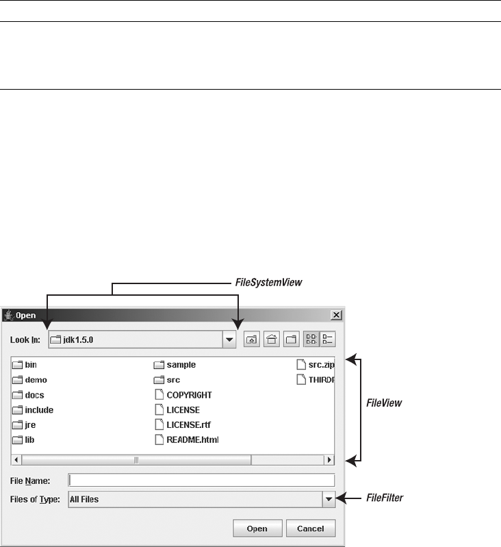
322 CHAPTER 9 ■ POP-UPS AND CHOOSERS
JFileChooser Class
The Swing component set also provides a chooser for the selection of file names and/or direc-
tories: the JFileChooser class. This chooser replaces the need for using the FileDialog from the
original AWT component set. Like the other Swing chooser components, JFileChooser isn’t
automatically placed in a pop-up window, but it can be placed anywhere within the user interface
of your program. Figure 9-25 shows a JFileChooser with the Metal look and feel, Ocean theme,
that has been automatically placed in a modal JDialog.
Figure 9-25. JFileChooser sample
In support of the JFileChooser class are a handful of classes in the javax.swing.filechooser
package. The support classes include a FileFilter class for restricting files and directories to
be listed in the FileView of the JFileChooser. The FileView controls how the directories and
files are listed within the JFileChooser. The FileSystemView is an abstract class that tries to hide
file system-related operating system specifics from the file chooser. Java 2 platform vendors
will provide operating system-specific versions so that tasks such as listing root partitions can
be done (with 100% Pure Java code).
ColorChooser.swatchesRecentText String
ColorChooser.swatchesSwatchSize Dimension
ColorChooserUI String
Table 9-9. JColorChooser UIResource Elements (Continued)
Property String Object Type

CHAPTER 9 ■ POP-UPS AND CHOOSERS 323
■Caution Don’t confuse the abstract javax.swing.filechooser.FileFilter class with the
java.io.FileFilter interface. Although functionally similar, they’re different. The two coexist because
the java.io.FileFilter interface didn’t exist in a Java 1.1 runtime. Because the original Swing
JFileChooser needed to run in both Java 1.1 and Java 2 environments, the chooser needed to define a
replacement. Unless otherwise specified, all FileFilter references in this text are to the class in the
javax.swing.filechooser package.
Creating a JFileChooser
There are six constructors for JFileChooser:
public JFileChooser()
JFileChooser fileChooser = new JFileChooser();
public JFileChooser(File currentDirectory)
File currentDirectory = new File("."); // starting directory of program
JFileChooser fileChooser = new JFileChooser(currentDirectory);
public JFileChooser(File currentDirectory, FileSystemView fileSystemView)
FileSystemView fileSystemView = new SomeFileSystemView(...);
JFileChooser fileChooser = new JFileChooser(currentDirectory, fileSystemView);
public JFileChooser(FileSystemView fileSystemView)
JFileChooser fileChooser = new JFileChooser(fileSystemView);
public JFileChooser(String currentDirectoryPath)
String currentDirectoryPath = "."; // starting directory of program
JFileChooser fileChooser = new JFileChooser(currentDirectoryPath);
public JFileChooser(String currentDirectoryPath, FileSystemView fileSystemView)
JFileChooser fileChooser = new JFileChooser(currentDirectoryPath, fileSystemView);
By default, the starting directory displayed is the user’s home directory (system property
user.home). If you want to start the JFileChooser pointing at another directory, the directory
can be specified as either a String or a File object.
You can also specify a FileSystemView to specify a custom representation to the operating
system’s top-level directory structure. When the FileSystemView argument is not specified, the
JFileChooser uses a FileSystemView appropriate for the user’s operating system.
Using JFileChooser
After creating a JFileChooser from a constructor, you can place it in any Container, because it’s
aJComponent. The JFileChooser object looks a little strange in an object that’s not a pop-up
window, but this may allow you to do a task without needing to constantly bring up a new file
chooser.
324 CHAPTER 9 ■ POP-UPS AND CHOOSERS
Listing 9-13 demonstrates a simple window with two labels and a JFileChooser. Notice
that there are no Open or Cancel buttons, but the buttons in the FileSystemView area are selectable.
Listing 9-13. Using a JFileChooser in Your JFrame
import java.io.File;
import java.awt.*;
import java.awt.event.*;
import javax.swing.*;
public class FileSamplePanel {
public static void main(String args[]) {
Runnable runner = new Runnable() {
public void run() {
JFrame frame = new JFrame("JFileChooser Popup");
frame.setDefaultCloseOperation(JFrame.EXIT_ON_CLOSE);
final JLabel directoryLabel = new JLabel(" ");
directoryLabel.setFont(new Font("Serif", Font.BOLD | Font.ITALIC, 36));
frame.add(directoryLabel, BorderLayout.NORTH);
final JLabel filenameLabel = new JLabel(" ");
filenameLabel.setFont(new Font("Serif", Font.BOLD | Font.ITALIC, 36));
frame.add(filenameLabel, BorderLayout.SOUTH);
JFileChooser fileChooser = new JFileChooser(".");
fileChooser.setControlButtonsAreShown(false);
frame.add(fileChooser, BorderLayout.CENTER);
frame.pack();
frame.setVisible(true);
}
};
EventQueue.invokeLater(runner);
}
}
Adding an ActionListener to a JFileChooser
The JFileChooser allows you to add ActionListener objects to listen for selection of the approval or
cancel actions. Approval is double-clicking a file; cancel is pressing the Escape key. To detect
which action was triggered, check the action command for the ActionEvent received by your
ActionListener. Its action command setting will be either JFileChooser.APPROVE_SELECTION
for file selection or JFileChooser.CANCEL_SELECTION for pressing the Escape key.
To complete the previous example in Listing 9-13, adding an ActionListener allows you to
set the text for the two labels when the user selects a file. On selection, the text becomes the
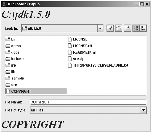
CHAPTER 9 ■ POP-UPS AND CHOOSERS 325
current directory and file name. On pressing of the Escape key, text is cleared. Listing 9-14
shows the new ActionListener.
Listing 9-14. ActionListener for JFileChooser in Your JFrame
// Create ActionListener
ActionListener actionListener = new ActionListener() {
public void actionPerformed(ActionEvent actionEvent) {
JFileChooser theFileChooser = (JFileChooser)actionEvent.getSource();
String command = actionEvent.getActionCommand();
if (command.equals(JFileChooser.APPROVE_SELECTION)) {
File selectedFile = theFileChooser.getSelectedFile();
directoryLabel.setText(selectedFile.getParent());
filenameLabel.setText(selectedFile.getName());
} else if (command.equals(JFileChooser.CANCEL_SELECTION)) {
directoryLabel.setText(" ");
filenameLabel.setText(" ");
}
}
};
fileChooser.addActionListener(actionListener);
With the addition of the ActionListener, the program is now complete in the sense that
selection is now active. Figure 9-26 shows what this window would look like after selection of
the COPYRIGHT file within the c:\jdk1.5.0 directory.
Figure 9-26. JFileChooser within a custom window

326 CHAPTER 9 ■ POP-UPS AND CHOOSERS
Showing a JFileChooser within a Pop-Up Window
Instead of placing a JFileChooser panel within your own window, you will more typically place
it in a modal JDialog. There are three ways to do this, depending on the text you want to appear
on the approval button:
•public int showDialog(Component parentComponent, String approvalButtonText)
•public int showOpenDialog(Component parentComponent)
•public int showSaveDialog(Component parentComponent)
Calling one of these methods will place the configured JFileChooser into a modal JDialog
and show the dialog box centered over the parent component. Providing a null parent component
centers the pop-up window on the screen. The call doesn’t return until the user selects the
approval or cancel button. After selection of one of the two buttons, the call returns a status
value, depending on which button was selected. This status would be one of three JFileChooser
constants: APPROVE_OPTION,CANCEL_OPTION, or ERROR_OPTION.
■Caution If the user clicks the approval button without selecting anything, CANCEL_OPTION is returned.
To perform the same task as the previous example, in which an ActionListener was
attached to the JFileChooser (Listing 9-14), you can just show the dialog box and change the
labels based on the return status, instead of relying on the action command, as follows:
JFileChooser fileChooser = new JFileChooser(".");
int status = fileChooser.showOpenDialog(null);
if (status == JFileChooser.APPROVE_OPTION) {
File selectedFile = fileChooser.getSelectedFile();
directoryLabel.setText(selectedFile.getParent());
filenameLabel.setText(selectedFile.getName());
} else if (status == JFileChooser.CANCEL_OPTION) {
directoryLabel.setText(" ");
filenameLabel.setText(" ");
}
With this technique, the file chooser will be shown in another window, instead
of within the window with the two labels. Notice that this version switches from checking
the String return values of the earlier example to checking int return values:
[if (command.equals(JFileChooser.APPROVE_SELECTION)) versus if (status ==
JFileChooser.APPROVE_OPTION)].
JFileChooser Properties
Once you understand the basic JFileChooser usage, you can customize the component’s
behavior and appearance by modifying its many properties. Table 9-10 shows the 26 properties
of JFileChooser.

CHAPTER 9 ■ POP-UPS AND CHOOSERS 327
When the different showDialog() methods are used, the dialogType property is automati-
cally set to one of three JOptionPane constants: OPEN_DIALOG,SAVE_DIALOG,CUSTOM_DIALOG. If
you’re not using showDialog(), you should set this property according to the type of dialog box you
plan to work with. The controlButtonsAreShown property allows you to hide the Open, Save,
and Cancel buttons.
Table 9-10. JFileChooser Properties
Property Name Data Type Access
acceptAllFileFilter FileFilter Read-only
acceptAllFileFilterUsed boolean Read-write bound
accessibleContext AccessibleContext Read-only
accessory JComponent Read-write bound
actionListeners ActionListener[ ] Read-only
approveButtonMnemonic char Read-write bound
approveButtonText String Read-write bound
approveButtonToolTipText String Read-write bound
choosableFileFilters FileFilter[ ] Read-only
controlButtonsAreShown boolean Read-write bound
currentDirectory File Read-write bound
dialogTitle String Read-write bound
dialogType int Read-write bound
directorySelectionEnabled boolean Read-only
dragEnabled boolean Read-write
fileFilter FileFilter Read-write bound
fileHidingEnabled boolean Read-write bound
fileSelectionEnabled boolean Read-only
fileSelectionMode int Read-write bound
fileSystemView FileSystemView Read-write bound
fileView FileView Read-write bound
multiSelectionEnabled boolean Read-write bound
selectedFile File Read-write bound
selectedFiles File[ ] Read-write bound
UI FileChooserUI Read-only
UIClassID String Read-only

328 CHAPTER 9 ■ POP-UPS AND CHOOSERS
Working with File Filters
The JFileChooser supports three ways of filtering its file and directory list. The first two involve
working with the FileFilter class, and the last involves hidden files. First, let’s look at the
FileFilter class.
FileFilter is an abstract class that works something like FilenameFilter in AWT. However,
instead of working with strings for directory and file names, it works with a File object. For
every File object that is to be displayed (both files and directories), the filter decides whether
the File can appear within the JFileChooser. In addition to providing an acceptance mecha-
nism, the filter also provides a description, or name, for when the description is displayed to a
user. These two capabilities are reflected in the following two methods of the class definition:
public abstract class FileFilter {
public FileFilter();
public abstract String getDescription();
public abstract boolean accept(File file);
}
■Note Given the abstract nature of this class, it should be an interface, but it isn’t.
To demonstrate a file filter, Listing 9-15 creates one that accepts an array of file extensions.
If the file sent to accept() is a directory, it’s automatically accepted. Otherwise, the file exten-
sion must match one of the extensions in the array provided, and the character preceding the
extension must be a period. For this particular filter, the comparisons are case-insensitive.
Listing 9-15. A Custom FileFilter for Use with a JFileChooser
import javax.swing.filechooser.*;
import java.io.File; // avoid FileFilter name conflict
public class ExtensionFileFilter extends FileFilter {
String description;
String extensions[];
public ExtensionFileFilter(String description, String extension) {
this(description, new String[] { extension} );
}
CHAPTER 9 ■ POP-UPS AND CHOOSERS 329
public ExtensionFileFilter(String description, String extensions[]) {
if (description == null) {
// Since no description, use first extension and # of extensions as description
this.description = extensions[0]+"{ "+extensions.length+"} " ;
} else {
this.description = description;
}
// Convert array to lowercase
// Don't alter original entries
this.extensions = (String[])extensions.clone();
toLower(this.extensions);
}
private void toLower(String array[]) {
for (int i=0, n=array.length; i<n; i++) {
array[i] = array[i].toLowerCase();
}
}
public String getDescription() {
return description;
}
// Ignore case, always accept directories
// Character before extension must be a period
public boolean accept(File file) {
if (file.isDirectory()) {
return true;
} else {
String path = file.getAbsolutePath().toLowerCase();
for (int i=0, n=extensions.length; i<n; i++) {
String extension = extensions[i];
if ((path.endsWith(extension) &&
(path.charAt(path.length()-extension.length()-1)) == '.')) {
return true;
}
}
}
return false;
}
}

330 CHAPTER 9 ■ POP-UPS AND CHOOSERS
Using the file filter entails creating it and associating it with the JFileChooser. If you just
want to make the filter selectable by the user, but not the default initial selection, call public
void addChoosableFileFilter(FileFilter filter). This will keep the default accept-all-files
filter selected. If, instead, you want the filter to be set when the chooser first appears, call
public void setFileFilter(FileFilter filter), and the file chooser will filter the initial set of
files shown.
For example, the following source will add two filters to a file chooser:
FileFilter jpegFilter =
new ExtensionFileFilter(null, new String[]{ "JPG", "JPEG"} );
fileChooser.addChoosableFileFilter(jpegFilter);
FileFilter gifFilter = new ExtensionFileFilter("gif", new String[]{ "gif"} );
fileChooser.addChoosableFileFilter(gifFilter);
When no file filters have been associated with the JFileChooser, the filter from
JFileChooser.getAcceptAllFileFilter() is used to provide a filter that accepts all files
and that is also appropriate for the underlying operating system.
Figure 9-27 shows an open filter selection combo box in a Motif file chooser.
Figure 9-27. Using custom FileFilter with a JFileChooser

CHAPTER 9 ■ POP-UPS AND CHOOSERS 331
■Tip Setting the FileFilter with setFileFilter() before adding filters with add
ChoosableFileFilter() causes the accept-all-file filter to be unavailable. To put it back, call
setAcceptAllFileFilterUsed(true). In addition, you can reset the filter list with a call to
resetChoosableFileFilters().
One built-in filter isn’t a FileFilter. It concerns hidden files, such as those that begin with
a period (.) on UNIX file systems. By default, hidden files aren’t shown within the JFileChooser.
To enable the display of hidden files, you must set the fileHidingEnabled property to false:
aFileChooser.setFileHidingEnabled(false);
■Tip When creating javax.swing.filechooser.FileFilter subclasses, you may want to have the
new class also implement the java.io.FileFilter interface. To do this, simply add implements
java.io.FileFilter to the class definition. This works because the method signature for the accept()
method in the javax.swing.filechooser class matches the interface definition: public boolean
accept(File file).
Choosing Directories Instead of Files
The JFileChooser supports three selection modes: files only, directories only, and files and
directories. The fileSelectionMode property setting determines the mode of the chooser. The
available settings are specified by the three JFileChooser constants: FILES_ONLY,DIRECTORIES_ONLY,
and FILES_AND_DIRECTORIES. Initially, the file chooser is in JFileChooser.FILES_ONLY mode.
To change the mode, just call public void setFileSelectionMode(int newMode).
In addition to the fileSelectionMode property, you can use the read-only
fileSelectionEnabled and directorySelectionEnabled properties to determine the type
of input currently supported by the file chooser.
Adding Accessory Panels
The JFileChooser supports the addition of an accessory component. This component can
enhance the functionality of the chooser, including previewing an image or document, or
playing an audio file. To respond to file selection changes, the accessory component should
attach itself as a PropertyChangeListener to the JFileChooser. When the JFileChooser.➥
SELECTED_FILE_CHANGED_PROPERTY property changes, the accessory then changes to reflect the
file selection. Figure 9-28 shows how an image previewer accessory component might appear.
Configuring the accessory for a chooser is just like setting any other property.
fileChooser.setAccessory(new LabelAccessory(fileChooser));

332 CHAPTER 9 ■ POP-UPS AND CHOOSERS
Figure 9-28. A JFileChooser with an accessory panel
Listing 9-16 shows source for an Image component that displays an accessory icon. The
selected image file becomes the icon for a JLabel component. The component does two scaling
operations to make sure the dimensions of the image are sized to fit within the accessory.
Listing 9-16. Custom Accessory for Use with JFileChooser
import javax.swing.*;
import java.beans.*;
import java.awt.*;
import java.io.*;
public class LabelAccessory extends JLabel implements PropertyChangeListener {
private static final int PREFERRED_WIDTH = 125;
private static final int PREFERRED_HEIGHT = 100;
public LabelAccessory(JFileChooser chooser) {
setVerticalAlignment(JLabel.CENTER);
setHorizontalAlignment(JLabel.CENTER);
chooser.addPropertyChangeListener(this);
setPreferredSize(new Dimension(PREFERRED_WIDTH, PREFERRED_HEIGHT));
}
public void propertyChange(PropertyChangeEvent changeEvent) {
String changeName = changeEvent.getPropertyName();
if (changeName.equals(JFileChooser.SELECTED_FILE_CHANGED_PROPERTY)) {
File file = (File)changeEvent.getNewValue();
if (file != null) {
ImageIcon icon = new ImageIcon(file.getPath());
if (icon.getIconWidth() > PREFERRED_WIDTH) {
icon = new ImageIcon(icon.getImage().getScaledInstance(
PREFERRED_WIDTH, -1, Image.SCALE_DEFAULT));
CHAPTER 9 ■ POP-UPS AND CHOOSERS 333
if (icon.getIconHeight() > PREFERRED_HEIGHT) {
icon = new ImageIcon(icon.getImage().getScaledInstance(
-1, PREFERRED_HEIGHT, Image.SCALE_DEFAULT));
}
}
setIcon(icon);
}
}
}
}
Using the FileSystemView Class
The FileSystemView class localizes access to platform-specific file system information. Where
the JDK 1.1 version of java.io.File was fairly crippled in this respect, FileSystemView fills in to
make it easier to design FileChooserUI objects. The Swing FileSystemView class provides three
custom views as package-private subclasses of FileSystemView. They include support for UNIX
and Windows, plus a generic handler.
Although it isn’t necessary to define your own FileSystemView, the class provides some
features that can be useful outside the context of a JFileChooser. To get the view specific to the
user’s runtime environment, call public static FileSystemView getFileSystemView(). The
class definition follows.
public abstract class FileSystemView {
// Constructors
public FileSystemView(); // Properties
// Properties
public File getDefaultDirectory();
public File getHomeDirectory();
public File[] getRoots();
// Class Methods
public static FileSystemView getFileSystemView();
// Other Methods
public File createFileObject(File directory, String filename);
public File createFileObject(String path);
protected File createFileSystemRoot(File file);
public abstract File createNewFolder(File containingDir) throws IOException;
public File getChild(File parent, String filename);
public File[] getFiles(File directory, boolean useFileHiding);
public File getParentDirectory(File file);
public String getSystemDisplayName(File file);
public Icon getSystemIcon(File file);
public String getSystemTypeDescription(File file);
public boolean isComputerNode(File file);
public boolean isDrive(File file);
public boolean isFileSystem(File file);
public boolean isFileSystemRoot(File file);
public boolean isFloppyDrive(File file);

334 CHAPTER 9 ■ POP-UPS AND CHOOSERS
public boolean isHiddenFile(File file);
public boolean isParent(File folder, File file);
public boolean isRoot(File file);
public Boolean isTraversable(File file);
}
■Note Notice that the isTraversable() method returns a Boolean, not a boolean. (I haven’t a clue
why the difference—perhaps somewhere an object is needed, and the primitive boolean wasn’t sufficient.)
FileView Class
The final part of the JFileChooser class to examine is the FileView area where all the file names
are listed. Each of the custom look and feel types has its own FileView area class. In addition,
some of the predefined look and feel types, such as Motif, aren’t changeable. Nevertheless, at
least in the Metal and Windows file choosers, you can customize the icons for different file
types or change the display name for a file.
The five methods of the FileView class allow you to change the name, icon, or description (two
forms) of each File in the view. In addition, the FileView actually controls whether a directory
is traversable, allowing you to program in a weak level of access control. Nontraversable directories
have a different default icon, because those directories cannot be browsed for file selection.
Here’s the definition of the abstract FileView class:
public abstract class FileView {
public FileView();
public String getDescription(File file);
public Icon getIcon(File file);
public String getName(File file);
public String getTypeDescription(File file);
public Boolean isTraversable(File file);
}
■Note Like FileSystemView, the isTraversable() method returns a Boolean value, not a boolean one.
Customizing the FileView requires creating a subclass and overriding the appropriate
methods. By default, all the methods return null, indicating that you don’t want to define
custom behavior for a specific method.
Once you’ve defined the file view, simply change the fileView property of your JFileChooser:
fileChooser.setFileView(new JavaFileView());
Figure 9-29 shows the changed appearance of a Metal JFileChooser after installing a
custom FileView.
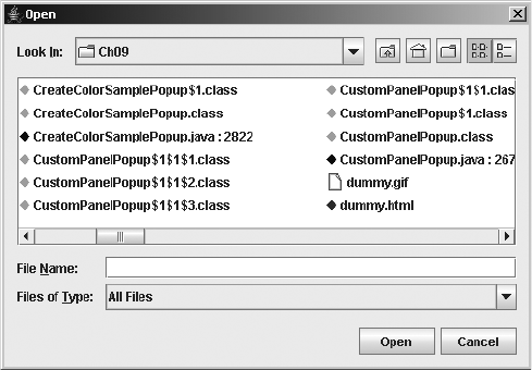
CHAPTER 9 ■ POP-UPS AND CHOOSERS 335
Figure 9-29. Changing the FileView
The JavaFileView class in Listing 9-17 provides a FileView implementation that customizes
the appearance of files related to Java development—specifically, .java,.class,.jar, and
.html or .htm files. (This is certainly not meant to be a comprehensive list of Java file types.) For
each of these file types, a special icon instead of the default icon is displayed next to the name.
In addition, for Java source files, the length of the file is displayed. (Imagine if every file attribute
were being displayed!) Unfortunately, you can’t modify the font or color from a FileView.
Listing 9-17. Custom FileView for Some Java-Related File Types
import java.io.File;
import java.awt.*;
import javax.swing.*;
import javax.swing.filechooser.*;
public class JavaFileView extends FileView {
Icon javaIcon = new DiamondIcon(Color.BLUE);
Icon classIcon = new DiamondIcon(Color.GREEN);
Icon htmlIcon = new DiamondIcon(Color.RED);
Icon jarIcon = new DiamondIcon(Color.PINK);
public String getName(File file) {
String filename = file.getName();
if (filename.endsWith(".java")) {
String name = filename + " : " + file.length();
return name;
}
return null;
}
336 CHAPTER 9 ■ POP-UPS AND CHOOSERS
public String getTypeDescription(File file) {
String typeDescription = null;
String filename = file.getName().toLowerCase();
if (filename.endsWith(".java")) {
typeDescription = "Java Source";
} else if (filename.endsWith(".class")){
typeDescription = "Java Class File";
} else if (filename.endsWith(".jar")){
typeDescription = "Java Archive";
} else if (filename.endsWith(".html") || filename.endsWith(".htm")) {
typeDescription = "Applet Loader";
}
return typeDescription;
}
public Icon getIcon(File file) {
if (file.isDirectory()) {
return null;
}
Icon icon = null;
String filename = file.getName().toLowerCase();
if (filename.endsWith(".java")) {
icon = javaIcon;
} else if (filename.endsWith(".class")){
icon = classIcon;
} else if (filename.endsWith(".jar")){
icon = jarIcon;
} else if (filename.endsWith(".html") || filename.endsWith(".htm")) {
icon = htmlIcon;
}
return icon;
}
}
Customizing a JFileChooser Look and Feel
Each installable Swing look and feel provides a different JFileChooser appearance and set of
default UIResource values. Figure 9-30 shows the appearance of the JFileChooser for the
preinstalled set of look and feel types: Motif, Windows, and Ocean.

CHAPTER 9 ■ POP-UPS AND CHOOSERS 337
Figure 9-30. JFileChooser under different look and feel types

338 CHAPTER 9 ■ POP-UPS AND CHOOSERS
The available set of UIResource-related properties for a JFileChooser is shown in Table 9-11.
For the JFileChooser component, there are 83 different properties. Nearly all the properties
relate to the button labels, mnemonics, icons, and tooltip text.
Table 9-11. JFileChooser UIResource Elements
Property String Object Type
FileChooser.acceptAllFileFilterText String
FileChooser.ancestorInputMap InputMap
FileChooser.cancelButtonMnemonic Integer
FileChooser.cancelButtonText String
FileChooser.cancelButtonToolTipText String
FileChooser.deleteFileButtonMnemonic Integer
FileChooser.deleteFileButtonText String
FileChooser.deleteFileButtonToolTipText String
FileChooser.detailsViewButtonAccessibleName String
FileChooser.detailsViewButtonToolTipText String
FileChooser.detailsViewIcon Icon
FileChooser.directoryDescriptionText String
FileChooser.directoryOpenButtonMnemonic Integer
FileChooser.directoryOpenButtonText String
FileChooser.directoryOpenButtonToolTipText String
FileChooser.enterFilenameLabelMnemonic String
FileChooser.enterFilenameLabelText String
FileChooser.fileDescriptionText String
FileChooser.fileNameLabelMnemonic Integer
FileChooser.fileNameLabelText String
FileChooser.filesLabelMnemonic Integer
FileChooser.filesLabelText String
FileChooser.filesOfTypeLabelMnemonic Integer
FileChooser.filesOfTypeLabelText String
FileChooser.filterLabelMnemonic Integer
FileChooser.filterLabelText String
FileChooser.foldersLabelMnemonic Integer
FileChooser.foldersLabelText String
FileChooser.helpButtonMnemonic Integer

CHAPTER 9 ■ POP-UPS AND CHOOSERS 339
FileChooser.helpButtonText String
FileChooser.helpButtonToolTipText String
FileChooser.homeFolderAccessibleName String
FileChooser.homeFolderIcon Icon
FileChooser.homeFolderToolTipText String
FileChooser.listFont Font
FileChooser.listViewBackground Color
FileChooser.listViewBorder Border
FileChooser.listViewButtonAccessibleName String
FileChooser.listViewButtonToolTipText String
FileChooser.listViewIcon Icon
FileChooser.listViewWindowsStyle Boolean
FileChooser.lookInLabelMnemonic Integer
FileChooser.lookInLabelText String
FileChooser.newFolderAccessibleName String
FileChooser.newFolderButtonMnemonic Integer
FileChooser.newFolderButtonText String
FileChooser.newFolderButtonToolTipText String
FileChooser.newFolderDialogText String
FileChooser.newFolderErrorSeparator String
FileChooser.newFolderErrorText String
FileChooser.newFolderIcon Icon
FileChooser.newFolderToolTipText String
FileChooser.openButtonMnemonic Integer
FileChooser.openButtonText String
FileChooser.openButtonToolTipText String
FileChooser.openDialogTitleText String
FileChooser.other.newFolder String
FileChooser.other.newFolder.subsequent String
FileChooser.win32.newFolder String
FileChooser.win32.newFolder.subsequent String
FileChooser.pathLabelMnemonic Integer
FileChooser.pathLabelText String
Table 9-11. JFileChooser UIResource Elements (Continued)
Property String Object Type

340 CHAPTER 9 ■ POP-UPS AND CHOOSERS
In addition to the more than 80 resources for JFileChooser, there are 5 additional ones as
part of the FileView, which are shown in Table 9-12.
FileChooser.readOnly Boolean
FileChooser.renameFileButtonMnemonic Integer
FileChooser.renameFileButtonText String
FileChooser.renameFileButtonToolTipText String
FileChooser.renameFileDialogText String
FileChooser.renameFileErrorText String
FileChooser.renameFileErrorTitle String
FileChooser.saveButtonMnemonic Integer
FileChooser.saveButtonText String
FileChooser.saveButtonToolTipText String
FileChooser.saveDialogTitleText String
FileChooser.saveInLabelText String
FileChooser.updateButtonMnemonic Integer
FileChooser.updateButtonText String
FileChooser.updateButtonToolTipText String
FileChooser.upFolderAccessibleName String
FileChooser.upFolderIcon Icon
FileChooser.upFolderToolTipText String
FileChooser.usesSingleFilePane Boolean
FileChooser.useSystemExtensionHiding Boolean
FileChooserUI String
Table 9-12. FileView UIResource Elements
Property String Object Type
FileView.computerIcon Icon
FileView.directoryIcon Icon
FileView.fileIcon Icon
FileView.floppyDriveIcon Icon
FileView.hardDriveIcon Icon
Table 9-11. JFileChooser UIResource Elements (Continued)
Property String Object Type
CHAPTER 9 ■ POP-UPS AND CHOOSERS 341
Summary
In this chapter, you explored the intricacies of Swing’s pop-up and chooser classes. Instead of
manually creating a JDialog and filling it with the necessary pieces, the Swing component set
includes support for many different pop-up and chooser classes. Starting with the JOptionPane,
you learned how to create informational, question, and input pop-ups. In addition, you
explored how to monitor the progress of time-consuming tasks by using the ProgressMonitor
and ProgressMonitorInputStream classes.
After looking at the more general pop-up classes, you explored the specifics of Swing’s
color and file chooser classes: JColorChooser and JFileChooser. From each of these two classes,
you can prompt the user for the requested input and customize the display in more ways than
you can imagine.
Now that you have a feel for the predefined pop-ups, it is time to move on to the
LayoutManager classes in Chapter 10. With the help of the system layout managers, you can
create even better user interfaces.

343
■ ■ ■
CHAPTER 10
Layout Managers
In Chapter 9, you learned about the various pop-up and chooser classes available from the
Swing component set. In this chapter, you’ll learn about the AWT and Swing layout managers.
While this book focuses on the Swing component set, you can’t use them in a vacuum. You
need to understand both the AWT and Swing layout managers. In fact, you’re more apt to use
four of the five AWT layout managers than three of the five Swing layout managers. The AWT
layout managers are FlowLayout,BorderLayout,GridLayout,CardLayout, and GridBagLayout.
The Swing layouts are BoxLayout,OverlayLayout,ScrollPaneLayout,ViewportLayout, and
SpringLayout. Another manager is JRootPane.RootLayout, which was described in Chapter 8.
In addition to the layout managers, you’ll look at several helper classes: GridBagLayout’s
constraint class GridBagConstraints, the SizeRequirements class used by both the BoxLayout
and OverlayLayout managers, and the SpringLayout manager’s associated Spring and
SpringLayout.Constraints classes.
Layout Manager Responsibilities
Every container, such as a JPanel or Container, has a layout manager. That layout manager is
responsible for positioning components, regardless of the platform or screen size.
Layout managers eliminate the need to compute component placement on your own,
which would be a losing proposition, since the size required for any component depends on
the platform on which your program is deployed and the current look and feel. Even for a
simple layout, the code required to discover component sizes and compute absolute positions
could be hundreds of lines, particularly if you concern yourself with what happens when the
user resizes a window. A layout manager takes care of this for you. It asks each component in
the container how much space it requires, and then arranges the components on the screen as
best it can, based on the component sizes on the platform in use, the available space, and the
rules of the layout manager.
To find out how much space a component needs, the layout manager calls the component’s
getMinimumSize(),getPreferredSize(), and getMaximumSize() methods. These methods report
the minimum, preferred, and maximum space that a component requires to be displayed
correctly. Thus, each component must know its space requirements. The layout manager then
uses the component’s space requirements to resize components and arrange them on the
screen. Your Java program never needs to worry about platform-dependent positioning, beyond
layout manager setup.
344 CHAPTER 10 ■ LAYOUT MANAGERS
Note that a layout manager is free to ignore some of its components; there is no requirement
that a layout manager display everything. For example, a Container using a BorderLayout might
include 30 or 40 components; however, the BorderLayout will display at most 5 of them (the last
component placed in each of its five named areas). Likewise, a CardLayout may manage many
components but displays exactly one at a time.
Besides ignoring components, a layout manager can do anything it wants with the compo-
nents’ minimum, preferred, and maximum size. It is free to ignore any or all of these. It makes
sense that a layout manager can ignore a preferred size—after all, preferred means, “Give me
this size if it’s available.” However, a layout manager can also ignore a minimum size. At times,
there is no reasonable alternative because the container may not have enough room to display
a component at its minimum size. How to handle this situation is left to the layout manager
designer’s discretion.
LayoutManager Interface
The LayoutManager interface defines the responsibilities of the manager that lays out the
Component objects within a Container. As explained in the previous section, it is the duty of the
layout manager to determine the position and size of each component within the Container.
You will never call the methods of the LayoutManager interface directly; for the most part, layout
managers do their work behind the scenes. Once you have created a LayoutManager object and
told the container to use it (by calling setLayout(manager)), you’re finished with it. The system
calls the appropriate methods of the layout manager when necessary. Like any interface,
LayoutManager specifies the methods a layout manager must implement but says nothing
about how the LayoutManager does its job.
The LayoutManager interface itself is most important if you are writing a new layout manager.
I’ll describe this interface first because it’s the foundation on which all layout managers are
based. I’ll also describe the LayoutManager2 interface, which is used by some layout managers.
Exploring the LayoutManager Interface
Five methods make up the LayoutManager interface:
public interface LayoutManager {
public void addLayoutComponent(String name, Component comp);
public void layoutContainer(Container parent);
public Dimension minimumLayoutSize(Container parent);
public Dimension preferredLayoutSize(Container parent);
public void removeLayoutComponent(Component comp);
}
CHAPTER 10 ■ LAYOUT MANAGERS 345
If you create your own class that implements LayoutManager, you must define all five.
As you will see, many of the methods do not need to do anything, but you must still include
a stub with the appropriate signature.
The addLayoutComponent() method is called only when you add components by calling the
add(String, Component) or add(Component, Object) method, not just plain add(Component).
For add(Component, Object), the Object must be of type String, or else that isn’t called either.
Exploring the LayoutManager2 Interface
For layout managers that require each component to carry its layout manager constraints, the
LayoutManager2 interface comes into play. The layout managers that use LayoutManager2 include
BorderLayout,CardLayout, and GridBagLayout, to name a few.
LayoutManager2 has five additional methods:
public interface LayoutManager2 {
public void addLayoutComponent(Component comp, Object constraints);
public float getLayoutAlignmentX(Container target);
public float getLayoutAlignmentY(Container target);
public void invalidateLayout(Container target);
public Dimension maximumLayoutSize(Container target);
}
The addLayoutComponent() method is called when you assign constraints to the component
when adding it to the layout. In practice, this means that you added the component to the
container by calling the add(Component component, Object constraints) or add(String name,
Component component) methods, rather than the add(Component component) method. It is up to
the layout manager to decide what, if anything, to do with the constraints. For example,
GridBagLayout uses constraints to associate a GridBagConstraints object to the component
added, and BorderLayout uses constraints to associate a location (like BorderLayout.CENTER)
with the component.
FlowLayout Class
FlowLayout is the default layout manager for a JPanel. A FlowLayout adds components to the
container in rows, working in the order defined by the getComponentOrientation() method of
Component, typically left to right in the United States and western Europe. When it can’t fit more
components in a row, it starts a new row, similar to a word processor with word wrap enabled.
When the container is resized, the components within it are repositioned based on the container’s
new size. Components within a FlowLayout-managed container are given their preferred size.
If there is insufficient space, you do not see all the components, as illustrated in Figure 10-1.

346 CHAPTER 10 ■ LAYOUT MANAGERS
Figure 10-1. The default FlowLayout setup, with seven buttons and three different screen sizes.
As the third example shows, if the screen is too small, the components will not be shrunk to fit all
the components.
There are three constructors for creating the FlowLayout layout manager:
public FlowLayout()
public FlowLayout(int alignment)
public FlowLayout(int alignment, int hgap, int vgap)
If an alignment is not specified, components within a FlowLayout-managed container are
centered. Otherwise, the setting is controlled by one of the following constants:
•CENTER
•LEADING
•LEFT
•RIGHT
•TRAILING
For the typical left-to-right orientation, LEADING and LEFT are the same, as are TRAILING and
RIGHT. For a language like Hebrew, these would be reversed. Figure 10-2 shows the effect of
several different alignments.

CHAPTER 10 ■ LAYOUT MANAGERS 347
Figure 10-2. FlowLayout with three different alignments
You can specify the gaps, in pixels, for the spacing between components, both horizontal
(hgap) and vertical (vgap). Gaps default to five pixels unless specified. It is possible to specify
negative gaps if you want components to be placed on top of one another.
BorderLayout Class
BorderLayout is the default layout manager for the content pane of a JFrame,JWindow,JDialog,
JInternalFrame, and JApplet. It provides for a more flexible way of positioning components
along the edges of the window. Figure 10-3 shows a typical BorderLayout.
Figure 10-3. Sample BorderLayout
348 CHAPTER 10 ■ LAYOUT MANAGERS
When using BorderLayout, you add components with constraints to identify in which of
the five locations to place the component. If you don’t specify a constraint, the component is
added to the center area. Adding multiple components to the same area shows only the last
component, although technically speaking, the other components are still within the container;
they are just not shown.
There are two constructors for creating the BorderLayout layout manager:
public BorderLayout()
public BorderLayout(int hgap, int vgap)
Unlike FlowLayout, the default gaps for a BorderLayout are zero pixels, meaning the
components are positioned right next to one another.
The constraints to use when adding a component to a BorderLayout-managed container
are constants of the BorderLayout class:
•AFTER_LAST_LINE
•AFTER_LINE_ENDS
•BEFORE_FIRST_LINE
•BEFORE_LINE_BEGINS
•CENTER
•EAST
•LINE_END
•LINE_START
•NORTH
•PAGE_END
•PAGE_START
•SOUTH
•WEST
With only five regions to add a component to, you would expect only five constants. As with
FlowLayout, the additional constants deal with proper positioning when the component
orientation is reversed, either horizontally or vertically. For the typical left-to-right, top-to-
bottom orientation, the common set of values is as follows:
•AFTER_LAST_LINE,PAGE_END,SOUTH
•AFTER_LINE_ENDS,LINE_END,EAST
•BEFORE_FIRST_LINE,PAGE_START,NORTH
•BEFORE_LINE_BEGINS,LINE_START,WEST
• CENTER
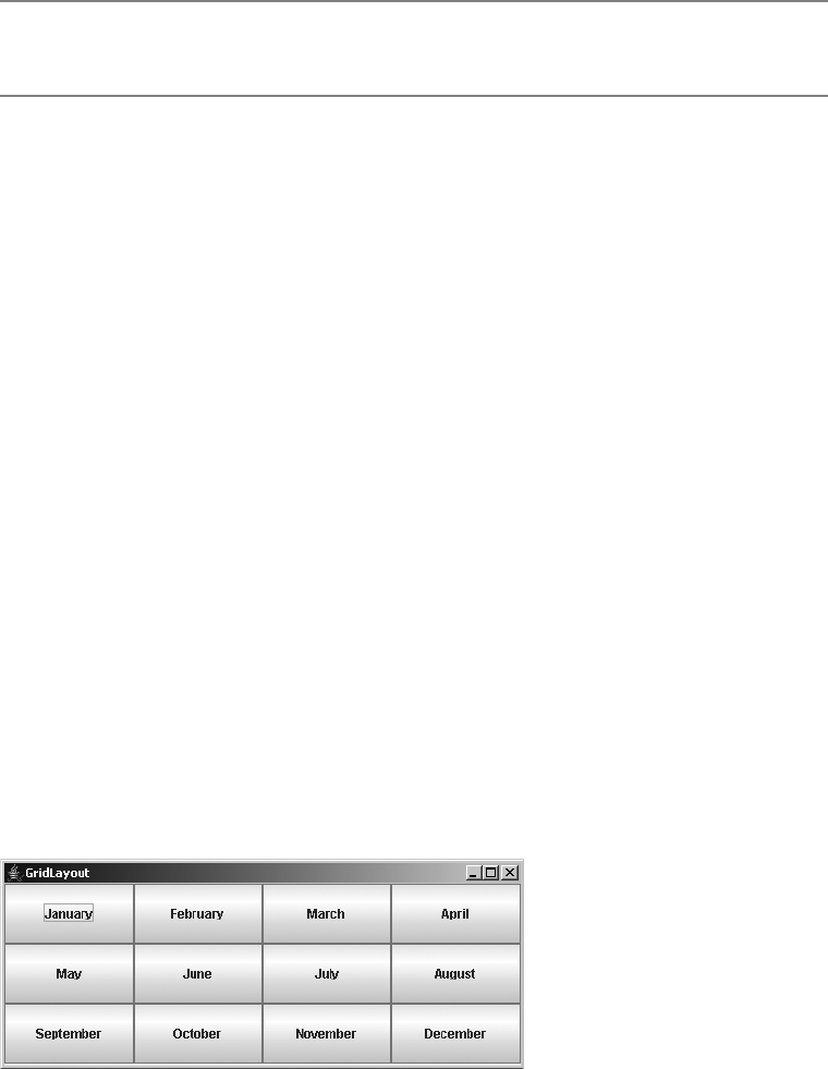
CHAPTER 10 ■ LAYOUT MANAGERS 349
■Tip Using the BEFORE and AFTER constants, as opposed to the NORTH,SOUTH,EAST, and WEST
constants, is recommended, though all are supported.
You do not need specify all five areas of the container. The component in the north region
takes up the entire width of the container along its top. South does the same along the bottom.
The heights of north and south will be the preferred heights of the component added. The east
and west areas are given the widths of the component each contains, where the height is whatever
is left in the container after satisfying north’s and south’s height requirements. Any remaining
space is given to the component in the center region.
The way to place multiple components into one of the regions of a BorderLayout-managed
container is to add them to a different container first, and then add them to the BorderLayout-
managed container. For instance, if you want a label and text field in the north area of
aBorderLayout-managed container, place them in the west and center areas of another
BorderLayout-managed container first, as shown here:
JPanel outerPanel = new JPanel(new BorderLayout());
JPanel topPanel = new JPanel(new BorderLayout());
JLabel label = new JLabel("Name:");
JTextField text = new JTextField();
topPanel.add(label, BorderLayout.BEFORE_LINE_BEGINS);
topPanel.add(text, BorderLayout.CENTER);
outerPanel.add(topPanel, BorderLayout.BEFORE_FIRST_LINE);
GridLayout Class
The GridLayout manager is ideal for laying out objects in rows and columns, where each cell in
the layout has the same size. Components are added to the layout from left to right, top to
bottom. A call to setLayout(new GridLayout(3, 4)) changes the layout manager of the current
container to a GridLayout with three rows and four columns, as shown in Figure 10-4.
Figure 10-4. Sample GridLayout

350 CHAPTER 10 ■ LAYOUT MANAGERS
There are three constructors for creating the GridLayout layout manager:
public GridLayout()
public GridLayout(int rows, int columns)
public GridLayout(int rows, int columns, int hgap, int vgap)
Typically, you would explicitly specify the overall grid size for your GridLayout-managed
container. However, you can set the number of rows or columns to be zero, and the layout will
grow without bounds in the direction with a zero setting.
■Caution If both rows and columns are specified to be zero to the GridLayout constructor, a runtime
exception of IllegalArgumentException will be thrown.
The actual number of rows and columns drawn is based on the number of components
within the container. The GridLayout tries to observe the number of rows requested first.
If the requested number of rows is nonzero, the number of columns is determined by
(# of components + rows – 1)/rows. If your request is for zero rows, the number of rows to use is
determined by a similar formula: (# of components + columns – 1)/columns. Table 10-1 demon-
strates this calculation. The last entry in the table is of special interest: if you request a 3×3 grid
but place only four components in the layout, you actually get a 2×2 layout as a result. If you do
not want to be surprised, size the GridLayout based on the actual number of objects you plan
to add to the display.
GridBagLayout Class
GridBagLayout is the most complex and most flexible of the layout managers. Although it sounds
like it should be a subclass of GridLayout, it’s a different beast altogether. With GridLayout,
elements are arranged in a rectangular grid, and each element in the container is sized identically
Table 10-1. GridLayout Row/Column Calculation
Rows Columns # Components Display Rows Display Columns
0 1 10 10 1
02 10 5 2
10 10 1 10
20 10 2 5
23 10 2 5
23 20 2 10
32 10 3 4
33 3 3 1
33 4 2 2
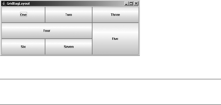
CHAPTER 10 ■ LAYOUT MANAGERS 351
(where possible). With GridBagLayout, elements can have different sizes and can occupy
multiple rows or columns.
There is only the no-argument constructor for GridBagLayout:
public GridBagLayout()
The position and behavior of each element is specified by an instance of the
GridBagConstraints class. By properly constraining the elements, you can specify the number
of rows and columns a component occupies, which component grows when additional screen
real estate is available, and various other restrictions. The actual grid size is based on the
number of components within the GridBagLayout and the GridBagConstraints of those objects.
For example, Figure 10-5 shows a GridBagLayout with seven components, arranged in a 3×3 grid.
Figure 10-5. GridBagLayout with seven components in a 3×3 grid
■Note The maximum capacity of a screen using GridBagLayout is 512 rows by 512 columns. This is
specified by the protected MAXGRIDSIZE constant of the layout manager.
The code used to create Figure 10-5 is shown in Listing 10-1.
Listing 10-1. Seven-Button GridBagLayout
import java.awt.*;
import java.awt.event.*;
import javax.swing.*;
import java.text.*;
public class GridBagButtons {
private static final Insets insets = new Insets(0,0,0,0);
public static void main(final String args[]) {
Runnable runner = new Runnable() {
public void run() {
final JFrame frame = new JFrame("GridBagLayout");
frame.setDefaultCloseOperation(JFrame.EXIT_ON_CLOSE);
frame.setLayout(new GridBagLayout());
JButton button;
352 CHAPTER 10 ■ LAYOUT MANAGERS
// Row One - Three Buttons
button = new JButton("One");
addComponent(frame, button, 0, 0, 1, 1,
GridBagConstraints.CENTER, GridBagConstraints.BOTH);
button = new JButton("Two");
addComponent(frame, button, 1, 0, 1, 1,
GridBagConstraints.CENTER, GridBagConstraints.BOTH);
button = new JButton("Three");
addComponent(frame, button, 2, 0, 1, 1,
GridBagConstraints.CENTER, GridBagConstraints.BOTH);
// Row Two - Two Buttons
button = new JButton("Four");
addComponent(frame, button, 0, 1, 2, 1,
GridBagConstraints.CENTER, GridBagConstraints.BOTH);
button = new JButton("Five");
addComponent(frame, button, 2, 1, 1, 2,
GridBagConstraints.CENTER, GridBagConstraints.BOTH);
// Row Three - Two Buttons
button = new JButton("Six");
addComponent(frame, button, 0, 2, 1, 1,
GridBagConstraints.CENTER, GridBagConstraints.BOTH);
button = new JButton("Seven");
addComponent(frame, button, 1, 2, 1, 1,
GridBagConstraints.CENTER, GridBagConstraints.BOTH);
frame.setSize(500, 200);
frame.setVisible(true);
}
};
EventQueue.invokeLater(runner);
}
private static void addComponent(Container container, Component component,
int gridx, int gridy, int gridwidth, int gridheight, int anchor,
int fill) {
GridBagConstraints gbc = new GridBagConstraints(gridx, gridy,
gridwidth, gridheight, 1.0, 1.0, anchor, fill, insets, 0, 0);
container.add(component, gbc);
}
}
Most of the work in Listing 10-1 is done by the helper method addComponent(), which
creates a set of constraints for the component to be added to the container.
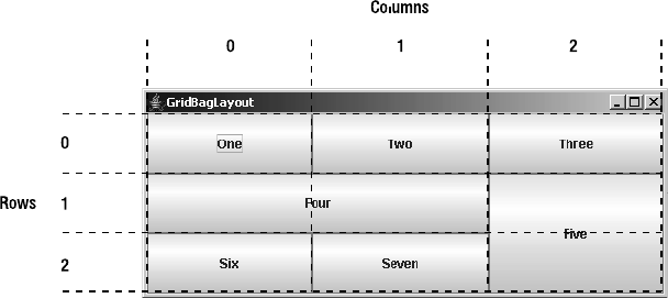
CHAPTER 10 ■ LAYOUT MANAGERS 353
GridBagLayout Rows and Columns
To help you visualize the grid of components in the GridBagLayout, Figure 10-6 indicates how
the layout manager counts cells. The top-left cell in the layout has location (0, 0). There’s nothing
surprising about buttons one, two, three, six, and seven. Each of those occupies a 1×1 area of
the layout’s 3×3 grid. Button four occupies a 2×1 area; it is placed at location (0, 1), and thus
occupies this cell plus the cell at (1, 1). Likewise, button five occupies a 1×2 area and takes up
the cells at (2, 1) and (2, 2). The total size of the layout is determined entirely by the components
that are placed in it and their constraints.
Figure 10-6. How GridBagLayout counts rows and columns
GridBagConstraints Class
The magic of the layout manager is strictly controlled by the different GridBagConstraints
objects passed in for each component added to the container. Each specifies how to display a
specific component. Unlike most other layout managers, which have a built-in idea about
what to do with their display, the GridBagLayout is a blank slate. The constraints attached to the
components tell the layout manager how to build its display.
Every component added to a GridBagLayout container should have a GridBagConstraints
object associated with it. When an object is first added to the layout, it is given a default set
of constraints (see Table 10-2). Calling container.add(Component, GridBagConstraints) or
gridBagLayout.setConstraints(GridBagConstraints) applies the new set of constraints to the
component.
GridBagConstraints has two constructors:
public GridBagConstraints()
public GridBagConstraints(int gridx, int gridy, int gridwidth, int gridheight,
double weightx, double weighty, int anchor, int fill, Insets insets, int ipadx,
int ipady)

354 CHAPTER 10 ■ LAYOUT MANAGERS
Using the no-argument constructor for GridBagConstraints starts with all the defaults in
Table 10-2. You can leave the individual settings alone and just set the individual fields. All are
public, without getter methods. While you can just blindly pass in all the constraints to the
GridBagConstraints constructor, it is better to describe the different fields separately.
Component Anchoring
The anchor variable specifies the direction in which the component will drift in the event it is
smaller than the space available for it. CENTER is the default. The absolute values are NORTH,SOUTH,
EAST,WEST,NORTHEAST,NORTHWEST,SOUTHEAST, and SOUTHWEST. The relative values are PAGE_START,
PAGE_END,LINE_START,LINE_END,FIRST_LINE_START,FIRST_LINE_END,LAST_LINE_START, and
LAST_LINE_END.
Component Resizing
The value of fill controls the component’s resize policy. If fill is NONE (the default), the layout
manager tries to give the component its preferred size. If fill is VERTICAL, it resizes in height if
additional space is available. If fill is HORIZONTAL, it resizes in width. If fill is BOTH, the layout
Table 10-2. GridBagConstraints Defaults
Variable Value Description
anchor CENTER If the component is smaller than the space available, it will be
centered within its region.
fill NONE The component should not resize itself if extra space is avail-
able within its region.
gridx RELATIVE The component associated with this constraint will be
positioned relative to the last item added. If all components
have gridx and gridy RELATIVE, they will be placed in a
single row.
gridy RELATIVE The component associated with this constraint will be
positioned relative to the last item added.
gridwidth 1 The component will occupy a single cell wide within the layout.
gridheight 1 The component will occupy a single cell high within the layout.
insets 0x0x0x0 No extra space is added around the edges of the component.
ipadx 0 There is no internal horizontal padding for the component.
ipady 0 There is no internal vertical padding for the component.
weightx 0 The component will not get any extra horizontal space,
if available.
weighty 0 The component will not get any extra vertical space, if
available.
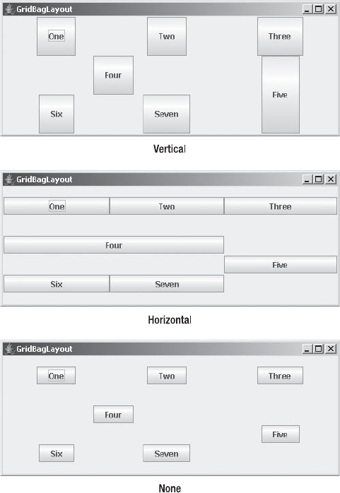
CHAPTER 10 ■ LAYOUT MANAGERS 355
manager takes advantage of all available space in both directions. Figure 10-7 demonstrates
VERTICAL,HORIZONTAL, and NONE values (generated by changing the GridBagConstraints.BOTH
settings in Listing 10-1).
Figure 10-7. GridBagLayout with different fill values
Grid Positioning
The gridx and gridy variables specify the grid position where this component would be placed.
(0, 0) specifies the cell at the origin of the screen. The gridwidth and gridheight variables
specify the number of rows (gridwidth) and columns (gridheight) a particular component
occupies. Table 10-3 shows the gridx,gridy,gridwidth, and gridheight values for the example
shown earlier in Figure 10-5.

356 CHAPTER 10 ■ LAYOUT MANAGERS
It isn’t necessary to set gridx and gridy to a specific location. If you set these fields to
RELATIVE (the default), the system calculates the location for you. According to the Javadoc
comments, if gridx is RELATIVE, the component appears to the right of the last component
added to the layout. If gridy is RELATIVE, the component appears below the last component
added to the layout. However, this is misleadingly simple. RELATIVE placement works best if
you are adding components along a row or column. In this case, there are four possibilities for
placement:
•With gridx and gridy RELATIVE, components are placed in one row.
•With gridx RELATIVE and gridy constant, components are placed in one row, each to the
right of the previous component.
•With gridx constant and gridy RELATIVE, components are placed in one column, each
below the previous component.
• Varying gridx or gridy while setting the other field RELATIVE appears to start a new row,
placing the component as the first element of the new row.
If gridwidth or gridheight is set to REMAINDER, the component will be the last element of
the row or column occupying any space that’s remaining. For the components in the rightmost
column of Table 10-3, for example, the gridwidth values could have been REMAINDER. Similarly,
gridheight could be set to REMAINDER for the components in the bottom row.
gridwidth and gridheight may also have the value RELATIVE, which forces the component
to be the next-to-last component in the row or column. Looking back to Figure 10-5, if button
six had a gridwidth of RELATIVE, button seven wouldn’t appear because button five is the last
item in the row, and six is already next to last. If button five had a gridheight of RELATIVE, the
layout manager would reserve space below it so the button could be the next-to-last item in
the column.
Padding
The insets value specifies the external padding in pixels around the component (the space
between the component and the edge of the cell or cells allotted to it). An Insets object can
specify different padding for the top, bottom, left, or right side of the component.
Table 10-3. The gridx, gridy, gridwidth, and gridheight Values for Figure 10-5
Component gridx gridy gridwidth gridheight
One0011
Two1011
Three 2 0 1 1
Four0121
Five2102
Six0211
Seven1213
CHAPTER 10 ■ LAYOUT MANAGERS 357
ipadx and ipady specify the internal padding within the component. ipadx specifies the extra
space to the right and left of the component (so the minimum width increases by 2×ipadx pixels).
ipady specifies the extra space above and below the component (so the minimum height increases
by 2×ipady pixels). The difference between insets (external padding) and ipadx/ipady (internal
padding) can be confusing. The insets don’t add space to the component itself; they are
external to the component. ipadx and ipady change the component’s minimum size, so they
do add space to the component itself.
Weight
weightx and weighty describe how to distribute any additional space within the container.
They allow you to control how components grow (or shrink) when the user resizes the
container, or the container is just bigger to start.
If weightx is 0.0, the component won’t get any additional space available in its row. If one
or more components in a row have a positive weightx, any extra space is distributed propor-
tionally between them. For example, if one component has a weightx value of 1.0 and the
others are all 0.0, the one component will get all the additional space. If four components in a
row each has a weightx value of 1.0, and the other components have weightx values of 0.0, the
four components each get one quarter of the additional space. weighty behaves similarly to
weightx, but in the other direction. Because weightx and weighty control the distribution of
extra space in any row or column, setting either for one component may affect the position of
the other components.
CardLayout Class
The CardLayout layout manager is significantly different from the other layout managers.
Whereas the other layout managers attempt to display all the components within the container
at once, a CardLayout displays only one component at a time. That component can be a component
or container, where the latter lets you see multiple components laid out based on the layout
manager of the embedded container.
Now that the JTabbedPane component (described in the next chapter) is available, CardLayout
is rarely used.
BoxLayout Class
Swing’s BoxLayout manager allows you to position components in either a horizontal row or a
vertical column within your own container. In addition to using BoxLayout within your own
container, the Box class (described in the next chapter) offers a container that uses BoxLayout as
its default layout manager.
The benefit of using BoxLayout over something like FlowLayout or GridLayout is that BoxLayout
works to honor each component’s x and y alignment properties as well as its maximum size.
And BoxLayout is much easier to use than GridBagLayout. Figure 10-8 demonstrates BoxLayout
in action. Previously, you would have needed to figure out the necessary layout constraints to
get GridBagLayout to behave like this.
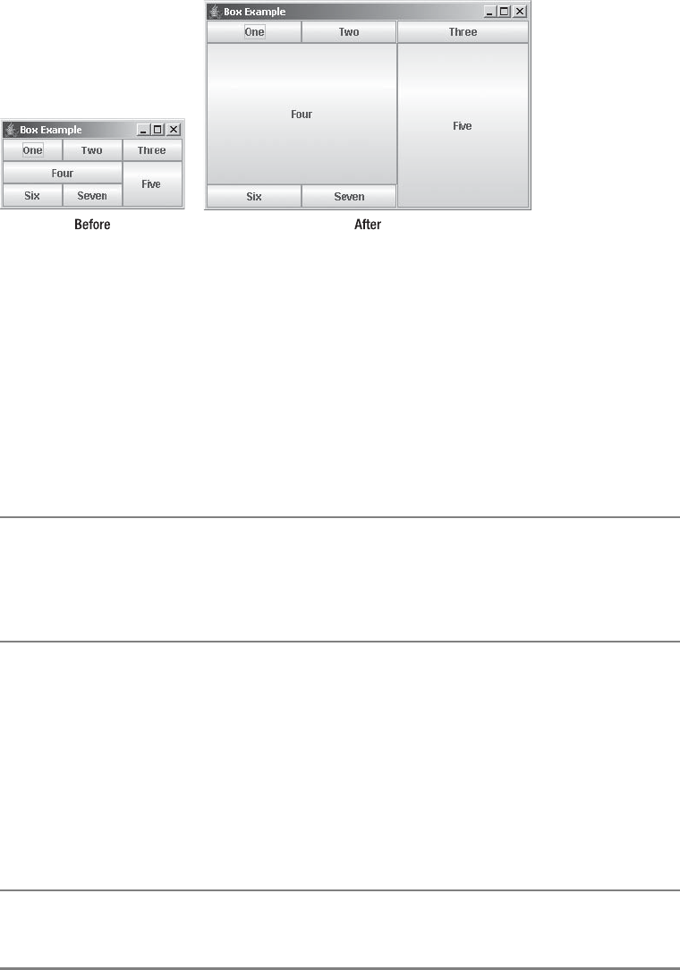
358 CHAPTER 10 ■ LAYOUT MANAGERS
Figure 10-8. BoxLayout example, before and after resizing
Creating a BoxLayout
BoxLayout has a single constructor:
public BoxLayout(Container target, int axis)
The constructor takes two arguments. The first argument is the container with which this
instance of the layout manager is to be associated, and the second is the layout direction. Valid
directions are BoxLayout.X_AXIS for a left-to-right layout and BoxLayout.Y_AXIS for a top-to-
bottom layout.
■Caution Trying to set the axis to something other than the equivalent value of the two constructor
constants will throw an AWTError. If the layout manager is associated with a container that isn’t the
container passed in to the constructor, an AWTError will be thrown when the layout manager tries to lay
out the other (that is, wrong) container.
Once you create a BoxLayout instance, you can associate the layout manager with a
container as you would with any other layout manager.
JPanel panel = new JPanel();
LayoutManager layout = new BoxLayout (panel, BoxLayout.X_AXIS);
panel.setLayout(layout);
Unlike all the other system-provided layout managers, a BoxLayout and container are bound
together in two directions, from manager to container as well as from container to manager.
■Tip The Box class, described in Chapter 11, lets you create a container and set its layout manager to
BoxLayout all in one step.

CHAPTER 10 ■ LAYOUT MANAGERS 359
Laying Out Components
Once you’ve set the layout manager of a container to BoxLayout, that’s really all you do directly
with the layout manager. Adding components to the container is done with either the
add(Component component) or add(Component component, int index) method. Although
BoxLayout implements the LayoutManager2 interface, implying the use of constraints, it currently
uses none. Therefore, it isn’t necessary to use add(Component component, Object constraints).
When it comes time to lay out the container, BoxLayout does its work. The BoxLayout manager
tries to satisfy the minimum and maximum sizes of the components within the container, as
well as their x-axis and y-axis alignments. Alignment values range from 0.0f to 1.0f. (Alignment
settings are floating-point constants, not doubles, hence the need for the f.)
By default, all Component subclasses have an x-axis alignment of Component.CENTER_ALIGNMENT
and a y-axis alignment of Component.CENTER_ALIGNMENT. However, all AbstractButton subclasses
and JLabel have a default x-axis alignment of Component.LEFT_ALIGNMENT. Table 10-4 shows
the constants available from Component for these component properties, settable with either
setAlignmentX(float newValue) or setAlignmentY(float newValue). The different alignments
work identically, except in different directions. In the case of horizontal alignments, this is
similar to left-, center-, or right-justifying a paragraph.
Laying Out Components with the Same Alignments
The BoxLayout manager acts differently depending on the alignment of the components within
the container being managed. If all the alignments are the same, those components whose
maximum size is smaller than the container will be aligned based on the alignment setting. For
instance, if you have a wide area with a vertical BoxLayout and small buttons within it, the
horizontal alignment will serve to left-, center-, or right-justify the buttons. Figure 10-9 shows
how this looks.
Table 10-4. Component Alignments
Setting Value
Vertical Alignment
Component.TOP_ALIGNMENT 0.0f
Component.CENTER_ALIGNMENT 0.5f
Component.BOTTOM_ALIGNMENT 1.0f
Horizontal Alignment
Component.LEFT_ALIGNMENT 0.0f
Component.CENTER_ALIGNMENT 0.5f
Component.RIGHT_ALIGNMENT 1.0f
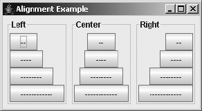
360 CHAPTER 10 ■ LAYOUT MANAGERS
Figure 10-9. Three y-axis BoxLayout containers, each with components having the same
horizontal alignments
The key point demonstrated here is that if all the components share the same alignment
setting, the actual alignment of all the components within the managed container is the
components’ alignment setting.
The source used to generate Figure 10-9 is shown in Listing 10-2.
Listing 10-2. Y-Axis Alignment
import javax.swing.*;
import java.awt.*;
import java.awt.event.*;
public class YAxisAlignX {
private static Container makeIt(String title, float alignment) {
String labels[] = {"--", "----", "--------", "------------"};
JPanel container = new JPanel();
container.setBorder(BorderFactory.createTitledBorder(title));
BoxLayout layout = new BoxLayout(container, BoxLayout.Y_AXIS);
container.setLayout(layout);
for (int i=0,n=labels.length; i<n; i++) {
JButton button = new JButton(labels[i]);
button.setAlignmentX(alignment);
container.add(button);
}
return container;
}
public static void main(String args[]) {
Runnable runner = new Runnable() {
public void run() {
JFrame frame = new JFrame("Alignment Example");
frame.setDefaultCloseOperation(JFrame.EXIT_ON_CLOSE);
Container panel1 = makeIt("Left", Component.LEFT_ALIGNMENT);
Container panel2 = makeIt("Center", Component.CENTER_ALIGNMENT);
Container panel3 = makeIt("Right", Component.RIGHT_ALIGNMENT);
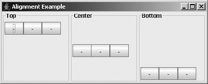
CHAPTER 10 ■ LAYOUT MANAGERS 361
frame.setLayout(new FlowLayout());
frame.add(panel1);
frame.add(panel2);
frame.add(panel3);
frame.pack();
frame.setVisible(true);
}
};
EventQueue.invokeLater(runner);
}
}
An x-axis BoxLayout works similarly when all the components have the same vertical align-
ments. Instead of being left-, center-, and right-justified, the components would appear at the
top, center, and bottom of the container. Figure 10-10 demonstrates this appearance.
Figure 10-10. Three x-axis BoxLayout containers that each have components with the same
vertical alignments
The source for the example shown in Figure 10-10 requires just a few changes from
Listing 10-2. The complete source is provided in Listing 10-3.
Listing 10-3. X-Axis Alignment
import javax.swing.*;
import java.awt.*;
import java.awt.event.*;
public class XAxisAlignY {
private static Container makeIt(String title, float alignment) {
String labels[] = {"-", "-", "-"};
JPanel container = new JPanel();
container.setBorder(BorderFactory.createTitledBorder(title));
BoxLayout layout = new BoxLayout(container, BoxLayout.X_AXIS);
container.setLayout(layout);
362 CHAPTER 10 ■ LAYOUT MANAGERS
for (int i=0,n=labels.length; i<n; i++) {
JButton button = new JButton(labels[i]);
button.setAlignmentY(alignment);
container.add(button);
}
return container;
}
public static void main(String args[]) {
Runnable runner = new Runnable() {
public void run() {
JFrame frame = new JFrame("Alignment Example");
frame.setDefaultCloseOperation(JFrame.EXIT_ON_CLOSE);
Container panel1 = makeIt("Top", Component.TOP_ALIGNMENT);
Container panel2 = makeIt("Center", Component.CENTER_ALIGNMENT);
Container panel3 = makeIt("Bottom", Component.BOTTOM_ALIGNMENT);
frame.setLayout(new GridLayout(1, 3));
frame.add(panel1);
frame.add(panel2);
frame.add(panel3);
frame.setSize(423, 171);
frame.setVisible(true);
}
};
EventQueue.invokeLater(runner);
}
}
Laying Out Components with Different Alignments
Working with small components that have the same alignment is relatively simple. However,
if the components in a container managed by a BoxLayout have different alignments, things
become more complex. In addition, the components won’t necessarily be displayed the way
you might expect. For a vertical box, the components appear as follows:
• If a component has its x alignment set to Component.LEFT_ALIGNMENT, the left edge of the
component will be aligned with the center of the container.
• If a component has its x alignment set to Component.RIGHT_ALIGNMENT, the right edge of
the component will be aligned with the center of the container.
• If a component has its x alignment set to Component.CENTER_ALIGNMENT, the component
will be centered within the container.
• Other alignment values cause components to be placed in varying positions (depending
on the value) relative to the center of the container.

CHAPTER 10 ■ LAYOUT MANAGERS 363
To help you visualize this mixed alignment behavior, Figure 10-11 shows two BoxLayout
containers. The left container has two components, one with a left alignment (the button
labeled 0.0) and another with a right alignment (the button labeled 1.0). Here, you can see that
the left edge of the right component is aligned to the right edge of the left component, with the
common edge being the centerline of the container. The right container shows additional
components placed between the 0.0 and 1.0 alignment settings. The label of each button repre-
sents its alignment setting.
Figure 10-11. Two y-axis BoxLayout containers with mixed horizontal alignments
For a horizontal box, the y alignment works the same relative to the top and bottom of the
components on an x-axis, as illustrated in Figure 10-12.
Figure 10-12. Two x-axis BoxLayout containers with mixed vertical alignments
Laying Out Larger Components
In the examples so far, the size of the components is always smaller than the space available.
Those examples demonstrate a subtle difference between Swing and the original AWT compo-
nents. The default maximum size of Swing components is the preferred size of the component.
With AWT components, the default maximum size is a dimension with a width and height of
Short.MAX_VALUE. If the previous examples had used AWT Button components instead of Swing
JButton components, you would see surprisingly different results. You would also see different
results if you manually set the maximum size property of the components to some value wider
or higher than the screen for the appropriate BoxLayout. Using AWT Button components makes
things a little easier to demonstrate.
Figure 10-9 showed three y-axis BoxLayout containers in which the components inside the
container share the same horizontal alignment setting and the maximum size of each button is
constrained. If the component’s maximum size is unconstrained, or just larger than the container,
you see something like Figure 10-13, in which the y-axis BoxLayout container has four Button
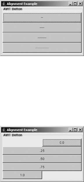
364 CHAPTER 10 ■ LAYOUT MANAGERS
components with the same horizontal alignment. Notice that instead of aligning to the left,
center, or right, the components grow to fill all available space.
Figure 10-13. Y-axis BoxLayout containers with the same vertical alignments and
unconstrained size
If the components had different alignments and an unconstrained maximum size, you
would get yet another behavior. Any component with an alignment not at the minimum (0.0f) or
maximum (1.0f) setting will grow to fill the entire space. If components with both the minimum
and maximum alignment settings are present, the middle edges of those two components will
align in the middle, as Figure 10-14 demonstrates.
Figure 10-14. Y-axis BoxLayout containers with different vertical alignments, unconstrained size,
and both minimum/maximum alignment present
If, however, only one component has an edge case (0.0 or 1.0) and is in a container with
components having other alignments, that edge-case component will grow toward somewhere
other than the middle of the container. This behavior is shown in Figure 10-15. The x-axis
BoxLayout containers work similarly with different horizontal alignments.
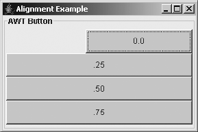
CHAPTER 10 ■ LAYOUT MANAGERS 365
Figure 10-15. Y-axis BoxLayout containers with different vertical alignments, unconstrained size,
and only one alignment at minimum/maximum
OverlayLayout Class
As its name implies, the OverlayLayout class is for layout management of components that lie
on top of one another. When using add(Component component), the order in which you add
components to a container with an OverlayLayout manager determines the component layering. If
you use add(Component component, int index) instead, you can add components in any order.
Although OverlayLayout implements the LayoutManager2 interface, like BoxLayout it currently
doesn’t use any constraints.
Determining the two-dimensional position of the components requires the layout manager
to examine the x and y alignment properties of the contained components. Each component
will be positioned such that its x and y alignment properties define a point shared by all the
components, called the axis point of the layout manager. If you multiply the alignment value
by the component’s size in each appropriate direction, you’ll get each part of the axis point for
that component.
After the axis point is determined for each component, the OverlayLayout manager calcu-
lates the position of this shared point within the container. To calculate this position, the layout
manager averages the different alignment properties of the components, and then multiplies
each setting by the width or height of the container. This position is where the layout manager
places the axis point, and the components are then positioned over this shared point.
For example, suppose you have three buttons: a 25×25 white button on top of a 50×50 gray
button on top of a 100×100 black button. If the x and y alignment of each button is 0.0f, the
shared axis point for the three components is their upper-left corner, and the components are
all in the upper-left corner of the container. Figure 10-16 shows how this might appear.
If the x and y alignment of each button is 1.0f, the axis point for the three components is
their bottom-right corner, and the components are in the bottom-right corner of the container.
Figure 10-17 shows this appearance.
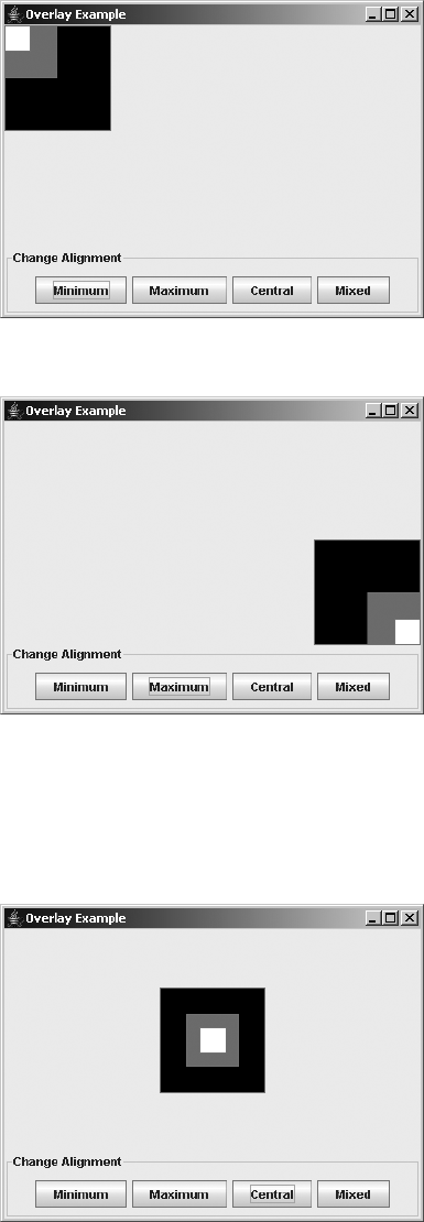
366 CHAPTER 10 ■ LAYOUT MANAGERS
Figure 10-16. Sample OverlayLayout with 0.0 x and y alignments
Figure 10-17. Sample OverlayLayout with 1.0 x and y alignments
If the x and y alignment of each button is 0.5f, the axis point for the three components is
their center, and the components are in the center of the container. Figure 10-18 shows this
appearance.
Figure 10-18. Sample OverlayLayout with 0.5 x and y alignments
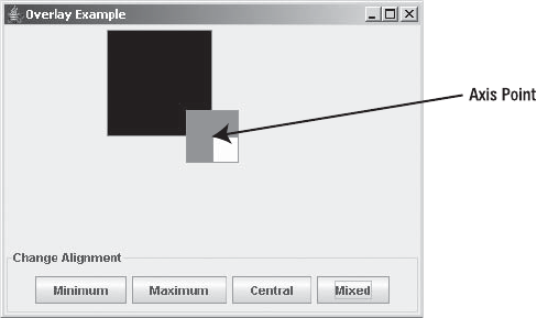
CHAPTER 10 ■ LAYOUT MANAGERS 367
Having all components with the same alignment is relatively easy to visualize, but what
would happen if the components had different alignments? For instance, if the small button
had x and y alignments of 0.0f, the medium button had alignments of 0.5f, and the large button
had alignments of 1.0f, where would everything appear? Well, the first thing the layout manager
calculates is the axis point. Based on the specific alignment of each button, the axis point would
be the upper-left corner of the small button, the middle of the medium button, and the bottom-
right corner of the large button. The position of the axis point within the container would then
be the average of the alignment values multiplied by the dimensions of the container. The
average of 0, 0.5, and 1 for both directions places the axis point at the center of the container.
The components are then placed and layered from this position, as Figure 10-19 shows.
Figure 10-19. Three buttons managed by an OverlayLayout with 0.0, 0.5, and 1.0 x and y
alignments
When you set up overlaid components, make sure that the optimizedDrawingEnabled
property of the container of the components is set to false. This ensures proper repainting and
event propagation.
To try out the OverlayLayout manager, use the source that follows in Listing 10-4. It
provides selectable buttons to demonstrate interactively the effect of varying the alignment
values. Initially, the program has everything centered.
Listing 10-4. OverLayout Example
import javax.swing.*;
import java.awt.*;
import java.awt.event.*;
public class OverlaySample {
public static final String SET_MINIMUM = "Minimum";
public static final String SET_MAXIMUM = "Maximum";
public static final String SET_CENTRAL = "Central";
public static final String SET_MIXED = "Mixed";
368 CHAPTER 10 ■ LAYOUT MANAGERS
static JButton smallButton = new JButton();
static JButton mediumButton = new JButton();
static JButton largeButton = new JButton();
public static void setupButtons(String command) {
if (SET_MINIMUM.equals(command)) {
smallButton.setAlignmentX(0.0f);
smallButton.setAlignmentY(0.0f);
mediumButton.setAlignmentX(0.0f);
mediumButton.setAlignmentY(0.0f);
largeButton.setAlignmentX(0.0f);
largeButton.setAlignmentY(0.0f);
} else if (SET_MAXIMUM.equals(command)) {
smallButton.setAlignmentX(1.0f);
smallButton.setAlignmentY(1.0f);
mediumButton.setAlignmentX(1.0f);
mediumButton.setAlignmentY(1.0f);
largeButton.setAlignmentX(1.0f);
largeButton.setAlignmentY(1.0f);
} else if (SET_CENTRAL.equals(command)) {
smallButton.setAlignmentX(0.5f);
smallButton.setAlignmentY(0.5f);
mediumButton.setAlignmentX(0.5f);
mediumButton.setAlignmentY(0.5f);
largeButton.setAlignmentX(0.5f);
largeButton.setAlignmentY(0.5f);
} else if (SET_MIXED.equals(command)) {
smallButton.setAlignmentX(0.0f);
smallButton.setAlignmentY(0.0f);
mediumButton.setAlignmentX(0.5f);
mediumButton.setAlignmentY(0.5f);
largeButton.setAlignmentX(1.0f);
largeButton.setAlignmentY(1.0f);
} else {
throw new IllegalArgumentException("Illegal Command: " + command);
}
// Redraw panel
((JPanel)largeButton.getParent()).revalidate();
}
public static void main(String args[]) {
CHAPTER 10 ■ LAYOUT MANAGERS 369
final ActionListener generalActionListener = new ActionListener() {
public void actionPerformed(ActionEvent actionEvent) {
JComponent comp = (JComponent)actionEvent.getSource();
System.out.println (
actionEvent.getActionCommand() + ": " + comp.getBounds());
}
};
final ActionListener sizingActionListener = new ActionListener() {
public void actionPerformed(ActionEvent actionEvent) {
setupButtons(actionEvent.getActionCommand());
}
};
Runnable runner = new Runnable() {
public void run() {
JFrame frame = new JFrame("Overlay Example");
frame.setDefaultCloseOperation(JFrame.EXIT_ON_CLOSE);
JPanel panel = new JPanel() {
public boolean isOptimizedDrawingEnabled() {
return false;
}
};
LayoutManager overlay = new OverlayLayout(panel);
panel.setLayout(overlay);
Object settings[][] = {
{"Small", new Dimension(25, 25), Color.white},
{"Medium", new Dimension(50, 50), Color.gray},
{"Large", new Dimension(100, 100), Color.black}
};
JButton buttons[] = {smallButton, mediumButton, largeButton};
for (int i=0, n=settings.length; i<n; i++) {
JButton button = buttons[i];
button.addActionListener(generalActionListener);
button.setActionCommand((String)settings[i][0]);
button.setMaximumSize((Dimension)settings[i][1]);
button.setBackground((Color)settings[i][2]);
panel.add(button);
}
370 CHAPTER 10 ■ LAYOUT MANAGERS
setupButtons(SET_CENTRAL);
JPanel actionPanel = new JPanel();
actionPanel.setBorder(BorderFactory.createTitledBorder("Change Alignment"));
String actionSettings[] = {SET_MINIMUM, SET_MAXIMUM, SET_CENTRAL,
SET_MIXED};
for (int i=0, n=actionSettings.length; i<n; i++) {
JButton button = new JButton(actionSettings[i]);
button.addActionListener(sizingActionListener);
actionPanel.add(button);
}
frame.add(panel, BorderLayout.CENTER);
frame.add(actionPanel, BorderLayout.SOUTH);
frame.setSize(400, 300);
frame.setVisible(true);
}
};
EventQueue.invokeLater(runner);
}
}
SizeRequirements Class
The BoxLayout and OverlayLayout managers rely on the SizeRequirements class to determine
the exact positions of the contained components. The SizeRequirements class contains various
static methods to assist in the calculations necessary to position components in either an
aligned or a tiled manner. The layout managers use this class to calculate their components’ x
coordinates and width and y coordinates and height. Each pair is calculated separately. If the
associated layout manager needs both sets of attributes for positioning, the layout manager
asks the SizeRequirements class separately for each.
ScrollPaneLayout Class
The JScrollPane class, a container class that will be described in Chapter 11, uses the
ScrollPaneLayout manager. Trying to use the layout manager outside a JScrollPane isn’t
possible because the layout manager checks to see if the container object associated with
the layout manager is an instance of JScrollPane. See Chapter 11 for a complete description
of this layout manager (and its associated ScrollPaneConstants interface) in the context of
the JScrollPane.
CHAPTER 10 ■ LAYOUT MANAGERS 371
ViewportLayout Class
The ViewportLayout manager is used by the JViewport class, a container class (to be described
in Chapter 11). The JViewport is also used within the ScrollPaneLayout/JScrollPane combination.
Like ScrollPaneLayout, the ViewportLayout manager is closely tied to its component, JViewport
in this case, and isn’t usable outside the component, except in a subclass. In addition, the
JViewport class is rarely used outside a JScrollPane. The ViewportLayout manager will be discussed
in the context of its container, JViewport, in Chapter 11.
SpringLayout Class
The newest addition to the Java layout manager front is the SpringLayout manager, added with
the J2SE 1.4 release. This allows you to attach “springs” to components so that they are laid out
relative to other components. For instance, with SpringLayout, you can say that a button
appears attached to the right border, no matter what size a user makes the screen.
The SpringLayout manager relies on SpringLayout.Constraints for the component
constraints. This works similarly to the GridBagConstraints class that complements the
GridBagLayout manager. Each component added to the container can have an attached
SpringLayout.Constraints. Therein lies the end to the similarities between these two types
of constraints.
You usually don’t need to add the component with the constraints. Instead, you can add
the component, and then typically attach the constraints separately. There is nothing stopping
you from adding the constraints with the component, but SpringLayout.Constraints is not a
simple class. It is a collection of Spring objects, each a different constraint on the component.
You need to add each Spring constraint separately to SpringLayout.Constraints. You do this
by setting specific constraints on an edge of the component. Using the four SpringLayout
constants of EAST,WEST,NORTH, and SOUTH, you call the setContraints(String edge, Spring
spring) method of SpringLayout.Constraints, where the String is one of the constants.
For instance, if you want to add a component in the top left of a container, you can set up
two springs of a constant size, combine them together, and add the component to the
container with the combined set, as shown here:
Component left = ...;
SpringLayout layout = new SpringLayout();
JPanel panel = new JPanel(layout);
Spring xPad = Spring.constant(5);
Spring yPad = Spring.constant(25);
SpringLayout.Constraints constraint = new SpringLayout.Constraints();
constraint.setConstraint(SpringLayout.WEST, xPad);
constraint.setConstraint(SpringLayout.NORTH, yPad);
frame.add(left, constraint);
372 CHAPTER 10 ■ LAYOUT MANAGERS
That doesn’t look too complicated, but it gets more difficult when you need to add the next
component, either to the right of the first or below it. You can’t just say to add the component
n pixels over. You must actually add the padding to the edge of the earlier component. To find
the edge of the earlier component, you ask the layout manager with getConstraint(), passing
in the edge you want and the component, as in layout.getConstraint(SpringLayout.EAST, left),
to get the location of the right edge of the first component. From that location, you can add in
the necessary padding and attach it to the edge of the other component, as shown here:
Component right = ...;
Spring rightSideOfLeft = layout.getConstraint(SpringLayout.EAST, left);
Spring pad = Spring.constant(20);
Spring leftEdgeOfRight = Spring.sum(rightSideOfLeft, pad);
constraint = new SpringLayout.Constraints();
constraint.setConstraint(SpringLayout.WEST, leftEdgeOfRight);
constraint.setConstraint(SpringLayout.NORTH, yPad);
frame.add(right, constraint);
This works perfectly well, but it gets tedious as the number of components increases. To
eliminate the in-between steps, you can add the components without the constraints, and
then add each separately, connecting the components via the putConstraint() method of
SpringLayout.
public void putConstraint(String e1, Component c1, int pad, String e2,
Component c2)
public void putConstraint(String e1, Component c1, Spring s, String e2,
Component c2)
Here, instead of asking for the edge and adding in the padding yourself, the putConstraint()
call combines the tasks for you. To demonstrate, the following snippet adds the same component
constraints to the right component as the previous one, but using putConstraint() instead of
using SpringLayout.Constraints directly:
Component left = ...;
Component right = ...;
SpringLayout layout = new SpringLayout();
JPanel panel = new JPanel(layout);
panel.add(left);
panel.add(right);
layout.putConstraint(SpringLayout.WEST, left, 5, SpringLayout.WEST, panel);
layout.putConstraint(SpringLayout.NORTH, left, 25, SpringLayout.NORTH, panal);
layout.putConstraint(SpringLayout.NORTH, right, 25, SpringLayout.NORTH, panel);
layout.putConstraint(SpringLayout.WEST, right, 20, SpringLayout.EAST, left);
To help you visualize the use of SpringLayout, Sun has a tool available from https://
bean-builder.dev.java.net/ called The Bean Builder. The tool is primarily intended to be used
when working with JavaBean components, but it works well to see SpringLayout in action.
Figure 10-20 shows what the tool looks like on startup through Java WebStart.

CHAPTER 10 ■ LAYOUT MANAGERS 373
Figure 10-20. The Bean Builder startup
Around the edges of each component lies a set of four boxes, one each for north, south,
east, and west. You can drag an arrow out of a box and connect it to any other box. Had the tool
been a little more sophisticated, it would permit you to specify gap sizes for springs, too, but,
as it is, the screen will look something like Figure 10-21 during screen design. Each arrow created is
mapped to a specific call to the putConstraint() method.
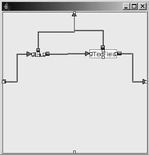
374 CHAPTER 10 ■ LAYOUT MANAGERS
Figure 10-21. Bean Builder and SpringLayout
Listing 10-5 offers source similar to what would be used to generate a screen like Figure 10-21.
Notice that you must use the content pane of the JFrame directly, as putConstraint() wants
that container, not the frame itself.
Listing 10-5. SpringLayout Example
import java.awt.*;
import javax.swing.*;
public class SpringSample {
public static void main(String args[]) {
Runnable runner = new Runnable() {
public void run() {
JFrame frame = new JFrame("SpringLayout");
frame.setDefaultCloseOperation(JFrame.EXIT_ON_CLOSE);
Container contentPane = frame.getContentPane();
SpringLayout layout = new SpringLayout();
contentPane.setLayout(layout);
Component left = new JLabel("Left");
Component right = new JTextField(15);
contentPane.add(left);
contentPane.add(right);
CHAPTER 10 ■ LAYOUT MANAGERS 375
layout.putConstraint(SpringLayout.WEST, left, 10, SpringLayout.WEST,
contentPane);
layout.putConstraint(SpringLayout.NORTH, left, 25, SpringLayout.NORTH,
contentPane);
layout.putConstraint(SpringLayout.NORTH, right, 25, SpringLayout.NORTH,
contentPane);
layout.putConstraint(SpringLayout.WEST, right, 20, SpringLayout.EAST, left);
frame.setSize(300, 100);
frame.setVisible(true);
}
};
EventQueue.invokeLater(runner);
}
}
Summary
This chapter introduced AWT’s predefined layout managers FlowLayout,BorderLayout,
GridLayout,GridBagLayout, and CardLayout, as well as Swing’s predefined layout managers
BoxLayout,OverlayLayout,ScrollPaneLayout,ViewportLayout, and SpringLayout. You saw how
the various alignment settings affect the components within a container whenever you use a
layout manager such as BoxLayout or OverlayLayout. In addition, you were introduced to the
SizeRequirements class, which is used internally by BoxLayout and OverlayLayout.
In Chapter 11, you’ll look at the JScrollPane and JViewport containers, which use the
ScrollPaneLayout and ViewportLayout managers, plus several other sophisticated Swing
container classes.

377
■ ■ ■
CHAPTER 11
Advanced Swing Containers
Chapter 10 explored the layout managers available within AWT and Swing. In this chapter,
you’ll look at some of the containers that rely on these layout managers, as well as some others
that work without a layout manager.
Starting with the Box class, you’ll discover the best way to use the BoxLayout manager to
create a single row or column of components. Next, you’ll learn about the JSplitPane container,
which is a bit like a specialized Box with just two components inside. The JSplitPane provides
a splitter bar that acts as a divider users can drag to resize the components to suit their needs.
Then you’ll explore the JTabbedPane container, which works something like a container
whose layout manager is a CardLayout, except with tabs built into the container that allow you
to move from card to card. You’ll be able to create multiple-screen, property-sheet dialog
boxes for user input with JTabbedPane.
The last two advanced Swing containers covered are the JScrollPane and JViewport. Both
of these components offer the ability to display a section of a large component within a limited
amount of screen real estate. The JScrollPane adds scrollbars to a display area so that you can
move around a large component that sits within a small area. In fact, the JScrollPane uses the
JViewport to “clip away” the part of the larger component that shouldn’t be seen.
So, let’s get started and look at the first container, the Box class.
Box Class
As a subclass of JComponent, the Box class is a special Java Container for creating a single row or
column of components with the help of the BoxLayout manager. The Box container works like a
JPanel (or Panel), but has a different default layout manager, BoxLayout. Using BoxLayout can
be a little cumbersome without a Box, which simplifies working with BoxLayout. You can associate
the BoxLayout manager with a container in just three steps: manually creating the container,
creating the layout manager, and associating the manager with the container. When you create
an instance of Box, you perform these three steps at once. In addition, you can use an inner
class of Box called Box.Filler to better position components within the container.
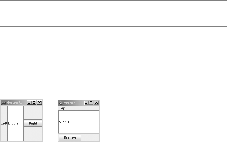
378 CHAPTER 11 ■ ADVANCED SWING CONTAINERS
Creating a Box
You have three ways to create a Box, offered by one constructor and two static factory methods:
public Box(int direction)
Box horizontalBox = new Box(BoxLayout.X_AXIS);
Box verticalBox = new Box(BoxLayout.Y_AXIS);
public static Box createHorizontalBox()
Box horizontalBox = Box.createHorizontalBox();
public static Box createVerticalBox()
Box verticalBox = Box.createVerticalBox();
■Note The Box class is not designed to be used as a JavaBean component. Use of this container within an
IDE can be awkward.
The less frequently used constructor requires a direction for the main axis of the layout
manager. The direction is specified by either of two BoxLayout constants, X_AXIS or Y_AXIS, to
create a horizontal or vertical box, respectively. Instead of manually specifying the direction,
simply create a Box with the desired orientation by using one of the provided factory methods:
createHorizontalBox() or createVerticalBox().
Filling a horizontal and vertical Box with a JLabel, a JTextField, and a JButton demonstrates
the flexibility of BoxLayout, as shown in Figure 11-1.
Figure 11-1. A horizontal and a vertical box
For the horizontal container, the label and button are at their preferred widths because
their maximum size is the same as their preferred size. The text field uses up the remaining
space.
In the vertical container, the label and button sizes are their preferred size, too, because
their maximum size is still the same as their preferred size. The text field’s height fills the height
that the label and button don’t use, and its width is as wide as the container.
The source code for creating the screens shown in Figure 11-1 follows in Listing 11-1.

CHAPTER 11 ■ ADVANCED SWING CONTAINERS 379
Listing 11-1. Working with the Box
import javax.swing.*;
import java.awt.*;
public class BoxSample {
public static void main(String args[]) {
Runnable runner = new Runnable() {
public void run() {
JFrame verticalFrame = new JFrame("Vertical");
verticalFrame.setDefaultCloseOperation(JFrame.EXIT_ON_CLOSE);
Box verticalBox = Box.createVerticalBox();
verticalBox.add(new JLabel("Top"));
verticalBox.add(new JTextField("Middle"));
verticalBox.add(new JButton("Bottom"));
verticalFrame.add(verticalBox, BorderLayout.CENTER);
verticalFrame.setSize(150, 150);
verticalFrame.setVisible(true);
JFrame horizontalFrame = new JFrame("Horizontal");
horizontalFrame.setDefaultCloseOperation(JFrame.EXIT_ON_CLOSE);
Box horizontalBox = Box.createHorizontalBox();
horizontalBox.add(new JLabel("Left"));
horizontalBox.add(new JTextField("Middle"));
horizontalBox.add(new JButton("Right"));
horizontalFrame.add(horizontalBox, BorderLayout.CENTER);
horizontalFrame.setSize(150, 150);
horizontalFrame.setVisible(true);
}
};
EventQueue.invokeLater(runner);
}
}
Box Properties
As Table 11-1 shows, there are only two Box properties. Although the layout property inherits a
setLayout(LayoutManager) method from its parent Container class, if called on a Box object, the
class throws an AWTError. Once the BoxLayout manager is set during its construction, it can’t be
changed, nor can its direction.
Table 11-1. Box Properties
Property Name Data Type Access
accessibleContext AccessibleContext Read-only
layout LayoutManager Write-only

380 CHAPTER 11 ■ ADVANCED SWING CONTAINERS
Working with Box.Filler
The Box class has an inner class Box.Filler to help you create invisible components for better
component positioning within a container whose layout manager is BoxLayout. By directly
manipulating the minimum, maximum, and preferred size of the created component, you can
create components that grow to fill unused space or remain a fixed size, making screens more
aesthetically pleasing to your users.
■Note Technically speaking, the use of Box.Filler is not limited to containers whose layout manager is
BoxLayout. You can use them anywhere you can use any other Component. The components are just invisible.
Instead of directly using the Box.Filler class, several static methods of the Box class can
help you create the appropriate filler components. The factory methods allow you to categorize
these components by type, instead of by minimum, maximum, or preferred size. You’ll look at
these methods in the next two sections.
If you’re interested in the class definition, it’s shown next. Like the Box class, Box.Filler
isn’t meant to be used as a JavaBean component.
public class Box.Filler extends Component implements Accessible {
// Constructors
public Filler(Dimension minSize, Dimension prefSize, Dimension maxSize);
// Properties
public AccessibleContext getAccessibleContext();
public Dimension getMaximumSize();
public Dimension getMinimumSize();
public Dimension getPreferredSize();
// Others
protected AccessibleContext accessibleContext;
public void changeShape(Dimension minSize, Dimension prefSize, Dimension maxSize);
}
Creating Areas That Grow
If a component has a dimensionless minimum and preferred size, and a maximum size bigger
than the screen, the component will grow to take up unused space between components in the
container along one or both axes. In the case of a Box, or more precisely, a container whose
layout manager is BoxLayout, the growth occurs along the layout manager’s initially chosen
direction (either BoxLayout.X_AXIS or BoxLayout.Y_AXIS). For a horizontal box, the growth affects
the component’s width. For a vertical box, the growth is reflected in the component’s height.
The name commonly given to this type of growing component is glue. The two flavors of
glue are direction-independent glue and direction-dependent glue. The following factory
methods of Box are used to create the glue components:
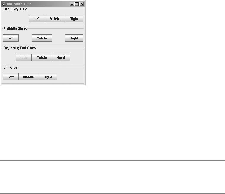
CHAPTER 11 ■ ADVANCED SWING CONTAINERS 381
public static Component createGlue()
// Direction independent
Component glue = Box.createGlue();
aBox.add(glue);
public static Component createHorizontalGlue();
// Direction dependent: horizontal
Component horizontalGlue = Box.createHorizontalGlue();
aBox.add(horizontalGlue);
public static Component createVerticalGlue()
// Direction dependent: vertical
Component verticalGlue = Box.createVerticalGlue();
aBox.add(verticalGlue);
Once you create glue, you add it to a container in the same way as any other component,
by using Container.add(Component) or one of the other add() varieties. Glue allows you to align
components within a container, as Figure 11-2 shows.
Figure 11-2. Using glue in a Box
You can add glue components to any container whose layout manager honors minimum,
maximum, and preferred size properties of a component, such as BoxLayout. For instance,
Figure 11-3 demonstrates what happens when you add a glue component to a JMenuBar just
before adding the last JMenu. Because the layout manager for a JMenuBar is BoxLayout (actually
the subclass javax.swing.plaf.basic.DefaultMenuLayout), this action pushes the last menu to
the right edge of the menu bar, similar to the Motif/CDE style of help menus.
■Caution I recommend that you avoid using the glue capability described here to set up help menus on
menu bars. Eventually, the public void setHelpMenu(JMenu menu) of JMenuBar will be implemented
and won’t throw an Error. Of course, many of us are still waiting for this to happen.

382 CHAPTER 11 ■ ADVANCED SWING CONTAINERS
Figure 11-3. Using glue in a JMenuBar
Creating Rigid Areas
Because a glue component grows to fill the available space, if you want to have a fixed distance
between components, you need to create a rigid component, or strut. When doing so, you
specify the strut’s size. Struts can be two-dimensional, requiring you to specify the width and
height of the component; or, they can be one-dimensional, requiring you to specify either the
width or height.
public static Component createRigidArea(Dimension dimension)
// Two-dimensional
Component rigidArea = Box. createRigidArea(new Dimension(10, 10));
aBox.add(rigidArea);
public static Component createHorizontalStrut(int width)
// One-dimensional: horizontal
Component horizontalStrut = Box. createHorizontalStrut(10);
aBox.add(horizontalStrut);
public static Component createVerticalStrut(int height)
// One-dimensional: vertical
Component verticalStrut = Box. createVerticalStrut(10);
aBox.add(verticalStrut);
■Caution Although direction-independent glue created with createGlue() shows no side effects if
you change container direction, creating a rigid area may cause layout problems if the axis is later changed.
(Imagine dragging a menu bar and dropping it along the right side from the top.) That’s because the compo-
nent has a dimensionless minimum size. Using createRigidArea() isn’t recommended, unless you truly
want a two-dimensional empty component.
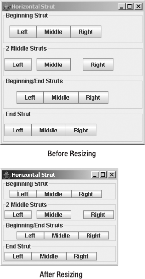
CHAPTER 11 ■ ADVANCED SWING CONTAINERS 383
Figure 11-4 demonstrates several struts in action. Notice that you can have varying strut
distances between different components, and struts at the end of a container may have no
effect. After a user resizes a screen, the strut distance between components remains fixed, as
you can see in Figure 11-4.
Figure 11-4. Using struts in a Box
JSplitPane Class
Similar to the Box container, the JSplitPane container allows you to display components in a
single row or column. Whereas a Box can contain any number of components, a JSplitPane is
meant to display two—and only two—components. The components are of variable size and
separated by a movable divider. The divider is specially constructed in that the end user can grab
it and drag the divider to adjust the size of the contained components. Figure 11-5 demonstrates
both vertical and horizontal split panes, shown before and after moving the divider.

384 CHAPTER 11 ■ ADVANCED SWING CONTAINERS
Figure 11-5. Examples of JSplitPane containers
Creating a JSplitPane
There are five constructors for JSplitPane. With them, you can initialize the orientation of the
contained component pair, set the continuousLayout property, or initialize the pair of components
for the container.
public JSplitPane()
JSplitPane splitPane = new JSplitPane();
public JSplitPane(int newOrientation)
JSplitPane splitPane = new JSplitPane(JSplitPane.VERTICAL_SPLIT);
public JSplitPane(int newOrientation, boolean newContinuousLayout)
JSplitPane splitPane = new JSplitPane(JSplitPane.VERTICAL_SPLIT, true);
public JSplitPane(int newOrientation, Component newLeftComponent,
Component newRightComponent)
JComponent topComponent = new JButton("Top Button");
JComponent bottomComponent = new JButton("Bottom Button");
JSplitPane splitPane = new JSplitPane(JSplitPane.VERTICAL_SPLIT,
topComponent, bottomComponent);
CHAPTER 11 ■ ADVANCED SWING CONTAINERS 385
public JSplitPane(int newOrientation, boolean newContinuousLayout,
Component newLeftComponent, Component newRightComponent)
JSplitPane splitPane = new JSplitPane(JSplitPane.VERTICAL_SPLIT, true,
topComponent, bottomComponent);
Unless otherwise specified, the orientation is horizontal. Orientation can be specified by
either of the JSplitPane constants VERTICAL_SPLIT or HORIZONTAL_SPLIT. The continuousLayout
property setting determines how the split pane reacts when the user drags the divider. When
the setting is false (the default), only the divider is redrawn when dragged. When the setting is
true, the JSplitPane resizes and redraws the components on each side of the divider as the
user drags the divider.
■Note If the orientation is JSplitPane.VERTICAL_SPLIT, you can think of the top component as the left
component and the bottom component as the right component.
If you’re using the no-argument constructor, the initial set of components within the split
pane is made up of buttons (two JButton components). Two other constructors explicitly set
the initial two components. Surprisingly, the remaining two constructors provide no components
within the container by default. To add or change the components within the JSplitPane, see
the “Changing JSplitPane Components” section that’s coming up shortly.
JSplitPane Properties
Table 11-2 shows the 17 properties of JSplitPane.
Table 11-2. JSplitPane Properties
Property Name Data Type Access
accessibleContext AccessibleContext Read-only
bottomComponent Component Read-write
continuousLayout boolean Read-write bound
dividerLocation double Write-only
dividerLocation int Read-write bound
dividerSize int Read-write bound
lastDividerLocation int Read-write bound
leftComponent Component Read-write
maximumDividerLocation int Read-only
minimumDividerLocation int Read-only

386 CHAPTER 11 ■ ADVANCED SWING CONTAINERS
Setting Orientation
Besides initializing the orientation within the constructor, you can change the JSplitPane
orientation by changing the orientation property setting to either JSplitPane.VERTICAL_SPLIT
or JSplitPane.HORIZONTAL_SPLIT. If you try to change the property to a nonequivalent setting,
an IllegalArgumentException is thrown.
Dynamically changing the orientation at runtime is not recommended because it can
confuse a user. However, if you’re using a visual development tool, you can explicitly set the
orientation for this property after creating the JSplitPane. When not programming visually,
you would normally initialize the orientation when you create the JSplitPane.
Changing JSplitPane Components
There are four read-write properties for the different positions of a component within a
JSplitPane:bottomComponent,leftComponent,rightComponent, and topComponent. In reality,
these four properties represent two components internally: The left and top components are
one; the right and bottom components represent the other.
You should use the properties that are appropriate for the orientation of your JSplitPane.
Using the inappropriate property methods can make life difficult for the maintenance
programmer. Imagine, after creating a user interface, seeing something like the following code
six months later:
JComponent leftButton = new JButton("Left");
JComponent rightButton = new JButton("Right");
JSplitPane splitPane = new JSplitPane(JSplitPane.VERTICAL_SPLIT);
splitPane.setLeftComponent(leftButton);
splitPane.setRightComponent(rightButton);
If you glance at the source, you might think that the screen will contain a button to the left
and one to the right based on the variable names and the setXXXComponent() methods used.
But because the instantiated JSplitPane has a vertical orientation, the interface that’s created
looks like Figure 11-6. The variable names are used because of the button labels, not their position.
oneTouchExpandable boolean Read-write bound
orientation int Read-write bound
resizeWeight double Read-write bound
rightComponent Component Read-write
topComponent Component Read-write
validateRoot boolean Read-only
UI SplitPaneUI Read-write bound
UIClassID String Read-only
Table 11-2. JSplitPane Properties (Continued)
Property Name Data Type Access
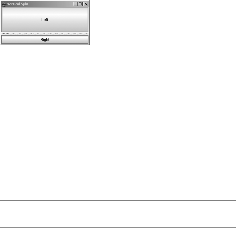
CHAPTER 11 ■ ADVANCED SWING CONTAINERS 387
Figure 11-6. Adding left/right buttons to a vertical JSplitPane
The code is more understandable if the setTopComponent() and setBottomComponent()
methods are used with better variable names:
JComponent topButton = new JButton("Left");
JComponent bottomButton = new JButton("Right");
JSplitPane splitPane = new JSplitPane(JSplitPane.VERTICAL_SPLIT);
splitPane.setTopComponent(topButton);
splitPane.setBottomComponent(bottomButton);
Moving the JSplitPane Divider
Initially, the divider is shown below or to the right of the preferred size of the top or left
component. At any time, you can reset the divider position to that position by calling the
resetToPreferredSizes() method of JSplitPane. If you want to programmatically position the
divider, you can change the dividerLocation property with setDividerLocation(newLocation).
This property can be changed to an int position, representing an absolute distance from the
top or left side, or it can be set to a double value between 0.0 and 1.0, representing a percentage
of the JSplitPane container width.
■Caution Changing the property setting to a double value outside the range of 0.0 and 1.0 results in an
IllegalArgumentException being thrown.
If you want to set the divider location, you must wait for the component to be realized.
Essentially, that means it must be visible. While there are roundabout ways of doing this, the
most direct way is to attach a HierarchyListener to the JSplitPane and watch for when the
HierarchyEvent is of type SHOWING_CHANGED. This is demonstrated in the following code fragment,
changing the divider location to 75%.
HierarchyListener hierarchyListener = new HierarchyListener() {
public void hierarchyChanged(HierarchyEvent e) {
long flags = e.getChangeFlags();
if ((flags & HierarchyEvent.SHOWING_CHANGED) ==
HierarchyEvent.SHOWING_CHANGED) {
splitPane.setDividerLocation(.75);
}
}
};
splitPane.addHierarchyListener(hierarchyListener);

388 CHAPTER 11 ■ ADVANCED SWING CONTAINERS
Although you can set the dividerLocation property with a double value, you can get only
an int, indicating its absolute position.
■Tip With the system-provided look and feel classes, pressing the F8 key allows you to move the divider
with the keyboard keys such as Home, End, or the arrows. F8 isn’t a modifier like Shift or Alt. Instead, pressing
F8 moves the focus to the divider so that it can be moved with keystrokes.
Resizing Components and Working with a One-Touch Expandable Divider
Limitations exist on the resizing of components within the JSplitPane. The JSplitPane honors
the minimum size of each contained component. If grabbing and moving the divider line will
cause a component to shrink to less than its minimum size, the scroll pane won’t let the user
drag the divider past that minimum size.
■Note You can always programmatically position the divider to be anywhere, even if it makes a component
smaller than its minimum size. However, this isn’t a good idea because the component has a minimum size
for a good reason.
If the minimum dimensions of a component are too large for a JSplitPane, you need to
change the component’s minimum size so that the divider can use some of that component’s
space. For AWT components, changing the minimum size of a standard component requires
subclassing. With Swing components, you can simply call the setMinimumSize() method of
JComponent with a new Dimension. Nevertheless, minimum sizes are set for a reason. The compo-
nent probably won’t look right if you explicitly shrink its minimum size.
A better approach is available for allowing one component to take up more space than
another: Set the oneTouchExpandable property of the JSplitPane to true. When this property is
true, an icon is added to the divider, allowing a user to completely collapse one of the two
components to give the other component the entire area. In the example in Figure 11-7, the
icon is a combination up-and-down arrow.
Figure 11-7 shows how this icon might appear (as rendered by the Ocean look and feel)
and illustrates what happens after selecting the up arrow on the divider to expand the lower
component to its fullest size. Clicking again on the icon on the divider returns the components
to their previous positions. Clicking on the divider somewhere other than on the icon will position
the divider in such a way that the collapsed component is at its preferred size.
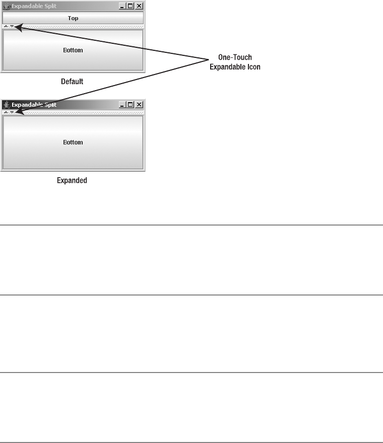
CHAPTER 11 ■ ADVANCED SWING CONTAINERS 389
Figure 11-7. Setting and using the oneTouchExpandable property
■Note There’s no easy way to alter the one-touch expandable icon or change how the divider is rendered.
Both are defined by the BasicSplitPaneDivider subclass and created in the createDefaultDivider()
method of the BasicSplitPaneUI subclass for the specific look and feel. One thing you can easily change
is the border around the divider, which is a custom border.
The lastDividerLocation property allows you or the system to inquire about the previous
divider location. The JSplitPane uses this property when the user selects the maximizer icon to
undo the minimization of one of the components in the JSplitPane.
■Caution Beware of components that base their minimum size on the container size or their initial size!
Placing them in a JSplitPane may require you to manually set the minimum and/or preferred size of the
components. The components that most frequently cause problems when used within a JSplitPane are
JTextArea and JScrollPane.
Resizing the JSplitPane
If additional space is available within the JSplitPane that is not required by the preferred size
of the components it contains, this space is allocated based on the resizeWeight property
setting. The initial setting of this property is 0.0, meaning the right or bottom component gets
any additional space. Changing the setting to 1.0 would give all the space to the left or top
component. A value of 0.5 would split the space evenly between the two components. Figure 11-8
shows the effect of these changes.
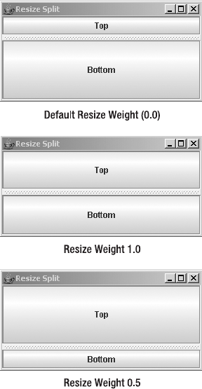
390 CHAPTER 11 ■ ADVANCED SWING CONTAINERS
Figure 11-8. Changing the resize weight
Listening for JSplitPane Property Changes
The JSplitPane class defines the following constants to help with listening for bound property
changes:
•CONTINUOUS_LAYOUT_PROPERTY
•DIVIDER_LOCATION_PROPERTY
•DIVIDER_SIZE_PROPERTY
•LAST_DIVIDER_LOCATION_PROPERTY
•ONE_TOUCH_EXPANDABLE_PROPERTY
•ORIENTATION_PROPERTY
•RESIZE_WEIGHT_PROPERTY
One way of listening for when the user moves the divider is to watch for changes to the
lastDividerLocation property. The example in Listing 11-2 attaches a PropertyChangeListener
to a JSplitPane displaying the current divider location, the current last location, and the previous
last location. The component above and below the divider is the OvalPanel class (discussed in
CHAPTER 11 ■ ADVANCED SWING CONTAINERS 391
Chapter 4), drawn to fill the dimensions of the component. This component helps to demon-
strate the effect of having the continuousLayout property set to true.
Listing 11-2. Listening for JSplitPane Property Changes
import javax.swing.*;
import java.awt.*;
import java.beans.*;
public class PropertySplit {
public static void main(String args[]) {
Runnable runner = new Runnable() {
public void run() {
JFrame frame = new JFrame("Property Split");
frame.setDefaultCloseOperation(JFrame.EXIT_ON_CLOSE);
// Create/configure split pane
JSplitPane splitPane = new JSplitPane(JSplitPane.VERTICAL_SPLIT);
splitPane.setContinuousLayout(true);
splitPane.setOneTouchExpandable(true);
// Create top component
JComponent topComponent = new OvalPanel();
splitPane.setTopComponent(topComponent);
// Create bottom component
JComponent bottomComponent = new OvalPanel();
splitPane.setBottomComponent(bottomComponent);
// Create PropertyChangeListener
PropertyChangeListener propertyChangeListener =
new PropertyChangeListener() {
public void propertyChange (PropertyChangeEvent changeEvent) {
JSplitPane sourceSplitPane = (JSplitPane)changeEvent.getSource();
String propertyName = changeEvent.getPropertyName();
if (propertyName.equals(
JSplitPane.LAST_DIVIDER_LOCATION_PROPERTY)) {
int current = sourceSplitPane.getDividerLocation();
System.out.println ("Current: " + current);
Integer last = (Integer)changeEvent.getNewValue();
System.out.println ("Last: " + last);
Integer priorLast = (Integer)changeEvent.getOldValue();
System.out.println ("Prior last: " + priorLast);
}
}
};
392 CHAPTER 11 ■ ADVANCED SWING CONTAINERS
// Attach listener
splitPane.addPropertyChangeListener(propertyChangeListener);
frame.add(splitPane, BorderLayout.CENTER);
frame.setSize(300, 150);
frame.setVisible(true);
}
};
EventQueue.invokeLater(runner);
}
}
As the following sample output demonstrates, when you run the previous program, you’ll
notice that the lastDividerLocation property changes to reflect the divider’s being dragged.
When the user stops dragging the divider, the last setting is set to the prior setting for the
dividerLocation property, not to the initial last value (prior current value) when the drag started. As
the divider is being dragged, the current value travels first to the last value and then to the prior
last value. When the dragging stops, the final last setting (29 in this case) is set to the initial last
setting to reflect the current value when the dragging started. The last three sets of output reflect
the changes after pressing the one-touch expandable button.
Current: 11
Last: -1
Prior last: 0
Current: 12
Last: 11
Prior last: -1
Current: 12
Last: 12
Prior last: 11
Current: 12
Last: 11
Prior last: 12
Current: 15
Last: 12
Prior last: 11
Current: 15
Last: 15
Prior last: 12
Current: 15
Last: 12
Prior last: 15
Current: 112
Last: 15
Prior last: 12
Current: 112
Last: 112
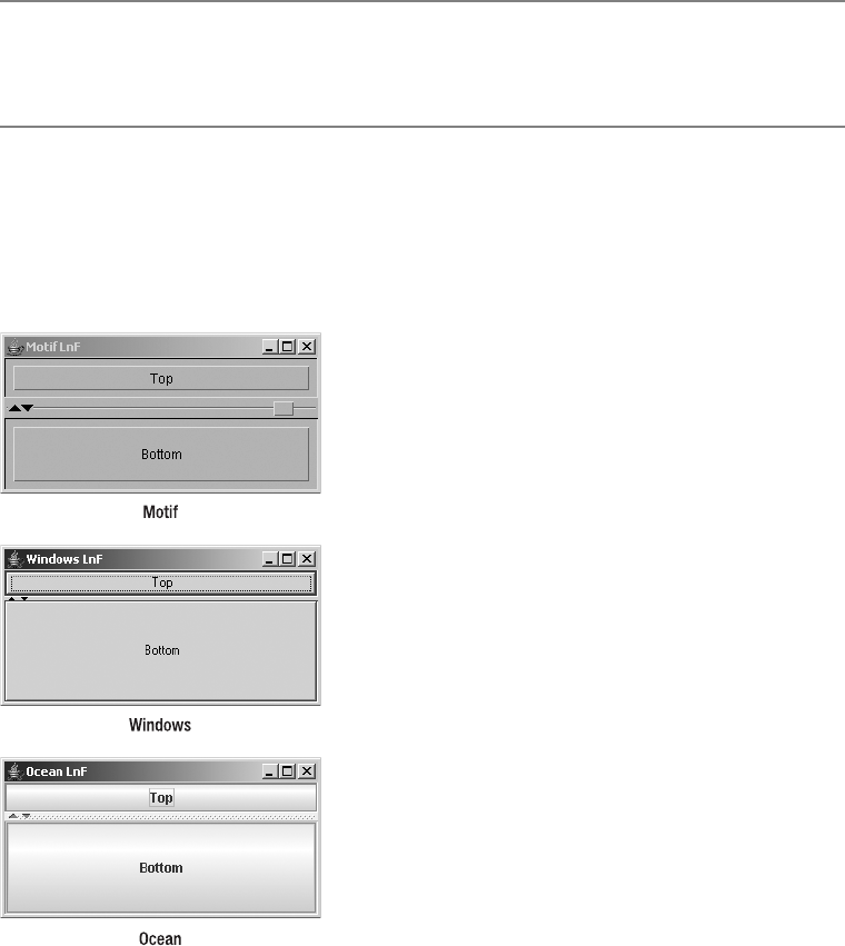
CHAPTER 11 ■ ADVANCED SWING CONTAINERS 393
Prior last: 15
Current: 112
Last: 15
Prior last: 112
■Note The BOTTOM,DIVIDER,LEFT,RIGHT, and TOP constants of the JSplitPane class aren’t for
PropertyChangeListener support. Instead, they’re internal constraints used by the add(Component
component, Object constraints) method.
Customizing a JSplitPane Look and Feel
Each installable Swing look and feel provides a different JSplitPane appearance and set of
default UIResource values for this component. Figure 11-9 shows the appearance of the JSplitPane
container for the preinstalled set of look and feel types: Motif, Windows, and Ocean.
Figure 11-9. JSplitPane under the different look and feel types
The available set of UIResource-related properties for a JSplitPane is shown in Table 11-3.
For the JSplitPane component, there are 25 different properties, including 3 specific to the divider.

394 CHAPTER 11 ■ ADVANCED SWING CONTAINERS
JTabbedPane Class
The JTabbedPane class represents the ever-popular property sheet to support input or output
from multiple panels within a single window in which only one panel is shown at a time. Using
JTabbedPane is like using the CardLayout manager, except with added support for changing
cards built in. While CardLayout is a LayoutManager,JTabbedPane is a full-fledged Container. In
case you’re not familiar with property sheets, tabbed dialog boxes, or tabbed panes (all alternate
names for the same thing), Figure 11-10 shows a set of tabs from the original SwingSet demo
Table 11-3. JSplitPane UIResource Elements
Property String Object Type
SplitPane.actionMap ActionMap
SplitPane.activeThumb Color
SplitPane.ancestorInputMap InputMap
SplitPane.background Color
SplitPane.border Border
SplitPane.centerOneTouchButtons Boolean
SplitPane.darkShadow Color
SplitPane.dividerFocusColor Color
SplitPane.dividerSize Integer
SplitPane.foreground Color
SplitPane.highlight Color
SplitPane.leftButtonText String
SplitPane.oneTouchButtonOffset Integer
SplitPane.oneTouchButtonSize Integer
SplitPane.oneTouchButtonsOpaque Boolean
SplitPane.oneTouchExpandable Boolean
SplitPane.oneTouchOffset Integer
SplitPane.rightButtonText String
SplitPane.shadow Color
SplitPane.size Integer
SplitPane.supportsOneTouchButtons Boolean
SplitPaneDivider.border Border
SplitPaneDivider.draggingColor Color
SplitPaneDivider.oneTouchButtonSize Integer
SplitPaneUI String

CHAPTER 11 ■ ADVANCED SWING CONTAINERS 395
that comes with the JDK 1.2 version of the Swing classes. (This version is more appropriate
than the current one for demonstrating the features of JTabbedPane described in this section.)
Figure 11-10. Sample JTabbedPane screen
To help the JTabbedPane manage which Component (tab) is selected, the model for the
container is an implementation of the SingleSelectionModel interface or, more precisely, a
DefaultSingleSelectionModel instance. (SingleSelectionModel and DefaultSingleSelectionModel
were described with the menuing classes in Chapter 6.)
Creating a JTabbedPane
There are only three constructors for the JTabbedPane:
public JTabbedPane()
JTabbedPane tabbedPane = new JTabbedPane();
public JTabbedPane(int tabPlacement)
JTabbedPane tabbedPane = new JTabbedPane(JTabbedPane.RIGHT);
public JTabbedPane(int tabPlacement, int tabLayoutPolicy)
JTabbedPane tabbedPane =
new JTabbedPane(JTabbedPane.RIGHT, JTabbedPane.SCROLL_TAB_LAYOUT);

396 CHAPTER 11 ■ ADVANCED SWING CONTAINERS
The configurable options are the placement of the tabs used to change which component
to display and the tab layout policy for when there are too many tabs to span one virtual row
(which could be a column). By default, tabs are at the top of the container and will wrap to
multiple rows when too many exist for the container width. However, you can explicitly specify
a location with one of the following constants of JTabbedPane:TOP,BOTTOM,LEFT, or RIGHT or
configure the layout policy with one of SCROLL_TAB_LAYOUT or WRAP_TAP_LAYOUT. Figure 11-11
shows the screen from Figure 11-10 with the other three tab placements. Figure 11-12 shows
the screen with the scroll tab layout.
Figure 11-11. JTabbedPane tab placement options
■Caution Setting the tab placement to something other than the equivalent values for the JTabbedPane
constants of TOP,BOTTOM,LEFT, or RIGHT, or the layout policy to something other than the equivalent of
SCROLL_TAB_LAYOUT or WRAP_TAP_LAYOUT, will cause an IllegalArgumentException to be thrown.
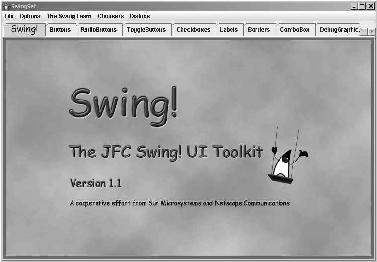
CHAPTER 11 ■ ADVANCED SWING CONTAINERS 397
Figure 11-12. JTabbedPane with the scroll tab layout
Adding and Removing Tabs
Once you’ve created the basic JTabbedPane container, you need to add panels that make up the
sheets or pages of the JTabbedPane. You can add panels in either one of two basic ways.
If you’re visually creating your interface with a tool like JBuilder or Eclipse, the user inter-
face builder will use the familiar add() methods of Container to add a Component as a panel. The
panel added uses component.getName() as the default title. However, you shouldn’t use the various
add() methods if you’re programming by hand.
The more appropriate way to add components or panels to create tabs is with any of the
addTab() or insertTab() methods listed next. Any or all of the arguments other than the
component and the position index of insertTab() can be null. (Passing null as the Component
argument causes a NullPointerException to be thrown at runtime.) The displayed icon and
tooltip settings have no default values.
•public void addTab(String title, Component component)
•public void addTab(String title, Icon icon, Component component)
•public void addTab(String title, Icon icon, Component component, String tip)
•public void insertTab(String title, Icon icon, Component component, String tip,
int index)

398 CHAPTER 11 ■ ADVANCED SWING CONTAINERS
When using addTab(), the tab is added to the end, which is the farthest right position for a
set of top or bottom tabs, or at the very bottom for tabs positioned on the left or right side,
potentially reversing sides, depending on component orientation.
After creating a panel, you can change its title, icon, mnemonic, tooltip, or component on
a particular tab with one of the setXXXAt() methods:
•public void setTitleAt(int index, String title)
•public void setIconAt(int index, Icon icon)
•public void setMnemonicAt(int index, int mnemonic)
•public void setDisplayedMnemonicIndexAt(int index, int mnemonicIndex)
•public void setToolTipTextAt(int index, String text)
•public void setComponentAt(int index, Component component)
■Tip The displayed mnemonic index refers to which time a particular character in the title should be high-
lighted. For instance, if you wanted the second t in title to be the highlighted mnemonic, you would set the
mnemonic character to KeyEvent.VK_T, with setMnemonicAt(), and the mnemonic index to be 2, with
setDisplayedMnemonicIndexAt().
In addition, you can change the background or foreground of a specific tab, enable or
disable a specific tab, or have a different disabled icon with additional setXXXAt() methods:
•public void setBackgroundAt(int index, Color background)
•public void setForegroundAt(int index, Color foreground)
•public void setEnabledAt(int index, boolean enabled)
•public void setDisabledIconAt(int index, Icon disabledIcon)
To remove a tab, you can remove a specific tab with removeTabAt(int index),
remove(int index), or remove(Component component). In addition, you can remove all tabs
with removeAll().
JTabbedPane Properties
Table 11-4 shows the 11 properties of JTabbedPane. Because many of the setter/getter methods of
JTabbedPane specify an index parameter, they aren’t true properties in the literal sense.

CHAPTER 11 ■ ADVANCED SWING CONTAINERS 399
You can programmatically change the displayed tab by setting either the selectedComponent or
the selectedIndex property.
The tabRunCount property represents the number of rows (for top or bottom tab placement)
or columns (for right or left placement) necessary to display all the tabs.
■Caution Changing the LayoutManager for the JTabbedPane will throw an exception when it comes
time to displaying the container. In other words, don’t do it.
Listening for Changing Tab Selection
If you’re interested in finding out when the selected tab changes, you need to listen for changes
to the selection model. This is done by your attaching a ChangeListener to the JTabbedPane (or
directly to the SingleSelectionModel). The registered ChangeListener reports when the selection
model changes, as the model changes when the selected panel changes.
The program shown in Listing 11-3 demonstrates listening for changes to the selected tab
and displays the title of the newly selected tab.
Table 11-4. JTabbedPane Properties
Property Name Data Type Access
accessibleContext AccessibleContext Read-only
changeListeners ChangeListener[ ] Read-only
model SingleSelectionModel Read-write bound
selectedComponent Component Read-write
selectedIndex int Read-write
tabCount int Read-only
tabLayoutPolicy int Read-write-bound
tabPlacement int Read-write bound
tabRunCount int Read-only
UI TabbedPaneUI Read-write bound
UIClassID String Read-only
400 CHAPTER 11 ■ ADVANCED SWING CONTAINERS
Listing 11-3. Listening for Selected Tab Changes
import javax.swing.*;
import javax.swing.event.*;
import java.awt.*;
import java.awt.event.*;
public class TabSample {
static Color colors[] = {Color.RED, Color.ORANGE, Color.YELLOW,
Color.GREEN, Color.BLUE, Color.MAGENTA};
static void add(JTabbedPane tabbedPane, String label, int mnemonic) {
int count = tabbedPane.getTabCount();
JButton button = new JButton(label);
button.setBackground(colors[count]);
tabbedPane.addTab(label, new DiamondIcon(colors[count]), button, label);
tabbedPane.setMnemonicAt(count, mnemonic);
}
public static void main(String args[]) {
Runnable runner = new Runnable() {
public void run() {
JFrame frame = new JFrame("Tabbed Pane Sample");
frame.setDefaultCloseOperation(JFrame.EXIT_ON_CLOSE);
JTabbedPane tabbedPane = new JTabbedPane();
tabbedPane.setTabLayoutPolicy(JTabbedPane.SCROLL_TAB_LAYOUT);
String titles[] = {"General", "Security", "Content", "Connection",
"Programs", "Advanced"};
int mnemonic[] = {KeyEvent.VK_G, KeyEvent.VK_S, KeyEvent.VK_C,
KeyEvent.VK_O, KeyEvent.VK_P, KeyEvent.VK_A};
for (int i=0, n=titles.length; i<n; i++) {
add(tabbedPane, titles[i], mnemonic[i]);
}
ChangeListener changeListener = new ChangeListener() {
public void stateChanged(ChangeEvent changeEvent) {
JTabbedPane sourceTabbedPane = (JTabbedPane)changeEvent.getSource();
int index = sourceTabbedPane.getSelectedIndex();
System.out.println ("Tab changed to: " +
sourceTabbedPane.getTitleAt(index));
}
};
tabbedPane.addChangeListener(changeListener);
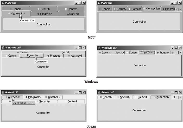
CHAPTER 11 ■ ADVANCED SWING CONTAINERS 401
frame.add(tabbedPane, BorderLayout.CENTER);
frame.setSize(400, 150);
frame.setVisible(true);
}
};
EventQueue.invokeLater(runner);
}
}
Customizing a JTabbedPane Look and Feel
Each installable Swing look and feel provides a different JTabbedPane appearance and set of
default UIResource values for the JTabbedPane component. Figure 11-13 shows the appearance
of the JTabbedPane container for the preinstalled set of look and feel types: Motif, Windows, and
Ocean. Several items are specific to the look and feel: how the JTabbedPane appears when the
set of available tabs is too wide for the display, how it responds when a user selects a tab in a
back row, how it displays the tooltip, and how it displays the scroll tab layout.
Figure 11-13. JTabbedPane under the different look and feel types

402 CHAPTER 11 ■ ADVANCED SWING CONTAINERS
The available set of UIResource-related properties for a JTabbedPane is shown in Table 11-5. For
the JTabbedPane component, there are 34 different properties.
Table 11-5. JTabbedPane UIResource Elements
Property String Object Type
TabbedPane.actionMap ActionMap
TabbedPane.ancestorInputMap InputMap
TabbedPane.background Color
TabbedPane.borderHightlightColor Color
TabbedPane.contentAreaColor Color
TabbedPane.contentBorderInsets Insets
TabbedPane.contentOpaque Boolean
TabbedPane.darkShadow Color
TabbedPane.focus Color
TabbedPane.focusInputMap InputMap
TabbedPane.font Font
TabbedPane.foreground Color
TabbedPane.highlight Color
TabbedPane.light Color
TabbedPane.opaque Boolean
TabbedPane.selected Color
TabbedPane.selectedForeground Color
TabbedPane.selectedTabPadInsets Insets
TabbedPane.selectHighlight Color
TabbedPane.selectionFollowsFocus Boolean
TabbedPane.shadow Color
TabbedPane.tabAreaBackground Color
TabbedPane.tabAreaInsets Insets
TabbedPane.tabInsets Insets
TabbedPane.tabRunOverlay Integer
TabbedPane.tabsOpaque Boolean
TabbedPane.tabsOverlapBorder Boolean
TabbedPane.textIconGap Integer
TabbedPane.unselectedBackground Color

CHAPTER 11 ■ ADVANCED SWING CONTAINERS 403
JScrollPane Class
Swing’s JScrollPane container provides for the display of a large component within a smaller
display area, with scrolling support (if necessary) to get to the parts currently invisible. Figure 11-14
shows one such implementation, in which the large component is a JLabel with an ImageIcon
on it.
Figure 11-14. JScrollPane example
Identifying the component to be scrolled can be done in one of two ways. Instead of adding
the component to be scrolled directly to the JScrollPane container, you add the component to
another component, a JViewport, already contained within the scroll pane. Alternatively, you
can identify the component at construction time, by passing it into the constructor.
Icon icon = new ImageIcon("dog.jpg");
JLabel label = new JLabel(icon);
JScrollPane jScrollPane = new JScrollPane();
jScrollPane.setViewportView(label);
// or
JScrollPane jScrollPane2 = new JScrollPane(label);
Once you’ve added the component into the JScrollPane, users can use the scrollbars to
see the parts of the large component that aren’t visible within the inner area of the JScrollPane.
In addition to giving you the means to set the scrollable component for the JScrollPane, a
display policy determines if and when scrollbars are shown around the JScrollPane. Swing’s
JScrollPane maintains separate display policies for the horizontal and vertical scrollbars.
TabbedPane.unselectedTabBackground Color
TabbedPane.unselectedTabForeground Color
TabbedPane.unselectedTabHighlight Color
TabbedPane.unselectedTabShadow Color
TabbedPaneUI String
Table 11-5. JTabbedPane UIResource Elements (Continued)
Property String Object Type

404 CHAPTER 11 ■ ADVANCED SWING CONTAINERS
Besides enabling you to add the JViewport and two JScrollBar components for scrolling,
the JScrollPane allows you to provide two more JViewport objects for row and column headers
and four Component objects to display in the scroll pane corners. The placement of all these
components is managed by the ScrollPaneLayout manager, introduced in Chapter 10 and
described more fully here. The actual JScrollBar components used by JScrollPane are a
subclass of JScrollBar called JScrollPane.ScrollBar. They are used instead of the regular
JScrollBar to properly handle scrolling the component inside the inner JViewport, when that
component implements the Scrollable interface.
To help you see how all the components fit within the JScrollPane, Figure 11-15 demon-
strates how the ScrollPaneLayout positions the various pieces.
Figure 11-15. ScrollPaneLayout regions
■Caution The JScrollPane component supports scrolling only lightweight components. You should not
add regular, heavyweight AWT components to the container.
Creating a JScrollPane
There are four JScrollPane constructors:
UPPER_
LEFT_
CORNER
UPPER_
RIGHT_
CORNER
LOWER_
LEFT_
CORNER
LOWER_
RIGHT_
CORNER
VERTICAL_SCROLLBAR
COLUMN_HEADER
VIEWPORT
ROW_HEADER
HORIZONTAL_SCROLLBAR

CHAPTER 11 ■ ADVANCED SWING CONTAINERS 405
public JScrollPane()
JScrollPane scrollPane = new JScrollPane();
public JScrollPane(Component view)
Icon icon = new ImageIcon("largeImage.jpg");
JLabel imageLabel = new JLabel(icon);
JScrollPane scrollPane = new JScrollPane(imageLabel);
public JScrollPane(int verticalScrollBarPolicy, int horizontalScrollBarPolicy)
JScrollPane scrollPane = new
JScrollPane(JScrollPane.VERTICAL_SCROLLBAR_ALWAYS,
JScrollPane.HORIZONTAL_SCROLLBAR_ALWAYS);
public JScrollPane(Component view, int verticalScrollBarPolicy,
int horizontalScrollBarPolicy)
JScrollPane scrollPane = new JScrollPane(imageLabel,
JScrollPane.VERTICAL_SCROLLBAR_ALWAYS,
JScrollPane.HORIZONTAL_SCROLLBAR_ALWAYS);
These offer the options of preinstalling a component to scroll and configuring the scrolling
policies of the individual scrollbars. By default, the scrollbars are shown only when needed.
Table 11-6 shows the JScrollPane constants used to explicitly set the policies for each scrollbar.
Using any other nonequivalent setting results in an IllegalArgumentException being thrown.
The next section explains how to add or change the component after creating a JScrollPane.
Table 11-6. JScrollPane Scrollbar Policies
Policy Type Description
VERTICAL_SCROLLBAR_AS_NEEDED Displays designated scrollbar if viewport is too small
to display its entire contents
HORIZONTAL_SCROLLBAR_AS_NEEDED Displays designated scrollbar if viewport is too small
to display its entire contents
VERTICAL_SCROLLBAR_ALWAYS Always displays designated scrollbar
HORIZONTAL_SCROLLBAR_ALWAYS Always displays designated scrollbar
VERTICAL_SCROLLBAR_NEVER Never displays designated scrollbar
HORIZONTAL_SCROLLBAR_NEVER Never displays designated scrollbar
406 CHAPTER 11 ■ ADVANCED SWING CONTAINERS
Changing the Viewport View
If you’ve created a JScrollPane with an associated component to scroll, you just need to add
the JScrollPane to the display, and it’s ready to go. If, however, you didn’t associate a compo-
nent at creation time, or just want to change it later, there are two ways to associate a new
component to scroll. First, you can directly change the component to scroll by setting the
viewportView property:
scrollPane.setViewportView(dogLabel);
The other way of changing the component to scroll involves centering the JViewport
within the JScrollPane and changing its view property:
scrollPane.getViewport().setView(dogLabel);
You’ll learn more about JViewport components in the “JViewport Class” section later in
this chapter.
Scrollable Interface
Unlike the AWT components such as List, which automatically provide a scrollable area when the
choices are too numerous to display at once, Swing components JList,JTable,JTextComponent,
and JTree don’t automatically provide scrolling support. You must create the component, add
it to a JScrollPane, and then add the scroll pane to the screen.
JList list = new JList(...);
JScrollPane scrollPane = new JScrollPane(list);
aFrame.add(scrollPane, BorderLayout.CENTER);
The reason that adding a component to a JScrollPane works is that each of the Swing
components that might be too large for the screen (and require scrolling support) implements
the Scrollable interface. With this interface implemented, when you move the scrollbars
associated with the JScrollPane, the JScrollPane asks the Scrollable component within the
container for its sizing information to properly position the component based on the current
scrollbar positions.
The only time you need to worry about the Scrollable interface is when you’re creating
a new custom component that requires scrolling support. The following is the Scrollable
interface definition.
public interface Scrollable {
public Dimension getPreferredScrollableViewportSize();
public boolean getScrollableTracksViewportHeight();
public boolean getScrollableTracksViewportWidth();
public int getScrollableBlockIncrement(Rectangle visibleRect, int orientation,
int direction);
public int getScrollableUnitIncrement(Rectangle visibleRect, int orientation,
int direction);
}

CHAPTER 11 ■ ADVANCED SWING CONTAINERS 407
If you create a custom Scrollable component and then place that component in a
JScrollPane, it will respond appropriately when the scrollbars for the JScrollPane or the
mouse wheel are moved.
JScrollPane Properties
Table 11-7 shows the 19 properties of JScrollPane.
* These properties directly map to properties of the ScrollPaneLayout manager used by the JScrollPane.
Changing one of these properties for a JScrollPane causes its layout manager to change accordingly.
■Caution An attempt to change the layout property of JScrollPane to something other than a
ScrollPaneLayout instance or null will throw a ClassCastException at runtime, because the
layout manager used by a JScrollPane must be a ScrollPaneLayout.
Table 11-7. JScrollPane Properties
Property Name Data Type Access
accessibleContext AccessibleContext Read-only
columnHeader*JViewport Read-write bound
columnHeaderView Component Write-only
componentOrientation ComponentOrientation Write-only bound
horizontalScrollBar*JScrollBar Read-write bound
horizontalScrollBarPolicy*int Read-write bound
layout LayoutManager Write-only
rowHeader*JViewport Read-write bound
rowHeaderView Component Write-only
UI ScrollPaneUI Read-write bound
UIClassID String Read-only
validateRoot boolean Read-only
verticalScrollBar*JScrollBar Read-write bound
verticalScrollBarPolicy*int Read-write bound
viewport*JViewport Read-write bound
viewportBorder Border Read-write bound
viewportBorderBounds Rectangle Read-only
viewportView Component Write-only
wheelScrollingEnabled boolean Read-write bound

408 CHAPTER 11 ■ ADVANCED SWING CONTAINERS
Working with ScrollPaneLayout
The JScrollPane relies on the ScrollPaneLayout manager for the positioning of components
within the container. Whereas most layout managers are designed to lay out any type of compo-
nent, all but four regions of ScrollPaneLayout accept a component of a specific type. Table 11-8
shows the type of component that can go into each of the regions shown in Figure 11-15.
■Note The corners have two sets of constants. For internationalization support, you can use
LOWER_LEADING_CORNER,LOWER_TRAILING_CORNER,UPPER_LEADING_CORNER, and
UPPER_TRAILING_CORNER, which deal with component orientation for you. For left-to-right
component orientation (United States locale), leading is left, and trailing is right.
As designed, the layout manager describes the screen layout necessary to support a main
content area (VIEWPORT) that’s too large for the available space. Scrollbars for navigating
through the area can be placed to the right of the content area (VERTICAL_SCROLLBAR) or below
it (HORIZONTAL_SCROLLBAR). Fixed headers that don’t scroll can be placed above the content area
(COLUMN_HEADER) or to its left (ROW_HEADER). The four corners (*_CORNER) are configurable to
display any type of component, which are typically labels with images on them; however, any
component can be placed there.
Table 11-8. ScrollPaneLayout Locations
Location Data Type Description
COLUMN_HEADER JViewport Usually empty. If main content is a table, serves as column
headers that won’t scroll as vertical scrollbar is moved.
HORIZONTAL_SCROLLBAR JScrollBar A scrollbar for the main content region placed below that
region.
LOWER_LEFT_CORNER Component Usually empty. For a graphic in the lower-left corner.
LOWER_RIGHT_CORNER Component Usually empty. For a graphic in the lower-right corner.
ROW_HEADER JViewport Usually empty. If main content is a table, serves as row
labels that won’t scroll when horizontal scrollbar is
moved.
UPPER_LEFT_CORNER Component Usually empty. For a graphic in the upper-left corner.
UPPER_RIGHT_CORNER Component Usually empty. For a graphic in the upper-right corner.
VERTICAL_SCROLLBAR JScrollBar A scrollbar for the main content region, placed to the right
of the content area.
VIEWPORT JViewport The main content area.

CHAPTER 11 ■ ADVANCED SWING CONTAINERS 409
■Note Some developers think of ScrollPaneLayout as a GridBagLayout with customized constraints
(and restricted contents). Under normal circumstances, most developers won’t use ScrollPaneLayout
outside a JScrollPane.
Working with JScrollPane Headers and Corners
As Figure 11-15 and Table 11-8 demonstrate, many different regions exist within the JScrollPane.
Normally, you work with only the central view, and let the two scrollbars do their thing. In addition,
when working with the JTable component (described in Chapter 18), the table automatically
places the column labels within the column header region when placed within a JScrollPane.
You can also manually add or change the column header or row header for a JScrollPane.
Although you can completely replace the JViewport in these areas, it’s easier to just set the
columnHeaderView or rowHeaderView property to the Component for the area. This action will
place the component within a JViewport for you.
To place a component in one of the corners of the JScrollPane, you need to call the
setCorner(String key, Component corner) method, where key is one of the following
constants from JScrollPane:LOWER_LEFT_CORNER,LOWER_RIGHT_CORNER,UPPER_LEFT_CORNER,
or UPPER_RIGHT_CORNER.
Working with corners can be tricky. A corner component is displayed only if the two
components at a right angle from the corner are currently shown. For instance, suppose you
place a company logo within a label in the lower-right corner, and the scrollbar policy for both
scrollbars is to show only when necessary. In that case, if one scrollbar were not needed, the
logo in the corner wouldn’t be shown. As another example, if a JScrollPane had a column
header showing but didn’t have a row header, any component in the upper-left corner would
not be shown.
Therefore, just because you’ve set a corner to a component (as with scrollPane.setCorner
(JScrollPane.UPPER_LEFT_CORNER, logoLabel)), don’t expect it to be always or automatically
shown. Moreover, as Figure 11-16 shows, the neighboring areas control the size of the corner.
Don’t assume a corner component can be as large as necessary. That’s because its minimum,
preferred, and maximum sizes are completely ignored. In Figure 11-16, the actual image used
to create the corner component is larger than the space used.
Figure 11-16. A JScrollPane with a corner component and row and column headers
■Note Changing a corner of a JScrollPane acts like a bound property where the property name is one of
the corner keys shown in Table 11-8.
410 CHAPTER 11 ■ ADVANCED SWING CONTAINERS
Resetting the Viewport Position
At times, you may want to move the contents of the inner view to the upper-left corner of the
JScrollPane. This change may be needed because the view changed, or because some event
happened that requires the viewport component to return to the origin of the JScrollPane.
The simplest way of moving the view is to adjust the position of the scrollbar thumbs of the
JScrollPane. Setting each scrollbar to its minimum value effectively moves the view of the
component to the component’s upper-left corner. The ActionListener shown in Listing 11-4
can be associated with a button on the screen or in the corner of the JScrollPane, causing the
contents of the JScrollPane to return to their origin.
Listing 11-4. Action to Move JScrollPane to Top
import java.awt.event.*;
import javax.swing.*;
public class JScrollPaneToTopAction implements ActionListener {
JScrollPane scrollPane;
public JScrollPaneToTopAction(JScrollPane scrollPane) {
if (scrollPane == null) {
throw new IllegalArgumentException(
"JScrollPaneToTopAction: null JScrollPane");
}
this.scrollPane = scrollPane;
}
public void actionPerformed(ActionEvent actionEvent) {
JScrollBar verticalScrollBar = scrollPane.getVerticalScrollBar();
JScrollBar horizontalScrollBar = scrollPane.getHorizontalScrollBar();
verticalScrollBar.setValue(verticalScrollBar.getMinimum());
horizontalScrollBar.setValue(horizontalScrollBar.getMinimum());
}
}
Customizing a JScrollPane Look and Feel
Each installable Swing look and feel provides a different JScrollPane appearance and set
of default UIResource values for the component. Figure 11-17 shows the appearance of the
JScrollPane component for the preinstalled set of look and feel types. With a JScrollPane, the
primary differences between the look and feel types are related to the scrollbar’s appearance
and border around the viewport.
The available set of UIResource-related properties for a JScrollPane is shown in Table 11-9.
For the JScrollPane component, there are ten different properties. Changing the properties
related to the JScrollBar will also affect appearance when a scrollbar in a JScrollPane is visible.

CHAPTER 11 ■ ADVANCED SWING CONTAINERS 411
Figure 11-17. JScrollPane under the different look and feel types
Table 11-9. JScrollPane UIResource Elements
Property String Object Type
ScrollPane.actionMap ActionMap
ScrollPane.ancestorInputMap InputMap
ScrollPane.ancestorInputMap.RightToLeft InputMap
ScrollPane.background Color
ScrollPane.border Border
ScrollPane.font Font
ScrollPane.foreground Color
ScrollPane.viewportBorder Border
ScrollPane.viewportBorderInsets Insets
ScrollPaneUI String

412 CHAPTER 11 ■ ADVANCED SWING CONTAINERS
JViewport Class
The JViewport component is rarely used on its own outside a JScrollPane. It normally lives
within the center of a JScrollPane and uses the ViewportLayout manager to respond to posi-
tioning requests to display a part of a large Component within a smaller space. In addition to
residing in the center of a JScrollPane,JViewport is also used for the row and column headers
of a JScrollPane.
Creating a JViewport
There’s only one constructor for creating a JViewport: the no-argument version: public
JViewport(). Once you’ve created the JViewport, you place a component within it by using
setView(Component).
JViewport Properties
Table 11-10 shows the 13 properties of JViewport. Setting the layout manager to something
other than ViewportLayout is possible but not recommended because the layout manager
makes the JViewport do its work properly.
Because of scrolling complexity and for performance reasons, the JViewport doesn’t support
a border. Trying to change the border to a non-null value with setBorder(Border) throws an
Table 11-10. JViewport Properties
Property Name Data Type Access
accessibleContext AccessibleContext Read-only
border Border Write-only
changeListeners ChangeListener[ ] Read-only
extentSize Dimension Read-write
insets Insets Read-only
optimizedDrawingEnabled boolean Read-only
scrollMode int Read-write
UI ViewportUI Read-write bound
UIClassID String Read-only
view Component Read-write
viewPosition Point Read-write
viewRect Rectangle Read-only
viewSize Dimension Read-write
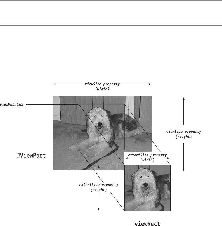
CHAPTER 11 ■ ADVANCED SWING CONTAINERS 413
IllegalArgumentException. Because there can’t be a border, the insets property setting is always
(0, 0, 0, 0). Instead of displaying a border around the JViewport, you can display a border around
the component within the view. Simply place a border around the component, or place the
component inside a JPanel with a border before adding it to the JViewport. If you do place a
border around the component, the border would be seen only if that part of the component is
visible. If you don’t want the border to scroll, you must place the JViewport within a component
such as a JScrollPane that has its own border.
■Tip To set the background color of what appears in the JScrollPane, you need to set the background
color of the viewport: aScrollPane.getViewport().setBackground(newColor).
The size of the view (viewSize property) is based on the size of the component (view property)
within the JViewport. The view position (viewPosition property) is the upper-left corner of the
view rectangle (viewRect property), where the rectangle’s size is the extent size (extentSize
property) of the viewport. If that’s confusing, Figure 11-18 should help you see where all these
properties lie within the JViewport.
Figure 11-18. Visualizing JViewport properties

414 CHAPTER 11 ■ ADVANCED SWING CONTAINERS
The scrollMode property can be set to one of the class constants shown in Table 11-11.
In most cases, you can rely on the fastest and default BLIT_SCROLL_MODE mode.
To move the visible part of the view around, just change the viewPosition property. This
moves the viewRect, allowing you to see a different part of the view. To demonstrate this, the
program shown in Listing 11-5 attaches keyboard accelerators to the JViewport so that you
can use the arrow keys to move around the view. (Normally, the JScrollPane would get these
keyboard actions.) The majority of the code is necessary to set up the appropriate input/action
maps. The boldfaced line of code is the one necessary to move the view.
Listing 11-5. Keyboard Movement Control in a JViewport
import javax.swing.*;
import java.awt.*;
import java.awt.event.*;
public class MoveViewSample {
public static final int INCREASE = 0; // direction
public static final int DECREASE = 1; // direction
public static final int X_AXIS = 0; // axis
public static final int Y_AXIS = 1; // axis
public static final int UNIT = 0; // type
public static final int BLOCK = 1; // type
static class MoveAction extends AbstractAction {
JViewport viewport;
int direction;
int axis;
int type;
public MoveAction(JViewport viewport, int direction, int axis, int type) {
if (viewport == null) {
throw new IllegalArgumentException ("null viewport not permitted");
}
Table 11-11. JViewport Scroll Modes
Scroll Mode Description
BACKINGSTORE_SCROLL_MODE A deprecated but supported mode that relies on a buffer
for scrolling
BLIT_SCROLL_MODE The default mode, which relies on Graphics.copyArea()
SIMPLE_SCROLL_MODE Redraws entire area
CHAPTER 11 ■ ADVANCED SWING CONTAINERS 415
this.viewport = viewport;
this.direction = direction;
this.axis = axis;
this.type = type;
}
public void actionPerformed(ActionEvent actionEvent) {
Dimension extentSize = viewport.getExtentSize();
int horizontalMoveSize = 0;
int verticalMoveSize = 0;
if (axis == X_AXIS) {
if (type == UNIT) {
horizontalMoveSize = 1;
} else { // type == BLOCK
horizontalMoveSize = extentSize.width;
}
} else { // axis == Y_AXIS
if (type == UNIT) {
verticalMoveSize = 1;
} else { // type == BLOCK
verticalMoveSize = extentSize.height;
}
}
if (direction == DECREASE) {
horizontalMoveSize = -horizontalMoveSize;
verticalMoveSize = -verticalMoveSize;
}
// Translate origin by some amount
Point origin = viewport.getViewPosition();
origin.x += horizontalMoveSize;
origin.y += verticalMoveSize;
// Set new viewing origin
viewport.setViewPosition(origin);
}
}
public static void main(String args[]) {
Runnable runner = new Runnable() {
public void run() {
JFrame frame = new JFrame("JViewport Sample");
frame.setDefaultCloseOperation(JFrame.EXIT_ON_CLOSE);
Icon icon = new ImageIcon("dog.jpg");
JLabel dogLabel = new JLabel(icon);
JViewport viewport = new JViewport();
viewport.setView(dogLabel);
416 CHAPTER 11 ■ ADVANCED SWING CONTAINERS
InputMap inputMap = viewport.getInputMap(JComponent.WHEN_IN_FOCUSED_WINDOW);
ActionMap actionMap = viewport.getActionMap();
// Up key moves view up unit
Action upKeyAction =
new MoveAction(viewport, DECREASE, Y_AXIS, UNIT);
KeyStroke upKey = KeyStroke.getKeyStroke("UP");
inputMap.put(upKey, "up");
actionMap.put("up", upKeyAction);
// Down key moves view down unit
Action downKeyAction =
new MoveAction(viewport, INCREASE, Y_AXIS, UNIT);
KeyStroke downKey = KeyStroke.getKeyStroke("DOWN");
inputMap.put(downKey, "down");
actionMap.put("down", downKeyAction);
// Left key moves view left unit
Action leftKeyAction =
new MoveAction(viewport, DECREASE, X_AXIS, UNIT);
KeyStroke leftKey = KeyStroke.getKeyStroke("LEFT");
inputMap.put(leftKey, "left");
actionMap.put("left", leftKeyAction);
// Right key moves view right unit
Action rightKeyAction =
new MoveAction(viewport, INCREASE, X_AXIS, UNIT);
KeyStroke rightKey = KeyStroke.getKeyStroke("RIGHT");
inputMap.put(rightKey, "right");
actionMap.put("right", rightKeyAction);
// PgUp key moves view up block
Action pgUpKeyAction =
new MoveAction(viewport, DECREASE, Y_AXIS, BLOCK);
KeyStroke pgUpKey = KeyStroke.getKeyStroke("PAGE_UP");
inputMap.put(pgUpKey, "pgUp");
actionMap.put("pgUp", pgUpKeyAction);
// PgDn key moves view down block
Action pgDnKeyAction =
new MoveAction(viewport, INCREASE, Y_AXIS, BLOCK);
KeyStroke pgDnKey = KeyStroke.getKeyStroke("PAGE_DOWN");
inputMap.put(pgDnKey, "pgDn");
actionMap.put("pgDn", pgDnKeyAction);

CHAPTER 11 ■ ADVANCED SWING CONTAINERS 417
// Shift-PgUp key moves view left block
Action shiftPgUpKeyAction =
new MoveAction(viewport, DECREASE, X_AXIS, BLOCK);
KeyStroke shiftPgUpKey = KeyStroke.getKeyStroke("shift PAGE_UP");
inputMap.put(shiftPgUpKey, "shiftPgUp");
actionMap.put("shiftPgUp", shiftPgUpKeyAction);
// Shift-PgDn key moves view right block
Action shiftPgDnKeyAction =
new MoveAction(viewport, INCREASE, X_AXIS, BLOCK);
KeyStroke shiftPgDnKey = KeyStroke.getKeyStroke("shift PAGE_DOWN");
inputMap.put(shiftPgDnKey, "shiftPgDn");
actionMap.put("shiftPgDn", shiftPgDnKeyAction);
frame.add(viewport, BorderLayout.CENTER);
frame.setSize(300, 200);
frame.setVisible(true);
}
};
EventQueue.invokeLater(runner);
}
}
Customizing a JViewport Look and Feel
Each installable Swing look and feel shares the same JViewport appearance with the
BasicViewportUI. There are no actual appearance differences. However, there still exists
a set of UIResource-related properties for the JViewport, as shown in Table 11-12. For the
JViewport component, there are four such properties.
Summary
In this chapter, you explored several high-level Swing containers. With the Box class, you can
more easily utilize the BoxLayout manager to create a single row or column of components,
honoring the minimum, preferred, and maximum size of the components the best way possible.
Table 11-12. JViewport UIResource Elements
Property String Object Type
Viewport.background Color
Viewport.font Font
Viewport.foreground Color
ViewportUI String
418 CHAPTER 11 ■ ADVANCED SWING CONTAINERS
With the JSplitPane component, you can create a row or column consisting of two
components with a divider in between them to allow an end user to alter the components’
sizes manually by moving the divider.
The JTabbedPane container displays only one component from a set of contained compo-
nents at a time. The displayed component is picked by the user selecting a tab, which can
contain a title with or without mnemonic, an icon, and a tooltip. This is the popular property
sheet metaphor commonly seen within applications.
The JScrollPane and JViewport containers allow you to display a large component within
a small area. The JScrollPane adds scrollbars to enable an end user to move the visible part
around, whereas the JViewport doesn’t add these scrollbars.
In Chapter 12, we’ll once again examine the individual components within the Swing
library, including the JProgressBar,JScrollBar, and JSlider that share the BoundedRangeModel
as their data model.

419
■ ■ ■
CHAPTER 12
Bounded Range Components
In the previous chapter, you saw how JScrollPane provides a scrollable region for those situations
when there isn’t sufficient space to display an entire component on screen. Swing also offers
several components that support some type of scrolling or the display of a bounded range of values.
The available components are JScrollBar,JSlider,JProgressBar, and, in a more limited sense,
JTextField. These components share a BoundedRangeModel as their data model. The default imple-
mentation of this data model provided with the Swing classes is the DefaultBoundedRangeModel
class.
In this chapter, you’ll look at the similarities and differences between these Swing
components. Let’s start with their shared data model, the BoundedRangeModel.
BoundedRangeModel Interface
The BoundedRangeModel interface is the Model-View-Controller (MVC) data model shared by
the components described in this chapter. The interface contains four interrelated properties
that are necessary to describe a range of values: minimum,maximum,value, and extent.
The minimum and maximum properties define the limits of the value of the model. The value
property defines what you might think of as the current setting of the model, where the maximum
setting of the value property is not necessarily the value of the maximum property of the model.
Instead, the maximum setting that the value property can take is the maximum property less the
extent property. To help you visualize these properties, Figure 12-1 shows these settings in relation
to a JScrollBar. Any other purpose of the extent property depends on the component acting
as the model’s view.
Figure 12-1. BoundedRange properties on a JScrollBar
420 CHAPTER 12 ■ BOUNDED RANGE COMPONENTS
The settings for the four properties must abide by the following ordering:
minimum <= value <= value+extent <= maximum
When one of the settings changes, the change may trigger changes to other settings to keep
the ordering valid. For instance, changing the minimum to a setting between the current value
plus extent setting and the maximum will decrease the extent and increase the value to keep the
ordering valid. In addition, the original property change may result in a change to a new setting
other than the requested setting. For instance, attempting to set the value below the minimum or
maximum will set the value to the nearest limit of the range.
The BoundedRangeModel interface definition follows:
public interface BoundedRangeModel {
// Properties
public int getExtent();
public void setExtent(int newValue);
public int getMaximum();
public void setMaximum(int newValue);
public int getMinimum();
public void setMinimum(int newValue);
public int getValue();
public void setValue(int newValue);
public boolean getValueIsAdjusting();
public void setValueIsAdjusting(boolean newValue);
// Listeners
public void addChangeListener(ChangeListener listener);
public void removeChangeListener(ChangeListener listener);
// Other Methods
public void setRangeProperties(int value, int extent, int minimum,
int maximum, boolean adjusting);
}
Although the different settings available for the model are JavaBean properties, when a
property setting changes, the interface uses Swing’s ChangeListener approach instead of a
java.beans.PropertyChangeListener.
The model’s valueIsAdjusting property comes into play when the user is performing a
series of rapid changes to the model, probably as a result of dragging the slider on the screen.
For someone interested in knowing only when the final value is set for a model, a listener
would ignore any changes until getValueIsAdjusting() returns false.
DefaultBoundedRangeModel Class
The Swing class actually implementing the BoundedRangeModel interface is DefaultBounded➥
RangeModel. This class takes care of the adjustments necessary to ensure the appropriate
ordering of the different property values. It also manages a ChangeListener list to notify
listeners when a model change happens.

CHAPTER 12 ■ BOUNDED RANGE COMPONENTS 421
DefaultBoundedRangeModel has two constructors:
public DefaultBoundedRangeModel()
public DefaultBoundedRangeModel(int value, int extent, int minimum, int maximum)
The no-argument version sets up the minimum,value, and extent properties of the model
to have a setting of 0. The remaining maximum property gets a setting of 100.
The second constructor version takes four integer parameters, explicitly setting four proper-
ties. For both constructors, the initial value of the valuelsAdjusting property is false because
the value of the model isn’t yet changing beyond the initial value.
■Note Unless you’re sharing a model across multiple components, it generally isn’t necessary to create a
BoundedRangeModel. Even if you’re sharing a model across multiple components, you can create just the
first component and get its BoundedRangeModel model to share.
As with practically all of the classes that manage their own listener lists, you can ask
DefaultBoundedRangeModel for the listeners assigned to it. Here, you ask the model for its
ChangeListener list with getListeners(ChangeListener.class). This returns an array of
EventListener objects.
JScrollBar Class
The simplest of the bounded range components is the JScrollBar. The JScrollBar component
is used within the JScrollPane container, described in Chapter 11, to control the scrollable
region. You can also use this component within your own containers, although with the flexibility
of JScrollPane this typically isn’t necessary. The one point to remember about JScrollBar,
however, is that it isn’t used for the entry of a value, but solely for the scrolling of a region of
screen real estate. For the entry of a value, you use the JSlider component discussed in the
next section.
■Note The JScrollBar within a JScrollPane is actually a specialized subclass of JScrollBar that
properly deals with scrollable components that implement the Scrollable interface. Although you can
change the scrollbars of a JScrollPane, it’s usually unnecessary—and more work than you might think.
As Figure 12-2 shows, the horizontal JScrollBar is composed of several parts. Starting
from the middle and working outward, you find the scrollbar’s thumb—also called a knob or
slider. The width of the thumb is the extent property from the BoundedRangeModel. The current
value of the scrollbar is at the left edge of the thumb. To the immediate left and right of the
thumb are the block paging areas. Clicking to the left of the thumb will decrement the scrollbar’s
value, while clicking to the right increments it. The increased or decreased amount of the
scrollbar’s value is the scrollbar’s blockIncrement property.

422 CHAPTER 12 ■ BOUNDED RANGE COMPONENTS
Figure 12-2. Horizontal JScrollBar anatomy
On the left and right edges of the scrollbar are arrow buttons. When the left arrow is pressed,
the scrollbar decrements down a unit. The scrollbar’s unitIncrement property specifies this
unit. Typically, this value is one, though it doesn’t have to be. To the immediate right of the left
arrow is the minimum value of the scrollbar and the model. In addition to decreasing the value
with the left arrow, clicking the right arrow causes the scrollbar to increment a unit. To the
immediate left of the right arrow is the scrollbar’s maximum range. The maximum value is
actually a little farther to the left, where this “little farther” is specified by the model’s extent
property. When the thumb is next to the right arrow, this places the scrollbar value of the
scrollbar at the left edge of the thumb, which is the case with all other positions, no matter
where the thumb is.
A vertical JScrollBar is composed of the same parts as a horizontal JScrollBar, with the
minimum and decrement parts at the top, and the value designated by the top edge of the
scrollbar’s thumb. The maximum and increment parts are at the bottom.
As previously mentioned, the model for the JScrollBar is the BoundedRangeModel. The
delegate for the user interface is the ScrollBarUI.
Now that you’ve seen the different pieces of a JScrollBar, let’s see how to use them.
Creating JScrollBar Components
There are three constructors for JScrollBar:
public JScrollBar()
JScrollBar aJScrollBar = new JScrollBar();
public JScrollBar(int orientation)
// Vertical
JScrollBar aJScrollBar = new JScrollBar(JScrollBar.VERTICAL);
// Horizontal
JScrollBar bJScrollBar = new JScrollBar(JScrollBar.HORIZONTAL);
public JScrollBar(int orientation, int value, int extent, int minimum, int maximum)
// Horizontal, initial value 500, range 0-1000, and extent of 25
JScrollBar aJScrollBar = new JScrollBar(JScrollBar.HORIZONTAL, 500, 25, 0, 1025);
Creating a JScrollBar with no arguments creates a vertical scrollbar with a default data
model. The model has an initial value of 0, a minimum of 0, a maximum of 100, and an extent

CHAPTER 12 ■ BOUNDED RANGE COMPONENTS 423
of 10. This default model offers a range of only 0 through 90. You can also explicitly set the
orientation to JScrollBar.HORIZONTAL or JScrollBar.VERTICAL. If you don’t like the initial
model settings provided by the other two constructors, you need to explicitly set everything
yourself. If the data elements aren’t properly constrained, as described in the previous section
about BoundedRangeModel, an IllegalArgumentException will be thrown, causing the JScrollBar
construction to be aborted.
Surprisingly missing from the list of constructors is one that accepts a BoundedRangeModel
argument. If you have a model instance, you can either call setModel(BoundedRangeModel
newModel) after creating the scrollbar or get the individual properties from the model when
creating the scrollbar, as follows:
JScrollBar aJScrollBar =
new JScrollBar (JScrollBar.HORIZONTAL, aModel.getValue(), aModel.getExtent(),
aModel.getMinimum(), aModel.getMaximum())
■Tip Starting with the 1.3 release of the J2SE platform, scrollbars do not participate in focus traversal.
Handling Scrolling Events
Once you’ve created your JScrollBar, it’s necessary to listen for changes if you’re interested in
when the value changes. There are two ways of listening: the AWT 1.1 event model way and the
Swing MVC way. The AWT way involves attaching an AdjustmentListener to the JScrollBar.
The MVC way involves attaching a ChangeListener to the data model. Each works equally well,
and both are notified if the model changes programmatically or by the user dragging the
scrollbar thumb. The latter offers more flexibility and is a good choice, unless you’re sharing a
data model across components and need to know which component altered the model.
Listening to Scrolling Events with an AdjustmentListener
Attaching an AdjustmentListener to a JScrollBar allows you to listen for the user to change the
setting of the scrollbar. The following code fragments, used for the example shown later in
Figure 12-3, show how to attach an AdjustmentListener to a JScrollBar to listen for the user
adjusting the value of the JScrollBar.
First, define the appropriate AdjustmentListener that simply prints out the current value
of the scrollbar:
AdjustmentListener adjustmentListener = new AdjustmentListener() {
public void adjustmentValueChanged (AdjustmentEvent adjustmentEvent) {
System.out.println ("Adjusted: " + adjustmentEvent.getValue());
}
};
After you’ve created the listener, you can create the component and attach the listener:
JScrollBar oneJScrollBar = new JScrollBar (JScrollBar.HORIZONTAL);
oneJScrollBar.addAdjustmentListener(adjustmentListener);
424 CHAPTER 12 ■ BOUNDED RANGE COMPONENTS
This manner of listening for adjustment events works perfectly well. However, you may
prefer to attach a ChangeListener to the data model, as described next.
Listening to Scrolling Events with a ChangeListener
Attaching a ChangeListener to a JScrollBar data model provides more flexibility in your program
designs. With an AWT AdjustmentListener, listeners are notified only when the value of the
scrollbar changes. On the other hand, an attached ChangeListener is notified when there’s any
change in the minimum value, maximum value, current value, or extent. In addition, because the
model has a valueIsAdjusting property, you can choose to ignore intermediate change events—
something you can also do with an AdjustmentListener, via the property of the same name in
the AdjustmentEvent.
To demonstrate, define a ChangeListener that prints out the current value of the scrollbar
when the model has finished adjusting, as shown in Listing 12-1. You’ll enhance this
BoundedChangeListener class throughout the chapter.
Listing 12-1. ChangeListener for BoundedRangeModel
import javax.swing.*;
import javax.swing.event.*;
public class BoundedChangeListener implements ChangeListener {
public void stateChanged(ChangeEvent changeEvent) {
Object source = changeEvent.getSource();
if (source instanceof BoundedRangeModel) {
BoundedRangeModel aModel = (BoundedRangeModel)source;
if (!aModel.getValueIsAdjusting()) {
System.out.println ("Changed: " + aModel.getValue());
}
} else {
System.out.println ("Something changed: " + source);
}
}
}
Once you create the listener, you can create the component and attach the listener. In this
particular case, you need to attach the listener to the data model of the component, instead of
directly to the component.
ChangeListener changeListener = new BoundedChangeListener();
JScrollBar anotherJScrollBar = new JScrollBar (JScrollBar.HORIZONTAL);
BoundedRangeModel model = anotherJScrollBar.getModel();
model.addChangeListener(changeListener);
The source for the testing program is shown in Listing 12-2.
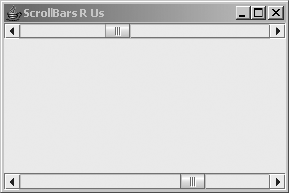
CHAPTER 12 ■ BOUNDED RANGE COMPONENTS 425
Listing 12-2. JScrollBar Usage Sample
import javax.swing.*;
import javax.swing.event.*;
import java.awt.*;
import java.awt.event.*;
public class ScrollBarSample {
public static void main(String args[]) {
Runnable runner = new Runnable() {
public void run() {
AdjustmentListener adjustmentListener = new AdjustmentListener() {
public void adjustmentValueChanged(AdjustmentEvent adjustmentEvent) {
System.out.println("Adjusted: " + adjustmentEvent.getValue());
}
};
JScrollBar oneJScrollBar = new JScrollBar(JScrollBar.HORIZONTAL);
oneJScrollBar.addAdjustmentListener(adjustmentListener);
ChangeListener changeListener = new BoundedChangeListener();
JScrollBar anotherJScrollBar = new JScrollBar(JScrollBar.HORIZONTAL);
BoundedRangeModel model = anotherJScrollBar.getModel();
model.addChangeListener(changeListener);
JFrame frame = new JFrame("ScrollBars R Us");
frame.setDefaultCloseOperation(JFrame.EXIT_ON_CLOSE);
frame.add(oneJScrollBar, BorderLayout.NORTH);
frame.add(anotherJScrollBar, BorderLayout.SOUTH);
frame.setSize(300, 200);
frame.setVisible(true);
}
};
EventQueue.invokeLater(runner);
}
}
When you run this program, it shows the two horizontal scrollbars seen in Figure 12-3.
The output of moving the scrollbars is sent to the console window.
Figure 12-3. Dual JScrollBar listening
426 CHAPTER 12 ■ BOUNDED RANGE COMPONENTS
JScrollBar Properties
After you’ve created a JScrollBar, it may become necessary to modify its underlying data
model. You can get the model with the public BoundedRangeModel getModel() method, and
then modify the model directly. More likely, you would just call the appropriate methods of the
component:
•setValue(int newValue),setExtent(int newValue),setMinimum(int newValue)
•setMaximum(int newValue)
These methods act as proxies and redirect any calls to the equivalent model method.
■Caution Although supported, it’s not recommended that you modify a JScrollBar’s orientation after
displaying the component. This could seriously diminish the user’s satisfaction and encourage the user to find
a solution from another vendor!
In addition to the data model properties, Table 12-1 shows the 16 properties of JScrollBar.
Table 12-1. JScrollBar Properties
Property Name Data Type Access
accessibleContext AccessibleContext Read-only
adjustmentListeners AdjustmentListener[ ] Read-only
blockIncrement int Read-write bound
enabled boolean Write-only
maximum int Read-write
maximumSize Dimension Read-only
minimum int Read-write
minimumSize Dimension Read-only
model BoundedRangeModel Read-write bound
orientation int Read-write bound
UI ScrollBarUI Read-write bound
UIClassID String Read-only
unitIncrement int Read-write bound
value int Read-write bound
valueIsAdjusting boolean Read-write bound
visibleAmount int Read-write
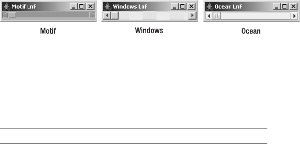
CHAPTER 12 ■ BOUNDED RANGE COMPONENTS 427
Customizing a JScrollBar Look and Feel
Each installable Swing look and feel provides a different JScrollBar appearance and set of
default UIResource values. Figure 12-4 shows the appearance of the JScrollBar component for
the preinstalled set of look and feel types: Motif, Windows, and Ocean.
Figure 12-4. JScrollBar under different look and feel types
The available set of UIResource-related properties for a JScrollBar is shown in Table 12-2.
There are 28 different properties.
Table 12-2. JScrollBar UIResource Elements
Property String Object Type
scrollbar Color
ScrollBar.actionMap ActionMap
ScrollBar.allowsAbsolutePositioning Boolean
ScrollBar.ancestorInputMap InputMap
ScrollBar.ancestorInputMap.RightToLeft InputMap
ScrollBar.background Color
ScrollBar.border Border
ScrollBar.darkShadow Color
ScrollBar.focusInputMap Object[ ]
ScrollBar.focusInputMap.RightToLeft InputMap
ScrollBar.foreground Color
ScrollBar.gradient List
ScrollBar.highlight Color
ScrollBar.maximumThumbSize Dimension
ScrollBar.minimumThumbSize Dimension
ScrollBar.shadow Color
ScrollBar.squareButtons Boolean
ScrollBar.thumb Color
ScrollBar.thumbDarkShadow Color
ScrollBar.thumbHeight Integer
ScrollBar.thumbHighlight Color
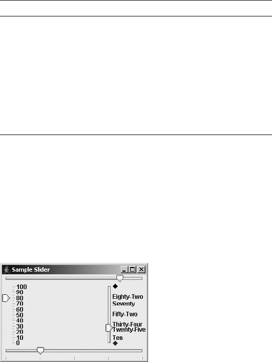
428 CHAPTER 12 ■ BOUNDED RANGE COMPONENTS
JSlider Class
Although the JScrollBar component is useful for scrolling regions of the screen, it’s not a good
component for getting user input for a range of values. For that purpose, Swing offers the
JSlider component. In addition to a draggable thumb like the one provided by the JScrollBar
component, the JSlider component offers visible tick marks and labels to assist in showing the
current setting and selecting a new one. Figure 12-5 shows several sample JSlider components.
Figure 12-5. Sample JSlider components
The JSlider is made up of several pieces. The familiar BoundedRangeModel stores the data
model for the component, and a Dictionary stores any labels for the tick marks. The user interface
delegate is the SliderUI.
Now that you’ve seen the different pieces of a JSlider, let’s find out how to use them.
Creating JSlider Components
There are six different constructors for JSlider:
ScrollBar.thumbShadow Color
ScrollBar.track Color
ScrollBar.trackForeground Color
ScrollBar.trackHighlight Color
ScrollBar.trackHighlightForeground Color
ScrollBar.width Integer
ScrollBarUI String
Table 12-2. JScrollBar UIResource Elements (Continued)
Property String Object Type

CHAPTER 12 ■ BOUNDED RANGE COMPONENTS 429
public JSlider()
JSlider aJSlider = new JSlider();
public JSlider(int orientation)
// Vertical
JSlider aJSlider = new JSlider(JSlider.VERTICAL);
// Horizontal
JSlider bJSlider = new JSlider(JSlider.HORIZONTAL);
public JSlider(int minimum, int maximum)
// Initial value midpoint / 0
JSlider aJSlider = new JSlider(-100, 100);
public JSlider(int minimum, int maximum, int value)
JSlider aJSlider = new JSlider(-100, 100, 0);
public JSlider(int orientation, int minimum, int maximum, int value)
// Vertical, initial value 6, range 1-12 (months of year)
JSlider aJSlider = new JSlider(JSlider.VERTICAL, 6, 1, 12);
public JSlider(BoundedRangeModel model)
// Data model, initial value 3, range 1-31, and extent of 0
// JSlider direction changed to vertical prior to display on screen
DefaultBoundedRangeModel model = new DefaultBoundedRangeModel(3, 0, 1, 31);
JSlider aJSlider = new JSlider(model);
aJSlider.setOrientation(JSlider.VERTICAL);
Creating a JSlider with no arguments creates a horizontal slider with a default data model.
The model has an initial value of 50, a minimum of 0, a maximum of 100, and an extent of 0.
You can also explicitly set the orientation with JSlider.HORIZONTAL or JSlider.VERTICAL, and
any of the specific model properties, with the various constructors. In addition, you can explicitly
set the data model for the component.
If you’re using a preconfigured BoundedRangeModel, remember to set the extent to 0 when
creating the model. If the extent property is greater than 0, then the maximum setting of the
value property is decreased by that amount, and the value setting will never reach the setting
of the maximum property.
■Caution Initializing the orientation to something not equivalent to VERTICAL or HORIZONTAL throws
an IllegalArgumentException. All constructors that initialize the data model could throw an
IllegalArgumentException if the range and initial value fail to abide by the rules of the
BoundedRangeModel described earlier in the section “BoundedRangeModel Interface.”
430 CHAPTER 12 ■ BOUNDED RANGE COMPONENTS
Handling JSlider Events
You track changes to a JSlider with a ChangeListener. There’s no AdjustmentListener, as
there is with JScrollBar (and Scrollbar). The same BoundedChangeListener from the earlier
JScrollBar example could be added to a data model of the JSlider, and you’ll then be notified
when the model changes.
ChangeListener aChangeListener = new BoundedChangeListener();
JSlider aJSlider = new JSlider ();
BoundedRangeModel model = aJSlider.getModel();
model.addChangeListener(changeListener);
In addition to attaching a ChangeListener to the model, you can associate the ChangeListener
directly with the JSlider itself. This allows you to share the data model between views and
listen independently for changes. This requires you to modify the preceding listener a bit,
because the change event source will now be a JSlider instead of a BoundedRangeModel. The
updated BoundedChangeListener, shown in Listing 12-3, will work for both associations, however.
The changes are boldfaced in the following listing.
Listing 12-3. ChangeListener for BoundedRangeModel and JSlider
import javax.swing.*;
import javax.swing.event.*;
public class BoundedChangeListener implements ChangeListener {
public void stateChanged(ChangeEvent changeEvent) {
Object source = changeEvent.getSource();
if (source instanceof BoundedRangeModel) {
BoundedRangeModel aModel = (BoundedRangeModel)source;
if (!aModel.getValueIsAdjusting()) {
System.out.println ("Changed: " + aModel.getValue());
}
} else if (source instanceof JSlider) {
JSlider theJSlider = (JSlider)source;
if (!theJSlider.getValueIsAdjusting()) {
System.out.println ("Slider changed: " + theJSlider.getValue());
}
} else {
System.out.println ("Something changed: " + source);
}
}
}
The association with the slider can now be direct, instead of indirect through the model.
aJSlider.addChangeListener(changeListener);

CHAPTER 12 ■ BOUNDED RANGE COMPONENTS 431
JSlider Properties
After you’ve created a JSlider, you may want to modify its underlying data model. As is the
case with JScrollBar, you can get the model with the public BoundedRangeModel getModel()
method, and then modify the model directly. You can also directly call the methods of the
component:
•setValue(int newValue),setExtent(int newValue),setMinimum(int newValue)
•setMaximum(int newValue)
As with JScrollBar, these methods act as proxies and redirect any calls to the equivalent
model method.
Table 12-3 shows the 19 properties of JSlider.
Table 12-3. JSlider Properties
Property Name Data Type Access
accessibleContext AccessibleContext Read-only
changeListeners ChangeListener[ ] Read-only
extent int Read-write
inverted boolean Read-write bound
labelTable Dictionary Read-write bound
majorTickSpacing int Read-write bound
maximum int Read-write bound
minimum int Read-write bound
minorTickSpacing int Read-write bound
model BoundedRangeModel Read-write bound
orientation int Read-write bound
paintLabels boolean Read-write bound
paintTicks boolean Read-write bound
paintTrack boolean Read-write bound
snapToTicks boolean Read-write bound
UI SliderUI Read-write bound
UIClassID String Read-only
value int Read-write
valueIsAdjusting boolean Read-write bound

432 CHAPTER 12 ■ BOUNDED RANGE COMPONENTS
Displaying Tick Marks Within a JSlider
The JSlider component allows you to add tick marks either below a horizontal slider or to the
right of a vertical slider. These tick marks allow a user to get a rough estimate of the slider’s
value and scale. There can be both major and minor tick marks; the major ones are simply
drawn to be a little longer. Either or both can be displayed, as well as neither of them, which is
the default.
■Note Technically, a custom look and feel could place the tick marks anywhere. However, the system-
provided look and feel types place the ticks below or to the right.
To display the tick marks, you need to enable their painting with the public void
setPaintTicks(boolean newValue) method. When called with a setting of true, this method enables
the painting of minor and major tick marks. By default, the tick spacing for both types of tick
marks is set to zero. When either is set to zero, that particular tick type isn’t displayed. Because both
are initially zero, you must change the value of either tick spacing to see any ticks. The public
void setMajorTickSpacing(int newValue) and public void setMinorTickSpacing(int newValue)
methods both support this change.
To demonstrate, Figure 12-6 shows four sliders: one with no ticks, one with aesthetically
pleasing tick spacing, and two with unconventional tick spacing. It helps if the major tick
spacing is a multiple of the minor tick spacing (just as a ruler shows inches, half inches, quarter
inches, and so on with different tick lengths). In addition, the tick spacing shouldn’t be so
narrow that the ticks look like a solid block.
Figure 12-6. Four JSlider controls demonstrating tick marks
The source for the example in Figure 12-6 is shown in Listing 12-4. The top slider has no
ticks. The bottom slider has the aesthetically pleasing major/minor spacing, with minor ticks
at 5 units and major ones at 25 units. The left slider displays poor spacing with minor ticks at 6
and major ticks at 25. The right slider has minor ticks at each individual unit, resulting in
spacing that’s much too tight.
CHAPTER 12 ■ BOUNDED RANGE COMPONENTS 433
Listing 12-4. JSlider with Tick Marks
import javax.swing.*;
import java.awt.*;
public class TickSliders {
public static void main(String args[]) {
Runnable runner = new Runnable() {
public void run() {
JFrame frame = new JFrame("Tick Slider");
frame.setDefaultCloseOperation(JFrame.EXIT_ON_CLOSE);
// No Ticks
JSlider jSliderOne = new JSlider();
// Major Tick 25 - Minor 5
JSlider jSliderTwo = new JSlider();
jSliderTwo.setMinorTickSpacing(5);
jSliderTwo.setMajorTickSpacing(25);
jSliderTwo.setPaintTicks(true);
jSliderTwo.setSnapToTicks(true);
// Major Tick 25 - Minor 6
JSlider jSliderThree = new JSlider(JSlider.VERTICAL);
jSliderThree.setMinorTickSpacing(6);
jSliderThree.setMajorTickSpacing(25);
jSliderThree.setPaintTicks(true);
JSlider jSliderFour = new JSlider(JSlider.VERTICAL);
// Major Tick 25 - Minor 1
jSliderFour.setMinorTickSpacing(1);
jSliderFour.setMajorTickSpacing(25);
jSliderFour.setPaintTicks(true);
frame.add(jSliderOne, BorderLayout.NORTH);
frame.add(jSliderTwo, BorderLayout.SOUTH);
frame.add(jSliderThree, BorderLayout.WEST);
frame.add(jSliderFour, BorderLayout.EAST);
frame.setSize(300, 200);
frame.setVisible(true);
}
};
EventQueue.invokeLater(runner);
}
}

434 CHAPTER 12 ■ BOUNDED RANGE COMPONENTS
Snapping the JSlider Thumb into Position
One additional property of JSlider is related to tick marks: the snapToTicks property, set with
public void setSnapToTicks(boolean newValue). When this property is true and tick marks are
displayed, after you move the slider’s thumb, the thumb will rest only on a tick. For instance, if
a slider has a range of 0–100 with tick marks at every tenth unit, and you drop the thumb at the
33 mark, the thumb will snap to the position of the tick at 30. If tick marks aren’t displayed, the
property setting has no effect, including when labels are displayed without tick marks.
Labeling JSlider Positions
As Figure 12-5 (shown earlier in the chapter) demonstrates, you can label any position within
the JSlider with a Component. When a position is labeled, the component will be displayed next
to it. The labels are stored within a lookup table that subclasses the Dictionary class, where the
key is the Integer position and the value is the Component. Any AWT Component can be the label;
however, the JLabel is best suited to the role. Figure 12-7 shows how the dictionary for the right
slider of Figure 12-5 might look.
Figure 12-7. A JSlider dictionary

CHAPTER 12 ■ BOUNDED RANGE COMPONENTS 435
Normally, the Dictionary used to store the labels is a Hashtable. However, any class that
extends the Dictionary class and that can use Integer keys will do. After you’ve created
your dictionary of labels, you associate the dictionary with the slider with the public void
setLabelTable(Dictionary newValue) method. The following source creates the label lookup
table associated with Figure 12-7.
Hashtable<Integer, JLabel> table = new Hashtable<Integer, JLabel>();
table.put (0, new JLabel(new DiamondIcon(Color.RED)));
table.put (10, new JLabel("Ten"));
table.put (25, new JLabel("Twenty-Five"));
table.put (34, new JLabel("Thirty-Four"));
table.put (52, new JLabel("Fifty-Two"));
table.put (70, new JLabel("Seventy"));
table.put (82, new JLabel("Eighty-Two"));
table.put (100, new JLabel(new DiamondIcon(Color.BLACK)));
aJSlider.setLabelTable (table);
■Note Keep in mind that with J2SE 5.0, the compiler will auto-box an int parameter into an Integer.
Simply associating the label table with the slider won’t display the labels. To enable their
painting, you need to call the public void setPaintLabels(boolean newValue) method with a
parameter of true. If you haven’t manually created a table of labels, the system will create one
with an interval of values reflecting the major tick spacing. For example, the left slider of Figure
12-5 has a slider range of 0–100 and major tick spacing of 10. When setPaintLabels(true) is
called on that slider, labels are created for 0, 10, 20, and so on, all the way up to 100. The minor
tick spacing is irrelevant as far as automatic generation of labels goes. And the ticks don’t need
to be painted for the labels to appear; the getPaintTicks() method can return false.
The automatic creation of labels is done through the public Hashtable createStandard➥
Labels(int increment) method, where the increment is the major tick spacing. You don’t need
to call this method directly. If you want to create the labels from other than the minimum
value, you can call the overloaded public Hashtable createStandardLabels
(int increment, int start) variety, and associate the hash table with the slider yourself.
Customizing a JSlider Look and Feel
Each installable Swing look and feel provides a different JSlider appearance and set of default
UIResource values. Figure 12-8 shows the appearance of the JSlider component for the prein-
stalled set of look and feel types.

436 CHAPTER 12 ■ BOUNDED RANGE COMPONENTS
Figure 12-8. JSlider under different look and feel types
Two look-and-feel–related properties are part of the JSlider class definition. By default,
the minimum slider value for a horizontal slider is at the left; for a vertical slider, it’s at the
bottom. To change the direction of a slider, call the public void setInverted(boolean newValue)
method with an argument of true. In addition, the track that the slider moves along is displayed
by default. You can turn it off with the public void setPaintTrack(boolean newValue) method.
A value of false turns off the track display. Figure 12-9 identifies the JSlider track and points
out the minimum and maximum positions of regular and inverted sliders.
Figure 12-9. Identifying JSlider positions and tracks

CHAPTER 12 ■ BOUNDED RANGE COMPONENTS 437
Table 12-4 shows the 30 available UIResource-related properties for a JSlider.
Table 12-4. JSlider UIResource Elements
Property String Object Type
Slider.actionMap ActionMap
Slider.altTrackColor Color
Slider.background Color
Slider.border Border
Slider.darkShadow Color
Slider.focus Color
Slider.focusGradient List
Slider.focusInputMap Object[ ]
Slider.focusInputMap.RightToLeft InputMap
Slider.focusInsets Insets
Slider.foreground Color
Slider.gradient List
Slider.highlight Color
Slider.horizontalSize Dimension
Slider.horizontalThumbIcon Icon
Slider.majorTickLength Integer
Slider.minimumHorizontalSize Dimension
Slider.minimumVerticalSize Dimension
Slider.paintThumbArrowShape Boolean
Slider.paintValue Boolean
Slider.shadow Color
Slider.thumb Color
Slider.thumbHeight Integer
Slider.thumbWidth Integer
Slider.tickColor Color
Slider.trackBorder Border
Slider.trackWidth Integer
Slider.verticalSize Dimension
Slider.verticalThumbIcon Icon
SliderUI String

438 CHAPTER 12 ■ BOUNDED RANGE COMPONENTS
The JSlider resources allow customization of elements that aren’t accessible through
JSlider or SliderUI methods. For instance, to customize the JSlider appearance of your
application, you may want to alter the icon used for the draggable thumb. With just a few lines
of code, you can take any icon and make it the slider’s icon for every slider in your application.
Icon icon = new ImageIcon("logo.jpg");
UIDefaults defaults = UIManager.getDefaults();
defaults.put("Slider.horizontalThumbIcon", icon);
Figure 12-10 shows the results. As with all UIResource properties, this change will affect all
JSlider components created after setting the property.
Figure 12-10. A JSlider with a custom icon
■Note The height and width of the icon are limited to the dimensions of the slider. Changing the icon property
doesn’t affect the slider size.
JSlider Client Properties
By default, with the Metal look and feel, when the track is visible, the track on which the slider
moves does not change as the slider is moved over it. Nevertheless, you can enable a client
property that will signal the slider to fill this track up to the point of the current value that the
thumb has crossed. The name of this property is JSlider.isFilled, and a Boolean object repre-
sents the current setting. By default, this setting is Boolean.FALSE. Figure 12-11 demonstrates
both a Boolean.TRUE and a Boolean.FALSE setting; the code fragment follows:
JSlider oneJSlider = new JSlider();
oneJSlider.putClientProperty("JSlider.isFilled", Boolean.TRUE);
JSlider anotherJSlider = new JSlider();
// Set to default setting
anotherJSlider.putClientProperty("JSlider.isFilled", Boolean.FALSE);
Figure 12-11. Filled and unfilled JSlider
This setting works only in the Metal look and feel. The Ocean theme of the Metal look and
feel ignores this setting, always drawing the track filled. To get this behavior, you need to set the
system property swing.metalTheme to steel, as in java -Dswing.metalTheme=steel ClassName.
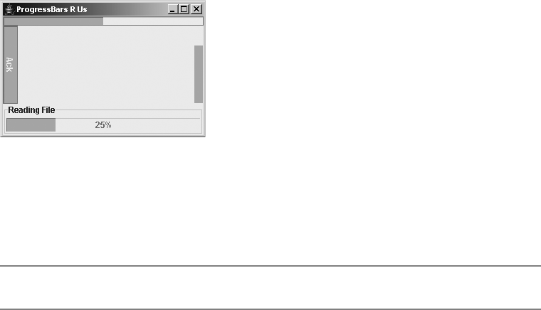
CHAPTER 12 ■ BOUNDED RANGE COMPONENTS 439
JProgressBar Class
Swing’s JProgressBar is different from the other BoundedRangeModel components. Its main
purpose is not to get input from the user, but rather to present output. This output is in the
form of a process completion percentage. As the percentage increases, a bar progresses across
the component until the job is completed and the bar is filled. The movement of the bar is
usually part of some multithreaded task, to avoid affecting the rest of the application.
Figure 12-12 shows several sample JProgressBar components. The top bar uses all the
display defaults. The bottom bar adds a border around the component and displays the
completion percentage. The right bar removes the border, and the left bar has a fixed string
present instead of a completion percentage.
Figure 12-12. Sample JProgressBar components
From an object-oriented perspective, there are two primary parts to a JProgressBar:
The familiar BoundedRangeModel stores the data model for the component, and the ProgressUI
is the user interface delegate.
■Note To display a progress bar in a dialog box, use the ProgressMonitor class discussed in Chapter 9.
Creating JProgressBar Components
There are five different constructors for JProgressBar:
public JProgressBar()
JProgressBar aJProgressBar = new JProgressBar();
public JProgressBar(int orientation)
// Vertical
JProgressBar aJProgressBar = new JProgressBar(JProgressBar.VERTICAL);
// Horizontal
JProgressBar bJProgressBar = new JProgressBar(JProgressBar.HORIZONTAL);
public JProgressBar(int minimum, int maximum)
JProgressBar aJProgressBar = new JProgressBar(0, 500);

440 CHAPTER 12 ■ BOUNDED RANGE COMPONENTS
public JProgressBar(int orientation, int minimum, int maximum)
JProgressBar aJProgressBar = new JProgressBar(JProgressBar.VERTICAL, 0, 1000);
public JProgressBar(BoundedRangeModel model)
// Data model, initial value 0, range 0-250, and extent of 0
DefaultBoundedRangeModel model = new DefaultBoundedRangeModel(0, 0, 0, 250);
JProgressBar aJProgressBar = new JProgressBar(model);
Creating a JProgressBar with no arguments results in a horizontal progress bar with a
default data model. The model has an initial value of 0, a minimum value of 0, a maximum
value of 100, and an extent of 0. The progress bar has an extent, but it doesn’t use it, even
though it’s part of the data model.
You can explicitly set the orientation with JProgressBar.HORIZONTAL or
JProgressBar.VERTICAL, as well as any of the specific model properties, with the different
constructors. In addition, you can explicitly set the data model for the component.
■Caution Initializing the orientation to a value not equivalent to VERTICAL or HORIZONTAL throws an
IllegalArgumentException.
Creating a JProgressBar from a BoundedRangeModel is a little awkward in the sense that the
progress bar virtually ignores one setting and the initial value is normally initialized to the
minimum. Assuming you want the JProgressBar to start as a user might expect it to, you need
to remember to set the extent to 0 and the value to the minimum when creating the model. If
you increase the extent property, the maximum setting of the value property is decreased by
that amount, and the value setting will never reach the setting of the maximum property.
JProgressBar Properties
After you’ve created a JProgressBar, you may want to modify it. Table 12-5 shows the 14 properties
of JProgressBar.
Table 12-5. JProgressBar Properties
Property Name Data Type Access
accessibleContext AccessibleContext Read-only
borderPainted boolean Read-write bound
changeListeners ChangeListener[ ] Read-only
indeterminate boolean Read-write bound
maximum int Read-write
minimum int Read-write
model BoundedRangeModel Read-write
orientation int Read-write bound

CHAPTER 12 ■ BOUNDED RANGE COMPONENTS 441
Painting JProgressBar Borders
All JComponent subclasses feature a border property by default, and the JProgressBar has a
special borderPainted property to easily enable or disable the painting of the border. Calling
the public void setBorderPainted(boolean newValue) method with a parameter of false turns
off the painting of the progress bar’s border. The right-hand progress bar in Figure 12-12
(shown earlier) has its border turned off. The source for its initialization follows:
JProgressBar cJProgressBar = new JProgressBar(JProgressBar.VERTICAL);
cJProgressBar.setBorderPainted(false);
Labeling a JProgressBar
The JProgressBar supports the display of text within the center of the component. There are
three forms of this labeling:
• By default, no label exists.
• To display the percentage completed [100 × (value–minimum)/(maximum–minimum)],
call the public void setStringPainted(boolean newValue) method with a parameter of
true. This will result in a range from 0% to 100% displayed.
• To change the label to a fixed string, call the public void setString(String newValue)
method and setStringPainted(true). On a vertical progress bar, the string is drawn
rotated, so a longer string will fit better.
The left and bottom progress bars in Figure 12-12 demonstrate the fixed label and
percentage label, respectively. The source code to create both progress bars follows:
JProgressBar bJProgressBar = new JProgressBar();
bJProgressBar.setStringPainted(true);
Border border = BorderFactory.createTitledBorder("Reading File");
bJProgressBar.setBorder(border);
JProgressBar dJProgressBar = new JProgressBar(JProgressBar.VERTICAL);
dJProgressBar.setString("Ack");
dJProgressBar.setStringPainted(true);
percentComplete double Read-only
string String Read-write bound
stringPainted boolean Read-write bound
UI ProgressBarUI Read-write
UIClassID String Read-only
value int Read-write
Table 12-5. JProgressBar Properties (Continued)
Property Name Data Type Access

442 CHAPTER 12 ■ BOUNDED RANGE COMPONENTS
Using an Indeterminate JProgressBar
Some tasks don’t have a fixed number of steps, or they do have a fixed number of steps, but you
don’t know what that number is until after all the steps are done. For this type of operation, the
JProgressBar offers an indeterminate mode where the bar within the JProgressBar bounces
back and forth from side to side, or top to bottom, depending on the direction of the progress
bar. To enable this mode, just call the public void setIndeterminate(boolean newValue)
method with a value of true. Figure 12-13 shows what an indeterminate progress bar looks like
at different times. The length of the sliding box is one-sixth the available space and seems to
not be settable.
Figure 12-13. Sample indeterminate JProgressBar
Stepping Along a JProgressBar
The main usage of the JProgressBar is to show progress as you step through a series of operations.
Normally, you set the minimum value of the progress bar to zero and the maximum value to
the number of steps to perform. Starting with a value property of zero, you increase the value
to the maximum as you perform each step. All these operations imply multithreading, which is,
in fact, absolutely necessary. In addition, when updating the progress bar’s value, you need
to remember to update it only from within the event dispatching thread (with the help of
EventQueue.invokeAndWait(), if appropriate, as described in Chapter 2).
The process of having a progress bar step through its range is as follows:
1. Initialize it. This is the basic process of creating a JProgressBar with the desired orien-
tation and range. In addition, perform any bordering and labeling here.
JProgressBar aJProgressBar = new JProgressBar(0, 50);
aJProgressBar.setStringPainted(true);
2. Start up the thread to perform the desired steps. Probably as the result of performing
some action on the screen, you’ll need to start the thread to do the work the progress
bar is reporting. You need to start a new thread so that the user interface remains
responsive.
Thread stepper = new BarThread (aJProgressBar);
stepper.start();
3. Perform the steps. Ignore updating the progress bar, and instead write the appropriate
code to perform each step.
static class BarThread extends Thread {
private static int DELAY = 500;
JProgressBar progressBar;
CHAPTER 12 ■ BOUNDED RANGE COMPONENTS 443
public BarThread (JProgressBar bar) {
progressBar = bar;
}
public void run() {
int minimum = progressBar.getMinimum();
int maximum = progressBar.getMaximum();
for (int i=minimum; i<maximum; i++) {
try {
// Our job for each step is to just sleep
Thread.sleep(DELAY);
} catch (InterruptedException ignoredException) {
} catch (InvocationTargetException ignoredException) {
// The EventQueue.invokeAndWait() call
// we'll add will throw this
}
}
}
}
4. For each step, have the thread update the progress bar in the event thread. Create the
Runnable class just once outside the for loop. It isn’t necessary to create one for each step.
Runnable runner = new Runnable() {
public void run() {
int value = progressBar.getValue();
progressBar.setValue(value+1);
}
};
Within the loop, tell the runner to update the progress bar. This update must be done in
the event thread using the special EventQueue method invokeLater() or invokeAndWait(),
because you’re updating a property of the JProgressBar.
EventQueue.invokeAndWait (runner);
The complete working example is shown in Listing 12-5.
Listing 12-5. JProgressBar Sample
import javax.swing.*;
import java.awt.*;
import java.awt.event.*;
import java.lang.reflect.InvocationTargetException;
public class ProgressBarStep {
static class BarThread extends Thread {
private static int DELAY = 500;
JProgressBar progressBar;
444 CHAPTER 12 ■ BOUNDED RANGE COMPONENTS
public BarThread(JProgressBar bar) {
progressBar = bar;
}
public void run() {
int minimum = progressBar.getMinimum();
int maximum = progressBar.getMaximum();
Runnable runner = new Runnable() {
public void run() {
int value = progressBar.getValue();
progressBar.setValue(value+1);
}
};
for (int i=minimum; i<maximum; i++) {
try {
EventQueue.invokeAndWait(runner);
// Our job for each step is to just sleep
Thread.sleep(DELAY);
} catch (InterruptedException ignoredException) {
} catch (InvocationTargetException ignoredException) {
}
}
}
}
public static void main(String args[]) {
Runnable runner = new Runnable() {
public void run() {
JFrame frame = new JFrame("Stepping Progress");
frame.setDefaultCloseOperation(JFrame.EXIT_ON_CLOSE);
final JProgressBar aJProgressBar = new JProgressBar(0, 50);
aJProgressBar.setStringPainted(true);
final JButton aJButton = new JButton("Start");
ActionListener actionListener = new ActionListener() {
public void actionPerformed(ActionEvent e) {
aJButton.setEnabled(false);
Thread stepper = new BarThread(aJProgressBar);
stepper.start();
}
};
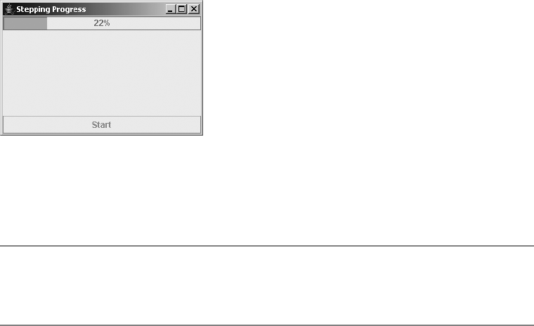
CHAPTER 12 ■ BOUNDED RANGE COMPONENTS 445
aJButton.addActionListener(actionListener);
frame.add(aJProgressBar, BorderLayout.NORTH);
frame.add(aJButton, BorderLayout.SOUTH);
frame.setSize(300, 200);
frame.setVisible(true);
}
};
EventQueue.invokeLater(runner);
}
}
Figure 12-14 shows the demonstration program after selecting the button and at 22%
completion.
Figure 12-14. JProgressBar in action
By simply changing the sleep action in Listing 12-5 to the desired operation, this example
should provide a suitable framework for reuse.
■Note To have the progress bar fill in the opposite direction, have the value start at the maximum and
decrease it with each step. You probably don’t want to display the percentage-completed string, as it will start
at 100% and decrease to 0%.
Handling JProgressBar Events
Technically, the JProgressBar class supports notification of data model changes through a
ChangeListener. In addition, you can attach a ChangeListener to its data model. Because the
progress bar is meant more for visualization of output than for providing input, you typically
won’t use a ChangeListener with it. However, there may be times when this is appropriate.
To reuse the BoundedChangeListener from Listing 12-3 earlier in this chapter, make one final
change (as shown in boldface in Listing 12-6), because the source of these change events is the
JProgressBar.

446 CHAPTER 12 ■ BOUNDED RANGE COMPONENTS
Listing 12-6. ChangeListener for BoundedRangeModel, JSlider, and JProgressBar
import javax.swing.*;
import javax.swing.event.*;
public class BoundedChangeListener implements ChangeListener {
public void stateChanged(ChangeEvent changeEvent) {
Object source = changeEvent.getSource();
if (source instanceof BoundedRangeModel) {
BoundedRangeModel aModel = (BoundedRangeModel)source;
if (!aModel.getValueIsAdjusting()) {
System.out.println ("Changed: " + aModel.getValue());
}
} else if (source instanceof JSlider) {
JSlider theJSlider = (JSlider)source;
if (!theJSlider.getValueIsAdjusting()) {
System.out.println ("Slider changed: " + theJSlider.getValue());
}
} else if (source instanceof JProgressBar) {
JProgressBar theJProgressBar = (JProgressBar)source;
System.out.println ("ProgressBar changed: " + theJProgressBar.getValue());
} else {
System.out.println ("Something changed: " + source);
}
}
}
Customizing a JProgressBar Look and Feel
Each installable Swing look and feel provides a different JProgressBar appearance and set of
default UIResource values. Figure 12-15 shows the appearance of the JProgressBar component
for the preinstalled set of look and feel types.
Table 12-6 shows the set of available UIResource-related properties for a JProgressBar.
It has 15 different properties.
Table 12-6. JProgressBar UIResource Elements
Property String Object Type
ProgressBar.background Color
ProgressBar.border Border
ProgressBar.cellLength Integer
ProgressBar.cellSpacing Integer
ProgressBar.cycleTime Integer
ProgressBar.font Font
ProgressBar.foreground Color
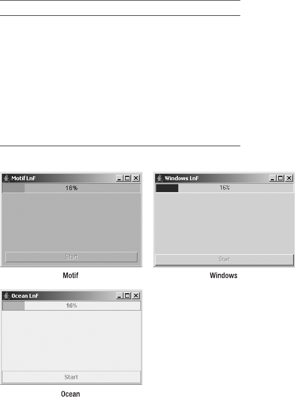
CHAPTER 12 ■ BOUNDED RANGE COMPONENTS 447
Figure 12-15. JProgressBar under different look and feel types
JTextField Class and BoundedRangeModel
Interface
The JTextField component is not technically a bounded-range component, but nevertheless,
it uses BoundedRangeModel. Built inside the JTextField is a scrollable area used when the width
of the component’s contents exceeds its visible horizontal space. A BoundedRangeModel controls
this scrolling area. You’ll look at JTextField in more depth in Chapter 15. Here, you can see
ProgressBar.highlight Color
ProgressBar.horizontalSize Dimension
ProgressBar.repaintInterval Integer
ProgressBar.selectionBackground Color
ProgressBar.selectionForeground Color
ProgressBar.shadow Color
ProgressBar.verticalSize Dimension
ProgressBarUI String
Table 12-6. JProgressBar UIResource Elements (Continued)
Property String Object Type

448 CHAPTER 12 ■ BOUNDED RANGE COMPONENTS
how a JScrollBar can track the scrolling area of the JTextField. Figure 12-16 shows the example
in action, and Listing 12-7 shows the source.
Figure 12-16. Tracking a JTextField width with a JScrollBar
Listing 12-7. JTextField with a JScrollBar for Scrolling
import javax.swing.*;
import java.awt.*;
import java.awt.event.*;
public class TextSlider extends JPanel {
private JTextField textField;
private JScrollBar scrollBar;
public TextSlider() {
setLayout(new BoxLayout(this, BoxLayout.Y_AXIS));
textField = new JTextField();
scrollBar = new JScrollBar(JScrollBar.HORIZONTAL);
BoundedRangeModel brm = textField.getHorizontalVisibility();
scrollBar.setModel(brm);
add(textField);
add(scrollBar);
}
public JTextField getTextField() {
return textField;
}
public String getText() {
return textField.getText();
}
public void addActionListener(ActionListener l) {
textField.addActionListener(l);
}
public void removeActionListener(ActionListener l) {
textField.removeActionListener(l);
}
public JScrollBar getScrollBar() {
return scrollBar;
}
CHAPTER 12 ■ BOUNDED RANGE COMPONENTS 449
public static void main(String args[]) {
Runnable runner = new Runnable() {
public void run() {
JFrame frame = new JFrame("Text Slider");
frame.setDefaultCloseOperation(JFrame.EXIT_ON_CLOSE);
final TextSlider ts = new TextSlider();
ts.addActionListener(new ActionListener() {
public void actionPerformed(ActionEvent e) {
System.out.println("Text: " + ts.getText());
}
});
frame.add(ts, BorderLayout.NORTH);
frame.setSize(300, 100);
frame.setVisible(true);
}
};
EventQueue.invokeLater(runner);
}
}
Normally, the JTextField has no associated scrollbar. In fact, most look and feel types
don’t offer it as an alternative. However, if this component is something you want to incorporate,
you can reuse it in your own applications. Plenty of accessor methods should make reuse
simpler, and you can avoid needing to access the internal pieces directly.
Summary
In this chapter, you’ve learned how to use Swing’s JScrollBar,JSlider, and JProgressBar
components. You saw how each uses the BoundedRangeModel interface to control the internal
data necessary to operate the component, and how the DefaultBoundedRangeModel class offers
a default implementation of this data model.
Now that you know how to use the various bounded range components, you can move on
to Chapter 13, which looks at the controls that offer data selection: JList and JComboBox.
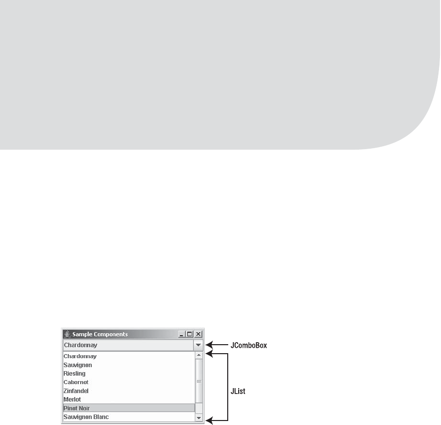
451
■ ■ ■
CHAPTER 13
List Model Controls
Chapter 12 explored the bounded range controls that support scrolling and the input or
display of some bounded range of values. In this chapter, you’ll examine two data-selection
controls that present a list of choices: JList and JComboBox. The primary difference between
these controls is that the JList component supports multiple selections, whereas the JComboBox
does not. Also, the JComboBox lets a user provide a choice that isn’t among the available options.
ListModel Interface
Figure 13-1 shows the two controls you’ll be examining in this chapter.
Figure 13-1. Sample JComboBox and JList controls
The data model shared by the two components is ListModel, which originates with the
ListModel interface. The AbstractListModel class provides an implementation basis by supporting
the management and notification of a set of ListDataListener objects.
In the case of a JList component, the data model implementation is the DefaultListModel
class. This class adds an actual data repository, which follows the API of a Vector, for the different
elements to be displayed within the JList component.
In the JComboBox component, an extension of the ListModel interface called ComboBoxModel
supports the notion of a selected item within the model. The DefaultComboBoxModel class
implements the ComboBoxModel interface through yet another interface, the MutableComboBoxModel,
which supplies supporting methods for adding and removing elements from the model.

452 CHAPTER 13 ■ LIST MODEL CONTROLS
■Note The BasicDirectoryModel class is another ListModel implementation. This implementation is
used by the file chooser component, JFileChooser, as described in Chapter 9.
The actual ListModel interface is rather simple. It provides for management of a
ListDataListener, and it accesses the size of a particular element of the model.
public interface ListModel {
// Properties
public int getSize();
// Listeners
public void addListDataListener(ListDataListener l);
public void removeListDataListener(ListDataListener l);
// Other methods
public Object getElementAt(int index);
}
AbstractListModel Class
The AbstractListModel class provides a partial implementation of the ListModel interface. You
need to provide only the data structure and the data. The class provides for the list management
of ListDataListener objects and the framework for notification of those listeners when the
data changes. You can also get the list of listeners by using the public ListDataListener[ ]
getListDataListeners() method. When you modify the data model, you must then call the
appropriate method of AbstractListModel to notify the listening ListDataListener objects:
•protected void fireIntervalAdded(Object source, int index0, int index1): To be
called after adding a contiguous range of values to the list.
•protected void fireIntervalRemoved(Object source, int index0, int index1): To be
called after removing a contiguous range of values from the list.
•protected void fireContentsChanged(Object source, int index0, int index1): To be
called if the modified range wasn’t contiguous for insertion, removal, or both.
■Note The ranges specified by the fireXXX() methods of AbstractListModel are closed intervals. This
simply means that the indices are the endpoints of the range modified. There’s no implied order for the
indices; index0, for example, doesn’t need to be less than index1. The only requirement is that the methods
be called after the data model has changed.
If you have your data in an existing data structure, you need to convert it into a form that
one of the Swing components understands or implement the ListModel interface yourself. As
you’ll see, an array or Vector is directly supported by JList and JComboBox. You can also wrap
your data structure into an AbstractListModel. For instance, if your initial data structure is an

CHAPTER 13 ■ LIST MODEL CONTROLS 453
ArrayList from the Collections framework, you can convert the data structure to a ListModel
with the following code:
final List arrayList = ...;
ListModel model = new AbstractListModel() {
public int getSize() {
return arrayList.size();
}
public Object getElementAt(int index) {
return arrayList.get(index);
}
}
The other option is to just pass the List into the Vector constructor, and then pass that
Vector into the JList constructor. Effectively, you’ve then done the same thing.
DefaultListModel Class
The DefaultListModel class provides a data structure for you to store the data internally in the form
of a Vector. You just need to add the data, because the class manages the ListDataListener list
for you.
First, you create the data structure with the no-argument constructor: DefaultListModel
model = new DefaultListModel(). Then you manipulate it. As shown in Table 13-1, the
DefaultListModel class has only two properties.
The DefaultListModel class provides all its operational methods through a series of public
methods. To add elements, use the following methods:
public void add(int index, Object element)
public void addElement(Object element)
public void insertElementAt(Object element, int index)
The addElement() method of DefaultListModel adds the element to the end of the data model.
To change elements, use these methods:
public Object set(int index, Object element)
public void setElementAt(Object element, int index)
And to remove elements, these methods are provided:
Table 13-1. DefaultListModel Properties
Property Name Data Type Access
empty boolean Read-only
size int Read-write

454 CHAPTER 13 ■ LIST MODEL CONTROLS
public void clear()
public Object remove(int index)
public void removeAllElements()
public boolean removeElement(Object element)
public void removeElementAt(int index)
public void removeRange(int fromIndex, int toIndex)
The removeElement() method returns a status: true if it found the object and removed it,
and false otherwise.
The DefaultListModel class is useful when you don’t have your data in an existing data
structure. For example, the results of a database query come back as a JDBC ResultSet. If you
wish to use those results as the basis for what to display in a JList, you must store them some-
where. That somewhere can be a DefaultListModel, as demonstrated by the following:
ResultSet results = aJDBCStatement.executeQuery(
"SELECT columnName FROM tableName");
DefaultListModel model = new DefaultListModel();
while (results.next()) {
model.addElement(result.getString(1));
}
Listening for ListModel Events with a ListDataListener
If you’re interested in finding out when the contents of the list model change, you can register
aListDataListener with the model. Three separate methods of the interface tell you when
contents are added, removed, or altered. Altering the data model means adding and/or removing
contents from one or more regions of the data model or changing the existing contents without
adding or removing anything. The following is the interface definition:
public interface ListDataListener extends EventListener {
public void contentsChanged(ListDataEvent e);
public void intervalAdded(ListDataEvent e);
public void intervalRemoved(ListDataEvent e);
}
Upon notification of the list-altering event, you’re passed a ListDataEvent instance, which
contains three properties, as shown in Table 13-2.
Table 13-2. ListDataEvent Properties
Property Name Data Type Access
index0 int Read-only
index1 int Read-only
type int Read-only

CHAPTER 13 ■ LIST MODEL CONTROLS 455
The indices aren’t necessarily ordered, and neither are the bounds of the altered region. In
the case of the list model contents changing, not everything within the region may have been
altered. The area whose contents did change is the bounded region specified by the indices.
The type property setting is one of three constants, as shown in Table 13-3, that map directly to
the specific interface method called.
If any ListDataListener objects are attached to the data model when any one of the oper-
ational methods of the DefaultListModel class are called, each of the listeners will be notified
of the data model change. To demonstrate the use of ListDataListener and the dynamic
updating of the data model, the ModifyModelSample program shown in Listing 13-1 uses all the
DefaultListModel class modifying methods, sending the output in the form of the event and
list contents to a JTextArea.
Listing 13-1. Modifying the Data Model
import javax.swing.*;
import javax.swing.event.*;
import java.awt.*;
import java.awt.event.*;
import java.io.*;
import java.util.Enumeration;
public class ModifyModelSample {
static String labels[] = {"Chardonnay", "Sauvignon", "Riesling", "Cabernet",
"Zinfandel", "Merlot", "Pinot Noir", "Sauvignon Blanc", "Syrah",
"Gewürztraminer"};
public static void main(String args[]) {
Runnable runner = new Runnable() {
public void run() {
JFrame frame = new JFrame("Modifying Model");
frame.setDefaultCloseOperation(JFrame.EXIT_ON_CLOSE);
// Fill model
final DefaultListModel model = new DefaultListModel();
for (int i=0, n=labels.length; i<n; i++) {
model.addElement(labels[i]);
}
Table 13-3. ListDataEvent Type Constants
Type Constant Method
CONTENTS_CHANGED contentsChanged()
INTERVAL_ADDED intervalAdded()
INTERVAL_REMOVED intervalRemoved()
456 CHAPTER 13 ■ LIST MODEL CONTROLS
JList jlist = new JList(model);
JScrollPane scrollPane1 = new JScrollPane(jlist);
frame.add(scrollPane1, BorderLayout.WEST);
final JTextArea textArea = new JTextArea();
textArea.setEditable(false);
JScrollPane scrollPane2 = new JScrollPane(textArea);
frame.add(scrollPane2, BorderLayout.CENTER);
ListDataListener listDataListener = new ListDataListener() {
public void contentsChanged(ListDataEvent listDataEvent) {
appendEvent(listDataEvent);
}
public void intervalAdded(ListDataEvent listDataEvent) {
appendEvent(listDataEvent);
}
public void intervalRemoved(ListDataEvent listDataEvent) {
appendEvent(listDataEvent);
}
private void appendEvent(ListDataEvent listDataEvent) {
StringWriter sw = new StringWriter();
PrintWriter pw = new PrintWriter(sw);
switch (listDataEvent.getType()) {
case ListDataEvent.CONTENTS_CHANGED:
pw.print("Type: Contents Changed");
break;
case ListDataEvent.INTERVAL_ADDED:
pw.print("Type: Interval Added");
break;
case ListDataEvent.INTERVAL_REMOVED:
pw.print("Type: Interval Removed");
break;
}
pw.print(", Index0: " + listDataEvent.getIndex0());
pw.print(", Index1: " + listDataEvent.getIndex1());
DefaultListModel theModel =
(DefaultListModel)listDataEvent.getSource();
pw.println(theModel);
textArea.append(sw.toString());
}
};
model.addListDataListener(listDataListener);
CHAPTER 13 ■ LIST MODEL CONTROLS 457
// Set up buttons
JPanel jp = new JPanel(new GridLayout(2, 1));
JPanel jp1 = new JPanel(new FlowLayout(FlowLayout.CENTER, 1, 1));
JPanel jp2 = new JPanel(new FlowLayout(FlowLayout.CENTER, 1, 1));
jp.add(jp1);
jp.add(jp2);
JButton jb = new JButton("add F");
jp1.add(jb);
jb.addActionListener(new ActionListener() {
public void actionPerformed(ActionEvent actionEvent) {
model.add(0, "First");
}
});
jb = new JButton("addElement L");
jp1.add(jb);
jb.addActionListener(new ActionListener() {
public void actionPerformed(ActionEvent actionEvent) {
model.addElement("Last");
}
});
jb = new JButton("insertElementAt M");
jp1.add(jb);
jb.addActionListener(new ActionListener() {
public void actionPerformed(ActionEvent actionEvent) {
int size = model.getSize();
model.insertElementAt("Middle", size/2);
}
});
jb = new JButton("set F");
jp1.add(jb);
jb.addActionListener(new ActionListener() {
public void actionPerformed(ActionEvent actionEvent) {
int size = model.getSize();
if (size != 0)
model.set(0, "New First");
}
});
jb = new JButton("setElementAt L");
jp1.add(jb);
jb.addActionListener(new ActionListener() {
public void actionPerformed(ActionEvent actionEvent) {
int size = model.getSize();
if (size != 0)
model.setElementAt("New Last", size-1);
}
});
458 CHAPTER 13 ■ LIST MODEL CONTROLS
jb = new JButton("load 10");
jp1.add(jb);
jb.addActionListener(new ActionListener() {
public void actionPerformed(ActionEvent actionEvent) {
for (int i=0, n=labels.length; i<n ;i++) {
model.addElement(labels[i]);
}
}
});
jb = new JButton("clear");
jp2.add(jb);
jb.addActionListener(new ActionListener() {
public void actionPerformed(ActionEvent actionEvent) {
model.clear();
}
});
jb = new JButton("remove F");
jp2.add(jb);
jb.addActionListener(new ActionListener() {
public void actionPerformed(ActionEvent actionEvent) {
int size = model.getSize();
if (size != 0)
model.remove(0);
}
});
jb = new JButton("removeAllElements");
jp2.add(jb);
jb.addActionListener(new ActionListener() {
public void actionPerformed(ActionEvent actionEvent) {
model.removeAllElements();
}
});
jb = new JButton("removeElement 'Last'");
jp2.add(jb);
jb.addActionListener(new ActionListener() {
public void actionPerformed(ActionEvent actionEvent) {
model.removeElement("Last");
}
});
jb = new JButton("removeElementAt M");
jp2.add(jb);
jb.addActionListener(new ActionListener() {
public void actionPerformed(ActionEvent actionEvent) {
int size = model.getSize();
if (size != 0)
model.removeElementAt(size/2);
}
});
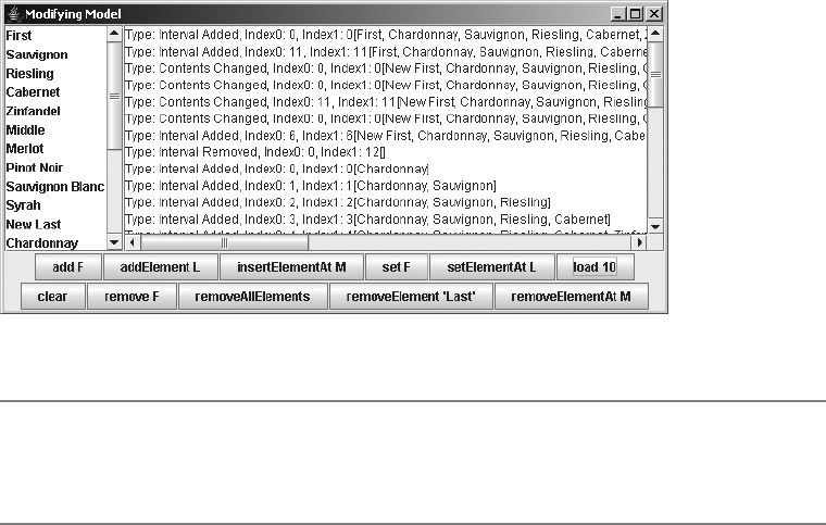
CHAPTER 13 ■ LIST MODEL CONTROLS 459
jb = new JButton("removeRange FM");
jp2.add(jb);
jb.addActionListener(new ActionListener() {
public void actionPerformed(ActionEvent actionEvent) {
int size = model.getSize();
if (size != 0)
model.removeRange(0,size/2);
}
});
frame.add(jp, BorderLayout.SOUTH);
frame.setSize(640, 300);
frame.setVisible(true);
}
};
EventQueue.invokeLater(runner);
}
}
Figure 13-2 shows the output for one such run, after several buttons were selected.
Figure 13-2. A listing for data model changes
■Note To help you decode the button labels in Figure 13-2, an F means the method affects the first cell, an
M means it affects the middle cell, and an L means it affects the last cell. The removeElement “Last” button
will remove the first element in the data model whose content is Last.
The retrieving methods of the DefaultListModel class are quite varied in their capabilities.
The class has the basic accessor methods public Object get(int index),public Object
getElementAt(int index), and public Object elementAt(int index), which all do the same
thing. The DefaultListModel class also has more specific methods. For instance, to work with
all elements, you can obtain an instance of Enumeration using public Enumeration elements().

460 CHAPTER 13 ■ LIST MODEL CONTROLS
Or, if you want to work with all elements as an array, use either public Object[] toArray() or
public void copyInto(Object anArray[]). You can also check for the existence of an element
within a model with methods such as public boolean contains(Object element),public int
indexOf(Object element),public int indexOf(Object element, int index),public int
lastIndexOf(Object element), and public int lastIndexOf(Object element, int index).
■Tip Once you’re finished adding elements to the data model, it’s a good idea to trim its length with public void
trimToSize(). This removes any extra preallocated space within the internal data structure. In addition, if you
know the size of the data model in advance, you can call public void ensureCapacity(int minCapacity) to
preallocate space. Both of these methods work only with DefaultListModel.
ComboBoxModel Interface
The ComboBoxModel interface extends the ListModel interface. The key reason for this extension
is that the classes that implement the ComboBoxModel interface need to manage the selected
item internally through a selectedItem property, as shown by the interface definition.
public interface ComboBoxModel extends ListModel {
// Properties
public Object getSelectedItem();
public void setSelectedItem(Object anItem);
}
MutableComboBoxModel Interface
In addition to the ComboBoxModel interface, another data model interface,
MutableComboBoxModel, extends ComboBoxModel to make methods available to modify the
data model.
public interface MutableComboBoxModel extends ComboBoxModel {
// Other methods
public void addElement(Object obj);
public void insertElementAt(Object obj, int index);
public void removeElement(Object obj);
public void removeElementAt(int index);
}
The JComboBox component uses an implementation of this interface by default.
DefaultComboBoxModel Class
The DefaultComboBoxModel class extends the AbstractListModel class to provide an appropriate
data model for the JComboBox. Because of this extension, it inherits the managing of the
ListDataListener list.
CHAPTER 13 ■ LIST MODEL CONTROLS 461
Like DefaultListModel,DefaultComboBoxModel adds the necessary data structure for you to
collect elements to show within a component. Also, because the model is modifiable, imple-
menting MutableComboBoxModel causes the data model to call the various fileXXX() methods of
the AbstractListModel class when the data elements within the model change.
■Note If you create a DefaultComboBoxModel from an array, the elements of the array are copied into an
internal data structure. If you use a Vector, they’re not copied; instead, the actual Vector is used internally.
To use the data model, you must first create the model with one of the three constructors:
public DefaultComboBoxModel()
DefaultComboBoxModel model = new DefaultComboBoxModel();
public DefaultComboBoxModel(Object listData[])
String labels[] = { "Chardonnay", "Sauvignon", "Riesling", "Cabernet", "Zinfandel",
"Merlot", "Pinot Noir", "Sauvignon Blanc", "Syrah", "Gewürztraminer"};
DefaultComboBoxModel model = new DefaultComboBoxModel(labels);
public DefaultComboBoxModel(Vector listData)
Vector vector = aBufferedImage.getSources();
DefaultComboBoxModel model = new DefaultComboBoxModel(vector);
Next, you manipulate the model. Two new properties are introduced in the
DefaultComboBoxModel class, as shown in Table 13-4.
The data model modification methods for the DefaultComboBoxModel are different from
those for DefaultListModel. They all come from the MutableComboBoxModel interface:
public void addElement(Object element)
public void insertElementAt(Object element, int index)
public boolean removeElement(Object element)
public void removeElementAt(int index)
Due to the flexibility (and functionality) of the DefaultComboBoxModel, it’s usually
unnecessary to create your own ComboBoxModel implementation. Just create an instance
of DefaultComboBoxModel, and then simply fill it from the appropriate data source.
Table 13-4. DefaultComboBoxModel Properties
Property Name Data Type Access
selectedItem Object Read-write
size int Read-only

462 CHAPTER 13 ■ LIST MODEL CONTROLS
■Note One case in which you may wish to provide your own model is when you need to support the presence of
the same item within the model multiple times. With the DefaultComboBoxModel, if you have two items in
the list whose equals() methods will return true, the model won’t work properly.
If you really want to define your own model implementation, perhaps because you already
have the data in your own data structure, it works best to subclass the AbstractListModel and
implement the ComboBoxModel or MutableComboBoxModel interface methods. When subclassing
the AbstractListModel, you merely need to provide the data structure and the access into it.
Because the “selected item” part of the data model is maintained outside the primary data
structure, you need a place to store that, as well. The program source in Listing 13-2 demonstrates
one such implementation using an ArrayList as the data structure. The program includes a
main() method to demonstrate the use of the model within a JComboBox.
Listing 13-2. Using a Custom Data Model
import java.awt.*;
import javax.swing.*;
import java.util.Collection;
import java.util.ArrayList;
public class ArrayListComboBoxModel
extends AbstractListModel implements ComboBoxModel {
private Object selectedItem;
private ArrayList anArrayList;
public ArrayListComboBoxModel(ArrayList arrayList) {
anArrayList = arrayList;
}
public Object getSelectedItem() {
return selectedItem;
}
public void setSelectedItem(Object newValue) {
selectedItem = newValue;
}
public int getSize() {
return anArrayList.size();
}
public Object getElementAt(int i) {
return anArrayList.get(i);
}
public static void main(String args[]) {
Runnable runner = new Runnable() {
public void run() {
JFrame frame = new JFrame("ArrayListComboBoxModel");
frame.setDefaultCloseOperation(JFrame.EXIT_ON_CLOSE);
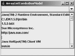
CHAPTER 13 ■ LIST MODEL CONTROLS 463
Collection<Object> col = System.getProperties().values();
ArrayList<Object> arrayList = new ArrayList<Object>(col);
ArrayListComboBoxModel model = new ArrayListComboBoxModel(arrayList);
JComboBox comboBox = new JComboBox (model);
frame.add(comboBox, BorderLayout.NORTH);
frame.setSize(300, 225);
frame.setVisible(true);
}
};
EventQueue.invokeLater(runner);
}
}
Figure 13-3 shows the model in action using the current system properties as the source
for the data model elements.
Figure 13-3. Using an ArrayListComboBoxModel
JList Class
The JList component is the basic Swing component for selecting one or more items from a set
of choices. You present the list of choices to the user, and the user can pick one or several,
depending on the selection mode of the component.
Three key elements and their implementations define the JList structure:
• A data model for holding the JList data, as defined by the ListModel interface
• A cell renderer for drawing the elements of the JList, as described by the
ListCellRenderer interface
• A selection model for selecting elements of the JList, as described by the
ListSelectionModel interface
Creating JList Components
The JList component has four constructors, which allow you to create a JList instance based
on your initial data structure:

464 CHAPTER 13 ■ LIST MODEL CONTROLS
public JList()
JList jlist = new JList();
public JList(Object listData[])
String labels[] = { "Chardonnay", "Sauvignon", "Riesling", "Cabernet", "Zinfandel",
"Merlot", "Pinot Noir", "Sauvignon Blanc", "Syrah", "Gewürztraminer"};
JList jlist = new JList(labels);
public JList(Vector listData)
Vector vector = aBufferedImage.getSources();
JList jlist = new JList(vector);
public JList(ListModel model)
ResultSet results = aJDBCStatement.executeQuery("SELECT colName FROM tableName");
DefaultListModel model = new DefaultListModel();
while (result.next())
model.addElement(result.getString(1));
JList jlist = new JList(model);
If you use the no-argument constructor, you can fill in the data later. However, if you use
the array or Vector constructor, you can’t alter the contents without changing the whole
model.
■Note If you want to display something other than the toString() results of each array element, see the
section “Rendering JList Elements” later in this chapter for details on how to do that.
JList Properties
After creating a JList component, you can modify each of its many properties. Table 13-5
shows the 32 properties of JList.
Table 13-5. JList Properties
Property Name Data Type Access
accessibleContext AccessibleContext Read-only
anchorSelectionIndex int Read-only
cellRenderer ListCellRenderer Read-write bound
dragEnabled boolean Read-write
firstVisibleIndex int Read-only
fixedCellHeight int Read-write bound
fixedCellWidth int Read-write bound

CHAPTER 13 ■ LIST MODEL CONTROLS 465
Many of the JList properties are related to the process of selection. For instance,
anchorSelectionIndex,leadSelectionIndex,maxSelectionIndex,minSelectionIndex,
selectedIndex, and selectedIndices deal with the indices of the selected rows, while
selectedValue and selectedValues relate to the contents of the selected elements.
The anchorSelectionIndex is the most recent index0 of a ListDataEvent, whereas the
leadSelectionIndex is the most recent index1.
lastVisibleIndex int Read-only
layoutOrientation int Read-write bound
leadSelectionIndex int Read-only
listData Vector Write-only
listSelectionListeners ListSelectionListener[ ] Read-only
maxSelectionIndex int Read-only
minSelectionIndex int Read-only
model ListModel Read-write bound
preferredScrollableViewportSize Dimension Read-only
prototypeCellValue Object Read-write bound
scrollableTracksViewportHeight boolean Read-only
scrollableTracksViewportWidth boolean Read-only
selectedIndex int Read-write
selectedIndices int[ ] Read-write
selectedValue Object Read-only
selectedValues Object[ ] Read-only
selectionBackground Color Read-write bound
selectionEmpty boolean Read-only
selectionForeground Color Read-write bound
selectionMode int Read-write
selectionModel ListSelectionModel Read-write bound
UI ListUI Read-write
UIClassID String Read-only
valueIsAdjusting boolean Read-write
visibleRowCount int Read-write bound
Table 13-5. JList Properties (Continued)
Property Name Data Type Access
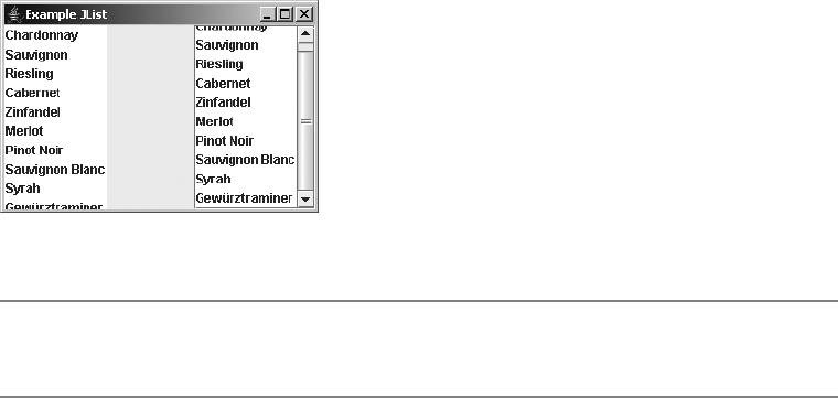
466 CHAPTER 13 ■ LIST MODEL CONTROLS
To control the preferred number of visible rows shown, set the visibleRowCount property
of JList. The default setting for this property is 8.
Scrolling JList Components
When you’re working with a JList component, you must place the component within a
JScrollPane if you want to allow the user to pick from all available choices. If it’s not placed
within a JScrollPane and the default number of rows displayed is smaller than the size of the
data model, or if there isn’t sufficient space to display the rows, the other choices aren’t shown.
When placed within a JScrollPane, the JList offers a vertical scrollbar to move through all the
available choices.
If you don’t place a JList in a JScrollPane and the number of choices exceeds the available
space, only the top group of choices will be visible, as you can see in Figure 13-4.
Figure 13-4. A ten-element JList, in and out of a JScrollPane
■Tip Whenever you see that a class implements the Scrollable interface, it should serve as a reminder
to place that component within a JScrollPane before adding it to the application.
The JScrollPane relies on the dimensions provided by the preferredScrollable➥
ViewportSize property setting to determine the preferred size of the pane contents. When the
data model of a JList is empty, a default size of 16 pixels high by 256 pixels wide per visible row
is used. Otherwise, the width is determined by looping through all the cells to find the widest
one, and the height is determined by the height of the first cell.
To speed the sizing of the viewport for the JScrollPane, you can define a prototype cell by
setting the prototypeCellValue property. You must be sure the prototype toString() value is
sufficiently wide and tall to accommodate all the contents of the JList. Then the JScrollPane
bases the sizing of its viewport on the prototype, and it won’t be necessary for the JList to ask
each cell for its size; instead, it will ask only for the prototype.
You can also improve performance by assigning a size to the fixedCellHeight and
fixedCellWidth properties. Setting these properties is another way to avoid having the JList
ask each cell for its rendered size. Setting both properties is the fastest way to have a JList sized
within a viewport. Of course, this is also the least flexible because it ensures that the JList
choices aren’t widened (or shortened) when the contents change. However, if you have a large
number of entries in the data model, this loss of flexibility may be worthwhile to improve
performance. Figure 13-5 helps you to visualize some of the sizing capabilities of a JList.

CHAPTER 13 ■ LIST MODEL CONTROLS 467
Figure 13-5. Sizing entries within a JList
The source used to generate the output in Figure 13-5 follows in Listing 13-3. The center
list in the figure contains more than 1,000 fixed-size cells. The top list shows that you can set
the number of visible rows with setVisibleRowCount(). Notice that the bottom list in the figure
also uses setVisibleRowCount(). However, because the list isn’t in a JScrollPane, the request to
limit the number of rows is ignored.
Listing 13-3. Sizing the List Cells
import javax.swing.*;
import java.awt.*;
public class SizingSamples {
public static void main(String args[]) {
Runnable runner = new Runnable() {
public void run() {
String labels[] = {"Chardonnay", "Sauvignon", "Riesling", "Cabernet",
"Zinfandel", "Merlot", "Pinot Noir", "Sauvignon Blanc", "Syrah",
"Gewürztraminer"};
JFrame frame = new JFrame("Sizing Samples");
frame.setDefaultCloseOperation(JFrame.EXIT_ON_CLOSE);
JList jlist1 = new JList(labels);
jlist1.setVisibleRowCount(4);
DefaultListModel model = new DefaultListModel();
model.ensureCapacity(1000);
for (int i=0;i<100;i++) {
for (int j=0;j<10;j++) {
model.addElement(labels[j]);
}
}
468 CHAPTER 13 ■ LIST MODEL CONTROLS
JScrollPane scrollPane1 = new JScrollPane(jlist1);
frame.add(scrollPane1, BorderLayout.NORTH);
JList jlist2 = new JList(model);
jlist2.setVisibleRowCount(4);
jlist2.setFixedCellHeight(12);
jlist2.setFixedCellWidth(200);
JScrollPane scrollPane2 = new JScrollPane(jlist2);
frame.add(scrollPane2, BorderLayout.CENTER);
JList jlist3 = new JList(labels);
jlist3.setVisibleRowCount(4);
frame.add(jlist3, BorderLayout.SOUTH);
frame.setSize(300, 350);
frame.setVisible(true);
}
};
EventQueue.invokeLater(runner);
}
}
In addition to placing a JList within a JScrollPane, you can also find out which choices
are visible or request that a specific element be made visible. The firstVisibleIndex and
lastVisibleIndex properties allow you to find out which choices are currently visible within
the JScrollPane. Both methods return –1 if nothing is visible; this usually happens where the
data model is empty. To request that a specific element be made visible, use the public void
ensureIndexIsVisible(int index) method. For instance, to programmatically move the list to
the top, use the following:
jlist.ensureIndexIsVisible(0);
Rendering JList Elements
Every element within the JList is called a cell. Every JList has an installed cell renderer that draws
every cell when the list needs to be drawn. The default renderer, DefaultListCellRenderer, is a
subclass of JLabel, which means you can use either text or an icon as the graphical depiction
for the cell. This tends to suit most users’ needs, but sometimes the cell’s appearance can
benefit from some customization. And, because every JList can have at most one renderer
installed, customization requires that you replace the existing renderer.
ListCellRenderer Interface and DefaultListCellRenderer Class
The JList has an installed renderer. A class that implements the ListCellRenderer interface
provides this renderer.
public interface ListCellRenderer {
public Component getListCellRendererComponent(JList list, Object value,
int index, boolean isSelected, boolean cellHasFocus);
}

CHAPTER 13 ■ LIST MODEL CONTROLS 469
When it’s time to draw each cell, the interface’s sole method is called. The returned
renderer provides the specific rendering for that one cell of the JList. The JList uses the
rendering to draw the element, and then gets the next renderer.
A reference to the enclosing JList is provided to the getListCellRendererComponent()
method so that the renderer can share display characteristics. The value of the selection
contains the object in the list’s data model at position index. The index is zero-based from the
beginning of the data model. The last two parameters allow you to customize the cell’s appear-
ance based on the cell’s state—that is, whether it’s selected or has the input focus.
Listing 13-4 shows a renderer that demonstrates this technique. The sole difference for
this renderer is that the cell with the input focus has a titled border. After the renderer is
created, you install it by setting the cellRenderer property of the JList.
■Tip For performance reasons, it is best not to create the actual renderer in the
getListCellRendererComponent() method. Either subclass Component and return this or
create a class variable to hold one instance of a Component, which then may be customized and returned.
Listing 13-4. Rendering the List Cells
import java.awt.*;
import javax.swing.*;
import javax.swing.border.*;
public class FocusedTitleListCellRenderer implements ListCellRenderer {
protected static Border noFocusBorder =
new EmptyBorder(15, 1, 1, 1);
protected static TitledBorder focusBorder =
new TitledBorder(LineBorder.createGrayLineBorder(), "Focused");
protected DefaultListCellRenderer defaultRenderer = new DefaultListCellRenderer();
public String getTitle() {
return focusBorder.getTitle();
}
public void setTitle(String newValue) {
focusBorder.setTitle(newValue);
}
public Component getListCellRendererComponent(JList list, Object value,
int index, boolean isSelected, boolean cellHasFocus) {
JLabel renderer = (JLabel)defaultRenderer.getListCellRendererComponent(
list, value, index, isSelected, cellHasFocus);
renderer.setBorder(cellHasFocus ? focusBorder : noFocusBorder);
return renderer;
}
}

470 CHAPTER 13 ■ LIST MODEL CONTROLS
■Caution A common mistake when creating your own renderer is forgetting to make the renderer compo-
nent opaque. This causes the background coloration of the renderer to be ignored and the list container’s
background to bleed through. With the DefaultListCellRenderer class, the renderer component is
already opaque.
A sample program that uses the new renderer follows in Listing 13-5. It doesn’t do anything
special other than install the custom cell renderer that was just created.
Listing 13-5. Rendering List Cells Sample
import javax.swing.*;
import java.awt.*;
public class CustomBorderSample {
public static void main(String args[]) {
Runnable runner = new Runnable() {
public void run() {
String labels[] = {"Chardonnay", "Sauvignon", "Riesling", "Cabernet",
"Zinfandel", "Merlot", "Pinot Noir", "Sauvignon Blanc", "Syrah",
"Gewürztraminer"};
JFrame frame = new JFrame("Custom Border");
frame.setDefaultCloseOperation(JFrame.EXIT_ON_CLOSE);
JList jlist = new JList(labels);
ListCellRenderer renderer = new FocusedTitleListCellRenderer();
jlist.setCellRenderer(renderer);
JScrollPane sp = new JScrollPane(jlist);
frame.add(sp, BorderLayout.CENTER);
frame.setSize(300, 200);
frame.setVisible(true);
}
};
EventQueue.invokeLater(runner);
}
}
Figure 13-6 shows the output of the sample program.
Figure 13-6. A JList with a custom focus border cell renderer
CHAPTER 13 ■ LIST MODEL CONTROLS 471
Creating a Complex ListCellRenderer
More often than not, custom cell renderers (like the one shown in Figure 13-6) are necessary
when the data model consists of more complex data in each element—something not repre-
sentable by a text string. For instance, Listing 13-6 shows the source for an example where each
element of the data model consists of a font, foreground color, icon, and text string. Ensuring
the proper usage of these elements within the renderer simply involves a little more work in
configuring the renderer component. In this particular example, that data is stored within each
element of an array in the data model. You could just as easily define a new class or use a
hash table.
Listing 13-6. Rendering Complex List Cells
import java.awt.*;
import javax.swing.*;
import javax.swing.border.*;
public class ComplexCellRenderer implements ListCellRenderer {
protected DefaultListCellRenderer defaultRenderer = new DefaultListCellRenderer();
public Component getListCellRendererComponent(JList list, Object value, int index,
boolean isSelected, boolean cellHasFocus) {
Font theFont = null;
Color theForeground = null;
Icon theIcon = null;
String theText = null;
JLabel renderer = (JLabel)defaultRenderer.getListCellRendererComponent(
list, value, index, isSelected, cellHasFocus);
if (value instanceof Object[]) {
Object values[] = (Object[])value;
theFont = (Font)values[0];
theForeground = (Color)values[1];
theIcon = (Icon)values[2];
theText = (String)values[3];
} else {
theFont = list.getFont();
theForeground = list.getForeground();
theText = "";
}
if (!isSelected) {
renderer.setForeground(theForeground);
}
if (theIcon != null) {
renderer.setIcon(theIcon);
}
472 CHAPTER 13 ■ LIST MODEL CONTROLS
renderer.setText(theText);
renderer.setFont(theFont);
return renderer;
}
}
This renderer merely customizes the renderer component returned by the
DefaultListCellRenderer. The customization is based on the data model value being passed
in as an array to the value argument of the getListCellRendererComponent() method.
Listing 13-7 shows the test class. This demonstration program reuses the DiamondIcon
created in Chapter 4. Most of the code is for initialization of the data model.
Listing 13-7. Rendering Complex List Cells Sample
import javax.swing.*;
import java.awt.*;
public class ComplexRenderingSample {
public static void main(String args[]) {
Runnable runner = new Runnable() {
public void run() {
Object elements[][] = {
{new Font("Helvetica", Font.PLAIN, 20), Color.RED,
new DiamondIcon(Color.BLUE), "Help"},
{new Font("TimesRoman", Font.BOLD, 14), Color.BLUE,
new DiamondIcon(Color.GREEN), "Me"},
{new Font("Courier", Font.ITALIC, 18), Color.GREEN,
new DiamondIcon(Color.BLACK), "I'm"},
{new Font("Helvetica", Font.BOLD | Font.ITALIC, 12), Color.GRAY,
new DiamondIcon(Color.MAGENTA), "Trapped"},
{new Font("TimesRoman", Font.PLAIN, 32), Color.PINK,
new DiamondIcon(Color.YELLOW), "Inside"},
{new Font("Courier", Font.BOLD, 16), Color.YELLOW,
new DiamondIcon(Color.RED), "This"},
{new Font("Helvetica", Font.ITALIC, 8), Color.DARK_GRAY,
new DiamondIcon(Color.PINK), "Computer"}
};
JFrame frame = new JFrame("Complex Renderer");
frame.setDefaultCloseOperation(JFrame.EXIT_ON_CLOSE);
JList jlist = new JList(elements);
ListCellRenderer renderer = new ComplexCellRenderer();
jlist.setCellRenderer(renderer);
JScrollPane scrollPane = new JScrollPane(jlist);
frame.add(scrollPane, BorderLayout.CENTER);

CHAPTER 13 ■ LIST MODEL CONTROLS 473
// JComboBox comboBox = new JComboBox(elements);
// comboBox.setRenderer(renderer);
// frame.add(comboBox, BorderLayout.NORTH);
frame.setSize(300, 200);
frame.setVisible(true);
}
};
EventQueue.invokeLater(runner);
}
}
The output of this example is shown in Figure 13-7.
Figure 13-7. Using a more complex list cell renderer
■Tip When you create your own rendering components, you’ll find it’s best to start with the default list cell
renderer. This allows you to focus on the specific details you’re interested in. Otherwise, you’ll need to worry
about everything, such as the default selection foreground and background colors, and whether you’ve
remembered to make the component opaque. Of course, if you want to configure everything yourself, feel free
to do so.
Selecting JList Elements
By default, every JList component is in multiple-selection mode. This means that you can
select multiple elements within the component. How you select multiple elements depends on
the user interface you’re employing. For instance, with the Ocean look and feel interface, Ctrl-
select (Ctrl key and left mouse button on a right-handed mouse) acts as a selection toggle, and
Shift-select acts as a means of range selection.
ListSelectionModel Interface and DefaultListSelectionModel Class
An implementation of the ListSelectionModel interface controls the selection mechanism for
aJList component. The interface definition, shown here, defines constants for different selection
modes and describes how to manage a list of ListSelectionListener objects. It also provides
the means to describe several selection intervals.

474 CHAPTER 13 ■ LIST MODEL CONTROLS
public interface ListSelectionModel {
// Constants
public final static int MULTIPLE_INTERVAL_SELECTION;
public final static int SINGLE_INTERVAL_SELECTION;
public final static int SINGLE_SELECTION;
// Properties
public int getAnchorSelectionIndex();
public void setAnchorSelectionIndex(int index);
public int getLeadSelectionIndex();
public void setLeadSelectionIndex(int index);
public int getMaxSelectionIndex();
public int getMinSelectionIndex();
public boolean isSelectionEmpty();
public int getSelectionMode();
public void setSelectionMode(int selectionMode);
public boolean getValueIsAdjusting();
public void setValueIsAdjusting(boolean valueIsAdjusting);
// Listeners
public void addListSelectionListener(ListSelectionListener x);
public void removeListSelectionListener(ListSelectionListener x);
// Other methods
public void addSelectionInterval(int index0, int index1);
public void clearSelection();
public void insertIndexInterval(int index, int length, boolean before);
public boolean isSelectedIndex(int index);
public void removeIndexInterval(int index0, int index1);
public void removeSelectionInterval(int index0, int index1);
public void setSelectionInterval(int index0, int index1);
}
Three different selection modes are available. Table 13-6 contains the name of each mode
and its description.
Figure 13-8 shows you the results of each selection mode.
Table 13-6. ListSelectionModel Modes
Mode Description
SINGLE_SELECTION One item at a time can be selected.
SINGLE_INTERVAL_SELECTION One contiguous range of items can be selected.
MULTIPLE_INTERVAL_SELECTION Any set of ranges can be selected.
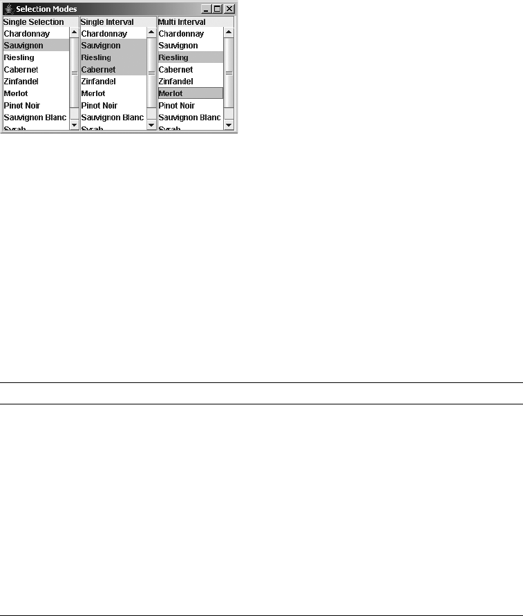
CHAPTER 13 ■ LIST MODEL CONTROLS 475
Figure 13-8. Visual representation of selection modes
To change the selection mode of a JList, set its selectionMode property to one of the
ListSelectionModel constants shown in Table 13-6. For instance, the following would change
a list to single-selection mode:
JList list = new JList(...);
list.setSelectionMode(ListSelectionModel.SINGLE_SELECTION);
The DefaultListSelectionModel class is the default implementation of the
ListSelectionModel interface. You can examine any of its nine properties, shown in
Table 13-7, to learn about the currently selected range.
The selection model can show you what is currently being used in the multiple-selection
mode when the selectionEmpty property is false. Simply ask each index between the minimum
and maximum selection indices if it’s selected with public boolean isSelectedIndex(int index).
Because multiple-selection mode supports noncontiguous areas, this is the only way to find
out what’s selected. However, the selectedIndices property of JList provides this information
without you needing to check it manually.
Table 13-7. DefaultListSelectionModel Properties
Property Name Data Type Access
anchorSelectionIndex int Read-write
leadAnchorNotificationEnabled boolean Read-write
leadSelectionIndex int Read-write
listSelectionListeners ListSelectionListener[ ] Read-only
maxSelectionIndex int Read-only
minSelectionIndex int Read-only
selectionEmpty boolean Read-only
selectionMode int Read-write
valueIsAdjusting boolean Read-write

476 CHAPTER 13 ■ LIST MODEL CONTROLS
Listening to JList Events with a ListSelectionListener
If you want to know when elements of a JList have been selected, you need to
attach a ListSelectionListener to the JList or the ListSelectionModel. The
addListSelectionListener() and removeListenerListener() methods of the JList
only delegate to the underlying ListSelectionModel. When the set of selected elements
changes, attached listener objects are notified. The interface definition follows:
public interface ListSelectionListener extends EventListener {
public void valueChanged(ListSelectionEvent e);
}
The ListSelectionEvent instance received by the listener describes the range of affected
elements for this selection event, as well as whether or not the selection is still changing, as
shown in Table 13-8. When a user is still altering selected elements, with a valueIsAdjusting
setting of true, you might want to delay performing costly operations such as drawing a high-
resolution graphics presentation.
In order to demonstrate selection with a JList, the program shown in Listing 13-8 adds a
JTextArea to a window to show the output of the selection listener. The listener prints out the
currently selected items by item position and value.
Listing 13-8. Rendering Complex List Cells Sample
import javax.swing.*;
import javax.swing.event.*;
import java.awt.*;
import java.io.*;
public class SelectingJListSample {
public static void main(String args[]) {
Runnable runner = new Runnable() {
public void run() {
String labels[] = {"Chardonnay", "Sauvignon", "Riesling", "Cabernet",
"Zinfandel", "Merlot", "Pinot Noir", "Sauvignon Blanc", "Syrah",
"Gewürztraminer"};
JFrame frame = new JFrame("Selecting JList");
frame.setDefaultCloseOperation(JFrame.EXIT_ON_CLOSE);
Table 13-8. ListSelectionEvent Properties
Property Name Data Type Access
firstIndex int Read-only
lastIndex int Read-only
valueIsAdjusting boolean Read-only

CHAPTER 13 ■ LIST MODEL CONTROLS 477
JList jlist = new JList(labels);
JScrollPane scrollPane1 = new JScrollPane(jlist);
frame.add(scrollPane1, BorderLayout.WEST);
final JTextArea textArea = new JTextArea();
textArea.setEditable(false);
JScrollPane scrollPane2 = new JScrollPane(textArea);
frame.add(scrollPane2, BorderLayout.CENTER);
ListSelectionListener listSelectionListener =
new ListSelectionListener() {
public void valueChanged(ListSelectionEvent listSelectionEvent) {
StringWriter sw = new StringWriter();
PrintWriter pw = new PrintWriter(sw);
pw.print("First index: " + listSelectionEvent.getFirstIndex());
pw.print(", Last index: " + listSelectionEvent.getLastIndex());
boolean adjust = listSelectionEvent.getValueIsAdjusting();
pw.println(", Adjusting? " + adjust);
if (!adjust) {
JList list = (JList)listSelectionEvent.getSource();
int selections[] = list.getSelectedIndices();
Object selectionValues[] = list.getSelectedValues();
for (int i=0, n=selections.length; i<n; i++) {
if (i==0) {
pw.print(" Selections: ");
}
pw.print(selections[i] + "/" + selectionValues[i] + " ");
}
pw.println();
}
textArea.append(sw.toString());
}
};
jlist.addListSelectionListener(listSelectionListener);
frame.setSize(350, 200);
frame.setVisible(true);
}
};
EventQueue.invokeLater(runner);
}
}
■Note If you know that a JList is in single-selection mode, you can get the currently selected item with
either the selectedIndex or selectedValue property.
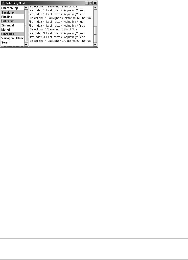
478 CHAPTER 13 ■ LIST MODEL CONTROLS
Figure 13-9 shows the appearance of the running program.
Figure 13-9. Listening for JList selections
The example in Listing 13-8 prints out only the currently selected items when it is not
doing a rapid update (when isAdjusting reports false). Otherwise, the program merely
reports the starting and ending range of selection changes, as well as the adjusting status. The
example examines the selectedIndices and selectedValues properties of JList to get an ordered
list of selected items. The selectedIndices and selectedValues arrays are ordered in the same
way, so a particular element of the data model will show up in the same position in both lists.
There’s no special selection event for double-clicking an item in the list. If you’re interested in
double-click events, you need to fall back to the AWT MouseEvent/MouseListener pair. Adding the
following code to the program in Listing 13-8 will add appropriate text to the JTextArea for
double-click events. The key method here is the public int locationToIndex(Point location)
method of JList, which attempts to map screen coordinates to list elements.
import java.awt.event.*;
...
MouseListener mouseListener = new MouseAdapter() {
public void mouseClicked(MouseEvent mouseEvent) {
JList theList = (JList)mouseEvent.getSource();
if (mouseEvent.getClickCount() == 2) {
int index = theList.locationToIndex(mouseEvent.getPoint());
if (index >= 0) {
Object o = theList.getModel().getElementAt(index);
textArea.append("Double-clicked on: " + o.toString());
textArea.append(System.getProperty("line.separator"));
}
}
}
};
jlist.addMouseListener(mouseListener);
■Note The JList class also provides the public Point indexToLocation(int index) method, which
produces the reverse behavior, returning a Point as the origin of the provided index.
CHAPTER 13 ■ LIST MODEL CONTROLS 479
Manually Selecting JList Events
In addition to detecting when a user selects items in a list, you can also programmatically select
or deselect items. If any ListSelectionListener objects are attached to the JList, they will also
be notified when the set of selected items is programmatically altered. The following methods
are available:
• For a single item, public void setSelectedValue(Object element, boolean shouldScroll)
selects the first item that matches the element. If the element wasn’t previously selected,
everything that was selected will be deselected first.
• For a range of items, public void setSelectedInterval(int index0, int index1)
selects an inclusive range.
• For adding a range of selected items to the already selected set, use public void
addSelectedInterval(int index0, int index1).
• You can clear all the selected items with the public void clearSelection() method.
• You can clear a range of selected items with the public void removeSelectedInterval
(int index0, int index1) method.
Displaying Multiple Columns
Typically, whenever you work with a JList, you present its choices within a single column.
While this is the usual manner of usage, the Swing JList control offers support for displaying
its choices within multiple columns. Through the help of the setLayoutOrientation() method,
you can set each JList orientation to lay out cells in columns horizontally or vertically.
JList.VERTICAL is the default setting where everything appears in one column.
To lay out cells horizontally, before going to next row, use the value JList.HORIZONTAL_WRAP.
For example, a list with nine elements would be displayed as shown here:
To lay out cells vertically, before going to next column, use the value JList.VERTICAL_WRAP.
For example, a list with nine elements would be displayed as shown here:
Set the visibleRowCount property of JList to control the number of rows. Otherwise, the
list width determines the row count for HORIZONTAL_WRAP and the list height for VERTICAL_WRAP.
012
345
678
036
147
258
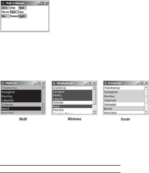
480 CHAPTER 13 ■ LIST MODEL CONTROLS
Figure 13-10 shows a sample JList with horizontal wrap, presented as a 3×3 grid. Notice that it
still supports multiple-selection mode.
Figure 13-10. A JList with horizontal wrap
Customizing a JList Look and Feel
Each installable Swing look and feel provides a different JList appearance and set of default
UIResource value settings for the component. Figure 13-11 shows the appearance of the JList
component for the preinstalled set of look and feel types: Motif, Windows, and Ocean.
Figure 13-11. JList under different look and feel types
The available set of UIResource-related properties for a JList is shown in Table 13-9. For
the JList component, there are 17 different properties.
Table 13-9. JList UIResource Elements
Property String Object Type
List.actionMap ActionMap
List.background Color
List.border Border
List.cellHeight Integer
List.cellRenderer ListCellRenderer
List.focusCellHighlightBorder Border
List.focusInputMap InputMap
List.focusInputMap.RightToLeft InputMap
List.font Font
List.foreground Color

CHAPTER 13 ■ LIST MODEL CONTROLS 481
As with most of the UIResource properties, the names of most of the properties are self-
explanatory. One property, List.timeFactor, requires a bit of extra descriptive text. By default,
the JList comes with behavior for keyboard selection. As you type, the JList will find the
entry that matches what you’ve typed so far. This is done with the help of the public int
getNextMatch(String prefix, int startIndex, Position.Bias bias) method. The “so far” bit
is controlled by the List.timeFactor setting. As long as the delay between keystrokes doesn’t
exceed the number of milliseconds specified by List.timeFactor (default of 1000), the new key
pressed is added to the prior keys. Once the factor is exceeded, the search string is reset.
Creating a Dual List Box
The example presented in this section creates a new Swing component called a DualListBox. The
primary purpose of a dual list box is to create two lists of choices: one to pick from and one that
makes up your result set. This works great when the initial choice list is sizable. Trying to multi-
select from a JList that contains many selections across multiple screens can be annoying,
especially if you happen to deselect what you’ve already selected because you didn’t have the
Shift or Ctrl key held down. With a dual list box, the user selects items in the first list and moves
them into the second. The user can easily scroll through the two lists without fear of accidentally
deselecting anything. Figure 13-12 shows how the DualListBox might look in use.
Figure 13-12. The DualListBox in action
List.lockToPositionOnScroll Boolean
List.rendererUseListColors Boolean
List.rendererUseUIBorder Boolean
List.selectionBackground Color
List.selectionForeground Color
List.timeFactor Long
ListUI String
Table 13-9. JList UIResource Elements (Continued)
Property String Object Type
482 CHAPTER 13 ■ LIST MODEL CONTROLS
To use this custom component, create it by calling the constructor, DualListBox
sdual = new DualListBox(), and then fill it with data by using either setSourceElements() or
addSourceElements(); each takes either a ListModel or an array argument. The add version
supplements the existing choices, whereas the set version clears out the choices first. When it’s
time to ask the component what the user selected, you can ask for an Iterator of the chosen
elements with destinationIterator(). Some properties you may want to change include
the following:
• The source choices’ title (Available Choices in the example)
• The destination choices’ title (Your Choices in the example)
• The source or destination list cell renderer
• The source or destination visible row count
• The source or destination foreground color or background color
The complete source code for this new DualListBox component follows. Listing 13-9
contains the first class SortedListModel, which provides a sorted ListModel. Internally, this
takes advantage of a TreeSet.
Listing 13-9. Sorted List Model
import javax.swing.*;
import java.util.*;
public class SortedListModel extends AbstractListModel {
SortedSet<Object> model;
public SortedListModel() {
model = new TreeSet<Object>();
}
public int getSize() {
return model.size();
}
public Object getElementAt(int index) {
return model.toArray()[index];
}
public void add(Object element) {
if (model.add(element)) {
fireContentsChanged(this, 0, getSize());
}
}
CHAPTER 13 ■ LIST MODEL CONTROLS 483
public void addAll(Object elements[]) {
Collection<Object> c = Arrays.asList(elements);
model.addAll(c);
fireContentsChanged(this, 0, getSize());
}
public void clear() {
model.clear();
fireContentsChanged(this, 0, getSize());
}
public boolean contains(Object element) {
return model.contains(element);
}
public Object firstElement() {
return model.first();
}
public Iterator iterator() {
return model.iterator();
}
public Object lastElement() {
return model.last();
}
public boolean removeElement(Object element) {
boolean removed = model.remove(element);
if (removed) {
fireContentsChanged(this, 0, getSize());
}
return removed;
}
}
Listing 13-10 shows the DualListBox source. The included main() method demonstrates
the component.
Listing 13-10. Dual List Box Sample
import java.awt.*;
import java.awt.event.*;
import javax.swing.*;
import java.util.Iterator;
public class DualListBox extends JPanel {
484 CHAPTER 13 ■ LIST MODEL CONTROLS
private static final Insets EMPTY_INSETS = new Insets(0,0,0,0);
private static final String ADD_BUTTON_LABEL = "Add >>";
private static final String REMOVE_BUTTON_LABEL = "<< Remove";
private static final String DEFAULT_SOURCE_CHOICE_LABEL =
"Available Choices";
private static final String DEFAULT_DEST_CHOICE_LABEL =
"Your Choices";
private JLabel sourceLabel;
private JList sourceList;
private SortedListModel sourceListModel;
private JList destList;
private SortedListModel destListModel;
private JLabel destLabel;
private JButton addButton;
private JButton removeButton;
public DualListBox() {
initScreen();
}
public String getSourceChoicesTitle() {
return sourceLabel.getText();
}
public void setSourceChoicesTitle(String newValue) {
sourceLabel.setText(newValue);
}
public String getDestinationChoicesTitle() {
return destLabel.getText();
}
public void setDestinationChoicesTitle(String newValue) {
destLabel.setText(newValue);
}
public void clearSourceListModel() {
sourceListModel.clear();
}
public void clearDestinationListModel() {
destListModel.clear();
}
public void addSourceElements(ListModel newValue) {
fillListModel(sourceListModel, newValue);
}
public void setSourceElements(ListModel newValue) {
clearSourceListModel();
addSourceElements(newValue);
}
public void addDestinationElements(ListModel newValue) {
fillListModel(destListModel, newValue);
}
CHAPTER 13 ■ LIST MODEL CONTROLS 485
private void fillListModel(SortedListModel model, ListModel newValues) {
int size = newValues.getSize();
for (int i=0; i<size; i++) {
model.add(newValues.getElementAt(i));
}
}
public void addSourceElements(Object newValue[]) {
fillListModel(sourceListModel, newValue);
}
public void setSourceElements(Object newValue[]) {
clearSourceListModel();
addSourceElements(newValue);
}
public void addDestinationElements(Object newValue[]) {
fillListModel(destListModel, newValue);
}
private void fillListModel(SortedListModel model, Object newValues[]) {
model.addAll(newValues);
}
public Iterator sourceIterator() {
return sourceListModel.iterator();
}
public Iterator destinationIterator() {
return destListModel.iterator();
}
public void setSourceCellRenderer(ListCellRenderer newValue) {
sourceList.setCellRenderer(newValue);
}
public ListCellRenderer getSourceCellRenderer() {
return sourceList.getCellRenderer();
}
public void setDestinationCellRenderer(ListCellRenderer newValue) {
destList.setCellRenderer(newValue);
}
public ListCellRenderer getDestinationCellRenderer() {
return destList.getCellRenderer();
}
public void setVisibleRowCount(int newValue) {
sourceList.setVisibleRowCount(newValue);
destList.setVisibleRowCount(newValue);
}
public int getVisibleRowCount() {
return sourceList.getVisibleRowCount();
}
486 CHAPTER 13 ■ LIST MODEL CONTROLS
public void setSelectionBackground(Color newValue) {
sourceList.setSelectionBackground(newValue);
destList.setSelectionBackground(newValue);
}
public Color getSelectionBackground() {
return sourceList.getSelectionBackground();
}
public void setSelectionForeground(Color newValue) {
sourceList.setSelectionForeground(newValue);
destList.setSelectionForeground(newValue);
}
public Color getSelectionForeground() {
return sourceList.getSelectionForeground();
}
private void clearSourceSelected() {
Object selected[] = sourceList.getSelectedValues();
for (int i=selected.length-1; i >= 0; --i) {
sourceListModel.removeElement(selected[i]);
}
sourceList.getSelectionModel().clearSelection();
}
private void clearDestinationSelected() {
Object selected[] = destList.getSelectedValues();
for (int i=selected.length-1; i >= 0; --i) {
destListModel.removeElement(selected[i]);
}
destList.getSelectionModel().clearSelection();
}
private void initScreen() {
setBorder(BorderFactory.createEtchedBorder());
setLayout(new GridBagLayout());
sourceLabel = new JLabel(DEFAULT_SOURCE_CHOICE_LABEL);
sourceListModel = new SortedListModel();
sourceList = new JList(sourceListModel);
add(sourceLabel,
new GridBagConstraints(0, 0, 1, 1, 0, 0, GridBagConstraints.CENTER,
GridBagConstraints.NONE, EMPTY_INSETS, 0, 0));
add(new JScrollPane(sourceList),
new GridBagConstraints(0, 1, 1, 5, .5, 1, GridBagConstraints.CENTER,
GridBagConstraints.BOTH, EMPTY_INSETS, 0, 0));
addButton = new JButton(ADD_BUTTON_LABEL);
add(addButton,
new GridBagConstraints(1, 2, 1, 2, 0, .25, GridBagConstraints.CENTER,
GridBagConstraints.NONE, EMPTY_INSETS, 0, 0));
addButton.addActionListener(new AddListener());
removeButton = new JButton(REMOVE_BUTTON_LABEL);
CHAPTER 13 ■ LIST MODEL CONTROLS 487
add(removeButton,
new GridBagConstraints(1, 4, 1, 2, 0, .25, GridBagConstraints.CENTER,
GridBagConstraints.NONE, new Insets(0,5,0,5), 0, 0));
removeButton.addActionListener(new RemoveListener());
destLabel = new JLabel(DEFAULT_DEST_CHOICE_LABEL);
destListModel = new SortedListModel();
destList = new JList(destListModel);
add(destLabel,
new GridBagConstraints(2, 0, 1, 1, 0, 0, GridBagConstraints.CENTER,
GridBagConstraints.NONE, EMPTY_INSETS, 0, 0));
add(new JScrollPane(destList),
new GridBagConstraints(2, 1, 1, 5, .5, 1.0, GridBagConstraints.CENTER,
GridBagConstraints.BOTH, EMPTY_INSETS, 0, 0));
}
private class AddListener implements ActionListener {
public void actionPerformed(ActionEvent e) {
Object selected[] = sourceList.getSelectedValues();
addDestinationElements(selected);
clearSourceSelected();
}
}
private class RemoveListener implements ActionListener {
public void actionPerformed(ActionEvent e) {
Object selected[] = destList.getSelectedValues();
addSourceElements(selected);
clearDestinationSelected();
}
}
public static void main(String args[]) {
Runnable runner = new Runnable() {
public void run() {
JFrame frame = new JFrame("Dual List Box Tester");
frame.setDefaultCloseOperation(JFrame.EXIT_ON_CLOSE);
DualListBox dual = new DualListBox();
dual.addSourceElements(
new String[] {"One", "Two", "Three"});
dual.addSourceElements(
new String[] {"Four", "Five", "Six"});
dual.addSourceElements(
new String[] {"Seven", "Eight", "Nine"});
dual.addSourceElements(
new String[] {"Ten", "Eleven", "Twelve"});
dual.addSourceElements(
new String[] {"Thirteen", "Fourteen", "Fifteen"});
488 CHAPTER 13 ■ LIST MODEL CONTROLS
dual.addSourceElements(
new String[] {"Sixteen", "Seventeen", "Eighteen"});
dual.addSourceElements(
new String[] {"Nineteen", "Twenty", "Thirty"});
frame.add(dual, BorderLayout.CENTER);
frame.setSize(400, 300);
frame.setVisible(true);
}
};
EventQueue.invokeLater(runner);
}
}
Adding Element-Level Tooltips to List Items
As described in Chapter 4, all Swing components support displaying tooltip text. By calling the
setToolTipText() method of a component, you can display any single text string over that
component. In the case of a JList component (or for that matter, any component that contains
multiple items such as a JTree or JTable), this single tooltip text string may not be sufficient.
You may wish to display a different tip over each item in a component.
Displaying item-level tips takes a little more work. To display different tooltip text over
each item, you must create a subclass of JList. From within this subclass, you must manually
register the component with the ToolTipManager. This is normally done for you when you call
setToolTipText(). But, because you won’t be calling this method, you must manually notify
the manager, as follows:
ToolTipManager.sharedInstance().registerComponent(this);
After you notify the ToolTipManager, the manager will then notify the component when-
ever the mouse moves over the component. This allows you to override the public String
getToolTipText(MouseEvent mouseEvent) method to provide the appropriate tip for the item
under the mouse pointer. Using some kind of Hashtable,HashMap, or Properties list allows you
to map the item the mouse is over to item-specific tooltip text.
public String getToolTipText(MouseEvent event) {
Point p = event.getPoint();
int location = locationToIndex(p);
String key = (String)model.getElementAt(location);
String tip = tipProps.getProperty(key);
return tip;
}
Figure 13-13 shows how the PropertiesList example class demonstrates various tooltips
based on whichever element the mouse pointer is resting over. The complete source for the
example follows in Listing 13-11.

CHAPTER 13 ■ LIST MODEL CONTROLS 489
Figure 13-13. A JList with different element-level tooltip text
Listing 13-11. Custom Tooltips for List Elements
import java.awt.*;
import java.awt.event.*;
import java.util.*;
import javax.swing.*;
public class PropertiesList extends JList {
SortedListModel model;
Properties tipProps;
public PropertiesList(Properties props) {
model = new SortedListModel();
setModel(model);
ToolTipManager.sharedInstance().registerComponent(this);
tipProps = props;
addProperties(props);
}
private void addProperties(Properties props) {
// Load
Enumeration names = props.propertyNames();
while (names.hasMoreElements()) {
model.add(names.nextElement());
}
}
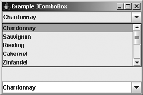
490 CHAPTER 13 ■ LIST MODEL CONTROLS
public String getToolTipText(MouseEvent event) {
Point p = event.getPoint();
int location = locationToIndex(p);
String key = (String)model.getElementAt(location);
String tip = tipProps.getProperty(key);
return tip;
}
public static void main (String args[]) {
Runnable runner = new Runnable() {
public void run() {
JFrame frame = new JFrame("Custom Tip Demo");
frame.setDefaultCloseOperation(JFrame.EXIT_ON_CLOSE);
Properties props = System.getProperties();
PropertiesList list = new PropertiesList(props);
JScrollPane scrollPane = new JScrollPane(list);
frame.add(scrollPane);
frame.setSize(300, 300);
frame.setVisible(true);
}
};
EventQueue.invokeLater(runner);
}
}
JComboBox Class
The JComboBox component of the Swing component set is a multiple-part component that
allows a user to choose from a predefined set of choices with the help of a pull-down list. In its
basic configuration, a JComboBox acts like a JLabel to display the current user selection. Embedded
within the JLabel is a pop-up menu containing choices within a JList control. When the
desired choice isn’t available, the JComboBox can use a JTextField to enter a new choice. The
JList part is automatically embedded within a JScrollPane when desired; you don’t need to
manually create the JList or place it in the JScrollPane. In addition, the text field for editing is
disabled by default, permitting a user to select from the set of predefined choices only. Figure 13-14
illustrates two JComboBox components: one that is not editable showing its list of choices, and
another that is editable and not showing its choices.
Figure 13-14. Sample JComboBox components
CHAPTER 13 ■ LIST MODEL CONTROLS 491
Four essential elements define the JComboBox component and its implementation:
• A data model for holding the JComboBox data, as defined by the ListModel interface
• A cell renderer for drawing the elements of the JComboBox, as described by the
ListCellRenderer interface
• An editor for entering choices not part of the predefined data model, as defined by the
ComboBoxEditor interface
• A keystroke manager for handling keyboard input to select elements of the JComboBox, as
described by the KeySelectionManager interface
Many of the JComboBox capabilities are shared with the JList component. This isn’t accidental;
the two components are fairly similar. Let’s now look at the JComboBox in more detail.
Creating JComboBox Components
Like the JList component, the JComboBox component has four constructors, allowing you to
create one based on your initial data structure. Unlike the JList component, the default model
used by the array and Vector constructor permits adding and removing data elements.
public JComboBox()
JComboBox comboBox = new JComboBox();
public JComboBox(Object listData[])
String labels[] = { "Chardonnay", "Sauvignon", "Riesling", "Cabernet", "Zinfandel",
"Merlot", "Pinot Noir", "Sauvignon Blanc", "Syrah", "Gewürztraminer"};
JComboBox comboBox = new JComboBox(labels);
public JComboBox(Vector listData)
Vector vector = aBufferedImage.getSources();
JComboBox comboBox = new JComboBox(vector);
public JComboBox(ComboBoxModel model)
ResultSet results = aJDBCStatement.executeQuery("SELECT columnName FROM tableName");
DefaultComboBoxModel model = new DefaultComboBoxModel();
while (result.next())
model.addElement(results.getString(1));
JComboBox comboBox = new JComboBox(model);
JComboBox Properties
After you create a JComboBox component, you can modify each of its many properties. Table 13-10
shows the 22 properties of JComboBox.

492 CHAPTER 13 ■ LIST MODEL CONTROLS
The significant properties of the JComboBox are concerned with the display of the pop-up
list. You can control the maximum number of visible entries in the pop-up list by setting the
maximumRowCount property. The lightWeightPopupEnabled property setting helps determine the
type of window to use when displaying the pop-up menu of choices. If the component fits
completely within the top-level window of the program, the component will be lightweight.
If it doesn’t fit, it will be heavyweight. If you’re mixing AWT and Swing components in
a program, you can force the pop-up menu of choices to be heavyweight by setting the
lightWeightPopupEnabled property to true. This will force the pop-up to appear above other
components. The remaining property related to the pop-up list is the popupVisible property,
which allows you to programmatically display the pop-up list.
Table 13-10. JComboBox Properties
Property Name Data Type Access
accessibleContext AccessibleContext Read-only
action Action Read-write bound
actionCommand String Read-write
actionListeners ActionListener[ ] Read-only
editable boolean Read-write bound
editor ComboBoxEditor Read-write bound
enabled boolean Write-only bound
itemCount int Read-only
itemListeners ItemListener[ ] Read-only
keySelectionManager JComboBox.KeySelectionManager Read-write
lightWeightPopupEnabled boolean Read-write
maximumRowCount int Read-write bound
model ComboBoxModel Read-write bound
popupMenuListeners PopupMenuListener[ ] Read-only
popupVisible boolean Read-write
prototypeDisplayValue Object Read-write bound
renderer ListCellRenderer Read-write bound
selectedIndex int Read-write
selectedItem Object Read-write
selectedObjects Object[ ] Read-only
UI ComboBoxUI Read-write
UIClassID String Read-only
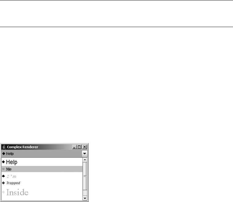
CHAPTER 13 ■ LIST MODEL CONTROLS 493
■Note Besides setting the popupVisible property, you can use the public void hidePopup() and
public void showPopup() methods to toggle the pop-up list’s visibility status.
Rendering JComboBox Elements
The rendering of elements within a JComboBox is done with a ListCellRenderer. This is the same
renderer that is used for a JList component. Once you’ve created a renderer for either one of
these two components, you can use that renderer for the other component. To reuse the
ComplexCellRenderer from earlier in the chapter (Listing 13-6), you could add the following
lines to the ComplexRenderingSample example (Listing 13-7) to have the two components share
the same renderer.
JComboBox comboBox = new JComboBox(elements);
comboBox.setRenderer(renderer);
frame.add(comboBox, BorderLayout.NORTH);
The result of adding these lines is shown in Figure 13-15.
Figure 13-15. A JComboBox with a custom renderer
Not all renderers will work as expected with both the JComboBox and JList components.
For instance, the FocusedTitleListCellRenderer demonstrated earlier in Figure 13-6 wouldn’t
show the “Focused” title border in a JComboBox because the choices never had the input focus.
In addition, different components may have different default colors (a different unselected
background color, in this case). It may be necessary to ask what color the component normally
would be rendered in, and then act accordingly.
Selecting JComboBox Elements
The JComboBox component supports at least three different events related to selection.
You can listen for keyboard input to support key selection with the help of the JComboBox.
KeySelectionManager class. You can also listen with an ActionListener or an ItemListener
to find out when the selected item of the JComboBox changes.
If you want to programmatically select an element, use public void
setSelectedItem(Object element) or public void setSelectedIndex(int index).

494 CHAPTER 13 ■ LIST MODEL CONTROLS
■Tip To programmatically deselect the current choice of a JComboBox, call setSelectedIndex() with an
argument of –1.
Listening to Keyboard Events with a KeySelectionManager
The JComboBox has a public inner interface that’s fairly important. KeySelectionManager, and its
default implementation, manages selection from the keyboard of items within the JComboBox.
The default manager locates the next element that corresponds to the pressed key. It has
memory, so if you have entries that start with similar prefixes, users can continue typing until
there is enough of a match to be unique. If you don’t like this behavior, you can either turn it
off or create a new key selection manager.
■Note The KeySelectionManager works only in combo boxes that are not editable.
If you want to turn off the key-selection capabilities, you can’t do so by simply setting the
keySelectionManager property to null. Instead, you must create an implementation of the
interface with an appropriate method. The single method of the interface is public int
selectionForKey(char aKey, ComboBoxModel aModel). In the event the pressed key doesn’t
match any elements, the routine needs to return –1. Otherwise, it should return the position of
the matched element. So, to ignore keyboard input, the routine should always return –1, as
shown here:
JComboBox.KeySelectionManager manager =
new JComboBox.KeySelectionManager() {
public int selectionForKey(char aKey, ComboBoxModel aModel) {
return -1;
}
};
aJcombo.setKeySelectionManager(manager);
Listening to JComboBox Events with an ActionListener
The primary means of listening for selection events is through an ActionListener, possibly set
with setAction(Action). It will tell you when an element has been selected within a JComboBox.
Unfortunately, the listener doesn’t know which element is selected.
■Note Setting the ActionListener through setAction(Action) also configures the tooltip text and the
enabled state of the JComboBox based on the Action.

CHAPTER 13 ■ LIST MODEL CONTROLS 495
Because the ActionListener can’t identify the selected element, it must ask the JComboBox
that served as the source of the event. To determine the selected element from the JComboBox,
use either getSelectedItem() or getSelectedIndex(). If an index of –1 is returned, then the
currently selected item isn’t part of the model. This seemingly impossible situation happens
when the JComboBox is editable and the user has entered a value that isn’t part of the original
model.
■Note The text string comboBoxChanged is the action command for the ActionEvent sent to the
ActionListener when an item within a JComboBox changes.
Listening to JComboBox Events with an ItemListener
If you use an ItemListener to find out when the selected item within a JComboBox changes,
you’ll also learn which item was deselected.
To demonstrate both the ActionListener and the ItemListener, the program shown in
Listing 13-12 attaches both of them to the same JComboBox. The ActionListener prints its
“action command,” as well as the currently selected item. The ItemListener prints the affected
item and the state change for it, as well as the currently selected item.
Listing 13-12. JComboBox Selection Sample
import javax.swing.*;
import javax.swing.event.*;
import java.awt.*;
import java.awt.event.*;
import java.io.*;
public class SelectingComboSample {
static private String selectedString(ItemSelectable is) {
Object selected[] = is.getSelectedObjects();
return ((selected.length == 0) ? "null" : (String)selected[0]);
}
public static void main(String args[]) {
Runnable runner = new Runnable() {
public void run() {
String labels[] = {"Chardonnay", "Sauvignon", "Riesling", "Cabernet",
"Zinfandel", "Merlot", "Pinot Noir", "Sauvignon Blanc", "Syrah",
"Gewürztraminer"};
JFrame frame = new JFrame("Selecting JComboBox");
frame.setDefaultCloseOperation(JFrame.EXIT_ON_CLOSE);
JComboBox comboBox = new JComboBox(labels);
frame.add(comboBox, BorderLayout.SOUTH);
496 CHAPTER 13 ■ LIST MODEL CONTROLS
final JTextArea textArea = new JTextArea();
textArea.setEditable(false);
JScrollPane sp = new JScrollPane(textArea);
frame.add(sp, BorderLayout.CENTER);
ItemListener itemListener = new ItemListener() {
public void itemStateChanged(ItemEvent itemEvent) {
StringWriter sw = new StringWriter();
PrintWriter pw = new PrintWriter(sw);
int state = itemEvent.getStateChange();
String stateString =
((state == ItemEvent.SELECTED) ? "Selected" : "Deselected");
pw.print("Item: " + itemEvent.getItem());
pw.print(", State: " + stateString);
ItemSelectable is = itemEvent.getItemSelectable();
pw.print(", Selected: " + selectedString(is));
pw.println();
textArea.append(sw.toString());
}
};
comboBox.addItemListener(itemListener);
ActionListener actionListener = new ActionListener() {
public void actionPerformed(ActionEvent actionEvent) {
StringWriter sw = new StringWriter();
PrintWriter pw = new PrintWriter(sw);
pw.print("Command: " + actionEvent.getActionCommand());
ItemSelectable is = (ItemSelectable)actionEvent.getSource();
pw.print(", Selected: " + selectedString(is));
pw.println();
textArea.append(sw.toString());
}
};
comboBox.addActionListener(actionListener);
frame.setSize(400, 200);
frame.setVisible(true);
}
};
EventQueue.invokeLater(runner);
}
}
Figure 13-16 shows the results after the program has been running for some time.
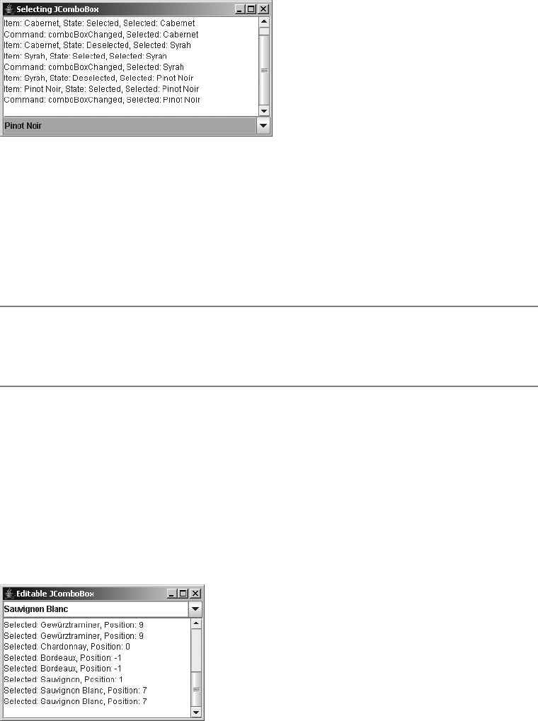
CHAPTER 13 ■ LIST MODEL CONTROLS 497
Figure 13-16. Listening for JComboBox selections
Listening to JComboBox Events with a ListDataListener
You can attach a ListDataListener to the data model of the JComboBox. This listener would then
be notified when the selected element of the model changes. Unfortunately, the listener would
also be notified of other data model changes. In other words, using a ListDataListener to find
out when an element of a JComboBox is selected is not a recommended option.
■Note Mouse movement and cursor movement events within a JComboBox don’t change the selected
entry; mouse release events do change the selected entry. Any registered listeners would be notified when a
selected mouse button is released over an element within the JComboBox pop-up list.
Editing JComboBox Elements
You may want to use a combo box like a text field in which you list the most likely text input
from the user, but also allow the user to enter something else. By enabling the editable property
of the JComboBox, you’ve added this capability. To demonstrate, Figure 13-17 shows an editable
JComboBox. The window also contains a text area that reports the current selected item and
index. Even if you manually enter one of the choices within the JComboBox,getSelectedIndex()
will report the proper position. Remember that if you enter a value that’s not present,
getSelectedIndex() returns –1.
Figure 13-17. Using an editable JComboBox
The source for the example in Figure 13-17 is shown in Listing 13-13.
498 CHAPTER 13 ■ LIST MODEL CONTROLS
Listing 13-13. Editable JComboBox Sample
import java.awt.*;
import javax.swing.*;
import java.awt.event.*;
public class EditComboBox {
public static void main(String args[]) {
Runnable runner = new Runnable() {
public void run() {
String labels[] = {"Chardonnay", "Sauvignon", "Riesling", "Cabernet",
"Zinfandel", "Merlot", "Pinot Noir", "Sauvignon Blanc", "Syrah",
"Gewürztraminer"};
JFrame frame = new JFrame("Editable JComboBox");
frame.setDefaultCloseOperation(JFrame.EXIT_ON_CLOSE);
final JComboBox comboBox = new JComboBox(labels);
comboBox.setMaximumRowCount(5);
comboBox.setEditable(true);
frame.add(comboBox, BorderLayout.NORTH);
final JTextArea textArea = new JTextArea();
JScrollPane scrollPane = new JScrollPane(textArea);
frame.add(scrollPane, BorderLayout.CENTER);
ActionListener actionListener = new ActionListener() {
public void actionPerformed(ActionEvent actionEvent) {
textArea.append("Selected: " + comboBox.getSelectedItem());
textArea.append(", Position: " + comboBox.getSelectedIndex());
textArea.append(System.getProperty("line.separator"));
}
};
comboBox.addActionListener(actionListener);
frame.setSize(300, 200);
frame.setVisible(true);
}
};
EventQueue.invokeLater(runner);
}
}
By default, the input field provided for editing is a JTextField. The default JTextField
serves as a good editor if your data model consists of text strings. However, once your model
contains a different type of object (for example, colors), you need to provide a different editor.
By default, once you type in the text field (editing the results of toString() for your element),
the object is treated as a String. Technically, a different editor isn’t always necessary. If you can

CHAPTER 13 ■ LIST MODEL CONTROLS 499
parse the contents of the text field as a string to the proper data type, then do that. But, if you
want to restrict the input in any manner (for example, allow only numeric input) or provide a
better input mechanism, you must provide your own editor. The interface that defines the
necessary behavior is called ComboBoxEditor and its definition is shown here.
public interface ComboBoxEditor {
// Properties
public Component getEditorComponent();
public Object getItem();
public void setItem(Object anObject);
// Listeners
public void addActionListener(ActionListener l);
public void removeActionListener(ActionListener l);
// Other methods
public void selectAll();
}
■Note The default editor is the BasicComboBoxEditor implementation in the javax.swing.plaf.basic
package.
The add/remove listener methods are necessary for notifying any listeners when the
ComboBoxEditor value has changed. It’s not necessary for you to add a listener, and normally
you won’t do that. Nevertheless, the methods are part of the interface, so they’ll need to be
implemented if you want to provide your own editor.
The getEditorComponent() method returns the Component object used for the editor. You
can use either an AWT or a Swing component for the editor (for example, a JColorChooser for
color selection). The selectAll() method is called when the editor is first shown. It tells the
editor to select everything within it. Selecting everything allows a user to merely type over the
current input for the default JTextField case. Some editors may not require use of this method.
The item property methods demand the most work when you’re providing a custom
editor. You’ll need to supply a method to map the specific pieces of the Object subclass to the
components in order to present the data to be edited. You then need to get the data from the
editor so that the data can be stored back in an instance of the original object.
To demonstrate, the source code in Listing 13-14 is a ComboBoxEditor for the Color class.
A custom editor is necessary because there’s no automatic way to parse the results of editing
the default string shown for a Color. This editor will use a JColorChooser for the user to pick
a new color value. The getItem() method needs to return only the current value, a Color.
The setItem() method needs to convert the object passed to a Color object; the argument to
setItem() is an Object. The setItem() method could be made to accept only Color arguments.
However, for this example, any string that’s decodable with the Color.decode() method is also
supported.
500 CHAPTER 13 ■ LIST MODEL CONTROLS
Listing 13-14. A Color Combo Box Editor
import java.awt.*;
import javax.swing.*;
import javax.swing.event.*;
import java.awt.event.*;
public class ColorComboBoxEditor implements ComboBoxEditor {
final protected JButton editor;
protected EventListenerList listenerList = new EventListenerList();
public ColorComboBoxEditor(Color initialColor) {
editor = new JButton("");
editor.setBackground(initialColor);
ActionListener actionListener = new ActionListener() {
public void actionPerformed(ActionEvent e) {
Color currentBackground = editor.getBackground();
Color color = JColorChooser.showDialog(
editor, "Color Chooser", currentBackground);
if ((color != null) && (currentBackground != color)) {
editor.setBackground(color);
fireActionEvent(color);
}
}
};
editor.addActionListener(actionListener);
}
public void addActionListener(ActionListener l) {
listenerList.add(ActionListener.class, l);
}
public Component getEditorComponent() {
return editor;
}
public Object getItem() {
return editor.getBackground();
}
public void removeActionListener(ActionListener l) {
listenerList.remove(ActionListener.class, l);
}
public void selectAll() {
// Ignore
}
public void setItem(Object newValue) {
if (newValue instanceof Color) {
Color color = (Color)newValue;
editor.setBackground(color);
} else {
CHAPTER 13 ■ LIST MODEL CONTROLS 501
// Try to decode
try {
Color color = Color.decode(newValue.toString());
editor.setBackground(color);
} catch (NumberFormatException e) {
// Ignore - value unchanged
}
}
}
protected void fireActionEvent(Color color) {
Object listeners[] = listenerList.getListenerList();
for (int i = listeners.length-2; i>=0; i-=2) {
if (listeners[i] == ActionListener.class) {
ActionEvent actionEvent =
new ActionEvent(editor, ActionEvent.ACTION_PERFORMED, color.toString());
((ActionListener)listeners[i+1]).actionPerformed(actionEvent);
}
}
}
}
To use the new editor, you need to associate it with a JComboBox. After you change the
EditComboBox example shown earlier (Listing 13-13) to make the data model consist of an array
of Color objects, you can then install the editor by adding the following:
Color color = (Color)comboBox.getSelectedItem();
ComboBoxEditor editor = new ColorComboBoxEditor(color);
comboBox.setEditor(editor);
A complete test program follows in Listing 13-15. It’s different from the EditComboBox
because below the JComboBox is a JLabel that stays in sync with the currently selected color of
the JComboBox. There’s also a custom cell renderer that sets the background color to the value
of the cell.
Listing 13-15. Custom JComboBox Editor Sample
import java.awt.*;
import javax.swing.*;
import java.awt.event.*;
public class ColorComboBox {
static class ColorCellRenderer implements ListCellRenderer {
protected DefaultListCellRenderer defaultRenderer =
new DefaultListCellRenderer();
// Width doesn't matter as the combo box will size
private final static Dimension preferredSize = new Dimension(0, 20);
public Component getListCellRendererComponent(JList list, Object value,
int index, boolean isSelected, boolean cellHasFocus) {
JLabel renderer = (JLabel)defaultRenderer.getListCellRendererComponent(
list, value, index, isSelected, cellHasFocus);
502 CHAPTER 13 ■ LIST MODEL CONTROLS
if (value instanceof Color) {
renderer.setBackground((Color)value);
}
renderer.setPreferredSize(preferredSize);
return renderer;
}
}
public static void main(String args[]) {
Runnable runner = new Runnable() {
public void run() {
Color colors[] = {Color.BLACK, Color.BLUE, Color.CYAN, Color.DARK_GRAY,
Color.GRAY, Color.GREEN, Color.LIGHT_GRAY, Color.MAGENTA,
Color.ORANGE, Color.PINK, Color.RED, Color.WHITE, Color.YELLOW};
JFrame frame = new JFrame("Color JComboBox");
frame.setDefaultCloseOperation(JFrame.EXIT_ON_CLOSE);
final JComboBox comboBox = new JComboBox(colors);
comboBox.setMaximumRowCount(5);
comboBox.setEditable(true);
comboBox.setRenderer(new ColorCellRenderer());
Color color = (Color)comboBox.getSelectedItem();
ComboBoxEditor editor = new ColorComboBoxEditor(color);
comboBox.setEditor(editor);
frame.add(comboBox, BorderLayout.NORTH);
final JLabel label = new JLabel();
label.setOpaque(true);
label.setBackground((Color)comboBox.getSelectedItem());
frame.add(label, BorderLayout.CENTER);
ActionListener actionListener = new ActionListener() {
public void actionPerformed(ActionEvent actionEvent) {
Color selectedColor = (Color)comboBox.getSelectedItem();
label.setBackground(selectedColor);
}
};
comboBox.addActionListener(actionListener);
frame.setSize(300, 200);
frame.setVisible(true);
}
};
EventQueue.invokeLater(runner);
}
}
Figure 13-18 shows the screen and a visible editor.
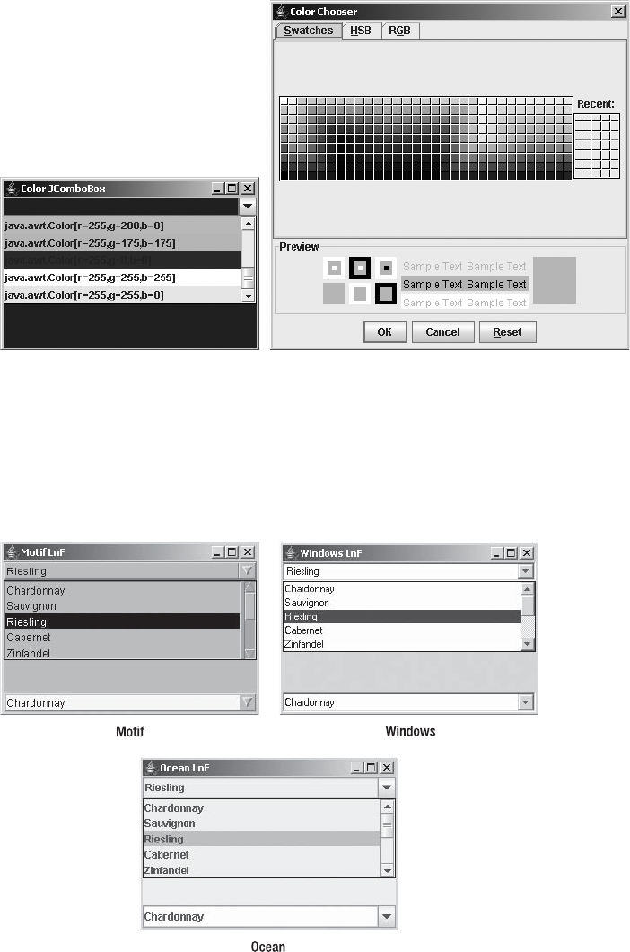
CHAPTER 13 ■ LIST MODEL CONTROLS 503
Figure 13-18. Using a custom ComboBoxEditor
Customizing a JComboBox Look and Feel
Each installable Swing look and feel provides a different JComboBox appearance and set of
default UIResource value settings for the component. Figure 13-19 shows the appearance of the
JComboBox component for the preinstalled set of look and feel types: Motif, Windows, and Ocean.
Figure 13-19. JComboBox under different look and feel types

504 CHAPTER 13 ■ LIST MODEL CONTROLS
The available set of UIResource-related properties for a JComboBox is shown in Table 13-11.
The JComboBox component has 21 different properties.
Changing the pop-up icon is one example of customizing the look and feel. To do this,
you’ll need to install a new user interface. (This process is discussed at length in Chapter 20.)
Basically, you inherit the default functionality from either the BasicComboBoxUI or MetalComboBoxUI
user interface delegate, and then override only the protected JButton createArrowButton()
method.
Figure 13-20 shows the results of this change to the JComboBox user interface.
Table 13-11. JComboBox UIResource Elements
Property String Object Type
ComboBox.actionMap ActionMap
ComboBox.ancestorInputMap InputMap
ComboBox.background Color
ComboBox.border Border
ComboBox.buttonBackground Color
ComboBox.buttonDarkShadow Color
ComboBox.buttonHighlight Color
ComboBox.buttonShadow Color
ComboBox.control Color
ComboBox.controlForeground Color
ComboBox.disabledBackground Color
ComboBox.disabledForeground Color
ComboBox.font Font
ComboBox.foreground Color
ComboBox.rendererUseListColors Boolean
ComboBox.selectionBackground Color
ComboBox.selectionForeground Color
ComboBox.showPopupOnNavigation Boolean
ComboBox.timeFactor Long
ComboBox.togglePopupText String
ComboBoxUI String
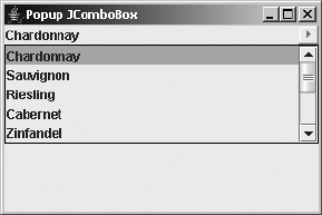
CHAPTER 13 ■ LIST MODEL CONTROLS 505
Figure 13-20. Altering the JComboBox pop-up button
The source for the JComboBox example shown in Figure 13-20 follows in Listing 13-16.
Listing 13-16. Custom JComboBox Pop-up Button
import java.awt.*;
import javax.swing.*;
import javax.swing.plaf.*;
import javax.swing.plaf.basic.*;
public class PopupComboSample {
public static void main(String args[]) {
Runnable runner = new Runnable() {
public void run() {
String labels[] = {"Chardonnay", "Sauvignon", "Riesling", "Cabernet",
"Zinfandel", "Merlot", "Pinot Noir", "Sauvignon Blanc", "Syrah",
"Gewürztraminer"};
JFrame frame = new JFrame("Popup JComboBox");
frame.setDefaultCloseOperation(JFrame.EXIT_ON_CLOSE);
JComboBox comboBox = new JComboBox(labels);
comboBox.setMaximumRowCount(5);
comboBox.setUI((ComboBoxUI)MyComboBoxUI.createUI(comboBox));
frame.add(comboBox, BorderLayout.NORTH);
frame.setSize (300, 200);
frame.setVisible (true);
}
};
EventQueue.invokeLater(runner);
}
static class MyComboBoxUI extends BasicComboBoxUI {
public static ComponentUI createUI(JComponent c) {
return new MyComboBoxUI();
}
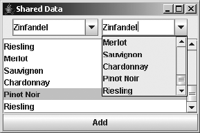
506 CHAPTER 13 ■ LIST MODEL CONTROLS
protected JButton createArrowButton() {
JButton button = new BasicArrowButton(BasicArrowButton.EAST);
return button;
}
}
}
Sharing the Data Model for a JComboBox
and JList
You may have noticed several similarities between the parts that make up the JComboBox and
JList. You can use the same data model and same renderer for both components. You’ve
already seen how to share a renderer between components, in the “Rendering JComboBox
Elements” section earlier in this chapter. The example presented in this section demonstrates
how you could share the same data model across several components.
The example has two editable combo boxes and one JList, all sharing one data model. It
also presents a button that you can click to dynamically add items to the data model. Because
the data model will be associated with several components, you’ll notice that each of them has
additional options to choose from after selecting the button. Figure 13-21 shows what the
screen might look like after adding several elements.
Figure 13-21. Sharing a data model across components
Listing 13-17 shows the source for the shared data model example.
Listing 13-17. Shared Data Model
import java.awt.*;
import java.awt.event.*;
import javax.swing.*;
public class SharedDataSample {
public static void main(String args[]) {
Runnable runner = new Runnable() {
public void run() {
final String labels[] = {"Chardonnay", "Sauvignon", "Riesling",
"Cabernet", "Zinfandel", "Merlot", "Pinot Noir", "Sauvignon Blanc",
"Syrah", "Gewürztraminer"};

CHAPTER 13 ■ LIST MODEL CONTROLS 507
final DefaultComboBoxModel model = new DefaultComboBoxModel(labels);
JFrame frame = new JFrame("Shared Data");
frame.setDefaultCloseOperation(JFrame.EXIT_ON_CLOSE);
JPanel panel = new JPanel();
JComboBox comboBox1 = new JComboBox(model);
comboBox1.setMaximumRowCount(5);
comboBox1.setEditable(true);
JComboBox comboBox2 = new JComboBox(model);
comboBox2.setMaximumRowCount(5);
comboBox2.setEditable(true);
panel.add(comboBox1);
panel.add(comboBox2);
frame.add(panel, BorderLayout.NORTH);
JList jlist = new JList(model);
JScrollPane scrollPane = new JScrollPane(jlist);
frame.add(scrollPane, BorderLayout.CENTER);
JButton button = new JButton("Add");
frame.add(button, BorderLayout.SOUTH);
ActionListener actionListener = new ActionListener() {
public void actionPerformed(ActionEvent actionEvent) {
int index = (int)(Math.random()*labels.length);
model.addElement(labels[index]);
}
};
button.addActionListener(actionListener);
frame.setSize(300, 200);
frame.setVisible(true);
}
};
EventQueue.invokeLater(runner);
}
}
■Note When running the program shown in Listing 13-17, if you share a data model across multiple
JComboBox components, there can’t be a different selected element within each component. When an
element is “selected” in one, it’s selected in all. This seems to be a bug in the MVC design of the JComboBox.
In addition, because a ListSelectionModel manages selection for the JList, changing the selected
element of a JComboBox has no effect on the selected elements within a JList sharing the same model.
508 CHAPTER 13 ■ LIST MODEL CONTROLS
Summary
This chapter has demonstrated how to use Swing’s JList and JComboBox components. You’ve
seen how both components support their own data model, renderer, selection capabilities,
and even a custom editor for the JComboBox component. Although all these capabilities are
customizable, each of the components is readily usable with its default configuration.
In Chapter 14, you will start to explore the Swing text components, including JTextField
and JTextArea.
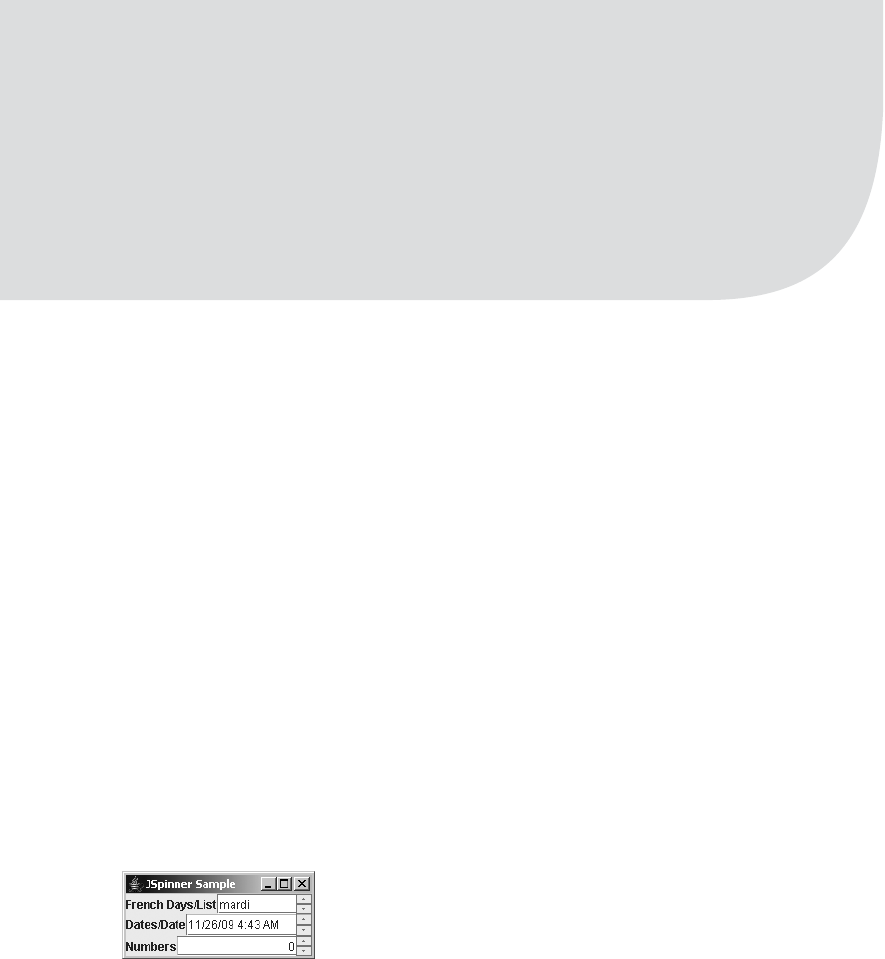
509
■ ■ ■
CHAPTER 14
Spinner Model Controls
In the previous chapter, you learned how to work with the basic list controls: JList and
JComboBox. In this chapter, you will move on to the JSpinner component, introduced with
the 1.4 version of the JDK.
JSpinner Class
The JSpinner works like a cross between a JList or JComboBox component with a
JFormattedTextField. In either the JList and JComboBox control, the user can select input from
a predetermined set of values. The JSpinner also allows this type of selection. The other half of
the component is the JFormattedTextField. How to display or enter the value isn’t controlled
by a list cell renderer, as in a JList; instead, you get a JFormattedTextField for entry and a
couple of arrows on the side to navigate through the different values available for the text field.
(The JFormattedTextField is covered in Chapters 15 and 16.)
Figure 14-1 shows what the spinner looks like for several different types of input. At the top
of Figure 14-1 is a JSpinner with the days of the week in French provided to a SpinnerListModel.
In the middle, you have a JSpinner for a date via the SpinnerDateModel class. On the bottom is
the JSpinner usage with the SpinnerNumberModel. Each of these three work in its own myste-
rious way, as you’ll learn later in this chapter.
Figure 14-1. JSpinner examples
Many classes are involved when creating and manipulating JSpinner components, foremost
the JSpinner class itself. The primary two sets of classes involved are the SpinnerModel interface,
for containing the set of selectable items for the control, and, the JSpinner.DefaultEditor
implementations, for catching all the selections. Thankfully, many of the other classes
involved work behind the scenes, so, for example, once you provide the numeric range in a
SpinnerNumberModel and associate the spinner with its model, your work is essentially done.

510 CHAPTER 14 ■ SPINNER MODEL CONTROLS
Creating JSpinner Components
The JSpinner class includes two constructors for initializing the component:
public JSpinner()
JSpinner spinner = new JSpinner();
public JSpinner(SpinnerModel model)
SpinnerModel model = new SpinnerListModel(args);
JSpinner spinner = new JSpinner(model);
You can start with no data model and associate it later with the tracking method of JSpinner.
Alternatively, you can start up the component with a full model, in an implementation of the
SpinnerModel interface, of which three concrete subclasses are available: SpinnerDateModel,
SpinnerListModel, and SpinnerNumberModel, along with their abstract parent class
AbstractSpinnerModel. If you don’t specify a model, the SpinnerNumberModel is used. While the
renderer and editor for the component is a JFormattedTextField, the editing is basically done
through a series of inner classes of JSpinner:DateEditor,ListEditor, and NumberFormat, with
its support class in its parent DefaultEditor.
JSpinner Properties
In addition to creating the JSpinner object, you can certainly reconfigure it, through one of the
nine properties listed in Table 14-1.
Table 14-1. JSpinner Properties
Property Name Data Type Access
accessibleContext AccessibleContext Read-only
changeListeners ChangeListener[ ] Read-only
editor JComponent Read-write bound
model SpinnerModel Read-write bound
nextValue Object Read-only
previousValue Object Read-only
UI SpinnerUI Read-write
UIClassID String Read-only
value Object Read-write
CHAPTER 14 ■ SPINNER MODEL CONTROLS 511
The value property allows you to change the current setting for the component. The
nextValue and previousValue properties allow you to peek at entries of the model in the
different directions, without changing the selection within the application itself.
Listening for JSpinner Events with a ChangeListener
The JSpinner directly supports a single type of event listener: ChangeListener. Among other
places, the listener is notified when the commitEdit() method is called for the associated
component, telling you the spinner value changed. To demonstrate, Listing 14-1 attaches a
custom ChangeListener to the source used to generate the program associated with Figure 14-1.
Listing 14-1. JSpinner with ChangeListener
import java.awt.*;
import javax.swing.*;
import javax.swing.event.*;
import java.text.*;
import java.util.*;
public class SpinnerSample {
public static void main (String args[]) {
Runnable runner = new Runnable() {
public void run() {
JFrame frame = new JFrame("JSpinner Sample");
frame.setDefaultCloseOperation(JFrame.EXIT_ON_CLOSE);
DateFormatSymbols symbols =
new DateFormatSymbols(Locale.FRENCH);
ChangeListener listener = new ChangeListener() {
public void stateChanged(ChangeEvent e) {
System.out.println("Source: " + e.getSource());
}
};
String days[] = symbols.getWeekdays();
SpinnerModel model1 = new SpinnerListModel(days);
JSpinner spinner1 = new JSpinner(model1);
spinner1.addChangeListener(listener);
JLabel label1 = new JLabel("French Days/List");
JPanel panel1 = new JPanel(new BorderLayout());
panel1.add(label1, BorderLayout.WEST);
panel1.add(spinner1, BorderLayout.CENTER);
frame.add(panel1, BorderLayout.NORTH);
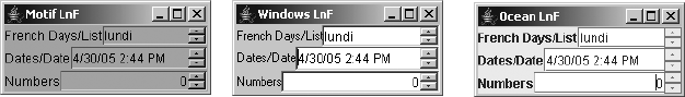
512 CHAPTER 14 ■ SPINNER MODEL CONTROLS
SpinnerModel model2 = new SpinnerDateModel();
JSpinner spinner2 = new JSpinner(model2);
spinner2.addChangeListener(listener);
JLabel label2 = new JLabel("Dates/Date");
JPanel panel2 = new JPanel(new BorderLayout());
panel2.add(label2, BorderLayout.WEST);
panel2.add(spinner2, BorderLayout.CENTER);
frame.add(panel2, BorderLayout.CENTER);
SpinnerModel model3 = new SpinnerNumberModel();
JSpinner spinner3 = new JSpinner(model3);
spinner3.addChangeListener(listener);
JLabel label3 = new JLabel("Numbers");
JPanel panel3 = new JPanel(new BorderLayout());
panel3.add(label3, BorderLayout.WEST);
panel3.add(spinner3, BorderLayout.CENTER);
frame.add(panel3, BorderLayout.SOUTH);
frame.setSize(200, 90);
frame.setVisible (true);
}
};
EventQueue.invokeLater(runner);
}
}
Running this program demonstrates the use of this listener (of course, you’ll find far more
meaningful ways to use a ChangeListener).
Customizing a JSpinner Look and Feel
As with all Swing components, the JSpinner control has a different appearance under each of
the system-defined look and feel types, as shown in Figure 14-2. The component primarily
looks just like a text field; the difference is in the drawing of the arrows.
Figure 14-2. JSpinner under different look and feel types
The set of 11 UIResource properties for a JSpinner is shown in Table 14-2. These are limited
to drawing the text field and the arrows.
WindowsMotif Ocean

CHAPTER 14 ■ SPINNER MODEL CONTROLS 513
SpinnerModel Interface
So far, you’ve seen how to interact with the main JSpinner class. The SpinnerModel interface is
the data model for the component. The definition of SpinnerModel follows:
public interface SpinnerModel {
// Properties
public Object getValue();
public void setValue(Object);
public Object getNextValue();
public Object getPreviousValue();
// Listeners
public void addChangeListener(ChangeListener);
public void removeChangeListener(ChangeListener);
}
The six methods of SpinnerModel map directly to those of JSpinner. The JSpinner methods
just redirect the method calls to that of the model, though in the case of the listener methods,
the event source is where you attach the listener.
AbstractSpinnerModel Class
The base implementation of the SpinnerModel interface is the AbstractSpinnerModel class. It
provides for the management and notification of the listener list. Subclasses must implement
the other four value-related methods of the interface. Three concrete implementations
of the SpinnerModel interface are provided: SpinnerDateModel,SpinnerListModel, and
SpinnerNumberModel.
Table 14-2. JSpinner UIResource Elements
Property String Object Type
Spinner.actionMap ActionMap
Spinner.ancestorInputMap InputMap
Spinner.arrowButtonBorder Border
Spinner.arrowButtonInsets Insets
Spinner.arrowButtonSize Dimension
Spinner.background Color
Spinner.border Border
Spinner.editorBorderPainted Boolean
Spinner.font Font
Spinner.foreground Color
SpinnerUI String
514 CHAPTER 14 ■ SPINNER MODEL CONTROLS
SpinnerDateModel Class
As might be inferred from its name, the SpinnerDateModel provides for the selection of dates.
This class has two constructors: one that defaults to selecting all dates and another that allows
you to limit the range.
public SpinnerDateModel()
SpinnerModel model = new SpinnerDateModel();
JSpinner spinner = new JSpinner(model);
public SpinnerDateModel(Date value, Comparable start, Comparable end,
int calendarField)
Calendar cal = Calendar.getInstance();
Date now = cal.getTime();
cal.add(Calendar.YEAR, -50);
Date startDate = cal.getTime();
cal.add(Calendar.YEAR, 100);
Date endDate = cal.getTime();
SpinnerModel model =
new SpinnerDateModel(now, startDate, endDate, Calendar.YEAR);
JSpinner spinner = new JSpinner(model);
If you don’t specify any parameters, there is no start or end point. The example shown here
uses parameters to provide a 100-year range. The last field should be one of the following
constants from the Calendar class:
• Calendar.AM_PM
• Calendar.DAY_OF_MONTH
• Calendar.DAY_OF_WEEK
• Calendar.DAY_OF_WEEK_IN_MONTH
• Calendar.DAY_OF_YEAR
• Calendar.ERA
• Calendar.HOUR
• Calendar.HOUR_OF_DAY
• Calendar.MILLISECOND
• Calendar.MINUTE
• Calendar.MONTH
• Calendar.SECOND
• Calendar.WEEK_OF_MONTH
• Calendar.WEEK_OF_YEAR
•Calendar.YEAR

CHAPTER 14 ■ SPINNER MODEL CONTROLS 515
■Note The SpinnerDateModel does not include any of the time zone-related constants of Calendar.
You cannot scroll through those within a JSpinner via a SpinnerDateModel.
Table 14-3 lists the three properties from the SpinnerModel interface and four specific to
the SpinnerDateModel.
Typically, the only new property you’ll use is for getting the final date, although all that
does is wrap the result of getValue() in the appropriate data type. If you’ve provided a range of
dates to the constructor, the previous or next values will be null when the current value is at an
edge condition.
SpinnerListModel Class
The SpinnerListModel provides for selection from a list of entries, or at least their string repre-
sentation. This class has three constructors:
public SpinnerListModel()
SpinnerModel model = new SpinnerListModel();
JSpinner spinner = new JSpinner(model);
public SpinnerListModel(List<?> values)
List<String> list = args;
SpinnerModel model = new SpinnerListModel(list);
JSpinner spinner = new JSpinner(model);
public SpinnerListModel(Object[] values)
SpinnerModel model = new SpinnerListModel(args);
JSpinner spinner = new JSpinner(model);
Table 14-3. SpinnerDateModel Properties
Property Name Data Type Access
calendarField int Read-write
date Date Read-only
end Comparable Read-write
nextValue Object Read-only
previousValue Object Read-only
start Comparable Read-write
value Object Read-only

516 CHAPTER 14 ■ SPINNER MODEL CONTROLS
When no arguments are provided, the model contains a single element: the string empty.
The List version retains a reference to the list. It does not copy the list. If you change the list,
you change the elements in the model. The array version creates a private inner class instance
of a List that can’t be added to. For both the List and array versions, the initial selection will
be the first element. If either is empty, an IllegalArgumentException will be thrown.
As shown in Table 14-4, the only property added beyond those from the interface is to get
or set the list.
SpinnerNumberModel Class
The SpinnerNumberModel provides for the selection of a number from an open or closed range
of values. That number can be any of the subclasses of Number, including Integer and Double.
It has four constructors, with the first three provided just as convenience methods to the last.
public SpinnerNumberModel()
SpinnerModel model = new SpinnerNumberModel();
JSpinner spinner = new JSpinner(model);
public SpinnerNumberModel(double value, double minimum, double maximum,
double stepSize)
SpinnerModel model = new SpinnerNumberModel(50, 0, 100, .25);
JSpinner spinner = new JSpinner(model);
public SpinnerNumberModel(int value, int minimum, int maximum, int stepSize)
SpinnerModel model = new SpinnerNumberModel(50, 0, 100, 1);
JSpinner spinner = new JSpinner(model);
public SpinnerNumberModel(Number value, Comparable minimum, Comparable maximum,
Number stepSize)
Number value = new Integer(50);
Number min = new Integer(0);
Number max = new Integer(100);
Number step = new Integer(1);
SpinnerModel model = new SpinnerNumberModel(value, min, max, step);
JSpinner spinner = new JSpinner(model);
Table 14-4. SpinnerListModel Properties
Property Name Data Type Access
list List<?> Read-write
nextValue Object Read-only
previousValue Object Read-only
value Object Read-write

CHAPTER 14 ■ SPINNER MODEL CONTROLS 517
If the minimum or maximum value is null, the range is open-ended. For the no-argument
version, the initial value is 0 and step is 1. The step size is literal, so if you set the step to .333,
there will be no rounding off.
Table 14-5 shows the properties for SpinnerNumberModel. The added properties are the
same as those provided by the constructor.
Custom Models
Typically, the available models for the JSpinner are sufficient, so you don’t need to subclass.
However, that isn’t always the case. For example, you might want to use a custom model that
wraps the SpinnerListModel—instead of stopping at the first or last element, it wraps around to
the other end. One such implementation is shown in Listing 14-2.
Listing 14-2. RolloverSpinnerListModel Class
import javax.swing.*;
import java.util.*;
public class RolloverSpinnerListModel extends SpinnerListModel {
public RolloverSpinnerListModel(List<?> values) {
super(values);
}
public RolloverSpinnerListModel(Object[] values) {
super(values);
}
Table 14-5. SpinnerNumberModel Properties
Property Name Data Type Access
maximum Comparable Read-write
minimum Comparable Read-write
nextValue Object Read-only
number Number Read-only
previousValue Object Read-only
stepSize Number Read-write
value Object Read-write

518 CHAPTER 14 ■ SPINNER MODEL CONTROLS
public Object getNextValue() {
Object returnValue = super.getNextValue();
if (returnValue == null) {
returnValue = getList().get(0);
}
return returnValue;
}
public Object getPreviousValue() {
Object returnValue = super.getPreviousValue();
if (returnValue == null) {
List list = getList();
returnValue = list.get(list.size() - 1);
}
return returnValue;
}
}
JSpinner Editors
For each of the models available for a JSpinner, a secondary support class, an inner class of
JSpinner, is available. Whereas the model allows you to control what is selectable for the
component, the spinner editors allow you to control how to display and edit each selectable value.
JSpinner.DefaultEditor Class
The setEditor() method of JSpinner allows you to have any JComponent as the editor for the
JSpinner. While you certainly can do that, more typically, you will work with a subclass of
JSpinner.DefaultEditor. It provides the basics you will need when working with simple editors
based on JFormattedTextField. It contains a single constructor:
public JSpinner.DefaultEditor(JSpinner spinner)
JSpinner spinner = new JSpinner();
JComponent editor = JSpinner.DefaultEditor(spinner);
spinner.setEditor(editor);
As Table 14-6 shows, there are two properties for the editor.
Table 14-6. JSpinner.DefaultEditor Properties
Property Name Data Type Access
spinner JSpinner Read-only
textField JFormattedTextField Read-only

CHAPTER 14 ■ SPINNER MODEL CONTROLS 519
Without knowing which type of model you were working with, what you might do at this
level is change some display characteristic of the JFormattedTextField. More typically, though,
you’ll change a custom aspect for the model’s editor.
JSpinner.DateEditor Class
The DateEditor allows you to customize the date display (and entry) using various aspects of
the SimpleDateFormat class of the java.text package. See the Javadoc for SimpleDateFormat for
a complete listing of the available formatting patterns. If you don’t like the default display
output, you can modify it by passing in a new format to the second constructor.
public JSpinner.DateEditor(JSpinner spinner)
SpinnerModel model = new SpinnerDateModel();
JSpinner spinner = new JSpinner(model);
JComponent editor = JSpinner.DateEditor(spinner);
spinner.setEditor(editor);
public JSpinner.DateEditor(JSpinner spinner, String dateFormatPattern)
SpinnerModel model = new SpinnerDateModel();
JSpinner spinner = new JSpinner(model);
JComponent editor = JSpinner.DateEditor(spinner, "MMMM yyyy");
spinner.setEditor(editor);
By default, the format is M/d/yy h:mm a, or 12/25/04 12:34 PM for some time on Christmas
in 2004 (or 1904, 1804, and so on). The latter example will show December 2004.
The editor has the two properties shown in Table 14-7.
JSpinner.ListEditor Class
When working with the SpinnerListModel, the ListEditor provides no special formatting
support. Instead, it offers type-ahead support. Since all entries of the model are known, the
editor tries to match the characters the user has already entered with the start of one of those
entries. There is only one constructor, but you should never need to access it.
public JSpinner.ListEditor(JSpinner spinner)
As shown in Table 14-8, ListEditor has only a single property.
Table 14-7. JSpinner.DateEditor Properties
Property Name Data Type Access
format SimpleDateFormat Read-only
model SpinnerDateModel Read-only

520 CHAPTER 14 ■ SPINNER MODEL CONTROLS
JSpinner.NumberEditor Class
The NumberEditor works in a manner similar to the DateEditor, allowing you to enter strings to
customize the display format. Instead of working with the SimpleDateFormat, the NumberEditor
is associated with the DecimalFormat class of the java.text package. Just like DateEditor, it has
two constructors:
public JSpinner.NumberEditor(JSpinner spinner)
SpinnerModel model = new SpinnerNumberModel(50, 0, 100, .25);
JSpinner spinner = new JSpinner(model);
JComponent editor = JSpinner.NumberEditor(spinner);
spinner.setEditor(editor);
public JSpinner.NumberEditor(JSpinner spinner, String decimalFormatPattern)
SpinnerModel model = new SpinnerNumberModel(50, 0, 100, .25);
JSpinner spinner = new JSpinner(model);
JComponent editor = JSpinner.NumberEditor(spinner, "#,##0.###");
spinner.setEditor(editor);
The second constructor usage shows the default formatting string. It will try to use commas
if the number is large enough, and it will not show decimals if the value is a whole number.
As shown in Table 14-9, this editor has two properties.
Summary
In this chapter, you learned about Swing’s JSpinner component. When your set of choices is
limited to a fixed set or a range of values, a JSpinner allows you to select a value by spinning
through the different choices. You learned how that set of choices could be provided: from a set
of dates with the SpinnerDateModel and DateEditor, with the SpinnerListModel and ListEditor,
or via the SpinnerNumberModel and NumberEditor.
Chapter 15 moves beyond selection from a range of values and on to where a user actually
types in the whole content in the different text components.
Table 14-8. JSpinner.ListEditor Properties
Property Name Data Type Access
model SpinnerListModel Read-only
Table 14-9. JSpinner.NumberEditor Properties
Property Name Data Type Access
format DecimalFormat Read-only
model SpinnerNumberModel Read-only

521
■ ■ ■
CHAPTER 15
Basic Text Components
Chapter 14 explored the dynamic input selection control offered with the JSpinner of the
Swing component set. In this chapter, you will look at the basic capabilities of the Swing text
components. The more advanced text component capabilities are covered in the next chapter.
The Swing component set features five text components. They all share a common parent
class, JTextComponent, which defines the common behavior for all text controls.
The direct subclasses of JTextComponent are JTextField,JTextArea, and JEditorPane.
JTextField is used for a single line of single-attributed text (that is, a single font and a single
color). JTextField has a single subclass, JPasswordField, for when a JTextField needs to be
used with an input mask for the entry of a password. JTextArea is used for multiple lines of
single-attributed text input. JEditorPane is a generic editor that can support the editing of
multiple-attributed input. Its subclass JTextPane is customized for input in plain-text style.
In both cases, the input can be images as well as components, in addition to text.
Overview of the Swing Text Components
Like all other Swing components, text components live in an MVC world. The components
shown in Figure 15-1, which is a class hierarchy diagram, are the various available UI delegates.
The remaining part of the UI delegate model is the text view, which is based on the View class
and discussed further in Chapter 16.
■Note All JTextComponent subclasses are in the javax.swing package. With the exception of
the event-related pieces, the support interfaces and classes discussed in this chapter are found in the
javax.swing.text package (or a subpackage). The Swing-specific, text-related event pieces are found
in the javax.swing.event package, with remaining bits in java.awt.event and java.beans.
The data model for each of the components is an implementation of the Document interface, of
which there are five extensions (or implementations). The single-attributed components use
the PlainDocument class as their data model, while the multiple-attributed components use
DefaultStyledDocument as their model. Both of these classes subclass the AbstractDocument class,
which defines their common Document interface implementation. The DefaultStyledDocument
class also implements the StyledDocument interface, which is an extension of Document for
supporting multiple-attributed content. An additional Document implementation, HTMLDocument,
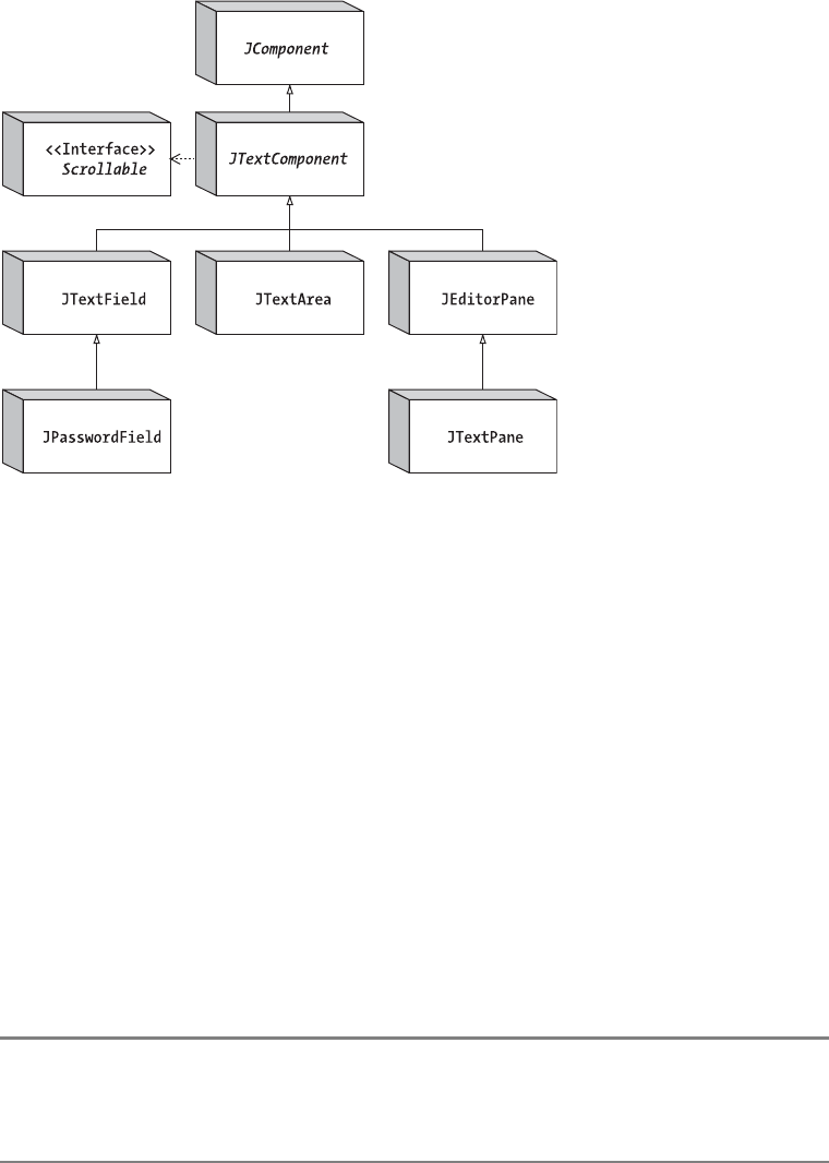
522 CHAPTER 15 ■ BASIC TEXT COMPONENTS
is available for the JEditorPane when its content type is text/html. For restricting input into
any of these documents, you can use the DocumentFilter class.
Figure 15-1. Swing text component class hierarchy diagram
Many other classes to be discussed in this chapter and in Chapter 16 are common among
the text components. As with many of the other Swing components, you can customize the
look and feel of the components without creating a new UI delegate. For the text components,
the Highlighter,Caret, and NavigationFilter interfaces describe how text is highlighted, where
text is inserted, and how to limit cursor positioning, respectively, thus allowing you to customize
the text component appearance and input behavior. In addition, the InputMap/ActionMap
classes define the bindings between keystrokes and text actions, letting you alter the feel of text
components very easily.
Other text component model pieces are designed for event handling. You are not limited
to using the KeyListener/KeyEvent or TextEvent/TextListener combination for dealing with
input validation. The Swing components also can use the DocumentEvent/DocumentListener
combination (as well as the InputVerifier described in Chapter 2). This combination provides
a much more flexible manner of input validation, especially in the MVC environment of the Swing
text components. Additional event handling is done through an extension of the AbstractAction
capabilities introduced in Chapter 2. This is the TextAction class for tying key bindings to Action
implementations, which is discussed in detail in Chapter 16. Many of the text framework pieces are
tied together by what is called an EditorKit, which is also discussed in Chapter 16.
■Note Due to the many interconnections among the Swing text component classes, you’ll find a number of
references in this chapter to Chapter 16. Feel free to jump between this chapter and the next to read up on
the full details of a particular capability.

CHAPTER 15 ■ BASIC TEXT COMPONENTS 523
JTextComponent Class
The JTextComponent class is the parent class for all the components used as textual views. It
describes the common behavior shared by all text components. Among other things, this common
behavior includes a Highlighter for selection support, a Caret for navigation throughout the
content, a set of commands supported through the actions property (an array of Action imple-
menters), a set of key bindings through a Keymap or InputMap/ActionMap combination, an
implementation of the Scrollable interface so that each of the specific text components can be
placed within a JScrollPane, and the text stored within the component. If that all sounds like a
lot to manage, don’t worry. This chapter will guide you through each of the pieces.
JTextComponent Properties
Table 15-1 shows the 27 properties of JTextComponent. These properties cover the range of
capabilities you would expect from text components.
Table 15-1. JTextComponent Properties
Property Name Data Type Access
accessibleContext AccessibleContext Read-only
actions Action[ ] Read-only
caret Caret Read-write bound
caretColor Color Read-write bound
caretListeners CaretListener[ ] Read-only
caretPosition int Read-write
componentOrientation ComponentOrientation Write-only bound
disabledTextColor Color Read-write bound
document Document Read-write bound
dragEnabled boolean Read-write
editable boolean Read-write bound
focusAccelerator char Read-write bound
highlighter Highlighter Read-write bound
inputMethodRequests InputMethodRequests Read-only
keymap Keymap Read-write bound
margin Insets Read-write bound
navigationFilter NavigationFilter Read-write
preferredScrollableViewportSize Dimension Read-only
scrollableTracksViewportHeight boolean Read-only
scrollableTracksViewportWidth boolean Read-only

524 CHAPTER 15 ■ BASIC TEXT COMPONENTS
These properties can be grouped into eight basic categories:
•Data model: The document property is for the data model of all text components. The
text property is used for treating this data model as a String.
•Color: The caretColor,disabledTextColor,selectedTextColor, and selectionColor
properties, as well as the inherited foreground and background properties, specify the
color for rendering the cursor, disabled text, selected text, selected text background,
regular text, and regular text background.
•Caret: The caret,caretPosition, and navigationFilter properties are for navigating
through the document.
•Highlighter: The highlighter,selectionStart, and selectionEnd properties are responsible
for highlighting the selectedText section of the document.
•Margin: The margin property is for specifying how far the text contents appear from the
edges of the text component.
•Events: The actions and keymap properties describe which capabilities the text compo-
nent supports. In the case of the Action[ ] for the actions property, the capabilities are
a series of ActionListener implementations that you can associate with components for
event handling. For instance, instead of creating an ActionListener to perform cut, copy,
and paste operations, you find the appropriate Action within the actions property and
associate it with a component. The keymap property works in a similar manner, but it
associates Action implementations with specific keys. For instance, it contains a key
map entry for what to do when the PageUp key is pressed. The caretListeners property
allows you to discover the set of CaretListener objects observing the text component.
The dragEnabled setting describes if the component supports dragging text from within
the component. (For information about drag-and-drop support within Swing, see
Chapter 19.)
•Scrollable interface: The properties preferredScrollableViewportSize,
scrollableTracksViewportHeight, and scrollableTracksViewportWidth are
implementations of the respective Scrollable interface methods.
selectedText String Read-only
selectedTextColor Color Read-write bound
selectionColor Color Read-write bound
selectionEnd int Read-write
selectionStart int Read-write
text String Read-write
UI TextUI Read-write
Table 15-1. JTextComponent Properties (Continued)
Property Name Data Type Access
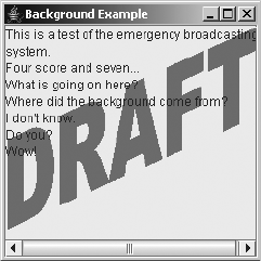
CHAPTER 15 ■ BASIC TEXT COMPONENTS 525
•State: The editable and focusTraversable properties describe various states of the text
components. The editable property allows you to make a text component read-only.
For the read-only focusTraversable property, text components are in the focus cycle
(that is, they can be tabbed into) when they’re enabled. The focusAccelerator is used
when a neighboring JLabel has the text component set in its labelFor property, allowing
you to use the visible mnemonic of the JLabel to move focus into the text component.
The componentOrientation setting describes how the component’s text will be drawn.
Use this for languages like Hebrew where left-to-right is not necessarily the best way to
draw characters. The JTextComponent inherits an opaque property from JComponent.
When the opaque property is set to false, the contents of the area behind the text compo-
nent bleed through, allowing you to have an image background if desired. See Figure 15-2
for how this might appear.
Listing 15-1 is the source code used to generate Figure 15-2. If you comment out the
setOpaque(false) line, a background image will not be shown.
Figure 15-2. An opaque text component with an image background
Listing 15-1. Drawing in the Background of a Component
import javax.swing.*;
import java.awt.*;
public class BackgroundSample {
public static void main(String args[]) {
Runnable runner = new Runnable() {
public void run() {
JFrame frame = new JFrame("Background Example");
frame.setDefaultCloseOperation(JFrame.EXIT_ON_CLOSE);
final ImageIcon imageIcon = new ImageIcon("draft.gif");
JTextArea textArea = new JTextArea() {
Image image = imageIcon.getImage();
Image grayImage = GrayFilter.createDisabledImage(image);
{setOpaque(false);} // instance initializer
526 CHAPTER 15 ■ BASIC TEXT COMPONENTS
public void paint (Graphics g) {
g.drawImage(grayImage, 0, 0, this);
super.paint(g);
}
};
JScrollPane scrollPane = new JScrollPane(textArea);
frame.add(scrollPane, BorderLayout.CENTER);
frame.setSize(250, 250);
frame.setVisible(true);
}
};
EventQueue.invokeLater(runner);
}
}
JTextComponent Operations
The JTextComponent defines the basic framework for many of the operations performed on the
text controls.
•I/O: The public void read(Reader in, Object description) and public void
write(Writer out) methods (both throw IOException) allow you to read or write
the text component contents with ease.
•Clipboard access: The public void cut(),public void copy(), and public void paste()
methods provide direct access to the system clipboard.
•Positioning: The public void moveCaretPosition(int position) method allows you to
position the caret. The position represents a one-dimensional location indicating the
number of characters to precede the caret from the beginning of the text component.
•Selection: The public void replaceSelection(String content),public void
selectAll(), and public void select(int selectionStart, int selectionEnd)
methods allow you to select part of the content within the component and replace
the content that is selected.
•Conversion: The public Rectangle modelToView(int position) throws
BadLocationException and public int viewToModel(Point point) methods allow
you (or, more likely, allow the system) to map a position within the JTextComponent to
a physical mapping within the representation of the contents for the specific text UI
delegate.
Now that you’ve had an overview of the JTextComponent class, it’s time to look at its
different subclasses. First up is the JTextField, which will be used to demonstrate the operations
just listed.
JTextField Class
The JTextField component is the text component for a single line of input. The data model
for a JTextField is the PlainDocument implementation of the Document interface. The PlainDocument
model limits input to single-attributed text, meaning that it must be a single font and color.
CHAPTER 15 ■ BASIC TEXT COMPONENTS 527
When the Enter key is pressed within the JTextField, it automatically notifies any registered
ActionListener implementations.
Creating a JTextField
There are five constructors for the JTextField component:
public JTextField()
JTextField textField = new JTextField();
public JTextField(String text)
JTextField textField = new JTextField("Initial Text");
public JTextField(int columnWidth)
JTextField textField = new JTextField(14);
public JTextField(String text, int columnWidth)
JTextField textField = new JTextField("Initial Text", 14);
public JTextField(Document model, String text, int columnWidth)
JTextField textField = new JTextField(aModel, null, 14);
By default, you get an empty text field, zero columns wide, with a default initial model. You
can specify the initial text for the JTextField and how wide you want the component to be.
Width is specified as the number of m characters in the current font that will fit within the
component. There’s no restriction on the number of characters that can be input. If you specify
the Document data model in the constructor, you will probably want to specify a null initial-text
argument. Otherwise, the current contents of the document will be replaced by the initial text for
the text field.
Using JLabel Mnemonics
In the discussion of mnemonics in Chapter 4, you learned that the various button classes can
have a keyboard shortcut that causes the button component to be selected. The special mnemonic
character is usually underlined to indicate this visually. If the user presses the mnemonic character,
along with a platform-specific mnemonic activation key, such as Alt for both Windows and
UNIX, the button is activated/selected. You can provide a similar capability for a JTextField,
and all other text components, with the help of a JLabel.
You can set the display mnemonic for a label, but instead of selecting the label when the
mnemonic key is pressed, selection causes an associated component to get the input focus.
The display mnemonic is set with the public void setDisplayedMnemonic(character) method,
in which character is either an int or a char. Using the KeyEvent constants when changing the
mnemonic setting simplifies initialization considerably.
The following source demonstrates how to interconnect a specific JLabel and JTextField.
JLabel label = new JLabel("Name: ");
label.setDisplayedMnemonic(KeyEvent.VK_N);
JTextField textField = new JTextField();
label.setLabelFor(textField);
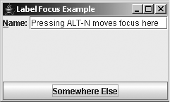
528 CHAPTER 15 ■ BASIC TEXT COMPONENTS
In addition to calling the setDisplayedMnemonic() method, you must also call the public
void setLabelFor(Component component) method of JLabel. This configures the JLabel to
move input focus to the text field when the special mnemonic value is pressed.
Figure 15-3 shows what this sample program might look like. The complete source for the
program follows in Listing 15-2.
Figure 15-3. Connecting a JLabel and a JTextField
Listing 15-2. Connected JLabel and JTextField
import javax.swing.*;
import java.awt.*;
import java.awt.event.*;
public class LabelSample {
public static void main(String args[]) {
Runnable runner = new Runnable() {
public void run() {
JFrame frame = new JFrame("Label Focus Example");
frame.setDefaultCloseOperation(JFrame.EXIT_ON_CLOSE);
JPanel panel = new JPanel(new BorderLayout());
JLabel label = new JLabel("Name: ");
label.setDisplayedMnemonic(KeyEvent.VK_N);
JTextField textField = new JTextField();
label.setLabelFor(textField);
panel.add(label, BorderLayout.WEST);
panel.add(textField, BorderLayout.CENTER);
frame.add(panel, BorderLayout.NORTH);
frame.add(new JButton("Somewhere Else"), BorderLayout.SOUTH);
frame.setSize(250, 150);
frame.setVisible(true);
}
};
EventQueue.invokeLater(runner);
}
}
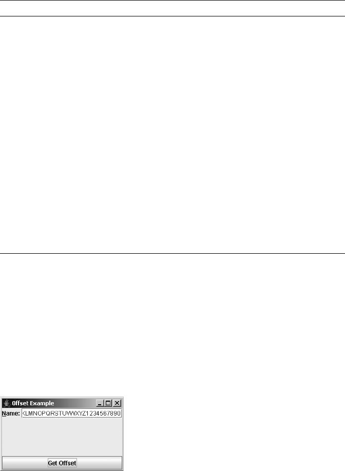
CHAPTER 15 ■ BASIC TEXT COMPONENTS 529
JTextField Properties
Table 15-2 lists the 14 properties of JTextField.
There’s a tight coupling between the horizontalVisibility and scrollOffset properties.
The BoundedRangeModel for the horizontalVisibility property of JTextField represents the
width range required for displaying the contents of the text field. If there isn’t enough space to
display the contents, the scrollOffset setting reflects how far off to the left the text has scrolled. As
the user navigates through the text within the JTextField, the scrollOffset value is automati-
cally updated. For example, the text field in Figure 15-4 contains the 26 letters of the alphabet
plus the 10 cardinal numbers: ABCDEFGHIJKLMNOPQRSTUVWXYZ1234567890. Not all these
characters fit in the field; therefore, the letters A through J have scrolled off to the left.
Figure 15-4. The scrollOffset property reflects how far to the left the field’s contents have scrolled;
here, it is not at zero, so the beginning contents (A–J) have scrolled off to the left.
Table 15-2. JTextField Properties
Property Name Data Type Access
accessibleContext AccessibleContext Read-only
actionCommand String Write-only
action Action Read-write bound
actionListeners ActionListener[ ] Read-only
actions Action[ ] Read-only
columns int Read-write
document Document Write-only bound
font Font Write-only
horizontalAlignment int Read-write bound
horizontalVisibility BoundedRangeModel Read-only
preferredSize Dimension Read-only
scrollOffset int Read-write
UIClassID String Read-only
validateRoot boolean Read-only
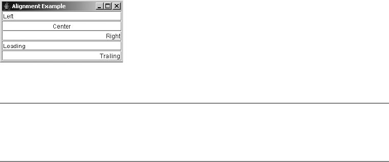
530 CHAPTER 15 ■ BASIC TEXT COMPONENTS
By changing the scrollOffset setting, you can control which part of the text field is visible.
To ensure that the beginning of the contents for the text field is visible, set the scrollOffset
setting to zero. To make sure that the end of the contents is visible, you need to ask the
horizontalVisibility property what the extent of the BoundedRangeModel is, to determine the
width of the range, and then set the scrollOffset setting to the extent setting, as follows:
BoundedRangeModel model = textField.getHorizontalVisibility();
int extent = model.getExtent();
textField.setScrollOffset(extent);
By changing the horizontalAlignment property setting, you can right-, left-, or center-justify
the contents of a JTextField. By default, the text alignment is left-justified. The public void
setHorizontalAlignment(int alignment) method takes an argument of JTextField.LEFT,
JTextField.CENTER,JTextField.RIGHT,JTextField.LEADING (the default), or JTextField.TRAILING
to specify the contents alignment. Figure 15-5 shows how the alignment setting affects the
contents.
Figure 15-5. Text field alignments
■Note You can set the document property, inherited from JTextComponent, to any implementation of the
Document interface. If you use a StyledDocument with a JTextField, the UI delegate will ignore all style
attributes. The StyledDocument interface is discussed in Chapter 16.
JTextComponent Operations with a JTextField
Have you ever looked for an easy way to load or save the contents of a text component? The
Swing text components provide such a method. Additionally, the Swing text components have
built-in support to access the system clipboard for cut, copy, and paste operations. These oper-
ations are possible with all JTextComponent subclasses. They’re shown here specifically for the
JTextField because they need a specific implementation to be truly demonstrated. You can
perform the same tasks with the JPasswordField,JTextArea,JEditorPane, and JTextPane.
Loading and Saving Content
With the public void read(Reader in, Object description) and public void write(Writer
out) methods from JTextComponent (both throw an IOException), you can easily load and save
the contents from any text component. With the read() method, the description argument is
added as a property of the Document data model. This allows you to retain information about
where the data came from. The following example demonstrates how to read in the contents of
file name and store it in textComponent. The file name is automatically retained as the description.
CHAPTER 15 ■ BASIC TEXT COMPONENTS 531
FileReader reader = null;
try {
reader = new FileReader(filename);
textComponent.read(reader, filename);
} catch (IOException exception) {
System.err.println("Load oops");
} finally {
if (reader != null) {
try {
reader.close();
} catch (IOException exception) {
System.err.println("Error closing reader");
exception.printStackTrace();
}
}
}
If you later wanted to get the description back from the data model, which happens to be
the file name in this case, you would just ask, like this:
Document document = textComponent.getDocument();
String filename = (String)document.getProperty(Document.StreamDescriptionProperty);
The properties of the Document are simply another key/value lookup table. The key in this
particular case is the class constant Document.StreamDescriptionProperty. If you don’t want a
description stored, you pass null as the description argument to the read() method. (The
Document interface will be discussed in more detail later in this chapter.)
Before you can read a file into a text component, you need to create the file to read. This
could be done outside a Java program, or you could use the write() method of JTextComponent
to create the file. The following demonstrates how to use the write() method to write the
contents. For simplicity’s sake, it doesn’t deal with getting the file name from the Document,
because this would not be set initially.
FileWriter writer = null;
try {
writer = new FileWriter(filename);
textComponent.write(writer);
} catch (IOException exception) {
System.err.println("Save oops");
} finally {
if (writer != null) {
try {
writer.close();
} catch (IOException exception) {
System.err.println("Error closing writer");
exception.printStackTrace();
}
}
}
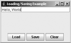
532 CHAPTER 15 ■ BASIC TEXT COMPONENTS
Figure 15-6 shows a sample program that uses the loading and saving capabilities, with
these options implemented through buttons (although Load and Save options are more
commonly seen under a File menu). The Clear button clears the contents of the text field.
Figure 15-6. Loading and saving a text component
The source in Listing 15-3 puts all the pieces together in a sample program to demonstrate
loading and saving streams.
Listing 15-3. Loading and Saving Streams with a JTextComponent
import java.awt.*;
import java.awt.event.*;
import javax.swing.*;
import javax.swing.text.*;
import java.io.*;
public class LoadSave {
public static void main (String args[]) {
Runnable runner = new Runnable() {
public void run() {
final String filename = "text.out";
JFrame frame = new JFrame("Loading/Saving Example");
frame.setDefaultCloseOperation(JFrame.EXIT_ON_CLOSE);
final JTextField textField = new JTextField();
frame.add(textField, BorderLayout.NORTH);
JPanel panel = new JPanel();
// Setup actions
Action loadAction = new AbstractAction() {
{
putValue(Action.NAME, "Load");
}
public void actionPerformed(ActionEvent e) {
doLoadCommand(textField, filename);
}
};
CHAPTER 15 ■ BASIC TEXT COMPONENTS 533
JButton loadButton = new JButton (loadAction);
panel.add(loadButton);
Action saveAction = new AbstractAction() {
{
putValue(Action.NAME, "Save");
}
public void actionPerformed(ActionEvent e) {
doSaveCommand(textField, filename);
}
};
JButton saveButton = new JButton (saveAction);
panel.add(saveButton);
Action clearAction = new AbstractAction() {
{
putValue(Action.NAME, "Clear");
}
public void actionPerformed(ActionEvent e) {
textField.setText("");
}
};
JButton clearButton = new JButton (clearAction);
panel.add(clearButton);
frame.add(panel, BorderLayout.SOUTH);
frame.setSize(250, 150);
frame.setVisible(true);
}
};
EventQueue.invokeLater(runner);
}
public static void doSaveCommand(JTextComponent textComponent,
String filename) {
FileWriter writer = null;
try {
writer = new FileWriter(filename);
textComponent.write(writer);
} catch (IOException exception) {
System.err.println("Save oops");
exception.printStackTrace();
} finally {
if (writer != null) {
try {
writer.close();

534 CHAPTER 15 ■ BASIC TEXT COMPONENTS
} catch (IOException exception) {
System.err.println("Error closing writer");
exception.printStackTrace();
}
}
}
}
public static void doLoadCommand(JTextComponent textComponent,
String filename) {
FileReader reader = null;
try {
reader = new FileReader(filename);
textComponent.read(reader, filename);
} catch (IOException exception) {
System.err.println("Load oops");
exception.printStackTrace();
} finally {
if (reader != null) {
try {
reader.close();
} catch (IOException exception) {
System.err.println("Error closing reader");
exception.printStackTrace();
}
}
}
}
}
■Note By default, file reading and writing deals only with plain text. If the contents of a text component are
styled, the styled attributes aren’t saved. The EditorKit class can customize this loading and saving behavior.
You’ll explore that class in Chapter 16.
Accessing the Clipboard
To use the system clipboard for cut, copy, and paste operations, you do not need to manually
concoct a Transferable clipboard object. Instead, you just call one of these three methods of
the JTextComponent class: public void cut(),public void copy(), or public void paste().
You could call these methods directly from ActionListener implementations associated
with buttons or menu items, as in the following:
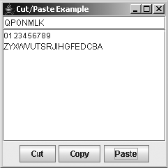
CHAPTER 15 ■ BASIC TEXT COMPONENTS 535
ActionListener cutListener = new ActionListener() {
public void actionPerformed(ActionEvent actionEvent) {
aTextComponent.cut();
}
};
However, there is an easier way that doesn’t require you to manually create the
ActionListener implementations. This method involves finding an existing cut action by
asking the text component. If you look at the set of JTextComponent properties in Table 15-1,
you’ll notice one property named actions, which is an array of Action objects. This property
contains a predefined set of Action implementations that you can directly associate as an
ActionListener with any button or menu item. Once you get the current actions for the text
component, you can go through the array until you find the appropriate one. Because actions
are named, you merely need to know the text string for the name. The DefaultEditorKit class
has about 40 keys as public constants. Here is an example of getting the cut action:
Action actions[] = textField.getActions();
Action cutAction = TextUtilities.findAction(actions, DefaultEditorKit.cutAction);
All actions in the set for a text component are a type of TextAction, which is an extension
of the AbstractAction class. The essential thing to know about a TextAction is that it acts on the
last focused text component. (The TextAction class, along with the DefaultEditorKit, will be
discussed more extensively in Chapter 16.) So, even though the preceding source fragment
acquires the cut action from a text field, the same cut action would work for another text
component on the same screen. Whichever text component had the input focus last would be
the one cut when the specific cutAction is activated.
To help you visualize this behavior, Figure 15-7 shows a screen with a JTextField at the
top, a JTextArea in the middle, and buttons on the bottom for the cut, copy, and paste opera-
tions (although these operations are more commonly available through an Edit menu). If you
run the program, you’ll notice that the cut, copy, and paste actions act on the last focused text
component.
Figure 15-7. Accessing the system clipboard from a text component
The source code in Listing 15-4 is the complete example for finding an Action in the
actions property array and using cut, copy, and paste.
536 CHAPTER 15 ■ BASIC TEXT COMPONENTS
Listing 15-4. Accessing the System Clipboard
import java.awt.*;
import java.awt.event.*;
import java.util.*;
import javax.swing.*;
import javax.swing.text.*;
public class CutPasteSample {
public static void main (String args[]) {
Runnable runner = new Runnable() {
public void run() {
JFrame frame = new JFrame("Cut/Paste Example");
frame.setDefaultCloseOperation(JFrame.EXIT_ON_CLOSE);
JTextField textField = new JTextField();
JTextArea textArea = new JTextArea();
JScrollPane scrollPane = new JScrollPane(textArea);
frame.add(textField, BorderLayout.NORTH);
frame.add(scrollPane, BorderLayout.CENTER);
Action actions[] = textField.getActions();
Action cutAction =
TextUtilities.findAction(actions, DefaultEditorKit.cutAction);
Action copyAction =
TextUtilities.findAction(actions, DefaultEditorKit.copyAction);
Action pasteAction =
TextUtilities.findAction(actions, DefaultEditorKit.pasteAction);
JPanel panel = new JPanel();
frame.add(panel, BorderLayout.SOUTH);
JButton cutButton = new JButton(cutAction);
cutButton.setText("Cut");
panel.add(cutButton);
JButton copyButton = new JButton(copyAction);
copyButton.setText("Copy");
panel.add(copyButton);
JButton pasteButton = new JButton(pasteAction);
pasteButton.setText("Paste");
panel.add(pasteButton);

CHAPTER 15 ■ BASIC TEXT COMPONENTS 537
frame.setSize(250, 250);
frame.setVisible(true);
}
};
EventQueue.invokeLater(runner);
}
}
The example in Listing 15-4 uses the TextUtilities support class shown in Listing 15-5.
There’s no direct way to find out if a specific action for a specific key exists in the actions
property array. Instead, you must manually search for it. The public static Action
findAction(Action actions[], String key) method does the searching for you.
Listing 15-5. TextUtilities Support Class
import javax.swing.*;
import javax.swing.text.*;
import java.util.Hashtable;
public final class TextUtilities {
private TextUtilities() {
}
public static Action findAction(Action actions[], String key) {
Hashtable<Object, Action> commands = new Hashtable<Object, Action>();
for (int i = 0; i < actions.length; i++) {
Action action = actions[i];
commands.put(action.getValue(Action.NAME), action);
}
return commands.get(key);
}
}
■Note For security reasons, the cut() and copy() methods of the JPasswordField class do not place
the current contents onto the system clipboard (the system will beep instead). You can still paste() some-
thing from the clipboard into a JPasswordField, though.
Document Interface
The Document interface defines the data model for the different text components. Implementa-
tions of the interface are meant to store both the actual content as well as any information to
mark up the content (with bold, italics, or color). While all the content will be text, the way in
which the text component displays the content could result in nontextual output, such as an
HTML renderer.

538 CHAPTER 15 ■ BASIC TEXT COMPONENTS
The data model is stored apart from the text component (the view). Therefore, if you’re
interested in monitoring changes to the content of a text component, you must watch the
Document itself, not the text component, for changes. If the changes reach the text component,
it’s too late—the model has already changed. To listen for changes, attach a DocumentListener
to the model. However, the more likely scenario for restricting input is to provide a custom
model or attach a DocumentFilter to the AbstractDocument. You can also attach an InputVerifier
to the text component. However, that wouldn’t be used until the input focus tried to leave the
component.
■Note In addition to accessing the textual content through the Document interface, a framework is defined
to support undo/redo capabilities. This will be explored in Chapter 21.
Now, let’s look at the pieces that make up a Document. First, here’s the base interface definition:
public interface Document {
// Constants
public final static String StreamDescriptionProperty;
public final static String TitleProperty;
// Listeners
public void addDocumentListener(DocumentListener listener);
public void removeDocumentListener(DocumentListener listener);
public void addUndoableEditListener(UndoableEditListener listener);
public void removeUndoableEditListener(UndoableEditListener listener);
// Properties
public Element getDefaultRootElement();
public Position getEndPosition();
public int getLength();
public Element[ ] getRootElements();
public Position getStartPosition();
// Other methods
public Position createPosition(int offset) throws BadLocationException;
public Object getProperty(Object key);
public String getText(int offset, int length) throws BadLocationException;
public void getText(int offset, int length, Segment txt)
throws BadLocationException;
public void insertString(int offset, String str, AttributeSet a)
throws BadLocationException;
public void putProperty(Object key, Object value);
public void remove(int offset, int len) throws BadLocationException;
public void render(Runnable r);
}
The content within a Document is described by a series of elements in which each element
implements the Element interface. Within each element, you can store attributes so that select
CHAPTER 15 ■ BASIC TEXT COMPONENTS 539
content can be made bold, italic, or colorized. The elements don’t store the content; they just
hold the attributes. Therefore, one Document can be rendered differently from different Element sets.
The following is an example of a basic HTML document with a title and a bulleted list
for content.
<html>
<head>
<title>Cards</title>
</head>
<body>
<h1>Suits:</h1>
<ul>
<li>Clubs</li>
<li>Diamonds</li>
<li>Hearts</li>
<li>Spades</li>
</ul>
</body>
</html>
Looking at the structure of the elements in this HTML document, you get a hierarchy as
shown in Figure 15-8.
Figure 15-8. Examining the element makeup of a document

540 CHAPTER 15 ■ BASIC TEXT COMPONENTS
Although this particular document might not warrant it, multiple element hierarchies are
possible. Each would store different attributes because a particular text component could have
an alternative rendering of the content. Alternatively, different style sheets could be used to
render the same HTML markup differently.
AbstractDocument Class
The AbstractDocument class provides the basic implementation of the Document interface. It
defines the management of the listener lists, provides a read-write locking mechanism to
ensure that content isn’t corrupted, and enables a Dictionary for storing document properties.
Table 15-3 lists the 11 properties of the AbstractDocument class, of which 5 are defined by
the Document interface itself.
* These properties are specific to the AbstractDocument class. The remaining five properties are defined in the
Document interface.
For the most part, you don’t access any of these properties directly, except perhaps
documentFilter. In the case of the documentProperties property, you get and set individual prop-
erties with the public Object getProperty(Object key) and public void putProperty(Object key,
Object value) methods. For the length property, in most cases, you can simply ask for the text
within a text component, and then get its length by using textComponent.getText().length().
The bidiRootElement property is for the bidirectional root element, which may be appro-
priate in certain Unicode character sets. You would normally just use the defaultRootElement.
However, both are rarely accessed.
Table 15-3. AbstractDocument Properties
Property Name Data Type Access
asynchronousLoadPriority*int Read-write
bidiRootElement*Element Read-only
defaultRootElement Element Read-only
documentFilter*DocumentFilter Read-write
documentListeners*DocumentListener[ ] Read-only
documentProperties*Dictionary Read-write
endPosition Position Read-only
length int Read-only
rootElements Element[ ] Read-only
startPosition Position Read-only
undoableEditListeners*UndoableEditListener[ ] Read-only
CHAPTER 15 ■ BASIC TEXT COMPONENTS 541
PlainDocument Class
The PlainDocument class is a specific implementation of the AbstractDocument class. It does not
store any character-level attributes for the content. Instead, the elements describe where the
content and each line in the content begin.
The program in Listing 15-6 walks through the Element tree for a PlainDocument, the model
used for both the JTextField and the JTextArea.
Listing 15-6. Element Walker
import java.awt.*;
import java.awt.event.*;
import java.util.*;
import javax.swing.*;
import javax.swing.text.*;
public class ElementSample {
public static void main (String args[]) {
Runnable runner = new Runnable() {
public void run() {
JFrame frame = new JFrame("Element Example");
frame.setDefaultCloseOperation(JFrame.EXIT_ON_CLOSE);
final JTextArea textArea = new JTextArea();
JScrollPane scrollPane = new JScrollPane(textArea);
JButton button = new JButton("Show Elements");
ActionListener actionListener = new ActionListener() {
public void actionPerformed(ActionEvent actionEvent) {
Document document = textArea.getDocument();
ElementIterator iterator = new ElementIterator(document);
Element element = iterator.first();
while (element != null) {
System.out.println(element.getStartOffset());
element = iterator.next();
}
}
};
button.addActionListener(actionListener);
frame.add(scrollPane, BorderLayout.CENTER);
frame.add(button, BorderLayout.SOUTH);
frame.setSize(250, 250);
frame.setVisible(true);
}
};
EventQueue.invokeLater(runner);
}
}
542 CHAPTER 15 ■ BASIC TEXT COMPONENTS
Assume the contents of the JTextArea are as follows:
Hello, World
Welcome Home
Adios
The program would report Element objects starting at 0, 0, 13, and 26. The first 0 represents
the start of the content; the second represents the start of the first line.
You’ll learn more about Element in Chapter 16.
Filtering Document Models
In the AWT world, if you want to restrict input into a text field—such as to limit input to alpha-
numeric characters or to some numeric range of values—you attach a KeyListener and consume()
keystrokes that you don’t want to appear within the component. With the Swing text components,
you could either create a new Document implementation and customize what’s accepted in the
Document or attach a DocumentFilter and let it filter input.
While you can certainly create a custom subclass of Document, the more object-oriented
approach is to create a filter, as you don’t want to change the Document; you just want to limit
the input into the model. You then attach the newly created filter to the document by calling
the setDocumentFilter() method of AbstractDocument. Filters work with both PlainDocument
and StyledDocument subclasses.
DocumentFilter is a class, not an interface, so you must create a subclass of that to filter the
text into the document of a text component. If you create a subclass of DocumentFilter, over-
riding these three methods allows you to customize input:
•public void insertString(DocumentFilter.FilterBypass fb, int offset, String
string, AttributeSet attributes): Called when a text string is inserted into the Document.
•public void remove(DocumentFilter.FilterBypass fb, int offset, int length):
Called when something is deleted.
•public void replace(DocumentFilter.FilterBypass fb, int offset, int length,
String text, AttributeSet attrs): Called when something is inserted into the
currently selected text.
To restrict input, just override each method and check to see if the new content would be
valid. If the content would not be valid, reject it.
For example, to create a DocumentFilter subclass to limit to a numeric range, you need to
override the behavior of insertString(),remove(), and replace(). Because you’re ensuring
that the input is numeric and within a valid range, you must validate the proposed input to see
if it’s acceptable. If it is acceptable, then you can modify the document model by calling the
insertString(),remove(), or replace() method of the DocumentFilter.FilterBypass argument of
each original method call. When the input is unacceptable, you throw a BadLocationException.
Seeing this exception thrown ensures the input method framework understands the user input
was invalid. This will typically trigger the system to beep. Listing 15-7 shows a custom document
filter for limiting an integer range.
CHAPTER 15 ■ BASIC TEXT COMPONENTS 543
Listing 15-7. Custom Document Filter
import javax.swing.text.*;
import java.awt.Toolkit;
public class IntegerRangeDocumentFilter extends DocumentFilter {
int minimum, maximum;
int currentValue = 0;
public IntegerRangeDocumentFilter(int minimum, int maximum) {
this.minimum = minimum;
this.maximum = maximum;
}
public void insertString(DocumentFilter.FilterBypass fb, int offset,
String string, AttributeSet attr) throws BadLocationException {
if (string == null) {
return;
} else {
String newValue;
Document doc = fb.getDocument();
int length = doc.getLength();
if (length == 0) {
newValue = string;
} else {
String currentContent = doc.getText(0, length);
StringBuffer currentBuffer = new StringBuffer(currentContent);
currentBuffer.insert(offset, string);
newValue = currentBuffer.toString();
}
currentValue = checkInput(newValue, offset);
fb.insertString(offset, string, attr);
}
}
public void remove(DocumentFilter.FilterBypass fb, int offset, int length)
throws BadLocationException {
Document doc = fb.getDocument();
int currentLength = doc.getLength();
String currentContent = doc.getText(0, currentLength);
String before = currentContent.substring(0, offset);
String after = currentContent.substring(length+offset, currentLength);
String newValue = before + after;
currentValue = checkInput(newValue, offset);
fb.remove(offset, length);
}
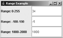
544 CHAPTER 15 ■ BASIC TEXT COMPONENTS
public void replace(DocumentFilter.FilterBypass fb, int offset, int length,
String text, AttributeSet attrs) throws BadLocationException {
Document doc = fb.getDocument();
int currentLength = doc.getLength();
String currentContent = doc.getText(0, currentLength);
String before = currentContent.substring(0, offset);
String after = currentContent.substring(length+offset, currentLength);
String newValue = before + (text == null ? "" : text) + after;
currentValue = checkInput(newValue, offset);
fb.replace(offset, length, text, attrs);
}
private int checkInput(String proposedValue, int offset)
throws BadLocationException {
int newValue = 0;
if (proposedValue.length() > 0) {
try {
newValue = Integer.parseInt(proposedValue);
} catch (NumberFormatException e) {
throw new BadLocationException(proposedValue, offset);
}
}
if ((minimum <= newValue) && (newValue <= maximum)) {
return newValue;
} else {
throw new BadLocationException(proposedValue, offset);
}
}
}
Figure 15-9 shows the numeric range filter in use.
Figure 15-9. Using a Document that restricts input to a range of values
The sample program using the new IntegerRangeDocumentFilter follows in Listing 15-8.
CHAPTER 15 ■ BASIC TEXT COMPONENTS 545
Listing 15-8. Program Using a Custom Document Filter
import javax.swing.*;
import javax.swing.text.*;
import java.awt.*;
import java.awt.event.*;
public class RangeSample {
public static void main(String args[]) {
Runnable runner = new Runnable() {
public void run() {
JFrame frame = new JFrame("Range Example");
frame.setDefaultCloseOperation(JFrame.EXIT_ON_CLOSE);
frame.setLayout(new GridLayout(3, 2));
frame.add(new JLabel("Range: 0-255"));
JTextField textFieldOne = new JTextField();
Document textDocOne = textFieldOne.getDocument();
DocumentFilter filterOne = new IntegerRangeDocumentFilter(0, 255);
((AbstractDocument)textDocOne).setDocumentFilter(filterOne);
frame.add(textFieldOne);
frame.add(new JLabel("Range: -100-100"));
JTextField textFieldTwo = new JTextField();
Document textDocTwo = textFieldTwo.getDocument();
DocumentFilter filterTwo = new IntegerRangeDocumentFilter(-100, 100);
((AbstractDocument)textDocTwo).setDocumentFilter(filterTwo);
frame.add(textFieldTwo);
frame.add(new JLabel("Range: 1000-2000"));
JTextField textFieldThree = new JTextField();
Document textDocThree = textFieldThree.getDocument();
DocumentFilter filterThree = new IntegerRangeDocumentFilter(1000, 2000);
((AbstractDocument)textDocThree).setDocumentFilter(filterThree);
frame.add(textFieldThree);
frame.setSize(250, 150);
frame.setVisible(true);
}
};
EventQueue.invokeLater(runner);
}
}
If you try out this program, you’ll notice a couple of interesting issues. The first text field,
with a range of 0 to 255, works fine. You can enter and delete characters at will, as long as the
content is within the range.
546 CHAPTER 15 ■ BASIC TEXT COMPONENTS
In the second text field, the valid range is –100 to +100. Although you can enter any of the
201 numbers into the text field, if you want a negative number, you need to enter something
like 3, left arrow, and minus sign (-). Because the text field validates input with each key, the - by
itself isn’t valid. You would need to either specifically accept a - as valid input in the checkInput()
method of the custom DocumentFilter or force users to enter negative numbers in an awkward
manner.
The third text field presents an even more troublesome situation. The valid range of input
is 1000–2000. As you press each key to enter a number, such as 1500, it’s rejected. You can’t
build up the input to 1500 because, by themselves, 1, 5, and 0 are not valid input. Instead, to
enter a number into this text field, you must enter it somewhere else, place it into the system
clipboard, and then use Ctrl-V to paste it into the text field as the field’s final value. You can’t
use Backspace to correct a mistake, because no three-digit numbers are valid.
While the IntegerRangeDocumentFilter class shown in Listing 15-7 presents a workable
DocumentFilter for any integer range, it works best with ranges of positive numbers that begin
at zero. If you don’t mind seeing the temporarily invalid input in the fields, it may be better to
just attach an InputVerifier to deal with validation when leaving the text field.
DocumentListener and DocumentEvent Interfaces
If you’re interested in finding out when the content of a text component changes, you can
attach an implementation of the DocumentListener interface to the Document model of the
component.
public interface DocumentListener implements EventListener {
public void changedUpdate(DocumentEvent documentEvent);
public void insertUpdate(DocumentEvent documentEvent);
public void removeUpdate(DocumentEvent documentEvent);
}
From the three interface methods, you can find out if the contents were added to
(insertUpdate()), removed (removeUpdate()), or stylistically changed (changedUpdate()).
Notice that the latter is an attribute change versus a content change.
The interface method will receive an instance of DocumentEvent, from which you can find
out where the change occurred, as well as the type of change, as follows:
public interface DocumentEvent {
public Document getDocument();
public int getLength();
public int getOffset();
public DocumentEvent.EventType getType();
public DocumentEvent.ElementChange getChange(Element element);
}
The offset property of the event is where the change started. The length property of
the event tells the length of the change that happened. The type of the event can be derived
from whichever one of the three DocumentListener methods were called. In addition, the
DocumentEvent.EventType class has three constants—CHANGE,INSERT, and REMOVE—so you
can find out which event type happened directly from the type property.
CHAPTER 15 ■ BASIC TEXT COMPONENTS 547
The getChange() method of DocumentEvent requires an Element to return a
DocumentEvent.ElementChange. You normally use the default root element from the
Document, as in the following example.
Document documentSource = documentEvent.getDocument();
Element rootElement = documentSource.getDefaultRootElement();
DocumentEvent.ElementChange change = documentEvent.getChange(rootElement);
Once you have your DocumentEvent.ElementChange instance, you can find out the added
and removed elements, if you need that level of information.
public interface DocumentEvent.ElementChange {
public Element[ ] getChildrenAdded();
public Element[ ] getChildrenRemoved();
public Element getElement();
public int getIndex();
}
Caret and Highlighter Interfaces
Now that you understand the data model aspect of a text component, you can look at some
aspects of its selection rendering through the Caret and Highlighter interfaces. Remember
that these are properties of the text component, not the data model.
The Caret interface describes what’s usually referred to as the cursor: the location in the
document where you can insert text. The Highlighter interface provides the basis for how to
paint selected text. These two interfaces, their related interfaces, and their implementations
are rarely altered. The text components simply use their default implementations with the
DefaultCaret and DefaultHighlighter classes.
Although you probably won’t alter the caret and highlighter behavior for a text component,
you should know that there are many interrelated classes working together. For the Highlighter
interface, the predefined implementation is called DefaultHighlighter, which extends another
implementation called LayeredHighlighter. The Highlighter also manages a collection of
Highlighter.Highlight objects to designate highlighted sections.
The DefaultHighlighter creates a DefaultHighlighter.HighlightPainter to paint
the highlighted section(s) of text. The HighlightPainter is an implementation of the
Highlighter.HighlightPainter interface and extends the LayeredHighlighter.LayerPainter
class. Each section to paint is described by a Highlighter.Highlight, where the Highlighter
manages the set. The actual HighlightPainter is created by the DefaultCaret implementation.
The Highlighter interface describes how to paint selected text within a text component. If
you don’t like the color, you can simply change the TextField.selectionBackground UI property
setting to a different color.
public interface Highlighter {
// Properties
public Highlighter.Highlight[ ] getHighlights();
// Other methods
public Object addHighlight(int p0, int p1, Highlighter.HighlightPainter p)
throws BadLocationException;

548 CHAPTER 15 ■ BASIC TEXT COMPONENTS
public void changeHighlight(Object tag, int p0, int p1)
throws BadLocationException;
public void deinstall(JTextComponent component);
public void install(JTextComponent component)
public void paint(Graphics g);
public void removeAllHighlights();
public void removeHighlight(Object tag);
}
The Caret interface describes the current cursor, as well as several selection attributes. Of
the Highlighter and Caret interfaces, the latter is the one that you would actually use, although
it isn’t necessary to subclass it.
public interface Caret {
// Properties
public int getBlinkRate();
public void setBlinkRate(int newValue);
public int getDot();
public void setDot(int newValue);
public Point getMagicCaretPosition();
public void setMagicCaretPosition(Point newValue);
public int getMark();
public boolean isSelectionVisible();
public void setSelectionVisible(boolean newValue);
public boolean isVisible();
public void setVisible(boolean newValue);
// Listeners
public void addChangeListener(ChangeListener l);
public void removeChangeListener(ChangeListener l);
// Other methods
public void deinstall(JTextComponent c);
public void install(JTextComponent c);
public void moveDot(int dot);
public void paint(Graphics g);
}
Table 15-4 lists the six attributes of Caret.
Table 15-4. Caret Properties
Property Name Data Type Access
blinkRate int Read-write
dot int Read-write
magicCaretPosition Point Read-write
mark int Read-only
selectionVisible boolean Read-write
visible boolean Read-write

CHAPTER 15 ■ BASIC TEXT COMPONENTS 549
The blinkRate is the millisecond delay between the flashes of the caret. The dot property
is the current position within the text component of the cursor. To move the cursor to another
position so that some text will be highlighted, add a call to the moveDot(int newPosition)
method. This sets the mark property to the old dot position and sets the new dot setting to the
new position.
The magicCaretPosition property deals with moving up and down lines of different
lengths. For example, suppose the following three lines of text were on your screen:
Friz Freleng
Mel Blanc
What's up Doc?
Now suppose that the current cursor position is between the n and g on the first line. If you
pressed the down arrow twice, you would want the cursor to stay at the same horizontal posi-
tion, instead of moving to the end of the shorter second line. It’s the magicCursorPosition
property that retains this information, so that the cursor ends up being between the D and the
o in the third line. Without the magic position retained, the cursor would fall in between the p
and the word space of the last line.
One useful instance of using the caret is to find the current screen location in response to
a keystroke. That way, you can pop up a menu at the current cursor position. This would be
similar to the Code Insights option in JBuilder or IntelliSense in Visual Studio, in which the
tool helps you complete method calls by popping up a menu of methods. Given the current
dot location in the model, map it to the position in the view with the public Rectangle
modelToView(int position) method of JTextComponent (which can throw a BadLocationException).
Then use the Rectangle returned as the location to pop up the menu, as shown in Figure 15-10.
Figure 15-10. Using the Caret to determine a pop-up location
The program in Listing 15-9 will show a JPopupMenu at the location where the period (.) key
is pressed in the text field.
Listing 15-9. Mapping Caret Location to Pop-Up Position
import javax.swing.*;
import javax.swing.text.*;
import javax.swing.plaf.*;
import java.awt.*;
import java.awt.event.*;
550 CHAPTER 15 ■ BASIC TEXT COMPONENTS
public class PopupSample {
public static void main(String args[]) {
Runnable runner = new Runnable() {
public void run() {
JFrame frame = new JFrame("Popup Example");
frame.setDefaultCloseOperation(JFrame.EXIT_ON_CLOSE);
final JPopupMenu popup = new JPopupMenu();
JMenuItem menuItem1 = new JMenuItem("Option 1");
popup.add(menuItem1);
JMenuItem menuItem2 = new JMenuItem("Option 2");
popup.add(menuItem2);
final JTextField textField = new JTextField();
frame.add(textField, BorderLayout.NORTH);
ActionListener actionListener = new ActionListener() {
public void actionPerformed(ActionEvent actionEvent) {
try {
int dotPosition = textField.getCaretPosition();
Rectangle popupLocation = textField.modelToView(dotPosition);
popup.show(textField, popupLocation.x, popupLocation.y);
} catch (BadLocationException badLocationException) {
System.err.println("Oops");
}
}
};
KeyStroke keystroke =
KeyStroke.getKeyStroke(KeyEvent.VK_PERIOD, 0, false);
textField.registerKeyboardAction(actionListener, keystroke,
JComponent.WHEN_FOCUSED);
frame.setSize(250, 150);
frame.setVisible(true);
}
};
EventQueue.invokeLater(runner);
}
}
CaretListener Interface and CaretEvent Class
You can listen for cursor movements in two ways: associate a ChangeListener with the Caret or
associate a CaretListener with the JTextComponent. Working directly with the JTextComponent
is the easier approach, though both will function equally well.

CHAPTER 15 ■ BASIC TEXT COMPONENTS 551
In the case of the CaretListener, there’s a single method defined by the interface:
public interface CaretListener implements EventListener {
public void caretUpdate (CaretEvent caretEvent);
}
When the listener is notified, a CaretEvent is sent, which reports on the new dot and mark
locations.
public abstract class CaretEvent extends EventObject {
public CaretEvent(Object source);
public abstract int getDot();
public abstract int getMark();
}
To demonstrate, Figure 15-11 shows a program with a CaretListener attached to the inner
JTextArea. When the CaretEvent happens, the current dot value is sent to the top text field and
the current mark setting is sent to the button. In the example, the cursor dot is at the beginning
of the second line, with the mark at the end.
Figure 15-11. CaretListener sample
Listing 15-10 shows the source associated with the example in Figure 15-11.
Listing 15-10. Listening for Caret Changes
import javax.swing.*;
import javax.swing.event.*;
import java.awt.*;
public class CaretSample {
public static void main(String args[]) {
Runnable runner = new Runnable() {
public void run() {
JFrame frame = new JFrame("Caret Example");
frame.setDefaultCloseOperation(JFrame.EXIT_ON_CLOSE);
JTextArea textArea = new JTextArea();
JScrollPane scrollPane = new JScrollPane(textArea);
frame.add(scrollPane, BorderLayout.CENTER);
552 CHAPTER 15 ■ BASIC TEXT COMPONENTS
final JTextField dot = new JTextField();
dot.setEditable(false);
JPanel dotPanel = new JPanel(new BorderLayout());
dotPanel.add(new JLabel("Dot: "), BorderLayout.WEST);
dotPanel.add(dot, BorderLayout.CENTER);
frame.add(dotPanel, BorderLayout.NORTH);
final JTextField mark = new JTextField();
mark.setEditable(false);
JPanel markPanel = new JPanel(new BorderLayout());
markPanel.add(new JLabel("Mark: "), BorderLayout.WEST);
markPanel.add(mark, BorderLayout.CENTER);
frame.add(markPanel, BorderLayout.SOUTH);
CaretListener listener = new CaretListener() {
public void caretUpdate(CaretEvent caretEvent) {
dot.setText(Integer.toString(caretEvent.getDot()));
mark.setText(Integer.toString(caretEvent.getMark()));
}
};
textArea.addCaretListener(listener);
frame.setSize(250, 150);
frame.setVisible(true);
}
};
EventQueue.invokeLater(runner);
}
}
NavigationFilter Class
Similar to the way you can limit input to the text component’s document by associating
aDocumentFilter with a Document, you can limit where the caret can go by associating a
NavigationFilter with a JTextComponent. The class has three methods:
public void setDot(NavigationFilter.FilterBypass fb, int dot, Position.Bias bias)
public void moveDot(NavigationFilter.FilterBypass fb, int dot, Position.Bias bias)
public int getNextVisualPositionFrom(JTextComponent text, int pos,
Position.Bias bias, int direction, Position.Bias[] biasRet)
To limit movement, you would typically override the first two, leaving the default imple-
mentation of the latter. For instance, Listing 15-11 shows a program that has a reserved area
(say, the title of a report) at the beginning of the JTextArea. If you try to set or move the caret
(dot) to the reserved area, the filter rejects the change and moves the caret to after the area.
CHAPTER 15 ■ BASIC TEXT COMPONENTS 553
Listing 15-11. Restricting Caret Movement
import javax.swing.*;
import javax.swing.text.*;
import javax.swing.event.*;
import java.awt.*;
public class NavigationSample {
private static final String START_STRING = "Start\n";
private static final int START_STRING_LENGTH = START_STRING.length();
public static void main(String args[]) {
Runnable runner = new Runnable() {
public void run() {
JFrame frame = new JFrame("Navigation Example");
frame.setDefaultCloseOperation(JFrame.EXIT_ON_CLOSE);
JTextArea textArea = new JTextArea(START_STRING);
textArea.setCaretPosition(START_STRING_LENGTH);
JScrollPane scrollPane = new JScrollPane(textArea);
frame.add(scrollPane, BorderLayout.CENTER);
NavigationFilter filter = new NavigationFilter() {
public void setDot(NavigationFilter.FilterBypass fb, int dot,
Position.Bias bias) {
if (dot < START_STRING_LENGTH) {
fb.setDot(START_STRING_LENGTH, bias);
} else {
fb.setDot(dot, bias);
}
}
public void moveDot(NavigationFilter.FilterBypass fb, int dot,
Position.Bias bias) {
if (dot < START_STRING_LENGTH) {
fb.setDot(START_STRING_LENGTH, bias);
} else {
fb.setDot(dot, bias);
}
}
};
textArea.setNavigationFilter(filter);
frame.setSize(250, 150);
frame.setVisible(true);
}
};
EventQueue.invokeLater(runner);
}
}

554 CHAPTER 15 ■ BASIC TEXT COMPONENTS
Figure 15-12 shows the screen after typing some information into the text component.
Figure 15-12. NavigationFilter sample
Keymap Interface
In “MVC-speak,” the keymap property of the text component is the Controller part. It maps
KeyStroke objects to individual actions through the Keymap interface. (The KeyStroke class
was discussed in Chapter 2.) When you register the KeyStroke to the JTextComponent with
registerKeyboardAction(), as in the PopupSample program shown in Listing 15-9 earlier in
this chapter, the text component stores this mapping from KeyStroke to Action in a Keymap.
For instance, the Backspace key is mapped to delete the previous character. If you want to
add another binding, you just register another keystroke.
■Note In reality, the Keymap is just a front to the ActionMap/InputMap pair. The JTextComponent
relies on some internal workings to indirectly use the ActionMap/InputMap classes.
You can also add actions for keystrokes directly to the Keymap. This allows you to share a
key map across multiple text components, as long as they all share the same extended behavior.
public interface Keymap {
// Properties
public Action[ ] getBoundActions();
public KeyStroke[ ] getBoundKeyStrokes();
public Action getDefaultAction();
public void setDefaultAction(Action action);
public String getName();
public Keymap getResolveParent();
public void setResolveParent(Keymap parent);
// Other methods
public void addActionForKeyStroke(KeyStroke keystroke, Action action);
public Action getAction(KeyStroke keystroke);
public KeyStroke[ ] getKeyStrokesForAction(Action action);
public boolean isLocallyDefined(KeyStroke keystroke);
public void removeBindings();
public void removeKeyStrokeBinding(KeyStroke keystroke);
}
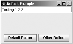
CHAPTER 15 ■ BASIC TEXT COMPONENTS 555
For some applications, you may also want to remove keystrokes from the key map. For
instance, the JTextField has an entry in the key map for the Enter key so that any registered
ActionListener objects are notified. If the JTextField is on a screen where a button has been
designated as the default, pressing Enter won’t select the default button, as desired. Getting rid
of the default behavior is a simple process of requesting the removal of the single KeyStroke
from the Keymap, as shown here:
Keymap keymap = textField.getKeymap();
KeyStroke keystroke = KeyStroke.getKeyStroke(KeyEvent.VK_ENTER, 0, false);
keymap.removeKeyStrokeBinding(keystroke);
Then, when you press Enter in the text field, the default button is activated, as shown in
Figure 15-13.
Figure 15-13. Using the default button after removing the Enter binding from the Keymap
The program source for the example in Figure 15-13 is shown in Listing 15-12.
Listing 15-12. Working with the Default Button
import javax.swing.*;
import javax.swing.text.*;
import java.awt.*;
import java.awt.event.*;
public class DefaultSample {
public static void main(String args[]) {
Runnable runner = new Runnable() {
public void run() {
JFrame frame = new JFrame("Default Example");
frame.setDefaultCloseOperation(JFrame.EXIT_ON_CLOSE);
JTextField textField = new JTextField();
frame.add(textField, BorderLayout.NORTH);
ActionListener actionListener = new ActionListener() {
public void actionPerformed(ActionEvent actionEvent) {
System.out.println(actionEvent.getActionCommand() + " selected");
}
};
556 CHAPTER 15 ■ BASIC TEXT COMPONENTS
JPanel panel = new JPanel();
JButton defaultButton = new JButton("Default Button");
defaultButton.addActionListener(actionListener);
panel.add(defaultButton);
JButton otherButton = new JButton("Other Button");
otherButton.addActionListener(actionListener);
panel.add(otherButton);
frame.add(panel, BorderLayout.SOUTH);
Keymap keymap = textField.getKeymap();
KeyStroke keystroke =
KeyStroke.getKeyStroke(KeyEvent.VK_ENTER, 0, false);
keymap.removeKeyStrokeBinding(keystroke);
frame.getRootPane().setDefaultButton(defaultButton);
frame.setSize(250, 150);
frame.setVisible(true);
}
};
EventQueue.invokeLater(runner);
}
}
JTextComponent.KeyBinding Class
The JTextComponent class stores the specific key bindings with the help of the
JTextComponent.KeyBinding class. The current look and feel defines the default set
of the key bindings for text components, such as the familiar Ctrl-X for cut, Ctrl-C for
copy, and Ctrl-V for paste on a Microsoft Windows platform.
Handling JTextField Events
Dealing with events in Swing text components is completely different from dealing with events
in AWT text components. Although you can still attach an ActionListener to listen for when the
user presses the Enter key in the text field, attaching a KeyListener or a TextListener is no
longer useful.
To validate input, it is better to attach an InputVerifier than a FocusListener. However,
input validation tends to be best left to the Document to accomplish or implemented when a
user submits a form.
Listening to JTextField Events with an ActionListener
The JTextField will notify any registered ActionListener objects when the user presses Enter
from within the text field. The component sends an ActionEvent to the ActionListener objects.
CHAPTER 15 ■ BASIC TEXT COMPONENTS 557
Part of this ActionEvent is an action command. By default, the action command of the event is
the current contents of the component. With the Swing JTextField, you can also set this action
command to be something different from the content. The JTextField has an actionCommand
property. When it is set to null (the default setting), the action command for the ActionEvent
takes the contents of the component. However, if you set the actionCommand property for the
JTextField, then that actionCommand setting is part of the ActionEvent.
The following code demonstrates this difference. There are two text fields. When Enter is
pressed in the first text field, causing the registered ActionListener to be notified, “Yo” is
printed out. When Enter is pressed in the second text field, the contents are printed out.
JTextField nameTextField = new JTextField();
JTextField cityTextField = new JTextField();
ActionListener actionListener = new ActionListener() {
public void actionPerformed(ActionEvent actionEvent) {
System.out.println("Command: " + actionEvent.getActionCommand());
}
};
nameTextField.setActionCommand("Yo");
nameTextField.addActionListener(actionListener);
cityTextField.addActionListener(actionListener);
Listening to JTextField Events with an KeyListener
With the Swing text components, you normally don’t listen for key events with a KeyListener—
at least not to validate input. Running the following example demonstrates that you can still
find out when a key has been pressed or released, not just when it has been typed.
KeyListener keyListener = new KeyListener() {
public void keyPressed(KeyEvent keyEvent) {
printIt("Pressed", keyEvent);
}
public void keyReleased(KeyEvent keyEvent) {
printIt("Released", keyEvent);
}
public void keyTyped(KeyEvent keyEvent) {
printIt("Typed", keyEvent);
}
private void printIt(String title, KeyEvent keyEvent) {
int keyCode = keyEvent.getKeyCode();
String keyText = KeyEvent.getKeyText(keyCode);
System.out.println(title + " : " + keyText);
}
};
nameTextField.addKeyListener(keyListener);
cityTextField.addKeyListener(keyListener);
558 CHAPTER 15 ■ BASIC TEXT COMPONENTS
Listening to JTextField Events with an InputVerifier
Implementing the InputVerifier interface allows you to do field-level validation of a JTextField.
Before focus moves out of a text component, the verifier runs. If the input isn’t valid, the verifier
rejects the change and keeps input focus within the given component.
In the following example, if you try to move the input focus beyond the text field, you’ll
find that you can’t, unless the contents of the text field are empty or the contents consist of the
string "Exit".
InputVerifier verifier = new InputVerifier() {
public boolean verify(JComponent input) {
final JTextComponent source = (JTextComponent)input;
String text = source.getText();
if ((text.length() != 0) && !(text.equals("Exit"))) {
Runnable runnable = new Runnable() {
public void run() {
JOptionPane.showMessageDialog (source, "Can't leave.",
"Error Dialog", JOptionPane.ERROR_MESSAGE);
}
};
EventQueue.invokeLater(runnable);
return false;
} else {
return true;
}
}
};
nameTextField.setInputVerifier(verifier);
cityTextField.setInputVerifier(verifier);
Listening to JTextField Events with a DocumentListener
To find out when the contents of the text component changed, you need to associate a listener
with the data model. In this case, the data model is Document and the listener is a DocumentListener.
The following example just tells you when and how the model changed. Remember that
changedUpdate() is for attribute changes. Do not use a DocumentListener for input validation.
DocumentListener documentListener = new DocumentListener() {
public void changedUpdate(DocumentEvent documentEvent) {
printIt(documentEvent);
}
public void insertUpdate(DocumentEvent documentEvent) {
printIt(documentEvent);
}
public void removeUpdate(DocumentEvent documentEvent) {
printIt(documentEvent);
}
private void printIt(DocumentEvent documentEvent) {
DocumentEvent.EventType type = documentEvent.getType();

CHAPTER 15 ■ BASIC TEXT COMPONENTS 559
String typeString = null;
if (type.equals(DocumentEvent.EventType.CHANGE)) {
typeString = "Change";
} else if (type.equals(DocumentEvent.EventType.INSERT)) {
typeString = "Insert";
} else if (type.equals(DocumentEvent.EventType.REMOVE)) {
typeString = "Remove";
}
System.out.print("Type : " + typeString + " / ");
Document source = documentEvent.getDocument();
int length = source.getLength();
try {
System.out.println("Contents: " + source.getText(0, length));
} catch (BadLocationException badLocationException) {
System.out.println("Contents: Unknown");
}
}
};
nameTextField.getDocument().addDocumentListener(documentListener);
cityTextField.getDocument().addDocumentListener(documentListener);
Putting It All Together
Now that you’ve seen the usage of the listeners separately, let’s put them all together within
one example. Figure 15-14 shows the end result of this endeavor. Keep in mind that the magic
word to tab out of a component is “Exit.”
Figure 15-14. JTextField event demonstration
The source behind the program in Figure 15-14 is shown in Listing 15-13.
Listing 15-13. Text Event Handling
import javax.swing.*;
import javax.swing.text.*;
import javax.swing.event.*;
import java.awt.*;
import java.awt.event.*;
public class JTextFieldSample {
public static void main(String args[]) {
Runnable runner = new Runnable() {
560 CHAPTER 15 ■ BASIC TEXT COMPONENTS
public void run() {
JFrame frame = new JFrame("TextField Listener Example");
frame.setDefaultCloseOperation(JFrame.EXIT_ON_CLOSE);
JPanel namePanel = new JPanel(new BorderLayout());
JLabel nameLabel = new JLabel("Name: ");
nameLabel.setDisplayedMnemonic(KeyEvent.VK_N);
JTextField nameTextField = new JTextField();
nameLabel.setLabelFor(nameTextField);
namePanel.add(nameLabel, BorderLayout.WEST);
namePanel.add(nameTextField, BorderLayout.CENTER);
frame.add(namePanel, BorderLayout.NORTH);
JPanel cityPanel = new JPanel(new BorderLayout());
JLabel cityLabel = new JLabel("City: ");
cityLabel.setDisplayedMnemonic(KeyEvent.VK_C);
JTextField cityTextField = new JTextField();
cityLabel.setLabelFor(cityTextField);
cityPanel.add(cityLabel, BorderLayout.WEST);
cityPanel.add(cityTextField, BorderLayout.CENTER);
frame.add(cityPanel, BorderLayout.SOUTH);
ActionListener actionListener = new ActionListener() {
public void actionPerformed(ActionEvent actionEvent) {
System.out.println("Command: " + actionEvent.getActionCommand());
}
};
nameTextField.setActionCommand("Yo");
nameTextField.addActionListener(actionListener);
cityTextField.addActionListener(actionListener);
KeyListener keyListener = new KeyListener() {
public void keyPressed(KeyEvent keyEvent) {
printIt("Pressed", keyEvent);
}
public void keyReleased(KeyEvent keyEvent) {
printIt("Released", keyEvent);
}
public void keyTyped(KeyEvent keyEvent) {
printIt("Typed", keyEvent);
}
private void printIt(String title, KeyEvent keyEvent) {
int keyCode = keyEvent.getKeyCode();
String keyText = KeyEvent.getKeyText(keyCode);
System.out.println(title + " : " + keyText + " / " +
keyEvent.getKeyChar());
}
};
CHAPTER 15 ■ BASIC TEXT COMPONENTS 561
nameTextField.addKeyListener(keyListener);
cityTextField.addKeyListener(keyListener);
InputVerifier verifier = new InputVerifier() {
public boolean verify(JComponent input) {
final JTextComponent source = (JTextComponent)input;
String text = source.getText();
if ((text.length() != 0) && !(text.equals("Exit"))) {
JOptionPane.showMessageDialog (source, "Can't leave.",
"Error Dialog", JOptionPane.ERROR_MESSAGE);
return false;
} else {
return true;
}
}
};
nameTextField.setInputVerifier(verifier);
cityTextField.setInputVerifier(verifier);
DocumentListener documentListener = new DocumentListener() {
public void changedUpdate(DocumentEvent documentEvent) {
printIt(documentEvent);
}
public void insertUpdate(DocumentEvent documentEvent) {
printIt(documentEvent);
}
public void removeUpdate(DocumentEvent documentEvent) {
printIt(documentEvent);
}
private void printIt(DocumentEvent documentEvent) {
DocumentEvent.EventType type = documentEvent.getType();
String typeString = null;
if (type.equals(DocumentEvent.EventType.CHANGE)) {
typeString = "Change";
} else if (type.equals(DocumentEvent.EventType.INSERT)) {
typeString = "Insert";
} else if (type.equals(DocumentEvent.EventType.REMOVE)) {
typeString = "Remove";
}
System.out.print("Type : " + typeString + " / ");
Document source = documentEvent.getDocument();
int length = source.getLength();

562 CHAPTER 15 ■ BASIC TEXT COMPONENTS
try {
System.out.println("Contents: " + source.getText(0, length));
} catch (BadLocationException badLocationException) {
System.out.println("Contents: Unknown");
}
}
};
nameTextField.getDocument().addDocumentListener(documentListener);
cityTextField.getDocument().addDocumentListener(documentListener);
frame.setSize(250, 100);
frame.setVisible(true);
}
};
EventQueue.invokeLater(runner);
}
}
Customizing a JTextField Look and Feel
Each installable Swing look and feel provides a different JTextField appearance and set of
default UIResource values. The available set of 25 UIResource-related properties for a JTextField is
shown in Table 15-5.
Table 15-5. JTextField UIResource Elements
Property String Object Type
text Color
textHighlight Color
textHighlightText Color
textInactiveText Color
TextField.actionMap ActionMap
TextField.background Color
TextField.border Border
TextField.caretAspectRatio Number
TextField.caretBlinkRate Integer
TextField.caretForeground Color
TextField.darkShadow Color
TextField.disabledBackground Color
TextField.focusInputMap InputMap
TextField.font Font

CHAPTER 15 ■ BASIC TEXT COMPONENTS 563
Figure 15-15 shows the appearance of the JTextField component for the preinstalled set
of look and feel types: Motif, Windows, and Ocean.
Figure 15-15. JTextField under different look and feel types
JPasswordField Class
The JPasswordField component is designed for input of passwords. Instead of echoing what
the user types, a special input mask is displayed. It works like a JTextField with an input mask
of *. You can’t unset the mask, nor can you cut or copy the contents of the password component.
The intention is to enhance security.
Creating a JPasswordField
The JPasswordField class has the same five constructors as the JTextField:
TextField.foreground Color
TextField.highlight Color
TextField.inactiveBackground Color
TextField.inactiveForeground Color
TextField.keyBindings KeyBinding[ ]
TextField.light Color
TextField.margin Insets
TextField.selectionBackground Color
TextField.selectionForeground Color
TextField.shadow Color
TextFieldUI String
Table 15-5. JTextField UIResource Elements (Continued)
Property String Object Type

564 CHAPTER 15 ■ BASIC TEXT COMPONENTS
public JPasswordField()
JPasswordField passwordField = new JPasswordField();
public JPasswordField(String text)
JPasswordField passwordField = new JPasswordField("Initial Password");
public JPasswordField(int columnWidth)
JPasswordField passwordField = new JPasswordField(14);
public JPasswordField(String text, int columnWidth)
JPasswordField passwordField = new JPasswordField("Initial Password", 14);
public JPasswordField(Document model, String text, int columnWidth)
JPasswordField passwordField = new JPasswordField(aModel, "Initial Password", 14);
With the no-argument constructor, you get an empty input field zero columns wide, a
default initial Document model, and an echo character of *. Although you can specify the initial
text in the constructor, you’re usually prompting a user for a password to verify the user’s iden-
tity, not to see if the user can submit a form. Therefore, a JPasswordField tends to be empty at
startup. As with the JTextField, you can also specify the initial width, assuming that the layout
manager of the container in which the JPasswordField is placed will honor this request.
You can also specify the Document data model for the password field in a constructor. When
specifying the Document data model, you should specify a null initial-text argument; otherwise,
the current contents of the document will be replaced by the initial text for the password field.
In addition, you should not try to use a custom Document with a JPasswordField. Because the
component doesn’t display any visual feedback besides how many characters have been
entered, it can be confusing to a user if you tried to restrict input to only numeric data.
JPasswordField Properties
Table 15-6 shows the four properties of JPasswordField.
Setting the echoChar property allows you to use a mask character other than the default
asterisk (*) character. If the echoChar property is set to the character \ u0000 (0), the public
boolean echoCharIsSet() method returns false. In all other cases, the method returns true.
Table 15-6. JPasswordField Properties
Property Name Data Type Access
accessibleContext AccessibleContext Read-only
echoChar char Read-write
password char[ ] Read-only
UIClassID String Read-only
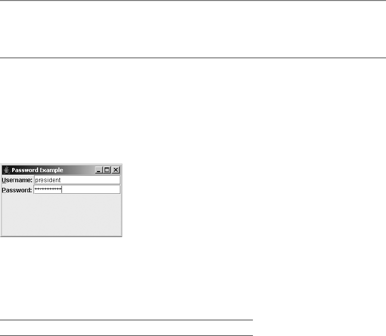
CHAPTER 15 ■ BASIC TEXT COMPONENTS 565
■Caution The JPasswordField also has a deprecated read-only text property, which you should avoid
using. You should use the password property instead, because it returns a char[] that can be cleared
immediately after usage. A String must wait for the garbage collector to dispose of it.
Customizing a JPasswordField Look and Feel
The JPasswordField is a subclass of a JTextField. It has the same appearance under all the
predefined look and feel types as the JTextField (see Figure 15-15). The one difference is that
the current echoChar property setting masks the content. This is shown in Figure 15-16. The top
text component is a JTextField; the bottom one is a JPasswordField.
Figure 15-16. JPasswordField sample in Ocean theme
The set of 17 UIResource-related properties for a JPasswordField is shown in Table 15-7.
Table 15-7. JPasswordField UIResource Elements
Property String Object Type
PasswordField.actionMap ActionMap
PasswordField.background Color
PasswordField.border Border
PasswordField.caretAspectRatio Number
PasswordField.caretBlinkRate Integer
PasswordField.caretForeground Color
PasswordField.disabledBackground Color
PasswordField.focusInputMap InputMap
PasswordField.font Font
PasswordField.foreground Color
PasswordField.inactiveBackground Color
PasswordField.inactiveForeground Color
PasswordField.keyBindings KeyBinding[ ]

566 CHAPTER 15 ■ BASIC TEXT COMPONENTS
JFormattedTextField Class
The JFormattedTextField provides support for the input of formatted text. When the compo-
nent is created, you define a mask for the input. That mask can be in the form of one of four
styles: a java.text.Format object, an AbstractFormatter, an AbstractFormatterFactory, or an
actual value of a different type (such as 3.141592).
The system provides several abstract formatters for you to work with, depending on the
type of data you want a user to input. For instance, the NumberFormatter is available to enter
numbers, and the DateFormatter is available for entering dates. There is also a MaskFormatter for
describing input with edit strings, like "XXX-XX-XXX" for a United States social security number. If
you want different display and edit formats, you can use the AbstractFormatterFactory. You’ll
learn more about formatters and formatter factories in Chapter 16.
Creating a JFormattedTextField
There are six constructors for the JFormattedTextField class:
public JFormattedTextField()
JFormattedTextField formattedField = new JFormattedTextField();
public JFormattedTextField(Format format)
DateFormat format = new SimpleDateFormat("yyyy--MMMM--dd");
JFormattedTextField formattedField = new JFormattedTextField(format);
public JFormattedTextField(JFormattedTextField.AbstractFormatter formatter)
DateFormat displayFormat = new SimpleDateFormat("yyyy--MMMM--dd");
DateFormatter displayFormatter = new DateFormatter(displayFormat);
JFormattedTextField formattedField = new JFormattedTextField(displayFormatter);
public JFormattedTextField(JFormattedTextField.AbstractFormatterFactory factory)
DateFormat displayFormat = new SimpleDateFormat("yyyy--MMMM--dd");
DateFormatter displayFormatter = new DateFormatter(displayFormat);
DateFormat editFormat = new SimpleDateFormat("MM/dd/yy");
DateFormatter editFormatter = new DateFormatter(editFormat);
DefaultFormatterFactory factory = new DefaultFormatterFactory(
displayFormatter, displayFormatter, editFormatter);
JFormattedTextField formattedField = new JFormattedTextField(factory);
PasswordField.margin Insets
PasswordField.selectionBackground Color
PasswordField.selectionForeground Color
PasswordFieldUI String
Table 15-7. JPasswordField UIResource Elements (Continued)
Property String Object Type

CHAPTER 15 ■ BASIC TEXT COMPONENTS 567
public JFormattedTextField(JFormattedTextField.AbstractFormatterFactory factory,
Object currentValue)
DateFormat displayFormat = new SimpleDateFormat("yyyy--MMMM--dd");
DateFormatter displayFormatter = new DateFormatter(displayFormat);
DateFormat editFormat = new SimpleDateFormat("MM/dd/yy");
DateFormatter editFormatter = new DateFormatter(editFormat);
DefaultFormatterFactory factory = new DefaultFormatterFactory(
displayFormatter, displayFormatter, editFormatter);
JFormattedTextField formattedField = new JFormattedTextField(factory, new Date());
public JFormattedTextField(Object value)
JFormattedTextField formattedField = new JFormattedTextField(new Date());
The no-argument version requires you to configure it later. The other constructors allow
you to configure what and how input will be accepted into the component.
JFormattedTextField Properties
Table 15-8 shows the eight properties of JFormattedTextField. Instead of getting the contents
of the JFormattedTextField as a String via the text property, as you would with a JTextField,
you get it as an Object via the value property. Thus, if your formatter were for a Date object, the
value you get back could be cast to type java.util.Date.
Listing 15-14 demonstrates the user of JFormattedTextField with custom formatters and
factories. Notice that when you edit the bottom text field, the display format and edit format
are different.
Table 15-8. JFormattedTextField Properties
Property Name Data Type Access
actions Action[ ] Read-only
document Document Write-only
editValid boolean Read-only
focusLostBehavior int Read-write
formatter JFormattedTextField.AbstractFormatter Read-only
formatterFactory JFormattedTextField.AbstractFormatterFactory Read-write bound
UIClassID String Read-only
value Object Read-write bound
568 CHAPTER 15 ■ BASIC TEXT COMPONENTS
Listing 15-14. JFormattedTextField Example
import javax.swing.*;
import javax.swing.text.*;
import javax.swing.event.*;
import java.awt.*;
import java.awt.event.*;
import java.util.*;
import java.text.*;
public class FormattedSample {
public static void main(final String args[]) {
Runnable runner = new Runnable() {
public void run() {
JFrame frame = new JFrame("Formatted Example");
frame.setDefaultCloseOperation(JFrame.EXIT_ON_CLOSE);
JPanel datePanel = new JPanel(new BorderLayout());
JLabel dateLabel = new JLabel("Date: ");
dateLabel.setDisplayedMnemonic(KeyEvent.VK_D);
DateFormat format = new SimpleDateFormat("yyyy--MMMM--dd");
JFormattedTextField dateTextField = new JFormattedTextField(format);
dateLabel.setLabelFor(dateTextField);
datePanel.add(dateLabel, BorderLayout.WEST);
datePanel.add(dateTextField, BorderLayout.CENTER);
frame.add(datePanel, BorderLayout.NORTH);
JPanel date2Panel = new JPanel(new BorderLayout());
JLabel date2Label = new JLabel("Date 2: ");
date2Label.setDisplayedMnemonic(KeyEvent.VK_A);
DateFormat displayFormat = new SimpleDateFormat("yyyy--MMMM--dd");
DateFormatter displayFormatter = new DateFormatter(displayFormat);
DateFormat editFormat = new SimpleDateFormat("MM/dd/yy");
DateFormatter editFormatter = new DateFormatter(editFormat);
DefaultFormatterFactory factory = new DefaultFormatterFactory(
displayFormatter, displayFormatter, editFormatter);
JFormattedTextField date2TextField = new JFormattedTextField(factory,
new Date());
date2Label.setLabelFor(date2TextField);
date2Panel.add(date2Label, BorderLayout.WEST);
date2Panel.add(date2TextField, BorderLayout.CENTER);
frame.add(date2Panel, BorderLayout.SOUTH);
ActionListener actionListener = new ActionListener() {
public void actionPerformed(ActionEvent actionEvent) {
JFormattedTextField source =
(JFormattedTextField)actionEvent.getSource();
Object value = source.getValue();

CHAPTER 15 ■ BASIC TEXT COMPONENTS 569
System.out.println("Class: " + value.getClass());
System.out.println("Value: " + value);
}
};
dateTextField.addActionListener(actionListener);
date2TextField.addActionListener(actionListener);
frame.setSize(250, 100);
frame.setVisible(true);
}
};
EventQueue.invokeLater(runner);
}
}
Customizing a JFormattedTextField Look and Feel
Like the JPasswordField,JFormattedTextField is a subclass of a JTextField. It, too, has the
same appearance as the JTextField under all the predefined look and feel types (see Figure 15-15).
To customize its display, you can change any of the set of 16 UIResource-related properties for
aJFormattedTextField, as shown in Table 15-9.
Table 15-9. JFormattedTextField UIResource Elements
Property String Object Type
FormattedTextField.actionMap ActionMap
FormattedTextField.background Color
FormattedTextField.border Border
FormattedTextField.caretAspectRatio Number
FormattedTextField.caretBlinkRate Integer
FormattedTextField.caretForeground Color
FormattedTextField.focusInputMap InputMap
FormattedTextField.font Font
FormattedTextField.foreground Color
FormattedTextField.inactiveBackground Color
FormattedTextField.inactiveForeground Color
FormattedTextField.keyBindings KeyBinding[ ]
FormattedTextField.margin Insets
FormattedTextField.selectionBackground Color
FormattedTextField.selectionForeground Color
FormattedTextFieldUI String

570 CHAPTER 15 ■ BASIC TEXT COMPONENTS
JTextArea Class
The JTextArea component is the text component for multiple-line input. Similar to the
JTextField, the data model for a JTextArea is the PlainDocument implementation of the
Document interface. Therefore, the JTextArea is limited to single-attributed text. As with other
Swing components that may require scrolling, the JTextArea doesn’t support scrolling itself.
You need to place each JTextArea within a JScrollPane to allow a user to properly scroll through
the contents of a JTextArea.
Creating a JTextArea
There are six constructors for creating a JTextArea:
public JTextArea()
JTextArea textArea = new JTextArea();
public JTextArea(Document document)
Document document = new PlainDocument();
JTextArea textArea = new JTextArea(document);
public JTextArea(String text)
JTextArea textArea = new JTextArea("...");
public JTextArea(int rows, int columns)
JTextArea textArea = new JTextArea(10, 40);
public JTextArea(String text, int rows, int columns)
JTextArea textArea = new JTextArea("...", 10, 40);
public JTextArea(Document document, String text, int rows, int columns)
JTextArea textArea = new JTextArea(document, null, 10, 40);
Unless otherwise specified, the text area is able to hold zero rows and columns of content.
Although this might sound like a serious limitation, you’re just telling the text area to let the
current LayoutManager worry about the size of your text area. The contents of the JTextArea are
initially empty unless specified from either the starting text string or the Document model.
■Note Other initial settings for a JTextArea include having a tab stop every eight positions and turning off
word wrap. For more on tab stops, see the TabStop and TabSet class descriptions in Chapter 16.
After creating a JTextArea, remember to place the JTextArea into a JScrollPane. Then if
there isn’t sufficient space on the screen, the JScrollPane will manage the scrolling for you.
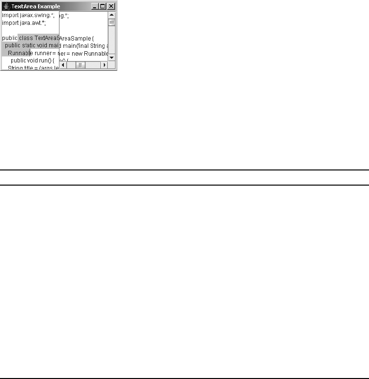
CHAPTER 15 ■ BASIC TEXT COMPONENTS 571
JTextArea textArea = new JTextArea();
JScrollPane scrollPane = new JScrollPane(textArea);
content.add(scrollPane);
Figure 15-17 shows how a JTextArea looks within a JScrollPane and outside a JScrollPane. In
the JTextArea not in the JScrollPane, you can’t see the text that falls below the bottom screen
border. By design, moving the cursor into that area doesn’t cause the content at the top to
move up.
Figure 15-17. A JTextArea without a JScrollPane and one within a JScrollPane
JTextArea Properties
Table 15-10 shows the 12 properties of JTextArea.
Table 15-10. JTextArea Properties
Property Name Data Type Access
accessibleContext AccessibleContext Read-only
columns int Read-write
font Font Write-only
lineCount int Read-only
lineWrap boolean Read-write bound
preferredScrollableViewportSize Dimension Read-only
preferredSize Dimension Read-only
rows int Read-write
scrollableTracksViewportWidth boolean Read-only
tabSize int Read-write bound
UIClassID String Read-only
wrapStyleWord boolean Read-write bound

572 CHAPTER 15 ■ BASIC TEXT COMPONENTS
The rows and columns properties come directly from the constructor arguments. The
preferredScrollableViewportSize and scrollableTracksViewportWidth properties come from
implementing the Scrollable interface for scrolling support. The font and preferredSize
properties merely customize the behavior inherited from JTextComponent.
That leaves the more interesting properties of lineCount,tabSize, and lineWrap with
wrapStyleWord to examine. The lineCount property allows you to find out how many lines are
in the text area. This is useful for sizing purposes. The tabSize property allows you to control
the tab position interval within the text area. By default, this value is 8.
The lineWrap and wrapStyleWord properties work together. By default, the wrapping of
long lines is disabled. If you enable line wrapping (by setting the lineWrap property to true), the
point at which long lines wrap depends on the wrapStyleWord property setting. Initially, this
property is false, which means that if the lineWrap property is true, line wrapping happens at
character boundaries. If both lineWrap and wrapStyleWord are true, then each word from a line
that doesn’t fit is wrapped to another line, as it is in a word processor. So, to get the word wrap
capabilities that most people want, you should set both properties to true for your JTextArea:
JTextArea textArea = new JTextArea("...");
textArea.setLineWrap(true);
textArea.setWrapStyleWord(true);
JScrollPane scrollPane = new JScrollPane(textArea);
■Note The Ctrl-Tab and Shift-Ctrl-Tab key combinations allow users to change focus from within
JTextArea components without needing to subclass the component.
Handling JTextArea Events
No events are specific to a JTextArea. You can use one of the inherited listeners from
JTextComponent (or one of its parents) or attach an InputVerifier.
At times, you’ll just have a JTextArea on the screen and get its contents after the user
presses a button. Other times, there’s a bit more planning involved, where you might monitor
input as it is entered, and possibly convert something like :-) to a smiley face: ☺.
Customizing a JTextArea Look and Feel
Each installable Swing look and feel provides a different JTextArea appearance and set of
default UIResource values. Figure 15-18 shows the appearance of the JTextArea component for
the preinstalled set of look and feel types. Notice that the primary difference in the appearance
of each is the scrollbar from the JScrollPane, which is not a part of the actual JTextArea.

CHAPTER 15 ■ BASIC TEXT COMPONENTS 573
Figure 15-18. JTextArea under different look and feel types
The available set of 15 UIResource-related properties for a JTextArea is listed in Table 15-11.
Table 15-11. JTextArea UIResource Elements
Property String Object Type
TextArea.actionMap ActionMap
TextArea.background Color
TextArea.border Border
TextArea.caretAspectRatio Number
TextArea.caretBlinkRate Integer
TextArea.caretForeground Color
TextArea.focusInputMap InputMap
TextArea.font Font
TextArea.foreground Color
TextArea.inactiveForeground Color
TextArea.keyBindings KeyBinding[ ]
TextArea.margin Insets
TextArea.selectionBackground Color
TextArea.selectionForeground Color
TextAreaUI String
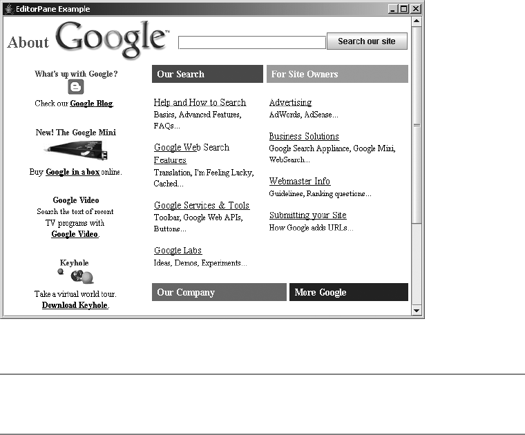
574 CHAPTER 15 ■ BASIC TEXT COMPONENTS
JEditorPane Class
The JEditorPane class provides the ability to display and edit multiple-attributed text. While
the JTextField and JTextArea support only single-color, single-font content, the JEditorPane
allows you to tag your content with various styles (such as bold, italics, 14-point Helvetica,
right-justified paragraphs) or with the appearance of an HTML viewer, as shown in Figure 15-19.
Figure 15-19. Sample JEditorPane as an HTML viewer
■Note The HTML support for JEditorPane is only at the HTML 3.2 level with some extensions, whereas
HTML 4.0x is the current version as of this writing. Cascading Style Sheets (CSS) are partially supported.
The JEditorPane supports the display and editing of multiple-attributed text through the
help of an EditorKit specific to the text-markup mechanism. Predefined kits exist to support
raw text, HTML documents, and Rich Text Format (RTF) documents. Because the content is
multiple-attributed, the PlainDocument model is no longer sufficient. Instead, Swing provides a
StyledDocument in the form of the DefaultStyledDocument class for maintaining the document
model. The remaining part of the mix is the new HyperlinkListener/HyperlinkEvent event-
handling pair for monitoring hyperlink operations within the document.

CHAPTER 15 ■ BASIC TEXT COMPONENTS 575
Creating a JEditorPane
The JEditorPane has four constructors:
public JEditorPane()
JEditorPane editorPane = new JEditorPane();
public JEditorPane(String type, String text)
String content = "<H1>Got Java?</H1>";
String type = "text/html";
JEditorPane editorPane = new JEditorPane(type, content);
public JEditorPane(String urlString) throws IOException
JEditorPane editorPane = new JEditorPane("http://www.apress.com");
public JEditorPane(URL url) throws IOException
URL url = new URL("http://www.apress.com");
JEditorPane editorPane = new JEditorPane(url);
The no-argument constructor creates an empty JEditorPane. If you want to initialize the
contents, you can directly specify the text and its MIME type. Or, you can specify the URL for
where to get the contents. The URL can be specified as either a String or a URL object. When
you specify the contents as a URL, the JEditorPane determines the MIME type from the response.
JEditorPane Properties
Table 15-12 shows the 11 properties of JEditorPane. Most of the properties just customize the
behavior of the parent classes.
Table 15-12. JEditorPane Properties
Property Name Data Type Access
accessibleContext AccessibleContext Read-only
contentType String Read-write
editorKit EditorKit Read-write bound
hyperlinkListeners HyperlinkListener[ ] Read-only
page URL Read-write bound
page String Write-only bound
preferredSize Dimension Read-only
scrollableTracksViewportHeight boolean Read-only
scrollableTracksViewportWidth boolean Read-only
text String Read-write
UIClassID String Read-only

576 CHAPTER 15 ■ BASIC TEXT COMPONENTS
■Note The page property is nonstandard in the sense it has two setter methods, but only one getter.
Four interesting properties of JEditorPane are the editorKit,contentType,page, and text.
The editorKit property is configured based on the type of content in the editor pane. It is
covered in more detail in Chapter 16, with its DefaultEditorKit,StyledEditorKit, and
HTMLEditorKit implementations. The contentType property represents the MIME type of the
content inside the document. This property tends to be automatically set when you set up
the content in the constructor (or elsewhere). In the event the editor kit is unable to determine the
MIME type, you can manually set it. The three MIME types with built-in support are text/html,
text/plain, and text/rtf, as reported by the getContentType() method of the predefined
editor kits.
The page property allows you to change the displayed contents to reflect the contents of a
specific URL so that you can use the contents in some manner not programmed into the envi-
ronment. The text property allows you to find out what the textual content is based on the
current Document model.
Handling JEditorPane Events
Because JEditorPane is just another text area component with some special display character-
istics, it supports the same set of listeners for event handling as does the JTextArea component.
In addition, the JEditorPane provides a special listener-event combination to deal with hyper-
links within a document.
The HyperlinkListener interface defines one method, public void hyperlinkUpdate
(HyperlinkEvent hyperlinkEvent), which works with a HyperlinkEvent to respond to—not
surprisingly—a hyperlink event. The event includes a HyperlinkEvent.EventType that reports
on the type of event and allows you to react differently, either by following the link when
selected or possibly changing the cursor when moving the mouse over (or off) the hyperlink
(although this happens by default).
Here is the HyperlinkListener definition:
public interface HyperlinkListener implements EventListener {
public void hyperlinkUpdate(HyperlinkEvent hyperlinkEvent);
}
And, here is the HyperlinkEvent definition:
public class HyperlinkEvent extends EventObject {
// Constructors
public HyperlinkEvent(Object source, HyperlinkEvent.EventType type, URL url);
public HyperlinkEvent(Object source, HyperlinkEvent.EventType type, URL url,
String description);
public HyperlinkEvent(Object source, HyperlinkEvent.EventType type, URL url,
String description, Element sourceElement)
// Properties
public String getDescription();
CHAPTER 15 ■ BASIC TEXT COMPONENTS 577
public HyperlinkEvent.EventType getEventType();
public Element getSourceElement();
public URL getURL();
}
The hyperlink event types will be one of three constants within the HyperlinkEvent.EventType
class:
•ACTIVATED: Usually involving a mouse click over the appropriate content
•ENTERED: Moving the mouse over the hyperlink content
•EXITED: Moving the mouse out of the hyperlink content
Therefore, if you want to create a HyperlinkListener that displays the URL in a status bar
while over a hyperlink and follows the hyperlink when activated, you can create your own
miniature HTML help viewer. The HyperlinkListener implementation in Listing 15-15 will do
the trick for you. There are println statements present in the listener to display the URL when
the mouse is over the URL and when the URL is activated.
Listing 15-15. HyperlinkListener Example
import java.awt.*;
import javax.swing.*;
import javax.swing.text.*;
import javax.swing.event.*;
import java.io.*;
import java.net.*;
public class ActivatedHyperlinkListener implements HyperlinkListener {
Frame frame;
JEditorPane editorPane;
public ActivatedHyperlinkListener(Frame frame, JEditorPane editorPane) {
this.frame = frame;
this.editorPane = editorPane;
}
public void hyperlinkUpdate(HyperlinkEvent hyperlinkEvent) {
HyperlinkEvent.EventType type = hyperlinkEvent.getEventType();
final URL url = hyperlinkEvent.getURL();
if (type == HyperlinkEvent.EventType.ENTERED) {
System.out.println("URL: " + url );
} else if (type == HyperlinkEvent.EventType.ACTIVATED) {
System.out.println("Activated");
Runnable runner = new Runnable() {
public void run() {

578 CHAPTER 15 ■ BASIC TEXT COMPONENTS
// Retain reference to original
Document doc = editorPane.getDocument();
try {
editorPane.setPage(url);
} catch (IOException ioException) {
JOptionPane.showMessageDialog(frame, "Error following link",
"Invalid link", JOptionPane.ERROR_MESSAGE);
editorPane.setDocument(doc);
}
}
};
EventQueue.invokeLater(runner);
}
}
}
■Tip Don’t forget to make the JEditorPane read-only with a call to setEditable(false). Otherwise,
the viewer acts as an editor.
Listing 15-16 is a complete example using our new ActivatedHyperlinkListener class. The
frame it creates looks like the page shown earlier in Figure 15-19, although in the figure, the
About link has been followed.
Listing 15-16. JEditorPane Example
import javax.swing.*;
import javax.swing.event.*;
import java.awt.*;
import java.io.*;
public class EditorPaneSample {
public static void main(String args[]) {
Runnable runner = new Runnable() {
public void run() {
JFrame frame = new JFrame("EditorPane Example");
frame.setDefaultCloseOperation(JFrame.EXIT_ON_CLOSE);
try {
JEditorPane editorPane = new JEditorPane("http://www.google.com");
editorPane.setEditable(false);
HyperlinkListener hyperlinkListener =
new ActivatedHyperlinkListener(frame, editorPane);
editorPane.addHyperlinkListener(hyperlinkListener);

CHAPTER 15 ■ BASIC TEXT COMPONENTS 579
JScrollPane scrollPane = new JScrollPane(editorPane);
frame.add(scrollPane);
} catch (IOException e) {
System.err.println("Unable to load: " + e);
}
frame.setSize(640, 480);
frame.setVisible(true);
}
};
EventQueue.invokeLater(runner);
}
}
Customizing a JEditorPane Look and Feel
The appearance of the JEditorPane is similar to that of a JTextArea (see Figure 15-18). Although
the supported contents differ, the look-and-feel–related attributes usually aren’t different.
The available set of 15 UIResource-related properties for a JEditorPane is shown in Table 15-13.
Their names are similar to those of the JTextArea settings.
Table 15-13. JEditorPane UIResource Elements
Property String Object Type
EditorPane.actionMap ActionMap
EditorPane.background Color
EditorPane.border Border
EditorPane.caretAspectRatio Number
EditorPane.caretBlinkRate Integer
EditorPane.caretForeground Color
EditorPane.focusInputMap InputMap
EditorPane.font Font
EditorPane.foreground Color
EditorPane.inactiveForeground Color
EditorPane.keyBindings KeyBinding[ ]
EditorPane.margin Insets
EditorPane.selectionBackground Color
EditorPane.selectionForeground Color
EditorPaneUI String
580 CHAPTER 15 ■ BASIC TEXT COMPONENTS
JTextPane Class
The JTextPane is a specialized form of the JEditorPane designed especially for the editing (and
display) of styled text. It differs from the JEditorPane only in its manner of providing the content to
display because the text isn’t tagged with the styles as it would be in an HTML or RTF document.
The JTextPane relies on three interfaces for the setting of text attributes: AttributeSet for
a basic collection of attributes, MutableAttributeSet for a changeable collection of attributes,
and Style for a set of attributes to be associated with a part of a StyledDocument.
This section will introduce JTextPane. See Chapter 16 for additional information about
configuring styles for different parts of the styled content within a JTextPane.
Creating a JTextPane
There are only two constructors for JTextPane:
public JTextPane()
JTextPane textPane = new JTextPane();
JScrollPane scrollPane = new JScrollPane(textPane);
public JTextPane(StyledDocument document)
StyledDocument document = new DefaultStyledDocument();
JTextPane textPane = new JTextPane(document);
JScrollPane scrollPane = new JScrollPane(textPane);
The no-argument constructor initially has zero contents. The second constructor allows
you to create the Document first, and then use it in the JTextPane.
■Tip Remember to place your JTextPane within a JScrollPane if the contents will be larger than the
available screen space.
JTextPane Properties
Table 15-14 shows the eight properties of JTextPane. You’ll look at these in greater detail in
Chapter 16.
Table 15-14. JTextPane Properties
Property Name Data Type Access
characterAttributes AttributeSet Read-only
document Document Write-only bound
editorKit EditorKit Write-only bound

CHAPTER 15 ■ BASIC TEXT COMPONENTS 581
*Changing the styledDocument property triggers a bound property notification on the document property.
Customizing a JTextPane Look and Feel
The JTextPane is a subclass of a JEditorPane. It has the same appearance under all the predefined
look and feel types as the JTextArea (see Figure 15-18). Although the contents might differ, the
look and feel is the same.
The available set of UIResource-related properties for a JTextPane is shown in Table 15-15.
For the JTextPane component, there are 15 different properties. Their names are similar to the
JTextArea settings.
inputAttributes MutableAttributeSet Read-only
logicalStyle Style Read-write
paragraphAttributes AttributeSet Read-only
styledDocument StyledDocument Read-write*
UIClassID String Read-only
Table 15-15. JTextPane UIResource Elements
Property String Object Type
TextPane.actionMap ActionMap
TextPane.background Color
TextPane.border Border
TextPane.caretAspectRatio Number
TextPane.caretBlinkRate Integer
TextPane.caretForeground Color
TextPane.focusInputMap InputMap
TextPane.font Font
TextPane.foreground Color
TextPane.inactiveForeground Color
TextPane.keyBindings KeyBinding[ ]
TextPane.margin Insets
TextPane.selectionBackground Color
TextPane.selectionForeground Color
TextPaneUI String
Table 15-14. JTextPane Properties (Continued)
Property Name Data Type Access
582 CHAPTER 15 ■ BASIC TEXT COMPONENTS
Loading a JTextPane with Content
Listing 15-17 provides an example that loads the content for a StyledDocument for a JTextPane.
This is just to give you an idea of the possibilities. The details of using Style,SimpleAttributeSet,
and StyleConstants will be discussed in Chapter 16.
Listing 15-17. JTextPane Example
import javax.swing.*;
import javax.swing.text.*;
import javax.swing.event.*;
import java.awt.*;
public class TextPaneSample {
private static String message =
"In the beginning, there was COBOL, then there was FORTRAN, " +
"then there was BASIC, ... and now there is Java.\n";
public static void main(String args[]) {
Runnable runner = new Runnable() {
public void run() {
JFrame frame = new JFrame("TextPane Example");
frame.setDefaultCloseOperation(JFrame.EXIT_ON_CLOSE);
StyleContext context = new StyleContext();
StyledDocument document = new DefaultStyledDocument(context);
Style style = context.getStyle(StyleContext.DEFAULT_STYLE);
StyleConstants.setAlignment(style, StyleConstants.ALIGN_RIGHT);
StyleConstants.setFontSize(style, 14);
StyleConstants.setSpaceAbove(style, 4);
StyleConstants.setSpaceBelow(style, 4);
// Insert content
try {
document.insertString(document.getLength(), message, style);
} catch (BadLocationException badLocationException) {
System.err.println("Oops");
}
SimpleAttributeSet attributes = new SimpleAttributeSet();
StyleConstants.setBold(attributes, true);
StyleConstants.setItalic(attributes, true);
// Insert content
try {
document.insertString(document.getLength(), "Hello Java", attributes);
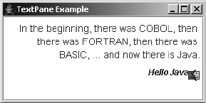
CHAPTER 15 ■ BASIC TEXT COMPONENTS 583
} catch (BadLocationException badLocationException) {
System.err.println("Oops");
}
// Third style for icon/component
Style labelStyle = context.getStyle(StyleContext.DEFAULT_STYLE);
Icon icon = new ImageIcon("Computer.gif");
JLabel label = new JLabel(icon);
StyleConstants.setComponent(labelStyle, label);
// Insert content
try {
document.insertString(document.getLength(), "Ignored", labelStyle);
} catch (BadLocationException badLocationException) {
System.err.println("Oops");
}
JTextPane textPane = new JTextPane(document);
textPane.setEditable(false);
JScrollPane scrollPane = new JScrollPane(textPane);
frame.add(scrollPane, BorderLayout.CENTER);
frame.setSize(300, 150);
frame.setVisible(true);
}
};
EventQueue.invokeLater(runner);
}
}
The key line of the source code is the call to insertString() and its style argument:
document.insertString(document.getLength(), message, style);
Figure 15-20 shows how a JTextPane might look like with a few paragraphs of content.
Notice that the content is not restricted to just text; it can have images as well.
Figure 15-20. Sample JTextPane
584 CHAPTER 15 ■ BASIC TEXT COMPONENTS
Summary
In this chapter, you began to explore the details of the Swing text components. You initially
looked at the root text component, JTextComponent, and the many operations it defines for
all other text components. You then explored the specific text components of JTextField,
JPasswordField,JFormattedTextField,JTextArea,JEditorPane, and JTextPane.
You also explored the various pieces that make up the different components. You delved
into the data model for the text components, based on the Document interface, for the
AbstractDocument and PlainDocument classes. You also looked at creating a custom document
filter via DocumentFilter for restricting input to a text component. In addition, you explored the
Caret and Highlighter interfaces for displaying the cursor and highlighted text, the
NavigationFilter for limiting movement within the text component, as well as the Keymap to
make the text component act as the controller. As the controller, the Keymap converts a user’s
keystrokes into specific actions that affect the model for the text component.
You also looked at how events are handled within the Swing text components. In addition
to the basic AWT event handling classes, Swing adds some new ones designed for listening
for cursor movement with the CaretListener and document content changes with the
DocumentListener. The JEditorPane also provides another event handler with the
HyperlinkListener. And there is the general Swing support for input verification through
InputVerifier.
In Chapter 16, you’ll further explore the Swing text components. This chapter touched on
the basic features of all the components, while the next chapter goes into all the gory details of
working with the TextAction, formatting input for a JFormattedTextField, and configuring
Style objects to work with a StyledDocument. You’ll also look into shuffling through the tags
of your HTMLDocument.

585
■ ■ ■
CHAPTER 16
Advanced Text Capabilities
In Chapter 15, you were introduced to the myriad capabilities of the Swing text components.
In this chapter, you’ll continue on the same path by looking at some advanced capabilities that
will prove useful in special situations.
The Swing text components ship with many prefabricated features. For instance, as you
saw in Chapter 15, although text components have methods such as cut(),copy(), and paste()
to work with the system clipboard, you really don’t need to use them. This is because the Swing
text components come with their own predefined set of Action objects, which you’ll explore in
this chapter. To use Action objects, just attach them to a component, such as a button or menu
item, and then simply select the component that triggers the Action. For text components, the
Action object is an instance of TextAction, which has a nice additional feature of knowing
which text component last had the input focus.
In this chapter, you’ll also look at how to create stylized text for display in a JTextPane.
If you want to display multicolored text documents or different font styles, the JTextPane
component provides a series of interfaces and classes to describe the attributes attached to
the document. The AttributeSet interface gives you these on a read-only basis, and the
MutableAttributeSet interface extends AttributeSet in order to set attributes. You’ll see how
the SimpleAttributeSet class implements both of these interfaces by offering a Hashtable to
store the text attributes, and how the StyleConstants class helps to configure the many text
attributes you can apply. And, you’ll learn how to work with tab stops within your text documents,
including how to define leader characters and how text is aligned.
Next, you’ll get a glimpse of the different editor kits that Swing provides, focusing on the
inner workings of the HTMLDocument. When the JEditorPane displays HTML, the HTMLEditorKit
controls how to load and display the HTML content into an HTMLDocument. You’ll see how the
parser loads the content and how to iterate through the different tags in the document.
Lastly, you’ll learn how to take advantage of the formatted input options and validation
available with the JFormattedTextField component. You’ll see how to provide for formatted
dates and numbers, as well as masked input like telephone and social security numbers.
Using Actions with Text Components
The TextAction class is a special case of the Action interface that was defined with the other
Swing event-handling capabilities in Chapter 2 and briefly reviewed in Chapter 15. The purpose
of the TextAction class is to provide concrete Action implementations that can work with text
components. These implementations are smart enough to know which text component most
recently had the input focus and therefore should be the subject of the action.

586 CHAPTER 16 ■ ADVANCED TEXT CAPABILITIES
For every text component, you need a way to associate keystrokes with specific actions.
This is done via the Keymap interface, which maps a KeyStroke to a TextAction, so that separate
KeyListener objects don’t need to be associated with the text component for each keystroke in
order to listen for it. Key maps can be shared across multiple components and/or customized
for a particular look and feel. The JTextComponent also has getKeymap() and setKeymap() methods
that allow you to read or customize the key map.
■Note Although the Swing text components use TextAction,KeyStroke, and Keymap, they still support
the ability to attach a KeyListener. Using a KeyListener, however, usually isn’t appropriate, especially
when you want to restrict input to match certain criteria. The better approach for restricting input is to come
up with a custom DocumentFilter, as demonstrated in Chapter 15, or use an InputVerifier. In addition,
the actual Keymap implementation is just a wrapper to the InputMap/ActionMap combination used for
keyboard-action mapping in the nontextual Swing components.
The text components come with many predefined TextAction implementations. Through
a default key map, the text components know about these predefined actions, so they know
how to insert and remove content, as well as how to track the positions of both the cursor and
caret. If the text component supports stylized content, as JTextPane does, there are additional
default actions to support this content. All these implementations derive from the JFC/Swing
technology editor kits. As discussed in the “The Editor Kits” section later in this chapter, an
editor kit provides a logical grouping of the various ways to edit a specific type of text component.
Listing Actions
To find out which actions a JTextComponent supports, you merely ask by using the public
Action[ ] getActions() method. This will return an array of Action objects, usually of type
TextAction, that can be used like any other Action, such as for creating buttons on a JToolBar.
Figure 16-1 shows a program that will list the actions for the different predefined components.
Pick a component from the JRadioButton group, and its list of text actions will be displayed in
the text area. For each action, the program shows the action name and class name.
Figure 16-1. TextAction list demonstration
CHAPTER 16 ■ ADVANCED TEXT CAPABILITIES 587
The same set of 53 actions is available for all text components. JTextField,
JFormattedTextField, and JPasswordField have one extra action, called notify-field-accept,
used for detecting when the Enter key is pressed while in the text component. The
JFormattedTextField has a second extra action, reset-field-edit, for when the contents don’t
validate against the provided format mask. JTextPane adds its own set of about 20 more actions
for dealing with multiple-attributed text.
Listing 16-1 shows the source used to generate Figure 16-1. The RadioButtonUtils class
was created in Chapter 5.
Listing 16-1. Listing Text Component Actions
import javax.swing.*;
import javax.swing.text.*;
import java.awt.*;
import java.awt.event.*;
import java.io.*;
import java.util.*;
public class ListActions {
public static void main(String args[]) {
Runnable runner = new Runnable() {
public void run() {
JFrame frame = new JFrame("TextAction List");
frame.setDefaultCloseOperation(JFrame.EXIT_ON_CLOSE);
String components[] = {
"JTextField", "JFormattedTextField", "JPasswordField",
"JTextArea", "JTextPane", "JEditorPane"};
final JTextArea textArea = new JTextArea();
textArea.setEditable(false);
JScrollPane scrollPane = new JScrollPane(textArea);
frame.add(scrollPane, BorderLayout.CENTER);
ActionListener actionListener = new ActionListener() {
public void actionPerformed(ActionEvent actionEvent) {
// Determine which component selected
String command = actionEvent.getActionCommand();
JTextComponent component = null;
if (command.equals("JTextField")) {
component = new JTextField();
} else if (command.equals("JFormattedTextField")) {
component = new JFormattedTextField();
} else if (command.equals("JPasswordField")) {
component = new JPasswordField();
588 CHAPTER 16 ■ ADVANCED TEXT CAPABILITIES
} else if (command.equals("JTextArea")) {
component = new JTextArea();
} else if (command.equals("JTextPane")) {
component = new JTextPane();
} else {
component = new JEditorPane();
}
// Process action list
Action actions[] = component.getActions();
// Define comparator to sort actions
Comparator<Action> comparator = new Comparator<Action>() {
public int compare(Action a1, Action a2) {
String firstName = (String)a1.getValue(Action.NAME);
String secondName = (String)a2.getValue(Action.NAME);
return firstName.compareTo(secondName);
}
};
Arrays.sort(actions, comparator);
StringWriter sw = new StringWriter();
PrintWriter pw = new PrintWriter(sw, true);
int count = actions.length;
pw.println("Count: " + count);
for (int i=0; i<count; i++) {
pw.print (actions[i].getValue(Action.NAME));
pw.print (" : ");
pw.println(actions[i].getClass().getName());
}
pw.close();
textArea.setText(sw.toString());
textArea.setCaretPosition(0);
}
};
final Container componentsContainer =
RadioButtonUtils.createRadioButtonGrouping(components,
"Pick to List Actions", actionListener);
frame.add(componentsContainer, BorderLayout.WEST);
frame.setSize(400, 250);
frame.setVisible(true);
}
};
EventQueue.invokeLater(runner);
}
}

CHAPTER 16 ■ ADVANCED TEXT CAPABILITIES 589
Using Actions
So far, you’ve seen that there are many predefined TextAction implementations available
for the various text components, but you haven’t used any of them. By making a few minor
changes to Listing 16-1, you can enhance the program in order to activate it. The modified
program is shown in Listing 16-2. With this version, when one of the radio buttons is selected,
that type of text component will be displayed where the text list of Action objects appears in
Figure 16-1. In addition, the different Action objects are added to a new JMenuBar placed at the
top of the display window.
■Note In the program shown in Listing 16-2, after all the menu buttons are activated, you’re stuck with
a text label that might not be exactly what you want. However, you can easily change this with the public
void setText(String label) method of JMenuItem. If you do this, remember that you need to know
what’s in the menu item to change the label to something meaningful.
Listing 16-2. Enabling Text Component Actions
import javax.swing.*;
import javax.swing.text.*;
import java.awt.*;
import java.awt.event.*;
import java.io.*;
import java.util.*;
public class ActionsMenuBar {
public static void main(String args[]) {
Runnable runner = new Runnable() {
public void run() {
final JFrame frame = new JFrame("TextAction Usage");
frame.setDefaultCloseOperation(JFrame.EXIT_ON_CLOSE);
final JScrollPane scrollPane = new JScrollPane();
frame.add(scrollPane, BorderLayout.CENTER);
final JMenuBar menuBar = new JMenuBar();
frame.setJMenuBar(menuBar);
ActionListener actionListener = new ActionListener() {
JTextComponent component;
public void actionPerformed(ActionEvent actionEvent) {
// Determine which component selected
String command = actionEvent.getActionCommand();
if (command.equals("JTextField")) {
component = new JTextField();
590 CHAPTER 16 ■ ADVANCED TEXT CAPABILITIES
} else if (command.equals("JFormattedTextField")) {
component = new JFormattedTextField();
} else if (command.equals("JPasswordField")) {
component = new JPasswordField();
} else if (command.equals("JTextArea")) {
component = new JTextArea();
} else if (command.equals("JTextPane")) {
component = new JTextPane();
} else {
component = new JEditorPane();
}
scrollPane.setViewportView(component);
// Process action list
Action actions[] = component.getActions();
menuBar.removeAll();
menuBar.revalidate();
JMenu menu = null;
for (int i=0, n=actions.length; i<n; i++) {
if ((i % 10) == 0) {
menu = new JMenu("From " + i);
menuBar.add(menu);
}
menu.add(actions[i]);
}
menuBar.revalidate();
}
};
String components[] = {
"JTextField", "JFormattedTextField", "JPasswordField",
"JTextArea", "JTextPane", "JEditorPane"};
final Container componentsContainer =
RadioButtonUtils.createRadioButtonGrouping(components,
"Pick to List Actions", actionListener);
frame.add(componentsContainer, BorderLayout.WEST);
frame.setSize(400, 300);
frame.setVisible(true);
}
};
EventQueue.invokeLater(runner);
}
}
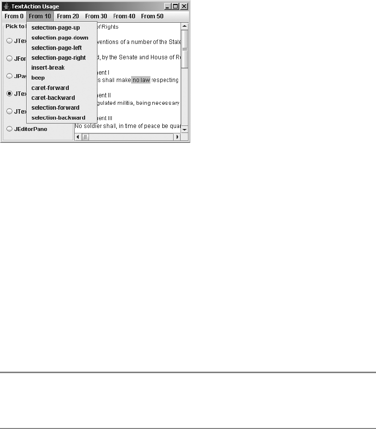
CHAPTER 16 ■ ADVANCED TEXT CAPABILITIES 591
Figure 16-2 shows some of the available operations for a JTextArea. When you select the
different menu options, the JTextComponent is appropriately affected.
Figure 16-2. TextAction list usage demonstration
This technique is useful because it shows that you can readily discover the supported
operations of a text component and provide access to that behavior without knowing precisely
what the actual behavior is. This is just one demonstration of the many ways you can use
TextAction objects.
Finding Actions
Although listing and using Action objects related to a text component is a fairly malleable
process, unless you know what you’re looking for, it isn’t very useful. Thankfully, the
DefaultEditorKit has 46 class constants that match many of the shared 46 (out of 53) Action
objects of all the text components. The class constants’ names more or less reflect their function-
ality. The JTextField adds an additional constant for the Action shared with JFormattedTextField
and JPasswordField. Unfortunately, the names associated with the extra actions available to
the JTextPane aren’t class constants of any text component and are just used internally within
the StyledEditorKit, where you will find the additional Action implementations defined.
■Note One additional Action exists primarily for debugging purposes. Its Action name is dump-model,
and it lacks a class constant to go with it. When initiated, the method literally dumps out the Document model
Element structure for the text component.
Table 16-1 lists the 47 constants available to help you locate the predefined Action you’re
seeking.

592 CHAPTER 16 ■ ADVANCED TEXT CAPABILITIES
With such a huge list of constants, what on earth do you do with them? Well, first you find
the constant for the predefined TextAction you want to use (or learn the necessary text string if
no constant is provided). This is relatively easy because the names are fairly self-explanatory.
To demonstrate, Listing 16-3 contains a program that shows how to work with these constants.
The program has two text areas to show that TextAction objects really know to work with the
last text component that had the input focus. One set of menu items includes two options
that are used to switch the text area from read-only to writable. This action is done using the
DefaultEditorKit.readOnlyAction and DefaultEditorKit.writableAction names. The other
set of menu items includes options for cut, copy, and paste support, whose constants are
DefaultEditorKit.cutAction,DefaultEditorKit.copyAction, and DefaultEditorKit.pasteAction.
Because the constants are String values, you need to look up the actual Action object to use.
Table 16-1. TextAction Name Constants
DefaultEditorKit.backwardAction DefaultEditorKit.previousWordAction
DefaultEditorKit.beepAction DefaultEditorKit.readOnlyAction
DefaultEditorKit.beginAction DefaultEditorKit.selectAllAction
DefaultEditorKit.beginLineAction DefaultEditorKit.selectionBackwardAction
DefaultEditorKit.beginParagraphAction DefaultEditorKit.selectionBeginAction
DefaultEditorKit.beginWordAction DefaultEditorKit.selectionBeginLineAction
DefaultEditorKit.copyAction DefaultEditorKit.selectionBeginParagraphAction
DefaultEditorKit.cutAction DefaultEditorKit.selectionBeginWordAction
DefaultEditorKit.defaultKeyTypedAction DefaultEditorKit.selectionDownAction
DefaultEditorKit.deleteNextCharAction DefaultEditorKit.selectionEndAction
DefaultEditorKit.deletePrevCharAction DefaultEditorKit.selectionEndLineAction
DefaultEditorKit.downAction DefaultEditorKit.selectionEndParagraphAction
DefaultEditorKit.endAction DefaultEditorKit.selectionEndWordAction
DefaultEditorKit.endLineAction DefaultEditorKit.selectionForwardAction
DefaultEditorKit.endParagraphAction DefaultEditorKit.selectionNextWordAction
DefaultEditorKit.endWordAction DefaultEditorKit.selectionPreviousWordAction
DefaultEditorKit.forwardAction DefaultEditorKit.selectionUpAction
DefaultEditorKit.insertBreakAction DefaultEditorKit.selectLineAction
DefaultEditorKit.insertContentAction DefaultEditorKit.selectParagraphAction
DefaultEditorKit.insertTabAction DefaultEditorKit.selectWordAction
DefaultEditorKit.nextWordAction DefaultEditorKit.upAction
DefaultEditorKit.pageDownAction DefaultEditorKit.writableAction
DefaultEditorKit.pageUpAction JTextField.notifyAction
DefaultEditorKit.pasteAction
CHAPTER 16 ■ ADVANCED TEXT CAPABILITIES 593
The lookup process requires getting the ActionMap for the component with getActionMap(),
and then searching for the key with the get() method of ActionMap, as in this example:
Action readAction = component.getActionMap().get(DefaultEditorKit.readOnlyAction);
Listing 16-3. Using Text Component Actions
import javax.swing.*;
import javax.swing.text.*;
import java.awt.*;
import java.awt.event.*;
import java.io.*;
import java.util.*;
public class UseActions {
public static void main(String args[]) {
Runnable runner = new Runnable() {
public void run() {
JFrame frame = new JFrame("Use TextAction");
frame.setDefaultCloseOperation(JFrame.EXIT_ON_CLOSE);
Dimension empty = new Dimension(0,0);
final JTextArea leftArea = new JTextArea();
JScrollPane leftScrollPane = new JScrollPane(leftArea);
leftScrollPane.setPreferredSize(empty);
final JTextArea rightArea = new JTextArea();
JScrollPane rightScrollPane = new JScrollPane(rightArea);
rightScrollPane.setPreferredSize(empty);
JSplitPane splitPane = new JSplitPane(JSplitPane.HORIZONTAL_SPLIT,
leftScrollPane, rightScrollPane);
JMenuBar menuBar = new JMenuBar();
frame.setJMenuBar(menuBar);
JMenu menu = new JMenu("Options");
menuBar.add(menu);
JMenuItem menuItem;
Action readAction =
leftArea.getActionMap().get(DefaultEditorKit.readOnlyAction);
menuItem = menu.add(readAction);
menuItem.setText("Make read-only");
Action writeAction =
leftArea.getActionMap().get(DefaultEditorKit.writableAction);
menuItem = menu.add(writeAction);
menuItem.setText("Make writable");
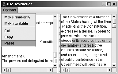
594 CHAPTER 16 ■ ADVANCED TEXT CAPABILITIES
menu.addSeparator();
Action cutAction =
leftArea.getActionMap().get(DefaultEditorKit.cutAction);
menuItem = menu.add(cutAction);
menuItem.setText("Cut");
Action copyAction =
leftArea.getActionMap().get(DefaultEditorKit.copyAction);
menuItem = menu.add(copyAction);
menuItem.setText("Copy");
Action pasteAction =
leftArea.getActionMap().get(DefaultEditorKit.pasteAction);
menuItem = menu.add(pasteAction);
menuItem.setText("Paste");
frame.add(splitPane, BorderLayout.CENTER);
frame.setSize(400, 250);
frame.setVisible(true);
splitPane.setDividerLocation(.5);
}
};
EventQueue.invokeLater(runner);
}
}
Figure 16-3 shows the program at work. Notice that for each JMenuItem created, the text
label changes to give it a more user-friendly setting.
Figure 16-3. Specific TextAction usage demonstration
By asking for specific TextAction instances, you don’t need to constantly recode repetitive
operations. In fact, if you constantly find yourself repeating the same operations over and over
with a text component, it’s probably time for you to create your own TextAction objects.
CHAPTER 16 ■ ADVANCED TEXT CAPABILITIES 595
Creating Styled Text
In Chapter 15, you looked at displaying plain text and HTML. With the Swing text components—
or at least the JTextPane—you can also display stylized text, in which different blocks of text
can have multiple attributes. These attributes might include boldface, italics, a different font
or color at the character level, or justification at the paragraph level, just as with any of the
modern word processors.
To support these capabilities, Swing supplies many different interfaces and classes, all of
which start with the specialized Document interface extension of StyledDocument. The Document
interface was introduced in Chapter 15, focusing on the PlainDocument implementation class.
The StyledDocument interface, or more precisely, the DefaultStyledDocument implementation,
manages a series of styles and attribute sets for the contents of a Document.
The various styles used by a StyledDocument are described initially by the AttributeSet
interface, which is a set of key/value pairs of read-only attributes. The key for an attribute
might be “current font,” in which the setting would be the font to use. To actually change the
font, you need to move on to the MutableAttributeSet interface, which supplies the ability to
add and remove attributes. For instance, if you had an AttributeSet for “bold,” you could use
MutableAttributeSet to also add italics, underlining, or colorization (or all three) to the set.
For a simple implementation of AttributeSet, there is the StyleContext.SmallAttributeSet
class, which uses an array to manage the set of attributes. For an implementation of the
MutableAttributeSet interface, there is the SimpleAttributeSet class, which uses a Hashtable
to manage the attributes. More complex attribute sets move on to the Style interface, which
adds a name to the set of attributes as defined by a MutableAttributeSet. The actual Style
implementation class is the StyleContext.NamedStyle class. Besides adding a name, the Style
interface adds the ability to have a ChangeListener monitor a set of attributes for changes.
The class that manages the set of Style objects for a StyledDocument is the StyleContext
class. An implementation of the AbstractDocument.AttributeContext interface, StyleContext
uses the StyleConstants class, which defines various attributes for commonly used styles.
When working with HTML documents, the StyleContext is actually a StyleSheet, which may
help you in understanding the whole arrangement. Keep in mind that all of the classes and
interfaces discussed here (except StyleSheet) are required just to set up the Document data
model for a particular JTextPane.
StyledDocument Interface and DefaultStyledDocument Class
The StyledDocument interface extends the Document interface by adding the ability to store
styles for the content of the document. These styles can describe the character or paragraph
attributes, such as color, orientation, or font.
public interface StyledDocument extends Document {
public Style addStyle(String nm, Style parent);
public Color getBackground(AttributeSet attribute);
public Element getCharacterElement(int position);
public Font getFont(AttributeSet attribute);
public Color getForeground(AttributeSet attribute);

596 CHAPTER 16 ■ ADVANCED TEXT CAPABILITIES
public Style getLogicalStyle(int position);
public Element getParagraphElement(int position);
public Style getStyle(String name);
public void removeStyle(String name);
public void setCharacterAttributes(int offset, int length, AttributeSet s,
boolean replace);
public void setLogicalStyle(int position, Style style);
public void setParagraphAttributes(int offset, int length, AttributeSet s,
boolean replace);
}
The DefaultStyledDocument class is the implementation of the StyledDocument interface
provided with the Swing components. It serves as the data model for the JTextPane component.
Creating a DefaultStyledDocument
You can create a DefaultStyledDocument in any one of the three ways listed here:
public DefaultStyledDocument()
DefaultStyledDocument document = new DefaultStyledDocument();
public DefaultStyledDocument(StyleContext styles)
StyleContext context = new StyleContext();
DefaultStyledDocument document = new DefaultStyledDocument(context);
public DefaultStyledDocument(AbstractDocument.Content content, StyleContext styles)
AbstractDocument.Content content = new StringContent();
DefaultStyledDocument document = new DefaultStyledDocument(content, context);
You can share the StyleContext between multiple documents or use the default context.
In addition, you can predefine the content using one of the AbstractDocument.Content imple-
mentations, either GapContent or StringContent. It is the responsibility of one of these Content
implementations to store the actual Document content.
DefaultStyledDocument Properties
Besides having a default root element to describe the contents of the document, the
DefaultStyledDocument makes available the style names as an Enumeration. These are the only
two properties defined at the DefaultStyledDocument level, as shown in Table 16-2. There are
other properties you can get for a DefaultStyledDocument; however, they require the position
or AttributeSet from which to get them.
Table 16-2. DefaultStyledDocument Properties
Property Name Data Type Access
defaultRootElement Element Read-only
styleNames Enumeration Read-only
CHAPTER 16 ■ ADVANCED TEXT CAPABILITIES 597
AttributeSet Interface
The AttributeSet interface describes a read-only set of key/value attributes, allowing you
access to the descriptive content of a series of attributes. If the set of attributes lacks a specific
key defined for it, the AttributeSet supports the ability to look elsewhere by traveling up a chain
to a resolving parent for the parent’s definition of the attribute. This allows the AttributeSet to
define a core set of attributes and lets developers (or possibly even users) modify only the set of
attributes they want to change. Unless you want someone to change the defaults globally, you
shouldn’t provide direct access to the resolving parent. That way, you never lose any of the
original settings.
public interface AttributeSet {
// Constants
public final static Object NameAttribute;
public final static Object ResolveAttribute;
// Properties
public int getAttributeCount();
public Enumeration getAttributeNames();
public AttributeSet getResolveParent();
// Other methods
public boolean containsAttribute(Object name, Object value);
public boolean containsAttributes(AttributeSet attributes);
public AttributeSet copyAttributes();
public Object getAttribute(Object key);
public boolean isDefined(Object attrName);
public boolean isEqual(AttributeSet attr);
}
MutableAttributeSet Interface
The MutableAttributeSet interface describes how you would go about adding to or removing
from the set of attributes, as well as how to set the resolving parent.
public interface MutableAttributeSet extends AttributeSet {
public void addAttribute(Object name, Object value);
public void addAttributes(AttributeSet attributes);
public void removeAttribute(Object name);
public void removeAttributes(AttributeSet attributes);
public void removeAttributes(Enumeration names);
public void setResolveParent(AttributeSet parent);
}
SimpleAttributeSet Class
The SimpleAttributeSet class is the first implementation of the AttributeSet interface. When
you begin using it, you’ll finally be able to see just how to create the multiple-attributed text
for display in the JTextPane. The SimpleAttributeSet class is a specific implementation of
AttributeSet that relies on a standard Hashtable for managing the key/attribute pairs.

598 CHAPTER 16 ■ ADVANCED TEXT CAPABILITIES
Creating a SimpleAttributeSet
SimpleAttributeSet has two constructors:
public SimpleAttributeSet()
SimpleAttributeSet attributeSet1 = new SimpleAttributeSet();
public SimpleAttributeSet(AttributeSet source)
SimpleAttributeSet attributeSet2 = new SimpleAttributeSet(attributeSet1);
You would typically create an empty SimpleAttributeSet, and then set its attributes, as
in the first constructor listed. Or, you can instead provide the initial settings for the set of
attributes in the constructor. Note that this is not the resolving parent—it’s just an initialized
data structure.
SimpleAttributeSet Properties
Table 16-3 displays the four properties of SimpleAttributeSet. They provide access to the set of
attributes, let you know whether any attributes exist, and identify the resolving parent (if any).
Using a SimpleAttributeSet
To create an appropriate AttributeSet to use with a SimpleAttributeSet, you need to discover
the keys for the attributes you want to alter. You’ll see some helper methods shortly in the
StyleConstants class covered in the next section. All the keys are hidden away in four public
inner classes of StyleConstants:CharacterConstants,ColorConstants,FontConstants, and
ParagraphConstants, as shown in Table 16-4.
Table 16-3. SimpleAttributeSet Properties
Property Name Data Type Access
attributeCount int Read-only
attributeNames Enumeration Read-only
empty boolean Read-only
resolveParent AttributeSet Read-write
Table 16-4. Key Constants for Storing AttributeSet Values
AttributeSet Key Constants Value Type Default Setting
CharacterConstants.Background Color Color.BLACK
ColorConstants.Background Color Color.BLACK
CharacterConstants.BidiLevel Integer 0
CharacterConstants.Bold Boolean false
FontConstants.Bold Boolean false

CHAPTER 16 ■ ADVANCED TEXT CAPABILITIES 599
For example, to populate the StyledDocument for a JTextPane, after creating the
DefaultStyledDocument, you add content to it by calling the public void insertString(int
offset, String contents, AttributeSet attributes) method, which happens to throw a
BadLocationException. You can then change the attribute set and add more attributes. So, if
you wanted to create content that was both bold and italic, you would add two attributes to a
SimpleAttributeSet and insert the content into the document:
SimpleAttributeSet attributes = new SimpleAttributeSet();
attributes.addAttribute(StyleConstants.CharacterConstants.Bold, Boolean.TRUE);
attributes.addAttribute(StyleConstants.CharacterConstants.Italic, Boolean.TRUE);
CharacterConstants.ComponentAttribute Component null
CharacterConstants.Family String "Monospaced"
FontConstants.Family String "Monospaced"
CharacterConstants.Foreground Color Color.BLACK
ColorConstants.Foreground Color Color.BLACK
CharacterConstants.IconAttribute Icon null
CharacterConstants.Italic Boolean false
FontConstants.Italic Boolean false
CharacterConstants.Size Integer 12
FontConstants.Size Integer 12
CharacterConstants.StrikeThrough Boolean false
CharacterConstants.Subscript Boolean false
CharacterConstants.Superscript Boolean false
CharacterConstants.Underline Boolean false
ParagraphConstants.Alignment Integer ALIGN_LEFT
ParagraphConstants.FirstLineIndent Float 0
ParagraphConstants.LeftIndent Float 0
ParagraphConstants.LineSpacing Float 0
ParagraphConstants.Orientation unknown unknown
ParagraphConstants.RightIndent Float 0
ParagraphConstants.SpaceAbove Float 0
ParagraphConstants.SpaceBelow Float 0
ParagraphConstants.TabSet TabSet null
Table 16-4. Key Constants for Storing AttributeSet Values
AttributeSet Key Constants Value Type Default Setting
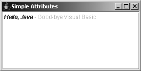
600 CHAPTER 16 ■ ADVANCED TEXT CAPABILITIES
// Insert content
try {
document.insertString(document.getLength(), "Hello, Java", attributes);
} catch (BadLocationException badLocationException) {
System.err.println("Oops");
}
Figure 16-4 shows how a JTextPane would appear with the words “Hello, Java” and a
second insertion displayed.
Figure 16-4. SimpleAttributeSet usage demonstration
The source for the program shown in Figure 16-4 is presented in Listing 16-4.
Listing 16-4. Using a SimpleAttributeSet
import javax.swing.*;
import javax.swing.text.*;
import javax.swing.event.*;
import java.awt.*;
public class SimpleAttributeSample {
public static void main(String args[]) {
Runnable runner = new Runnable() {
public void run() {
JFrame frame = new JFrame("Simple Attributes");
frame.setDefaultCloseOperation(JFrame.EXIT_ON_CLOSE);
StyledDocument document = new DefaultStyledDocument();
SimpleAttributeSet attributes = new SimpleAttributeSet();
attributes.addAttribute(StyleConstants.CharacterConstants.Bold,
Boolean.TRUE);
attributes.addAttribute(StyleConstants.CharacterConstants.Italic,
Boolean.TRUE);
CHAPTER 16 ■ ADVANCED TEXT CAPABILITIES 601
// Insert content
try {
document.insertString(document.getLength(), "Hello, Java",
attributes);
} catch (BadLocationException badLocationException) {
System.err.println("Bad insert");
}
attributes = new SimpleAttributeSet();
attributes.addAttribute(StyleConstants.CharacterConstants.Bold,
Boolean.FALSE);
attributes.addAttribute(StyleConstants.CharacterConstants.Italic,
Boolean.FALSE);
attributes.addAttribute(StyleConstants.CharacterConstants.Foreground,
Color.LIGHT_GRAY);
// Insert content
try {
document.insertString(document.getLength(),
" - Good-bye Visual Basic", attributes);
} catch (BadLocationException badLocationException) {
System.err.println("Bad insert");
}
JTextPane textPane = new JTextPane(document);
textPane.setEditable(false);
JScrollPane scrollPane = new JScrollPane(textPane);
frame.add(scrollPane, BorderLayout.CENTER);
frame.setSize(300, 150);
frame.setVisible(true);
}
};
EventQueue.invokeLater(runner);
}
}
In summary, to specify the style of the content, simply set up the attribute set, insert the
content, and then repeat the steps for each bit of content you want to add.
StyleConstants Class
The StyleConstants class is chock-full of helper methods to simplify setting attribute sets. And
you don’t need to burrow into the constants of the inner classes of StyleConstants, because the
class makes them available through class constants at the StyleConstants level.
602 CHAPTER 16 ■ ADVANCED TEXT CAPABILITIES
public static final Object Alignment;
public static final Object Background;
public static final Object BidiLevel;
public static final Object Bold;
public static final Object ComponentAttribute;
public static final String ComponentElementName;
public static final Object ComposedTextAttribute;
public static final Object Family;
public static final Object FirstLineIndent;
public static final Object FontFamily;
public static final Object FontSize;
public static final Object Foreground;
public static final Object IconAttribute;
public static final String IconElementName;
public static final Object Italic;
public static final Object LeftIndent;
public static final Object LineSpacing;
public static final Object ModelAttribute;
public static final Object NameAttribute;
public static final Object Orientation;
public static final Object ResolveAttribute;
public static final Object RightIndent;
public static final Object Size;
public static final Object SpaceAbove;
public static final Object SpaceBelow;
public static final Object StrikeThrough;
public static final Object Subscript;
public static final Object Superscript;
public static final Object TabSet;
public static final Object Underline;
Several static methods allow you to modify a MutableAttributeSet using more logical
method names, without requiring you to know the more obscure AttributeSet name. Use the
StyleConstants variables of ALIGN_CENTER,ALIGN_JUSTIFIED,ALIGN_LEFT, and ALIGN_RIGHT for
the int argument to setAlignment(). The remaining settings are self-explanatory.
public static void setAlignment(MutableAttributeSet a, int align);
public static void setBackground(MutableAttributeSet a, Color fg);
public static void setBidiLevel(MutableAttributeSet a, int o);
public static void setBold(MutableAttributeSet a, boolean b);
public static void setComponent(MutableAttributeSet a, Component c);
public static void setFirstLineIndent(MutableAttributeSet a, float i);
public static void setFontFamily(MutableAttributeSet a, String fam);
public static void setFontSize(MutableAttributeSet a, int s);
public static void setForeground(MutableAttributeSet a, Color fg);
public static void setIcon(MutableAttributeSet a, Icon c);
public static void setItalic(MutableAttributeSet a, boolean b);
public static void setLeftIndent(MutableAttributeSet a, float i);

CHAPTER 16 ■ ADVANCED TEXT CAPABILITIES 603
public static void setLineSpacing(MutableAttributeSet a, float i);
public static void setRightIndent(MutableAttributeSet a, float i);
public static void setSpaceAbove(MutableAttributeSet a, float i);
public static void setSpaceBelow(MutableAttributeSet a, float i);
public static void setStrikeThrough(MutableAttributeSet a, boolean b);
public static void setSubscript(MutableAttributeSet a, boolean b);
public static void setSuperscript(MutableAttributeSet a, boolean b);
public static void setTabSet(MutableAttributeSet a, TabSet tabs);
public static void setUnderline(MutableAttributeSet a, boolean b);
For instance, instead of calling the following to make the SimpleAttributeSet both bold
and italic:
attributes.addAttribute(StyleConstants.CharacterConstants.Bold, Boolean.TRUE)
attributes.addAttribute(StyleConstants.CharacterConstants.Italic, Boolean.TRUE)
you could use the following:
StyleConstants.setBold(attributes, true);
StyleConstants.setItalic(attributes, true);
As you can see, the latter form is much more readable and easier to maintain!
■Tip Besides methods to change AttributeSet objects, the StyleConstants class provides many
other methods that let you check the status of an AttributeSet to see if a setting is currently enabled
or disabled.
TabStop and TabSet Classes
One of the key constants for storing AttributeSet values is the ParagraphConstants.TabSet
attribute. The TabSet class represents a collection of TabStop objects, each defining a tab position,
alignment, and leader. If you wanted to define your own tab stops for a JTextPane, you could
create a set of TabStop objects, one for each tab stop, create the TabSet, and then associate the
TabSet with a MutableAttributeSet.
Creating a TabStop
The TabStop class isn’t a JavaBean component in the typical sense; it does not have a no-argument
constructor. Instead, you must specify the position, in pixels, at which to place the tab stop.
It has two constructors:
public TabStop(float position)
TabStop stop = new TabStop(40);
public TabStop(float position, int align, int leader)
TabStop stop = new TabStop(40, TabStop.ALIGN_DECIMAL, TabStop.LEAD_DOTS);

604 CHAPTER 16 ■ ADVANCED TEXT CAPABILITIES
■Note Although theoretically it can be specified, the leader argument to the TabStop constructor is
currently ignored by the predefined text components.
TabStop Properties
Table 16-5 displays the three properties of TabStop, each initialized by the constructor.
Four alignment settings are specified by the five constants listed in Table 16-6. Figure 16-5
shows how the different settings are displayed.
Figure 16-5. TabStop alignment
■Note Although the ALIGN_BAR and ALIGN_LEFT are technically different constants, their alignment
setting currently yields the same result. They are defined per the Rich Text Format (RTF) specification.
Table 16-5. TabStop Properties
Property Name Data Type Access
alignment int Read-only
leader int Read-only
position int Read-only
Table 16-6. TabStop Alignment Settings
Alignment Description
ALIGN_BAR Starts at tab position
ALIGN_LEFT Starts at tab position
ALIGN_CENTER Centers over tab position
ALIGN_DECIMAL Places decimal point at tab position
ALIGN_RIGHT Ends at tab position
CHAPTER 16 ■ ADVANCED TEXT CAPABILITIES 605
Using TabStop Objects
Once you have a TabStop object, or a group of them, you pass the object to the TabSet constructor
in an array of TabStop objects like this:
TabSet tabset = new TabSet(new TabStop[] {tabstop})
As an example, Listing 16-5 shows the source for the TabStop alignment program shown in
Figure 16-5.
Listing 16-5. Using Tabs
import javax.swing.*;
import javax.swing.text.*;
import javax.swing.event.*;
import java.awt.*;
public class TabSample {
public static void main(String args[]) {
Runnable runner = new Runnable() {
public void run() {
JFrame frame = new JFrame("Tab Attributes");
frame.setDefaultCloseOperation(JFrame.EXIT_ON_CLOSE);
StyledDocument document = new DefaultStyledDocument();
int positions[] = {TabStop.ALIGN_BAR, TabStop.ALIGN_CENTER,
TabStop.ALIGN_DECIMAL, TabStop.ALIGN_LEFT, TabStop.ALIGN_RIGHT};
String strings[] = {"\tBAR\n", "\tCENTER\n", "\t3.14159265\n",
"\tLEFT\n", "\tRIGHT\n"};
SimpleAttributeSet attributes = new SimpleAttributeSet();
for (int i=0, n=positions.length; i<n; i++) {
TabStop tabstop = new TabStop(150, positions[i], TabStop.LEAD_DOTS);
try {
int position = document.getLength();
document.insertString(position, strings[i], null);
TabSet tabset = new TabSet(new TabStop[] {tabstop});
StyleConstants.setTabSet(attributes, tabset);
document.setParagraphAttributes(position, 1, attributes, false);
} catch (BadLocationException badLocationException) {
System.err.println("Bad Location");
}
}
606 CHAPTER 16 ■ ADVANCED TEXT CAPABILITIES
JTextPane textPane = new JTextPane(document);
textPane.setEditable(false);
JScrollPane scrollPane = new JScrollPane(textPane);
frame.add(scrollPane, BorderLayout.CENTER);
frame.setSize(300, 150);
frame.setVisible(true);
}
};
EventQueue.invokeLater(runner);
}
}
In addition to specifying a position and alignment, you can specify which character you
want to appear as a leader in the white space created by the tab character. By default, nothing
exists there; therefore, the constant is LEAD_NONE. The other TabStop values create a line of
periods (dots), equal signs, hyphens, thick lines, or underlines: LEAD_DOTS,LEAD_EQUALS,
LEAD_HYPHENS,LEAD_THICKLINE, or LEAD_UNDERLINE. Unfortunately, this option is available but
unsupported. While a nonstandard Swing component might support this capability, the standard
ones currently do not support the different leader settings.
Style Interface
The Style interface is one more of the enhanced ways to specify an AttributeSet. It adds a
name to the MutableAttributeSet and the ability to attach a ChangeListener to a Style in order
to monitor changes to the attribute settings. For instance, you can configure a bold-italic style
as shown here:
String BOLD_ITALIC = "BoldItalic";
Style style = (Style)document.getStyle(StyleContext.DEFAULT_STYLE);
StyleConstants.setBold(style, true);
StyleConstants.setItalic(style, true);
document.addStyle(BOLD_ITALIC, null);
Later, you can attach the style to some text:
style = document.getStyle(BOLD_ITALIC);
document.insertString(document.getLength(), "Hello, Java", style);
StyleContext Class
The StyleContext class manages the styles for a styled document. With the help of the
StyleContext.NamedStyle class, you can just let the JTextPane to do its own thing, because
the StyleContext knows when something needs to be done. For HTML documents, the
StyleContext is more specifically a StyleSheet.
CHAPTER 16 ■ ADVANCED TEXT CAPABILITIES 607
The Editor Kits
You briefly saw some of the default EditorKit capabilities of TextAction objects earlier in this
chapter, in the “Using Actions with Text Components” section. The EditorKit class serves as
the mastermind for pulling together all the different aspects of the text components. It creates
documents, manages actions, and creates the visual representation of the document or View.
In addition, an EditorKit knows how to read or write the document to a stream. Each document
type requires its own EditorKit, so different ones are provided with the JFC/Project Swing
components for both HTML and RTF text, as well as plain and styled text.
The actual display of the Document contents is done through the EditorKit with the help of
aViewFactory. For each Element of the Document, the ViewFactory determines which View is
created for that element and rendered by the text component delegate. For each different type
of element, there is a different View subclass.
Loading HTML Documents
In Chapter 15, you saw how the read() and write() methods of the JTextComponent allow you
to read in and write out content for a text component. While the LoadSave example from Listing
15-3 in Chapter 15 demonstrated this process for the JTextField, it works with all the text
components, as you would expect. The only requirement for making sure the loading and
saving is done for the proper document type is to change the editor kit for the document.
To demonstrate, here’s how you could load an HTML file as a StyledDocument into a
JEditorPane:
JEditorPane editorPane = new JEditorPane();
editorPane.setEditorKit(new HTMLEditorKit());
reader = new FileReader(filename);
editorPane.read(reader, filename);
It is that easy. The content type of the component is set to be text/html and loads in the
content from filename to be displayed as HTML content. One thing worth noting is that the
loading is done asynchronously.
If you need to load the content in synchronously, so that you can wait until everything is
loaded, such as for parsing purposes, the process is a bit more involved. You need to work with
the HTML parser (HTMLEditorKit.Parser class in javax.swing.text.html package), the parser
delegator (ParserDelegator in the javax.swing.text.html.parser package), and the parser
callback (HTMLEditorKit.ParserCallback) that you get from the HTMLDocument (as an
HTMLDocument.HTMLReader). It sounds more complicated than it really is. To demonstrate, the
following code loads a file synchronously into the JEditorPane.
reader = new FileReader(filename);
// First create empty empty HTMLDocument to read into
HTMLEditorKit htmlKit = new HTMLEditorKit();
HTMLDocument htmlDoc = (HTMLDocument)htmlKit.createDefaultDocument();
// Next create the parser
HTMLEditorKit.Parser parser = new ParserDelegator();
// Then get HTMLReader (parser callback) from document
HTMLEditorKit.ParserCallback callback = htmlDoc.getReader(0);

608 CHAPTER 16 ■ ADVANCED TEXT CAPABILITIES
// Finally load the reader into it
// The final true argument says to ignore the character set
parser.parse(reader, callback, true);
// Examine contents
Iterating Through HTML Documents
After you have the HTML document loaded, in addition to just displaying the content inside a
JEditorPane, you may find it necessary to parse through the content yourself to pull out various
pieces. The HTMLDocument supports at least two manners of iteration through the content via
the HTMLDocument.Iterator and ElementIterator classes.
HTMLDocument.Iterator Class
To use the HTMLDocument.Iterator, you ask an HTMLDocument to give you the iterator for a specific
HTML.Tag. Then, for each instance of the tag in the document, you can look at the attributes of
the tag.
The HTML.Tag class includes 76 class constants for all the standard HTML tags (which the
HTMLEditorKit understands), such as HTML.Tag.H1 for the <H1> tag. These constants are listed in
Table 16-7.
Table 16-7. HTML Tag Constants
A DIR IMG SCRIPT
ADDRESS DIV IMPLIED SELECT
APPLET DL INPUT SMALL
AREA DT ISINDEX SPAN
B EM KBD STRIKE
BASE FONT LI STRONG
BASEFONT FORM LINK STYLE
BIG FRAME MAP SUB
BLOCKQUOTE FRAMESET MENU SUP
BODY H1 META TABLE
BR H2 NOFRAMES TD
CAPTION H3 OBJECT TEXTAREA
CENTER H4 OL TH
CITE H5 OPTION TITLE
CODE H6 P TR
COMMENT HEAD PARAM TT
CONTENT HR PRE U
DD HTML S UL
DFN I SAMP VAR
CHAPTER 16 ■ ADVANCED TEXT CAPABILITIES 609
■Note Only those HTML tag constants that have been previously flagged as a block tag—where the
isBlock() method for the tag returns true—will work with the HTMLDocument.Iterator. For instance,
STRONG is not a block tag, while H1 is.
After you have the specific iterator to work with, you can look at the specific attributes and
content of each instance of the tag through the help of the class properties shown in Table 16-8.
The other piece of the iteration process is the next() method, which lets you get the next
instance of the tag in the document. The basic structure of using this iterator is as follows:
// Get the iterator
HTMLDocument.Iterator iterator = htmlDoc.getIterator(HTML.Tag.A);
// For each valid one
while (iterator.isValid()) {
// Process element
// Get the next one
iterator.next();
}
This can also be expressed in a basic for loop construct:
for (HTMLDocument.Iterator iterator = htmlDoc.getIterator(HTML.Tag.A);
iterator.isValid();
iterator.next()) {
// Process element
}
Listing 16-6 demonstrates the use of HTMLDocument.Iterator. This program prompts you
for a URL from the command line, loads the file synchronously, looks for all the <A> tags, and
then displays all the anchors listed as HREF attributes. Think of this as a simple “spidering”
application in which you can build up a database of URL links between documents. The start
Table 16-8. HTMLDocument.Iterator Properties
Property Name Data Type Access
attributes AttributeSet Read-only
endOffset int Read-only
startOffset int Read-only
tag HTML.Tag Read-only
valid boolean Read-only
610 CHAPTER 16 ■ ADVANCED TEXT CAPABILITIES
and end offsets are also used to get the linking text. Just pass in the URL of the location you
want to scan to run the program.
Listing 16-6. Iterating Across HTML Documents for Links
import java.io.*;
import java.net.*;
import javax.swing.*;
import javax.swing.text.*;
import javax.swing.text.html.*;
import javax.swing.text.html.parser.*;
public class DocumentIteratorExample {
public static void main(String args[]) throws Exception {
if (args.length != 1) {
System.err.println("Usage: java DocumentIteratorExample input-URL");
}
// Load HTML file synchronously
URL url = new URL(args[0]);
URLConnection connection = url.openConnection();
InputStream is = connection.getInputStream();
InputStreamReader isr = new InputStreamReader(is);
BufferedReader br = new BufferedReader(isr);
HTMLEditorKit htmlKit = new HTMLEditorKit();
HTMLDocument htmlDoc = (HTMLDocument)htmlKit.createDefaultDocument();
HTMLEditorKit.Parser parser = new ParserDelegator();
HTMLEditorKit.ParserCallback callback = htmlDoc.getReader(0);
parser.parse(br, callback, true);
// Parse
for (HTMLDocument.Iterator iterator = htmlDoc.getIterator(HTML.Tag.A);
iterator.isValid();
iterator.next()) {
AttributeSet attributes = iterator.getAttributes();
String srcString = (String)attributes.getAttribute(HTML.Attribute.HREF);
System.out.print(srcString);
int startOffset = iterator.getStartOffset();
int endOffset = iterator.getEndOffset();
int length = endOffset - startOffset;
String text = htmlDoc.getText(startOffset, length);
System.out.println(" – " + text);
}
System.exit(0);
}
}
CHAPTER 16 ■ ADVANCED TEXT CAPABILITIES 611
ElementIterator Class
Another way of examining the contents of an HTMLDocument is through the ElementIterator
(which is not specific to HTML documents). When working with an ElementIterator, you basically
see all the Element objects of the document and ask each one what it is. If the object is some-
thing you are interested in working with, you can get a closer look.
To get the iterator for a document, just ask like this:
ElementIterator iterator = new ElementIterator(htmlDoc);
The ElementIterator is not meant to be a simple sequential iterator. It is bidirectional with
next() and previous() methods and supports going back to the beginning with first(). Although
next() and previous() return the next or previous element to work with, you can also get the
element at the current position by using current(). Here is the basic looping method through
a document:
Element element;
ElementIterator iterator = new ElementIterator(htmlDoc);
while ((element = iterator.next()) != null) {
// Process element
}
How do you find out which element you have in case you want to ignore it if it isn’t inter-
esting? You need to get its name and type from its attribute set.
AttributeSet attributes = element.getAttributes();
Object name = attributes.getAttribute(StyleConstants.NameAttribute);
if (name instanceof HTML.Tag) {
Now you can look for specific tag types, such as HTML.Tag.H1,HTML.Tag.H2, and so on. The
actual content for the tag would be in a child element of the element. To demonstrate, the
following shows how to search for H1,H2, and H3 tags in a document, while displaying the
appropriate titles associated with the tags.
if ((name instanceof HTML.Tag) && ((name == HTML.Tag.H1) ||
(name == HTML.Tag.H2) || (name == HTML.Tag.H3))) {
// Build up content text as it may be within multiple elements
StringBuffer text = new StringBuffer();
int count = element.getElementCount();
for (int i=0; i<count; i++) {
Element child = element.getElement(i);
AttributeSet childAttributes = child.getAttributes();
if (childAttributes.getAttribute(StyleConstants.NameAttribute) ==
HTML.Tag.CONTENT) {
int startOffset = child.getStartOffset();
int endOffset = child.getEndOffset();
int length = endOffset - startOffset;
text.append(htmlDoc.getText(startOffset, length));
}
}
}
612 CHAPTER 16 ■ ADVANCED TEXT CAPABILITIES
To try this out, you’ll need to actually find a web page that uses H1, H2, or H3 tags. This
isn’t easy these days. Alternatively, you can just switch the H1, H2, and H3 to different tags that
you know you will find.
JFormattedTextField Formats
In Chapter 15, you got a little taste of the JFormattedTextField component. Now, you’ll get the
rest of the meal. A JFormattedTextField is used for accepting formatted input from a user. This
sounds simple, but is actually quite important and involved. Without a JFormattedTextField,
getting formatted input isn’t as easy as it sounds. Throwing in localization requirements makes
life really interesting.
Not only does the JFormattedTextField component support entering input in a formatted
fashion, but it also allows the user to use the keyboard to increment and decrement the input
value; for example, to scroll through the available months in a date.
For a JFormattedTextField, the validation magic is controlled by the focusLostBehavior
property. This can be set to one of four values:
•COMMIT_OR_REVERT: This is the default. When the component loses focus, the component
automatically calls the commitEdit() method internally. This will parse the component’s
contents and throw a ParseException on error, reverting the contents to the most recent
valid value.
•COMMIT: This setting is similar to COMMIT_OR_REVERT, but it leaves the invalid contents
within the field, allowing the user to modify the setting.
•REVERT: This setting always reverts the value.
•PERSIST: This setting essentially does nothing. When the focusLostBehavior property is
set to PERSIST, you should manually call commitEdit() yourself to see if the contents are
valid before using the contents.
Dates and Numbers
For starters, let’s see how to use the JFormattedTextField to accept input that should be inter-
nationalized. This includes all forms of dates, times, and numbers—basically, anything whose
format can be acquired from a DateFormat or NumberFormat object.
If you provide a Date object or Number subclass to the JFormattedTextField constructor, the
component passes the input String to the constructor of that object type to do the input validation.
Instead, you should work with the InternationalFormatter class in the java.swing.text
package by passing a DateFormat or NumberFormat into the constructor. This allows you to
specify long versus short form for dates and times, as well as currency, percentage, floats,
and integers for numbers.
Date and Time Formats
To demonstrate date and time formatting, the example in Listing 16-7 accepts various date and
time input. From top to bottom, the inputs are short date format for default locale, full date
format for United States English, medium date format for Italian, day of week in French, and
short time format for the default locale.
CHAPTER 16 ■ ADVANCED TEXT CAPABILITIES 613
Listing 16-7. Formatted Date and Time Input
import javax.swing.*;
import javax.swing.text.*;
import javax.swing.event.*;
import java.awt.*;
import java.text.*;
import java.util.*;
public class DateInputSample {
public static void main(String args[]) {
Runnable runner = new Runnable() {
public void run() {
JFrame frame = new JFrame("Date/Time Input");
frame.setDefaultCloseOperation(JFrame.EXIT_ON_CLOSE);
JLabel label;
JFormattedTextField input;
JPanel panel;
BoxLayout layout =
new BoxLayout(frame.getContentPane(), BoxLayout.Y_AXIS);
frame.setLayout(layout);
Format shortDate =
DateFormat.getDateInstance(DateFormat.SHORT);
label = new JLabel("Short date:");
input = new JFormattedTextField(shortDate);
input.setValue(new Date());
input.setColumns(20);
panel = new JPanel(new FlowLayout(FlowLayout.RIGHT));
panel.add(label);
panel.add(input);
frame.add(panel);
Format fullUSDate =
DateFormat.getDateInstance(DateFormat.FULL, Locale.US);
label = new JLabel("Full US date:");
input = new JFormattedTextField(fullUSDate);
input.setValue(new Date());
input.setColumns(20);
panel = new JPanel(new FlowLayout(FlowLayout.RIGHT));
panel.add(label);
panel.add(input);
frame.add(panel);
614 CHAPTER 16 ■ ADVANCED TEXT CAPABILITIES
Format mediumItalian =
DateFormat.getDateInstance(DateFormat.MEDIUM, Locale.ITALIAN);
label = new JLabel("Medium Italian date:");
input = new JFormattedTextField(mediumItalian);
input.setValue(new Date());
input.setColumns(20);
panel = new JPanel(new FlowLayout(FlowLayout.RIGHT));
panel.add(label);
panel.add(input);
frame.add(panel);
Format dayOfWeek = new SimpleDateFormat("E", Locale.FRENCH);
label = new JLabel("French day of week:");
input = new JFormattedTextField(dayOfWeek);
input.setValue(new Date());
input.setColumns(20);
panel = new JPanel(new FlowLayout(FlowLayout.RIGHT));
panel.add(label);
panel.add(input);
frame.add(panel);
Format shortTime = DateFormat.getTimeInstance(DateFormat.SHORT);
label = new JLabel("Short time:");
input = new JFormattedTextField(shortTime);
input.setValue(new Date());
input.setColumns(20);
panel = new JPanel(new FlowLayout(FlowLayout.RIGHT));
panel.add(label);
panel.add(input);
frame.add(panel);
frame.pack();
frame.setVisible(true);
}
};
EventQueue.invokeLater(runner);
}
}
Figure 16-6 shows an example of running the program. To start the program in a different
locale, you can set the user.language and user.country settings from the command line with a
command similar to the following:
java -Duser.language=fr -Duser.country=FR DateInputSample
However, this will alter the valid input only for those formats without a specific locale set.

CHAPTER 16 ■ ADVANCED TEXT CAPABILITIES 615
Figure 16-6. Formatted JFormattedTextField date and time input
Number Formats
Numbers work similarly to dates, just with the java.text.NumberFormat class, instead of the
DateFormat class. The localization that can be done here is with getCurrencyInstance(),
getInstance(),getIntegerInstance(),getNumberInstance(), and getPercentInstance().
The NumberFormat class will deal with the placement of the necessary commas, periods,
percent signs, and so on. While inputting the numbers, extra characters like commas for thousands
aren’t required. The component will add them after they are input where appropriate, as
shown in the example in Figure 16-7. Notice the positions of decimal points and commas and
how they differ from locale to locale.
Figure 16-7. Formatted JFormattedTextField numeric input
Listing 16-8 shows the program that generated Figure 16-7. Each input field starts with a
value of 2424.50. In the case of the integer version, the input value is rounded. When setting the
contents of a JFormattedTextField, use the setValue() method, not the setText() method.
This will ensure that the text contents are validated.
Listing 16-8. Formatted Numeric Input
import javax.swing.*;
import javax.swing.text.*;
import javax.swing.event.*;
import java.awt.*;
import java.text.*;
import java.util.*;
616 CHAPTER 16 ■ ADVANCED TEXT CAPABILITIES
public class NumberInputSample {
public static void main(String args[]) {
Runnable runner = new Runnable() {
public void run() {
JFrame frame = new JFrame("Number Input");
frame.setDefaultCloseOperation(JFrame.EXIT_ON_CLOSE);
Font font = new Font("SansSerif", Font.BOLD, 16);
JLabel label;
JFormattedTextField input;
JPanel panel;
BoxLayout layout =
new BoxLayout(frame.getContentPane(), BoxLayout.Y_AXIS);
frame.setLayout(layout);
Format currency =
NumberFormat.getCurrencyInstance(Locale.UK);
label = new JLabel("UK Currency:");
input = new JFormattedTextField(currency);
input.setValue(2424.50);
input.setColumns(20);
input.setFont(font);
panel = new JPanel(new FlowLayout(FlowLayout.RIGHT));
panel.add(label);
panel.add(input);
frame.add(panel);
Format general = NumberFormat.getInstance();
label = new JLabel("General/Instance:");
input = new JFormattedTextField(general);
input.setValue(2424.50);
input.setColumns(20);
input.setFont(font);
panel = new JPanel(new FlowLayout(FlowLayout.RIGHT));
panel.add(label);
panel.add(input);
frame.add(panel);
Format integer = NumberFormat.getIntegerInstance(Locale.ITALIAN);
label = new JLabel("Italian integer:");
input = new JFormattedTextField(integer);
input.setValue(2424.50);
input.setColumns(20);
input.setFont(font);
CHAPTER 16 ■ ADVANCED TEXT CAPABILITIES 617
panel = new JPanel(new FlowLayout(FlowLayout.RIGHT));
panel.add(label);
panel.add(input);
frame.add(panel);
Format number = NumberFormat.getNumberInstance(Locale.FRENCH);
label = new JLabel("French Number:");
input = new JFormattedTextField(number);
input.setValue(2424.50);
input.setColumns(20);
input.setFont(font);
panel = new JPanel(new FlowLayout(FlowLayout.RIGHT));
panel.add(label);
panel.add(input);
frame.add(panel);
label = new JLabel("Raw Number:");
input = new JFormattedTextField(2424.50);
input.setColumns(20);
input.setFont(font);
panel = new JPanel(new FlowLayout(FlowLayout.RIGHT));
panel.add(label);
panel.add(input);
frame.add(panel);
frame.pack();
frame.setVisible(true);
}
};
EventQueue.invokeLater(runner);
}
}
The last of the five JFormattedTextField examples in Figure 16-7 initializes the component
with a double. The value 2424.50 is auto-boxed into a Double object. There’s nothing wrong
with passing an object to the constructor. However, you might notice some irregularities while
entering values into the field. A value seems to always start with one decimal point, even though
more input digits are accepted. Instead of using a Format object to go from text to Object and
back, the Double constructor that accepts a String is used.
When you pass in a java.text.Format object to the JFormattedTextField constructor, this
internally is mapped to either a DateFormatter or NumberFormatter object. Both of these are
subclasses of the InternationalFormatter class. The inner class named JFormattedTextField.
AbstractFormatterFactory manages the use of the formatter objects within JFormattedTextField.
The factory will install() the formatter as the user enters the JFormattedTextField and
uninstall() it on departure, ensuring the formatter is active in only one text field at a time.
These install() and uninstall() methods are inherited by the formatter classes from the
JFormattedTextField.AbstractFormatter superclass of all formatters.

618 CHAPTER 16 ■ ADVANCED TEXT CAPABILITIES
Input Masks
Beyond numbers and dates, the JFormattedTextField supports user input following a pattern
or mask. For instance, if an input field is a United States social security number (SSN), it has a
typical pattern of number, number, number, dash, number, number, dash, number, number,
number, number. With the help of the MaskFormatter class, you can specify the mask using the
characters listed in Table 16-9.
For example, this formatter creates an SSN mask:
new MaskFormatter("###'-##'-####")
The apostrophes in the mask mean the character after each is treated literally—in this
case, as a dash. You have the option of passing this formatter to the JFormattedTextField
constructor or configuring the text field with the setMask() method.
To demonstrate, Listing 16-9 includes two JFormattedTextField components: one to
accept SSNs and the other United States phone numbers.
Listing 16-9. Formatted Masked Input
import javax.swing.*;
import javax.swing.text.*;
import javax.swing.event.*;
import java.awt.*;
import java.text.*;
import java.util.*;
public class MaskInputSample {
public static void main(String args[]) {
Runnable runner = new Runnable() {
public void run() {
JFrame frame = new JFrame("Mask Input");
frame.setDefaultCloseOperation(JFrame.EXIT_ON_CLOSE);
Table 16-9. Special Characters for Masks
Character Description
#Matches numeric character (Character.isDigit())
HMatches hexadecimal number (0–9, a–f, and A–F)
AMatches alphanumeric character (Character.is LetterOrDigit())
?Matches alphabetic character (Character.isLetter())
UMatches uppercase letter; maps lowercase to uppercase
LMatches lowercase letter; maps uppercase to lowercase
*Wildcard, matches any character
'Escape character to have literal strings/separators in input field
CHAPTER 16 ■ ADVANCED TEXT CAPABILITIES 619
JLabel label;
JFormattedTextField input;
JPanel panel;
MaskFormatter formatter;
BoxLayout layout =
new BoxLayout(frame.getContentPane(), BoxLayout.Y_AXIS);
frame.setLayout(layout);
try {
label = new JLabel("SSN");
formatter = new MaskFormatter("###'-##'-####");
input = new JFormattedTextField(formatter);
input.setValue("123-45-6789");
input.setColumns(20);
panel = new JPanel(new FlowLayout(FlowLayout.RIGHT));
panel.add(label);
panel.add(input);
frame.add(panel);
} catch (ParseException e) {
System.err.println("Unable to add SSN");
}
try {
label = new JLabel("US Phone");
formatter = new MaskFormatter("'(###')' ###'-####");
input = new JFormattedTextField(formatter);
input.setColumns(20);
panel = new JPanel(new FlowLayout(FlowLayout.RIGHT));
panel.add(label);
panel.add(input);
frame.add(panel);
} catch (ParseException e) {
System.err.println("Unable to add Phone");
}
frame.pack();
frame.setVisible(true);
}
};
EventQueue.invokeLater(runner);
}
}
Figure 16-8 shows the output of the program. In this example, the SSN field starts with an
initial value, while the phone number field does not.

620 CHAPTER 16 ■ ADVANCED TEXT CAPABILITIES
Figure 16-8. Formatted masked input in JFormattedTextFields
The MaskFormatter does provide some customization options. By default, the formatter is
in overwrite mode, so as you type, the entered digits will replace each number and space in the
input field. Set the overwriteMode property to false to disable this. Typically, this isn’t necessary,
though for entering in long dates, it can be helpful.
If you wish to have a different character as the placeholder character, before a position is
filled in the mask, set the placeholderCharacter property of the MaskFormatter. To demonstrate,
add the following line to the phone number formatter in Listing 16-9:
formatter.setPlaceholder('*');
You’ll see the results in the bottom text field shown in Figure 16-9.
Figure 16-9. Formatted masked input with a placeholder
Another useful MaskFormatter property is validCharacters, for restricting which alpha-
numeric characters are valid for an input field.
DefaultFormatterFactory Class
The DefaultFormatterFactory class found in the javax.swing.text package offers a way to
have different formatters for displaying values, editing values, and a special case of a null
value. It offers five constructors, starting with no parameters and then adding an additional
AbstractFormatter parameter for each constructor.
public DefaultFormatterFactory()
DefaultFormatterFactory factory = new DefaultFormatterFactory()
public DefaultFormatterFactory(JFormattedTextField.AbstractFormatter defaultFormat)
DateFormat defaultFormat = new SimpleDateFormat("yyyy--MMMM--dd");
DateFormatter defaultFormatter = new DateFormatter(displayFormat);
DefaultFormatterFactory factory = new DefaultFormatterFactory(defaultFormatter);
public DefaultFormatterFactory(JFormattedTextField.AbstractFormatter defaultFormat,
JFormattedTextField.AbstractFormatter displayFormat)
DateFormat displayFormat = new SimpleDateFormat("yyyy--MMMM--dd");
DateFormatter displayFormatter = new DateFormatter(displayFormat);
DefaultFormatterFactory factory = new DefaultFormatterFactory(displayFormatter,
displayFormatter);
CHAPTER 16 ■ ADVANCED TEXT CAPABILITIES 621
public DefaultFormatterFactory(JFormattedTextField.AbstractFormatter defaultFormat,
JFormattedTextField.AbstractFormatter displayFormat,
JFormattedTextField.AbstractFormatter editFormat)
DateFormat displayFormat = new SimpleDateFormat("yyyy--MMMM--dd");
DateFormatter displayFormatter = new DateFormatter(displayFormat);
DateFormat editFormat = new SimpleDateFormat("MM/dd/yy");
DateFormatter editFormatter = new DateFormatter(editFormat);
DefaultFormatterFactory factory = new DefaultFormatterFactory(
displayFormatter, displayFormatter, editFormatter);
public DefaultFormatterFactory(JFormattedTextField.AbstractFormatter defaultFormat,
JFormattedTextField.AbstractFormatter displayFormat,
JFormattedTextField.AbstractFormatter editFormat,
JFormattedTextField.AbstractFormatter nullFormat)
DateFormat displayFormat = new SimpleDateFormat("yyyy--MMMM--dd");
DateFormatter displayFormatter = new DateFormatter(displayFormat);
DateFormat editFormat = new SimpleDateFormat("MM/dd/yy");
DateFormatter editFormatter = new DateFormatter(editFormat);
DateFormat nullFormat = new SimpleDateFormat("'null'");
DateFormatter nullFormatter = new DateFormatter(nullFormat);
DefaultFormatterFactory factory = new DefaultFormatterFactory(
displayFormatter, displayFormatter, editFormatter, nullFormatter);
There isn’t much magic in the use of DefaultFormatterFactory. Just create one and pass it
along to the JFormattedTextField constructor. Then the state of the text field will determine
which formatter is used to show the current value. Typically, the display formatter is repeated
for the default settings. If any of the formatters is null or unset, the default formatter will be
used instead.
Summary
In this chapter, you saw several of the more advanced aspects of working with the JFC/Project
Swing text components. You looked into how to use the predefined TextAction objects to create
working user interfaces without defining any of your own event-handling capabilities. In addition,
you explored the JTextPane and how to create multiple-attributed text within a JTextPane
through the AttributeSet,MutableAttributeSet,SimpleAttributeSet, and StyleConstants.
You also saw how to create tab stops within a Document and glanced at the EditorKit facilities
of Swing, exploring the details of the HTMLEditorKit specifically. Finally, you learned more
about accepting formatted input with the JFormattedTextField.
For additional information about the Swing text package, be sure to stop by The Swing
Connection at http://java.sun.com/products/jfc/tsc/articles/text/overview/.
In Chapter 17, you’ll explore the Swing component for displaying hierarchical data:
the JTree.
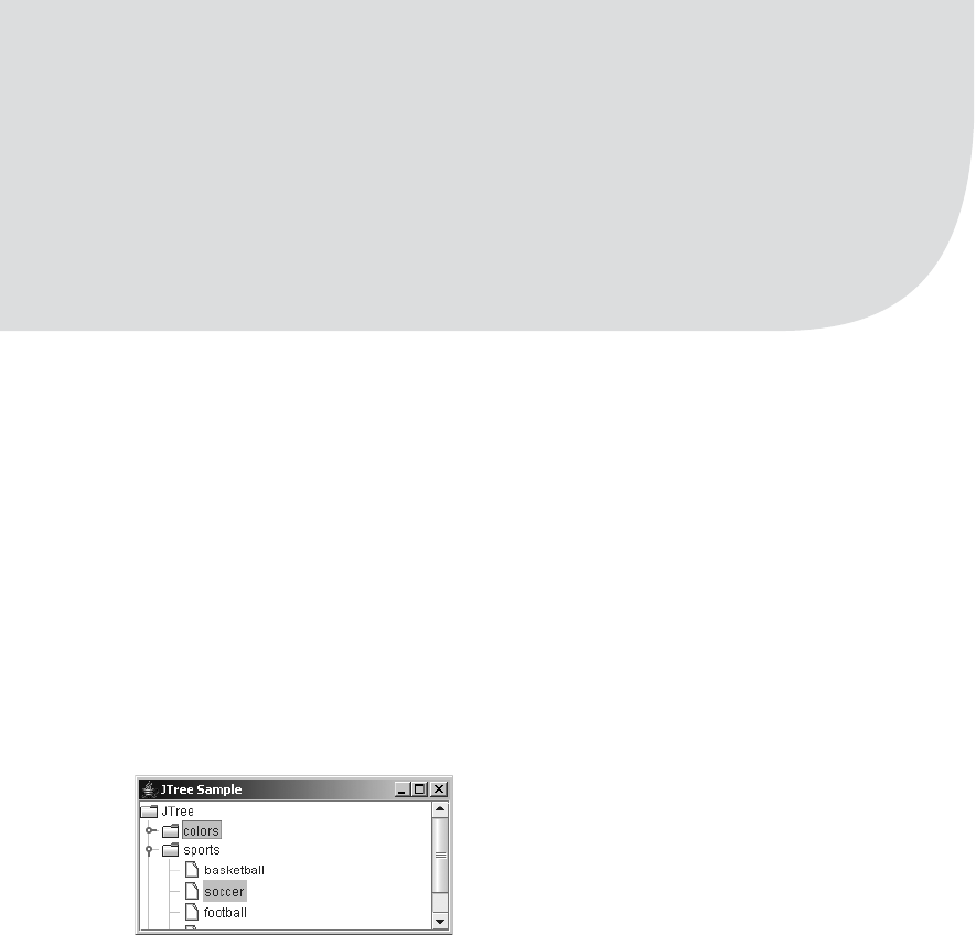
623
■ ■ ■
CHAPTER 17
Trees
In Chapter 16, you looked at how to work with the text document capabilities within the Swing
component set. In this chapter, you’ll learn how to work with Swing’s tree class, the JTree
component.
Introducing Trees
The JTree component is the visual component for displaying hierarchical data elements, also
known as nodes. Using this tree metaphor, imagine the tree is flipped upside down. The node
at the top of the tree is called the root. Extending from the root node of the tree are branches to
other nodes. If a node does not have any branches coming out of it, that node is called a leaf
node. See Figure 17-1 for a simple JTree.
Figure 17-1. Sample JTree
Many interconnected classes are used in the composition of the JTree. First, the JTree
implements the Scrollable interface, so that you can place the tree within a JScrollPane for scroll
management. The display of each node within the tree is controlled by implementations of the
TreeCellRenderer interface; by default, the implementation is the DefaultTreeCellRenderer
class. Nodes of a tree are editable with implementations of TreeCellEditor. Two editor implemen-
tations are available: one offering a text field with DefaultTreeCellEditor and one offering a check
box or combo box with DefaultCellEditor, which extends from the generic AbstractCellEditor.
If these classes don’t provide what you need, you can place custom editors within an
EditorContainer.

624 CHAPTER 17 ■ TREES
■Note The DefaultCellEditor class can also be used as a cell editor with the JTable component.
The JTable component is described in Chapter 18.
By default, the actual nodes of the JTree are implementations of the TreeNode interface or
its subinterface MutableTreeNode. The DefaultMutableTreeNode class is one such implementa-
tion that’s commonly used, with the JTree.DynamicUtilTreeNode inner class helping to create
the tree nodes. The many tree nodes make up the TreeModel for the JTree, stored by default
into an instance of the DefaultTreeModel class.
Tree selection is managed by a TreeSelectionModel implementation, with a default imple-
mentation of DefaultTreeSelectionModel available. The JTree.EmptySelectionModel is also
available if you do not want the nodes of the tree to be selectable. The path of nodes from the
root of the tree to the selected node is maintained within a TreePath, with the help of a RowMapper
implementation to map rows to paths.
■Note The tree-specific classes are found in the javax.swing.tree package. The event-related classes
are in the javax.swing.event package.
JTree Class
The JTree class forms the basis for visually displaying a set of hierarchical data elements.
Creating a JTree
There are seven different ways to create a JTree, with five different ways to specify the nodes:
public JTree()
JTree tree = new JTree();
public JTree(Hashtable value)
JTree tree = new JTree(System.getProperties());
public JTree(Object value[])
public static void main (String args[]) {
JTree tree = new JTree(args);
...
}
public JTree(Vector value)
Vector vector = new Vector();
vector.add("One");
vector.add("Two");
JTree tree = new JTree(vector);

CHAPTER 17 ■ TREES 625
public JTree(TreeModel value)
JTree tree = new JTree(aTreeModel);
public JTree(TreeNode value)
JTree tree = new JTree(aTreeNode);
public JTree(TreeNode value, boolean asksAllowsChildren)
JTree tree = new JTree(aTreeNode, true);
The first of the constructors is the no-argument variety. Surprisingly, it has a default data
model with some nodes in it (see Figure 17-1). Normally, you would change the data model of
the default tree after creation with setModel(TreeModel newModel).
The next three constructors seem to belong together. Creation of a JTree from a Hashtable
made up of key/value pairs uses the set of keys for the nodes and values for the children, whereas
creation from an array or Vector uses the elements as the nodes. This may seem to imply that
the tree is only one level deep, but actually the tree can be infinitely deep if the key or element
itself is in a Hashtable, an array, or a Vector.
The remaining three constructors use the custom data structures of JTree, which will be
explained later in this chapter. By default, only those nodes that have children are leaf nodes.
However, trees can be constructed with partial nodes that won’t get children until later. The
last of these three constructors causes a method to be called when you try to open a parent
node, instead of the parent node just looking for child nodes.
■Tip If the value for a key in a Hashtable is another Hashtable, array, or Vector, you can create a multi-
level tree by using the top-level Hashtable as the constructor argument.
As I mentioned, using a Hashtable, an array, or a Vector as the argument in the constructor
tree does, in fact, allow you to create multilevel trees. There are two minor problems with this,
however: the root node isn’t visible, and it automatically has a data element of root. The text
label for any other nodes of type Hashtable, array, or Vector is the result of toString(). The
default text is not desirable in any of these three instances. You get either the results of the
toString() method of the Object class for an array or a label that includes a list of all the elements
in the Hashtable or Vector. In the case of an Object array, the output would look something like
[Ljava.lang.Object;@fa8d8993. This is certainly not something you want to show a user.
Although you cannot override toString()(because there is no array class to subclass), you
can subclass Hashtable or Vector to provide a different toString() behavior. Offering a name
to the constructor of this new class allows you to provide a text label to use in the tree when the
Hashtable or Vector is not the root node. The class shown in Listing 17-1 defines this behavior
for a Vector subclass. In addition to the constructor providing a name, the class also adds a
constructor that initializes the Vector to the contents of an array.
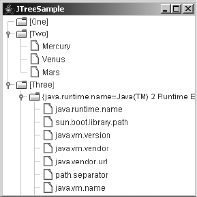
626 CHAPTER 17 ■ TREES
Listing 17-1. Named Vector
import java.util.Vector;
public class NamedVector<E> extends Vector<E> {
String name;
NamedVector(String name) {
this.name = name;
}
NamedVector(String name, E elements[]) {
this.name = name;
for (int i=0, n=elements.length; i<n; i++) {
add(elements[i]);
}
}
public String toString() {
return "[" + name + "]";
}
}
Figure 17-2 shows an example of the NamedVector class in action.
Figure 17-2. Sample JTree with the Vector subclass node
Listing 17-2 shows the source used to generate the example in Figure 17-2.
Listing 17-2. Named Vector Usage
import javax.swing.*;
import javax.swing.tree.*;
import java.awt.*;
import java.util.*;
public class TreeArraySample {
public static void main(final String args[]) {
Runnable runner = new Runnable() {
CHAPTER 17 ■ TREES 627
public void run() {
JFrame frame = new JFrame("JTreeSample");
frame.setDefaultCloseOperation(JFrame.EXIT_ON_CLOSE);
Vector<String> oneVector = new NamedVector<String>("One", args);
Vector<String> twoVector = new NamedVector<String>("Two",
new String[]{"Mercury", "Venus", "Mars"});
Vector<Object> threeVector = new NamedVector<Object>("Three");
threeVector.add(System.getProperties());
threeVector.add(twoVector);
Object rootNodes[] = {oneVector, twoVector, threeVector};
Vector<Object> rootVector = new NamedVector<Object>("Root", rootNodes);
JTree tree = new JTree(rootVector);
frame.add(tree, BorderLayout.CENTER);
frame.setSize(300, 300);
frame.setVisible(true);
}
};
EventQueue.invokeLater(runner);
}
}
Scrolling Trees
If you created and ran the program in Listing 17-2, you would notice one small problem. When
all the parent nodes are open, the tree is too big for the initial screen size. Not only that, but you
also can’t see the nodes at the bottom of the tree. To fix this situation, it’s necessary to place
instances of the JTree class within a JScrollPane so that the scroll pane can manage the scrolling
aspects of the tree. Similar to the JTextArea class described in Chapter 15, the JTree class
implements the Scrollable interface for scrolling support.
Replacing the two boldfaced lines in the example in Listing 17-2 with the following three
lines will place the tree within a scroll pane. This will cause the tree to appear in a scrollable
region when the tree is too large for the available display space.
// Change from
JTree tree = new JTree(rootVector);
frame.add(tree, BorderLayout.CENTER);
// To
JTree tree = new JTree(rootVector);
JScrollPane scrollPane = new JScrollPane(tree);
frame.add(scrollPane, BorderLayout.CENTER);
In addition to using a JScrollPane for scrolling, you can manually scroll the visible content
in the scrolling region. Use the public void scrollPathToVisible(TreePath path) and public
void scrollRowToVisible(int row) methods to move a particular tree path or row into some
part of the visible area. The row of a node indicates the number of nodes above the current
node to the top of the tree. This differs from the level of the tree, which is the number of ancestors
(or parent nodes) a node has. Figure 17-3 should help you visualize this difference. In the

628 CHAPTER 17 ■ TREES
window on the left, the soccer node is at level 2 and row 8. When the colors node is closed, as
in the window on the right, the soccer node remains on level 2 but moves to row 4, because the
blue,violet,red, and yellow rows are no longer visible.
Figure 17-3. Rows versus levels of a tree
JTree Properties
Table 17-1 lists the 40 specific properties of JTree. You will explore many of these as you look at
the different classes that make up JTree.
Table 17-1. JTree Properties
Property Name Data Type Access
accessibleContext AccessibleContext Read-only
anchorSelectionPath TreePath Read-write bound
cellEditor TreeCellEditor Read-write bound
cellRenderer TreeCellRenderer Read-write bound
dragEnabled boolean Read-write
editable boolean Read-write bound
editing boolean Read-only
editingPath TreePath Read-only
expandsSelectedPath boolean Read-write bound
fixedRowHeight boolean Read-only
invokesStopCellEditing boolean Read-write bound
largeModel boolean Read-write bound
lastSelectedPathComponent Object Read-only
leadSelectionPath TreePath Read-write bound

CHAPTER 17 ■ TREES 629
Some JTree properties are closely interrelated. For instance, when the rowHeight property
is positive, it means that the node at each row is displayed with a fixed height, no matter what size
the nodes within the tree should be. When the rowHeight property is negative, the cellRenderer
property determines the rowHeight. So, the value of rowHeight determines the setting of the
leadSelectionRow int Read-only
maxSelectionRow int Read-only
minSelectionRow int Read-only
model TreeModel Read-write bound
preferredScrollableViewportSize Dimension Read-only
rootVisible boolean Read-write bound
rowCount int Read-only
rowHeight int Read-write bound
scrollableTracksViewportHeight boolean Read-only
scrollableTracksViewportWidth boolean Read-only
scrollsOnExpand boolean Read-write bound
selectionCount int Read-only
selectionEmpty boolean Read-only
selectionModel TreeSelectionModel Read-write bound
selectionPath TreePath Read-write
selectionPaths TreePath[ ] Read-write
selectionRow int Write-only
selectionRows int[ ] Read-write
showsRootHandles boolean Read-write bound
toggleClickCount int Read-write bound
treeExpansionListeners TreeExpansionListener[ ] Read-only
treeSelectionListeners TreeSelectionListener[ ] Read-only
treeWillExpandListeners TreeWillExpandListener[ ] Read-only
UI TreeUI Read-write
UIClassID String Read-only
visibleRowCount int Read-write bound
Table 17-1. JTree Properties (Continued)
Property Name Data Type Access
630 CHAPTER 17 ■ TREES
fixedRowHeight property. Changing the value of rowHeight to a value such as 12 pixels results in
the fixedRowHeight property having a setting of true.
The largeModel property setting is a suggestion to the TreeUI to help it display the tree.
Initially, this setting is false because a tree has many data elements and you don’t want the
user interface component to cache excessive information (such as node renderer sizes) about
the tree. For smaller models, caching information about a tree doesn’t require as much memory.
The current setting of lastSelectedPathComponent property is the contents of the last selected
node. At any time, you can ask a tree what is selected. If nothing is selected, this property’s
value will be null. Because trees support multiple selections, the lastSelectedPathComponent
property doesn’t necessarily return all selected nodes. You can also modify the selection path
with the anchorSelectionPath and leadSelectionPath properties.
The three selection row properties—leadSelectionRow,minSelectionRow, and
maxSelectionRow—are interesting in that the row values can change based on another parent
node’s opening or closing. When a single node in the tree is selected, all three properties have
the same setting. You can get an array of all selected row indices with the selectionRows property.
However, there is no way to map a row number to a node in the tree. Instead, use the
selectionPaths property, which provides an array of TreePath elements. As you’ll soon see,
each TreePath includes the selected node and all nodes on the path from the root node to the
selected node.
There are three visibility-related settings of a tree. You can adjust the preferred number of
rows to display for the tree by setting the visibleRowCount property. By default, the setting is 20.
This setting is valid only when a particular tree is within a JScrollPane or some other component
that uses the Scrollable interface. The second visibility-related setting has to do with whether
the root node is visible. When the tree is created from a Hashtable, array, or Vector constructor, the
root isn’t visible. Otherwise, it will be visible initially. Changing the rootVisible property allows
you to alter this setting. The other visibility-related setting has to do with the icon next to the root
node. By default, there is no icon at the root level to show the open or closed state of the root of
the tree. All nonroot nodes always have this type of icon. To show the root icon, set the
showsRootHandles property to true.
Three additional selection-oriented properties are also available. The toggleClickCount
property allows you to control how many clicks over a parent node will trigger selection or
expansion of the node. The default setting is 2. The scrollsOnExpand property causes the tree to
scroll when a node is expanded such that as many descendants as possible will be visible. By
default, this is true. The third property, expandsSelectedPath, is true by default, causing the
selected path for a node to be expanded when programmatically selected. If, however, you
don’t wish to expand the tree upon programmatic selection, you can set this to false and leave
the path hidden.
Customizing a JTree Look and Feel
Each installable Swing look and feel provides a different JTree appearance and set of default
UIResource values. Figure 17-4 shows the appearance of the JTree container for the preinstalled
set of look and feel types: Motif, Windows, and Ocean.
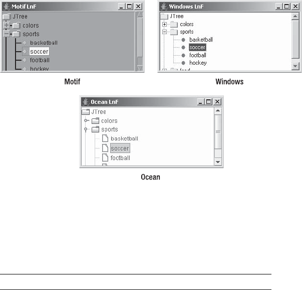
CHAPTER 17 ■ TREES 631
Figure 17-4. JTree under different look and feel types
The available set of UIResource-related properties for a JTree is shown in Table 17-2. For
the JTree component, there are 43 different properties.
Table 17-2. JTree UIResource Elements
Property String Object Type
Tree.actionMap ActionMap
Tree.ancestorInputMap InputMap
Tree.background Color
Tree.changeSelectionWithFocus Boolean
Tree.closedIcon Icon
Tree.collapsedIcon Icon
Tree.drawDashedFocusIndicator Boolean
Tree.drawHorizontalLines Boolean
Tree.drawsFocusBorderAroundIcon Boolean
Tree.drawVerticalLines Boolean
Tree.editorBorder Border
Tree.editorBorderSelectionColor Color
Tree.expandedIcon Icon
Tree.expanderSize Integer

632 CHAPTER 17 ■ TREES
Tree.focusInputMap InputMap
Tree.focusInputMap.RightToLeft InputMap
Tree.font Font
Tree.foreground Color
Tree.hash Color
Tree.iconBackground Color
Tree.iconForeground Color
Tree.iconHighlight Color
Tree.iconShadow Color
Tree.leafIcon Icon
Tree.leftChildIndent Integer
Tree.line Color
Tree.lineTypeDashed Boolean
Tree.openIcon Icon
Tree.padding Integer
Tree.paintLines Boolean
Tree.rendererUseTreeColors Boolean
Tree.rightChildIndent Integer
Tree.rowHeight Integer
Tree.scrollsHorizontallyAndVertically Boolean
Tree.scrollsOnExpand Boolean
Tree.selectionBackground Color
Tree.selectionBorderColor Color
Tree.selectionForeground Color
Tree.showsRootHandles Boolean
Tree.textBackground Color
Tree.textForeground Color
Tree.timeFactor Integer
TreeUI String
Table 17-2. JTree UIResource Elements (Continued)
Property String Object Type
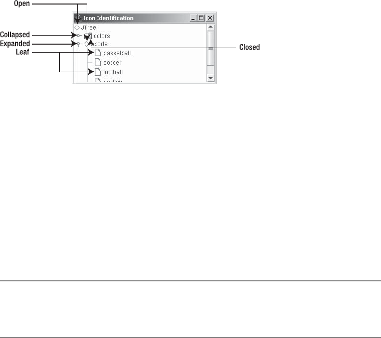
CHAPTER 17 ■ TREES 633
Of the many different JTree resources, five are for the various icons displayed within the
JTree. To see how the five icons are positioned, examine Figure 17-5. If you just want to change
the icons (and possibly the colors) of a tree, all you need to do is change the icon properties
with lines such as the following:
UIManager.put("Tree.openIcon", new DiamondIcon(Color.RED, false));
Figure 17-5. JTree icons
The purpose of the Tree.hash color property may not be immediately obvious. This color
is for the lines drawn to connect nodes. With the Metal look and feel, and Ocean theme, by
default, angled lines connect the nodes. To enable the drawing of these lines, you must set the
JTree.lineStyle client property. This property isn’t a UIResource property, but rather a client
property set with the public final void putClientProperty(Object key, Object value) method
of JComponent. The JTree.lineStyle property has the following valid settings:
•None, for not drawing lines to connect nodes
•Angled, the default setting for Ocean, for drawing lines in the Tree.hash color to connect
the nodes
•Horizontal, for drawing horizontal lines between first-level nodes in the Tree.line color
■Note The JTree.lineStyle client property is used only by the Metal look and feel. If the current look and
feel isn’t Metal or one of its themes like Ocean, the property setting will be ignored if set (unless a custom look
and feel takes advantage of the setting). The other system-provided look and feel classes don’t use this setting.
With client properties, you first must create the tree and then set the property. This client
property is specific to tree components, and it is not set for all trees. Therefore, creating a tree
with no lines entails using the following lines of code:
JTree tree = new JTree();
tree.putClientProperty("JTree.lineStyle", "None");
Figure 17-6 shows the results.

634 CHAPTER 17 ■ TREES
Figure 17-6. A JTree with no connection lines
The following lines produce horizontal lines between level-one nodes:
UIManager.put("Tree.line", Color.GREEN);
JTree tree = new JTree();
tree.putClientProperty("JTree.lineStyle", "Horizontal");
Figure 17-7 shows how the horizontal lines appear.
Figure 17-7. A JTree with horizontal level lines
TreeCellRenderer Interface
Each of the nodes within the JTree has an installed cell renderer. It’s the responsibility of the
renderer to draw the node and clearly display its state. The default renderer is basically a
JLabel, which allows you to have both text and an icon within the node. However, any compo-
nent can serve as the node renderer. The default renderer displays an icon that represents the
state of the node.
■Note The tree cell renderer is just that—a renderer. If the renderer were, say, a JButton, it wouldn’t be
selectable but would nevertheless be drawn to look just like a JButton.
The configuration of each node renderer is defined by the TreeCellRenderer interface. Any
class implementing this interface can serve as a renderer for your JTree.
public interface TreeCellRenderer {
public Component getTreeCellRendererComponent(JTree tree, Object value,
boolean selected, boolean expanded, boolean leaf, int row, boolean hasFocus);
}

CHAPTER 17 ■ TREES 635
When it’s time to draw a tree node, that tree asks its registered TreeCellRenderer how to
display that specific node. The node itself is passed in as the value argument so that the renderer
has access to its current state to determine how to render this state. To change the installed
renderer, use public void setCellRenderer(TreeCellRenderer renderer).
DefaultTreeCellRenderer Class
The DefaultTreeCellRenderer class serves as the default tree cell renderer. This class is a JLabel
subclass, so it can support capabilities such as displaying tooltip text or pop-up menus specific
to a node. It has only a no-argument constructor.
When used by a JTree, the DefaultTreeCellRenderer uses the various default icons (as
shown earlier in Figure 17-5) to display the current state of the node and a text representation
of the data for the node. The text representation is acquired by calling the toString() method
for each node of the tree.
DefaultTreeCellRenderer Properties
Table 17-3 shows the 14 properties added (or altered) with DefaultTreeCellRenderer. Because
the default renderer happens to be a JLabel, you also acquire many additional properties from it.
Table 17-3. DefaultTreeCellRenderer Properties
Property Name Data Type Access
background Color Write-only
backgroundNonSelectionColor Color Read-write
backgroundSelectionColor Color Read-write
borderSelectionColor Color Read-write
closedIcon Icon Read-write
defaultClosedIcon Icon Read-only
defaultLeafIcon Icon Read-only
defaultOpenIcon Icon Read-only
font Font Read-write
leafIcon Icon Read-write
openIcon Icon Read-write
preferredSize Dimension Read-only
textNonSelectionColor Color Read-write
textSelectionColor Color Read-write

636 CHAPTER 17 ■ TREES
If you don’t like working with the UIManager or just want to change the icons, font, or colors
for a single tree, you don’t need to create a custom tree cell renderer. Instead, you can ask the
tree for its renderer and customize it to display the icons, font, or colors you want. Figure 17-8
shows a JTree with an altered renderer. Instead of creating a new renderer, the existing default
renderer was customized with the following source:
JTree tree = new JTree();
DefaultTreeCellRenderer renderer = (DefaultTreeCellRenderer)tree.getCellRenderer();
// Swap background colors
Color backgroundSelection = renderer.getBackgroundSelectionColor();
renderer.setBackgroundSelectionColor(renderer.getBackgroundNonSelectionColor());
renderer.setBackgroundNonSelectionColor(backgroundSelection);
// Swap text colors
Color textSelection = renderer.getTextSelectionColor();
renderer.setTextSelectionColor(renderer.getTextNonSelectionColor());
renderer.setTextNonSelectionColor(textSelection);
Figure 17-8. A JTree with an altered default renderer
Remember that TreeUI caches renderer size information. If a change to the renderer
changes the renderer size, this cache isn’t updated. To get around the problem, it’s necessary
to signal to the tree that the cache is invalid. One such signal is to change the rowHeight prop-
erty. As long as the current rowHeight property setting isn’t positive, the TreeUI must ask the
renderer for its height. Therefore, decreasing the value by 1 has a side effect of invalidating the
cached renderer size information, causing the tree to be displayed with the proper initial sizes
for all the renderers. Adding the following source to the previous example demonstrates this.
renderer.setFont(new Font("Dialog", Font.BOLD | Font.ITALIC, 32));
int rowHeight = tree.getRowHeight();
if (rowHeight <= 0) {
tree.setRowHeight(rowHeight - 1);
}
The window on the left in Figure 17-9 shows the effect this addition has on Figure 17-8.
If you didn’t change the rowHeight property to invalidate the display cache, you would get the
effect shown in the right window instead.

CHAPTER 17 ■ TREES 637
Figure 17-9. You must properly modify the size of a tree renderer.
Creating a Custom Renderer
If the nodes of your JTree consist of information that is too complex to display within the text
of a single JLabel, you can create your own renderer. As an example, consider a tree in which
the nodes describe books by their title, author, and price, as shown in Figure 17-10. In this case,
the renderer can be a container in which a separate component displays each part.
Figure 17-10. A JTree with a custom renderer
To describe each book in this example, you need to define a class for storing the necessary
information, as shown in Listing 17-3.
Listing 17-3. Book Class Definition
public class Book {
String title;
String authors;
float price;
public Book(String title, String authors, float price) {
this.title = title;
this.authors = authors;
this.price = price;
}
638 CHAPTER 17 ■ TREES
public String getTitle() {
return title;
}
public String getAuthors() {
return authors;
}
public float getPrice() {
return price;
}
}
To render a book as a node in the tree, you need to create a TreeCellRenderer implementation.
Because the books are leaf nodes, the custom renderer will use a DefaultTreeCellRenderer to
render all the other nodes. The key part of the renderer is the getTreeCellRendererComponent().
In the event that the node data received by this method is of type Book, it stores the appropriate
information in the different labels and returns a JPanel as the renderer, with labels for each of
the book titles, authors, and prices. Otherwise, the getTreeCellRendererComponent() method
returns the default renderer.
Listing 17-4 contains the source for this custom renderer. Notice that it uses the same
selection colors as the remaining nodes of the tree so that the book nodes don’t appear out
of place.
Listing 17-4. Book Cell Renderer
import javax.swing.*;
import javax.swing.tree.*;
import java.awt.*;
public class BookCellRenderer implements TreeCellRenderer {
JLabel titleLabel;
JLabel authorsLabel;
JLabel priceLabel;
JPanel renderer;
DefaultTreeCellRenderer defaultRenderer = new DefaultTreeCellRenderer();
Color backgroundSelectionColor;
Color backgroundNonSelectionColor;
public BookCellRenderer() {
renderer = new JPanel(new GridLayout(0, 1));
titleLabel = new JLabel(" ");
titleLabel.setForeground(Color.BLUE);
renderer.add(titleLabel);
authorsLabel = new JLabel(" ");
authorsLabel.setForeground(Color.BLUE);
renderer.add(authorsLabel);
priceLabel = new JLabel(" ");
priceLabel.setHorizontalAlignment(JLabel.RIGHT);

CHAPTER 17 ■ TREES 639
priceLabel.setForeground(Color.RED);
renderer.add(priceLabel);
renderer.setBorder(BorderFactory.createLineBorder(Color.BLACK));
backgroundSelectionColor = defaultRenderer.getBackgroundSelectionColor();
backgroundNonSelectionColor = defaultRenderer.getBackgroundNonSelectionColor();
}
public Component getTreeCellRendererComponent(JTree tree, Object value,
boolean selected, boolean expanded, boolean leaf, int row, boolean hasFocus) {
Component returnValue = null;
if ((value != null) && (value instanceof DefaultMutableTreeNode)) {
Object userObject = ((DefaultMutableTreeNode)value).getUserObject();
if (userObject instanceof Book) {
Book book = (Book)userObject;
titleLabel.setText(book.getTitle());
authorsLabel.setText(book.getAuthors());
priceLabel.setText("" + book.getPrice());
if (selected) {
renderer.setBackground(backgroundSelectionColor);
} else {
renderer.setBackground(backgroundNonSelectionColor);
}
renderer.setEnabled(tree.isEnabled());
returnValue = renderer;
}
}
if (returnValue == null) {
returnValue = defaultRenderer.getTreeCellRendererComponent(tree, value,
selected, expanded, leaf, row, hasFocus);
}
return returnValue;
}
}
■Tip The JLabel components are created with an initial text label consisting of a space. Having a nonempty
label gives each component some dimensions. The TreeUI caches node sizes to improve performance.
Having an initial size for the labels ensures that the cache is initialized properly.
The last remaining part is the test program, shown in Listing 17-5. The majority of it just
creates arrays of Book objects. It reuses the NamedVector class from Listing 17-1 to help create
the tree branches. The code lines necessary for changing the tree cell renderer are boldfaced.
Running the program demonstrates the custom renderer, as shown earlier in Figure 17-10.

640 CHAPTER 17 ■ TREES
Listing 17-5. Using the Custom Book Cell Renderer
import javax.swing.*;
import javax.swing.tree.*;
import java.awt.*;
import java.util.*;
public class BookTree {
public static void main(String args[]) {
Runnable runner = new Runnable() {
public void run() {
JFrame frame = new JFrame("Book Tree");
frame.setDefaultCloseOperation(JFrame.EXIT_ON_CLOSE);
Book javaBooks[] = {
new Book("Core Java 2", "Horstmann/Cornell", 49.99f),
new Book("Effective Java", "Bloch", 34.99f),
new Book("Java Collections", "Zukowski", 49.95f)
};
Book netBooks[] = {
new Book("Beginning VB .NET 1.1 Databases", "Maharry", 49.99f),
new Book("Beginning VB.NET Databases", "Willis", 39.99f)
};
Vector<Book> javaVector = new NamedVector<Book>("Java Books", javaBooks);
Vector<Book> netVector = new NamedVector<Book>(".NET Books", netBooks);
Object rootNodes[] = {javaVector, netVector};
Vector<Object> rootVector = new NamedVector<Object>("Root", rootNodes);
JTree tree = new JTree(rootVector);
TreeCellRenderer renderer = new BookCellRenderer();
tree.setCellRenderer(renderer);
JScrollPane scrollPane = new JScrollPane(tree);
frame.add(scrollPane, BorderLayout.CENTER);
frame.setSize(300, 300);
frame.setVisible(true);
}
};
EventQueue.invokeLater(runner);
}
}
■Note Don’t worry about the details of DefaultMutableTreeNode just yet. Unless otherwise directed, all the
nodes of every tree are a DefaultMutableTreeNode. Each array element placed in a Vector in Listing 17-5
defines the data for that specific node. This data is then stored in the userObject property of its
DefaultMutableTreeNode.
CHAPTER 17 ■ TREES 641
Working with Tree Tooltips
If you want a tree to display tooltips for the nodes, you must register the component with the
ToolTipManager. If you don’t register the component, the renderer will never get the opportunity
to display tooltips. The renderer displays the tip, not the tree, so setting tooltip text for the tree
is ignored. The following line shows how you to register a specific tree with the ToolTipManager.
ToolTipManager.sharedInstance().registerComponent(aTree);
Once you’ve notified the ToolTipManager that you want the tree to display tooltip text, you
must tell the renderer what text to display. Although you can directly set the text with the
following lines, this results in a constant setting for all nodes.
DefaultTreeCellRenderer renderer = (DefaultTreeCellRenderer)aTree.getCellRenderer();
renderer.setToolTipText("Constant Tool Tip Text");
Instead of providing a constant setting, one alternative is to provide the renderer with a table
of tooltip strings so that the renderer can determine at runtime the string to display as the tooltip
text. The renderer in Listing 17-6 is one such example that relies on a java.util.Dictionary
implementation (like a Hashtable) to store a mapping from nodes to tooltip text. If a tip exists
for a specific node, the renderer associates the tip with it.
Listing 17-6. Tooltip Cell Renderer
import javax.swing.*;
import javax.swing.tree.*;
import java.awt.*;
import java.util.*;
public class ToolTipTreeCellRenderer implements TreeCellRenderer {
DefaultTreeCellRenderer renderer = new DefaultTreeCellRenderer();
Dictionary tipTable;
public ToolTipTreeCellRenderer (Dictionary tipTable) {
this.tipTable = tipTable;
}
public Component getTreeCellRendererComponent(JTree tree, Object value,
boolean selected, boolean expanded, boolean leaf, int row,
boolean hasFocus) {
renderer.getTreeCellRendererComponent(tree, value, selected, expanded,
leaf, row, hasFocus);
if (value != null) {
Object tipKey;
if (value instanceof DefaultMutableTreeNode) {
tipKey = ((DefaultMutableTreeNode)value).getUserObject();

642 CHAPTER 17 ■ TREES
} else {
tipKey = tree.convertValueToText(value, selected, expanded, leaf,
row, hasFocus);
}
renderer.setToolTipText((String)tipTable.get(tipKey));
}
return renderer;
}
}
■Note The example in Listing 17-6 takes advantage of the JTree method public String
convertValueToText(Object value, boolean selected, boolean expanded, boolean leaf,
int row boolean hasFocus) to convert the tree node value to a text string. The value parameter is
normally a DefaultMutableTreeNode, described later in this chapter. When the value parameter is not a
DefaultMutableTreeNode, using convertValueToText() allows the renderer to support other types of
tree nodes.
Using the new ToolTipTreeCellRenderer class simply involves creating the Properties list,
filling it with tooltip text for the necessary nodes, and then associating the renderer with the
tree. Figure 17-11 shows the renderer in action.
Figure 17-11. A JTree with tooltips, using the new ToolTipTreeCellRenderer
The complete sample program used to generate the screen in Figure 17-11 is shown next
in Listing 17-7. This tree uses the list of system properties as the tree nodes. The tooltip text is
the current setting for the specific property. When using the ToolTipTreeCellRenderer, be sure
to register the tree with the ToolTipManager.
Listing 17-7. Using a Tooltip Cell Renderer
import javax.swing.*;
import javax.swing.tree.*;
import java.awt.*;
import java.util.*;

CHAPTER 17 ■ TREES 643
public class TreeTips {
public static void main(String args[]) {
Runnable runner = new Runnable() {
public void run() {
JFrame frame = new JFrame("Tree Tips");
frame.setDefaultCloseOperation(JFrame.EXIT_ON_CLOSE);
Properties props = System.getProperties();
JTree tree = new JTree(props);
ToolTipManager.sharedInstance().registerComponent(tree);
TreeCellRenderer renderer = new ToolTipTreeCellRenderer(props);
tree.setCellRenderer(renderer);
JScrollPane scrollPane = new JScrollPane(tree);
frame.add(scrollPane, BorderLayout.CENTER);
frame.setSize(300, 150);
frame.setVisible(true);
}
};
EventQueue.invokeLater(runner);
}
}
Although this example creates a new tree cell renderer, the behavior is only customizing
what has already been done for the DefaultTreeCellRenderer. Instead of needing to configure
the icons and text yourself, let the default renderer do it for you. Then add the tooltip text.
Editing Tree Nodes
In addition to supporting individualized tree cell renderers, JTree components can be editable,
allowing users to change the contents of any node of the tree. By default, trees are read-only.
To make a tree editable, just change the editable property setting to return true:
aTree.setEditable(true);
By default, the editor is a text field. There is also built-in support for picking choices from
combo boxes or check boxes. If you prefer, you can create a customized editor for a tree, just as
you can create a custom cell renderer.
■Note Unfortunately, the built-in check box editor works better within a table than within a tree, where the
column label is the name and the value is the cell.
Figure 17-12 shows a tree using the default editor. To enable the editor, select a node,
and then double-click it. If the node isn’t a leaf node, selecting it will also display or hide the
node’s children.
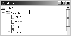
644 CHAPTER 17 ■ TREES
Figure 17-12. An editable JTree with the default editor
A series of classes is available to support editing tree nodes. Many are shared with the
JTable component because both can support editable cells. The CellEditor interface forms the
basis for the TreeCellEditor interface. Any editor implementation for a JTree must implement
the TreeCellEditor interface. The DefaultCellEditor (which extends AbstractCellEditor)
offers one such editor implementation, and the DefaultTreeCellEditor offers another. Let’s
now look at these interfaces and classes in more detail.
CellEditor Interface
The CellEditor interface defines the necessary basics for any editor used with a JTree or JTable,
as well as for any third-party components that need an editor. Besides defining how to manage
a list of CellEditorListener objects, the interface describes how to determine if a particular
node or cell is editable and what the new value is after the editor has changed its value.
public interface CellEditor {
// Properties
public Object getCellEditorValue();
// Listeners
public void addCellEditorListener(CellEditorListener l);
public void removeCellEditorListener(CellEditorListener l);
// Other methods
public void cancelCellEditing();
public boolean isCellEditable(EventObject event);
public boolean shouldSelectCell(EventObject event);
public boolean stopCellEditing();
}
TreeCellEditor Interface
The TreeCellEditor interface works similarly to the TreeCellRenderer interface. However, the
getXXXComponent() method does not have an argument that tells the editor it has the input
focus, because in the case of an editor, it must already have the input focus. Any class imple-
menting the TreeCellEditor interface can serve as an editor for your JTree.
public interface TreeCellEditor implements CellEditor {
public Component getTreeCellEditorComponent(JTree tree, Object value,
boolean isSelected, boolean expanded, boolean leaf, int row);
}
CHAPTER 17 ■ TREES 645
DefaultCellEditor Class
The DefaultCellEditor class serves as an editor for both tree nodes and table cells. The class
allows you to easily provide a text editor, combo box editor, or check box editor to modify the
contents of a node or cell.
The DefaultTreeCellEditor class, described next, uses this class to provide an editor for a
customized text field, maintaining the appropriate node-type icon based on a TreeCellRenderer.
Creating a DefaultCellEditor
When you create a DefaultCellEditor instance, you provide the JTextField,JComboBox, or
JCheckBox to use as the editor.
public DefaultCellEditor(JTextField editor)
JTextField textField = new JTextField();
TreeCellEditor editor = new DefaultCellEditor(textField);
public DefaultCellEditor(JComboBox editor)
public static void main (String args[]) {
JComboBox comboBox = new JComboBox(args);
TreeCellEditor editor = new DefaultCellEditor(comboBox);
...
}
public DefaultCellEditor(JCheckBox editor)
JCheckBox checkBox = new JCheckBox();
TreeCellEditor editor = new DefaultCellEditor(checkBox);
With a JTree, you should use the DefaultTreeCellEditor if you want a JTextField editor.
That text field will share the same font and use the appropriate editor border for the tree. When
aJCheckBox is used as the editor, the node for the tree should be either a Boolean value or a
String that can be converted to a Boolean. (If you are unfamiliar with conversion from String
to Boolean, see the Javadoc for the Boolean constructor that accepts a String.)
After creating an editor, you tell the tree to use it with a call similar to tree.
setCellEditor(editor). And don’t forget to make the tree editable with tree.
setEditable(true). For instance, if you wanted an editable combo box as your editor,
the following source code would work:
JTree tree = new JTree(...);
tree.setEditable(true);
String elements[] = { "Root", "chartreuse", "rugby", "sushi"} ;
JComboBox comboBox = new JComboBox(elements);
comboBox.setEditable(true);
TreeCellEditor editor = new DefaultCellEditor(comboBox);
tree.setCellEditor(editor);
This code produces the screen shown in Figure 17-13 when editing the basketball node.
Notice that there is no icon to indicate the type of node being edited. This is rectified with the
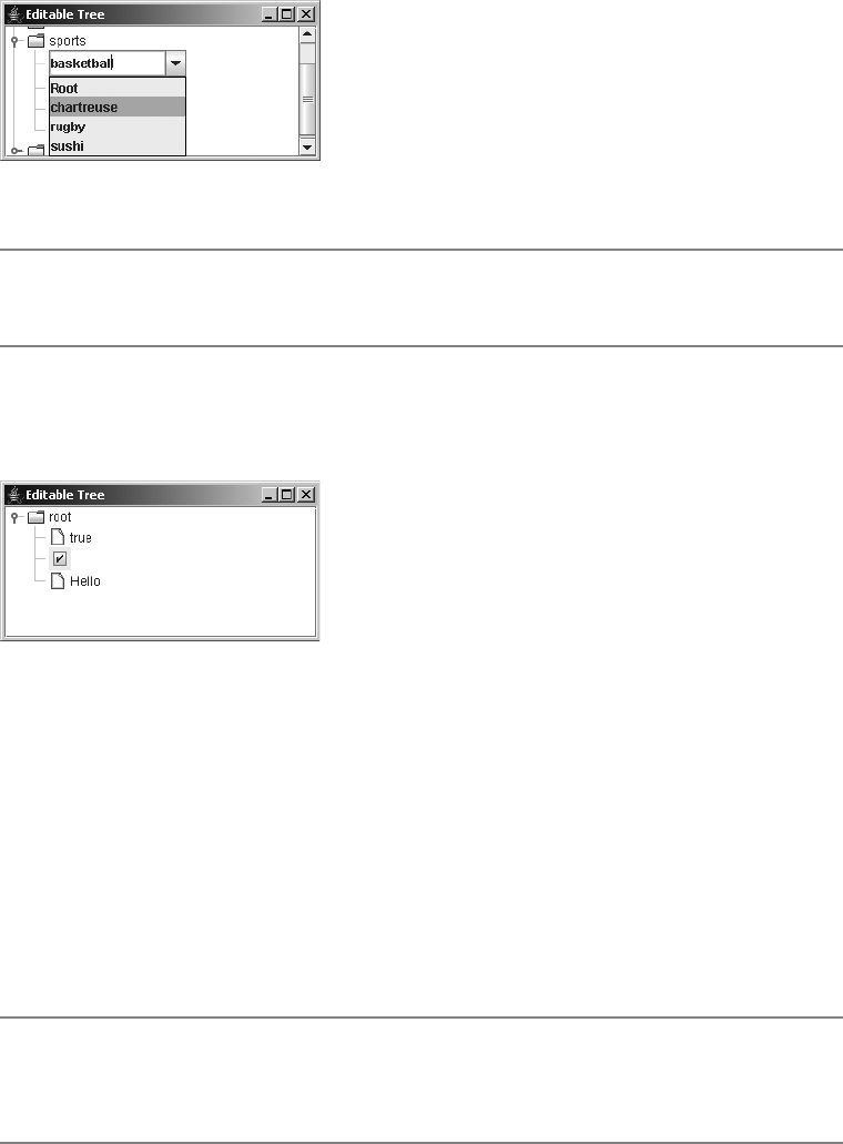
646 CHAPTER 17 ■ TREES
DefaultTreeCellEditor class. The DefaultCellEditor is primarily for use within a JTable, not
aJTree.
Figure 17-13. An editable JTree with a JComboBox editor
■Caution When you use a noneditable JComboBox as the cell editor, if the set of choices doesn’t include
the original node setting, it’s impossible to get back to the original setting once the node value changes.
To see how awkward the appearance of a JCheckBox is with the DefaultCellEditor as a
TreeCellEditor, take a look at Figure 17-14.
Figure 17-14. An editable JTree with a JCheckBox editor
Figure 17-14 uses the following source:
Object array[] =
{Boolean.TRUE, Boolean.FALSE, "Hello"}; // Hello will map to false
JTree tree = new JTree(array);
tree.setEditable(true);
tree.setRootVisible(true);
JCheckBox checkBox = new JCheckBox();
TreeCellEditor editor = new DefaultCellEditor(checkBox);
tree.setCellEditor(editor);
■Note Use of the JCheckBox with the DefaultCellEditor isn’t recommended with a JTree. See the
“Creating a Better Check Box Node Editor” section later in this chapter for an implementation that’s more
appropriate for a tree.

CHAPTER 17 ■ TREES 647
The awkwardness of the JCheckBox editor and custom text field editor within the
DefaultTreeCellEditor leaves the JComboBox as the only TreeCellEditor you’ll get from
DefaultCellEditor. However, you still might want to place the combo box editor within a
DefaultTreeCellEditor to display the appropriate type icon next to the node.
DefaultCellEditor Properties
The DefaultCellEditor has only three properties, which are listed in Table 17-4. The editor can
be any AWT component, not just a lightweight Swing component. Keep in mind the hazards of
mixing heavyweight and lightweight components, if you do choose to use a heavyweight compo-
nent as the editor. If you want to find out what the current setting is for the editor component,
ask for the setting of the cellEditorValue property.
DefaultTreeCellEditor Class
The DefaultTreeCellEditor class is the TreeCellEditor that is automatically used by a
JTree when you make a tree editable but you don’t associate an editor with that tree. The
DefaultTreeCellEditor combines the icons from a TreeCellRenderer with a TreeCellEditor
to return a combined editor.
The default component used as the editor is a JTextField. This text editor is special in that
it tries to limit its height to the original cell renderer and prefers the font of the tree so that it
won’t appear out of place. The editor uses two public inner classes to accomplish this feat:
DefaultTreeCellEditor.EditorContainer and DefaultTreeCellEditor.DefaultTextField.
There are two constructors for DefaultTreeCellEditor. Normally, you don’t need to call
the first constructor because it’s automatically created for you by the user interface when it
determines that the node is editable. However, it may be necessary if you want to customize
the default editor in some manner.
public DefaultTreeCellEditor(JTree tree, DefaultTreeCellRenderer renderer)
JTree tree = new JTree(...);
DefaultTreeCellRenderer renderer = (DefaultTreeCellRenderer)tree.getCellRenderer();
TreeCellEditor editor = new DefaultTreeCellEditor(tree, renderer);
public DefaultTreeCellEditor(JTree tree, DefaultTreeCellRenderer renderer,
TreeCellEditor editor)
public static void main (String args[]) {
JTree tree = new JTree(...);
DefaultTreeCellRenderer renderer =
(DefaultTreeCellRenderer)tree.getCellRenderer();
Table 17-4. DefaultCellEditor Properties
Property Name Data Type Access
cellEditorValue Object Read-only
clickCountToStart int Read-write
component Component Read-only
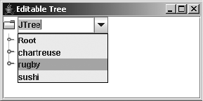
648 CHAPTER 17 ■ TREES
JComboBox comboBox = new JComboBox(args);
TreeCellEditor comboEditor = new DefaultCellEditor(comboBox);
TreeCellEditor editor = new DefaultTreeCellEditor(tree, renderer, comboEditor);
...
}
Creating a Proper ComboBox Editor for a Tree
As Figure 17-13 showed, using a JComboBox as the TreeCellEditor via a DefaultCellEditor
doesn’t place the appropriate node-type icon next to the editor. If you want the icons present,
you need to combine the DefaultCellEditor with a DefaultTreeCellEditor to get an editor
with both an icon and an editor. It’s really not as hard as it sounds. It just involves two extra
steps: getting the renderer for the tree (from which to get the icons), and then combining the
icon with the editor to get a new editor. The following source demonstrates this:
JTree tree = new JTree();
tree.setEditable(true);
DefaultTreeCellRenderer renderer = (DefaultTreeCellRenderer)tree.getCellRenderer();
String elements[] = { "Root", "chartreuse", "rugby", "sushi"} ;
JComboBox comboBox = new JComboBox(elements);
comboBox.setEditable(true);
TreeCellEditor comboEditor = new DefaultCellEditor(comboBox);
TreeCellEditor editor = new DefaultTreeCellEditor(tree, renderer, comboEditor);
tree.setCellEditor(editor);
The improved output is shown in Figure 17-15.
Figure 17-15. An editable JTree with a JComboBox editor and tree icons
Creating an Editor Just for Leaf Nodes
In some cases, you will want only the leaf nodes of a tree to be editable. Returning null from the
getTreeCellEditorComponent() request effectively makes a node not editable. Unfortunately,
this causes a NullPointerException to be thrown by the user interface class.
Instead of returning null, you can override the default behavior of the public boolean
isCellEditable(EventObject object) method, which is part of the CellEditor interface. If the
original return value is true, you can do an additional check to see if the selected node of the
tree is a leaf. Nodes of a tree implement the TreeNode interface (described later in this chapter
in the “TreeNode Interface” section ). This interface happens to have the method public
CHAPTER 17 ■ TREES 649
boolean isLeaf(), which provides the answer you’re looking for. The class definition for a
leaf node cell editor is shown in Listing 17-8.
Listing 17-8. Tree Cell Editor for Leaf Nodes
import javax.swing.*;
import javax.swing.tree.*;
import java.awt.*;
import java.util.EventObject;
public class LeafCellEditor extends DefaultTreeCellEditor {
public LeafCellEditor(JTree tree, DefaultTreeCellRenderer renderer) {
super(tree, renderer);
}
public LeafCellEditor(JTree tree, DefaultTreeCellRenderer renderer,
TreeCellEditor editor) {
super(tree, renderer, editor);
}
public boolean isCellEditable(EventObject event) {
// Get initial setting
boolean returnValue = super.isCellEditable(event);
// If still possible, check if current tree node is a leaf
if (returnValue) {
Object node = tree.getLastSelectedPathComponent();
if ((node != null) && (node instanceof TreeNode)) {
TreeNode treeNode = (TreeNode)node;
returnValue = treeNode.isLeaf();
}
}
return returnValue;
}
}
You use the LeafCellEditor in the same way as a DefaultTreeCellRenderer. It requires a
JTree and DefaultTreeCellRenderer for its constructor. In addition, it supports an optional
TreeCellEditor. If one isn’t provided, a JTextField is used as the editor.
JTree tree = new JTree();
tree.setEditable(true);
DefaultTreeCellRenderer renderer = (DefaultTreeCellRenderer)tree.getCellRenderer();
TreeCellEditor editor = new LeafCellEditor(tree, renderer);
tree.setCellEditor(editor);

650 CHAPTER 17 ■ TREES
CellEditorListener Interface and ChangeEvent Class
Before exploring the creation of a complete TreeCellEditor, take a look at the CellEditorListener
interface definition. The interface contains two methods that are used with a CellEditor.
public interface CellEditorListener implements EventListener {
public void editingCanceled(ChangeEvent changeEvent);
public void editingStopped(ChangeEvent changeEvent);
}
The editor calls the editingCanceled() method of the registered listeners to signal that the
editing of the node’s value has been aborted. The editingStopped() method is called to signal
the completion of an editing session.
Normally, it’s not necessary to create a CellEditorListener. However, when creating a
TreeCellEditor (or any CellEditor), it is necessary to manage a list of its listeners and notify
those listeners when necessary. Thankfully, this is managed for you automatically with the
help of the AbstractCellEditor.
Creating a Better Check Box Node Editor
Using the JCheckBox editor provided by the DefaultCellEditor class isn’t a good option when
working with a JTree. Although the editor can be wrapped into a DefaultTreeCellEditor to get
the appropriate tree icon next to it, you can’t display text within the check box (that is, besides
true or false). Other text strings can be displayed within the tree, but once a node is edited, the
text label for the edited node can only be true or false.
To have an editable check box with a text label as the tree cell editor, you must create your
own. The complete process involves creating three classes—a data model for each node of the
tree, a tree cell renderer to render this custom data structure, and the actual editor—plus a test
program to connect them all.
■Note The renderer and editor created here will support check-box–like data only for editing leaf nodes. If
you want to support check boxes for nonleaf nodes, you need to pull out the code that checks for leaf nodes.
Creating the CheckBoxNode Class
The first class to be created is for the data model for each leaf node of the tree. You could use
the same data model as the JCheckBox class, but that includes extraneous information at each
node that you don’t need. The only information necessary is the selected state of the node and
its text label. With the addition of some setter and getter methods for the state and label, the
class is basically defined, as shown in Listing 17-9. The other classes are not quite this easy to
formulate.
CHAPTER 17 ■ TREES 651
Listing 17-9. Custom Node Data for a JTree
public class CheckBoxNode {
String text;
boolean selected;
public CheckBoxNode(String text, boolean selected) {
this.text = text;
this.selected = selected;
}
public boolean isSelected() {
return selected;
}
public void setSelected(boolean newValue) {
selected = newValue;
}
public String getText() {
return text;
}
public void setText(String newValue) {
text = newValue;
}
public String toString() {
return getClass().getName() + "[" + text + "/" + selected + "]";
}
}
Creating the CheckBoxNodeRenderer Class
The renderer will have two parts. For nonleaf nodes, you can use the DefaultTreeCellRenderer
because those nodes aren’t meant to be CheckBoxNode elements. For the renderer for leaf nodes
of type CheckBoxNode, you need to map the data structure into an appropriate renderer. Because
these nodes contain a selection state and a text label, the JCheckBox acts as a good renderer for
the leaf nodes.
The easier of the two to explain is the nonleaf node renderer. In this example, it simply
configures a DefaultTreeCellRenderer as it would normally; nothing special is done.
The renderer for the leaf nodes requires a bit more work. Before even configuring any nodes,
you need to make it look like the default renderer. The constructor acquires the necessary fonts
and various colors from the look and feel for the renderer, ensuring that the two renderers will
appear similar.
The definition for the tree cell renderer, class CheckBoxNodeRenderer, is shown in Listing 17-10.
652 CHAPTER 17 ■ TREES
Listing 17-10. Custom Node Renderer for a JTree
import javax.swing.*;
import javax.swing.border.*;
import javax.swing.tree.*;
import java.awt.*;
public class CheckBoxNodeRenderer implements TreeCellRenderer {
private JCheckBox leafRenderer = new JCheckBox();
private DefaultTreeCellRenderer nonLeafRenderer = new DefaultTreeCellRenderer();
Color selectionBorderColor, selectionForeground, selectionBackground,
textForeground, textBackground;
protected JCheckBox getLeafRenderer() {
return leafRenderer;
}
public CheckBoxNodeRenderer() {
Font fontValue;
fontValue = UIManager.getFont("Tree.font");
if (fontValue != null) {
leafRenderer.setFont(fontValue);
}
Boolean booleanValue =
(Boolean)UIManager.get("Tree.drawsFocusBorderAroundIcon");
leafRenderer.setFocusPainted((booleanValue != null) &&
(booleanValue.booleanValue()));
selectionBorderColor = UIManager.getColor("Tree.selectionBorderColor");
selectionForeground = UIManager.getColor("Tree.selectionForeground");
selectionBackground = UIManager.getColor("Tree.selectionBackground");
textForeground = UIManager.getColor("Tree.textForeground");
textBackground = UIManager.getColor("Tree.textBackground");
}
public Component getTreeCellRendererComponent(JTree tree, Object value,
boolean selected, boolean expanded, boolean leaf, int row, boolean hasFocus) {
Component returnValue;
if (leaf) {
String stringValue = tree.convertValueToText(value, selected, expanded,
leaf, row, false);
leafRenderer.setText(stringValue);
leafRenderer.setSelected(false);
leafRenderer.setEnabled(tree.isEnabled());

CHAPTER 17 ■ TREES 653
if(selected) {
leafRenderer.setForeground(selectionForeground);
leafRenderer.setBackground(selectionBackground);
} else {
leafRenderer.setForeground(textForeground);
leafRenderer.setBackground(textBackground);
}
if ((value != null) && (value instanceof DefaultMutableTreeNode)) {
Object userObject = ((DefaultMutableTreeNode)value).getUserObject();
if (userObject instanceof CheckBoxNode) {
CheckBoxNode node = (CheckBoxNode)userObject;
leafRenderer.setText(node.getText());
leafRenderer.setSelected(node.isSelected());
}
}
returnValue = leafRenderer;
} else {
returnValue = nonLeafRenderer.getTreeCellRendererComponent(tree, value,
selected, expanded, leaf, row, hasFocus);
}
return returnValue;
}
}
■Note The getLeafRenderer() method is a helper method you’ll need in the editor.
Creating the CheckBoxNodeEditor Class
The CheckBoxNodeEditor class is the last part of creating a better check box node editor. It serves
as the TreeCellEditor implementation, allowing you to support editing of trees whose leaf
node data is of type CheckBoxNode. The TreeCellEditor interface is an extension of the CellEditor
implementation, so you must implement the methods of both interfaces. You can’t extend
DefaultCellEditor or DefaultTreeCellEditor, because they would require you to use the
JCheckBox editor implementation they provide, instead of the new one you’re creating here.
However, you can extend AbstractCellEditor and add the necessary TreeCellEditor interface
implementation. An AbstractCellEditor manages the list of CellEditorListener objects for
you and has methods to notify the list of listeners upon either stopping or canceling editing.
Because the editor acts as the renderer, you’ll need to use the earlier
CheckBoxNodeRenderer to get the basic renderer appearance. This will ensure that the editor
appears similar to the renderer. Because the renderer for the leaf nodes will be a JCheckBox, this
works perfectly well to enable you to change the node state. The editor JCheckBox will be active
and changeable, allowing a user to change from a selected state to an unselected state, and vice
versa. If instead the editor were the standard DefaultTreeCellRenderer, you would need to
manage the creation of selection changes.

654 CHAPTER 17 ■ TREES
Now that the class hierarchy has been set up, the first method to examine is the public
Object getCellEditorValue() method of CellEditor. The purpose of this method is to convert
the data as stored within the node editor into the data as stored within the node. The user interface
calls this method to get the editor’s value after it has determined that the user has successfully
changed the data within the editor. In this method, you need to create a new object each time.
Otherwise, the same node will be in the tree multiple times, causing all nodes to be equal to the
renderer for the last edited node. To convert the editor to the data model, it’s necessary to ask
the editor what its current label and selected state are, and then create and return a new node.
public Object getCellEditorValue() {
JCheckBox checkbox = renderer.getLeafRenderer();
CheckBoxNode checkBoxNode =
new CheckBoxNode(checkbox.getText(), checkbox.isSelected());
return checkBoxNode;
}
■Note It’s not the job of the editor to directly access the node within the tree to update it. The
getCellEditorValue() method returns the appropriate node object so that the user interface can
notify the tree of any changes.
If you were to implement the CellEditor interface yourself, you would also need to manage
the list of CellEditorListener objects yourself. You would need to manage the list with the
addCellEditorListener() and removeCellEditorListener() methods, and provide methods that
notify the list of listeners for each method in the interface. But, because you’ll be subclassing
AbstractCellEditor, it’s not necessary to do this yourself. You just need to know that the class
provides fireEditingCanceled() and fireEditingStopped() methods in order to notify the
listener list at the appropriate times.
The next CellEditor method, cancelCellEditing(), is called when a new node of the tree
is selected, announcing that the editing process of the prior selection has stopped and any
interim update has been aborted. The method is capable of doing anything, such as destroying
any necessary interim objects used by the editor. However, what the method should do is call
fireEditingCanceled(); this ensures that any registered CellEditorListener objects are notified of
the cancellation. The AbstractCellEditor does this for you. Unless you need to do some interim
operations, it’s not necessary to override this behavior.
The stopCellEditing() method of the CellEditor interface returns a boolean. This method is
called to see if editing of the current node can stop. If any validation needs to be done to deter-
mine whether editing can stop, you would check here. For the CheckBoxNodeEditor in this
example, no validation check is necessary. Therefore, editing can always stop, allowing the
method to always return true.
You would call the fireEditingStopped() method when you want to have the editor stop
editing. For instance, if the editor were a text field, pressing Enter within the text field could act
as the signal to stop editing. In the case of the JCheckBox editor, selection could act as a signal
to stop the editor. If fireEditingStopped() isn’t called, the tree data model isn’t updated.
To stop editing after selection of the JCheckBox, attach an ItemListener to it.
CHAPTER 17 ■ TREES 655
ItemListener itemListener = new ItemListener() {
public void itemStateChanged(ItemEvent itemEvent) {
if (stopCellEditing()) {
fireEditingStopped();
}
}
};
editor.addItemListener(itemListener);
The next method of the CellEditor interface to look at is public boolean
isCellEditable(EventObject event). The method returns a boolean to state whether the node
at the source of the event is editable. To find out if the event happens at a particular node, you
need a reference to the tree where the editor is to be used. You can add this requirement to the
constructor of the editor.
To find out which node is at a specific position during an event, you can ask the tree for the
path of nodes to the event location. The path is returned as a TreePath object, which is examined
again later in this chapter in the “TreePath Class” section. The last component of the tree path
is the specific node where the event happened. It is this node that you must check to determine
if it’s editable. If it is editable, the method returns true; if it isn’t editable, false is returned. In
the case of the tree to be created here, a node is editable if it’s a leaf node and it contains
CheckBoxNode data.
JTree tree;
public CheckBoxNodeEditor(JTree tree) {
this.tree = tree;
}
public boolean isCellEditable(EventObject event) {
boolean returnValue = false;
if (event instanceof MouseEvent) {
MouseEvent mouseEvent = (MouseEvent)event;
TreePath path = tree.getPathForLocation(mouseEvent.getX(), mouseEvent.getY());
if (path != null) {
Object node = path.getLastPathComponent();
if ((node != null) && (node instanceof DefaultMutableTreeNode)) {
DefaultMutableTreeNode treeNode = (DefaultMutableTreeNode)node;
Object userObject = treeNode.getUserObject();
returnValue = ((treeNode.isLeaf()) && (userObject instanceof CheckBoxNode));
}
}
}
return returnValue;
}
The shouldSelectCell() method of the CellEditor interface allows you to decide whether
a node is selectable. For the editor in this example, all editable cells should be selectable. However,
656 CHAPTER 17 ■ TREES
this method allows you to look at a specific node to see if it can be selected. By default,
AbstractCellEditor returns true for this method.
The remaining method, getTreeCellEditorComponent(), is from the TreeCellEditor inter-
face. You’ll need a reference to a CheckBoxNodeRenderer to get and use that as the editor. There
are two minor changes besides just passing through all the arguments. Editors should always
be selected and have the input focus. This simply forces two arguments to always be true.
When the node is selected, the background is filled in. When focused, a border surrounds the
editor when UIManager.get("Tree.drawsFocusBorderAroundIcon") reports true.
CheckBoxNodeRenderer renderer = new CheckBoxNodeRenderer();
public Component getTreeCellEditorComponent(JTree tree, Object value,
boolean selected, boolean expanded, boolean leaf, int row) {
// Editor always selected / focused
return renderer.getTreeCellRendererComponent(tree, value, true, expanded, leaf,
row, true);
}
Listing 17-11 shows everything put together, presenting the complete CheckBoxNodeEditor
class source.
Listing 17-11. Custom Node Editor for a JTree
import javax.swing.*;
import javax.swing.event.*;
import javax.swing.tree.*;
import java.awt.*;
import java.awt.event.*;
import java.util.EventObject;
public class CheckBoxNodeEditor extends AbstractCellEditor implements
TreeCellEditor {
CheckBoxNodeRenderer renderer = new CheckBoxNodeRenderer();
ChangeEvent changeEvent = null;
JTree tree;
public CheckBoxNodeEditor(JTree tree) {
this.tree = tree;
}
public Object getCellEditorValue() {
JCheckBox checkbox = renderer.getLeafRenderer();
CheckBoxNode checkBoxNode =
new CheckBoxNode(checkbox.getText(), checkbox.isSelected());
return checkBoxNode;
}

CHAPTER 17 ■ TREES 657
public boolean isCellEditable(EventObject event) {
boolean returnValue = false;
if (event instanceof MouseEvent) {
MouseEvent mouseEvent = (MouseEvent)event;
TreePath path = tree.getPathForLocation(mouseEvent.getX(), mouseEvent.getY());
if (path != null) {
Object node = path.getLastPathComponent();
if ((node != null) && (node instanceof DefaultMutableTreeNode)) {
DefaultMutableTreeNode treeNode = (DefaultMutableTreeNode)node;
Object userObject = treeNode.getUserObject();
returnValue = ((treeNode.isLeaf()) &&
(userObject instanceof CheckBoxNode));
}
}
}
return returnValue;
}
public Component getTreeCellEditorComponent(JTree tree, Object value,
boolean selected, boolean expanded, boolean leaf, int row) {
Component editor = renderer.getTreeCellRendererComponent(tree, value, true,
expanded, leaf, row, true);
// Editor always selected / focused
ItemListener itemListener = new ItemListener() {
public void itemStateChanged(ItemEvent itemEvent) {
if (stopCellEditing()) {
fireEditingStopped();
}
}
};
if (editor instanceof JCheckBox) {
((JCheckBox)editor).addItemListener(itemListener);
}
return editor;
}
}
■Note Notice that there’s no direct change of the data in the tree node. It’s not the role of the editor to
change the node. The editor only gets the new node value, returning it with getCellEditorValue().
658 CHAPTER 17 ■ TREES
Creating the Test Program
The test program in Listing 17-12 consists primarily of creating the CheckBoxNode elements.
In addition to creating the tree data, the tree must have the renderer and editor associated with
it and be made editable.
Listing 17-12. Using the Custom Node Editor
import javax.swing.*;
import javax.swing.tree.*;
import java.awt.*;
import java.util.Vector;
public class CheckBoxNodeTreeSample {
public static void main(String args[]) {
Runnable runner = new Runnable() {
public void run() {
JFrame frame = new JFrame("CheckBox Tree");
frame.setDefaultCloseOperation(JFrame.EXIT_ON_CLOSE);
CheckBoxNode accessibilityOptions[] = {
new CheckBoxNode("Move system caret with focus/selection changes", false),
new CheckBoxNode("Always expand alt text for images", true)
};
CheckBoxNode browsingOptions[] = {
new CheckBoxNode("Notify when downloads complete", true),
new CheckBoxNode("Disable script debugging", true),
new CheckBoxNode("Use AutoComplete", true),
new CheckBoxNode("Browse in a new process", false)
};
Vector<CheckBoxNode> accessVector =
new NamedVector<CheckBoxNode>("Accessibility", accessibilityOptions);
Vector<CheckBoxNode> browseVector =
new NamedVector<CheckBoxNode>("Browsing", browsingOptions);
Object rootNodes[] = {accessVector, browseVector};
Vector<Object> rootVector = new NamedVector<Object>("Root", rootNodes);
JTree tree = new JTree(rootVector);
CheckBoxNodeRenderer renderer = new CheckBoxNodeRenderer();
tree.setCellRenderer(renderer);
tree.setCellEditor(new CheckBoxNodeEditor(tree));
tree.setEditable(true);
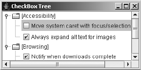
CHAPTER 17 ■ TREES 659
JScrollPane scrollPane = new JScrollPane(tree);
frame.add(scrollPane, BorderLayout.CENTER);
frame.setSize(300, 150);
frame.setVisible(true);
}
};
EventQueue.invokeLater(runner);
}
}
Running the program and selecting a CheckBoxNode will enable the editor. After the editor
is enabled, selecting the editor again causes the state of the node within the tree to change. The
editor stays enabled until a different tree node is selected. Figure 17-16 shows an example of
the editor in use.
Figure 17-16. The new CheckBoxNodeEditor in action
Working with the Nodes of the Tree
When you create a JTree, the type of objects at any spot in the tree can be any Object. There
is no requirement that the nodes of the tree implement any interface or subclass any class.
Nevertheless, the Swing component libraries provide a pair of interfaces and one class for
working with tree nodes. The default data model for the tree, DefaultTreeModel, uses these
interfaces and the class. However, the tree data model interface, TreeModel, permits any type
of object to be a tree node.
The base interface for nodes is TreeNode, which defines a series of methods describing a read-
only, parent-children aggregation relationship. Expanding on TreeNode is the MutableTreeNode
interface, which allows you to programmatically connect nodes and store information at each
node. The class that implements the two interfaces is the DefaultMutableTreeNode class.
Besides implementing the methods of the two interfaces, the class provides a set of methods
for traversing the tree and inquiring about the state of various nodes.
Keep in mind that although these node objects are available, much work can be still
performed without involving these interfaces and classes, as previously shown in this chapter.
TreeNode Interface
The TreeNode interface describes one possible definition for an individual part of a tree. It’s used
by one implementation of TreeModel, the DefaultTreeModel class, to store references to the

660 CHAPTER 17 ■ TREES
hierarchical data that describes a tree. The interface allows you to find out which node is the parent
to the current node, as well as get information about the set of child nodes. When the parent
node is null, the node is the root of a tree.
public interface TreeNode {
// Properties
public boolean getAllowsChildren();
public int getChildCount();
public boolean isLeaf();
public TreeNode getParent();
// Other methods
public Enumeration children();
public TreeNode getChildAt(int childIndex);
public int getIndex(TreeNode node);
}
■Note Normally, only nonleaf nodes allow children. However, security restrictions may limit nonleaf nodes
from having children, or at least showing them. Imagine a directory tree in which you don’t have read access
to a particular directory. Although the directory is a nonleaf node, it can’t have child nodes because you don’t
have access to find out what those children are.
MutableTreeNode Interface
Although the TreeNode interface allows you to retrieve information about a hierarchy of tree
nodes, it doesn’t allow you to create the hierarchy. TreeNode just provides you access to a read-
only tree hierarchy. On the other hand, the MutableTreeNode interface allows you to create the
hierarchy and store information at a specific node within the tree.
public interface MutableTreeNode implements TreeNode {
// Properties
public void setParent(MutableTreeNode newParent);
public void setUserObject(Object object);
// Other methods
public void insert(MutableTreeNode child, int index);
public void remove(MutableTreeNode node);
public void remove(int index);
public void removeFromParent();
}
When creating the hierarchy of tree nodes, you can either create children nodes and add
them to their parent or create parent nodes and add children. To associate a node with a parent
node, you set its parent with setParent(). Using insert() allows you to add children to a parent
node. The arguments for the insert() method include an index argument. This index represents
the position within the set of children to add the child node provided. The index is zero-based,
so an index of zero will add the node as the first child of the tree. Adding a node as the last child,

CHAPTER 17 ■ TREES 661
instead of the first, requires you to ask the node with getChildCount() how many children it
already has and then add 1:
mutableTreeNode.insert(childMutableTreeNode, mutableTreeNode.getChildCount()+1);
At least for the DefaultMutableTreeNode class described next, setParent() sets a node to be
the parent of a child node, even though it doesn’t make the child node a child of the parent. In
other words, don’t call setParent() yourself; call insert(), and it will set the parent accordingly.
■Caution The insert() method doesn’t allow circular ancestry, where the child node to be added is an
ancestor to the parent. If that’s attempted, an IllegalArgumentException will be thrown.
DefaultMutableTreeNode Class
The DefaultMutableTreeNode class provides an implementation of the MutableTreeNode interface
(which implements the TreeNode interface). When you’re creating a tree from a Hashtable, an
array, or a Vector constructor, JTree automatically creates the nodes as a set of type
DefaultMutableTreeNode. If, on the other hand, you want to create the nodes yourself, you need
to create one instance of type DefaultMutableTreeNode for every node in your tree.
Creating a DefaultMutableTreeNode
Three constructors are available for creating instances of DefaultMutableTreeNode:
public DefaultMutableTreeNode()
DefaultMutableTreeNode node = new DefaultMutableTreeNode();
public DefaultMutableTreeNode(Object userObject)
DefaultMutableTreeNode node = new DefaultMutableTreeNode("Node");
public DefaultMutableTreeNode(Object userObject, boolean allowsChildren)
DefaultMutableTreeNode node = new DefaultMutableTreeNode("Node", false);
The information stored at every node is called the user object. When not specified by one
of the constructors, this user object is null. In addition, you can specify whether a node is
allowed to have children.
Building DefaultMutableTreeNode Hierarchies
Building a hierarchy of nodes of type DefaultMutableTreeNode requires creating an instance
of type DefaultMutableTreeNode, creating nodes for its children, and then connecting them.
Before using DefaultMutableTreeNode directly to create the hierarchy, first let’s see how to use
the new NamedVector class to create a tree with four nodes: one root and three leaf nodes.
Vector vector = new NamedVector("Root", new String[]{ "Mercury", "Venus", "Mars"} );
JTree tree = new JTree(vector);
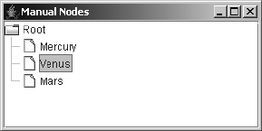
662 CHAPTER 17 ■ TREES
When JTree gets a Vector as its constructor argument, the tree creates a
DefaultMutableTreeNode for the root node, and then creates another one for each element in
the Vector, making each element node a child of the root node. The data for the root node
unfortunately is not the "Root" you specify, but rather root, and isn’t shown.
If, instead, you wanted to use DefaultMutableTreeNode to manually create the nodes of a
tree, or if you wanted to display the root node, a few more lines would be necessary, as follows:
DefaultMutableTreeNode root = new DefaultMutableTreeNode("Root");
DefaultMutableTreeNode mercury = new DefaultMutableTreeNode("Mercury");
root.insert(mercury, 0);
DefaultMutableTreeNode venus = new DefaultMutableTreeNode("Venus");
root.insert(venus, 1);
DefaultMutableTreeNode mars = new DefaultMutableTreeNode("Mars");
root.insert(mars, 2);
JTree tree = new JTree(root);
Besides using the insert() method from MutableTreeNode to associate a child with a parent,
DefaultMutableTreeNode has an add() method that automatically adds a child node at the end,
without providing an index.
DefaultMutableTreeNode root = new DefaultMutableTreeNode("Root");
DefaultMutableTreeNode mercury = new DefaultMutableTreeNode("Mercury");
root.add(mercury);
DefaultMutableTreeNode venus = new DefaultMutableTreeNode("Venus");
root.add(venus);
DefaultMutableTreeNode mars = new DefaultMutableTreeNode("Mars");
root.add(mars);
JTree tree = new JTree(root);
Both of the previous blocks of source create a tree like the one shown in Figure 17-17.
Figure 17-17. Using DefaultMutableTreeNode
If you don’t need a root node and want the same behavior as if you had used NamedVector
at the root of a tree, you could do the following, too:
String elements[] = { "Mercury", "Venus", "Mars"} ;
JTree tree = new JTree(elements);

CHAPTER 17 ■ TREES 663
DefaultMutableTreeNode Properties
As Table 17-5 shows, there are 22 properties of DefaultMutableTreeNode. Most of the properties
are read-only, allowing you to find out information about the tree node’s position and relation-
ships. The userObject property contains the data specific to the node that was provided to the
DefaultMutableTreeNode when the node was created. The userObjectPath property contains an
array of user objects, from the root (at index 0) to the current node (which could be the root).
Table 17-5. DefaultMutableTreeNode Properties
Property Name Data Type Access
allowsChildren boolean Read-write
childCount int Read-only
depth int Read-only
firstChild TreeNode Read-only
firstLeaf DefaultMutableTreeNode Read-only
lastChild TreeNode Read-only
lastLeaf DefaultMutableTreeNode Read-only
leaf boolean Read-only
leafCount int Read-only
level int Read-only
nextLeaf DefaultMutableTreeNode Read-only
nextNode DefaultMutableTreeNode Read-only
nextSibling DefaultMutableTreeNode Read-only
parent MutableTreeNode Read-write
path TreeNode[ ] Read-only
previousLeaf DefaultMutableTreeNode Read-only
previousNode DefaultMutableTreeNode Read-only
previousSibling DefaultMutableTreeNode Read-only
root boolean Read-only
siblingCount int Read-only
userObject Object Read-write
userObjectPath Object[ ] Read-only

664 CHAPTER 17 ■ TREES
Querying Node Relationships
The DefaultMutableTreeNode class provides several ways to determine the relationship between
two nodes. In addition, you can check to see if two nodes share a common parent using the
following methods:
•isNodeAncestor(TreeNode aNode): Returns true if aNode is the current node or a parent of
the current node. This recursively checks getParent() until aNode or null is found.
•isNodeChild(TreeNode aNode): Returns true if the current node is the parent of aNode.
•isNodeDescendant(DefaultMutableTreeNode aNode): Returns true if the current node is
aNode or an ancestor of aNode.
•isNodeRelated(DefaultMutableTreeNode aNode): Returns true if both the current node
and aNode share the same root (are in the same tree).
•isNodeSibling(TreeNode aNode): Returns true if both nodes share the same parent.
Each method returns a boolean value, indicating whether or not the relationship exists.
If two nodes are related, you can ask for the root of the tree to find a shared ancestor.
However, this ancestor might not be the closest ancestor within the tree. If a common
node exists lower down in the tree, you can use the public TreeNode getSharedAncestor
(DefaultMutableTreeNode aNode) method to find this closer ancestor. If none exists because
the two nodes aren’t in the same tree, null is returned.
■Note If a node asks for the shared ancestor of that node and itself, the shared ancestor is the node itself.
In other words, a node’s closest ancestor to itself is itself.
Traversing Trees
The TreeNode interface and DefaultMutableTreeNode class provide several means of traveling to
all the nodes below a specific node. Given a specific TreeNode, you can walk to each descendant
node by going through the children() of each node, including the initial node. Given a specific
DefaultMutableTreeNode, you can find all the descendants by following both getNextNode()
and getPreviousNode() methods until no additional nodes are found. The following code frag-
ment demonstrates the use of the children() method of TreeNode to traverse an entire tree,
given a starting node.
public void printDescendants(TreeNode root) {
System.out.println(root);
Enumeration children = root.children();
if (children != null) {
while(children.hasMoreElements()) {
printDescendants((TreeNode)children.nextElement());
}
}
}
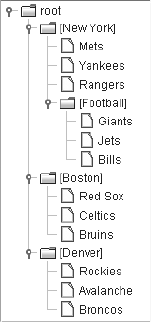
CHAPTER 17 ■ TREES 665
Although the DefaultMutableTreeNode implementation of TreeNode allows you to
traverse a tree via the getNextNode() and getPreviousNode() methods, these methods are
extremely inefficient and should be avoided. Instead, use one of the special methods of
DefaultMutableTreeNode to produce one Enumeration of all of a node’s children. Before looking
at the specific methods, review Figure 17-18, which shows a simple tree to traverse.
Figure 17-18. Sample tree for traversal
Figure 17-18 will help you understand the three special methods of DefaultMutableTreeNode.
These methods allow you to traverse a tree in any one of three ways, each public and returning
an Enumeration:
•preOrderEnumeration(): Returns an Enumeration of nodes, like the printDescendants()
method. The first node in the Enumeration is the node itself. The next node is that node’s
first child, then it’s the first child of that first child, and so on. Once a leaf node with no
children is found, the next child of its parent is put in the Enumeration and its children
are added to the list accordingly until no nodes are left. Starting at the root for the tree in
Figure 17-18, this would result in an Enumeration of nodes in the following order: root,
New York,Mets,Yankees,Rangers,Football,Giants,Jets,Bills,Boston,Red Sox,Celtics,
Bruins,Denver,Rockies,Avalanche,Broncos.
•depthFirstEnumeration() and postOrderEnumeration(): Return an Enumeration that has
practically the opposite behavior of preOrderEnumeration(). Instead of including the
current node first and then adding the children, these methods add the children first and
then add the current node to the Enumeration. For the tree in Figure 17-18, this results in
an Enumeration of nodes in the following order: Mets,Yankees,Rangers,Giants,Jets,
Bills,Football,New York,Red Sox,Celtics,Bruins,Boston,Rockies,Avalanche,Broncos,
Denver,root.
•breadthFirstEnumeration(): Returns an Enumeration of nodes added by level. For the
tree in Figure 17-18, the Enumeration would be in the following order: root,New York,
Boston,Denver,Mets,Yankees,Rangers,Football,Red Sox,Celtics,Bruins,Rockies,
Avalanche,Broncos,Giants,Jets,Bills.

666 CHAPTER 17 ■ TREES
This leaves but one question: How do you get the starting node? Well, the first node could
be selected as the result of a user action, or you can ask a tree’s TreeModel for its root node.
You’ll explore TreeModel shortly, but the source to get the root node follows. Because TreeNode
is only one possible type of object that can be stored in a tree, the getRoot() method of TreeModel
returns an Object.
TreeModel model = tree.getModel();
Object rootObject = model.getRoot();
if ((rootObject != null) && (rootObject instanceof DefaultMutableTreeNode)) {
DefaultMutableTreeNode root = (DefaultMutableTreeNode)rootObject;
...
}
■Note I can think of only one reason why you would want to create a replacement to the TreeNode interface
to describe the basic requirements of a node in a JTree: if you want to use an Iterator from the new Java
Collections API, instead of an Enumeration to return a list of children, you can create your own replacement
to TreeNode. This isn’t recommended, however.
JTree.DynamicUtilTreeNode Class
The JTree class includes an inner class, JTree.DynamicUtilTreeNode, which the tree uses to
help create the nodes for your trees. The DynamicUtilTreeNode is a DefaultMutableTreeNode
subclass that doesn’t create its child nodes until they’re needed. The child nodes are needed
when you either expand the parent node or try to traverse a tree. Although you normally
wouldn’t use this class directly, you might find a place for it. To demonstrate, the following
example uses a Hashtable to create the nodes for a tree. Instead of having an invisible node at
the root of the tree (with a userObject property setting of root), the root node will have a property
of "Root".
DefaultMutableTreeNode root = new DefaultMutableTreeNode("Root");
Hashtable hashtable = new Hashtable();
hashtable.put ("One", args);
hashtable.put ("Two", new String[]{"Mercury", "Venus", "Mars"});
Hashtable innerHashtable = new Hashtable();
Properties props = System.getProperties();
innerHashtable.put (props, props);
innerHashtable.put ("Two", new String[]{"Mercury", "Venus", "Mars"});
hashtable.put ("Three", innerHashtable);
JTree.DynamicUtilTreeNode.createChildren(root, hashtable);
JTree tree = new JTree(root);
The code just listed creates a tree with the same nodes as shown earlier in the TreeArraySample
program in Figure 17-2. However, the nodes at the first level of the tree are in a different order.
That’s because the nodes are in a Hashtable in this example, instead of in a Vector as in the
TreeArraySample. The first-level tree elements are added in the order returned by an Enumeration
of Hashtable, instead of being in the order added to the Vector, as Figure 17-19 shows.

CHAPTER 17 ■ TREES 667
Figure 17-19. DynamicUtilTreeNode Hashtable tree sample
TreeModel Interface
The TreeModel interface describes the basic data model structure for a JTree. It describes a
parent-child aggregation relationship, which permits any object to be a parent or a child. There
is one root to the tree, and all other nodes of the tree are descendants of this node. In addition
to returning information about the different nodes, the model requires any implementers to
manage a list of TreeModelListener objects so that the listeners can be notified when any nodes
in the model have changed. The remaining method, valueForPathChanged(), is meant to provide
the means of changing the contents of a node at a particular location.
public interface TreeModel {
// Properties
public Object getRoot();
// Listeners
public void addTreeModelListener(TreeModelListener l);
public void removeTreeModelListener(TreeModelListener l);
// Instance methods
public Object getChild(Object parent, int index);
public int getChildCount(Object parent);
public int getIndexOfChild(Object parent, Object child);
public boolean isLeaf(Object node);
public void valueForPathChanged(TreePath path, Object newValue);
}
DefaultTreeModel Class
The JTree automatically creates a DefaultTreeModel instance to store its data model. The
DefaultTreeModel class provides an implementation of the TreeModel interface that uses
TreeNode implementations at each node.
In addition to implementing the methods of the TreeModel interface, as well as managing
a list of TreeModelListener objects, the DefaultTreeModel class adds several helpful methods:
668 CHAPTER 17 ■ TREES
•public void insertNodeInto(MutableTreeNode child, MutableParentNode parent,
index int): Adds the child node to parent’s set of children at the child position index
(zero-based).
•public void removeNodeFromParent(MutableTreenode node): Causes the node to be
removed from tree.
•public void nodeChanged(TreeNode node): Notifies the model that a node has changed.
•public void nodesChanged(TreeNode node, int childIndices[]): Notifies the model
that the child or children of a node have changed.
•public void nodeStructureChanged(TreeNode node): Notifies the model if the node and
children have changed.
•public void nodesWereInserted(TreeNode node, int childIndices[]): Notifies the
model that nodes were inserted as children of the tree node.
•public void nodesWereRemoved(TreeNode node, int childIndices[], Object
removedChildren[]): Notifies the model that child nodes were removed from the tree
and includes nodes as arguments in the method call.
•public void reload() / public void reload(TreeNode node): Notifies the model that
there were complex changes made to the nodes and that the model should be reloaded
from the root node down or from a specific node down.
The first pair of methods is for directly adding or removing nodes to or from a tree. The
remaining methods are for notifying the data model when tree nodes are modified. If you don’t
insert or remove nodes into or from the model for a displayed tree with one of the first two
methods, it’s your responsibility to call a method from the second set.
TreeModelListener Interface and TreeModelEvent Class
The TreeModel uses a TreeModelListener to report any changes to the model. When the
TreeModel sends a TreeModelEvent, any registered listeners are notified. The interface includes
notification methods for when nodes are inserted, removed, or changed, as well as one catchall
method for when some or all of these operations are done simultaneously.
public interface TreeModelListener implements EventListener {
public void treeNodesChanged(TreeModelEvent treeModelEvent);
public void treeNodesInserted(TreeModelEvent treeModelEvent);
public void treeNodesRemoved(TreeModelEvent treeModelEvent);
public void treeStructureChanged(TreeModelEvent treeModelEvent);
}
TreeSelectionModel Interface
In addition to all trees supporting a data model for storing nodes, a renderer for displaying
nodes, and an editor for editing them, there is a data model called TreeSelectionModel for
selective manipulation of tree elements. The TreeSelectionModel interface that follows contains
CHAPTER 17 ■ TREES 669
methods to describe the selected set of paths to the selected nodes. Each path is stored in a
TreePath, which itself contains a path of tree nodes from the root object to a selected node. The
TreePath class will be explored shortly.
public interface TreeSelectionModel {
// Constants
public final static int CONTIGUOUS_TREE_SELECTION;
public final static int DISCONTIGUOUS_TREE_SELECTION;
public final static int SINGLE_TREE_SELECTION;
// Properties
public TreePath getLeadSelectionPath();
public int getLeadSelectionRow();
public int getMaxSelectionRow();
public int getMinSelectionRow();
public RowMapper getRowMapper();
public void setRowMapper(RowMapper newMapper);
public int getSelectionCount();
public boolean isSelectionEmpty();
public int getSelectionMode();
public void setSelectionMode(int mode);
public TreePath getSelectionPath();
public void setSelectionPath(TreePath path);
public TreePath[] getSelectionPaths();
public void setSelectionPaths(TreePath paths[]);
public int[] getSelectionRows();
// Listeners
public void addPropertyChangeListener(PropertyChangeListener listener);
public void removePropertyChangeListener(PropertyChangeListener listener);
public void addTreeSelectionListener(TreeSelectionListener listener);
public void removeTreeSelectionListener(TreeSelectionListener listener);
// Other methods
public void addSelectionPath(TreePath path);
public void addSelectionPaths(TreePath paths[]);
public void clearSelection();
public boolean isPathSelected(TreePath path);
public boolean isRowSelected(int row);
public void removeSelectionPath(TreePath path);
public void removeSelectionPaths(TreePath paths[]);
public void resetRowSelection();
}
The TreeSelectionModel interface supports three modes of selection, with each mode
specified by a class constant: CONTIGUOUS_TREE_SELECTION,DISCONTIGUOUS_TREE_SELECTION, or
SINGLE_TREE_SELECTION. When the selection mode is CONTIGUOUS_TREE_SELECTION, only nodes
situated next to each other can be selected simultaneously. The DISCONTIGUOUS_TREE_SELECTION
mode means that there are no restrictions on simultaneous selection. With the remaining mode,
SINGLE_TREE_SELECTION, only one node can be selected at a time. If you don’t want anything to be
selectable, use a setting of null. This uses the protected JTree.EmptySelectionModel class.

670 CHAPTER 17 ■ TREES
■Note The keys used to select multiple nodes are look-and-feel specific. Try using the Ctrl-select or
Shift-select keyboard combinations to choose multiple nodes.
Besides changing selection modes, the remaining methods allow you to monitor attributes of
the selection path. Sometimes the methods work with row numbers, and other times they work
with TreePath objects. The selection model uses a RowMapper to map rows to paths for you. The
abstract AbstractLayoutCache class provides a basic implementation of the RowMapper interface
that is further specialized by the FixedHeightLayoutCache and VariableHeightLayoutCache
classes. You should never need to access or modify the RowMapper or any of its implementa-
tions. To map rows to paths (or paths to rows), just ask a JTree.
DefaultTreeSelectionModel Class
The DefaultTreeSelectionModel class provides an implementation of the TreeSelectionModel
interface that is initially in DISCONTIGUOUS_TREE_SELECTION mode and that supports all three
selection modes. The class introduces some of its own methods for getting listener lists; the
other methods are merely implementations of all the TreeSelectionModel interface methods,
including methods for accessing the 11 properties listed in Table 17-6. In addition,
DefaultTreeSelectionModel overrides the clone() methods of Object to be Cloneable.
The primary reason to use the TreeSelectionModel is to change the selection mode of the
model. For instance, the following two lines of source code change the model to single-selection
mode:
Table 17-6. DefaultTreeSelectionModel Properties
Property Name Data Type Access
leadSelectionPath TreePath Read-only
leadSelectionRow int Read-only
maxSelectionRow int Read-only
minSelectionRow int Read-only
rowMapper RowMapper Read-write
selectionCount int Read-only
selectionEmpty boolean Read-only
selectionMode int Read-write
selectionPath TreePath Read-write
selectionPaths TreePath[] Read-write
selectionRows int[] Read-only

CHAPTER 17 ■ TREES 671
TreeSelectionModel selectionModel = tree.getSelectionModel();
selectionModel.setSelectionMode(TreeSelectionModel.SINGLE_TREE_SELECTION);
If you’re interested in finding out the selected path (or paths), you can ask the JTree
directly. You don’t need to get the selected path from the model.
TreeSelectionListener Interface and TreeSelectionEvent Class
When the set of selected nodes within a tree changes, a TreeSelectionEvent is generated
and any registered TreeSelectionListener objects of the TreeSelectionModel are notified.
The TreeSelectionListener can be registered either with the JTree or directly with the
TreeSelectionModel. The interface definition follows.
public interface TreeSelectionListener implements EventListener {
public void valueChanged(TreeSelectionEvent treeSelectionEvent);
}
TreePath Class
The last major class to examine is TreePath. It has been used in many of the earlier examples in
this chapter. It describes a read-only collection of nodes that map a path from the root node to
another node, where the root could be the top of a subtree versus the root of the whole tree.
Although two constructors exist to create TreePath objects, you’ll normally deal with them only
as the return value from a method. You can also create a new path by adding an element to an
existing TreePath with public TreePath pathByAddingChild(Object child).
ATreePath can be thought of as an Object array, in which the first element of the array is
the root of the tree and the last element is called the last path component. In between are all the
components connecting them. Normally, the elements of the array will be of type TreeNode.
However, because TreeModel supports objects of any type, the path property of TreePath is
defined to be an array of Object nodes. Table 17-7 lists the four TreePath properties.
To better understand TreePath, let’s reuse the tree traversal sample tree from Figure 17-18,
shown once more in Figure 17-20.
Table 17-7. TreePath Properties
Property Name Data Type Access
lastPathComponent Object Read-only
parentPath TreePath Read-only
path Object[ ] Read-only
pathCount int Read-only
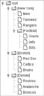
672 CHAPTER 17 ■ TREES
Figure 17-20. TreePath sample tree
Using Figure 17-20 to visualize a tree starting from its root, the TreePath for the Jets node
would be described by its properties as follows:
•lastPathComponent: A DefaultMutableTreeNode whose user object is Jets.
•parentPath: A TreePath made up of the root,New York, and Football nodes.
•path: An array of DefaultMutableTreeNode nodes whose user objects are root,New York,
Football, and Jets.
•pathCount: 4.
That’s really all there is to the TreePath class. Just remember that you can’t change an
existing TreePath—you can only access its elements.
Additional Expansion Events
Two listeners that can be registered with a JTree have yet to be discussed: a
TreeExpansionListener and a TreeWillExpandListener.
TreeExpansionListener Interface and TreeExpansionEvent Class
If you’re interested in finding out when a tree node has been expanded or collapsed, you can
register a TreeExpansionListener with a JTree. Any registered listener will be notified after the
expansion or collapse of a parent node.
public interface TreeExpansionListener implements EventListener {
public void treeCollapse(TreeExpansionEvent treeExpansionEvent);
public void treeExpand(TreeExpansionEvent treeExpansionEvent);
}
CHAPTER 17 ■ TREES 673
Each of the methods has a TreeExpansionEvent as its argument. The TreeExpansionEvent
class has a single method for getting the path to the expanded or collapsed node: public
TreePath getPath().
TreeWillExpandListener Interface and ExpandVetoException
Class
The JTree supports the registration of a TreeWillExpandListener, whose definition follows.
public interface TreeWillExpandListener implements EventListener {
public void treeWillCollapse(TreeExpansionEvent treeExpansionEvent)
throws ExpandVetoException;
public void treeWillExpand(TreeExpansionEvent treeExpansionEvent)
throws ExpandVetoException;
}
The two method signatures are similar to the TreeExpansionListener, and they can throw
an ExpandVetoException. Any registered listener will be notified prior to the expansion or collapse
of a parent node. If the listener doesn’t want the expansion or collapse to happen, that listener
can throw the exception to reject the request, stopping the node from opening or closing.
To demonstrate a TreeWillExpandListener, the following code won’t permit either the
sports node to be expanded in the default data model or the colors node to be collapsed.
TreeWillExpandListener treeWillExpandListener = new TreeWillExpandListener() {
public void treeWillCollapse(TreeExpansionEvent treeExpansionEvent)
throws ExpandVetoException {
TreePath path = treeExpansionEvent.getPath();
DefaultMutableTreeNode node =
(DefaultMutableTreeNode)path.getLastPathComponent();
String data = node.getUserObject().toString();
if (data.equals("colors")) {
throw new ExpandVetoException(treeExpansionEvent);
}
}
public void treeWillExpand(TreeExpansionEvent treeExpansionEvent)
throws ExpandVetoException {
TreePath path = treeExpansionEvent.getPath();
DefaultMutableTreeNode node =
(DefaultMutableTreeNode)path.getLastPathComponent();
String data = node.getUserObject().toString();
if (data.equals("sports")) {
throw new ExpandVetoException(treeExpansionEvent);
}
}
};
Don’t forget to add the listener to a tree with a line of code similar to the following:
tree.addTreeWillExpandListener(treeWillExpandListener)
674 CHAPTER 17 ■ TREES
Summary
In this chapter, you learned about the many classes related to the use of the JTree compo-
nent. You looked at tree node rendering with the TreeCellRenderer interface and the
DefaultTreeCellRenderer implementation. You delved into tree node editing with the
TreeCellEditor interface, and the DefaultCellEditor and DefaultTreeCellEditor
implementations.
After reviewing how to display and edit a tree, you dealt with the TreeNode interface,
MutableTreeNode interface, and DefaultMutableTreeNode class for manually creating tree objects.
You explored the TreeModel interface and DefaultTreeModel implementation for storing the
data model of a tree, and the TreeSelectionModel interface and DefaultTreeSelectionModel
implementation for storing the selection model for a tree.
In addition, you looked at the many event-related classes for the various tree classes, and
the TreePath for describing node connection paths.
In Chapter 18, you’ll explore the javax.swing.table package and its many classes that can
be used with the JTable component.

675
■ ■ ■
CHAPTER 18
Tables
Chapter 17 took an in-depth look at the Swing JTree component. In this chapter, you’ll
explore the many details of the JTable component. The component is the standard Swing
component for displaying two-dimensional data in the form of a grid.
Introducing Tables
Figure 18-1 shows a simple example of a JTable. You’ll notice that it includes Japanese fonts. In
order to see the Kanji ideographs in this chapter’s sample programs, you will need to have the
necessary Japanese fonts installed. However, all the examples will work fine without config-
uring your environment to display Japanese fonts, but instead of seeing the ideographs, you
will see characters such as question marks or boxes, depending on your platform.
■Note Windows XP Service Pack 2 users will find their systems already have the necessary Japanese fonts
for the examples in this chapter. If you don’t already have them, one place to get these fonts for Windows
systems is http://ftp.monash.edu.au/pub/nihongo/ie3lpkja.exe. Solaris users must contact
Sun to request the Asian outline fonts for Solaris environments. For more information about configuring fonts
in the Java runtime environment, refer to http://java.sun.com/j2se/1.5.0/docs/guide/intl/
fontconfig.html.
Figure 18-1. Sample JTable
Like the JTree component, the JTable component relies on numerous support classes for its
inner workings. For the JTable, the support classes are found in the javax.swing.table package.
The cells within the JTable can be selected by row, column, row and column, or individual cell.
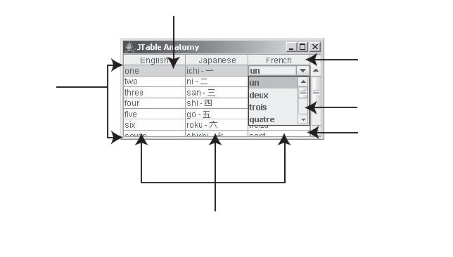
676 CHAPTER 18 ■ TABLES
It’s the responsibility of the current ListSelectionModel settings to control the selection within
a table.
The display of the different cells within a table is the responsibility of the TableCellRenderer;
the DefaultCellRenderer offers one such implementation of the TableCellRenderer interface
in a JLabel subclass.
Managing the data stored in the cells is accomplished through an implementation of the
TableModel interface. The AbstractTableModel provides the basics of an implementation of the
interface without any data storage. By comparison, the DefaultTableModel encapsulates the
TableModel interface and uses a Vector of Vector objects for the data storage. You extend
AbstractTableModel if you need a different type of storage than the kind supplied by the
DefaultTableModel; for instance, if you already had the data in your own data structure.
The TableColumnModel interface and the DefaultTableColumnModel implementation of the
interface manage the table’s data as a series of columns. They work together with the TableColumn
class to allow for greater flexibility in manipulating individual columns. For example, you can
store columns of data in the TableModel in an order that’s different from the display order within
the JTable. The TableColumnModel manages a second ListSelectionModel to control table
column selection.
At the top of every column is a column header. By default, the TableColumn class relies on
the JTableHeader class to render a text column header. Nevertheless, you must embed the
JTable in a scroll pane to see the default header.
Cells within a JTable can be editable. If a cell is editable, how the editing works depends on
the TableCellEditor implementation, such as the DefaultCellEditor implementation, which
extends from AbstractCellEditor. In addition, no classes exist to handle individual rows. Rows
must be manipulated on a cell-by-cell basis. Behind the scenes, the JTable uses the SizeSequence
utility class to deal with variable height rows; you won’t need to manipulate it yourself.
There are additional interrelationships among the elements used by the JTable component.
These relationships will be explored later in this chapter with each specific interface and class.
To visualize how the JTable elements all fit together, examine Figure 18-2.
Figure 18-2. JTable elements
,IST3ELECTION-ODEL
*4ABLE(EADER
4ABLE-ODEL
4ABLE#ELL%DITOR
4ABLE#ELL2ENDERER
%VERY#ELL
4ABLE#OLUMN
4ABLE#OLUMN-ODEL
3ETOF4ABLE#OLUMN/BJECTS
CHAPTER 18 ■ TABLES 677
JTable Class
First, let’s look at the JTable class, which gives you a way to display data in tabular form
(see Figures 18-1 and 18-2).
Creating a JTable
You have seven different ways to create a JTable. The various constructors allow you to create
tables from a number of data sources.
public JTable()
JTable table = new JTable();
public JTable(int rows, int columns)
JTable table = new JTable(2, 3);
public JTable(Object rowData[][], Object columnNames[])
Object rowData[][] = { { "Row1-Column1", "Row1-Column2", "Row1-Column3"},
{ "Row2-Column1", "Row2-Column2", "Row2-Column3"} };
Object columnNames[] = { "Column One", "Column Two", "Column Three"};
JTable table = new JTable(rowData, columnNames);
public JTable(Vector rowData, Vector columnNames)
Vector rowOne = new Vector();
rowOne.addElement("Row1-Column1");
rowOne.addElement("Row1-Column2");
rowOne.addElement("Row1-Column3");
Vector rowTwo = new Vector();
rowTwo.addElement("Row2-Column1");
rowTwo.addElement("Row2-Column2");
rowTwo.addElement("Row2-Column3");
Vector rowData = new Vector();
rowData.addElement(rowOne);
rowData.addElement(rowTwo);
Vector columnNames = new Vector();
columnNames.addElement("Column One");
columnNames.addElement("Column Two");
columnNames.addElement("Column Three");
JTable table = new JTable(rowData, columnNames);
public JTable(TableModel model)
TableModel model = new DefaultTableModel(rowData, columnNames);
JTable table = new JTable(model);
public JTable(TableModel model, TableColumnModel columnModel)
// Swaps column order
TableColumnModel columnModel = new DefaultTableColumnModel();
TableColumn firstColumn = new TableColumn(1);
firstColumn.setHeaderValue(headers[1]);

678 CHAPTER 18 ■ TABLES
columnModel.addColumn(firstColumn);
TableColumn secondColumn = new TableColumn(0);
secondColumn.setHeaderValue(headers[0]);
columnModel.addColumn(secondColumn);
JTable table = new JTable(model, columnModel);
public JTable(TableModel model, TableColumnModel columnModel,
ListSelectionModel selectionModel)
// Set single selection mode
ListSelectionModel selectionModel = new DefaultListSelectionModel();
selectionModel.setSelectionMode(ListSelectionModel.SINGLE_SELECTION);
JTable table = new JTable(model, columnModel, selectionModel);
The no-argument constructor creates a table with no rows and no columns. The second
constructor takes two integers to create an empty table with a set number of rows and columns.
■Note Table cells created from JTable constructors are editable, not read-only. To change their contents
in code, just call the public void setValueAt(Object value, int row, int column) method
of JTable.
The next two constructors are useful when your tabular data is already in a specially structured
form. For instance, if your data is already in the form of an array of arrays or a Vector of Vector
objects, you can create a JTable without creating your own TableModel. A two-row-by-three-
column table could be created from the array of { { "Row1-Column1", "Row1-Column2",
"Row1-Column3"}, { "Row2-Column1", "Row2-Column2", "Row2-Column3"} }, with another array
holding the column header names. Similar data structures would be necessary for the vector-
based constructor.
The remaining three constructors use JTable-specific data structures. If any one of the
three arguments is missing, default settings will be used. For example, if you don’t specify a
TableColumnModel, the default implementation DefaultTableColumnModel is used and is auto-filled
with a display order using the column order of the TableModel. When the selection model
is missing, the ListSelectionModel will use multiple-selection mode, which means that
noncontiguous rows, but not columns, can be selected.
Scrolling JTable Components
Like other components that may require more space than what is available, the JTable component
implements the Scrollable interface and should be placed within a JScrollPane. Scrollbars
will appear in a JScrollPane when a JTable is too big for the available screen real estate, and
column header names will appear above each column. Figure 18-3 shows how the table in
Figure 18-1 would appear if it weren’t within a JScrollPane. Notice that neither column headers
nor scrollbars appear. This means you can’t determine the meaning of the data, nor can you
scroll to the undisplayed rows.
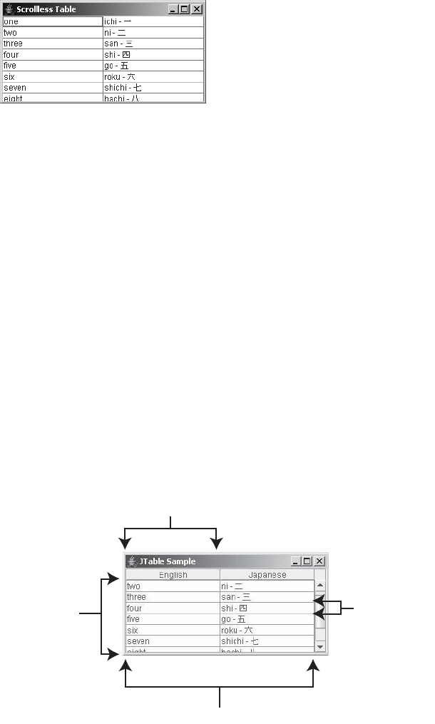
CHAPTER 18 ■ TABLES 679
Figure 18-3. JTable without a JScrollPane
Therefore, every table you create needs to be placed within a JScrollPane by using code
similar to the following:
JTable table = new JTable(...);
JScrollPane scrollPane = new JScrollPane(table);
Manually Positioning the JTable View
When a JTable within a JScrollPane is added to a window, the table will automatically appear
with the table positioned so that the first row and column appear in the upper-left corner. If
you ever need to return the position to the origin, you can set the viewport position back to
point (0, 0).
scrollPane.getViewport().setViewPosition(new Point(0,0));
For scrolling purposes, the block increment amount is the visible width and height of the
viewport, depending on the direction of the scrollbar. The unit increment is 100 pixels for hori-
zontal scrolling and the height of a single row for vertical scrolling. See Figure 18-4 for a visual
representation of these increments.
Figure 18-4. JTable scrolling increments
5NIT)NCREMENT
5NIT)NCREMENT
PIXELS
"LOCK)NCREMENT
"LOCK)NCREMENT
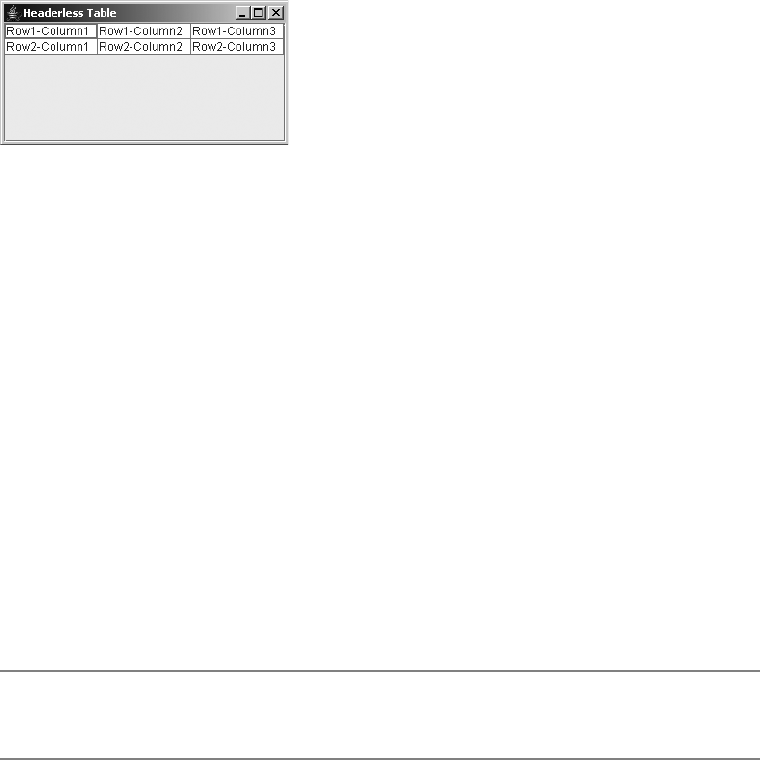
680 CHAPTER 18 ■ TABLES
Removing Column Headers
As previously stated, placing a JTable within a JScrollPane automatically produces column
header labels for the different column names. If you don’t want column headers, you can
remove them in one of many different ways. Figure 18-5 shows an example of a table without
column headers.
Figure 18-5. JTable without column headers
The simplest way to remove the column headers is to provide empty strings as the column
header names. With the third JTable constructor in the previous list of seven constructors, this
would involve replacing the three column names with "", the empty string.
Object rowData[][] = {{"Row1-Column1", "Row1-Column2", "Row1-Column3"},
{"Row2-Column1", "Row2-Column2", "Row2-Column3"}};
Object columnNames[] = { "", "", ""};
JTable table = new JTable(rowData, columnNames);
JScrollPane scrollPane = new JScrollPane(table);
Because this method of removing headers also removes the description of the different
columns, you might want to use another way of hiding column headers. The simplest way is to
just tell the JTable you don’t want table headers:
table.setTableHeader(null);
You could also remove headers by subclassing JTable and overriding the protected
configureEnclosingScrollPane() method, or by telling every TableColumn that its header value
is empty. These are more complicated ways of performing the same task.
■Note Calling scrollPane.setColumnHeaderView(null) doesn’t work to clear out the column
headers. Instead, it causes the JScrollPane to use the default column headers.
JTable Properties
As Table 18-1 shows, the JTable has many properties, 40 in all. These 40 are in addition to the
many properties inherited from the JComponent,Container, and Component classes.

CHAPTER 18 ■ TABLES 681
Table 18-1. JTable Properties
Property Name Data Type Access
accessibleContext AccessibleContext Read-only
autoCreateColumnsFromModel boolean Read-write bound
autoResizeMode int Read-write bound
cellEditor TableCellEditor Read-write bound
cellSelectionEnabled boolean Read-write bound
columnCount int Read-only
columnModel TableColumnModel Read-write bound
columnSelectionAllowed boolean Read-write bound
dragEnabled boolean Read-write
editing boolean Read-only
editingColumn int Read-write
editingRow int Read-write
editorComponent Component Read-only
gridColor Color Read-write bound
intercellSpacing Dimension Read-write
model TableModel Read-write bound
preferredScrollableViewportSize Dimension Read-write
rowCount int Read-only
rowHeight int Read-write bound
rowMargin int Read-write bound
rowSelectionAllowed boolean Read-write bound
scrollableTracksViewportHeight boolean Read-only
scrollableTracksViewportWidth boolean Read-only
selectedColumn int Read-only
selectedColumnCount int Read-only
selectedColumns int[ ] Read-only
selectedRow int Read-only
selectedRowCount int Read-only
selectedRows int[ ] Read-only
selectionBackground Color Read-write bound
selectionForeground Color Read-write bound
selectionMode int Write-only
682 CHAPTER 18 ■ TABLES
■Note Row heights are not fixed. You can change the height of an individual row with public void
setRowHeight(int row, int rowHeight).
Most of the JTable properties fit into one of three categories: display settings, selection
settings, and auto-resizing settings.
Display Settings
The first subset of properties in Table 18-1 allows you to set various display options of the JTable.
In addition to the inherited foreground and background properties from Component, you can change
the selection foreground (selectionForeground) and background (selectionBackground) colors.
You also control which (if any) gridlines appear (showGrid), as well as their color (gridColor).
The intercellSpacing property setting deals with the extra space within table cells.
Selection Modes
You can use any one of three different types of selection modes for a JTable. You can select
table elements one row at a time, one column at a time, or one cell at a time. These three settings
are controlled by the rowSelectionAllowed,columnSelectionAllowed, and cellSelectionEnabled
properties. Initially, only the row selection mode is allowed. Because the default
ListSelectionModel is in multiselect mode, you can select multiple rows at a time. If you don’t
like multiselect mode, you can change the selectionMode property of the JTable, causing the
selection mode of the rows and columns of the JTable to change accordingly. Cell selection is
enabled when both row and column selections are enabled.
If you’re interested in whether any of the rows or columns of the JTable are selected,
you can inquire with one of the six additional properties of JTable:selectedColumnCount,
selectedColumn,selectedColumns,selectedRowCount,selectedRow, and selectedRows.
The ListSelectionModel class provides constants for the different selection modes. The
ListSelectionModel interface and DefaultListSelectionModel class were both covered with
selectionModel ListSelectionModel Read-write bound
showGrid boolean Write-only
showHorizontalLines boolean Read-write bound
showVerticalLines boolean Read-write bound
surrendersFocusOnKeystroke boolean Read-write
tableHeader JTableHeader Read-write bound
UI TableUI Read-write
UIClassID String Read-only
Table 18-1. JTable Properties (Continued)
Property Name Data Type Access

CHAPTER 18 ■ TABLES 683
the JList component information in Chapter 13. They’re used to describe the current set of
rows and columns within the JTable component. They have three settings:
•MULTIPLE_INTERVAL_SELECTION (the default)
• SINGLE_INTERVAL_SELECTION
• SINGLE_SELECTION
The JTable has independent selection models for both rows and columns. The row selection
model is stored with the selectionModel property of the JTable. The column selection model is
stored with the TableColumnModel. Setting the selectionMode property of a JTable sets the selection
mode for the two independent selection models of the JTable.
Once a selection mode has been set and a user interacts with the component, you can ask
the selection model what happened, or, more precisely, what the user has selected. Table 18-2
lists the properties available to facilitate selection with the DefaultListSelectionModel.
If you’re interested in knowing when a selection event happens, register a
ListSelectionListener with the ListSelectionModel. The ListSelectionListener was
demonstrated in Chapter 13 with the JList component.
■Note All table indices are zero-based. So, the first visual column is column 0 internally.
Auto-Resize Modes
The last subset of the JTable properties deals with the column-resize behavior of the JTable.
When the JTable is in a column or window that changes sizes, how does it react? Table 18-3
shows the five settings supported by a JTable.
Table 18-2. DefaultListSelectionModel Properties
Property Name Data Type Access
anchorSelectionIndex int Read-write
leadAnchorNotificationEnabled boolean Read-write
leadSelectionIndex int Read-write
listSelectionListeners ListSelectionListener[ ] Read-only
maxSelectionIndex int Read-only
minSelectionIndex int Read-only
selectionEmpty boolean Read-only
selectionModel int Read-write
valueIsAdjusting boolean Read-write

684 CHAPTER 18 ■ TABLES
Listing 18-1 demonstrates what effect each setting has when resizing table columns.
Listing 18-1. Resizable JTable
import javax.swing.*;
import javax.swing.table.*;
import java.awt.*;
import java.awt.event.*;
public class ResizeTable {
public static void main(String args[]) {
final Object rowData[][] = {
{"1", "one", "ichi - \u4E00", "un", "I"},
{"2", "two", "ni - \u4E8C", "deux", "II"},
{"3", "three", "san - \u4E09", "trois", "III"},
{"4", "four", "shi - \u56DB", "quatre", "IV"},
{"5", "five", "go - \u4E94", "cinq", "V"},
{"6", "six", "roku - \u516D", "treiza", "VI"},
{"7", "seven", "shichi - \u4E03", "sept", "VII"},
{"8", "eight", "hachi - \u516B", "huit", "VIII"},
{"9", "nine", "kyu - \u4E5D", "neur", "IX"},
{"10", "ten", "ju - \u5341", "dix", "X"}
};
Table 18-3. Auto-Resize Mode Constants
Modes Description
AUTO_RESIZE_ALL_COLUMNS Adjusts all column widths proportionally.
AUTO_RESIZE_LAST_COLUMN Adjusts the rightmost column width only to give or
take space as required by the column currently being
altered. If no space is available within that column, then
resizing will work with the previous column until a
column with available space to consume is found.
AUTO_RESIZE_NEXT_COLUMN If you’re reducing the width of a neighboring column,
the neighboring column will grow to fill the unused
space. If you’re increasing the width of a column, the
neighboring column will shrink.
AUTO_RESIZE_OFF Turns off the user’s ability to resize columns. The
columns can still be resized programmatically.
AUTO_RESIZE_SUBSEQUENT_COLUMNS Adjusts the width by proportionally altering (default)
columns displayed to the right of the column being
changed.
CHAPTER 18 ■ TABLES 685
final String columnNames[] = {"#", "English", "Japanese", "French", "Roman"};
Runnable runner = new Runnable() {
public void run() {
final JTable table = new JTable(rowData, columnNames);
JScrollPane scrollPane = new JScrollPane(table);
String modes[] = {"Resize All Columns", "Resize Last Column",
"Resize Next Column", "Resize Off", "Resize Subsequent Columns"};
final int modeKey[] = {
JTable.AUTO_RESIZE_ALL_COLUMNS,
JTable.AUTO_RESIZE_LAST_COLUMN,
JTable.AUTO_RESIZE_NEXT_COLUMN,
JTable.AUTO_RESIZE_OFF,
JTable.AUTO_RESIZE_SUBSEQUENT_COLUMNS};
JComboBox resizeModeComboBox = new JComboBox(modes);
int defaultMode = 4;
table.setAutoResizeMode(modeKey[defaultMode]);
resizeModeComboBox.setSelectedIndex(defaultMode);
ItemListener itemListener = new ItemListener() {
public void itemStateChanged(ItemEvent e) {
JComboBox source = (JComboBox)e.getSource();
int index = source.getSelectedIndex();
table.setAutoResizeMode(modeKey[index]);
}
};
resizeModeComboBox.addItemListener(itemListener);
JFrame frame = new JFrame("Resizing Table");
frame.setDefaultCloseOperation(JFrame.EXIT_ON_CLOSE);
frame.add(resizeModeComboBox, BorderLayout.NORTH);
frame.add(scrollPane, BorderLayout.CENTER);
frame.setSize(300, 150);
frame.setVisible(true);
}
};
EventQueue.invokeLater(runner);
}
}
Figure 18-6 shows the initial appearance of the program. Change the JComboBox, and you
change the column resize behavior.
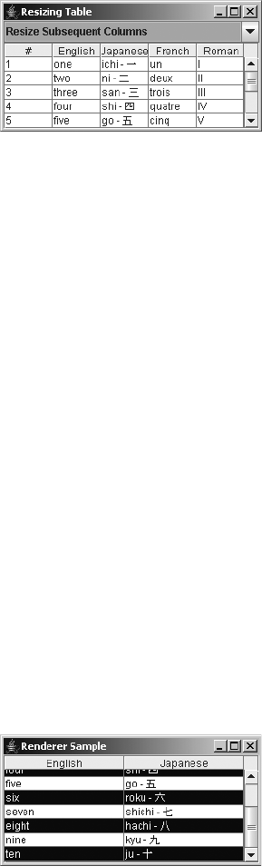
686 CHAPTER 18 ■ TABLES
Figure 18-6. Demonstrating JTable resizing column modes
Rendering Table Cells
By default, the rendering of table data is done by a JLabel. Whatever value is stored in the table
is rendered as a text string. The odd thing is that additional default renderers are installed for
classes such as Date and Number subclasses, but they’re not enabled. You’ll see how to enable
these specialized renderers in the “Enabling the Default Table Cell Renderers” section later in
this chapter.
Using the TableCellRenderer Interface and DefaultTableCellRenderer Class
The TableCellRenderer interface defines the single method necessary for that class to be a
TableCellRenderer.
public interface TableCellRenderer {
public Component getTableCellRendererComponent(JTable table, Object value,
boolean isSelected, boolean hasFocus, int row, int column);
}
By using information given to the getTableCellRendererComponent() method, proper
renderer components can be created and sent on their way to display the appropriate content
of the JTable. “Proper” means renderers that reflect the table cell state that you’ve decided to
display, such as when you want to display selected cells differently than unselected cells, or
how you want the selected cell to appear when it has the input focus.
To see a simple demonstration of this, look at Figure 18-7, which shows a renderer that
alternates colors based on which row the renderer is displayed within.
Figure 18-7. JTable with custom renderer
The source for the custom renderer used to produce the example in Figure 18-7 is shown
in Listing 18-2.
CHAPTER 18 ■ TABLES 687
Listing 18-2. Custom Table Cell Renderer
import java.awt.*;
import javax.swing.*;
import javax.swing.table.*;
public class EvenOddRenderer implements TableCellRenderer {
public static final DefaultTableCellRenderer DEFAULT_RENDERER =
new DefaultTableCellRenderer();
public Component getTableCellRendererComponent(JTable table, Object value,
boolean isSelected, boolean hasFocus, int row, int column) {
Component renderer =
DEFAULT_RENDERER.getTableCellRendererComponent(table, value,
isSelected, hasFocus, row, column);
Color foreground, background;
if (isSelected) {
foreground = Color.YELLOW;
background = Color.GREEN;
} else {
if (row % 2 == 0) {
foreground = Color.BLUE;
background = Color.WHITE;
} else {
foreground = Color.WHITE;
background = Color.BLUE;
}
}
renderer.setForeground(foreground);
renderer.setBackground(background);
return renderer;
}
}
Renderers for tables can be installed for individual classes or for specific columns (see the
“Enabling the Default Table Cell Renderers” section later in this chapter for details). To install
the renderer as the default renderer for the JTable—in other words, for Object.class—use code
similar to the following:
TableCellRenderer renderer = new EvenOddRenderer();
table.setDefaultRenderer(Object.class, renderer);
Once installed, the EvenOddRenderer will be used for any column whose class doesn’t have
a more specific renderer. It’s the responsibility of the public Class getColumnClass() method
of TableModel to return the class to be used as the renderer lookup for all the cells in a particular
column. The DefaultTableModel returns Object.class for everything; therefore, EvenOddRenderer
will be used by all table cells.

688 CHAPTER 18 ■ TABLES
■Note Keep in mind that one renderer component is used for every cell of every column of a particular
class. No individual renderer is created for each cell.
The sample program that used the EvenOddRenderer to generate Figure 18-7 is shown in
Listing 18-3.
Listing 18-3. Using the Custom Table Cell Renderer
import javax.swing.*;
import javax.swing.table.*;
import java.awt.*;
public class RendererSample {
public static void main(String args[]) {
final Object rows[][] = {
{"one", "ichi - \u4E00"},
{"two", "ni - \u4E8C"},
{"three", "san - \u4E09"},
{"four", "shi - \u56DB"},
{"five", "go - \u4E94"},
{"six", "roku - \u516D"},
{"seven", "shichi - \u4E03"},
{"eight", "hachi - \u516B"},
{"nine", "kyu - \u4E5D"},
{"ten", "ju - \u5341"}
};
final Object headers[] = {"English", "Japanese"};
Runnable runner = new Runnable() {
public void run() {
JFrame frame = new JFrame("Renderer Sample");
frame.setDefaultCloseOperation(JFrame.EXIT_ON_CLOSE);
JTable table = new JTable(rows, headers);
TableCellRenderer renderer = new EvenOddRenderer();
table.setDefaultRenderer(Object.class, renderer);
JScrollPane scrollPane = new JScrollPane(table);
frame.add(scrollPane, BorderLayout.CENTER);
frame.setSize(300, 150);
frame.setVisible(true);
}
};
EventQueue.invokeLater(runner);
}
}
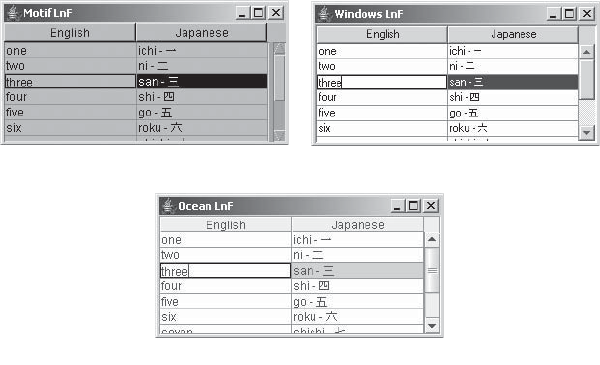
CHAPTER 18 ■ TABLES 689
Using Tooltips
By default, your table cell renderers will display any tooltip text you’ve configured them to
display. Unlike with the JTree component, you don’t need to manually register the table with
the ToolTipManager. If, however, your table doesn’t display tooltip text, the table will respond
faster if you unregister the table with the ToolTipManager by using code such as the following:
// Explicitly
ToolTipManager.sharedInstance().unregisterComponent(aTable);
// Implicitly
yourTable.setToolTipText(null);
Handling JTable Events
There are no JTable events that you can register directly with the JTable. To find out when
something happens, you must register with one of the JTable model classes: TableModel,
TableColumnModel, or ListSelectionModel.
Customizing a JTable Look and Feel
Each installable Swing look and feel provides a different JTable appearance and set of default
UIResource value settings. Figure 18-8 shows the appearance of the JTable component for the
preinstalled set of look and feel types: Motif, Windows, and Ocean. In all three cases, the third
row is highlighted, where the coloration shows the first column is being edited.
Figure 18-8. JTable under different look and feel types
The available set of UIResource-related properties for a JTable is shown in Table 18-4.
The JTable component has 21 different properties.
-OTIF
/CEAN
7INDOWS

690 CHAPTER 18 ■ TABLES
TableModel Interface
Now that you’ve looked at the basics of the JTable component, you can learn how it internally
manages its data elements. It does this with the help of classes that implement the TableModel
interface.
The TableModel interface defines the framework needed by the JTable to acquire column
headers and cell values, and modify those cell values when the table is editable. Its definition
follows:
Table 18-4. JTable UIResource Elements
Property String Object Type
Table.actionMap ActionMap
Table.ancestorInputMap InputMap
Table.ancestorInputMap.RightToLeft InputMap
Table.background Color
Table.darkShadow Color
Table.focusCellBackground Color
Table.focusCellForeground Color
Table.focusCellHighlightBorder Border
Table.font Font
Table.foreground Color
Table.gridColor Color
Table.highlight Color
Table.light Color
Table.rendererUseTableColors Boolean
Table.rendererUseUIBorder Boolean
Table.rowHeight Integer
Table.scrollPaneBorder Border
Table.selectionBackground Color
Table.selectionForeground Color
Table.shadow Color
TableUI String
CHAPTER 18 ■ TABLES 691
public interface TableModel {
// Listeners
public void addTableModelListener(TableModelListener l);
public void removeTableModelListener(TableModelListener l);
// Properties
public int getColumnCount();
public int getRowCount();
// Other methods
public Class getColumnClass(int columnIndex);
public String getColumnName(int columnIndex);
public Object getValueAt(int rowIndex, int columnIndex);
public boolean isCellEditable(int rowIndex, int columnIndex);
public void setValueAt(Object vValue, int rowIndex, int columnIndex);
}
AbstractTableModel Class
The AbstractTableModel class provides the basic implementation of the TableModel interface.
It manages the TableModelListener list and default implementations for several of the TableModel
methods. When you subclass it, all you need to provide is the actual column and row count,
and the specific values (getValueAt()) in the table model. Column names default to labels such
as A,B,C, . . ., Z,AA,BB, . . ., and the data model is read-only unless isCellEditable() is overridden.
If you subclass AbstractTableModel and make the data model editable, it’s your responsi-
bility to call one of the following fireXXX() methods of AbstractTableModel to ensure that any
TableModelListener objects are notified when the data model changes:
public void fireTableCellUpdated(int row, int column);
public void fireTableChanged(TableModelEvent e);
public void fireTableDataChanged();
public void fireTableRowsDeleted(int firstRow, int lastRow);
public void fireTableRowsInserted(int firstRow, int lastRow);
public void fireTableRowsUpdated(int firstRow, int lastRow);
public void fireTableStructureChanged();
When you want to create a JTable, it’s not uncommon to subclass AbstractTableModel in
order to reuse an existing data structure. This data structure typically comes as the result of a
Java Database Connectivity (JDBC) query, but there’s no restriction requiring that to be the
case. To demonstrate, the following anonymous class definition shows how you can treat an
array as an AbstractTableModel:
TableModel model = new AbstractTableModel() {
Object rowData[][] = {
{"one", "ichi"},
{"two", "ni"},
{"three", "san"},
{"four", "shi"},
{"five", "go"},
{"six", "roku"},
{"seven", "shichi"},
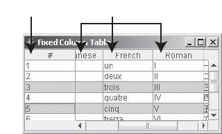
692 CHAPTER 18 ■ TABLES
{"eight", "hachi"},
{"nine", "kyu"},
{"ten", "ju"}
};
Object columnNames[] = {"English", "Japanese"};
public String getColumnName(int column) {
return columnNames[column].toString();
}
public int getRowCount() {
return rowData.length;
}
public int getColumnCount() {
return columnNames.length;
}
public Object getValueAt(int row, int col) {
return rowData[row][col];
}
};
JTable table = new JTable(model);
JScrollPane scrollPane = new JScrollPane(table);
Specifying Fixed JTable Columns
Now that you’ve seen the basics of how the TableModel and AbstractTableModel describe the
data, you can create a JTable with some columns that are fixed columns and some that are not.
To create columns that don’t scroll, you need to place a second table in the row header view of
the JScrollPane. Then when the user scrolls the table vertically, the two tables will remain in
sync. The two tables then need to share their ListSelectionModel. That way, when a row in one
table is selected, the row in the other table will automatically be selected. Figure 18-9 shows a
table with one fixed column and four scrolling columns.
Figure 18-9. Fixed-column JTable
The source code used to generate Figure 18-9 is shown in Listing 18-4.
&IXED#OLUMN 3CROLLABLE#OLUMNS
CHAPTER 18 ■ TABLES 693
Listing 18-4. JTable with Fixed Area
import javax.swing.*;
import javax.swing.table.*;
import java.awt.*;
public class FixedTable {
public static void main(String args[]) {
final Object rowData[][] = {
{"1", "one", "ichi", "un", "I", "\u4E00"},
{"2", "two", "ni", "deux", "II", "\u4E8C"},
{"3", "three", "san", "trois", "III", "\u4E09"},
{"4", "four", "shi", "quatre", "IV", "\u56DB"},
{"5", "five", "go", "cinq", "V", "\u4E94"},
{"6", "six", "roku", "treiza", "VI", "\u516D"},
{"7", "seven", "shichi", "sept", "VII", "\u4E03"},
{"8", "eight", "hachi", "huit", "VIII", "\u516B"},
{"9", "nine", "kyu", "neur", "IX", "\u4E5D"},
{"10", "ten", "ju", "dix", "X", "\u5341"}
};
final String columnNames[] =
{"#", "English", "Japanese", "French", "Roman", "Kanji"};
final TableModel fixedColumnModel = new AbstractTableModel() {
public int getColumnCount() {
return 1;
}
public String getColumnName(int column) {
return columnNames[column];
}
public int getRowCount() {
return rowData.length;
}
public Object getValueAt(int row, int column) {
return rowData[row][column];
}
};
final TableModel mainModel = new AbstractTableModel() {
public int getColumnCount() {
return columnNames.length-1;
}
public String getColumnName(int column) {
return columnNames[column+1];
}
694 CHAPTER 18 ■ TABLES
public int getRowCount() {
return rowData.length;
}
public Object getValueAt(int row, int column) {
return rowData[row][column+1];
}
};
Runnable runner = new Runnable() {
public void run() {
JTable fixedTable = new JTable(fixedColumnModel);
fixedTable.setAutoResizeMode(JTable.AUTO_RESIZE_OFF);
JTable mainTable = new JTable(mainModel);
mainTable.setAutoResizeMode(JTable.AUTO_RESIZE_OFF);
ListSelectionModel model = fixedTable.getSelectionModel();
mainTable.setSelectionModel(model);
JScrollPane scrollPane = new JScrollPane(mainTable);
Dimension fixedSize = fixedTable.getPreferredSize();
JViewport viewport = new JViewport();
viewport.setView(fixedTable);
viewport.setPreferredSize(fixedSize);
viewport.setMaximumSize(fixedSize);
scrollPane.setCorner(JScrollPane.UPPER_LEFT_CORNER,
fixedTable.getTableHeader());
scrollPane.setRowHeaderView(viewport);
JFrame frame = new JFrame("Fixed Column Table");
frame.setDefaultCloseOperation(JFrame.EXIT_ON_CLOSE);
frame.add(scrollPane, BorderLayout.CENTER);
frame.setSize(300, 150);
frame.setVisible(true);
}
};
EventQueue.invokeLater(runner);
}
}
Enabling the Default Table Cell Renderers
Earlier, I mentioned that the JTable provides default renderers for Date and Number classes.
Let’s look at the AbstractTableModel class and see how to enable those renderers.
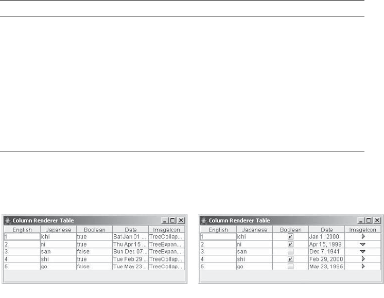
CHAPTER 18 ■ TABLES 695
The public Class getColumnClass(int column) method of the TableModel returns the class
type for a column in the data model. If the JTable class has a special renderer installed for that
particular class, it will use it to display that class. By default, the AbstractTableModel (and
DefaultTableModel) implementations of TableModel return Object.class for everything. The
AbstractTableModel class doesn’t try to be smart about guessing what’s in a column. However,
if you know that a particular column of the data model will always be numbers, dates, or some
other class, you can have the data model return that class type. This allows the JTable to try to
be smarter and use a better renderer.
Table 18-5 shows the preinstalled renderers within the JTable. If you have a table full of
numbers or just one column of numbers, for example, you can override getColumnClass() to
return Number.class for the appropriate columns; your numbers will be right-justified instead
of left-justified. With dates, using the default renderer for the Date class produces better-looking,
localized output.
Figure 18-10 shows how a table might look before and after enabling the renderers.
Figure 18-10. Before and after enabling the renderers
You can choose to hard-code the class names for columns or have the getColumnClass()
method be generic and just call getClass() on an element in the column. Adding the following
code to an AbstractTableModel implementation would allow the JTable to use its default renderers.
This implementation assumes that all entries for a particular column are one class type.
Table 18-5. Default JTable Renderers
Class Renderer Description
Boolean JCheckBox Centered
Date JLabel Right-aligned; uses DateFormat for output
Double JLabel Right-aligned; uses NumberFormat for output
Float JLabel Right-aligned; uses NumberFormat for output
Icon JLabel Centered
ImageIcon JLabel Centered
Number JLabel Right-aligned
Object JLabel Left-aligned
"EFORE !FTER
696 CHAPTER 18 ■ TABLES
public Class getColumnClass(int column) {
return (getValueAt(0, column).getClass());
}
DefaultTableModel Class
The DefaultTableModel is a subclass of AbstractTableModel that provides its own Vector data
structure for storage. Everything in the data model is stored within vectors internally, even
when the data is initially part of an array. In other words, if you already have your data in an
adequate data structure, don’t use DefaultTableModel. Create an AbstractTableModel that uses
the structure, instead of having a DefaultTableModel convert the structure for you.
Creating a DefaultTableModel
There are six constructors for DefaultTableModel:
public DefaultTableModel()
TableModel model = new DefaultTableModel()
public DefaultTableModel(int rows, int columns)
TableModel model = new DefaultTableModel(2, 3)
public DefaultTableModel(Object rowData[][], Object columnNames[])
Object rowData[][] = {{"Row1-Column1", "Row1-Column2", "Row1-Column3"},
{"Row2-Column1", "Row2-Column2", "Row2-Column3"}};
Object columnNames[] = {"Column One", "Column Two", "Column Three"};
TableModel model = new DefaultTableModel(rowData, columnNames);
public DefaultTableModel(Vector rowData, Vector columnNames)
Vector rowOne = new Vector();
rowOne.addElement("Row1-Column1");
rowOne.addElement("Row1-Column2");
rowOne.addElement("Row1-Column3");
Vector rowTwo = new Vector();
rowTwo.addElement("Row2-Column1");
rowTwo.addElement("Row2-Column2");
rowTwo.addElement("Row2-Column3");
Vector rowData = new Vector();
rowData.addElement(rowOne);
rowData.addElement(rowTwo);
Vector columnNames = new Vector();
columnNames.addElement("Column One");
columnNames.addElement("Column Two");
columnNames.addElement("Column Three");
TableModel model = new DefaultTableModel(rowData, columnNames);
CHAPTER 18 ■ TABLES 697
public DefaultTableModel(Object columnNames[], int rows)
TableModel model = new DefaultTableModel(columnNames, 2);
public DefaultTableModel(Vector columnNames, int rows)
TableModel model = new DefaultTableModel(columnNames, 2);
Four of the constructors map directly to JTable constructors, whereas the remaining two
allow you to create empty tables from a set of column headers with a fixed number of rows.
Once you’ve created the DefaultTableModel, you pass it along to a JTable constructor to create
the actual table, and then place the table in a JScrollPane.
Filling a DefaultTableModel
If you choose to use a DefaultTableModel, you must fill it with data for your JTable to display
anything. Along with basic routines to fill the data structure, there are additional methods to
remove data or replace the entire contents:
The following methods allow you to add columns:
public void addColumn(Object columnName);
public void addColumn(Object columnName, Vector columnData);
public void addColumn(Object columnName, Object columnData[ ]);
Use these methods to add rows:
public void addRow(Object rowData[ ]);
public void addRow(Vector rowData);
These methods insert rows:
public void insertRow(int row, Object rowData[ ]);
public void insertRow(int row, Vector rowData);
This method removes rows:
public void removeRow( int row);
And finally, you can replace contents with the following two methods:
public void setDataVector(Object newData[ ][ ], Object columnNames[ ]);
public void setDataVector(Vector newData, Vector columnNames);
DefaultTableModel Properties
In addition to the rowCount and columnCount properties inherited from AbstractTableModel,
DefaultTableModel has two other properties, as shown in Table 18-6. Setting the rowCount
property allows you to enlarge or shrink the table size as you please. If you are expanding the
model, the additional rows remain empty.

698 CHAPTER 18 ■ TABLES
Creating a Sparse Table Model
The default table model implementations are meant for tables that are full of data, not for
spreadsheets consisting of mostly empty cells. When the cells in the table are mostly empty,
the default data structure for the DefaultTableModel will end up with plenty of wasted space.
At the cost of creating a Point for each lookup, you can create a sparse table model that can use
aHashMap underneath it. Listing 18-5 demonstrates one such implementation.
Listing 18-5. Sparsely Populated Table Model
import java.awt.Point;
import java.util.HashMap;
import java.util.Map;
import javax.swing.table.AbstractTableModel;
public class SparseTableModel extends AbstractTableModel {
static final long serialVersionUID = 5774430402629969511L;
private Map<Point, Object> lookup;
private final int rows;
private final int columns;
private final String headers[];
public SparseTableModel(int rows, String columnHeaders[]) {
if ((rows < 0) || (columnHeaders == null)) {
throw new IllegalArgumentException("Invalid row count/columnHeaders");
}
this.rows = rows;
this.columns = columnHeaders.length;
headers = columnHeaders;
lookup = new HashMap<Point, Object>();
}
Table 18-6. DefaultTableModel Properties
Property Name Data Type Access
columnCount int Read-only
columnIdentifiers Vector Write-only
dataVector Vector Read-only
rowCount int Read-write
CHAPTER 18 ■ TABLES 699
public int getColumnCount() {
return columns;
}
public int getRowCount() {
return rows;
}
public String getColumnName(int column) {
return headers[column];
}
public Object getValueAt(int row, int column) {
return lookup.get(new Point(row, column));
}
public void setValueAt(Object value, int row, int column) {
if ((rows < 0) || (columns < 0)) {
throw new IllegalArgumentException("Invalid row/column setting");
}
if ((row < rows) && (column < columns)) {
lookup.put(new Point(row, column), value);
}
}
}
Testing this example involves creating and filling up the model, as follows:
String headers[] = { "English", "Japanese"};
TableModel model = new SparseTableModel(10, headers);
JTable table = new JTable(model);
model.setValueAt("one", 0, 0);
model.setValueAt("ten", 9, 0);
model.setValueAt("roku - \ u516D", 5, 1);
model.setValueAt("hachi - \ u516B", 8, 1);
Listening to JTable Events with a TableModelListener
If you want to dynamically update your table data, you can work with a TableModelListener to
find out when the data changes. The interface consists of one method that tells you when the
table data changes.
public interface TableModelListener extends EventListener {
public void tableChanged(TableModelEvent e);
}
After the TableModelListener is notified, you can ask the TableModelEvent for the type of
event that happened and the range of rows and columns affected. Table 18-7 shows the prop-
erties of the TableModelEvent you can inquire about.

700 CHAPTER 18 ■ TABLES
The event type can be one of three type constants of TableModelEvent:INSERT,UPDATE,
or DELETE.
If the column property setting for the TableModelEvent is ALL_COLUMNS, then all the columns
in the data model are affected. If the firstRow property is HEADER_ROW, it means the table header
changed.
Sorting JTable Elements
The JTable component doesn’t come with built-in support for sorting. Nevertheless, this
feature is frequently requested. Sorting doesn’t require changing the data model, but it does
require changing the view of the data model that the JTable has. This type of change is described
by the Decorator pattern, in which you maintain the same API to the data but add sorting capa-
bilities to the view. The participants of the Decorator design pattern are as follows:
•Component: The component defines the service interface that will be decorated.
•ConcreteComponent: The concrete component is the object to be decorated.
•Decorator: The decorator is an abstract wrapper to a concrete component; it maintains
the service interface.
•ConcreteDecorator(s) [A,B,C, . . .]: The concrete decorator objects extend the decorator
by adding decorating responsibilities while maintaining the same programming interface.
They redirect service requests to the concrete component referred to by their abstract
superclass.
■Note The streams of the java.io package are examples of the Decorator pattern. The various filter
streams add capabilities to the basic stream classes and maintain the same API for access.
In the particular case for table sorting, only the Component,ConcreteComponent, and
Decorator are required, because there is only one concrete decorator. The Component is the
TableModel interface, the ConcreteComponent is the actual model, and the Decorator is the
sorted model.
Table 18-7. TableModelEvent Properties
Property Name Data Type Access
column int Read-only
firstRow int Read-only
lastRow int Read-only
type int Read-only
CHAPTER 18 ■ TABLES 701
In order to sort, you need to maintain a mapping of the real data to the sorted data. From
the user interface, you must allow the user to select a column header label to enable sorting of
a particular column.
To use the sorting capabilities, you tell the custom TableSorter class about your data
model, decorate it, and create a JTable from your decorated model instead of the original. To
enable the sorting by picking column header labels, you need to call the custom install()
method of the TableHeaderSorter class shown in the following source code for the TableSorter
class:
TableSorter sorter = new TableSorter(model);
JTable table = new JTable(sorter);
TableHeaderSorter.install(sorter, table);
The main source code for the TableSorter class is shown in Listing 18-6. It extends from
the TableMap class, which is shown in Listing 18-7. The TableSorter class is where all the action
is. The class does the sorting and notifies others that the data has changed.
Listing 18-6. Table Column Sorting
import javax.swing.*;
import javax.swing.table.*;
import javax.swing.event.*;
import java.awt.event.*;
import java.util.*;
public class TableSorter extends TableMap implements TableModelListener {
int indexes[] = new int[0];
Vector sortingColumns = new Vector();
boolean ascending = true;
public TableSorter() {
}
public TableSorter(TableModel model) {
setModel(model);
}
public void setModel(TableModel model) {
super.setModel(model);
reallocateIndexes();
sortByColumn(0);
fireTableDataChanged();
}
public int compareRowsByColumn(int row1, int row2, int column) {
Class type = model.getColumnClass(column);
TableModel data = model;
702 CHAPTER 18 ■ TABLES
// Check for nulls
Object o1 = data.getValueAt(row1, column);
Object o2 = data.getValueAt(row2, column);
// If both values are null return 0
if (o1 == null && o2 == null) {
return 0;
} else if (o1 == null) { // Define null less than everything.
return -1;
} else if (o2 == null) {
return 1;
}
if (type.getSuperclass() == Number.class) {
Number n1 = (Number)data.getValueAt(row1, column);
double d1 = n1.doubleValue();
Number n2 = (Number)data.getValueAt(row2, column);
double d2 = n2.doubleValue();
if (d1 < d2)
return -1;
else if (d1 > d2)
return 1;
else
return 0;
} else if (type == String.class) {
String s1 = (String)data.getValueAt(row1, column);
String s2 = (String)data.getValueAt(row2, column);
int result = s1.compareTo(s2);
if (result < 0)
return -1;
else if (result > 0)
return 1;
else
return 0;
} else if (type == java.util.Date.class) {
Date d1 = (Date)data.getValueAt(row1, column);
long n1 = d1.getTime();
Date d2 = (Date)data.getValueAt(row2, column);
long n2 = d2.getTime();
if (n1 < n2)
return -1;
else if (n1 > n2)
return 1;
CHAPTER 18 ■ TABLES 703
else
return 0;
} else if (type == Boolean.class) {
Boolean bool1 = (Boolean)data.getValueAt(row1, column);
boolean b1 = bool1.booleanValue();
Boolean bool2 = (Boolean)data.getValueAt(row2, column);
boolean b2 = bool2.booleanValue();
if (b1 == b2)
return 0;
else if (b1) // Define false < true
return 1;
else
return -1;
} else {
Object v1 = data.getValueAt(row1, column);
String s1 = v1.toString();
Object v2 = data.getValueAt(row2, column);
String s2 = v2.toString();
int result = s1.compareTo(s2);
if (result < 0)
return -1;
else if (result > 0)
return 1;
else
return 0;
}
}
public int compare(int row1, int row2) {
for (int level=0, n=sortingColumns.size(); level < n; level++) {
Integer column = (Integer)sortingColumns.elementAt(level);
int result = compareRowsByColumn(row1, row2, column.intValue());
if (result != 0) {
return (ascending ? result : -result);
}
}
return 0;
}
public void reallocateIndexes() {
int rowCount = model.getRowCount();
indexes = new int[rowCount];
for (int row = 0; row < rowCount; row++) {
indexes[row] = row;
}
}
704 CHAPTER 18 ■ TABLES
public void tableChanged(TableModelEvent tableModelEvent) {
super.tableChanged(tableModelEvent);
reallocateIndexes();
sortByColumn(0);
fireTableStructureChanged();
}
public void checkModel() {
if (indexes.length != model.getRowCount()) {
System.err.println("Sorter not informed of a change in model.");
}
}
public void sort() {
checkModel();
shuttlesort((int[])indexes.clone(), indexes, 0, indexes.length);
fireTableDataChanged();
}
public void shuttlesort(int from[], int to[], int low, int high) {
if (high - low < 2) {
return;
}
int middle = (low + high)/2;
shuttlesort(to, from, low, middle);
shuttlesort(to, from, middle, high);
int p = low;
int q = middle;
for (int i = low; i < high; i++) {
if (q >= high || (p < middle && compare(from[p], from[q]) <= 0)) {
to[i] = from[p++];
} else {
to[i] = from[q++];
}
}
}
private void swap(int first, int second) {
int temp = indexes[first];
indexes[first] = indexes[second];
indexes[second] = temp;
}

CHAPTER 18 ■ TABLES 705
public Object getValueAt(int row, int column) {
checkModel();
return model.getValueAt(indexes[row], column);
}
public void setValueAt(Object aValue, int row, int column) {
checkModel();
model.setValueAt(aValue, indexes[row], column);
}
public void sortByColumn(int column) {
sortByColumn(column, true);
}
public void sortByColumn(int column, boolean ascending) {
this.ascending = ascending;
sortingColumns.removeAllElements();
sortingColumns.addElement(new Integer(column));
sort();
super.tableChanged(new TableModelEvent(this));
}
}
■Note The TableSorter borrows heavily from the TableExample that comes with the JFC/Swing release.
The TableMap class, shown in Listing 18-7, serves as a proxy, passing along all calls to the
appropriate TableModel class. It’s the superclass of the TableSorter class shown in Listing 18-6.
Listing 18-7. Table Sorting Support Map
import javax.swing.table.*;
import javax.swing.event.*;
public class TableMap extends AbstractTableModel implements TableModelListener {
TableModel model;
public TableModel getModel() {
return model;
}
706 CHAPTER 18 ■ TABLES
public void setModel(TableModel model) {
if (this.model != null) {
this.model.removeTableModelListener(this);
}
this.model = model;
if (this.model != null) {
this.model.addTableModelListener(this);
}
}
public Class getColumnClass(int column) {
return model.getColumnClass(column);
}
public int getColumnCount() {
return ((model == null) ? 0 : model.getColumnCount());
}
public String getColumnName(int column) {
return model.getColumnName(column);
}
public int getRowCount() {
return ((model == null) ? 0 : model.getRowCount());
}
public Object getValueAt(int row, int column) {
return model.getValueAt(row, column);
}
public void setValueAt(Object value, int row, int column) {
model.setValueAt(value, row, column);
}
public boolean isCellEditable(int row, int column) {
return model.isCellEditable(row, column);
}
public void tableChanged(TableModelEvent tableModelEvent) {
fireTableChanged(tableModelEvent);
}
}
Installation of the sorting routines requires the registration of a MouseListener, as shown
in Listing 18-8, so that selection within the table header triggers the sorting process. Regular
mouse clicks are ascending sorts; Shift-clicks are descending sorts.

CHAPTER 18 ■ TABLES 707
Listing 18-8. Mouse Listener for Table Sorting
import javax.swing.*;
import javax.swing.table.*;
import javax.swing.event.*;
import java.awt.event.*;
import java.util.*;
public class TableHeaderSorter extends MouseAdapter {
private TableSorter sorter;
private JTable table;
private TableHeaderSorter() {
}
public static void install(TableSorter sorter, JTable table) {
TableHeaderSorter tableHeaderSorter = new TableHeaderSorter();
tableHeaderSorter.sorter = sorter;
tableHeaderSorter.table = table;
JTableHeader tableHeader = table.getTableHeader();
tableHeader.addMouseListener(tableHeaderSorter);
}
public void mouseClicked(MouseEvent mouseEvent) {
TableColumnModel columnModel = table.getColumnModel();
int viewColumn = columnModel.getColumnIndexAtX(mouseEvent.getX());
int column = table.convertColumnIndexToModel(viewColumn);
if (mouseEvent.getClickCount() == 1 && column != -1) {
System.out.println("Sorting ...");
int shiftPressed = (mouseEvent.getModifiers() & InputEvent.SHIFT_MASK);
boolean ascending = (shiftPressed == 0);
sorter.sortByColumn(column, ascending);
}
}
}
■Note Chapter 19 includes a demonstration using the TableSorter to sort a table of system properties.
TableColumnModel Interface
TableColumnModel is one of those interfaces that lives in the background and usually doesn’t
require much attention. It basically manages the set of columns currently being displayed by a
JTable. Unless triggered to do otherwise, when a JTable is created, the component builds a
708 CHAPTER 18 ■ TABLES
default column model from the data model, specifying that the display column order remains
in the data model order.
When the autoCreateColumnsFromModel property of JTable is set (true) prior to setting the
data model of the JTable, the TableColumnModel is automatically created. In addition, you can
manually tell the JTable to create the default TableColumnModel if the current settings need to
be reset. The public void createDefaultColumnsFromModel() method does the creation for
you, assigning the new creation to the TableColumnModel of the JTable.
With all that automatically done for you, why do you need to look at the TableColumnModel?
Usually, you’ll need to work with this interface only when you don’t like the defaults or when
you want to manually move things around. In addition to maintaining a set of TableColumn
objects, the TableColumnModel manages a second ListSelectionModel, which allows users to
select columns and rows from the table.
Let’s take a look at the interface definition before getting into the default implementation.
public interface TableColumnModel {
// Listeners
public void addColumnModelListener(TableColumnModelListener l);
public void removeColumnModelListener(TableColumnModelListener l);
// Properties
public int getColumnCount();
public int getColumnMargin();
public void setColumnMargin(int newMargin);
public Enumeration getColumns();
public boolean getColumnSelectionAllowed();
public void setColumnSelectionAllowed(boolean flag);
public int getSelectedColumnCount();
public int[ ] getSelectedColumns();
public ListSelectionModel getSelectionModel();
public void setSelectionModel(ListSelectionModel newModel);
public int getTotalColumnWidth();
// Other methods
public void addColumn(TableColumn aColumn);
public TableColumn getColumn(int columnIndex);
public int getColumnIndex(Object columnIdentifier);
public int getColumnIndexAtX(int xPosition);
public void moveColumn(int columnIndex, int newIndex);
public void removeColumn(TableColumn column);
}
DefaultTableColumnModel Class
The DefaultTableColumnModel class defines the implementation of the TableColumnModel inter-
face used by the system. It describes the general appearance of the TableColumn objects within
the JTable by tracking margins, width, selection, and quantity. Table 18-8 shows the nine
properties for accessing the DefaultTableColumnModel settings.

CHAPTER 18 ■ TABLES 709
In addition to the class properties, you can use the following methods to add, remove, and
move columns through the TableColumn class, which will be discussed shortly.
public void addColumn(TableColumn newColumn);
public void removeColumn(TableColumn oldColumn);
public void moveColumn(int currentIndex, int newIndex);
Listening to JTable Events with a TableColumnModelListener
One of the things you might want to do with a TableColumnModel is listen for
TableColumnModelEvent objects with a TableColumnModelListener. The listener will be notified
of any addition, removal, movement, or selection of columns, or changing of column margins,
as shown by the listener interface definition. Note that the different methods don’t all receive
TableColumnModelEvent objects when the event happens.
public interface TableColumnModelListener extends EventListener {
public void columnAdded(TableColumnModelEvent e);
public void columnMarginChanged(ChangeEvent e);
public void columnMoved(TableColumnModelEvent e);
public void columnRemoved(TableColumnModelEvent e);
public void columnSelectionChanged(ListSelectionEvent e);
}
Because the listener definition identifies the event type, the TableColumnModelEvent definition
defines only the range of columns affected by the change, as shown in Table 18-9.
Table 18-8. DefaultTableColumnModel Properties
Property Name Data Type Access
columnCount int Read-only
columnMargin int Read-write
columnModelListeners TableColumnModelListener[ ] Read-only
columns Enumeration Read-only
columnSelectionAllowed boolean Read-write
selectedColumnCount int Read-only
selectedColumns int[ ] Read-only
selectionModel ListSelectionModel Read-write
totalColumnWidth int Read-only
Table 18-9. TableColumnModelEvent Properties
Property Name Data Type Access
fromIndex int Read-only
toIndex int Read-only
710 CHAPTER 18 ■ TABLES
To see a demonstration of the TableColumnModelListener, you can attach a listener to one
of your TableColumnModel objects:
TableColumnModel columnModel = table.getColumnModel();
columnModel.addColumnModelListener(...);
One such listener is shown in Listing 18-9. It doesn’t do much besides print a message.
Nevertheless, you can use it to see when different events happen.
Listing 18-9. Table Column Model Listener
TableColumnModelListener tableColumnModelListener =
new TableColumnModelListener() {
public void columnAdded(TableColumnModelEvent e) {
System.out.println("Added");
}
public void columnMarginChanged(ChangeEvent e) {
System.out.println("Margin");
}
public void columnMoved(TableColumnModelEvent e) {
System.out.println("Moved");
}
public void columnRemoved(TableColumnModelEvent e) {
System.out.println("Removed");
}
public void columnSelectionChanged(ListSelectionEvent e) {
System.out.println("Selected");
}
};
Of course, you do need to create some code to elicit certain events. For instance, margins don’t
appear out of thin air. But you can add the same column multiple times to add more columns (or
remove them). The program shown in Listing 18-10 tests the new TableColumnModelListener.
Listing 18-10. Playing with Table Columns
import javax.swing.event.*;
import javax.swing.table.*;
import javax.swing.*;
import java.awt.*;
public class ColumnModelSample {
public static void main(String args[]) {
final Object rows[][] = {
{"one", "ichi - \u4E00"},
{"two", "ni - \u4E8C"},
{"three", "san - \u4E09"},
{"four", "shi - \u56DB"},
{"five", "go - \u4E94"},
CHAPTER 18 ■ TABLES 711
{"six", "roku - \u516D"},
{"seven", "shichi - \u4E03"},
{"eight", "hachi - \u516B"},
{"nine", "kyu - \u4E5D"},
{"ten", "ju - \u5341"}
};
final Object headers[] = {"English", "Japanese"};
Runnable runner = new Runnable() {
public void run() {
JFrame frame = new JFrame("Scrollless Table");
frame.setDefaultCloseOperation(JFrame.EXIT_ON_CLOSE);
JTable table = new JTable(rows, headers);
TableColumnModelListener tableColumnModelListener =
new TableColumnModelListener() {
public void columnAdded(TableColumnModelEvent e) {
System.out.println("Added");
}
public void columnMarginChanged(ChangeEvent e) {
System.out.println("Margin");
}
public void columnMoved(TableColumnModelEvent e) {
System.out.println("Moved");
}
public void columnRemoved(TableColumnModelEvent e) {
System.out.println("Removed");
}
public void columnSelectionChanged(ListSelectionEvent e) {
System.out.println("Selection Changed");
}
};
TableColumnModel columnModel = table.getColumnModel();
columnModel.addColumnModelListener(tableColumnModelListener);
columnModel.setColumnMargin(12);
TableColumn column = new TableColumn(1);
columnModel.addColumn(column);
JScrollPane pane = new JScrollPane(table);
frame.add(pane, BorderLayout.CENTER);
frame.setSize(300, 150);
frame.setVisible(true);
}
};

712 CHAPTER 18 ■ TABLES
EventQueue.invokeLater(runner);
}
}
TableColumn Class
TableColumn is another important class that lives behind the scenes. Swing tables consist of
a group of columns, which are made up of cells. Each of those columns is described by a
TableColumn instance. Each instance of the TableColumn class stores the appropriate editor,
renderer, name, and sizing information. TableColumn objects are then grouped together into a
TableColumnModel to make up the current set of columns to be displayed by a JTable. One useful
trick to remember is if you don’t want a column to be displayed, remove its TableColumn from
the TableColumnModel but leave it in the TableModel.
Creating a TableColumn
If you choose to create your TableColumn objects yourself, you can use any one of four constructors.
They cascade by adding more constructor arguments.
public TableColumn()
TableColumn column = new TableColumn()
public TableColumn(int modelIndex)
TableColumn column = new TableColumn(2)
public TableColumn(int modelIndex, int width)
TableColumn column = new TableColumn(2, 25)
public TableColumn(int modelIndex, int width, TableCellRenderer
renderer, TableCellEditor editor)
TableColumn column = new TableColumn(2, 25, aRenderer, aEditor)
■Note All column settings start at zero. Therefore, new TableColumn(2) uses column 3 from the
TableModel.
With no arguments, such as in the first constructor in this list, you get an empty column
with a default width (75 pixels), a default editor, and a default renderer. The modelIndex argu-
ment allows you to specify which column from the TableModel you would like the TableColumn
to display within the JTable. You can also specify a width, a renderer, or an editor if you don’t
like the defaults. If you like one default but not the other, you can also specify null for the
renderer or editor.
CHAPTER 18 ■ TABLES 713
TableColumn Properties
Table 18-10 lists the 12 properties of the TableColumn. These properties allow you to customize a
column beyond the initial set of constructor arguments. Most of the time, everything is config-
ured for you based on the TableModel. However, you can still customize individual columns
through the TableColumn class. Yes, all the properties are bound, except for the listener list.
■Note If an identifier isn’t specified, the headerValue setting is used instead.
■Caution If headerRenderer is null, the default header renderer is used by the column:
TableCellRenderer headerRenderer = table.getTableHeader().getDefaultRenderer();.
The default is not returned by the getHeaderRenderer() method.
Using Icons in Column Headers
By default, the header renderer for a table displays text or HTML. Although you can get multiple
lines of text and images with HTML, there may come a time when you want to display regular
Icon objects within a header, as shown in the example in Figure 18-11. To do this, you must
change the header’s renderer. The header renderer is just another TableCellRenderer.
Table 18-10. TableColumn Properties
Property Name Data Type Access
cellEditor TableCellEditor Read-write bound
cellRenderer TableCellRenderer Read-write bound
headerRenderer TableCellRenderer Read-write bound
headerValue Object Read-write bound
identifier Object Read-write bound
maxWidth int Read-write bound
minWidth int Read-write bound
modelIndex int Read-write bound
preferredWidth int Read-write bound
propertyChangeListeners PropertyChangeListener[ ] Read-only
resizable boolean Read-write bound
width int Read-write bound
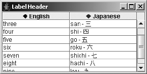
714 CHAPTER 18 ■ TABLES
Figure 18-11. Icons in table headers
To create a flexible renderer that can display icons, have the renderer treat the value data
as a JLabel, instead of using the value to fill the JLabel (or for that, matter any JComponent).
Listing 18-11 shows one such renderer, which is used in the program that created Figure 18-11.
Listing 18-11. Custom Table Cell Renderer for JComponents
import java.awt.*;
import javax.swing.*;
import javax.swing.table.*;
public class JComponentTableCellRenderer implements TableCellRenderer {
public Component getTableCellRendererComponent(JTable table, Object value,
boolean isSelected, boolean hasFocus, int row, int column) {
return (JComponent)value;
}
}
Figure 18-11 shows how this renderer might appear with the DiamondIcon as the Icon. The
source for the sample program is shown in Listing 18-12.
Listing 18-12. Customizing Column Headers with Icons
import javax.swing.*;
import javax.swing.border.*;
import javax.swing.table.*;
import java.awt.*;
public class LabelHeaderSample {
public static void main(String args[]) {
final Object rows[][] = {
{"one", "ichi - \u4E00"},
{"two", "ni - \u4E8C"},
{"three", "san - \u4E09"},
{"four", "shi - \u56DB"},
{"five", "go - \u4E94"},
{"six", "roku - \u516D"},
{"seven", "shichi - \u4E03"},
{"eight", "hachi - \u516B"},
{"nine", "kyu - \u4E5D"},
CHAPTER 18 ■ TABLES 715
{"ten", "ju - \u5341"}
};
Runnable runner = new Runnable() {
public void run() {
JFrame frame = new JFrame("Label Header");
frame.setDefaultCloseOperation(JFrame.EXIT_ON_CLOSE);
String headers[] = {"English", "Japanese"};
JTable table = new JTable(rows, headers);
JScrollPane scrollPane = new JScrollPane(table);
Icon redIcon = new DiamondIcon(Color.RED);
Icon blueIcon = new DiamondIcon(Color.BLUE);
Border headerBorder = UIManager.getBorder("TableHeader.cellBorder");
JLabel blueLabel = new JLabel(headers[0], blueIcon, JLabel.CENTER);
blueLabel.setBorder(headerBorder);
JLabel redLabel = new JLabel(headers[1], redIcon, JLabel.CENTER);
redLabel.setBorder(headerBorder);
TableCellRenderer renderer = new JComponentTableCellRenderer();
TableColumnModel columnModel = table.getColumnModel();
TableColumn column0 = columnModel.getColumn(0);
TableColumn column1 = columnModel.getColumn(1);
column0.setHeaderRenderer(renderer);
column0.setHeaderValue(blueLabel);
column1.setHeaderRenderer(renderer);
column1.setHeaderValue(redLabel);
frame.add(scrollPane, BorderLayout.CENTER);
frame.setSize(300, 150);
frame.setVisible(true);
}
};
EventQueue.invokeLater(runner);
}
}
JTableHeader Class
Each JTableHeader instance represents one of a set of headers for all the different columns.
The set of JTableHeader objects is placed within the column header view of the JScrollPane.

716 CHAPTER 18 ■ TABLES
You rarely need to work with the JTableHeader directly. Nevertheless, you can configure some
characteristics of column headers.
Creating a JTableHeader
The JTableHeader has two constructors. One uses the default TableColumnModel, whereas the
other explicitly specifies the model.
public JTableHeader()
JComponent headerComponent = new JTableHeader()
public JTableHeader(TableColumnModel columnModel)
JComponent headerComponent = new JTableHeader(aColumnModel)
JTableHeader Properties
As Table 18-11 shows, the JTableHeader has ten different properties. These properties allow
you to configure what the user can do with a particular column header or how the column
header is shown.
Using Tooltips in Table Headers
By default, if you set tooltip text for the table header, all of the column headers will share the
same tooltip text. To specify a tooltip for a given column, you need to create or get the renderer,
and then set the tooltip for the renderer. This is true for the individual cells, too. Figure 18-12
shows how the results of this customization would appear.
Table 18-11. JTableHeader Properties
Property Name Data Type Access
accessibleContext AccessibleContext Read-only
columnModel TableColumnModel Read-write bound
draggedColumn TableColumn Read-write
draggedDistance int Read-write
reorderingAllowed boolean Read-write bound
resizingAllowed boolean Read-write bound
resizingColumn TableColumn Read-write
table JTable Read-write bound
UI TableHeaderUI Read-write
UIClassID String Read-only
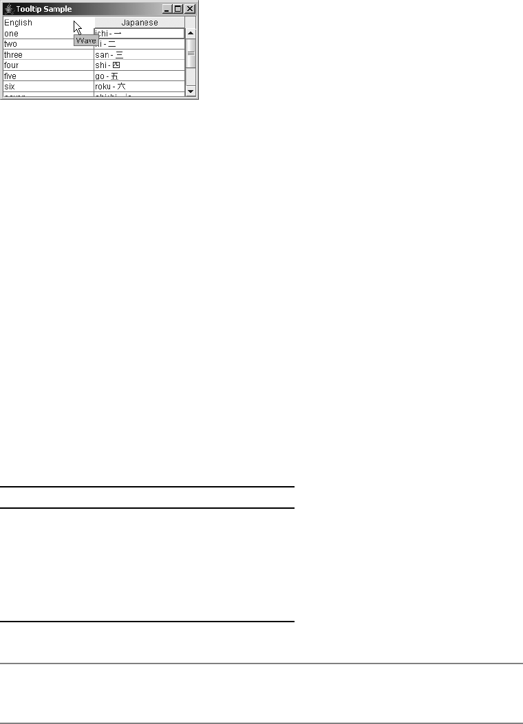
CHAPTER 18 ■ TABLES 717
Figure 18-12. Header tooltips
The source for the customization in Figure 18-12 is shown in Listing 18-13. Unless you
previously set the headers, it’s not really necessary to check if the header for a specific column
is null first.
Listing 18-13. Showing Tooltip Text in a Table Header
JLabel headerRenderer = new DefaultTableCellRenderer();
String columnName = table.getModel().getColumnName(0);
headerRenderer.setText(columnName);
headerRenderer.setToolTipText("Wave");
TableColumnModel columnModel = table.getColumnModel();
TableColumn englishColumn = columnModel.getColumn(0);
englishColumn.setHeaderRenderer((TableCellRenderer)headerRenderer);
Customizing a JTableHeader Look and Feel
The available set of UIResource-related properties for a JTableHeader is shown in Table 18-12.
The five settings control the color, font, and border for the header renderers.
■Note For an example of creating column headers spanning multiple columns, see CodeGuru at
http://www.codeguru.com/java/Swing.
Table 18-12. JTableHeader UIResource Elements
Property String Object Type
TableHeader.background Color
TableHeader.cellBorder Border
TableHeader.font Font
TableHeader.foreground Color
TableHeaderUI String

718 CHAPTER 18 ■ TABLES
Editing Table Cells
Editing JTable cells is nearly identical to editing JTree cells. In fact, the default table cell editor,
DefaultCellEditor, implements both the TableCellEditor and TreeCellEditor interfaces,
allowing you to use the same editor for both tables and trees.
Clicking an editable cell will place the cell in edit mode. (The number of clicks required
depends on the type of editor.) The default editor for all cells is a JTextField. Although this
works great for many data types, it’s not always appropriate for many others. So, you should
either not support editing of nontextual information or set up specialized editors for your
JTable. With a JTable, you register an editor for a particular class type or column. Then, when
the table runs across a cell of the appropriate type, the necessary editor is used.
■Caution When no specialized editor is installed, the JTextField is used, even when it’s inappropriate
for the content.
TableCellEditor Interface and DefaultCellEditor Class
The TableCellEditor interface defines the single method necessary to get an editor cell for a
JTable. The argument list for TableCellEditor is identical to the TableCellRenderer, with the
exception of the hasFocused argument. Because the cell is being edited, it’s already known to
have the input focus.
public interface TableCellEditor extends CellEditor {
public Component getTableCellEditorComponent(JTable table, Object value,
boolean isSelected, int row, int column);
}
As described in Chapter 17, the DefaultCellEditor provides an implementation of the
interface. It offers a JTextField as one editor, a JCheckBox for another, and a JComboBox for a third.
As Table 18-13 shows, in most cases the default editor is the JTextField. If the cell data can
be converted to and from a string, and the class provides a constructor with a String argument,
the editor offers the text representation of the data value for the initial editing value. You can
then edit the contents.
Creating a Simple Cell Editor
As a simple example of changing a non-String cell in a JTable, you can provide a fixed set of
color choices to the user. Then when the user picks a color, you have the appropriate Color value to
Table 18-13. Default JTable Editors
Class Editor Information
Boolean JCheckBox Centered
Object JTextField Left-aligned
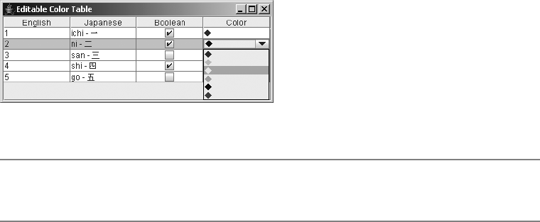
CHAPTER 18 ■ TABLES 719
return to the table model. The DefaultCellEditor offers a JComboBox for just this situation. After
configuring the ListCellRenderer for the JComboBox to display colors properly, you have a
TableCellEditor for picking colors. Figure 18-13 shows how this might appear.
Figure 18-13. JComboBox color editor
■Tip Any time you can predefine all the choices, you can use the JComboBox as your editor through
DefaultCellEditor.
Listing 18-14 shows the class that represents the TableCellRenderer for the Color
column of the example shown in Figure 18-13 and the ListCellRenderer for the
JComboBox TableCellEditor. Because of the many similarities of the two renderer
components, their definitions are combined into one class.
Listing 18-14. JComboBox As Table Cell Renderer
import java.awt.*;
import javax.swing.*;
import javax.swing.table.*;
public class ComboTableCellRenderer
implements ListCellRenderer, TableCellRenderer {
DefaultListCellRenderer listRenderer = new DefaultListCellRenderer();
DefaultTableCellRenderer tableRenderer = new DefaultTableCellRenderer();
private void configureRenderer(JLabel renderer, Object value) {
if ((value != null) && (value instanceof Color)) {
renderer.setIcon(new DiamondIcon((Color)value));
renderer.setText("");
} else {
renderer.setIcon(null);
renderer.setText((String)value);
}
}
720 CHAPTER 18 ■ TABLES
public Component getListCellRendererComponent(JList list, Object value,
int index, boolean isSelected, boolean cellHasFocus) {
listRenderer =
(DefaultListCellRenderer)listRenderer.getListCellRendererComponent(
list, value, index, isSelected, cellHasFocus);
configureRenderer(listRenderer, value);
return listRenderer;
}
public Component getTableCellRendererComponent(JTable table, Object value,
boolean isSelected, boolean hasFocus, int row, int column) {
tableRenderer =
(DefaultTableCellRenderer)tableRenderer.getTableCellRendererComponent(
table, value, isSelected, hasFocus, row, column);
configureRenderer(tableRenderer, value);
return tableRenderer;
}
}
To demonstrate the use of this new combined renderer and show a simple table cell editor,
the program shown in Listing 18-15 creates a data model in which one of the columns is a
Color. After installing the renderer twice and setting up the table cell editor, the table can be
shown and the Color column can be edited.
Listing 18-15. Table Cell Editor Sample
import javax.swing.*;
import javax.swing.table.*;
import java.awt.*;
public class EditableColorColumn {
public static void main(String args[]) {
Runnable runner = new Runnable() {
public void run() {
Color choices[] = {Color.RED, Color.ORANGE, Color.YELLOW,
Color.GREEN, Color.BLUE, Color.MAGENTA};
ComboTableCellRenderer renderer = new ComboTableCellRenderer();
JComboBox comboBox = new JComboBox(choices);
comboBox.setRenderer(renderer);
TableCellEditor editor = new DefaultCellEditor(comboBox);
JFrame frame = new JFrame("Editable Color Table");
frame.setDefaultCloseOperation(JFrame.EXIT_ON_CLOSE);
TableModel model = new ColorTableModel();
JTable table = new JTable(model);
CHAPTER 18 ■ TABLES 721
TableColumn column = table.getColumnModel().getColumn(3);
column.setCellRenderer(renderer);
column.setCellEditor(editor);
JScrollPane scrollPane = new JScrollPane(table);
frame.add(scrollPane, BorderLayout.CENTER);
frame.setSize(400, 150);
frame.setVisible(true);
}
};
EventQueue.invokeLater(runner);
}
}
Listing 18-16 shows the table model used for this example and the next one.
Listing 18-16. Table Model
import java.awt.*;
import javax.swing.table.*;
public class ColorTableModel extends AbstractTableModel {
Object rowData[][] = {
{"1", "ichi - \u4E00", Boolean.TRUE, Color.RED},
{"2", "ni - \u4E8C", Boolean.TRUE, Color.BLUE},
{"3", "san - \u4E09", Boolean.FALSE, Color.GREEN},
{"4", "shi - \u56DB", Boolean.TRUE, Color.MAGENTA},
{"5", "go - \u4E94", Boolean.FALSE, Color.PINK},
};
String columnNames[] = {"English", "Japanese", "Boolean", "Color"};
public int getColumnCount() {
return columnNames.length;
}
public String getColumnName(int column) {
return columnNames[column];
}
public int getRowCount() {
return rowData.length;
}
public Object getValueAt(int row, int column) {
return rowData[row][column];
}
public Class getColumnClass(int column) {
return (getValueAt(0, column).getClass());
}
722 CHAPTER 18 ■ TABLES
public void setValueAt(Object value, int row, int column) {
rowData[row][column]=value;
}
public boolean isCellEditable(int row, int column) {
return (column != 0);
}
}
Creating a Complex Cell Editor
Although the previous example demonstrates how to provide a fixed set of choices to the user
in a combo box TableCellEditor, offering the JColorChooser as an option seems to be a better
choice (at least, in the case of color selection). When defining your own TableCellEditor, you
must implement the single TableCellEditor method to get the appropriate component. You
must also implement the seven methods of the CellEditor because they manage and notify a
list of CellEditorListener objects, as well as control when a cell is editable. Starting with an
AbstractCellEditor subclass makes defining your own TableCellEditor much simpler.
By extending the AbstractCellEditor class, only the getCellEditorValue() method from
the CellEditor methods requires customization for the editor. Doing that and providing a
JButton that pops up a JColorChooser when clicked provides the entire editor component.
Listing 18-17 shows the code for this custom editor.
Listing 18-17. JColorChooser As Table Cell Editor
import java.awt.*;
import java.awt.event.*;
import javax.swing.*;
import javax.swing.table.*;
public class ColorChooserEditor extends AbstractCellEditor
implements TableCellEditor {
private JButton delegate = new JButton();
Color savedColor;
public ColorChooserEditor() {
ActionListener actionListener = new ActionListener() {
public void actionPerformed (ActionEvent actionEvent) {
Color color = JColorChooser.showDialog(
delegate, "Color Chooser", savedColor);
ColorChooserEditor.this.changeColor(color);
}
};
delegate.addActionListener(actionListener);
}
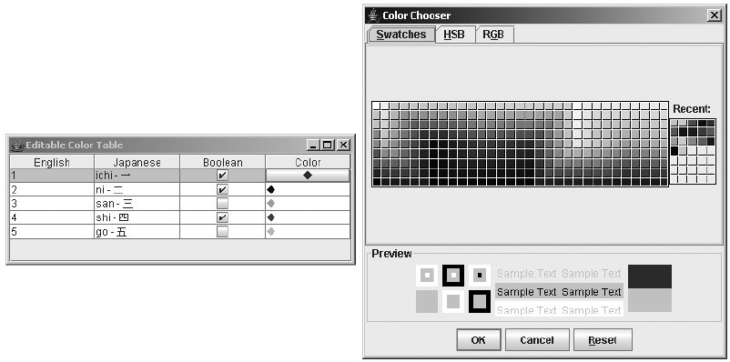
CHAPTER 18 ■ TABLES 723
public Object getCellEditorValue() {
return savedColor;
}
private void changeColor(Color color) {
if (color != null) {
savedColor = color;
delegate.setIcon(new DiamondIcon(color));
}
}
public Component getTableCellEditorComponent (JTable table, Object value,
boolean isSelected, int row, int column) {
changeColor((Color)value);
return delegate;
}
}
Figure 18-14 shows the ColorChooserEditor in action, with the associated table in the
background.
Figure 18-14. Pop-up color editor
A sample program using the new ColorChooserEditor is shown in Listing 18-18. The
example reuses the earlier ColorTableModel data model shown in Listing 18-16. Setting up the
ColorChooserEditor simply involves setting the TableCellEditor for the appropriate column.
724 CHAPTER 18 ■ TABLES
Listing 18-18. Testing Another Custom Table Cell Editor
import java.awt.*;
import javax.swing.*;
import javax.swing.table.*;
public class ChooserTableSample {
public static void main(String args[]) {
Runnable runner = new Runnable() {
public void run() {
JFrame frame = new JFrame("Editable Color Table");
frame.setDefaultCloseOperation(JFrame.EXIT_ON_CLOSE);
TableModel model = new ColorTableModel();
JTable table = new JTable(model);
TableColumn column = table.getColumnModel().getColumn(3);
ComboTableCellRenderer renderer = new ComboTableCellRenderer();
column.setCellRenderer(renderer);
TableCellEditor editor = new ColorChooserEditor();
column.setCellEditor(editor);
JScrollPane scrollPane = new JScrollPane(table);
frame.add(scrollPane, BorderLayout.CENTER);
frame.setSize(400, 150);
frame.setVisible(true);
}
};
EventQueue.invokeLater(runner);
}
}
Printing Tables
One of the newer features with JDK 5.0 is also one of the easiest to use: the ability to print
tables. Through the simple method of public boolean print() throws PrinterException of
JTable, you can print a large table across multiple pages on the printer. It will even spread the
columns across multiple pages if you don’t like the default behavior of fitting the table’s entire
width on each page.
To demonstrate this behavior, Listing 18-19 takes the basic JTable sample code used to
generate Figure 18-1, adds some more rows to the table, and adds a print button.
CHAPTER 18 ■ TABLES 725
Listing 18-19. Printing Tables Sample
import javax.swing.*;
import java.awt.*;
import java.awt.event.*;
import java.awt.print.*;
public class TablePrint {
public static void main(String args[]) {
final Object rows[][] = {
{"one", "ichi - \u4E00"},
{"two", "ni - \u4E8C"},
{"three", "san - \u4E09"},
{"four", "shi - \u56DB"},
{"five", "go - \u4E94"},
{"six", "roku - \u516D"},
{"seven", "shichi - \u4E03"},
{"eight", "hachi - \u516B"},
{"nine", "kyu - \u4E5D"},
{"ten", "ju - \u5341"},
... Repeat section at least 10 times ...
{"one", "ichi - \u4E00"},
{"two", "ni - \u4E8C"},
{"three", "san - \u4E09"},
{"four", "shi - \u56DB"},
{"five", "go - \u4E94"},
{"six", "roku - \u516D"},
{"seven", "shichi - \u4E03"},
{"eight", "hachi - \u516B"},
{"nine", "kyu - \u4E5D"},
{"ten", "ju - \u5341"},
};
final Object headers[] = {"English", "Japanese"};
Runnable runner = new Runnable() {
public void run() {
JFrame frame = new JFrame("Table Printing");
frame.setDefaultCloseOperation(JFrame.EXIT_ON_CLOSE);
final JTable table = new JTable(rows, headers);
JScrollPane scrollPane = new JScrollPane(table);
frame.add(scrollPane, BorderLayout.CENTER);
JButton button = new JButton("Print");
ActionListener printAction = new ActionListener() {
public void actionPerformed(ActionEvent e) {
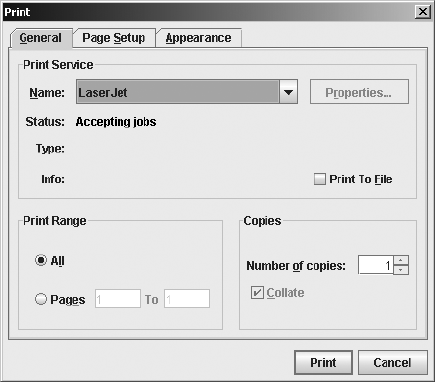
726 CHAPTER 18 ■ TABLES
try {
table.print();
} catch (PrinterException pe) {
System.err.println("Error printing: " + pe.getMessage());
}
}
};
button.addActionListener(printAction);
frame.add(button, BorderLayout.SOUTH);
frame.setSize(300, 150);
frame.setVisible(true);
}
};
EventQueue.invokeLater(runner);
}
}
After clicking the Print button, the user is prompted with a typical printer selection dialog
box, as shown in Figure 18-15.
Figure 18-15. Print dialog box displayed by the printing tables example
After the user clicks the Print button in the Print dialog box, the printing begins. A dialog
window like the one shown in Figure 18-16 appears for each page printed.
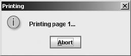
CHAPTER 18 ■ TABLES 727
Figure 18-16. Printing progress dialog box displayed by the printing tables example
Yes, it really is that easy to print a multiple-page table with JDK 5.0. The print() method
returns a boolean, so you can discover if the user canceled the operation.
For those looking for more control over the printing operation, there are several other
overloaded versions of the print() method of JTable. Like the simple print() method, they all
can throw a PrinterException.
One print() version lets you specify the print mode:
public boolean print(JTable.PrintMode printMode)
The JTable.PrintMode argument is an enumeration of FIT_WIDTH and NORMAL. When not
specified with the no-argument version of print(), the default is FIT_WIDTH.
Another version lets you specify a page header or footer:
public boolean print(JTable.PrintMode printMode, MessageFormat headerFormat,
MessageFormat footerFormat)
MessageFormat comes from the java.text package. The one argument to the header and
footer formatting string is the page number. To display the page number, include {0} in your
formatting string where you want the page number to appear. Both will appear centered on the
page, with the header in a larger font. To demonstrate, change the print() call in Listing 18-19
to the following (and add an import line):
MessageFormat headerFormat = new MessageFormat("Page {0}");
MessageFormat footerFormat = new MessageFormat("- {0} -");
table.print(JTable.PrintMode.FIT_WIDTH, headerFormat, footerFormat);
The final print() version is the all inclusive one, allowing you to not show the printer
dialog box and configure what the default print request attribute set entails, such as how many
copies to print.
public boolean print(JTable.PrintMode printMode, MessageFormat headerFormat,
MessageFormat footerFormat, boolean showPrintDialog,
PrintRequestAttributeSet attr, boolean interactive)
For those times when you desire no user interaction to print, consider using this last version.
728 CHAPTER 18 ■ TABLES
Summary
In this chapter, you explored the inner depths of the JTable component. You looked at custom-
izing the TableModel,TableColumnModel, and ListSelectionModel for the JTable. You delved
into both the abstract and concrete implementations of the different table models. In addition,
you examined the inner elements of the various table models, such as the TableColumn and
JTableHeader classes. You also looked into how to customize the display and editing of the
JTable cells by providing a custom TableCellRenderer and TableCellEditor. Finally, you learned
about printing tables via the new print() method.
In Chapter 19, you’ll explore the drag-and-drop architecture of the JFC/Swing component set.

729
■ ■ ■
CHAPTER 19
Drag-and-Drop Support
Drag-and-drop support allows a user to highlight something in one program or area of the
screen, select it, and relocate it to another program or area of the screen. For example, in
Microsoft Word, you can select a paragraph and drag it to a new location.
As Java has evolved, not only has the printing support changed with nearly every release,
but so has the drag-and-drop support. The last major change in drag-and-drop support happened
with the J2SE 1.4 release. Prior releases had support that was extremely difficult to use, especially to
get proper drag-and-drop behavior for complex (nontext) types. The JDK 5.0 version adds
some bug fixes and enhancements to drag-and-drop support.
You can implement drag-and-drop within your Java program in three ways:
• For the components that come with built-in support, just enable it by calling their
setDragEnabled() method with an argument of true. Those components are JColorChooser,
JFileChooser,JList,JTable,JTree, and all the subclasses of JTextComponent, except
JPasswordField.
• For components without built-in support, you typically just need to configure the
TransferHandler for that component.
• You can also go directly to the classes found in the java.awt.dnd package. Thanks to the
built-in support and configurability, this approach is rarely necessary.
Built-in Drag-and-Drop Support
Table 19-1 shows the components that offer built-in support for drag-and-drop. Initially, only
dropping is enabled for the components that support it, but after calling setDragEnabled(true)
for the component in question, you can enable dragging, too, if it’s supported. The drag-and-
drop capabilities of the Java platform involve the underlying java.awt.datatransfer package
to move data around. Classes in this package allow you to describe the type of data to transfer.

730 CHAPTER 19 ■ DRAG-AND-DROP SUPPORT
■Note For security reasons, you cannot drag text out of a JPasswordField component.
For the JColorChooser component, what you drag is a java.awt.Color object. The other
oddball of the bunch is the JFileChooser, where you literally drag a java.io.File object around
and drop it into a drop target. If the drop target doesn’t support working with File objects, a
string representing the path is dropped instead.
As a simple demonstration, Listing 19-1 shows a program with two JColorChooser compo-
nents on a single screen. The setDragEnabled(true) call is made for both choosers, so you can
drag-and-drop colors between the two components with minimal coding effort.
Listing 19-1. Dragging-and-Dropping Colors Across JColorChooser Components
import javax.swing.*;
import java.awt.*;
public class DoubleColor {
public static void main(String args[]) {
Runnable runner = new Runnable() {
public void run() {
JFrame frame = new JFrame("Double Color Choosers");
frame.setDefaultCloseOperation(JFrame.EXIT_ON_CLOSE);
JColorChooser left = new JColorChooser();
left.setDragEnabled(true);
frame.add(left, BorderLayout.WEST);
Table 19-1. Components with Built-in Support for Drag-and-Drop
Component Drag Drop
JColorChooser XX
JEditorPane XX
JFileChooser X
JFormattedTextField XX
JList X
JPasswordField X
JTable X
JTextArea XX
JTextField XX
JTextPane XX
JTree X
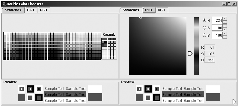
CHAPTER 19 ■ DRAG-AND-DROP SUPPORT 731
JColorChooser right = new JColorChooser();
right.setDragEnabled(true);
frame.add(right, BorderLayout.EAST);
frame.pack();
frame.setVisible(true);
}
};
EventQueue.invokeLater(runner);
}
}
Figure 19-1 shows this program in action, after dragging several colors. The drag area is the
Preview panel at the bottom. Dropping doesn’t adjust the Recent list on the right side of each
color chooser, and you can drop across different color chooser panels.
Figure 19-1. Dueling JColorChoosers
TransferHandler Class
The magic of drag-and-drop happens because of the java.swing.TransferHandler class, intro-
duced with the J2SE 1.4 release. “What’s magical about it?” you might ask. With this class, you
can pick which property you would like to be transferable in a drag-and-drop operation.
When you call setDragEnabled(true) to tell a component to support the drag gesture, the
component asks the installed TransferHandler what to transfer. If you don’t like the default
object being transferred, you can call the setTransferHandler() method of the component,
passing in an appropriate replacement. You can also call setTransferHandler() when you want
to enable drag-and-drop support for a component that doesn’t come with support built in.
The TransferHandler class has one public constructor:
public TransferHandler(String property)
732 CHAPTER 19 ■ DRAG-AND-DROP SUPPORT
The parameter to the constructor represents the property of the component that you wish
to transfer. In other words, you identify the JavaBeans component property as the transferable
object for the drag-and-drop operation.
For instance, to transfer the text label of a JLabel, you would do the following:
JLabel label = new JLabel("Hello, World");
label.setTransferHandler(new TransferHandler("text"));
Since JLabel doesn’t have a setDragEnabled() method, you must tell the component what
the start of the drag gesture is. Typically, this would be pressing the mouse button, so you
would also need to add a MouseListener to the button. When you tell the TransferHandler to
exportAsDrag(), that enables the dragging operation for the component.
MouseListener listener = new MouseAdapter() {
public void mousePressed(MouseEvent me) {
JComponent comp = (JComponent)me.getSource();
TransferHandler handler = comp.getTransferHandler();
handler.exportAsDrag(comp, me, TransferHandler.COPY);
}
};
button.addMouseListener(listener);
The default behavior when the drop gesture happens—releasing the mouse in this example—
would drop what was registered with the TransferHandler.
Listing 19-2 demonstrates a program that enables drag-and drop for the text in a JLabel.
Listing 19-2. Dragging Text from a JLabel
import javax.swing.*;
import java.awt.*;
import java.awt.event.*;
public class DragLabel {
public static void main(String args[]) {
Runnable runner = new Runnable() {
public void run() {
JFrame frame = new JFrame("Drag Label");
frame.setDefaultCloseOperation(JFrame.EXIT_ON_CLOSE);
JLabel label = new JLabel("Hello, World");
label.setTransferHandler(new TransferHandler("foreground"));
MouseListener listener = new MouseAdapter() {
public void mousePressed(MouseEvent me) {
JComponent comp = (JComponent)me.getSource();
TransferHandler handler = comp.getTransferHandler();
handler.exportAsDrag(comp, me, TransferHandler.COPY);
}
};
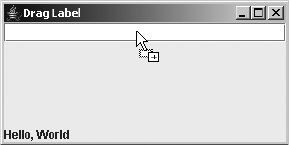
CHAPTER 19 ■ DRAG-AND-DROP SUPPORT 733
label.addMouseListener(listener);
frame.add(label, BorderLayout.SOUTH);
JTextField text = new JTextField();
frame.add(text, BorderLayout.NORTH);
frame.setSize(300, 150);
frame.setVisible(true);
}
};
EventQueue.invokeLater(runner);
}
}
Figure 19-2 shows this program during the drag operation. Notice how the cursor changes
to indicate the operation.
Figure 19-2. Dragging text from a JLabel to a JTextField
If instead of dragging the text of the JLabel, you wanted to drag the foreground color, the
only change to the program would be to the setTransferHandler() line:
label.setTransferHandler(new TransferHandler("foreground"));
Then, assuming you had some place to drop the color, as in the program in Listing 19-1,
you could drag the foreground color out of the label to the JColorChooser, and then drop the
color out of the JColorChooser into the JLabel. Since the TransferHandler is registered for a
specific property of the component, there is no explicit code necessary to handle dropping.
Instead, the setter method for the property passed into the handler constructor is notified of
the change.
Drag-and-Drop Support for Images
If you wish to transfer something other than a simple property, you need to create an implementa-
tion of the Transferable interface, found in the java.awt.datatransfer package. Transferable
implementations are typically meant for transfers through the clipboard, but by having your
implementation be a TransferHandler subclass, you can use it to drag-and-drop the object.
The three methods of the Transferable interface are shown here:

734 CHAPTER 19 ■ DRAG-AND-DROP SUPPORT
public interface Transferable{
public DataFlavor[] getTransferDataFlavors();
public boolean isDataFlavorSupported(DataFlavor);
public Object getTransferData(java.awt.datatransfer.DataFlavor)
throws UnsupportedFlavorException, IOException;
}
One common application for this is the ability to transfer images. The exposed property of
aJLabel or JButton is a javax.swing.Icon object, not a java.awt.Image object. While you can
certainly transfer Icon objects within and across Java programs, a more useful behavior is to
transfer Image objects to external entities, like Paint Shop Pro or Photoshop.
To create a transferable image object, the ImageSelection class, you must implement
the three Transferable interface methods and override four methods of TransferHandler:
getSourceActions(),canImport(),createTransferable(), and importData().
■Note The class for transferring strings is called StringSelection.
The getSourceActions() method needs to report which actions you are going to support.
By default, this is the TransferHandler.COPY operation when a property is set via the constructor, or
TransferHandler.NONE when it is not. Since the ImageSelection class implicitly uses the icon
property to get the component’s image, just have the method return TransferHandler.COPY:
public int getSourceActions(JComponent c) {
return TransferHandler.COPY;
}
There is also a TransferHandler.MOVE operation, but you typically don’t want the image to
be removed from the label it was copied from.
You pass the canImport() method a component and an array of DataFlavor objects. You
need to verify that the component is supported and one of the flavors in the array matches the
supported set:
private static final DataFlavor flavors[] = {DataFlavor.imageFlavor};
...
public boolean canImport(JComponent comp, DataFlavor flavor[]) {
if (!(comp instanceof JLabel) && !(comp instanceof AbstractButton)) {
return false;
}
for (int i=0, n=flavor.length; i<n; i++) {
for (int j=0, m=flavors.length; j<m; j++) {
if (flavor[i].equals(flavors[j])) {
return true;
}
}
}
return false;
}
CHAPTER 19 ■ DRAG-AND-DROP SUPPORT 735
The createTransferable() method returns a reference to the Transferable implementation.
When the clipboard paste operation is executed, or the drop gesture is performed while dragging,
the Transferable object will be notified to get the object to transfer.
public Transferable createTransferable(JComponent comp) {
// Clear
image = null;
if (comp instanceof JLabel) {
JLabel label = (JLabel)comp;
Icon icon = label.getIcon();
if (icon instanceof ImageIcon) {
image = ((ImageIcon)icon).getImage();
return this;
}
} else if (comp instanceof AbstractButton) {
AbstractButton button = (AbstractButton)comp;
Icon icon = button.getIcon();
if (icon instanceof ImageIcon) {
image = ((ImageIcon)icon).getImage();
return this;
}
}
return null;
}
The importData() method is called when data is dropped into the component or pasted
from the clipboard. It has two parameters: a JComponent to paste the clipboard data and the
clipboard data via a Transferable object. Assuming the method receives a format supported by
the Java platform, the component associated with the transfer handler gets a new image to display.
public boolean importData(JComponent comp, Transferable t) {
if (comp instanceof JLabel) {
JLabel label = (JLabel)comp;
if (t.isDataFlavorSupported(flavors[0])) {
try {
image = (Image)t.getTransferData(flavors[0]);
ImageIcon icon = new ImageIcon(image);
label.setIcon(icon);
return true;
} catch (UnsupportedFlavorException ignored) {
} catch (IOException ignored) {
}
}
} else if (comp instanceof AbstractButton) {
AbstractButton button = (AbstractButton)comp;
736 CHAPTER 19 ■ DRAG-AND-DROP SUPPORT
if (t.isDataFlavorSupported(flavors[0])) {
try {
image = (Image)t.getTransferData(flavors[0]);
ImageIcon icon = new ImageIcon(image);
button.setIcon(icon);
return true;
} catch (UnsupportedFlavorException ignored) {
} catch (IOException ignored) {
}
}
}
return false;
}
Putting all this code together with the three methods implemented for the Transferable
interface produces Listing 19-3.
Listing 19-3. Implementing a Draggable Image
import java.awt.*;
import java.awt.image.*;
import java.awt.datatransfer.*;
import java.io.*;
import javax.swing.*;
public class ImageSelection extends TransferHandler
implements Transferable {
private static final DataFlavor flavors[] = {DataFlavor.imageFlavor};
private Image image;
public int getSourceActions(JComponent c) {
return TransferHandler.COPY;
}
public boolean canImport(JComponent comp, DataFlavor flavor[]) {
if (!(comp instanceof JLabel) && !(comp instanceof AbstractButton)) {
return false;
}
for (int i=0, n=flavor.length; i<n; i++) {
for (int j=0, m=flavors.length; j<m; j++) {
if (flavor[i].equals(flavors[j])) {
return true;
}
}
}
CHAPTER 19 ■ DRAG-AND-DROP SUPPORT 737
return false;
}
public Transferable createTransferable(JComponent comp) {
// Clear
image = null;
if (comp instanceof JLabel) {
JLabel label = (JLabel)comp;
Icon icon = label.getIcon();
if (icon instanceof ImageIcon) {
image = ((ImageIcon)icon).getImage();
return this;
}
} else if (comp instanceof AbstractButton) {
AbstractButton button = (AbstractButton)comp;
Icon icon = button.getIcon();
if (icon instanceof ImageIcon) {
image = ((ImageIcon)icon).getImage();
return this;
}
}
return null;
}
public boolean importData(JComponent comp, Transferable t) {
if (comp instanceof JLabel) {
JLabel label = (JLabel)comp;
if (t.isDataFlavorSupported(flavors[0])) {
try {
image = (Image)t.getTransferData(flavors[0]);
ImageIcon icon = new ImageIcon(image);
label.setIcon(icon);
return true;
} catch (UnsupportedFlavorException ignored) {
} catch (IOException ignored) {
}
}
} else if (comp instanceof AbstractButton) {
AbstractButton button = (AbstractButton)comp;
if (t.isDataFlavorSupported(flavors[0])) {
try {
image = (Image)t.getTransferData(flavors[0]);
ImageIcon icon = new ImageIcon(image);
button.setIcon(icon);
return true;
738 CHAPTER 19 ■ DRAG-AND-DROP SUPPORT
} catch (UnsupportedFlavorException ignored) {
} catch (IOException ignored) {
}
}
}
return false;
}
// Transferable
public Object getTransferData(DataFlavor flavor) {
if (isDataFlavorSupported(flavor)) {
return image;
}
return null;
}
public DataFlavor[] getTransferDataFlavors() {
return flavors;
}
public boolean isDataFlavorSupported(DataFlavor flavor) {
return flavors[0].equals(flavor);
}
}
To test this, you need to create a program with a draggable JLabel or AbstractButton
subclass. This is basically the same program as shown in Listing 19-2, but with only a JLabel
with an associated image located in the center of the screen.
Listing 19-4. Draggable Image
import javax.swing.*;
import java.awt.*;
import java.awt.event.*;
public class DragImage {
public static void main(String args[]) {
Runnable runner = new Runnable() {
public void run() {
JFrame frame = new JFrame("Drag Image");
frame.setDefaultCloseOperation(JFrame.EXIT_ON_CLOSE);

CHAPTER 19 ■ DRAG-AND-DROP SUPPORT 739
Icon icon = new ImageIcon("dog.jpg");
JLabel label = new JLabel(icon);
label.setTransferHandler(new ImageSelection());
MouseListener listener = new MouseAdapter() {
public void mousePressed(MouseEvent me) {
JComponent comp = (JComponent)me.getSource();
TransferHandler handler = comp.getTransferHandler();
handler.exportAsDrag(comp, me, TransferHandler.COPY);
}
};
label.addMouseListener(listener);
frame.add(new JScrollPane(label), BorderLayout.CENTER);
frame.setSize(300, 150);
frame.setVisible(true);
}
};
EventQueue.invokeLater(runner);
}
}
Figure 19-3 shows the program in action.
Figure 19-3. Dragging-and-dropping an image
740 CHAPTER 19 ■ DRAG-AND-DROP SUPPORT
Summary
Drag-and-drop support in Swing is rich and varied. You get quite a bit of behavior for free for
several of the standard components. If you need more, you can dig down a layer at a time until
you expose the features you need.
Typically, you don’t need to dig all the way into java.awt.dnd classes like DragSourceDragEvent,
DragSourceDropEvent, or DropTargetDragEvent (to name a few). They are there and doing their
work under the covers, but you don’t need to worry about them. Instead, drag-and-drop support
is typically delegated to the TransferHandler associated with a property of the component to
drag. Just setDragEnabled(true) on that component, and you’re ready to go. You can also set
up drag-and-drop support for other items, such as images, by creating an implementation of
the Transferable interface.
In the next chapter, you’ll explore Swing’s pluggable look and feel architecture. You’ll
learn how to customize your user interfaces without changing the code for the program.

741
■ ■ ■
CHAPTER 20
The Pluggable Look and
Feel Architecture
In Chapter 19, you examined Swing’s drag-and-drop support. In this chapter, you will take an
in-depth look at the pluggable look and feel (PLAF) architecture that’s available when you’re
working with the Swing component library.
All aspects of the Swing components are Java-based. Therefore, no native source code
exists, as there is with the AWT component set. If you don’t like the way the components are,
you can change them, and you often have many ways to do so.
The abstract LookAndFeel class is the root class for a specific look and feel. Each one of the
installable look and feel classes, as they’re described by the UIManager.LookAndFeelInfo class,
must be a subclass of the LookAndFeel class. The LookAndFeel subclass describes the default
appearance of Swing components for that specific look and feel.
The set of currently installed look and feel classes is provided by the UIManager class, which
also manages the default display properties of all the components for a specific LookAndFeel.
These display properties are managed within a special UIDefaults hash table. The display prop-
erties are either tagged with the empty UIResource interface or are UI delegates and therefore a
subclass of the ComponentUI class. These properties can be stored as either UIDefaults.LazyValue
objects or UIDefaults.ActiveValue objects, depending on their usage.
LookAndFeel Class
Implementations of the abstract LookAndFeel class describe how each of the Swing components
will appear and how the user will interact with them. Each component’s appearance is controlled
by a UI delegate, which serves as both the view and the controller in the MVC architecture.
Each of the predefined look and feel classes is contained within its own package, along with its
associated UI delegate classes. When configuring the current look and feel, you can use one of
the predefined look and feel classes or create your own. When you create your own look and
feel, you can build on an existing look and feel, such as the BasicLookAndFeel class and its UI
delegates, instead of creating all the UI delegates from scratch. Figure 20-1 shows the class
hierarchy of the predefined look and feel classes.
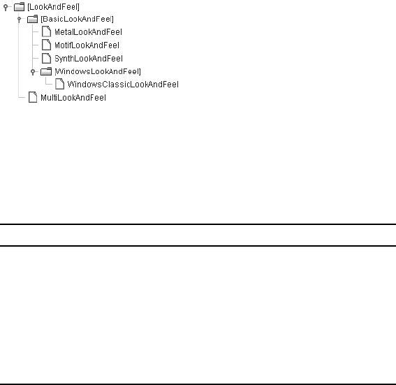
742 CHAPTER 20 ■ THE PLUGGABLE LOOK AND FEEL ARCHITECTURE
Figure 20-1. LookAndFeel class hierarchy diagram
Each of the look and feel classes has six properties, as shown in Table 20-1.
These properties are all read-only and mostly describe the look and feel. The defaults
property is slightly different, though. Once you get its UIDefaults value, you can then modify its
state directly through its own methods. In addition, the UIDefaults for a LookAndFeel can be
directly accessed and modified through the UIManager class.
The nativeLookAndFeel property enables you to determine if a particular look and feel
implementation is the native look and feel for the user’s operating system. For instance, the
WindowsLookAndFeel is native to any system running one of the Microsoft Windows operating
systems. The supportedLookAndFeel property tells you if a particular look and feel implementa-
tion can be used. With the WindowsLookAndFeel implementation, this particular look and feel
class is supported only if the current operating system is Microsoft Windows. Where available,
the MacLookAndFeel implementation is supported only on MacOS computers. MotifLookAndFeel
and MetalLookAndFeel are native look and feel classes that are not locked to a particular oper-
ating system.
Listing the Installed Look and Feel Classes
To discover which look and feel classes are installed in your current environment, ask the
UIManager, as shown in Listing 20-1. The UIManager has a UIManager.LookAndFeelInfo[]
getInstalledLookAndFeels() method that returns an array of objects providing the textual
name (public String getName()) and class name (public String getClassName()) for all the
installed look and feel classes.
Table 20-1. LookAndFeel Properties
Property Name Data Type Access
defaults UIDefaults Read-only
description String Read-only
ID String Read-only
name String Read-only
nativeLookAndFeel boolean Read-only
supportedLookAndFeel boolean Read-only

CHAPTER 20 ■ THE PLUGGABLE LOOK AND FEEL ARCHITECTURE 743
Listing 20-1. Listing Looking and Feel Classes
import javax.swing.*;
public class ListPlafs {
public static void main (String args[]) {
UIManager.LookAndFeelInfo plaf[] = UIManager.getInstalledLookAndFeels();
for (int i=0, n=plaf.length; i<n; i++) {
System.out.println("Name: " + plaf[i].getName());
System.out.println(" Class name: " + plaf[i].getClassName());
}
}
}
Running the program might generate the following output. Your current system configu-
ration and/or changes to future versions of the Swing libraries could alter this result somewhat.
Name: Metal
Class name: javax.swing.plaf.metal.MetalLookAndFeel
Name: CDE/Motif
Class name: com.sun.java.swing.plaf.motif.MotifLookAndFeel
Name: Windows
Class name: com.sun.java.swing.plaf.windows.WindowsLookAndFeel
■Note Ocean is not a look and feel in and of itself. Instead, it is a built-in theme of the Metal look and feel.
This theme happens to be the default for Metal.
Changing the Current Look and Feel
Once you know which look and feel classes are available on your system, you can have your
programs use any one of them. The UIManager has two overloaded setLookAndFeel() methods
for changing the installed look and feel class:
public static void setLookAndFeel(LookAndFeel newValue) throws
UnsupportedLookAndFeelException
public static void setLookAndFeel(String className) throws
ClassNotFoundException, InstantiationException, IllegalAccessException,
UnsupportedLookAndFeelException
Although the first version might seem to be the more logical choice, the second one is
the more frequently used version. When you ask for the installed look and feel classes with
UIManager.getInstalledLookAndFeels(), you get back the class names as strings of the objects,
not instances. Because of the exceptions that can occur when changing the look and feel, you
need to place the setLookAndFeel() call within a try/catch block. If you’re changing the look
and feel for an existing window, you need to tell the component to update its appearance with
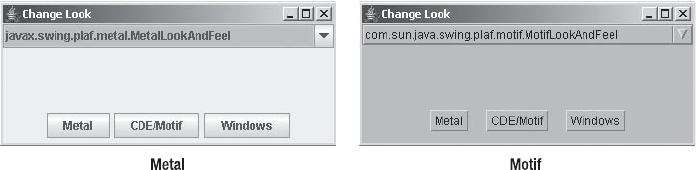
744 CHAPTER 20 ■ THE PLUGGABLE LOOK AND FEEL ARCHITECTURE
a call to the public static void updateComponentTreeUI(Component rootComponent) method of
SwingUtilities. If the component hasn’t been created yet, this isn’t necessary.
The following source fragment demonstrates changing a look and feel:
try {
UIManager.setLookAndFeel(finalLafClassName);
SwingUtilities.updateComponentTreeUI(frame);
} catch (Exception exception) {
JOptionPane.showMessageDialog (
frame, "Can't change look and feel",
"Invalid PLAF", JOptionPane.ERROR_MESSAGE);
}
Figure 20-2 illustrates the results of a demonstration program that can change the look
and feel at runtime through either a JComboBox or JButton component. Frequently, you won’t
want to allow a user to change the look and feel; you may just want to set the look and feel at
startup time.
Figure 20-2. Before and after changing the look and feel
Listing 20-2 shows the complete source of the program shown in Figure 20-2.
Listing 20-2. Changing the Look and Feel
import java.awt.*;
import java.awt.event.*;
import javax.swing.*;
import javax.swing.plaf.*;
public class ChangeLook {
public static void main (String args[]) {
Runnable runner = new Runnable() {
public void run() {
final JFrame frame = new JFrame("Change Look");
frame.setDefaultCloseOperation(JFrame.EXIT_ON_CLOSE);
CHAPTER 20 ■ THE PLUGGABLE LOOK AND FEEL ARCHITECTURE 745
ActionListener actionListener = new ActionListener() {
public void actionPerformed(ActionEvent actionEvent) {
Object source = actionEvent.getSource();
String lafClassName = null;
if (source instanceof JComboBox) {
JComboBox comboBox = (JComboBox)source;
lafClassName = (String)comboBox.getSelectedItem();
} else if (source instanceof JButton) {
lafClassName = actionEvent.getActionCommand();
}
if (lafClassName != null) {
final String finalLafClassName = lafClassName;
Runnable runnable = new Runnable() {
public void run() {
try {
UIManager.setLookAndFeel(finalLafClassName);
SwingUtilities.updateComponentTreeUI(frame);
} catch (Exception exception) {
JOptionPane.showMessageDialog (
frame, "Can't change look and feel",
"Invalid PLAF", JOptionPane.ERROR_MESSAGE);
}
}
};
EventQueue.invokeLater(runnable);
}
}
};
UIManager.LookAndFeelInfo looks[] =
UIManager.getInstalledLookAndFeels();
DefaultComboBoxModel model = new DefaultComboBoxModel();
JComboBox comboBox = new JComboBox(model);
JPanel panel = new JPanel();
for (int i=0, n=looks.length; i<n; i++) {
JButton button = new JButton(looks[i].getName());
model.addElement(looks[i].getClassName());
button.setActionCommand(looks[i].getClassName());
button.addActionListener(actionListener);
panel.add(button);
}
comboBox.addActionListener(actionListener);

746 CHAPTER 20 ■ THE PLUGGABLE LOOK AND FEEL ARCHITECTURE
frame.add(comboBox, BorderLayout.NORTH);
frame.add(panel, BorderLayout.SOUTH);
frame.setSize(350, 150);
frame.setVisible(true);
}
};
EventQueue.invokeLater(runner);
}
}
■Note Notice that the actual look and feel change is made in a call to EventQueue.invokeLater().
This is necessary because the handling of the current event must finish before you can change the look and
feel, and the change must happen on the event queue.
Besides programmatically changing the current look and feel, you can start up a program
from the command line with a new look and feel. Just set the swing.defaultlaf system property
to the look and feel class name. For instance, the following startup line would start the ChangeLook
program, making the Motif look and feel the initial look and feel.
java -Dswing.defaultlaf=com.sun.java.swing.plaf.motif.MotifLookAndFeel ChangeLook
If you want a different default look and feel every time a program starts up, you can create
a file, swing.properties, under the Java runtime directory (jre by default) with the appropriate
setting. The swing.properties file needs to be in the lib directory of the Java runtime directory
(jre/lib). For instance, the following line would cause the initial look and feel to be Motif all
the time, unless changed programmatically or from the command line.
swing.defaultlaf=com.sun.java.swing.plaf.motif.MotifLookAndFeel
In addition to the swing.defaultlaf setting, the swing.properties file supports several
other entries, as listed in Table 20-2. Each property allows you to override the default settings
for the predefined look and feel setup. The auxiliary and multiplexing look and feel classes
support accessibility, among other things. They will be discussed later in this chapter, in the
“Using an Auxiliary Look and Feel” section.
Table 20-2. Swing Properties File Entries
Property Name Default Value When Unset
swing.defaultlaf javax.swing.plaf.metal.MetalLookAndFeel
swing.auxiliarylaf None
swing.plaf.multiplexinglaf javax.swing.plaf.multi.MultiLookAndFeel
swing.installedlafs Metal, Motif, Windows
swing.installedlaf.*.name N/A
swing.installedlaf.*.class N/A

CHAPTER 20 ■ THE PLUGGABLE LOOK AND FEEL ARCHITECTURE 747
■Tip The swing.installedlafs and swing.auxiliarylaf property settings are comma-separated
lists of installed look and feel classes.
You may notice that the Synth class shown in the class hierarchy in Figure 20-1 is not listed
in the default set of installed look and feel classes. Synth requires a secondary configuration
file; it isn’t something you can just switch to on the fly without defining the custom appearances.
This base look and feel class provides the framework for customization. You’ll learn how to use
the Synth look and feel in the “SynthLookAndFeel Class” section later in this chapter.
The WindowsClassicLookAndFeel is used when the Windows XP style is not appropriate for
the user’s platform or the swing.noxp system property is set.
Customizing the Current Look and Feel
In Chapter 3, you looked at the MVC architecture as well as how the Swing components combine
the view and the controller into a UI delegate. Now, you will delve into the UI delegate for the
Swing components. Basically, if you don’t like how a Swing component looks, you tell the
UIManager to change it, and then it will never again look the way it did.
UIManager Class
Whenever you need to create a Swing component, the UIManager class acts as a proxy to get
information about the currently installed look and feel. That way, if you want to install a new
look and feel or change an existing one, you don’t need to tell the Swing components directly;
you just inform the UIManager.
Each discussion of components in earlier chapters has been accompanied by a table of
all the settings that can be changed through the UIManager. In addition, this book’s appendix
provides an alphabetical listing of all available settings for JDK 5.0. Once you know the property
string for the setting you want to change, you call the public Object UIManager.put(Object
key, Object value) method, which changes the property setting and returns the previous
setting (if one existed). For instance, the following line changes the background to red for
JButton components. After you put a new setting into the UIManager class lookup table, any
components created in the future will use the new value, Color.RED.
UIManager.put("Button.background", Color.RED);
Once you place new settings into the lookup table for the UIManager, the new settings will
be used when you create a new Swing component. Old components aren’t automatically
updated; you must call their public void updateUI() method if you want them to be individu-
ally updated (or call updateComponentTreeUI() to update a whole window of components). If
you’re creating your own components, or you’re just curious about the current setting for one
of the different component properties, you can ask the UIManager with one of the methods
listed in Table 20-3.

748 CHAPTER 20 ■ THE PLUGGABLE LOOK AND FEEL ARCHITECTURE
Each of these methods, except getUI(), has a second version that accepts a Locale argument
for localization support.
In addition to the defaults property, which is used when you call the different put() and
get() methods, the UIManager has eight class-level properties. These are listed in Table 20-4,
which includes two entries for lookAndFeel, with two different setter methods.
The systemLookAndFeelClassName property allows you to determine what the specific look and
feel class name is for the user’s operating system. The crossPlatformLookAndFeelClassName prop-
erty enables you to find out what class name, by default, represents the cross-platform look and
feel: javax.swing.plaf.metal.MetalLookAndFeel. Initially, the lookAndFeelDefaults property and
Table 20-3. UIManager UIDefaults Getter Methods
Method Name Return Type
getObject(Object key) Object
getBorder(Object key) Border
getColor(Object key) Color
getDimension(Object key) Dimension
getFont(Object key) Font
getIcon(Object key) Icon
getInsets(Object key) Insets
getInt(Object key) int
getString(Object key) String
getUI(JComponent component) ComponentUI
Table 20-4. UIManager Class Properties
Property Name Data Type Access
auxiliaryLookAndFeels LookAndFeel[ ] Read-only
crossPlatformLookAndFeelClassName String Read-only
defaults UIDefaults Read-only
installedLookAndFeels UIManager.LookAndFeelInfo[ ] Read-write
lookAndFeel LookAndFeel Read-write
lookAndFeel String Write-only
lookAndFeelDefaults UIDefaults Read-only
propertyChangeListeners PropertyChangeListener[ ] Read-only
systemLookAndFeelClassName String Read-only

CHAPTER 20 ■ THE PLUGGABLE LOOK AND FEEL ARCHITECTURE 749
the defaults property are equivalent. When you want to make changes to the look and feel, you
use the defaults property. That way, the settings for a predefined look and feel don’t change.
UIManager.LookAndFeelInfo Class
When you ask the UIManager for the list of installed look and feel classes, you’re returned an
array of UIManager.LookAndFeelInfo objects. From this array, you can find out the descriptive
name of the look and feel (from the name property of the LookAndFeel implementation), as well
as the class name for the implementation. As Table 20-5 shows, the two settings are read-only.
UIDefaults Class
The LookAndFeel classes and the UIManager use a special UIDefaults hash table to manage the
Swing component properties that depend on the look and feel. The special behavior is that
whenever a new setting is placed in the hash table with put(), a PropertyChangeEvent is generated
and any registered PropertyChangeListener objects are notified. Many of the BasicLookAndFeel
classes automatically register the UI delegate to be interested in property change events at the
appropriate times.
If you need to change a number of properties at once, you can use the public void
putDefaults(Object keyValueList[]) method, which causes only one notification event. With
putDefaults(), the key/value entries alternate in a single-dimension array. For instance, to
cause buttons to have a default background color of pink and a foreground color of magenta,
you would use the following:
Object newSettings[] = {"Button.background", Color.PINK,
"Button.foreground", Color.MAGENTA};
UIDefaults defaults = UIManager.getDefaults();
defaults.putDefaults(newSettings);
Because UIDefaults is a Hashtable subclass, you can discover all the installed settings by using
an Enumeration to loop through all the keys or values. To simplify things a little, Listing 20-3
presents a program that lists the properties sorted within a JTable. It reuses several of the table
sorting classes from Chapter 18.
■Note Feel free to change the UIDefaults property lister program in Listing 20-3 to support modification
of property values.
Table 20-5. UIManager.LookAndFeelInfo Properties
Property Name Data Type Access
className String Read-only
name String Read-only
750 CHAPTER 20 ■ THE PLUGGABLE LOOK AND FEEL ARCHITECTURE
Listing 20-3. Listing UIDefault Properties
import javax.swing.*;
import javax.swing.table.*;
import java.awt.*;
import java.awt.event.*;
import java.util.*;
public class ListProperties {
static class CustomTableModel extends AbstractTableModel {
Vector<Object> keys = new Vector<Object>();
Vector<Object> values = new Vector<Object>();
private static final String columnNames[] = {"Property String", "Value"};
public int getColumnCount() {
return columnNames.length;
}
public String getColumnName(int column) {
return columnNames[column];
}
public int getRowCount() {
return keys.size();
}
public Object getValueAt(int row, int column) {
Object returnValue = null;
if (column == 0) {
returnValue = keys.elementAt(row);
} else if (column == 1) {
returnValue = values.elementAt(row);
}
return returnValue;
}
public synchronized void uiDefaultsUpdate(UIDefaults defaults) {
Enumeration newKeys = defaults.keys();
keys.removeAllElements();
while (newKeys.hasMoreElements()) {
keys.addElement(newKeys.nextElement());
}
CHAPTER 20 ■ THE PLUGGABLE LOOK AND FEEL ARCHITECTURE 751
Enumeration newValues = defaults.elements();
values.removeAllElements();
while (newValues.hasMoreElements()) {
values.addElement(newValues.nextElement());
}
fireTableDataChanged();
}
}
public static void main(String args[]) {
Runnable runner = new Runnable() {
public void run() {
final JFrame frame = new JFrame("List Properties");
frame.setDefaultCloseOperation(JFrame.EXIT_ON_CLOSE);
final CustomTableModel model = new CustomTableModel();
model.uiDefaultsUpdate(UIManager.getDefaults());
TableSorter sorter = new TableSorter(model);
JTable table = new JTable(sorter);
TableHeaderSorter.install(sorter, table);
table.setAutoResizeMode(JTable.AUTO_RESIZE_ALL_COLUMNS);
UIManager.LookAndFeelInfo looks[] =
UIManager.getInstalledLookAndFeels();
ActionListener actionListener = new ActionListener() {
public void actionPerformed(ActionEvent actionEvent) {
final String lafClassName = actionEvent.getActionCommand();
Runnable runnable = new Runnable() {
public void run() {
try {
UIManager.setLookAndFeel(lafClassName);
SwingUtilities.updateComponentTreeUI(frame);
model.uiDefaultsUpdate(UIManager.getDefaults());
} catch (Exception exception) {
JOptionPane.showMessageDialog (
frame, "Can't change look and feel",
"Invalid PLAF", JOptionPane.ERROR_MESSAGE);
}
}
};
EventQueue.invokeLater(runnable);
}
};
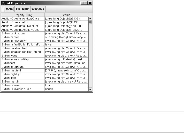
752 CHAPTER 20 ■ THE PLUGGABLE LOOK AND FEEL ARCHITECTURE
JToolBar toolbar = new JToolBar();
for (int i=0, n=looks.length; i<n; i++) {
JButton button = new JButton(looks[i].getName());
button.setActionCommand(looks[i].getClassName());
button.addActionListener(actionListener);
toolbar.add(button);
}
frame.add(toolbar, BorderLayout.NORTH);
JScrollPane scrollPane = new JScrollPane(table);
frame.add(scrollPane, BorderLayout.CENTER);
frame.setSize(400, 400);
frame.setVisible(true);
}
};
EventQueue.invokeLater(runner);
}
}
Figure 20-3 shows an example of running the property lister.
Figure 20-3. Sample property lister display
■Tip To reset a property to the default for the currently installed look and feel, set it to null. This will cause
the component to get the original default from the look and feel.

CHAPTER 20 ■ THE PLUGGABLE LOOK AND FEEL ARCHITECTURE 753
UIResource Interface
Every UIDefaults setting for the predefined look and feel classes uses a special marker inter-
face, UIResource, that lets the UI delegate determine if a default value has been overridden. If
you’ve changed a specific setting to a new value (for example, the Button.background setting to
Color.PINK), then the UIManager won’t replace this setting when the installed look and feel
changes. This is also true of a call to setBackground(Color.PINK). Only when the value for a
specific property implements the UIResource interface will the setting change when the look
and feel changes.
The javax.swing.plaf package contains many classes that implement the UIResource
interface. For example, the ColorUIResource class treats Color objects as UIResource elements.
Table 20-6 lists all of the predefined UIResource components available for customizing the
installed look and feel.
Table 20-6. UIResource Collection
UIResource Implementation Wrapped Class/Interface
ActionMapUIResource ActionMap
BasicBorders.ButtonBorder Border
BasicBorders.FieldBorder Border
BasicBorders.MarginBorder Border
BasicBorders.MenuBarBorder Border
BasicBorders.RadioButtonBorder Border
BasicBorders.RolloverButtonBorder Border
BasicBorders.SplitPaneBorder Border
BasicBorders.ToggleButtonBorder Border
BasicComboBoxEditor.UIResource ComboBoxEditor
BasicComboBoxRenderer.UIResource ListCellRenderer
BasicTextUI.BasicCaret Caret
BasicTextUI.BasicHighlighter Highlighter
BorderUIResource Border
BorderUIResource.BevelBorderUIResource Border
BorderUIResource.CompoundBorderUIResource Border
BorderUIResource.EmptyBorderUIResource Border
BorderUIResource.EtchedBorderUIResource Border
BorderUIResource.LineBorderUIResource Border
BorderUIResource.MatteBorderUIResource Border
BorderUIResource.TitledBorderUIResource Border
ColorUIResource Color

754 CHAPTER 20 ■ THE PLUGGABLE LOOK AND FEEL ARCHITECTURE
The following code demonstrates the use of the ColorUIResource class to set the button
background to a value that will change when the installed look and feel changes.
Color background = new ColorUIResource(Color.PINK);
UIManager.put("Button.background", background);
ComponentInputMapUIResource InputMap / ComponentInputMap
DefaultListCellRenderer.UIResource ListCellRenderer
DefaultMenuLayout LayoutManager / LayoutManager2
DefaultTableCellRenderer.UIResource TableCellRenderer
DimensionUIResource Dimension
FontUIResource Font
IconUIResource Icon
InputMapUIResource InputMap
InsetsUIResource Insets
JScrollPane.ScrollBar JScrollBar
MetalBorders.ButtonBorder Border
MetalBorders.Flush3DBorder Border
MetalBorders.InternalFrameBorder Border
MetalBorders.MenuBarBorder Border
MetalBorders.MenuItemBorder Border
MetalBorders.OptionDialogBorder Border
MetalBorders.PaletteBorder Border
MetalBorders.PopupMenuBorder Border
MetalBorders.RolloverButtonBorder Border
MetalBorders.ScrollPaneBorder Border
MetalBorders.TextFieldBorder Border
MetalBorders.ToggleButtonBorder Border
MetalBorders.ToolBarBorder Border
MetalCheckBoxIcon Icon
MetalComboBoxEditor.UIResource ComboBoxEditor
MetalIconFactory.PaletteCloseIcon Icon
ScrollPaneLayout.UIResource ScrollPaneLayout
Table 20-6. UIResource Collection (Continued)
UIResource Implementation Wrapped Class/Interface

CHAPTER 20 ■ THE PLUGGABLE LOOK AND FEEL ARCHITECTURE 755
Without the wrapped ColorUIResource constructor call, the color would remain pink after
a look and feel change.
■Note Use of the specific UIResource implementation classes tends to be limited to those times when
you’re creating a custom look and feel or customizing an existing one.
UIDefaults.ActiveValue, UIDefaults.LazyValue, and UIDefaults.ProxyLazyValue Classes
Besides implementing the UIResource interface, elements in the UIDefaults lookup table can
be lazy or active if they implement one of the inner classes of UIDefaults:LazyValue or ActiveValue.
For example, since Color and Dimension objects aren’t very resource-intensive, when such an
element is placed in the UIDefaults table, the Color or Dimension is created and placed in the
table immediately—this is called active. On the other hand, in the case of a resource like an
Icon, and especially an ImageIcon, you want to defer creating and loading the icon class file
until it’s needed—this is called lazy. Another example of an element you might want to make
lazy is a ListCellRenderer that needs a separate renderer for every JList component. Because
you don’t know how many renderers you’ll need or which renderer will be installed, you can
defer creation to a later time and get a unique version of the current renderer whenever you ask
for one.
Take a look at the public Object makeIcon(Class baseClass, String imageFile) method
of LookAndFeel. In order to handle the late loading of icon image files, the LookAndFeel class can
automatically create a LazyValue class for loading an Icon. Because the image file won’t be
loaded until later, you need to provide the icon loader with the location of the icon image file
(baseClass) and the file name (imageFile).
Object iconObject = LookAndFeel.makeIcon(this.getClass(), "World.gif");
UIManager.put("Tree.leafIcon", iconObject);
Next, look at the UIDefaults.LazyValue definition and create a lazy version of the DiamondIcon.
public interface UIDefaults.LazyValue {
public Object createValue(UIDefaults table);
}
In classes that implement the LazyValue interface, their constructors need to save any
information that will be passed along to the real constructor through the createValue() interface
method. To help with creating custom lazy values, the UIDefaults.ProxyLazyValue class provides a
way of saving this information to pass along. There are four ways to use ProxyLazyValue to defer
object creation, which each uses reflection to create the actual object, getting the specific how
(and what) from the constructor arguments:
•public UIDefaults.ProxyLazyValue(String className): If object creation will use the
no-argument constructor, just pass the class name as an argument.
•public UIDefaults.ProxyLazyValue(String className, String method): If object
creation will use a factory method that doesn’t require arguments, pass the factory
method along with the class name.
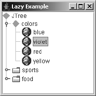
756 CHAPTER 20 ■ THE PLUGGABLE LOOK AND FEEL ARCHITECTURE
•public UIDefaults.ProxyLazyValue(String className, Object[] arguments): If object
creation will use a constructor that requires some arguments, pass the class name and
array of arguments to the ProxyLazyValue constructor.
•public UIDefaults.ProxyLazyValue(String className, String method, Object[]
arguments): If object creation will use a factory method that does require arguments,
pass the factory method name along with the class name and array of arguments.
For the lazy diamond icon implementation that’s about to be created, you’ll need to pass
state information that consists of the color, selected state, and dimensions.
To test the lazy diamond icon, you can associate an instance of UIDefaults.ProxyLazyValue to
the Tree.openIcon setting, as follows:
Integer fifteen = new Integer(15);
Object lazyArgs[] = new Object[] { Color.GREEN, Boolean.TRUE, fifteen, fifteen} ;
Object lazyDiamond = new UIDefaults.ProxyLazyValue("DiamondIcon", lazyArgs);
UIManager.put("Tree.openIcon", lazyDiamond);
Together with the previous change of the Tree.leafIcon setting to the World.gif icon, and
using the default tree data model, the tree would look like Figure 20-4.
Figure 20-4. A tree created with lazy values
Listing 20-4 shows the source code for the example that generated Figure 20-4 by using the
two lazy values.
Listing 20-4. Lazy UIResources
import java.awt.*;
import java.awt.event.*;
import javax.swing.*;
import javax.swing.plaf.*;
public class LazySample {
public static void main (String args[]) {
Runnable runner = new Runnable() {
public void run() {
JFrame frame = new JFrame("Lazy Example");
frame.setDefaultCloseOperation(JFrame.EXIT_ON_CLOSE);
CHAPTER 20 ■ THE PLUGGABLE LOOK AND FEEL ARCHITECTURE 757
Object iconObject =
LookAndFeel.makeIcon(LazySample.class, "World.gif");
UIManager.put("Tree.leafIcon", iconObject);
Integer fifteen = new Integer(15);
Object lazyArgs[] =
new Object[] {Color.GREEN, Boolean.TRUE, fifteen, fifteen};
Object lazyDiamond =
new UIDefaults.ProxyLazyValue("DiamondIcon", lazyArgs);
UIManager.put("Tree.openIcon", lazyDiamond);
JTree tree = new JTree();
JScrollPane scrollPane = new JScrollPane(tree);
frame.add(scrollPane, BorderLayout.CENTER);
frame.setSize(200, 200);
frame.setVisible(true);
}
};
EventQueue.invokeLater(runner);
}
}
Unlike lazy values, active values act like instance-creation factories. Every time they’re
asked for a value with one of the get() methods of UIManager, a new instance is created and
returned. The interface method is the same as that for the UIDefault.LazyValue interface; only
the interface name is different.
public interface UIDefaults.ActiveValue {
public Object createValue(UIDefaults table);
}
To demonstrate, Listing 20-5 defines a factory that constructs JLabel components. The
text of the label will function as a counter to show how many labels have been created. When-
ever the createValue() method is called, a new JLabel is created.
Listing 20-5. Active Label Factory
import javax.swing.*;
public class ActiveLabel implements UIDefaults.ActiveValue {
private int counter = 0;
public Object createValue(UIDefaults defaults) {
JLabel label = new JLabel(""+counter++);
return label;
}
}
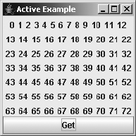
758 CHAPTER 20 ■ THE PLUGGABLE LOOK AND FEEL ARCHITECTURE
To create the component, you need to install the ActiveLabel class with UIManager.put().
Once the class is installed, each call to get() the key out of the UIManager results in a new
component being created.
UIManager.put(LABEL_FACTORY, new ActiveLabel());
...
JLabel label = (JLabel)UIManager.get(LABEL_FACTORY);
Figure 20-5 shows the component in use. Whenever the button is clicked, the
UIManager.get() method is called, and the component is added to the screen.
Figure 20-5. Using active values
Listing 20-6 shows the source for the sample program in Figure 20-5.
Listing 20-6. Active UIResources
import java.awt.*;
import java.awt.event.*;
import javax.swing.*;
public class ActiveSample {
private static final String LABEL_FACTORY = "LabelFactory";
public static void main (String args[]) {
Runnable runner = new Runnable() {
public void run() {
JFrame frame = new JFrame("Active Example");
frame.setDefaultCloseOperation(JFrame.EXIT_ON_CLOSE);
UIManager.put(LABEL_FACTORY, new ActiveLabel());
final JPanel panel = new JPanel();
JButton button = new JButton("Get");

CHAPTER 20 ■ THE PLUGGABLE LOOK AND FEEL ARCHITECTURE 759
ActionListener actionListener = new ActionListener() {
public void actionPerformed(ActionEvent actionEvent) {
JLabel label = (JLabel)UIManager.get(LABEL_FACTORY);
panel.add(label);
panel.revalidate();
}
};
button.addActionListener(actionListener);
frame.add(panel, BorderLayout.CENTER);
frame.add(button, BorderLayout.SOUTH);
frame.setSize(200, 200);
frame.setVisible(true);
}
};
EventQueue.invokeLater(runner);
}
}
■Note There is a special lazy class for creating an InputMap lazily: the UIDefaults.LazyInputMap
class.
Using Client Properties
If changing all the UIResource properties known to the UIManager still doesn’t give you the look
and feel you desire, some of the UI delegate classes can provide their own customized capabilities
that are hidden from API views. These customized capabilities are provided as client properties
and are accessible from two JComponent methods: public final Object getClientProperty(Object
key) and public final void putClientProperty(Object key, Object value). Keep in mind
that the key and value here are of type Object. While typically the key will be a String and the
value an object of any type, the key can also be an object of any type.
Client properties tend to be attributes of the component that are specific to the look and
feel. Instead of subclassing the look and feel delegate to expose a property through a pair of
getter/setter methods, the get/put client property methods provide access to a private instance-
level lookup table to store a new property setting. In addition, as when making changes to the
UIDefaults, modifying the client properties of a component notifies any registered property
change listeners of the component.
Most of the specific client properties have already been discussed throughout this book
with their respective components. Table 20-7 provides a single resource for finding all the
configurable client properties. The left column shows the class the property is used in, excluding
the package name. The middle column shows the property name, which can include both the
raw text string and any class constants that are available. The right column contains the class
type to store with the property name. If the class type is a String, a list of valid values is provided,
if appropriate.

760 CHAPTER 20 ■ THE PLUGGABLE LOOK AND FEEL ARCHITECTURE
Table 20-7. Swing’s Client Properties
Class Accessed By Property Name Type
AbstractButton hideActionText Boolean
AbstractButton html / BasicHTML.propertyKey View
BasicButtonListener initialDefaultButton JButton
BasicButtonUI html / BasicHTML.propertyKey View
BasicComboBoxUI JComboBox.isTableCellEditor /
BasicComboBoxUI.IS_TABLE_CELL_EDITOR
Boolean
BasicEditorPaneUI JEditorPane.honorDisplayProperties /
JEditorPane.HONOR_DISPLAY_PROPERTIES
Boolean
BasicEditorPaneUI JEditorPane.w3cLengthUnits /
JEditorPane.W3C_LENGTH_UNITS
Boolean
BasicHTML html.base / BasicHTML.documentBaseKey URL
BasicHTML html / BasicHTML.propertyKey View
BasicHTML html.disable / BasicHTML.htmlDisable Boolean
BasicLabelUI html / BasicHTML.propertyKey View
BasicListUI List.isFileList Boolean
BasicMenuItemUI html / BasicHTML.propertyKey View
BasicMenuItemUI maxTextWidth / BasicMenuItemUI.MAX_TEXT_WIDTH Integer
BasicMenuItemUI maxAccWidth / BasicMenuItemUI.MAX_ACC_WIDTH Integer
BasicPopupMenuUI doNotCancelPopup Boolean
BasicRadioButtonUI html / BasicHTML.propertyKey View
BasicRootPaneUI temporaryDefaultButton Object
BasicSliderUI Slider.paintThumbArrowShape Boolean
BasicTabbedPaneUI __index_to_remove__ Integer
BasicTableUI Table.isFileList Boolean
BasicTextUI JPasswordField.cutCopyAllowed Boolean
BasicToggleButtonUI html / BasicHTML.propertyKey View
BasicToolBarUI JToolBar.focusedCompIndex / BasicToolBarUI.
FOCUSED_COMP_INDEX
Integer
BasicToolBarUI JToolBar.isRollover / BasicToolBarUI.
IS_ROLLOVER
Boolean
BasicToolTipUI html / BasicHTML.propertyKey View
BluePrintEngine __arrow_direction__ Integer
DefaultCaret caretAspectRatio Number
DefaultCaret caretWidth Integer

CHAPTER 20 ■ THE PLUGGABLE LOOK AND FEEL ARCHITECTURE 761
DefaultCaret JPasswordField.cutCopyAllowed Boolean
DefaultDesktopManager JDesktopPane.dragMode String; valid values are
null,outline, and
faster
FrameView charset String
GTKFileChooserUI GTKFileChooser.showDirectoryIcons Boolean
GTKFileChooserUI GTKFileChooser.showFileIcons Boolean
JInternalFrame wasIconOnce /
DefaultDesktopManager.HAS_BEEN_ICONIFIED_
PROPERTY
Boolean
JComponent nextFocus / JComponent.NEXT_FOCUS Component
JComponent InputVerifier / JComponent.INPUT_VERIFIER_KEY InputVerifier
JComponent _WhenInFocusedWindow /
JComponent.WHEN_IN_FOCUSED_WINDOW_BINDINGS
Hashtable
JComponent ToolTipText / JComponent.TOOL_TIP_TEXT_KEY String
JComponent TransferHandler /
JComponent.TRANSFER_HANDLER_KEY
TransferHandler
JComponent AncestorNotifier /
JComponent.ANCESTOR_NOTIFIER_KEY
AncestorNotifier
JComponent labeledBy / JLabel.LABELED_BY_PROPERTY JComponent / Accessible
JEditorPane charset String
JLabel html / BasicHTML.propertyKey View
JLayeredPane layeredContainerLayer /
JLayeredPane.LAYER_PROPERTY
Integer
JPasswordField JPasswordField.cutCopyAllowed Boolean
JPopupMenu JPopupMenu.firePopupMenuCanceled Boolean
JTable JTable.autoStartsEdit Boolean
JTable terminateEditOnFocusLost Boolean
JToolBar JToolBar.isRollover Boolean
MetalBorders NoButtonRollover /
MetalBorders.NO_BUTTON_ROLLOVER
Boolean
MetalBorders JInternalFrame.messageType Integer
MetalFileChooserUI FileChooser.useShellFolder Boolean
MetalIconFactory paintActive Boolean
MetalInternalFrame➥
TitlePane
JInternalFrame.messageType Integer
Table 20-7. Swing’s Client Properties (Continued)
Class Accessed By Property Name Type

762 CHAPTER 20 ■ THE PLUGGABLE LOOK AND FEEL ARCHITECTURE
■Note Many of the properties in Table 20-7 are used internally by the specific component delegate imple-
mentations, and you’ll never need to use them. Other properties, such as the drag mode for the desktop
manager, were interim means to add capabilities while keeping the API unaltered until a new JDK version
was released.
MetalInternalFrameUI JInternalFrame.isPalette /
MetalInternalFrameUI.IS_PALETTE
Boolean
MetalRadioButtonUI html / BasicHTML.propertyKey View
MetalScrollBarUI JScrollBar.isFreeStanding /
MetalScrollBarUI.FREE_STANDING_PROP
Boolean
MetalSliderUI JSlider.isFilled / MetalSliderUI.SLIDER_FILL Boolean
MetalTreeUI JTree.lineStyle / MetalTreeUI.LineStyle String; valid values are
Angled (MetalTreeUI.
LEG_LINE_STYLE_STRING),
Horizontal (MetalTreeUI
.HORIZ_STYLE_STRING),
and None (MetalTreeUI.
NO_STYLE_STRING)
MotifGraphicsUtils html / BasicHTML.propertyKey View
MotifGraphicsUtils maxAccWidth / MotifGraphicsUtils.MAX_ACC_WIDTH Integer
PopupFactory __force_heavy_weight_popup__ /
PopupFactory.forceHeavyWeightPopupKey
Boolean
SpringLayout SpringLayout.class SpringLayout.
Constraints
SwingUtilities html / BasicHTML.propertyKey View
SynthEditorPaneUI JEditorPane.honorDisplayProperties /
JEditorPane.HONOR_DISPLAY_PROPERTIES
Boolean
SynthGraphicUtils html / BasicHTML.propertyKey View
SynthMenuItemUI html / BasicHTML.propertyKey View
SynthToolTipUI html / BasicHTML.propertyKey View
WindowsDesktopManager JInternalFrame.frameType String; valid values are
null and optionDialog
WindowsFileChooserUI FileChooser.useShellFolder Boolean
WindowsSliderUI Slider.paintThumbArrowShape Boolean
WindowsToolBarUI XPStyle.subclass String
Table 20-7. Swing’s Client Properties (Continued)
Class Accessed By Property Name Type

CHAPTER 20 ■ THE PLUGGABLE LOOK AND FEEL ARCHITECTURE 763
To demonstrate the use of client properties, the following two lines change the
JToolBar.isRollover attribute of a JToolBar to Boolean.TRUE. Other toolbars might not want
this attribute set to Boolean.TRUE and would therefore leave that setting at Boolean.FALSE.
JToolBar toolbar = new JToolBar();
toolbar.putClientProperty("JToolBar.isRollover", Boolean.TRUE);
Creating a New UI Delegate
Sometimes, modifying a few of the UIResource elements of the Swing component isn’t quite
enough to get the appearance or behavior you desire. When this is the case, you need to create
a new UI delegate for the component. Each Swing component has its own UI delegate for
controlling the view and controller aspects of its MVC architecture.
Table 20-8 provides a listing of the Swing components, the abstract class that describes
the UI delegate for each component, and the specific implementations for the predefined
look and feel classes. For instance, calling the getUIClassID() method of a JToolBar will
return the class ID string of "ToolBarUI" for its UI delegate. If you then ask the UIManager for
the specific implementation of this UI delegate for the currently installed look and feel with a
call to UIManager.get("ToolBarUI"), an implementation of the abstract ToolBarUI class is
returned. Therefore, if you want to develop a custom look and feel for the JToolBar component,
you must create an implementation of the abstract ToolBarUI class.
Table 20-8. Swing Component Delegates
Swing Component Class ID String Implementation Class
JButton ButtonUI ButtonUI
JCheckBox CheckBoxUI ButtonUI
JCheckBoxMenuItem CheckBoxMenuItemUI MenuItemUI
JColorChooser ColorChooserUI ColorChooserUI
JComboBox ComboBoxUI ComboBoxUI
JComponent n/a ComponentUI
JDesktopPane DesktopPaneUI DesktopPaneUI
JEditorPane EditorPaneUI TextUI
JFileChooser FileChooserUI FileChooserUI
JFormattedTextField FormattedTextFieldUI TextUI
JInternalFrame InternalFrameUI InternalFrameUI
JInternalFrame.JDesktopIcon DesktopIconUI DesktopIconUI
JLabel LabelUI LabelUI
JList ListUI ListUI
JMenu MenuUI MenuItemUI
JMenuBar MenuBarUI MenuBarUI

764 CHAPTER 20 ■ THE PLUGGABLE LOOK AND FEEL ARCHITECTURE
JMenuItem MenuItemUI MenuItemUI
JOptionPane OptionPaneUI OptionPaneUI
JPanel PanelUI PanelUI
JPasswordField PasswordFieldUI TextUI
JPopupMenu PopupMenuUI PopupMenuUI
JPopupMenu.Separator PopupMenuSeparatorUI SeparatorUI
JProgressBar ProgressBarUI ProgressBarUI
JRadioButton RadioButtonUI ButtonUI
JRadioButtonMenuItem RadioButtonMenuItemUI MenuItemUI
JRootPane RootPaneUI RootPaneUI
JScrollBar ScrollBarUI ScrollBarUI
JScrollPane ScrollPaneUI ScrollPaneUI
JSeparator SeparatorUI SeparatorUI
JSlider SliderUI SliderUI
JSpinner SpinnerUI SpinnerUI
JSplitPane SplitPaneUI SplitPaneUI
JTabbedPane TabbedPaneUI TabbedPaneUI
JTable TableUI TableUI
JTableHeader TableHeaderUI TableHeaderUI
JTextArea TextAreaUI TextUI
JTextField TextFieldUI TextUI
JTextPane TextPaneUI TextUI
JToggleButton ToggleButtonUI ButtonUI
JToolBar ToolBarUI ToolBarUI
JToolBar.Separator ToolBarSeparatorUI SeparatorUI
JToolTip ToolTipUI ToolTipUI
JTree TreeUI TreeUI
JViewport ViewportUI ViewportUI
Table 20-8. Swing Component Delegates (Continued)
Swing Component Class ID String Implementation Class

CHAPTER 20 ■ THE PLUGGABLE LOOK AND FEEL ARCHITECTURE 765
■Note Classes such as JWindow,JFrame, and JApplet are heavyweight components and therefore lack
a UI delegate.
The PopupComboSample example from Chapter 13 demonstrated the creation of a new UI
delegate. Listing 20-7 is a slightly changed customized ComboBoxUI piece, where the normal
down arrow for showing the drop-down menu is replaced with a right arrow.
Listing 20-7. Customized ComboBoxUI
import javax.swing.*;
import javax.swing.plaf.*;
import javax.swing.plaf.basic.*;
public class MyComboBoxUI extends BasicComboBoxUI {
public static ComponentUI createUI(JComponent c) {
return new MyComboBoxUI();
}
protected JButton createArrowButton() {
JButton button = new BasicArrowButton(BasicArrowButton.EAST);
return button;
}
}
To use the new UI delegate, you just need to create the class and associate it with the
component using the setUI() method.
JComboBox comboBox = new JComboBox(labels);
comboBox.setUI((ComboBoxUI)MyComboBoxUI.createUI(comboBox));
Changing the PopupComboSample from Chapter 13 (Listing 13-16) to show two combo
boxes, with the custom ComboBoxUI on the top and the bottom without, results in the screen
shown in Figure 20-6.
Figure 20-6. Using the new ComboBoxUI
766 CHAPTER 20 ■ THE PLUGGABLE LOOK AND FEEL ARCHITECTURE
Listing 20-8 shows the updated source used to produce Figure 20-6.
Listing 20-8. Using Customized ComboBoxUI
import java.awt.*;
import javax.swing.*;
import javax.swing.plaf.*;
public class PopupComboSample {
public static void main(String args[]) {
Runnable runner = new Runnable() {
public void run() {
String labels[] = {"Chardonnay", "Sauvignon", "Riesling", "Cabernet",
"Zinfandel", "Merlot", "Pinot Noir", "Sauvignon Blanc", "Syrah",
"Gewürztraminer"};
JFrame frame = new JFrame("Popup JComboBox");
frame.setDefaultCloseOperation(JFrame.EXIT_ON_CLOSE);
JComboBox comboBox = new JComboBox(labels);
comboBox.setMaximumRowCount(5);
comboBox.setUI((ComboBoxUI)MyComboBoxUI.createUI(comboBox));
frame.add(comboBox, BorderLayout.NORTH);
JComboBox comboBox2 = new JComboBox(labels);
frame.add(comboBox2, BorderLayout.SOUTH);
frame.setSize (300, 100);
frame.setVisible (true);
}
};
EventQueue.invokeLater(runner);
}
}
If you want to use the new UI delegate for all components, you can let the UIManager know
about the delegate before creating the components, instead of manually calling setUI() after
creating one. In the example in Listing 20-8, you would add the following line:
UIManager.put("ComboBoxUI", "MyComboBoxUI")
If you did this, both combo boxes would then look the same.
The actual creation of the UI delegate is done somewhat indirectly, as shown by Figure 20-7.
A call to the component constructor asks the UIManager for the UI delegate class. The UIManager
maintains the list of delegates in its defaults property, a UIDefaults object. When the UIDefaults
is queried for the delegate, it goes back to the component to ask which delegate is needed. After
it finds the appropriate delegate implementation, the UIDefaults object tells the ComponentUI
to create it, resulting in the actual UI delegate class being created. Once the UI delegate is
created, it needs to be configured for the state of the specific model.
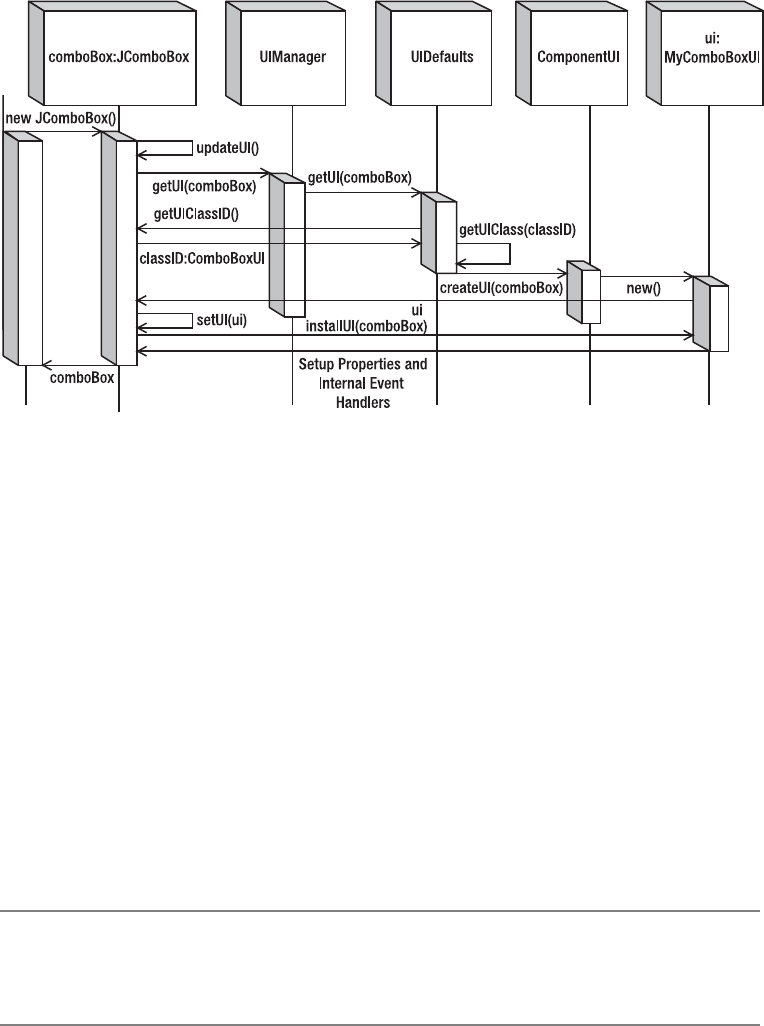
CHAPTER 20 ■ THE PLUGGABLE LOOK AND FEEL ARCHITECTURE 767
Figure 20-7. UI delegate creation sequence diagram
Creating a New Look and Feel
Unless a company wants you to customize everything to provide a unique experience, it typically
isn’t necessary to create a whole new look and feel from scratch. Usually, developers make
minor modifications to an existing look and feel by providing some customized UI delegates.
However, if you do want to create a new look and feel class, you just need to create a subclass
of the LookAndFeel class. You still must provide the UI delegates, but their classes can now be
more hidden from the Swing components, since their usage will not be known directly from
the javax.swing component class.
Using the WindowsLookAndFeel on a Non-Windows Machine
To demonstrate the creation of a new look and feel class, let’s create a look and feel implemen-
tation that cancels out the platform requirement for the Windows UI delegate. By simply
overriding the public boolean isSupportedLookAndFeel() method to return true, you effec-
tively remove the platform requirement for the Windows look and feel class.
■Note The Java license expressly forbids you from delivering applications that remove the platform
requirements for the Windows look and feel class. So, you can work through the example here, as long as
you don’t deliver it.
The class definition in Listing 20-9 shows how simple the creation of a new look and feel
implementation can be.

768 CHAPTER 20 ■ THE PLUGGABLE LOOK AND FEEL ARCHITECTURE
Listing 20-9. Custom Look and Feel
import javax.swing.UIDefaults;
import com.sun.java.swing.plaf.windows.WindowsLookAndFeel;
public class MyWindows extends WindowsLookAndFeel {
public String getID() {
return "MyWindows";
}
public String getName() {
return "MyWindows Look and Feel";
}
public String getDescription() {
return "The MyWindows Look and Feel";
}
public boolean isNativeLookAndFeel() {
return false;
}
public boolean isSupportedLookAndFeel() {
return true;
}
}
If you use this Swing class on a non-Windows machine, you can get the look and feel to be
the Windows look and feel. Just set your look and feel to be MyWindows and make the look and
feel class file available. The class file only needs to be available in your CLASSPATH and will be
started with the following command line:
java -Dswing.defaultlaf=MyWindows ClassFile
For the Windows look and feel change to work properly, you need to provide the image
files used for the icons of the look and feel from within the icons subdirectory of the MyWindows
directory structure. Table 20-9 lists those icons appropriate to the predefined look and feel
types. The MyWindows look and feel needs all of the Windows image files.
■Note Although Ocean is a theme of Metal, it does provide its own set of images.
Table 20-9. Look and Feel Image Files
File Name Basic Metal Motif Ocean Windows
close-pressed.gif X
close.gif X
collapsed-rtl.gif X
collapsed.gif X
computer.gif X

CHAPTER 20 ■ THE PLUGGABLE LOOK AND FEEL ARCHITECTURE 769
Computer.gif X
DesktopIcon.gif X
DetailsView.gif X
directory.gif X
Directory.gif X
Error.gif XX X
error.png X
expanded.gif X
file.gif X
File.gif X
floppy.gif X
FloppyDrive.gif X
hardDrive.gif X
HardDrive.gif X
homeFolder.gif X
HomeFolder.gif X
iconify-pressed.gif X
iconify.gif X
info.png X
Inform.gif XX X
JavaCup16.png X
JavaCup32.png X
ListView.gif X
maximize-pressed.gif X
maximize.gif X
menu.gif X
minimize-pressed.gif X
minimize.gif X
newFolder.gif X
NewFolder.gif X
paletteClose-pressed.gif X
paletteClose.gif X
Table 20-9. Look and Feel Image Files (Continued)
File Name Basic Metal Motif Ocean Windows

770 CHAPTER 20 ■ THE PLUGGABLE LOOK AND FEEL ARCHITECTURE
■Note At the very least, images for the JOptionPane message types are needed within every look and
feel. Typically, these are named Error.gif,Inform.gif,Question.gif, and Warn.gif, though that
isn’t an absolute requirement.
Question.gif XX X
question.png X
ScrollDownArrow.gif X
ScrollDownArrowActive.gif X
ScrollKnobH.gif X
ScrollLeftArrow.gif X
ScrollLeftArrowActive.gif X
ScrollRightArrow.gif X
ScrollRightArrowActive.gif X
ScrollUpArrow.gif X
ScrollUpArrowActive.gif X
StandardBackground.gif XX
TrayBottom.gif X
TrayLeft.gif X
TrayRight.gif X
TrayTop.gif X
TreeClosed.gif XX
TreeCollapsed.gif
TreeLeaf.gif X
TreeOpen.gif XX
upFolder.gif X
UpFolder.gif X
Warn.gif XX X
warning.png X
Table 20-9. Look and Feel Image Files (Continued)
File Name Basic Metal Motif Ocean Windows
CHAPTER 20 ■ THE PLUGGABLE LOOK AND FEEL ARCHITECTURE 771
If you don’t want to sidestep the “native” requirement of the Windows look and feel, you
can install individual UI delegates, such as the following, which uses the Windows UI delegate
for the JButton component:
UIManager.put("ButtonUI","com.sun.java.swing.plaf.windows.WindowsButtonUI").
Adding UI Delegates
Creating a new look and feel that has custom UI delegates involves creating a subclass of the
LookAndFeel class. More likely, you’ll create a subclass of BasicLookAndFeel or another predefined
look and feel class, and then provide your custom delegates for some of the components.
If you subclass the BasicLookAndFeel class, it has a protected void
initClassDefaults(UIDefaults table) method to be overridden to install your custom UI
delegates. Just put the delegates in the UIDefaults table for the look and feel, instead of in your
program that wants to use the new delegate.
The extension to the MetalLookAndFeel in Listing 20-10 adds the previously defined
MyComboBoxUI delegate (Listing 20-7) as the ComboBoxUI delegate for the look and feel. As you
define more customized components, you can add them in a similar way.
Listing 20-10. MyMetal Look and Feel
import javax.swing.UIDefaults;
import javax.swing.plaf.metal.MetalLookAndFeel;
public class MyMetal extends MetalLookAndFeel {
public String getID() {
return "MyMetal";
}
public String getName() {
return "MyMetal Look and Feel";
}
public String getDescription() {
return "The MyMetal Look and Feel";
}
public boolean isNativeLookAndFeel() {
return false;
}
public boolean isSupportedLookAndFeel() {
return true;
}
protected void initClassDefaults(UIDefaults table) {
super.initClassDefaults(table);
table.put("ComboBoxUI", "MyComboBoxUI");
}
}

772 CHAPTER 20 ■ THE PLUGGABLE LOOK AND FEEL ARCHITECTURE
■Note When creating your own look and feel, be sure to copy or create icons for the JOptionPane pop-up
windows. Unless you’re customizing Ocean, these icons should be named Error.gif,Inform.gif,
Question.gif, and Warn.gif, and they belong in the icons directory under the directory where the look
and feel class file exists.
Working with Metal Themes
The Metal look and feel class (javax.swing.plaf.metal.MetalLookAndFeel) provides the means
to define themes to describe the default settings for the colors, fonts, and all the UIDefaults
managed by the UIManager. By allowing users to change themes, they can get preferred colora-
tion or font sizes with minimal work from the developer. By developing corporate themes, you
can easily customize an interface without creating new look and feel classes or manually inserting
new settings into current UIDefaults.
MetalTheme Class
Table 20-10 lists the 49 different properties that are available through the MetalTheme class.
The various primary and secondary properties are abstract and must be implemented in a
subclass. Of the remaining properties, the six whose names end with Font—controlTextFont,
menuTextFont,subTextFont,systemTextFont,userTextFont, and windowTextFont—are also
abstract and must be implemented by a subclass. The remaining properties, by default, reuse
one of the 11 primary/secondary values (or black and white) for their settings.
Table 20-10. MetalTheme Properties
Property Name Data Type Access
acceleratorForeground ColorUIResource Read-only
acceleratorSelectedForeground ColorUIResource Read-only
black ColorUIResource Read-only
control ColorUIResource Read-only
controlDarkShadow ColorUIResource Read-only
controlDisabled ColorUIResource Read-only
controlHighlight ColorUIResource Read-only
controlInfo ColorUIResource Read-only
controlShadow ColorUIResource Read-only
controlTextColor ColorUIResource Read-only
controlTextFont FontUIResource Read-only

CHAPTER 20 ■ THE PLUGGABLE LOOK AND FEEL ARCHITECTURE 773
desktopColor ColorUIResource Read-only
focusColor ColorUIResource Read-only
highlightedTextColor ColorUIResource Read-only
inactiveControlTextColor ColorUIResource Read-only
inactiveSystemTextColor ColorUIResource Read-only
menuBackground ColorUIResource Read-only
menuDisabledForeground ColorUIResource Read-only
menuForeground ColorUIResource Read-only
menuSelectedBackground ColorUIResource Read-only
menuSelectedForeground ColorUIResource Read-only
menuTextFont FontUIResource Read-only
name String Read-only
primary1 ColorUIResource Read-only
primary2 ColorUIResource Read-only
primary3 ColorUIResource Read-only
primaryControl ColorUIResource Read-only
primaryControlDarkShadow ColorUIResource Read-only
primaryControlHighlight ColorUIResource Read-only
primaryControlInfo ColorUIResource Read-only
primaryControlShadow ColorUIResource Read-only
secondary1 ColorUIResource Read-only
secondary2 ColorUIResource Read-only
secondary3 ColorUIResource Read-only
separatorBackground ColorUIResource Read-only
separatorForeground ColorUIResource Read-only
subTextFont FontUIResource Read-only
systemTextColor ColorUIResource Read-only
systemTextFont FontUIResource Read-only
textHighlightColor ColorUIResource Read-only
userTextColor ColorUIResource Read-only
Table 20-10. MetalTheme Properties (Continued)
Property Name Data Type Access

774 CHAPTER 20 ■ THE PLUGGABLE LOOK AND FEEL ARCHITECTURE
DefaultMetalTheme and OceanTheme Classes
Contrary to the class name, the DefaultMetalTheme class is not the default Metal theme; the
default is OceanTheme.DefaultMetalTheme calls itself the Steel theme and uses a blue and gray
color scheme for the primary and secondary settings, respectively. OceanTheme, named Ocean,
uses a light-blue palette with frequent gradient fills for backgrounds.
To use the Steel theme instead of the Ocean theme, you need to set the swing.metalTheme
system property to steel, as shown here:
java –Dswing.metalTheme=steel ClassName
Most people prefer the newer look of Ocean, but Steel is still available for backward-
compatibility, as Ocean is new to 5.0.
If you create your own Metal theme, you need to subclass either OceanTheme or
DefaultMetalTheme, and then install the custom theme by setting the static currentTheme
property of the MetalLookAndFeel class to your theme.
MetalTheme myTheme = new MyTheme();
MetalLookAndFeel.setCurrentTheme(myTheme);
Whereas most of the customizations of a MetalTheme are related to fonts and colors, the
public void addCustomEntriesToTable(UIDefaults table) method allows you to override the
default UIDefaults settings for the Metal look and feel. Therefore, not only do themes customize
the fonts and colors of the Swing components, but they also can customize any one of the
many UIResource-related properties of the Swing components.
The following code demonstrates how to set two of the scrollbar settings for a specific
theme. Remember to tag these settings with the UIResource interface when appropriate, and
don’t forget to initialize the table argument by your superclass implementation (eventually,
this would be MetalTheme).
userTextFont FontUIResource Read-only
white ColorUIResource Read-only
windowBackground ColorUIResource Read-only
windowTextFont FontUIResource Read-only
windowTitleBackground ColorUIResource Read-only
windowTitleForeground ColorUIResource Read-only
windowTitleInactiveBackground ColorUIResource Read-only
windowTitleInactiveForeground ColorUIResource Read-only
Table 20-10. MetalTheme Properties (Continued)
Property Name Data Type Access

CHAPTER 20 ■ THE PLUGGABLE LOOK AND FEEL ARCHITECTURE 775
public void addCustomEntriesToTable(UIDefaults table) {
super.addCustomEntriesToTable(table);
ColorUIResource thumbColor = new ColorUIResource(Color.MAGENTA);
table.put("Scrollbar.thumb", thumbColor);
table.put("ScrollBar.width", new Integer(25));
}
The Metalworks system demo provided with the JDK installation (jdk1.5.0\demo\
jfc\Metalworks) comes with examples for customizing themes. One of the themes it defines
reads the theme color settings from a property file. Instead of needing to create a new class file
every time you want to change the theme of your Swing application, you can read it from a file
at runtime.
name=Charcoal
primary1=33,66,66
primary2=66,99,99
primary3=99,99,99
secondary1=0,0,0
secondary2=51,51,51
secondary3=102,102,102
black=255,255,255
white=0,0,0
Figure 20-8 shows the Charcoal theme just described used within the Metalworks demon-
stration program. Figure 20-9 shows the Presentation theme it defines.
Figure 20-8. Charcoal theme within the Metalworks demonstration program
776 CHAPTER 20 ■ THE PLUGGABLE LOOK AND FEEL ARCHITECTURE
Figure 20-9. Presentation theme within the Metalworks demonstration program
Using an Auxiliary Look and Feel
Swing provides for multiple look and feel classes to be active at any one time through
the MultiLookAndFeel, or as specified by the swing.plaf.multiplexinglaf property in the
swing.properties file. When multiple look and feel classes are installed, only one look and feel
will be visual and paint the screen. The remaining versions are called auxiliary look and feel
classes and tend to be associated with accessibility options, such as for screen readers. Another
possible auxiliary look and feel is that of a logger, which records those components that are
interacted with in a log file.
Auxiliary look and feel classes are registered with the runtime environment by config-
uring the swing.auxiliarylaf property within the swing.properties file. If multiple classes
are specified, the entries need to be separated by commas. In addition to using the properties
file, you can install a look and feel within a program by calling the public static void
addAuxiliaryLookAndFeel(LookAndFeel lookAndFeel) method of UIManager. Once installed,
the multiplexing look and feel class automatically creates and manages UI delegates for all
the installed look and feel classes.
To find out which auxiliary look and feel classes are installed, you can ask the UIManager
through its public static LookAndFeel[ ] getAuxiliaryLookAndFeels() method. This returns
an array of the actual LookAndFeel objects, unlike the UIManager.LookAndFeelInfo array returned
by the getInstalledLookAndFeels() method.

CHAPTER 20 ■ THE PLUGGABLE LOOK AND FEEL ARCHITECTURE 777
■Note Nothing stops multiple look and feel classes from rendering to the screen for the same component.
It’s the responsibility of the auxiliary look and feel creator to take care not to compete with the primary look
and feel when rendering to the screen.
SynthLookAndFeel Class
The Synth look and feel is a full-fledged look and feel, not just a themed extension to Metal,
Windows, or Motif. Instead of working with a UIResource table though, the class starts with a
blank canvas and gets its entire definition from a single XML file.
Configuring Synth
The configuration of the Synth look and feel might go something like this:
SynthLookAndFeel synth = new SynthLookAndFeel();
Class aClass = SynthSample.class;
InputStream is = aClass.getResourceAsStream("config.xml");
synth.load(is, aClass);
UIManager.setLookAndFeel(synth);
And what exactly goes into the configuration file, config.xml here? In your configuration
file, you specify how you want the specific components used in your program to appear. This
is commonly called skinning your application, or creating a custom skin. By simply modifying
an XML file, the entire appearance of your program changes; no programming is required.
The DTD is available from http://java.sun.com/j2se/1.5.0/docs/api/javax/swing/
plaf/synth/doc-files/synth.dtd. The file format is fully described in http://java.sun.com/
j2se/1.5.0/docs/api/javax/swing/plaf/synth/doc-files/synthFileFormat.html. The parser
does not validate, so until tools are available to help automate the process, you’ll need to use
care in creating the XML file.
There are many configuration options available with Synth, but the basic XML concept is
to define a style and bind it to a component. The <style> tag allows you to customize proper-
ties like the font, colors, insets, and background or border image.
To demonstrate, Listing 20-11 defines a custom style named button. Normally, the text
will appear in bold 24-point, Monospaced font. When the mouse moves over the associated
control, the font changes to a 48-point italic SansSerif font, and the background color changes
to blue. When the component is pressed, the font changes again, this time to a 36-point bold-
italic Serif font, and the background becomes red. The final part of the configuration file asso-
ciates the style named button with the JButton control, via the <bind> tag.
778 CHAPTER 20 ■ THE PLUGGABLE LOOK AND FEEL ARCHITECTURE
Listing 20-11. Synth Configuration
<synth>
<style id="button">
<font name="Monospaced" size="24" style="BOLD"/>
<state value="MOUSE_OVER">
<font name="SansSerif" size="48" style="ITALIC"/>
<opaque value="TRUE"/>
<color value="BLUE" type="BACKGROUND"/>
</state>
<state value="PRESSED">
<font name="Serif" size="36" style="BOLD AND ITALIC"/>
<opaque value="TRUE"/>
<color value="RED" type="BACKGROUND"/>
</state>
</style>
<bind style="button" type="region" key="Button"/>
</synth>
Figure 20-10 shows what the component might look like on the screen by itself.
Figure 20-10. Synth sample button screens
CHAPTER 20 ■ THE PLUGGABLE LOOK AND FEEL ARCHITECTURE 779
Listing 20-12 contains the complete sample code used to generate Figure 20-10.
Listing 20-12. Synth Sample
import java.awt.*;
import java.io.*;
import java.text.*;
import javax.swing.*;
import javax.swing.plaf.synth.*;
public class SynthSample {
public static void main(String args[]) {
Runnable runner = new Runnable() {
public void run() {
SynthLookAndFeel synth = new SynthLookAndFeel();
try {
Class aClass = SynthSample.class;
InputStream is = aClass.getResourceAsStream("config.xml");
if (is == null) {
System.err.println("Unable to find theme configuration");
System.exit(-1);
}
synth.load(is, aClass);
} catch (ParseException e) {
System.err.println("Unable to load theme configuration");
System.exit(-2);
}
try {
UIManager.setLookAndFeel(synth);
} catch (javax.swing.UnsupportedLookAndFeelException e) {
System.err.println("Unable to change look and feel");
System.exit(-3);
}
JFrame frame = new JFrame("Synth Sample");
frame.setDefaultCloseOperation(JFrame.EXIT_ON_CLOSE);
JButton button = new JButton("Hello, Synth");
frame.add(button, BorderLayout.CENTER);
frame.setSize(300, 200);
frame.setVisible(true);
}
};
EventQueue.invokeLater(runner);
}
}

780 CHAPTER 20 ■ THE PLUGGABLE LOOK AND FEEL ARCHITECTURE
Default Synth Properties
The configuration file isn’t limited to just styles and bindings. In fact, if you truly do want to
set a UIResource property, you still can, but only a limited subset is available. The file located
at http://java.sun.com/j2se/1.5.0/docs/api/javax/swing/plaf/synth/doc-files/
componentProperties.html specifies the full set. It is much smaller than the list you’ll find
in this book’s appendix. These settings are configured with either a <property> tag or a
<defaultProperty> tag. Defaults end up in the UIDefaults table for the look and feel; properties
are just that—settings for the specific control. Tags similar to the following would be placed
within a specific <style> tag to be configured:
<property key="ScrollPane.viewportBorderInsets" type="insets" value="5 5 5 5"/>
or
<object class="javax.swing.plaf.ColorUIResource" id="color">
<int>255</int>
<int>0</int>
<int>0</int>
</object>
<defaultsProperty key="Table.focusCellForeground" type="idref" value="color"/>
Working with Synth Images
Indirectly, using the SynthPainter class, you can provide images that can be used for borders
around components. However, the image must be specially created, as the painter doesn’t just
draw the image. That one image must be used for components of all sizes, of that type, such as
for all text fields. The painter shares the image across different-sized controls by breaking the
component into multiple regions. The four corners are always drawn as is. The middle regions
are stretched vertically and horizontally.
Figure 20-11 shows a possible border image to use. Notice how there are curves around the
corners, but the middle areas don’t have curves. The curves stay fixed when the border is
stretched.
Figure 20-11. Text component border
To use the image in Figure 20-11 within your configuration file, you need to use the
<imagePainter> tag and specify an appropriate method attribute. These map directly to the
paintXXX(SynthContext context, Graphics g, int x, int y, int w, int h, int orientation)
methods of the SynthPainter class. Since this image will be used for painting the text field
border, the method attribute should be set to textFieldBorder. You also need to specify the path
to the image (its file name and path relative to the location specified as the second argument to
the SynthLookAndFeel.load() method). Insets and colors are the other items you need to specify.
Here’s the full style definition for just such a usage.

CHAPTER 20 ■ THE PLUGGABLE LOOK AND FEEL ARCHITECTURE 781
<style id="textfield">
<opaque value="true"/>
<state>
<color value="#C2E2CF" type="BACKGROUND"/>
<color value="#000000" type="TEXT_FOREGROUND"/>
</state>
<imagePainter method="textFieldBorder" path="text.png"
sourceInsets="3 3 3 3" paintCenter="false"/>
<insets top="3" left="3" bottom="3" right="3"/>
</style>
<bind style="textfield" type="region" key="TextField"/>
Adding a JTextField to the program in Listing 20-12 generates a screen similar to Figure 20-12.
When you resize the screen, the text field border grows. Technically speaking, a similar definition
would also work for a JTextArea, as there is no height restriction to the image being used here.
Figure 20-12. Using the custom text component border
■Tip Much more is in store for the SynthLookAndFeel. In time, expect tools to help with the creation of
the XML configuration files. Also expect to be able to purchase libraries that let you just plug in complete look
and feel classes created with Synth. Be sure to explore SourceForge for just such a collection.
Summary
In this chapter, you explored the pluggable look and feel architecture of the Swing components.
Because all aspects of the Swing components are written in the Java programming language, if
you don’t like a particular aspect of a component, you can simply change it. And changing it is
what this chapter showed you how to do.
First, you learned how to query for the preinstalled LookAndFeel classes and how to change
your current look and feel. Next, you learned how to customize the current look and feel by
modifying its UIDefaults through the UIManager. You saw how these default settings can imple-
ment the UIResource interface so that the settings change when the look and feel class changes.
In addition, you saw how these resources can implement the UIDefaults.LazyValue and
UIDefaults.ActiveValue interfaces for better use of resources. Moreover, you saw how client
782 CHAPTER 20 ■ THE PLUGGABLE LOOK AND FEEL ARCHITECTURE
properties are hidden from the API view but are available for customizing the look and feel of a
component.
To customize the look and feel of various components, you explored creating new UI delegates
as well as new look and feel classes, some of which could be nonvisual or auxiliary. You also saw
how the Metal look and feel contains a specialized behavior through its use of themes. Lastly,
you explored customizing the Synth look and feel.
In Chapter 21, you’ll look at the Swing undo framework, which is used for designing undo-
able and redoable operations.

783
■ ■ ■
CHAPTER 21
The Undo Framework
In Chapter 20, you discovered how to customize your Swing-based applications by examining
the pluggable look and feel architecture support. In this chapter, you’ll examine the Undo
Framework provided with the JFC as part of the Swing packages.
The Swing packages from Sun include a facility for supporting undo operations within
your applications. It allows you to support undoable and redoable operations that change the
state of your data. Although the framework is part of the Swing package hierarchy, it’s usable
within any application, not just component-based applications.
Working with the Undo Framework
Found in the javax.swing.undo package, the Undo Framework includes five classes, two inter-
faces, and two exceptions. To support the Undo Framework, a related interface and event are
included in the javax.swing.event package. At the root of it all is the UndoableEdit interface.
The interface forms the basis for encapsulating operations that can be undone or redone using
the Command design pattern.
■Note Although technically part of the JFC/Project Swing release as an element in the
javax.swing.undo package, the undo facility actually belongs in the java.util package. Unfortunately,
when Swing first came out, it needed to be usable within JDK 1.1. Because Swing text packages use this undo
facility, that facility needed to be in the Swing package hierarchy. Because Sun couldn’t alter the Core API set
for JDK 1.1, you’ll find the undo support as part of the JFC/Swing packages, and it is therefore usable under
the old JDK 1.1, as well as the 1.2 and later platforms, where Swing is standard.
The root implementation class of the undoable command is the AbstractUndoableEdit
class. Don’t let the class name fool you, though—it isn’t abstract. The children of the root
command are the CompoundEdit and StateEdit command classes.
The CompoundEdit class allows you to combine multiple undoable operations, in which
some of the undoable operations could be StateEdit objects that store state changes. The
Swing text components create DefaultDocumentEvent commands when their contents change.
The command is a subclass of CompoundEdit as well as an inner class of AbstractDocument. An
additional encapsulated command is the UndoManager, which is a subclass of CompoundEdit.
784 CHAPTER 21 ■ THE UNDO FRAMEWORK
The UndoManager manages the edit operations on an editable object by serving as an
UndoableEditListener and responding to the creation of each UndoableEditEvent. When
an UndoableEdit can’t be undone, a CannotUndoException is thrown. In addition, when an
UndoableEdit can’t be redone, a CannotRedoException is thrown.
If you want to create objects that support undoable and redoable operations, the objects
need to implement the StateEditable interface, and they can use the UndoableEditSupport
class to help manage the list of UndoableEdit objects.
Before going into the details of the individual pieces of the Undo Framework, let’s explore
how to use it with the Swing text components. If this is all you want to do, you don’t need to
understand how the rest works.
Using the Undo Framework with Swing Text
Components
The Swing text components already support the necessary undo and redo capabilities. You
merely need to manage them with an UndoManager and tell the manager when to undo/redo
something.
As an example, consider a program that includes a JTextArea with two toolbar buttons for
undoing and redoing a text operation, as shown in Figure 21-1.
Figure 21-1. Undo Swing text component usage example
To enable the JTextArea shown in Figure 21-1 to support undoable operations, you must
attach an UndoableEditListener to the Document of the component. Using an UndoManager as
the listener is all you need to do. First, you create the manager, and then you attach it.
UndoManager manager = new UndoManager();
textArea.getDocument().addUndoableEditListener(manager);
Once the manager is attached to the document of the JTextArea, it will monitor all changes
to the contents of the text area. Because each of the Swing text components has a Document data
model, you can associate an UndoManager with each of these components directly.
After attaching the manager to the text component, you must provide some means to tell
the manager to undo/redo an operation. Normally this would be done through a menu selec-
tion or a toolbar button selection. In Figure 21-1, this is done with the help of buttons on a
JToolBar, with one button for each command. For the Undo button, you want the manager to
undo an operation. Therefore, the ActionListener for the button should call the public void
undo() method of the UndoManager. The Redo button’s ActionListener should call the manager’s
CHAPTER 21 ■ THE UNDO FRAMEWORK 785
public void redo() method. The undo() method and redo() method each throws a different
exception that must be dealt with.
Because the functionality necessary for the Undo and Redo buttons is the same for all
managers, you’ll find a helper UndoManagerHelper class included in Listing 21-1 to create Action
objects for you. These objects can be used by a JMenuBar,JToolBar, or anything else that can
respond with an ActionListener for dealing with the undo and redo operations. You need to
ask the helper class for each Action, and then associate that Action with the appropriate
component. For instance, the following five lines of source code will take a previously created
UndoManager and add the necessary buttons for a JToolBar:
JToolBar toolbar = new JToolBar();
JButton undoButton = new JButton(UndoManagerHelper.getUndoAction(manager));
toolbar.add(undoButton);
JButton redoButton = new JButton(UndoManagerHelper.getRedoAction(manager));
toolbar.add(redoButton);
Using the undo facility with the Swing text components is that easy. The UndoManagerHelper
class definition is shown in Listing 21-1. If you don’t like the default button labels (shown in
Figure 21-1), additional methods are available that support customization. In addition, if an
exception is thrown during the undo/redo operation, a warning message pops up. The warning
message and pop-up window title are also customizable.
Listing 21-1. The UndoManagerHelper Class Definition
import javax.swing.*;
import javax.swing.undo.*;
import java.awt.*;
import java.awt.event.*;
public class UndoManagerHelper {
public static Action getUndoAction(UndoManager manager, String label) {
return new UndoAction(manager, label);
}
public static Action getUndoAction(UndoManager manager) {
return new UndoAction(manager,
(String)UIManager.get("AbstractUndoableEdit.undoText"));
}
public static Action getRedoAction(UndoManager manager, String label) {
return new RedoAction(manager, label);
}
public static Action getRedoAction(UndoManager manager) {
return new RedoAction(manager,
(String)UIManager.get("AbstractUndoableEdit.redoText"))
}
786 CHAPTER 21 ■ THE UNDO FRAMEWORK
private abstract static class UndoRedoAction extends AbstractAction {
UndoManager undoManager = new UndoManager();
String errorMessage = "Cannot undo";
String errorTitle = "Undo Problem";
protected UndoRedoAction(UndoManager manager, String name) {
super(name);
undoManager = manager;
}
public void setErrorMessage(String newValue) {
errorMessage = newValue;
}
public void setErrorTitle(String newValue) {
errorTitle = newValue;
}
protected void showMessage(Object source) {
if (source instanceof Component) {
JOptionPane.showMessageDialog((Component)source, errorMessage,
errorTitle, JOptionPane.WARNING_MESSAGE);
} else {
System.err.println(errorMessage);
}
}
}
public static class UndoAction extends UndoRedoAction {
public UndoAction(UndoManager manager, String name) {
super(manager, name);
setErrorMessage("Cannot undo");
setErrorTitle("Undo Problem");
}
public void actionPerformed(ActionEvent actionEvent) {
try {
undoManager.undo();
} catch (CannotUndoException cannotUndoException) {
showMessage(actionEvent.getSource());
}
}
}
public static class RedoAction extends UndoRedoAction {
public RedoAction(UndoManager manager, String name) {
super(manager, name);
setErrorMessage("Cannot redo");
setErrorTitle("Redo Problem");
}

CHAPTER 21 ■ THE UNDO FRAMEWORK 787
public void actionPerformed(ActionEvent actionEvent) {
try {
undoManager.redo();
} catch (CannotRedoException cannotRedoException) {
showMessage(actionEvent.getSource());
}
}
}
}
■Note One thing you can do to improve these helper actions is to have them enabled only when the particular
operation is available. The AbstractUndoableEdit.redoText and AbstractUndoableEdit.undoText
usages are listed in Table 21-1.
The rest of the source for the example shown in Figure 21-1 is provided in Listing 21-2.
With the help of the new UndoManagerHelper class, the most difficult part of using the Undo
Framework with the Swing text components has been greatly simplified.
Listing 21-2. UndoManager Example with Swing Text Components
import javax.swing.*;
import javax.swing.undo.*;
import java.awt.*;
public class UndoSample {
public static void main(String args[]) {
Runnable runner = new Runnable() {
public void run() {
JFrame frame = new JFrame("Undo Sample");
frame.setDefaultCloseOperation(JFrame.EXIT_ON_CLOSE);
JTextArea textArea = new JTextArea();
JScrollPane scrollPane = new JScrollPane(textArea);
UndoManager manager = new UndoManager();
textArea.getDocument().addUndoableEditListener(manager);
JToolBar toolbar = new JToolBar();
JButton undoButton =
new JButton(UndoManagerHelper.getUndoAction(manager));
toolbar.add(undoButton);
JButton redoButton =
new JButton(UndoManagerHelper.getRedoAction(manager));
toolbar.add(redoButton);
788 CHAPTER 21 ■ THE UNDO FRAMEWORK
frame.add(toolbar, BorderLayout.NORTH);
frame.add(scrollPane, BorderLayout.CENTER);
frame.setSize(300, 150);
frame.setVisible(true);
}
};
EventQueue.invokeLater(runner);
}
}
If you plan to use the Undo Framework only with the Swing text components, you can skip
reading the rest of the chapter. On the other hand, if you want to use the framework with other
components, or even in a noncomponent setting, you’ll want to read the remaining sections,
which describe the inner workings of the framework in more detail.
The Command Design Pattern
The undo facility of the javax.swing.undo package utilizes the Command design pattern,
which has the following participants:
•Command: The UndoableEdit interface defines the interface for executing the
undo/redo operations.
•Concrete Command: Instances of the AbstractUndoableEdit class, or more specifically
its subclasses, implement the necessary Command interface. They bind the commands
to the receiver (Document) to modify its contents.
•Client: In the case of the Swing text components, the Document does the creation of the
actual AbstractUndoableEdit subclass, an AbstractDocument.DefaultDocumentEvent
by default.
•Invoker: The UndoManager serves as the Invoker of the UndoableEdit command. Normally,
someone else tells the Invoker when to do the invoking. However, it’s the Invoker who
notifies the specific UndoableEdit instance when to undo/redo the command.
•Receiver: The Document is the receiver of the command from the actual
AbstractUndoableEdit subclass. It knows how to process the request.
CHAPTER 21 ■ THE UNDO FRAMEWORK 789
If you were using the Undo Framework outside the Swing text components, the Document
element would be replaced with a receiver specific to your client application. You would need
to create your own UndoableEdit interface implementation to act as the Concrete Command
for the pattern. Instead of implementing the interface directly, you merely need to subclass the
AbstractUndoableEdit class to encapsulate the specific information about your command.
The design pattern is quite powerful. No matter which command class you’re using within
the pattern, you can set up capabilities, such as macros for tasks along the lines of automated
testing, because the Invoker can sequence the commands at its leisure.
Undo Framework Components
You’ve seen the Undo Framework in action with the Swing text components and reviewed the
Command design pattern. Let’s now look at the individual pieces of the framework.
UndoableEdit Interface
The first Undo Framework piece is the UndoableEdit interface, which has the following
definition:
public interface UndoableEdit {
// Properties
public String getPresentationName();
public String getRedoPresentationName();
public boolean isSignificant();
public String getUndoPresentationName();
// Other Methods
public boolean addEdit(UndoableEdit anEdit);
public boolean canRedo();
public boolean canUndo();
public void die();
public void redo() throws CannotRedoException;
public boolean replaceEdit(UndoableEdit anEdit);
public void undo() throws CannotUndoException;
}
This interface defines the operations that can be done to an object that should support
undo and redo capabilities. In addition to describing the supported operations, the interface
implicitly defines the three states that an undoable operation can be in, as shown in Figure 21-2.
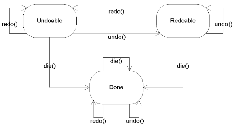
790 CHAPTER 21 ■ THE UNDO FRAMEWORK
Figure 21-2. UndoableEdit states
The flow between states goes as follows:
Undoable state: When an UndoableEdit command is first created, the operation is in the
Undoable state. The purpose of the die() method is to release resources for an UndoableEdit
before the garbage collector decides to clean things up and to place the command in the
Done state. Calling the undo() method either throws a CannotUndoException or causes the
command to be undone and the state to change to Redoable. Calling the redo() method
either throws a CannotRedoException or causes the command to be done again and the
state to stay at Undoable.
Redoable state: When the operation is in the Redoable state, the command has already
been undone. Calling the die() method releases any resources and places the command
in the Done state. Calling the undo() method either throws a CannotUndoException or
causes the command to be undone again and the state to stay at Redoable. Calling the
redo() method either throws a CannotRedoException or causes the command to be redone,
returning the state to the Undoable state.
Done state: When the operation is in the Done state, calling any of the undo(),redo(), or
die() methods leaves the operation in the Done state.
Some state changes aren’t commonplace; however, all state changes are supported.
The specifics are left to the Command that you’re using (as described in the preceding “The
Command Design Pattern” section). For instance, Microsoft Word allows you to continuously
repeat the last command if the capabilities make sense—such as when formatting a paragraph
or just typing a phrase.

CHAPTER 21 ■ THE UNDO FRAMEWORK 791
AbstractUndoableEdit Class
The AbstractUndoableEdit class provides a default implementation for all the methods of the
UndoableEdit interface. Although you might guess from the name that the class is abstract, it
isn’t. However, developers tend to work with subclasses of the class, not with a direct instance
of this class.
By default, AbstractUndoableEdit commands are significant (where isSignificant()
returns true). What significance you place on the significant property setting depends on
your usage of the command. In addition, the class restricts repetition of undoable state changes.
Unless overridden by a subclass, exceptions are thrown if you try to redo something in the
Undoable state or undo something in the Redoable state. The class doesn’t support adding or
replacing UndoableEdit operations.
The default presentation names for the undoPresentationName and redoPresentationName
properties are Undo and Redo, respectively. These are found by looking up the UIResource-
related properties shown in Table 21-1. There is no default for the presentationName property.
Subclasses should provide at least a presentation name to provide something more meaningful
than the default settings.
■Tip By having the Undo and Redo presentation names as UIResource elements, they can be translated
to foreign languages, with their new text available in the same way as other UIResource elements.
CompoundEdit Class
The CompoundEdit class allows you to combine multiple undoable operations into a single
operation. For instance, you may want to combine all the keystrokes for typing a whole word
into a single CompoundEdit command. This would allow you to continuously redo the typing of
a whole word in multiple places. Without combining the separate keystrokes, redoing the last
command would redo only the last single keystroke.
The CompoundEdit class uses a read-only inProgress property to report whether the command
is still being combined. Initially, the property is true. When in progress, additional commands
can be added to the compound command with addEdit(UndoableEdit). To mark the end of a
set of commands, you call the end() method. Only after you combine all the commands can
they be undone or redone. Figure 21-3 illustrates this.
Table 21-1. AbstractUndoableEdit UIResource Elements
Property String Object Type
AbstractUndoableEdit.undoText String
AbstractUndoableEdit.redoText String
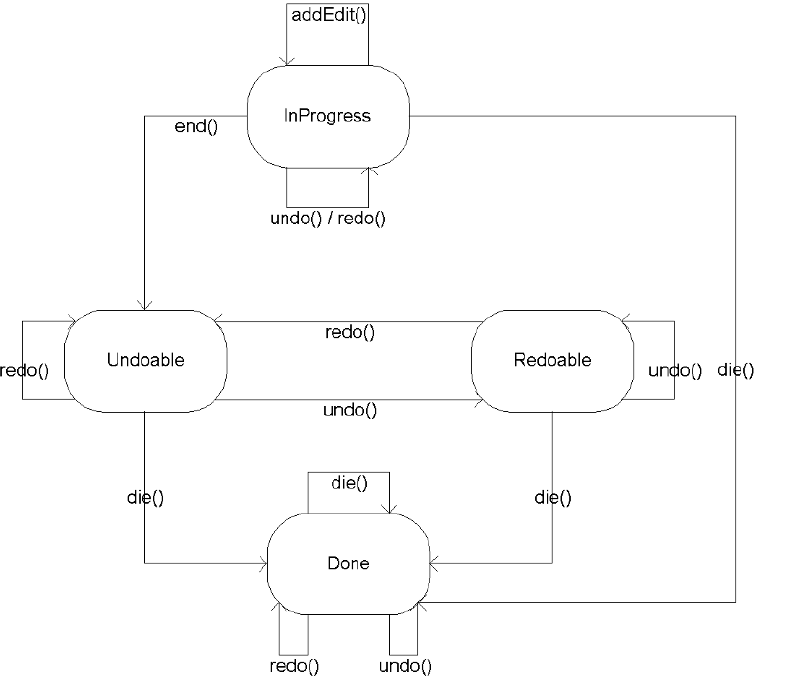
792 CHAPTER 21 ■ THE UNDO FRAMEWORK
Figure 21-3. CompoundEdit states
With a CompoundEdit, if you undo() the edit, all added commands are undone. This is the
same with redo(): All commands in the set are redone.
UndoManager Class
The UndoManager class is a specific subclass of CompoundEdit that tracks the history of edit
commands, potentially for an entire application. The number of undoable commands the
manager can track is defined by a configurable limit property whose initial value is 100.
When isInProgress() reports true for a specific CompoundEdit, the UndoManager acts some-
what like a backward CompoundEdit, in which individual edits can be undone and redone. Once
end() has been called, the UndoManager acts like a CompoundEdit, but without the ability to undo
or redo individual edit commands. In addition, the UndoManager has one more available state—
Undoable or Redoable—for when the manager has undone at least one command, can still
undo more, but can also redo the undone command(s).
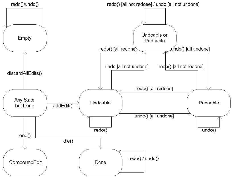
CHAPTER 21 ■ THE UNDO FRAMEWORK 793
Besides being able to directly add editable operations with addEdit(), the manager also
serves as an UndoableEditListener. When the UndoableEditEvent happens, the listener adds
the event’s UndoableEdit command to the manager with addEdit(). In addition, you can clear
the edit queue with public void discardAllEdits(). After the manager receives the end() method,
the sequence goes back to looking like Figure 21-3, leaving the bottom three states (Undoable,
Redoable, and Done) shown in the chart. The whole sequencing is shown in Figure 21-4.
Figure 21-4. UndoManager states
Keep in mind that certain undo() and redo() calls can throw exceptions. In addition, when
you ask the UndoManager to undo or redo an edit command, the request undoes (or redoes) all
commands up to the last significant one.
The transformation of the UndoManager into a CompoundEdit might seem confusing to some
users. This transformation allows you to have a secondary UndoManager for certain subopera-
tions that, once completed, become a single CompoundEdit to be passed along to the primary
UndoManager.

794 CHAPTER 21 ■ THE UNDO FRAMEWORK
■Note Some developers might find it useful to extend the UndoManager to expose the UndoableEdit list
that it is managing. Then they can display the presentation names of the various edit commands. Fortunately
(or unfortunately), by default, these aren’t exposed.
UndoableEditListener Interface and UndoableEditEvent Class
The UndoManager implements the UndoableEditListener interface so that it can be notified
when undoable operations happen. The listener has the following definition:
public interface UndoableEditListener extends EventListener {
public void undoableEditHappened(UndoableEditEvent undoableEditEvent);
}
The UndoableEditListener uses an UndoableEditEvent to tell interested objects when a
command that can be undone has happened. The UndoableEditEvent class includes one property,
edit, which returns the UndoableEdit object for the event: public UndoableEdit getEdit().
Of all the classes in the Swing-related packages, only the AbstractDocument class (as defined
in the Document interface) comes with built-in support to add these listeners. When creating
your own classes that support undoable operations, you’ll need to maintain your own list of
listeners with the help of the UndoableEditSupport class, described next.
UndoableEditSupport Class
The UndoableEditSupport class is similar to the JavaBeans-related classes of
PropertyChangeSupport and VetoableChangeSupport. All three of these classes manage
a list of a specific type of listener. In the case of the UndoableEditSupport class, that
type of listener is the UndoableEditListener. You add listeners with public void
addUndoableListener(UndoableEditListener) and remove them with public void
removeUndoableListener(UndoableEditListener).
When you want to notify listeners that an UndoableEdit operation has happened, you call
the public void postEdit(UndoableEdit) method, which creates an UndoableEditEvent and
calls the undoableEditHappened() method of each listener.
■Note The UndoableEditSupport class also includes support for combining multiple undoable edit
commands into a CompoundEdit with the public void beginUpdate() and public void endUpdate()
methods.
The basic framework for the class usage follows in Listing 21-3. Normally, you tie the undo-
able event to some other operation. In this example, it’s tied to the moment an ActionEvent
happens, and therefore any registered ActionListener objects need to be notified.
CHAPTER 21 ■ THE UNDO FRAMEWORK 795
Listing 21-3. Managing UndoableEditListener Objects with UndoableEditSupport
import javax.swing.undo.*;
import javax.swing.event.*;
import java.awt.event.*;
import java.awt.*;
public class AnUndoableComponent {
UndoableEditSupport undoableEditSupport = new UndoableEditSupport(this);
ActionListener actionListenerList = null;
public void addActionListener(ActionListener actionListener) {
actionListenerList = AWTEventMulticaster.add(actionListener,
actionListenerList);
}
public void removeActionListener(ActionListener actionListener) {
actionListenerList = AWTEventMulticaster.remove(actionListener,
actionListenerList);
}
public void addUndoableEditListener(
UndoableEditListener undoableEditListener) {
undoableEditSupport.addUndoableEditListener(undoableEditListener);
}
public void removeUndoableEditListener(
UndoableEditListener undoableEditListener) {
undoableEditSupport.removeUndoableEditListener(undoableEditListener);
}
protected void fireActionPerformed(ActionEvent actionEvent) {
if (actionListenerList != null) {
actionListenerList.actionPerformed(actionEvent);
}
// Need to create your custom type of undoable operation
undoableEditSupport.postEdit(new AbstractUndoableEdit());
}
}
A Complete Undoable Program Example
Now that you’ve seen the main classes for the Swing Undo Framework, let’s look at a complete
example that defines a custom undoable class. The undoable class is a drawing panel in which
each mouse click defines a point to be drawn in a polygon. Figure 21-5 shows the drawable
panel in action, before and after an undo operation.

796 CHAPTER 21 ■ THE UNDO FRAMEWORK
Figure 21-5. The undoable drawing panel at work
The main program in Listing 21-4 looks practically identical to the earlier example of
supporting undo and redo operations in a Swing text component, in Listing 21-2. You simply
need to create an UndoManager to manage the undoable operations and associate it to the undo-
able object. The usage of the Undo Framework works the same here, except that the undoable
object is the yet-to-be-created UndoableDrawingPanel class (Listing 21-5).
Listing 21-4. The UndoDrawing Test Driver
import javax.swing.*;
import javax.swing.undo.*;
import java.awt.*;
public class UndoDrawing {
public static void main(String args[]) {
Runnable runner = new Runnable() {
public void run() {
JFrame frame = new JFrame("Drawing Sample");
frame.setDefaultCloseOperation(JFrame.EXIT_ON_CLOSE);
UndoableDrawingPanel drawingPanel = new UndoableDrawingPanel();
UndoManager manager = new UndoManager();
drawingPanel.addUndoableEditListener(manager);
JToolBar toolbar = new JToolBar();
JButton undoButton =
new JButton(UndoManagerHelper.getUndoAction(manager));
toolbar.add(undoButton);
JButton redoButton =
new JButton(UndoManagerHelper.getRedoAction(manager));
toolbar.add(redoButton);
CHAPTER 21 ■ THE UNDO FRAMEWORK 797
frame.add(toolbar, BorderLayout.NORTH);
frame.add(drawingPanel, BorderLayout.CENTER);
frame.setSize(300, 150);
frame.setVisible(true);
}
};
EventQueue.invokeLater(runner);
}
}
The UndoableDrawingPanel class is a component that draws a polygon within itself based
on a set of points within the polygon. New points are added to the polygon whenever the
mouse is released. If you don’t want the component to support undoable operations, you don’t
need to do anything beyond collecting points for the drawing panel.
For the panel to support undoable operations, it must do two things:
• It must maintain a list of UndoableEditListener objects. This can be easily done with the
help of the UndoableEditSupport class, as shown earlier in Listing 21-3.
• The second task involves creating an UndoableEdit object, prior to any state changes,
and posting it to the registered listeners. Because the state of the drawing panel is the
polygon, this property must be exposed in the drawing class.
Listing 21-5 shows the definition for the UndoableDrawingPanel class. Nothing in the class
is particularly complicated. The important thing to remember when defining an undoable
class is that the undoable event must be created before the state of the component changes.
(The implementation class of the UndoableEdit interface, UndoableDrawEdit, is shown later,
in Listing 21-6.)
Listing 21-5. The UndoableDrawingPanel Main Component
import javax.swing.*;
import javax.swing.event.*;
import javax.swing.undo.*;
import java.awt.*;
import java.awt.event.*;
public class UndoableDrawingPanel extends JPanel {
UndoableEditSupport undoableEditSupport = new UndoableEditSupport(this);
Polygon polygon = new Polygon();
798 CHAPTER 21 ■ THE UNDO FRAMEWORK
public UndoableDrawingPanel() {
MouseListener mouseListener = new MouseAdapter() {
public void mouseReleased(MouseEvent mouseEvent) {
undoableEditSupport.postEdit(
new UndoableDrawEdit(UndoableDrawingPanel.this));
polygon.addPoint(mouseEvent.getX(), mouseEvent.getY());
repaint();
}
};
addMouseListener(mouseListener);
}
public void addUndoableEditListener(
UndoableEditListener undoableEditListener) {
undoableEditSupport.addUndoableEditListener(undoableEditListener);
}
public void removeUndoableEditListener(
UndoableEditListener undoableEditListener) {
undoableEditSupport.removeUndoableEditListener(undoableEditListener);
}
public void setPolygon(Polygon newValue) {
polygon = newValue;
repaint();
}
public Polygon getPolygon() {
Polygon returnValue;
if (polygon.npoints == 0) {
returnValue = new Polygon();
} else {
returnValue = new Polygon(
polygon.xpoints, polygon.ypoints, polygon.npoints);
}
return returnValue;
}
protected void paintComponent(Graphics g) {
super.paintComponent(g);
g.drawPolygon(polygon);
}
}
When defining the custom implementation of the UndoableEdit interface, you can choose
to implement the complete interface, or you can subclass the AbstractUndoableEdit class and
override any appropriate methods. More typically, you’ll just subclass AbstractUndoableEdit.
CHAPTER 21 ■ THE UNDO FRAMEWORK 799
The minimum methods to override are undo() and redo(), although you’ll probably also choose
to override getPresentationName() to give a better name to the undoable operation.
Because the Command design pattern has the Concrete Command (that is, the
UndoableEdit implementation) invoke the operation, the constructor must save any informa-
tion necessary to make the operation undoable. In the case of the drawing panel, you need to
save a reference to the panel and its current polygon. Then when the operation is asked to
undo itself, the original polygon can be restored. To support redoing the undo operation, the
undo() method must also save the new polygon; otherwise, the redo() operation wouldn’t
know how to change things back. It may sound like quite a bit of work, but it really isn’t. The
complete class definition for the UndoableEdit implementation follows in Listing 21-6.
Listing 21-6. The UndoableDrawEdit Undoable Command
import javax.swing.undo.*;
import java.awt.*;
public class UndoableDrawEdit extends AbstractUndoableEdit {
UndoableDrawingPanel panel;
Polygon polygon, savedPolygon;
public UndoableDrawEdit(UndoableDrawingPanel panel) {
this.panel = panel;
polygon = panel.getPolygon();
}
public String getPresentationName() {
return "Polygon of size " + polygon.npoints;
}
public void redo() throws CannotRedoException {
super.redo();
if (savedPolygon == null) {
// Should never get here, as super() doesn't permit redoing
throw new CannotRedoException();
} else {
panel.setPolygon(savedPolygon);
savedPolygon = null;
}
}
public void undo() throws CannotUndoException {
super.undo();
savedPolygon = panel.getPolygon();
panel.setPolygon(polygon);
}
}
800 CHAPTER 21 ■ THE UNDO FRAMEWORK
And that’s it! The last two classes make the UndoDrawing example class (Listing 21-4) work.
When creating your own undoable classes, you will need to subclass a nonundoable class and
then add the necessary support to make it undoable. In addition, you will need to define an
UndoableEdit implementation to support your specific class.
Using an Outside Object to Manage Undo States
In the previous example, it was the responsibility of your custom UndoableEdit implementation
to maintain the before-and-after state of the undoable object. The Swing Undo Framework
also supports the ability of an object outside the undoable edit implementation to manage the
state. When using an outside object for state management, it isn’t necessary to implement the
UndoableEdit interface yourself. Instead, you can use the StateEdit class as the UndoableEdit
implementation. The StateEdit class then relies on a class to implement the StateEditable
interface to manage the before-and-after storage of the state of an undoable object (within a
Hashtable).
StateEditable Interface
The StateEditable interface consists of two methods and a meaningless string constant.
public interface StateEditable {
public final static String RCSID;
public void restoreState(Hashtable state);
public void storeState(Hashtable state);
}
An object that supports the undoing of its operations stores its state with the storeState(➥
Hashtable) method. This is all the information about the state of the object that can change.
Then restoring the state of the object is done in the restoreState(Hashtable) method.
To demonstrate, let’s see how to rewrite the UndoableDrawingPanel example. Using this
interface with the updated, undoable drawing panel involves implementing the interface, and
storing and getting the polygon shown earlier in Figure 21-5. That’s because the polygon is the
only state information we care about undoing. The source code is shown in Listing 21-7.
Listing 21-7. The StateEditable Implementation of the Updated Component
public class UndoableDrawingPanel2 extends JPanel implements StateEditable {
private static String POLYGON_KEY = "Polygon";
public void storeState(Hashtable state) {
state.put(POLYGON_KEY, getPolygon());
}
CHAPTER 21 ■ THE UNDO FRAMEWORK 801
public void restoreState(Hashtable state) {
Polygon polygon = (Polygon)state.get(POLYGON_KEY);
if (polygon != null) {
setPolygon(polygon);
}
}
}
The Hashtable that the restoreState() method returns contains only key/value pairs that
changed. It’s possible that the get() method of the Hashtable returns null for something that
you explicitly put() in the hash table. Therefore, as shown in Listing 21-7, you’re required to
add an if-null check after getting any state information from the hash table.
StateEdit Class
After you’ve implemented the StateEditable interface, you can use the StateEdit class as the
UndoableEdit implementation. Where the previous UndoableDrawingPanel example created a
custom UndoableDrawEdit, the new class creates a StateEdit instance.
The StateEdit constructor accepts a StateEditable object that you’re going to change and
an optional presentation name. After creating the StateEdit object, modify the StateEditable
object and then tell the StateEdit to end() the modifications to the StateEditable object.
When the StateEdit object is told that the modifications have ended, it compares the before-
and-after states of the state editable object and removes any key/value pairs that didn’t change
from the hash table. You can then post the UndoableEdit to the list of UndoableEditListener
objects through the list maintained by the UndoableEditSupport class.
StateEdit stateEdit = new StateEdit(UndoableDrawingPanel2.this);
// Change state of UndoableDrawingPanel2
polygon.addPoint(mouseEvent.getX(), mouseEvent.getY());
// Done changing state
stateEdit.end();
undoableEditSupport.postEdit(stateEdit);
After the edit is posted, the UndoManager manages the StateEdit instance of UndoableEdit,
just like any other undoable edit object. The UndoManager can then request the StateEdit object
to tell its StateEditable object to restore its previous state. This holds for any other
UndoableEdit object. Therefore, no other source code needs to change.
A Complete StateEditable/StateEdit Example
The reworking of the UndoableDrawingPanel example is presented in Listing 21-8, with the
differences from Listing 21-5 shown in boldface. This version uses the StateEditable/
StateEdit combination just described. The earlier test program is included as the main()
method to keep the complete example together. With the exception of the class name change
for the drawing panel, the test program didn’t change and will still result in what you see in
Figure 21-5, assuming the same set of points in the polygon.
802 CHAPTER 21 ■ THE UNDO FRAMEWORK
Listing 21-8. The Updated UndoableDrawingPanel2 Main Component
import javax.swing.*;
import javax.swing.event.*;
import javax.swing.undo.*;
import java.awt.*;
import java.awt.event.*;
import java.util.Hashtable;
public class UndoableDrawingPanel2 extends JPanel implements StateEditable {
private static String POLYGON_KEY = "Polygon";
UndoableEditSupport undoableEditSupport = new UndoableEditSupport(this);
Polygon polygon = new Polygon();
public UndoableDrawingPanel2() {
MouseListener mouseListener = new MouseAdapter() {
public void mouseReleased(MouseEvent mouseEvent) {
StateEdit stateEdit = new StateEdit(UndoableDrawingPanel2.this);
polygon.addPoint(mouseEvent.getX(), mouseEvent.getY());
stateEdit.end();
undoableEditSupport.postEdit(stateEdit);
repaint();
}
};
addMouseListener(mouseListener);
}
public void addUndoableEditListener(
UndoableEditListener undoableEditListener) {
undoableEditSupport.addUndoableEditListener(undoableEditListener);
}
public void removeUndoableEditListener(
UndoableEditListener undoableEditListener) {
undoableEditSupport.removeUndoableEditListener(undoableEditListener);
}
public void storeState(Hashtable state) {
state.put(POLYGON_KEY, getPolygon());
}
public void restoreState(Hashtable state) {
Polygon polygon = (Polygon)state.get(POLYGON_KEY);
if (polygon != null) {
setPolygon(polygon);
}
}
CHAPTER 21 ■ THE UNDO FRAMEWORK 803
public void setPolygon(Polygon newValue) {
polygon = newValue;
repaint();
}
public Polygon getPolygon() {
Polygon returnValue;
if (polygon.npoints == 0) {
returnValue = new Polygon();
} else {
returnValue = new Polygon(
polygon.xpoints, polygon.ypoints, polygon.npoints);
}
return returnValue;
}
protected void paintComponent(Graphics g) {
super.paintComponent(g);
g.drawPolygon(polygon);
}
public static void main(String args[]) {
Runnable runner = new Runnable() {
public void run() {
JFrame frame = new JFrame("Drawing Sample2");
frame.setDefaultCloseOperation(JFrame.EXIT_ON_CLOSE);
UndoableDrawingPanel2 drawingPanel = new UndoableDrawingPanel2();
UndoManager manager = new UndoManager();
drawingPanel.addUndoableEditListener(manager);
JToolBar toolbar = new JToolBar();
JButton undoButton =
new JButton(UndoManagerHelper.getUndoAction(manager));
toolbar.add(undoButton);
JButton redoButton =
new JButton(UndoManagerHelper.getRedoAction(manager));
toolbar.add(redoButton);
frame.add(toolbar, BorderLayout.NORTH);
frame.add(drawingPanel, BorderLayout.CENTER);
frame.setSize(300, 150);
frame.setVisible(true);
}
};
804 CHAPTER 21 ■ THE UNDO FRAMEWORK
EventQueue.invokeLater(runner);
}
}
Summary
This chapter took both a short look and a long look at the Undo Framework found in the
javax.swing.undo package with support from javax.swing.event. You saw how the framework
support arrives already built in to the Swing text components. In addition, you learned how to
build support into your own classes. With the interfaces and classes found in the Undo Framework,
you can make any editable object support both undo and redo capabilities.
The next chapter introduces the accessibility support for the Swing component set. There,
you’ll learn about the support for using assistive technologies with the components and
working with audio cues.

805
■ ■ ■
CHAPTER 22
Accessibility
A standard part of the Swing framework is support for assistive technologies. These technologies
allow your Swing-based programs to be accessible to those with physical challenges. Some
users need screen readers, audio cues, or just an input mode that doesn’t require the mouse.
Mouse-less input is typically through the keyboard, but it also could be through specialized
input devices, such as those that are voice-activated.
Users don’t need to be physically challenged to take advantage of options you, as the
developer, can use to make your programs more accessible. For example, you might add tooltip
text, which users can see by resting their mouse over the component. Limited-vision users
taking advantage of accessibility devices could rely on that text to describe the component with
a screen reader. Other options include keyboard accelerators and menu mnemonics, which
allow users to navigate around the screen and activate actions with minimal hand movement.
This chapter offers some suggestions to help you create programs that follow federal
guidelines in the United States, known as Section 508 Accessibility Requirements. For details
on these requirements, refer to Accessibility for Everybody: Understanding the Section 508
Accessibility Requirements, by John Paul Mueller (Apress, 2003; ISBN 1-59059-086-4). Sun also
offers a resource at http://www.sun.com/access/background/laws.html, which includes references
to international resources, as well as those in the United States. And, of course, there is the JFC
Assistive Technologies home page, at http://java.sun.com/products/jfc/accessibility/.
Accessibility Classes
The javax.accessibility package is both the most and least used package. Provided you
configure your Swing components properly, everything happens behind the scenes. When a
user taking advantage of an accessibility device runs the program, the Java Accessibility API
steps in and provides the necessary information to the device. For instance, when creating an
ImageIcon, there are two sets of constructors: those without a description argument and those
with a description argument.
// Without description argument
public ImageIcon()
public ImageIcon(Image image)
public ImageIcon(String filename)
public ImageIcon(URL location)
public ImageIcon(byte imageData[])

806 CHAPTER 22 ■ ACCESSIBILITY
// With description argument
public ImageIcon(Image image, String description)
public ImageIcon(String filename, String description)
public ImageIcon(URL location, String description)
public ImageIcon(byte imageData[], String description)
By creating an ImageIcon with a description, your program automatically becomes more
accessible. In addition to creating the icon with a description argument to the constructor,
you can also assign the text later by calling the setDescription() method.
One important interface, Accessible, and an abstract class, AccessibleContext, provide
the core framework for the Java Accessibility API.
Accessible Interface
For a Swing component to work within the accessibility framework, it must implement the
Accessible interface.
public interface Accessible {
// Property
public AccessibleContext getAccessibleContext();
}
As the interface definition shows, there is only one method, which gets the current
AccessibleContext instance for the implementing class. All the standard AWT and Swing
components implement the interface. Several internal aspects of components, like the system
menu bar on the title pane of the JInternalFrame, also implement the Accessible interface.
AccessibleContext Class
While the Accessible interface is all that a component must implement, the work is actually done
in the AccessibleContext instance that it returns. The returned context is practically another
component. It maps the accessible properties to the properties of the component. For example,
with the JLabel component, when you get its AccessibleContext, you are getting the concrete
subclass known as AccessibleJLabel. This subclass maps JLabel properties, such as the accessi-
bleName property to the text property. As shown in Table 22-1, the abstract class itself is larger than
the interface.
Table 22-1. AccessibleContext Properties
Property Name Data Type Access
accessibleAction AccessibleAction Read-only
accessibleChildrenCount int Read-only
accessibleComponent AccessibleComponent Read-only
accessibleDescription String Read-write bound
accessibleEditableText AccessibleEditableText Read-only

CHAPTER 22 ■ ACCESSIBILITY 807
As Table 22-1 shows, there are several other classes found in the javax.accessibility
package. However, typically, you don’t need to worry about them, provided that you create
your components and screens to be accessible.
Creating Accessible Components
This section presents some hints to help you create applications that will be accessible when
used with assistive technologies. This is not meant to be an exhaustive list, but it does provide
an overview of some helpful techniques.
• As a first task, try to use your program without a mouse. Do your menus support accelerators
and mnemonics? Do your buttons have mnemonics associated with them? Do your text
fields have labels associated with them via the setLabelFor() method, and does each
label have a mnemonic?
• Make sure your components have a short string associated with them. If a component,
such as an image-only button, doesn’t have a string, call the setAccessibleName() method
of the AccessibleContext. Remember to localize this name if your program is targeting
an internationalized audience.
• Work with tooltip text wherever possible. If it is not appropriate to have tooltip text with
a component, be sure to call setAccessibleDescription().
• Are your custom components accessible? If you’ve subclassed JComponent, that class
doesn’t implement the Accessible interface. But, if you’ve subclassed JPanel, it does.
However, even though JPanel implements the interface, your component might not be
providing the necessary accessibility information. Consider having your custom
AccessibleContext extend JComponent.AccessibleJComponent when appropriate.
accessibleIcon AccessibleIcon Read-only
accessibleIndexInParent int Read-only
accessibleName String Read-write bound
accessibleParent Accessible Read-write
accessibleRelationSet AccessibleRelationSet Read-only
accessibleRole AccessibleRole Read-only
accessibleSelection AccessibleSelection Read-only
accessibleStateSet AccessibleStateSet Read-only
accessibleTable AccessibleTable Read-only
accessibleText AccessibleText Read-only
accessibleValue AccessibleValue Read-only
locale Locale Read-only
Table 22-1. AccessibleContext Properties (Continued)
Property Name Data Type Access
808 CHAPTER 22 ■ ACCESSIBILITY
• Components that are inside containers that aren’t accessible are themselves not accessible.
Be sure to use JPanel as your container, rather than the AWT Container class, to ensure
your screens are accessible.
■Note To see how well you’ve done creating accessible programs, you can try using the Java Accessibility
Utilities, available from the JFC Assistive Technologies home page at http://java.sun.com/products/
jfc/accessibility/. These downloadable utilities are designed to let you see exposed accessibility
properties in different forms. However, I personally couldn’t get them to work. The jaccess.jar and
jaccess-examples.jar files needed weren’t available, nor were the imported classes for the code
that was provided.
Working with the Java Access Bridge
If you happen to be working on a Microsoft Windows platform, you can try out the Java Access
Bridge, available from http://java.sun.com/products/accessbridge/. This utility is easy to use.
■Caution To get the Java Access Bridge, do not follow the link from the main Accessibility page. The link
available there in early 2005 pointed to the 1.0.4 beta version of the product. You should download at least
version 1.2, available directly from http://java.sun.com/products/accessbridge/.
After downloading accessbridge-1_2.zip, unpack it and run the Install program, found
in the installer subdirectory. After the program checks Java virtual machines (JVMs) for
compatibility, it prompts you to select in which of the compatible JVMs you want the bridge
installed. As Figure 22-1 shows, if you happen to have a few JVMs on your system, this may be
in several places. Just pick the ones you are most likely to use. The program might also prompt
you to remove some of the older versions on your machine. The directories that begin with
c:\program files\java are the different versions of Java Plug-in for the browser.
Figure 22-1. Installing the Java Access Bridge
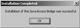
CHAPTER 22 ■ ACCESSIBILITY 809
After clicking the Install (or Install in All) button, you’ll see a success window, as shown in
Figure 22-2 (assuming everything succeeded). Installation is quick.
Figure 22-2. Java Access Bridge successfully installed
Once you’ve installed the bridge, you can run programs like Java Monkey and Java Ferret
(yes, those are their real names). Once running, these programs attach themselves to any Java
programs that run through the same JVM. For instance, you can try running the tooltip sample
program presented in Chapter 4 with Java Monkey, repeated here in Listing 22-1.
Listing 22-1. Tooltip Sample
import javax.swing.*;
import java.awt.*;
public class TooltipSample {
public static void main(String args[]) {
Runnable runner = new Runnable() {
public void run() {
JFrame frame = new JFrame("Tooltip Sample");
frame.setDefaultCloseOperation(JFrame.EXIT_ON_CLOSE);
JPanel panel = new JPanel();
panel.setToolTipText("<HtMl>Tooltip<br>Message");
frame.add(panel, BorderLayout.CENTER);
JButton button = new JButton("Hello, World") {
public JToolTip createToolTip() {
JToolTip tip = super.createToolTip();
tip.setBackground(Color.YELLOW);
tip.setForeground(Color.RED);
return tip;
}
public boolean contains(int x, int y) {
if (x < 100) {
setToolTipText("Got Green Eggs?");
} else {
setToolTipText("Got Ham?");
}
810 CHAPTER 22 ■ ACCESSIBILITY
return super.contains(x, y);
}
};
button.setToolTipText("Hello, World");
frame.add(button, BorderLayout.NORTH);
frame.setSize(300, 150);
frame.setVisible(true);
}
};
EventQueue.invokeLater(runner);
}
}
You’ll see the screen shown in Figure 22-3. If you don’t immediately see the component
tree, select the Refresh Tree option under the File menu in the Java Monkey window.
Figure 22-3. Main Java Monkey screen
Select the Accessibility API Panel option under the Panels menu to see the information
available through the AccessibleContext, such as the name, description, and role. Figure 22-4
shows an example. Be sure to scroll down to see all the available information.
Figure 22-4. Secondary Java Monkey screen
The other program that comes with the Java Access Bridge is Java Ferret. This is more of a
tracking program, where you can enable the tracking of different events, such as mouse, focus, and
menu selection. If you’ve enabled mouse tracking, you’ll see the program updated. Figure 22-5
shows an example of the Java Ferret information displayed when you move the mouse over the
JButton in the sample tooltip program (Listing 22-1).
CHAPTER 22 ■ ACCESSIBILITY 811
Figure 22-5. Java Ferret interface
■Note Does anyone else find it ironic that the Java Monkey and Java Ferret programs are not themselves
very accessible? Where are the mnemonics and menu accelerators?
Summary
This chapter explored how the Swing APIs help make your programs more accessible, both for
the normal user and the physically challenged. By following the suggestions in this chapter,
your programs should be well on their way to meeting federal and international guidelines.
With the help of the Java Monkey and Ferret programs, you can discover if sufficient attributes
are exposed to users needing the accessibility features.
And this wraps up your tour of Swing. Be sure to visit The Swing Connection maintained
by Sun at http://www.theswingconnection.com/ to follow the latest happenings.

813
■ ■ ■
APPENDIX
UI Manager Properties
Throughout this book are tables that list the property names and data types for all the UIResource
elements of specific Swing components. Although these tables show all the information about
a specific component, it is handy to have the information about property names for all of the
components in one place.
With that in mind, this appendix provides a complete, alphabetical list of properties used
by the predefined look and feel classes—Motif, Metal/Ocean, Windows, GTK, and Synth—
provided with the Swing release for the Java 2 Platform Standard Edition, version 5.0 (J2SE 5.0).
The table indicates with an X which of the five look and feel classes uses a particular property.
For properties defined within the base Basic look and feel, these are assumed to be used by
all the look and feel types, since all of the system-defined look and feel classes extend from
BasicLookAndFeel. It is possible that a subclass masks the use of a property defined for the Basic
look and feel, and in fact doesn’t physically use one flagged as such in the table. Also, since the
GTK look and feel is a subclass of Synth, a similar situation arises with GTK, too.
To change the default setting for any of these properties, you need to notify the UIManager
by storing a new setting in the lookup table of the UIManager. For instance, to change the default
text for the Yes button in a JOptionPane, you need to replace the OptionPane.yesButtonText property
with the new setting (Si, in this example):
UIManager.put("OptionPane.yesButtonText", "Si");
Then any component created after the setting change will get the new value: Si. If you
want a displayed component to get the new setting, you must call its updateUI() method after
changing the setting.
When you change the current look and feel, any custom settings you install may be lost. If
the class of the property value setting implements the UIResource interface (an empty marker
interface such as Serializable), the setting will be replaced by the default setting of the look
and feel. For example, the following setting would be saved when the look and feel changes:
UIManager.put("OptionPane.background", Color.RED);
Conversely, the following setting would not be saved when the look and feel changes:
UIManager.put("OptionPane.background", new ColorUIResource(Color.RED));
If the property value setting does not implement the UIResource interface, the property
setting is retained when the look and feel changes.
814 APPENDIX ■ UI MANAGER PROPERTIES
■Note The specific set of available properties changes with each JFC/Project Swing release. The listing
here reflects the current settings for J2SE 5.0. Some properties did not exist in earlier versions, and others
may get replaced in later versions. The changes tend to be minor, but they do exist.
UIResource Elements for the Predefined Look and Feel Classes
Property String Object Type CDE/Motif Metal Windows GTK Synth
AbstractButton.clickText String XXXXX
AbstractDocument.additionText String XXXXX
AbstractDocument.deletionText String XXXXX
AbstractDocument.redoText String XXXXX
AbstractDocument.styleChangeText String XXXXX
AbstractDocument.undoText String XXXXX
AbstractUndoableEdit.redoText String XXXXX
AbstractUndoableEdit.undoText String XXXXX
activeCaption Color XXXXX
activeCaptionBorder Color XXXXX
activeCaptionText Color XXXXX
Application.useSystemFontSettings Boolean X X
ArrowButton.size Integer X X
ArrowButtonUI String X X
AuditoryCues.allAuditoryCues String[ ] XXXXX
AuditoryCues.cueList String[ ] XXXXX
AuditoryCues.defaultCueList String[ ] X
AuditoryCues.noAuditoryCues String[ ] XXXXX
AuditoryCues.playList String[ ] XXXXX
black Color X
Button.actionMap ActionMap XXXXX
Button.background Color XXXXX
Button.border Border XXXXX
Button.contentAreaFilled Boolean X X
Button.darkShadow Color XXXXX
Button.dashedRectGapHeight Integer X
Button.dashedRectGapWidth Integer X

APPENDIX ■ UI MANAGER PROPERTIES 815
Button.dashedRectGapX Integer X
Button.dashedRectGapY Integer X
Button.defaultButtonFollowsFocus Boolean XXXXX
Button.disabledForeground Color X
Button.disabledGrayRange Integer[ ] X
Button.disabledShadow Color X
Button.disabledText Color X
Button.disabledToolBarBorder➥
Background
Color X
Button.focus Color X X
Button.focusInputMap InputMap XXXXX
Button.font Font XXXXX
Button.foreground Color XXXXX
Button.gradient List X
Button.highlight Color XXXXX
Button.icon Icon X X
Button.iconTextGap Integer X X
Button.light Color XXXXX
Button.margin Insets XXXXX
Button.rollover Boolean XXXXX
Button.rolloverIconType String X
Button.select Color X X
Button.shadow Color XXXXX
Button.showMnemonics Boolean X
Button.textIconGap Integer XXXXX
Button.textShiftOffset Integer XXXXX
Button.toolBarBorderBackground Color X
ButtonUI String XXXXX
caretColor Color X
CheckBox.background Color XXXXX
CheckBox.border Border XXXXX
CheckBox.darkShadow Color X
UIResource Elements for the Predefined Look and Feel Classes (Continued)
Property String Object Type CDE/Motif Metal Windows GTK Synth

816 APPENDIX ■ UI MANAGER PROPERTIES
CheckBox.disabledText Color X
CheckBox.focus Color XXX
CheckBox.focusInputMap InputMap XXXXX
CheckBox.font Font XXXXX
CheckBox.foreground Color XXXXX
CheckBox.gradient List X
CheckBox.highlight Color X
CheckBox.icon Icon XXXXX
CheckBox.interiorBackground Color X
CheckBox.light Color X
CheckBox.margin Insets XXXXX
CheckBox.rollover Boolean X
Checkbox.selectaColor X
CheckBox.shadow Color X
CheckBox.textIconGap Integer XXXXX
CheckBox.textShiftOffset Integer XXXXX
CheckBoxMenuItem.acceleratorFont Font XXXXX
CheckBoxMenuItem.accelerator➥
Foreground
Color XXXXX
CheckBoxMenuItem.accelerator➥
SelectionForeground
Color XXXXX
CheckBoxMenuItem.actionMap ActionMap XXXXX
CheckBoxMenuItem.arrowIcon Icon XXXXX
CheckBoxMenuItem.background Color XXXXX
CheckBoxMenuItem.border Border XXXXX
CheckBoxMenuItem.borderPainted Boolean XXXXX
CheckBoxMenuItem.checkIcon Icon XXXXX
CheckBoxMenuItem.commandSound String XXXXX
CheckBoxMenuItem.disabled➥
Foreground
Color XXXXX
CheckBoxMenuItem.font Font XXXXX
CheckBoxMenuItem.foreground Color XXXXX
CheckBoxMenuItem.gradient List X
UIResource Elements for the Predefined Look and Feel Classes (Continued)
Property String Object Type CDE/Motif Metal Windows GTK Synth

APPENDIX ■ UI MANAGER PROPERTIES 817
CheckBoxMenuItem.margin Insets XXXXX
CheckBoxMenuItem.opaque Boolean XXXXX
CheckBoxMenuItem.selection➥
Background
Color XXXXX
CheckBoxMenuItem.selection➥
Foreground
Color XXXXX
CheckBoxMenuItemUI String XXXXX
CheckBoxUI String XXXXX
ColorChooser.background Color XXXXX
ColorChooser.cancelText String XXXXX
ColorChooser.font Font XXXXX
ColorChooser.foreground Color XXXXX
ColorChooser.hsbBlueText String XXXXX
ColorChooser.hsbBrightnessText String XXXXX
ColorChooser.hsbDisplayed➥
MnemonicIndex
Integer XXXXX
ColorChooser.hsbGreenText String XXXXX
ColorChooser.hsbHueText String XXXXX
ColorChooser.hsbMnemonic Integer XXXXX
ColorChooser.hsbNameText String XXXXX
ColorChooser.hsbRedText String XXXXX
ColorChooser.hsbSaturationText String XXXXX
ColorChooser.okText String XXXXX
ColorChooser.panels AbstractColor➥
ChooserPanel[ ]
X X
ColorChooser.previewText String XXXXX
ColorChooser.resetMnemonic Integer XXXXX
ColorChooser.resetText String XXXXX
ColorChooser.rgbBlueDisplayed➥
MnemonicIndex
Integer XXXXX
ColorChooser.rgbBlueMnemonic Integer XXXXX
ColorChooser.rgbBlueText String XXXXX
ColorChooser.rgbDisplayed➥
MnemonicIndex
Integer XXXXX
UIResource Elements for the Predefined Look and Feel Classes (Continued)
Property String Object Type CDE/Motif Metal Windows GTK Synth

818 APPENDIX ■ UI MANAGER PROPERTIES
ColorChooser.rgbGreenDisplayed➥
MnemonicIndex
Integer XXXXX
ColorChooser.rgbGreenMnemonic Integer XXXXX
ColorChooser.rgbGreenText String XXXXX
ColorChooser.rgbMnemonic Integer XXXXX
ColorChooser.rgbNameText String XXXXX
ColorChooser.rgbRedDisplayed➥
MnemonicIndex
Integer XXXXX
ColorChooser.rgbRedMnemonic Integer XXXXX
ColorChooser.rgbRedText String XXXXX
ColorChooser.sampleText String XXXXX
ColorChooser.showPreviewPanelText Boolean XXXXX
ColorChooser.swatchesDefault➥
RecentColor
Color XXXXX
ColorChooser.swatchesDisplayed➥
MnemonicIndex
Integer XXXXX
ColorChooser.swatchesMnemonic Integer XXXXX
ColorChooser.swatchesNameText String XXXXX
ColorChooser.swatchesRecent➥
SwatchSize
Dimension XXXXX
ColorChooser.swatchesRecentText String XXXXX
ColorChooser.swatchesSwatchSize Dimension XXXXX
ColorChooserUI String XXXXX
ComboBox.actionMap ActionMap XXXXX
ComboBox.ancestorInputMap InputMap XXXXX
ComboBox.background Color XXXXX
ComboBox.border Border XXXXX
ComboBox.buttonBackground Color XXXXX
ComboBox.buttonDarkShadow Color XXXXX
ComboBox.buttonHighlight Color XXXXX
ComboBox.buttonShadow Color XXXXX
ComboBox.control Color X
ComboBox.controlForeground Color X
ComboBox.disabledBackground Color XXXXX
UIResource Elements for the Predefined Look and Feel Classes (Continued)
Property String Object Type CDE/Motif Metal Windows GTK Synth

APPENDIX ■ UI MANAGER PROPERTIES 819
ComboBox.disabledForeground Color XXXXX
ComboBox.font Font XXXXX
ComboBox.foreground Color XXXXX
ComboBox.rendererUseListColors Boolean X X
ComboBox.selectionBackground Color XXXXX
ComboBox.selectionForeground Color XXXXX
ComboBox.showPopupOnNavigation Boolean XXXXX
ComboBox.timeFactor Long XXXXX
ComboBox.togglePopupText String XXXXX
ComboBoxUI String XXXXX
ComponentUI String XXXXX
control Color XXXXX
controlDkShadow Color XXXXX
controlHighlight Color XXXXX
controlLightShadow Color X
controlLtHighlight Color XXXXX
controlShadow Color XXXXX
controlText Color XXXXX
dark Color X
desktop Color XXXXX
Desktop.ancestorInputMap InputMap XXXXX
Desktop.background Color XXXXX
Desktop.windowBindings Object[ ] bXXXXX
DesktopIcon.background Color X
DesktopIcon.border Border XXXXX
DesktopIcon.font Font X
DesktopIcon.foreground Color X
DesktopIcon.icon Icon X
DesktopIcon.width Integer XX
DesktopIcon.windowBindings Object[ ] cX
DesktopIconUI String XXXXX
DesktopPane.actionMap ActionMap XXXXX
UIResource Elements for the Predefined Look and Feel Classes (Continued)
Property String Object Type CDE/Motif Metal Windows GTK Synth

820 APPENDIX ■ UI MANAGER PROPERTIES
DesktopPaneUI String XXXXX
DirectoryPaneUI String XXXXX
EditorPane.actionMap ActionMap XXXXX
EditorPane.background Color XXXXX
EditorPane.border Border XXXXX
EditorPane.caretAspectRatio Number X
EditorPane.caretBlinkRate Integer XXXXX
EditorPane.caretForeground Color XXXXX
EditorPane.focusInputMap InputMap XXXXX
EditorPane.font Font XXXXX
EditorPane.foreground Color XXXXX
EditorPane.inactiveForeground Color XXXXX
EditorPane.keyBindings KeyBinding[ ] XXXXX
EditorPane.margin Insets XXXXX
EditorPane.selectionBackground Color XXXXX
EditorPane.selectionForeground Color XXXXX
EditorPaneUI String XXXXX
FileChooser.acceptAllFile ➥
FilterText
String XXXXX
FileChooser.ancestorInputMap InputMap XXXXX
FileChooser.cancelButtonMnemonic Integer XXXXX
FileChooser.cancelButtonText String XXXXX
FileChooser.cancelButton➥
ToolTipText
String XXXXX
FileChooser.deleteFileButton➥
Mnemonic
Integer X
FileChooser.deleteFileButtonText String X
FileChooser.deleteFileButton➥
ToolTipText
String X
FileChooser.detailsViewButton➥
AccessibleName
String X X
FileChooser.detailsViewButton➥
ToolTipText
String X X
FileChooser.detailsViewIcon Icon XXXXX
UIResource Elements for the Predefined Look and Feel Classes (Continued)
Property String Object Type CDE/Motif Metal Windows GTK Synth

APPENDIX ■ UI MANAGER PROPERTIES 821
FileChooser.directoryDescription➥
Text
String XXXXX
FileChooser.directoryOpenButton➥
Mnemonic
Integer XXXXX
FileChooser.directoryOpenButton➥
Text
String XXXXX
FileChooser.directoryOpenButton➥
ToolTipText
String XXXXX
FileChooser.enterFileNameLabel➥
Mnemonic
Integer X
FileChooser.enterFileNameLabel➥
Text
String X
FileChooser.fileDescriptionText String XXXXX
FileChooser.fileNameLabelMnemonic Integer X X
FileChooser.fileNameLabelText String X X
FileChooser.filesLabelMnemonic Integer X
FileChooser.filesLabelText String X X
FileChooser.filesOfTypeLabel➥
Mnemonic
Integer X X
FileChooser.filesOfTypeLabelText String X X
FileChooser.filterLabelMnemonic Integer X X
FileChooser.filterLabelText String X X
FileChooser.foldersLabelMnemonic String X
FileChooser.foldersLabelText String X X
FileChooser.helpButtonMnemonic Integer XXXXX
FileChooser.helpButtonText String XXXXX
FileChooser.helpButtonToolTipText String XXXXX
FileChooser.homeFolder➥
AccessibleName
String X X
FileChooser.homeFolderIcon Icon XXXXX
FileChooser.homeFolderToolTipText String XX
FileChooser.listFont Font X
FileChooser.listViewBackground Color X
FileChooser.listViewBorder Border X
FileChooser.listViewButton➥
AccessibleName
String X X
UIResource Elements for the Predefined Look and Feel Classes (Continued)
Property String Object Type CDE/Motif Metal Windows GTK Synth

822 APPENDIX ■ UI MANAGER PROPERTIES
FileChooser.listViewButton➥
ToolTipText
String X X
FileChooser.listViewIcon Icon XXXXX
FileChooser.listViewWindowsStyle Boolean X
FileChooser.lookInLabelMnemonic Integer X X
FileChooser.lookInLabelText String X X
FileChooser.newFolderAccessible➥
Name
String X X
FileChooser.newFolderButton➥
Mnemonic
Integer X
FileChooser.newFolderButtonText String X
FileChooser.newFolderButtonTool➥
TipText
X
FileChooser.newFolderDialogText String X
FileChooser.newFolderError➥
Separator
String XXXXX
FileChooser.newFolderErrorText String XXXXX
FileChooser.newFolderIcon Icon XXXXX
FileChooser.newFolderToolTipText String X X
FileChooser.openButtonMnemonic Integer XXXXX
FileChooser.openButtonText String XXXXX
FileChooser.openButtonToolTipText String XXXXX
FileChooser.openDialogTitleText String XXXXX
FileChooser.other.newFolder String XXXXX
FileChooser.other.newFolder.
subsequent
String XXXXX
FileChooser.pathLabelMnemonic Integer X X
FileChooser.pathLabelText String X X
FileChooser.readOnly Boolean XXXXX
FileChooser.renameFileButton➥
Mnemonic
Integer X
FileChooser.renameFileButtonText String X
FileChooser.renameFileButton➥
ToolTipText
String X
FileChooser.renameFileDialogText String X
UIResource Elements for the Predefined Look and Feel Classes (Continued)
Property String Object Type CDE/Motif Metal Windows GTK Synth

APPENDIX ■ UI MANAGER PROPERTIES 823
FileChooser.renameFileErrorText String X
FileChooser.renameFileErrorTitle String X
FileChooser.saveButtonMnemonic Integer XXXXX
FileChooser.saveButtonText String XXXXX
FileChooser.saveButtonToolTipText String XXXXX
FileChooser.saveDialogTitleText String XXXXX
FileChooser.saveInLabelText String X X
FileChooser.updateButtonMnemonic Integer XXXXX
FileChooser.updateButtonText String XXXXX
FileChooser.updateButtonToolTip➥
Text
String XXXXX
FileChooser.upFolderAccessible➥
Name
String X X
FileChooser.upFolderIcon Icon XXXXX
FileChooser.upFolderToolTipText String X X
FileChooser.usesSingleFilePane Boolean XXXXX
FileChooser.useSystemExtension➥
Hiding
Boolean XXXXX
FileChooser.win32.newFolder String XXXXX
FileChooser.win32.newFolder.
subsequent
String XXXXX
FileChooserUI String XXXXX
FileView.computerIcon Icon XXXXX
FileView.directoryIcon Icon XXXXX
FileView.fileIcon Icon XXXXX
FileView.floppyDriveIcon Icon XXXXX
FileView.hardDriveIcon Icon XXXXX
FormattedTextField.actionMap ActionMap XXXXX
FormattedTextField.background Color XXXXX
FormattedTextField.border Border XXXXX
FormattedTextField.caret➥
AspectRatio
Number X
FormattedTextField.caretBlinkRate Integer XXXXX
FormattedTextField.caret➥
Foreground
Color XXXXX
UIResource Elements for the Predefined Look and Feel Classes (Continued)
Property String Object Type CDE/Motif Metal Windows GTK Synth

824 APPENDIX ■ UI MANAGER PROPERTIES
FormattedTextField.focusInputMap InputMap XXXXX
FormattedTextField.font Font XXXXX
FormattedTextField.foreground Color XXXXX
FormattedTextField.inactive➥
Background
Color XXXXX
FormattedTextField.inactive➥
Foreground
Color XXXXX
FormattedTextField.keyBindings KeyBinding[ ] XXXXX
FormattedTextField.margin Insets XXXXX
FormattedTextField.selection➥
Background
Color XXXXX
FormattedTextField.selection➥
Foreground
Color XXXXX
FormattedTextFieldUI String XXXXX
FormView.browseFileButtonText String XXXXX
FormView.resetButtonText String XXXXX
FormView.submitButtonText String XXXXX
GTKColorChooserPanel.displayed➥
MnemonicIndex
Integer X
GTKColorChooserPanel.mnemonic Integer X
GTKColorChooserPanel.nameText String X
inactiveCaption Color XXXXX
inactiveCaptionBorder Color XXXXX
inactiveCaptionText Color XXXXX
info Color XXXXX
infoText Color XXXXX
InternalFrame.actionMap ActionMap XXXXX
InternalFrame.activeBorderColor Color X
InternalFrame.activeTitle ➥
Background
Color XXXXX
InternalFrame.activeTitle➥
Foreground
Color XXXXX
InternalFrame.activeTitleGradient List X X
InternalFrame.border Border XXXXX
InternalFrame.borderColor Color XXXXX
UIResource Elements for the Predefined Look and Feel Classes (Continued)
Property String Object Type CDE/Motif Metal Windows GTK Synth

APPENDIX ■ UI MANAGER PROPERTIES 825
InternalFrame.borderDarkShadow Color XXXXX
InternalFrame.borderHighlight Color XXXXX
InternalFrame.borderLight Color XXXXX
InternalFrame.borderShadow Color XXXXX
InternalFrame.borderWidth Integer X
InternalFrame.closeButtonToolTip String XXXXX
InternalFrame.closeIcon Icon XXXXX
InternalFrame.closeSound String XXXXX
InternalFrame.icon Icon XXXXX
InternalFrame.iconButtonToolTip String XXXXX
InternalFrame.iconifyIcon Icon XXXXX
InternalFrame.inactiveBorderColor Color X
InternalFrame.inactiveTitle➥
Background
Color XXXXX
InternalFrame.inactiveTitle➥
Foreground
Color XXXXX
InternalFrame.inactiveTitle➥
Gradient
List X X
InternalFrame.layoutTitlePane➥
AtOrigin
Boolean XXXXX
InternalFrame.maxButtonToolTip String XXXXX
InternalFrame.maximizeIcon Icon XXXXX
InternalFrame.maximizeSound String XXXXX
InternalFrame.menuIcon Icon X
InternalFrame.minimizeIcon Icon XXXXX
InternalFrame.minimizeIcon➥
Background
Color X
InternalFrame.minimizeSound String XXXXX
InternalFrame.optionDialogBorder Border X
InternalFrame.paletteBorder Border X
InternalFrame.paletteCloseIcon Icon X
InternalFrame.paletteTitleHeight Integer X
InternalFrame.resizeIconHighlight Color X
InternalFrame.resizeIconShadow Color X
UIResource Elements for the Predefined Look and Feel Classes (Continued)
Property String Object Type CDE/Motif Metal Windows GTK Synth

826 APPENDIX ■ UI MANAGER PROPERTIES
InternalFrame.restoreButton➥
ToolTip
String XXXXX
InternalFrame.restoreDownSound String XXXXX
InternalFrame.restoreUpSound String XXXXX
InternalFrame.titleButtonHeight Integer X
InternalFrame.titleButtonWidth Integer X
InternalFrame.titleFont Font XXXXX
InternalFrame.titlePaneHeight Integer X
InternalFrame.useTaskBar Boolean X X
InternalFrame.windowBindings Object[ ] dXXXXX
InternalFrameTitlePane.close➥
ButtonAccessibleName
String XXXXX
InternalFrameTitlePane.close➥
ButtonText
String XXXXX
InternalFrameTitlePane.closeIcon Icon X X
InternalFrameTitlePane.
iconifyButtonAccessibleName
String XXXXX
InternalFrameTitlePane.
iconifyIcon
Icon X X
InternalFrameTitlePane.
maximizeButtonAccessibleName
String XXXXX
InternalFrameTitlePane.
maximizeButtonText
String XXXXX
InternalFrameTitlePane.
maximizeIcon
Icon X X
InternalFrameTitlePane.
minimizeButtonText
String XXXXX
InternalFrameTitlePane.
minimizeIcon
Icon X X
InternalFrameTitlePane.
moveButtonText
String XXXXX
InternalFrameTitlePane.
restoreButtonText
String XXXXX
InternalFrameTitlePane.
sizeButtonText
String XXXXX
InternalFrameTitlePane.
titlePaneLayout
LayoutManager X X
InternalFrameTitlePaneUI String X X
UIResource Elements for the Predefined Look and Feel Classes (Continued)
Property String Object Type CDE/Motif Metal Windows GTK Synth

APPENDIX ■ UI MANAGER PROPERTIES 827
InternalFrameUI String XXXXX
IsindexView.prompt String XXXXX
Label.actionMap ActionMap XXXXX
Label.background Color XXXXX
Label.border Border XXXXX
Label.disabledForeground Color XXXXX
Label.disabledShadow Color XXXXX
Label.font Font XXXXX
Label.foreground Color XXXXX
LabelUI String XXXXX
light Color X
List.actionMap ActionMap XXXXX
List.background Color XXXXX
List.border Border XXXXX
List.cellHeight Integer X X
List.cellRenderer ListCell ➥
Renderer
XXXXX
List.focusCellHighlightBorder Border XXXXX
List.focusInputMap InputMap XXXXX
List.focusInputMap.RightToLeft InputMap XXXXX
List.font Font XXXXX
List.foreground Color XXXXX
List.lockToPositionOnScroll Boolean XXXXX
List.rendererUseListColors Boolean X X
List.rendererUseUIBorder Boolean XX
List.selectionBackground Color XXXXX
List.selectionForeground Color XXXXX
List.timeFactor Long XXXXX
ListUI String XXXXX
menu Color XXXXX
Menu.acceleratorDelimiter String X X
Menu.acceleratorFont Font XXXXX
UIResource Elements for the Predefined Look and Feel Classes (Continued)
Property String Object Type CDE/Motif Metal Windows GTK Synth

828 APPENDIX ■ UI MANAGER PROPERTIES
Menu.acceleratorForeground Color XXXXX
Menu.acceleratorSelection➥
Foreground
Color XXXXX
Menu.actionMap ActionMap XXXXX
Menu.arrowIcon Icon XXXXX
Menu.background Color XXXXX
Menu.border Border XXXXX
Menu.borderPainted Boolean XXXXX
Menu.checkIcon Icon XXXXX
Menu.crossMenuMnemonic Boolean XXXXX
Menu.delay Integer X X
Menu.disabledForeground Color XXXXX
Menu.font Font XXXXX
Menu.foreground Color XXXXX
Menu.margin Insets XXXXX
Menu.menuPopupOffsetX Integer XXXXX
Menu.menuPopupOffsetY Integer XXXXX
Menu.opaque Boolean XXXXX
Menu.selectionBackground Color XXXXX
Menu.selectionForeground Color XXXXX
Menu.shortcutKeys int[ ] XXXXX
Menu.submenuPopupOffsetX Integer XXXXX
Menu.submenuPopupOffsetY Integer XXXXX
Menu.textIconGap Integer X X
Menu.useMenuBarBackground ➥
ForTopLevel
Boolean XXXXX
MenuBar.actionMap ActionMap XXXXX
MenuBar.background Color XXXXX
MenuBar.border Border XXXXX
MenuBar.borderColor Color X
MenuBar.darkShadow Color X
MenuBar.font Font XXXXX
MenuBar.foreground Color XXXXX
UIResource Elements for the Predefined Look and Feel Classes (Continued)
Property String Object Type CDE/Motif Metal Windows GTK Synth

APPENDIX ■ UI MANAGER PROPERTIES 829
MenuBar.gradient List X
MenuBar.highlight Color XXXXX
MenuBar.shadow Color XXXXX
MenuBar.windowBindings Object[ ] eXXXXX
MenuBarUI String XXXXX
MenuItem.acceleratorDelimiter String XXXXX
MenuItem.acceleratorFont Font XXXXX
MenuItem.acceleratorForeground Color XXXXX
MenuItem.acceleratorSelection➥
Foreground
Color XXXXX
MenuItem.actionMap ActionMap XXXXX
MenuItem.arrowIcon Icon XXXXX
MenuItem.background Color XXXXX
MenuItem.border Border XXXXX
MenuItem.borderPainted Boolean XXXXX
MenuItem.checkIcon Icon XXXXX
MenuItem.commandSound String XXXXX
MenuItem.disabledForeground Color XXXXX
MenuItem.font Font XXXXX
MenuItem.foreground Color XXXXX
MenuItem.margin Insets XXXXX
MenuItem.opaque Boolean XXXXX
MenuItem.selectionBackground Color XXXXX
MenuItem.selectionForeground Color XXXXX
MenuItem.textIconGap Integer X X
MenuItemUI String XXXXX
menuPressedItemB Color X
menuPressedItemF Color X
menuText Color XXXXX
MenuUI String XXXXX
MetalTitlePane.closeMnemonic Integer X
MetalTitlePane.closeTitle String X
UIResource Elements for the Predefined Look and Feel Classes (Continued)
Property String Object Type CDE/Motif Metal Windows GTK Synth

830 APPENDIX ■ UI MANAGER PROPERTIES
MetalTitlePane.iconifyMnemonic Integer X
MetalTitlePane.iconifyTitle String X
MetalTitlePane.maximizeMnemonic Integer X
MetalTitlePane.maximizeTitle String X
MetalTitlePane.restoreMnemonic Integer X
MetalTitlePane.restoreTitle String X
mid Color X
OptionPane.actionMap ActionMap XXXXX
OptionPane.background Color XXXXX
OptionPane.border Border XXXXX
OptionPane.buttonAreaBorder Border XXXXX
OptionPane.buttonClickThreshhold Integer XXXXX
OptionPane.buttonFont Font XXXXX
OptionPane.buttonOrientation Integer XXXXX
OptionPane.buttonPadding Integer XXXXX
OptionPane.cancelButtonMnemonic String XXXXX
OptionPane.cancelButtonText String XXXXX
OptionPane.cancelIcon Icon XXXXX
OptionPane.error➥
Dialog.border.background
Color X
OptionPane.error➥
Dialog.titlePane.background
Color X
OptionPane.error➥
Dialog.titlePane.foreground
Color X
OptionPane.error➥
Dialog.titlePane.shadow
Color X
OptionPane.errorIcon Icon XXXXX
OptionPane.errorSound String XXXXX
OptionPane.font Font XXXXX
OptionPane.foreground Color XXXXX
OptionPane.informationIcon Icon XXXXX
OptionPane.informationSound String XXXXX
OptionPane.inputDialogTitle String XXXXX
OptionPane.isYesLast Boolean XXXXX
UIResource Elements for the Predefined Look and Feel Classes (Continued)
Property String Object Type CDE/Motif Metal Windows GTK Synth

APPENDIX ■ UI MANAGER PROPERTIES 831
OptionPane.messageAnchor Integer XXXXX
OptionPane.messageAreaBorder Border XXXXX
OptionPane.messageDialogTitle String XXXXX
OptionPane.messageFont Font XXXXX
OptionPane.messageForeground Color XXXXX
OptionPane.minimumSize Dimension XXXXX
OptionPane.noButtonMnemonic String XXXXX
OptionPane.noButtonText String XXXXX
OptionPane.noIcon Icon XXXXX
OptionPane.okButtonMnemonic String XXXXX
OptionPane.okButtonText String XXXXX
OptionPane.okIcon Icon XXXXX
OptionPane.questionDialog.
border.background
Color X
OptionPane.questionDialog.
titlePane.background
Color X
OptionPane.questionDialog.
titlePane.foreground
Color X
OptionPane.questionDialog.
titlePane.shadow
Color X
OptionPane.questionIcon Icon XXXXX
OptionPane.questionSound String XXXXX
OptionPane.sameSizeButtons Boolean XXXXX
OptionPane.separatorPadding Integer X X
OptionPane.setButtonMargin Boolean XXXXX
OptionPane.titleText String XXXXX
OptionPane.warningDialog.
border.background
Color X
OptionPane.warningDialog.
titlePane.background
Color X
OptionPane.warningDialog.
titlePane.foreground
Color X
OptionPane.warningDialog.
titlePane.shadow
Color X
OptionPane.warningIcon Icon XXXXX
UIResource Elements for the Predefined Look and Feel Classes (Continued)
Property String Object Type CDE/Motif Metal Windows GTK Synth

832 APPENDIX ■ UI MANAGER PROPERTIES
OptionPane.warningSound String XXXXX
OptionPane.windowBindings Object[ ] fXXXXX
OptionPane.yesButtonMnemonic String XXXXX
OptionPane.yesButtonText String XXXXX
OptionPane.yesIcon Icon XXXXX
OptionPaneUI String XXXXX
Panel.background Color XXXXX
Panel.border Border XXXXX
Panel.font Font XXXXX
Panel.foreground Color XXXXX
PanelUI String XXXXX
PasswordField.actionMap ActionMap XXXXX
PasswordField.background Color XXXXX
PasswordField.border Border XXXXX
PasswordField.caretAspectRatio Number X
PasswordField.caretBlinkRate Integer XXXXX
PasswordField.caretForeground Color XXXXX
PasswordField.disabledBackground Color X
PasswordField.focusInputMap InputMap XXXXX
PasswordField.font Font XXXXX
PasswordField.foreground Color XXXXX
PasswordField.inactiveBackground Color XXXXX
PasswordField.inactiveForeground Color XXXXX
PasswordField.keyBindings KeyBinding[ ] XXXXX
PasswordField.margin Insets XXXXX
PasswordField.selectionBackground Color XXXXX
PasswordField.selectionForeground Color XXXXX
PasswordFieldUI String XXXXX
PopupMenu.actionMap ActionMap XXXXX
PopupMenu.background Color XXXXX
PopupMenu.border Border XXXXX
PopupMenu.consumeEventOnClose Boolean XXXXX
UIResource Elements for the Predefined Look and Feel Classes (Continued)
Property String Object Type CDE/Motif Metal Windows GTK Synth

APPENDIX ■ UI MANAGER PROPERTIES 833
PopupMenu.font Font XXXXX
PopupMenu.foreground Color XXXXX
PopupMenu.popupSound String XXXXX
PopupMenu.selectedWindow➥
InputMapBindings
Object[ ] gXXXXX
PopupMenu.selectedWindow➥
InputMapBindings.RightToLeft
Object[ ] hXXXXX
PopupMenuSeparatorUI String XXXXX
PopupMenuUI String XXXXX
ProgressBar.background Color XXXXX
ProgressBar.border Border XXXXX
ProgressBar.cellLength Integer XXXXX
ProgressBar.cellSpacing Integer XXXXX
ProgressBar.cycleTime Integer XXXXX
ProgressBar.font Font XXXXX
ProgressBar.foreground Color XXXXX
ProgressBar.highlight Color X
ProgressBar.horizontalSize Dimension XXXXX
ProgressBar.repaintInterval Integer XXXXX
ProgressBar.selectionBackground Color XXXXX
ProgressBar.selectionForeground Color XXXXX
ProgressBar.shadow Color X
ProgressBar.verticalSize Dimension XXXXX
ProgressBarUI String XXXXX
ProgressMonitor.progressText String XXXXX
RadioButton.background Color XXXXX
RadioButton.border Border XXXXX
RadioButton.darkShadow Color XXXXX
RadioButton.disabledText Color X
RadioButton.focus Color XXX
RadioButton.focusInputMap InputMap XXXXX
RadioButton.font Font XXXXX
RadioButton.foreground Color XXXXX
UIResource Elements for the Predefined Look and Feel Classes (Continued)
Property String Object Type CDE/Motif Metal Windows GTK Synth

834 APPENDIX ■ UI MANAGER PROPERTIES
RadioButton.gradient List X
RadioButton.highlight Color XXXXX
RadioButton.icon Icon XXXXX
RadioButton.interiorBackground Color X
RadioButton.light Color XXXXX
RadioButton.margin Insets XXXXX
RadioButton.rollover Boolean X
RadioButton.select Color X
RadioButton.shadow Color XXXXX
RadioButton.textIconGap Integer XXXXX
RadioButton.textShiftOffset Integer XXXXX
RadioButtonMenuItem.
acceleratorFont
Font XXXXX
RadioButtonMenuItem.
acceleratorForeground
Color XXXXX
RadioButtonMenuItem.
acceleratorSelectionForeground
Color XXXXX
RadioButtonMenuItem.actionMap ActionMap XXXXX
RadioButtonMenuItem.arrowIcon Icon XXXXX
RadioButtonMenuItem.background Color XXXXX
RadioButtonMenuItem.border Border XXXXX
RadioButtonMenuItem.borderPainted Boolean XXXXX
RadioButtonMenuItem.checkIcon Icon XXXXX
RadioButtonMenuItem.commandSound String XXXXX
RadioButtonMenuItem.
disabledForeground
Color XXXXX
RadioButtonMenuItem.font Font XXXXX
RadioButtonMenuItem.foreground Color XXXXX
RadioButtonMenuItem.gradient List X
RadioButtonMenuItem.margin Insets XXXXX
RadioButtonMenuItem.opaque Boolean XXXXX
RadioButtonMenuItem.
selectionBackground
Color XXXXX
RadioButtonMenuItem.
selectionForeground
Color XXXXX
UIResource Elements for the Predefined Look and Feel Classes (Continued)
Property String Object Type CDE/Motif Metal Windows GTK Synth

APPENDIX ■ UI MANAGER PROPERTIES 835
RadioButtonMenuItemUI String XXXXX
RadioButtonUI String XXXXX
RootPane.actionMap ActionMap XXXXX
RootPane.ancestorInputMap InputMap XXXXX
RootPane.colorChooserDialogBorder Border X
RootPane.defaultButton➥
WindowKeyBindings
Object[ ] iXXXXX
RootPane.errorDialogBorder Border X
RootPane.fileChooserDialogBorder Border X
RootPane.frameBorder Border X
RootPane.informationDialogBorder Border X
RootPane.plainDialogBorder Border X
RootPane.questionDialogBorder Border X
RootPane.warningDialogBorder Border X
RootPaneUI String XXXXX
scrollbar Color XXXXX
ScrollBar.actionMap ActionMap XXXXX
ScrollBar.allowsAbsolute➥
Positioning
Boolean XXXXX
ScrollBar.ancestorInputMap InputMap XXXXX
ScrollBar.ancestorInputMap.
RightToLeft
InputMap XXXXX
ScrollBar.background Color XXXXX
ScrollBar.border Color XXXXX
ScrollBar.darkShadow Color X
ScrollBar.focusInputMap InputMap XXXXX
ScrollBar.focusInputMap.
RightToLeft
InputMap XXXXX
ScrollBar.foreground Color XXXXX
ScrollBar.gradient List X
ScrollBar.highlight Color X
UIResource Elements for the Predefined Look and Feel Classes (Continued)
Property String Object Type CDE/Motif Metal Windows GTK Synth

836 APPENDIX ■ UI MANAGER PROPERTIES
ScrollBar.maximumThumbSize Dimension XXXXX
ScrollBar.minimumThumbSize Dimension XXXXX
ScrollBar.shadow Color X
ScrollBar.squareButtons Boolean XXXXX
ScrollBar.thumb Color XXXXX
ScrollBar.thumbDarkShadow Color XXXXX
ScrollBar.thumbHeight Integer X X
ScrollBar.thumbHighlight Color XXXXX
ScrollBar.thumbShadow Color XXXXX
ScrollBar.track Color XXXXX
ScrollBar.trackForeground Color X
ScrollBar.trackHighlight Color XXXXX
ScrollBar.trackHighlight ➥
Foreground
Color X
ScrollBar.width Integer XXXXX
ScrollBarUI String XXXXX
ScrollPane.actionMap ActionMap XXXXX
ScrollPane.ancestorInputMap InputMap XXXXX
ScrollPane.ancestorInputMap.
RightToLeft
InputMap XXXXX
ScrollPane.background Color XXXXX
ScrollPane.border Border XXXXX
ScrollPane.font Font XXXXX
ScrollPane.foreground Color XXXXX
ScrollPane.viewportBorder Border XXXXX
ScrollPane.viewportBorderInsets Insets X X
ScrollPaneUI String XXXXX
Separator.background Color XXXXX
Separator.foreground Color XXXXX
Separator.highlightjColor XXXXX
Separator.insets Insets X
Separator.shadowkColor XXXXX
Separator.thickness Integer X X
UIResource Elements for the Predefined Look and Feel Classes (Continued)
Property String Object Type CDE/Motif Metal Windows GTK Synth

APPENDIX ■ UI MANAGER PROPERTIES 837
SeparatorUI String XXXXX
Slider.actionMap ActionMap XXXXX
Slider.altTrackColor Color X
Slider.background Color XXXXX
Slider.border Border XXXXX
Slider.darkShadow Color X
Slider.focus Color XXXXX
Slider.focusGradient List X
Slider.focusInputMap InputMap XXXXX
Slider.focusInputMap.RightToLeft InputMap XXXXX
Slider.focusInsets Insets XXXXX
Slider.foreground Color XXXXX
Slider.gradient List X
Slider.highlight Color XXXXX
Slider.horizontalSize Dimension XXXXX
Slider.horizontalThumbIcon Icon X
Slider.majorTickLength Integer X
Slider.minimumHorizontalSize Dimension XXXXX
Slider.minimumVerticalSize Dimension XXXXX
Slider.paintThumbArrowShape Boolean XXXXX
Slider.paintValue Boolean X X
Slider.shadow Color XXXXX
Slider.thumb Color X
Slider.thumbHeight Integer X X
Slider.thumbWidth Integer X X
Slider.tickColor Color XXXXX
Slider.trackBorder Border X X
Slider.trackWidth Integer X
Slider.verticalSize Dimension XXXXX
Slider.verticalThumbIcon Icon X
SliderUI String XXXXX
Spinner.actionMap ActionMap XXXXX
UIResource Elements for the Predefined Look and Feel Classes (Continued)
Property String Object Type CDE/Motif Metal Windows GTK Synth

838 APPENDIX ■ UI MANAGER PROPERTIES
Spinner.ancestorInputMap InputMap XXXXX
Spinner.arrowButtonBorder Border XXXXX
Spinner.arrowButtonInsets Insets XXXXX
Spinner.arrowButtonSize Dimension XXXXX
Spinner.background Color XXXXX
Spinner.border Border XXXXX
Spinner.editorBorderPainted Boolean XXXXX
Spinner.font Font XXXXX
Spinner.foreground Color XXXXX
SpinnerUI String XXXXX
SplitPane.actionMap ActionMap XXXXX
SplitPane.activeThumb Color X
SplitPane.ancestorInputMap InputMap XXXXX
SplitPane.background Color XXXXX
SplitPane.border Border XXXXX
SplitPane.centerOneTouchButtons Boolean XXXXX
SplitPane.darkShadow Color XXXXX
SplitPane.dividerFocusColor Color X
SplitPane.dividerSize Integer XXXXX
SplitPane.highlight Color XXXXX
SplitPane.leftButtonText String XXXXX
SplitPane.oneTouchButtonOffset Integer XXXXX
SplitPane.oneTouchButtonSize Integer XXXXX
SplitPane.oneTouchButtonsOpaque Boolean X
SplitPane.oneTouchExpandable Boolean X X
SplitPane.oneTouchOffset Integer X
SplitPane.rightButtonText String XXXXX
SplitPane.shadow Color XXXXX
SplitPane.size Integer X X
SplitPane.supportsOneTouchButtons Boolean XXXXX
SplitPaneDivider.border Border XXXXX
SplitPaneDivider.draggingColor Color XXXXX
UIResource Elements for the Predefined Look and Feel Classes (Continued)
Property String Object Type CDE/Motif Metal Windows GTK Synth

APPENDIX ■ UI MANAGER PROPERTIES 839
SplitPaneDivider.oneTouchButton➥
Size
Integer X X
SplitPaneUI String XXXXX
StandardDialogUI String XXXXX
swing.boldMetal Boolean X
swing.plaf.metal.controlFont Font X
swing.plaf.metal.smallFont Font X
swing.plaf.metal.systemFont Font X
swing.plaf.metal.userFont Font X
TabbedPane.actionMap ActionMap XXXXX
TabbedPane.ancestorInputMap InputMap XXXXX
TabbedPane.background Color XXXXX
TabbedPane.borderHightlightColor Color X
TabbedPane.contentAreaColor Color XXXXX
TabbedPane.contentBorderInsets Insets XXXXX
TabbedPane.contentOpaque Boolean XXXXX
TabbedPane.darkShadow Color XXXXX
TabbedPane.focus Color XXXXX
TabbedPane.focusInputMap InputMap XXXXX
TabbedPane.font Font XXXXX
TabbedPane.foreground Color XXXXX
TabbedPane.highlight Color XXXXX
TabbedPane.light Color XXXXX
TabbedPane.opaque Boolean XXXXX
TabbedPane.selected Color XXXXX
TabbedPane.selectedForeground Color XXXXX
TabbedPane.selectedTabPadInsets Insets XXXXX
TabbedPane.selectHighlight Color X
TabbedPane.selectionFollowsFocus Boolean XXXXX
TabbedPane.shadow Color XXXXX
TabbedPane.tabAreaBackground Color XXXXX
TabbedPane.tabAreaInsets Insets XXXXX
UIResource Elements for the Predefined Look and Feel Classes (Continued)
Property String Object Type CDE/Motif Metal Windows GTK Synth

840 APPENDIX ■ UI MANAGER PROPERTIES
TabbedPane.tabInsets Insets XXXXX
TabbedPane.tabRunOverlay Integer XXXXX
TabbedPane.tabsOpaque Boolean XXXXX
TabbedPane.tabsOverlapBorder Boolean XXXXX
TabbedPane.textIconGap Integer XXXXX
TabbedPane.unselectedBackground Color X
TabbedPane.unselectedTab➥
Background
Color X
TabbedPane.unselectedTab➥
Foreground
Color X
TabbedPane.unselectedTabHighlight Color X
TabbedPane.unselectedTabShadow Color X
TabbedPaneUI String XXXXX
Table.actionMap ActionMap XXXXX
Table.ancestorInputMap InputMap XXXXX
Table.ancestorInputMap.
RightToLeft
InputMap XXXXX
Table.background Color XXXXX
Table.darkShadow Color X
Table.focusCellBackground Color XXXXX
Table.focusCellForeground Color XXXXX
Table.focusCellHighlightBorder Border XXXXX
Table.font Font XXXXX
Table.foreground Color XXXXX
Table.gridColor Color XXXXX
Table.highlight Color X
Table.light Color X
Table.rendererUseTableColors Boolean X X
Table.rendererUseUIBorder Boolean X X
Table.rowHeight Integer X X
Table.scrollPaneBorder Border XXXXX
Table.selectionBackground Color XXXXX
Table.selectionForeground Color XXXXX
UIResource Elements for the Predefined Look and Feel Classes (Continued)
Property String Object Type CDE/Motif Metal Windows GTK Synth

APPENDIX ■ UI MANAGER PROPERTIES 841
Table.shadow Color X
TableHeader.background Color XXXXX
TableHeader.cellBorder Border XXXXX
TableHeader.font Font XXXXX
TableHeader.foreground Color XXXXX
TableHeaderUI String XXXXX
TableUI String XXXXX
text Color XXXXX
TextArea.actionMap ActionMap XXXXX
TextArea.background Color XXXXX
TextArea.border Border XXXXX
TextArea.caretAspectRatio Number X
TextArea.caretBlinkRate Integer XXXXX
TextArea.caretForeground Color XXXXX
TextArea.focusInputMap InputMap XXXXX
TextArea.font Font XXXXX
TextArea.foreground Color XXXXX
TextArea.inactiveForeground Color XXXXX
TextArea.keyBindings KeyBinding[ ] XXXXX
TextArea.margin Insets XXXXX
TextArea.selectionBackground Color XXXXX
TextArea.selectionForeground Color XXXXX
TextAreaUI String XXXXX
TextField.actionMap ActionMap XXXXX
TextField.background Color XXXXX
TextField.border Border XXXXX
TextField.caretAspectRatio Number X X
TextField.caretBlinkRate Integer XXXXX
TextField.caretForeground Color XXXXX
TextField.darkShadow Color XXXXX
TextField.disabledBackground Color XXXXX
TextField.focusInputMap InputMap XXXXX
UIResource Elements for the Predefined Look and Feel Classes (Continued)
Property String Object Type CDE/Motif Metal Windows GTK Synth

842 APPENDIX ■ UI MANAGER PROPERTIES
TextField.font Font XXXXX
TextField.foreground Color XXXXX
TextField.highlight Color XXXXX
TextField.inactiveBackground Color XXXXX
TextField.inactiveForeground Color XXXXX
TextField.keyBindings KeyBinding[ ] XXXXX
TextField.light Color XXXXX
TextField.margin Insets XXXXX
TextField.selectionBackground Color XXXXX
TextField.selectionForeground Color XXXXX
TextField.shadow Color XXXXX
TextFieldUI String XXXXX
textHighlight Color XXXXX
textHighlightText Color XXXXX
textInactiveText Color XXXXX
TextPane.actionMap ActionMap XXXXX
TextPane.background Color XXXXX
TextPane.border Border XXXXX
TextPane.caretAspectRatio Number X
TextPane.caretBlinkRate Integer XXXXX
TextPane.caretForeground Color XXXXX
TextPane.focusInputMap InputMap XXXXX
TextPane.font Font XXXXX
TextPane.foreground Color XXXXX
TextPane.inactiveForeground Color XXXXX
TextPane.keyBindings KeyBinding[ ] XXXXX
TextPane.margin Insets XXXXX
TextPane.selectionBackground Color XXXXX
TextPane.selectionForeground Color XXXXX
TextPaneUI String XXXXX
textText Color XXXXX
TitledBorder.border Border XXXXX
UIResource Elements for the Predefined Look and Feel Classes (Continued)
Property String Object Type CDE/Motif Metal Windows GTK Synth

APPENDIX ■ UI MANAGER PROPERTIES 843
TitledBorder.font Font XXXXX
TitledBorder.titleColor Color XXXXX
ToggleButton.background Color XXXXX
ToggleButton.border Border XXXXX
ToggleButton.darkShadow Color XXXXX
ToggleButton.disabledText Color X
ToggleButton.focus Color X X
ToggleButton.focusInputMap InputMap XXXXX
ToggleButton.font Font XXXXX
ToggleButton.foreground Color XXXXX
ToggleButton.gradient List X
ToggleButton.highlight Color XXXXX
ToggleButton.light Color XXXXX
ToggleButton.margin Insets XXXXX
ToggleButton.select Color X X
ToggleButton.shadow Color XXXXX
ToggleButton.textIconGap Integer XXXXX
ToggleButton.textShiftOffset Integer XXXXX
ToggleButtonUI String XXXXX
ToolBar.actionMap ActionMap XXXXX
ToolBar.ancestorInputMap InputMap XXXXX
ToolBar.background Color XXXXX
ToolBar.border Border XXXXX
ToolBar.borderColor Color X
ToolBar.darkShadow Color XXXXX
ToolBar.dockingBackground Color XXXXX
ToolBar.dockingForeground Color XXXXX
ToolBar.floatingBackground Color XXXXX
ToolBar.floatingForeground Color XXXXX
ToolBar.font Font XXXXX
ToolBar.foreground Color XXXXX
ToolBar.handleIcon Icon X X
UIResource Elements for the Predefined Look and Feel Classes (Continued)
Property String Object Type CDE/Motif Metal Windows GTK Synth

844 APPENDIX ■ UI MANAGER PROPERTIES
ToolBar.highlight Color XXXXX
ToolBar.isRollover Boolean XXXXX
ToolBar.light Color XXXXX
ToolBar.nonrolloverBorder Border XXXXX
ToolBar.rolloverBorder Border XXXXX
ToolBar.separatorSize Dimension XXXXX
ToolBar.shadow Color XXXXX
ToolBarSeparatorUI String XXXXX
ToolBarUI String XXXXX
ToolTip.background Color XXXXX
ToolTip.backgroundInactive Color XXXXX
ToolTip.border Border XXXXX
ToolTip.borderInactive Color XXXXX
ToolTip.font Font XXXXX
ToolTip.foreground Color XXXXX
ToolTip.foregroundInactive Color XXXXX
ToolTip.hideAccelerator Boolean X
ToolTipUI String XXXXX
Tree.actionMap ActionMap XXXXX
Tree.ancestorInputMap InputMap XXXXX
Tree.background Color XXXXX
Tree.changeSelectionWithFocus Boolean XXXXX
Tree.closedIcon Icon XXXXX
Tree.collapsedIcon Icon XXXXX
Tree.drawDashedFocusIndicator Boolean X
Tree.drawHorizontalLines Boolean X X
Tree.drawsFocusBorderAroundIcon Boolean XXXXX
Tree.drawVerticalLines Boolean X X
Tree.editorBorder Border XXXXX
Tree.editorBorderSelectionColor Color X
Tree.expandedIcon Icon XXXXX
Tree.expanderSize Integer X
UIResource Elements for the Predefined Look and Feel Classes (Continued)
Property String Object Type CDE/Motif Metal Windows GTK Synth

APPENDIX ■ UI MANAGER PROPERTIES 845
Tree.focusInputMap InputMap XXXXX
Tree.focusInputMap.RightToLeft InputMap XXXXX
Tree.font Font XXXXX
Tree.foreground Color XXXXX
Tree.hash Color XXXXX
Tree.iconBackground Color X
Tree.iconForeground Color X
Tree.iconHighlight Color X
Tree.iconShadow Color X
Tree.leafIcon Icon XXXXX
Tree.leftChildIndent Integer XXXXX
Tree.line Color X
Tree.lineTypeDashed Boolean XXXXX
Tree.openIcon Icon XXXXX
Tree.padding Integer X X
Tree.paintLines Boolean XXXXX
Tree.rendererUseTreeColors Boolean X X
Tree.rightChildIndent Integer XXXXX
Tree.rowHeight Integer XXXXX
Tree.scrollsHorizontally➥
AndVertically
Boolean XXXXX
Tree.scrollsOnExpand Boolean XXXXX
Tree.selectionBackground Color XXXXX
Tree.selectionBorderColor Color XXXXX
Tree.selectionForeground Color XXXXX
Tree.showsRootHandles Boolean XXXXX
Tree.textBackground Color XXXXX
Tree.textForeground Color XXXXX
Tree.timeFactor Integer XXXXX
TreeUI String XXXXX
Viewport.background Color XXXXX
Viewport.font Font XXXXX
UIResource Elements for the Predefined Look and Feel Classes (Continued)
Property String Object Type CDE/Motif Metal Windows GTK Synth

846 APPENDIX ■ UI MANAGER PROPERTIES
Viewport.foreground Color XXXXX
ViewportUI String XXXXX
white Color X
win.ansiVar.font.height Integer X X
win.frame.captionFont.height Integer X X
win.menu.font.height Integer X X
win.tooltip.font.height Integer X X
window Color XXXXX
windowBorder Color XXXXX
windowText Color XXXXX
a. Lowercase “b” is correct.
b. Flattened ComponentInputMap pieces. Describes the InputMap, with every even number item being a String giving
the KeyStroke as specified in KeyStroke.getKeyStroke(String) (or a KeyStroke), and every odd number item the
Object used to determine the associated Action in an ActionMap.
c. Flattened ComponentInputMap pieces. Describes the InputMap, with every even number item being a String giving
the KeyStroke as specified in KeyStroke.getKeyStroke(String) (or a KeyStroke), and every odd number item the
Object used to determine the associated Action in an ActionMap.
d. Flattened ComponentInputMap pieces. Describes the InputMap, with every even number item being a String giving
the KeyStroke as specified in KeyStroke.getKeyStroke(String) (or a KeyStroke), and every odd number item the
Object used to determine the associated Action in an ActionMap.
e. Flattened ComponentInputMap pieces. Describes the InputMap, with every even number item being a String giving
the KeyStroke as specified in KeyStroke.getKeyStroke(String) (or a KeyStroke), and every odd number item the
Object used to determine the associated Action in an ActionMap.
f. Flattened ComponentInputMap pieces. Describes the InputMap, with every even number item being a String giving
the KeyStroke as specified in KeyStroke.getKeyStroke(String) (or a KeyStroke), and every odd number item the
Object used to determine the associated Action in an ActionMap.
g. Flattened ComponentInputMap pieces. Describes the InputMap, with every even number item being a String giving
the KeyStroke as specified in KeyStroke.getKeyStroke(String) (or a KeyStroke), and every odd number item the
Object used to determine the associated Action in an ActionMap.
h. Flattened ComponentInputMap pieces. Describes the InputMap, with every even number item being a String giving
the KeyStroke as specified in KeyStroke.getKeyStroke(String) (or a KeyStroke), and every odd number item the
Object used to determine the associated Action in an ActionMap.
i. Flattened ComponentInputMap pieces. Describes the InputMap, with every even number item being a String giving
the KeyStroke as specified in KeyStroke.getKeyStroke(String) (or a KeyStroke), and every odd number item the
Object used to determine the associated Action in an ActionMap.
j. Deprecated, do not use. Property still set and available though.
k. Deprecated, do not use. Property still set and available though.
UIResource Elements for the Predefined Look and Feel Classes (Continued)
Property String Object Type CDE/Motif Metal Windows GTK Synth

847
INDEX
■A
AbstractAction class, 170
default implementation of Action
interface, 38
lookup property keys, 41
properties, 41
Swing-specific event handling, 37
TextAction class as extension of, 535
using actions, 38–41
AbstractBorder class
creating, 216
extending to create borders, 232
implements Border interface, 212
javax.swing.border package, 216
methods, 217
AbstractButton class
as parent class, 64
ButtonModel interface, 99
components grouped into ButtonGroup
class, 115
DefaultButtonModel interface, 99
handling events, 102
icons, 102
internal positioning, 102
mnemonics, 101
parent class to JButton class, 67
properties, 98
AbstractCellEditor class, 623, 676
creating CheckBoxNodeEditor class
653–658
managing CellEditorListener objects, 653
AbstractColorChooserPanel class, 301
getDefaultChooserPanels() method, 320
implementing methods, 313
installChooserPanel() method, 312
represented by tabs in upper part of
JColorChooser, 310
subclassing, 311
AbstractDocument class, 521
attaching DocumentFilter to, 538
introduction, 540
PlainDocument class as specific
implementation of, 541
properties, 540
setDocumentFilter() method, 542
AbstractDocument.Content class
implementations, 596
AbstractFormatter class
as mask for formatted text, 566
AbstractFormatterFactory class, 566
as mask for formatted text, 566
AbstractLayoutCache class
implements RowMapper interface, 670
AbstractListModel class, 451
extended by DefaultComboBoxModel
class, 460
introduction, 452
subclassing, 462
AbstractSpinnerModel class
AbstractSpinnerModel class
implements, 514
introduction, 513
SpinnerListModel class implements, 513
SpinnerNumberModel class
implements, 513
AbstractTableModel class
data storage, 676
enabling default table cell renderers,
694–695
introduction, 691, 692
specifying fixed JTable columns, 692–694
AbstractUndoableEdit class, 783, 788
subclassing, 798
UIResource Elements, 791
Abstract Window Toolkit (AWT), 1
accelerator property
JMenu class, 171
JMenuItem class, 164
acceleratorForeground property
MetalLookAndFeel class, 772
accelerators, 46
848 ■INDEX
acceleratorSelectedForeground property
MetalLookAndFeel class, 772
accept() method
filechooser class, 331
acceptAllFileFilter property
JFileChooser class, 327
acceptAllFileFilterUsed property
JFileChooser class, 327
accessibility, 805
classes, 805, 806
Accessible interface, 806
AccessibleContext class, 806
creating accessible components, 807
Java Access Bridge, 808–810
accessibility classes
javax.accessibility package, 805
Accessible interface, 806
implementation of, 807
accessibleAction property
AccessibleContext class, 806
accessibleChildrenCount property
AccessibleContext class, 806
accessibleComponent property
AccessibleContext class, 806
AccessibleContext class
extending JComponent.
AccessibleJComponent, 807
introduction, 806
setAccessibleDescription() method, 807
accessibleContext property
Box class, 379
JButton class, 105
JCheckBox class, 127
JCheckBoxMenuItem component, 185
JColorChooser class, 307
JComboBox class, 492
JComponent class, 79
JDesktopPane component, 263
JDialog class, 250
JEditorPane class, 575
JFileChooser class, 327
JFrame class, 243
JInternalFrame class, 254
JLabel class, 89
JLayeredPane class, 242
JList class, 464
JMenu class, 171
JMenuBar class, 159
JMenuItem class, 164
JOptionPane class, 281
JPasswordField class, 564
JPopupMenu class, 179
JProgressBar component, 440
JRadioButton class, 136
JRadioButtonMenuItem component, 191
JRootPane class, 237
JScrollBar component, 426
JScrollPane class, 407
JSeparator class, 175
JSlider component, 431
JSpinner class, 510
JSplitPane class, 385
JTabbedPane class, 399
JTable class, 681
JTableHeader class, 716
JTextArea class, 571
JTextComponent class, 523
JTextField class, 529
JToggleButton class, 120
JToolBar class, 203
JToolTip class, 85
JTree class, 628
JViewport class, 412
JWindow class, 248
ProgressMonitor class, 296
accessibleDescription property
AccessibleContext class, 806
accessibleEditableText property
AccessibleContext class, 806
accessibleIcon property
AccessibleContext class, 807
accessibleIndexInParent property
AccessibleContext class, 807
AccessibleJLabel class
JLabel class, 806
accessibleName property
AccessibleContext class, 807
AccessibleJLabel class, 806
accessibleParent property
AccessibleContext class, 807
accessibleRelationSet property
AccessibleContext class, 807
accessibleRole property
AccessibleContext class, 807
accessibleSelection property
AccessibleContext class, 807
accessibleStateSet property
AccessibleContext class, 807
849
■INDEX
accessibleTable property
AccessibleContext class, 807
accessibleText property
AccessibleContext class, 807
accessibleValue property
AccessibleContext class, 807
accessory property
JFileChooser class, 327
Action interface
as extension of the ActionListener
interface, 37, 170
definition, 37
Swing-specific event handling, 37
Action objects
adding to JMenuBar class, 589
Swing text components come with, 585
action property
AbstractButton class, 98
JComboBox class, 492
JTextField class, 529
actionCommand property
AbstractButton class, 98
DefaultButtonModel interface, 100
JButton class, 107
JComboBox class, 492
JTextField class, 529, 557
ActionEvent event
JButton class, 107
ActionFocusMover class
programmatically moving focus, 49
ActionListener interface
AbstractButton class, 102
Action interface is extension of, 37, 170
adding to JFileChooser class, 324, 325
creating, 19
creating to handle input focus, 48
customizing for JColorChooser class,
305–307
focusNextComponent() method, 48
handling JCheckBox selection events, 130
handling JCheckBoxMenuItem selection
events with ItemListener, 186
handling JRadioButton selection events,
139, 140
handling JRadioButtonMenuItem
selection events, 190, 192
handling JToggleButton selection
events, 121
listening to JComboBox events, 493–496
listening to JMenuItem events, 166
listening to JTextField events, 556
actionListeners property
AbstractButton class, 98
JComboBox class, 492
JTextField class, 529
Timer class, 36
ActionMap class
InputMap class, 37
Keymap interface, 554
sharing instances to share actions, 44
actionMap property
JComponent class, 41, 79
actionPerformed() method, 21
actions property
JFormattedTextField class, 567
JTextComponent class, 523, 535
JTextField class, 529
ActiveValue class, 755
constructing JLabel components, 757
activeWindow property
KeyboardFocusManager class, 55
add() method
ButtonGroup class, 117
Container class, 157, 381, 397
DefaultListModel class, 453
DefaultMutableTreeNode interface, 662
JMenu class, 169
JMenuBar class, 158
JPopupMenu class, 177
JToolBar class, 203
addActionForKeyStroke() method
Keymap interface, 45
addActionListener() method
JButton class, 20
addAuxiliaryLookAndFeel() method
UIManager class, 776
addCellEditorListener() method
CellEditor interface, 654
addChoosableFileFilter() method
JFileChooser class, 330
addChooserPanel() method
JColorChooser class, 314
addComponent() method
Seven-Button GridBagLayout example, 352
addCustomEntriesToTable() method
MetalLookAndFeel class, 774
addEdit() method
CompoundEdit class, 791
UndoManager class, 792
850 ■INDEX
addElement() method
DefaultListModel class, 453
addLayoutComponent() method
LayoutManager interface, 345
LayoutManager2 interface, 345
addListSelectionListener() method
JList class, 476
addSelectedInterval() method
JList class, 479
addSeparator() method
JMenu class, 169, 175
JPopupMenu class, 177, 178, 182
JToolBar class, 208
addTab() method
JTabbedPane class, 398
addUndoableListener() method
UndoableEditSupport class, 794
AdjustmentListener interface
handling JScrollBar events, 423
adjustmentListeners property
JScrollBar component, 426
alignment property
TabStop class, 604
alignmentX property
JComponent class, 78
alignmentY property
JComponent class, 78
allFrames property
JDesktopPane component, 263
allowsChildren property
DefaultMutableTreeNode interface, 663
AncestorListener event handler
JComponent class, 81
anchorSelectionIndex property
DefaultListSelectionModel class, 475, 683
JList class, 464
anchorSelectionPath property
JTree class, 628, 630
approveButtonMnemonic property
JFileChooser class, 327
approveButtonText property
JFileChooser class, 327
approveButtonToolTipText property
JFileChooser class, 327
armed property
DefaultButtonModel interface, 100
JMenuItem class, 164
ArrayList class
converting data structure to ListModel, 453
asynchronousLoadPriority property
AbstractDocument class, 540
AttributeContext interface, 595
attributeCount property
SimpleAttributeSet class, 598
attributeNames property
SimpleAttributeSet class, 598
attributes property
HTMLDocument.Iterator class, 609
AttributeSet interface, 585
changing and checking status with
StyleConstants class, 603
constants, 598, 599
introduction, 597
setting JTextPane text attributes, 580
SimpleAttributeSet class
implementation, 597
specifying with Style interface, 606
styles, 595
autoCreateColumnsFromModel property
JTable class, 681, 708
autoResizeMode property
JTable class, 681
autoscrolls property
JComponent class, 79
auxiliaryLookAndFeels property
UIManager class, 748
AWT (Abstract Window Toolkit), 1
AWT 1.1 event model
handling JScrollBar events, 423
AWT components
AWT containers compared to Swing
containers, 235
distinction between equivalent Swing
components, 3
layout managers, 343
mapping to Swing components, 3
replacements, 3
resizing, 388
Swing menu components, 156
to Swing Window mapping, 4
AWTEvent class
getID() method, 257
AWTEventMulticaster class
managing listener lists, 29, 31, 32
AWTKeyStroke class
KeyStroke class as subclass of, 42
851
■INDEX
■B
background property
Component class, 682
DefaultTreeCellRenderer class, 635
JComponent class, 78
backgroundNonSelectionColor property
DefaultTreeCellRenderer class, 635
backgroundSelectionColor property
DefaultTreeCellRenderer class, 635
backgroundSet property
JComponent class, 78
BadLocationException class, 599
BasicColorChooserUI class, 309
BasicComboBoxEditor class
javax.swing.plaf.basic package, 499
BasicDirectoryModel class
ListModel implementation, 452
BasicLookAndFeel class, 741
initClassDefaults() method, 771
look and feel classes extend from, 813
BasicMenuUI class, 199
BasicSplitPaneDivider subclass, 389
BasicSplitPaneUI subclass
createDefaultDivider() method, 389
BasicTextAreaUI interface, 60
beginUpdate() method
UndoableEditSupport class, 794
BevelBorder class, 220
methods, 221
bidiRootElement property
AbstractDocument class, 540
black property
MetalLookAndFeel class, 772
blinkRate property
Caret interface, 548
blockIncrement property
JScrollBar component, 421, 426
Border interface
javax.swing.border package, 212
methods, 212
border property
JComponent class, 78, 441
JViewport class, 412
TitledBorder class, 229
BorderFactory class
javax.swing package, 215
BorderLayout class
introduction, 347, 348, 349
using LayoutManager2 interface, 345
BorderLayout manager, 204
default layout manager for JApplet
class, 252
borderOpaque property
CompoundBorder class, 227
LineBorder class, 220
TitledBorder class, 229
borderPainted property
AbstractButton class, 98
JMenuBar class, 159
JPopupMenu class, 179
JProgressBar component, 440, 441
JToolBar class, 203
borderPaintedFlat property
JCheckBox class, 127, 128
borders, 211
basics, 211
AbstractBorder class, 216
Border interface, 212
BorderFactory class, 215
creating, 232, 234
predefined borders, 218
BevelBorder class, 220
CompoundBorder class, 226
EmptyBorder class, 218
EtchedBorder class, 223
LineBorder class, 219
MatteBorder class, 224
SoftBevelBorder class, 222
TitledBorder class, 227
borderSelectionColor property
DefaultTreeCellRenderer class, 635
bottomComponent property
JSplitPane class, 385, 386
bounded range components
available components, 419
BoundedRangeModel interface, 419
DefaultBoundedRangeModel class, 420
JProgressBar class, 439–447
JScrollBar class, 421–428
JSlider class, 428–438
BoundedRangeModel interface
definition, 420
getModel() method, 426
JTextField class, 447, 449
properties, 419
bounds property
JComponent class, 77
852 ■INDEX
Box class
BoxLayout class as default layout manager
of container, 357
creating, 378
creating areas that grow, 380–381
creating rigid areas, 382–383
introduction, 377
properties, 379
Box.Filler class. See Filler class
BoxLayout class
as default layout manager of Box class, 377
creating, 358
filling box with JLabel, JTextField, and
JButton, 378
growing components, 380
introduction, 357, 358
laying out components, 359
with different alignments, 362
with same alignments, 359–361
laying out larger components, 363, 364
layout manager for JMenuBar class, 381
breadthFirstEnumeration() method
DefaultMutableTreeNode class, 665
ButtonGroup class
grouping JRadioButton components in,
136–139
grouping objects into, 98
introduction, 116–118
logical grouping of AbstractButton
components, 115
placing JCheckBoxMenuItem component
in, 184
placing JRadioButtonMenuItem
components within, 189
ButtonModel interface, 98
AbstractButton class, 99
DefaultButtonModel class implements, 115
■C
Calendar class
constants, 514
calendarField property
SpinnerDateModel class, 515
cancelCellEditing() method
CellEditor interface, 654
canceled property
ProgressMonitor class, 296
canImport() method
TransferHandler class, 734
CannotRedoException class, 784, 790
CannotUndoException class, 784, 790
CardLayout class
compared to JTabbedPane class, 394
introduction, 357
using LayoutManager2 interface, 345
caret category of properties
JTextComponent class, 524
Caret interface, 522
introduction, 547–550
properties, 548
caret property
JTextComponent class, 523
caretColor property
JTextComponent class, 523
CaretEvent class
introduction, 550–552
CaretListener interface
associating with JTextComponent, 550
introduction, 550–552
caretListeners property
JTextComponent class, 523
caretPosition property
JTextComponent class, 523
caretUpdate() method
CaretListener interface, 551
cell editor, 718
creating complex version, 722–724
creating simple version, 718–722
CellEditor interface, 644
and CellEditorListener interface
methods, 650
creating the CheckBoxNodeEditor class, 653
editing tree nodes, 644
methods, 654–655
getCellEditorValue() method, 654
isCellEditable() method, 648
cellEditor property
JTable class, 681
JTree class, 628
TableColumn class, 713
CellEditorListener interface
definition, 650
list of objects managed by
AbstractCellEditor class, 653
cellEditorValue property
DefaultCellEditor class, 647
cellRenderer property
JList class, 464, 469
JTree class, 628
TableColumn class, 713
853
■INDEX
cellSelectionEnabled property
JTable class, 681, 682
changedUpdate() method
DocumentListener interface, 558
ChangeListener, 420
AbstractButton class, 102
adding to JSlider component, 284
attaching to Style interface, 606
handling JCheckBox selection events
131, 133
handling JProgressBar events, 445, 446
handling JRadioButton selection events,
142, 145
handling JScrollBar events, 424, 425
handling JSlider events, 430
handling JToggleButton selection
events, 121
listening to JMenu events, 173
listening to JMenuItem events, 165
ChangeListener interface
listening for JSpinner class events,
511–512
changeListener property
JSpinner class, 510
changeListeners property
AbstractButton class, 98
JProgressBar component, 440
JSlider component, 431
JTabbedPane class, 399
JViewport class, 412
changeUpdate() method
DocumentListener interface, 546
characterAttributes property
JTextPane class, 580
CharacterConstants class
keys for attributes, 598
check box node editor
creating CheckBoxNode class, 650–651
creating CheckBoxNodeEditor class,
653–658
creating CheckBoxNodeRenderer class,
651–653
creating test program, 658–659
introduction, 650
CheckBoxUI class
user interface delegate, 126
checkIcon property
JCheckBoxMenuItem component, 188
childCount property
DefaultMutableTreeNode interface, 663
children() method
TreeNode class, 664
choosableFileFilters property
JFileChooser class, 327
chooserPanels property
JColorChooser class, 307, 320
choosers
JColorChooser class
creating, 301
customizing look and feel, 320–322
introduction, 300–301
properties, 307–320
using, 302–307
JFileChooser class
creating, 323
customizing look and feel, 336–341
introduction, 322
properties, 326–327
using, 323–326
working with file filters, 328–336
className property
UIManager.LookAndFeelInfo class, 749
clearSelection() method
JList class, 479
clickCountToStart property
DefaultCellEditor class, 647
clipboard access operations
JTextComponent class, 526
operations with JTextField class,
534–537
closable property
JInternalFrame class, 254
closed property
JInternalFrame class, 254, 255
closedIcon property
DefaultTreeCellRenderer class, 635
coalesce property
Timer class, 36
color category of properties
JTextComponent class, 524
Color class
decode() method, 499
displaying list of colors from, 311
dragging-and-dropping, 730
color property
JColorChooser class, 307, 308
854 ■INDEX
ColorChooserComponentFactory class
301, 308
getPreviewPanel() method, 320
panels provided to JColorChooser
class, 310
using, 320
ColorChooserUI class, 320
bug in implementation class, 309
ColorConstants class
keys for attributes, 598
colorModel property
JComponent class, 78
ColorSelectionModel interface
changing color chooser, 313
color changes, 313
data model for JColorChooser, 303
DefaultColorSelectionModel class
implements, 301
column property
TableModelEvent class, 700
columnCount property
DefaultTableColumnModel class, 709
DefaultTableModel class, 697
JTable class, 681
columnHeader property
JScrollPane class, 407
columnHeaderView property
JScrollPane class, 407, 409
columnIdentifiers property
DefaultTableModel class, 698
columnMargin property
DefaultTableColumnModel class, 709
columnModel property
JTable class, 681
JTableHeader class, 716
columnModelListeners property
DefaultTableColumnModel class, 709
columns property
DefaultTableColumnModel class, 709
JTextArea class, 571
JTextField class, 529
columnSelectionAllowed property
DefaultTableColumnModel class, 709
JTable class, 681, 682
ComboBoxEditor interface
editing JComboBox class elements, 499
entering choices for JComboBox class, 491
ComboBoxModel interface, 64, 451
extended by MutableComboBoxModel
interface, 460
introduction, 460
storing labels and colors arrays, 314
ComboBoxUI example, 765–766
Command design pattern
Concrete Command, 799
participants, 788
commitEdit() method
JFormattedTextField component, 612
component anchoring
GridBagConstraints class, 354
Component class
background property, 682
compared to JComponent class, 67
foreground property, 682
methods
getComponentOrientation() method,
345
getListeners() method, 29
getName() method, 397
setFocusable() method, 49
setFocusTraversalKeys() method, 55
shortcut API methods, 55
component property
DefaultCellEditor class, 647
JMenu class, 171
JMenuBar class, 159
JMenuItem class, 164
JPopupMenu class, 179
JToolTip class, 85
component resizing
GridBagConstraints class, 354
componentCount property
JComponent class, 78
ComponentListener interface
supported by JFrame class, 245
componentOrientation property
JComponent class, 78
JScrollPane class, 407
JTextComponent class, 523
componentPopupMenu property
JComponent class, 79
components property
JComponent class, 78
ComponentUI class
UI delegates a subclass of, 741
CompoundBorder class, 226
configuring properties, 227
creating, 226
855
■INDEX
CompoundEdit class, 783
inProgress property, 791
methods, 791
Concrete Command
Command design pattern, 799
configureEnclosingScrollPane() method
JTable class, 680
Constraints class, 371
Container class
add() method, 157, 381, 397
compared to JComponent class, 67
setLayout() method, 344
transferFocusDownCycle() method, 55
ContainerListener interface
supported by JFrame class, 245
ContainerOrderFocusTraversalPolicy
class, 53
contains() method
DefaultListModel class, 460
JToolTip class, 85
contentAreaFilled property
AbstractButton class, 98
contentPane property
JDialog class, 250
JFrame class, 243
JInternalFrame class, 254
JRootPane class, 237
JWindow class, 248
CONTENTS_CHANGED type constant
ListDataEvent class, 455
contentType property
JEditorPane class, 575
CONTIGUOUS_TREE_SELECTION mode
TreeSelectionModel interface, 669
continuousLayout property
JSplitPane class, 384, 385, 391
control property
MetalLookAndFeel class, 772
controlButtonsAreShown property
JFileChooser class, 327
controlDarkShadow property
MetalLookAndFeel class, 772
controlDisabled property
MetalLookAndFeel class, 772
controlHighlight property
MetalLookAndFeel class, 772
controlInfo property
MetalLookAndFeel class, 772
controlShadow property
MetalLookAndFeel class, 772
controlTextColor property
MetalLookAndFeel class, 772
controlTextFont property
MetalLookAndFeel class, 772
conversion operations
JTextComponent class, 526
convertValueToText() method
JTree class, 642
copy() method
JTextComponent class, 534
copyAction class constant
DefaultEditorKit class, 592
copyInto() method
DefaultListModel class, 460
createBevelBorder() method
BevelBorder class, 221
createBlackLineBorder() method
LineBorder class, 219
CreateColorSamplePopup program
modified version, 318–320
createCompoundBorder() method
CompoundBorder class, 226
createDefaultColumnsFromModel() method
JTable class, 708
createDefaultDivider() method
BasicSplitPaneUI subclass, 389
createDialog() method
JColorChooser class, 305
JOptionPane class, 272, 276, 292
createDisabledImage() method
GrayFilter class, 97
createEtchedBorder() method
EtchedBorder class, 224
createGlue() method
Box class, 380, 382
createGrayLineBorder() method
LineBorder class, 220
createHorizontalBox() method
Box class, 378
createInternalFrame() method
JOptionPane class, 272, 276
createLineBorder() method
LineBorder class, 220
createLoweredBevelBorder() method
BevelBorder class, 221
createMatteBorder() method
MatteBorder class, 226
856 ■INDEX
createRadioButtonGrouping() method
JRadioButton class, 139
RadioButtonUtils class, 137, 140, 141
createRaisedBevelBorder() method
BevelBorder class, 222
createRigidArea() method
Box class, 382
createRootPane() method
JApplet class, 252
JDialog class, 250, 252
JFrame class, 246
JWindow class, 248
createStandardLabels() method
Hashtable class, 435
createTitledBorder() method
TitledBorder class, 229
createToolTip() method
JToolTip class, 84
createTransferable() method
TransferHandler class, 734, 735
createValue() method
LazyValue interface, 755
createVerticalBox() method
Box class, 378
crossPlatformLookAndFeelClassName
property
UIManager class, 748
current() method
ElementIterator class, 611
currentDirectory property
JFileChooser class, 327
currentManager() method
JComponent class, 70
currentTheme property
MetalLookAndFeel class, 774
cursor property
JComponent class, 79
cursorSet property
JComponent class, 79
cut() method
JTextComponent class, 534
cutAction class constant
DefaultEditorKit class, 592
cutAction() method
DefaultEditorKit class, 535
■D
data model category of properties
JTextComponent class, 524
data model modification methods
DefaultComboBoxModel class, 461
dataVector property
DefaultTableModel class, 698
Date object
providing to JFormattedTextField
constructor, 612
date property
SpinnerDateModel class, 515
DateEditor class
introduction, 519
properties, 519
DateFormat class, 612
DateFormatter class, 566
debugGraphicsOption property
JComponent class, 78
DecimalFormat class
associated with NumberEditor class, 520
decode() method
Color class, 499
Decorator pattern
sorting JTable elements, 700
DefaultBoundedRangeModel class
getListeners() method, 421
implementing BoundedRangeModel
interface, 420
defaultButton property
JButton class, 105
JRootPane class, 237
DefaultButtonModel class, 98
AbstractButton class, 99
properties, 100
ToggleButtonModel class customizes
behavior of, 115
defaultCapable property
JButton class, 105
DefaultCaret class, 547
DefaultCellEditor class, 644, 676, 719
as cell editor with JTable, 624
combining with DefaultTreeCellEditor
class, 648
creating, 645, 646
editing table cells, 718
editing tree nodes, 645
implementation of TreeCellEditor
class, 623
properties, 647
DefaultCellRenderer class, 676
857
■INDEX
defaultClosedIcon property
DefaultTreeCellRenderer class, 635
defaultCloseOperation property
JDialog class, 250
JFrame class, 243, 246
JInternalFrame class, 254, 255
DefaultColorSelectionModel class
javax.swing.colorchooser package, 301
DefaultComboBoxModel class
implements ComboBoxModel
interface, 451
introduction, 460–463
DefaultDesktopManager class, 252
implementation of DesktopManager
interface, 266
DefaultEditor class
properties, 518
DefaultEditorKit class
class constants, 591
copyAction class constant, 592
cutAction class constant, 592
cutAction() method, 535
pasteAction class constant, 592
readOnlyAction class constant, 592
writableAction class constant, 592
DefaultFocusManager class, 47
DefaultFocusTraversalPolicy
FocusTraversalPolicy class, 53
DefaultFormatterFactory class
javax.swing.text package, 620, 621
DefaultHighlighter class, 547
DefaultHighlighter.HighlightPainter class, 547
DefaultKeyboardFocusManager class, 37, 55
defaultLeafIcon property
DefaultTreeCellRenderer class, 635
DefaultListCellRenderer class, 468
and ListCellRenderer interface, 468, 470
DefaultListModel class
data model implementation of JList, 451
introduction, 453
methods, 459
DefaultListSelectionModel class
properties, 475, 683
defaultLookAndFeelDecorated property
JDialog class, 250
JFrame class, 244
DefaultMenuLayout class
javax.swing.plaf.basic package, 381
DefaultMetalTheme class
introduction, 774
DefaultMutableTreeNode class, 624
building hierarchies, 661, 662
creating, 661
DynamicUtilTreeNode as subclass of, 666
properties, 663
traversing trees, 664
userObject property, 640, 666
working with tree nodes, 661–664
DefaultMutableTreeNode interface
querying node relationships, 664
defaultOpenIcon property
DefaultTreeCellRenderer class, 635
defaultRootElement property
AbstractDocument class, 540
DefaultStyledDocument class, 596
defaults property
LookAndFeel class, 742
UIManager class, 748
DefaultSingleSelectionModel class, 395
default implementation of
SingleSelectionModel interface, 162
DefaultStyledDocument class, 521, 574, 595
creating, 596
implementation of StyledDocument
interface, 596
properties, 596
DefaultTableCellRenderer class, 686, 687
DefaultTableColumnModel class
implementation of TableColumnModel
interface, 676
properties, 708
used when TableColumnModel interface
is not specified, 678
DefaultTableModel class
creating, 696, 697
creating sparse table model, 698, 699
encapsulates TableModel interface, 676
filling, 697
introduction, 696
listening to JTable events with
TableModelListener, 699
properties, 697
DefaultTreeCellEditor class, 644
combining with DefaultCellEditor class, 648
implementation of TreeCellEditor class, 623
introduction, 647
using for a JTextField editor with JTree, 645
858 ■INDEX
DefaultTreeCellRenderer class
configuring, 651
creating custom renderer, 637–641
implementation of TreeCellRenderer
interface, 623
introduction, 635
properties, 635, 636
DefaultTreeModel class
introduction, 667, 668
storing TreeModel for JTree, 624
working with tree nodes, 659
DefaultTreeSelectionModel class
implementation of TreeSelectionModel, 624
introduction, 670
delay property
JMenu class, 171
Timer class, 36
delegation-based event handling, 17
event delegation model, 17, 18
event listeners as observers, 19
creating listener instance, 20
defining the listener, 19
registering listener with component, 20
sequence diagram, 18
depth property
DefaultMutableTreeNode interface, 663
depthFirstEnumeration() method
DefaultMutableTreeNode class, 665
description property
ImageIcon class, 96
LookAndFeel class, 742
desktopColor property
MetalLookAndFeel class, 773
desktopIcon property
JInternalFrame class, 254
DesktopManager interface, 262, 265
management of frames within desktop, 252
desktopManager property
JDesktopPane component, 263
desktopPane property
JInternalFrame class, 254
dialogInit() method
JDialog class, 252
dialogTitle property
JFileChooser class, 327
dialogType property
JFileChooser class, 327
DiamondAbstractButtonStateIcon icon
using with component that is not
AbstractButton type, 189
Dictionary class, 435
java.util package, 641
die() method
UndoableEdit interface, 790
directorySelectionEnabled property
JFileChooser class, 327, 331
disabledIcon property
AbstractButton class, 98, 102
JLabel class, 89
disabledSelectedIcon property
AbstractButton class, 98, 102
disabledTextColor property
JTextComponent class, 523
discardAllEdits() method
UndoManager class, 793
DISCONTIGUOUS_TREE_SELECTION mode
TreeSelectionModel interface, 669
dismissDelay property
ToolTipManager class, 87
displayable property
JComponent class, 79
displayedMnemonic property
JLabel class, 89, 91
displayedMnemonicIndex property
AbstractButton class, 98, 101
JLabel class, 89, 91
dividerLocation property
JSplitPane class, 385, 387, 388
dividerSize property
JSplitPane class, 385
Document interface, 788
AbstractDocument class provides basic
implementation, 540
binding commands to, 788
displaying contents with EditorKit class, 607
extended by StyledDocument interface, 595
filtering document models, 542–546
implementations, 521
AbstractDocument class, 60
insertString() method, 583
introduction, 537–540
PlainDocument implementation, 526, 570
specifying Document data model for
JPasswordField class, 564
document property
JFormattedTextField class, 567
JTextComponent class, 523
JTextField class, 529, 530
JTextPane class, 580
859
■INDEX
DocumentEvent interface
introduction, 546
DocumentEvent.ElementChange class, 547
DocumentEvent.EventType class
constants, 546
DocumentFilter class
attaching to AbstractDocument, 538
customizing, 542–545
filtering document models, 542
methods, 542
documentFilter property
AbstractDocument class, 540
DocumentListener interface
attaching to data model, 538
introduction, 546
listening to JTextField events, 558, 559
documentListeners property
AbstractDocument class, 540
documentProperties property
AbstractDocument class, 540
dot property
Caret interface, 548
doubleBuffered property
JComponent class, 70, 78
doubleBufferingEnabled property
RepaintManager class, 71
doubleBufferMaximumSize property
RepaintManager class, 71
downFocusCycle() method
KeyboardFocusManager class, 55
drag-and-drop support, 729
built-in drag-and-drop support, 729–731
support for images, 733
TransferHandler class, 731–733
dragEnabled property
JColorChooser class, 307
JFileChooser class, 327
JList class, 464
JTable class, 681
JTextComponent class, 523
JTree class, 628
draggable image
implementing, 736–740
draggedColumn property
JTableHeader class, 716
draggedDistance property
JTableHeader class, 716
dragMode property
JDesktopPane component, 263
dropTarget property
JComponent class, 79
dump-model action, 591
DynamicUtilTreeNode class
inner class of JTree, 624, 666
■E
echoChar property
JPasswordField class, 564
echoCharIsSet() method
JPasswordField class, 564
edit property
UndoableEditEvent class, 794
editable property
JComboBox class, 492
JTextComponent class, 523
JTree class, 628, 643
editing property
JTable class, 681
JTree class, 628
editingCanceled() method
CellEditorListener interface, 650
editingColumn property
JTable class, 681
editingPath property
JTree class, 628
editingRow property
JTable class, 681
editingStopped() method
CellEditorListener interface, 650
editor property
JComboBox class, 492
JSpinner class, 510
editorComponent property
JTable class, 681
EditorContainer class
placing custom editors within, 623
EditorKit class
capabilities of TextAction objects, 607
editorKit property
JEditorPane class, 575
JTextPane class, 580
editValid property
JFormattedTextField class, 567
Element interface
and Document interface, 538
elementAt() method
DefaultListModel class, 459
ElementChange class, 547
860 ■INDEX
ElementIterator class
introduction, 611
elements() method
DefaultListModel class, 460
empty property
DefaultListModel class, 453
SimpleAttributeSet class, 598
EmptyBorder class
methods, 218
EmptySelectionModel class, 669
inner class of JTree, 624
enabled property
AbstractAction class, 41
AbstractButton class, 98
DefaultButtonModel interface, 100
JComboBox class, 492
JComponent class, 79
JMenuItem class, 164
JScrollBar component, 426
ToolTipManager class, 87
end property
SpinnerDateModel class, 515
end() method
CompoundEdit class, 791
StateEdit class, 801
UndoManager class, 793
endOffset property
HTMLDocument.Iterator class, 609
endPosition property
AbstractDocument class, 540
endUpdate() method
UndoableEditSupport class, 794
ensureCapacity() method
DefaultListModel class, 460
ensureIndexIsVisible() method
JList class, 468
Enumeration class
using instead of Iterator class, 666
equals() methods
problems with DefaultComboBoxModel
class, 462
EtchedBorder class, 223
constructors and methods, 223
event delegation model, 17, 18
event handling, 17
delegation-based event handling, 17
event delegation model, 17, 18
Swing components, 10, 11
EventListenerList class, 29
managing listener lists, 32, 33, 34
EventQueue class
invokeAndWait() method, 21, 34
invokeLater() method, 21, 22, 34, 746
isDispatchThread() method, 21
events category of properties
JTextComponent class, 524
EventType class, 576
constants, 546
expandsSelectedPath property
JTree class, 628, 630
ExpandVetoException class, 673
exportAsDrag() method
TransferHandler class, 732
extent property
BoundedRangeModel interface, 419
JSlider component, 431
extentSize property
JViewport class, 412
■F
File class
dragging-and-dropping, 730
java.io package, 333
filechooser class
accept() method, 331
FileFilter class
compared to java.io.FileFilter interface, 323
creating subclasses, 331
javax.swing.filechooser package, 322
working with JFileChooser class, 328–330
FileFilter interface
java.io package, 331
fileFilter property
JFileChooser class, 327
fileHidingEnabled property
JFileChooser class, 327
FilenameFilter class
compared to FileFilter class, 328
fileSelectionEnabled property
JFileChooser class, 327, 331
fileSelectionMode property
JFileChooser class, 327, 331
FileSystemView class, 323
custom views as subclasses, 333
javax.swing.filechooser package, 322
selectable buttons, 324
using with JFileChooser class, 333, 334
861
■INDEX
fileSystemView property
JFileChooser class, 327
FileView class
using with JFileChooser class, 334–336
fileView property
JFileChooser class, 327, 334
Filler class
inner class of Box class, 377
working with, 380
final keyword, 23
findColorLabel() method
SystemColorChooserPanel class, 314
findColorPosition() method
SystemColorChooserPanel class, 313
fireContentsChanged() method
AbstractListModel class, 452
fireEditingStopped() method
AbstractCellEditor class, 654
fireIntervalAdded() method
AbstractListModel class, 452
fireIntervalRemoved() method
AbstractListModel class, 452
first() method
ElementIterator class, 611
firstChild property
DefaultMutableTreeNode interface, 663
firstIndex property
ListSelectionEvent class, 476
firstLeaf property
DefaultMutableTreeNode interface, 663
firstRow property
TableModelEvent class, 700
firstVisibleIndex property
JList class, 464, 468
fixedCellHeight property
JList class, 464, 466
fixedCellWidth property
JList class, 464, 466
fixedRowHeight property
JTree class, 628, 629
floatable property
JToolBar class, 203
FlowLayout class
compared to BoxLayout class, 357
introduction, 345, 346, 347
focus cycle, 50
restricting focus cycle example, 51, 52
focusable property
JComponent class, 78
focusAccelerator property
JTextComponent class, 523
focusColor property
MetalLookAndFeel class, 773
focusCycleRoot property, 50
JComponent class, 78
JInternalFrame class, 254
focusCycleRootAncester property
JInternalFrame class, 254
focusCycleRootAncestor property
JComponent class, 78
focusedWindow property
KeyboardFocusManager class, 55
FocusListener
supported by JFrame class, 245
FocusListener interface
focus management, 47
focusLostBehavior property
JFormattedTextField class, 567
JFormattedTextField component, 612
FocusManager class, 47
focusNextComponent() method
ActionListener interface, 48
KeyboardFocusManager class, 55
focusOwner property
JComponent class, 78
JInternalFrame class, 254
KeyboardFocusManager class, 55
focusPainted property
AbstractButton class, 98
focusPreviousComponent() method
KeyboardFocusManager class, 55
focusTraversablePolicySet property
JComponent class, 78
focusTraversalKeysEnabled property
JComponent class, 78
FocusTraversalPolicy class, 37
focus management, 47
methods for controlling traversal order, 52
predefined traversal policies, 53
reversing focus traversal, 53, 55
focusTraversalPolicy property
JComponent class, 78
focusTraversalPolicyProvider property
JComponent class, 50, 78
font property
DefaultTreeCellRenderer class, 635
JComponent class, 78
JTextArea class, 571
JTextField class, 529
862 ■INDEX
FontConstants class
keys for attributes, 598
fontSet property
JComponent class, 78
foreground property
Component class, 682
JComponent class, 78
foregroundSet property
JComponent class, 78
Format class
java.text package, 566
format property
DateEditor class, 519
NumberEditor class, 520
formatter property
JFormattedTextField class, 567
formatterFactory property
JFormattedTextField class, 567
frameIcon property
JInternalFrame class, 254
frameInit() method
JFrame class, 246, 247
French version
JOptionPane class, 290
fromIndex property
TableColumnModelEvent class, 709
■G
GapContent class
AbstractDocument.Content
implementation, 596
get() method
DefaultListModel class, 459
UIManager class, 758, 763
getAcceptAllFileFilter() method
JFileChooser class, 330
getActionListeners() method
JButton class, 29
getActionMap() method
JComponent class, 593
getActions() method
JTextComponent class, 586
getBorder() method
UIManager class, 747
getBorderInsets() method
AbstractBorder class, 217
Border interface, 214
MotifButtonUI class, 217
getCellEditorValue() method
CellEditor interface, 654
getChange() method
DocumentEvent interface, 547
getChildCount() method
MutableTreeNode interface, 660
getClientProperty() method
JComponent class, 759
getColor() method
UIManager class, 747
getColumnClass() method
TableModel interface, 687, 695
getComponent() method
MenuElement interface, 195
getComponentAfter() method
FocusTraversalPolicy class, 52
getComponentBefore() method
FocusTraversalPolicy class, 52
getComponentOrientation() method
Component class, 345
getComponentPopupMenu() method
JComponent class, 178
getConstraint() method
SpringLayout class, 372
getContentType() method
predefined editor kits, 576
getDefaultChooserPanels() method
AbstractColorChooserPanel class, 320
getDefaultComponent() method
FocusTraversalPolicy class, 52
getDimension() method
UIManager class, 747
getEditorComponent() method
ComboBoxEditor class, 499
getElementAt() method
DefaultListModel class, 459
getElements() method
ButtonGroup class, 118
getFileSystemView() method
FileSystemView class, 333
getFirstComponent() method
FocusTraversalPolicy class, 52
getFont() method
UIManager class, 747
getHeaderRenderer() method
TableColumn class, 713
getIcon() method
UIManager class, 747
getID() method
AWTEvent class, 257
863
■INDEX
getIheritsPopupMenu() method
JComponent class, 178
getInitialComponent() method
FocusTraversalPolicy class, 52
getInputMap() method
JComponent class, 43
getInputValue() method
JOptionPane class, 272
getInsets() method
UIManager class, 747
getInstalledLookAndFeels() method
UIManager class, 743, 776
UIManager.LookAndFeelInfo class, 742
getInt() method
UIManager class, 747
getInteriorRectangle() method
AbstractBorder class, 217
getInternalFrame() method
InternalFrameEvent class, 257
getItem() method
ComboBoxEditor class, 499
getKeymap() method
JTextComponent class, 586
getKeyStroke() method
KeyStroke class, 43
getKeyStrokeForEvent() method
KeyStroke class, 43
getKeyText() method
KeyEvent class, 29
getLastComponent() method
FocusTraversalPolicy class, 52
getListCellRendererComponent() method
ListCellRenderer interface, 469
getListDataListeners() method
AbstractListModel class, 452
getListeners() method
Component class, 29
DefaultBoundedRangeModel class, 421
getMaxCharactersPerLineCount() method
JOptionPane class, 281
getModel() method
BoundedRangeModel interface, 426, 431
getName() method
Component class, 397
getNextMatch() method
JList class, 481
getNextNode() method
DefaultMutableTreeNode class, 664
getNextVisualPositionFrom() method
NavigationFilter class, 552
getObject() method
UIManager class, 747
getPaintTicks() method
JSlider component, 435
getPath() method
TreePath class, 673
getPopupLocation() method
JComponent class, 178
getPreviewPanel() method
ColorChooserComponentFactory class, 320
getPreviousNode() method
DefaultMutableTreeNode class, 664
getProgress() method
ProgressMonitor class, 293
getProperty() method
AbstractDocument class, 540
getPropertyName() method
JInternalFrame class, 255
getRoot() method
TreeModel class, 666
getSelectedElements() method
JRadioButton class, 141
getSelectedIndex() method
JComboBox class, 495, 497
getSelectedItem() method
JComboBox class, 495
getSelection() method
OptionPaneUtils class, 273, 274
getSharedOwnerFrame() method
SwingUtilities class, 277
getSourceActions() method
TransferHandler class, 734
getString() method
UIManager class, 747
getSubElements() method
MenuElement interface, 195
getSupportsWindowDecorations() method
JRootPane class, 238
getTableCellRendererComponent() method
TableCellRenderer interface, 686, 687
getTreeCellEditorComponent() method
TreeCellEditor interface, 648, 656
getUI() method
UIManager class, 747
getUIClassID() method
JToolBar class, 763
864 ■INDEX
getValue() method
JOptionPane class, 272
SpinnerDateModel class, 515
glassPane property
JDialog class, 250
JFrame class, 243
JInternalFrame class, 254
JRootPane class, 237
JWindow class, 248
glue, creating, 380–381
Graphics class
translate() method, 214
graphics property
JComponent class, 78
graphicsConfiguration property
JComponent class, 78
GrayFilter class, 97
createDisabledImage() method, 97
grid positioning
GridBagConstraints class, 355, 356
GridBagConstraints class
and GridBagLayout class, 351
component anchoring, 354
component resizing, 354
grid positioning, 355–356
introduction, 353
padding, 356
weight, 357
GridBagLayout class
associating GridBagConstraints object to
component, 345
compared to BoxLayout class, 357
components should have
GridBagConstraints associated, 353
introduction, 350–352
rows and columns, 353
using LayoutManager2 interface, 345
gridColor property
JTable class, 681–682
GridLayout class
compared to BoxLayout class, 357
compared to GridBagLayout class, 350
introduction, 349–350
group property
DefaultButtonModel interface, 100
growing components, creating, 380–381
■H
Hashtable class, 41
createStandardLabels() method, 435
creating JTree from, 625
UIDefaults class as subclass, 749
headerRenderer property
TableColumn class, 713
headerValue property
TableColumn class, 713
height property
JComponent class, 77
helpMenu property
JMenuBar class, 159
hide() method
Popup class, 200
HierarchyBoundsListener
supported by JFrame class, 246
HierarchyListener
supported by JFrame class, 246
highestLayer() method
JLayeredPane class, 240
Highlight class, 547
highlightedTextColor property
MetalLookAndFeel class, 773
highlighter category of properties
JTextComponent class, 524
Highlighter interface, 522
introduction, 547–550
highlighter property
JTextComponent class, 523
Highlighter.Highlight class, 547
HighlightPainter class, 547
horizontalAlignment property
AbstractButton class, 98, 102
JLabel class, 89
JTextField class, 529, 530
horizontalScrollBar property
JScrollPane class, 407
horizontalScrollBarPolicy property
JScrollPane class, 407
horizontalTextPosition property
AbstractButton class, 98, 102
JLabel class, 89
horizontalVisibility property
JTextField class, 529, 530
HTML documents
iterating through, 608–612
loading as StyledDocument into
JEditorPane, 607
865
■INDEX
HTML.Tag class
constants, 608, 609
searching for tag types in document, 611
HTMLDocument interface, 522
HTMLDocument.Iterator class
next() method, 609
properties, 609
using, 608, 610, 611
HTMLEditorKit class, 585
HTMLEditorKit.Parser class
javax.swing.text.html package, 607
HTMLEditorKit.ParserCallback class, 607
HTMLEditorKit.ParserDelegator class, 607
HyperlinkEvent class, 574
HyperlinkEvent.EventType class, 576
HyperlinkListener interface, 574
handling JEditorPane events example,
577–578
hyperlinkUpdate() method, 576
hyperlinkListeners property
JEditorPane class, 575
hyperlinkUpdate() method
HyperlinkListener interface, 576
■I
I/O operations
JTextComponent class, 526
icon argument
JOptionPane class, 270
Icon interface, 92
creating, 93, 94
displaying images within components, 67
javax.swing package, 734
paintIcon() method, 93
using, 94
icon property
AbstractButton class, 98
ImageSelection class, 734
JInternalFrame class, 254, 255
JLabel class, 89
JOptionPane class, 281
iconHeight property
ImageIcon class, 96
iconifiable property
JInternalFrame class, 254
iconImage property
JFrame class, 243
icons
JMenuItem and subclasses inherit
support, 156
iconTextGap property
JLabel class, 89
iconWidth property
ImageIcon class, 96
ID property
LookAndFeel class, 742
identifier property
TableColumn class, 713
ignoreRepaint property
JComponent class, 78
IllegalArgumentException class
and GridLayout class, 350
can be caused by
MutableTreeNode.insert(), 661
changing border of JViewport class, 412
creating JProgressBar components, 440
creating JScrollbar components, 423
creating JSlider components, 429
creating JTabbedPane class, 396
moving JSplitPane divider, 387
setting delay property of JMenu class, 172
setting orientation of JSplitPane class, 386
setting policies for JScrollPane class, 405
image property
ImageIcon class, 96
ImageIcon class, 94
creating, 95, 805–806
predefined images, 67
properties, 96
using, 95
imageLoadStatus property
ImageIcon class, 96
imageObserver property
ImageIcon class, 96
images, drag-and-drop support, 733
ImageSelection class
creating, 734
icon property, 734
importData() method
TransferHandler class, 734–735
inactiveControlTextColor property
MetalLookAndFeel class, 773
inactiveSystemTextColor property
MetalLookAndFeel class, 773
indeterminate property
JProgressBar component, 440
index0 property
ListDataEvent class, 454
866 ■INDEX
index1 property
ListDataEvent class, 454
indexOf() method
DefaultListModel class, 460
INFORMATION_MESSAGE pop-up
JOptionPane class, 277
inheritsPopupMenu property
JComponent class, 79
initClassDefaults() method
BasicLookAndFeel class, 771
initialDelay property
Timer class, 36
ToolTipManager class, 87
initialSelectionValue property
JOptionPane class, 281
initialValue argument
JOptionPane class, 271
initialValue property
JOptionPane class, 281
inProgress property
CompoundEdit class, 791
inputAttributes property
JTextPane class, 581
inputContext property
JComponent class, 79
InputEvent class, 23
InputMap class
ActionMap class, 37
getting for component based on focus
activation condition, 43
Keymap interface, 544
inputMap property
JComponent class, 41, 79
InputMethodListener
supported by JFrame class, 246
inputMethodRequests property
JComponent class, 79
JTextComponent class, 523
inputValue property
JOptionPane class, 281, 284
InputVerifier interface, 37
component-level verification during focus
traversal, 56
listening to JTextField events, 558
setVerifyInputWhenFocusTarget()
method, 57
inputVerifier property
JComponent class, 78
insert() method
MutableTreeNode interface, 660, 662
insertElementAt() method
DefaultListModel class, 453
insertNodeInto() method
DefaultTreeModel class, 668
insertSeparator() method
JMenu class, 175
insertString() method
Document interface, 583
DocumentFilter class, 542
insertUpdate() method
DocumentListener interface, 546
insets property
JComponent class, 78
JViewport class, 412
insideBorder property
CompoundBorder class, 227
installChooserPanel() method
AbstractColorChooserPanel class, 312, 313
installedLookAndFeels property
UIManager class, 748
intercellSpacing property
JTable class, 681, 682
InternalFrameAdapter class, 253
InternalFrameListener methods, 256
InternalFrameEvent class, 253
constants for event subtypes, 257
InternalFrameFocusTraversalPolicy
FocusTraversalPolicy class, 53
InternalFrameIconifyListener class, 264
InternalFrameListener interface, 253
definition, 256
methods, 256
internalFrameListeners property
JInternalFrame class, 254
InternationalFormatter class
java.swing.text package, 612
INTERVAL_ADDED type constant
ListDataEvent class, 455
INTERVAL_REMOVED type constant
ListDataEvent class, 455
inverted property
JSlider component, 431
invokeAndWait() method
EventQueue class, 21, 34
SwingUtilities class, 23
867
■INDEX
invokeLater() method
EventQueue class, 21, 22, 34, 746
SwingUtilities class, 23
invoker property
JPopupMenu class, 179
invokesStopCellEditing property
JTree class, 628
IOException class
thrown by read/write methods of
JTextComponent class, 530
isBorderOpaque() method
AbstractBorder class, 217
Border interface, 214
isCellEditable() method
CellEditor interface, 648, 655
isDispatchThread() method
EventQueue class, 21
isEventDispatchThread() method
SwingUtilities class, 21
isFilled property
JSlider component, 438
isInProgress() method
UndoManager class, 792
isLeftMouseButton() method
SwingUtilities class, 24
isMiddleMouseButton() method
SwingUtilities class, 24
isNodeAncestor() method
DefaultMutableTreeNode interface, 664
isNodeChild() method
DefaultMutableTreeNode interface, 664
isNodeDescendant() method
DefaultMutableTreeNode interface, 664
isNodeRelated() method
DefaultMutableTreeNode interface, 664
isNodeSibling() method
DefaultMutableTreeNode interface, 664
isRightMouseButton() method
SwingUtilities class, 24
isSelectedIndex() method
DefaultListSelectionModel class, 475
isTraversable() method
FileSystemView class, 334
itemCount property
JComboBox class, 492
JMenu class, 171
ItemListener interface
handling JCheckBox selection events, 130
handling JCheckBoxMenuItem selection
events, 187
handling JRadioButton selection
events, 142
handling JRadioButtonMenuItem
selection events, 192
handling JToggleButton selection events,
121–124
listening to JComboBox events, 493–496
itemListeners property
AbstractButton class, 98
JComboBox class, 492
Iterator class
using instead of Enumeration class, 666
■J
Japanese-language buttons
JOptionPane class, 291
JApplet class
BorderLayout class as default layout
manager for, 347
extending, 252
introduction, 252
JAR files, 1
Java Access Bridge
working with, 808–810
Java archive, 1
Java Ferret, introduction, 810
java.awt package
Color class, 730
FocusTraversalPolicy class, 47
KeyboardFocusManager, 47
java.awt.datatransfer package
drag-and-drop capabilities, 729
Transferable interface, 733
java.awt.event package
KeyEvent class, 163
java.beans package
PropertyChangeListener, 420
java.io package
File class, 333, 730
FileFilter interface, 331
java.swing package
TransferHandler class, 731
java.swing.text package
InternationalFormatter class, 612
java.text package
DecimalFormat class, 520
Format class, 566
MessageFormat class, 727
NumberFormat class, 615
868 ■INDEX
java.util package
Dictionary class, 641
Hashtable class, 41
Map interface, 41
Timer class, 36
Undo Framework, 783
javax.accessibility package
accessibility classes, 805
javax.swing package, 2
BorderFactory class, 215
DefaultFocusManager class, 47
filechooser class, 331
FocusManager class, 47
Icon class, 734
javax.swing.border package
AbstractBorder class, 216
Border interface, 212
javax.swing.colorchooser package
support classes for JColorChooser
class, 301
javax.swing.event package, 32
EventListenerList class, 29, 33
event-related classes, 624
support for Undo Framework, 783
javax.swing.filechooser package
support classes for JFileChooser, 322
javax.swing.plaf package, 2
classes that implement UIResource
interface, 753–754
javax.swing.plaf.basic package
BasicComboBoxEditor class, 499
DefaultMenuLayout class, 381
javax.swing.plaf.metal package
MetalLookAndFeel class, 748, 772
javax.swing.table package
support classes for JTable class, 675
javax.swing.text package
DefaultFormatterFactory class, 620, 621
javax.swing.text.html package
HTMLEditorKit.Parser class, 607
javax.swing.tree package
tree specific classes, 624
javax.swing.undo package, 11
Undo Framework, 783
JButton class, 67, 104, 722
ActionEvent event, 107
addActionListener() method, 20
changing look and feel at runtime
through, 744–746
configuring a default button, 105
creating, 104
customizing look and feel, 108
UIResource-related properties, 109
generating ActionEvent objects, 19
getActionListeners() method, 29
handling events, 106, 107
placing icon onto, 271
properties, 105
using on JOptionPane, 285
JCheckBox class
appearance with DefaultCellEditor as
TreeCellEditor, 646
compared to JCheckBoxMenuItem
component, 185
creating, 126–127
creating CheckBoxNodeEditor class,
653–658
customizing look and feel, 133
UIResource-related properties, 134
editing table cells, 718
handling selection events, 130–133
introduction, 125
properties, 127–130
JCheckBoxMenuItem component, 8
compared to JRadioButtonMenuItem
component, 190
creating, 184
customizing look and feel, 187
UIResource-related properties, 187, 189
handling selection events, 186
with ActionListener, 186
with ItemListener, 187
introduction, 184
properties, 185
JColorChooser class, 9, 722
built-in drag-and-drop support, 730
changing color chooser panels, 310–320
changing preview panel, 308–309
creating, 301
creating and showing in pop-up window,
303–307
dragging-and-dropping colors across, 730
introduction, 300–301
listening for color selection changes, 303
properties, 307
providing OK/cancel event listeners, 305
using, 302
869
■INDEX
JComboBox class, 64, 314, 719
changing look and feel at runtime
through, 744–746
creating components, 491
customizing look and feel, 503–506
data model provided by
DefaultComboBoxModel class, 460
demonstrating use of, 462–463
editing elements, 497–503
editing table cells, 718
introduction, 490, 491
properties, 491, 492
rendering elements, 493
selecting elements, 493–497
sharing data model with JList, 506, 508
uses implementation of ComboBoxModel
interface, 460
using with DefaultCellEditor as
TreeCellEditor, 647
JComboBoxMenuItem class
using with MenuElement interface, 195
JComponent class
adding to JColorChooser, 308
compared to AWT Component and
Container classes, 67
customizing display characteristics tooltip
objects, 84
descendent classes, 67
handling events, 80
listening to inherited events, 82, 84
with AncestorListener, 81
with PropertyChangeListener, 80
with VetoableChangeListener, 81
implements Accessible interface, 807
introduction, 67
methods
currentManager() method, 70
getActionMap() method, 593
getClientProperty() method, 759
getInputMap() method, 43
putClientProperty() method, 759
setComponentPopupMenu()
method, 178
setMinimumSize() method, 388
setToolTipText() method, 84, 87
painting JComponent objects, 69
properties, 41, 74–77
border property, 441
client properties, 73
component-set-oriented properties, 78
event support properties, 79
focus-oriented properties, 78
focusTraversalPolicyProvider
property, 50
internationalization support
properties, 79
layout-oriented properties, 78
opaque property, 525
other properties, 79
painting properties, 70, 78
painting support properties, 78
position-oriented properties, 77
state support properties, 79
Swing menu elements are subclasses
of, 156
UIResource properties, 72
JDesktopIcon class
changing, 261
inner class of JInternalFrame, 252
JDesktopPane component, 8
adding internal frames to, 262
and JInternalFrame class, 253
as a specialized JLayeredPane, 252
complete desktop example, 263–265
creating, 262
customizing look and feel, 263
introduction, 262
properties, 262
JDialog class
BorderLayout class as default layout
manager for, 347
creating, 248–249
extending, 252
handling events, 250–252
introduction, 248
placing JOptionPane class within, 271–272
properties, 250
setUndecorated() method, 237
JEditorPane class, 5
as subclass of JTextComponent class, 521
built-in drag-and-drop support, 730
creating, 575
customizing look and feel, 579
UIResource-related properties, 579
handling events, 576–579
HTMLDocument interface, 522
JTextPane as subclass of, 521
introduction, 574
870 ■INDEX
loading HTML documents as
StyledDocument, 607
properties, 575–576
JFileChooser class, 452
adding ActionListener, 324–325
creating, 323
customizing look and feel, 336
dragging-and-dropping File object, 730
introduction, 322
properties, 326
showing in pop-up window, 326
using, 323–324
working with file filters, 328
adding accessory panels, 331
choosing directories instead of files, 331
using FileSystemView class, 333
using FileView class, 334–336
JFormattedTextField class, 7
and DefaultFormatterFactory class, 621
and JSpinner class, 509
built-in drag-and-drop support, 730
creating, 566–567
customizing look and feel, 569
UIResource-related properties, 569–570
date and time formats, 612–614
example, 567–569
finding actions, 591
formats, 612
input masks, 618–620
introduction, 566
properties, 567
notify-field-accept action, 587
number formats, 615–617
setMask() method, 618
setText() method, 615
setValue() method, 615
using formatted input options and
validation available, 585
working with editors based on, 518
JFormattedTextField.
AbstractFormatterFactory class
manages use of formatter objects, 617
JFrame class
adding components, 245
BorderLayout class as default layout
manager for, 347
close operation constants, 244
compared to JInternalFrame class, 253
creating, 243
defaultLookAndFeelDecorated
property, 244
extending, 246
handling events, 245
introduction, 242
properties, 243
setting window decoration style, 244
setUndecorated() method, 237
JInternalFrame class, 8
and JDesktopPane, 266
BorderLayout class as default layout
manager for, 347
changing JDesktopIcon, 261
creating, 253
customizing look and feel, 257
UIResource-related properties, 259–261
handling events, 256–257
introduction, 253
palette with other frames, 261
placing JOptionPane class within, 271
properties, 254–255
property constants, 255–256
without AWT counterpart, 235
JIT compilers, 1
JLabel class, 67
AccessibleJLabel class, 806
creating, 89
customizing look and feel, 92
UIResource value settings, 92
DefaultListCellRenderer class as subclass
of, 468
dragging text from, 732
event handling, 91
implementation of within
TableCellRenderer interface, 676
introduction, 88
properties, 89
setDisplayedMnemonic() method, 527
setLabelFor() method, 528
JLayeredPane class
adding components in layers, 240–241
as component of JRootPane class, 235
component layers and positions, 241
creating, 240
introduction, 239–240
properties, 242
871
■INDEX
JList class
adding element level tooltips, 488–490
creating components, 463–464
creating dual list box, 481–488
customizing look and feel, 480
UIResource-related properties, 480–481
data model implementation, 451
displaying multiple columns, 479–480
introduction, 463
properties, 464–465
rendering elements, 468–470
creating complex ListCellRenderer,
471–473
scrolling components, 466–468
scrolling support, 406
selecting elements, 473–479
sharing data model with JComboBox
506, 508
JMenu class
adding menu items to, 169
addSeparator() method, 175
creating, 168–169
customizing look and feel, 173
UIResource-related properties, 173–175
insertSeparator() method, 175
introduction, 168
listening to events
with ChangeListener, 173
with MenuListener, 173
properties, 171
setting menu components, 172
using Action objects, 170, 171
JMenuBar class
adding Action objects, 589
adding glue component to, 381
adding to or removing menus from menu
bars, 157–158
and JApplet class, 252
changing layout manager, 161
contained in JLayeredPane class, 236
creating, 157
customizing look and feel, 159
UIResource-related properties, 160
introduction, 157
properties, 158–159
setHelpMenu() method, 381
jMenuBar property
JDialog class, 250
JFrame class, 243
JInternalFrame class, 254
JRootPane class, 237
JMenuItem class
creating, 162–163
customizing look and feel, 167
UIResource-related properties, 167–168
handling events, 164–167
introduction, 162
properties, 163
setText() method, 589
JOptionPane class, 9
adding components to button area, 285
adding components to message area, 284
automatically creating in pop-up window,
274–275
arguments for factory methods, 276
confirm pop-ups, 278
input pop-ups, 278–279
message pop-ups, 277
option pop-ups, 280
createDialog() method, 292
creating, 268–269
creating JDialog class, 249
creating pop-up dialogs hosted by
JInternalFrame class, 254
customizing look and feel, 287–291
displaying, 271–274
displaying multiline messages, 281–282
initialValue argument, 271
introduction, 267–268
listening for property changes, 286
message argument, 269–270
message property, 283
messageType argument, 270
options argument, 271
optionType argument, 270
properties, 280–281
showInternalMessageDialog()
method, 277
showMessageDialog() method, 277
JPanel class, 67
AbstractColorChooserPanel as JPanel
subclass, 312
creating, 110
customizing look and feel, 112
UIResource-related properties, 112
FlowLayout class as default layout
manager for, 345
implementing Accessible interface, 807
872 ■INDEX
mixing lightweight and heavyweight
components, 179
placing JRadioButton objects within, 227
setting previewPanel property to empty
JPanel, 308
using, 110–112
JPasswordField class, 5
built-in drag-and-drop support, 730
creating, 563–564
customizing look and feel, 565
UIResource-related properties, 565
finding actions, 591
introduction, 563
notify-field-accept action, 587
properties, 564
subclass of JTextField class, 521
JPopupMenu class
adding menu item to JMenu, 170
adding menu items to, 177
creating, 176
customizing look and feel, 180
UIResource-related properties, 181
displaying, 178
example, 182–184
introduction, 176
JMenu contained within, 168
properties, 179
Separator class, 182
watching for pop-up menu visibility, 180
JProgressBar component, 6
creating, 439–440
customizing look and feel, 446
UIResource-related properties, 446
handling events, 445–446
introduction, 439
labeling, 441
painting borders, 441
process of step through, 442–445
properties, 440
using an indeterminate progress bar, 442
JRadioButton class
compared to JRadioButtonMenuItem
component, 189
creating, 135–136
customizing look and feel, 147
UIResource-related properties, 148
grouping in a ButtonGroup, 136–139
handling selection events, 139–145
introduction, 134
listing text actions, 586
placing within JPanel, 227
properties, 136
JRadioButtonMenuItem component, 8
configuring properties, 191
creating, 190
customizing look and feel, 191
UIResource-related properties, 191–192
example, 192–194
handling selection events, 190
introduction, 184, 189
JRootPane class
and JDialog class, 248
creating, 236
creating JLayeredPane class, 240
customizing look and feel, 238–239
introduction, 235
layering effect, 180
properties, 236–238
RootLayout inner class, 343
windowDecorationStyle property, 244
JScrollBar component
BoundedRangeModel interface
properties, 419
compared to JSlider component, 6
creating, 422
customizing look and feel, 427
UIResource-related properties, 427–428
handling scrolling events, 423
introduction, 421
listening to scrolling events
with AdjustmentListener, 423
with ChangeListener, 424–425
methods, 426
properties, 14, 426
JScrollPane class
creating, 404–405
creating columns that don’t scroll, 692
creating viewport view, 406
customizing look and feel, 410
UIResource-related properties, 410
introduction, 403
JScrollBar component used within, 421
JTextComponent text components can be
placed within, 523
JViewport class used with, 371
manually positioning JTable view, 679
placing JList component within, 466
placing JTableHeader objects within, 715
873
■INDEX
placing JTextArea within, 570
placing JTree within, 627
placing tree within, 623
policies, 405
properties, 407
resetting viewport position, 410
Scrollable interface, 406
use of ScrollPaneLayout class, 370
using with JTable class, 678
working with headers and corners, 409
working with ScrollPaneLayout
manager, 408
JScrollPane.ScrollBar. See Scrollable
interface
JSeparator class, 8
creating, 175
customizing look and feel, 176
UIResource-related properties, 176
does not implement MenuElement
interface, 195
introduction, 175
properties, 175
setOrientation() method, 182, 208
JSlider class, 6
adding to JOptionPane, 284
client properties, 438
creating, 428–429
customizing look and feel, 435–438
displaying tick marks within, 432
handling events, 430
introduction, 428
labeling positions, 434
methods, 431
properties, 431
snapping thumb into position, 434
UIResource-related properties, 437
JSpinner class, 6
creating, 510
custom models, 517
customizing look and feel, 512
UIResource properties, 512–513
editors, 518
DateEditor class, 519
DefaultEditor class, 518
ListEditor class, 519
NumberEditor class, 520
introduction, 509
listening for events with ChangeListener
interface, 511–512
properties, 510–511
SpinnerModel interface as data model, 513
JSplitPane class, 10
changing components, 386
creating, 384
customizing look and feel, 393
UIResource-related properties, 393
introduction, 383
listening for property changes, 390–392
moving divider, 387
one-touch expandable divider, 388
properties, 385
resizing, 389
resizing components, 388
setting orientation, 386
JTabbedPane class, 10
adding and removing tabs, 397–398
addTab() method, 398
creating, 395–396
customizing look and feel, 401
UIResource-related properties, 402–403
displaying multiple chooser panels in
JColorChooser, 301
introduction, 394
listening for changing tab selection,
399–401
properties, 398–399
used instead of CardLayout class, 357
JTable class, 7, 677
autoCreateColumnsFromModel
property, 708
auto-resize modes, 683–685
createDefaultColumnsFromModel()
method, 708
creating, 677–678
customizing look and feel, 689
UIResource-related properties, 689–690
display settings, 682
editing table cells, 718
example, 675
handling events, 689
listening to events with
TableColumnModelListener, 709–712
listing properties within with UIDefaults
class, 749
manually positioning view, 679
preinstalled renderers, 695
print() method, 724, 727
properties, 680, 682
874 ■INDEX
removing column headers, 680
rendering table cells, 686–689
scrolling components, 678–679
scrolling support, 406
selection modes, 682, 683
sorting elements, 700–707
support classes, 675
JTableHeader class, 676
creating, 716
customizing look and feel, 717
introduction, 715
properties, 716
using tooltips in headers, 716, 717
JTextArea class
adding to window, 476
as subclass of JTextComponent class, 521
as view part of MVC, 59
built-in drag-and-drop support, 730
creating, 570
customizing look and feel, 572
UIResource-related properties, 573–574
handling events, 572
introduction, 570
model and UI delegate, 60
properties, 571, 572
supporting undoable operations, 784
JTextComponent class
associating CaretListener interface
with, 550
associating NavigationFilter class with, 552
drawing in the background of component,
525–526
getActions() method, 586
getKeymap() method, 586
introduction, 523
modelToView() method, 549
operations, 526
operations with JTextField class, 530–537
properties, 523
read() method, 607
registerKeyboardAction() method, 554
scrolling support, 406
setKeymap() method, 586
subclasses, 521
write() method, 607
JTextComponent.KeyBinding class, 556
JTextField class, 499
as editor for JTree, 645
as subclass of JTextComponent class, 521
BoundedRangeModel interface, 447, 449
built-in drag-and-drop support, 730
creating, 527
customizing look and feel, 562–563
dragging text from JLabel class to
JTextField class, 733
editing JComboBox class elements, 498
editing table cells, 718
handling events, 556–562
introduction, 526
JPasswordField as subclass of, 521, 565
JTextComponent operations, 530
accessing the clipboard, 534–537
loading and saving content, 530–534
notify-field-accept action, 587
properties, 529
using JLabel mnemonics, 527–529
JTextPane class, 5
as subclass of JEditorPane component, 521
built-in drag-and-drop support, 730
creating, 580
creating stylized text for display, 585
customizing look and feel, 581
DefaultStyledDocument class as data
model, 596
Hello, Java example, 600–601
introduction, 580
loading with content, 582–583
populating StyledDocument for, 599
properties, 580–581
JToggleButton class, 6
creating, 119–120
customizing look and feel, 124
UIResource elements, 125
handling selection events, 121–124
introduction, 119
properties, 120
ToggleButtonModel class as inner class
of, 115
JToggleButtonMenuItem example, 195–199
JToolBar class, 8, 784
adding components to, 202
creating, 202
customizing look and feel, 205
getUIClassID() method, 763
875
■INDEX
handling events, 205
introduction, 202
properties, 203
Separator class, 208
usage example, 206–208
JToolTip class, 7
creating, 84
creating customized objects, 84
customizing look and feel, 86
displaying positional tooltip text, 85
properties, 85
JTree class, 7
convertValueToText() method, 642
creating a proper ComboBox editor for, 648
creating, 624–627
creating custom renderer, 637–641
customizing look and feel, 630–634
DefaultTreeCellEditor class, 647
DefaultTreeModel class, 667
DynamicUtilTreeNode inner class, 624, 666
editable property, 643
EmptySelectionModel inner class, 624,
669
introducing trees, 623–624
properties, 628–630
scrolling support, 406
scrolling trees, 627–628
should use DefaultTreeCellEditor for
JTextField editor, 645
working with tree tooltips, 641–643
JViewport class
contained within JScrollPane, 403
creating, 412
customizing look and feel, 417
introduction, 412
keyboard movement control, 414–417
properties, 412
scroll modes, 414
use of ViewportLayout class, 371
usually used with JScrollPane class, 371
JWindow class
BorderLayout class as default layout
manager for, 347
creating, 247
extending, 248
fitting JPopupMenu menu items, 179
handling events, 248
introduction, 247
properties, 248
■K
KeyBinding class, 556
KeyboardFocusManager class, 37, 48
activeWindow property, 55
focus management, 47
focusedWindow property, 55
focusOwner property, 55
input focus behavior of Swing
components, 55
methods, 55
KeyEvent class
getKeyText() method, 29
java.awt.event package, 163
KeyListener class
listening to JTextField events, 557
sending keystrokes to ActionListener, 30
supported by JFrame class, 246
using, 586
Keymap interface, 37
addActionForKeyStroke() method, 45
implementation as a wrapper to
InputMap/ActionMap
combination, 586
introduction, 554–556
maps KeyStroke to TextAction, 586
keymap property
JTextComponent class, 523, 554
keys property
AbstractAction class, 41
KeySelectionManager interface, 195, 493
keystroke manager for JComboBox
class, 491
listening to JComboBox keyboard
events, 494
keySelectionManager property
JComboBox class, 492, 494
KeyStroke class
creating, 42
getKeyStroke() method, 43
getKeyStrokeForEvent() method, 43
keystroke registration conditions, 42
registering, 43, 44, 45
registering to JTextComponent class, 554
Swing-specific event handling, 37
using, 586
KeyTextComponent class
registering ActionListener, 31
876 ■INDEX
■L
label property
AbstractButton class, 99
JPopupMenu class, 179
labelFor property
JLabel class, 90, 91
labelTable property
JSlider component, 431
largeModel property
JTree class, 628, 630
lastChild property
DefaultMutableTreeNode interface, 663
lastDividerLocation property
JSplitPane class, 385, 389, 390, 392
lastIndex property
ListSelectionEvent class, 476
lastIndexOf() method
DefaultListModel class, 460
lastLeaf property
DefaultMutableTreeNode interface, 663
lastPathComponent property
TreePath class, 671
lastRow property
TableModelEvent class, 700
lastSelectedPathComponent property
JTree class, 628, 630
lastVisibleIndex property
JList class, 465, 468
layer property
JInternalFrame class, 254
LayeredHighlighter class, 547
LayeredHighlighter.LayerPainter class, 547
layeredPane property
JDialog class, 250
JFrame class, 243
JInternalFrame class, 254
JRootPane class, 237
JWindow class, 248
LayerPainter class, 547
layout management
changing manager for JMenuBar class, 161
changing manager for JTabbedPane
class, 399
Swing components, 10, 11
layout managers
See also AWT layout managers and Swing
layout managers
BorderLayout class, 347–349
BoxLayout class, 357–364
CardLayout class, 357
FlowLayout class, 345–347
GridBagConstraints class, 353–357
GridBagLayout class, 350–353
GridLayout class, 349–350
introduction, 343
LayoutManager interface, 344–345
OverlayLayout class, 365–370
responsibilities, 343–344
ScrollPaneLayout class, 370
SizeRequirements class, 370
SpringLayout class, 371–375
ViewportLayout class, 371
layout property
AbstractButton class, 98
Box class, 379
JComponent class, 78
JDialog class, 250
JFrame class, 243
JInternalFrame class, 255
JLayeredPane class, 240
JScrollPane class, 407
JToolBar class, 203
JWindow class, 248
LayoutFocusTraversalPolicy class
focus management, 47
FocusTraversalPolicy class, 53
LayoutManager interface
introduction, 344
methods, 344
LayoutManager2 interface
methods, 345
layoutOrientation property
JList class, 465
lazy, definition, 755
LazyValue interface, 755
creating, 755
createValue() method, 755
leadAnchorNotificationEnabled property
DefaultListSelectionModel class, 475, 683
leader property
TabStop class, 604
leadSelectionIndex property
DefaultListSelectionModel class, 475, 683
JList class, 465
leadSelectionPath property
DefaultTreeSelectionModel class, 670
JTree class, 628, 630
877
■INDEX
leadSelectionRow property
DefaultTreeSelectionModel class, 670
JTree class, 629–630
leaf nodes
creating editor for, 648–649
leaf property
DefaultMutableTreeNode interface, 663
leafCount property
DefaultMutableTreeNode interface, 663
leafIcon property
DefaultTreeCellRenderer class, 635
leftComponent property
JSplitPane class, 385–386
length property
AbstractDocument class, 540
level property
DefaultMutableTreeNode interface, 663
lightweight property
JComponent class, 79
lightWeightPopupEnabled property
JComboBox class, 492
JPopupMenu class, 179
ToolTipManager class, 87
LineBorder class
configuring properties, 220
creating, 219
lineColor property
LineBorder class, 220
lineCount property
JTextArea class, 571
lineWrap property
JTextArea class, 571
list model controls, 451
See also individual controls
list property
SpinnerListModel class, 516
ListCellRenderer interface, 719
and DefaultListCellRenderer class, 468, 470
cell renderer for JComboBox class, 491
creating complex version, 471–473
drawing elements of JList class, 463
getListCellRendererComponent()
method, 469
making lazy, 755
listData property
JList class, 465
ListDataEvent class
properties, 454
ListDataListener class, 451
list managed by DefaultListModel class, 453
list management provided by
AbstractListModel, 452
listening for ListModel events, 454–460
listening to JComboBox events, 497
managed by ListModel interface, 452
using, 455
ListEditor class
introduction, 519
ListModel interface
converting ArrayList data structure, 453
data model for JList class, 463
defines data model for JComboBox
class, 491
extended by
ComboBoxModel interface, 460
introduction, 451
management of ListDataListener, 452
partially implemented by
AbstractListModel, 452
ListSelectionEvent class
properties, 476
ListSelectionListener interface
listening to JList events, 476–478
registering with ListSelectionModel
class, 683
listSelectionListeners property
DefaultListSelectionModel class, 475, 683
JList class, 465
ListSelectionModel interface, 676
allowing users to select columns and rows
from table, 708
attaching ListSelectionListener, 476
constants for different selection
modes, 683
controls selection process for JList, 473
creating columns that do not scroll, 692
default implementation is
DefaultListSelectionModel class, 475
handling JTable events, 689
model for selecting elements of JList
class, 463
modes, 474
multiple-selection mode, 678
registering ListSelectionListener, 683
settings control selection within table, 676
load() method
SynthLookAndFeel class, 780
878 ■INDEX
locale property
AccessibleContext class, 807
JComponent class, 79
localization
NumberFormat class, 615
locationOnScreen property
JComponent class, 77
locationToIndex() method
JList class, 478
logicalStyle property
JTextPane class, 581
look and feel architecture, 741
creating new look and feel, 767–772
LookAndFeel class, 741–766
metal themes, 772
SynthLookAndFeel class, 777–781
using auxiliary look and feel, 776
look and feel image files, 768–770
LookAndFeel class
as root class for specific look and feel, 741
changing current look and feel, 743–747
customizing current look and feel, 747
creating new UI delegate, 763–766
UIDefaults class, 749–752
UIDefaults.ActiveValue,
UIDefaults.LazyValue, and
UIDefaults.ProxyLazyValue classes,
755–759
UIManager class, 747–749
UIManager.LookAndFeelInfo class, 749
UIResource interface, 753–755
using client properties, 759–763
introduction, 741–742
listing installed classes, 742
makeIcon() method, 755
lookAndFeel property
UIManager class, 748
lookAndFeelDefaults property
UIManager class, 748
lowestLayer() method
JLayeredPane class, 240
■M
MacLookAndFeel implementation
LookAndFeel.supportedLookAndFeel, 742
magicCaretPosition property
Caret interface, 548
majorTickSpacing property
JSlider component, 431
makeIcon() method
LookAndFeel class, 755
Map interface, 41
margin property
AbstractButton class, 98
JMenuBar class, 159
JPopupMenu class, 179
JTextComponent class, 523, 524
JToolBar class, 203
mark property
Caret interface, 548
MaskFormatter class, 566
overwriteMode property, 620
placeholderCharacter property, 620
validCharacters property, 620
MatteBorder class, 224
color implementation, 225
constructors and methods, 225
Icon implementation, 225
maxCharactersPerLineCount property
JOptionPane class, 281, 282, 292
maximizable property
JInternalFrame class, 255
maximum property
BoundedRangeModel interface, 419
JInternalFrame class, 255
JProgressBar component, 440
JScrollBar component, 426
JSlider component, 431
ProgressMonitor class, 296
SpinnerNumberModel class, 517
maximumDividerLocation property
JSplitPane class, 385
maximumRowCount property
JComboBox class, 492
maximumSize property
JComponent class, 78
JScrollBar component, 426
maximumSizeSet property
JComponent class, 78
maxSelectionIndex property
DefaultListSelectionModel class, 475, 683
maxSelectionRow property
DefaultTreeSelectionModel class, 670
JTree class, 629, 630
maxWidth property
TableColumn class, 713
menu components
example, 152
hierarchy, 156
879
■INDEX
menuBackground property
MetalLookAndFeel class, 773
menuComponentCount property
JMenu class, 171
menuComponents property
JMenu class, 171
menuCount property
JMenuBar class, 159
menuDisabledForeground property
MetalLookAndFeel class, 773
MenuDragMouseEvent class
definition, 167
MenuDragMouseListener interface
listening to JMenuItem events, 167
menuDragMouseListeners property
JMenuItem class, 164
MenuElement interface, 157
creating custom components, 195
menuForeground property
MetalLookAndFeel class, 773
MenuKeyListener interface
listening to JMenuItem events, 166
menuKeyListeners property
JMenuItem class, 164
JPopupMenu class, 179
MenuListener interface
listening to JMenu events, 173
menuListeners property
JMenu class, 172
menus, adding to or removing from menu
bars, 157, 158
menuSelectedBackground property
MetalLookAndFeel class, 773
menuSelectedForeground property
MetalLookAndFeel class, 773
menuSelectionChanged() method
MenuElement interface, 195
MenuSelectionManager class, 167, 195
menuTextFont property
MetalLookAndFeel class, 773
message property
JOptionPane class, 269, 270, 281, 283
MessageFormat class
java.text package, 727
messageType property
JOptionPane class, 270, 281
Metal themes, creating, 774
MetalLookAndFeel class
addCustomEntriesToTable() method, 774
currentTheme property, 774
javax.swing.plaf.metal package, 748, 772
properties, 772
MetalLookAndFeel implementation
LookAndFeel.supportedLookAndFeel, 742
Metalworks system demo
examples for customizing themes, 775
millisToDecideToPopup property
ProgressMonitor class, 292, 296
millisToPopup property
ProgressMonitor class, 292, 296
minimum property
BoundedRangeModel interface, 419
JProgressBar component, 440
JScrollBar component, 426
JSlider component, 431
ProgressMonitor class, 296
SpinnerNumberModel class, 517
minimumDividerLocation property
JSplitPane class, 385
minimumSize property
JComponent class, 78
JScrollBar component, 426
minimumSizeSet property
JComponent class, 78
minorTickSpacing property
JSlider component, 431
minSelectionIndex property
DefaultListSelectionModel class, 475, 683
JList class, 465
minSelectionRow property
DefaultTreeSelectionModel class, 670
JTree class, 629, 630
minWidth property
TableColumn class, 713
mnemonic property
AbstractButton class, 98
DefaultButtonModel interface, 100
mnemonics, 46
model property
AbstractButton class, 99
DateEditor class, 519
JComboBox class, 492
JList class, 465
JMenu class, 172
880 ■INDEX
JProgressBar component, 440
JScrollBar component, 426
JSlider component, 431
JSpinner class, 510
JTabbedPane class, 399
JTable class, 681
JTree class, 629
ListEditor class, 520
NumberEditor class, 520
modelIndex property
TableColumn class, 713
modelToView() method
JTextComponent class, 549
ModifyModelSample program
using DefaultListModel class modifying
methods, 455–459
mostRecentFocusOwner property
JInternalFrame class, 255
MotifButtonUI class
getBorderInsets() method, 217
MotifLookAndFeel implementation
LookAndFeel.supportedLookAndFeel, 742
mouseClicked() method
MouseInputListener interface, 23
mouseDragged() method
MouseMotionListener interface, 23
mouseEntered() method
MouseInputListener interface, 23
MouseEnterFocusMover class
programmatically moving focus, 49
mouseExited() method
MouseInputListener interface, 23
MouseInputListener interface
methods, 23
MouseListener interface
creating to handle input focus, 48
requestFocusInWindow() method, 48
supported by JFrame class, 246
MouseMotionListener interface
methods, 23
supported by JFrame class, 246
mouseMoved() method
MouseMotionListener interface, 23
mousePosition property
JComponent class, 79
mousePressed() method
MouseInputListener interface, 23
mouseReleased() method
MouseInputListener interface, 23
moveDot() method
Caret interface, 549
NavigationFilter class, 552
moveToBack() method
JLayeredPane class, 241
moveToFront() method
JLayeredPane class, 241
multiClickThreshhold property
AbstractButton class, 99
multiline messages
displaying in JOptionPane, 281, 282
MULTIPLE_INTERVAL_SELECTION mode
ListSelectionModel interface, 474
multiSelectionEnabled property
JFileChooser class, 327
multithreaded Swing event handling, 21, 23
managing listener lists, 29
AWTEventMulticaster class, 29–32
EventListenerList, 32–34
selectable button example, 22
Timer class, 34–36
using PropertyChangeListeners as
Observers, 26–28
using SwingUtilities class for mouse
button identification, 23–26
MutableAttributeSet interface, 585, 595
adding name to with Style interface, 606
introduction, 597
modifying with StyleConstants class,
602–603
setting JTextPane text attributes, 580
MutableComboBoxModel interface, 64, 451
implementing DefaultComboBoxModel
class, 461
introduction, 460
MutableTreeNode interface, 659
insert() method, 662
nodes of JTree are implementations of, 624
working with tree nodes, 660
MVC architecture, 11, 59
BoundedRangeModel interface, 419
flow described
communication, 59
UI delegates for Swing components, 60
handling JScrollBar events, 423
predefined data models, 63–64
sharing data models, 61–63
881
■INDEX
■N
name property
JComponent class, 79
LookAndFeel class, 742
MetalLookAndFeel class, 773
UIManager.LookAndFeelInfo class, 749
NamedStyle class, 595, 606
nativeLookAndFeel property
LookAndFeel class, 742
NavigationFilter class, 522
introduction, 552
restricting caret movement example
552, 554
navigationFilter property
JTextComponent class, 523
next() method
ElementIterator class, 611
HTMLDocument.Iterator class, 609
nextLeaf property
DefaultMutableTreeNode interface, 663
nextNode property
DefaultMutableTreeNode interface, 663
nextSibling property
DefaultMutableTreeNode interface, 663
nextValue property
JSpinner class, 510
SpinnerDateModel class, 515
SpinnerListModel class, 516
SpinnerNumberModel class, 517
nodeChanged() method
DefaultTreeModel class, 668
nodesChanged() method
DefaultTreeModel class, 668
nodeStructureChanged() method
DefaultTreeModel class, 668
nodesWereInserted() method
DefaultTreeModel class, 668
nodesWereRemoved() method
DefaultTreeModel class, 668
non-AWT upgraded components, 5
normalBounds property
JInternalFrame class, 255
note property
ProgressMonitor class, 296
notify-field-accept action
extra action for JTextField,
JFormattedTextField, and
JPasswordField, 587
Number object
providing to JFormattedTextField
constructor, 612
number property
SpinnerNumberModel class, 517
NumberEditor class
introduction, 520
properties, 520
NumberFormat class, 612
java.text package, 615
NumberFormatter class, 566
■O
Observer design pattern
delegation-based event handling, 17, 18
event listeners as observers, 19
OceanTheme class
introduction, 774
oneTouchExpandable property
JSplitPane class, 386, 388
opaque property
JComponent class, 70, 78
JDesktopPane component, 263
JTextComponent class, 525
openIcon property
DefaultTreeCellRenderer class, 635
optimizedDrawingEnabled property
JComponent class, 70, 78
JLayeredPane class, 242
JRootPane class, 237
JViewport class, 412
OptionPaneUtils class
creating narrow JOptionPane, 281, 282
getSelection() method, 273, 274
options property
JOptionPane class, 271, 281
optionType property
JOptionPane class, 270, 281
orientation property
JProgressBar component, 440
JScrollBar component, 426
JSeparator class, 175
JSlider component, 431
JSplitPane class, 386
JToolBar class, 203
outsideBorder property
CompoundBorder class, 227
OvalPanel class, 391
882 ■INDEX
OverlayLayout class
introduction, 365–370
overwriteMode property
MaskFormatter class, 620
■P
padding
GridBagConstraints class, 356
page property
JEditorPane class, 575
paint() method
JComponent class, 69
paintBorder() method
AbstractBorder class, 217, 232
Border interface, 212
JComponent class, 69, 70
paintChildren() method
JComponent class, 69, 70
paintComponent() method
JComponent class, 69, 70
JPanel class, 111
paintIcon() method
Icon interface, 93
paintImmediately() method
JComponent class, 70, 78
paintingTile property
JComponent class, 78
paintLabels property
JSlider component, 431
paintTicks property
JSlider component, 431
paintTrack property
JSlider component, 431
Panel class
displaying the menu choices, 179
paragraphAttributes property
JTextPane class, 581
ParagraphConstants class
keys for attributes, 598
TabSet attribute, 603
parent property
DefaultMutableTreeNode interface, 663
JComponent class, 77
parentPath property
TreePath class, 671
password property
JPasswordField class, 564
paste() method
JTextComponent class, 534
pasteAction class constant
DefaultEditorKit class, 592
path property
DefaultMutableTreeNode interface, 663
TreePath class, 671
pathByAddingChild() method
TreePath class, 671
pathCount property
TreePath class, 671
percentComplete property
JProgressBar component, 441
placeholderCharacter property
MaskFormatter class, 620
plaf, 2
PlainDocument class, 60, 521
implementation of Document
interface, 526
as data model for JTextArea, 570
introduction, 541, 542
PlainView view
BasicTextAreaUI interface, 60
Popup class
creating, 200
pop-up menu usage example, 182–184
pop-up usage example, 200–202
pop-up window
showing JFileChooser in, 326
PopupFactory class
creating Popup objects, 200
popupMenu property
JMenu class, 172
PopupMenuEvent event
PopupMenuListener class, 180
PopupMenuListener class
watching for pop-up menu visibility, 180
popupMenuListeners property
JComboBox class, 492
JPopupMenu class, 179
popupMenuVisible property
JMenu class, 172
pop-ups, 267
JOptionPane class
automatically creating in pop-up
window, 274–280
creating, 268–271
customizing look and feel, 287–291
displaying, 271–274
introduction, 267–268
properties, 280–287
883
■INDEX
ProgressMonitor class
creating, 292
customizing look and feel, 297
introduction, 291–292
properties, 296–297
using, 293–296
ProgressMonitorInputStream class
creating, 297
introduction, 297
properties, 299
using, 298–299
popupSize property
JPopupMenu class, 179
popupVisible property
JComboBox class, 492
position constants
JOptionPane class, 274
position property
TabStop class, 604
positioning operations
JTextComponent class, 526
postEdit() method
UndoableEditSupport class, 794
preferredScrollableViewportSize property
JList class, 465, 466
JTable class, 681
JTextArea class, 571
JTextComponent class, 523
JTree class, 629
preferredSize property
DefaultTreeCellRenderer class, 635
JComponent class, 78
JEditorPane class, 575
JTextArea class, 571
JTextField class, 529
preferredSizeSet property
JComponent class, 78
preferredWidth property
TableColumn class, 713
preOrderEnumeration() method
DefaultMutableTreeNode class, 665
pressed property
DefaultButtonModel interface, 100
pressedIcon property
AbstractButton class, 99
previewPanel property
JColorChooser class, 307, 308
previous() method
ElementIterator class, 611
previousLeaf property
DefaultMutableTreeNode interface, 663
previousNode property
DefaultMutableTreeNode interface, 663
previousSibling property
DefaultMutableTreeNode interface, 663
previousValue property
JSpinner class, 510
SpinnerDateModel class, 515
SpinnerListModel class, 516
SpinnerNumberModel class, 517
primary1 property
MetalLookAndFeel class, 773
primary2 property
MetalLookAndFeel class, 773
primary3 property
MetalLookAndFeel class, 773
primaryControl property
MetalLookAndFeel class, 773
primaryControlDarkShadow property
MetalLookAndFeel class, 773
primaryControlHighlight property
MetalLookAndFeel class, 773
primaryControlInfo property
MetalLookAndFeel class, 773
primaryControlShadow property
MetalLookAndFeel class, 773
print() method
JTable class, 724, 727
PrinterException class, 727
printing tables, 724
processKeyEvent() method
MenuElement interface, 195
processMouseEvent() method
MenuElement interface, 195
progress property
ProgressMonitor class, 296
ProgressMonitor class
creating, 292
introduction, 291–292
properties, 296–297
using, 293–296
progressMonitor property
ProgressMonitorInputStream class, 300
ProgressMonitorHandler inner class, 294
ProgressMonitorInputStream class
creating, 297
introduction, 297
properties, 299
using, 298–299
884 ■INDEX
PropertiesList example
demonstrating tooltips, 488, 490
PropertyChangeListener, 420
AbstractButton class, 102
as accessory component for JFileChooser
class, 331, 333
JOptionPane, 287
listening for JSplitPane property
changes, 390
supported by JFrame class, 246
PropertyChangeListener interface
event handler for JComponent class, 80
using as Observers, 26, 27, 28
propertyChangeListeners property
AbstractAction class, 41
TableColumn class, 713
UIManager class, 748
PropertyChangeSupport class, 26
prototypeCellValue property
JList class, 465, 466
prototypeDisplayValue property
JComboBox class, 492
ProxyLazyValue class, 755
associating with Tree.openIcon setting,
756, 757
deferring object creation, 755, 756
put() method
UIManager class, 747, 758
putClientProperty() method
JComponent class, 759
putConstraint() method
SpringLayout class, 372, 373
putDefaults() method
UIDefaults class, 749
putProperty() method
AbstractDocument class, 540
■Q
QUESTION_MESSAGE pop-up
JOptionPane class, 278
■R
RadioButtonUtils class
complete definition, 145
createRadioButtonGrouping() method,
137, 140
listing text actions, 587
read() method
JTextComponent class, 530
readOnlyAction class constant
DefaultEditorKit class, 592
redo() method
CompoundEdit class, 792
UndoableEdit interface, 790
UndoManager class, 784
registeredKeyStrokes property
JComponent class, 79
registerKeyboardAction() method
JTextComponent class, 554
reload() method
DefaultTreeModel class, 668
remove() method
DocumentFilter class, 542
JMenuBar class, 158
JPopupMenu class, 178
removeCellEditorListener() method
CellEditor interface, 654
removeChooserPanel() method
JColorChooser class, 320
removeElement() method
DefaultListModel class, 454
removeListenerListener() method
JList class, 476
removeNodeFromParent() method
DefaultTreeModel class, 668
removeSelectedInterval() method
JList class, 479
removeUpdate() method
DocumentListener interface, 546
renderer property
JComboBox class, 492
renderers, preinstalled
JTable class, 695
reorderingAllowed property
JTableHeader class, 716
repaint() method
JComponent class, 69
RepaintManager class
customizing painting behavior, 69
introduction, 70, 71
properties, 71
repeats property
Timer class, 36
replace() method
DocumentFilter class, 542
requestFocusEnabled property
JComponent class, 78
885
■INDEX
requestFocusInWindow() method
MouseListener interface, 48
resetToPreferredSizes() method
JSplitPane class, 387
reshowDelay property
ToolTipManager class, 87
resizable property
JInternalFrame class, 255
TableColumn class, 713
resizeWeight property
JSplitPane class, 386, 389
resizingAllowed property
JTableHeader class, 716
resizingColumn property
JTableHeader class, 716
resolveParent property
SimpleAttributeSet class, 598
restart() method
Timer class, 35
restoreState method
StateEditable interface, 800
restoreState() method
StateEditable interface, 801
restricting focus cycle example, 51
revalidate() method
JComponent class, 70, 79
reversing focus traversal, 53–55
rightComponent property
JSplitPane class, 386
rigid component, creating, 382, 383
rollover property
DefaultButtonModel interface, 100
JToolBar class, 203, 205
rolloverEnabled property
AbstractButton class, 99, 102
rolloverIcon property
AbstractButton class, 99, 102
rolloverSelectedIcon property
AbstractButton class, 99, 102
root pane containers
introduction, 235
JApplet class, 252
JDialog class, 248–252
JFrame class, 242–247
JLayeredPane class, 239–242
JRootPane class, 235–239
JWindow class, 247–248
RootPaneContainer interface, 239
working with a desktop, 252
JDesktopPane class, 262–266
JInternalFrame class, 253–262
root property
DefaultMutableTreeNode interface, 663
rootElements property
AbstractDocument class, 540
RootLayout class
layout manager for JRootPane class,
235–236
RootLayout inner class, 343
rootPane property
JComponent class, 78
JDialog class, 250
JFrame class, 243
JInternalFrame class, 255
JWindow class, 248
RootPaneContainer interface
adding components to JFrame class, 245
getting root pane, 236
implemented by JApplet class, 252
implemented by JDialog class, 248
implemented by JInternalFrame class, 253
introduction, 239
rootVisible property
JTree class, 629, 630
roundedCorners property
LineBorder class, 220
rowCount property
DefaultTableModel class, 697
JTable class, 681
JTree class, 629
rowHeader property
JScrollPane class, 407
rowHeaderView property
JScrollPane class, 407, 409
rowHeight property
JTable class, 681
JTree class, 629
RowMapper class
implementation of TreePath class, 624
RowMapper interface
AbstractLayoutCache class
implements, 670
rowMapper property
DefaultTreeSelectionModel class, 670
rowMargin property
JTable class, 681
rows property
JTextArea class, 571
886 ■INDEX
rowSelectionAllowed property
JTable class, 681, 682
Runnable objects
creating with EventQueue class, 21
running property
Timer class, 36
■S
Scrollable interface, 404, 466
definition, 406
implemented by JTable class, 678
implemented by JTextComponent
class, 523
implementation properties, 524
implemented by JTree, 623, 627
scrollableTracksViewportHeight property
JEditorPane class, 575
JList class, 465
JTable class, 681
JTextComponent class, 523
JTree class, 629
scrollableTracksViewportWidth property
JEditorPane class, 575
JList class, 465
JTable class, 681
JTextArea class, 571
JTextComponent class, 523
JTree class, 629
Scrollbar component
compared to JScrollBar and JSlider
components, 6
scrolling support
Swing components, 406
scrollMode property
JViewport class, 412, 414
scrollOffset property
JTextField class, 529, 530
ScrollPaneLayout class
introduction, 370
ScrollPaneLayout manager class
locations, 408
scrollPathToVisible() method
JTree class, 627
scrollRowToVisible() method
JTree class, 627
scrollsOnExpand property
JTree class, 629, 630
secondary1 property
MetalLookAndFeel class, 773
secondary2 property
MetalLookAndFeel class, 773
secondary3 property
MetalLookAndFeel class, 773
selectAll() method
ComboBoxEditor class, 499
selected property
AbstractButton class, 99
DefaultButtonModel interface, 100
JInternalFrame class, 255
JMenu class, 172
JMenuBar class, 159
JPopupMenu class, 179
selectedColor property
ColorSelectionModel interface, 303
selectedColumn property
JTable class, 681–682
selectedColumnCount property
DefaultTableColumnModel class, 709
JTable class, 681–682
selectedColumns property
DefaultTableColumnModel class, 709
JTable class, 681–682
selectedComponent property
JTabbedPane class, 399
selectedFile property
JFileChooser class, 327
selectedFiles property
JFileChooser class, 327
selectedFrame property
JDesktopPane component, 263
selectedIcon property
AbstractButton class, 99
selectedIndex property
JComboBox class, 492
JList class, 465
JTabbedPane class, 399
selectedIndices property
JList class, 465
selectedItem property
DefaultComboBoxModel class, 461
extended by ComboBoxModel
interface, 460
JComboBox class, 492
selectedObjects property
AbstractButton class, 99
DefaultButtonModel interface, 100
JCheckBoxMenuItem component, 185
JComboBox class, 492
887
■INDEX
selectedRow property
JTable class, 681–682
selectedRowCount property
JTable class, 681–682
selectedRows property
JTable class, 681–682
selectedText property
JTextComponent class, 524
selectedTextColor property
JTextComponent class, 524
selectedValue property
JList class, 465
selectedValues property
JList class, 465
selection operations
JTextComponent class, 526
selectionBackground property
JList class, 465
JTable class, 681, 682
TextField class, 547
selectionColor property
JTextComponent class, 524
selectionCount property
DefaultTreeSelectionModel class, 670
JTree class, 629
selectionEmpty property
DefaultListSelectionModel class, 475, 683
DefaultTreeSelectionModel class, 670
JList class, 465
JTree class, 629
selectionEnd property
JTextComponent class, 524
selectionForeground property
JList class, 465
JTable class, 681, 682
selectionForKey() method
KeySelectionManager interface, 494
selectionMode property
DefaultListSelectionModel class, 475
DefaultTreeSelectionModel class, 670
JList class, 465, 475
JTable class, 681–682
selectionModel property
DefaultListSelectionModel class, 683
DefaultTableColumnModel class, 709
JColorChooser class, 307
JList class, 465
JMenuBar class, 159
JPopupMenu class, 179
JTable class, 682, 683
JTree class, 629
selectionPath property
DefaultTreeSelectionModel class, 670
JTree class, 629
selectionPaths property
DefaultTreeSelectionModel class, 670
JTree class, 629, 630
selectionRow property
JTree class, 629
selectionRows property
DefaultTreeSelectionModel class, 670
JTree class, 629, 630
selectionStart property
JTextComponent class, 524
selectionValues property
JOptionPane class, 281
selectionVisible property
Caret interface, 548
Separator class, 182
JToolBar class, 208
separatorBackground property
MetalLookAndFeel class, 773
separatorForeground property
MetalLookAndFeel class, 773
set() method
DefaultListModel class, 453
setAcceptAllFileFilterUsed() method
JFileChooser class, 331
setAccessibleDescription() method
AccessibleContext class, 807
setAccessibleName() method
AccessibleContext class, 807
setAction() method
JComboBox class, 494
JPopupMenu class, 177
setAlignment() method
StyleConstants class, 602
setBackgroundAt() method
JTabbedPane class, 398
setBorder() method
JViewport class, 412
setBorderPainted method
hiding border, 219
setBorderPainted() method
JProgressBar component, 441
setBottomComponent() method
JSplitPane class, 386
888 ■INDEX
setColor() method
JColorChooser class, 313
setComponentAt() method
JTabbedPane class, 398
setComponentPopupMenu() method
JComponent class, 178
setContraints() method
SpringLayout.Constraints class, 371
setCorner() method
JScrollPane class, 409
setCurrentManager() method
RepaintManager class, 70
setDefaultCloseOperation() method
JFrame class, 246
setDescription() method
ImageIcon class, 806
setDisabledIconAt() method
JTabbedPane class, 398
setDisplayedMnemonic() method
JLabel class, 527
setDisplayedMnemonicIndexAt() method
JTabbedPane class, 398
setDividerLocation() method
JSplitPane class, 387
setDocumentFilter() method
AbstractDocument class, 542
setDot() method
NavigationFilter class, 552
setDragEnabled() method
components with built-in drag-and-drop
support, 729
setEditor() method
JSpinner class, 518
setElementAt() method
DefaultListModel class, 453
setEnabled property
AbstractButton class, 102
setEnabled() method
disables selection of component, 232
setEnabledAt() method
JTabbedPane class, 398
setExtent method
JScrollBar component, 426
JSlider component, 431
setFileFilter() method
JFileChooser class, 330
setFocusable() method
Component class, 49
setFocusTraversalKeys() method
Component class, 55
setForegroundAt() method
JTabbedPane class, 398
setHelpMenu() method
JMenuBar class, 381
setIconAt() method
JTabbedPane class, 398
setIheritsPopupMenu() method
JComponent class, 178
setIndeterminate() method
JProgressBar component, 442
setInverted() method
JSlider component, 436
setItem() method
ComboBoxEditor class, 499
setJMenuBar() method
adding JMenuBar to a window, 157
setKeymap() method
JTextComponent class, 586
setLabelFor() method
JLabel class, 528, 807
setLabelTable() method
JSlider component, 435
setLayer() method
JLayeredPane class, 240
setLayout() method
Container class, 344
JToolBar class, 204
setLayoutOrientation() method
JList class, 479
setLookAndFeel() method
UIManager class, 743
setMajorTickSpacing() method
JSlider component, 432
setMask() method
JFormattedTextField component, 618
setMaximum method
JScrollBar component, 426
JSlider component, 431
setMinimum method
JScrollBar component, 426
JSlider component, 431
setMinimumSize() method
JComponent class, 388
setMinorTickSpacing() method
JSlider component, 432
setMnemonic() method
AbstractButton class, 101
889
■INDEX
setMnemonicAt() method
JTabbedPane class, 398
setModel() method
JTree class, 625
setOrientation() method
JSeparator class, 182, 208
setPaintLabels() method
JSlider component, 435
setPaintTicks() method
JSlider component, 432
setPaintTrack() method
JSlider component, 436
setParent() method
MutableTreeNode interface, 660
setPopupLocation() method
JComponent class, 178
setPosition() method
JLayeredPane class, 241
setPreviewPanel() method
JColorChooser class, 309, 320
setProgress() method
ProgressMonitor class, 293
setRowHeight() method
JTable class, 682
setSelected() method
ButtonGroup class, 118
setSelectedIcon() method
JCheckBox class, 127, 128
JRadioButton class, 136
setSelectedIndex() method
JComboBox class, 493
setSelectedInterval() method
JList class, 479
setSelectedItem() method
JComboBox class, 493
setSelectedValue() method
JList class, 479
setSnapToTicks() method
JSlider component, 434
setStringPainted() method
JProgressBar component, 441
setText() method
JFormattedTextField component, 615
JMenuItem class, 589
setTitleAt() method
JTabbedPane class, 398
setToolTipText() method
JComponent class, 84, 87
setToolTipTextAt() method
JTabbedPane class, 398
setTopComponent() method
JSplitPane class, 386
setTransferHandler() method
passing in replacement object to be
transferred, 731
setUndecorated() method
JDialog class, 237
JFrame class, 237
setValue() method
JFormattedTextField component, 615
JOptionPane, 286
JScrollBar component, 426
JSlider component, 431
setValueAt() method
JTable class, 678
setVerifyInputWhenFocusTarget() method
InputVerifier interface, 57
setView() method
JViewport class, 412
setVisibleRowCount() method
JList class, 467
sharedInstance() method
ToolTipManager class, 86
shouldSelectCell() method
CellEditor interface, 655
show() method
Popup class, 200
showDialog() method
JColorChooser class, 304, 305, 314
JFileChooser class, 327
showGrid property
JTable class, 682
showHorizontalLines property
JTable class, 682
showing property
JComponent class, 79
showInputDialog() method
JOptionPane class, 276, 278
showInternalInputDialog() method
JOptionPane class, 278
showInternalMessageDialog() method
JOptionPane class, 277
showInternalOptionDialog() method
JOptionPane class, 280
showInternalXXXDialog() methods
JOptionPane class, 274
showMessageDialog() method
JOptionPane class, 277
showOptionDialog() method
JOptionPane class, 280
890 ■INDEX
showsRootHandles property
JTree class, 629, 630
showVerticalLines property
JTable class, 682
showXXXDialog() methods
JOptionPane class, 274, 275
siblingCount property
DefaultMutableTreeNode interface, 663
simple numeric text field verification
example, 56–57
SimpleAttributeSet class, 585
creating, 598
implementation of MutableAttributeSet
interface, 595
introduction, 597
properties, 598
using, 598–601
SINGLE_INTERVAL_SELECTION mode
ListSelectionModel interface, 474
SINGLE_SELECTION mode
ListSelectionModel interface, 474
SINGLE_TREE_SELECTION mode
TreeSelectionModel interface, 669
SingleSelectionModel interface
introduction, 161
size property
DefaultComboBoxModel class, 461
DefaultListModel class, 453
JComponent class, 77
SizeRequirements class, 370
SmallAttributeSet class, 595
snapToTicks property
JSlider component, 431, 434
SoftBevelBorder class, 222
constructors, 223
SortingFocusTraversalPolicy
FocusTraversalPolicy class, 53
spinner property
DefaultEditor class, 518
SpinnerDateModel class
getValue() method, 515
introduction, 514–515
properties, 515
SpinnerListModel class
introduction, 515–516
properties, 516
subclassing, 517–518
working with ListEditor class, 519
SpinnerModel interface
data model for JSpinner, 513
properties, 515
SpinnerNumberModel class
introduction, 516–517
properties, 517
SpringLayout class
Constraints inner class, 371
introduction, 371–375
SpringLayout.Constraints class, 371
setContraints() method, 371
StackOverflowError, 214
start property
SpinnerDateModel class, 515
start() method
Timer class, 35
startOffset property
HTMLDocument.Iterator class, 609
startPosition property
AbstractDocument class, 540
state of text properties
JTextComponent class implementation
properties, 525
state property
JCheckBoxMenuItem component, 185
StateEdit class, 783
as UndoableEdit implementation, 800–801
end() method, 801
example with StateEditable, 801–804
StateEditable interface
example with StateEdit class, 801–804
implementation of updated document, 800
methods, 800
restoreState() method, 801
stepSize property
SpinnerNumberModel class, 517
stop() method
Timer class, 35
stopCellEditing() method
CellEditor interface, 654
storeState method
StateEditable interface, 800
StreamDescriptionProperty constant
Document interface, 531
string property
JProgressBar component, 441
StringContent class
AbstractDocument.Content
implementation, 596
891
■INDEX
stringPainted property
JProgressBar component, 441
strut, creating, 382–383
Style interface, 595
introduction, 606
setting JTextPane text attributes, 580
StyleConstants class, 595
constants, 601–602
introduction, 601
methods, 602–603
sharing between multiple documents, 596
StyleContext class
introduction, 606
StyleContext.NamedStyle class, 606
StyleContext.SmallAttributeSet class, 595
StyledDocument interface, 521
Document interface extension of, 595
extending Document interface, 595
implemented by DefaultStyledDocument
class, 596
loading JTextPane class with content,
582–583
manages Style objects, 595
using with JTextField class, 530
styledDocument property
JTextPane class, 581
StyledDocument.NamedStyle class, 595
StyledEditorKit class
finding actions, 591
styleNames property
DefaultStyledDocument class, 596
subElements property
JMenu class, 172
JMenuBar class, 159
JMenuItem class, 164
JPopupMenu class, 179
subTextFont property
MetalLookAndFeel class, 773
supportedLookAndFeel property
LookAndFeel class, 742
surrendersFocusOnKeystroke property
JTable class, 682
Swing
advanced containers, 377
Box class, 377–383
JScrollPane class, 403–412
JSplitPane class, 383–394
JTabbedPane class, 394–403
JViewport class, 412–417
client properties, 759–763
introduction, 1
layout management, 10, 11
menus, 151
JCheckBoxMenuItem class, 184–189
JMenu class, 168–175
JMenuBar class, 157–161
JMenuItem class, 162–168
JPopupMenu class, 176–184
JRadioButtonMenuItem class, 189–195
JSeparator class, 175–176
menu class hierarchy, 156
MenuElement interface, 195–199
SingleSelectionModel interface, 161–162
working with, 152–156
pop-ups, 200–202
toolbars, 151
JToolBar class, 202–208
Swing components, 2
See also text components
AbstractButton class, 98–103
AWT component replacements, 3
chapter mapping, 12
containers compared to AWT
containers, 235
delegates, 763–765
distinction between equivalent AWT
components, 3
event handling, 10–11
GrayFilter class, 97
Icon interface, 92–94
ImageIcon class, 94–97
JButton class, 104–110
JComponent class, 67
component pieces, 69–73
events, 80–84
properties, 74–79
JLabel class, 88–92
JPanel class, 110–112
JToolTip class, 84–88
layout managers, 343
non-AWT upgraded components, 5
predefined models, 64
resizing, 388
scrolling support, 406
SwingSet demonstration, 11
undo framework, 11
892 ■INDEX
Swing focus management, 46, 47
examining focus cycles, 50–52
FocusTraversalPolicy class, 52, 53, 55
KeyboardFocusManager class, 55
moving the focus, 48–50
verifying input during focus traversal,
56–57
swing.auxiliarylaf property
registering auxiliary look and feel
classes, 776
swing.properties file, 746
SwingPropertyChangeSupport class, 29
SwingSet demonstration, 11
Swing-specific event handling, 37
AbstractAction class, 38–41
Action interface, 37–38
KeyStroke class41–45
mnemonics and accelerators, 46
SwingUtilities class
getSharedOwnerFrame() method, 277
isEventDispatchThread() method, 21
mouse button identification, 23, 24, 26
updateComponentTreeUI() method, 743
wrapper methods, 23
synchronous painting
JComponent class, 70
SynthLookAndFeel class, 777
configuring, 777, 779
default properties, 780
working with Synth images, 780–781
SystemColor class
displaying list of colors from, 311
SystemColorChooserPanel class, 312, 313
changing color chooser, 313
complete source, 314–318
systemLookAndFeelClassName property
UIManager class, 748
systemTextFont property
MetalLookAndFeel class, 773
■T
tabCount property
JTabbedPane class, 399
tabLayoutPolicy property
JTabbedPane class, 399
table property
JTableHeader class, 716
TableCellEditor class, 676, 719, 723
defining, 722
editing table cells, 718
TableCellRenderer interface, 676
display of cells within table, 676
getTableCellRendererComponent()
method, 686, 687
TableColumn class, 676
creating, 712
introduction, 712
properties, 713
removing column headers, 680
using icons in column headers, 713–715
TableColumnModel interface, 676
definition, 708
handling JTable events, 689
introduction, 708
listening for TableColumnModelEvent
objects, 709
removing TableColumn, 712
specifying when creating JTable class, 678
storing column selection model, 683
TableColumnModelEvent class
properties, 709
TableColumnModelListener
attaching to TableColumnModel
object, 710
listening to JTable events, 709–712
tableHeader property
JTable class, 682
TableModel interface, 676
AbstractTableModel class, 691–696
default implementation, 695
DefaultTableModel class, 696–700
getColumnClass() method, 687, 695
handling JTable events, 689
implemented by AbstractTableModel
class, 691
introduction, 690
leaving TableColumn in, 712
ordering stored columns of data, 676
sorting JTable elements, 700–707
using column order of, 678
TableModelEvent class
properties, 699
TableModelListener interface
list managed by AbstractTableModel
class, 691
listening to JTable events, 699
893
■INDEX
tables, 675
editing table cells
creating complex cell editor, 722–724
creating simple cell editor, 718–722
editing table cells, 718–724
introducing, 675–676
JTable class, 677–690
JTableHeader class, 715–718
printing tables, 724–727
TableColumnModel interface
DefaultTableColumnModel class,
708–709
listening to JTable events with
TableColumnModelListener,
709–712
TableColumn class, 712–715
TableColumnModel interface, 707–708, 712
TableModel interface, 690
AbstractTableModel class, 691–696
DefaultTableModel class, 696–700
sorting JTable elements, 700–707
tabPlacement property
JTabbedPane class, 399
tabRunCount property
JTabbedPane class, 399
TabSet attribute
ParagraphConstants class, 603
TabSet class
introduction, 603
tabSize property
JTextArea class, 571
TabStop class
alignment settings, 604
creating, 603
introduction, 603
properties, 604
using, 605–606
tag property
HTMLDocument.Iterator class, 609
tearOff property
JMenu class, 172
text capabilities, 585
creating styled text, 595–607
editor kits, 607–612
JFormattedTextField component, 612–621
using actions, 585–594
text components
finding actions, 591–594
JFormattedTextField class, 566–570
JPasswordField class, 563–566
JTextArea class, 570–580
JTextComponent class, 523–526
JTextField class, 526–563
JTextPane class, 580–583
listing actions, 586–589
overview, 521–522
using actions, 585–586, 589–591
text justification
TitledBorder class, 230
text property
AbstractButton class, 99
JEditorPane class, 575
JLabel class, 89
JTextComponent class, 524
TextAction class, 522, 585
as extension of AbstractAction class, 535
listing text actions, 587
provides concrete Action
implementations, 585
Swing-specific event handling, 37
using, 586
TextField class
selectionBackground property, 547
textField property
DefaultEditor class, 518
textHighlightColor property
MetalLookAndFeel class, 773
textNonSelectionColor property
DefaultTreeCellRenderer class, 635
textSelectionColor property
DefaultTreeCellRenderer class, 635
TextUI interface, 60
TextUtilities class, 537
thickness property
LineBorder class, 220
Timer class
creating objects, 34
notifying an ActionListener after a
predefined number of milliseconds,
34, 35
properties, 35–36
using objects, 35
tipText property
JToolTip class, 85
title justification
TitledBorder class, 230
title positioning
TitledBorder class, 231
894 ■INDEX
title property
JInternalFrame class, 255
TitledBorder class, 229
titleColor property
TitledBorder class, 229
TitledBorder class, 227
configuring properties, 229
creating, 228
customizing look and feel, 232
titleFont property
TitledBorder class, 229
titleJustification property
TitledBorder class, 229
titlePosition property
TitledBorder class, 229
toArray() method
DefaultListModel class, 460
toggle buttons, 115
ButtonGroup class, 116–118
JCheckBox class, 125–134
JRadioButton class, 134–149
JToggleButton class, 119–125
ToggleButtonModel class, 115–116
ToggleButtonModel class
button model for JRadioButtonMenuItem
components, 189
data model for JCheckBoxMenuItem
class, 184
defining JToggleButton structure, 119
introduction, 115–116
ToggleButtonUI class
defining JToggleButton structure, 119
toggleClickCount property
JTree class, 629, 630
toIndex property
TableColumnModelEvent class, 709
toolkit property
JComponent class, 79
ToolTipManager class
adding element level tooltips, 488
disabling, 87
properties, 87
registering component with, 641
sharedInstance() method, 86
unregistering table, 689
tooltips
PropertiesList example, 488, 490
toolTipText property
JComponent class, 79
ToolTipTreeCellRenderer class, 642
topComponent property
JSplitPane class, 386
topLevelAncestor property
JComponent class, 78
topLevelMenu property
JMenu class, 172
totalColumnWidth property
DefaultTableColumnModel class, 709
Transferable interface
creating transferable image object, 734
java.awt.datatransfer package, 733
methods, 733
transferFocus() method
Component class, 55
transferFocusBackward() method
Component class, 55
transferFocusDownCycle() method
Container class, 55
transferFocusUpCycle() method
Component class, 55
TransferHandler class
canImport() method, 734
createTransferable() method, 735
creating a transferable image object, 734
importData() method, 735
introduction, 731
transferHandler property
JComponent class, 79
translate() method
Graphics class, 214
tree nodes
creating proper ComboBox editor for a
tree, 648
DefaultMutableTreeNode class, 661–664
editing, 643
with CellEditor interface, 644
with DefaultCellEditor class, 645
with DefaultTreeCellEditor class, 647
with TreeCellEditor interface, 644
MutableTreeNode interface, 660
traversing trees, 664
TreeNode interface, 659
tree tooltips
working with, 641–643
TreeCellEditor interface, 644
creating CheckBoxNodeEditor class,
653–658
editing table cells, 718
895
■INDEX
editing tree nodes, 623, 644
getTreeCellEditorComponent() method,
648, 656
TreeCellRenderer interface
creating custom renderer, 637–641
DefaultTreeCellRenderer class, 635
implementations, 623
introduction, 634
TreeExpansionEvent class, 672
TreePath getPath() method, 673
TreeExpansionListener interface, 672
treeExpansionListeners property
JTree class, 629
treelock property
JComponent class, 79
TreeModel interface
DefaultTreeModel class implements, 667
introduction, 667
getRoot() method, 666
storing within DefaultTreeModel class, 624
working with tree nodes, 659
TreeModelEvent class
notifying registered listeners, 668
TreeModelListener interface
DefaultTreeModel class manages, 667
reporting changes to model, 668
TreeNode interface
nodes of JTree are implementations of, 624
traversing trees, 664
working with tree nodes, 659
TreePath class, 624
introduction, 671–672
trees
additional expansion events, 672–673
editing tree nodes, 643–659
introduction, 623–624
JTree class, 624–634
TreeCellRenderer interface, 634–643
TreeModel interface, 667
TreeSelectionModel interface, 668–672
working with tree nodes, 659–667
TreeSelectionEvent class, 671
TreeSelectionListener interface, 671
treeSelectionListeners property
JTree class, 629
TreeSelectionModel interface
DefaultTreeSelectionModel class, 670
introduction, 668–670
tree selection management, 624
TreeWillExpandListener interface, 673
treeWillExpandListeners property
JTree class, 629
trimToSize() method
DefaultListModel class, 460
type property
ListDataEvent class, 454
TableModelEvent class, 700
■U
UI delegates
adding, 771–772
creating, 763–766
UI property
AbstractButton class, 99
JColorChooser class, 307
JComboBox class, 492
JDesktopPane component, 263
JFileChooser class, 327
JInternalFrame class, 255
JLabel class, 90
JList class, 465
JMenuBar class, 159
JMenuItem class, 164
JOptionPane class, 281
JPopupMenu class, 179
JProgressBar component, 441
JRootPane class, 237
JScrollBar component, 426
JScrollPane class, 407
JSeparator class, 175
JSlider component, 431
JSpinner class, 510
JSplitPane class, 386
JTabbedPane class, 399
JTable class, 682
JTableHeader class, 716
JTextComponent class, 524
JToolBar class, 203
JToolTip class, 85
JTree class, 629
JViewport class, 412
UIClassID property
JButton class, 105
JCheckBox class, 127
JCheckBoxMenuItem component, 185
JColorChooser class, 307
JComboBox class, 492
JDesktopPane component, 263
896 ■INDEX
JEditorPane class, 575
JFileChooser class, 327
JFormattedTextField class, 567
JInternalFrame class, 255
JLabel class, 90
JList class, 465
JMenu class, 172
JMenuBar class, 159
JMenuItem class, 164
JOptionPane class, 281
JPasswordField class, 564
JPopupMenu class, 179
JProgressBar component, 441
JRadioButton class, 136
JRadioButtonMenuItem component, 191
JRootPane class, 237
JScrollBar component, 426
JScrollPane class, 407
JSeparator class, 175
JSlider component, 431
JSpinner class, 510
JSplitPane class, 386
JTabbedPane class, 399
JTable class, 682
JTableHeader class, 716
JTextArea class, 571
JTextField class, 529
JTextPane class, 581
JToggleButton class, 120
JToolBar class, 203
JToolTip class, 85
JTree class, 629
JViewport class, 412
uiClassID property
JComponent class, 79
UIDefaults class
inner classes, 755
introduction, 71, 749
listing properties within JTable, 749–752
UIDefaults.ActiveValue class, 755
look and feel properties stored as, 741
UIDefaults.LazyValue class, 755
look and feel properties stored as, 741
UIDefaults.ProxyLazyValue class, 755
UIManager class
addAuxiliaryLookAndFeel() method, 776
checking component settings in
UIDefaults lookup table, 72
currently installed look and feel classes
provided by, 741
get() method, 758, 763
getInstalledLookAndFeels() method
743, 776
getter methods, 747
introduction, 747
properties, 748, 813–846
put() method, 758
setLookAndFeel() method, 743
UIManager.LookAndFeelInfo class, 741
getInstalledLookAndFeels() method, 742
introduction, 749
UIResource interface, 741
classes that implement, 753–754
introduction, 753
UIResource properties, fetching, 72
Undo Framework, 783
Command design pattern, 788, 789
components, 789
AbstractUndoableEdit class, 791
CompoundEdit class, 791
defining custom undoable class, 795–800
UndoableEdit interface, 789–790
UndoableEditEvent class, 794
UndoableEditListener interface, 794
UndoableEditSupport class, 794
UndoManager class, 792, 793
using an outside object to manage Undo
states, 800
example, 801–804
StateEdit class, 801
StateEditable interface, 800
using with Swing text components, 784–788
working with, 783, 784
undo() method
CompoundEdit class, 792
UndoableEdit interface, 790
UndoManager class, 784
undoable program example, 795–800
UndoableDrawingPanel class, 797
UndoableEdit command
posting to UndoableEditListener
objects, 801
UndoManager class, 788, 799
UndoableEdit interface, 788
creating, 797
definition, 789
flow between states, 790
StateEdit class implementation, 800
UndoableEditEvent class
edit property, 794
897
■INDEX
UndoableEditEvent event
UndoableEditListener interface, 794
UndoableEditSupport class, 794
UndoManager class, 793
undoableEditHappened() method
listener objects, 794
UndoableEditListener interface, 794
attaching to document of component, 784
managing objects with
UndoableEditSupport class, 794
UndoableEditEvent event, 794
UndoableEditSupport class, 794
UndoManager class, 784
undoableEditListeners property
AbstractDocument class, 540
UndoableEditSupport class, 801
addUndoableListener() method, 794
beginUpdate() method, 794
endUpdate() method, 794
managing UndoableEditListener
objects, 794
postEdit() method, 794
UndoableEditListener listener, 794
UndoManager class, 783
extending to expose UndoableEdit list, 794
managing undo and redo capabilities for
Swing text components, 784
methods, 792
UndoableEdit command, 788
UndoManagerHelper class, 785
definition, 785, 787
using the Undo Framework with the Swing
text components, 787
uninstallChooserPanel() method
AbstractColorChooserPanel class, 313
unitIncrement property
JScrollBar component, 422, 426
updateChooser() method
AbstractColorChooserPanel class, 313
updateComponentTreeUI() method
SwingUtilities class, 743
updateUI() method
changing look and feel setting of
component, 813
upFocusCycle() method
KeyboardFocusManager class, 55
userObject property
DefaultMutableTreeNode class, 640, 666
DefaultMutableTreeNode interface, 663
userObjectPath property
DefaultMutableTreeNode interface, 663
userTextColor property
MetalLookAndFeel class, 773
userTextFont property
MetalLookAndFeel class, 774
■V
validateRoot property
JTextField class, 529
valid property
HTMLDocument.Iterator class, 609
JComponent class, 79
validateRoot property
JComponent class, 79
JRootPane class, 237
JScrollPane class, 407
JSplitPane class, 386
validCharacters property
MaskFormatter class, 620
value property
BoundedRangeModel interface, 419
JFormattedTextField class, 567
JOptionPane class, 281, 285
JProgressBar component, 441
JScrollBar component, 426
JSlider component, 431
JSpinner class, 510
SpinnerDateModel class, 515
SpinnerListModel class, 516
SpinnerNumberModel class, 517
valueForPathChanged() method
TreeModel interface, 667
valueIsAdjusting property
BoundedRangeModel interface, 420, 424
DefaultListSelectionModel class, 475, 683
JList class, 465
JScrollBar component, 426
JSlider component, 431
ListSelectionEvent class, 476
Vector class
creating JTree from, 625–627
898 ■INDEX
verifyInputWhenFocusTarget property
JComponent class, 78
verticalAlignment property
AbstractButton class, 99, 102
JLabel class, 90
verticalScrollBar property
JScrollPane class, 407
verticalScrollBarPolicy property
JScrollPane class, 407
verticalTextPosition property
AbstractButton class, 99, 102
JLabel class, 90
VetoableChangeListener event handler
JComponent class, 81
View class
displaying Document contents with
EditorKit class, 607
view property
JViewport class, 412
ViewFactory class
displaying Document contents with
EditorKit class, 607
viewport property
JScrollPane class, 407
viewportBorder property
JScrollPane class, 407
viewportBorderBounds property
JScrollPane class, 407
ViewportLayout class, 371, 412
viewportView property
JScrollPane class, 406, 407
viewPosition property
JViewport class, 412, 414
viewRect property
JViewport class, 412, 413
viewSize property
JViewport class, 412, 413
visible property
Caret interface, 548
JComponent class, 79
JPopupMenu class, 179
visibleAmount property
JScrollBar component, 426
visibleRect property
JComponent class, 77
visibleRowCount property
JList class, 465
JTree class, 629, 630
■W
wantsInput property
JOptionPane class, 281, 285
warningString property
JInternalFrame class, 255
weight
GridBagConstraints class, 357
wheelScrollingEnabled property
JScrollPane class, 407
white property
MetalLookAndFeel class, 774
width property
JComponent class, 77
TableColumn class, 713
WindowAdapter class
WindowListener methods, 256
windowBackground property
MetalLookAndFeel class, 774
WindowConstants interface
close operation constants, 244
implemented by JDialog class, 248
working with JFrame class to manage
closing operations, 242
windowDecorationStyle property
JRootPane class, 237, 244
class constants, 237
windowInit() method
JWindow class, 248
WindowListener interface
supported by JFrame class, 246
WindowAdapter class, 256
WindowsClassicLookAndFeel
implementation
LookAndFeel.supportedLookAndFeel, 747
WindowsLookAndFeel implementation
LookAndFeel.supportedLookAndFeel, 742
using on non-Windows machine, 767–768
windowTextFont property
MetalLookAndFeel class, 774
windowTitleBackground property
MetalLookAndFeel class, 774
windowTitleForeground property
MetalLookAndFeel class, 774
windowTitleInactiveBackground property
MetalLookAndFeel class, 774
windowTitleInactiveForeground property
MetalLookAndFeel class, 774
WORA (write-once, run anywhere), 1
899
■INDEX
WrappedPlainView view
BasicTextAreaUI interface, 60
wrapStyleWord property
JTextArea class, 571
writableAction class constant
DefaultEditorKit class, 592
write() method
JTextComponent class, 531
■X
x property
JComponent class, 77
■Y
y property
JComponent class, 77
