Kupdf.net Practical Guide To Cluster Analysis In R Unsupervised Machine Learning
(Multivariate%20Analysis%201)%20Alboukadel%20Kassambara-Practical%20Guide%20to%20Cluster%20Analysis%20in%20R.%20Unsupervised%20M
(Multivariate%20Analysis%201)%20Alboukadel%20Kassambara-Practical%20Guide%20to%20Cluster%20Analysis%20in%20R.%20Unsupervised%20M
User Manual:
Open the PDF directly: View PDF ![]() .
.
Page Count: 187 [warning: Documents this large are best viewed by clicking the View PDF Link!]
1
© A. Kassambara
2015
Multivariate
Analysis I
Alboukadel Kassambara
Practical Guide To
Cluster Analysis in R
Edition 1 sthda.com
Unsupervised Machine Learning
2
Copyright ©2017 by Alboukadel Kassambara. All rights reserved.
Published by STHDA (http://www.sthda.com), Alboukadel Kassambara
Contact: Alboukadel Kassambara <alboukadel.kassambara@gmail.com>
No part of this publication may be reproduced, stored in a retrieval system, or transmitted in any form
or by any means, electronic, mechanical, photocopying, recording, scanning, or otherwise, without the prior
written permission of the Publisher. Requests to the Publisher for permission should
be addressed to STHDA (http://www.sthda.com).
Limit of Liability/Disclaimer of Warranty: While the publisher and author have used their best efforts in
preparing this book, they make no representations or warranties with respect to the accuracy or
completeness of the contents of this book and specifically disclaim any implied warranties of
merchantability or fitness for a particular purpose. No warranty may be created or extended by sales
representatives or written sales materials.
Neither the Publisher nor the authors, contributors, or editors,
assume any liability for any injury and/or damage
to persons or property as a matter of products liability,
negligence or otherwise, or from any use or operation of any
methods, products, instructions, or ideas contained in the material herein.
For general information contact Alboukadel Kassambara <alboukadel.kassambara@gmail.com>.

0.1. PREFACE 3
0.1 Preface
Large amounts of data are collected every day from satellite images, bio-medical,
security, marketing, web search, geo-spatial or other automatic equipment. Mining
knowledge from these big data far exceeds human’s abilities.
Clustering
is one of the important data mining methods for discovering knowledge
in multidimensional data. The goal of clustering is to identify pattern or groups of
similar objects within a data set of interest.
In the litterature, it is referred as “pattern recognition” or “unsupervised machine
learning” - “unsupervised” because we are not guided by a priori ideas of which
variables or samples belong in which clusters. “Learning” because the machine
algorithm “learns” how to cluster.
Cluster analysis is popular in many fields, including:
•
In cancer research for classifying patients into subgroups according their gene
expression profile. This can be useful for identifying the molecular profile of
patients with good or bad prognostic, as well as for understanding the disease.
•
In marketing for market segmentation by identifying subgroups of customers with
similar profiles and who might be receptive to a particular form of advertising.
•
In City-planning for identifying groups of houses according to their type, value
and location.
This book provides a practical guide to unsupervised machine learning or cluster
analysis using R software. Additionally, we developped an R package named factoextra
to create, easily, a ggplot2-based elegant plots of cluster analysis results. Factoextra
official online documentation: http://www.sthda.com/english/rpkgs/factoextra
4
0.2 About the author
Alboukadel Kassambara is a PhD in Bioinformatics and Cancer Biology. He works since
many years on genomic data analysis and visualization. He created a bioinformatics
tool named GenomicScape (www.genomicscape.com) which is an easy-to-use web tool
for gene expression data analysis and visualization.
He developed also a website called STHDA (Statistical Tools for High-throughput Data
Analysis, www.sthda.com/english), which contains many tutorials on data analysis
and visualization using R software and packages.
He is the author of the R packages
survminer
(for analyzing and drawing survival
curves),
ggcorrplot
(for drawing correlation matrix using ggplot2) and
factoextra
(to easily extract and visualize the results of multivariate analysis such PCA, CA,
MCA and clustering). You can learn more about these packages at: http://www.
sthda.com/english/wiki/r-packages
Recently, he published two books on data visualization:
1. Guide to Create Beautiful Graphics in R (at: https://goo.gl/vJ0OYb).
2. Complete Guide to 3D Plots in R (at: https://goo.gl/v5gwl0).
Contents
0.1 Preface................................... 3
0.2 Abouttheauthor............................. 4
0.3 Key features of this book . . . . . . . . . . . . . . . . . . . . . . . . . 9
0.4 How this book is organized? . . . . . . . . . . . . . . . . . . . . . . . 10
0.5 Bookwebsite ............................... 16
0.6 Executing the R codes from the PDF . . . . . . . . . . . . . . . . . . 16
I Basics 17
1 Introduction to R 18
1.1 InstallRandRStudio .......................... 18
1.2 Installing and loading R packages . . . . . . . . . . . . . . . . . . . . 19
1.3 Getting help with functions in R . . . . . . . . . . . . . . . . . . . . . 20
1.4 Importing your data into R . . . . . . . . . . . . . . . . . . . . . . . 20
1.5 Demodatasets .............................. 22
1.6 Close your R/RStudio session . . . . . . . . . . . . . . . . . . . . . . 22
2 Data Preparation and R Packages 23
2.1 Datapreparation ............................. 23
2.2 RequiredRPackages........................... 24
3 Clustering Distance Measures 25
3.1 Methods for measuring distances . . . . . . . . . . . . . . . . . . . . 25
3.2 What type of distance measures should we choose? . . . . . . . . . . 27
3.3 Datastandardization........................... 28
3.4 Distance matrix computation . . . . . . . . . . . . . . . . . . . . . . 29
3.5 Visualizing distance matrices . . . . . . . . . . . . . . . . . . . . . . . 32
3.6 Summary ................................. 33
5
6CONTENTS
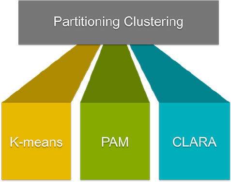
II Partitioning Clustering 34
4 K-Means Clustering 36
4.1 K-meansbasicideas ........................... 36
4.2 K-meansalgorithm ............................ 37
4.3 Computing k-means clustering in R . . . . . . . . . . . . . . . . . . . 38
4.4 K-means clustering advantages and disadvantages . . . . . . . . . . . 46
4.5 Alternative to k-means clustering . . . . . . . . . . . . . . . . . . . . 47
4.6 Summary ................................. 47
5 K-Medoids 48
5.1 PAMconcept ............................... 49
5.2 PAMalgorithm .............................. 49
5.3 ComputingPAMinR .......................... 50
5.4 Summary ................................. 56
6 CLARA - Clustering Large Applications 57
6.1 CLARAconcept ............................. 57
6.2 CLARAAlgorithm ............................ 58
6.3 ComputingCLARAinR......................... 58
6.4 Summary ................................. 63
III Hierarchical Clustering 64
7 Agglomerative Clustering 67
7.1 Algorithm ................................. 67
7.2 Steps to agglomerative hierarchical clustering . . . . . . . . . . . . . 68
7.3 Verify the cluster tree . . . . . . . . . . . . . . . . . . . . . . . . . . . 73
7.4 Cut the dendrogram into differentgroups................ 74
7.5 ClusterRpackage............................. 77
7.6 Application of hierarchical clustering to gene expression data analysis 77
7.7 Summary ................................. 78
8 Comparing Dendrograms 79
8.1 Datapreparation ............................. 79
8.2 Comparing dendrograms . . . . . . . . . . . . . . . . . . . . . . . . . 80
9 Visualizing Dendrograms 84
9.1 Visualizing dendrograms . . . . . . . . . . . . . . . . . . . . . . . . . 85
9.2 Case of dendrogram with large data sets . . . . . . . . . . . . . . . . 90
CONTENTS 7
9.3 Manipulating dendrograms using dendextend . . . . . . . . . . . . . . 94
9.4 Summary ................................. 96
10 Heatmap: Static and Interactive 97
10.1 R Packages/functions for drawing heatmaps . . . . . . . . . . . . . . 97
10.2Datapreparation ............................. 98
10.3 R base heatmap: heatmap() . . . . . . . . . . . . . . . . . . . . . . . 98
10.4 Enhanced heat maps: heatmap.2() . . . . . . . . . . . . . . . . . . . 101
10.5 Pretty heat maps: pheatmap() . . . . . . . . . . . . . . . . . . . . . . 102
10.6 Interactive heat maps: d3heatmap() . . . . . . . . . . . . . . . . . . . 103
10.7 Enhancing heatmaps using dendextend . . . . . . . . . . . . . . . . . 103
10.8Complexheatmap............................. 104
10.9 Application to gene expression matrix . . . . . . . . . . . . . . . . . . 114
10.10Summary ................................. 116
IV Cluster Validation 117
11 Assessing Clustering Tendency 119
11.1RequiredRpackages ........................... 119
11.2Datapreparation ............................. 120
11.3 Visual inspection of the data . . . . . . . . . . . . . . . . . . . . . . . 120
11.4 Why assessing clustering tendency? . . . . . . . . . . . . . . . . . . . 121
11.5 Methods for assessing clustering tendency . . . . . . . . . . . . . . . 123
11.6Summary ................................. 127
12 Determining the Optimal Number of Clusters 128
12.1Elbowmethod............................... 129
12.2 Average silhouette method . . . . . . . . . . . . . . . . . . . . . . . . 130
12.3Gapstatisticmethod........................... 130
12.4 Computing the number of clusters using R . . . . . . . . . . . . . . . 131
12.5Summary ................................. 137
13 Cluster Validation Statistics 138
13.1 Internal measures for cluster validation . . . . . . . . . . . . . . . . . 139
13.2 External measures for clustering validation . . . . . . . . . . . . . . . 141
13.3 Computing cluster validation statistics in R . . . . . . . . . . . . . . 142
13.4Summary ................................. 150
14 Choosing the Best Clustering Algorithms 151
14.1 Measures for comparing clustering algorithms . . . . . . . . . . . . . 151
8CONTENTS
14.2 Compare clustering algorithms in R . . . . . . . . . . . . . . . . . . . 152
14.3Summary ................................. 155
15 Computing P-value for Hierarchical Clustering 156
15.1Algorithm ................................. 156
15.2Requiredpackages ............................ 157
15.3Datapreparation ............................. 157
15.4 Compute p-value for hierarchical clustering . . . . . . . . . . . . . . . 158
V Advanced Clustering 161
16 Hierarchical K-Means Clustering 163
16.1Algorithm ................................. 163
16.2Rcode................................... 164
16.3Summary ................................. 166
17 Fuzzy Clustering 167
17.1RequiredRpackages ........................... 167
17.2 Computing fuzzy clustering . . . . . . . . . . . . . . . . . . . . . . . 168
17.3Summary ................................. 170
18 Model-Based Clustering 171
18.1 Concept of model-based clustering . . . . . . . . . . . . . . . . . . . . 171
18.2 Estimating model parameters . . . . . . . . . . . . . . . . . . . . . . 173
18.3 Choosing the best model . . . . . . . . . . . . . . . . . . . . . . . . . 173
18.4 Computing model-based clustering in R . . . . . . . . . . . . . . . . . 173
18.5 Visualizing model-based clustering . . . . . . . . . . . . . . . . . . . 175
19 DBSCAN: Density-Based Clustering 177
19.1WhyDBSCAN?.............................. 178
19.2Algorithm ................................. 180
19.3Advantages ................................ 181
19.4Parameterestimation........................... 182
19.5ComputingDBSCAN........................... 182
19.6 Method for determining the optimal eps value . . . . . . . . . . . . . 184
19.7 Cluster predictions with DBSCAN algorithm . . . . . . . . . . . . . . 185
20 References and Further Reading 186

0.3. KEY FEATURES OF THIS BOOK 9
0.3 Key features of this book
Although there are several good books on unsupervised machine learning/clustering
and related topics, we felt that many of them are either too high-level, theoretical
or too advanced. Our goal was to write a practical guide to cluster analysis, elegant
visualization and interpretation.
The main parts of the book include:
•distance measures,
•partitioning clustering,
•hierarchical clustering,
•cluster validation methods, as well as,
•
advanced clustering methods such as fuzzy clustering, density-based clustering
and model-based clustering.
The book presents the basic principles of these tasks and provide many examples in
R. This book offers solid guidance in data mining for students and researchers.
Key features:
•Covers clustering algorithm and implementation
•Key mathematical concepts are presented
•
Short, self-contained chapters with practical examples. This means that, you
don’t need to read the different chapters in sequence.
At the end of each chapter, we present R lab sections in which we systematically
work through applications of the various methods discussed in that chapter.
10 CONTENTS
0.4 How this book is organized?
This book contains 5 parts. Part I (Chapter 1 - 3) provides a quick introduction to
R (chapter 1) and presents required R packages and data format (Chapter 2) for
clustering analysis and visualization.
The classification of objects, into clusters, requires some methods for measuring the
distance or the (dis)similarity between the objects. Chapter 3 covers the common
distance measures used for assessing similarity between observations.
Part II starts with partitioning clustering methods, which include:
•K-means clustering (Chapter 4),
•K-Medoids or PAM (partitioning around medoids) algorithm (Chapter 5) and
•CLARA algorithms (Chapter 6).
Partitioning clustering approaches subdivide the data sets into a set of k groups, where
k is the number of groups pre-specified by the analyst.
0.4. HOW THIS BOOK IS ORGANIZED? 11
Alabama
Alaska
Arizona
Arkansas
California Colorado Connecticut
Delaware
Florida
Georgia
Hawaii
Idaho
Illinois
Indiana
Iowa
Kansas
Kentucky
Louisiana Maine
Maryland
Massachusetts
Michigan
Minnesota
Mississippi
Missouri
Montana
Nebraska
Nevada
New Hampshire
New Jersey
New Mexico
New York
North Carolina
North Dakota
Ohio
Oklahoma
Oregon Pennsylvania
Rhode Island
South Carolina
South Dakota
Tennessee
Texas
Utah
Vermont
Virginia
Washington
West Virginia
Wisconsin
Wyoming
-1
0
1
2
-2 0 2
Dim1 (62%)
Dim2 (24.7%)
cluster aaaa
1234
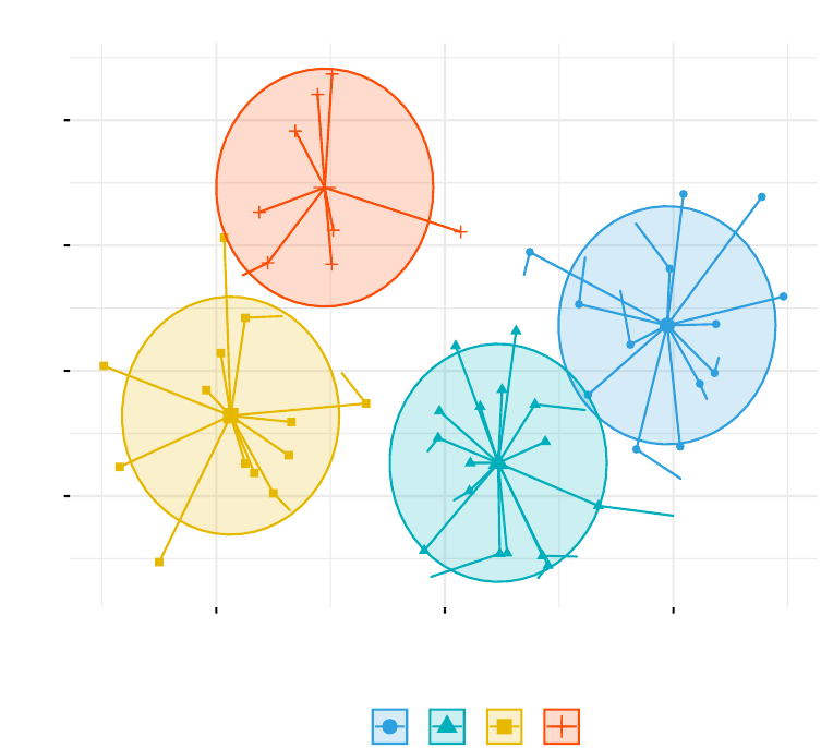
Partitioning Clustering Plot
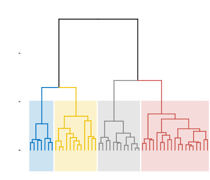
In Part III, we consider agglomerative hierarchical clustering method, which is an
alternative approach to partitionning clustering for identifying groups in a data set.
It does not require to pre-specify the number of clusters to be generated. The result
of hierarchical clustering is a tree-based representation of the objects, which is also
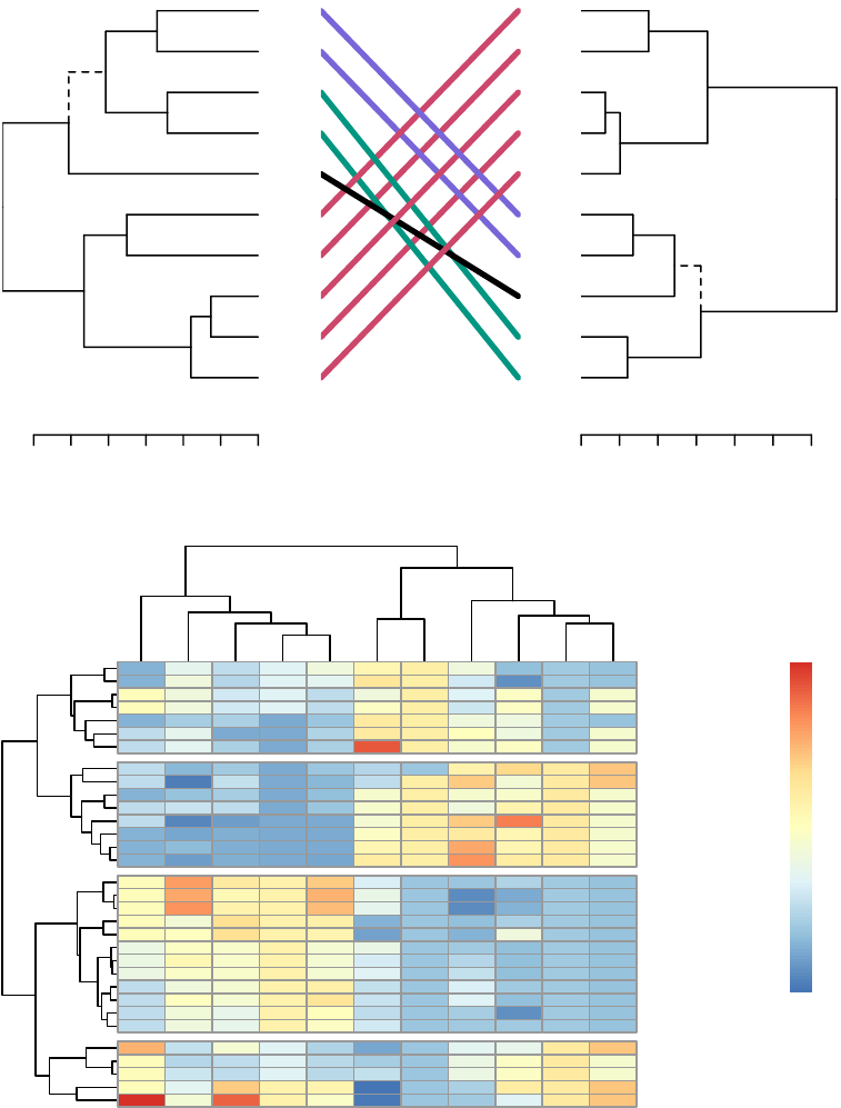
known as dendrogram (see the figure below).
In this part, we describe how to compute, visualize, interpret and compare dendro-
grams:
•Agglomerative clustering (Chapter 7)
–Algorithm and steps
–Verify the cluster tree
–Cut the dendrogram into different groups
•Compare dendrograms (Chapter 8)
–Visual comparison of two dendrograms
–Correlation matrix between a list of dendrograms
12 CONTENTS
•Visualize dendrograms (Chapter 9)
–Case of small data sets
–Case of dendrogram with large data sets: zoom, sub-tree, PDF
–Customize dendrograms using dendextend
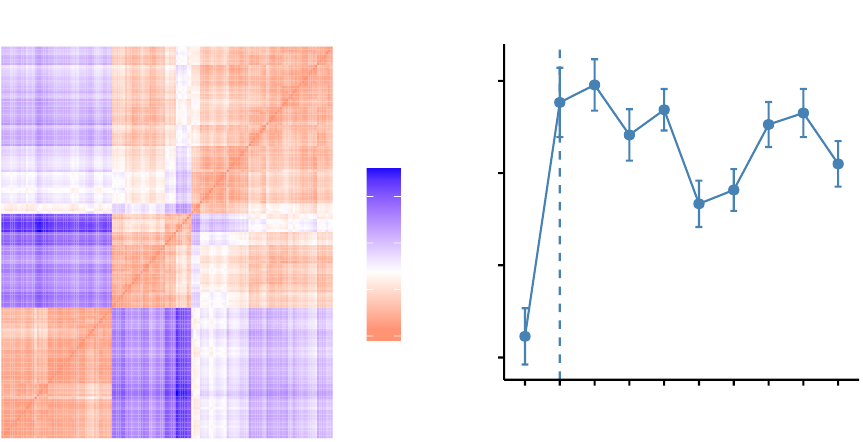
•Heatmap: static and interactive (Chapter 10)
–R base heat maps
–Pretty heat maps
–Interactive heat maps
–Complex heatmap
–Real application: gene expression data
In this section, you will learn how to generate and interpret the following plots.
•Standard dendrogram with filled rectangle around clusters:
Alabama
Louisiana
Georgia
Tennessee
North Carolina
Mississippi
South Carolina
Texas
Illinois
New York
Florida
Arizona
Michigan
Maryland
New Mexico
Alaska
Colorado
California
Nevada
South Dakota
West Virginia
North Dakota
Vermont
Idaho
Montana
Nebraska
Minnesota
Wisconsin
Maine
Iowa
New Hampshire
Virginia
Wyoming
Arkansas
Kentucky
Delaware
Massachusetts
New Jersey
Connecticut
Rhode Island
Missouri
Oregon
Washington
Oklahoma
Indiana
Kansas
Ohio
Pennsylvania
Hawaii
Utah
0
5
10
Height
Cluster Dendrogram
0.4. HOW THIS BOOK IS ORGANIZED? 13
•Compare two dendrograms:
3.0 2.0 1.0 0.0
Maine
Iowa
Wisconsin
Rhode Island
Utah
Mississippi
Maryland
Arizona
Tennessee
Virginia
0123456
Maryland
Arizona
Mississippi
Tennessee
Virginia
Maine
Iowa
Wisconsin
Rhode Island
Utah
•Heatmap:
carb
wt
hp
cyl
disp
qsec
vs
mpg
drat
am
gear
Hornet 4 Drive
Valiant
Merc 280
Merc 280C
Toyota Corona
Merc 240D
Merc 230
Porsche 914−2
Lotus Europa
Datsun 710
Volvo 142E
Honda Civic
Fiat X1−9
Fiat 128
Toyota Corolla
Chrysler Imperial
Cadillac Fleetwood
Lincoln Continental
Duster 360
Camaro Z28
Merc 450SLC
Merc 450SE
Merc 450SL
Hornet Sportabout
Pontiac Firebird
Dodge Challenger
AMC Javelin
Ferrari Dino
Mazda RX4
Mazda RX4 Wag
Ford Pantera L
Maserati Bora
−1
0
1
2
3
14 CONTENTS
Part IV describes clustering validation and evaluation strategies, which consists of
measuring the goodness of clustering results. Before applying any clustering algorithm
to a data set, the first thing to do is to assess the clustering tendency. That is,
whether applying clustering is suitable for the data. If yes, then how many clusters
are there. Next, you can perform hierarchical clustering or partitioning clustering
(with a pre-specified number of clusters). Finally, you can use a number of measures,
described in this chapter, to evaluate the goodness of the clustering results.
The different chapters included in part IV are organized as follow:
•Assessing clustering tendency (Chapter 11)
•Determining the optimal number of clusters (Chapter 12)
•Cluster validation statistics (Chapter 13)
•Choosing the best clustering algorithms (Chapter 14)
•Computing p-value for hierarchical clustering (Chapter 15)
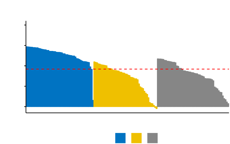
In this section, you’ll learn how to create and interpret the plots hereafter.
•Visual assessment of clustering tendency
(left panel): Clustering tendency
is detected in a visual form by counting the number of square shaped dark blocks
along the diagonal in the image.
•Determine the optimal number of clusters
(right panel) in a data set using
the gap statistics.
0
2
4
6
value
Clustering tendency
0.2
0.3
0.4
0.5
1 2 3 4 5 6 7 8 9 10
Number of clusters k
Gap statistic (k)
Optimal number of clusters
0.4. HOW THIS BOOK IS ORGANIZED? 15
•
Cluster validation using the silhouette coefficient (Si): A value of Si close to 1
indicates that the object is well clustered. A value of Si close to -1 indicates
that the object is poorly clustered. The figure below shows the silhouette plot
of a k-means clustering.
0.00
0.25
0.50
0.75
1.00
Silhouette width Si
cluster 123
Clusters silhouette plot
Average silhouette width: 0.46
Part V presents advanced clustering methods, including:
•Hierarchical k-means clustering (Chapter 16)
•Fuzzy clustering (Chapter 17)
•Model-based clustering (Chapter 18)
•DBSCAN: Density-Based Clustering (Chapter 19)
The hierarchical k-means clustering is an hybrid approach for improving k-means
results.
In Fuzzy clustering, items can be a member of more than one cluster. Each item has a
set of membership coefficients corresponding to the degree of being in a given cluster.
In model-based clustering, the data are viewed as coming from a distribution that is
mixture of two ore more clusters. It finds best fit of models to data and estimates the
number of clusters.
The density-based clustering (DBSCAN is a partitioning method that has been intro-
duced in Ester et al. (1996). It can find out clusters of different shapes and sizes from
data containing noise and outliers.
16 CONTENTS
-3
-2
-1
0
1
-1 0 1
x value
y value
cluster 12345
Density-based clustering
0.5 Book website
The website for this book is located at : http://www.sthda.com/english/. It contains
number of ressources.
0.6 Executing the R codes from the PDF
For a single line R code, you can just copy the code from the PDF to the R console.
For a multiple-line R codes, an error is generated, sometimes, when you copy and
paste directly the R code from the PDF to the R console. If this happens, a solution
is to:
•Paste firstly the code in your R code editor or in your text editor
•Copy the code from your text/code editor to the R console
Part I
Basics
17

Chapter 1
Introduction to R
R
is a free and powerful statistical software for
analyzing
and
visualizing
data. If
you want to learn easily the essential of R programming, visit our series of tutorials
available on STHDA: http://www.sthda.com/english/wiki/r-basics-quick-and-easy.
In this chapter, we provide a very brief introduction to
R
, for installing R/RStudio as
well as importing your data into R.
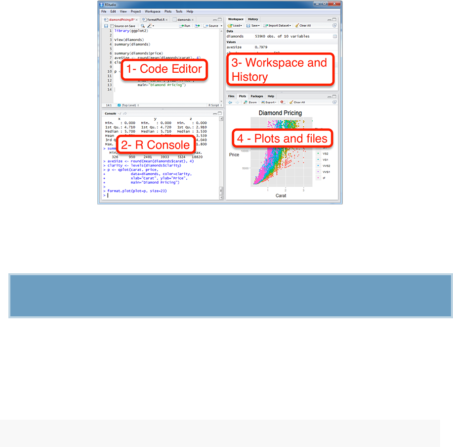
1.1 Install R and RStudio
R and RStudio can be installed on Windows, MAC OSX and Linux platforms. RStudio
is an integrated development environment for R that makes using R easier. It includes
a console, code editor and tools for plotting.
1.
R can be downloaded and installed from the Comprehensive R Archive Network
(CRAN) webpage (http://cran.r-project.org/).
2.
After installing R software, install also the RStudio software available at:
http://www.rstudio.com/products/RStudio/.
3. Launch RStudio and start use R inside R studio.
18
1.2. INSTALLING AND LOADING R PACKAGES 19
RStudio screen:
1.2 Installing and loading R packages
An
R package
is an extension of R containing data sets and specific R functions to
solve specific questions.
For example, in this book, you’ll learn how to compute easily clustering algorithm
using the cluster R package.
There are thousands other R packages available for download and installation from
CRAN, Bioconductor(biology related R packages) and GitHub repositories.
1. How to install packages from CRAN? Use the function install.packages():
install.packages("cluster")
2.
How to install packages from GitHub? You should first install devtools if you
don’t have it already installed on your computer:
For example, the following R code installs the latest version of factoextra R pack-
age developed by A. Kassambara (https://github.com/kassambara/facoextra) for
multivariate data analysis and elegant visualization..
20 CHAPTER 1. INTRODUCTION TO R
install.packages("devtools")
devtools::install_github("kassambara/factoextra")
Note that, GitHub contains the developmental version of R packages.
3.
After installation, you must first load the package for using the functions in the
package. The function library() is used for this task.
library("cluster")
Now, we can use R functions in the cluster package for computing clustering algo-
rithms, such as PAM (Partitioning Around Medoids).
1.3 Getting help with functions in R
If you want to learn more about a given function, say kmeans(), type this:
?kmeans
1.4 Importing your data into R
1. Prepare your file as follow:
•Use the first row as column names. Generally, columns represent variables
•Use the first column as row names. Generally rows represent observations.
•Each row/column name should be unique, so remove duplicated names.
•
Avoid names with blank spaces. Good column names: Long_jump or Long.jump.
Bad column name: Long jump.
•
Avoid names with special symbols: ?, $, *, +, #, (, ), -, /, }, {, |, >, < etc.
Only underscore can be used.
•
Avoid beginning variable names with a number. Use letter instead. Good column
names: sport_100m or x100m. Bad column name: 100m
•R is case sensitive. This means that Name is different from Name or NAME.
•Avoid blank rows in your data
•Delete any comments in your file
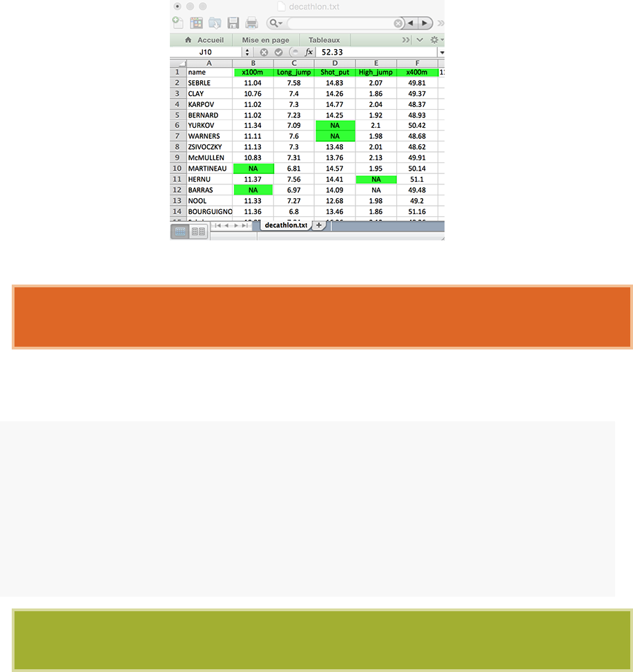
1.4. IMPORTING YOUR DATA INTO R 21
•Replace missing values by NA (for not available)
•
If you have a column containing date, use the four digit format. Good format:
01/01/2016. Bad format: 01/01/16
2. Our final file should look like this:
3. Save your file
We recommend to save your file into
.txt
(tab-delimited text file) or
.csv
(comma
separated value file) format.
4. Get your data into R:
Use the R code below. You will be asked to choose a file:
# .txt file: Read tab separated values
my_data <- read.delim(file.choose())
# .csv file: Read comma (",") separated values
my_data <- read.csv(file.choose())
# .csv file: Read semicolon (";") separated values
my_data <- read.csv2(file.choose())
You can read more about how to import data into R at this link:
http://www.sthda.com/english/wiki/importing-data-into-r
22 CHAPTER 1. INTRODUCTION TO R
1.5 Demo data sets
R
comes with several built-in data sets, which are generally used as demo data for
playing with R functions. The most used R demo data sets include:
USArrests
,
iris
and mtcars. To load a demo data set, use the function data() as follow:
data("USArrests")# Loading
head(USArrests, 3)# Print the first 3 rows
## Murder Assault UrbanPop Rape
## Alabama 13.2 236 58 21.2
## Alaska 10.0 263 48 44.5
## Arizona 8.1 294 80 31.0
If you want learn more about USArrests data sets, type this:
?USArrests
USArrests data set is an object of class data frame.
To select just certain columns from a data frame, you can either refer to the columns
by name or by their location (i.e., column 1, 2, 3, etc.).
# Access the data in Murdercolumn
# dollar sign is used
head(USArrests$Murder)
## [1] 13.2 10.0 8.1 8.8 9.0 7.9
# Or use this
USArrests[, Murder]
1.6 Close your R/RStudio session
Each time you close R/RStudio, you will be asked whether you want to save the data
from your R session. If you decide to save, the data will be available in future R
sessions.

Chapter 2
Data Preparation and R Packages
2.1 Data preparation
To perform a cluster analysis in R, generally, the data should be prepared as follow:
1. Rows are observations (individuals) and columns are variables
2. Any missing value in the data must be removed or estimated.
3.
The data must be standardized (i.e., scaled) to make variables comparable. Recall
that, standardization consists of transforming the variables such that they have
mean zero and standard deviation one. Read more about data standardization
in chapter 3.
Here, we’ll use the built-in R data set “USArrests”, which contains statistics in arrests
per 100,000 residents for assault, murder, and rape in each of the 50 US states in 1973.
It includes also the percent of the population living in urban areas.
data("USArrests")# Load the data set
df <- USArrests # Use df as shorter name
1. To remove any missing value that might be present in the data, type this:
df <- na.omit(df)
2.
As we don’t want the clustering algorithm to depend to an arbitrary variable
unit, we start by scaling/standardizing the data using the R function scale():
23

24 CHAPTER 2. DATA PREPARATION AND R PACKAGES
df <- scale(df)
head(df, n=3)
## Murder Assault UrbanPop Rape
## Alabama 1.24256408 0.7828393 -0.5209066 -0.003416473
## Alaska 0.50786248 1.1068225 -1.2117642 2.484202941
## Arizona 0.07163341 1.4788032 0.9989801 1.042878388
2.2 Required R Packages
In this book, we’ll use mainly the following R packages:
•cluster for computing clustering algorithms, and
•factoextra
for ggplot2-based elegant visualization of clustering results. The
official online documentation is available at: http://www.sthda.com/english/
rpkgs/factoextra.
factoextra contains many functions for cluster analysis and visualization, including:
Functions Description
dist(fviz_dist, get_dist) Distance Matrix Computation and Visualization
get_clust_tendency Assessing Clustering Tendency
fviz_nbclust(fviz_gap_stat) Determining the Optimal Number of Clusters
fviz_dend Enhanced Visualization of Dendrogram
fviz_cluster Visualize Clustering Results
fviz_mclust Visualize Model-based Clustering Results
fviz_silhouette Visualize Silhouette Information from Clustering
hcut Computes Hierarchical Clustering and Cut the Tree
hkmeans Hierarchical k-means clustering
eclust Visual enhancement of clustering analysis
To install the two packages, type this:
install.packages(c("cluster","factoextra"))
Chapter 3
Clustering Distance Measures
The classification of observations into groups requires some methods for computing
the
distance
or the (dis)
similarity
between each pair of observations. The result of
this computation is known as a dissimilarity or distance matrix.
There are many methods to calculate this distance information. In this article, we
describe the common distance measures and provide R codes for computing and
visualizing distances.
3.1 Methods for measuring distances
The choice of distance measures is a critical step in clustering. It defines how the
similarity of two elements (x, y) is calculated and it will influence the shape of the
clusters.
The classical methods for distance measures are Euclidean and Manhattan distances,
which are defined as follow:
1. Euclidean distance:
deuc(x, y)=ˆ
ı
ı
Ù
n
ÿ
i=1
(xi≠yi)2
2. Manhattan distance:
25
26 CHAPTER 3. CLUSTERING DISTANCE MEASURES
dman(x, y)=
n
ÿ
i=1
|(xi≠yi)|
Where, xand yare two vectors of length n.
Other dissimilarity measures exist such as
correlation-based distances
, which is
widely used for gene expression data analyses. Correlation-based distance is defined by
subtracting the correlation coefficient from 1. Different types of correlation methods
can be used such as:
1. Pearson correlation distance:
dcor(x, y)=1≠
n
q
i=1(xi≠¯x)(yi≠¯y)
Ûn
q
i=1(xi≠¯x)2n
q
i=1(yi≠¯y)2
Pearson correlation measures the degree of a linear relationship between two profiles.
2. Eisen cosine correlation distance (Eisen et al., 1998):
It’s a special case of Pearson’s correlation with ¯xand ¯yboth replaced by zero:
deisen(x, y)=1≠----
n
q
i=1 xiyi----
Ûn
q
i=1 x2
i
n
q
i=1 y2
i
3. Spearman correlation distance:
The spearman correlation method computes the correlation between the rank of x and
the rank of y variables.
dspear(x, y)=1≠
n
q
i=1(xÕ
i≠¯
xÕ)(yÕ
i≠¯
yÕ)
Ûn
q
i=1(xÕ
i≠¯
xÕ)2n
q
i=1(yÕ
i≠¯
yÕ)2
Where xÕ
i=rank(xi)and yÕ
i=rank(y).

3.2. WHAT TYPE OF DISTANCE MEASURES SHOULD WE CHOOSE? 27
4. Kendall correlation distance:
Kendall correlation method measures the correspondence between the ranking of x
and y variables. The total number of possible pairings of x with y observations is
n
(
n≠
1)
/
2, where n is the size of x and y. Begin by ordering the pairs by the x values.
If x and y are correlated, then they would have the same relative rank orders. Now,
for each
yi
, count the number of
yj>y
i
(concordant pairs (c)) and the number of
yj<y
i(discordant pairs (d)).
Kendall correlation distance is defined as follow:
dkend(x, y)=1≠nc≠nd
1
2n(n≠1)
Where,
•nc: total number of concordant pairs
•nd: total number of discordant pairs
•n: size of x and y
Note that,
- Pearson correlation analysis is the most commonly used method. It is
also known as a parametric correlation which depends on the distribution of the
data.
- Kendall and Spearman correlations are non-parametric and they are used to
perform rank-based correlation analysis.
In the formula above,
x
and
y
are two vectors of length
n
and, means
¯x
and
¯y
,
respectively. The distance between x and y is denoted d(x, y).
3.2 What type of distance measures should we
choose?
The choice of distance measures is very important, as it has a strong influence on the
clustering results. For most common clustering software, the default distance measure
is the Euclidean distance.

28 CHAPTER 3. CLUSTERING DISTANCE MEASURES
Depending on the type of the data and the researcher questions, other dissimilarity
measures might be preferred. For example, correlation-based distance is often used in
gene expression data analysis.
Correlation-based distance considers two objects to be similar if their features are
highly correlated, even though the observed values may be far apart in terms of
Euclidean distance. The distance between two objects is 0 when they are perfectly
correlated. Pearson’s correlation is quite sensitive to outliers. This does not matter
when clustering samples, because the correlation is over thousands of genes. When
clustering genes, it is important to be aware of the possible impact of outliers. This
can be mitigated by using Spearman’s correlation instead of Pearson’s correlation.
If we want to identify clusters of observations with the same overall profiles regardless
of their magnitudes, then we should go with correlation-based distance as a dissimilarity
measure. This is particularly the case in gene expression data analysis, where we
might want to consider genes similar when they are “up” and “down” together. It is
also the case, in marketing if we want to identify group of shoppers with the same
preference in term of items, regardless of the volume of items they bought.
If Euclidean distance is chosen, then observations with high values of features will be
clustered together. The same holds true for observations with low values of features.
3.3 Data standardization
The value of distance measures is intimately related to the scale on which measurements
are made. Therefore, variables are often scaled (i.e. standardized) before measuring the
inter-observation dissimilarities. This is particularly recommended when variables are
measured in different scales (e.g: kilograms, kilometers, centimeters, . . . ); otherwise,
the dissimilarity measures obtained will be severely affected.
The goal is to make the variables comparable. Generally variables are scaled to have
i) standard deviation one and ii) mean zero.
The standardization of data is an approach widely used in the context of gene expression
data analysis before clustering. We might also want to scale the data when the mean
and/or the standard deviation of variables are largely different.
When scaling variables, the data can be transformed as follow:
xi≠center(x)
scale(x)

3.4. DISTANCE MATRIX COMPUTATION 29
Where
center
(
x
)can be the mean or the median of x values, and
scale
(
x
)can be
the standard deviation (SD), the interquartile range, or the MAD (median absolute
deviation).
The R base function scale() can be used to standardize the data. It takes a numeric
matrix as an input and performs the scaling on the columns.
Standardization makes the four distance measure methods - Euclidean, Manhattan,
Correlation and Eisen - more similar than they would be with non-transformed data.
Note that, when the data are standardized, there is a functional relation-
ship between the Pearson correlation coefficient
r
(
x, y
)and the Euclidean distance.
With some maths, the relationship can be defined as follow:
deuc(x, y)=Ò2m[1 ≠r(x, y)]
Where x and y are two standardized m-vectors with zero mean and unit length.
Therefore, the result obtained with Pearson correlation measures and stan-
dardized Euclidean distances are comparable.
3.4 Distance matrix computation
3.4.1 Data preparation
We’ll use the USArrests data as demo data sets. We’ll use only a subset of the data
by taking 15 random rows among the 50 rows in the data set. This is done by using
the function sample(). Next, we standardize the data using the function scale():
# Subset of the data
set.seed(123)
ss <- sample(1:50,15)# Take 15 random rows
df <- USArrests[ss, ] # Subset the 15 rows
df.scaled <- scale(df) # Standardize the variables
30 CHAPTER 3. CLUSTERING DISTANCE MEASURES
3.4.2 R functions and packages
There are many R functions for computing distances between pairs of observations:
1. dist() R base function [stats package]: Accepts only numeric data as an input.
2.
get_dist() function [factoextra package]: Accepts only numeric data as an input.
Compared to the standard dist() function, it supports correlation-based distance
measures including “pearson”, “kendall” and “spearman” methods.
3.
daisy() function [cluster package]: Able to handle other variable types (e.g. nom-
inal, ordinal, (a)symmetric binary). In that case, the Gower’s coefficient will
be automatically used as the metric. It’s one of the most popular measures of
proximity for mixed data types. For more details, read the R documentation of
the daisy() function (?daisy).
All these functions compute distances between rows of the data.
3.4.3 Computing euclidean distance
To compute Euclidean distance, you can use the R base dist() function, as follow:
dist.eucl <- dist(df.scaled, method = "euclidean")
Note that, allowed values for the option method include one of: “euclidean”, “maxi-
mum”, “manhattan”, “canberra”, “binary”, “minkowski”.
To make it easier to see the distance information generated by the dist() function, you
can reformat the distance vector into a matrix using the as.matrix() function.
# Reformat as a matrix
# Subset the first 3 columns and rows and Round the values
round(as.matrix(dist.eucl)[1:3,1:3], 1)
## Iowa Rhode Island Maryland
## Iowa 0.0 2.8 4.1
## Rhode Island 2.8 0.0 3.6
## Maryland 4.1 3.6 0.0

3.4. DISTANCE MATRIX COMPUTATION 31
In this matrix, the value represent the distance between objects. The values on the
diagonal of the matrix represent the distance between objects and themselves (which
are zero).
In this data set, the columns are variables. Hence, if we want to compute pairwise
distances between variables, we must start by transposing the data to have variables
in the rows of the data set before using the dist() function. The function t() is used
for transposing the data.
3.4.4 Computing correlation based distances
Correlation-based distances are commonly used in gene expression data analysis.
The function get_dist()[factoextra package] can be used to compute correlation-based
distances. Correlation method can be either pearson,spearman or kendall.
# Compute
library("factoextra")
dist.cor <- get_dist(df.scaled, method = "pearson")
# Display a subset
round(as.matrix(dist.cor)[1:3,1:3], 1)
## Iowa Rhode Island Maryland
## Iowa 0.0 0.4 1.9
## Rhode Island 0.4 0.0 1.5
## Maryland 1.9 1.5 0.0
3.4.5 Computing distances for mixed data
The function daisy() [cluster package] provides a solution (Gower’s metric) for com-
puting the distance matrix, in the situation where the data contain no-numeric
columns.
The R code below applies the daisy() function on flower data which contains factor,
ordered and numeric variables:

32 CHAPTER 3. CLUSTERING DISTANCE MEASURES
library(cluster)
# Load data
data(flower)
head(flower, 3)
## V1 V2 V3 V4 V5 V6 V7 V8
## 1 0 1 1 4 3 15 25 15
## 2 1 0 0 2 1 3 150 50
## 3 0 1 0 3 3 1 150 50
# Data structure
str(flower)
## data.frame:18obs.of8variables:
## $ V1: Factor w/ 2 levels "0","1": 1 2 1 1 1 1 1 1 2 2 ...
## $ V2: Factor w/ 2 levels "0","1": 2 1 2 1 2 2 1 1 2 2 ...
## $ V3: Factor w/ 2 levels "0","1": 2 1 1 2 1 1 1 2 1 1 ...
## $ V4: Factor w/ 5 levels "1","2","3","4",..: 4 2 3 4 5 4 4 2 3 5 ...
## $ V5: Ord.factor w/ 3 levels "1"<"2"<"3": 3 1 3 2 2 3 3 2 1 2 ...
## $ V6: Ord.factor w/ 18 levels "1"<"2"<"3"<"4"<..: 15 3 1 16 2 12 13 7 4 14 ...
## $ V7: num 25 150 150 125 20 50 40 100 25 100 ...
## $ V8: num 15 50 50 50 15 40 20 15 15 60 ...
# Distance matrix
dd <- daisy(flower)
round(as.matrix(dd)[1:3,1:3], 2)
## 1 2 3
## 1 0.00 0.89 0.53
## 2 0.89 0.00 0.51
## 3 0.53 0.51 0.00
3.5 Visualizing distance matrices
A simple solution for visualizing the distance matrices is to use the function fviz_dist()
[factoextra package]. Other specialized methods, such as agglomerative hierarchical
clustering (Chapter 7) or heatmap (Chapter 10) will be comprehensively described in
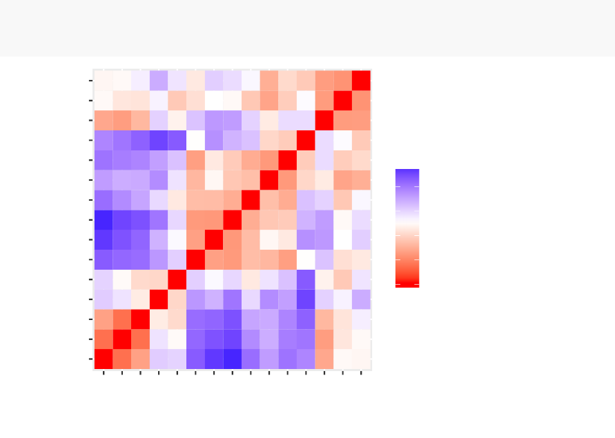
3.6. SUMMARY 33
the dedicated chapters.
To use fviz_dist() type this:
library(factoextra)
fviz_dist(dist.eucl)
Maine-
Iowa-
Wisconsin-
Rhode Island-
Utah-
Maryland-
Arizona-
Michigan-
Texas-
Tennessee-
Louisiana-
Mississippi-
Montana-
Virginia-
Arkansas-
Maine-
Iowa-
Wisconsin-
Rhode Island-
Utah-
Maryland-
Arizona-
Michigan-
Texas-
Tennessee-
Louisiana-
Mississippi-
Montana-
Virginia-
Arkansas-
0
1
2
3
4
value
•Red: high similarity (ie: low dissimilarity) | Blue: low similarity
The color level is proportional to the value of the dissimilarity between observations:
pure red if
dist
(
xi,x
j
)=0and pure blue if
dist
(
xi,x
j
)=1. Objects belonging to the
same cluster are displayed in consecutive order.
3.6 Summary
We described how to compute distance matrices using either Euclidean or correlation-
based measures. It’s generally recommended to standardize the variables before
distance matrix computation. Standardization makes variable comparable, in the
situation where they are measured in different scales.
Part II
Partitioning Clustering
34
35
Partitioning clustering
are clustering methods used to classify observations, within
a data set, into multiple groups based on their similarity. The algorithms require the
analyst to specify the number of clusters to be generated.
This chapter describes the commonly used partitioning clustering, including:
•K-means clustering
(MacQueen, 1967), in which, each cluster is represented
by the center or means of the data points belonging to the cluster. The K-means
method is sensitive to anomalous data points and outliers.
•K-medoids clustering
or
PAM
(Partitioning Around Medoids, Kaufman &
Rousseeuw, 1990), in which, each cluster is represented by one of the objects in
the cluster. PAM is less sensitive to outliers compared to k-means.
•CLARA algorithm
(Clustering Large Applications), which is an extension to
PAM adapted for large data sets.
For each of these methods, we provide:
•the basic idea and the key mathematical concepts
•the clustering algorithm and implementation in R software
•R lab sections with many examples for cluster analysis and visualization
The following R packages will be used to compute and visualize partitioning clustering:
•stats package for computing K-means
•cluster package for computing PAM and CLARA algorithms
•factoextra for beautiful visualization of clusters

Chapter 4
K-Means Clustering
K-means clustering
(MacQueen, 1967) is the most commonly used unsupervised
machine learning algorithm for partitioning a given data set into a set of k groups (i.e.
k clusters), where k represents the number of groups pre-specified by the analyst. It
classifies objects in multiple groups (i.e., clusters), such that objects within the same
cluster are as similar as possible (i.e., high intra-class similarity), whereas objects
from different clusters are as dissimilar as possible (i.e., low inter-class similarity).
In k-means clustering, each cluster is represented by its center (i.e, centroid) which
corresponds to the mean of points assigned to the cluster.
In this article, we’ll describe the
k-means algorithm
and provide practical examples
using Rsoftware.
4.1 K-means basic ideas
The basic idea behind k-means clustering consists of defining clusters so that the total
intra-cluster variation (known as total within-cluster variation) is minimized.
There are several k-means algorithms available. The standard algorithm is the
Hartigan-Wong algorithm (1979), which defines the total within-cluster variation as
the sum of squared distances Euclidean distances between items and the corresponding
centroid:
36
4.2. K-MEANS ALGORITHM 37
W(Ck)= ÿ
xiœCk
(xi≠µk)2
•xidesign a data point belonging to the cluster Ck
•µkis the mean value of the points assigned to the cluster Ck
Each observation (
xi
) is assigned to a given cluster such that the sum of squares (SS)
distance of the observation to their assigned cluster centers µkis a minimum.
We define the total within-cluster variation as follow:
tot.withinss =
k
ÿ
k=1
W(Ck)=
k
ÿ
k=1 ÿ
xiœCk
(xi≠µk)2
The total within-cluster sum of square measures the compactness (i.e goodness) of the
clustering and we want it to be as small as possible.
4.2 K-means algorithm
The first step when using k-means clustering is to indicate the number of clusters (k)
that will be generated in the final solution.
The algorithm starts by randomly selecting k objects from the data set to serve as the
initial centers for the clusters. The selected objects are also known as cluster means
or centroids.
Next, each of the remaining objects is assigned to it’s closest centroid, where closest is
defined using the Euclidean distance (Chapter 3) between the object and the cluster
mean. This step is called “cluster assignment step”. Note that, to use correlation
distance, the data are input as z-scores.
After the assignment step, the algorithm computes the new mean value of each cluster.
The term cluster “centroid update” is used to design this step. Now that the centers
have been recalculated, every observation is checked again to see if it might be closer
to a different cluster. All the objects are reassigned again using the updated cluster
means.
The cluster assignment and centroid update steps are iteratively repeated until the
cluster assignments stop changing (i.e until convergence is achieved). That is, the

38 CHAPTER 4. K-MEANS CLUSTERING
clusters formed in the current iteration are the same as those obtained in the previous
iteration.
K-means algorithm can be summarized as follow:
1. Specify the number of clusters (K) to be created (by the analyst)
2.
Select randomly k objects from the data set as the initial cluster centers or means
3.
Assigns each observation to their closest centroid, based on the Euclidean
distance between the object and the centroid
4.
For each of the k clusters update the cluster centroid by calculating the new
mean values of all the data points in the cluster. The centoid of a
Kth
cluster
is a vector of length
p
containing the means of all variables for the observations
in the kth cluster; pis the number of variables.
5.
Iteratively minimize the total within sum of square. That is, iterate steps 3
and 4 until the cluster assignments stop changing or the maximum number of
iterations is reached. By default, the R software uses 10 as the default value
for the maximum number of iterations.
4.3 Computing k-means clustering in R
4.3.1 Data
We’ll use the demo data sets “USArrests”. The data should be prepared as described
in chapter 2. The data must contains only continuous variables, as the k-means
algorithm uses variable means. As we don’t want the k-means algorithm to depend to
an arbitrary variable unit, we start by scaling the data using the R function scale() as
follow:
data("USArrests")# Loading the data set
df <- scale(USArrests) # Scaling the data
# View the firt 3 rows of the data
head(df, n=3)

4.3. COMPUTING K-MEANS CLUSTERING IN R 39
## Murder Assault UrbanPop Rape
## Alabama 1.24256408 0.7828393 -0.5209066 -0.003416473
## Alaska 0.50786248 1.1068225 -1.2117642 2.484202941
## Arizona 0.07163341 1.4788032 0.9989801 1.042878388
4.3.2 Required R packages and functions
The standard R function for k-means clustering is kmeans() [stats package], which
simplified format is as follow:
kmeans(x, centers, iter.max = 10,nstart = 1)
•x: numeric matrix, numeric data frame or a numeric vector
•centers
: Possible values are the number of clusters (k) or a set of initial (distinct)
cluster centers. If a number, a random set of (distinct) rows in x is chosen as
the initial centers.
•iter.max: The maximum number of iterations allowed. Default value is 10.
•nstart
: The number of random starting partitions when centers is a number.
Trying nstart > 1 is often recommended.
To create a beautiful graph of the clusters generated with the kmeans() function, will
use the factoextra package.
•Installing factoextra package as:
install.packages("factoextra")
•Loading factoextra:
library(factoextra)
4.3.3 Estimating the optimal number of clusters
The k-means clustering requires the users to specify the number of clusters to be
generated.
One fundamental question is: How to choose the right number of expected clusters
(k)?
40 CHAPTER 4. K-MEANS CLUSTERING
Different methods will be presented in the chapter “cluster evaluation and validation
statistics”.
Here, we provide a simple solution. The idea is to compute k-means clustering using
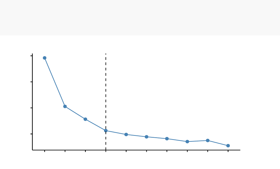
different values of clusters k. Next, the wss (within sum of square) is drawn according
to the number of clusters. The location of a bend (knee) in the plot is generally
considered as an indicator of the appropriate number of clusters.
The R function fviz_nbclust() [in factoextra package] provides a convenient solution
to estimate the optimal number of clusters.
library(factoextra)
fviz_nbclust(df, kmeans, method = "wss")+
geom_vline(xintercept = 4,linetype = 2)
50
100
150
200
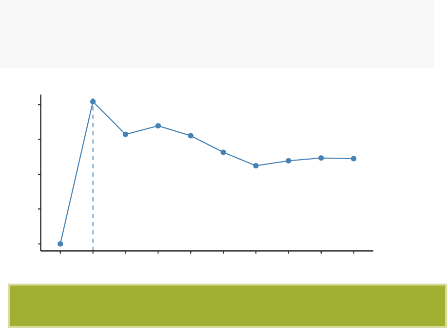
123456 7 8 9 10
Number of clusters k
Total Within Sum of Square
Optimal number of clusters
The plot above represents the variance within the clusters. It decreases as k increases,
but it can be seen a bend (or “elbow”) at k = 4. This bend indicates that additional
clusters beyond the fourth have little value.. In the next section, we’ll classify the
observations into 4 clusters.
4.3.4 Computing k-means clustering
As k-means clustering algorithm starts with k randomly selected centroids, it’s always
recommended to use the set.seed() function in order to set a seed for R’s random

4.3. COMPUTING K-MEANS CLUSTERING IN R 41
number generator. The aim is to make reproducible the results, so that the reader of
this article will obtain exactly the same results as those shown below.
The R code below performs k-means clustering with k = 4:
# Compute k-means with k = 4
set.seed(123)
km.res <- kmeans(df, 4,nstart = 25)
As the final result of k-means clustering result is sensitive to the random starting
assignments, we specify nstart = 25. This means that R will try 25 different random
starting assignments and then select the best results corresponding to the one with
the lowest within cluster variation. The default value of nstart in R is one. But, it’s
strongly recommended to compute k-means clustering with a large value of nstart
such as 25 or 50, in order to have a more stable result.
# Print the results
print(km.res)
## K-means clustering with 4 clusters of sizes 13, 16, 13, 8
##
## Cluster means:
## Murder Assault UrbanPop Rape
## 1 -0.9615407 -1.1066010 -0.9301069 -0.96676331
## 2 -0.4894375 -0.3826001 0.5758298 -0.26165379
## 3 0.6950701 1.0394414 0.7226370 1.27693964
## 4 1.4118898 0.8743346 -0.8145211 0.01927104
##
## Clustering vector:
## Alabama Alaska Arizona Arkansas California
##43343
## Colorado Connecticut Delaware Florida Georgia
##32234
## Hawaii Idaho Illinois Indiana Iowa
##21321
## Kansas Kentucky Louisiana Maine Maryland
##21413
## Massachusetts Michigan Minnesota Mississippi Missouri
##23143
## Montana Nebraska Nevada New Hampshire New Jersey

42 CHAPTER 4. K-MEANS CLUSTERING
##11312
## New Mexico New York North Carolina North Dakota Ohio
##33412
## Oklahoma Oregon Pennsylvania Rhode Island South Carolina
##22224
## South Dakota Tennessee Texas Utah Vermont
##14321
## Virginia Washington West Virginia Wisconsin Wyoming
##22112
##
## Within cluster sum of squares by cluster:
## [1] 11.952463 16.212213 19.922437 8.316061
## (between_SS / total_SS = 71.2 %)
##
## Available components:
##
## [1] "cluster" "centers" "totss" "withinss"
## [5] "tot.withinss" "betweenss" "size" "iter"
## [9] "ifault"
The printed output displays:
•
the cluster means or centers: a matrix, which rows are cluster number (1 to 4)
and columns are variables
•
the clustering vector: A vector of integers (from 1:k) indicating the cluster to
which each point is allocated
It’s possible to compute the mean of each variables by clusters using the original data:
aggregate(USArrests, by=list(cluster=km.res$cluster), mean)
## cluster Murder Assault UrbanPop Rape
## 1 1 3.60000 78.53846 52.07692 12.17692
## 2 2 5.65625 138.87500 73.87500 18.78125
## 3 3 10.81538 257.38462 76.00000 33.19231
## 4 4 13.93750 243.62500 53.75000 21.41250
If you want to add the point classifications to the original data, use this:

4.3. COMPUTING K-MEANS CLUSTERING IN R 43
dd <- cbind(USArrests, cluster = km.res$cluster)
head(dd)
## Murder Assault UrbanPop Rape cluster
## Alabama 13.2 236 58 21.2 4
## Alaska 10.0 263 48 44.5 3
## Arizona 8.1 294 80 31.0 3
## Arkansas 8.8 190 50 19.5 4
## California 9.0 276 91 40.6 3
## Colorado 7.9 204 78 38.7 3
4.3.5 Accessing to the results of kmeans() function
kmeans() function returns a list of components, including:
•cluster
: A vector of integers (from 1:k) indicating the cluster to which each
point is allocated
•centers: A matrix of cluster centers (cluster means)
•totss
: The total sum of squares (TSS), i.e
q(xi≠¯x)2
. TSS measures the total
variance in the data.
•withinss: Vector of within-cluster sum of squares, one component per cluster
•tot.withinss: Total within-cluster sum of squares, i.e. sum(withinss)
•betweenss: The between-cluster sum of squares, i.e. totss ≠tot.withinss
•size: The number of observations in each cluster
These components can be accessed as follow:
# Cluster number for each of the observations
km.res$cluster
head(km.res$cluster, 4)
## Alabama Alaska Arizona Arkansas
## 4 3 3 4
. . . ..
# Cluster size
km.res$size

44 CHAPTER 4. K-MEANS CLUSTERING
## [1] 13 16 13 8
# Cluster means
km.res$centers
## Murder Assault UrbanPop Rape
## 1 -0.9615407 -1.1066010 -0.9301069 -0.96676331
## 2 -0.4894375 -0.3826001 0.5758298 -0.26165379
## 3 0.6950701 1.0394414 0.7226370 1.27693964
## 4 1.4118898 0.8743346 -0.8145211 0.01927104
4.3.6 Visualizing k-means clusters
It is a good idea to plot the cluster results. These can be used to assess the choice of
the number of clusters as well as comparing two different cluster analyses.
Now, we want to visualize the data in a scatter plot with coloring each data point
according to its cluster assignment.
The problem is that the data contains more than 2 variables and the question is what
variables to choose for the xy scatter plot.
A solution is to reduce the number of dimensions by applying a dimensionality reduction
algorithm, such as
Principal Component Analysis (PCA)
, that operates on the
four variables and outputs two new variables (that represent the original variables)
that you can use to do the plot.
In other words, if we have a multi-dimensional data set, a solution is to perform
Principal Component Analysis (PCA) and to plot data points according to the first
two principal components coordinates.
The function fviz_cluster() [factoextra package] can be used to easily visualize k-means
clusters. It takes k-means results and the original data as arguments. In the resulting
plot, observations are represented by points, using principal components if the number
of variables is greater than 2. It’s also possible to draw concentration ellipse around
each cluster.
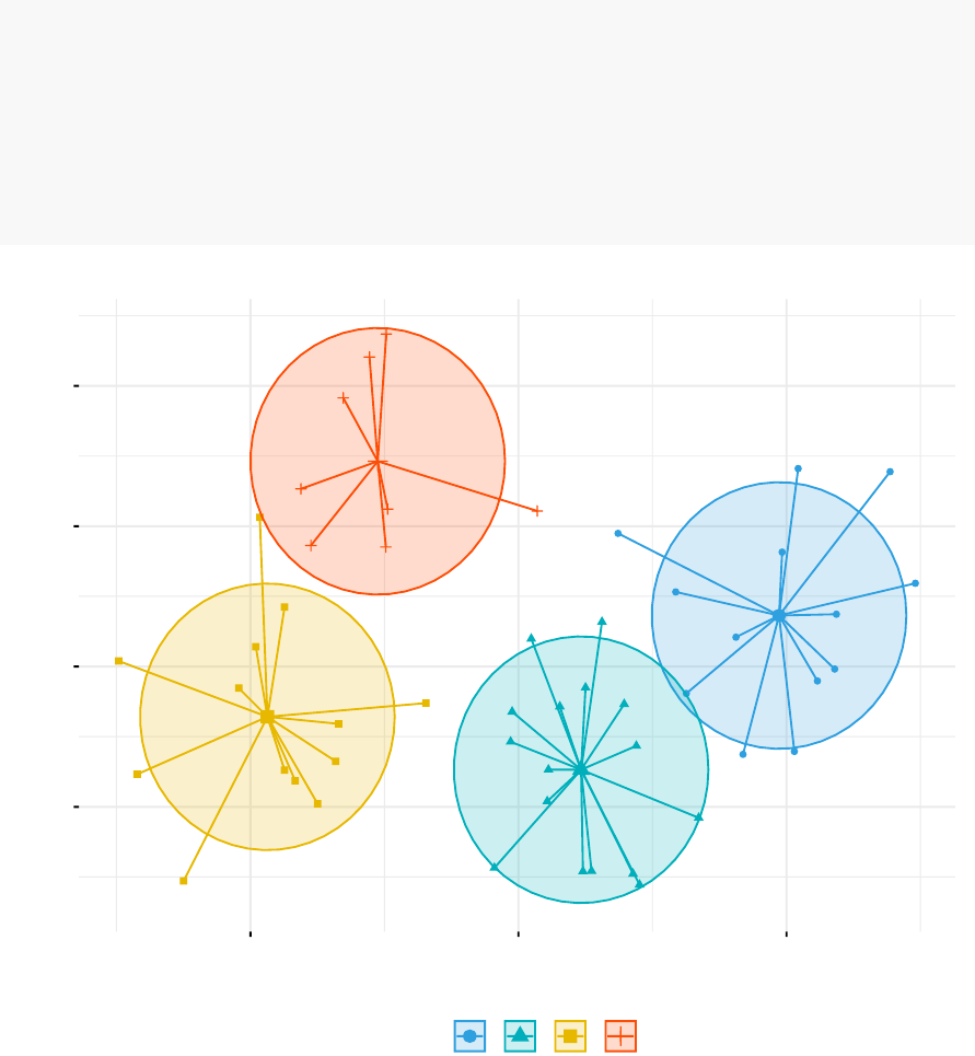
4.3. COMPUTING K-MEANS CLUSTERING IN R 45
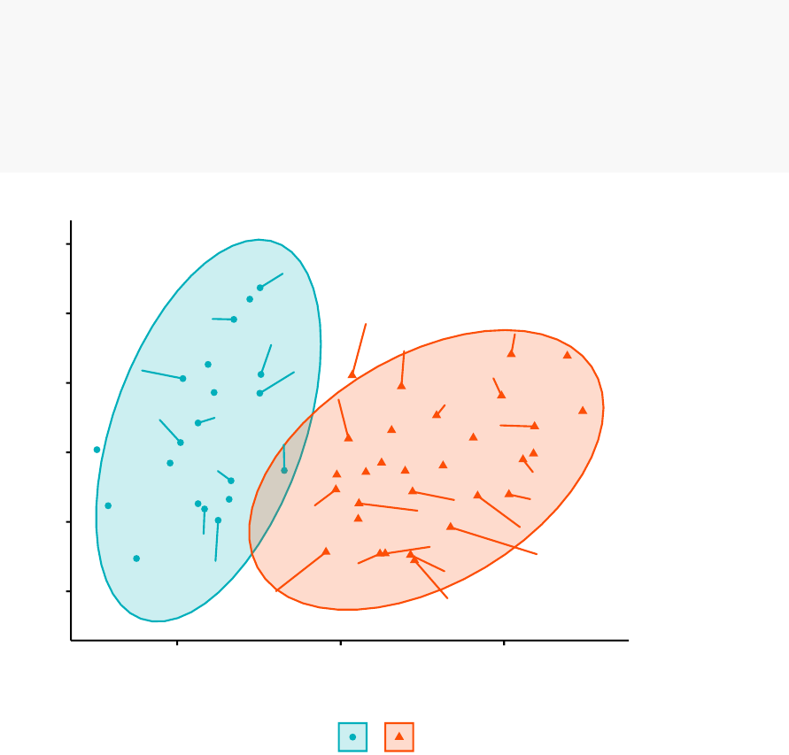
fviz_cluster(km.res, data = df,
palette = c("#2E9FDF","#00AFBB","#E7B800","#FC4E07"),
ellipse.type = "euclid",# Concentration ellipse
star.plot = TRUE,# Add segments from centroids to items
repel = TRUE,# Avoid label overplotting (slow)
ggtheme = theme_minimal()
)
Alabama
Alaska
Arizona
Arkansas
California
Colorado Connecticut
Delaware
Florida
Georgia
Hawaii
Idaho
Illinois
Indiana
Iowa
Kansas
Kentucky
Louisiana
Maine
Maryland
Massachusetts
Michigan
Minnesota
Mississippi
Missouri
Montana
Nebraska
Nevada
New Hampshire
New Jersey
New Mexico
New York
North Carolina
North Dakota
Ohio
Oklahoma
Oregon Pennsylvania
Rhode Island
South Carolina
South Dakota
Tennessee
Texas
Utah
Vermont
Virginia
Washington
West Virginia
Wisconsin
Wyoming
-1
0
1
2
-2 0 2
Dim1 (62%)
Dim2 (24.7%)
cluster aaaa
1234
Cluster plot

46 CHAPTER 4. K-MEANS CLUSTERING
4.4 K-means clustering advantages and disadvan-
tages
K-means clustering is very simple and fast algorithm. It can efficiently deal with very
large data sets. However there are some weaknesses, including:
1.
It assumes prior knowledge of the data and requires the analyst to choose the
appropriate number of cluster (k) in advance.
2.
The final results obtained is sensitive to the initial random selection of cluster
centers. Why is this a problem? Because, for every different run of the
algorithm on the same data set, you may choose different set of initial centers.
This may lead to different clustering results on different runs of the algorithm.
3. It’s sensitive to outliers.
4.
If you rearrange your data, it’s very possible that you’ll get a different solution
every time you change the ordering of your data.
Possible solutions to these weaknesses, include:
1.
Solution to issue 1: Compute k-means for a range of k values, for example
by varying k between 2 and 10. Then, choose the best k by comparing the
clustering results obtained for the different k values.
2.
Solution to issue 2: Compute K-means algorithm several times with different
initial cluster centers. The run with the lowest total within-cluster sum of
square is selected as the final clustering solution.
3.
To avoid distortions caused by excessive outliers, it’s possible to use PAM
algorithm, which is less sensitive to outliers.
4.5. ALTERNATIVE TO K-MEANS CLUSTERING 47
4.5 Alternative to k-means clustering
A robust alternative to k-means is PAM, which is based on medoids. As discussed
in the next chapter, the PAM clustering can be computed using the function pam()
[cluster package]. The function pamk( ) [fpc package] is a wrapper for PAM that also
prints the suggested number of clusters based on optimum average silhouette width.
4.6 Summary
K-means clustering can be used to classify observations into k groups, based on their
similarity. Each group is represented by the mean value of points in the group, known
as the cluster centroid.
K-means algorithm requires users to specify the number of cluster to generate. The R
function kmeans() [stats package] can be used to compute k-means algorithm. The
simplified format is kmeans(x, centers), where “x” is the data and centers is the
number of clusters to be produced.
After, computing k-means clustering, the R function fviz_cluster() [factoextra package]
can be used to visualize the results. The format is fviz_cluster(km.res, data), where
km.res is k-means results and data corresponds to the original data sets.

Chapter 5
K-Medoids
The
k-medoids algorithm
is a clustering approach related to k-means clustering
(chapter 4) for partitioning a data set into k groups or clusters. In k-medoids clustering,
each cluster is represented by one of the data point in the cluster. These points are
named cluster medoids.
The term medoid refers to an object within a cluster for which average dissimilarity
between it and all the other the members of the cluster is minimal. It corresponds to
the most centrally located point in the cluster. These objects (one per cluster) can
be considered as a representative example of the members of that cluster which may
be useful in some situations. Recall that, in k-means clustering, the center of a given
cluster is calculated as the mean value of all the data points in the cluster.
K-medoid is a robust alternative to k-means clustering. This means that, the algorithm
is less sensitive to noise and outliers, compared to k-means, because it uses medoids
as cluster centers instead of means (used in k-means).
The k-medoids algorithm requires the user to specify k, the number of clusters to be
generated (like in k-means clustering). A useful approach to determine the optimal
number of clusters is the silhouette method, described in the next sections.
The most common k-medoids clustering methods is the
PAM
algorithm (
Partitioning
Around Medoids, Kaufman & Rousseeuw, 1990).
In this article, We’ll describe the PAM algorithm and provide practical examples
using
R
software. In the next chapter, we’ll also discuss a variant of PAM named
CLARA
(Clustering Large Applications) which is used for analyzing large data
sets.
48
5.1. PAM CONCEPT 49
5.1 PAM concept
The use of means implies that k-means clustering is highly sensitive to outliers. This
can severely affects the assignment of observations to clusters. A more robust algorithm
is provided by the PAM algorithm.
5.2 PAM algorithm
The PAM algorithm is based on the search for k representative objects or medoids
among the observations of the data set.
After finding a set of k medoids, clusters are constructed by assigning each observation
to the nearest medoid.
Next, each selected medoid m and each non-medoid data point are swapped and the
objective function is computed. The objective function corresponds to the sum of the
dissimilarities of all objects to their nearest medoid.
The SWAP step attempts to improve the quality of the clustering by exchanging
selected objects (medoids) and non-selected objects. If the objective function can
be reduced by interchanging a selected object with an unselected object, then the
swap is carried out. This is continued until the objective function can no longer be
decreased. The goal is to find k representative objects which minimize the sum of the
dissimilarities of the observations to their closest representative object.
In summary, PAM algorithm proceeds in two phases as follow:
50 CHAPTER 5. K-MEDOIDS
1.
Select k objects to become the medoids, or in case these objects were provided
use them as the medoids;
2. Calculate the dissimilarity matrix if it was not provided;
3. Assign every object to its closest medoid;
4.
For each cluster search if any of the object of the cluster decreases the
average dissimilarity coefficient; if it does, select the entity that decreases this
coefficient the most as the medoid for this cluster;
5. If at least one medoid has changed go to (3), else end the algorithm.
As mentioned above, the PAM algorithm works with a matrix of dissimilarity, and to
compute this matrix the algorithm can use two metrics:
1. The euclidean distances, that are the root sum-of-squares of differences;
2. And, the Manhattan distance that are the sum of absolute distances.
Note that, in practice, you should get similar results most of the time, using either
euclidean or Manhattan distance. If your data contains outliers, Manhattan distance
should give more robust results, whereas euclidean would be influenced by unusual
values.
Read more on distance measures in Chapter 3.
5.3 Computing PAM in R
5.3.1 Data
We’ll use the demo data sets “USArrests”, which we start by scaling (Chapter 2) using
the R function scale() as follow:
data("USArrests")# Load the data set
df <- scale(USArrests) # Scale the data
head(df, n=3)# View the firt 3 rows of the data

5.3. COMPUTING PAM IN R 51
## Murder Assault UrbanPop Rape
## Alabama 1.24256408 0.7828393 -0.5209066 -0.003416473
## Alaska 0.50786248 1.1068225 -1.2117642 2.484202941
## Arizona 0.07163341 1.4788032 0.9989801 1.042878388
5.3.2 Required R packages and functions
The function pam() [cluster package] and pamk() [fpc package] can be used to compute
PAM.
The function pamk() does not require a user to decide the number of clusters K.
In the following examples, we’ll describe only the function pam(), which simplified
format is:
pam(x, k, metric = "euclidean",stand = FALSE)
•x: possible values includes:
–
Numeric data matrix or numeric data frame: each row corresponds to an
observation, and each column corresponds to a variable.
–
Dissimilarity matrix: in this case x is typically the output of
daisy()
or
dist()
•k: The number of clusters
•metric
: the distance metrics to be used. Available options are “euclidean” and
“manhattan”.
•stand
: logical value; if true, the variables (columns) in x are standardized before
calculating the dissimilarities. Ignored when x is a dissimilarity matrix.
To create a beautiful graph of the clusters generated with the pam() function, will use
the factoextra package.
1. Installing required packages:
install.packages(c("cluster","factoextra"))
2. Loading the packages:
library(cluster)
library(factoextra)
52 CHAPTER 5. K-MEDOIDS
5.3.3 Estimating the optimal number of clusters
To estimate the optimal number of clusters, we’ll use the average silhouette method.
The idea is to compute PAM algorithm using different values of clusters k. Next,
the average clusters silhouette is drawn according to the number of clusters. The
average silhouette measures the quality of a clustering. A high average silhouette
width indicates a good clustering. The optimal number of clusters k is the one that
maximize the average silhouette over a range of possible values for k (Kaufman and
Rousseeuw [1990]).
The R function fviz_nbclust() [factoextra package] provides a convenient solution to
estimate the optimal number of clusters.
library(cluster)
library(factoextra)
fviz_nbclust(df, pam, method = "silhouette")+
theme_classic()
0.0
0.1
0.2
0.3
0.4
123456789 10
Number of clusters k
Average silhouette width
Optimal number of clusters
From the plot, the suggested number of clusters is 2. In the next section, we’ll
classify the observations into 2 clusters.

5.3. COMPUTING PAM IN R 53
5.3.4 Computing PAM clustering
The R code below computes PAM algorithm with k = 2:
pam.res <- pam(df, 2)
print(pam.res)
## Medoids:
## ID Murder Assault UrbanPop Rape
## New Mexico 31 0.8292944 1.3708088 0.3081225 1.1603196
## Nebraska 27 -0.8008247 -0.8250772 -0.2445636 -0.5052109
## Clustering vector:
## Alabama Alaska Arizona Arkansas California
##11121
## Colorado Connecticut Delaware Florida Georgia
##12211
## Hawaii Idaho Illinois Indiana Iowa
##22122
## Kansas Kentucky Louisiana Maine Maryland
##22121
## Massachusetts Michigan Minnesota Mississippi Missouri
##21211
## Montana Nebraska Nevada New Hampshire New Jersey
##22122
## New Mexico New York North Carolina North Dakota Ohio
##11122
## Oklahoma Oregon Pennsylvania Rhode Island South Carolina
##22221
## South Dakota Tennessee Texas Utah Vermont
##21122
## Virginia Washington West Virginia Wisconsin Wyoming
##22222
## Objective function:
## build swap
## 1.441358 1.368969
##
## Available components:
## [1] "medoids" "id.med" "clustering" "objective" "isolation"
## [6] "clusinfo" "silinfo" "diss" "call" "data"

54 CHAPTER 5. K-MEDOIDS
The printed output shows:
•
the cluster medoids: a matrix, which rows are the medoids and columns are
variables
•
the clustering vector: A vector of integers (from 1:k) indicating the cluster to
which each point is allocated
If you want to add the point classifications to the original data, use this:
dd <- cbind(USArrests, cluster = pam.res$cluster)
head(dd, n=3)
## Murder Assault UrbanPop Rape cluster
## Alabama 13.2 236 58 21.2 1
## Alaska 10.0 263 48 44.5 1
## Arizona 8.1 294 80 31.0 1
5.3.5 Accessing to the results of the pam() function
The function pam() returns an object of class pam which components include:
•medoids: Objects that represent clusters
•clustering: a vector containing the cluster number of each object
These components can be accessed as follow:
# Cluster medoids: New Mexico, Nebraska
pam.res$medoids
## Murder Assault UrbanPop Rape
## New Mexico 0.8292944 1.3708088 0.3081225 1.1603196
## Nebraska -0.8008247 -0.8250772 -0.2445636 -0.5052109
# Cluster numbers
head(pam.res$clustering)
## Alabama Alaska Arizona Arkansas California Colorado
##111211
5.3. COMPUTING PAM IN R 55
5.3.6 Visualizing PAM clusters
To visualize the partitioning results, we’ll use the function fviz_cluster() [factoextra
package]. It draws a scatter plot of data points colored by cluster numbers. If the data
contains more than 2 variables, the Principal Component Analysis (PCA) algorithm
is used to reduce the dimensionality of the data. In this case, the first two principal
dimensions are used to plot the data.
fviz_cluster(pam.res,
palette = c("#00AFBB","#FC4E07"), # color palette
ellipse.type = "t",# Concentration ellipse
repel = TRUE,# Avoid label overplotting (slow)
ggtheme = theme_classic()
)
Alabama
Alaska
Arizona
Arkansas
California Colorado Connecticut
Delaware
Florida
Georgia
Hawaii
Idaho
Illinois
Indiana
Iowa
Kansas
Kentucky
Louisiana
Maine
Maryland
Massachusetts
Michigan
Minnesota
Mississippi
Missouri
Montana
Nebraska
Nevada
New Hampshire
New Jersey
New Mexico
New York
North Carolina
North Dakota
Ohio
Oklahoma
Oregon Pennsylvania
Rhode Island
South Carolina
South Dakota
Tennessee
Texas
Utah
Vermont
Virginia
Washington
West Virginia
Wisconsin
Wyoming
-2
-1
0
1
2
3
-2 0 2
Dim1 (62%)
Dim2 (24.7%)
cluster aa
12
Cluster plot

56 CHAPTER 5. K-MEDOIDS
5.4 Summary
The K-medoids algorithm, PAM, is a robust alternative to k-means for partitioning a
data set into clusters of observation.
In k-medoids method, each cluster is represented by a selected object within the
cluster. The selected objects are named medoids and corresponds to the most centrally
located points within the cluster.
The PAM algorithm requires the user to know the data and to indicate the appro-
priate number of clusters to be produced. This can be estimated using the function
fviz_nbclust [in factoextra R package].
The R function pam() [cluster package] can be used to compute PAM algorithm. The
simplified format is pam(x, k), where “x” is the data and k is the number of clusters
to be generated.
After, performing PAM clustering, the R function fviz_cluster() [
factoextra
package]
can be used to visualize the results. The format is fviz_cluster(pam.res), where
pam.res is the PAM results.
Note that, for large data sets, pam() may need too much memory or too much
computation time. In this case, the function clara() is preferable. This should not
be a problem for modern computers.
Chapter 6
CLARA - Clustering Large
Applications
CLARA
(Clustering Large Applications, Kaufman and Rousseeuw (1990)) is an
extension to k-medoids methods (Chapter 5) to deal with data containing a large
number of objects (more than several thousand observations) in order to reduce
computing time and RAM storage problem. This is achieved using the sampling
approach.
6.1 CLARA concept
Instead of finding medoids for the entire data set, CLARA considers a small sample
of the data with fixed size (sampsize) and applies the PAM algorithm (Chapter 5) to
generate an optimal set of medoids for the sample. The quality of resulting medoids
is measured by the average dissimilarity between every object in the entire data set
and the medoid of its cluster, defined as the cost function.
CLARA repeats the sampling and clustering processes a pre-specified number of times
in order to minimize the sampling bias. The final clustering results correspond to the
set of medoids with the minimal cost. The CLARA algorithm is summarized in the
next section.
57

58 CHAPTER 6. CLARA - CLUSTERING LARGE APPLICATIONS
6.2 CLARA Algorithm
The algorithm is as follow:
1. Split randomly the data sets in multiple subsets with fixed size (sampsize)
2.
Compute PAM algorithm on each subset and choose the corresponding k
representative objects (medoids). Assign each observation of the entire data
set to the closest medoid.
3.
Calculate the mean (or the sum) of the dissimilarities of the observations to
their closest medoid. This is used as a measure of the goodness of the clustering.
4.
Retain the sub-data set for which the mean (or sum) is minimal. A further
analysis is carried out on the final partition.
Note that, each sub-data set is forced to contain the medoids obtained from the best
sub-data set until then. Randomly drawn observations are added to this set until
sampsize has been reached.
6.3 Computing CLARA in R
6.3.1 Data format and preparation
To compute the CLARA algorithm in R, the data should be prepared as indicated in
Chapter 2.
Here, we’ll generate use a random data set. To make the result reproducible, we start
by using the function set.seed().
set.seed(1234)
# Generate 500 objects, divided into 2 clusters.
df <- rbind(cbind(rnorm(200,0,8), rnorm(200,0,8)),
cbind(rnorm(300,50,8), rnorm(300,50,8)))
# Specify column and row names
colnames(df) <- c("x","y")

6.3. COMPUTING CLARA IN R 59
rownames(df) <- paste0("S",1:nrow(df))
# Previewing the data
head(df, nrow = 6)
## x y
## S1 -9.656526 3.881815
## S2 2.219434 5.574150
## S3 8.675529 1.484111
## S4 -18.765582 5.605868
## S5 3.432998 2.493448
## S6 4.048447 6.083699
6.3.2 Required R packages and functions
The function clara() [cluster package] can be used to compute CLARA. The simplified
format is as follow:
clara(x, k, metric = "euclidean",stand = FALSE,
samples = 5,pamLike = FALSE)
•x
: a numeric data matrix or data frame, each row corresponds to an observation,
and each column corresponds to a variable. Missing values (NAs) are allowed.
•k: the number of clusters.
•metric
: the distance metrics to be used. Available options are “euclidean” and
“manhattan”. Euclidean distances are root sum-of-squares of differences, and
manhattan distances are the sum of absolute differences. Read more on distance
measures (Chapter 3). Note that, manhattan distance is less sensitive to outliers.
•stand
: logical value; if true, the variables (columns) in x are standardized before
calculating the dissimilarities. Note that, it’s recommended to standardize
variables before clustering.
•samples
: number of samples to be drawn from the data set. Default value is 5
but it’s recommended a much larger value.
•pamLike
: logical indicating if the same algorithm in the
pam
() function should
be used. This should be always true.
To create a beautiful graph of the clusters generated with the pam() function, will use
the factoextra package.
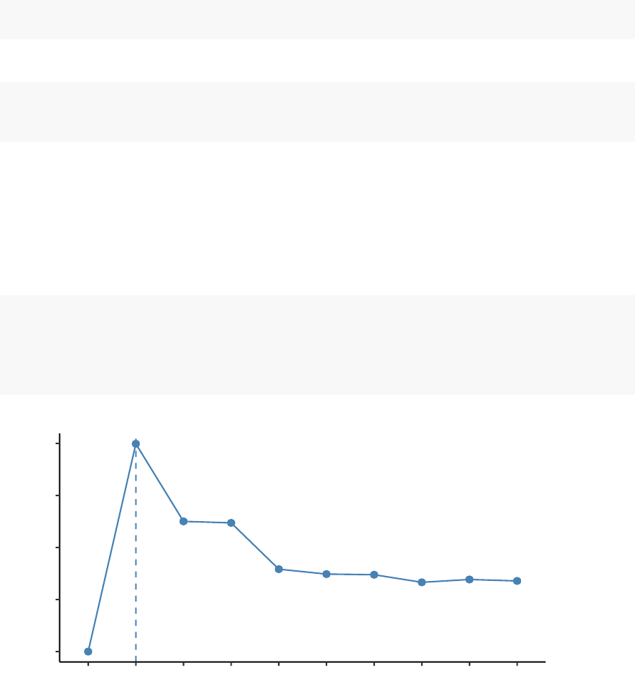
60 CHAPTER 6. CLARA - CLUSTERING LARGE APPLICATIONS
1. Installing required packages:
install.packages(c("cluster","factoextra"))
2. Loading the packages:
library(cluster)
library(factoextra)
6.3.3 Estimating the optimal number of clusters
To estimate the optimal number of clusters in your data, it’s possible to use the
average silhouette method as described in PAM clustering chapter (Chapter 5). The R
function fviz_nbclust() [factoextra package] provides a solution to facilitate this step.
library(cluster)
library(factoextra)
fviz_nbclust(df, clara, method = "silhouette")+
theme_classic()
0.0
0.2
0.4
0.6
0.8
123456789 10
Number of clusters k
Average silhouette width
Optimal number of clusters
From the plot, the suggested number of clusters is 2. In the next section, we’ll classify
the observations into 2 clusters.

6.3. COMPUTING CLARA IN R 61
6.3.4 Computing CLARA
The R code below computes PAM algorithm with k = 2:
# Compute CLARA
clara.res <- clara(df, 2,samples = 50,pamLike = TRUE)
# Print components of clara.res
print(clara.res)
## Call: clara(x = df, k = 2, samples = 50, pamLike = TRUE)
## Medoids:
## x y
## S121 -1.531137 1.145057
## S455 48.357304 50.233499
## Objective function: 9.87862
## Clustering vector: Named int [1:500] 1 1 1 1 1 1 1 1 1 1 1 1 1 1 1 1 1 1 ...
## - attr(*, "names")= chr [1:500] "S1" "S2" "S3" "S4" "S5" "S6" "S7" ...
## Cluster sizes: 200 300
## Best sample:
## [1] S37 S49 S54 S63 S68 S71 S76 S80 S82 S101 S103 S108 S109 S118
## [15] S121 S128 S132 S138 S144 S162 S203 S210 S216 S231 S234 S249 S260 S261
## [29] S286 S299 S304 S305 S312 S315 S322 S350 S403 S450 S454 S455 S456 S465
## [43] S488 S497
##
## Available components:
## [1] "sample" "medoids" "i.med" "clustering" "objective"
## [6] "clusinfo" "diss" "call" "silinfo" "data"
The output of the function clara() includes the following components:
•medoids: Objects that represent clusters
•clustering: a vector containing the cluster number of each object
•sample
: labels or case numbers of the observations in the best sample, that is,
the sample used by the clara algorithm for the final partition.
If you want to add the point classifications to the original data, use this:
dd <- cbind(df, cluster = clara.res$cluster)
head(dd, n=4)

62 CHAPTER 6. CLARA - CLUSTERING LARGE APPLICATIONS
## x y cluster
## S1 -9.656526 3.881815 1
## S2 2.219434 5.574150 1
## S3 8.675529 1.484111 1
## S4 -18.765582 5.605868 1
You can access to the results returned by clara() as follow:
# Medoids
clara.res$medoids
## x y
## S121 -1.531137 1.145057
## S455 48.357304 50.233499
# Clustering
head(clara.res$clustering, 10)
## S1 S2 S3 S4 S5 S6 S7 S8 S9 S10
##1111111111
The medoids are S121, S455
6.3.5 Visualizing CLARA clusters
To visualize the partitioning results, we’ll use the function fviz_cluster() [factoextra
package]. It draws a scatter plot of data points colored by cluster numbers.
fviz_cluster(clara.res,
palette = c("#00AFBB","#FC4E07"), # color palette
ellipse.type = "t",# Concentration ellipse
geom = "point",pointsize = 1,
ggtheme = theme_classic()
)
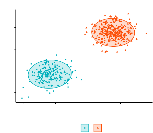
6.4. SUMMARY 63
-2
-1
0
1
-2 -1 0 1
x value
y value
cluster 12
Cluster plot
6.4 Summary
The CLARA (Clustering Large Applications) algorithm is an extension to the PAM
(Partitioning Around Medoids) clustering method for large data sets. It intended to
reduce the computation time in the case of large data set.
As almost all partitioning algorithm, it requires the user to specify the appropri-
ate number of clusters to be produced. This can be estimated using the function
fviz_nbclust [in factoextra R package].
The R function clara() [cluster package] can be used to compute CLARA algorithm.
The simplified format is clara(x, k, pamLike = TRUE), where “x” is the data and k is
the number of clusters to be generated.
After, computing CLARA, the R function fviz_cluster() [factoextra package] can be
used to visualize the results. The format is fviz_cluster(clara.res), where clara.res is
the CLARA results.
Part III
Hierarchical Clustering
64
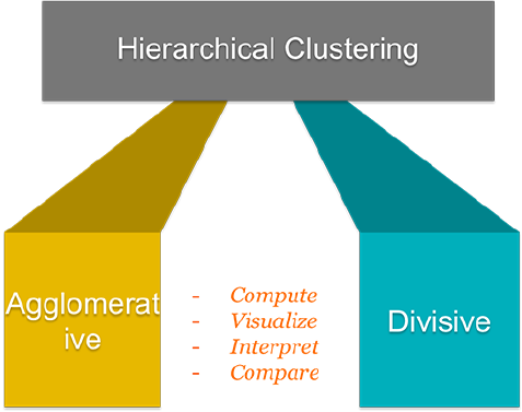
65
Hierarchical clustering
[or
hierarchical cluster analysis
(
HCA
)] is an alter-
native approach to partitioning clustering (Part II) for grouping objects based on
their similarity. In contrast to partitioning clustering, hierarchical clustering does not
require to pre-specify the number of clusters to be produced.
Hierarchical clustering can be subdivided into two types:
•
Agglomerative clustering in which, each observation is initially considered as a
cluster of its own (leaf). Then, the most similar clusters are successively merged
until there is just one single big cluster (root).
•
Divise clustering, an inverse of agglomerative clustering, begins with the root,
in witch all objects are included in one cluster. Then the most heterogeneous
clusters are successively divided until all observation are in their own cluster.
The result of hierarchical clustering is a tree-based representation of the objects, which
is also known as dendrogram (see the figure below).
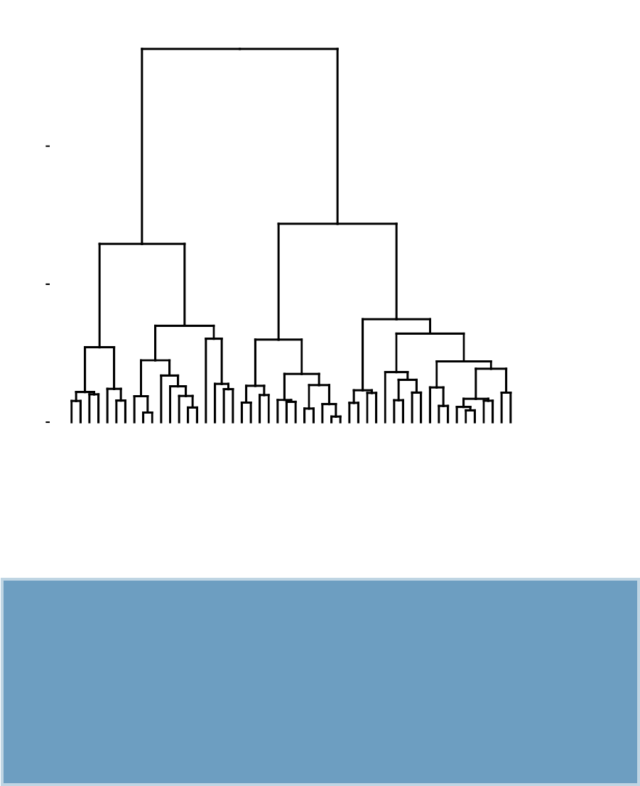
66
Alabama
Louisiana
Georgia
Tennessee
North Carolina
Mississippi
South Carolina
Texas
Illinois
New York
Florida
Arizona
Michigan
Maryland
New Mexico
Alaska
Colorado
California
Nevada
South Dakota
West Virginia
North Dakota
Vermont
Idaho
Montana
Nebraska
Minnesota
Wisconsin
Maine
Iowa
New Hampshire
Virginia
Wyoming
Arkansas
Kentucky
Delaware
Massachusetts
New Jersey
Connecticut
Rhode Island
Missouri
Oregon
Washington
Oklahoma
Indiana
Kansas
Ohio
Pennsylvania
Hawaii
Utah
0
5
10
Height
Hierarchical Clustering
The dendrogram is a multilevel hierarchy where clusters at one level are joined together
to form the clusters at the next levels. This makes it possible to decide the level at
which to cut the tree for generating suitable groups of a data objects.
In previous chapters, we defined several methods for measuring distances (Chapter
3) between objects in a data matrix. In this chapter, we’ll show how to visualize the
dissimilarity between objects using dendrograms.
We start by describing hierarchical clustering algorithms and provide R scripts
for computing and visualizing the results of hierarchical clustering. Next, we’ll
demonstrate how to cut dendrograms into groups. We’ll show also how to compare
two dendrograms. Additionally, we’ll provide solutions for handling dendrograms of
large data sets.

Chapter 7
Agglomerative Clustering
The
agglomerative clustering
is the most common type of hierarchical clustering
use to group objects in clusters based on their similarity. It’s also known as AGNES
(Agglomerative Nesting). The algorithm starts by treating each object as a single-
ton cluster. Next, pairs of clusters are successively merged until all clusters have
been merged into one big cluster containing all objects. The result is a tree-based
representation of the objects, named dendrogram.
In this article we start by describing the agglomerative clustering algorithms. Next, we
provide R lab sections with many examples for computing and visualizing hierarchical
clustering. We continue by explaining how to interpret dendrogram. Finally, we
provide R codes for cutting dendrograms into groups.
7.1 Algorithm
Agglomerative clustering works in a “bottom-up” manner. That is, each object is
initially considered as a single-element cluster (leaf). At each step of the algorithm,
the two clusters that are the most similar are combined into a new bigger cluster
(nodes). This procedure is iterated until all points are member of just one single big
cluster (root) (see figure below).
The inverse of agglomerative clustering is divisive clustering, which is also known as
DIANA (Divise Analysis) and it works in a “top-down” manner. It begins with the
root, in which all objects are included in a single cluster. At each step of iteration,
67
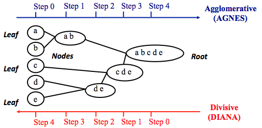
68 CHAPTER 7. AGGLOMERATIVE CLUSTERING
the most heterogeneous cluster is divided into two. The process is iterated until all
objects are in their own cluster (see figure below).
Note that, agglomerative clustering is good at identifying small clusters. Divisive
clustering is good at identifying large clusters. In this article, we’ll focus mainly on
agglomerative hierarchical clustering.
7.2 Steps to agglomerative hierarchical clustering
We’ll follow the steps below to perform agglomerative hierarchical clustering using R
software:
1. Preparing the data
2.
Computing (dis)similarity information between every pair of objects in the data
set.
3.
Using linkage function to group objects into hierarchical cluster tree, based on
the distance information generated at step 1. Objects/clusters that are in close
proximity are linked together using the linkage function.
4.
Determining where to cut the hierarchical tree into clusters. This creates a
partition of the data.
We’ll describe each of these steps in the next section.
7.2.1 Data structure and preparation
The data should be a numeric matrix with:
•rows representing observations (individuals);

7.2. STEPS TO AGGLOMERATIVE HIERARCHICAL CLUSTERING 69
•and columns representing variables.
Here, we’ll use the R base USArrests data sets.
Note that, it’s generally recommended to standardize variables in the data set before
performing subsequent analysis. Standardization makes variables comparable, when
they are measured in different scales. For example one variable can measure the
height in meter and another variable can measure the weight in kg. The R function
scale() can be used for standardization, See ?scale documentation.
# Load the data
data("USArrests")
# Standardize the data
df <- scale(USArrests)
# Show the first 6 rows
head(df, nrow = 6)
## Murder Assault UrbanPop Rape
## Alabama 1.24256408 0.7828393 -0.5209066 -0.003416473
## Alaska 0.50786248 1.1068225 -1.2117642 2.484202941
## Arizona 0.07163341 1.4788032 0.9989801 1.042878388
## Arkansas 0.23234938 0.2308680 -1.0735927 -0.184916602
## California 0.27826823 1.2628144 1.7589234 2.067820292
## Colorado 0.02571456 0.3988593 0.8608085 1.864967207
7.2.2 Similarity measures
In order to decide which objects/clusters should be combined or divided, we need
methods for measuring the similarity between objects.
There are many methods to calculate the (dis)similarity information, including Eu-
clidean and manhattan distances (Chapter 3). In R software, you can use the function
dist() to compute the distance between every pair of object in a data set. The results
of this computation is known as a distance or dissimilarity matrix.
By default, the function dist() computes the Euclidean distance between objects;
however, it’s possible to indicate other metrics using the argument method. See ?dist
70 CHAPTER 7. AGGLOMERATIVE CLUSTERING
for more information.
For example, consider the R base data set USArrests, you can compute the distance
matrix as follow:
# Compute the dissimilarity matrix
# df = the standardized data
res.dist <- dist(df, method = "euclidean")
Note that, the function dist() computes the distance between the rows of a data
matrix using the specified distance measure method.
To see easily the distance information between objects, we reformat the results of the
function dist() into a matrix using the as.matrix() function. In this matrix, value in
the cell formed by the row i, the column j, represents the distance between object i
and object j in the original data set. For instance, element 1,1 represents the distance
between object 1 and itself (which is zero). Element 1,2 represents the distance
between object 1 and object 2, and so on.
The R code below displays the first 6 rows and columns of the distance matrix:
as.matrix(res.dist)[1:6,1:6]
## Alabama Alaska Arizona Arkansas California Colorado
## Alabama 0.000000 2.703754 2.293520 1.289810 3.263110 2.651067
## Alaska 2.703754 0.000000 2.700643 2.826039 3.012541 2.326519
## Arizona 2.293520 2.700643 0.000000 2.717758 1.310484 1.365031
## Arkansas 1.289810 2.826039 2.717758 0.000000 3.763641 2.831051
## California 3.263110 3.012541 1.310484 3.763641 0.000000 1.287619
## Colorado 2.651067 2.326519 1.365031 2.831051 1.287619 0.000000
7.2.3 Linkage
The linkage function takes the distance information, returned by the function dist(),
and groups pairs of objects into clusters based on their similarity. Next, these newly
formed clusters are linked to each other to create bigger clusters. This process is
iterated until all the objects in the original data set are linked together in a hierarchical
tree.

7.2. STEPS TO AGGLOMERATIVE HIERARCHICAL CLUSTERING 71
For example, given a distance matrix “res.dist” generated by the function dist(), the
R base function hclust() can be used to create the hierarchical tree.
hclust() can be used as follow:
res.hc <- hclust(d=res.dist, method = "ward.D2")
•d: a dissimilarity structure as produced by the dist() function.
•method
: The agglomeration (linkage) method to be used for computing distance
between clusters. Allowed values is one of “ward.D”, “ward.D2”, “single”,
“complete”, “average”, “mcquitty”, “median” or “centroid”.
There are many cluster agglomeration methods (i.e, linkage methods). The most
common linkage methods are described below.
•
Maximum or complete linkage: The distance between two clusters is defined as
the maximum value of all pairwise distances between the elements in cluster 1
and the elements in cluster 2. It tends to produce more compact clusters.
•
Minimum or single linkage: The distance between two clusters is defined
as the minimum value of all pairwise distances between the elements in
cluster 1 and the elements in cluster 2. It tends to produce long, "loose" clusters.
•
Mean or average linkage: The distance between two clusters is defined as the
average distance between the elements in cluster 1 and the elements in cluster 2.
•
Centroid linkage: The distance between two clusters is defined as the distance
between the centroid for cluster 1 (a mean vector of length p variables) and
the centroid for cluster 2.
•
Ward’s minimum variance method: It minimizes the total within-cluster vari-
ance. At each step the pair of clusters with minimum between-cluster distance
are merged.
Note that, at each stage of the clustering process the two clusters, that have the
smallest linkage distance, are linked together.
Complete linkage and Ward’s method are generally preferred.
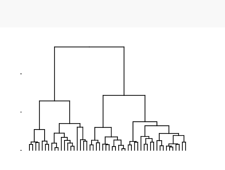
72 CHAPTER 7. AGGLOMERATIVE CLUSTERING
7.2.4 Dendrogram
Dendrograms correspond to the graphical representation of the hierarchical tree
generated by the function hclust(). Dendrogram can be produced in R using the
base function plot(res.hc), where res.hc is the output of hclust(). Here, we’ll use the
function fviz_dend()[ in factoextra R package] to produce a beautiful dendrogram.
First install factoextra by typing this: install.packages(“factoextra”); next visualize
the dendrogram as follow:
# cex: label size
library("factoextra")
fviz_dend(res.hc, cex = 0.5)
Alabama
Louisiana
Georgia
Tennessee
North Carolina
Mississippi
South Carolina
Texas
Illinois
New York
Florida
Arizona
Michigan
Maryland
New Mexico
Alaska
Colorado
California
Nevada
South Dakota
West Virginia
North Dakota
Vermont
Idaho
Montana
Nebraska
Minnesota
Wisconsin
Maine
Iowa
New Hampshire
Virginia
Wyoming
Arkansas
Kentucky
Delaware
Massachusetts
New Jersey
Connecticut
Rhode Island
Missouri
Oregon
Washington
Oklahoma
Indiana
Kansas
Ohio
Pennsylvania
Hawaii
Utah
0
5
10
Height
Cluster Dendrogram
In the dendrogram displayed above, each leaf corresponds to one object. As we move
up the tree, objects that are similar to each other are combined into branches, which
are themselves fused at a higher height.
The height of the fusion, provided on the vertical axis, indicates the (dis)similarity/distance
between two objects/clusters. The higher the height of the fusion, the less similar the
objects are. This height is known as the cophenetic distance between the two objects.

7.3. VERIFY THE CLUSTER TREE 73
Note that, conclusions about the proximity of two objects can be drawn only based on
the height where branches containing those two objects first are fused. We cannot use
the proximity of two objects along the horizontal axis as a criteria of their similarity.
In order to identify sub-groups, we can cut the dendrogram at a certain height as
described in the next sections.
7.3 Verify the cluster tree
After linking the objects in a data set into a hierarchical cluster tree, you might want
to assess that the distances (i.e., heights) in the tree reflect the original distances
accurately.
One way to measure how well the cluster tree generated by the hclust() function
reflects your data is to compute the correlation between the cophenetic distances and
the original distance data generated by the dist() function. If the clustering is valid,
the linking of objects in the cluster tree should have a strong correlation with the
distances between objects in the original distance matrix.
The closer the value of the correlation coefficient is to 1, the more accurately the
clustering solution reflects your data. Values above 0.75 are felt to be good. The
“average” linkage method appears to produce high values of this statistic. This may
be one reason that it is so popular.
The R base function cophenetic() can be used to compute the cophenetic distances for
hierarchical clustering.
# Compute cophentic distance
res.coph <- cophenetic(res.hc)
# Correlation between cophenetic distance and
# the original distance
cor(res.dist, res.coph)
## [1] 0.6975266
Execute the hclust() function again using the average linkage method. Next, call
cophenetic() to evaluate the clustering solution.

74 CHAPTER 7. AGGLOMERATIVE CLUSTERING
res.hc2 <- hclust(res.dist, method = "average")
cor(res.dist, cophenetic(res.hc2))
## [1] 0.7180382
The correlation coefficient shows that using a different linkage method creates a tree
that represents the original distances slightly better.
7.4 Cut the dendrogram into different groups
One of the problems with hierarchical clustering is that, it does not tell us how many
clusters there are, or where to cut the dendrogram to form clusters.
You can cut the hierarchical tree at a given height in order to partition your data
into clusters. The R base function cutree() can be used to cut a tree, generated by
the hclust() function, into several groups either by specifying the desired number of
groups or the cut height. It returns a vector containing the cluster number of each
observation.
# Cut tree into 4 groups
grp <- cutree(res.hc, k=4)
head(grp, n=4)
## Alabama Alaska Arizona Arkansas
## 1 2 2 3
# Number of members in each cluster
table(grp)
## grp
## 1 2 3 4
## 7 12 19 12
# Get the names for the members of cluster 1
rownames(df)[grp == 1]
## [1] "Alabama" "Georgia" "Louisiana" "Mississippi"
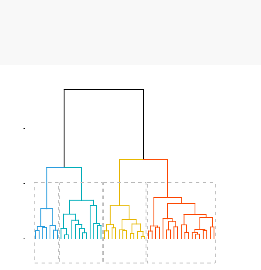
7.4. CUT THE DENDROGRAM INTO DIFFERENT GROUPS 75
## [5] "North Carolina" "South Carolina" "Tennessee"
The result of the cuts can be visualized easily using the function fviz_dend() [in
factoextra]:
# Cut in 4 groups and color by groups
fviz_dend(res.hc, k=4,# Cut in four groups
cex = 0.5,# label size
k_colors = c("#2E9FDF","#00AFBB","#E7B800","#FC4E07"),
color_labels_by_k = TRUE,# color labels by groups
rect = TRUE # Add rectangle around groups
)
Alabama
Louisiana
Georgia
Tennessee
North Carolina
Mississippi
South Carolina
Texas
Illinois
New York
Florida
Arizona
Michigan
Maryland
New Mexico
Alaska
Colorado
California
Nevada
South Dakota
West Virginia
North Dakota
Vermont
Idaho
Montana
Nebraska
Minnesota
Wisconsin
Maine
Iowa
New Hampshire
Virginia
Wyoming
Arkansas
Kentucky
Delaware
Massachusetts
New Jersey
Connecticut
Rhode Island
Missouri
Oregon
Washington
Oklahoma
Indiana
Kansas
Ohio
Pennsylvania
Hawaii
Utah
0
5
10
Height
Cluster Dendrogram
Using the function fviz_cluster() [in factoextra], we can also visualize the result in
a scatter plot. Observations are represented by points in the plot, using principal
components. A frame is drawn around each cluster.
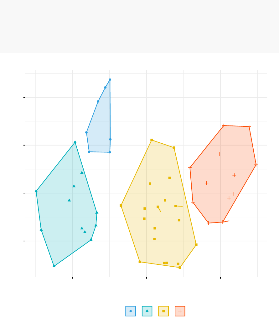
76 CHAPTER 7. AGGLOMERATIVE CLUSTERING
fviz_cluster(list(data = df, cluster = grp),
palette = c("#2E9FDF","#00AFBB","#E7B800","#FC4E07"),
ellipse.type = "convex",# Concentration ellipse
repel = TRUE,# Avoid label overplotting (slow)
show.clust.cent = FALSE,ggtheme = theme_minimal())
Alabama
Alaska
Arizona
Arkansas
California
Colorado Connecticut
Delaware
Florida
Georgia
Hawaii
Idaho
Illinois
Indiana
Iowa
Kansas
Kentucky
Louisiana
Maine
Maryland
Massachusetts
Michigan
Minnesota
Mississippi
Missouri
Montana
Nebraska
Nevada
New Hampshire
New Jersey
New Mexico
New York
North Carolina
North Dakota
Ohio
Oklahoma
Oregon
Pennsylvania
Rhode Island
South Carolina
South Dakota
Tennessee
Texas
Utah
Vermont
Virginia
Washington
West Virginia
Wisconsin
Wyoming
-1
0
1
2
-2 0 2
Dim1 (62%)
Dim2 (24.7%)
cluster aaaa
1234
Cluster plot

7.5. CLUSTER R PACKAGE 77
7.5 Cluster R package
The R package cluster makes it easy to perform cluster analysis in R. It provides
the function agnes() and diana() for computing agglomerative and divisive clustering,
respectively. These functions perform all the necessary steps for you. You don’t need
to execute the scale(), dist() and hclust() function separately.
The functions can be executed as follow:
library("cluster")
# Agglomerative Nesting (Hierarchical Clustering)
res.agnes <- agnes(x=USArrests, # data matrix
stand = TRUE,# Standardize the data
metric = "euclidean",# metric for distance matrix
method = "ward" # Linkage method
)
# DIvisive ANAlysis Clustering
res.diana <- diana(x=USArrests, # data matrix
stand = TRUE,# standardize the data
metric = "euclidean" # metric for distance matrix
)
After running agnes() and diana(), you can use the function fviz_dend()[in factoextra]
to visualize the output:
fviz_dend(res.agnes, cex = 0.6,k=4)
7.6 Application of hierarchical clustering to gene
expression data analysis
In gene expression data analysis,clustering is generaly used as one of the first step to
explore the data. We are interested in whether there are groups of genes or groups of
samples that have similar gene expression patterns.
Several distance measures (Chapter 3) have been described for assessing the similarity
or the dissimilarity between items, in order to decide which items have to be grouped

78 CHAPTER 7. AGGLOMERATIVE CLUSTERING
together or not. These measures can be used to cluster genes or samples that are
similar.
For most common clustering softwares, the default distance measure is the Euclidean
distance. The most popular methods for gene expression data are to use log2(expression
+ 0.25), correlation distance and complete linkage clustering agglomerative-clustering.
Single and Complete linkage give the same dendrogram whether you use the raw data,
the log of the data or any other transformation of the data that preserves the order
because what matters is which ones have the smallest distance. The other methods
are sensitive to the measurement scale.
Note that, when the data are scaled, the Euclidean distance of the z-scores is the
same as correlation distance.
Pearson’s correlation is quite sensitive to outliers. When clustering genes,
it is important to be aware of the possible impact of outliers. An alternative option
is to use Spearman’s correlation instead of Pearson’s correlation.
In principle it is possible to cluster all the genes, although visualizing a huge den-
drogram might be problematic. Usually, some type of preliminary analysis, such as
differential expression analysis is used to select genes for clustering.
Selecting genes based on differential expression analysis removes genes which are likely
to have only chance patterns. This should enhance the patterns found in the gene
clusters.
7.7 Summary
Hierarchical clustering is a cluster analysis method, which produce a tree-based
representation (i.e.: dendrogram) of a data. Objects in the dendrogram are linked
together based on their similarity.
To perform hierarchical cluster analysis in R, the first step is to calculate the pairwise
distance matrix using the function dist(). Next, the result of this computation is used
by the hclust() function to produce the hierarchical tree. Finally, you can use the
function fviz_dend() [in factoextra R package] to plot easily a beautiful dendrogram.
It’s also possible to cut the tree at a given height for partitioning the data into multiple
groups (R function cutree()).

Chapter 8
Comparing Dendrograms
After showing how to compute hierarchical clustering (Chapter 7), we describe, here,
how to compare two dendrograms using the dendextend R package.
The dendextend package provides several functions for comparing dendrograms. Here,
we’ll focus on two functions:
•tanglegram() for visual comparison of two dendrograms
•and cor.dendlist() for computing a correlation matrix between dendrograms.
8.1 Data preparation
We’ll use the R base USArrests data sets and we start by standardizing the variables
using the function scale() as follow:
df <- scale(USArrests)
To make readable the plots, generated in the next sections, we’ll work with a small
random subset of the data set. Therefore, we’ll use the function sample() to randomly
select 10 observations among the 50 observations contained in the data set:
# Subset containing 10 rows
set.seed(123)
ss <- sample(1:50,10)
df <- df[ss,]
79

80 CHAPTER 8. COMPARING DENDROGRAMS
8.2 Comparing dendrograms
We start by creating a list of two dendrograms by computing hierarchical clustering
(HC) using two different linkage methods (“average” and “ward.D2”). Next, we
transform the results as dendrograms and create a list to hold the two dendrograms.
library(dendextend)
# Compute distance matrix
res.dist <- dist(df, method = "euclidean")
# Compute 2 hierarchical clusterings
hc1 <- hclust(res.dist, method = "average")
hc2 <- hclust(res.dist, method = "ward.D2")
# Create two dendrograms
dend1 <- as.dendrogram (hc1)
dend2 <- as.dendrogram (hc2)
# Create a list to hold dendrograms
dend_list <- dendlist(dend1, dend2)
8.2.1 Visual comparison of two dendrograms
To visually compare two dendrograms, we’ll use the tanglegram() function [dendextend
package], which plots the two dendrograms, side by side, with their labels connected
by lines.
The quality of the alignment of the two trees can be measured using the function
entanglement(). Entanglement is a measure between 1 (full entanglement) and 0 (no
entanglement). A lower entanglement coefficient corresponds to a good alignment.
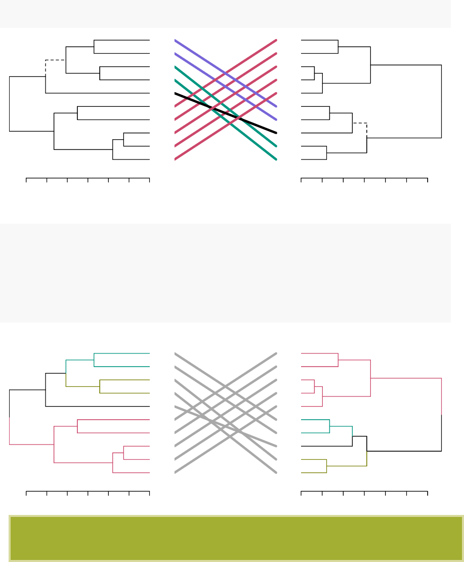
8.2. COMPARING DENDROGRAMS 81
•Draw a tanglegram:
tanglegram(dend1, dend2)
3.0 2.5 2.0 1.5 1.0 0.5 0.0
Maine
Iowa
Wisconsin
Rhode Island
Utah
Mississippi
Maryland
Arizona
Tennessee
Virginia
0123456
Maryland
Arizona
Mississippi
Tennessee
Virginia
Maine
Iowa
Wisconsin
Rhode Island
Utah
•Customized the tanglegram using many other options as follow:
tanglegram(dend1, dend2,
highlight_distinct_edges = FALSE,# Turn-off dashed lines
common_subtrees_color_lines = FALSE,# Turn-off line colors
common_subtrees_color_branches = TRUE,# Color common branches
main = paste("entanglement =",round(entanglement(dend_list), 2))
)
3.0 2.5 2.0 1.5 1.0 0.5 0.0
Maine
Iowa
Wisconsin
Rhode Island
Utah
Mississippi
Maryland
Arizona
Tennessee
Virginia
entanglement = 0.9
0123456
Maryland
Arizona
Mississippi
Tennessee
Virginia
Maine
Iowa
Wisconsin
Rhode Island
Utah
Note that "unique" nodes, with a combination of labels/items not present in the
other tree, are highlighted with dashed lines.

82 CHAPTER 8. COMPARING DENDROGRAMS
8.2.2 Correlation matrix between a list of dendrograms
The function cor.dendlist() is used to compute “Baker”or“Cophenetic” correlation
matrix between a list of trees. The value can range between -1 to 1. With near 0
values meaning that the two trees are not statistically similar.
# Cophenetic correlation matrix
cor.dendlist(dend_list, method = "cophenetic")
## [,1] [,2]
## [1,] 1.0000000 0.9646883
## [2,] 0.9646883 1.0000000
# Baker correlation matrix
cor.dendlist(dend_list, method = "baker")
## [,1] [,2]
## [1,] 1.0000000 0.9622885
## [2,] 0.9622885 1.0000000
The correlation between two trees can be also computed as follow:
# Cophenetic correlation coefficient
cor_cophenetic(dend1, dend2)
## [1] 0.9646883
# Baker correlation coefficient
cor_bakers_gamma(dend1, dend2)
## [1] 0.9622885
It’s also possible to compare simultaneously multiple dendrograms. A chaining operator
%>% is used to run multiple function at the same time. It’s useful for simplifying the
code:
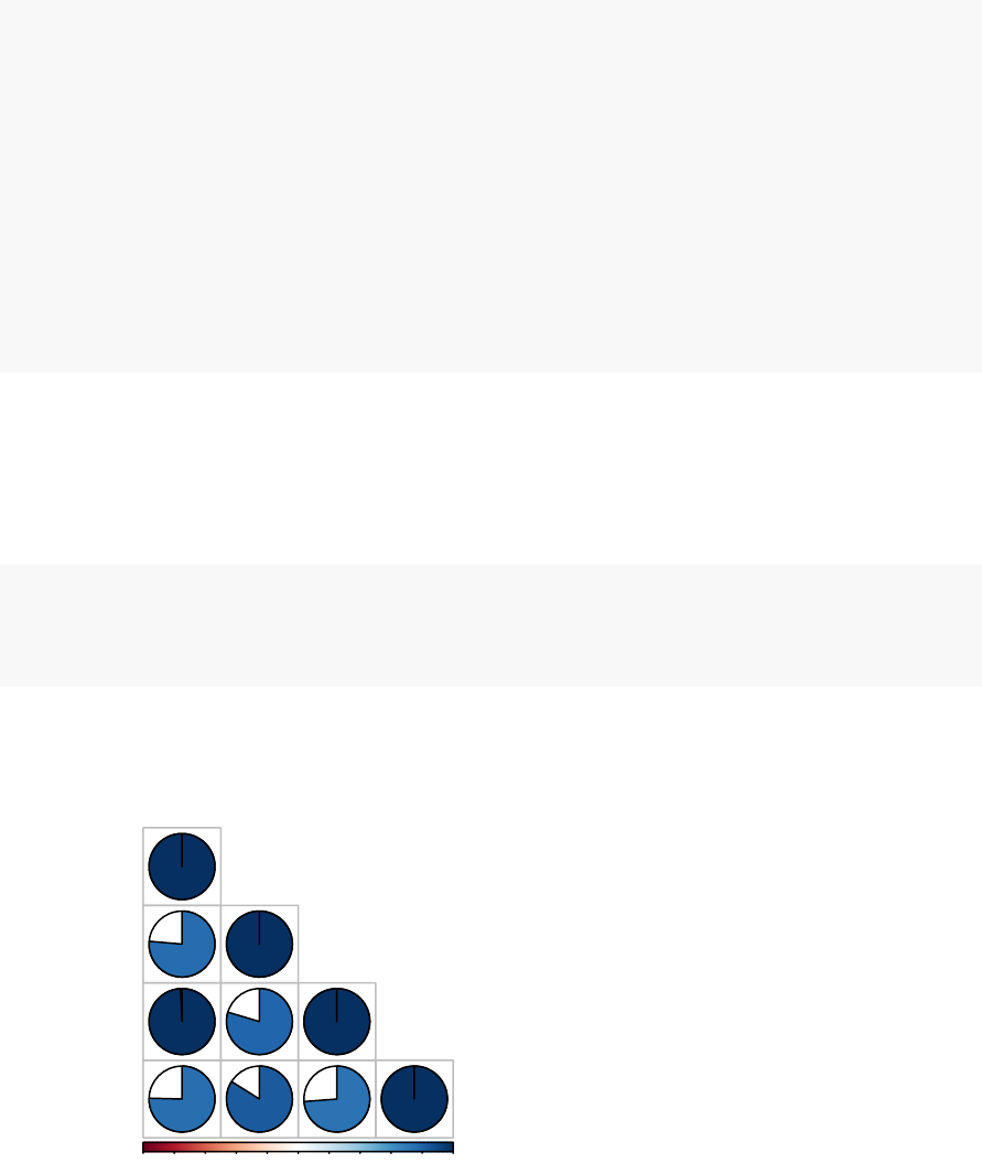
8.2. COMPARING DENDROGRAMS 83
# Create multiple dendrograms by chaining
dend1 <- df %>% dist %>% hclust("complete")%>%as.dendrogram
dend2 <- df %>% dist %>% hclust("single")%>%as.dendrogram
dend3 <- df %>% dist %>% hclust("average")%>%as.dendrogram
dend4 <- df %>% dist %>% hclust("centroid")%>%as.dendrogram
# Compute correlation matrix
dend_list <- dendlist("Complete" =dend1, "Single" =dend2,
"Average" =dend3, "Centroid" =dend4)
cors <- cor.dendlist(dend_list)
# Print correlation matrix
round(cors, 2)
## Complete Single Average Centroid
## Complete 1.00 0.76 0.99 0.75
## Single 0.76 1.00 0.80 0.84
## Average 0.99 0.80 1.00 0.74
## Centroid 0.75 0.84 0.74 1.00
# Visualize the correlation matrix using corrplot package
library(corrplot)
corrplot(cors, "pie","lower")
-1 -0.8-0.6-0.4-0.2 00.20.40.60.8 1
Complete
Single
Average
Centroid
Complete
Single
Average
Centroid

Chapter 9
Visualizing Dendrograms
As described in previous chapters, a
dendrogram
is a tree-based representation of a
data created using hierarchical clustering methods (Chapter 7). In this article, we
provide R code for
visualizing
and customizing dendrograms. Additionally, we show
how to save and to zoom a large dendrogram.
We start by computing hierarchical clustering using the USArrests data sets:
# Load data
data(USArrests)
# Compute distances and hierarchical clustering
dd <- dist(scale(USArrests), method = "euclidean")
hc <- hclust(dd, method = "ward.D2")
To visualize the dendrogram, we’ll use the following R functions and packages:
•
fviz_dend()[in factoextra R package] to create easily a ggplot2-based beautiful
dendrogram.
•dendextend package to manipulate dendrograms
Before continuing, install the required package as follow:
install.packages(c("factoextra","dendextend"))
84

9.1. VISUALIZING DENDROGRAMS 85
9.1 Visualizing dendrograms
We’ll use the function fviz_dend()[in factoextra R package] to create easily a beautiful
dendrogram using either the R base plot or ggplot2. It provides also an option for
drawing circular dendrograms and phylogenic-like trees.
To create a basic dendrograms, type this:
library(factoextra)
fviz_dend(hc, cex = 0.5)
You can use the arguments main, sub, xlab, ylab to change plot titles as follow:
fviz_dend(hc, cex = 0.5,
main = "Dendrogram - ward.D2",
xlab = "Objects",ylab = "Distance",sub = "")
To draw a horizontal dendrogram, type this:
fviz_dend(hc, cex = 0.5,horiz = TRUE)
It’s also possible to cut the tree at a given height for partitioning the data into multiple
groups as described in the previous chapter: Hierarchical clustering (Chapter 7). In
this case, it’s possible to color branches by groups and to add rectangle around each
group.
For example:
fviz_dend(hc, k=4,# Cut in four groups
cex = 0.5,# label size
k_colors = c("#2E9FDF","#00AFBB","#E7B800","#FC4E07"),
color_labels_by_k = TRUE,# color labels by groups
rect = TRUE,# Add rectangle around groups
rect_border = c("#2E9FDF","#00AFBB","#E7B800","#FC4E07"),
rect_fill = TRUE)
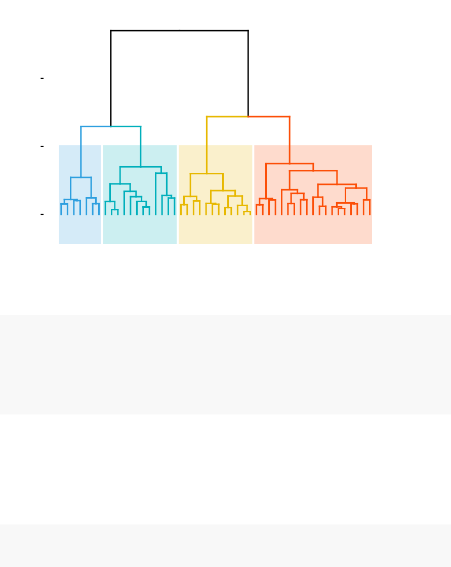
86 CHAPTER 9. VISUALIZING DENDROGRAMS
Alabama
Louisiana
Georgia
Tennessee
North Carolina
Mississippi
South Carolina
Texas
Illinois
New York
Florida
Arizona
Michigan
Maryland
New Mexico
Alaska
Colorado
California
Nevada
South Dakota
West Virginia
North Dakota
Vermont
Idaho
Montana
Nebraska
Minnesota
Wisconsin
Maine
Iowa
New Hampshire
Virginia
Wyoming
Arkansas
Kentucky
Delaware
Massachusetts
New Jersey
Connecticut
Rhode Island
Missouri
Oregon
Washington
Oklahoma
Indiana
Kansas
Ohio
Pennsylvania
Hawaii
Utah
0
5
10
Height
Cluster Dendrogram
To change the plot theme, use the argument ggtheme, which allowed values include gg-
plot2 official themes [ theme_gray(), theme_bw(), theme_minimal(), theme_classic(),
theme_void()] or any other user-defined ggplot2 themes.
fviz_dend(hc, k=4,# Cut in four groups
cex = 0.5,# label size
k_colors = c("#2E9FDF","#00AFBB","#E7B800","#FC4E07"),
color_labels_by_k = TRUE,# color labels by groups
ggtheme = theme_gray() # Change theme
)
Allowed values for k_color include brewer palettes from RColorBrewer Package (e.g.
“RdBu”, “Blues”, “Dark2”, “Set2”, . . . ; ) and scientific journal palettes from ggsci R
package (e.g.: “npg”, “aaas”, “lancet”, “jco”, “ucscgb”, “uchicago”, “simpsons” and
“rickandmorty”).
In the R code below, we’ll change group colors using “jco” (journal of clinical oncology)
color palette:
fviz_dend(hc, cex = 0.5,k=4,# Cut in four groups
k_colors = "jco")
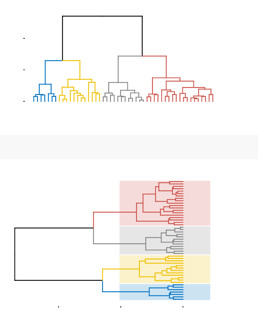
9.1. VISUALIZING DENDROGRAMS 87
Alabama
Louisiana
Georgia
Tennessee
North Carolina
Mississippi
South Carolina
Texas
Illinois
New York
Florida
Arizona
Michigan
Maryland
New Mexico
Alaska
Colorado
California
Nevada
South Dakota
West Virginia
North Dakota
Vermont
Idaho
Montana
Nebraska
Minnesota
Wisconsin
Maine
Iowa
New Hampshire
Virginia
Wyoming
Arkansas
Kentucky
Delaware
Massachusetts
New Jersey
Connecticut
Rhode Island
Missouri
Oregon
Washington
Oklahoma
Indiana
Kansas
Ohio
Pennsylvania
Hawaii
Utah
0
5
10
Height
Cluster Dendrogram
If you want to draw a horizontal dendrogram with rectangle around clusters, use this:
fviz_dend(hc, k=4,cex = 0.4,horiz = TRUE,k_colors = "jco",
rect = TRUE,rect_border = "jco",rect_fill = TRUE)
Alabama
Louisiana
Georgia
Tennessee
North Carolina
Mississippi
South Carolina
Texas
Illinois
New York
Florida
Arizona
Michigan
Maryland
New Mexico
Alaska
Colorado
California
Nevada
South Dakota
West Virginia
North Dakota
Vermont
Idaho
Montana
Nebraska
Minnesota
Wisconsin
Maine
Iowa
New Hampshire
Virginia
Wyoming
Arkansas
Kentucky
Delaware
Massachusetts
New Jersey
Connecticut
Rhode Island
Missouri
Oregon
Washington
Oklahoma
Indiana
Kansas
Ohio
Pennsylvania
Hawaii
Utah
0510
Height
Cluster Dendrogram
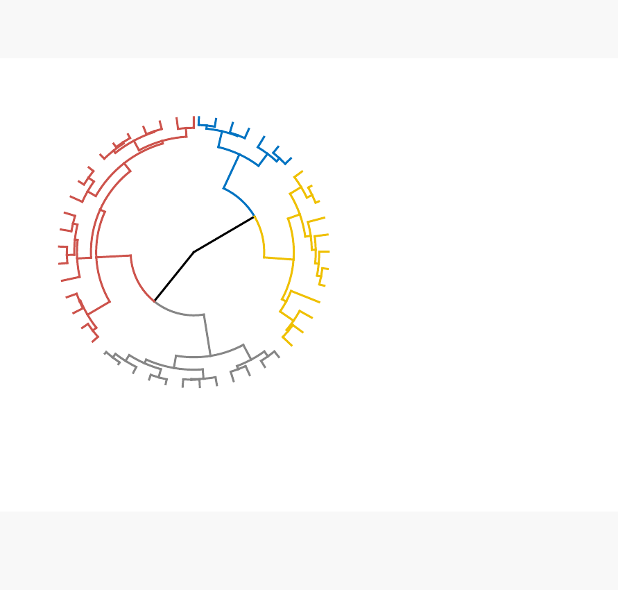
88 CHAPTER 9. VISUALIZING DENDROGRAMS
Additionally, you can plot a circular dendrogram using the option type = “circular”.
fviz_dend(hc, cex = 0.5,k=4,
k_colors = "jco",type = "circular")
Alabama
Louisiana
Georgia
Tennessee
North Carolina
Mississippi
South Carolina
Texas
Illinois
New York
Florida
Arizona
Michigan
Maryland
New Mexico
Alaska
Colorado
California
Nevada
South Dakota
West Virginia
North Dakota
Vermont
Idaho
Montana
Nebraska
Minnesota
Wisconsin
Maine
Iowa
New Hampshire
Virginia
Wyoming
Arkansas
Kentucky
Delaware
Massachusetts
New Jersey
Connecticut
Rhode Island
Missouri
Oregon
Washington
Oklahoma
Indiana
Kansas
Ohio
Pennsylvania
Hawaii
Utah
To plot a phylogenic-like tree, use type = “phylogenic” and repel = TRUE (to avoid
labels overplotting). This functionality requires the R package igraph. Make sure that
it’s installed before typing the following R code.
require("igraph")
fviz_dend(hc, k=4,k_colors = "jco",
type = "phylogenic",repel = TRUE)
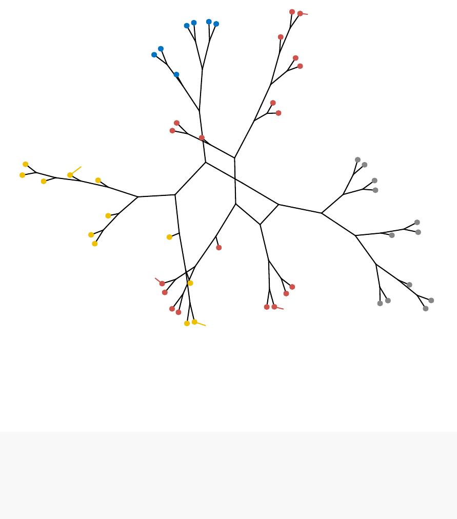
9.1. VISUALIZING DENDROGRAMS 89
Alabama
Alaska
Arizona
Arkansas
California
Colorado
Connecticut
Delaware
Florida
Georgia
Hawaii
Idaho
Illinois
Indiana
Iowa
Kansas
Kentucky
Louisiana
Maine
Maryland
Massachusetts
Michigan
Minnesota
Mississippi
Missouri
Montana
Nebraska
Nevada
New Hampshire
New Jersey
New Mexico
New York
North Carolina
North Dakota
Ohio
Oklahoma
Oregon
Pennsylvania
Rhode Island
South Carolina
South Dakota
Tennessee
Texas
Utah
Vermont
Virginia
Washington
West Virginia
Wisconsin
Wyoming
The default layout for phylogenic trees is “layout.auto”. Allowed values are one of:
c(“layout.auto”, “layout_with_drl”, “layout_as_tree”, “layout.gem”, “layout.mds”,
“layout_with_lgl”). To read more about these layouts, read the documentation of the
igraph R package.
Let’s try phylo.layout = “layout.gem”:
require("igraph")
fviz_dend(hc, k=4,# Cut in four groups
k_colors = "jco",
type = "phylogenic",repel = TRUE,
phylo_layout = "layout.gem")
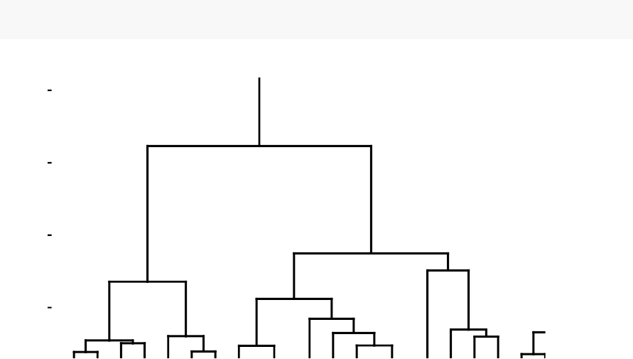
90 CHAPTER 9. VISUALIZING DENDROGRAMS
9.2 Case of dendrogram with large data sets
If you compute hierarchical clustering on a large data set, you might want to zoom in
the dendrogram or to plot only a subset of the dendrogram.
Alternatively, you could also plot the dendrogram to a large page on a PDF, which
can be zoomed without loss of resolution.
9.2.1 Zooming in the dendrogram
If you want to zoom in the first clusters, its possible to use the option xlim and ylim
to limit the plot area. For example, type the code below:
fviz_dend(hc, xlim = c(1,20), ylim = c(1,8))
2
4
6
8
Height
Cluster Dendrogram
9.2.2 Plotting a sub-tree of dendrograms
To plot a sub-tree, we’ll follow the procedure below:
1.
Create the whole dendrogram using fviz_dend() and save the result into an
object, named dend_plot for example.
9.2. CASE OF DENDROGRAM WITH LARGE DATA SETS 91
2.
Use the R base function cut.dendrogram() to cut the dendrogram, at a given
height (h), into multiple sub-trees. This returns a list with components $upper
and $lower, the first is a truncated version of the original tree, also of class
dendrogram, the latter a list with the branches obtained from cutting the tree,
each a dendrogram.
3. Visualize sub-trees using fviz_dend().
The R code is as follow.
•Cut the dendrogram and visualize the truncated version:
# Create a plot of the whole dendrogram,
# and extract the dendrogram data
dend_plot <- fviz_dend(hc, k=4,# Cut in four groups
cex = 0.5,# label size
k_colors = "jco"
)
dend_data <- attr(dend_plot, "dendrogram")# Extract dendrogram data
# Cut the dendrogram at height h = 10
dend_cuts <- cut(dend_data, h=10)
# Visualize the truncated version containing
# two branches
fviz_dend(dend_cuts$upper)
Branch 1
Branch 2
0
5
10
Height
Cluster Dendrogram
•Plot dendrograms sub-trees:
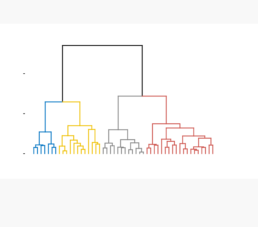
92 CHAPTER 9. VISUALIZING DENDROGRAMS
# Plot the whole dendrogram
print(dend_plot)
Alabama
Louisiana
Georgia
Tennessee
North Carolina
Mississippi
South Carolina
Texas
Illinois
New York
Florida
Arizona
Michigan
Maryland
New Mexico
Alaska
Colorado
California
Nevada
South Dakota
West Virginia
North Dakota
Vermont
Idaho
Montana
Nebraska
Minnesota
Wisconsin
Maine
Iowa
New Hampshire
Virginia
Wyoming
Arkansas
Kentucky
Delaware
Massachusetts
New Jersey
Connecticut
Rhode Island
Missouri
Oregon
Washington
Oklahoma
Indiana
Kansas
Ohio
Pennsylvania
Hawaii
Utah
0
5
10
Height
Cluster Dendrogram
# Plot subtree 1
fviz_dend(dend_cuts$lower[[1]], main = "Subtree 1")
# Plot subtree 2
fviz_dend(dend_cuts$lower[[2]], main = "Subtree 2")
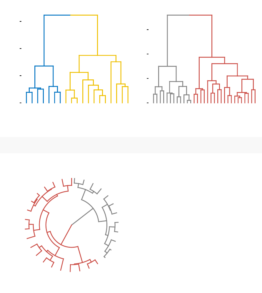
9.2. CASE OF DENDROGRAM WITH LARGE DATA SETS 93
Alabama
Louisiana
Georgia
Tennessee
North Carolina
Mississippi
South Carolina
Texas
Illinois
New York
Florida
Arizona
Michigan
Maryland
New Mexico
Alaska
Colorado
California
Nevada
0
2
4
6
Height
Subtree 1
South Dakota
West Virginia
North Dakota
Vermont
Idaho
Montana
Nebraska
Minnesota
Wisconsin
Maine
Iowa
New Hampshire
Virginia
Wyoming
Arkansas
Kentucky
Delaware
Massachusetts
New Jersey
Connecticut
Rhode Island
Missouri
Oregon
Washington
Oklahoma
Indiana
Kansas
Ohio
Pennsylvania
Hawaii
Utah
0
2
4
6
Height
Subtree 2
You can also plot circular trees as follow:
fviz_dend(dend_cuts$lower[[2]], type = "circular")
South Dakota
West Virginia
North Dakota
Vermont
Idaho
Montana
Nebraska
Minnesota
Wisconsin
Maine
Iowa
New Hampshire
Virginia
Wyoming
Arkansas
Kentucky
Delaware
Massachusetts
New Jersey
Connecticut
Rhode Island
Missouri
Oregon
Washington
Oklahoma
Indiana
Kansas
Ohio
Pennsylvania
Hawaii
Utah

94 CHAPTER 9. VISUALIZING DENDROGRAMS
9.2.3 Saving dendrogram into a large PDF page
If you have a large dendrogram, you can save it to a large PDF page, which can be
zoomed without loss of resolution.
pdf("dendrogram.pdf",width=30,height=15)# Open a PDF
p<-fviz_dend(hc, k=4,cex = 1,k_colors = "jco" )# Do plotting
print(p)
dev.off() # Close the PDF
9.3 Manipulating dendrograms using dendextend
The package dendextend provide functions for changing easily the appearance of a
dendrogram and for comparing dendrograms.
In this section we’ll use the chaining operator (%>%) to simplify our code. The
chaining operator turns x %>% f(y) into f(x, y) so you can use it to rewrite multiple
operations such that they can be read from left-to-right, top-to-bottom. For instance,
the results of the two R codes below are equivalent.
•Standard R code for creating a dendrogram:
data <- scale(USArrests)
dist.res <- dist(data)
hc <- hclust(dist.res, method = "ward.D2")
dend <- as.dendrogram(hc)
plot(dend)
•R code for creating a dendrogram using chaining operator:
library(dendextend)
dend <- USArrests[1:5,] %>% # data
scale %>% # Scale the data
dist %>% # calculate a distance matrix,
hclust(method = "ward.D2")%>%# Hierarchical clustering
as.dendrogram # Turn the object into a dendrogram.
plot(dend)

9.3. MANIPULATING DENDROGRAMS USING DENDEXTEND 95
•
Functions to customize dendrograms: The function set() [in dendextend package]
can be used to change the parameters of a dendrogram. The format is:
set(object, what, value)
1. object: a dendrogram object
2. what
: a character indicating what is the property of the tree that should be
set/updated
3. value
: a vector with the value to set in the tree (the type of the value depends
on the “what”).
Possible values for the argument what include:
Value for the argument what Description
labels set the labels
labels_colors and labels_cex Set the color and the size of
labels, respectively
leaves_pch,leaves_cex and
leaves_col
set the point type, size and color
for leaves, respectively
nodes_pch,nodes_cex and
nodes_col
set the point type, size and color
for nodes, respectively
hang_leaves hang the leaves
branches_k_color color the branches
branches_col,branches_lwd ,
branches_lty
Set the color, the line width and
the line type of branches,
respectively
by_labels_branches_col,
by_labels_branches_lwd and
by_labels_branches_lty
Set the color, the line width and
the line type of branches with
specific labels, respectively
clear_branches and
clear_leaves
Clear branches and leaves,
respectively

96 CHAPTER 9. VISUALIZING DENDROGRAMS
•Examples:
library(dendextend)
# 1. Create a customized dendrogram
mycols <- c("#2E9FDF","#00AFBB","#E7B800","#FC4E07")
dend <- as.dendrogram(hc) %>%
set("branches_lwd",1)%>%# Branches line width
set("branches_k_color",mycols,k=4)%>%# Color branches by groups
set("labels_colors",mycols,k=4)%>% # Color labels by groups
set("labels_cex",0.5)# Change label size
# 2. Create plot
fviz_dend(dend)
9.4 Summary
We described functions and packages for visualizing and customizing dendrograms
including:
•
fviz_dend() [in factoextra R package], which provides convenient solutions for
plotting easily a beautiful dendrogram. It can be used to create rectangular and
circular dendrograms, as well as, a phylogenic tree.
•
and the dendextend package, which provides a flexible methods to customize
dendrograms.
Additionally, we described how to plot a subset of large dendrograms.

Chapter 10
Heatmap: Static and Interactive
A
heatmap
(or
heat map
) is another way to visualize hierarchical clustering. It’s
also called a false colored image, where data values are transformed to color scale.
Heat maps allow us to simultaneously visualize clusters of samples and features. First
hierarchical clustering is done of both the rows and the columns of the data matrix.
The columns/rows of the data matrix are re-ordered according to the hierarchical
clustering result, putting similar observations close to each other. The blocks of ‘high’
and ‘low’ values are adjacent in the data matrix. Finally, a color scheme is applied for
the visualization and the data matrix is displayed. Visualizing the data matrix in this
way can help to find the variables that appear to be characteristic for each sample
cluster.
Previously, we described how to visualize dendrograms (Chapter 9). Here, we’ll
demonstrate how to draw and arrange a heatmap in R.
10.1 R Packages/functions for drawing heatmaps
There are a multiple numbers of R packages and functions for drawing interactive and
static heatmaps, including:
•heatmap() [R base function, stats package]: Draws a simple heatmap
•
heatmap.2 () [gplots R package]: Draws an enhanced heatmap compared to the
R base function.
97

98 CHAPTER 10. HEATMAP: STATIC AND INTERACTIVE
•
pheatmap() [pheatmap R package]: Draws pretty heatmaps and provides more
control to change the appearance of heatmaps.
•d3heatmap() [d3heatmap R package]: Draws an interactive/clickable heatmap
•
Heatmap() [ComplexHeatmap R/Bioconductor package]: Draws, annotates and
arranges complex heatmaps (very useful for genomic data analysis)
Here, we start by describing the 5 R functions for drawing heatmaps. Next, we’ll
focus on the ComplexHeatmap package, which provides a flexible solution to arrange
and annotate multiple heatmaps. It allows also to visualize the association between
different data from different sources.
10.2 Data preparation
We use mtcars data as a demo data set. We start by standardizing the data to make
variables comparable:
df <- scale(mtcars)
10.3 R base heatmap: heatmap()
The built-in R heatmap() function [in stats package] can be used.
A simplified format is:
heatmap(x, scale = "row")
•x: a numeric matrix
•scale
: a character indicating if the values should be centered and scaled in
either the row direction or the column direction, or none. Allowed values are in
c(“row”, “column”, “none”). Default is “row”.
# Default plot
heatmap(df, scale = "none")
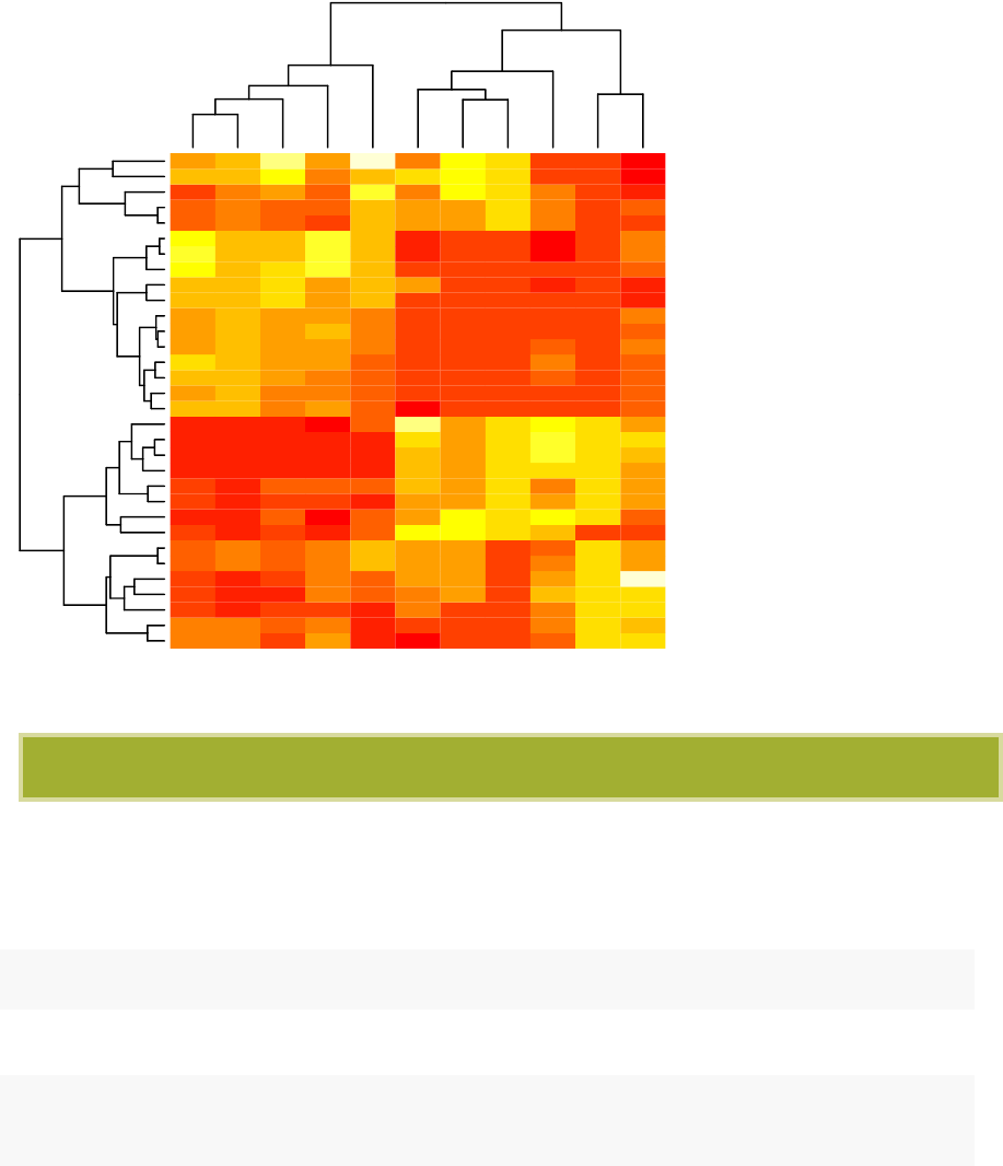
10.3. R BASE HEATMAP: HEATMAP() 99
disp
cyl
hp
wt
carb
drat
gear
am
mpg
vs
qsec
Valiant
Hornet 4 Drive
Toyota Corona
Merc 240D
Merc 230
Merc 280
Merc 280C
Porsche 914-2
Lotus Europa
Datsun 710
Volvo 142E
Fiat X1-9
Fiat 128
Toyota Corolla
Honda Civic
Dodge Challenger
AMC Javelin
Hornet Sportabout
Pontiac Firebird
Merc 450SL
Merc 450SE
Merc 450SLC
Duster 360
Camaro Z28
Chrysler Imperial
Cadillac Fleetwood
Lincoln Continental
Mazda RX4
Mazda RX4 Wag
Ferrari Dino
Ford Pantera L
Maserati Bora
In the plot above, high values are in red and low values are in yellow.
It’s possible to specify a color palette using the argument col, which can be defined as
follow:
•Using custom colors:
col<- colorRampPalette(c("red","white","blue"))(256)
•Or, using RColorBrewer color palette:
library("RColorBrewer")
col <- colorRampPalette(brewer.pal(10,"RdYlBu"))(256)
Additionally, you can use the argument RowSideColors and ColSideColors to annotate
rows and columns, respectively.
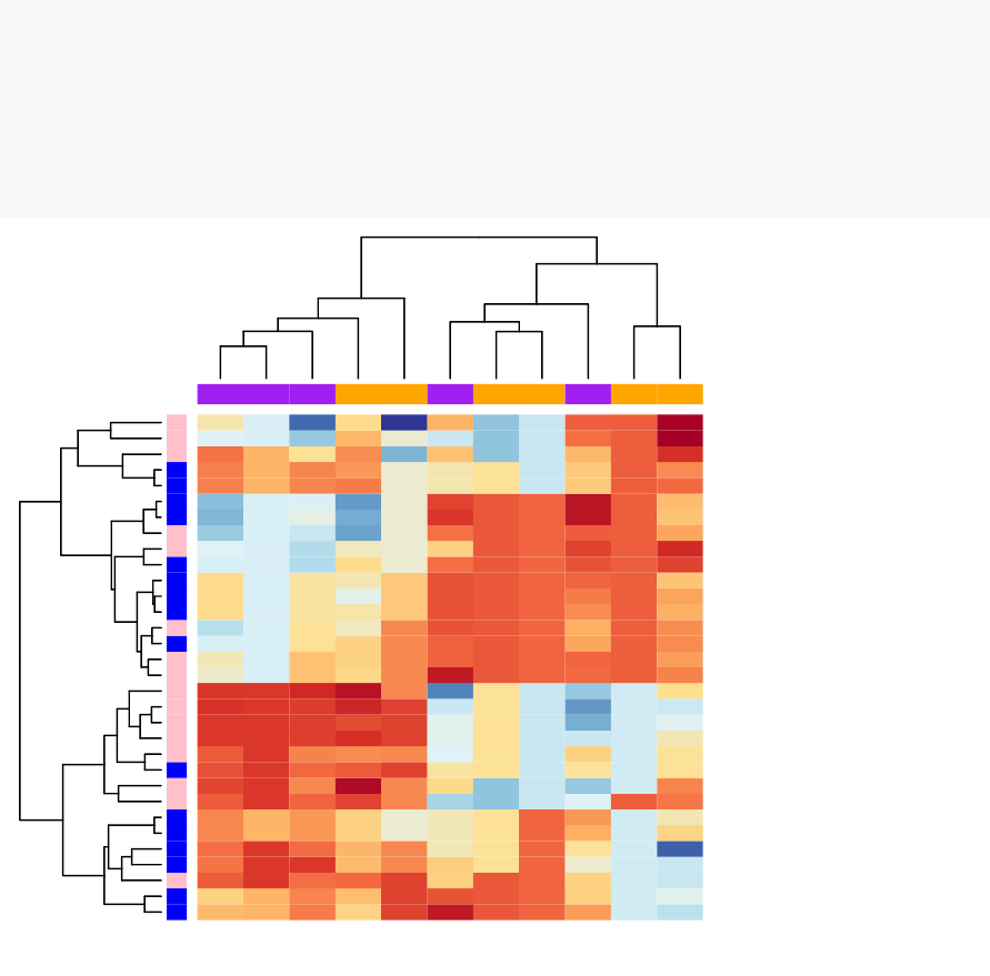
100 CHAPTER 10. HEATMAP: STATIC AND INTERACTIVE
For example, in the the R code below will customize the heatmap as follow:
1. An RColorBrewer color palette name is used to change the appearance
2.
The argument RowSideColors and ColSideColors are used to annotate rows
and columns respectively. The expected values for these options are a vector
containing color names specifying the classes for rows/columns.
# Use RColorBrewer color palette names
library("RColorBrewer")
col <- colorRampPalette(brewer.pal(10,"RdYlBu"))(256)
heatmap(df, scale = "none",col = col,
RowSideColors = rep(c("blue","pink"), each = 16),
ColSideColors = c(rep("purple",5), rep("orange",6)))
disp
cyl
hp
wt
carb
drat
gear
am
mpg
vs
qsec
Valiant
Hornet 4 Drive
Toyota Corona
Merc 240D
Merc 230
Merc 280
Merc 280C
Porsche 914-2
Lotus Europa
Datsun 710
Volvo 142E
Fiat X1-9
Fiat 128
Toyota Corolla
Honda Civic
Dodge Challenger
AMC Javelin
Hornet Sportabout
Pontiac Firebird
Merc 450SL
Merc 450SE
Merc 450SLC
Duster 360
Camaro Z28
Chrysler Imperial
Cadillac Fleetwood
Lincoln Continental
Mazda RX4
Mazda RX4 Wag
Ferrari Dino
Ford Pantera L
Maserati Bora
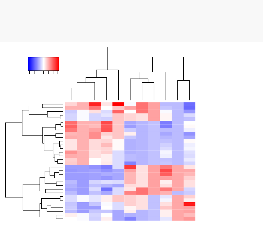
10.4. ENHANCED HEAT MAPS: HEATMAP.2() 101
10.4 Enhanced heat maps: heatmap.2()
The function heatmap.2 () [in gplots package] provides many extensions to the standard
Rheatmap() function presented in the previous section.
# install.packages("gplots")
library("gplots")
heatmap.2(df, scale = "none",col = bluered(100),
trace = "none",density.info = "none")
disp
cyl
hp
wt
carb
drat
gear
am
mpg
vs
qsec
Valiant
Hornet 4 Drive
Toyota Corona
Merc 240D
Merc 230
Merc 280
Merc 280C
Porsche 914-2
Lotus Europa
Datsun 710
Volvo 142E
Fiat X1-9
Fiat 128
Toyota Corolla
Honda Civic
Dodge Challenger
AMC Javelin
Hornet Sportabout
Pontiac Firebird
Merc 450SL
Merc 450SE
Merc 450SLC
Duster 360
Camaro Z28
Chrysler Imperial
Cadillac Fleetwood
Lincoln Continental
Mazda RX4
Mazda RX4 Wag
Ferrari Dino
Ford Pantera L
Maserati Bora
-3 -1 1 3
Value
Color Key
Other arguments can be used including:
•labRow,labCol
•hclustfun: hclustfun=function(x) hclust(x, method=“ward”)
In the R code above, the bluered() function [in gplots package] is used to generate
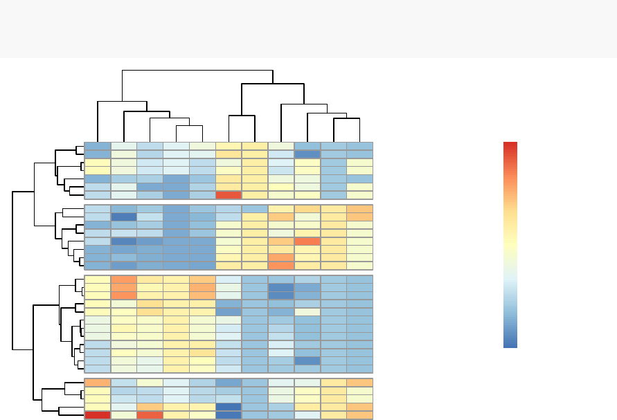
102 CHAPTER 10. HEATMAP: STATIC AND INTERACTIVE
a smoothly varying set of colors. You can also use the following color generator
functions:
•colorpanel(n, low, mid, high)
–n: Desired number of color elements to be generated
–
low, mid, high: Colors to use for the Lowest, middle, and highest values.
mid may be omitted.
•redgreen(n), greenred(n), bluered(n) and redblue(n)
10.5 Pretty heat maps: pheatmap()
First, install the pheatmap package: install.packages(“pheatmap”); then type this:
library("pheatmap")
pheatmap(df, cutree_rows = 4)
carb
wt
hp
cyl
disp
qsec
vs
mpg
drat
am
gear
Hornet 4 Drive
Valiant
Merc 280
Merc 280C
Toyota Corona
Merc 240D
Merc 230
Porsche 914−2
Lotus Europa
Datsun 710
Volvo 142E
Honda Civic
Fiat X1−9
Fiat 128
Toyota Corolla
Chrysler Imperial
Cadillac Fleetwood
Lincoln Continental
Duster 360
Camaro Z28
Merc 450SLC
Merc 450SE
Merc 450SL
Hornet Sportabout
Pontiac Firebird
Dodge Challenger
AMC Javelin
Ferrari Dino
Mazda RX4
Mazda RX4 Wag
Ford Pantera L
Maserati Bora
−1
0
1
2
3
Arguments are available for changing the default clustering metric (“euclidean”) and
method (“complete”). It’s also possible to annotate rows and columns using grouping
variables.
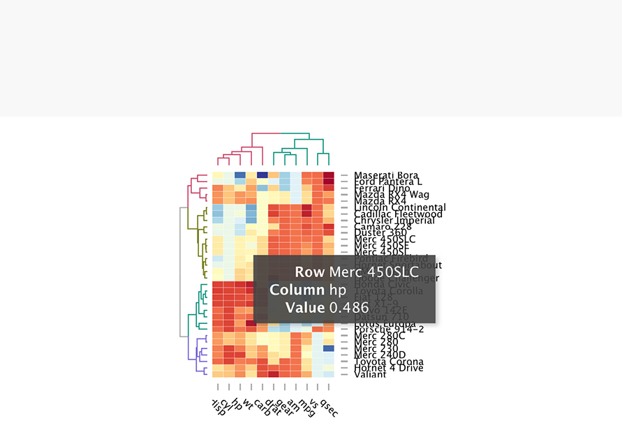
10.6. INTERACTIVE HEAT MAPS: D3HEATMAP() 103
10.6 Interactive heat maps: d3heatmap()
First, install the d3heatmap package: install.packages(“d3heatmap”); then type this:
library("d3heatmap")
d3heatmap(scale(mtcars), colors = "RdYlBu",
k_row = 4,# Number of groups in rows
k_col = 2# Number of groups in columns
)
The d3heamap() function makes it possible to:
•
Put the mouse on a heatmap cell of interest to view the row and the column
names as well as the corresponding value.
•
Select an area for zooming. After zooming, click on the heatmap again to go
back to the previous display
10.7 Enhancing heatmaps using dendextend
The package dendextend can be used to enhance functions from other packages. The
mtcars data is used in the following sections. We’ll start by defining the order and the
appearance for rows and columns using dendextend. These results are used in others
functions from others packages.

104 CHAPTER 10. HEATMAP: STATIC AND INTERACTIVE
The order and the appearance for rows and columns can be defined as follow:
library(dendextend)
# order for rows
Rowv <- mtcars %>% scale %>% dist %>% hclust %>% as.dendrogram %>%
set("branches_k_color",k=3)%>%set("branches_lwd",1.2)%>%
ladderize
# Order for columns: We must transpose the data
Colv <- mtcars %>% scale %>% t%>%dist %>% hclust %>% as.dendrogram %>%
set("branches_k_color",k=2,value = c("orange","blue")) %>%
set("branches_lwd",1.2)%>%
ladderize
The arguments above can be used in the functions below:
1. The standard heatmap() function [in stats package]:
heatmap(scale(mtcars), Rowv = Rowv, Colv = Colv,
scale = "none")
2. The enhanced heatmap.2 () function [in gplots package]:
library(gplots)
heatmap.2(scale(mtcars), scale = "none",col = bluered(100),
Rowv = Rowv, Colv = Colv,
trace = "none",density.info = "none")
3.
The interactive heatmap generator d3heatmap() function [in d3heatmap package]:
library("d3heatmap")
d3heatmap(scale(mtcars), colors = "RdBu",
Rowv = Rowv, Colv = Colv)
10.8 Complex heatmap
ComplexHeatmap
is an R/bioconductor package, developed by Zuguang Gu, which
provides a flexible solution to arrange and annotate multiple heatmaps. It allows also
to visualize the association between different data from different sources.
10.8. COMPLEX HEATMAP 105
It can be installed as follow:
source("https://bioconductor.org/biocLite.R")
biocLite("ComplexHeatmap")
10.8.1 Simple heatmap
You can draw a simple heatmap as follow:
library(ComplexHeatmap)
Heatmap(df,
name = "mtcars",#title of legend
column_title = "Variables",row_title = "Samples",
row_names_gp = gpar(fontsize = 7)# Text size for row names
)
Variables
Samples
Maserati Bora
Ford Pantera L
Ferrari Dino
Mazda RX4 Wag
Mazda RX4
Lincoln Continental
Cadillac Fleetwood
Chrysler Imperial
Camaro Z28
Duster 360
Merc 450SLC
Merc 450SE
Merc 450SL
Pontiac Firebird
Hornet Sportabout
AMC Javelin
Dodge Challenger
Honda Civic
Toyota Corolla
Fiat 128
Fiat X1-9
Volvo 142E
Datsun 710
Lotus Europa
Porsche 914-2
Merc 280C
Merc 280
Merc 230
Merc 240D
Toyota Corona
Hornet 4 Drive
Valiant
disp
cyl
hp
wt
carb
drat
gear
am
mpg
vs
qsec
mtcars
3
2
1
0
-1
-2
Additional arguments:
1.
show_row_names, show_column_names: whether to show row and column

106 CHAPTER 10. HEATMAP: STATIC AND INTERACTIVE
names, respectively. Default value is TRUE
2.
show_row_hclust, show_column_hclust: logical value; whether to show row
and column clusters. Default is TRUE
3.
clustering_distance_rows, clustering_distance_columns: metric for clustering:
“euclidean”, “maximum”, “manhattan”, “canberra”, “binary”, “minkowski”,
“pearson”, “spearman”, “kendall”)
4.
clustering_method_rows, clustering_method_columns: clustering methods:
“ward.D”, “ward.D2”, “single”, “complete”, “average”, . . . (see ?hclust).
To specify a custom colors, you must use the the colorRamp2 () function [circlize
package], as follow:
library(circlize)
mycols <- colorRamp2(breaks = c(-2,0,2),
colors = c("green","white","red"))
Heatmap(df, name = "mtcars",col = mycols)
It’s also possible to use RColorBrewer color palettes:
library("circlize")
library("RColorBrewer")
Heatmap(df, name = "mtcars",
col = colorRamp2(c(-2,0,2), brewer.pal(n=3,name="RdBu")))
We can also customize the appearance of dendograms using the function
color_branches() [dendextend package]:
library(dendextend)
row_dend = hclust(dist(df)) # row clustering
col_dend = hclust(dist(t(df))) # column clustering
Heatmap(df, name = "mtcars",
row_names_gp = gpar(fontsize = 6.5),
cluster_rows = color_branches(row_dend, k=4),
cluster_columns = color_branches(col_dend, k=2))
10.8. COMPLEX HEATMAP 107
Hornet 4 Drive
Valiant
Merc 280
Merc 280C
Toyota Corona
Merc 240D
Merc 230
Porsche 914-2
Lotus Europa
Datsun 710
Volvo 142E
Honda Civic
Fiat X1-9
Fiat 128
Toyota Corolla
Chrysler Imperial
Cadillac Fleetwood
Lincoln Continental
Duster 360
Camaro Z28
Merc 450SLC
Merc 450SE
Merc 450SL
Hornet Sportabout
Pontiac Firebird
Dodge Challenger
AMC Javelin
Ferrari Dino
Mazda RX4
Mazda RX4 Wag
Ford Pantera L
Maserati Bora
disp
cyl
hp
wt
carb
drat
gear
am
mpg
vs
qsec
mtcars
3
2
1
0
-1
-2
10.8.2 Splitting heatmap by rows
You can split the heatmap using either the k-means algorithm or a grouping variable.
It’s important to use the set.seed() function when performing k-means so that the
results obtained can be reproduced precisely at a later time.
•To split the dendrogram using k-means, type this:
# Divide into 2 groups
set.seed(2)
Heatmap(df, name = "mtcars",k=2)
•
To split by a grouping variable, use the argument split. In the following example
we’ll use the levels of the factor variable cyl [in mtcars data set] to split the
heatmap by rows. Recall that the column cyl corresponds to the number of
cylinders.
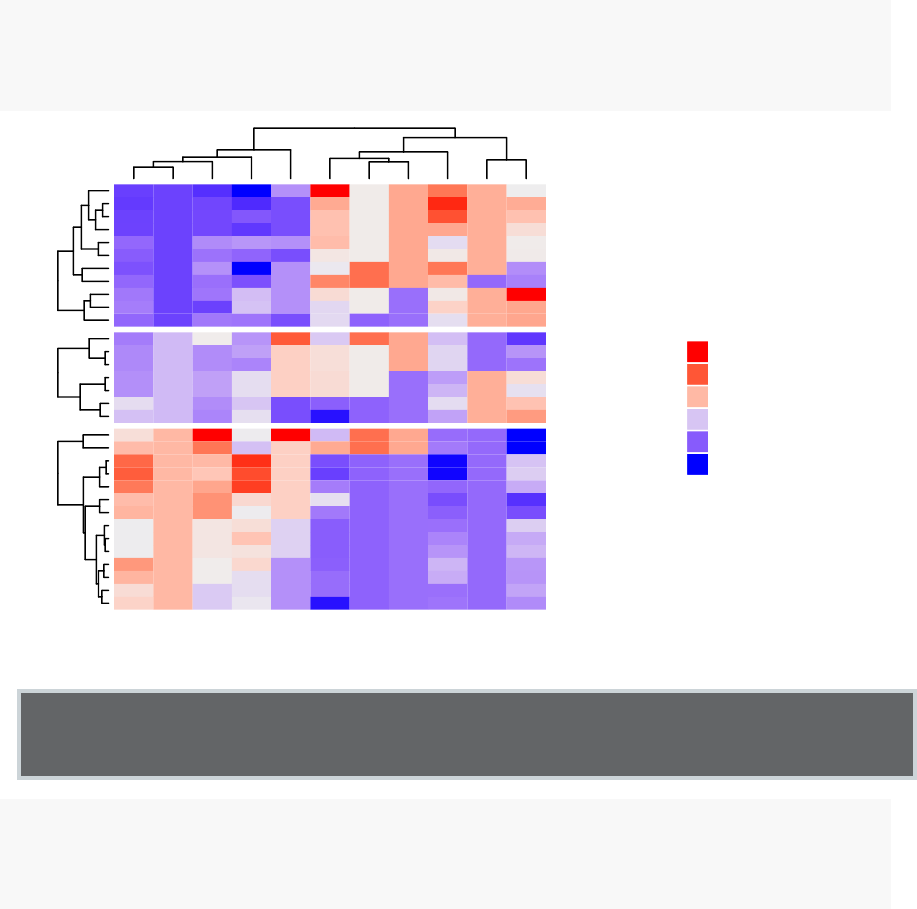
108 CHAPTER 10. HEATMAP: STATIC AND INTERACTIVE
# split by a vector specifying rowgroups
Heatmap(df, name = "mtcars",split = mtcars$cyl,
row_names_gp = gpar(fontsize = 7))
468
Honda Civic
Toyota Corolla
Fiat 128
Fiat X1-9
Volvo 142E
Datsun 710
Lotus Europa
Porsche 914-2
Merc 230
Merc 240D
Toyota Corona
Ferrari Dino
Mazda RX4 Wag
Mazda RX4
Merc 280C
Merc 280
Hornet 4 Drive
Valiant
Maserati Bora
Ford Pantera L
Lincoln Continental
Cadillac Fleetwood
Chrysler Imperial
Camaro Z28
Duster 360
Merc 450SLC
Merc 450SE
Merc 450SL
Pontiac Firebird
Hornet Sportabout
AMC Javelin
Dodge Challenger
disp
cyl
hp
wt
carb
drat
gear
am
mpg
vs
qsec
mtcars
3
2
1
0
-1
-2
Note that, split can be also a data frame in which different combinations of levels
split the rows of the heatmap.
# Split by combining multiple variables
Heatmap(df, name ="mtcars",
split = data.frame(cyl = mtcars$cyl, am = mtcars$am))
10.8.3 Heatmap annotation
The HeatmapAnnotation class is used to define annotation on row or column. A
simplified format is:

10.8. COMPLEX HEATMAP 109
HeatmapAnnotation(df, name, col, show_legend)
•df: a data.frame with column names
•name: the name of the heatmap annotation
•col: a list of colors which contains color mapping to columns in df
For the example below, we’ll transpose our data to have the observations in columns
and the variables in rows.
df <- t(df)
10.8.3.1 Simple annotation
A vector, containing discrete or continuous values, is used to annotate rows or columns.
We’ll use the qualitative variables cyl (levels = “4”, “5” and “8”) and am (levels = “0”
and “1”), and the continuous variable mpg to annotate columns.
For each of these 3 variables, custom colors are defined as follow:
# Annotation data frame
annot_df <- data.frame(cyl = mtcars$cyl, am = mtcars$am,
mpg = mtcars$mpg)
# Define colors for each levels of qualitative variables
# Define gradient color for continuous variable (mpg)
col = list(cyl = c("4" ="green","6" ="gray","8" ="darkred"),
am = c("0" ="yellow","1" ="orange"),
mpg = circlize::colorRamp2(c(17,25),
c("lightblue","purple")) )
# Create the heatmap annotation
ha <- HeatmapAnnotation(annot_df, col = col)
# Combine the heatmap and the annotation
Heatmap(df, name = "mtcars",
top_annotation = ha)
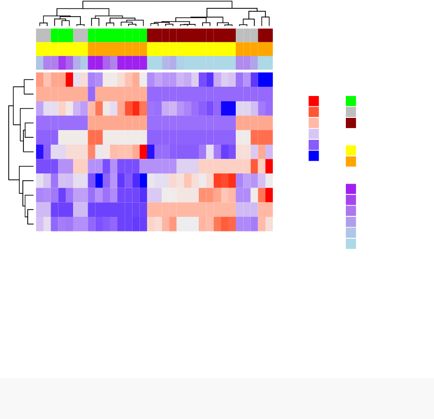
110 CHAPTER 10. HEATMAP: STATIC AND INTERACTIVE
qsec
vs
mpg
am
gear
drat
carb
wt
hp
cyl
disp
Valiant
Hornet 4 Drive
Toyota Corona
Merc 240D
Merc 230
Merc 280
Merc 280C
Porsche 914-2
Lotus Europa
Datsun 710
Volvo 142E
Fiat X1-9
Fiat 128
Toyota Corolla
Honda Civic
Dodge Challenger
AMC Javelin
Hornet Sportabout
Pontiac Firebird
Merc 450SL
Merc 450SE
Merc 450SLC
Duster 360
Camaro Z28
Chrysler Imperial
Cadillac Fleetwood
Lincoln Continental
Mazda RX4
Mazda RX4 Wag
Ferrari Dino
Ford Pantera L
Maserati Bora
mtcars
3
2
1
0
-1
-2
cyl
4
6
8
am
0
1
mpg
26
24
22
20
18
16
It’s possible to hide the annotation legend using the argument show_legend = FALSE
as follow:
ha <- HeatmapAnnotation(annot_df, col = col, show_legend = FALSE)
Heatmap(df, name = "mtcars",top_annotation = ha)
10.8.3.2 Complex annotation
In this section we’ll see how to combine heatmap and some basic graphs to show
the data distribution. For simple annotation graphics, the following functions
can be used: anno_points(), anno_barplot(), anno_boxplot(), anno_density() and
anno_histogram().
An example is shown below:

10.8. COMPLEX HEATMAP 111
# Define some graphics to display the distribution of columns
.hist = anno_histogram(df, gp = gpar(fill = "lightblue"))
.density = anno_density(df, type = "line",gp = gpar(col = "blue"))
ha_mix_top = HeatmapAnnotation(hist = .hist, density = .density)
# Define some graphics to display the distribution of rows
.violin = anno_density(df, type = "violin",
gp = gpar(fill = "lightblue"), which = "row")
.boxplot = anno_boxplot(df, which = "row")
ha_mix_right = HeatmapAnnotation(violin = .violin, bxplt = .boxplot,
which = "row",width = unit(4,"cm"))
# Combine annotation with heatmap
Heatmap(df, name = "mtcars",
column_names_gp = gpar(fontsize = 8),
top_annotation = ha_mix_top,
top_annotation_height = unit(3.8,"cm")) + ha_mix_right
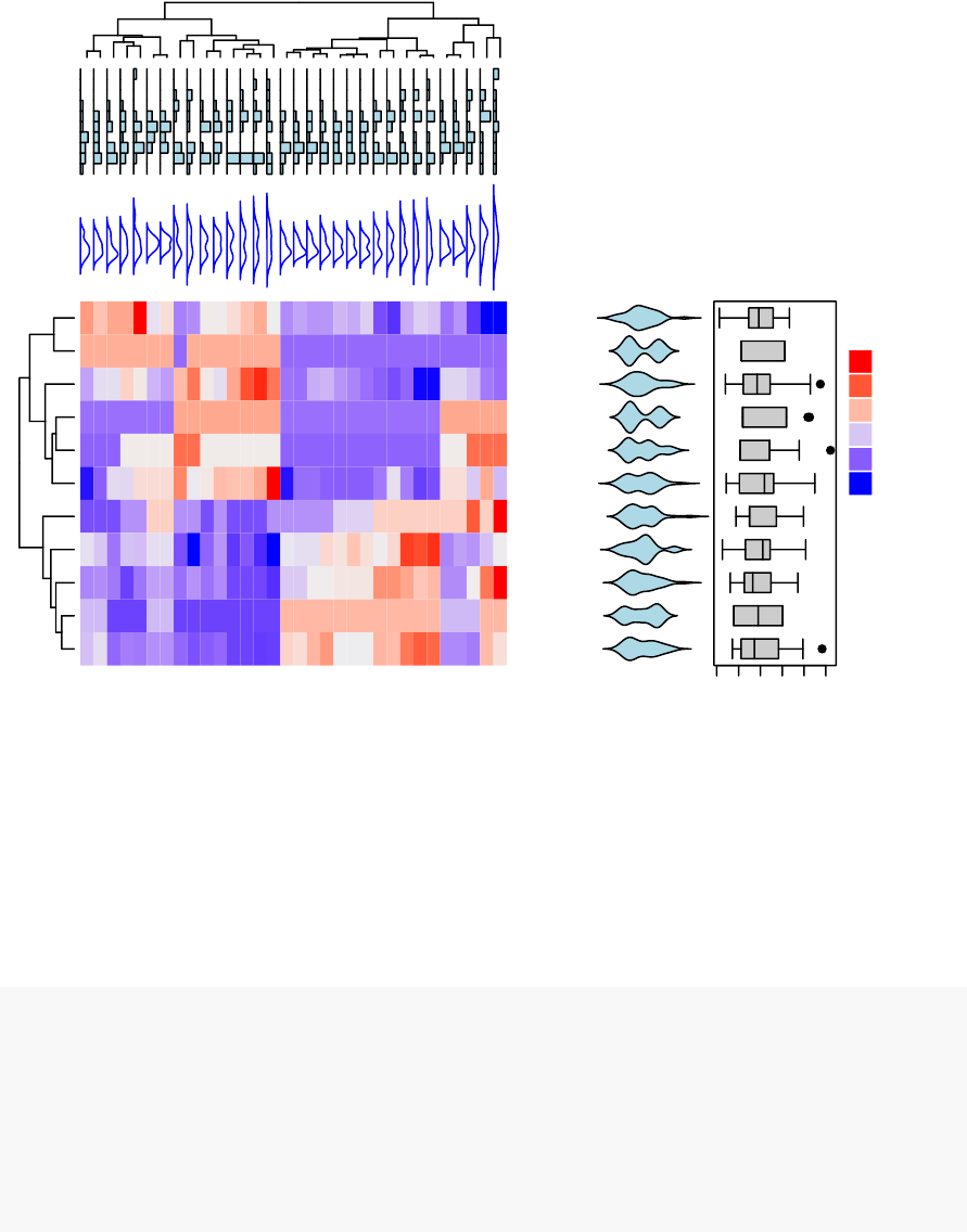
112 CHAPTER 10. HEATMAP: STATIC AND INTERACTIVE
qsec
vs
mpg
am
gear
drat
carb
wt
hp
cyl
disp
Valiant
Hornet 4 Drive
Toyota Corona
Merc 240D
Merc 230
Merc 280
Merc 280C
Porsche 914-2
Lotus Europa
Datsun 710
Volvo 142E
Fiat X1-9
Fiat 128
Toyota Corolla
Honda Civic
Dodge Challenger
AMC Javelin
Hornet Sportabout
Pontiac Firebird
Merc 450SL
Merc 450SE
Merc 450SLC
Duster 360
Camaro Z28
Chrysler Imperial
Cadillac Fleetwood
Lincoln Continental
Mazda RX4
Mazda RX4 Wag
Ferrari Dino
Ford Pantera L
Maserati Bora
-2 -1 0 1 2 3
mtcars
3
2
1
0
-1
-2
10.8.3.3 Combining multiple heatmaps
Multiple heatmaps can be arranged as follow:
# Heatmap 1
ht1 = Heatmap(df, name = "ht1",km = 2,
column_names_gp = gpar(fontsize = 9))
# Heatmap 2
ht2 = Heatmap(df, name = "ht2",
col = circlize::colorRamp2(c(-2,0,2), c("green","white","red")),
column_names_gp = gpar(fontsize = 9))
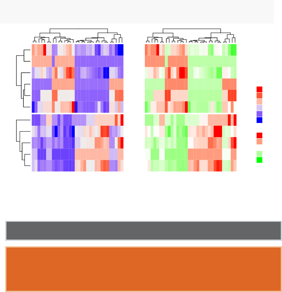
10.8. COMPLEX HEATMAP 113
# Combine the two heatmaps
ht1 + ht2
cluster1cluster2
qsec
vs
mpg
am
gear
drat
carb
wt
hp
cyl
disp
Valiant
Hornet 4 Drive
Toyota Corona
Merc 240D
Merc 230
Merc 280
Merc 280C
Porsche 914-2
Lotus Europa
Datsun 710
Volvo 142E
Fiat X1-9
Fiat 128
Toyota Corolla
Honda Civic
Dodge Challenger
AMC Javelin
Hornet Sportabout
Pontiac Firebird
Merc 450SL
Merc 450SE
Merc 450SLC
Duster 360
Camaro Z28
Chrysler Imperial
Cadillac Fleetwood
Lincoln Continental
Mazda RX4
Mazda RX4 Wag
Ferrari Dino
Ford Pantera L
Maserati Bora
ht1
3
2
1
0
-1
-2
ht2
2
1
0
-1
-2
You can use the option width = unit(3, "cm")) to control the size of the heatmaps.
Note that when combining multiple heatmaps, the first heatmap is considered as
the main heatmap. Some settings of the remaining heatmaps are auto-adjusted
according to the setting of the main heatmap. These include: removing row clusters
and titles, and adding splitting.
114 CHAPTER 10. HEATMAP: STATIC AND INTERACTIVE
The draw() function can be used to customize the appearance of the final image:
draw(ht1 + ht2,
row_title = "Two heatmaps, row title",
row_title_gp = gpar(col = "red"),
column_title = "Two heatmaps, column title",
column_title_side = "bottom",
# Gap between heatmaps
gap = unit(0.5,"cm"))
Legends can be removed using the arguments show_heatmap_legend = FALSE,
show_annotation_legend = FALSE.
10.9 Application to gene expression matrix
In gene expression data, rows are genes and columns are samples. More information
about genes can be attached after the expression heatmap such as gene length and
type of genes.
expr <- readRDS(paste0(system.file(package = "ComplexHeatmap"),
"/extdata/gene_expression.rds"))
mat <- as.matrix(expr[, grep("cell",colnames(expr))])
type <- gsub("s\\d+_","",colnames(mat))
ha = HeatmapAnnotation(df = data.frame(type = type))
Heatmap(mat, name = "expression",km = 5,top_annotation = ha,
top_annotation_height = unit(4,"mm"),
show_row_names = FALSE,show_column_names = FALSE)+
Heatmap(expr$length, name = "length",width = unit(5,"mm"),
col = circlize::colorRamp2(c(0,100000), c("white","orange"))) +
Heatmap(expr$type, name = "type",width = unit(5,"mm")) +
Heatmap(expr$chr, name = "chr",width = unit(5,"mm"),
col = circlize::rand_color(length(unique(expr$chr))))
10.9. APPLICATION TO GENE EXPRESSION MATRIX 115
cluster1cluster2cluster3cluster4cluster5
length
type
chr
expression
16
14
12
10
8
length
1e+05
80000
60000
40000
20000
0
type
protein_coding
others
antisense
pseudogene
chr
chr1
chr10
chr11
chr12
chr13
chr14
chr15
chr16
chr17
chr18
chr19
chr2
chr20
chr22
chr3
chr4
chr5
chr6
chr7
chr8
chr9
chrM
chrX
type
cell01
cell02
cell03
It’s also possible to visualize genomic alterations and to integrate different molecular
levels (gene expression, DNA methylation, ...). Read the vignette, on Bioconductor,
for further examples.
116 CHAPTER 10. HEATMAP: STATIC AND INTERACTIVE
10.10 Summary
We described many functions for drawing heatmaps in R (from basic to complex
heatmaps). A basic heatmap can be produced using either the R base function
heatmap() or the function heatmap.2 () [in the gplots package].
The pheatmap() function, in the package of the same name, creates pretty heatmaps,
where ones has better control over some graphical parameters such as cell size.
The Heatmap() function [in ComplexHeatmap package] allows us to easily, draw,
annotate and arrange complex heatmaps. This might be very useful in genomic fields.
Part IV
Cluster Validation
117
118
The
cluster validation
consists of measuring the goodness of clustering results.
Before applying any clustering algorithm to a data set, the first thing to do is to
assess the clustering tendency. That is, whether applying clustering is suitable for the
data. If yes, then how many clusters are there. Next, you can perform hierarchical
clustering or partitioning clustering (with a pre-specified number of clusters). Finally,
you can use a number of measures, described in this part, to evaluate the goodness of
the clustering results.
Contents:
•Assessing clustering tendency (Chapter 11)
•Determining the optimal number of clusters (Chapter 12)
•Cluster validation statistics (Chapter 13)
•Choosing the best clustering algorithms (Chapter 14)
•Computing p-value for hierarchical clustering (Chapter 15)
Chapter 11
Assessing Clustering Tendency
Before applying any clustering method on your data, it’s important to evaluate whether
the data sets contains meaningful clusters (i.e.: non-random structures) or not. If
yes, then how many clusters are there. This process is defined as the assessing of
clustering tendency or the feasibility of the clustering analysis.
A big issue, in cluster analysis, is that clustering methods will return clusters even
if the data does not contain any clusters. In other words, if you blindly apply a
clustering method on a data set, it will divide the data into clusters because that is
what it supposed to do.
In this chapter, we start by describing why we should evaluate the clustering tendency
before applying any clustering method on a data. Next, we provide statistical and
visual methods for assessing the clustering tendency.
11.1 Required R packages
•factoextra for data visualization
•clustertend for statistical assessment clustering tendency
To install the two packages, type this:
install.packages(c("factoextra","clustertend"))
119

120 CHAPTER 11. ASSESSING CLUSTERING TENDENCY
11.2 Data preparation
We’ll use two data sets:
•the built-in R data set iris.
•and a random data set generated from the iris data set.
The iris data sets look like this:
head(iris, 3)
## Sepal.Length Sepal.Width Petal.Length Petal.Width Species
## 1 5.1 3.5 1.4 0.2 setosa
## 2 4.9 3.0 1.4 0.2 setosa
## 3 4.7 3.2 1.3 0.2 setosa
We start by excluding the column “Species” at position 5
# Iris data set
df <- iris[, -5]
# Random data generated from the iris data set
random_df <- apply(df, 2,
function(x){runif(length(x), min(x), (max(x)))})
random_df <- as.data.frame(random_df)
# Standardize the data sets
df <- iris.scaled <- scale(df)
random_df <- scale(random_df)
11.3 Visual inspection of the data
We start by visualizing the data to assess whether they contains any meaningful
clusters.
As the data contain more than two variables, we need to reduce the dimensionality
in order to plot a scatter plot. This can be done using principal component analysis
(PCA) algorithm (R function: prcomp()). After performing PCA, we use the function
fviz_pca_ind() [factoextra R package] to visualize the output.
The iris and the random data sets can be illustrated as follow:
11.4. WHY ASSESSING CLUSTERING TENDENCY? 121
library("factoextra")
# Plot faithful data set
fviz_pca_ind(prcomp(df), title = "PCA - Iris data",
habillage = iris$Species, palette = "jco",
geom = "point",ggtheme = theme_classic(),
legend = "bottom")
# Plot the random df
fviz_pca_ind(prcomp(random_df), title = "PCA - Random data",
geom = "point",ggtheme = theme_classic())
-2
-1
0
1
2
-2 0 2
Dim1 (73%)
Dim2 (22.9%)
Groups setosa versicolor virginica
PCA - Iris data
-2
-1
0
1
2
-2 -1 0 1 2
Dim1 (29.4%)
Dim2 (26.5%)
PCA - Random data
It can be seen that the iris data set contains 3 real clusters. However the randomly
generated data set doesn’t contain any meaningful clusters.
11.4 Why assessing clustering tendency?
In order to illustrate why it’s important to assess cluster tendency, we start by
computing k-means clustering (Chapter 4) and hierarchical clustering (Chapter 7) on
the two data sets (the real and the random data). The function fviz_cluster() and
fviz_dend() [in factoextra R package] will be used to visualize the results.
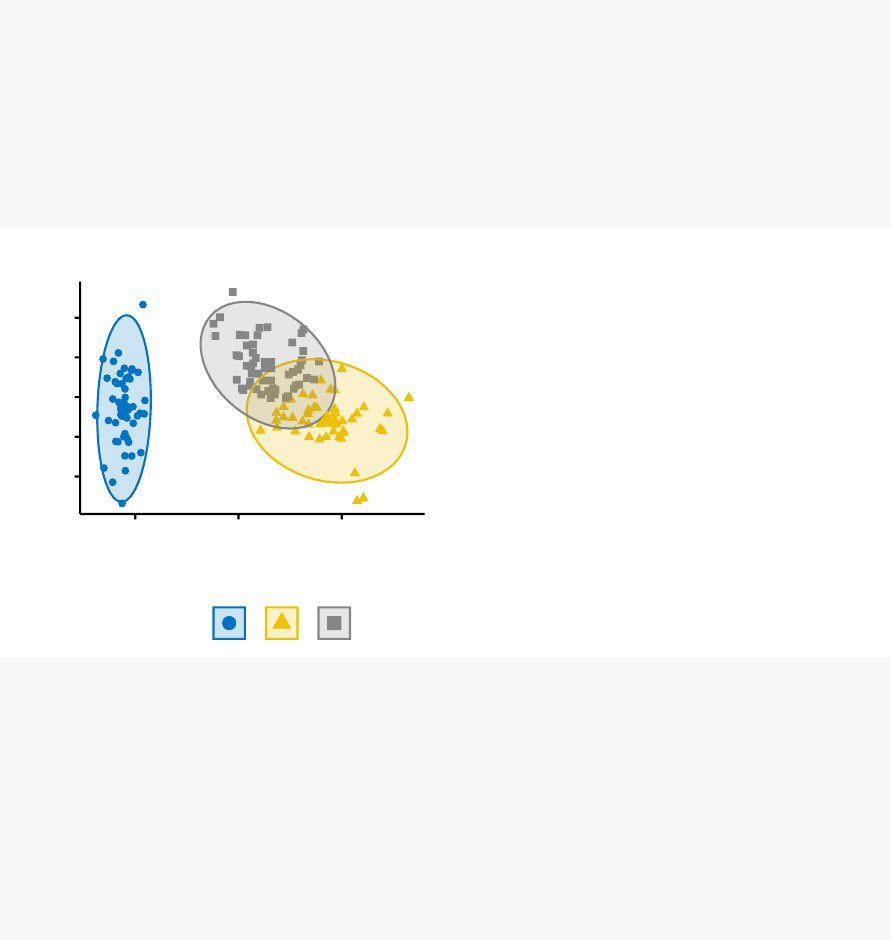
122 CHAPTER 11. ASSESSING CLUSTERING TENDENCY
library(factoextra)
set.seed(123)
# K-means on iris dataset
km.res1 <- kmeans(df, 3)
fviz_cluster(list(data = df, cluster = km.res1$cluster),
ellipse.type = "norm",geom = "point",stand = FALSE,
palette = "jco",ggtheme = theme_classic())
-2
-1
0
1
2
-2 0 2
Dim1 (73%)
Dim2 (22.9%)
cluster 123
Cluster plot
# K-means on the random dataset
km.res2 <- kmeans(random_df, 3)
fviz_cluster(list(data = random_df, cluster = km.res2$cluster),
ellipse.type = "norm",geom = "point",stand = FALSE,
palette = "jco",ggtheme = theme_classic())
# Hierarchical clustering on the random dataset
fviz_dend(hclust(dist(random_df)), k=3,k_colors = "jco",
as.ggplot = TRUE,show_labels = FALSE)
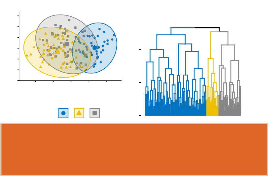
11.5. METHODS FOR ASSESSING CLUSTERING TENDENCY 123
-3
-2
-1
0
1
2
3
-2 -1 0 1 2
Dim1 (29.4%)
Dim2 (26.5%)
cluster 123
Cluster plot
0
2
4
Height
Cluster Dendrogram
It can be seen that the k-means algorithm and the hierarchical clustering impose
a classification on the random uniformly distributed data set even if there are no
meaningful clusters present in it. This is why, clustering tendency assessment methods
should be used to evaluate the validity of clustering analysis. That is, whether a
given data set contains meaningful clusters.
11.5 Methods for assessing clustering tendency
In this section, we’ll describe two methods for evaluating the clustering tendency: i) a
statistical (Hopkins statistic) and ii) a visual methods (Visual Assessment of cluster
Tendency (VAT) algorithm).
11.5.1 Statistical methods
The Hopkins statistic is used to assess the clustering tendency of a data set by
measuring the probability that a given data set is generated by a uniform data
distribution. In other words, it tests the spatial randomness of the data.
For example, let D be a real data set. The Hopkins statistic can be calculated as
follow:

124 CHAPTER 11. ASSESSING CLUSTERING TENDENCY
1. Sample uniformly npoints (p1,..., pn)fromD.
2. For each point
piœD
, find it’s nearest neighbor
pj
; then compute the
distance between piand pjand denote it as xi=dist(pi,p
j)
3. Generate a simulated data set (
randomD
) drawn from a random uni-
form distribution with
n
points (
q1
,...,
qn
) and the same variation as the original real
data set D.
3. For each point
qiœrandomD
, find it’s nearest neighbor
qj
in D; then
compute the distance between qiand qjand denote it yi=dist(qi,q
j)
4. Calculate the Hopkins statistic (H) as the mean nearest neighbor dis-
tance in the random data set divided by the sum of the mean nearest neighbor
distances in the real and across the simulated data set.
The formula is defined as follow:
H=
n
q
i=1 yi
n
q
i=1 xi+n
q
i=1 yi
A value of H about 0.5 means that
n
q
i=1 yi
and
n
q
i=1 xi
are close to each other, and thus
the data D is uniformly distributed.
The null and the alternative hypotheses are defined as follow:
•Null hypothesis
: the data set D is uniformly distributed (i.e., no meaningful
clusters)
•Alternative hypothesis
: the data set D is not uniformly distributed (i.e.,
contains meaningful clusters)
If the value of Hopkins statistic is close to zero, then we can reject the null hypothesis
and conclude that the data set D is significantly a clusterable data.
The R function hopkins() [in clustertend package] can be used to statistically evaluate
clustering tendency in R. The simplified format is:

11.5. METHODS FOR ASSESSING CLUSTERING TENDENCY 125
hopkins(data, n)
•data: a data frame or matrix
•n: the number of points to be selected from the data
library(clustertend)
# Compute Hopkins statistic for iris dataset
set.seed(123)
hopkins(df, n=nrow(df)-1)
## $H
## [1] 0.1815219
# Compute Hopkins statistic for a random dataset
set.seed(123)
hopkins(random_df, n=nrow(random_df)-1)
## $H
## [1] 0.4868278
It can be seen that the iris data set is highly clusterable (the
H
value = 0.18 which
is far below the threshold 0.5). However the random_df data set is not clusterable
(H=0.50)
11.5.2 Visual methods
The algorithm of the visual assessment of cluster tendency (VAT) approach (Bezdek
and Hathaway, 2002) is as follow:
The algorithm of VAT is as follow:
126 CHAPTER 11. ASSESSING CLUSTERING TENDENCY
1. Compute the dissimilarity (DM) matrix between the objects in the data set using
the Euclidean distance measure (3)
2. Reorder the DM so that similar objects are close to one another. This
process create an ordered dissimilarity matrix (ODM)
3. The ODM is displayed as an ordered dissimilarity image (ODI), which is
the visual output of VAT
For the visual assessment of clustering tendency, we start by computing the dissimilarity
matrix between observations using the function dist(). Next the function fviz_dist()
[factoextra package] is used to display the dissimilarity matrix.
fviz_dist(dist(df), show_labels = FALSE)+
labs(title = "Iris data")
fviz_dist(dist(random_df), show_labels = FALSE)+
labs(title = "Random data")
0
2
4
6
value
Iris data
0
1
2
3
4
5
value
Random data
•Red: high similarity (ie: low dissimilarity) | Blue: low similarity
The color level is proportional to the value of the dissimilarity between observations:
pure red if
dist
(
xi,x
j
)=0and pure blue if
dist
(
xi,x
j
)=1. Objects belonging to the
same cluster are displayed in consecutive order.
The dissimilarity matrix image confirms that there is a cluster structure in the iris
data set but not in the random one.
11.6. SUMMARY 127
The VAT detects the clustering tendency in a visual form by counting the number of
square shaped dark blocks along the diagonal in a VAT image.
11.6 Summary
In this article, we described how to assess clustering tendency using the Hopkins
statistics and a visual method. After showing that a data is clusterable, the next step
is to determine the number of optimal clusters in the data. This will be described in
the next chapter.

Chapter 12
Determining the Optimal Number
of Clusters
Determining the optimal number of clusters in a data set
is a fundamental
issue in partitioning clustering, such as k-means clustering (Chapter 4), which requires
the user to specify the number of clusters k to be generated.
Unfortunately, there is no definitive answer to this question. The optimal number
of clusters is somehow subjective and depends on the method used for measuring
similarities and the parameters used for partitioning.
A simple and popular solution consists of inspecting the dendrogram produced using
hierarchical clustering (Chapter 7) to see if it suggests a particular number of clusters.
Unfortunately, this approach is also subjective.
In this chapter, we’ll describe different methods for determining the optimal number
of clusters for k-means, k-medoids (PAM) and hierarchical clustering.
These methods include direct methods and statistical testing methods:
1.
Direct methods: consists of optimizing a criterion, such as the within cluster
sums of squares or the average silhouette. The corresponding methods are named
elbow and silhouette methods, respectively.
2.
Statistical testing methods: consists of comparing evidence against null hypoth-
esis. An example is the gap statistic.
In addition to elbow,silhouette and gap statistic methods, there are more than thirty
other indices and methods that have been published for identifying the optimal number
128

12.1. ELBOW METHOD 129
of clusters. We’ll provide R codes for computing all these 30 indices in order to decide
the best number of clusters using the “majority rule”.
For each of these methods:
•We’ll describe the basic idea and the algorithm
•
We’ll provide easy-o-use R codes with many examples for determining the
optimal number of clusters and visualizing the output.
12.1 Elbow method
Recall that, the basic idea behind partitioning methods, such as k-means clustering
(Chapter 4), is to define clusters such that the total intra-cluster variation [or total
within-cluster sum of square (WSS)] is minimized. The total WSS measures the
compactness of the clustering and we want it to be as small as possible.
The Elbow method looks at the total WSS as a function of the number of clusters:
One should choose a number of clusters so that adding another cluster doesn’t improve
much better the total WSS.
The optimal number of clusters can be defined as follow:
1. Compute clustering algorithm (e.g., k-means clustering) for different values of k.
For instance, by varying k from 1 to 10 clusters.
2. For each k, calculate the total within-cluster sum of square (wss).
3. Plot the curve of wss according to the number of clusters k.
4. The location of a bend (knee) in the plot is generally considered as an
indicator of the appropriate number of clusters.
Note that, the elbow method is sometimes ambiguous. An alternative is the average
silhouette method (Kaufman and Rousseeuw [1990]) which can be also used with
any clustering approach.

130 CHAPTER 12. DETERMINING THE OPTIMAL NUMBER OF CLUSTERS
12.2 Average silhouette method
The average silhouette approach we’ll be described comprehensively in the chapter
cluster validation statistics (Chapter 13). Briefly, it measures the quality of a clustering.
That is, it determines how well each object lies within its cluster. A high average
silhouette width indicates a good clustering.
Average silhouette method computes the average silhouette of observations for different
values of k. The optimal number of clusters k is the one that maximize the average
silhouette over a range of possible values for k (Kaufman and Rousseeuw [1990]).
The algorithm is similar to the elbow method and can be computed as follow:
1. Compute clustering algorithm (e.g., k-means clustering) for different values of k.
For instance, by varying k from 1 to 10 clusters.
2. For each k, calculate the average silhouette of observations (avg.sil).
3. Plot the curve of avg.sil according to the number of clusters k.
4. The location of the maximum is considered as the appropriate number
of clusters.
12.3 Gap statistic method
The gap statistic has been published by R. Tibshirani, G. Walther, and T. Hastie
(Standford University, 2001). The approach can be applied to any clustering method.
The gap statistic compares the total within intra-cluster variation for different values
of k with their expected values under null reference distribution of the data. The
estimate of the optimal clusters will be value that maximize the gap statistic (i.e, that
yields the largest gap statistic). This means that the clustering structure is far away
from the random uniform distribution of points.
The algorithm works as follow:

12.4. COMPUTING THE NUMBER OF CLUSTERS USING R 131
1. Cluster the observed data, varying the number of clusters from k = 1, ...,
kmax
,
and compute the corresponding total within intra-cluster variation Wk.
2. Generate B reference data sets with a random uniform distribution. Cluster each
of these reference data sets with varying number of clusters k = 1, ...,
kmax
, and
compute the corresponding total within intra-cluster variation Wkb.
3. Compute the estimated gap statistic as the deviation of the observed
Wk
value from
its expected value
Wkb
under the null hypothesis:
Gap
(
k
)=
1
B
B
q
b=1
log
(
Wú
kb
)
≠log
(
Wk
).
Compute also the standard deviation of the statistics.
4. Choose the number of clusters as the smallest value of k such that the gap statistic
is within one standard deviation of the gap at k+1: Gap(k)ØGap(k+1)≠sk+1.
Note that, using B = 500 gives quite precise results so that the gap plot is basically
unchanged after an another run.
12.4 Computing the number of clusters using R
In this section, we’ll describe two functions for determining the optimal number of
clusters:
1.
fviz_nbclust() function [in factoextra R package]: It can be used to compute the
three different methods [elbow, silhouette and gap statistic] for any partitioning
clustering methods [K-means, K-medoids (PAM), CLARA, HCUT]. Note that the
hcut() function is available only in factoextra package.It computes hierarchical
clustering and cut the tree in k pre-specified clusters.
2.
NbClust() function [ in NbClust R package] (Charrad et al., 2014): It provides
30 indices for determining the relevant number of clusters and proposes to users
the best clustering scheme from the different results obtained by varying all
combinations of number of clusters, distance measures, and clustering methods.
It can simultaneously computes all the indices and determine the number of
clusters in a single function call.

132 CHAPTER 12. DETERMINING THE OPTIMAL NUMBER OF CLUSTERS
12.4.1 Required R packages
We’ll use the following R packages:
•
factoextra to determine the optimal number clusters for a given clustering
methods and for data visualization.
•
NbClust for computing about 30 methods at once, in order to find the optimal
number of clusters.
To install the packages, type this:
pkgs <- c("factoextra","NbClust")
install.packages(pkgs)
Load the packages as follow:
library(factoextra)
library(NbClust)
12.4.2 Data preparation
We’ll use the USArrests data as a demo data set. We start by standardizing the data
to make variables comparable.
# Standardize the data
df <- scale(USArrests)
head(df)
## Murder Assault UrbanPop Rape
## Alabama 1.24256408 0.7828393 -0.5209066 -0.003416473
## Alaska 0.50786248 1.1068225 -1.2117642 2.484202941
## Arizona 0.07163341 1.4788032 0.9989801 1.042878388
## Arkansas 0.23234938 0.2308680 -1.0735927 -0.184916602
## California 0.27826823 1.2628144 1.7589234 2.067820292
## Colorado 0.02571456 0.3988593 0.8608085 1.864967207

12.4. COMPUTING THE NUMBER OF CLUSTERS USING R 133
12.4.3 fviz_nbclust() function: Elbow, Silhouhette and Gap
statistic methods
The simplified format is as follow:
fviz_nbclust(x, FUNcluster, method = c("silhouette","wss","gap_stat"))
•x: numeric matrix or data frame
•FUNcluster
: a partitioning function. Allowed values include kmeans, pam,
clara and hcut (for hierarchical clustering).
•method
: the method to be used for determining the optimal number of clusters.
The R code below determine the optimal number of clusters for k-means clustering:
# Elbow method
fviz_nbclust(df, kmeans, method = "wss")+
geom_vline(xintercept = 4,linetype = 2)+
labs(subtitle = "Elbow method")
# Silhouette method
fviz_nbclust(df, kmeans, method = "silhouette")+
labs(subtitle = "Silhouette method")
# Gap statistic
# nboot = 50 to keep the function speedy.
# recommended value: nboot= 500 for your analysis.
# Use verbose = FALSE to hide computing progression.
set.seed(123)
fviz_nbclust(df, kmeans, nstart = 25,method = "gap_stat",nboot = 50)+
labs(subtitle = "Gap statistic method")
134 CHAPTER 12. DETERMINING THE OPTIMAL NUMBER OF CLUSTERS
50
100
150
200
12345678910
Number of clusters k
Total Within Sum of Square
Elbow method
Optimal number of clusters
0.0
0.1
0.2
0.3
0.4
12345678910
Number of clusters k
Average silhouette width
Silhouette method
Optimal number of clusters
0.15
0.20
0.25
0.30
1 2 3 4 5 6 7 8 9 10
Number of clusters k
Gap statistic (k)
Gap statistic method
Optimal number of clusters
- Elbow method: 4 clusters solution suggested
- Silhouette method: 2 clusters solution suggested
- Gap statistic method: 4 clusters solution suggested
According to these observations, it’s possible to define k = 4 as the optimal number
of clusters in the data.

12.4. COMPUTING THE NUMBER OF CLUSTERS USING R 135
The disadvantage of elbow and average silhouette methods is that, they measure
a global clustering characteristic only. A more sophisticated method is to use the
gap statistic which provides a statistical procedure to formalize the elbow/silhouette
heuristic in order to estimate the optimal number of clusters.
12.4.4 NbClust() function: 30 indices for choosing the best
number of clusters
The simplified format of the function NbClust() is:
NbClust(data = NULL,diss = NULL,distance = "euclidean",
min.nc = 2,max.nc = 15,method = NULL)
•data: matrix
•diss
: dissimilarity matrix to be used. By default, diss=NULL, but if it is
replaced by a dissimilarity matrix, distance should be “NULL”
•distance
: the distance measure to be used to compute the dissimilarity matrix.
Possible values include “euclidean”, “manhattan” or “NULL”.
•min.nc, max.nc: minimal and maximal number of clusters, respectively
•method
: The cluster analysis method to be used including “ward.D”, “ward.D2”,
“single”, “complete”, “average”, “kmeans” and more.
•To compute NbClust() for kmeans, use method = “kmeans”.
•
To compute NbClust() for hierarchical clustering, method should be one of
c(“ward.D”, “ward.D2”, “single”, “complete”, “average”).
The R code below computes NbClust() for k-means:
library("NbClust")
nb <- NbClust(df, distance = "euclidean",min.nc = 2,
max.nc = 10,method = "kmeans")
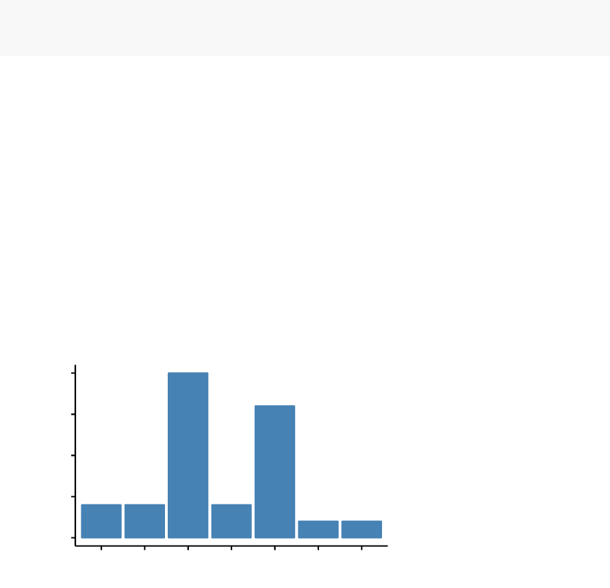
136 CHAPTER 12. DETERMINING THE OPTIMAL NUMBER OF CLUSTERS
The result of NbClust using the function fviz_nbclust() [in factoextra], as follow:
library("factoextra")
fviz_nbclust(nb)
## Among all indices:
## ===================
## * 2 proposed 0 as the best number of clusters
## * 10 proposed 2 as the best number of clusters
## * 2 proposed 3 as the best number of clusters
## * 8 proposed 4 as the best number of clusters
## * 1 proposed 5 as the best number of clusters
## * 1 proposed 8 as the best number of clusters
## * 2 proposed 10 as the best number of clusters
##
## Conclusion
## =========================
## * According to the majority rule, the best number of clusters is 2 .
0.0
2.5
5.0
7.5
10.0
0 10 2 3 4 5 8
Number of clusters k
Frequency among all indices
Optimal number of clusters - k = 2

12.5. SUMMARY 137
- ....
- 2 proposed 0 as the best number of clusters
- 10 indices proposed 2 as the best number of clusters.
- 2 proposed 3 as the best number of clusters.
- 8 proposed 4 as the best number of clusters.
According to the majority rule, the best number of clusters is 2.
12.5 Summary
In this article, we described different methods for choosing the optimal number of
clusters in a data set. These methods include the elbow, the silhouette and the gap
statistic methods.
We demonstrated how to compute these methods using the R function fviz_nbclust()
[in factoextra R package]. Additionally, we described the package NbClust(), which can
be used to compute simultaneously many other indices and methods for determining
the number of clusters.
After choosing the number of clusters k, the next step is to perform partitioning
clustering as described at: k-means clustering (Chapter 4).

Chapter 13
Cluster Validation Statistics
The term
cluster validation
is used to design the procedure of evaluating the
goodness of clustering algorithm results. This is important to avoid finding patterns in
a random data, as well as, in the situation where you want to compare two clustering
algorithms.
Generally, clustering validation statistics can be categorized into 3 classes (Theodoridis
and Koutroubas, 2008; G. Brock et al., 2008, Charrad et al., 2014):
1. Internal cluster validation
, which uses the internal information of the cluster-
ing process to evaluate the goodness of a clustering structure without reference
to external information. It can be also used for estimating the number of clusters
and the appropriate clustering algorithm without any external data.
2. External cluster validation
, which consists in comparing the results of a
cluster analysis to an externally known result, such as externally provided class
labels. It measures the extent to which cluster labels match externally supplied
class labels. Since we know the “true” cluster number in advance, this approach
is mainly used for selecting the right clustering algorithm for a specific data set.
3. Relative cluster validation
, which evaluates the clustering structure by vary-
ing different parameter values for the same algorithm (e.g.,: varying the number
of clusters k). It’s generally used for determining the optimal number of clusters.
In this chapter, we start by describing the different methods for clustering validation.
Next, we’ll demonstrate how to compare the quality of clustering results obtained
with different clustering algorithms. Finally, we’ll provide R scripts for validating
clustering results.
138

13.1. INTERNAL MEASURES FOR CLUSTER VALIDATION 139
In all the examples presented here, we’ll apply k-means, PAM and hierarchical
clustering. Note that, the functions used in this article can be applied to evaluate
the validity of any other clustering methods.
13.1 Internal measures for cluster validation
In this section, we describe the most widely used clustering validation indices. Recall
that the goal of partitioning clustering algorithms (Part II) is to split the data set
into clusters of objects, such that:
•the objects in the same cluster are similar as much as possible,
•and the objects in different clusters are highly distinct
That is, we want the average distance within cluster to be as small as possible; and
the average distance between clusters to be as large as possible.
Internal validation measures reflect often the
compactness
, the
connectedness
and
the separation of the cluster partitions.
1.
Compactness
or cluster cohesion: Measures how close are the objects within
the same cluster. A lower
within-cluster variation
is an indicator of a good
compactness (i.e., a good clustering). The different indices for evaluating the
compactness of clusters are base on distance measures such as the cluster-wise within
average/median distances between observations.
2.
Separation
: Measures how well-separated a cluster is from other clus-
ters. The indices used as separation measures include:
- distances between cluster centers
- the pairwise minimum distances between objects in different clusters
3.
Connectivity
: corresponds to what extent items are placed in the same
cluster as their nearest neighbors in the data space. The connectivity has a value
between 0 and infinity and should be minimized.

140 CHAPTER 13. CLUSTER VALIDATION STATISTICS
Generally most of the indices used for internal clustering validation combine compact-
ness and separation measures as follow:
Index =(–◊Separation)
(—◊Compactness)
Where –and —are weights.
In this section, we’ll describe the two commonly used indices for assessing the
goodness of clustering: the
silhouette width
and the
Dunn index
. These internal
measure can be used also to determine the optimal number of clusters in the data.
13.1.1 Silhouette coefficient
The silhouette analysis measures how well an observation is clustered and it estimates
the
average distance between clusters
. The silhouette plot displays a measure of
how close each point in one cluster is to points in the neighboring clusters.
For each observation i, the silhouette width siis calculated as follows:
1.
For each observation
i
, calculate the average dissimilarity
ai
between
i
and all
other points of the cluster to which i belongs.
2.
For all other clusters
C
, to which i does not belong, calculate the average
dissimilarity
d
(
i, C
)of
i
to all observations of C. The smallest of these
d
(
i, C
)
is defined as
bi
=
minCd
(
i, C
). The value of
bi
can be seen as the dissimilarity
between
i
and its “neighbor” cluster, i.e., the nearest one to which it does not
belong.
3.
Finally the silhouette width of the observation
i
is defined by the formula:
Si=(bi≠ai)/max(ai,b
i).
Silhouette width can be interpreted as follow:

13.2. EXTERNAL MEASURES FOR CLUSTERING VALIDATION 141
- Observations with a large Si(almost 1) are very well clustered.
- A small
Si
(around 0) means that the observation lies between two clus-
ters.
- Observations with a negative
Si
are probably placed in the wrong cluster.
13.1.2 Dunn index
The
Dunn index
is another internal clustering validation measure which can be
computed as follow:
1.
For each cluster, compute the distance between each of the objects in the cluster
and the objects in the other clusters
2.
Use the minimum of this pairwise distance as the inter-cluster separation
(min.separation)
3.
For each cluster, compute the distance between the objects in the same cluster.
4.
Use the maximal intra-cluster distance (i.e maximum diameter) as the intra-
cluster compactness
5. Calculate the Dunn index (D) as follow:
D=min.separation
max.diameter
If the data set contains compact and well-separated clusters, the diameter of the
clusters is expected to be small and the distance between the clusters is expected to
be large. Thus, Dunn index should be maximized.
13.2 External measures for clustering validation
The aim is to compare the identified clusters (by k-means, pam or hierarchical
clustering) to an external reference.

142 CHAPTER 13. CLUSTER VALIDATION STATISTICS
It’s possible to quantify the agreement between partitioning clusters and external
reference using either the corrected Rand index and Meila’s variation index VI, which
are implemented in the R function cluster.stats()[fpc package].
The corrected Rand index varies from -1 (no agreement) to 1 (perfect agreement).
External clustering validation, can be used to select suitable clustering algorithm for
a given data set.
13.3 Computing cluster validation statistics in R
13.3.1 Required R packages
The following R packages are required in this chapter:
•factoextra for data visualization
•fpc for computing clustering validation statistics
•NbClust for determining the optimal number of clusters in the data set.
•Install the packages:
install.packages(c("factoextra","fpc","NbClust"))
•Load the packages:
library(factoextra)
library(fpc)
library(NbClust)
13.3.2 Data preparation
We’ll use the built-in R data set iris:
# Excluding the column "Species" at position 5
df <- iris[, -5]

13.3. COMPUTING CLUSTER VALIDATION STATISTICS IN R 143
# Standardize
df <- scale(df)
13.3.3 Clustering analysis
We’ll use the function eclust() [enhanced clustering, in factoextra] which provides
several advantages:
•It simplifies the workflow of clustering analysis
•
It can be used to compute hierarchical clustering and partitioning clustering in
a single line function call
•
Compared to the standard partitioning functions (kmeans, pam, clara and fanny)
which requires the user to specify the optimal number of clusters, the function
eclust() computes automatically the gap statistic for estimating the right number
of clusters.
•
It provides silhouette information for all partitioning methods and hierarchical
clustering
•It draws beautiful graphs using ggplot2
The simplified format the eclust() function is as follow:
eclust(x, FUNcluster = "kmeans",hc_metric = "euclidean",...)
•x: numeric vector, data matrix or data frame
•FUNcluster
: a clustering function including “kmeans”, “pam”, “clara”, “fanny”,
“hclust”, “agnes” and “diana”. Abbreviation is allowed.
•hc_metric
: character string specifying the metric to be used for calculating
dissimilarities between observations. Allowed values are those accepted by the
function dist() [including “euclidean”, “manhattan”, “maximum”, “canberra”,
“binary”, “minkowski”] and correlation based distance measures [“pearson”,
“spearman” or “kendall”]. Used only when FUNcluster is a hierarchical clustering
function such as one of “hclust”, “agnes” or “diana”.
•...: other arguments to be passed to FUNcluster.
The function
eclust()
returns an object of class
eclust
containing the result of the
standard function used (e.g., kmeans, pam, hclust, agnes, diana, etc.).
It includes also:
•cluster: the cluster assignment of observations after cutting the tree
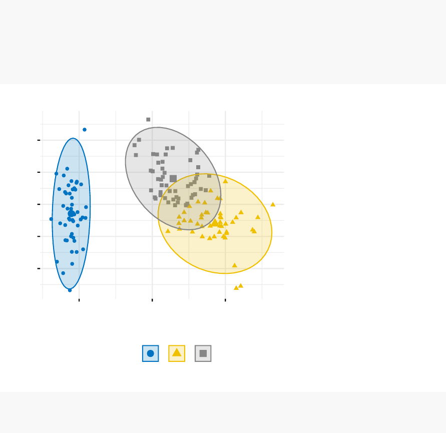
144 CHAPTER 13. CLUSTER VALIDATION STATISTICS
•nbclust: the number of clusters
•silinfo: the silhouette information of observations
•size: the size of clusters
•data
: a matrix containing the original or the standardized data (if stand =
TRUE)
•gap_stat: containing gap statistics
To compute a partitioning clustering, such as k-means clustering with k = 3, type
this:
# K-means clustering
km.res <- eclust(df, "kmeans",k=3,nstart = 25,graph = FALSE)
# Visualize k-means clusters
fviz_cluster(km.res, geom = "point",ellipse.type = "norm",
palette = "jco",ggtheme = theme_minimal())
-2
-1
0
1
2
-2 0 2
Dim1 (73%)
Dim2 (22.9%)
cluster 123
Cluster plot
To compute a hierarchical clustering, use this:
# Hierarchical clustering
hc.res <- eclust(df, "hclust",k=3,hc_metric = "euclidean",
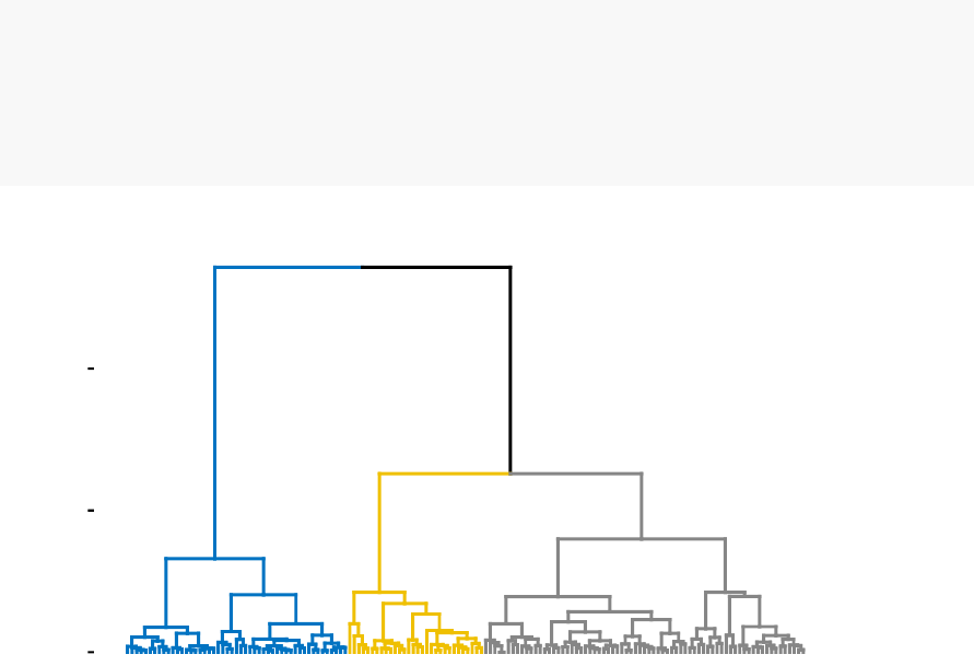
13.3. COMPUTING CLUSTER VALIDATION STATISTICS IN R 145
hc_method = "ward.D2",graph = FALSE)
# Visualize dendrograms
fviz_dend(hc.res, show_labels = FALSE,
palette = "jco",as.ggplot = TRUE)
0
10
20
Height
Cluster Dendrogram
13.3.4 Cluster validation
13.3.4.1 Silhouette plot
Recall that the silhouette coefficient (
Si
) measures how similar an object
i
is to the
the other objects in its own cluster versus those in the neighbor cluster.
Si
values
range from 1 to - 1:
•
A value of
Si
close to 1 indicates that the object is well clustered. In the other
words, the object iis similar to the other objects in its group.
•
A value of
Si
close to -1 indicates that the object is poorly clustered, and that
assignment to some other cluster would probably improve the overall results.
It’s possible to draw silhouette coefficients of observations using the function
fviz_silhouette() [factoextra package], which will also print a summary of the silhouette
analysis output. To avoid this, you can use the option print.summary = FALSE.
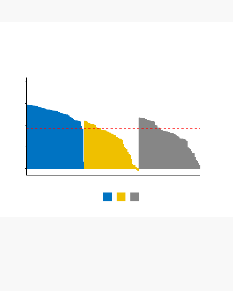
146 CHAPTER 13. CLUSTER VALIDATION STATISTICS
fviz_silhouette(km.res, palette = "jco",
ggtheme = theme_classic())
## cluster size ave.sil.width
## 1 1 50 0.64
## 2 2 47 0.35
## 3 3 53 0.39
0.00
0.25
0.50
0.75
1.00
Silhouette width Si
cluster 123
Clusters silhouette plot
Average silhouette width: 0.46
Silhouette information can be extracted as follow:
# Silhouette information
silinfo <- km.res$silinfo
names(silinfo)
# Silhouette widths of each observation
head(silinfo$widths[, 1:3], 10)
# Average silhouette width of each cluster
silinfo$clus.avg.widths
# The total average (mean of all individual silhouette widths)
silinfo$avg.width

13.3. COMPUTING CLUSTER VALIDATION STATISTICS IN R 147
# The size of each clusters
km.res$size
It can be seen that several samples, in cluster 2, have a negative silhouette coefficient.
This means that they are not in the right cluster. We can find the name of these
samples and determine the clusters they are closer (neighbor cluster), as follow:
# Silhouette width of observation
sil <- km.res$silinfo$widths[, 1:3]
# Objects with negative silhouette
neg_sil_index <- which(sil[, sil_width]<0)
sil[neg_sil_index, , drop = FALSE]
## cluster neighbor sil_width
## 112 2 3 -0.01058434
## 128 2 3 -0.02489394
13.3.4.2 Computing Dunn index and other cluster validation statistics
The function cluster.stats() [fpc package] and the function NbClust() [in NbClust
package] can be used to compute Dunn index and many other indices.
The simplified format is:
cluster.stats(d=NULL,clustering,al.clustering = NULL)
•d: a distance object between cases as generated by the dist() function
•clustering: vector containing the cluster number of each observation
•alt.clustering
: vector such as for clustering, indicating an alternative clustering
The function cluster.stats() returns a list containing many components useful for
analyzing the intrinsic characteristics of a clustering:
•cluster.number: number of clusters
•cluster.size: vector containing the number of points in each cluster
•average.distance
,
median.distance
: vector containing the cluster-wise within
average/median distances
•average.between
: average distance between clusters. We want it to be as large
as possible
148 CHAPTER 13. CLUSTER VALIDATION STATISTICS
•average.within
: average distance within clusters. We want it to be as small as
possible
•clus.avg.silwidths
: vector of cluster average silhouette widths. Recall that, the
silhouette width
is also an estimate of the average distance between clusters.
Its value is comprised between 1 and -1 with a value of 1 indicating a very good
cluster.
•within.cluster.ss
: a generalization of the within clusters sum of squares (k-
means objective function), which is obtained if d is a Euclidean distance matrix.
•dunn, dunn2: Dunn index
•corrected.rand, vi
: Two indexes to assess the similarity of two clustering: the
corrected Rand index and Meila’s VI
All the above elements can be used to evaluate the internal quality of clustering.
In the following sections, we’ll compute the clustering quality statistics for k-means.
Look at the
within.cluster.ss
(within clusters sum of squares), the
average.within
(average distance within clusters) and
clus.avg.silwidths
(vector of cluster average
silhouette widths).
library(fpc)
# Statistics for k-means clustering
km_stats <- cluster.stats(dist(df), km.res$cluster)
# Dun index
km_stats$dunn
## [1] 0.02649665
To display all statistics, type this:
km_stats
Read the documentation of cluster.stats() for details about all the available indices.
13.3.5 External clustering validation
Among the values returned by the function
cluster.stats
(), there are two indexes to
assess the similarity of two clustering, namely the corrected Rand index and Meila’s
VI.

13.3. COMPUTING CLUSTER VALIDATION STATISTICS IN R 149
We know that the iris data contains exactly 3 groups of species.
Does the K-means clustering matches with the true structure of the data?
We can use the function cluster.stats() to answer to this question.
Let start by computing a cross-tabulation between k-means clusters and the reference
Species labels:
table(iris$Species, km.res$cluster)
##
## 1 2 3
## setosa 50 0 0
## versicolor 0 11 39
## virginica 0 36 14
It can be seen that:
•All setosa species (n = 50) has been classified in cluster 1
•
A large number of versicor species (n = 39 ) has been classified in cluster 3.
Some of them ( n = 11) have been classified in cluster 2.
•
A large number of virginica species (n = 36 ) has been classified in cluster 2.
Some of them (n = 14) have been classified in cluster 3.
It’s possible to quantify the agreement between Species and k-means clusters using
either the corrected Rand index and Meila’s VI provided as follow:
library("fpc")
# Compute cluster stats
species <- as.numeric(iris$Species)
clust_stats <- cluster.stats(d=dist(df),
species, km.res$cluster)
# Corrected Rand index
clust_stats$corrected.rand
## [1] 0.6201352
# VI
clust_stats$vi
## [1] 0.7477749

150 CHAPTER 13. CLUSTER VALIDATION STATISTICS
The corrected
Rand index
provides a measure for assessing the similarity between
two partitions, adjusted for chance. Its range is -1 (no agreement) to 1 (perfect
agreement). Agreement between the specie types and the cluster solution is 0.62
using Rand index and 0.748 using Meila’s VI
The same analysis can be computed for both PAM and hierarchical clustering:
# Agreement between species and pam clusters
pam.res <- eclust(df, "pam",k=3,graph = FALSE)
table(iris$Species, pam.res$cluster)
cluster.stats(d=dist(iris.scaled),
species, pam.res$cluster)$vi
# Agreement between species and HC clusters
res.hc <- eclust(df, "hclust",k=3,graph = FALSE)
table(iris$Species, res.hc$cluster)
cluster.stats(d=dist(iris.scaled),
species, res.hc$cluster)$vi
External clustering validation, can be used to select suitable clustering algorithm for
a given data set.
13.4 Summary
We described how to validate clustering results using the silhouette method and the
Dunn index. This task is facilitated using the combination of two R functions: eclust()
and fviz_silhouette in the factoextra package We also demonstrated how to assess the
agreement between a clustering result and an external reference.
In the next chapters, we’ll show how to i) choose the appropriate clustering algorithm
for your data; and ii) computing p-values for hierarchical clustering.

Chapter 14
Choosing the Best Clustering
Algorithms
Choosing the best clustering method
for a given data can be a hard task for
the analyst. This article describes the R package
clValid
(G. Brock et al., 2008),
which can be used to compare simultaneously multiple clustering algorithms in a single
function call for identifying the best clustering approach and the optimal number of
clusters.
We’ll start by describing the different measures in the clValid package for comparing
clustering algorithms. Next, we’ll present the function *clValid*(). Finally, we’ll
provide R scripts for validating clustering results and comparing clustering algorithms.
14.1 Measures for comparing clustering algo-
rithms
The clValid package compares clustering algorithms using two cluster validation
measures:
1.
Internal measures, which uses intrinsic information in the data to assess the qual-
ity of the clustering. Internal measures include the connectivity, the silhouette
coefficient and the Dunn index as described in Chapter 13 (Cluster Validation
Statistics).
151

152 CHAPTER 14. CHOOSING THE BEST CLUSTERING ALGORITHMS
2.
Stability measures, a special version of internal measures, which evaluates the
consistency of a clustering result by comparing it with the clusters obtained
after each column is removed, one at a time.
Cluster stability measures include:
•The average proportion of non-overlap (APN)
•The average distance (AD)
•The average distance between means (ADM)
•The figure of merit (FOM)
The APN, AD, and ADM are all based on the cross-classification table of the original
clustering on the full data with the clustering based on the removal of one column.
•
The APN measures the average proportion of observations not placed in the
same cluster by clustering based on the full data and clustering based on the
data with a single column removed.
•
The AD measures the average distance between observations placed in the same
cluster under both cases (full data set and removal of one column).
•
The ADM measures the average distance between cluster centers for observations
placed in the same cluster under both cases.
•
The FOM measures the average intra-cluster variance of the deleted column,
where the clustering is based on the remaining (undeleted) columns.
The values of APN, ADM and FOM ranges from 0 to 1, with smaller value corre-
sponding with highly consistent clustering results. AD has a value between 0 and
infinity, and smaller values are also preferred.
Note that, the clValid package provides also biological validation measures, which
evaluates the ability of a clustering algorithm to produce biologically meaningful clus-
ters. An application is microarray or RNAseq data where observations corresponds
to genes.
14.2 Compare clustering algorithms in R
We’ll use the function
clValid
() [in the clValid package], which simplified format is
as follow:

14.2. COMPARE CLUSTERING ALGORITHMS IN R 153
clValid(obj, nClust, clMethods = "hierarchical",
validation = "stability",maxitems = 600,
metric = "euclidean",method = "average")
•obj
: A numeric matrix or data frame. Rows are the items to be clustered and
columns are samples.
•nClust
: A numeric vector specifying the numbers of clusters to be evaluated.
e.g., 2:10
•clMethods
: The clustering method to be used. Available options are “hierar-
chical”, “kmeans”, “diana”, “fanny”, “som”, “model”, “sota”, “pam”, “clara”,
and “agnes”, with multiple choices allowed.
•validation
: The type of validation measures to be used. Allowed values are
“internal”, “stability”, and “biological”, with multiple choices allowed.
•maxitems
: The maximum number of items (rows in matrix) which can be
clustered.
•metric
: The metric used to determine the distance matrix. Possible choices are
“euclidean”, “correlation”, and “manhattan”.
•method
: For hierarchical clustering (hclust and agnes), the agglomeration
method to be used. Available choices are “ward”, “single”, “complete” and
“average”.
For example, consider the iris data set, the clValid() function can be used as follow.
We start by cluster internal measures, which include the connectivity, silhouette width
and Dunn index. It’s possible to compute simultaneously these internal measures for
multiple clustering algorithms in combination with a range of cluster numbers.
library(clValid)
# Iris data set:
# - Remove Species column and scale
df <- scale(iris[, -5])
# Compute clValid
clmethods <- c("hierarchical","kmeans","pam")
intern <- clValid(df, nClust = 2:6,
clMethods = clmethods, validation = "internal")
# Summary
summary(intern)
##

154 CHAPTER 14. CHOOSING THE BEST CLUSTERING ALGORITHMS
## Clustering Methods:
## hierarchical kmeans pam
##
## Cluster sizes:
## 2 3 4 5 6
##
## Validation Measures:
## 23456
##
## hierarchical Connectivity 0.9762 5.5964 7.5492 18.0508 24.7306
## Dunn 0.2674 0.1874 0.2060 0.0700 0.0762
## Silhouette 0.5818 0.4803 0.4067 0.3746 0.3248
## kmeans Connectivity 0.9762 23.8151 25.9044 40.3060 40.1385
## Dunn 0.2674 0.0265 0.0700 0.0808 0.0808
## Silhouette 0.5818 0.4599 0.4189 0.3455 0.3441
## pam Connectivity 0.9762 23.0726 31.8067 35.7964 44.5413
## Dunn 0.2674 0.0571 0.0566 0.0642 0.0361
## Silhouette 0.5818 0.4566 0.4091 0.3574 0.3400
##
## Optimal Scores:
##
## Score Method Clusters
## Connectivity 0.9762 hierarchical 2
## Dunn 0.2674 hierarchical 2
## Silhouette 0.5818 hierarchical 2
It can be seen that hierarchical clustering with two clusters performs the best in
each case (i.e., for connectivity, Dunn and Silhouette measures). Regardless of the
clustering algorithm, the optimal number of clusters seems to be two using the three
measures.
The stability measures can be computed as follow:
# Stability measures
clmethods <- c("hierarchical","kmeans","pam")
stab <- clValid(df, nClust = 2:6,clMethods = clmethods,
validation = "stability")
# Display only optimal Scores
optimalScores(stab)

14.3. SUMMARY 155
## Score Method Clusters
## APN 0.003266667 hierarchical 2
## AD 1.004288856 pam 6
## ADM 0.016087089 hierarchical 2
## FOM 0.455750052 pam 6
For the APN and ADM measures, hierarchical clustering with two clusters again
gives the best score. For the other measures, PAM with six clusters has the best
score.
14.3 Summary
Here, we described how to compare clustering algorithms using the clValid R package.

Chapter 15
Computing P-value for
Hierarchical Clustering
Clusters can be found in a data set by chance due to clustering noise or sampling error.
This article describes the R package
pvclust
(Suzuki et al., 2004) which uses bootstrap
resampling techniques to compute p-value for each hierarchical clusters.
15.1 Algorithm
1.
Generated thousands of bootstrap samples by randomly sampling elements of
the data
2. Compute hierarchical clustering on each bootstrap copy
3. For each cluster:
•
compute the bootstrap probability (BP) value which corresponds to the
frequency that the cluster is identified in bootstrap copies.
•
Compute the approximately unbiased (AU) probability values (p-values) by
multiscale bootstrap resampling
Clusters with AU >= 95% are considered to be strongly supported by data.
156

15.2. REQUIRED PACKAGES 157
15.2 Required packages
1. Install pvclust:
install.packages("pvclust")
2. Load pvclust:
library(pvclust)
15.3 Data preparation
We’ll use lung data set [in pvclust package]. It contains the gene expression profile of
916 genes of 73 lung tissues including 67 tumors. Columns are samples and rows are
genes.
library(pvclust)
# Load the data
data("lung")
head(lung[, 1:4])
## fetal_lung 232-97_SCC 232-97_node 68-96_Adeno
## IMAGE:196992 -0.40 4.28 3.68 -1.35
## IMAGE:587847 -2.22 5.21 4.75 -0.91
## IMAGE:1049185 -1.35 -0.84 -2.88 3.35
## IMAGE:135221 0.68 0.56 -0.45 -0.20
## IMAGE:298560 NA 4.14 3.58 -0.40
## IMAGE:119882 -3.23 -2.84 -2.72 -0.83
# Dimension of the data
dim(lung)
## [1] 916 73
We’ll use only a subset of the data set for the clustering analysis. The R function
sample() can be used to extract a random subset of 30 samples:

158CHAPTER 15. COMPUTING P-VALUE FOR HIERARCHICAL CLUSTERING
set.seed(123)
ss <- sample(1:73,30)# extract 20 samples out of
df <- lung[, ss]
15.4 Compute p-value for hierarchical clustering
15.4.1 Description of pvclust() function
The function pvclust() can be used as follow:
pvclust(data, method.hclust = "average",
method.dist = "correlation",nboot = 1000)
Note that, the computation time can be strongly decreased using parallel computation
version called parPvclust(). (Read ?parPvclust() for more information.)
parPvclust(cl=NULL,data,method.hclust = "average",
method.dist = "correlation",nboot = 1000,
iseed = NULL)
•data: numeric data matrix or data frame.
•method.hclust
: the agglomerative method used in hierarchical clustering.
Possible values are one of “average”, “ward”, “single”, “complete”, “mcquitty”,
“median” or “centroid”. The default is “average”. See method argument in
?hclust.
•method.dist
: the distance measure to be used. Possible values are one of
“correlation”, “uncentered”, “abscor” or those which are allowed for
method
argument in dist() function, such “euclidean” and “manhattan”.
•nboot: the number of bootstrap replications. The default is 1000.
•iseed
: an integrer for random seeds. Use iseed argument to achieve reproducible
results.
The function pvclust() returns an object of class pvclust containing many elements
including hclust which contains hierarchical clustering result for the original data
generated by the function hclust().
15.4. COMPUTE P-VALUE FOR HIERARCHICAL CLUSTERING 159
15.4.2 Usage of pvclust() function
pvclust() performs clustering on the columns of the data set, which correspond to
samples in our case. If you want to perform the clustering on the variables (here,
genes) you have to transpose the data set using the function t().
The R code below computes pvclust() using 10 as the number of bootstrap replications
(for speed):
library(pvclust)
set.seed(123)
res.pv <- pvclust(df, method.dist="cor",
method.hclust="average",nboot = 10)
# Default plot
plot(res.pv, hang = -1,cex = 0.5)
pvrect(res.pv)
132-95_Adeno
181-96_Adeno
320-00_Adeno_p
265-98_Adeno
306-99_node
306-99_Adeno
165-96_Adeno
313-99MT_Adeno
313-99PT_Adeno
6-00_LCLC
222-97_normal
219-97_normal
68-96_Adeno
137-96_Adeno
207-97_SCLC
314-99_SCLC
315-99_node
59-96_SCC
139-97_LCLC
234-97_Adeno
184-96_Adeno
184-96_node
157-96_SCC
219-97_SCC
3-SCC
232-97_node
246-97_SCC_c
245-97_node
220-97_SCC
239-97_SCC
0.0 0.4 0.8
Cluster dendrogram with AU/BP values (%)
Cluster method: average
Distance: correlation
Height
100 100 100
100
39
100 73
100 79
100 69
57
63
57 51
68 100
89 26 31
33
29
92 40 54
57
62 60
au
100 100 100
100
81
100 76
100 50
100 42
90
48
90 83
54 100
66 35 77
20
25
65 14 50
13
38 40
bp
123
4
5
67
89
10 11
12
13
14 15
16 17
18 19 20
21
22
23 24 25
26
27 28
edge #
160CHAPTER 15. COMPUTING P-VALUE FOR HIERARCHICAL CLUSTERING
Values on the dendrogram are AU p-values (Red, left), BP values (green, right),
and
clusterlabels
(grey, bottom). Clusters with AU > = 95% are indicated by the
rectangles and are considered to be strongly supported by data.
To extract the objects from the significant clusters, use the function pvpick():
clusters <- pvpick(res.pv)
clusters
Parallel computation can be applied as follow:
# Create a parallel socket cluster
library(parallel)
cl <- makeCluster(2,type = "PSOCK")
# parallel version of pvclust
res.pv <- parPvclust(cl, df, nboot=1000)
stopCluster(cl)
Part V
Advanced Clustering
161
162
Contents:
•Hierarchical k-means clustering (Chapter 16)
•Fuzzy clustering (Chapter 17)
•Model-based clustering (Chapter 18)
•DBSCAN: Density-Based Clustering (Chapter 19)

Chapter 16
Hierarchical K-Means Clustering
K-means (Chapter 4) represents one of the most popular clustering algorithm. However,
it has some limitations: it requires the user to specify the number of clusters in advance
and selects initial centroids randomly. The final k-means clustering solution is very
sensitive to this initial random selection of cluster centers. The result might be
(slightly) different each time you compute k-means.
In this chapter, we described an hybrid method, named
hierarchical k-means
clustering (hkmeans), for improving k-means results.
16.1 Algorithm
The algorithm is summarized as follow:
1. Compute hierarchical clustering and cut the tree into k-clusters
2. Compute the center (i.e the mean) of each cluster
3.
Compute k-means by using the set of cluster centers (defined in step 2) as the
initial cluster centers
Note that, k-means algorithm will improve the initial partitioning generated at the
step 2 of the algorithm. Hence, the initial partitioning can be slightly different from
the final partitioning obtained in the step 4.
163

164 CHAPTER 16. HIERARCHICAL K-MEANS CLUSTERING
16.2 R code
The R function hkmeans() [in factoextra], provides an easy solution to compute the
hierarchical k-means clustering. The format of the result is similar to the one provided
by the standard kmeans() function (see Chapter 4).
To install factoextra, type this: install.packages(“factoextra”).
We’ll use the USArrest data set and we start by standardizing the data:
df <- scale(USArrests)
# Compute hierarchical k-means clustering
library(factoextra)
res.hk <-hkmeans(df, 4)
# Elements returned by hkmeans()
names(res.hk)
## [1] "cluster" "centers" "totss" "withinss"
## [5] "tot.withinss" "betweenss" "size" "iter"
## [9] "ifault" "data" "hclust"
To print all the results, type this:
# Print the results
res.hk
# Visualize the tree
fviz_dend(res.hk, cex = 0.6,palette = "jco",
rect = TRUE,rect_border = "jco",rect_fill = TRUE)
16.2. R CODE 165
Alabama
Louisiana
Georgia
Tennessee
North Carolina
Mississippi
South Carolina
Texas
Illinois
New York
Florida
Arizona
Michigan
Maryland
New Mexico
Alaska
Colorado
California
Nevada
South Dakota
West Virginia
North Dakota
Vermont
Idaho
Montana
Nebraska
Minnesota
Wisconsin
Maine
Iowa
New Hampshire
Virginia
Wyoming
Arkansas
Kentucky
Delaware
Massachusetts
New Jersey
Connecticut
Rhode Island
Missouri
Oregon
Washington
Oklahoma
Indiana
Kansas
Ohio
Pennsylvania
Hawaii
Utah
0
5
10
Height
Cluster Dendrogram
# Visualize the hkmeans final clusters
fviz_cluster(res.hk, palette = "jco",repel = TRUE,
ggtheme = theme_classic())
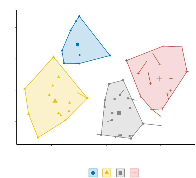
166 CHAPTER 16. HIERARCHICAL K-MEANS CLUSTERING
Alabama
Alaska
Arizona
Arkansas
California
Colorado Connecticut
Delaware
Florida
Georgia
Hawaii
Idaho
Illinois
Indiana
Iowa
Kansas
Kentucky
Louisiana
Maine
Maryland
Massachusetts
Michigan
Minnesota
Mississippi
Missouri
Montana
Nebraska
Nevada
New Hampshire
New Jersey
New Mexico
New York
North Carolina
North Dakota
Ohio
Oklahoma
Oregon Pennsylvania
Rhode Island
South Carolina
South Dakota
Tennessee
Texas
Utah
Vermont
Virginia
Washington
West Virginia
Wisconsin
Wyoming
-1
0
1
2
-2 0 2
Dim1 (62%)
Dim2 (24.7%)
cluster aaaa
1234
Cluster plot
16.3 Summary
We described hybrid
hierarchical k-means clustering
for improving k-means re-
sults.

Chapter 17
Fuzzy Clustering
The
fuzzy clustering
is considered as soft clustering, in which each element has a
probability of belonging to each cluster. In other words, each element has a set of
membership coefficients corresponding to the degree of being in a given cluster.
This is different from k-means and k-medoid clustering, where each object is affected
exactly to one cluster. K-means and k-medoids clustering are known as hard or
non-fuzzy clustering.
In fuzzy clustering, points close to the center of a cluster, may be in the cluster to a
higher degree than points in the edge of a cluster. The degree, to which an element
belongs to a given cluster, is a numerical value varying from 0 to 1.
The
fuzzy c-means
(FCM) algorithm is one of the most widely used fuzzy clustering
algorithms. The centroid of a cluster is calculated as the mean of all points, weighted
by their degree of belonging to the cluster:
In this article, we’ll describe how to compute fuzzy clustering using the R software.
17.1 Required R packages
We’ll use the following R packages: 1) cluster for computing fuzzy clustering and 2)
factoextra for visualizing clusters.
167

168 CHAPTER 17. FUZZY CLUSTERING
17.2 Computing fuzzy clustering
The function fanny() [cluster R package] can be used to compute fuzzy clustering.
FANNY stands for fuzzy analysis clustering. A simplified format is:
fanny(x, k, metric = "euclidean",stand = FALSE)
•x: A data matrix or data frame or dissimilarity matrix
•k: The desired number of clusters to be generated
•metric: Metric for calculating dissimilarities between observations
•stand
: If TRUE, variables are standardized before calculating the dissimilarities
The function fanny() returns an object including the following components:
•membership
: matrix containing the degree to which each observation belongs
to a given cluster. Column names are the clusters and rows are observations
•coeff
: Dunn’s partition coefficient F(k) of the clustering, where k is the number
of clusters. F(k) is the sum of all squared membership coefficients, divided by
the number of observations. Its value is between 1/k and 1. The normalized
form of the coefficient is also given. It is defined as (
F
(
k
)
≠
1
/k
)
/
(1
≠
1
/k
), and
ranges between 0 and 1. A low value of Dunn’s coefficient indicates a very fuzzy
clustering, whereas a value close to 1 indicates a near-crisp clustering.
•clustering
: the clustering vector containing the nearest crisp grouping of
observations
For example, the R code below applies fuzzy clustering on the USArrests data set:
library(cluster)
df <- scale(USArrests) # Standardize the data
res.fanny <- fanny(df, 2)# Compute fuzzy clustering with k = 2
The different components can be extracted using the code below:
head(res.fanny$membership, 3)# Membership coefficients
## [,1] [,2]
## Alabama 0.6641977 0.3358023
## Alaska 0.6098062 0.3901938
## Arizona 0.6862278 0.3137722
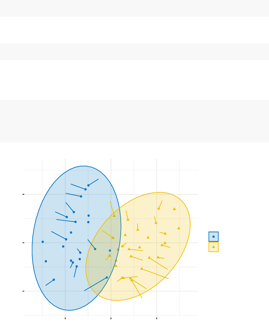
17.2. COMPUTING FUZZY CLUSTERING 169
res.fanny$coeff # Dunns partition coefficient
## dunn_coeff normalized
## 0.5547365 0.1094731
head(res.fanny$clustering) # Observation groups
## Alabama Alaska Arizona Arkansas California Colorado
##111211
To visualize observation groups, use the function fviz_cluster() [factoextra package]:
library(factoextra)
fviz_cluster(res.fanny, ellipse.type = "norm",repel = TRUE,
palette = "jco",ggtheme = theme_minimal(),
legend = "right")
Alabama
Alaska
Arizona
Arkansas
California
Colorado Connecticut
Delaware
Florida
Georgia
Hawaii
Idaho
Illinois
Indiana
Iowa
Kansas
Kentucky
Louisiana
Maine
Maryland
Massachusetts
Michigan
Minnesota
Mississippi
Missouri
Montana
Nebraska
Nevada
New Hampshire
New Jersey
New Mexico
New York
North Carolina
North Dakota
Ohio
Oklahoma
Oregon Pennsylvania
Rhode Island
South Carolina
South Dakota
Tennessee
Texas
Utah
Vermont
Virginia
Washington
West Virginia
Wisconsin
Wyoming
-2
0
2
-2 0 2
Dim1 (62%)
Dim2 (24.7%)
cluster
a
a
1
2
Cluster plot
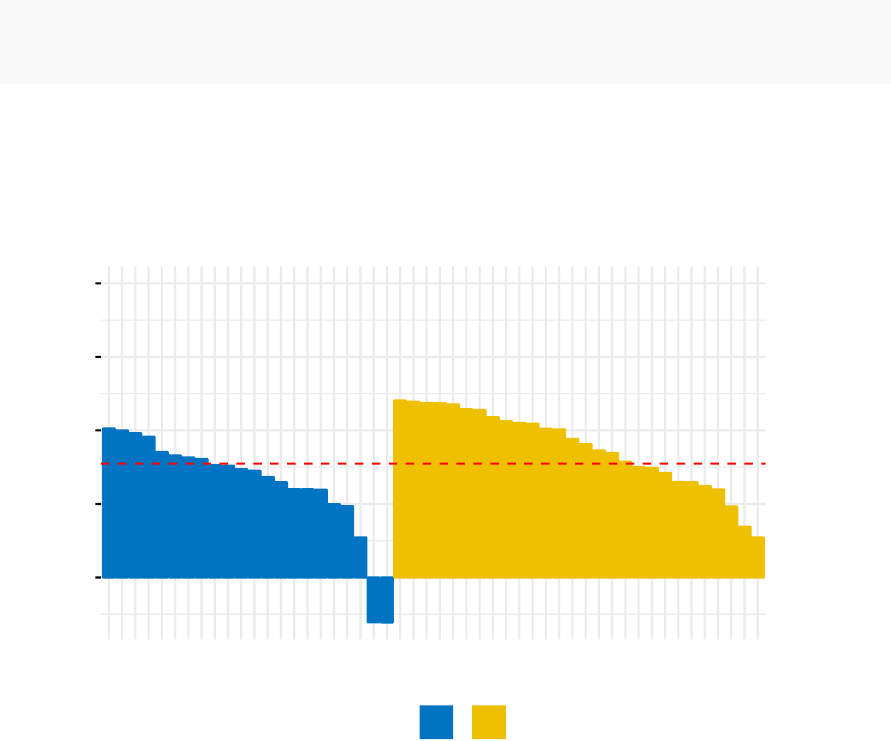
170 CHAPTER 17. FUZZY CLUSTERING
To evaluate the goodnesss of the clustering results, plot the silhouette coefficient as
follow:
fviz_silhouette(res.fanny, palette = "jco",
ggtheme = theme_minimal())
## cluster size ave.sil.width
## 1 1 22 0.32
## 2 2 28 0.44
0.00
0.25
0.50
0.75
1.00
Silhouette width Si
cluster 12
Clusters silhouette plot
Average silhouette width: 0.39
17.3 Summary
Fuzzy clustering is an alternative to k-means clustering, where each data point has
membership coefficient to each cluster. Here, we demonstrated how to compute and
visualize fuzzy clustering using the combination of cluster and factoextra R packages.

Chapter 18
Model-Based Clustering
The traditional clustering methods, such as hierarchical clustering (Chapter 7) and
k-means clustering (Chapter 4), are heuristic and are not based on formal models.
Furthermore, k-means algorithm is commonly randomnly initialized, so different runs
of k-means will often yield different results. Additionally, k-means requires the user to
specify the the optimal number of clusters.
An alternative is
model-based clustering
, which consider the data as coming from
a distribution that is mixture of two or more clusters (Chris Fraley and Adrian E.
Raftery, 2002 and 2012). Unlike k-means, the model-based clustering uses a soft
assignment, where each data point has a probability of belonging to each cluster.
In this chapter, we illustrate model-based clustering using the R package mclust.
18.1 Concept of model-based clustering
In model-based clustering, the data is considered as coming from a mixture of density.
Each component (i.e. cluster) k is modeled by the normal or Gaussian distribution
which is characterized by the parameters:
•µk: mean vector,
•qk: covariance matrix,
•
An associated probability in the mixture. Each point has a probability of
belonging to each cluster.
171
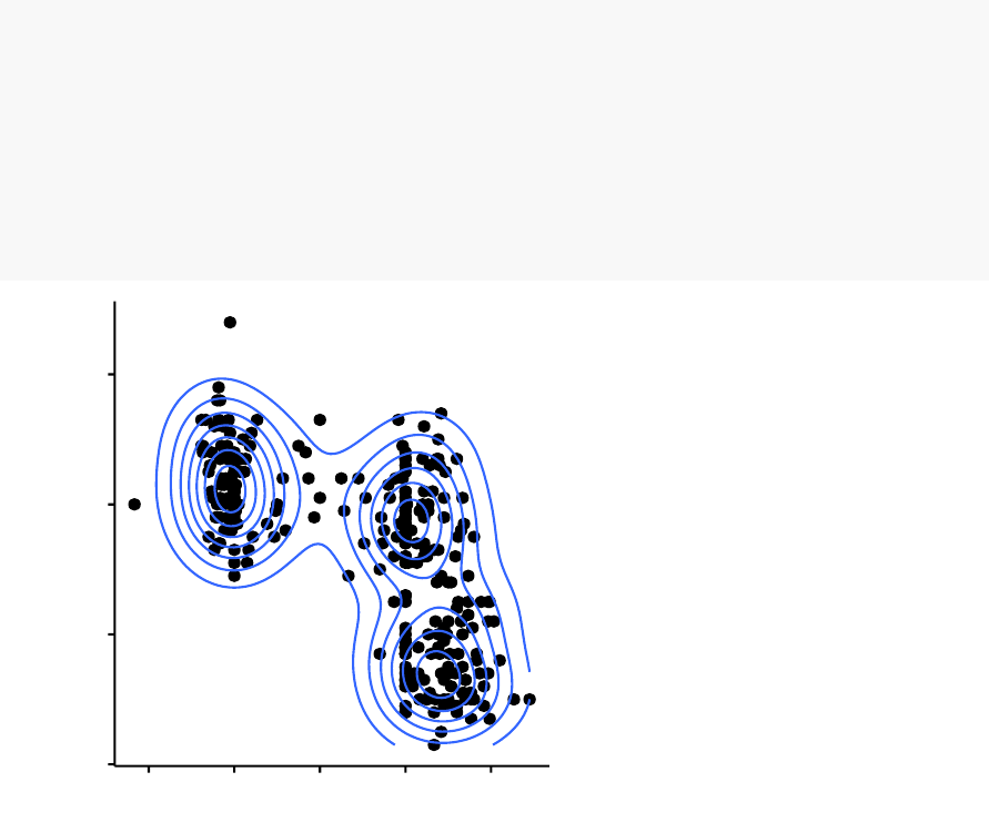
172 CHAPTER 18. MODEL-BASED CLUSTERING
For example, consider the “old faithful geyser data” [in MASS R package], which can
be illustrated as follow using the ggpubr R package:
# Load the data
library("MASS")
data("geyser")
# Scatter plot
library("ggpubr")
ggscatter(geyser, x="duration",y="waiting")+
geom_density2d() # Add 2D density
40
60
80
100
12345
duration
waiting
The plot above suggests at least 3 clusters in the mixture. The shape of each of the
3 clusters appears to be approximately elliptical suggesting three bivariate normal
distributions. As the 3 ellipses seems to be similar in terms of volume, shape and
orientation, we might anticipate that the three components of this mixture might have
homogeneous covariance matrices.
18.2. ESTIMATING MODEL PARAMETERS 173
18.2 Estimating model parameters
The model parameters can be estimated using the Expectation-Maximization (EM)
algorithm initialized by hierarchical model-based clustering. Each cluster k is centered
at the means µk, with increased density for points near the mean.
Geometric features (shape, volume, orientation) of each cluster are determined by the
covariance matrix qk.
Different possible parameterizations of
qk
are available in the R package mclust (see
?mclustModelNames).
The available model options, in mclust package, are represented by identifiers including:
EII, VII, EEI, VEI, EVI, VVI, EEE, EEV, VEV and VVV.
The first identifier refers to volume, the second to shape and the third to orientation.
E stands for “equal”, V for “variable” and I for “coordinate axes”.
For example:
•
EVI denotes a model in which the volumes of all clusters are equal (E), the
shapes of the clusters may vary (V), and the orientation is the identity (I) or
“coordinate axes.
•
EEE means that the clusters have the same volume, shape and orientation in
p-dimensional space.
•
VEI means that the clusters have variable volume, the same shape and orientation
equal to coordinate axes.
18.3 Choosing the best model
The Mclust package uses maximum likelihood to fit all these models, with different
covariance matrix parameterizations, for a range of k components.
The best model is selected using the Bayesian Information Criterion or BIC. A large
BIC score indicates strong evidence for the corresponding model.
18.4 Computing model-based clustering in R
We start by installing the mclust package as follow: install.packages(“mclust”)
174 CHAPTER 18. MODEL-BASED CLUSTERING
Note that, model-based clustering can be applied on univariate or multivariate data.
Here, we illustrate model-based clustering on the diabetes data set [mclust package]
giving three measurements and the diagnosis for 145 subjects described as follow:
library("mclust")
data("diabetes")
head(diabetes, 3)
## class glucose insulin sspg
## 1 Normal 80 356 124
## 2 Normal 97 289 117
## 3 Normal 105 319 143
•
class: the diagnosis: normal, chemically diabetic, and overtly diabetic. Excluded
from the cluster analysis.
•glucose: plasma glucose response to oral glucose
•insulin: plasma insulin response to oral glucose
•sspg: steady-state plasma glucose (measures insulin resistance)
Model-based clustering can be computed using the function Mclust() as follow:
library(mclust)
df <- scale(diabetes[, -1]) # Standardize the data
mc <- Mclust(df) # Model-based-clustering
summary(mc) # Print a summary
## ----------------------------------------------------
## Gaussian finite mixture model fitted by EM algorithm
## ----------------------------------------------------
##
## Mclust VVV (ellipsoidal, varying volume, shape, and orientation) model with 3 components:
##
## log.likelihood n df BIC ICL
## -169.0918 145 29 -482.5089 -501.4368
##
## Clustering table:
##123
## 81 36 28

18.5. VISUALIZING MODEL-BASED CLUSTERING 175
For this data, it can be seen that model-based clustering selected a model with three
components (i.e. clusters). The optimal selected model name is VVV model. That
is the three components are ellipsoidal with varying volume, shape, and orientation.
The summary contains also the clustering table specifying the number of observations
in each clusters.
You can access to the results as follow:
mc$modelName # Optimal selected model ==> "VVV"
mc$G # Optimal number of cluster => 3
head(mc$z, 30)# Probality to belong to a given cluster
head(mc$classification, 30)# Cluster assignement of each observation
18.5 Visualizing model-based clustering
Model-based clustering results can be drawn using the base function plot.Mclust() [in
mclust package]. Here we’ll use the function fviz_mclust() [in factoextra package] to
create beautiful plots based on ggplot2.
In the situation, where the data contain more than two variables, fviz_mclust() uses
a principal component analysis to reduce the dimensionnality of the data. The first
two principal components are used to produce a scatter plot of the data. How-
ever, if you want to plot the data using only two variables of interest, let say here
c(“insulin”, “sspg”), you can specify that in the fviz_mclust() function using the
argument choose.vars = c(“insulin”, “sspg”).
library(factoextra)
# BIC values used for choosing the number of clusters
fviz_mclust(mc, "BIC",palette = "jco")
# Classification: plot showing the clustering
fviz_mclust(mc, "classification",geom = "point",
pointsize = 1.5,palette = "jco")
# Classification uncertainty
fviz_mclust(mc, "uncertainty",palette = "jco")
176 CHAPTER 18. MODEL-BASED CLUSTERING
-1250
-1000
-750
-500
123456789
Number of components
BIC
EII VII EEI
VEI EVI VVI
EEE EVE VEE
VVE EEV VEV
EVV VVV
Best model: VVV | Optimal clusters: n = 3
Model selection
0
2
4
-2 0 2 4
Dim1 (73.2%)
Dim2 (25.6%)
cluster 123
Classification
Cluster plot
0
2
4
-2 0 2 4
Dim1 (73.2%)
Dim2 (25.6%)
cluster 123
Uncertainty
Cluster plot
Note that, in the uncertainty plot, larger symbols indicate the more uncertain
observations.
Chapter 19
DBSCAN: Density-Based
Clustering
DBSCAN
(
Density-Based Spatial Clustering and Application with Noise
),
is a
density-based clusering
algorithm, introduced in Ester et al. 1996, which can
be used to identify clusters of any shape in a data set containing noise and outliers.
The basic idea behind the density-based clustering approach is derived from a human
intuitive clustering method. For instance, by looking at the figure below, one can
easily identify four clusters along with several points of noise, because of the differences
in the density of points.
Clusters are dense regions in the data space, separated by regions of lower density of
points. The DBSCAN algorithm is based on this intuitive notion of “clusters” and
“noise”. The key idea is that for each point of a cluster, the neighborhood of a given
radius has to contain at least a minimum number of points.
177
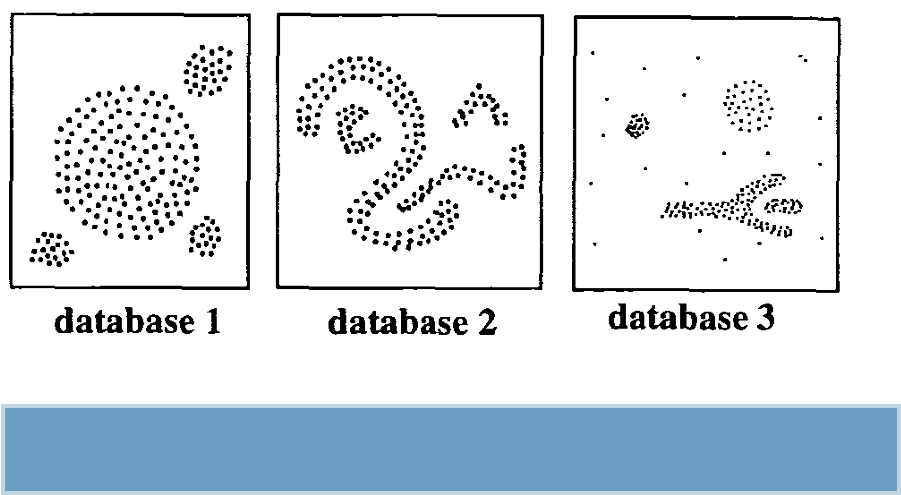
178 CHAPTER 19. DBSCAN: DENSITY-BASED CLUSTERING
(From Ester et al. 1996)
In this chapter, we’ll describe the DBSCAN algorithm and demonstrate how to
compute DBSCAN using the *fpc* R package.
19.1 Why DBSCAN?
Partitioning methods (K-means, PAM clustering) and hierarchical clustering are
suitable for finding spherical-shaped clusters or convex clusters. In other words, they
work well only for compact and well separated clusters. Moreover, they are also
severely affected by the presence of noise and outliers in the data.
Unfortunately, real life data can contain: i) clusters of arbitrary shape such as those
shown in the figure below (oval, linear and “S” shape clusters); ii) many outliers and
noise.
The figure below shows a data set containing nonconvex clusters and outliers/noises.
The simulated data set multishapes [in factoextra package] is used.
19.1. WHY DBSCAN? 179
-3
-2
-1
0
1
-1 0 1
x
y
The plot above contains 5 clusters and outliers, including:
•2 ovales clusters
•2 linear clusters
•1 compact cluster
Given such data, k-means algorithm has difficulties for identifying theses clusters with
arbitrary shapes. To illustrate this situation, the following R code computes k-means
algorithm on the multishapes data set. The function fviz_cluster()[factoextra package]
is used to visualize the clusters.
First, install factoextra: install.packages(“factoextra”); then compute and visualize
k-means clustering using the data set multishapes:
library(factoextra)
data("multishapes")
df <- multishapes[, 1:2]
set.seed(123)
km.res <- kmeans(df, 5,nstart = 25)
fviz_cluster(km.res, df, geom = "point",
ellipse= FALSE,show.clust.cent = FALSE,
palette = "jco",ggtheme = theme_classic())
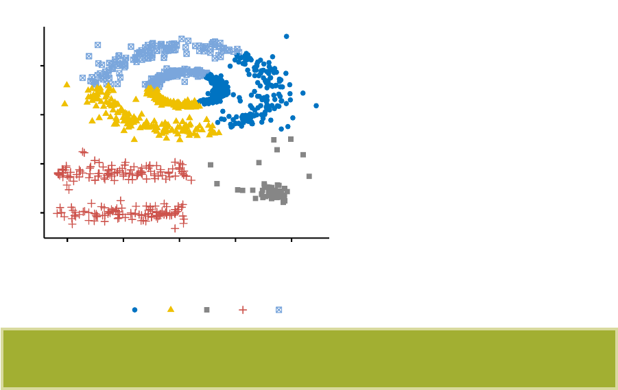
180 CHAPTER 19. DBSCAN: DENSITY-BASED CLUSTERING
-2
-1
0
1
-2 -1 0 1 2
x value
y value
cluster 12345
Cluster plot
We know there are 5 five clusters in the data, but it can be seen that k-means method
inaccurately identify the 5 clusters.
19.2 Algorithm
The goal is to identify dense regions, which can be measured by the number of objects
close to a given point.
Two important parameters are required for DBSCAN: epsilon (“eps”) and minimum
points (“MinPts”). The parameter eps defines the radius of neighborhood around
a point x. It’s called called the
‘
-neighborhood of x. The parameter MinPts is the
minimum number of neighbors within “eps” radius.
Any point x in the data set, with a neighbor count greater than or equal to MinPts, is
marked as a core point. We say that x is border point, if the number of its neighbors is
less than MinPts, but it belongs to the
‘
-neighborhood of some core point z. Finally,
if a point is neither a core nor a border point, then it is called a noise point or an
outlier.
The figure below shows the different types of points (core, border and outlier points)
using MinPts = 6. Here x is a core point because
neighbours‘
(
x
)=6, y is a border
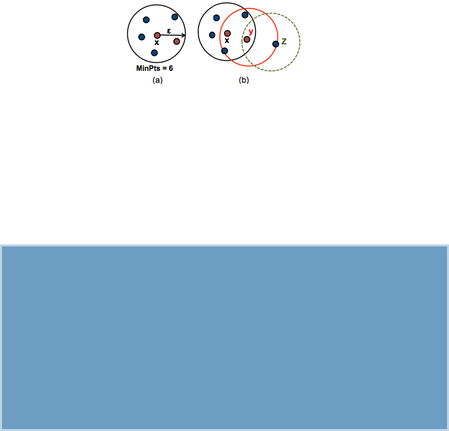
19.3. ADVANTAGES 181
point because
neighbours‘
(
y
)
< MinP ts
, but it belongs to the
‘
-neighborhood of the
core point x. Finally, z is a noise point.
We start by defining 3 terms, required for understanding the DBSCAN algorithm:
•
Direct density reachable: A point “A” is directly density reachable from another
point “B” if: i) “A” is in the
‘
-neighborhood of “B” and ii) “B” is a core point.
•
Density reachable: A point “A” is density reachable from “B” if there are a set
of core points leading from “B” to “A.
•
Density connected: Two points “A” and “B” are density connected if there are a
core point “C”, such that both “A” and “B” are density reachable from “C”.
A density-based cluster is defined as a group of density connected points. The algorithm
of density-based clustering (DBSCAN) works as follow:
1. For each point
xi
, compute the distance between
xi
and the other points. Finds
all neighbor points within distance eps of the starting point (
xi
). Each point, with a
neighbor count greater than or equal to MinPts, is marked as core point or visited.
2. For each core point, if it’s not already assigned to a cluster, create a
new cluster. Find recursively all its density connected points and assign them to the
same cluster as the core point.
3. Iterate through the remaining unvisited points in the data set.
Those points that do not belong to any cluster are treated as outliers or
noise.
19.3 Advantages
1.
Unlike K-means, DBSCAN does not require the user to specify the number of
clusters to be generated

182 CHAPTER 19. DBSCAN: DENSITY-BASED CLUSTERING
2.
DBSCAN can find any shape of clusters. The cluster doesn’t have to be circular.
3. DBSCAN can identify outliers
19.4 Parameter estimation
•
MinPts: The larger the data set, the larger the value of minPts should be chosen.
minPts must be chosen at least 3.
•‘
: The value for
‘
can then be chosen by using a k-distance graph, plotting the
distance to the k = minPts nearest neighbor. Good values of
‘
are where this
plot shows a strong bend.
19.5 Computing DBSCAN
Here, we’ll use the R package fpc to compute DBSCAN. It’s also possible to use the
package dbscan, which provides a faster re-implementation of DBSCAN algorithm
compared to the fpc package.
We’ll also use the factoextra package for visualizing clusters.
First, install the packages as follow:
install.packages("fpc")
install.packages("dbscan")
install.packages("factoextra")
The R code below computes and visualizes DBSCAN using multishapes data set
[factoextra R package]:
# Load the data
data("multishapes",package = "factoextra")
df <- multishapes[, 1:2]
# Compute DBSCAN using fpc package
library("fpc")
set.seed(123)
db <- fpc::dbscan(df, eps = 0.15,MinPts = 5)
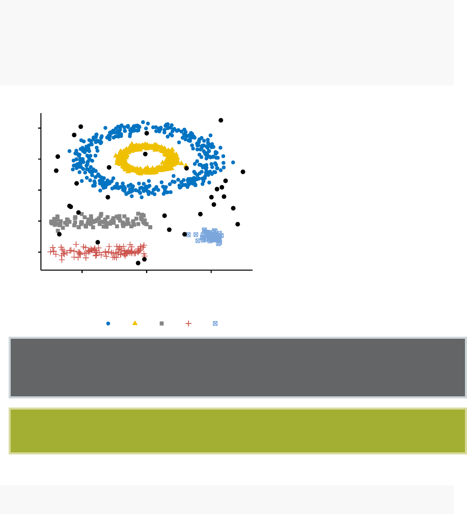
19.5. COMPUTING DBSCAN 183
# Plot DBSCAN results
library("factoextra")
fviz_cluster(db, data = df, stand = FALSE,
ellipse = FALSE,show.clust.cent = FALSE,
geom = "point",palette = "jco",ggtheme = theme_classic())
-3
-2
-1
0
1
-1 0 1
x value
y value
cluster 12345
Cluster plot
Note that, the function fviz_cluster() uses different point symbols for core points
(i.e, seed points) and border points. Black points correspond to outliers. You can
play with eps and MinPts for changing cluster configurations.
It can be seen that DBSCAN performs better for these data sets and can identify
the correct set of clusters compared to k-means algorithms.
The result of the fpc::dbscan() function can be displayed as follow:
print(db)
## dbscan Pts=1100 MinPts=5 eps=0.15
## 0 1 2 3 4 5
## border 31 24 1 5 7 1
184 CHAPTER 19. DBSCAN: DENSITY-BASED CLUSTERING
## seed 0 386 404 99 92 50
## total 31 410 405 104 99 51
In the table above, column names are cluster number. Cluster 0 corresponds to outliers
(black points in the DBSCAN plot). The function print.dbscan() shows a statistic of
the number of points belonging to the clusters that are seeds and border points.
# Cluster membership. Noise/outlier observations are coded as 0
# A random subset is shown
db$cluster[sample(1:1089,20)]
## [1] 1 3 2 4 3 1 2 4 2 2 2 2 2 2 1 4 1 1 1 0
DBSCAN algorithm requires users to specify the optimal eps values and the parameter
MinPts. In the R code above, we used eps = 0.15 and MinPts = 5. One limitation of
DBSCAN is that it is sensitive to the choice of
‘
, in particular if clusters have different
densities. If
‘
is too small, sparser clusters will be defined as noise. If
‘
is too large,
denser clusters may be merged together. This implies that, if there are clusters with
different local densities, then a single ‘value may not suffice.
A natural question is:
How to define the optimal value of eps?
19.6 Method for determining the optimal eps
value
The method proposed here consists of computing the k-nearest neighbor distances in
a matrix of points.
The idea is to calculate, the average of the distances of every point to its k nearest
neighbors. The value of k will be specified by the user and corresponds to MinPts.
Next, these k-distances are plotted in an ascending order. The aim is to determine
the “knee”, which corresponds to the optimal eps parameter.
A knee corresponds to a threshold where a sharp change occurs along the k-distance
curve.
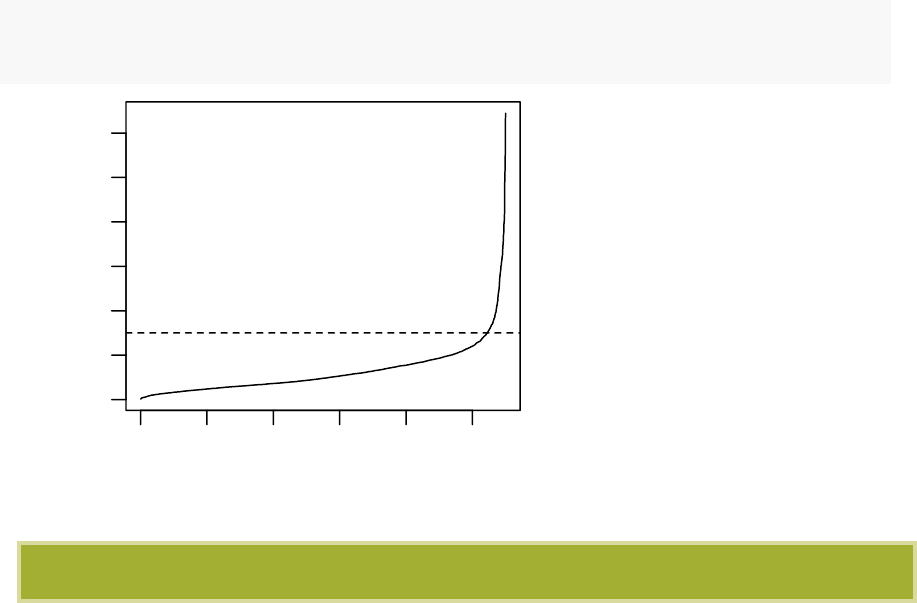
19.7. CLUSTER PREDICTIONS WITH DBSCAN ALGORITHM 185
The function kNNdistplot() [in dbscan package] can be used to draw the k-distance
plot:
dbscan::kNNdistplot(df, k= 5)
abline(h=0.15,lty = 2)
0 1000 3000 5000
0.0 0.2 0.4 0.6
Points (sample) sorted by distance
5-NN distance
It can be seen that the optimal eps value is around a distance of 0.15.
19.7 Cluster predictions with DBSCAN algorithm
The function predict.dbscan(object, data, newdata) [in fpc package] can be used to
predict the clusters for the points in newdata. For more details, read the documentation
(?predict.dbscan).
Chapter 20
References and Further Reading
This book was written in R Markdown inside RStudio. knitr and pandoc converted
the raw Rmarkdown to pdf. This version of the book was built with
R
(ver. x86_64-
apple-darwin13.4.0, x86_64, darwin13.4.0, x86_64, darwin13.4.0, , 3, 3.2, 2016, 10,
31, 71607, R, R version 3.3.2 (2016-10-31), Sincere Pumpkin Patch),
factoextra
(ver.
1.0.3.900) and ggplot2 (ver. 2.2.1)
References:
•
Brock, G., Pihur, V., Datta, S. and Datta, S. (2008) clValid: An R Package for
Cluster Validation Journal of Statistical Software 25(4).http://www.jstatsoft.
org/v25/i04
•
Charrad M., Ghazzali N., Boiteau V., Niknafs A. (2014). NbClust: An R Package
for Determining the Relevant Number of Clusters in a Data Set. Journal of
Statistical Software, 61(6), 1-36.
•
Chris Fraley, A. E. Raftery, T. B. Murphy and L. Scrucca (2012). mclust Version
4 for R: Normal Mixture Modeling for Model-Based Clustering, Classification,
and Density Estimation. Technical Report No. 597, Department of Statistics,
University of Washington. pdf
•
Chris Fraley and A. E. Raftery (2002). Model-based clustering, discriminant
analysis, and density estimation. Journal of the American Statistical Association
97:611:631.
•
Ranjan Maitra. Model-based clustering. Department of Statistics Iowa State
University. http://www.public.iastate.edu/~maitra/stat501/lectures/
•
Kaufman, L. and Rousseeuw, P.J. (1990). Finding Groups in Data: An Intro-
duction to Cluster Analysis. Wiley, New York.
•
Hartigan, J. A. and Wong, M. A. (1979). A K-means clustering algorithm.
186
187
Applied Statistics 28, 100–108.
•
J. C. Dunn (1973): A Fuzzy Relative of the ISODATA Process and Its Use in
Detecting Compact Well-Separated Clusters. Journal of Cybernetics 3: 32-57.
•
J. C. Bezdek (1981): Pattern Recognition with Fuzzy Objective Function Algo-
rithms. Plenum Press, New York Tariq Rashid: “Clustering”.
•
MacQueen, J. (1967) Some methods for classification and analysis of multivariate
observations. In Proceedings of the Fifth Berkeley Symposium on Mathematical
Statistics and Probability, eds L. M. Le Cam & J. Neyman, 1, pp. 281–297.
Berkeley, CA: University of California Press.
•
Malika Charrad, Nadia Ghazzali, Veronique Boiteau, Azam Niknafs (2014).
NbClust: An R Package for Determining the Relevant Number of Clusters in
a Data Set. Journal of Statistical Software, 61(6), 1-36. URL http://www.
jstatsoft.org/v61/i06/.
•
Martin Ester, Hans-Peter Kriegel, Joerg Sander, Xiaowei Xu (1996). A Density-
Based Algorithm for Discovering Clusters in Large Spatial Databases with Noise.
Institute for Computer Science, University of Munich. Proceedings of 2nd
International Conference on Knowledge Discovery and Data Mining (KDD-96)
•
Suzuki, R. and Shimodaira, H. An application of multiscale bootstrap resampling
to hierarchical clustering of microarray data: How accurate are these clusters?.
The Fifteenth International Conference on Genome Informatics 2004, P034.
•
Suzuki R1, Shimodaira H. Pvclust: an R package for assessing the uncertainty
in hierarchical clustering. Bioinformatics. 2006 Jun 15;22(12):1540-2. Epub
2006 Apr 4.
•
Theodoridis S, Koutroubas K (2008). Pattern Recognition. 4th edition. Aca-
demic Press.
•
Tibshirani, R., Walther, G. and Hastie, T. (2001). Estimating the number of
data clusters via the Gap statistic. Journal of the Royal Statistical Society B,
63, 411–423. PDF
