Lightning Components Developer Guide
User Manual:
Open the PDF directly: View PDF  .
.
Page Count: 506 [warning: Documents this large are best viewed by clicking the View PDF Link!]
- What is the Lightning Component Framework?
- Quick Start
- Creating Components
- Create Lightning Components in the Developer Console
- Component Markup
- Component Namespace
- Component Bundles
- Component IDs
- HTML in Components
- CSS in Components
- Component Attributes
- Component Composition
- Component Body
- Component Facets
- Best Practices for Conditional Markup
- Component Versioning
- Using Expressions
- Using Labels
- Localization
- Providing Component Documentation
- Working with Base Lightning Components
- Working with UI Components
- Supporting Accessibility
- Using Components
- Use Lightning Components in Lightning Experience and Salesforce1
- Get Your Lightning Components Ready to Use on Lightning Pages
- Configure Components for Lightning Pages and the Lightning App Builder
- Lightning Component Bundle Design Resources
- Configure Components for Lightning Experience Record Pages
- Create Components for Lightning for Outlook and Lightning for Gmail (Beta)
- Create Dynamic Picklists for Your Custom Components
- Tips and Considerations for Configuring Components for Lightning Pages and the Lightning App Builder
- Use Lightning Components in Community Builder
- Add Components to Apps
- Use Lightning Components in Visualforce Pages
- Add Lightning Components to Any App with Lightning Out (Beta)
- Communicating with Events
- Actions and Events
- Handling Events with Client-Side Controllers
- Component Events
- Application Events
- Event Handling Lifecycle
- Advanced Events Example
- Firing Lightning Events from Non-Lightning Code
- Events Best Practices
- Events Fired During the Rendering Lifecycle
- Events Handled In Salesforce1 and Lightning Experience
- System Events
- Creating Apps
- App Overview
- Designing App UI
- Creating App Templates
- Developing Secure Code
- Content Security Policy Overview
- What is LockerService?
- Writing Secure Code
- Salesforce Lightning CLI
- Install Salesforce Lightning CLI
- Use Salesforce Lightning CLI
- Review and Resolve Problems
- Salesforce Lightning CLI Rules
- Validate JavaScript Intrinsic APIs (ecma-intrinsics)
- Disallow instanceof (no-instanceof)
- Validate Aura API (aura-api)
- Validate Lightning Component Public API (secure-component)
- Validate Secure Document Public API (secure-document)
- Validate Secure Window Public API (secure-window)
- Custom “House Style” Rules
- Salesforce Lightning CLI Options
- Styling Apps
- Using JavaScript
- Using External JavaScript Libraries
- Working with Attribute Values in JavaScript
- Working with a Component Body in JavaScript
- Working with Events in JavaScript
- Sharing JavaScript Code in a Component Bundle
- Modifying the DOM
- Client-Side Rendering to the DOM
- Invoking Actions on Component Initialization
- Modifying Components Outside the Framework Lifecycle
- Validating Fields
- Throwing and Handling Errors
- Calling Component Methods
- Using JavaScript Promises
- Making API Calls from Components
- Create CSP Trusted Sites to Access Third-Party APIs
- JavaScript Cookbook
- Using Apex
- Creating Server-Side Logic with Controllers
- Creating Components
- Working with Salesforce Records
- Testing Your Apex Code
- Making API Calls from Apex
- Lightning Data Service (Developer Preview)
- Lightning Container (Developer Preview)
- Controlling Access
- Using Object-Oriented Development
- Using the AppCache
- Distributing Applications and Components
- Debugging
- Fixing Performance Warnings
- Reference
- Reference Doc App
- Supported aura:attribute Types
- aura:application
- aura:component
- aura:dependency
- aura:event
- aura:interface
- aura:method
- aura:set
- Component Reference
- aura:expression
- aura:html
- aura:if
- aura:iteration
- aura:renderIf
- aura:template
- aura:text
- aura:unescapedHtml
- auraStorage:init
- force:canvasApp
- force:inputField
- force:outputField
- force:recordEdit
- force:recordPreview (Developer Preview)
- force:recordView
- forceChatter:feed
- forceChatter:fullFeed
- forceChatter:publisher
- forceCommunity:navigationMenuBase
- forceCommunity:routeLink
- lightning:avatar
- lightning:badge
- lightning:button
- lightning:buttonGroup
- lightning:buttonIcon
- lightning:buttonMenu (Beta)
- lightning:card
- lightning:container
- lightning:formattedDateTime (Beta)
- lightning:formattedNumber (Beta)
- lightning:icon
- lightning:input (Beta)
- lightning:inputRichText (Beta)
- lightning:layout
- lightning:layoutItem
- lightning:menuItem (Beta)
- lightning:select
- lightning:spinner
- lightning:tab (Beta)
- lightning:tabset (Beta)
- lightning:textarea
- ltng:require
- ui:actionMenuItem
- ui:button
- ui:checkboxMenuItem
- ui:inputCheckbox
- ui:inputCurrency
- ui:inputDate
- ui:inputDateTime
- ui:inputDefaultError
- ui:inputEmail
- ui:inputNumber
- ui:inputPhone
- ui:inputRadio
- ui:inputRichText
- ui:inputSecret
- ui:inputSelect
- ui:inputSelectOption
- ui:inputText
- ui:inputTextArea
- ui:inputURL
- ui:menu
- ui:menuItem
- ui:menuItemSeparator
- ui:menuList
- ui:menuTrigger
- ui:menuTriggerLink
- ui:message
- ui:outputCheckbox
- ui:outputCurrency
- ui:outputDate
- ui:outputDateTime
- ui:outputEmail
- ui:outputNumber
- ui:outputPhone
- ui:outputRichText
- ui:outputText
- ui:outputTextArea
- ui:outputURL
- ui:radioMenuItem
- ui:scrollerWrapper
- ui:spinner
- Interface Reference
- Event Reference
- force:closeQuickAction
- force:createRecord
- force:editRecord
- force:navigateToComponent (Beta)
- force:navigateToList
- force:navigateToObjectHome
- force:navigateToRelatedList
- force:navigateToSObject
- force:navigateToURL
- force:recordSave
- force:recordSaveSuccess
- force:refreshView
- force:showToast
- forceCommunity:analyticsInteraction
- forceCommunity:routeChange
- lightning:openFiles
- ltng:selectSObject
- ltng:sendMessage
- ui:clearErrors
- ui:collapse
- ui:expand
- ui:menuFocusChange
- ui:menuSelect
- ui:menuTriggerPress
- ui:validationError
- System Event Reference
- Supported HTML Tags
- Index
© Copyright 2000–2017 salesforce.com, inc. All rights reserved. Salesforce is a registered trademark of salesforce.com, inc.,
as are other names and marks. Other marks appearing herein may be trademarks of their respective owners.

CONTENTS
Chapter 1: What is the Lightning Component Framework? ......................1
What is Salesforce Lightning? ..............................................2
Why Use the Lightning Component Framework? .................................2
Open Source Aura Framework .............................................3
Components .........................................................3
Events .............................................................3
Using the Developer Console ..............................................4
Online Content .......................................................5
Chapter 2: Quick Start .................................................6
Before You Begin ......................................................7
Create a Standalone Lightning App ..........................................7
Optional: Install the Expense Tracker App ..................................9
Create an Expense Object ............................................10
Step 1: Create A Static Mockup .........................................12
Step 2: Create A Component for User Input ................................14
Step 3: Load the Expense Data .........................................19
Step 4: Create a Nested Component ....................................21
Step 5: Enable Input for New Expenses ...................................23
Step 6: Make the App Interactive With Events ...............................25
Summary ......................................................28
Create a Component for Salesforce1 and Lightning Experience ......................30
Load the Contacts .................................................31
Fire the Events ...................................................34
Chapter 3: Creating Components .......................................37
Create Lightning Components in the Developer Console ...........................38
Lightning Bundle Configurations Available in the Developer Console ...............39
Component Markup ...................................................40
Component Namespace ................................................41
Using the Default Namespace in Organizations with No Namespace Set ............42
Using Your Organization’s Namespace ..................................42
Using a Namespace in or from a Managed Package .........................42
Creating a Namespace in Your Organization ..............................43
Namespace Usage Examples and Reference ..............................43
Component Bundles ...................................................46
Component IDs ......................................................47
HTML in Components ..................................................48
CSS in Components ...................................................48
Component Attributes ..................................................50
Component Composition ................................................51
Component Body .....................................................53
Component Facets ....................................................54
Best Practices for Conditional Markup .......................................55
Component Versioning .................................................56
Using Expressions ....................................................57
Dynamic Output in Expressions ........................................58
Conditional Expressions .............................................59
Data Binding Between Components ....................................59
Value Providers ..................................................64
Expression Evaluation ..............................................69
Expression Operators Reference .......................................70
Expression Functions Reference ........................................73
Using Labels ........................................................76
Using Custom Labels ...............................................77
Input Component Labels ............................................78
Dynamically Populating Label Parameters ................................78
Getting Labels in JavaScript ..........................................79
Setting Label Values via a Parent Attribute .................................80
Localization .........................................................81
Providing Component Documentation ......................................82
Working with Base Lightning Components ....................................84
Base Lightning Components Considerations ...............................86
Event Handling in Base Lightning Components .............................88
Working with UI Components .............................................90
Event Handling in UI Components ......................................92
Using the UI Components ...........................................93
Supporting Accessibility .................................................94
Button Labels ....................................................95
Audio Messages .................................................95
Forms, Fields, and Labels ............................................95
Events .........................................................96
Menus ........................................................96
Chapter 4: Using Components .........................................97
Use Lightning Components in Lightning Experience and Salesforce1 ...................98
Configure Components for Custom Tabs .................................98
Add Lightning Components as Custom Tabs in Lightning Experience ...............99
Add Lightning Components as Custom Tabs in Salesforce1 ....................100
Configure Components for Custom Actions ...............................101
Configure Components for Record-Specific Actions ..........................102
Lightning Component Actions ........................................108
Get Your Lightning Components Ready to Use on Lightning Pages ...................108
Contents
Configure Components for Lightning Pages and the Lightning App Builder ..........109
Lightning Component Bundle Design Resources ............................110
Configure Components for Lightning Experience Record Pages ..................111
Create Components for Lightning for Outlook and Lightning for Gmail (Beta) .........113
Create Dynamic Picklists for Your Custom Components .......................117
Tips and Considerations for Configuring Components for Lightning Pages and the Lightning
App Builder .....................................................119
Use Lightning Components in Community Builder ..............................120
Configure Components for Communities .................................120
Create Custom Theme Layout Components for Communities ....................121
Create Custom Search and Profile Menu Components for Communities ............123
Create Custom Content Layout Components for Communities ...................124
Add Components to Apps ..............................................126
Use Lightning Components in Visualforce Pages ...............................127
Add Lightning Components to Any App with Lightning Out (Beta) ....................128
Lightning Out Requirements .........................................129
Lightning Out Dependencies .........................................130
Lightning Out Markup ..............................................131
Authentication from Lightning Out .....................................133
Share Lightning Out Apps with Non-Authenticated Users ......................133
Lightning Out Considerations and Limitations ..............................134
Chapter 5: Communicating with Events ..................................136
Actions and Events ...................................................137
Handling Events with Client-Side Controllers ..................................138
Component Events ...................................................140
Component Event Propagation .......................................140
Create Custom Component Events .....................................141
Fire Component Events .............................................142
Handling Component Events .........................................142
Component Event Example ..........................................148
Application Events ....................................................150
Application Event Propagation ........................................151
Create Custom Application Events .....................................152
Fire Application Events .............................................152
Handling Application Events .........................................153
Application Event Example ..........................................155
Event Handling Lifecycle ................................................157
Advanced Events Example ..............................................159
Firing Lightning Events from Non-Lightning Code ...............................163
Events Best Practices ..................................................164
Events Anti-Patterns ...............................................165
Events Fired During the Rendering Lifecycle ..................................165
Events Handled In Salesforce1 and Lightning Experience ..........................168
Contents
System Events ......................................................169
Chapter 6: Creating Apps .............................................171
App Overview ......................................................172
Designing App UI ....................................................172
Creating App Templates ...............................................172
Developing Secure Code ...............................................173
Content Security Policy Overview ......................................173
What is LockerService? .............................................174
Writing Secure Code ...............................................177
Salesforce Lightning CLI ............................................180
Styling Apps ........................................................190
Using the Salesforce Lightning Design System in Apps ........................191
Using External CSS ................................................192
More Readable Styling Markup with the join Expression .......................193
Tips for CSS in Components ..........................................194
Vendor Prefixes ..................................................194
Styling with Design Tokens ..........................................195
Using JavaScript .....................................................216
Using External JavaScript Libraries .....................................217
Working with Attribute Values in JavaScript ...............................219
Working with a Component Body in JavaScript .............................220
Working with Events in JavaScript ......................................221
Sharing JavaScript Code in a Component Bundle ...........................223
Modifying the DOM ...............................................225
Client-Side Rendering to the DOM .....................................226
Invoking Actions on Component Initialization ..............................229
Modifying Components Outside the Framework Lifecycle ......................230
Validating Fields .................................................230
Throwing and Handling Errors .......................................232
Calling Component Methods ........................................234
Using JavaScript Promises ..........................................235
Making API Calls from Components ....................................237
Create CSP Trusted Sites to Access Third-Party APIs .........................238
JavaScript Cookbook .................................................239
Dynamically Creating Components ....................................239
Detecting Data Changes with Change Handlers ...........................242
Finding Components by ID ..........................................243
Dynamically Adding Event Handlers ....................................243
Dynamically Showing or Hiding Markup .................................244
Adding and Removing Styles ........................................244
Which Button Was Pressed? .........................................246
Using Apex ........................................................246
Creating Server-Side Logic with Controllers ...............................247
Contents
Creating Components .............................................256
Working with Salesforce Records ......................................257
Testing Your Apex Code ............................................264
Making API Calls from Apex .........................................265
Lightning Data Service (Developer Preview) ...................................266
Loading a Record ................................................267
Saving a Record .................................................269
Creating a Record ................................................271
Deleting a Record ................................................275
Record Changes .................................................277
Errors ........................................................278
Considerations and Limitations .......................................279
Lightning Data Service Example .......................................279
SaveRecordResult ................................................284
Lightning Container (Developer Preview) ....................................285
Using a Third-Party Framework .......................................286
Sending Messages to and from the App .................................287
Handling Errors in Your Container .....................................289
Lightning Container Limits ...........................................290
Implement an Example ............................................291
Controlling Access ...................................................293
Application Access Control ..........................................296
Interface Access Control ............................................296
Component Access Control .........................................296
Attribute Access Control ............................................296
Event Access Control ..............................................297
Using Object-Oriented Development .......................................297
What is Inherited? ................................................297
Inherited Component Attributes .......................................298
Abstract Components .............................................300
Interfaces .....................................................300
Inheritance Rules .................................................301
Using the AppCache ..................................................301
Distributing Applications and Components ...................................302
Chapter 7: Debugging ..............................................303
Enable Debug Mode for Lightning Components ...............................304
Salesforce Lightning Inspector Chrome Extension ..............................304
Install Salesforce Lightning Inspector ...................................305
Salesforce Lightning Inspector ........................................305
Log Messages ......................................................318
Chapter 8: Fixing Performance Warnings .................................319
<aura:if>—Clean Unrendered Body .......................................320
Contents
<aura:iteration>—Multiple Items Set .......................................321
Chapter 9: Reference ...............................................324
Reference Doc App ..................................................325
Supported aura:attribute Types ..........................................325
Basic Types ....................................................326
Object Types ...................................................327
Standard and Custom Object Types ....................................328
Collection Types .................................................328
Custom Apex Class Types ..........................................330
Framework-Specific Types ..........................................330
aura:application .....................................................331
aura:component ....................................................332
aura:dependency ...................................................334
aura:event ........................................................335
aura:interface ......................................................335
aura:method .......................................................336
aura:set ..........................................................337
Setting Attributes Inherited from a Super Component ........................337
Setting Attributes on a Component Reference .............................338
Setting Attributes Inherited from an Interface ..............................339
Component Reference ................................................339
aura:expression ................................................340
aura:html .....................................................340
aura:if ........................................................341
aura:iteration ...................................................341
aura:renderIf ...................................................342
aura:template ..................................................343
aura:text ......................................................343
aura:unescapedHtml .............................................343
auraStorage:init .................................................344
force:canvasApp ................................................345
force:inputField .................................................346
force:outputField ................................................347
force:recordEdit .................................................348
force:recordPreview (Developer Preview) ................................349
force:recordView ................................................350
forceChatter:feed ................................................351
forceChatter:fullFeed ..............................................352
forceChatter:publisher ............................................353
forceCommunity:navigationMenuBase .................................353
forceCommunity:routeLink ..........................................355
lightning:avatar .................................................356
lightning:badge .................................................357
Contents
lightning:button .................................................357
lightning:buttonGroup .............................................359
lightning:buttonIcon ..............................................359
lightning:buttonMenu (Beta) .........................................361
lightning:card ..................................................363
lightning:container ...............................................364
lightning:formattedDateTime (Beta) ....................................366
lightning:formattedNumber (Beta) .....................................367
lightning:icon ..................................................369
lightning:input (Beta) ..............................................370
lightning:inputRichText (Beta) ........................................376
lightning:layout .................................................377
lightning:layoutItem ..............................................379
lightning:menuItem (Beta) ..........................................380
lightning:select ..................................................381
lightning:spinner ................................................384
lightning:tab (Beta) ...............................................385
lightning:tabset (Beta) .............................................386
lightning:textarea ................................................388
ltng:require ....................................................390
ui:actionMenuItem ...............................................391
ui:button ......................................................393
ui:checkboxMenuItem ............................................395
ui:inputCheckbox ................................................396
ui:inputCurrency ................................................398
ui:inputDate ....................................................401
ui:inputDateTime ................................................403
ui:inputDefaultError ...............................................405
ui:inputEmail ...................................................408
ui:inputNumber .................................................410
ui:inputPhone ...................................................412
ui:inputRadio ...................................................415
ui:inputRichText .................................................417
ui:inputSecret ...................................................419
ui:inputSelect ...................................................421
ui:inputSelectOption ..............................................426
ui:inputText ....................................................427
ui:inputTextArea .................................................429
ui:inputURL ....................................................431
ui:menu ......................................................434
ui:menuItem ...................................................437
ui:menuItemSeparator ............................................438
ui:menuList ....................................................439
ui:menuTrigger ..................................................441
Contents
ui:menuTriggerLink ...............................................442
ui:message ....................................................443
ui:outputCheckbox ...............................................444
ui:outputCurrency ................................................446
ui:outputDate ..................................................447
ui:outputDateTime ...............................................449
ui:outputEmail ..................................................450
ui:outputNumber ................................................452
ui:outputPhone .................................................453
ui:outputRichText ................................................454
ui:outputText ...................................................455
ui:outputTextArea ................................................456
ui:outputURL ...................................................458
ui:radioMenuItem ...............................................459
ui:scrollerWrapper ...............................................461
ui:spinner .....................................................462
Interface Reference ..................................................463
Event Reference .....................................................464
force:closeQuickAction ............................................464
force:createRecord ...............................................465
force:editRecord .................................................466
force:navigateToComponent (Beta) ....................................466
force:navigateToList ...............................................467
force:navigateToObjectHome ........................................468
force:navigateToRelatedList .........................................468
force:navigateToSObject ...........................................468
force:navigateToURL ..............................................469
force:recordSave .................................................470
force:recordSaveSuccess ...........................................470
force:refreshView ................................................471
force:showToast .................................................472
forceCommunity:analyticsInteraction ...................................472
forceCommunity:routeChange .......................................473
lightning:openFiles ...............................................474
ltng:selectSObject ................................................474
ltng:sendMessage ...............................................475
ui:clearErrors ...................................................475
ui:collapse .....................................................476
ui:expand .....................................................476
ui:menuFocusChange .............................................477
ui:menuSelect ...................................................477
ui:menuTriggerPress ..............................................478
ui:validationError .................................................479
System Event Reference ................................................479
Contents
aura:doneRendering ..............................................480
aura:doneWaiting ................................................480
aura:locationChange ..............................................481
aura:systemError ................................................482
aura:valueChange ...............................................483
aura:valueDestroy ...............................................484
aura:valueInit ...................................................485
aura:waiting ...................................................485
Supported HTML Tags .................................................486
INDEX ..........................................................487
Contents

CHAPTER 1 What is the Lightning Component Framework?
The Lightning Component framework is a UI framework for developing dynamic web apps for mobile
and desktop devices. It’s a modern framework for building single-page applications engineered for
growth.
In this chapter ...
•What is Salesforce
Lightning? The framework supports partitioned multi-tier component development that bridges the client and
server. It uses JavaScript on the client side and Apex on the server side.
•Why Use the
Lightning Component
Framework?
•Open Source Aura
Framework
•Components
•Events
•Using the Developer
Console
•Online Content
1

What is Salesforce Lightning?
Lightning includes the Lightning Component Framework and some exciting tools for developers. Lightning makes it easier to build
responsive applications for any device.
Lightning includes these technologies:
•Lightning components give you a client-server framework that accelerates development, as well as app performance, and is ideal
for use with the Salesforce1 mobile app and Salesforce Lightning Experience.
•The Lightning App Builder empowers you to build apps visually, without code, quicker than ever before using off-the-shelf and
custom-built Lightning components. You can make your Lightning components available in the Lightning App Builder so administrators
can build custom user interfaces without code.
Using these technologies, you can seamlessly customize and easily deploy new apps to mobile devices running Salesforce1. In fact, the
Salesforce1 mobile app and Salesforce Lightning Experience are built with Lightning components.
This guide provides you with an in-depth resource to help you create your own standalone Lightning apps, as well as custom Lightning
components that can be used in the Salesforce1 mobile app. You will also learn how to package applications and components and
distribute them in the AppExchange.
Why Use the Lightning Component Framework?
The benefits include an out-of-the-box set of components, event-driven architecture, and a framework optimized for performance.
Out-of-the-Box Component Set
Comes with an out-of-the-box set of components to kick start building apps. You don't have to spend your time optimizing your
apps for different devices as the components take care of that for you.
Rich component ecosystem
Create business-ready components and make them available in Salesforce1, Lightning Experience, and Communities. Salesforce1
users access your components via the navigation menu. Customize Lightning Experience or Communities using drag-and-drop
components on a Lightning Page in the Lightning App Builder or using Community Builder. Additional components are available
for your org in the AppExchange. Similarly, you can publish your components and share them with other users.
Performance
Uses a stateful client and stateless server architecture that relies on JavaScript on the client side to manage UI component metadata
and application data. The client calls the server only when absolutely necessary; for example to get more metadata or data. The
server only sends data that is needed by the user to maximize efficiency. The framework uses JSON to exchange data between the
server and the client. It intelligently utilizes your server, browser, devices, and network so you can focus on the logic and interactions
of your apps.
Event-driven architecture
Uses an event-driven architecture for better decoupling between components. Any component can subscribe to an application
event, or to a component event they can see.
Faster development
Empowers teams to work faster with out-of-the-box components that function seamlessly with desktop and mobile devices. Building
an app with components facilitates parallel design, improving overall development efficiency.
Components are encapsulated and their internals stay private, while their public shape is visible to consumers of the component.
This strong separation gives component authors freedom to change the internal implementation details and insulates component
consumers from those changes.
2
What is Salesforce Lightning?What is the Lightning Component Framework?

Device-aware and cross browser compatibility
Apps use responsive design and provide an enjoyable user experience. The Lightning Component framework supports the latest in
browser technology such as HTML5, CSS3, and touch events.
Open Source Aura Framework
The Lightning Component framework is built on the open source Aura framework. The Aura framework enables you to build apps
completely independent of your data in Salesforce.
The Aura framework is available at https://github.com/forcedotcom/aura. Note that the open source Aura framework
has features and components that are not currently available in the Lightning Component framework. We are working to surface more
of these features and components for Salesforce developers.
The sample code in this guide uses out-of-the-box components from the Aura framework, such as aura:iteration and
ui:button. The aura namespace contains components to simplify your app logic, and the ui namespace contains components
for user interface elements like buttons and input fields. The force namespace contains components specific to Salesforce.
Components
Components are the self-contained and reusable units of an app. They represent a reusable section of the UI, and can range in granularity
from a single line of text to an entire app.
The framework includes a set of prebuilt components. You can assemble and configure components to form new components in an
app. Components are rendered to produce HTML DOM elements within the browser.
A component can contain other components, as well as HTML, CSS, JavaScript, or any other Web-enabled code. This enables you to
build apps with sophisticated UIs.
The details of a component's implementation are encapsulated. This allows the consumer of a component to focus on building their
app, while the component author can innovate and make changes without breaking consumers. You configure components by setting
the named attributes that they expose in their definition. Components interact with their environment by listening to or publishing
events.
SEE ALSO:
Creating Components
Events
Event-driven programming is used in many languages and frameworks, such as JavaScript and Java Swing. The idea is that you write
handlers that respond to interface events as they occur.
A component registers that it may fire an event in its markup. Events are fired from JavaScript controller actions that are typically triggered
by a user interacting with the user interface.
There are two types of events in the framework:
•Component events are handled by the component itself or a component that instantiates or contains the component.
•Application events are handled by all components that are listening to the event. These events are essentially a traditional
publish-subscribe model.
3
Open Source Aura FrameworkWhat is the Lightning Component Framework?
You write the handlers in JavaScript controller actions.
SEE ALSO:
Communicating with Events
Handling Events with Client-Side Controllers
Using the Developer Console
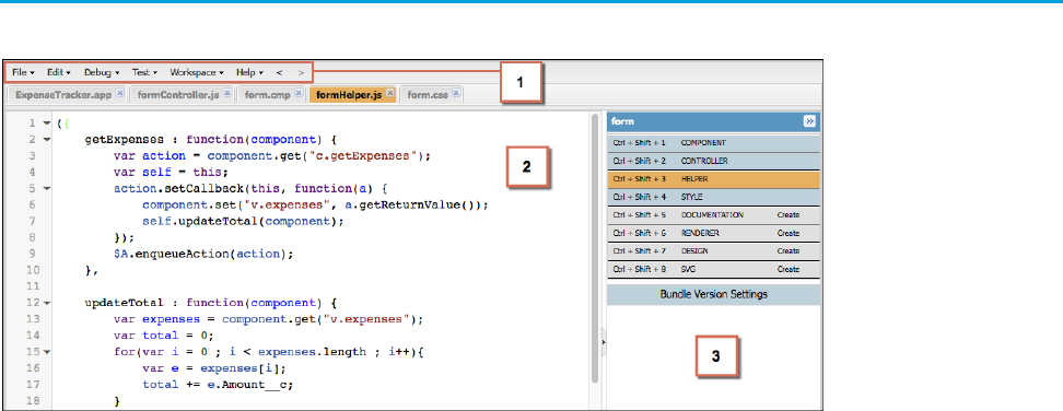
The Developer Console provides tools for developing your components and applications.
The Developer Console enables you to perform these functions.
•Use the menu bar (1) to create or open these Lightning resources.
–Application
–Component
–Interface
–Event
–Tokens
•Use the workspace (2) to work on your Lightning resources.
•Use the sidebar (3) to create or open client-side resources that are part of a specific component bundle.
–Controller
–Helper
–Style
–Documentation
–Renderer
–Design
–SVG
4
Using the Developer ConsoleWhat is the Lightning Component Framework?

For more information on the Developer Console, see The Developer Console User Interface.
SEE ALSO:
Salesforce Help: Open the Developer Console
Create Lightning Components in the Developer Console
Component Bundles
Online Content
This guide is available online. To view the latest version, go to:
https://developer.salesforce.com/docs/atlas.en-us.lightning.meta/lightning/
Go beyond this guide with exciting Trailhead content. To explore more of what you can do with Lightning Components, go to:
Trailhead Module: Lightning Components Basics
Link: https://trailhead.salesforce.com/module/lex_dev_lc_basics
Learn with a series of hands-on challenges on how to use Lightning Components to build modern web apps.
Quick Start: Lightning Components
Link: https://trailhead.salesforce.com/project/quickstart-lightning-components
Create your first component that renders a list of Contacts from your org.
Project: Build an Account Geolocation App
Link: https://trailhead.salesforce.com/project/account-geolocation-app
Build an app that maps your Accounts using Lightning Components.
Project: Build a Restaurant-Locator Lightning Component
Link: https://trailhead.salesforce.com/project/workshop-lightning-restaurant-locator
Build a Lightning component with Yelp’s Search API that displays a list of businesses near a certain location.
Project: Build a Lightning App with the Lightning Design System
Link: https://trailhead.salesforce.com/project/slds-lightning-components-workshop
Design a Lightning component that displays an Account list.
5
Online ContentWhat is the Lightning Component Framework?

CHAPTER 2 Quick Start
The quick start steps you through building and running two simple apps: a standalone Lightning app
for tracking expenses and a Lightning component to manage selected contacts in Salesforce1. You’ll
In this chapter ...
•Before You Begin create all components from the Developer Console. A standalone app is directly accessible by going to
the URL:
•Create a Standalone
Lightning App https://<myDomain>.lightning.force.com/<namespace>/<appName>.app,
where <myDomain> is the name of your custom Salesforce domain
•Create a Component
for Salesforce1 and
Lightning Experience The standalone app you’re creating accesses a custom object and displays its records. It enables you to
edit a field on the records, capturing changes in a client-side controller and passing that information
using a component event to an Apex controller, which then persists the data.
The Lightning component you’re creating accesses the contact object and displays its records in
Salesforce1. You’ll use built-in Salesforce1 events to create or edit contact records, and view related
cases.
6

Before You Begin
To work with Lightning apps and components , follow these prerequisites.
1. Create a Developer Edition organization
2. Define a Custom Salesforce Domain Name
Note: For this quick start tutorial, you don’t need to create a Developer Edition organization or register a namespace prefix. But
you want to do so if you’re planning to offer managed packages. You can create Lightning components using the UI in Enterprise,
Performance, Unlimited, Developer Editions or a sandbox. If you don’t plan to use a Developer Edition organization, you can
go directly to Define a Custom Salesforce Domain Name.
Create a Developer Edition Organization
You need an org to do this quick start tutorial, and we recommend you don’t use your production org. You only need to create a Developer
Edition org if you don’t already have one.
1. In your browser, go to https://developer.salesforce.com/signup?d=70130000000td6N.
2. Fill in the fields about you and your company.
3. In the Email field, make sure to use a public address you can easily check from a Web browser.
4. Type a unique Username. Note that this field is also in the form of an email address, but it does not have to be the same as your
email address, and in fact, it’s usually better if they aren’t the same. Your username is your login and your identity on
developer.salesforce.com, so you’re often better served by choosing a username such as
firstname@lastname.com.
5. Read and then select the checkbox for the Master Subscription Agreement and then click Submit Registration.
6. In a moment you’ll receive an email with a login link. Click the link and change your password.
Define a Custom Salesforce Domain Name
A custom domain name helps you enhance access security and better manage login and authentication for your organization. If your
custom domain is universalcontainers, then your login URL would be
https://universalcontainers.lightning.force.com. For more information, see My Domain in the Salesforce Help.
Create a Standalone Lightning App
This tutorial walks you through creating a simple expense tracker app using the Developer Console.
The goal of the app is to take advantage of many of the out-of-the-box Lightning components, and to demonstrate the client and server
interactions using JavaScript and Apex. As you build the app, you’ll learn how to use expressions to interact with data dynamically and
use events to communicate data between components.
Make sure you’ve created the expense custom object shown in Create an Expense Object on page 10. Using a custom object to store
your expense data, you’ll learn how an app interacts with records, how to handle user interactions using client-side controller actions,
and how to persist data updates using an Apex controller.
After you create a component, you can include it in Salesforce1 by following the steps in Add Lightning Components as Custom Tabs
in Salesforce1 on page 100. For packaging and distributing your components and apps on AppExchange, see Distributing Applications
and Components on page 302.
7
Before You BeginQuick Start
Note: Lightning components can be added to the Salesforce1 navigation menu, the App Launcher in Lightning Experience, as
well as a standalone app. To create components that utilize Salesforce1-specific components and events that can be used only in
Salesforce1 and Lightning Experience, see Create a Component for Salesforce1 and Lightning Experience on page 30.
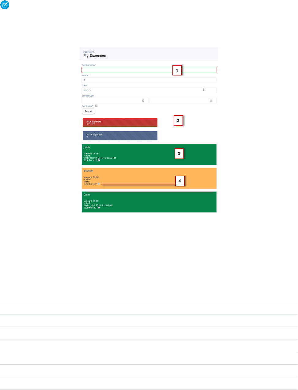
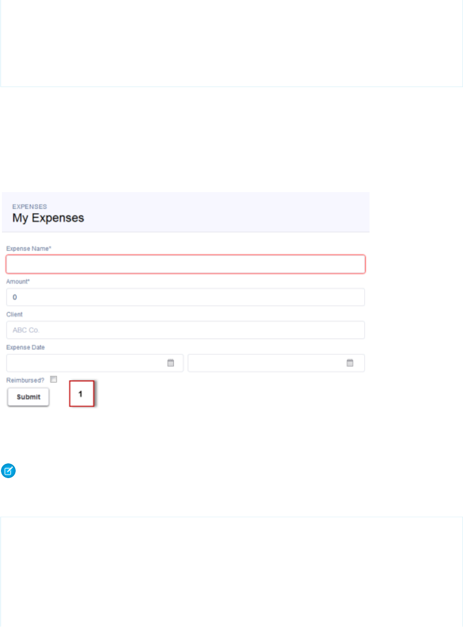
The following image shows the expense tracker as a standalone app.
1. The form contains Lightning input components (1) that update the view and expense records when the Submit button is pressed.
2. Counters are initialized (2) with total amount of expenses and number of expenses, and updated on record creation or deletion. The
counter turns red when the sum exceeds $100.
3. Display of expense list (3) uses Lightning output components and are updated as more expenses are added.
4. User interaction on the expense list (4) triggers an update event that saves the record changes.
These are the resources you are creating for the expense tracker app.
DescriptionResources
expenseTracker Bundle
The top-level component that contains all other componentsexpenseTracker.app
Form Bundle
A collection of Lightning input components to collect user inputform.cmp
A client-side controller containing actions to handle user interactions on the formformController.js
A client-side helper functions called by the controller actionsformHelper.js
The styles for the form componentform.css
8
Create a Standalone Lightning AppQuick Start
DescriptionResources
expenseList Bundle
A collection of Lightning output components to display data from expense recordsexpenseList.cmp
A client-side controller containing actions to handle user interactions on the display
of the expense list
expenseListController.js
Apex Class
Apex controller that loads data, inserts, or updates an expense recordExpenseController.apxc
Event
The event fired when an expense item is updated from the display of the expense listupdateExpenseItem.evt
Optional: Install the Expense Tracker App
If you want to skip over the quick start tutorial, you can install the Expense Tracker app as an unmanaged package. Make sure that you
have a custom domain enabled in your organization.
A package is a bundle of components that you can install in your org. This packaged app is useful if you want to learn about the Lightning
app without going through the quick start tutorial. If you’re new to Lightning components, we recommend that you go through the
quick start tutorial. This package can be installed in an org without a namespace prefix. If your org has a registered namespace, follow
the inline comments in the code to customize the app with your namespace.
Note: Make sure that you have a custom domain enabled. Install the package in an org that doesn’t have any of the objects with
the same API name as the quick start objects.
To install the Expense Tracker app:
1. Click the installation URL link: https://login.salesforce.com/packaging/installPackage.apexp?p0=04t1a000000EbZp
2. Log in to your organization by entering your username and password.
3. On the Package Installation Details page, click Continue.
4. Click Next, and on the Security Level page click Next.
5. Click Install.
6. Click Deploy Now and then Deploy.
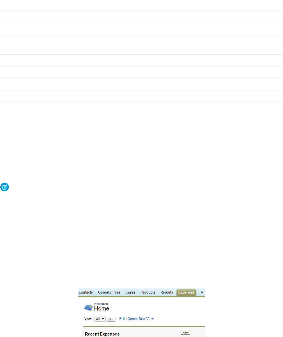
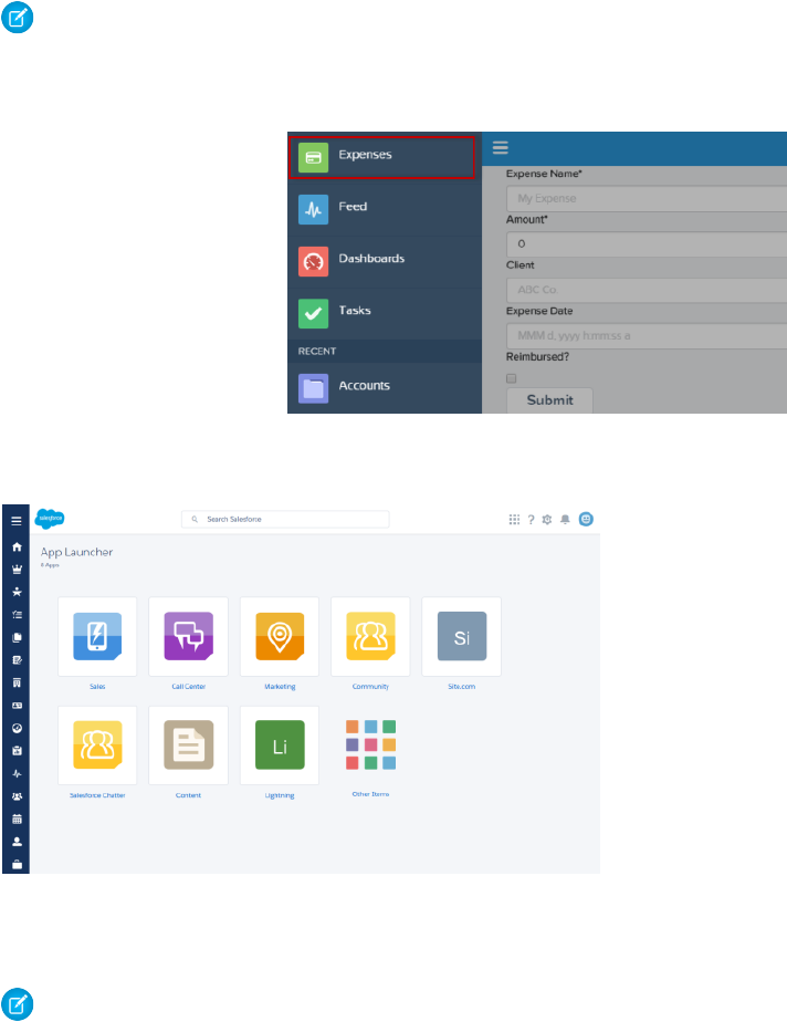
When the installation completes, you can select the Expenses tab on the user interface to add new expense records.
The Expenses menu item on the Salesforce1 navigation menu. If you don’t see the menu item in Salesforce1, you must create a Lightning
Components tab for expenses and include it in the Salesforce1 navigation menu. See Add Lightning Components as Custom Tabs in
Salesforce1 for more information.
9
Optional: Install the Expense Tracker AppQuick Start
Note: The Lightning component tab isn’t available if you don’t have a custom domain enabled in your org. Verify that you have
a custom domain and that the Expenses tab is available in the Lightning Components Tabs section of the Tabs page.
Salesforce1 Navigation.
For Lightning Experience, the Expenses tab is available via the App Launcher in the custom app titled “Lightning”.
Next, you can modify the code in the Developer Console or explore the standalone app at
https://<myDomain>.lightning.force.com/<namespace>/expenseTracker.app, where <myDomain>
is the name of your custom Salesforce domain.
Note: To delete the package, from Setup, enter Installed Package in the Quick Find box, select Installed Package,
and then delete the package.
Create an Expense Object
Create an expense object to store your expense records and data for the app.
You’ll need to create this object if you’re following the tutorial at Create a Standalone Lightning App on page 7.
1. From your management settings for custom objects, if you’re using Salesforce Classic, click New Custom Object, or if you’re using
Lightning Experience, select Create > Custom Object.
2. Define the custom object.
•For the Label, enter Expense.
•For the Plural Label, enter Expenses.
10
Create an Expense ObjectQuick Start
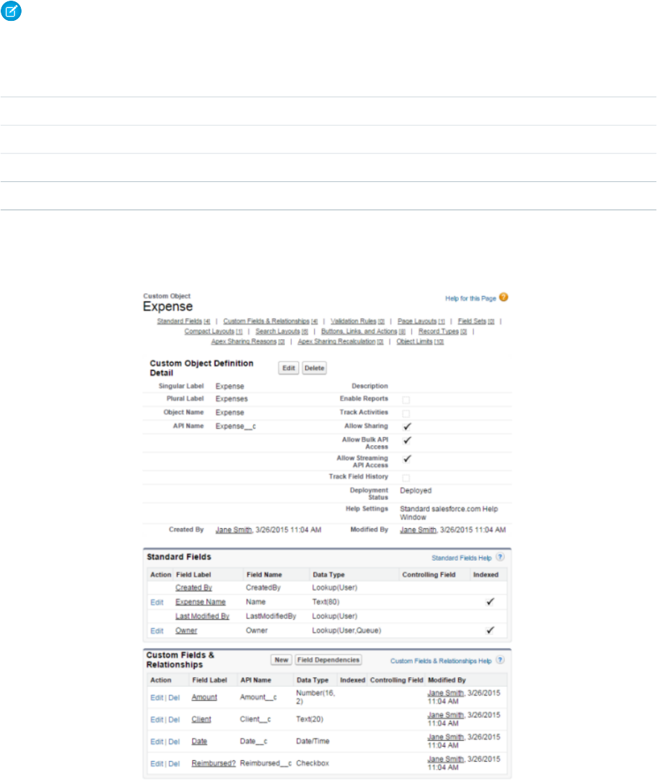
3. Click Save to finish creating your new object. The Expense detail page is displayed.
Note: If you’re using a namespace prefix, you might see namespace__Expense__c instead of Expense__c.
4. On the Expense detail page, add the following custom fields.
Field LabelField Type
AmountNumber(16, 2)
ClientText (20)
DateDate/Time
Reimbursed?Checkbox
When you finish creating the custom object, your Expense definition detail page should look similar to this.
5. Create a custom object tab to display your expense records.
a. From Setup, enter Tabs in the Quick Find box, then select Tabs.
11
Create an Expense ObjectQuick Start
b. In the Custom Object Tabs related list, click New to launch the New Custom Tab wizard.
•For the Object, select Expense.
•For the Tab Style, click the lookup icon and select the Credit Card icon.
c. Accept the remaining defaults and click Next.
d. Click Next and Save to finish creating the tab.
In Salesforce Classic, you should now see a tab for your Expenses at the top of the screen. In Lightning Experience, click the App
Launcher icon ( ) and then the Other Items icon. You should see Expenses in the Items list.
6. Create a few expense records.
a. Click the Expenses tab and click New.
b. Enter the values for these fields and repeat for the second record.
Reimbursed?DateClientAmountExpense Name
Unchecked4/1/2015 12:00 PM21Lunch
Checked3/30/2015 7:00 PMABC Co.70Dinner
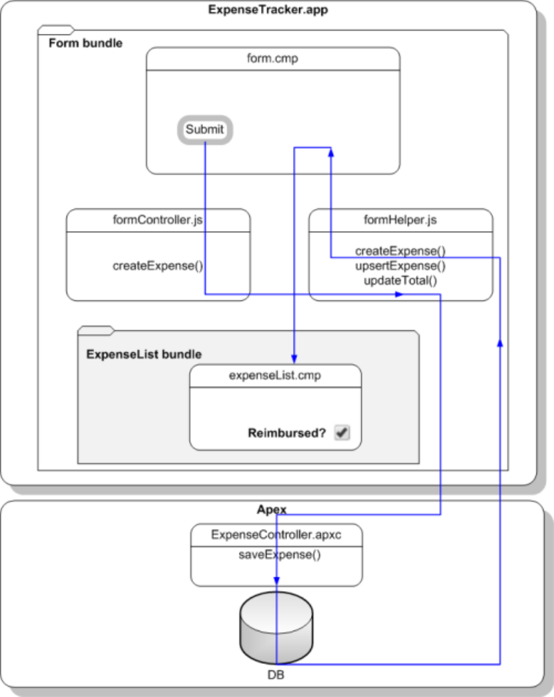
Step 1: Create A Static Mockup
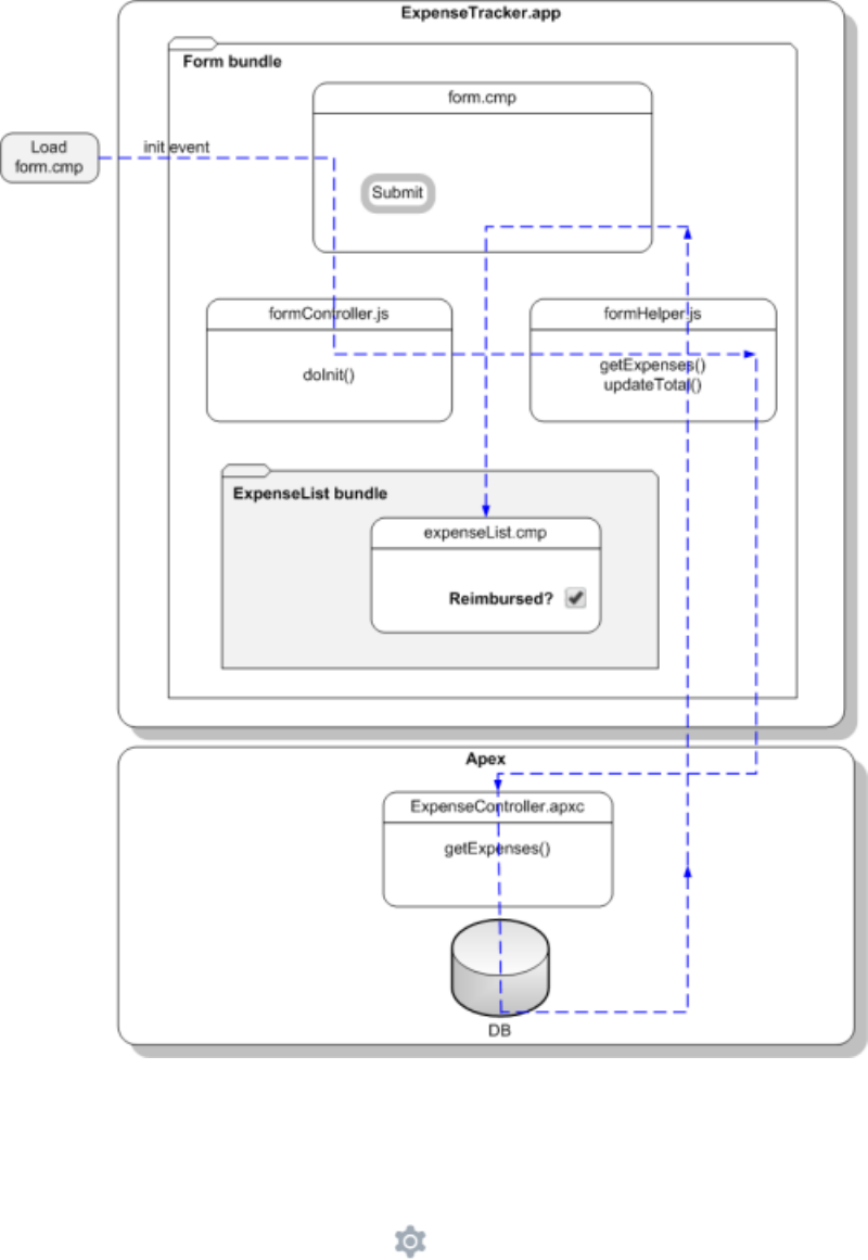
Create a static mockup in a.app file, which is the entry point for your app. It can contain other components and HTML markup.
The following flowchart summarizes the data flow in the app. The app retrieves data from the records through a combination of client-side
controller and helper functions, and an Apex controller, which you’ll create later in this quick start.
12
Step 1: Create A Static MockupQuick Start
This tutorial uses Lightning Design System styling, which provides a look and feel that’s consistent with Lightning Experience.
1. Open the Developer Console.
a. In Salesforce Classic, click Your Name > Developer Console.
b. In Lightning Experience, click the quick access menu ( ), and then Developer Console.
2. Create a new Lightning app. In the Developer Console, click File > New > Lightning Application.
3. Enter expenseTracker for the Name field in the New Lightning Bundle popup window. This creates a new app,
expenseTracker.app.
13
Step 1: Create A Static MockupQuick Start

4. In the source code editor, enter this code.
<aura:application extends="force:slds">
<div class="slds">
<div class="slds-page-header">
<div class="slds-grid">
<div class="slds-col slds-has-flexi-truncate">
<p class="slds-text-heading--label">Expenses</p>
<div class="slds-grid">
<div class="slds-grid slds-type-focus slds-no-space">
<h1 class="slds-text-heading--medium slds-truncate" title="My
Expenses">My Expenses</h1>
</div>
</div>
</div>
</div>
</div>
</div>
</aura:application>
An application is a top-level component and the main entry point to your components. It can include components and HTML markup,
such as <div> and <header> tags. Your app automatically gets Lightning Design System styles if it extends force:slds.
5. Save your changes and click Preview in the sidebar to preview your app. Alternatively, navigate to
https://<myDomain>.lightning.force.com/<namespace>/expenseTracker.app, where <myDomain>
is the name of your custom Salesforce domain. If you’re not using a namespace, your app is available at
/c/expenseTracker.app.
You should see the header My Expenses.
SEE ALSO:
Salesforce Help: Open the Developer Console
aura:application
Using the Salesforce Lightning Design System in Apps
Step 2: Create A Component for User Input
Components are the building blocks of an app. They can be wired up to an Apex controller class to load your data. The component you
create in this step provides a form that takes in user input about an expense, such as expense amount and date.
1. Click File > New > Lightning Component.
2. Enter form for the Name field in the New Lightning Bundle popup window. This creates a new component, form.cmp.
3. In the source code editor, enter this code.
Note: The following code creates an input form that takes in user input to create an expense, which works in both a standalone
app, and in Salesforce1 and Lightning Experience. For apps specific to Salesforce1 and Lightning Experience, you can use
force:createRecord to open the create record page.
<aura:component implements="force:appHostable">
<aura:attribute name="expenses" type="Expense__c[]"/>
<aura:attribute name="newExpense" type="Expense__c"
default="{ 'sobjectType': 'Expense__c',
'Name':'',
14
Step 2: Create A Component for User InputQuick Start

'Amount__c': 0,
'Client__c':'',
'Date__c':'',
'Reimbursed__c': false
}"/>
<!-- If you registered a namespace, replace the previous aura:attribute tags with the
following -->
<!-- <aura:attribute name="expenses" type="myNamespace.Expense__c[]"/>
<aura:attribute name="newExpense" type="myNamespace__Expense__c"
default="{ 'sobjectType': 'myNamespace__Expense__c',
'Name':'',
'myNamespace__Amount__c': 0,
'myNamespace__Client__c':'',
'myNamespace__Date__c':'',
'myNamespace__Reimbursed__c': false
}"/> -->
<!-- Attributes for Expense Counters -->
<aura:attribute name="total" type="Double" default="0.00" />
<aura:attribute name="exp" type="Double" default="0" />
<!-- Input Form using components -->
<div class="container">
<form class="slds-form--stacked">
<div class="slds-form-element slds-is-required">
<div class="slds-form-element__control">
<!-- If you registered a namespace,
the attributes include your namespace.
For example, value="{!v.newExpense.myNamespace__Amount__c}" -->
<ui:inputText aura:id="expname" label="Expense Name"
class="slds-input"
labelClass="slds-form-element__label"
value="{!v.newExpense.Name}"
required="true"/>
</div>
</div>
<div class="slds-form-element slds-is-required">
<div class="slds-form-element__control">
<ui:inputNumber aura:id="amount" label="Amount"
class="slds-input"
labelClass="slds-form-element__label"
value="{!v.newExpense.Amount__c}"
placeholder="20.80" required="true"/>
</div>
</div>
<div class="slds-form-element">
<div class="slds-form-element__control">
<ui:inputText aura:id="client" label="Client"
class="slds-input"
labelClass="slds-form-element__label"
value="{!v.newExpense.Client__c}"
placeholder="ABC Co."/>
</div>
15
Step 2: Create A Component for User InputQuick Start

</div>
<div class="slds-form-element">
<div class="slds-form-element__control">
<ui:inputDateTime aura:id="expdate" label="Expense Date"
class="slds-input"
labelClass="slds-form-element__label"
value="{!v.newExpense.Date__c}"
displayDatePicker="true"/>
</div>
</div>
<div class="slds-form-element">
<ui:inputCheckbox aura:id="reimbursed" label="Reimbursed?"
class="slds-checkbox"
labelClass="slds-form-element__label"
value="{!v.newExpense.Reimbursed__c}"/>
<ui:button label="Submit"
class="slds-button slds-button--neutral"
labelClass="label"
press="{!c.createExpense}"/>
</div>
</form>
</div><!-- ./container-->
<!-- Expense Counters -->
<div class="container slds-p-top--medium">
<div class="row">
<div class="slds-tile ">
<!-- Make the counter red if total amount is more than 100 -->
<div class="{!v.total >= 100
?'slds-notify slds-notify--toast slds-theme--error
slds-theme--alert-texture'
:'slds-notify slds-notify--toast slds-theme--alert-texture'}">
<p class="slds-tile__title slds-truncate">Total Expenses</p>
$<ui:outputNumber class="slds-truncate" value="{!v.total}"
format=".00"/>
</div>
</div>
<div class="slds-tile ">
<div class="slds-notify slds-notify--toast slds-theme--alert-texture">
<p class="slds-tile__title slds-truncate">No. of Expenses</p>
<ui:outputNumber class="slds-truncate" value="{!v.exp}"/>
</div>
</div>
</div>
</div>
<!-- Display expense records -->
<div class="container slds-p-top--medium">
<div id="list" class="row">
<aura:iteration items="{!v.expenses}" var="expense">
<!-- If you’re using a namespace,
use the format
{!expense.myNamespace__myField__c} instead. -->
16
Step 2: Create A Component for User InputQuick Start
<p>{!expense.Name}, {!expense.Client__c},
{!expense.Amount__c}, {!expense.Date__c},
{!expense.Reimbursed__c}</p>
</aura:iteration>
</div>
</div>
</aura:component>
Components provide a rich set of attributes and browser event support. Attributes are typed fields that are set on a specific instance
of a component, and can be referenced using an expression syntax. All aura:attribute tags have name and type values. For
more information, see Supported aura:attribute Types on page 325.
The attributes and expressions here will become clearer as you build the app. {!v.exp} evaluates the number of expenses records
and {!v.total} evaluates the total amount. {!c.createExpense} represents the client-side controller action that runs
when the Submit button (1) is clicked, which creates a new expense. The press event in ui:button enables you to wire up
the action when the button is pressed.
The expression {!v.expenses} wires up the component to the expenses object. var="expense" denotes the name of
the variable to use for each item inside the iteration. {!expense.Client__c} represents data binding to the client field in
the expense object.
Note: The default value for newExpense of type Expense__c must be initialized with the correct fields, including
sobjectType. Initializing the default value ensures that the expense is saved in the correct format.
4. Click STYLE in the sidebar to create a new resource named form.css. Enter these CSS rule sets.
.THIS .uiInputDateTime .datePicker-openIcon {
position: absolute;
left: 45%;
top: 45%;
}
.THIS .uiInputDateTime .timePicker-openIcon {
position: absolute;
left: 95%;
17
Step 2: Create A Component for User InputQuick Start

top: 70%;
}
.THIS .uiInputDefaultError li {
list-style: none;
}
Note: THIS is a keyword that adds namespacing to CSS to prevent any conflicts with another component’s styling. The
.uiInputDefaultError selector styles the default error component when you add field validation in Step 5: Enable
Input for New Expenses on page 23.
5. Add the component to the app. In expenseTracker.app, add the new component to the markup.
This step adds <c:form /> to the markup. If you’re using a namespace, you can use <myNamespace:form /> instead. If
you haven’t set a namespace prefix for your organization, use the default namespace c when referencing components that you’ve
created.
<aura:application extends="force:slds">
<div class="slds">
<div class="slds-page-header">
<div class="slds-grid">
<div class="slds-col slds-has-flexi-truncate">
<p class="slds-text-heading--label">Expenses</p>
<div class="slds-grid">
<div class="slds-grid slds-type-focus slds-no-space">
<h1 class="slds-text-heading--medium slds-truncate" title="My
Expenses">My Expenses</h1>
</div>
</div>
</div>
</div>
</div>
<div class="slds-col--padded slds-p-top--large">
<c:form />
</div>
</div>
</aura:application>
6. Save your changes and click Update Preview in the sidebar to preview your app. Alternatively, reload your browser.
Note: In this step, the component you created doesn’t display any data since you haven’t created the Apex controller class
yet.
Good job! You created a component that provides an input form and view of your expenses. Next, you’ll create the logic to display your
expenses.
SEE ALSO:
Component Markup
Component Body
18
Step 2: Create A Component for User InputQuick Start
Step 3: Load the Expense Data
Load expense data using an Apex controller class. Display this data via component attributes and update the counters dynamically.
Create the expense controller class.
1. Click File > New > Apex Class and enter ExpenseController in the New Class window. This creates a new Apex class,
ExpenseController.apxc.
2. Enter this code.
public with sharing class ExpenseController {
@AuraEnabled
public static List<Expense__c> getExpenses() {
// Perform isAccessible() check here
return [SELECT Id, Name, Amount__c, Client__c, Date__c,
Reimbursed__c, CreatedDate FROM Expense__c];
}
}
The getExpenses() method contains a SOQL query to return all expense records. Recall the syntax {!v.expenses} in
form.cmp, which displays the result of the getExpenses() method in the component markup.
Note: For more information on using SOQL, see the Force.com SOQL and SOSL Reference.
@AuraEnabled enables client- and server-side access to the controller method. Server-side controllers must be static and all
instances of a given component share one static controller. They can return or take in any types, such as a List or Map.
Note: For more information on server-side controllers, see Apex Server-Side Controller Overview on page 248.
3. In form.cmp, update the aura:component tag to include the controller attribute.
<aura:component controller="ExpenseController">
Note: If your org has a namespace, use controller="myNamespace.ExpenseController" instead.
4. Add an init handler to load your data on component initialization.
<aura:component controller="ExpenseController">
<aura:handler name="init" value="{!this}" action="{!c.doInit}" />
<!-- Other aura:attribute tags here -->
<!-- Other code here -->
</aura:component>
On initialization, this event handler runs the doInit action that you’re creating next. This init event is fired before component
rendering.
5. Add the client-side controller action for the init handler. In the sidebar, click CONTROLLER to create a new resource,
formController.js. Enter this code.
({
doInit : function(component, event, helper) {
//Update expense counters
helper.getExpenses(component);
},//Delimiter for future code
})
19
Step 3: Load the Expense DataQuick Start

During component initialization, the expense counters should reflect the latest sum and total number of expenses, which you’re
adding next using a helper function, getExpenses(component).
Note: A client-side controller handles events within a component and can take in three parameters: the component to which
the controller belongs, the event that the action is handling, and the helper if it’s used. A helper is a resource for storing code
that you want to reuse in your component bundle, providing better code reusability and specialization. For more information
about using client-side controllers and helpers, see Handling Events with Client-Side Controllers on page 138 and Sharing
JavaScript Code in a Component Bundle on page 223.
6. Create the helper function to display the expense records and dynamically update the counters. Click HELPER to create a new
resource, formHelper.js and enter this code.
({
getExpenses: function(component) {
var action = component.get("c.getExpenses");
action.setCallback(this,function(response) {
var state = response.getState();
if (component.isValid() && state === "SUCCESS") {
component.set("v.expenses", response.getReturnValue());
this.updateTotal(component);
}
});
$A.enqueueAction(action);
},
updateTotal : function(component) {
var expenses = component.get("v.expenses");
var total = 0;
for(var i=0; i<expenses.length; i++){
var e = expenses[i];
//If you’re using a namespace, use e.myNamespace__Amount__c instead
total += e.Amount__c;
}
//Update counters
component.set("v.total", total);
component.set("v.exp", expenses.length);
},//Delimiter for future code
})
component.get("c.getExpenses") returns an instance of the server-side action. action.setCallback() passes
in a function to be called after the server responds. In updateTotal, you are retrieving the expenses and summing up their
amount values and length of expenses, setting those values on the total and exp attributes.
Note: $A.enqueueAction(action) adds the action to the queue. All the action calls are asynchronous and run in
batches. For more information about server-side actions, see Calling a Server-Side Action on page 250.
7. Save your changes and reload your browser.
You should see the expense records created in Create an Expense Object on page 10. The counters aren’t working at this point as
you’ll be adding the programmatic logic later.
Your app now retrieves the expense object and displays its records as a list, iterated over by aura:iteration. The counters now
reflect the total sum and number of expenses.
20
Step 3: Load the Expense DataQuick Start
In this step, you created an Apex controller class to load expense data. getExpenses() returns the list of expense records. By default,
the framework doesn’t call any getters. To access a method, annotate the method with @AuraEnabled, which exposes the data in
that method. Only methods that are annotated with @AuraEnabled in the controller class are accessible to the components.
Component markup that uses the ExpenseController class can display the expense name or id with the {!expense.name}
or {!expense.id} expression, as shown in Step 2: Create A Component for User Input on page 14.
Beyond the Basics
Client-side controller definitions are surrounded by brackets and curly braces. The curly braces denotes a JSON object, and
everything inside the object is a map of name-value pairs. For example, updateTotal is a name that corresponds to a
client-side action, and the value is a function. The function is passed around in JavaScript like any other object.
SEE ALSO:
CRUD and Field-Level Security (FLS)
Step 4: Create a Nested Component
As your component grows, you want to break it down to maintain granularity and encapsulation. This step walks you through creating
a component with repeating data and whose attributes are passed to its parent component. You’ll also add a client-side controller action
to load your data on component initialization.
1. Click File > New > Lightning Component.
2. Enter expenseList in the New Lightning Bundle window. This creates a new component, expenseList.cmp.
3. In expenseList.cmp, enter this code.
Note: Use the API name of the fields to bind the field values. For example, if you’re using a namespace, you must use
{!v.expense.myNamespace__Amount__c} instead of {!v.expense.Amount__c}.
<aura:component>
<aura:attribute name="expense" type="Expense__c"/>
<!-- Color the item blue if the expense is reimbursed -->
<div class="slds-card">
<!-- If you registered a namespace,
use v.expense.myNamespace__Reimbursed__c == true instead. -->
<div class="{!v.expense.Reimbursed__c == true
?'slds-theme--success' :'slds-theme--warning'}">
<header class="slds-card__header slds-grid grid--flex-spread">
<a aura:id="expense" href="{!'/' + v.expense.Id}">
<h3>{!v.expense.Name}</h3>
</a>
</header>
<section class="slds-card__body">
<!-- If you registered a namespace,
use v.expense.myNamespace__Reimbursed__c instead. -->
<div class="slds-tile slds-hint-parent">
<p class="slds-tile__title slds-truncate">Amount:
<ui:outputNumber value="{!v.expense.Amount__c}" format=".00"/>
</p>
<p class="slds-truncate">Client:
21
Step 4: Create a Nested ComponentQuick Start
<ui:outputText value="{!v.expense.Client__c}"/>
</p>
<p class="slds-truncate">Date:
<ui:outputDateTime value="{!v.expense.Date__c}" />
</p>
<p class="slds-truncate">Reimbursed?
<ui:inputCheckbox value="{!v.expense.Reimbursed__c}" click="{!c.update}"/>
</p>
</div>
</section>
</div>
</div>
</aura:component>
Instead of using {!expense.Amount__c}, you’re now using {!v.expense.Amount__c}. This expression accesses the
expense object and the amount values on it.
Additionally, href="{!'/' + v.expense.Id}" uses the expense ID to set the link to the detail page of each expense
record.
4. In form.cmp, update the aura:iteration tag to use the new nested component, expenseList. Locate the existing
aura:iteration tag.
<aura:iteration items="{!v.expenses}" var="expense">
<p>{!expense.Name}, {!expense.Client__c}, {!expense.Amount__c}, {!expense.Date__c},
{!expense.Reimbursed__c}</p>
</aura:iteration>
Replace it with an aura:iteration tag that uses the expenseList component.
<aura:iteration items="{!v.expenses}" var="expense">
<!--If you’re using a namespace, use myNamespace:expenseList instead-->
<c:expenseList expense="{!expense}"/>
</aura:iteration>
Notice how the markup is simpler as you’re just passing each expense record to the expenseList component, which handles
the display of the expense details.
5. Save your changes and reload your browser.
You created a nested component and passed its attributes to a parent component. Next, you’ll learn how to process user input and
update the expense object.
Beyond the Basics
When you create a component, you are providing the definition of that component. When you put the component in another
component, you are create a reference to that component. This means that you can add multiple instances of the same component
with different attributes. For more information about component attributes, see Component Composition on page 51.
SEE ALSO:
Component Attributes
22
Step 4: Create a Nested ComponentQuick Start
Step 5: Enable Input for New Expenses
When you enter text into the form and press Submit, you want to insert a new expense record. This action is wired up to the button
component via the press attribute.
The following flowchart shows the flow of data in your app when you create a new expense. The data is captured when you click the
Submit button in the component form.cmp, processed by your JavaScript code and sent to the server-side controller to be saved
as a record. Data from the records is displayed in the nested component you created in the previous step.
First, update the Apex controller with a new method that inserts or updates the records.
23
Step 5: Enable Input for New ExpensesQuick Start

1. In the ExpenseController class, enter this code below the getExpenses() method.
@AuraEnabled
public static Expense__c saveExpense(Expense__c expense) {
// Perform isUpdateable() check here
upsert expense;
return expense;
}
The saveExpense() method enables you to insert or update an expense record using the upsert operation.
Note: Fore more information about the upsert operation, see the Apex Developer Guide.
2. Create the client-side controller action to create a new expense record when the Submit button is pressed. In
formController.js, add this code after the doInit action.
createExpense : function(component, event, helper) {
var amtField = component.find("amount");
var amt = amtField.get("v.value");
if (isNaN(amt)||amt==''){
amtField.set("v.errors", [{message:"Enter an expense amount."}]);
}
else {
amtField.set("v.errors", null);
var newExpense = component.get("v.newExpense");
helper.createExpense(component, newExpense);
}
},//Delimiter for future code
createExpense validates the amount field using the default error handling of input components. If the validation fails, we set
an error message in the errors attribute of the input component. For more information on field validation, see Validating Fields
on page 230.
Notice that you’re passing in the arguments to a helper function helper.createExpense(), which then triggers the Apex
class saveExpense.
Note: Recall that you specified the aura:id attributes in Step 2: Create A Component for User Input on page 14. aura:id
enables you to find the component by name using the syntax component.find("amount") within the scope of this
component and its controller.
3. Create the helper function to handle the record creation. In formHelper.js, add these helper functions after the updateTotal
function.
createExpense: function(component, expense) {
this.upsertExpense(component, expense, function(a) {
var expenses = component.get("v.expenses");
expenses.push(a.getReturnValue());
component.set("v.expenses", expenses);
this.updateTotal(component);
});
},
upsertExpense : function(component, expense, callback) {
var action = component.get("c.saveExpense");
action.setParams({
"expense": expense
24
Step 5: Enable Input for New ExpensesQuick Start

});
if (callback) {
action.setCallback(this, callback);
}
$A.enqueueAction(action);
}
createExpense calls upsertExpense, which defines an instance of the saveExpense server-side action and sets the
expense object as a parameter. The callback is executed after the server-side action returns, which updates the records, view,
and counters. $A.enqueueAction(action) adds the server-side action to the queue of actions to be executed.
Note: Different possible action states are available and you can customize their behaviors in your callback. For more information
on action callbacks, see Calling a Server-Side Action.
4. Save your changes and reload your browser.
5. Test your app by entering a new expense record with field values: Breakfast, 10, ABC Co., Apr 30, 2014
9:00:00 AM. For the date field, you can also use the date picker to set a date and time value. Click the Submit button. The record
is added to both your component view and records, and the counters are updated.
Note: To debug your Apex code, use the Logs tab in the Developer Console. For example, if you don’t have input validation
for the date time field and entered an invalid date time format, you might get an INVALID_TYPE_ON_FIELD_IN_RECORD
exception, which is listed both on the Logs tab in the Developer Console and in the response header on your browser. Otherwise,
you might see an Apex error displayed in your browser. For more information on debugging your JavaScript code, see Enable
Debug Mode for Lightning Components on page 304.
Congratulations! You have successfully created a simple expense tracker app that includes several components, client- and server-side
controllers, and helper functions. Your app now accepts user input, which updates the view and database. The counters are also
dynamically updated as you enter new user input. The next step shows you how to add a layer of interactivity using events.
SEE ALSO:
Handling Events with Client-Side Controllers
Calling a Server-Side Action
CRUD and Field-Level Security (FLS)
Step 6: Make the App Interactive With Events
Events add an interactive layer to your app by enabling you to share data between components. When the checkbox is checked or
unchecked in the expense list view, you want to fire an event that updates both the view and records based on the relevant component
data.
This flowchart shows the data flow in the app when a data change is captured by the selecting and deselecting of a checkbox on the
expenseList component. When the Reimbursed? checkbox is selected or deselected, this browser click event fires the component
event you’re creating here. This event communicates the expense object to the handler component, and its controller calls the Apex
controller method to update the relevant expense record, after which the response is ignored by the client since we won’t be handling
this server response here.
25
Step 6: Make the App Interactive With EventsQuick Start
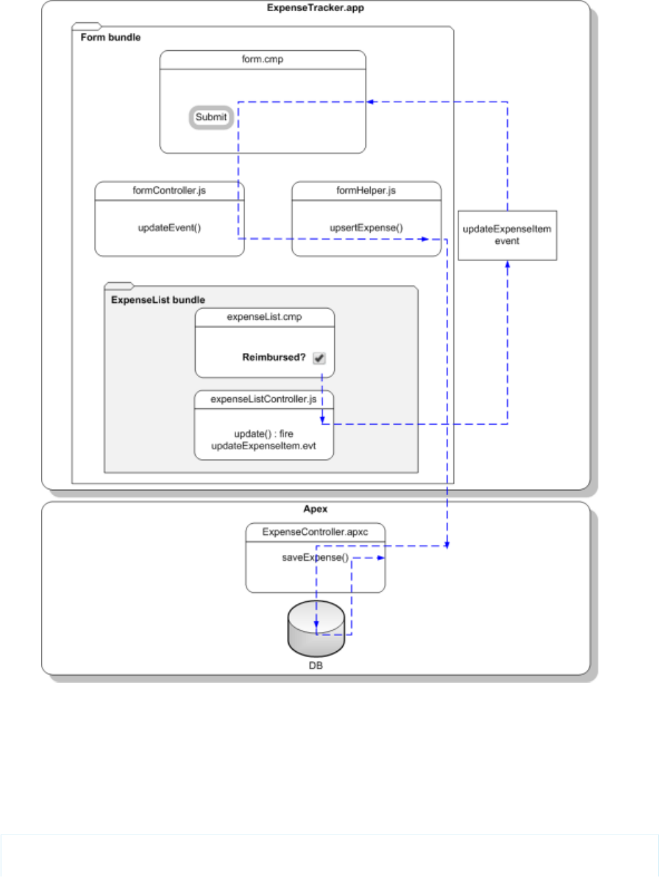
Let’s start by creating the event and its handler before firing it and handling the event in the parent component.
1. Click File > New > Lightning Event.
2. Enter updateExpenseItem in the New Event window. This creates a new event, updateExpenseItem.evt.
3. In updateExpenseItem.evt, enter this code.
The attribute you’re defining in the event is passed from the firing component to the handlers.
<aura:event type="COMPONENT">
<!-- If you’re using a namespace, use myNamespace.Expense__c instead. -->
26
Step 6: Make the App Interactive With EventsQuick Start

<aura:attribute name="expense" type="Expense__c"/>
</aura:event>
The framework has two types of events: component events and application events.
Note: Always try to use a component event instead of an application event, if possible. Component events can only be
handled by components above them in the containment hierarchy so their usage is more localized to the components that
need to know about them. Application events are best used for something that should be handled at the application level,
such as navigating to a specific record. Application events allow communication between components that are in separate
parts of the application and have no direct containment relationship.
We’ll use a component event. Recall that expenseList.cmp contains the Reimbursed? checkbox.
4. Update expenseList.cmp to register that it fires the event. Add this tag after the <aura:attribute> tag.
<aura:registerEvent name="updateExpense" type="c:updateExpenseItem"/>
The Reimbursed? checkbox is wired up to a client-side controller action, denoted by change="{!c.update}". You’ll set up
the update action next.
5. In the expenseList sidebar, click CONTROLLER. This creates a new resource, expenseListController.js. Enter this
code.
({
update: function(component, evt, helper) {
var expense = component.get("v.expense");
// Note that updateExpense matches the name attribute in <aura:registerEvent>
var updateEvent = component.getEvent("updateExpense");
updateEvent.setParams({ "expense": expense }).fire();
}
})
When the checkbox is checked or unchecked, the update action runs, setting the reimbursed parameter value to true or
false. The updateExpenseItem.evt event is fired with the updated expense object .
6. In the handler component, form.cmp, add this handler code before the <aura:attribute> tags.
<aura:handler name="updateExpense" event="c:updateExpenseItem" action="{!c.updateEvent}"
/>
This event handler runs the updateEvent action when the component event you created is fired. The <aura:handler>
tag uses the same value of the name attribute, updateExpense, from the <aura:registerEvent> tag in
c:expenseList
7. Wire up the updateEvent action to handle the event. In formController.js, enter this code after the createExpense
controller action.
updateEvent : function(component, event, helper) {
helper.upsertExpense(component, event.getParam("expense"));
}
This action calls a helper function and passes in event.getParam("expense"), which contains the expense object with its
parameters and values in this format: { Name : "Lunch" , Client__c : "ABC Co." , Reimbursed__c :
true , CreatedDate : "2014-08-12T20:53:09.000Z" , Amount__c : 20}.
8. Save your changes and reload your browser.
27
Step 6: Make the App Interactive With EventsQuick Start
9. Click the Reimbursed? checkbox for one of the records.
Note that the background color for the record changes. When you change the reimbursed status on the view, the update event
is fired, handled by the parent component, which then updates the expense record by running the server-side controller action
saveExpense.
That’s it! You have successfully added a layer of interaction in your expense tracker app using a component event.
The app you just created is currently accessible as a standalone app by accessing
https://<myDomain>.lightning.force.com/<namespace>/expenseTracker.app, where <myDomain>
is the name of your custom Salesforce domain. To make it accessible in Salesforce1, see Add Lightning Components as Custom Tabs in
Salesforce1 on page 100. To package and distribute your app on AppExchange, see Distributing Applications and Components on page
302.
SEE ALSO:
Component Events
Event Handling Lifecycle
Summary
You created several components with controllers and events that interact with your expense records. The expense tracker app performs
three distinct tasks: load the expense data and counters on app initialization, take in user input to create a new record and update the
view, and handle user interactions by communicating relevant component data via events.
28
SummaryQuick Start
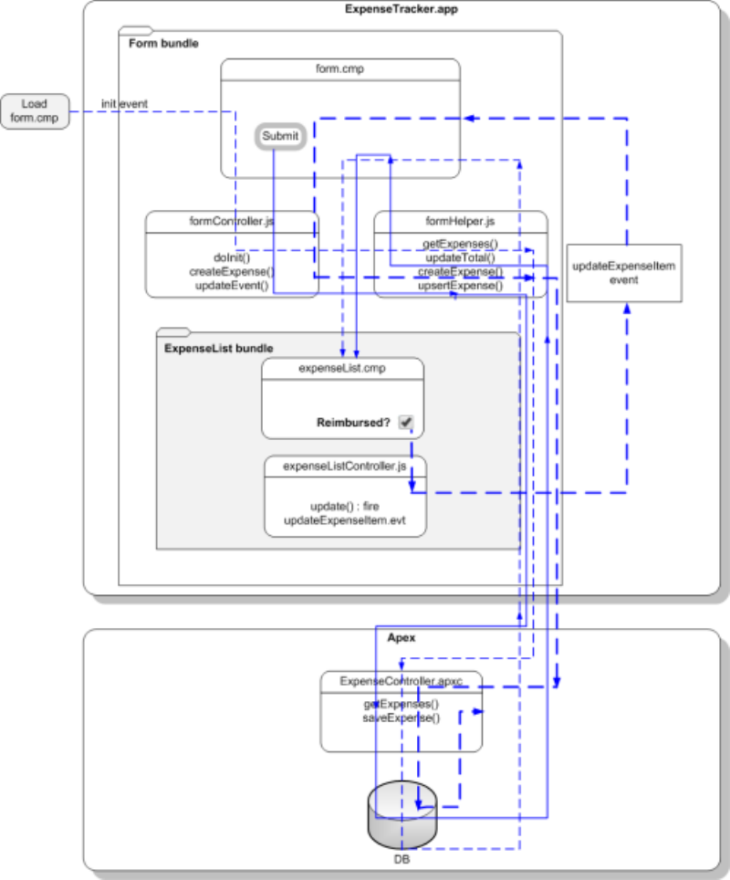
When form.cmp is initialized, the init handler triggers the doInit client-side controller, which calls the getExpenses
helper function. getExpenses calls the getExpenses server-side controller to load the expenses. The callback sets the expenses
data on the v.expenses attribute and calls updateTotal to update the counters.
Clicking the Submit button triggers the createExpense client-side controller. After field validation, the createExpense helper
function is run, in which the upsertExpense helper function calls the saveExpense server-side controller to save the record.
The callback pushes the new expense to the list of expenses and updates the attribute v.expenses in form.cmp, which in turn
updates the expenses in expenseList.cmp. Finally, the helper calls updateTotal to update the counters represented by the
v.total and v.exp attributes.
expenseList.cmp displays the list of expenses. When the Reimbursed? checkbox is selected or deselected, the click event
triggers the update client-side controller. The updateExpenseItem event is fired with the relevant expense passed in as a
29
SummaryQuick Start

parameter. form.cmp handles the event, triggering the updateEvent client-side controller. This controller action then calls the
upsertExpense helper function, which calls the saveExpense server-side controller to save the relevant record.
Create a Component for Salesforce1 and Lightning Experience
Create a component that loads contacts data and interacts with Salesforce1 and Lightning Experience. Some of the events that are used
in this tutorial are not supported for standalone apps.
The component has these features.
•Displays a toast message (1) when all contacts are loaded successfully
•Use a nested component that displays all contacts or displays all primary contacts that are colored green when the input select value
(2) is changed
30
Create a Component for Salesforce1 and Lightning ExperienceQuick Start
•Opens the create record page to create a new contact when the New Contact button (3) is clicked
•Opens the edit record page to update the selected contact when the Edit button (4) is clicked
•Navigates to the record when the contact (5) is clicked
•Navigates to related cases when the View Cases button (6) is clicked
You’ll create the following resources.
DescriptionResource
Contacts Bundle
The component that loads contact datacontacts.cmp
The client-side controller actions that loads contact data, handles input select change event, and opens
the create record page
contactsController.js
The helper function that retrieves contact data and display toast messages based on the loading statuscontactsHelper.js
contactList Bundle
The contact list componentcontactList.cmp
The client-side controller actions that opens the edit record page, and navigates to a contact record,
related cases, and map of contact address
contactListController.js
The styles for the componentcontactList.css
Apex Controller
The Apex controller that queries the contact recordsContactController.apxc
Load the Contacts
Create an Apex controller and load your contacts.
Your organization must have existing contact records for this tutorial. This tutorial uses a custom picklist field, Level, which is represented
by the API name Level__c. This field contains three picklist values: Primary, Secondary, and Tertiary.
1. Click File > New > Apex Class, and then enter ContactController in the New Class window. This creates a new Apex
class, ContactController.apxc. Enter this code and then save.
If you’re using a namespace in your organization, replace Level__c with myNamespace__Level__c.
public with sharing class ContactController {
@AuraEnabled
public static List<Contact> getContacts() {
List<Contact> contacts =
[SELECT Id, Name, MailingStreet, Phone, Email, Level__c FROM Contact];
//Add isAccessible() check
return contacts;
}
@AuraEnabled
// Retrieve all primary contacts
public static List<Contact> getPrimary() {
31
Load the ContactsQuick Start

List<Contact> primaryContacts =
[SELECT Id, Name, MailingStreet, Phone, Email, Level__c FROM Contact WHERE
Level__c = 'Primary'];
//Add isAccessible() check
return primaryContacts;
}
}
getPrimary() returns all contacts whose Level__c field is set to Primary.
2. Click File > New > Lightning Component, and then enter contactList for the Name field in the New Lightning Bundle
popup window. This creates a new component, contactList.cmp. Enter this code and then save.
<aura:component>
<aura:attribute name="contact" type="Contact"/>
<!-- If you’re using a namespace,
use {!v.contact.myNamespace__Level__c} instead -->
<div class="{!v.contact.Level__c == 'Primary'
?'row primary' :'row '}" >
<div onclick="{!c.gotoRecord}">
<force:recordView recordId="{!v.contact.Id}" type="MINI"/>
</div>
<!-- Open the record edit page when the button is clicked -->
<ui:button label="Edit" press="{!c.editRecord}"/>
<!-- Navigate to the related list when the button is clicked -->
<ui:button label="View Cases" press="{!c.relatedList}"/>
</div>
</aura:component>
3. In the contactList sidebar, click STYLE to create a new resource named contactList.css. Replace the placeholder code with
the following code and then save.
.THIS.primary{
background: #4ECDC4 !important;
}
.THIS.row {
background: #fff;
max-width:90%;
border-bottom: 2px solid #f0f1f2;
padding: 10px;
margin-left: 2%;
margin-bottom: 10px;
min-height: 70px;
border-radius: 4px;
}
32
Load the ContactsQuick Start

4. Click File > New > Lightning Component, and then enter contacts for the Name field in the New Lightning Bundle popup
window. This creates a new component, contacts.cmp. Enter this code and then save. If you’re using a namespace in your
organization, replace ContactController with myNamespace.ContactController.
<aura:component controller="ContactController" implements="force:appHostable">
<!-- Handle component initialization in a client-side controller -->
<aura:handler name="init" value="{!this}" action="{!c.doInit}"/>
<!-- Dynamically load the list of contacts -->
<aura:attribute name="contacts" type="Contact[]"/>
<!-- Create a drop-down list with two options -->
<ui:inputSelect aura:id="selection" change="{!c.select}">
<ui:inputSelectOption text="All Contacts" label="All Contacts"/>
<ui:inputSelectOption text="All Primary" label="All Primary"/>
</ui:inputSelect>
<!-- Display record create page when button is clicked -->
<ui:button label="New Contact" press="{!c.createRecord}"/>
<!-- Iterate over the list of contacts and display them -->
<aura:iteration var="contact" items="{!v.contacts}">
<!-- If you’re using a namespace, replace with myNamespace:contactList -->
<c:contactList contact="{!contact}"/>
</aura:iteration>
</aura:component>
5. In the contacts sidebar, click CONTROLLER to create a new resource named contactsController.js. Replace the
placeholder code with the following code and then save.
({
doInit : function(component, event, helper) {
// Retrieve contacts during component initialization
helper.getContacts(component);
},//Delimiter for future code
})
6. In the contacts sidebar, click HELPER to create a new resource named contactsHelper.js. Replace the placeholder code
with the following code and then save.
({
getContacts : function(cmp) {
// Load all contact data
var action = cmp.get("c.getContacts");
action.setCallback(this,function(response) {
var state = response.getState();
if (cmp.isValid() && state === "SUCCESS") {
cmp.set("v.contacts", response.getReturnValue());
}
// Display toast message to indicate load status
var toastEvent = $A.get("e.force:showToast");
if (state === 'SUCCESS'){
toastEvent.setParams({
"title":"Success!",
33
Load the ContactsQuick Start

"message":" Your contacts have been loaded successfully."
});
}
else {
toastEvent.setParams({
"title":"Error!",
"message":" Something has gone wrong."
});
}
toastEvent.fire();
});
$A.enqueueAction(action);
}
})
7. Create a new Lightning Component tab by following the steps on Add Lightning Components as Custom Tabs in Salesforce1 on
page 100. Make sure you include the component in the Salesforce1 navigation menu.
Finally, you can go to the Salesforce1 mobile browser app to check your output. When your component is loaded, you should see a toast
message that indicates your contacts are loaded successfully.
Next, we’ll wire up the other events so that your input select displays either all contacts or only primary contacts that are colored green.
We’ll also wire up events for opening the create record and edit record pages, and events for navigating to a record and a URL.
Fire the Events
Fire the events in your client-side controller or helper functions. The force events are handled by Salesforce1.
This demo builds on the contacts component you created in Load the Contacts on page 31.
1. In the contactList sidebar, click CONTROLLER to create a new resource named contactListController.js. Replace the
placeholder code with the following code and then save.
({
gotoRecord : function(component, event, helper) {
// Fire the event to navigate to the contact record
var sObjectEvent = $A.get("e.force:navigateToSObject");
sObjectEvent.setParams({
"recordId": component.get("v.contact.Id"),
"slideDevName":'related'
})
sObjectEvent.fire();
},
editRecord : function(component, event, helper) {
// Fire the event to navigate to the edit contact page
var editRecordEvent = $A.get("e.force:editRecord");
editRecordEvent.setParams({
"recordId": component.get("v.contact.Id")
});
editRecordEvent.fire();
},
relatedList : function (component, event, helper) {
// Navigate to the related cases
34
Fire the EventsQuick Start

var relatedListEvent = $A.get("e.force:navigateToRelatedList");
relatedListEvent.setParams({
"relatedListId":"Cases",
"parentRecordId": component.get("v.contact.Id")
});
relatedListEvent.fire();
}
})
2. Refresh the Salesforce1 mobile browser app, and click these elements to test the events.
•Contact: force:navigateToSObject is fired, which updates the view with the contact record page. The contact name
corresponds to the following component.
<div onclick="{!c.gotoRecord}">
<force:recordView recordId="{!v.contact.Id}" type="MINI"/>
</div>
•Edit Contact button: force:editRecord is fired, which opens the edit record page. The Edit Contact icon corresponds to
the following component.
<ui:button label="Edit" press="{!c.editRecord}"/>
3. Open contactsController.js. After the doInit controller, enter this code and then save.
createRecord : function (component, event, helper) {
// Open the create record page
var createRecordEvent = $A.get("e.force:createRecord");
createRecordEvent.setParams({
"entityApiName":"Contact"
});
createRecordEvent.fire();
},
select : function(component, event, helper){
// Get the selected value of the ui:inputSelect component
var selectCmp = component.find("selection");
var selectVal = selectCmp.get("v.value");
// Display all primary contacts or all contacts
if (selectVal==="All Primary"){
var action = component.get("c.getPrimary");
action.setCallback(this,function(response){
var state = response.getState();
if (component.isValid() && state === "SUCCESS") {
component.set("v.contacts", response.getReturnValue());
}
});
$A.enqueueAction(action);
}
else {
// Return all contacts
helper.getContacts(component);
}
}
35
Fire the EventsQuick Start
Notice that if you pull down the page and release it, the page refreshes all data in the view. Now you can test your components by
clicking on the areas highlighted in Create a Component for Salesforce1 and Lightning Experience on page 30.
For an example on creating a standalone app that can be used independent of Salesforce1, see Create a Standalone Lightning App on
page 7.
36
Fire the EventsQuick Start

CHAPTER 3 Creating Components
Components are the functional units of the Lightning Component framework.
In this chapter ...
A component encapsulates a modular and potentially reusable section of UI, and can range in granularity
from a single line of text to an entire application.
•Create Lightning
Components in the
Developer Console
•Component Markup
•Component
Namespace
•Component Bundles
•Component IDs
•HTML in Components
•CSS in Components
•Component
Attributes
•Component
Composition
•Component Body
•Component Facets
•Best Practices for
Conditional Markup
•Component
Versioning
•Using Expressions
•Using Labels
•Localization
•Providing
Component
Documentation
•Working with Base
Lightning
Components
•Working with UI
Components
•Supporting
Accessibility
37
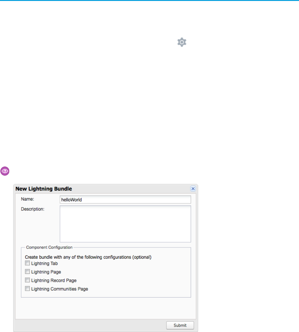
Create Lightning Components in the Developer Console
The Developer Console is a convenient, built-in tool you can use to create new and edit existing Lightning components and other
bundles.
1. Open the Developer Console.
Select Developer Console from the Your Name or the quick access menu ( ).
2. Open the New Lightning Bundle panel for a Lightning component.
Select File > New > Lightning Component.
3. Name the component.
For example, enter helloWorld in the Name field.
4. Optional: Describe the component.
Use the Description field to add details about the component.
5. Optional: Add component configurations to the new component.
You can select as many options in the Component Configuration section as you wish, or select no configuration at all.
6. Click Submit to create the component.
Or, to cancel creating the component, click the panel’s close box in the top right corner.
Example:
38
Create Lightning Components in the Developer ConsoleCreating Components
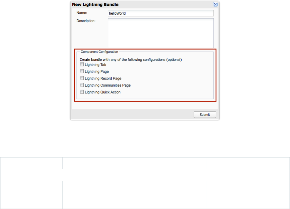
IN THIS SECTION:
Lightning Bundle Configurations Available in the Developer Console
Configurations make it easier to create a component or application for a specific purpose, like a Lightning Page or Lightning
Communities Page, or a quick action or navigation item in Lightning Experience or Salesforce1. The New Lightning Bundle panel in
the Developer Console offers a choice of component configurations when you create a Lightning component or application bundle.
SEE ALSO:
Using the Developer Console
Lightning Bundle Configurations Available in the Developer Console
Lightning Bundle Configurations Available in the Developer Console
Configurations make it easier to create a component or application for a specific purpose, like a Lightning Page or Lightning Communities
Page, or a quick action or navigation item in Lightning Experience or Salesforce1. The New Lightning Bundle panel in the Developer
Console offers a choice of component configurations when you create a Lightning component or application bundle.
Configurations add the interfaces required to support using the component in the desired context. For example, when you choose the
Lightning Tab configuration, your new component includes implements="force:appHostable" in the
<aura:component> tag.
Using configurations is optional. You can use them in any combination, including all or none.
The following configurations are available in the New Lightning Bundle panel.
DescriptionMarkupConfiguration
Lightning component bundle
Creates a component for use as a
navigation element in Lightning
Experience or Salesforce1.
implements="force:appHostable"
Lightning Tab
39
Lightning Bundle Configurations Available in the Developer
Console
Creating Components
DescriptionMarkupConfiguration
Creates a component for use in
Lightning Pages or the Lightning App
Builder.
implements="flexipage:availableForAllPageTypes"
and access="global"
Lightning Page
Creates a component for use on a
record home page in Lightning
Experience.
implements="flexipage:availableForRecordHome,
force:hasRecordId" and access="global"
Lightning Record Page
Creates a component that’s available
for drag and drop in the Community
Builder.
implements="forceCommunity:availableForAllPageTypes"
and access="global"
Lightning Communities
Page
Creates a component that can be
used with a Lightning quick action.
implements="force:lightningQuickAction"Lightning Quick Action
Lightning application bundle
Creates an empty Lightning Out
dependency app.
extends="ltng:outApp"Lightning Out
Dependency App
Note: For details of the markup added by each configuration, see the respective documentation for those features.
SEE ALSO:
Create Lightning Components in the Developer Console
Interface Reference
Configure Components for Custom Tabs
Configure Components for Custom Actions
Configure Components for Lightning Pages and the Lightning App Builder
Configure Components for Lightning Experience Record Pages
Configure Components for Communities
Component Markup
Component resources contain markup and have a .cmp suffix. The markup can contain text or references to other components, and
also declares metadata about the component.
Let's start with a simple "Hello, world!" example in a helloWorld.cmp component.
<aura:component>
Hello, world!
</aura:component>
This is about as simple as a component can get. The "Hello, world!" text is wrapped in the <aura:component> tags, which appear
at the beginning and end of every component definition.
40
Component MarkupCreating Components

Components can contain most HTML tags so you can use markup, such as <div> and <span>. HTML5 tags are also supported.
<aura:component>
<div class="container">
<!--Other HTML tags or components here-->
</div>
</aura:component>
Note: Case sensitivity should be respected as your markup interacts with JavaScript, CSS, and Apex.
Use the Developer Console to create components.
Component Naming Rules
A component name must follow these naming rules:
•Must begin with a letter
•Must contain only alphanumeric or underscore characters
•Must be unique in the namespace
•Can’t include whitespace
•Can’t end with an underscore
•Can’t contain two consecutive underscores
SEE ALSO:
aura:component
Using the Developer Console
Component Access Control
Client-Side Rendering to the DOM
Dynamically Creating Components
Component Namespace
Every component is part of a namespace, which is used to group related components together. If your organization has a namespace
prefix set, use that namespace to access your components. Otherwise, use the default namespace to access your components.
Another component or application can reference a component by adding <myNamespace:myComponent> in its markup. For
example, the helloWorld component is in the docsample namespace. Another component can reference it by adding
<docsample:helloWorld /> in its markup.
Lightning components that Salesforce provides are grouped into several namespaces, such as aura, ui, and force. Components
from third-party managed packages have namespaces from the providing organizations.
In your organization, you can choose to set a namespace prefix. If you do, that namespace is used for all of your Lightning components.
A namespace prefix is required if you plan to offer managed packages on the AppExchange.
If you haven’t set a namespace prefix for your organization, use the default namespace c when referencing components that you’ve
created.
41
Component NamespaceCreating Components

Namespaces in Code Samples
The code samples throughout this guide use the default c namespace. Replace c with your namespace if you’ve set a namespace
prefix.
Using the Default Namespace in Organizations with No Namespace Set
If your organization hasn’t set a namespace prefix, use the default namespace c when referencing Lightning components that you’ve
created.
The following items must use the c namespace when your organization doesn’t have a namespace prefix set.
•References to components that you’ve created
•References to events that you’ve defined
The following items use an implicit namespace for your organization and don’t require you to specify a namespace.
•References to custom objects
•References to custom fields on standard and custom objects
•References to Apex controllers
See Namespace Usage Examples and Reference on page 43 for examples of all of the preceding items.
Using Your Organization’s Namespace
If your organization has set a namespace prefix, use that namespace to reference Lightning components, events, custom objects and
fields, and other items in your Lightning markup.
The following items use your organization’s namespace when your organization has a namespace prefix set.
•References to components that you’ve created
•References to events that you’ve defined
•References to custom objects
•References to custom fields on standard and custom objects
•References to Apex controllers
•References to static resources
Note: Support for the c namespace in organizations that have set a namespace prefix is incomplete. The following items can
use the c namespace if you prefer to use the shortcut, but it’s not currently a recommended practice.
•References to components that you’ve created when used in Lightning markup, but not in expressions or JavaScript
•References to events that you’ve defined when used in Lightning markup, but not in expressions or JavaScript
•References to custom objects when used in component and event type and default system attributes, but not in
expressions or JavaScript
See Namespace Usage Examples and Reference on page 43 for examples of the preceding items.
Using a Namespace in or from a Managed Package
Always use the complete namespace when referencing items from a managed package, or when creating code that you intend to
distribute in your own managed packages.
42
Using the Default Namespace in Organizations with No
Namespace Set
Creating Components

Creating a Namespace in Your Organization
Create a namespace for your organization by registering a namespace prefix.
If you’re not creating managed packages for distribution then registering a namespace prefix isn’t required, but it’s a best practice for
all but the smallest organizations.
Your namespace prefix must:
•Begin with a letter
•Contain one to 15 alphanumeric characters
•Not contain two consecutive underscores
For example, myNp123 and my_np are valid namespaces, but 123Company and my__np aren’t.
To register a namespace prefix:
1. From Setup, enter Packages in the Quick Find box. Under Create, select Packages.
Note: This item is only available in Salesforce Classic.
2. In the Developer Settings panel, click Edit.
Note: This button doesn’t appear if you’ve already configured your developer settings.
3. Review the selections that are required for configuring developer settings, and then click Continue.
4. Enter the namespace prefix you want to register.
5. Click Check Availability to determine if the namespace prefix is already in use.
6. If the namespace prefix that you entered isn’t available, repeat the previous two steps.
7. Click Review My Selections.
8. Click Save.
Namespace Usage Examples and Reference
This topic provides examples of referencing components, objects, fields, and so on in Lightning components code.
Examples are provided for the following.
•Components, events, and interfaces in your organization
•Custom objects in your organization
•Custom fields on standard and custom objects in your organization
•Server-side Apex controllers in your organization
•Dynamic creation of components in JavaScript
•Static resources in your organization
Organizations with No Namespace Prefix Set
The following illustrates references to elements in your organization when your organization doesn’t have a namespace prefix set.
References use the default namespace, c, where necessary.
43
Creating a Namespace in Your OrganizationCreating Components

ExampleReferenced Item
<c:myComponent />Component used in markup
<aura:component extends="c:myComponent">
<aura:component implements="c:myInterface">
Component used in a system
attribute
<aura:component controller="ExpenseController">Apex controller
<aura:attribute name="expense" type="Expense__c" />Custom object in attribute data type
<aura:attribute name="newExpense" type="Expense__c"
default="{ 'sobjectType': 'Expense__c',
Custom object or custom field in
attribute defaults
'Name':'',
'Amount__c': 0,
…
}" />
<ui:inputNumber value="{!v.newExpense.Amount__c}" label=…
/>
Custom field in an expression
updateTotal: function(component) {
…
Custom field in a JavaScript function
for(var i = 0 ; i < expenses.length ; i++){
var exp = expenses[i];
total += exp.Amount__c;
}
…
}
var myCmp = $A.createComponent("c:myComponent", {},
function(myCmp) { }
);
Component created dynamically in
a JavaScript function
aCmp.isInstanceOf("c:myInterface")Interface comparison in a JavaScript
function
<aura:registerEvent type="c:updateExpenseItem" name=… />Event registration
<aura:handler event="c:updateExpenseItem"action=… />Event handler
<aura:dependency resource="markup://c:myComponent" />Explicit dependency
var updateEvent = $A.get("e.c:updateExpenseItem");Application event in a JavaScript
function
<ltng:require scripts="{!$Resource.resourceName}"
styles="{!$Resource.resourceName}" />
Static resources
44
Namespace Usage Examples and ReferenceCreating Components

Organizations with a Namespace Prefix
The following illustrates references to elements in your organization when your organization has set a namespace prefix. References use
an example namespace yournamespace.
ExampleReferenced Item
<yournamespace:myComponent />Component used in markup
<aura:component extends="yournamespace:myComponent">
<aura:component implements="yournamespace:myInterface">
Component used in a system
attribute
<aura:component controller="yournamespace.ExpenseController">Apex controller
<aura:attribute name="expenses"
type="yournamespace__Expense__c[]" />
Custom object in attribute data type
<aura:attribute name="newExpense"
type="yournamespace__Expense__c"
Custom object or custom field in
attribute defaults
default="{ 'sobjectType': 'yournamespace__Expense__c',
'Name':'',
'yournamespace__Amount__c': 0,
…
}" />
<ui:inputNumber
value="{!v.newExpense.yournamespace__Amount__c}" label=… />
Custom field in an expression
updateTotal: function(component) {
…
Custom field in a JavaScript function
for(var i = 0 ; i < expenses.length ; i++){
var exp = expenses[i];
total += exp.yournamespace__Amount__c;
}
…
}
var myCmp = $A.createComponent("yournamespace:myComponent",
{},
Component created dynamically in
a JavaScript function
function(myCmp) { }
);
aCmp.isInstanceOf("yournamespace:myInterface")Interface comparison in a JavaScript
function
<aura:registerEvent type="yournamespace:updateExpenseItem"
name=… />
Event registration
<aura:handler event="yournamespace:updateExpenseItem"
action=… />
Event handler
45
Namespace Usage Examples and ReferenceCreating Components
ExampleReferenced Item
<aura:dependency resource="markup://yournamespace:myComponent"
/>
Explicit dependency
var updateEvent = $A.get("e.yournamespace:updateExpenseItem");Application event in a JavaScript
function
<ltng:require
scripts="{!$Resource.yournamespace__resourceName}"
styles="{!$Resource.yournamespace__resourceName}" />
Static resources
Component Bundles
A component bundle contains a component or an app and all its related resources.
See AlsoUsageResource NameResource
Creating Components on page
37
aura:application on page 331
The only required resource in a
bundle. Contains markup for the
component or app. Each bundle
contains only one component
or app resource.
sample.cmp or
sample.app
Component or Application
CSS in Components on page 48Contains styles for the
component.
sample.cssCSS Styles
Handling Events with Client-Side
Controllers on page 138
Contains client-side controller
methods to handle events in the
component.
sampleController.jsController
Configure Components for
Lightning Pages and the
Lightning App Builder
File required for components
used in Lightning App Builder,
Lightning Pages, or Community
Builder.
sample.designDesign
Providing Component
Documentation on page 82
A description, sample code, and
one or multiple references to
example components
sample.auradocDocumentation
Client-Side Rendering to the
DOM on page 226
Client-side renderer to override
default rendering for a
component.
sampleRenderer.jsRenderer
Sharing JavaScript Code in a
Component Bundle on page 223
JavaScript functions that can be
called from any JavaScript code
in a component’s bundle
sampleHelper.jsHelper
Configure Components for
Lightning Pages and the
Custom icon resource for
components used in the
sample.svgSVG File
Lightning App Builder on page
109
Lightning App Builder or
Community Builder.
46
Component BundlesCreating Components
All resources in the component bundle follow the naming convention and are auto-wired. For example, a controller
<componentName>Controller.js is auto-wired to its component, which means that you can use the controller within the
scope of that component.
Component IDs
A component has two types of IDs: a local ID and a global ID. You can retrieve a component using its local ID in your JavaScript code. A
global ID can be useful to differentiate between multiple instances of a component or for debugging purposes.
Local IDs
A local ID is an ID that is only scoped to the component. A local ID is often unique but it’s not required to be unique.
Create a local ID by using the aura:id attribute. For example:
<ui:button aura:id="button1" label="button1"/>
Note: aura:id doesn't support expressions. You can only assign literal string values to aura:id.
Find the button component by calling cmp.find("button1") in your client-side controller, where cmp is a reference to the
component containing the button.
find() returns different types depending on the result.
•If the local ID is unique, find() returns the component.
•If there are multiple components with the same local ID, find() returns an array of the components.
•If there is no matching local ID, find() returns undefined.
To find the local ID for a component in JavaScript, use cmp.getLocalId().
Global IDs
Every component has a unique globalId, which is the generated runtime-unique ID of the component instance. A global ID (1) is
not guaranteed to be the same beyond the lifetime of a component, so it should never be relied on. A global ID can be useful to
differentiate between multiple instances of a component or for debugging purposes.
To create a unique ID for an HTML element, you can use the globalId as a prefix or suffix for your element. For example:
<div id="{!globalId + '_footer'}"></div>
In your browser’s developer console, retrieve the element using document.getElementById("<globalId>_footer"),
where <globalId> is the generated runtime-unique ID.
47
Component IDsCreating Components
To retrieve a component’s global ID in JavaScript, use the getGlobalId() function.
var globalId = cmp.getGlobalId();
SEE ALSO:
Finding Components by ID
Which Button Was Pressed?
HTML in Components
An HTML tag is treated as a first-class component by the framework. Each HTML tag is translated into an <aura:html> component,
allowing it to enjoy the same rights and privileges as any other component.
For example, the framework automatically converts a standard HTML <div> tag to this component:
<aura:html tag="div" />
You can add HTML markup in components. Note that you must use strict XHTML. For example, use <br/> instead of <br>. You can
also use HTML attributes and DOM events, such as onclick.
Warning: Some tags, like <applet> and <font>, aren’t supported. For a full list of unsupported tags, see Supported HTML
Tags on page 486.
Unescaping HTML
To output pre-formatted HTML, use aura:unescapedHTML. For example, this is useful if you want to display HTML that is generated
on the server and add it to the DOM. You must escape any HTML if necessary or your app might be exposed to security vulnerabilities.
You can pass in values from an expression, such as in <aura:unescapedHtml value="{!v.note.body}"/>.
{!expression} is the framework's expression syntax. For more information, see Using Expressions on page 57.
SEE ALSO:
Supported HTML Tags
CSS in Components
CSS in Components
Style your components with CSS.
Add CSS to a component bundle by clicking the STYLE button in the Developer Console sidebar.
For external CSS resources, see Styling Apps on page 190.
All top-level elements in a component have a special THIS CSS class added to them. This, effectively, adds namespacing to CSS and
helps prevent one component's CSS from blowing away another component's styling. The framework throws an error if a CSS file doesn't
follow this convention.
Let's look at a sample helloHTML.cmp component. The CSS is in helloHTML.css.
48
HTML in ComponentsCreating Components

Component source
<aura:component>
<div class="white">
Hello, HTML!
</div>
<h2>Check out the style in this list.</h2>
<ul>
<li class="red">I'm red.</li>
<li class="blue">I'm blue.</li>
<li class="green">I'm green.</li>
</ul>
</aura:component>
CSS source
.THIS {
background-color: grey;
}
.THIS.white {
background-color: white;
}
.THIS .red {
background-color: red;
}
.THIS .blue {
background-color: blue;
}
.THIS .green {
background-color: green;
}
Output
The top-level elements, h2 and ul, match the THIS class and render with a grey background. Top-level elements are tags wrapped
by the HTML body tag and not by any other tags. In this example, the li tags are not top-level because they are nested in a ul tag.
The <div class="white"> element matches the .THIS.white selector and renders with a white background. Note that
there is no space in the selector as this rule is for top-level elements.
49
CSS in ComponentsCreating Components
The <li class="red"> element matches the .THIS .red selector and renders with a red background. Note that this is a
descendant selector and it contains a space as the <li> element is not a top-level element.
SEE ALSO:
Adding and Removing Styles
HTML in Components
Component Attributes
Component attributes are like member variables on a class in Apex. They are typed fields that are set on a specific instance of a component,
and can be referenced from within the component's markup using an expression syntax. Attributes enable you to make components
more dynamic.
Use the <aura:attribute> tag to add an attribute to the component or app. Let’s look at the following sample,
helloAttributes.app:
<aura:application>
<aura:attribute name="whom" type="String" default="world"/>
Hello {!v.whom}!
</aura:application>
All attributes have a name and a type. Attributes may be marked as required by specifying required="true", and may also specify
a default value.
In this case we've got an attribute named whom of type String. If no value is specified, it defaults to "world".
Though not a strict requirement, <aura:attribute> tags are usually the first things listed in a component’s markup, as it provides
an easy way to read the component's shape at a glance.
Attribute Naming Rules
An attribute name must follow these naming rules:
•Must begin with a letter or an underscore
•Must contain only alphanumeric or underscore characters
Expressions
helloAttributes.app contains an expression, {!v.whom}, which is responsible for the component's dynamic output.
{!expression} is the framework's expression syntax. In this case, the expression we are evaluating is v.whom. The name of the
attribute we defined is whom, while v is the value provider for a component's attribute set, which represents the view.
Note: Expressions are case sensitive. For example, if you have a custom field myNamespace__Amount__c, you must refer
to it as {!v.myObject.myNamespace__Amount__c}.
SEE ALSO:
Supported aura:attribute Types
Using Expressions
50
Component AttributesCreating Components

Component Composition
Composing fine-grained components in a larger component enables you to build more interesting components and applications.
Let's see how we can fit components together. We will first create a few simple components: c:helloHTML and
c:helloAttributes. Then, we’ll create a wrapper component, c:nestedComponents, that contains the simple components.
Here is the source for helloHTML.cmp.
<!--c:helloHTML-->
<aura:component>
<div class="white">
Hello, HTML!
</div>
<h2>Check out the style in this list.</h2>
<ul>
<li class="red">I'm red.</li>
<li class="blue">I'm blue.</li>
<li class="green">I'm green.</li>
</ul>
</aura:component>
CSS source
.THIS {
background-color: grey;
}
.THIS.white {
background-color: white;
}
.THIS .red {
background-color: red;
}
.THIS .blue {
background-color: blue;
}
.THIS .green {
background-color: green;
}
Output
Here is the source for helloAttributes.cmp.
<!--c:helloAttributes-->
<aura:component>
51
Component CompositionCreating Components
<aura:attribute name="whom" type="String" default="world"/>
Hello {!v.whom}!
</aura:component>
nestedComponents.cmp uses composition to include other components in its markup.
<!--c:nestedComponents-->
<aura:component>
Observe! Components within components!
<c:helloHTML/>
<c:helloAttributes whom="component composition"/>
</aura:component>
Output
Including an existing component is similar to including an HTML tag. Reference the component by its "descriptor", which is of the form
namespace:component. nestedComponents.cmp references the helloHTML.cmp component, which lives in the c
namespace. Hence, its descriptor is c:helloHTML.
Note how nestedComponents.cmp also references c:helloAttributes. Just like adding attributes to an HTML tag, you
can set attribute values in a component as part of the component tag. nestedComponents.cmp sets the whom attribute of
helloAttributes.cmp to "component composition".
Attribute Passing
You can also pass attributes to nested components. nestedComponents2.cmp is similar to nestedComponents.cmp,
except that it includes an extra passthrough attribute. This value is passed through as the attribute value for c:helloAttributes.
<!--c:nestedComponents2-->
<aura:component>
<aura:attribute name="passthrough" type="String" default="passed attribute"/>
Observe! Components within components!
<c:helloHTML/>
<c:helloAttributes whom="{#v.passthrough}"/>
</aura:component>
Output
helloAttributes is now using the passed through attribute value.
52
Component CompositionCreating Components
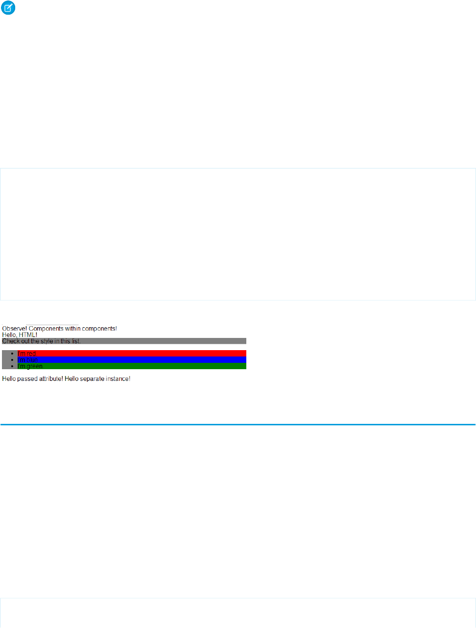
Note: {#v.passthrough} is an unbound expression. This means that any change to the value of the whom attribute in
c:helloAttributes doesn’t propagate back to affect the value of the passthrough attribute in
c:nestedComponents2. For more information, see Data Binding Between Components on page 59.
Definitions versus Instances
In object-oriented programming, there’s a difference between a class and an instance of that class. Components have a similar concept.
When you create a .cmp resource, you are providing the definition (class) of that component. When you put a component tag in a
.cmp , you are creating a reference to (instance of) that component.
It shouldn't be surprising that we can add multiple instances of the same component with different attributes.
nestedComponents3.cmp adds another instance of c:helloAttributes with a different attribute value. The two instances
of the c:helloAttributes component have different values for their whom attribute .
<!--c:nestedComponents3-->
<aura:component>
<aura:attribute name="passthrough" type="String" default="passed attribute"/>
Observe! Components within components!
<c:helloHTML/>
<c:helloAttributes whom="{#v.passthrough}"/>
<c:helloAttributes whom="separate instance"/>
</aura:component>
Output
Component Body
The root-level tag of every component is <aura:component>. Every component inherits the body attribute from
<aura:component>.
The <aura:component> tag can contain tags, such as <aura:attribute>, <aura:registerEvent>,
<aura:handler>, <aura:set>, and so on. Any free markup that is not enclosed in one of the tags allowed in a component is
assumed to be part of the body and is set in the body attribute.
The body attribute has type Aura.Component[]. It can be an array of one component, or an empty array, but it's always an array.
In a component, use “v” to access the collection of attributes. For example, {!v.body} outputs the body of the component.
Setting the Body Content
To set the body attribute in a component, add free markup within the <aura:component> tag. For example:
<aura:component>
<!--START BODY-->
53
Component BodyCreating Components

<div>Body part</div>
<ui:button label="Push Me"/>
<!--END BODY-->
</aura:component>
To set the value of an inherited attribute, use the <aura:set> tag. Setting the body content is equivalent to wrapping that free
markup inside <aura:set attribute="body">. Since the body attribute has this special behavior, you can omit <aura:set
attribute="body">.
The previous sample is a shortcut for this markup. We recommend the less verbose syntax in the previous sample.
<aura:component>
<aura:set attribute="body">
<!--START BODY-->
<div>Body part</div>
<ui:button label="Push Me/>
<!--END BODY-->
</aura:set>
</aura:component>
The same logic applies when you use any component that has a body attribute, not just <aura:component>. For example:
<ui:panel>
Hello world!
</ui:panel>
This is a shortcut for:
<ui:panel>
<aura:set attribute="body">
Hello World!
</aura:set>
</ui:panel>
Accessing the Component Body
To access a component body in JavaScript, use component.get("v.body").
SEE ALSO:
aura:set
Working with a Component Body in JavaScript
Component Facets
A facet is any attribute of type Aura.Component[]. The body attribute is an example of a facet.
To define your own facet, add an aura:attribute tag of type Aura.Component[] to your component. For example, let's
create a new component called facetHeader.cmp.
<!--c:facetHeader-->
<aura:component>
<aura:attribute name="header" type="Aura.Component[]"/>
54
Component FacetsCreating Components

<div>
<span class="header">{!v.header}</span><br/>
<span class="body">{!v.body}</span>
</div>
</aura:component>
This component has a header facet. Note how we position the output of the header using the v.header expression.
The component doesn't have any output when you access it directly as the header and body attributes aren't set. Let’s create another
component, helloFacets.cmp, that sets these attributes.
<!--c:helloFacets-->
<aura:component>
See how we set the header facet.<br/>
<c:facetHeader>
Nice body!
<aura:set attribute="header">
Hello Header!
</aura:set>
</c:facetHeader>
</aura:component>
Note that aura:set sets the value of the header attribute of facetHeader.cmp, but you don’t need to use aura:set if
you’re setting the body attribute.
SEE ALSO:
Component Body
Best Practices for Conditional Markup
Use the <aura:if> tag to conditionally display markup. Alternatively, you can conditionally set markup in JavaScript logic. Consider
the performance cost as well as code maintainability when you design components. The best design choice depends on your use case.
Consider Alternatives to Conditional Markup
Here are some use cases where you should consider alternatives to <aura:if>.
You want to toggle visibility
Don’t use <aura:if> to toggle markup visibility. Use CSS instead. See Dynamically Showing or Hiding Markup on page 244.
You need to nest conditional logic or use conditional logic in an iteration
Using <aura:if> can hurt performance by creating a large number of components. Excessive use of conditional logic in markup
can also lead to cluttered markup that is harder to maintain.
55
Best Practices for Conditional MarkupCreating Components
Consider alternatives, such as using JavaScript logic in an init event handler instead. See Invoking Actions on Component
Initialization on page 229.
SEE ALSO:
aura:if
Conditional Expressions
Component Versioning
Component versioning enables you to declare dependencies against specific revisions of an installed managed package.
By assigning a version to your component, you have granular control over how the component functions when new versions of a
managed package are released. For example, imagine that a <packageNamespace>:button is pinned to version 2.0 of a package.
Upon installing version 3.0, the button retains its version 2.0 functionality.
Note: The package developer is responsible for inserting versioning logic into the markup when updating a component. If the
component wasn’t changed in the update or if the markup doesn’t account for version, the component behaves in the context
of the most recent version.
Versions are assigned declaratively in the Developer Console. When you’re working on a component, click Bundle Version Settings
in the right panel to define the version. You can only version a component if you’ve installed a package, and the valid versions for the
component are the available versions of that package. Versions are in the format <major>.<minor>. So if you assign a component
version 1.4, its behavior depends on the first major release and fourth minor release of the associated package.
When working with components, you can version:
•Apex controllers
•JavaScript controllers
•JavaScript helpers
•JavaScript renderers
•Bundle markup
–Applications (.app)
–Components (.cmp)
–Interfaces (.intf)
–Events (.evt)
56
Component VersioningCreating Components
You can’t version any other types of resources in bundles. Unsupported types include:
•Styles (.css)
•Documentation (.doc)
•Design (.design)
•SVG (.svg)
Once you’ve assigned versions to components, or if you’re developing components for a package, you can retrieve the version in several
contexts.
ExpressionReturn TypeResource
System.requestVersion()VersionApex
cmp.getVersion()StringJavaScript
{!Version}StringLightning component markup
You can use the retrieved version to add logic to your code or markup to assign different functionality to different versions. Here’s an
example of using versioning in an <aura:if> statement.
<aura:component>
<aura:if isTrue="{!Version > 1.0}">
<c:newVersionFunctionality/>
</aura:if>
<c:oldVersionFunctionality/>
...
</aura:component>
Using Expressions
Expressions allow you to make calculations and access property values and other data within component markup. Use expressions for
dynamic output or passing values into components by assigning them to attributes.
An expression is any set of literal values, variables, sub-expressions, or operators that can be resolved to a single value. Method calls are
not allowed in expressions.
The expression syntax is: {!expression}
expression is a placeholder for the expression.
Anything inside the {! } delimiters is evaluated and dynamically replaced when the component is rendered or when the value is
used by the component. Whitespace is ignored.
The resulting value can be a primitive, such as an integer, string, or boolean. It can also be a JavaScript object, a component or collection,
a controller method such as an action method, and other useful results.
Note: If you're familiar with other languages, you may be tempted to read the ! as the "bang" operator, which negates boolean
values in many programming languages. In the Lightning Component framework, {! is simply the delimiter used to begin an
expression.
If you're familiar with Visualforce, this syntax will look familiar.
57
Using ExpressionsCreating Components
There is a second expression syntax: {#expression}. For more details on the difference between the two forms of expression
syntax, see Data Binding Between Components.
Identifiers in an expression, such as attribute names accessed through the view, controller values, or labels, must start with a letter or
underscore. They can also contain numbers or hyphens after the first character. For example, {!v.2count} is not valid, but
{!v.count} is.
Important: Only use the {! } syntax in markup in .app or .cmp files. In JavaScript, use string syntax to evaluate an expression.
For example:
var theLabel = cmp.get("v.label");
If you want to escape {!, use this syntax:
<aura:text value="{!"/>
This renders {! in plain text because the aura:text component never interprets {! as the start of an expression.
IN THIS SECTION:
Dynamic Output in Expressions
The simplest way to use expressions is to output dynamic values.
Conditional Expressions
Here are examples of conditional expressions using the ternary operator and the <aura:if> tag.
Data Binding Between Components
When you add a component in markup, you can use an expression to initialize attribute values in the component based on attribute
values of the container component. There are two forms of expression syntax, which exhibit different behaviors for data binding
between the components.
Value Providers
Value providers are a way to access data. Value providers encapsulate related values together, similar to how an object encapsulates
properties and methods.
Expression Evaluation
Expressions are evaluated much the same way that expressions in JavaScript or other programming languages are evaluated.
Expression Operators Reference
The expression language supports operators to enable you to create more complex expressions.
Expression Functions Reference
The expression language contains math, string, array, comparison, boolean, and conditional functions. All functions are case-sensitive.
Dynamic Output in Expressions
The simplest way to use expressions is to output dynamic values.
Values used in the expression can be from component attributes, literal values, booleans, and so on. For example:
{!v.desc}
In this expression, v represents the view, which is the set of component attributes, and desc is an attribute of the component. The
expression is simply outputting the desc attribute value for the component that contains this markup.
If you're including literal values in expressions, enclose text values within single quotes, such as {!'Some text'}.
58
Dynamic Output in ExpressionsCreating Components

Include numbers without quotes, for example, {!123}.
For booleans, use {!true} for true and {!false} for false.
SEE ALSO:
Component Attributes
Value Providers
Conditional Expressions
Here are examples of conditional expressions using the ternary operator and the <aura:if> tag.
Ternary Operator
This expression uses the ternary operator to conditionally output one of two values dependent on a condition.
<a class="{!v.location == '/active' ? 'selected' : ''}" href="#/active">Active</a>
The {!v.location == '/active' ? 'selected' : ''} expression conditionally sets the class attribute of an HTML
<a> tag, by checking whether the location attribute is set to /active. If true, the expression sets class to selected.
Using <aura:if> for Conditional Markup
This snippet of markup uses the <aura:if> tag to conditionally display an edit button.
<aura:attribute name="edit" type="Boolean" default="true"/>
<aura:if isTrue="{!v.edit}">
<ui:button label="Edit"/>
<aura:set attribute="else">
You can’t edit this.
</aura:set>
</aura:if>
If the edit attribute is set to true, a ui:button displays. Otherwise, the text in the else attribute displays.
SEE ALSO:
Best Practices for Conditional Markup
Data Binding Between Components
When you add a component in markup, you can use an expression to initialize attribute values in the component based on attribute
values of the container component. There are two forms of expression syntax, which exhibit different behaviors for data binding between
the components.
This concept is a little tricky, but it will make more sense when we look at an example. Consider a c:parent component that has a
parentAttr attribute. c:parent contains a c:child component with a childAttr attribute that’s initialized to the value
of the parentAttr attribute. We’re passing the parentAttr attribute value from c:parent into the c:child component,
which results in a data binding, also known as a value binding, between the two components.
<!--c:parent-->
<aura:component>
59
Conditional ExpressionsCreating Components
<aura:attribute name="parentAttr" type="String" default="parent attribute"/>
<!-- Instantiate the child component -->
<c:child childAttr="{!v.parentAttr}" />
</aura:component>
{!v.parentAttr} is a bound expression. Any change to the value of the childAttr attribute in c:child also affects the
parentAttr attribute in c:parent and vice versa.
Now, let's change the markup from:
<c:child childAttr="{!v.parentAttr}" />
to:
<c:child childAttr="{#v.parentAttr}" />
{#v.parentAttr} is an unbound expression. Any change to the value of the childAttr attribute in c:child doesn’t affect
the parentAttr attribute in c:parent and vice versa.
Here’s a summary of the differences between the forms of expression syntax.
{#expression} (Unbound Expressions)
Data updates behave as you would expect in JavaScript. Primitives, such as String, are passed by value, and data updates for the
expression in the parent and child are decoupled.
Objects, such as Array or Map, are passed by reference, so changes to the data in the child propagate to the parent. However,
change handlers in the parent aren’t notified. The same behavior applies for changes in the parent propagating to the child.
{!expression} (Bound Expressions)
Data updates in either component are reflected through bidirectional data binding in both components. Similarly, change handlers
are triggered in both the parent and child components.
Tip: Bi-directional data binding is expensive for performance and it can create hard-to-debug errors due to the propagation
of data changes through nested components. We recommend using the {#expression} syntax instead when you pass
an expression from a parent component to a child component unless you require bi-directional data binding.
Unbound Expressions
Let’s look at another example of a c:parentExpr component that contains another component, c:childExpr.
Here is the markup for c:childExpr.
<!--c:childExpr-->
<aura:component>
<aura:attribute name="childAttr" type="String" />
<p>childExpr childAttr: {!v.childAttr}</p>
<p><ui:button label="Update childAttr"
press="{!c.updateChildAttr}"/></p>
</aura:component>
Here is the markup for c:parentExpr.
<!--c:parentExpr-->
<aura:component>
<aura:attribute name="parentAttr" type="String" default="parent attribute"/>
60
Data Binding Between ComponentsCreating Components

<!-- Instantiate the child component -->
<c:childExpr childAttr="{#v.parentAttr}" />
<p>parentExpr parentAttr: {!v.parentAttr}</p>
<p><ui:button label="Update parentAttr"
press="{!c.updateParentAttr}"/></p>
</aura:component>
The c:parentExpr component uses an unbound expression to set an attribute in the c:childExpr component.
<c:childExpr childAttr="{#v.parentAttr}" />
When we instantiate childExpr, we set the childAttr attribute to the value of the parentAttr attribute in c:parentExpr.
Since the {#v.parentAttr} syntax is used, the v.parentAttr expression is not bound to the value of the childAttr
attribute.
The c:exprApp application is a wrapper around c:parentExpr.
<!--c:exprApp-->
<aura:application >
<c:parentExpr />
</aura:application>
In the Developer Console, click Preview in the sidebar for c:exprApp to view the app in your browser.
Both parentAttr and childAttr are set to “parent attribute”, which is the default value of parentAttr.
Now, let’s create a client-side controller for c:childExpr so that we can dynamically update the component. Here is the source for
childExprController.js.
/* childExprController.js */
({
updateChildAttr: function(cmp) {
cmp.set("v.childAttr","updated child attribute");
}
})
In the Developer Console, click Update Preview for c:exprApp.
Press the Update childAttr button. This updates childAttr to “updated child attribute”. The value of parentAttr is unchanged
since we used an unbound expression.
<c:childExpr childAttr="{#v.parentAttr}" />
Let’s add a client-side controller for c:parentExpr. Here is the source for parentExprController.js.
/* parentExprController.js */
({
updateParentAttr: function(cmp) {
cmp.set("v.parentAttr","updated parent attribute");
}
})
In the Developer Console, click Update Preview for c:exprApp.
Press the Update parentAttr button. This time, parentAttr is set to “updated parent attribute” while childAttr is unchanged
due to the unbound expression.
61
Data Binding Between ComponentsCreating Components

Warning: Don’t use a component’s init event and client-side controller to initialize an attribute that is used in an unbound
expression. The attribute will not be initialized. Use a bound expression instead. For more information on a component’s init
event, see Invoking Actions on Component Initialization on page 229.
Alternatively, you can wrap the component in another component. When you instantiate the wrapped component in the wrapper
component, initialize the attribute value instead of initializing the attribute in the wrapped component’s client-side controller.
Bound Expressions
Now, let’s update the code to use a bound expression instead. Change this line in c:parentExpr:
<c:childExpr childAttr="{#v.parentAttr}" />
to:
<c:childExpr childAttr="{!v.parentAttr}" />
In the Developer Console, click Update Preview for c:exprApp.
Press the Update childAttr button. This updates both childAttr and parentAttr to “updated child attribute” even though
we only set v.childAttr in the client-side controller of childExpr. Both attributes were updated since we used a bound
expression to set the childAttr attribute.
Change Handlers and Data Binding
You can configure a component to automatically invoke a change handler, which is a client-side controller action, when a value in one
of the component's attributes changes.
When you use a bound expression, a change in the attribute in the parent or child component triggers the change handler in both
components. When you use an unbound expression, the change is not propagated between components so the change handler is only
triggered in the component that contains the changed attribute.
Let’s add change handlers to our earlier example to see how they are affected by bound versus unbound expressions.
Here is the updated markup for c:childExpr.
<!--c:childExpr-->
<aura:component>
<aura:attribute name="childAttr" type="String" />
<aura:handler name="change" value="{!v.childAttr}" action="{!c.onChildAttrChange}"/>
<p>childExpr childAttr: {!v.childAttr}</p>
<p><ui:button label="Update childAttr"
press="{!c.updateChildAttr}"/></p>
</aura:component>
Notice the <aura:handler> tag with name="change", which signifies a change handler. value="{!v.childAttr}"
tells the change handler to track the childAttr attribute. When childAttr changes, the onChildAttrChange client-side
controller action is invoked.
Here is the client-side controller for c:childExpr.
/* childExprController.js */
({
updateChildAttr: function(cmp) {
62
Data Binding Between ComponentsCreating Components

cmp.set("v.childAttr","updated child attribute");
},
onChildAttrChange: function(cmp, evt) {
console.log("childAttr has changed");
console.log("old value: " + evt.getParam("oldValue"));
console.log("current value: " + evt.getParam("value"));
}
})
Here is the updated markup for c:parentExpr with a change handler.
<!--c:parentExpr-->
<aura:component>
<aura:attribute name="parentAttr" type="String" default="parent attribute"/>
<aura:handler name="change" value="{!v.parentAttr}" action="{!c.onParentAttrChange}"/>
<!-- Instantiate the child component -->
<c:childExpr childAttr="{!v.parentAttr}" />
<p>parentExpr parentAttr: {!v.parentAttr}</p>
<p><ui:button label="Update parentAttr"
press="{!c.updateParentAttr}"/></p>
</aura:component>
Here is the client-side controller for c:parentExpr.
/* parentExprController.js */
({
updateParentAttr: function(cmp) {
cmp.set("v.parentAttr","updated parent attribute");
},
onParentAttrChange: function(cmp, evt) {
console.log("parentAttr has changed");
console.log("old value: " + evt.getParam("oldValue"));
console.log("current value: " + evt.getParam("value"));
}
})
In the Developer Console, click Update Preview for c:exprApp.
Open your browser’s console (More tools > Developer tools in Chrome).
Press the Update parentAttr button. The change handlers for c:parentExpr and c:childExpr are both triggered as we’re
using a bound expression.
<c:childExpr childAttr="{!v.parentAttr}" />
Change c:parentExpr to use an unbound expression instead.
<c:childExpr childAttr="{#v.parentAttr}" />
In the Developer Console, click Update Preview for c:exprApp.
63
Data Binding Between ComponentsCreating Components

Press the Update childAttr button. This time, only the change handler for c:childExpr is triggered as we’re using an unbound
expression.
SEE ALSO:
Detecting Data Changes with Change Handlers
Dynamic Output in Expressions
Component Composition
Value Providers
Value providers are a way to access data. Value providers encapsulate related values together, similar to how an object encapsulates
properties and methods.
The value providers for a component are v (view) and c (controller).
See AlsoDescriptionValue Provider
Component AttributesA component’s attribute set. This value provider enables
you to access the value of a component’s attribute in the
component’s markup.
v
Handling Events with Client-Side ControllersA component’s controller, which enables you to wire up
event handlers and actions for the component
c
All components have a v value provider, but aren't required to have a controller. Both value providers are created automatically when
defined for a component.
Note: Expressions are bound to the specific component that contains them. That component is also known as the attribute value
provider, and is used to resolve any expressions that are passed to attributes of its contained components.
Global Value Providers
Global value providers are global values and methods that a component can use in expressions.
See AlsoDescriptionGlobal Value
Provider
Component IDsThe globalId global value provider returns the global
ID for a component. Every component has a unique
globalID
globalId, which is the generated runtime-unique ID
of the component instance.
$BrowserThe $Browser global value provider returns
information about the hardware and operating system
of the browser accessing the application.
$Browser
Using Custom LabelsThe $Label global value provider enables you to access
labels stored outside your code.
$Label
64
Value ProvidersCreating Components

See AlsoDescriptionGlobal Value
Provider
$LocaleThe $Locale global value provider returns information
about the current user’s preferred locale.
$Locale
$ResourceThe $Resource global value provider lets you
reference images, style sheets, and JavaScript code you’ve
uploaded in static resources.
$Resource
Accessing Fields and Related Objects
Values in a value provider are accessed as named properties. To use a value, separate the value provider and the property name with a
dot (period). For example, v.body. You can access value providers in markup or in JavaScript code.
When an attribute of a component is an object or other structured data (not a primitive value), access the values on that attribute using
the same dot notation.
For example, {!v.accounts.id} accesses the id field in the accounts record.
For deeply nested objects and attributes, continue adding dots to traverse the structure and access the nested values.
SEE ALSO:
Dynamic Output in Expressions
$Browser
The $Browser global value provider returns information about the hardware and operating system of the browser accessing the
application.
DescriptionAttribute
Returns a FormFactor enum value based on the type of hardware the browser is running on.formFactor
•DESKTOP for a desktop client
•PHONE for a phone including a mobile phone with a browser and a smartphone
•TABLET for a tablet client (for which isTablet returns true)
Indicates whether the browser is running on an Android device (true) or not (false).isAndroid
Not available in all implementations. Indicates whether the browser is running on an iOS device (true)
or not (false).
isIOS
Not available in all implementations. Indicates whether the browser is running on an iPad (true) or not
(false).
isIPad
Not available in all implementations. Indicates whether the browser is running on an iPhone (true) or
not (false).
isIPhone
Indicates whether the browser is running on a phone including a mobile phone with a browser and a
smartphone (true), or not (false).
isPhone
65
Value ProvidersCreating Components
DescriptionAttribute
Indicates whether the browser is running on an iPad or a tablet with Android 2.2 or later (true) or not
(false).
isTablet
Indicates whether the browser is running on a Windows phone (true) or not (false). Note that this
only detects Windows phones and does not detect tablets or other touch-enabled Windows 8 devices.
isWindowsPhone
Example: This example shows usage of the $Browser global value provider.
<aura:component>
{!$Browser.isTablet}
{!$Browser.isPhone}
{!$Browser.isAndroid}
{!$Browser.formFactor}
</aura:component>
Similarly, you can check browser information in a client-side controller using $A.get().
({
checkBrowser: function(component) {
var device = $A.get("$Browser.formFactor");
alert("You are using a " + device);
}
})
$Locale
The $Locale global value provider returns information about the current user’s preferred locale.
These attributes are based on Java’s Calendar, Locale and TimeZone classes.
Sample ValueDescriptionAttribute
"US", "DE", "GB"The ISO 3166 representation of the country code
based on the language locale.
country
"$"The currency symbol.currency
"USD"The ISO 4217 representation of the currency code.currencyCode
"."The decimal separator.decimal
1The first day of the week, where 1 is Sunday.firstDayOfWeek
","The grouping separator.grouping
falseSpecifies if a name is based on eastern style, for
example, last name first name
[middle] [suffix].
isEasternNameStyle
“Today”The label for the Today link on the date picker.labelForToday
"en", "de", "zh"The language code based on the language locale.language
66
Value ProvidersCreating Components
Sample ValueDescriptionAttribute
“en_US”, “en_GB”The locale ID.langLocale
{ fullName: “January”, shortName: “Jan” }The full and short names of the calendar monthsnameOfMonths
{ fullName: “Sunday”, shortName: “SUN” }The full and short names of the calendar weeksnameOfWeekdays
"America/Los_Angeles"The time zone ID.timezone
“US”The country based on the current user’s localeuserLocaleCountry
“en”The language based on the current user’s localeuserLocaleLang
"WIN", "MAC", "POSIX"The vendor and browser-specific code.variant
Number and Date Formatting
The framework’s number and date formatting are based on Java’s DecimalFormat and DateFormat classes.
Sample ValueDescriptionAttribute
"¤#,##0.00;(¤#,##0.00)"
¤ represents the currency sign, which is replaced
by the currency symbol.
The currency format.currencyformat
"MMM d, yyyy"The date format.dateFormat
"MMM d, yyyy h:mm:ss a"The date time format.datetimeFormat
"#,##0.###"
# represents a digit, the comma is a placeholder for
the grouping separator, and the period is a
The number format.numberformat
placeholder for the decimal separator. Zero (0)
replaces # to represent trailing zeros.
"#,##0%"The percentage format.percentformat
"h:mm:ss a"The time format.timeFormat
“0”The character for the zero digit.zero
Example: This example shows how to retrieve different $Locale attributes.
Component source
<aura:component>
{!$Locale.language}
{!$Locale.timezone}
{!$Locale.numberFormat}
{!$Locale.currencyFormat}
</aura:component>
67
Value ProvidersCreating Components

Similarly, you can check locale information in a client-side controller using $A.get().
({
checkDevice: function(component) {
var locale = $A.get("$Locale.language");
alert("You are using " + locale);
}
})
SEE ALSO:
Localization
$Resource
The $Resource global value provider lets you reference images, style sheets, and JavaScript code you’ve uploaded in static resources.
Using $Resource lets you reference assets by name, without worrying about the gory details of URLs or file paths. You can use
$Resource in Lightning components markup and within JavaScript controller and helper code.
Using $Resource in Component Markup
To reference a specific resource in component markup, use $Resource.resourceName within an expression. resourceName
is the Name of the static resource. In a managed packaged, the resource name must include the package namespace prefix, such as
$Resource.yourNamespace__resourceName. For a stand-alone static resource, such as an individual graphic or script,
that’s all you need. To reference an item within an archive static resource, add the rest of the path to the item using string concatenation.
Here are a few examples.
<aura:component>
<!-- Stand-alone static resources -->
<img src="{!$Resource.generic_profile_svg}"/>
<img src="{!$Resource.yourNamespace__generic_profile_svg}"/>
<!-- Asset from an archive static resource -->
<img src="{!$Resource.SLDSv2 + '/assets/images/avatar1.jpg'}"/>
<img src="{!$Resource.yourNamespace__SLDSv2 + '/assets/images/avatar1.jpg'}"/>
</aura:component>
Include CSS style sheets or JavaScript libraries into a component using the <ltng:require> tag. For example:
<aura:component>
<ltng:require
styles="{!$Resource.SLDSv2 + '/assets/styles/lightning-design-system-ltng.css'}"
scripts="{!$Resource.jsLibraries + '/jsLibOne.js'}"
afterScriptsLoaded="{!c.scriptsLoaded}" />
</aura:component>
Note: Due to a quirk in the way $Resource is parsed in expressions, use the join operator to include multiple $Resource
references in a single attribute. For example, if you have more than one JavaScript library to include into a component the scripts
attribute should be something like the following.
scripts="{!join(',',
$Resource.jsLibraries + '/jsLibOne.js',
$Resource.jsLibraries + '/jsLibTwo.js')}"
68
Value ProvidersCreating Components

Using $Resource in JavaScript
To obtain a reference to a static resource in JavaScript code, use $A.get('$Resource.resourceName').
resourceName is the Name of the static resource. In a managed packaged, the resource name must include the package namespace
prefix, such as $Resource.yourNamespace__resourceName. For a stand-alone static resource, such as an individual graphic
or script, that’s all you need. To reference an item within an archive static resource, add the rest of the path to the item using string
concatenation. For example:
({
profileUrl: function(component) {
var profUrl = $A.get('$Resource.SLDSv2') + '/assets/images/avatar1.jpg';
alert("Profile URL: " + profUrl);
}
})
Note: Static resources referenced in JavaScript aren’t automatically added to packages. If your JavaScript depends on a resource
that isn’t referenced in component markup, add it manually to any packages the JavaScript code is included in.
$Resource Considerations
Global value providers in the Lightning Component framework are, behind the scenes, implemented quite differently from global
variables in Salesforce. Although $Resource looks like the global variable with the same name available in Visualforce, formula fields,
and elsewhere, there are important differences. Don’t use other documentation as a guideline for its use or behavior.
Here are two specific things to keep in mind about $Resource in the Lightning Component framework.
First, $Resource isn’t available until the Lightning Component framework is loaded on the client. Some very simple components
that are composed of only markup can be rendered server-side, where $Resource isn’t available. To avoid this, when you create a
new app, stub out a client-side controller to force components to be rendered on the client.
Second, if you’ve worked with the $Resource global variable, in Visualforce or elsewhere, you’ve also used the URLFOR() formula
function to construct complete URLs to specific resources. There’s nothing similar to URLFOR() in the Lightning Component framework.
Instead, use simple string concatenation, as illustrated in the preceding examples.
SEE ALSO:
Salesforce Help: Static Resources
Expression Evaluation
Expressions are evaluated much the same way that expressions in JavaScript or other programming languages are evaluated.
Operators are a subset of those available in JavaScript, and evaluation order and precedence are generally the same as JavaScript.
Parentheses enable you to ensure a specific evaluation order. What you may find surprising about expressions is how often they are
evaluated. The framework notices when things change, and trigger re-rendering of any components that are affected. Dependencies
are handled automatically. This is one of the fundamental benefits of the framework. It knows when to re-render something on the page.
When a component is re-rendered, any expressions it uses will be re-evaluated.
Action Methods
Expressions are also used to provide action methods for user interface events: onclick, onhover, and any other component
attributes beginning with "on". Some components simplify assigning actions to user interface events using other attributes, such as the
press attribute on <ui:button>.
69
Expression EvaluationCreating Components
Action methods must be assigned to attributes using an expression, for example {!c.theAction}. This assigns an Aura.Action,
which is a reference to the controller function that handles the action.
Assigning action methods via expressions allows you to assign them conditionally, based on the state of the application or user interface.
For more information, see Conditional Expressions on page 59.
<ui:button aura:id="likeBtn"
label="{!(v.likeId == null) ? 'Like It' : 'Unlike It'}"
press="{!(v.likeId == null) ? c.likeIt : c.unlikeIt}"
/>
This button will show "Like It" for items that have not yet been liked, and clicking it will call the likeIt action method. Then the
component will re-render, and the opposite user interface display and method assignment will be in place. Clicking a second time will
unlike the item, and so on.
Expression Operators Reference
The expression language supports operators to enable you to create more complex expressions.
Arithmetic Operators
Expressions based on arithmetic operators result in numerical values.
DescriptionUsageOperator
Add two numbers.1 + 1+
Subtract one number from the other.2 - 1-
Multiply two numbers.2 * 2*
Divide one number by the other.4 / 2/
Return the integer remainder of dividing the first number by the
second.
5 % 2%
Unary operator. Reverses the sign of the succeeding number. For
example if the value of expenses is 100, then -expenses
is -100.
-v.exp-
Numeric Literals
DescriptionUsageLiteral
Integers are numbers without a decimal point or exponent.2Integer
Numbers with a decimal point, or numbers with an exponent.3.14
-1.1e10
Float
A literal null number. Matches the explicit null value and numbers
with an undefined value.
nullNull
70
Expression Operators ReferenceCreating Components
String Operators
Expressions based on string operators result in string values.
DescriptionUsageOperator
Concatenates two strings together.'Title: ' + v.note.title+
String Literals
String literals must be enclosed in single quotation marks 'like this'.
DescriptionUsageLiteral
Literal strings must be enclosed in single quotation marks. Double quotation marks
are reserved for enclosing attribute values, and must be escaped in strings.
'hello world'string
Whitespace characters:'\n'\<escape>
•\t (tab)
•\n (newline)
•\r (carriage return)
Escaped characters:
•\" (literal ")
•\' (literal ')
•\\ (literal \)
A Unicode code point. The # symbols are hexadecimal digits. A Unicode literal
requires four digits.
'\u####'Unicode
A literal null string. Matches the explicit null value and strings with an undefined
value.
nullnull
Comparison Operators
Expressions based on comparison operators result in a true or false value. For comparison purposes, numbers are treated as the
same type. In all other cases, comparisons check both value and type.
DescriptionUsageAlternativeOperator
Returns true if the operands are equal. This
comparison is valid for all data types.
1 == 1
1 == 1.0
eq==
Warning: Don’t use the == operator for
objects, as opposed to basic types, such as
1 eq 1
Note:
undefined==null
evaluates to true.
Integer or String. For example,
object1==object2 evaluates
inconsistently on the client versus the server
and isn’t reliable.
71
Expression Operators ReferenceCreating Components

DescriptionUsageAlternativeOperator
Returns true if the operands are not equal. This
comparison is valid for all data types.
1 != 2
1 != true
ne!=
1 != '1'
null != false
1 ne 2
Returns true if the first operand is numerically
less than the second. You must escape the <
1<2
1 lt 2
lt<
operator to < to use it in component markup.
Alternatively, you can use the lt operator.
Returns true if the first operand is numerically
greater than the second.
42 > 2
42 gt 2
gt>
Returns true if the first operand is numerically
less than or equal to the second. You must escape
2 <= 42
2 le 42
le<=
the <= operator to <= to use it in component
markup. Alternatively, you can use the le operator.
Returns true if the first operand is numerically
greater than or equal to the second.
42 >= 42
42 ge 42
ge>=
Logical Operators
Expressions based on logical operators result in a true or false value.
DescriptionUsageOperator
Returns true if both operands are individually true. You must escape the && operator to
&& to use it in component markup. Alternatively, you can use the and()
function and pass it two arguments. For example, and(isEnabled, hasPermission).
isEnabled &&
hasPermission
&&
Returns true if either operand is individually true.hasPermission
|| isRequired
||
Unary operator. Returns true if the operand is false. This operator should not be confused
with the ! delimiter used to start an expression in {!. You can combine the expression
!isRequired!
delimiter with this negation operator to return the logical negation of a value, for example,
{!!true} returns false.
Logical Literals
Logical values are never equivalent to non-logical values. That is, only true == true, and only false == false; 1 !=
true, and 0 != false, and null != false.
72
Expression Operators ReferenceCreating Components

DescriptionUsageLiteral
A boolean true value.truetrue
A boolean false value.falsefalse
Conditional Operator
There is only one conditional operator, the traditional ternary operator.
DescriptionUsageOperator
The operand before the ? operator is evaluated as
a boolean. If true, the second operand is returned. If
false, the third operand is returned.
(1 != 2) ? "Obviously" : "Black
is White"
? :
SEE ALSO:
Expression Functions Reference
Expression Functions Reference
The expression language contains math, string, array, comparison, boolean, and conditional functions. All functions are case-sensitive.
Math Functions
The math functions perform math operations on numbers. They take numerical arguments. The Corresponding Operator column lists
equivalent operators, if any.
Corresponding
Operator
DescriptionUsageAlternativeFunction
+Adds the first argument
to the second.
add(1,2)concatadd
-Subtracts the second
argument from the first.
sub(10,2)subtractsub
*Multiplies the first
argument by the second.
mult(2,10)multiplymult
/Divides the first argument
by the second.
div(4,2)dividediv
%Returns the integer
remainder resulting from
mod(5,2)modulusmod
dividing the first
argument by the second.
NoneReturns the absolute
value of the argument:
abs(-5)abs
73
Expression Functions ReferenceCreating Components
Corresponding
Operator
DescriptionUsageAlternativeFunction
the same number if the
argument is positive, and
the number without its
negative sign if the
number is negative. For
example, abs(-5) is
5.
- (unary)Reverses the sign of the
argument. For example,
neg(100) is -100.
neg(100)negateneg
String Functions
Corresponding
Operator
DescriptionUsageAlternativeFunction
+Concatenates the two
arguments.
concat('Hello ',
'world')
add('Walk ', 'the dog')
addconcat
Replaces any
parameter
format($Label.ns.labelName,
v.myVal)
format
placeholders with
Note: This function works for
arguments of type String,comma-separated
attribute values.
Decimal, Double,
Integer, Long, Array,
String[], List, and Set.
Joins the substrings
adding the separator
join(separator, subStr1,
subStr2, subStrN)
join(' ','class1',
'class2', v.class)
join
String (first argument)
between each
subsequent argument.
Label Functions
DescriptionUsageFunction
Outputs a label and updates it.
Replaces any parameter
format($Label.np.labelName,
v.attribute1 , v.attribute2)
format($Label.np.hello, v.name)
format
placeholders with
comma-separated attribute values.
74
Expression Functions ReferenceCreating Components
DescriptionUsageFunction
Supports ternary operators in
labels and attributes.
Informational Functions
DescriptionUsageFunction
Returns the length of an array or a string.myArray.lengthlength
Returns true if the argument is empty. An empty
argument is undefined, null, an empty array, or an
empty(v.attributeName)empty
Note: This function works for arguments
of type String, Array, Object,
List, Map, or Set.
empty string. An object with no properties is not considered
empty.
Tip: {! !empty(v.myArray)} evaluates
faster than {!v.myArray &&
v.myArray.length > 0} so we recommend
empty() to improve performance.
The $A.util.isEmpty() method in JavaScript is
equivalent to the empty() expression in markup.
Comparison Functions
Comparison functions take two number arguments and return true or false depending on the comparison result. The eq and
ne functions can also take other data types for their arguments, such as strings.
Corresponding
Operator
DescriptionUsageFunction
== or eqReturns true if the specified arguments
are equal. The arguments can be any data
type.
equals(1,1)equals
!= or neReturns true if the specified arguments
are not equal. The arguments can be any
data type.
notequals(1,2)notequals
< or ltReturns true if the first argument is
numerically less than the second
argument.
lessthan(1,5)lessthan
> or gtReturns true if the first argument is
numerically greater than the second
argument.
greaterthan(5,1)greaterthan
<= or leReturns true if the first argument is
numerically less than or equal to the
second argument.
lessthanorequal(1,2)lessthanorequal
75
Expression Functions ReferenceCreating Components
Corresponding
Operator
DescriptionUsageFunction
>= or geReturns true if the first argument is
numerically greather than or equal to the
second argument.
greaterthanorequal(2,1)greaterthanorequal
Boolean Functions
Boolean functions operate on Boolean arguments. They are equivalent to logical operators.
Corresponding OperatorDescriptionUsageFunction
&&Returns true if both
arguments are true.
and(isEnabled,
hasPermission)
and
||Returns true if either one of
the arguments is true.
or(hasPermission,
hasVIPPass)
or
!Returns true if the argument
is false.
not(isNew)not
Conditional Function
Corresponding OperatorDescriptionUsageFunction
?: (ternary)Evaluates the first argument as
a boolean. If true, returns the
if(isEnabled,
'Enabled', 'Not
enabled')
if
second argument. Otherwise,
returns the third argument.
Using Labels
Labels are text that presents information about the user interface, such as in the header (1), input fields (2), or buttons (3). While you can
specify labels by providing text values in component markup, you can also access labels stored outside your code using the $Label
global value provider in expression syntax.
76
Using LabelsCreating Components
This section discusses how to use the $Label global value provider in these contexts:
•The label attribute in input components
•The format() expression function for dynamically populating placeholder values in labels
IN THIS SECTION:
Using Custom Labels
Custom labels are custom text values that can be translated into any language that Salesforce supports. To access custom labels in
Lightning components, use the $Label global value provider.
Input Component Labels
A label describes the purpose of an input component. To set a label on an input component, use the label attribute.
Dynamically Populating Label Parameters
Output and update labels using the format() expression function.
Getting Labels in JavaScript
You can retrieve labels in JavaScript code. Your code performs optimally if the labels are statically defined and sent to the client
when the component is loaded.
Setting Label Values via a Parent Attribute
Setting label values via a parent attribute is useful if you want control over labels in child components.
Using Custom Labels
Custom labels are custom text values that can be translated into any language that Salesforce supports. To access custom labels in
Lightning components, use the $Label global value provider.
Custom labels enable developers to create multilingual applications by automatically presenting information (for example, help text or
error messages) in a user's native language.
To create custom labels, from Setup, enter Custom Labels in the Quick Find box, then select Custom Labels.
Use this syntax to access custom labels in Lightning components:
77
Using Custom LabelsCreating Components

•$Label.c.labelName for the default namespace
•$Label.namespace.labelName if your org has a namespace, or to access a label in a managed package
Here are some examples.
Label in a markup expression using the default namespace
{!$Label.c.labelName}
Label in JavaScript code if your org has a namespace
$A.get("$Label.namespace.labelName")
SEE ALSO:
Value Providers
Input Component Labels
A label describes the purpose of an input component. To set a label on an input component, use the label attribute.
This example shows how to use labels using the label attribute on an input component.
<ui:inputNumber label="Pick a Number:" value="54" />
The label is placed on the left of the input field and can be hidden by setting labelClass="assistiveText". assistiveText
is a global style class used to support accessibility.
Using $Label
Use the $Label global value provider to access labels stored in an external source. For example:
<ui:inputNumber label="{!$Label.Number.PickOne}" />
To output a label and dynamically update it, use the format() expression function. For example, if you have np.labelName set
to Hello {0}, the following expression returns Hello World if v.name is set to World.
{!format($Label.np.labelName, v.name)}
SEE ALSO:
Supporting Accessibility
Dynamically Populating Label Parameters
Output and update labels using the format() expression function.
You can provide a string with placeholders, which are replaced by the substitution values at runtime.
Add as many parameters as you need. The parameters are numbered and are zero-based. For example, if you have three parameters,
they will be named {0}, {1}, and {2}, and they will be substituted in the order they're specified.
Let's look at a custom label, $Label.mySection.myLabel, with a value of Hello {0} and {1}, where $Label is the
global value provider that accesses your labels.
This expression dynamically populates the placeholder parameters with the values of the supplied attributes.
{!format($Label.mySection.myLabel, v.attribute1, v.attribute2)}
78
Input Component LabelsCreating Components

The label is automatically refreshed if one of the attribute values changes.
Note: Always use the $Label global value provider to reference a label with placeholder parameters. You can't set a string
with placeholder parameters as the first argument for format(). For example, this syntax doesn't work:
{!format('Hello {0}', v.name)}
Use this expression instead.
{!format($Label.mySection.salutation, v.name)}
where $Label.mySection.salutation is set to Hello {0}.
Getting Labels in JavaScript
You can retrieve labels in JavaScript code. Your code performs optimally if the labels are statically defined and sent to the client when
the component is loaded.
Static Labels
Static labels are defined in one string, such as "$Label.c.task_mode_today". The framework parses static labels in markup
or JavaScript code and sends the labels to the client when the component is loaded. A server trip isn’t required to resolve the label. Use
$A.get() to retrieve static labels in JavaScript code. For example:
var staticLabel = $A.get("$Label.c.task_mode_today");
Dynamic Labels
You can dynamically create labels in JavaScript code. This technique can be useful when you need to use a label that isn’t known until
runtime when it’s dynamically generated.
// Assume the day variable is dynamically generated
// earlier in the code
// THIS CODE WON’T WORK
var dynamicLabel = $A.get("$Label.c." + day);
If the label is already known on the client, $A.get() displays the label. If the value is not known, an empty string is displayed in
production mode, or a placeholder value showing the label key is displayed in debug mode.
Since the label, "$Label.c." + day", is dynamically generated, the framework can’t parse it and send it to the client when the
component is requested. dynamicLabel is an empty string, which isn’t what you want!
There are a few alternative approaches to using $A.get() so that you can work with dynamically generated labels.
If your component uses a known set of dynamically constructed labels, you can avoid a server roundtrip for the labels by adding a
reference to the labels in a JavaScript resource. The framework sends these labels to the client when the component is requested. For
example, if your component dynamically generates $Label.c.task_mode_today and $Label.c.task_mode_tomorrow
label keys, you can add references to the labels in a comment in a JavaScript resource, such as a client-side controller or helper.
// hints to ensure labels are preloaded
// $Label.Related_Lists.task_mode_today
// $Label.Related_Lists.task_mode_tomorrow
If your code dynamically generates many labels, this approach doesn’t scale well.
79
Getting Labels in JavaScriptCreating Components

If you don’t want to add comment hints for all the potential labels, the alternative is to use $A.getReference(). This approach
comes with the added cost of a server trip to retrieve the label value.
This example dynamically constructs the label value by calling $A.getReference() and updates a tempLabelAttr component
attribute with the retrieved label.
var labelSubStr = "task_mode_today";
var labelReference = $A.getReference("$Label.c." + labelSubStr);
cmp.set("v.tempLabelAttr", labelReference);
var dynamicLabel = cmp.get("v.tempLabelAttr");
$A.getReference() returns a reference to the label. This isn’t a string, and you shouldn’t treat it like one. You never get a string
label directly back from $A.getReference().
Instead, use the returned reference to set a component’s attribute value. Our code does this in cmp.set("v.tempLabelAttr",
labelReference);.
When the label value is asynchronously returned from the server, the attribute value is automatically updated as it’s a reference. The
component is rerendered and the label value displays.
Note: Our code sets dynamicLabel = cmp.get("v.tempLabelAttr") immediately after getting the reference.
This code displays an empty string until the label value is returned from the server. If you don’t want that behavior, use a comment
hint to ensure that the label is sent to the client without requiring a later server trip.
SEE ALSO:
Using JavaScript
Input Component Labels
Dynamically Populating Label Parameters
Setting Label Values via a Parent Attribute
Setting label values via a parent attribute is useful if you want control over labels in child components.
Let’s say that you have a container component, which contains another component, inner.cmp. You want to set a label value in
inner.cmp via an attribute on the container component. This can be done by specifying the attribute type and default value. You
must set a default value in the parent attribute if you are setting a label on an inner component, as shown in the following example.
This is the container component, which contains a default value My Label for the _label attribute .
<aura:component>
<aura:attribute name="_label"
type="String"
default="My Label"/>
<ui:button label="Set Label" aura:id="button1" press="{!c.setLabel}"/>
<auradocs:inner aura:id="inner" label="{!v._label}"/>
</aura:component>
This inner component contains a text area component and a label attribute that’s set by the container component.
<aura:component>
<aura:attribute name="label" type="String"/>
<ui:inputTextarea aura:id="textarea"
label="{!v.label}"/>
</aura:component>
80
Setting Label Values via a Parent AttributeCreating Components
This client-side controller action updates the label value.
({
setLabel:function(cmp) {
cmp.set("v._label",'new label');
}
})
When the component is initialized, you’ll see a button and a text area with the label My Label. When the button in the container
component is clicked, the setLabel action updates the label value in the inner component. This action finds the label attribute
and sets its value to new label.
SEE ALSO:
Input Component Labels
Component Attributes
Localization
The framework provides client-side localization support on input and output components.
The following example shows how you can override the default langLocale and timezone attributes. The output displays the
time in the format hh:mm by default.
Note: For more information on supported attributes, see the Reference Doc App.
Component source
<aura:component>
<ui:outputDateTime value="2013-10-07T00:17:08.997Z" timezone="Europe/Berlin"
langLocale="de"/>
</aura:component>
The component renders as Okt. 7, 2015 2:17:08 AM.
Additionally, you can use the global value provider, $Locale, to obtain the locale information. The locale settings in your organization
overrides the browser’s locale information.
Working with Locale Information
In a single currency organization, Salesforce administrators set the currency locale, default language, default locale, and default time
zone for their organizations. Users can set their individual language, locale, and time zone on their personal settings pages.
Note: Single language organizations cannot change their language, although they can change their locale.
For example, setting the time zone on the Language & Time Zone page to (GMT+02:00) returns 28.09.2015 09:00:00
when you run the following code.
<ui:outputDateTime value="09/28/2015" />
Running $A.get("$Locale.timezone") returns the time zone name, for example, Europe/Paris. For more information,
see "Supported Time Zones" in the Salesforce Help.
81
LocalizationCreating Components

Setting the currency locale on the Company Information page to Japanese (Japan) - JPY returns ¥100,000 when you
run the following code.
<ui:outputCurrency value="100000" />
Similarly, running $A.get("$Locale.currency") returns "¥" when your org’s currency locale is set to Japanese
(Japan) - JPY. For more information, see "Supported Currencies" in the Salesforce Help.
Using the Localization Service
The framework’s localization service enables you to manage the localization of date, time, numbers, and currencies. These methods are
available in the AuraLocalizationService JavaScript API.
This example sets the formatted date time using $Locale and the localization service.
var dateFormat = $A.get("$Locale.dateFormat");
var dateString = $A.localizationService.formatDateTime(new Date(), dateFormat);
If you’re not retrieving the browser’s date information, you can specify the date format on your own. This example specifies the date
format and uses the browser’s language locale information.
var dateFormat = "MMMM d, yyyy h:mm a";
var userLocaleLang = $A.get("$Locale.langLocale");
return $A.localizationService.formatDate(date, dateFormat, userLocaleLang);
The AuraLocalizationService JavaScript API provides methods for working with localization. For example, you can compare
two dates to check that one is later than the other.
var startDateTime = new Date();
//return the date time at end of the day
var endDateTime = $A.localizationService.endOf(d, 'day');
if( $A.localizationService.isAfter(startDateTime,endDateTime)) {
//throw an error if startDateTime is after endDateTime
}
Note: For more information on the localization service, see the JavaScript API in the Reference Doc App.
SEE ALSO:
Value Providers
Providing Component Documentation
Component documentation helps others understand and use your components.
You can provide two types of component reference documentation:
•Documentation definition (DocDef): Full documentation on a component, including a description, sample code, and a reference to
an example. DocDef supports extensive HTML markup and is useful for describing what a component is and what it does.
•Inline descriptions: Text-only descriptions, typically one or two sentences, set via the description attribute in a tag.
To provide a DocDef, click DOCUMENTATION in the component sidebar of the Developer Console. The following example shows the
DocDef for np:myComponent.
82
Providing Component DocumentationCreating Components

Note: DocDef is currently supported for components and applications. Events and interfaces support inline descriptions only.
<aura:documentation>
<aura:description>
<p>An <code>np:myComponent</code> component represents an element that executes
an action defined by a controller.</p>
<!--More markup here, such as <pre> for code samples-->
</aura:description>
<aura:example name="myComponentExample" ref="np:myComponentExample" label="Using the
np:myComponent Component">
<p>This example shows a simple setup of <code>myComponent</code>.</p>
</aura:example>
<aura:example name="mySecondExample" ref="np:mySecondExample" label="Customizing the
np:myComponent Component">
<p>This example shows how you can customize <code>myComponent</code>.</p>
</aura:example>
</aura:documentation>
A documentation definition contains these tags.
DescriptionTag
The top-level definition of the DocDef<aura:documentation>
Describes the component using extensive HTML markup. To include code samples in the
description, use the <pre> tag, which renders as a code block. Code entered in the <pre> tag
<aura:description>
must be escaped. For example, escape <aura:component> by entering
<aura:component>.
References an example that demonstrates how the component is used. Supports extensive HTML
markup, which displays as text preceding the visual output and example component source. The
<aura:example>
example is displayed as interactive output. Multiple examples are supported and should be wrapped
in individual <aura:example> tags.
•name: The API name of the example
•ref: The reference to the example component in the format
<namespace:exampleComponent>
•label: The label of the title
Providing an Example Component
Recall that the DocDef includes a reference to an example component. The example component is rendered as an interactive demo in
the component reference documentation when it’s wired up using aura:example.
<aura:example name="myComponentExample" ref="np:myComponentExample" label="Using the
np:myComponent Component">
The following is an example component that demonstrates how np:myComponent can be used.
<!--The np:myComponentExample example component-->
<aura:component>
<np:myComponent>
83
Providing Component DocumentationCreating Components

<aura:set attribute=”myAttribute”>This sets the attribute on the np:myComponent
component.</aura:set>
<!--More markup that demonstrates the usage of np:myComponent-->
</np:myComponent>
</aura:component>
Providing Inline Descriptions
Inline descriptions provide a brief overview of what an element is about. HTML markup is not supported in inline descriptions. These
tags support inline descriptions via the description attribute.
ExampleTag
<aura:component description="Represents a button element"><aura:component>
<aura:attribute name="langLocale" type="String"
description="The language locale used to format date value."/>
<aura:attribute>
<aura:event type="COMPONENT" description="Indicates that a
keyboard key has been pressed and released"/>
<aura:event>
<aura:interface description="A common interface for date
components"/>
<aura:interface>
<aura:registerEvent name="keydown" type="ui:keydown"
description="Indicates that a key is pressed"/>
<aura:registerEvent>
Viewing the Documentation
The documentation you create will be available at
https://<myDomain>.lightning.force.com/auradocs/reference.app, where <myDomain> is the name of
your custom Salesforce domain.
SEE ALSO:
Reference
Working with Base Lightning Components
Base Lightning components are the building blocks that make up the modern Lightning Experience, Salesforce1, and Lightning
Communities user interfaces.
Base Lightning components incorporate Lightning Design System markup and classes, providing improved performance and accessibility
with a minimum footprint.
These base components handle the details of HTML and CSS for you. Each component provides simple attributes that enable variations
in style. This means that you typically don’t need to use CSS at all. The simplicity of the base Lightning component attributes and their
clean and consistent definitions make them easy to use, enabling you to focus on your business logic.
You can find base Lightning components in the lightning namespace to complement the existing ui namespace components.
In instances where there are matching ui and lightning namespace components, we recommend that you use the lightning
84
Working with Base Lightning ComponentsCreating Components
namespace component. The lightning namespace components are optimized for common use cases. Beyond being equipped
with the Lightning Design System styling, they handle accessibility, real-time interaction, and enhanced error messages.
In subsequent releases, we intend to provide additional base Lightning components. We expect that in time the lightning namespace
will have parity with the ui namespace and go beyond it.
In addition, the base Lightning components will evolve with the Lightning Design System over time. This ensures that your customizations
continue to match Lightning Experience and Salesforce1.
For all the components available, see the component reference at
https://<myDomain>.lightning.force.com/auradocs/reference.app, where <myDomain> is the name of
your custom Salesforce domain or see the Component Reference section.
Input Control Components
The following components are interactive, for example, like buttons and tabs.
Lightning Design SystemDescriptionKey ComponentsType
ButtonsRepresents a button element.lightning:buttonButton
Button IconsAn icon-only HTML button.lightning:buttonIconButton Icon
Button GroupsRepresents a group of buttons.lightning:buttonGroupButton
Group
MenusA dropdown menu with a list of actions or functions.lightning:buttonMenuButton Menu
A list item in lightning:buttonMenu.lightning:menuItem
SelectCreates an HTML select element.lightning:selectSelect
TabsA single tab that is nested in a
lightning:tabset component.
lightning:tabTabs
Represents a list of tabs.lightning:tabset
Visual Components
The following components provide informative cues, for example, like icons and loading spinners.
Lightning Design SystemDescriptionKey ComponentsType
A visual representation of a person.lightning:avatarAvatar
BadgesA label that holds a small amount of information.lightning:badgeBadge
CardsApplies a container around a related grouping of
information.
lightning:cardCard
IconsA visual element that provides context.lightning:iconIcon
GridResponsive grid system for arranging containers
on a page.
lightning:layoutLayout
85
Working with Base Lightning ComponentsCreating Components

Lightning Design SystemDescriptionKey ComponentsType
A container within a lightning:layout
component.
lightning:layoutItem
SpinnersDisplays an animated spinner.lightning:spinnerSpinner
Field Components
The following components enable you to enter or display values.
Lightning Design SystemDescriptionKey ComponentsType
FormsRepresents interactive controls that accept
user input depending on the type
attribute.
lighting:inputInput
N/ADisplays formatted date and time.lighting:formattedDateTimeInternationalization
Displays formatted numbers.lightning:formattedNumber
Rich Text EditorA WYSIWYG editor with a customizable
toolbar for entering rich text
lightning:inputRichTextRich Text Area
TextareaA multiline text input.lightning:textAreaText Area
Base Lightning Components Considerations
Learn about the guidelines on using the base Lightning components.
We recommend that you don't depend on the markup of a Lightning component as its internals can change in the future. For example,
using cmp.get("v.body") and examining the DOM elements can cause issues in your code if the component markup change
down the road. With LockerService enforced, you can’t traverse the DOM for components you don't own. Instead of accessing the DOM
tree, take advantage of value binding with component attributes and use component methods that are available to you. For example,
to get an attribute on a component, use cmp.find("myInput").get("v.name") instead of
cmp.find("myInput").getElement().name. The latter doesn’t work if you don’t have access to the component, such as
a component in another namespace.
Many of the base Lightning components are still evolving and the following considerations can help you while you’re building your
apps.
lightning:buttonMenu (Beta)
This component contains menu items that are created only if the button is triggered. You can’t reference the menu items during
initialization or if the button isn’t triggered yet.
lightning:formattedDateTime (Beta)
This component provides fallback behavior in Apple Safari 10 and below. The following formatting options have exceptions when
using the fallback behavior in older browsers.
•era is not supported.
•timeZoneName appends GMT for short format, GMT-h:mm or GMT+h:mm for long format.
•timeZone supports UTC. If another timezone value is used, lightning:formattedDateTime uses the browser
timezone.
86
Base Lightning Components ConsiderationsCreating Components

lightning:formattedNumber (Beta)
This component provides the following fallback behavior in Apple Safari 10 and below.
•If style is set to currency, providing a currencyCode value that’s different from the locale displays the currency code
instead of the symbol. The following example displays EUR12.34 in fallback mode and €12.34 otherwise.
<lightning:formattedNumber value="12.34" style="currency"
currencyCode="EUR"/>
•currencyDisplayAs supports symbol only. The following example displays $12.34 in fallback mode only if the
currencyCode matches the user’s locale currency and USD12.34 otherwise.
<lightning:formattedNumber value="12.34" style="currency"
currencyCode="USD" currencyDisplayAs="symbol"/>
lightning:input (Beta)
Date pickers are available in the following components but they don’t inherit the Lightning Design System styling.
•<lightning:input type="date" />
•<lightning:input type="datetime-local" />
Fields for percentage and currency input must specify a step increment of 0.01 as required by the native implementation.
<lightning:input type="number" name="percentVal" label="Enter a percentage value"
formatter="percent" step="0.01" />
<lightning:input type="number" name="currencyVal" label="Enter a dollar amount"
formatter="currency" step="0.01" />
When working with checkboxes, radio buttons, and toggle switches, use aura:id to group and traverse the array of components.
Grouping them enables you to use get("v.checked") to determine which elements are checked or unchecked without
reaching into the DOM. You can also use the name and value attributes to identify each component during the iteration. The
following example groups three checkboxes together using aura:id.
<aura:component>
<form>
<fieldset>
<legend>Select your favorite color:</legend>
<lightning:input type="checkbox" label="Red"
name="color1" value="1" aura:id="colors"/>
<lightning:input type="checkbox" label="Blue"
name="color2" value="2" aura:id="colors"/>
<lightning:input type="checkbox" label="Green"
name="color3" value="3" aura:id="colors"/>
</fieldset>
<lightning:button label="Submit" onclick="{!c.submitForm}"/>
</form>
</aura:component>
In your client-side controller, you can retrieve the array using cmp.find("colors") and inspect the checked values.
When working with type="file", you must provide your own server-side logic for uploading files to Salesforce. Read the file
using the FileReader HTML object, and then encode the file contents before sending them to your Apex controller. In your Apex
controller, you can use the EncodingUtil methods to decode the file data. For example, you can use the Attachment object
to upload files to a parent object. In this case, you pass in the base64 encoded file to the Body field to save the file as an attachment
in your Apex controller.
87
Base Lightning Components ConsiderationsCreating Components

Uploading files using this component is subject to regular Apex controller limits, which is 1 MB. To accommodate file size increase
due to base64 encoding, we recommend that you set the maximum file size to 750 KB. You must implement chunking for file size
larger than 1 MB. Files uploaded via chunking are subject to a size limit of 4 MB. For more information, see the Apex Developer Guide.
lightning:tab (Beta)
This component creates its body during runtime. You can’t reference the component during initialization. Referencing the component
using aura:id can return unexpected results, such as the component returning an undefined value when implementing
cmp.find("myComponent").
lightning:tabset (Beta)
When you load more tabs than can fit the width of the viewport, the tabset provides navigation buttons that scrolls horizontally to
display the overflow tabs.
Event Handling in Base Lightning Components
Base components are lightweight and closely resemble HTML markup. They follow standard HTML practices by providing event handlers
as attributes, such as onfocus, instead of registering and firing Lightning component events, like components in the ui namespace.
Because of their markup, you might expect to access DOM elements via event.target or event.currentTarget. However,
this type of access breaks encapsulation because it provides access to another component’s DOM elements, which are subject to change.
LockerService, which will be enabled for all orgs in Summer ’17, enforces encapsulation. Use the methods described here to make your
code compliant with LockerService.
To retrieve the component that fired the event, use event.getSource().
<aura:component>
<lightning:button name="myButton" onclick="{!c.doSomething}"/>
</aura:component>
({
doSomething: function(cmp, event, helper) {
var button = event.getSource();
//The following patterns are not supported
//when you’re trying to access another component’s
//DOM elements.
var el = event.target;
var currentEl = event.currentTarget;
}
})
Retrieve a component attribute that’s passed to the event by using this syntax.
event.getSource().get("v.name")
Reusing Event Handlers
event.getSource() helps you determine which component fired an event. Let’s say you have several buttons that reuse the
same onclick handler. To retrieve the name of the button that fired the event, use event.getSource().get("v.name").
<aura:component>
<lightning:button label="New Record" name="new" onclick="{!c.handleClick}"/>
<lightning:button label="Edit" name="edit" onclick="{!c.handleClick}"/>
88
Event Handling in Base Lightning ComponentsCreating Components

<lightning:button label="Delete" name="delete" onclick="{!c.handleClick}"/>
</aura:component>
({
handleClick: function(cmp, event, helper) {
//returns "new", "edit", or "delete"
var buttonName = event.getSource().get("v.name");
}
})
Retrieving the Active Component Using the onactive Handler
Components, such as lightning:tab and lightning:menuItem, support the onactive handler so that you can obtain
a reference to the target component when it becomes active. Clicking the component multiple times invokes the handler once only.
For example, you can toggle a check mark on a menu item in a lightning:buttonMenu component when it’s clicked.
<aura:component>
<lightning:buttonMenu alternativeText="Show menu">
<lightning:menuItem value="new" onactive="{! c.handleActive }" label="New"
checked="true" />
<lightning:menuItem value="edit" onactive="{! c.handleActive }" label="Edit"
checked="false" />
<lightning:menuItem value="delete" onactive="{! c.handleActive }" label="Delete"
checked="false" />
</lightning:buttonMenu>
</aura:component>
({
handleActive: function (cmp, event) {
var menuItem = event.getSource();
menuItem.set("v.checked", !menuItem.get("v.checked"));
}
})
Note: If you only need the ID or value of the tab and you don’t need a reference to the target component, use the onselect
event handler.
Retrieving the ID and Value Using the onselect Handler
Some components provide event handlers to pass in events to child components, such as the onselect event handler on the
following components.
•lightning:buttonMenu
•lightning:tabset
Although the event.detail syntax continues to be supported, we recommend that you update your JavaScript code to use the
following patterns for the onselect handler as we plan to deprecate event.detail in a future release.
•event.getParam("id")
•event.getParam("value")
89
Event Handling in Base Lightning ComponentsCreating Components
For example, you want to retrieve the value of a selected menu item in a lightning:buttonMenu component from a client-side
controller.
//Before
var menuItem = event.detail.menuItem;
var itemValue = menuItem.get("v.value");
//After
var itemValue = event.getParam("value");
Similarly, to retrieve the ID of a selected tab in a lightning:tabset component:
//Before
var tab = event.detail.selectedTab;
var tabId = tab.get("v.id");
//After
var tabId = event.getParam("id");
Note: If you need a reference to the target component, use the onactive event handler instead.
Working with UI Components
The framework provides common user interface components in the ui namespace. All of these components extend either
aura:component or a child component of aura:component. aura:component is an abstract component that provides
a default rendering implementation. User interface components such as ui:input and ui:output provide easy handling of
common user interface events like keyboard and mouse interactions. Each component can be styled and extended accordingly.
Note: If you are looking for components that apply the Lightning Design System styling, consider using the base lightning
components instead.
For all the components available, see the component reference at
https://<myDomain>.lightning.force.com/auradocs/reference.app, where <myDomain> is the name of
your custom Salesforce domain.
Complex, Interactive Components
The following components contain one or more sub-components and are interactive.
DescriptionKey ComponentsType
A message notification of varying severity levelsui:messageMessage
A drop-down list with a trigger that controls its visibilityui:menuMenu
A list of menu itemsui:menuList
A menu item that triggers an actionui:actionMenuItem
A menu item that supports multiple selection and can be used to
trigger an action
ui:checkboxMenuItem
A menu item that supports single selection and can be used to
trigger an action
ui:radioMenuItem
A visual separator for menu itemsui:menuItemSeparator
90
Working with UI ComponentsCreating Components

DescriptionKey ComponentsType
An abstract and extensible component for menu items in a
ui:menuList component
ui:menuItem
A trigger that expands and collapses a menuui:menuTrigger
A link that triggers a dropdown menu. This component extends
ui:menuTrigger
ui:menuTriggerLink
Input Control Components
The following components are interactive, for example, like buttons and checkboxes.
DescriptionKey ComponentsType
An actionable button that can be pressed or clickedui:buttonButton
A selectable option that supports multiple selectionsui:inputCheckboxCheckbox
Displays a read-only value of the checkboxui:outputCheckbox
A selectable option that supports only a single selectionui:inputRadioRadio button
A drop-down list with optionsui:inputSelectDrop-down List
An option in a ui:inputSelect componentui:inputSelectOption
Visual Components
The following components provides informative cues, for example, like error messages and loading spinners.
DescriptionKey ComponentsType
An error message that is displayed when an error occursui:inputDefaultErrorField-level error
A loading spinnerui:spinnerSpinner
Field Components
The following components enables you to enter or display values.
DescriptionKey ComponentsType
An input field for entering currencyui:inputCurrencyCurrency
Displays currency in a default or specified formatui:outputCurrency
An input field for entering an email addressui:inputEmailEmail
Displays a clickable email addressui:outputEmail
An input field for entering a dateui:inputDateDate and time
91
Working with UI ComponentsCreating Components
DescriptionKey ComponentsType
An input field for entering a date and timeui:inputDateTime
Displays a date in the default or specified formatui:outputDate
Displays a date and time in the default or specified formatui:outputDateTime
An input field for entering secret textui:inputSecretPassword
An input field for entering a telephone numberui:inputPhonePhone Number
Displays a phone numberui:outputPhone
An input field for entering a numerical valueui:inputNumberNumber
Displays a numberui:outputNumber
An input field for entering a value within a rangeui:inputRangeRange
An input field for entering rich textui:inputRichTextRich Text
Displays rich textui:outputRichText
An input field for entering a single line of textui:inputTextText
Displays textui:outputText
An input field for entering multiple lines of textui:inputTextAreaText Area
Displays a read-only text areaui:outputTextArea
An input field for entering a URLui:inputURLURL
Displays a clickable URLui:outputURL
SEE ALSO:
Using the UI Components
Creating Components
Component Bundles
Event Handling in UI Components
UI components provide easy handling of user interface events such as keyboard and mouse interactions. By listening to these events,
you can also bind values on UI input components using the updateon attribute, such that the values update when those events are
fired.
Capture a UI event by defining its handler on the component. For example, you want to listen to the HTML DOM event, onblur, on a
ui:inputTextArea component.
<ui:inputTextArea aura:id="textarea" value="My text area" label="Type something"
blur="{!c.handleBlur}" />
92
Event Handling in UI ComponentsCreating Components
The blur="{!c.handleBlur}" listens to the onblur event and wires it to your client-side controller. When you trigger the
event, the following client-side controller handles the event.
handleBlur : function(cmp, event, helper){
var elem = cmp.find("textarea").getElement();
//do something else
}
For all available events on all components, see the Component Reference on page 339.
Value Binding for Browser Events
Any changes to the UI are reflected in the component attribute, and any change in that attribute is propagated to the UI. When you
load the component, the value of the input elements are initialized to those of the component attributes. Any changes to the user input
causes the value of the component variable to be updated. For example, a ui:inputText component can contain a value that’s
bound to a component attribute, and the ui:outputText component is bound to the same component attribute. The
ui:inputText component listens to the onkeyup browser event and updates the corresponding component attribute values.
<aura:attribute name="first" type="String" default="John"/>
<aura:attribute name="last" type="String" default="Doe"/>
<ui:inputText label="First Name" value="{!v.first}" updateOn="keyup"/>
<ui:inputText label="Last Name" value="{!v.last}" updateOn="keyup"/>
<!-- Returns "John Doe" -->
<ui:outputText value="{!v.first +' '+ v.last}"/>
The next example takes in numerical inputs and returns the sum of those numbers. The ui:inputNumber component listens to
the onkeyup browser event. When the value in this component changes on the keyup event, the value in the ui:outputNumber
component is updated as well, and returns the sum of the two values.
<aura:attribute name="number1" type="integer" default="1"/>
<aura:attribute name="number2" type="integer" default="2"/>
<ui:inputNumber label="Number 1" value="{!v.number1}" updateOn="keyup" />
<ui:inputNumber label="Number 2" value="{!v.number2}" updateOn="keyup" />
<!-- Adds the numbers and returns the sum -->
<ui:outputNumber value="{!(v.number1 * 1) + (v.number2 * 1)}"/>
Note: The input fields return a string value and must be properly handled to accommodate numerical values. In this example,
both values are multiplied by 1 to obtain their numerical equivalents.
Using the UI Components
Users interact with your app through input elements to select or enter values. Components such as ui:inputText and
ui:inputCheckbox correspond to common input elements. These components simplify event handling for user interface events.
Note: For all available component attributes and events, see the component reference at
https://<myDomain>.lightning.force.com/auradocs/reference.app, where <myDomain> is the
name of your custom Salesforce domain .
93
Using the UI ComponentsCreating Components
To use input components in your own custom component, add them to your .cmp or .app resource. This example is a basic set up
of a text field and button. The aura:id attribute defines a unique ID that enables you to reference the component from your JavaScript
code using cmp.find("myID");.
<ui:inputText label="Name" aura:id="name" placeholder="First, Last"/>
<ui:outputText aura:id="nameOutput" value=""/>
<ui:button aura:id="outputButton" label="Submit" press="{!c.getInput}"/>
Note: All text fields must specify the label attribute to provide a textual label of the field. If you must hide the label from view,
set labelClass="assistiveText" to make the label available to assistive technologies.
The ui:outputText component acts as a placeholder for the output value of its corresponding ui:inputText component.
The value in the ui:outputText component can be set with the following client-side controller action.
getInput : function(cmp, event) {
var fullName = cmp.find("name").get("v.value");
var outName = cmp.find("nameOutput");
outName.set("v.value", fullName);
}
The following example is similar to the previous, but uses value binding without a client-side controller. The ui:outputText
component reflects the latest value on the ui:inputText component when the onkeyup browser event is fired.
<aura:attribute name="first" type="String" default="John"/>
<aura:attribute name="last" type="String" default="Doe"/>
<ui:inputText label="First Name" value="{!v.first}" updateOn="keyup"/>
<ui:inputText label="Last Name" value="{!v.last}" updateOn="keyup"/>
<!-- Returns "John Doe" -->
<ui:outputText value="{!v.first +' '+ v.last}"/>
Tip: To create and edit records in Salesforce1, use the force:createRecord and force:recordEdit events to utilize
the built-in record create and edit pages.
Supporting Accessibility
When customizing components, be careful in preserving code that ensures accessibility, such as the aria attributes.
Accessible software and assistive technology enable users with disabilities to use and interact with the products you build. Aura
components are created according to W3C specifications so that they work with common assistive technologies. While we always
recommend that you follow the WCAG Guidelines for accessibility when developing with the Lightning Component framework, this
guide explains the accessibility features that you can leverage when using components in the ui namespace.
IN THIS SECTION:
Button Labels
Audio Messages
Forms, Fields, and Labels
Events
Menus
94
Supporting AccessibilityCreating Components

Button Labels
Buttons may be designed to appear with just text, an image and text, or an image without text. To create an accessible button, use
ui:button and set a textual label using the label attribute.
<ui:button label="Search"
iconImgSrc="/auraFW/resources/aura/images/search.png"/>
To create an accessible button with Lightning Design System styling, use lightning:button instead.
<lightning:button variant="brand" label="Submit"/>
When using ui:button, assign a non-empty string to label attribute. These examples show how a ui:button should render:
<!-- Good: using alt attribute to provide a invisible label -->
<button>
<img src="search.png" alt="Search"/>
</button>
<!-- Good: using span/assistiveText to hide the label visually, but show it to screen
readers -->
<button>
::before
<span class="assistiveText">Search</span>
</button>
Audio Messages
To convey audio notifications, use the ui:message component, which has role="alert" set on the component by default.
The "alert" aria role will take any text inside the div and read it out loud to screen readers without any additional action by the
user.
<ui:message title="Error" severity="error" closable="true">
This is an error message.
</ui:message>
Forms, Fields, and Labels
Input components are designed to make it easy to assign labels to form fields. Labels build a programmatic relationship between a form
field and its textual label. When using a placeholder in an input component, set the label attribute for accessibility.
Use the input components that extend ui:input, except when type="file". For example, use ui:inputTextarea in
preference to the <textarea> tag for multi-line text input or the ui:inputSelect component in preference to the <select>
tag.
<ui:inputText label="Search" />
To create an accessible input field with Lightning Design System styling, use lightning:input instead.
<lightning:input type="search" label="Search" name="search" />
95
Button LabelsCreating Components

If your code failed, check the label element during component rendering. A label element should have the for attribute and match
the value of input control id attribute, OR the label should be wrapped around an input. Input controls include <input>, <textarea>,
and <select>.
<!-- Good: using label/for= -->
<label for="fullname">Enter your full name:</label>
<input type="text" id="fullname" />
<!-- Good: --using implicit label>
<label>Enter your full name:
<input type="text" id="fullname"/>
</label>
SEE ALSO:
Using Labels
Events
Although you can attach an onclick event to any type of element, for accessibility, consider only applying this event to elements
that are actionable in HTML by default, such as <a>, <button>, or <input> tags in component markup. You can use an onclick
event on a <div> tag to prevent event bubbling of a click.
Menus
A menu is a drop-down list with a trigger that controls its visibility. You must provide the trigger and list of menu items. The drop-down
menu and its menu items are hidden by default. You can change this by setting the visible attribute on the ui:menuList
component to true. The menu items are shown only when you click the ui:menuTriggerLink component.
This example code creates a menu with several items:
<ui:menu>
<ui:menuTriggerLink aura:id="trigger" label="Opportunity Status"/>
<ui:menuList class="actionMenu" aura:id="actionMenu">
<ui:actionMenuItem aura:id="item2" label="Open"
click="{!c.updateTriggerLabel}"/>
<ui:actionMenuItem aura:id="item3" label="Closed"
click="{!c.updateTriggerLabel}"/>
<ui:actionMenuItem aura:id="item4" label="Closed Won"
click="{!c.updateTriggerLabel}"/>
</ui:menuList>
</ui:menu>
Different menus achieve different goals. Make sure you use the right menu for the desired behavior. The three types of menus are:
Actions
Use the ui:actionMenuItem for items that create an action, like print, new, or save.
Radio button
If you want users to pick only one from a list several items, use ui:radioMenuItem.
Checkbox style
If users can pick multiple items from a list of several items, use ui:checkboxMenuItem. Checkboxes can also be used to turn
one item on or off.
96
EventsCreating Components

CHAPTER 4 Using Components
You can use components in many different contexts. This section shows you how.
In this chapter ...
•Use Lightning
Components in
Lightning Experience
and Salesforce1
•Get Your Lightning
Components Ready
to Use on Lightning
Pages
•Use Lightning
Components in
Community Builder
•Add Components to
Apps
•Use Lightning
Components in
Visualforce Pages
•Add Lightning
Components to Any
App with Lightning
Out (Beta)
97

Use Lightning Components in Lightning Experience and Salesforce1
Customize and extend Lightning Experience and Salesforce1 with Lightning components. Launch components from tabs, apps, and
actions.
IN THIS SECTION:
Configure Components for Custom Tabs
Add the force:appHostable interface to a Lightning component to allow it to be used as a custom tab in Lightning Experience
or Salesforce1.
Add Lightning Components as Custom Tabs in Lightning Experience
Make your Lightning components available for Lightning Experience users by displaying them in a custom tab.
Add Lightning Components as Custom Tabs in Salesforce1
Make your Lightning components available for Salesforce1 users by displaying them in a custom tab.
Configure Components for Custom Actions
Add the force:lightningQuickAction or force:lightningQuickActionWithoutHeader interface to a
Lightning component to enable it to be used as a custom action in Lightning Experience or Salesforce1. You can use components
that implement one of these interfaces as object-specific actions in both Lightning Experience and Salesforce1. You can use them as
global actions only in Salesforce1.
Configure Components for Record-Specific Actions
Add the force:hasRecordId interface to a Lightning component to enable the component to be assigned the ID of the
currently displaying record. The current record ID is useful if the component is used as an object-specific custom action in Lightning
Experience or Salesforce1.
Lightning Component Actions
Lightning component actions are custom actions that invoke a Lightning component. They support Apex and JavaScript and provide
a secure way to build client-side custom functionality. Lightning component actions are supported only in Salesforce1 and Lightning
Experience.
Configure Components for Custom Tabs
Add the force:appHostable interface to a Lightning component to allow it to be used as a custom tab in Lightning Experience
or Salesforce1.
Components that implement this interface can be used to create tabs in both Lightning Experience and Salesforce1.
Example: Example Component
<!--simpleTab.cmp-->
<aura:component implements="force:appHostable">
<!-- Simple tab content -->
<h1>Lightning Component Tab</h1>
</aura:component>
The appHostable interface makes the component available for use as a custom tab. It doesn’t require you to add anything
else to the component.
98
Use Lightning Components in Lightning Experience and
Salesforce1
Using Components
Add Lightning Components as Custom Tabs in Lightning Experience
EDITIONS
Available in: Salesforce
Classic and Lightning
Experience
Available for use in: Contact
Manager, Group,
Professional, Enterprise,
Performance, Unlimited,
and Developer Editions
Create Lightning
components using the UI in
Enterprise, Performance,
Unlimited, Developer
Editions or a sandbox.
USER PERMISSIONS
To create Lightning
Component Tabs:
•“Customize Application”
Make your Lightning components available for Lightning Experience users by displaying them in
a custom tab.
In the components you wish to include in Lightning Experience, add
implements="force:appHostable" in the aura:component tag and save your
changes.
<aura:component implements="force:appHostable">
Use the Developer Console to create Lightning components.
Follow these steps to include your components in Lightning Experience and make them available to users in your organization.
1. Create a custom tab for this component.
a. From Setup, enter Tabs in the Quick Find box, then select Tabs.
b. Click New in the Lightning Component Tabs related list.
c. Select the Lightning component that you want to make available to users.
d. Enter a label to display on the tab.
e. Select the tab style and click Next.
f. When prompted to add the tab to profiles, accept the default and click Save.
2. Add your Lightning components to the App Launcher.
a. From Setup, enter Apps in the Quick Find box, then select Apps.
b. Click New. Select Custom app and then click Next.
c. Enter Lightning for App Labeland click Next.
d. In the Available Tabs dropdown menu, select the Lightning Component tab you created and click the right arrow button
to add it to the custom app.
e. Click Next. Select the Visible checkbox to assign the app to profiles and then Save.
99
Add Lightning Components as Custom Tabs in Lightning
Experience
Using Components
3. Check your output by navigating to the App Launcher in Lightning Experience. Your custom app should appear in theApp Launcher.
Click the custom app to see the components you added.
Add Lightning Components as Custom Tabs in Salesforce1
EDITIONS
Available in: Salesforce
Classic and Lightning
Experience
Available for use in: Contact
Manager, Group,
Professional, Enterprise,
Performance, Unlimited,
and Developer Editions
Create Lightning
components using the UI in
Enterprise, Performance,
Unlimited, Developer
Editions or a sandbox.
USER PERMISSIONS
To create Lightning
Component Tabs:
•“Customize Application”
Make your Lightning components available for Salesforce1 users by displaying them in a custom
tab.
In the component you wish to add, include implements="force:appHostable" in your
aura:component tag and save your changes.
<aura:component implements="force:appHostable">
The appHostable interface makes the component available as a custom tab.
Use the Developer Console to create Lightning components.
Include your components in the Salesforce1 navigation menu by following these steps.
1. Create a custom Lightning component tab for the component. From Setup, enter Tabs in the Quick Find box, then select
Tabs.
Note: You must create a custom Lightning component tab before you can add your component to the Salesforce1 navigation
menu. Accessing your Lightning component from the full Salesforce site is not supported.
2. Add your Lightning component to the Salesforce1 navigation menu.
a. From Setup, enter Navigation in the Quick Find box, then select Salesforce1 Navigation.
b. Select the custom tab you just created and click Add.
c. Sort items by selecting them and clicking Up or Down.
In the navigation menu, items appear in the order you specify. The first item in the Selected list becomes your users’ Salesforce1
landing page.
3. Check your output by going to the Salesforce1 mobile browser app. Your new menu item should appear in the navigation menu.
100
Add Lightning Components as Custom Tabs in Salesforce1Using Components
Note: By default, the mobile browser app is turned on for your org. For more information on using the Salesforce1 mobile
browser app, see the Salesforce1 App Developer Guide.
Configure Components for Custom Actions
Add the force:lightningQuickAction or force:lightningQuickActionWithoutHeader interface to a
Lightning component to enable it to be used as a custom action in Lightning Experience or Salesforce1. You can use components that
implement one of these interfaces as object-specific actions in both Lightning Experience and Salesforce1. You can use them as global
actions only in Salesforce1.
When used as actions, components that implement the force:lightningQuickAction interface display in a panel with
standard action controls, such as a Cancel button. These components can also display and implement their own controls, but should
be prepared for events from the standard controls.
Components that implement the force:lightningQuickActionWithoutHeader interface display in a panel without
additional controls and are expected to provide a complete user interface for the action.
These interfaces are mutually exclusive. That is, components can implement either the force:lightningQuickAction interface
or the force:lightningQuickActionWithoutHeader interface, but not both. This should make sense; a component can’t
both present standard user interface elements and not present standard user interface elements.
Example: Example Component
Here’s an example of a component that can be used for a custom action, which you can name whatever you want—perhaps
“Quick Add”. (A component and an action that uses it don’t need to have matching names.) This component allows you to quickly
add two numbers together.
<!--quickAdd.cmp-->
<aura:component implements="force:lightningQuickAction">
<!-- Very simple addition -->
<ui:inputNumber aura:id="num1"/> +
<ui:inputNumber aura:id="num2"/>
<br/>
<ui:button label="Add" press="{!c.clickAdd}"/>
</aura:component>
The component markup simply presents two input fields, and an Add button.
The component’s controller does all of the real work.
/*quickAddController.js*/
({
clickAdd: function(component, event, helper) {
// Get the values from the form
var n1 = component.find("num1").get("v.value");
var n2 = component.find("num2").get("v.value");
// Display the total in a "toast" status message
var resultsToast = $A.get("e.force:showToast");
resultsToast.setParams({
101
Configure Components for Custom ActionsUsing Components

"title":"Quick Add: " + n1 + "+"+ n2,
"message":"The total is: " + (n1 + n2) + "."
});
resultsToast.fire();
// Close the action panel
var dismissActionPanel = $A.get("e.force:closeQuickAction");
dismissActionPanel.fire();
}
})
Retrieving the two numbers entered by the user is straightforward, though a more robust component would check for valid inputs,
and so on. The interesting part of this example is what happens to the numbers and how the custom action resolves.
The results of the add calculation are displayed in a “toast,” which is a status message that appears at the top of the page. The
toast is created by firing the force:showToast event. A toast isn’t the only way you could display the results, nor are actions
the only use for toasts. It’s just a handy way to show a message at the top of the screen in Lightning Experience or Salesforce1.
What’s interesting about using a toast here, though, is what happens afterward. The clickAdd controller action fires the
force:closeQuickAction event, which dismisses the action panel. But, even though the action panel is closed, the toast
still displays. The force:closeQuickAction event is handled by the action panel, which closes. The force:showToast
event is handled by the one.app container, so it doesn’t need the panel to work.
SEE ALSO:
Configure Components for Record-Specific Actions
Configure Components for Record-Specific Actions
Add the force:hasRecordId interface to a Lightning component to enable the component to be assigned the ID of the currently
displaying record. The current record ID is useful if the component is used as an object-specific custom action in Lightning Experience
or Salesforce1.
The force:hasRecordId interface does two things to a component that implements it.
•It adds an attribute named recordId to your component. This attribute is of type String, and its value is an 18-character Salesforce
record ID, for example: 001xx000003DGSWAA4. If you added it yourself, the attribute definition would look like this:
<aura:attribute name="recordId" type="String" />
Note: You don’t need to add a recordId attribute to a component yourself if it implements force:hasRecordId.
If you do add it, don’t change the access level or type of the attribute or the component will cause a runtime error.
•When your component is invoked in a record context in Lightning Experience or Salesforce1, the recordId is set to the ID of the
record being viewed.
This behavior is different than you might expect for an interface in a programming language. This difference is because
force:hasRecordId is a marker interface. A marker interface is a signal to the component’s container to add the interface’s behavior
to the component.
The record ID is set only when you place the component on a record page, or invoke it as an action from a record page. In all other cases,
such as when you create this component programmatically inside another component, the record ID isn’t set, and your component
shouldn’t depend on it.
102
Configure Components for Record-Specific ActionsUsing Components
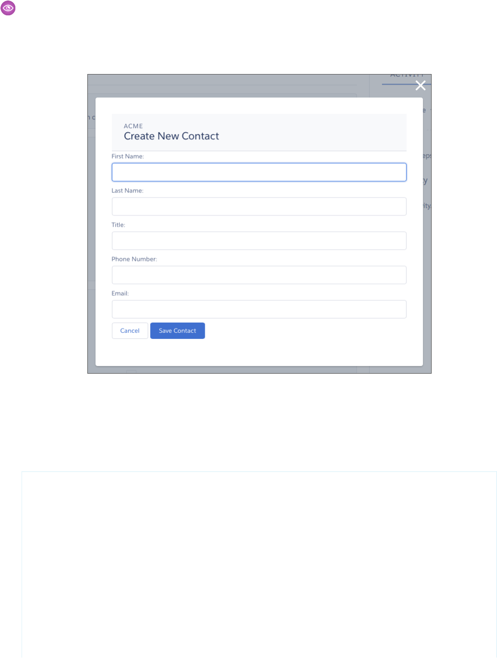
Example: Example of a Component for a Record-Specific Action
This extended example shows a component designed to be invoked as a custom action from the detail page of an account record.
After creating the component, you need to create the custom action on the account object, and then add the action to an account
page layout. When opened using an action, the component appears in an action panel that looks like this:
The component definition begins by implementing both the force:lightningQuickActionWithoutHeader and
the force:hasRecordId interfaces. The first makes it available for use as an action and prevents the standard controls from
displaying. The second adds the interface’s automatic record ID attribute and value assignment behavior, when the component
is invoked in a record context.
quickContact.cmp
<aura:component controller="QuickContactController"
implements="force:lightningQuickActionWithoutHeader,force:hasRecordId">
<aura:attribute name="account" type="Account" />
<aura:attribute name="newContact" type="Contact"
default="{ 'sobjectType': 'Contact' }" /> <!-- default to empty record -->
<aura:attribute name="hasErrors" type="Boolean"
description="Indicate if there were failures when validating the contact." />
<aura:handler name="init" value="{!this}" action="{!c.doInit}" />
<!-- Display a header with details about the account -->
<div class="slds-page-header" role="banner">
<p class="slds-text-heading--label">{!v.account.Name}</p>
103
Configure Components for Record-Specific ActionsUsing Components

<h1 class="slds-page-header__title slds-m-right--small
slds-truncate slds-align-left">Create New Contact</h1>
</div>
<!-- Display form validation errors, if any -->
<aura:if isTrue="{!v.hasErrors}">
<div class="recordSaveError">
<ui:message title="Error" severity="error" closable="true">
The new contact can't be saved because it's not valid.
Please review and correct the errors in the form.
</ui:message>
</div>
</aura:if>
<!-- Display the new contact form -->
<div class="slds-form--stacked">
<div class="slds-form-element">
<label class="slds-form-element__label"
for="contactFirstName">First Name: </label>
<div class="slds-form-element__control">
<ui:inputText class="slds-input" aura:id="contactFirstName"
value="{!v.newContact.FirstName}" required="true"/>
</div>
</div>
<div class="slds-form-element">
<label class="slds-form-element__label"
for="contactLastName">Last Name: </label>
<div class="slds-form-element__control">
<ui:inputText class="slds-input" aura:id="contactLastName"
value="{!v.newContact.LastName}" required="true"/>
</div>
</div>
<div class="slds-form-element">
<label class="slds-form-element__label" for="contactTitle">Title: </label>
<div class="slds-form-element__control">
<ui:inputText class="slds-input" aura:id="contactTitle"
value="{!v.newContact.Title}" />
</div>
</div>
<div class="slds-form-element">
<label class="slds-form-element__label"
for="contactPhone">Phone Number: </label>
<div class="slds-form-element__control">
<ui:inputPhone class="slds-input" aura:id="contactPhone"
value="{!v.newContact.Phone}" required="true"/>
</div>
</div>
<div class="slds-form-element">
<label class="slds-form-element__label" for="contactEmail">Email: </label>
104
Configure Components for Record-Specific ActionsUsing Components

<div class="slds-form-element__control">
<ui:inputEmail class="slds-input" aura:id="contactEmail"
value="{!v.newContact.Email}" />
</div>
</div>
<div class="slds-form-element">
<ui:button label="Cancel" press="{!c.handleCancel}"
class="slds-button slds-button--neutral" />
<ui:button label="Save Contact" press="{!c.handleSaveContact}"
class="slds-button slds-button--brand" />
</div>
</div>
</aura:component>
The component defines three attributes, which are used as member variables.
•account—holds the full account record, after it’s loaded in the init handler
•newContact—an empty contact, used to capture the form field values
•hasErrors—a Boolean flag to indicate whether there are any form validation errors
The rest of the component definition is a standard form using the Lightning Design System for styling.
The component’s controller has all of the interesting code, in three action handlers.
quickContactController.js
({
doInit : function(component, event, helper) {
// Prepare the action to load account record
var action = component.get("c.getAccount");
action.setParams({"accountId": component.get("v.recordId")});
// Configure response handler
action.setCallback(this,function(response) {
var state = response.getState();
if(component.isValid() && state === "SUCCESS") {
component.set("v.account", response.getReturnValue());
}else {
console.log('Problem getting account, response state: ' + state);
}
});
$A.enqueueAction(action);
},
handleSaveContact: function(component, event, helper) {
if(helper.validateContactForm(component)) {
component.set("v.hasErrors", false);
// Prepare the action to create the new contact
var saveContactAction = component.get("c.saveContactWithAccount");
saveContactAction.setParams({
"contact": component.get("v.newContact"),
105
Configure Components for Record-Specific ActionsUsing Components

"accountId": component.get("v.recordId")
});
// Configure the response handler for the action
saveContactAction.setCallback(this,function(response) {
var state = response.getState();
if(component.isValid() && state === "SUCCESS") {
// Prepare a toast UI message
var resultsToast = $A.get("e.force:showToast");
resultsToast.setParams({
"title":"Contact Saved",
"message":"The new contact was created."
});
// Update the UI: close panel, show toast, refresh account page
$A.get("e.force:closeQuickAction").fire();
resultsToast.fire();
$A.get("e.force:refreshView").fire();
}
else if (state === "ERROR") {
console.log('Problem saving contact, response state: ' + state);
}
else {
console.log('Unknown problem, response state: ' + state);
}
});
// Send the request to create the new contact
$A.enqueueAction(saveContactAction);
}
else {
// New contact form failed validation, show a message to review errors
component.set("v.hasErrors", true);
}
},
handleCancel: function(component, event, helper) {
$A.get("e.force:closeQuickAction").fire();
}
})
The first action handler, doInit, is an init handler. Its job is to use the record ID that’s provided via the force:hasRecordId
interface and load the full account record. Note that there’s nothing to stop this component from being used in an action on
another object, like a lead, opportunity, or custom object. In that case, doInit will fail to load a record, but the form will still
display.
The handleSaveContact action handler validates the form by calling a helper function. If the form isn’t valid, the action
handler sets the flag that displays the form error message. If the form is valid, then the action handler:
•Prepares the server action to save the new contact.
•Defines a callback function, called the response handler, for when the server completes the action. The response handler is
discussed in a moment.
•Enqueues the server action.
106
Configure Components for Record-Specific ActionsUsing Components

The server action’s response handler does very little itself. If the server action was successful, the response handler:
•Closes the action panel by firing the force:closeQuickAction event.
•Displays a “toast” message that the contact was created by firing the force:showToast event.
•Updates the record page by firing the force:refreshView event, which tells the record page to update itself.
This last item displays the new record in the list of contacts, once that list updates itself in response to the refresh event.
The handleCancel action handler closes the action panel by firing the force:closeQuickAction event.
The component helper provided here is minimal, sufficient to illustrate its use. You’ll likely have more work to do in any production
quality form validation code.
quickContactHelper.js
({
validateContactForm: function(component) {
var validContact = true;
// First and Last Name are required
var firstNameField = component.find("contactFirstName");
if($A.util.isEmpty(firstNameField.get("v.value"))) {
validContact = false;
firstNameField.set("v.errors", [{message:"First name can't be blank"}]);
}
else {
firstNameField.set("v.errors", null);
}
var lastNameField = component.find("contactLastName");
if($A.util.isEmpty(lastNameField.get("v.value"))) {
validContact = false;
lastNameField.set("v.errors", [{message:"Last name can't be blank"}]);
}
else {
lastNameField.set("v.errors", null);
}
// Verify we have an account to attach it to
var account = component.get("v.account");
if($A.util.isEmpty(account)) {
validContact = false;
console.log("Quick action context doesn't have a valid account.");
}
// TODO: (Maybe) Validate email and phone number
return(validContact);
}
})
Finally, the Apex class used as the server-side controller for this component is deliberately simple to the point of being obvious.
QuickContactController.apxc
public with sharing class QuickContactController {
@AuraEnabled
107
Configure Components for Record-Specific ActionsUsing Components

public static Account getAccount(Id accountId) {
// Perform isAccessible() checks here
return [SELECT Name, BillingCity, BillingState FROM Account WHERE Id =
:accountId];
}
@AuraEnabled
public static Contact saveContactWithAccount(Contact contact, Id accountId) {
// Perform isAccessible() and isUpdateable() checks here
contact.AccountId = accountId;
upsert contact;
return contact;
}
}
One method retrieves an account based on the record ID. The other associates a new contact record with an account, and then
saves it to the database.
SEE ALSO:
Configure Components for Custom Actions
Lightning Component Actions
EDITIONS
Available in: both
Salesforce1 and Lightning
Experience
Available in: Group,
Professional, Enterprise,
Performance, Unlimited,
Contact Manager, and
Developer Editions
Lightning component actions are custom actions that invoke a Lightning component. They support
Apex and JavaScript and provide a secure way to build client-side custom functionality. Lightning
component actions are supported only in Salesforce1 and Lightning Experience.
Note: My Domain must be deployed in your org for Lightning component actions to work
properly.
You can add Lightning component actions to an object’s page layout using the page layout editor.
If you have Lightning component actions in your org, you can find them in the Salesforce1 &
Lightning Actions category in the page layout editor’s palette.
On Lightning Experience record pages, Lightning component actions display in the page-level
action menu in the highlights panel.
Lightning component actions can’t call just any Lightning component in your org. For a component
to work as a Lightning component action, it has to be configured specifically for that purpose and implement either the
force:LightningQuickAction or force:LightningQuickActionWithoutHeader interfaces. You can find out
more about configuring custom components in the Lightning Components Developer Guide.
If you plan on packaging a Lightning component action, the component the action invokes must be marked as access=global.
Get Your Lightning Components Ready to Use on Lightning Pages
Custom Lightning components don’t work on Lightning Pages or in the Lightning App Builder right out of the box. To use a custom
component in either of these places, you must configure the component and its component bundle so that they’re compatible.
108
Lightning Component ActionsUsing Components

IN THIS SECTION:
Configure Components for Lightning Pages and the Lightning App Builder
There are three steps you must take before you can use your custom Lightning components in either Lightning Pages or the Lightning
App Builder.
Lightning Component Bundle Design Resources
Use a design resource to control which attributes are exposed to the Lightning App Builder. A design resource lives in the same
folder as your .cmp resource, and describes the design-time behavior of the Lightning component—information that visual tools
need to allow adding the component to a page or app.
Configure Components for Lightning Experience Record Pages
After your component is set up to work on Lightning Pages and in the Lightning App Builder, use these guidelines to configure the
component so it works on record pages in Lightning Experience.
Create Components for Lightning for Outlook and Lightning for Gmail (Beta)
Create custom Lightning components that are available for drag-and-drop in the Email Application Pane for Lightning for Outlook
and Lightning for Gmail (Beta).
Create Dynamic Picklists for Your Custom Components
You can expose a component property as a picklist when the component is configured in the Lightning App Builder. The picklist’s
values are provided by an Apex class that you create.
Tips and Considerations for Configuring Components for Lightning Pages and the Lightning App Builder
Keep these guidelines in mind when creating components and component bundles for Lightning Pages and the Lightning App
Builder.
Configure Components for Lightning Pages and the Lightning App Builder
There are three steps you must take before you can use your custom Lightning components in either Lightning Pages or the Lightning
App Builder.
1. Deploy My Domain in Your Org
You must deploy My Domain in your org if you want to use Lightning components in Lightning tabs, Lightning Pages, or as standalone
apps.
For more information about My Domain, see the Salesforce Help.
2. Add a New Interface to Your Component
To appear in the Lightning App Builder or a Lightning Page, a component must implement the
flexipage:availableForAllPageTypes interface.
Here’s the sample code for a simple “Hello World” component.
<aura:component implements="flexipage:availableForAllPageTypes" access="global">
<aura:attribute name="greeting" type="String" default="Hello" access="global" />
<aura:attribute name="subject" type="String" default="World" access="global" />
<div style="box">
<span class="greeting">{!v.greeting}</span>, {!v.subject}!
</div>
</aura:component>
109
Configure Components for Lightning Pages and the Lightning
App Builder
Using Components

Note: Mark your resources, such as a component, with access="global" to make the resource usable outside of your own
org. For example, if you want a component to be usable in an installed package or by a Lightning App Builder user or a Community
Builder user in another org.
3. Add a Design Resource to Your Component Bundle
Include a design resource in the component bundle to make your Lightning component usable in Lightning Pages and the Lightning
App Builder. Use a design resource to control which attributes are exposed to the Lightning App Builder. A design resource lives in the
same folder as your .cmp resource, and describes the design-time behavior of the Lightning component—information that visual tools
need to allow adding the component to a page or app.
Here’s the design resource that goes in the bundle with the “Hello World” component.
<design:component label="Hello World">
<design:attribute name="subject" label="Subject" description="Name of the person you
want to greet" />
<design:attribute name="greeting" label="Greeting" />
</design:component>
Design resources must be named componentName.design.
Optional: Add an SVG Resource to Your Component Bundle
You can use an SVG resource to define a custom icon for your component when it appears in the Lightning App Builder’s component
pane. Include it in the component bundle.
Here’s a simple red circle SVG resource to go with the “Hello World” component.
<?xml version="1.0"?>
<!DOCTYPE svg PUBLIC "-//W3C//DTD SVG 1.1//EN"
"http://www.w3.org/Graphics/SVG/1.1/DTD/svg11.dtd">
<svg xmlns="http://www.w3.org/2000/svg"
width="400" height="400">
<circle cx="100" cy="100" r="50" stroke="black"
stroke-width="5" fill="red" />
</svg>
SVG resources must be named componentName.svg.
SEE ALSO:
Component Bundles
Lightning Component Bundle Design Resources
Tips and Considerations for Configuring Components for Lightning Pages and the Lightning App Builder
Lightning Component Bundle Design Resources
Use a design resource to control which attributes are exposed to the Lightning App Builder. A design resource lives in the same folder
as your .cmp resource, and describes the design-time behavior of the Lightning component—information that visual tools need to
allow adding the component to a page or app.
110
Lightning Component Bundle Design ResourcesUsing Components

To make a Lightning component attribute available for administrators to edit in the Lightning App Builder, add a design:attribute
node for the attribute into the design resource. An attribute marked as required in the component definition automatically appears for
users in the Lightning App Builder, unless it has a default value assigned to it. Required attributes with default values and attributes not
marked as required in the component definition must be specified in the design resource or they won’t appear for users.
A design resource supports only attributes of type int, string, or boolean.
What Can You Do with Design Resources?
Render a field as a picklist
To render a field as a picklist with static values, add a datasource onto the attribute in the design resource.
<design:attribute name="Name" datasource="value1,value2,value3" />
Any string attribute with a datasource in a design resource is treated as a picklist.
Set a default value on an attribute
You can set a default value on an attribute in a design resource.
<design:attribute name="Name" datasource="value1,value2,value3" default="value1" />
Restrict a component to one or more objects
Use the <sfdc:object> tag set to specify which objects your component is valid for.
For example, here’s a design resource that goes in a bundle with a “Hello World” component.
<design:component label="Hello World">
<design:attribute name="subject" label="Subject" description="Name of the person
you want to greet" />
<design:attribute name="greeting" label="Greeting" />
</design:component>
Here’s the same design resource restricted to two objects.
<design:component label="Hello World">
<design:attribute name="subject" label="Subject" description="Name of the person
you want to greet" />
<design:attribute name="greeting" label="Greeting" />
<sfdc:objects>
<sfdc:object>Custom__c</sfdc:object>
<sfdc:object>Opportunity</sfdc:object>
</sfdc:objects>
</design:component>
If an object is installed from a package, add the namespace__ string to the beginning of the object name when including it in
the <sfdc:object> tag set. For example: objectNamespace__ObjectApiName__c.
SEE ALSO:
Configure Components for Lightning Pages and the Lightning App Builder
Tips and Considerations for Configuring Components for Lightning Pages and the Lightning App Builder
Configure Components for Lightning Experience Record Pages
After your component is set up to work on Lightning Pages and in the Lightning App Builder, use these guidelines to configure the
component so it works on record pages in Lightning Experience.
111
Configure Components for Lightning Experience Record PagesUsing Components
Record pages are different from app pages in a key way: they have the context of a record. To make your components display content
that is based on the current record, use a combination of an interface and an attribute.
•If your component is available for both record pages and any other type of page, implement
flexipage:availableForAllPageTypes.
•If your component is designed just for record pages, implement the flexipage:availableForRecordHome interface
instead of flexipage:availableForAllPageTypes.
•If your component needs the record ID, also implement the force:hasRecordId interface.
•If your component needs the object’s API name, also implement the force:hasSObjectName interface.
Note: If your managed component implements the flexipage or forceCommunity interfaces, its upload is blocked if
the component and its attributes aren’t set to access="global". For more information on access checks, see Controlling
Access.
force:hasRecordId
Useful for components invoked in a context associated with a specific record, such as record page components or custom object actions.
Add this interface if you want your component to receive the ID of the currently displaying record.
The force:hasRecordId interface does two things to a component that implements it.
•It adds an attribute named recordId to your component. This attribute is of type String, and its value is an 18-character Salesforce
record ID, for example: 001xx000003DGSWAA4. If you added it yourself, the attribute definition would look like this:
<aura:attribute name="recordId" type="String" />
Note: You don’t need to add a recordId attribute to a component yourself if it implements force:hasRecordId.
If you do add it, don’t change the access level or type of the attribute or the component will cause a runtime error.
•When your component is invoked in a record context in Lightning Experience or Salesforce1, the recordId is set to the ID of the
record being viewed.
This behavior is different than you might expect for an interface in a programming language. This difference is because
force:hasRecordId is a marker interface. A marker interface is a signal to the component’s container to add the interface’s behavior
to the component.
Don’t expose the recordId attribute to the Lightning App Builder—don’t put it in the component’s design resource. You don’t want
admins supplying a record ID.
The record ID is set only when you place the component on a record page, or invoke it as an action from a record page. In all other cases,
such as when you create this component programmatically inside another component, the record ID isn’t set, and your component
shouldn’t depend on it.
force:hasSObjectName
Useful for record page components. Implement this interface if your component needs to know the API name of the object of the
currently displaying record.
This interface adds an attribute named sObjectName to your component. This attribute is of type String, and its value is the API
name of an object, such as Account or myNamespace__myObject__c. For example:
<aura:attribute name="sObjectName" type="String" />
112
Configure Components for Lightning Experience Record PagesUsing Components

The sObjectName attribute is populated only when you place the component on a record page. In all other cases, such as when
you create this component programmatically inside another component, sObjectName isn’t populated, and your component
shouldn’t depend on it.
SEE ALSO:
Configure Components for Lightning Pages and the Lightning App Builder
Tips and Considerations for Configuring Components for Lightning Pages and the Lightning App Builder
Working with Salesforce Records
Create Components for Lightning for Outlook and Lightning for Gmail (Beta)
Create custom Lightning components that are available for drag-and-drop in the Email Application Pane for Lightning for Outlook and
Lightning for Gmail (Beta).
To add a component to email application panes in Lightning for Outlook or Lightning for Gmail (Beta), implement the
clients:availableForMailAppAppPage interface.
To allow the component access to email or calendar events, implement the clients:hasItemContext interface.
The clients:hasItemContext interface adds attributes to your component that it can use to implement record- or context-specific
logic. The attributes included are:
•The source attribute, which indicates the email or appointment source. Possible values include email and event.
<aura:attribute name="source" type="String" />
•The people attribute indicates recipients’ email addresses on the current email or appointment.
<aura:attribute name="people" type="Object" />
The shape of the people attribute changes according to the value of the source attribute.
When the source attribute is set to email, the people object contains the following elements.
{
to: [ { name: nameString, email: emailString }, ... ],
cc: [ ... ],
from: [ { name: senderName, email: senderEmail } ],
}
When the source attribute is set to event, the people object contains the following elements.
{
requiredAttendees: [ { name: attendeenameString, email: emailString }, ... ],
optionalAttendees: [ { name: optattendeenameString, email: emailString }, ... ],
organizer: [ { name: organizerName, email: senderEmail } ],
}
•The subject indicates the subject on the current email.
<aura:attribute name="subject" type="String" />
•The messageBody indicates the email message on the current email.
<aura:attribute name="messageBody" type="String" />
113
Create Components for Lightning for Outlook and Lightning
for Gmail (Beta)
Using Components

To provide the component with an event’s date or location, implement the clients:hasEventContext interface.
dates: {
"start": value (String),
"end": value (String),
}
Lightning for Outlook and Lightning for Gmail don’t support the following events:
•force:navigateToList
•force:navigateToRelatedList
•force:navigateToObjectHome
•force:refreshView
Note: To ensure that custom components appear correctly in Lightning for Outlook or Lightning for Gmail, enable them to adjust
to variable widths.
IN THIS SECTION:
Sample Custom Components for Lightning for Outlook and Lightning for Gmail (Beta)
Review samples of custom Lightning components that you can implement in the Email Application Pane for Lightning for Outlook
and Lightning for Gmail.
Sample Custom Components for Lightning for Outlook and Lightning for Gmail (Beta)
Review samples of custom Lightning components that you can implement in the Email Application Pane for Lightning for Outlook and
Lightning for Gmail.
Here’s an example of a custom Lightning Component you can include in your email application pane for Lightning for Outlook or
Lightning for Gmail (Beta). This component leverages the context of the selected email or appointment.
<aura:component implements="clients:availableForMailAppAppPage,clients:hasItemContext">
<!--
Add these handlers to customize what happens when the attributes change
<aura:handler name="change" value="{!v.subject}" action="{!c.handleSubjectChange}" />
<aura:handler name="change" value="{!v.people}" action="{!c.handlePeopleChange}" />
-->
<div id="content">
<h1><b>Email subject</b></h1>
<span id="subject">{!v.subject}</span>
<h1>To:</h1>
<aura:iteration items="{!v.people.to}" var="to">
{!to.name} - {!to.email} <br/>
</aura:iteration>
<h1>From:</h1>
{!v.people.from.name} - {!v.people.from.email}
<h1>CC:</h1>
114
Create Components for Lightning for Outlook and Lightning
for Gmail (Beta)
Using Components

<aura:iteration items="{!v.people.cc}" var="cc">
{!cc.name} - {!cc.email} <br/>
</aura:iteration>
<span class="greeting">New Email Arrived</span>, {!v.subject}!
</div>
</aura:component>
In this example, the custom component displays account and opportunity information based on the email recipients’ email addresses.
The component calls a JavaScript controller function, handlePeopleChange(), on initialization. The JavaScript controller calls
methods on an Apex server-side controller to query the information and compute the accounts ages and opportunities days until closing.
The Apex controller, JavaScript controller, and helper are listed next.
<!--
This component handles the email context on initialization.
It retrieves accounts and opportunities based on the email addresses included
in the email recipients list.
It then calculates the account and opportunity ages based on when the accounts
were created and when the opportunities will close.
-->
<aura:component
implements="clients:availableForMailAppAppPage,clients:hasItemContext"
controller="ComponentController">
<aura:handler name="init" value="{!this}" action="{!c.handlePeopleChange}" />
<aura:attribute name="accounts" type="List" />
<aura:attribute name="opportunities" type="List" />
<aura:iteration items="{!v.accounts}" var="acc">
{!acc.name} => {!acc.age}
</aura:iteration>
<aura:iteration items="{!v.opportunities}" var="opp">
{!opp.name} => {!opp.closesIn} Days till closing
</aura:iteration>
</aura:component>
/*
On the server side, the Apex controller includes
Aura-enabled methods that accept a list of emails as parameters.
*/
public class ComponentController {
/*
This method searches for Contacts with matching emails in the email list,
and includes Account information in the fields. Then, it filters the
information to return a list of objects to use on the client side.
*/
@AuraEnabled
public static List<Map<String, Object>> findAccountAges(List<String> emails) {
List<Map<String, Object>> ret = new List<Map<String, Object>>();
List<Contact> contacts = [SELECT Name, Account.Name, Account.CreatedDate
FROM Contact
115
Create Components for Lightning for Outlook and Lightning
for Gmail (Beta)
Using Components

WHERE Contact.Email IN :emails];
for (Contact c: contacts) {
Map<String, Object> item = new Map<String, Object>();
item.put('name', c.Account.Name);
item.put('age',
Date.valueOf(c.Account.CreatedDate).daysBetween(
System.Date.today()));
ret.add(item);
}
return ret;
}
/*
This method searches for OpportunityContactRoles with matching emails
in the email list.
Then, it calculates the number of days until closing to return a list
of objects to use on the client side.
*/
@AuraEnabled
public static List<Map<String, Object>> findOpportunityCloseDateTime(List<String>
emails) {
List<Map<String, Object>> ret = new List<Map<String, Object>>();
List<OpportunityContactRole> contacts =
[SELECT Opportunity.Name, Opportunity.CloseDate
FROM OpportunityContactRole
WHERE isPrimary=true AND Contact.Email IN :emails];
for (OpportunityContactRole c: contacts) {
Map<String, Object> item = new Map<String, Object>();
item.put('name', c.Opportunity.Name);
item.put('closesIn',
System.Date.today().daysBetween(
Date.valueOf(c.Opportunity.CloseDate)));
ret.add(item);
}
return ret;
}
}
({
/*
This JavaScript controller is called on component initialization and relies
on the helper functionality to build a list of email addresses from the
available people. It then makes a caller to the server to run the actions to
display information.
Once the server returns the values, it sets the appropriate values to display
on the client side.
*/
handlePeopleChange: function(component, event, helper){
var people = component.get("v.people");
var peopleEmails = helper.filterEmails(people);
var action = component.get("c.findOpportunityCloseDateTime");
action.setParam("emails", peopleEmails);
116
Create Components for Lightning for Outlook and Lightning
for Gmail (Beta)
Using Components

action.setCallback(this, function(response){
var state = response.getState();
if(component.isValid() && state === "SUCCESS"){
component.set("v.opportunities", response.getReturnValue());
} else{
component.set("v.opportunities",[]);
}
});
$A.enqueueAction(action);
var action = component.get("c.findAccountAges");
action.setParam("emails", peopleEmails);
action.setCallback(this, function(response){
var state = response.getState();
if(component.isValid() && state === "SUCCESS"){
component.set("v.accounts", response.getReturnValue());
} else{
component.set("v.accounts",[]);
}
});
$A.enqueueAction(action);
}
})
({
/*
This helper function filters emails from objects.
*/
filterEmails : function(people){
return this.getEmailsFromList(people.to).concat(
this.getEmailsFromList(people.cc));
},
getEmailsFromList : function(list){
var ret = [];
for (var i in list) {
ret.push(list[i].email);
}
return ret;
}
})
Create Dynamic Picklists for Your Custom Components
You can expose a component property as a picklist when the component is configured in the Lightning App Builder. The picklist’s values
are provided by an Apex class that you create.
For example, let’s say you’re creating a component for the Home page to display a custom Company Announcement record. You can
use an Apex class to put the titles of all Company Announcement records in a picklist in the component’s properties in the Lightning
App Builder. Then, when admins add the component to a Home page, they can easily select the appropriate announcement to place
on the page.
117
Create Dynamic Picklists for Your Custom ComponentsUsing Components

1. Create a custom Apex class to use as a datasource for the picklist. The Apex class must extend the
VisualEditor.DynamicPickList abstract class.
2. Add an attribute to your design file that specifies your custom Apex class as the datasource.
Here’s a simple example.
Create an Apex Class
global class MyCustomPickList extends VisualEditor.DynamicPickList{
global override VisualEditor.DataRow getDefaultValue(){
VisualEditor.DataRow defaultValue = new VisualEditor.DataRow('red','RED');
return defaultValue;
}
global override VisualEditor.DynamicPickListRows getValues() {
VisualEditor.DataRow value1 = new VisualEditor.DataRow('red','RED');
VisualEditor.DataRow value2 = new VisualEditor.DataRow('yellow','YELLOW');
VisualEditor.DynamicPickListRows myValues = new VisualEditor.DynamicPickListRows();
myValues.addRow(value1);
myValues.addRow(value2);
return myValues;
}
}
Note: Although VisualEditor.DataRow allows you to specify any Object as its value, you can specify a datasource only
for String attributes. The default implementation for isValid() and getLabel() assumes that the object passed in the
parameter is a String for comparison.
For more information on the VisualEditor.DynamicPickList abstract class, see the Apex Developer Guide.
Add the Apex Class to Your Design File
To specify an Apex class as a datasource in an existing component, add the datasource property to the attribute with a value consisting
of the Apex namespace and Apex class name.
<design:component>
<design:attribute name="property1" datasource="apex://MyCustomPickList"/>
</design:component>
Dynamic Picklist Considerations
•Specifying the Apex datasource as public isn’t respected in managed packages. If an Apex class is public and part of a managed
package, it can be used as a datasource for custom components in the subscriber org.
•Profile access on the Apex class isn’t respected when the Apex class is used as a datasource. If an admin’s profile doesn’t have access
to the Apex class but does have access to the custom component, the admin sees values provided by the Apex class on the component
in the Lightning App Builder.
118
Create Dynamic Picklists for Your Custom ComponentsUsing Components

Tips and Considerations for Configuring Components for Lightning Pages
and the Lightning App Builder
Keep these guidelines in mind when creating components and component bundles for Lightning Pages and the Lightning App Builder.
Note: Mark your resources, such as a component, with access="global" to make the resource usable outside of your own
org. For example, if you want a component to be usable in an installed package or by a Lightning App Builder user or a Community
Builder user in another org.
Components
•Set a friendly name for the component using the label attribute in the element in the design file, such as <design:component
label="foo">.
•Design your components to fill 100% of the width (including margins) of the region that they display in.
•Components should provide an appropriate placeholder behavior in declarative tools if they require interaction.
•A component should never display a blank box. Think of how other sites work. For example, Facebook displays an outline of the
feed before the actual feed items come back from the server. This improves the user’s perception of UI responsiveness.
•If the component depends on a fired event, then give it a default state that displays before the event fires.
•Style components in a manner consistent with the styling of Lightning Experience and consistent with the Salesforce Design System.
Attributes
•Use the design file to control which attributes are exposed to the Lightning App Builder.
•Make your attributes easy to use and understandable to an administrator. Don’t expose SOQL queries, JSON objects, or Apex class
names.
•Give your required attributes default values. When a component that has required attributes with no default values is added to the
App Builder, it appears invalid, which is a poor user experience.
•Use basic supported types (string, integer, boolean) for any exposed attributes.
•Specify a min and max attribute for integer attributes in the <design:attribute> element to control the range of accepted
values.
•String attributes can provide a datasource with a set of predefined values allowing the attribute to expose its configuration as a
picklist.
•Give all attributes a label with a friendly display name.
•Provide descriptions to explain the expected data and any guidelines, such as data format or expected range of values. Description
text appears as a tooltip in the Property Editor.
•To delete a design attribute for a component that implements the flexipage:availableForAllPageTypes or
forceCommunity:availableForAllPageTypes interface, first remove the interface from the component before
deleting the design attribute. Then reimplement the interface. If the component is referenced in a Lightning Page, you must remove
the component from the page before you can change it.
119
Tips and Considerations for Configuring Components for
Lightning Pages and the Lightning App Builder
Using Components

Limitations
The Lightning App Builder doesn’t support the Map, Object, or java:// complex types.
SEE ALSO:
Configure Components for Lightning Pages and the Lightning App Builder
Configure Components for Lightning Experience Record Pages
Use Lightning Components in Community Builder
To use a custom Lightning component in Community Builder, you must configure the component and its component bundle so that
they’re compatible.
IN THIS SECTION:
Configure Components for Communities
Make your custom Lightning components available for drag and drop in the Lightning Components pane in Community Builder.
Create Custom Theme Layout Components for Communities
Create a custom theme layout to transform the appearance and overall structure of the pages in the Customer Service (Napili)
template.
Create Custom Search and Profile Menu Components for Communities
Create custom components to replace the Customer Service (Napili) template’s standard Profile Header and Search & Post Publisher
components in Community Builder.
Create Custom Content Layout Components for Communities
Community Builder includes several ready-to-use layouts that define the content regions of your page, such as a two-column layout
with a 2:1 ratio. However, if you need a layout that’s customized for your community, create a custom content layout component
to use when building new pages in Community Builder. You can also update the content layout of the default pages that come with
your community template.
Configure Components for Communities
Make your custom Lightning components available for drag and drop in the Lightning Components pane in Community Builder.
Add a New Interface to Your Component
To appear in Community Builder, a component must implement the forceCommunity:availableForAllPageTypes
interface.
Here’s the sample code for a simple “Hello World” component.
<aura:component implements="forceCommunity:availableForAllPageTypes" access="global">
<aura:attribute name="greeting" type="String" default="Hello" access="global" />
<aura:attribute name="subject" type="String" default="World" access="global" />
<div style="box">
<span class="greeting">{!v.greeting}</span>, {!v.subject}!
</div>
</aura:component>
120
Use Lightning Components in Community BuilderUsing Components
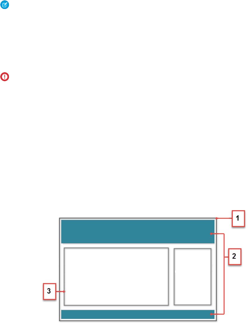
Note: Mark your resources, such as a component, with access="global" to make the resource usable outside of your own
org. For example, if you want a component to be usable in an installed package or by a Lightning App Builder user or a Community
Builder user in another org.
Next, add a design resource to your component bundle. A design resource describes the design-time behavior of a Lightning
component—information that visual tools need to allow adding the component to a page or app. It contains attributes that are available
for administrators to edit in Community Builder.
Adding this resource is similar to adding it for the Lightning App Builder. For more information, see Configure Components for Lightning
Pages and the Lightning App Builder.
Important: When you add custom components to your community, they can bypass the object- and field-level security (FLS)
you set for the guest user profile. Lightning components don’t automatically enforce CRUD and FLS when referencing objects or
retrieving the objects from an Apex controller. This means that the framework continues to display records and fields for which
users don’t have CRUD permissions and FLS visibility. You must manually enforce CRUD and FLS in your Apex controllers.
SEE ALSO:
Component Bundles
Standard Design Tokens for Communities
Create Custom Theme Layout Components for Communities
Create a custom theme layout to transform the appearance and overall structure of the pages in the Customer Service (Napili) template.
A theme layout is the top-level layout for the template pages (1) in your community. It includes the common header and footer (2), and
often includes navigation, search, and the user profile menu. In contrast, the content layout (3) defines the content regions of your pages,
such as a two-column layout.
A theme layout type categorizes the pages in your community that share the same theme layout.
When you create a custom theme layout component in the Developer Console, it appears in Community Builder in the Settings >
Theme area. Here you can assign it to new or existing theme layout types. Then you apply the theme layout type—and thereby the
theme layout—in the page’s properties.
121
Create Custom Theme Layout Components for CommunitiesUsing Components
1. Add an Interface to Your Theme Layout Component
A theme layout component must implement the forceCommunity:themeLayout interface to appear in Community Builder
in the Settings > Theme area.
Explicitly declare {!v.body} in your code to ensure that your theme layout includes the content layout. Add {!v.body} wherever
you want the page’s contents to appear within the theme layout.
You can add components to the regions in your markup or leave regions open for users to drag-and-drop components into. Attributes
declared as Aura.Component[] and included in your markup are rendered as open regions in the theme layout that users can
add components to.
In Customer Service (Napili), the Template Header consists of these locked regions:
•search, which contains the Search Publisher component
•profileMenu, which contains the Profile Header component
•navBar, which contains the Navigation Menu component
To create a custom theme layout that reuses the existing components in the Template Header region, declare search, profileMenu,
or navBar as the attribute name value, as appropriate. For example:
<aura:attribute name="navBar" type="Aura.Component[]" required="false" />
Tip: If you create a custom profile menu or a search component, declaring the attribute name value also lets users select the
custom component when using your theme layout.
Here’s the sample code for a simple theme layout.
<aura:component implements="forceCommunity:themeLayout" access="global" description="Sample
Custom Theme Layout">
<aura:attribute name="search" type="Aura.Component[]" required="false"/>
<aura:attribute name="profileMenu" type="Aura.Component[]" required="false"/>
<aura:attribute name="navBar" type="Aura.Component[]" required="false"/>
<aura:attribute name="newHeader" type="Aura.Component[]" required="false"/>
<div>
<div class="searchRegion">
{!v.search}
</div>
<div class="profileMenuRegion">
{!v.profileMenu}
</div>
<div class="navigation">
{!v.navBar}
</div>
<div class="newHeader">
{!v.newHeader}
</div>
<div class="mainContentArea">
{!v.body}
</div>
</div>
</aura:component>
Note: Mark your resources, such as a component, with access="global" to make the resource usable outside of your own
org. For example, if you want a component to be usable in an installed package or by a Lightning App Builder user or a Community
Builder user in another org.
122
Create Custom Theme Layout Components for CommunitiesUsing Components

2. Add a Design Resource to Include Theme Properties
You can expose theme layout properties in Community Builder by adding a design resource to your bundle.
This example adds two checkboxes to a theme layout called Small Header.
<design:component label="Small Header">
<design:attribute name="blueBackground" label="Blue Background"/>
<design:attribute name="smallLogo" label="Small Logo"/>
</design:component>
The design resource only exposes the properties. You must implement the properties in the component.
<aura:component implements="forceCommunity:themeLayout" access="global" description="Small
Header">
<aura:attribute name="blueBackground" type="Boolean" default="false"/>
<aura:attribute name="smallLogo" type="Boolean" default="false" />
...
Design resources must be named componentName.design.
3. Add a CSS Resource to Avoid Overlapping Issues
Add a CSS resource to your bundle to style the theme layout as needed.
To avoid overlapping issues with positioned elements, such as dialog boxes or hovers:
•Apply CSS styles.
.THIS {
position: relative;
z-index: 1;
}
•Wrap the elements in your custom theme layout in a div tag.
<div class="mainContentArea">
{!v.body}
</div>
Note: For custom theme layouts, SLDS is loaded by default.
CSS resources must be named componentName.css.
SEE ALSO:
Create Custom Search and Profile Menu Components for Communities
forceCommunity:navigationMenuBase
Salesforce Help: Custom Theme Layouts and Theme Layout Types
Create Custom Search and Profile Menu Components for Communities
Create custom components to replace the Customer Service (Napili) template’s standard Profile Header and Search & Post Publisher
components in Community Builder.
123
Create Custom Search and Profile Menu Components for
Communities
Using Components

forceCommunity:profileMenuInterface
Add the forceCommunity:profileMenuInterface interface to a Lightning component to allow it to be used as a custom
profile menu component for the Customer Service (Napili) community template. After you create a custom profile menu component,
admins can select it in Community Builder in Settings > Theme to replace the template’s standard Profile Header component.
Here’s the sample code for a simple profile menu component.
<aura:component implements="forceCommunity:profileMenuInterface" access="global">
<aura:attribute name="options" type="String[]" default="Option 1, Option 2"/>
<ui:menu >
<ui:menuTriggerLink aura:id="trigger" label="Profile Menu"/>
<ui:menuList class="actionMenu" aura:id="actionMenu">
<aura:iteration items="{!v.options}" var="itemLabel">
<ui:actionMenuItem label="{!itemLabel}" click="{!c.handleClick}"/>
</aura:iteration>
</ui:menuList>
</ui:menu>
</aura:component>
forceCommunity:searchInterface
Add the forceCommunity:searchInterface interface to a Lightning component to allow it to be used as a custom search
component for the Customer Service (Napili) community template. After you create a custom search component, admins can select it
in Community Builder in Settings > Theme to replace the template’s standard Search & Post Publisher component.
Here’s the sample code for a simple search component.
<aura:component implements="forceCommunity:searchInterface" access="global">
<div class="search">
<div class="search-wrapper">
<form class="search-form">
<div class="search-input-wrapper">
<input class="search-input" type="text" placeholder="My Search"/>
</div>
<input type="hidden" name="language" value="en" />
</form>
</div>
</div>
</aura:component>
SEE ALSO:
Create Custom Theme Layout Components for Communities
forceCommunity:navigationMenuBase
Salesforce Help: Custom Theme Layouts and Theme Layout Types
Create Custom Content Layout Components for Communities
Community Builder includes several ready-to-use layouts that define the content regions of your page, such as a two-column layout
with a 2:1 ratio. However, if you need a layout that’s customized for your community, create a custom content layout component to use
when building new pages in Community Builder. You can also update the content layout of the default pages that come with your
community template.
124
Create Custom Content Layout Components for CommunitiesUsing Components

When you create a custom content layout component in the Developer Console, it appears in Community Builder in the New Page and
the Change Layout dialog boxes.
1. Add a New Interface to Your Content Layout Component
To appear in the New Page and the Change Layout dialog boxes in Community Builder, a content layout component must implement
the forceCommunity:layout interface.
Here’s the sample code for a simple two-column content layout.
<aura:component implements="forceCommunity:layout" description=”Custom Content Layout”
access="global">
<aura:attribute name="column1" type="Aura.Component[]" required="false"></aura:attribute>
<aura:attribute name="column2" type="Aura.Component[]" required="false"></aura:attribute>
<div class="container">
<div class="contentPanel">
<div class="left">
{!v.column1}
</div>
<div class="right">
{!v.column2}
</div>
</div>
</div>
</aura:component>
Note: Mark your resources, such as a component, with access="global" to make the resource usable outside of your own
org. For example, if you want a component to be usable in an installed package or by a Lightning App Builder user or a Community
Builder user in another org.
2. Add a CSS Resource to Your Component Bundle
Next, add a CSS resource to style the content layout as needed.
Here’s the sample CSS for our simple two-column content layout.
.THIS .contentPanel:before,
.THIS .contentPanel:after {
content: " ";
display: table;
}
.THIS .contentPanel:after {
clear: both;
}
.THIS .left {
float: left;
width: 50%;
}
.THIS .right {
float: right;
125
Create Custom Content Layout Components for CommunitiesUsing Components
width: 50%;
}
CSS resources must be named componentName.css.
3. Optional: Add an SVG Resource to Your Component Bundle
You can include an SVG resource in your component bundle to define a custom icon for the content layout component when it appears
in the Community Builder.
The recommended image size for a content layout component in Community Builder is 170px by 170px. However, if the image has
different dimensions, Community Builder scales the image to fit.
SVG resources must be named componentName.svg.
SEE ALSO:
Component Bundles
Standard Design Tokens for Communities
Add Components to Apps
When you’re ready to add components to your app, you should first look at the out-of-the-box components that come with the framework.
You can also leverage these components by extending them or using composition to add them to custom components that you’re
building.
Note: For all the out-of-the-box components, see the Components folder at
https://<myDomain>.lightning.force.com/auradocs/reference.app, where <myDomain> is the
name of your custom Salesforce domain. The ui namespace includes many components that are common on Web pages.
Components are encapsulated and their internals stay private, while their public shape is visible to consumers of the component. This
strong separation gives component authors freedom to change the internal implementation details and insulates component consumers
from those changes.
The public shape of a component is defined by the attributes that can be set and the events that interact with the component. The
shape is essentially the API for developers to interact with the component. To design a new component, think about the attributes that
you want to expose and the events that the component should initiate or respond to.
Once you have defined the shape of any new components, developers can work on the components in parallel. This is a useful approach
if you have a team working on an app.
To add a new custom component to your app, see Using the Developer Console on page 4.
SEE ALSO:
Component Composition
Using Object-Oriented Development
Component Attributes
Communicating with Events
126
Add Components to AppsUsing Components
Use Lightning Components in Visualforce Pages
Add Lightning components to your Visualforce pages to combine features you’ve built using both solutions. Implement new functionality
using Lightning components and then use it with existing Visualforce pages.
Important: Lightning Components for Visualforce is based on Lightning Out, a powerful and flexible feature that lets you embed
Lightning components into almost any web page. When used with Visualforce, some of the details become simpler. For example,
you don’t need to deal with authentication, and you don’t need to configure a Connected App.
In other ways using Lightning Components for Visualforce is just like using Lightning Out. Refer to the Lightning Out section of
this guide for additional details.
There are three steps to add Lightning components to a Visualforce page.
1. Add the Lightning Components for Visualforce JavaScript library to your Visualforce page using the
<apex:includeLightning/> component.
2. Create and reference a Lightning app that declares your component dependencies.
3. Write a JavaScript function that creates the component on the page using $Lightning.createComponent().
Add the Lightning Components for Visualforce JavaScript Library
Add <apex:includeLightning/> at the beginning of your page. This component loads the JavaScript file used by Lightning
Components for Visualforce.
Create and Reference a Lightning Dependency App
To use Lightning Components for Visualforce, define component dependencies by referencing a Lightning dependency app. This app
is globally accessible and extends ltng:outApp. The app declares dependencies on any Lightning definitions (like components)
that it uses.
Here’s an example of a simple app named lcvfTest.app. The app uses the <aura:dependency> tag to indicate that it uses
the standard Lightning component, ui:button.
<aura:application access="GLOBAL" extends="ltng:outApp">
<aura:dependency resource="ui:button"/>
</aura:application>
Note: Extending from ltng:outApp adds SLDS resources to the page to allow your Lightning components to be styled with
the Salesforce Lightning Design System (SLDS). If you don’t want SLDS resources added to the page, extend from
ltng:outAppUnstyled instead.
To reference this app on your page, use the following JavaScript code, where theNamespace is the namespace prefix for the app.
That is, either your org’s namespace, or the namespace of the managed package that provides the app.
$Lightning.use("theNamespace:lcvfTest", function() {});
If the app is defined in your org (that is, not in a managed package), you can use the default “c” namespace instead, as shown in the
next example. If your org doesn’t have a namespace defined, you must use the default namespace.
For further details about creating a Lightning dependency app, see Lightning Out Dependencies.
127
Use Lightning Components in Visualforce PagesUsing Components
Creating a Component on a Page
Finally, add your top-level component to a page using $Lightning.createComponent(String type, Object
attributes, String locator, function callback). This function is similar to $A.createComponent(), but
includes an additional parameter, domLocator, which specifies the DOM element where you want the component inserted.
Let’s look at a sample Visualforce page that creates a ui:button using the lcvfTest.app from the previous example.
<apex:page>
<apex:includeLightning />
<div id="lightning" />
<script>
$Lightning.use("c:lcvfTest", function() {
$Lightning.createComponent("ui:button",
{ label : "Press Me!" },
"lightning",
function(cmp) {
// do some stuff
});
});
</script>
</apex:page>
This code creates a DOM element with the ID “lightning”, which is then referenced in the $Lightning.createComponent()
method. This method creates a ui:button that says “Press Me!”, and then executes the callback function.
Important: You can call $Lightning.use() multiple times on a page, but all calls must reference the same Lightning
dependency app.
For further details about using $Lightning.use() and $Lightning.createComponent(), see Lightning Out Markup.
SEE ALSO:
Lightning Out Dependencies
Add Lightning Components to Any App with Lightning Out (Beta)
Lightning Out Markup
Share Lightning Out Apps with Non-Authenticated Users
Lightning Out Considerations and Limitations
Add Lightning Components to Any App with Lightning Out (Beta)
Use Lightning Out to run Lightning components apps outside of Salesforce servers. Whether it’s a Node.js app running on Heroku, a
department server inside the firewall, or even SharePoint, build your custom app with Force.com and run it wherever your users are.
Note: This release contains a beta version of Lightning Out, which means it’s a high quality feature with known limitations. You
can provide feedback and suggestions for Lightning Out on the IdeaExchange.
Developing Lightning components that you can deploy anywhere is for the most part the same as developing them to run within
Salesforce. Everything you already know about Lightning components development still applies. The only real difference is in how you
embed your Lightning components app in the remote web container, or origin server.
128
Add Lightning Components to Any App with Lightning Out
(Beta)
Using Components

Lightning Out is added to external apps in the form of a JavaScript library you include in the page on the origin server, and markup you
add to configure and activate your Lightning components app. Once initialized, Lightning Out pulls in your Lightning components app
over a secure connection, spins it up, and inserts it into the DOM of the page it’s running on. Once it reaches this point, your “normal”
Lightning components code takes over and runs the show.
Note: This approach is quite different from embedding an app using an iframe. Lightning components running via Lightning
Out are full citizens on the page. If you choose to, you can enable interaction between your Lightning components app and the
page or app you’ve embedded it in. This interaction is handled using Lightning events.
In addition to some straightforward markup, there’s a modest amount of setup and preparation within Salesforce to enable the secure
connection between Salesforce and the origin server. And, because the origin server is hosting the app, you need to manage authentication
with your own code.
This setup process is similar to what you’d do for an application that connects to Salesforce using the Force.com REST API, and you
should expect it to require an equivalent amount of work.
IN THIS SECTION:
Lightning Out Requirements
Deploying a Lightning components app using Lightning Out has a few modest requirements to ensure connectivity and security.
Lightning Out Dependencies
Create a special Lightning dependency app to describe the component dependencies of a Lightning components app to be deployed
using Lightning Out or Lightning Components for Visualforce.
Lightning Out Markup
Lightning Out requires some simple markup on the page, and is activated using two straightforward JavaScript functions.
Authentication from Lightning Out
Lightning Out doesn’t handle authentication. Instead, you manually provide a Salesforce session ID or authentication token when
you initialize a Lightning Out app.
Share Lightning Out Apps with Non-Authenticated Users
Add the ltng:allowGuestAccess interface to your Lightning Out dependency app to make it available to users without
requiring them to authenticate with Salesforce. This interface lets you build your app with Lightning components, and deploy it
anywhere and to anyone.
Lightning Out Considerations and Limitations
Creating an app using Lightning Out is, for the most part, much like creating any app with Lightning components. However, because
your components are running “outside” of Salesforce, there are a few issues you want to be aware of. And it’s possible there are
changes you might need to make to your components or your app.
SEE ALSO:
Idea Exchange: Lightning Components Anywhere / Everywhere
Lightning Out Requirements
Deploying a Lightning components app using Lightning Out has a few modest requirements to ensure connectivity and security.
The remote web container, or origin server, must support the following.
•Ability to modify the markup served to the client browser, including both HTML and JavaScript. You need to be able to add the
Lightning Out markup.
•Ability to acquire a valid Salesforce session ID. This will most likely require you to configure a Connected App for the origin server.
129
Lightning Out RequirementsUsing Components

•Ability to access your Salesforce instance. For example, if the origin server is behind a firewall, it needs permission to access the
Internet, at least to reach Salesforce.
Your Salesforce org must be configured to allow the following.
•The ability for the origin server to authenticate and connect. This will most likely require you to configure a Connected App for the
origin server.
•The origin server must be added to the Cross-Origin Resource Sharing (CORS) whitelist.
Finally, you create a special Lightning components app that contains dependency information for the Lightning components to be
hosted on the origin server. This app is only used by Lightning Out or Lightning Components for Visualforce.
Lightning Out Dependencies
Create a special Lightning dependency app to describe the component dependencies of a Lightning components app to be deployed
using Lightning Out or Lightning Components for Visualforce.
When a Lightning components app is initialized using Lightning Out, Lightning Out loads the definitions for the components in the app.
To do this efficiently, Lightning Out requires you to specify the component dependencies in advance, so that the definitions can be
loaded once, at startup time.
The mechanism for specifying dependencies is a Lightning dependency app. A dependency app is simply an <aura:application>
with a few attributes, and the dependent components described using the <aura:dependency> tag. A Lightning dependency
app isn’t one you’d ever actually deploy as an app for people to use directly. A Lightning dependency app is used only to specify
the dependencies for Lightning Out. (Or for Lightning Components for Visualforce, which uses Lightning Out under the covers.)
A basic Lightning dependency app looks like the following.
<aura:application access="GLOBAL" extends="ltng:outApp">
<aura:dependency resource="c:myAppComponent"/>
</aura:application>
A Lightning dependency app must do the following.
•Set access control to GLOBAL.
•Extend from either ltng:outApp or ltng:outAppUnstyled.
•List as a dependency every component that is referenced in a call to $Lightning.createComponent().
In this example, <c:myAppComponent> is the top-level component for the Lightning components app you are planning to create
on the origin server using $Lightning.createComponent(). Create a dependency for each different component you add to
the page with $Lightning.createComponent().
Note: Don’t worry about components used within the top-level component. The Lightning Component framework handles
dependency resolution for child components.
Defining a Styling Dependency
You have two options for styling your Lightning Out apps: Salesforce Lightning Design System and unstyled. Lightning Design System
styling is the default, and Lightning Out automatically includes the current version of the Lightning Design System onto the page that’s
using Lightning Out. To omit Lightning Design System resources and take full control of your styles, perhaps to match the styling of the
origin server, set your dependency app to extend from ltng:outAppUnstyled instead of ltng:outApp.
130
Lightning Out DependenciesUsing Components

Usage Notes
A Lightning dependency app isn’t a normal Lightning app, and you shouldn’t treat it like one. Use it only to specify the dependencies
for your Lightning Out app.
In particular, note the following.
•You can’t add a template to a Lightning dependency app.
•Content you add to the body of the Lightning dependency app won’t be rendered.
SEE ALSO:
Create a Connected App
Use CORS to Access Supported Salesforce APIs, Apex REST, and Lightning Out
aura:dependency
Using the Salesforce Lightning Design System in Apps
Lightning Out Markup
Lightning Out requires some simple markup on the page, and is activated using two straightforward JavaScript functions.
The markup and JavaScript functions in the Lightning Out library are the only things specific to Lightning Out. Everything else is the
Lightning components code you already know and love.
Adding the Lightning Out Library to the Page
Enable an origin server for use with Lightning Out by including the Lightning Out JavaScript library in the app or page hosting your
Lightning components app. Including the library requires a single line of markup.
<script src="https://myDomain.my.salesforce.com/lightning/lightning.out.js"></script>
Important: Use your custom domain for the host. Don’t copy-and-paste someone else’s instance from example source code. If
you do this, your app will break whenever there’s a version mismatch between your Salesforce instance and the instance from
which you’re loading the Lightning Out library. This happens at least three times a year, during regular upgrades of Salesforce.
Don’t do it!
Loading and Initializing Your Lightning Components App
Load and initialize the Lightning Component framework and your Lightning components app with the $Lightning.use()
function.
The $Lightning.use() function takes four arguments.
DescriptionTypeName
Required. The name of your Lightning dependency app, including the
namespace. For example, "c:expenseAppDependencies".
stringappName
A function to call once the Lightning Component framework and your app
have fully loaded. The callback receives no arguments.
This callback is usually where you call
$Lightning.createComponent() to add your app to the page
functioncallback
131
Lightning Out MarkupUsing Components
DescriptionTypeName
(see the next section). You might also update your display in other ways, or
otherwise respond to your Lightning components app being ready.
The URL for the Lightning domain on your Salesforce instance. For example,
“https://myDomain.lightning.force.com”.
stringlightningEndPointURI
The session ID or OAuth access token for a valid, active Salesforce session.stringauthToken
Note: You must obtain this token in your own code. Lightning Out
doesn’t handle authentication for you. See Authentication from
Lightning Out.
appName is required. The other three parameters are optional. In normal use you provide all four parameters.
Note: You can’t use more than one Lightning dependency app on a page. You can call $Lightning.use() more than
once, but you must reference the same dependency app in every call.
Adding Your Lightning Components to the Page
Add to and activate your Lightning components on the page with the $Lightning.createComponent() function.
The $Lightning.createComponent() function takes four arguments.
DescriptionTypeName
Required. The name of the Lightning component to add to the page,
including the namespace. For example, "c:newExpenseForm".
stringcomponentName
Required. The attributes to set on the component when it’s created. For
example, { name: theName, amount: theAmount }. If the
component doesn’t require any attributes, pass in an empty object, { }.
Objectattributes
Required. The DOM element or element ID that indicates where on the page
to insert the created component.
Element or stringdomLocator
A function to call once the component is added to and active on the page.
The callback receives the component created as its only argument.
functioncallback
Note: You can add more than one Lightning component to a page. That is, you can call $Lightning.createComponent()
multiple times, with multiple DOM locators, to add components to different parts of the page. Each component created this way
must be specified in the page’s Lightning dependency app.
Behind the scenes $Lightning.createComponent() calls the standard $A.createComponent() function. Except for
the DOM locator, the arguments are the same. And except for wrapping the call in some Lightning Out semantics, the behavior is the
same, too.
SEE ALSO:
Dynamically Creating Components
132
Lightning Out MarkupUsing Components

Authentication from Lightning Out
Lightning Out doesn’t handle authentication. Instead, you manually provide a Salesforce session ID or authentication token when you
initialize a Lightning Out app.
There are two supported ways to obtain an authentication token for use with Lightning Out.
•On a Visualforce page, using Lightning Components for Visualforce, you can obtain the current Visualforce session ID using the
expression {! $Api.Session_ID }. This session is intended for use only on Visualforce pages.
•Elsewhere, an authenticated session is obtained using OAuth, following the same process you’d use to obtain an authenticated
session to use with the Force.com REST API. In this case, you obtain an OAuth token, and can use it anywhere.
The key thing to understand is that Lightning Out isn’t in the business of authentication. The $Lightning.use() function simply
passes along to the security subsystem whatever authentication token you provide it. For most organizations, this will be a session ID
or an OAuth token.
Share Lightning Out Apps with Non-Authenticated Users
Add the ltng:allowGuestAccess interface to your Lightning Out dependency app to make it available to users without requiring
them to authenticate with Salesforce. This interface lets you build your app with Lightning components, and deploy it anywhere and
to anyone.
A Lightning Out dependency app with the ltng:allowGuestAccess interface can be used with Lightning Components for
Visualforce and with Lightning Out.
•Using Lightning Components for Visualforce, you can add your Lightning app to a Visualforce page, and then use that page in
Salesforce Tabs + Visualforce communities. Then you can allow public access to that page.
•Using Lightning Out, you can deploy your Lightning app anywhere Lightning Out is supported—which is almost anywhere!
The ltng:allowGuestAccess interface is only usable in orgs that have Communities enabled, and your Lightning Out app is
associated with all community endpoints that you’ve defined in your org.
Important: When you make a Lightning app accessible to guest users by adding the ltng:allowGuestAccess interface,
it’s available through every community in your org, whether that community is enabled for public access or not. You can’t prevent
it from being accessible via community URLs, and you can’t make it available for some communities but not others.
Warning: Be extremely careful about apps you open for guest access. Apps enabled for guest access bypass the object- and
field-level security (FLS) you set for your community’s guest user profile. Lightning components don’t automatically enforce CRUD
and FLS when you reference objects or retrieve the objects from an Apex controller. This means that the framework continues to
display records and fields for which users don’t have CRUD access and FLS visibility. You must manually enforce CRUD and FLS in
your Apex controllers. A mistake in code used in an app enabled for guest access can open your org’s data to the world.
Lightning Out Lightning Components for Visualforce
Usage
To begin with, add the ltng:allowGuestAccess interface to your Lightning Out dependency app. For example:
<aura:application access="GLOBAL" extends="ltng:outApp"
implements="ltng:allowGuestAccess">
<aura:dependency resource="c:storeLocatorMain"/>
</aura:application>
133
Authentication from Lightning OutUsing Components

Note: You can only add the ltng:allowGuestAccess interface to Lightning apps, not to individual components.
Next, add the Lightning Out JavaScript library to your page.
•With Lightning Components for Visualforce, simply add the <apex:includeLightning /> tag anywhere on your page.
•With Lightning Out, add a <script> tag that references the library directly, using a community endpoint URL. For example:
<script
src="https://yourCommunityDomain/communityURL/lightning/lightning.out.js"></script>
For example, https://universalcontainers.force.com/ourstores/lightning/lightning.out.js
Finally, add the JavaScript code to load and activate your Lightning app. This code is standard Lightning Out, with the important addition
that you must use one of your org’s community URLs for the endpoint. The endpoint URL takes the form
https://yourCommunityDomain/communityURL/. The relevant line is emphasized in the following sample.
<script>
$Lightning.use("c:locatorApp",// name of the Lightning app
function() { // Callback once framework and app loaded
$Lightning.createComponent(
"c:storeLocatorMain",// top-level component of your app
{ }, // attributes to set on the component when created
"lightningLocator",// the DOM location to insert the component
function(cmp) {
// callback when component is created and active on the page
}
);
},
'https://universalcontainers.force.com/ourstores/' // Community endpoint
);
</script>
SEE ALSO:
Salesforce Help: Create Communities
Use Lightning Components in Visualforce Pages
Lightning Out Considerations and Limitations
Creating an app using Lightning Out is, for the most part, much like creating any app with Lightning components. However, because
your components are running “outside” of Salesforce, there are a few issues you want to be aware of. And it’s possible there are changes
you might need to make to your components or your app.
The issues you should be aware of can be divided into two categories.
Considerations for Using Lightning Out
Because Lightning Out apps run outside of any Salesforce container, there are things you need to keep in mind, and possibly address.
The most obvious issue is authentication. There’s no Salesforce container to handle authentication for you, so you have to handle it
yourself. This essential topic is discussed in detail in “Authentication from Lightning Out.”
Another important consideration is more subtle. Many important actions your apps support are accomplished by firing various Lightning
events. But events are sort of like that tree that falls in the forest. If no one’s listening, does it have an effect? In the case of many core
134
Lightning Out Considerations and LimitationsUsing Components

Lightning events, the “listener” is the one.app container. And if one.app isn’t there to handle the events, they indeed have no
effect. Firing those events silently fails.
Standard events are listed in “Event Reference.” Events not supported for use in Lightning Out include the following note:
Note: This event is handled by the one.app container. It’s supported in Lightning Experience and Salesforce1 only.
Limitations During the Lightning Out Beta
While the core Lightning Out functionality is stable and complete, there are a few interactions with other Salesforce features that we’re
still working on.
Chief among these is the standard components built into the Lightning Component framework. At this time, a number of the standard
components don’t behave correctly when used in a stand-alone context, such as Lightning Out, and Lightning Components for Visualforce,
which is based on Lightning Out. This is because the components implicitly depend on resources available in the one.app container,
instead of explicitly defining their dependencies.
Avoid this issue with your components by making their dependencies explicit. Use ltng:require to reference all required JavaScript
and CSS resources that aren’t embedded in the component itself.
If you’re using standard components in your apps, they might not be fully styled, or behave as documented, when they’re used in
Lightning Out or Lightning Components for Visualforce.
SEE ALSO:
Authentication from Lightning Out
System Event Reference
Use Lightning Components in Visualforce Pages
135
Lightning Out Considerations and LimitationsUsing Components
CHAPTER 5 Communicating with Events
The framework uses event-driven programming. You write handlers that respond to interface events as
they occur. The events may or may not have been triggered by user interaction.
In this chapter ...
•Actions and Events In the Lightning Component framework, events are fired from JavaScript controller actions. Events can
contain attributes that can be set before the event is fired and read when the event is handled.
•Handling Events with
Client-Side
Controllers Events are declared by the aura:event tag in a .evt resource, and they can have one of two types:
component or application.
•Component Events
Component Events
A component event is fired from an instance of a component. A component event can be handled
by the component that fired the event or by a component in the containment hierarchy that receives
the event.
•Application Events
•Event Handling
Lifecycle
•Advanced Events
Example Application Events
Application events follow a traditional publish-subscribe model. An application event is fired from
an instance of a component. All components that provide a handler for the event are notified.
•Firing Lightning
Events from
Non-Lightning Code Note: Always try to use a component event instead of an application event, if possible. Component
events can only be handled by components above them in the containment hierarchy so their
•Events Best Practices
•Events Fired During
the Rendering
Lifecycle
usage is more localized to the components that need to know about them. Application events
are best used for something that should be handled at the application level, such as navigating
to a specific record. Application events allow communication between components that are in
separate parts of the application and have no direct containment relationship.
•Events Handled In
Salesforce1 and
Lightning Experience
•System Events
136
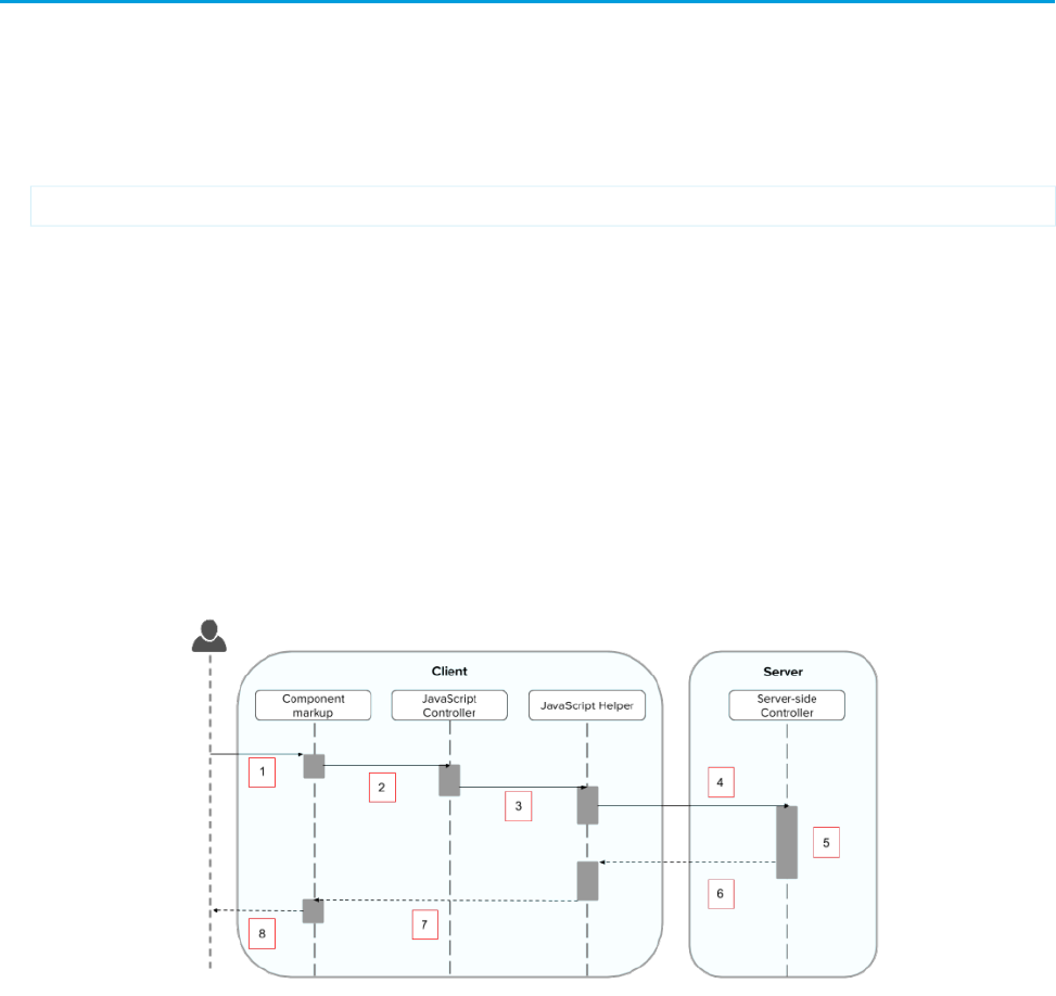
Actions and Events
The framework uses events to communicate data between components. Events are usually triggered by a user action.
Actions
User interaction with an element on a component or app. User actions trigger events, but events aren’t always explicitly triggered
by user actions. This type of action is not the same as a client-side JavaScript controller, which is sometimes known as a controller
action. The following button is wired up to a browser onclick event in response to a button click.
<ui:button label = "Click Me" press = "{!c.handleClick}" />
Clicking the button invokes the handeClick method in the component’s client-side controller.
Events
A notification by the browser regarding an action. Browser events are handled by client-side JavaScript controllers, as shown in the
previous example. A browser event is not the same as a framework component event or application event, which you can create and
fire in a JavaScript controller to communicate data between components. For example, you can wire up the click event of a checkbox
to a client-side controller, which fires a component event to communicate relevant data to a parent component.
Another type of event, known as a system event, is fired automatically by the framework during its lifecycle, such as during component
initialization, change of an attribute value, and rendering. Components can handle a system event by registering the event in the
component markup.
The following diagram describes what happens when a user clicks a button that requires the component to retrieve data from the server.
1. User clicks a button or interacts with a component, triggering a browser event. For example, you want to save data from the server
when the button is clicked.
2. The button click invokes a client-side JavaScript controller, which provides some custom logic before invoking a helper function.
3. The JavaScript controller invokes a helper function. A helper function improves code reuse but it’s optional for this example.
4. The helper function calls an Apex controller method and queues the action.
5. The Apex method is invoked and data is returned.
6. A JavaScript callback function is invoked when the Apex method completes.
7. The JavaScript callback function evaluates logic and updates the component’s UI.
137
Actions and EventsCommunicating with Events

8. User sees the updated component.
SEE ALSO:
Handling Events with Client-Side Controllers
Detecting Data Changes with Change Handlers
Calling a Server-Side Action
Events Fired During the Rendering Lifecycle
Handling Events with Client-Side Controllers
A client-side controller handles events within a component. It’s a JavaScript resource that defines the functions for all of the component's
actions.
Client-side controllers are surrounded by brackets and curly braces to denote a JSON object containing a map of name-value pairs.
({
myAction : function(cmp, event, helper) {
// add code for the action
}
})
Each action function takes in three parameters:
1. cmp—The component to which the controller belongs.
2. event—The event that the action is handling.
3. helper—The component’s helper, which is optional. A helper contains functions that can be reused by any JavaScript code in
the component bundle.
Creating a Client-Side Controller
A client-side controller is part of the component bundle. It is auto-wired via the naming convention,
componentNameController.js.
To create a client-side controller using the Developer Console, click CONTROLLER in the sidebar of the component.
Calling Client-Side Controller Actions
The following example component creates two buttons to contrast an HTML button with a <ui:button>, which is a standard
Lightning component. Clicking on these buttons updates the text component attribute with the specified values.
target.get("v.label") refers to the label attribute value on the button.
Component source
<aura:component>
<aura:attribute name="text" type="String" default="Just a string. Waiting for change."/>
<input type="button" value="Flawed HTML Button"
onclick="alert('this will not work')"/>
<br/>
<ui:button label="Framework Button" press="{!c.handleClick}"/>
138
Handling Events with Client-Side ControllersCommunicating with Events

<br/>
{!v.text}
</aura:component>
If you know some JavaScript, you might be tempted to write something like the first "Flawed" button because you know that HTML tags
are first-class citizens in the framework. However, the "Flawed" button won't work because arbitrary JavaScript, such as the alert()
call, in the component is ignored.
The framework has its own event system. DOM events are mapped to Lightning events, since HTML tags are mapped to Lightning
components.
Any browser DOM element event starting with on, such as onclick or onkeypress, can be wired to a controller action. You can
only wire browser events to controller actions.
The "Framework" button wires the press attribute in the <ui:button> component to the handleClick action in the controller.
Client-side controller source
({
handleClick : function(cmp, event) {
var attributeValue = cmp.get("v.text");
console.log("current text: " + attributeValue);
var target = event.getSource();
cmp.set("v.text", target.get("v.label"));
}
})
The handleClick action uses event.getSource() to get the source component that fired this component event. In this
case, the source component is the <ui:button> in the markup.
The code then sets the value of the text component attribute to the value of the button’s label attribute. The text component
attribute is defined in the <aura:attribute> tag in the markup.
Handling Framework Events
Handle framework events using actions in client-side component controllers. Framework events for common mouse and keyboard
interactions are available with out-of-the-box components.
Tip: Use unique names for client-side and server-side actions in a component. A JavaScript function (client-side action) with the
same name as a server-side action (Apex method) can lead to hard-to-debug issues.
Accessing Component Attributes
In the handleClick function, notice that the first argument to every action is the component to which the controller belongs. One
of the most common things you'll want to do with this component is look at and change its attribute values.
cmp.get("v.attributeName") returns the value of the attributeName attribute.
cmp.set("v.attributeName", "attribute value") sets the value of the attributeName attribute.
139
Handling Events with Client-Side ControllersCommunicating with Events

Invoking Another Action in the Controller
To call an action method from another method, put the common code in a helper function and invoke it using
helper.someFunction(cmp).
SEE ALSO:
Sharing JavaScript Code in a Component Bundle
Event Handling Lifecycle
Creating Server-Side Logic with Controllers
Component Events
A component event is fired from an instance of a component. A component event can be handled by the component that fired the
event or by a component in the containment hierarchy that receives the event.
IN THIS SECTION:
Component Event Propagation
The framework supports capture and bubble phases for the propagation of component events. These phases are similar to DOM
handling patterns and provide an opportunity for interested components to interact with an event and potentially control the
behavior for subsequent handlers.
Create Custom Component Events
Create a custom component event using the <aura:event> tag in a .evt resource. Events can contain attributes that can
be set before the event is fired and read when the event is handled.
Fire Component Events
Fire a component event to communicate data to another component. A component event can be handled by the component that
fired the event or by a component in the containment hierarchy that receives the event.
Handling Component Events
A component event can be handled by the component that fired the event or by a component in the containment hierarchy that
receives the event.
SEE ALSO:
aura:method
Application Events
Handling Events with Client-Side Controllers
Advanced Events Example
What is Inherited?
Component Event Propagation
The framework supports capture and bubble phases for the propagation of component events. These phases are similar to DOM handling
patterns and provide an opportunity for interested components to interact with an event and potentially control the behavior for
subsequent handlers.
140
Component EventsCommunicating with Events

The component that fires an event is known as the source component. The framework allows you to handle the event in different phases.
These phases give you flexibility for how to best process the event for your application.
The phases are:
Capture
The event is captured and trickles down from the application root to the source component. The event can be handled by a component
in the containment hierarchy that receives the captured event.
Event handlers are invoked in order from the application root down to the source component that fired the event.
Any registered handler in this phase can stop the event from propagating, at which point no more handlers are called in this phase
or the bubble phase.
Bubble
The component that fired the event can handle it. The event then bubbles up from the source component to the application root.
The event can be handled by a component in the containment hierarchy that receives the bubbled event.
Event handlers are invoked in order from the source component that fired the event up to the application root.
Any registered handler in this phase can stop the event from propagating, at which point no more handlers are called in this phase.
Here’s the sequence of component event propagation.
1. Event fired—A component event is fired.
2. Capture phase—The framework executes the capture phase from the application root to the source component until all components
are traversed. Any handling event can stop propagation by calling stopPropagation() on the event.
3. Bubble phase—The framework executes the bubble phase from the source component to the application root until all components
are traversed or stopPropagation() is called.
Note: Application events have a separate default phase. There’s no separate default phase for component events. The default
phase is the bubble phase.
Create Custom Component Events
Create a custom component event using the <aura:event> tag in a .evt resource. Events can contain attributes that can be set
before the event is fired and read when the event is handled.
Use type="COMPONENT" in the <aura:event> tag for a component event. For example, this c:compEvent component
event has one attribute with a name of message.
<!--c:compEvent-->
<aura:event type="COMPONENT">
<!-- Add aura:attribute tags to define event shape.
One sample attribute here. -->
<aura:attribute name="message" type="String"/>
</aura:event>
The component that fires an event can set the event’s data. To set the attribute values, call event.setParam() or
event.setParams(). A parameter name set in the event must match the name attribute of an <aura:attribute> in the
event. For example, if you fire c:compEvent, you could use:
event.setParam("message","event message here");
The component that handles an event can retrieve the event data. To retrieve the attribute value in this event, call
event.getParam("message") in the handler’s client-side controller.
141
Create Custom Component EventsCommunicating with Events

Fire Component Events
Fire a component event to communicate data to another component. A component event can be handled by the component that fired
the event or by a component in the containment hierarchy that receives the event.
Register an Event
A component registers that it may fire an event by using <aura:registerEvent> in its markup. For example:
<aura:registerEvent name="sampleComponentEvent" type="c:compEvent"/>
We’ll see how the value of the name attribute is used for firing and handling events.
Fire an Event
To get a reference to a component event in JavaScript, use getEvent("evtName") where evtName matches the name
attribute in <aura:registerEvent>.
Use fire() to fire the event from an instance of a component. For example, in an action function in a client-side controller:
var compEvent = cmp.getEvent("sampleComponentEvent");
// Optional: set some data for the event (also known as event shape)
// A parameter’s name must match the name attribute
// of one of the event’s <aura:attribute> tags
// compEvent.setParams({"myParam" : myValue });
compEvent.fire();
Handling Component Events
A component event can be handled by the component that fired the event or by a component in the containment hierarchy that receives
the event.
Use <aura:handler> in the markup of the handler component. For example:
<aura:handler name="sampleComponentEvent" event="c:compEvent"
action="{!c.handleComponentEvent}"/>
The name attribute in <aura:handler> must match the name attribute in the <aura:registerEvent> tag in the
component that fires the event.
The action attribute of <aura:handler> sets the client-side controller action to handle the event.
The event attribute specifies the event being handled. The format is namespace:eventName.
In this example, when the event is fired, the handleComponentEvent client-side controller action is called.
Event Handling Phases
Component event handlers are associated with the bubble phase by default. To add a handler for the capture phase instead, use the
phase attribute.
<aura:handler name="sampleComponentEvent" event="ns:eventName"
action="{!c.handleComponentEvent}" phase="capture" />
142
Fire Component EventsCommunicating with Events

Get the Source of an Event
In the client-side controller action for an <aura:handler> tag, use evt.getSource() to find out which component fired the
event, where evt is a reference to the event. To retrieve the source element, use evt.getSource().getElement().
IN THIS SECTION:
Component Handling Its Own Event
A component can handle its own event by using the <aura:handler> tag in its markup.
Handling Bubbled or Captured Component Events
Event propagation rules determine which components in the containment hierarchy can handle events by default in the bubble or
capture phases. Learn about the rules and how to handle events in the bubble or capture phases.
Handling Component Events Dynamically
A component can have its handler bound dynamically via JavaScript. This is useful if a component is created in JavaScript on the
client-side.
SEE ALSO:
Component Event Propagation
Component Handling Its Own Event
A component can handle its own event by using the <aura:handler> tag in its markup.
The action attribute of <aura:handler> sets the client-side controller action to handle the event. For example:
<aura:registerEvent name="sampleComponentEvent" type="c:compEvent"/>
<aura:handler name="sampleComponentEvent" event="c:compEvent"
action="{!c.handleSampleEvent}"/>
Note: The name attributes in <aura:registerEvent> and <aura:handler> must match, since each event is
defined by its name.
Handling Bubbled or Captured Component Events
Event propagation rules determine which components in the containment hierarchy can handle events by default in the bubble or
capture phases. Learn about the rules and how to handle events in the bubble or capture phases.
The framework supports capture and bubble phases for the propagation of component events. These phases are similar to DOM handling
patterns and provide an opportunity for interested components to interact with an event and potentially control the behavior for
subsequent handlers. The capture phase executes before the bubble phase.
Default Event Propagation Rules
By default, every parent in the containment hierarchy can’t handle an event during the capture and bubble phases. Instead, the event
propagates to every owner in the containment hierarchy.
A component’s owner is the component that is responsible for its creation. For declaratively created components, the owner is the
outermost component containing the markup that references the component firing the event. For programmatically created components,
the owner component is the component that invoked $A.createComponent to create it.
143
Handling Component EventsCommunicating with Events

The same rules apply for the capture phase, although the direction of event propagation (down) is the opposite of the bubble phase
(up).
Confused? It makes more sense when you look at an example in the bubbling phase.
c:owner contains c:container, which in turn contains c:eventSource.
<!--c:owner-->
<aura:component>
<c:container>
<c:eventSource />
</c:container>
</aura:component>
If c:eventSource fires an event, it can handle the event itself. The event then bubbles up the containment hierarchy.
c:container contains c:eventSource but it’s not the owner because it’s not the outermost component in the markup, so it
can’t handle the bubbled event.
c:owner is the owner because c:container is in its markup. c:owner can handle the event.
Propagation to All Container Components
The default behavior doesn’t allow an event to be handled by every parent in the containment hierarchy. Some components contain
other components but aren’t the owner of those components. These components are known as container components. In the example,
c:container is a container component because it’s not the owner for c:eventSource. By default, c:container can’t
handle events fired by c:eventSource.
A container component has a facet attribute whose type is Aura.Component[], such as the default body attribute. The container
component includes those components in its definition using an expression, such as {!v.body}. The container component isn’t the
owner of the components rendered with that expression.
To allow a container component to handle the event, add includeFacets="true" to the <aura:handler> tag of the
container component. For example, adding includeFacets="true" to the handler in the container component, c:container,
enables it to handle the component event bubbled from c:eventSource.
<aura:handler name="bubblingEvent" event="c:compEvent" action="{!c.handleBubbling}"
includeFacets="true" />
Handle Bubbled Event
A component that fires a component event registers that it fires the event by using the <aura:registerEvent> tag.
<aura:component>
<aura:registerEvent name="compEvent" type="c:compEvent" />
</aura:component>
A component handling the event in the bubble phase uses the <aura:handler> tag to assign a handling action in its client-side
controller.
<aura:component>
<aura:handler name="compEvent" event="c:compEvent" action="{!c.handleBubbling}"/>
</aura:component>
Note: The name attribute in <aura:handler> must match the name attribute in the <aura:registerEvent> tag
in the component that fires the event.
144
Handling Component EventsCommunicating with Events
Handle Captured Event
A component handling the event in the capture phase uses the <aura:handler> tag to assign a handling action in its client-side
controller.
<aura:component>
<aura:handler name="compEvent" event="c:compEvent" action="{!c.handleCapture}"
phase="capture" />
</aura:component>
The default handling phase for component events is bubble if no phase attribute is set.
Stop Event Propagation
Use the stopPropagation() method in the Event object to stop the event propagating to other components.
Pausing Event Propagation for Asynchronous Code Execution
Use event.pause() to pause event handling and propagation until event.resume() is called. This flow-control mechanism
is useful for any decision that depends on the response from the execution of asynchronous code. For example, you might make a
decision about event propagation based on the response from an asynchronous call to native mobile code.
You can call pause() or resume() in the capture or bubble phases.
Event Bubbling Example
Let’s look at an example so you can play around with it yourself.
<!--c:eventBubblingParent-->
<aura:component>
<c:eventBubblingChild>
<c:eventBubblingGrandchild />
</c:eventBubblingChild>
</aura:component>
Note: This sample code uses the default c namespace. If your org has a namespace, use that namespace instead.
First, we define a simple component event.
<!--c:compEvent-->
<aura:event type="COMPONENT">
<!--simple event with no attributes-->
</aura:event>
c:eventBubblingEmitter is the component that fires c:compEvent.
<!--c:eventBubblingEmitter-->
<aura:component>
<aura:registerEvent name="bubblingEvent" type="c:compEvent" />
<ui:button press="{!c.fireEvent}" label="Start Bubbling"/>
</aura:component>
145
Handling Component EventsCommunicating with Events

Here’s the controller for c:eventBubblingEmitter. When you press the button, it fires the bubblingEvent event registered
in the markup.
/*eventBubblingEmitterController.js*/
{
fireEvent : function(cmp) {
var cmpEvent = cmp.getEvent("bubblingEvent");
cmpEvent.fire();
}
}
c:eventBubblingGrandchild contains c:eventBubblingEmitter and uses <aura:handler> to assign a handler
for the event.
<!--c:eventBubblingGrandchild-->
<aura:component>
<aura:handler name="bubblingEvent" event="c:compEvent" action="{!c.handleBubbling}"/>
<div class="grandchild">
<c:eventBubblingEmitter />
</div>
</aura:component>
Here’s the controller for c:eventBubblingGrandchild.
/*eventBubblingGrandchildController.js*/
{
handleBubbling : function(component, event) {
console.log("Grandchild handler for " + event.getName());
}
}
The controller logs the event name when the handler is called.
Here’s the markup for c:eventBubblingChild. We will pass c:eventBubblingGrandchild in as the body of
c:eventBubblingChild when we create c:eventBubblingParent later in this example.
<!--c:eventBubblingChild-->
<aura:component>
<aura:handler name="bubblingEvent" event="c:compEvent" action="{!c.handleBubbling}"/>
<div class="child">
{!v.body}
</div>
</aura:component>
Here’s the controller for c:eventBubblingChild.
/*eventBubblingChildController.js*/
{
handleBubbling : function(component, event) {
console.log("Child handler for " + event.getName());
}
}
146
Handling Component EventsCommunicating with Events

c:eventBubblingParent contains c:eventBubblingChild, which in turn contains c:eventBubblingGrandchild.
<!--c:eventBubblingParent-->
<aura:component>
<aura:handler name="bubblingEvent" event="c:compEvent" action="{!c.handleBubbling}"/>
<div class="parent">
<c:eventBubblingChild>
<c:eventBubblingGrandchild />
</c:eventBubblingChild>
</div>
</aura:component>
Here’s the controller for c:eventBubblingParent.
/*eventBubblingParentController.js*/
{
handleBubbling : function(component, event) {
console.log("Parent handler for " + event.getName());
}
}
Now, let’s see what happens when you run the code.
1. In your browser, navigate to c:eventBubblingParent. Create a .app resource that contains
<c:eventBubblingParent />.
2. Click the Start Bubbling button that is part of the markup in c:eventBubblingEmitter.
3. Note the output in your browser’s console:
Grandchild handler for bubblingEvent
Parent handler for bubblingEvent
The c:compEvent event is bubbled to c:eventBubblingGrandchild and c:eventBubblingParent as they are
owners in the containment hierarchy. The event is not handled by c:eventBubblingChild as c:eventBubblingChild
is in the markup for c:eventBubblingParent but it’s not an owner as it’s not the outermost component in that markup.
Now, let’s see how to stop event propagation. Edit the controller for c:eventBubblingGrandchild to stop propagation.
/*eventBubblingGrandchildController.js*/
{
handleBubbling : function(component, event) {
console.log("Grandchild handler for " + event.getName());
event.stopPropagation();
}
}
Now, navigate to c:eventBubblingParent and click the Start Bubbling button.
Note the output in your browser’s console:
Grandchild handler for bubblingEvent
147
Handling Component EventsCommunicating with Events

The event no longer bubbles up to the c:eventBubblingParent component.
SEE ALSO:
Component Event Propagation
Handling Component Events Dynamically
A component can have its handler bound dynamically via JavaScript. This is useful if a component is created in JavaScript on the client-side.
For more information, see Dynamically Adding Event Handlers on page 243.
Component Event Example
Here’s a simple use case of using a component event to update an attribute in another component.
1. A user clicks a button in the notifier component, ceNotifier.cmp.
2. The client-side controller for ceNotifier.cmp sets a message in a component event and fires the event.
3. The handler component, ceHandler.cmp, contains the notifier component, and handles the fired event.
4. The client-side controller for ceHandler.cmp sets an attribute in ceHandler.cmp based on the data sent in the event.
Note: The event and components in this example use the default c namespace. If your org has a namespace, use that namespace
instead.
Component Event
The ceEvent.evt component event has one attribute. We’ll use this attribute to pass some data in the event when it’s fired.
<!--c:ceEvent-->
<aura:event type="COMPONENT">
<aura:attribute name="message" type="String"/>
</aura:event>
Notifier Component
The c:ceNotifier component uses aura:registerEvent to declare that it may fire the component event.
The button in the component contains a press browser event that is wired to the fireComponentEvent action in the client-side
controller. The action is invoked when you click the button.
<!--c:ceNotifier-->
<aura:component>
<aura:registerEvent name="cmpEvent" type="c:ceEvent"/>
<h1>Simple Component Event Sample</h1>
<p><ui:button
label="Click here to fire a component event"
press="{!c.fireComponentEvent}" />
</p>
</aura:component>
148
Component Event ExampleCommunicating with Events

The client-side controller gets an instance of the event by calling cmp.getEvent("cmpEvent"), where cmpEvent matches
the value of the name attribute in the <aura:registerEvent> tag in the component markup. The controller sets the message
attribute of the event and fires the event.
/* ceNotifierController.js */
{
fireComponentEvent : function(cmp, event) {
// Get the component event by using the
// name value from aura:registerEvent
var cmpEvent = cmp.getEvent("cmpEvent");
cmpEvent.setParams({
"message" :"A component event fired me. " +
"It all happened so fast. Now, I'm here!" });
cmpEvent.fire();
}
}
Handler Component
The c:ceHandler handler component contains the c:ceNotifier component. The <aura:handler> tag uses the same
value of the name attribute, cmpEvent, from the <aura:registerEvent> tag in c:ceNotifier. This wires up
c:ceHandler to handle the event bubbled up from c:ceNotifier.
When the event is fired, the handleComponentEvent action in the client-side controller of the handler component is invoked.
<!--c:ceHandler-->
<aura:component>
<aura:attribute name="messageFromEvent" type="String"/>
<aura:attribute name="numEvents" type="Integer" default="0"/>
<!-- Note that name="cmpEvent" in aura:registerEvent
in ceNotifier.cmp -->
<aura:handler name="cmpEvent" event="c:ceEvent" action="{!c.handleComponentEvent}"/>
<!-- handler contains the notifier component -->
<c:ceNotifier />
<p>{!v.messageFromEvent}</p>
<p>Number of events: {!v.numEvents}</p>
</aura:component>
The controller retrieves the data sent in the event and uses it to update the messageFromEvent attribute in the handler component.
/* ceHandlerController.js */
{
handleComponentEvent : function(cmp, event) {
var message = event.getParam("message");
// set the handler attributes based on event data
cmp.set("v.messageFromEvent", message);
var numEventsHandled = parseInt(cmp.get("v.numEvents")) + 1;
cmp.set("v.numEvents", numEventsHandled);
}
}
149
Component Event ExampleCommunicating with Events

Put It All Together
Add the c:ceHandler component to a c:ceHandlerApp application. Navigate to the application and click the button to fire
the component event.
https://<myDomain>.lightning.force.com/c/ceHandlerApp.app, where <myDomain> is the name of your
custom Salesforce domain.
If you want to access data on the server, you could extend this example to call a server-side controller from the handler’s client-side
controller.
SEE ALSO:
Component Events
Creating Server-Side Logic with Controllers
Application Event Example
Application Events
Application events follow a traditional publish-subscribe model. An application event is fired from an instance of a component. All
components that provide a handler for the event are notified.
IN THIS SECTION:
Application Event Propagation
The framework supports capture, bubble, and default phases for the propagation of application events. The capture and bubble
phases are similar to DOM handling patterns and provide an opportunity for interested components to interact with an event and
potentially control the behavior for subsequent handlers. The default phase preserves the framework’s original handling behavior.
Create Custom Application Events
Create a custom application event using the <aura:event> tag in a .evt resource. Events can contain attributes that can be
set before the event is fired and read when the event is handled.
Fire Application Events
Application events follow a traditional publish-subscribe model. An application event is fired from an instance of a component. All
components that provide a handler for the event are notified.
150
Application EventsCommunicating with Events
Handling Application Events
Use <aura:handler> in the markup of the handler component.
SEE ALSO:
Component Events
Handling Events with Client-Side Controllers
Application Event Propagation
Advanced Events Example
Application Event Propagation
The framework supports capture, bubble, and default phases for the propagation of application events. The capture and bubble phases
are similar to DOM handling patterns and provide an opportunity for interested components to interact with an event and potentially
control the behavior for subsequent handlers. The default phase preserves the framework’s original handling behavior.
The component that fires an event is known as the source component. The framework allows you to handle the event in different phases.
These phases give you flexibility for how to best process the event for your application.
The phases are:
Capture
The event is captured and trickles down from the application root to the source component. The event can be handled by a component
in the containment hierarchy that receives the captured event.
Event handlers are invoked in order from the application root down to the source component that fired the event.
Any registered handler in this phase can stop the event from propagating, at which point no more handlers are called in this phase
or the bubble phase. If a component stops the event propagation using event.stopPropagation(), the component
becomes the root node used in the default phase.
Any registered handler in this phase can cancel the default behavior of the event by calling event.preventDefault(). This
call prevents execution of any of the handlers in the default phase.
Bubble
The component that fired the event can handle it. The event then bubbles up from the source component to the application root.
The event can be handled by a component in the containment hierarchy that receives the bubbled event.
Event handlers are invoked in order from the source component that fired the event up to the application root.
Any registered handler in this phase can stop the event from propagating, at which point no more handlers will be called in this
phase. If a component stops the event propagation using event.stopPropagation(), the component becomes the root
node used in the default phase.
Any registered handler in this phase can cancel the default behavior of the event by calling event.preventDefault(). This
call prevents execution of any of the handlers in the default phase.
Default
Event handlers are invoked in a non-deterministic order from the root node through its subtree. The default phase doesn’t have the
same propagation rules related to component hierarchy as the capture and bubble phases. The default phase can be useful for
handling application events that affect components in different sub-trees of your app.
If the event’s propagation wasn’t stopped in a previous phase, the root node defaults to the application root. If the event’s propagation
was stopped in a previous phase, the root node is set to the component whose handler invoked event.stopPropagation().
Here is the sequence of application event propagation.
1. Event fired—An application event is fired. The component that fires the event is known as the source component.
151
Application Event PropagationCommunicating with Events

2. Capture phase—The framework executes the capture phase from the application root to the source component until all components
are traversed. Any handling event can stop propagation by calling stopPropagation() on the event.
3. Bubble phase—The framework executes the bubble phase from the source component to the application root until all components
are traversed or stopPropagation() is called.
4. Default phase—The framework executes the default phase from the root node unless preventDefault() was called in the
capture or bubble phases. If the event’s propagation wasn’t stopped in a previous phase, the root node defaults to the application
root. If the event’s propagation was stopped in a previous phase, the root node is set to the component whose handler invoked
event.stopPropagation().
Create Custom Application Events
Create a custom application event using the <aura:event> tag in a .evt resource. Events can contain attributes that can be set
before the event is fired and read when the event is handled.
Use type="APPLICATION" in the <aura:event> tag for an application event. For example, this c:appEvent application
event has one attribute with a name of message.
<!--c:appEvent-->
<aura:event type="APPLICATION">
<!-- Add aura:attribute tags to define event shape.
One sample attribute here. -->
<aura:attribute name="message" type="String"/>
</aura:event>
The component that fires an event can set the event’s data. To set the attribute values, call event.setParam() or
event.setParams(). A parameter name set in the event must match the name attribute of an <aura:attribute> in the
event. For example, if you fire c:appEvent, you could use:
event.setParam("message","event message here");
The component that handles an event can retrieve the event data. To retrieve the attribute in this event, call
event.getParam("message") in the handler’s client-side controller.
Fire Application Events
Application events follow a traditional publish-subscribe model. An application event is fired from an instance of a component. All
components that provide a handler for the event are notified.
Register an Event
A component registers that it may fire an application event by using <aura:registerEvent> in its markup. The name attribute
is required but not used for application events. The name attribute is only relevant for component events. This example uses
name="appEvent" but the value isn’t used anywhere.
<aura:registerEvent name="appEvent" type="c:appEvent"/>
152
Create Custom Application EventsCommunicating with Events

Fire an Event
Use $A.get("e.myNamespace:myAppEvent") in JavaScript to get an instance of the myAppEvent event in the
myNamespace namespace. Use fire() to fire the event.
var appEvent = $A.get("e.c:appEvent");
// Optional: set some data for the event (also known as event shape)
// A parameter’s name must match the name attribute
// of one of the event’s <aura:attribute> tags
//appEvent.setParams({ "myParam" : myValue });
appEvent.fire();
Events Fired on App Rendering
Several events are fired when an app is rendering. All init events are fired to indicate the component or app has been initialized. If a
component is contained in another component or app, the inner component is initialized first.
If a server call is made during rendering, aura:waiting is fired. When the framework receives a server response,
aura:doneWaiting is fired.
Finally, aura:doneRendering is fired when all rendering has been completed.
Note: We don't recommend using the legacy aura:waiting, aura:doneWaiting, and aura:doneRendering
application events except as a last resort. The aura:waiting and aura:doneWaiting application events are fired for
every batched server request, even for requests from other components in your app. Unless your component is running in complete
isolation in a standalone app and not included in Lightning Experience or Salesforce1, you probably don’t want to handle these
application events. The container app may fire server-side actions and trigger your event handlers multiple times.
For more information, see Events Fired During the Rendering Lifecycle on page 165.
Handling Application Events
Use <aura:handler> in the markup of the handler component.
For example:
<aura:handler event="c:appEvent" action="{!c.handleApplicationEvent}"/>
The event attribute specifies the event being handled. The format is namespace:eventName.
The action attribute of <aura:handler> sets the client-side controller action to handle the event.
In this example, when the event is fired, the handleApplicationEvent client-side controller action is called.
Event Handling Phases
The framework allows you to handle the event in different phases. These phases give you flexibility for how to best process the event
for your application.
Application event handlers are associated with the default phase. To add a handler for the capture or bubble phases instead, use the
phase attribute.
153
Handling Application EventsCommunicating with Events

Get the Source of an Event
In the client-side controller action for an <aura:handler> tag, use evt.getSource() to find out which component fired the
event, where evt is a reference to the event. To retrieve the source element, use evt.getSource().getElement().
IN THIS SECTION:
Handling Bubbled or Captured Application Events
Event propagation rules determine which components in the containment hierarchy can handle events by default in the bubble or
capture phases. Learn about the rules and how to handle events in the bubble or capture phases.
Handling Bubbled or Captured Application Events
Event propagation rules determine which components in the containment hierarchy can handle events by default in the bubble or
capture phases. Learn about the rules and how to handle events in the bubble or capture phases.
The framework supports capture, bubble, and default phases for the propagation of application events. The capture and bubble phases
are similar to DOM handling patterns and provide an opportunity for interested components to interact with an event and potentially
control the behavior for subsequent handlers. The default phase preserves the framework’s original handling behavior.
Default Event Propagation Rules
By default, every parent in the containment hierarchy can’t handle an event during the capture and bubble phases. Instead, the event
propagates to every owner in the containment hierarchy.
A component’s owner is the component that is responsible for its creation. For declaratively created components, the owner is the
outermost component containing the markup that references the component firing the event. For programmatically created components,
the owner component is the component that invoked $A.createComponent to create it.
The same rules apply for the capture phase, although the direction of event propagation (down) is the opposite of the bubble phase
(up).
Confused? It makes more sense when you look at an example in the bubbling phase.
c:owner contains c:container, which in turn contains c:eventSource.
<!--c:owner-->
<aura:component>
<c:container>
<c:eventSource />
</c:container>
</aura:component>
If c:eventSource fires an event, it can handle the event itself. The event then bubbles up the containment hierarchy.
c:container contains c:eventSource but it’s not the owner because it’s not the outermost component in the markup, so it
can’t handle the bubbled event.
c:owner is the owner because c:container is in its markup. c:owner can handle the event.
Propagation to All Container Components
The default behavior doesn’t allow an event to be handled by every parent in the containment hierarchy. Some components contain
other components but aren’t the owner of those components. These components are known as container components. In the example,
c:container is a container component because it’s not the owner for c:eventSource. By default, c:container can’t
handle events fired by c:eventSource.
154
Handling Application EventsCommunicating with Events

A container component has a facet attribute whose type is Aura.Component[], such as the default body attribute. The container
component includes those components in its definition using an expression, such as {!v.body}. The container component isn’t the
owner of the components rendered with that expression.
To allow a container component to handle the event, add includeFacets="true" to the <aura:handler> tag of the
container component. For example, adding includeFacets="true" to the handler in the container component, c:container,
enables it to handle the component event bubbled from c:eventSource.
<aura:handler name="bubblingEvent" event="c:compEvent" action="{!c.handleBubbling}"
includeFacets="true" />
Handle Bubbled Event
To add a handler for the bubble phase, set phase="bubble".
<aura:handler event="c:appEvent" action="{!c.handleBubbledEvent}"
phase="bubble" />
The event attribute specifies the event being handled. The format is namespace:eventName.
The action attribute of <aura:handler> sets the client-side controller action to handle the event.
Handle Captured Event
To add a handler for the capture phase, set phase="capture".
<aura:handler event="c:appEvent" action="{!c.handleCapturedEvent}"
phase="capture" />
Stop Event Propagation
Use the stopPropagation() method in the Event object to stop the event propagating to other components.
Pausing Event Propagation for Asynchronous Code Execution
Use event.pause() to pause event handling and propagation until event.resume() is called. This flow-control mechanism
is useful for any decision that depends on the response from the execution of asynchronous code. For example, you might make a
decision about event propagation based on the response from an asynchronous call to native mobile code.
You can call pause() or resume() in the capture or bubble phases.
Application Event Example
Here’s a simple use case of using an application event to update an attribute in another component.
1. A user clicks a button in the notifier component, aeNotifier.cmp.
2. The client-side controller for aeNotifier.cmp sets a message in a component event and fires the event.
3. The handler component, aeHandler.cmp, handles the fired event.
4. The client-side controller for aeHandler.cmp sets an attribute in aeHandler.cmp based on the data sent in the event.
Note: The event and components in this example use the default c namespace. If your org has a namespace, use that namespace
instead.
155
Application Event ExampleCommunicating with Events

Application Event
The aeEvent.evt application event has one attribute. We’ll use this attribute to pass some data in the event when it’s fired.
<!--c:aeEvent-->
<aura:event type="APPLICATION">
<aura:attribute name="message" type="String"/>
</aura:event>
Notifier Component
The aeNotifier.cmp notifier component uses aura:registerEvent to declare that it may fire the application event. The
name attribute is required but not used for application events. The name attribute is only relevant for component events.
The button in the component contains a press browser event that is wired to the fireApplicationEvent action in the
client-side controller. Clicking this button invokes the action.
<!--c:aeNotifier-->
<aura:component>
<aura:registerEvent name="appEvent" type="c:aeEvent"/>
<h1>Simple Application Event Sample</h1>
<p><ui:button
label="Click here to fire an application event"
press="{!c.fireApplicationEvent}" />
</p>
</aura:component>
The client-side controller gets an instance of the event by calling $A.get("e.c:aeEvent"). The controller sets the message
attribute of the event and fires the event.
/* aeNotifierController.js */
{
fireApplicationEvent : function(cmp, event) {
// Get the application event by using the
// e.<namespace>.<event> syntax
var appEvent = $A.get("e.c:aeEvent");
appEvent.setParams({
"message" :"An application event fired me. " +
"It all happened so fast. Now, I'm everywhere!" });
appEvent.fire();
}
}
Handler Component
The aeHandler.cmp handler component uses the <aura:handler> tag to register that it handles the application event.
When the event is fired, the handleApplicationEvent action in the client-side controller of the handler component is invoked.
<!--c:aeHandler-->
<aura:component>
<aura:attribute name="messageFromEvent" type="String"/>
<aura:attribute name="numEvents" type="Integer" default="0"/>
156
Application Event ExampleCommunicating with Events

<aura:handler event="c:aeEvent" action="{!c.handleApplicationEvent}"/>
<p>{!v.messageFromEvent}</p>
<p>Number of events: {!v.numEvents}</p>
</aura:component>
The controller retrieves the data sent in the event and uses it to update the messageFromEvent attribute in the handler component.
/* aeHandlerController.js */
{
handleApplicationEvent : function(cmp, event) {
var message = event.getParam("message");
// set the handler attributes based on event data
cmp.set("v.messageFromEvent", message);
var numEventsHandled = parseInt(cmp.get("v.numEvents")) + 1;
cmp.set("v.numEvents", numEventsHandled);
}
}
Container Component
The aeContainer.cmp container component contains the notifier and handler components. This is different from the component
event example where the handler contains the notifier component.
<!--c:aeContainer-->
<aura:component>
<c:aeNotifier/>
<c:aeHandler/>
</aura:component>
Put It All Together
You can test this code by adding <c:aeContainer> to a sample aeWrapper.app application and navigating to the application.
https://<myDomain>.lightning.force.com/c/aeWrapper.app, where <myDomain> is the name of your custom
Salesforce domain.
If you want to access data on the server, you could extend this example to call a server-side controller from the handler’s client-side
controller.
SEE ALSO:
Application Events
Creating Server-Side Logic with Controllers
Component Event Example
Event Handling Lifecycle
The following chart summarizes how the framework handles events.
157
Event Handling LifecycleCommunicating with Events
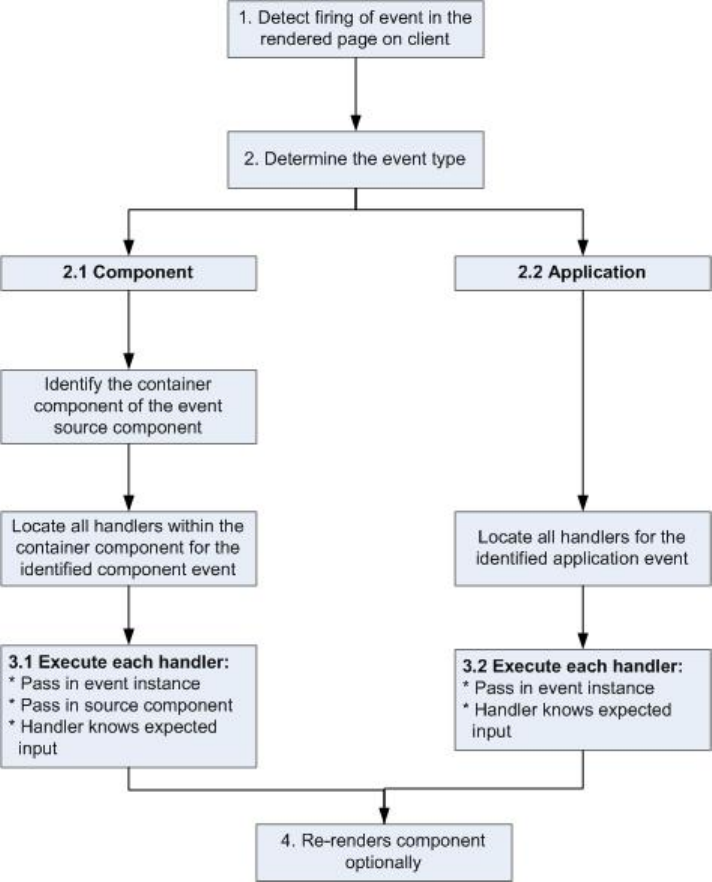
1 Detect Firing of Event
The framework detects the firing of an event. For example, the event could be triggered by a button click in a notifier component.
2 Determine the Event Type
2.1 Component Event
The parent or container component instance that fired the event is identified. This container component locates all relevant event
handlers for further processing.
2.2 Application Event
Any component can have an event handler for this event. All relevant event handlers are located.
3 Execute each Handler
3.1 Executing a Component Event Handler
Each of the event handlers defined in the container component for the event are executed by the handler controller, which can also:
158
Event Handling LifecycleCommunicating with Events

•Set attributes or modify data on the component (causing a re-rendering of the component).
•Fire another event or invoke a client-side or server-side action.
3.2 Executing an Application Event Handler
All event handlers are executed. When the event handler is executed, the event instance is passed into the event handler.
4 Re-render Component (optional)
After the event handlers and any callback actions are executed, a component might be automatically re-rendered if it was modified
during the event handling process.
SEE ALSO:
Client-Side Rendering to the DOM
Advanced Events Example
This example builds on the simpler component and application event examples. It uses one notifier component and one handler
component that work with both component and application events. Before we see a component wired up to events, let's look at the
individual resources involved.
This table summarizes the roles of the various resources used in the example. The source code for these resources is included after the
table.
UsageResource NameResource
Defines the component and application events in
separate resources. eventsContainer.cmp
Component event (compEvent.evt)
and application event (appEvent.evt)
Event files
shows how to use both component and application
events.
The notifier contains an onclick browser event to
initiate the event. The controller fires the event.
Component (eventsNotifier.cmp)
and its controller
(eventsNotifierController.js)
Notifier
The handler component contains the notifier
component (or a <aura:handler> tag for
Component (eventsHandler.cmp)
and its controller
(eventsHandlerController.js)
Handler
application events), and calls the controller action that
is executed after the event is fired.
Displays the event handlers on the UI for the complete
demo.
eventsContainer.cmpContainer Component
The definitions of component and application events are stored in separate .evt resources, but individual notifier and handler
component bundles can contain code to work with both types of events.
The component and application events both contain a context attribute that defines the shape of the event. This is the data that is
passed to handlers of the event.
159
Advanced Events ExampleCommunicating with Events

Component Event
Here is the markup for compEvent.evt.
<!--c:compEvent-->
<aura:event type="COMPONENT">
<!-- pass context of where the event was fired to the handler. -->
<aura:attribute name="context" type="String"/>
</aura:event>
Application Event
Here is the markup for appEvent.evt.
<!--c:appEvent-->
<aura:event type="APPLICATION">
<!-- pass context of where the event was fired to the handler. -->
<aura:attribute name="context" type="String"/>
</aura:event>
Notifier Component
The eventsNotifier.cmp notifier component contains buttons to initiate a component or application event.
The notifier uses aura:registerEvent tags to declare that it may fire the component and application events. Note that the
name attribute is required but the value is only relevant for the component event; the value is not used anywhere else for the application
event.
The parentName attribute is not set yet. We will see how this attribute is set and surfaced in eventsContainer.cmp.
<!--c:eventsNotifier-->
<aura:component>
<aura:attribute name="parentName" type="String"/>
<aura:registerEvent name="componentEventFired" type="c:compEvent"/>
<aura:registerEvent name="appEvent" type="c:appEvent"/>
<div>
<h3>This is {!v.parentName}'s eventsNotifier.cmp instance</h3>
<p><ui:button
label="Click here to fire a component event"
press="{!c.fireComponentEvent}" />
</p>
<p><ui:button
label="Click here to fire an application event"
press="{!c.fireApplicationEvent}" />
</p>
</div>
</aura:component>
CSS source
The CSS is in eventsNotifier.css.
/* eventsNotifier.css */
.cEventsNotifier {
160
Advanced Events ExampleCommunicating with Events

display: block;
margin: 10px;
padding: 10px;
border: 1px solid black;
}
Client-side controller source
The eventsNotifierController.js controller fires the event.
/* eventsNotifierController.js */
{
fireComponentEvent : function(cmp, event) {
var parentName = cmp.get("v.parentName");
// Look up event by name, not by type
var compEvents = cmp.getEvent("componentEventFired");
compEvents.setParams({ "context" : parentName });
compEvents.fire();
},
fireApplicationEvent : function(cmp, event) {
var parentName = cmp.get("v.parentName");
// note different syntax for getting application event
var appEvent = $A.get("e.c:appEvent");
appEvent.setParams({ "context" : parentName });
appEvent.fire();
}
}
You can click the buttons to fire component and application events but there is no change to the output because we haven't wired up
the handler component to react to the events yet.
The controller sets the context attribute of the component or application event to the parentName of the notifier component
before firing the event. We will see how this affects the output when we look at the handler component.
Handler Component
The eventsHandler.cmp handler component contains the c:eventsNotifier notifier component and <aura:handler>
tags for the application and component events.
<!--c:eventsHandler-->
<aura:component>
<aura:attribute name="name" type="String"/>
<aura:attribute name="mostRecentEvent" type="String" default="Most recent event handled:"/>
<aura:attribute name="numComponentEventsHandled" type="Integer" default="0"/>
<aura:attribute name="numApplicationEventsHandled" type="Integer" default="0"/>
<aura:handler event="c:appEvent" action="{!c.handleApplicationEventFired}"/>
<aura:handler name="componentEventFired" event="c:compEvent"
action="{!c.handleComponentEventFired}"/>
161
Advanced Events ExampleCommunicating with Events

<div>
<h3>This is {!v.name}</h3>
<p>{!v.mostRecentEvent}</p>
<p># component events handled: {!v.numComponentEventsHandled}</p>
<p># application events handled: {!v.numApplicationEventsHandled}</p>
<c:eventsNotifier parentName="{#v.name}" />
</div>
</aura:component>
Note: {#v.name} is an unbound expression. This means that any change to the value of the parentName attribute in
c:eventsNotifier doesn’t propagate back to affect the value of the name attribute in c:eventsHandler. For more
information, see Data Binding Between Components on page 59.
CSS source
The CSS is in eventsHandler.css.
/* eventsHandler.css */
.cEventsHandler {
display: block;
margin: 10px;
padding: 10px;
border: 1px solid black;
}
Client-side controller source
The client-side controller is in eventsHandlerController.js.
/* eventsHandlerController.js */
{
handleComponentEventFired : function(cmp, event) {
var context = event.getParam("context");
cmp.set("v.mostRecentEvent",
"Most recent event handled: COMPONENT event, from " + context);
var numComponentEventsHandled =
parseInt(cmp.get("v.numComponentEventsHandled")) + 1;
cmp.set("v.numComponentEventsHandled", numComponentEventsHandled);
},
handleApplicationEventFired : function(cmp, event) {
var context = event.getParam("context");
cmp.set("v.mostRecentEvent",
"Most recent event handled: APPLICATION event, from " + context);
var numApplicationEventsHandled =
parseInt(cmp.get("v.numApplicationEventsHandled")) + 1;
cmp.set("v.numApplicationEventsHandled", numApplicationEventsHandled);
}
}
The name attribute is not set yet. We will see how this attribute is set and surfaced in eventsContainer.cmp.
162
Advanced Events ExampleCommunicating with Events

You can click buttons and the UI now changes to indicate the type of event. The click count increments to indicate whether it's a
component or application event. We aren't finished yet though. Notice that the source of the event is undefined as the event context
attribute hasn't been set .
Container Component
Here is the markup for eventsContainer.cmp.
<!--c:eventsContainer-->
<aura:component>
<c:eventsHandler name="eventsHandler1"/>
<c:eventsHandler name="eventsHandler2"/>
</aura:component>
The container component contains two handler components. It sets the name attribute of both handler components, which is passed
through to set the parentName attribute of the notifier components. This fills in the gaps in the UI text that we saw when we looked
at the notifier or handler components directly.
Add the c:eventsContainer component to a c:eventsContainerApp application. Navigate to the application.
https://<myDomain>.lightning.force.com/c/eventsContainerApp.app, where <myDomain> is the name
of your custom Salesforce domain.
Click the Click here to fire a component event button for either of the event handlers. Notice that the # component events handled
counter only increments for that component because only the firing component's handler is notified.
Click the Click here to fire an application event button for either of the event handlers. Notice that the # application events handled
counter increments for both the components this time because all the handling components are notified.
SEE ALSO:
Component Event Example
Application Event Example
Event Handling Lifecycle
Firing Lightning Events from Non-Lightning Code
You can fire Lightning events from JavaScript code outside a Lightning app. For example, your Lightning app might need to call out to
some non-Lightning code, and then have that code communicate back to your Lightning app once it's done.
For example, you could call external code that needs to log into another system and return some data to your Lightning app. Let's call
this event mynamespace:externalEvent. You'll fire this event when your non-Lightning code is done by including this JavaScript
in your non-Lightning code.
var myExternalEvent;
if(window.opener.$A &&
(myExternalEvent = window.opener.$A.get("e.mynamespace:externalEvent"))) {
myExternalEvent.setParams({isOauthed:true});
myExternalEvent.fire();
}
163
Firing Lightning Events from Non-Lightning CodeCommunicating with Events

window.opener.$A.get() references the master window where your Lightning app is loaded.
SEE ALSO:
Application Events
Modifying Components Outside the Framework Lifecycle
Events Best Practices
Here are some best practices for working with events.
Use Component Events Whenever Possible
Always try to use a component event instead of an application event, if possible. Component events can only be handled by components
above them in the containment hierarchy so their usage is more localized to the components that need to know about them. Application
events are best used for something that should be handled at the application level, such as navigating to a specific record. Application
events allow communication between components that are in separate parts of the application and have no direct containment
relationship.
Separate Low-Level Events from Business Logic Events
It's a good practice to handle low-level events, such as a click, in your event handler and refire them as higher-level events, such as an
approvalChange event or whatever is appropriate for your business logic.
Dynamic Actions based on Component State
If you need to invoke a different action on a click event depending on the state of the component, try this approach:
1. Store the component state as a discrete value, such as New or Pending, in a component attribute.
2. Put logic in your client-side controller to determine the next action to take.
3. If you need to reuse the logic in your component bundle, put the logic in the helper.
For example:
1. Your component markup contains <ui:button label="do something" press="{!c.click}" />.
2. In your controller, define the click function, which delegates to the appropriate helper function or potentially fires the correct
event.
Using a Dispatcher Component to Listen and Relay Events
If you have a large number of handler component instances listening for an event, it may be better to identify a dispatcher component
to listen for the event. The dispatcher component can perform some logic to decide which component instances should receive further
information and fire another component or application event targeted at those component instances.
SEE ALSO:
Handling Events with Client-Side Controllers
Events Anti-Patterns
164
Events Best PracticesCommunicating with Events

Events Anti-Patterns
These are some anti-patterns that you should avoid when using events.
Don't Fire an Event in a Renderer
Firing an event in a renderer can cause an infinite rendering loop.
Don’t do this!
afterRender: function(cmp, helper) {
this.superAfterRender();
$A.get("e.myns:mycmp").fire();
}
Instead, use the init hook to run a controller action after component construction but before rendering. Add this code to your
component:
<aura:handler name="init" value="{!this}" action="{!c.doInit}"/>
For more details, see .Invoking Actions on Component Initialization on page 229.
Don’t Use onclick and ontouchend Events
You can’t use different actions for onclick and ontouchend events in a component. The framework translates touch-tap events
into clicks and activates any onclick handlers that are present.
SEE ALSO:
Client-Side Rendering to the DOM
Events Best Practices
Events Fired During the Rendering Lifecycle
A component is instantiated, rendered, and rerendered during its lifecycle. A component is rerendered only when there’s a programmatic
or value change that would require a rerender, such as when a browser event triggers an action that updates its data.
Component Creation
The component lifecycle starts when the client sends an HTTP request to the server and the component configuration data is returned
to the client. No server trip is made if the component definition is already on the client from a previous request and the component has
no server dependencies.
Let’s look at an app with several nested components. The framework instantiates the app and goes through the children of the v.body
facet to create each component, First, it creates the component definition, its entire parent hierarchy, and then creates the facets within
those components. The framework also creates any component dependencies on the server, including definitions for attributes, interfaces,
controllers, and actions.
The following image lists the order of component creation.
165
Events Anti-PatternsCommunicating with Events
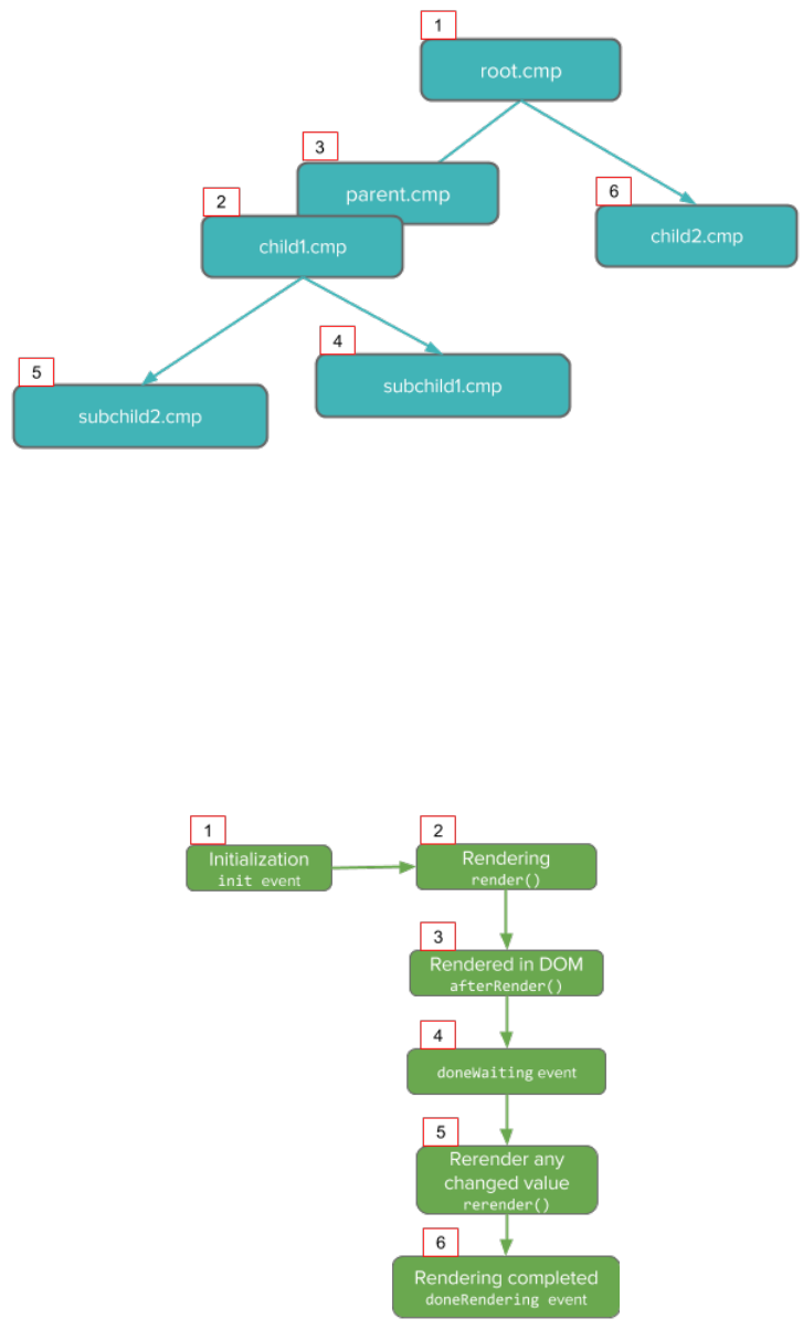
After creating a component instance, the serialized component definitions and instances are sent down to the client. Definitions are
cached but not the instance data. The client deserializes the response to create the JavaScript objects or maps, resulting in an instance
tree that’s used to render the component instance. When the component tree is ready, the init event is fired for all the components,
starting from the children component and finishing in the parent component.
Component Rendering
The following image depicts a typical rendering lifecycle of a component on the client, after the component definitions and instances
are deserialized.
166
Events Fired During the Rendering LifecycleCommunicating with Events
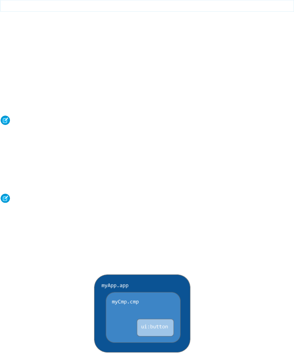
1. The init event is fired by the component service that constructs the components to signal that initialization has completed.
<aura:handler name="init" value="{!this}" action="{!c.doInit}"/>
You can customize the init handler and add your own controller logic before the component starts rendering. For more information,
see Invoking Actions on Component Initialization on page 229.
2. For each component in the tree, the base implementation of render() or your custom renderer is called to start component
rendering. For more information, see Client-Side Rendering to the DOM on page 226. Similar to the component creation process,
rendering starts at the root component, its children components and their super components, if any, and finally the subchildren
components.
3. Once your components are rendered to the DOM, afterRender() is called to signal that rendering is completed for each of
these component definitions. It enables you to interact with the DOM tree after the framework rendering service has created the
DOM elements.
4. To indicate that the client is done waiting for a response to the server request XHR, the aura:doneWaiting event is fired. You
can handle this event by adding a handler wired to a client-side controller action.
Note: We don't recommend using the legacy aura:doneWaiting event except as a last resort. The
aura:doneWaiting application event is fired for every server response, even for responses from other components in
your app. Unless your component is running in complete isolation in a standalone app and not included in Lightning Experience
or Salesforce1, you probably don’t want to handle this application event. The container app may fire server-side actions and
trigger your event handler multiple times.
5. The framework checks whether any components need to be rerendered and rerenders any “dirtied” components to reflect any
updates to attribute values. This rerender check is done even if there’s no dirtied components or values.
6. Finally, the aura:doneRendering event is fired at the end of the rendering lifecycle.
Note: We don't recommend using the legacy aura:doneRendering event except as a last resort. Unless your component
is running in complete isolation in a standalone app and not included in complex apps, such as Lightning Experience or
Salesforce1, you probably don’t want to handle this application event. The container app may trigger your event handler
multiple times.
Rendering Nested Components
Let’s say that you have an app myApp.app that contains a component myCmp.cmp with a ui:button component.
167
Events Fired During the Rendering LifecycleCommunicating with Events
During initialization, the init() event is fired in this order: ui:button, ui:myCmp, and myApp.app.
SEE ALSO:
Client-Side Rendering to the DOM
System Event Reference
Events Handled In Salesforce1 and Lightning Experience
Salesforce1 and Lightning Experience handle some events, which you can fire in your Lightning component.
If you fire one of these events in your Lightning apps or components outside of Salesforce1 or Lightning Experience:
•You must handle the event by using the <aura:handler> tag in the handling component.
•Use the <aura:registerEvent> or <aura:dependency> tags to ensure that the event is sent to the client, when
needed.
DescriptionEvent Name
Opens a page to create a record for the specified entityApiName, for example,
“Account” or “myNamespace__MyObject__c”.
force:createRecord
Opens the page to edit the record specified by recordId.force:editRecord
Navigates to the list view specified by listViewId.force:navigateToList
Navigates to the object home specified by the scope attribute.force:navigateToObjectHome
Navigates to the related list specified by parentRecordId.force:navigateToRelatedList
Navigates to an sObject record specified by recordId.force:navigateToSObject
Navigates to the specified URL.force:navigateToURL
Saves a record.force:recordSave
Indicates that the record has been successfully saved.force:recordSaveSuccess
Reloads the view.force:refreshView
Displays a toast notification with a message.force:showToast
Customizing Client-Side Logic for Salesforce1, Lightning Experience, and
Standalone Apps
Since Salesforce1 and Lightning Experience automatically handle many events, you have to do extra work if your component runs in a
standalone app. Instantiating the event using $A.get() can help you determine if your component is running within Salesforce1
and Lightning Experience or a standalone app. For example, you want to display a toast when a component loads in Salesforce1 and
Lightning Experience. You can fire the force:showToast event and set its parameters for Salesforce1 and Lightning Experience,
but you have to create your own implementation for a standalone app.
displayToast : function (component, event, helper) {
var toast = $A.get("e.force:showToast");
168
Events Handled In Salesforce1 and Lightning ExperienceCommunicating with Events
if (toast){
//fire the toast event in Salesforce1 and Lightning Experience
toast.setParams({
"title":"Success!",
"message":"The component loaded successfully."
});
toast.fire();
}else {
//your toast implementation for a standalone app here
}
}
SEE ALSO:
Event Reference
aura:dependency
Fire Component Events
Fire Application Events
System Events
The framework fires several system events during its lifecycle.
You can handle these events in your Lightning apps or components, and within Salesforce1.
DescriptionEvent Name
Indicates that the initial rendering of the root application has completed. We
don't recommend using the legacy aura:doneRendering event except
aura:doneRendering
as a last resort. Unless your component is running in complete isolation in a
standalone app and not included in complex apps, such as Lightning Experience
or Salesforce1, you probably don’t want to handle this application event. The
container app may trigger your event handler multiple times.
Indicates that the app is done waiting for a response to a server request. This
event is preceded by an aura:waiting event. We don't recommend using
aura:doneWaiting
the legacy aura:doneWaiting event except as a last resort. The
aura:doneWaiting application event is fired for every server response,
even for responses from other components in your app. Unless your component
is running in complete isolation in a standalone app and not included in Lightning
Experience or Salesforce1, you probably don’t want to handle this application
event. The container app may fire server-side actions and trigger your event
handler multiple times.
Indicates that the hash part of the URL has changed.aura:locationChange
Indicates that a requested resource is not accessible due to security constraints
on that resource.
aura:noAccess
Indicates that an error has occurred.aura:systemError
Indicates that an attribute value has changed.aura:valueChange
169
System EventsCommunicating with Events

DescriptionEvent Name
Indicates that a component has been destroyed.aura:valueDestroy
Indicates that an app or component has been initialized.aura:valueInit
Indicates that the app is waiting for a response to a server request. We don't
recommend using the legacy aura:waiting event except as a last resort.
aura:waiting
The aura:waiting application event is fired for every server request, even
for requests from other components in your app. Unless your component is
running in complete isolation in a standalone app and not included in Lightning
Experience or Salesforce1, you probably don’t want to handle this application
event. The container app may fire server-side actions and trigger your event
handler multiple times.
SEE ALSO:
System Event Reference
170
System EventsCommunicating with Events

CHAPTER 6 Creating Apps
Components are the building blocks of an app. This section shows you a typical workflow to put the
pieces together to create a new app.
In this chapter ...
•App Overview First, you should decide whether you’re creating a component for a standalone app or for Salesforce
apps, such as Lightning Experience or Salesforce1. Both components can access your Salesforce data,
•Designing App UI
•Creating App
Templates
but only a component created for Lightning Experience or Salesforce1 can automatically handle Salesforce
events that take advantage of record create and edit pages, among other benefits.
•Developing Secure
Code The Quick Start on page 6 walks you through creating components for a standalone app and
components for Salesforce1 to help you determine which one you need.
•Styling Apps
•Using JavaScript
•JavaScript Cookbook
•Using Apex
•Lightning Data
Service (Developer
Preview)
•Lightning Container
(Developer Preview)
•Controlling Access
•Using
Object-Oriented
Development
•Using the AppCache
•Distributing
Applications and
Components
171

App Overview
An app is a special top-level component whose markup is in a .app resource.
On a production server, the .app resource is the only addressable unit in a browser URL. Access an app using the URL:
https://<myDomain>.lightning.force.com/<namespace>/<appName>.app, where <myDomain> is the
name of your custom Salesforce domain
SEE ALSO:
aura:application
Supported HTML Tags
Designing App UI
Design your app's UI by including markup in the .app resource. Each part of your UI corresponds to a component, which can in turn
contain nested components. Compose components to create a sophisticated app.
An app’s markup starts with the <aura:application> tag.
To learn more about the <aura:application> tag, see aura:application.
Let's look at a sample.app file, which starts with the <aura:application> tag.
<aura:application>
<div>
<header>
<h1>Sample App</h1>
</header>
<ui:block class="wrapper" aura:id="block">
<aura:set attribute="left">
<docsample:sidebar aura:id="sidebar" />
</aura:set>
<docsample:details aura:id="details" />
</ui:block>
</div>
</aura:application>
The sample.app file contains HTML tags, such as <h1> and <div>, as well as components, such as <ui:block>. We won't
go into the details for all the components here but note how simple the markup is. The <docsample:sidebar> and
<docsample:details> components encapsulate the layout for the page.
For another sample app, see the expenseTracker.app resource created in Create a Standalone Lightning App.
SEE ALSO:
aura:application
Creating App Templates
An app template bootstraps the loading of the framework and the app. Customize an app’s template by creating a component that
extends the default aura:template template.
172
App OverviewCreating Apps

A template must have the isTemplate system attribute in the <aura:component> tag set to true. This informs the framework
to allow restricted items, such as <script> tags, which aren't allowed in regular components.
For example, a sample app has a np:template template that extends aura:template. np:template looks like:
<aura:component isTemplate="true" extends="aura:template">
<aura:set attribute="title" value="My App"/>
...
</aura:component>
Note how the component extends aura:template and sets the title attribute using aura:set.
The app points at the custom template by setting the template system attribute in <aura:application>.
<aura:application template="np:template">
...
</aura:application>
A template can only extend a component or another template. A component or an application can't extend a template.
Developing Secure Code
The framework uses Content Security Policy (CSP) to control the source of content that can be loaded on a page.
The LockerService architectural layer enhances security by isolating individual Lightning components in their own containers and
enforcing coding best practices.
IN THIS SECTION:
Content Security Policy Overview
The Lightning Component framework uses Content Security Policy (CSP) to control the source of content that can be loaded on a
page.
What is LockerService?
LockerService is a powerful security architecture for Lightning components. LockerService enhances security by isolating individual
Lightning components in their own namespace. LockerService also promotes best practices that improve the supportability of your
code by only allowing access to supported APIs and eliminating access to non-published framework internals.
Writing Secure Code
We’ve talked at a high level about CSP and LockerService. This section gives you specific details about how to write secure code.
Salesforce Lightning CLI
Lightning CLI is a Heroku Toolbelt plugin that lets you scan your code for general JavaScript coding issues and Lightning-specific
issues. This tool is useful for preparing your Lightning components code for LockerService enablement.
Content Security Policy Overview
The Lightning Component framework uses Content Security Policy (CSP) to control the source of content that can be loaded on a page.
CSP is a Candidate Recommendation of the W3C working group on Web Application Security. The framework uses the Content-
Security-Policy HTTP header recommended by the W3C.
The framework’s CSP covers these resources:
173
Developing Secure CodeCreating Apps

JavaScript Libraries
All JavaScript libraries must be uploaded to Salesforce static resources. For more information, see Using External JavaScript Libraries
on page 217.
HTTPS Connections for Resources
All external fonts, images, frames, and CSS must use an HTTPS URL.
You can change the CSP policy and expand access to third-party resources by adding CSP Trusted Sites.
Content Security Policy and LockerService
LockerService tightens CSP to eliminate the possibility of cross-site scripting attacks. These CSP changes are only enforced in sandboxes
and Developer Edition orgs.
The stricter CSP disallows the unsafe-inline and unsafe-eval keywords for inline scripts (script-src). Ensure that your
code and third-party libraries you use adhere to these rules by removing all calls using eval() or inline JavaScript code execution.
You might have to update your third-party libraries to modern versions that don’t depend on unsafe-inline or unsafe-eval.
LockerService is a critical update for this release. LockerService will be automatically activated for all orgs in the Summer ’17 release.
Before the Summer ’17 release, you can manually activate and deactivate the update as often as you need to evaluate the impact on
your org.
Browser Support
CSP isn’t enforced by all browsers. For a list of browsers that enforce CSP, see caniuse.com.
Note: IE11 doesn’t support CSP, so we recommend using other supported browsers for enhanced security.
Finding CSP Violations
Any policy violations are logged in the browser’s developer console. The violations look like the following message.
Refused to load the script 'https://externaljs.docsample.com/externalLib.js'
because it violates the following Content Security Policy directive: ...
If your app’s functionality isn’t affected, you can ignore the CSP violation.
SEE ALSO:
Making API Calls from Components
Create CSP Trusted Sites to Access Third-Party APIs
Salesforce Help: Supported Browsers for Lightning Experience
What is LockerService?
LockerService is a powerful security architecture for Lightning components. LockerService enhances security by isolating individual
Lightning components in their own namespace. LockerService also promotes best practices that improve the supportability of your
code by only allowing access to supported APIs and eliminating access to non-published framework internals.
What Does LockerService Affect?
LockerService enforces security in:
174
What is LockerService?Creating Apps

•Lightning Experience
•Salesforce1
•Template-based Communities
•Standalone apps that you create (for example, myApp.app)
LockerService enforces security in Lightning Out. However, the CSP restrictions of LockerService aren’t enforced in Lightning Out.
Lightning Out allows you to run Lightning components in a container outside of Lightning apps, such as Lightning components in
Visualforce and Visualforce-based communities. The container defines the CSP rules.
LockerService doesn’t affect Salesforce Classic, Visualforce-based communities, Sales Console, or Service Console, except for usage of
Lightning components in Visualforce in these contexts.
Graceful Degradation for Unsupported Browsers
LockerService relies on some basic JavaScript features in the browser: support for strict mode and the Map object. These requirements
align with the supported browsers for Lightning Experience. If a browser doesn’t meet the requirements, LockerService can’t enforce all
its security features.
LockerService provides a graceful degradation for unsupported browsers by disabling LockerService features that aren’t supported by
a browser. However, if you use an unsupported browser, you’re likely to encounter issues that won’t be fixed. Make your life easier and
your browsing experience more secure by using a supported browser.
Note: IE11 doesn’t support CSP, so we recommend using other supported browsers for enhanced security.
LockerService Requirements
LockerService enforces several security features in your code.
JavaScript ES5 Strict Mode Enforcement
JavaScript ES5 strict mode is implicitly enabled. You don’t need to specify "use strict" in your code.
JavaScript strict mode makes code more robust and supportable. For example, it throws some errors that would otherwise be
suppressed.
A few common stumbling points when using strict mode are:
•You must declare variables with the var keyword.
•You must explicitly attach a variable to the window object to make the variable available outside a library. For more information,
see Sharing JavaScript Code Across Components.
•The libraries that your components use must also work in strict mode.
For more information about JavaScript strict mode, see the Mozilla Developer Network.
DOM Access Containment
A component can only traverse the DOM and access elements created by a component in the same namespace. This behavior
prevents the anti-pattern of reaching into DOM elements owned by components in another namespace.
Note: It’s an anti-pattern for any component to “reach into” another component, regardless of namespace. LockerService
only prevents cross-namespace access. Your good judgment should prevent cross-component access within your own
namespace as it makes components tightly coupled and more likely to break.
For more information, see DOM Access Containment.
175
What is LockerService?Creating Apps

Restrictions to Global References
LockerService applies restrictions to global references. You can access intrinsic objects, such as Array. LockerService provides
secure versions of non-intrinsic objects, such as window. The secure object versions automatically and seamlessly control access
to the object and its properties.
Use the Salesforce Lightning CLI tool to scan your code for Lightning-specific issues.
Access to Supported JavaScript API Framework Methods Only
You can access published, supported JavaScript API framework methods only. These methods are published in the reference doc
app at https://yourDomain.lightning.force.com/auradocs/reference.app. Previously, unsupported
methods were accessible, which exposed your code to the risk of breaking when unsupported methods were changed or removed.
The preceding security features are enforced when LockerService is active in your org. LockerService is a critical update for this release.
LockerService will be automatically activated for all orgs in the Summer ’17 release. Before the Summer ’17 release, you can manually
activate and deactivate the update as often as you need to evaluate the impact on your org.
The LockerService critical update also enforces a stricter CSP in sandboxes and Developer Edition orgs.
Stricter Content Security Policy (CSP)
LockerService tightens CSP to eliminate the possibility of cross-site scripting attacks. These CSP changes are only enforced in sandboxes
and Developer Edition orgs.
The stricter CSP disallows the unsafe-inline and unsafe-eval keywords for inline scripts (script-src). Ensure that
your code and third-party libraries you use adhere to these rules by removing all calls using eval() or inline JavaScript code
execution. You might have to update your third-party libraries to modern versions that don’t depend on unsafe-inline or
unsafe-eval.
Note: IE11 doesn’t support CSP, so we recommend using other supported browsers for enhanced security.
Activate the Critical Update
LockerService is a critical update for this release. LockerService will be automatically activated for all orgs in the Summer ’17 release.
Before the Summer ’17 release, you can manually activate and deactivate the update as often as you need to evaluate the impact on
your org.
To activate this critical update:
1. From Setup, enter Critical Updates in the Quick Find box, and then select Critical Updates.
2. For “Enable Lightning LockerService Security”, click Activate.
3. Refresh your browser page to proceed with LockerService enabled.
We recommend that you test LockerService in a sandbox or a Developer Edition org to verify correct behavior of your components before
enabling it in your production org.
Components Installed from Managed Packages
To control whether LockerService is enforced for components installed from a managed package:
1. From Setup, enter Lightning Components in the Quick Find box, and then select Lightning Components.
2. Select the Enable LockerService for Managed Packages checkbox to enforce LockerService for components
installed from a managed package.
Note: The checkbox is only visible when the critical update is activated.
176
What is LockerService?Creating Apps
If you deselect the Enable LockerService for Managed Packages checkbox, LockerService is not enforced for
components installed from a managed package. Components that you create in your org still run with enforcement of LockerService
restrictions.
Default Settings for New Orgs
Here’s a table summarizing when LockerService is enforced for new orgs.
Components created in your org are in the default namespace, c, or in your org’s namespace, if you created a namespace.
All Other Supported EditionsDeveloper EditionComponent Source
YesYesCreated in your org
NoYesManaged package
You can change LockerService enforcement by toggling the critical update (for components created in your org) or the Enable
LockerService for Managed Packages checkbox (for components from managed packages).
SEE ALSO:
Content Security Policy Overview
Modifying the DOM
Reference Doc App
Salesforce Lightning CLI
Salesforce Help: Supported Browsers for Lightning Experience
Writing Secure Code
We’ve talked at a high level about CSP and LockerService. This section gives you specific details about how to write secure code.
IN THIS SECTION:
Sharing JavaScript Code Across Components
You can build simple Lightning components that are entirely self-contained. However, if you build more complex applications, you
probably want to share code, or even client-side data, between components.
DOM Access Containment
A component can only traverse the DOM and access elements created by a component in the same namespace. This behavior
prevents the anti-pattern of reaching into DOM elements owned by components in another namespace.
Sharing JavaScript Code Across Components
You can build simple Lightning components that are entirely self-contained. However, if you build more complex applications, you
probably want to share code, or even client-side data, between components.
The <ltng:require> tag enables you to load external JavaScript libraries after you upload them as static resources. You can also
use <ltng:require> to import your own JavaScript libraries of utility methods.
177
Writing Secure CodeCreating Apps

Let’s look at a simple counter library that provides a getValue() method, which returns the current value of the counter, and an
increment() method, which increments the value of that counter.
Create the JavaScript Library
1. In the Developer Console, click File > New > Static Resource.
2. Enter counter in the Name field.
3. Select text/javascript in the MIME Type field.
4. Click Submit.
5. Enter this code and click File > Save.
window.counter = (function() {
var value = 0; // private
return {//public API
increment: function() {
value = value + 1;
return value;
},
getValue: function() {
return value;
}
};
}());
This code uses the JavaScript module pattern. Using this closure-based pattern, the value variable remains private to your library.
Components using the library can’t access value directly.
The most important line of the code to note is:
window.counter = (function() {
You must attach counter to the window object as a requirement of JavaScript strict mode, which is implicitly enabled in LockerService.
Even though window.counter looks like a global declaration, counter is attached to the LockerService secure window object
and therefore is a namespace variable, not a global variable.
If you use counter instead of window.counter, counter isn’t available. When you try to access it, you get an error similar to:
Action failed: ... [counter is not defined]
Use the JavaScript Library
Let’s use the library in a MyCounter component that has a simple UI to exercise the counter methods.
<!--c:MyCounter-->
<aura:component access="global">
<ltng:require scripts="{!$Resource.counter}"
afterScriptsLoaded="{!c.getValue}"/>
<aura:attribute name="value" type="Integer"/>
<h1>MyCounter</h1>
<p>{!v.value}</p>
178
Writing Secure CodeCreating Apps

<lightning:button label="Get Value" onclick="{!c.getValue}"/>
<lightning:button label="Increment" onclick="{!c.increment}"/>
</aura:component>
The <ltng:require> tag loads the counter library and calls the getValue action in the component’s client-side controller after
the library is loaded.
Here’s the client-side controller.
/* MyCounterController.js */
({
getValue : function(component, event, helper) {
component.set("v.value", counter.getValue());
},
increment : function(component, event, helper) {
component.set("v.value", counter.increment());
}
})
You can access properties of the window object without having to type the window. prefix. Therefore, you can use
counter.getValue() as shorthand for window.counter.getValue().
Click the buttons to get the value or increment it.
Our counter library shares the counter value between any components that use the library. If you need each component to have a
separate counter, you could modify the counter implementation. To see the per-component code and for more details, see this blog
post about Modularizing Code in Lightning Components.
SEE ALSO:
Using External JavaScript Libraries
ltng:require
DOM Access Containment
A component can only traverse the DOM and access elements created by a component in the same namespace. This behavior prevents
the anti-pattern of reaching into DOM elements owned by components in another namespace.
Note: It’s an anti-pattern for any component to “reach into” another component, regardless of namespace. LockerService only
prevents cross-namespace access. Your good judgment should prevent cross-component access within your own namespace as
it makes components tightly coupled and more likely to break.
Let’s look at a sample component that demonstrates DOM containment.
<!--c:domLocker-->
<aura:component>
<div id="myDiv" aura:id="div1">
<p>See how LockerService restricts DOM access</p>
</div>
<lightning:button name="myButton" label="Peek in DOM"
aura:id="button1" onclick="{!c.peekInDom}"/>
</aura:component>
The c:domLocker component creates a <div> element and a <lightning:button> component.
179
Writing Secure CodeCreating Apps

Here’s the client-side controller that peeks around in the DOM.
({ /* domLockerController.js */
peekInDom : function(cmp, event, helper) {
console.log("cmp.getElements(): ", cmp.getElements());
// access the DOM in c:domLocker
console.log("div1: ", cmp.find("div1").getElement());
console.log("button1: ", cmp.find("button1"));
console.log("button name: ", event.getSource().get("v.name"));
// returns an error
//console.log("button1 element: ", cmp.find("button1").getElement());
}
})
Valid DOM Access
The following methods are valid DOM access because the elements are created by c:domLocker.
cmp.getElements()
Returns the elements in the DOM rendered by the component.
cmp.find()
Returns the div and button components, identified by their aura:id attributes.
cmp.find("div1").getElement()
Returns the DOM element for the div as c:domLocker created the div.
event.getSource().get("v.name")
Returns the name of the button that dispatched the event; in this case, myButton.
Invalid DOM Access
You can’t use cmp.find("button1").getElement() to access the DOM element created by <lightning:button>.
LockerService doesn’t allow c:domLocker to access the DOM for <lightning:button> because the button is in the lightning
namespace and c:domLocker is in the c namespace.
If you uncomment the code for cmp.find("button1").getElement(), you’ll see an error:
c:domLocker$controller$peekInDom [cmp.find(...).getElement is not a function]
SEE ALSO:
What is LockerService?
Using JavaScript
Salesforce Lightning CLI
Lightning CLI is a Heroku Toolbelt plugin that lets you scan your code for general JavaScript coding issues and Lightning-specific issues.
This tool is useful for preparing your Lightning components code for LockerService enablement.
Lightning CLI is a linting tool based on the open source ESLint project. Like ESLint, the CLI tool flags general JavaScript issues it finds in
your code.
180
Salesforce Lightning CLICreating Apps
Lightning CLI alerts you to specific issues related to LockerService. Issues that are flagged include incorrect Lightning components code,
and usage of unsupported or private JavaScript API methods. Lightning CLI installs into the Heroku Toolbelt, and is used on the command
line.
IN THIS SECTION:
Install Salesforce Lightning CLI
Install Lightning CLI as a Heroku Toolbelt plugin. Then, update the Heroku Toolbelt to get the latest Lightning CLI rules.
Use Salesforce Lightning CLI
Run Lightning CLI just like any other lint command-line tool. The only trick is invoking it through the heroku command. Your shell
window shows the results.
Review and Resolve Problems
When you run Lightning CLI on your Lightning components code, the tool outputs results for each issue found in the files scanned.
Review the results and resolve problems in your code.
Salesforce Lightning CLI Rules
Rules built into Lightning CLI cover restrictions under LockerService, correct use of Lightning APIs, and a number of best practices
for writing Lightning components code. Each rule, when triggered by your code, points to an area where your code might have an
issue.
Salesforce Lightning CLI Options
There are several options that modify the behavior of Lightning CLI.
Install Salesforce Lightning CLI
Install Lightning CLI as a Heroku Toolbelt plugin. Then, update the Heroku Toolbelt to get the latest Lightning CLI rules.
Lightning CLI relies on Heroku Toolbelt. Make sure that you have the heroku command installed correctly before attempting to use
Lightning CLI. More information about Heroku Toolbelt is available here:
https://devcenter.heroku.com/articles/getting-started-with-nodejs#set-up
After getting Heroku Toolbelt up and running, install the Lightning CLI plugin using the following command:
heroku plugins:install salesforce-lightning-cli
Once installed, the plugin is updated whenever you update the Heroku Toolbelt using the heroku update command. Run the
update command every week or so to make sure you’ve got the latest Lightning CLI rules.
Use Salesforce Lightning CLI
Run Lightning CLI just like any other lint command-line tool. The only trick is invoking it through the heroku command. Your shell
window shows the results.
Normal Use
You can run the Lightning CLI linter on any folder that contains Lightning components:
heroku lightning:lint ./path/to/lightning/components/
Note: Lightning CLI runs only on local files. Download your component code to your machine using the Metadata API, or a tool
such as the Force.com IDE, the Force.com Migration Tool, or various third-party options.
181
Salesforce Lightning CLICreating Apps

The default output only shows errors. To see warnings too, use the verbose mode option.
See “Review and Resolve Problems” for what to do with the output of running Lightning CLI.
Common Options
Filtering Files
Sometimes, you just want to scan a particular kind of file. The --files argument allows you to set a pattern to match files against.
For example, the following command allows you to scan controllers only:
heroku lightning:lint ./path/to/lightning/components/ --files **/*Controller.js
Verbose Mode
The default output only shows errors so you can focus on bigger issues. The --verbose argument allows you to see warning messages
and errors during the linting process.
SEE ALSO:
Salesforce Lightning CLI Options
Review and Resolve Problems
When you run Lightning CLI on your Lightning components code, the tool outputs results for each issue found in the files scanned.
Review the results and resolve problems in your code.
For example, here is some example output.
error secure-document Invalid SecureDocument API
Line:109:29
scrapping = document.innerHTML;
^
warning no-plusplus Unary operator '++' used
Line:120:50
for (var i = (index+1); i < sibs.length; i++) {
^
error secure-window Invalid SecureWindow API
Line:33:21
var req = new XMLHttpRequest();
^
error default-case Expected a default case
Line:108:13
switch (e.keyCode) {
^
Issues are displayed, one for each warning or error. Each issue includes the line number, severity, and a brief description of the issue. It
also includes the rule name, which you can use to look up a more detailed description of the issue. See “Salesforce Lightning CLI Rules”
for the rules applied by Lightning CLI, as well as possible resolutions and options for further reading.
Your mission is to review each issue, examine the code in question, and to revise it to eliminate all of the genuine problems.
182
Salesforce Lightning CLICreating Apps
While no automated tool is perfect, we expect that most errors and warnings generated by Lightning CLI will point to genuine issues
in your code, which you should plan to fix before using the code with LockerService enabled.
SEE ALSO:
Salesforce Lightning CLI Rules
Salesforce Lightning CLI Rules
Rules built into Lightning CLI cover restrictions under LockerService, correct use of Lightning APIs, and a number of best practices for
writing Lightning components code. Each rule, when triggered by your code, points to an area where your code might have an issue.
In addition to the Lightning-specific rules we’ve created, other rules are active in Lightning CLI, included from ESLint. Documentation
for these rules is available on the ESLint project site. When you encounter an error or warning from a rule not described here, search for
it on the ESLint Rules page.
IN THIS SECTION:
Validate JavaScript Intrinsic APIs (ecma-intrinsics)
This rule deals with the intrinsic APIs in JavaScript, more formally known as ECMAScript.
Disallow instanceof (no-instanceof)
This rule aims to eliminate the use of instanceof, and direct comparison with Array or Object primitives.
Validate Aura API (aura-api)
This rule verifies that use of the framework APIs is according to the published documentation. The use of undocumented or private
features is disallowed.
Validate Lightning Component Public API (secure-component)
This rule validates that only public, supported framework API functions and properties are used.
Validate Secure Document Public API (secure-document)
This rule validates that only supported functions and properties of the document global are accessed.
Validate Secure Window Public API (secure-window)
This rule validates that only supported functions and properties of the window global are accessed.
Custom “House Style” Rules
Customize the JavaScript style rules that Salesforce Lightning CLI applies to your code.
Validate JavaScript Intrinsic APIs (ecma-intrinsics)
This rule deals with the intrinsic APIs in JavaScript, more formally known as ECMAScript.
When LockerService is enabled, the framework prevents the use of unsupported API objects or calls. That means your Lightning
components code is allowed to use:
•Features built into JavaScript (“intrinsic” features)
•Published, supported features built into the Lightning Component framework
•Published, supported features built into LockerService SecureObject objects
What exactly are these “intrinsic APIs”? They’re the APIs defined in the ECMAScript Language Specification. That is, things built into
JavaScript. This includes Annex B of the specification, which deals with legacy browser features that aren’t part of the “core” of JavaScript,
but are nevertheless still supported for JavaScript running inside a web browser.
183
Salesforce Lightning CLICreating Apps

Note that some features of JavaScript that you might consider intrinsic—for example, the window and document global variables—are
superceded by SecureObject objects, which offer a more constrained API.
Rule Details
This rule verifies that use of the intrinsic JavaScript APIs is according to the published specification. The use of non-standard, deprecated,
and removed language features is disallowed.
Further Reading
•ECMAScript specification
•Annex B: Additional ECMAScript Features for Web Browsers
•Intrinsic Objects (JavaScript)
SEE ALSO:
Validate Aura API (aura-api)
Validate Lightning Component Public API (secure-component)
Validate Secure Document Public API (secure-document)
Validate Secure Window Public API (secure-window)
Disallow instanceof (no-instanceof)
This rule aims to eliminate the use of instanceof, and direct comparison with Array or Object primitives.
The framework sometimes, for security reasons, evaluates a component’s code in a different iframe or worker. As a result your code
might fail under certain conditions. For these reasons, it’s a best practice to avoid using instanceof.
Why is this? Different scopes have different execution environments. This means that they have different built-ins—different global
objects, different constructors, etc. This can produce results you might, at first, find unintuitive. For example, [] instanceof
window.parent.Array returns false, because Array.prototype !== window.parent.Array, and arrays inherit
from the former.
You’ll encounter this issue when you’re dealing with multiple frames or windows in your script and pass objects from one context to
another via functions. Because the security infrastructure of the framework does this automatically, you want to write code that behaves
consistently no matter what context it executes in.
Rule Details
The following patterns are considered problematic:
if (foo instanceof bar) {
// do something!
}
if (foo.prototype === Array) {
// do something
}
if (foo.prototype === Object) {
// do something else
}
184
Salesforce Lightning CLICreating Apps

The following patterns make use of built in JavaScript or Lightning components utility functions, and are a suggested alternative:
if (Array.isArray(foo)) {
// do something
}
if ($A.util.isPlainObject(foo)) {
// do something else
}
Further Reading
•instanceof
•Array.isArray
•typeof
Validate Aura API (aura-api)
This rule verifies that use of the framework APIs is according to the published documentation. The use of undocumented or private
features is disallowed.
When LockerService is enabled, the framework prevents the use of unsupported API objects or calls. That means your Lightning
components code is allowed to use:
•Features built into JavaScript (“intrinsic” features)
•Published, supported features built into the Lightning Component framework
•Published, supported features built into LockerService SecureObject objects
This rule deals with the supported, public framework APIs, for example, those available through the framework global $A.
Why is this rule called “Aura API”? Because the core of the the Lightning Component framework is the open source Aura Framework.
And this rule verifies permitted uses of that framework, rather than anything specific to Lightning Components.
Rule Details
The following patterns are considered problematic:
Aura.something(); // Use $A instead
$A.util.fake(); // fake is not available in $A.util
Further Reading
For details of all of the methods available in the framework, including $A, see the JavaScript API at
https://myDomain.lightning.force.com/auradocs/reference.app, where myDomain is the name of your
custom Salesforce domain.
SEE ALSO:
Validate Lightning Component Public API (secure-component)
Validate Secure Document Public API (secure-document)
Validate Secure Window Public API (secure-window)
Validate Lightning Component Public API (secure-component)
This rule validates that only public, supported framework API functions and properties are used.
185
Salesforce Lightning CLICreating Apps
When LockerService is enabled, the framework prevents the use of unsupported API objects or calls. That means your Lightning
components code is allowed to use:
•Features built into JavaScript (“intrinsic” features)
•Published, supported features built into the Lightning Component framework
•Published, supported features built into LockerService SecureObject objects
Prior to LockerService, when you created or obtained a reference to a component, you could call any function and access any property
available on that component, even if it wasn’t public. When LockerService is enabled, components are “wrapped” by a new
SecureComponent object, which controls access to the component and its functions and properties. SecureComponent restricts you to
using only published, supported component API.
Rule Details
The reference doc app lists the API for SecureComponent. Access the reference doc app at:
https://<myDomain>.lightning.force.com/auradocs/reference.app, where <myDomain> is the name of
your custom Salesforce domain.
The API for SecureComponent is listed at JavaScript API > Component.
Further Reading
•SecureComponent.js Implementation
SEE ALSO:
Validate Aura API (aura-api)
Validate Secure Document Public API (secure-document)
Validate Secure Window Public API (secure-window)
Validate Secure Document Public API (secure-document)
This rule validates that only supported functions and properties of the document global are accessed.
When LockerService is enabled, the framework prevents the use of unsupported API objects or calls. That means your Lightning
components code is allowed to use:
•Features built into JavaScript (“intrinsic” features)
•Published, supported features built into the Lightning Component framework
•Published, supported features built into LockerService SecureObject objects
Prior to LockerService, when you accessed the document global, you could call any function and access any property available. When
LockerService is enabled, the document global is “wrapped” by a new SecureDocument object, which controls access to document
and its functions and properties. SecureDocument restricts you to using only “safe” features of the document global.
186
Salesforce Lightning CLICreating Apps
Further Reading
•SecureDocument.js Implementation
SEE ALSO:
Validate Aura API (aura-api)
Validate Lightning Component Public API (secure-component)
Validate Secure Window Public API (secure-window)
Validate Secure Window Public API (secure-window)
This rule validates that only supported functions and properties of the window global are accessed.
When LockerService is enabled, the framework prevents the use of unsupported API objects or calls. That means your Lightning
components code is allowed to use:
•Features built into JavaScript (“intrinsic” features)
•Published, supported features built into the Lightning Component framework
•Published, supported features built into LockerService SecureObject objects
Prior to LockerService, when you accessed the window global, you could call any function and access any property available. When
LockerService is enabled, the window global is “wrapped” by a new SecureWindow object, which controls access to window and
its functions and properties. SecureWindow restricts you to using only “safe” features of the window global.
Further Reading
•SecureWindow.js Implementation
SEE ALSO:
Validate Aura API (aura-api)
Validate Lightning Component Public API (secure-component)
Validate Secure Document Public API (secure-document)
Custom “House Style” Rules
Customize the JavaScript style rules that Salesforce Lightning CLI applies to your code.
It’s common that different organizations or projects will adopt different JavaScript rules. The Lightning CLI tool is here to help you get
ready for LockerService, not enforce Salesforce coding conventions. To that end, the Lightning CLI rules are divided into two sets, security
rules and style rules. The security rules can’t be modified, but you can modify or add to the style rules.
Use the --config argument to provide a custom rules configuration file. A custom rules configuration file allows you to define your
own code style rules, which affect the style rules used by the Lightning CLI tool.
Note: If failure of a custom rule generates a warning, the warning doesn’t appear in the default output. To see warnings, use the
--verbose flag.
The Lightning CLI default style rules are provided below. Copy the rules to a new file, and modify them to match your preferred style
rules. Alternatively, you can use your existing ESLint rule configuration file directly. For example:
heroku lightning:lint ./path/to/lightning/components/ --config ~/.eslintrc
187
Salesforce Lightning CLICreating Apps

Note: Not all ESLint rules can be added or modified using --config. Only rules that we consider benign or neutral in the
context of Lightning Platform are activated by Lightning CLI. And again, you can't override the security rules.
Default Style Rules
Here are the default style rules used by Lightning CLI.
/*
* Copyright (C) 2016 salesforce.com, inc.
*
* Licensed under the Apache License, Version 2.0 (the "License");
* you may not use this file except in compliance with the License.
* You may obtain a copy of the License at
*
* http://www.apache.org/licenses/LICENSE-2.0
*
* Unless required by applicable law or agreed to in writing, software
* distributed under the License is distributed on an "AS IS" BASIS,
* WITHOUT WARRANTIES OR CONDITIONS OF ANY KIND, either express or implied.
* See the License for the specific language governing permissions and
* limitations under the License.
*/
module.exports = {
rules: {
// code style rules, these are the default value, but the user can
// customize them via --config in the linter by providing custom values
// for each of these rules.
"no-trailing-spaces": 1,
"no-spaced-func": 1,
"no-mixed-spaces-and-tabs": 0,
"no-multi-spaces": 0,
"no-multiple-empty-lines": 0,
"no-lone-blocks": 1,
"no-lonely-if": 1,
"no-inline-comments": 0,
"no-extra-parens": 0,
"no-extra-semi": 1,
"no-warning-comments": [0, { "terms": ["todo","fixme","xxx"], "location":"start"
}],
"block-scoped-var": 1,
"brace-style": [1, "1tbs"],
"camelcase": 1,
"comma-dangle": [1, "never"],
"comma-spacing": 1,
"comma-style": 1,
"complexity": [0, 11],
"consistent-this": [0, "that"],
"curly": [1, "all"],
"eol-last": 0,
"func-names": 0,
"func-style": [0, "declaration"],
"generator-star-spacing": 0,
"indent": 0,
188
Salesforce Lightning CLICreating Apps

"key-spacing": 0,
"keyword-spacing": [0, "always"],
"max-depth": [0, 4],
"max-len": [0, 80, 4],
"max-nested-callbacks": [0, 2],
"max-params": [0, 3],
"max-statements": [0, 10],
"new-cap": 0,
"newline-after-var": 0,
"one-var": [0, "never"],
"operator-assignment": [0, "always"],
"padded-blocks": 0,
"quote-props": 0,
"quotes": 0,
"semi": 1,
"semi-spacing": [0, {"before": false, "after": true}],
"sort-vars": 0,
"space-after-function-name": [0, "never"],
"space-before-blocks": [0, "always"],
"space-before-function-paren": [0, "always"],
"space-before-function-parentheses": [0, "always"],
"space-in-brackets": [0, "never"],
"space-in-parens": [0, "never"],
"space-infix-ops": 0,
"space-unary-ops": [1, { "words": true, "nonwords": false }],
"spaced-comment": [0, "always"],
"vars-on-top": 0,
"valid-jsdoc": 0,
"wrap-regex": 0,
"yoda": [1, "never"]
}
};
Salesforce Lightning CLI Options
There are several options that modify the behavior of Lightning CLI.
The following options are available.
DescriptionOption
Pattern to ignore some folders. For example, to ignore any folder named foo:
--ignore **/foo/**
-i, --ignore IGNORE
Pattern to include only specific files. Defaults to all .js files. For example, to
include only client-side controllers:
--files **/*Controller.js
--files FILES
Output JSON to facilitate integration with other tools. Without this option,
defaults to standard text output format.
-j, --json
189
Salesforce Lightning CLICreating Apps
DescriptionOption
Path to a custom ESLint configuration. Only code styles rules are picked up, the
rest are ignored. For example:
--config path/to/.eslintrc
--config CONFIG
Report errors and warnings. By default, Lightning CLI reports only errors.--verbose
Lightning CLI also provides some built-in help, which you can access at any time with the following commands:
heroku lightning --help
heroku lightning:lint --help
SEE ALSO:
Use Salesforce Lightning CLI
Styling Apps
An app is a special top-level component whose markup is in a .app resource. Just like any other component, you can put CSS in its
bundle in a resource called <appName>.css.
For example, if the app markup is in notes.app, its CSS is in notes.css.
When viewed in Salesforce1 and Lightning Experience, the UI components include styling that matches those visual themes. For example,
the ui:button includes the button--neutral class to display a neutral style. The input components that extend ui:input
include the uiInput--input class to display the input fields using a custom font in addition to other styling.
Note: Styles added to UI components in Salesforce1 and Lightning Experience don’t apply to components in standalone apps.
IN THIS SECTION:
Using the Salesforce Lightning Design System in Apps
The Salesforce Lightning Design System provides a look and feel that’s consistent with Lightning Experience. Use Lightning Design
System styles to give your custom applications a UI that is consistent with Salesforce, without having to reverse-engineer our styles.
Using External CSS
To reference an external CSS resource that you’ve uploaded as a static resource, use a <ltng:require> tag in your .cmp or
.app markup.
More Readable Styling Markup with the join Expression
Markup can get messy when you specify the class names to apply based on the component attribute values. Try using a join
expression for easier-to-read markup.
Tips for CSS in Components
Here are some tips for configuring the CSS for components that you plan to use in Lightning Pages, the Lightning App Builder, or
the Community Builder.
190
Styling AppsCreating Apps

Styling with Design Tokens
Capture the essential values of your visual design into named tokens. Define the token values once and reuse them throughout your
Lightning components CSS resources. Tokens make it easy to ensure that your design is consistent, and even easier to update it as
your design evolves.
SEE ALSO:
CSS in Components
Add Lightning Components as Custom Tabs in Salesforce1
Using the Salesforce Lightning Design System in Apps
The Salesforce Lightning Design System provides a look and feel that’s consistent with Lightning Experience. Use Lightning Design
System styles to give your custom applications a UI that is consistent with Salesforce, without having to reverse-engineer our styles.
Your application automatically gets Lightning Design System styles and design tokens if it extends force:slds. This method is the
easiest way to stay up to date and consistent with Lightning Design System enhancements.
To extend force:slds:
<aura:application extends="force:slds">
<!-- customize your application here -->
</aura:application>
Using a Static Resource
When you extend force:slds, the version of Lightning Design System styles are automatically updated whenever the CSS changes.
If you want to use a specific Lightning Design System version, download the version and add it to your org as a static resource.
Note: We recommend extending force:slds instead so that you automatically get the latest Lightning Design System styles.
If you stick to a specific Lightning Design System version, your app’s styles will gradually start to drift from later versions in Lightning
Experience or incur the cost of duplicate CSS downloads.
To download the latest version of Lightning Design System, generate and download it.
We recommend that you name the Lightning Design System archive static resource using the name format SLDS###, where ### is
the Lightning Design System version number (for example, SLDS203). This lets you have multiple versions of the Lightning Design
System installed, and manage version usage in your components.
To use the static version of the Lightning Design System in a component, include it using <ltng:require/>. For example:
<aura:component>
<ltng:require
styles="{!$Resource.SLDS203 + '/assets/styles/lightning-design-system-ltng.css'}"/>
</aura:component>
SEE ALSO:
Styling with Design Tokens
191
Using the Salesforce Lightning Design System in AppsCreating Apps
Using External CSS
To reference an external CSS resource that you’ve uploaded as a static resource, use a <ltng:require> tag in your .cmp or .app
markup.
Here’s an example of using <ltng:require>:
<ltng:require styles="{!$Resource.resourceName}" />
resourceName is the Name of the static resource. In a managed packaged, the resource name must include the package namespace
prefix, such as $Resource.yourNamespace__resourceName. For a stand-alone static resource, such as an individual graphic
or script, that’s all you need. To reference an item within an archive static resource, add the rest of the path to the item using string
concatenation.
Here are some considerations for loading styles:
Loading Sets of CSS
Specify a comma-separated list of resources in the styles attribute to load a set of CSS.
Note: Due to a quirk in the way $Resource is parsed in expressions, use the join operator to include multiple
$Resource references in a single attribute. For example, if you have more than one style sheet to include into a component
the styles attribute should be something like the following.
styles="{!join(',',
$Resource.myStyles + '/stylesheetOne.css',
$Resource.myStyles + '/moreStyles.css')}"
Loading Order
The styles are loaded in the order that they are listed.
One-Time Loading
The styles load only once, even if they’re specified in multiple <ltng:require> tags in the same component or across different
components.
Encapsulation
To ensure encapsulation and reusability, add the <ltng:require> tag to every .cmp or .app resource that uses the CSS
resource.
<ltng:require> also has a scripts attribute to load a list of JavaScript libraries. The afterScriptsLoaded event enables
you to call a controller action after the scripts are loaded. It's only triggered by loading of the scripts and is never triggered
when the CSS in styles is loaded.
For more information on static resources, see “Static Resources” in the Salesforce online help.
Styling Components for Lightning Experience or Salesforce1
To prevent styling conflicts in Lightning Experience or Salesforce1, prefix your external CSS with a unique namespace. For example, if
you prefix your external CSS declarations with .myBootstrap, wrap your component markup with a <div> tag that specifies the
myBootstrap class.
<ltng:require styles="{!$Resource.bootstrap}"/>
<div class="myBootstrap">
<c:myComponent />
<!-- Other component markup -->
</div>
192
Using External CSSCreating Apps

Note: Prefixing your CSS with a unique namespace only applies to external CSS. If you’re using CSS within a component bundle,
the .THIS keyword becomes .namespaceComponentName during runtime.
SEE ALSO:
Using External JavaScript Libraries
CSS in Components
$Resource
More Readable Styling Markup with the join Expression
Markup can get messy when you specify the class names to apply based on the component attribute values. Try using a join expression
for easier-to-read markup.
This example sets the class names based on the component attribute values. It’s readable, but the spaces between class names are easy
to forget.
<li class="{! 'calendarEvent ' +
v.zoomDirection + ' ' +
(v.past ? 'pastEvent ' : '') +
(v.zoomed ? 'zoom ' : '') +
(v.multiDayFragment ? 'multiDayFragment ' : '')}">
<!-- content here -->
</li>
Sometimes, if the markup is not broken into multiple lines, it can hurt your eyes or make you mutter profanities under your breath.
<li class="{! 'calendarEvent ' + v.zoomDirection + ' ' + (v.past ? 'pastEvent ' : '') +
(v.zoomed ? 'zoom ' : '') + (v.multiDayFragment ? 'multiDayFragment ' : '')}">
<!-- content here -->
</li>
Try using a join expression instead for easier-to-read markup. This example join expression sets ' ' as the first argument so that
you don’t have to specify it for each subsequent argument in the expression.
<li
class="{! join(' ',
'calendarEvent',
v.zoomDirection,
v.past ? 'pastEvent' : '',
v.zoomed ? 'zoom' : '',
v.multiDayFragment ? 'multiDayFragment' : ''
)}">
<!-- content here -->
</li>
You can also use a join expression for dynamic styling.
<div style="{! join(';',
'top:' + v.timeOffsetTop + '%',
'left:' + v.timeOffsetLeft + '%',
'width:' + v.timeOffsetWidth + '%'
)}">
193
More Readable Styling Markup with the join ExpressionCreating Apps

<!-- content here -->
</div>
SEE ALSO:
Expression Functions Reference
Tips for CSS in Components
Here are some tips for configuring the CSS for components that you plan to use in Lightning Pages, the Lightning App Builder, or the
Community Builder.
Components must be set to 100% width
Because they can be moved to different locations on a Lightning Page, components must not have a specific width nor a left or right
margin. Components should take up 100% of whatever container they display in. Adding a left or right margin changes the width
of a component and can break the layout of the page.
Don’t remove HTML elements from the flow of the document
Some CSS rules remove the HTML element from the flow of the document. For example:
float: left;
float: right;
position: absolute;
position: fixed;
Because they can be moved to different locations on the page as well as used on different pages entirely, components must rely on
the normal document flow. Using floats and absolute or fixed positions breaks the layout of the page the component is on. Even if
they don’t break the layout of the page you’re looking at, they will break the layout of some page the component can be put on.
Child elements shouldn’t be styled to be larger than the root element
The Lightning Page maintains consistent spacing between components, and can’t do that if child elements are larger than the root
element.
For example, avoid these patterns:
<div style="height: 100px">
<div style="height: 200px">
<!--Other markup here-->
</div>
</div>
<!--Margin increases the element’s effective size-->
<div style="height: 100px">
<div style="height: 100px margin: 10px">
<!--Other markup here-->
</div>
</div>
Vendor Prefixes
Vendor prefixes, such as —moz- and —webkit- among many others, are automatically added in Lightning.
You only need to write the unprefixed version, and the framework automatically adds any prefixes that are necessary when generating
the CSS output. If you choose to add them, they are used as-is. This enables you to specify alternative values for certain prefixes.
194
Tips for CSS in ComponentsCreating Apps

Example: For example, this is an unprefixed version of border-radius.
.class {
border-radius: 2px;
}
The previous declaration results in the following declarations.
.class {
-webkit-border-radius: 2px;
-moz-border-radius: 2px;
border-radius: 2px;
}
Styling with Design Tokens
Capture the essential values of your visual design into named tokens. Define the token values once and reuse them throughout your
Lightning components CSS resources. Tokens make it easy to ensure that your design is consistent, and even easier to update it as your
design evolves.
Design tokens are visual design “atoms” for building a design for your components or apps. Specifically, they’re named entities that store
visual design attributes, such as pixel values for margins and spacing, font sizes and families, or hex values for colors. Tokens are a terrific
way to centralize the low-level values, which you then use to compose the styles that make up the design of your component or app.
IN THIS SECTION:
Tokens Bundles
Tokens are a type of bundle, just like components, events, and interfaces.
Create a Tokens Bundle
Create a tokens bundle in your org using the Developer Console.
Defining and Using Tokens
A token is a name-value pair that you specify using the <aura:token> component. Define tokens in a tokens bundle, and then
use tokens in your components’ CSS styles resources.
Using Expressions in Tokens
Tokens support a restricted set of expressions. Use expressions to reuse one token value in another token, or to combine tokens to
form a more complex style property.
Extending Tokens Bundles
Use the extends attribute to extend one tokens bundle from another.
Using Standard Design Tokens
Salesforce exposes a set of “base” tokens that you can access in your component style resources. Use these standard tokens to mimic
the look-and-feel of the Salesforce Lightning Design System (SLDS) in your own custom components. As the SLDS evolves, components
that are styled using the standard design tokens will evolve along with it.
Tokens Bundles
Tokens are a type of bundle, just like components, events, and interfaces.
A tokens bundle contains only one resource, a tokens collection definition.
195
Styling with Design TokensCreating Apps
UsageResource NameResource
The only required resource in a tokens bundle. Contains markup
for one or more tokens. Each tokens bundle contains only one
tokens resource.
defaultTokens.tokensTokens Collection
Note: You can’t edit the tokens bundle name or description in the Developer Console after you create it. The bundle’s
AuraBundleDefinition can be modified using the Metadata API.
A tokens collection starts with the <aura:tokens> tag. It can only contain <aura:token> tags to define tokens.
Tokens collections have restricted support for expressions; see Using Expressions in Tokens. You can’t use other markup, renderers,
controllers, or anything else in a tokens collection.
SEE ALSO:
Using Expressions in Tokens
Create a Tokens Bundle
Create a tokens bundle in your org using the Developer Console.
To create a tokens bundle:
1. In the Developer Console, select File > New > Lightning Tokens.
2. Enter a name for the tokens bundle.
Your first tokens bundle should be named defaultTokens. The tokens defined within defaultTokens are automatically
accessible in your Lightning components. Tokens defined in any other bundle won’t be accessible in your components unless you
import them into the defaultTokens bundle.
You have an empty tokens bundle, ready to edit.
<aura:tokens>
</aura:tokens>
Note: You can’t edit the tokens bundle name or description in the Developer Console after you create it. The bundle’s
AuraBundleDefinition can be modified using the Metadata API. Although you can set a version on a tokens bundle,
doing so has no effect.
Defining and Using Tokens
A token is a name-value pair that you specify using the <aura:token> component. Define tokens in a tokens bundle, and then use
tokens in your components’ CSS styles resources.
Defining Tokens
Add new tokens as child components of the bundle’s <aura:tokens> component. For example:
<aura:tokens>
<aura:token name="myBodyTextFontFace"
value="'Salesforce Sans', Helvetica, Arial, sans-serif"/>
196
Styling with Design TokensCreating Apps

<aura:token name="myBodyTextFontWeight" value="normal"/>
<aura:token name="myBackgroundColor" value="#f4f6f9"/>
<aura:token name="myDefaultMargin" value="6px"/>
</aura:tokens>
The only allowed attributes for the <aura:token> tag are name and value.
Using Tokens
Tokens created in the defaultTokens bundle are automatically available in components in your namespace. To use a design token,
reference it using the token() function and the token name in the CSS resource of a component bundle. For example:
.THIS p {
font-family: token(myBodyTextFontFace);
font-weight: token(myBodyTextFontWeight);
}
If you prefer a more concise function name for referencing tokens, you can use the t() function instead of token(). The two are
equivalent. If your token names follow a naming convention or are sufficiently descriptive, the use of the more terse function name
won’t affect the clarity of your CSS styles.
Using Expressions in Tokens
Tokens support a restricted set of expressions. Use expressions to reuse one token value in another token, or to combine tokens to form
a more complex style property.
Cross-Referencing Tokens
To reference one token’s value in another token’s definition, wrap the token to be referenced in standard expression syntax.
In the following example, we’ll reference tokens provided by Salesforce in our custom tokens. Although you can’t see the standard tokens
directly, we’ll imagine they look something like the following.
<!-- force:base tokens (SLDS standard tokens) -->
<aura:tokens>
...
<aura:token name="colorBackground" value="rgb(244, 246, 249)" />
<aura:token name="fontFamily" value="'Salesforce Sans', Arial, sans-serif" />
...
</aura:tokens>
With the preceding in mind, you can reference the standard tokens in your custom tokens, as in the following.
<!-- defaultTokens.tokens (your tokens) -->
<aura:tokens extends="force:base">
<aura:token name="mainColor" value="{! colorBackground }" />
<aura:token name="btnColor" value="{! mainColor }" />
<aura:token name="myFont" value="{! fontFamily }" />
</aura:tokens>
You can only cross-reference tokens defined in the same file or a parent.
Expression syntax in tokens resources is restricted to references to other tokens.
197
Styling with Design TokensCreating Apps
Combining Tokens
To support combining individual token values into more complex CSS style properties, the token() function supports string
concatenation. For example, if you have the following tokens defined:
<!-- defaultTokens.tokens (your tokens) -->
<aura:tokens>
<aura:token name="defaultHorizonalSpacing" value="12px" />
<aura:token name="defaultVerticalSpacing" value="6px" />
</aura:tokens>
You can combine these two tokens in a CSS style definition. For example:
/* myComponent.css */
.THIS div.notification {
margin: token(defaultVerticalSpacing + ' ' + defaultHorizonalSpacing);
/* more styles here */
}
You can mix tokens with strings as much as necessary to create the right style definition. For example, use margin:
token(defaultVerticalSpacing + ' ' + defaultHorizonalSpacing + ' 3px'); to hard code the bottom
spacing in the preceding definition.
The only operator supported within the token() function is “+” for string concatenation.
SEE ALSO:
Defining and Using Tokens
Extending Tokens Bundles
Use the extends attribute to extend one tokens bundle from another.
To add tokens from one bundle to another, extend the “child” tokens bundle from the “parent” tokens, like this.
<aura:tokens extends="yourNamespace:parentTokens">
<!-- additional tokens here -->
</aura:tokens>
Overriding tokens values works mostly as you’d expect: tokens in a child tokens bundle override tokens with the same name from a
parent bundle. The exception is if you’re using standard tokens. You can’t override standard tokens in Lightning Experience or Salesforce1.
Important: Overriding standard token values is undefined behavior and unsupported. If you create a token with the same name
as a standard token, it overrides the standard token’s value in some contexts, and has no effect in others. This behavior will change
in a future release. Don’t use it.
SEE ALSO:
Using Standard Design Tokens
Using Standard Design Tokens
Salesforce exposes a set of “base” tokens that you can access in your component style resources. Use these standard tokens to mimic
the look-and-feel of the Salesforce Lightning Design System (SLDS) in your own custom components. As the SLDS evolves, components
that are styled using the standard design tokens will evolve along with it.
198
Styling with Design TokensCreating Apps

To add the standard tokens to your org, extend a tokens bundle from the base tokens, like so.
<aura:tokens extends="force:base">
<!-- your own tokens here -->
</aura:tokens>
Once added to defaultTokens (or another tokens bundle that defaultTokens extends) you can reference tokens from
force:base just like your own tokens, using the token() function and token name. For example:
.THIS p {
font-family: token(fontFamily);
font-weight: token(fontWeightRegular);
}
You can mix-and-match your tokens with the standard tokens. It’s a best practice to develop a naming system for your own tokens to
make them easily distinguishable from standard tokens. Consider prefixing your token names with “my”, or something else easily
identifiable.
IN THIS SECTION:
Overriding Standard Tokens (Developer Preview)
Standard tokens provide the look-and-feel of the Lightning Design System in your custom components. You can override standard
tokens to customize and apply branding to your Lightning apps.
Standard Design Tokens—force:base
The standard tokens available are a subset of the design tokens offered in the Salesforce Lightning Design System (SLDS). The
following tokens are available when extending from force:base.
Standard Design Tokens for Communities
Use a subset of the standard design tokens to make your components compatible with the Branding panel in Community Builder.
The Branding panel enables administrators to quickly style an entire community using branding properties. Each property in the
Branding panel maps to one or more standard design tokens. When an administrator updates a property in the Branding panel, the
system automatically updates any Lightning components that use the tokens associated with that branding property.
SEE ALSO:
Extending Tokens Bundles
Overriding Standard Tokens (Developer Preview)
Standard tokens provide the look-and-feel of the Lightning Design System in your custom components. You can override standard
tokens to customize and apply branding to your Lightning apps.
Note: Overriding standard tokens is available as a developer preview. This feature isn’t generally available unless or until Salesforce
announces its general availability in documentation or in press releases or public statements. You can provide feedback and
suggestions for this feature on the IdeaExchange.
To override a standard token for your Lightning app, create a tokens bundle with a unique name, for example myOverrides. In the
tokens resource, redefine the value for a standard token:
<aura:tokens>
<aura:token name="colorTextBrand" value="#8d7d74"/>
</aura:tokens>
199
Styling with Design TokensCreating Apps

In your Lightning app, specify the tokens bundle in the tokens attribute:
<aura:application tokens="c:myOverrides">
<!-- Your app markup here -->
</aura:application>
Token overrides apply across your app, including resources and components provided by Salesforce and components of your own that
use tokens.
Packaging apps that use the tokens attribute is unsupported.
Important: Overriding standard token values within defaultTokens.tokens, a required resource in a tokens bundle, is
unsupported. If you create a token with the same name as a standard token, it overrides the standard token’s value in some contexts,
and has no effect in others. Overrides should only be done in a separate resource as described above.
SEE ALSO:
Standard Design Tokens—force:base
Standard Design Tokens—force:base
The standard tokens available are a subset of the design tokens offered in the Salesforce Lightning Design System (SLDS). The following
tokens are available when extending from force:base.
Available Tokens
Important: The standard token values evolve along with SLDS. Available tokens and their values can change without notice.
Token values presented here are for example only.
Example ValueToken Name
1pxborderWidthThin
2pxborderWidthThick
1pxborderStrokeWidthThin
2pxborderStrokeWidthThick
0spacingNone
0.125remspacingXxxSmall
0.25remspacingXxSmall
0.5remspacingXSmall
0.75remspacingSmall
1remspacingMedium
1.5remspacingLarge
2remspacingXLarge
3remspacingXxLarge
6remsizeXxSmall
200
Styling with Design TokensCreating Apps

Example ValueToken Name
12remsizeXSmall
15remsizeSmall
20remsizeMedium
25remsizeLarge
40remsizeXLarge
60remsizeXxLarge
1remsquareIconUtilitySmall
1.25remsquareIconUtilityMedium
1.5remsquareIconUtilityLarge
3remsquareIconLargeBoundary
5remsquareIconLargeBoundaryAlt
2remsquareIconLargeContent
2.375remsquareIconMedium
2remsquareIconMediumBoundary
2.25remsquareIconMediumBoundaryAlt
1remsquareIconMediumContent
0.875remsquareIconMediumContentAlt
1remsquareIconSmall
1.5remsquareIconSmallBoundary
.75remsquareIconSmallContent
1.25remsquareIconXSmallBoundary
.5remsquareIconXSmallContent
1remsquareIconXxSmallBoundary
.875remsquareIconXxSmallContent
3.125remsquareIconLarge
1.625remheightPill
rgb(0, 112, 210)fillBrand
rgb(0, 95, 178)fillBrandHover
rgb(22, 50, 92)fillBrandActive
rgb(159, 170, 181)fillHeaderButton
201
Styling with Design TokensCreating Apps

Example ValueToken Name
rgb(0, 95, 178)fillHeaderButtonHover
300fontWeightLight
400fontWeightRegular
700fontWeightBold
0.625remfontSizeXSmall
0.875remfontSizeSmall
1remfontSizeMedium
1.125remfontSizeMediumA
1.25remfontSizeLarge
1.5remfontSizeXLarge
1.57remfontSizeXLargeA
2remfontSizeXxLarge
.625remfontSizeTextXxSmall
.75remfontSizeTextXSmall
.8125remfontSizeTextSmall
1remfontSizeTextMedium
1.125remfontSizeTextLarge
1.25remfontSizeTextXLarge
.625remfontSizeHeadingXxSmall
.75remfontSizeHeadingXSmall
.875remfontSizeHeadingSmall
1.125remfontSizeHeadingMedium
1.5remfontSizeHeadingLarge
2remfontSizeHeadingXLarge
1.25lineHeightHeading
1.375lineHeightText
1lineHeightReset
2.5remlineHeightTab
'Salesforce Sans', Arial, sans-seriffontFamily
'Salesforce Sans', Arial, sans-seriffontFamilyText
202
Styling with Design TokensCreating Apps

Example ValueToken Name
'Salesforce Sans', Arial, sans-seriffontFamilyHeading
.125remborderRadiusSmall
.25remborderRadiusMedium
.5remborderRadiusLarge
15remborderRadiusPill
50%borderRadiusCircle
rgb(216, 221, 230)colorBorder
rgb(21, 137, 238)colorBorderBrand
rgb(0, 112, 210)colorBorderBrandDark
rgb(255, 154, 60)colorBorderCustomer
rgb(194, 57, 52)colorBorderDestructive
rgb(166, 26, 20)colorBorderDestructiveHover
rgb(135, 5, 0)colorBorderDestructiveActive
rgb(84, 105, 141)colorBorderInfo
rgb(194, 57, 52)colorBorderError
rgb(234, 130, 136)colorBorderErrorAlt
rgb(234, 130, 136)colorBorderErrorDark
rgb(68, 68, 68)colorBorderOffline
rgb(75, 202, 129)colorBorderSuccess
rgb(4, 132, 75)colorBorderSuccessDark
rgb(255, 183, 93)colorBorderWarning
rgb(6, 28, 63)colorBorderInverse
rgb(0, 112, 210)colorBorderTabSelected
rgb(255, 255, 255)colorBorderTabActive
rgb(244, 246, 249)colorBorderSeparator
rgb(216, 221, 230)colorBorderSeparatorAlt
rgb(168, 183, 199)colorBorderSeparatorAlt2
rgb(42, 66, 108)colorBorderSeparatorInverse
rgb(0, 112, 210)colorBorderRowSelected
rgb(21, 137, 238)colorBorderRowSelectedHover
203
Styling with Design TokensCreating Apps

Example ValueToken Name
rgb(42, 66, 108)colorBorderHint
rgb(0, 112, 210)colorBorderSelection
rgb(21, 137, 238)colorBorderSelectionHover
rgb(244, 246, 249)colorBorderSelectionActive
rgb(94, 180, 255)colorBorderCanvasElementSelection
rgb(0, 95, 178)colorBorderCanvasElementSelectionHover
rgba(255, 255, 255, 0.5)colorBorderIconInverseHint
rgba(255, 255, 255, 0.75)colorBorderIconInverseHintHover
rgb(0, 112, 210)colorBorderButtonBrand
rgba(0, 0, 0, 0)colorBorderButtonBrandDisabled
rgb(216, 221, 230)colorBorderButtonDefault
rgba(255, 255, 255, 0.15)colorBorderButtonInverseDisabled
rgb(216, 221, 230)colorBorderInput
rgb(21, 137, 238)colorBorderInputActive
rgb(168, 183, 199)colorBorderInputDisabled
rgb(255, 255, 255)colorBorderInputCheckboxSelectedCheckmark
rgb(255, 255, 255)colorBorderToggleChecked
rgb(0, 112, 210)colorStrokeBrand
rgb(0, 112, 210)colorStrokeBrandHover
rgb(22, 50, 92)colorStrokeBrandActive
rgb(224, 229, 238)colorStrokeDisabled
rgb(159, 170, 181)colorStrokeHeaderButton
rgb(244, 246, 249)colorBackground
rgb(255, 255, 255)colorBackgroundAlt
rgb(238, 241, 246)colorBackgroundAlt2
rgb(22, 50, 92)colorBackgroundAltInverse
rgb(244, 246, 249)colorBackgroundRowHover
rgb(238, 241, 246)colorBackgroundRowActive
rgb(240, 248, 252)colorBackgroundRowSelected
rgb(217, 255, 223)colorBackgroundRowNew
204
Styling with Design TokensCreating Apps

Example ValueToken Name
rgb(6, 28, 63)colorBackgroundInverse
rgb(84, 105, 141)colorBackgroundBrowser
rgb(0, 112, 210)colorBackgroundChromeMobile
rgb(255, 255, 255)colorBackgroundChromeDesktop
rgb(255, 154, 60)colorBackgroundCustomer
rgb(250, 255, 189)colorBackgroundHighlight
rgb(255, 240, 63)colorBackgroundHighlightSearch
rgb(216, 237, 255)colorBackgroundSelection
rgb(84, 105, 141)colorBackgroundActionbarIconUtility
rgb(22, 50, 92)colorBackgroundIndicatorDot
rgb(159, 170, 181)colorBackgroundSpinnerDot
rgb(255, 255, 255)colorBackgroundModal
rgb(0, 112, 210)colorBackgroundModalBrand
rgb(194, 57, 52)colorBackgroundNotificationBadge
rgb(0, 95, 178)colorBackgroundNotificationBadgeHover
rgb(0, 95, 178)colorBackgroundNotificationBadgeFocus
rgb(0, 57, 107)colorBackgroundNotificationBadgeActive
rgb(255, 255, 255)colorBackgroundNotification
rgb(240, 248, 252)colorBackgroundNotificationNew
rgb(6, 28, 63)colorBackgroundOrgSwitcherArrow
rgb(244, 246, 249)colorBackgroundPayload
rgb(247, 249, 251)colorBackgroundPost
rgb(224, 229, 238)colorBackgroundUtilityBarHover
rgb(21, 137, 238)colorBackgroundUtilityBarActive
rgb(224, 229, 238)colorBackgroundShade
rgb(216, 221, 230)colorBackgroundShadeDark
rgb(238, 241, 246)colorBackgroundStencil
rgb(224, 229, 238)colorBackgroundStencilAlt
rgba(126, 140, 153, 0.8)colorBackgroundTempModal
rgba(126, 140, 153, 0.8)colorBackgroundTempModalTint
205
Styling with Design TokensCreating Apps

Example ValueToken Name
rgba(255, 255, 255, 0.75)colorBackgroundTempModalTintAlt
rgba(255, 255, 255, 0.75)colorBackgroundBackdrop
rgba(240, 248, 252, 0.75)colorBackgroundBackdropTint
rgb(224, 229, 238)colorBackgroundScrollbar
rgb(168, 183, 199)colorBackgroundScrollbarTrack
rgb(21, 137, 238)colorBrand
rgb(0, 112, 210)colorBrandDark
rgb(0, 95, 178)colorBrandDarker
rgb(159, 170, 181)colorBackgroundToggle
rgb(159, 170, 181)colorBackgroundToggleDisabled
rgb(126, 140, 153)colorBackgroundToggleHover
rgb(0, 112, 210)colorBackgroundToggleActive
rgb(0, 95, 178)colorBackgroundToggleActiveHover
rgba(0, 0, 0, 0.07)colorBackgroundModalButton
rgba(0, 0, 0, 0.16)colorBackgroundModalButtonActive
rgb(255, 255, 255)colorBackgroundInput
rgb(255, 255, 255)colorBackgroundInputActive
rgb(255, 255, 255)colorBackgroundInputCheckbox
rgb(216, 221, 230)colorBackgroundInputCheckboxDisabled
rgb(21, 137, 238)colorBackgroundInputCheckboxSelected
rgb(224, 229, 238)colorBackgroundInputDisabled
rgb(255, 221, 225)colorBackgroundInputError
rgba(0, 0, 0, 0.16)colorBackgroundInputSearch
rgb(255, 255, 255)colorBackgroundPill
rgba(0, 0, 0, 0.4)colorBackgroundImageOverlay
rgb(194, 57, 52)colorBackgroundDestructive
rgb(166, 26, 20)colorBackgroundDestructiveHover
rgb(135, 5, 0)colorBackgroundDestructiveActive
rgb(84, 105, 141)colorBackgroundInfo
rgb(212, 80, 76)colorBackgroundError
206
Styling with Design TokensCreating Apps

Example ValueToken Name
rgb(194, 57, 52)colorBackgroundErrorDark
rgb(234, 130, 136)colorBackgroundErrorAlt
rgb(68, 68, 68)colorBackgroundOffline
rgb(75, 202, 129)colorBackgroundSuccess
rgb(4, 132, 75)colorBackgroundSuccessDark
rgba(84, 105, 141, 0.95)colorBackgroundToast
rgba(4, 132, 75, 0.95)colorBackgroundToastSuccess
rgba(194, 57, 52, 0.95)colorBackgroundToastError
rgb(255, 183, 93)colorBackgroundWarning
rgb(75, 202, 129)colorBackgroundButtonSuccess
rgb(4, 132, 75)colorBackgroundButtonSuccessHover
rgb(4, 132, 75)colorBackgroundButtonSuccessActive
0 -2px 4px #F4F6F9shadowActionOverflowFooter
0 -2px 4px rgba(0, 0, 0, 0.07)shadowOverlay
0 2px 4px 0 rgba(0, 0, 0, 0.40)shadowDrag
0 2px 3px 0 rgba(0, 0, 0, 0.16)shadowDropDown
0 2px 4px rgba(0, 0, 0, 0.07)shadowHeader
0 1px 1px 0 rgba(0, 0, 0, 0.05)shadowButton
0 0 3px #0070D2shadowButtonFocus
0 0 3px #E0E5EEshadowButtonFocusInverse
0 2px 4px 4px rgba(0, 0, 0, 0.16)shadowInlineEdit
0 0 2px 2px #1589EE insetshadowFocusInset
0 -2px 2px 0 rgba(0, 0, 0, 0.16)shadowDocked
0 1px 1px rgba(0, 0, 0, 0.16)shadowImage
-3elevation3Inset
0elevation0
2elevation2
4elevation4
8elevation8
16elevation16
207
Styling with Design TokensCreating Apps

Example ValueToken Name
32elevation32
0 3px 3px 0 rgba(0, 0, 0, 0.16) insetelevationShadow3Below
noneelevationShadow0
0 2px 2px 0 rgba(0, 0, 0, 0.16)elevationShadow2
0 4px 4px 0 rgba(0, 0, 0, 0.16)elevationShadow4
0 8px 8px 0 rgba(0, 0, 0, 0.16)elevationShadow8
0 16px 16px 0 rgba(0, 0, 0, 0.16)elevationShadow16
0 32px 32px 0 rgba(0, 0, 0, 0.16)elevationShadow32
0 -3px 3px 0 rgba(0, 0, 0, 0.16) insetelevationInverseShadow3Below
noneelevationInverseShadow0
0 -2px 2px 0 rgba(0, 0, 0, 0.16)elevationInverseShadow2
0 -4px 4px 0 rgba(0, 0, 0, 0.16)elevationInverseShadow4
0 -8px 8px 0 rgba(0, 0, 0, 0.16)elevationInverseShadow8
0 -16px 16px 0 rgba(0, 0, 0, 0.16)elevationInverseShadow16
0 -32px 32px 0 rgba(0, 0, 0, 0.16)elevationInverseShadow32
rgb(84, 105, 141)colorTextActionLabel
rgb(22, 50, 92)colorTextActionLabelActive
rgb(21, 137, 238)colorTextBrand
rgb(255, 255, 255)colorTextBrowser
rgba(0, 0, 0, 0.4)colorTextBrowserActive
rgb(255, 154, 60)colorTextCustomer
rgb(22, 50, 92)colorTextDefault
rgb(194, 57, 52)colorTextError
rgb(84, 105, 141)colorTextInputDisabled
rgb(22, 50, 92)colorTextInputFocusInverse
rgb(159, 170, 181)colorTextInputIcon
rgb(255, 255, 255)colorTextInverse
rgb(159, 170, 181)colorTextInverseWeak
rgb(94, 180, 255)colorTextInverseActive
rgb(159, 170, 181)colorTextInverseHover
208
Styling with Design TokensCreating Apps

Example ValueToken Name
rgb(0, 112, 210)colorTextLink
rgb(0, 57, 107)colorTextLinkActive
rgb(22, 50, 92)colorTextLinkDisabled
rgb(0, 95, 178)colorTextLinkFocus
rgb(0, 95, 178)colorTextLinkHover
rgb(255, 255, 255)colorTextLinkInverse
rgba(255, 255, 255, 0.75)colorTextLinkInverseHover
rgba(255, 255, 255, 0.5)colorTextLinkInverseActive
rgba(255, 255, 255, 0.15)colorTextLinkInverseDisabled
rgb(255, 255, 255)colorTextModal
rgb(84, 105, 141)colorTextModalButton
rgb(224, 229, 238)colorTextStageLeft
rgb(22, 50, 92)colorTextTabLabel
rgb(0, 112, 210)colorTextTabLabelSelected
rgb(0, 95, 178)colorTextTabLabelHover
rgb(0, 95, 178)colorTextTabLabelFocus
rgb(0, 57, 107)colorTextTabLabelActive
rgb(224, 229, 238)colorTextTabLabelDisabled
rgb(224, 229, 238)colorTextToast
rgb(255, 183, 93)colorTextWarning
rgb(132, 72, 0)colorTextWarningAlt
rgb(84, 105, 141)colorTextWeak
rgb(0, 112, 210)colorTextIconBrand
rgb(159, 170, 181)colorTextIconUtility
rgb(216, 221, 230)colorTextToggleDisabled
rgb(255, 255, 255)colorTextButtonBrand
rgb(255, 255, 255)colorTextButtonBrandHover
rgb(255, 255, 255)colorTextButtonBrandActive
rgb(255, 255, 255)colorTextButtonBrandDisabled
rgb(0, 112, 210)colorTextButtonDefault
209
Styling with Design TokensCreating Apps

Example ValueToken Name
rgb(0, 112, 210)colorTextButtonDefaultHover
rgb(0, 112, 210)colorTextButtonDefaultActive
rgb(216, 221, 230)colorTextButtonDefaultDisabled
rgb(159, 170, 181)colorTextButtonDefaultHint
rgb(224, 229, 238)colorTextButtonInverse
rgba(255, 255, 255, 0.15)colorTextButtonInverseDisabled
rgb(84, 105, 141)colorTextIconDefault
rgb(159, 170, 181)colorTextIconDefaultHint
rgba(255, 255, 255, 0.5)colorTextIconInverseHint
rgb(224, 229, 238)colorTextIconDefaultHintBorderless
rgb(0, 112, 210)colorTextIconDefaultHover
rgb(0, 57, 107)colorTextIconDefaultActive
rgb(216, 221, 230)colorTextIconDefaultDisabled
rgb(255, 255, 255)colorTextIconInverse
rgb(255, 255, 255)colorTextIconInverseHover
rgb(255, 255, 255)colorTextIconInverseActive
rgba(255, 255, 255, 0.15)colorTextIconInverseDisabled
rgba(255, 255, 255, 0.75)colorTextIconInverseHintHover
rgb(84, 105, 141)colorTextLabel
rgb(84, 105, 141)colorTextPlaceholder
rgb(224, 229, 238)colorTextPlaceholderInverse
rgb(194, 57, 52)colorTextRequired
rgb(0, 112, 210)colorTextPill
rgb(2, 128, 72)colorTextSuccess
rgb(75, 202, 129)colorTextSuccessInverse
nonetextTransform
0.5opacity5
0.8opacity8
0sdurationInstantly
0.05sdurationImmediately
210
Styling with Design TokensCreating Apps

Example ValueToken Name
0.1sdurationQuickly
0.2sdurationPromptly
0.4sdurationSlowly
3.2sdurationPaused
4.8sdurationToastShort
9.6sdurationToastMedium
10000zIndexToast
9000zIndexModal
8000zIndexOverlay
7000zIndexDropdown
6000zIndexDialog
5000zIndexPopup
100zIndexSticky
1zIndexDefault
-99999zIndexDeepdive
rgb(0, 112, 210)colorBackgroundButtonBrand
rgb(0, 57, 107)colorBackgroundButtonBrandActive
rgb(0, 95, 178)colorBackgroundButtonBrandHover
rgb(224, 229, 238)colorBackgroundButtonBrandDisabled
rgb(255, 255, 255)colorBackgroundButtonDefault
rgb(244, 246, 249)colorBackgroundButtonDefaultHover
rgb(244, 246, 249)colorBackgroundButtonDefaultFocus
rgb(238, 241, 246)colorBackgroundButtonDefaultActive
rgb(255, 255, 255)colorBackgroundButtonDefaultDisabled
rgba(0, 0, 0, 0)colorBackgroundButtonIcon
rgb(244, 246, 249)colorBackgroundButtonIconHover
rgb(244, 246, 249)colorBackgroundButtonIconFocus
rgb(238, 241, 246)colorBackgroundButtonIconActive
rgb(255, 255, 255)colorBackgroundButtonIconDisabled
rgba(0, 0, 0, 0)colorBackgroundButtonInverse
211
Styling with Design TokensCreating Apps

Example ValueToken Name
rgba(0, 0, 0, 0.24)colorBackgroundButtonInverseActive
rgba(0, 0, 0, 0)colorBackgroundButtonInverseDisabled
1.875remlineHeightButton
1.75remlineHeightButtonSmall
rgb(255, 255, 255)cardColorBackground
0.75remcardSpacingSmall
1remcardSpacingMedium
1.5remcardSpacingLarge
0.5remtableSpacingXSmall
rgb(247, 249, 251)colorBackgroundDockedPanelHeader
2.5remheightDockedBar
1.3remlineHeightToggle
1.25remsquareToggleSlider
3remwidthToggle
1.5remheightToggle
1.25remsquareIconGlobalIdentityIcon
rgb(255, 255, 255)colorBackgroundContextBar
rgb(0, 161, 223)colorBackgroundContextBarBrandAccent
rgb(247, 249, 251)colorBackgroundContextBarItemHover
rgb(247, 249, 251)colorBackgroundContextBarItemActive
rgb(255, 255, 255)colorBackgroundContextTabBarItem
rgba(255, 255, 255, 0.2)colorBackgroundContextBarInverseItemHover
rgba(255, 255, 255, 0.4)colorBackgroundContextBarInverseItemActive
linear-gradient(to bottom, rgba(0, 0, 0, 0.25) 0, rgba(0, 0, 0, 0) 100%)colorBackgroundContextBarShadow
rgba(255, 255, 255, 0.2)colorBackgroundContextBarActionHighlight
rgb(84, 105, 141)colorBackgroundIconWaffle
rgba(255, 255, 255, 0.2)colorBorderContextBarDivider
rgba(0, 0, 0, 0.2)colorBorderContextBarItem
rgba(255, 255, 255, 0.2)colorBorderContextBarInverseItem
rgb(0, 161, 223)colorBorderContextBarThemeDefault
212
Styling with Design TokensCreating Apps

Example ValueToken Name
rgb(223, 228, 238)colorBorderContextBarThemeDefaultAlt
rgb(11, 35, 153)colorBorderContextBarThemeDefaultHover
rgb(223, 228, 238)colorBorderContextBarThemeDefaultActive
2.5remheightContextBar
rgb(84, 105, 141)colorTextContextBar
rgb(255, 255, 255)colorTextContextBarInverse
rgba(255, 255, 255, 0.4)colorTextContextBarActionTrigger
rgb(244, 246, 249)colorBackgroundAnchor
rgb(247, 249, 251)colorBackgroundPageHeader
rgb(75, 202, 129)colorBackgroundPathComplete
rgba(4, 132, 75, 0.95)colorBackgroundPathCompleteHover
rgb(0, 112, 210)colorBackgroundPathCurrent
rgb(0, 95, 178)colorBackgroundPathCurrentHover
rgb(224, 229, 238)colorBackgroundPathIncomplete
rgb(216, 221, 230)colorBackgroundPathIncompleteHover
rgb(194, 57, 52)colorBackgroundPathLost
rgb(250, 250, 251)colorBackgroundGuidance
rgb(255, 255, 255)colorBorderPathDivider
1.5remlineHeightSalespath
2remheightSalesPath
rgb(255, 255, 255)progressColorBackground
rgb(244, 246, 249)progressColorBackgroundShade
rgb(216, 221, 230)progressBarColorBackground
rgb(94, 180, 255)progressBarColorBackgroundFill
rgb(255, 255, 255)progressColorBorder
rgb(244, 246, 249)progressColorBorderShade
rgb(0, 112, 210)progressColorBorderHover
rgb(21, 137, 238)progressColorBorderActive
0.125remprogressBarHeight
rgb(51, 62, 79)splitViewColorBackground
213
Styling with Design TokensCreating Apps
Example ValueToken Name
rgb(65, 76, 94)splitViewColorBackgroundRowHover
rgb(44, 54, 70)splitViewColorBorder
For a complete list of the design tokens available in the SLDS, see Design Tokens on the Lightning Design System site.
SEE ALSO:
Extending Tokens Bundles
Standard Design Tokens for Communities
Use a subset of the standard design tokens to make your components compatible with the Branding panel in Community Builder. The
Branding panel enables administrators to quickly style an entire community using branding properties. Each property in the Branding
panel maps to one or more standard design tokens. When an administrator updates a property in the Branding panel, the system
automatically updates any Lightning components that use the tokens associated with that branding property.
Available Tokens for Communities
For Communities using the Customer Service (Napili) template, the following standard tokens are available when extending from
force:base.
214
Styling with Design TokensCreating Apps
Important: The standard token values evolve along with SLDS. Available tokens and their values can change without notice.
...map to these standard design tokensThese Branding panel properties...
colorTextDefaultText Color
Detail Text Color •colorTextLabel
•colorTextPlaceholder
•colorTextWeak
Action Color •colorBackgroundButtonBrand
•colorBackgroundHighlight
•colorBorderBrand
•colorBorderButtonBrand
•colorBrand
•colorTextBrand
colorTextLinkLink Color
Overlay Text Color •colorTextButtonBrand
•colorTextButtonBrandHover
•colorTextInverse
Border Color •colorBorder
•colorBorderButtonDefault
•colorBorderInput
•colorBorderSeparatorAlt
fontFamilyPrimary Font
textTransformText Case
In addition, the following standard tokens are available for derived branding properties in the Customer Service (Napili) template. You
can indirectly access derived branding properties when you update the properties in the Branding panel. For example, if you change
the Action Color property in the Branding panel, the system automatically recalculates the Action Color Darker value based on the new
value.
...map to these standard design tokensThese derived branding properties...
Action Color Darker
(Derived from Action Color)
•colorBackgroundButtonBrandActive
•colorBackgroundButtonBrandHover
Hover Color
(Derived from Action Color)
•colorBackgroundButtonDefaultHover
•colorBackgroundRowHover
215
Styling with Design TokensCreating Apps

...map to these standard design tokensThese derived branding properties...
•colorBackgroundRowSelected
•colorBackgroundShade
Link Color Darker
(Derived from Link Color)
•colorTextLinkActive
•colorTextLinkHover
For a complete list of the design tokens available in the SLDS, see Design Tokens on the Lightning Design System site.
SEE ALSO:
Configure Components for Communities
Using JavaScript
Use JavaScript for client-side code. The $A namespace is the entry point for using the framework in JavaScript code.
For all the methods available in $A, see the JavaScript API at
https://<myDomain>.lightning.force.com/auradocs/reference.app, where <myDomain> is the name of
your custom Salesforce domain.
A component bundle can contain JavaScript code in a client-side controller, helper, or renderer. Client-side controllers are the most
commonly used of these JavaScript resources.
Expressions in JavaScript Code
In JavaScript, use string syntax to evaluate an expression. For example, this expression retrieves the label attribute in a component.
var theLabel = cmp.get("v.label");
Note: Only use the {! } expression syntax in markup in .app or .cmp resources.
IN THIS SECTION:
Using External JavaScript Libraries
To reference a JavaScript library that you’ve uploaded as a static resource, use a <ltng:require> tag in your .cmp or .app
markup.
Working with Attribute Values in JavaScript
These are useful and common patterns for working with attribute values in JavaScript.
Working with a Component Body in JavaScript
These are useful and common patterns for working with a component’s body in JavaScript.
Working with Events in JavaScript
These are useful and common patterns for working with events in JavaScript.
216
Using JavaScriptCreating Apps
Sharing JavaScript Code in a Component Bundle
Put functions that you want to reuse in the component's helper. Helper functions also enable specialization of tasks, such as processing
data and firing server-side actions.
Modifying the DOM
The Document Object Model (DOM) is the language-independent model for representing and interacting with objects in HTML and
XML documents. It's important to know how to modify the DOM safely so that the framework's rendering service doesn't stomp on
your changes and give you unexpected results.
Client-Side Rendering to the DOM
The framework’s rendering service takes in-memory component state and creates and manages the DOM elements owned by the
component. If you want to modify DOM elements created by the framework for a component, modify the DOM elements in the
component's renderer. Otherwise, the framework will override your changes when the component is rerendered.
Invoking Actions on Component Initialization
Use the init event to initialize a component or fire an event after component construction but before rendering.
Modifying Components Outside the Framework Lifecycle
Use $A.getCallback() to wrap any code that modifies a component outside the normal rerendering lifecycle, such as in a
setTimeout() call. The $A.getCallback() call ensures that the framework rerenders the modified component and
processes any enqueued actions.
Validating Fields
Validate user input, handle errors, and display error messages on input fields.
Throwing and Handling Errors
The framework gives you flexibility in handling unrecoverable and recoverable app errors in JavaScript code. For example, you can
throw these errors in a callback when handling an error in a server-side response.
Calling Component Methods
Use <aura:method> to define a method as part of a component's API. This enables you to directly call a method in a component’s
client-side controller instead of firing and handling a component event. Using <aura:method> simplifies the code needed for
a parent component to call a method on a child component that it contains.
Using JavaScript Promises
You can use ES6 Promises in JavaScript code. Promises can simplify code that handles the success or failure of asynchronous calls,
or code that chains together multiple asynchronous calls.
Making API Calls from Components
By default, you can’t make calls to third-party APIs from client-side code. Add a remote site as a CSP Trusted Site to allow client-side
component code to load assets from and make API requests to that site’s domain.
Create CSP Trusted Sites to Access Third-Party APIs
The Lightning Component framework uses Content Security Policy (CSP) to control the source of content that can be loaded on a
page. To use third-party APIs that make requests to an external (non-Salesforce) server, add the server as a CSP Trusted Site.
SEE ALSO:
Handling Events with Client-Side Controllers
Using External JavaScript Libraries
To reference a JavaScript library that you’ve uploaded as a static resource, use a <ltng:require> tag in your .cmp or .app
markup.
217
Using External JavaScript LibrariesCreating Apps

The framework’s content security policy mandates that external JavaScript libraries must be uploaded to Salesforce static resources. For
more information on static resources, see “Static Resources” in the Salesforce online help.
Here’s an example of using <ltng:require>.
<ltng:require scripts="{!$Resource.resourceName}"
afterScriptsLoaded="{!c.afterScriptsLoaded}" />
resourceName is the Name of the static resource. In a managed packaged, the resource name must include the package namespace
prefix, such as $Resource.yourNamespace__resourceName. For a stand-alone static resource, such as an individual graphic
or script, that’s all you need. To reference an item within an archive static resource, add the rest of the path to the item using string
concatenation.
The afterScriptsLoaded action in the client-side controller is called after the scripts are loaded. Don't use the init event to
access scripts loaded by <ltng:require>. These scripts load asynchronously and are most likely not available when the init
event handler is called.
Here are some considerations for loading scripts:
Loading Sets of Scripts
Specify a comma-separated list of resources in the scripts attribute to load a set of resources.
Note: Due to a quirk in the way $Resource is parsed in expressions, use the join operator to include multiple
$Resource references in a single attribute. For example, if you have more than one JavaScript library to include into a
component the scripts attribute should be something like the following.
scripts="{!join(',',
$Resource.jsLibraries + '/jsLibOne.js',
$Resource.jsLibraries + '/jsLibTwo.js')}"
Loading Order
The scripts are loaded in the order that they are listed.
One-Time Loading
Scripts load only once, even if they’re specified in multiple <ltng:require> tags in the same component or across different
components.
Parallel Loading
Use separate <ltng:require> tags for parallel loading if you have multiple sets of scripts that are not dependent on each
other.
Encapsulation
To ensure encapsulation and reusability, add the <ltng:require> tag to every .cmp or .app resource that uses the JavaScript
library.
<ltng:require> also has a styles attribute to load a list of CSS resources. You can set the scripts and styles attributes
in one <ltng:require> tag.
If you’re using an external library to work with your HTML elements after rendering, use afterScriptsLoaded to wire up a
client-side controller. The following example sets up a chart using the Chart.js library, which is uploaded as a static resource.
<ltng:require scripts="{!$Resource.chart}"
afterScriptsLoaded="{!c.setup}"/>
<canvas aura:id="chart" id="myChart" width="400" height="400"/>
218
Using External JavaScript LibrariesCreating Apps

The component’s client-side controller sets up the chart after component initialization and rendering.
setup : function(component, event, helper) {
var data = {
labels: ["January", "February", "March"],
datasets: [{
data: [65, 59, 80, 81, 56, 55, 40]
}]
};
var el = component.find("chart").getElement();
var ctx = el.getContext("2d");
var myNewChart = new Chart(ctx).Line(data);
}
SEE ALSO:
Reference Doc App
Content Security Policy Overview
Using External CSS
$Resource
Working with Attribute Values in JavaScript
These are useful and common patterns for working with attribute values in JavaScript.
component.get(String key) and component.set(String key, Object value) retrieves and assigns values
associated with the specified key on the component. Keys are passed in as an expression, which represents attribute values. To retrieve
an attribute value of a component reference, use component.find("cmpId").get("v.value"). Similarly, use
component.find("cmpId").set("v.value", myValue) to set the attribute value of a component reference. This
example shows how you can retrieve and set attribute values on a component reference, represented by the button with an ID of
button1.
<aura:component>
<aura:attribute name="buttonLabel" type="String"/>
<ui:button aura:id="button1" label="Button 1"/>
{!v.buttonLabel}
<ui:button label="Get Label" press="{!c.getLabel}"/>
</aura:component>
This controller action retrieves the label attribute value of a button in a component and sets its value on the buttonLabel
attribute.
({
getLabel : function(component, event, helper) {
var myLabel = component.find("button1").get("v.label");
component.set("v.buttonLabel", myLabel);
}
})
In the following examples, cmp is a reference to a component in your JavaScript code.
219
Working with Attribute Values in JavaScriptCreating Apps

Get an Attribute Value
To get the value of a component’s label attribute:
var label = cmp.get("v.label");
Set an Attribute Value
To set the value of a component’s label attribute:
cmp.set("v.label","This is a label");
Validate that an Attribute Value is Defined
To determine if a component’s label attribute is defined:
var isDefined = !$A.util.isUndefined(cmp.get("v.label"));
Validate that an Attribute Value is Empty
To determine if a component’s label attribute is empty:
var isEmpty = $A.util.isEmpty(cmp.get("v.label"));
SEE ALSO:
Working with a Component Body in JavaScript
Working with a Component Body in JavaScript
These are useful and common patterns for working with a component’s body in JavaScript.
In these examples, cmp is a reference to a component in your JavaScript code. It’s usually easy to get a reference to a component in
JavaScript code. Remember that the body attribute is an array of components, so you can use the JavaScript Array methods on it.
Note: When you use cmp.set("v.body", ...) to set the component body, you must explicitly include {!v.body}
in your component markup.
Replace a Component's Body
To replace the current value of a component’s body with another component:
// newCmp is a reference to another component
cmp.set("v.body", newCmp);
Clear a Component's Body
To clear or empty the current value of a component’s body:
cmp.set("v.body", []);
220
Working with a Component Body in JavaScriptCreating Apps

Append a Component to a Component's Body
To append a newCmp component to a component’s body:
var body = cmp.get("v.body");
// newCmp is a reference to another component
body.push(newCmp);
cmp.set("v.body", body);
Prepend a Component to a Component's Body
To prepend a newCmp component to a component’s body:
var body = cmp.get("v.body");
body.unshift(newCmp);
cmp.set("v.body", body);
Remove a Component from a Component's Body
To remove an indexed entry from a component’s body:
var body = cmp.get("v.body");
// Index (3) is zero-based so remove the fourth component in the body
body.splice(3, 1);
cmp.set("v.body", body);
SEE ALSO:
Component Body
Working with Attribute Values in JavaScript
Working with Events in JavaScript
These are useful and common patterns for working with events in JavaScript.
Events communicate data across components. Events can contain attributes with values set before the event is fired and read when the
event is handled.
Fire an Event
Fire a component event or an application event that’s registered on a component.
//Fire a component event
var compEvent = cmp.getEvent("sampleComponentEvent");
compEvent.fire();
//Fire an application event
var appEvent = $A.get("e.c:appEvent");
appEvent.fire();
For more information, see:
•Fire Component Events
221
Working with Events in JavaScriptCreating Apps

•Fire Application Events
Get an Event Name
To get the name of the event that’s fired:
event.getSource().getName();
Get an Event Parameter
To get an attribute that’s passed into an event:
event.getParam("value");
Get Parameters on an Event
To get all attributes that are passed into an event:
event.getParams();
event.getParams() returns an object containing all event parameters.
Get the Current Phase of an Event
To get the current phase of an event:
event.getPhase();
If the event hasn’t been fired, event.getPhase() returns undefined. Possible return values for component and application
events are capture, bubble, and default. Value events return default. For more information, see:
•Component Event Propagation
•Application Event Propagation
Get the Source Component
To get the component that fired the event:
event.getSource();
To retrieve an attribute on the component that fired the event:
event.getSource().get("v.myName");
Pause the Event
To pause the fired event:
event.pause();
If paused, the event is not handled until event.resume() is called. You can pause an event in the capture or bubble phase
only. For more information, see:
•Handling Bubbled or Captured Component Events
222
Working with Events in JavaScriptCreating Apps

•Handling Bubbled or Captured Application Events
Prevent the Default Event Execution
To cancel the default action on the event:
event.preventDefault();
For example, you can prevent a lightning:button component from submitting a form when it’s clicked.
Resume a Paused Event
To resume event handling for a paused event:
event.resume();
You can resume a paused event in the capture or bubble phase only. For more information, see:
•Handling Bubbled or Captured Component Events
•Handling Bubbled or Captured Application Events
Set a Value for an Event Parameter
To set a value for an event parameter:
event.setParam("name", cmp.get("v.myName");
If the event has already been fired, setting a parameter value has no effect on the event.
Set Values for Event Parameters
To set values for parameters on an event:
event.setParams({
key : value
});
If the event has already been fired, setting the parameter values has no effect on the event.
Stop Event Propagation
To prevent further propagation of an event:
event.stopPropagation();
You can stop event propagation in the capture or bubble phase only.
Sharing JavaScript Code in a Component Bundle
Put functions that you want to reuse in the component's helper. Helper functions also enable specialization of tasks, such as processing
data and firing server-side actions.
They can be called from any JavaScript code in a component’s bundle, such as from a client-side controller or renderer. Helper functions
are similar to client-side controller functions in shape, surrounded by brackets and curly braces to denote a JSON object containing a
223
Sharing JavaScript Code in a Component BundleCreating Apps

map of name-value pairs. A helper function can pass in any arguments required by the function, such as the component it belongs to,
a callback, or any other objects.
Creating a Helper
A helper resource is part of the component bundle and is auto-wired via the naming convention, <componentName>Helper.js.
To create a helper using the Developer Console, click HELPER in the sidebar of the component. This helper file is valid for the scope of
the component to which it’s auto-wired.
Using a Helper in a Renderer
Add a helper argument to a renderer function to enable the function to use the helper. In the renderer, specify (component,
helper) as parameters in a function signature to enable the function to access the component's helper. These are standard parameters
and you don't have to access them in the function. The following code shows an example on how you can override the afterRender()
function in the renderer and call open in the helper method.
detailsRenderer.js
({
afterRender : function(component, helper){
helper.open(component, null, "new");
}
})
detailsHelper.js
({
open : function(component, note, mode, sort){
if(mode === "new") {
//do something
}
// do something else, such as firing an event
}
})
For an example on using helper methods to customize renderers, see Client-Side Rendering to the DOM.
Using a Helper in a Controller
Add a helper argument to a controller function to enable the function to use the helper. Specify (component, event,
helper) in the controller. These are standard parameters and you don't have to access them in the function. You can also pass in an
instance variable as a parameter, for example, createExpense: function(component, expense){...}, where
expense is a variable defined in the component.
The following code shows you how to call the updateItem helper function in a controller, which can be used with a custom event
handler.
({
newItemEvent: function(component, event, helper) {
helper.updateItem(component, event.getParam("item"));
}
})
224
Sharing JavaScript Code in a Component BundleCreating Apps

Helper functions are local to a component, improve code reuse, and move the heavy lifting of JavaScript logic away from the client-side
controller where possible. The following code shows the helper function, which takes in the value parameter set in the controller via
the item argument. The code walks through calling a server-side action and returning a callback but you can do something else in
the helper function.
({
updateItem : function(component, item, callback) {
//Update the items via a server-side action
var action = component.get("c.saveItem");
action.setParams({"item" : item});
//Set any optional callback and enqueue the action
if (callback) {
action.setCallback(this, callback);
}
$A.enqueueAction(action);
}
})
SEE ALSO:
Client-Side Rendering to the DOM
Component Bundles
Handling Events with Client-Side Controllers
Modifying the DOM
The Document Object Model (DOM) is the language-independent model for representing and interacting with objects in HTML and
XML documents. It's important to know how to modify the DOM safely so that the framework's rendering service doesn't stomp on your
changes and give you unexpected results.
The framework’s rendering service takes in-memory component state and creates and manages the DOM elements owned by the
component. The framework automatically renders your components so you don't have to know anything more about rendering unless
you need to customize the default rendering behavior for a component.
There are a few supported ways to modify the DOM.
DOM Elements Managed by the Lightning Component Framework
The framework creates and manages the DOM elements owned by a component. If you want to modify these DOM elements created
by the framework, modify the DOM elements in the component's renderer. Otherwise, the framework will override your changes when
the component is rerendered.
For example, if you modify DOM elements directly from a client-side controller, the changes may be overwritten when the components
are rendered. Instead, update the component's attributes and let the framework's rendering service take care of the DOM updates.
You don't normally have to write a custom renderer, but it’s useful if you need to interact with the DOM tree after the framework’s
rendering service has inserted DOM elements. If you want to customize rendering behavior and you can’t do it in markup or by using
the init event, create a client-side renderer.
In a renderer, modify the DOM that belongs to the current component only. Never break component encapsulation by reaching into
another component and changing its DOM elements, even if you are reaching in from the parent component.
There are often better alternatives to creating a custom renderer. Consider using an expression in the markup instead of setting a DOM
element directly.
225
Modifying the DOMCreating Apps
You can modify CSS classes for a component outside a renderer by using the $A.util.addClass(), $A.util.removeClass(),
and $A.util.toggleClass() methods.
You can read from the DOM outside a renderer.
DOM Elements Managed by External Libraries
You can use different libraries, such as a charting library, to create and manage DOM elements. You don't have to modify these DOM
elements within a renderer. A renderer is only used to customize DOM elements created and managed by the Lightning Component
framework.
To use external libraries, use <ltng:require>. This tag orchestrates the loading of your library of choice with the rendering cycle
of the Lightning Component framework to ensure that everything works in concert.
SEE ALSO:
Client-Side Rendering to the DOM
Using Expressions
Invoking Actions on Component Initialization
Dynamically Showing or Hiding Markup
Using External JavaScript Libraries
Client-Side Rendering to the DOM
The framework’s rendering service takes in-memory component state and creates and manages the DOM elements owned by the
component. If you want to modify DOM elements created by the framework for a component, modify the DOM elements in the
component's renderer. Otherwise, the framework will override your changes when the component is rerendered.
The DOM is the language-independent model for representing and interacting with objects in HTML and XML documents. The framework
automatically renders your components so you don't have to know anything more about rendering unless you need to customize the
default rendering behavior for a component.
For more details on whether creating a custom renderer is the right choice, see Modifying the DOM.
Base Component Rendering
The base component in the framework is aura:component. Every component extends this base component.
The renderer for aura:component is in componentRenderer.js. This renderer has base implementations for the four phases
of the rendering and rerendering cycles:
•render()
•rerender()
•afterRender()
•unrender()
The framework calls these functions as part of the rendering and rerendering lifecycles and we will learn more about them soon. You
can override the base rendering functions in a custom renderer.
226
Client-Side Rendering to the DOMCreating Apps

Rendering Lifecycle
The rendering lifecycle happens once in the lifetime of a component unless the component gets explicitly unrendered. When you create
a component:
1. The framework fires an init event, enabling you to update a component or fire an event after component construction but before
rendering.
2. The render() method is called to render the component’s body.
3. The afterRender() method is called to enable you to interact with the DOM tree after the framework’s rendering service has
inserted DOM elements.
Rerendering Lifecycle
The rerendering lifecycle automatically handles rerendering of components whenever the underlying data changes. Here is a typical
sequence.
1. A browser event triggers one or more Lightning events.
2. Each Lightning event triggers one or more actions that can update data. The updated data can fire more events.
3. The rendering service tracks the stack of events that are fired.
4. When all the data updates from the events are processed, the framework rerenders all the components that own modified data by
calling each component’s rerender() method.
The component rerendering lifecycle repeats whenever the underlying data changes as long as the component is valid and not explicitly
unrendered.
For more information, see Events Fired During the Rendering Lifecycle .
Create a Renderer
You don't normally have to write a custom renderer, but it’s useful when you want to interact with the DOM tree after the framework’s
rendering service has inserted DOM elements. If you want to customize rendering behavior and you can’t do it in markup or by using
the init event, you can create a client-side renderer.
A renderer file is part of the component bundle and is auto-wired if you follow the naming convention,
<componentName>Renderer.js. For example, the renderer for sample.cmp would be in sampleRenderer.js.
Note: These guidelines are important when you customize rendering.
•Only modify DOM elements that are part of the component. Never break component encapsulation by reaching in to another
component and changing its DOM elements, even if you are reaching in from the parent component.
•Never fire an event as it can trigger new rendering cycles. An alternative is to use an init event instead.
•Don’t set attribute values on other components as these changes can trigger new rendering cycles.
•Move as much of the UI concerns, including positioning, to CSS.
Customize Component Rendering
Customize rendering by creating a render() function in your component's renderer to override the base render() function,
which updates the DOM.
The render() function returns a DOM node, an array of DOM nodes, or nothing. The base HTML component expects DOM nodes
when it renders a component.
227
Client-Side Rendering to the DOMCreating Apps

You generally want to extend default rendering by calling superRender() from your render() function before you add your
custom rendering code. Calling superRender() creates the DOM nodes specified in the markup.
This code outlines a custom render() function.
render : function(cmp, helper) {
var ret = this.superRender();
// do custom rendering here
return ret;
},
Rerender Components
When an event is fired, it may trigger actions to change data and call rerender() on affected components. The rerender()
function enables components to update themselves based on updates to other components since they were last rendered. This function
doesn't return a value.
If you update data in a component, the framework automatically calls rerender().
You generally want to extend default rerendering by calling superRerender() from your renderer() function before you
add your custom rerendering code. Calling superRerender() chains the rerendering to the components in the body attribute.
This code outlines a custom rerender() function.
rerender : function(cmp, helper){
this.superRerender();
// do custom rerendering here
}
Access the DOM After Rendering
The afterRender() function enables you to interact with the DOM tree after the framework’s rendering service has inserted DOM
elements. It's not necessarily the final call in the rendering lifecycle; it's simply called after render() and it doesn't return a value.
You generally want to extend default after rendering by calling superAfterRender() function before you add your custom code.
This code outlines a custom afterRender() function.
afterRender: function (component, helper) {
this.superAfterRender();
// interact with the DOM here
},
Unrender Components
The base unrender() function deletes all the DOM nodes rendered by a component's render() function. It is called by the
framework when a component is being destroyed. Customize this behavior by overriding unrender() in your component's renderer.
This method can be useful when you are working with third-party libraries that are not native to the framework.
You generally want to extend default unrendering by calling superUnrender() from your unrender() function before you
add your custom code.
This code outlines a custom unrender() function.
unrender: function () {
this.superUnrender();
228
Client-Side Rendering to the DOMCreating Apps

// do custom unrendering here
}
SEE ALSO:
Modifying the DOM
Invoking Actions on Component Initialization
Component Bundles
Modifying Components Outside the Framework Lifecycle
Sharing JavaScript Code in a Component Bundle
Invoking Actions on Component Initialization
Use the init event to initialize a component or fire an event after component construction but before rendering.
Component source
<aura:component>
<aura:attribute name="setMeOnInit" type="String" default="default value" />
<aura:handler name="init" value="{!this}" action="{!c.doInit}"/>
<p>This value is set in the controller after the component initializes and before
rendering.</p>
<p><b>{!v.setMeOnInit}</b></p>
</aura:component>
Client-side controller source
({
doInit: function(cmp) {
// Set the attribute value.
// You could also fire an event here instead.
cmp.set("v.setMeOnInit","controller init magic!");
}
})
Let's look at the Component source to see how this works. The magic happens in this line.
<aura:handler name="init" value="{!this}" action="{!c.doInit}"/>
This registers an init event handler for the component. init is a predefined event sent to every component. After the component
is initialized, the doInit action is called in the component's controller. In this sample, the controller action sets an attribute value, but
it could do something more interesting, such as firing an event.
Setting value="{!this}" marks this as a value event. You should always use this setting for an init event.
SEE ALSO:
Handling Events with Client-Side Controllers
Client-Side Rendering to the DOM
Component Attributes
Detecting Data Changes with Change Handlers
229
Invoking Actions on Component InitializationCreating Apps
Modifying Components Outside the Framework Lifecycle
Use $A.getCallback() to wrap any code that modifies a component outside the normal rerendering lifecycle, such as in a
setTimeout() call. The $A.getCallback() call ensures that the framework rerenders the modified component and processes
any enqueued actions.
Note: $A.run() is deprecated. Use $A.getCallback() instead.
You don't need to use $A.getCallback() if your code is executed as part of the framework's call stack; for example, your code is
handling an event or in the callback for a server-side controller action.
An example of where you need to use $A.getCallback() is calling window.setTimeout() in an event handler to execute
some logic after a time delay. This puts your code outside the framework's call stack.
This sample sets the visible attribute on a component to true after a five-second delay.
window.setTimeout(
$A.getCallback(function() {
if (cmp.isValid()) {
cmp.set("v.visible", true);
}
}), 5000
);
Note how the code updating a component attribute is wrapped in $A.getCallback(), which ensures that the framework rerenders
the modified component.
Note: Always add an isValid() check if you reference a component in asynchronous code, such as a callback or a timeout.
If you navigate elsewhere in the UI while asynchronous code is executing, the framework unrenders and destroys the component
that made the asynchronous request. You can still have a reference to that component, but it is no longer valid. Add an isValid()
call to check that the component is still valid before processing the results of the asynchronous request.
Warning: Don't save a reference to a function wrapped in $A.getCallback(). If you use the reference later to send actions,
the saved transaction state will cause the actions to be aborted.
SEE ALSO:
Handling Events with Client-Side Controllers
Firing Lightning Events from Non-Lightning Code
Communicating with Events
Validating Fields
Validate user input, handle errors, and display error messages on input fields.
Client-side input validation is available for the following components:
•lightning:input
•lightning:select
•lightning:textarea
•ui:input*
Components in the lightning namespace simplify input validation by providing attributes to define error conditions, enabling you
to handle errors by checking the component’s validity state. For example, you can set a minimum length for a field , display an error
230
Modifying Components Outside the Framework LifecycleCreating Apps

message when the condition is not met, and handle the error based on the given validity state. Alternatively, input components in the
ui namespace let you define and handle errors in a client-side controller. See the lightning namespace components in the
Reference section for more information.
The following sections discuss error handling for ui:input* components.
Default Error Handling
The framework can handle and display errors using the default error component, ui:inputDefaultError. This component is
dynamically created when you set the errors using the inputCmp.set("v.errors",[{message:"my error
message"}]) syntax. The following example shows how you can handle a validation error and display an error message. Here is the
markup.
<!--c:errorHandling-->
<aura:component>
Enter a number: <ui:inputNumber aura:id="inputCmp"/> <br/>
<ui:button label="Submit" press="{!c.doAction}"/>
</aura:component>
Here is the client-side controller.
/*errorHandlingController.js*/
{
doAction : function(component) {
var inputCmp = component.find("inputCmp");
var value = inputCmp.get("v.value");
// Is input numeric?
if (isNaN(value)) {
// Set error
inputCmp.set("v.errors", [{message:"Input not a number: " + value}]);
}else {
// Clear error
inputCmp.set("v.errors", null);
}
}
}
When you enter a value and click Submit, doAction in the controller validates the input and displays an error message if the input
is not a number. Entering a valid input clears the error. Add error messages to the input component using the errors attribute.
Custom Error Handling
ui:input and its child components can handle errors using the onError and onClearErrors events, which are wired to
your custom error handlers defined in a controller. onError maps to a ui:validationError event, and onClearErrors
maps to ui:clearErrors.
The following example shows how you can handle a validation error using custom error handlers and display the error message using
the default error component. Here is the markup.
<!--c:errorHandlingCustom-->
<aura:component>
Enter a number: <ui:inputNumber aura:id="inputCmp" onError="{!c.handleError}"
onClearErrors="{!c.handleClearError}"/> <br/>
231
Validating FieldsCreating Apps

<ui:button label="Submit" press="{!c.doAction}"/>
</aura:component>
Here is the client-side controller.
/*errorHandlingCustomController.js*/
{
doAction : function(component, event) {
var inputCmp = component.find("inputCmp");
var value = inputCmp.get("v.value");
// is input numeric?
if (isNaN(value)) {
inputCmp.set("v.errors", [{message:"Input not a number: " + value}]);
}else {
inputCmp.set("v.errors", null);
}
},
handleError: function(component, event){
/* do any custom error handling
* logic desired here */
// get v.errors, which is an Object[]
var errorsArr = event.getParam("errors");
for (var i = 0; i < errorsArr.length; i++) {
console.log("error " +i+": " + JSON.stringify(errorsArr[i]));
}
},
handleClearError: function(component, event) {
/* do any custom error handling
* logic desired here */
}
}
When you enter a value and click Submit, doAction in the controller executes. However, instead of letting the framework handle
the errors, we define a custom error handler using the onError event in <ui:inputNumber>. If the validation fails, doAction
adds an error message using the errors attribute. This automatically fires the handleError custom error handler.
Similarly, you can customize clearing the errors by using the onClearErrors event. See the handleClearError handler in
the controller for an example.
SEE ALSO:
Handling Events with Client-Side Controllers
Component Events
Throwing and Handling Errors
The framework gives you flexibility in handling unrecoverable and recoverable app errors in JavaScript code. For example, you can throw
these errors in a callback when handling an error in a server-side response.
232
Throwing and Handling ErrorsCreating Apps

Unrecoverable Errors
Use throw new Error("error message here") for unrecoverable errors, such as an error that prevents your app from
starting successfully. The error message is displayed.
Note: $A.error() is deprecated. Throw the native JavaScript Error object instead by using throw new Error().
This example shows you the basics of throwing an unrecoverable error in a JavaScript controller.
<!--c:unrecoverableError-->
<aura:component>
<ui:button label="throw error" press="{!c.throwError}"/>
</aura:component>
Here is the client-side controller source.
/*unrecoverableErrorController.js*/
({
throwError : function(component, event){
throw new Error("I can’t go on. This is the end.");
}
})
Recoverable Errors
To handle recoverable errors, use a component, such as ui:message, to tell users about the problem.
This sample shows you the basics of throwing and catching a recoverable error in a JavaScript controller.
<!--c:recoverableError-->
<aura:component>
<p>Click the button to trigger the controller to throw an error.</p>
<div aura:id="div1"></div>
<ui:button label="Throw an Error" press="{!c.throwErrorForKicks}"/>
</aura:component>
Here is the client-side controller source.
/*recoverableErrorController.js*/
({
throwErrorForKicks: function(cmp) {
// this sample always throws an error to demo try/catch
var hasPerm = false;
try {
if (!hasPerm) {
throw new Error("You don't have permission to edit this record.");
}
}
catch (e) {
$A.createComponents([
["ui:message",{
"title" :"Sample Thrown Error",
"severity" :"error",
}],
["ui:outputText",{
233
Throwing and Handling ErrorsCreating Apps

"value" : e.message
}]
],
function(components, status, errorMessage){
if (status === "SUCCESS") {
var message = components[0];
var outputText = components[1];
// set the body of the ui:message to be the ui:outputText
message.set("v.body", outputText);
var div1 = cmp.find("div1");
// Replace div body with the dynamic component
div1.set("v.body", message);
}
else if (status === "INCOMPLETE") {
console.log("No response from server or client is offline.")
// Show offline error
}
else if (status === "ERROR") {
console.log("Error: " + errorMessage);
// Show error message
}
}
);
}
}
})
The controller code always throws an error and catches it in this example. The message in the error is displayed to the user in a dynamically
created ui:message component. The body of the ui:message is a ui:outputText component containing the error text.
SEE ALSO:
Validating Fields
Dynamically Creating Components
Calling Component Methods
Use <aura:method> to define a method as part of a component's API. This enables you to directly call a method in a component’s
client-side controller instead of firing and handling a component event. Using <aura:method> simplifies the code needed for a
parent component to call a method on a child component that it contains.
Use this syntax to call a method in JavaScript code.
cmp.sampleMethod(arg1, … argN);
cmp is a reference to the component. arg1, … argN is an optional comma-separated list of arguments passed to the method.
Let’s look at an example of a component containing a button. The handler for the button calls a component method instead of firing
and handling its own component event.
Here is the component source.
<!--c:auraMethod-->
<aura:component>
<aura:method name="sampleMethod" action="{!c.doAction}"
234
Calling Component MethodsCreating Apps

description="Sample method with parameters">
<aura:attribute name="param1" type="String" default="parameter 1" />
</aura:method>
<ui:button label="Press Me" press="{!c.handleClick}"/>
</aura:component>
Here is the client-side controller.
/*auraMethodController.js*/
({
handleClick : function(cmp, event) {
console.log("in handleClick");
// call the method declared by <aura:method> in the markup
cmp.sampleMethod("1");
},
doAction : function(cmp, event) {
var params = event.getParam('arguments');
if (params) {
var param1 = params.param1;
console.log("param1: " + param1);
// add your code here
}
},
})
This simple example just logs the parameter passed to the method.
The <aura:method> tag set name="sampleMethod" and action="{!c.doAction}" so the method is called by
cmp.sampleMethod() and handled by doAction() in the controller.
Note: If you don’t specify an action value, the controller action defaults to the value of the method name. If we omitted
action="{!c.doAction}" from the earlier example, the method would be called by cmp.sampleMethod() and
handled by sampleMethod() instead of doAction() in the controller.
Using Inherited Methods
A sub component that extends a super component has access to any methods defined in the super component.
An interface can also include an <aura:method> tag. A component that implements the interface can access the method.
SEE ALSO:
aura:method
Component Events
Using JavaScript Promises
You can use ES6 Promises in JavaScript code. Promises can simplify code that handles the success or failure of asynchronous calls, or
code that chains together multiple asynchronous calls.
If the browser doesn’t provide a native version, the framework uses a polyfill so that promises work in all browsers supported for Lightning
Experience.
235
Using JavaScript PromisesCreating Apps

We assume that you are familiar with the fundamentals of promises. For a great introduction to promises, see
https://developers.google.com/web/fundamentals/getting-started/primers/promises.
Promises are an optional feature. Some people love them, some don’t. Use them if they make sense for your use case.
When you need to coordinate or chain together multiple callbacks, promises can be useful . The generic pattern is:
somePromise()
.then(
// resolve handler
$A.getCallback(function(result) {
return anotherPromise();
}),
// reject handler
$A.getCallback(function(error) {
console.log("Promise was rejected: ", error);
return errorRecoveryPromise();
})
)
.then(
// resolve handler
$A.getCallback(function() {
return yetAnotherPromise();
})
);
somePromise() returns a Promise. The constructor in that promise determines the conditions for calling resolve() or
reject() on the promise.
The then() method chains multiple promises. In this example, each resolve handler returns another promise.
then() is part of the Promises API. It takes two arguments:
1. A callback for a fulfilled promise (resolve handler)
2. A callback for a rejected promise (reject handler)
The first callback, function(result), is called when resolve() is called in the promise constructor. The result object in
the callback is the object passed as the argument to resolve().
The second callback, function(error), is called when reject() is called in the promise constructor. The error object in
the callback is the object passed as the argument to reject().
Note: The two callbacks are wrapped by $A.getCallback() in our example. What’s that all about? Promises execute their
resolve and reject functions asynchronously so the code is outside the Lightning event loop and normal rendering lifecycle. If the
resolve or reject code makes any calls to the Lightning Component framework, such as setting a component attribute, use
$A.getCallback() to wrap the code. For more information, see Modifying Components Outside the Framework Lifecycle
on page 230.
Always Use catch() or a Reject Handler
The reject handler in the first then() method returns a promise with errorRecoveryPromise(). Reject handlers are often
used "midstream" in a promise chain to trigger an error recovery mechanism.
The Promises API includes a catch() method to optionally catch unhandled errors. Always include a reject handler or a catch()
method in your promise chain.
236
Using JavaScript PromisesCreating Apps

Throwing an error in a promise doesn’t trigger window.onerror, which is where the framework configures its global error handler.
If you don't have a catch() method, keep an eye on your browser’s console during development for reports about uncaught errors
in a promise. To show an error message in a catch() method, use $A.reportError(). The syntax for catch() is:
promise.then(...)
.catch(function(error) {
$A.reportError("error message here", error);
});
For more information on catch(), see the Mozilla Developer Network.
Don’t Use Storable Actions in Promises
The framework stores the response for storable actions in client-side cache. This stored response can dramatically improve the performance
of your app and allow offline usage for devices that temporarily don’t have a network connection. Storable actions are only suitable for
read-only actions.
Storable actions might have their callbacks invoked more than once: first with cached data, then with updated data from the server. This
doesn't align well with promises, which are expected to resolve or reject only once.
SEE ALSO:
Storable Actions
Making API Calls from Components
By default, you can’t make calls to third-party APIs from client-side code. Add a remote site as a CSP Trusted Site to allow client-side
component code to load assets from and make API requests to that site’s domain.
The Lightning Component framework uses Content Security Policy (CSP) to control the source of content that can be loaded on a page.
Lightning apps are served from a different domain than Salesforce APIs, and the default CSP policy doesn’t allow API calls from JavaScript
code. You change the policy, and the content of the CSP header, by adding CSP Trusted Sites.
Important: You can’t load JavaScript resources from a third-party site, even a CSP Trusted Site. To use a JavaScript library from a
third-party site, add it to a static resource, and then add the static resource to your component. After the library is loaded from the
static resource, you can use it as normal.
Sometimes, you have to make API calls from server-side controllers rather than client-side code. In particular, you can’t make calls to
Salesforce APIs from client-side Lightning component code. For information about making API calls from server-side controllers, see
Making API Calls from Apex on page 265.
SEE ALSO:
Content Security Policy Overview
Create CSP Trusted Sites to Access Third-Party APIs
237
Making API Calls from ComponentsCreating Apps
Create CSP Trusted Sites to Access Third-Party APIs
EDITIONS
Available in: Salesforce
Classic and Lightning
Experience
Available in: Developer,
Enterprise, Performance,
and Unlimited
USER PERMISSIONS
To create, read, update, and
delete:
•“Customize Application”
or “Modify All Data”
The Lightning Component framework uses Content Security Policy (CSP) to control the source of
content that can be loaded on a page. To use third-party APIs that make requests to an external
(non-Salesforce) server, add the server as a CSP Trusted Site.
CSP is a Candidate Recommendation of the W3C working group on Web Application Security. The
framework uses the Content-Security-Policy HTTP header recommended by the W3C.
By default, the framework’s headers allow content to be loaded only from secure (HTTPS) URLs and
forbid XHR requests from JavaScript.
When you define a CSP Trusted Site, the site’s URL is added to the list of allowed sites for the following
directives in the CSP header.
•connect-src
•frame-src
•img-src
•style-src
•font-src
•media-src
This change to the CSP header directives allows Lightning components to load resources, such as images, styles, and fonts, from the
site. It also allows client-side code to make requests to the site.
Important: You can’t load JavaScript resources from a third-party site, even a CSP Trusted Site. To use a JavaScript library from a
third-party site, add it to a static resource, and then add the static resource to your component. After the library is loaded from the
static resource, you can use it as normal.
1. From Setup, enter CSP in the Quick Find box, then select CSP Trusted Sites.
This page displays a list of any CSP Trusted Sites already registered, and provides additional information about each site, including
site name and URL.
2. Select New Trusted Site.
3. Name the Trusted Site.
For example, enter Google Maps.
4. Enter the URL for the Trusted Site.
The URL must begin with http:// or https://. It must include a domain name, and can include a port.
Warning: The default CSP requires secure (HTTPS) connections for external resources. Configuring a CSP Trusted Site with
an insecure (HTTP) URL is an anti-pattern, and compromises the security of your org.
5. Optional: Enter a description for the Trusted Site.
6. Optional: To temporarily disable a Trusted Site without actually deleting it, deselect the Active checkbox.
7. Select Save.
Note: CSP Trusted Sites affect the CSP header only for Lightning Component framework requests. To enable corresponding access
for Visualforce or Apex, create a Remote Site.
CSP isn’t enforced by all browsers. For a list of browsers that enforce CSP, see caniuse.com.
238
Create CSP Trusted Sites to Access Third-Party APIsCreating Apps

IE11 doesn’t support CSP, so we recommend using other supported browsers for enhanced security.
SEE ALSO:
Content Security Policy Overview
Making API Calls from Components
JavaScript Cookbook
This section includes code snippets and samples that can be used in various JavaScript files.
IN THIS SECTION:
Dynamically Creating Components
Create a component dynamically in your client-side JavaScript code by using the $A.createComponent() method. To create
multiple components, use $A.createComponents().
Detecting Data Changes with Change Handlers
Configure a component to automatically invoke a change handler, which is a client-side controller action, when a value in one of
the component's attributes changes.
Finding Components by ID
Retrieve a component by its ID in JavaScript code.
Dynamically Adding Event Handlers
You can dynamically add a handler for an event that a component fires. The component can be created dynamically on the client-side
or fetched from the server at runtime.
Dynamically Showing or Hiding Markup
Use CSS to toggle markup visibility. You could use the <aura:if> tag to do the same thing but we recommend using CSS as it’s
the more standard approach.
Adding and Removing Styles
You can add or remove a CSS style on a component or element during runtime.
Which Button Was Pressed?
To find out which button was pressed in a component containing multiple buttons, use Component.getLocalId().
Dynamically Creating Components
Create a component dynamically in your client-side JavaScript code by using the $A.createComponent() method. To create
multiple components, use $A.createComponents().
Note: Use $A.createComponent() instead of the deprecated $A.newCmp() and $A.newCmpAsync() methods.
The syntax is:
$A.createComponent(String type, Object attributes, function callback)
1. type—The type of component to create; for example, "ui:button".
2. attributes—A map of attributes for the component, including the local Id (aura:id).
239
JavaScript CookbookCreating Apps

3. callback(cmp, status, errorMessage)—The callback to invoke after the component is created. The callback has
three parameters.
a. cmp—The new component created. This enables you to do something with the new component, such as add it to the body
of the component that creates it. If there’s an error, cmp is null.
b. status—The status of the call. The possible values are SUCCESS, INCOMPLETE, or ERROR. Always check the status is
SUCCESS before you try to use the component.
c. errorMessage—The error message if the status is ERROR.
Let’s add a dynamically created button to this sample component.
<!--c:createComponent-->
<aura:component>
<aura:handler name="init" value="{!this}" action="{!c.doInit}"/>
<p>Dynamically created button</p>
{!v.body}
</aura:component>
The client-side controller calls $A.createComponent() to create a ui:button with a local ID and a handler for the press
event. The function(newButton, ...) callback appends the button to the body of c:createComponent. The
newButton that’s dynamically created by $A.createComponent() is passed as the first argument to the callback.
/*createComponentController.js*/
({
doInit : function(cmp) {
$A.createComponent(
"ui:button",
{
"aura:id":"findableAuraId",
"label":"Press Me",
"press": cmp.getReference("c.handlePress")
},
function(newButton, status, errorMessage){
//Add the new button to the body array
if (status === "SUCCESS") {
var body = cmp.get("v.body");
body.push(newButton);
cmp.set("v.body", body);
}
else if (status === "INCOMPLETE") {
console.log("No response from server or client is offline.")
// Show offline error
}
else if (status === "ERROR") {
console.log("Error: " + errorMessage);
// Show error message
}
}
);
},
handlePress : function(cmp) {
console.log("button pressed");
240
Dynamically Creating ComponentsCreating Apps

}
})
Note: c:createComponent contains a {!v.body} expression. When you use cmp.set("v.body", ...) to set
the component body, you must explicitly include {!v.body} in your component markup.
Creating Nested Components
To dynamically create a component in the body of another component, use $A.createComponents() to create the components.
In the function callback, nest the components by setting the inner component in the body of the outer component. This example
creates a ui:outputText component in the body of a ui:message component.
$A.createComponents([
["ui:message",{
"title" :"Sample Thrown Error",
"severity" :"error",
}],
["ui:outputText",{
"value" : e.message
}]
],
function(components, status, errorMessage){
if (status === "SUCCESS") {
var message = components[0];
var outputText = components[1];
// set the body of the ui:message to be the ui:outputText
message.set("v.body", outputText);
}
else if (status === "INCOMPLETE") {
console.log("No response from server or client is offline.")
// Show offline error
}
else if (status === "ERROR") {
console.log("Error: " + errorMessage);
// Show error message
}
}
);
Destroying Dynamically Created Components
After a component that is declared in markup is no longer in use, the framework automatically destroys it and frees up its memory.
If you create a component dynamically in JavaScript and that component isn't added to a facet (v.body or another attribute of type
Aura.Component[]), you have to destroy it manually using Component.destroy() to avoid memory leaks.
Avoiding a Server Trip
The createComponent() and createComponents() methods supports both client-side and server-side component creation.
If no server-side dependencies are found, the methods are executed client-side.
A server-side controller is not a server-side dependency for component creation as controller actions are only called after the component
has been created.
241
Dynamically Creating ComponentsCreating Apps

A component with server-side dependencies is created on the server. If there are no server dependencies and the definition already
exists on the client via preloading or declared dependencies, no server call is made.
Tip: There’s no limit in component creation on the client side. You can create up to 10,000 components in one server request. If
you hit this limit, ensure that you’re creating components on the client side in markup or in JavaScript using
$A.createComponent() or $A.createComponents(). To avoid a trip to the server for component creation in
JavaScript code, add an <aura:dependency> tag for the component in the markup to explicitly tell the framework about
the dependency.
The framework automatically tracks dependencies between definitions, such as components, defined in markup. However, some
dependencies aren’t easily discoverable by the framework; for example, if you dynamically create a component that isn’t directly referenced
in the component’s markup. To tell the framework about such a dynamic dependency, use the <aura:dependency> tag. This
ensures that the component and its dependencies are sent to the client, when needed.
The top-level component determines whether a server request is necessary for component creation.
Note: Creating components where the top-level components don’t have server dependencies but nested inner components do
is not currently supported.
SEE ALSO:
Reference Doc App
aura:dependency
Invoking Actions on Component Initialization
Dynamically Adding Event Handlers
Detecting Data Changes with Change Handlers
Configure a component to automatically invoke a change handler, which is a client-side controller action, when a value in one of the
component's attributes changes.
When the value changes, the valueChange.evt event is automatically fired. The event has type="VALUE".
In the component, define a handler with name="change".
<aura:handler name="change" value="{!v.numItems}" action="{!c.itemsChange}"/>
The value attribute sets the component attribute that the change handler tracks.
The action attribute sets the client-side controller action to invoke when the attribute value changes.
A component can have multiple <aura:handler name="change"> tags to detect changes to different attributes.
In the controller, define the action for the handler.
({
itemsChange: function(cmp, evt) {
console.log("numItems has changed");
console.log("old value: " + evt.getParam("oldValue"));
console.log("current value: " + evt.getParam("value"));
}
})
The valueChange event gives you access to the previous value (oldValue) and the current value (value) in the handler action.
242
Detecting Data Changes with Change HandlersCreating Apps

When a change occurs to a value that is represented by the change handler, the framework handles the firing of the event and
rerendering of the component.
SEE ALSO:
Invoking Actions on Component Initialization
aura:valueChange
Finding Components by ID
Retrieve a component by its ID in JavaScript code.
Use aura:id to add a local ID of button1 to the ui:button component.
<ui:button aura:id="button1" label="button1"/>
You can find the component by calling cmp.find("button1"), where cmp is a reference to the component containing the
button. The find() function has one parameter, which is the local ID of a component within the markup.
find() returns different types depending on the result.
•If the local ID is unique, find() returns the component.
•If there are multiple components with the same local ID, find() returns an array of the components.
•If there is no matching local ID, find() returns undefined.
SEE ALSO:
Component IDs
Value Providers
Dynamically Adding Event Handlers
You can dynamically add a handler for an event that a component fires. The component can be created dynamically on the client-side
or fetched from the server at runtime.
This sample code adds an event handler to instances of c:sampleComponent.
addNewHandler : function(cmp, event) {
var cmpArr = cmp.find({ instancesOf : "c:sampleComponent" });
for (var i = 0; i < cmpArr.length; i++) {
var outputCmpArr = cmpArr[i];
outputCmpArr.addHandler("cmpEvent", cmp, "c.someAction");
}
}
Let’s look at the addHandler() method that adds an event handler to a component.
outputCmpArr.addHandler("cmpEvent", cmp, "c.someAction");
•cmpEvent—The first argument is the name of the event that triggers the handler. Note that you can’t force a component to start
firing events that it doesn't fire so make sure that this argument corresponds to an event that the component fires. The
<aura:registerEvent> tag in a component’s markup advertises an event that the component fires. Set this argument to
match the name attribute of one of the <aura:registerEvent> tags.
243
Finding Components by IDCreating Apps

•cmp—The second argument is the value provider for resolving the action expression, which is the next argument. In this example,
the value provider is the component associated with the controller.
•c.someAction—The third argument is the controller action that handles the event. This is equivalent to the value you would
put in the action attribute in the <aura:handler> tag if the handler was statically defined in the markup.
For a full list of methods and arguments, refer to the JavaScript API in the doc reference app.
You can also add an event handler to a component that is created dynamically in the callback function of $A.createComponent().
For more information, see Dynamically Creating Components.
SEE ALSO:
Handling Events with Client-Side Controllers
Handling Component Events
Reference Doc App
Dynamically Showing or Hiding Markup
Use CSS to toggle markup visibility. You could use the <aura:if> tag to do the same thing but we recommend using CSS as it’s the
more standard approach.
This example uses $A.util.toggleClass(cmp, 'class') to toggle visibility of markup.
<!--c:toggleCss-->
<aura:component>
<ui:button label="Toggle" press="{!c.toggle}"/>
<p aura:id="text">Now you see me</p>
</aura:component>
/*toggleCssController.js*/
({
toggle : function(component, event, helper) {
var toggleText = component.find("text");
$A.util.toggleClass(toggleText, "toggle");
}
})
/*toggleCss.css*/
.THIS.toggle {
display: none;
}
Click the Toggle button to hide or show the text by toggling the CSS class.
SEE ALSO:
Handling Events with Client-Side Controllers
Component Attributes
Adding and Removing Styles
Adding and Removing Styles
You can add or remove a CSS style on a component or element during runtime.
244
Dynamically Showing or Hiding MarkupCreating Apps

To retrieve the class name on a component, use component.find('myCmp').get('v.class'), where myCmp is the
aura:id attribute value.
To append and remove CSS classes from a component or element, use the $A.util.addClass(cmpTarget, 'class')
and $A.util.removeClass(cmpTarget, 'class') methods.
Component source
<aura:component>
<div aura:id="changeIt">Change Me!</div><br />
<ui:button press="{!c.applyCSS}" label="Add Style" />
<ui:button press="{!c.removeCSS}" label="Remove Style" />
</aura:component>
CSS source
.THIS.changeMe {
background-color:yellow;
width:200px;
}
Client-side controller source
{
applyCSS: function(cmp, event) {
var cmpTarget = cmp.find('changeIt');
$A.util.addClass(cmpTarget, 'changeMe');
},
removeCSS: function(cmp, event) {
var cmpTarget = cmp.find('changeIt');
$A.util.removeClass(cmpTarget, 'changeMe');
}
}
The buttons in this demo are wired to controller actions that append or remove the CSS styles. To append a CSS style to a component,
use $A.util.addClass(cmpTarget, 'class'). Similarly, remove the class by using
$A.util.removeClass(cmpTarget, 'class') in your controller. cmp.find() locates the component using the local
ID, denoted by aura:id="changeIt" in this demo.
Toggling a Class
To toggle a class, use $A.util.toggleClass(cmp, 'class'), which adds or removes the class.
The cmp parameter can be component or a DOM element.
Note: We recommend using a component instead of a DOM element. If the utility function is not used inside afterRender()
or rerender(), passing in cmp.getElement() might result in your class not being applied when the components are
rerendered. For more information, see Events Fired During the Rendering Lifecycle on page 165.
To hide or show markup dynamically, see Dynamically Showing or Hiding Markup on page 244.
To conditionally set a class for an array of components, pass in the array to $A.util.toggleClass().
mapClasses: function(arr, cssClass) {
for(var cmp in arr) {
$A.util.toggleClass(arr[cmp], cssClass);
245
Adding and Removing StylesCreating Apps

}
}
SEE ALSO:
Handling Events with Client-Side Controllers
CSS in Components
Component Bundles
Which Button Was Pressed?
To find out which button was pressed in a component containing multiple buttons, use Component.getLocalId().
Let’s look at a component that contains multiple buttons. Each button has a unique local ID, set by an aura:id attribute.
<!--c:buttonPressed-->
<aura:component >
<aura:attribute name="whichButton" type="String" />
<p>You clicked: {!v.whichButton}</p>
<ui:button aura:id="button1" label="Click me" press="{!c.nameThatButton}"/>
<ui:button aura:id="button2" label="Click me too" press="{!c.nameThatButton}"/>
</aura:component>
Use event.getSource() in the client-side controller to get the button component that was clicked. Call getLocalId() to
get the aura:id of the clicked button.
/* buttonPressedController.js */
({
nameThatButton : function(cmp, event, helper) {
var whichOne = event.getSource().getLocalId();
console.log(whichOne);
cmp.set("v.whichButton", whichOne);
}
})
SEE ALSO:
Component IDs
Finding Components by ID
Using Apex
Use Apex to write server-side code, such as controllers and test classes.
Server-side controllers handle requests from client-side controllers. For example, a client-side controller might handle an event and call
a server-side controller action to persist a record. A server-side controller can also load your record data.
246
Which Button Was Pressed?Creating Apps
IN THIS SECTION:
Creating Server-Side Logic with Controllers
The framework supports client-side and server-side controllers. An event is always wired to a client-side controller action, which can
in turn call a server-side controller action. For example, a client-side controller might handle an event and call a server-side controller
action to persist a record.
Creating Components
The Cmp.<myNamespace>.<myComponent> syntax to reference a component in Apex is deprecated. Use
$A.createComponent() in client-side JavaScript code instead.
Working with Salesforce Records
It’s easy to work with your Salesforce records in Apex.
Testing Your Apex Code
Before you can upload a managed package, you must write and execute tests for your Apex code to meet minimum code coverage
requirements. Also, all tests must run without errors when you upload your package to AppExchange.
Making API Calls from Apex
Make API calls from an Apex controller. You can’t make Salesforce API calls from JavaScript code.
Creating Server-Side Logic with Controllers
The framework supports client-side and server-side controllers. An event is always wired to a client-side controller action, which can in
turn call a server-side controller action. For example, a client-side controller might handle an event and call a server-side controller action
to persist a record.
Server-side actions need to make a round trip, from the client to the server and back again, so they are usually completed more slowly
than client-side actions.
For more details on the process of calling a server-side action, see Calling a Server-Side Action on page 250.
IN THIS SECTION:
Apex Server-Side Controller Overview
Create a server-side controller in Apex and use the @AuraEnabled annotation to enable client- and server-side access to the
controller method.
Creating an Apex Server-Side Controller
Use the Developer Console to create an Apex server-side controller.
Returning Errors from an Apex Server-Side Controller
Create and throw a System.AuraHandledException from your server-side controller to return a custom error message.
Calling a Server-Side Action
Call a server-side controller action from a client-side controller. In the client-side controller, you set a callback, which is called after
the server-side action is completed. A server-side action can return any object containing serializable JSON data.
Queueing of Server-Side Actions
The framework queues up actions before sending them to the server. This mechanism is largely transparent to you when you're
writing code but it enables the framework to minimize network traffic by batching multiple actions into one request.
Storable Actions
Enhance your component’s performance by marking actions as storable to quickly show cached data from client-side storage without
waiting for a server trip. If the cached data is stale, the framework retrieves the latest data from the server. Caching is especially
beneficial for users on high latency, slow, or unreliable connections such as 3G networks.
247
Creating Server-Side Logic with ControllersCreating Apps

Abortable Actions
Mark an action as abortable to make it potentially abortable while it's queued to be sent to the server. An abortable action in the
queue is not sent to the server if the component that created the action is no longer valid, that is cmp.isValid() == false.
A component is automatically destroyed and marked invalid by the framework when it is unrendered.
Apex Server-Side Controller Overview
Create a server-side controller in Apex and use the @AuraEnabled annotation to enable client- and server-side access to the controller
method.
Only methods that you have explicitly annotated with @AuraEnabled are exposed. Calling server-side actions aren’t counted against
your org’s API limits. However, your server-side controller actions are written in Apex, and as such are subject to all the usual Apex limits.
This Apex controller contains a serverEcho action that prepends a string to the value passed in.
public with sharing class SimpleServerSideController {
//Use @AuraEnabled to enable client- and server-side access to the method
@AuraEnabled
public static String serverEcho(String firstName) {
return ('Hello from the server, ' + firstName);
}
}
In addition to using the @AuraEnabled annotation, your Apex controller must follow these requirements.
•Methods must be static and marked public or global. Non-static methods aren’t supported.
•If a method returns an object, instance methods that retrieve the value of the object’s instance field must be public.
Tip: Don’t store component state in your controller (client-side or server-side). Store it in a component’s attribute instead.
For more information, see Understanding Classes in the Apex Developer Guide.
SEE ALSO:
Calling a Server-Side Action
Creating an Apex Server-Side Controller
Creating an Apex Server-Side Controller
Use the Developer Console to create an Apex server-side controller.
1. Open the Developer Console.
2. Click File > New > Apex Class.
3. Enter a name for your server-side controller.
4. Click OK.
5. Enter a method for each server-side action in the body of the class.
Note: Add the @AuraEnabled annotation to any methods, including getters and setters, that you wish to expose on the
client- or server-side. This means that you only expose methods that you have explicitly annotated.
6. Click File > Save.
7. Open the component that you want to wire to the new controller class.
248
Creating Server-Side Logic with ControllersCreating Apps

8. Add a controller system attribute to the <aura:component> tag to wire the component to the controller. For example:
<aura:component controller="SimpleServerSideController" >
SEE ALSO:
Salesforce Help: Open the Developer Console
Returning Errors from an Apex Server-Side Controller
Create and throw a System.AuraHandledException from your server-side controller to return a custom error message.
Errors happen. Sometimes they’re expected, such as invalid input from a user, or a duplicate record in a database. Sometimes they’re
unexpected, such as... Well, if you’ve been programming for any length of time, you know that the range of unexpected errors is nearly
infinite.
When your server-side controller code experiences an error, two things can happen. You can catch it there and handle it in Apex.
Otherwise, the error is passed back in the controller’s response.
If you handle the error Apex, you again have two ways you can go. You can process the error, perhaps recovering from it, and return a
normal response to the client. Or, you can create and throw an AuraHandledException.
The benefit of throwing AuraHandledException, instead of letting a system exception be returned, is that you have a chance
to handle the exception more gracefully in your client code. System exceptions have important details stripped out for security purposes,
and result in the dreaded “An internal server error has occurred…” message. Nobody likes that. When you use an
AuraHandledException you have an opportunity to add some detail back into the response returned to your client-side code.
More importantly, you can choose a better message to show your users.
Here’s an example of creating and throwing an AuraHandledException in response to bad input. However, the real benefit of
using AuraHandledException comes when you use it in response to a system exception. For example, throw an
AuraHandledException in response to catching a DML exception, instead of allowing that to propagate down to your client
component code.
public with sharing class SimpleErrorController {
static final List<String> BAD_WORDS = new List<String> {
'bad',
'words',
'here'
};
@AuraEnabled
public static String helloOrThrowAnError(String name) {
// Make sure we're not seeing something naughty
for(String badWordStem : BAD_WORDS) {
if(name.containsIgnoreCase(badWordStem)) {
// How rude! Gracefully return an error...
throw new AuraHandledException('NSFW name detected.');
}
}
// No bad word found, so...
return ('Hello ' + name + '!');
}
249
Creating Server-Side Logic with ControllersCreating Apps
}
Calling a Server-Side Action
Call a server-side controller action from a client-side controller. In the client-side controller, you set a callback, which is called after the
server-side action is completed. A server-side action can return any object containing serializable JSON data.
A client-side controller is a JavaScript object in object-literal notation containing name-value pairs. Each name corresponds to a client-side
action. Its value is the function code associated with the action.
Let’s say that you want to trigger a server-call from a component. The following component contains a button that’s wired to a client-side
controller echo action. SimpleServerSideController contains a method that returns a string passed in from the client-side
controller.
<aura:component controller="SimpleServerSideController">
<aura:attribute name="firstName" type="String" default="world"/>
<ui:button label="Call server" press="{!c.echo}"/>
</aura:component>
This client-side controller includes an echo action that executes a serverEcho method on a server-side controller.
Tip: Use unique names for client-side and server-side actions in a component. A JavaScript function (client-side action) with the
same name as a server-side action (Apex method) can lead to hard-to-debug issues.
({
"echo" :function(cmp) {
// create a one-time use instance of the serverEcho action
// in the server-side controller
var action = cmp.get("c.serverEcho");
action.setParams({ firstName : cmp.get("v.firstName") });
// Create a callback that is executed after
// the server-side action returns
action.setCallback(this,function(response) {
var state = response.getState();
// This callback doesn’t reference cmp. If it did,
// you should run an isValid() check
//if (cmp.isValid() && state === "SUCCESS") {
if (state === "SUCCESS") {
// Alert the user with the value returned
// from the server
alert("From server: " + response.getReturnValue());
// You would typically fire a event here to trigger
// client-side notification that the server-side
// action is complete
}
//else if (cmp.isValid() && state === "INCOMPLETE") {
else if (state === "INCOMPLETE") {
// do something
}
//else if (cmp.isValid() && state === "ERROR") {
else if (state === "ERROR") {
var errors = response.getError();
250
Creating Server-Side Logic with ControllersCreating Apps
if (errors) {
if (errors[0] && errors[0].message) {
console.log("Error message: " +
errors[0].message);
}
}else {
console.log("Unknown error");
}
}
});
// optionally set storable, abortable, background flag here
// A client-side action could cause multiple events,
// which could trigger other events and
// other server-side action calls.
// $A.enqueueAction adds the server-side action to the queue.
$A.enqueueAction(action);
}
})
In the client-side controller, we use the value provider of c to invoke a server-side controller action. We also use the c syntax in markup
to invoke a client-side controller action.
The cmp.get("c.serverEcho") call indicates that we’re calling the serverEcho method in the server-side controller. The
method name in the server-side controller must match everything after the c. in the client-side call. In this case, that’s serverEcho.
Use action.setParams() to set arguments to be passed to the server-side controller. The following call sets the value of the
firstName argument on the server-side controller’s serverEcho method based on the firstName attribute value.
action.setParams({ firstName : cmp.get("v.firstName") });
action.setCallback() sets a callback action that is invoked after the server-side action returns.
action.setCallback(this,function(response) { ... });
The server-side action results are available in the response variable, which is the argument of the callback.
response.getState() gets the state of the action returned from the server.
Note: Always add an isValid() check if you reference a component in asynchronous code, such as a callback or a timeout.
If you navigate elsewhere in the UI while asynchronous code is executing, the framework unrenders and destroys the component
that made the asynchronous request. You can still have a reference to that component, but it is no longer valid. Add an isValid()
call to check that the component is still valid before processing the results of the asynchronous request.
response.getReturnValue() gets the value returned from the server. In this example, the callback function alerts the user
with the value returned from the server.
$A.enqueueAction(action) adds the server-side controller action to the queue of actions to be executed. All actions that are
enqueued will run at the end of the event loop. Rather than sending a separate request for each individual action, the framework
processes the event chain and batches the actions in the queue into one request. The actions are asynchronous and have callbacks.
Tip: If your action is not executing, make sure that you're not executing code outside the framework's normal rerendering lifecycle.
For example, if you use window.setTimeout() in an event handler to execute some logic after a time delay, wrap your
code in $A.getCallback(). You don't need to use $A.getCallback() if your code is executed as part of the framework's
call stack; for example, your code is handling an event or in the callback for a server-side controller action.
251
Creating Server-Side Logic with ControllersCreating Apps

Action States
The possible action states are:
NEW
The action was created but is not in progress yet
RUNNING
The action is in progress
SUCCESS
The action executed successfully
ERROR
The server returned an error
INCOMPLETE
The server didn't return a response. The server might be down or the client might be offline. The framework guarantees that an
action's callback is always invoked as long as the component is valid. If the socket to the server is never successfully opened, or closes
abruptly, or any other network error occurs, the XHR resolves and the callback is invoked with state equal to INCOMPLETE.
ABORTED
The action was aborted. This action state is deprecated. A callback for an aborted action is never executed so you can’t do anything
to handle this state.
SEE ALSO:
Handling Events with Client-Side Controllers
Queueing of Server-Side Actions
Queueing of Server-Side Actions
The framework queues up actions before sending them to the server. This mechanism is largely transparent to you when you're writing
code but it enables the framework to minimize network traffic by batching multiple actions into one request.
Event processing can generate a tree of events if an event handler fires more events. The framework processes the event tree and adds
every action that needs to be executed on the server to a queue.
When the tree of events and all the client-side actions are processed, the framework batches actions from the queue into a message
before sending it to the server. A message is essentially a wrapper around a list of actions.
Tip: If your action is not executing, make sure that you're not executing code outside the framework's normal rerendering lifecycle.
For example, if you use window.setTimeout() in an event handler to execute some logic after a time delay, wrap your
code in $A.getCallback().
SEE ALSO:
Modifying Components Outside the Framework Lifecycle
Storable Actions
Enhance your component’s performance by marking actions as storable to quickly show cached data from client-side storage without
waiting for a server trip. If the cached data is stale, the framework retrieves the latest data from the server. Caching is especially beneficial
for users on high latency, slow, or unreliable connections such as 3G networks.
252
Creating Server-Side Logic with ControllersCreating Apps
Warning:
•A storable action might result in no call to the server. Never mark as storable an action that updates or deletes data.
•For storable actions in the cache, the framework returns the cached response immediately and also refreshes the data if it’s
stale. Therefore, storable actions might have their callbacks invoked more than once: first with cached data, then with updated
data from the server.
Most server requests are read-only and idempotent, which means that a request can be repeated or retried as often as necessary without
causing data changes. The responses to idempotent actions can be cached and quickly reused for subsequent identical actions. For
storable actions, the key for determining an identical action is a combination of:
•Apex controller name
•Method name
•Method parameter values
Marking an Action as Storable
To mark a server-side action as storable, call setStorable() on the action in JavaScript code, as follows.
action.setStorable();
Note: Storable actions are always implicitly marked as abortable too.
The setStorable function takes an optional argument, which is a configuration map of key-value pairs representing the storage
options and values to set. You can only set the following property:
ignoreExisting
Set to true to bypass the cache. The default value is false.
This property is useful when you know that any cached data is invalid, such as after a record modification. This property should be
used rarely because it explicitly defeats caching.
To set the storage options for the action response, pass this configuration map into setStorable(configObj).
IN THIS SECTION:
Lifecycle of Storable Actions
This image describes the sequence of callback execution for storable actions.
Enable Storable Actions in an Application
Storable actions are automatically configured in Lightning Experience and Salesforce1. To use storable actions in a standalone app
(.app resource), you must configure client-side storage for cached action responses.
Storage Service Adapters
The Storage Service supports multiple implementations of storage and selects an adapter at runtime based on browser support and
specified characteristics of persistence and security. Storage can be persistent and secure. With persistent storage, cached data is
preserved between user sessions in the browser. With secure storage, cached data is encrypted.
Lifecycle of Storable Actions
This image describes the sequence of callback execution for storable actions.
Note: An action might have its callback invoked more than once:
•First with the cached response, if it’s in storage.
253
Creating Server-Side Logic with ControllersCreating Apps
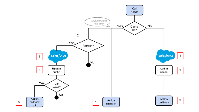
•Second with updated data from the server, if the stored response has exceeded the time to refresh entries.
Cache Miss
If the action is not a cache hit as it doesn’t match a storage entry:
1. The action is sent to the server-side controller.
2. If the response is SUCCESS, the response is added to storage.
3. The callback in the client-side controller is executed.
Cache Hit
If the action is a cache hit as it matches a storage entry:
1. The callback in the client-side controller is executed with the cached action response.
2. If the response has been cached for longer than the refresh time, the storage entry is refreshed.
When an application enables storable actions, a refresh time is configured. The refresh time is the duration in seconds before an
entry is refreshed in storage. The refresh time is automatically configured in Lightning Experience and Salesforce1.
3. The action is sent to the server-side controller.
4. If the response is SUCCESS, the response is added to storage.
5. If the refreshed response is different from the cached response, the callback in the client-side controller is executed for a second
time.
SEE ALSO:
Storable Actions
Enable Storable Actions in an Application
254
Creating Server-Side Logic with ControllersCreating Apps

Enable Storable Actions in an Application
Storable actions are automatically configured in Lightning Experience and Salesforce1. To use storable actions in a standalone app (.app
resource), you must configure client-side storage for cached action responses.
To configure client-side storage for your standalone app, use <auraStorage:init> in the auraPreInitBlock attribute of
your application’s template. For example:
<aura:component isTemplate="true" extends="aura:template">
<aura:set attribute="auraPreInitBlock">
<auraStorage:init
name="actions"
persistent="false"
secure="true"
maxSize="1024"
defaultExpiration="900"
defaultAutoRefreshInterval="30" />
</aura:set>
</aura:component>
name
The storage name must be actions. Storable actions are the only currently supported type of storage.
persistent
Set to true to preserve cached data between user sessions in the browser.
secure
Set to true to encrypt cached data.
maxsize
The maximum size in KB of the storage.
defaultExpiration
The duration in seconds that an entry is retained in storage.
defaultAutoRefreshInterval
The duration in seconds before an entry is refreshed in storage.
For more information, see the Reference Doc App.
Storable actions use the Storage Service. The Storage Service supports multiple implementations of storage and selects an adapter at
runtime based on browser support and specified characteristics of persistence and security.
SEE ALSO:
Storage Service Adapters
Storage Service Adapters
The Storage Service supports multiple implementations of storage and selects an adapter at runtime based on browser support and
specified characteristics of persistence and security. Storage can be persistent and secure. With persistent storage, cached data is preserved
between user sessions in the browser. With secure storage, cached data is encrypted.
SecurePersistentStorage Adapter Name
falsetrueIndexedDB
truefalseMemory
255
Creating Server-Side Logic with ControllersCreating Apps

IndexedDB
(Persistent but not secure) Provides access to an API for client-side storage and search of structured data. For more information, see
the Indexed Database API.
Memory
(Not persistent but secure) Provides access to JavaScript memory for caching data. The stored cache persists only per browser page.
Browsing to a new page resets the cache.
The Storage Service selects a storage adapter on your behalf that matches the persistent and secure options you specify when initializing
the service. For example, if you request a persistent and insecure storage service, the Storage Service returns the IndexedDB storage if
the browser supports it.
Abortable Actions
Mark an action as abortable to make it potentially abortable while it's queued to be sent to the server. An abortable action in the queue
is not sent to the server if the component that created the action is no longer valid, that is cmp.isValid() == false. A component
is automatically destroyed and marked invalid by the framework when it is unrendered.
Note: We recommend that you only use abortable actions for read-only operations as they are not guaranteed to be sent to the
server.
An abortable action is sent to the server and executed normally unless the component that created the action is invalid before the action
is sent to the server.
A non-abortable action is always sent to the server and can't be aborted in the queue.
If an action response returns from the server and the associated component is now invalid, the logic has been executed on the server
but the action callback isn’t executed. This is true whether or not the action is marked as abortable.
Marking an Action as Abortable
Mark a server-side action as abortable by using the setAbortable() method on the Action object in JavaScript. For example:
var action = cmp.get("c.serverEcho");
action.setAbortable();
SEE ALSO:
Creating Server-Side Logic with Controllers
Queueing of Server-Side Actions
Calling a Server-Side Action
Creating Components
The Cmp.<myNamespace>.<myComponent> syntax to reference a component in Apex is deprecated. Use
$A.createComponent() in client-side JavaScript code instead.
SEE ALSO:
Dynamically Creating Components
256
Creating ComponentsCreating Apps

Working with Salesforce Records
It’s easy to work with your Salesforce records in Apex.
The term sObject refers to any object that can be stored in Force.com. This could be a standard object, such as Account, or a custom
object that you create, such as a Merchandise object.
An sObject variable represents a row of data, also known as a record. To work with an object in Apex, declare it using the SOAP
API name of the object. For example:
Account a = new Account();
MyCustomObject__c co = new MyCustomObject__c();
For more information on working on records with Apex, see Working with Data in Apex.
This example controller persists an updated Account record. Note that the update method has the @AuraEnabled annotation,
which enables it to be called as a server-side controller action.
public with sharing class AccountController {
@AuraEnabled
public static void updateAnnualRevenue(String accountId, Decimal annualRevenue) {
Account acct = [SELECT Id, Name, BillingCity FROM Account WHERE Id = :accountId];
acct.AnnualRevenue = annualRevenue;
// Perform isAccessible() and isUpdateable() checks here
update acct;
}
}
For an example of calling Apex code from JavaScript code, see the Quick Start on page 6.
Loading Record Data from a Standard Object
Load records from a standard object in a server-side controller. The following server-side controller has methods that return a list of
opportunity records and an individual opportunity record.
public with sharing class OpportunityController {
@AuraEnabled
public static List<Opportunity> getOpportunities() {
List<Opportunity> opportunities =
[SELECT Id, Name, CloseDate FROM Opportunity];
return opportunities;
}
@AuraEnabled
public static Opportunity getOpportunity(Id id) {
Opportunity opportunity = [
SELECT Id, Account.Name, Name, CloseDate,
Owner.Name, Amount, Description, StageName
FROM Opportunity
WHERE Id = :id
];
257
Working with Salesforce RecordsCreating Apps
// Perform isAccessible() check here
return opportunity;
}
}
This example component uses the previous server-side controller to display a list of opportunity records when you press a button.
<aura:component controller="OpportunityController">
<aura:attribute name="opportunities" type="Opportunity[]"/>
<ui:button label="Get Opportunities" press="{!c.getOpps}"/>
<aura:iteration var="opportunity" items="{!v.opportunities}">
<p>{!opportunity.Name} : {!opportunity.CloseDate}</p>
</aura:iteration>
</aura:component>
When you press the button, the following client-side controller calls the getOpportunities() server-side controller and sets the
opportunities attribute on the component. For more information about calling server-side controller methods, see Calling a
Server-Side Action on page 250.
({
getOpps: function(cmp){
var action = cmp.get("c.getOpportunities");
action.setCallback(this,function(response){
var state = response.getState();
if (state === "SUCCESS") {
cmp.set("v.opportunities", response.getReturnValue());
}
});
$A.enqueueAction(action);
}
})
Note: To load record data during component initialization, use the init handler.
Loading Record Data from a Custom Object
Load record data using an Apex controller and setting the data on a component attribute. This server-side controller returns records on
a custom object myObj__c.
public with sharing class MyObjController {
@AuraEnabled
public static List<MyObj__c> getMyObjects() {
// Perform isAccessible() checks here
return [SELECT Id, Name, myField__c FROM MyObj__c];
}
}
This example component uses the previous controller to display a list of records from the myObj__c custom object.
<aura:component controller="MyObjController"/>
<aura:attribute name="myObjects" type="namespace.MyObj__c[]"/>
<aura:iteration items="{!v.myObjects}" var="obj">
258
Working with Salesforce RecordsCreating Apps

{!obj.Name}, {!obj.namespace__myField__c}
</aura:iteration>
This client-side controller sets the myObjects component attribute with the record data by calling the getMyObjects() method
in the server-side controller. This step can also be done during component initialization using the init handler.
getMyObjects: function(cmp){
var action = cmp.get("c.getMyObjects");
action.setCallback(this,function(response){
var state = response.getState();
if (state === "SUCCESS") {
cmp.set("v.myObjects", response.getReturnValue());
}
});
$A.enqueueAction(action);
}
For an example on loading and updating records using controllers, see the Quick Start on page 6.
IN THIS SECTION:
CRUD and Field-Level Security (FLS)
Lightning components don’t automatically enforce CRUD and FLS when you reference objects or retrieve the objects from an Apex
controller. This means that the framework continues to display records and fields for which users don’t have CRUD access and FLS
visibility. You must manually enforce CRUD and FLS in your Apex controllers.
Saving Records
You can take advantage of the built-in create and edit record pages in Salesforce1 to create or edit records via a Lightning component.
Deleting Records
You can delete records via a Lightning component to remove them from both the view and database.
SEE ALSO:
CRUD and Field-Level Security (FLS)
CRUD and Field-Level Security (FLS)
Lightning components don’t automatically enforce CRUD and FLS when you reference objects or retrieve the objects from an Apex
controller. This means that the framework continues to display records and fields for which users don’t have CRUD access and FLS
visibility. You must manually enforce CRUD and FLS in your Apex controllers.
For example, including the with sharing keyword in an Apex controller ensures that users see only the records they have access
to in a Lightning component. Additionally, you must explicitly check for isAccessible(), isCreateable(), isDeletable(),
and isUpdateable() prior to performing operations on records or objects.
This example shows the recommended way to perform an operation on a custom expense object.
public with sharing class ExpenseController {
// ns refers to namespace; leave out ns__ if not needed
// This method is vulnerable.
@AuraEnabled
public static List<ns__Expense__c> get_UNSAFE_Expenses() {
return [SELECT Id, Name, ns__Amount__c, ns__Client__c, ns__Date__c,
259
Working with Salesforce RecordsCreating Apps

ns__Reimbursed__c, CreatedDate FROM ns__Expense__c];
}
// This method is recommended.
@AuraEnabled
public static List<ns__Expense__c> getExpenses() {
String [] expenseAccessFields = new String [] {'Id',
'Name',
'ns__Amount__c',
'ns__Client__c',
'ns__Date__c',
'ns__Reimbursed__c',
'CreatedDate'
};
// Obtain the field name/token map for the Expense object
Map<String,Schema.SObjectField> m = Schema.SObjectType.ns__Expense__c.fields.getMap();
for (String fieldToCheck : expenseAccessFields) {
// Check if the user has access to view field
if (!m.get(fieldToCheck).getDescribe().isAccessible()) {
// Pass error to client
throw new System.NoAccessException();
// Suppress editor logs
return null;
}
}
// Query the object safely
return [SELECT Id, Name, ns__Amount__c, ns__Client__c, ns__Date__c,
ns__Reimbursed__c, CreatedDate FROM ns__Expense__c];
}
}
Note: For more information, see the articles on Enforcing CRUD and FLS and Lightning Security.
Saving Records
You can take advantage of the built-in create and edit record pages in Salesforce1 to create or edit records via a Lightning component.
The following component contains a button that calls a client-side controller to display the edit record page.
<aura:component>
<ui:button label="Edit Record" press="{!c.edit}"/>
</aura:component>
260
Working with Salesforce RecordsCreating Apps

The client-side controller fires the force:recordEdit event, which displays the edit record page for a given contact ID. For this
event to be handled correctly, the component must be included in Salesforce1.
edit : function(component, event, helper) {
var editRecordEvent = $A.get("e.force:editRecord");
editRecordEvent.setParams({
"recordId": component.get("v.contact.Id")
});
editRecordEvent.fire();
}
Records updated using the force:recordEdit event are persisted by default.
Saving Records using a Lightning Component
Alternatively, you might have a Lightning component that provides a custom form for users to add a record. To save the new record,
wire up a client-side controller to an Apex controller. The following list shows how you can persist a record via a component and Apex
controller.
Note: If you create a custom form to handle record updates, you must provide your own field validation.
Create an Apex controller to save your updates with the upsert operation. The following example is an Apex controller for upserting
record data.
@AuraEnabled
public static Expense__c saveExpense(Expense__c expense) {
// Perform isUpdateable() check here
upsert expense;
return expense;
}
Call a client-side controller from your component. For example, <ui:button label="Submit"
press="{!c.createExpense}"/>.
In your client-side controller, provide any field validation and pass the record data to a helper function.
createExpense : function(component, event, helper) {
// Validate form fields
// Pass form data to a helper function
var newExpense = component.get("v.newExpense");
helper.createExpense(component, newExpense);
}
In your component helper, get an instance of the server-side controller and set a callback. The following example upserts a record on a
custom object. Recall that setParams() sets the value of the expense argument on the server-side controller’s saveExpense()
method.
createExpense: function(component, expense) {
//Save the expense and update the view
this.upsertExpense(component, expense, function(a) {
var expenses = component.get("v.expenses");
expenses.push(a.getReturnValue());
component.set("v.expenses", expenses);
});
},
upsertExpense : function(component, expense, callback) {
261
Working with Salesforce RecordsCreating Apps

var action = component.get("c.saveExpense");
action.setParams({
"expense": expense
});
if (callback) {
action.setCallback(this, callback);
}
$A.enqueueAction(action);
}
SEE ALSO:
CRUD and Field-Level Security (FLS)
Deleting Records
You can delete records via a Lightning component to remove them from both the view and database.
Create an Apex controller to delete a specified record with the delete operation. The following Apex controller deletes an expense
object record.
@AuraEnabled
public static Expense__c deleteExpense(Expense__c expense) {
// Perform isDeletable() check here
delete expense;
return expense;
}
Depending on how your components are set up, you might need to create an event to tell another component that a record has been
deleted. For example, you have a component that contains a sub-component that is iterated over to display the records. Your
sub-component contains a button (1), which when pressed fires an event that’s handled by the container component (2), which deletes
the record that’s clicked on.
<aura:registerEvent name="deleteExpenseItem" type="c:deleteExpenseItem"/>
<ui:button label="Delete" press="{!c.delete}"/>
262
Working with Salesforce RecordsCreating Apps
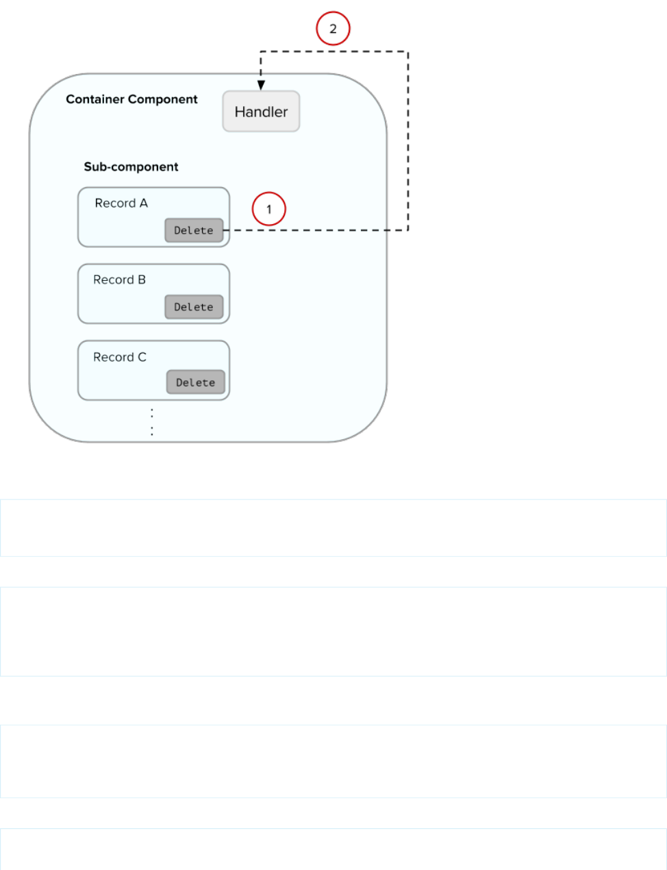
Create a component event to capture and pass the record that’s to be deleted. Name the event deleteExpenseItem.
<aura:event type="COMPONENT">
<aura:attribute name="expense" type="Expense__c"/>
</aura:event>
Then, pass in the record to be deleted and fire the event in your client-side controller.
delete :function(component, evt, helper) {
var expense = component.get("v.expense");
var deleteEvent = component.getEvent("deleteExpenseItem");
deleteEvent.setParams({ "expense": expense }).fire();
}
In the container component, include a handler for the event. In this example, c:expenseList is the sub-component that displays
records.
<aura:handler name="deleteExpenseItem" event="c:deleteExpenseItem" action="c:deleteEvent"/>
<aura:iteration items="{!v.expenses}" var="expense">
<c:expenseList expense="{!expense}"/>
</aura:iteration>
And handle the event in the client-side controller of the container component.
deleteEvent : function(component, event, helper) {
// Call the helper function to delete record and update view
263
Working with Salesforce RecordsCreating Apps

helper.deleteExpense(component, event.getParam("expense"));
}
Finally, in the helper function of the container component, call your Apex controller to delete the record and update the view.
deleteExpense : function(component, expense, callback) {
// Call the Apex controller and update the view in the callback
var action = component.get("c.deleteExpense");
action.setParams({
"expense": expense
});
action.setCallback(this,function(response) {
var state = response.getState();
if (state === "SUCCESS") {
// Remove only the deleted expense from view
var expenses = component.get("v.expenses");
var items = [];
for (i = 0; i < expenses.length; i++) {
if(expenses[i]!==expense) {
items.push(expenses[i]);
}
}
component.set("v.expenses", items);
// Other client-side logic
}
});
$A.enqueueAction(action);
}
The helper function calls the Apex controller to delete the record in the database. In the callback function,
component.set("v.expenses", items) updates the view with the updated array of records.
SEE ALSO:
CRUD and Field-Level Security (FLS)
Create a Standalone Lightning App
Component Events
Calling a Server-Side Action
Testing Your Apex Code
Before you can upload a managed package, you must write and execute tests for your Apex code to meet minimum code coverage
requirements. Also, all tests must run without errors when you upload your package to AppExchange.
To package your application and components that depend on Apex code, the following must be true.
•At least 75% of your Apex code must be covered by unit tests, and all of those tests must complete successfully.
Note the following.
–When deploying Apex to a production organization, each unit test in your organization namespace is executed by default.
–Calls to System.debug are not counted as part of Apex code coverage.
–Test methods and test classes are not counted as part of Apex code coverage.
264
Testing Your Apex CodeCreating Apps

–While only 75% of your Apex code must be covered by tests, your focus shouldn't be on the percentage of code that is covered.
Instead, you should make sure that every use case of your application is covered, including positive and negative cases, as well
as bulk and single records. This should lead to 75% or more of your code being covered by unit tests.
•Every trigger must have some test coverage.
•All classes and triggers must compile successfully.
This sample shows an Apex test class that is used with the controller class in the expense tracker app available at Create a Standalone
Lightning App on page 7.
@isTest
class TestExpenseController {
static testMethod void test() {
//Create new expense and insert it into the database
Expense__c exp = new Expense__c(name='My New Expense',
amount__c=20, client__c='ABC',
reimbursed__c=false, date__c=null);
ExpenseController.saveExpense(exp);
//Assert the name field and saved expense
System.assertEquals('My New Expense',
ExpenseController.getExpenses()[0].Name,
'Name does not match');
System.assertEquals(exp, ExpenseController.saveExpense(exp));
}
}
Note: Apex classes must be manually added to your package.
For more information on distributing Apex code, see the Apex Code Developer's Guide.
SEE ALSO:
Distributing Applications and Components
Making API Calls from Apex
Make API calls from an Apex controller. You can’t make Salesforce API calls from JavaScript code.
For security reasons, the Lightning Component framework places restrictions on making API calls from JavaScript code. To call third-party
APIs from your component’s JavaScript code, add the API endpoint as a CSP Trusted Site.
To call Salesforce APIs, make the API calls from your component’s Apex controller. Use a named credential to authenticate to Salesforce.
Note: By security policy, sessions created by Lightning components aren’t enabled for API access. This prevents even your Apex
code from making API calls to Salesforce. Using a named credential for specific API calls allows you to carefully and selectively
bypass this security restriction.
The restrictions on API-enabled sessions aren’t accidental. Carefully review any code that uses a named credential to ensure you’re
not creating a vulnerability.
265
Making API Calls from ApexCreating Apps
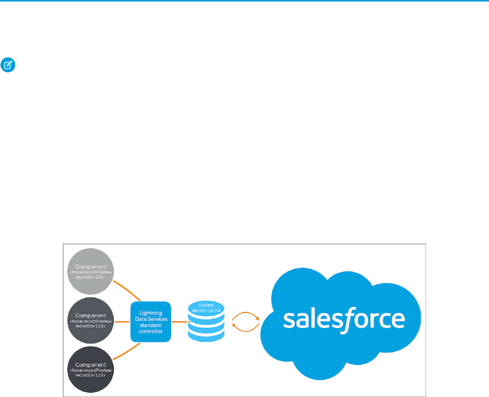
For information about making API calls from Apex, see the Apex Developer Guide.
SEE ALSO:
Apex Developer Guide: Named Credentials as Callout Endpoints
Making API Calls from Components
Create CSP Trusted Sites to Access Third-Party APIs
Content Security Policy Overview
Lightning Data Service (Developer Preview)
Use Lightning Data Service to load, create, edit, or delete a record in your component, without requiring Apex code. Lightning Data
Service handles sharing rules and field level security for you. In addition to not needing Apex, Lightning Data Service improves performance
and user interface consistency.
Note: Lightning Data Service is available as a developer preview. Lightning Data Service isn’t generally available unless or until
Salesforce announces its general availability in documentation or in press releases or public statements. You can provide feedback
and suggestions for Lightning Data Service on the IdeaExchange.
At the simplest level, you can think of Lightning Data Service as the Lightning Components version of the Visualforce standard controller.
While this statement is an over-simplification, it serves to illustrate a point. Whenever possible, your components should use Lightning
Data Service to read and modify Salesforce data.
Data access with Lightning Data Service is usually simpler than the equivalent using a server-side Apex controller. Read-only access can
be entirely declarative in your component’s markup. For code that modifies data, your component’s JavaScript controller is roughly the
same amount of code, and you eliminate the Apex entirely. Additionally, all of your data access code is consolidated into your component,
which significantly reduces complexity.
Lightning Data Service provides other benefits aside from the code. It’s built on highly efficient local storage that’s shared across all
components that use it. Records loaded in Lightning Data Service are cached and shared across components.
Components accessing the same record see significant performance improvements, because a record is only loaded once, no matter
how many components are using it. Shared records also improve user interface consistency. When one component updates a record,
any other components using it are notified, and in most cases refresh automatically.
266
Lightning Data Service (Developer Preview)Creating Apps
IN THIS SECTION:
Loading a Record
To load a record using Lightning Data Service, add the force:recordPreview tag to your component. In the
force:recordPreview tag, specify the ID of the record to be loaded, a list of fields, and the attribute to which to assign the
loaded record.
Saving a Record
To save a record using Lightning Data Service, call saveRecord on the force:recordPreview component, and pass in
a callback function to be invoked after the save operation completes.
Creating a Record
To create a record using Lightning Data Service, first declare force:recordPreview without assigning a recordId. Then
load a record template by calling the getNewRecord function on force:recordPreview. Finally, apply values to the new
record, and save the record by calling the saveRecord function on force:recordPreview.
Deleting a Record
To delete a record using Lightning Data Service, call deleteRecord on the force:recordPreview component, and pass
in a callback function to be invoked after the delete operation completes.
Record Changes
To perform tasks beyond rerendering the record when the record changes, handle the recordUpdated event. You can handle
record loaded, updated, and deleted changes, applying different actions to each change type.
Errors
To act when there’s an error, handle the recordUpdated event and handle the case where the changeType is “ERROR”.
Considerations and Limitations
Lightning Data Service is simple to use and quite powerful. However, it’s not a complete replacement for writing your own data
access code. Here are some considerations to keep in mind when using it.
Lightning Data Service Example
Here’s a longer, more complete example of using Lightning Data Service to create a “Quick Contact” action panel.
SaveRecordResult
Represents the result of a Lightning Data Service operation that makes a persistent change to record data.
Loading a Record
To load a record using Lightning Data Service, add the force:recordPreview tag to your component. In the
force:recordPreview tag, specify the ID of the record to be loaded, a list of fields, and the attribute to which to assign the
loaded record.
Loading a record is the simplest operation in Lightning Data Service. You can accomplish it entirely in markup. The
force:recordPreview must specify the following three things.
•The ID of the record to be loaded
•The component attribute to which the loaded record should be assigned
•A list of fields to load
The list of fields to load can be specified explicitly, using the fields attribute. Simply provide a list of fields to query for. For example,
fields="Name,BillingCity,BillingState".
Alternatively, and more powerfully, you can specify a layout, using the layoutType attribute. All fields on that layout are loaded for
the record. Layouts are typically modified by administrators. Loading record data using layoutType allows your component to adapt
267
Loading a RecordCreating Apps
to those layout definitions. There are several layouts available but in practice the FULL and COMPACT layouts are the simplest and most
common to use.
Example: Loading a Record
The following example illustrates the essentials of loading a record using Lightning Data Service. This component can be added
to a record home page in Lightning App Builder, or as a custom action. The record ID is supplied by the implicit recordId
attribute added by the force:hasRecordId interface.
ldsLoad.cmp
<aura:component
implements="flexipage:availableForRecordHome,force:lightningQuickActionWithoutHeader,force:hasRecordId">
<aura:attribute name="record" type="Object"/>
<aura:attribute name="recordError" type="String"/>
<force:recordPreview aura:id="recordLoader"
recordId="{!v.recordId}"
layoutType="FULL"
targetRecord="{!v.record}"
targetError="{!v.recordError}"
/>
<!-- Display a header with details about the record -->
<div class="slds-page-header" role="banner">
<p class="slds-text-heading--label">{!v.record.Name}</p>
<h1 class="slds-page-header__title slds-m-right--small
slds-truncate slds-align-left">{!v.record.BillingCity},
{!v.record.BillingState}</h1>
</div>
<!-- Display Lightning Data Service errors, if any -->
<aura:if isTrue="{!not(empty(v.recordError))}">
<div class="recordError">
<ui:message title="Error" severity="error" closable="true">
{!v.recordError}
</ui:message>
</div>
</aura:if>
</aura:component>
SEE ALSO:
Configure Components for Lightning Experience Record Pages
Configure Components for Record-Specific Actions
force:recordPreview (Developer Preview)
268
Loading a RecordCreating Apps

Saving a Record
To save a record using Lightning Data Service, call saveRecord on the force:recordPreview component, and pass in a
callback function to be invoked after the save operation completes.
The Lightning Data Service save operation is used in two cases.
•To save changes to an existing record.
•To create and save a new record.
To save changes to an existing record, first load the record in EDIT mode. Then call saveRecord on the force:recordPreview
component. These techniques are described in the following sections.
To save a new record, and thus create it, first create the record from a record template, as described in Creating a Record. Then call
saveRecord on the force:recordPreview component, described in a following section.
Load a Record in EDIT Mode
To load a record that might be updated, set the force:recordPreview tag’s mode attribute to “EDIT”. Other than explicitly
setting the mode, loading a record for editing is the same as loading it for any other purpose.
Note: Lightning Data Service records are shared across all components. When you load a record in EDIT mode, the record assigned
to the to the targetRecord attribute is a copy of the record object in the Lightning Data Service cache, instead of a direct
reference. This protects other components that might also be using the record from unsaved changes in the component that’s
editing it. When the edited copy is saved, the “real” version of the record is updated on the server, then the Lightning Data Service
cache is updated. At that point, other components using that record are notified of the change.
Call saveRecord to Save Record Changes
To perform the actual save operation, call saveRecord on the force:recordPreview component from the appropriate
controller action handler. saveRecord takes one argument, a callback function to be invoked when the operation completes. This
callback function receives a SaveRecordResult as its only parameter. SaveRecordResult includes a state attribute that
indicates success or error, and other details you can use to handle the result of the operation.
Example: Saving a Record
The following example illustrates the essentials of saving a record using Lightning Data Service. It’s intended for use on a record
page. The record ID is supplied by the implicit recordId attribute added by the force:hasRecordId interface.
ldsSave.cmp
<aura:component
implements="flexipage:availableForRecordHome,force:hasRecordId">
<aura:attribute name="record" type="Object" access="private"/>
<aura:attribute name="recordError" type="String" access="private"/>
<force:recordPreview aura:id="recordHandler"
recordId="{!v.recordId}"
layoutType="FULL"
targetRecord="{!v.record}"
targetError="{!v.recordError}"
mode="EDIT"
/>
269
Saving a RecordCreating Apps

<!-- Display a header with details about the record -->
<div class="slds-page-header" role="banner">
<p class="slds-text-heading--label">Edit Record</p>
<h1 class="slds-page-header__title slds-m-right--small
slds-truncate slds-align-left">{!v.record.Name}</h1>
</div>
<!-- Display Lightning Data Service errors, if any -->
<aura:if isTrue="{!not(empty(v.recordError))}">
<div class="recordError">
<ui:message title="Error" severity="error" closable="true">
{!v.recordError}
</ui:message>
</div>
</aura:if>
<!-- Display an editing form -->
<div class="slds-form--stacked">
<div class="slds-form-element">
<label class="slds-form-element__label" for="recordName">Name: </label>
<div class="slds-form-element__control">
<ui:inputText class="slds-input" aura:id="recordName"
value="{!v.record.Name}" required="true"/>
</div>
</div>
<div class="slds-form-element">
<ui:button label="Save Record" press="{!c.handleSaveRecord}"
class="slds-button slds-button--brand" />
</div>
</div>
</aura:component>
This component loads a record using force:recordPreview set to EDIT mode, and provides a form for editing record
values. (In this simple example, just the record name field.)
ldsSaveController.js
({
handleSaveRecord: function(component, event, helper) {
component.find("recordHandler").saveRecord($A.getCallback(function(saveResult)
{
if (saveResult.state === "SUCCESS" || saveResult.state === "DRAFT") {
// Saved! Show a toast UI message
var resultsToast = $A.get("e.force:showToast");
resultsToast.setParams({
"title":"Saved",
"message":"The record was updated."
});
resultsToast.fire();
270
Saving a RecordCreating Apps

// Reload the view so components not using force:recordPreview
// are updated
$A.get("e.force:refreshView").fire();
}
else if (saveResult.state === "INCOMPLETE") {
console.log("User is offline, device doesn't support drafts.");
}
else if (saveResult.state === "ERROR") {
console.log('Problem saving record, error: ' +
JSON.stringify(saveResult.error));
}
else {
console.log('Unknown problem, state: ' + saveResult.state +
', error: ' + JSON.stringify(saveResult.error));
}
}));
},
})
The handleSaveRecord action here is a minimal version. There’s no form validation or real error handling. Whatever is
entered in the form is attempted to be saved to the record.
SEE ALSO:
SaveRecordResult
Configure Components for Lightning Experience Record Pages
Configure Components for Record-Specific Actions
force:recordPreview (Developer Preview)
Creating a Record
To create a record using Lightning Data Service, first declare force:recordPreview without assigning a recordId. Then load
a record template by calling the getNewRecord function on force:recordPreview. Finally, apply values to the new record,
and save the record by calling the saveRecord function on force:recordPreview.
Creating a record with Lightning Data Service is a two-step process.
1. Call getNewRecord to create an empty record from a record template. This record can be used as the backing store for a form,
or otherwise have its values set to data intended to be saved. This is described in a later section.
2. Call saveRecord to commit the record. This is described in Saving a Record.
Create an Empty Record from a Record Template
To create an empty record from a record template, you must first not set a recordId on the force:recordPreview tag.
Without a recordId, Lightning Data Service doesn’t load an existing record.
Then, in your component’s init or another handler, call the getNewRecord on force:recordPreview. getNewRecord
takes the following arguments.
271
Creating a RecordCreating Apps
DescriptionTypeAttribute Name
The entity API name for the sObject of the record to be created.StringentityApiName
The 18 character ID of the record type for the new record.
If not specified, the default record type for the object is used, as defined in the
user’s profile.
StringrecordTypeId
A map of field values to set on the empty record before use. Use this attribute
to set default or context-specific values.
MapdefaultFieldValues
Whether to load the record template from the server, instead of the client-side
Lightning Data Service cache. Defaults to false.
BooleanskipCache
A function invoked after the empty record is created. This function receives no
arguments.
Functioncallback
getNewRecord doesn’t return a result. It simply prepares an empty record and assigns it to the targetRecord attribute.
Example: Creating a Record
The following example illustrates the essentials of creating a record using Lightning Data Service. This example is intended to be
added to an account record Lightning page.
ldsCreate.cmp
<aura:component implements="flexipage:availableForRecordHome,force:hasRecordId">
<aura:attribute name="newContact" type="Object"/>
<aura:attribute name="newContactError" type="String"/>
<force:recordPreview aura:id="contactRecordCreator"
layoutType="FULL"
targetRecord="{!v.newContact}"
targetError="{!v.newContactError}"
/>
<aura:handler name="init" value="{!this}" action="{!c.doInit}"/>
<!-- Header -->
<div class="slds-page-header" role="banner">
<p class="slds-text-heading--label">Create Contact</p>
</div>
<!-- Display Lightning Data Service errors, if any -->
<aura:if isTrue="{!not(empty(v.newContactError))}">
<div class="recordError">
<ui:message title="Error" severity="error" closable="true">
{!v.newContactError}
</ui:message>
</div>
</aura:if>
<!-- Display the new contact form -->
<div class="slds-form--stacked">
272
Creating a RecordCreating Apps

<div class="slds-form-element">
<label class="slds-form-element__label" for="contactFirstName">First Name:
</label>
<div class="slds-form-element__control">
<ui:inputText class="slds-input" aura:id="contactFirstName"
value="{!v.newContact.FirstName}" required="true"/>
</div>
</div>
<div class="slds-form-element">
<label class="slds-form-element__label" for="contactLastName">Last Name:
</label>
<div class="slds-form-element__control">
<ui:inputText class="slds-input" aura:id="contactLastName"
value="{!v.newContact.LastName}" required="true"/>
</div>
</div>
<div class="slds-form-element">
<label class="slds-form-element__label" for="contactTitle">Title: </label>
<div class="slds-form-element__control">
<ui:inputText class="slds-input" aura:id="contactTitle"
value="{!v.newContact.Title}" />
</div>
</div>
<div class="slds-form-element">
<ui:button label="Save Contact" press="{!c.handleSaveContact}"
class="slds-button slds-button--brand" />
</div>
</div>
</aura:component>
This component doesn’t set the recordId attribute of force:recordPreview. This tells Lightning Data Service to expect
a new record. Here, that’s created in the component’s init handler.
ldsCreateController.js
({
doInit: function(component, event, helper) {
// Prepare a new record from template
component.find("contactRecordCreator").getNewRecord(
"Contact",// sObject type (entity API name)
null, // record type
null, // default record values
false, // skip cache?
$A.getCallback(function() {
var rec = component.get("v.newContact");
var error = component.get("v.newContactError");
if(error || (rec === null)) {
console.log("Error initializing record template: " + error);
}
273
Creating a RecordCreating Apps

else {
console.log("Record template initialized: " + rec.sobjectType);
}
})
);
},
handleSaveContact: function(component, event, helper) {
if(helper.validateContactForm(component)) {
component.set("v.newContact.AccountId", component.get("v.recordId"));
component.find("contactRecordCreator").saveRecord(function(saveResult) {
if (saveResult.state === "SUCCESS" || saveResult.state === "DRAFT") {
// Success! Prepare a toast UI message
var resultsToast = $A.get("e.force:showToast");
resultsToast.setParams({
"title":"Contact Saved",
"message":"The new contact was created."
});
resultsToast.fire();
// TODO: Reset the form to empty values
// Reload the view so components not using force:recordPreview
// are updated
$A.get("e.force:refreshView").fire();
}
else if (saveResult.state === "INCOMPLETE") {
console.log("User is offline, device doesn't support drafts.");
}
else if (saveResult.state === "ERROR") {
console.log('Problem saving contact, error: ' +
JSON.stringify(saveResult.error));
}
else {
console.log('Unknown problem, state: ' + saveResult.state +
', error: ' + JSON.stringify(saveResult.error));
}
});
}
},
})
The doInit init handler calls getNewRecord() on the force:recordPreview component, passing in a very simple
callback handler. This call creates a new, empty contact record, which is used by the contact form in the component’s markup.
Note: The callback passed to getNewRecord() must be wrapped in $A.getCallback() to ensure correct access
context when the callback is invoked. If the callback is passed in without being wrapped in $A.getCallback(), any
attempt to access private attributes of your component results in access check failures.
Even if you’re not accessing private attributes, it’s a best practice to always wrap the callback function for getNewRecord()
in $A.getCallback(). Never mix (contexts), never worry.
274
Creating a RecordCreating Apps
The handleSaveContact handler is called when the Save Contact button is clicked. It’s a straightforward application of
saving the contact, as described in Saving a Record, and then updating the user interface.
Note: The helper function, validateContactForm, isn’t shown. It simply validates the form values. For an example
of this validation, see Lightning Data Service Example.
SEE ALSO:
Saving a Record
Configure Components for Lightning Experience Record Pages
Configure Components for Record-Specific Actions
Controlling Access
force:recordPreview (Developer Preview)
Deleting a Record
To delete a record using Lightning Data Service, call deleteRecord on the force:recordPreview component, and pass in
a callback function to be invoked after the delete operation completes.
Delete operations with Lightning Data Service are straightforward. The force:recordPreview tag can include minimal details.
If you don’t need any record data, set the fields attribute to just Id. If you know that the only operation is a delete, any mode can
be used.
To perform the delete operation, call deleteRecord on the force:recordPreview component from the appropriate controller
action handler. deleteRecord takes one argument, a callback function to be invoked when the operation completes. This callback
function receives a SaveRecordResult as its only parameter. SaveRecordResult includes a state attribute that indicates
success or error, and other details you can use to handle the result of the operation.
Example: Deleting a Record
The following example illustrates the essentials of deleting a record using Lightning Data Service. This component adds a Delete
Record button to a record page, which deletes the record being displayed. The record ID is supplied by the implicit recordId
attribute added by the force:hasRecordId interface.
ldsDelete.cmp
<aura:component
implements="flexipage:availableForRecordHome,force:hasRecordId">
<aura:attribute name="recordError" type="String" access="private"/>
<force:recordPreview aura:id="recordHandler"
recordId="{!v.recordId}"
fields="Id"
targetError="{!v.recordError}"
/>
<!-- Display Lightning Data Service errors, if any -->
<aura:if isTrue="{!not(empty(v.recordError))}">
<div class="recordError">
<ui:message title="Error" severity="error" closable="true">
{!v.recordError}
</ui:message>
</div>
275
Deleting a RecordCreating Apps

</aura:if>
<div class="slds-form-element">
<ui:button
label="Delete Record"
press="{!c.handleDeleteRecord}"
class="slds-button slds-button--brand" />
</div>
</aura:component>
Notice that the force:recordPreview tag includes only the recordId and a nearly empty fields list—the absolute
minimum required. If you want to display record values in the user interface, for example, as part of a confirmation message, define
the force:recordPreview tag as you would for a load operation, instead of this minimal delete example.
ldsDeleteController.js
({
handleDeleteRecord: function(component, event, helper) {
component.find("recordHandler").deleteRecord($A.getCallback(function(saveResult)
{
if (saveResult.state === "SUCCESS" || saveResult.state === "DRAFT") {
// Deleted! Show a toast UI message
var resultsToast = $A.get("e.force:showToast");
resultsToast.setParams({
"title":"Deleted",
"message":"The record was deleted."
});
resultsToast.fire();
// Navigate to deleted record's object home
var goToObjectHome = $A.get("e.force:navigateToObjectHome");
goToObjectHome.setParams({
"scope": saveResult.entityApiName
});
goToObjectHome.fire();
}
else if (saveResult.state === "INCOMPLETE") {
console.log("User is offline, device doesn't support drafts.");
}
else if (saveResult.state === "ERROR") {
console.log('Problem deleting record, error: ' +
JSON.stringify(saveResult.error));
}
else {
console.log('Unknown problem, state: ' + saveResult.state +
', error: ' + JSON.stringify(saveResult.error));
}
}));
}
})
276
Deleting a RecordCreating Apps

When the record is deleted, you need to navigate away from the record page, or you’ll see a “record not found” error when the
component refreshes. Here the controller uses the entityApiName property in the SaveRecordResult provided to
the callback function, and navigates to the object home page.
SEE ALSO:
SaveRecordResult
Configure Components for Lightning Experience Record Pages
Configure Components for Record-Specific Actions
force:recordPreview (Developer Preview)
Record Changes
To perform tasks beyond rerendering the record when the record changes, handle the recordUpdated event. You can handle
record loaded, updated, and deleted changes, applying different actions to each change type.
If a component performs logic that is record data specific, it must run that logic again when the record changes. A common example is
a business process in which the actions that apply to a record change depending on the record’s values. For example, different actions
apply to opportunities at different stages of the sales cycle.
Note: Lightning Data Service notifies listeners about data changes only if the changed fields are the same as in the listener’s fields
or layout.
Example:
Declare that your component handles the recordUpdated event.
<force:recordPreview aura:id="forceRecord"
recordId="{!v.recordId}"
layoutType="FULL"
targetRecord="{!v._record}"
targetError="{!v._error}"
recordUpdated="{!c.recordUpdated}" />
Then implement an action handler that handles the change.
({
recordUpdated: function(component, event, helper) {
var changeType = event.getParams().changeType;
if (changeType === "ERROR"){/* handle error; do this first! */ }
else if (changeType === "LOADED"){/* handle record load */ }
else if (changeType === "REMOVED"){/* handle record removal */ }
else if (changeType === "CHANGED"){/* handle record change */ }
})
When loading a record in edit mode, the record is not automatically updated to prevent edits currently in progress from being
overwritten. To update the record, use the reloadRecord method in the action handler.
<force:recordPreview aura:id="forceRecord"
recordId="{!v.recordId}"
layoutType="FULL"
targetRecord="{!v._record}"
277
Record ChangesCreating Apps
targetError="{!v._error}"
mode=”EDIT”
recordUpdated="{!c.recordUpdated}" />
({
recordUpdated : function(component, event, helper) {
var changeType = event.getParams().changeType;
if (changeType === "ERROR"){/* handle error; do this first! */ }
else if (changeType === "LOADED"){/* handle record load */ }
else if (changeType === "REMOVED"){/* handle record removal */ }
else if (changeType === "CHANGED") {
/* handle record change; reloadRecord will cause you to lose your current record,
including any changes you’ve made */
component.find("forceRecord").reloadRecord();}
}
})
Errors
To act when there’s an error, handle the recordUpdated event and handle the case where the changeType is “ERROR”.
Example: Declare that your component handles the recordUpdated event.
<force:recordPreview aura:id="forceRecord"
recordId="{!v.recordId}"
layoutType="FULL"
targetRecord="{!v._record}"
targetError="{!v._error}"
recordUpdated="{!c.recordUpdated}" />
Then implement an action handler that handles the error.
({
recordUpdated: function(component, event, helper) {
var changeType = event.getParams().changeType;
if (changeType === "ERROR") { /* handle error; do this first! */ }
else if (changeType === "LOADED"){/* handle record load */ }
else if (changeType === "REMOVED"){/* handle record removal */ }
else if (changeType === "CHANGED"){/* handle record change */ }
})
If an error occurs when the record begins to load, targetError is set to a localized error message. An error occurs if:
•Input is invalid because of an invalid attribute value, or combination of attribute values. For example, an invalid recordId,
or omitting both the layoutType and the fields attributes.
•The record isn’t in the cache and the server is unreachable (offline).
278
ErrorsCreating Apps

If the record becomes inaccessible on the server, the recordUpdated event is fired with changeType set to "REMOVED."
No error is set on targetError, since records becoming inaccessible is sometimes the expected outcome of an operation.
For example, after lead convert the lead record becomes inaccessible.
Records can become inaccessible for the following reasons.
•Record or entity sharing or visibility settings
•Record or entity being deleted
When the record becomes inaccessible on the server, the record’s JavaScript object assigned to targetRecord is unchanged.
Considerations and Limitations
Lightning Data Service is simple to use and quite powerful. However, it’s not a complete replacement for writing your own data access
code. Here are some considerations to keep in mind when using it.
Note: Lightning Data Service is available as a developer preview. Lightning Data Service isn’t generally available unless or until
Salesforce announces its general availability in documentation or in press releases or public statements. You can provide feedback
and suggestions for Lightning Data Service on the IdeaExchange.
During the developer preview, you can only use Lightning Data Service in a Developer Edition org. You can’t package or deploy code
that uses Lightning Data Service.
During the developer preview Lightning Data Service is accessed using the force:recordPreview tag. This tag name is temporary, and
will change in the future. And, although it’s not planned, we reserve the right to make other backwards-incompatible changes with
Lightning Data Service.
Lightning Data Service is only available in Lightning Experience and Salesforce1. Using Lightning Data Service in other containers, such
as Lightning Components for Visualforce, Lightning Out, or Communities isn’t supported. This is true even if these containers are accessed
inside Lightning Experience or Salesforce1, for example, a Visualforce page added to Lightning Experience.
Lightning Data Service supports primitive DML operations—create, read, update, and delete (or CRUD). It operates on one record at a
time, which you retrieve or modify using the record ID. Lightning Data Service supports spanned fields with a maximum depth of five
levels. Support for working with collections of records or for querying for a record by anything other than the record ID isn’t available. If
you need to support higher-level operations or multiple operations in one transaction, use standard @AuraEnabled Apex methods.
Lightning Data Service shared data storage provides notifications to all components that use a record whenever a component changes
that record. It doesn’t notify components if that record is changed on the server, for example, if someone else modifies it. Records
changed on the server aren’t updated locally until they’re reloaded. Lightning Data Service notifies listeners about data changes only if
the changed fields are the same as in the listener’s fields or layout.
Lightning Data Service Example
Here’s a longer, more complete example of using Lightning Data Service to create a “Quick Contact” action panel.
Example: This example is intended to be added as a Lightning action on the account object. Clicking the action’s button on the
account layout opens a panel to create a new contact.
279
Considerations and LimitationsCreating Apps
This example is very similar to the example provided in Configure Components for Record-Specific Actions. Compare the two
examples to better understand the differences between using @AuraEnabled Apex controllers and using Lightning Data
Service.
ldsQuickContact.cmp
<aura:component implements="force:lightningQuickActionWithoutHeader,force:hasRecordId">
<aura:attribute name="account" type="Object"/>
<aura:attribute name="accountError" type="String"/>
<force:recordPreview aura:id="accountRecordLoader"
recordId="{!v.recordId}"
fields="Name,BillingCity,BillingState"
targetRecord="{!v.account}"
targetError="{!v.accountError}"
/>
<aura:attribute name="newContact" type="Object" access="private"/>
<aura:attribute name="newContactError" type="String" access="private"/>
<aura:attribute name="hasErrors" type="Boolean"
description="Indicate whether there were failures when validating the contact."
/>
<force:recordPreview aura:id="contactRecordCreator"
layoutType="FULL"
targetRecord="{!v.newContact}"
targetError="{!v.newContactError}"
/>
<aura:handler name="init" value="{!this}" action="{!c.doInit}"/>
280
Lightning Data Service ExampleCreating Apps

<!-- Display a header with details about the account -->
<div class="slds-page-header" role="banner">
<p class="slds-text-heading--label">{!v.account.Name}</p>
<h1 class="slds-page-header__title slds-m-right--small
slds-truncate slds-align-left">Create New Contact</h1>
</div>
<!-- Display Lightning Data Service errors, if any -->
<aura:if isTrue="{!not(empty(v.accountError))}">
<div class="recordError">
<ui:message title="Error" severity="error" closable="true">
{!v.accountError}
</ui:message>
</div>
</aura:if>
<aura:if isTrue="{!not(empty(v.newContactError))}">
<div class="recordError">
<ui:message title="Error" severity="error" closable="true">
{!v.newContactError}
</ui:message>
</div>
</aura:if>
<!-- Display form validation errors, if any -->
<aura:if isTrue="{!v.hasErrors}">
<div class="formValidationError">
<ui:message title="Error" severity="error" closable="true">
The new contact can't be saved because it's not valid.
Please review and correct the errors in the form.
</ui:message>
</div>
</aura:if>
<!-- Display the new contact form -->
<div class="slds-form--stacked">
<div class="slds-form-element">
<label class="slds-form-element__label" for="contactFirstName">First Name:
</label>
<div class="slds-form-element__control">
<ui:inputText class="slds-input" aura:id="contactFirstName"
value="{!v.newContact.FirstName}" required="true"/>
</div>
</div>
<div class="slds-form-element">
<label class="slds-form-element__label" for="contactLastName">Last Name:
</label>
<div class="slds-form-element__control">
<ui:inputText class="slds-input" aura:id="contactLastName"
value="{!v.newContact.LastName}" required="true"/>
</div>
</div>
<div class="slds-form-element">
281
Lightning Data Service ExampleCreating Apps

<label class="slds-form-element__label" for="contactTitle">Title: </label>
<div class="slds-form-element__control">
<ui:inputText class="slds-input" aura:id="contactTitle"
value="{!v.newContact.Title}" />
</div>
</div>
<div class="slds-form-element">
<label class="slds-form-element__label" for="contactPhone">Phone Number:
</label>
<div class="slds-form-element__control">
<ui:inputPhone class="slds-input" aura:id="contactPhone"
value="{!v.newContact.Phone}" required="true"/>
</div>
</div>
<div class="slds-form-element">
<label class="slds-form-element__label" for="contactEmail">Email: </label>
<div class="slds-form-element__control">
<ui:inputEmail class="slds-input" aura:id="contactEmail"
value="{!v.newContact.Email}" />
</div>
</div>
<div class="slds-form-element">
<ui:button label="Cancel" press="{!c.handleCancel}"
class="slds-button slds-button--neutral" />
<ui:button label="Save Contact" press="{!c.handleSaveContact}"
class="slds-button slds-button--brand" />
</div>
</div>
</aura:component>
ldsQuickContactController.js
({
doInit: function(component, event, helper) {
component.find("contactRecordCreator").getNewRecord(
"Contact",
null,
null,
false,
$A.getCallback(function() {
var rec = component.get("v.newContact");
var error = component.get("v.newContactError");
if(error || (rec === null)) {
console.log("Error initializing record template: " + error);
}
else {
console.log("Record template initialized: " + rec.sobjectType);
}
})
282
Lightning Data Service ExampleCreating Apps

);
},
handleSaveContact: function(component, event, helper) {
if(helper.validateContactForm(component)) {
component.set("v.hasErrors", false);
component.set("v.newContact.AccountId", component.get("v.recordId"));
component.find("contactRecordCreator").saveRecord(function(saveResult) {
if (saveResult.state === "SUCCESS" || saveResult.state === "DRAFT") {
// Success! Prepare a toast UI message
var resultsToast = $A.get("e.force:showToast");
resultsToast.setParams({
"title":"Contact Saved",
"message":"The new contact was created."
});
// Update the UI: close panel, show toast, refresh account page
$A.get("e.force:closeQuickAction").fire();
resultsToast.fire();
// Reload the view so components not using force:recordPreview
// are updated
$A.get("e.force:refreshView").fire();
}
else if (saveResult.state === "INCOMPLETE") {
console.log("User is offline, device doesn't support drafts.");
}
else if (saveResult.state === "ERROR") {
console.log('Problem saving contact, error: ' +
JSON.stringify(saveResult.error));
}
else {
console.log('Unknown problem, state: ' + saveResult.state +
', error: ' + JSON.stringify(saveResult.error));
}
});
}
else {
// New contact form failed validation, show a message to review errors
component.set("v.hasErrors", true);
}
},
handleCancel: function(component, event, helper) {
$A.get("e.force:closeQuickAction").fire();
},
})
283
Lightning Data Service ExampleCreating Apps

Note: The callback passed to getNewRecord() must be wrapped in $A.getCallback() to ensure correct access
context when the callback is invoked. If the callback is passed in without being wrapped in $A.getCallback(), any
attempt to access private attributes of your component results in access check failures.
Even if you’re not accessing private attributes, it’s a best practice to always wrap the callback function for getNewRecord()
in $A.getCallback(). Never mix (contexts), never worry.
ldsQuickContactHelper.js
({
validateContactForm: function(component) {
var validContact = true;
// First and Last Name are required
var firstNameField = component.find("contactFirstName");
if($A.util.isEmpty(firstNameField.get("v.value"))) {
validContact = false;
firstNameField.set("v.errors", [{message:"First name can't be blank"}]);
}
else {
firstNameField.set("v.errors", null);
}
var lastNameField = component.find("contactLastName");
if($A.util.isEmpty(lastNameField.get("v.value"))) {
validContact = false;
lastNameField.set("v.errors", [{message:"Last name can't be blank"}]);
}
else {
lastNameField.set("v.errors", null);
}
// Verify we have an account to attach it to
var account = component.get("v.account");
if($A.util.isEmpty(account)) {
validContact = false;
console.log("Quick action context doesn't have a valid account.");
}
// TODO: (Maybe) Validate email and phone number
return validContact;
}
})
SEE ALSO:
Configure Components for Record-Specific Actions
Controlling Access
force:recordPreview (Developer Preview)
SaveRecordResult
Represents the result of a Lightning Data Service operation that makes a persistent change to record data.
284
SaveRecordResultCreating Apps
SaveRecordResult Object
Callback functions for the saveRecord and deleteRecord functions receive a SaveRecordResult object as their only
argument.
DescriptionTypeAttribute Name
The entity API name for the sObject of the record.StringentityApiName
The label for the name of the sObject of the record.StringentityLabel
Error is one of the following.Stringerror
•A localized message indicating what went wrong.
•An array of errors, including a localized message indicating what went wrong.
It might also include further data to help handle the error, such as field- or
page-level errors.
error is undefined if the save state is SUCCESS or DRAFT.
The 18 character ID of the record affected.StringrecordId
The result state of the operation. The following are possible values.Stringstate
•SUCCESS—The operation completed on the server successfully.
•DRAFT—The server wasn’t reachable, so the operation was saved locally as
a draft. The change will be applied to the server when it’s reachable.
•INCOMPLETE—The server wasn’t reachable, and the device doesn’t support
drafts. (Drafts are only supported in the Salesforce1 app.) Try this operation
again later.
•ERROR—The operation couldn’t be completed. Check the error attribute
for more the specifics of the error.
Lightning Container (Developer Preview)
Upload an app developed with a third-party framework as a static resource, and host the content in a Lightning component using
lightning:container. Use lightning:container to use third-party frameworks like AngularJS or React within your
Lightning pages.
Note: The lightning:container component is available as a developer preview. This feature is available in Developer
Edition orgs only. lightning:container isn’t generally available unless or until Salesforce announces its general availability
in documentation or in press releases or public statements. All commands, parameters, and other features are subject to change
or deprecation at any time, with or without notice. Don’t implement functionality developed with these commands or tools.
The lightning:container component hosts content in an iframe. You can use lightning:container only for single-page
applications (SPA).
You can implement communication to and from the framed application, allowing it to interact with the Lightning component.
lightning:container provides the message() method, which you can use in the JavaScript controller to send messages
to the application. In the component, specify a method for handling messages with the onmessage attribute.
285
Lightning Container (Developer Preview)Creating Apps

Content in lightning:container is served from the Visualforce domain, which limits where lightning:container can
be used. lightning:container can’t be used, for example, in Visualforce pages (using Lightning Components for Visualforce)
or Community Builder.
IN THIS SECTION:
Using a Third-Party Framework
lightning:container allows you to use an app developed with a third-party framework, such as AngularJS or React, in a
Lightning component. Upload the app as a static resource.
Sending Messages to and from the App
Use the onmessage attribute of lightning:container to specify a method for handling messages to and from the
contents of the component. The contents of lightning:container are contained within an iframe, and this method allows
you to communicate across the frame boundary.
Handling Errors in Your Container
Handle errors in Lightning container with a method in your component’s controller.
Lightning Container Limits
Understand the limits of lightning:container.
Implement an Example
See further examples of lightning:container in the Developerforce Git repository.
Using a Third-Party Framework
lightning:container allows you to use an app developed with a third-party framework, such as AngularJS or React, in a Lightning
component. Upload the app as a static resource.
Only single-page applications work in lightning:container. Your application should have a launch page, which is specified
with the src attribute. By convention, the launch page is index.html. The following example shows a simple Lightning component
that references myApp, an app uploaded as a static resource, with a launch page of index.html.
<aura:component>
<lightning:container src="{!$Resource.myApp + '/index.html'}" />
</aura:component>
The contents of the static resource are up to you. It should include the JavaScript that makes up your app, any associated assets, and a
launch page.
As in other Lightning components, you can specify custom attributes. This example references the same static resource, myApp, and
has three attributes, messageToSend, messageReceived, and error. Because this component includes
implements="flexipage:availableForAllPageTypes", it can be used in the Lightning App Builder and added to
Lightning pages.
<aura:component access="global" implements="flexipage:availableForAllPageTypes" >
<aura:attribute access="private" name="messageToSend" type="String" default=""/>
<aura:attribute access="private" name="messageReceived" type="String" default=""/>
<aura:attribute access="private" name="error" type="String" default=""/>
<div>
<lightning:input name="messageToSend" value="{!v.messageToSend}"
label="Message to send to React app: "/>
<lightning:button label="Send" onclick="{!c.sendMessage}"/>
286
Using a Third-Party FrameworkCreating Apps

<br/>
<lightning:textarea name="messageReceived" value="{!v.messageReceived}"
label="Message received from React app: "/>
<br/>
<aura:if isTrue="{! !empty(v.error)}">
<lightning:textarea name="errorMessage" value="{!v.error}" label="Error: "/>
</aura:if>
<lightning:container aura:id="ReactApp"
src="{!$Resource.SendReceiveMessages + '/index.html'}"
onmessage="{!c.handleMessage}"
onerror="{!c.handleError}"/>
</div>
</aura:component>
The component includes a lightning:input element, allowing users to enter a value for messageToSend. When a user hits
Send, the component calls the controller method sendMessage. This component also provides methods for handling messages
and errors.
There’s a lot going on in this Lightning component, but don’t worry. We’ll break it down and explain how to implement message and
error handling as we go in Sending Messages to and from the App and Handling Errors in Your Container.
SEE ALSO:
Lightning Container (Developer Preview)
Sending Messages to and from the App
Handling Errors in Your Container
Sending Messages to and from the App
Use the onmessage attribute of lightning:container to specify a method for handling messages to and from the contents
of the component. The contents of lightning:container are contained within an iframe, and this method allows you to
communicate across the frame boundary.
This example shows a Lightning component that includes lightning:container and has three attributes, messageToSend,
messageReceived. and error.
This example uses the same code as the one in Using a Third-Party Framework.
<aura:component access="global" implements="flexipage:availableForAllPageTypes" >
<aura:attribute access="private" name="messageToSend" type="String" default=""/>
<aura:attribute access="private" name="messageReceived" type="String" default=""/>
<aura:attribute access="private" name="error" type="String" default=""/>
<div>
<lightning:input name="messageToSend" value="{!v.messageToSend}"
label="Message to send to React app: "/>
<lightning:button label="Send" onclick="{!c.sendMessage}"/>
287
Sending Messages to and from the AppCreating Apps

<br/>
<lightning:textarea name="messageReceived" value="{!v.messageReceived}"
label="Message received from React app: "/>
<br/>
<lightning:container aura:id="ReactApp"
src="{!$Resource.SendReceiveMessages + '/index.html'}"
onmessage="{!c.handleMessage}"/>
</div>
</aura:component>
messageToSend represents a message sent from Salesforce to the Lightning container app, while messageReceived represents
a message sent by lightning:container to the Lightning component. lightning:container includes the required
src attribute, an aura:id, and the onmessage attribute. The onmessage attribute specifies the message-handling method
in your JavaScript controller, and the aura:id allows that method to reference the component.
This example shows the component’s JavaScript controller.
({
sendMessage : function(component, event, helper) {
var msg = {
name: "General",
value: component.get("v.messageToSend")
};
component.find("ReactApp").message(msg);
},
handleMessage: function(component, message, helper) {
var payload = message.payload;
var name = payload.name;
if (name === "General") {
var value = payload.value;
component.set("v.messageReceived", value);
}
else if (name === "Foo") {
// A different response
}
},
})
This code does a couple of different things. The sendMessage action creates a variable, msg, that has a JSON definition including
a name and a value. This definition of the message is user-defined—the message’s payload can be a value, a structured JSON
response, or something else. The messageToSend attribute of the Lightning component populates the value of the message.
The method then uses the component’s aura:id and the message() function to send the message back to the Lightning
component.
The handleMessage method takes a component, a message, and a helper as arguments. The method uses conditional logic to
parse the message. If this is the message with the name and value we’re expecting, the method sets the Lightning component’s
messageReceived attribute to the value of the message. Although this code only defines one message, the conditional allows
you to handle different types of message, which are defined in the sendMessage method.
288
Sending Messages to and from the AppCreating Apps

The handler code for sending and receiving messages can be complicated. It helps to understand the flow of a message between the
Lightning component, its controller, and the app. The process begins when user enters a message as the messageToSend attribute.
When the user clicks Send, the component calls sendMessage. sendMessage defines the message payload and uses the
message() method to send it to lightning:container.
When lightning:container sends a message to the Lightning component, it calls the controller’s handleMessage method,
which is specified by the onmessage attribute of lightning:container. The handleMessage method takes the message,
and sets its value as the messageReceived attribute. Finally, the component displays messageReceived in a
lightning:textarea.
This is a simple example of message handling across the container. Because you implement the controller-side code and the functionality
of the app, you can use this functionality for any kind of communication between Salesforce and the contents of
lightning:container.
SEE ALSO:
Lightning Container (Developer Preview)
Using a Third-Party Framework
Handling Errors in Your Container
Handling Errors in Your Container
Handle errors in Lightning container with a method in your component’s controller.
This example uses the same code as the examples in Using a Third-Party Framework and Sending Messages to and from the App, with
the addition of the handleError method.
({
sendMessage : function(component, event, helper) {
var msg = {
name: "General",
value: component.get("v.messageToSend")
};
component.find("ReactApp").message(msg);
},
handleMessage: function(component, message, helper) {
var payload = message.payload;
var name = payload.name;
if (name === "General") {
var value = payload.value;
component.set("v.messageReceived", value);
}
else if (name === "Foo") {
// A different response
}
},
handleError: function(component, error, helper) {
var e = error;
}
})
289
Handling Errors in Your ContainerCreating Apps

In the component, the onerror attribute of lightning:container specifies handleError as the error handling method.
To display the error, the component markup uses a conditional statement with aura:if, and another attribute, error, for holding
an error message.
<aura:component access="global" implements="flexipage:availableForAllPageTypes" >
<aura:attribute access="private" name="messageToSend" type="String" default=""/>
<aura:attribute access="private" name="messageReceived" type="String" default=""/>
<aura:attribute access="private" name="error" type="String" default=""/>
<div>
<lightning:input name="messageToSend" value="{!v.messageToSend}" label="Message
to send to React app: "/><lightning:button label="Send" onclick="{!c.sendMessage}"/>
<br/>
<lightning:textarea name="messageReceived" value="{!v.messageReceived}"
label="Message received from React app: "/>
<br/>
<aura:if isTrue="{! !empty(v.error)}">
<lightning:textarea name="errorMessage" value="{!v.error}" label="Error: "/>
</aura:if>
<lightning:container aura:id="ReactApp"
src="{!$Resource.SendReceiveMessages + '/index.html'}"
onmessage="{!c.handleMessage}"
onerror="{!c.handleError}"/>
</div>
</aura:component>
If the Lightning container application throws an error, the error handling function sets the error attribute. The aura:if conditional
checks if the error attribute is empty. If it is, the component populates a lightning:textarea element with the error message
stored in error.
SEE ALSO:
Lightning Container (Developer Preview)
Using a Third-Party Framework
Sending Messages to and from the App
Lightning Container Limits
Understand the limits of lightning:container.
lightning:container has known limitations. You might observe performance and scrolling issues associated with the use of
iframes. This component isn’t designed for the multi-page model, and it doesn’t integrate with browser navigation history.
If you navigate away from the page a lightning:container component is on, the component doesn’t automatically remember
its state. The content within the iframe doesn’t use the same offline and caching schemes as the rest of Lightning Experience.
290
Lightning Container LimitsCreating Apps
Content in lightning:container is served from the Visualforce domain. lightning:container can’t be used in Lightning
pages that aren’t served from the Lightning domain, such as Visualforce pages (using Lightning Components for Visualforce) or Community
Builder. These restrictions allow lightning:container to comply with LockerService security, and might change in future
releases.
SEE ALSO:
Lightning Container (Developer Preview)
Implement an Example
See further examples of lightning:container in the Developerforce Git repository.
Implement a more in-depth example of lightning:container with the code included in
https://github.com/developerforce/LightningContainerExamples. This example uses React and lightning:container to show
a real estate listing app in a Lightning page.
To implement this example, use npm. The easiest way to install npm is by installing node.js. Once you’ve installed npm, install the latest
version by running npm install --save latest-version from the command line.
To create custom Lightning components, you also need to have enabled My Domain in your org. For more information on My Domain,
see My Domain in the Salesforce Help.
1. Clone the Git repository. From the command line, enter git clone
https://github.com/developerforce/LightningContainerExamples
2. From the command line, navigate to LightningContainerExamples/ReactJS/Javascript/Realty and build
the project’s dependencies by entering npm install.
3. From the command line, build the app by entering npm run build.
4. Edit package.json and add your Salesforce login credentials where indicated.
5. From the command line, enter npm run deploy.
6. Log in to Salesforce and activate the new Realty Lightning page in the Lightning App Builder by adding it to a Lightning app.
7. To upload sample data to your org, enter npm run load from the command line.
See the Lightning realty app in action in your org. The app uses lightning:container to embed a React app in a Lightning
page, displaying sample real estate listing data.
291
Implement an ExampleCreating Apps

Controlling Access
The framework enables you to control access to your applications, attributes, components, events, interfaces, and methods via the
access system attribute. The access system attribute indicates whether the resource can be used outside of its own namespace.
Use the access system attribute on these tags:
•<aura:application>
•<aura:attribute>
•<aura:component>
•<aura:event>
•<aura:interface>
•<aura:method>
Access Values
You can specify these values for the access system attribute.
private
Available within the component, app, interface, event, or method and can’t be referenced outside the resource. This value can only
be used for <aura:attribute> or <aura:method>.
Marking an attribute as private makes it easier to refactor the attribute in the future as the attribute can only be used within the
resource.
Accessing a private attribute returns undefined unless you reference it from the component in which it’s declared. You can’t
access a private attribute from a sub-component that extends the component containing the private attribute.
public
Available within your org only. This is the default access value.
global
Available in all orgs.
Note: Mark your resources, such as a component, with access="global" to make the resource usable outside of your
own org. For example, if you want a component to be usable in an installed package or by a Lightning App Builder user or a
Community Builder user in another org.
Example
This sample component has global access.
<aura:component access="global">
...
</aura:component>
Access Violations
If your code accesses a resource, such as a component, that doesn’t have an access system attribute allowing you to access the
resource:
293
Controlling AccessCreating Apps

•Client-side code doesn’t execute or returns undefined. If you enabled debug mode, you see an error message in your browser
console.
•Server-side code results in the component failing to load. If you enabled debug mode, you see a popup error message.
Anatomy of an Access Check Error Message
Here is a sample access check error message for an access violation.
Access Check Failed ! ComponentService.getDef():'markup://c:targetComponent' is not
visible to 'markup://c:sourceComponent'.
An error message has four parts:
1. The context (who is trying to access the resource). In our example, this is markup://c:sourceComponent.
2. The target (the resource being accessed). In our example, this is markup://c:targetComponent.
3. The type of failure. In our example, this is not visible.
4. The code that triggered the failure. This is usually a class method. In our example, this is ComponentService.getDef(),
which means that the target definition (component) was not accessible. A definition describes metadata for a resource, such as a
component.
Fixing Access Check Errors
Tip: If your code isn’t working as you expect, enable debug mode to get better error reporting.
You can fix access check errors using one or more of these techniques.
•Add appropriate access system attributes to the resources that you own.
•Remove references in your code to resources that aren’t available. In the earlier example, markup://c:targetComponent
doesn’t have an access value allowing markup://c:sourceComponent to access it.
•Ensure that an attribute that you’re accessing exists by looking at its <aura:attribute> definition. Confirm that you’re using
the correct case-sensitive spelling for the name.
Accessing an undefined attribute or an attribute that is out of scope, for example a private attribute, triggers the same access violation
message. The access context doesn’t know whether the attribute is undefined or inaccessible.
Example: is not visible to 'undefined'
ComponentService.getDef():'markup://c:targetComponent' is not visible to 'undefined'
The key word in this error message is undefined, which indicates that the framework has lost context. This happens when your code
accesses a component outside the normal framework lifecycle, such as in a setTimeout() or setInterval() call or in an ES6
Promise.
Fix this error by wrapping the code in a $A.getCallback() call. For more information, see Modifying Components Outside the
Framework Lifecycle.
294
Controlling AccessCreating Apps

Example: is not visible to 'InvalidComponent ...'
ComponentService.getDef():'markup://c:targetComponent' is not visible to 'InvalidComponent
markup://c:sourceComponent'
The key word in this error message is InvalidComponent, which indicates that c:sourceComponent is invalid and has been
destroyed.
Always add an isValid() check if you reference a component in asynchronous code, such as a callback or a timeout. If you navigate
elsewhere in the UI while asynchronous code is executing, the framework unrenders and destroys the component that made the
asynchronous request. You can still have a reference to that component, but it is no longer valid. Add an isValid() call to check
that the component is still valid before processing the results of the asynchronous request.
Example: Cannot read property 'Yb' of undefined
Action failed: c$sourceComponent$controller$doInit [Cannot read property 'Yb' of undefined]
This error message happens when you reference a property on a variable with a value of undefined. The error can happen in many
contexts, one of which is the side-effect of an access check failure. For example, let’s see what happens when you try to access an
undefined attribute, imaginaryAttribute, in JavaScript.
var whatDoYouExpect = cmp.get("v.imaginaryAttribute");
This is an access check error and whatDoYouExpect is set to undefined. Now, if you try to access a property on
whatDoYouExpect, you get an error.
Action failed: c$sourceComponent$controller$doInit [Cannot read property 'Yb' of undefined]
The c$sourceComponent$controller$doInit portion of the error message tells you that the error is in the doInit
method of the controller of the sourceComponent component in the c namespace.
IN THIS SECTION:
Application Access Control
The access attribute on the aura:application tag controls whether the app can be used outside of the app’s namespace.
Interface Access Control
The access attribute on the aura:interface tag controls whether the interface can be used outside of the interface’s
namespace.
Component Access Control
The access attribute on the aura:component tag controls whether the component can be used outside of the component’s
namespace.
Attribute Access Control
The access attribute on the aura:attribute tag controls whether the attribute can be used outside of the attribute’s
namespace.
Event Access Control
The access attribute on the aura:event tag controls whether the event can be used outside of the event’s namespace.
SEE ALSO:
Enable Debug Mode for Lightning Components
295
Controlling AccessCreating Apps

Application Access Control
The access attribute on the aura:application tag controls whether the app can be used outside of the app’s namespace.
Possible values are listed below.
DescriptionModifier
Available within your org only. This is the default access value.public
Available in all orgs.global
Interface Access Control
The access attribute on the aura:interface tag controls whether the interface can be used outside of the interface’s namespace.
Possible values are listed below.
DescriptionModifier
Available within your org only. This is the default access value.public
Available in all orgs.global
A component can implement an interface using the implements attribute on the aura:component tag.
Component Access Control
The access attribute on the aura:component tag controls whether the component can be used outside of the component’s
namespace.
Possible values are listed below.
DescriptionModifier
Available within your org only. This is the default access value.public
Available in all orgs.global
Note: Components aren’t directly addressable via a URL. To check your component output, embed your component in a .app
resource.
Attribute Access Control
The access attribute on the aura:attribute tag controls whether the attribute can be used outside of the attribute’s namespace.
Possible values are listed below.
296
Application Access ControlCreating Apps
DescriptionAccess
Available within the component, app, interface, event, or method and can’t be referenced outside
the resource.
private
Note: Accessing a private attribute returns undefined unless you reference it from the
component in which it’s declared. You can’t access a private attribute from a sub-component
that extends the component containing the private attribute.
Available within your org only. This is the default access value.public
Available in all orgs.global
Event Access Control
The access attribute on the aura:event tag controls whether the event can be used outside of the event’s namespace.
Possible values are listed below.
DescriptionModifier
Available within your org only. This is the default access value.public
Available in all orgs.global
Using Object-Oriented Development
The framework provides the basic constructs of inheritance and encapsulation from object-oriented programming and applies them to
presentation layer development.
For example, components are encapsulated and their internals stay private. Consumers of the component can access the public shape
(attributes and registered events) of the component, but can't access other implementation details in the component bundle. This strong
separation gives component authors freedom to change the internal implementation details and insulates component consumers from
those changes.
You can extend a component, app, or interface, or you can implement a component interface.
What is Inherited?
This topic lists what is inherited when you extend a definition, such as a component.
When a component contains another component, we refer in the documentation to parent and child components in the containment
hierarchy. When a component extends another component, we refer to sub and super components in the inheritance hierarchy.
Component Attributes
A sub component that extends a super component inherits the attributes of the super component. Use <aura:set> in the markup
of a sub component to set the value of an attribute inherited from a super component.
297
Event Access ControlCreating Apps

Events
A sub component that extends a super component can handle events fired by the super component. The sub component automatically
inherits the event handlers from the super component.
The super and sub component can handle the same event in different ways by adding an <aura:handler> tag to the sub component.
The framework doesn't guarantee the order of event handling.
Helpers
A sub component's helper inherits the methods from the helper of its super component. A sub component can override a super
component's helper method by defining a method with the same name as an inherited method.
Controllers
A sub component that extends a super component can call actions in the super component's client-side controller. For example, if the
super component has an action called doSomething, the sub component can directly call the action using the {!c.doSomething}
syntax.
Note: We don't recommend using inheritance of client-side controllers as this feature may be deprecated in the future to preserve
better component encapsulation. We recommend that you put common code in a helper instead.
SEE ALSO:
Component Attributes
Communicating with Events
Sharing JavaScript Code in a Component Bundle
Handling Events with Client-Side Controllers
aura:set
Inherited Component Attributes
A sub component that extends a super component inherits the attributes of the super component.
Attribute values are identical at any level of extension. There is an exception to this rule for the body attribute, which we'll look at more
closely soon.
Let's start with a simple example. c:super has a description attribute with a value of "Default description",
<!--c:super-->
<aura:component extensible="true">
<aura:attribute name="description" type="String" default="Default description" />
<p>super.cmp description: {!v.description}</p>
{!v.body}
</aura:component>
Don’t worry about the {!v.body} expression for now. We’ll explain that when we talk about the body attribute.
298
Inherited Component AttributesCreating Apps

c:sub extends c:super by setting extends="c:super" in its <aura:component> tag.
<!--c:sub-->
<aura:component extends="c:super">
<p>sub.cmp description: {!v.description}</p>
</aura:component
Note that sub.cmp has access to the inherited description attribute and it has the same value in sub.cmp and super.cmp.
Use <aura:set> in the markup of a sub component to set the value of an inherited attribute.
Inherited body Attribute
Every component inherits the body attribute from <aura:component>. The inheritance behavior of body is different than other
attributes. It can have different values at each level of component extension to enable different output from each component in the
inheritance chain. This will be clearer when we look at an example.
Any free markup that is not enclosed in another tag is assumed to be part of the body. It's equivalent to wrapping that free markup
inside <aura:set attribute="body">.
The default renderer for a component iterates through its body attribute, renders everything, and passes the rendered data to its super
component. The super component can output the data passed to it by including {!v.body} in its markup. If there is no super
component, you've hit the root component and the data is inserted into document.body.
Let's look at a simple example to understand how the body attribute behaves at different levels of component extension. We have
three components.
c:superBody is the super component. It inherently extends <aura:component>.
<!--c:superBody-->
<aura:component extensible="true">
Parent body: {!v.body}
</aura:component>
At this point, c:superBody doesn’t output anything for {!v.body} as it’s just a placeholder for data that will be passed in by a
component that extends c:superBody.
c:subBody extends c:superBody by setting extends="c:superBody" in its <aura:component> tag.
<!--c:subBody-->
<aura:component extends="c:superBody">
Child body: {!v.body}
</aura:component>
c:subBody outputs:
Parent body: Child body:
In other words, c:subBody sets the value for {!v.body} in its super component, c:superBody.
c:containerBody contains a reference to c:subBody.
<!--c:containerBody-->
<aura:component>
<c:subBody>
Body value
</c:subBody>
</aura:component>
299
Inherited Component AttributesCreating Apps

In c:containerBody, we set the body attribute of c:subBody to Body value. c:containerBody outputs:
Parent body: Child body: Body value
SEE ALSO:
aura:set
Component Body
Component Markup
Abstract Components
Object-oriented languages, such as Java, support the concept of an abstract class that provides a partial implementation for an object
but leaves the remaining implementation to concrete sub-classes. An abstract class in Java can't be instantiated directly, but a non-abstract
subclass can.
Similarly, the Lightning Component framework supports the concept of abstract components that have a partial implementation but
leave the remaining implementation to concrete sub-components.
To use an abstract component, you must extend it and fill out the remaining implementation. An abstract component can't be used
directly in markup.
The <aura:component> tag has a boolean abstract attribute. Set abstract="true" to make the component abstract.
SEE ALSO:
Interfaces
Interfaces
Object-oriented languages, such as Java, support the concept of an interface that defines a set of method signatures. A class that
implements the interface must provide the method implementations. An interface in Java can't be instantiated directly, but a class that
implements the interface can.
Similarly, the Lightning Component framework supports the concept of interfaces that define a component's shape by defining its
attributes.
An interface starts with the <aura:interface> tag. It can only contain these tags:
•<aura:attribute> tags to define the interface's attributes.
•<aura:registerEvent> tags to define the events that it may fire.
You can't use markup, renderers, controllers, or anything else in an interface.
To use an interface, you must implement it. An interface can't be used directly in markup otherwise. Set the implements system
attribute in the <aura:component> tag to the name of the interface that you are implementing. For example:
<aura:component implements="mynamespace:myinterface" >
A component can implement an interface and extend another component.
<aura:component extends="ns1:cmp1" implements="ns2:intf1" >
300
Abstract ComponentsCreating Apps

An interface can extend multiple interfaces using a comma-separated list.
<aura:interface extends="ns:intf1,ns:int2" >
Note: Use <aura:set> in a sub component to set the value of any attribute that is inherited from the super component. This
usage works for components and abstract components, but it doesn't work for interfaces. To set the value of an attribute inherited
from an interface, redefine the attribute in the sub component using <aura:attribute> and set the value in its default
attribute.
Since there are fewer restrictions on the content of abstract components, they are more common than interfaces. A component can
implement multiple interfaces but can only extend one abstract component, so interfaces can be more useful for some design patterns.
SEE ALSO:
Setting Attributes Inherited from an Interface
Abstract Components
Marker Interfaces
You can use an interface as a marker interface that is implemented by a set of components that you want to easily identify for specific
usage in your app.
In JavaScript, you can determine if a component implements an interface by using
myCmp.isInstanceOf("mynamespace:myinterface").
Inheritance Rules
This table describes the inheritance rules for various elements.
Default Base ElementimplementsextendsElement
<aura:component>multiple interfacesone extensible componentcomponent
<aura:application>N/Aone extensible appapp
N/AN/Amultiple interfaces using a comma-separated list
(extends="ns:intf1,ns:int2")
interface
SEE ALSO:
Interfaces
Using the AppCache
AppCache support is deprecated. Browser vendors have deprecated AppCache so we’ve followed their lead. Remove the useAppcache
attribute in the <aura:application> tag of your standalone apps (.app resources) to avoid cross-browser support issues due
to deprecation by browser vendors.
If you don’t currently set useAppcache in an <aura:application> tag, you don't have to do anything as the default value
of useAppcache is false.
301
Inheritance RulesCreating Apps

Note: See an introduction to AppCache for more information.
SEE ALSO:
aura:application
Distributing Applications and Components
As an ISV or Salesforce partner, you can package and distribute applications and components to other Salesforce users and organizations,
including those outside your company.
Publish applications and components to and install them from AppExchange. When adding an application or component to a package,
all definition bundles referenced by the application or component are automatically included, such as other components, events, and
interfaces. Custom fields, custom objects, list views, page layouts, and Apex classes referenced by the application or component are also
included. However, when you add a custom object to a package, the application and other definition bundles that reference that custom
object must be explicitly added to the package. Other dependencies that must be explicitly added to a package include the following.
•CSP Trusted Sites
•Remote Site Settings
A managed package ensures that your application and other resources are fully upgradeable. To create and work with managed packages,
you must use a Developer Edition organization and register a namespace prefix. A managed package includes your namespace prefix
in the component names and prevents naming conflicts in an installer’s organization. An organization can create a single managed
package that can be downloaded and installed by other organizations. After installation from a managed package, the application or
component names are locked, but the following attributes are editable.
•API Version
•Description
•Label
•Language
•Markup
Any Apex that is included as part of your definition bundle must have at least 75% cumulative test coverage. When you upload your
package to AppExchange, all tests are run to ensure that they run without errors. The tests are also run when the package is installed.
For more information on packaging and distributing, see the ISVforce Guide.
SEE ALSO:
Testing Your Apex Code
302
Distributing Applications and ComponentsCreating Apps

CHAPTER 7 Debugging
There are a few basic tools and techniques that can help you to debug applications.
In this chapter ...
Use Chrome DevTools to debug your client-side code.
•Enable Debug Mode
for Lightning
Components
•To open DevTools on Windows and Linux, press Control-Shift-I in your Google Chrome browser. On
Mac, press Option-Command-I.
•Salesforce Lightning
Inspector Chrome
Extension
•To quickly find which line of code is failing, enable the Pause on all exceptions option before
running your code.
To learn more about debugging JavaScript on Google Chrome, refer to the Google Chrome's DevTools
website.
•Log Messages
303
Enable Debug Mode for Lightning Components
EDITIONS
Available in: Salesforce
Classic and Lightning
Experience
Available for use in: Contact
Manager, Group,
Professional, Enterprise,
Performance, Unlimited,
and Developer Editions
Create Lightning
components using the UI in
Enterprise, Performance,
Unlimited, Developer
Editions or a sandbox.
Enable debug mode to make it easier to debug JavaScript code in your Lightning components.
There are two modes: production and debug. By default, the Lightning Component framework
runs in production mode. This mode is optimized for performance. It uses the Google Closure
Compiler to optimize and minimize the size of the JavaScript code. The method names and code
are heavily obfuscated.
When you enable debug mode, the framework doesn’t use Google Closure Compiler so the JavaScript
code isn’t minimized and is easier to read and debug. Debug mode also adds more detailed output
for some warnings and errors.
Important: Debug mode has a significant performance impact. The setting affects all users
in your org. For this reason, we recommend using it only in sandbox and Developer Edition
orgs. Don’t leave debug mode on permanently in your production org.
To enable debug mode for your org:
1. From Setup, enter Lightning Components in the Quick Find box, then select
Lightning Components.
2. Select the Enable Debug Mode checkbox.
3. Click Save.
Note: The Enable LockerService for Managed Packages setting lets you control whether LockerService
is enforced for components installed from a managed package. The checkbox is only visible when the LockerService critical
update is activated.
Salesforce Lightning Inspector Chrome Extension
The Salesforce Lightning Inspector is a Google Chrome DevTools extension that enables you to navigate the component tree, inspect
component attributes, and profile component performance. The extension also helps you to understand the sequence of event firing
and handling.
The extension helps you to:
•Navigate the component tree in your app, inspect components and their associated DOM elements.
•Identify performance bottlenecks by looking at a graph of component creation time.
•Debug server interactions faster by monitoring and modifying responses.
•Test the fault tolerance of your app by simulating error conditions or dropped action responses.
•Track the sequence of event firing and handling for one or more actions.
This documentation assumes that you are familiar with Google Chrome DevTools.
IN THIS SECTION:
Install Salesforce Lightning Inspector
Install the Google Chrome DevTools extension to help you debug and profile component performance.
Salesforce Lightning Inspector
The Chrome extension adds a Lightning tab to the DevTools menu. Use it to inspect different aspects of your app.
304
Enable Debug Mode for Lightning ComponentsDebugging

Install Salesforce Lightning Inspector
Install the Google Chrome DevTools extension to help you debug and profile component performance.
1. In Google Chrome, navigate to the Salesforce Lightning Inspector extension page on the Chrome Web Store.
2. Click the Add to Chrome button.
Salesforce Lightning Inspector
The Chrome extension adds a Lightning tab to the DevTools menu. Use it to inspect different aspects of your app.
1. Navigate to a page containing a Lightning component, such as Lightning Experience (one.app).
2. Open the Chrome DevTools (More tools > Developer tools in the Chrome control menu).
You should see a Lightning tab in the DevTools menu.
To get information quickly about an element on a Lightning page, right-click the element and select Inspect Lightning Component.
You can also click a Lightning component in the DevTools Elements tab or an element with a data-aura-rendered-by
attribute to see a description and attributes.
305
Install Salesforce Lightning InspectorDebugging
Use the following subtabs to inspect different aspects of your app.
IN THIS SECTION:
Component Tree Tab
This tab shows the component markup including the tree of nested components.
Performance Tab
The Performance tab shows a flame graph of the creation time for your components. Look at longer and deeper portions of the
graph for potential performance bottlenecks.
Transactions Tab
Some apps delivered by Salesforce include transaction markers that enable you to see fine-grained metrics for actions within those
transactions. You can’t create your own transactions.
Event Log Tab
This tab shows all the events fired. The event graph helps you to understand the sequence of events and handlers for one or more
actions.
Actions Tab
This tab shows the server-side actions executed. The list automatically refreshes when the page updates.
Storage Tab
This tab shows the client-side storage for Lightning applications. Actions marked as storable are stored in the actions store. Use
this tab to analyze storage in Salesforce1 and Lightning Experience.
Component Tree Tab
This tab shows the component markup including the tree of nested components.
306
Salesforce Lightning InspectorDebugging

Collapse or Expand Markup
Expand or collapse the component hierarchy by clicking a triangle at the start of a line.
Refresh the Data
The component tree is expensive to serialize, and doesn't respond to component updates. You must manually update the tree when
necessary by scrolling to the top of the panel and clicking the Refresh icon.
See More Details for a Component
Click a node to see a sidebar with more details for that selected component. While you must manually refresh the component tree, the
component details in the sidebar are automatically refreshed.
The sidebar contains these sections:
Top Panel
•Descriptor—Description of a component in a format of prefix://namespace:name
•Global ID—The unique identifier for the component for the lifetime of the application
•aura:id—The local ID for the component, if it’s defined
•IsRendered—A component can be present in the component tree but not rendered in the app. The component is rendered
when it's included in v.body or in an expression, such as {!v.myCmp}.
•IsValid—When a component is destroyed, it becomes invalid. While you can still hold a reference to an invalid component, it
should not be used.
•HTML Elements—The count of HTML elements for the component (including children components)
307
Salesforce Lightning InspectorDebugging
•Rerendered—The number of times the component has been rerendered since you opened the Inspector. Changing properties
on a component makes it dirty, which triggers a rerender. Rerendering can be an expensive operation, and you generally want
to avoid it, if possible.
•Attribute & Facet Value Provider—The attribute value provider and facet value provider are usually the same component. If
so, they are consolidated into one entry.
The attribute value provider is the component that provides attribute values for expressions. In the following example, the name
attribute of <c:myComponent> gets its value from the avpName attribute of its attribute value provider.
<c:myComponent name="{!v.avpName}" />
The facet value provider is the value provider for facet attributes (attributes of type Aura.Component[]). The facet value
provider can be different than the attribute value provider for the component. We won't get into that here as it's complicated!
However, it's important to know that if you have expressions in facets, the expressions use the facet value provider instead of
the attribute value provider.
Attributes
Shows the attribute values for a component. Use v.attributeName when you reference an attribute in an expression or code.
[[Super]]
When a component extends another component, the sub component creates an instance of the super component during its creation.
Each of these super components has their own set of properties. While a super component has its own attributes section, the super
component only has a body attribute. All other attribute values are shared in the extension hierarchy.
Model
Some components you see might have a Model section. Models are a deprecated feature and they are included simply for debugging
purposes. Don't reference models or your code will break.
Get a Reference to a Component in the Console
Click a component reference anywhere in the Inspector to generate a $auraTemp variable that points at that component. You can
explore the component further by referring to $auraTemp in the Console tab.
These commands are useful to explore the component contents using the $auraTemp variable.
$auraTemp+""
Returns the component descriptor.
$auraTemp.get("v.attributeName")
Returns the value for the attributeName attribute.
308
Salesforce Lightning InspectorDebugging
$auraTemp.getElement()
Returns the corresponding DOM element.
inspect($auraTemp.getElement())
Opens the Elements tab and inspects the DOM element for the component.
Performance Tab
The Performance tab shows a flame graph of the creation time for your components. Look at longer and deeper portions of the graph
for potential performance bottlenecks.
Record Performance Data
Use the Record , Clear , and Show current collected buttons to gather performance data about specific user actions or
collections of user actions.
1. To start gathering performance data, press .
2. Take one or more actions in the app.
3. To stop gathering performance data, press .
The flame graph for your actions displays. To see the graph before you stop recording, press the button.
See More Performance Details for a Component
Hover over a component in the flame graph to see more detailed information about that component in the bottom-left corner. The
component complexity and timing information can help diagnose performance issues.
Is the time it took to complete...This measure...
The current function. It excludes the completion time for functions
it invoked.
Self time
All invocations of the function across the recorded timeline. It
excludes the completion time for functions it invoked.
Aggregated self time
The current function and all functions that it invoked.Total time
All invocations of the function across the recorded timeline,
including completion time for functions it invoked.
Aggregated total time
309
Salesforce Lightning InspectorDebugging
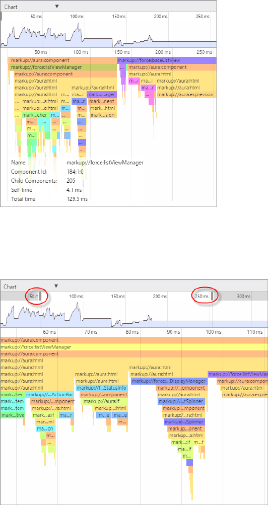
Narrow the Timeline
Drag the vertical handles on the timeline to select a time window to focus on. Zoom in on a smaller time window to inspect component
creation time for potential performance hot spots.
Transactions Tab
Some apps delivered by Salesforce include transaction markers that enable you to see fine-grained metrics for actions within those
transactions. You can’t create your own transactions.
310
Salesforce Lightning InspectorDebugging
DescriptionMeasure
The page duration since the page start time, in millisecondsDuration
The start time when the page was last loaded or refreshed, in millisecondsStart Time
The start and end times of a transaction, represented by a colored bar:Timeline
•Green — How long the action took on the server
•Yellow — XMLHttpRequest transaction
•Blue — Queued time until the XMLHttpRequest transaction was sent
•Purple — Custom transaction
Event Log Tab
This tab shows all the events fired. The event graph helps you to understand the sequence of events and handlers for one or more
actions.
Record Events
Use the Toggle recording and Clear buttons to capture specific user actions or collections of user actions.
1. To start gathering event data, press .
311
Salesforce Lightning InspectorDebugging
2. Take one or more actions in the app.
3. To stop gathering event data, press .
View Event Details
Expand an event to see more details. In the call stack, click an event handler (for example, c.handleDataChange) to see where
it’s defined in code. The handler in the yellow row is the most current.
Filter the List of Events
By default, both application and component events are shown. You can hide or show both types of events by toggling the App Events
and Cmp Events buttons.
Enter a search string in the Filter field to match any substring.
Invert the filter by starting the search string with !. For example, !aura returns all events that don’t contain the string aura.
Show Unhandled Events
Show events that are fired but are not handled. Unhandled events aren't listed by default but can be useful to see during development.
View Graph of Events
Expand an event to see more details. Click the Toggle Grid button to generate a network graph showing the events fired before and
after this event, and the components handling those events. Event-driven programming can be confusing when a cacophony of events
explode. The event graph helps you to join the dots and understand the sequence of events and handlers.
312
Salesforce Lightning InspectorDebugging
The graph is color coded.
•Black—The current event
•Maroon—A controller action
•Blue—Another event fired before or after the current event
SEE ALSO:
Communicating with Events
Actions Tab
This tab shows the server-side actions executed. The list automatically refreshes when the page updates.
Filter the List of Actions
To filter the list of actions, toggle the buttons related to the different action types or states.
•Storable—Storable actions whose responses can be cached.
313
Salesforce Lightning InspectorDebugging
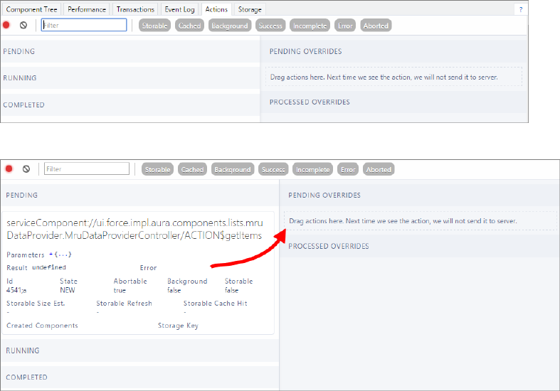
•Cached—Storable actions whose responses are cached. Toggle this button off to show cache misses and non-storable actions. This
information can be valuable if you're investigating performance bottlenecks.
•Background—Not supported for Lightning components. Available in the open-source Aura framework.
•Success—Actions that were executed successfully.
•Incomplete—Actions with no server response. The server might be down or the client might be offline.
•Error—Actions that returned a server error.
•Aborted—Actions that were aborted.
Enter a search string in the Filter field to match any substring.
Invert the filter by starting the search string with !. For example, !aura returns all actions that don't contain the string aura and
filters out many framework-level actions.
IN THIS SECTION:
Manually Override Server Responses
The Overrides panel on the right side of the Actions tab lets you manually tweak the server responses and investigate the fault
tolerance of your app.
SEE ALSO:
Calling a Server-Side Action
Manually Override Server Responses
The Overrides panel on the right side of the Actions tab lets you manually tweak the server responses and investigate the fault tolerance
of your app.
Drag an action from the list on the left side to the PENDING OVERRIDES section.
314
Salesforce Lightning InspectorDebugging
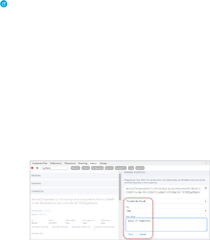
The next time the same action is enqueued to be sent to the server, the framework won't send it. Instead, the framework mocks the
response based on the override option that you choose. Here are the override options.
•Override the Result
•Error Response Next Time
•Drop the Action
Note: The same action means an action with the same name. The action parameters don't have to be identical.
IN THIS SECTION:
Modify an Action Response
Modify an action response in the Salesforce Lightning Inspector by changing one of the JSON object values and see how the UI is
affected. The server returns a JSON object when you call a server-side action.
Set an Error Response
Your app should degrade gracefully when an error occurs so that users understand what happened or know how to proceed. Use
the Salesforce Lightning Inspector to simulate an error condition and see how the user experience is affected.
Drop an Action Response
Your app should degrade gracefully when a server-side action times out or the response is dropped. Use the Salesforce Lightning
Inspector to simulate a dropped action response and see how the user experience is affected.
Modify an Action Response
Modify an action response in the Salesforce Lightning Inspector by changing one of the JSON object values and see how the UI is affected.
The server returns a JSON object when you call a server-side action.
1. Drag the action whose response you want to modify to the PENDING OVERRIDES section.
2. Select Override the Result in the drop-down list.
3. Select a response key to modify in the Key field.
4. Enter a modified value for the key in the New Value field.
5. Click Save.
6. To trigger execution of the action, refresh the page.
The modified action response moves from the PENDING OVERRIDES section to the PROCESSED OVERRIDES section.
315
Salesforce Lightning InspectorDebugging
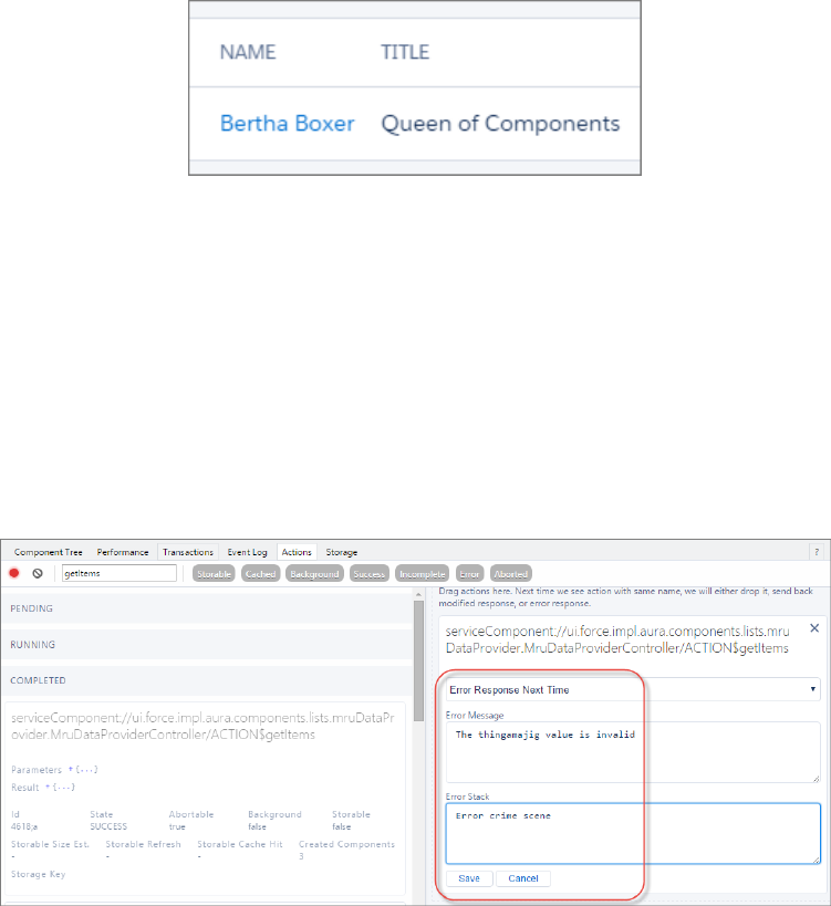
7. Note the UI change, if any, related to your change.
Set an Error Response
Your app should degrade gracefully when an error occurs so that users understand what happened or know how to proceed. Use the
Salesforce Lightning Inspector to simulate an error condition and see how the user experience is affected.
1. Drag the action whose response you want to modify to the PENDING OVERRIDES section.
2. Select Error Response Next Time in the drop-down list.
3. Add an Error Message.
4. Add some text in the Error Stack field.
5. Click Save.
6. To trigger execution of the action, refresh the page.
•The modified action response moves from the PENDING OVERRIDES section to the PROCESSED OVERRIDES section.
•The action response displays in the COMPLETED section in the left panel with a State equals ERROR.
316
Salesforce Lightning InspectorDebugging
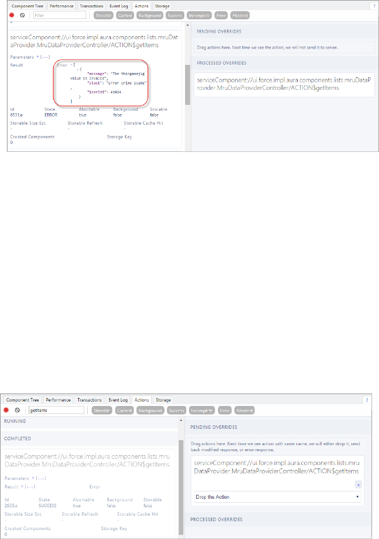
7. Note the UI change, if any, related to your change. The UI should handle errors by alerting the user or allowing them to continue
using the app.
To degrade gracefully, make sure that your action response callback handles an error response (response.getState() ===
"ERROR").
SEE ALSO:
Calling a Server-Side Action
Drop an Action Response
Your app should degrade gracefully when a server-side action times out or the response is dropped. Use the Salesforce Lightning
Inspector to simulate a dropped action response and see how the user experience is affected.
1. Drag the action whose response you want to modify to the PENDING OVERRIDES section.
2. Select Drop the Action in the drop-down list.
3. To trigger execution of the action, refresh the page.
•The modified action response moves from the PENDING OVERRIDES section to the PROCESSED OVERRIDES section.
•The action response displays in the COMPLETED section in the left panel with a State equals INCOMPLETE.
317
Salesforce Lightning InspectorDebugging
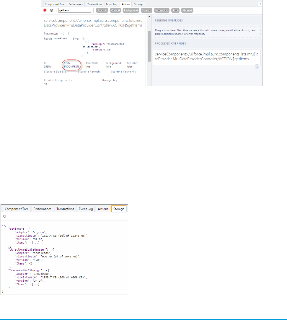
4. Note the UI change, if any, related to your change. The UI should handle the dropped action by alerting the user or allowing them
to continue using the app.
To degrade gracefully, make sure that your action response callback handles an incomplete response (response.getState()
=== "INCOMPLETE").
SEE ALSO:
Calling a Server-Side Action
Storage Tab
This tab shows the client-side storage for Lightning applications. Actions marked as storable are stored in the actions store. Use this
tab to analyze storage in Salesforce1 and Lightning Experience.
Log Messages
To help debug your client-side code, you can write output to the JavaScript console of a web browser using console.log() if your
browser supports it..
For instructions on using the JavaScript console, refer to the instructions for your web browser.
318
Log MessagesDebugging

CHAPTER 8 Fixing Performance Warnings
A few common performance anti-patterns in code prompt the framework to log warning messages to
the browser console. Fix the warning messages to speed up your components!
In this chapter ...
•<aura:if>—Clean
Unrendered Body The warnings display in the browser console only if you enabled debug mode.
SEE ALSO:
Enable Debug Mode for Lightning Components
•<aura:iteration>—Multiple
Items Set
319
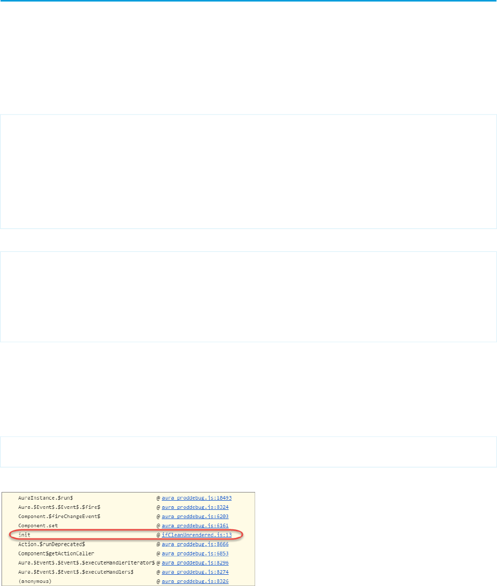
<aura:if>—Clean Unrendered Body
This warning occurs when you change the isTrue attribute of an <aura:if> tag from true to false in the same rendering
cycle. The unrendered body of the <aura:if> must be destroyed, which is avoidable work for the framework that slows down
rendering time.
Example
This component shows the anti-pattern.
<!--c:ifCleanUnrendered-->
<aura:component>
<aura:attribute name="isVisible" type="boolean" default="true"/>
<aura:handler name="init" value="{!this}" action="{!c.init}"/>
<aura:if isTrue="{!v.isVisible}">
<p>I am visible</p>
</aura:if>
</aura:component>
Here’s the component’s client-side controller.
/* c:ifCleanUnrenderedController.js */
({
init: function(cmp) {
/* Some logic */
cmp.set("v.isVisible", false); // Performance warning trigger
}
})
When the component is created, the isTrue attribute of the <aura:if> tag is evaluated. The value of the isVisible attribute
is true by default so the framework creates the body of the <aura:if> tag. After the component is created but before rendering,
the init event is triggered.
The init() function in the client-side controller toggles the isVisible value from true to false. The isTrue attribute
of the <aura:if> tag is now false so the framework must destroy the body of the <aura:if> tag. This warning displays in
the browser console only if you enabled debug mode.
WARNING: [Performance degradation] markup://aura:if ["5:0"] in c:ifCleanUnrendered ["3:0"]
needed to clear unrendered body.
Click the expand button beside the warning to see a stack trace for the warning.
Click the link for the ifCleanUnrendered entry in the stack trace to see the offending line of code in the Sources pane of the
browser console.
320
<aura:if>—Clean Unrendered BodyFixing Performance Warnings

How to Fix the Warning
Reverse the logic for the isTrue expression. Instead of setting the isTrue attribute to true by default, set it to false. Set the
isTrue expression to true in the init() method, if needed.
Here’s the fixed component:
<!--c:ifCleanUnrenderedFixed-->
<aura:component>
<!-- FIX: Change default to false.
Update isTrue expression in controller instead. -->
<aura:attribute name="isVisible" type="boolean" default="false"/>
<aura:handler name="init" value="{!this}" action="{!c.init}"/>
<aura:if isTrue="{!v.isVisible}">
<p>I am visible</p>
</aura:if>
</aura:component>
Here’s the fixed controller:
/* c:ifCleanUnrenderedFixedController.js */
({
init: function(cmp) {
// Some logic
// FIX: set isVisible to true if logic criteria met
cmp.set("v.isVisible", true);
}
})
SEE ALSO:
aura:if
Enable Debug Mode for Lightning Components
<aura:iteration>—Multiple Items Set
This warning occurs when you set the items attribute of an <aura:iteration> tag multiple times in the same rendering cycle.
There’s no easy and performant way to check if two collections are the same in JavaScript. Even if the old value of items is the same
as the new value, the framework deletes and replaces the previously created body of the <aura:iteration> tag.
Example
This component shows the anti-pattern.
<!--c:iterationMultipleItemsSet-->
<aura:component>
<aura:attribute name="groceries" type="List"
default="[ 'Eggs', 'Bacon', 'Bread' ]"/>
<aura:handler name="init" value="{!this}" action="{!c.init}"/>
321
<aura:iteration>—Multiple Items SetFixing Performance Warnings
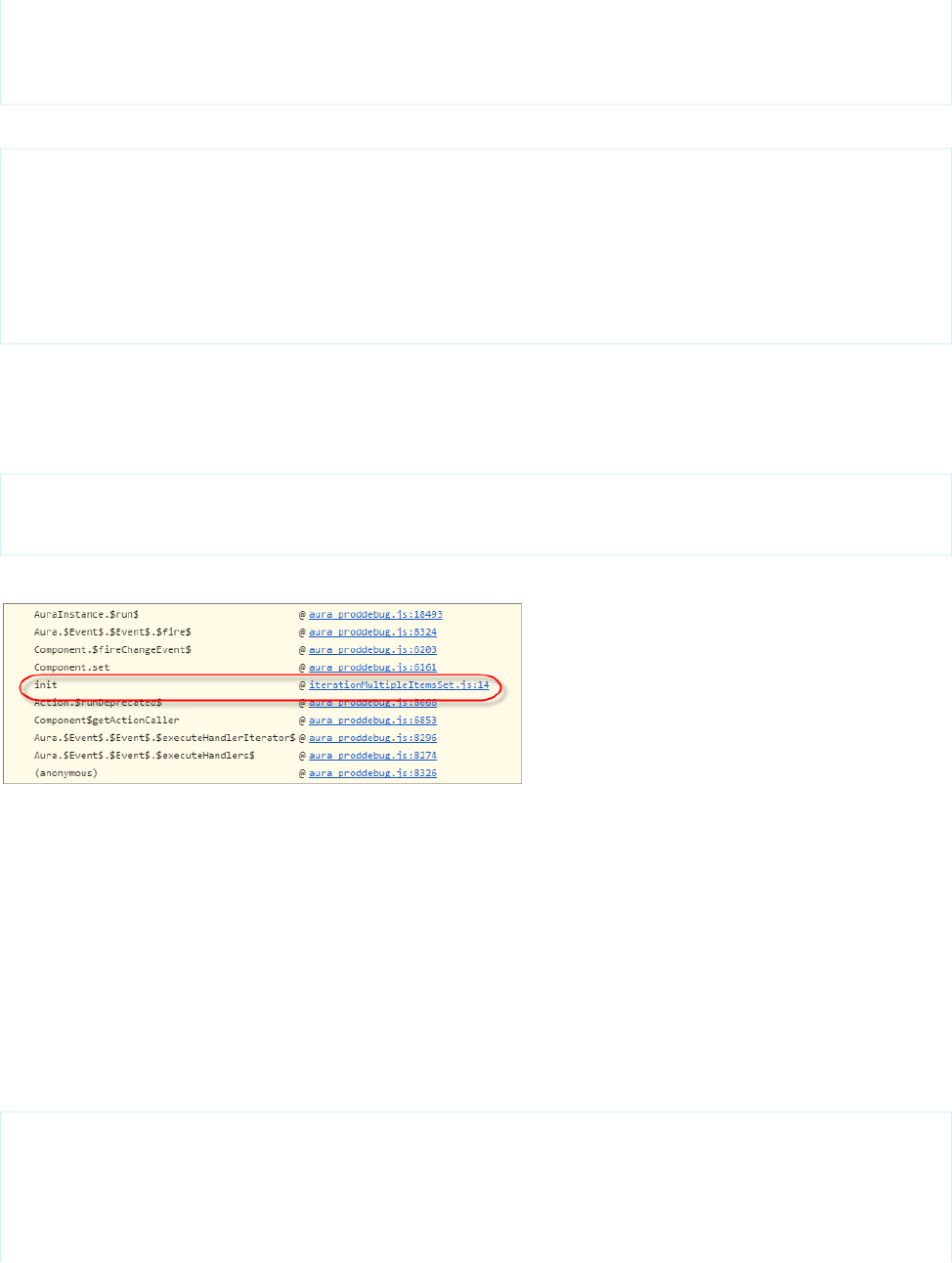
<aura:iteration items="{!v.groceries}" var="item">
<p>{!item}</p>
</aura:iteration>
</aura:component>
Here’s the component’s client-side controller.
/* c:iterationMultipleItemsSetController.js */
({
init: function(cmp) {
var list = cmp.get('v.groceries');
// Some logic
cmp.set('v.groceries', list); // Performance warning trigger
}
})
When the component is created, the items attribute of the <aura:iteration> tag is set to the default value of the groceries
attribute. After the component is created but before rendering, the init event is triggered.
The init() function in the client-side controller sets the groceries attribute, which resets the items attribute of the
<aura:iteration> tag. This warning displays in the browser console only if you enabled debug mode.
WARNING: [Performance degradation] markup://aura:iteration [id:5:0] in
c:iterationMultipleItemsSet ["3:0"]
had multiple items set in the same Aura cycle.
Click the expand button beside the warning to see a stack trace for the warning.
Click the link for the iterationMultipleItemsSet entry in the stack trace to see the offending line of code in the Sources
pane of the browser console.
How to Fix the Warning
Make sure that you don’t modify the items attribute of an <aura:iteration> tag multiple times. The easiest solution is to
remove the default value for the groceries attribute in the markup. Set the value for the groceries attribute in the controller
instead.
The alternate solution is to create a second attribute whose only purpose is to store the default value. When you’ve completed your
logic in the controller, set the groceries attribute.
Here’s the fixed component:
<!--c:iterationMultipleItemsSetFixed-->
<aura:component>
<!-- FIX: Remove the default from the attribute -->
<aura:attribute name="groceries" type="List" />
<!-- FIX (ALTERNATE): Create a separate attribute containing the default -->
<aura:attribute name="groceriesDefault" type="List"
322
<aura:iteration>—Multiple Items SetFixing Performance Warnings

default="[ 'Eggs', 'Bacon', 'Bread' ]"/>
<aura:handler name="init" value="{!this}" action="{!c.init}"/>
<aura:iteration items="{!v.groceries}" var="item">
<p>{!item}</p>
</aura:iteration>
</aura:component>
Here’s the fixed controller:
/* c:iterationMultipleItemsSetFixedController.js */
({
init: function(cmp) {
// FIX (ALTERNATE) if need to set default in markup
// use a different attribute
// var list = cmp.get('v.groceriesDefault');
// FIX: Set the value in code
var list = ['Eggs','Bacon','Bread'];
// Some logic
cmp.set('v.groceries', list);
}
})
SEE ALSO:
aura:iteration
Enable Debug Mode for Lightning Components
323
<aura:iteration>—Multiple Items SetFixing Performance Warnings

CHAPTER 9 Reference
This section contains reference documentation including details of the various tags available in the
framework.
In this chapter ...
•Reference Doc App Note that the the Lightning Component framework provides a subset of what’s available in the
open-source Aura framework, in addition to components and events that are specific to Salesforce.
•Supported
aura:attribute Types
•aura:application
•aura:component
•aura:dependency
•aura:event
•aura:interface
•aura:method
•aura:set
•Component
Reference
•Interface Reference
•Event Reference
•System Event
Reference
•Supported HTML
Tags
324
Reference Doc App
The reference doc app includes more reference information, including descriptions and source for the out-of-the-box components that
come with the framework, as well as the JavaScript API. Explore this section for reference information or access the app at:
https://<myDomain>.lightning.force.com/auradocs/reference.app, where <myDomain> is the name of
your custom Salesforce domain.
Supported aura:attribute Types
aura:attribute describes an attribute available on an app, interface, component, or event.
DescriptionTypeAttribute Name
Indicates whether the attribute can be used outside of its own namespace.
Possible values are public (default), and global, and private.
Stringaccess
Required. The name of the attribute. For example, if you set
<aura:attribute name="isTrue" type="Boolean" />
Stringname
on a component called aura:newCmp, you can set this attribute when you
instantiate the component; for example,<aura:newCmp
isTrue="false" />.
Required. The type of the attribute. For a list of basic types supported, see Basic
Types.
Stringtype
The default value for the attribute, which can be overwritten as needed. When
setting a default value, expressions using the $Label, $Locale, and
Stringdefault
$Browser global value providers are supported. Alternatively, to set a
dynamic default, use an init event. See Invoking Actions on Component
Initialization on page 229.
Determines if the attribute is required. The default is false.Booleanrequired
A summary of the attribute and its usage.Stringdescription
All <aura:attribute> tags have name and type values. For example:
<aura:attribute name="whom" type="String" />
Note: Although type values are case insensitive, case sensitivity should be respected as your markup interacts with JavaScript,
CSS, and Apex.
SEE ALSO:
Component Attributes
325
Reference Doc AppReference
Basic Types
Here are the supported basic type values. Some of these types correspond to the wrapper objects for primitives in Java. Since the
framework is written in Java, defaults, such as maximum size for a number, for these basic types are defined by the Java objects that
they map to.
DescriptionExampletype
Valid values are true or false. To set a default value
of true, add default="true".
<aura:attribute
name="showDetail"
type="Boolean" />
Boolean
A date corresponding to a calendar day in the format
yyyy-mm-dd. The hh:mm:ss portion of the date is not stored.
To include time fields, use DateTime instead.
<aura:attribute
name="startDate" type="Date"
/>
Date
A date corresponding to a timestamp. It includes date and
time details with millisecond precision.
<aura:attribute
name="lastModifiedDate"
type="DateTime" />
DateTime
Decimal values can contain fractional portions (digits to
the right of the decimal). Maps to java.math.BigDecimal.
Decimal is better than Double for maintaining
precision for floating-point calculations. It’s preferable for
currency fields.
<aura:attribute
name="totalPrice"
type="Decimal" />
Decimal
Double values can contain fractional portions. Maps to
java.lang.Double. Use Decimal for currency fields instead.
<aura:attribute
name="widthInchesFractional"
type="Double" />
Double
Integer values can contain numbers with no fractional
portion. Maps to java.lang.Integer, which defines its limits,
such as maximum size.
<aura:attribute
name="numRecords"
type="Integer" />
Integer
Long values can contain numbers with no fractional
portion. Maps to java.lang.Long, which defines its limits,
such as maximum size.
Use this data type when you need a range of values wider
than those provided by Integer.
<aura:attribute
name="numSwissBankAccount"
type="Long" />
Long
A sequence of characters.<aura:attribute name="message"
type="String" />
String
You can use arrays for each of these basic types. For example:
<aura:attribute name="favoriteColors" type="String[]" default="['red','green','blue']" />
326
Basic TypesReference

Retrieving Data from an Apex Controller
To retrieve the string array from an Apex controller, bind the component to the controller. This component retrieves the string array
when a button is clicked.
<aura:component controller="namespace.AttributeTypes">
<aura:attribute name="favoriteColors" type="String[]" default="cyan, yellow, magenta"/>
<aura:iteration items="{!v.favoriteColors}" var="s">
{!s}
</aura:iteration>
<ui:button press="{!c.getString}" label="Update"/>
</aura:component>
Set the Apex controller to return a List<String> object.
public class AttributeTypes {
private final String[] arrayItems;
@AuraEnabled
public static List<String> getStringArray() {
String[] arrayItems = new String[]{ 'red','green','blue' };
return arrayItems;
}
}
This client-side controller retrieves the string array from the Apex controller and displays it using the {!v.favoriteColors}
expression.
({
getString : function(component, event) {
var action = component.get("c.getStringArray");
action.setCallback(this,function(response) {
var state = response.getState();
if (state === "SUCCESS") {
var stringItems = response.getReturnValue();
component.set("v.favoriteColors", stringItems);
}
});
$A.enqueueAction(action);
}
})
Object Types
An attribute can have a type corresponding to an Object.
<aura:attribute name="data" type="Object" />
327
Object TypesReference
For example, you may want to create an attribute of type Object to pass a JavaScript array as an event parameter. In the component
event, declare the event parameter using aura:attribute.
<aura:event type="COMPONENT">
<aura:attribute name="arrayAsObject" type="Object" />
<aura:event>
In JavaScript code, you can set the attribute of type Object.
// Set the event parameters
var event = component.getEvent(eventType);
event.setParams({
arrayAsObject:["file1","file2","file3"]
});
event.fire();
Checking for Types
To determine a variable type, use typeof or a standard JavaScript method instead. The instanceof operator is unreliable due to
the potential presence of multiple windows or frames.
SEE ALSO:
Working with Salesforce Records
Standard and Custom Object Types
An attribute can have a type corresponding to a standard or custom object. For example, this is an attribute for a standard Account
object:
<aura:attribute name="acct" type="Account" />
This is an attribute for an Expense__c custom object:
<aura:attribute name="expense" type="Expense__c" />
Note: Make your Apex class methods, getter and setter methods, available to your components by annotating them with
@AuraEnabled.
SEE ALSO:
Working with Salesforce Records
Collection Types
Here are the supported collection type values.
DescriptionExampletype
An array of items of a defined type.<aura:attribute
name="colorPalette"
type[] (Array)
type="String[]" default="['red',
'green', 'blue']" />
328
Standard and Custom Object TypesReference

DescriptionExampletype
An ordered collection of items.<aura:attribute
name="colorPalette" type="List"
List
default="['red', 'green',
'blue']" />
A collection that maps keys to values. A map can’t
contain duplicate keys. Each key can map to at
<aura:attribute
name="sectionLabels" type="Map"
Map
most one value. Defaults to an empty object, {}.
default="{ a: 'label1', b:
'label2' }" /> Retrieve values by using
cmp.get("v.sectionLabels")['a'].
A collection that contains no duplicate elements.
The order for set items is not guaranteed. For
<aura:attribute name="collection"
type="Set" default="['red',
'green', 'blue']" />
Set
example, "red,green,blue" might be
returned as "blue,green,red".
Checking for Types
To determine a variable type, use typeof or a standard JavaScript method, such as Array.isArray(), instead. The instanceof
operator is unreliable due to the potential presence of multiple windows or frames.
Setting List Items
There are several ways to set items in a list. To use a client-side controller, create an attribute of type List and set the items using
component.set().
This example retrieves a list of numbers from a client-side controller when a button is clicked.
<aura:attribute name="numbers" type="List"/>
<ui:button press="{!c.getNumbers}" label="Display Numbers" />
<aura:iteration var="num" items="{!v.numbers}">
{!num.value}
</aura:iteration>
/** Client-side Controller **/
({
getNumbers: function(component, event, helper) {
var numbers = [];
for (var i = 0; i < 20; i++) {
numbers.push({
value: i
});
}
component.set("v.numbers", numbers);
}
})
To retrieve list data from a controller, use aura:iteration.
329
Collection TypesReference

Setting Map Items
To add a key and value pair to a map, use the syntax myMap['myNewKey'] = myNewValue.
var myMap = cmp.get("v.sectionLabels");
myMap['c']='label3';
The following example retrieves data from a map.
for (key in myMap){
//do something
}
Custom Apex Class Types
An attribute can have a type corresponding to an Apex class. For example, this is an attribute for a Color Apex class:
<aura:attribute name="color" type="docSampleNamespace.Color" />
Using Arrays
If an attribute can contain more than one element, use an array.
This aura:attribute tag shows the syntax for an array of Apex objects:
<aura:attribute name="colorPalette" type="docSampleNamespace.Color[]" />
Note: Make your Apex class methods, getter and setter methods, available to your components by annotating them with
@AuraEnabled.
SEE ALSO:
Working with Salesforce Records
Framework-Specific Types
Here are the supported type values that are specific to the framework.
DescriptionExampletype
A single component. We recommend using
Aura.Component[] instead.
N/AAura.Component
330
Custom Apex Class TypesReference
DescriptionExampletype
Use this type to set blocks of markup. An
attribute of type Aura.Component[]
is called a facet.
<aura:attribute
name="detail"
type="Aura.Component[]"/>
To set a default value for
type="Aura.Component[]", put
Aura.Component[]
the default markup in the body of
aura:attribute. For example:
<aura:component>
<aura:attribute
name="detail"
type="Aura.Component[]">
<p>default
paragraph1</p>
</aura:attribute>
Default value is:
{!v.detail}
</aura:component>
SEE ALSO:
Component Body
Component Facets
aura:application
An app is a special top-level component whose markup is in a .app resource.
The markup looks similar to HTML and can contain components as well as a set of supported HTML tags. The .app resource is a
standalone entry point for the app and enables you to define the overall application layout, style sheets, and global JavaScript includes.
It starts with the top-level <aura:application> tag, which contains optional system attributes. These system attributes tell the
framework how to configure the app.
DescriptionTypeSystem Attribute
Indicates whether the app can be extended by another app outside of a namespace.
Possible values are public (default), and global.
Stringaccess
The server-side controller class for the app. The format is
namespace.myController.
Stringcontroller
A brief description of the app.Stringdescription
The app to be extended, if applicable. For example,
extends="namespace:yourApp".
Componentextends
Indicates whether the app is extensible by another app. Defaults to false.Booleanextensible
A comma-separated list of interfaces that the app implements.Stringimplements
331
aura:applicationReference
DescriptionTypeSystem Attribute
The name of the template used to bootstrap the loading of the framework and
the app. The default value is aura:template. You can customize the template
by creating your own component that extends the default template. For example:
<aura:component extends="aura:template" ... >
Componenttemplate
A comma-separated list of tokens bundles for the application. For example,
tokens="ns:myAppTokens". Tokens make it easy to ensure that your
Stringtokens
design is consistent, and even easier to update it as your design evolves. Define
the token values once and reuse them throughout your application.
Deprecated. Browser vendors have deprecated AppCache so we’ve followed their
lead. Remove the useAppcache attribute in the <aura:application>
BooleanuseAppcache
tag of your standalone apps (.app resources) to avoid cross-browser support
issues due to deprecation by browser vendors.
If you don’t currently set useAppcache in an <aura:application> tag,
you don't have to do anything as the default value of useAppcache is false.
aura:application also includes a body attribute defined in a <aura:attribute> tag. Attributes usually control the output
or behavior of a component, but not the configuration information in system attributes.
DescriptionTypeAttribute
The body of the app. In markup, this is
everything in the body of the tag.
Component[]body
SEE ALSO:
Creating Apps
Using the AppCache
Application Access Control
aura:component
The root of the component hierarchy. Provides a default rendering implementation.
Components are the functional units of Aura, which encapsulate modular and reusable sections of UI. They can contain other components
or HTML markup. The public parts of a component are its attributes and events. Aura provides out-of-the-box components in the aura
and ui namespaces.
Every component is part of a namespace. For example, the button component is saved as button.cmp in the ui namespace
can be referenced in another component with the syntax <ui:button label="Submit"/>, where label="Submit" is
an attribute setting.
To create a component, follow this syntax.
<aura:component>
<!-- Optional coponent attributes here -->
332
aura:componentReference
<!-- Optional HTML markup -->
<div class="container">
Hello world!
<!-- Other components -->
</div>
</aura:component>
A component has the following optional attributes.
DescriptionTypeAttribute
Indicates whether the component can be used outside of its own
namespace. Possible values are public (default), and global.
Stringaccess
The server-side controller class for the component. The format is
namespace.myController.
Stringcontroller
A description of the component.Stringdescription
The component to be extended.Componentextends
Set to true if the component can be extended. The default is
false.
Booleanextensible
A comma-separated list of interfaces that the component implements.Stringimplements
Set to true if the component is a template. The default is false.
A template must have isTemplate="true" set in its
<aura:component> tag.
<aura:component isTemplate="true"
extends="aura:template">
BooleanisTemplate
The template for this component. A template bootstraps loading of
the framework and app. The default template is aura:template.
Componenttemplate
You can customize the template by creating your own component
that extends the default template. For example:
<aura:component extends="aura:template" ...
>
aura:component includes a body attribute defined in a <aura:attribute> tag. Attributes usually control the output or
behavior of a component, but not the configuration information in system attributes.
DescriptionTypeAttribute
The body of the component. In markup, this
is everything in the body of the tag.
Component[]body
333
aura:componentReference
aura:dependency
The <aura:dependency> tag enables you to declare dependencies that can't easily be discovered by the framework.
The framework automatically tracks dependencies between definitions, such as components, defined in markup. This enables the
framework to automatically send the definitions to the browser. However, if a component’s JavaScript code dynamically instantiates
another component or fires an event that isn’t directly referenced in the component’s markup, use <aura:dependency> in the
component’s markup to explicitly tell the framework about the dependency. Adding the <aura:dependency> tag ensures that
a definition, such as a component, and its dependencies are sent to the client, when needed.
For example, adding this tag to a component marks the sampleNamespace:sampleComponent component as a dependency.
<aura:dependency resource="markup://sampleNamespace:sampleComponent" />
Add this tag to component markup to mark the event as a dependency.
<aura:dependency resource="markup://force:navigateToComponent" type="EVENT"/>
Use the <aura:dependency> tag if you fire an event in JavaScript code and you’re not registering the event in component markup
using <aura:registerEvent>. Using an <aura:registerEvent> tag is the preferred approach.
The <aura:dependency> tag includes these system attributes.
DescriptionSystem Attribute
The resource that the component depends on. For example,
resource="markup://sampleNamespace:sampleComponent" refers to the
sampleComponent in the sampleNamespace namespace.
Use an asterisk (*) in the resource name for wildcard matching. For example,
resource="markup://sampleNamespace:*" matches everything in the namespace;
resource
resource="markup://sampleNamespace:input*" matches everything in the
namespace that starts with input.
Note: We don’t recommend using an asterisk (*) for wildcard matching as it tells the
framework to send all matching definitions to the client. Wildcard matching usually sends
more definitions than you need and leads to slower page load time. To speed up page
load time, add an <aura:dependency> tag for each definition that’s not directly
referenced in the component’s markup.
Don’t use an asterisk (*) in the namespace portion of the resource name. For example,
resource="markup://sample*:sampleComponent" is not supported.
The type of resource that the component depends on. The default value is COMPONENT.
Use type="*" to match all types of resources.
type
Note: We don’t recommend using an asterisk (*) for wildcard matching as it tells the
framework to send all matching definitions to the client. Be as selective as possible in the
types of definitions that you send to the client.
The most commonly used values are:
•COMPONENT
•APPLICATION
•EVENT
334
aura:dependencyReference
DescriptionSystem Attribute
Use a comma-separated list for multiple types; for example: COMPONENT,APPLICATION.
SEE ALSO:
Dynamically Creating Components
Fire Component Events
Fire Application Events
aura:event
An event is represented by the aura:event tag, which has the following attributes.
DescriptionTypeAttribute
Indicates whether the event can be extended or used outside of its
own namespace. Possible values are public (default), and
global.
Stringaccess
A description of the event.Stringdescription
The event to be extended. For example,
extends="namespace:myEvent".
Componentextends
Required. Possible values are COMPONENT or APPLICATION.Stringtype
SEE ALSO:
Communicating with Events
Event Access Control
aura:interface
The aura:interface tag has the following optional attributes.
DescriptionTypeAttribute
Indicates whether the interface can be extended or used outside of
its own namespace. Possible values are public (default), and
global.
Stringaccess
A description of the interface.Stringdescription
335
aura:eventReference
DescriptionTypeAttribute
The comma-seperated list of interfaces to be extended. For example,
extends="namespace:intfB".
Componentextends
SEE ALSO:
Interfaces
Interface Access Control
aura:method
Use <aura:method> to define a method as part of a component's API. This enables you to directly call a method in a component’s
client-side controller instead of firing and handling a component event. Using <aura:method> simplifies the code needed for a
parent component to call a method on a child component that it contains.
The <aura:method> tag has these system attributes.
DescriptionTypeAttribute
The method name. Use the method name to call the method in
JavaScript code. For example:
cmp.sampleMethod(param1);
Stringname
The client-side controller action to execute. For example:
action="{!c.sampleAction}"
Expressionaction
sampleAction is an action in the client-side controller. If you
don’t specify an action value, the controller action defaults to
the value of the method name.
The access control for the method. Valid values are:Stringaccess
•public—Any component in the same namespace can call the
method. This is the default access level.
•global—Any component in any namespace can call the
method.
The method description.Stringdescription
Declaring Parameters
An <aura:method> can optionally include parameters. Use an <aura:attribute> tag within an <aura:method> to
declare a parameter for the method. For example:
<aura:method name="sampleMethod" action="{!c.doAction}"
description="Sample method with parameters">
<aura:attribute name="param1" type="String" default="parameter 1"/>
336
aura:methodReference
<aura:attribute name="param2" type="Object" />
</aura:method>
Note: You don’t need an access system attribute in the <aura:attribute> tag for a parameter.
Creating a Handler Action
This handler action shows how to access the arguments passed to the method.
({
doAction : function(cmp, event) {
var params = event.getParam('arguments');
if (params) {
var param1 = params.param1;
// add your code here
}
}
})
Retrieve the arguments using event.getParam('arguments'). It returns an object if there are arguments or an empty array
if there are no arguments.
SEE ALSO:
Calling Component Methods
Component Events
aura:set
Use <aura:set> in markup to set the value of an attribute inherited from a super component, event, or interface.
To learn more, see:
•Setting Attributes Inherited from a Super Component
•Setting Attributes on a Component Reference
•Setting Attributes Inherited from an Interface
Setting Attributes Inherited from a Super Component
Use <aura:set> in the markup of a sub component to set the value of an inherited attribute.
Let's look at an example. Here is the c:setTagSuper component.
<!--c:setTagSuper-->
<aura:component extensible="true">
<aura:attribute name="address1" type="String" />
setTagSuper address1: {!v.address1}<br/>
</aura:component>
c:setTagSuper outputs:
setTagSuper address1:
337
aura:setReference
The address1 attribute doesn't output any value yet as it hasn't been set.
Here is the c:setTagSub component that extends c:setTagSuper.
<!--c:setTagSub-->
<aura:component extends="c:setTagSuper">
<aura:set attribute="address1" value="808 State St" />
</aura:component>
c:setTagSub outputs:
setTagSuper address1: 808 State St
sampleSetTagExc:setTagSub sets a value for the address1 attribute inherited from the super component,
c:setTagSuper.
Warning: This usage of <aura:set> works for components and abstract components, but it doesn’t work for interfaces. For
more information, see Setting Attributes Inherited from an Interface on page 339.
If you’re using a component by making a reference to it in your component, you can set the attribute value directly in the markup. For
example, c:setTagSuperRef makes a reference to c:setTagSuper and sets the address1 attribute directly without using
aura:set.
<!--c:setTagSuperRef-->
<aura:component>
<c:setTagSuper address1="1 Sesame St" />
</aura:component>
c:setTagSuperRef outputs:
setTagSuper address1: 1 Sesame St
SEE ALSO:
Component Body
Inherited Component Attributes
Setting Attributes on a Component Reference
Setting Attributes on a Component Reference
When you include another component, such as <ui:button>, in a component, we call that a component reference to <ui:button>.
You can use <aura:set> to set an attribute on the component reference. For example, if your component includes a reference to
<ui:button>:
<ui:button label="Save">
<aura:set attribute="buttonTitle" value="Click to save the record"/>
</ui:button>
This is equivalent to:
<ui:button label="Save" buttonTitle="Click to save the record" />
The latter syntax without aura:set makes more sense in this simple example. You can also use this simpler syntax in component
references to set values for attributes that are inherited from parent components.
338
Setting Attributes on a Component ReferenceReference

aura:set is more useful when you want to set markup as the attribute value. For example, this sample specifies the markup for the
else attribute in the aura:if tag.
<aura:component>
<aura:attribute name="display" type="Boolean" default="true"/>
<aura:if isTrue="{!v.display}">
Show this if condition is true
<aura:set attribute="else">
<ui:button label="Save" press="{!c.saveRecord}" />
</aura:set>
</aura:if>
</aura:component>
SEE ALSO:
Setting Attributes Inherited from a Super Component
Setting Attributes Inherited from an Interface
To set the value of an attribute inherited from an interface, redefine the attribute in the component and set its default value. Let’s look
at an example with the c:myIntf interface.
<!--c:myIntf-->
<aura:interface>
<aura:attribute name="myBoolean" type="Boolean" default="true" />
</aura:interface>
This component implements the interface and sets myBoolean to false.
<!--c:myIntfImpl-->
<aura:component implements="c:myIntf">
<aura:attribute name="myBoolean" type="Boolean" default="false" />
<p>myBoolean: {!v.myBoolean}</p>
</aura:component>
Component Reference
Use out-of-the-box components for Lightning Experience, Salesforce1, or for your Lightning apps. These components belong to different
namespaces, including:
aura
Provides components that are part of the framework’s building blocks.
force
Provides components for field- and record-specific implementations.
forceChatter
Provides components for the Chatter feed.
forceCommunity
Provides components for Communities.
339
Setting Attributes Inherited from an InterfaceReference

lightning
Provides components with Lightning Design System styling. For components in this namespace that are used in standalone Lightning
apps, extend force:slds to implement Lightning Design System styling. In instances where there are matching ui and
lightning namespace components, we recommend that you use the lightning namespace component. The lightning
namespace components are optimized for common use cases. Event handling for lightning namespace components follows
standard HTML practices and are simpler than that for the ui namespace components. For more information, see Event Handling
in Base Lightning Components.
ui
Provides an older implementation of user interface components that don’t match the look and feel of Lightning Experience and
Salesforce1. Components in this namespace support multiple styling mechanism, and are usually more complex.
aura:expression
Renders the value to which an expression evaluates. Creates an instance of this component which renders the referenced "property
reference value" set to the value attribute when expressions are found in free text or markup.
An expression is any set of literal values, variables, sub-expressions, or operators that can be resolved to a single value. It is used for
dynamic output or passing a value into components by assigning them to attributes.
The syntax for an expression is {!expression}. expression is evaluated and dynamically replaced when the component is
rendered or when the value is used by the component. The resulting value can be a primitive (integer, string, and so on), a boolean, a
JavaScript or Aura object, an Aura component or collection, a controller method such as an action method, and other useful results.
An expression uses a value provider to access data and can also use operators and functions for more complex expressions. Value
providers include m (data from model), v(attribute data from component), and c (controller action). This example show an expression
{!v.num} whose value is resolved by the attribute num.
<aura:attribute name="num" type="integer" default="10"/>
<ui:inputNumber label="Enter age" aura:id="num" value="{!v.num}"/>
Attributes
Required?DescriptionAttribute TypeAttribute Name
The expression to evaluate and render.Stringvalue
aura:html
A meta component that represents all html elements. Any html found in your markup causes the creation of one of these.
Attributes
Required?DescriptionAttribute TypeAttribute Name
The body of the component. In markup, this is everything in the body of
the tag.
Component[]body
A map of attributes to set on the html element.MapHTMLAttributes
340
aura:expressionReference

Required?DescriptionAttribute TypeAttribute Name
The name of the html element that should be rendered.Stringtag
aura:if
Conditionally instantiates and renders either the body or the components in the else attribute.
aura:if evaluates the isTrue expression on the server and instantiates components in either its body or else attribute. Only
one branch is created and rendered. Switching condition unrenders and destroys the current branch and generates the other
<aura:component>
<aura:if isTrue="{!v.truthy}">
True
<aura:set attribute="else">
False
</aura:set>
</aura:if>
</aura:component>
Attributes
Required?DescriptionAttribute TypeAttribute Name
YesThe components to render when isTrue evaluates to true.ComponentDefRef[]body
The alternative to render when isTrue evaluates to false, and the body is
not rendered. Should always be set using the aura:set tag.
ComponentDefRef[]else
YesAn expression that must be fulfilled in order to display the body.BooleanisTrue
aura:iteration
Renders a view of a collection of items. Supports iterations containing components that can be created exclusively on the client-side.
aura:iteration iterates over a collection of items and renders the body of the tag for each item. Data changes in the collection
are rerendered automatically on the page. It also supports iterations containing components that are created exclusively on the client-side
or components that have server-side dependencies.
This example shows a basic way to use aura:iteration exclusively on the client-side.
<aura:component>
<aura:iteration items="1,2,3,4,5" var="item">
<meter value="{!item / 5}"/><br/>
</aura:iteration>
</aura:component>
341
aura:ifReference
Attributes
Required?DescriptionAttribute TypeAttribute Name
YesTemplate to use when creating components for each iteration.ComponentDefRef[]body
The index of the collection to stop at (exclusive)Integerend
The name of variable to use for the index of each item inside the iterationStringindexVar
YesThe collection of data to iterate overListitems
True if the iteration has finished loading the set of templates.Booleanloaded
The index of the collection to start at (inclusive)Integerstart
The template that is used to generate components. By default, this is set
from the body markup on first load.
ComponentDefRef[]template
YesThe name of the variable to use for each item inside the iterationStringvar
aura:renderIf
Deprecated. Use aura:if instead. This component allows you to conditionally render its contents. It renders its body only if isTrue evaluates
to true. The else attribute allows you to render an alternative when isTrue evaluates to false.
The expression in isTrue is re-evaluated every time any value used in the expression changes. When the results of the expression
change, it triggers a re-rendering of the component. Use aura:renderIf if you expect to show the components for both the true
and false states, and it would require a server round trip to instantiate the components that aren't initially rendered. Switching condition
unrenders current branch and renders the other. Otherwise, use aura:if instead if you want to instantiate the components in either
its body or the else attribute, but not both.
<aura:component>
<aura:renderIf isTrue="{!v.truthy}">
True
<aura:set attribute="else">
False
</aura:set>
</aura:renderIf>
</aura:component>
Attributes
Required?DescriptionAttribute TypeAttribute Name
The body of the component. In markup, this is everything in the body of
the tag.
Component[]body
The alternative content to render when isTrue evaluates to false, and the
body is not rendered. Set using the <aura:set> tag.
Component[]else
YesAn expression that must evaluate to true to display the body of the
component.
BooleanisTrue
342
aura:renderIfReference

aura:template
Default template used to bootstrap Aura framework. To use another template, extend aura:template and set attributes using aura:set.
Attributes
Required?DescriptionAttribute TypeAttribute Name
The block of content that is rendered before Aura initialization.Component[]auraPreInitBlock
The body of the component. In markup, this is everything in the body of
the tag.
Component[]body
Extra body CSS stylesStringbodyClass
Default body CSS styles.StringdefaultBodyClass
The DOCTYPE declaration for the template.Stringdoctype
Error loading textStringerrorMessage
Error title when an error has occured.StringerrorTitle
Loading textStringloadingText
The title of the template.Stringtitle
aura:text
Renders plain text. When any free text (not a tag or attribute value) is found in markup, an instance of this component is created with
the value attribute set to the text found in the markup.
Attributes
Required?DescriptionAttribute TypeAttribute Name
The String to be rendered.Stringvalue
aura:unescapedHtml
The value assigned to this component will be rendered as-is, without altering its contents. It's intended for outputting pre-formatted
HTML, for example, where the formatting is arbitrary, or expensive to calculate. The body of this component is ignored, and won't be
rendered. Warning: this component outputs value as unescaped HTML, which introduces the possibility of security vulnerabilities in
your code. You must sanitize user input before rendering it unescaped, or you will create a cross-site scripting (XSS) vulnerability. Only
use <aura:unescapedHtml> with trusted or sanitized sources of data.
343
aura:templateReference

Attributes
Required?DescriptionAttribute TypeAttribute Name
The body of <aura:unescapedHtml> is ignored and won't be rendered.Component[]body
The string that should be rendered as unescaped HTML.Stringvalue
auraStorage:init
Initializes a storage instance using an adapter that satisfies the provided criteria.
Use auraStorage:init to initialize storage in your app’s template for caching server-side action response values.
This example uses a template to initialize storage for server-side action response values. The template contains an auraStorage:init
tag that specifies storage initialization properties.
<aura:component isTemplate="true" extends="aura:template">
<aura:set attribute="auraPreInitBlock">
<!-- Note that the maxSize attribute in auraStorage:init is in KB -->
<auraStorage:init name="actions" persistent="false" secure="false"
maxSize="1024" />
</aura:set>
</aura:component>
When you initialize storage, you can set certain options, such as the name, maximum cache size, and the default expiration time.
Storage for server-side actions caches action response values. The storage name must be actions.
Attributes
Required?DescriptionAttribute TypeAttribute Name
The body of the component. In markup, this is everything in the body of
the tag.
Component[]body
Set to true to delete all previous data on initialization (relevant for
persistent storage only). This value defaults to true.
BooleanclearStorageOnInit
Set to true to enable debug logging with $A.log(). This value defaults to
false.
BooleandebugLoggingEnabled
The default duration (seconds) before an auto refresh request will be
initiated. Actions may override this on a per-entry basis with
Action.setStorable(). This value defaults to 30.
IntegerdefaultAutoRefreshInterval
The default duration (seconds) that an object will be retained in storage.
Actions may override this on a per-entry basis with Action.setStorable().
This value defaults to 10.
IntegerdefaultExpiration
344
auraStorage:initReference
Required?DescriptionAttribute TypeAttribute Name
Maximum size (KB) of the storage instance. Existing items will be evicted
to make room for new items; algorithm is adapter-specific. This value
defaults to 1000.
IntegermaxSize
YesThe programmatic name for the storage instance.Stringname
Set to true if this storage desires persistence. This value defaults to false.Booleanpersistent
Set to true if this storage requires secure storage support. This value
defaults to false.
Booleansecure
Version to associate with all stored items.Stringversion
force:canvasApp
Enables you to include a Force.com Canvas app in a Lightning component.
A force:canvasApp component represents a canvas app that's embedded in your Lightning component. You can create a web
app in the language of your choice and expose it in Salesforce as a canvas app. Use the Canvas App Previewer to test and debug the
canvas app before embedding it in a Lightning component.
If you have a namespace prefix, specify it using the namespacePrefix attribute. Either the developerName or
applicationName attribute is required. This example embeds a canvas app in a Lightning component.
<aura:component>
<force:canvasApp developerName="MyCanvasApp" namespacePrefix="myNamespace" />
</aura:component />
For more information on building canvas apps, see the Force.com Canvas Developer's Guide.
Attributes
Required?DescriptionAttribute TypeAttribute Name
Name of the canvas app. Either applicationName or developerName is
required.
StringapplicationName
The body of the component. In markup, this is everything in the body of
the tag.
Component[]body
Width of the canvas app border, in pixels. If not specified, defaults to 0
px.
Stringborder
An unique label within a page for the Canvas app window. This should
be used when targeting events to this canvas app.
StringcanvasId
An html element id in which canvas app is rendered. The container needs
to be defined before canvasApp cmp usage.
StringcontainerId
Developer name of the canvas app. This name is defined when the canvas
app is created and can be viewed in the Canvas App Previewer. Either
developerName or applicationName is required.
StringdeveloperName
345
force:canvasAppReference

Required?DescriptionAttribute TypeAttribute Name
The location in the application where the canvas app is currently being
called from.
StringdisplayLocation
Canvas app window height, in pixels. If not specified, defaults to 900 px.Stringheight
The maximum height of the Canvas app window in pixels. Defaults to
2000 px; 'infinite' is also a valid value.
StringmaxHeight
The maximum width of the Canvas app window in pixels. Defaults to
1000 px; 'infinite' is also a valid value.
StringmaxWidth
Namespace value of the Developer Edition organization in which the
canvas app was created. Optional if the canvas app wasn’t created in a
Developer Edition organization. If not specified, defaults to null.
StringnamespacePrefix
Name of the JavaScript function to be called if the canvas app fails to
render.
StringonCanvasAppError
Name of the JavaScript function to be called after the canvas app loads.StringonCanvasAppLoad
Name of the JavaScript function to be called after the canvas app registers
with the parent.
StringonCanvasSubscribed
Object representation of parameters passed to the canvas app. This
should be supplied in JSON format or as a JavaScript object literal. Here’s
Stringparameters
an example of parameters in a JavaScript object literal:
{param1:'value1',param2:'value2'}. If not specified, defaults to null.
The reference id of the canvas app, if set this is used instead of
developerName, applicationName and namespacePrefix
StringreferenceId
Canvas window scrollingStringscrolling
The sublocation is the location in the application where the canvas app
is currently being called from, for ex, displayLocation can be PageLayout
Stringsublocation
and sublocation can be S1MobileCardPreview or S1MobileCardFullview,
etc
Title for the linkStringtitle
Renders a link if set to trueBooleanwatermark
Canvas app window width, in pixels. If not specified, defaults to 800 px.Stringwidth
force:inputField
A component that provides a concrete type-specific input component implementation based on the data to which it is bound.
346
force:inputFieldReference

Represents an input field that corresponds to a field on a Salesforce object. This component respects the attributes of the associated
field. For example, if the component is a number field with 2 decimal places, then the default input value contains the same number of
decimal places. Bind the field using the value attribute and provide a default value to initialize the object.
<aura:attribute name="contact" type="Contact"
default="{ 'sobjectType': 'Contact' }"/>
<force:inputField aura:id="contactName"
value="{!v.contact.Name}"/>
To load record data, wire up the container component to an Apex controller that returns the data. See Working with Salesforce Records
in the Lightning Components Developer Guide for more information.
This component doesn't inherit the Lightning Design System styling. Use lightning:input if you want an input field that inherits
the Lightning Design System styling.
Attributes
Required?DescriptionAttribute TypeAttribute Name
The body of the component. In markup, this is everything in the body of
the tag.
Component[]body
The CSS style used to display the field.Stringclass
A component which is responsible for displaying the error message.Component[]errorComponent
Specifies whether this field is required or not.Booleanrequired
Data value of Salesforce field to which to bind.Objectvalue
Events
DescriptionEvent TypeEvent Name
The event fired when the user changes the content of the input.COMPONENTchange
force:outputField
A component that provides a concrete type-specific output component implementation based on the data to which it is bound.
Represents a read-only display of a value for a field on a Salesforce object. This component respects the attributes of the associated field
and how it should be displayed. For example, if the component contains a date and time value, then the default output value contains
the date and time in the user's locale. Bind the field using the value attribute and provide a default value to initialize the object.
<aura:attribute name="contact" type="Contact"
default="{ 'sobjectType': 'Contact'}"/>
<force:outputField aura:id="contactName"
value="{!v.contact.Name}"/>
To load record data, wire up the container component to an Apex controller that returns the data. See Working with Salesforce Records
in the Lightning Components Developer Guide for more information.
347
force:outputFieldReference
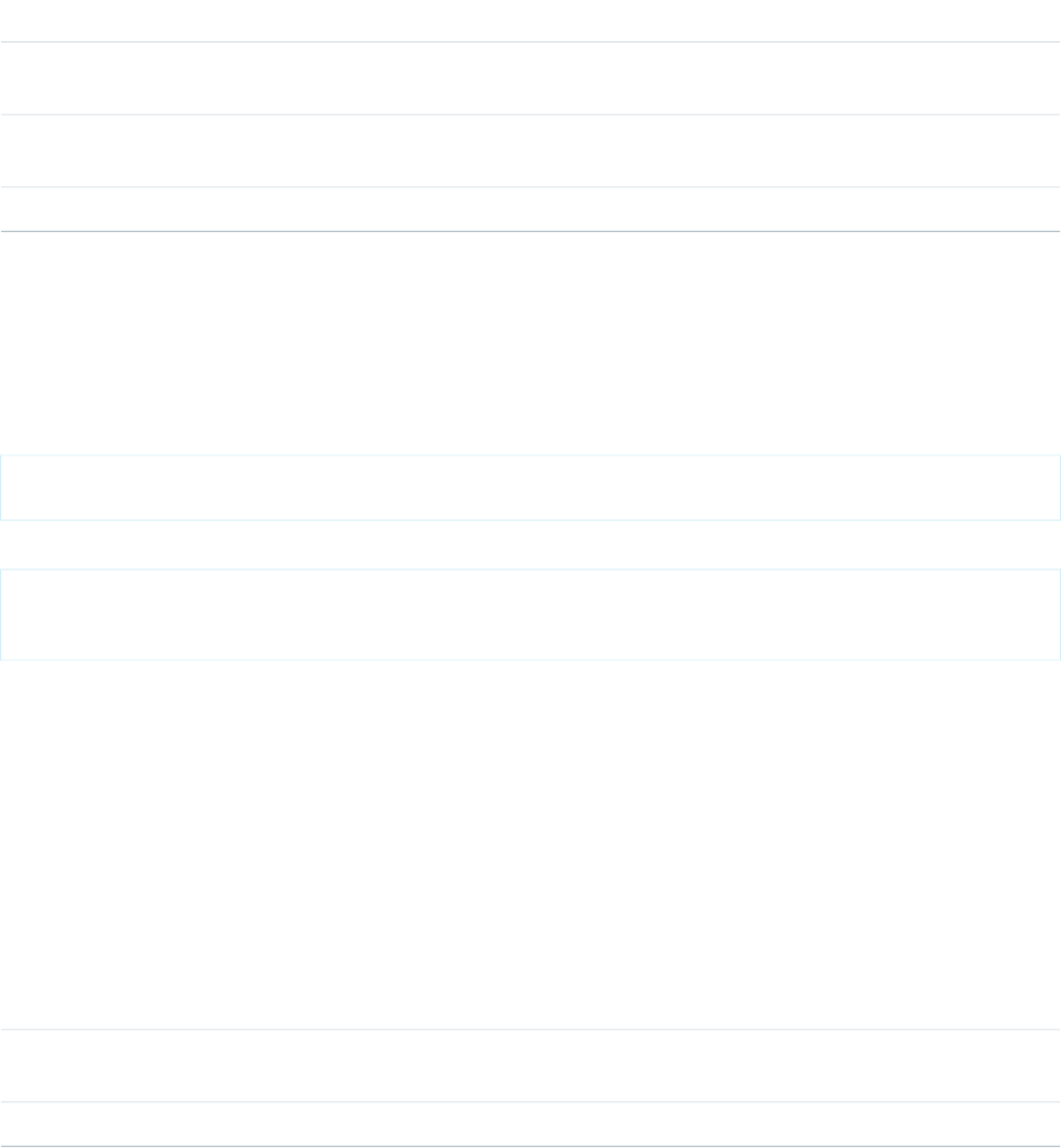
This component doesn't inherit the Lightning Design System styling. Use lightning:input if you want an input field that inherits
the Lightning Design System styling.
Attributes
Required?DescriptionAttribute TypeAttribute Name
The body of the component. In markup, this is everything in the body of
the tag.
Component[]body
A CSS style to be attached to the component. This style is added in
addition to base styles output by the component.
Stringclass
Data value of Salesforce field to which to bind.Objectvalue
force:recordEdit
Generates an editable view of the specified Salesforce record.
A force:recordEdit component represents the record edit UI for the specified recordId.
This example displays the record edit UI and a button, which when pressed saves the record.
<force:recordEdit aura:id="edit" recordId="a02D0000006V8Ni"/>
<ui:button label="Save" press="{!c.save}"/>
This client-side controller fires the recordSave event, which saves the record.
save : function(component, event, helper) {
component.find("edit").get("e.recordSave").fire();
}
You can provide a dynamic ID for the recordId attribute using the format {!v.myObject.recordId}. To load record data,
wire up the container component to an Apex controller that returns the data. See Working with Salesforce Records in the Lightning
Components Developer Guide for more information.
To indicate that the record has been successfully saved, handle the force:recordSaveSuccess event.
This component displays fields in the order they appear on the corresponding page layout and record details page. We recommend
that you use this component in Lightning Experience or Salesforce1. If used outside of the one.app container, such as in Lightning Out,
this component doesn't inherit the Lightning Design System styling and won't be styled correctly.
Attributes
Required?DescriptionAttribute TypeAttribute Name
The body of the component. In markup, this is everything in the body of
the tag.
Component[]body
The Id of the record to load, optional if record attribute is specified.StringrecordId
348
force:recordEditReference

Events
DescriptionEvent TypeEvent Name
User fired event to indicate request to save the record.COMPONENTrecordSave
Fired when record saving was successful.COMPONENTonSaveSuccess
force:recordPreview (Developer Preview)
Use the force:recordPreview component to define the parameters for accessing, modifying, or creating a record using Lightning
Data Service.
Methods
This component supports the following methods.
getNewRecord: Loads a record template and sets it to force:recordPreview’s targetRecord attribute, including
redefined values for the entity and record type.
reloadRecord: Performs the same load function as on init using the current configuration values (recordId, layoutType,
mode, and others). Doesn’t force a server trip unless required.
saveRecord: Saves the record.
deleteRecord: Deletes the record.
Attributes
Required?DescriptionAttribute TypeAttribute Name
List of fields to query.
This attribute or layoutType must be specified. If you specify both,
the list of fields queried is the union of fields from fields and
layoutType.
String[]fields
Whether to skip the cache and force a server request. Defaults to false.
Setting this attribute to true is useful for handling user-triggered
actions such as pull-to-refresh.
BooleanignoreExistingAction
Name of the layout to query, which determines the fields included. Valid
values are the following.
StringlayoutType
•FULL
•COMPACT
This attribute or fields must be specified. If you specify both, the list
of fields queried is the union of fields from fields and layoutType.
The mode in which to access the record. Valid values are the following.Stringmode
•VIEW
•EDIT
349
force:recordPreview (Developer Preview)Reference

Required?DescriptionAttribute TypeAttribute Name
Defaults to VIEW.
The 15-character or 18-character ID of the record to load, modify, or
delete. Defaults to null, to create a record.
StringrecordId
A reference to a component attribute to which a localized error message
is assigned if necessary.
StringtargetError
A reference to a component attribute, to which the loaded record is
assigned.
Changes to the record are also assigned to this value, which triggers
change handlers, re-renders, and so on.
RecordtargetRecord
Events
DescriptionEvent TypeEvent Name
The event fired when the record is loaded, changed, updated, or removed.COMPONENTrecordUpdated
force:recordView
Generates a view of the specified Salesforce record.
A force:recordView component represents a read-only view of a record. You can display the record view using different layout
types. By default, the record view uses the full layout to display all fields of the record. The mini layout displays fields corresponding to
the compact layout. You can change the fields and the order they appear in the component by going to Compact Layouts in Setup for
the particular object.
This example shows a record view with a mini layout.
<force:recordView recordId="a02D0000006V8Ov" type="MINI"/>
You can provide a dynamic ID for the recordId attribute using the format {!v.myObject.recordId}. To load record data,
wire up the container component to an Apex controller that returns the data. See Working with Salesforce Records in the Lightning
Components Developer Guide for more information.
We recommend that you use this component in Lightning Experience or Salesforce1. If used outside of the one.app container, such as
in Lightning Out, this component doesn't inherit the Lightning Design System styling and won't be styled correctly.
Attributes
Required?DescriptionAttribute TypeAttribute Name
The body of the component. In markup, this is everything in the body of
the tag.
Component[]body
The record (SObject) to load, optional if recordId attribute is specified.SObjectRowrecord
The Id of the record to load, optional if record attribute is specified.StringrecordId
350
force:recordViewReference

Required?DescriptionAttribute TypeAttribute Name
The type of layout to use to display the record. Possible values: FULL,
MINI. The default is FULL.
Stringtype
forceChatter:feed
Represents a Chatter feed.
A forceChatter:feed component represents a feed that's specified by its type. Use the type attribute to display a specific feed
type. For example, set type="groups" to display the feed from all groups the context user either owns or is a member of.
<aura:component implements="force:appHostable">
<forceChatter:feed type="groups"/>
</aura:component>
You can also display a feed depending on the type selected. This example provides a drop-down menu that controls the type of feed
to display.
<aura:component implements="force:appHostable">
<aura:handler name="init" value="{!this}" action="{!c.doInit}"/>
<aura:attribute name="type" type="String" default="News" description="The type of feed"
access="GLOBAL"/>
<aura:attribute name="types" type="String[]"
default="Bookmarks,Company,Files,Groups,Home,News,People"
description="A list of feed types"/>
<h1>My Feeds</h1>
<ui:inputSelect aura:id="typeSelect" change="{!c.onChangeType}" label="Type"/>
<div aura:id="feedContainer" class="feed-container">
<forceChatter:feed />
</div>
</aura:component>
The types attribute specifies the feed types, which are set on the ui:inputSelect component during component initialization.
When a user selects a feed type, the feed is dynamically created and displayed.
({
// Handle component initialization
doInit : function(component, event, helper) {
var type = component.get("v.type");
var types = component.get("v.types");
var typeOpts = new Array();
// Set the feed types on the ui:inputSelect component
for (var i = 0; i < types.length; i++) {
typeOpts.push({label: types[i], value: types[i], selected: types[i] === type});
}
component.find("typeSelect").set("v.options", typeOpts);
},
onChangeType : function(component, event, helper) {
var typeSelect = component.find("typeSelect");
var type = typeSelect.get("v.value");
351
forceChatter:feedReference
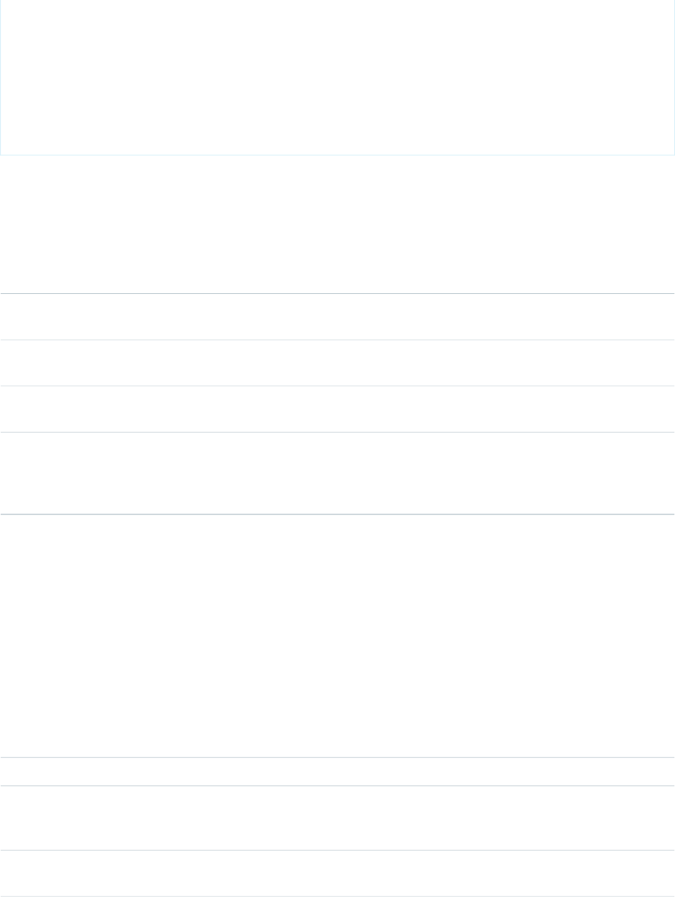
component.set("v.type", type);
// Dynamically create the feed with the specified type
$A.createComponent("forceChatter:feed", {"type": type}, function(feed) {
var feedContainer = component.find("feedContainer");
feedContainer.set("v.body", feed);
});
}
})
The feed component is supported for Lightning Experience and communities based on the Customer Service template.
For a list of feed types, see the Chatter REST API Developer's Guide.
Attributes
Required?DescriptionAttribute TypeAttribute Name
The body of the component. In markup, this is everything in the body of
the tag.
Component[]body
Valid values include DEFAULT ( shows inline comments on desktop, a bit
more detail ) or BROWSE ( primarily an overview of the feed items )
StringfeedDesign
For most feeds tied to an entity, this is used specified the desired entity.
Defaults to the current user if not specified
StringsubjectId
The strategy used to find items associated with the subject. Valid values
include: Bookmarks, Company, DirectMessages, Feeds, Files, Filter, Groups,
Stringtype
Home, Moderation, Mute, News, PendingReview, Record, Streams, To,
Topics, UserProfile.
forceChatter:fullFeed
A Chatter feed that is full length
The fullFeed component is still considered BETA and isn't ready for production.
The fullFeed component is intended for use with Lightning Out or other apps outside of Salesforce1 and Lightning Desktop. Including
the fullFeed component in Lightning Desktop results in unexpected behavior such as posts being temporarily duplicated in the UI.
Attributes
Required?DescriptionAttribute TypeAttribute Name
The body of the component, including everything in the body of the tag.Component[]body
Determines whether the component can handle navigation events for
entities and URLs. If set to true then navigation events occur in the entity
or URL being opened in a new window.
BooleanhandleNavigationEvents
For most feeds tied to an entity, this attribute is used to specify the desired
entity. Defaults to the current user if not specified
StringsubjectId
352
forceChatter:fullFeedReference

Required?DescriptionAttribute TypeAttribute Name
This attribute is used to find items associated with the subject. Valid
values include: News, Home, Record, To.
Stringtype
forceChatter:publisher
Lets users create posts on records or groups, and upload attachments from any device.
The forceChatter:publisher component is a standalone publisher component you can place on a record page. It works
together with the Chatter Feed component available in the Lightning App Builder to provide a complete Chatter experience. The
advantage of having separate components for publisher and feed is the flexibility it gives you in arranging page components. The
connection between publisher and feed is automatic and requires no additional coding.
The forceChatter:publisher component includes the context attribute, which determines what type of feed is shown.
Use RECORD for a record feed, and GLOBAL for all other feed types.
<aura:component implements="flexipage:availableForAllPageTypes" description="Sample
Component">
<forceChatter:publisher context="GLOBAL" />
</aura:component>
This component is supported for Lightning Experience and communities based on the Customer Service template.
Attributes
Required?DescriptionAttribute TypeAttribute Name
The body of the component. In markup, this is everything in the body of
the tag.
Component[]body
YesThe context in which the component is being displayed (RECORD or
GLOBAL). RECORD is for a record feed, and GLOBAL is for all other feed
types. This attribute is case-sensitive.
Stringcontext
The record IdStringrecordId
forceCommunity:navigationMenuBase
An abstract component for customizing the navigation menu in a community, which loads menu data and handles navigation. The
menu’s look and feel is controlled by the component that's extending it.
Extend the forceCommunity:navigationMenuBase component to create a customized navigation component for the
Customer Service (Napili) or custom community templates. Provide navigation menu data using the menu editor in Community Builder
or via the NavigationMenuItem entity.
The menuItems attribute is automatically populated with an array of top-level menu items, each with the following properties:
•id: Used by the navigate method.
•label: The menu item’s display label.
•subMenu: An optional property, which is an array of menu items.
353
forceChatter:publisherReference

Here's an example of a custom Navigation Menu component:
<aura:component extends="forceCommunity:navigationMenuBase"
implements="forceCommunity:availableForAllPageTypes">
<ul onclick="{!c.onClick}">
<aura:iteration items="{!v.menuItems}" var="item" >
<aura:if isTrue="{!item.subMenu}">
<li>{!item.label}</li>
<ul>
<aura:iteration items="{!item.subMenu}" var="subItem">
<li><a data-menu-item-id="{!subItem.id}"
href="">{!subItem.label}</a></li>
</aura:iteration>
</ul>
<aura:set attribute="else">
<li><a data-menu-item-id="{!item.id}" href="">{!item.label}</a></li>
</aura:set>
</aura:if>
</aura:iteration>
</ul>
</aura:component>
Here's an example of a controller:
({
onClick : function(component, event, helper) {
var id = event.target.dataset.menuItemId;
if (id) {
component.getSuper().navigate(id);
}
}
})
Methods
navigate(menuItemId): Navigates to the page the menu item points to. Takes the id of the menu item as a parameter.
Attributes
Required?DescriptionAttribute TypeAttribute Name
The body of the component. In markup, this is everything in the body of
the tag.
Component[]body
Automatically populated with menu item’s data. This attribute is
read-only.
ObjectmenuItems
354
forceCommunity:navigationMenuBaseReference

forceCommunity:routeLink
Sets an HTML anchor tag with an href attribute that’s automatically generated from the provided record ID. Use it to improve SEO link
equity in template-based communities.
Because the href attribute is automatically generated from the provided record ID, forceCommunity:routeLink is only
suitable for creating internal links to recordId-based pages in your community, such as the Article Detail or the Case Detail pages.
Internal links help establish an SEO-friendly site hierarchy and spread link equity (or link juice) to your community’s pages.
Here's an example of a forceCommunity:routeLink component:
<aura:component implements="forceCommunity:availableForAllPageTypes">
<aura:attribute name="recordId" type="String" default="500xx000000YkvU" />
<aura:attribute name="routeInput" type="Map"/>
<aura:handler name="init" value="{!this}" action="{!c.doInit}"/>
<forceCommunity:routeLink id="myCaseId" class="caseClass" title="My Case Tooltip"
label="My Case Link Text" routeInput="{!v.routeInput}" onClick="{!c.onClick}"/>
</aura:component>
To create the link, the client-side controller sets the record ID on the routeInput attribute during initialization. Clicking the link
enables you to navigate to the record page.
({
doInit : function(component, event, helper) {
component.set('v.routeInput', {recordId: component.get('v.recordId')});
},
onClick : function(component, event, helper) {
var navEvt = $A.get("e.force:navigateToSObject");
navEvt.setParams({
"recordId": component.get('v.recordId')
});
navEvt.fire();
}
})
The previous example renders the following anchor tag:
<a class="caseClass" href="/myCommunity/s/case/500xx000000YkvU/mycase"
id="myCaseId" title="My Case Tooltip">My Case Link Text</a>
Attributes
Required?DescriptionAttribute TypeAttribute Name
The body of the component. In markup, this is everything in the body of
the tag.
Component[]body
A CSS class for the anchor tag.Stringclass
The ID of the anchor tag.Stringid
355
forceCommunity:routeLinkReference
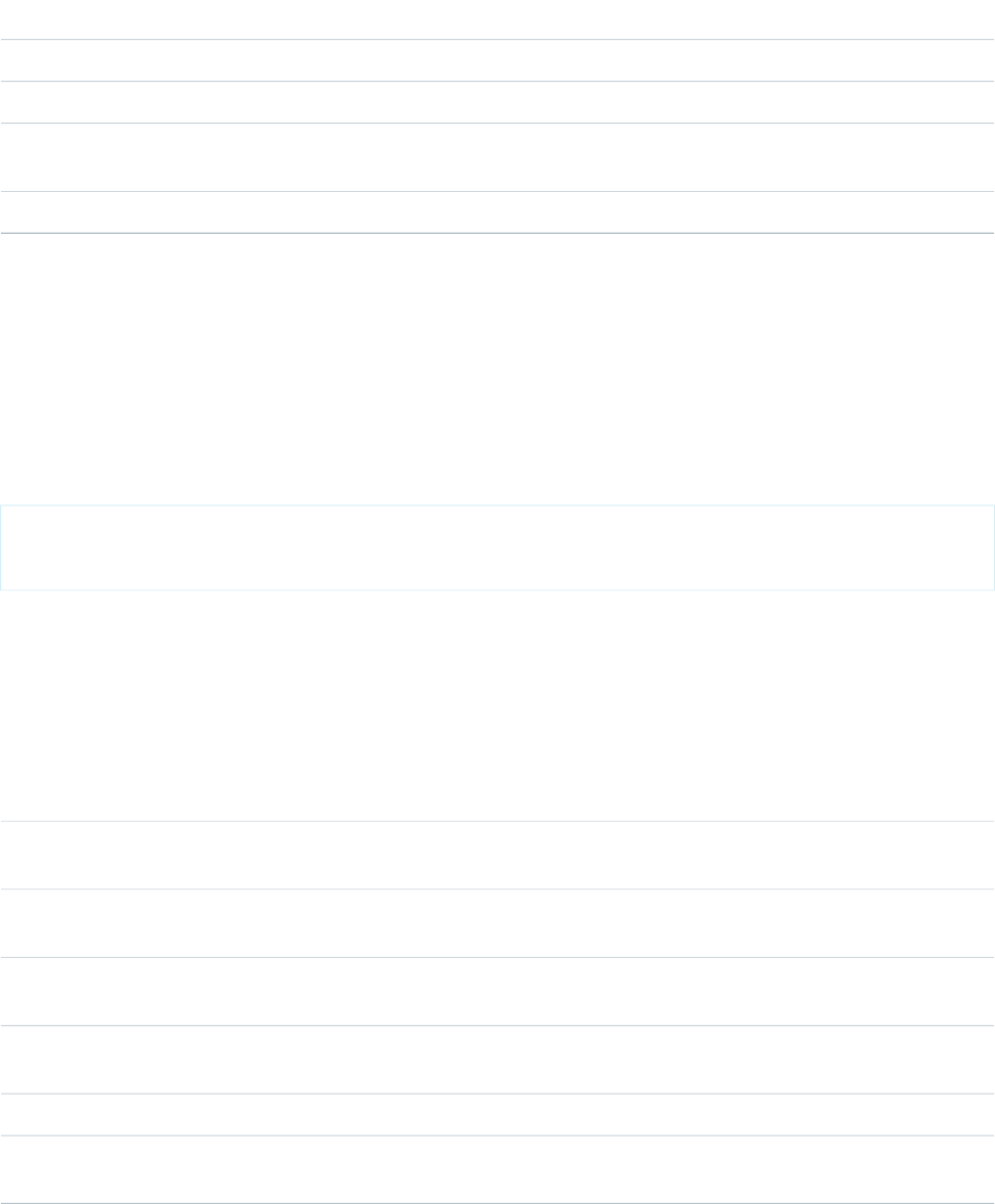
Required?DescriptionAttribute TypeAttribute Name
The text displayed in the link.Stringlabel
Action to trigger when the anchor is clicked.ActiononClick
YesThe map of dynamic parameters that create the link. Only recordId-based
routes are supported.
HashMaprouteInput
The text to display for the link tooltip.Stringtitle
lightning:avatar
A visual representation of a person.
A lightning:avatar component is an image that represents a person. By default, the image renders in medium sizing with a
rounded rectangle, which is also known as the square variant.
This component inherits styling from avatars in the Lightning Design System.
Here is an example.
<aura:component>
<lightning:avatar src="/images/codey.jpg" alternativeText="Codey Bear"/>
</aura:component>
Accessibility
Use the alternativeText attribute to describe the avatar, such as a user's initials or name. This description provides the value for
the alt attribute in the img HTML tag.
Attributes
Required?DescriptionAttribute TypeAttribute Name
YesThe alternative text used to describe the avatar, which is displayed as
hover text on the image.
StringalternativeText
The body of the component. In markup, this is everything in the body of
the tag.
Component[]body
A CSS class for the outer element, in addition to the component's base
classes.
Stringclass
The size of the avatar. Valid values are x-small, small, medium, and large.
This value defaults to medium.
Stringsize
YesThe URL for the image.Stringsrc
The variant changes the shape of the avatar. Valid values are empty, circle,
and square. This value defaults to square.
Stringvariant
356
lightning:avatarReference

lightning:badge
Represents a label which holds a small amount of information, such as the number of unread notifications.
A lightning:badge is a label that holds small amounts of information. A badge can be used to display unread notifications, or to
label a block of text. Badges don’t work for navigation because they can't include a hyperlink.
This component inherits styling from badges in the Lightning Design System.
Here is an example.
<aura:component>
<lightning:badge label="Label" />
</aura:component>
Attributes
Required?DescriptionAttribute TypeAttribute Name
The body of the component. In markup, this is everything in the body of
the tag.
Component[]body
A CSS class for the outer element, in addition to the component's base
classes.
Stringclass
YesThe text to be displayed inside the badge.Stringlabel
lightning:button
Represents a button element.
A lightning:button component represents a button element that executes an action in a controller. Clicking the button triggers
the client-side controller method set for onclick. Buttons can be either a label only, label and icon, body only, or body and icon. Use
lightning:buttonIcon if you need an icon-only button.
Use the variant and class attributes to apply additional styling.
The Lightning Design System utility icon category provides nearly 200 utility icons that can be used in lightning:button along
with label text. Although SLDS provides several categories of icons, only the utility category can be used in this component.
Visit https://lightningdesignsystem.com/icons/#utility to view the utility icons.
This component inherits styling from buttons in the Lightning Design System.
Here are two examples.
<aura:component>
<lightning:button variant="brand" label="Submit" onclick="{! c.handleClick }" />
</aura:component>
<aura:component>
<lightning:button variant="brand" label="Download" iconName="utility:download"
iconPosition="left" onclick="{! c.handleClick }" />
</aura:component>
Accessibility
357
lightning:badgeReference
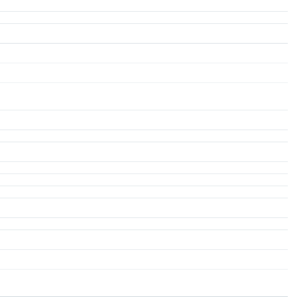
To inform screen readers that a button is disabled, set the disabled attribute to true.
Methods
This component supports the following method.
focus(): Sets the focus on the element.
Attributes
Required?DescriptionAttribute TypeAttribute Name
Specifies a shortcut key to activate or focus an element.Stringaccesskey
The body of the component. In markup, this is everything in the body of
the tag.
Component[]body
A CSS class for the outer element, in addition to the component's base
classes.
Stringclass
Specifies whether this button should be displayed in a disabled state.
Disabled buttons can't be clicked. This value defaults to false.
Booleandisabled
The Lightning Design System name of the icon. Names are written in the
format '\utility:down\' where 'utility' is the category, and 'down' is the
specific icon to be displayed.
StringiconName
Describes the position of the icon with respect to body. Options include
left and right. This value defaults to left.
StringiconPosition
The text to be displayed inside the button.Stringlabel
The name for the button element. This value is optional and can be used
to identify the button in a callback.
Stringname
The action triggered when the element releases focus.Actiononblur
The action triggered when the button is clicked.Actiononclick
The action triggered when the element receives focus.Actiononfocus
Specifies the tab order of an element (when the tab button is used for
navigating).
Integertabindex
Displays tooltip text when the mouse moves over the element.Stringtitle
Specifies the type of button. Valid values are button, reset, and submit.
This value defaults to button.
Stringtype
The value for the button element. This value is optional and can be used
when submitting a form.
Stringvalue
The variant changes the appearance of the button. Accepted variants
include base, neutral, brand, destructive, and inverse. This value defaults
to neutral.
Stringvariant
358
lightning:buttonReference

lightning:buttonGroup
Represents a group of buttons.
A lightning:buttonGroup component represents a set of buttons that can be displayed together to create a navigational bar.
The body of the component can contain lightning:button or lightning:buttonMenu. If navigational tabs are needed,
use lightning:tabset instead of lightning:buttonGroup.
This component inherits styling from button groups in the Lightning Design System.
This is the basic setup of lightning:buttonGroup with standard buttons.
<aura:component>
<lightning:buttonGroup>
<lightning:button label="Refresh" />
<lightning:button label="Edit" />
<lightning:button label="Save" />
</lightning:buttonGroup>
</aura:component>
Attributes
Required?DescriptionAttribute TypeAttribute Name
The body of the component. In markup, this is everything in the body of
the tag.
Component[]body
A CSS class for the outer element, in addition to the component's base
classes.
Stringclass
lightning:buttonIcon
An icon-only HTML button.
A lightning:buttonIcon component represents an icon-only button element that executes an action in a controller. Clicking
the button triggers the client-side controller method set for onclick.
You can use a combination of the variant, size, class, and iconClass attributes to customize the button and icon styles.
To customize styling on the button container, use the class attribute. For the bare variant, the size class applies to the icon itself.
For non-bare variants, the size class applies to the button. To customize styling on the icon element, use the iconClass attribute.
This example creates an icon-only button with bare variant and custom icon styling.
<!-- Bare variant with custom "dark" CSS class added to icon svg element -->
<lightning:buttonIcon iconName="utility:settings" variant="bare" alternativeText="Settings"
iconClass="dark"/>
The Lightning Design System utility icon category offers nearly 200 utility icons that can be used in lightning:buttonIcon.
Although the Lightning Design System provides several categories of icons, only the utility category can be used in
lightning:buttonIcon.
Visit https://lightningdesignsystem.com/icons/#utility to view the utility icons.
This component inherits styling from button icons in the Lightning Design System.
359
lightning:buttonGroupReference

Here is an example.
<aura:component>
<lightning:buttonIcon iconName="utility:close" variant="bare" onclick="{! c.handleClick
}" alternativeText="Close window." />
</aura:component>
Accessibility
Use the alternativeText attribute to describe the icon. The description should indicate what happens when you click the button,
for example 'Upload File', not what the icon looks like, 'Paperclip'.
Methods
This component supports the following method.
focus(): Sets the focus on the element.
Attributes
Required?DescriptionAttribute TypeAttribute Name
Specifies a shortcut key to activate or focus an element.Stringaccesskey
YesThe alternative text used to describe the icon. This text should describe
what happens when you click the button, for example 'Upload File', not
what the icon looks like, 'Paperclip'.
StringalternativeText
The body of the component. In markup, this is everything in the body of
the tag.
Component[]body
A CSS class for the outer element, in addition to the component's base
classes.
Stringclass
Specifies whether this button should be displayed in a disabled state.
Disabled buttons can't be clicked. This value defaults to false.
Booleandisabled
The class to be applied to the contained icon element.StringiconClass
YesThe Lightning Design System name of the icon. Names are written in the
format '\utility:down\' where 'utility' is the category, and 'down' is the
StringiconName
specific icon to be displayed. Note: Only utility icons can be used in this
component.
The name for the button element. This value is optional and can be used
to identify the button in a callback.
Stringname
The action triggered when the element releases focus.Actiononblur
The action that will be run when the button is clicked.Actiononclick
The action triggered when the element receives focus.Actiononfocus
The size of the buttonIcon. For the bare variant, options include x-small,
small, medium, and large. For non-bare variants, options include xx-small,
x-small, small, and medium. This value defaults to medium.
Stringsize
360
lightning:buttonIconReference

Required?DescriptionAttribute TypeAttribute Name
Specifies the tab order of an element (when the tab button is used for
navigating).
Integertabindex
Displays tooltip text when the mouse moves over the element.Stringtitle
Specifies the type of button. Valid values are button, reset, and submit.
This value defaults to button.
Stringtype
The value for the button element. This value is optional and can be used
when submitting a form.
Stringvalue
The variant changes the appearance of buttonIcon. Accepted variants
include bare, container, border, border-filled, bare-inverse, and
border-inverse. This value defaults to border.
Stringvariant
lightning:buttonMenu (Beta)
Represents a dropdown menu with a list of actions or functions.
A lightning:buttonMenu represents a button that when clicked displays a dropdown menu of actions or functions that a user
can access.
Use the variant, size, or class attributes to customize the styling.
This component inherits styling from menus in the Lightning Design System.
This example shows a dropdown menu with three items.
<lightning:buttonMenu iconName="utility:settings" alternativeText="Settings" onselect="{!
c.handleMenuSelect }">
<lightning:menuItem label="Font" value="font" />
<lightning:menuItem label="Size" value="size"/>
<lightning:menuItem label="Format" value="format" />
</lightning:buttonMenu>
When onselect is triggered, its event will have a value parameter, which is the value of the selected menu item. Here's an example
of how to read that value.
handleMenuSelect: function(cmp, event, helper) {
var selectedMenuItemValue = event.getParam("value");
}
You can create menu items that can be checked or unchecked using the checked attribute in the lightning:menuItem
component, toggling it as needed. To enable toggling of a menu item, you must set an initial value on the checked attribute, specifying
either true or false.
The menu closes when you click away from it, and it will also close and will put the focus back on the button when a menu item is
selected.
Generating Menu Items with aura:iteration
This example creates a button menu with several items during initialization.
<aura:component>
<aura:handler name="init" value="{!this}" action="{!c.createItems}" />
<lightning:buttonMenu alternativeText="Action" onselect="{! c.handleMenuSelect }">
361
lightning:buttonMenu (Beta)Reference

<aura:iteration var="action" items="{! v.actions }">
<lightning:menuItem aura:id="actionMenuItems" label="{! action.label }"
value="{! action.value }"/>
</aura:iteration>
</lightning:buttonMenu>
</aura:component>
The client-side controller creates the array of menu items and set its value on the actions attribute.
({
createItems: function (cmp, event) {
var items = [
{ label: "New", value: "new" },
{ label: "Edit", value: "edit" },
{ label: "Delete", value: "delete" }
];
cmp.set("v.actions", items);
}
})
Usage Considerations
This component contains menu items that are created only if the button is triggered. You won't be able to reference the menu items
during initialization or if the button isn't triggered yet.
Accessibility
To inform screen readers that a button is disabled, set the disabled attribute to true.
Methods
This component supports the following method.
focus(): Sets the focus on the element.
Attributes
Required?DescriptionAttribute TypeAttribute Name
Specifies a shortcut key to activate or focus an element.Stringaccesskey
The assistive text for the button.StringalternativeText
The body of the component.ComponentDefRef[]body
A CSS class for the outer element, in addition to the component's base
classes.
Stringclass
If true, the menu is disabled. Disabling the menu prevents users from
opening it. This value defaults to false.
Booleandisabled
The name of the icon to be used in the format \'utility:down\'. This value
defaults to utility:down. If an icon other than utility:down or
StringiconName
utility:chevrondown is used, a utility:down icon is appended to the right
of that icon.
362
lightning:buttonMenu (Beta)Reference
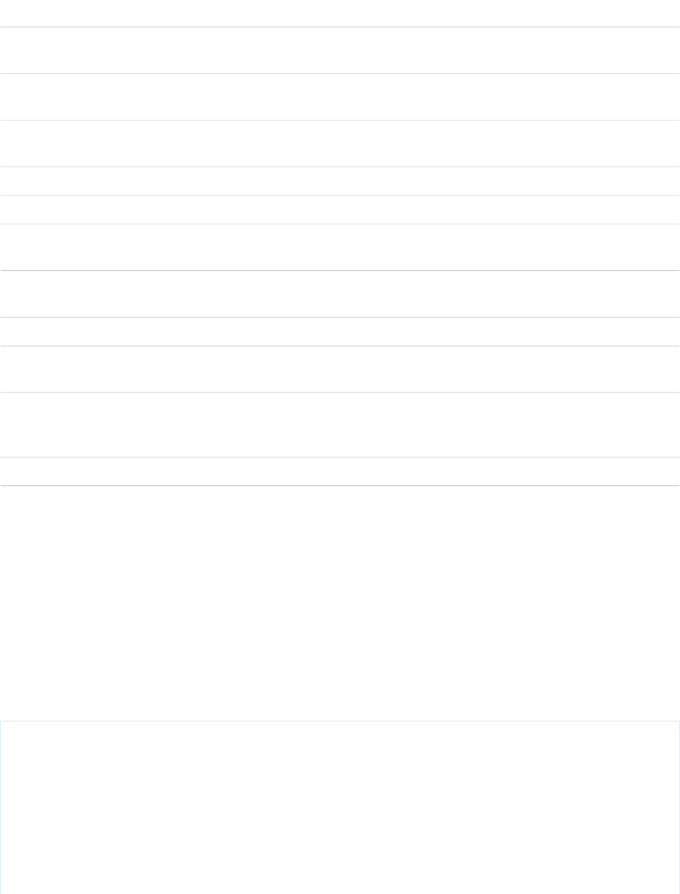
Required?DescriptionAttribute TypeAttribute Name
The size of the icon. Options include xx-small, x-small, medium, or large.
This value defaults to medium.
StringiconSize
Determines the alignment of the menu relative to the button. Available
options are: left, center, right. This value defaults to left.
StringmenuAlignment
The name for the button element. This value is optional and can be used
to identify the button in a callback.
Stringname
The action triggered when the element releases focus.Actiononblur
The action triggered when the element receives focus.Actiononfocus
Action fired when a menu item is selected. The 'detail.menuItem' property
of the passed event is the selected menu item.
Actiononselect
Specifies the tab order of an element (when the tab button is used for
navigating).
Integertabindex
Tooltip text on the button.Stringtitle
The value for the button element. This value is optional and can be used
when submitting a form.
Stringvalue
The variant changes the look of the button. Accepted variants include
bare, container, border, border-filled, bare-inverse, and border-inverse.
This value defaults to border.
Stringvariant
If true, the menu items are displayed. This value defaults to false.Booleanvisible
lightning:card
Cards are used to apply a container around a related grouping of information.
A lightning:card is used to apply a stylized container around a grouping of information. The information could be a single item
or a group of items such as a related list.
Use the variant or class attributes to customize the styling.
A lightning:card contains a title, body, and footer. To style the card body, use the Lightning Design System helper classes.
This component inherits styling from cards in the Lightning Design System.
Here is an example.
<aura:component>
<lightning:card>
<aura:set attribute="title">
Hello!
</aura:set>
<aura:set attribute="footer">
<lightning:badge label="footer"/>
</aura:set>
<aura:set attribute="actions">
<lightning:button label="New"/>
363
lightning:cardReference
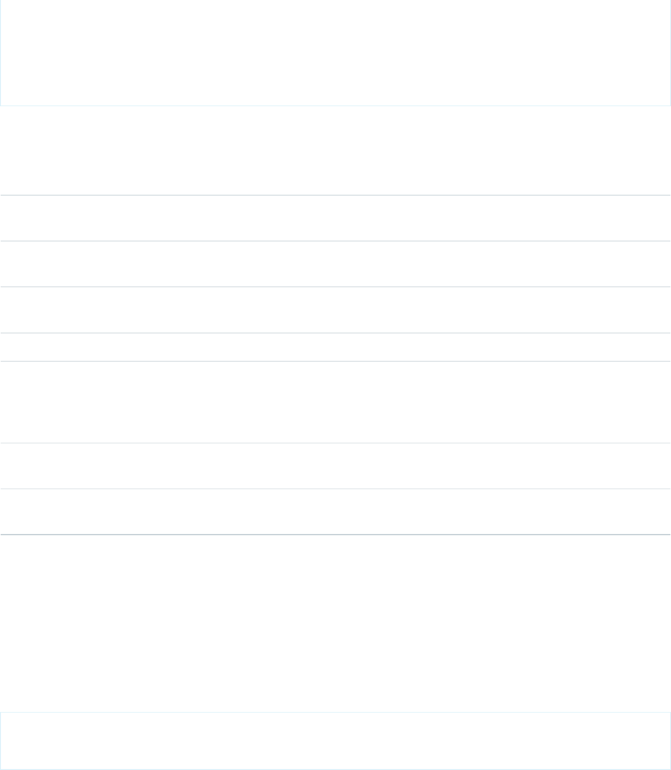
</aura:set>
<p class="slds-p-horizontal--small">
Card Body (custom component)
</p>
</lightning:card>
</aura:component>
Attributes
Required?DescriptionAttribute TypeAttribute Name
Actions are components such as button or buttonIcon. Actions are
displayed in the header.
Component[]actions
The body of the component. In markup, this is everything in the body of
the tag.
Component[]body
A CSS class for the outer element, in addition to the component's base
classes.
Stringclass
The footer can include text or another componentComponent[]footer
The Lightning Design System name of the icon. Names are written in the
format '\utility:down\' where 'utility' is the category, and 'down' is the
StringiconName
specific icon to be displayed. The icon is displayed in the header to the
left of the title.
YesThe title can include text or another component, and is displayed in the
header.
Component[]title
The variant changes the appearance of the card. Accepted variants include
base or narrow. This value defaults to base.
Stringvariant
lightning:container
Used to contain content that uses a third-party javascript framework such as Angular or React.
The lightning:container component allows you to host content developed with a third-party framework within a Lightning
component. The content is uploaded as a static resource, and hosted in an iFrame. The lightning:container component can
be used for single-page applications only.
This is a simple example of lightning:container.
<aura:component access="global" implements="flexipage:availableForAllPageTypes">
<lightning:container src="{!$Resource.myReactApp + '/index.html'}"/>
</aura:component>
You can also implement communication to and from the framed application, allowing it to interact with Salesforce. Use the message()
function in the Javascript controller to send messages to the application, and specify a method for handling messages with the component’s
onmessage attribute.
364
lightning:containerReference

This example of a Javascript controller uses the message() function to send a simple JSON payload to the third-party content, in this
case an AngularJS app.
({
sendMessage : function(component, event, helper) {
var msg = {
name: "General",
value: component.get("v.messageToSend")
};
component.find("AngularApp").message(msg);
},
handleMessage: function(component, message, helper) {
var payload = message.payload;
var name = payload.name;
if (name === "General") {
var value = payload.value;
component.set("v.messageReceived", value);
}
else if (name === "Foo") {
// A different response
}
},
})
The accompanying component definition defines attributes for a message to send from the container to the Lightning component and
for a message received. The onmessage attribute of lightning:container references the Javascript method
handleMessage.
<aura:component access="global" implements="flexipage:availableForAllPageTypes" >
<aura:attribute name="messageToSend" type="String" default=""/>
<aura:attribute name="messageReceived" type="String" default=""/>
<div>
<lightning:input name="messageToSend" value="{!v.messageToSend}" label="Message
to send to Angular app: "/>
<lightning:button label="Send" onclick="{!c.sendMessage}"/>
<lightning:textarea name="messageReceived" value="{!v.messageReceived}"
label="Message received from Angular app: "/>
<lightning:container aura:id="AngularApp"
src="{!$Resource.SendReceiveMessages + '/index.html'}"
onmessage="{!c.handleMessage}"/>
</div>
</aura:component>
Because you define the controller-side message handling yourself, you can use it to handle any kind of message payload. You can, for
example, send just a text string or return a structured JSON response.
Usage Considerations
When specifying the src of the container, don’t specify a hostname. Instead, use $Resource with dot notation to reference your
application, uploaded as a static resource.
Accessibility
Use the alternativeText attribute to provide assistive text for the lightning:container.
Methods
The component supports the following method.
365
lightning:containerReference
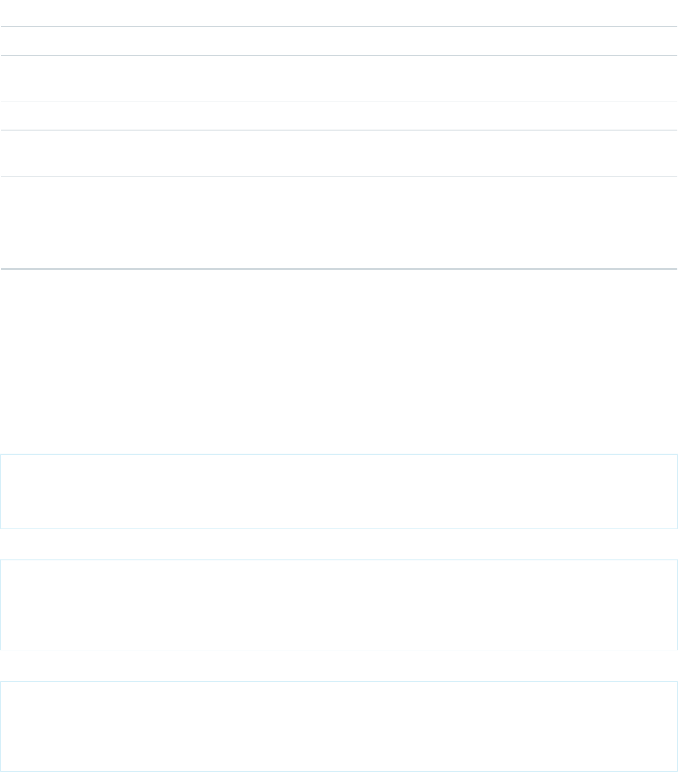
message(): Sends a user-defined message from the component to the iFrame content.
Attributes
Required?DescriptionAttribute TypeAttribute Name
Used for alternative text in accessibility scenarios.StringalternativeText
The body of the component. In markup, this is everything in the body of
the tag.
Component[]body
The CSS class for the iframe element.Stringclass
The client-side controller action to run when an error occurs when
sending a message to the contained app.
Actiononerror
The client-side controller action to run when a message is received from
the contained content.
Actiononmessage
YesThe resource name, landing page and query params in url format.
Navigation is supported only for the single page identified.
Stringsrc
lightning:formattedDateTime (Beta)
Displays formatted date and time.
A lightning:formattedDateTime component displays formatted date and time. This component uses the Intl.DateTimeFormat
JavaScript object to format date values. The locale set in the app's user preferences determines the formatting.
Here are some examples based on a locale of en-US.
Displays: 8/2/2016
<aura:component>
<lightning:formattedDateTime value="1470174029742" />
</aura:component>
Displays: Tuesday, Aug 02, 16
<aura:component>
<lightning:formattedDateTime value="1470174029742" year="2-digit" month="short"
day="2-digit" weekday="long"/>
</aura:component>
Displays: 8/2/2016, 3:15 PM PDT
<aura:component>
<lightning:formattedDateTime value="1470174029742" year="numeric" month="numeric"
day="numeric" hour="2-digit" minute="2-digit" timeZoneName="short" />
</aura:component>
Usage Considerations
366
lightning:formattedDateTime (Beta)Reference

This component provides fallback behavior in Apple Safari 10 and below. The following formatting options have exceptions when using
the fallback behavior in older browsers.
•era is not supported.
•timeZoneName appends GMT for short format, GMT-h:mm or GMT+h:mm for long format.
•timeZone supports UTC. If another timezone value is used, lightning:formattedDateTime uses the browser timezone.
Attributes
Required?DescriptionAttribute TypeAttribute Name
The body of the component. In markup, this is everything in the body of
the tag.
Component[]body
Allowed values are numeric or 2-digit.Stringday
Allowed values are narrow, short, or long.Stringera
Allowed values are numeric or 2-digit.Stringhour
Determines whether time is displayed as 12-hour. If false, time displays
as 24-hour. The default setting is determined by the user's locale.
Booleanhour12
Allowed values are numeric or 2-digit.Stringminute
Allowed values are 2-digit, narrow, short, or long.Stringmonth
Allowed values are numeric or 2-digit.Stringsecond
The time zone to use. Implementations can include any time zone listed
in the IANA time zone database. The default is the runtime's default time
zone. Use this attribute only if you want to override the default time zone.
StringtimeZone
Allowed values are short or long. For example, the Pacific Time zone
would display as 'PST' if you select 'short', or 'Pacific Standard Time' if you
select 'long.'
StringtimeZoneName
YesThe value to be formatted, which can be a Date object or timestamp.Objectvalue
Allowed values are narrow, short, or long.Stringweekday
Allowed values are numeric or 2-digit.Stringyear
lightning:formattedNumber (Beta)
Displays formatted numbers for decimals, currency, and percentages.
A lightning:formattedNumber component displays formatted numbers for decimals, currency, and percentages. This
component uses the Intl.NumberFormat JavaScript object to format numerical values. The locale set in the app's user preferences
determines how numbers are formatted.
The component has several attributes that specify how number formatting is handled in your app. Among these attributes are
minimumSignificantDigits and maximumSignificantDigits. Significant digits refer the accuracy of a number. For
example, 1000 has one significant digit, but 1000.0 has five significant digits.
367
lightning:formattedNumber (Beta)Reference

In this example the formatted number displays as $5,000.00.
<aura:component>
<lightning:formattedNumber value="5000" style="currency" currency="USD" />
</aura:component>
In this example the formatted number displays as 50%.
<aura:component>
<lightning:formattedNumber value="0.5" style="percent" />
</aura:component>
Usage Considerations
This component provides the following fallback behavior in Apple Safari 10 and below.
•If style is set to currency, providing a currencyCode value that’s different from the locale displays the currency code
instead of the symbol. The following example displays EUR12.34 in fallback mode and €12.34 otherwise.
<lightning:formattedNumber value="12.34" style="currency"
currencyCode="EUR"/>
•currencyDisplayAs supports symbol only. The following example displays $12.34 in fallback mode only if currencyCode
matches the user’s locale currency and USD12.34 otherwise.
<lightning:formattedNumber value="12.34" style="currency"
currencyCode="USD" currencyDisplayAs="symbol"/>
Attributes
Required?DescriptionAttribute TypeAttribute Name
The body of the component. In markup, this is everything in the body of
the tag.
Component[]body
Only used if style='currency', this attribute determines which currency
is displayed. Possible values are the ISO 4217 currency codes, such as
'USD' for the US dollar.
StringcurrencyCode
Determines how currency is displayed. Possible values are symbol, code,
and name. This value defaults to symbol.
StringcurrencyDisplayAs
The maximum number of fraction digits that are allowed.IntegermaximumFractionDigits
The maximum number of significant digits that are allowed. Possible
values are from 1 to 21.
IntegermaximumSignificantDigits
The minimum number of fraction digits that are required.IntegerminimumFractionDigits
The minimum number of integer digits that are required. Possible values
are from 1 to 21.
IntegerminimumIntegerDigits
The minimum number of significant digits that are required. Possible
values are from 1 to 21.
IntegerminimumSignificantDigits
368
lightning:formattedNumber (Beta)Reference

Required?DescriptionAttribute TypeAttribute Name
The number formatting style to use. Possible values are decimal, currency,
and percent. This value defaults to decimal.
Stringstyle
YesThe value to be formatted.Decimalvalue
lightning:icon
Represents a visual element that provides context and enhances usability.
A lightning:icon is a visual element that provides context and enhances usability. Icons can be used inside the body of another
component or on their own.
Visit https://lightningdesignsystem.com/icons to view the available icons.
Here is an example.
<aura:component>
<lightning:icon iconName="action:approval" size="large" alternativeText="Indicates
approval"/>
</aura:component>
Use the variant, size, or class attributes to customize the styling. The variant attribute changes the appearance of a utility
icon. For example, the error variant adds a red fill to the error utility icon.
<lightning:icon iconName="utility:error" variant="error"/>
If you want to make additional changes to the color or styling of an icon, use the class attribute.
Accessibility
Use the alternativeText attribute to describe the icon. The description should indicate what happens when you click the button,
for example 'Upload File', not what the icon looks like, 'Paperclip'.
Sometimes an icon is decorative and does not need a description. But icons can switch between being decorative or informational based
on the screen size. If you choose not to include an alternativeText description, check smaller screens and windows to ensure
that the icon is decorative on all formats.
Attributes
Required?DescriptionAttribute TypeAttribute Name
The alternative text used to describe the icon. This text should describe
what happens when you click the button, for example 'Upload File', not
what the icon looks like, 'Paperclip'.
StringalternativeText
The body of the component. In markup, this is everything in the body of
the tag.
Component[]body
A CSS class for the outer element, in addition to the component's base
classes.
Stringclass
YesThe Lightning Design System name of the icon. Names are written in the
format '\utility:down\' where 'utility' is the category, and 'down' is the
specific icon to be displayed.
StringiconName
369
lightning:iconReference

Required?DescriptionAttribute TypeAttribute Name
The size of the icon. Options include xx-small, x-small, small, medium, or
large. This value defaults to medium.
Stringsize
Displays tooltip text when the mouse moves over the element.Stringtitle
The variant changes the appearance of a utility icon. Accepted variants
include bare, warning and error.
Stringvariant
lightning:input (Beta)
Represents interactive controls that accept user input depending on the type attribute.
A lightning:input component creates an HTML input element. This component supports HTML5 input types, including
checkbox, date and datetime-local, email, file, password, search, tel, url, number, radio, toggle.
The default is text.
You can define a client-side controller action for input events like onblur, onfocus, and onchange. For example, to handle a
change event on the component when the value of the component is changed, use the onchange attribute.
This component inherits styling from forms in the Lightning Design System.
Checkbox
Checkboxes let you select one or more options.
<lightning:input type="checkbox" label="Red" name="red" checked="true"/>
<lightning:input type="checkbox" label="Blue" name="blue" />
Date
An input field for entering a date. Date pickers don't currently inherit the Lightning Design System styling. The date format is automatically
validated during the onblur event.
<lightning:input type="date" label="Birthday" name="date" />
Datetime-local
An input field for entering a date and time. Date pickers don't currently inherit the Lightning Design System styling. The date and time
format is automatically validated during the onblur event.
<lightning:input type="datetime-local" label="Birthday" name="datetime" />
Email
An input field for entering an email address. The email pattern is automatically validated during the onblur event.
<lightning:input type="email" label="Email" name="email" value="abc@domain.com" />
File
An input field for uploading files using a Upload Files button or a drag-and-drop zone. To retrieve the list of selected files, use
event.getSource().get("v.files");.
<lightning:input type="file" label="Attachment" name="file" multiple="true"
accept="image/png, .zip" onchange="{! c.handleFilesChange }"/>
Month
370
lightning:input (Beta)Reference

An input field for entering a month and year. Date pickers don't currently inherit the Lightning Design System styling. The month and
year format is automatically validated during the onblur event.
<lightning:input type="month" label="Birthday" name="month" />
Number
An input field for entering a number. When working with numerical input, you can use attributes like max, min, and step.
<lightning:input type="number" name="number" label="Number" value="12345"/>
To format numerical input as a percentage or currency, set formatter to percent or currency respectively.
<lightning:input type="number" name="ItemPrice"
label="Price" value="12345" formatter="currency"/>
Fields for percentage and currency input must specify a step increment of 0.01 as required by the native implementation.
<lightning:input type="number" name="percentVal" label="Enter a percentage value"
formatter="percent" step="0.01" />
<lightning:input type="number" name="currencyVal" label="Enter a dollar amount"
formatter="currency" step="0.01" />
Password
An input field for entering a password. Characters you enter are masked.
<lightning:input type="password" label="Password" name="password" />
Radio
Radio buttons let you select only one of a given number of options.
<lightning:input type="radio" label="Red" name="red" value="red" checked="true" />
<lightning:input type="radio" label="Blue" name="blue" value="blue" />
Range
A slider control for entering a number. When working with numerical input, you can use attributes like max, min, and step.
<lightning:input type="range" label="Number" name="number" min="0" max="10" />
Search
An input field for entering a search string. This field displays the Lightning Design System search utility icon.
<lightning:input type="search" label="Search" name="search" />
Tel
An input field for entering a telephone number. Use the pattern attribute to define a pattern for field validation.
<lightning:input type="tel" label="Telephone" name="tel" value="343-343-3434"
pattern="[0-9]{3}-[0-9]{3}-[0-9]{4}"/>
Text
An input field for entering text. This is the default input type.
<lightning:input label="Name" name="myname" />
Time
371
lightning:input (Beta)Reference

An input field for entering time. The time format is automatically validated during the onblur event.
<lightning:input type="time" label="Time" name="time" />
Toggle
A checkbox toggle for selecting one of two given values.
<lightning:input type="toggle" label="Toggle value" name="togglevalue" checked="true" />
URL
An input field for entering a URL. This URL pattern is automatically validated during the onblur event.
<lightning:input type="url" label="Website" name="website" />
Week
An input field for entering a week and year. Date pickers don't currently inherit the Lightning Design System styling. The week and year
format is automatically validated during the onblur event.
<lightning:input type="week" label="Week" name="week" />
Input Validation
Client-side input validation is available for this component. For example, an error message is displayed when a URL or email address is
expected for an input type of url or email.
You can define additional field requirements. For example, to set a maximum length, use the maxlength attribute.
<lightning:input name="quantity" value="1234567890" label="Quantity" maxlength="10" />
To check the validity states of an input, use the validity attribute, which is based on the ValidityState Web API. To determine
if a field is valid, you can access the validity states in your client-side controller. Let's say you have the following input field.
<lightning:input name="input" aura:id="myinput" label="Enter some text" onblur="{!
c.handleBlur }" />
The valid property returns true because all constraint validations are met, and in this case there are none.
handleBlur: function (cmp, event) {
var validity = cmp.find("myinput").get("v.validity");
console.log(validity.valid); //returns true
}
For example, you have the following form with several fields and a button. To display error messages on invalid fields, use the
showHelpMessageIfInvalid() method.
<aura:component>
<lightning:input aura:id="field" label="First name" placeholder="First name"
required="true" />
<lightning:input aura:id="field" label="Last name" placeholder="Last name"
required="true" />
<lightning:button aura:id="submit" type="submit" label="Submit" onclick="{! c.onClick
}" />
</aura:component>
Validate the fields in the client-side controller.
({
onClick: function (cmp, evt, helper) {
372
lightning:input (Beta)Reference

var allValid = cmp.find('field').reduce(function (validSoFar, inputCmp) {
inputCmp.showHelpMessageIfInvalid();
return validSoFar && inputCmp.get('v.validity').valid;
}, true);
if (allValid) {
alert('All form entries look valid. Ready to submit!');
} else {
alert('Please update the invalid form entries and try again.');
}
}
})
This validity attribute returns an object with the following boolean properties.
•badInput: Indicates that the value is invalid
•patternMismatch: Indicates that the value doesn't match the specified pattern
•rangeOverflow: Indicates that the value is greater than the specified max attribute
•rangeUnderflow: Indicates that the value is less than the specified min attribute
•stepMismatch: Indicates that the value doesn't match the specified step attribute
•tooLong: Indicates that the value exceeds the specified maxlength attribute
•typeMismatch: Indicates that the value doesn't match the required syntax for an email or url input type
•valid: Indicates that the value is valid
•valueMissing: Indicates that an empty value is provided when required attribute is set to true
Error Messages
When an input validation fails, the following messages are displayed by default.
•badInput: Enter a valid value.
•patternMismatch: Your entry does not match the allowed pattern.
•rangeOverflow: The number is too high.
•rangeUnderflow: The number is too low.
•stepMismatch: Your entry isn't a valid increment.
•tooLong: Your entry is too long.
•typeMismatch: You have entered an invalid format.
•valueMissing: Complete this field.
You can override the default messages by providing your own values for these attributes: messageWhenBadInput,
messageWhenPatternMismatch, messageWhenTypeMismatch, messageWhenValueMissing,
messageWhenRangeOverflow, messageWhenRangeUnderflow, messageWhenStepMismatch,
messageWhenTooLong.
For example, you want to display a custom error message when the input is less than five characters.
<lightning:input name="firstname" label="First Name" minlength="5"
messageWhenBadInput="Your entry must be at least 5 characters." />
Usage Considerations
The following input types are not supported.
•button
•hidden
373
lightning:input (Beta)Reference
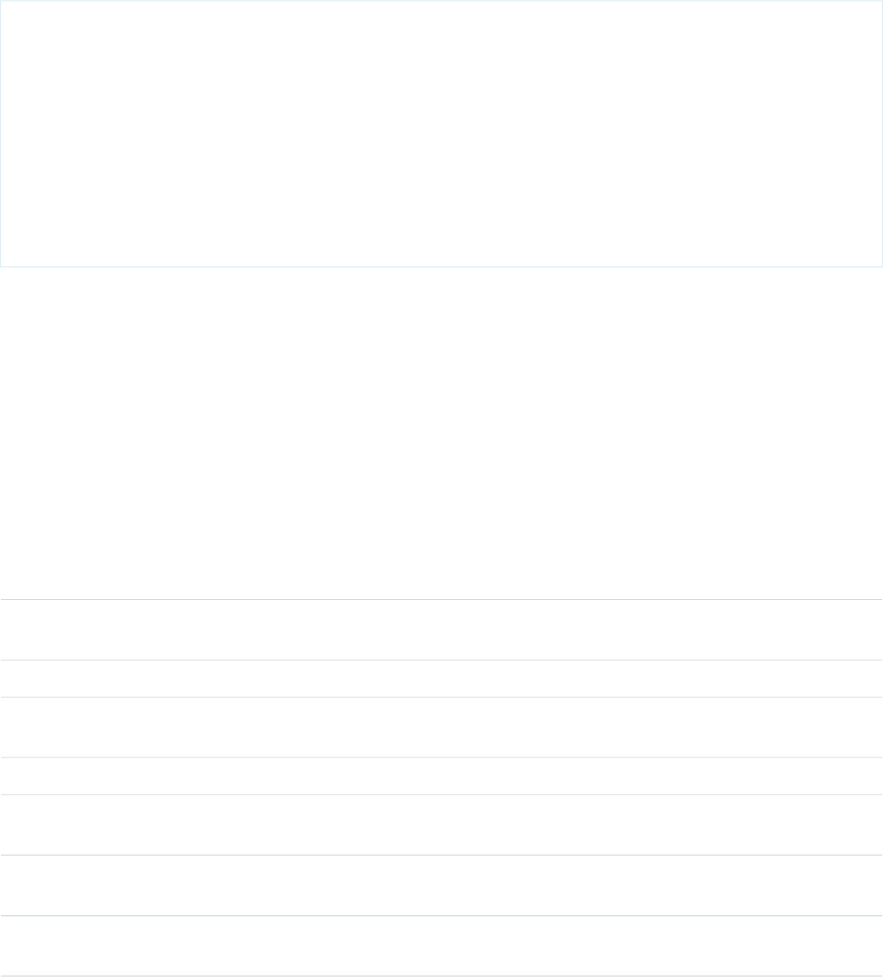
•image
•reset
•submit
When working with checkboxes, radio buttons, and toggle switches, use aura:id to group and traverse the array of components.
You can use get("v.checked") to determine which elements are checked or unchecked without reaching into the DOM. You
can also use the name and value attributes to identify each component during the iteration. The following example groups three
checkboxes together using aura:id.
<aura:component>
<fieldset>
<legend>Select your favorite color:</legend>
<lightning:input type="checkbox" label="Red"
name="color1" value="1" aura:id="colors"/>
<lightning:input type="checkbox" label="Blue"
name="color2" value="2" aura:id="colors"/>
<lightning:input type="checkbox" label="Green"
name="color3" value="3" aura:id="colors"/>
</fieldset>
<lightning:button label="Submit" onclick="{!c.submitForm}"/>
</aura:component>
Accessibility
You must provide a text label for accessibility to make the information available to assistive technology. The label attribute creates
an HTML label element for your input component.
Methods
This component supports the following methods.
focus(): Sets the focus on the element.
showHelpMessageIfInvalid(): Shows the help message if the form control is in an invalid state.
Attributes
Required?DescriptionAttribute TypeAttribute Name
Specifies the types of files that the server accepts. This attribute can be
used only when type='file'.
Stringaccept
Specifies a shortcut key to activate or focus an element.Stringaccesskey
The body of the component. In markup, this is everything in the body of
the tag.
Component[]body
Specifies whether the checkbox is checked. This value defaults to false.Booleanchecked
A CSS class for the outer element, in addition to the component's base
classes.
Stringclass
Specifies that an input element should be disabled. This value defaults
to false.
Booleandisabled
A FileList that contains selected files. This attribute can be used only when
type='file'.
Objectfiles
374
lightning:input (Beta)Reference

Required?DescriptionAttribute TypeAttribute Name
String value with the formatter to be used.Stringformatter
YesText label for the input.Stringlabel
Expected higher bound for the value in Floating-Point numberDecimalmax
The maximum number of characters allowed in the field.Integermaxlength
Error message to be displayed when a bad input is detected.StringmessageWhenBadInput
Error message to be displayed when a pattern mismatch is detected.StringmessageWhenPatternMismatch
Error message to be displayed when a range overflow is detected.StringmessageWhenRangeOverflow
Error message to be displayed when a range underflow is detected.StringmessageWhenRangeUnderflow
Error message to be displayed when a step mismatch is detected.StringmessageWhenStepMismatch
Error message to be displayed when the value is too long.StringmessageWhenTooLong
Error message to be displayed when a type mismatch is detected.StringmessageWhenTypeMismatch
Error message to be displayed when the value is missing.StringmessageWhenValueMissing
Expected lower bound for the value in Floating-Point numberDecimalmin
The minimum number of characters allowed in the field.Integerminlength
Specifies that a user can enter more than one value. This attribute can
be used only when type='file' or type='email'.
Booleanmultiple
YesSpecifies the name of an input element.Stringname
The action triggered when the element releases focus.Actiononblur
The action triggered when a value attribute changes.Actiononchange
The action triggered when the element receives focus.Actiononfocus
Specifies the regular expression that the input's value is checked against.
This attributed is supported for text, date, search, url, tel, email, and
password types.
Stringpattern
Text that is displayed when the field is empty, to prompt the user for a
valid entry.
Stringplaceholder
Specifies that an input field is read-only. This value defaults to false.Booleanreadonly
Specifies that an input field must be filled out before submitting the form.
This value defaults to false.
Booleanrequired
Granularity of the value in Positive Floating Point. Use 'any' when
granularity is not a concern.
Objectstep
Specifies the tab order of an element (when the tab button is used for
navigating).
Integertabindex
The type of the input. This value defaults to text.Stringtype
375
lightning:input (Beta)Reference

Required?DescriptionAttribute TypeAttribute Name
Represents the validity states that an element can be in, with respect to
constraint validation.
Objectvalidity
Specifies the value of an input element.Objectvalue
lightning:inputRichText (Beta)
A WYSIWYG editor with a customizable toolbar for entering rich text.
A lightning:inputRichText component creates a rich text editor based on the Quill JS library, enabling you to add, edit,
format, and delete rich text. You can create multiple rich text editors with different toolbar configurations. Pasting rich content into the
editor is supported if the feature is available in the toolbar. For example, you can paste bold text if the bold button is available in the
toolbar. An overflow menu is provided if more toolbar buttons are available than can fit the width of the toolbar.
This component inherits styling from rich text editor in the Lightning Design System.
Here is an example.
<aura:component>
<aura:attribute name="myVal" type="String" />
<lightning:inputRichText value="{!v.myVal}" />
</lightning:inputRichText>
</aura:component>
Customizing the Toolbar
By default, the toolbar displays the font family and size menu, the format text block with Bold, Italic, Underline, and Strikethrough
buttons. It also displays the format body block with Bulleted List, Numbered List, Indent, and Outdent buttons, followed by the align
text block with Left Align Text, Center Align Text, and Right Align Text buttons. The Remove Formatting button is also available,
and it always stands alone at the end of the toolbar.
You can disable buttons by category using the disabledCategories attribute. The categories are:
1. FORMAT_FONT: Format font family and size menus
2. FORMAT_TEXT: Format text buttons
3. FORMAT_BODY: Format body buttons
4. ALIGN_TEXT: Align text buttons
5. REMOVE_FORMATTING: Remove formatting buttons
The font menu provides the following font selection: Arial, Courier, Garamond, Salesforce Sans, Tahoma, Times New Roman, and Verdana.
The font selection defaults to Salesforce Sans with a size of 12px. Supported font sizes are: 8, 9, 10, 11, 12, 14, 16, 18, 20, 22, 24, 26, 28,
36, 48, and 72. When you copy and paste text in the editor, the font is preserved only if the font is available in the font menu.
Supported HTML Tags
The component sanitizes HTML tags passed to the value attribute to prevent XSS vulnerabilities. Only a subset of HTML tags are
allowed. The tags are: a, b, br, big, blockquote, caption, cite, code, del, div, em, h1, h2, h3, hr, i, img, ins,
kbd, li, ol, p, param, pre, q, s, samp, small, span, strong, sub, sup, table, tbody, td, tfoot, th, thead,
tr, tt, u, ul, var, strike.
Supported HTML attributes include: accept, action, align, alt, autocomplete, background, bgcolor, border,
cellpadding, cellspacing, checked, cite, class, clear, color, cols, colspan, coords, datetime,
default, dir, disabled, download, enctype, face, for, headers, height, hidden, high, href, hreflang,
376
lightning:inputRichText (Beta)Reference
id, ismap, label, lang, list, loop, low, max, maxlength, media, method, min, multiple, name, noshade,
novalidate, nowrap, open, optimum, pattern, placeholder, poster, preload, pubdate, radiogroup,
readonly, rel, required, rev, reversed, rows, rowspan, spellcheck, scope, selected, shape, size,
span, srclang, start, src, step, style, summary, tabindex, target, title, type, usemap, valign, value,
width, xmlns.
Usage Considerations
lightning:inputRichText doesn't provide built-in validation but you can wire up your own validation logic. Set the valid
attribute to false to change the border color of the rich text editor to red.
Methods
This component supports the following method.
focus(): Sets the focus on the element.
Attributes
Required?DescriptionAttribute TypeAttribute Name
Specifies a shortcut key to activate or focus an element.Stringaccesskey
The body of the component. In markup, this is everything in the body of
the tag.
Component[]body
Specifies whether the editor is disabled. This value defaults to false.Booleandisabled
A comma-separated list of button categories to remove from the toolbar.ListdisabledCategories
The action triggered when the element releases focus.Actiononblur
The action triggered when the element receives focus.Actiononfocus
Text that is displayed when the field is empty.Stringplaceholder
Specifies the tab order of an element (when the tab button is used for
navigating).
Integertabindex
Specifies whether the editor content is valid. If invalid, the slds-has-error
class is added. This value defaults to true.
Booleanvalid
The HTML content in the rich text editor.Stringvalue
lightning:layout
Represents a responsive grid system for arranging containers on a page.
A lightning:layout is a flexible grid system for arranging containers within a page or inside another container. The default layout
is mobile-first and can be easily configured to work on different devices.
The layout can be customized by setting the following attributes.
•horizontalAlign="center": This attribute orders the layout items into a horizontal line without any spacing, and places the
group into the center of the container.
•horizontalAlign="space": The layout items are spaced horizontally across the container, starting and ending with a space.
377
lightning:layoutReference

•horizontalAlign="spread": The layout items are spaced horizontally across the container, starting and ending with a layout
item.
•horizontalAlign="end": The layout items are grouped together and aligned horizontally on the right side of the container.
•verticalAlign="start": The layout items are aligned at the top of the container.
•verticalAlign="center": The layout items are aligned in the center of the container.
•verticalAlign="end": The layout items are aligned at the bottom of the container.
•verticalAlign="stretch": The layout items extend vertically to fill the container.
•pullToBoundary: If padding is used on layout items, this attribute will pull the elements on either side of the container to the
boundary. Choose the size that corresponds to the padding on your layoutItems. For instance, if
lightning:layoutItem="horizontalSmall", choose pullToBoundary="small".
Use the class or multipleRows attributes to customize the styling in other ways.
A simple layout can be achieved by enclosing layout items within lightning:layout. Here is an example.
<aura:component>
<div class="c-container">
<lightning:layout horizontalAlign="space">
<lightning:layoutItem flexibility="auto" padding="around-small">
1
</lightning:layoutItem>
<lightning:layoutItem flexibility="auto" padding="around-small">
2
</lightning:layoutItem>
<lightning:layoutItem flexibility="auto" padding="around-small">
3
</lightning:layoutItem>
<lightning:layoutItem flexibility="auto" padding="around-small">
4
</lightning:layoutItem>
</lightning:layout>
</div>
</aura:component>
Attributes
Required?DescriptionAttribute TypeAttribute Name
Body of the layout component.Component[]body
A CSS class that is applied to the outer element. This style is in addition
to base classes output by the component.
Stringclass
Determines how to spread the layout items horizontally. The alignment
options are center, space, spread, and end.
StringhorizontalAlign
Determines whether to wrap the child items when they exceed the layout
width. If true, the items wrap to the following line. This value defaults to
false.
BooleanmultipleRows
378
lightning:layoutReference

Required?DescriptionAttribute TypeAttribute Name
Pulls layout items to the layout boundaries and corresponds to the
padding size on the layout item. Possible values are small, medium, or
large.
StringpullToBoundary
Determines how to spread the layout items vertically. The alignment
options are start, center, end, and stretch.
StringverticalAlign
lightning:layoutItem
The basic element of lightning:layout.
A lightning:layoutItem is the basic element within lightning:layout. You can arrange one or more layout items
inside lightning:layout. The attributes of lightning:layoutItem enable you to configure the size of the layout item,
and change how the layout is configured on different device sizes.
The layout system is mobile-first. If the size and smallDeviceSize attributes are both specified, the size attribute is applied
to small mobile phones, and the smallDeviceSize is applied to smart phones. The sizing attributes are additive and apply to
devices that size and larger. For example, if mediumDeviceSize=10 and largeDeviceSize isn’t set, then
mediumDeviceSize will apply to tablets, as well as desktop and larger devices.
If the smallDeviceSize, mediumDeviceSize, or largeDeviceSize attributes are specified, the size attribute is
required.
Here is an example.
<aura:component>
<div>
<lightning:layout>
<lightning:layoutItem padding="around-small">
<div>1</div>
</lightning:layoutItem>
<lightning:layoutItem padding="around-small">
<div>2</div>
</lightning:layoutItem>
<lightning:layoutItem padding="around-small">
<div>3</div>
</lightning:layoutItem>
<lightning:layoutItem padding="around-small">
<div>4</div>
</lightning:layoutItem>
</lightning:layout>
</div>
</aura:component>
Attributes
Required?DescriptionAttribute TypeAttribute Name
The body of the component. In markup, this is everything in the body of
the tag.
Component[]body
379
lightning:layoutItemReference

Required?DescriptionAttribute TypeAttribute Name
A CSS class that will be applied to the outer element. This style is in
addition to base classes output by the component.
Stringclass
Make the item fluid so that it absorbs any extra space in its container or
shrinks when there is less space. Allowed values are auto, shrink, no-shrink,
grow, no-grow, no-flex.
Objectflexibility
If the viewport is divided into 12 parts, this attribute indicates the relative
space the container occupies on device-types larger than desktop. It is
expressed as an integer from 1 through 12.
IntegerlargeDeviceSize
If the viewport is divided into 12 parts, this attribute indicates the relative
space the container occupies on device-types larger than tablet. It is
expressed as an integer from 1 through 12.
IntegermediumDeviceSize
Sets padding to either the right and left sides of a container, or all sides
of a container. Allowed values are horizontal-small, horizontal-medium,
horizontal-large, around-small, around-medium, around-large.
Stringpadding
If the viewport is divided into 12 parts, size indicates the relative space
the container occupies. Size is expressed as an integer from 1 through
12. This applies for all device-types.
Integersize
If the viewport is divided into 12 parts, this attribute indicates the relative
space the container occupies on device-types larger than mobile. It is
expressed as an integer from 1 through 12.
IntegersmallDeviceSize
lightning:menuItem (Beta)
Represents a list item in a menu.
A lightning:menuItem is a menu item within the lightning:buttonMenu dropdown component. It can hold state such
as checked or unchecked, and can contain icons.
Use the class attribute to customize the styling.
This component inherits styling from menus in the Lightning Design System.
Here is an example.
<aura:component>
<lightning:buttonMenu alternativeText="Toggle menu">
<lightning:menuItem label="Menu Item 1" value="menuitem1" iconName="utility:table"
/>
</lightning:buttonMenu>
</aura:component>
To implement a multi-select menu, use the checked attribute. The following client-side controller example handles selection via the
onselect event on the lightning:buttonMenu component. Selecting a menu item applies the selected state to that item.
({
handleSelect : function (cmp, event) {
var menuItem = event.getSource();
380
lightning:menuItem (Beta)Reference
// Toggle check mark on the menu item
menuItem.set("v.checked", !menuItem.get("v.checked"));
}
})
Methods
This component supports the following method.
focus(): Sets the focus on the element.
Attributes
Required?DescriptionAttribute TypeAttribute Name
Specifies a shortcut key to activate or focus an element.Stringaccesskey
The body of the component. In markup, this is everything in the body of
the tag.
Component[]body
If not specified, the menu item is not checkable. If true, the a check mark
is shown to the left of the menu item. If false, a check mark is not shown
but there is space to accommodate one.
Booleanchecked
A CSS class for the outer element, in addition to the component's base
classes.
Stringclass
If true the menu item is not actionable and is shown as disabled.Booleandisabled
If provided an icon with the provided name is shown to the right of the
menu item.
StringiconName
Text of the menu item.Stringlabel
The action triggered when the element releases focus.Actiononblur
The action triggered when the element receives focus.Actiononfocus
Specifies the tab order of an element (when the tab button is used for
navigating).
Integertabindex
Tooltip text.Stringtitle
A value associated with the menu item.Stringvalue
The action triggered when this menu item becomes active.Actiononactive
lightning:select
Represents a select input.
A lightning:select component creates an HTML select element. This component uses HTML option elements to create
options in the dropdown list, enabling you to select a single option from the list. Multiple selection is currently not supported.
This component inherits styling from input select in the Lightning Design System.
381
lightning:selectReference

You can define a client-side controller action to handle various input events on the dropdown list. For example, to handle a change
event on the component, use the onchange attribute. Retrieve the selected value using
cmp.find("selectItem").get("v.value").
<aura:component>
<lightning:select name="selectItem" label="Select an item" onchange="{!c.doSomething}">
<option value="">choose one...</option>
<option value="1">one</option>
<option value="2">two</option>
</lightning:select>
</aura:component>
Generating Options with aura:iteration
You can use aura:iteration to iterate over a list of items to generate options. This example iterates over a list of items.
<aura:component>
<aura:attribute name="colors" type="String[]" default="Red,Green,Blue"/>
<lightning:select name="select" label="Select a Color" required="true">
<aura:iteration items="{!v.colors}" var="color">
<option value="{!color}" text="{!color}"></option>
</aura:iteration>
</lightning:select>
</aura:component>
Generating Options on Initialization
Use an attribute to store and set the array of option value on the component. The following component calls the client-side controller
to create options during component initialization.
<aura:component>
<aura:attribute name="options" type="List" />
<aura:attribute name="selectedValue" type="String" default="Red"/>
<aura:handler name="init" value="{!this}" action="{!c.loadOptions}" />
<lightning:select name="mySelect" label="Select a color:" aura:id="mySelect"
value="{!v.selectedValue}">
<aura:iteration items="{!v.options}" var="item">
<option text="{!item.label}" value="{!item.value}" selected="{!item.selected}"/>
</aura:iteration>
</lightning:select>
</aura:component>
In your client-side controller, define an array of options and assign this array to the items attribute.
({
loadOptions: function (component, event, helper) {
var opts = [
{ value: "Red", label: "Red" },
{ value: "Green", label: "Green" },
{ value: "Blue", label: "Blue" }
];
component.set("v.options", opts);
}
})
382
lightning:selectReference

In cases where you're providing a new array of options on the component, you might encounter a race condition in which the value on
the component does not reflect the new selected value. For example, the component returns a previously selected value when you run
component.find("mySelect").get("v.value") even after you select a new option because you are getting the value
before the options finish rendering. You can avoid this race condition by binding the value and selected attributes in the
lightning:select component as illustrated in the previous example. Also, bind the selected attribute in the new option
value and explicitly set the selected value on the component as shown in the next example, which ensures that the value on the
component corresponds to the new selected option.
updateSelect: function(component, event, helper){
var opts = [
{ value: "Cyan", label: "Cyan" },
{ value: "Yellow", label: "Yellow" },
{ value: "Magenta", label: "Magenta", selected: true }];
component.set('v.options', opts);
//set the new selected value on the component
component.set('v.selectedValue', 'Magenta');
//return the selected value
component.find("mySelect").get("v.value");
}
Input Validation
Client-side input validation is available for this component. You can make the text area a required field by setting required="true".
An error message is automatically displayed when an item is not selected and required="true".
To check the validity states of an input, use the validity attribute, which is based on the ValidityState object. You can access
the validity states in your client-side controller. This validity attribute returns an object with boolean properties. See
lightning:input for more information.
You can override the default message by providing your own value for messageWhenValueMissing.
Usage Considerations
The onchange event is triggered only when a user selects a value on the dropdown list with a mouse click, which is expected behavior
of the HTML select element. Programmatic changes to the value attribute don't trigger this event, even though that change
propagates to the select element. To handle this event programmatically, provide a change handler for value.
<aura:handler name="change" value="{!v.value}" action="{!c.itemsChange}"/>
Accessibility
You must provide a text label for accessibility to make the information available to assistive technology. The label attribute creates an
HTML label element for your input component.
Methods
This component supports the following methods.
focus(): Sets the focus on the element.
showHelpMessageIfInvalid(): Shows the help message if the form control is in an invalid state.
Attributes
Required?DescriptionAttribute TypeAttribute Name
Specifies a shortcut key to activate or focus an element.Stringaccesskey
383
lightning:selectReference

Required?DescriptionAttribute TypeAttribute Name
The body of the component. In markup, this is everything in the body of
the tag.
Component[]body
A CSS class that will be applied to the outer element. This style is in
addition to base classes associated with the component.
Stringclass
Specifies that an input element should be disabled. This value defaults
to false.
Booleandisabled
YesText that describes the desired select input.Stringlabel
Error message to be displayed when the value is missing.StringmessageWhenValueMissing
YesSpecifies the name of an input element.Stringname
The action triggered when the element releases focus.Actiononblur
The action triggered when a value attribute changes.Actiononchange
The action triggered when the element receives focus.Actiononfocus
Specifies that an input field is read-only. This value defaults to false.Booleanreadonly
Specifies that an input field must be filled out before submitting the form.
This value defaults to false.
Booleanrequired
Specifies the tab order of an element (when the tab button is used for
navigating).
Integertabindex
Represents the validity states that an element can be in, with respect to
constraint validation.
Objectvalidity
The value of the select, also used as the default value to select the right
option during init. If no value is provided, the first option will be selected.
Stringvalue
lightning:spinner
Displays an animated spinner.
A lightning:spinner displays an animated spinner image to indicate that a feature is loading. This component can be used
when retrieving data or anytime an operation doesn't immediately complete.
The variant attribute changes the appearance of the spinner. If you set variant="brand", the spinner matches the Lightning
Design System brand color. Setting variant="inverse" displays a white spinner. The default spinner color is dark blue.
This component inherits styling from spinners in the Lightning Design System.
Here is an example.
<aura:component>
<lightning:spinner variant="brand" size="large"/>
</aura:component>
384
lightning:spinnerReference

lightning:spinner is intended to be used conditionally. You can use aura:if or the Lightning Design System utility classes
to show or hide the spinner.
<aura:component>
<lightning:button label="Toggle" variant="brand" onclick="{!c.toggle}"/>
<div class="exampleHolder">
<lightning:spinner aura:id="mySpinner" />
</div>
</aura:component>
This client-side controller toggles the slds-hide class on the spinner.
({
toggle: function (cmp, event) {
var spinner = cmp.find("mySpinner");
$A.util.toggleClass(spinner, "slds-hide");
}
})
Attributes
Required?DescriptionAttribute TypeAttribute Name
The alternative text used to describe the reason for the wait and need
for a spinner.
StringalternativeText
The body of the component. In markup, this is everything in the body of
the tag.
Component[]body
A CSS class for the outer element, in addition to the component's base
classes.
Stringclass
The size of the spinner. Accepted sizes are small, medium, and large. This
value defaults to medium.
Stringsize
The variant changes the appearance of the spinner. Accepted variants
are brand and inverse.
Stringvariant
lightning:tab (Beta)
A single tab that is nested in a lightning:tabset component.
A lightning:tab keeps related content in a single container. The tab content displays when a user clicks the tab. lightning:tab
is intended to be used with lightning:tabset.
This component inherits styling from tabs in the Lightning Design System.
The label attribute can contain text or more complex markup. In the following example, aura:set is used to specify a label that
includes a lightning:icon.
<aura:component>
<lightning:tabset>
<lightning:tab>
<aura:set attribute="label">
385
lightning:tab (Beta)Reference
Item One
<lightning:icon iconName="utility:connected_apps" />
</aura:set>
</lightning:tab>
</lightning:tabset>
</aura:component>
Usage Considerations
This component creates its body during runtime. You won’t be able to reference the component during initialization. You can set your
content using value binding with component attributes instead. See lightning:tabset for more information.
Methods
This component supports the following method.
focus(): Sets the focus on the element.
Attributes
Required?DescriptionAttribute TypeAttribute Name
Specifies a shortcut key to activate or focus an element.Stringaccesskey
The body of the tab.ComponentDefRef[]body
The optional ID is used during tabset's onSelect event to determine which
tab was clicked.
Stringid
The text that appears in the tab.Component[]label
The action triggered when the element releases focus.Actiononblur
The action triggered when the element receives focus.Actiononfocus
Specifies the tab order of an element (when the tab button is used for
navigating).
Integertabindex
The title displays when you hover over the tab. The title should describe
the content of the tab for screen readers.
Stringtitle
The action triggered when this tab becomes active.Actiononactive
lightning:tabset (Beta)
Represents a list of tabs.
A lightning:tabset displays a tabbed container with multiple content areas, only one of which is visible at a time. Tabs are
displayed horizontally inline with content shown below it. A tabset can hold multiple lightning:tab components as part of its body. The
first tab is activated by default, but you can change the default tab by setting the selectedTabId attribute on the target tab.
Use the variant attribute to change the appearance of a tabset. The variant attribute can be set to default or scoped. The default
variant underlines the active tab. The scoped tabset styling displays a closed container with a defined border around the active tab.
This component inherits styling from tabs in the Lightning Design System.
386
lightning:tabset (Beta)Reference

Here is an example.
<aura:component>
<lightning:tabset>
<lightning:tab label="Item One">
Sample Content One
</lightning:tab>
<lightning:tab label="Item Two">
Sample Content Two
</lightning:tab>
</lightning:tabset>
</aura:component>
You can lazy load content in a tab by using the onactive attribute to inject the tab body programmatically. Here's an example with
two tabs, which loads content when they're active.
<lightning:tabset variant="scoped">
<lightning:tab onactive="{! c.handleActive }" label="Accounts" id="accounts" />
<lightning:tab onactive="{! c.handleActive }" label="Cases" id="cases" />
</lightning:tabset>
In your client-side helper, pass the tab that's selected before adding your content using $A.createComponent().
({
handleActive: function (cmp, event) {
var tab = event.getSource();
switch (tab.get('v.id')) {
case 'accounts' :
this.injectComponent('c:myAccountComponent', tab);
break;
case 'cases' :
this.injectComponent('c:myCaseComponent', tab);
break;
}
},
injectComponent: function (name, target) {
$A.createComponent(name, {
}, function (contentComponent, status, error) {
if (status === "SUCCESS") {
target.set('v.body', contentComponent);
} else {
throw new Error(error);
}
});
}
})
Usage Considerations
When you load more tabs than can fit the width of the view port, the tabset provides navigation buttons for the overflow tabs.
This component creates its body during runtime. You won’t be able to reference the component during initialization. You can set your
content using value binding with component attributes instead.
387
lightning:tabset (Beta)Reference

For example, you can't create a lightning:select component in a tabset by loading the list of options dynamically during
initialization using the init handler. However, you can create the list of options by binding the component attribute to the values. By
default, the option's value attribute is given the same value as the option passed to it unless you explicitly assign a value to it.
<aura:component>
<aura:attribute name="opts" type="List" default="['red', 'blue', 'green']" />
<lightning:tabset>
<lightning:tab label="View Options">
<lightning:select name="colors" label="Select a color:">
<aura:iteration items="{!v.opts}" var="option">
<option>{! option }</option>
</aura:iteration>
</lightning:select>
</lightning:tab>
</lightning:tabset>
</aura:component>
Attributes
Required?DescriptionAttribute TypeAttribute Name
The body of the component. This could be one or more lightning:tab
components.
ComponentDefRef[]body
A CSS class for the outer element, in addition to the component's base
classes.
Stringclass
The action that will run when the tab is clicked.Actiononselect
Allows you to set a specific tab to open by default. If this attribute is not
used, the first tab opens by default.
StringselectedTabId
The variant changes the appearance of the tabset. Accepted variants are
default and scoped.
Stringvariant
lightning:textarea
Represents a multiline text input.
A lightning:textarea component creates an HTML textarea element for entering multi-line text input. A text area holds
an unlimited number of characters.
This component inherits styling from forms in the Lightning Design System.
The rows and cols HTML attributes are not supported. To apply a custom height and width for the text area, use the class
attribute. To set the input for the text area, set its value using the value attribute. Setting this value overwrites any initial value that's
provided.
The following example creates a text area with a maximum length of 300 characters.
<lightning:textarea name="myTextArea" value="initial value"
label="What are you thinking about?" maxlength="300" />
388
lightning:textareaReference
You can define a client-side controller action to handle input events like onblur, onfocus, and onchange. For example, to handle
a change event on the component, use the onchange attribute.
<lightning:textarea name="myTextArea" value="initial value"
label="What are you thinking about?" onchange="{!c.countLength}" />
Input Validation
Client-side input validation is available for this component. Set a maximum length using the maxlength attribute or a minimum
length using the minlength attribute. You can make the text area a required field by setting required="true". An error
message is automatically displayed in the following cases:
•A required field is empty when required is set to true.
•The input value contains fewer characters than that specified by the minlength attribute.
•The input value contains more characters than that specified by the maxlength attribute.
To check the validity states of an input, use the validity attribute, which is based on the ValidityState object. You can access
the validity states in your client-side controller. This validity attribute returns an object with boolean properties. See
lightning:input for more information.
You can override the default message by providing your own values for messageWhenValueMissing, messageWhenBadInput,
or messageWhenTooLong.
For example,
<lightning:textarea name="myText" required="true" label="Your Name"
messageWhenValueMissing="This field is required."/>
Accessibility
You must provide a text label for accessibility to make the information available to assistive technology. The label attribute creates an
HTML label element for your input component.
Methods
This component supports the following methods.
focus(): Sets the focus on the element.
showHelpMessageIfInvalid(): Shows the help message if the form control is in an invalid state.
Attributes
Required?DescriptionAttribute TypeAttribute Name
Specifies a shortcut key to activate or focus an element.Stringaccesskey
The body of the component. In markup, this is everything in the body of
the tag.
Component[]body
A CSS class that will be applied to the outer element. This style is in
addition to base classes associated with the component.
Stringclass
Specifies that an input element should be disabled. This value defaults
to false.
Booleandisabled
YesText that describes the desired textarea input.Stringlabel
The maximum number of characters allowed in the textarea.Integermaxlength
389
lightning:textareaReference
Required?DescriptionAttribute TypeAttribute Name
Error message to be displayed when a bad input is detected.StringmessageWhenBadInput
Error message to be displayed when the value is too long.StringmessageWhenTooLong
Error message to be displayed when the value is missing.StringmessageWhenValueMissing
The minimum number of characters allowed in the textarea.Integerminlength
YesSpecifies the name of an input element.Stringname
The action triggered when the element releases focus.Actiononblur
The action triggered when a value attribute changes.Actiononchange
The action triggered when the element receives focus.Actiononfocus
Text that is displayed when the field is empty, to prompt the user for a
valid entry.
Stringplaceholder
Specifies that an input field is read-only. This value defaults to false.Booleanreadonly
Specifies that an input field must be filled out before submitting the form.
This value defaults to false.
Booleanrequired
Specifies the tab order of an element (when the tab button is used for
navigating).
Integertabindex
Represents the validity states that an element can be in, with respect to
constraint validation.
Objectvalidity
The value of the textarea, also used as the default value during init.Stringvalue
ltng:require
Loads scripts and stylesheets while maintaining dependency order. The styles are loaded in the order that they are listed. The styles only
load once if they are specified in multiple <ltng:require> tags in the same component or across different components.
ltng:require enables you to load external CSS and JavaScript libraries after you upload them as static resources.
<aura:component>
<ltng:require
styles="{!$Resource.SLDSv1 + '/assets/styles/lightning-design-system-ltng.css'}"
scripts="{!$Resource.jsLibraries + '/jsLibOne.js'}"
afterScriptsLoaded="{!c.scriptsLoaded}" />
</aura:component>
390
ltng:requireReference
Due to a quirk in the way $Resource is parsed in expressions, use the join operator to include multiple $Resource references in a single
attribute. For example, if you have more than one JavaScript library to include into a component the scripts attribute should be something
like the following.
scripts="{!join(',',
$Resource.jsLibraries + '/jsLibOne.js',
$Resource.jsLibraries + '/jsLibTwo.js')}"
The comma-separated lists of resources are loaded in the order that they are entered in the scripts and styles attributes. The
afterScriptsLoaded action in the client-side controller is called after the scripts are loaded. To ensure encapsulation and
reusability, add the <ltng:require> tag to every .cmp or .app resource that uses the CSS or JavaScript library.
The resources only load once if they are specified in multiple <ltng:require> tags in the same component or across different
components.
Attributes
Required?DescriptionAttribute TypeAttribute Name
The body of the component. In markup, this is everything in the body of
the tag.
Component[]body
The set of scripts in dependency order that will be loaded.String[]scripts
The set of style sheets in dependency order that will be loaded.String[]styles
Events
DescriptionEvent TypeEvent Name
Fired when ltng:require has loaded all scripts listed in ltng:require.scriptsCOMPONENTafterScriptsLoaded
Fired before ltng:require starts loading resourcesCOMPONENTbeforeLoadingResources
ui:actionMenuItem
A menu item that triggers an action. This component is nested in a ui:menu component.
A ui:actionMenuItem component represents a menu list item that triggers an action when clicked. Use aura:iteration
to iterate over a list of values and display the menu items. A ui:menuTriggerLink component displays and hides your menu
items.
<aura:attribute name="status" type="String[]" default="Open, Closed, Closed Won, Any"/>
<ui:menu>
<ui:menuTriggerLink aura:id="trigger" label="Opportunity Status"/>
<ui:menuList class="actionMenu" aura:id="actionMenu">
<aura:iteration items="{!v.status}" var="s">
<ui:actionMenuItem label="{!s}" click="{!c.doSomething}"/>
</aura:iteration>
391
ui:actionMenuItemReference
</ui:menuList>
</ui:menu>
Attributes
Required?DescriptionAttribute TypeAttribute Name
The body of the component. In markup, this is everything in the body of
the tag.
Component[]body
A CSS style to be attached to the component. This style is added in
addition to base styles output by the component.
Stringclass
Specifies whether the component should be displayed in a disabled state.
Default value is "false".
Booleandisabled
Set to true to hide menu after the menu item is selected.BooleanhideMenuAfterSelected
The text displayed on the component.Stringlabel
The status of the menu item. True means this menu item is selected;
False is not selected.
Booleanselected
The concrete type of the menu item. Accepted values are 'action',
'checkbox', 'radio', 'separator' or any namespaced component descriptor,
e.g. ns:xxxxmenuItem.
Stringtype
Events
DescriptionEvent TypeEvent Name
The event fired when the user double-clicks the component.COMPONENTdblclick
The event fired when the user moves the mouse pointer over the component.COMPONENTmouseover
The event fired when the user moves the mouse pointer away from the
component.
COMPONENTmouseout
The event fired when the user releases the mouse button over the component.COMPONENTmouseup
The event fired when the user moves the mouse pointer over the component.COMPONENTmousemove
The event fired when the user clicks on the component.COMPONENTclick
The event fired when the user clicks a mouse button over the component.COMPONENTmousedown
The event fired when the user selects some text.COMPONENTselect
The event fired when the user moves off from the component.COMPONENTblur
The event fired when the user focuses on the component.COMPONENTfocus
The event fired when the user presses or holds down a keyboard key on the
component.
COMPONENTkeypress
392
ui:actionMenuItemReference

DescriptionEvent TypeEvent Name
The event fired when the user releases a keyboard key on the component.COMPONENTkeyup
The event fired when the user presses a keyboard key on the component.COMPONENTkeydown
ui:button
Represents a button element.
A ui:button component represents a button element that executes an action defined by a controller. Clicking the button triggers
the client-side controller method set for the press event. The button can be created in several ways.
A text-only button has only the label attribute set on it.
<ui:button label="Find"/>
An image-only button uses both the label and labelClass attributes with CSS.
<!-- Component markup -->
<ui:button label="Find" labelClass="assistiveText" class="img" />
/** CSS **/
THIS.uiButton.img {
background: url(/path/to/img) no-repeat;
width:50px;
height:25px;
}
The assistiveText class hides the label from view but makes it available to assistive technologies. To create a button with both
image and text, use the label attribute and add styles for the button.
<!-- Component markup -->
<ui:button label="Find" />
/** CSS **/
THIS.uiButton {
background: url(/path/to/img) no-repeat;
}
The previous markup for a button with text and image results in the following HTML.
<button class="button uiButton--default uiButton" accesskey type="button">
<span class="label bBody truncate" dir="ltr">Find</span>
</button>
This example shows a button that displays the input value you enter.
<aura:component access="global">
<ui:inputText aura:id="name" label="Enter Name:" placeholder="Your Name" />
<ui:button aura:id="button" buttonTitle="Click to see what you put into the field"
class="button" label="Click me" press="{!c.getInput}"/>
393
ui:buttonReference

<ui:outputText aura:id="outName" value="" class="text"/>
</aura:component>
({
getInput : function(cmp, evt) {
var myName = cmp.find("name").get("v.value");
var myText = cmp.find("outName");
var greet = "Hi, " + myName;
myText.set("v.value", greet);
}
})
Attributes
Required?DescriptionAttribute TypeAttribute Name
The keyboard access key that puts the button in focus. When the button
is in focus, pressing Enter clicks the button.
Stringaccesskey
The body of the component. In markup, this is everything in the body of
the tag.
Component[]body
The text displayed in a tooltip when the mouse pointer hovers over the
button.
StringbuttonTitle
Specifies the type of button. Possible values: reset, submit, or button.
This value defaults to button.
StringbuttonType
A CSS style to be attached to the button. This style is added in addition
to base styles output by the component.
Stringclass
Specifies whether this button should be displayed in a disabled state.
Disabled buttons can't be clicked. Default value is "false".
Booleandisabled
The text displayed on the button. Corresponds to the value attribute of
the rendered HTML input element.
Stringlabel
A CSS style to be attached to the label. This style is added in addition to
base styles output by the component.
StringlabelClass
Events
DescriptionEvent TypeEvent Name
The event fired when the button is clicked.COMPONENTpress
394
ui:buttonReference
ui:checkboxMenuItem
A menu item with a checkbox that supports multiple selection and can be used to invoke an action. This component is nested in a
ui:menu component.
A ui:checkboxMenuItem component represents a menu list item that enables multiple selection. Use aura:iteration to
iterate over a list of values and display the menu items. A ui:menuTriggerLink component displays and hides your menu items.
<aura:attribute name="status" type="String[]" default="Open, Closed, Closed Won, Any"/>
<ui:menu>
<ui:menuTriggerLink aura:id="checkboxMenuLabel" label="Multiple selection"/>
<ui:menuList aura:id="checkboxMenu" class="checkboxMenu">
<aura:iteration items="{!v.status}" var="s">
<ui:checkboxMenuItem label="{!s}"/>
</aura:iteration>
</ui:menuList>
</ui:menu>
Attributes
Required?DescriptionAttribute TypeAttribute Name
The body of the component. In markup, this is everything in the body of
the tag.
Component[]body
A CSS style to be attached to the component. This style is added in
addition to base styles output by the component.
Stringclass
Specifies whether the component should be displayed in a disabled state.
Default value is "false".
Booleandisabled
Set to true to hide menu after the menu item is selected.BooleanhideMenuAfterSelected
The text displayed on the component.Stringlabel
The status of the menu item. True means this menu item is selected;
False is not selected.
Booleanselected
The concrete type of the menu item. Accepted values are 'action',
'checkbox', 'radio', 'separator' or any namespaced component descriptor,
e.g. ns:xxxxmenuItem.
Stringtype
Events
DescriptionEvent TypeEvent Name
The event fired when the user double-clicks the component.COMPONENTdblclick
The event fired when the user moves the mouse pointer over the component.COMPONENTmouseover
The event fired when the user moves the mouse pointer away from the
component.
COMPONENTmouseout
395
ui:checkboxMenuItemReference

DescriptionEvent TypeEvent Name
The event fired when the user releases the mouse button over the component.COMPONENTmouseup
The event fired when the user moves the mouse pointer over the component.COMPONENTmousemove
The event fired when the user clicks on the component.COMPONENTclick
The event fired when the user clicks a mouse button over the component.COMPONENTmousedown
The event fired when the user selects some text.COMPONENTselect
The event fired when the user moves off from the component.COMPONENTblur
The event fired when the user focuses on the component.COMPONENTfocus
The event fired when the user presses or holds down a keyboard key on the
component.
COMPONENTkeypress
The event fired when the user releases a keyboard key on the component.COMPONENTkeyup
The event fired when the user presses a keyboard key on the component.COMPONENTkeydown
ui:inputCheckbox
Represents a checkbox. Its behavior can be configured using events such as click and change.
A ui:inputCheckbox component represents a checkbox whose state is controlled by the value and disabled attributes.
It's rendered as an HTML input tag of type checkbox. To render the output from a ui:inputCheckbox component, use the
ui:outputCheckbox component.
This is a basic set up of a checkbox.
<ui:inputCheckbox label="Reimbursed?"/>
This example results in the following HTML.
<div class="uiInput uiInputCheckbox uiInput--default uiInput--checkbox">
<label class="uiLabel-left form-element__label uiLabel">
<span>Reimbursed?</span>
</label>
<input type="checkbox">
</div>
The value attribute controls the state of a checkbox, and events such as click and change determine its behavior. This example
updates the checkbox CSS class on a click event.
<!-- Component Markup -->
<ui:inputCheckbox label="Color me" click="{!c.update}"/>
/** Client-Side Controller **/
update : function (cmp, event) {
$A.util.toggleClass(event.getSource(), "red");
}
396
ui:inputCheckboxReference

This example retrieves the value of a ui:inputCheckbox component.
<aura:component>
<aura:attribute name="myBool" type="Boolean" default="true"/>
<ui:inputCheckbox aura:id="checkbox" label="Select?" change="{!c.onCheck}"/>
<p>Selected:</p>
<p><ui:outputText class="result" aura:id="checkResult" value="false" /></p>
<p>The following checkbox uses a component attribute to bind its value.</p>
<ui:outputCheckbox aura:id="output" value="{!v.myBool}"/>
</aura:component>
({
onCheck: function(cmp, evt) {
var checkCmp = cmp.find("checkbox");
resultCmp = cmp.find("checkResult");
resultCmp.set("v.value",""+checkCmp.get("v.value"));
}
})
Attributes
Required?DescriptionAttribute TypeAttribute Name
The body of the component. In markup, this is everything in the body of
the tag.
Component[]body
A CSS style to be attached to the component. This style is added in
addition to base styles output by the component.
Stringclass
Specifies whether the component should be displayed in a disabled state.
Default value is "false".
Booleandisabled
The list of errors to be displayed.Listerrors
The text displayed on the component.Stringlabel
The CSS class of the label componentStringlabelClass
The name of the component.Stringname
Specifies whether the input is required. Default value is "false".Booleanrequired
The CSS class of the required indicator componentStringrequiredIndicatorClass
The input value attribute.Stringtext
Updates the component's value binding if the updateOn attribute is set
to the handled event. Default value is "change,click".
StringupdateOn
Indicates whether the status of the option is selected. Default value is
“false”.
Booleanvalue
397
ui:inputCheckboxReference

Events
DescriptionEvent TypeEvent Name
The event fired when the user double-clicks the component.COMPONENTdblclick
The event fired when the user moves the mouse pointer over the component.COMPONENTmouseover
The event fired when the user moves the mouse pointer away from the
component.
COMPONENTmouseout
The event fired when the user releases the mouse button over the component.COMPONENTmouseup
The event fired when the user moves the mouse pointer over the component.COMPONENTmousemove
The event fired when the user clicks on the component.COMPONENTclick
The event fired when the user clicks a mouse button over the component.COMPONENTmousedown
The event fired when the user selects some text.COMPONENTselect
The event fired when the user moves off from the component.COMPONENTblur
The event fired when the user focuses on the component.COMPONENTfocus
The event fired when the user presses or holds down a keyboard key on the
component.
COMPONENTkeypress
The event fired when the user releases a keyboard key on the component.COMPONENTkeyup
The event fired when the user presses a keyboard key on the component.COMPONENTkeydown
The event fired when the user cuts content to the clipboard.COMPONENTcut
The event fired when there are any validation errors on the component.COMPONENTonError
The event fired when any validation errors should be cleared.COMPONENTonClearErrors
The event fired when the user changes the content of the input.COMPONENTchange
The event fired when the user copies content to the clipboard.COMPONENTcopy
The event fired when the user pastes content from the clipboard.COMPONENTpaste
ui:inputCurrency
An input field for entering a currency.
A ui:inputCurrency component represents an input field for a number as a currency, which is rendered as an HTML input
element of type text. The browser's locale is used by default. To render the output from a ui:inputCurrency component, use
the ui:outputCurrency component.
This is a basic set up of a ui:inputCurrency component, which renders an input field with the value $50.00 when the browser's
currency locale is $.
<ui:inputCurrency aura:id="amount" label="Amount" class="field" value="50"/>
398
ui:inputCurrencyReference

This example results in the following HTML.
<div class="uiInput uiInput--default uiInput--input">
<label class="uiLabel-left form-element__label uiLabel">
<span>Amount</span>
</label>
<input class="field input" max="99999999999999" step="1" type="text"
min="-99999999999999">
</div>
To override the browser's locale, set the new format on the v.format attribute of the ui:inputCurrency component. This
example renders an input field with the value £50.00.
var curr = component.find("amount");
curr.set("v.format", '£#,###.00');
This example binds the value of a ui:inputCurrency component to ui:outputCurrency.
<aura:component>
<aura:attribute name="myCurrency" type="integer" default="50"/>
<ui:inputCurrency aura:id="amount" label="Amount" class="field" value="{!v.myCurrency}"
updateOn="keyup"/>
You entered: <ui:outputCurrency value="{!v.myCurrency}"/>
</aura:component>
Attributes
Required?DescriptionAttribute TypeAttribute Name
The body of the component. In markup, this is everything in the body of
the tag.
Component[]body
A CSS style to be attached to the component. This style is added in
addition to base styles output by the component.
Stringclass
Specifies whether the component should be displayed in a disabled state.
Default value is "false".
Booleandisabled
The list of errors to be displayed.Listerrors
The format of the number. For example, format=“.00” displays the number
followed by two decimal places. If not specified, the Locale default format
will be used.
Stringformat
The text of the label componentStringlabel
The CSS class of the label componentStringlabelClass
The maximum number of characters that can be typed into the input
field. Corresponds to the maxlength attribute of the rendered HTML input
element.
Integermaxlength
Text that is displayed when the field is empty, to prompt the user for a
valid entry.
Stringplaceholder
399
ui:inputCurrencyReference
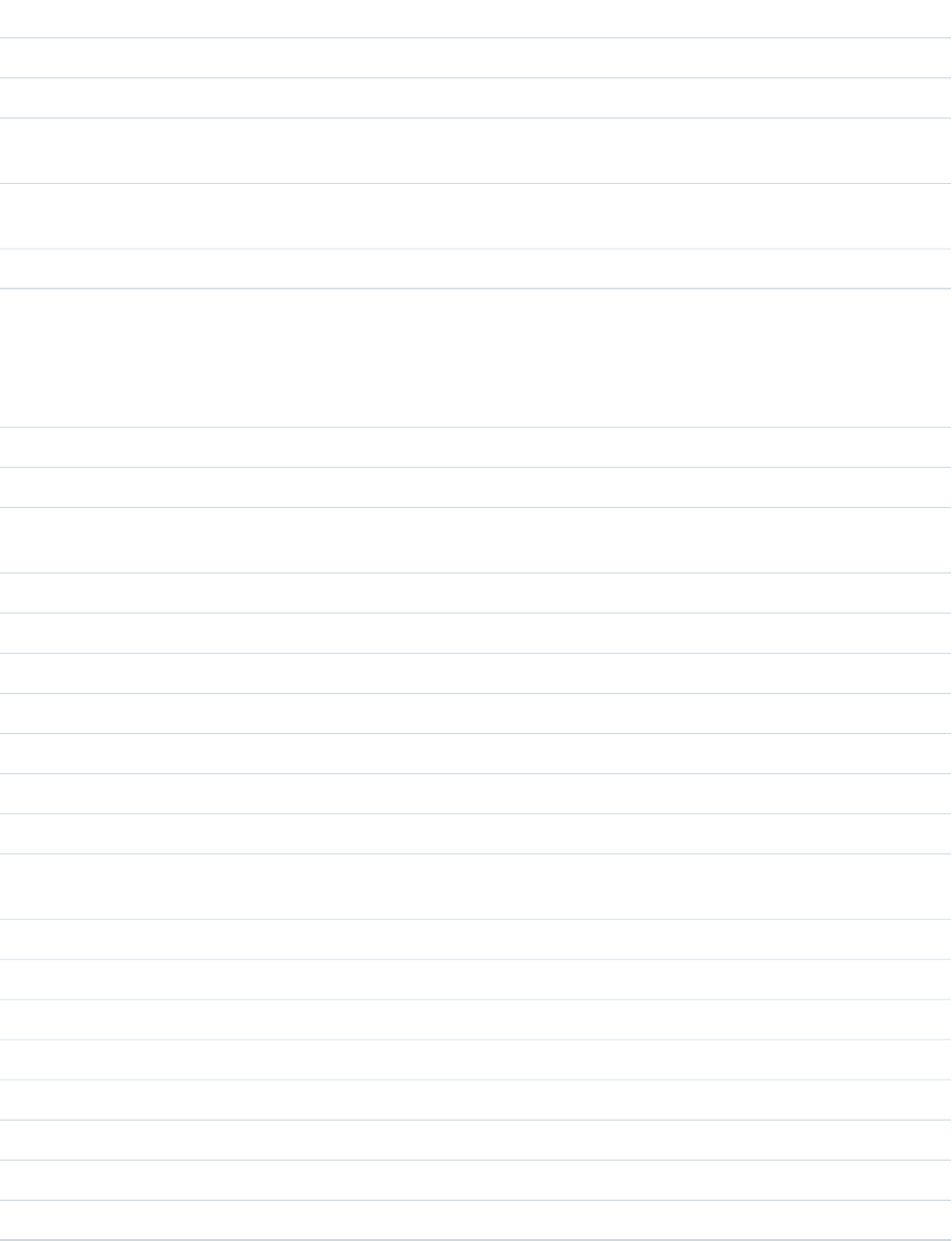
Required?DescriptionAttribute TypeAttribute Name
Specifies whether the input is required. Default value is "false".Booleanrequired
The CSS class of the required indicator componentStringrequiredIndicatorClass
The width of the input field, in characters. Corresponds to the size
attribute of the rendered HTML input element.
Integersize
Updates the component's value binding if the updateOn attribute is set
to the handled event. Default value is "change".
StringupdateOn
The input value of the number.Decimalvalue
Events
DescriptionEvent TypeEvent Name
The event fired when the user double-clicks the component.COMPONENTdblclick
The event fired when the user moves the mouse pointer over the component.COMPONENTmouseover
The event fired when the user moves the mouse pointer away from the
component.
COMPONENTmouseout
The event fired when the user releases the mouse button over the component.COMPONENTmouseup
The event fired when the user moves the mouse pointer over the component.COMPONENTmousemove
The event fired when the user clicks on the component.COMPONENTclick
The event fired when the user clicks a mouse button over the component.COMPONENTmousedown
The event fired when the user selects some text.COMPONENTselect
The event fired when the user moves off from the component.COMPONENTblur
The event fired when the user focuses on the component.COMPONENTfocus
The event fired when the user presses or holds down a keyboard key on the
component.
COMPONENTkeypress
The event fired when the user releases a keyboard key on the component.COMPONENTkeyup
The event fired when the user presses a keyboard key on the component.COMPONENTkeydown
The event fired when the user cuts content to the clipboard.COMPONENTcut
The event fired when there are any validation errors on the component.COMPONENTonError
The event fired when any validation errors should be cleared.COMPONENTonClearErrors
The event fired when the user changes the content of the input.COMPONENTchange
The event fired when the user copies content to the clipboard.COMPONENTcopy
The event fired when the user pastes content from the clipboard.COMPONENTpaste
400
ui:inputCurrencyReference

ui:inputDate
An input field for entering a date.
A ui:inputDate component represents a date input field, which is rendered as an HTML input tag of type text on desktop.
Web apps running on mobiles and tablets use an input field of type date for all browsers except Internet Explorer. The value is displayed
based on the locale of the browser, for example, MMM d, yyyy, which is returned by $Locale.dateFormat.
This is a basic set up of a date field with a date picker, which displays the field value Jan 30, 2014 based on the locale format. On
desktop, the input tag is wrapped in a form tag.
<ui:inputDate aura:id="dateField" label="Birthday" value="2014-01-30"
displayDatePicker="true"/>
This example sets today's date on a ui:inputDate component, retrieves its value, and displays it using ui:outputDate. The
init handler initializes and sets the date on the component.
<aura:component>
<aura:handler name="init" value="{!this}" action="{!c.doInit}"/>
<aura:attribute name="today" type="Date" default=""/>
<ui:inputDate aura:id="expdate" label="Today's Date" class="field" value="{!v.today}"
displayDatePicker="true" />
<ui:button class="btn" label="Submit" press="{!c.setOutput}"/>
<div aura:id="msg" class="hide">
You entered: <ui:outputDate aura:id="oDate" value="" />
</div>
</aura:component>
({
doInit : function(component, event, helper) {
var today = new Date();
component.set('v.today', today.getFullYear() + "-" + (today.getMonth() + 1) + "-"
+ today.getDate());
},
setOutput : function(component, event, helper) {
var cmpMsg = component.find("msg");
$A.util.removeClass(cmpMsg, 'hide');
var expdate = component.find("expdate").get("v.value");
var oDate = component.find("oDate");
oDate.set("v.value", expdate);
}
})
401
ui:inputDateReference
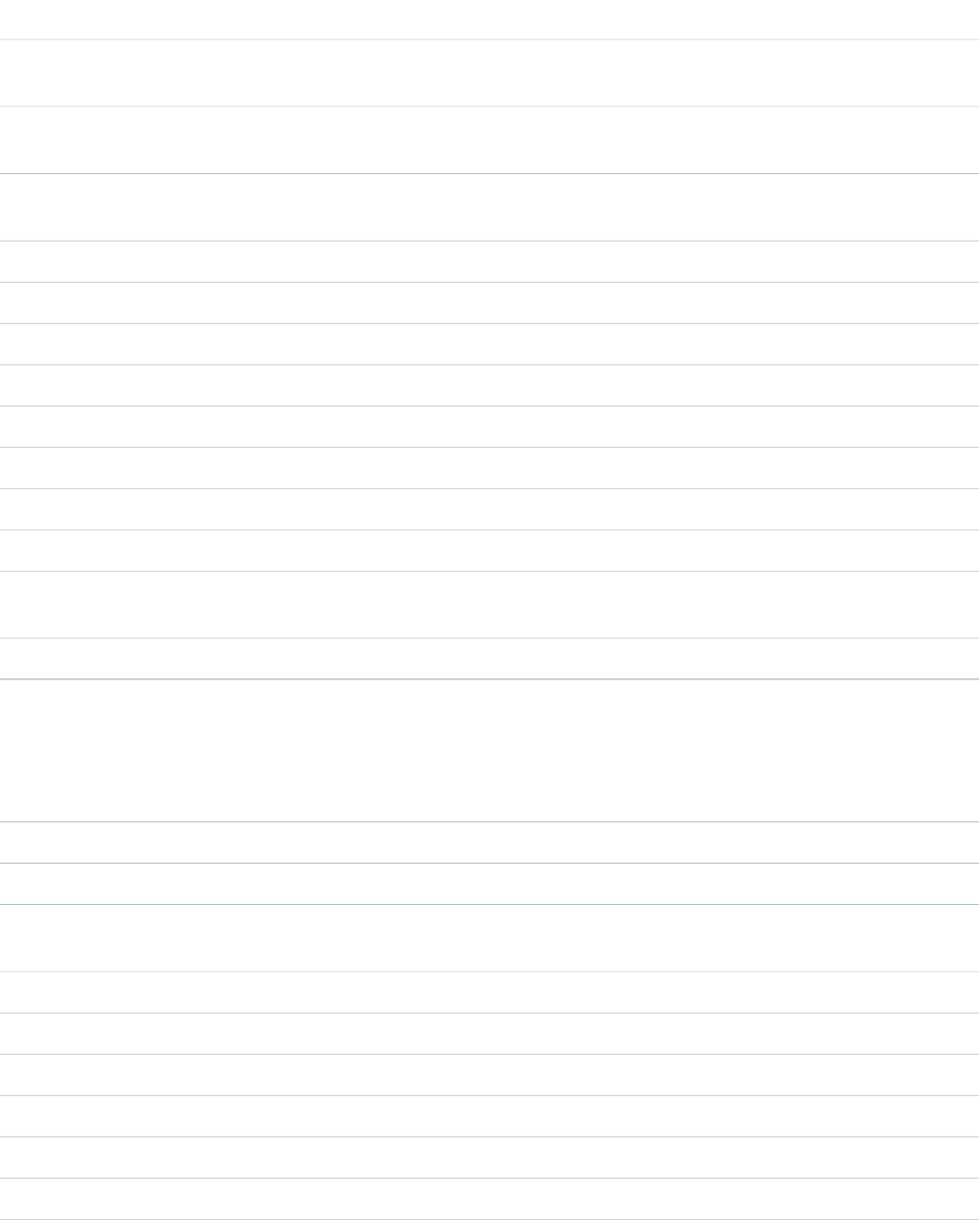
Attributes
Required?DescriptionAttribute TypeAttribute Name
The body of the component. In markup, this is everything in the body of
the tag.
Component[]body
A CSS style to be attached to the component. This style is added in
addition to base styles output by the component.
Stringclass
Specifies whether the component should be displayed in a disabled state.
Default value is "false".
Booleandisabled
Indicate if ui:datePicker is displayed.BooleandisplayDatePicker
The list of errors to be displayed.Listerrors
The java.text.SimpleDateFormat style format string.Stringformat
The text of the label componentStringlabel
The CSS class of the label componentStringlabelClass
The language locale used to format date time.StringlangLocale
Specifies whether the input is required. Default value is "false".Booleanrequired
The CSS class of the required indicator componentStringrequiredIndicatorClass
Updates the component's value binding if the updateOn attribute is set
to the handled event. Default value is "change".
StringupdateOn
The input value of the date/time.Stringvalue
Events
DescriptionEvent TypeEvent Name
The event fired when the user double-clicks the component.COMPONENTdblclick
The event fired when the user moves the mouse pointer over the component.COMPONENTmouseover
The event fired when the user moves the mouse pointer away from the
component.
COMPONENTmouseout
The event fired when the user releases the mouse button over the component.COMPONENTmouseup
The event fired when the user moves the mouse pointer over the component.COMPONENTmousemove
The event fired when the user clicks on the component.COMPONENTclick
The event fired when the user clicks a mouse button over the component.COMPONENTmousedown
The event fired when the user selects some text.COMPONENTselect
The event fired when the user moves off from the component.COMPONENTblur
402
ui:inputDateReference

DescriptionEvent TypeEvent Name
The event fired when the user focuses on the component.COMPONENTfocus
The event fired when the user presses or holds down a keyboard key on the
component.
COMPONENTkeypress
The event fired when the user releases a keyboard key on the component.COMPONENTkeyup
The event fired when the user presses a keyboard key on the component.COMPONENTkeydown
The event fired when the user cuts content to the clipboard.COMPONENTcut
The event fired when there are any validation errors on the component.COMPONENTonError
The event fired when any validation errors should be cleared.COMPONENTonClearErrors
The event fired when the user changes the content of the input.COMPONENTchange
The event fired when the user copies content to the clipboard.COMPONENTcopy
The event fired when the user pastes content from the clipboard.COMPONENTpaste
ui:inputDateTime
An input field for entering a date and time.
A ui:inputDateTime component represents a date and time input field, which is rendered as an HTML input tag of type text
on desktop. Web apps running on mobiles and tablets use an input field of type datetime-local for all browsers except Internet
Explorer. The value is displayed based on the locale of the browser, for example, MMM d, yyyy and h:mm:ss a, which is returned
by $Locale.dateFormat and $Locale.timeFormat.
This is a basic set up of a date and time field with a date picker, which displays the current date and time. On desktop, the input tag
is wrapped in a form tag; the date and time fields display as two separate fields. The time picker displays a list of time in 30-minute
increments.
<!-- Component markup -->
<aura:attribute name="today" type="DateTime" />
<ui:inputDateTime aura:id="expdate" label="Expense Date" class="form-control"
value="{!v.today}" displayDatePicker="true" />
/** Client-Side Controller **/
var today = new Date();
component.set("v.today", today);
This example retrieves the value of a ui:inputDateTime component and displays it using ui:outputDateTime.
<aura:component>
<aura:handler name="init" value="{!this}" action="{!c.doInit}"/>
<aura:attribute name="today" type="Date" default=""/>
<ui:inputDateTime aura:id="today" label="Time" class="field" value=""
displayDatePicker="true" />
<ui:button class="btn" label="Submit" press="{!c.setOutput}"/>
403
ui:inputDateTimeReference

<div aura:id="msg" class="hide">
You entered: <ui:outputDateTime aura:id="oDateTime" value="" />
</div>
</aura:component>
({
doInit : function(component, event, helper) {
var today = new Date();
component.set('v.today', today.getFullYear() + "-" + (today.getMonth() + 1) + "-"
+ today.getDate());
},
setOutput : function(component, event, helper) {
var cmpMsg = component.find("msg");
$A.util.removeClass(cmpMsg, 'hide');
var todayVal = component.find("today").get("v.value");
var oDateTime = component.find("oDateTime");
oDateTime.set("v.value", todayVal);
}
})
Attributes
Required?DescriptionAttribute TypeAttribute Name
The body of the component. In markup, this is everything in the body of
the tag.
Component[]body
A CSS style to be attached to the component. This style is added in
addition to base styles output by the component.
Stringclass
Specifies whether the component should be displayed in a disabled state.
Default value is "false".
Booleandisabled
Indicate if ui:datePicker is displayed.BooleandisplayDatePicker
The list of errors to be displayed.Listerrors
The java.text.SimpleDateFormat style format string.Stringformat
The text of the label componentStringlabel
The CSS class of the label componentStringlabelClass
The language locale used to format date time.StringlangLocale
Specifies whether the input is required. Default value is "false".Booleanrequired
The CSS class of the required indicator componentStringrequiredIndicatorClass
Updates the component's value binding if the updateOn attribute is set
to the handled event. Default value is "change".
StringupdateOn
404
ui:inputDateTimeReference

Required?DescriptionAttribute TypeAttribute Name
The input value of the date/time.Stringvalue
Events
DescriptionEvent TypeEvent Name
The event fired when the user double-clicks the component.COMPONENTdblclick
The event fired when the user moves the mouse pointer over the component.COMPONENTmouseover
The event fired when the user moves the mouse pointer away from the
component.
COMPONENTmouseout
The event fired when the user releases the mouse button over the component.COMPONENTmouseup
The event fired when the user moves the mouse pointer over the component.COMPONENTmousemove
The event fired when the user clicks on the component.COMPONENTclick
The event fired when the user clicks a mouse button over the component.COMPONENTmousedown
The event fired when the user selects some text.COMPONENTselect
The event fired when the user moves off from the component.COMPONENTblur
The event fired when the user focuses on the component.COMPONENTfocus
The event fired when the user presses or holds down a keyboard key on the
component.
COMPONENTkeypress
The event fired when the user releases a keyboard key on the component.COMPONENTkeyup
The event fired when the user presses a keyboard key on the component.COMPONENTkeydown
The event fired when the user cuts content to the clipboard.COMPONENTcut
The event fired when there are any validation errors on the component.COMPONENTonError
The event fired when any validation errors should be cleared.COMPONENTonClearErrors
The event fired when the user changes the content of the input.COMPONENTchange
The event fired when the user copies content to the clipboard.COMPONENTcopy
The event fired when the user pastes content from the clipboard.COMPONENTpaste
ui:inputDefaultError
The default implementation of field-level errors, which iterates over the value and displays the message.
405
ui:inputDefaultErrorReference

ui:inputDefaultError is the default error handling for your input components. This component displays as a list of errors below
the field. Field-level error messages can be added using set("v.errors"). You can use the error atribute to show the error message.
For example, this component validates if the input is a number.
<aura:component>
Enter a number: <ui:inputNumber aura:id="inputCmp" label="number"/>
<ui:button label="Submit" press="{!c.doAction}"/>
</aura:component>
This client-side controller displays an error if the input is not a number.
doAction : function(component, event) {
var inputCmp = cmp.find("inputCmp");
var value = inputCmp.get("v.value");
if (isNaN(value)) {
inputCmp.set("v.errors", [{message:"Input not a number: " + value}]);
} else {
//clear error
inputCmp.set("v.errors", null);
}
}
Alternatively, you can provide your own ui:inputDefaultError component. This example returns an error message if the
warnings attribute contains any messages.
<aura:component>
<aura:attribute name="warnings" type="String[]" description="Warnings for input
text"/>
Enter a number: <ui:inputNumber aura:id="inputCmp" label="number"/>
<ui:button label="Submit" press="{!c.doAction}"/>
<ui:inputDefaultError aura:id="number" value="{!v.warnings}" />
</aura:component>
This client-side controller diplays an error by adding a string to the warnings attribute.
doAction : function(component, event) {
var inputCmp = component.find("inputCmp");
var value = inputCmp.get("v.value");
// is input numeric?
if (isNaN(value)) {
component.set("v.warnings", "Input is not a number");
} else {
// clear error
component.set("v.warnings", null);
}
}
This example shows a ui:inputText component with the default error handling, and a corresponding ui:outputText
component for text rendering.
<aura:component>
<ui:inputText aura:id="color" label="Enter some text: " placeholder="Blue" />
<ui:button label="Validate" press="{!c.checkInput}" />
406
ui:inputDefaultErrorReference

<ui:outputText aura:id="outColor" value="" class="text"/>
</aura:component>
({
checkInput : function(cmp) {
var colorCmp = cmp.find("color");
var myColor = colorCmp.get("v.value");
var myOutput = cmp.find("outColor");
var greet = "You entered: " + myColor;
myOutput.set("v.value", greet);
if (!myColor) {
colorCmp.set("v.errors", [{message:"Enter some text"}]);
}
else {
colorCmp.set("v.errors", null);
}
}
})
Attributes
Required?DescriptionAttribute TypeAttribute Name
The body of the component. In markup, this is everything in the body of
the tag.
Component[]body
A CSS style to be attached to the component. This style is added in
addition to base styles output by the component.
Stringclass
The list of errors strings to be displayed.String[]value
Events
DescriptionEvent TypeEvent Name
The event fired when the user double-clicks the component.COMPONENTdblclick
The event fired when the user moves the mouse pointer over the component.COMPONENTmouseover
The event fired when the user moves the mouse pointer away from the
component.
COMPONENTmouseout
The event fired when the user releases the mouse button over the component.COMPONENTmouseup
The event fired when the user moves the mouse pointer over the component.COMPONENTmousemove
The event fired when the user clicks on the component.COMPONENTclick
The event fired when the user clicks a mouse button over the component.COMPONENTmousedown
407
ui:inputDefaultErrorReference

ui:inputEmail
Represents an input field for entering an email address.
A ui:inputEmail component represents an email input field, which is rendered as an HTML input tag of type email. To
render the output from a ui:inputEmail component, use the ui:outputEmail component.
This is a basic set up of an email field.
<ui:inputEmail aura:id="email" label="Email" placeholder="abc@email.com"/>
This example results in the following HTML.
<ui:inputEmail aura:id="email" label="Email" placeholder="abc@email.com"/>
This example results in the following HTML.
<div class="uiInput uiInputEmail uiInput--default uiInput--input">
<label class="uiLabel-left form-element__label uiLabel">
<span>Email</span>
</label>
<input placeholder="abc@email.com" type="email" class="field input">
</div>
This example retrieves the value of a ui:inputEmail component and displays it using ui:outputEmail.
<aura:component>
<ui:inputEmail aura:id="email" label="Email" class="field" value="manager@email.com"/>
<ui:button class="btn" label="Submit" press="{!c.setOutput}"/>
<div aura:id="msg" class="hide">
You entered: <ui:outputEmail aura:id="oEmail" value="Email" />
</div>
</aura:component>
({
setOutput : function(component, event, helper) {
var cmpMsg = component.find("msg");
$A.util.removeClass(cmpMsg, 'hide');
var email = component.find("email").get("v.value");
var oEmail = component.find("oEmail");
oEmail.set("v.value", email);
}
})
408
ui:inputEmailReference
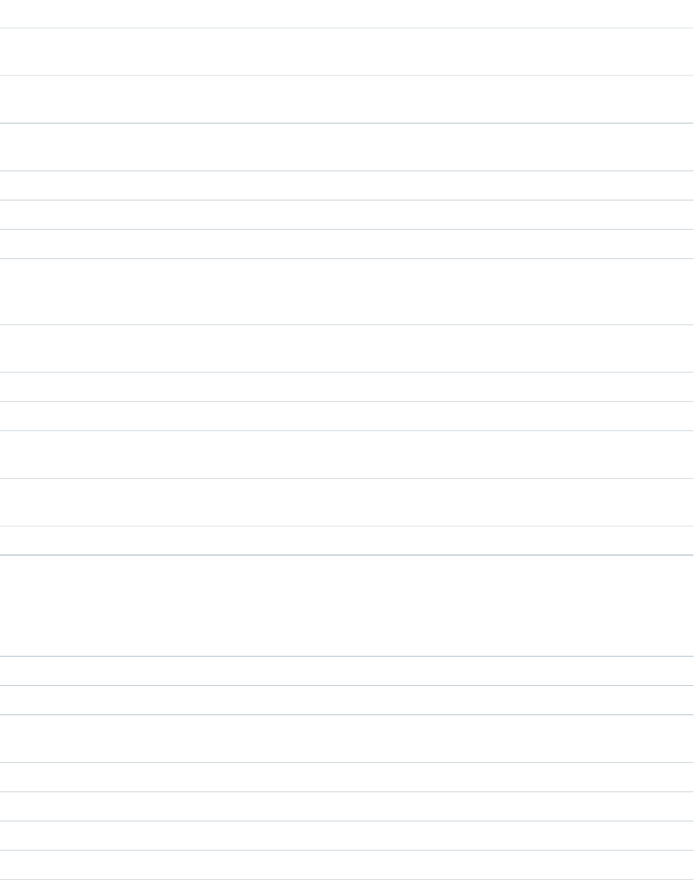
Attributes
Required?DescriptionAttribute TypeAttribute Name
The body of the component. In markup, this is everything in the body of
the tag.
Component[]body
A CSS style to be attached to the component. This style is added in
addition to base styles output by the component.
Stringclass
Specifies whether the component should be displayed in a disabled state.
Default value is "false".
Booleandisabled
The list of errors to be displayed.Listerrors
The text of the label componentStringlabel
The CSS class of the label componentStringlabelClass
The maximum number of characters that can be typed into the input
field. Corresponds to the maxlength attribute of the rendered HTML input
element.
Integermaxlength
Text that is displayed when the field is empty, to prompt the user for a
valid entry.
Stringplaceholder
Specifies whether the input is required. Default value is "false".Booleanrequired
The CSS class of the required indicator componentStringrequiredIndicatorClass
The width of the input field, in characters. Corresponds to the size
attribute of the rendered HTML input element.
Integersize
Updates the component's value binding if the updateOn attribute is set
to the handled event. Default value is "change".
StringupdateOn
The value currently in the input field.Stringvalue
Events
DescriptionEvent TypeEvent Name
The event fired when the user double-clicks the component.COMPONENTdblclick
The event fired when the user moves the mouse pointer over the component.COMPONENTmouseover
The event fired when the user moves the mouse pointer away from the
component.
COMPONENTmouseout
The event fired when the user releases the mouse button over the component.COMPONENTmouseup
The event fired when the user moves the mouse pointer over the component.COMPONENTmousemove
The event fired when the user clicks on the component.COMPONENTclick
The event fired when the user clicks a mouse button over the component.COMPONENTmousedown
409
ui:inputEmailReference

DescriptionEvent TypeEvent Name
The event fired when the user selects some text.COMPONENTselect
The event fired when the user moves off from the component.COMPONENTblur
The event fired when the user focuses on the component.COMPONENTfocus
The event fired when the user presses or holds down a keyboard key on the
component.
COMPONENTkeypress
The event fired when the user releases a keyboard key on the component.COMPONENTkeyup
The event fired when the user presses a keyboard key on the component.COMPONENTkeydown
The event fired when the user cuts content to the clipboard.COMPONENTcut
The event fired when there are any validation errors on the component.COMPONENTonError
The event fired when any validation errors should be cleared.COMPONENTonClearErrors
The event fired when the user changes the content of the input.COMPONENTchange
The event fired when the user copies content to the clipboard.COMPONENTcopy
The event fired when the user pastes content from the clipboard.COMPONENTpaste
ui:inputNumber
An input field for entering a number, taking advantage of client input assistance and validation when available.
A ui:inputNumber component represents a number input field, which is rendered as an HTML input element of type text.
This example shows a number field, which displays a value of 10.
<aura:attribute name="num" type="integer" default="10"/>
<ui:inputNumber aura:id="num" label="Age" value="{!v.num}"/>
The previous example results in the following HTML.
<div class="uiInput uiInputNumber uiInput--default uiInput--input">
<label class="uiLabel-left form-element__label uiLabel">
<span>Age</span>
</label>
<input max="99999999999999" step="1" type="text"
min="-99999999999999" class="input">
</div>
To render the output from a ui:inputNumber component, use the ui:outputNumber component. When providing a number
value with commas, use type="integer". This example returns 100,000.
<aura:attribute name="number" type="integer" default="100,000"/>
<ui:inputNumber label="Number" value="{!v.number}"/>
410
ui:inputNumberReference

For type="string", provide the number without commas for the output to be formatted accordingly. This example also returns
100,000.
<aura:attribute name="number" type="string" default="100000"/>
<ui:inputNumber label="Number" value="{!v.number}"/>
Specifying format="#,##0,000.00#" returns a formatted number value like 10,000.00.
<ui:inputNumber label="Cost" aura:id="costField" format="#,##0,000.00#" value="10000"/>
This example binds the value of a ui:inputNumber component to ui:outputNumber.
<aura:component>
<aura:attribute name="myNumber" type="integer" default="10"/>
<ui:inputNumber label="Enter a number: " value="{!v.myNumber}" updateOn="keyup"/> <br/>
<ui:outputNumber value="{!v.myNumber}"/>
</aura:component>
Attributes
Required?DescriptionAttribute TypeAttribute Name
The body of the component. In markup, this is everything in the body of
the tag.
Component[]body
A CSS style to be attached to the component. This style is added in
addition to base styles output by the component.
Stringclass
Specifies whether the component should be displayed in a disabled state.
Default value is "false".
Booleandisabled
The list of errors to be displayed.Listerrors
The format of the number. For example, format=“.00” displays the number
followed by two decimal places. If not specified, the Locale default format
will be used.
Stringformat
The text of the label componentStringlabel
The CSS class of the label componentStringlabelClass
The maximum number of characters that can be typed into the input
field. Corresponds to the maxlength attribute of the rendered HTML input
element.
Integermaxlength
Text that is displayed when the field is empty, to prompt the user for a
valid entry.
Stringplaceholder
Specifies whether the input is required. Default value is "false".Booleanrequired
The CSS class of the required indicator componentStringrequiredIndicatorClass
The width of the input field, in characters. Corresponds to the size
attribute of the rendered HTML input element.
Integersize
411
ui:inputNumberReference
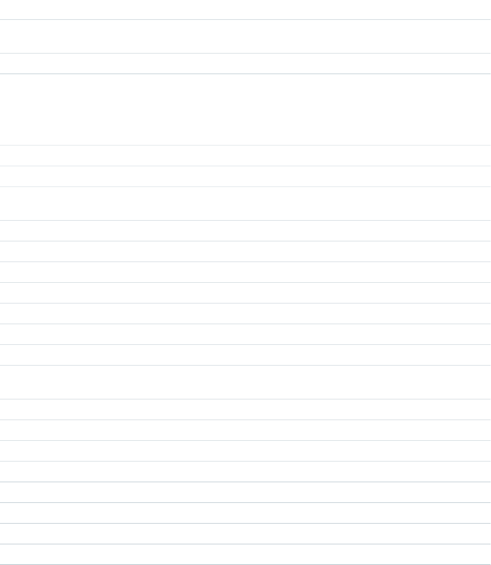
Required?DescriptionAttribute TypeAttribute Name
Updates the component's value binding if the updateOn attribute is set
to the handled event. Default value is "change".
StringupdateOn
The input value of the number.Decimalvalue
Events
DescriptionEvent TypeEvent Name
The event fired when the user double-clicks the component.COMPONENTdblclick
The event fired when the user moves the mouse pointer over the component.COMPONENTmouseover
The event fired when the user moves the mouse pointer away from the
component.
COMPONENTmouseout
The event fired when the user releases the mouse button over the component.COMPONENTmouseup
The event fired when the user moves the mouse pointer over the component.COMPONENTmousemove
The event fired when the user clicks on the component.COMPONENTclick
The event fired when the user clicks a mouse button over the component.COMPONENTmousedown
The event fired when the user selects some text.COMPONENTselect
The event fired when the user moves off from the component.COMPONENTblur
The event fired when the user focuses on the component.COMPONENTfocus
The event fired when the user presses or holds down a keyboard key on the
component.
COMPONENTkeypress
The event fired when the user releases a keyboard key on the component.COMPONENTkeyup
The event fired when the user presses a keyboard key on the component.COMPONENTkeydown
The event fired when the user cuts content to the clipboard.COMPONENTcut
The event fired when there are any validation errors on the component.COMPONENTonError
The event fired when any validation errors should be cleared.COMPONENTonClearErrors
The event fired when the user changes the content of the input.COMPONENTchange
The event fired when the user copies content to the clipboard.COMPONENTcopy
The event fired when the user pastes content from the clipboard.COMPONENTpaste
ui:inputPhone
Represents an input field for entering a telephone number.
412
ui:inputPhoneReference

A ui:inputPhone component represents an input field for entering a phone number, which is rendered as an HTML input tag
of type tel. To render the output from a ui:inputPhone component, use the ui:outputPhone component.
This example shows a phone field, which displays the specified phone number.
<ui:inputPhone label="Phone" value="415-123-4567" />
The previous example results in the following HTML.
<ui:inputPhone label="Phone" value="415-123-4567" />
The previous example results in the following HTML.
<div class="uiInput uiInputPhone uiInput--default uiInput--input">
<label class="uiLabel-left form-element__label uiLabel">
<span>Phone</span>
</label>
<input class="input" type="tel">
</div>
This example retrieves the value of a ui:inputPhone component and displays it using ui:outputPhone.
<aura:component>
<ui:inputPhone aura:id="phone" label="Phone Number" class="field" value="415-123-4567"
/>
<ui:button class="btn" label="Submit" press="{!c.setOutput}"/>
<div aura:id="msg" class="hide">
You entered: <ui:outputPhone aura:id="oPhone" value="" />
</div>
</aura:component>
({
setOutput : function(component, event, helper) {
var cmpMsg = component.find("msg");
$A.util.removeClass(cmpMsg, 'hide');
var phone = component.find("phone").get("v.value");
var oPhone = component.find("oPhone");
oPhone.set("v.value", phone);
}
})
Attributes
Required?DescriptionAttribute TypeAttribute Name
The body of the component. In markup, this is everything in the body of
the tag.
Component[]body
A CSS style to be attached to the component. This style is added in
addition to base styles output by the component.
Stringclass
413
ui:inputPhoneReference
Required?DescriptionAttribute TypeAttribute Name
Specifies whether the component should be displayed in a disabled state.
Default value is "false".
Booleandisabled
The list of errors to be displayed.Listerrors
The text of the label componentStringlabel
The CSS class of the label componentStringlabelClass
The maximum number of characters that can be typed into the input
field. Corresponds to the maxlength attribute of the rendered HTML input
element.
Integermaxlength
Text that is displayed when the field is empty, to prompt the user for a
valid entry.
Stringplaceholder
Specifies whether the input is required. Default value is "false".Booleanrequired
The CSS class of the required indicator componentStringrequiredIndicatorClass
The width of the input field, in characters. Corresponds to the size
attribute of the rendered HTML input element.
Integersize
Updates the component's value binding if the updateOn attribute is set
to the handled event. Default value is "change".
StringupdateOn
The value currently in the input field.Stringvalue
Events
DescriptionEvent TypeEvent Name
The event fired when the user double-clicks the component.COMPONENTdblclick
The event fired when the user moves the mouse pointer over the component.COMPONENTmouseover
The event fired when the user moves the mouse pointer away from the
component.
COMPONENTmouseout
The event fired when the user releases the mouse button over the component.COMPONENTmouseup
The event fired when the user moves the mouse pointer over the component.COMPONENTmousemove
The event fired when the user clicks on the component.COMPONENTclick
The event fired when the user clicks a mouse button over the component.COMPONENTmousedown
The event fired when the user selects some text.COMPONENTselect
The event fired when the user moves off from the component.COMPONENTblur
The event fired when the user focuses on the component.COMPONENTfocus
The event fired when the user presses or holds down a keyboard key on the
component.
COMPONENTkeypress
414
ui:inputPhoneReference

DescriptionEvent TypeEvent Name
The event fired when the user releases a keyboard key on the component.COMPONENTkeyup
The event fired when the user presses a keyboard key on the component.COMPONENTkeydown
The event fired when the user cuts content to the clipboard.COMPONENTcut
The event fired when there are any validation errors on the component.COMPONENTonError
The event fired when any validation errors should be cleared.COMPONENTonClearErrors
The event fired when the user changes the content of the input.COMPONENTchange
The event fired when the user copies content to the clipboard.COMPONENTcopy
The event fired when the user pastes content from the clipboard.COMPONENTpaste
ui:inputRadio
The radio button used in the input.
A ui:inputRadio component represents a radio button whose state is controlled by the value and disabled attributes. It's
rendered as an HTML input tag of type radio. To group your radio buttons together, specify the name attribute with a unique
name.
This is a basic set up of a radio button.
<ui:inputRadio label="Yes"/>
This example results in the following HTML.
<div class="uiInput uiInputRadio uiInput--default uiInput--radio">
<label class="uiLabel-left form-element__label uiLabel">
<span>Yes</span>
</label>
<input type="radio">
</div>
This example retrieves the value of a selected ui:inputRadio component.
<aura:component>
<aura:attribute name="stages" type="String[]" default="Any,Open,Closed,Closed Won"/>
<aura:iteration items="{!v.stages}" var="stage">
<ui:inputRadio label="{!stage}" change="{!c.onRadio}" />
</aura:iteration>
<b>Selected Item:</b>
<p><ui:outputText class="result" aura:id="radioResult" value="" /></p>
<b>Radio Buttons - Group</b>
<ui:inputRadio aura:id="r0" name="others" label="Prospecting" change="{!c.onGroup}"/>
<ui:inputRadio aura:id="r1" name="others" label="Qualification" change="{!c.onGroup}"
value="true"/>
<ui:inputRadio aura:id="r2" name="others" label="Needs Analysis" change="{!c.onGroup}"/>
415
ui:inputRadioReference
<ui:inputRadio aura:id="r3" name="others" label="Closed Lost" change="{!c.onGroup}"/>
<b>Selected Items:</b>
<p><ui:outputText class="result" aura:id="radioGroupResult" value="" /></p>
</aura:component>
({
onRadio: function(cmp, evt) {
var selected = evt.getSource().get("v.label");
resultCmp = cmp.find("radioResult");
resultCmp.set("v.value", selected);
},
onGroup: function(cmp, evt) {
var selected = evt.getSource().get("v.label");
resultCmp = cmp.find("radioGroupResult");
resultCmp.set("v.value", selected);
}
})
Attributes
Required?DescriptionAttribute TypeAttribute Name
The body of the component. In markup, this is everything in the body of
the tag.
Component[]body
A CSS style to be attached to the component. This style is added in
addition to base styles output by the component.
Stringclass
Specifies whether this radio button should be displayed in a disabled
state. Disabled radio buttons can't be clicked. Default value is "false".
Booleandisabled
The list of errors to be displayed.Listerrors
The text displayed on the component.Stringlabel
The CSS class of the label componentStringlabelClass
The name of the component.Stringname
Specifies whether the input is required. Default value is "false".Booleanrequired
The CSS class of the required indicator componentStringrequiredIndicatorClass
The input value attribute.Stringtext
Updates the component's value binding if the updateOn attribute is set
to the handled event. Default value is "change".
StringupdateOn
Indicates whether the status of the option is selected. Default value is
“false”.
Booleanvalue
416
ui:inputRadioReference
Events
DescriptionEvent TypeEvent Name
The event fired when the user double-clicks the component.COMPONENTdblclick
The event fired when the user moves the mouse pointer over the component.COMPONENTmouseover
The event fired when the user moves the mouse pointer away from the
component.
COMPONENTmouseout
The event fired when the user releases the mouse button over the component.COMPONENTmouseup
The event fired when the user moves the mouse pointer over the component.COMPONENTmousemove
The event fired when the user clicks on the component.COMPONENTclick
The event fired when the user clicks a mouse button over the component.COMPONENTmousedown
The event fired when the user selects some text.COMPONENTselect
The event fired when the user moves off from the component.COMPONENTblur
The event fired when the user focuses on the component.COMPONENTfocus
The event fired when the user presses or holds down a keyboard key on the
component.
COMPONENTkeypress
The event fired when the user releases a keyboard key on the component.COMPONENTkeyup
The event fired when the user presses a keyboard key on the component.COMPONENTkeydown
The event fired when the user cuts content to the clipboard.COMPONENTcut
The event fired when there are any validation errors on the component.COMPONENTonError
The event fired when any validation errors should be cleared.COMPONENTonClearErrors
The event fired when the user changes the content of the input.COMPONENTchange
The event fired when the user copies content to the clipboard.COMPONENTcopy
The event fired when the user pastes content from the clipboard.COMPONENTpaste
ui:inputRichText
An input field for entering rich text. This component is not supported by LockerService.
Note: We recommend that you use lightning:inputRichText instead of ui:inputRichText.
ui:inputRichText is no longer supported when LockerService is activated.
ui:inputRichText renders a WYSIWYG editor for entering rich text, using the CKEditor library to provide formatting and accessibility
features.
This example displays a rich text editor.
<ui:inputRichText label="Enter Your Comments" />
Tags such as <script> are removed from the component. For a list of supported HTML tags, see ui:outputRichText.
417
ui:inputRichTextReference
Attributes
Required?DescriptionAttribute TypeAttribute Name
The body of the component. In markup, this is everything in the body of
the tag.
Component[]body
A CSS style to be attached to the component. This style is added in
addition to base styles output by the component.
Stringclass
The width of the text area, which is defined by the number of characters
to display in a single row at a time. Default value is “20”.
Integercols
Specifies whether the component should be displayed in a disabled state.
Default value is "false".
Booleandisabled
The list of errors to be displayed.Listerrors
The height of the editing area (that includes the editor content). This can
be an integer, for pixel sizes, or any CSS-defined length unit.
Stringheight
The text of the label componentStringlabel
The CSS class of the label componentStringlabelClass
The maximum number of characters that can be typed into the input
field. Corresponds to the maxlength attribute of the rendered HTML
textarea element.
Integermaxlength
The text that is displayed by default.Stringplaceholder
Specifies whether the text area should be rendered as read-only. Default
value is “false”.
Booleanreadonly
Specifies whether the input is required. Default value is "false".Booleanrequired
The CSS class of the required indicator componentStringrequiredIndicatorClass
Specifies whether or not the textarea should be resizable. Defaults to
true.
Booleanresizable
The height of the text area, which is defined by the number of rows to
display at a time. Default value is “2”.
Integerrows
Updates the component's value binding if the updateOn attribute is set
to the handled event. Default value is "change".
StringupdateOn
The value currently in the input field.Stringvalue
The editor UI outer width. This can be an integer, for pixel sizes, or any
CSS-defined unit. If isRichText is set to false, use the cols attribute instead.
Stringwidth
418
ui:inputRichTextReference

Events
DescriptionEvent TypeEvent Name
The event fired when the user double-clicks the component.COMPONENTdblclick
The event fired when the user moves the mouse pointer over the component.COMPONENTmouseover
The event fired when the user moves the mouse pointer away from the
component.
COMPONENTmouseout
The event fired when the user releases the mouse button over the component.COMPONENTmouseup
The event fired when the user moves the mouse pointer over the component.COMPONENTmousemove
The event fired when the user clicks on the component.COMPONENTclick
The event fired when the user clicks a mouse button over the component.COMPONENTmousedown
The event fired when the user selects some text.COMPONENTselect
The event fired when the user moves off from the component.COMPONENTblur
The event fired when the user focuses on the component.COMPONENTfocus
The event fired when the user presses or holds down a keyboard key on the
component.
COMPONENTkeypress
The event fired when the user releases a keyboard key on the component.COMPONENTkeyup
The event fired when the user presses a keyboard key on the component.COMPONENTkeydown
The event fired when the user cuts content to the clipboard.COMPONENTcut
The event fired when there are any validation errors on the component.COMPONENTonError
The event fired when any validation errors should be cleared.COMPONENTonClearErrors
The event fired when the user changes the content of the input.COMPONENTchange
The event fired when the user copies content to the clipboard.COMPONENTcopy
The event fired when the user pastes content from the clipboard.COMPONENTpaste
ui:inputSecret
An input field for entering secret text with type password.
A ui:inputSecret component represents a password field, which is rendered as an HTML input tag of type password.
This is a basic set up of a password field.
<ui:inputSecret aura:id="secret" label="Pin" class="field" value="123456"/>
This example results in the following HTML.
<div class="uiInput uiInputSecret uiInput--default uiInput--input">
<label class="uiLabel-left form-element__label uiLabel">
<span>Pin</span>
419
ui:inputSecretReference

</label>
<input class="field input" type="password">
</div>
This example displays a ui:inputSecret component with a default value.
<aura:component>
<ui:inputSecret aura:id="secret" label="Pin" class="field" value="123456"/>
</aura:component>
Attributes
Required?DescriptionAttribute TypeAttribute Name
The body of the component. In markup, this is everything in the body of
the tag.
Component[]body
A CSS style to be attached to the component. This style is added in
addition to base styles output by the component.
Stringclass
Specifies whether the component should be displayed in a disabled state.
Default value is "false".
Booleandisabled
The list of errors to be displayed.Listerrors
The text of the label componentStringlabel
The CSS class of the label componentStringlabelClass
The maximum number of characters that can be typed into the input
field. Corresponds to the maxlength attribute of the rendered HTML input
element.
Integermaxlength
Text that is displayed when the field is empty, to prompt the user for a
valid entry.
Stringplaceholder
Specifies whether the input is required. Default value is "false".Booleanrequired
The CSS class of the required indicator componentStringrequiredIndicatorClass
The width of the input field, in characters. Corresponds to the size
attribute of the rendered HTML input element.
Integersize
Updates the component's value binding if the updateOn attribute is set
to the handled event. Default value is "change".
StringupdateOn
The value currently in the input field.Stringvalue
Events
DescriptionEvent TypeEvent Name
The event fired when the user double-clicks the component.COMPONENTdblclick
420
ui:inputSecretReference
DescriptionEvent TypeEvent Name
The event fired when the user moves the mouse pointer over the component.COMPONENTmouseover
The event fired when the user moves the mouse pointer away from the
component.
COMPONENTmouseout
The event fired when the user releases the mouse button over the component.COMPONENTmouseup
The event fired when the user moves the mouse pointer over the component.COMPONENTmousemove
The event fired when the user clicks on the component.COMPONENTclick
The event fired when the user clicks a mouse button over the component.COMPONENTmousedown
The event fired when the user selects some text.COMPONENTselect
The event fired when the user moves off from the component.COMPONENTblur
The event fired when the user focuses on the component.COMPONENTfocus
The event fired when the user presses or holds down a keyboard key on the
component.
COMPONENTkeypress
The event fired when the user releases a keyboard key on the component.COMPONENTkeyup
The event fired when the user presses a keyboard key on the component.COMPONENTkeydown
The event fired when the user cuts content to the clipboard.COMPONENTcut
The event fired when there are any validation errors on the component.COMPONENTonError
The event fired when any validation errors should be cleared.COMPONENTonClearErrors
The event fired when the user changes the content of the input.COMPONENTchange
The event fired when the user copies content to the clipboard.COMPONENTcopy
The event fired when the user pastes content from the clipboard.COMPONENTpaste
ui:inputSelect
Represents a drop-down list with options.
A ui:inputSelect component is rendered as an HTML select element. It contains options, represented by the
ui:inputSelectOption components. To enable multiple selections, set multiple="true". To wire up any client-side logic
when an input value is selected, use the change event.
<ui:inputSelect multiple="true">
<ui:inputSelectOption text="All Primary" label="All Contacts" value="true"/>
<ui:inputSelectOption text="All Primary" label="All Primary"/>
<ui:inputSelectOption text="All Secondary" label="All Secondary"/>
</ui:inputSelect>
v.value represents the option's HTML selected attribute, and v.text represents the option's HTML value attribute.
Generating Options with aura:iteration
421
ui:inputSelectReference

You can use aura:iteration to iterate over a list of items to generate options. This example iterates over a list of items and handles
the change event.
<aura:attribute name="contactLevel" type="String[]" default="Primary Contact, Secondary
Contact, Other"/>
<ui:inputSelect aura:id="levels" label="Contact Levels" change="{!c.onSelectChange}">
<aura:iteration items="{!v.contactLevel}" var="level">
<ui:inputSelectOption text="{!level}" label="{!level}"/>
</aura:iteration>
</ui:inputSelect>
When the selected option changes, this client-side controller retrieves the new text value.
onSelectChange : function(component, event, helper) {
var selected = component.find("levels").get("v.value");
//do something else
}
Generating Options Dynamically
Generate the options dynamically on component initialization using a controller-side action.
<aura:component>
<aura:handler name="init" value="{!this}" action="{!c.doInit}"/>
<ui:inputSelect label="Select me:" class="dynamic" aura:id="InputSelectDynamic"/>
</aura:component>
The following client-side controller generates options using the options attribute on the ui:inputSelect component. v.options
takes in the list of objects and converts them into list options. The opts object constructs InputOption objects to create the
ui:inputSelectOptions components within ui:inputSelect. Although the sample code generates the options during
initialization, the list of options can be modified anytime when you manipulate the list in v.options. The component automatically
updates itself and rerenders with the new options.
({
doInit : function(cmp) {
var opts = [
{ class: "optionClass", label: "Option1", value: "opt1", selected: "true" },
{ class: "optionClass", label: "Option2", value: "opt2" },
{ class: "optionClass", label: "Option3", value: "opt3" }
];
cmp.find("InputSelectDynamic").set("v.options", opts);
}
})
class is a reserved keyword that might not work with older versions of Internet Explorer. We recommend using "class" with
double quotes. If you’re reusing the same set of options on multiple drop-down lists, use different attributes for each set of options.
Otherwise, selecting a different option in one list also updates other list options bound to the same attribute.
<aura:attribute name="options1" type="String" />
<aura:attribute name="options2" type="String" />
<ui:inputSelect aura:id="Select1" label="Select1" options="{!v.options1}" />
<ui:inputSelect aura:id="Select2" label="Select2" options="{!v.options2}" />
422
ui:inputSelectReference

This example displays a drop-down list with single and multiple selection enabled, and another with dynamically generated list options.
It retrieves the selected value of a ui:inputSelect component.
<aura:component>
<aura:handler name="init" value="{!this}" action="{!c.doInit}"/>
<div class="row">
<p class="title">Single Selection</p>
<ui:inputSelect class="single" aura:id="InputSelectSingle"
change="{!c.onSingleSelectChange}">
<ui:inputSelectOption text="Any"/>
<ui:inputSelectOption text="Open" value="true"/>
<ui:inputSelectOption text="Closed"/>
<ui:inputSelectOption text="Closed Won"/>
<ui:inputSelectOption text="Prospecting"/>
<ui:inputSelectOption text="Qualification"/>
<ui:inputSelectOption text="Needs Analysis"/>
<ui:inputSelectOption text="Closed Lost"/>
</ui:inputSelect>
<p>Selected Item:</p>
<p><ui:outputText class="result" aura:id="singleResult" value="" /></p>
</div>
<div class="row">
<p class="title">Multiple Selection</p>
<ui:inputSelect multiple="true" class="multiple" aura:id="InputSelectMultiple"
change="{!c.onMultiSelectChange}">
<ui:inputSelectOption text="Any"/>
<ui:inputSelectOption text="Open"/>
<ui:inputSelectOption text="Closed"/>
<ui:inputSelectOption text="Closed Won"/>
<ui:inputSelectOption text="Prospecting"/>
<ui:inputSelectOption text="Qualification"/>
<ui:inputSelectOption text="Needs Analysis"/>
<ui:inputSelectOption text="Closed Lost"/>
</ui:inputSelect>
<p>Selected Items:</p>
<p><ui:outputText class="result" aura:id="multiResult" value="" /></p>
</div>
<div class="row">
<p class="title">Dynamic Option Generation</p>
<ui:inputSelect label="Select me: " class="dynamic" aura:id="InputSelectDynamic"
change="{!c.onChange}" />
<p>Selected Items:</p>
<p><ui:outputText class="result" aura:id="dynamicResult" value="" /></p>
</div>
423
ui:inputSelectReference

</aura:component>
({
doInit : function(cmp) {
// Initialize input select options
var opts = [
{"class":"optionClass", label: "Option1", value: "opt1", selected: "true"
},
{"class":"optionClass", label: "Option2", value: "opt2" },
{"class":"optionClass", label: "Option3", value: "opt3" }
];
cmp.find("InputSelectDynamic").set("v.options", opts);
},
onSingleSelectChange: function(cmp) {
var selectCmp = cmp.find("InputSelectSingle");
var resultCmp = cmp.find("singleResult");
resultCmp.set("v.value", selectCmp.get("v.value"));
},
onMultiSelectChange: function(cmp) {
var selectCmp = cmp.find("InputSelectMultiple");
var resultCmp = cmp.find("multiResult");
resultCmp.set("v.value", selectCmp.get("v.value"));
},
onChange:function(cmp) {
var dynamicCmp = cmp.find("InputSelectDynamic");
var resultCmp = cmp.find("dynamicResult");
resultCmp.set("v.value", dynamicCmp.get("v.value"));
}
})
Attributes
Required?DescriptionAttribute TypeAttribute Name
The body of the component. In markup, this is everything in the body of
the tag.
Component[]body
A CSS style to be attached to the component. This style is added in
addition to base styles output by the component.
Stringclass
Specifies whether the component should be displayed in a disabled state.
Default value is "false".
Booleandisabled
The list of errors to be displayed.Listerrors
The text of the label componentStringlabel
424
ui:inputSelectReference

Required?DescriptionAttribute TypeAttribute Name
The CSS class of the label componentStringlabelClass
Specifies whether the input is a multiple select. Default value is “false”.Booleanmultiple
A list of options to use for the select. Note: setting this attribute will make
the component ignore v.body
Listoptions
Specifies whether the input is required. Default value is "false".Booleanrequired
The CSS class of the required indicator componentStringrequiredIndicatorClass
Updates the component's value binding if the updateOn attribute is set
to the handled event. Default value is "change".
StringupdateOn
The value currently in the input field.Stringvalue
Events
DescriptionEvent TypeEvent Name
The event fired when the user double-clicks the component.COMPONENTdblclick
The event fired when the user moves the mouse pointer over the component.COMPONENTmouseover
The event fired when the user moves the mouse pointer away from the
component.
COMPONENTmouseout
The event fired when the user releases the mouse button over the component.COMPONENTmouseup
The event fired when the user moves the mouse pointer over the component.COMPONENTmousemove
The event fired when the user clicks on the component.COMPONENTclick
The event fired when the user clicks a mouse button over the component.COMPONENTmousedown
The event fired when the user selects some text.COMPONENTselect
The event fired when the user moves off from the component.COMPONENTblur
The event fired when the user focuses on the component.COMPONENTfocus
The event fired when the user presses or holds down a keyboard key on the
component.
COMPONENTkeypress
The event fired when the user releases a keyboard key on the component.COMPONENTkeyup
The event fired when the user presses a keyboard key on the component.COMPONENTkeydown
The event fired when the user cuts content to the clipboard.COMPONENTcut
The event fired when there are any validation errors on the component.COMPONENTonError
The event fired when any validation errors should be cleared.COMPONENTonClearErrors
The event fired when the user changes the content of the input.COMPONENTchange
425
ui:inputSelectReference

DescriptionEvent TypeEvent Name
The event fired when the user copies content to the clipboard.COMPONENTcopy
The event fired when the user pastes content from the clipboard.COMPONENTpaste
ui:inputSelectOption
An HTML option element that is nested in a ui:inputSelect component. Denotes the available options in the list.
Attributes
Required?DescriptionAttribute TypeAttribute Name
The body of the component. In markup, this is everything in the body of
the tag.
Component[]body
A CSS style to be attached to the component. This style is added in
addition to base styles output by the component.
Stringclass
Specifies whether the component should be displayed in a disabled state.
Default value is "false".
Booleandisabled
The text displayed on the component.Stringlabel
The name of the component.Stringname
The input value attribute.Stringtext
Indicates whether the status of the option is selected. Default value is
“false”.
Booleanvalue
Events
DescriptionEvent TypeEvent Name
The event fired when the user selects some text.COMPONENTselect
The event fired when the user moves the mouse pointer over the component.COMPONENTmouseover
The event fired when the user moves the mouse pointer over the component.COMPONENTmousemove
The event fired when the user moves off from the component.COMPONENTblur
The event fired when the user focuses on the component.COMPONENTfocus
The event fired when the user presses or holds down a keyboard key on the
component.
COMPONENTkeypress
The event fired when the user releases a keyboard key on the component.COMPONENTkeyup
The event fired when the user presses a keyboard key on the component.COMPONENTkeydown
426
ui:inputSelectOptionReference

DescriptionEvent TypeEvent Name
The event fired when the user clicks on the component.COMPONENTclick
The event fired when the user double-clicks the component.COMPONENTdblclick
The event fired when the user moves the mouse pointer away from the
component.
COMPONENTmouseout
The event fired when the user releases the mouse button over the component.COMPONENTmouseup
The event fired when the user clicks a mouse button over the component.COMPONENTmousedown
ui:inputText
Represents an input field suitable for entering a single line of free-form text.
A ui:inputText component represents a text input field, which is rendered as an HTML input tag of type text. To render the
output from a ui:inputText component, use the ui:outputText component.
This is a basic set up of a text field.
<ui:inputText label="Expense Name" value="My Expense" required="true"/>
This example results in the following HTML.
<div class="uiInput uiInputTextuiInput--default uiInput--input">
<label class="uiLabel-left form-element__label uiLabel">
<span>Expense Name</span>
<span class="required">*</span>
</label>
<input required="required" class="input" type="text">
</div>
This example binds the value of a ui:inputText component to ui:outputText.
<aura:component>
<aura:attribute name="myText" type="string" default="Hello there!"/>
<ui:inputText label="Enter some text" class="field" value="{!v.myText}" updateOn="click"/>
You entered: <ui:outputText value="{!v.myText}"/>
</aura:component>
Attributes
Required?DescriptionAttribute TypeAttribute Name
The body of the component. In markup, this is everything in the body of
the tag.
Component[]body
A CSS style to be attached to the component. This style is added in
addition to base styles output by the component.
Stringclass
427
ui:inputTextReference

Required?DescriptionAttribute TypeAttribute Name
Specifies whether the component should be displayed in a disabled state.
Default value is "false".
Booleandisabled
The list of errors to be displayed.Listerrors
The text of the label componentStringlabel
The CSS class of the label componentStringlabelClass
The maximum number of characters that can be typed into the input
field. Corresponds to the maxlength attribute of the rendered HTML input
element.
Integermaxlength
Text that is displayed when the field is empty, to prompt the user for a
valid entry.
Stringplaceholder
Specifies whether the input is required. Default value is "false".Booleanrequired
The CSS class of the required indicator componentStringrequiredIndicatorClass
The width of the input field, in characters. Corresponds to the size
attribute of the rendered HTML input element.
Integersize
Updates the component's value binding if the updateOn attribute is set
to the handled event. Default value is "change".
StringupdateOn
The value currently in the input field.Stringvalue
Events
DescriptionEvent TypeEvent Name
The event fired when the user double-clicks the component.COMPONENTdblclick
The event fired when the user moves the mouse pointer over the component.COMPONENTmouseover
The event fired when the user moves the mouse pointer away from the
component.
COMPONENTmouseout
The event fired when the user releases the mouse button over the component.COMPONENTmouseup
The event fired when the user moves the mouse pointer over the component.COMPONENTmousemove
The event fired when the user clicks on the component.COMPONENTclick
The event fired when the user clicks a mouse button over the component.COMPONENTmousedown
The event fired when the user selects some text.COMPONENTselect
The event fired when the user moves off from the component.COMPONENTblur
The event fired when the user focuses on the component.COMPONENTfocus
The event fired when the user presses or holds down a keyboard key on the
component.
COMPONENTkeypress
428
ui:inputTextReference

DescriptionEvent TypeEvent Name
The event fired when the user releases a keyboard key on the component.COMPONENTkeyup
The event fired when the user presses a keyboard key on the component.COMPONENTkeydown
The event fired when the user cuts content to the clipboard.COMPONENTcut
The event fired when there are any validation errors on the component.COMPONENTonError
The event fired when any validation errors should be cleared.COMPONENTonClearErrors
The event fired when the user changes the content of the input.COMPONENTchange
The event fired when the user copies content to the clipboard.COMPONENTcopy
The event fired when the user pastes content from the clipboard.COMPONENTpaste
ui:inputTextArea
An HTML textarea element that can be editable or read-only. Scroll bars may not appear on Chrome browsers in Android devices, but
you can select focus in the textarea to activate scrolling.
A ui:inputTextArea component represents a multi-line text input control, which is rendered as an HTML textarea tag. To
render the output from a ui:inputTextArea component, use the ui:outputTextArea component.
This is a basic set up of a ui:inputTextArea component.
<ui:inputTextArea aura:id="comments" label="Comments" value="My comments" rows="5"/>
This example results in the following HTML.
<div class="uiInput uiInputTextArea uiInput--default uiInput--textarea">
<label class="uiLabel-left form-element__label uiLabel">
<span>Comments</span>
</label>
<textarea class="textarea" cols="20" rows="5">
</textarea>
</div>
This example retrieves the value of a ui:inputTextArea component and displays it using ui:outputTextArea.
<aura:component>
<ui:inputTextArea aura:id="comments" label="Comments" value="My comments" rows="5"/>
<ui:button class="btn" label="Submit" press="{!c.setOutput}"/>
<div aura:id="msg" class="hide">
You entered: <ui:outputTextArea aura:id="oTextarea" value=""/>
</div>
</aura:component>
({
setOutput : function(component, event, helper) {
var cmpMsg = component.find("msg");
429
ui:inputTextAreaReference
$A.util.removeClass(cmpMsg, 'hide');
var comments = component.find("comments").get("v.value");
var oTextarea = component.find("oTextarea");
oTextarea.set("v.value", comments);
}
})
Attributes
Required?DescriptionAttribute TypeAttribute Name
The body of the component. In markup, this is everything in the body of
the tag.
Component[]body
A CSS style to be attached to the component. This style is added in
addition to base styles output by the component.
Stringclass
The width of the text area, which is defined by the number of characters
to display in a single row at a time. Default value is “20”.
Integercols
Specifies whether the component should be displayed in a disabled state.
Default value is "false".
Booleandisabled
The list of errors to be displayed.Listerrors
The text of the label componentStringlabel
The CSS class of the label componentStringlabelClass
The maximum number of characters that can be typed into the input
field. Corresponds to the maxlength attribute of the rendered HTML
textarea element.
Integermaxlength
The text that is displayed by default.Stringplaceholder
Specifies whether the text area should be rendered as read-only. Default
value is “false”.
Booleanreadonly
Specifies whether the input is required. Default value is "false".Booleanrequired
The CSS class of the required indicator componentStringrequiredIndicatorClass
Specifies whether or not the textarea should be resizable. Defaults to
true.
Booleanresizable
The height of the text area, which is defined by the number of rows to
display at a time. Default value is “2”.
Integerrows
Updates the component's value binding if the updateOn attribute is set
to the handled event. Default value is "change".
StringupdateOn
The value currently in the input field.Stringvalue
430
ui:inputTextAreaReference
Events
DescriptionEvent TypeEvent Name
The event fired when the user double-clicks the component.COMPONENTdblclick
The event fired when the user moves the mouse pointer over the component.COMPONENTmouseover
The event fired when the user moves the mouse pointer away from the
component.
COMPONENTmouseout
The event fired when the user releases the mouse button over the component.COMPONENTmouseup
The event fired when the user moves the mouse pointer over the component.COMPONENTmousemove
The event fired when the user clicks on the component.COMPONENTclick
The event fired when the user clicks a mouse button over the component.COMPONENTmousedown
The event fired when the user selects some text.COMPONENTselect
The event fired when the user moves off from the component.COMPONENTblur
The event fired when the user focuses on the component.COMPONENTfocus
The event fired when the user presses or holds down a keyboard key on the
component.
COMPONENTkeypress
The event fired when the user releases a keyboard key on the component.COMPONENTkeyup
The event fired when the user presses a keyboard key on the component.COMPONENTkeydown
The event fired when the user cuts content to the clipboard.COMPONENTcut
The event fired when there are any validation errors on the component.COMPONENTonError
The event fired when any validation errors should be cleared.COMPONENTonClearErrors
The event fired when the user changes the content of the input.COMPONENTchange
The event fired when the user copies content to the clipboard.COMPONENTcopy
The event fired when the user pastes content from the clipboard.COMPONENTpaste
ui:inputURL
An input field for entering a URL.
A ui:inputURL component represents an input field for a URL, which is rendered as an HTML input tag of type url. To render
the output from a ui:inputURL component, use the ui:outputURL component.
This is a basic set up of a ui:inputURL component.
<ui:inputURL aura:id="url" label="Venue URL" class="field" value="http://www.myURL.com"/>
431
ui:inputURLReference

This example results in the following HTML.
<div class="uiInput uiInputText uiInputURL uiInput--default uiInput--input">
<label class="uiLabel-left form-element__label uiLabel">
<span>Venue URL</span>
</label>
<input class="field input" type="url">
</div>
This example retrieves the value of a ui:inputURL component and displays it using ui:outputURL.
<aura:component>
<ui:inputURL aura:id="url" label="Venue URL" class="field" value="http://www.myURL.com"/>
<ui:button class="btn" label="Submit" press="{!c.setOutput}"/>
<div aura:id="msg" class="hide">
You entered: <ui:outputURL aura:id="oURL" value=""/>
</div>
</aura:component>
({
setOutput : function(component, event, helper) {
var cmpMsg = component.find("msg");
$A.util.removeClass(cmpMsg, 'hide');
var url = component.find("url").get("v.value");
var oURL = component.find("oURL");
oURL.set("v.value", url);
oURL.set("v.label", url);
}
})
Attributes
Required?DescriptionAttribute TypeAttribute Name
The body of the component. In markup, this is everything in the body of
the tag.
Component[]body
A CSS style to be attached to the component. This style is added in
addition to base styles output by the component.
Stringclass
Specifies whether the component should be displayed in a disabled state.
Default value is "false".
Booleandisabled
The list of errors to be displayed.Listerrors
The text of the label componentStringlabel
The CSS class of the label componentStringlabelClass
432
ui:inputURLReference
Required?DescriptionAttribute TypeAttribute Name
The maximum number of characters that can be typed into the input
field. Corresponds to the maxlength attribute of the rendered HTML input
element.
Integermaxlength
Text that is displayed when the field is empty, to prompt the user for a
valid entry.
Stringplaceholder
Specifies whether the input is required. Default value is "false".Booleanrequired
The CSS class of the required indicator componentStringrequiredIndicatorClass
The width of the input field, in characters. Corresponds to the size
attribute of the rendered HTML input element.
Integersize
Updates the component's value binding if the updateOn attribute is set
to the handled event. Default value is "change".
StringupdateOn
The value currently in the input field.Stringvalue
Events
DescriptionEvent TypeEvent Name
The event fired when the user double-clicks the component.COMPONENTdblclick
The event fired when the user moves the mouse pointer over the component.COMPONENTmouseover
The event fired when the user moves the mouse pointer away from the
component.
COMPONENTmouseout
The event fired when the user releases the mouse button over the component.COMPONENTmouseup
The event fired when the user moves the mouse pointer over the component.COMPONENTmousemove
The event fired when the user clicks on the component.COMPONENTclick
The event fired when the user clicks a mouse button over the component.COMPONENTmousedown
The event fired when the user selects some text.COMPONENTselect
The event fired when the user moves off from the component.COMPONENTblur
The event fired when the user focuses on the component.COMPONENTfocus
The event fired when the user presses or holds down a keyboard key on the
component.
COMPONENTkeypress
The event fired when the user releases a keyboard key on the component.COMPONENTkeyup
The event fired when the user presses a keyboard key on the component.COMPONENTkeydown
The event fired when the user cuts content to the clipboard.COMPONENTcut
The event fired when there are any validation errors on the component.COMPONENTonError
433
ui:inputURLReference

DescriptionEvent TypeEvent Name
The event fired when any validation errors should be cleared.COMPONENTonClearErrors
The event fired when the user changes the content of the input.COMPONENTchange
The event fired when the user copies content to the clipboard.COMPONENTcopy
The event fired when the user pastes content from the clipboard.COMPONENTpaste
ui:menu
A dropdown menu list with a trigger that controls its visibility. To create a clickable link and a list of menu items, use ui:menuTriggerLink
and ui:menuList.
A ui:menu component contains a trigger and list items. You can wire up list items to actions in a client-side controller so that selection
of the item triggers an action. This example shows a menu with list items, which when pressed updates the label on the trigger.
<ui:menu>
<ui:menuTriggerLink aura:id="trigger" label="Opportunity Status"/>
<ui:menuList class="actionMenu" aura:id="actionMenu">
<ui:actionMenuItem aura:id="item1" label="Any"
click="{!c.updateTriggerLabel}"/>
<ui:actionMenuItem aura:id="item2" label="Open" click="{!c.updateTriggerLabel}"
disabled="true"/>
<ui:actionMenuItem aura:id="item3" label="Closed"
click="{!c.updateTriggerLabel}"/>
<ui:actionMenuItem aura:id="item4" label="Closed Won"
click="{!c.updateTriggerLabel}"/>
</ui:menuList>
</ui:menu>
This client-side controller updates the trigger label when a menu item is clicked.
({
updateTriggerLabel: function(cmp, event) {
var triggerCmp = cmp.find("trigger");
if (triggerCmp) {
var source = event.getSource();
var label = source.get("v.label");
triggerCmp.set("v.label", label);
}
}
})
The dropdown menu and its menu items are hidden by default. You can change this by setting the visible attribute on the
ui:menuList component to true. The menu items are shown only when you click the ui:menuTriggerLink component.
To use a trigger, which opens the menu, nest the ui:menuTriggerLink component in ui:menu. For list items, use the
ui:menuList component, and include any of these list item components that can trigger a client-side controller action:
•ui:actionMenuItem - A menu item
•ui:checkboxMenuItem - A checkbox that supports multiple selections
•ui:radioMenuItem - A radio item that supports single selection
To include a separator for these menu items, use ui:menuItemSeparator.
434
ui:menuReference

This example shows several ways to create a menu.
<aura:component access="global">
<aura:attribute name="status" type="String[]" default="Open, Closed, Closed Won, Any"/>
<ui:menu>
<ui:menuTriggerLink aura:id="trigger" label="Single selection with actionable
menu item"/>
<ui:menuList class="actionMenu" aura:id="actionMenu">
<aura:iteration items="{!v.status}" var="s">
<ui:actionMenuItem label="{!s}" click="{!c.updateTriggerLabel}"/>
</aura:iteration>
</ui:menuList>
</ui:menu>
<hr/>
<ui:menu>
<ui:menuTriggerLink class="checkboxMenuLabel" aura:id="checkboxMenuLabel"
label="Multiple selection"/>
<ui:menuList aura:id="checkboxMenu" class="checkboxMenu">
<aura:iteration items="{!v.status}" var="s">
<ui:checkboxMenuItem aura:id="checkbox" label="{!s}"/>
</aura:iteration>
</ui:menuList>
</ui:menu>
<p><ui:button class="checkboxButton" aura:id="checkboxButton"
press="{!c.getMenuSelected}" label="Check the selected menu items"/></p>
<p><ui:outputText class="result" aura:id="result" value="Which items get
selected"/></p>
<hr/>
<ui:menu>
<ui:menuTriggerLink class="radioMenuLabel" aura:id="radioMenuLabel"
label="Select a status"/>
<ui:menuList class="radioMenu" aura:id="radioMenu">
<aura:iteration items="{!v.status}" var="s">
<ui:radioMenuItem aura:id="radio" label="{!s}"/>
</aura:iteration>
</ui:menuList>
</ui:menu>
<p><ui:button class="radioButton" aura:id="radioButton"
press="{!c.getRadioMenuSelected}" label="Check the selected menu items"/></p>
<p><ui:outputText class="radioResult" aura:id="radioResult" value="Which items
get selected"/> </p>
<hr/>
<div style="margin:20px;">
<div style="display:inline-block;width:50%;vertical-align:top;">
Combination menu items
<ui:menu>
<ui:menuTriggerLink aura:id="mytrigger" label="Select Menu Items"/>
<ui:menuList>
<ui:actionMenuItem label="Red" click="{!c.updateLabel}" disabled="true"/>
<ui:actionMenuItem label="Green" click="{!c.updateLabel}"/>
<ui:actionMenuItem label="Blue" click="{!c.updateLabel}"/>
<ui:actionMenuItem label="Yellow United" click="{!c.updateLabel}"/>
435
ui:menuReference

<ui:menuItemSeparator/>
<ui:checkboxMenuItem label="A"/>
<ui:checkboxMenuItem label="B"/>
<ui:checkboxMenuItem label="C"/>
<ui:checkboxMenuItem label="All"/>
<ui:menuItemSeparator/>
<ui:radioMenuItem label="A only"/>
<ui:radioMenuItem label="B only"/>
<ui:radioMenuItem label="C only"/>
<ui:radioMenuItem label="None"/>
</ui:menuList>
</ui:menu>
</div>
</div>
</aura:component>
({
updateTriggerLabel: function(cmp, event) {
var triggerCmp = cmp.find("trigger");
if (triggerCmp) {
var source = event.getSource();
var label = source.get("v.label");
triggerCmp.set("v.label", label);
}
},
updateLabel: function(cmp, event) {
var triggerCmp = cmp.find("mytrigger");
if (triggerCmp) {
var source = event.getSource();
var label = source.get("v.label");
triggerCmp.set("v.label", label);
}
},
getMenuSelected: function(cmp) {
var menuItems = cmp.find("checkbox");
var values = [];
for (var i = 0; i < menuItems.length; i++) {
var c = menuItems[i];
if (c.get("v.selected") === true) {
values.push(c.get("v.label"));
}
}
var resultCmp = cmp.find("result");
resultCmp.set("v.value", values.join(","));
},
getRadioMenuSelected: function(cmp) {
var menuItems = cmp.find("radio");
var values = [];
for (var i = 0; i < menuItems.length; i++) {
var c = menuItems[i];
if (c.get("v.selected") === true) {
values.push(c.get("v.label"));
}
436
ui:menuReference

}
var resultCmp = cmp.find("radioResult");
resultCmp.set("v.value", values.join(","));
}
})
Attributes
Required?DescriptionAttribute TypeAttribute Name
The body of the component. In markup, this is everything in the body of
the tag.
Component[]body
A CSS style to be attached to the component. This style is added in
addition to base styles output by the component.
Stringclass
Events
DescriptionEvent TypeEvent Name
The event fired when the user double-clicks the component.COMPONENTdblclick
The event fired when the user moves the mouse pointer over the component.COMPONENTmouseover
The event fired when the user moves the mouse pointer away from the
component.
COMPONENTmouseout
The event fired when the user releases the mouse button over the component.COMPONENTmouseup
The event fired when the user moves the mouse pointer over the component.COMPONENTmousemove
The event fired when the user clicks on the component.COMPONENTclick
The event fired when the user clicks a mouse button over the component.COMPONENTmousedown
ui:menuItem
A UI menu item in a ui:menuList component.
Attributes
Required?DescriptionAttribute TypeAttribute Name
The body of the component. In markup, this is everything in the body of
the tag.
Component[]body
A CSS style to be attached to the component. This style is added in
addition to base styles output by the component.
Stringclass
437
ui:menuItemReference

Required?DescriptionAttribute TypeAttribute Name
Specifies whether the component should be displayed in a disabled state.
Default value is "false".
Booleandisabled
Set to true to hide menu after the menu item is selected.BooleanhideMenuAfterSelected
The text displayed on the component.Stringlabel
The status of the menu item. True means this menu item is selected;
False is not selected.
Booleanselected
The concrete type of the menu item. Accepted values are 'action',
'checkbox', 'radio', 'separator' or any namespaced component descriptor,
e.g. ns:xxxxmenuItem.
Stringtype
Events
DescriptionEvent TypeEvent Name
The event fired when the user double-clicks the component.COMPONENTdblclick
The event fired when the user moves the mouse pointer over the component.COMPONENTmouseover
The event fired when the user moves the mouse pointer away from the
component.
COMPONENTmouseout
The event fired when the user releases the mouse button over the component.COMPONENTmouseup
The event fired when the user moves the mouse pointer over the component.COMPONENTmousemove
The event fired when the user clicks on the component.COMPONENTclick
The event fired when the user clicks a mouse button over the component.COMPONENTmousedown
The event fired when the user selects some text.COMPONENTselect
The event fired when the user moves off from the component.COMPONENTblur
The event fired when the user focuses on the component.COMPONENTfocus
The event fired when the user presses or holds down a keyboard key on the
component.
COMPONENTkeypress
The event fired when the user releases a keyboard key on the component.COMPONENTkeyup
The event fired when the user presses a keyboard key on the component.COMPONENTkeydown
ui:menuItemSeparator
A menu separator to divide menu items, such as ui:radioMenuItem, and used in a ui:menuList component.
438
ui:menuItemSeparatorReference

Attributes
Required?DescriptionAttribute TypeAttribute Name
The body of the component. In markup, this is everything in the body of
the tag.
Component[]body
A CSS style to be attached to the component. This style is added in
addition to base styles output by the component.
Stringclass
Events
DescriptionEvent TypeEvent Name
The event fired when the user double-clicks the component.COMPONENTdblclick
The event fired when the user moves the mouse pointer over the component.COMPONENTmouseover
The event fired when the user moves the mouse pointer away from the
component.
COMPONENTmouseout
The event fired when the user releases the mouse button over the component.COMPONENTmouseup
The event fired when the user moves the mouse pointer over the component.COMPONENTmousemove
The event fired when the user clicks on the component.COMPONENTclick
The event fired when the user clicks a mouse button over the component.COMPONENTmousedown
ui:menuList
A menu component that contains menu items.
This component is nested in a ui:menu component and can be used together with a ui:menuTriggerLink component.
Clicking the menu trigger displays the container with menu items.
<ui:menu>
<ui:menuTriggerLink aura:id="trigger" label="Click me to display menu items"/>
<ui:menuList class="actionMenu" aura:id="actionMenu">
<ui:actionMenuItem aura:id="item1" label="Item 1" click="{!c.doSomething}"/>
<ui:actionMenuItem aura:id="item2" label="Item 2" click="{!c.doSomething}"/>
<ui:actionMenuItem aura:id="item3" label="Item 3" click="{!c.doSomething}"/>
<ui:actionMenuItem aura:id="item4" label="Item 4" click="{!c.doSomething}"/>
</ui:menuList>
</ui:menu>
ui:menuList can contain these components, which runs a client-side controller when clicked:
•ui:actionMenuItem
•ui:checkboxMenuItem
•ui:radioMenuItem
•ui:menuItemSeparator
439
ui:menuListReference

See ui:menu for more information.
Attributes
Required?DescriptionAttribute TypeAttribute Name
Move the popup target up when there is not enough space at the bottom
to display. Note: even if autoPosition is set to false, popup will still position
BooleanautoPosition
the menu relative to the trigger. To override default positioning, use
manualPosition attribute.
The body of the component. In markup, this is everything in the body of
the tag.
Component[]body
A CSS style to be attached to the component. This style is added in
addition to base styles output by the component.
Stringclass
Close target when user clicks or taps outside of the targetBooleancloseOnClickOutside
Indicates whether to close the target list on tab key or not.BooleancloseOnTabKey
Whether or not to apply an overlay under the target.Booleancurtain
A list of menu items set explicitly using instances of the Java class: aura.
components.ui.MenuItem.
ListmenuItems
Controls the visibility of the menu. The default is false, which hides the
menu.
Booleanvisible
Events
DescriptionEvent TypeEvent Name
The event fired when the user double-clicks the component.COMPONENTdblclick
The event fired when the user moves the mouse pointer over the component.COMPONENTmouseover
The event fired when the user moves the mouse pointer away from the
component.
COMPONENTmouseout
The event fired when the user releases the mouse button over the component.COMPONENTmouseup
The event fired when the user moves the mouse pointer over the component.COMPONENTmousemove
The event fired when the user clicks on the component.COMPONENTclick
The event fired when the user clicks a mouse button over the component.COMPONENTmousedown
The event fired when the menu list displays.COMPONENTmenuExpand
The event fired when the user select a menu item.COMPONENTmenuSelect
The event fired when the menu list collapses.COMPONENTmenuCollapse
440
ui:menuListReference

DescriptionEvent TypeEvent Name
The event fired when the menu list focus changed from one menuItem to another
menuItem.
COMPONENTmenuFocusChange
ui:menuTrigger
A clickable link that expands and collapses a menu. To create a link for ui:menu, use ui:menuTriggerLink instead.
Attributes
Required?DescriptionAttribute TypeAttribute Name
The body of the component. In markup, this is everything in the body of
the tag.
Component[]body
A CSS style to be attached to the component. This style is added in
addition to base styles output by the component.
Stringclass
Specifies whether the component should be displayed in a disabled state.
Default value is "false".
Booleandisabled
The text displayed on the component.Stringlabel
The text to display as a tooltip when the mouse pointer hovers over this
component.
Stringtitle
Events
DescriptionEvent TypeEvent Name
The event fired when the user double-clicks the component.COMPONENTdblclick
The event fired when the user moves the mouse pointer over the component.COMPONENTmouseover
The event fired when the user moves the mouse pointer away from the
component.
COMPONENTmouseout
The event fired when the user releases the mouse button over the component.COMPONENTmouseup
The event fired when the user moves the mouse pointer over the component.COMPONENTmousemove
The event fired when the user clicks on the component.COMPONENTclick
The event fired when the user clicks a mouse button over the component.COMPONENTmousedown
The event fired when the user selects some text.COMPONENTselect
The event fired when the user moves off from the component.COMPONENTblur
The event fired when the user focuses on the component.COMPONENTfocus
441
ui:menuTriggerReference
DescriptionEvent TypeEvent Name
The event fired when the user presses or holds down a keyboard key on the
component.
COMPONENTkeypress
The event fired when the user releases a keyboard key on the component.COMPONENTkeyup
The event fired when the user presses a keyboard key on the component.COMPONENTkeydown
The event that is fired when the trigger is clicked.COMPONENTmenuTriggerPress
ui:menuTriggerLink
A link that triggers a dropdown menu used in ui:menu
Attributes
Required?DescriptionAttribute TypeAttribute Name
The body of the component. In markup, this is everything in the body of
the tag.
Component[]body
A CSS style to be attached to the component. This style is added in
addition to base styles output by the component.
Stringclass
Specifies whether the component should be displayed in a disabled state.
Default value is "false".
Booleandisabled
The text displayed on the component.Stringlabel
The text to display as a tooltip when the mouse pointer hovers over this
component.
Stringtitle
Events
DescriptionEvent TypeEvent Name
The event fired when the user double-clicks the component.COMPONENTdblclick
The event fired when the user moves the mouse pointer over the component.COMPONENTmouseover
The event fired when the user moves the mouse pointer away from the
component.
COMPONENTmouseout
The event fired when the user releases the mouse button over the component.COMPONENTmouseup
The event fired when the user moves the mouse pointer over the component.COMPONENTmousemove
The event fired when the user clicks on the component.COMPONENTclick
The event fired when the user clicks a mouse button over the component.COMPONENTmousedown
The event fired when the user selects some text.COMPONENTselect
442
ui:menuTriggerLinkReference

DescriptionEvent TypeEvent Name
The event fired when the user moves off from the trigger.COMPONENTblur
The event fired when the user focuses on the trigger.COMPONENTfocus
The event fired when the user presses or holds down a keyboard key on the
component.
COMPONENTkeypress
The event fired when the user releases a keyboard key on the component.COMPONENTkeyup
The event fired when the user presses a keyboard key on the component.COMPONENTkeydown
The event that is fired when the trigger is clicked.COMPONENTmenuTriggerPress
ui:message
Represents a message of varying severity levels
The severity attribute indicates a message's severity level and determines the style to use when displaying the message. If the
closable attribute is set to true, the message can be dismissed by pressing the × symbol.
This example shows a confirmation message that can be dismissed.
<ui:message title="Confirmation" severity="confirm" closable="true">
This is a confirmation message.
</ui:message>
This example shows messages in varying severity levels.
<aura:component access="global">
<ui:message title="Confirmation" severity="confirm" closable="true">
This is a confirmation message.
</ui:message>
<ui:message title="Information" severity="info" closable="true">
This is a message.
</ui:message>
<ui:message title="Warning" severity="warning" closable="true">
This is a warning.
</ui:message>
<ui:message title="Error" severity="error" closable="true">
This is an error message.
</ui:message>
</aura:component>
Attributes
Required?DescriptionAttribute TypeAttribute Name
The body of the component. In markup, this is everything in the body of
the tag.
Component[]body
443
ui:messageReference
Required?DescriptionAttribute TypeAttribute Name
A CSS style to be attached to the component. This style is added in
addition to base styles output by the component.
Stringclass
Specifies whether to display an 'x' that will close the alert when clicked.
Default value is 'false'.
Booleanclosable
The severity of the message. Possible values: message (default), confirm,
info, warning, error
Stringseverity
The title text for the message.Stringtitle
Events
DescriptionEvent TypeEvent Name
The event fired when the user double-clicks the component.COMPONENTdblclick
The event fired when the user moves the mouse pointer over the component.COMPONENTmouseover
The event fired when the user moves the mouse pointer away from the
component.
COMPONENTmouseout
The event fired when the user releases the mouse button over the component.COMPONENTmouseup
The event fired when the user moves the mouse pointer over the component.COMPONENTmousemove
The event fired when the user clicks on the component.COMPONENTclick
The event fired when the user clicks a mouse button over the component.COMPONENTmousedown
ui:outputCheckbox
Displays a checkbox in a checked or unchecked state.
A ui:outputCheckbox component represents a checkbox that is rendered as an HTML img tag. This component can be used
with ui:inputCheckbox, which enables users to select or deselect the checkbox. To select or deselect the checkbox, set the
value attribute to true or false. To display a checkbox, you can use an attribute value and bind it to the ui:outputCheckbox
component.
<aura:attribute name="myBool" type="Boolean" default="true"/>
<ui:outputCheckbox value="{!v.myBool}"/>
The previous example renders the following HTML.
<img class="checked uiImage uiOutputCheckbox" alt="checkbox checked" src="path/to/checkbox">
This example shows how you can use the ui:inputCheckbox component.
<aura:component>
<aura:attribute name="myBool" type="Boolean" default="true"/>
<ui:inputCheckbox aura:id="checkbox" label="Select?" change="{!c.onCheck}"/>
444
ui:outputCheckboxReference
<p>Selected:</p>
<p><ui:outputText class="result" aura:id="checkResult" value="false" /></p>
<p>The following checkbox uses a component attribute to bind its value.</p>
<ui:outputCheckbox aura:id="output" value="{!v.myBool}"/>
</aura:component>
({
onCheck: function(cmp, evt) {
var checkCmp = cmp.find("checkbox");
resultCmp = cmp.find("checkResult");
resultCmp.set("v.value",""+checkCmp.get("v.value"));
}
})
Attributes
Required?DescriptionAttribute TypeAttribute Name
The alternate text description when the checkbox is checked. Default
value is “True”.
StringaltChecked
The alternate text description when the checkbox is unchecked. Default
value is “False”.
StringaltUnchecked
The body of the component. In markup, this is everything in the body of
the tag.
Component[]body
A CSS style to be attached to the component. This style is added in
addition to base styles output by the component.
Stringclass
YesSpecifies whether the checkbox is checked.Booleanvalue
Events
DescriptionEvent TypeEvent Name
The event fired when the user double-clicks the component.COMPONENTdblclick
The event fired when the user moves the mouse pointer over the component.COMPONENTmouseover
The event fired when the user moves the mouse pointer away from the
component.
COMPONENTmouseout
The event fired when the user releases the mouse button over the component.COMPONENTmouseup
The event fired when the user moves the mouse pointer over the component.COMPONENTmousemove
The event fired when the user clicks on the component.COMPONENTclick
The event fired when the user clicks a mouse button over the component.COMPONENTmousedown
445
ui:outputCheckboxReference

ui:outputCurrency
Displays the currency in the default or specified format, such as with specific currency code or decimal places.
A ui:outputCurrency component represents a number as a currency that is wrapped in an HTML span tag. This component
can be used with ui:inputCurrency, which takes in a number as a currency. To display a currency, you can use an attribute value
and bind it to the ui:outputCurrency component.
<aura:attribute name="myCurr" type="Decimal" default="50000"/>
<ui:outputCurrency aura:id="curr" value="{!v.myCurr}"/>
The previous example renders the following HTML.
<span class="uiOutputCurrency">$50,000.00</span>
To override the browser's locale, use the currencySymbol attribute.
<aura:attribute name="myCurr" type="Decimal" default="50" currencySymbol="£"/>
You can also override it by specifying the format.
var curr = cmp.find("curr");
curr.set("v.format", '£#,###.00');
This example shows how you can bind data from a ui:inputCurrency component.
<aura:component>
<aura:attribute name="myCurrency" type="integer" default="50"/>
<ui:inputCurrency aura:id="amount" label="Amount" class="field" value="{!v.myCurrency}"
updateOn="keyup"/>
You entered: <ui:outputCurrency value="{!v.myCurrency}"/>
</aura:component>
Attributes
Required?DescriptionAttribute TypeAttribute Name
The body of the component. In markup, this is everything in the body of
the tag.
Component[]body
A CSS style to be attached to the component. This style is added in
addition to base styles output by the component.
Stringclass
The ISO 4217 currency code specified as a String, e.g. “USD”.StringcurrencyCode
The currency symbol specified as a String.StringcurrencySymbol
The format of the number. For example, format=“.00” displays the number
followed by two decimal places. If not specified, the default format based
on the browser's locale will be used.
Stringformat
YesThe output value of the currency, which is defined as type Decimal.Decimalvalue
446
ui:outputCurrencyReference

Events
DescriptionEvent TypeEvent Name
The event fired when the user double-clicks the component.COMPONENTdblclick
The event fired when the user moves the mouse pointer over the component.COMPONENTmouseover
The event fired when the user moves the mouse pointer away from the
component.
COMPONENTmouseout
The event fired when the user releases the mouse button over the component.COMPONENTmouseup
The event fired when the user moves the mouse pointer over the component.COMPONENTmousemove
The event fired when the user clicks on the component.COMPONENTclick
The event fired when the user clicks a mouse button over the component.COMPONENTmousedown
ui:outputDate
Displays a date in the default or specified format based on the user's locale.
A ui:outputDate component represents a date output in the YYYY-MM-DD format and is wrapped in an HTML span tag. This
component can be used with ui:inputDate, which takes in a date input. ui:outputDate retrieves the browser's locale
information and displays the date accordingly. To display a date, you can use an attribute value and bind it to the ui:outputDate
component.
<aura:attribute name="myDate" type="Date" default="2014-09-29"/>
<ui:outputDate value="{!v.myDate}"/>
The previous example renders the following HTML.
<span class="uiOutputDate">Sep 29, 2014</span>
This example shows how you can bind data from the ui:inputDate component.
<aura:component>
<aura:handler name="init" value="{!this}" action="{!c.doInit}"/>
<aura:attribute name="today" type="Date" default=""/>
<ui:inputDate aura:id="expdate" label="Today's Date" class="field" value="{!v.today}"
displayDatePicker="true" />
<ui:button class="btn" label="Submit" press="{!c.setOutput}"/>
<div aura:id="msg" class="hide">
You entered: <ui:outputDate aura:id="oDate" value="" />
</div>
</aura:component>
({
doInit : function(component, event, helper) {
var today = new Date();
447
ui:outputDateReference

component.set('v.today', today.getFullYear() + "-" + (today.getMonth() + 1) + "-"
+ today.getDate());
},
setOutput : function(component, event, helper) {
var cmpMsg = component.find("msg");
$A.util.removeClass(cmpMsg, 'hide');
var expdate = component.find("expdate").get("v.value");
var oDate = component.find("oDate");
oDate.set("v.value", expdate);
}
})
Attributes
Required?DescriptionAttribute TypeAttribute Name
The body of the component. In markup, this is everything in the body of
the tag.
Component[]body
A CSS style to be attached to the component. This style is added in
addition to base styles output by the component.
Stringclass
A string (pattern letters are defined in java.text.SimpleDateFormat) used
to format the date and time of the value attribute.
Stringformat
The language locale used to format date value.StringlangLocale
YesThe output value of the date. It should be a date string in ISO-8601 format
(YYYY-MM-DD).
Stringvalue
Events
DescriptionEvent TypeEvent Name
The event fired when the user double-clicks the component.COMPONENTdblclick
The event fired when the user moves the mouse pointer over the component.COMPONENTmouseover
The event fired when the user moves the mouse pointer away from the
component.
COMPONENTmouseout
The event fired when the user releases the mouse button over the component.COMPONENTmouseup
The event fired when the user moves the mouse pointer over the component.COMPONENTmousemove
The event fired when the user clicks on the component.COMPONENTclick
The event fired when the user clicks a mouse button over the component.COMPONENTmousedown
448
ui:outputDateReference

ui:outputDateTime
Displays a date, time in a specified or default format based on the user's locale.
A ui:outputDateTime component represents a date and time output that is wrapped in an HTML span tag. This component
can be used with ui:inputDateTime, which takes in a date input. ui:outputDateTime retrieves the browser's locale
information and displays the date accordingly. To display a date and time, you can use an attribute value and bind it to the
ui:outputDateTime component.
<aura:attribute name="myDateTime" type="Date" default="2014-09-29T00:17:08z"/>
<ui:outputDateTime value="{!v.myDateTime}"/>
The previous example renders the following HTML.
<span class="uiOutputDateTime">Sep 29, 2014 12:17:08 AM</span>
This example shows how you can bind data from a ui:inputDateTime component.
<aura:component>
<aura:handler name="init" value="{!this}" action="{!c.doInit}"/>
<aura:attribute name="today" type="Date" default=""/>
<ui:inputDateTime aura:id="today" label="Time" class="field" value=""
displayDatePicker="true" />
<ui:button class="btn" label="Submit" press="{!c.setOutput}"/>
<div aura:id="msg" class="hide">
You entered: <ui:outputDateTime aura:id="oDateTime" value="" />
</div>
</aura:component>
({
doInit : function(component, event, helper) {
var today = new Date();
component.set('v.today', today.getFullYear() + "-" + (today.getMonth() + 1) + "-"
+ today.getDate());
},
setOutput : function(component, event, helper) {
var cmpMsg = component.find("msg");
$A.util.removeClass(cmpMsg, 'hide');
var todayVal = component.find("today").get("v.value");
var oDateTime = component.find("oDateTime");
oDateTime.set("v.value", todayVal);
}
})
449
ui:outputDateTimeReference
Attributes
Required?DescriptionAttribute TypeAttribute Name
The body of the component. In markup, this is everything in the body of
the tag.
Component[]body
A CSS style to be attached to the component. This style is added in
addition to base styles output by the component.
Stringclass
A string (pattern letters are defined in java.text.SimpleDateFormat) used
to format the date and time of the value attribute.
Stringformat
The language locale used to format date value.StringlangLocale
The timezone ID, for example, America/Los_Angeles.Stringtimezone
YesAn ISO8601-formatted string representing a date time.Stringvalue
Events
DescriptionEvent TypeEvent Name
The event fired when the user double-clicks the component.COMPONENTdblclick
The event fired when the user moves the mouse pointer over the component.COMPONENTmouseover
The event fired when the user moves the mouse pointer away from the
component.
COMPONENTmouseout
The event fired when the user releases the mouse button over the component.COMPONENTmouseup
The event fired when the user moves the mouse pointer over the component.COMPONENTmousemove
The event fired when the user clicks on the component.COMPONENTclick
The event fired when the user clicks a mouse button over the component.COMPONENTmousedown
ui:outputEmail
Displays an email address in an HTML anchor (<a>) element. The leading and trailing space are trimmed.
A ui:outputEmail component represents an email output that is wrapped in an HTML span tag. This component can be used
with ui:inputEmail, which takes in an email input. The email output is wrapped in an HTML anchor element and mailto is
automatically appended to it. This is a simple set up of a ui:outputEmail component.
<ui:outputEmail value="abc@email.com"/>
The previous example renders the following HTML.
<span><a href="mailto:abc@email.com" class="uiOutputEmail">abc@email.com</a></span>
450
ui:outputEmailReference

This example shows how you can bind data from a ui:inputEmail component.
<aura:component>
<ui:inputEmail aura:id="email" label="Email" class="field" value="manager@email.com"/>
<ui:button class="btn" label="Submit" press="{!c.setOutput}"/>
<div aura:id="msg" class="hide">
You entered: <ui:outputEmail aura:id="oEmail" value="Email" />
</div>
</aura:component>
({
setOutput : function(component, event, helper) {
var cmpMsg = component.find("msg");
$A.util.removeClass(cmpMsg, 'hide');
var email = component.find("email").get("v.value");
var oEmail = component.find("oEmail");
oEmail.set("v.value", email);
}
})
Attributes
Required?DescriptionAttribute TypeAttribute Name
The body of the component. In markup, this is everything in the body of
the tag.
Component[]body
A CSS style to be attached to the component. This style is added in
addition to base styles output by the component.
Stringclass
YesThe output value of the emailStringvalue
Events
DescriptionEvent TypeEvent Name
The event fired when the user double-clicks the component.COMPONENTdblclick
The event fired when the user moves the mouse pointer over the component.COMPONENTmouseover
The event fired when the user moves the mouse pointer away from the
component.
COMPONENTmouseout
The event fired when the user releases the mouse button over the component.COMPONENTmouseup
The event fired when the user moves the mouse pointer over the component.COMPONENTmousemove
451
ui:outputEmailReference

DescriptionEvent TypeEvent Name
The event fired when the user clicks on the component.COMPONENTclick
The event fired when the user clicks a mouse button over the component.COMPONENTmousedown
ui:outputNumber
Displays the number in the default or specified format. Supports up to 18 digits before the decimal place.
A ui:outputNumber component represents a number output that is rendered as an HTML span tag. This component can be
used with ui:inputNumber, which takes in a number input. ui:outputNumber retrieves the locale information and displays
the number in the given decimal format. To display a number, you can use an attribute value and bind it to the ui:outputNumber
component.
<aura:attribute name="myNum" type="Decimal" default="10.10"/>
<ui:outputNumber value="{!v.myNum}" format=".00"/>
The previous example renders the following HTML.
<span class="uiOutputNumber">10.10</span>
This example retrieves the value of a ui:intputNumber component, validates the input, and displays it using ui:outputNumber.
<aura:component>
<aura:attribute name="myNumber" type="integer" default="10"/>
<ui:inputNumber label="Enter a number: " value="{!v.myNumber}" updateOn="keyup"/> <br/>
<ui:outputNumber value="{!v.myNumber}"/>
</aura:component>
Attributes
Required?DescriptionAttribute TypeAttribute Name
The body of the component. In markup, this is everything in the body of
the tag.
Component[]body
A CSS style to be attached to the component. This style is added in
addition to base styles output by the component.
Stringclass
The format of the number. For example, format=“.00” displays the number
followed by two decimal places. If not specified, the Locale default format
will be used.
Stringformat
YesThe number displayed when this component is rendered.Decimalvalue
Events
DescriptionEvent TypeEvent Name
The event fired when the user double-clicks the component.COMPONENTdblclick
452
ui:outputNumberReference

DescriptionEvent TypeEvent Name
The event fired when the user moves the mouse pointer over the component.COMPONENTmouseover
The event fired when the user moves the mouse pointer away from the
component.
COMPONENTmouseout
The event fired when the user releases the mouse button over the component.COMPONENTmouseup
The event fired when the user moves the mouse pointer over the component.COMPONENTmousemove
The event fired when the user clicks on the component.COMPONENTclick
The event fired when the user clicks a mouse button over the component.COMPONENTmousedown
ui:outputPhone
Displays the phone number in a URL link format.
A ui:outputPhone component represents a phone number output that is wrapped in an HTML span tag. This component can
be used with ui:inputPhone, which takes in a phone number input. The following example is a simple set up of a
ui:outputPhone component.
<ui:outputPhone value="415-123-4567"/>
The previous example renders the following HTML.
<span class="uiOutputPhone">415-123-4567</span>
When viewed on a mobile device, the example renders as an actionable link.
<span class="uiOutputPhone">
<a href="tel:415-123-4567">415-123-4567</a>
</span>
This example shows how you can bind data from a ui:inputPhone component.
<aura:component>
<ui:inputPhone aura:id="phone" label="Phone Number" class="field" value="415-123-4567"
/>
<ui:button class="btn" label="Submit" press="{!c.setOutput}"/>
<div aura:id="msg" class="hide">
You entered: <ui:outputPhone aura:id="oPhone" value="" />
</div>
</aura:component>
({
setOutput : function(component, event, helper) {
var cmpMsg = component.find("msg");
$A.util.removeClass(cmpMsg, 'hide');
var phone = component.find("phone").get("v.value");
453
ui:outputPhoneReference

var oPhone = component.find("oPhone");
oPhone.set("v.value", phone);
}
})
Attributes
Required?DescriptionAttribute TypeAttribute Name
The body of the component. In markup, this is everything in the body of
the tag.
Component[]body
A CSS style to be attached to the component. This style is added in
addition to base styles output by the component.
Stringclass
YesThe phone number displayed when this component is rendered.Stringvalue
Events
DescriptionEvent TypeEvent Name
The event fired when the user double-clicks the component.COMPONENTdblclick
The event fired when the user moves the mouse pointer over the component.COMPONENTmouseover
The event fired when the user moves the mouse pointer away from the
component.
COMPONENTmouseout
The event fired when the user releases the mouse button over the component.COMPONENTmouseup
The event fired when the user moves the mouse pointer over the component.COMPONENTmousemove
The event fired when the user clicks on the component.COMPONENTclick
The event fired when the user clicks a mouse button over the component.COMPONENTmousedown
ui:outputRichText
Displays richly-formatted text including tags such as paragraph, image, and hyperlink, as specified in the value attribute.
A ui:outputRichText component represents rich text and can be used to display input from a ui:inputRichText
component. This component displays URLs and email addresses within rich text fields as hyperlinks.
For example, you can enter bold or colored text via a ui:inputRichText component and bind its value to a
ui:outputRichText component, which results in the following HTML.
<div class="uiOutputRichText">
<b>Aura</b>, <span style="color:red">input rich text demo</span>
</div>
This component supports the following HTML tags: a, b, br, big, blockquote, caption, cite, code, col, colgroup,
del, div, em, h1, h2, h3, hr, i, img, ins, kbd, li, ol, p, param, pre, q, s, samp, small, span, strong, sub, sup,
table, tbody, td, tfoot, th, thead, tr, tt, u, ul, var, strike.
454
ui:outputRichTextReference
Supported HTML attributes include: accept, action, align, alt, autocomplete, background, bgcolor, border,
cellpadding, cellspacing, checked, cite, class, clear, color, cols, colspan, coords, datetime,
default, dir, disabled, download, enctype, face, for, headers, height, hidden, high, href, hreflang,
id, ismap, label, lang, list, loop, low, max, maxlength, media, method, min, multiple, name, noshade,
novalidate, nowrap, open, optimum, pattern, placeholder, poster, preload, pubdate, radiogroup,
readonly, rel, required, rev, reversed, rows, rowspan, spellcheck, scope, selected, shape, size,
span, srclang, start, src, step, style, summary, tabindex, target, title, type, usemap, valign, value,
width, xmlns.
Attributes
Required?DescriptionAttribute TypeAttribute Name
The body of the component. In markup, this is everything in the body of
the tag.
Component[]body
A CSS style to be attached to the component. This style is added in
addition to base styles output by the component.
Stringclass
Indicates if the URLs in the text are set to render as hyperlinks.Booleanlinkify
The richly-formatted text used for output.Stringvalue
Events
DescriptionEvent TypeEvent Name
The event fired when the user double-clicks the component.COMPONENTdblclick
The event fired when the user moves the mouse pointer over the component.COMPONENTmouseover
The event fired when the user moves the mouse pointer away from the
component.
COMPONENTmouseout
The event fired when the user releases the mouse button over the component.COMPONENTmouseup
The event fired when the user moves the mouse pointer over the component.COMPONENTmousemove
The event fired when the user clicks on the component.COMPONENTclick
The event fired when the user clicks a mouse button over the component.COMPONENTmousedown
ui:outputText
Displays text as specified by the value attribute.
A ui:outputText component represents text output that is wrapped in an HTML span tag. This component can be used with
ui:inputText, which takes in a text input. To display text, you can use an attribute value and bind it to the ui:outputText
component.
<aura:attribute name="myText" type="String" default="some string"/>
<ui:outputText value="{!v.myText}" />
455
ui:outputTextReference

The previous example renders the following HTML.
<span dir="ltr" class="uiOutputText">
some string
</span>
This example shows how you can bind data from an ui:inputText component.
<aura:component>
<aura:attribute name="myText" type="string" default="Hello there!"/>
<ui:inputText label="Enter some text" class="field" value="{!v.myText}" updateOn="click"/>
You entered: <ui:outputText value="{!v.myText}"/>
</aura:component>
Attributes
Required?DescriptionAttribute TypeAttribute Name
The body of the component. In markup, this is everything in the body of
the tag.
Component[]body
A CSS style to be attached to the component. This style is added in
addition to base styles output by the component.
Stringclass
Displays extra information as hover text.Stringtitle
YesThe text displayed when this component is rendered.Stringvalue
Events
DescriptionEvent TypeEvent Name
The event fired when the user double-clicks the component.COMPONENTdblclick
The event fired when the user moves the mouse pointer over the component.COMPONENTmouseover
The event fired when the user moves the mouse pointer away from the
component.
COMPONENTmouseout
The event fired when the user releases the mouse button over the component.COMPONENTmouseup
The event fired when the user moves the mouse pointer over the component.COMPONENTmousemove
The event fired when the user clicks on the component.COMPONENTclick
The event fired when the user clicks a mouse button over the component.COMPONENTmousedown
ui:outputTextArea
Displays the text area as specified by the value attribute.
456
ui:outputTextAreaReference

A ui:outputTextArea component represents text output that is wrapped in an HTML span tag. This component can be used
with ui:inputTextArea, which takes in a multiline text input. To display text, you can use an attribute value and bind it to the
ui:outputTextArea component. A ui:outputTextArea component displays URLs and email addresses as hyperlinks.
<aura:attribute name="myTextArea" type="String" default="some string"/>
<ui:outputTextArea value="{!v.myTextArea}"/>
The previous example renders the following HTML.
<span class="uiOutputTextArea">some string</span>
This example shows how you can bind data from the ui:inputTextArea component.
<aura:component>
<ui:inputTextArea aura:id="comments" label="Comments" value="My comments" rows="5"/>
<ui:button class="btn" label="Submit" press="{!c.setOutput}"/>
<div aura:id="msg" class="hide">
You entered: <ui:outputTextArea aura:id="oTextarea" value=""/>
</div>
</aura:component>
({
setOutput : function(component, event, helper) {
var cmpMsg = component.find("msg");
$A.util.removeClass(cmpMsg, 'hide');
var comments = component.find("comments").get("v.value");
var oTextarea = component.find("oTextarea");
oTextarea.set("v.value", comments);
}
})
Attributes
Required?DescriptionAttribute TypeAttribute Name
The body of the component. In markup, this is everything in the body of
the tag.
Component[]body
A CSS style to be attached to the component. This style is added in
addition to base styles output by the component.
Stringclass
Indicates if the URLs in the text are set to render as hyperlinks.Booleanlinkify
YesThe text to display.Stringvalue
457
ui:outputTextAreaReference

Events
DescriptionEvent TypeEvent Name
The event fired when the user double-clicks the component.COMPONENTdblclick
The event fired when the user moves the mouse pointer over the component.COMPONENTmouseover
The event fired when the user moves the mouse pointer away from the
component.
COMPONENTmouseout
The event fired when the user releases the mouse button over the component.COMPONENTmouseup
The event fired when the user moves the mouse pointer over the component.COMPONENTmousemove
The event fired when the user clicks on the component.COMPONENTclick
The event fired when the user clicks a mouse button over the component.COMPONENTmousedown
ui:outputURL
Displays a link to a URL as specified by the value attribute, rendered on a given text (label attribute) and image, if any.
A ui:outputURL component represents a URL that is wrapped in an HTML a tag. This component can be used with ui:inputURL,
which takes in a URL input. To display a URL, you can use an attribute value and bind it to the ui:outputURL component.
<aura:attribute name="myURL" type="String" default="http://www.google.com"/>
<ui:outputURL value="{!v.myURL}" label="{!v.myURL}"/>
The previous example renders the following HTML.
<a href="http://www.google.com" dir="ltr" class="uiOutputURL">http://www.google.com</a>
This example shows how you can bind data from a ui:inputURL component.
<aura:component>
<ui:inputURL aura:id="url" label="Venue URL" class="field" value="http://www.myURL.com"/>
<ui:button class="btn" label="Submit" press="{!c.setOutput}"/>
<div aura:id="msg" class="hide">
You entered: <ui:outputURL aura:id="oURL" value=""/>
</div>
</aura:component>
({
setOutput : function(component, event, helper) {
var cmpMsg = component.find("msg");
$A.util.removeClass(cmpMsg, 'hide');
var url = component.find("url").get("v.value");
var oURL = component.find("oURL");
oURL.set("v.value", url);
oURL.set("v.label", url);
458
ui:outputURLReference
}
})
Attributes
Required?DescriptionAttribute TypeAttribute Name
The alternate text description for image (used when there is no label)Stringalt
The body of the component. In markup, this is everything in the body of
the tag.
Component[]body
A CSS style to be attached to the component. This style is added in
addition to base styles output by the component.
Stringclass
Specifies whether the component should be displayed in a disabled state.
Default value is "false".
Booleandisabled
The CSS style used to display the icon or image.StringiconClass
The text displayed on the component.Stringlabel
The target destination where this rendered component is displayed.
Possible values: _blank, _parent, _self, _top
Stringtarget
The text to display as a tooltip when the mouse pointer hovers over this
component.
Stringtitle
YesThe text displayed when this component is rendered.Stringvalue
Events
DescriptionEvent TypeEvent Name
The event fired when the user double-clicks the component.COMPONENTdblclick
The event fired when the user moves the mouse pointer over the component.COMPONENTmouseover
The event fired when the user moves the mouse pointer away from the
component.
COMPONENTmouseout
The event fired when the user releases the mouse button over the component.COMPONENTmouseup
The event fired when the user moves the mouse pointer over the component.COMPONENTmousemove
The event fired when the user clicks on the component.COMPONENTclick
The event fired when the user clicks a mouse button over the component.COMPONENTmousedown
ui:radioMenuItem
A menu item with a radio button that indicates a mutually exclusive selection and can be used to invoke an action. This component is
nested in a ui:menu component.
459
ui:radioMenuItemReference
A ui:radioMenuItem component represents a menu list item for single selection. Use aura:iteration to iterate over a list
of values and display the menu items. A ui:menuTriggerLink component displays and hides your menu items.
<aura:attribute name="status" type="String[]" default="Open, Closed, Closed Won, Any"/>
<ui:menu>
<ui:menuTriggerLink class="radioMenuLabel" aura:id="radioMenuLabel" label="Select
a status"/>
<ui:menuList class="radioMenu" aura:id="radioMenu">
<aura:iteration items="{!v.status}" var="s">
<ui:radioMenuItem label="{!s}"/>
</aura:iteration>
</ui:menuList>
</ui:menu>
Attributes
Required?DescriptionAttribute TypeAttribute Name
The body of the component. In markup, this is everything in the body of
the tag.
Component[]body
A CSS style to be attached to the component. This style is added in
addition to base styles output by the component.
Stringclass
Specifies whether the component should be displayed in a disabled state.
Default value is "false".
Booleandisabled
Set to true to hide menu after the menu item is selected.BooleanhideMenuAfterSelected
The text displayed on the component.Stringlabel
The status of the menu item. True means this menu item is selected;
False is not selected.
Booleanselected
The concrete type of the menu item. Accepted values are 'action',
'checkbox', 'radio', 'separator' or any namespaced component descriptor,
e.g. ns:xxxxmenuItem.
Stringtype
Events
DescriptionEvent TypeEvent Name
The event fired when the user double-clicks the component.COMPONENTdblclick
The event fired when the user moves the mouse pointer over the component.COMPONENTmouseover
The event fired when the user moves the mouse pointer away from the
component.
COMPONENTmouseout
The event fired when the user releases the mouse button over the component.COMPONENTmouseup
The event fired when the user moves the mouse pointer over the component.COMPONENTmousemove
The event fired when the user clicks on the component.COMPONENTclick
460
ui:radioMenuItemReference

DescriptionEvent TypeEvent Name
The event fired when the user clicks a mouse button over the component.COMPONENTmousedown
The event fired when the user selects some text.COMPONENTselect
The event fired when the user moves off from the component.COMPONENTblur
The event fired when the user focuses on the component.COMPONENTfocus
The event fired when the user presses or holds down a keyboard key on the
component.
COMPONENTkeypress
The event fired when the user releases a keyboard key on the component.COMPONENTkeyup
The event fired when the user presses a keyboard key on the component.COMPONENTkeydown
ui:scrollerWrapper
Creates a container that enables native scrolling in Salesforce1.
A ui:scrollerWrapper creates a container that enables native scrolling in Salesforce1. This component enables you to nest
more than one scroller inside the container. Use the class attribute to define the height and width of the container. To enable scrolling,
specify a height that's smaller than its content.
This example creates a scrollable area with a height of 300px.
<aura:component>
<ui:scrollerWrapper class="scrollerSize">
<!--Scrollable content here -->
</ui:scrollerWrapper>
</aura:component>
/** CSS **/
.THIS.scrollerSize {
height: 300px;
}
The Lightning Design System scrollable class isn't compatible with native scrolling on mobile devices. Use
ui:scrollerWrapper if you want to enable scrolling in Salesforce1.
Usage Considerations
In Google Chrome on mobile devices, nested ui:scrollerWrapper components are not scrollable when the border-radius
CSS property is set to a non-zero value. To enable scrolling in this case, set border-radius to a non-zero value on the outer
ui:scrollerWrapper component.
Here is an example.
<aura:component>
<ui:scrollerWrapper class="outerScroller">
<!-- Scrollable content here -->
<ui:scrollerWrapper class="innerScroller">
<!-- Scrollable content here -->
</ui:scrollerWrapper>
<!-- Scrollable content here -->
</ui:scrollerWrapper>
461
ui:scrollerWrapperReference

</aura:component>
/** CSS **/
.THIS.outerScroller {
/* fix scrolling in innerScroller */
border-radius: 1px;
}
.THIS.innerScroller {
/* make innerScroller rounded */
border-radius: 10px;
}
Attributes
Required?DescriptionAttribute TypeAttribute Name
The body of the component. In markup, this is everything in the body of
the tag.
Component[]body
A CSS class applied to the outer element. This style is in addition to base
classes output by the component.
Stringclass
ui:spinner
A loading spinner to be used while the real component body is being loaded
To toggle the spinner, use get("e.toggle"), set the isVisible parameter to true or false, and then fire the event.
This example shows a spinner that can be toggled.
<aura:component access="global">
<ui:spinner aura:id="spinner"/>
<ui:button press="{!c.toggleSpinner}" label="Toggle Spinner" />
</aura:component>
({
toggleSpinner: function(cmp) {
var spinner = cmp.find('spinner');
var evt = spinner.get("e.toggle");
if(!$A.util.hasClass(spinner, 'hideEl')){
evt.setParams({ isVisible : false });
}
else {
evt.setParams({ isVisible : true });
}
evt.fire();
}
})
462
ui:spinnerReference
Attributes
Required?DescriptionAttribute TypeAttribute Name
The body of the component. In markup, this is everything in the body of
the tag.
Component[]body
A CSS style to be attached to the component. This style is added in
addition to base styles output by the component.
Stringclass
Specifies whether or not this spinner should be visible. Defaults to true.BooleanisVisible
Events
DescriptionEvent TypeEvent Name
The event fired when the spinner is toggled.COMPONENTtoggle
Interface Reference
Implement these platform interfaces to allow a component to be used in different contexts, or to enable your component to receive
extra context data. A component can implement multiple interfaces. Some interfaces are intended to be implemented together, while
others are mutually exclusive. Some interfaces have an effect only in Lightning Experience and Salesforce1.
clients:hasEventContext
Enables a component to be assigned to an event’s date or location attributes in Lightning for Outlook and Lightning for Gmail. For
more information, see Create Components for Lightning for Outlook and Lightning for Gmail (Beta).
clients:hasItemContext
Enables a component to be assigned to an email’s or a calendar event’s item attributes in Lightning for Outlook and Lightning for
Gmail. For more information, see Create Components for Lightning for Outlook and Lightning for Gmail (Beta).
flexipage:availableForAllPageTypes
To appear in the Lightning App Builder or a Lightning Page, a component must implement the
flexipage:availableForAllPageTypes interface. For more information, see Configure Components for Lightning
Pages and the Lightning App Builder.
flexipage:availableForRecordHome
If your component is designed just for record pages, implement the flexipage:availableForRecordHome interface
instead of flexipage:availableForAllPageTypes. For more information, see Configure Components for Lightning
Experience Record Pages.
forceCommunity:availableForAllPageTypes
To appear in Community Builder, a component must implement the forceCommunity:availableForAllPageTypes
interface. For more information, see Configure Components for Communities.
force:appHostable
Allows a component to be used as a custom tab in Lightning Experience or Salesforce1. For more information, see Add Lightning
Components as Custom Tabs in Lightning Experience.
463
Interface ReferenceReference

force:hasRecordId
Enables a component to be assigned the ID of the currently displaying record. Useful for components invoked in a context associated
with a specific record, such as record page components or custom object actions. This interface has no effect except when used
within Lightning Experience, Salesforce1, and template-based communities. For more information, see Configure Components for
Lightning Experience Record Pages.
force:hasSObjectName
Enables a component to access the API name of the object of the currently displaying record. Useful for record page components.
This interface has no effect except when used within Lightning Experience, Salesforce1, and template-based communities. For more
information, see Configure Components for Lightning Experience Record Pages.
force:lightningQuickAction
Allows a component to display in a panel with standard action controls, such as a Cancel button. These components can also display
and implement their own controls, but should handle events from the standard controls. If you implement
force:lightningQuickAction, you can’t implement force:lightningQuickActionWithoutHeader within
the same component. For more information, see Configure Components for Custom Actions.
force:lightningQuickActionWithoutHeader
Allows a component to display in a panel without additional controls. The component should provide a complete user interface for
the action. If you implement force:lightningQuickActionWithoutHeader, you can’t implement
force:lightningQuickAction within the same component. For more information, see Configure Components for Custom
Actions.
ltng:allowGuestAccess
Add the ltng:allowGuestAccess interface to your Lightning Out dependency app to make it available to users without
requiring them to authenticate with Salesforce. This interface lets you build your app with Lightning components, and deploy it
anywhere and to anyone. For more information, see Share Lightning Out Apps with Non-Authenticated Users.
Event Reference
Use out-of-the-box events to enable component interaction within Lightning Experience or Salesforce1, or within your Lightning
components. For example, these events enable your components to open a record create or edit page, or navigate to a record.
If you fire one of these events in your Lightning apps or components outside of Salesforce1 or Lightning Experience:
•You must handle the event by using the <aura:handler> tag in the handling component.
•Use the <aura:registerEvent> or <aura:dependency> tags to ensure that the event is sent to the client, when
needed.
SEE ALSO:
aura:dependency
Fire Component Events
Fire Application Events
force:closeQuickAction
Closes a quick action panel. Only one quick action panel can be open in the app at a time.
To close a quick action panel, usually in response to completing or canceling the action, run
$A.get("e.force:closeQuickAction").fire();.
464
Event ReferenceReference

This example closes the quick action panel after processing the input from the panel’s user interface and displaying a “toast” message
with the processing results. While the processing and the toast are unrelated to closing the quick action, the sequence is important.
Firing force:closeQuickAction should be the last thing your quick action handler does.
/*quickAddController.js*/
({
clickAdd: function(component, event, helper) {
// Get the values from the form
var n1 = component.find("num1").get("v.value");
var n2 = component.find("num2").get("v.value");
// Display the total in a "toast" status message
var resultsToast = $A.get("e.force:showToast");
resultsToast.setParams({
"title":"Quick Add: " + n1 + "+"+ n2,
"message":"The total is: " + (n1 + n2) + "."
});
resultsToast.fire();
// Close the action panel
var dismissActionPanel = $A.get("e.force:closeQuickAction");
dismissActionPanel.fire();
}
})
Note: This event is handled by the one.app container. It’s supported in Lightning Experience and Salesforce1 only.
force:createRecord
Opens a page to create a record for the specified entityApiName, for example, “Account” or “myNamespace__MyObject__c”.
To display the record create page for an object, set the object name on the entityApiName parameter and fire the event.
recordTypeId is optional and, if provided, specifies the record type for the created object. This example displays the record create
panel for contacts.
createRecord : function (component, event, helper) {
var createRecordEvent = $A.get("e.force:createRecord");
createRecordEvent.setParams({
"entityApiName":"Contact"
});
createRecordEvent.fire();
}
Note: This event is handled by the one.app container. It’s supported in Lightning Experience and Salesforce1 only. This event
presents a standard page to create a record. That is, it doesn’t respect overrides on the object’s create action.
DescriptionTypeAttribute Name
Required. The API name of the custom or standard object, such as “Account”, “Case”,
“Contact”, “Lead”, “Opportunity”, or “namespace__objectName__c”.
StringentityApiName
The ID of the record type, if record types are available for the object.StringrecordTypeId
465
force:createRecordReference
force:editRecord
Opens the page to edit the record specified by recordId.
To display the record edit page for an object, set the object name on the recordId attribute and fire the event. This example displays
the record edit page for a contact that’s specified by recordId.
editRecord : function(component, event, helper) {
var editRecordEvent = $A.get("e.force:editRecord");
editRecordEvent.setParams({
"recordId": component.get("v.contact.Id")
});
editRecordEvent.fire();
}
Note: This event is handled by the one.app container. It’s supported in Lightning Experience and Salesforce1 only.
DescriptionTypeAttribute Name
Required. The record ID associated with the record to be edited.StringrecordId
force:navigateToComponent (Beta)
Navigates from a Lightning component to another.
Note: This release contains a beta version of force:navigateToComponent with known limitations.
To navigate from a Lightning component to another, specify the component name using componentDef. This example navigates
to a component c:myComponent and sets a value on the contactName attribute.
navigateToMyComponent : function(component, event, helper) {
var evt = $A.get("e.force:navigateToComponent");
evt.setParams({
componentDef : "c:myComponent",
componentAttributes: {
contactName : component.get("v.contact.Name")
}
});
evt.fire();
}
You can navigate only to a component that’s marked access="global" or a component within the current namespace.
Note: This event is handled by the one.app container. It’s supported in Lightning Experience and Salesforce1 only.
DescriptionTypeAttribute Name
The component to navigate to, for example, c:myComponentStringcomponentDef
The attributes for the componentObjectcomponentAttributes
Specifies whether the navigation is a redirect. If true, the browser replaces the current
URL with the new one in the navigation history. This value defaults to false.
Booleanisredirect
466
force:editRecordReference
force:navigateToList
Navigates to the list view specified by listViewId.
To navigate to a list view, set the list view ID on the listViewId attribute and fire the event. This example displays the list views for
contacts.
gotoList : function (component, event, helper) {
var action = component.get("c.getListViews");
action.setCallback(this,function(response){
var state = response.getState();
if (state === "SUCCESS") {
var listviews = response.getReturnValue();
var navEvent = $A.get("e.force:navigateToList");
navEvent.setParams({
"listViewId": listviews.Id,
"listViewName": null,
"scope":"Contact"
});
navEvent.fire();
}
});
$A.enqueueAction(action);
}
This Apex controller returns all list views for the contact object.
@AuraEnabled
public static List<ListView> getListViews() {
List<ListView> listviews =
[SELECT Id, Name FROM ListView WHERE SobjectType = 'Contact'];
// Perform isAccessible() check here
return listviews;
}
You can also provide a single list view ID by providing the list view name you want to navigate to in the SOQL query.
SELECT Id, Name FROM ListView WHERE SobjectType = 'Contact' and Name='All Contacts'
Note: This event is handled by the one.app container. It’s supported in Lightning Experience and Salesforce1 only.
DescriptionTypeAttribute Name
Required. The ID of the list view to be displayed.StringlistViewId
Specifies the name for the list view and doesn’t need to match the actual name. To use
the actual name that’s saved for the list view, set listViewName to null.
StringlistViewName
The name of the sObject in the view, for example, “Account” or
“namespace__MyObject__c”.
Stringscope
SEE ALSO:
CRUD and Field-Level Security (FLS)
467
force:navigateToListReference
force:navigateToObjectHome
Navigates to the object home specified by the scope attribute.
To navigate to an object home, set the object name on the scope attribute and fire the event. This example displays the home page
for a custom object.
navHome : function (component, event, helper) {
var homeEvent = $A.get("e.force:navigateToObjectHome");
homeEvent.setParams({
"scope":"myNamespace__myObject__c"
});
homeEvent.fire();
}
Note: This event is handled by the one.app container. It’s supported in Lightning Experience and Salesforce1 only.
DescriptionTypeAttribute Name
Required. The API name of the custom or standard object, such as “Contact”, or
“namespace__objectName__c”.
Stringscope
Resets history if set to true. Defaults to false, which provides a Back button in Salesforce1.BooleanresetHistory
force:navigateToRelatedList
Navigates to the related list specified by parentRecordId.
To navigate to a related list, set the parent record ID on the parentRecordId attribute and fire the event. For example, to display
a related list for a Contact object, the parentRecordId is Contact.Id. This example displays the related cases for a contact
record.
gotoRelatedList : function (component, event, helper) {
var relatedListEvent = $A.get("e.force:navigateToRelatedList");
relatedListEvent.setParams({
"relatedListId":"Cases",
"parentRecordId": component.get("v.contact.Id")
});
relatedListEvent.fire();
}
Note: This event is handled by the one.app container. It’s supported in Lightning Experience and Salesforce1 only.
DescriptionTypeAttribute Name
Required. The ID of the parent record.StringparentRecordId
Required. The API name of the related list to display, such as “Contacts” or “Opportunities”.StringrelatedListId
force:navigateToSObject
Navigates to an sObject record specified by recordId.
468
force:navigateToObjectHomeReference
To display the record view, set the record ID on the recordId attribute and fire the event.
The record view contains slides that displays the Chatter feed, the record details, and related information. This example displays the
related information slide of a record view for the specified record ID.
Note: You can set a specific slide in Salesforce1, but not in Lightning Experience.
createRecord : function (component, event, helper) {
var navEvt = $A.get("e.force:navigateToSObject");
navEvt.setParams({
"recordId":"00QB0000000ybNX",
"slideDevName":"related"
});
navEvt.fire();
}
Note: This event is handled by the one.app container. It’s supported in Lightning Experience and Salesforce1 only.
DescriptionTypeAttribute Name
Required. The record ID.StringrecordId
Specifies the slide within the record view to display initially. Valid options are:StringslideDevName
•detail: The record detail slide. This is the default value.
•chatter: The Chatter slide
•related: The related information slide
This attribute has no effect in Lightning Experience.
force:navigateToURL
Navigates to the specified URL.
Relative and absolute URLs are supported. Relative URLs are relative to the Salesforce1 mobile browser app domain, and retain navigation
history. External URLs open in a separate browser window.
Use relative URLs to navigate to different screens within your app. Use external URLs to allow the user to access a different site or app,
where they can take actions that don’t need to be preserved in your app. To return to your app, the separate window that’s opened by
an external URL must be closed when the user is finished with the other app. The new window has a separate history from your app,
and this history is discarded when the window is closed. This also means that the user can’t click a Back button to go back to your app;
the user must close the new window.
mailto:, tel:, geo:, and other URL schemes are supported for launching external apps and attempt to “do the right thing.”
However, support varies by mobile platform and device. mailto: and tel: are reliable, but we recommend that you test any other
URLs on a range of expected devices.
Note: Only standard URL schemes are supported by navigateToURL. To access custom schemes, use window.location
instead.
When using mailto: and tel: URL schemes, you can also consider using ui:outputEmail and ui:outputURL components.
This example navigates a user to the opportunity page, /006/o, using a relative URL.
gotoURL : function (component, event, helper) {
var urlEvent = $A.get("e.force:navigateToURL");
469
force:navigateToURLReference
urlEvent.setParams({
"url":"/006/o"
});
urlEvent.fire();
}
This example opens an external website when the link is clicked.
navigate : function(component, event, helper) {
//Find the text value of the component with aura:id set to "address"
var address = component.find("address").get("v.value");
var urlEvent = $A.get("e.force:navigateToURL");
urlEvent.setParams({
"url":'https://www.google.com/maps/place/' + address
});
urlEvent.fire();
}
Note: This event is handled by the one.app container. It’s supported in Lightning Experience and Salesforce1 only.
DescriptionTypeAttribute Name
Indicates that the new URL should replace the current one in the navigation history.
Defaults to false.
Booleanisredirect
Required. The URL of the target.Stringurl
force:recordSave
Saves a record.
force:recordSave is handled by the force:recordEdit component. This examples shows a force:recordEdit
component, which takes in user input to update a record specified by the recordId attribute. The button fires the
force:recordSave event.
<force:recordEdit aura:id="edit" recordId="a02D0000006V8Ni"/>
<ui:button label="Save" press="{!c.save}"/>
This client-side controller fires the event to save the record.
save : function(component, event, helper) {
component.find("edit").get("e.recordSave").fire();
// Update the component
helper.getRecords(component);
}
Note: This event is handled by the one.app container. It’s supported in Lightning Experience and Salesforce1 only.
force:recordSaveSuccess
Indicates that the record has been successfully saved.
470
force:recordSaveReference

force:recordSaveSuccess is used with the force:recordEdit component. This examples shows a
force:recordEdit component, which takes in user input to update a record specified by the recordId attribute. The button
fires the force:recordSave event.
<aura:attribute name="recordId" type="String" default="a02D0000006V8Ni"/>
<aura:attribute name="saveState" type="String" default="UNSAVED" />
<aura:handler name="onSaveSuccess" event="force:recordSaveSuccess"
action="{!c.handleSaveSuccess}"/>
<force:recordEdit aura:id="edit" recordId="{!v.recordId}" />
<ui:button label="Save" press="{!c.save}"/>
Record save status: {!v.saveState}
This client-side controller fires the event to save the record and handle it accordingly.
({
save : function(cmp, event) {
// Save the record
cmp.find("edit").get("e.recordSave").fire();
},
handleSaveSuccess : function(cmp, event) {
// Display the save status
cmp.set("v.saveState","SAVED");
}
})
Note: This event is handled by the one.app container. It’s supported in Lightning Experience and Salesforce1 only.
force:refreshView
Reloads the view.
To refresh a view, run $A.get("e.force:refreshView").fire();, which reloads all data for the view.
This example refreshes the view after an action is successfully completed.
refresh : function(component, event, helper) {
var action = cmp.get('c.myController');
action.setCallback(cmp,
function(response) {
var state = response.getState();
if (state === 'SUCCESS'){
$A.get('e.force:refreshView').fire();
}else {
//do something
}
}
);
$A.enqueueAction(action);
}
Note: This event is handled by the one.app container. It’s supported in Lightning Experience and Salesforce1 only.
471
force:refreshViewReference
force:showToast
Displays a toast notification with a message.
A toast displays a message below the header at the top of a view. The message is specified by the message attribute.
This example displays a toast message “Success! The record has been updated successfully.”.
showToast : function(component, event, helper) {
var toastEvent = $A.get("e.force:showToast");
toastEvent.setParams({
"title":"Success!",
"message":"The record has been updated successfully."
});
toastEvent.fire();
}
Note: This event is handled by the one.app container. It’s supported in Lightning Experience and Salesforce1 only.
The background color and icon used by a toast is controlled by the type attribute. For example, setting it to success displays the
toast notification with a green background and checkmark icon. This toast displays for 5000ms, with a close button in the top right
corner when the mode attribute is dismissible.
DescriptionTypeAttribute Name
Specifies the toast title in bold.Stringtitle
Required. Specifies the message to display.Stringmessage
Specifies an icon when the toast type is other. Icon keys are available at the Lightning
Design System Resources page.
Stringkey
Toast duration in milliseconds. The default is 5000ms.Integerduration
The toast type, which can be error, warning, success, or info. The default is
other, which is styled like an info toast and doesn’t display an icon, unless specified
by the key attribute. Available in API version 37.0 and later.
Stringtype
The toast mode, which controls how users can dismiss the toast. The default is
dismissible, which displays the close button. Available in API version 37.0 and
later.
Valid values:
Stringmode
•dismissible: Remains visible until you press the close button or duration
has elapsed, whichever comes first.
•pester: Remains visible until duration has elapsed. No close button is
displayed.
•sticky: Remains visible until you press the close buttons.
forceCommunity:analyticsInteraction
Tracks events triggered by custom components in Communities and sends the data to Google Analytics.
472
force:showToastReference
For example, you could create a custom button and include the forceCommunity:analyticsInteraction event in the
button's client-side controller. Clicking the button sends event data to Google Analytics.
onClick :function(cmp, event, helper) {
var analyticsInteraction = $A.get("e.forceCommunity:analyticsInteraction");
analyticsInteraction.setParams({
hitType : 'event',
eventCategory : 'Button',
eventAction : 'click',
eventLabel : 'Winter Campaign Button',
eventValue: 200
});
analyticsInteraction.fire();
}
Note:
•This event is supported in template-based communities only. To enable event tracking, add your Google Analytics tracking
ID in Settings > Advanced in Community Builder and publish the community.
•Google Analytics isn’t supported in sandbox environments.
DescriptionTypeAttribute Name
Required. The type of hit. 'event' is the only permitted value.StringhitType
Required. The type or category of item that was interacted with, such as a button or video.StringeventCategory
Required. The type of action. For example, for a video player, actions could include play,
pause, or share.
StringeventAction
Can be used to provide additional information about the event.StringeventLabel
A positive numeric value associated with the event.IntegereventValue
forceCommunity:routeChange
The system fires the forceCommunity:routeChange event when a page’s URL changes. Custom Lightning components can
listen to this system event and handle it as required—for example, for analytics or SEO purposes.
Note: This event is supported in template-based communities only.
This sample component listens to the system event.
<aura:component implements="forceCommunity:availableForAllPageTypes">
<aura:attribute name="routeChangeCounter" default="0" type="Integer" required="false"/>
<aura:handler event="forceCommunity:routeChange" action="{!c.handleRouteChange}"/>
<h1>Route was changed: {!v.routeChangeCounter} times</h1>
</aura:component>
This client-side controller example handles the system event.
({handleRouteChange : function(component, event, helper) {
component.set('v.routeChangeCounter', component.get('v.routeChangeCounter') + 1);
473
forceCommunity:routeChangeReference
}
})
lightning:openFiles
Opens one or more file records from the ContentDocument and ContentHubItem objects.
On desktops, the event opens the SVG file preview player, which lets you preview images, documents, and other files in the browser.
The file preview player supports full-screen presentation mode and provides quick access to file actions, such as upload, delete, download,
and share.
On mobile devices, the file is downloaded. If the device supports file preview, the device’s preview app is opened.
This example opens a single file.
openSingleFile: function(cmp, event, helper) {
$A.get('e.lightning:openFiles').fire({
recordIds: [component.get("v.currentContentDocumentId")]
});
}
This example opens multiple files.
openMultipleFiles: function(cmp, event, helper) {
$A.get('e.lightning:openFiles').fire({
recordIds: component.get("v.allContentDocumentIds"),
selectedRecordId: component.get("v.currentContentDocumentId")
});
}
Note: This event is supported in Lightning Experience, Salesforce1, and communities based on the Customer Service (Napili)
template only.
DescriptionTypeAttribute Name
Required. IDs of the records to open.String[]recordIds
ID of the first record to open from the list specified in recordIds. If a value isn’t
provided or is incorrect, the first item in the list is used.
StringselectedRecordId
ltng:selectSObject
Sends the recordId of an object when it’s selected in the UI.
To select an object, set the record ID on the recordId attribute. Optionally, specify a channel for this event so that your components
can select if they want to listen to particular event messages.
selectedObj: function(component, event) {
var selectedObjEvent = $A.get("e.ltng:selectSObject");
selectedObjEvent.setParams({
"recordId":"0061a000004x8e1",
"channel":"AccountsChannel"
});
474
lightning:openFilesReference

selectedObj.fire();
}
DescriptionTypeAttribute Name
Required. The record ID associated with the record to select.StringrecordId
Specify this field if you want particular components to process some event messages
while ignoring others.
Stringchannel
ltng:sendMessage
Passes a message between two components.
To send a message, specify a string of text that you want to pass between components. Optionally, specify a channel for this event so
that your components can select if they want to listen to particular event messages
sendMsg: function(component, event) {
var sendMsgEvent = $A.get("e.ltng:sendMessage");
sendMsgEvent.setParams({
"message":"Hello World",
"channel":"AccountsChannel"
});
sendMsgEvent.fire();
}
DescriptionTypeAttribute Name
Required. The text that you want to pass between components.Stringmessage
Specify this field if you want particular components to process some event messages
while ignoring others.
Stringchannel
ui:clearErrors
Indicates that any validation errors should be cleared.
To set a handler for the ui:clearErrors event, use the onClearErrors system attribute on a component that extends
ui:input, such as ui:inputNumber.
The following ui:inputNumber component handles an error when the ui:button component is pressed. You can fire and
handle these events in a client-side controller.
<aura:component>
Enter a number:
<!-- onError calls your client-side controller to handle a validation error -->
<!-- onClearErrors calls your client-side controller to handle clearing of errors -->
<ui:inputNumber aura:id="inputCmp" onError="{!c.handleError}"
onClearErrors="{!c.handleClearError}"/>
<!-- press calls your client-side controller to trigger validation errors -->
475
ltng:sendMessageReference

<ui:button label="Submit" press="{!c.doAction}"/>
</aura:component>
For more information, see Validating Fields on page 230.
ui:collapse
Indicates that a menu component collapses.
For example, the ui:menuList component registers this event and handles it when it’s fired.
<aura:registerEvent name="menuCollapse" type="ui:collapse"
description="The event fired when the menu list collapses." />
You can handle this event in a ui:menuList component instance. This example shows a menu component with two list items. It
handles the ui:collapse and ui:expand events.
<ui:menu>
<ui:menuTriggerLink aura:id="trigger" label="Contacts"/>
<ui:menuList class="actionMenu" aura:id="actionMenu"
menuCollapse="{!c.addMyClass}" menuExpand="{!c.removeMyClass}">
<ui:actionMenuItem aura:id="item1" label="All Contacts"
click="{!c.doSomething}"/>
<ui:actionMenuItem aura:id="item2" label="All Primary" click="{!c.doSomething}"/>
</ui:menuList>
</ui:menu>
This client-side controller adds a CSS class to the trigger when the menu is collapsed and removes it when the menu is expanded.
({
addMyClass : function(component, event, helper) {
var trigger = component.find("trigger");
$A.util.addClass(trigger, "myClass");
},
removeMyClass : function(component, event, helper) {
var trigger = component.find("trigger");
$A.util.removeClass(trigger, "myClass");
}
})
ui:expand
Indicates that a menu component expands.
For example, the ui:menuList component registers this event and handles it when it’s fired.
<aura:registerEvent name="menuExpand" type="ui:expand"
description="The event fired when the menu list displays." />
You can handle this event in a ui:menuList component instance. This example shows a menu component with two list items. It
handles the ui:collapse and ui:expand events.
<ui:menu>
<ui:menuTriggerLink aura:id="trigger" label="Contacts"/>
<ui:menuList class="actionMenu" aura:id="actionMenu"
476
ui:collapseReference

menuCollapse="{!c.addMyClass}" menuExpand="{!c.removeMyClass}">
<ui:actionMenuItem aura:id="item1" label="All Contacts"
click="{!c.doSomething}"/>
<ui:actionMenuItem aura:id="item2" label="All Primary" click="{!c.doSomething}"/>
</ui:menuList>
</ui:menu>
This client-side controller adds a CSS class to the trigger when the menu is collapsed and removes it when the menu is expanded.
({
addMyClass : function(component, event, helper) {
var trigger = component.find("trigger");
$A.util.addClass(trigger, "myClass");
},
removeMyClass : function(component, event, helper) {
var trigger = component.find("trigger");
$A.util.removeClass(trigger, "myClass");
}
})
ui:menuFocusChange
Indicates that the user changed menu item focus in a menu component.
For example, this event is fired when the user scrolls up and down the menu list, which triggers a focus change in menu items. The
ui:menuList component registers this event and handles it when it’s fired.
<aura:registerEvent name="menuFocusChange" type="ui:menuFocusChange"
description="The event fired when the menu list focus changes from one
menu item to another." />
You can handle this event in a ui:menuList component instance. This example shows a menu component with two list items.
<ui:menu>
<ui:menuTriggerLink aura:id="trigger" label="Contacts"/>
<ui:menuList class="actionMenu" aura:id="actionMenu"
menuFocusChange="{!c.handleChange}">
<ui:actionMenuItem aura:id="item1" label="All Contacts" />
<ui:actionMenuItem aura:id="item2" label="All Primary" />
</ui:menuList>
</ui:menu>
ui:menuSelect
Indicates that a menu item has been selected in the menu component.
For example, the ui:menuList component registers this event so it can be fired by the component.
<aura:registerEvent name="menuSelect" type="ui:menuSelect"
description="The event fired when a menu item is selected." />
477
ui:menuFocusChangeReference

You can handle this event in a ui:menuList component instance. This example shows a menu component with two list items. It
handles the ui:menuSelect event and click events.
<ui:menu>
<ui:menuTriggerLink aura:id="trigger" label="Contacts"/>
<ui:menuList class="actionMenu" aura:id="actionMenu" menuSelect="{!c.selected}">
<ui:actionMenuItem aura:id="item1" label="All Contacts"
click="{!c.doSomething}"/>
<ui:actionMenuItem aura:id="item2" label="All Primary"
click="{!c.doSomething}"/>
</ui:menuList>
</ui:menu>
When a menu item is clicked, the click event is handled before the ui:menuSelect event, which corresponds to doSomething
and selected client-side controllers in the following example.
({
selected : function(component, event, helper) {
var selected = event.getParam("selectedItem");
// returns label of selected item
var selectedLabel = selected.get("v.label");
},
doSomething : function(component, event, helper) {
console.log("do something");
}
})
DescriptionTypeAttribute Name
The menu item which is selectedComponent[]selectedItem
Hides menu if set to trueBooleanhideMenu
Deselects the siblings of the currently selected menu itemBooleandeselectSiblings
Sets focus to the ui:menuTrigger componentBooleanfocusTrigger
ui:menuTriggerPress
Indicates that a menu trigger is clicked.
For example, the ui:menuTrigger component registers this event so it can be fired by the component.
<aura:registerEvent name="menuTriggerPress" type="ui:menuTriggerPress"
description="The event fired when the trigger is clicked." />
You can handle this event in a component that extends ui:menuTrigger, such as in a ui:menuTriggerLink component
instance.
<ui:menu>
<ui:menuTriggerLink aura:id="trigger" label="Contacts"
menuTriggerPress="{!c.triggered}"/>
<ui:menuList class="actionMenu" aura:id="actionMenu">
478
ui:menuTriggerPressReference

<ui:actionMenuItem aura:id="item1" label="All Contacts"
click="{!c.doSomething}"/>
<ui:actionMenuItem aura:id="item2" label="All Primary" click="{!c.doSomething}"/>
</ui:menuList>
</ui:menu>
This client-side controller retrieves the label of the trigger when it’s clicked.
({
triggered : function(component, event, helper) {
var trigger = component.find("trigger");
// Get the label on the trigger
var triggerLabel = trigger.get("v.label");
}
})
ui:validationError
Indicates that the component has validation errors.
To set a handler for the ui:validationError event, use the onError system attribute on a component that extends ui:input,
such as ui:inputNumber.
The following ui:inputNumber component handles an error when the ui:button component is pressed. You can fire and
handle these events in a client-side controller.
<aura:component>
Enter a number:
<!-- onError calls your client-side controller to handle a validation error -->
<!-- onClearErrors calls your client-side controller to handle clearing of errors -->
<ui:inputNumber aura:id="inputCmp" onError="{!c.handleError}"
onClearErrors="{!c.handleClearError}"/>
<!-- press calls your client-side controller to trigger validation errors -->
<ui:button label="Submit" press="{!c.doAction}"/>
</aura:component>
For more information, see Validating Fields on page 230.
DescriptionTypeAttribute Name
An array of error messagesObject[]errors
System Event Reference
System events are fired by the framework during its lifecycle. You can handle these events in your Lightning apps or components, and
within Salesforce1. For example, these events enable you to handle attribute value changes, URL changes, or when the app or component
is waiting for a server response.
479
ui:validationErrorReference
aura:doneRendering
Indicates that the initial rendering of the root application has completed.
Note: We don't recommend using the legacy aura:doneRendering event except as a last resort. Unless your component
is running in complete isolation in a standalone app and not included in complex apps, such as Lightning Experience or Salesforce1,
you probably don’t want to handle this application event. The container app may trigger your event handler multiple times.
This event is automatically fired if no more components need to be rendered or rerendered due to any attribute value changes. The
aura:doneRendering event is handled by a client-side controller. A component can have only one <aura:handler> tag
to handle this event.
<aura:handler event="aura:doneRendering" action="{!c.doneRendering}"/>
For example, you want to customize the behavior of your app after it’s finished rendering the first time but not after subsequent
rerenderings. Create an attribute to determine if it’s the first rendering.
<aura:component>
<aura:handler event="aura:doneRendering" action="{!c.doneRendering}"/>
<aura:attribute name="isDoneRendering" type="Boolean" default="false"/>
<!-- Other component markup here -->
<p>My component</p>
</aura:component>
This client-side controller checks that the aura:doneRendering event has been fired only once.
({
doneRendering: function(cmp, event, helper) {
if(!cmp.get("v.isDoneRendering")){
cmp.set("v.isDoneRendering", true);
//do something after component is first rendered
}
}
})
Note: When aura:doneRendering is fired, component.isRendered() returns true. To check if your element is
visible in the DOM, use utilities such as component.getElement(), component.hasClass(), or
element.style.display.
The aura:doneRendering handler contains these required attributes.
DescriptionTypeAttribute Name
The name of the event, which must be set to aura:doneRendering.Stringevent
The client-side controller action that handles the event.Objectaction
aura:doneWaiting
Indicates that the app is done waiting for a response to a server request. This event is preceded by an aura:waiting event. This
event is fired after aura:waiting.
Note: We don't recommend using the legacy aura:doneWaiting event except as a last resort. The aura:doneWaiting
application event is fired for every server response, even for responses from other components in your app. Unless your component
480
aura:doneRenderingReference

is running in complete isolation in a standalone app and not included in Lightning Experience or Salesforce1, you probably don’t
want to handle this application event. The container app may fire server-side actions and trigger your event handler multiple times.
This event is automatically fired if no more response from the server is expected. The aura:doneWaiting event is handled by a
client-side controller. A component can have only one <aura:handler> tag to handle this event.
<aura:handler event="aura:doneWaiting" action="{!c.hideSpinner}"/>
This example hides a spinner when aura:doneWaiting is fired.
<aura:component>
<aura:handler event="aura:doneWaiting" action="{!c.hideSpinner}"/>
<!-- Other component markup here -->
<center><ui:spinner aura:id="spinner"/></center>
</aura:component>
This client-side controller fires an event that hides the spinner.
({
hideSpinner : function (component, event, helper) {
var spinner = component.find('spinner');
var evt = spinner.get("e.toggle");
evt.setParams({ isVisible : false });
evt.fire();
}
})
The aura:doneWaiting handler contains these required attributes.
DescriptionTypeAttribute Name
The name of the event, which must be set to aura:doneWaiting.Stringevent
The client-side controller action that handles the event.Objectaction
aura:locationChange
Indicates that the hash part of the URL has changed.
This event is automatically fired when the hash part of the URL has changed, such as when a new location token is appended to the
hash. The aura:locationChange event is handled by a client-side controller. A component can have only one <aura:handler
event="aura:locationChange"> tag to handle this event.
<aura:handler event="aura:locationChange" action="{!c.update}"/>
This client-side controller handles the aura:locationChange event.
({
update : function (component, event, helper) {
// Get the new location token from the event
var loc = event.getParam("token");
// Do something else
}
})
The aura:locationChange handler contains these required attributes.
481
aura:locationChangeReference

DescriptionTypeAttribute Name
The name of the event, which must be set to aura:locationChange.Stringevent
The client-side controller action that handles the event.Objectaction
The aura:locationChange event contains these attributes.
DescriptionTypeAttribute Name
The hash part of the URL.Stringtoken
The query string portion of the hash.Objectquerystring
aura:systemError
Indicates that an error has occurred.
This event is automatically fired when an error is encountered during the execution of a server-side action. The aura:systemError
event is handled by a client-side controller. A component can have only one <aura:handler event="aura:systemError">
tag in markup to handle this event.
<aura:handler event="aura:systemError" action="{!c.handleError}"/>
This example shows a button that triggers an error and a handler for the aura:systemError event .
<aura:component controller="namespace.myController">
<aura:handler event="aura:systemError" action="{!c.showSystemError}"/>
<aura:attribute name="response" type="Aura.Action"/>
<!-- Other component markup here -->
<ui:button aura:id="trigger" label="Trigger error" press="{!c.trigger}"/>
</aura:component>
This client-side controller triggers the firing of an error and handles that error.
({
trigger: function(cmp, event) {
// Call an Apex controller that throws an error
var action = cmp.get("c.throwError");
action.setCallback(cmp, function(response){
cmp.set("v.response", response);
});
$A.enqueueAction(action);
},
showSystemError: function(cmp, event) {
// Handle system error
console.log(cmp);
console.log(event);
}
})
The aura:handler tag for the aura:systemError event contains these required attributes.
482
aura:systemErrorReference

DescriptionTypeAttribute Name
The name of the event, which must be set to aura:systemError.Stringevent
The client-side controller action that handles the event.Objectaction
The aura:systemError event contains these attributes. You can retrieve the attribute values using
event.getParam("attributeName").
DescriptionTypeAttribute Name
The error message.Stringmessage
The error object.Stringerror
SEE ALSO:
Throwing and Handling Errors
aura:valueChange
Indicates that an attribute value has changed.
This event is automatically fired when an attribute value changes. The aura:valueChange event is handled by a client-side
controller. A component can have multiple <aura:handler name="change"> tags to detect changes to different attributes.
<aura:handler name="change" value="{!v.items}" action="{!c.itemsChange}"/>
This example updates a Boolean value, which automatically fires the aura:valueChange event.
<aura:component>
<aura:attribute name="myBool" type="Boolean" default="true"/>
<!-- Handles the aura:valueChange event -->
<aura:handler name="change" value="{!v.myBool}" action="{!c.handleValueChange}"/>
<ui:button label="change value" press="{!c.changeValue}"/>
</aura:component>
These client-side controller actions trigger the value change and handle it.
({
changeValue : function (component, event, helper) {
component.set("v.myBool", false);
},
handleValueChange : function (component, event, helper) {
// handle value change
console.log("old value: " + event.getParam("oldValue"));
console.log("current value: " + event.getParam("value"));
}
})
The valueChange event gives you access to the previous value (oldValue) and the current value (value) in the handler action.
In this example, oldValue returns true and value returns false.
483
aura:valueChangeReference
The change handler contains these required attributes.
DescriptionTypeAttribute Name
The name of the handler, which must be set to change.Stringname
The attribute for which you want to detect changes.Objectvalue
The client-side controller action that handles the value change.Objectaction
SEE ALSO:
Detecting Data Changes with Change Handlers
aura:valueDestroy
Indicates that a component has been destroyed.
This event is automatically fired when a component is being destroyed. The aura:valueDestroy event is handled by a client-side
controller. A component can have only one <aura:handler name="destroy"> tag to handle this event.
<aura:handler name="destroy" value="{!this}" action="{!c.handleDestroy}"/>
This client-side controller handles the aura:valueDestroy event.
({
valueDestroy : function (component, event, helper) {
var val = event.getParam("value");
// Do something else here
}
})
Let’s say that you are viewing a component in Salesforce1. The aura:valueDestroy event is triggered when you tap on a different
menu item on the Salesforce1 navigation menu, and your component is destroyed. In this example, the value parameter in the event
returns the component that’s being destroyed.
The <aura:handler> tag for the aura:valueDestroy event contains these required attributes.
DescriptionTypeAttribute Name
The name of the handler, which must be set to destroy.Stringname
The value for which you want to detect the event for. The value that is being destroyed.
Always set value="{!this}".
Objectvalue
The client-side controller action that handles the destroy event.Objectaction
The aura:valueDestroy event contains these attributes.
DescriptionTypeAttribute Name
The component being destroyed, which is retrieved via
event.getParam("value").
Stringvalue
484
aura:valueDestroyReference
aura:valueInit
Indicates that an app or component has been initialized.
This event is automatically fired when an app or component is initialized, prior to rendering. The aura:valueInit event is handled
by a client-side controller. A component can have only one <aura:handler name="init"> tag to handle this event.
<aura:handler name="init" value="{!this}" action="{!c.doInit}"/>
For an example, see Invoking Actions on Component Initialization on page 229.
Note: Setting value="{!this}" marks this as a value event. You should always use this setting for an init event.
The init handler contains these required attributes.
DescriptionTypeAttribute Name
The name of the handler, which must be set to init.Stringname
The value that is initialized, which must be set to {!this}.Objectvalue
The client-side controller action that handles the value change.Objectaction
aura:waiting
Indicates that the app is waiting for a response to a server request. This event is fired before aura:doneWaiting.
Note: We don't recommend using the legacy aura:waiting event except as a last resort. The aura:waiting application
event is fired for every server request, even for requests from other components in your app. Unless your component is running
in complete isolation in a standalone app and not included in Lightning Experience or Salesforce1, you probably don’t want to
handle this application event. The container app may fire server-side actions and trigger your event handler multiple times.
This event is automatically fired when a server-side action is added using $A.enqueueAction() and subsequently run, or when
it’s expecting a response from an Apex controller. The aura:waiting event is handled by a client-side controller. A component can
have only one <aura:handler> tag to handle this event.
<aura:handler event="aura:waiting" action="{!c.showSpinner}"/>
This example shows a spinner when aura:waiting is fired.
<aura:component>
<aura:handler event="aura:waiting" action="{!c.showSpinner}"/>
<!-- Other component markup here -->
<center><ui:spinner aura:id="spinner"/></center>
</aura:component>
This client-side controller fires an event that displays the spinner.
({
showSpinner : function (component, event, helper) {
var spinner = component.find('spinner');
var evt = spinner.get("e.toggle");
evt.setParams({ isVisible : true });
evt.fire();
}
})
485
aura:valueInitReference
The aura:waiting handler contains these required attributes.
DescriptionTypeAttribute Name
The name of the event, which must be set to aura:waiting.Stringevent
The client-side controller action that handles the event.Objectaction
Supported HTML Tags
An HTML tag is treated as a first-class component by the framework. Each HTML tag is translated into an <aura:html> component,
allowing it to enjoy the same rights and privileges as any other component.
For example, the framework automatically converts a standard HTML <div> tag to this component:
<aura:html tag="div" />
We recommend that you use components in preference to HTML tags. For example, use ui:button instead of <button> .
Components are designed with accessibility in mind so users with disabilities or those who use assistive technologies can also use your
app. When you start building more complex components, the reusable out-of-the-box components can simplify your job by handling
some of the plumbing that you would otherwise have to create yourself. Also, these components are secure and optimized for performance.
Note that you must use strict XHTML. For example, use <br/> instead of <br>.
The majority of HTML5 tags are supported.
Some HTML tags are unsafe or unnecessary. The framework doesn’t support these tags:
•applet
•base
•basefont
•embed
•font
•frame
•frameset
•isindex
•noframes
•noscript
•object
•param
Avoid # in the href Attribute of Anchor Tags
The hash mark (#) is a URL fragment identifier and is often used in Web development for navigation within a page. Avoid # in the href
attribute of anchor tags in Lightning components as it can cause unexpected navigation changes, especially in the Salesforce1 mobile
app. For example, use href="" instead of href="#".
SEE ALSO:
Supporting Accessibility
486
Supported HTML TagsReference
INDEX
$Browser 64–65
$Label 64, 77
$Locale 64, 66
$Resource 68
A
Access control
application 296
attribute 296
component 296
event 297
interface 296
JavaScript 230
Accessibility
audio messages 95
buttons 95
events 96
menus 96
Actions
calling server-side 250
custom actions 108
lightning component actions 108
queueing 252
storable 252–253, 255
Anti-patterns
events 165
Apex
API calls 265
controllers 248–249
custom objects 257
deleting records 262
Lightning components 256
records 257
saving records 260
standard objects 257
API 238
API calls 237, 265
app design 28
Application
attributes 331
aura:application 331
building and running 6
creating 171
layout and UI 172
styling 190
Application cache
browser support 301
overview 301
Application events
bubble 151
capture 151
create 152
fire 152
handling 153
phases 151
propagation 151
Application templates
external CSS 172
JavaScript libraries 172
application, creating 7
application, static mockup 12
Applications
CSS 192, 195–198, 200, 214
overview 172
styling 192, 195–198, 200, 214
token 195–198, 200, 214
token overrides 199
Apps
overview 172
Attribute types
Aura.Action 330
Aura.Component 330
basic 326
collection 328
custom Apex class 330
custom object 328
Object 327
standard object 328
Attribute value, setting 337
Attributes
component reference, setting on 338
interface, setting on 339
JavaScript 219
super component, setting on 337
aura:application 331
aura:attribute 325
aura:component 332
aura:dependency 334
aura:doneRendering 480
aura:doneWaiting 480
aura:event 335
487
aura:expression 340
aura:html 340
aura:if 55, 59, 341
aura:interface 335
aura:iteration 341
aura:locationChange 481
aura:method 336
aura:renderIf 342
aura:set 337–338
aura:systemError 482
aura:template 172, 343
aura:text 343
aura:unescapedHtml 343
aura:valueChange 483
aura:valueDestroy 484
aura:valueInit 485
aura:waiting 485
auraStorage:init 344
authentication
guest access 133
B
Benefits 2
Best practices
events 164
Body
JavaScript 220
Bubbling 143, 154
Buttons
local ID 246
pressed 246
C
Capture 143, 154
Change handlers 242, 483
Change handling 277
Chrome extension 304
CLI
custom rules 187
Client-side controllers 138
Communities 133
Communities Lightning components
overview 120
Community Builder
configuring custom components 120
content layouts 124
forceCommunity:analyticsInteraction 472
forceCommunity:routeChange 473
lighting:openFiles 474
Community Builder (continued)
Lightning components overview 120
profile menu 123
search 123
theme layouts 121
Component
abstract 300
attributes 50
aura:component 332
aura:interface 335
body, setting and accessing 53
documentation 82
nest 51
rendering lifecycle 165
themes, vendor prefixes 194
Component attributes
inheritance 298
Component body
JavaScript 220
Component bundles
configuring design resources for Lightning App Builder 110
configuring design resources for Lightning Experience Record
Home pages 110
configuring design resources for Lightning Pages 110, 117
configuring for Community Builder 120
configuring for Lightning App Builder 109, 111, 119, 194
configuring for Lightning Experience Record Home pages
119
configuring for Lightning Experience record pages 111
configuring for Lightning Pages 109, 111, 119, 194
create dynamic picklists for components on Lightning Pages
117
tips for configuring for Lightning App Builder 119
Component definitions
dependency 334
Component events
bubble 140
capture 140
create 141
fire 142
handling 142–143
handling dynamically 148
phases 140
propagation 140
Component facets 54
Component initialization 485
component, creating 14, 23
component, nested 21
488
Index
Components
access control 230
actions 98, 101–102
calling methods 234
conditional markup 55
create 38–39
creating 239
CSS 192, 195–198, 200, 214
edit 38–39
HTML markup, using 48
ID, local and global 47
interface 39
markup 37, 40
methods 336
modifying 230
namespace 41–43
overview 37
styling 192, 195–198, 200, 214
styling with CSS 48
support level 37
tabs 98
token 195–198, 200, 214
token overrides 199
unescaping HTML 48
using 97–98, 101–102
Conditional expressions 59
configuring custom components for Lightning App Builder 113–
114
configuring custom components for Lightning Experience Email
Application Pane 113–114
configuring custom components for Lightning for Outlook 113–
114
configuring custom components for Lightning Pages 113–114
Content security policy 173, 238
Controllers
calling server-side actions 250
client-side 138
creating server-side 248
server-side 249
Cookbook
JavaScript 239
CRUD access 259
CSP 173, 238
CSS
external 192
tokens 195–198, 200, 214
tokens overrides 199
Custom Actions
components 101–102
custom content layouts
creating for Community Builder 124
Custom labels 77
custom object, create 10
custom profile menu
creating for Community Builder 123
custom search
creating for Community Builder 123
Custom Tabs
components 98
custom theme layouts
creating for Community Builder 121
D
data access 278–279, 284, 349
Data access 266
Data binding
expressions 59
Data changes
detecting 242
Debug
JavaScript 304
Debugging
Chrome extension 304
Salesforce Lightning Inspector 304
deleteRecord 275
dependency 130, 133
Detect data changes 483
Detecting
data changes 242
Developer Console
configuration 39
Lightning bundle 39
Lightning components 38
Developer Edition organization, sign up 7
DOM 225
DOM access 179
DOM containment 179
Dynamic output 58
E
error handling 278
errors 278, 289–290
Errors
handling 232
throwing 232
ESLint 180
Event bubbling 143, 154
Event capture 143, 154
489
Index
Event definitions
dependency 334
Event handlers 243
Event handling
base components 88
Lightning components 88
Events
anti-patterns 165
application 150, 152, 155
aura events 464, 479
aura:doneRendering 480
aura:doneWaiting 480
aura:event 335
aura:locationChange 481
aura:systemError 482
aura:valueChange 483
aura:valueDestroy 484
aura:valueInit 485
aura:waiting 485
best practices 164
bubbling 143, 154
capture 143, 154
component 140–142, 148
demo 159
example 148, 155
fire() 221
firing from non-Lightning code 163
flow 140, 151
force events 464
force:closeQuickAction 464
force:createRecord 465
force:editRecord 466
force:navigateToList 467
force:navigateToObjectHome 468
force:navigateToRelatedList 468
force:navigateToSObject 466, 468–469
force:recordSave 470
force:recordSaveSuccess 470
force:refreshView 471–472
force:sendMessage 475
forceCommunity:analyticsInteraction 472
forceCommunity:routeChange 473
getName() 221
getParam() 221
getParams() 221
getPhase() 221
getSource() 221
handling 157
lighting:openFiles 474
Events (continued)
lntg:selectSObject 474
pause() 221
preventDefault() 221
propagation 140, 151
resume() 221
Salesforce1 168, 464
Salesforce1 and Lightning Experience demo 30
Salesforce1 demo 31, 34
setParam() 221
setParams() 221
stopPropagation() 221
system 169
system events 479
ui:clearErrors 475
ui:collapse 476
ui:expand 476
ui:menuFocusChange 477
ui:menuSelect 477
ui:menuTriggerPress 478
ui:validationError 479
Events and actions 137
example 279
Expressions
bound expressions 59
conditional 59
data binding 59
dynamic output 58
format() 78
functions 73
operators 70
unbound expressions 59
F
Field-level security 259
force:canvasApp 345
force:closeQuickAction 464
force:createRecord 465
force:editRecord 466
force:inputField 346
force:navigateToList 467
force:navigateToObjectHome 468
force:navigateToRelatedList 468
force:navigateToSObject 466, 468–469
force:outputField 347
force:recordEdit 348
force:recordPreview 349
force:recordSave 470
force:recordSaveSuccess 470
490
Index
force:recordView 350
force:refreshView 471–472
force:sendMessage 475
forceChatter:feed 351
forceChatter:fullFeed 352
forceChatter:publisher 353
forceCommunity:analyticsInteraction 472
forceCommunity:navigationMenuBase 353
forceCommunity:routeChange 473
forceCommunity:routeLink 355
format() 78
G
getNewRecord 271
globalID 64
guest access 133
H
Handling Input Field Errors 230
Helpers 223
HTML, supported tags 486
HTML, unescaping 48
I
Inheritance 297, 301
Input Field Validation 230
Inspector
Actions tab 313
Component Tree tab 306
drop the action 317
error response 316
Event Log tab 311
install 305
modify action response 315
override actions 314
Performance tab 309
Storage tab 318
Transactions tab 310
use 305
Interfaces
force interfaces 463
marker 301
Introduction 1–2
J
JavaScript
access control 230
API calls 237
attribute values 219
JavaScript (continued)
calling component methods 234
component 220
ES6 promises 235
events 221
get() and set() methods 219
global variable 177
libraries 217
promises 235
sharing code 177
sharing code in bundle 223
strict mode 174
window object 177
JavaScript console 318
JavaScript cookbook 239
L
Label
setting via parent attribute 80
Label parameters 78
Labels
dynamically creating 79
JavaScript 79
Lifecycle 230
Lightning 2
Lightning App Builder
configuring custom components 109, 111, 119, 194
configuring design resources 110, 117
create dynamic picklists for components 117
CSS tips 194
Lightning CLI 180–187, 189
Lightning components
base 84
Lightning Experience 98–99, 101–102
overview 108
Salesforce1 98, 100–102
Lightning Components for Visualforce 130, 133
Lightning Container
javascript 286
messaging 287, 291
Lightning Data Service
create record 271
delete record 275
handling record changes 277
load record 267
saveRecord 269
Lightning Data Services 278–279, 284, 349
Lightning Experience
add Lightning components 99
491
Index
Lightning Out
beta 134
Connected App 129
considerations 134
CORS 129
events 134
limitations 134
OAuth 129
requirements 129
SLDS 134
styling 134
lightning:avatar 356
lightning:badge 357
lightning:button 357
lightning:buttonGroup 359
lightning:buttonIcon 359
lightning:buttonMenu 361
lightning:card 363
lightning:container 364
lightning:formattedDateTime 366
lightning:formattedNumber 367
lightning:icon 369
lightning:input 370
lightning:inputRichText 376
lightning:layout 377
lightning:layoutItem 379
lightning:menuItem 380
lightning:openFiles 474
lightning:select 381
lightning:spinner 384
lightning:tab 385
lightning:tabset 386
lightning:textarea 388
Linting 181
lntg:selectSObject 474
loading data 19
Localization 81
LockerService 174, 180–187, 189
Log messages 318
ltng:require 390
M
Markup 244
N
Namespace
creating 43
default 42
examples 43
Namespace (continued)
explicit 42
implicit 42
organization 42
prefix 42
Node.js 128
O
OAuth 133
Object-oriented development
inheritance 297
Online version 5
Open source 3
P
Package 41–43
Packaging 264, 302
Performance warnings
<aura:if> 320
<aura:iteration> 321
Prerequisites 7
Promises 235
Q
Queueing
queueing server-side actions 252
Quick start, install package 9
quick start, summary 28
R
Reference
Components 339
doc app 325
overview 324
Renderers 226
Rendering lifecycle 165
Rerendering 230
S
Salesforce Lightning Design System 191
Salesforce Lightning Inspector
Actions tab 313
Component Tree tab 306
drop the action 317
error response 316
Event Log tab 311
install 305
modify action response 315
override actions 314
492
Index
Salesforce Lightning Inspector (continued)
Performance tab 309
Storage tab 318
Transactions tab 310
use 305
Salesforce1
add Lightning components 100
SaveRecordResult 284
Secure code 177
Security 173
Server-Side Controllers
action queueing 252
calling actions 250
creating 248
errors 249
overview 248
SharePoint 128
SLDS 191
standard controller 278–279, 284, 349
Standard controller 266
Static resource 68, 177
Storable actions
enable 255
lifecycle 253
Storage service
adapters 255
Memory adapter 255
SmartStore 255
WebSQL 255
Styles 244
Styling
join 193
markup 193
readable 193
T
Tags
aura:expression 340
aura:html 340
aura:if 341
aura:iteration 341
aura:renderIf 342
aura:template 343
aura:text 343
aura:unescapedHtml 343
auraStorage:init 344
force:canvasApp 345
force:closeQuickAction 464
force:inputField 346
Tags (continued)
force:outputField 347
force:recordEdit 348
force:recordView 350
forceChatter:feed 351
forceChatter:fullFeed 352
forceChatter:publisher 353
forceCommunity:navigationMenuBase 353
forceCommunity:routeLink 355
lightning:avatar 356
lightning:badge 357
lightning:button 357
lightning:buttonGroup 359
lightning:buttonIcon 359
lightning:buttonMenu 361
lightning:card 363
lightning:container 364
lightning:formattedDateTime 366
lightning:formattedNumber 367
lightning:icon 369
lightning:input 370
lightning:inputRichText 376
lightning:layout 377
lightning:layoutItem 379
lightning:menuItem 380
lightning:select 381
lightning:spinner 384
lightning:tab 385
lightning:tabset 386
lightning:textarea 388
ltng:require 390
ui:actionMenuItem 391
ui:button 393
ui:checkboxMenuItem 395
ui:inputCheckbox 396
ui:inputCurrency 398
ui:inputDate 401
ui:inputDateTime 403
ui:inputDefaultError 405
ui:inputEmail 408
ui:inputNumber 410
ui:inputPhone 412
ui:inputRadio 415
ui:inputRichText 417
ui:inputSecret 419
ui:inputSelect 421
ui:inputSelectOption 426
ui:inputText 427
ui:inputTextArea 429
493
Index
Tags (continued)
ui:inputURL 431
ui:menu 434
ui:menuItem 437
ui:menuItemSeparator 438
ui:menuList 439
ui:menuTrigger 441
ui:menuTriggerLink 442
ui:message 443
ui:outputCheckbox 444
ui:outputCurrency 446
ui:outputDate 447
ui:outputDateTime 449
ui:outputEmail 450
ui:outputNumber 452
ui:outputPhone 453
ui:outputRichText 454
ui:outputText 455
ui:outputTextArea 456
ui:outputURL 458
ui:radioMenuItem 459
ui:scrollerWrapper 461
ui:spinner 462
Ternary operator 59
Themes
vendor prefixes 194
Tokens
Communities 214
design 195–198, 200, 214
force:base 200
overriding 199
troubleshooting 289–290
U
ui components
aura:component inheritance 90
ui components overview 93
ui events 92
ui:actionMenuItem 391
ui:button 393
ui:checkboxMenuItem 395
ui:clearErrors 475
ui:collapse 476
ui:expand 476
ui:inputCheckbox 396
ui:inputCurrency 398
ui:inputDate 401
ui:inputDateTime 403
ui:inputDefaultError 405
ui:inputEmail 408
ui:inputNumber 410
ui:inputPhone 412
ui:inputRadio 415
ui:inputRichText 417
ui:inputSecret 419
ui:inputSelect 421
ui:inputSelectOption 426
ui:inputText 427
ui:inputTextArea 429
ui:inputURL 431
ui:menu 434
ui:menuFocusChange 477
ui:menuItem 437
ui:menuItemSeparator 438
ui:menuList 439
ui:menuSelect 477
ui:menuTrigger 441
ui:menuTriggerLink 442
ui:menuTriggerPress 478
ui:message 443
ui:outputCheckbox 444
ui:outputCurrency 446
ui:outputDate 447
ui:outputDateTime 449
ui:outputEmail 450
ui:outputNumber 452
ui:outputPhone 453
ui:outputRichText 454
ui:outputText 455
ui:outputTextArea 456
ui:outputURL 458
ui:radioMenuItem 459
ui:scrollerWrapper 461
ui:spinner 462
ui:validationError 479
V
Value providers
$Browser 65
$Label 77
$Resource 68
versioning 56
Visualforce 127
W
window object 177
494
Index
