Report Designer User Guide
User Manual:
Open the PDF directly: View PDF  .
.
Page Count: 247 [warning: Documents this large are best viewed by clicking the View PDF Link!]
- Contents
- Introduction
- How to Start Report Designer
- Report Designer Configuration Directories
- Workflow
- Navigating Report Designer
- Data Sources and Queries
- Supported Data Sources
- Adding Data Sources
- Creating Queries
- Adding Report Elements
- Creating Charts
- Applying Formatting to Report Elements
- Performing Calculations
- Output Parameterization
- Integration With the Pentaho BA Server
- Localizing a Report
- Creating Report Design Wizard and Interactive Reporting Templates
- Troubleshooting
- Tutorials
- Chart Types
- Bar
- Line
- Area
- Pie
- Multi-Pie
- Bar Line Combination
- Ring
- Bubble
- Scatter Plot
- XY Bar
- XY Line
- XY Area
- XY Extended Line (XY Step, XY StepArea, XY Difference)
- Waterfall
- Radar

Design Print-Quality Reports

This document supports Pentaho Business Analytics Suite 5.0 GA and Pentaho Data Integration 5.0 GA,
documentation revision August 28, 2013, copyright © 2013 Pentaho Corporation. No part may be reprinted without
written permission from Pentaho Corporation. All trademarks are the property of their respective owners.
Help and Support Resources
If you do not find answers to your quesions here, please contact your Pentaho technical support representative.
Support-related questions should be submitted through the Pentaho Customer Support Portal at
http://support.pentaho.com.
For information about how to purchase support or enable an additional named support contact, please contact your
sales representative, or send an email to sales@pentaho.com.
For information about instructor-led training, visit
http://www.pentaho.com/training.
Liability Limits and Warranty Disclaimer
The author(s) of this document have used their best efforts in preparing the content and the programs contained
in it. These efforts include the development, research, and testing of the theories and programs to determine their
effectiveness. The author and publisher make no warranty of any kind, express or implied, with regard to these
programs or the documentation contained in this book.
The author(s) and Pentaho shall not be liable in the event of incidental or consequential damages in connection
with, or arising out of, the furnishing, performance, or use of the programs, associated instructions, and/or claims.
Trademarks
Pentaho (TM) and the Pentaho logo are registered trademarks of Pentaho Corporation. All other trademarks are the
property of their respective owners. Trademarked names may appear throughout this document. Rather than list
the names and entities that own the trademarks or insert a trademark symbol with each mention of the trademarked
name, Pentaho states that it is using the names for editorial purposes only and to the benefit of the trademark
owner, with no intention of infringing upon that trademark.
Third-Party Open Source Software
For a listing of open source software used by each Pentaho component, navigate to the folder that contains the
Pentaho component. Within that folder, locate a folder named licenses. The licenses folder contains HTML.files that
list the names of open source software, their licenses, and required attributions.
Contact Us
Global Headquarters Pentaho Corporation
Citadel International, Suite 340
5950 Hazeltine National Drive
Orlando, FL 32822
Phone: +1 407 812-OPEN (6736)
Fax: +1 407 517-4575
http://www.pentaho.com
Sales Inquiries: sales@pentaho.com
| TOC | 3
Contents
Introduction................................................................................................................................6
How to Start Report Designer....................................................................................................7
Starting Report Designer on Windows..........................................................................................................7
Starting Report Designer on Linux................................................................................................................7
Starting Report Designer on OS X................................................................................................................7
Report Designer Configuration Directories................................................................................8
Pentaho Reporting Configuration Files.........................................................................................................8
Workflow....................................................................................................................................9
Navigating Report Designer.....................................................................................................10
The Welcome Screen................................................................................................................................. 10
The Report Designer Main Toolbar............................................................................................................ 10
Report Designer's Tabbed Views............................................................................................................... 11
The Report Workspace...............................................................................................................................11
The Structure Pane.....................................................................................................................................12
The Data Pane............................................................................................................................................13
Function Reference..........................................................................................................................14
The Style Pane........................................................................................................................................... 18
Style Properties Reference..............................................................................................................19
The Attributes Pane....................................................................................................................................25
Element Attributes Reference..........................................................................................................26
The Palette................................................................................................................................................. 32
Data Sources and Queries...................................................................................................... 35
Supported Data Sources............................................................................................................................ 35
Adding Data Sources..................................................................................................................................35
Adding a JDBC Data Source........................................................................................................... 35
Adding a Metadata Data Source......................................................................................................37
Adding a Pentaho Data Integration Data Source.............................................................................37
Adding an OLAP Data Source......................................................................................................... 38
Adding an OLAP (Advanced) Data Source......................................................................................38
Adding an XML Data Source........................................................................................................... 39
Adding a Table Data Source............................................................................................................39
Adding Advanced Data Sources......................................................................................................40
Adding a JNDI Data Source.............................................................................................................41
Adding a MongoDB Data Source.....................................................................................................41
Creating Queries.........................................................................................................................................43
Hadoop Hive-Specific SQL Limitations............................................................................................43
Creating Queries With SQL Query Designer................................................................................... 43
Creating Queries With Metadata Query Editor................................................................................ 44
Dynamic Query Scripting................................................................................................................. 45
Creating Sub-queries With SQL Query Designer............................................................................ 45
Adding Report Elements..........................................................................................................46
Report Layout Types.................................................................................................................................. 46
Adding Standard Design Elements.............................................................................................................46
Aligning Elements.......................................................................................................................................47
Adding Bands............................................................................................................................................. 47
Creating Sub-Reports.................................................................................................................................48
Referring to Report Elements by Name or Column Position...................................................................... 48
Creating a Table of Contents......................................................................................................................48
Creating an Index....................................................................................................................................... 49
Creating Charts........................................................................................................................51
Choosing the Right Chart Type.................................................................................................................. 51
Creating a JFreeChart Element..................................................................................................................51
Creating a Sparkline Chart......................................................................................................................... 52
Sparkline..........................................................................................................................................52
| TOC | 4
Applying Formatting to Report Elements.................................................................................53
Standard Element Formatting.....................................................................................................................53
Creating Hyperlinks on Visualizations........................................................................................................ 53
Creating a Link to a Report on a Chart............................................................................................ 54
Paste Formatting........................................................................................................................................ 55
Morphing an Element..................................................................................................................................55
Implementing Row Banding........................................................................................................................55
Performing Calculations...........................................................................................................57
Using the Formula Editor............................................................................................................................57
Common Formulas.......................................................................................................................... 57
Summarizing Data in Groups......................................................................................................................60
Output Parameterization..........................................................................................................62
Simple SQL Output Parameterization.........................................................................................................62
Advanced SQL Output Parameterization....................................................................................................63
Simple Metadata Output Parameterization.................................................................................................64
Simple OLAP Output Parameterization...................................................................................................... 64
Permanently Overriding the Auto-Submit Option........................................................................................65
Integration With the Pentaho BA Server..................................................................................67
Publishing to the BA Server........................................................................................................................67
Editing an Interactive Report...................................................................................................................... 67
Hiding Reports............................................................................................................................................68
Linking Reports...........................................................................................................................................68
Linking in Tabs.................................................................................................................................68
Localizing a Report..................................................................................................................69
Using Externalized Message Bundles........................................................................................................ 69
Creating Report Design Wizard and Interactive Reporting Templates....................................70
Report Design Wizard Template Design Guidelines.................................................................................. 70
Interactive Reporting Template Design Guidelines.................................................................................... 71
Dynamic Element Positioning in Templates............................................................................................... 71
Template Properties................................................................................................................................... 72
Deploying a Template to Report Design Wizard.........................................................................................73
Deploying a Template to Interactive Reporting...........................................................................................73
Setting the Default Interactive Reporting Template....................................................................................74
Troubleshooting.......................................................................................................................75
Enabling Multi-Valued report Parameters for Metadata-based Queries Created with Previous Versions of Report Designer75
Report Elements With Dynamic Heights Overlap Other Elements.............................................................75
Columns Unexpectedly Merge When Exporting to Excel........................................................................... 75
Tutorials...................................................................................................................................76
Creating a Report Using Report Designer..................................................................................................76
Designing Your Report.....................................................................................................................78
Refining Your Report....................................................................................................................... 79
Adding a Chart to Your Report.........................................................................................................84
Adding Parameters to Your Report..................................................................................................86
Publishing Your Report....................................................................................................................88
Chart Types............................................................................................................................. 90
Bar.............................................................................................................................................................. 90
Data Collectors................................................................................................................................ 91
Chart Properties...............................................................................................................................93
Line...........................................................................................................................................................102
Data Collectors.............................................................................................................................. 102
Chart Properties.............................................................................................................................104
Area.......................................................................................................................................................... 113
Data Collectors.............................................................................................................................. 113
Chart Properties.............................................................................................................................115
Pie.............................................................................................................................................................123
Data Collectors.............................................................................................................................. 124
Chart Properties.............................................................................................................................124
Multi-Pie....................................................................................................................................................131
Data Collectors.............................................................................................................................. 131
| TOC | 5
Chart Properties.............................................................................................................................133
Bar Line Combination............................................................................................................................... 139
Data Collectors.............................................................................................................................. 139
Chart Properties.............................................................................................................................141
Ring.......................................................................................................................................................... 152
Data Collectors.............................................................................................................................. 153
Chart Properties.............................................................................................................................153
Bubble.......................................................................................................................................................160
Data Collectors.............................................................................................................................. 160
Chart Properties.............................................................................................................................161
Scatter Plot............................................................................................................................................... 170
Data Collectors.............................................................................................................................. 170
Chart Properties.............................................................................................................................173
XY Bar...................................................................................................................................................... 181
Data Collectors.............................................................................................................................. 182
Chart Properties.............................................................................................................................184
XY Line..................................................................................................................................................... 193
Data Collectors.............................................................................................................................. 193
Chart Properties.............................................................................................................................196
XY Area.................................................................................................................................................... 204
Data Collectors.............................................................................................................................. 205
Chart Properties.............................................................................................................................207
XY Extended Line (XY Step, XY StepArea, XY Difference)..................................................................... 216
Data Collectors.............................................................................................................................. 218
Chart Properties.............................................................................................................................220
Waterfall....................................................................................................................................................229
Data Collectors.............................................................................................................................. 229
Chart Properties.............................................................................................................................231
Radar........................................................................................................................................................239
Data Collectors.............................................................................................................................. 240
Chart Properties.............................................................................................................................242

| Introduction | 6
Introduction
Pentaho Report Designer is a sophisticated report creation tool that you can use standalone, or as part of the larger
Pentaho Business Analytics distribution. It enables professionals to create highly detailed, print-quality reports based on
adequately prepared data from virtually any data source.
Report Designer is one of several ways to create reports with Pentaho software. Through the BA Server's Web-
based Pentaho User Console, you can also use the Interactive Reporting interface, or you can integrate the Pentaho
Reporting engine (on which Report Designer is built) into your own software.
This section covers all of the major Report Designer features and functions, from adding a data source to working
with conditional formatting and formulas. You can read it cover-to-cover to attain a reasonably comprehensive Report
Designer education, or you can use it strictly as a reference to consult when you run into an operational challenge.
| How to Start Report Designer | 7
How to Start Report Designer
How you start Report Designer depends on which platform you are using Windows, Linux, or OS X.
Starting Report Designer on Windows
If you used the Pentaho Business Analytics installer available to you through your subscription, you will have a Start
menu category for all of your Pentaho applications. To run Report Designer, click the Report Designer item in the
Pentaho Business Analytics subdirectory in the Pentaho application folder. Alternatively, you can run the \pentaho
\design-tools\report-designer\report-designer.exe from Windows Explorer or the command prompt.
Starting Report Designer on Linux
The Business Analytics installer does not create program entries in the K menu or Applications menu in Linux desktop
environments, so you will have to start Report Designer by navigating to the /pentaho/design-tools/report-
designer/ directory and running the report-designer.sh script. You can do this from your file manager, or from a
terminal window.
Starting Report Designer on OS X
The Mac installation procedure does not create program entries in the dock, so you will have to start Report Designer
by opening your Applications folder, then the report-designer sub-folder, then running report-designer.app.
| Report Designer Configuration Directories | 8
Report Designer Configuration Directories
Upon first launch, Report Designer creates a .pentaho directory in the current user's home directory, and populates it
with the following subdirectories:
Directory Purpose
caches Contains cached fonts, which speeds up report rendering
classic-engine A cache directory that contains low-level options saved by the Pentaho
Reporting engine
report-designer Contains both the default Pentaho-supplied report samples and content, and
user preferences for the Report Designer interface
report-design-wizard Contains the default Pentaho-supplied Report Design Wizard templates
simple-jndi Holds a single properties file that contains JNDI connection information. By
default it has connection details for the Pentaho-supplied HSQLDB sample
database
Pentaho Reporting Configuration Files
The following files contain various configuration options for Pentaho Reporting. The options are not particularly self-
explanatory and their value limits are not obvious; therefore, you shouldn't change any options in these files unless you
are following guidelines from Pentaho documentation or are assisted by a Pentaho support or consulting representative.
File Purpose
/pentaho/design-tools/report-designer/resources/report-
designer.properties Contains options for the Report Designer client tool. It
does not change any report options.
/pentaho/design-tools/report-designer/resources/classic-
engine.properties Contains global report rendering options for reports
generated locally from Report Designer. Some of these
options can be overridden in individual reports.
/tomcat/webapps/pentaho/WEB-INF/classes/classic-
engine.properties Contains global report rendering options for published
reports that are generated on the BA Server. Some of
these options can be overridden in individual reports.

| Workflow | 9
Workflow
To create a report in Report Designer, follow this process.
1. Connect to a data source (database, usually, though you can also pull data from a flat file)
2. Constrain the data with a query
3. Arrange data elements in the Report Designer workspace
4. Apply formatting and add extra graphical elements
5. Create formulas or calculated fields using data retrieved from your query
6. Publish the report, either to the Pentaho BA Server, or locally as a PDF or other supported file format
Your report will consist mostly of data retrieved from a database query that you will create through Report Design
Wizard, SQL Query Designer, MQL Query Builder, or by hand. Once you have a dataset, you are able to further
constrain it to show specific details, and then move on to report layout and design.
| Navigating Report Designer | 10
Navigating Report Designer
If you have little or no experience with Report Designer, then you will need to learn how to navigate the user interface
before you can move on to more complex tasks. The content in this section provides a comprehensive yet brief
introduction to all of Report Designer's user interface components.
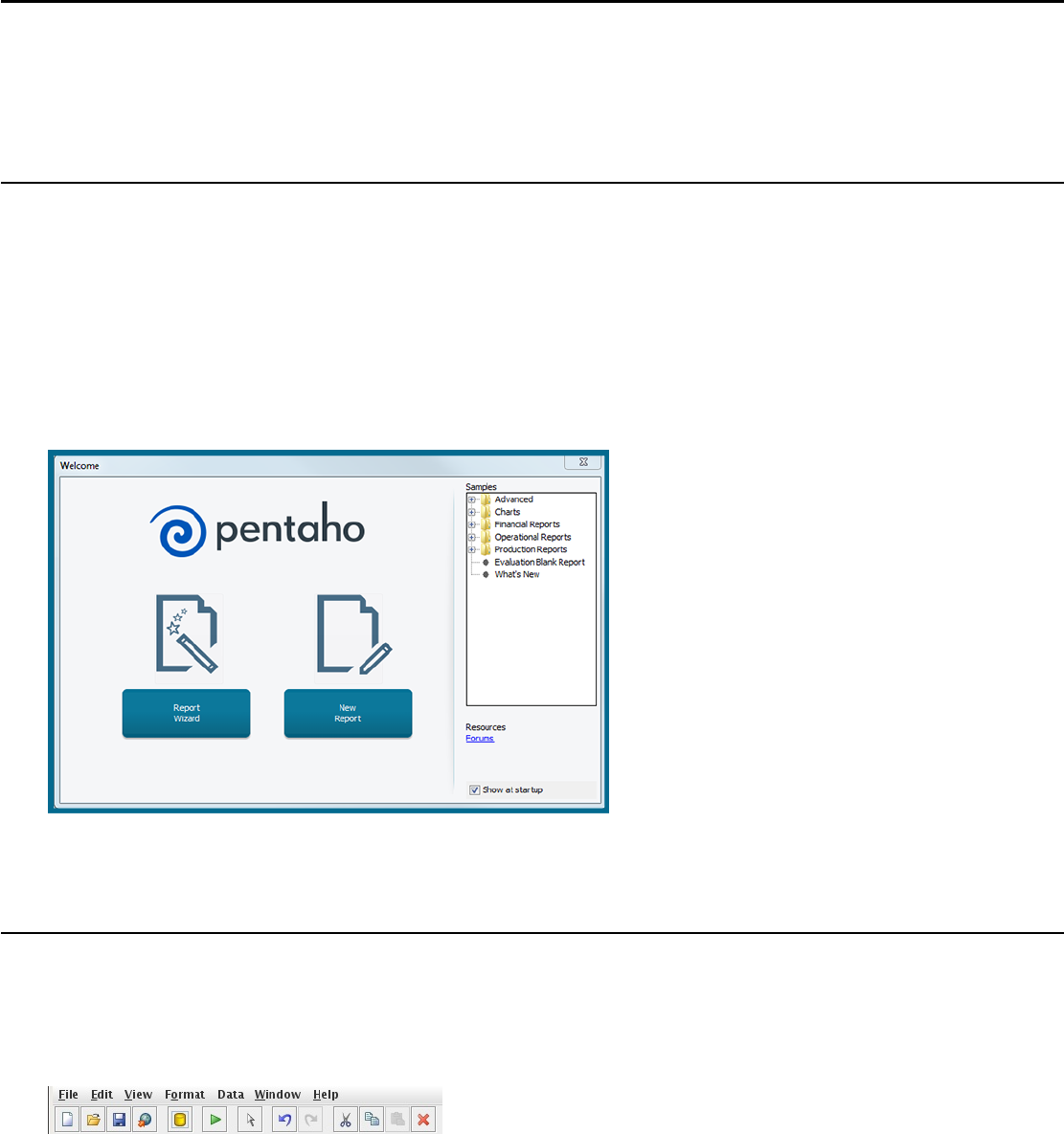
The Welcome Screen
The Welcome screen's primary purpose is to provide new users a quick, four-step process that walks you through
creating a new report through the Report Design Wizard. This is the default view when you start Report Designer, but if
you close it, you can make it reappear at any time by going to the Help menu and selecting Welcome.
In addition to the new report creation buttons, the Welcome screen also shows a list of sample reports. You might find
these useful if you're looking for inspiration, or if you can't figure out how to use a certain Report Designer feature. In
order to display the samples, you must have the Pentaho sample data HSQLDB database installed and running.
If you do not want to see the Welcome screen at start up, you can uncheck the Show at startup option in the lower
right corner of the window.
The Report Designer Main Toolbar
The toolbar at the top of the Report Designer window is for file, data, publishing, and cut-and-paste operations. The
toolbar makes some of the most frequently used features more accessible to users who have not yet learned keyboard
shortcuts for them. There are no unique data, publishing, or file operations in the toolbar; every icon represents a
feature that is also available through one of the panes or menus in Report Designer.
To discover what each icon does, mouse over it to see a tooltip description.
Defining Preferences
To edit preferences associated with date and time format, look-and-feel, browsers, networks, external tools and
locations go to Edit -> Preferences. Enable Display the index columns in the Report Designer's field selectors...
to refer to data fields by name or column position. For more information, see Referring to Report Elements by Name or
Column Position
| Navigating Report Designer | 11
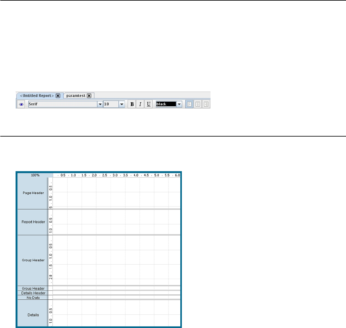
Report Designer's Tabbed Views
Each report and subreport is opened in its own tab in Report Designer, much like in modern Web browsers and text
editors. The currently selected report's tab will always be highlighted in blue, as shown in the graphic below. Click the X
in the corner of a tab to close the open report it represents, or right-click the tab to see a context menu that offers more
advanced close operations.
The button bar below the tab area offers font and preview options. The eye icon switches to preview mode, which
shows you approximately how the report, as currently arranged, will display when published. When you are in preview
mode, the eye turns into a pencil icon; click it to return to design mode.
The rest of the functions in this bar are standard font controls found in most text editors and word processors. The list of
font types is pulled from your Java Runtime Environment's fonts directory and from the TrueType fonts registered with
your operating system or desktop environment.
The Report Workspace
The workspace is dominated by the layout bands, which define each individual portion of the report. The currently
selected band's label will always be highlighted in gray, as shown with the page header band in the graphic below.
The top band is the page header, which represents the top of each report page. On the first page of a multi-page report,
the page header is at the absolute top, above the report header.
The next band is the report header, which contains report elements just below the page header, but only on the first
page of the report. The report header only appears once per report; it is not repeated on subsequent pages in the same
report.
The details band is next, and it contains middle-of-the-page report elements. This is where most of your report data
should go, and ordinarily represents the largest portion of your report pages.
Next is report footer, which appears at the bottom of the last page of the report, just above the page footer. Like the
report header, it only appears once per report.

| Navigating Report Designer | 12
The last band is the page footer, which appears at the absolute bottom of every page in a report.
You can also create groups for various report elements, with each group having its own header and footer bands in the
workspace.
All of the report bands can be resized by dragging their resize handles, or by moving report elements down past the
bottom border. For this reason, report elements cannot be dragged from one band to another; they must be cut from the
first band and pasted into the second.
If you'd like to change the size of the layout bands to give yourself more area to work in without changing the
dimensions of the published report, you can click and drag the percentage number in the upper left corner of the
workspace. By default it says 100%, but if you click and drag it diagonally toward the upper left or lower right corners,
the view will zoom in or out. If you want to reset the view to 100%, double-click the upper left corner where the
percentage shows.
The Structure Pane
The Structure tab shares a pane with the Data tab in the upper right section of Report Designer. The Structure pane
shows the exact hierarchy of every element included in a report. If you add an element to the workspace, it will show up
in the Structure pane; when selected there, all of its fine-grained details can be viewed and modified through the Style
and Attributes panes in the bottom right section of the screen. In addition to the standard drag-and-drop method using
the palette and the workspace, you can also add an element to a report by right-clicking on any of the report sections in
the Structure list, then selecting Add Element from the context menu. You can delete any element in the list by clicking
on it, then pressing the Delete key, or by right-clicking it and selecting Delete from the context menu.
Master Report or sub-report
This is the top-level category under which all other report bands are listed. For standalone or master reports, this will be
Master Report; for subreports, it will be sub-report.
Page Header
All of the elements shown in the page header band will be listed in this category.
Report Header
All of the elements shown in the report header band will be listed in this category.
Groups
If you've created any groups for your report elements, they will show up here. You can add or delete a group by right-
clicking the Groups heading, then selecting the appropriate action from the context menu. You can also delete a group
by selecting it, then pressing the Delete key. Your Details band is considered a group, and is explained below.
Details
All items you place in the Details band will appear in the Details heading under the Group section. There are also
Details-specific Header and Body bands which are not displayed in the workspace by default, but are available in the
Structure pane to add to. You can add these extra bands to your workspace by selecting each of them in the Structure
pane, then clicking the checkbox next to hide-on-canvas in the Attributes pane.
No Data
In the event that your query does not return any data, whatever content you put into the No Data band will appear in
your report. You can add a no data band to your workspace by selecting No Data Band in the Structure pane, then
clicking the checkbox next to hide-on-canvas in the Attributes pane.
Report Footer
All of the elements shown in the report footer band will be listed in this category.

| Navigating Report Designer | 13
Page Footer
All of the elements shown in the page footer band will be listed in this category.
Watermark
You can add a watermark to your report by clicking Watermark in the Structure pane, then either right-clicking it and
adding an element directly through the Structure pane, or by clicking the checkbox next to hide-on-canvas in the
Attributes pane and dragging an element to the new Watermark band.
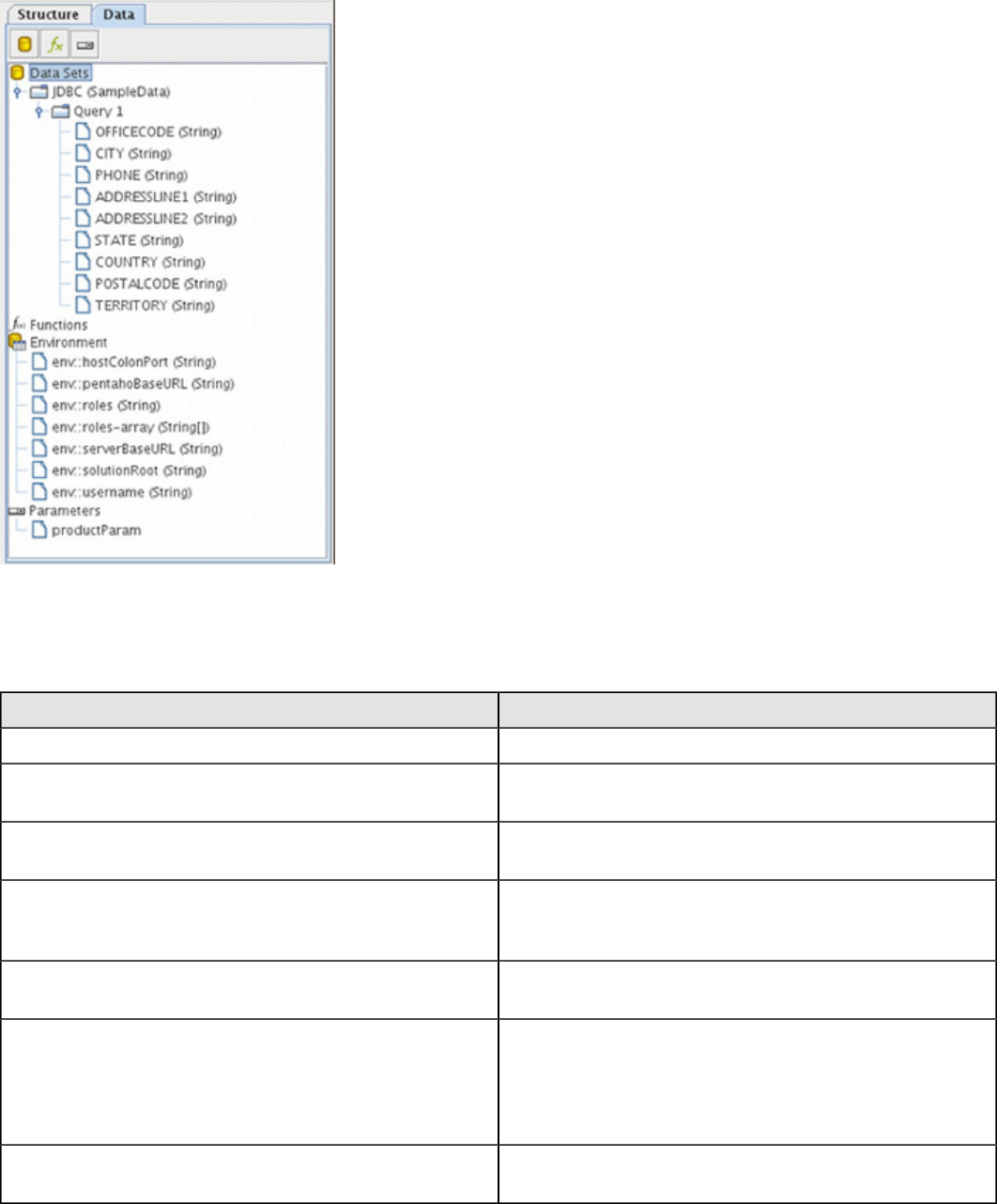
The Data Pane
The Data pane enables you to add data sources and view the individual queries, functions, and parameters in each
report. The three buttons at the top of the pane will add a new data source, function, or parameter when clicked,
respectively.
Data Sets
All of the data sources and queries you have defined for the current report will be listed here. If you want to add a new
data source, click the leftmost icon (the yellow cylinder) and select the data source type from the ensuing drop-down
menu. To add a new query to an established data source, right-click the data source and then select Edit DataSource
from the context menu. To delete a data source, select it, then press the Delete key, or right-click it and select Delete
from the context menu.
Functions
All of the mathematical functions and conditional elements that you add to a report will be listed in this category. Click
the fx button in the upper left corner of the pane to add a new function. You can delete a function by clicking it, then
pressing the Delete key, or by right-clicking it and selecting Delete from the context menu.
Parameters
If your query is properly formed, you can add a parameter to your report, which enables report readers to customize
the content of the output. To add a new parameter, click the rightmost icon in the upper left corner of the pane. You can
delete parameters by selecting the parameter you want to eliminate and pressing the Delete key, or by right-clicking the
parameter and selecting Delete from the context menu.
| Navigating Report Designer | 14
Environment Variables
If you are publishing your report to the Pentaho BA Server, you can use certain BA Server environment variables in
your report:
Variable Purpose
hostColonPort The hostname and port number for the BA Server service
pentahoBaseURL The complete URL to the BA Server, as set in the Base
URL property.
roles Returns a comma-separated list of roles that the BA
Server user who is currently running this report belongs to
roles-array Returns a Java array of strings containing the roles that
the BA Server user who is currently running this report
belongs to
serverBaseURL The URL to the BA Server, minus the BA Server
application context name (the default context is /pentaho/)
solutionRoot The path to the top-level Pentaho solution directory. The
default location is /home/pentaho/pentaho/server/
biserver-ee/pentaho-solutions/ on Linux and
Solaris, and C:\pentaho\server\biserver-ee
\pentaho-solutions\ on Windows.
username Returns the BA Server username of the person currently
running the published report
Function Reference
Every function available in Report Designer is defined below and categorized according to the group it belongs to.
| Navigating Report Designer | 15
Common Functions
The Common category contains functions that handle page numbering, and a generic OpenFormula feature that you
can use to create your own custom function.
Function Name Purpose
Open Formula Enables you to create your own custom OpenFormula
function using the built-in Formula Editor. This function will
run according to its placement in the report. If you need
a custom function to run before all other report actions,
use the Open Formula function in the Advanced category
instead.
Page Counts the number of pages rendered thus far in a report.
Total Page Count Lists the total number of pages in the rendered report.
Page of Pages Prints the current page number in comparison to the total
number of pages in the rendered report.
Report Functions
The Report category contains functions that modify the layout of the rendered report.
Function Name Purpose
Is Export Type Tests whether the given export type has been selected for
this report.
Row Banding Alternates the background color of each item band in a
group.
Hide Repeating Hides equal values in a group. Only the first changed
value is printed.
Hide Page Header & Footer Hides the page header and footer bands when the output
type is not pageable.
Show Page Footer Only shows the page footer on the last page rendered in
the report.
Summary Functions
The Summary category contains mathematical functions that count, add, and divide report data in groups.
Function Name Purpose
Sum Calculates the sum of the selected numeric column. This
produces a global total.
Count Counts the total number of items contained in a group.
If no group is specified, all items in the entire report are
counted.
Count by Page Counts the total number of items contained in a group on
one rendered page. If no group is specified, all items on
the entire page are counted.
Group Count Counts the total number of items in the selected groups. If
no group is specified, all items in all groups are counted.
Minimum Identifies the lowest or smallest value in a group.
Maximum Identifies the highest or largest value in a group.
Sum Quotient Performs simple division on the sum totals from two
columns and returns a numeric value.
| Navigating Report Designer | 16
Function Name Purpose
Sum Quotient Percent Performs simple division on the sum totals from two
columns and returns a percentage value.
Calculation Stores the result of a calculation. This function can be
used to convert a group of Running functions into a single
total Summary function.
Count For Page Counts items on a page according to the specified criteria.
This value is reset to zero when a new page is reached.
Sum For Page Adds all of the specified items on one page and produces
a total. This value is reset to zero when a new page is
reached.
Running Functions
The Running category contains mathematical functions that deal with running totals, as opposed to global or summary
totals.
Function Name Purpose
Sum Calculates a running total sum of the specified column.
Count Counts the items in a group or report.
Group Count Counts the number of groups in a report.
Count Distinct Counts the distinct occurrences of a certain value in a
column.
Average Calculates the average value in a given column.
Minimum Identifies the lowest or smallest value in a column.
Maximum Identifies the highest or largest value in a column.
Percent of Total Calculates the percentage value of a numeric column. The
total sum is divided by the number of items counted.
Advanced Functions
The Advanced category contains functions that deal with developer-centric actions.
Function Name Purpose
Message Format Formats text according to the Java Message Format
specification.
Resource Message Format Formats text from a resource bundle according to the
Java Message Format specification.
Lookup Maps a string from one column to another string. The
possible mappings are given as (key, text) pairs. If the
string from the column is null or matches none of the
defined keys, a fallback value is returned.
Indirect Lookup Returns a value from a mapped field. The field's value is
used as a key to the field-mapping. The expression maps
the value to a new column name and returns the value
read from this column.
Resource Bundle Lookup Performs a resource-bundle lookup using the value from
the defined field as a key in the resource bundle. This
expression behaves like a resource field.
| Navigating Report Designer | 17
Function Name Purpose
Open Formula Enables you to create your own custom OpenFormula
function using the built-in Formula Editor. This function will
run before any other action in the report.
Chart Data Functions
The Chart Data category contains functions that create datasets for JFreeChart elements.
Function Name Purpose
CategorySet Data Collector See CategorySet on page 91
Pie DataSet Collector See PieSet
Pivoting CategorySet Data Collector See PivotCategorySet on page 92
TimeSeries Collector See TimeSeries
XY-Series Collector See XYSeries
XYZ-Series Collector See XYZSeries
Image Functions
The Image category contains functions .
Function Name Purpose
Area Chart See Area on page 113
Bar Chart See Bar on page 90
Bar Line Chart See Bar Line Combination on page 139
BarCode A simple barcode chart available through the Report
Designer palette
Bubble Chart See Bubble on page 160
Extended XY Line Chart See XY Extended Line (XY Step, XY StepArea, XY
Difference) on page 216
Line Chart See Line on page 102
Multi Pie Chart See Multi-Pie on page 131
Pie Chart See Pie on page 123
Radar Chart See Radar on page 239
Ring Chart See Ring on page 152
Scatter Plot Chart See Scatter Plot on page 170
Sparkline Creates a Sparkline chart element. See Creating a
Sparkline Chart on page 52 for more details.
Survey Scale A sliding scale chart element.
Waterfall Chart See Waterfall on page 229
XY Area Chart See XY Area on page 204
XY Bar Chart See XY Bar on page 181
XY Line Chart See XY Line on page 193
Script Functions
The Script category contains functions that enable you to directly type in code from a supported scripting language.
| Navigating Report Designer | 18
• Bean-Scripting Framework (BSF)
• Bean-Scripting Host (BSH)
• JavaScript
• Single Value Query
The only unique object Pentaho offers in Report Designer for a scripting language is getValue for the Bean-Scripting
Framework, which retrieves the current record or row, as shown below:
Object getValue()
{
Object value = dataRow.get("RegionVariance");
if (value instanceof Number == false)
{
return Boolean.FALSE;
}
Number number = (Number) value;
if (number.doubleValue() < 0)
{
return Boolean.TRUE;
}
return Boolean.FALSE;
}
Deprecated Functions
The Deprecated category contains functions that had to be included in this version of Report Designer to provide
backwards compatibility for files created with older Report Designer versions. You should never use any of these
functions in new reports; there are no Deprecated functions that are not more sensibly implemented in other functions in
other categories.
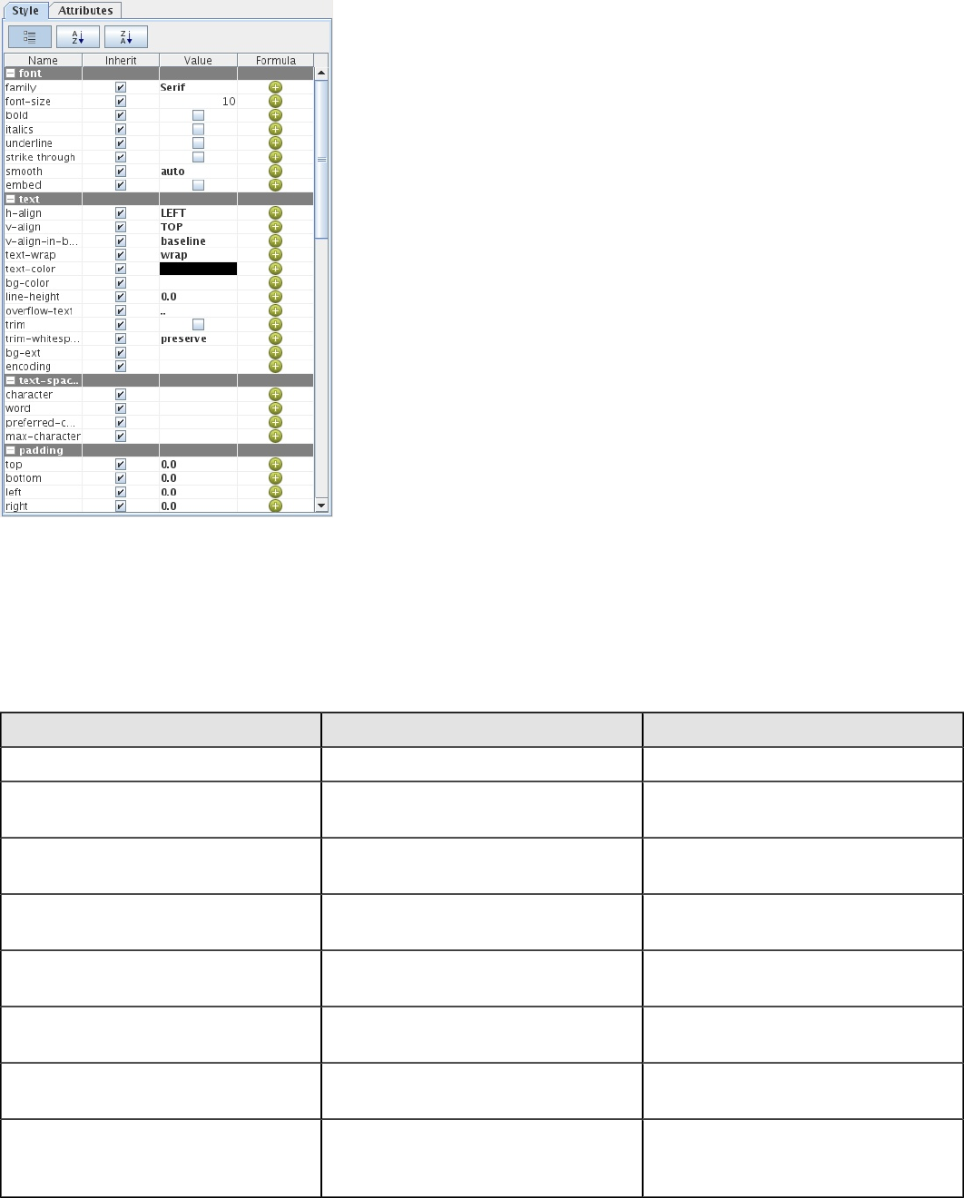
The Style Pane
The Style pane displays all of the visual and positional style options for any given item in the Structure pane. Click on
any Structure element, and the composition of the Style pane will adjust to show all of the available style properties,
listed by group.
Note: You cannot edit any Style or Attributes options for any selected report elements in the workspace while
the Data tab has focus. Click the Structure tab to see the Style and Attributes panes for selected elements.
| Navigating Report Designer | 19
Style Properties Reference
Every report element can be customized according to the below-listed parameters. To access style properties, click the
Style tab in the lower right pane.
Font Styles
Font styles control the font and font properties pertaining to the text of the selected element.
Property Name Data Type Purpose
family Selection The name of the font or font family
font-size Integer The size of the font, in points (1/72 of
an inch)
bold Boolean A flag indicating whether a bold-type
face should be used
italics Boolean A flag indicating whether a italic or
oblique type face should be used
underline Boolean A flag indicating whether the text
should be underlined
strikethrough Boolean A flag indicating whether the text
should be rendered striken through
smooth Selection A flag indicating whether text-aliasing
should be activated
embed Boolean A flag indicating whether the font
information should be embedded into
the target document
Text Styles
Font styles control the font and font properties pertaining to the text of the selected element.
| Navigating Report Designer | 20
Note: For elements that control colors, possible values are standard HTML color names (red, blue, green,
black, etc.) or hexadecimal color values (#000000, #FFFFFF, #CCFF00, etc.)
Property Name Data Type Purpose
h-align Selection Horizontally aligns the selected
content within this element
v-align Selection The size of the font, in points (1/72 of
an inch)
v-align-in-band Selection A extended text-alignment that allows
fine control on how inline-text is
aligned within a line
text-wrap Boolean A flag indicating whether text will
automatically wrap at the end of the
line
text-color Selection The text (foreground) color.
bg-color Selection The element's background color.
line-height Integer Defines the height of a single text line.
Is always greater or equal to the font
size
overflow-text String A text quote that is printed if the given
text does not fully fit into the element
bound
trim Boolean A flag indicating whether leading and
trailing white spaces will be removed
trim-whitespace Selection Controls how the renderer treats white
spaces
bg-ext String A extended foreground paint property.
Expert option
encoding Boolean Specifies the target text-encoding
for the given field, in case the output
supports per-field encodings
Text Spacing Styles
Text spacing styles control the amount of space between letters and words in a textual element.
Property Name Data Type Purpose
character Integer The minimum space between two
letters
word Integer Defines additional spacing between
words
preferred-character Integer The preferred space between two
letters
max-character Integer The maximum space between two
letters
Padding Styles
Padding styles control the space around the selected element.
| Navigating Report Designer | 21
Property Name Data Type Purpose
top Decimal Defines the padding on the top edge
of the element
bottom Decimal Defines the padding on the bottom
edge of the element
left Decimal Defines the padding on the left edge
of the element
right Decimal Defines the padding on the right edge
of the element
Object Styles
Object styles control the appearance of shape elements.
Property Name Data Type Purpose
fill Boolean A flag indicating whether the given
shape should be filled.
fill-color Selection Provides a way to define alternative
fill-colors. If undefined, the foreground
color is used.
draw-outline Boolean Defines whether the shape-outline
should be drawn in the foreground
color.
stroke Selection Defines the stroke (pen type and
width) that should be used to render a
shape.
anti-alias Boolean Defines whether drawable content
should be rendered with anti-aliasing
enabled.
aspect-ratio Boolean A flag indicating whether the scaling
should preserve the aspect ratio.
scale Boolean A flag indicating whether the content
printed in the element should be
scaled to fit the element's boundaries.
Size & Position Styles
Size & Position styles control the size and position of the selected element.
Property Name Data Type Purpose
height Decimal The element's preferred height. If
defined, this overrides all other height
definitions including the dynamic-
height flag
width Decimal The preferred width. If defined, this
width overrides all other layout rules
x Decimal The X-Coordinate where the element
should be placed
y Decimal The Y-Coordinate where the element
should be placed
visible Boolean A flag indicating whether the element
will be printed
| Navigating Report Designer | 22
Property Name Data Type Purpose
invisible-consumes-space Boolean A flag indicating whether an element
set to visible maintains its space
dynamic-height Boolean A flag indicating whether the field
should expand its height based on the
content it contains
min-height Decimal The element's minimum height
max-height Decimal The element's maximum height
min-width Decimal The element's minimum width
max-width Decimal The element's maximum width
x-overflow Boolean Defines whether content is allowed to
overflow the element's layouted box
to the right
y-overflow Boolean Defines whether content is allowed to
overflow the element's layouted box
to the bottom
fixed-position String (Group elements only) Shifts the band
to a fixed position on the page
layout String (Band elements only) The layout
strategy for elements in bands.
See Report Layout Types on page
46 for more information on layout
options.
box-sizing Selection Specifies the border-model to use
Links Styles
Links styles control the properties of any HTML links created from any report element.
Property Name Data Type Purpose
pdf-bookmark String (Band elements only) Adds bookmark
to pdf outputs
html-anchor String The name of an anchor (link-target)
embedded in the html outputs
url String The destination URL
url-tool-tip String Hyperlink title that is displayed as
tooltip
url-window-title String The window where the link should be
opened
Excel Styles
Excel styles control XLS output options.
Property Name Data Type Purpose
sheet-name String The title of the sheet/table generated
in table-exports
format-override String A override setting that provides a
Excel-specific cell-formats
| Navigating Report Designer | 23
Property Name Data Type Purpose
formula-override String A override setting that provides a
formula that should be printed in the
generated Excel-cell instead of the
original content
wrap-text Boolean A override setting that defines
whether Excel-Cells should have text-
wrapping enabled
Sparkline Styles
Sparkline styles control the colors of the various sparkline chart types.
Property Name Data Type Purpose
low-color Selection Defines the color of the lower value
on a pie sparkline
medium-color Selection Defines the color for midrange values
on a pie sparkline
high-color Selection Defines the color of the higher value
on pie and bar sparklines
last-color Selection Defines the color of the last value in a
series on a bar sparkline, and the line
color on a line sparkline
Page Behavior Styles
Page behavior styles control page display and rendering properties of the selected element when publishing to a page-
aware file format.
Property Name Data Type Purpose
display-on-first-page Boolean (Band elements only) If true, only
displays this band on the first page
display-on-last-page Boolean (Band elements only) If true, only
displays this band on the last page
repeat-header Boolean (Header and footer elements only) If
true, repeats this header or footer on
every printed page
page-break-after Boolean If true, a page break will occur before
this element
page-break-before Boolean If true, a page break will occur after
this element
sticky Boolean If true, imports page-header/footer
and the repeated group-header/
footer from the master report into sub
reports
avoid-page-break Boolean If true, cancels a predefined (through
a formula or function) page break
orphan Integer Defines the minimum number of
elements or lines at end of the page
before a pagebreak can occur within
the band or paragraph
widows Integer Defines the minimum number of
elements or lines at the beginning
| Navigating Report Designer | 24
Property Name Data Type Purpose
of the page before a pagebreak can
occur within the band or paragraph
Border Styles
Border styles control the color, texture, and size of the border around the selected element.
Note: For elements that control colors, possible values are standard HTML color names (red, blue, green,
black, etc.) or hexadecimal color values (#000000, #FFFFFF, #CCFF00, etc.)
Property Name Data Type Purpose
top-size Integer Specifies the size (in pixels) of the top
border segment
top-style Selection Specifies the line style of the top
border segment
top-color Selection Specifies the color of the top border
segment
top-left-round-height Integer Specifies the degree of vertical
roundness (in pixels) of the top left
border corner
top-left-round-width Integer Specifies the degree of horizontal
roundness (in pixels) of the top left
border corner
top-right-round-height Integer Specifies the degree of vertical
roundness (in pixels) of the top right
border corner
top-right-round-width Integer Specifies the degree of horizontal
roundness (in pixels) of the top right
border corner
bottom-size Integer Specifies the size (in pixels) of the
bottom border segment
bottom-style Selection Specifies the line style of the bottom
border segment
bottom-color Selection Specifies the color of the bottom
border segment
bottom-left-round-height Integer Specifies the degree of vertical
roundness (in pixels) of the bottom left
border segment
bottom-left-round-width Integer Specifies the degree of horizontal
roundness (in pixels) of the bottom left
border segment
bottom-right-round-height Integer Specifies the degree of vertical
roundness (in pixels) of the bottom
right border segment
bottom-right-round-width Integer Specifies the degree of horizontal
roundness (in pixels) of the bottom
right border segment
left-color Selection Specifies the color of the left border
segment
| Navigating Report Designer | 25
Property Name Data Type Purpose
left-size Integer Specifies the size (in pixels) of the left
border segment
left-style Selection Specifies the line style of the left
border segment
right-color Selection Specifies the color of the right border
segment
right-size Integer Specifies the size (in pixels) of the
right border segment
right-style Selection Specifies the line style of the right
border segment
break-color Selection Specifies the color of the border
segment that closes an element that
is cut short by a page break
break-style Selection Specifies the color of the border
segment that closes an element that
is cut short by a page break
break-size Integer Specifies the color of the border
segment that closes an element that
is cut short by a page break
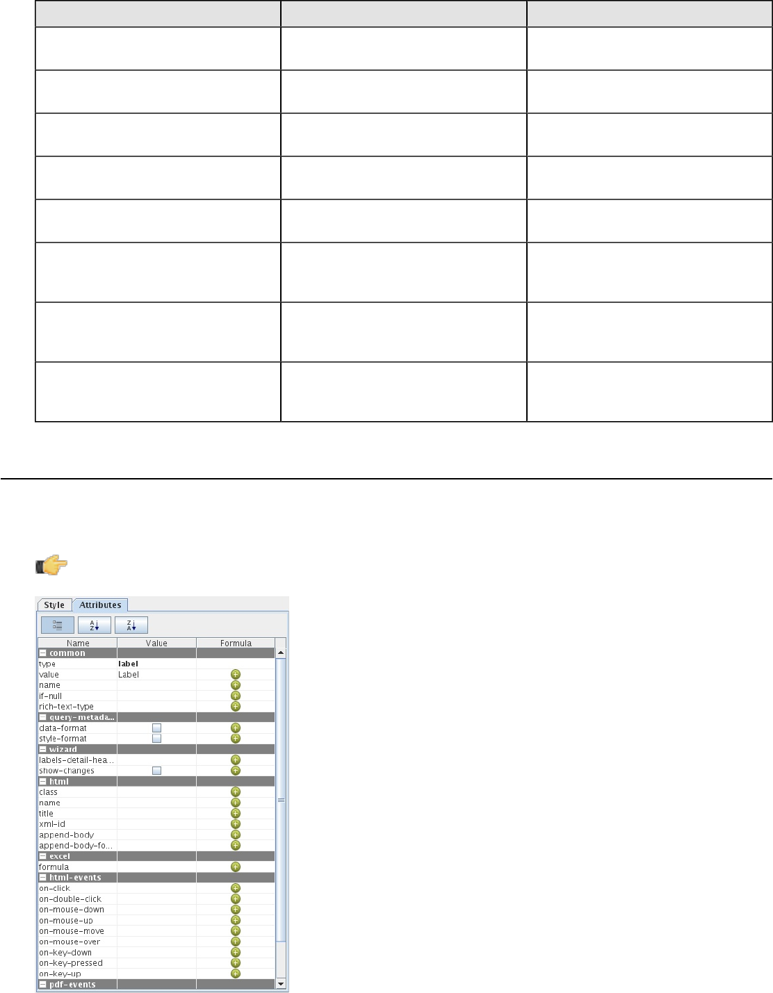
The Attributes Pane
The Attributes pane displays all of the low-level properties, and input and output options for any given item in the
Structure pane. Click on any Structure element, and the composition of the Attributes pane will adjust to show all of the
possible ways its can be customized.
Note: You cannot edit any Style or Attributes options for any selected report elements in the workspace while
the Data tab has focus. Click the Structure tab to see the Style and Attributes panes for selected elements.
| Navigating Report Designer | 26
Element Attributes Reference
Below is a complete reference for all of the items in the Attributes pane in Report Designer, organized alphabetically by
property name. Not all attributes will apply to every report element.
Barcode
The below attributes belong to the barcode property:
Attribute Name Purpose Possible Values
bar-height Sets the height of the bar code. Integer of any value.
bar-width Sets the width of the bar code. Integer of any value.
checksum Shows the checksum value. Boolean; default is false.
type Sets the type of bar code. String; default is code128 (see
Barbecue project documentation for
details)
show-text Displays text under the bar code. Boolean; default is false.
Common
The below attributes belong to the common property:
Attribute Name Purpose Possible Values
type Defines the type of element. Predefined and locked as an element
type.
field-name Defines the existing field to use. String; there is no default, you must
define a value manually.
value Defines a hard coded value instead of
a field. String or integer; no default value.
group-fields Defines the field to group by. String or integer; no default value.
resource-value A resource string found within the
resource bundle. String; no default value.
resource-identifier Defines the file that contains resource
strings. String; no default. This is a properties
file, including the path.
name The name you want to assign to this
element. String; no default value.
output-format Sets preferred output type for the
report. String; no default value. Possible
values are: html, pdf, xls, rtf, csv, xml.
lock-output-format Locks the output type specified in the
output-format attribute so that no
other output type can be chosen.
Boolean; default is false.
auto-submit If selected, your parameterized
reports will automatically update
based on the current selection in
your parameter lists. If un-checked,
parameter selections will not
automatically change the report data;
report users will have to select a
new parameter value and then click
View Report to update the report.
To change this globally in reports
published to the BA Server, see
Boolean; default is false.
| Navigating Report Designer | 27
Attribute Name Purpose Possible Values
Permanently Overriding the Auto-
Submit Option on page 65.
format Sets the Java format string. String; there is no default. Must be in
the Java number or date format.
if-null If the defined field or value returns
null, show the value defined here. Boolean; default value is false.
message-null-value If the message returns null, then
return the value defined here. String; no default value.
arc-height Defines the arc (corner) height of a
rectangle. Integer; default value is 0.
arc-width Defines the arc (corner) width of a
rectangle. Integer; default value is 0.
data-cache Determines whether parameter
result sets are cached, which would
reduce the amount of reload time
when switching parameters in a
rendered report. This option can
be further configured through the
org.pentaho.reporting.engine.classic.
core.cache.InMemoryCache.CachableRowLimit
and
org.pentaho.reporting.engine.classic.
core.cache.InMemoryCache.MaxEntries
engine settings.
Boolean; default is True (cache is
turned on).
Table of Contents
The below attributes belong to the table-of-contents property:
Attribute Name Purpose Possible Values
group-fields Defines both the depth of the data-
collection and the fields from which to
read the group-value-X values.
If the group-field given in the array
is empty, the field value will be read
from the current relational group
and in the details-processing, the
value will be null. If the group-fields
list is empty, an automatic mode
is activated that collects all groups
extracting the group-value from the
relational group.
title-field Defines a field in the master-report
that will be read for a valid item-title.Any column field or function
title-formula Defines a formula that is evaluated
when a new item has been collected.
The formula will only be evaluated if
the title-field is not set.
formula
collect-details Defines, whether detail items should
be included in the data-collection. Boolean; default is false.
Note: This attribute
consumes a significant
amount of system memory.
Do not use this attribute on
reports that are over a million
rows.
| Navigating Report Designer | 28
Attribute Name Purpose Possible Values
index-separator Defines the separator text that is used
between the index-elements. String; default is comma ",".
Index
The below attributes belong to the index property:
Attribute Name Purpose Possible Values
data-field Defines the field to be used as the
item-data or item-key.Any column field or function
data-formula Defines an open formula to be used
as the item-data or item-key.Formula
Important: Make sure that
data-field is not defined, if this
attribute is used.
index-separator Defines the separator text that is used
between page numbers in the item-
pages field in the index sub report. It
defaults to ",".
String; default is comma, (,).
condensed-style Defines whether or not a dash (-)
is used between continuous page
numbers; for example, 4,5,6,7 display
as 4-7.
Boolean; default is false.
Excel
The below attributes belong to the excel property:
Attribute Name Purpose Possible Values
formula Converts an entered value or formula
into a Excel numeric value. String; no default value.
page-header-text Appends text into Excel page header. String; no default value.
page-footer-text Appends text into Excel page footer. String; no default value.
HTML
The below attributes belong to the html property:
Attribute Name Purpose Possible Values
append-header Inserts the HTML entered here into
the <header> of the HTML output. String; no default value.
append-body Inserts the HTML entered here into
the <body> of the HTML output. String; no default value.
append-body-footer Inserts the HTML entered here into
the <footer> of the HTML output. String; no default value.
alt-name Defines the text for the HTML <img>
tag's alt attribute. String; no default value.
HTML-Events
The below attributes belong to the html-events property:
| Navigating Report Designer | 29
Attribute Name Purpose Possible Values
class Defines the value to insert into the
HTML <class> tag. String; no default value.
name Defines value for the name HTML
object attribute. String; no default value.
title Defines the value to insert into the
HTML <title> tag. String; no default value.
xml-id Defines value to insert into the HTML
<xml-id> tag. String; no default value.
on-click Defines value for the onclick HTML
DOM event object property. String; no default value.
double-click Defines value for the doubleclick
HTML DOM event object property. String; no default value.
on-mouse-down Defines value for the onmousedown
HTML DOM event object property. String; no default value.
on-mouse-up Defines value for the onmouseup
HTML DOM event object property. String; no default value.
on-mouse-move Defines value for the onmousemove
HTML DOM event object property. String; no default value.
on-mouse-over Defines value for the onmouseover
HTML DOM event object property. String; no default value.
on-key-down Defines value for the onkeydown
HTML DOM event object property. String; no default value.
on-key-pressed Defines value for the onkeypress
HTML DOM event object property. String; no default value.
on-key-up Defines value for the onkeyup HTML
DOM event object property. String; no default value.
Images
The below attributes belong to the images property:
Attribute Name Purpose Possible Values
image-encode-quality Controls the JPEG encoding quality A decimal percentage value between
0 and 1. The closer to 1, the higher
the quality and larger the file size.
image-encode-type Determines the image format of PDF
and HTML graphics. Possible values are: .jpg and .png.
Default is .png.
PDF
The below attributes belong to the pdf property:
Attribute Name Purpose Possible Values
script References a script name inside the
PDF. String; no default value.
Pentaho
The below attributes belong to the pentaho property:
| Navigating Report Designer | 30
Note: This list is incomplete.
Attribute Name Purpose Possible Values
report-cache Determines whether parameterized
reports published to the BA Server
are cached on a per-session basis,
which would reduce the amount
of reload time when switching
parameters in a rendered report.
Boolean; default is True (cache is
turned on).
Query
The below attributes belong to the query property:
Attribute Name Purpose Possible Values
name Assigns a name to the selected query.
If you are using a JDBC Custom data
source, you can type the entire query
directly into the name field.
String; no default value.
row-limit Row limit for the query. Integer; default value is -1, meaning
there is no hard limit.
time-out Timeout limit for the query. Integer; default value is 0, meaning
there is no timeout.
design-time-out Timeout limit when running from
Report Designer. Integer; default value is 0, meaning
there is no timeout.
Query-Metadata
The below attributes belong to the query-metadata property:
Attribute Name Purpose Possible Values
data-format Use the number or date formatting
from the Report Design Wizard or the
data source.
Boolean; default is true if you are
using the wizard, false if you are not.
style-format Use the style formatting from the
Report Design Wizard or the data
source.
Boolean; default is true if you are
using the wizard, false if you are not.
Parameter
Below are the attributes associated with the parameter property:
Attribute Name Purpose Possible Values
auto-submit Determines if the report when it
runs uses parameter interface in the
Pentaho User Console.
Boolean, undefined, or prompt;
default is undefined. If set to true,
the report runs when any control is
updated in the parameter interface. If
set to false, the report does not run
when any control is updated in the
parameter interface. It runs when the
Update button is selected. If set to
undefined displays the auto-submit
checkbox in the parameter interface
so the user can control when they
want to use the option. The initial
state of the checkbox is determined
| Navigating Report Designer | 31
Attribute Name Purpose Possible Values
by the auto-submit-default attribute.
If set to prompt, displays the Auto
Submit checkbox in the parameter
interface so the user can control when
to use the option. The initial state of
checkbox is determined by the auto-
submit-default attribute.
parameter-layout Set parameter display in the Pentaho
User Console. Selection; default is vertical —
vertical adds each selection control
into separate rows; horizontal adds
each selection control into the same
row; flow adds each selection control
into the same row and wraps them
when space is limited.
show-parameter-ui Determines whether the parameter
interface will display in the Pentaho
User Console
Boolean; default is false.
auto-submit-default Sets the state of the auto submit
checkbox on the parameter interface. Boolean, undefined; default is false.
If true or undefined, the auto submit
checkbox will be enabled. If false,
the auto submit check box will be
disabled.
Sparkline
The below attributes belong to the sparkline property:
Attribute Name Purpose Possible Values
spacing Sets the spacing (in pixels) between
bars for a bar sparkline. Integer; default is 0.
start-angle Sets the start angle (in degrees) on a
pie sparkline. Integer; possible values are from 1 to
360. Default is 1.
counter-clockwise Sets the plot direction on a pie
sparkline. Boolean; default is false, which
represents clockwise.
high-slice Sets the hexadecimal color for the
high slice. String; there is no default, you must
define it manually.
medium-slice Sets the hexadecimal color for the
medium slice. String; there is no default, you must
define it manually.
low-slice Sets the hexadecimal color for the low
slice. String; there is no default, you must
define it manually.
Survey-Scale
The below attributes belong to the survey-scale property:
Attribute Name Purpose Possible Values
highest Sets the scale max value. Integer; default is 5.
lowest Sets the scale min value. Integer; default is 1.
range-upper Sets the bar plot max value. Integer; default is not defined.
range-lower Sets the bar plot min value. Integer; default is not defined.
| Navigating Report Designer | 32
Swing
The below attributes belong to the swing property:
Attribute Name Purpose Possible Values
action Defines the Java method. String; default is not defined.
tooltip Defines the content of the tooltip. String; default is not defined.
Wizard
The below attributes belong to the wizard property:
Attribute Name Purpose Possible Values
wizard-enabled If enabled, clears out all bands
affected by the generated-content-
marker attribute and starts from
scratch.
Boolean; default is true.
aggregation-group Defines the group name to aggregate
by. String; default is not defined.
aggregation-type Defines the function to use to
aggregate the field. String; default is not defined.
generated-content-marker Marks the band that you want to insert
the wizard's generated content into. Boolean; default is false.
grid-color Defines the hexadecimal border color
of the selected element in the Details
band.
String; default is not defined.
grid-style Defines the border style of the
selected element in the Details band. String; default is not defined. Possible
values are: solid, dashed, dot-dash,
dot-dot-dash, dotted, double, hidden,
none, groove, ridge, inset, outset.
grid-width Defines the border width (in pixels)
of the selected element in the Details
band.
Integer; default is not defined.
label-detail-header Defines the Detail band header. String; default is the selected field
name.
only-show-changing-value Controls whether the field repeats in
the Details band. Boolean; default is false.
The Palette
The Palette contains all of the elements that you can use to build a report. To add an element, click on a layout band to
select it, then drag and drop an element from the Palette to the selected band. Each of the report elements is described
in detail below.
Label
A static text string. You can set and change it by hand as many times as you like, but it cannot be changed dynamically
through a query or function.
Text Field
A textual report element that is dynamically changed through a query or function.
| Navigating Report Designer | 33
Number Field
Displays dynamic numerical data from a query.
Date Field
Handles date information from a query.
Message Field
An element that combines multiple static and dynamic report elements such as labels and text fields, etc.
Resource Label
Static text string that maps to a resource bundle, allowing you to localize a label element based on locale.
Resource Field
Dynamic text string that maps to a resource bundle, allowing you to localize any database field. This is particularly
useful when you have multiple fields for multiple languages and need to implement some kind of logic to choose among
them based on locale.
Resource Message
Dynamic text string that concatenates data from multiple types, and dynamically maps to a resource bundle, allowing
you to localize a report based on locale.
Image Field
A reference to an image stored in a database.
Image
A static image embedded into a report from an accessible location.
Ellipse
A vector graphical element with no angles.
Rectangle
A vector graphical element in the shape of a rectangle.
Horizontal Line
A vector graphical line segment, drawn horizontally.
Vertical Line
A vector graphical line segment, drawn vertically.
Survey Scale
A simple sliding scale chart element.
Chart
A chart or graph that shows your query results graphically.
Simple Barcodes
A barcode chart element.
| Navigating Report Designer | 34
Bar Sparkline
A bar sparkline chart element.
Line Sparkline
A line sparkline chart element.
Pie Sparkline
A pie sparkline chart element.
Band
A method of grouping elements.
Sub Report
An element that references another report.
| Data Sources and Queries | 35
Data Sources and Queries
The first step in creating a report is connecting to a data source. The second step is to use a query to refine that data
source such that it only contains the information you need for your report.
Supported Data Sources
Pentaho Report Designer supports the following data source types:
•JDBC: Any JDBC-compliant database will work with Report Designer, but you will probably have to provide your
own JDBC driver JAR. This is accomplished by copying the appropriate JAR file to the /pentaho/design-tools/
report-designer/lib/ directory.
•Metadata: A Pentaho Metadata XMI file.
•Pentaho Data Integration (Kettle): Kettle KTR files can act as a data source, but you must copy all of the JAR files
from /pentaho/design-tools/data-integration/libext/ and all of its subdirectories except the JDBC
subdirectory to /pentaho/design-tools/report-designer/lib/.
•OLAP: Report Designer only supports Pentaho Analysis (Mondrian) OLAP sources at this time.
•Pentaho Analysis: A Mondrian schema file.
•Pentaho Analysis Denormalized: A Mondrian schema file, denormalized.
•Pentaho Analysis Legacy: A Mondrian data source imported from a report created with a version of Report
Designer older than 3.5.0.
•XML: An XQuery file.
•Table: Create your own data table by entering information manually, or importing it from an Excel spreadsheet file
(XLS).
•MongoDB: Use data stored in this document-oriented NoSQL database.
•Advanced: The data sources in this category are typically for software developers and special-use cases.
•JDBC (Custom): Allows designers to dynamically create a query from a formula or function.
•Scriptable: Allows designers to generate a data set via JavaScript, Bean Shell, Groovy, Netrexx, XSLT, JACL, or
Jython.
•Java Method Invocation: Allows designers to access data via a Java method and dynamically change the
method name.
•Named Java Method Invocation: Allows designers to access data via a specific Java method.
•External: Used only if the report is going to run on the BA Server, which means the data is retrieved via
a component in an action sequence. The query name for the report has to be mapped to the result set in
the .xaction file.
Adding Data Sources
This section explains each data source dialogue. You must have a report file open in order to proceed, and your data
source must be accessible before you can connect to it in Report Designer.
Note: If you are using Report Designer on Linux or Solaris, after you add a data source it will not appear in the
Data tab until you double-click the Data Sets item.
Adding a JDBC Data Source
You may need to obtain database connection information from your system administrator, such as the URL, port
number, JDBC connection string, database type, and user credentials.
Follow this procedure to add a standard JDBC data source in Report Designer.
1. Select the Data tab in the upper right pane.
By default, Report Designer starts in the Structure tab, which shares a pane with Data.
2. Click the yellow cylinder icon in the upper left part of the Data pane, or right-click Data Sets.
A drop-down menu with a list of supported data source types appears.
3. Select JDBC from the drop-down menu.
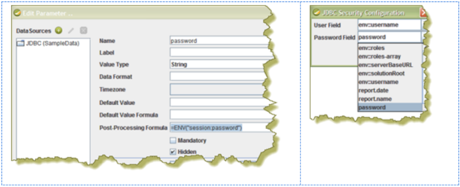
| Data Sources and Queries | 36
The JDBC Data Source window appears.
4. If you want to provide parameters that contain different database connection authentication credentials, click the
Edit Security button in the upper left corner of the window, then type in the fields or variables that contain the user
credentials you want to store as a parameter with this connection.
The role, username, and password will be available as a security parameter when you are creating your report.
5. Above the Connections pane on the left, click the round green + icon to add a new data source.
If you installed the Pentaho sample data, several SampleData entries appear in the list. These sample data sources
are useless if you do not have the Pentaho HSQLDB sample database installed, so if you don't have that, you can
safely delete the SampleData entries. If you do have Pentaho's HSQLDB samples installed, it may be advantageous
to leave the sample data sources intact in the event that you want to view the sample reports and charts at a later
time.
6. In the Database Connection dialog, type in a concise but reasonably descriptive name for this connection in the
Connection Name field; select your database brand from the Connection Type list; select the access type in the
Access list at the bottom; then type in your database connection details into the fields in the Settings section on the
right.
The Access list changes according to the connection type you select; the settings section will change depending on
which item in the access list you choose.
7. Click the Test button to ensure that the connection settings are correct. If they are not, the ensuing error message
should give you some clues as to which settings need to be changed. If the test dialogue says that the connection to
the database is OK, then click the OK button to complete the data source configuration.
Now that your data source is configured, you must design or enter an SQL query before you can finish adding the data
source. See Creating Queries With SQL Query Designer on page 43 for more details on using SQL Query Designer,
or Dynamic Query Scripting on page 45 for more information on building dynamic queries through scripts.
Passing Security Information to a Report over a JDBC Connection
You can use one of two options when you want to pass security-related information, (such as user name and
password), associated with a report over a JDBC connection:
• Choose from the list of predefined environment variables; for example, env::username or env::roles
• Define your own specific environment variables to pass to the connection, (session or global), using the formula
function, ENV, inside a hidden parameter. For example, =ENV("session:xaction_parameter_password") or
=ENV("global:xaction_parameter_password") where xaction_parameter_password is the parameter
defined in an .xaction.
In either case, the available selections appear as drop-down options under JDBC Security Configuration when you
click Edit Security in the JDBC Data Source dialog box.
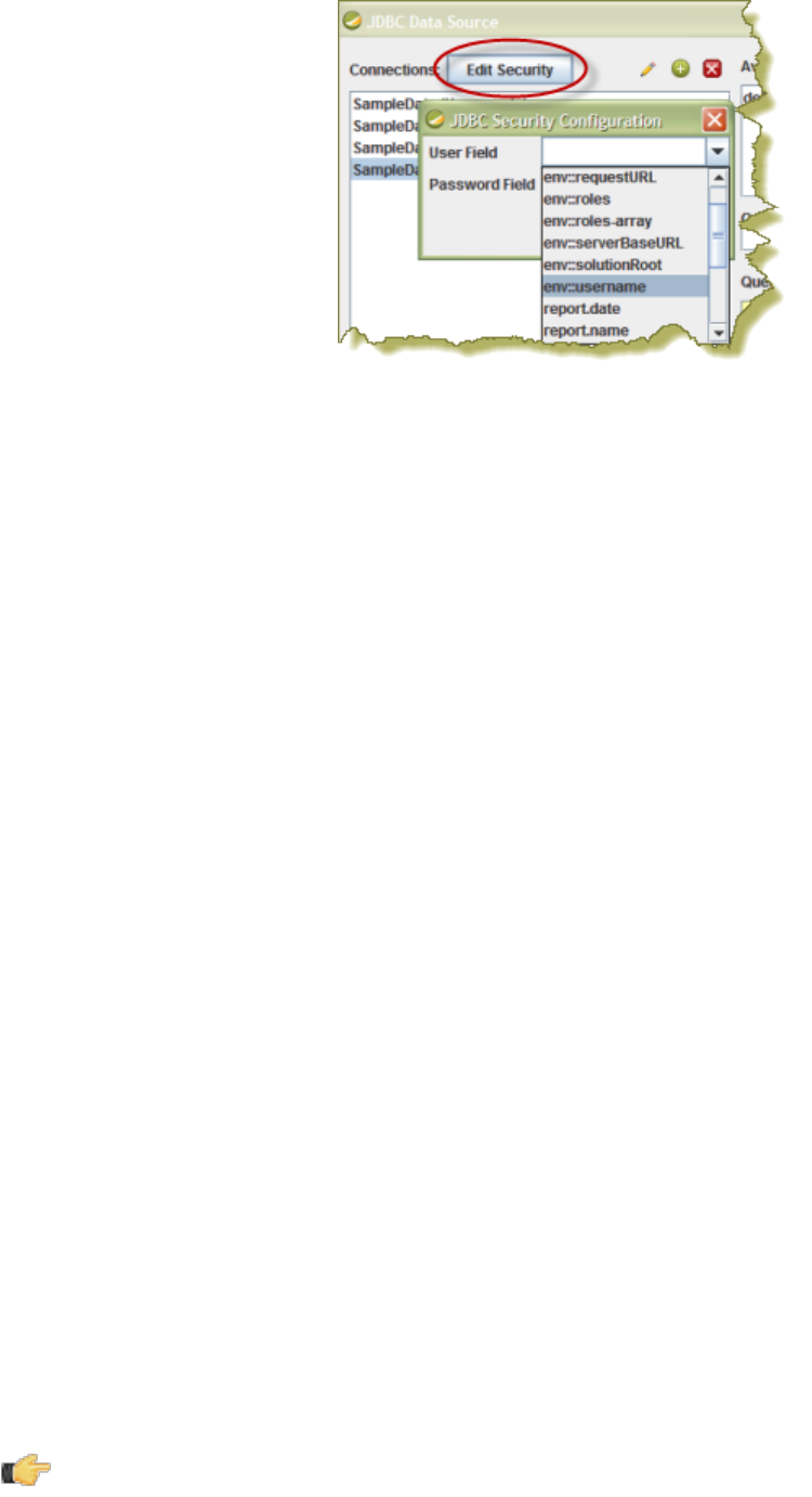
| Data Sources and Queries | 37
Adding a Metadata Data Source
You must have a report file open in order to proceed, and your data source must be accessible before you can connect
to it in Report Designer.
Follow this procedure to add a Metadata data source in Report Designer.
1. Select the Data tab in the upper right pane.
By default, Report Designer starts in the Structure tab, which shares a pane with Data.
2. Click the yellow cylinder icon in the upper left part of the Data pane, or right-click Data Sets.
A drop-down menu with a list of supported data source types will appear.
3. Select Metadata from the drop-down menu.
The Metadata Data Source Editor window will appear.
4. Click Browse, navigate to your XMI metadata definition file, then click Open.
5. Click the round green + icon to add a query, then type in a name for the new query in the Query Name field.
6. Type in the name of the solution directory this metadata file pertains to into the Domain Id field.
If this XMI file was created with Pentaho Metadata Editor, then the domain ID has to be the root directory for this
solution -- the directory one level above pentaho-solutions, typically. If you created this XMI with Pentaho Data
Integration, then the domain ID must be set to the full solution path to the XMI, which would be something like this:
example-solution/resources/metadata/mymeta.xmi. If the domain ID is not properly defined, you will be
able to preview the report, but you will not be able to publish it to the BA Server.
7. Click the pencil icon on the right above the Query field to start Metadata Query Editor, or type in your query directly
into the Query field.
See Creating Queries With Metadata Query Editor on page 44 for more details on Metadata Query Editor. You
can also design a dynamic query via a script; see Dynamic Query Scripting on page 45.
8. Click OK when your query is complete.
Adding a Pentaho Data Integration Data Source
Use the Pentaho Data Integration data source option if you want to create a report that contains data from any step in a
PDI transformation. This is particularly useful if you want to create a report that includes data from transformation steps
such as Splunk Input or Splunk Output. You must have a report file open in order to proceed, and your data source
must be accessible before you can connect to it in Report Designer. As mentioned previously in this section, the first
time you create a Kettle data source you must also copy all of the JAR files from /pentaho/design-tools/data-
integration/libext/ and all of its subdirectories except the JDBC subdirectory to /pentaho/design-tools/
report-designer/lib/ in order to access it through Report Designer.
Note: Your data source must not contain multi-select parameters. Data Integration does not accept array
parameters; only strings are accepted.
Follow this procedure to add a Pentaho Data Integration (Kettle) data source in Report Designer.
1. Select the Data tab in the upper right pane.

| Data Sources and Queries | 38
By default, Report Designer starts in the Structure tab, which shares a pane with Data.
2. Click the yellow cylinder icon in the upper left part of the Data pane, or right-click Data Sets.
A drop-down menu with a list of supported data source types will appear.
3. Select Pentaho Data Integration from the drop-down menu.
The Kettle Datasource window will appear.
4. Click the round green + icon to add a new query.
5. Type a concise yet sufficiently descriptive name into the Name field.
6. Click Browse and navigate to your Pentaho Data Integration KTR file.
7. Review the imported steps and modify their parameters accordingly, then click OK.
Adding an OLAP Data Source
You must have a report file open in order to proceed, and your data source must be accessible before you can connect
to it in Report Designer. You may need to obtain database connection information from your system administrator, such
as the URL, port number, JDBC connection string, database type, and user credentials.
Follow this procedure to add a Pentaho Analysis (Mondrian) data source in Report Designer.
1. Select the Data tab in the upper right pane.
By default, Report Designer starts in the Structure tab, which shares a pane with Data.
2. Click the yellow cylinder icon in the upper left part of the Data pane, or right-click Data Sets.
A drop-down menu with a list of supported data source types will appear.
3. Select OLAP from the drop-down menu, then select one of the following: Pentaho Analysis, Pentaho Analysis
(Denormalized), or Pentaho Analysis (Legacy).
The Mondrian Datasource Editor window will appear.
4. If you want to provide parameters that contain different Mondrian connection authentication credentials, click the
Edit Security button in the upper left corner of the window, then type in the fields or variables that contain the user
credentials you want to store as a parameter with this connection.
The role, username, and password will be available as a security parameter when you are creating your report.
5. Click Browse, navigate to your Mondrian schema XML file, then click Open.
6. Above the Connections pane on the left, click the round green + icon to add a new data source.
If you installed the Pentaho sample data, several SampleData entries will appear in the list. You must have
HSQLDB to view the sample data.
7. In the subsequent Database Connection dialogue, type in a concise but reasonably descriptive name for this
connection in the Connection Name field; select your database brand from the Connection Type list; select the
access type in the Access list at the bottom; then type in your database connection details into the fields in the
Settings section on the right.
The Access list will change according to the connection type you select; the settings section will change depending
on which item in the access list you choose.
8. Click the Test button to ensure that the connection settings are correct. If they are not, the ensuing error message
should give you some clues as to which settings need to be changed. If the test dialogue says that the connection to
the database is OK, then click the OK button to complete the data source configuration.
Now that your data source is configured, you must enter an MDX query before you can finish adding the data source.
You can also create a dynamic query through scripts; see Dynamic Query Scripting on page 45 for more information.
Adding an OLAP (Advanced) Data Source
You must have a report file open in order to proceed, and your data source must be accessible before you can connect
to it in Report Designer. You may need to obtain database connection information from your system administrator, such
as the URL, port number, JDBC connection string, database type, and user credentials.
Follow this procedure to add a Pentaho Analysis (Mondrian) data source in Report Designer.
Note: OLAP (Advanced) data sources differ from standard OLAP data sources only in the method by which you
design and enter the MDX query. Standard OLAP data sources allow for Report Designer's built-in Metadata
Query Editor, whereas advanced OLAP data sources require you to build a formula to calculate the query, which
| Data Sources and Queries | 39
gives you more power over report parameterization functionality. You can also create a dynamic query through
scripts; see Dynamic Query Scripting on page 45 for details.
1. Select the Data tab in the upper right pane.
By default, Report Designer starts in the Structure tab, which shares a pane with Data.
2. Click the yellow cylinder icon in the upper left part of the Data pane, or right-click Data Sets.
A drop-down menu with a list of supported data source types will appear.
3. Select OLAP from the drop-down menu, then select one of the following: Pentaho Analysis, Pentaho Analysis
(Denormalized), or Pentaho Analysis (Legacy).
The Mondrian Datasource Editor window will appear.
4. If you want to provide parameters that contain different Mondrian connection authentication credentials, click the
Edit Security button in the upper left corner of the window, then type in the fields or variables that contain the user
credentials you want to store as a parameter with this connection.
The role, username, and password will be available as a security parameter when you are creating your report.
5. Click Browse, navigate to your Mondrian schema XML file, then click Open.
6. Above the Connections pane on the left, click the round green + icon to add a new data source.
If you installed the Pentaho sample data, several SampleData entries will appear in the list. These sample data
sources are useless if you do not have the Pentaho HSQLDB sample database installed, so if you don't have that,
you can safely delete the SampleData entries. If you do have Pentaho's HSQLDB samples installed, it may be
advantageous to leave the sample data sources intact in the event that you want to view the sample reports and
charts at a later time.
7. In the subsequent Database Connection dialogue, type in a concise but reasonably descriptive name for this
connection in the Connection Name field; select your database brand from the Connection Type list; select the
access type in the Access list at the bottom; then type in your database connection details into the fields in the
Settings section on the right.
The Access list will change according to the connection type you select; the settings section will change depending
on which item in the access list you choose.
8. Click the Test button to ensure that the connection settings are correct. If they are not, the ensuing error message
should give you some clues as to which settings need to be changed. If the test dialogue says that the connection to
the database is OK, then click the OK button to complete the data source configuration.
Now that your data source is configured, you must enter an MDX query before you can finish adding the data source.
This is done by selecting the Master Report in the Structure pane, then clicking the Attributes pane. See the Query
attribute reference for more information.
Adding an XML Data Source
You must have a report file open in order to proceed, and your data source must be accessible before you can connect
to it in Report Designer. For database connections, you may need to first obtain necessary information from your
system administrator, such as the URL, port number, JDBC connection string, database type, and user credentials.
Follow this procedure to add a data source in Report Designer.
1. Select the Data tab in the upper left pane.
By default, Report Designer starts in the Structure tab, which shares a pane with Data.
2. Click the yellow cylinder icon in the upper left part of the Data pane, or right-click Data Sets.
A drop-down menu with a list of supported data source types will appear.
3. Select XML from the drop-down menu.
The XML Datasource Editor window will appear.
4. Click the round green + icon above the Available Queries field.
5. Type a concise yet reasonably descriptive name into the Query Name field.
6. Enter your XQuery into the Query field, then click Preview to ensure that it is valid.
7. Click OK when your query is in order.
Adding a Table Data Source
You must have a report file open in order to proceed.

| Data Sources and Queries | 40
Follow this procedure to add a Table data source in Report Designer.
1. Select the Data tab in the upper right pane.
By default, Report Designer starts in the Structure tab, which shares a pane with Data.
2. Click the yellow cylinder icon in the upper left part of the Data pane, or right-click Data Sets.
A drop-down menu with a list of supported data source types will appear.
3. Select Table from the drop-down menu.
The Table Datasource Editor window will appear.
4. Click the round green + icon to add a query, then type in a name for the new query in the Name field.
5. Use the four buttons below the Name field to add or remove rows and columns appropriately, or click the Import
Spreadsheet button in the lower left corner to pull in data from an XLS file.
6. Enter or change any tabular data by selecting, then double-clicking a cell.
7. Click OK when you're done creating your Table data source.
Your new data source will
Adding Advanced Data Sources
Advanced data sources require advanced knowledge and skills, so only a high-level overview of each Advanced data
source is given in this section.
JDBC Custom
This is much like a standard JDBC connection, except you create a formula-based query through the Master Report's
Attributes pane instead. See the Query attribute reference for more information.
Scriptable
Select your language, then add a query by clicking the round green + button, give your query a name, then type in your
script in the Query field.
Java Method Invocation
Once added, you create a query (which involves calling the specified Java class) through the Master Report's Attributes
pane. See the example below for more details on query syntax.
Named Java Method Invocation
Click the round green + button to add a query, type in a name in the Query Name field, then provide the method you
want to use, plus any optional parameters. See the example below for more details on query syntax.
External
This data source is used when a report (.prpt — simple reporting component) is used in an .xaction. In the report, you
must specify the result-set name for the "query name" attribute on the report. Also, you must add a report parameter
using the same name as the result-set name and set the parameter to the tablemodel parameter type. The .xaction
result-set can be MQL, SQL, MDX or JavaScript.
org.pentaho.reporting.engine.classic.core.modules.misc.datafactory.
StaticDataFactorySample#createSubQuery(${Var1})
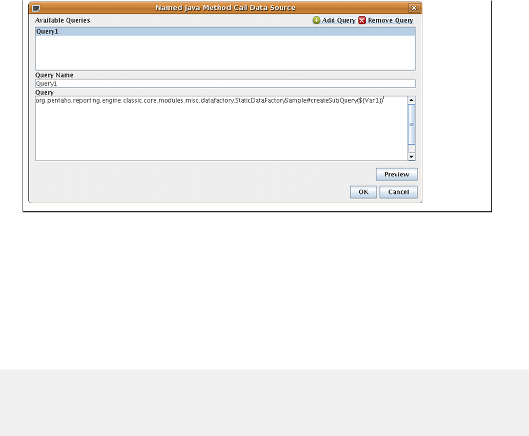
| Data Sources and Queries | 41
Adding a JNDI Data Source
You should already have established a JNDI data connection in your application server before continuing.
Follow this procedure to establish a connection to a JNDI data source.
1. Quit Report Designer if it is currently running.
2. Edit the .pentaho/simple-jndi/default.properties file.
The .pentaho directory is in the home or user directory of the user account that runs Report Designer. If you have
multiple copies of Report Designer installed to multiple user accounts, each default.properties file will have to be
edited.
3. Add your JNDI connection information, beginning with the JNDI name on each line, as shown in the example below:
SampleData/type=javax.sql.DataSource
SampleData/driver=org.hsqldb.jdbcDriver
SampleData/url=jdbc:hsqldb:hsql://localhost/sampledata
SampleData/user=pentaho_user
SampleData/password=password
4. Save and close the file, then start Report Designer.
5. To add this data source to a report, add a JDBC data source, choose JNDI as the connection type, and type in the
JNDI name in the appropriate field.
Report Designer can now access your JNDI data sources.
Adding a MongoDB Data Source
You can define a MongoDB data source query, then display query results in a report. To do this, you must already have
MongoDB database connection information, such as host name(s), port number(s) and authentication credentials. If
you do not have these things, contact your system administrator for help before you begin.
To establish a connection to a MongoDB data source, specify input options and queries, and view field information,
complete these steps. (For additional details about what each of the fields within the tabs controls, see the MongoDB
Input section of Create DI Solutions.
1. Open the Pentaho Report Designer window and either create a report or open an existing one.
2. Select Data > Add Datasource > MongoDB from the menu. The MongoDB Data Source window appears.
3. Click Add New Query to name the MongoDB data source definition. Fields in the window become active.
4. Type the name of the query in the Name field.
5. To configure the connection, complete these steps.
a) Enter the host name and port number for your MongoDB database. You can also specify a different port number
for each host name by separating the host name and port number with a colon, and separating each combination
of host name and port number with a comma like this: localhost1:27017,localhost2:27018. If you
specify the port in the host field, leave the port field empty.
| Data Sources and Queries | 42
b) If you want to MongoDB to automatically sense and attempt to connect to available hosts, even if one is down,
select the Use all replica set members checkbox.
c) Type the user name needed to access the MongoDB database in the User field, then type the password of the
user in the Password field.
d) Indicate how long the database should wait before terminating the connection attempt. If you do not want the
database to ever terminate the connection, leave the Connection timeout field blank. Otherwise, enter a
numerical value in milliseconds.
e) In the Socket timeout field, indicate how long the database should wait for a write operation to occur before it
terminates it. If you do not want the database to ever terminate it, leave this field blank.
6. To query the MongoDB server for available databases and collections, click the Input Options tab. You can also set
the read preference and tag set specification, in this tab.
a) Click Get DBs to populate the drop-down menu with names of available databases then select the appropriate
database, or enter the database name.
b) Click Get collections to populate the drop-down menu with names of available Mongo collections. If an error
message appears, check the host name and port numbers in the Configure connection tab.
c) Select a database from the Database drop down menu.
d) Click the Get Collections button, then select a collection from the Collection drop down menu.
e) Indicate the read preference in the Read field.
f) If you want to specify a tag set, click the Get tags button. Tag sets that have been specified on the MongoDB
database appear in the Tag Set section of the window. If you want to append tag sets together so that they are
processed at one time, select the tag sets, then click the Join tags button. Click the Test tag sets button to see
a list of nodes that match the tag set criteria.
7. Click the Query tab. You can forumulate a query using two different methods. You can either create the query as a
JSON Query expression, or use the Aggregation Framework. The Aggregation Framework is explained in detail in
the MongoDB Aggregation Framework documentation.
a) JSON Query Expression: Using JSON Query Expressions is analogous to using the MongoDB find()
command documented on the http://docs.mongodb.org/manual/core/read-operations page. The query argument
to find is entered in the Query expression (JSON) field. The projection argument is supplied in the Fields
expression (JSON) text box. In order to use the JSON Query Expression mode, ensure that the Query is
aggregation pipeline checkbox is not selected.
b) Aggregation Framework: To query MongoDB using the Aggregation Framework http://docs.mongodb.org/
manual/core/aggregation/ click the Query is aggregation pipeline checkbox. Enter a sequence of pipeline
operations in the Query expression (JSON) field. This mode uses the same syntax as the MongoDB
aggregation() command.
8. Click the Fields tab to view the fields that are in the database and collection you specified. You can also edit field
names that appear in Report Designer, edit the path to the field that you want to include in the report, and make
changes to the type.
a) Click the Get Fields button. Pentaho's Schema on Read functionality samples the documents in the collection
to determine which fields are available what their data types are. The fields are displayed.
b) If desired, edit the names of the fields. The names are what the fields will be called in PDI (and Report Designer).
c) If desired, edit the path to the field in the MongoDB database. If an array was returned, you can specify the
element in the array by indicating the number of the element in brackets, like this: $.myArrayElement[0]. In
this example, which is of a zero-based array, the content of the first field is returned.
Note: If you want to return all of the items in an array, place an asterisk in the bracket, like this:
$.myArrayElement[*]
d) Edit the data type if necessary.
9. You can paramaterize both JSON Query Expressions and Aggregation Pipeline queries using simple string
replacement. Parameters are specified using Pentaho Reporting's parameter syntax ${param} where param
is the name of the parameter containing the data that you want to replace the param name. For example, if you
have defined a report parameter named state, that you want to use to select documents for that state, your query
could look like this: {$match : { state : "${State}" }}. So, if you set the state parameter to FL at
runtime, the resulting query submitted to MongoDB would look like this: {$match : { state : "FL" }} If the
parameter name used in the ${} matches the name of existing parameter, the linkage between the parameter and
the query are automatic. If you prefer to use a different name in the query, click the Edit Parameter button.
a) Click the Edit Parameter button.
b) In the Transformation Parameters window, click the Add a New Parameter button to add a row to the table.
c) In the DataRow Column choose the parameter you want to add from the drop down list.

| Data Sources and Queries | 43
d) Select the Transformation Parameter from the drop down list.
e) If desired, add a transformation argument by clicking the Add a New Transformation Argument button and
adding the argument in the row that appears.
f) When complete, click OK.
10.Click Preview to test the connection and to see what the data will look like when it is brought into the report
designer. When complete, click OK.
Report Designer can now access your MongoDB data source.
Creating Queries
Most data source types employ queries to refine the broader data set into a smaller, more relevant subset that is
specific to the kind of report you want to generate. Most commonly, Report Designer users connect to a JDBC database
and use an SQL query to refine the data set. For this purpose, Report Designer has both a query window where you
can type in an SQL statement by hand, and an SQL Query Designer to help less SQL-savvy users refine data with a
graphical drag-and-drop interface. There is a similar utility for metadata data sources called MQL Query Builder.
Both of the query builder tools are explained below. For all other query types -- MDX, XQuery, etc. -- there are public
documentation and other help resources on the Web.
Note: The default setting for the query is to pull from session-based cache. If you do not want the query to use
session-based cache, you need to go to Master Report > Attributes and change the data-cache field to false
so that every time the query is run or the report opens, the query will refresh.
Hadoop Hive-Specific SQL Limitations
There are a few key limitations in Hive that prevent some regular Metadata Editor features from working as intended,
and limit the structure of your SQL queries in Report Designer:
•Outer joins are not supported.
•Each column can only be used once in a SELECT clause. Duplicate columns in SELECT statements cause
errors.
•Conditional joins can only use the = conditional unless you use a WHERE clause. Any non-equal conditional
in a FROM statement forces the Metadata Editor to use a cartesian join and a WHERE clause conditional to limit it.
This is not much of a limitation, but it may seem unusual to experienced Metadata Editor users who are accustomed
to working with SQL databases.
Creating Queries With SQL Query Designer
You must be in the JDBC Data Source window to follow this process. You should also have configured and tested a
JDBC data source connection.
Note: SQL Query Designer does not work with Hadoop Hive data sources.
Follow this process to design an SQL query for your data source with SQL Query Designer:
1. Select your data source in the Connections pane on the left, then click the round green + icon above the Available
Queries pane on the right (this is the + button in the upper right corner of the window).
2. Type a concise yet sufficiently descriptive name for this query in the Query Name field.
3. Click the pencil icon above the upper right corner of the Query field.
The SQL Query Designer tool will come up.
4. In the lower left pane, click to select the first table you want to select data from, then double-click it to move it to the
query workspace.
The table you selected will appear in the blue workspace as a sub-window containing all of the table's rows.
5. Check all of the rows you want to include in the query.
By default, all rows are selected. If you only want to select a few rows (or a single row), click the table name at the
top of the sub-window, then click deselect all in the popup menu, then check only the rows you want to include in
your query.
6. Repeat the previous step for other tables you want to work with.
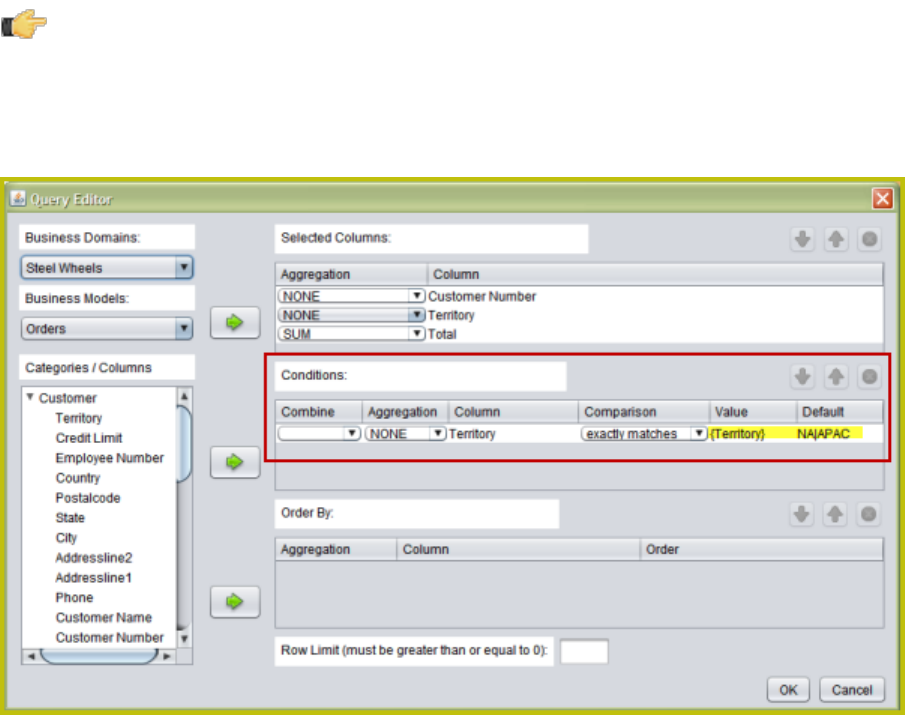
| Data Sources and Queries | 44
7. You can create an SQL JOIN between tables by selecting a reference key in one table, then dragging it to the
appropriate row in another table. To modify the JOIN, right-click its red square, then click edit in the popup menu.
8. To add a condition or expression, right-click a row in the query workspace, and select the appropriate action from the
context menu.
9. To order or group by a particular row, drag a statement from the SELECT category in the upper left pane down to
the GROUP BY or ORDER BY categories.
10.To edit the SQL syntax directly, click the syntax tab in the bottom left corner of the SQL Query Designer window.
11.Click Preview to view the unformatted query results; click OK to finish working on the query.
You now have a data source and at least one query that will return a data set that you can use for reporting.
Creating Queries With Metadata Query Editor
You must be in the Metadata Data Source Editor window to follow this process. You should also have established and
tested a metadata data source connection.
Follow this process to design a metadata query:
1. With all of your metadata data source options properly typed in, click the pencil icon above the upper right corner of
the Query field.
The Query Editor window opens. If the pencil icon is greyed out, then your data source is misconfigured.
2. Select a data set from the Business Models drop-down box in the upper left.
The list of available tables and columns will update appropriately.
3. Double-click a table to display its columns.
4. Click on a column that you want to select, then click the arrow next to the Selected Columns box.
You can select multiple columns by holding down the Ctrl key while clicking on columns.
Note:
To define a parameter, use curly brackets as in, {Parameter Name}, to specify the parameter name. The parameter
name must reference the parameter you created in your report. The Default value column is used to preview data
in the Metadata Data Source Editor, only. To specify, multiple values for a parameter use a "|" (pipe) between your
values as shown in the example below.
5. Repeat this process for the columns you want to create conditions for by moving a column over to the Conditions
box.
Condition values must be in double quotes in order to validate in Metadata Query Editor.

| Data Sources and Queries | 45
6. Repeat the above process for the column you want to order your results by by moving a column into the Order By
box.
7. Click OK to finalize the query.
You will return to the data source configuration window. Your newly formed query should appear in the Query field.
This field is editable, so you can modify the query before continuing.
8. Click OK to close the Metadata Data Source Editor.
You now have a data source and at least one query that will return a data set that you can use for reporting.
Dynamic Query Scripting
For all JDBC, OLAP, and Metadata data sources, you can create a dynamic query through a Groovy or JavaScript
script.
There are two scripting extensions in Report Designer: global, and per-query. The global script can be used to define
shared functions or global variables that are available to all query scripts. With a global script, you can dynamically
change the data source configuration via the init()function.
Per-query scripts enable you to customize a query string, calculate the "additional fields" information for query-caching,
and post-process the returned table model.
There is a template for the two scripting languages supported by default (JavaScript and Groovy). The template
contains some guidance and instructions, as well as empty declarations for the functions you're able to call. You can
safely delete any function you don't need; if deleted, Report Designer ignores them. You can load scripts from external
sources as well, but you must ensure that they are available to the report at runtime.
Caution: An external script that is local to Report Designer will probably not be local to the BA Server, since
most production BI environments separate the server from the design tools. So if you publish a report to the
server, you must either change the path to the external script so that it will work on the server, or find a way to
include it in the correct relative path on the BA Server.
Note: The scripting backend uses the JSR-223 (javax.script) scripting system. By default, Pentaho only ships
with JavaScript and Groovy support. However, there are many more JSR-223 enabled languages that are not
included but will work in Report Designer. To add support for other languages, you must add the appropriate
JAR to both the BA Server and the Pentaho Report Designer classpaths. Despite this capability, Pentaho's
support and services contracts do not cover any extra scripting language JARs.
Creating Sub-queries With SQL Query Designer
You must be in the JDBC Data Source window to follow this process. You must also have a configured and tested
JDBC data source connection.
Note: SQL Query Designer does not work with Hadoop Hive data sources.
You can design an SQL sub-query for your data source with SQL Query Designer:
1. Click on the connection name and click the Add button to add a query in the Available Queries panel.
2. Click the Edit button so the SQL Query Designer window appears. This allows you to easily create a SQL query.
3. Click on the first command in the SQL query you want to use.
The query appears in the right panel.
4. Right-click on the query and select Deselect All so that each field is deselected. Choose the selections with which
you want to work.
5. Right click on the query and select add where condition or add having condition.
The condition.edit window appears.
6. Click on the arrow next to the working query so that the whole path is expanded. Type in the condition and click OK.
7. Click Preview to ensure the query is working. Click OK to exit the condition.edit window.
8. Drag the Queries you have created into the workspace, in the Details row. Preview the report to ensure that
everything is working as expected.
You now have an SQL sub-query that returns a data set that you can use for reporting.

| Adding Report Elements | 46
Adding Report Elements
Most report elements can easily be added by dragging and dropping them from the Palette or the Data pane to one of
the layout bands. In some cases, there are a few extra details that you should know before you dive into report creation.
See the sections below that apply to your project.
Note: Though it may appear to be a good solution to some report design challenges, you should resist the
temptation to overlap elements in Report Designer. While the output may seem agreeable in the Preview
window and in some kinds of report output, the HTML and Excel output formats will have unusual problems.
Report Layout Types
The bands in a report can have a few different methods of content layout:
• block
• inline
• canvas
• row
The default layout scheme is canvas, in which report elements have no positioning relationship to one another, and can
potentially encroach on the space occupied by other elements in the band. The three other layout types are defined in
the sections below.
You can change the layout type by selecting any of the band elements in the Master Report item in the Structure
pane, then selecting one of the options from the layout drop-down box in the Size & Position section of the Properties
pane. Choosing a layout scheme will deselect the layout checkbox.
block
Elements in a block layout band are arranged vertically. Block-level elements span the full width of the parent band. If
an element expands, it pushes all other elements down so that no element overlaps any other elements.
Master Report and SubReport elements, as well as Groups, are always block elements.
inline
In an inline formatting context, elements are arranged horizontally, one after the other, beginning at the top of a
containing block. Horizontal margins, borders, and padding are respected between these boxes. The boxes may be
aligned vertically in different ways: their bottoms or tops may be aligned, or the baselines of text within them may be
aligned. The rectangular area that contains the boxes that form a line is called a line box.
An inline element that is placed in a non-inline layout band creates an artificial paragraph to wrap around this element
during the layouting process. The most common use of this layout strategy is to produce rich-text content from several
independent report elements.
row
The row layout scheme positions elements one after each other on the horizontal axis. All elements are printed in a
single row, expanding their height as needed. If all elements expand to the height of tallest element, set the min-height
to "100%" to even them out.
This layout type is a natural match for list reports, where multiple columns of data should be printed per row. When an
element expands its width, all other elements get pushed to the right.
When you use a row layout for your list reports, you will no longer need to arrange elements manually. To create
spacing between elements, use either padding on your elements, or place an empty band as a padding element into the
row layout band. The Report Design Wizard makes use of the row layout to position elements in the details and details-
header bands.
Adding Standard Design Elements
In order to add a report element, you must have configured a data source and designed a query to refine the data.

| Adding Report Elements | 47
Follow this process to add design elements to a report.
1. If you have not already done so, click the Structure tab in the upper right pane.
If the Data tab is selected, you will be unable to edit the attributes or styles of any report elements.
2. Click the design element you want to add, then drag it into the report band that you want to add it to, roughly in the
position where you want it to appear.
Once the element is placed, it will change from a grey shape to a transparent element with an inline label and blue
resize handles.
3. Click the resize handles and drag them out to the desired dimensions.
4. If necessary, click the center of the element and drag it to a different location within the layout band.
You cannot drag an element from one band to another. If you want to move something to a different band, you must
cut and paste it. Dragging an element toward the bottom of the band will increase the size of the band.
5. With the new report element selected, examine the options in the Attributes and Style panes and make any
necessary changes or customizations.
Any changeable aspect of a report element can be changed through these two panes. For a complete reference that
explains every property of every element, consult the Element Attributes Reference on page 26 and Style Properties
Reference on page 19 sections of this section.
6. To delete an element, click to select it, then press the Delete key, or right-click the element and select Delete from
the context menu.
You should now have a properly sized and placed report design element containing the data and options you specified
in the Style and Attributes panes. Any of the changes you made in this process can be revisited to further customize the
new element.
Aligning Elements
Report Designer has several features to help you easily align your report elements. All can be found in the View menu.
Grids show a graph-paper-like grid on the report canvas. This can make it easier to evenly space elements by counting
the exact number of hash marks between them. Grids can also make it easier to line up elements, but you may find it
easier to rely on guides instead.
Guides are markers you create by clicking on the rulers on the top and left of the report canvas. Once you have guides
in place, it's easier to align report elements vertically and/or horizontally. To turn off guides, go to the Guides submenu
in the View menu, then un-check the Show Guides item. You can remove individual guides by right-clicking them on
the ruler, then selecting Delete from the context menu.
Perhaps the most useful alignment feature in Report Designer is Element Alignment Hints. When you enable this
option, each report element's outer borders will extend to the edges of the canvas, allowing you to easily line up multiple
elements.
The Snap to Elements feature will add a kind of magnetism to elements so that they are easier to align with adjacent
elements.
Note: If elements are not horizontally aligned with column borders, the affected columns may be merged into
one in the report output.
Adding Bands
Follow this process in order to create a band (formerly called a sub-band in older versions of Report Designer), which
allows you to group several report elements into a single area.
1. Drag and drop a band element into a layout band.
2. Using the resize handles, change the size of the band to fit your specifications.
3. Drag and drop an existing report element into the new band and position it according to your preference.
4. Drag and drop other elements into the band as necessary.
You should now have a layout band containing several report elements. It can be resized or moved anywhere in its
parent band, or cut-and-pasted into another band.
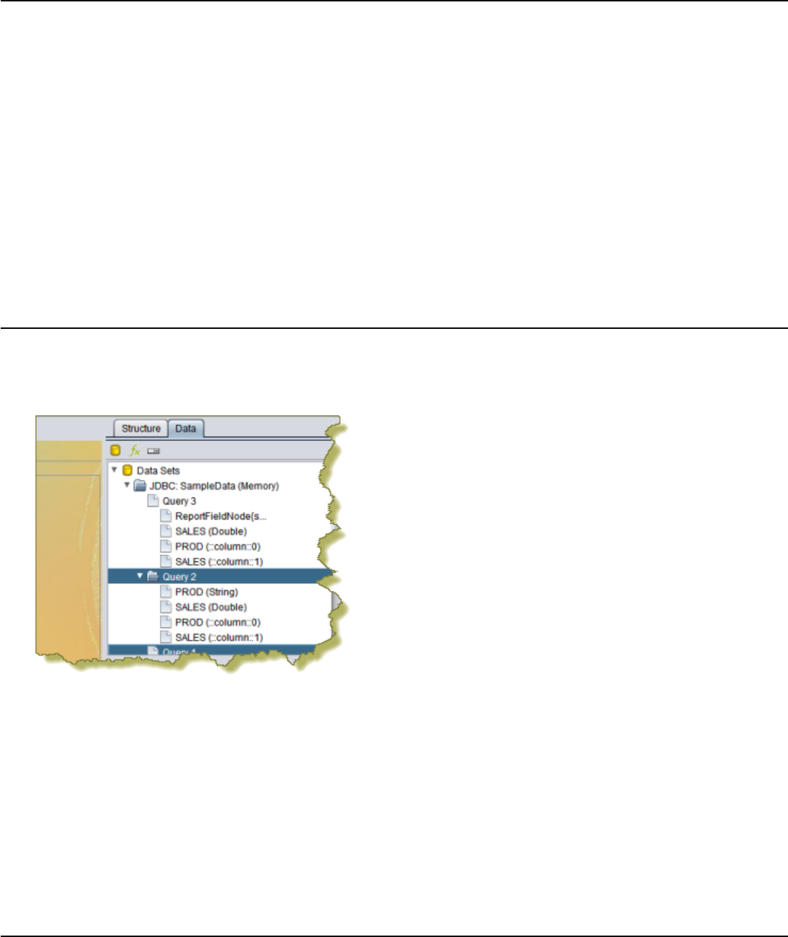
| Adding Report Elements | 48
Creating Sub-Reports
You can create other reports in your current one by creating sub-reports. This enables you to display data from multiple
sources.
1. Drag and drop a Sub-Report element from the Palette to the layout band where you want to display it.
2. A Sub-Report dialogue will ask if you would like to make this an inline or banded element. Choose one.
Inline Sub-Reports can be placed side-by-side with other elements (even other Sub-Reports). Banded Sub-
Reports occupy a variable height, but 100% of the report page width, so they cannot be on the same line with other
elements.
3. Double-click the Sub-Report element.
A new report tab will open and capture the window focus.
4. In the new report tab, establish a data source and create a report as your ordinarily would, keeping in mind that this
will be included in the parent report. When you are finished, switch back to the main report tab.
You should now have a report with a separate data source embedded within your current report. You can repeat this
process for as many sub-reports as you have data sources for.
Referring to Report Elements by Name or Column Position
If you enabled Display the index columns in the Report Designer's field selectors... in Preferences, you can refer
to report elements by field name or by column position. This feature allows you to create a report that isn't locked to a
field name, rather it is locked to the position of the query when the report runs; for example, column 0, column 1, column
2, and so on.
Locking to the query can be particularly useful when users create their own queries. When the report renders, the
data displays in predictably mapped columns. This feature works with all data field types, groups, and formulas and
functions.
Locking elements and formulas to the column position allows report designers to have more flexibility so that a single
report can be used with any query regardless of the data source type (JDBC, Mondrian, Pentaho Metadata, and so on.).
For example, this feature may be used by a report designer where the designer substitutes fields of report based on
different queries that have a completely different set of column names.
For a demo of this feature and how it can be applied to cross tab reports, see Pentaho Reporting and BA Server
Preview and Demo.
Creating a Table of Contents
You must have a report file open in order to proceed.
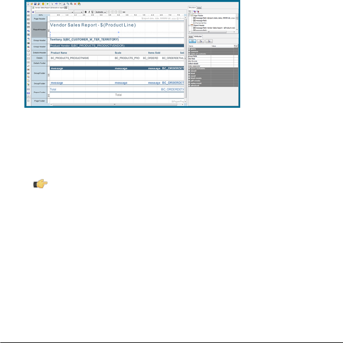
| Adding Report Elements | 49
The Table of Contents (TOC) feature is similar to a sub-report. It allows you to generate a TOC based on groups you
have mapped inside the report or to specify the sub-reports you want included in your TOC. Follow the instructions
below to create your TOC:
1. Click and drag the table-of-contents icon onto the report canvas.
You are prompted to make the TOC element Inline or Banded. Choose one. Inline sub-reports can be placed side-
by-side with other elements (even other sub-reports). Banded sub-reports occupy a variable height, but 100% of the
report page width, so they cannot be on the same line with other elements.
2. Click the TOC element and Define the following attributes for the TOC element:
•group-fields — Defines both the depth of the data-collection and the fields from where to read the group-value-
X values. If the group-field given in the array is empty, the field value will be read from the current relational
group and in the details-processing, the value will be null. If the group-fields list is empty, an automatic mode is
activated that collects all groups extracting the group-value from the relational group.
•collect-details — Defines, whether detail items should be included in the data-collection.
Note: This attribute consumes a significant amount of system memory. Do not use this attribute on
reports that are over a million rows.
•title-formula — Defines a formula that is evaluated when a new item has been collected. The formula will only be
evaluated if the title-field is not set.
•title-field — Defines a field in the master-report that will be read for a valid item-title.
•title-formula — Defines a formula that is evaluated when a new item has been collected. The formula will only
be evaluated if the title-field is not set. "title-field" - Defines a field in the master-report that will be read for a valid
item-title.
•index-separator — Defines the separator text that is used between the index-elements. It defaults to ".".
3. Double-click the TOC element.
A new sub-report tab opens.
4. In the new report tab, create the appropriate TOC headings and add the group value you want mapped. Add an
item-page function to generate the page numbers. Keep in mind that all your entries will be included in the parent
report. When you are finished, switch back to the main report tab.
5. Preview your report.
You should now have a TOC embedded in your current report. If you have multiple groups, you can create bookmark
links manually by using the URL Linking feature.
Creating an Index
You must have a report file open in order to proceed.
The Index feature is similar to a sub-report. It allows you to generate an index based on fields, (or groups), in your
report. When the index is generated, it displays the instances and page number in which the field name appears.
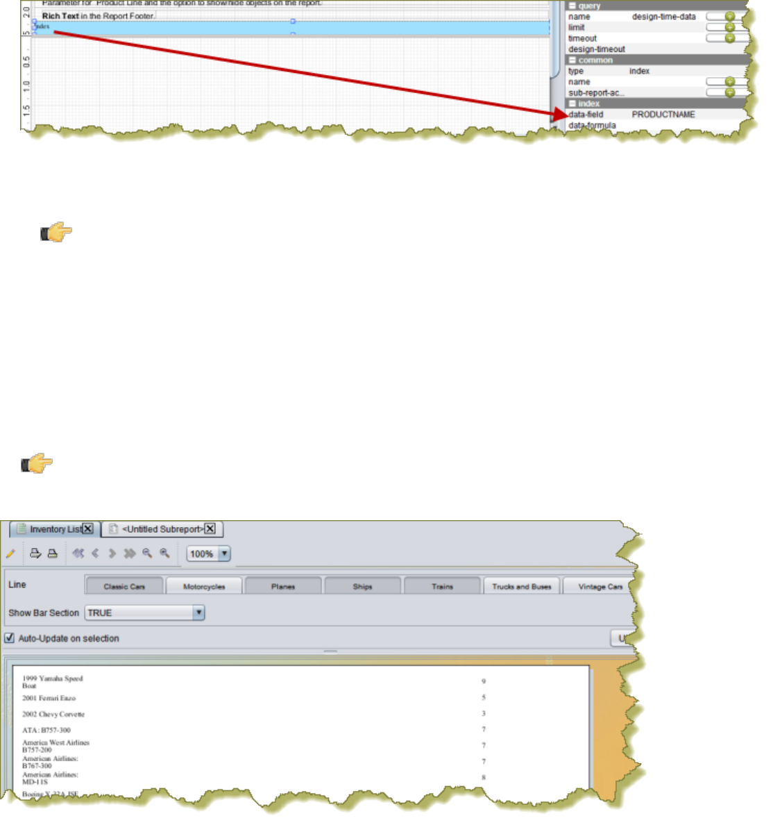
| Adding Report Elements | 50
Follow the instructions below to create an index.
1. Click and drag the index icon onto the report canvas.
You are prompted to make the index element Inline or Banded. Choose one. Inline sub-reports can be placed side-
by-side with other elements (even other sub-reports). Banded sub-reports occupy a variable height, but 100% of the
report page width, so they cannot be on the same line with other elements.
2. Click the index element; under Attributes, double-click data-field and select the field to which you want to map. In
the example below, the data-field is mapped to PRODUCT NAME.
•data-field — Defines the field to be used as the item-data or item-key.
•data-formula — Defines an open formula to be used as the item-data or item-key.
Important: Make sure that data-field is not defined, if this is used.
•index-separator — Defines the separator text that is used between page numbers in the item-pages field in the
index sub report. It defaults to ",".
•condensed-style Define whether a "-" is used between continuous page numbers; example, 4,5,6,7 would
display as 4-7.
3. Double-click the index element.
A new sub-report tab opens.
4. In the new report tab, create the appropriate index heading. Add the item-data and item-pages functions to
generate the index data field name and page numbers. Keep in mind that all your entries will be included in the
parent report. When you are finished, switch back to the main report tab.
5. Preview your report.
Note: The index appears on the last page of your report.
You should now have an index embedded in your current report.

| Creating Charts | 51
Creating Charts
A chart can be the most important graphical element in your report; it shows the report data visually so that readers can
more easily see how the numbers compare. It's easy to add a simple chart in Report Designer, but it will take some time
to tweak it to your exact specifications.
There are two types of charts in Report Designer: Traditional JFreeChart elements, and sparkline charts.
This section is both a reference and a set of tasks; read it in whatever fashion best supports your workflow.
Choosing the Right Chart Type
There are 17 JFreeChart chart types built into Report Designer, with some of them changing significantly based on
which data collector you choose.
If you want to show the strength of a trend for a single value over time, the best chart types are:
• Line
• Area
• XY StepArea
• XY Step
• XY Line
If you are directly comparing two or more related values, the best chart types to choose are:
• Pie
• Ring
• Bar
• Line
• Area
• Radar
If you want to show how one set of values directly affects another, the best chart types are:
• Bar line combination
• Waterfall
If you are comparing a large number of data points, the best chart types are:
• XY Difference
• XY Dot (Scatter plot)
• Bubble
• Pie Grid (Multi-Pie)
If you need to show a trend among a small number of related numerical data points, a sparkline chart may be
appropriate. However, sparkline charts require comma-separated values for input, so if your data is not in that format,
you must create a function to pull it from your data source and put commas between each data point.
Creating a JFreeChart Element
To add a traditional graph or a chart to your report, follow this process.
1. Drag and drop a Chart element into a layout band.
2. Using the resize handles, change the size of the chart to fit your specifications.
3. Double-click the chart.
An Edit Chart dialog will appear with dozens of customizable options and settings.
4. Adjust the chart options to your preference, then click OK.
Consult the Chart Types on page 90 to learn more about what each setting does in each chart type.
5. Click Preview to verify that your chart appears as intended.
You should now have a suitable chart that visually represents the selected data.
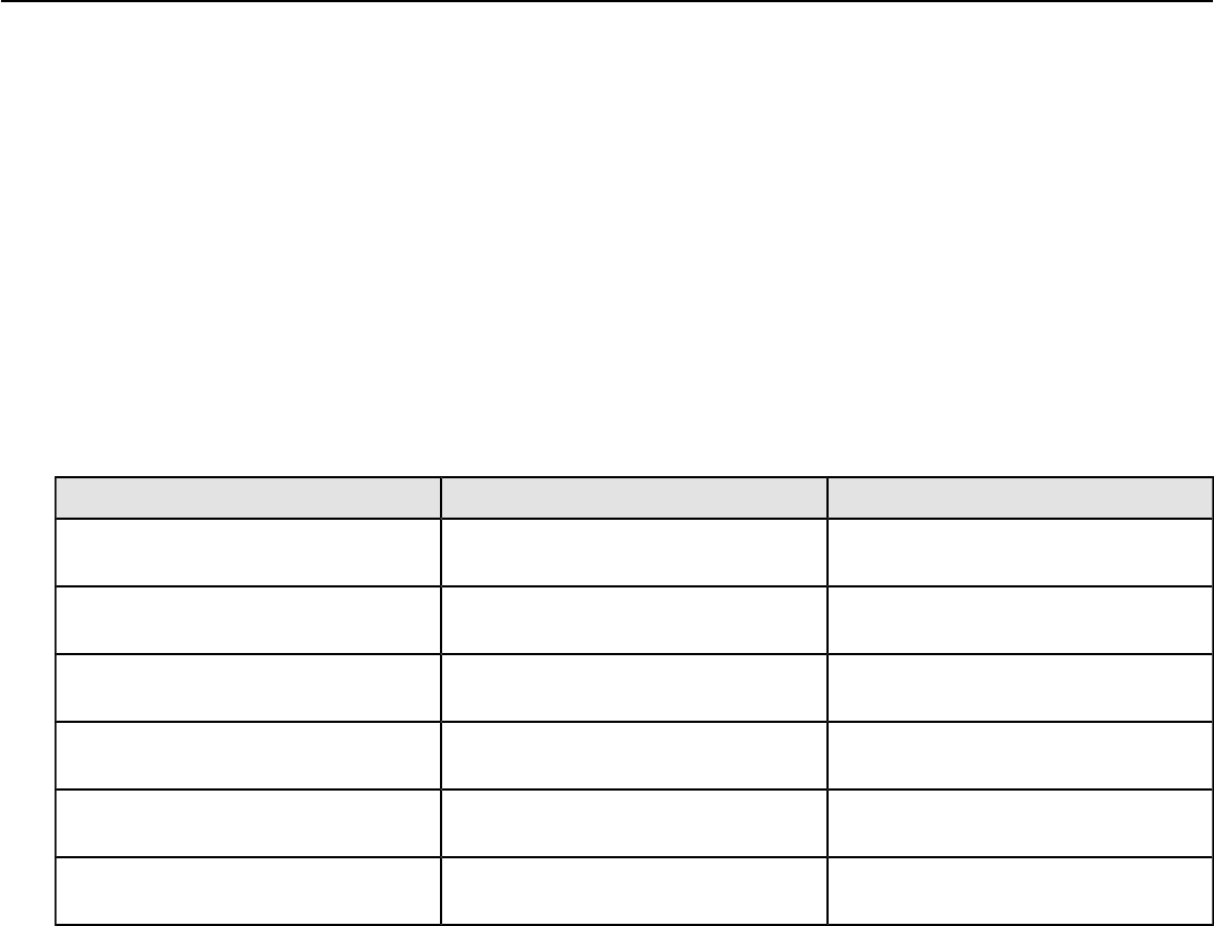
| Creating Charts | 52
Creating a Sparkline Chart
Sparkline charts require comma-separated values for input, so if your data is not in that format, you must create a
function to pull it from your data source and put commas between each data point. You can also create data points by
hand and enter them into a formula directly.
To add a sparkline chart to your report, follow this process.
1. Drag and drop a Sparkline Pie, Sparkline Bar, or Sparkline Line element into a layout band.
2. Using the resize handles, change the size of the chart to fit your specifications.
3. Click the round green + icon in the Value row.
A formula field will appear.
4. In the formula field, select the function that formats your sparkline data, or type in comma-separated values by hand
directly, then click Close.
5. Click Preview to verify that your chart appears as intended.
Sparkline
The below attributes belong to the sparkline property:
Attribute Name Purpose Possible Values
spacing Sets the spacing (in pixels) between
bars for a bar sparkline. Integer; default is 0.
start-angle Sets the start angle (in degrees) on a
pie sparkline. Integer; possible values are from 1 to
360. Default is 1.
counter-clockwise Sets the plot direction on a pie
sparkline. Boolean; default is false, which
represents clockwise.
high-slice Sets the hexadecimal color for the
high slice. String; there is no default, you must
define it manually.
medium-slice Sets the hexadecimal color for the
medium slice. String; there is no default, you must
define it manually.
low-slice Sets the hexadecimal color for the low
slice. String; there is no default, you must
define it manually.
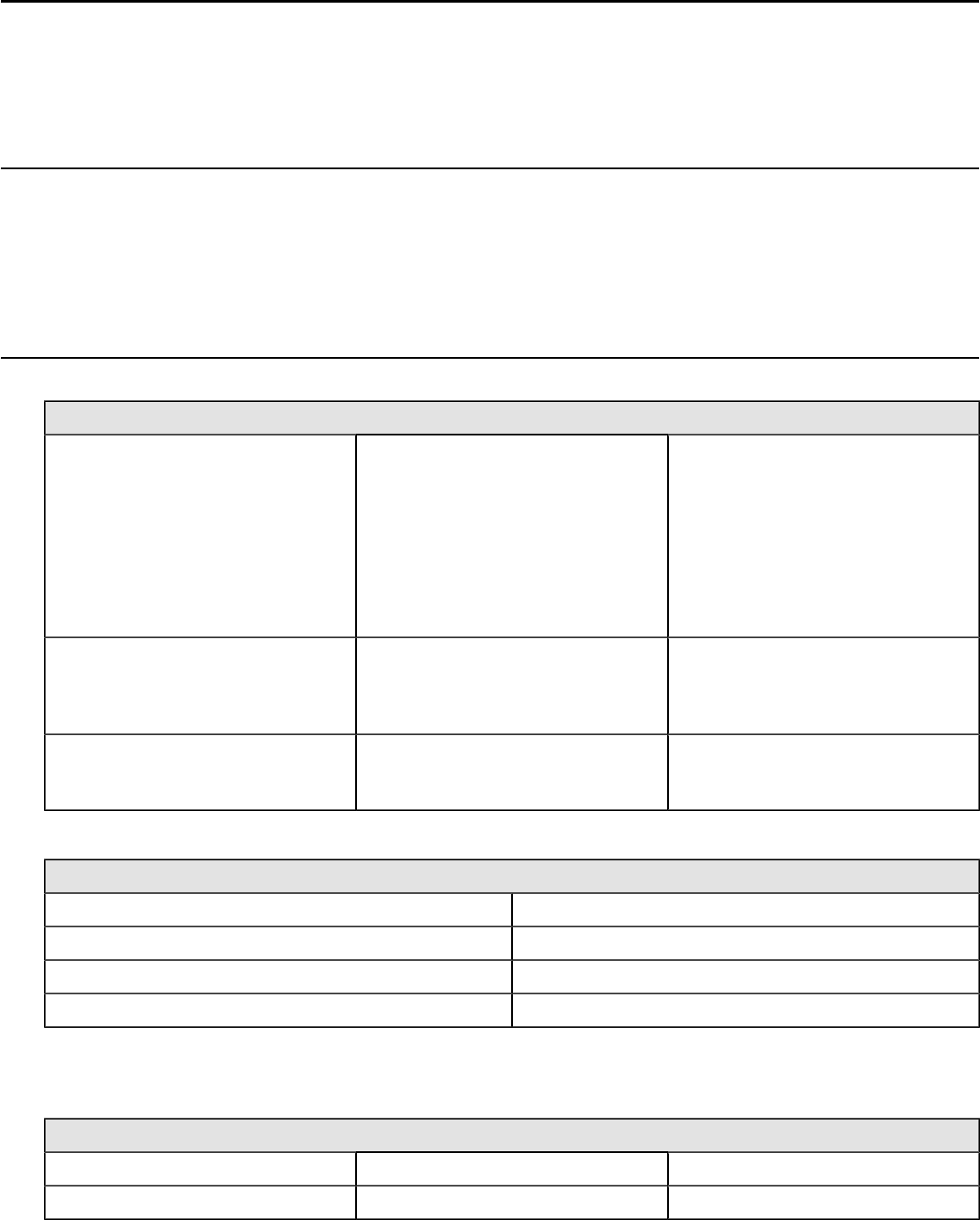
| Applying Formatting to Report Elements | 53
Applying Formatting to Report Elements
Once you've got your elements in place, there is much you can do to bring the appropriate level of distinction to them.
Report Designer contains all of the features you're used to in other content creation tools in terms of formatting and
design. See the sections below for details on specific formatting procedures.
Standard Element Formatting
All aesthetic aspects of all elements can be modified through the Style panel. However, all text-based elements such
as text, message, number, and date fields; and labels can be more easily modified through the toolbar just above the
report canvas. There you will see typical text controls found in nearly every text editor and word processor. These text
controls also work for non-textual elements, but the settings will only affect how the element's label appears in the
layout bands.
Creating Hyperlinks on Visualizations
You can add hyperlinks to charts with Pentaho Report Designer. A chart can link to three location types.
Location Type Description Generated Link Example
Pentaho Repository Creates a context link on the Pentaho
server http://localhost:8080/
pentaho//content/
analyzer/editor?command=
open&solution=steel-
wheels&path=analysis
&action=Product
%20Line%20Sales%
20Trend.xanayzer&line=Classic
%20Cars.
URL Creates a link that goes to a defined
URL http://
www.myApplication.com/
search?
myRegion=Est&myLine=Trains.
Self Creates a link to a custom-built web
application and refers back to itself as
a link. This option is rarely used.
N/A
Link locations depend on the chart type.
Chart Type Location of Link
Bar Bars
Area and line Markers
Pie and doughnut Slices
Bubble Bubbles
In the chart editor, you have several Chart Field options. Depending on the chart type, there are various internal chart
fields that can be used by the link and are only available when used within the Edit Chart dialogue box. Go to Formula
Editor > Toolbar to see these options.
Chart Field Descriptions Chart Type
chart:series-key Returns the series name Bar, line and area
chart:series-keys Returns all the series name Bar, line and area
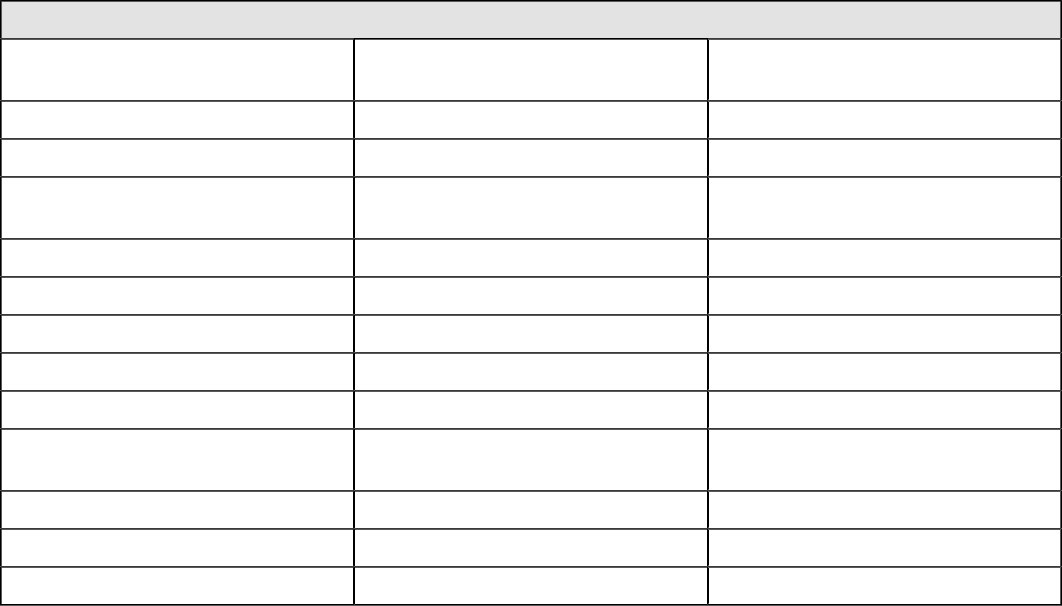
| Applying Formatting to Report Elements | 54
Chart Field Descriptions Chart Type
chart:series-index Returns the series index number
starting at 0 Bar, line and area
chart:category-key Returns the category name Bar, line and area
chart:category-keys Returns all category names Bar, line and area
chart:category-index Returns the category index number
starting at 0 Bar, line and area
chart:value Returns the numeric value Bar, line and area
chart:key Returns the slice name Pie and doughnut
chart:keys Returns all the slice names Pie and doughnut
chart:item Returns the category name Pie and doughnut
chart:items Returns all category names Pie and Doughnut
chart:pie-index Returns the category index number
starting at 0 Pie and Doughnut
chart:x-value Returns the value of x Scatter and XY
chart:y-value Returns the value of y Scatter and XY
chart:z-value Returns the value of z Scatter and XY
Creating a Link to a Report on a Chart
This section specifies how to create a chart within Report Designer that links to other reports or URLs. This action is
known as creating a "hyperlink" or a "drill-down" on a link.
1. Within the report, double-click on the chart to place a hyperlink.
The Edit Chart window appears.
2. Within the Edit Chart dialog box, scroll down to the Values section on the left panel. Select url-formula and a ...
appears. Click on the ... to show the Formula Editor.
3. Within the Formula Editor dialog box, select the last button on the right. This is the Drill-down Function button,
which looks like a chain link.
DRILLDOWN appears in the Formula box.
4. In the top of the Formula Editor display, click on the drop-down box to select the Location type.
5. Choose Pentaho Repository if the link opens a report from the repository.
a) If you choose Pentaho Repository, enter the URL to the Pentaho server in the Server URL field. For example,
http://<myPentahoServer>:<PortNumber>/<FileName>. Use the Path field to browse to the desired
linking report.
6. Choose URL if the link goes to a defined URL.
a) If you choose URL, enter the URL for the link in the Path field. For example, http://
www.<ApplicationName>/search?. If the URL requires parameters, you can define them in the Parameters
section. Click the Add parameter button to add an entry for the parameter name and value. They must be
defined as formulas. For example, myRegion = East or myLine = Trains. You can also use any data columns
or functions in the formula. For this example, the URL generated is http://www.myApplication.com/
search?myRegion=East&myLine=Trains.
7. Choose Self if the link goes to a custom web application and refers back to itself as a link.
a) If Self is chosen, set the list of parameters that your web application passes back into the report. The parameter
values need to be defined as a formula. You can also add any additional parameters and values that your custom
web application requires. You may find it necessary to use the internal chart fields here.
8. Within the Formula Editor display, view the Parameters applied to the report to ensure they are correct.
a) Select the Report Parameters tab to view the parameters used in the targeted report. This tab shows all the
parameters defined in the target report that can be mapped to the current report.
b) Select the System Parameters tab to allow report designer to optionally control the behavior of the Report
Viewer. The initial list provided is a pre-defined list of the most popular parameters. For example, TabActive
| Applying Formatting to Report Elements | 55
(when set to true, allows the target report to open in a new tab) and TabName (when TabActive is to true, allows
the tab name to be dynamically named using a formula) are frequently used as TabActive true and TabName =
"[::chart-series-key]". The defined list of parameters can be found in the Report Viewer Plugin wiki.
c) Select the Custom Parameters tab to add additional parameters to the report unique to a specific use case.
In rare cases, this would be a situation where the Report Viewer has been extended to accept additional
parameters.
9. Depending on location type, a DRILLDOWN function is generated in the Formula section. For example, for a local
report called oStatus that you want to link to Order Status.prpt, you would enter:
=DRILLDOWN("local-prpt"; NA();
{"oStatus"; ["chart::category-key"] | "showParameters"; [STATUS] |
"solution"; "steel-wheels" | "path"; "reports" | "name";
"OrderStatus.prpt"})
10.Run the report in your desired format. Clicking the green arrow and select the desired output type from the drop-
down menu.
The final product appears.
11.Double-click on the appropriate area within the chart to launch the link.
The new report appears in the browser.
The report is linked to another report using a hyperlink. This is also known as a drill-down link on a report.
Paste Formatting
Report Designer has the ability to copy the formatting properties of a certain element and apply them to other elements.
Follow this procedure to paste formatting:
1. Click on the element you want to copy formatting properties from.
2. Copy the element to the clipboard by either pressing Ctrl-C, or by right-clicking the element and selecting Copy from
the context menu.
3. Right-click the element you want to paste the formatting to, then press Ctrl-Shift-V, or right-click the target element
and select Paste Formatting from the context menu.
Morphing an Element
Any data-driven element can be transformed into another type of data-driven element. For instance, if you created
and configured a date field and you later realize that it actually needs to be a number field, you can easily change the
element type with the morph feature by following this process:
1. Select the element you want to morph.
2. Go to the Format menu, then select the Morph sub-menu.
3. In the Morph sub-menu, select the element type you would like to change to.
The element type should now be changed to the one you selected.
Implementing Row Banding
Sometimes report data can be difficult to read from left to right, especially if there isn't much space between rows.
Report Designer has a row banding property that allows you to add alternately colored backgrounds to each row. Follow
the process below to implement row banding.
1. In the Data pane, click on Add Function....
The Add Function window will appear.
2. Double-click the Report function category, then select Row Banding, then click OK.
A Row Banding function will appear in your Data tab.
3. Select the new Row Banding function in the Functions section.
4. In the Properties pane, select colors for the Active Banding Color and Inactive Banding Color properties, and set
any other options according to your preference.
| Applying Formatting to Report Elements | 56
Row banding is now implemented for each distinct rendered line in your Details band. Row banding makes it easier to
read reports, but if you need to go one step further, you can override it with conditional formatting.

| Performing Calculations | 57
Performing Calculations
There is much you can do with multiple data-driven elements in Report Designer. This section explains how to group,
summarize, and associate multiple report elements.
Using the Formula Editor
When adding conditional formatting or other constraints on data-driven report elements, you have the option of using
a built-in Formula Editor to help you build an expression with a graphical interface. All element properties in Report
Designer can have formulas. You can type in your own formula by hand, but it's much easier to use the built-in Formula
Editor to build an expression.
The Formula Editor provides you with basic math and comparison operators so that you don't have to enter them
manually. Also provided are concatenate and percent functions. Click the (Field Selector) to select fields in the
report.
Follow the instructions below to use Formula Editor:
1. Click on the element you want to add a condition or constraint to.
2. In the Style pane, select the property you want to add a constraint to, then click the round green + icon on the right
side of the field.
3. Click the ... button.
The Formula Editor window appears.
4. Select a function category from the drop-down box.
The default category is All.
5. Select a function from the Functions list.
If you click on a function, a description of what it does will appear in the tan-colored field at the bottom of the window.
6. Double-click on a function to bring up the option fields.
7. Erase the default values in the option fields, and replace them with your own settings. If you need to associate a
column with a function, click the Select Field button to the right of the field, then select the data or function you want
to use.
Follow proper SQL syntax in your options; all values must be in quotes, and all column names must be in uppercase
letters and enclosed in square brackets.
8. When you're done, click OK, then click Close.
You have applied a formula to a report element.
If you need more information on formula functions, conditionals, and operators, refer to the OASIS OpenFormula
reference: http://www.oasis-open.org/committees/download.php/16826/openformula-spec-20060221.html. Pentaho
does not implement all OpenFormula functions, but the ones included in Report Designer are documented sufficiently
on the OASIS Web site.
Common Formulas
By customer request, this section contains commonly created formulas in Report Designer.
Conditional Formatting
The formula described here will highlight a given data cell with either a red or green background depending on a string
value from a field in your result set. You can easily modify these instructions to use different indicators or thresholds to
match your preference.
1. Open an existing report or create a new report and establish a data source and query, then drag your data-driven
fields onto the canvas.
2. Select (left click) the data field you want to conditionally highlight.
3. Click the Structure tab and click bg-color in the text section under the Style tab.
4. Click the round green + (Add Expression) icon in the Formula column.
The Expression dialogue will appear.
| Performing Calculations | 58
5. Click the ellipsis (...) to open the Formula Editor dialog box.
6. Select Logical from the Category drop-down box.
7. Double-click the IF statement in the list on the left.
8. Click the Select Field icon, (on the far right), next to the Test line.
9. In the Select Field box, choose the field you want to conditionally format, then click OK to return to the Formula
Editor.
Alternatively, you can simply type the field name in [square brackets] if you already know what it is.
10.Add a conditional statement to the Test line, after your field name.
This is one of your formatting conditionals. For instance if you wanted to highlight cancelled orders in red, and this
field contained order status, you could put [STATUS]="Cancelled" in the Test line, then a color value for red in the
Then_value line, as shown in the next step.
[STATUS]="Cancelled"
11.In the Then_value line, type the color value or name you want to highlight this field with if the condition in the Test
line is met.
This can be a standard hexadecimal color value (such as #FF0000 for red), or a standard HTML color name (red,
green, white, black, etc.).
Note: This value must be in quotes.
12.Click OK to exit the Formula Editor dialog box; click Close to exit the Expression dialog box.
13.Click Preview and verify that your conditional formatting is properly executed. You may have to adjust your query if it
does not produce a testable result set.
14.Optional: To add more conditions -- such as to highlight both cancelled and disputed orders in red -- add an
OR statement at the beginning of your Test line, enclose the conditions in parenthesis, and separate them with
semicolons.
OR([STATUS]="Cancelled";[STATUS]="Disputed")
Your report output should now be formatted according to the specified conditions.
This is the resultant formula, following the above example for one condition and red and green
colors:
Simple conditional formatting
=IF([STATUS]="Cancelled";"#FF0000";"#00CC00")
This is the resultant formula, following the above example for two conditions and red and green
colors:
Multiple conditions
=IF(OR([STATUS]="Cancelled";[STATUS]="Disputed");"#FF0000";"#00CC00")
Calculated Dates
This task is only useful for result sets that contain date information.
The formula described here will provide a calculated date in a report. Typically you would display a date as a static
number or a range, but the process explained below will enable you to display specific dates like "the first Monday of
the month" or "every second Wednesday."
1. Open an existing report or create a new report and establish a data source and query, then drag your data-driven
fields onto the canvas.
2. Select (left click) the text field you want to print the calculated date in; if you do not have a text field dedicated to this
task, create one now.
3. Click the Structure tab and click value in the common section under the Attributes tab.
| Performing Calculations | 59
4. Click the round green + (Add Expression) icon in the Formula column.
The Expression dialogue will appear.
5. Click the ellipsis (...) to open the Formula Editor dialog box.
6. Select Date/Time from the Category drop-down box.
7. Double-click the DATEVALUE item in the list on the left.
8. Enter in your DATEVALUE formula, then click OK.
For more information on DATEVALUE's parameters, see the OASIS reference page for DATEVALUE: http://
www.oasis-open.org/committees/download.php/16826/openformula-spec-20060221.html#DATEVALUE and VALUE:
http://www.oasis-open.org/committees/download.php/16826/openformula-spec-20060221.html#VALUE. Alternatively
you can consult the examples below and modify them for your purposes.
9. Click Close to exit the Expression dialog box.
10.Click Preview and verify that your date values are properly calculated and formatted. You may have to adjust your
query if it does not produce a testable result set.
The date values you specified should now appear correctly in your report.
Some common calculated date formulas:
1st day of current month
=DATEVALUE(DATE(YEAR(NOW());MONTH(NOW());1))
Sunday of current week
=DATEVALUE(DATE(YEAR(NOW());MONTH(NOW());DAY(NOW())-WEEKDAY(Now();2)))
Saturday of current week
=DATEVALUE(DATE(YEAR(NOW());MONTH(NOW());DAY(NOW())-WEEKDAY(Now())+7))
Current day, date, and time
=NOW()
Current date
=TODAY()
Yesterday's date
=DATEVALUE(DATE(YEAR(NOW());MONTH(NOW());DAY(NOW()-1)))
Date and Time Parameters
This task is only useful for result sets that contain date information. You should also want to do some kind of sorting
based on date or time results.
The formula described here will provide a date picker in a report parameter, allowing report users to view data
constrained by the specified date and time.
1. Open an existing report or create a new report and establish a data source and query, then drag your data-driven
fields onto the canvas.
2. Add a new parameter by clicking the Master Report Parameter button at the top of the Data pane.
The Add Parameter... dialogue will appear.
3. Type in an appropriate parameter name and friendly name for the parameter.
4. In the Value Type field, select or type in Date.
5. Create a formula for the Default Value Formula.
If you want the current date and time to be the default, you can use =NOW() as your formula, or for a slightly more
specific output, try =DATEVALUE(DATE(YEAR(NOW());MONTH(NOW());DAY(NOW())-WEEKDAY(Now()))).
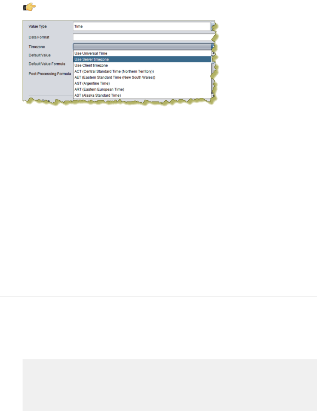
| Performing Calculations | 60
Note: Alternatively, to define a time-related value use the Time Value Type and select the appropriate option
under Timezone.
6. In the Display Type field, select Date Picker, then click OK to create the parameter.
7. Click Preview and verify that the parameter displays and functions correctly. You may have to adjust your query if it
does not produce a testable result set.
Your report's date-based result set can now be manually adjusted by report users.
Page Numbering
Follow the directions below to add page numbers to your report.
1. Select the Data pane in the Report Designer interface.
2. Right-click the Functions section of the Data pane, then select Add Functions... from the context menu.
The Add Function dialogue will appear.
3. Double-click the Common category in Functions.
4. Click Page of Pages, then click OK.
A new Page of Pages function will be added to your Functions list.
5. Drag a new text-field element to either the Page Header or Page Footer band.
6. Select the new text-field element, then go to the Attributes pane (you must select the Structure tab in order to
access the Attributes pane).
7. In the field attribute's drop-down list, select the Page of Pages function that you created earlier.
You now have a page number printed in the header or footer of every page in your report. Adjust the size and position
of this element to match your preferences.
Summarizing Data in Groups
It's possible to sort data by multiple fields by creating groups. Follow this process to summarize data in groups:
1. Double-click on your data source to open the query configuration dialog.
2. Reorder your query so that the fields you want to sort by are listed at the beginning of your SELECT statement.
If you use the SQL Query Designer to do this, you can simply drag and drop the columns in your SELECT section to
change their order; if you use the query window, you can carefully copy and paste the columns to reorder them.
3. Copy the same columns you reordered in the SELECT section into the ORDER BY section, in the same order you
specified previously.
SELECT
`PRODUCTS`.`PRODUCTLINE`,
`PRODUCTS`.`PRODUCTVENDOR`,
`PRODUCTS`.`PRODUCTNAME`,
`PRODUCTS`.`PRODUCTCODE`,
`PRODUCTS`.`PRODUCTSCALE`,
`PRODUCTS`.`PRODUCTSCALE`,
`PRODUCTS`.`PRODUCTDESCRIPTION`,

| Performing Calculations | 61
`PRODUCTS`.`QUANTITYINSTOCK`,
`PRODUCTS`.`BUYPRICE`,
`PRODUCTS`.`MSRP`
FROM
`PRODUCTS`
ORDER BY
`PRODUCTS`.`PRODUCTLINE` ASC,
`PRODUCTS`.`PRODUCTVENDOR` ASC,
`PRODUCTS`.`PRODUCTNAME` ASC
4. Save the query and close the configuration window.
5. Right-click the Groups category in the Structure pane, and select Add Group from the context menu.
6. Type in a name for this group in the Name field.
7. In the Available Fields area on the left, select each row you want to add to the group, then click the arrow button to
move it to the Selected Fields area on the right.
8. Select the Data pane, then click Add Function.
9. Double-click the Sum function category, then select Sum, then click Add.
10.Select the newly created TotalGroupSumFunction item in the Functions list, then click on the Reset on Group
Name property in the lower right pane.
11.Click the [...] button, select the group you just created in the list, then click OK.
You now have the proper Report Designer configuration to create a report with data sorted in groups. You can test this
by adding text and number fields to your group and details bands, connecting them to the columns and functions you
defined earlier, and previewing your report.
| Output Parameterization | 62
Output Parameterization
Rather than generate multiple reports that share an identical layout and mostly the same data, it may be easier to
maintain one report with parameterized output that enables the person viewing the report to change the structure or
values of some of the data.
Simple parameterization involves changing data values. For instance, you might give readers an option to filter by the
values in a drop-down list. This can include values stored in a particular column; for instance, you could choose to
parameterize a column that contains product names, in which case the report reader would be able to change which
product he wanted to see data for. Simple parameters are added after the data structure has been defined through a
query.
Advanced parameters give readers the power to change the structure of the data. For instance, you might offer an
option to select among multiple columns in a given table. These parameters must be expressed as formulas, and are
executed along with the query.
Simple SQL Output Parameterization
This procedure requires a JDBC data source type.
You can add dynamic interactivity to a published report such that when a user executes or views it, he can specify
how to constrain certain parts of the query data. This is called parameterization. Follow the procedure below to
parameterize a report by adding an SQL WHERE statement to your query.
Note: You can only use this procedure to parameterize data returned by a query. You cannot use a WHERE
statement to dynamically choose columns or change the structure of tabular data. If you need to go beyond the
capabilities of the method explained in this section, see Advanced SQL Output Parameterization on page 63
to create a custom formula instead.
1. Open the report you want to parameterize.
2. Click the Data tab in the upper right pane.
3. Right-click the Parameters item in the Data pane, then select Add Parameter... from the context menu.
The Add Parameter dialogue will appear.
4. Select or change the options according to the definitions below:
Field Purpose
Name The name of the parameter within Report Designer
Label The label of the parameter that will be shown to report
readers -- a "friendly name"
Value Type The data type of the column you chose in the Value field
above
Data Format Determines how the data specified by Value Type
is formatted. For instance, dates and times can be
formatted in a variety of different ways
Default Value The value from the Value column that you want to pre-
populate the parameter object with. This is a text field,
so you must know the values in advance
Default Value Formula Allows the Default Value to change dynamically, based
on the formula you specify
Post-Processing Formula Allows you to update a selected value according to
conditions you specify in your formula
Mandatory A checkbox which determines whether this parameter is
required in order to display any data in the report
Hidden A checkbox which hides the parameter from appearing
when the value is already passed in a session variable
| Output Parameterization | 63
Field Purpose
Display Type The method of selection for this parameter; determines
how report readers choose different values
Query A drop-down list of queries that you have already
defined. If you need to define a new query, use the
toolbar above the left pane
Value The value that is substituted into the query
Display Value Formula Forces the display value to change depending on the
conditions specified in your formula
5. Edit your target data source by double-clicking its entry in the Structure pane.
6. Below your FROM statement, add a WHERE statement that specifies which column you would like to query the user
about, assigned to a parameter that has a name descriptive enough for users to understand.
This should be one of the columns you have a SELECT statement for in the same query.
7. Click OK to save the query.
8. Include the parameterized fields in your report by dragging them onto the canvas.
9. Publish or preview your report.
When a user runs this report, he will be presented with an interactive field that specifies an adjustable constraint for
the column you specified. For instance, in the example below, the constraint would be a specific product line from the
PRODUCTLINE column of the PRODUCTS table.
SELECT
PRODUCTLINE,
PRODUCTVENDOR,
PRODUCTCODE,
PRODUCTNAME,
PRODUCTSCALE,
PRODUCTDESCRIPTION,
QUANTITYINSTOCK,
BUYPRICE,
MSRP
FROM
PRODUCTS
WHERE PRODUCTLINE = ${ENTER_PRODUCTLINE}
ORDER BY
PRODUCTLINE ASC,
PRODUCTVENDOR ASC,
PRODUCTCODE ASC
Advanced SQL Output Parameterization
This procedure requires a JDBC (Custom) data source type. Establish this data source before continuing with the
instructions below. You do not need to construct a query yet.
You can add dynamic interactivity to a published report such that when a user executes or views it, he can specify
how to constrain certain parts of the query data. This is called parameterization. Follow the procedure below to
parameterize a report by creating a custom formula.
Note: This option allows you to parameterize both structure and values. If you only need to parameterize
values, see Simple SQL Output Parameterization on page 62 instead.
1. Open the report you want to parameterize.
2. Right-click the Parameters item in the Data pane, then select Add Parameter... from the context menu.
The Add Parameter dialogue will appear.
3. Select or change the options according to the definitions specified in Simple SQL Output Parameterization on page
62.
| Output Parameterization | 64
4. Go to the Structure pane, then select Master Report.
5. In the Attributes pane, click the round green + icon in the name field of the Query section.
The Expression window will appear.
6. Click [...].
The Formula Editor will appear.
7. In the Formula field, use a SELECT DISTINCT statement to parameterize the data structure with your previously
defined parameter, as shown in the example below (paramexample is a placeholder for the name of the parameter
you created earlier, COL1 is the example name of the element in your report that will be parameterized, and
PRODUCTS is an example table name in your database).
Note: The spaces after DISTINCT and before AS are extremely important. Do not omit them.
="SELECT DISTINCT " & [paramexample] & " AS COL1 FROM PRODUCTS"
8. Click OK when you are done with the query, then click Close in the Expression window.
9. Add a field of the appropriate data type to your report, and name it according to the AS statement you defined in
your query.
In the example above, the name of the text field would be COL1.
10.Publish or preview the report.
When a user runs this report, he will be presented with an interactive field that specifies the source of the column you
specified.
Simple Metadata Output Parameterization
This procedure requires a Metadata data source type. Establish this data source and a query before continuing with the
instructions below.
You can add dynamic interactivity to a published report such that when a user executes or views it, he can specify
how to constrain certain parts of the query data. This is called parameterization. Follow the procedure below to
parameterize a Metadata-based report.
1. Open the report you want to parameterize.
2. Right-click the Parameters item in the Data pane, then select Add Parameter... from the context menu.
The Add Parameter dialogue will appear.
3. Select or change the options according to the definitions specified in Simple SQL Output Parameterization on page
62.
4. Edit your query and add the columns you want to parameterize to the Conditions field.
5. Create a parameter token in the Value field of each row in the Conditions area, and a valid default value in the
Default field.
Parameter tokens are in {braces} and do not contain spaces.
6. Click OK to save the query.
7. Include the parameterized fields in your report by dragging them onto the canvas.
8. Publish or preview the report.
When a user runs this report, he will be presented with an interactive field that specifies an adjustable constraint for the
column or columns you specified.
Simple OLAP Output Parameterization
This procedure requires a Pentaho Analysis (Mondrian) data source type. Establish this data source and a query
before continuing with the instructions below.
You can add dynamic interactivity to a published report such that when a user executes or views it, he can specify
how to constrain certain parts of the query data. This is called parameterization. Follow the procedure below to
parameterize an OLAP-based report.
| Output Parameterization | 65
1. Open the report you want to parameterize.
2. Right-click the Parameters item in the Data pane, then select Add Parameter... from the context menu.
The Add Parameter dialogue will appear.
3. Select or change the options according to the definitions specified in Simple SQL Output Parameterization on page
62.
4. Edit your MDX query and add parameter functions and a where statement, as in the example below.
with
set [TopSelection] as
'TopCount(FILTER([Customers].[All Customers].Children,[Measures].[Sales]>0),
Parameter("TopCount", NUMERIC, 10, "Number of Customers to show"), [Measures].
[Sales])'
Member [Customers].[All Customers].[Total] as 'Sum([TopSelection])'
Member [Customers].[All Customers].[Other Customers] as '[Customers].[All
Customers] - [Customers].[Total]'
select NON EMPTY {[Measures].[Sales],[Measures].[Quantity] } ON COLUMNS,
{ [TopSelection], [Customers].[All Customers].[Other Customers]} ON ROWS
from [SteelWheelsSales]
where
(
strToMember(Parameter("sLine", STRING, "[Product].[All Products].[Classic Cars]")),
strToMember(Parameter("sMarket", STRING, "[Markets].[All Markets].[Japan]")),
strToMember(Parameter("sYear", STRING, "[Time].[All Years].[2003]"))
)
5. Click OK to save the query.
Note: Each parameter must have its own query or data table.
6. Include the parameterized fields in your report by dragging them onto the canvas.
7. Publish or preview the report.
When a user runs this report, he will be presented with an interactive field that specifies an adjustable constraint for the
column or columns you specified.
Permanently Overriding the Auto-Submit Option
This feature only applies to reports that are published to the BA Server.
Ordinarily the presence of the auto-submit option is determined when designing the report, simply by selecting the
option in the Master Report's Attributes pane in Report Designer. However, if you want to permanently enable or disable
this option and set a static value for all published reports, you must use the autoSubmit URL parameter, which you can
force a value for through the plugin.xml configuration file.
1. Stop the BA Server process or service.
/home/pentaho/pentaho/biserver-ee/stop-pentaho.sh
2. Open the /pentaho/server/biserver-ee/pentaho-solutions/system/reporting/plugin.xml with a
text editor.
vim /home/pentaho/pentaho/server/biserver-ee/pentaho-solutions/system/reporting/
plugin.xml
3. Find the RUN id and add an autoSubmit=false (or true, if you want to set this feature to always submit the
parameter) parameter to the front of the URL in the command element, as shown below:
<operation>
<id>RUN</id>
<command>content/reporting/reportviewer/report.html?
autoSubmit=false&solution={solution}&path={path}&name={name}</command>
</operation>

| Output Parameterization | 66
4. Save and close the file, then start the BA Server process or service.
/home/pentaho/pentaho/biserver-ee/start-pentaho.sh
The auto submit checkbox will now always appear or not appear in rendered reports, depending on the value you
chose.
| Integration With the Pentaho BA Server | 67
Integration With the Pentaho BA Server
You can easily publish a report to a variety of different output using the Report Designer Preview As and Export
functions in the File menu. However, if you have a Pentaho BA Server in production, you can publish directly to it
instead. Additionally, you can link two reports together so that they share selected resources.
Instructions in this section assume that the BA Server is accessible from the machine where you are using Report
Designer. For information about configuring the BA Server, see the section called Configure the BA Server.
Publishing to the BA Server
If your administrator has enabled row-level security and the report you are publishing includes data from restricted data
sources, it is possible that you may not have permission to run the selected report.
1. Open the report you want to publish.
2. Click File > Publish to Server.
The Repository Login window appears.
3. Enter your Pentaho BA Server connection information, then click OK.
If you do not know what should go in any field in this dialog box, contact your system administrator or IT manager.
Report Designer connects to the BA Server and publishs the report. If everything is properly configured and you entered
the right connection information, the operation is successful. If this process is not successful, an error message appears
that contains information that describes the problem.
Editing an Interactive Report
You can use Report Designer to edit a report created with Pentaho Interactive Reporting. This procedure assumes that
you have a .prpti report created with Pentaho Interactive Reporting
Note: Once a .prpti file has been edited with Report Designer, it can no longer be used with Interactive
Reporting.
1. Copy the .prpti file from the solution in the BA Server's /pentaho-solutions/ directory to the workstation that
has Report Designer.
If you have the BA Server and Report Designer on the same machine, this step may not be necessary. However,
you may need to create a copy of the .prpti file if you want to continue using the original in Interactive Reporting.
2. Copy the .xmi data source file from the solution in the BA Server's /pentaho-solutions/ directory to the
workstation that has Report Designer.
3. Start Report Designer and open the .prpti file.
4. Edit the report's data source definition and replace the URL to the BA Server's XMI file to the one you copied from
the BA Server.
Report Designer is unable to connect to XMI files on remote BA Server machines. If you have the BA Server on
the same system with Report Designer, you can continue using that XMI file, but you still have to provide the local
filesystem location in place of the old BA Server URL.
5. Establish a data source connection to the database referenced in the XMI file.
The XMI file defines a metadata model, which can be used as a data source so long as the database it provides
metadata for is available to Report Designer.
6. Copy the appropriate JDBC driver for the XMI database connection to the /report-designer/lib/jdbc/
directory.
You may already have an appropriate database driver; if so, skip this step.
You have successfully migrated an Interactive Report to Report Designer. From here, you can render and distribute
or publish it. If you publish this file to the BA Server, it will be treated as a Report Designer .prpt report, not as an
Interactive Reporting .prpti report.
| Integration With the Pentaho BA Server | 68
Hiding Reports
You must have a report file open in order to proceed.
Use this feature in instances in which you want to prevent users from viewing an unfinished report in the Pentaho User
Console but want to ensure that the report publishes successfully. You can also use this feature to make the report
exclusively accessible from another report through linking.
1. Go to the Structure pane and select Master Report.
2. Under Attributes, scroll down to the visible attribute.
3. Right-click the visible attribute and choose False.
4. Save and publish your report.
The report, even though published successfully, does not display in the Pentaho User Console. You can edit the report,
as needed, in Report Designer.
Linking Reports
Just as you can create a hyperlink to a Web address, you can also create a hyperlink from one report to another, as
long as the report you're linking to is published on a Pentaho BA Server. Follow the below process to link to a published
report.
1. Log into the Pentaho User Console.
2. Run the report you want to link to.
3. When the report is generated, copy its URL from your browser's address bar.
4. Start Report Designer and open the report you want to link from.
5. Follow the process of adding a hyperlink as explained in Adding Hyperlinks on Report Elements, using the URL you
copied from the Pentaho User Console as the Hyperlink-Target value.
6. Save and publish the report as you normally would.
The published report will now link to the report URL you copied at the beginning of this procedure when viewed through
the Pentaho User Console.
Linking in Tabs
To open a link to a report, Analyzer report, or action sequence in a Pentaho User Console tab, the parameters
described in the table below must be defined.
Parameter Description
::TabActive Defaults to FALSE. When set to TRUE, this parameter
opens the target report in the Pentaho User Console
report tab.
::TabName Allows you to assign a name to the report tab either using
static text, data field, parameter or a function.
For .prpt reports, the TabActive and TabName parameters can be found under System Parameters. For other file
types, you must define them under Custom.

| Localizing a Report | 69
Localizing a Report
Report Designer can dynamically pull text content from message bundles that contain localized strings. This enables
you to localize the static and dynamic text content in a report.
The relevant report elements you must work with to dynamically localize a report are: Resource Message, Resource
Label, and Resource Field. You'll use these in place of standard report text elements.
Follow the below procedure to prepare a report for localization.
1. Open the report you want to localize.
2. Go to the File menu and select Resources....
The Resource Editor window will appear.
3. Click Create to create a new default resource bundle.
A resource details window will appear.
4. Type in a file name for your resource file (using a .properties extension), and select its content type from the drop-
down list.
You should name this properties file without any country or language codes. Pentaho Reporting will default to a
non-localized message bundle name if no locale is specified, so the first message bundle you create should be the
one you want to use by default. Typically you would use the report name for the resource bundle name. So for an
InventoryList.prpt report, you would name your resource bundle InventoryList.properties.
5. In the Resource Editor, select the message bundle you just created, then click Edit.
A text window will appear.
6. Enter name/value pairs for all of the Resource Labels you intend to create, with the name of the label on the left and
the value on the right, as shown in the example below.
title=Sales Report 2011
companyLabel=Steel Wheels, Inc.
7. Repeat the previous four steps for every locale and language you want to account for, using the appropriate
language and country codes in the file names.
Following the example above, the traditional French version of the properties file would be
InventoryList_fr_FR.properties. Refer to the Customizing Pentaho Business Analytics document for more details
on message bundle naming conventions.
8. Add a Resource Label, Message, or Field to the report canvas.
9. With the new element selected, go to the Attributes pane.
10.Set the name of this replaceable resource in the value field.
This must match the name that you specified in your message bundle earlier. To follow the example above, your
resource labels should be named title and companyLabel.
11.Set the name of the resource bundle that will contain this replaceable resource in the resource-id field.
This should not have a .properties extension. Following the example above, this would be InventoryList.
Your report will be localized according to your specifications. You can test this by changing the language code for
Report Designer through the .environment.designtime.Locale variable in the Configuration dialogue in the File
menu.
Using Externalized Message Bundles
You can localize a Pentaho Report and keep the property files external. This enables you to share property files among
multiple PRPT reports, which minimizes the files you need to maintain. To use external message bundles (.properties
files), define the key/value pairs as described in Localizing a Report on page 69, but place the bundles on the
classpath for the report engine to find.
If you are in Pentaho Report Designer, add the files to the [PRD Install]/resources directory. For them to be
recognized in the Pentaho Webapp, put the files in the pentaho/WEB-INF/classes directory.
| Creating Report Design Wizard and Interactive Reporting Templates | 70
Creating Report Design Wizard and Interactive Reporting
Templates
This section contains information on creating templates for Report Design Wizard and Interactive Reporting.
Report Design Wizard Template Design Guidelines
Methodology
To create a new RDW template, you must use Report Designer to create a report with certain template-specific
properties enabled. The resultant PRPT file is then deployed to the Report Designer and/or Pentaho Data Integration
template directory.
Requirements
The generated-content-marker attribute in the wizard group is the flag that turns a normal report into a template. This
attribute can only be applied to a band (group header, group footer, details header, details footer, details, or sub-band).
RDW will insert its auto-generated content into the first band with the generated-content-marker set to true. This
applies to the group header, group footer, details header, details footer, and the details bands. In the event there are
more groups defined in the Report Design Wizard than defined in the template, it repeats the last defined group header
and footer in the template.
Formatting Inheritance
Formatting styles are inherited, so any formatting applied to a band will also be applied to the elements used within it.
Formatting is applied in three ways and in the following order:
1. Through the template via band inheritance
2. Through query data where it is defined in Pentaho Metadata
3. As defined by RDW users through the RDW interface
Inheriting Styles from the Data Query
The query-metadata section of the Attributes tab contains options that determine whether formatting styles can come
from the data query and be applied to the detail header, details, or detail footer band. This must be set directly on the
detail header, detail footer, or details band; and the style-format option must be set to true for it to work. You must also
disable any individual formatting styles (enable-style-*=true) that you don’t want to come from the query.
Padding and Grid Lines
Since the Details band is dynamically generated, you have to specify grid line and padding settings in the template
definition. This is done through the wizard attribute group for the band that has the generated-content-marker
enabled.
Updating
An RDW template is only a set of initial defaults for a report, so if a template is updated, completed reports that were
based on that template will not be affected; there is no connection between the template and the report once the report
is saved. If you want to update an RDW-based report to reflect template changes, you can edit the report with Report
Design Wizard, make any necessary selections, and re-save it.
Note: Interactive Reporting templates have the opposite behavior because the report links itself to the template;
when an IR template is changed, all reports based on that template will automatically inherit the updated
template.

| Creating Report Design Wizard and Interactive Reporting Templates | 71
Interactive Reporting Template Design Guidelines
Methodology
To create a new Interactive Reporting template, you must use Report Designer to create a report with certain template-
specific properties enabled. The resultant PRPT file is then deployed to the IR plugin's template directory.
Requirements
The generated-content-marker attribute in the wizard group is the flag that turns a normal report into a template. This
attribute can only be applied to a band (group header, group footer, details header, details footer, details, or sub-band).
RDW will insert its auto-generated content into the first band with the generated-content-marker set to true. This
applies to the group header, group footer, details header, details footer, and the details bands. In the event there are
more groups defined in the Report Design Wizard than defined in the template, it repeats the last defined group header
and footer in the template.
Formatting Inheritance
Formatting styles are inherited, so any formatting applied to a band will also be applied to the elements used within it.
Formatting is applied in three ways and in the following order:
1. Through the template via band inheritance
2. Through query data where it is defined in Pentaho Metadata
3. As defined by IR users through the Interactive Reporting interface
Inheriting Styles from the Data Query
The query-metadata section of the Attributes tab contains options that determine whether formatting styles can come
from the data query and be applied to the detail header, details, or detail footer band. This must be set directly on the
detail header, detail footer, or details band; and the style-format option must be set to true for it to work. You must also
disable any individual formatting styles (enable-style-*=true) that you don’t want to come from the query.
Padding and Grid Lines
Since the Details band is dynamically generated, you have to specify grid line and padding settings in the template
definition. This is done through the wizard attribute group for the band that has the generated-content-marker
enabled.
Updating
A template is not just a set of initial defaults for a report -- it is the basis for that report. So if a template is updated,
completed reports that were based on that template will also change.
Note: Report Design Wizard templates have the opposite behavior; when an RDW template is changed, none
of the reports based on that template will be automatically be updated with those changes. Instead, you will have
to edit each report, apply the new template, and save it.
Dynamic Element Positioning in Templates
Use the following methods to accommodate for multiple page sizes in reports:
Percentages
Express the height, width, x position, and y position in percentages.
Block, inline, or row
Switch the band’s layout mode from canvas to either block, inline or row:
| Creating Report Design Wizard and Interactive Reporting Templates | 72
layout-mode value
canvas Uses the x and y position to place the element in the
band.
block Stacks elements vertically according to the layer order in
a band; width is set to 100%.
inline Stacks elements horizontally according to the layer order
in a band; width is determined by the length of the text in
the field, and wraps within the band.
row Stacks elements horizontally in one row according to the
layer order in the band.
Dynamic height message elements
Set dynamic-height=true on message elements. This will allow the element size to grow according to line height. Also,
setting the following Reporting engine configuration option will allow the element size to grow according to the font size
used:
org.pentaho.reporting.engine.classic.core.layout.fontrenderer.UseMaxCharBounds = true
Proportional column widths
To support varying window sizes in a Web browser, enable the use of proportional column widths so that the resulting
table will have a width of 100% and the columns will have the proportional equivalent of their static widths as width. The
relevant Reporting engine option to set this globally is:
org.pentaho.reporting.engine.classic.core.modules.
output.table.html.ProportionalColumnWidths = true
Template Properties
The following band properties affect RDW and PIR report templates. Notice that many properties have a different effect
in RDW than in PIR.
Band Report Design Wizard Interactive Reporting
page header None Edit message elements
report header None Edit message elements
group headers Inserts a message element with the
value of: fieldname: $(fieldname) Edits any message elements within
the band. Inserts a message element
with the value of: fieldname:
$(fieldname)
detail header 1: Inserts a column header label for
every field used. Default value for the
label is the fieldname. 2: Edits any
label within the band.
1: Inserts a column header label for
every field used. Default value for the
label is the fieldname. 2: Edits any
label within the band.
details Inserts the appropriate fields defined Inserts the appropriate fields defined
detail footer Insert a numeric field in the same
x-position and width of the details
field that the summary calculation is
applied.
None
group footer None 1: Inserts a numeric field in the same
x-position and width of the details
field that the summary calculation is
applied. 2: Inserts a message element
| Creating Report Design Wizard and Interactive Reporting Templates | 73
Band Report Design Wizard Interactive Reporting
in the x-position of the details field
with no summary calculations applied.
report footer None 1: Inserts a numeric field in the same
x-position and width of the details
field that the summary calculation is
applied. 2: Inserts a message element
in the x-position of the details field
with no summary calculations applied.
3: Edit any message elements within
the band
page header None Allows the modification of message
elements
Deploying a Template to Report Design Wizard
Once you've created a template for RDW, you must follow the below process to deploy it to Report Design Wizard in
Report Designer and Pentaho Data Integration.
1. Shut down Report Designer and Pentaho Data Integration if either of them are currently running.
2. Create an icon for your template, in PNG format, with the same name as the template file.
The size of the icon doesn't matter; RDW will scale it to fit the correct dimensions. However, you can avoid unusual
scaling issues by creating a square-shaped (equal width and height) graphic. If you'd like further guidance, take a
look at the default template icons that Pentaho provides in the templates directory.
3. Copy the icon and the PRPT template files to the following directories:
• /pentaho/design-tools/report-designer/templates/
• /pentaho/design-tools/data-integration/plugins/spoon/agile-bi/templates/
Your template is now deployed to Report Design Wizard and will be available when you next start Report Designer or
Data Integration.
Deploying a Template to Interactive Reporting
Once you've created a template for PIR, you must follow the below process to deploy it to the Interactive Reporting
plugin.
1. Shut down the BA Server if it is currently running.
2. Create an icon for your template, in PNG format, with the same name as the template file.
The size of the icon doesn't matter; PIR will scale it to fit the correct dimensions. However, you can avoid unusual
scaling issues by creating a square-shaped (equal width and height) graphic. If you'd like further guidance, take a
look at the default template icons that Pentaho provides in the templates directory.
3. Copy the icon and the PRPT template files to the /pentaho-solutions/system/pentaho-interactive-
reporting/resources/templates/ directory.
4. Edit the /pentaho-solutions/system/pentaho-interactive-reporting/resources/messages/
messages.properties file and add a new line for your template with the template_ prefix, the name of your
template file, and a friendly name for the template as you'd like it to appear in the PIR interface, as in the following
example (given a template filename of template_demo.prpt):
template_template_demo=Template Demo
Your template is now deployed to Pentaho Interactive Reporting.

| Creating Report Design Wizard and Interactive Reporting Templates | 74
Setting the Default Interactive Reporting Template
To change the default template for Interactive Reporting, edit the /pentaho-solutions/system/pentaho-
interactive-reporting/settings.xml file and change the value of the <default-template> node. You do not
have to provide a path to the template PRPT file -- just the filename.
<!-- default template -->
<default-template>1_jade_1_left_aligned.prpt</default-template>

| Troubleshooting | 75
Troubleshooting
This section contains reported or expected problem descriptions and solutions.
Enabling Multi-Valued report Parameters for Metadata-based Queries Created with
Previous Versions of Report Designer
In versions 3.7 and prior, there was no support for multi-value parameters in a Metadata query. If you have a report
created in an earlier version, which contains a Metadata query and an "exactly matches" condition, the report will
continue to work as is; however, if you try to change the parameter from a drop-down to a multi-selection type, such as
a checkbox containing more than one value, the report will fail.
To resolve the problem, simply open the query for editing (Query Editor) and click OK. This adjusts MQL query to use
the EQUALS function instead of the = operator. No additional changes are necessary.
Report Elements With Dynamic Heights Overlap Other Elements
If you have overlapping elements in your report whenever you use the dynamic-height style property, or if you'd like to
create proper table rows so that elements of the second row get pushed down by the expanding content of the first row,
then follow the directions below to create a two-row details band.
1. Select your Details band in the Structure pane, then go to the Style pane and change the value of layout to block.
2. Right-click the Details band, then select band from the Add Element context menu.
3. Move or add the elements for the first row into the band you just created.
4. Add another band, then move or copy all elements for the second row into the second band.
When your first row elements expand, your second row elements will be pushed down. Repeat this process as
necessary for multiple rows.
Columns Unexpectedly Merge When Exporting to Excel
If you export content from Report Designer to Excel, and end up with unexpectedly merged columns in the output, there
is probably a horizontal alignment problem with your column header or footer labels. If a label spans two columns --
even by a tiny amount -- then the Reporting engine will force the two columns to merge in the output.
Check your horizontal elements for column overlap. If you need more information on this topic, refer to the section
Aligning Elements.
| Tutorials | 76
Tutorials
This section contains walkthroughs for creating content in Report Designer. You must have Pentaho's sample database
installed and available in order to follow the tutorials. Sample data is installed by default with Report Designer, though
you or your system administrator may have removed it prior to production deployment. If it's been removed, you can
simply reinstall Report Designer to get it back.
Creating a Report Using Report Designer
Follow the instructions below to begin creating your report:
1. Start the Report Designer. Go to Start > Programs > Pentaho Enterprise Edition > Design Tools > Report
Designer.
The Report Designer home page appears.
2. Click New Report in the Welcome dialog box.
The design workspace appears.
Note: If you'd like to change the size of the layout bands to give yourself more area to work in without
changing the dimensions of the published report, you can click and drag the percentage number in the upper
left corner of the workspace. By default it says 100%, but if you click and drag it diagonally toward the upper
left or lower right corners, the view will zoom in or out. If you want to reset the view to 100%, double-click the
upper left corner where the percentage shows.
3. In the right pane, click the Data tab.
4. For the purpose of this exercise, right-click Data Sets and choose JDBC. Alternatively, you can click the yellow
database icon to display the JDBC dialog box.
The JDBC Data Source dialog box appears.
5. Under Connections, select SampleData (Memory).
6. Next to Available Queries click (Add).
Query 1 appears under Available Queries. Notice that the edit icon is enabled.
7. Click (Edit).
The SQL Query Designer window opens. The SQL Query Designer provides you with a graphical environment
that allows you to work with the data even if you don't understand SQL, the standard programming language for
retrieving content from databases.
8. Double-click ORDERFACT so that the table appears in the workspace as shown in the image above.
9. In the SQL Query Designer workspace, right-click "ORDERFACT" and choose deselect all.
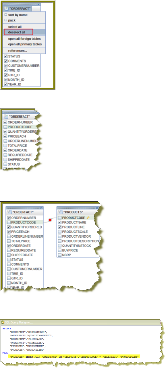
| Tutorials | 77
10.Now, select the following fields in the ORDERFACT table: ORDERNUMBER, QUANTITYORDERED, PRICEEACH,
and ORDERDATE.
11.Double-click PRODUCTS so that the table appears in the workspace.
Notice that there is a line that joins the ORDERFACT and PRODUCTS tables together.
12.Deselect all PRODUCTS table fields, except for PRODUCTNAME and PRODUCTLINE.
13.For the purpose of this exercise, click the Syntax tab in the lower left portion of the SQL Query Designer workspace
to display a simple SQL statement associated with the tables. Notice that PRODUCTCODE is the common field
between the ORDERFACT and PRODUCTS tables.
14.Click OK in the syntax window to return to the JDBC Data Source dialog box. Notice that the SQL statement
appears on the right under Query.
15.In the JDBC Data Source dialog box, click OK to return to the Design page.
Notice that the fields associated with your tables are listed under Query 1. You are now ready to start designing your
report.
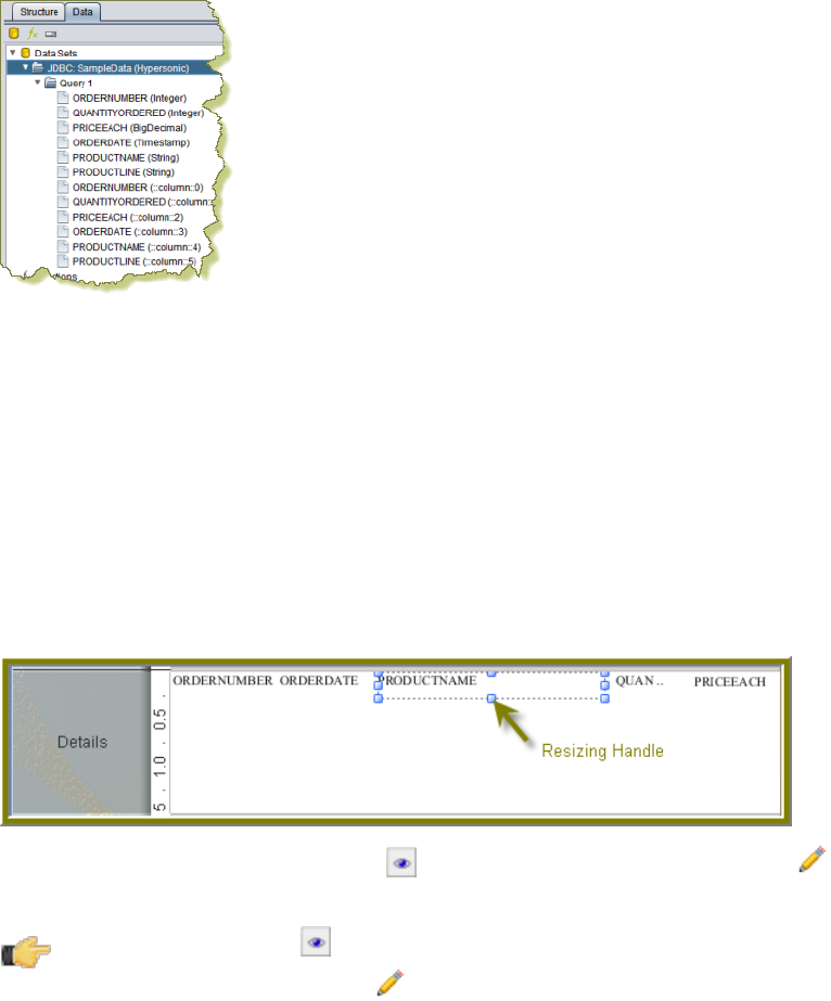
| Tutorials | 78
Designing Your Report
This exercise walks you through the process of designing the look-and-feel of your report.
1. Under the View item in the Report Designer menu bar, click Element Alignment Hints and Snap to Elements to
enable them. These options help you to align the elements of your report.
2. In the Design page, under Query 1, click and drag the ORDERNUMBER field into the Details band. Make sure that
the top line of the field name and the top line of the Details band match up.
3. Place the ORDERDATE, PRODUCTNAME, QUANTITYORDERED, and PRICEEACH fields into the Details Band.
Take care not to overlap the fields or your report will not display correctly.
4. Use the resizing handles to make the PRODUCTNAME field larger and the QUANTITYORDERED field smaller as
shown in the example below:
5. You have created your first report. Click (Preview) to examine your report. Click (Edit) to return to the
workspace view.
Tip: You can also click (Preview) on the left side of your workspace or select it from the View menu
option to preview a report. Click (Edit) to return to the workspace view.
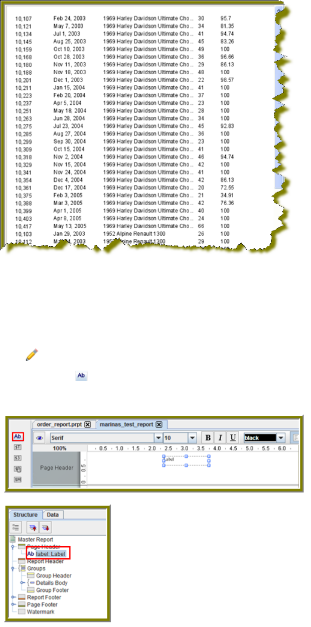
| Tutorials | 79
But, wait... There's a problem. Without headers, report users will have a hard time understanding its content. You
must continue refining your report, see refining your report.
Refining Your Report
You have created a report in the previous exercise but now you need to make the report more descriptive so that users
can understand the content in the report. Follow these instructions to refine your report.
1. Click (Edit) to return to the Design page.
2. Click and drag a (Label) from the tools palette into the middle of the Page Header band. Notice how Report
Designer keeps track of the report structure (shown below).
3. Click inside the Label item and type Order Report
4. Double-click inside the Order Report label to select the text, then in the toolbar, select a larger font size (18 point)
and apply boldface.
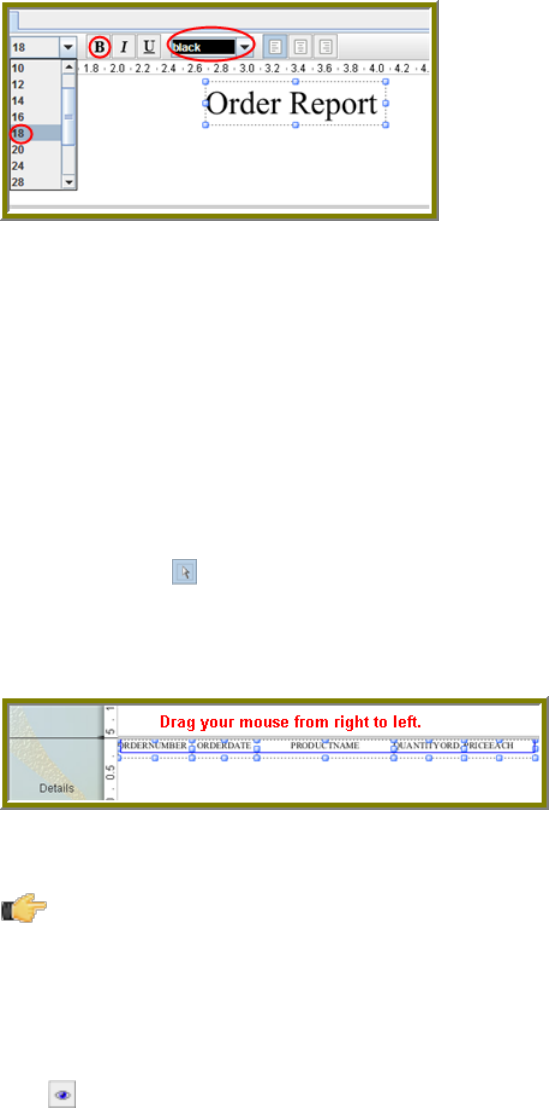
| Tutorials | 80
The changes are applied to the text; however, now that the text is bigger you may not see all of it, so use your
resizing handles and enlarge the label until you can see all of the text. Alternatively, you can stretch the resizing
handles all the way to each edge of the workspace and click the align center icon in the toolbar so that the text is
automatically placed in the center of the report page.
5. With the Order Report label still selected, click down arrow of the font color icon in the toolbar. Select a color for
your label.
The font color changes. This page header will appear on every page of your report.
6. Now, you must create column headers. On the right side of your workspace, click Structure -> Details Header.
7. In the lower right section of your workspace, click Attributes.
8. Under common, change the Value of the hide-on-canvas option to False.
Notice that the Details Header pane appears in your workspace.
9. In the toolbar, click (Select Objects).
Notice that the icon changes to a cross hair as you move into the workspace.
10.Move your mouse to the far right of the Details pane. Now, drag your mouse to the far left over all your column
objects to select them. You may have to move the mouse under the headings to make them easier to select.
11.Click <CTRL+C> to copy your objects and <CTRL+V> to paste them into the Details Header pane.
Note: Alternatively, you can choose Copy from the right-click menu.
12.Under Format in the Report Designer menubar, select Morph.
The column objects are changed to labels.
13.Type the correct heading names for each of your columns: Order No., Order Date, Product Name, Quan., and
Price Each.
Your headers will align correctly over your columns.
14.Click (Preview) to display your report.
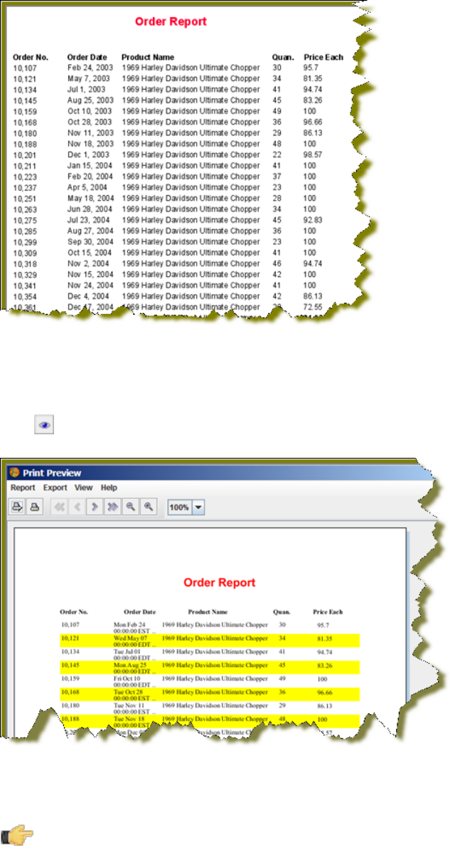
| Tutorials | 81
The report looks good but you may want to make it even easier to read by applying some banding.
15.In the toolbar, go to Format -> Row Banding.
16.In the Row Banding dialog box, choose Yellow from the drop-down list next to Visible Color and click OK.
17.Click (Preview) to display your report.
18.In the menubar, go to File -> Save to save your report in the ...\report-designer\samples folder. Type Orders in the
File Name text box.
Note: See More about Row Banding, Data Formatting, and Alignment for additional information about
refining your report.
More about Row Banding, Data Formatting, and Alignment
Row Banding
By creating a row band element, you can select the specific fields in your report that will display a row band. For
example, you may want to emphasize specific fields and not others on a line. You can give your row band element any
name you choose. In the example below, the row band element is called row-band-element.
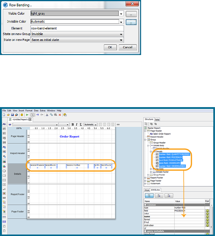
| Tutorials | 82
After you create your element, go back to the report and select the columns (fields) whose data will always be displayed
with a row band. You must also type row-band-element in the name field under Attributes. is In the example below, the
data associated with each of the columns in the report will display a row band. Notice the banding in the report preview.
Data Formatting
Report Designer uses default formats for dates and numbers. You can change how dates and numbers display by
selecting the object (field) and selecting the appropriate value for the format from the drop-down list next to format
(under Attributes). In the example below, the dates associated with the Order Date field will display as MM-dd-yy.
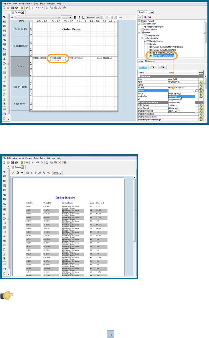
| Tutorials | 83
When you preview the report, notice that it displays in a cleaner format:
Note: You can type a value for your own format if you know the correct JavaScript string nomenclature.
Alignment
To align multiple objects press <SHIFT+ CLICK> to select each object. Then, choose an alignment option from the
Format menu. Alternatively, you can click (Select Objects) and drag your mouse over the objects you want to select
and then choose an alignment option.
In the example below, the selected objects will be aligned in the middle of the band.
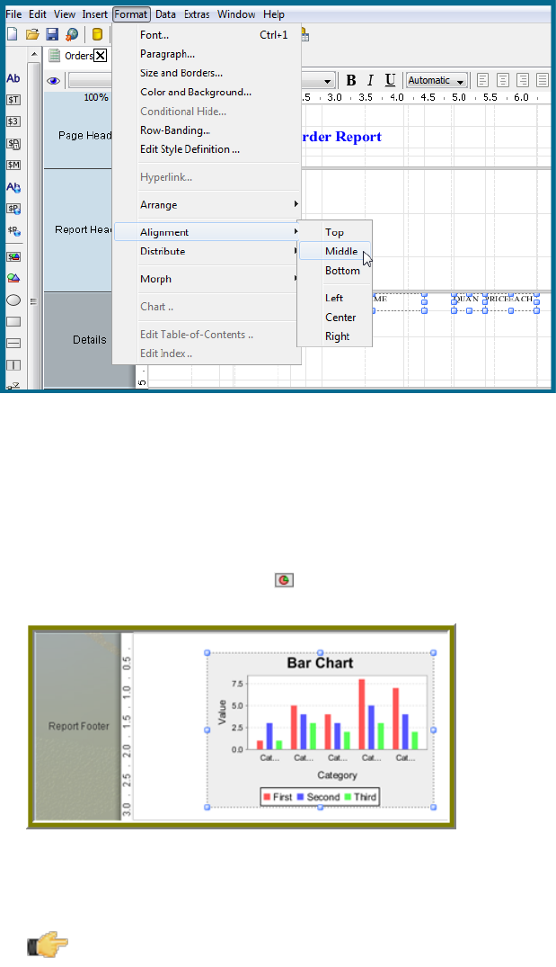
| Tutorials | 84
Adding a Chart to Your Report
So far you've seen a small subset of features associated with Report Designer. In this exercise, you will add a chart to
your report.
1. Click File > Open and find the report you just saved. Click OK.
2. In the palette, click and drag a Chart into the Report Footer band.
3. Use the resizing handles to center and stretch the chart. You can also adjust the width of the band.
4. Double-click the sample chart.
5. The type of chart most appropriate for your report is a pie chart. In the top portion of the Edit Chart dialog box, select
the pie chart icon.
Note: Notice that the pie chart properties that define its look-and-feel are listed in the left pane of the Edit
Chart dialog box. Properties associated with the data in the chart are listed in the right pane.
6. Go to the Title properties; net to the chart-title property, type Product Pie Chart.
7. Under Common, click the down arrow next to value-column click the ellipsis [...] to open the Edit Array dialog box.
The value-column specifies the actual values (measures) you want to chart. In this instance, you want to chart the
quantity ordered.
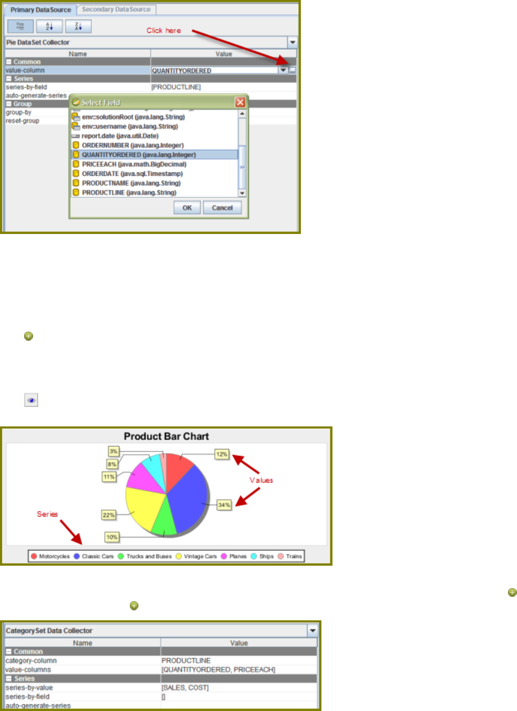
| Tutorials | 85
8. Click in the blank field to expose the drop-down arrow.
9. Select QUANTITYORDERED from the list and click OK.
10.Click OK to exit the Edit Chart dialog box.
11.Under Series click the ellipsis [...] next to series-by-field to open the Edit Array dialog box.
The series-by-field specifies the field you are charting. In this instance you are charting by product line. Series are
usually placed in the chart legend.
12.Click (Add).
13.Click in the blank field to expose the drop-down arrow.
14.Select PRODUCTLINE from the list and click OK.
15.Click OK to exit the Edit Chart dialog box.
16.Click (Preview) to display your report.
17.When the report displays, click the double arrows to go to the last page.
The chart you created appears on the last page of the report. If you want to display a bar or line chart instead, use
the chart settings below. You have to add the series-by-value setting manually in the Edit Array dialog box. Click
(Add) and type SALES; click (Add) and type COST. Run the report to display the bar chart.
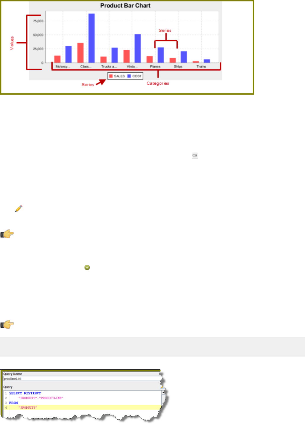
| Tutorials | 86
18.Save your report. You are now ready to add a parameter to your report.
Adding Parameters to Your Report
When you set parameters, users are prompted for a value or values when they run the report. The ability to provide
parameters is an important part of creating a report.
1. In the Report Designer, click File > Open to select the report you created.
2. In the menubar go to Data > Add Parameter. Alternatively, you can click (Master Report Parameter) under the
Data Tab in the Report Designer workspace.
The Add Parameter dialog box appears.
3. In the Add Parameter dialog box, type enter_prodline in the Name text field.
4. Type Select Line in the Label text field.
5. Next to Display Type, select Drop Down so users can select a product line.
6. Click (Edit) to add a query that supplies the values, (motorcycles, cars, ships, and so on), from which users of
the report must choose.
Note: Click on JDBC (SampleData - Memory) under Data Sources if the Edit icon is disabled.
The JDBC Data Sources dialog box appears.
7. Under Connections, select SampleData (Memory).
8. Next to Available Queries click (Add).
A new query placeholder is added to the list (Query 2).
9. In the Query Name text field, type prodlineList.
10.Enter your SQL query in the Query box.
You can copy and paste the required lines, (shown below) directly into the SQL statement or you can use the
alternate steps in the table below.
Important: Make sure to use curly brackets, (not parentheses), before and after {enter_prodline} or the
report will not display correctly.
SELECT DISTINCT "PRODUCTS"."PRODUCTLINE"
FROM "PRODUCTS"
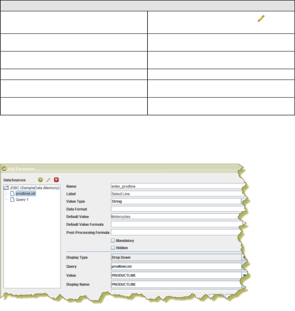
| Tutorials | 87
By entering these lines, report users see a prompt when they open the report in the Pentaho User Console that
allows them to enter a product line. That way, they can examine orders by product line. If you do not add the lines,
the report displays orders for all product lines.
Alternatively, you can use the SQL Query Designer to build your query:
Step Description
1In the JDBC Data Source dialog box, click (the Edit
icon on the right).
2 In the SQL Query Designer, select the PRODUCTS
table on the left.
3 On the right, click PRODUCTS and choose Deselect
All.
4 Right-click SELECT on the left and choose Distinct.
5 On the right, select PRODUCTLINE and click Preview.
The product line list appears. Click Close.
6 Click OK to exit the SQL Query Designer and go to Step
11.
11.Click OK to exit Data Source dialog box.
12.In the Add Parameter dialog box, under Data Sources, double-click JDBC SampleData (Memory) and select
prodlineList.
13.Next to Value Type, select String.
14.Type a default value, for example, "Motorcycles," in the Default Value text box. (Optional)
15.Click OK to exit the Add Parameter dialog box.
16.Now that you've created a product line parameter, you must map it back to your query (Query 1). Under Data,
double-click Query 1.
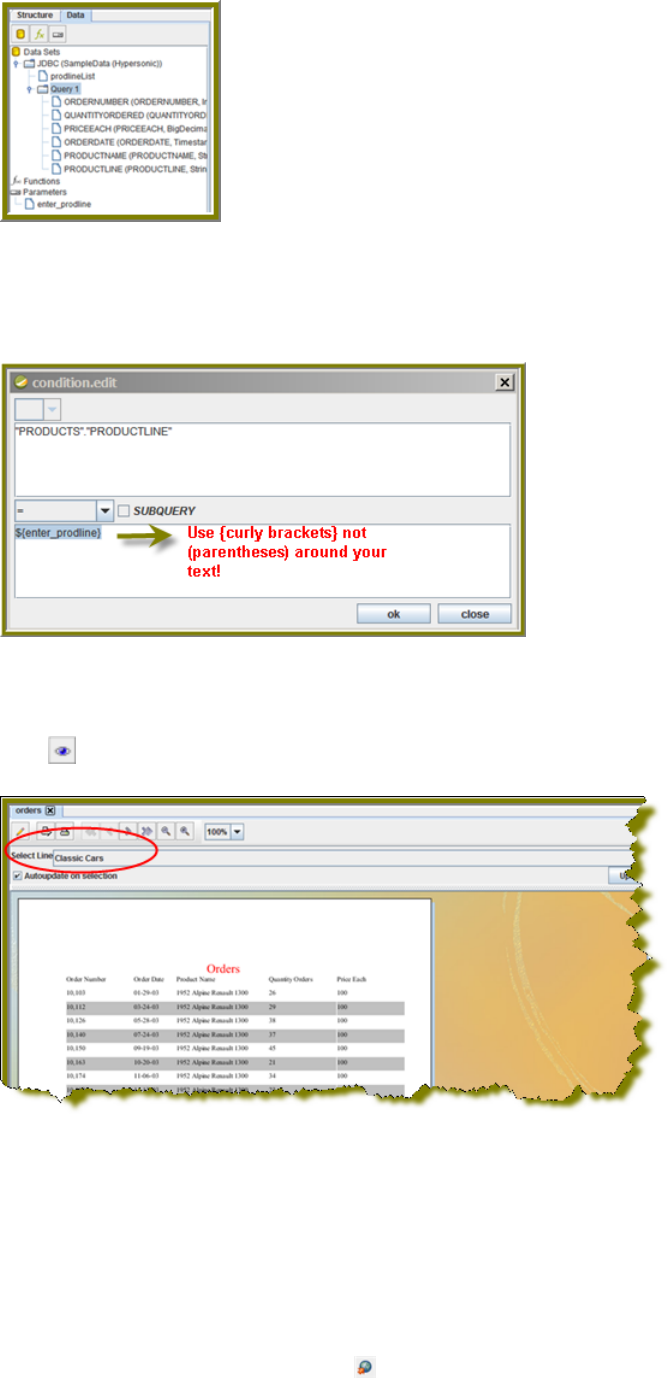
| Tutorials | 88
17.Right-click PRODUCTLINE and select add where condition.
The condition.edit dialog box appears.
18.Type ${enter_prodline} in the edit area and click OK.
19.Click OK to exit the /SQL Query Designer.
20.Click OK to exit the Data Source dialog box.
21.Click (Preview).
You should see your product line drop-down list.
22.You are now ready to publish your report.
Publishing Your Report
You have created and formatted a simple report, added a chart, and now you are ready to share the report with your
users.
1. In the Report Designer, click File > Open to open the report you just created.
2. Click File > Publish. Alternatively, click .
If you have not saved the report, a warning message reminds you to save it. The Login dialog box appears,
pre-populated with credentials valid for the evaluation. Make sure that the Server URL is set to http://
localhost:8080/pentaho/.
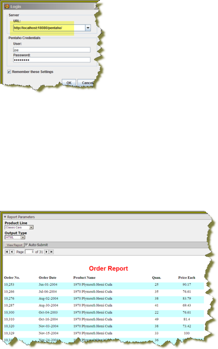
| Tutorials | 89
3. Click OK.
The Publish to Server dialog box appears.
4. In the Publish to Server dialog box, type in a report name and description into the appropriate fields.
5. Under Location, save the report in the .../steel-wheels/reports folder.
6. Select html as the Output Type and click OK.
A success message appears.
7. Click Yes to go directly to the User Console to view the report you just published.
If you want to access the report later, log into the BA Server by going to http:// localhost:8080 in your Web browser,
then navigate to the Reporting Examples directory in the Solution Browser. You should see your published report
in the list. If not, click Tools > Refresh Repository.
8. Log in as Admin. The default admin password is password.
9. Your report displays in the User Console.
You now have a report that users can view at any time.
10.In the User Console select your product line parameter from the drop-down list. Accept the default under Output
Type.

| Chart Types | 90
Chart Types
There are 18 chart types in the JFreeChart engine, though some are only available through Report Designer and the
BA Platform ChartComponent. Each of them is defined in the headings below, along with a comprehensive table of style
elements that applies to each.
Data Collectors
Each chart type is associated with one or more data collectors. Data collectors are the abstraction point between your
data set and what the chart needs to understand about it. So essentially, the data collector constrains the data set to
only the necessary chart-oriented columns, eliminating the data that you don't need or can't use for a particular chart
type. The possible data collectors are:
• CategorySet
• PivotCategory
• xyzSeries
• TimeSeries
• PieSet
• xy
Chart Properties
Each chart type has a set of groups of properties. Many of the groups are common to all of the chart types, but some
are common only to a few. All groups that apply to each chart type are listed under that chart type's heading below, so
each chart type section is a complete reference unto itself.
The property groups are merely an organizational tool, and have no meaning beyond the Report Designer user
interface. If you are creating charts through action sequences via the BA Platform's ChartComponent, the groups listed
for each chart type won't help you much. The chart properties lists below attempt to accommodate Report Designer
users by listing the default names for each property first, and the Report Designer name in parenthesis afterward
whenever there is a name conflict. Properties specific to Report Designer are contained in separate groups.
Each chart in Report Designer has an Advanced property category with a single dependencyLevel property. This
property is not used under any ordinary circumstances; however, it remains in the Report Designer interface because
hiding or removing it would harm certain functionality. Do not change the value of this property.
Bar
Bar charts are useful for discovering trends over time by displaying data in thin, solid columns. Related data sets can be
assembled in groups (series) for easy comparison. If you need to show time-oriented changes in data, or if you want to
make comparisons between X and Y values that are not directly related in your data source, you must use an XY Bar
chart instead. You can create XY bar charts with Report Designer.
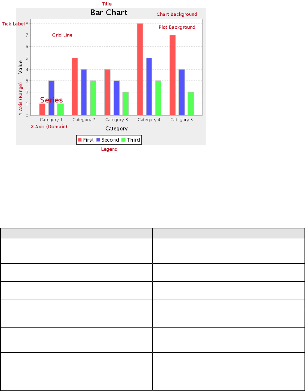
| Chart Types | 91
Data Collectors
The following data collectors are associated with this chart type:
CategorySet
To generate categorical charts, you need a three-dimensional (three column) dataset. The first dimension is the
category column, which defines the columns that contain the category names. The category can be considered a
grouping of the bars (in a bar chart, for example). The next dimension is the series. In bar charts for example, you'll
have one bar for each series. Finally, the numerical value being plotted is the third dimension.
Property Description
name A title for this data collector configuration. Typically you
will only have one data collector per chart, in which case
this property is not particularly useful.
category-column The column that you want to use to determine category
names.
value-columns The data columns that determine the chart values (or
series items).
series-by-value A static value that you want to use for the series name.
series-by-field Uses the selected column to use for series names. This
will cause the value column to be split into series groups.
group-by This provides the name of the group that the chart is
appearing in. If the chart contains detailed information,
then this is not necessary.
reset-group Specifies a group that will be used to create charts within
a sub-group. For example, if charting one chart per region,
and the chart is displaying data for departments within a
region, the reset-group would be set to the region group,
and the chart group would be set to department group.

| Chart Types | 92
In the above chart, Executive Management, Finance, etc., are in the category column (department).
The first series name is Actual (the blue bar), and the second series name is Budget (the purple bar).
PivotCategorySet
The PivotCategorySet data collector is an extension of the CategorySet data collector that will pivot the data to use a
column of values as series, rather than individual columns themselves. This means that at a minimum, you will need a
column from which the collector will retrieve the series names, and any number of additional numeric data columns that
will serve as categories. The data values to be plotted for each series are the category columns' values.
Property Description
name A title for this data collector configuration. Typically you
will only have one data collector per chart, in which case
this property is not particularly useful.
category-columns The names of the columns you want to use to determine
category names.
value-columns The data columns that determine the chart values (or
series items).
series-by-value A static value that you want to use for the series name.
series-by-field Uses the selected column to use for series names. This
will cause the value column to be split into series groups.
group-by This provides the name of the group that the chart is
appearing in. If the chart contains detailed information,
then this is not necessary.
reset-group Specifies a group that will be used to create charts within
a sub-group. For example, if charting one chart per region,
and the chart is displaying data for departments within a
region, the reset-group would be set to the region group,
and the chart group would be set to department group.
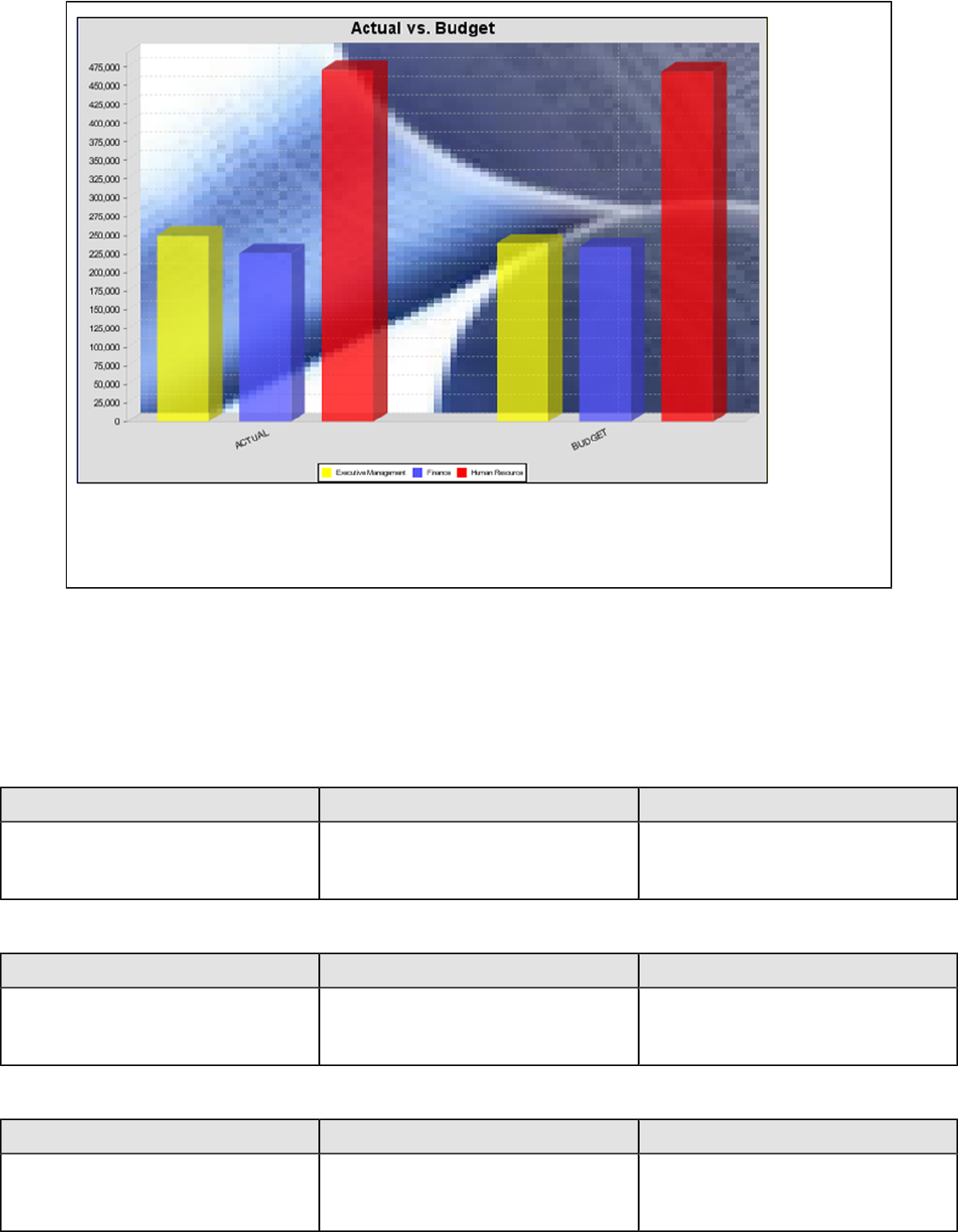
| Chart Types | 93
In the above bar chart, Executive Management, Finance, and Human Resources (the yellow, blue,
and red bars, respectively) are the series -- values taken from the series column DEPARTMENT.
The categories Actual and Budget supply row-based data points for each series.
Chart Properties
The following groups of properties are associated with this chart type:
Required
The following groups of properties are associated with the Required group for this chart type:
name
Property Data Type Description
name String The name (in Report Designer) of this
chart element. Does not appear in the
published report.
data-source
Property Data Type Description
data-source String The name of the established (in
Report Designer) data source you
intend to pull data from.
no-data-message
Property Data Type Description
no-data-message String The text displayed on the plot
background when the query produces
no usable data
Title
The following groups of properties are associated with the Title group for this chart type:
| Chart Types | 94
chart-title
Property Data Type Description
title String Sets the main title for the chart
chart-title-field
Property Data Type Description
chart-title-field Selection Specifies which field from your data
set you would like to use for the chart
title
title-font
Property Data Type Description
title-font Complex (see example below) Sets the font for the main title for the
chart.
<title-font>
<font-family/>
<size/>
<is-bold/>
<is-italic/>
</title-font>
Options
The following groups of properties are associated with the Options group for this chart type:
stacked
Property Data Type Description
is-stacked Boolean If true, stacks the series of the chart,
one on top of the other. Default value
is false.
stacked-percent
Property Data Type Description
stacked-percent Boolean If true, stacks the series of the chart,
one on top of the other, where each
bar represents a percentage of the
sum of all bars in the series. Default
value is false.
horizontal
Property Data Type Description
orientation String Determines vertical/horizontal
orientation for the chart. Possible
values are horizontal and vertical.
In Report Designer, this is a boolean
that makes the chart horizontal when
set to true and vertical when set to
false.
| Chart Types | 95
bar-borders
Property Data Type Description
bar-borders Boolean Draws a thin solid black border
around each bar
max-bar-width
Property Data Type Description
max-bar-width Decimal Sets the maximum bar width as a
percentage of the axis length. For
example, setting this to 0.05 will
ensure that the bars never exceed
five percent of the length of the axis.
This can improve the appearance of
charts where there is a possibility that
only one or two bars will be displayed.
Possible values are between .01 and
1.0.
series-color
Property Data Type Description
color-palette String List of colors to apply (in order) to the
series in the chart.
General
The following groups of properties are associated with the General category for this chart type:
3-D
Property Data Type Description
is-3D Boolean If true, renders the chart three-
dimensionally. Default value is false.
gridlines
Property Data Type Description
gridlines Boolean If true, draws thick horizontal lines
across the plot background that more
easily show intervals between values.
Not to be confused with tick lines,
which are dotted plot lines that only
show major scale values. Default
value is true.
bg-color
Property Data Type Description
bg-color Selection The color of the chart background;
this is the area behind the chart, not
the plot area. To set the plot area, use
the plot-bg-color property instead
| Chart Types | 96
bg-image
Property Data Type Description
bg-image String Path to the graphic file you want to
display in the area behind the chart
show-border
Property Data Type Description
border-visible Boolean If true, draws a border around the
entire surrounding area for the chart.
Default value is false.
border-color
Property Data Type Description
border-paint String Sets the color for the surrounding
chart border. Possible values are
hexadecimal color codes.
anti-alias
Property Data Type Description
anti-alias Boolean Determines whether the edges and
curves of the element should be
smoothed
plot-bg-color
Property Data Type Description
plot-background Complex (see example below) Renders either the color, gradient ,
texture or image specified as the plot
background for the chart.
plot-fg-alpha
Property Data Type Description
plot-fg-alpha Decimal Controls the alpha value
(transparency) of the plot foreground.
Possible values are between 0 and 1,
with 0 being totally transparent, and 1
being totally opaque. Default is 1.
plot-bg-alpha
Property Data Type Description
plot-bg-alpha Decimal Controls the alpha value
(transparency) of the plot background.
Possible values are between 0 and 1,
with 0 being totally transparent, and 1
being totally opaque. Default is 1.
| Chart Types | 97
plot-border
Property Data Type Description
plot-border Boolean Determines whether or not the plot
area should have a border between it
and the chart background
url-formula
Property Data Type Description
url-formula formula Associates a link to the series key
and category name. See also, URL
Linking in Charts.
tooltip-formula
Property Data Type Description
tooltip-formula formula Defines the tooltip (hover text) for the
url-formula
X Axis
The following groups of properties are associated with the X Axis category for this chart type:
x-axis-title
Property Data Type Description
domain-title String Sets the title for the domain axis, if it
exists. In a typical two-dimensional
horizontal chart, this the categorical or
X axis.
x-font
Property Data Type Description
domain-title-font Complex (see example below) Sets the font for the domain axis title.
x-axis-label-width
Property Data Type Description
x-axis-label-width Decimal Limits the space (in pixels) occupied
by the x axis labels. The invisible
default value is 20.0. If your labels are
being truncated, try increasing this
value.
x-axis-label-rotation
Property Data Type Description
domain-label-rotation Integer The degree of the angle of rotation
for X axis labels. Possible values are
from 0 to 360.

| Chart Types | 98
show-labels
Property Data Type Description
display-labels Boolean If true, displays labels for pie sections.
Default value is true.
label-rotation
Property Data Type Description
label-rotation Integer The degree of the angle of rotation for
the labels above the bars. Possible
values are from 0 to 360.
numeric-format
Property Data Type Description
numeric-format String Determines the content of the domain
plot labels. Must be in the Java
number format.
text-format
Property Data Type Description
text-format String Determines the content of the domain
plot labels. There are three possible
values, any or all of which may be
used: {0} represents the series
name; {1} represents category; {2}
represents the plotted value. These
properties must set in the following
format: {0}{1}{2}{3}. For instance, you
might use these values for plot labels:
{0} - series by field {1} - category
columns {2} - value-columns {3} -
percent.
date-format
Property Data Type Description
date-format String Determines the content of the domain
plot labels. Must be in the Java date
format.
category-margin
Property Data Type Description
category-margin Decimal Specifies the width (in pixels) between
bars (categories)
lower-margin
Property Data Type Description
lower-margin Decimal Specifies the space (in pixels)
between the Y axis and the first bar in
the chart
| Chart Types | 99
upper-margin
Property Data Type Description
upper-margin Decimal Specifies the space (in pixels)
between the last bar and the outer
edge of the chart
item-margin
Property Data Type Description
item-margin Decimal Specifies the space (in pixels)
between the bars in a series
Y Axis
The following groups of properties are associated with the Y Axis category for this chart type:
y-axis-title
Property Data Type Description
range-title String Sets the title for the primary numeric
data axis; typically the Y axis in a
horizontally-oriented chart.
y-font
Property Data Type Description
range-title-font Complex (see example below) Sets the font for the range axis title.
y-sticky-0
Property Data Type Description
range-sticky-zero Boolean If true, truncates the axis margin at
zero.
y-incl-0
Property Data Type Description
range-includes-zero Boolean When an axis' values are auto-
calculated, setting this flag to true
ensures that the range always
includes zero.
y-auto-range
Property Data Type Description
y-auto-range Boolean If True, the y-min and y-max values
will be automatically calculated based
on the lowest and highest values in
the data set.
y-min
Property Data Type Description
range-minimum Integer Sets the lower bounding value on the
range axis.
| Chart Types | 100
y-max
Property Data Type Description
range-maximum Integer Sets the upper bounding value on the
range axis.
y-tick-interval
Property Data Type Description
y-tick-interval Decimal Controls the increments between Y
axis tick labels
y-tick-font
Property Data Type Description
range-tick-font Complex (see example below) Sets the font for the labels on the tick
marks of the range axis.
y-tick-fmt-str
Property Data Type Description
range-tick-format String Sets the format of the labels on
the tick marks of the range axis.
(An example format for displaying
percentages might be "0.00%")
y-tick-period
Property Data Type Description
y-tick-period Selection Specifies the Y axis tick intervals if the
Y (range) data set returns date or time
data
enable-log-axis
Property Data Type Description
enable-log-axis Boolean Determines whether or not the Y axis
scales logarithmically
log-format
Property Data Type Description
log-format Boolean Abbreviates large Y axis tick labels
if they are numbers and no format is
specified in y-tick-fmt-str
Legend
The following groups of properties are associated with the Legend category for this chart type:
show-legend
Property Data Type Description
include-legend Boolean When set to true, displays the legend
in the chart. Default value is true.

| Chart Types | 101
location
Property Data Type Description
location Selection Determines where the legend will be
situated, relative to the plot area
legend-bg-color
Property Data Type Description
legend-bg-color String Hexadecimal value of the color
you intend to use for the legend
background. Default value is FFFFFF
(white).
legend-border
Property Data Type Description
legend-border-visible Boolean If true, draws a border around the
legend. Default value is true.
legend-font
Property Data Type Description
legend-font Complex (see example below) Sets the font to use on the text in the
legend.
<legend-font>
<font-family/>
<size/>
<is-bold/>
<is-italic/>
</legend-font>
legend-font-color
Property Data Type Description
legend-font-color String Hexadecimal value of the color you
intend to use for the legend font.
Default value is 000000 (black).
Scripting
The following groups of properties are associated with the Scripting category for this chart type:
Chart Post Processing Script Language
Property Data Type Description
Chart Post Processing Script
Language Selection The scripting language to use.
This property gives you access to
JFreeChart APIs so you can modify
the chart after the report renders.
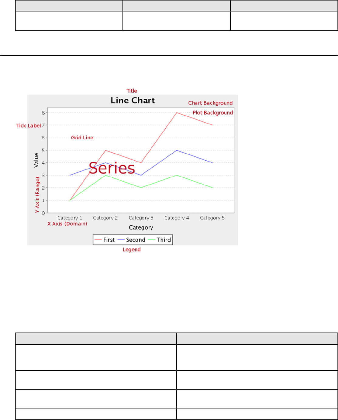
| Chart Types | 102
Chart Post Processing Script
Property Data Type Description
Chart Post Processing Script Script The script to use to modify chart
object.
Line
Line charts are useful for discovering trends over time by displaying data in thin, usually horizontal lines. Related data
sets can be assembled in groups (series) for easy comparison. If you need to make comparisons between X and Y
values that are not directly related in your data source, you must use an XY line chart instead.
Data Collectors
The following data collectors are associated with this chart type:
CategorySet
To generate categorical charts, you need a three-dimensional (three column) dataset. The first dimension is the
category column, which defines the columns that contain the category names. The category can be considered a
grouping of the bars (in a bar chart, for example). The next dimension is the series. In bar charts for example, you'll
have one bar for each series. Finally, the numerical value being plotted is the third dimension.
Property Description
name A title for this data collector configuration. Typically you
will only have one data collector per chart, in which case
this property is not particularly useful.
category-column The column that you want to use to determine category
names.
value-columns The data columns that determine the chart values (or
series items).
series-by-value A static value that you want to use for the series name.
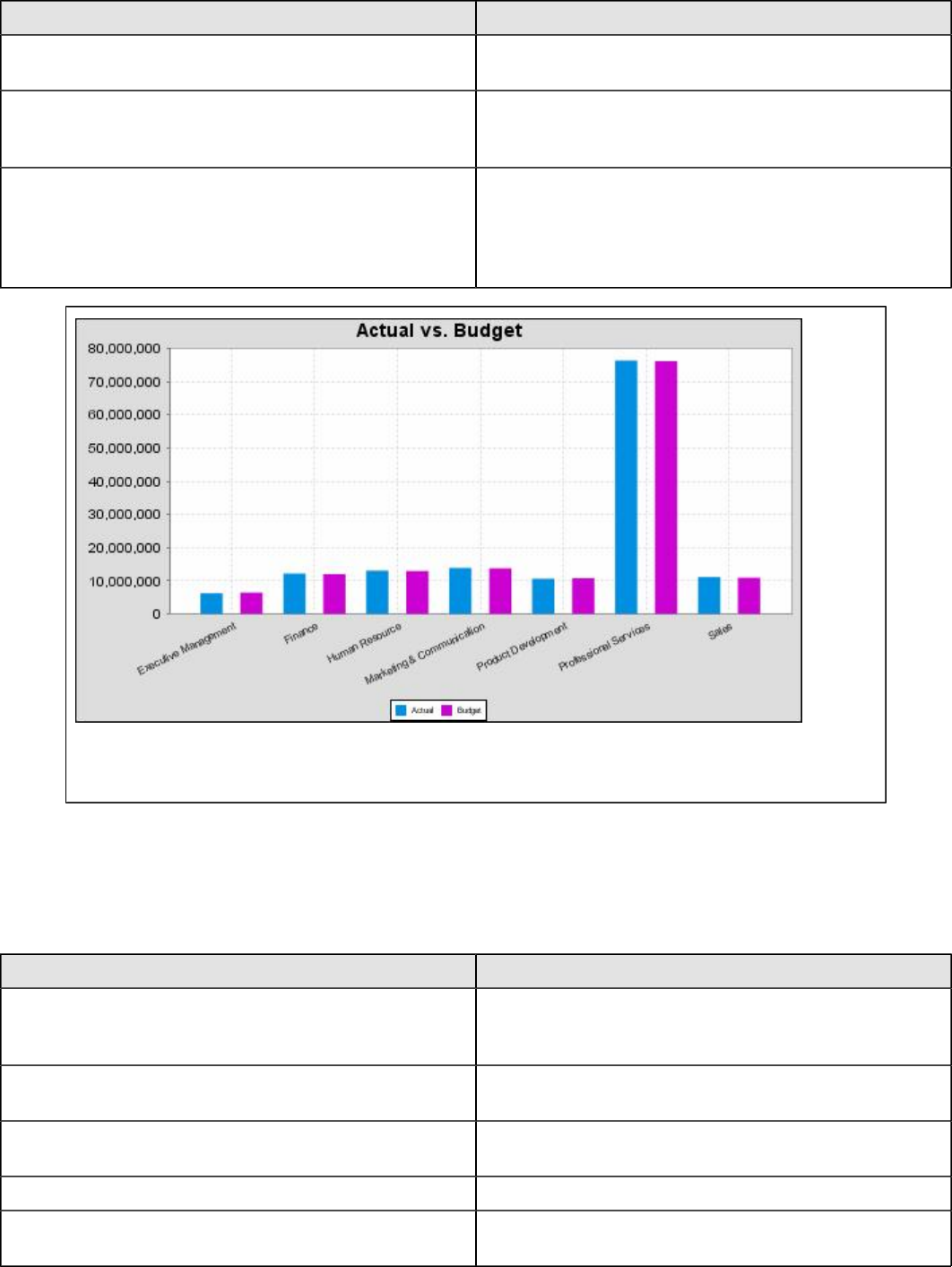
| Chart Types | 103
Property Description
series-by-field Uses the selected column to use for series names. This
will cause the value column to be split into series groups.
group-by This provides the name of the group that the chart is
appearing in. If the chart contains detailed information,
then this is not necessary.
reset-group Specifies a group that will be used to create charts within
a sub-group. For example, if charting one chart per region,
and the chart is displaying data for departments within a
region, the reset-group would be set to the region group,
and the chart group would be set to department group.
In the above chart, Executive Management, Finance, etc., are in the category column (department).
The first series name is Actual (the blue bar), and the second series name is Budget (the purple bar).
PivotCategorySet
The PivotCategorySet data collector is an extension of the CategorySet data collector that will pivot the data to use a
column of values as series, rather than individual columns themselves. This means that at a minimum, you will need a
column from which the collector will retrieve the series names, and any number of additional numeric data columns that
will serve as categories. The data values to be plotted for each series are the category columns' values.
Property Description
name A title for this data collector configuration. Typically you
will only have one data collector per chart, in which case
this property is not particularly useful.
category-columns The names of the columns you want to use to determine
category names.
value-columns The data columns that determine the chart values (or
series items).
series-by-value A static value that you want to use for the series name.
series-by-field Uses the selected column to use for series names. This
will cause the value column to be split into series groups.
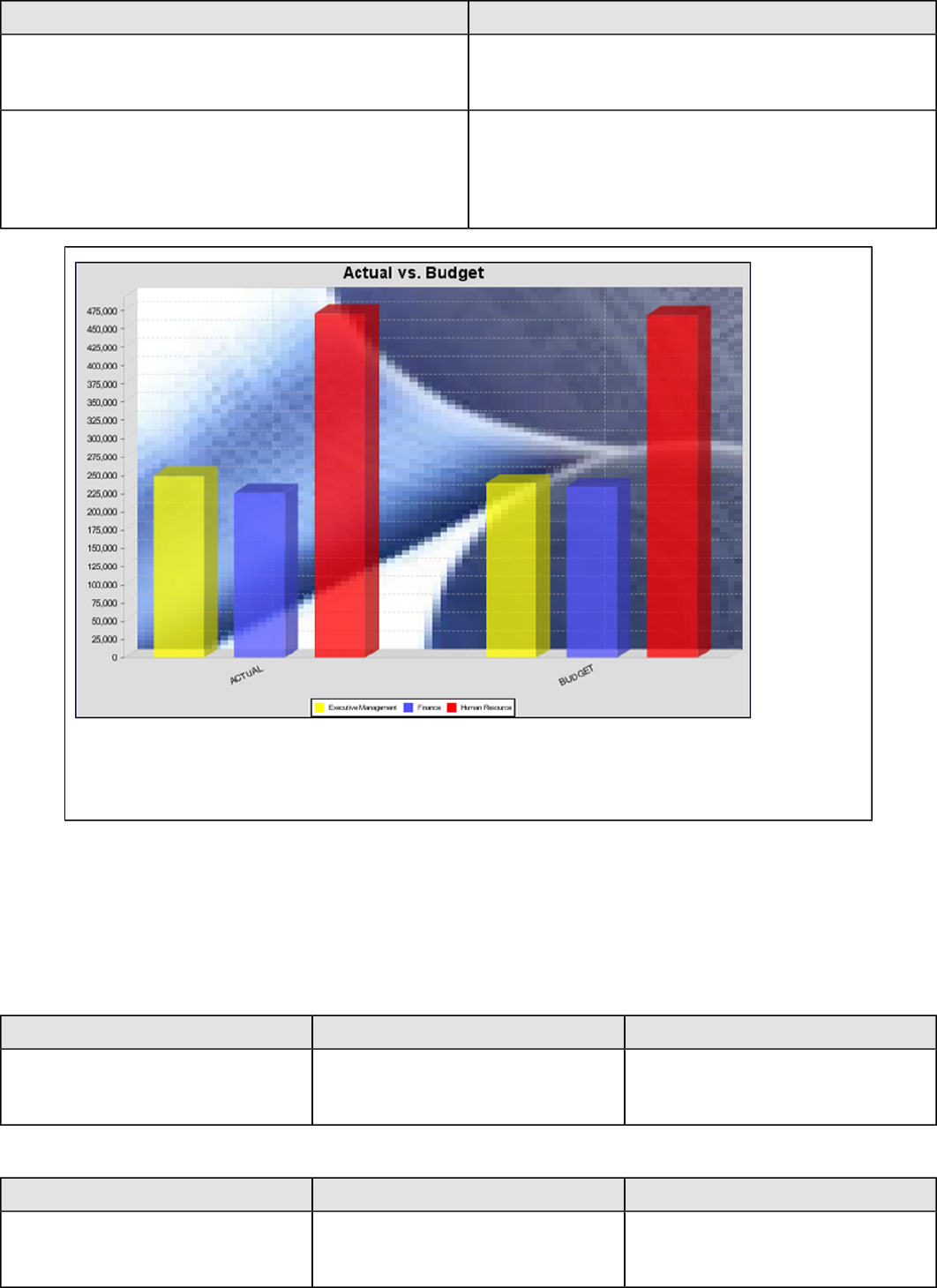
| Chart Types | 104
Property Description
group-by This provides the name of the group that the chart is
appearing in. If the chart contains detailed information,
then this is not necessary.
reset-group Specifies a group that will be used to create charts within
a sub-group. For example, if charting one chart per region,
and the chart is displaying data for departments within a
region, the reset-group would be set to the region group,
and the chart group would be set to department group.
In the above bar chart, Executive Management, Finance, and Human Resources (the yellow, blue,
and red bars, respectively) are the series -- values taken from the series column DEPARTMENT.
The categories Actual and Budget supply row-based data points for each series.
Chart Properties
The following groups of properties are associated with this chart type:
Required
The following groups of properties are associated with the Required group for this chart type:
name
Property Data Type Description
name String The name (in Report Designer) of this
chart element. Does not appear in the
published report.
data-source
Property Data Type Description
data-source String The name of the established (in
Report Designer) data source you
intend to pull data from.
| Chart Types | 105
no-data-message
Property Data Type Description
no-data-message String The text displayed on the plot
background when the query produces
no usable data
Title
The following groups of properties are associated with the Title group for this chart type:
chart-title
Property Data Type Description
title String Sets the main title for the chart
chart-title-field
Property Data Type Description
chart-title-field Selection Specifies which field from your data
set you would like to use for the chart
title
title-font
Property Data Type Description
title-font Complex (see example below) Sets the font for the main title for the
chart.
<title-font>
<font-family/>
<size/>
<is-bold/>
<is-italic/>
</title-font>
Options
The following groups of properties are associated with the Options group for this chart type:
line-style
Property Data Type Description
line-style String Sets the style of line series lines.
Possible values are: solid, dash, dot,
dashdot, dashdotdot. Default value is
solid.
line-size
Note: This property is called line-width in the Radar chart property list.
Property Data Type Description
line-width Decimal Sets the width of line series lines.
Default value is 1.0.
| Chart Types | 106
show-markers
Property Data Type Description
markers-visible Boolean Sets the point markers visible in
applicable charts. Default value is
false.
horizontal
Property Data Type Description
orientation String Determines vertical/horizontal
orientation for the chart. Possible
values are horizontal and vertical.
In Report Designer, this is a boolean
that makes the chart horizontal when
set to true and vertical when set to
false.
series-color
Property Data Type Description
color-palette String List of colors to apply (in order) to the
series in the chart.
General
The following groups of properties are associated with the General category for this chart type:
3-D
Property Data Type Description
is-3D Boolean If true, renders the chart three-
dimensionally. Default value is false.
gridlines
Property Data Type Description
gridlines Boolean If true, draws thick horizontal lines
across the plot background that more
easily show intervals between values.
Not to be confused with tick lines,
which are dotted plot lines that only
show major scale values. Default
value is true.
bg-color
Property Data Type Description
bg-color Selection The color of the chart background;
this is the area behind the chart, not
the plot area. To set the plot area, use
the plot-bg-color property instead

| Chart Types | 107
bg-image
Property Data Type Description
bg-image String Path to the graphic file you want to
display in the area behind the chart
show-border
Property Data Type Description
border-visible Boolean If true, draws a border around the
entire surrounding area for the chart.
Default value is false.
border-color
Property Data Type Description
border-paint String Sets the color for the surrounding
chart border. Possible values are
hexadecimal color codes.
anti-alias
Property Data Type Description
anti-alias Boolean Determines whether the edges and
curves of the element should be
smoothed
plot-bg-color
Property Data Type Description
plot-background Complex (see example below) Renders either the color, gradient ,
texture or image specified as the plot
background for the chart.
plot-fg-alpha
Property Data Type Description
plot-fg-alpha Decimal Controls the alpha value
(transparency) of the plot foreground.
Possible values are between 0 and 1,
with 0 being totally transparent, and 1
being totally opaque. Default is 1.
plot-bg-alpha
Property Data Type Description
plot-bg-alpha Decimal Controls the alpha value
(transparency) of the plot background.
Possible values are between 0 and 1,
with 0 being totally transparent, and 1
being totally opaque. Default is 1.

| Chart Types | 108
plot-border
Property Data Type Description
plot-border Boolean Determines whether or not the plot
area should have a border between it
and the chart background
url-formula
Property Data Type Description
url-formula formula Associates a link to the series key
and category name. See also, URL
Linking in Charts.
tooltip-formula
Property Data Type Description
tooltip-formula formula Defines the tooltip (hover text) for the
url-formula
X Axis
The following groups of properties are associated with the X Axis category for this chart type:
x-axis-title
Property Data Type Description
domain-title String Sets the title for the domain axis, if it
exists. In a typical two-dimensional
horizontal chart, this the categorical or
X axis.
x-font
Property Data Type Description
domain-title-font Complex (see example below) Sets the font for the domain axis title.
x-axis-label-width
Property Data Type Description
x-axis-label-width Decimal Limits the space (in pixels) occupied
by the x axis labels. The invisible
default value is 20.0. If your labels are
being truncated, try increasing this
value.
x-axis-label-rotation
Property Data Type Description
domain-label-rotation Integer The degree of the angle of rotation
for X axis labels. Possible values are
from 0 to 360.
| Chart Types | 109
show-labels
Property Data Type Description
display-labels Boolean If true, displays labels for pie sections.
Default value is true.
label-rotation
Property Data Type Description
label-rotation Integer The degree of the angle of rotation for
the labels above the bars. Possible
values are from 0 to 360.
numeric-format
Property Data Type Description
numeric-format String Determines the content of the domain
plot labels. Must be in the Java
number format.
text-format
Property Data Type Description
text-format String Determines the content of the domain
plot labels. There are three possible
values, any or all of which may be
used: {0} represents the series
name; {1} represents category; {2}
represents the plotted value. These
properties must set in the following
format: {0}{1}{2}{3}. For instance, you
might use these values for plot labels:
{0} - series by field {1} - category
columns {2} - value-columns {3} -
percent.
date-format
Property Data Type Description
date-format String Determines the content of the domain
plot labels. Must be in the Java date
format.
category-margin
Property Data Type Description
category-margin Decimal Specifies the width (in pixels) between
bars (categories)
lower-margin
Property Data Type Description
lower-margin Decimal Specifies the space (in pixels)
between the Y axis and the first bar in
the chart
| Chart Types | 110
upper-margin
Property Data Type Description
upper-margin Decimal Specifies the space (in pixels)
between the last bar and the outer
edge of the chart
Y Axis
The following groups of properties are associated with the Y Axis category for this chart type:
y-axis-title
Property Data Type Description
range-title String Sets the title for the primary numeric
data axis; typically the Y axis in a
horizontally-oriented chart.
y-font
Property Data Type Description
range-title-font Complex (see example below) Sets the font for the range axis title.
y-sticky-0
Property Data Type Description
range-sticky-zero Boolean If true, truncates the axis margin at
zero.
y-incl-0
Property Data Type Description
range-includes-zero Boolean When an axis' values are auto-
calculated, setting this flag to true
ensures that the range always
includes zero.
y-auto-range
Property Data Type Description
y-auto-range Boolean If True, the y-min and y-max values
will be automatically calculated based
on the lowest and highest values in
the data set.
y-min
Property Data Type Description
range-minimum Integer Sets the lower bounding value on the
range axis.
y-max
Property Data Type Description
range-maximum Integer Sets the upper bounding value on the
range axis.
| Chart Types | 111
y-tick-interval
Property Data Type Description
y-tick-interval Decimal Controls the increments between Y
axis tick labels
y-tick-font
Property Data Type Description
range-tick-font Complex (see example below) Sets the font for the labels on the tick
marks of the range axis.
y-tick-fmt-str
Property Data Type Description
range-tick-format String Sets the format of the labels on
the tick marks of the range axis.
(An example format for displaying
percentages might be "0.00%")
y-tick-period
Property Data Type Description
y-tick-period Selection Specifies the Y axis tick intervals if the
Y (range) data set returns date or time
data
enable-log-axis
Property Data Type Description
enable-log-axis Boolean Determines whether or not the Y axis
scales logarithmically
log-format
Property Data Type Description
log-format Boolean Abbreviates large Y axis tick labels
if they are numbers and no format is
specified in y-tick-fmt-str
Legend
The following groups of properties are associated with the Legend category for this chart type:
show-legend
Property Data Type Description
include-legend Boolean When set to true, displays the legend
in the chart. Default value is true.
location
Property Data Type Description
location Selection Determines where the legend will be
situated, relative to the plot area
| Chart Types | 112
legend-bg-color
Property Data Type Description
legend-bg-color String Hexadecimal value of the color
you intend to use for the legend
background. Default value is FFFFFF
(white).
legend-border
Property Data Type Description
legend-border-visible Boolean If true, draws a border around the
legend. Default value is true.
legend-font
Property Data Type Description
legend-font Complex (see example below) Sets the font to use on the text in the
legend.
<legend-font>
<font-family/>
<size/>
<is-bold/>
<is-italic/>
</legend-font>
legend-font-color
Property Data Type Description
legend-font-color String Hexadecimal value of the color you
intend to use for the legend font.
Default value is 000000 (black).
Scripting
The following groups of properties are associated with the Scripting category for this chart type:
Chart Post Processing Script Language
Property Data Type Description
Chart Post Processing Script
Language Selection The scripting language to use.
This property gives you access to
JFreeChart APIs so you can modify
the chart after the report renders.
Chart Post Processing Script
Property Data Type Description
Chart Post Processing Script Script The script to use to modify chart
object.
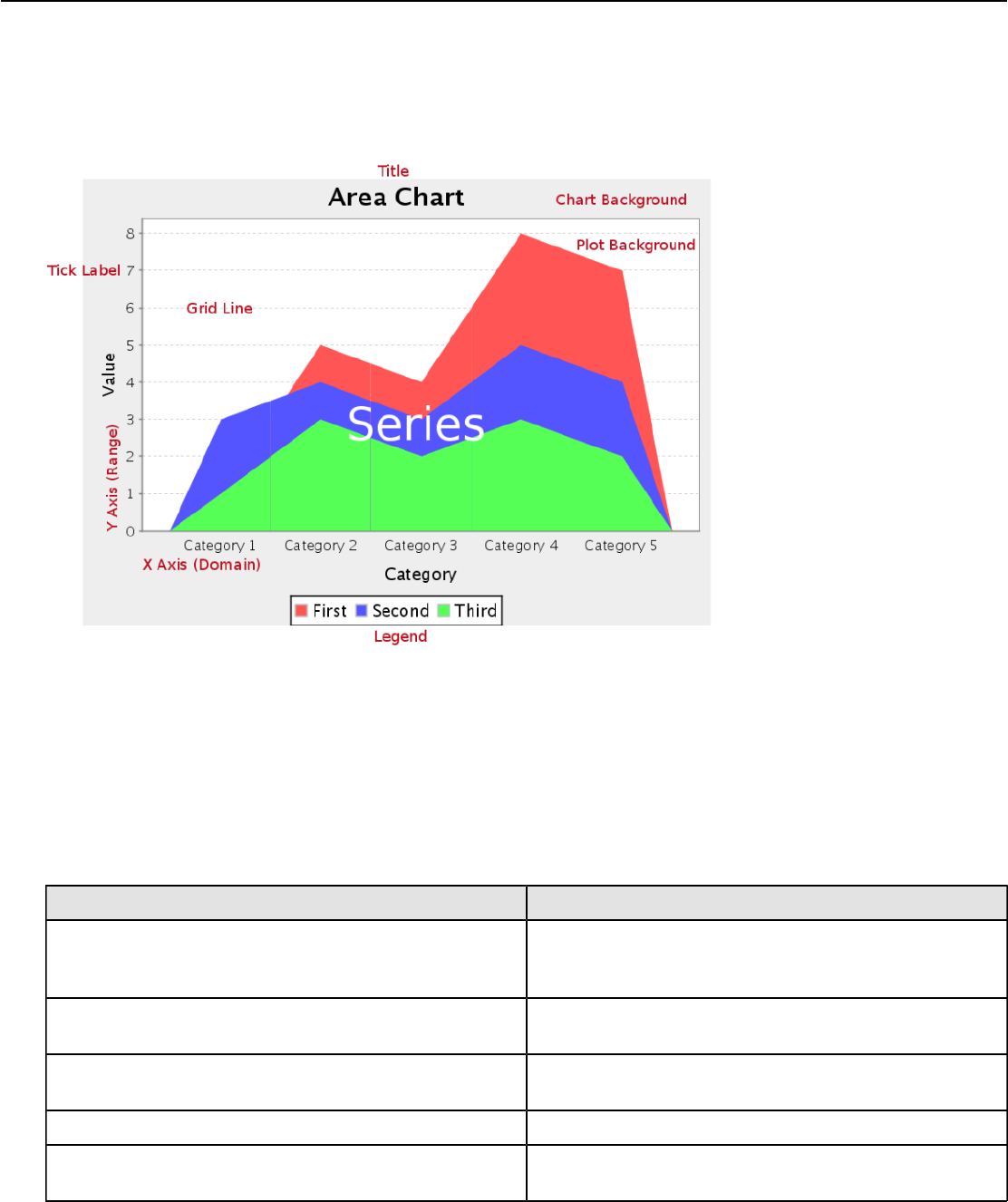
| Chart Types | 113
Area
Area charts are useful for discovering trends over time, where the values you are comparing are typically hierarchical.
If one or more of the chart areas will dip below other areas, then the resulting chart may not be very useful, and you
would be better served by a line or bar chart. Area charts are much like line charts, except the area between the lines
and the X axis is filled in with either solid, non-overlapping; or transparent, overlapping colors. Related data sets can be
assembled in groups (series) for easy comparison. If you need to make comparisons between X and Y values that are
not directly related in your data source, you must use an XY area chart instead.
Data Collectors
The following data collectors are associated with this chart type:
CategorySet
To generate categorical charts, you need a three-dimensional (three column) dataset. The first dimension is the
category column, which defines the columns that contain the category names. The category can be considered a
grouping of the bars (in a bar chart, for example). The next dimension is the series. In bar charts for example, you'll
have one bar for each series. Finally, the numerical value being plotted is the third dimension.
Property Description
name A title for this data collector configuration. Typically you
will only have one data collector per chart, in which case
this property is not particularly useful.
category-column The column that you want to use to determine category
names.
value-columns The data columns that determine the chart values (or
series items).
series-by-value A static value that you want to use for the series name.
series-by-field Uses the selected column to use for series names. This
will cause the value column to be split into series groups.
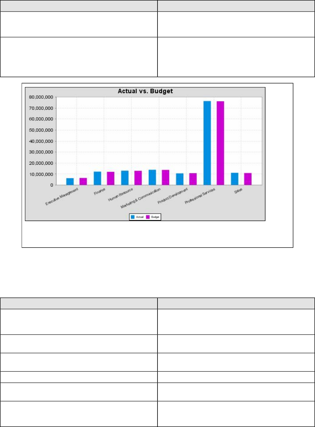
| Chart Types | 114
Property Description
group-by This provides the name of the group that the chart is
appearing in. If the chart contains detailed information,
then this is not necessary.
reset-group Specifies a group that will be used to create charts within
a sub-group. For example, if charting one chart per region,
and the chart is displaying data for departments within a
region, the reset-group would be set to the region group,
and the chart group would be set to department group.
In the above chart, Executive Management, Finance, etc., are in the category column (department).
The first series name is Actual (the blue bar), and the second series name is Budget (the purple bar).
PivotCategorySet
The PivotCategorySet data collector is an extension of the CategorySet data collector that will pivot the data to use a
column of values as series, rather than individual columns themselves. This means that at a minimum, you will need a
column from which the collector will retrieve the series names, and any number of additional numeric data columns that
will serve as categories. The data values to be plotted for each series are the category columns' values.
Property Description
name A title for this data collector configuration. Typically you
will only have one data collector per chart, in which case
this property is not particularly useful.
category-columns The names of the columns you want to use to determine
category names.
value-columns The data columns that determine the chart values (or
series items).
series-by-value A static value that you want to use for the series name.
series-by-field Uses the selected column to use for series names. This
will cause the value column to be split into series groups.
group-by This provides the name of the group that the chart is
appearing in. If the chart contains detailed information,
then this is not necessary.
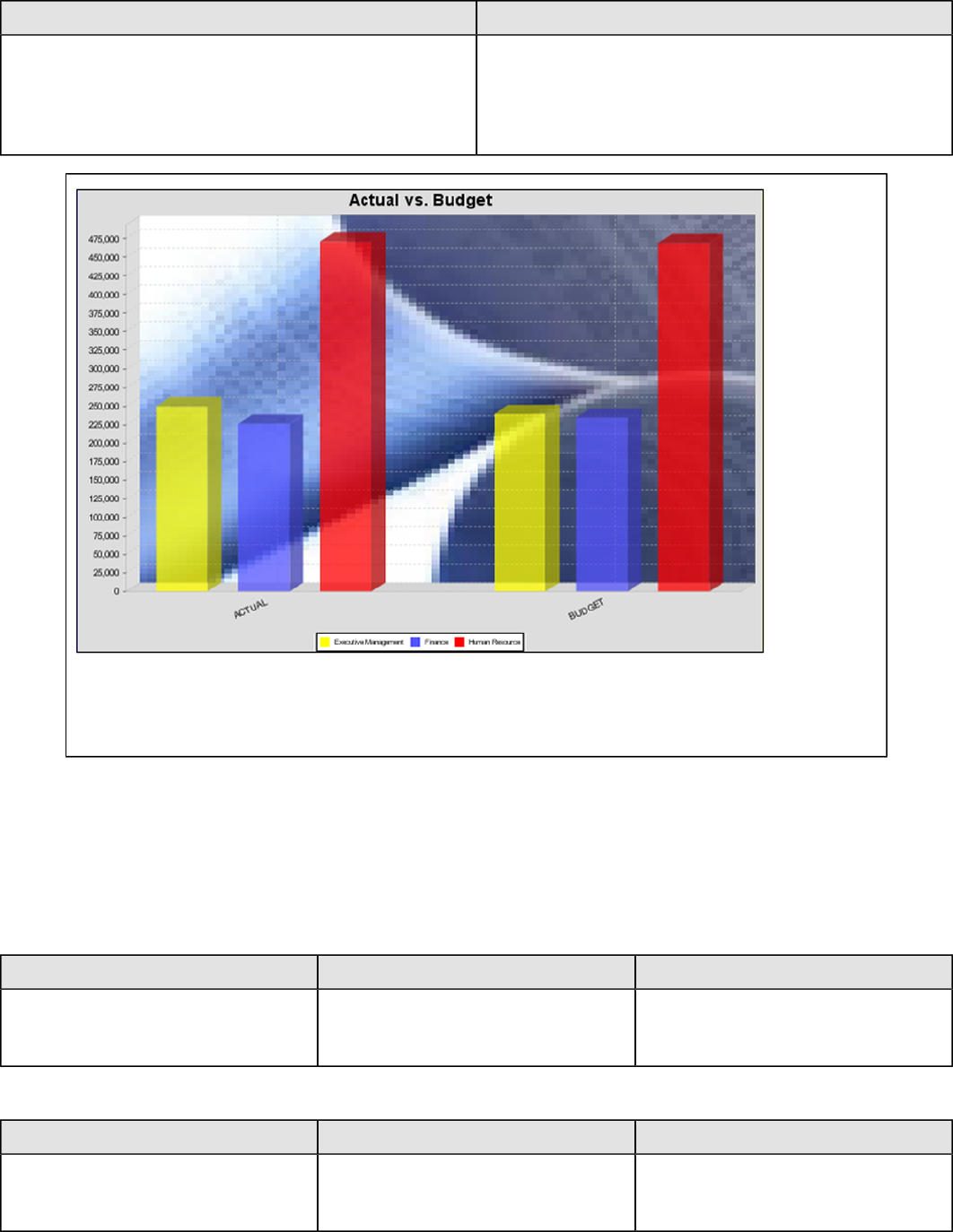
| Chart Types | 115
Property Description
reset-group Specifies a group that will be used to create charts within
a sub-group. For example, if charting one chart per region,
and the chart is displaying data for departments within a
region, the reset-group would be set to the region group,
and the chart group would be set to department group.
In the above bar chart, Executive Management, Finance, and Human Resources (the yellow, blue,
and red bars, respectively) are the series -- values taken from the series column DEPARTMENT.
The categories Actual and Budget supply row-based data points for each series.
Chart Properties
The following groups of properties are associated with this chart type:
Required
The following groups of properties are associated with the Required group for this chart type:
name
Property Data Type Description
name String The name (in Report Designer) of this
chart element. Does not appear in the
published report.
data-source
Property Data Type Description
data-source String The name of the established (in
Report Designer) data source you
intend to pull data from.
| Chart Types | 116
no-data-message
Property Data Type Description
no-data-message String The text displayed on the plot
background when the query produces
no usable data
Title
The following groups of properties are associated with the Title group for this chart type:
chart-title
Property Data Type Description
title String Sets the main title for the chart
chart-title-field
Property Data Type Description
chart-title-field Selection Specifies which field from your data
set you would like to use for the chart
title
title-font
Property Data Type Description
title-font Complex (see example below) Sets the font for the main title for the
chart.
<title-font>
<font-family/>
<size/>
<is-bold/>
<is-italic/>
</title-font>
Options
The following groups of properties are associated with the Options group for this chart type:
stacked
Property Data Type Description
is-stacked Boolean If true, stacks the series of the chart,
one on top of the other. Default value
is false.
stacked-percent
Property Data Type Description
stacked-percent Boolean If true, stacks the series of the chart,
one on top of the other, where each
bar represents a percentage of the
sum of all bars in the series. Default
value is false.
| Chart Types | 117
horizontal
Property Data Type Description
orientation String Determines vertical/horizontal
orientation for the chart. Possible
values are horizontal and vertical.
In Report Designer, this is a boolean
that makes the chart horizontal when
set to true and vertical when set to
false.
series-color
Property Data Type Description
color-palette String List of colors to apply (in order) to the
series in the chart.
General
The following groups of properties are associated with the General category for this chart type:
3-D
Property Data Type Description
is-3D Boolean If true, renders the chart three-
dimensionally. Default value is false.
gridlines
Property Data Type Description
gridlines Boolean If true, draws thick horizontal lines
across the plot background that more
easily show intervals between values.
Not to be confused with tick lines,
which are dotted plot lines that only
show major scale values. Default
value is true.
bg-color
Property Data Type Description
bg-color Selection The color of the chart background;
this is the area behind the chart, not
the plot area. To set the plot area, use
the plot-bg-color property instead
bg-image
Property Data Type Description
bg-image String Path to the graphic file you want to
display in the area behind the chart
| Chart Types | 118
show-border
Property Data Type Description
border-visible Boolean If true, draws a border around the
entire surrounding area for the chart.
Default value is false.
border-color
Property Data Type Description
border-paint String Sets the color for the surrounding
chart border. Possible values are
hexadecimal color codes.
anti-alias
Property Data Type Description
anti-alias Boolean Determines whether the edges and
curves of the element should be
smoothed
plot-bg-color
Property Data Type Description
plot-background Complex (see example below) Renders either the color, gradient ,
texture or image specified as the plot
background for the chart.
plot-fg-alpha
Property Data Type Description
plot-fg-alpha Decimal Controls the alpha value
(transparency) of the plot foreground.
Possible values are between 0 and 1,
with 0 being totally transparent, and 1
being totally opaque. Default is 1.
plot-bg-alpha
Property Data Type Description
plot-bg-alpha Decimal Controls the alpha value
(transparency) of the plot background.
Possible values are between 0 and 1,
with 0 being totally transparent, and 1
being totally opaque. Default is 1.
plot-border
Property Data Type Description
plot-border Boolean Determines whether or not the plot
area should have a border between it
and the chart background
| Chart Types | 119
url-formula
Property Data Type Description
url-formula formula Associates a link to the series key
and category name. See also, URL
Linking in Charts.
tooltip-formula
Property Data Type Description
tooltip-formula formula Defines the tooltip (hover text) for the
url-formula
X Axis
The following groups of properties are associated with the X Axis category for this chart type:
x-axis-title
Property Data Type Description
domain-title String Sets the title for the domain axis, if it
exists. In a typical two-dimensional
horizontal chart, this the categorical or
X axis.
x-font
Property Data Type Description
domain-title-font Complex (see example below) Sets the font for the domain axis title.
x-axis-label-width
Property Data Type Description
x-axis-label-width Decimal Limits the space (in pixels) occupied
by the x axis labels. The invisible
default value is 20.0. If your labels are
being truncated, try increasing this
value.
x-axis-label-rotation
Property Data Type Description
domain-label-rotation Integer The degree of the angle of rotation
for X axis labels. Possible values are
from 0 to 360.
show-labels
Property Data Type Description
show-labels Boolean Shows the plotted value. Default is
false.
| Chart Types | 120
label-rotation
Property Data Type Description
label-rotation Integer The degree of the angle of rotation for
the labels above the bars. Possible
values are from 0 to 360.
numeric-format
Property Data Type Description
numeric-format String Determines the content of the domain
plot labels. Must be in the Java
number format.
text-format
Property Data Type Description
text-format String Determines the content of the domain
plot labels. There are three possible
values, any or all of which may be
used: {0} represents the series
name; {1} represents category; {2}
represents the plotted value. These
properties must set in the following
format: {0}{1}{2}{3}. For instance, you
might use these values for plot labels:
{0} - series by field {1} - category
columns {2} - value-columns {3} -
percent.
date-format
Property Data Type Description
date-format String Determines the content of the domain
plot labels. Must be in the Java date
format.
category-margin
Property Data Type Description
category-margin Decimal Specifies the width (in pixels) between
bars (categories)
lower-margin
Property Data Type Description
lower-margin Decimal Specifies the space (in pixels)
between the Y axis and the first bar in
the chart
upper-margin
Property Data Type Description
upper-margin Decimal Specifies the space (in pixels)
between the last bar and the outer
edge of the chart

| Chart Types | 121
Y Axis
The following groups of properties are associated with the Y Axis category for this chart type:
y-axis-title
Property Data Type Description
range-title String Sets the title for the primary numeric
data axis; typically the Y axis in a
horizontally-oriented chart.
y-font
Property Data Type Description
range-title-font Complex (see example below) Sets the font for the range axis title.
y-sticky-0
Property Data Type Description
range-sticky-zero Boolean If true, truncates the axis margin at
zero.
y-incl-0
Property Data Type Description
range-includes-zero Boolean When an axis' values are auto-
calculated, setting this flag to true
ensures that the range always
includes zero.
y-auto-range
Property Data Type Description
y-auto-range Boolean If True, the y-min and y-max values
will be automatically calculated based
on the lowest and highest values in
the data set.
y-min
Property Data Type Description
range-minimum Integer Sets the lower bounding value on the
range axis.
y-max
Property Data Type Description
range-maximum Integer Sets the upper bounding value on the
range axis.
y-tick-interval
Property Data Type Description
y-tick-interval Decimal Controls the increments between Y
axis tick labels
| Chart Types | 122
y-tick-font
Property Data Type Description
range-tick-font Complex (see example below) Sets the font for the labels on the tick
marks of the range axis.
y-tick-fmt-str
Property Data Type Description
range-tick-format String Sets the format of the labels on
the tick marks of the range axis.
(An example format for displaying
percentages might be "0.00%")
y-tick-period
Property Data Type Description
y-tick-period Selection Specifies the Y axis tick intervals if the
Y (range) data set returns date or time
data
enable-log-axis
Property Data Type Description
enable-log-axis Boolean Determines whether or not the Y axis
scales logarithmically
log-format
Property Data Type Description
log-format Boolean Abbreviates large Y axis tick labels
if they are numbers and no format is
specified in y-tick-fmt-str
Legend
The following groups of properties are associated with the Legend category for this chart type:
show-legend
Property Data Type Description
include-legend Boolean When set to true, displays the legend
in the chart. Default value is true.
location
Property Data Type Description
location Selection Determines where the legend will be
situated, relative to the plot area
legend-bg-color
Property Data Type Description
legend-bg-color String Hexadecimal value of the color
you intend to use for the legend

| Chart Types | 123
Property Data Type Description
background. Default value is FFFFFF
(white).
legend-border
Property Data Type Description
legend-border-visible Boolean If true, draws a border around the
legend. Default value is true.
legend-font
Property Data Type Description
legend-font Complex (see example below) Sets the font to use on the text in the
legend.
<legend-font>
<font-family/>
<size/>
<is-bold/>
<is-italic/>
</legend-font>
legend-font-color
Property Data Type Description
legend-font-color String Hexadecimal value of the color you
intend to use for the legend font.
Default value is 000000 (black).
Scripting
The following groups of properties are associated with the Scripting category for this chart type:
Chart Post Processing Script Language
Property Data Type Description
Chart Post Processing Script
Language Selection The scripting language to use.
This property gives you access to
JFreeChart APIs so you can modify
the chart after the report renders.
Chart Post Processing Script
Property Data Type Description
Chart Post Processing Script Script The script to use to modify chart
object.
Pie
Pie charts are useful for comparing multiple data points. A single pie slice can be "exploded" out from the rest of the
chart to bring attention to the value it represents. If you need to compare related data sets in groups, you must use a pie
grid chart instead.
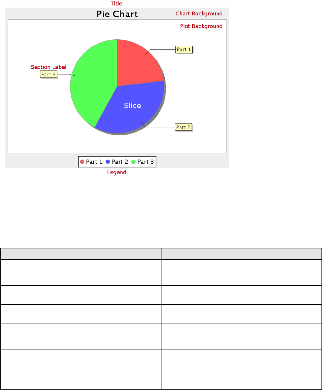
| Chart Types | 124
Data Collectors
The following data collectors are associated with this chart type:
PieSet
Pie datasets require two and only two dimensions (columns) -- one for the pie piece names (the series) and one for the
values that are used to calculate size of each pie piece. There are two chart types that work with Pie datasets: Pie and
Ring.
Property Description
name A title for this data collector configuration. Typically you
will only have one data collector per chart, in which case
this property is not particularly useful.
value-column The data column that determines the chart values (or
series items).
series-by-field Uses the selected column to use for series names. This
will cause the value column to be split into series groups.
group-by This provides the name of the group that the chart is
appearing in. If the chart contains detailed information,
then this is not necessary.
reset-group Specifies a group that will be used to create charts within
a sub-group. For example, if charting one chart per region,
and the chart is displaying data for departments within a
region, the reset-group would be set to the region group,
and the chart group would be set to department group.
Chart Properties
The following groups of properties are associated with this chart type:
Required
The following groups of properties are associated with the Required group for this chart type:

| Chart Types | 125
name
Property Data Type Description
name String The name (in Report Designer) of this
chart element. Does not appear in the
published report.
data-source
Property Data Type Description
data-source String The name of the established (in
Report Designer) data source you
intend to pull data from.
ignore-nulls
Property Data Type Description
ignore-nulls Boolean Specifies whether nonexistent data
points should be referenced in the
chart.
ignore-zeros
Property Data Type Description
ignore-zeros Boolean Specifies whether a data value of zero
should be referenced in the chart.
no-data-message
Property Data Type Description
no-data-message String The text displayed on the plot
background when the query produces
no usable data
Title
The following groups of properties are associated with the Title group for this chart type:
chart-title
Property Data Type Description
title String Sets the main title for the chart
chart-title-field
Property Data Type Description
chart-title-field Selection Specifies which field from your data
set you would like to use for the chart
title

| Chart Types | 126
title-font
Property Data Type Description
title-font Complex (see example below) Sets the font for the main title for the
chart.
<title-font>
<font-family/>
<size/>
<is-bold/>
<is-italic/>
</title-font>
Options
The following groups of properties are associated with the Options group for this chart type:
slice-colors
Property Data Type Description
line-data-source Hexadecimal A comma-separated list of
hexadecimal color values. The colors
are used in order, starting with the
first value returned by the data set.
show-labels
Property Data Type Description
display-labels Boolean If true, displays labels for pie sections.
Default value is true.
label-font
Property Data Type Description
label-font Complex (see example below) Sets the font for the labels on the pie
sections.
<label-font>
<font-family/>
<size/>
<is-bold/>
<is-italic/>
</label-font>
label-format
Property Data Type Description
label-format String Determines the content of the domain
plot labels. There are three possible
values, any or all of which may be
used: {0} represents the series name;
{1} represents the value; and {2}
represents the percentage value.
| Chart Types | 127
rotate-clockwise
Property Data Type Description
rotate-clockwise Boolean Specifies whether the values returned
by the data set are ordered from left
to right (clockwise) or right to left
(counterclockwise). Default is True
(clockwise).
explode-slice
Note: This property is called explode-slice in Report Designer.
Property Data Type Description
explode-slices Complex (see example below) A list of series names to explode
in the pie chart. Pie slices will not
explode on a 3D pie chart. In Report
Designer, the possible values are
integers representing the data points
returned by your data set, starting at
0.
explode-pct
Property Data Type Description
explode-pct Decimal A decimal value that represents the
percentage that you want to expand
the radius of the chart to make room
for the exploded pie piece. The larger
the value, the further out the piece
will be exploded. Possible values are
between 0.0 and 100.
General
The following groups of properties are associated with the General category for this chart type:
3-D
Property Data Type Description
is-3D Boolean If true, renders the chart three-
dimensionally. Default value is false.
bg-color
Property Data Type Description
bg-color Selection The color of the chart background;
this is the area behind the chart, not
the plot area. To set the plot area, use
the plot-bg-color property instead
bg-image
Property Data Type Description
bg-image String Path to the graphic file you want to
display in the area behind the chart

| Chart Types | 128
show-border
Property Data Type Description
border-visible Boolean If true, draws a border around the
entire surrounding area for the chart.
Default value is false.
border-color
Property Data Type Description
border-paint String Sets the color for the surrounding
chart border. Possible values are
hexadecimal color codes.
anti-alias
Property Data Type Description
anti-alias Boolean Determines whether the edges and
curves of the element should be
smoothed
plot-bg-color
Property Data Type Description
plot-background Complex (see example below) Renders either the color, gradient ,
texture or image specified as the plot
background for the chart.
plot-fg-alpha
Property Data Type Description
plot-fg-alpha Decimal Controls the alpha value
(transparency) of the plot foreground.
Possible values are between 0 and 1,
with 0 being totally transparent, and 1
being totally opaque. Default is 1.
plot-bg-alpha
Property Data Type Description
plot-bg-alpha Decimal Controls the alpha value
(transparency) of the plot background.
Possible values are between 0 and 1,
with 0 being totally transparent, and 1
being totally opaque. Default is 1.
plot-border
Property Data Type Description
plot-border Boolean Determines whether or not the plot
area should have a border between it
and the chart background
| Chart Types | 129
shadow-paint
Property Data Type Description
shadow-paint Selection The color of the chart shadow; this is
the area behind the chart — click [...]
(ellipsis) to display available colors.
shadow-x-offset
Property Data Type Description
shadow-x-offset Integer Coordinates relative to the chart for
background shadow; negative values
are acceptable — for example, a
value of 10 creates a shadow on the
lower right side of the chart. A value
of -10, creates a shadow on the upper
left side of the chart.
shadow-y-offset
Property Data Type Description
shadow-y-offset Integer Coordinates relative to the chart for
background shadow; negative values
are acceptable — for example, a
value of 10 creates a shadow on the
lower right side of the chart. A value
of -10, creates a shadow on the upper
left side of the chart.
url-formula
Property Data Type Description
url-formula formula Associates a link to the series key
and category name. See also, URL
Linking in Charts.
tooltip-formula
Property Data Type Description
tooltip-formula formula Defines the tooltip (hover text) for the
url-formula
Legend
The following groups of properties are associated with the Legend category for this chart type:
show-legend
Property Data Type Description
include-legend Boolean When set to true, displays the legend
in the chart. Default value is true.
location
Property Data Type Description
location Selection Determines where the legend will be
situated, relative to the plot area
| Chart Types | 130
legend-bg-color
Property Data Type Description
legend-bg-color String Hexadecimal value of the color
you intend to use for the legend
background. Default value is FFFFFF
(white).
legend-border
Property Data Type Description
legend-border-visible Boolean If true, draws a border around the
legend. Default value is true.
legend-font
Property Data Type Description
legend-font Complex (see example below) Sets the font to use on the text in the
legend.
<legend-font>
<font-family/>
<size/>
<is-bold/>
<is-italic/>
</legend-font>
legend-font-color
Property Data Type Description
legend-font-color String Hexadecimal value of the color you
intend to use for the legend font.
Default value is 000000 (black).
legend-label-format
Property Data Type Description
legend-label-format String Determines the content of the legend
labels. There are three possible
values, any or all of which may be
used: {0} represents the series name;
{1} represents the value; and {2}
represents the percentage value.
Scripting
The following groups of properties are associated with the Scripting category for this chart type:
Chart Post Processing Script Language
Property Data Type Description
Chart Post Processing Script
Language Selection The scripting language to use.
This property gives you access to
JFreeChart APIs so you can modify
the chart after the report renders.
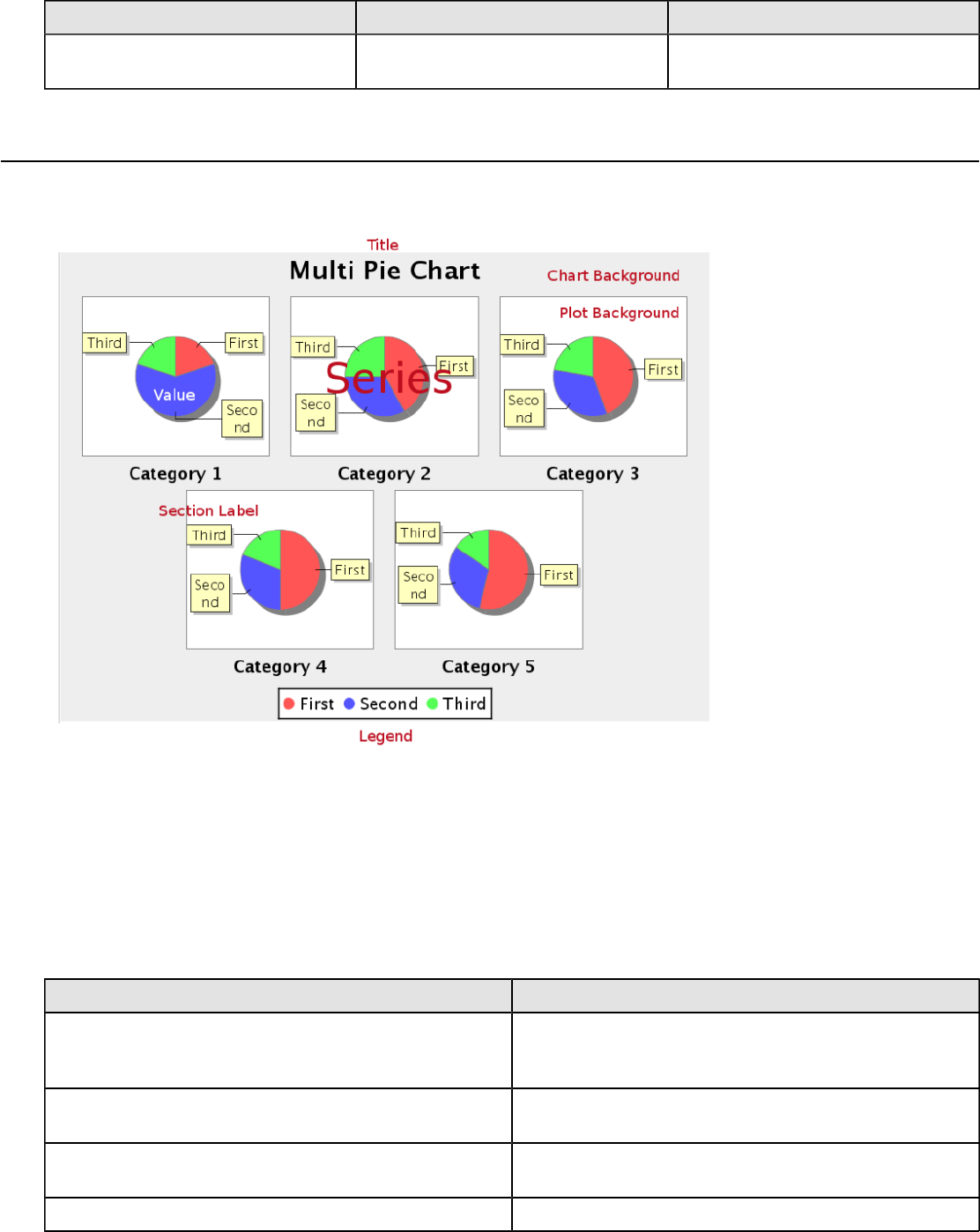
| Chart Types | 131
Chart Post Processing Script
Property Data Type Description
Chart Post Processing Script Script The script to use to modify chart
object.
Multi-Pie
Pie grid charts are useful for comparing multiple data points in a group. The group (series) items will display as multiple
pie charts in one chart area.
Data Collectors
The following data collectors are associated with this chart type:
CategorySet
To generate categorical charts, you need a three-dimensional (three column) dataset. The first dimension is the
category column, which defines the columns that contain the category names. The category can be considered a
grouping of the bars (in a bar chart, for example). The next dimension is the series. In bar charts for example, you'll
have one bar for each series. Finally, the numerical value being plotted is the third dimension.
Property Description
name A title for this data collector configuration. Typically you
will only have one data collector per chart, in which case
this property is not particularly useful.
category-column The column that you want to use to determine category
names.
value-columns The data columns that determine the chart values (or
series items).
series-by-value A static value that you want to use for the series name.

| Chart Types | 132
Property Description
series-by-field Uses the selected column to use for series names. This
will cause the value column to be split into series groups.
group-by This provides the name of the group that the chart is
appearing in. If the chart contains detailed information,
then this is not necessary.
reset-group Specifies a group that will be used to create charts within
a sub-group. For example, if charting one chart per region,
and the chart is displaying data for departments within a
region, the reset-group would be set to the region group,
and the chart group would be set to department group.
In the above chart, Executive Management, Finance, etc., are in the category column (department).
The first series name is Actual (the blue bar), and the second series name is Budget (the purple bar).
PivotCategorySet
The PivotCategorySet data collector is an extension of the CategorySet data collector that will pivot the data to use a
column of values as series, rather than individual columns themselves. This means that at a minimum, you will need a
column from which the collector will retrieve the series names, and any number of additional numeric data columns that
will serve as categories. The data values to be plotted for each series are the category columns' values.
Property Description
name A title for this data collector configuration. Typically you
will only have one data collector per chart, in which case
this property is not particularly useful.
category-columns The names of the columns you want to use to determine
category names.
value-columns The data columns that determine the chart values (or
series items).
series-by-value A static value that you want to use for the series name.
series-by-field Uses the selected column to use for series names. This
will cause the value column to be split into series groups.

| Chart Types | 133
Property Description
group-by This provides the name of the group that the chart is
appearing in. If the chart contains detailed information,
then this is not necessary.
reset-group Specifies a group that will be used to create charts within
a sub-group. For example, if charting one chart per region,
and the chart is displaying data for departments within a
region, the reset-group would be set to the region group,
and the chart group would be set to department group.
In the above bar chart, Executive Management, Finance, and Human Resources (the yellow, blue,
and red bars, respectively) are the series -- values taken from the series column DEPARTMENT.
The categories Actual and Budget supply row-based data points for each series.
Chart Properties
The following groups of properties are associated with this chart type:
Required
The following groups of properties are associated with the Required group for this chart type:
name
Property Data Type Description
name String The name (in Report Designer) of this
chart element. Does not appear in the
published report.
data-source
Property Data Type Description
data-source String The name of the established (in
Report Designer) data source you
intend to pull data from.
| Chart Types | 134
no-data-message
Property Data Type Description
no-data-message String The text displayed on the plot
background when the query produces
no usable data
Title
The following groups of properties are associated with the Title group for this chart type:
chart-title
Property Data Type Description
title String Sets the main title for the chart
chart-title-field
Property Data Type Description
chart-title-field Selection Specifies which field from your data
set you would like to use for the chart
title
title-font
Property Data Type Description
title-font Complex (see example below) Sets the font for the main title for the
chart.
<title-font>
<font-family/>
<size/>
<is-bold/>
<is-italic/>
</title-font>
Options
The following groups of properties are associated with the Options group for this chart type:
by-row
Property Data Type Description
by-row Boolean Switches the category and series
result sets
series-color
Property Data Type Description
color-palette String List of colors to apply (in order) to the
series in the chart.
| Chart Types | 135
show-labels
Property Data Type Description
display-labels Boolean If true, displays labels for pie sections.
Default value is true.
label-font
Property Data Type Description
label-font Complex (see example below) Sets the font for the labels on the pie
sections.
<label-font>
<font-family/>
<size/>
<is-bold/>
<is-italic/>
</label-font>
label-format
Property Data Type Description
label-format String Determines the content of the domain
plot labels. There are three possible
values, any or all of which may be
used: {0} represents the series name;
{1} represents the value; and {2}
represents the percentage value.
General
The following groups of properties are associated with the General category for this chart type:
3-D
Property Data Type Description
is-3D Boolean If true, renders the chart three-
dimensionally. Default value is false.
bg-color
Property Data Type Description
bg-color Selection The color of the chart background;
this is the area behind the chart, not
the plot area. To set the plot area, use
the plot-bg-color property instead
bg-image
Property Data Type Description
bg-image String Path to the graphic file you want to
display in the area behind the chart

| Chart Types | 136
show-border
Property Data Type Description
border-visible Boolean If true, draws a border around the
entire surrounding area for the chart.
Default value is false.
border-color
Property Data Type Description
border-paint String Sets the color for the surrounding
chart border. Possible values are
hexadecimal color codes.
anti-alias
Property Data Type Description
anti-alias Boolean Determines whether the edges and
curves of the element should be
smoothed
plot-bg-color
Property Data Type Description
plot-background Complex (see example below) Renders either the color, gradient ,
texture or image specified as the plot
background for the chart.
plot-fg-alpha
Property Data Type Description
plot-fg-alpha Decimal Controls the alpha value
(transparency) of the plot foreground.
Possible values are between 0 and 1,
with 0 being totally transparent, and 1
being totally opaque. Default is 1.
plot-bg-alpha
Property Data Type Description
plot-bg-alpha Decimal Controls the alpha value
(transparency) of the plot background.
Possible values are between 0 and 1,
with 0 being totally transparent, and 1
being totally opaque. Default is 1.
plot-border
Property Data Type Description
plot-border Boolean Determines whether or not the plot
area should have a border between it
and the chart background

| Chart Types | 137
shadow-paint
Property Data Type Description
shadow-paint Selection The color of the chart shadow; this is
the area behind the chart — click [...]
(ellipsis) to display available colors.
shadow-x-offset
Property Data Type Description
shadow-x-offset Integer Coordinates relative to the chart for
background shadow; negative values
are acceptable — for example, a
value of 10 creates a shadow on the
lower right side of the chart. A value
of -10, creates a shadow on the upper
left side of the chart.
shadow-y-offset
Property Data Type Description
shadow-y-offset Integer Coordinates relative to the chart for
background shadow; negative values
are acceptable — for example, a
value of 10 creates a shadow on the
lower right side of the chart. A value
of -10, creates a shadow on the upper
left side of the chart.
url-formula
Property Data Type Description
url-formula formula Associates a link to the series key
and category name. See also, URL
Linking in Charts.
tooltip-formula
Property Data Type Description
tooltip-formula formula Defines the tooltip (hover text) for the
url-formula
Legend
The following groups of properties are associated with the Legend category for this chart type:
show-legend
Property Data Type Description
include-legend Boolean When set to true, displays the legend
in the chart. Default value is true.
location
Property Data Type Description
location Selection Determines where the legend will be
situated, relative to the plot area

| Chart Types | 138
legend-bg-color
Property Data Type Description
legend-bg-color String Hexadecimal value of the color
you intend to use for the legend
background. Default value is FFFFFF
(white).
legend-border
Property Data Type Description
legend-border-visible Boolean If true, draws a border around the
legend. Default value is true.
legend-font
Property Data Type Description
legend-font Complex (see example below) Sets the font to use on the text in the
legend.
<legend-font>
<font-family/>
<size/>
<is-bold/>
<is-italic/>
</legend-font>
legend-font-color
Property Data Type Description
legend-font-color String Hexadecimal value of the color you
intend to use for the legend font.
Default value is 000000 (black).
Scripting
The following groups of properties are associated with the Scripting category for this chart type:
Chart Post Processing Script Language
Property Data Type Description
Chart Post Processing Script
Language Selection The scripting language to use.
This property gives you access to
JFreeChart APIs so you can modify
the chart after the report renders.
Chart Post Processing Script
Property Data Type Description
Chart Post Processing Script Script The script to use to modify chart
object.
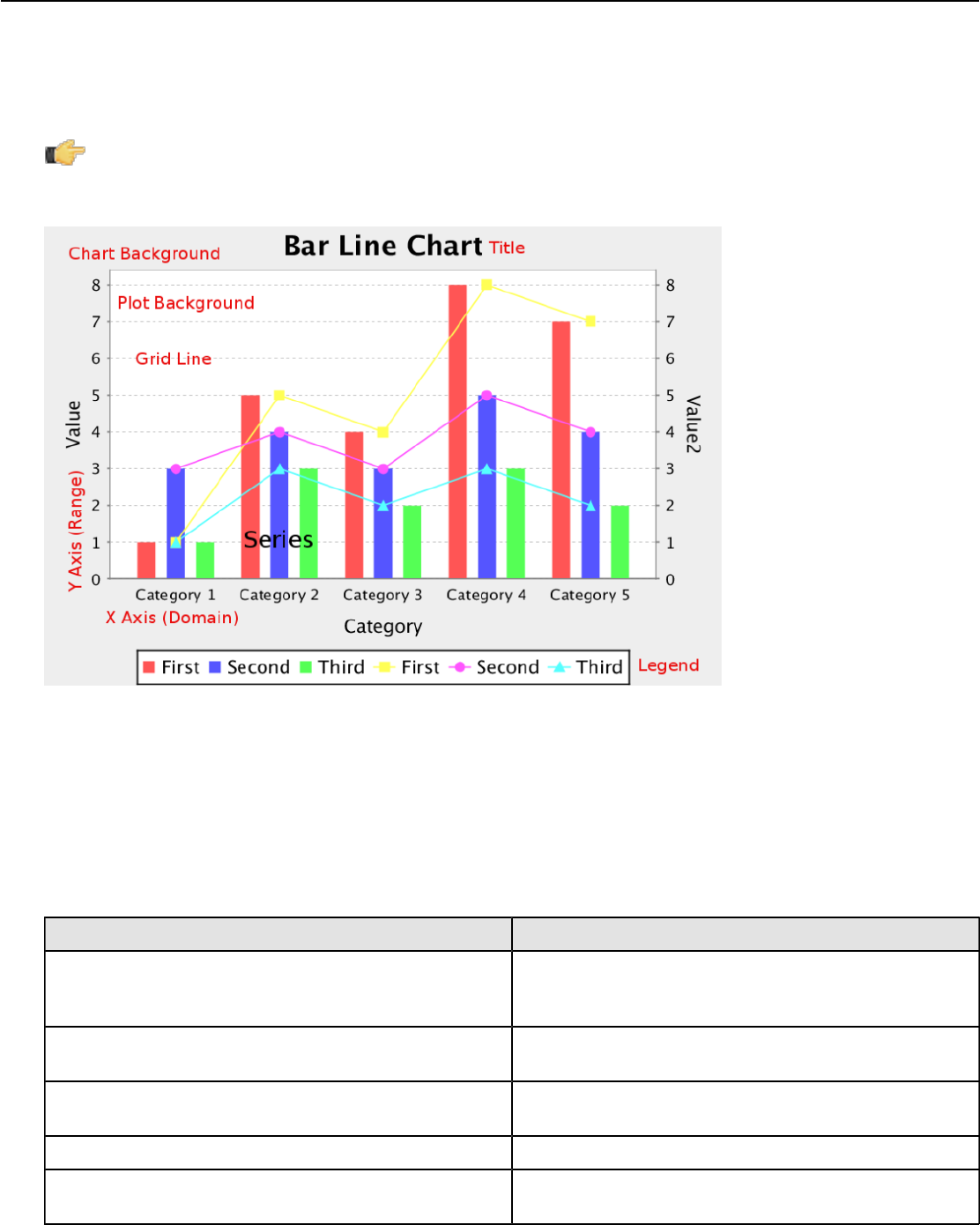
| Chart Types | 139
Bar Line Combination
Bar Line charts are useful for spotting trends and comparing items against one another as well as showing comparisons
between metrics. For instance, you might have bars that represent the number of employees per department, and a
line that indicates productivity; or bars that represent software product sales, and a line that represents the number of
evaluation downloads. You cannot have more than one line per bar line chart, so if you need to compare more than one
set of metrics, you will have to create multiple charts to show them.
Note: Bar Line charts require two data sources -- one for the bars, one for the line. These are set through the
Primary Datasource and Secondary Datasource tabs at the top of the right half of the Bar Line properties
window. In order to properly show a relationship between the two data points, you should use the same data
source for both the bars and the line.
Data Collectors
The following data collectors are associated with this chart type:
CategorySet
To generate categorical charts, you need a three-dimensional (three column) dataset. The first dimension is the
category column, which defines the columns that contain the category names. The category can be considered a
grouping of the bars (in a bar chart, for example). The next dimension is the series. In bar charts for example, you'll
have one bar for each series. Finally, the numerical value being plotted is the third dimension.
Property Description
name A title for this data collector configuration. Typically you
will only have one data collector per chart, in which case
this property is not particularly useful.
category-column The column that you want to use to determine category
names.
value-columns The data columns that determine the chart values (or
series items).
series-by-value A static value that you want to use for the series name.
series-by-field Uses the selected column to use for series names. This
will cause the value column to be split into series groups.

| Chart Types | 140
Property Description
group-by This provides the name of the group that the chart is
appearing in. If the chart contains detailed information,
then this is not necessary.
reset-group Specifies a group that will be used to create charts within
a sub-group. For example, if charting one chart per region,
and the chart is displaying data for departments within a
region, the reset-group would be set to the region group,
and the chart group would be set to department group.
In the above chart, Executive Management, Finance, etc., are in the category column (department).
The first series name is Actual (the blue bar), and the second series name is Budget (the purple bar).
PivotCategorySet
The PivotCategorySet data collector is an extension of the CategorySet data collector that will pivot the data to use a
column of values as series, rather than individual columns themselves. This means that at a minimum, you will need a
column from which the collector will retrieve the series names, and any number of additional numeric data columns that
will serve as categories. The data values to be plotted for each series are the category columns' values.
Property Description
name A title for this data collector configuration. Typically you
will only have one data collector per chart, in which case
this property is not particularly useful.
category-columns The names of the columns you want to use to determine
category names.
value-columns The data columns that determine the chart values (or
series items).
series-by-value A static value that you want to use for the series name.
series-by-field Uses the selected column to use for series names. This
will cause the value column to be split into series groups.
group-by This provides the name of the group that the chart is
appearing in. If the chart contains detailed information,
then this is not necessary.
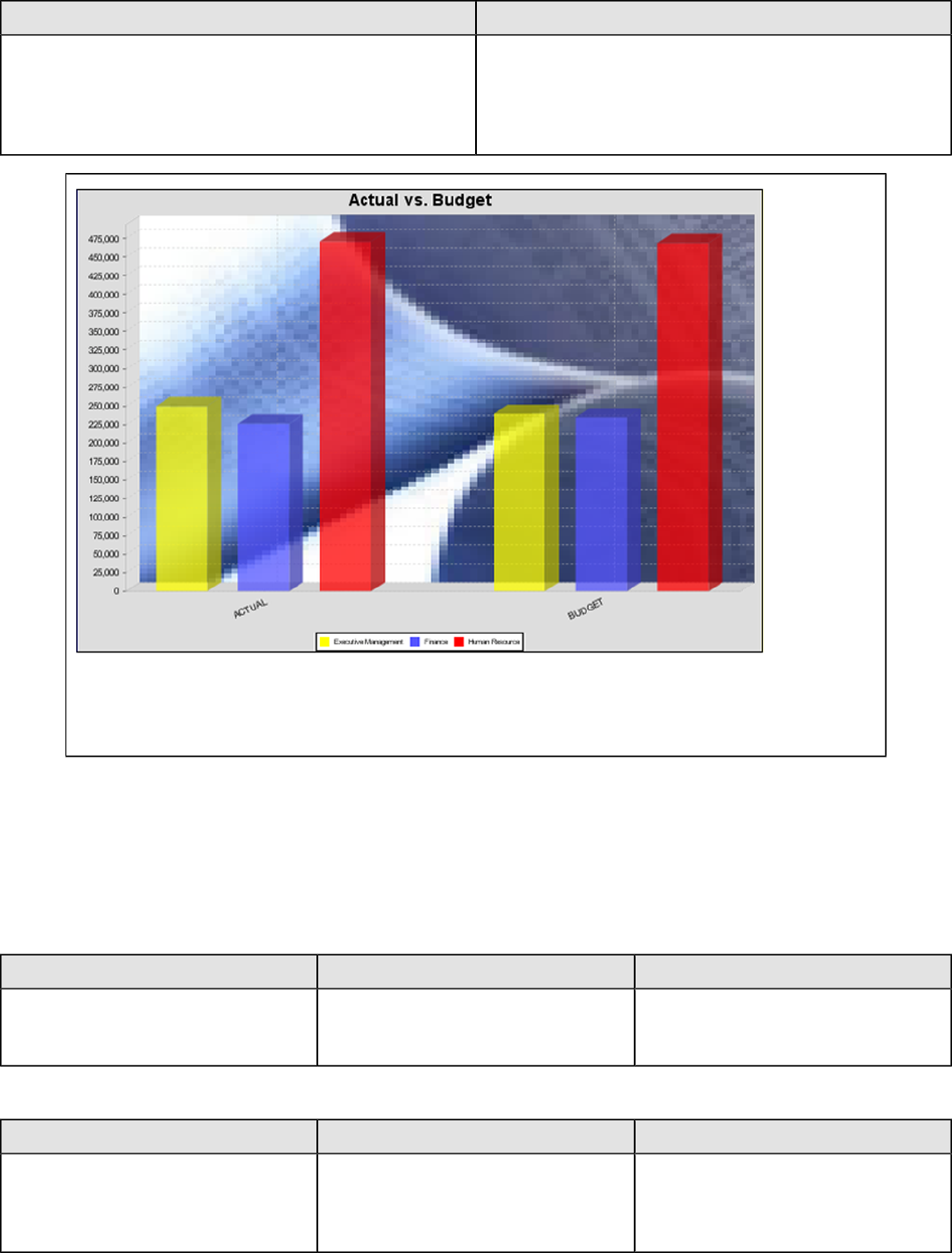
| Chart Types | 141
Property Description
reset-group Specifies a group that will be used to create charts within
a sub-group. For example, if charting one chart per region,
and the chart is displaying data for departments within a
region, the reset-group would be set to the region group,
and the chart group would be set to department group.
In the above bar chart, Executive Management, Finance, and Human Resources (the yellow, blue,
and red bars, respectively) are the series -- values taken from the series column DEPARTMENT.
The categories Actual and Budget supply row-based data points for each series.
Chart Properties
The following groups of properties are associated with this chart type:
Required
The following groups of properties are associated with the Required group for this chart type:
name
Property Data Type Description
name String The name (in Report Designer) of this
chart element. Does not appear in the
published report.
bar-data-source
Property Data Type Description
bar-data-source String The name of the established (in
Report Designer) data source you
intend to pull data from for the bar
portion of the chart.
| Chart Types | 142
line-data-source
Property Data Type Description
line-data-source String The name of the established (in
Report Designer) data source you
intend to pull data from for the line
portion of the chart.
no-data-message
Property Data Type Description
no-data-message String The text displayed on the plot
background when the query produces
no usable data
Title
The following groups of properties are associated with the Title group for this chart type:
chart-title
Property Data Type Description
title String Sets the main title for the chart
chart-title-field
Property Data Type Description
chart-title-field Selection Specifies which field from your data
set you would like to use for the chart
title
title-font
Property Data Type Description
title-font Complex (see example below) Sets the font for the main title for the
chart.
<title-font>
<font-family/>
<size/>
<is-bold/>
<is-italic/>
</title-font>
Options
The following groups of properties are associated with the Options group for this chart type:
stacked
Property Data Type Description
is-stacked Boolean If true, stacks the series of the chart,
one on top of the other. Default value
is false.
| Chart Types | 143
stacked-percent
Property Data Type Description
stacked-percent Boolean If true, stacks the series of the chart,
one on top of the other, where each
bar represents a percentage of the
sum of all bars in the series. Default
value is false.
horizontal
Property Data Type Description
orientation String Determines vertical/horizontal
orientation for the chart. Possible
values are horizontal and vertical.
In Report Designer, this is a boolean
that makes the chart horizontal when
set to true and vertical when set to
false.
series-color
Property Data Type Description
color-palette String List of colors to apply (in order) to the
series in the chart.
max-bar-width
Property Data Type Description
max-bar-width Decimal Sets the maximum bar width as a
percentage of the axis length. For
example, setting this to 0.05 will
ensure that the bars never exceed
five percent of the length of the axis.
This can improve the appearance of
charts where there is a possibility that
only one or two bars will be displayed.
Possible values are between .01 and
1.0.
bar-borders
Property Data Type Description
bar-borders Boolean Draws a thin solid black border
around each bar
ctgry-tick-font
Property Data Type Description
ctgry-tick-font String Specifies the font of both the X axis
category labels, and the Y1 (left side)
tick labels
| Chart Types | 144
line-style
Property Data Type Description
line-style String Sets the style of line series lines.
Possible values are: solid, dash, dot,
dashdot, dashdotdot. Default value is
solid.
line-size
Note: This property is called line-width in the Radar chart property list.
Property Data Type Description
line-width Decimal Sets the width of line series lines.
Default value is 1.0.
show-markers
Property Data Type Description
markers-visible Boolean Sets the point markers visible in
applicable charts. Default value is
false.
line-series
Property Data Type Description
line-series Complex (see example below) A list of names of the columns (series)
in the dataset representing the series
that will be drawn as a line.
<line-series>
<series/>
</line-series>
lines-label-font
Property Data Type Description
lines-label-font String Specifies the font of both the labels
above the line at each data point
line-tick-fmt
Property Data Type Description
lines-range-tick-format String Sets the format of the tick mark labels
of the range axis for the line in a
bar line chart. An example format
for displaying percentages might be
"0.00%". Does not affect the bar tick
labels.
| Chart Types | 145
line-tick-font
Property Data Type Description
lines-range-tick-font Complex (see example below) Sets the font for the tick mark labels
of the range axis for the line in a bar
line chart. Does not affect bar tick
labels.
General
The following groups of properties are associated with the General category for this chart type:
3-D
Property Data Type Description
is-3D Boolean If true, renders the chart three-
dimensionally. Default value is false.
gridlines
Property Data Type Description
gridlines Boolean If true, draws thick horizontal lines
across the plot background that more
easily show intervals between values.
Not to be confused with tick lines,
which are dotted plot lines that only
show major scale values. Default
value is true.
bg-color
Property Data Type Description
bg-color Selection The color of the chart background;
this is the area behind the chart, not
the plot area. To set the plot area, use
the plot-bg-color property instead
bg-image
Property Data Type Description
bg-image String Path to the graphic file you want to
display in the area behind the chart
show-border
Property Data Type Description
border-visible Boolean If true, draws a border around the
entire surrounding area for the chart.
Default value is false.
border-color
Property Data Type Description
border-paint String Sets the color for the surrounding
chart border. Possible values are
hexadecimal color codes.

| Chart Types | 146
anti-alias
Property Data Type Description
anti-alias Boolean Determines whether the edges and
curves of the element should be
smoothed
plot-bg-color
Property Data Type Description
plot-background Complex (see example below) Renders either the color, gradient ,
texture or image specified as the plot
background for the chart.
plot-fg-alpha
Property Data Type Description
plot-fg-alpha Decimal Controls the alpha value
(transparency) of the plot foreground.
Possible values are between 0 and 1,
with 0 being totally transparent, and 1
being totally opaque. Default is 1.
plot-bg-alpha
Property Data Type Description
plot-bg-alpha Decimal Controls the alpha value
(transparency) of the plot background.
Possible values are between 0 and 1,
with 0 being totally transparent, and 1
being totally opaque. Default is 1.
plot-border
Property Data Type Description
plot-border Boolean Determines whether or not the plot
area should have a border between it
and the chart background
url-formula
Property Data Type Description
url-formula formula Associates a link to the series key
and category name. See also, URL
Linking in Charts.
tooltip-formula
Property Data Type Description
tooltip-formula formula Defines the tooltip (hover text) for the
url-formula
X Axis
The following groups of properties are associated with the X Axis category for this chart type:
| Chart Types | 147
x-axis-title
Property Data Type Description
domain-title String Sets the title for the domain axis, if it
exists. In a typical two-dimensional
horizontal chart, this the categorical or
X axis.
x-font
Property Data Type Description
domain-title-font Complex (see example below) Sets the font for the domain axis title.
x-axis-label-width
Property Data Type Description
x-axis-label-width Decimal Limits the space (in pixels) occupied
by the x axis labels. The invisible
default value is 20.0. If your labels are
being truncated, try increasing this
value.
x-axis-label-rotation
Property Data Type Description
domain-label-rotation Integer The degree of the angle of rotation
for X axis labels. Possible values are
from 0 to 360.
show-labels
Property Data Type Description
display-labels Boolean If true, displays labels for pie sections.
Default value is true.
label-rotation
Property Data Type Description
label-rotation Integer The degree of the angle of rotation for
the labels above the bars. Possible
values are from 0 to 360.
numeric-format
Property Data Type Description
numeric-format String Determines the content of the domain
plot labels. Must be in the Java
number format.
text-format
Property Data Type Description
text-format String Determines the content of the domain
plot labels. There are three possible
values, any or all of which may be
used: {0} represents the series
| Chart Types | 148
Property Data Type Description
name; {1} represents category; {2}
represents the plotted value. These
properties must set in the following
format: {0}{1}{2}{3}. For instance, you
might use these values for plot labels:
{0} - series by field {1} - category
columns {2} - value-columns {3} -
percent.
date-format
Property Data Type Description
date-format String Determines the content of the domain
plot labels. Must be in the Java date
format.
category-margin
Property Data Type Description
category-margin Decimal Specifies the width (in pixels) between
bars (categories)
lower-margin
Property Data Type Description
lower-margin Decimal Specifies the space (in pixels)
between the Y axis and the first bar in
the chart
upper-margin
Property Data Type Description
upper-margin Decimal Specifies the space (in pixels)
between the last bar and the outer
edge of the chart
item-margin
Property Data Type Description
item-margin Decimal Specifies the space (in pixels)
between the bars in a series
Y Axis
The following groups of properties are associated with the Y Axis category for this chart type:
y-axis-title
Property Data Type Description
range-title String Sets the title for the primary numeric
data axis; typically the Y axis in a
horizontally-oriented chart.
| Chart Types | 149
y-font
Property Data Type Description
range-title-font Complex (see example below) Sets the font for the range axis title.
y-sticky-0
Property Data Type Description
range-sticky-zero Boolean If true, truncates the axis margin at
zero.
y-incl-0
Property Data Type Description
range-includes-zero Boolean When an axis' values are auto-
calculated, setting this flag to true
ensures that the range always
includes zero.
y-auto-range
Property Data Type Description
y-auto-range Boolean If True, the y-min and y-max values
will be automatically calculated based
on the lowest and highest values in
the data set.
y-min
Property Data Type Description
range-minimum Integer Sets the lower bounding value on the
range axis.
y-max
Property Data Type Description
range-maximum Integer Sets the upper bounding value on the
range axis.
y-tick-interval
Property Data Type Description
y-tick-interval Decimal Controls the increments between Y
axis tick labels
y-tick-font
Property Data Type Description
range-tick-font Complex (see example below) Sets the font for the labels on the tick
marks of the range axis.
| Chart Types | 150
y-tick-fmt-str
Property Data Type Description
range-tick-format String Sets the format of the labels on
the tick marks of the range axis.
(An example format for displaying
percentages might be "0.00%")
y-tick-period
Property Data Type Description
y-tick-period Selection Specifies the Y axis tick intervals if the
Y (range) data set returns date or time
data
enable-log-axis
Property Data Type Description
enable-log-axis Boolean Determines whether or not the Y axis
scales logarithmically
log-format
Property Data Type Description
log-format Boolean Abbreviates large Y axis tick labels
if they are numbers and no format is
specified in y-tick-fmt-str
y2-same-as-y-axis
Property Data Type Description
y2-same-as-y-axis Boolean Sets the Y2 axis (the right-side axis)
to the same tick intervals as the Y1
(left-side) axis
y2-axis-title
Property Data Type Description
y2-axis-title String Sets the title for the Y2 (right-side)
numeric data axis
y2-font
Property Data Type Description
y2-font String Sets the font for the Y2 (right-side)
axis title
y2-tick-interval
Property Data Type Description
y2-tick-interval Decimal Controls the increments between Y2
(right-side) axis tick labels
| Chart Types | 151
y2-tick-font
Property Data Type Description
y2-tick-font String Sets the font for the labels on the tick
marks of the Y2 (right-side) axis
y2-min
Property Data Type Description
y2-min Integer Sets the lower bounding value on the
Y2 (right-side) axis
y2-max
Property Data Type Description
y2-max Integer Sets the upper bounding value on the
Y2 (right-side) axis
y2-tick-period
Property Data Type Description
y2-tick-period Selection Specifies the Y2 (right-side) axis
tick intervals if the Y2 (line) data set
returns date or time data
Legend
The following groups of properties are associated with the Legend category for this chart type:
show-legend
Property Data Type Description
include-legend Boolean When set to true, displays the legend
in the chart. Default value is true.
location
Property Data Type Description
location Selection Determines where the legend will be
situated, relative to the plot area
legend-bg-color
Property Data Type Description
legend-bg-color String Hexadecimal value of the color
you intend to use for the legend
background. Default value is FFFFFF
(white).
legend-border
Property Data Type Description
legend-border-visible Boolean If true, draws a border around the
legend. Default value is true.
| Chart Types | 152
legend-font
Property Data Type Description
legend-font Complex (see example below) Sets the font to use on the text in the
legend.
<legend-font>
<font-family/>
<size/>
<is-bold/>
<is-italic/>
</legend-font>
legend-font-color
Property Data Type Description
legend-font-color String Hexadecimal value of the color you
intend to use for the legend font.
Default value is 000000 (black).
Scripting
The following groups of properties are associated with the Scripting category for this chart type:
Chart Post Processing Script Language
Property Data Type Description
Chart Post Processing Script
Language Selection The scripting language to use.
This property gives you access to
JFreeChart APIs so you can modify
the chart after the report renders.
Chart Post Processing Script
Property Data Type Description
Chart Post Processing Script Script The script to use to modify chart
object.
Ring
Note: This chart type is only available in Report Designer; it cannot be created through the BA Platform's
ChartComponent.
Ring charts, like pie charts, are useful for comparing multiple data points. Pie charts are generally easier to read, so you
should probably have a specific reason to choose a ring over a pie chart. A single ring slice can be "exploded" out from
the rest of the chart to bring attention to the value it represents. If you need to compare related data sets in groups, you
must use a pie grid chart instead.
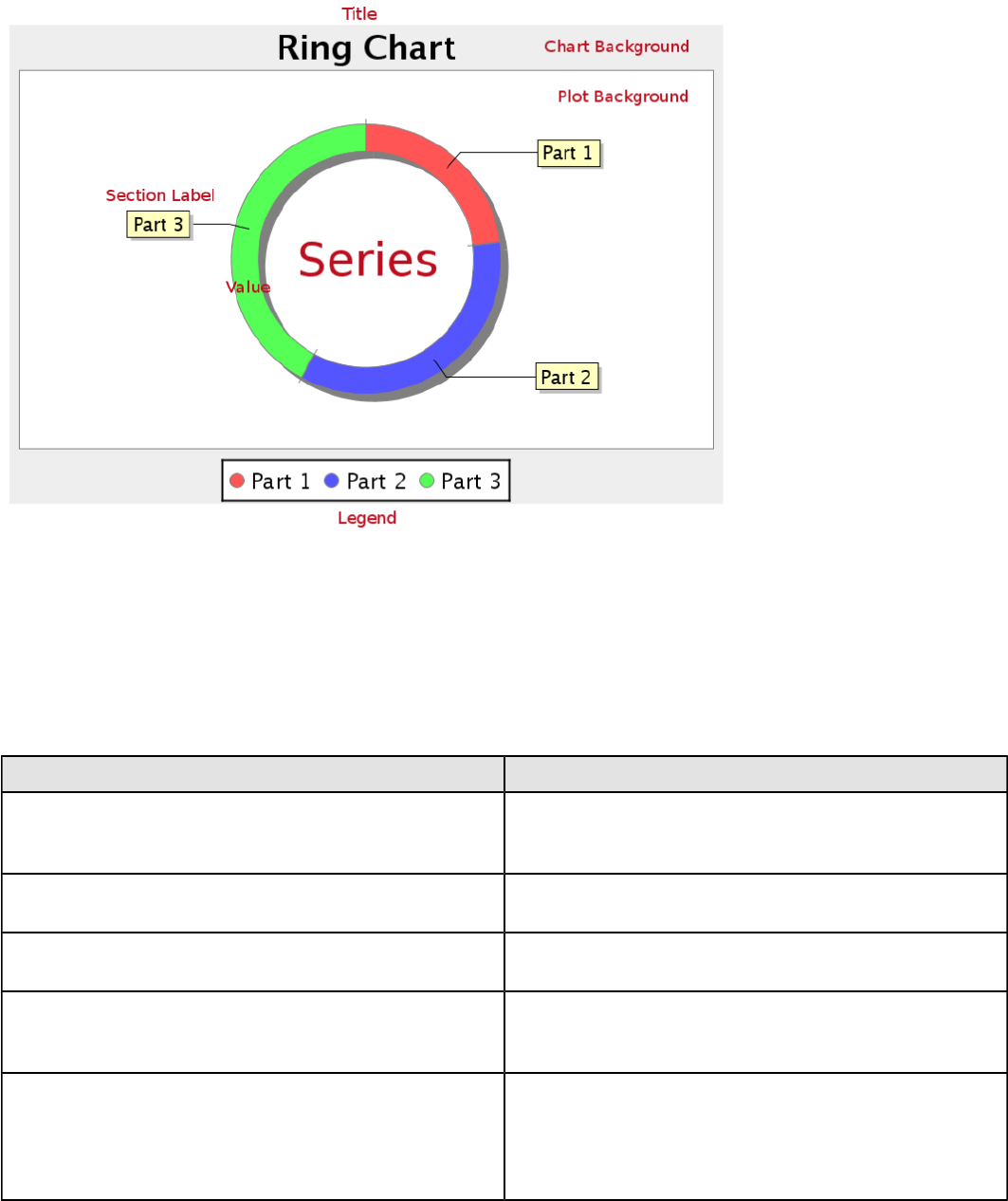
| Chart Types | 153
Data Collectors
The following data collectors are associated with this chart type:
PieSet
Pie datasets require two and only two dimensions (columns) -- one for the pie piece names (the series) and one for the
values that are used to calculate size of each pie piece. There are two chart types that work with Pie datasets: Pie and
Ring.
Property Description
name A title for this data collector configuration. Typically you
will only have one data collector per chart, in which case
this property is not particularly useful.
value-column The data column that determines the chart values (or
series items).
series-by-field Uses the selected column to use for series names. This
will cause the value column to be split into series groups.
group-by This provides the name of the group that the chart is
appearing in. If the chart contains detailed information,
then this is not necessary.
reset-group Specifies a group that will be used to create charts within
a sub-group. For example, if charting one chart per region,
and the chart is displaying data for departments within a
region, the reset-group would be set to the region group,
and the chart group would be set to department group.
Chart Properties
The following groups of properties are associated with this chart type:
Required
The following groups of properties are associated with the Required group for this chart type:
| Chart Types | 154
name
Property Data Type Description
name String The name (in Report Designer) of this
chart element. Does not appear in the
published report.
data-source
Property Data Type Description
data-source String The name of the established (in
Report Designer) data source you
intend to pull data from.
ignore-nulls
Property Data Type Description
ignore-nulls Boolean Specifies whether nonexistent data
points should be referenced in the
chart.
ignore-zeros
Property Data Type Description
ignore-zeros Boolean Specifies whether a data value of zero
should be referenced in the chart.
no-data-message
Property Data Type Description
no-data-message String The text displayed on the plot
background when the query produces
no usable data
Title
The following groups of properties are associated with the Title group for this chart type:
chart-title
Property Data Type Description
title String Sets the main title for the chart
chart-title-field
Property Data Type Description
chart-title-field Selection Specifies which field from your data
set you would like to use for the chart
title
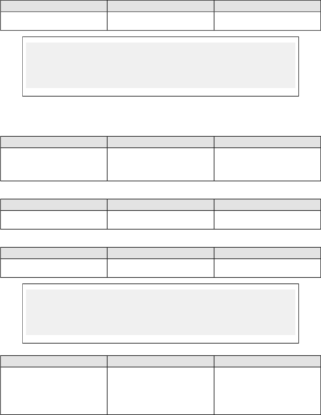
| Chart Types | 155
title-font
Property Data Type Description
title-font Complex (see example below) Sets the font for the main title for the
chart.
<title-font>
<font-family/>
<size/>
<is-bold/>
<is-italic/>
</title-font>
Options
The following groups of properties are associated with the Options group for this chart type:
slice-colors
Property Data Type Description
line-data-source Hexadecimal A comma-separated list of
hexadecimal color values. The colors
are used in order, starting with the
first value returned by the data set.
show-labels
Property Data Type Description
display-labels Boolean If true, displays labels for pie sections.
Default value is true.
label-font
Property Data Type Description
label-font Complex (see example below) Sets the font for the labels on the pie
sections.
<label-font>
<font-family/>
<size/>
<is-bold/>
<is-italic/>
</label-font>
label-format
Property Data Type Description
label-format String Determines the content of the domain
plot labels. There are three possible
values, any or all of which may be
used: {0} represents the series name;
{1} represents the value; and {2}
represents the percentage value.
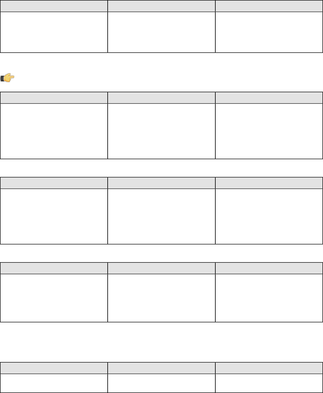
| Chart Types | 156
rotate-clockwise
Property Data Type Description
rotate-clockwise Boolean Specifies whether the values returned
by the data set are ordered from left
to right (clockwise) or right to left
(counterclockwise). Default is True
(clockwise).
explode-slice
Note: This property is called explode-slice in Report Designer.
Property Data Type Description
explode-slices Complex (see example below) A list of series names to explode
in the pie chart. Pie slices will not
explode on a 3D pie chart. In Report
Designer, the possible values are
integers representing the data points
returned by your data set, starting at
0.
explode-pct
Property Data Type Description
explode-pct Decimal A decimal value that represents the
percentage that you want to expand
the radius of the chart to make room
for the exploded pie piece. The larger
the value, the further out the piece
will be exploded. Possible values are
between 0.0 and 100.
section-depth
Property Data Type Description
section-depth Decimal The percentage of the circle that will
be filled with the ring chart. The larger
the value, the less space there is in
the center of the ring. Possible values
are between 0.1 and 100, where 100
is equivalent to a pie chart.
General
The following groups of properties are associated with the General category for this chart type:
3-D
Property Data Type Description
is-3D Boolean If true, renders the chart three-
dimensionally. Default value is false.
| Chart Types | 157
bg-color
Property Data Type Description
bg-color Selection The color of the chart background;
this is the area behind the chart, not
the plot area. To set the plot area, use
the plot-bg-color property instead
bg-image
Property Data Type Description
bg-image String Path to the graphic file you want to
display in the area behind the chart
show-border
Property Data Type Description
border-visible Boolean If true, draws a border around the
entire surrounding area for the chart.
Default value is false.
border-color
Property Data Type Description
border-paint String Sets the color for the surrounding
chart border. Possible values are
hexadecimal color codes.
anti-alias
Property Data Type Description
anti-alias Boolean Determines whether the edges and
curves of the element should be
smoothed
plot-bg-color
Property Data Type Description
plot-background Complex (see example below) Renders either the color, gradient ,
texture or image specified as the plot
background for the chart.
plot-fg-alpha
Property Data Type Description
plot-fg-alpha Decimal Controls the alpha value
(transparency) of the plot foreground.
Possible values are between 0 and 1,
with 0 being totally transparent, and 1
being totally opaque. Default is 1.
plot-bg-alpha
Property Data Type Description
plot-bg-alpha Decimal Controls the alpha value
(transparency) of the plot background.
| Chart Types | 158
Property Data Type Description
Possible values are between 0 and 1,
with 0 being totally transparent, and 1
being totally opaque. Default is 1.
plot-border
Property Data Type Description
plot-border Boolean Determines whether or not the plot
area should have a border between it
and the chart background
shadow-paint
Property Data Type Description
shadow-paint Selection The color of the chart shadow; this is
the area behind the chart — click [...]
(ellipsis) to display available colors.
shadow-x-offset
Property Data Type Description
shadow-x-offset Integer Coordinates relative to the chart for
background shadow; negative values
are acceptable — for example, a
value of 10 creates a shadow on the
lower right side of the chart. A value
of -10, creates a shadow on the upper
left side of the chart.
shadow-y-offset
Property Data Type Description
shadow-y-offset Integer Coordinates relative to the chart for
background shadow; negative values
are acceptable — for example, a
value of 10 creates a shadow on the
lower right side of the chart. A value
of -10, creates a shadow on the upper
left side of the chart.
tooltip-formula
Property Data Type Description
tooltip-formula formula Defines the tooltip (hover text) for the
url-formula
url-formula
Property Data Type Description
url-formula formula Associates a link to the series key
and category name. See also, URL
Linking in Charts.
Legend
The following groups of properties are associated with the Legend category for this chart type:
| Chart Types | 159
show-legend
Property Data Type Description
include-legend Boolean When set to true, displays the legend
in the chart. Default value is true.
location
Property Data Type Description
location Selection Determines where the legend will be
situated, relative to the plot area
legend-bg-color
Property Data Type Description
legend-bg-color String Hexadecimal value of the color
you intend to use for the legend
background. Default value is FFFFFF
(white).
legend-border
Property Data Type Description
legend-border-visible Boolean If true, draws a border around the
legend. Default value is true.
legend-font
Property Data Type Description
legend-font Complex (see example below) Sets the font to use on the text in the
legend.
<legend-font>
<font-family/>
<size/>
<is-bold/>
<is-italic/>
</legend-font>
legend-font-color
Property Data Type Description
legend-font-color String Hexadecimal value of the color you
intend to use for the legend font.
Default value is 000000 (black).
legend-label-format
Property Data Type Description
legend-label-format String Determines the content of the legend
labels. There are three possible
values, any or all of which may be
used: {0} represents the series name;
{1} represents the value; and {2}
represents the percentage value.
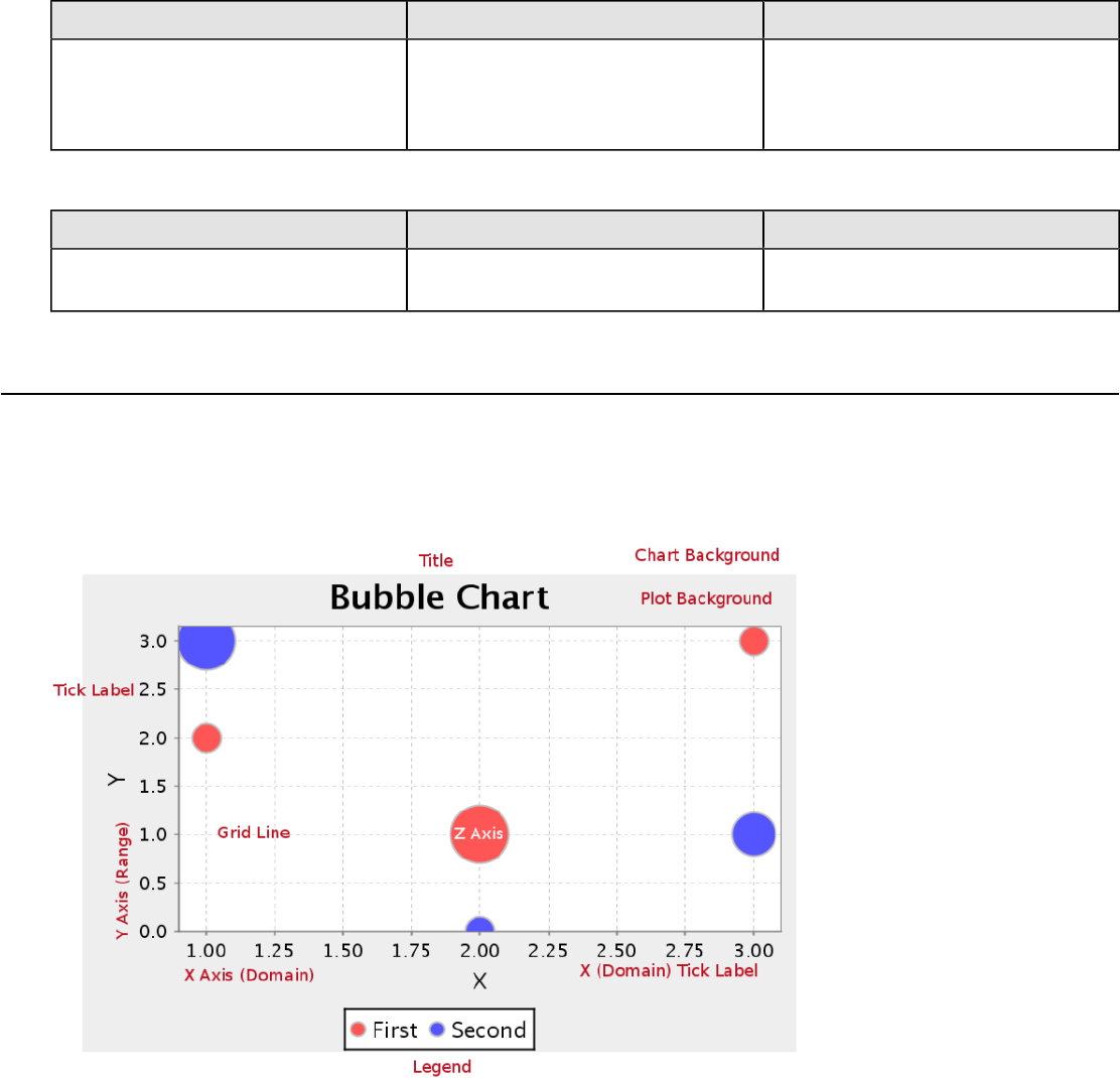
| Chart Types | 160
Scripting
The following groups of properties are associated with the Scripting category for this chart type:
Chart Post Processing Script Language
Property Data Type Description
Chart Post Processing Script
Language Selection The scripting language to use.
This property gives you access to
JFreeChart APIs so you can modify
the chart after the report renders.
Chart Post Processing Script
Property Data Type Description
Chart Post Processing Script Script The script to use to modify chart
object.
Bubble
Bubble charts are useful for spotting relationships between metrics and comparing specific data points. In terms of
functionality and purpose, a bubble chart is similar to a bar line chart, but offers more specific visual cues for certain
data sets. Each bubble represents a plotted XY point at its center, and the Z axis controls the diameter of the bubble.
For example, a sales chart might have the top 5 bestselling product names for the X axis, number of units sold as the Y
axis, and total sales revenue for each product for the Z axis.
Data Collectors
The following data collectors are associated with this chart type:
XYZSeries
This collector builds a dataset that is compatible with JFreeChart XYZ charts that have three numeric dimensions or
columns. XYZ datasets have four dimensions or columns. The first column represents series values. The next is the
domain numeric column (typically the x-axis values or domain values), and the third column has the numeric values to

| Chart Types | 161
be plotted on the y-axis, commonly referred to as the range axis. The fourth column determines a relative size value for
the points plotted by the domain and range values.
Property Description
name A title for this data collector configuration. Typically you
will only have one data collector per chart, in which case
this property is not particularly useful.
x-value-columns The column that determines the x (domain) axis.
y-value-columns The column that determines the x (range) axis.
z-value-columns The column that determines the z axis.
series-by-value A static value that you want to use for the series name.
series-by-field Uses the selected column to use for series names. This
will cause the value column to be split into series groups.
group-by This provides the name of the group that the chart is
appearing in. If the chart contains detailed information,
then this is not necessary.
reset-group Specifies a group that will be used to create charts within
a sub-group. For example, if charting one chart per region,
and the chart is displaying data for departments within a
region, the reset-group would be set to the region group,
and the chart group would be set to department group.
In the above chart, the x and y values determine the plot point of each bubble, and the z value
determines the size of each bubble.
Chart Properties
The following groups of properties are associated with this chart type:
Required
The following groups of properties are associated with the Required group for this chart type:
| Chart Types | 162
name
Property Data Type Description
name String The name (in Report Designer) of this
chart element. Does not appear in the
published report.
data-source
Property Data Type Description
data-source String The name of the established (in
Report Designer) data source you
intend to pull data from.
no-data-message
Property Data Type Description
no-data-message String The text displayed on the plot
background when the query produces
no usable data
Title
The following groups of properties are associated with the Title group for this chart type:
chart-title
Property Data Type Description
title String Sets the main title for the chart
chart-title-field
Property Data Type Description
chart-title-field Selection Specifies which field from your data
set you would like to use for the chart
title
title-font
Property Data Type Description
title-font Complex (see example below) Sets the font for the main title for the
chart.
<title-font>
<font-family/>
<size/>
<is-bold/>
<is-italic/>
</title-font>
pos-title
Property Data Type Description
title-position String Sets the position to display the chart
title. Possible values are: top, left,
bottom, right.
| Chart Types | 163
Options
The following groups of properties are associated with the Options group for this chart type:
horizontal
Property Data Type Description
orientation String Determines vertical/horizontal
orientation for the chart. Possible
values are horizontal and vertical.
In Report Designer, this is a boolean
that makes the chart horizontal when
set to true and vertical when set to
false.
series-color
Property Data Type Description
color-palette String List of colors to apply (in order) to the
series in the chart.
max-bubble-size
Property Data Type Description
max-bubble-size Integer The preferred maximum bubble size,
as a percentage of the bubble value
represented. Possible values are
integers between 1 and 100.
show-labels
Property Data Type Description
display-labels Boolean If true, displays labels for pie sections.
Default value is true.
label-font
Property Data Type Description
label-font Complex (see example below) Sets the font for the labels on the pie
sections.
<label-font>
<font-family/>
<size/>
<is-bold/>
<is-italic/>
</label-font>
General
The following groups of properties are associated with the General category for this chart type:
| Chart Types | 164
3-D
Property Data Type Description
is-3D Boolean If true, renders the chart three-
dimensionally. Default value is false.
bg-color
Property Data Type Description
bg-color Selection The color of the chart background;
this is the area behind the chart, not
the plot area. To set the plot area, use
the plot-bg-color property instead
bg-image
Property Data Type Description
bg-image String Path to the graphic file you want to
display in the area behind the chart
show-border
Property Data Type Description
border-visible Boolean If true, draws a border around the
entire surrounding area for the chart.
Default value is false.
border-color
Property Data Type Description
border-paint String Sets the color for the surrounding
chart border. Possible values are
hexadecimal color codes.
plot-bg-color
Property Data Type Description
plot-background Complex (see example below) Renders either the color, gradient ,
texture or image specified as the plot
background for the chart.
plot-fg-alpha
Property Data Type Description
plot-fg-alpha Decimal Controls the alpha value
(transparency) of the plot foreground.
Possible values are between 0 and 1,
with 0 being totally transparent, and 1
being totally opaque. Default is 1.
plot-bg-alpha
Property Data Type Description
plot-bg-alpha Decimal Controls the alpha value
(transparency) of the plot background.
Possible values are between 0 and 1,
| Chart Types | 165
Property Data Type Description
with 0 being totally transparent, and 1
being totally opaque. Default is 1.
plot-border
Property Data Type Description
plot-border Boolean Determines whether or not the plot
area should have a border between it
and the chart background
anti-alias
Property Data Type Description
anti-alias Boolean Determines whether the edges and
curves of the element should be
smoothed
url-formula
Property Data Type Description
url-formula formula Associates a link to the series key
and category name. See also, URL
Linking in Charts.
tooltip-formula
Property Data Type Description
tooltip-formula formula Defines the tooltip (hover text) for the
url-formula
X Axis
The following groups of properties are associated with the X Axis category for this chart type:
x-axis-title
Property Data Type Description
domain-title String Sets the title for the domain axis, if it
exists. In a typical two-dimensional
horizontal chart, this the categorical or
X axis.
x-font
Property Data Type Description
domain-title-font Complex (see example below) Sets the font for the domain axis title.
x-sticky-0
Property Data Type Description
domain-sticky-zero Boolean If true, truncates the axis margin at
zero.
| Chart Types | 166
x-incl-0
Property Data Type Description
domain-includes-zero Boolean When an axis' values are auto-
calculated, setting this flag to true
ensures that the domain always
includes zero.
x-min
Property Data Type Description
domain-minimum Integer Sets the lower bounding value on the
domain axis. Useful when the domain
axis is numeric.
x-max
Property Data Type Description
domain-maximum Integer Sets the upper bounding value on the
domain axis. Useful when the domain
axis is numeric.
x-tick-interval
Property Data Type Description
x-tick-interval Decimal Controls the increments between X
axis tick labels
x-vtick-label
Property Data Type Description
domain-vertical-tick-labels Boolean Sets the orientation of the tick labels
on the domain axis; true for vertical,
false for horizontal. Default is false.
x-tick-font
Property Data Type Description
x-tick-font Complex (see example below) Sets the font for the labels on the tick
marks of the domain axis.
x-tick-fmt-str
Property Data Type Description
x-tick-fmt-str String Sets the format of the tick mark labels
of the X (domain) axis. An example
format for displaying percentages
might be: "0.00%". This is particularly
useful when the domain axis is
numeric.
x-tick-period
Property Data Type Description
x-period-type String Specifies the time period interval the
chart should expect for your time
| Chart Types | 167
Property Data Type Description
series data. For example, Month only
works with data stored in monthly
intervals, i.e.: Jan 2007, Feb 2007,
etc. This property does not affect
the displayed values on the range
axis; it only defines the type of date
information in the data set.
Y Axis
The following groups of properties are associated with the Y Axis category for this chart type:
y-axis-title
Property Data Type Description
range-title String Sets the title for the primary numeric
data axis; typically the Y axis in a
horizontally-oriented chart.
y-font
Property Data Type Description
range-title-font Complex (see example below) Sets the font for the range axis title.
y-sticky-0
Property Data Type Description
range-sticky-zero Boolean If true, truncates the axis margin at
zero.
y-incl-0
Property Data Type Description
range-includes-zero Boolean When an axis' values are auto-
calculated, setting this flag to true
ensures that the range always
includes zero.
y-auto-range
Property Data Type Description
y-auto-range Boolean If True, the y-min and y-max values
will be automatically calculated based
on the lowest and highest values in
the data set.
y-min
Property Data Type Description
range-minimum Integer Sets the lower bounding value on the
range axis.

| Chart Types | 168
y-max
Property Data Type Description
range-maximum Integer Sets the upper bounding value on the
range axis.
y-tick-interval
Property Data Type Description
y-tick-interval Decimal Controls the increments between Y
axis tick labels
y-tick-font
Property Data Type Description
range-tick-font Complex (see example below) Sets the font for the labels on the tick
marks of the range axis.
y-tick-fmt-str
Property Data Type Description
range-tick-format String Sets the format of the labels on
the tick marks of the range axis.
(An example format for displaying
percentages might be "0.00%")
y-tick-period
Property Data Type Description
y-tick-period Selection Specifies the Y axis tick intervals if the
Y (range) data set returns date or time
data
enable-log-axis
Property Data Type Description
enable-log-axis Boolean Determines whether or not the Y axis
scales logarithmically
log-format
Property Data Type Description
log-format Boolean Abbreviates large Y axis tick labels
if they are numbers and no format is
specified in y-tick-fmt-str
Legend
The following groups of properties are associated with the Legend category for this chart type:
show-legend
Property Data Type Description
include-legend Boolean When set to true, displays the legend
in the chart. Default value is true.
| Chart Types | 169
location
Property Data Type Description
location Selection Determines where the legend will be
situated, relative to the plot area
legend-bg-color
Property Data Type Description
legend-bg-color String Hexadecimal value of the color
you intend to use for the legend
background. Default value is FFFFFF
(white).
legend-border
Property Data Type Description
legend-border-visible Boolean If true, draws a border around the
legend. Default value is true.
legend-font
Property Data Type Description
legend-font Complex (see example below) Sets the font to use on the text in the
legend.
<legend-font>
<font-family/>
<size/>
<is-bold/>
<is-italic/>
</legend-font>
legend-font-color
Property Data Type Description
legend-font-color String Hexadecimal value of the color you
intend to use for the legend font.
Default value is 000000 (black).
Scripting
The following groups of properties are associated with the Scripting category for this chart type:
Chart Post Processing Script Language
Property Data Type Description
Chart Post Processing Script
Language Selection The scripting language to use.
This property gives you access to
JFreeChart APIs so you can modify
the chart after the report renders.
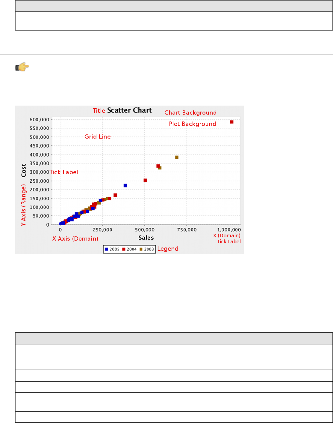
| Chart Types | 170
Chart Post Processing Script
Property Data Type Description
Chart Post Processing Script Script The script to use to modify chart
object.
Scatter Plot
Note: This chart type is called XY Dot in the BA Platform's ChartComponent.
XY dot (scatter plot) charts are useful for showing trends for many individual exact data points over time. The plotted
points show data trends in groupings; where the dots are most concentrated, the trend is most prevalent. If there are
very few data points, an XY line or bar chart may be a more appropriate chart type than XY dot.
Data Collectors
The following data collectors are associated with this chart type:
TimeSeries
This collector builds a dataset that is compatible with JFreeChart XY charts that have one dimension that is time\date
data. XY date\time based datasets have three dimensions or columns. The first column is the series values. The next is
the date column (typically the x-axis or domain values), and the last column has the numeric values to be plotted on the
y-axis (range).
Property Description
name A title for this data collector configuration. Typically you
will only have one data collector per chart, in which case
this property is not particularly useful.
category-time-column The column that contains the time data.
time-period-type Determines the interval to measure the time data by.
value-column The data column that determines the chart values (or
series items).
series-by-value A static value that you want to use for the series name.
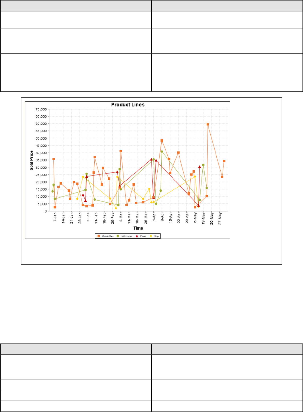
| Chart Types | 171
Property Description
series-by-field Uses the selected column to use for series names. This
will cause the value column to be split into series groups.
group-by This provides the name of the group that the chart is
appearing in. If the chart contains detailed information,
then this is not necessary.
reset-group Specifies a group that will be used to create charts within
a sub-group. For example, if charting one chart per region,
and the chart is displaying data for departments within a
region, the reset-group would be set to the region group,
and the chart group would be set to department group.
On the above bar chart, Classic Cars, Motorcycles, Planes and Ships are the series. The sold price
is plotted against the y-axis, and the order date is plotted against the x-axis.
XYSeries
An XY dataset plots pairs of values as points on the chart. The XY charts have two numeric axes. If the dataset is
arranged by column, each row is expected to have three columns. Each row is assumed to represent one data point on
the chart, ordered by the series name and domain value. The first column's values contain the name of the series. The
second column is numeric, containing the domain value of the data point. The third column is numeric, containing the
range value of the data point.
If the dataset is arranged by row, each row is expected to contain all the data points for the series. The first column's
values contain the name of the series. It is assumed the other columns in the row consist of a collection of x/y data
points (i.e. columns 2, 4, 6 etc. will be domain values, and columns 3, 5, 7 etc will be range values).
Property Description
name A title for this data collector configuration. Typically you
will only have one data collector per chart, in which case
this property is not particularly useful.
x-value-columns The column that determines the x (domain) axis.
y-value-columns The column that determines the y (range) axis.
series-by-value A static value that you want to use for the series name.
| Chart Types | 172
Property Description
series-by-field Uses the selected column to use for series names. This
will cause the value column to be split into series groups.
group-by This provides the name of the group that the chart is
appearing in. If the chart contains detailed information,
then this is not necessary.
reset-group Specifies a group that will be used to create charts within
a sub-group. For example, if charting one chart per region,
and the chart is displaying data for departments within a
region, the reset-group would be set to the region group,
and the chart group would be set to department group.
XYZSeries
This collector builds a dataset that is compatible with JFreeChart XYZ charts that have three numeric dimensions or
columns. XYZ datasets have four dimensions or columns. The first column represents series values. The next is the
domain numeric column (typically the x-axis values or domain values), and the third column has the numeric values to
be plotted on the y-axis, commonly referred to as the range axis. The fourth column determines a relative size value for
the points plotted by the domain and range values.
Property Description
name A title for this data collector configuration. Typically you
will only have one data collector per chart, in which case
this property is not particularly useful.
x-value-columns The column that determines the x (domain) axis.
y-value-columns The column that determines the x (range) axis.
z-value-columns The column that determines the z axis.
series-by-value A static value that you want to use for the series name.
series-by-field Uses the selected column to use for series names. This
will cause the value column to be split into series groups.
group-by This provides the name of the group that the chart is
appearing in. If the chart contains detailed information,
then this is not necessary.
reset-group Specifies a group that will be used to create charts within
a sub-group. For example, if charting one chart per region,
and the chart is displaying data for departments within a
region, the reset-group would be set to the region group,
and the chart group would be set to department group.
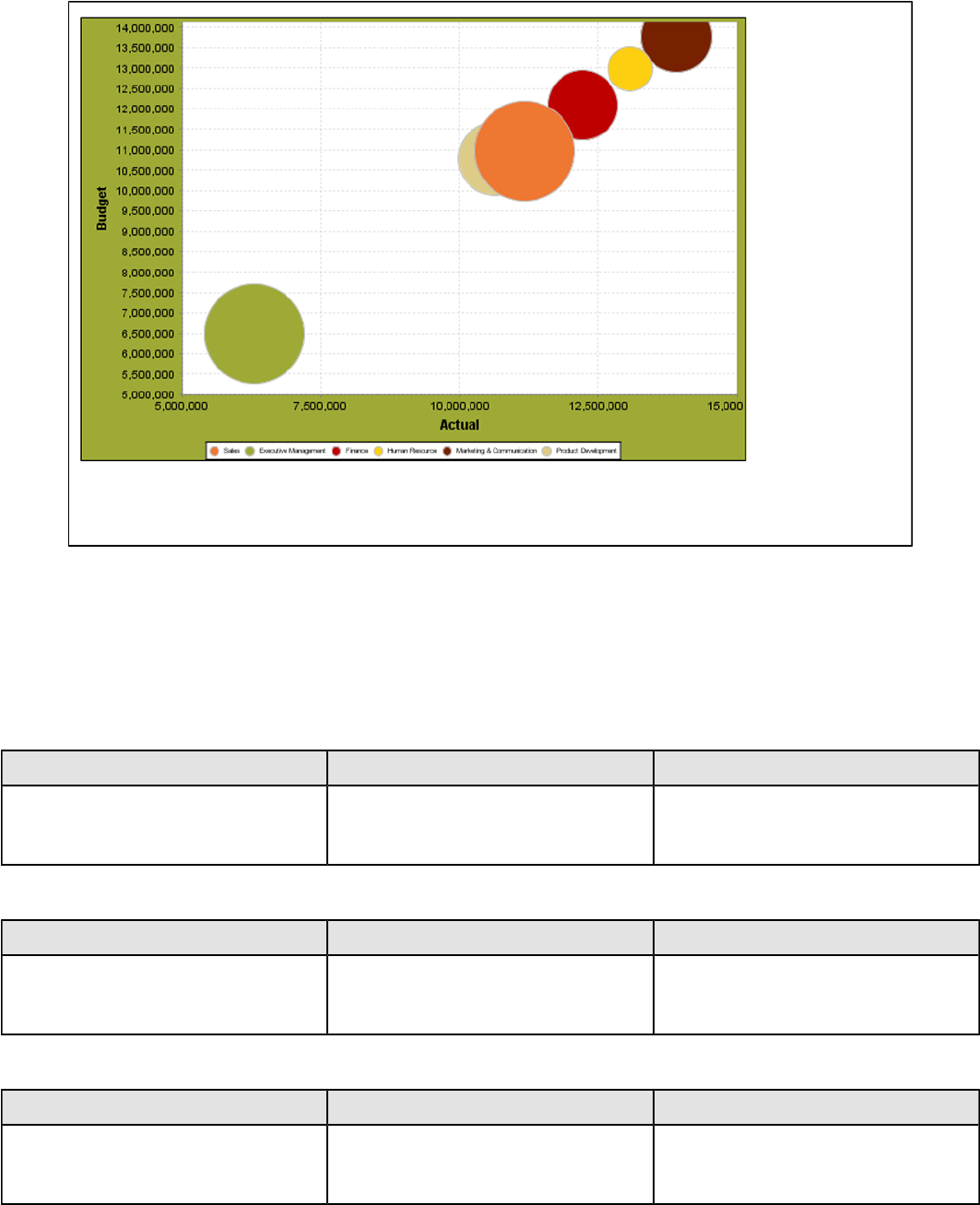
| Chart Types | 173
In the above chart, the x and y values determine the plot point of each bubble, and the z value
determines the size of each bubble.
Chart Properties
The following groups of properties are associated with this chart type:
Required
The following groups of properties are associated with the Required group for this chart type:
name
Property Data Type Description
name String The name (in Report Designer) of this
chart element. Does not appear in the
published report.
data-source
Property Data Type Description
data-source String The name of the established (in
Report Designer) data source you
intend to pull data from.
no-data-message
Property Data Type Description
no-data-message String The text displayed on the plot
background when the query produces
no usable data
Title
The following groups of properties are associated with the Title group for this chart type:
| Chart Types | 174
chart-title
Property Data Type Description
title String Sets the main title for the chart
chart-title-field
Property Data Type Description
chart-title-field Selection Specifies which field from your data
set you would like to use for the chart
title
title-font
Property Data Type Description
title-font Complex (see example below) Sets the font for the main title for the
chart.
<title-font>
<font-family/>
<size/>
<is-bold/>
<is-italic/>
</title-font>
pos-title
Property Data Type Description
title-position String Sets the position to display the chart
title. Possible values are: top, left,
bottom, right.
Options
The following groups of properties are associated with the Options group for this chart type:
stacked
Property Data Type Description
is-stacked Boolean If true, stacks the series of the chart,
one on top of the other. Default value
is false.
horizontal
Property Data Type Description
orientation String Determines vertical/horizontal
orientation for the chart. Possible
values are horizontal and vertical.
In Report Designer, this is a boolean
that makes the chart horizontal when
set to true and vertical when set to
false.
| Chart Types | 175
series-color
Property Data Type Description
color-palette String List of colors to apply (in order) to the
series in the chart.
dot-height
Property Data Type Description
dot-height Integer Sets the height of the marker that
represents a series point on a chart
(in pixels).
dot-width
Property Data Type Description
dot-width Integer Sets the width of the marker that
represents a series point on a chart
(in pixels).
General
The following groups of properties are associated with the General category for this chart type:
3-D
Property Data Type Description
is-3D Boolean If true, renders the chart three-
dimensionally. Default value is false.
bg-color
Property Data Type Description
bg-color Selection The color of the chart background;
this is the area behind the chart, not
the plot area. To set the plot area, use
the plot-bg-color property instead
bg-image
Property Data Type Description
bg-image String Path to the graphic file you want to
display in the area behind the chart
show-border
Property Data Type Description
border-visible Boolean If true, draws a border around the
entire surrounding area for the chart.
Default value is false.

| Chart Types | 176
border-color
Property Data Type Description
border-paint String Sets the color for the surrounding
chart border. Possible values are
hexadecimal color codes.
plot-bg-color
Property Data Type Description
plot-background Complex (see example below) Renders either the color, gradient ,
texture or image specified as the plot
background for the chart.
plot-fg-alpha
Property Data Type Description
plot-fg-alpha Decimal Controls the alpha value
(transparency) of the plot foreground.
Possible values are between 0 and 1,
with 0 being totally transparent, and 1
being totally opaque. Default is 1.
plot-bg-alpha
Property Data Type Description
plot-bg-alpha Decimal Controls the alpha value
(transparency) of the plot background.
Possible values are between 0 and 1,
with 0 being totally transparent, and 1
being totally opaque. Default is 1.
plot-border
Property Data Type Description
plot-border Boolean Determines whether or not the plot
area should have a border between it
and the chart background
anti-alias
Property Data Type Description
anti-alias Boolean Determines whether the edges and
curves of the element should be
smoothed
show-labels
Property Data Type Description
display-labels Boolean If true, displays labels for pie sections.
Default value is true.
| Chart Types | 177
label-font
Property Data Type Description
label-font Complex (see example below) Sets the font for the labels on the pie
sections.
<label-font>
<font-family/>
<size/>
<is-bold/>
<is-italic/>
</label-font>
url-formula
Property Data Type Description
url-formula formula Associates a link to the series key
and category name. See also, URL
Linking in Charts.
tooltip-formula
Property Data Type Description
tooltip-formula formula Defines the tooltip (hover text) for the
url-formula
X Axis
The following groups of properties are associated with the X Axis category for this chart type:
x-axis-title
Property Data Type Description
domain-title String Sets the title for the domain axis, if it
exists. In a typical two-dimensional
horizontal chart, this the categorical or
X axis.
x-font
Property Data Type Description
domain-title-font Complex (see example below) Sets the font for the domain axis title.
x-sticky-0
Property Data Type Description
domain-sticky-zero Boolean If true, truncates the axis margin at
zero.
x-incl-0
Property Data Type Description
domain-includes-zero Boolean When an axis' values are auto-
calculated, setting this flag to true
ensures that the domain always
includes zero.
| Chart Types | 178
x-min
Property Data Type Description
domain-minimum Integer Sets the lower bounding value on the
domain axis. Useful when the domain
axis is numeric.
x-max
Property Data Type Description
domain-maximum Integer Sets the upper bounding value on the
domain axis. Useful when the domain
axis is numeric.
x-tick-interval
Property Data Type Description
x-tick-interval Decimal Controls the increments between X
axis tick labels
x-vtick-label
Property Data Type Description
domain-vertical-tick-labels Boolean Sets the orientation of the tick labels
on the domain axis; true for vertical,
false for horizontal. Default is false.
x-tick-font
Property Data Type Description
x-tick-font Complex (see example below) Sets the font for the labels on the tick
marks of the domain axis.
x-tick-fmt-str
Property Data Type Description
x-tick-fmt-str String Sets the format of the tick mark labels
of the X (domain) axis. An example
format for displaying percentages
might be: "0.00%". This is particularly
useful when the domain axis is
numeric.
x-tick-period
Property Data Type Description
x-period-type String Specifies the time period interval the
chart should expect for your time
series data. For example, Month only
works with data stored in monthly
intervals, i.e.: Jan 2007, Feb 2007,
etc. This property does not affect
the displayed values on the range
axis; it only defines the type of date
information in the data set.

| Chart Types | 179
Y Axis
The following groups of properties are associated with the Y Axis category for this chart type:
y-axis-title
Property Data Type Description
range-title String Sets the title for the primary numeric
data axis; typically the Y axis in a
horizontally-oriented chart.
y-font
Property Data Type Description
range-title-font Complex (see example below) Sets the font for the range axis title.
y-sticky-0
Property Data Type Description
range-sticky-zero Boolean If true, truncates the axis margin at
zero.
y-incl-0
Property Data Type Description
range-includes-zero Boolean When an axis' values are auto-
calculated, setting this flag to true
ensures that the range always
includes zero.
y-auto-range
Property Data Type Description
y-auto-range Boolean If True, the y-min and y-max values
will be automatically calculated based
on the lowest and highest values in
the data set.
y-min
Property Data Type Description
range-minimum Integer Sets the lower bounding value on the
range axis.
y-max
Property Data Type Description
range-maximum Integer Sets the upper bounding value on the
range axis.
y-tick-interval
Property Data Type Description
y-tick-interval Decimal Controls the increments between Y
axis tick labels

| Chart Types | 180
y-tick-font
Property Data Type Description
range-tick-font Complex (see example below) Sets the font for the labels on the tick
marks of the range axis.
y-tick-fmt-str
Property Data Type Description
range-tick-format String Sets the format of the labels on
the tick marks of the range axis.
(An example format for displaying
percentages might be "0.00%")
y-tick-period
Property Data Type Description
y-tick-period Selection Specifies the Y axis tick intervals if the
Y (range) data set returns date or time
data
enable-log-axis
Property Data Type Description
enable-log-axis Boolean Determines whether or not the Y axis
scales logarithmically
log-format
Property Data Type Description
log-format Boolean Abbreviates large Y axis tick labels
if they are numbers and no format is
specified in y-tick-fmt-str
Legend
The following groups of properties are associated with the Legend category for this chart type:
show-legend
Property Data Type Description
include-legend Boolean When set to true, displays the legend
in the chart. Default value is true.
location
Property Data Type Description
location Selection Determines where the legend will be
situated, relative to the plot area
legend-bg-color
Property Data Type Description
legend-bg-color String Hexadecimal value of the color
you intend to use for the legend
| Chart Types | 181
Property Data Type Description
background. Default value is FFFFFF
(white).
legend-border
Property Data Type Description
legend-border-visible Boolean If true, draws a border around the
legend. Default value is true.
legend-font
Property Data Type Description
legend-font Complex (see example below) Sets the font to use on the text in the
legend.
<legend-font>
<font-family/>
<size/>
<is-bold/>
<is-italic/>
</legend-font>
legend-font-color
Property Data Type Description
legend-font-color String Hexadecimal value of the color you
intend to use for the legend font.
Default value is 000000 (black).
Scripting
The following groups of properties are associated with the Scripting category for this chart type:
Chart Post Processing Script Language
Property Data Type Description
Chart Post Processing Script
Language Selection The scripting language to use.
This property gives you access to
JFreeChart APIs so you can modify
the chart after the report renders.
Chart Post Processing Script
Property Data Type Description
Chart Post Processing Script Script The script to use to modify chart
object.
XY Bar
XY bar charts are useful for showing data trends over time, where values tend to change after reasonably long intervals.
An XY step chart is essentially a horizontal bar chart where the bars are segmented vertically whenever there is a
change in value.
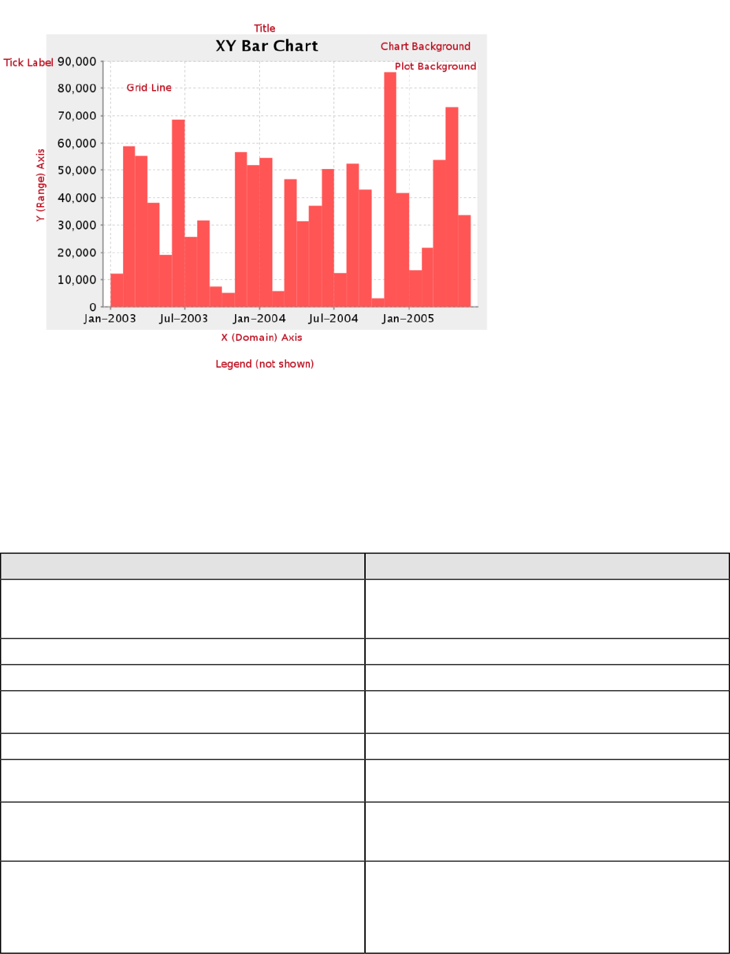
| Chart Types | 182
Data Collectors
The following data collectors are associated with this chart type:
TimeSeries
This collector builds a dataset that is compatible with JFreeChart XY charts that have one dimension that is time\date
data. XY date\time based datasets have three dimensions or columns. The first column is the series values. The next is
the date column (typically the x-axis or domain values), and the last column has the numeric values to be plotted on the
y-axis (range).
Property Description
name A title for this data collector configuration. Typically you
will only have one data collector per chart, in which case
this property is not particularly useful.
category-time-column The column that contains the time data.
time-period-type Determines the interval to measure the time data by.
value-column The data column that determines the chart values (or
series items).
series-by-value A static value that you want to use for the series name.
series-by-field Uses the selected column to use for series names. This
will cause the value column to be split into series groups.
group-by This provides the name of the group that the chart is
appearing in. If the chart contains detailed information,
then this is not necessary.
reset-group Specifies a group that will be used to create charts within
a sub-group. For example, if charting one chart per region,
and the chart is displaying data for departments within a
region, the reset-group would be set to the region group,
and the chart group would be set to department group.
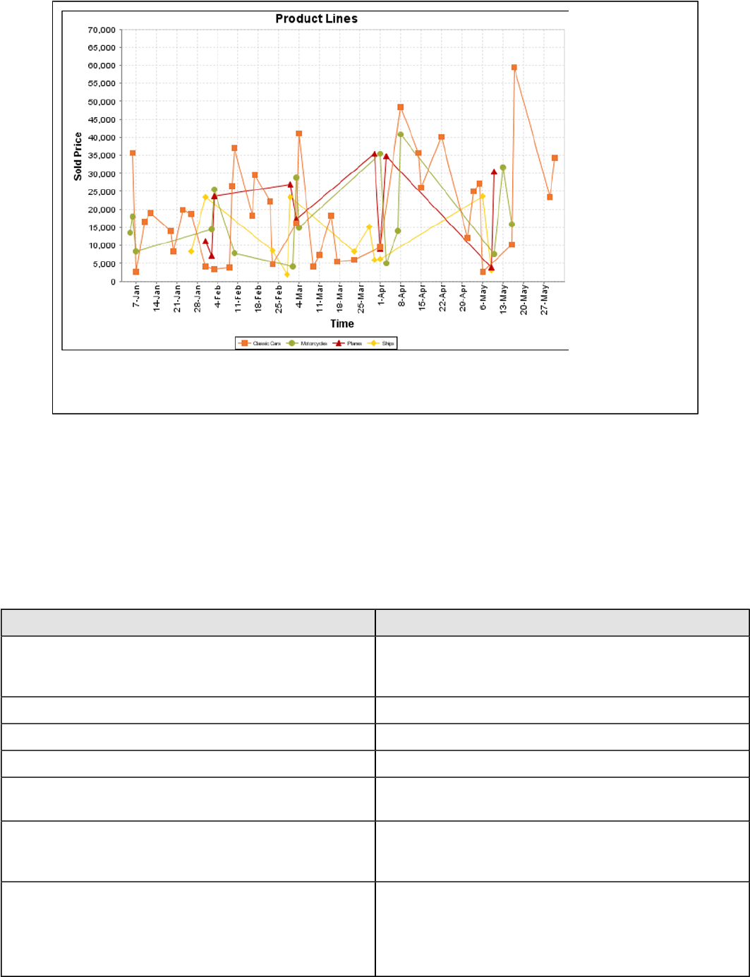
| Chart Types | 183
On the above bar chart, Classic Cars, Motorcycles, Planes and Ships are the series. The sold price
is plotted against the y-axis, and the order date is plotted against the x-axis.
XYSeries
An XY dataset plots pairs of values as points on the chart. The XY charts have two numeric axes. If the dataset is
arranged by column, each row is expected to have three columns. Each row is assumed to represent one data point on
the chart, ordered by the series name and domain value. The first column's values contain the name of the series. The
second column is numeric, containing the domain value of the data point. The third column is numeric, containing the
range value of the data point.
If the dataset is arranged by row, each row is expected to contain all the data points for the series. The first column's
values contain the name of the series. It is assumed the other columns in the row consist of a collection of x/y data
points (i.e. columns 2, 4, 6 etc. will be domain values, and columns 3, 5, 7 etc will be range values).
Property Description
name A title for this data collector configuration. Typically you
will only have one data collector per chart, in which case
this property is not particularly useful.
x-value-columns The column that determines the x (domain) axis.
y-value-columns The column that determines the y (range) axis.
series-by-value A static value that you want to use for the series name.
series-by-field Uses the selected column to use for series names. This
will cause the value column to be split into series groups.
group-by This provides the name of the group that the chart is
appearing in. If the chart contains detailed information,
then this is not necessary.
reset-group Specifies a group that will be used to create charts within
a sub-group. For example, if charting one chart per region,
and the chart is displaying data for departments within a
region, the reset-group would be set to the region group,
and the chart group would be set to department group.
| Chart Types | 184
XYZSeries
This collector builds a dataset that is compatible with JFreeChart XYZ charts that have three numeric dimensions or
columns. XYZ datasets have four dimensions or columns. The first column represents series values. The next is the
domain numeric column (typically the x-axis values or domain values), and the third column has the numeric values to
be plotted on the y-axis, commonly referred to as the range axis. The fourth column determines a relative size value for
the points plotted by the domain and range values.
Property Description
name A title for this data collector configuration. Typically you
will only have one data collector per chart, in which case
this property is not particularly useful.
x-value-columns The column that determines the x (domain) axis.
y-value-columns The column that determines the x (range) axis.
z-value-columns The column that determines the z axis.
series-by-value A static value that you want to use for the series name.
series-by-field Uses the selected column to use for series names. This
will cause the value column to be split into series groups.
group-by This provides the name of the group that the chart is
appearing in. If the chart contains detailed information,
then this is not necessary.
reset-group Specifies a group that will be used to create charts within
a sub-group. For example, if charting one chart per region,
and the chart is displaying data for departments within a
region, the reset-group would be set to the region group,
and the chart group would be set to department group.
In the above chart, the x and y values determine the plot point of each bubble, and the z value
determines the size of each bubble.
Chart Properties
The following groups of properties are associated with this chart type:

| Chart Types | 185
Required
The following groups of properties are associated with the Required group for this chart type:
name
Property Data Type Description
name String The name (in Report Designer) of this
chart element. Does not appear in the
published report.
data-source
Property Data Type Description
data-source String The name of the established (in
Report Designer) data source you
intend to pull data from.
no-data-message
Property Data Type Description
no-data-message String The text displayed on the plot
background when the query produces
no usable data
Title
The following groups of properties are associated with the Title group for this chart type:
chart-title
Property Data Type Description
title String Sets the main title for the chart
chart-title-field
Property Data Type Description
chart-title-field Selection Specifies which field from your data
set you would like to use for the chart
title
title-font
Property Data Type Description
title-font Complex (see example below) Sets the font for the main title for the
chart.
<title-font>
<font-family/>
<size/>
<is-bold/>
<is-italic/>
</title-font>
| Chart Types | 186
pos-title
Property Data Type Description
title-position String Sets the position to display the chart
title. Possible values are: top, left,
bottom, right.
Options
The following groups of properties are associated with the Options group for this chart type:
stacked
Property Data Type Description
is-stacked Boolean If true, stacks the series of the chart,
one on top of the other. Default value
is false.
horizontal
Property Data Type Description
orientation String Determines vertical/horizontal
orientation for the chart. Possible
values are horizontal and vertical.
In Report Designer, this is a boolean
that makes the chart horizontal when
set to true and vertical when set to
false.
series-color
Property Data Type Description
color-palette String List of colors to apply (in order) to the
series in the chart.
bar-borders
Property Data Type Description
bar-borders Boolean Draws a thin solid black border
around each bar
General
The following groups of properties are associated with the General category for this chart type:
3-D
Property Data Type Description
is-3D Boolean If true, renders the chart three-
dimensionally. Default value is false.
bg-color
Property Data Type Description
bg-color Selection The color of the chart background;
this is the area behind the chart, not
the plot area. To set the plot area, use
the plot-bg-color property instead
| Chart Types | 187
bg-image
Property Data Type Description
bg-image String Path to the graphic file you want to
display in the area behind the chart
show-border
Property Data Type Description
border-visible Boolean If true, draws a border around the
entire surrounding area for the chart.
Default value is false.
border-color
Property Data Type Description
border-paint String Sets the color for the surrounding
chart border. Possible values are
hexadecimal color codes.
plot-bg-color
Property Data Type Description
plot-background Complex (see example below) Renders either the color, gradient ,
texture or image specified as the plot
background for the chart.
plot-fg-alpha
Property Data Type Description
plot-fg-alpha Decimal Controls the alpha value
(transparency) of the plot foreground.
Possible values are between 0 and 1,
with 0 being totally transparent, and 1
being totally opaque. Default is 1.
plot-bg-alpha
Property Data Type Description
plot-bg-alpha Decimal Controls the alpha value
(transparency) of the plot background.
Possible values are between 0 and 1,
with 0 being totally transparent, and 1
being totally opaque. Default is 1.
plot-border
Property Data Type Description
plot-border Boolean Determines whether or not the plot
area should have a border between it
and the chart background
| Chart Types | 188
anti-alias
Property Data Type Description
anti-alias Boolean Determines whether the edges and
curves of the element should be
smoothed
show-labels
Property Data Type Description
show-labels Boolean Shows the plotted value. Default is
false.
label-font
Property Data Type Description
label-font Complex (see example below) Sets the font for the labels on the pie
sections.
<label-font>
<font-family/>
<size/>
<is-bold/>
<is-italic/>
</label-font>
url-formula
Property Data Type Description
url-formula formula Associates a link to the series key
and category name. See also, URL
Linking in Charts.
tooltip-formula
Property Data Type Description
tooltip-formula formula Defines the tooltip (hover text) for the
url-formula
X Axis
The following groups of properties are associated with the X Axis category for this chart type:
x-axis-title
Property Data Type Description
domain-title String Sets the title for the domain axis, if it
exists. In a typical two-dimensional
horizontal chart, this the categorical or
X axis.
x-font
Property Data Type Description
domain-title-font Complex (see example below) Sets the font for the domain axis title.
| Chart Types | 189
x-sticky-0
Property Data Type Description
domain-sticky-zero Boolean If true, truncates the axis margin at
zero.
x-incl-0
Property Data Type Description
domain-includes-zero Boolean When an axis' values are auto-
calculated, setting this flag to true
ensures that the domain always
includes zero.
x-min
Property Data Type Description
domain-minimum Integer Sets the lower bounding value on the
domain axis. Useful when the domain
axis is numeric.
x-max
Property Data Type Description
domain-maximum Integer Sets the upper bounding value on the
domain axis. Useful when the domain
axis is numeric.
x-tick-interval
Property Data Type Description
x-tick-interval Decimal Controls the increments between X
axis tick labels
x-vtick-label
Property Data Type Description
domain-vertical-tick-labels Boolean Sets the orientation of the tick labels
on the domain axis; true for vertical,
false for horizontal. Default is false.
x-tick-font
Property Data Type Description
x-tick-font Complex (see example below) Sets the font for the labels on the tick
marks of the domain axis.
x-tick-fmt-str
Property Data Type Description
x-tick-fmt-str String Sets the format of the tick mark labels
of the X (domain) axis. An example
format for displaying percentages
might be: "0.00%". This is particularly
| Chart Types | 190
Property Data Type Description
useful when the domain axis is
numeric.
x-tick-period
Property Data Type Description
x-period-type String Specifies the time period interval the
chart should expect for your time
series data. For example, Month only
works with data stored in monthly
intervals, i.e.: Jan 2007, Feb 2007,
etc. This property does not affect
the displayed values on the range
axis; it only defines the type of date
information in the data set.
Y Axis
The following groups of properties are associated with the Y Axis category for this chart type:
y-axis-title
Property Data Type Description
range-title String Sets the title for the primary numeric
data axis; typically the Y axis in a
horizontally-oriented chart.
y-font
Property Data Type Description
range-title-font Complex (see example below) Sets the font for the range axis title.
y-sticky-0
Property Data Type Description
range-sticky-zero Boolean If true, truncates the axis margin at
zero.
y-incl-0
Property Data Type Description
range-includes-zero Boolean When an axis' values are auto-
calculated, setting this flag to true
ensures that the range always
includes zero.
y-auto-range
Property Data Type Description
y-auto-range Boolean If True, the y-min and y-max values
will be automatically calculated based
on the lowest and highest values in
the data set.
| Chart Types | 191
y-min
Property Data Type Description
range-minimum Integer Sets the lower bounding value on the
range axis.
y-max
Property Data Type Description
range-maximum Integer Sets the upper bounding value on the
range axis.
y-tick-interval
Property Data Type Description
y-tick-interval Decimal Controls the increments between Y
axis tick labels
y-tick-font
Property Data Type Description
range-tick-font Complex (see example below) Sets the font for the labels on the tick
marks of the range axis.
y-tick-fmt-str
Property Data Type Description
range-tick-format String Sets the format of the labels on
the tick marks of the range axis.
(An example format for displaying
percentages might be "0.00%")
y-tick-period
Property Data Type Description
y-tick-period Selection Specifies the Y axis tick intervals if the
Y (range) data set returns date or time
data
enable-log-axis
Property Data Type Description
enable-log-axis Boolean Determines whether or not the Y axis
scales logarithmically
log-format
Property Data Type Description
log-format Boolean Abbreviates large Y axis tick labels
if they are numbers and no format is
specified in y-tick-fmt-str
Legend
The following groups of properties are associated with the Legend category for this chart type:
| Chart Types | 192
show-legend
Property Data Type Description
include-legend Boolean When set to true, displays the legend
in the chart. Default value is true.
location
Property Data Type Description
location Selection Determines where the legend will be
situated, relative to the plot area
legend-bg-color
Property Data Type Description
legend-bg-color String Hexadecimal value of the color
you intend to use for the legend
background. Default value is FFFFFF
(white).
legend-border
Property Data Type Description
legend-border-visible Boolean If true, draws a border around the
legend. Default value is true.
legend-font
Property Data Type Description
legend-font Complex (see example below) Sets the font to use on the text in the
legend.
<legend-font>
<font-family/>
<size/>
<is-bold/>
<is-italic/>
</legend-font>
legend-font-color
Property Data Type Description
legend-font-color String Hexadecimal value of the color you
intend to use for the legend font.
Default value is 000000 (black).
Scripting
The following groups of properties are associated with the Scripting category for this chart type:
Chart Post Processing Script Language
Property Data Type Description
Chart Post Processing Script
Language Selection The scripting language to use.
This property gives you access to
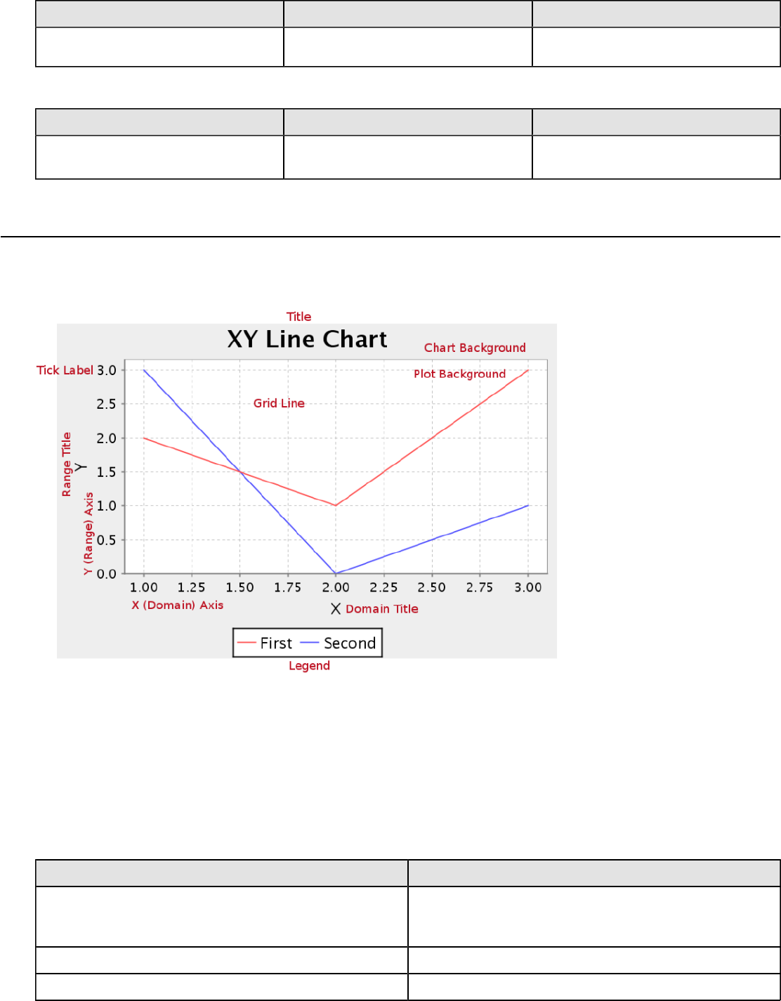
| Chart Types | 193
Property Data Type Description
JFreeChart APIs so you can modify
the chart after the report renders.
Chart Post Processing Script
Property Data Type Description
Chart Post Processing Script Script The script to use to modify chart
object.
XY Line
XY line charts are useful for showing how multiple data trends relate to one another over time. It is essentially multiple
line charts interposed over one another, and using data sets that are closely related and similar enough to share the
same Y axis scale.
Data Collectors
The following data collectors are associated with this chart type:
TimeSeries
This collector builds a dataset that is compatible with JFreeChart XY charts that have one dimension that is time\date
data. XY date\time based datasets have three dimensions or columns. The first column is the series values. The next is
the date column (typically the x-axis or domain values), and the last column has the numeric values to be plotted on the
y-axis (range).
Property Description
name A title for this data collector configuration. Typically you
will only have one data collector per chart, in which case
this property is not particularly useful.
category-time-column The column that contains the time data.
time-period-type Determines the interval to measure the time data by.
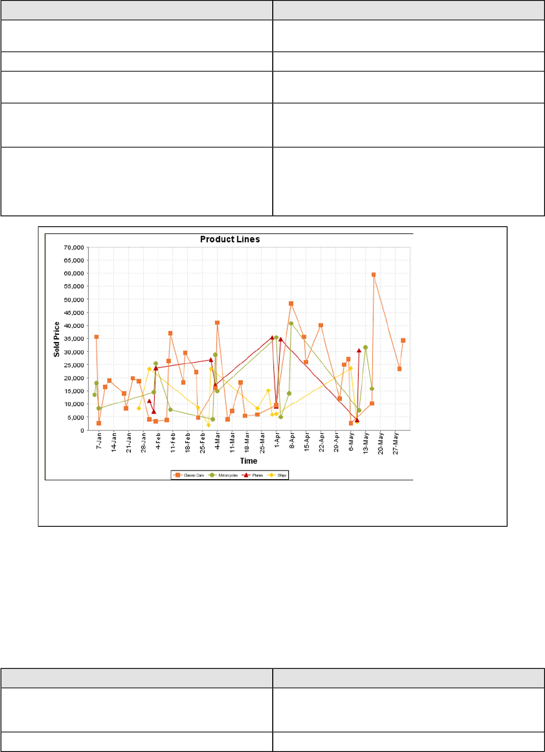
| Chart Types | 194
Property Description
value-column The data column that determines the chart values (or
series items).
series-by-value A static value that you want to use for the series name.
series-by-field Uses the selected column to use for series names. This
will cause the value column to be split into series groups.
group-by This provides the name of the group that the chart is
appearing in. If the chart contains detailed information,
then this is not necessary.
reset-group Specifies a group that will be used to create charts within
a sub-group. For example, if charting one chart per region,
and the chart is displaying data for departments within a
region, the reset-group would be set to the region group,
and the chart group would be set to department group.
On the above bar chart, Classic Cars, Motorcycles, Planes and Ships are the series. The sold price
is plotted against the y-axis, and the order date is plotted against the x-axis.
XYSeries
An XY dataset plots pairs of values as points on the chart. The XY charts have two numeric axes. If the dataset is
arranged by column, each row is expected to have three columns. Each row is assumed to represent one data point on
the chart, ordered by the series name and domain value. The first column's values contain the name of the series. The
second column is numeric, containing the domain value of the data point. The third column is numeric, containing the
range value of the data point.
If the dataset is arranged by row, each row is expected to contain all the data points for the series. The first column's
values contain the name of the series. It is assumed the other columns in the row consist of a collection of x/y data
points (i.e. columns 2, 4, 6 etc. will be domain values, and columns 3, 5, 7 etc will be range values).
Property Description
name A title for this data collector configuration. Typically you
will only have one data collector per chart, in which case
this property is not particularly useful.
x-value-columns The column that determines the x (domain) axis.
| Chart Types | 195
Property Description
y-value-columns The column that determines the y (range) axis.
series-by-value A static value that you want to use for the series name.
series-by-field Uses the selected column to use for series names. This
will cause the value column to be split into series groups.
group-by This provides the name of the group that the chart is
appearing in. If the chart contains detailed information,
then this is not necessary.
reset-group Specifies a group that will be used to create charts within
a sub-group. For example, if charting one chart per region,
and the chart is displaying data for departments within a
region, the reset-group would be set to the region group,
and the chart group would be set to department group.
XYZSeries
This collector builds a dataset that is compatible with JFreeChart XYZ charts that have three numeric dimensions or
columns. XYZ datasets have four dimensions or columns. The first column represents series values. The next is the
domain numeric column (typically the x-axis values or domain values), and the third column has the numeric values to
be plotted on the y-axis, commonly referred to as the range axis. The fourth column determines a relative size value for
the points plotted by the domain and range values.
Property Description
name A title for this data collector configuration. Typically you
will only have one data collector per chart, in which case
this property is not particularly useful.
x-value-columns The column that determines the x (domain) axis.
y-value-columns The column that determines the x (range) axis.
z-value-columns The column that determines the z axis.
series-by-value A static value that you want to use for the series name.
series-by-field Uses the selected column to use for series names. This
will cause the value column to be split into series groups.
group-by This provides the name of the group that the chart is
appearing in. If the chart contains detailed information,
then this is not necessary.
reset-group Specifies a group that will be used to create charts within
a sub-group. For example, if charting one chart per region,
and the chart is displaying data for departments within a
region, the reset-group would be set to the region group,
and the chart group would be set to department group.

| Chart Types | 196
In the above chart, the x and y values determine the plot point of each bubble, and the z value
determines the size of each bubble.
Chart Properties
The following groups of properties are associated with this chart type:
Required
The following groups of properties are associated with the Required group for this chart type:
name
Property Data Type Description
name String The name (in Report Designer) of this
chart element. Does not appear in the
published report.
data-source
Property Data Type Description
data-source String The name of the established (in
Report Designer) data source you
intend to pull data from.
no-data-message
Property Data Type Description
no-data-message String The text displayed on the plot
background when the query produces
no usable data
Title
The following groups of properties are associated with the Title group for this chart type:

| Chart Types | 197
chart-title
Property Data Type Description
title String Sets the main title for the chart
chart-title-field
Property Data Type Description
chart-title-field Selection Specifies which field from your data
set you would like to use for the chart
title
title-font
Property Data Type Description
title-font Complex (see example below) Sets the font for the main title for the
chart.
<title-font>
<font-family/>
<size/>
<is-bold/>
<is-italic/>
</title-font>
pos-title
Property Data Type Description
title-position String Sets the position to display the chart
title. Possible values are: top, left,
bottom, right.
Options
The following groups of properties are associated with the Options group for this chart type:
stacked
Property Data Type Description
is-stacked Boolean If true, stacks the series of the chart,
one on top of the other. Default value
is false.
horizontal
Property Data Type Description
orientation String Determines vertical/horizontal
orientation for the chart. Possible
values are horizontal and vertical.
In Report Designer, this is a boolean
that makes the chart horizontal when
set to true and vertical when set to
false.
| Chart Types | 198
series-color
Property Data Type Description
color-palette String List of colors to apply (in order) to the
series in the chart.
line-style
Property Data Type Description
line-style String Sets the style of line series lines.
Possible values are: solid, dash, dot,
dashdot, dashdotdot. Default value is
solid.
line-size
Note: This property is called line-width in the Radar chart property list.
Property Data Type Description
line-width Decimal Sets the width of line series lines.
Default value is 1.0.
General
The following groups of properties are associated with the General category for this chart type:
3-D
Property Data Type Description
is-3D Boolean If true, renders the chart three-
dimensionally. Default value is false.
bg-color
Property Data Type Description
bg-color Selection The color of the chart background;
this is the area behind the chart, not
the plot area. To set the plot area, use
the plot-bg-color property instead
bg-image
Property Data Type Description
bg-image String Path to the graphic file you want to
display in the area behind the chart
show-border
Property Data Type Description
border-visible Boolean If true, draws a border around the
entire surrounding area for the chart.
Default value is false.
| Chart Types | 199
border-color
Property Data Type Description
border-paint String Sets the color for the surrounding
chart border. Possible values are
hexadecimal color codes.
plot-bg-color
Property Data Type Description
plot-background Complex (see example below) Renders either the color, gradient ,
texture or image specified as the plot
background for the chart.
plot-fg-alpha
Property Data Type Description
plot-fg-alpha Decimal Controls the alpha value
(transparency) of the plot foreground.
Possible values are between 0 and 1,
with 0 being totally transparent, and 1
being totally opaque. Default is 1.
plot-bg-alpha
Property Data Type Description
plot-bg-alpha Decimal Controls the alpha value
(transparency) of the plot background.
Possible values are between 0 and 1,
with 0 being totally transparent, and 1
being totally opaque. Default is 1.
plot-border
Property Data Type Description
plot-border Boolean Determines whether or not the plot
area should have a border between it
and the chart background
anti-alias
Property Data Type Description
anti-alias Boolean Determines whether the edges and
curves of the element should be
smoothed
show-labels
Property Data Type Description
show-labels Boolean Shows the plotted value. Default is
false.

| Chart Types | 200
label-font
Property Data Type Description
label-font Complex (see example below) Sets the font for the labels on the pie
sections.
<label-font>
<font-family/>
<size/>
<is-bold/>
<is-italic/>
</label-font>
url-formula
Property Data Type Description
url-formula formula Associates a link to the series key
and category name. See also, URL
Linking in Charts.
tooltip-formula
Property Data Type Description
tooltip-formula formula Defines the tooltip (hover text) for the
url-formula
X Axis
The following groups of properties are associated with the X Axis category for this chart type:
x-axis-title
Property Data Type Description
domain-title String Sets the title for the domain axis, if it
exists. In a typical two-dimensional
horizontal chart, this the categorical or
X axis.
x-font
Property Data Type Description
domain-title-font Complex (see example below) Sets the font for the domain axis title.
x-sticky-0
Property Data Type Description
domain-sticky-zero Boolean If true, truncates the axis margin at
zero.
x-incl-0
Property Data Type Description
domain-includes-zero Boolean When an axis' values are auto-
calculated, setting this flag to true
ensures that the domain always
includes zero.

| Chart Types | 201
x-min
Property Data Type Description
domain-minimum Integer Sets the lower bounding value on the
domain axis. Useful when the domain
axis is numeric.
x-max
Property Data Type Description
domain-maximum Integer Sets the upper bounding value on the
domain axis. Useful when the domain
axis is numeric.
x-tick-interval
Property Data Type Description
x-tick-interval Decimal Controls the increments between X
axis tick labels
x-vtick-label
Property Data Type Description
domain-vertical-tick-labels Boolean Sets the orientation of the tick labels
on the domain axis; true for vertical,
false for horizontal. Default is false.
x-tick-font
Property Data Type Description
x-tick-font Complex (see example below) Sets the font for the labels on the tick
marks of the domain axis.
x-tick-fmt-str
Property Data Type Description
x-tick-fmt-str String Sets the format of the tick mark labels
of the X (domain) axis. An example
format for displaying percentages
might be: "0.00%". This is particularly
useful when the domain axis is
numeric.
x-tick-period
Property Data Type Description
x-period-type String Specifies the time period interval the
chart should expect for your time
series data. For example, Month only
works with data stored in monthly
intervals, i.e.: Jan 2007, Feb 2007,
etc. This property does not affect
the displayed values on the range
axis; it only defines the type of date
information in the data set.

| Chart Types | 202
Y Axis
The following groups of properties are associated with the Y Axis category for this chart type:
y-axis-title
Property Data Type Description
range-title String Sets the title for the primary numeric
data axis; typically the Y axis in a
horizontally-oriented chart.
y-font
Property Data Type Description
range-title-font Complex (see example below) Sets the font for the range axis title.
y-sticky-0
Property Data Type Description
range-sticky-zero Boolean If true, truncates the axis margin at
zero.
y-incl-0
Property Data Type Description
range-includes-zero Boolean When an axis' values are auto-
calculated, setting this flag to true
ensures that the range always
includes zero.
y-auto-range
Property Data Type Description
y-auto-range Boolean If True, the y-min and y-max values
will be automatically calculated based
on the lowest and highest values in
the data set.
y-min
Property Data Type Description
range-minimum Integer Sets the lower bounding value on the
range axis.
y-max
Property Data Type Description
range-maximum Integer Sets the upper bounding value on the
range axis.
y-tick-interval
Property Data Type Description
y-tick-interval Decimal Controls the increments between Y
axis tick labels

| Chart Types | 203
y-tick-font
Property Data Type Description
range-tick-font Complex (see example below) Sets the font for the labels on the tick
marks of the range axis.
y-tick-fmt-str
Property Data Type Description
range-tick-format String Sets the format of the labels on
the tick marks of the range axis.
(An example format for displaying
percentages might be "0.00%")
y-tick-period
Property Data Type Description
y-tick-period Selection Specifies the Y axis tick intervals if the
Y (range) data set returns date or time
data
enable-log-axis
Property Data Type Description
enable-log-axis Boolean Determines whether or not the Y axis
scales logarithmically
log-format
Property Data Type Description
log-format Boolean Abbreviates large Y axis tick labels
if they are numbers and no format is
specified in y-tick-fmt-str
Legend
The following groups of properties are associated with the Legend category for this chart type:
show-legend
Property Data Type Description
include-legend Boolean When set to true, displays the legend
in the chart. Default value is true.
location
Property Data Type Description
location Selection Determines where the legend will be
situated, relative to the plot area
legend-bg-color
Property Data Type Description
legend-bg-color String Hexadecimal value of the color
you intend to use for the legend

| Chart Types | 204
Property Data Type Description
background. Default value is FFFFFF
(white).
legend-border
Property Data Type Description
legend-border-visible Boolean If true, draws a border around the
legend. Default value is true.
legend-font
Property Data Type Description
legend-font Complex (see example below) Sets the font to use on the text in the
legend.
<legend-font>
<font-family/>
<size/>
<is-bold/>
<is-italic/>
</legend-font>
legend-font-color
Property Data Type Description
legend-font-color String Hexadecimal value of the color you
intend to use for the legend font.
Default value is 000000 (black).
Scripting
The following groups of properties are associated with the Scripting category for this chart type:
Chart Post Processing Script Language
Property Data Type Description
Chart Post Processing Script
Language Selection The scripting language to use.
This property gives you access to
JFreeChart APIs so you can modify
the chart after the report renders.
Chart Post Processing Script
Property Data Type Description
Chart Post Processing Script Script The script to use to modify chart
object.
XY Area
XY area charts are useful for comparing multiple related data sets over time, especially in zero-sum situations where
you want to show how much of a part each data set has of the total.
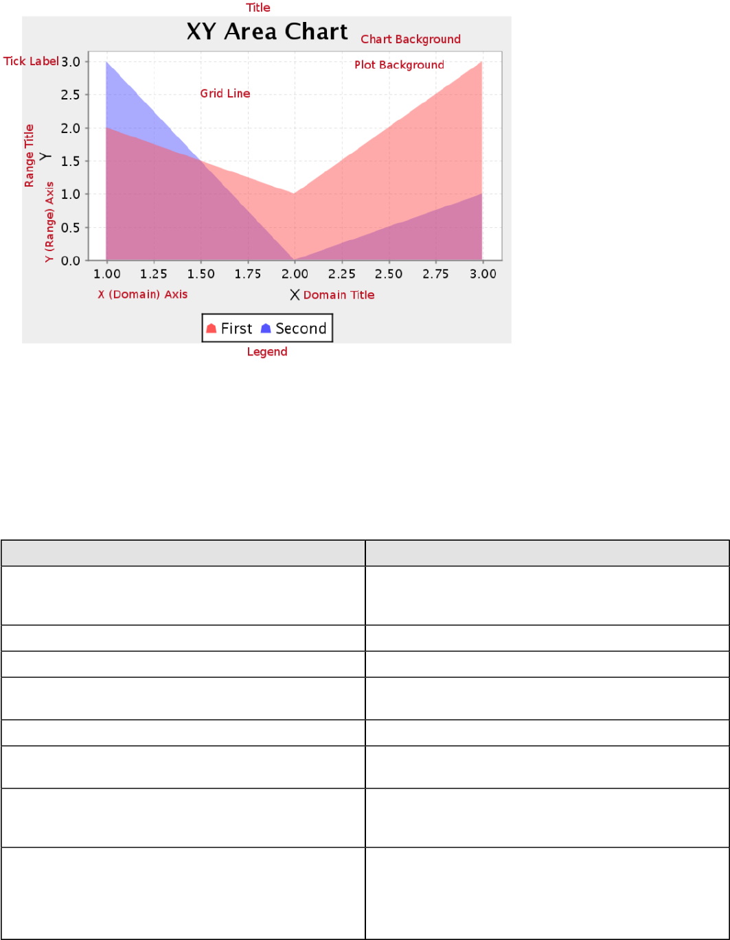
| Chart Types | 205
Data Collectors
The following data collectors are associated with this chart type:
TimeSeries
This collector builds a dataset that is compatible with JFreeChart XY charts that have one dimension that is time\date
data. XY date\time based datasets have three dimensions or columns. The first column is the series values. The next is
the date column (typically the x-axis or domain values), and the last column has the numeric values to be plotted on the
y-axis (range).
Property Description
name A title for this data collector configuration. Typically you
will only have one data collector per chart, in which case
this property is not particularly useful.
category-time-column The column that contains the time data.
time-period-type Determines the interval to measure the time data by.
value-column The data column that determines the chart values (or
series items).
series-by-value A static value that you want to use for the series name.
series-by-field Uses the selected column to use for series names. This
will cause the value column to be split into series groups.
group-by This provides the name of the group that the chart is
appearing in. If the chart contains detailed information,
then this is not necessary.
reset-group Specifies a group that will be used to create charts within
a sub-group. For example, if charting one chart per region,
and the chart is displaying data for departments within a
region, the reset-group would be set to the region group,
and the chart group would be set to department group.

| Chart Types | 206
On the above bar chart, Classic Cars, Motorcycles, Planes and Ships are the series. The sold price
is plotted against the y-axis, and the order date is plotted against the x-axis.
XYSeries
An XY dataset plots pairs of values as points on the chart. The XY charts have two numeric axes. If the dataset is
arranged by column, each row is expected to have three columns. Each row is assumed to represent one data point on
the chart, ordered by the series name and domain value. The first column's values contain the name of the series. The
second column is numeric, containing the domain value of the data point. The third column is numeric, containing the
range value of the data point.
If the dataset is arranged by row, each row is expected to contain all the data points for the series. The first column's
values contain the name of the series. It is assumed the other columns in the row consist of a collection of x/y data
points (i.e. columns 2, 4, 6 etc. will be domain values, and columns 3, 5, 7 etc will be range values).
Property Description
name A title for this data collector configuration. Typically you
will only have one data collector per chart, in which case
this property is not particularly useful.
x-value-columns The column that determines the x (domain) axis.
y-value-columns The column that determines the y (range) axis.
series-by-value A static value that you want to use for the series name.
series-by-field Uses the selected column to use for series names. This
will cause the value column to be split into series groups.
group-by This provides the name of the group that the chart is
appearing in. If the chart contains detailed information,
then this is not necessary.
reset-group Specifies a group that will be used to create charts within
a sub-group. For example, if charting one chart per region,
and the chart is displaying data for departments within a
region, the reset-group would be set to the region group,
and the chart group would be set to department group.

| Chart Types | 207
XYZSeries
This collector builds a dataset that is compatible with JFreeChart XYZ charts that have three numeric dimensions or
columns. XYZ datasets have four dimensions or columns. The first column represents series values. The next is the
domain numeric column (typically the x-axis values or domain values), and the third column has the numeric values to
be plotted on the y-axis, commonly referred to as the range axis. The fourth column determines a relative size value for
the points plotted by the domain and range values.
Property Description
name A title for this data collector configuration. Typically you
will only have one data collector per chart, in which case
this property is not particularly useful.
x-value-columns The column that determines the x (domain) axis.
y-value-columns The column that determines the x (range) axis.
z-value-columns The column that determines the z axis.
series-by-value A static value that you want to use for the series name.
series-by-field Uses the selected column to use for series names. This
will cause the value column to be split into series groups.
group-by This provides the name of the group that the chart is
appearing in. If the chart contains detailed information,
then this is not necessary.
reset-group Specifies a group that will be used to create charts within
a sub-group. For example, if charting one chart per region,
and the chart is displaying data for departments within a
region, the reset-group would be set to the region group,
and the chart group would be set to department group.
In the above chart, the x and y values determine the plot point of each bubble, and the z value
determines the size of each bubble.
Chart Properties
The following groups of properties are associated with this chart type:
| Chart Types | 208
Required
The following groups of properties are associated with the Required group for this chart type:
name
Property Data Type Description
name String The name (in Report Designer) of this
chart element. Does not appear in the
published report.
data-source
Property Data Type Description
data-source String The name of the established (in
Report Designer) data source you
intend to pull data from.
no-data-message
Property Data Type Description
no-data-message String The text displayed on the plot
background when the query produces
no usable data
Title
The following groups of properties are associated with the Title group for this chart type:
chart-title-field
Property Data Type Description
chart-title-field Selection Specifies which field from your data
set you would like to use for the chart
title
title-font
Property Data Type Description
title-font Complex (see example below) Sets the font for the main title for the
chart.
<title-font>
<font-family/>
<size/>
<is-bold/>
<is-italic/>
</title-font>
pos-title
Property Data Type Description
title-position String Sets the position to display the chart
title. Possible values are: top, left,
bottom, right.
| Chart Types | 209
chart-title
Property Data Type Description
title String Sets the main title for the chart
Options
The following groups of properties are associated with the Options group for this chart type:
stacked
Property Data Type Description
is-stacked Boolean If true, stacks the series of the chart,
one on top of the other. Default value
is false.
horizontal
Property Data Type Description
orientation String Determines vertical/horizontal
orientation for the chart. Possible
values are horizontal and vertical.
In Report Designer, this is a boolean
that makes the chart horizontal when
set to true and vertical when set to
false.
series-color
Property Data Type Description
color-palette String List of colors to apply (in order) to the
series in the chart.
line-style
Property Data Type Description
line-style String Sets the style of line series lines.
Possible values are: solid, dash, dot,
dashdot, dashdotdot. Default value is
solid.
line-size
Note: This property is called line-width in the Radar chart property list.
Property Data Type Description
line-width Decimal Sets the width of line series lines.
Default value is 1.0.
show-markers
Property Data Type Description
markers-visible Boolean Sets the point markers visible in
applicable charts. Default value is
false.
| Chart Types | 210
General
The following groups of properties are associated with the General category for this chart type:
3-D
Property Data Type Description
is-3D Boolean If true, renders the chart three-
dimensionally. Default value is false.
bg-color
Property Data Type Description
bg-color Selection The color of the chart background;
this is the area behind the chart, not
the plot area. To set the plot area, use
the plot-bg-color property instead
bg-image
Property Data Type Description
bg-image String Path to the graphic file you want to
display in the area behind the chart
show-border
Property Data Type Description
border-visible Boolean If true, draws a border around the
entire surrounding area for the chart.
Default value is false.
border-color
Property Data Type Description
border-paint String Sets the color for the surrounding
chart border. Possible values are
hexadecimal color codes.
plot-bg-color
Property Data Type Description
plot-background Complex (see example below) Renders either the color, gradient ,
texture or image specified as the plot
background for the chart.
plot-fg-alpha
Property Data Type Description
plot-fg-alpha Decimal Controls the alpha value
(transparency) of the plot foreground.
Possible values are between 0 and 1,
with 0 being totally transparent, and 1
being totally opaque. Default is 1.
| Chart Types | 211
plot-bg-alpha
Property Data Type Description
plot-bg-alpha Decimal Controls the alpha value
(transparency) of the plot background.
Possible values are between 0 and 1,
with 0 being totally transparent, and 1
being totally opaque. Default is 1.
plot-border
Property Data Type Description
plot-border Boolean Determines whether or not the plot
area should have a border between it
and the chart background
anti-alias
Property Data Type Description
anti-alias Boolean Determines whether the edges and
curves of the element should be
smoothed
label-font
Property Data Type Description
label-font Complex (see example below) Sets the font for the labels on the pie
sections.
<label-font>
<font-family/>
<size/>
<is-bold/>
<is-italic/>
</label-font>
show-labels
Property Data Type Description
show-labels Boolean Shows the plotted value. Default is
false.
tooltip-formula
Property Data Type Description
tooltip-formula formula Defines the tooltip (hover text) for the
url-formula
url-formula
Property Data Type Description
url-formula formula Associates a link to the series key
and category name. See also, URL
Linking in Charts.
| Chart Types | 212
X Axis
The following groups of properties are associated with the X Axis category for this chart type:
x-axis-title
Property Data Type Description
domain-title String Sets the title for the domain axis, if it
exists. In a typical two-dimensional
horizontal chart, this the categorical or
X axis.
x-font
Property Data Type Description
domain-title-font Complex (see example below) Sets the font for the domain axis title.
x-sticky-0
Property Data Type Description
domain-sticky-zero Boolean If true, truncates the axis margin at
zero.
x-incl-0
Property Data Type Description
domain-includes-zero Boolean When an axis' values are auto-
calculated, setting this flag to true
ensures that the domain always
includes zero.
x-min
Property Data Type Description
domain-minimum Integer Sets the lower bounding value on the
domain axis. Useful when the domain
axis is numeric.
x-max
Property Data Type Description
domain-maximum Integer Sets the upper bounding value on the
domain axis. Useful when the domain
axis is numeric.
x-tick-interval
Property Data Type Description
x-tick-interval Decimal Controls the increments between X
axis tick labels
| Chart Types | 213
x-vtick-label
Property Data Type Description
domain-vertical-tick-labels Boolean Sets the orientation of the tick labels
on the domain axis; true for vertical,
false for horizontal. Default is false.
x-tick-font
Property Data Type Description
x-tick-font Complex (see example below) Sets the font for the labels on the tick
marks of the domain axis.
x-tick-fmt-str
Property Data Type Description
x-tick-fmt-str String Sets the format of the tick mark labels
of the X (domain) axis. An example
format for displaying percentages
might be: "0.00%". This is particularly
useful when the domain axis is
numeric.
x-tick-period
Property Data Type Description
x-period-type String Specifies the time period interval the
chart should expect for your time
series data. For example, Month only
works with data stored in monthly
intervals, i.e.: Jan 2007, Feb 2007,
etc. This property does not affect
the displayed values on the range
axis; it only defines the type of date
information in the data set.
Y Axis
The following groups of properties are associated with the Y Axis category for this chart type:
y-axis-title
Property Data Type Description
range-title String Sets the title for the primary numeric
data axis; typically the Y axis in a
horizontally-oriented chart.
y-font
Property Data Type Description
range-title-font Complex (see example below) Sets the font for the range axis title.
y-sticky-0
Property Data Type Description
range-sticky-zero Boolean If true, truncates the axis margin at
zero.
| Chart Types | 214
y-incl-0
Property Data Type Description
range-includes-zero Boolean When an axis' values are auto-
calculated, setting this flag to true
ensures that the range always
includes zero.
y-auto-range
Property Data Type Description
y-auto-range Boolean If True, the y-min and y-max values
will be automatically calculated based
on the lowest and highest values in
the data set.
y-min
Property Data Type Description
range-minimum Integer Sets the lower bounding value on the
range axis.
y-max
Property Data Type Description
range-maximum Integer Sets the upper bounding value on the
range axis.
y-tick-interval
Property Data Type Description
y-tick-interval Decimal Controls the increments between Y
axis tick labels
y-tick-font
Property Data Type Description
range-tick-font Complex (see example below) Sets the font for the labels on the tick
marks of the range axis.
y-tick-fmt-str
Property Data Type Description
range-tick-format String Sets the format of the labels on
the tick marks of the range axis.
(An example format for displaying
percentages might be "0.00%")
y-tick-period
Property Data Type Description
y-tick-period Selection Specifies the Y axis tick intervals if the
Y (range) data set returns date or time
data
| Chart Types | 215
enable-log-axis
Property Data Type Description
enable-log-axis Boolean Determines whether or not the Y axis
scales logarithmically
log-format
Property Data Type Description
log-format Boolean Abbreviates large Y axis tick labels
if they are numbers and no format is
specified in y-tick-fmt-str
Legend
The following groups of properties are associated with the Legend category for this chart type:
show-legend
Property Data Type Description
include-legend Boolean When set to true, displays the legend
in the chart. Default value is true.
location
Property Data Type Description
location Selection Determines where the legend will be
situated, relative to the plot area
legend-bg-color
Property Data Type Description
legend-bg-color String Hexadecimal value of the color
you intend to use for the legend
background. Default value is FFFFFF
(white).
legend-border
Property Data Type Description
legend-border-visible Boolean If true, draws a border around the
legend. Default value is true.
legend-font
Property Data Type Description
legend-font Complex (see example below) Sets the font to use on the text in the
legend.
<legend-font>
<font-family/>
<size/>
<is-bold/>
<is-italic/>
</legend-font>
| Chart Types | 216
legend-font-color
Property Data Type Description
legend-font-color String Hexadecimal value of the color you
intend to use for the legend font.
Default value is 000000 (black).
Scripting
The following groups of properties are associated with the Scripting category for this chart type:
Chart Post Processing Script Language
Property Data Type Description
Chart Post Processing Script
Language Selection The scripting language to use.
This property gives you access to
JFreeChart APIs so you can modify
the chart after the report renders.
Chart Post Processing Script
Property Data Type Description
Chart Post Processing Script Script The script to use to modify chart
object.
XY Extended Line (XY Step, XY StepArea, XY Difference)
There are three possible variations of the XY extended line chart: StepChart, StepAreaChart, and DifferenceChart.
Passing these values to the ext-chart-type parameter in Report Designer determines which chart you create. All three
types share the same properties.
XY extended line charts are useful for showing how multiple data points change over time while also showing how each
compares against the others.
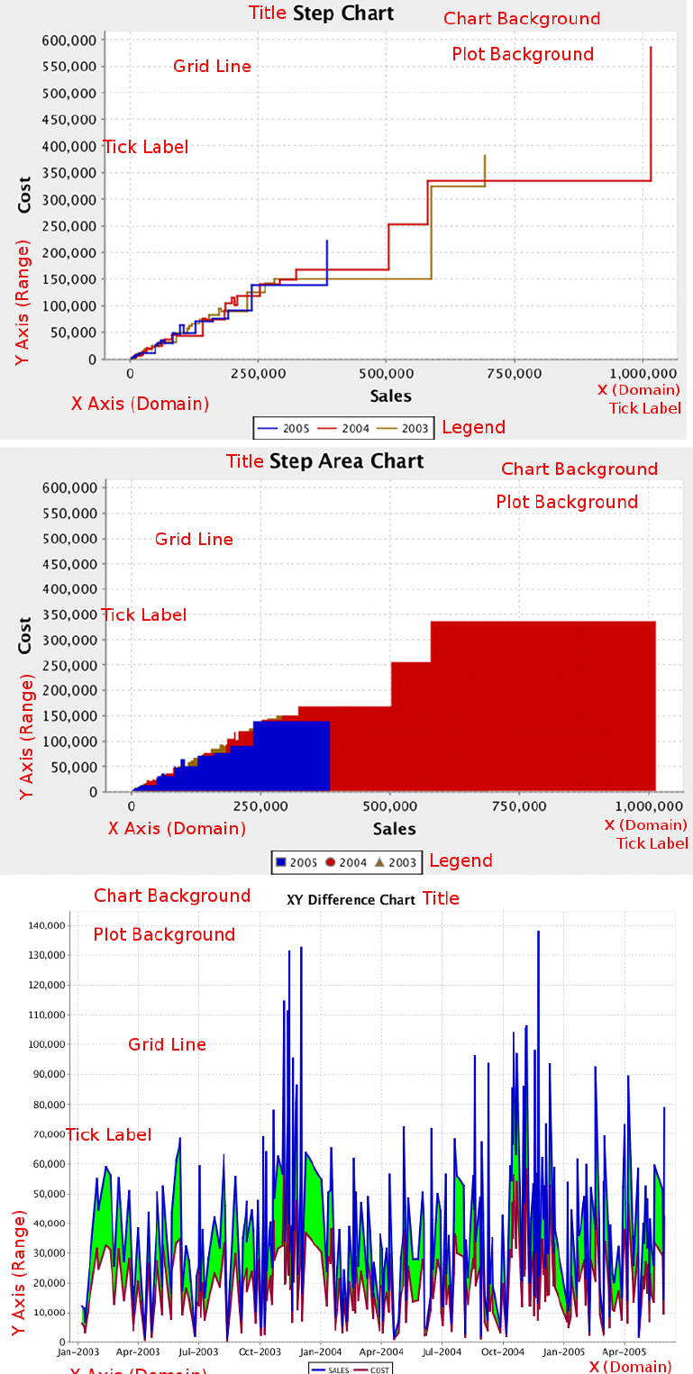
| Chart Types | 217
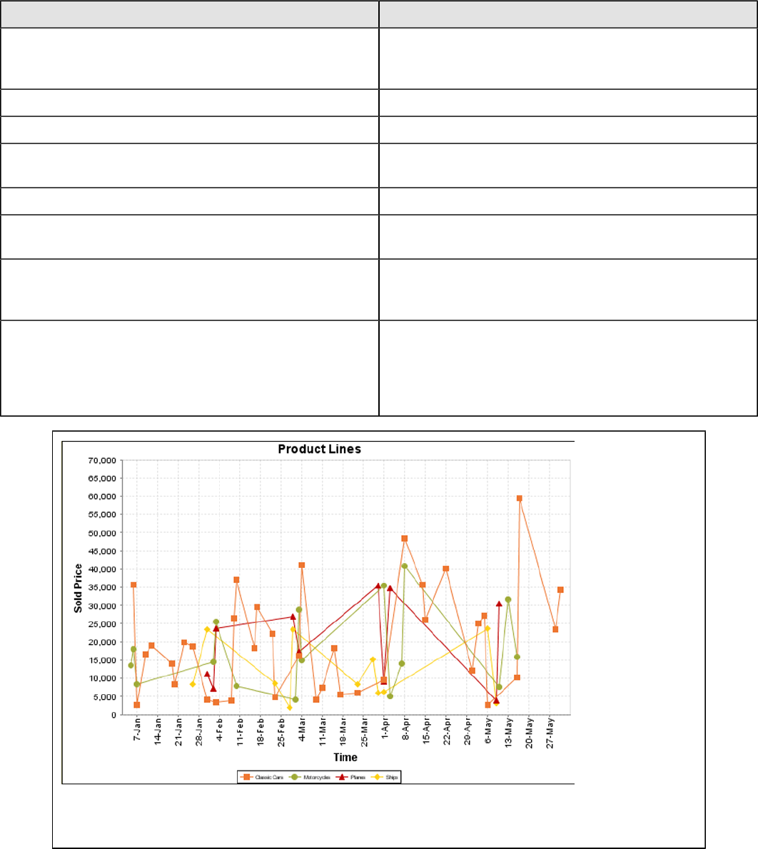
| Chart Types | 218
Data Collectors
The following data collectors are associated with this chart type:
TimeSeries
This collector builds a dataset that is compatible with JFreeChart XY charts that have one dimension that is time\date
data. XY date\time based datasets have three dimensions or columns. The first column is the series values. The next is
the date column (typically the x-axis or domain values), and the last column has the numeric values to be plotted on the
y-axis (range).
Property Description
name A title for this data collector configuration. Typically you
will only have one data collector per chart, in which case
this property is not particularly useful.
category-time-column The column that contains the time data.
time-period-type Determines the interval to measure the time data by.
value-column The data column that determines the chart values (or
series items).
series-by-value A static value that you want to use for the series name.
series-by-field Uses the selected column to use for series names. This
will cause the value column to be split into series groups.
group-by This provides the name of the group that the chart is
appearing in. If the chart contains detailed information,
then this is not necessary.
reset-group Specifies a group that will be used to create charts within
a sub-group. For example, if charting one chart per region,
and the chart is displaying data for departments within a
region, the reset-group would be set to the region group,
and the chart group would be set to department group.
On the above bar chart, Classic Cars, Motorcycles, Planes and Ships are the series. The sold price
is plotted against the y-axis, and the order date is plotted against the x-axis.
| Chart Types | 219
XYSeries
An XY dataset plots pairs of values as points on the chart. The XY charts have two numeric axes. If the dataset is
arranged by column, each row is expected to have three columns. Each row is assumed to represent one data point on
the chart, ordered by the series name and domain value. The first column's values contain the name of the series. The
second column is numeric, containing the domain value of the data point. The third column is numeric, containing the
range value of the data point.
If the dataset is arranged by row, each row is expected to contain all the data points for the series. The first column's
values contain the name of the series. It is assumed the other columns in the row consist of a collection of x/y data
points (i.e. columns 2, 4, 6 etc. will be domain values, and columns 3, 5, 7 etc will be range values).
Property Description
name A title for this data collector configuration. Typically you
will only have one data collector per chart, in which case
this property is not particularly useful.
x-value-columns The column that determines the x (domain) axis.
y-value-columns The column that determines the y (range) axis.
series-by-value A static value that you want to use for the series name.
series-by-field Uses the selected column to use for series names. This
will cause the value column to be split into series groups.
group-by This provides the name of the group that the chart is
appearing in. If the chart contains detailed information,
then this is not necessary.
reset-group Specifies a group that will be used to create charts within
a sub-group. For example, if charting one chart per region,
and the chart is displaying data for departments within a
region, the reset-group would be set to the region group,
and the chart group would be set to department group.
XYZSeries
This collector builds a dataset that is compatible with JFreeChart XYZ charts that have three numeric dimensions or
columns. XYZ datasets have four dimensions or columns. The first column represents series values. The next is the
domain numeric column (typically the x-axis values or domain values), and the third column has the numeric values to
be plotted on the y-axis, commonly referred to as the range axis. The fourth column determines a relative size value for
the points plotted by the domain and range values.
Property Description
name A title for this data collector configuration. Typically you
will only have one data collector per chart, in which case
this property is not particularly useful.
x-value-columns The column that determines the x (domain) axis.
y-value-columns The column that determines the x (range) axis.
z-value-columns The column that determines the z axis.
series-by-value A static value that you want to use for the series name.
series-by-field Uses the selected column to use for series names. This
will cause the value column to be split into series groups.
group-by This provides the name of the group that the chart is
appearing in. If the chart contains detailed information,
then this is not necessary.
reset-group Specifies a group that will be used to create charts within
a sub-group. For example, if charting one chart per region,
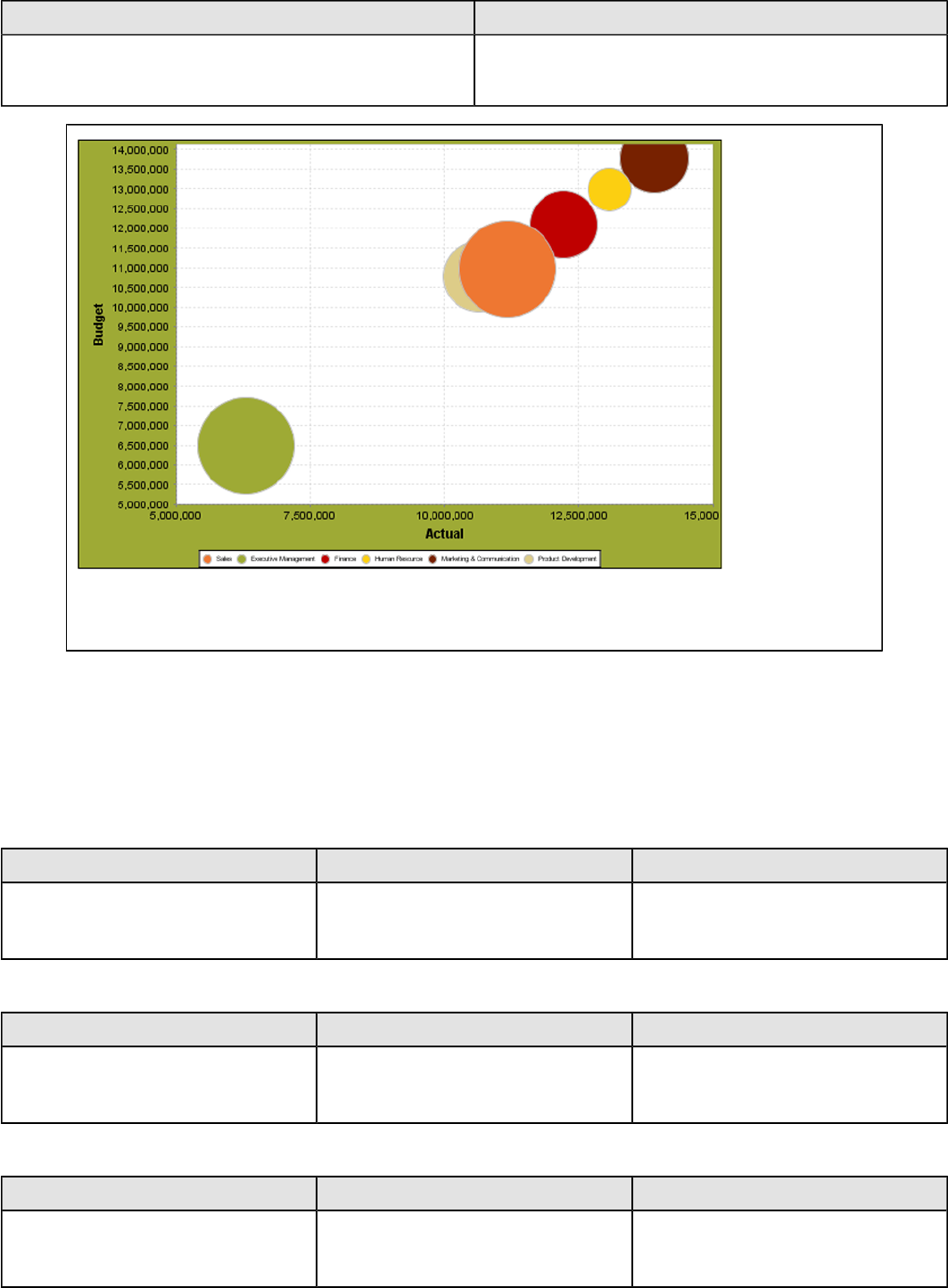
| Chart Types | 220
Property Description
and the chart is displaying data for departments within a
region, the reset-group would be set to the region group,
and the chart group would be set to department group.
In the above chart, the x and y values determine the plot point of each bubble, and the z value
determines the size of each bubble.
Chart Properties
The following groups of properties are associated with this chart type:
Required
The following groups of properties are associated with the Required group for this chart type:
name
Property Data Type Description
name String The name (in Report Designer) of this
chart element. Does not appear in the
published report.
data-source
Property Data Type Description
data-source String The name of the established (in
Report Designer) data source you
intend to pull data from.
no-data-message
Property Data Type Description
no-data-message String The text displayed on the plot
background when the query produces
no usable data
| Chart Types | 221
Title
The following groups of properties are associated with the Title group for this chart type:
chart-title
Property Data Type Description
title String Sets the main title for the chart
chart-title-field
Property Data Type Description
chart-title-field Selection Specifies which field from your data
set you would like to use for the chart
title
title-font
Property Data Type Description
title-font Complex (see example below) Sets the font for the main title for the
chart.
<title-font>
<font-family/>
<size/>
<is-bold/>
<is-italic/>
</title-font>
pos-title
Property Data Type Description
title-position String Sets the position to display the chart
title. Possible values are: top, left,
bottom, right.
Options
The following groups of properties are associated with the Options group for this chart type:
ext-chart-type
Note: This property is called ext-chart-type in Report Designer. Report Designer only uses this property
for the XY Extended chart type, in which it determines whether the chart you are creating will be a step, step
area, or difference chart. Possible values in Report Designer are only: StepChart, StepAreaChart, and
DifferenceChart.
Property Data Type Description
ext-chart-type String Sets the type of chart you intend to
generate. The dataset-type property
and the chart-type property work
together to tell the chart engine what
kind of chart to build. Possible values
are: StepChart, StepAreaChart,
DifferenceChart
| Chart Types | 222
stacked
Property Data Type Description
is-stacked Boolean If true, stacks the series of the chart,
one on top of the other. Default value
is false.
horizontal
Property Data Type Description
orientation String Determines vertical/horizontal
orientation for the chart. Possible
values are horizontal and vertical.
In Report Designer, this is a boolean
that makes the chart horizontal when
set to true and vertical when set to
false.
series-color
Property Data Type Description
color-palette String List of colors to apply (in order) to the
series in the chart.
line-style
Property Data Type Description
line-style String Sets the style of line series lines.
Possible values are: solid, dash, dot,
dashdot, dashdotdot. Default value is
solid.
line-size
Note: This property is called line-width in the Radar chart property list.
Property Data Type Description
line-width Decimal Sets the width of line series lines.
Default value is 1.0.
show-markers
Property Data Type Description
markers-visible Boolean Sets the point markers visible in
applicable charts. Default value is
false.
General
The following groups of properties are associated with the General category for this chart type:
3-D
Property Data Type Description
is-3D Boolean If true, renders the chart three-
dimensionally. Default value is false.
| Chart Types | 223
bg-color
Property Data Type Description
bg-color Selection The color of the chart background;
this is the area behind the chart, not
the plot area. To set the plot area, use
the plot-bg-color property instead
bg-image
Property Data Type Description
bg-image String Path to the graphic file you want to
display in the area behind the chart
show-border
Property Data Type Description
border-visible Boolean If true, draws a border around the
entire surrounding area for the chart.
Default value is false.
border-color
Property Data Type Description
border-paint String Sets the color for the surrounding
chart border. Possible values are
hexadecimal color codes.
plot-bg-color
Property Data Type Description
plot-background Complex (see example below) Renders either the color, gradient ,
texture or image specified as the plot
background for the chart.
plot-fg-alpha
Property Data Type Description
plot-fg-alpha Decimal Controls the alpha value
(transparency) of the plot foreground.
Possible values are between 0 and 1,
with 0 being totally transparent, and 1
being totally opaque. Default is 1.
plot-bg-alpha
Property Data Type Description
plot-bg-alpha Decimal Controls the alpha value
(transparency) of the plot background.
Possible values are between 0 and 1,
with 0 being totally transparent, and 1
being totally opaque. Default is 1.
| Chart Types | 224
plot-border
Property Data Type Description
plot-border Boolean Determines whether or not the plot
area should have a border between it
and the chart background
anti-alias
Property Data Type Description
anti-alias Boolean Determines whether the edges and
curves of the element should be
smoothed
show-labels
Property Data Type Description
show-labels Boolean Shows the plotted value. Default is
false.
label-font
Property Data Type Description
label-font Complex (see example below) Sets the font for the labels on the pie
sections.
<label-font>
<font-family/>
<size/>
<is-bold/>
<is-italic/>
</label-font>
url-formula
Property Data Type Description
url-formula formula Associates a link to the series key
and category name. See also, URL
Linking in Charts.
tooltip-formula
Property Data Type Description
tooltip-formula formula Defines the tooltip (hover text) for the
url-formula
X Axis
The following groups of properties are associated with the X Axis category for this chart type:
x-axis-title
Property Data Type Description
domain-title String Sets the title for the domain axis, if it
exists. In a typical two-dimensional
| Chart Types | 225
Property Data Type Description
horizontal chart, this the categorical or
X axis.
x-font
Property Data Type Description
domain-title-font Complex (see example below) Sets the font for the domain axis title.
x-sticky-0
Property Data Type Description
domain-sticky-zero Boolean If true, truncates the axis margin at
zero.
x-incl-0
Property Data Type Description
domain-includes-zero Boolean When an axis' values are auto-
calculated, setting this flag to true
ensures that the domain always
includes zero.
x-min
Property Data Type Description
domain-minimum Integer Sets the lower bounding value on the
domain axis. Useful when the domain
axis is numeric.
x-max
Property Data Type Description
domain-maximum Integer Sets the upper bounding value on the
domain axis. Useful when the domain
axis is numeric.
x-tick-interval
Property Data Type Description
x-tick-interval Decimal Controls the increments between X
axis tick labels
x-vtick-label
Property Data Type Description
domain-vertical-tick-labels Boolean Sets the orientation of the tick labels
on the domain axis; true for vertical,
false for horizontal. Default is false.
x-tick-font
Property Data Type Description
x-tick-font Complex (see example below) Sets the font for the labels on the tick
marks of the domain axis.
| Chart Types | 226
x-tick-fmt-str
Property Data Type Description
x-tick-fmt-str String Sets the format of the tick mark labels
of the X (domain) axis. An example
format for displaying percentages
might be: "0.00%". This is particularly
useful when the domain axis is
numeric.
x-tick-period
Property Data Type Description
x-period-type String Specifies the time period interval the
chart should expect for your time
series data. For example, Month only
works with data stored in monthly
intervals, i.e.: Jan 2007, Feb 2007,
etc. This property does not affect
the displayed values on the range
axis; it only defines the type of date
information in the data set.
Y Axis
The following groups of properties are associated with the Y Axis category for this chart type:
y-axis-title
Property Data Type Description
range-title String Sets the title for the primary numeric
data axis; typically the Y axis in a
horizontally-oriented chart.
y-font
Property Data Type Description
range-title-font Complex (see example below) Sets the font for the range axis title.
y-sticky-0
Property Data Type Description
range-sticky-zero Boolean If true, truncates the axis margin at
zero.
y-incl-0
Property Data Type Description
range-includes-zero Boolean When an axis' values are auto-
calculated, setting this flag to true
ensures that the range always
includes zero.
| Chart Types | 227
y-auto-range
Property Data Type Description
y-auto-range Boolean If True, the y-min and y-max values
will be automatically calculated based
on the lowest and highest values in
the data set.
y-min
Property Data Type Description
range-minimum Integer Sets the lower bounding value on the
range axis.
y-max
Property Data Type Description
range-maximum Integer Sets the upper bounding value on the
range axis.
y-tick-interval
Property Data Type Description
y-tick-interval Decimal Controls the increments between Y
axis tick labels
y-tick-font
Property Data Type Description
range-tick-font Complex (see example below) Sets the font for the labels on the tick
marks of the range axis.
y-tick-fmt-str
Property Data Type Description
range-tick-format String Sets the format of the labels on
the tick marks of the range axis.
(An example format for displaying
percentages might be "0.00%")
y-tick-period
Property Data Type Description
y-tick-period Selection Specifies the Y axis tick intervals if the
Y (range) data set returns date or time
data
enable-log-axis
Property Data Type Description
enable-log-axis Boolean Determines whether or not the Y axis
scales logarithmically
| Chart Types | 228
log-format
Property Data Type Description
log-format Boolean Abbreviates large Y axis tick labels
if they are numbers and no format is
specified in y-tick-fmt-str
Legend
The following groups of properties are associated with the Legend category for this chart type:
show-legend
Property Data Type Description
include-legend Boolean When set to true, displays the legend
in the chart. Default value is true.
location
Property Data Type Description
location Selection Determines where the legend will be
situated, relative to the plot area
legend-bg-color
Property Data Type Description
legend-bg-color String Hexadecimal value of the color
you intend to use for the legend
background. Default value is FFFFFF
(white).
legend-border
Property Data Type Description
legend-border-visible Boolean If true, draws a border around the
legend. Default value is true.
legend-font
Property Data Type Description
legend-font Complex (see example below) Sets the font to use on the text in the
legend.
<legend-font>
<font-family/>
<size/>
<is-bold/>
<is-italic/>
</legend-font>
legend-font-color
Property Data Type Description
legend-font-color String Hexadecimal value of the color you
intend to use for the legend font.
Default value is 000000 (black).
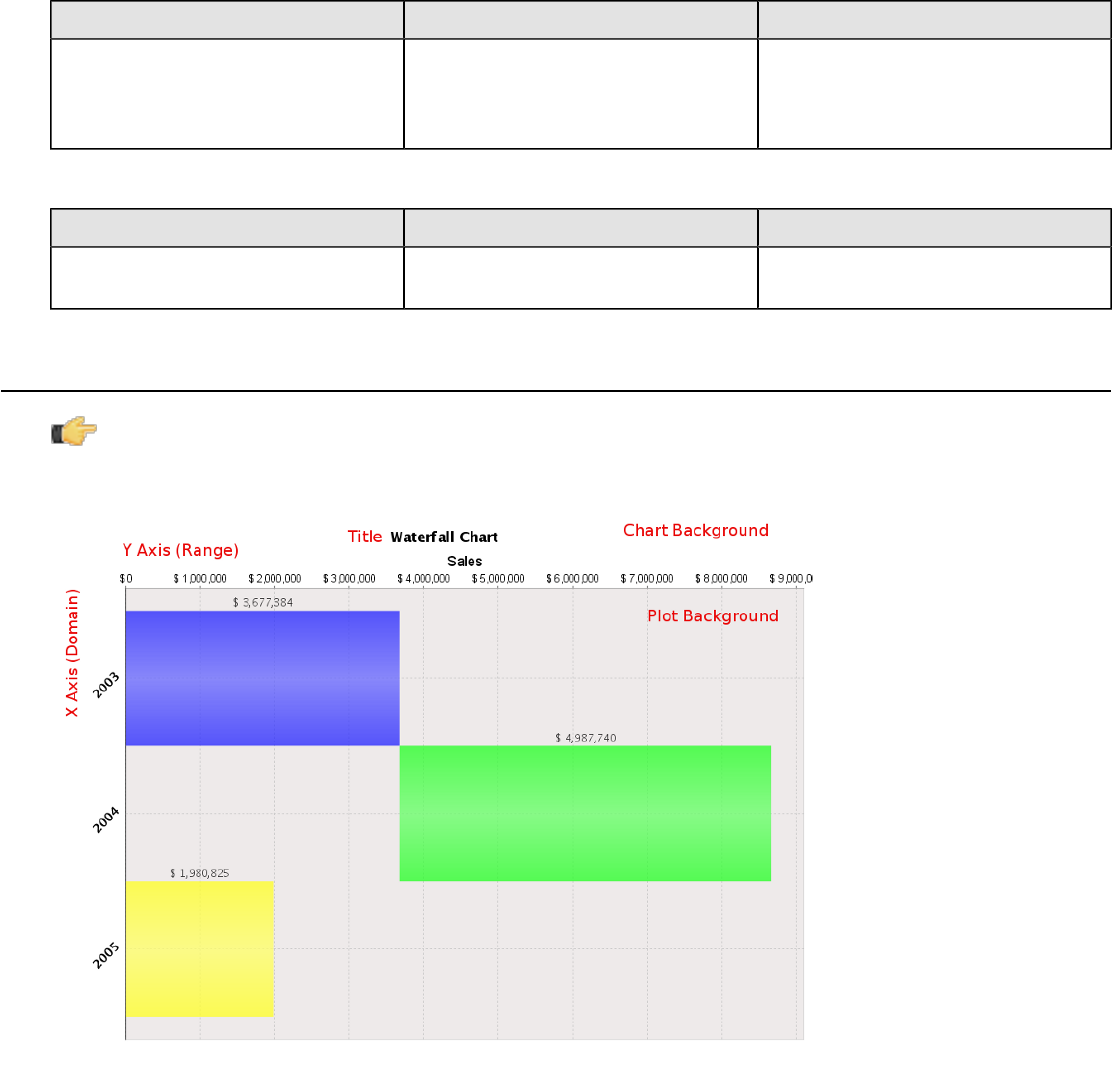
| Chart Types | 229
Scripting
The following groups of properties are associated with the Scripting category for this chart type:
Chart Post Processing Script Language
Property Data Type Description
Chart Post Processing Script
Language Selection The scripting language to use.
This property gives you access to
JFreeChart APIs so you can modify
the chart after the report renders.
Chart Post Processing Script
Property Data Type Description
Chart Post Processing Script Script The script to use to modify chart
object.
Waterfall
Note: Waterfall charts are only available in Report Designer; you cannot create a waterfall chart with
ChartComponent.
A Waterfall chart is useful for showing the length of each specific portion of a trend.
Data Collectors
The following data collectors are associated with this chart type:
CategorySet
To generate categorical charts, you need a three-dimensional (three column) dataset. The first dimension is the
category column, which defines the columns that contain the category names. The category can be considered a
grouping of the bars (in a bar chart, for example). The next dimension is the series. In bar charts for example, you'll
have one bar for each series. Finally, the numerical value being plotted is the third dimension.
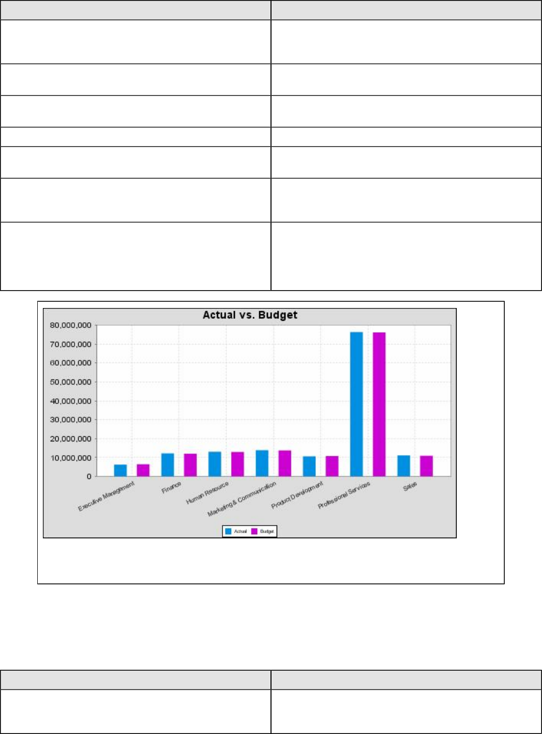
| Chart Types | 230
Property Description
name A title for this data collector configuration. Typically you
will only have one data collector per chart, in which case
this property is not particularly useful.
category-column The column that you want to use to determine category
names.
value-columns The data columns that determine the chart values (or
series items).
series-by-value A static value that you want to use for the series name.
series-by-field Uses the selected column to use for series names. This
will cause the value column to be split into series groups.
group-by This provides the name of the group that the chart is
appearing in. If the chart contains detailed information,
then this is not necessary.
reset-group Specifies a group that will be used to create charts within
a sub-group. For example, if charting one chart per region,
and the chart is displaying data for departments within a
region, the reset-group would be set to the region group,
and the chart group would be set to department group.
In the above chart, Executive Management, Finance, etc., are in the category column (department).
The first series name is Actual (the blue bar), and the second series name is Budget (the purple bar).
PivotCategorySet
The PivotCategorySet data collector is an extension of the CategorySet data collector that will pivot the data to use a
column of values as series, rather than individual columns themselves. This means that at a minimum, you will need a
column from which the collector will retrieve the series names, and any number of additional numeric data columns that
will serve as categories. The data values to be plotted for each series are the category columns' values.
Property Description
name A title for this data collector configuration. Typically you
will only have one data collector per chart, in which case
this property is not particularly useful.
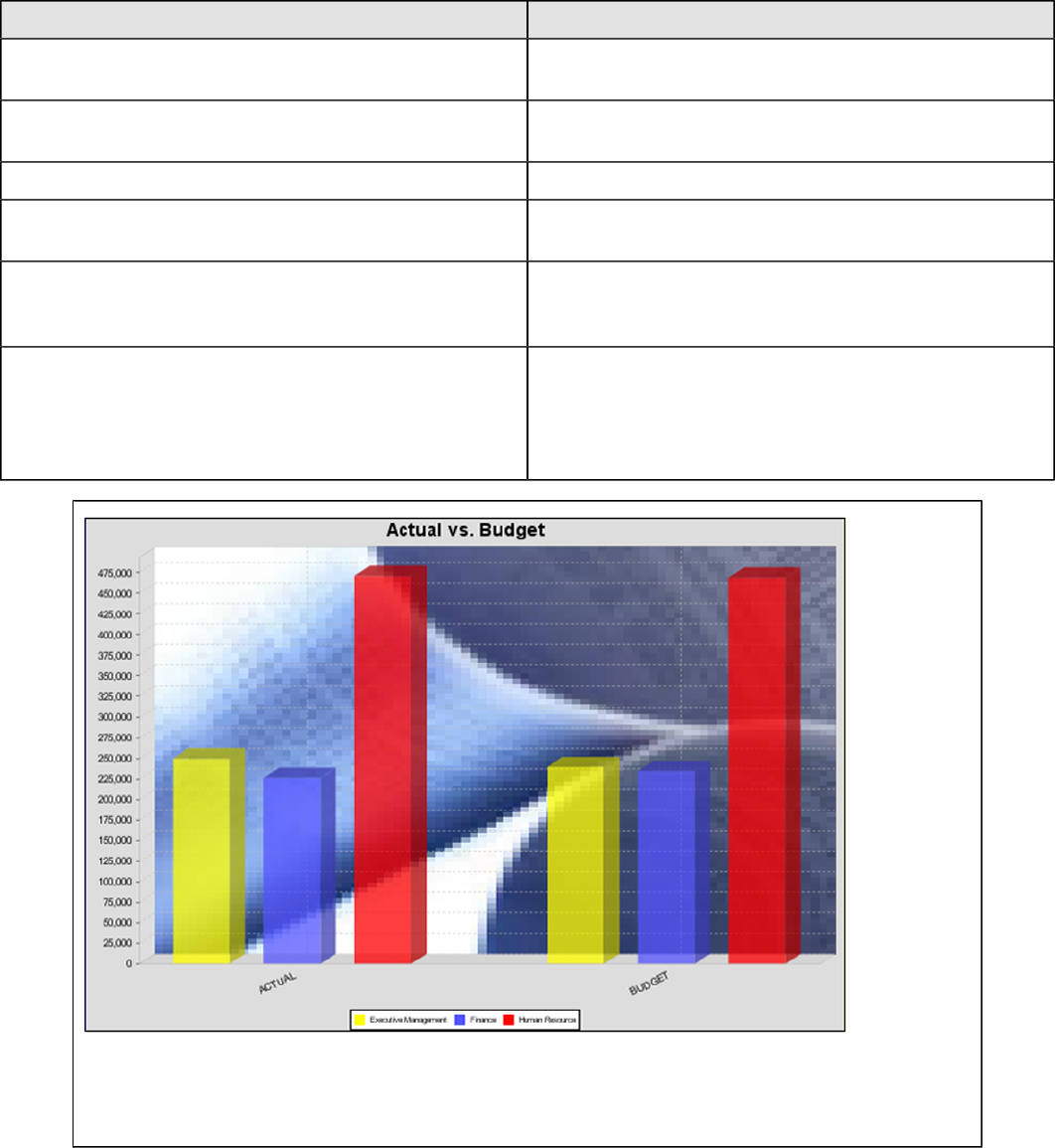
| Chart Types | 231
Property Description
category-columns The names of the columns you want to use to determine
category names.
value-columns The data columns that determine the chart values (or
series items).
series-by-value A static value that you want to use for the series name.
series-by-field Uses the selected column to use for series names. This
will cause the value column to be split into series groups.
group-by This provides the name of the group that the chart is
appearing in. If the chart contains detailed information,
then this is not necessary.
reset-group Specifies a group that will be used to create charts within
a sub-group. For example, if charting one chart per region,
and the chart is displaying data for departments within a
region, the reset-group would be set to the region group,
and the chart group would be set to department group.
In the above bar chart, Executive Management, Finance, and Human Resources (the yellow, blue,
and red bars, respectively) are the series -- values taken from the series column DEPARTMENT.
The categories Actual and Budget supply row-based data points for each series.
Chart Properties
The following groups of properties are associated with this chart type:
Required
The following groups of properties are associated with the Required group for this chart type:
| Chart Types | 232
name
Property Data Type Description
name String The name (in Report Designer) of this
chart element. Does not appear in the
published report.
data-source
Property Data Type Description
data-source String The name of the established (in
Report Designer) data source you
intend to pull data from.
no-data-message
Property Data Type Description
no-data-message String The text displayed on the plot
background when the query produces
no usable data
Title
The following groups of properties are associated with the Title group for this chart type:
chart-title
Property Data Type Description
title String Sets the main title for the chart
chart-title-field
Property Data Type Description
chart-title-field Selection Specifies which field from your data
set you would like to use for the chart
title
title-font
Property Data Type Description
title-font Complex (see example below) Sets the font for the main title for the
chart.
<title-font>
<font-family/>
<size/>
<is-bold/>
<is-italic/>
</title-font>
Options
The following groups of properties are associated with the Options group for this chart type:

| Chart Types | 233
horizontal
Property Data Type Description
orientation String Determines vertical/horizontal
orientation for the chart. Possible
values are horizontal and vertical.
In Report Designer, this is a boolean
that makes the chart horizontal when
set to true and vertical when set to
false.
series-color
Property Data Type Description
color-palette String List of colors to apply (in order) to the
series in the chart.
General
The following groups of properties are associated with the General category for this chart type:
3-D
Property Data Type Description
is-3D Boolean If true, renders the chart three-
dimensionally. Default value is false.
gridlines
Property Data Type Description
gridlines Boolean If true, draws thick horizontal lines
across the plot background that more
easily show intervals between values.
Not to be confused with tick lines,
which are dotted plot lines that only
show major scale values. Default
value is true.
bg-color
Property Data Type Description
bg-color Selection The color of the chart background;
this is the area behind the chart, not
the plot area. To set the plot area, use
the plot-bg-color property instead
bg-image
Property Data Type Description
bg-image String Path to the graphic file you want to
display in the area behind the chart

| Chart Types | 234
show-border
Property Data Type Description
border-visible Boolean If true, draws a border around the
entire surrounding area for the chart.
Default value is false.
border-color
Property Data Type Description
border-paint String Sets the color for the surrounding
chart border. Possible values are
hexadecimal color codes.
anti-alias
Property Data Type Description
anti-alias Boolean Determines whether the edges and
curves of the element should be
smoothed
plot-bg-color
Property Data Type Description
plot-background Complex (see example below) Renders either the color, gradient ,
texture or image specified as the plot
background for the chart.
plot-fg-alpha
Property Data Type Description
plot-fg-alpha Decimal Controls the alpha value
(transparency) of the plot foreground.
Possible values are between 0 and 1,
with 0 being totally transparent, and 1
being totally opaque. Default is 1.
plot-bg-alpha
Property Data Type Description
plot-bg-alpha Decimal Controls the alpha value
(transparency) of the plot background.
Possible values are between 0 and 1,
with 0 being totally transparent, and 1
being totally opaque. Default is 1.
plot-border
Property Data Type Description
plot-border Boolean Determines whether or not the plot
area should have a border between it
and the chart background

| Chart Types | 235
url-formula
Property Data Type Description
url-formula formula Associates a link to the series key
and category name. See also, URL
Linking in Charts.
tooltip-formula
Property Data Type Description
tooltip-formula formula Defines the tooltip (hover text) for the
url-formula
X Axis
The following groups of properties are associated with the X Axis category for this chart type:
x-axis-title
Property Data Type Description
domain-title String Sets the title for the domain axis, if it
exists. In a typical two-dimensional
horizontal chart, this the categorical or
X axis.
x-font
Property Data Type Description
domain-title-font Complex (see example below) Sets the font for the domain axis title.
x-axis-label-width
Property Data Type Description
x-axis-label-width Decimal Limits the space (in pixels) occupied
by the x axis labels. The invisible
default value is 20.0. If your labels are
being truncated, try increasing this
value.
x-axis-label-rotation
Property Data Type Description
domain-label-rotation Integer The degree of the angle of rotation
for X axis labels. Possible values are
from 0 to 360.
show-labels
Property Data Type Description
show-labels Boolean Shows the plotted value. Default is
false.

| Chart Types | 236
label-rotation
Property Data Type Description
label-rotation Integer The degree of the angle of rotation for
the labels above the bars. Possible
values are from 0 to 360.
numeric-format
Property Data Type Description
numeric-format String Determines the content of the domain
plot labels. Must be in the Java
number format.
text-format
Property Data Type Description
text-format String Determines the content of the domain
plot labels. There are three possible
values, any or all of which may be
used: {0} represents the series
name; {1} represents category; {2}
represents the plotted value. These
properties must set in the following
format: {0}{1}{2}{3}. For instance, you
might use these values for plot labels:
{0} - series by field {1} - category
columns {2} - value-columns {3} -
percent.
date-format
Property Data Type Description
date-format String Determines the content of the domain
plot labels. Must be in the Java date
format.
category-margin
Property Data Type Description
category-margin Decimal Specifies the width (in pixels) between
bars (categories)
lower-margin
Property Data Type Description
lower-margin Decimal Specifies the space (in pixels)
between the Y axis and the first bar in
the chart
upper-margin
Property Data Type Description
upper-margin Decimal Specifies the space (in pixels)
between the last bar and the outer
edge of the chart
| Chart Types | 237
Y Axis
The following groups of properties are associated with the Y Axis category for this chart type:
y-axis-title
Property Data Type Description
range-title String Sets the title for the primary numeric
data axis; typically the Y axis in a
horizontally-oriented chart.
y-font
Property Data Type Description
range-title-font Complex (see example below) Sets the font for the range axis title.
y-sticky-0
Property Data Type Description
range-sticky-zero Boolean If true, truncates the axis margin at
zero.
y-incl-0
Property Data Type Description
range-includes-zero Boolean When an axis' values are auto-
calculated, setting this flag to true
ensures that the range always
includes zero.
y-auto-range
Property Data Type Description
y-auto-range Boolean If True, the y-min and y-max values
will be automatically calculated based
on the lowest and highest values in
the data set.
y-min
Property Data Type Description
range-minimum Integer Sets the lower bounding value on the
range axis.
y-max
Property Data Type Description
range-maximum Integer Sets the upper bounding value on the
range axis.
y-tick-interval
Property Data Type Description
y-tick-interval Decimal Controls the increments between Y
axis tick labels

| Chart Types | 238
y-tick-font
Property Data Type Description
range-tick-font Complex (see example below) Sets the font for the labels on the tick
marks of the range axis.
y-tick-fmt-str
Property Data Type Description
range-tick-format String Sets the format of the labels on
the tick marks of the range axis.
(An example format for displaying
percentages might be "0.00%")
y-tick-period
Property Data Type Description
y-tick-period Selection Specifies the Y axis tick intervals if the
Y (range) data set returns date or time
data
enable-log-axis
Property Data Type Description
enable-log-axis Boolean Determines whether or not the Y axis
scales logarithmically
log-format
Property Data Type Description
log-format Boolean Abbreviates large Y axis tick labels
if they are numbers and no format is
specified in y-tick-fmt-str
Legend
The following groups of properties are associated with the Legend category for this chart type:
show-legend
Property Data Type Description
include-legend Boolean When set to true, displays the legend
in the chart. Default value is true.
location
Property Data Type Description
location Selection Determines where the legend will be
situated, relative to the plot area
legend-bg-color
Property Data Type Description
legend-bg-color String Hexadecimal value of the color
you intend to use for the legend
| Chart Types | 239
Property Data Type Description
background. Default value is FFFFFF
(white).
legend-border
Property Data Type Description
legend-border-visible Boolean If true, draws a border around the
legend. Default value is true.
legend-font
Property Data Type Description
legend-font Complex (see example below) Sets the font to use on the text in the
legend.
<legend-font>
<font-family/>
<size/>
<is-bold/>
<is-italic/>
</legend-font>
legend-font-color
Property Data Type Description
legend-font-color String Hexadecimal value of the color you
intend to use for the legend font.
Default value is 000000 (black).
Scripting
The following groups of properties are associated with the Scripting category for this chart type:
Chart Post Processing Script Language
Property Data Type Description
Chart Post Processing Script
Language Selection The scripting language to use.
This property gives you access to
JFreeChart APIs so you can modify
the chart after the report renders.
Chart Post Processing Script
Property Data Type Description
Chart Post Processing Script Script The script to use to modify chart
object.
Radar
Note: Radar charts are only available in Report Designer; you cannot create a radar chart with the BA
Platform's ChartComponent.
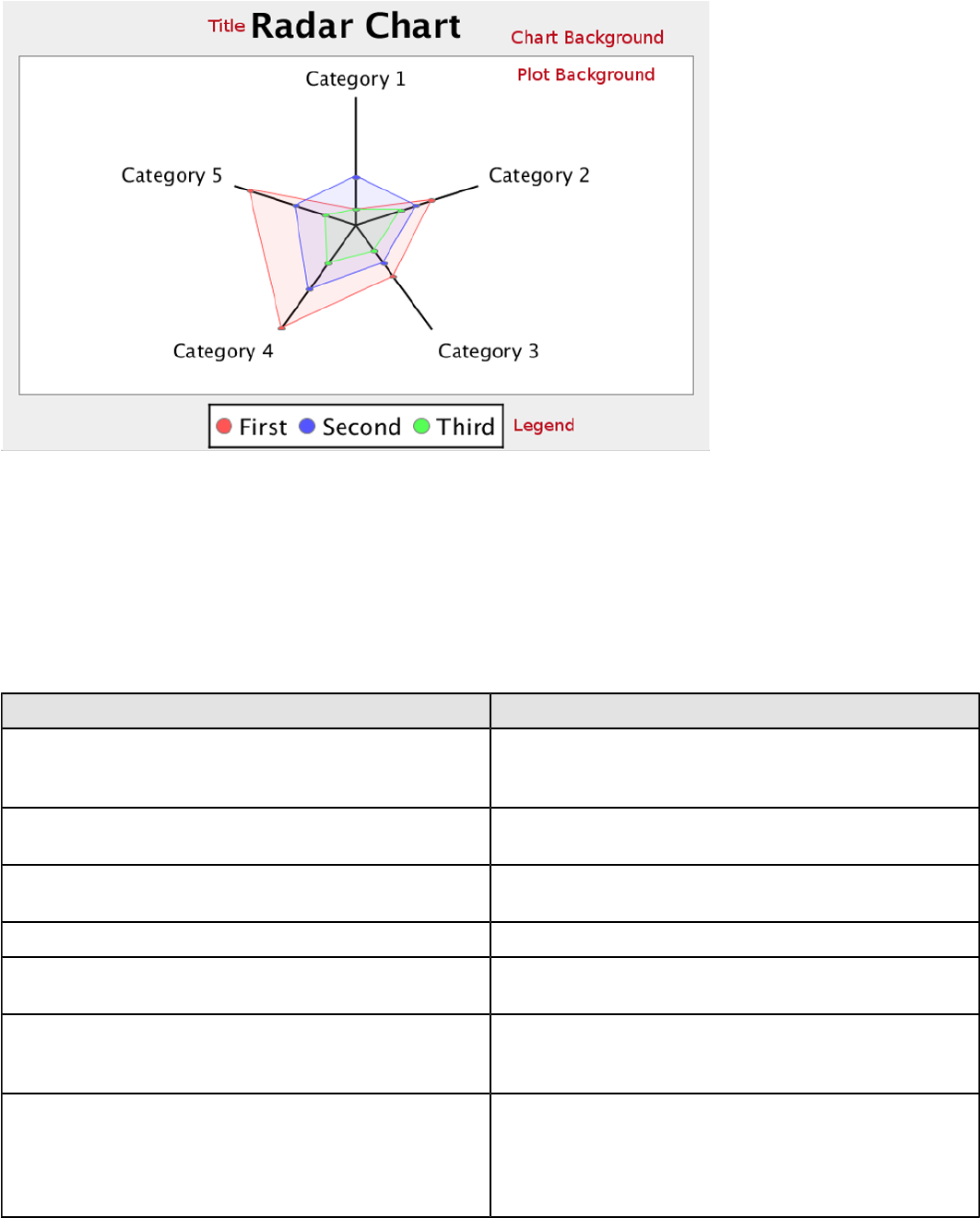
| Chart Types | 240
A radar chart is useful for showing how two or more volume-related data points compare against one another, using
a third related data point as a basis for comparison. For instance, you may want to show how sales dollar amounts
compare among product lines across multiple territories.
Data Collectors
The following data collectors are associated with this chart type:
CategorySet
To generate categorical charts, you need a three-dimensional (three column) dataset. The first dimension is the
category column, which defines the columns that contain the category names. The category can be considered a
grouping of the bars (in a bar chart, for example). The next dimension is the series. In bar charts for example, you'll
have one bar for each series. Finally, the numerical value being plotted is the third dimension.
Property Description
name A title for this data collector configuration. Typically you
will only have one data collector per chart, in which case
this property is not particularly useful.
category-column The column that you want to use to determine category
names.
value-columns The data columns that determine the chart values (or
series items).
series-by-value A static value that you want to use for the series name.
series-by-field Uses the selected column to use for series names. This
will cause the value column to be split into series groups.
group-by This provides the name of the group that the chart is
appearing in. If the chart contains detailed information,
then this is not necessary.
reset-group Specifies a group that will be used to create charts within
a sub-group. For example, if charting one chart per region,
and the chart is displaying data for departments within a
region, the reset-group would be set to the region group,
and the chart group would be set to department group.
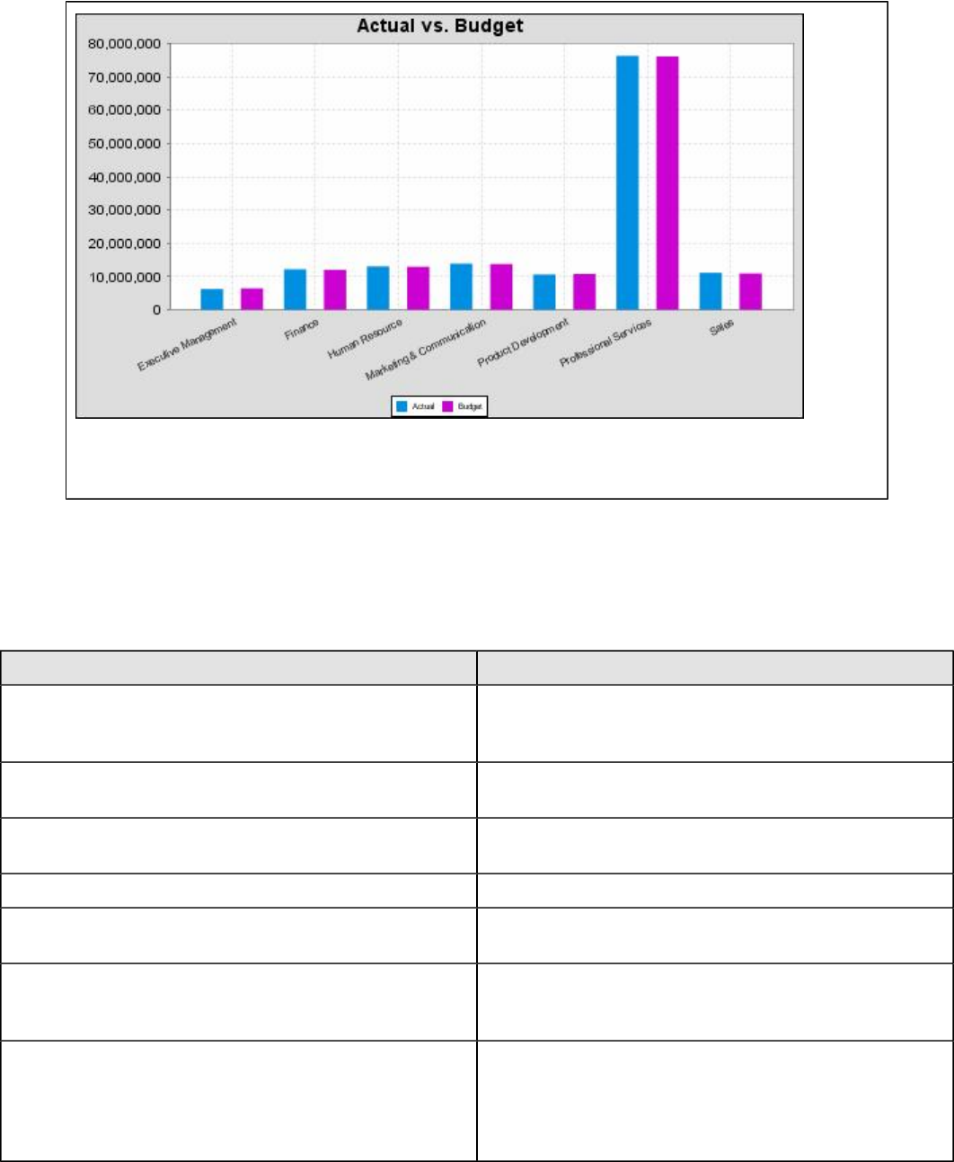
| Chart Types | 241
In the above chart, Executive Management, Finance, etc., are in the category column (department).
The first series name is Actual (the blue bar), and the second series name is Budget (the purple bar).
PivotCategorySet
The PivotCategorySet data collector is an extension of the CategorySet data collector that will pivot the data to use a
column of values as series, rather than individual columns themselves. This means that at a minimum, you will need a
column from which the collector will retrieve the series names, and any number of additional numeric data columns that
will serve as categories. The data values to be plotted for each series are the category columns' values.
Property Description
name A title for this data collector configuration. Typically you
will only have one data collector per chart, in which case
this property is not particularly useful.
category-columns The names of the columns you want to use to determine
category names.
value-columns The data columns that determine the chart values (or
series items).
series-by-value A static value that you want to use for the series name.
series-by-field Uses the selected column to use for series names. This
will cause the value column to be split into series groups.
group-by This provides the name of the group that the chart is
appearing in. If the chart contains detailed information,
then this is not necessary.
reset-group Specifies a group that will be used to create charts within
a sub-group. For example, if charting one chart per region,
and the chart is displaying data for departments within a
region, the reset-group would be set to the region group,
and the chart group would be set to department group.

| Chart Types | 242
In the above bar chart, Executive Management, Finance, and Human Resources (the yellow, blue,
and red bars, respectively) are the series -- values taken from the series column DEPARTMENT.
The categories Actual and Budget supply row-based data points for each series.
Chart Properties
The following groups of properties are associated with this chart type:
Required
The following groups of properties are associated with the Required group for this chart type:
name
Property Data Type Description
name String The name (in Report Designer) of this
chart element. Does not appear in the
published report.
data-source
Property Data Type Description
data-source String The name of the established (in
Report Designer) data source you
intend to pull data from.
no-data-message
Property Data Type Description
no-data-message String The text displayed on the plot
background when the query produces
no usable data
Title
The following groups of properties are associated with the Title group for this chart type:
| Chart Types | 243
chart-title
Property Data Type Description
title String Sets the main title for the chart
chart-title-field
Property Data Type Description
chart-title-field Selection Specifies which field from your data
set you would like to use for the chart
title
title-font
Property Data Type Description
title-font Complex (see example below) Sets the font for the main title for the
chart.
<title-font>
<font-family/>
<size/>
<is-bold/>
<is-italic/>
</title-font>
Options
The following groups of properties are associated with the Options group for this chart type:
line-size
Note: This property is called line-width in the Radar chart property list.
Property Data Type Description
line-width Decimal Sets the width of line series lines.
Default value is 1.0.
head-size
Property Data Type Description
head-size Decimal The size of the oval drawn where the
value line and grid line intersect the
category grid line
series-color
Property Data Type Description
color-palette String List of colors to apply (in order) to the
series in the chart.
| Chart Types | 244
gridline-interval
Property Data Type Description
gridline-interval Percentage Determines how many grid lines are
drawn, in terms of line spacing. For
instance, 20% will show 5 grid lines;
10% will show 10 grid lines. Default is
25.0%, or four lines.
radar-web-filled
Property Data Type Description
radar-web-filled Boolean Determined whether the web layers
are filled in with solid colors, or left as
outlines
General
The following groups of properties are associated with the General category for this chart type:
3-D
Property Data Type Description
is-3D Boolean If true, renders the chart three-
dimensionally. Default value is false.
gridlines
Property Data Type Description
gridlines Boolean If true, draws thick horizontal lines
across the plot background that more
easily show intervals between values.
Not to be confused with tick lines,
which are dotted plot lines that only
show major scale values. Default
value is true.
bg-color
Property Data Type Description
bg-color Selection The color of the chart background;
this is the area behind the chart, not
the plot area. To set the plot area, use
the plot-bg-color property instead
bg-image
Property Data Type Description
bg-image String Path to the graphic file you want to
display in the area behind the chart
show-border
Property Data Type Description
border-visible Boolean If true, draws a border around the
entire surrounding area for the chart.
Default value is false.
| Chart Types | 245
border-color
Property Data Type Description
border-paint String Sets the color for the surrounding
chart border. Possible values are
hexadecimal color codes.
anti-alias
Property Data Type Description
anti-alias Boolean Determines whether the edges and
curves of the element should be
smoothed
plot-bg-color
Property Data Type Description
plot-background Complex (see example below) Renders either the color, gradient ,
texture or image specified as the plot
background for the chart.
plot-fg-alpha
Property Data Type Description
plot-fg-alpha Decimal Controls the alpha value
(transparency) of the plot foreground.
Possible values are between 0 and 1,
with 0 being totally transparent, and 1
being totally opaque. Default is 1.
plot-bg-alpha
Property Data Type Description
plot-bg-alpha Decimal Controls the alpha value
(transparency) of the plot background.
Possible values are between 0 and 1,
with 0 being totally transparent, and 1
being totally opaque. Default is 1.
plot-border
Property Data Type Description
plot-border Boolean Determines whether or not the plot
area should have a border between it
and the chart background
X Axis
The following groups of properties are associated with the X Axis category for this chart type:
x-font
Property Data Type Description
domain-title-font Complex (see example below) Sets the font for the domain axis title.
| Chart Types | 246
show-labels
Property Data Type Description
show-labels Boolean Shows the plotted value. Default is
false.
Legend
The following groups of properties are associated with the Legend category for this chart type:
show-legend
Property Data Type Description
include-legend Boolean When set to true, displays the legend
in the chart. Default value is true.
location
Property Data Type Description
location Selection Determines where the legend will be
situated, relative to the plot area
legend-bg-color
Property Data Type Description
legend-bg-color String Hexadecimal value of the color
you intend to use for the legend
background. Default value is FFFFFF
(white).
legend-border
Property Data Type Description
legend-border-visible Boolean If true, draws a border around the
legend. Default value is true.
legend-font
Property Data Type Description
legend-font Complex (see example below) Sets the font to use on the text in the
legend.
<legend-font>
<font-family/>
<size/>
<is-bold/>
<is-italic/>
</legend-font>
legend-font-color
Property Data Type Description
legend-font-color String Hexadecimal value of the color you
intend to use for the legend font.
Default value is 000000 (black).
| Chart Types | 247
Scripting
The following groups of properties are associated with the Scripting category for this chart type:
Chart Post Processing Script Language
Property Data Type Description
Chart Post Processing Script
Language Selection The scripting language to use.
This property gives you access to
JFreeChart APIs so you can modify
the chart after the report renders.
Chart Post Processing Script
Property Data Type Description
Chart Post Processing Script Script The script to use to modify chart
object.
