Stata Guide 2012
stata-guide-2012
User Manual:
Open the PDF directly: View PDF ![]() .
.
Page Count: 154 [warning: Documents this large are best viewed by clicking the View PDF Link!]
Acknowledgements go first and foremost to Ivaylo Petev, with whom I co-taught three of the
five courses for which this guide was written. I also benefitted from a lot of friendly advice from
Baptiste Coulmont, Emiliano Grossman, Sarah McLaughlin, Vincent Tiberj and Hyungsoo Woo.
All mistakes and omissions, as well as the views expressed, are mine and mine alone.
Statistics with Stata
Student guide
Version 0.9.8.4, by François Briatte
Contents
Introduction 2!
1.!Basics 3!
2.!Computers 8!
3.!Stata 16!
4.!Research 21!
Data 30!
5.!Structure 31!
6.!Exploration 42!
7.!Datasets 49!
8.!Variables 56!
Analysis 70!
9.!Distributions 71!
10.!Association 87!
11.!Regression 108!
12.!Cheat sheet 118!
Projects 124!
13.!Formatting 125!
14.!Assignment No. 1 133!
15.!Assignment No. 2 140!
16.!Final paper 146!
Draft version, check for updates!

!
2
Introduction
This guide was written for a set of five quasi-identical postgraduate courses run at Sci-
ences Po in Paris from Fall 2010 to Spring 2012. The full course material appears online
at this address: http://f.briatte.org/teaching/quanti/.
The course is organised around three learning objectives:
First, it introduces some essential aspects of statistics, ranging from describing varia-
bles to running a multiple regression. The course requires reading statistical theory ap-
plied to social surveys as a preliminary to all course sessions.
Second, it introduces how to operate those procedures with Stata, a statistical software
that we will practice during class. The course also requires that you practice using Stata
outside class in order to become sufficiently familiar with it.
Third, the course will lead you to develop a small research project, on which your
grade for the course will be based. The course therefore requires regular attendance
and homework, which will lead to writing up that research project.
This guide covers the following topics:
− The course basics, Stata fundamentals and essential computer skills
− Basic operations in data preparation and management (Part 1)
− Introductory quantitative methods and statistical analysis (Part 2)
− Instructions for the assignments and the final paper (Part 3)
!
3
1. Basics
Quantitative methods designate a specific branch of social science methodology, within
which statistical procedures are applied to quantitative data in order to produce inter-
pretations of complex, recurrent phenomena.
Just as in other domains of scientific inquiry, the complexity and precision of statistical
procedures are necessary requirements to the study of some large-scale phenomena by
social scientists. Recent examples of such topics include the evaluation of a program
aimed at developing fertilizer use in Kenya (Duflo, Kremer and Robinson, NBER Work-
ing Paper, 2009), an explanation of attitudes towards highly skilled and low-skilled im-
migration in the United States (Hainmueller and Hiscox, American Political Science Re-
view, 2010), and a retrospective electoral analysis of the vote that put Adolf Hitler into
power in interwar Germany (King et al., Journal of Economic History, 2008).
Quantitative methods courses come with a particular set of principles, which might be
arbitrarily summarized as such:
− Researchers learn and share their knowledge of quantitative methods to the
largest possible audience, and to the best of their abilities.
− Quantitative data are shared publicly, along with all necessary resources to rep-
licate their analysis (such as do-files when using Stata).
On the learning side, some very simple principles apply:
− Quantitative methods are accessible to everyone interested in learning how to
use them. Curiosity comes first.
− There is no learning substitute to reading, practicing and looking for help, from
all kinds of sources. Reading comes first.
− Making mistakes, correcting one’s own errors and hitting one’s own limits are
intrinsic to learning. Trial-and-error comes first.
Statistical reasoning and quantitative methods are intellectually challenging for teachers
and students alike, and a collective effort is required for the course to work out:
− You will have to attend all course sessions: your instructors expect systematic
attendance; catch up with the sessions that you have missed.
− When attending classes, attend classes: your instructors will feel completely
useless if you do anything else, like reading your email or browsing whatever.
− Assignments will be graded in order to monitor your progress: no assignments,
no progress towards your final research project, no grades.
− Read all course material: read everything you are told to if you want to under-
stand what you are learning in this course.
!
4
These, of course, are similar to the course requirements for your other classes.
1.1. Homework
Apart from attending the weekly two-hour course sessions, you are required to:
− Complete readings from the handbook and other material, as indicated in the
course syllabus. This will take you approximately one hour per week, perhaps
two if statistics are completely new to you.
− Replicate course sessions outside class, using the do-files provided on the
course website. This will take you between half an hour and one hour per week,
depending on your learning curve.
− Work on your research project and assignments, using the instructions provid-
ed during class and in the course documentation. Your project will require be-
tween one hour and a half to three hours of work per week, depending on your
learning curve and on the project itself.
In total, the time of study for this course amounts to two hours of class and between
three to six hours of homework spent on your research project. The time of study for
this course is variable, but a fair estimate is that you will spend between five and eight
hours per week studying for this course.
It is important to state right from the start that it is not possible to follow the course
irregularly, either by skipping weeks and trying to catch up later, and/or by allocating
long periods of last-minute work before deadlines. Experience shows that these strate-
gies systematically lead to low achievement and grades.
1.2. Assignments
The course was conceived with a hands-on focus. This means that you are not ex-
pected to take lecture notes and then revise for a final graded examination. Instead,
you will develop a research project throughout the course.
Your work will be corrected, commented and assessed twice during the course,
through assignments that will help monitor your progress. The final version of your pro-
ject will make up for the largest part of your grade.
In practice, your assignments are ‘open assignments’ that you can complete with all
the resources you need at hand (notes, guides, online help). This cancels out a strategic
skill often observed among students: memorising large amounts of information for just
one occasional exam. Memorizing will not work at all for this course. Instead, you will
have to learn and practice regularly throughout the semester. If you are not used to
that method of study, then the course will be one critical opportunity to learn it.

!
5
The assignments are also cumulative: Assignment No. 1 will be revised and included in
Assignment No. 2, just as your final paper will draw extensively on the revised versions
of both assignments. To learn more on how to complete assignments, read the instruc-
tions provided in Part 3 of this guide.
1.3. Communication
Let’s immediately clarify two things about student-instructor communication for this
particular course:
− Email will be used for feedback and all correspondence. To simplify this pro-
cess, we will use normalized email subjects.
A normalized email subject looks like “SRQM: Assignment No. 1, Briatte and
Petev”, where “SRQM” is an acronym for the course, and “Briatte and Petev”
are the family names for you and your study partner.
Normalized email subjects apply to all correspondence, not just when sending
assignments. To ask a question on recoding, you should hence use “SRQM:
Question on recoding”.
When working in pairs, always copy your partner when sending emails and as-
signments. Identically, send all your emails to both course instructors if you
want a reply (and especially a quick one).
− You should ask questions in class and email additional ones, after having
made sure that the answer is not already included in the course material. That
implies that you take ownership of that material, rather than passively absorb it
as lecture notes.
You should not feel uncomfortable asking questions in class. Neither should
you expect others to ask questions for you. Unfortunately, you might have sur-
vived several courses doing precisely that until now, and might survive more in
the future doing the same. This course, however, runs on personalised projects
that do not allow exit or free riding.
The extra effort that is required from you on that side is the counterpart to of-
fering a course where you are learning through practice rather than by rehash-
ing a handbook into a standardized examination or abstract problem sets with
no empirical counterpart.
Your instructors receive multiple emails from several classes; normalization really helps
in sorting out large volumes of email. There are no direct sanctions for not following
this principle, but there are indirect costs, especially if your assignment emails get lost in
the instructors’ grading pile or if you end up waiting three weeks to send a question
that will get you late on your project.

!
6
1.4. Research project
The course is built around your elaboration of a small-scale research project. Because
the course is introductory by nature, several limits apply:
− You are required to use pre-existing data, instead of assembling your own data
and building your own dataset, which is a much longer process that require ad-
ditional skills in data manipulation.
− You are required to use cross-sectional data, because time series, panel and
longitudinal data require more complex analytical procedures that are not cov-
ered in introductory courses.
− You are required to use continuous data, because discrete variables also use dif-
ferent techniques not covered at length in the course. This applies principally to
your choice of dependent variable.
These requirements and their terminology are covered in Section 5. For now, just re-
member this basic principle: your research will be based on one dependent variable,
sometimes called the ‘response’ variable, and you will try to explain this variable by
predicting the different values that it takes in your sample (dataset) by using several
independent variables, sometimes called the ‘explanatory’ variables, or ‘predictors’, or
‘regressors’ in technical papers.
Because your research is a personal project, you might bend the above rules to some
extent if you quickly show the instructors that you can handle additional work with da-
ta management. The following advice might then apply:
− If you are assembling your data by merging data from several datasets, you will
be using the merge command in Stata (Section 5.2). You might also choose to
use Microsoft Excel for quicker data manipulation. Do not assemble data if you
do not already have some experience in that domain.
− If you are converting your data, refer to the course and online documentation
on how to import CSV data into Stata using the insheet command, or how to
convert file formats like SAV files for SPSS. Always perform extensive checks to
make sure that your data were properly converted into a readable, valid file.
− If you are interested in temporal comparison, such as economic performance
before and after EU accession, you can compute a variable that will capture, for
example, the change in average disposable income over ten years. Stick with a
single variable, and ask for advice in class before proceeding.
− If you have selected nominal data as your dependent variable, such as religious
denomination, then something went wrong in your research design—unless you
know about multinomial logit, in which case you should skip this class. Please
identify a different variable that is either continuous or ‘pseudo-continuous’—
i.e. a categorical variable with an ordinal (or better, interval) scale, such as edu-
cational attainment.

!
7
1.5. Guidance
This guide works only if you use it. Its writing actually started with students questions:
several sections were first written as short tutorials concerning specific issues with data
management. One thing led to another, and we ended up with the current document.
The aim is to cover 99% of the course by version 1.0. A handful of students also pro-
vided valuable feedback on the text—thanks!
The Stata Guide is a take on the course requirements: it offers a narrative for the
commands used, by tying them up together with core elements of statistical reasoning
and quantitative methods. The guide aims at covering the most useful introductory
concepts of statistics for the social sciences, and to offer a detailed exploration of these
concepts with Stata.
The ‘introductory’ term is important: the course focuses on selected commands and
options to work through selected operations of ‘frequentist’ statistics. To fully support
these learning steps, it also introduces basic computer and research skills that are often
missing to the training of students, and offers a way to assess all aspects of the course
through a small-scale research project.
Several sections of the guide are still in draft form, so watch for updates and read it
along other documentation. As explained in Section 2.5, there is a wealth of documen-
tation out there, and you should be able to locate help files to complement the Stata
Guide on how to use Stata to analyse your data.

!
8
2. Computers
A course on quantitative methods is bound to make intensive use of computer soft-
ware. You all use computers routinely for many different activities, but your level of
familiarity with some of the fundamental aspects of computers can vary dramatically.
Being reasonably familiar with computers is required for this class.
Please read this section in full and assess whether you are familiar enough with the
notions covered, otherwise you should start practicing as soon as possible. A reasona-
ble level of familiarity with computers will help you with using Stata and completing
assignments, and will also generally come in handy.
2.1. Basics
The course requires minimal computer skills. In order to open and save files in Stata,
you should be able to:
− Locate files using their file path. In recent, common operating systems, a file
path looks like /Users/fr/Courses/SRQM/Datasets/qog2011.dta in Mac OS X,
or like C:\Users\Ivo\Desktop\SRQM\Replication\week2.log in Windows. Get
used to these if you have never used them before.
− Locate online resources using their URL. The URL for the course website is
http://f.briatte.org/teaching/quanti/. We will use URLs extensively when guid-
ing you through coursework and course material.
− Understand file and memory size, which is often displayed in megabytes (MB).
Using Stata 11 or below correctly requires setting memory to load large files: for
instance, set mem 500m sets memory to 500MB.
2.2. Filenames
Filenames are another essential aspect of computer use, especially when you are han-
dling a large number of files and/or using multiple copies of the same file. Some gen-
eral recommendations apply:
− In all cases, filenames should be short and informative. Regularly accessed
files, like datasets, have short filenames for faster manipulation, and contain the
time period covered by the data.
− In some cases, filenames require normalization. This implies using sensible file-
names and standard version numbers for files that are chronologically ordered.
This point is important because you will be required to normalize the filenames
for your work files in this class (Part 3).

!
9
2.3. Equipment
Regarding computer equipment, you will need:
− Access to a computer, both at university and at home. You should bring your
personal laptop to class if you own one. Make sure that you know how to work
with your computer and that it is fast enough.
− A university email account subscribed to the course, and possibly a personal
email account to share larger files and to backup your work. The standard solu-
tion for an efficient work mailbox is Gmail.
− Access to the ENTG, as provided by Sciences Po. The course will use the “Doc-
uments” pane to share the course emails and readings. Other files will be avail-
able from the course website.
− A word processor to type in your final paper. Despite being a worldwide stand-
ard, Microsoft Word is unstable: always backup your work. Any solution is
good as long as it can be printed to a PDF file.
− A working copy of Stata (our software of choice, introduced in Section 3) on
the computer(s) used during the course and at home. This point will be dis-
cussed during class. Stata includes a plain text programming editor.
− A USB stick, to build a course ‘Teaching Pack’ by saving and organizing all
course material, as well as the files from your research project. Always make
regular backups of your data in at least two different locations.
Some of these items will be provided to you through Sciences Po. Please make sure that
you have equipped yourself as early as possible in the semester, and as indicated sever-
al times in the list above, always backup your work!
2.4. Downloads
The course will regularly require that you locate and download resources online, from
datasets to do-files, as well as other course material, mostly in PDF format or as ZIP ar-
chives. Make sure that you know how to handle these formats.
When downloading files, do not use counter-productive browser settings that down-
load files into temporary folders, or that automatically open files, or even worse, that
add file extensions to your downloads. For instance, if your browser automatically adds
a “.txt” extension to your do-files, you will need to rename the file by turning its file
extension back to just “.do” to open it in Stata.
Google Chrome, Mozilla Firefox and Apple Safari are common Internet browsers with
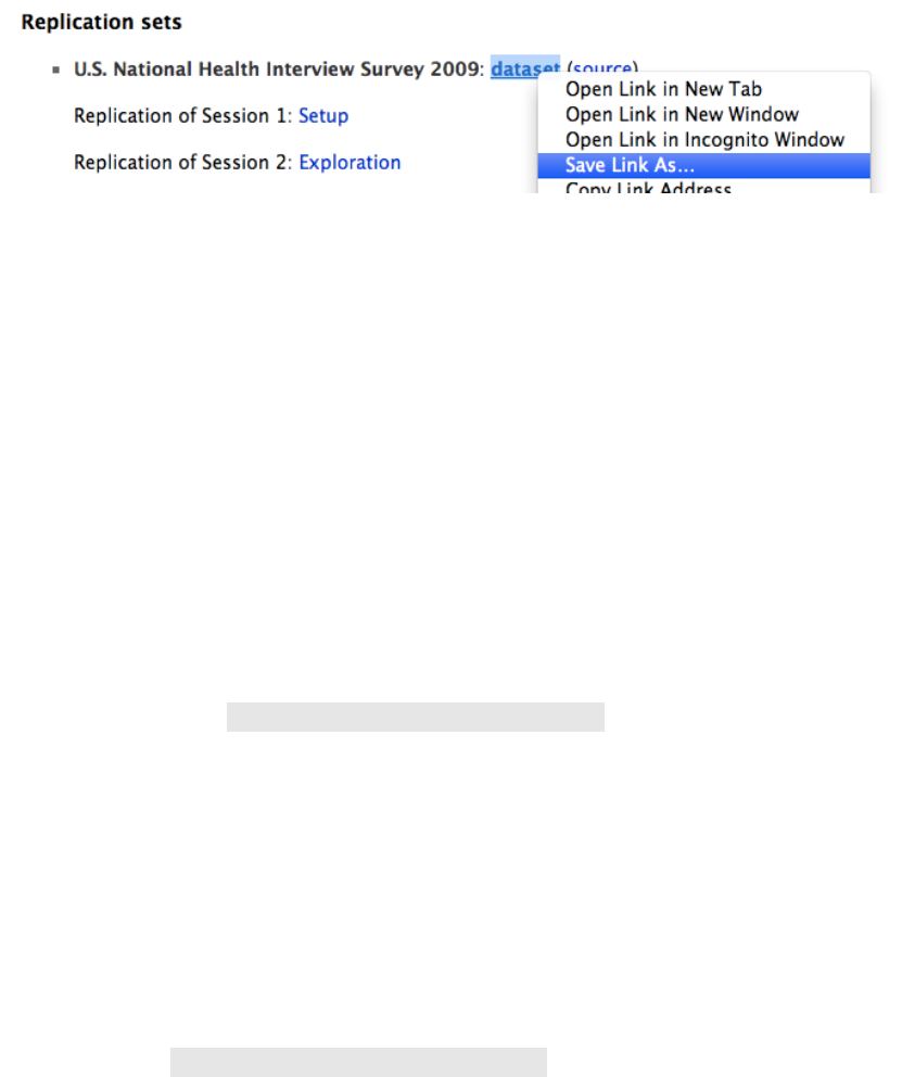
appropriate “Save As” options available from their contextual menus. The example be-
low shows the contextual menu for Google Chrome on Mac OS X.
!
10
All course material should be archived into a structured folder hierarchy, which will
depend on your own preferences and operating system. A simple hierarchy, such as
~/Documents/SRQM/ on Mac OS X, will let you access all files quickly.
2.5. Help
Quantitative methods cannot be learnt once and for all: the course will require that
you frequently search for help, often from online sources. Always consult the course
material for each session before seeking additional help: the answer is very often just
before your eyes or a few clicks away.
If you are looking for help on a Stata command, use the help command to access the
very large internal documentation included in Stata. Even experienced users use help
pages on a daily basis. Learning to use Stata help pages is a course objective in itself.
Stata help command: http://www.stata.com/help.cgi?help
If you are looking for help on statistics, please first refer to the course readings listed in
the course syllabus. Feinstein and Thomas’ Making History Count (Cambridge Universi-
ty Press, 2002) is the main handbook for this course; help on graphics and other topics
can also be found in the additional readings.
If you are looking for help on statistical procedures in Stata, please first refer to the
course website for a selection of Stata tutorials. Two American universities, Princeton
and UCLA, have produced excellent Stata tutorials that cover similar material than the
course sessions. More tutorials are available online.
Course website: http://f.briatte.org/teaching/quanti/
If you are stuck, do not panic! Please first make sure that you have explored the soft-
ware and course resources listed above. It is safe to assert that 99% of Stata questions
for this course can be answered from the course material. If still stuck, try a Google
search on your question: thousands of online sources hold answers to identical ques-
tions asked by Stata users around the world. Researchers often check the Statalist and
the statistics section of the StackOverflow website for answers to their own questions.
Finally, if still stuck, and in this case only, email us to ask your questions directly. It
would be preferable if email correspondence could be limited to questions on your re-
search design, rather than questions that could be answered by simply reading the
course material mentioned above.

!
11
2.6. Commands
Stata can be used either through its Graphical User Interface (GUI), like most soft-
ware, or through a ‘command line’ terminal, which is a very common aspect of pro-
gramming environments. As explained just below, learning how to use the command
line and writing do-files are compulsory for replication purposes.
The ‘command line’ terminal works by entering lines of instructions that are repro-
duced, along with their results, in another window. The next sections of this guide ex-
plain further how Stata works and document the usual commands used in this course
for data management, description, analysis and graphing. A ‘cheat sheet’ for these
commands is offered in Section 12.
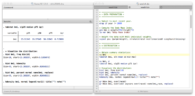
The screenshot below shows an example of such commands, typed manually in the
Command window (top); after running them by pressing Enter, their output showed in
the Results window (bottom).

!
12
Command line terminals work by entering commands, such as set mem 500m (which
assigns 500MB of computer memory in Stata 11–). When you press Enter, Stata will try
to execute, or ‘run,’ the command, which might occasionally take a little bit of time if
your data or command are computationally intensive.
If your command ran successfully, Stata will display its result:
Note that some commands produce ‘blank’ outputs in the Results window, i.e. the
command was successfully entered and executed, but there is no indication of its actual
result(s). In these cases, a simple “.” line dot will appear in the Results window, as to
show that Stata encountered no problem while executing the command, and that it is
ready to process another one.
If the command is not valid, which often happens due to typing errors or for other rea-
sons related to how Stata works, it will display an error or a warning. In that case, you
have to fix the issue, often by re-typing the command correctly (as in the ‘summarizze’
example below), or by checking the documentation to understand where you made a
mistake and how to fix it.
Stata commands are case-sensitive. Use only lowercase letters when typing commands.
Variables can come in both uppercase and lowercase letters, which you will have to
type in exactly to avoid errors. As a rule of thumb, when creating variables, use only
lowercase letters.
If you need to correct an invalid command or re-run a command that you have already
used earlier on, you can use the PageUp or Fn-UpArrow keys on your keyboard to
browse through the previous commands that you typed, which are also displayed in the
Review window.
503.359M
set matsize 400 max. RHS vars in models 1.254M
set memory 500M max. data space 500.000M
set maxvar 5000 max. variables allowed 2.105M
settable value description (1M = 1024k)
current memory usage
Current memory allocation
. set mem 500m
age 24291 46.81392 17.16638 18 84
Variable Obs Mean Std. Dev. Min Max
. summarize age
r(199);
unrecognized command: summarizze
. summarizze age

!
13
Some commands can be abbreviated for quicker use. If you run the help summarize
command in Stata, the help window will tell you that the summarize command can be
shorthanded as su:
Abbreviations exist for most commands and come in handy especially with commands
such as tabulate (shorthand tab), describe (shorthand d) or even help (shorthand h).
They also work for options like the detail option for the summarize command:
Some commands have particular attributes. Comments, for example, are lines of ex-
planation that start with * or //. They are not executed, but are necessary to make your
do-files and logs understandable by others as well by yourself. The first and third lines
in the example below are comments.
You will find many comments in the course do-files: use them to describe what you are
doing as thoroughly as necessary. You will be the first beneficiary of these comments
when you reopen your own code after some time.
age 24291 46.81392 17.16638 18 84
Variable Obs Mean Std. Dev. Min Max
. su age
99% 83 84 Kurtosis 2.09877
95% 77 84 Skewness .234832
90% 71 84 Variance 294.6846
75% 60 84
Largest Std. Dev. 17.16638
50% 46 Mean 46.81392
25% 32 18 Sum of Wgt. 24291
10% 24 18 Obs 24291
5% 21 18
1% 18 18
Percentiles Smallest
Age
. su age, d
bmi 24291 27.27 5.134197 15.20329 26.57845 50.48837
variable N mean sd min p50 max
. tabstat bmi, s(n mean sd min median max)
. * Summary statistics for BMI.
. gen bmi = weight*703/height^2
. * Creating a variable for Body Mass Index (BMI).

!
14
Additional commands can be installed. Stata can ‘learn’ to ‘understand’ new com-
mands through packages written by its users, most often academics with programming
skills. We will use the ssc install command at a few points in this guide to install some
of these packages. Installation with ssc install requires an Internet connection.
Right away, you should install the fre command in Stata by typing ssc install fre, as we
will use this command a lot to display frequencies. Other handy commands like catplot,
spineplot or tabout will be installed throughout the course, as in the example below,
which shows possible installation results:
2.7. Replication
In this guide, terms like commands, logs and do-files collectively designate an essential
aspect of quantitative methods: replication, i.e. providing others as well as yourself with
the means to replicate your analysis.
Replication requires that you keep your original files intact. The dataset that you will
use for your research project should be left unmodified in your course folder, and
should be provided along with your other files when handing in assignments.
Replication also requires the list of commands you used to edit your data, for instance
to drop observations or to recode variables, as well as the commands that you used to
analyse the data, such as tabstat, histogram and regress. The commands can all be
stored into a single text file, with one command appearing on each line: this structure is
common to computer scripts and programs.
A do-file is a text file that contains your commands and comments. A log file is a sepa-
rate text file that contains these commands, along with their results. The production of
do-files will be practiced in class, and additional documentation appear in many Stata
tutorials listed in the course material.
Replication files are a crucial aspect of programming. If you open the do-files for this
course in the Stata do-file editor or in any other Stata-capable editor, you will notice
that the files feature line numbers and a coloured syntax. These generic features are
built in most programming environments.
Learning to understand and write in programming languages takes time, and therefore
constitutes a particular skill. Writing do-files in Stata requires learning commands and
their syntax, exactly like languages require learning vocabulary and grammar. Just like
all files already exist and are up to date.
checking fre consistency and verifying not already installed...
. ssc install fre
installation complete.
installing into /Users/fr/Library/Application Support/Stata/ado/stbplus/...
checking tabout consistency and verifying not already installed...
. ssc install tabout

!
15
with languages, the learning curve also decreases once you already know one. Finally,
since programming can also reflect high or low writing skills, you should read the cod-
ing recommendations in Section 13.3 on coding before submitting your own work.
!
16
3. Stata
Our course uses a recent version of Stata, a common software choice in social science
disciplines. Using any statistical software requires some basic skills in file management
and programming. The following steps apply to virtually any Stata user, and should be
practised until you are familiar enough with them.
Once you start exploring the Stata interface, you will realize that most windows can be
hidden to concentrate on your commands, do-files and results, as below. We won’t use
any other element of the interface in this course, but feel free to explore Stata and use
other functionalities.
3.1. Command line
Stata has a graphic user interface (GUI) and a command line system. The latter is much
more versatile and teaches you the syntax used by Stata. More importantly, the com-
mand line forces you to plan your work with data management and analysis.
Because the commands entered through the command line can be recorded, i.e. stored
as logs (see below), it will enable you to maintain a record of your operations and to
store comments along. This step is essential to keep afloat with your own work, as well
as to share it with others, usually as do-files.
The Stata GUI can be used occasionally for routine operations that need not appear in
your do-files. Keyboard shortcuts also save some time, as with ‘File > Open…’ (Ctrl-O
in Stata for Windows) or ‘File > Change Working Directory…’ (Cmmd-Shift-J in Stata
for Macintosh; this document uses ‘Cmmd’ to designate the ‘⌘’, a. k. a. ‘Command’,
‘Cmd’ or ‘Apple’ modifier key).

!
17
3.2. Memory
Stata 12 works memory on its own, but older versions of Stata usually open with a very
small memory allocation for data. To safely open large files in Stata 11 or below, we
recommend you run the set mem 500m command to allocate it 500MB.
Very large datasets might require allocating more memory, using a different version of
Stata with enhanced capacities, or even switching from Stata to software with higher
computational power. This course will not require doing so.
3.3. Working directory
The working directory is the folder from which Stata will open and save files by default.
You will have to set the working directory every time you launch Stata. The path to
your working directory depends on your system (Section 2.1).
To learn what is the current work directory, use the pwd command. To set it to a new
location, type cd followed by the path to the desired folder. To list the contents of the
working directory, use the ls or dir command.
Your working directory should be the main ‘SRQM’ folder for this course, which we
also call the ‘Teaching Pack’ because you will be required to download all course mate-
rial to it. Download the Teaching Pack from the course website and unzip it to an easily
accessible location, such as your Documents folder.
The example below reflects all directory commands for a user called ‘fr’ using Mac OS X
to change the Stata working directory from the user’s Desktop to the SRQM folder,
which was downloaded and moved to the Documents folder:
The quotes around the file path are optional in this example, but are compulsory if your
file path contains spaces. The ls command above was given the wide (shorthand w)
option to make its output simpler to understand.
If you are unsure what the path to your SRQM folder is, do not just ignore this step as
if it were optional. Select ‘File > Change Working Directory…’ in the Stata menus, and
from there, select your SRQM folder.
Course/ Replication/ emails.txt readme.txt*
Admin/ Datasets/ Software/ readme.pdf* website.url*
. ls, w
/Users/fr/Documents/Teaching/SRQM
. cd ~/Documents/Teaching/SRQM/
/Users/fr/Documents
. pwd

!
18
3.4. Open/Save
Stata can use the usual open/save routine that you are familiar with from using other
software. It can also open datasets and save them from the command line if you have
correctly set your working directory in the first place.
The example below shows how to download a Stata dataset from an online source and
then save it on disk. The use command with the clear option removes any previously
opened dataset from memory, and the save command with the replace option will
overwrite any pre-existing data:
In this course, you will never have to save any data: instead, you should leave all da-
tasets intact and use do-files to transform them appropriately. This will ensure that your
work stays entirely replicable.
3.5. Log files
The log is a text file that, once open with log using, will save every single command
you enter in Stata as well as its results. Systematically logging your work is good prac-
tice, even when you are just trying out a few things. Logs can be closed with the log
close command followed by the name of your log if it has one:
file datasets/trust.dta saved
. save datasets/trust.dta, replace
. use http://f.briatte.org/teaching/quanti/data/trust.dta, clear
closed on: 17 Feb 2012, 00:02:53
log type: text
log: /Users/fr/Documents/Teaching/SRQM/example.log
name: example
. log close example
76
. count if sa_mr==0
. * Count countries with 0% malaria risk in 1994.
. use datasets/qog2011, clear
opened on: 17 Feb 2012, 00:01:42
log type: text
log: /Users/fr/Documents/Teaching/SRQM/example.log
name: example
. log using example.log, name(example) replace

!
19
Comments will also be saved to the log file, which is particularly useful when you have
to read through your work again or share it with someone. In the example above, all
comments, commands and results were saved to the log file.
3.6. Do-files
Logs are useful to save every operation and result from a practice session. If you need
someone else to replicate your work, however, you just need to share the commands
you entered, along with the comments that you wrote to document your analysis. Files
that contain commands and comments are called do-files.
Writing do-files is a crucial aspect of this course. Absent of a do-file, your work will be
mostly incomprehensible, or at least impossible to reproduce, to others. Your do-file
should include your comments, and it should run smoothly, without returning any er-
rors. You will discover that these steps require a lot of work, so start to program early.
To open a new do-file, use either the doedit command or the ‘File > New Do-file’ menu
(keyboard shortcut: Ctrl-N on Windows, Cmmd-N on Macintosh).
You should take inspiration from the do-files produced for the course to write up your
own do-file for your research project. All our do-files are available from the course web-
site. This course requires only basic programming skills, as illustrated by the do-files that
we run during our practice sessions. More sophisticated examples can be found online.
To execute (or ‘run’) a do-file, open it, select any number of lines, and press Ctrl-D in
Stata for Windows or Cmmd-Shift-D in Stata for Macintosh. You can also use either the
GUI icons on the top-right of the Do-file Editor window, or use the do or run com-
mands. Use the Ctrl-L (Windows) or Cmmd-L (Macintosh) keyboard shortcuts to select
the entire current line in order to run it.
Get some practice with do-files as soon as possible, since your coursework will include
replicating one do-file a week. Replicating is nothing more than reading through the
comments of a do-file, while running all its commands sequentially.
3.7. Shutdown
When you are done with your work, just quit Stata like you would quit any other pro-
gram. At that stage, any unsaved operation will be lost, so make sure that your do-file
contains all the commands that you might want to replicate.
To quit with the command line, use log close _all to tell Stata to close all logs, and then
type exit, clear to erase any data stored in Stata memory and quit. Alternatively, just
exit Stata like any other program to close logs and clear data automatically.
Remember not to save your data on exit (Section 3.4).

!
20
3.8. Alternatives
This course uses Stata (by StataCorp) as its statistical software of choice. Stata is com-
monly used by social scientists working with quantitative data in areas such as econom-
ics and political science. It is a powerful solution that provides a good middle ground
between spreadsheet editors and R, which is the most powerful–and least expensive,
since it’s free and open source–but also the most difficult statistical choice of software.
Stata is also more advanced than SPSS because of its emphasis on programming, which
has led to the development of a large set of additional packages. Most statistical proce-
dures know some form of implementation in Stata, and the software is supported by a
large user community that meets on the Statalist mailing-list.
Stata has a few limitations. Its graphics engine is not bad, but not excellent either. It is
not as capable as SAS with large datasets, nor as focused on a particular approach to
quantitative analysis as EViews for econometrics. Finally, unlike free and open source
software, it is a commercial product.
Within these limitations, Stata remains an appropriate solution for the kind of proce-
dures that you will learn to use during this course. Its programming features, operated
through the command line, are central to the learning objectives of the course.
The Stata website will tell you more about the different versions of Stata. It also holds
an online version of the software documentation: http://www.stata.com/. The website
also links to Stata books, journals, and to the Statalist mailing list.
If you are planning to continue using quantitative methods during your degree, you
should also start learning more about R as soon as you are familiar with Stata. Alterna-
tives to Stata are documented in the course material.
!
21
4. Research
The course is built around small research projects, on which you will write your final
paper. Every student (grouped in pairs when applicable) is expected to participate,
which requires some basic knowledge of scientific reasoning.
Scientific research aims at establishing theories of particular knowledge items, such as
elections (political science), continents (geography), international trade (economics),
history, proteins, galaxies and so on. All these items are grounded in real events that
are partially processed through theoretical models of what they represent: competitions
of political elites within the structural constraints of partisan realignments, drifting tec-
tonic plates on top of the lithosphere, markets dominated by agents interested in mac-
roeconomic performance, representations of particular historical events, biological com-
pounds of amino acids, gravitational systems of stars… Our collective knowledge of
reality is directly mediated by these abstract conceptions.
Quantitative social science explores some particular phenomena of usually large scale,
in order to produce complex explanatory models that follow a common set of rules
with the ones cited above. Precisely, it looks for the regularities and mechanisms that
intervene in the distribution of social events such as military conflict, economic devel-
opment or democratic transitions, all of which tend to happen under particular condi-
tions at different points of space and time. The aims of quantitative social science con-
sist in building theories that simplify these conditions by pointing at the specific varia-
bles that might intervene in causing the events under scrutiny.
The final model used in this course, linear regression, offers one possible way of identi-
fying these variables, by looking at how a set of independent (explanatory) variables
can predict a fraction of another dependent (explained) variable. Can we understand,
for example, the spread of tuberculosis in a country by looking only at the different lev-
els of sanitation in a sample of the world? Is it the case that the support of violent ac-
tion decreases with age and education? Are states more likely to be concerned by envi-
ronmental issues when they possess a high level of national wealth? Or is it rather the
case that their attention varies in function of their own exposure to, for instance, natu-
ral disasters?
Thousands of researchers spend their whole lives on similar questions. Several millions
of theories exist on all aspects of the real (natural, material) world.
4.1. Comparison
A fundamental motive behind theory building lies in comparison. Our units of observa-
tions, such as individuals or countries, express different characteristics that can be com-
pared with each other. Nation states, for instance, express various levels of authority
over their citizens, to the point where we can (or at least wish to) distinguish some po-
!
22
litical systems as democracies—structures of authority that are ultimately controlled by
citizens through means such as open elections. Identically, some nation states go
through periods of acute political disruption that lead to social revolutions. Even more
fundamentally, some nation states hardly qualify to that title: the extent to which states
and nations coincide also varies from a country to another. These questions are funda-
mental issues in comparative politics (the selection of issues above come from a course
by David Laitin at Stanford University). Similar research questions structure all other
fields of social science, from economic history to analytical sociology.
To understand the variety of political configurations in (geographical) space and in (his-
torical) time, social science researchers formulate arguments in which they posit explan-
atory factors, which we will call independent variables. Continuing with the examples
above, an early explanation of democracy is Montesquieu’s theory that climate influ-
ences political activity, and an early explanation of social revolution is Marx’s theory of
class structure. Both authors examined particular cases of democracies and revolutions,
and then derived a particular theory from their observations. Modern theories tackle the
same issues, but provide different explanations, using factors such as elections,
state/society interactions, or the precise timing of industrialization in each country un-
der examination.
Advances in social science consist in providing analytically more precise concepts and
typologies for the phenomena under study. Revolutions, for instance, are now studied
under several categories, which distinguish, for instance, “white” (non-violent) revolu-
tions from other ones. By doing so, researchers improve the specification of these phe-
nomena, which we will technically designate as our dependent variables. The deep
anatomy of these social phenomena nonetheless poses a constant challenge to scien-
tists, since before we can start understanding their causes, we need to define and con-
ceptualize complex phenomena such as “civil war”, “counter-insurgency”, “morality”
or “identity”.
The quantitative analysis of social phenomena cannot solve any of these issues, but it
can contribute to improving our knowledge of concept formation, theory building and
comparison across units of observation.
4.2. Theory
Formally, theory building starts with a certain knowledge of scientific advances in a giv-
en field. A certain amount of knowledge already exists, for example, on why young
mothers abort, or on how durable peace occurs and then persists between nation
states. Everything that you know from your previous courses in the social sciences will
be useful in thinking about your data, especially what you have learned in the fields of
demography, economics, public health or sociology. Once previous knowledge has
been considered, however, the unique method of verification that exists for a particular
phenomenon is its observation.
!
23
Several methods of observation coexist. All of them, and not just quantitative methods,
are based on structured comparisons of different units of observation, would it be pro-
testers in a public demonstration, voters in an election, young mothers in an abortion
clinic, national governments in a technological race, or random members of the public.
Observations are then produced either through experimental or through observational
studies, both of which provide a number of facts, such as a response rate to a question
or the adoption of a particular behaviour. These facts are collected in order to build
theories to explain why and how they occur.
When it is impossible to work on all instances of a phenomenon in the material world,
such as the development of cancer cells or the occurrence of revolutions, scientists fo-
cus their attention on carefully selected samples of observations and then generalise
their findings to a larger number of observations. Scientific theories therefore exist for
phenomena as diverse, as common and as important as the democratic election of ex-
treme-right parties, or the effect of radiations on the physiological status of human be-
ings.
These operations of theory building guide scientific inquiry. Additional principles con-
cern the rules under which we construct theoretical models. A crucial rule of science
consists in the suppression of all personal judgement over the data (objectivity), in or-
der to formulate statements that hold generally true rather than only towards a given
end (normativity). Social science is a branch of inquiry where these principles are partic-
ularly difficult to follow, but where they apply nonetheless, and where they allow to
formulate scientific statements on several aspects of social interaction, from suicide ter-
rorism to divorce, from increases in exports to changes in political leadership.
4.3. Quantitative social science
Quantitative approaches to social science apply the aforementioned scientific rules in
order to identify variations in events that involve a number of units such as people,
states, elections or civil wars, and that we describe through a certain number of charac-
teristics that vary from a unit to another—variables.
An example of quantitative result relates to presidential approval: social surveys that
measure the extent to which people tend to support their presidents have found that
economic performance is often very influential in determining that support. Theoretical
models, such as David Easton’s systemic theory of political inputs and outputs, support
that kind of finding. Identically, health expenditure has been measured in Western
countries for several decades. Variations in health spending seem easily explained by
variations in life expectancy, but also by the increasing costs caused by improvements
in medical technology. Current data contribute to explain that phenomenon: health ex-
penditure growth does not directly depend on the age structure of a country and on
the longevity of its residents, but rather on the health status and behaviour of its indi-
viduals, which themselves happen to vary with age.

!
24
Variables appear in these results and in their explanatory theories. Economic perfor-
mance, for instance, is a variable often measured through unemployment levels, gross
domestic product, public deficits and annual changes in per capita disposable income.
Identically, health expenditure and health behaviour are also measured through com-
plex computations of health services supply and demand. The processes and mecha-
nisms that causally connect these variables come from quantitative, qualitative and also
from theoretical research, in order to provide causal efficacy to the correlations that we
observe.
There are multiple sources of error in that process. One of the most important comes
from the measurement of our variables: a survey question can contain unwanted incen-
tives to answer in a particular way, or it can simply be confused and misleading, or the
answer to a question can be misinterpreted. The careful creation of concepts for com-
plex phenomena such as racism, political identity or illness solves part of that issue.
Valid and reliable data are then used to test particular hypotheses, such as the pre-
sumption that education and xenophobia are negatively correlated, or that economic
growth is proportionate to the openness of national economies to all possible competi-
tors. Quantitative social science verifies, or nullifies, these kinds of hypotheses, based
on various sources of data, or statistics.
4.4. Social statistics
Quantitative data come in the form of datasets, which themselves are numeric collec-
tions of variables for a given set of units of observation. The example below is taken
from the U.S. National Health Interview Survey (NHIS):
− The rows hold observations: each row of numeric data designates the answers
of one individual respondent (the unit of observation).
− The columns hold variables: each column designates designate to a particular
question, such as gender, earnings, health status and so on.
In this example, some variables can be ordered: health, for instance, is based on a self-
reported measure that ranges from “poor” to “excellent”. Other variables take values
that cannot be ordered: raceb, for instance, corresponds to the respondent’s racial-
ethnic profile, for which there is no ordering. Other variables have only two possible
values, such as sex (either male or female) or insurance status (either covered or not).

!
25
These are examples of different types of variables that come in addition to ‘purely nu-
meric’ ones like weight, measured in pounds.
Units of observations are not necessarily individuals: they can be anything from organi-
zations to historical events (Section 5.1). Sometimes, not all variables can be measured
for all observations: there will be missing values. The example below is taken from the
Quality of Government (QOG) dataset:
The Quality of Government dataset uses countries as its unit of analysis. Due to several
difficulties with data collection and measurement, it shows an important number of
missing observations for several variables: the “bl_asyt15” and “bl_asyt25” variables,
for instance, measure the average number of schooling years among the population,
and have a high number of missing values. There are also some missing values in the
column for the iaep_es variable, which holds the legislative electoral system for each
observation.
The combined effect of sampling and missing observations forces us to work on a finite
number of observations, which introduces a further risk of error when we start analys-
ing the data. Furthermore, we will use more than one model, as the type of variables
under examination calls for different statistical procedures. Similarly, the number of var-
iables influences these procedures:
− The distribution of one variable, such as the number of democracies observed
at a given point in time or the proportions of each religious group in a given
population in 2004, is captured by univariate statistics. These statistics allow to
calculate to what extent our sample might be different with respect to the uni-
verse of data that we are sampling from, such as the whole population of a
country, all countries or all instances of civil war. This standard error will appear
in all our statistical procedures.
− The relationship between two variables, such as racism and income or national
wealth and defence spending, is addressed by bivariate tests. These tests pro-
vide the probability that a relationship observed within our sample could be
caused by mere chance. This crucial statistic is called the p-value: only when it
stays under a certain level of significance will we accept that an observed rela-
tionship is statistically significant.
− The relationship between two or more variables can also be modelled into an
equation, such as productivity = α · technology + β · education. Formally, mod-
!
26
els include an error term ε in the equation, to account for the sampling error
previously mentioned. Identically to bivariate tests, models also come with a p-
value for us to decide whether they can be confidently followed or not.
These three types of procedures are the essential building blocks of the course, and of
quantitative analysis in general. Because they require thinking about so many different
factors at the same time, they also require to think about data and analysis in a particu-
lar manner—statistical reasoning, the primary teaching objective of this course.
More details on the statistical operations covered in the course appear in the course syl-
labus, which you should read before reading the next section on data. You should also
read a few pages of quantitative social science before going further, as to make sure
that you understand the kind of research that you will be learning to perform, using
some introductory procedures.
4.5. Readings
Depending on your experience with quantitative analysis and on your general themes
of interest, you should read at least four of the texts below, after making your own se-
lection based on personal interests. If you are not familiar with political science, you will
want to include Charles Cameron’s presentation of quantitative analysis in that disci-
pline.
Some additional recommendations apply:
− Do not try to understand in full the methods used by the authors: concentrate
on the style of writing and reasoning instead, as well as on the particular form
of research question that quantitative researchers examine in different disci-
plines.
− If you have little experience with either quantitative analysis or with scientific
writing, you will need more and not less from that list. Actually, you should
read the full list if you have no experience with either, and stop only when you
feel familiar enough with the material.
− The reading of these texts is unmonitored, and left entirely up to you to
organise. You might want to read at least two texts in the first two weeks, then
one more before writing up each assignment, and finally one last before writing
your final paper.
If you are selecting political science as your major interest for the readings, start with
the reading by Cameron, then read either one of the Gelman et al. texts or the Bartels
one, and then read either Jordan or Tavits.
− Larry M. Bartels, Unequal Democracy. The Political Economy of the New Gild-
ed Age, Princeton University Press, 2008, chapter 5.
!
27
In this chapter I explore four important facets of Americans’ views about equali-
ty. First, I examine public support for broad egalitarian values, and the social ba-
ses and political consequences of that support. Second, I examine public atti-
tudes toward salient economic groups, including rich people, poor people, big
business, and labor unions, among others. As with more abstract support for
egalitarian values, I investigate variation in attitudes toward these groups and
the political implications of that variation. Third, I examine public perceptions of
inequality and opportunity, including perceptions of growing economic inequali-
ty, normative assessments of that trend, and explanations for disparities in eco-
nomic status. Finally, I examine how public perceptions of inequality, its causes
and consequences, and its normative implications are shaped by the interaction
of political information and political ideology.
− Charles Cameron, “What is Political Science?” in Andrew Gelman and Jeronimo
Cortina, A Quantitative Tour of the Social Sciences, Cambridge University
Press, 2009, chapter 15.
Politics is part of virtually any social interaction involving cooperation or conflict,
thus including interactions within private organizations (“office politics”) along
with larger political conflicts. Given the potentially huge domain of politics, it’s
perfectly possible to talk about “the politics of X,” where X can be anything
ranging from table manners to animal “societies.” But although all of these are
studied by political scientists to some extent, in the American academy “political
science” generally means the study of a rather circumscribed range of social
phenomena falling within four distinct and professionalized fields: American pol-
itics, comparative politics, international relations, and political theory (that is,
political philosophy).
− Ashley M. Fox, “The Social Determinants of HIV Serostatus in Sub-Saharan Af-
rica: An Inverse Relationship Between Poverty and HIV?” Public Health Reports
125(s4), 2010.
Contrary to theories that poverty acts as an underlying driver of human immu-
nodeficiency virus (HIV) infection in sub-Saharan Africa (SSA), an increasing
body of evidence at the national and individual levels indicates that wealthier
countries, and wealthier individuals within countries, are at heightened risk for
HIV. This article reviews the literature on what has increasingly become known
as the positive-wealth gradient in HIV infection in SSA, or the counterintuitive
finding that the poor do not have higher rates of HIV. This article also discusses
the programmatic and theoretical implications of the positive HIV-wealth gradi-
ent for traditional behavioral interventions and the social determinants of health
literature, and concludes by proposing that economic and social policies be lev-
eraged as structural interventions to prevent HIV in SSA.
− Andrew Gelman et al., Red State, Blue State, Rich State, Poor State. Why Amer-
icans Vote the Way They Do, Princeton University Press, 2008, chapter 2.
!
28
This book [chapter] was ultimately motivated by frustration at media images of
rich, yuppie Democrats and lower-income, middle-American Republicans—
archetypes that ring true, at some level, but are contradicted in the aggregate.
Journalists are, we can assume, more informed than typical voters. When the
news media repeatedly make a specific mistake, it is worth looking at. The per-
ception of polarization is itself a part of polarization, and views about whom the
candidates represent can affect how political decisions are reported. And, as we
explore exhaustively, the red–blue culture war does seem to appear in voting
patterns, but at the high end of income, not the low, with educated profession-
als moving toward the Democrats and managers and business owners moving
toward the Republicans.
− David Karol and Edward Miguel, “The Electoral Cost of War: Iraq Casualties and
the 2004 U.S. Presidential Election”, Journal of Politics 69(3), 2007.
Many contend that President Bush’s reelection and increased vote share in 2004
prove that the Iraq War was either electorally irrelevant or aided him. We pre-
sent contrary evidence. Focusing on the change in Bush’s 2004 showing com-
pared to 2000, we discover that Iraq casualties from a state significantly de-
pressed the President’s vote share there. We infer that were it not for the ap-
proximately 10,000 U.S. dead and wounded by Election Day, Bush would have
won nearly 2% more of the national popular vote, carrying several additional
states and winning decisively. Such a result would have been close to forecasts
based on models that did not include war impacts. Casualty effects are largest in
“blue” states. In contrast, National Guard/Reservist call-ups had no impact be-
yond the main casualty effect. We discuss implications for both the election
modeling enterprise and the debate over the “casualty sensitivity” of the U.S.
public.
− Rachel Margolis and Mikko Myrskyla “A Global Perspective on Happiness and
Fertility”, Population and Development Review 37(1), 2011.
The literature on fertility and happiness has neglected comparative analysis. we
investigate the fertility/happiness association using data from the world values
Surveys for 86 countries. we find that, globally, happiness decreases with the
number of children. this association, however, is strongly modified by individual
and contextual factors. most importantly, we find that the association between
happiness and fertility evolves from negative to neutral to positive above age
40, and is strongest among those who are likely to benefit most from upward
intergenerational transfers. in addition, analyses by welfare regime show that
the negative fertility/ happiness association for younger adults is weakest in
countries with high public support for families, and the positive association
above age 40 is strongest in countries where old-age support depends mostly
on the family. overall these results suggest that children are a long-term invest-
!
29
ment in well-being, and highlight the importance of the life-cycle stage and
contextual factors in explaining the happiness/fertility association.
− Patrick Sturgis and Patten Smith, “Fictitious Issues Revisited: Political Interest,
Knowledge and the Generation of Nonattitudes”, Political Studies 58(1), 2010.
It has long been suspected that, when asked to provide opinions on matters of
public policy, significant numbers of those surveyed do so with only the vaguest
understanding of the issues in question. In this article, we present the results of
a study which demonstrates that a significant minority of the British public are,
in fact, willing to provide evaluations of non-existent policy issues. In contrast to
previous American research, which has found such responses to be most preva-
lent among the less educated, we find that the tendency to provide ‘pseudo-
opinions’ is positively correlated with self-reported interest in politics. This effect
is itself moderated by the context in which the political interest item is adminis-
tered; when this question precedes the fictitious issue item, its effect is greater
than when this order is reversed. Political knowledge, on the other hand, is as-
sociated with a lower probability of providing pseudo-opinions, though this ef-
fect is weaker than that observed for political interest. Our results support the
view that responses to fictitious issue items are not generated at random, via
some ‘mental coin flip’. Instead, respondents actively seek out what they con-
sider to be the likely meaning of the question and then respond in their own
terms, through the filter of partisan loyalties and current political discourses.

!
30
Part 1
Data
Quantitative data is a particular form of data that simplifies information into variables
that take different types and values. Some variables, such as gross domestic product or
monthly income, hold continuous data that are strictly numeric, while others hold cate-
gorical data, such as social class for individuals or political regime type for nation states.
The collection of data for quantitative analysis systematically creates issues of meas-
urement and reliability that also apply to qualitative research. These issues are usually
explored by classes that focus on social surveys and research design. In this course, we
assume that you already know of some of the issues that apply to data collection.
Manipulating a dataset is a complex task that requires some familiarity with the struc-
ture of the data, with the software commands available to prepare the data, and with
the research design in which your analysis will take place. Using predefined datasets, as
we will in this course, will simplify these operations a great deal, but will not entirely
suppress them.
This section describes the essential steps that you should follow to prepare your data
before starting your analysis. The four sections are better read as just one block of the
guide, as they frequently overlap. If you are using a pre-assembled Stata dataset that
comes in cross-sectional format, skip Sections 7.1 to 7.3.

!
31
5. Structure
In quantitative environments, information is stored in datasets that hold observations
and variables. Understanding the structure of your data is an absolute requirement to
its analysis, for the following reasons:
− The studies that motivate data collection have different goals. This course will
cover only observational studies using cross-sectional data (Section 5.1).
− The observations contained in a dataset generally consist in a sample taken
from a larger population. The representativeness of your data depends on how
that sample was initially constructed (Section 5.2).
− The variables of a dataset consist of numerical, text or missing values assigned
to each observation, following a consistent level of measurement (Section 5.3).
This section briefly reviews each of these aspects.
5.1. Studies
All quantitative studies use samples, variables and values, but distinctions apply among
them given the wider research strategy for which the data were collected. The principal
issue at stake is the type of randomization employed in the study:
− Experimental studies designate research designs where the observer is able to
interact with the subjects or patients that compose the sample. Experimental
settings are common in psychology and clinical studies, where subjects or pa-
tients are often randomly assigned to a ‘treatment’ and a ‘control’ group to
study the effects of a particular drug or setting on them. These studies generally
rely on small samples and on an analysis of variance (ANOVA).
− Observational studies designate research designs where the observer is not able
to interact with the sample. The randomized component does not have to do
with assigning treatments but with randomly sampling observations, which are
most often individuals from a given population. Such studies are extremely
common in research that focuses on social and political ‘treatments’ (such as
environmentalism or drug addiction) that cannot be assigned to subjects.
This course explores non-experimental data collected in observational studies. A further
distinction applies between these studies, depending on the period of observation for
which the data were collected:
− Cross-sectional studies are collected at one particular point in time and provide
‘snapshots’ of data in a given period, such as political attitudes in the American
population a few days after September 2001, or health expenditure levels in EU
member states in 2010–2011.

!
32
− Time series are collected at repeated points in time. In the case of cross-
sectional time series (CSTS), a different sample is collected at each point. If the
same sample is used throughout, the study provides longitudinal information
on a given ‘panel’ or ‘cohort’, such as U.S. households or OECD countries.
This course will focus on cross-sectional data, which are the most readily available be-
cause of the sunk costs of collecting longitudinal data. Many common forms of surveys,
such as opinion polls, are cross-sectional, although larger research surveys often have a
panel component that involve following a group of individuals over several years.
Cross-sectional data has its own statistical limits. Although it allows comparing across
observations, it provides no information on the changes that occur through time within
and between the units of analysis. That information appears in longitudinal data, which
require additional statistical methods outside of the scope of this course.
5.2. Sampling
An observation is one single instance of the unit of analysis. The unit of analysis is a
unique entity for which the data were collected, and can be virtually anything as long
as a clear definition exists for it. Voters, countries or companies are common units of
analysis, but events like natural disasters and civil wars are also potential candidates.
The definition of the unit of analysis sets the population from which to sample from.
For instance, if you are studying voting behaviour in France, your study is likely to apply
only to the French adult population that was allowed to vote at the time you conducted
your research. Dataset codebooks usually discuss these issues at length.
The sample design then sets how observations were collected. The various techniques
that apply to sampling form a crucial component of quantitative methods, that can be
broken down to a few essential elements that you will need to understand in order to
assess the representativeness of your data:
− The sample size designates the number of observations, noted N, contained in
the dataset. Since variables often have missing values, large segments of your
analysis might run on lower number of observations than N (Section 6.3).
Sample size affects statistical significance through sampling error, which charac-
terises the difference between a sample parameter, such as the average level of
support for Barack Obama in a sample of N respondents, and a population pa-
rameter, such as the actual average level of support for Barack Obama in the
full population of U.S. voters (the size of which we might know, or not).
The Central Limit Theorem (CLT) shows that repeated sample means are nor-
mally distributed around the population mean.
Sampling error is calculated using the standard error, from which are derived
confidence intervals for parameters such as the sample mean. The standard er-
!
33
ror decreases either with the level of confidence of an estimate, or with the
square root of the sample size. Consequently, the law of large numbers applies:
larger sample sizes will approach population parameters better and are prefera-
ble to obtain robust findings.
− The sampling strategy designates the method used to collect the units con-
tained within the sample (i.e. the dataset) from a larger universe of units, which
can be a reference population such as adult residents in the United States or all
nation-states worldwide at a given point in time.
Sampling strategy has an impact on representativeness. Surveys often try to
achieve simple random sampling to select observations from a population, us-
ing a method of data collection designed to assign each member of the popula-
tion an equal probability of being selected, so that the results of the survey can
be generalised to the population.
Random or systematic sampling from particular strata or clusters of the popula-
tion are among the methods used by researchers to approximate that type of
representativeness. These methods can only approximate the whole universe of
cases, as when a study ends up containing a higher proportion of old women
than the true population actually does, which is why observations in a sample
will be weighted in order to better match the sample with its population of ref-
erence.
Other methods of data collection rely on nonprobability sampling. When the
unit of analysis exists in a small universe, such as states or stock market compa-
nies, or when the study is aimed at a particular population, such as Internet us-
ers or voters, the sampling strategy targets specific units of analysis, with results
that are not necessarily generalizable outside of the sample.
The sampling strategy can correct for design effects such as clustering, system-
atic noncoverage and selection bias, all of which negatively affect the repre-
sentativeness of the sample. Representativeness can be obtained through care-
ful research design and weighted sampling. Stata handles complex survey de-
sign with several weights options passed to the svyset and svy: commands,
both covered at length in the Stata documentation.
Important: Neither sample size or sampling strategy will remove measurement errors
that occur at earlier or later stages of data collection. Representativeness is only one
aspect of survey design. On the one hand, it is technically possible to collect repre-
sentative answers to very poorly written survey questions that will ultimately measure
nothing. Ambiguously worded questions, for instance, will trigger unreliable answers
that will cloud the results regardless of the statistical power and representativeness car-
ried by the sample size and strategy. There is no statistical solution to the bias induced
by question wording and order. On the other hand, coding and measurement errors
can reduce the quality of the data in any sample: again, representativeness does not

!
34
control for such issues. The “garbage in, garbage out” principle applies: poorly de-
signed studies will always yield poor results, if any.
Application 5a. Weighting a cross-national survey Data: ESS 2008
The European Social Survey (ESS) contains a design weight variable (dweight) to ac-
count for the fact that some categories of the population are over-represented in its
sample. The table below was obtained by selecting a few observations from the study,
using the sample command with the count option to draw a random subsample of 10
observations; the list command was then used to display the country of residence,
gender and age of each respondent in this subsample, along with the design and popu-
lation weights.
The ESS documentation describes dweight (design weight) as follows:
Several of the sample designs used by countries participating in the ESS were
not able to give all individuals in the population aged 15+ precisely the same
chance of selection. Thus, for instance, the unweighted samples in some coun-
tries over- or under-represent people in certain types of address or household,
such as those in larger households. The design weight corrects for these slightly
different probabilities of selection, thereby making the sample more representa-
tive of a ‘true’ sample of individuals aged 15+ in each country.
By looking at the subsample listed above, you can spot two observations for which the
dweight variable is inferior to 1: both are females who were drawn from households
that are over-represented by the sampling strategy used by the ESS, and are therefore
assigned design weights under 1. Conversely, the other Russian female, aged 19, was
10. RU M 41 1.1936 4.82
9. CH M 31 1.0835 0.35
8. GB M 54 1.0141 2.14
7. CY F 47 0.7652 0.05
6. RU F 19 2.1556 4.82
5. RU F 25 0.4878 4.82
4. NL M 24 1.0099 0.76
3. CH M 52 1.0826 0.35
2. CH F 51 1.0826 0.35
1. UA M 18 1.3027 2.15
cntry gndr agea dweight pweight
. list cntry gndr agea dweight pweight
(51132 observations deleted)
. sample 10, count

!
35
drawn from a very under-represented household, and her assigned design weight is
therefore above 2. These weights, when used with the [weight] operator or svyset
command, ensure that these observations are given more or less importance when us-
ing frequencies and other aspects of the data, as to compensate for their under- or
over-representation in the ESS sample in comparison to the actual population from
which they were drawn.
The ESS documentation describes pweight (population weight) as follows:
This weight corrects for the fact that most countries taking part in the ESS have
very similar sample sizes, no matter how large or small their population. With-
out weighting, any figures combining two or more country’s data would be in-
correct, over-representing smaller countries at the expense of larger ones. So
the Population size weight makes an adjustment to ensure that each country is
represented in proportion to its population size.
By looking again at the data above, you can indeed observe that the two respondents
from Ukraine and Britain, two countries with large populations, have population
weights around 2, and that the three respondents from Russia have an even higher
population weight, whereas small countries like Cyprus or Switzerland have much
smaller values. This makes sure that, when calculating the frequencies of a variable over
several countries (such as the percentage of right-wing voters in Europe), the actual
population size of each country is taken into account.
In conclusion, to weight the data at the European level, we need to account for both
design and population weights. Design weights correct for the over- and under-
representation of some socio-demographic groups, and population weights make sure
that each national population accounts for its fraction of the overall European popula-
tion.
This is done with the svyset command by creating a multiplication of both weights and
using it as a probability weight:
While population and design weights are pretty straightforward in this example, sur-
veys can reach high levels of complexity when researchers try to capture multistage
contexts by sampling from several strata and clusters of the target population. For ex-
ample, large demographic surveys will often sample cities, and then sample neighbour-
FPC 1: <zero>
SU 1: <observations>
Strata 1: <one>
Single unit: missing
VCE: linearized
pweight: wgt
. svyset [pw=wgt]
. gen wgt=dweight*pweight

!
36
hoods within them, and then sample households within them, and finally sample adults
within them.
Application 5b. Weighting a multistage probability sample Data: NHIS 2009
The National Health Interview Survey (NHIS) is a good example of “a complex, multi-
stage probability sample that incorporates stratification, clustering, and oversampling of
some subpopulations” for some of its available years of data. It would take too much
space to document the study fully, but the most basic weight, perweight, provides a
good example of how weights are constructed:
This weight should be used for analyses at the person level, for variables in
which information was collected on all persons. [The weight] represents the in-
verse probability of selection into the sample, adjusted for non-response with
post-stratification adjustments for age, race/ethnicity, and sex using the [U.S.]
Census Bureau's population control totals. For each year, the sum of these
weights is equal to that year’s civilian, non-institutionalized U.S. population.
More documentation from the NHIS then introduces strata, which “represents the im-
pact of the sample design stratification on the estimates of variance and standard er-
rors,” and psu, which “represents the impact of the sample design clustering on the
estimates of variance and standard errors.” Both parameters would require a course on
survey design to be fully explained. In the meantime, they can be passed to the svyset
along with perweight, the sampling weight:
5.3. Variables
A variable is any measurement that can be described using more than one numeric
value. The value should hence vary across observations to make up for a variable.
Each variable is defined by a range of possible values. At the most basic level, some var-
iables are considered quantitative because their values can be ordered meaningfully into
levels, and some variables are considered qualitative because there is no substantively
significant ordering of their values. This distinction is rather imprecise and relatively mis-
leading, which is why we will use a more advanced classification of variables below.
The level of measurement used by each variable in your dataset is the very first thing
that you need to understand about the data before analysing it:
FPC 1: <zero>
SU 1: psu
Strata 1: strata
Single unit: missing
VCE: linearized
pweight: perweight
. svyset psu [pw=perweight], strata(strata)
!
37
− A nominal scale qualifies a variable that was measured using discrete categories
that cannot be objectively ordered. Examples of nominal variables are religious
beliefs and legal systems: there is no objective ordering of “Jewish” and “Mus-
lim”, and “English Common Law” is a discrete category from “French Commer-
cial Code”.
A specific nominal scale uses dichotomous categories, which result in binary
variables that can take only 0 or 1 as values. Examples of binary variables are
sex and democracy: an individual person is either female (1) or not (0), and a
political regime is either democratic (1) or not (0). The discrete values denote a
nominal difference, not an objective order.
− An ordinal scale qualifies a variable that was measured using categories that can
be ordered regardless of their distance. Examples of ordinal variables are educa-
tional attainment and internal conflict: ‘primary school’, ‘secondary school’ and
‘university degree’ can be ordered, just like ‘low’, ‘medium’ and ‘high’ internal
conflict.
Ordinal scales do not reflect meaningful distances between their categories. For
example, the difference in educational attainment between ‘primary school’ and
‘secondary school’ is not equal to the difference in educational attainment be-
tween ‘secondary school’ and ‘university degree’. The interval between the cat-
egories is variable.
− An interval scale qualifies a variable that was measured using categories that
can be ordered at equal distance. Examples of interval variables are age groups
and approximate indexes: the same distance exists between the “15–19”, “20–
24” and “25–29” age groups, as well as between each category of Transparen-
cy International’s Corruption Perceptions Index, which ranges from 0 (highly
corrupt) to 10 (highly clean).
Interval variables do not have an absolute zero, insofar as the first level of the
interval is relative and does not designate a meaningful zero point. For example,
being in the lowest age group does not literally signify being 0-year-old, just as
being in the highest category of the Corruption Perceptions Index does not indi-
cate that the level of corruption is 0%.
− A ratio scale qualifies a variable that was measured against a numeric scale with
an absolute zero point. Examples of ratio variables are income and inflation: ei-
ther of them can take 0 as a substantive value, indicating the absence of income
and a 0% inflation rate respectively. Variables of this type might be thought of
as ‘purely’ continuous.
The level of measurement is a determinant aspect in statistical models, as it will deter-
mine how to describe, analyse and interpret each variable. The type of the dependent
variable is particularly important, and a simpler classification applies:

!
38
− Continuous variables hold values for which we can calculate counts or ratios.
Examples of continuous variables are number of children and economic growth:
an individual can have any number of children, and a state can experience any
percentage of economic growth. In both cases, we can meaningfully compare
the values across observations.
Some distinctions apply within continuous data: count data holds positive inte-
ger values, as applies to the number of children, since it is impossible to have
‘7.5 children’ or ‘–3 children’ but only { 1, 2, 3… n } children. Continuous varia-
bles like economic growth can take virtually any value, from – ∞ to + ∞, even
though they empirically exist in a more restricted range.
− Categorical variables hold values for which we can only observe discrete cate-
gories. In statistical modelling, however, any categorical variable with an ordinal
or interval scale can be treated as pseudo-continuous, and the categorical classi-
fication will finally apply only to nominal variables. This course will often refer to
continuous data in this looser sense to include ordinal and interval variables.
The dependent variable in your research project should ideally be ‘purely’ con-
tinuous (ratio), but ordinal, interval and count variables are also possible candi-
dates, since linear regression will also function for these types of data. More ad-
vanced models exist to better handle categorical data, but they are beyond the
scope of this course.
Further instructions apply to variable manipulation, as you will often be required to
modify the variables in your dataset. These are described in Section 8, but the “garbage
in, garbage out” principle still applies: poorly designed studies cannot be rescued by
good data manipulation.
5.4. Values
The “number-crunching” aspect of quantitative research methods is due to the fact
that all the information considered by the analyst will come in the form of numbers ra-
ther than text (called “strings” in computer environments). Numeric values in a dataset
can point to three different kinds of data:
− Continuous data are stored in numeric values, using integer and float formats.
The unit of measurement for the values, such as years for a variable describing
age or percentage points for a variable describing gross domestic product, are
not stored with the values but are often indicated in the variable label.
When necessary, as with cross-tabulations (Section 10), continuous data can
easily be turned into categorical data using the recode command. Variables such
as age or income, for example, can be better crosstabulated in the form of age
or income groups. When performing linear regression (Section 11), however,
continuous data are more appropriate.

!
39
− Categorical data are also stored in numeric values, to which labels are assigned.
For example, a possible variable for gender will take the value 1 to for males
and 2 for females—although a better encoding would consist in using a binary
variable called female that would code 0 for males and 1 for females.
The recode command allows creating new variables by assigning new value la-
bels to the data, based on existing ones. For example, if your data contains a
variable measured on an ordinal scale of ten categories from 1 ‘Strongly agree’
to 10 ‘Strongly disagree’, this scale can be recoded into a more simple scale of
five categories, or even into a binary variable.
− Missing data are observations for which the variable takes no value due to an
issue that arose at the level of data collection, such as respondents being unable
(or refusing) to answer, or insufficient information to measure the value. Stata
identifies missing data with the “.” character.
When missing data are not coded by “.” but by numeric values, such as “-1” or
“999” for variables that cannot take these values, you will have to use the
replace command in Stata to change this coding to “.” coding, as illustrated in
Section 8.2.
Missing values will actually require a lot of attention at all points of your analy-
sis, in order to avoid all sorts of calculation and interpretation errors when look-
ing at frequencies and crosstabulations. Furthermore, missing values will con-
strain the number of observations available for correlation and regression analy-
sis.
As suggested by this description of values, a very important part of quantitative analysis
consists in learning about the exact coding of the data in order to better manipulate
variables later on. The practical aspect of that task (modifying values and labels) is cov-
ered in more detail in Section 8.
The substantive aspect of that task relies entirely on the analyst. Reading from the da-
taset codebook is essential to understand how the values of each variable were ob-
tained. For example, issues of measurement and reliability will inevitably exist with ag-
gregate indices, self-reported data and psychometric scales.
Application 5c. Reading frequencies Data: ESS 2008
The third-party fre command displays frequencies for a given variable in a better way
than the built-in tab command does. After installing the command, we look at attitudes
towards immigration from outside Europe in a sample of European respondents:

!
40
− The observations are weighted, which explains why the frequencies are not in-
tegers but still sum up to N = 51142.
We used the Stata [aw] suffix, which allows the use of weights like the design
and population weights in the ESS (Application 5a). Since we are looking at the
whole sample of European respondents, we used both weights, as recommend-
ed in the ESS documentation.
− The variable under examination is an ordinal one, with four categories that can
be ordered by their degree of tolerance towards immigrants.
If we wanted to isolate the last categories, ‘Allow few/none’, in order to focus
on respondents who are most resilient to immigration, we could recode the var-
iable as a binary one, using a dichotomous separation between ‘Allow
some/many’ and ‘Allow few/none’.
− There are missing values, coded as .a, .b and .c. These are variations of the “.”
Stata format for missing data (examined again in Section 8).
The difference in letters is used to code for different types of missing data: as
the ESS documentation explains, .a codes for respondents who refused to an-
swer, .b codes for respondents who did not know what to answer (often called
‘DK’ or ‘DNK’), and .c codes for respondents who did not answer (‘NA’).
Detailed missing values can hint at why there is missing data in the first place:
here, most of the 6% missing data come from respondents who declared not
having, or not being able to form, an opinion on the topic, rather than from re-
spondents refusing to answer, which is common when the question touches
upon a topic affected by desirability bias (i.e. when some answers are more pos-
itively or negatively connoted than others).
*
Total 51142 100.00
Total 3103.388 6.07
.c 24.52225 0.05
.b 2938.206 5.75
Missing .a 140.6597 0.28
Total 48038.61 93.93 100.00
4 Allow none 9688.713 18.94 20.17 100.00
3 Allow a few 15799.46 30.89 32.89 79.83
2 Allow some 16460.09 32.19 34.26 46.94
live here
Valid 1 Allow many to come and 6090.343 11.91 12.68 12.68
Freq. Percent Valid Cum.
impcntr Allow many/few immigrants from poorer countries outside Europe
. fre impcntr [aw=dweight*pweight]

!
41
A serious issue in scientific inquiry is overreliance on a limited number of data sources
and methods of study. If you are willing to spend some time exploring around, then
quantitative analysis will expand your abilities on both counts. Your skills with data and
methods are not just part of your academic curriculum: if you care enough to maintain
your level of knowledge in that area, they will stay with you all your life. My experience
with these skills shows that they have both personal and professional value.
The first step in acquiring those skills consists in training yourself to work with quan-
titative data. As with most activities, there is no substitute for training: your familiarity
with quantitative data and methods primarily reflect the time you spent on them. With
a few key terms of interest in mind, you should therefore start exploring data as soon
as you can. At its most basic, this implies accessing and downloading a selection of da-
tasets onto your computer.
Prior to opening the datasets, take a look at their documentation files. Do not aim at
understanding every single aspect of the documentation: focus on survey design and
sampling, which should be fully documented in the data codebook. The next sections
will then guide you through data exploration and management: Section 6 explains how
to explore a dataset, Section 7 explains how to prepare it for analysis, and Section 8
covers further data management operations with variables.
!
42
6. Exploration
Exploring quantitative data requires either assembling your own data (an option not
covered in this course) or locating some pre-assembled datasets online. The diffusion of
quantitative data has made tremendous progress in the past decade, and an amazing
range of – often underused – datasets are available online.
The socio-political and technological determinants of the current ‘data deluge’, as an
article in The Economist once put it, are outside of the scope of this guide, but a lot of
online commentary and analysis exists on the ‘data revolution’ in science, journalism
and government (check Victoria Stodden’s work first).
6.1. Access
The course makes extensive of a few recommended datasets that were selected based
on several criteria ranging from topical interest to simplicity and quality. For your own
project, you will be first offered to work with recent versions of the European Social
Survey (ESS) and Quality of Government (QOG) data.
If you plan to go beyond these recommended sources, turn to the course material to
learn more on data repositories and data libraries. High-quality data is still rare, and
good sources to look for such data are the ICPSR and CESSDA repositories, listed on
the course website.
Important aspects of data retrieval include the following:
− Always download the documentation for your data. Professional-quality da-
tasets come with extensive codebooks that help with understanding the data
structure, as well as with other notes on the data itself.
− Never rely on any source to preserve the data for you. Even if the integrity of
data repositories is improving, always keep a pristine (intact) copy of the (origi-
nal) datasets that you use in your personal archives.
− Full acknowledgment of the source is an ethical counterpart. In order to make
a legitimate use of datasets for either research or teaching purposes, reference
the source in full and follow all related instructions.
6.2. Browsing
The simplest way to quickly explore your data is to open the Data Editor after you
loaded your dataset: type in browse (or edit if you plan to modify the data) in the
Command window, and the Data Editor window will open. Alternatively, use the Ctrl-8
(Windows) or Cmmd-8 (Macintosh) keyboard shortcut.

!
43
The variables contained in Stata datasets can be explored with the codebook command.
That same command will also return information about the dataset itself, as will the
notes command if the dataset comes with Stata data notes. It is not, however, very
practical to explore data with these tools.
Instead, use the following commands to start exploring your data:
− Always start with the describe command, which can be abbreviated to its sin-
gle-letter shorthand, ‘d’. Simply typing d into Stata will return the list of varia-
bles, and typing d followed by a list of one or many variable names will describe
only these. High-quality datasets should always come with intelligent variable
names and labels.
− When the list of variables is too long to be inspected in full, use the lookfor
command to search for keywords in the names and labels of variables. The
keywords need not be complete terms: ‘immig’ will work fine, for instance. You
can use any number of keywords with lookfor: be aware of synonyms and try
different possibilities.
− Finally, learn how to use the rename command (shorthand: ren) as soon as pos-
sible. When you identify a variable of interest, there is a fair probability that its
name will be some kind of strange acronym or something even less comprehen-
sible, like ‘v241’ or ‘s009’. Renaming the variable will help solving that issue.
In some situations, you might also want to use the sort and order commands, respec-
tively to sort the observations according to the values of one particular variable, or to
reorder the variables in the dataset. Turn to the Stata help pages for the full documen-
tation of these commands.
Application 6a. Locating and renaming variables Data: ESS 2008
‘Microdata’ is a term that generally refers to data based on individual respondents. At
that level of analysis, common demographic and socioeconomic variables include age,
gender, income and education.
We used the lookfor command to identify variables that refer to income and earnings,
which we did not type in full to allow for all ‘earn-‘ terms to show up in the results:

!
44
Once the variable of interest has been identified, we use the rename (shorthand ren)
command to give it a more explicit name. When successfully run, the command does
not send back any output:
After doing the same for other variables and writing all ren commands to our do-file,
we obtain a list of variables that can be described as follows:
6.3. Selections
At several points of your analysis, you will want to apply commands to selected parts of
your data, as in the case where you might want to summarize a variable only for a se-
lected category of subjects in a survey. In that case, you will be using the if conditional
statement.
The if statement works by adding a specific condition written with mathematical signs
to indicate equality or inequality, summarised below:
==
equal to
>
greater than
nowadays
hincfel byte %1.0f hincfel Feeling about household's income
sources
hinctnta byte %2.0f hinctnta Household's total net income, all
hincsrca byte %2.0f hincsrca Main source of household income
hincsrc byte %2.0f hincsrc Main source of household income
differences in income levels
gincdif byte %1.0f gincdif Government should reduce
variable name type format label variable label
storage display value
. lookfor income earn
. ren hinctnta income
sources
income byte %2.0f hinctnta Household's total net income, all
completed
edu byte %2.0f eduyrs Years of full-time education
gender byte %1.0f gndr Gender
age int %3.0f agea Age of respondent, calculated
variable name type format label variable label
storage display value
. d age gender edu income

!
45
!=
not equal to
<
less than
mi()
missing
>=
greater than or equal to
!mi()
not missing
<=
less than or equal to
Conditions can be combined to each other by using two logical operators:
&
and
|
or
The use of conditions is pretty intuitive, except for more elaborate patterns that use
brackets to create sophisticated conditions that we should not need for this course. It is
important to be able to use conditions, since they apply to almost all operations that we
will use for analysis.
Application 6b. Counting observations Data: ESS 2008
The count command simply counts observations in a dataset, based on a given condi-
tion. Without any condition, it just counts all observations:
If we are interested in knowing how many observations the dataset includes for re-
spondents strictly over 64 years-old, we type the following, which uses the renamed
variables from Application 6a:
A slight issue here is that Stata counts missing values encoded as “.” as positive infinity,
which means that the above command included the missing values of the variable in its
count of observations over value 64 for the “age” variable.
The following command recounts respondents strictly over 64 years old without these,
by combining two conditions with the conjunctive & (“and”) operator:
The last command literally translates as: count observations for which the age variable
takes a value strictly over 64 and is non-missing. Missing values often appear in differ-
ent forms than “.”, which is another issue that we will learn to solve in Section 8.4.
Application 6c. Selecting observations Data: ESS 2008
Turning to gender and education, we want to look at the average schooling years of
young females. We start with the list command to show a fraction of the data, and
51142
. count
10949
. count if age > 64
10803
. count if age > 64 & !mi(age)

!
46
then compute summary statistics with the su command to learn the basics about the
distribution of the edu variable:
The list… in… command is purely exploratory: it allows you to take a glance at a few
lines of data in the same way as browse or edit would let you do from the Stata Data
Browser/Editor window. The clean option is just a cosmetic fix.
If we are interested in the average schooling years for male and female adult respond-
ents below 65 years-old, we form a conjunctive conditional statement for age and use
the bysort command to separate respondents by gender:
edu 50682 11.96253 4.225673 0 50
Variable Obs Mean Std. Dev. Min Max
. su edu
10. 57 M 16
9. 49 M 16
8. 28 F 17
7. 19 F 13
6. 32 F 12
5. 27 M 13
4. 77 F 15
3. 69 M 18
2. 26 F 15
1. 36 M 18
age gender edu
. list age gender edu in 1/10, clean
edu 4 12.25 1.5 11 14
Variable Obs Mean Std. Dev. Min Max
-> gender = .a
edu 20461 12.62538 4.011698 0 40
Variable Obs Mean Std. Dev. Min Max
-> gender = F
edu 17890 12.73181 3.836265 0 48
Variable Obs Mean Std. Dev. Min Max
-> gender = M
. bysort gender: su edu if age >= 18 & age < 65

!
47
Note that we did not use the & !mi(age) conditional statement, because Stata will not
include missing values in the (18-65] interval as it would in the (65; +∞] interval formed
in the previous command.
The use of conditionals is very common at all stages of analysis. The ‘or’ logical state-
ment also becomes useful when selecting observations based on the values taken by a
categorical variable, which can be explored with the fre command:
In the command above, we tabulated the countries (cntry) of residence of the respond-
ents to the ESS. The variable cntry is a nominal variable encoded as text: no numeric
value exists for the labels “BE” (Belgium, for which the dataset holds a total number of
observations of N = 1760 respondents), “BG” (Bulgaria, N = 2230), … “TR” (Turkey, N
= 2416) and “UA” (Ukraine, N = 1845). This means that we will need to use strings
(text) in “double quotes” to pass a command to them with Stata, as in this count of
Greek respondents:
If our analysis were to focus on the average level of male and female education in
Greece and Cyprus, we would run a command using a disjunctive | (“or”) operator to
include respondents from both respondents:
Total 51142 100.00 100.00
UA 1845 3.61 3.61 100.00
TR 2416 4.72 4.72 96.39
SK 1810 3.54 3.54 91.67
SI 1286 2.51 2.51 88.13
: : : : :
CY 1215 2.38 2.38 13.73
CH 1819 3.56 3.56 11.36
BG 2230 4.36 4.36 7.80
Valid BE 1760 3.44 3.44 3.44
Freq. Percent Valid Cum.
cntry Country
. fre cntry, rows(9)
2072
. count if cntry=="GR"

!
48
Of course, if the whole analysis is focused on Greece and Cyprus, we would first think
of subsetting the data to these countries only. This matter is covered in Section 7, along
with other instructions about dataset manipulation. Issues to do with variable coding,
such as encoding string variables or manipulating labels, are covered in Section 8. Final-
ly, the su and fre commands are explained again in detail when covering distributions
and frequencies in in Section 9.
edu 0
Variable Obs Mean Std. Dev. Min Max
-> gender = .a
edu 1723 11.37725 3.925022 0 24
Variable Obs Mean Std. Dev. Min Max
-> gender = F
edu 1544 11.83679 3.988876 0 24
Variable Obs Mean Std. Dev. Min Max
-> gender = M
. bysort gender: su edu if cntry=="GR" | cntry=="CY"

!
49
7. Datasets
Stata datasets are characterised both by the DTA dataset file format and by the way
that the data are arranged within the file:
− File format. Your dataset should come as a single file in Stata .dta format. If
your data come in any other format, you will have to convert it (Section 7.1). If
your data come in more than one file, you will need to merge all components
into one file (Section 7.2).
Many issues can appear during dataset conversion, such as text conversion er-
rors with accents or other characters, or mismatches in merged data; these is-
sues will require manual fixing or using advanced editing techniques that are
beyond the scope of this course.
− Data format. The rows of your dataset should hold your units of observation
(most commonly of which, individuals or states) and its columns should hold
your variables (such as sex or country name). To quickly check that structure,
open the Data Editor by typing browse.
If your data are formatted as time series, with variables in rows and values for
each time unit (such as years) in columns, you will need to use the reshape
command (Section 7.3). This often happens with country-level data measured
over several years.
Finally, for the purposes of this course, you are required to work on cross-
sectional data that were collected at only one point in time. If your dataset con-
tains time series or any form of longitudinal study, you will need to subset it to a
single time period (Section 7.4).
Important: data management is time-consuming, error-prone and complex. All the op-
erations described in this section, at the exception of subsetting, will draw a lot of en-
ergy from you. If your dataset for this course is not ready in very short delays (i.e.
around two full days of work), do not engage into longer operations that might even-
tually fail and leave you without usable data.
If you get stuck, start by checking the UCLA Stat Computing advice page for guidance:
http://www.ats.ucla.edu/stat/stata/topics/data_management.htm.
7.1. Conversion
Most simply, some datasets come in compressed archives like ZIP files, which you will
need to decompress while making sure that no error occurred during decompression.
Free decompression software exists for all operating systems.

!
50
Do not try to use ASCII data for which you need to use the infix and dictionary com-
mands, which are too time-consuming for the purpose of this course. Ask us for help if
you really need to bypass this recommendation.
If your files come in SPSS or SAS format, or in any other format for use in another sta-
tistical package, you will need to use a conversion utility to convert the data. We should
be able to use Stat/Transfer to help with that process.
Check the Stata FAQ from UCLA Stat Computing for guidance on dataset conversion:
http://www.ats.ucla.edu/stat/stata/faq/default.htm. Again, several encoding issues can
occur during dataset conversion, and you will be required to perform a thorough check
of the result to clear any possible mistake.
If your data come in a format supported by Microsoft Excel, you should export your
data to CSV format and import it into Stata with the insheet command; see
http://dss.princeton.edu/online_help/stats_packages/stata/excel2stata.htm.
Briefly put, your data should all fit on one single Excel spreadsheet and contain nothing
else than the data, except for the header row on the first line of your file. The header
must contain the variable names, which should have short names and must not start
with an underscore (_) or a number.
Your numeric data must not contain formulae and must be formatted as plain num-
bers—do not use any other format, as it might cause issues when importing into Stata.
Furthermore, the numeric values should not use commas (,) as they can disrupt the CSV
format.
Finally, make sure that the missing observations are represented by blank cells in your
data. To do this, you must find and replace all characters that are often used to mark
missing observations (such as “NA”) with either blank space or the standard “.” symbol
for missing values in Stata.
7.2. Merging
You can merge your data in either Stata or Microsoft Excel. Units of analysis are natu-
rally expected to be identical in both datasets.
It is essential that your observations match identically when merging files: for in-
stance, when merging two datasets with country-level data, you will have to make sure
that the countries are present in both datasets under identical names.
Merging Stata datasets uses the Stata merge command, a very powerful tool for merg-
ing and matching your data. The command is very well documented in this handy tuto-
rial by Roy Mill:
http://stataproject.blogspot.com/2007/12/combine-multiple-datasets-into-one.html

!
51
7.3. Reshaping
Your dataset should hold your units of observation in rows, and your variables in col-
umns. If that format is not respected, you will need to reshape your dataset in order to
fit that format.
In this example, the data are format-
ted with year values in columns,
while the units of observation are
displayed in rows.
This format often applies to time se-
ries for country-level data. For exam-
ple, this format applies to OECD da-
ta, as shown here. The data were
provided for Microsoft Excel.
Solving this issue requires to run a
series of steps called “reshaping”.
To reshape data for one variable, follow the following steps carefully:
− Start by making sure that your data have been properly prepared: all variables
must be numeric, and missing observations should be encoded as such.
− Prepare your data as a CSV file. All variables should be labelled on the first line,
and the rest of the file should contain only data (remove any other text or in-
formation).
− Add a letter in front of each year. Select your first line, which contains the vari-
able names, and then use the ‘Edit > Replace…’ menu item in Excel to add a ‘y’
in front of each year. For instance, if your data were collected for years 1960–
2010, find ‘19’ and replace by ‘y19’, and find ‘20’ and replace by ‘y20’.
− Import using the insheet command, and check your data in the Stata data edi-
tor. The example below shows the result with only one variable (health ex-
penditure per capita in some OECD countries).
− Create a unique id value for each unit of observation (in this case, OECD coun-
tries) by typing gen id = _n and then order id. This will add an additional varia-
ble to your data.

!
52
− To reshape your data, type reshape long, y i(id) j(year) to reshape your data
columns that start with a ‘y’, for all rows identified by the id variable, into a dif-
ferent data format, called “long”, where the years will have been fit into a year
variable.
Your dataset will have been converted from its initial “wide” format, with values for
each year in columns, to a “long” format where the values for each year appear on
separate rows.
Once you are in “long” mode, you can rename the variable that you were working on
and drop the observations that you do not need (remember that you are working to
obtain cross-sectional data and not time series).
ren y hexp
la var hexp "Health expenditure per capita"
drop if year != 1975
y1960 y1961 ... y1975 -> y
xij variables:
j variable (16 values) -> year
Number of variables 18 -> 4
Number of obs. 16 -> 256
Data wide -> long
(note: j = 1960 1961 1962 1963 1964 1965 1966 1967 1968 1969 1970 1971 1972 1973 1974 1975)
. reshape long y, i(id) j(year)

!
53
The screenshot on the left shows your data in “long” mode; the screenshot on the right
shows the same data after executing the commands described above.
If you are trying to reshape a dataset that is formatted in “wide” mode with more than
one variable, more steps are required to separate the variables, as described in this tu-
torial: http://dss.princeton.edu/training/DataPrep101.pdf (locate the “Reshape” slides
#3–5).
Note that data reshaping will take a lot of time to achieve if you are merging and re-
shaping data over a large number of files. Do not try to merge more than a handful of
datasets, as any other operation would require more time than this course can reasona-
bly require from you.
Additional options in the reshape command allow to reshape data where the suffix is
not numeric: type help reshape (or the shorthand version, h reshape) for additional
documentation about this step.
7.4. Subsetting
Subsetting your data is a way to analyse only a selected subsample of the data. This can
happen principally for two reasons:
− This course focuses on cross-sectional data and therefore requires that you
subset only one time period if your dataset spans over more than one period of
survey data.
− If you want to analyse only one segment of the data, such as only one country
in a Europe-wide dataset or one age group in a population-wide dataset, you
should subset the data to it.
Application 7a. Subsetting to cross-sectional data Data: NHIS 2009
In order to calculate and analyse the Body Mass Index (BMI) of American respondents,
we use recent data from the National Health Interview Series (study: NHIS). We exam-
ine the structure of the dataset by inspecting the year variable with the fre command
(with trivial formatting options):

!
54
At that stage, we need to select which year we want to work on. An intuitive choice is
the most recent year, if it holds a sufficient number of observations. In this example,
survey year 2009 forms a large subsample of observations, though not the largest.
Given that our dependent variable, the Body Mass Index, will require the height and
weight of each respondent to be calculated, we verify the total number of observations
for the height and weight variables among respondents who were interviewed during
survey year 2009:
The results indicate that survey year 2009 holds a sufficiently large number of observa-
tions, and that the variables of interest are not missing for that year. We thus subset
the dataset to that year with the keep command and the if operator set to select obser-
vations where the year is equal (“==”) to 2009:
We could also have used the drop command to suppress all years that are different
(“!=”)from 2009, although that writing is somehow less intuitive:
An additional check of the year variable shows that subsetting was successful:
Total 251589 100.00 100.00
2009 24291 9.66 9.66 100.00
2008 18913 7.52 7.52 90.34
: : : : :
2001 29459 11.71 11.71 23.12
Valid 2000 28712 11.41 11.41 11.41
Freq. Percent Valid Cum.
year
. fre year, rows(5) nol
weight 24291 172.5895 37.12779 100 285
height 24291 66.61652 3.865753 59 76
Variable Obs Mean Std. Dev. Min Max
. su height weight if year==2009
(227298 observations deleted)
. keep if year==2009
(227298 observations deleted)
. drop if year!=2009

!
55
In this example, the total number of observations which we study in our analysis is thus
N = 24,291, rather than 215,589 for all survey years. The keep and drop commands
also apply to variables, and we could continue here by subsetting the dataset to only a
handful of variables which we plan to use in the analysis, but this course will not require
you to do so.
Valid 2009 24291 100.00 100.00 100.00
Freq. Percent Valid Cum.
year
. fre year, nol

!
56
8. Variables
The basic anatomy of a variable consists of its name and values, to which we can add
labels in order to provide short descriptions of what the variable measures. Data, and
categorical data especially, are rarely understandable without labels.
Your primary source of information for variable codes is always the dataset codebook,
but for practical reasons, some of that information is also stored in your dataset, as you
might have to modify it before running your statistical analysis.
This chapter shows:
− How to inspect variables (Section 8.1). Variable inspection is necessary to learn
how the variable is coded, in order to select appropriate commands for its ma-
nipulation and analysis.
− How to show and set variable labels (Section 8.2). Labels are short text descrip-
tions attached to your variables and to their numeric values. They increase the
readability of your dataset, especially for categorical data.
− How to recode variables into different categories (Section 8.3). Recoding al-
lows you to select the categories in which to manipulate your variables, which is
helpful when you want to analyse particular groups of observations.
− How to solve encoding issues (Section 8.4). Encoding applies to missing data,
which should be coded as “.”, and to variables that hold text, i.e. “strings”,
which are better manipulated when they are encoded with numeric values.
8.1. Inspection
The following commands allow inspecting the names, values and labels of variables:
− codebook is the most exhaustive command if you need to understand your data
structure in depth.
Stata also offers a note function that makes it possible to write an annotated
codebook within a Stata dataset, but this function is idiosyncratic to the DTA
format and limits interoperability.
− describe (shorthand d) is generally used to describe several variables at once, as
when opening a dataset for the first time. It provides three kinds of information:
− The variable name is how the variable is named in your dataset. It is the
name that you pass to Stata through your commands.
− The variable label is a short text description of the variable (gender). It usu-
ally includes the unit of measurement used by the variable when relevant.

!
57
− The value label is the name of a distinct element of data structure that as-
signs text labels to the numeric values of the variable. It will often be the
case that value labels will have the same name as your variable.
− label list (shorthand la li) is one of many label commands to show and edit the
labels featured in a dataset.
Application 8a. Inspecting a categorical variable Data: NHIS 2009
The example below shows the encoding of a variable that codes for respondents’ sex:
To understand how the male and female respondents are coded by the sex variable,
use the label list command (shorthand la li) to display the value label sex_lbl:
The sex_lbl value label is a separate entity from the sex variable itself: it can be applied
to any other variable where it is suitable to have males coded as 1 and females as 2, as
with variables that code for the gender of other persons in the respondent’s household.
When you need to access all information above in a single command, the codebook
command provides detailed output on names, values and labels, as well as more details
on missing data:
sex byte %8.0g sex_lbl Sex
variable name type format label variable label
storage display value
. d sex
2 Female
1 Male
sex_lbl:
. la li sex_lbl
13313 2 Female
10978 1 Male
tabulation: Freq. Numeric Label
unique values: 2 missing .: 0/24291
range: [1,2] units: 1
label: sex_lbl
type: numeric (byte)
sex Sex
. codebook sex

!
58
We later explore a way to code this variable as a dummy, which is actually smarter. On
its own, the mean value of the sex variable is unreadable, but if we code sex as 0 for
males and 1 for females and make that coding explicit by naming the variable female,
then its mean explicitly shows the percentage of women in the sample.
Application 8b. Inspecting a continuous variable Data: NHIS 2009
For continuous data, the d and codebook commands can show the same information as
for categorical data. The codebook command used with the compact (shorthand c) op-
tion displays the variable name and label along its total number of observations, mean
and range. The example below shows its results for age, height, weight and health:
This table presents descriptive statistics in an efficient way that resembles the table of
summary statistics that we will produce at the end of Section 9. Note however that the
health variable is not a truly continuous variable but an ordinal one that codes the self-
reported health of respondents on a subjective scale from 1 (excellent) to 5 (poor).
8.2. Labels
Section 6.2 already introduced the rename (shorthand ren) command to modify varia-
bles names. We now turn to modifying variable and value labels:
− All your variables should be assigned at least one label, the variable label, which
is already set in most datasets.
When creating variables, label them with the label variable (shorthand la var)
command. Include, if applicable, their unit of measurement.
− A second form of label then applies to the values of categorical data, as when 1
codes for “Strongly Agree”, 2 codes for “Agree” and so on.
These labels are modifiable with the label define (shorthand la def) and label
values (shorthand la val) commands.
Application 8c. Labelling a dummy variable Data: NHIS 2009
In this example, we create a variable for the respondents’ Body Mass Index (BMI) and
examine it under three different forms. We first create the variable from the respond-
ents’ weight and height measurements, respectively in pounds and inches:
health 24284 5 2.288709 1 5 Health status
weight 24291 186 172.5895 100 285 Weight in pounds without clothes...
height 24291 18 66.61652 59 76 Height in inches without shoes
age 24291 67 46.81392 18 84 Age
Variable Obs Unique Mean Min Max Label
. codebook age height weight health, c

!
59
Immediately after creating the variable and checking its results, we label the variable
with the signification of the ‘BMI’ acronym to help ourselves and others make sense of
the data at later stages of analysis:
Given that Body Mass Index is a continuous measurement that comes in its own metric,
the bmi variable does not require any additional label. Let’s assume, however, that we
are further interested in identifying respondents with a BMI of 30+, which designates
obesity in the WHO classification of BMI. To that end, we create a dummy variable for
respondents over that threshold:
The gen command created the obese variable and assigned the obese value label to it.
The logical test (bmi >= 30) returned 1 when that statement was true, 0 if false. Obser-
vations for which the bmi variable was missing were excluded from the operation and
therefore preserved as missing.
The result is a dichotomous variable where 1 codes for obesity and 0 otherwise. When
we summarize the obese dummy as a continuous variable with the su command, its
mean provides the percentage of obese respondents in the sample:
In the next commands, we label the obese variable and define the obese value label in
reference to its two possible values (1 if obese, 0 if not):
bmi 24291 27.27 5.134197 15.20329 50.48837
Variable Obs Mean Std. Dev. Min Max
. su bmi
. gen bmi=weight*703/height^2
bmi float %9.0g Body Mass Index
variable name type format label variable label
storage display value
. d bmi
. la var bmi "Body Mass Index"
. gen obese:obese = (bmi >= 30) if !mi(bmi)
. * Dummy for obesity.
obese 24291 .2626076 .44006 0 1
Variable Obs Mean Std. Dev. Min Max
. su obese

!
60
The variable and value labels show in the categorical display of the dummy through the
fre command. The variable is fully specified:
The obese value label can also be assigned to other variables with the la val command,
if you are interested in coding for obesity in other persons than the respondent.
8.3. Recoding
Recoding is a way of producing a new variable out of an existing one, by collapsing
values of the original variable into different categories. Most of the variables in your
dataset are probably ready for use in their original metric, but in some cases, you might
want to recode your variable using one of the following techniques:
− The recode command is very handy to create groups from continuous data or to
permute values in categorical data, as shown in Application 8d. It can also cre-
ate dummies, as shown in Application 8e along with the tab, gen() equivalent.
− The gen command has three extensions – recode(), irecode() and autocode() –
that basically produce the same result as the recode command in less code and
with a bit more flexibility, as shown in Application 8f.
− The replace command can be used to ‘hard-recode’ variables, but you would be
altering your original variables in doing so and therefore running an additional
risk of data-related error. We use the replace command for missing data only.
When you are creating groups from continuous variables, make sure that your catego-
ries do not omit any values from the original variable (exhaustiveness), and that they
do not overlap (mutual exclusiveness). For example, if you plan to recode educational
attainment, make sure that each diploma appears in only one category, and that all lev-
els of education are represented in your new categories.
The number of categories is a substantive issue that depends on your variable. Aggre-
gation can take the form of birth cohorts, age groups or income bands. The only intan-
gible rules that apply are exhaustiveness and mutual exclusiveness (recode all values of
the original variable to a single category of the new variable).
. la def obese 0 "Not obese" 1 "Obese"
. la var obese "Obesity (BMI 30+)"
Total 24291 100.00 100.00
1 Obese 6379 26.26 26.26 100.00
Valid 0 Not obese 17912 73.74 73.74 73.74
Freq. Percent Valid Cum.
obese Obesity (BMI 30+)

!
61
Application 8d. Recoding continuous data to groups Data: NHIS 2009
The age variable, which measures the age of respondents, can be used in its continuous
form or can be recoded into age groups for crosstabulations. To recode the age variable
into four age groups, we use the recode command and create the age4 variable with
the gen option, keeping all names and labels as concise and explicit as possible:
Never operate a transformation like the one above without checking its results. The
whole point of programming your analysis into a do-file is that you can include com-
ments and checks throughout your work. Here, the fre command serves as a technical
verification for the operation:
The number of age groups ultimately depends on your research design. A more fine-
grained categorisation might apply if your hypotheses predict strong generational or
cohort effects, or rely on specific positions in the life cycle—for instance, being part of
the generation that was young and politically active around 1968 in Western countries.
Application 8e. Recoding dummies Data: NHIS 2009
In Application 8a, we saw that the sex variable coded 1 for males and 2 for females in
our dataset. However, we prefer to manipulate dichotomous measures in the form of
dummy variables that use sensible values of 0 and 1 in relation the variable name.
To that end, we recode the sex variable to the female dummy where 1 naturally codes
for being female and 0 for not being female, i.e. male. We could use the gen command
as we did in Application 8c, but the recode command is just as efficient here:
. la var age4 "Age (4 groups)"
(24291 differences between age and age4)
> (65/max=4 "65+"), gen(age4)
> (45/64=3 "45-64") ///
> (30/44=2 "30-44") ///
> (18/29=1 "18-29") ///
. recode age ///
. * Recoding age to 4 groups.
Total 24291 100.00 100.00
4 65+ 4355 17.93 17.93 100.00
3 45-64 8477 34.90 34.90 82.07
2 30-44 6715 27.64 27.64 47.17
Valid 1 18-29 4744 19.53 19.53 19.53
Freq. Percent Valid Cum.
age4 Age (4 groups)
. fre age4

!
62
You should check for exact concordance at that point. Crosstabulating the original and
recoded variables will work, but a quicker concordance test exists here:
Dummies are very common in statistical modelling, and Stata offers more ways to code
information into dummies. The tab command, for instance, can create dummies for
each of its categories with the gen option, as here with marital status:
In this example, the marstat variable has been used to create six dummies, all named
with the married prefix, and each coding for one category of martial status. The dum-
mies are given descriptive variable labels, as shown by the d command when used on
all married1, married2, … married6 dummies at once with the * operator:
The codebook command with the c option shows the mean value for each dummy,
which is also the frequency of its category in the data. The dummy for being divorced,
married2, hence has a mean of .15 and represents 15% of all observations.
(24291 differences between sex and female)
. recode sex (1=0 "Male") (2=1 "Female") (else=.), gen(female)
. * Recoding sex as a female dummy.
0
. count if female != sex-1
Total 24,291 100.00
Unknown marital status 52 0.21 100.00
Never married 6,542 26.93 99.79
Separated 906 3.73 72.85
Divorced 3,696 15.22 69.12
Widowed 1,874 7.71 53.91
Married 11,221 46.19 46.19
Legal marital status Freq. Percent Cum.
. tab marstat, gen(married)
. * Recoding marital status as dummies.
married6 24291 2 .0021407 0 1 marstat==Unknown marital status
married5 24291 2 .2693179 0 1 marstat==Never married
married4 24291 2 .0372978 0 1 marstat==Separated
married3 24291 2 .1521551 0 1 marstat==Divorced
married2 24291 2 .0771479 0 1 marstat==Widowed
married1 24291 2 .4619406 0 1 marstat==Married
Variable Obs Unique Mean Min Max Label
. codebook married*, c

!
63
Application 8f. Recoding bands Data: NHIS 2009
If you need to produce more complex recodes, the recode(), irecode() and autocode()
extensions of the gen command produces results similar to recode in less code and in a
more flexible way that is particularly appropriate to recode continuous data into bands,
as with age class or income bands.
The following example uses irecode() to recode Body Mass Index as the four groups
established by its international classification:
This command creates a first category of respondents for which 0 ≤ BMI < 18.5, which
is classified as underweight, up to a fourth category for 30 ≤ BMI < ∞, which designates
obese respondents. We add variable and value labels to specify the recoded variable,
and finally proceed in checking the recoded variable with the table command:
The table command is used here as a technical check comparing the categories of the
bmi4 variable to the minimum and maximum values of BMI that they respectively hold.
The format (shorthand f) option limits the number of visible floating digits.
8.4. Encoding
Encoding issues have to do with the format of your data. Fundamentally, your dataset
is just a text file with a text encoding and delimiters for columns and rows. Within your
data, additional encoding applies to your data:
− Missing data are often encoded as arbitrary numeric values. These values can
be distinctive, such as -1 for strictly positive data or 9 for ordinal data on a five-
point scale. In other cases, multiple codes are used, as in 77 for “Refused to an-
swer”, 88 for “Do not know” (DNK) and 99 for “No answer” (NA).
. gen bmi4:bmi4 = irecode(bmi, 0, 18.5, 25, 30, .)
. * Recoding BMI to 4 groups.
Obese 6379 30.02 50.49
Overweight 9013 25.01 29.99
Normal 8625 18.51 25
Underweight 274 15.2 18.48
BMI classes Freq. min(bmi) max(bmi)
. table bmi4, c(freq min bmi max bmi) f(%9.4g)
. la var bmi4 "BMI classes"
. la def bmi4 1 "Underweight" 2 "Normal" 3 "Overweight" 4 "Obese"

!
64
Stata requires missing data to be encoded as a dot (.). It also supports multiple
missing data formats: .a, .b, … , .z can be used to encode missing data of dif-
ferent kinds. Stata treats all missing data as +∞ (positive infinity).
Missing data that are not yet coded in Stata format can be addressed with the
replace command. When encoding several variables with identical coding
schemes, the mvdecode command can perform batch encodings.
− Textual data are often encoded as chains of characters. These “strings” of text,
as they are called in programming environments, are difficult to manipulate
from Stata because they do not come with a numeric framework.
Stata requires strings to be encoded with numeric values. Only in specific cir-
cumstances is encoding text neither necessary nor particularly desirable, as
when manipulating singular information like country names.
Text data that are not yet supported by numeric values can be addressed with
the encode command. In the specific case of numbers encoded as text, the
destring command is used instead.
Encoding missing data Data: NHIS 2009
The following example shows a typical encoding issue. If analysed in its current state,
the diayrsago variable will treat values 96, 97 and 99 as valid measurements, therefore
distorting completely any analysis of the variable:
To solve this issue, we need to replace values 96, 97 and 99 with missing data codes
that are recognisable by Stata, i.e. either just “.” for all values or .a, .b and .c for each
of them if we are interested in keeping them distinct from each other. The precise
choice entirely has to do with our research design.
Total 24291 100.00 100.00
99 Unknown-don't know 28 0.12 0.12 100.00
97 Unknown-refused 2 0.01 0.01 99.88
96 NIU 22111 91.03 91.03 99.88
82 82 years 1 0.00 0.00 8.85
81 81 years 1 0.00 0.00 8.85
: : : : :
4 4 years 117 0.48 0.48 2.80
3 3 years 164 0.68 0.68 2.32
2 2 years 163 0.67 0.67 1.65
1 1 year 151 0.62 0.62 0.98
Valid 0 Within past year 86 0.35 0.35 0.35
Freq. Percent Valid Cum.
diayrsago Years since first diagnosed with diabetes
. fre diayrsago, row(10)

!
65
Assuming that we want to fix the issue in the simplest way, two solutions apply. The
first solution modifies the diayrsago variable directly, using the replace command to
substitute values over 95 with missing data:
The alternative code uses the gen command with the cond() operator to create a new
variable through a simple “if… else” statement. The diabetes variable will be equal to
the original diayrsago variable except when it is superior to 95, in which case it will re-
place it with missing data:
Both solutions are almost equivalent, and users might generally prefer the first one for
its simplicity. The second is actually more secure, since it does not overwrite the original
variable; however, it loses creates a new variable and therefore loses labels.
Assuming that we want to preserve a distinction between types of missing data, two
other solutions apply. The first one proceeds as before with the replace command, but
uses the .a, .b and .c missing data markers:
The alternative code is, again, more secure and this time also much quicker. It uses the
recode command to create the diabetes variable, recoding values to missing data in the
process while leaving untouched all other values by default:
Finally, let’s introduce a case where multiple variables are using the same scheme for
missing data, as with the ybarcare and uninsured variables below:
(22141 real changes made, 22141 to missing)
. replace diayrsago=. if diayrsago > 95
. * Simple encoding.
(22141 missing values generated)
. gen diabetes = cond(diayrsago < 95, diayrsago, .)
. * Alternative.
(28 real changes made, 28 to missing)
. replace diayrsago=.c if diayrsago == 99
(2 real changes made, 2 to missing)
. replace diayrsago=.b if diayrsago == 97
(22111 real changes made, 22111 to missing)
. replace diayrsago=.a if diayrsago == 96
. * Detailed encoding.
(22141 differences between diayrsago and diabetes)
. recode diayrsago (96=.a) (97=.b) (99=.c), gen(diabetes)
. * Alternative.

!
66
In this case, the mvencode and mvdecode commands are quicker than others. Correctly
encoding missing data will actually require to use the mvdecode command on both var-
iables while passing the values to be encoded as missing through the mv option:
Data structures can differ markedly, and encoding issues will frequently arise as soon as
you start opening datasets created in other software than Stata. Different encodings for
missing data can be solved quickly, but only if diagnosed: always spend enough time
inspecting your data to learn enough about them.
Application 8g. Encoding strings Data: MFSS 2006
In this example, we look at the Music File Sharing Study, which the Canadian govern-
ment contracted in 2006 to study how digital content affects consumer behaviour. The
survey was documented and analysed in a paper by Birgitte Andersen and Marion
Frenz (Journal of Evolutionary Economics, 2010), and is available from the Industry
Canada website: http://www.ic.gc.ca/eic/site/ic1.nsf/eng/01464.html.
The dataset was imported into Stata using the insheet command, but substantial en-
coding issues plague the data at that stage. These issues can be diagnosed by inspect-
ing the storage type of each variable, but they are more easily evident when browsing
data from the Data Editor, which you can open with the browse command:
Total 24291 100.00 100.00
9 Unknown-don't know 54 0.22 0.22 100.00
2 Covered 19727 81.21 81.21 99.78
Valid 1 Not covered 4510 18.57 18.57 18.57
Freq. Percent Valid Cum.
uninsured Health Insurance coverage status
Total 24291 100.00 100.00
9 Unknown-don't know 3 0.01 0.01 100.00
2 Yes 2477 10.20 10.20 99.99
Valid 1 No 21811 89.79 89.79 89.79
Freq. Percent Valid Cum.
ybarcare Needed but couldn't afford medical care, past 12 months
. fre ybarcare uninsured
uninsured: 54 missing values generated
ybarcare: 3 missing values generated
. mvdecode ybarcare uninsured, mv(9)
. * Batch encoding.
. browse id quest s_dat prov qregn qd8 q2_1a in 1149/1159

!
67
In this screenshot, variables with values in red are simply coded as text with no numeric
value to designate them—a format also known as ‘string’, which is impractical for sta-
tistical analysis as hinted by the warning colour that Stata assigns to their columns.
Let’s start with the prov variable codes for the respondent’s province of residence. Be-
cause of the string format, we have to include double quotes around its values to des-
ignate respondents from, for example, Alberta and British Columbia:
This quickly becomes impractical, so we use the encode command to produce a similar
variable with automatically generated numeric values and labels for each of them:
The numeric encoding makes it possible to select respondents in Alberta or British Co-
lumbia with shorter and more flexible commands, using the values assigned by the
encode command to each category:
293
. count if prov=="AB" | prov=="BC"
Total 2100 100.00 100.00
10 SK 54 2.57 2.57 100.00
9 QC 1006 47.90 47.90 97.43
8 PE 6 0.29 0.29 49.52
7 ON 559 26.62 26.62 49.24
6 NS 48 2.29 2.29 22.62
5 NL 23 1.10 1.10 20.33
4 NB 54 2.57 2.57 19.24
3 MB 57 2.71 2.71 16.67
2 BC 141 6.71 6.71 13.95
Valid 1 AB 152 7.24 7.24 7.24
Freq. Percent Valid Cum.
province PROV
. fre province
. encode prov, gen(province)
293
. count if province < 3

!
68
Similarly, the qd8 variable coding for gender cannot be easily manipulated in its current
form: Stata needs numeric values attached to each of its categories in order to include it
in a regression model, for example.
A simple solution consists in creating a dummy coding for females, as we previously did
in Application 8e. The data is in string format, so we need to use double quotes and
text instead of numeric values to create the appropriate conditional statement:
The encode command would produce a similar result, but dummy variables with explicit
names and codes need not feature labels, so we will settle for that simple solution.
The last example concerns the q2_1 variable, which measures the number of music CDs
that the respondent bought in 2005 for his or her personal use. The variable is stored as
a string because it includes both numbers and text, including empty cells. In that state,
the variable is virtually unusable, so we apply several transformations to it:
The first three commands code for missing data where the q2_1a variable featured text
or empty cells. Since the q2_1a variable is based on text, the arguments of the replace
commands feature double quotes. Once the variable contained only numeric or missing
values, we got rid of the string format with the destring command.
Finally, the numlabel command is a handy workaround for serious encoding issues: try
numlabel _all, add to prefix all textual labels with numeric values. This makes the tab
command more practical (a problem solved in this handbook by using the fre command
instead), and might or might not help in your situation.
*
Data management, as shown by the topics covered in Sections 5–8, is not only long, it
is also complex in its more elaborate stages, and very sensitive to even the smallest mis-
take. We will circumvent that issue by using readymade datasets for which data man-
agement will be reduced to a minimum, but in a real research environment, quantita-
. gen female = (qd8 == "Female") if !mi(qd8)
. * Creating a female dummy from string values.
(493 missing values generated)
q2_1a has all characters numeric; replaced as byte
. destring q2_1a, replace
(34 real changes made)
. replace q2_1a=".c" if q2_1a=="Don't Know/Refused"
(33 real changes made)
. replace q2_1a=".b" if q2_1a=="None"
(426 real changes made)
. replace q2_1a=".a" if q2_1a==""

!
69
tive data skills will often extend to data management, in addition to the other skills in-
troduced in Section 4.
!
70
Part 2
Analysis
Statistical analysis requires learning about the statistical theory that underlies the analy-
sis, as well as about the particular procedures that allow to run the analysis from Stata.
This step is the most knowledge-intensive aspect of the course, as it requires to oper-
ate several commands while knowing what they correspond to in theory, and how to
interpret their results.
Statistical analysis is a professional, scientific activity. Making mistakes while analys-
ing quantitative data is common, and several rounds of analysis are usually required to
obtain reliable results. In practice, it requires the collective effort of scientists worldwide
to work on large projects and to verify that their respective research does not contain
errors of interpretation.
This class emulates that professional setting by organising small-scale research projects
that are then submitted to the scrutiny of the course instructors. The tools used in the
analysis will be restricted to a selection of statistical tests, and to the most common
form of statistical modelling, linear regression.
At that stage, it is essential that you are familiar with working in Stata, and that you
have read the handbook chapters that document the most basic aspects of data struc-
ture, such as sampling. The following section introduces several tests, procedures and
models that will connect your data to particular interpretations, all of which you will be
learning along performing them.

!
71
9. Distributions
Assessing the normality of your dependent variable is essential to your analysis because
the regression model assumes that this variable is normally distributed. This assumption,
and many others that apply to regression modelling, are systematically violated, be-
cause the normal distribution is a theoretical construct.
At that stage, you should make sure that you have understood the Central Limit Theo-
rem by reading from your handbook. Try plotting the normal distribution in Stata by
typing twoway function y=normalden(x), range(-4 4), and check that you understand
how standard deviations relate to this curve. As a side note, the course will also men-
tion other (Poisson, binomial) distributions, but you will not be working directly with
either of them.
Thankfully, linear regression is quite robust to deviations from normality in your de-
pendent variable. This basically means that your analysis retains most of its validity even
if your variables express some departure from normality. Still, you should aim at having
as normally distributed a dependent variable as possible.
Assessing normality is a two-step process that starts with visual inspections of the dis-
tribution, and then continues with formal tests of normality. Following that step, you
might try different variable transformations to see whether there exists a mathematical
way to make the distribution of your dependent variable approach normality. Finally,
you will have to think about outliers (outstanding observations in your data).
These operations are absolutely essential to your analysis, because quantitative analysis
does not magically proceed by throwing aggregate data at a statistical software solu-
tion. Instead, it relies on careful modelling that aims at fitting real-world observations
into abstract models. The ‘goodness of fit’ of your model will determine the quality of
your analysis.
9.1. Visualizations
Prior to visualizing a variable, you can learn about it with descriptive statistics. These
steps come after reading the dataset documentation, and thus presume that you have
an idea of how the variable is coded and how many observations are available for it,
even if the commands listed below also inspect these:
− For continuous data, the summarize command (shorthand su) provides the
number of observations for a variable, as well as its mean, standard deviation,
minimum and maximum values.
The summarize command with the detail option will add percentiles and vari-
ance, as well skewness and kurtosis, which we will return to when assessing the
normality of the distribution (Section 9.3).

!
72
For more specific operations, the tabstat command is a more flexible tool that
will provide any statistics passed with its s() option, including any of the above
as well as all possible statistics listed in its documentation.
− For categorical data, the fre command will give you the best approach to the
variable by listings its frequencies while paying attention to its coding and miss-
ing values. Install it with ssc install fre.
Using the standard Stata commands, you would have to use the tab command
with the missing and nolabel options, along with the label list command, to ob-
tain similar results.
Once you have learnt enough about your variable through descriptive statistics, you
should turn to visualizations:
− With continuous variables, you will be using the histogram as your main tool,
complemented with the box plot in order to spot outliers (Section 9.5). Useful
central tendency descriptive statistics will be the mean and median.
− With categorical variables, you will be using the categorical bar plot, although
its value added to a simple frequency table is often open to question. A useful
descriptive central tendency statistic will be the mode.
The examples below illustrate these options. We will alternate between several of the
course datasets to illustrate how descriptive statistics and visualization work with differ-
ent types of data.
Important: observations in each example are not systematically weighted, as to keep
the code as simple and demonstrative as possible, but you should apply weights when
your dataset offers them. Weighting, as shown in Example 5a and Example 5b, modify
the statistical importance of observations within the sample in relation to how it was
initially designed. Sample size might also affect your description of the data, as shown
with confidence intervals in Example 9d.
Example 9a. Visualizing continuous data Data: NHIS 2009
The dependent variable in this example is the Body Mass Index (BMI) for a large sample
of American respondents in 2009, calculated from measures of weight in pounds and
squared height in inches, labelled, and then described, using the following commands:
bmi 24291 27.27 5.134197 15.20329 50.48837
Variable Obs Mean Std. Dev. Min Max
. su bmi
. la var bmi "Body Mass Index"
. gen bmi = weight*703/(height^2)

!
73
The interpretation of the statistics above will cover different things:
− First, the total number of observations (Obs) is satisfying: the bmi variable is
available in a large fraction of the data—actually, for 100% of observations in
the dataset.
− Then, the average Body Mass Index (Mean) in our sample is remarkably high—
as a BMI of 27 is already considered to be “overweight” in the official categori-
zation of the BMI measure.
− The standard deviation (Std. Dev.) further qualifies the distribution by giving its
spread: for instance, 95% of all observations fall within two standard deviations
from the mean, i.e. between 22 and 32.
− Finally, the range of values (Min and Max) indicate that the distribution is
skewed, since the maximum value of 50 is further away from the mean than the
minimum value of 15. A box plot will confirm this.
We then turn to visualizations, using appropriate graphs for continuous data:
The histogram (shorthand hist) command was passed with two options: normal, which
overlays a normal distribution to the histogram bars, and percent, to use percentages
instead of density on the vertical y-axis. The graph hbox command comes in two dis-
tinct words because it belongs to the graph (shorthand gr) class of commands, which
can be passed options to modify its axes, titles and so on.
From the graphical results of these commands, we observe that the bmi variable is not
normally distributed due to its disproportionate amount of right-hand-side values that
form a long ‘right tail’ in the histogram, and outliers in the box plot:
The histogram shows a distribution that is skewed to the right, and the box plot shows
that BMI values over 40 are outliers to the distribution, located over 1.5 times the in-
terquartile range (Section 9.5 deals with outliers in more detail).
. gr hbox bmi
(bin=43, start=15.203287, width=.82058321)
. hist bmi, normal percent
0 2 4 6 8 10
Percent
10 20 30 40 50
Body Mass Index
10 20 30 40 50
Body Mass Index

!
74
A precise look at the BMI variable would also reveal that its mean and median are quite
close, indicating some extent of symmetry in the distribution despite the skewness
mentioned before. We will come back to these notions.
Example 9b. Kernel density plots Data: NHIS 2009
Histograms use bars (or “bins”) to represent a distribution. A different tool to visualize
a distribution is the kernel density plot, which also displays the density of the distribu-
tion, but uses smoothed lines instead of bars.
The left-side example below shows the commands to produce a histogram and a kernel
density plot for the distribution of Body Mass Index. The options set the width of the
histogram and kernel density along other options (see help histogram):
The graph on the right shows a quicker way to draw a kernel density with the kdensity
command and the normal option. In both graphs, the skewness observed in the kernel
density curve also shows in a comparison of the mean and median values:
Example 9c. Visualizing categorical data Data: ESS 2008
If you are inspecting a categorical variable, you will realise that the distribution of the
variable makes little sense. Furthermore, the tools described above will turn out to be
either inappropriate or of very little help. Instead, you will look at proportions, and you
will need to install the additional fre and catplot packages.
The fre command is particularly useful to handle missing observations. In the example
below, we look at attitudes towards poorer immigration in/to Europe. We can tell from
the distribution of that only 4.5% of observations are missing, and can also read the
percentages of each response item to the question:
(bin=18, start=15.203287, width=2)
. hist bmi, w(2) normal kdens kdenopts(bw(2) lc(red))
0.02 .04 .06 .08
Density
10 20 30 40 50
Body Mass Index
0.02 .04 .06 .08
Density
10 20 30 40 50
Body Mass Index
Kernel density estimate
Normal density
kernel = epanechnikov, bandwidth = 0.5945
Kernel density estimate
bmi 24291 27.27 26.57845 .7207431
variable N mean p50 skewness
. tabstat bmi, s(n mean median skewness)

!
75
When visualizing categorical data, follow two recommendations:
− Do not use pie charts. The human eye is not used to read polar coordinates,
which makes the vast majority of pie charts useless at best, deceitful at worst.
− Produce a horizontal bar plot of the valid cases with the catplot command, but
ask yourself whether the graph brings any substantial information to the reader.
The answer is most likely negative.
The plots below show the impcntr variable as a histogram and as a categorical bar plot,
but neither visualization brings little more than a frequency table:
Frequency tables like the ones produced by the fre command can be formatted to fit
into tables with other descriptive statistics (Section 13.4).
Total 51142 100.00
Total 2319 4.53
.c 56 0.11
.b 2144 4.19
Missing .a 119 0.23
Total 48823 95.47 100.00
4 Allow none 9523 18.62 19.51 100.00
3 Allow a few 17054 33.35 34.93 80.49
2 Allow some 16496 32.26 33.79 45.56
live here
Valid 1 Allow many to come and 5750 11.24 11.78 11.78
Freq. Percent Valid Cum.
impcntr Allow many/few immigrants from poorer countries outside Europe
. fre impcntr
. catplot impcntr, percent blabel(bar, format(%3.1f)) yti("")
(start=1, width=1)
. hist impcntr, percent discrete addl
11.78
33.79 34.93
19.51
010 20 30 40
Percent
01234
Allow many/few immigrants from poorer countries outside Europe
19.5
34.9
33.8
11.8
010 20 30 40
Allow none
Allow a few
Allow some
Allow many to come and live here
Allow many/few immigrants from poorer countries outside Europe

!
76
Example 9d. Survey weights and confidence intervals Data: ESS 2008
A drawback of plotting distributions without first taking a look at the underlying data
structure is that the resulting plots can hide large confidence intervals. Differences in
proportions that are based on a low number of observations come with large confi-
dence intervals that might minimise – or even cancel – the visual differences that we
might observe on a graph.
In the example below, the survey question from Example 9c is analysed for French
adult citizens only (study: ESS, variable: impcntr, with additional variables to select the
target group made of French adult citizens). The number of valid observations for this
target group is markedly lower than previously, with only 1884 non-missing observa-
tions:
From that question, the actual proportion of French respondents who support a harsh
anti-immigration policy is hard to determine:
− As shown in the frequency table above, respondents who prefer allowing
“some” or “many” immigrants from poorer countries outside Europe form a
minority of 48.94%, as calculated from the cumulative distribution of all non-
missing observations. Any politician who plans on campaigning on the issue of
immigration will be interested in the figure, to side with either the minority or
the majority of potential voters.
− An important issue, however, is that the sample uses survey weights to make its
observations more representative of the actual national population, as explained
in Example 5a. Furthermore, the number of observations in the sample only al-
lows us to estimate values for the rest of the population, therefore involving
confidence intervals.
Total 1935 100.00
Total 51 2.64
.b 38 1.96
Missing .a 13 0.67
Total 1884 97.36 100.00
4 Allow none 258 13.33 13.69 100.00
3 Allow a few 704 36.38 37.37 86.31
2 Allow some 771 39.84 40.92 48.94
live here
Valid 1 Allow many to come and 151 7.80 8.01 8.01
Freq. Percent Valid Cum.
impcntr Allow many/few immigrants from poorer countries outside Europe
. fre impcntr if cntry=="FR" & age >= 18 & ctzcntr==1

!
77
If we weight the data before producing the frequency table, using the [aw] prefix and
the dweight variable mentioned in Example 5a, respondents who prefer allowing
“some” or “many” immigrants actually form a majority:
Survey weights also apply with the [pw] suffix to commands like prop, which computes
the confidence interval of each category based on a normal approximation:
The confidence intervals above are large because of the limited number of valid obser-
vations. We selected the convenience standard 95% level of significance, and intervals
would widen even more at 99% significance.
Total 1935 100.00
Total 46.06004 2.38
.b 34.23363 1.77
Missing .a 11.82642 0.61
Total 1888.94 97.62 100.00
4 Allow none 237.9166 12.30 12.60 100.00
3 Allow a few 692.9715 35.81 36.69 87.40
2 Allow some 795.0004 41.09 42.09 50.72
live here
Valid 1 Allow many to come and 163.0514 8.43 8.63 8.63
Freq. Percent Valid Cum.
impcntr Allow many/few immigrants from poorer countries outside Europe
. fre impcntr if cntry=="FR" & age >= 18 & ctzcntr==1 [aw=dweight]
_prop_4 .1259525 .0081542 .1099602 .1419447
_prop_3 .3668574 .0120768 .343172 .3905427
_prop_2 .4208712 .0124809 .3963932 .4453491
_prop_1 .086319 .0073835 .0718383 .1007997
impcntr
Proportion Std. Err. [95% Conf. Interval]
_prop_4: impcntr = Allow none
_prop_3: impcntr = Allow a few
_prop_2: impcntr = Allow some
_prop_1: impcntr = Allow many to come and live here
Proportion estimation Number of obs = 1884
. prop impcntr if cntry=="FR" & age >= 18 & ctzcntr==1 [pw=dweight]

!
78
9.2. Options
You might have noticed that many graphs produced above use graph options, often to
modify the unit, scale or title of an axis. Full-fledged books have been written on the
topic, and the most common options for this course follow:
− Scales that use percentages (percent) or frequencies (frequency) are often more
useful than density or fractions in histograms. Additionally, you will sometimes
want to add labels to your histogram plots with the addlabel option, or to cat-
plot bar plots with the blabel(bar) option. Learn more from the documentation
pages for each type of graph.
− You might also need to use the ytitle and xtitle options to give shorter titles to
the axes in plots produced by graph commands, or to remove the titles. The
same applies to the title of your graph, which you can set with the title option.
Additionally, you can add a short note to your graph (often a mention of the
data source) with the note option.
− Finally, the xscale and yscale options allow controlling the full range of your ax-
es, along with the xlabel and ylabel options that control the spacing between
labelled ticks. These options also apply to all graph commands and are particu-
larly useful to make the values on your axes correspond to the real set of values
that your data can possibly take.
Example 9e. Democratic satisfaction Data: ESS 2008
In this example, the main variable of interest is the assessment of democracy in the re-
spondent’s country (stfdem). The codebook indicates that answers to the question
were coded on an interval scale of 0 (“Extremely dissatisfied”) to 10 (“Extremely satis-
fied”), which means that we can read the mean of the variable as an average score of
satisfaction with democracy. We applied both design and country weights to compute
a European average score of democratic satisfaction, as explained in Example 5b:
We could try collapsing individual answers by country in order to observe, for example,
if respondents in Greece are more supportive of democracy than those in Britain. Both
countries can claim a long historical experience with democratic institutions, but Greece
went through an autocratic period in the recent period, and general levels of economic
wealth are lower in Greece than they are in Britain. Grouping observations at the coun-
try-level might thus provide some useful heuristics preliminary to our analysis.
stfdem 48711 52569.9013 4.628696 2.615244 0 10
Variable Obs Weight Mean Std. Dev. Min Max
. su stfdem [aw=dweight*pweight]

!
79
Further to grouping by country (cntr), we will separate citizens from non-citizens
(ctzcntr) to observe any gap in appreciation between both groups. At that stage, the
most straightforward graph command to plot these insights would be to use the follow-
ing, which also accounts for design weights:
Unfortunately, the default settings produces a distressfully confused result:
− The vertical y-axis is unreadable because it plots the stfdem variable over 26
countries and over two groups of non-/citizens, ending in 52 lines of graph.
− Since the average support scores for democracy are not properly ordered, we
will not be able to read the average scores from most to least satisfied.
− Additionally, we will want to add an informative legend to the scale: the default
one, “mean of stfdem”, is not straightforward enough.
The graph above is almost entirely useless. A suitable dot plot will use several additional
options and look like the following command, which runs over more than one line, as
the “///” breaks indicate:
. gr dot stfdem [aw=dweight], over(ctzcntr) over(cntr)
> scale(.8) name(stfdem, replace)
> ytitle("Satisfaction with democracy in country") ///
> legend(label(1 "Citizens") label(2 "Foreigners")) ///
. gr dot stfdem [aw=dweight], over(ctzcntr) asyvars over(cntr, sort(1) des) ///
0246810
Satisfaction with democracy in country
BG
UA
HU
RU
TR
PT
IE
GR
FR
EE
SI
GB
PL
CZ
SK
IL
BE
DE
ES
NL
SE
FI
CY
NO
CH
DK
Citizens Foreigners
!
80
The graph reveals an interesting gradient of opinions, and sometimes large gaps (at
least at the intuitive, visual level) between the subpopulations of citizens and foreigners.
The list of options used in the graph goes as follows:
− The vertical axis is called with the over() options, and the asyvars option makes
sure that both citizens foreigners, the categories of the ctzcntr variable, are plot-
ted on the same lines.
− The sort(1) des option orders the categorical (country) axis by using the de-
scending order of first value displayed on the graph, namely satisfaction among
citizens.
− The legend and label options allow to rewrite the legend of the graph to “Citi-
zens” and “Foreigners” instead of using the “Yes/No” labels of the ctzcntr var-
iable.
− The ytitle option provides a title to the continuous axis; this ids different to the
name option, which stores the graph in Stata memory under stfdem, overwrit-
ing (replace) any previous graph with that name.
− The scale(0.8) option serves to reduce the size of all items in the graph to 80%
of their default size, including the labels on both axes and the dots that mark
the average score for democratic satisfaction.
Other useful graph options are:
− yreverse reverses the continuous y-axis (which is, in fact, horizontal), in order to
plot variables where the coding and labels are inversed, as in questions where
high approval is coded as “1” and disapproval as “4”.
− yscale(log) switches the axis to logarithmic scale, in order to obtain a better vis-
ual differentiation of high values. It is better, however, to transform the variable
if you plan to use a logarithmic scale to measure it.
− ylabel(1(1)4) and exclude0 modify the continuous axis by respectively setting
the range to 1–4 with ticks every 1 point, and by excluding 0 from the axis of
dot plots, when 0 is not a relevant variable value.
Tweaking the plot to obtain what can be considered a suitable visual result relies on an
admittedly long list of options. However, quality is always preferable over quantity
when it comes to graphs, and these options are useful in many settings.
You might also object that the final graph is still quite difficult to read, and you would
be right: even though recent versions of Stata come with rather powerful graphing ca-
pabilities, its poor default settings are sometimes discouraging, and some researchers
prefer to use other software at that stage.
!
81
9.3. Normality
Normality is the assessment of whether a variable follows the normal distribution.
The normal distribution is an abstract concept: it refers to a curve that can be translated
into a probabilistic situation, called a probability density function. This function is used
to produce estimates of values and their confidence intervals. Cut the music, we need
your full attention for a few moments.
Start with a constant, k = 5. Let’s say that k is the amount of money that you are will-
ing to donate right now to a human rights organization. Captured at this unique mo-
ment of time and of your own preferences, this number alone does not vary: k = 5. If I
try to guess it, there is a 100% chance that the answer “5” is correct: Pr(k = 5) = 1. All
other predictions of k have a probability of 0: Pr(k ≠ 5) = 0.
Release a few assumptions and let k vary in space; call it x to mark that step. We keep
our cross-sectional assumption, and will thus leave aside temporal variation in prefer-
ences about human rights organizations. Let us assume for now that we want to pre-
dict k for the whole population of, say, Russian citizens: how many is each of them will-
ing to donate to human rights organizations? The variable k can now take any value.
Statistical theory intervenes at that point: the more values k can take, and the more ob-
servations of k we have, the better we can predict it. This is applicable to coin flipping
as it is to human rights donations, and derives from the Central Limit Theorem, which
can predict the value of k among all Russian citizens from just a sample of them, even if
we do not know how many Russian citizens actually exist.
For our purposes, the population of Russian citizens is the sum of individual preferences
about human rights donations, P = { k1, k2, …, kN }. Each item kn is a value: the
amount of money one Russian citizen would be willing to donate. In this population,
there is a mean value of k. In parallel, if we draw a sample of that population, we can
calculate its mean value, and its standard deviation.
When the population is unobservable as a whole, our objective becomes to estimate a
population parameter, the true mean value of k, from sample parameters, by observing
the mean value of k in a smaller population of n respondents to a survey that was de-
signed to reach Russian citizens and measure the extent of their willingness to donate
to human rights organizations.
The amount of craft and technique that goes into survey design is immense, and the
amount of bias that can be generated at that stage is too substantial not to mention it.
Hopefully, there are thousands of well-run surveys with careful sample design, and the
stability of some results is another way to gain confidence in our ability to measure the
real world, even in its most intricate aspects.
which has interesting properties for building probabilities to estimate a population pa-
rameter from its sample parameter.
Regarding normality, the summarize command run with the detail option gives you
several indications that serve to understand the distribution of your variable.

!
82
As far normality goes, you should concentrate on two indicators:
− Skewness is an indication of how close to being symmetrical the distribution of
your variable is. Skewness should approach 0, since the normal distribution is it-
self perfectly symmetrical.
− Kurtosis is an indication of how “thick” the tails of your variable distribution
are. Kurtosis should approach 3, since that number approximates the tails of a
normal distribution.
Remember that the normal distribution is a theoretical construct: deviations to it are
hence natural. You should, however, assess the extent of the deviation from normality,
to know how theoretical assumptions apply to your work.
Example 9f. Normality of the Body Mass Index Data: NHIS 2009
In the example below, continued from Example 9a, the skewness statistic of the BMI
variable deviates from 0. Its positive sign indicates that the right-hand-side of the distri-
bution is causing that deviation:
There are more complex ways to assess normality: some statistical tests apply, such as
the Shapiro-Francia test with the sfrancia command if your data is made of less than
5,000 observations of ungrouped – ‘unpaired’ – data. These tests, however, are even-
tually less useful than graphic assessment with distributional diagnostic plots: the sym-
metry plot (symplot), which tests for symmetry, the normal quantile plot (qnorm) and
the normal probability plot (pnorm) all work towards that end.
The last two plots are shown below: what they respectively show is that the BMI varia-
ble is deviating from the normal distribution both in its central values (as shown in the
pnorm plot) and at its tails (as shown in the qnorm plot):
99% 41.59763 50.48837 Kurtosis 3.463278
95% 36.91451 50.48837 Skewness .7207431
90% 34.32617 50.38167 Variance 26.35998
75% 30.22843 49.60056
Largest Std. Dev. 5.134197
50% 26.57845 Mean 27.27
25% 23.51343 15.5041 Sum of Wgt. 24291
10% 21.26276 15.20329 Obs 24291
5% 20.11707 15.20329
1% 18.30729 15.20329
Percentiles Smallest
Body Mass Index
. su bmi, d
. pnorm bmi
. qnorm bmi

!
83
9.4. Transformations
The tools that are used to find possible transformations of a variable are:
− The ladders of powers (gladder) and ladder of quantiles (qladder), which pro-
vide visual guides to common variable transformations;
− The ladder command, from which the best transformation can be chosen by se-
lecting the one with the lowest Chi-squared statistic in the table.
Some common transformations apply to macro-data: country population and GDP per
capita are better expressed in logarithmic units. Others apply to micro-data: the distri-
bution of age, for instance, is often better captured in squared units. Transformations
are generally theoretically informed and will matter when interpreting your data.
Example 9g. Transforming the Body Mass Index Data: NHIS 2009
Running the commands above suggest that BMI approaches normality when measured
on a logarithmic scale (middle graphs):
Performing a logarithmic transformation in Stata requires to use the ln() function to cal-
culate the natural logarithm of the original BMI variable:
. gladder bmi
. qladder bmi
0
0
01.0e-05
1.0e-05
1.0e-052.0e-05
2.0e-05
2.0e-053.0e-05
3.0e-05
3.0e-054.0e-05
4.0e-05
4.0e-055.0e-05
5.0e-05
5.0e-050
0
050000
50000
50000100000
100000
100000150000
150000
150000cubic
cubic
cubic0
0
05.0e-04
5.0e-04
5.0e-04.001
.001
.001.0015
.0015
.0015.002
.002
.0020
0
0500
500
5001000
1000
10001500
1500
15002000
2000
20002500
2500
2500square
square
square0
0
0.02
.02
.02.04
.04
.04.06
.06
.06.08
.08
.0810
10
1020
20
2030
30
3040
40
4050
50
50identity
identity
identity0
0
0.2
.2
.2.4
.4
.4.6
.6
.6.8
.8
.84
4
45
5
56
6
67
7
7sqrt
sqrt
sqrt0
0
0.5
.5
.51
1
11.5
1.5
1.52
2
22.5
2.5
2.52.5
2.5
2.53
3
33.5
3.5
3.54
4
4log
log
log0
0
05
5
510
10
1015
15
1520
20
2025
25
25-.25
-.25
-.25-.2
-.2
-.2-.15
-.15
-.151/sqrt
1/sqrt
1/sqrt0
0
020
20
2040
40
4060
60
60-.07
-.07
-.07-.06
-.06
-.06-.05
-.05
-.05-.04
-.04
-.04-.03
-.03
-.03-.02
-.02
-.02inverse
inverse
inverse0
0
0200
200
200400
400
400600
600
600800
800
800-.004
-.004
-.004-.003
-.003
-.003-.002
-.002
-.002-.001
-.001
-.0010
0
01/square
1/square
1/square0
0
05000
5000
50001.0e+04
1.0e+04
1.0e+041.5e+04
1.5e+04
1.5e+04-.0003
-.0003
-.0003-.0002
-.0002
-.0002-.0001
-.0001
-.00010
0
01/cubic
1/cubic
1/cubicDensity
Density
DensityBody Mass Index
Body Mass Index
Body Mass IndexHistograms by transformation
Histograms by transformation
Histograms by transformation

!
84
We can now check that the skewness and kurtosis of BMI are closer to 0 and 3 than
they previously were, by displaying the histograms for both ‘raw’ and ‘transformed’
BMI side by side with the graph combine command:
A visual check is usually enough to observe whether a transformation effectively brings
a variable closer to normality, as it does here:
We can finally check for skewness and kurtosis in both variables, in order to see how
much more symmetrical the transformed variable is (skewness ≈ 0), and how its tails
match the tails of the normal distribution (kurtosis ≈ 3):
In this example, both aspects of the distribution are now closer to normality: the rest of
our analysis might hence use the transformed BMI variable. Note that the transfor-
mation only affects the unit of measurement for BMI: it does not imply modifying the
actual data beyond that characteristic.
. la var logbmi "Body Mass Index (log-units)"
. gen logbmi = ln(bmi)
. gr combine bmi logbmi, ysize(2)
(bin=43, start=2.7215116, width=.02791236)
> title("log(BMI)", margin(medium)) xtitle("") name(logbmi, replace)
. hist logbmi, normal ///
(bin=43, start=15.203287, width=.82058321)
> title("BMI", margin(medium)) xtitle("") name(bmi, replace)
. hist bmi, normal ///
0.05 .1
Density
10 20 30 40 50
BMI
0.5 11.5 22.5
Density
2.5 33.5 4
log-BMI
logbmi .2346392 2.762445
bmi .7207431 3.463278
variable skewness kurtosis
. tabstat bmi logbmi, c(s) s(skew kurt)

!
85
9.5. Outliers
Your data might contain outliers, such as a small number of people who earn salaries
that are very, very far above the median income, or a small number of states with ex-
cessively small populations. What to do with outliers is primarily a substantive ques-
tion that depends on your research design.
Conventionally, mild outliers are observations identified by a value located over 1.5
times the interquartile range (IQR) of the variable under examination, and extreme out-
liers by a value over 3 times the same measure. Refer to the course material for details
on how box plots are constructed.
The examples below use box plots and the extremes package to detect outliers. More
advanced techniques for detecting outliers, either before analysis – using graph matrix-
es – or during regression analysis – using leverage-versus-residual-squared plots – are
beyond the scope of this course.
Example 9h. Inspecting outliers Data: NHIS 2009
When we plotted Body Mass Index in the United States, the presence of a large num-
ber of outliers was graphically observable on the right-hand side of the box plot distri-
bution (Example 9a).
We have no substantial reason to exclude outliers from this distribution, so we will just
explore them with the extremes command and the iqr(3) and N options to list and
count respondents who are extreme outliers to the BMI distribution (keep in mind that
values of BMI over 40 will usually indicate morbid obesity):
We previously found a transformation of BMI that brought the distribution close to
normality, so excluding outliers would make little sense overall. Furthermore, removing
mild (n = 421) or extreme (n = 3) outliers to the BMI distribution in a sample of N =
24,491 observations would not make a statistical difference.
Example 9i. Keeping or removing outliers Data: QOG 2011
Detecting outliers can serve a purely informative purpose, but you might also want to
consider working on a subset of your data to exclude outliers from the analysis. In the
N 3 3 3 3 3 3
22511. 3.017 50.48837 Female 63 Hispanic Very Good
17683. 3.017 50.48837 Female 28 Hispanic Good
22943. 3.001 50.38167 Female 30 Black Good
obs: iqr: bmi sex age raceb health
. extremes bmi sex age raceb health, iqr(3) N

!
86
example below, we study private health expenditure as a fraction of gross domestic
product (variable: wdi_prhe). Options passed to the graph hbox command will identify
the outliers:
The distribution of private health expenditure shows a small number of outliers. Further
exploration of the histogram shows that the outliers are creating a clear deviation from
normality on the right hand side of the distribution:
Depending on our research design, we might want to get rid of outlier countries spend-
ing more than, say, 5% of their GDP on private health expenditure. This would make
statistical sense, as the distribution of the variable comes closer to normality when we
apply that modification to the data:
The commands above created a wdi_prhe2 variable by copying values of private health
expenditure from the wdi_prhe variable when these were inferior to 5. The operation
excluded a few countries, and the distribution of the new variable now better satisfies
the normality criteria.
Statistically, it would make sense to stick with the wdi_prhe2 variable for the rest of the
analysis. However, excluding data points (observations) requires a substantive justifica-
tion: we would thus have to document the exceptionality of health expenditure in the
outlier countries prior to their exclusion.
. gr box wdi_prhe, mark(1, mlabel(cname))
Nigeria
Afghanistan
Georgia
Liberia
United States
Sao Tome and Principe
0 2 4 6 8 10
Private Health Expenditure (% of GDP)
0.1 .2 .3 .4
Density
0 2 4 6 8 10
Private Health Expenditure (% of GDP)
wdi_prhe2 176 2.33017 .2326665 2.370385
wdi_prhe 188 2.592303 1.337639 5.993119
variable N mean skewness kurtosis
. tabstat wdi_prhe wdi_prhe2, c(s) s(n mean skewness kurtosis)
(18 missing values generated)
. gen wdi_prhe2 = wdi_prhe if wdi_prhe < 5

!
87
10. Association
The section should be rewritten to merge the two first subsections and to treat t-tests
and correlation in a closer way, as to reflect their parametric nature and how they help
understanding regression afterwards. Moving correlation here makes sense since the
subsection on controls can introduce multicollinearity with correlation and graph ma-
trixes. Possible structure: (1) theory (2) crosstabs with all nonparametric tests (3) par-
ametric:
t
-test (4) correlation (5) controls. A brief note about ANOVA could perhaps
be made in the last section.
In this section, you will test your variables for independence, that is, you will assess
whether you should reject or retain the null hypothesis that states an absence of associ-
ation between two variables, such as income and education or population density and
GDP.
These tests are useful to your analysis because they will suggest whether your inde-
pendent variables are suited for inclusion in your regression model. The tests will also
allow to identify some of the interactions that might exist between your independent
variables.
At that stage, you should make sure that you understand the statistical terms that relate
to probability distributions. Remember, for example, that you have to determine the
‘alpha’ level of significance that you will be using before looking at p-values and other
elements of your tests.
You might also want to check that you understand the core logic of association. The
key problem with understanding causal inference in observational (i.e. non-
experimental) settings is confounding, and crosstabulation is a simple method to mini-
mize confounding. We will later learn about simple and multiple linear regression mod-
elling, other statistical methods developed with a similar purpose.
10.1. Tests
At that stage of your analysis, you will be running independence tests, which by defini-
tion contain two groups (and usually two different variables) to compare. Choosing
which test to apply depends primarily on the type of your variables:
− When both variables are categorical, the test will operate on a table with a few
rows and columns, called a crosstabulation or a contingency table.
− When the dependent variable is continuous and the independent variable is di-
chotomous, different tests will operate by comparing differences in means or
differences in proportions.

!
88
− These tests do not cover all possible situations and form only a preliminary step
to regression, which allows analysing two or more variables of any type. We al-
so leave correlation aside for Section 11.
Bivariate tests introduce some important caveats of statistical tests:
− Association is not causation: finding that an association exists between two
variables does not imply that the variables are causally related. Both variables
can be – weakly, moderately or strongly – associated, but moving from associa-
tion to causation requires a theoretical and substantive understanding of the
variables that no statistical test can provide on its own. The same is true of cor-
relation, which we will restate in Section 11.1 before writing our linear regres-
sion models.
For example, an association between the level of income and the level of educa-
tion of individuals does not provide any information on the causal links that re-
late income to education: we need a theory of how, for instance, the income of
a household influences the educational attainment of its children, and how, in
turn, the level of education of these children will determine their income when
they start to work. The statistically significant association of education and in-
come itself contains, in itself, none of these explanatory, theoretical elements.
The same would be true of an association between music tastes and political
ideology: the direction of the causal link between those characteristics is not sit-
uated in the association itself, but in the theoretical understanding of their in-
terplay. Jumping from association to causation with no explanatory theory
would be premature. It is also sadly common.
A more complex example is religion and life expectancy. An association be-
tween these variables might seem to indicate a ‘direct’ link at the individual lev-
el, where religion affects life expectancy positively or negatively; the same asso-
ciation, however, might also indicate a more ‘indirect’ link at the collective level,
where religion correlates, for instance, with socioeconomic groups of individuals
who enjoy higher or lower life expectancy for reasons (like income) other than
religious beliefs. In this case, jumping from association to causation would have
erroneously advanced a micro-level interpretation to explain a macro-level phe-
nomenon. The mistake of considering individual-level characteristics as explana-
tory of group-level ones is called the ‘ecological fallacy’ and is also relatively
common.
− Statistical significance is not substantive significance: finding a statistically sig-
nificant association between two variables does not imply that there exists a
substantively significant association between them. Some associations can be
statistically significant but devoid of any substantive significance, and converse-
ly.
For example, if a statistical test shows that countries where people drive on the
right-hand side have higher fertility rates, it seems safe to state that this statisti-

!
89
cally significant association corresponds to no substantive phenomenon occur-
ring in the real world. Conversely, the substantively significant association that
exists between former colonial occupation by European countries and the side
on which people drive might not yield a statistically significant association, for
several reasons such as small sample size, coding errors or unobserved changes
in traffic policy.
Identically, statistical significance does not provide an order of magnitude to the
substantive significance of the association. The statistical strength of an associa-
tion relies on data and sample size, and does not indicate that the association is
theoretically more important. A study could find a weak association (p < .1) be-
tween dictatorship and civil war, and also find a strong association (p < .001)
between oil resources and civil war, and still conclude that dictatorship is a more
important explanatory factor of civil war than the presence of oil. The signifi-
cance levels of data analysis are frequently confused with theoretical results,
which is why it is crucial to remember that statistical significance only stands for
a conventional indication of significance, usually based on the p < .05 level. Any
further interpretation of significance will have to be theoretically, not statistical-
ly, driven.
Example 10a. Trust in the European Parliament
The following examples measure the average trust in the European Parliament. We use
the measures available for the populations of three peripheral European countries, Por-
tugal, Ireland and Greece, which became infamously known as the ‘PIG’ countries dur-
ing the current financial crisis (study: ESS, variable: trstep).
We start by subsetting the data to these countries:
Within these countries, we will look at average trust in the European Parliament of citi-
zens and non-citizens, using the same ctzcntr binary variable for citizenship that we
used in Example 9e. The ctzcntr variable needs to be binary if we are to run a t-test on
its two groups (citizens and foreigners).
The command to run a separate t-test for each country runs as follows:
The results of the first t-test (a test that we explain further in Section 10.4) show that,
in Greece, citizens are less inclined to trust the European Parliament than non-citizens.
The test compared the average trust score of both groups, which was measured on an
ordinal scale of 0 (no trust) to 10 (complete trust), and found out that the difference is
(44939 observations deleted)
. keep if inlist(cntry,"GR","PT","IE")
. bysort cntry: ttest trstep, by(ctzcntr)

!
90
negative: the “Yes” group of citizens shows less trust in the European Parliament (4.3)
than the “No” group of foreigners (5.8):
The latter group includes only a few observations (n = 72), and the standard error for
their average trust in the European Parliament is therefore higher (.30) than it is for
Greek citizens (.05). The standard deviations further indicate that the groups have a
relatively similar underlying distribution of trust scores. Still, the confidence intervals do
not overlap, and the t-test concludes that the –1.54 points difference in average trust
scores is statistically significant with only a very, very small risk of error, denoted by the
probability level of the alternative to the null hypothesis being close to, but not equal
to, “0.0000” (middle value).
The ‘lateral’ probabilities confirm the direction of the relationship: the difference in
scores between average trust among citizens, mean(Yes), and average trust among for-
eigners, mean(No), is highly likely to be negative and highly unlikely to be positive, in-
dicating higher trust among the latter group. To observe this difference and reach that
conclusion, two conditions are met: average trust is effectively different in both groups,
and the sample size of each group is large enough to establish that the difference is sta-
tistically significant.
Depending on the actual difference and on the number of observations available in
each group, the t-test might have a harder time at identifying any statistically significant
difference, as shown in the results for Ireland:
Pr(T < t) = 0.0000 Pr(|T| > |t|) = 0.0000 Pr(T > t) = 1.0000
Ha: diff < 0 Ha: diff != 0 Ha: diff > 0
Ho: diff = 0 degrees of freedom = 1999
diff = mean(Yes) - mean(No) t = -5.1389
diff -1.54778 .3011897 -2.138458 -.957101
combined 2001 4.396802 .0564503 2.525167 4.286094 4.507509
No 72 5.888889 .3055022 2.592272 5.279735 6.498043
Yes 1929 4.341109 .0570617 2.50617 4.2292 4.453018
Group Obs Mean Std. Err. Std. Dev. [95% Conf. Interval]
Two-sample t test with equal variances
-> cntry = GR

!
91
In these results, the difference in trust is still negative, confirming that foreigners are
more trustful of the European Parliament than citizens in Ireland too; the gap in aver-
age trust is smaller than it is in Greece, but the confidence intervals still do not overlap,
and the higher number of observations for foreigners allow the test to work with a
lower standard error for that group. The other results of the t-test are quite similar, in-
cluding the still very, very low probability levels.
Portugal offers a different picture. The gap in average trust is smaller, and the number
of foreigners in the sample data is very low. As a consequence of both factors, the con-
fidence intervals overlap and no statistically significant difference comes out of the test:
Example 10b. Female leaders and political regimes
Consider the following example, where we test the average level of democracy (on a
0–10 scale) between two groups of countries, governed respectively by male and fe-
male leaders (study: QOG; variables: p_democ and m_femlead).
Pr(T < t) = 0.0008 Pr(|T| > |t|) = 0.0016 Pr(T > t) = 0.9992
Ha: diff < 0 Ha: diff != 0 Ha: diff > 0
Ho: diff = 0 degrees of freedom = 1668
diff = mean(Yes) - mean(No) t = -3.1533
diff -.5603897 .1777167 -.908961 -.2118185
combined 1670 4.697006 .0557944 2.280073 4.587572 4.80644
No 184 5.195652 .1675218 2.272377 4.86513 5.526175
Yes 1486 4.635262 .0589952 2.274187 4.51954 4.750985
Group Obs Mean Std. Err. Std. Dev. [95% Conf. Interval]
Two-sample t test with equal variances
-> cntry = IE
Pr(T < t) = 0.1978 Pr(|T| > |t|) = 0.3956 Pr(T > t) = 0.8022
Ha: diff < 0 Ha: diff != 0 Ha: diff > 0
Ho: diff = 0 degrees of freedom = 1942
diff = mean(Yes) - mean(No) t = -0.8497
diff -.3037495 .3574689 -1.004813 .3973136
combined 1944 4.363169 .0549027 2.420704 4.255494 4.470843
No 47 4.659574 .3777784 2.589919 3.899146 5.420003
Yes 1897 4.355825 .0554851 2.416629 4.247007 4.464643
Group Obs Mean Std. Err. Std. Dev. [95% Conf. Interval]
Two-sample t test with equal variances
-> cntry = PT

!
92
The command and its results follow:
The results of the t-test seem to indicate that countries run by female leaders are signif-
icantly likely to be more democratic at the 95% confidence level (p < .05). What shall
we conclude from this test? In a nutshell, nothing:
− The dataset includes only 8 countries with female leaders, which leads to high
standard errors, wide confidence intervals, and makes the statistical significance
of the test misguiding. Maximising sample size would be a prerequisite to any
further tests using this variable.
− Furthermore, there is no theoretical support for drawing any form of conclusion
from these tests: for instance, female leaders like German Chancellor Angela
Merkel or Brazilian President Dilma Rousseff have not made these countries
dramatically more or less democratic, and while democratic elections might have
made their rise to power possible, so many other factors than regime type are at
play in selecting female heads of state that the test in itself is devoid of analyti-
cal substance.
− Identically, the statistical significance of the test cannot be taken as proof that
autocracies are equally likely to be ruled by male or female leaders: even a cur-
sory account of 20th century history will show that autocracies are very unlikely
to be led by female rulers, who are almost systematically excluded from the so-
cial groups that provide autocrats, such as high levels of military hierarchies. The
absence of female autocrats in recent history (one has to go back to 18th centu-
ry Russia to find a genuine female autocracy) makes the test even more absurd.
− Finally, the democracy and autocracy indexes, despite the fact that they origi-
nally come from the canonical Polity IV dataset, are criticisable (more precisely,
the intermediate levels of democracy and autocracy that they provide are highly
problematic). Additional flaws in the data, such as measurement error, are thus
likely to affect independence tests, which makes the jump from association to
causation a rather arbitrary one.
Pr(T < t) = 0.0199 Pr(|T| > |t|) = 0.0399 Pr(T > t) = 0.9801
Ha: diff < 0 Ha: diff != 0 Ha: diff > 0
Ho: diff = 0 degrees of freedom = 155
diff = mean(0. Male) - mean(1. Femal) t = -2.0725
diff -2.896812 1.39774 -5.657889 -.1357348
combined 157 5.375796 .3106018 3.891829 4.762268 5.989324
1. Femal 8 8.125 .5153882 1.457738 6.906301 9.343699
0. Male 149 5.228188 .3218452 3.928621 4.592182 5.864193
Group Obs Mean Std. Err. Std. Dev. [95% Conf. Interval]
Two-sample t test with equal variances
. ttest p_democ, by(m_femlead)

!
93
The few remarks above make an important point: if you cannot substantively justify
your test to match its statistical significance results, you will eventually fall short of say-
ing anything relevant about the independence of its groups. This situation, and many
others, fall under what is sometimes jokingly referred to as a “Type III” error, which
consists in giving the right (statistical) answer to the wrong (substantive) question. The
conventional “Type I” and “Type II” errors are addressed below.
10.2. Independence
Statistical tests provide proof by contradiction. Their logic consists in assuming that we
are wrong to assume any association between our variables, and that the two variables
are in fact unrelated—free of any association. This assumption is referred to as the null
hypothesis, noted “H0”. It would be absurd to think, for example, that voters or politi-
cal leaders who drink herbal tea are more likely to support racist ideologies: herbal tea
consumption and racism are (hopefully) independent from each other.
Consider a less absurd example: does religion have an effect on political support for
democracy? Hypothetically speaking, holding religious beliefs might affect political
views by increasing individual self-confidence and providing beliefs that either support
or reject democratic rule. The hypothesis might verify any side of the relationship: at
that stage, there is no support for a particular direction. Furthermore, holding religious
beliefs is not just an individual factor: when large groups of individuals hold religious
beliefs, other factors will come into play, such as group persecution or collective domi-
nance, which might also affect how each individual then views democracy. When
working with so many known unknowns, the only safe line of reasoning actually con-
sists in suspending all our former beliefs and… stay agnostic. The null hypothesis thus
states that religion and democratic support have no relationship whatsoever. More sub-
stantially, what the null hypothesis means is that virtually 100% of democratic support
can be explained by factors other than religion, such as socioeconomic factors and oth-
er contextual elements like the ones cited above.
Example 10c. Religiosity and military spending
Is the average level of religiosity in the population associated to the percentage of gross
domestic product spent on military expenditure? Before jumping to any conclusion,
consider the following:
− You might have good reasons to think that there is a positive association, if the
question reminds you of how particularly bellicose countries invoke religious
motives to justify, for example, some forms of ‘holy war’—but you already real-
ise, at that point, that ‘holy wars’ can explain only a tiny fraction of military
spending by states worldwide.
− You might also have good reasons to think that most practices of religion actu-
ally preach non-aggressiveness, and would therefore drive states to bring mili-
tary expenditure down in absence of popular support for it. At that stage, you
!
94
also realise that military expenditure is not necessarily subject to public opinion
pressures, and that even if it is, other factors are likely to come at play, with
possibly greater explanatory power.
− Finally, you will probably conclude that military expenditure and religion should
not be assumed to be associated by default: the most reasonable approach, and
the statistically correct one, is to adopt an agnostic stance by stating the null
hypothesis, which basically means that “we cannot know from the start, and
that there might just be an association, but only by rejecting the absence of any
relationship can we establish that.”
− Just for the kicks, you can open the QOG data and try to find a statistically sig-
nificant association between the wvs_rel variable (an average measure of “how
important God is” to the population) and the wdi_megdp variable (national mil-
itary expenditure as a % of GDP). It will quickly appear that any categorisation
of either variable is going to distort the data to the point where finding an asso-
ciation will primarily rely on your own manipulations.
You should mentally start any bivariate test with a null hypothesis: even when you are
testing a plausible association, such as between education and racism, you should con-
sider the null hypothesis: these variables are independent from each other, no associa-
tion exists between education and racism, virtually 100% of racism can be explained by
factors other than education (and vice versa).
Your test then proceeds by trying to reject the null hypothesis. More precisely, it will
provide a probability for the null hypothesis to be verified. That probability is expressed
as the
p
-value, which varies between 0 to 1. In order to reject the null hypothesis, you
will read the p-value: a p-value close to 0 indicates that the likelihood for the null hy-
pothesis to be verified is weak, whereas a p-value close to 1 indicates that there is high
likelihood for the null hypothesis to be correct.
Consequently, a bivariate test that reveals a statistically significant association will come
with a low p-value. The level below which you can reject the null hypothesis is called
the (alpha) level of significance. By convention, α = 0.05 in most circumstances, for no
other reason than the practical convenience of that decision rule. If p < 0.05, assuming
an association between your two variables comes with less than a 5% risk of assuming
an association where there is actually none—a situation called a “Type I” error, where
you reject the null hypothesis even though it is actually true. The reverse situation,
where you retain the null hypothesis while it is actually false, is called a “Type II” error,
and is frequent in small samples on which statistical tests produce less reliable results.
Note that this explanation confuses significance testing with hypothesis testing, which is
theoretically inaccurate, but acceptable for our purpose here. If you find a statistical
textbook that correctly reports the difference between Fisher’s p and Neyman-
Pearson’s α, then you are reading quite advanced textbooks. The small confusion made
here is technically mistaken in statistical reasoning, but it should reveal as problematic
as other confusions addressed elsewhere in this guide.

!
95
Based on what has just been outlined, you should try to minimize “Type I” and “Type
II” errors in your tests. If you need to establish higher certainty about an association, as
is often the case in studies involving chemicals because the consequences of a “Type I”
error might carry dramatic consequences for the people exposed to them, you will use
α = 0.01 and reject the null hypothesis only if p < 0.01, or even a lower threshold such
as p < 0.001 or p < 0.0001. In parallel, if you fear missing an association by retaining
the null hypothesis when you should have rejected it, thereby making a “Type II” error,
then you should maximize sample size and reduce the number of missing observations,
in order to maximize the number of observations for each variable of interest.
Example 10d. Religion and interest in politics
The Chi-squared tests below test for a relationship between having an interest in poli-
tics and belonging to a religion (data: ESS, variables: polintr and rlgblg). The tests are
respectively applied to French and Russian respondents:
As running the tests and reading the results will show, the association of both variables
is statistically significant in France (p < .05), but not in Russia (p > .05). We should
hence reject the null hypothesis for French respondents, and consider that a relationship
exists in this country between the two factors. In the case of Russia, however, we can-
not reject the null hypothesis and retain it. There is a small probability that we are
wrong in both cases: in the French case, rejecting the null hypothesis while it is actually
true would lead to a “Type I” error, and in the Russian case, retaining the null hypothe-
sis while it should have been rejected would lead to a “Type II” error.
Statistical tests such as the Chi-squared test operationalize the probabilistic logic de-
scribed above. Take, for example, the results of the above Chi-squared test for French
respondents, showing column percentages instead of frequencies:
The null hypothesis states that interest in politics is independent from religion. In that
case, there should be as many “very interested” respondents among French religious
. bysort cntry: tab polintr rlgblg, chi2
(46557 observations deleted)
. keep if inlist(cntry,"FR","RU")
Pearson chi2(3) = 12.5681 Pr = 0.006
Total 100.00 100.00 100.00
Not at all interested 12.38 15.17 13.81
Hardly interested 35.33 33.65 34.46
Quite interested 38.72 33.55 36.06
Very interested 13.57 17.62 15.66
politics Yes No Total
How interested in or denomination
particular religion
Belonging to
. tab polintr rlgblg if cntry=="FR", col nofreq chi2

!
96
believers and non-believers, but this is not the case: very high interest in politics
(15.06% of all observations) is over-represented among non-believers and under-
represented among believers.
Using the frequencies of each variable, the hypothetical frequencies of their crosstabu-
lation in absence of any relationship between them can be calculated; these expected
values are then computed against the observed frequencies to calculate the Chi-
squared statistic. This statistic is then combined to the degrees of freedom, which corre-
sponds to the number of cells in your crosstabulation of ethnicity and party preference,
minus one row and one column.
Your handbook details both computations, and will also give you a table which crosses
the Chi-squared statistic with its degrees of freedom to obtain the p-value of the asso-
ciation between both variables. The underlying logic of the Chi-squared test (which is
also called the ‘goodness of fit’ test) is essential to your understanding of how hypothe-
sis-testing works: make sure that you are familiar with it before moving on to further
techniques.
This short example yields a Chi-squared of 12.5 against 3 degrees of freedom, with a
corresponding p-value of “0.006” that really means “below 0.006”. The small p-value
allows us to reject the null hypothesis with great certitude, as there is less than a 0.6%
risk that we are making a “Type I” error. We can therefore reject the null hypothesis
and confirm our alternative hypothesis, which states that interest in politics and religion
are not independent but significantly associated in the French sample of respondents.
At that stage, however, we still lack a plausible theory to explain that association sub-
stantively. Even if we find an explanation, reading the whole crosstabulation will show
that the relationship seems more complicated than expected: religion does not increase
or decrease interest in politics uniformly across all groups. We will also want to make
sure that the effect of religion on interest in politics is not cancelled by, for example, the
average age of respondents in each group. The Chi-squared test leaves these questions
unanswered: more sophisticated tests will (start to) address them in Section 11.
10.3. Crosstabulations
Most bivariate tests combine two categorical variables, such as income groups, levels
of education, geographical regions or regime types. Crosstabulations of such variables
are especially frequent with survey data, where the answers given by the respondents
are coded as nominal variables, such as religion, or as ordinal variables on ‘short’ scales,
such as agreement scales that usually range over 3 to 12 items, from “Strongly agree”
to “Strongly disagree”.
These tests combine variables in a “r x c” (rows by columns) contingency table. The
intersection of each row with each column forms a cell that contains the number of ob-
servations (called a cell count) for that intersection. Tables can be made easier to read

!
97
with row and/or column percentages, but the type of test to use ultimately relies on cell
counts, as shown in the examples below.
Example 10e. Legal systems and judicial independence
An ever larger number of countries is running elections, but fraud or candidate intimi-
dation was reported in at least a fifth of the cases reported between 2001 and 2008
(study: QOG, variable: dpi_fraud). Among the countries affected by electoral fraud,
some are also former colonies of Western imperial powers:
The results above show Fisher’s exact test, which is superior to the Chi-squared test on
‘2 x 2’ contingency tables like the one above. The test produces a unique statistic that
can be read as a p-value for the likelihood of an accidental association to exist between
the variables. Here, the risk of a coincidental association between former colony status
and electoral fraud is far from meeting any reasonable level of significance. We can re-
tain the null hypothesis and look for other explanatory factors of electoral fraud.
The Chi-squared test is also inferior to Fisher’s exact test when some cells in the cross-
tabulation hold less than five observations. When that ‘5+’ convention is violated, Fish-
er’s exact test is recommended over the Chi-squared test.
There are many more tests available to test for association in categorical data. Cramér’s
V, for instance, is a test that complements the Chi-squared test by providing a measure
of strength for the association. More nonparametric tests were also designed to test for
particular associations:
− When both variables are ordinal, Spearman’s rho is a ranked correlation coeffi-
cient that better captures association than the tests mentioned above. An
equivalent test, Kendall’s tau, uses a different computational logic (closer to the
Gamma test) to achieve similar results.
− When both variables are interval/ratio (more simply: continuous), Pearson’s r
provides a correlation coefficient that we will explore in Section 11, where we
cover correlation and regression as stronger analytical tools that go beyond test-
ing for independence.
1-sided Fisher's exact = 0.234
Fisher's exact = 0.431
Total 129 34 163
1 53 11 64
0 76 23 99
colony 0 1 Total
Former Affection
Intimidation
Fraud or Candidate
. tab fcol dpi_fraud, exact

!
98
10.4. Comparisons of means
A common approach to some quantitative indicators will involve measuring a continu-
ous variable in two discrete groups, such as males and females. When a difference ap-
pears between these groups, it is often measured as a difference in means. This setting
is common in experiments, such as when we measure the average literacy of a group of
children who were given free schoolbooks against the average literacy of another group
of children whose parents had to pay for the same schoolbooks.
The comparison of means works by running a
t
-test, which computes the mean of a
continuous variable over two groups provided by a categorical or binary (dummy) vari-
able. The test compares the means by estimating whether their difference is statistically
significant. This method also appears in other tests, especially when the two groups can
be paired, as in the case of control and treatment groups. When conditions are met for
running an analysis of variance (ANOVA), as is common in psychological and clinical
studies, comparing means of a continuous variable (such as blood pressure) across two
groups of patients (e.g. those who received some medication and others who received
a placebo) is a standard technique to establish the causal effect of a given treatment.
Note: if your continuous variable is in fact coding for a binary outcome such as the re-
sult of a medical procedure that succeeds (1) or fails (0) to cure a patient, then the dis-
tributional assumption of normality on which the t-test relies will be violated. In that
case, you should use the prtest with exactly the same syntax as the ttest command, as
in prtest cure, over(gender). In the social sciences, this is relevant to dummy variables
coding for dichotomous outcomes such as the fact of being divorced (1) or not (0).
Example 10g. Gender and left-right political positioning
Political parties rely on different electoral clienteles and sometimes assume that posi-
tioning on the left–right spectrum significantly differs for men and women. A simple
test thus consists in measuring the mean left–right positioning of men and women for
several countries. We will start by looking at aggregate scores of left–right positioning
at the country level (data: ESS, variables: lrscale and gndr):
The graph, which was slightly scaled down with the scale option for cosmetic reasons,
ranks countries by the left–right score of males. It shows no consistent pattern for the
average scores of males and females at the macro level:
> exclude0 ylab(1 "Left" 10 "Right") ytit("") scale(.85)
. gr dot lrscale, over(gndr) asyvars over(cntry, sort(1) des) ///

!
99
The t-test then indicates an interesting result, which deserves some attention. In the
results below, the t-test is indeed statistically significant, but substantively insignificant.
We will read through each part of the test to reach that conclusion:
The interpretation of the t-test goes as follows:
− WRITE.
Left Right
ES
SI
DE
PT
FR
SK
CY
CH
BE
GB
BG
GR
SE
UA
IE
RU
NL
EE
CZ
DK
HU
NO
PL
FI
TR
IL
Male Female
Pr(T < t) = 1.0000 Pr(|T| > |t|) = 0.0000 Pr(T > t) = 0.0000
Ha: diff < 0 Ha: diff != 0 Ha: diff > 0
Ho: diff = 0 degrees of freedom = 43300
diff = mean(Male) - mean(Female) t = 4.2529
diff .0918305 .0215926 .0495087 .1341524
combined 43302 5.163295 .0107862 2.244507 5.142154 5.184436
Female 22682 5.119566 .0146951 2.213164 5.090763 5.14837
Male 20620 5.211397 .0158609 2.277571 5.180308 5.242485
Group Obs Mean Std. Err. Std. Dev. [95% Conf. Interval]
Two-sample t test with equal variances
. ttest lrscale, by(gndr)

!
100
− From the theoretical part of the course, you should remember at that point that
the p-value for the alternative hypothesis is derived from the t-statistic, and that
the sum for both directional hypotheses diff < 0 and diff > 0 will always be 1).
Example 10h. Obesity and racial-ethnic profiles
We continue to explore the Body Mass Index of U.S. respondents (study: NHIS, varia-
ble: sex, raceb and bmi, as previously calculated in Example 9a), by looking at the
breakdown of BMI by gender groups and four main racial-ethnic profiles. We start by
plotting the average BMI for four ethnic groups (variable raceb). Graphically, we want
three separate dot plots showing the average BMI for each racial-ethnic profile among
males and females separately and for both sexes:
In this presentation, the three graphs are horizontally aligned by using the rows option
to fit them into a single column of three rows. The plot for both gender groups is fur-
ther generated by the total option. Through visual inspection of the variables of inter-
est, we can establish whether gender and race might account for some variation in the
Body Mass Index of U.S. respondents:
The sum of observations that could be derived from this graph cannot be brought to-
gether into a single bivariate test; instead, multiple linear regression will be used to de-
scribe the joint effects of gender and race on BMI (Section 11). A single comparison can
focus, however, on the markedly lower BMI of Asian respondents in reference to all
other racial-ethnic profiles.
> by(sex, rows(3) total note("")) ytit("Average Body Mass Index")
. graph dot bmi, over(raceb) ///
010 20 30
Asian
Hispanic
Black
White
Asian
Hispanic
Black
White
Asian
Hispanic
Black
White
Male
Female
Total
Average Body Mass Index

!
101
The t-test will not accept more than two values for the independent categorical varia-
ble, so we had to create a dichotomous (or binary) variable, coding “1” for “Asian”
and “0” for any other racial-ethnic profile. As we do so, we must be careful to prevent
missing data from being coded as “0”, as it would distort the data if some respondents
did not report their racial-ethnic profile.
We do not need to use recode to generate a full-fledged variable with proper labels at
that stage: a dummy that we will create on the fly is enough. A single line of code gen-
erates that dummy through the logical statement (raceb==4), which returns 0 when
false and 1 when true. Where the raceb variable indicates the value for “Asian”
(raceb==4), it will code 1 and 0 otherwise.
Using this statement, we create the dummy variable asian for all non-missing observa-
tions of raceb, using the additional logical statement if !mi(raceb) to that effect, and
then finally check our operation with the su command, for which the mean indicates
the percentage of Asians in the sample:
We then run a t-test for BMI between Asians and non-Asians:
The interpretation of the t-test goes as follows:
− Out of N = 24,291 respondents for which we could calculate a Body Mass In-
dex, the average BMI approaches 27.4 for n = 22,920 non-Asian respondents
asian 24291 .0564407 .2307754 0 1
Variable Obs Mean Std. Dev. Min Max
. su asian
. gen asian=(raceb==4) if !mi(raceb)
Pr(T < t) = 1.0000 Pr(|T| > |t|) = 0.0000 Pr(T > t) = 0.0000
Ha: diff < 0 Ha: diff != 0 Ha: diff > 0
Ho: diff = 0 degrees of freedom = 24289
diff = mean(0) - mean(1) t = 22.0861
diff 3.121622 .1413385 2.84459 3.398654
combined 24291 27.27 .032942 5.134197 27.20543 27.33457
1 1371 24.32456 .1037125 3.840163 24.12111 24.52801
0 22920 27.44618 .0340063 5.14833 27.37953 27.51284
Group Obs Mean Std. Err. Std. Dev. [95% Conf. Interval]
Two-sample t test with equal variances
. ttest bmi, by(asian)
!
102
and 24.3 for n = 1,371 Asian respondents. The standard error is larger for
Asians, since we have less observations for that group.
The difference in means shows that the BMI of Asians is inferior by roughly 3
points to the BMI of non-Asians in the United States. Furthermore, the standard
deviation of BMI within the Asian group is smaller than for the rest of the sam-
ple, indicating that the distribution of BMI among Asian respondents around its
mean is more compact.
Pause at that stage and interpret substantively the difference. Body Mass Index
follows an international standard, where a BMI of 25 indicates overweight.
Therefore, the sample average respondent is overweight by our results. Howev-
er, this does not to Asian respondents, who are slightly below, but not that
much below, that conventional threshold.
− The null hypothesis (Ho) predicts that the difference in means between Asian
and non-Asian respondents is null (Ho: diff = 0). If the difference is non-null,
the null hypothesis further estimates the probability for that difference to be
due to sampling error (although it naturally cannot correct for measurement er-
ror).
The null hypothesis hence tests the following statement: “If the Body Mass In-
dex is strictly independent from race, then any difference in means between
Asians and non-Asians is accidental.” Rejecting the null hypothesis amounts to
rejecting that statistical statement, which concerns statistical significance; addi-
tional observations about the causes and reasons of that difference will require a
substantive theory, such as a difference in physiological and nutritional determi-
nants among Asian respondents.
The t-test actually shows a difference, noted diff = mean(0) – mean(1), that ap-
pears to be statistically robust, therefore contradicting the null hypothesis. In
this example, on average, the Body Mass Index of Asians (the group for which
the by variable, asian, takes the value 1) is lower to the BMI of non-Asians
(group 0) by approximately 3 points (diff = 3.12, 95% CI = 2.84–3.39).
− The alternative hypothesis (Ha) predicts that there is a meaningful association
between race and Body Mass Index, which should cause the average BMI of
Asians to differ substantively from the average BMI of non-Asians. This hypoth-
esis implies that the difference in average BMI between both racial-ethnic pro-
files should be significantly different from zero (Ha: diff != 0).
The p-values for the t-test (Pr) indicate that we can reject the null hypothesis
Ho because the p-value for (Ha: diff !=0) is inferior to our level of significance,
α = 0.05. At that stage, we gain empirical confirmation of what we previously
observed graphically. More precisely, the test shows that subtracting the mean
BMI of Asians to the mean BMI of non-Asians is very likely to give a positive re-
sult: the probability level for Ha: diff >0, is highly significant (p < .01).

!
103
Interpreting a t-test requires reading all the information used in this example,
but reporting a t-test is usually much quicker. Comparing means between
groups that fit with reasonable theoretical expectations generally just requires
reporting the existence of a significant difference. Other results are less im-
portant, given that we will obtain more precise estimates of the difference by
including racial-ethnic profiles with other variables into our regression model.
Example 10i. Political regime and female legislators
The t-test can quickly run into issues of statistical significance if it is run on a low num-
ber of observations. The following example tests the hypothesis according to which
federal regimes lead to higher representation of women in parliaments. The hypothesis
could be tested only a small group of countries for which the data were available (data:
QOG, variables m_wominpar and pt_federal):
A first issue here has to do with the large standard errors caused by the low number of
observations, but we have no other choice of data. A second issue then has to do with
the large standard deviations, which indicate that the mean does not capture well the
distribution of women in parliament. Finally, an issue here could be that both variables
were measured at different points in time, but we expect regime type to be stable.
The last issue is serious, as shown by two kernel density plots that show the distribution
of the m_wominpar variable for each regime type. The code for the graph is pretty eso-
teric, as it involves combining two graphs with the cryptic tw (“two-way”) operator,
using additional operators () || () to separate them:
Pr(T < t) = 0.2310 Pr(|T| > |t|) = 0.4619 Pr(T > t) = 0.7690
Ha: diff < 0 Ha: diff != 0 Ha: diff > 0
Ho: diff = 0 degrees of freedom = 79
diff = mean(0. No fe) - mean(1. Feder) t = -0.7393
diff -2.362783 3.196071 -8.724404 3.998838
combined 81 16.43951 1.169831 10.52848 14.11147 18.76754
1. Feder 13 18.42308 2.879484 10.38213 12.14922 24.69693
0. No fe 68 16.06029 1.284192 10.58972 13.49704 18.62355
Group Obs Mean Std. Err. Std. Dev. [95% Conf. Interval]
Two-sample t test with equal variances
. ttest m_wominpar, by(pt_federal)
> legend(lab(1 "Federal regimes") lab(2 "Non-federal regimes"))
> xtit("Women in parliament (%)") ///
> (kdensity m_wominpar if !pt_federal), ytit("Density") ///
. tw (kdensity m_wominpar if pt_federal) || ///

!
104
Against our initial insight, the resulting graph indicates that non-federal regimes actually
reach into higher values of women in parliament, whereas the rest of the distribution is
pretty similar for each regime type:
The interpretation of the t-test goes as follows:
− In the N = 81 countries for which we have data for the year 2008, women oc-
cupy an average of 18% of parliamentary seats in federal regimes, and an aver-
age of 16% in non-federal regimes. The difference in means hence shows that
the percentage of women in parliaments is inferior by roughly 2 percentage
points in non-federal regimes.
− The null hypothesis (Ho) predicts that the observed difference is caused by
sampling error, and is therefore accidental (or coincidental) rather than signifi-
cant (Ho: diff = 0). The alternative hypothesis (Ha) states that the difference re-
flects a significant association, and that the difference in the average number of
women in parliament is not null (Ha: diff != 0) but rather corresponds to a sub-
stantive difference between both regimes.
− The last lines of p-values (Pr) indicate that we cannot reject the null hypothesis,
as the p-value for Ha: diff !=0 is highly superior to any reasonable level of sig-
nificance. We should conclude that, for the countries under examination, feder-
al rule has no significant incidence on the representation of women in parlia-
ments.
0.01 .02 .03 .04 .05
Density
010 20 30 40
Women in parliament (%)
Federal regimes Non-federal regimes

!
105
10.5. Controls
An interesting use of bivariate tests resides in identifying control variables, which are
independent variables that might have affect other independent variables, therefore
mitigating the interpretation of the relationships that you might come to observe be-
tween your variables.
Example 10f. Party support (with controls)
The test featured in Example 10c has confirmed an association between party support
for the British National Party (BNP) and gender, with men being more likely to support
the BNP than women (study: BNP, variable: ). Other factors come into play: for in-
stance, a t-test would reveal that members of trade unions are less likely to support the
BNP than non-members.
If, in turn, women are more likely to be members of trade unions, it is difficult to know
if BNP support is influenced by gender or by trade union membership. Similarly, men
who are members of trade unions might be even less supportive of the BNP than fe-
males who are also trade union members, which would make the relationship more
complex.
Using the graph hbar command with two over options, we can plot BNP support over
both gender and trade union membership. In the resulting graph below, it becomes ap-
parent that gender still influences BNP support, even when controlling for trade union
membership:
1.26596
1.26596
1.265961.57647
1.57647
1.576471.70663
1.70663
1.706631.97619
1.97619
1.976190
0
0.5
.5
.51
1
11.5
1.5
1.52
2
22.5
2.5
2.5Feelings towards the BNP
Feelings towards the BNP
Feelings towards the BNPYes
Yes
YesNo
No
Nofemale
female
femalemale
male
malefemale
female
femalemale
male
male

!
106
The code for the graph shows that we modified several things (we added bar labels,
and we also modified the title and scale of the axis):
graph hbar bnp, over(sex) over(union2) ylabel(0(.5)2.5) yti-
tle("Feelings towards the BNP") blabel(bar)
We could also ‘control’ for the effect of gender on party support by verifying that, if
men tend to be more supportive of the BNP, an extreme-right party, they also tend to
be less supportive of political parties on the opposite end of the right/left spectrum.
The graph below shows support for the BNP and for several other parties, still broken
by gender. As it appears, men are indeed less politically supportive of parties situated
on the left; the difference in support becomes negligible on the right, and becomes vis-
ible again on the extreme-right.
Once again, the code for the graph comes with different modifications of the axis, bar
labels, and legend:
graph hbar bnp con green lab, over(sex) legend(label(1 "BNP")
label(2 "Conservatives") label(3 "Green Party") label(4 "La-
bour")) blabel(bar) ylabel(0(1)6)
As the language above suggests, the differences and interpretations that we have given
are entirely tentative, since they are based on graphical comparison. By running the
95% confidence intervals for the average support of men and women to each party
(displayed below), we can see that the differences are not actually robust to the stand-
ard error of the mean: the confidence intervals for male and female BNP supports over-
lap, which means that the difference in support between males and females might be
attributable to sampling error.
4.68682
4.68682
4.686824.57834
4.57834
4.578344.93448
4.93448
4.934481.61068
1.61068
1.610684.54186
4.54186
4.541864.37626
4.37626
4.376264.94836
4.94836
4.948361.89549
1.89549
1.895490
0
01
1
12
2
23
3
34
4
45
5
56
6
6female
female
femalemale
male
maleBNP
BNP
BNPConservatives
Conservatives
ConservativesGreen Party
Green Party
Green PartyLabour
Labour
Labour

!
107
Bivariate tests, along with other procedures such as confidence intervals, should hence
lead you to think deeper about the possible associations between your variables. Once
you have sufficiently explored these relationships, you should move to a statistical pro-
cedure that will allow to estimate a particular form of relationship between two varia-
bles while controlling for the effect of several other variables: linear regression.
One last word of caution before moving to regression models: remember that statisti-
cal significance is not substantive significance. More precisely, statistical significance is
neither necessary or sufficient for substantive significance: some associations can be
statistically significant and yet devoid of substance, whereas others can be substantively
significant and yet too weak on independence tests. Types I and II errors stay possible
even after all possible tests, due to the fact that you are using probabilities with confi-
dence intervals and standard errors.
Consequently, your own capacity to interpret the data cannot be replaced by a statisti-
cal test. Instead, the tests should be used as heuristics: they should lead you to reflect
further on the quality and reliability of your data, and on your predictions regarding
your dependent and independent variables.
lab 1009 4.686819 .0847027 4.520605 4.853032
green 868 4.578341 .0765306 4.428134 4.728548
con 992 4.934476 .0796756 4.778124 5.090828
bnp 899 1.610679 .0721949 1.468988 1.752369
Variable Obs Mean Std. Err. [95% Conf. Interval]
-> sex = female
lab 860 4.54186 .0893638 4.366464 4.717257
green 792 4.376263 .0830203 4.213297 4.539229
con 852 4.948357 .0850586 4.781408 5.115306
bnp 842 1.895487 .088887 1.72102 2.069953
Variable Obs Mean Std. Err. [95% Conf. Interval]
-> sex = male
. bysort sex: ci bnp con green lab

!
108
11. Regression
While correlation is enough to establish and qualify a relationship between two vari-
ables, linear regression adds some predictive value to your analysis. In statistical anal-
ysis, prediction consists in identifying an equation that can predict approximate values
of a dependent variable from the values of independent variable(s).
Linear regression is a form of statistical modelling that predicts a dependent variable
from a linear, additive relationship between one or more variables. In a simple linear
regression, there are two variables, one dependent (explained) and one independent
(explanatory). In multiple linear regression, there is still only one dependent variable
but many more independent variables.
As its name indicates, linear regression captures only linear relationships. If your varia-
bles are related in any other way, as in exponential or curvilinear relationships (think of
the Kuznets curve in environmental economics), your regression will reflect it only very
poorly (if at all). Variable transformation as presented in Section 9.3 might or might not
solve that issue; other techniques that reach beyond linear regression modelling can
then be used to better model quadratic or polynomial relationships.
A final word of caution: regression is not causation. While regression allows you to
identify predictive relationships between independent and dependent variables, it does
not allow you to identify a causal link between them. Only a substantive theory can
causally relate, for instance, income with life satisfaction, or gross domestic product
with low prevalence rates of HIV/AIDS. With linear regression, you will find coefficients
to relate both variables, but the causal link that might exist between them is a matter
of interpretation at that stage.
11.1. Theory
The steps followed by regression modelling are fairly identical to those that you fol-
lowed when you analysed the distribution of your variables:
− Start by plotting your data to understand what you are working with. When
working on a single variable, you used histograms and frequency tables (Section
9). With two variables or more, you will be looking at scatterplots and scatter-
plot matrixes to look for linear relationships.
− Continue by summarizing your data using numerical measures. When working
on a single variable, you used central tendency and dispersion. These measures
are still relevant at that stage. You will add correlation measures to identify pat-
terns between pairs of variables.
− Finish by testing a model. When looking at a single variable, you tested the
normality of the variable (Section 9.3). When looking at several variables using

!
109
regression modelling, you will be testing the existence of a linear relationship
between them.
Note that you will not be able to read regression results properly without a clear under-
standing of what the standard deviation is. You will also need to read p-values as well
as F and t statistics. This guide does not cover the full detail of the theory behind re-
gression. Thus, you should turn to the corresponding handbook chapters before going
further with the analysis.
Identically, prior to reading regression results per se, you will need to read some corre-
lation coefficients, which are quite straightforward: Pearson’s r is a number ranging
from -1 to +1, with proximity to either -1 or +1 indicating a linear relationship; the cor-
relation itself can be significant or not, and therefore also comes with a p-value.
Finally, some caveats related to those mentioned in Section 10.1 apply:
− Correlation is not causation. Correlation is symmetric: it tests for the strength
of any relationship between two variables, and the relationship can theoretically
go both ways. It is only by substantive interpretation that you can make an
asymmetrical causal claim, as in “age causes religiosity”, because the causal ar-
row between these two variables can go only one way (i.e. the counterfactual is
impossible: religiosity cannot influence age, whereas it is possible for age to in-
fluence religiosity).
− Beware especially of the ecological fallacy, which might wrongly lead you to
make inferences about the individuals of your sample while looking at group-
level data. For instance, the high life expectancy in France is a group-level char-
acteristic that does not apply at the individual level—otherwise, speaking French
while smoking and drinking would protect you from developing cardiovascular
disease or cancer. Similarly, a U.S. Republican candidate can come first in poor
U.S. states even if poor voters tend to vote for the Democrat candidate.
11.2. Assumptions
For the linear regression model to run properly, it should be applied to a continuous
dependent variable. If your dependent variable is categorical, you can still run your re-
gression as long as the variable has a scale: you can typically treat an ordinal variable as
numeric (continuous).
All kinds of variables can be used as your dependent variable: gross domestic product,
an electoral score, a scale of life satisfaction or level of education, even a binary out-
come, such as “democratic or not” (0/1)—can all be submitted to regression analysis.
There are other assumptions and techniques that apply to regression but that we will
ignore, because the course is introductory and limited in scope:

!
110
− We will not cover selection techniques (such as nested regression) that can be
used to pick the right independent variables for your regression to reach its
highest predictive value. Instead, we will stick with the independent variables
that you chose by intuition and prior knowledge.
− We will not go in depth into categorical regression models that apply specifical-
ly to binary outcomes (logit and probit), nominal dependent variables (multino-
mial), and so forth. Regression with categorical data can use very sophisticated
models, taught in intermediate courses.
− Finally, we will not run regression diagnostics [actually, we just might] which
consist in studying the residuals of your regression model in order to validate
the other assumptions to regression analysis.
The fact that we will not take these assumptions and techniques into account does not
invalidate your regressions straight away. Even if the predictive value and precision of
your final model could have been improved, your work will still yield interesting results.
Linear regression knows many variants. Ordinary Least Squares (OLS) is only one
method, as is its expanded version, Generalized Least Squares. Another version, two-
step least-squares regression (2SLS regression), is equally useful. [Explain these briefly.
Handbooks rarely provide such an overview.] Another very useful one, weighted least
squares regression, can be used to detect nonlinear relationships in scatterplots by fit-
ting a locally weighted scatterplot smoothed curve (LOWESS curve).
Example 11a. Foreign aid and corruption
This example uses several graph options and combines a linear fit to a quadratic fit and
LOWESS curve, in order to show the many problems that a simple linear regression can
obscure (study: QOG, variables: ti_cpi and wdi_aid with some light recoding). The cor-
relation between foreign aid distributed as development assistance and an index of cor-
ruption is indeed satisfying (r = – 0.265, p < 0.01), but a graphical look at the linear fit
shows that it poorly represents the data. Furthermore, the quadratic fit and LOWESS
curve show a nonlinear relationship that we would miss with a simple linear regression.
Finally, the scatterplot also reveals several outliers, like Singapore, Israel and Bangla-
desh.

!
111
This example illustrates the many difficulties of regression modelling: even at the level
of two variables, providing a faithful account of a relationship can require complex
transformations or fairly advanced techniques. It can take a very long time to produce a
satisfying model, and even longer to produce a meaningful interpretation based on its
statistical results.
Once you also begin to consider measurement issues, omitted variable biases and pos-
sible variations over time, the analysis reaches a level of complexity that requires full-
time specialization in quantitative methods.
11.3. Correlation
Correlation is the most straightforward way to test for independence between two con-
tinuous variables, by looking for a pattern in their covariance. Stata lets you build corre-
lation matrixes, from which you can read correlation coefficients for any number of
variables. Correlations can be partial or ‘semipartial’ and can be computed onto differ-
ent subsamples, and each method comes with strengths and weaknesses.
When running a correlation, use the pwcorr command to select all observations for
which the values of both variables are available. The ‘pw’ prefix in the name of the
command stands for pairwise deletion of missing data: it means that this command
will calculate each correlation coefficient by using all the observations for which the pair
of variables used by the calculation are available.
An important problem with pairwise deletion is that each correlation coefficient ends up
being calculated on a different part of the sample held by the dataset, i.e. on a different
AFGALB
DZA
AGO
AZE
ARG
BHR
BGD
ARM
BRB
BTN
BOL
BIH
BWA
BRA
BLZ
SLB
BGR
MMR
BDI
BLR
KHM CMR
CPV
CAF
LKA
TCD
CHL
CHN
COL
COM
COG COD
CRI
HRV
CUB
CYP
CZE
BEN
DMA
DOM
ECU
SLV
GNQ
ETH
ERI
EST
FJI
DJI
GAB
GEO
GMB
GHA
KIR
GRD
GTM
GIN
GUYHTI
HND
HUN
IND
IDN
IRN
IRQ
ISR
CIV
JAM
KAZ
JOR
KEN
KOR
KWT
KGZ
LAO LBN
LSO
LVA
LBR
LBY
LTU
MDG
MWI
MYS
MDV MLI
MLT
MRT
MUS
MEX
MNG
MDA
MNE
MAR
MOZ
OMN
NAM
NPL
VUT
NIC
NER
NGA
PAK
PAN
PNG
PRY
PER
PHL
POL
GNB
TLS
QAT
ROU RUS
RWA
LCA
VCT
STP
SAU
SEN SRB
SYC
SLE
SGP
SVK
VNM
SVN
SOM
ZAF
ZWE
SDN
SUR
SWZ
SYR
TJK
THA
TGO
TON
TTO
ARE
TUN
TUR
TKM UGA
UKR
MKD
EGY
TZA
BFA
URY
UZB
VEN
WSM
YEMZMB
2 4 6 8 10
0500 1000 1500 2000
Net Dev elopment Assis t ance and Aid (Current Million USD)
Corrupt ion Percept ions I ndex Linear fit
Quadratic fit LOWESS
Sources: Transparency International, World Bank. Lowess curve bandwidth = 1.

!
112
subsample. This creates serious issues of external validity: it not only limits the ability
to compare correlation coefficients obtained under that method, but it also threatens
the possibility to generalize them to the population represented by the sample.
When building a correlation matrix, it is generally more reasonable to deal with missing
observations by excluding all observations for which any of the variables are missing.
This method, called casewise, or listwise, deletion of missing data, is implemented by
the corr command. Still, depending on your data structure, this method might result in
excluding a very large fraction of the observations contained in your dataset when cal-
culating correlation coefficients, which again threatens the representativeness of your
sample.
The problems outlined above are critical when your data contains many missing obser-
vations, which might excessively distort the correlation coefficients and limit generaliza-
tion. There is no statistical solution to these issues because they emerge at the level of
data collection and might only be solved at that stage. An acceptable procedure con-
sists in adding the obs option to the pwcorr command, in order to get the number of
observations used in calculating each correlation coefficient. Any important variation in
these numbers should be interpreted as a threat to external validity, which you should
take into account while interpreting the correlation matrix.
Add the sig option to your pwcorr command to obtain significance levels in your corre-
lation matrix. For improved reading, use the star(.05) option to add a star next to statis-
tically significant correlations at p < .05. The strength at which you should start consid-
ering a correlation is a substantive question that depends on your research design, but a
value of 0.5 is usually a good start to identify strong correlations, and a value of 0.25
might identify moderate correlations.
Due to their multiple issues of validity, you should refrain from drawing strong infer-
ences from correlation matrixes. Use correlation coefficients for explorative purposes,
to refine your intuitions and hypotheses. Once you have understood Pearson’s r and
the explorative potential of correlation matrixes, more robust results will be provided by
linear regression.
Example 11b. Trust in institutions
Trust is a common measurement in social surveys that usually applies to either people in
general or to specific social and political institutions like parliaments, politicians or the
police force. We decided to focus on institutional trust (study: ESS, variables: all starting
with trst, which is coded with an asterisk: trst*) to illustrate how trust correlates be-
tween institutions:

!
113
The correlation matrix reproduced above shows moderate-to-strong correlations be-
tween many institutions. For instance, there is a strong association between the trust
scores of two supranational organizations with ruling parliaments, the European Parlia-
ment and the United Nations (r = 0.72). That association is actually less intense be-
tween the European Parliament and national parliaments (r = 0.48). Identically, there is
a remarkably strong correlation of trust scores for politicians and for political parties (r =
0.87), but the associations between these two scores and the trust score for the legal
system are less marked, despite the importance of the rule of law in guaranteeing dem-
ocratic electoral competition.
All observations drawn from correlational analysis are tentative. The most robust find-
ings actually come from the absence of any significant correlation, which can designate
mutually exclusive situations, as in a measure of voting preference for several political
candidates: if constitutional rules are set to organise a uninominal ballot, then the elec-
tion is a zero-sum game between the candidates and voters are likely to polarise their
opinions and reject all candidates but one.
However, when the correlation matrix shows very strong associations between two or
more independent variables, then you can start diagnosing potential issues of multicol-
linearity in your future regression model. Multicollinearity is the situation where inde-
pendent variables influence each other in a significant way that is not captured in your
model, where the focus is instead set onto the dependent variable. Section 11.5 covers
multicollinearity in more detail.
11.4. Interpretation
Linear regression in Stata uses the regress command, followed by two variables for a
simple linear regression and any number of variables for a multiple linear regression.
The list of variables depends on your research design and on the results of your previ-
ous bivariate tests.
To interpret correctly a linear regression model, you should use robust standard errors
(using the robust option) and then focus on the following results:
trstun 0.4441* 0.4354* 0.4199* 0.4888* 0.4961* 0.7175* 1.0000
trstep 0.4776* 0.4240* 0.3576* 0.5307* 0.5418* 1.0000
trstprt 0.6657* 0.5499* 0.4667* 0.8691* 1.0000
trstplt 0.7005* 0.5745* 0.5051* 1.0000
trstplc 0.5527* 0.6813* 1.0000
trstlgl 0.6674* 1.0000
trstprl 1.0000
trstprl trstlgl trstplc trstplt trstprt trstep trstun
. pwcorr trst*, star(.05)

!
114
− The number of observations reflects the subsample used to perform the regres-
sion. This subsample is created by casewise deletion, as explained above. A low
number of observations will limit the validity of the model.
If you are facing a very low number of observations, you will need to remove
the variables that are causing that number to drop, to increase the validity of
the model for your sample population. If one of your independent variables is
available for less than 30 observations, remove it and run your regression with-
out it.
− The p-value of the model (Prob > F) should be below your alpha level of signifi-
cance. The separate p-values for the coefficients in your model should obey the
same rule.
The p-values can be read independently: if a categorical variable returns both
high and low p-values on its dummies, interpret them separately. For instance, if
your model includes a variable that defines religious denomination, it might
happen that the variable produces a significant effect only for some religions
and not others.
− The R-squared statistic indicates the predictive value of your model. It can be
read as a percentage: an R-squared value of .08 indicates that your model pre-
dicts the variance of your dependent variable by only 8% (whereas efficient
models will usually predict over 80%).
An issue with the R-squared statistic is that it will mechanically increase with the
number of variables included in the regression model. To control for that effect,
you should read the adjusted R-squared (Adj R-squared) if your model includes
a large number of independent variables. This issue disappears with standard-
ised coefficients, as explained below.
− Finally, the coefficients for both your variables and your constant (noted _cons
and also known as the intercept) are the parts of the model that you will inter-
pret. To make them comparable, you need to standardise them across variables,
using the beta option.
Technically, the coefficients establish the amount of variation in your dependent
variable that occurs for a variation of one unit in each of your independent vari-
ables. This variation can be interpreted straightforward only for continuous da-
ta, and requires more thought for categorical data.
[Example suggested by Dawn Teele] AJR's Colonial Origins of Comparative Develop-
ment, p.1378: "To get a sense of the magnitude of the effect of institutions on perfor-
mance, let us compare two countries, Nigeria, which has approximately the
25th percentile of the institutional measure in this sample, 5.6, and Chile, which has
approximately the 75th percentile of the institutions index, 7.8. The estimate in column
(1), 0.52, indicates that there should be on average a 1.14- log-point difference be-
tween the log GDPs of the corresponding countries (or approximately a 2-fold differ-

!
115
ence-e1.14-12.1). In practice, this GDP gap is 253 log points (approximately 1-fold).
Therefore, if the effect estimated in Table 2 were causal, it would imply a fairly large
effect of institutions on performance, but still much less than the actual income gap be-
tween Nigeria and Chile."
Example 11c. Subjective happiness
The Quality of Government dataset includes a series of indicators that report self-
assessed happiness. One these indicators consists in a mixed measure that combines life
satisfaction and a subjective assessment of one’s life, from “best possible” to “worst
possible”. Both measures use standardised psychometric scales that provide an indicator
of individual happiness in the 0–1 range, multiplied by life expectancy at birth (study:
QOG, variable: wdh_lsbw95_05, renamed life for convenience).
The steps that we took prior to running the linear regression model include data prepa-
ration, description and visualization. Each step is covered, with comments, in the
qog_reg.do file provided in Appendix A. We then thought of a list of potential predic-
tors for this dependent variable, which can be summarised along the following catego-
ries:
− Security, measured as the absence of social, economic or political crisis
− Wealth, measured as national affluence, free markets and low corruption
− Freedom, measured as free speech, gender equality and democratic life
− Health, measured as high life expectancy and low infant mortality
− Education, measured as high educational attainment among both sexes
Looking at the variables in the Quality of Government dataset, we found many varia-
bles that could fit each part of the model, which is far from perfect—for example, the
‘Health’ component is partly redundant (or collinear) with the dependent variable,
since the happiness indicator is already calculated against life expectancy. Identically,
infant mortality, life expectancy and educational attainment (measured as average
schooling years) are heavily correlated, which would lead to measure the same variable
twice, and since corruption is an obstacle to free markets, it is likely to be measured
twice if we include it as two separate independent variables. Consequently, we re-
moved some variables from the model after looking at a few correlations.
The final model tests three series of variables, corresponding to our three models of
happiness as Security, Wealth and Freedom. The table below summarises the respective
results of the models, and as shown, each of them carry statistically significant results
that can be substantively interpreted. Improvements of the model would include nor-
malizing some of the variables and applying some other diagnostics, quickly reviewed in
the next section.

!
116
Table 1. Estimated Effects of Security, Freedom and Wealth on Subjective Happiness
Model 1
Security
Model 2
Wealth
Model 3
Freedom
Model
1+2
Model
1+2+3
Failed state
– 0.69***
(0.03)
0.02
(0.05)
– 0.05
(0.05)
Gross domestic product
0.39***
(0.00)
0.40**
(0.40)
0.39**
(0.00)
Market governance
0.45***
(2.37)
0.47***
(2.38)
0.46***
(2.26)
Freedom of speech
0.28**
(2.38)
0.25**
(1.91)
Freedom of the press
– 0.25
(0.11)
0.39**
(0.09)
Women’s social rights
0.31**
(1.35)
0.00
(1.10)
Electoral process
0.30
(0.91)
0.52**
(0.77)
Political process
– 0.39
(0.81)
– 0.31
(0.66)
Constant (or “Intercept”)
63.16***
(1.65)
35.93***
(1.62)
37.49**
(11.56)
35.23***
(4.32)
17.00*
(9.03)
Observations (or just “N”)
93
91
94
90
90
R-squared
0.48
0.66
0.45
0.66
0.73
Standardised beta coefficients; robust standard errors in parentheses.
Significance levels: * significant at 10%, ** significant at 5%, *** significant at 1%.
[WRITE: Dummy variables] We might finally want to add a dummy variable to Western
countries to see whether Western democracy really has an advantage over the rest of
the world in terms of the subjective happiness of its citizens. The simplest way to do
this consists in using the xi: reg command with i.ht_region, but the tab ht_region,
gen(region_) command will also work.
[WRITE: Interactions]
11.5. Diagnostics
Linear regression models have the capacity to reveal many different aspects of your da-
ta, such as multicollinearity when several independent variables in the model all re-
volve around the same factor, and thus lead to estimating the same factor several times
through different measurements. For instance, if you include monthly and annual in-
come in your model, you are controlling twice for a single factor, measured in two dif-
ferent ways. Multicollinearity will affect your model by calculating separate coefficients
for “independent” variables that are actually correlated, hence creating an issue in your
linear model by including redundant information about your dependent variable.

!
117
Variance inflation factors (VIF) obtained with the vif command allow to assess for mul-
ticollinearity. As a rule of thumb, the factors should stay below 10 (or, alternatively,
their tolerance should stay above 0.1). If your VIF diagnosis finds multicollinearity, your
independent variables include some collinear ones, which will affect the measure of re-
gression coefficients.
Another issue that might affect your regression model is heteroscedasticity, which des-
ignates a violation of the normality assumptions under which linear regression operates.
Specifically, linear regression posits homoscedasticity, which stands for equal (or con-
stant) variance in your independent variables. This is an important dimension of any
regression model.
Under equal variance, a plot of your regression residuals should show no pattern
among them. If a nonlinear pattern appears, or if the distribution of the residuals
around the fitted values is simply not close to uniformity, then the data violates the lin-
ear assumption of your model. The rvfplot command diagnoses that issue by producing
a plot of residuals-versus-fitted values.
Finally, some formal tests exist to detect heteroscedasticity. The imtest hottest [WRITE]
Each issue will have different consequences on your linear regression model. Multicol-
linearity will increase the standard error of your coefficients and obscure the interpreta-
tion of the results. Heteroscedasticity indicates that a linear model is not reflecting the
data correctly, and that a nonlinear model should be used.
At that stage, you should also detect influential observations using a measure called
Cook’s D, and outliers, using tools akin to those described in Section 9.4. The studen-
tized residuals [WRITE]
[EXAMPLE CONTINUING 11.4]

!
118
12. Cheat sheet
This section summarises the most useful commands used during the course and in this
guide to produce the kind of statistical analysis that is expected to appear in your final
research paper. Part 3 will further explain how to write your draft and final papers.
12.1. Theory
Colour codes: You need to understand these notions for Assignment No. 1; You need
to understand these notions for Assignment No. 2; You need to understand these no-
tions for the final paper. Each topic is featured at various places in the Stata Guide, and
the theoretical notions are explained in depth in your handbook.
− Datasets: survey design, sampling strategy, sample size, units of observation,
variables, missing observations, categorical (ordinal, interval, nominal) and con-
tinuous (ratio, count) variables.
− Normal distribution: standard error (of the mean), skewness and kurtosis, prob-
ability distribution, (standardized) z-scores and ‘alpha’ levels of precision, other
distributions (binomial, Poisson).
− Univariate statistics: number of observations, mean, median, mode, range,
standard deviation, percentiles, quartiles, graphs (histograms, kernel density,
bar, dot and box plots).
− Estimation and inference: point estimates, confidence intervals, t distribution,
null and alternative hypothesis testing, p-values, one-sided and two-sided/-
tailed tests, Type I (false positive) and Type II (false negative) errors.
− Bivariate tests: t-tests (means comparison), proportions tests, Chi-squared tests
and Cramér’s V (independence or association), correlation (Pearson and Spear-
man), Gamma test.
− Regression: simple and multiple linear regression, unstandardized and standard-
ized ‘beta’ coefficients, F-statistic, t- and p-values, R-squared, dummies, interac-
tions, diagnostics (residuals, multicollinearity, homoscedasticity, influence).
− Statistical issues: sampling frames, survey weights, variable measurement and
bias, normality assumptions, correlational ≠ causal analysis, statistical ≠ substan-
tive significance.
− Scientific writing: research design, paper structure, scientific style, tables and
graph formatting, referencing (sources and citations), discussion.

!
119
12.2. Data
Data management is covered in Sections 5–8. Transforming variables needs to be done
carefully, and takes a lot of time, especially when you are new to the data that you are
analysing. Some general advice applies:
− Use the datasets that we recommend for this course. If you do not have a da-
taset ready well in advance for Assignment No. 1, fall back on ESS, GSS, WVS
and QOG data to find variables of interest.
− Your dependent variable is a single, continuous measurement, such as the av-
erage Body Mass Index of American adults or the percentage of women in na-
tional parliaments around the world.
− Your independent variables are possible predictors of your dependent variable.
Select a handful of ‘IVs’ of any type, such as age, gender, GDP per capita or
welfare regimes, that you think can explain the distribution of your ‘DV’.
− Never save over a clean dataset. Do not save your changes to the data! This
makes them impossible to retrace properly. Instead, post all information you
need to get replicated—rather than published—in the do-file.
Unabbreviated commands for these tasks:
− drop and keep (to select observations and variables)
− generate (to create new variables like sums or indices)
− rename and label variable (to rename your variables with convenient names
that are short and understandable, and to assign them labels)
− recode and replace (to recode data into simpler categories, such as dichotomous
variables with binary outcomes)
− encode and destring (to convert string data into numeric format)
− label define (to create value labels), followed by label values (to assign label to
the values taken by your variables)
Remember: poorly prepared datasets are much more complex to analyse, and even
harder to understand for others. As a rule of thumb, try to apply these principles:
− Renaming your variables to humanly understandable words or acronyms is very
helpful, as long as you keep the new names short and to the point;
− Proper labels should be assigned to both variables and values, so as to make
sense of categories, cut-off points and so on.
− Survey weights should be documented, even if we do not use extensively. Your
do-file should include the svyset command documented in the ‘readme’ text file
distributed with each course dataset.

!
120
12.3. Distributions
Start by describing your variables as sown in Section 9. Univariate descriptions of your
data will appear in your table of summary statistics. Some commands follow:
− tab, tab1 or fre (to tabulate categorical variables; the additional command fre is
recommended because of its better handling of missing observations)
− summarize (to produce a five-number summary for continuous data: number of
observations, mean, standard deviation, min and max)
− summarize with the detail option (to further summarize continuous data with
quartiles and percentiles as well as skewness and kurtosis)
− tabstat with the n mean sd min p25 p50 p75 max options (to further summa-
rize continuous data with quartiles); alternative command: univar.
Continue by graphing the distribution of your variables when you are able to comment
meaningfully on the distribution in your paper:
− graph hbox (to describe the distribution of continuous data, showing quartiles
and outliers)
− histogram with the kdensity and normal options (to describe the distribution of
continuous data; use other units if relevant)
− histogram with the discrete option (to describe the distribution of categorical
data that support an interval or ordinal scale)
− catplot (to describe the distribution of categorical data; this additional command
is rarely more useful than a frequency table obtained with tab1 or fre)
Remember: significant labels (usually percentages) will make your graphs much more
informative, so use xtitle and ytitle to assign titles to axes, ylabel to modify the units
and labelling of the y-axis, and specify frequency or percent to use these units of meas-
urement instead of density in histograms.
Finally, since independence tests are generally based on the presumption that your var-
iables are normally distributed, you should test this distributional assumption by looking
for possible transformations of your variable, using diagnostic plots:
− symplot (to assess symmetry)
− qnorm and pnorm (to assess normality at the tails and at the centre)
− ladder, gladder and qladder (to compare transformations)
The summarize command with the detail option provides skewness and kurtosis: zero
skewness denotes a symmetrical distribution, and normal kurtosis is close to 3. A varia-
ble might approach normality when transformed to its logarithm (log or ln), or some-
times its square root (sqrt) or square (^2). Only a full, visual check using the commands
above can determine the relevance of a transformation.
!
121
12.4. Association
Your paper is articulated around rejecting the null hypothesis about the absence of as-
sociation between your dependent and independent variables. There are many tests
available to do so, but you will use a short list of independence tests:
− ttest with the by option (to compare two means, using continuous data)
− prtest with the by option (to compare two proportions, using discrete data)
− tab with the chi2 option (to crosstabulate categorical data)
− tab with the exact option (to crosstabulate on low cell counts or ‘2 x 2’ tables)
− pwcorr with the obs, sig and star options (to build a matrix of significant corre-
lations at a certain level of significance)
The tests do not use the same method: comparison tests use confidence intervals, as
also provided by the ci or prop commands.
You should represent significant relationships graphically:
− sc with two continuous variables; use the mlab(country) option to label data
points with the values of the country variable, as you might want to do with
country-level data or other data with identifiable observations.
− spineplot for two categorical variables; make sure that you install this additional
command and train yourself to read it correctly, as it is arguably the most useful
way to plot two categorical variables against each other.
− gr dot or gr hbar for a continuous dependent variable and a categorical inde-
pendent variable; do not publish these graphs unless you have solid grounds to
think that a categorical plot can convey more information than a table.
12.5. Regression
You can use linear regression as long as your dependent variable is continuous. If your
dependent variable represents a binary outcome, another model applies, using the logit
command. The most useful commands for linear regression are:
− sc with two continuous variables (to visualize a possible linear correlation)
− tw (lfitci dv iv) (sc dv iv) with two continuous variables (to visualize correlations
with their linear fit and confidence intervals)
− reg dv iv1 iv2, … with 2+ continuous variables (to run simple or multiple linear
regression models)
− reg dv i.dummy (to add dummy categorical independent variables; add xi: in
front of the command if running Stata 10 or below)
!
122
− char dummy[omit] value (to set the baseline, or reference group, for dummy
categorical variables; a recode is usually simpler/better, though)
In your regression output, you should concentrate on reading:
− the number of observations (the data on which the model ran)
− the
t-
values and
p
-values (whether the model is statistically significant)
− the
R
-squared (a gross measure of the predictive value of the model)
− the coefficients (the amount of variance predicted by one unit of the predictor)
− the standard errors,
t
-values,
p
-values and confidence intervals (the reliability
of the coefficients produced by the model)
12.6. Programming
Remember some very basic Stata operating procedures:
− Setting the working directory is not an option. For this course, always check
that you have selected the SRQM folder as your working directory.
− Remember to install additional packages like fre, spineplot or tabout, or you
will run into errors when calling these commands.
− The commands of a do-file should be run in sequential order: if you try to exe-
cute line #30 before line #10, you are likely to encounter an error.
− Get used to running multiple commands at once: select them and use Ctrl-D on
Windows or Cmmd-Shift-D on Mac OS X to run them altogether.
The following tricks are for readers who have little or no experience with programming
languages. Skip them if you are acquainted to programming environments.
− To execute a command and ignore breaks in case of an error, use the capture
prefix command (shorthand cap), as in cap drop age (which will drop the age
variable and just do nothing if the variable does not exist).
This option will come in handy with lines such as cap log close, which will re-
turn an error if no log file is open. Using cap is then a safety net to ensure that
the do-file will run regardless of a log file being open.
− Run all adjacent commands connected with ‘///’ together. To break long
commands onto several lines, use /// or set a line delimiter with the #delimit, or
just #d, function; for instance, type #d ; to write in pseudo-C++ syntax.
The first option is very useful when you are dealing with code that extends be-
yond the limits of your do-file editor window. This will happen often if you are
coding graphs with many options.
− To apply a command to several variables with a wildcard operator, use the *
symbol, as in su trst* if you want to summarize all variables starting with the
!
123
trst prefix, or destring party*vote to convert all variables named party1vote,
party2vote, …
This trick comes in handy if you have created binary variables from a categorical
one. For instance, the tab relig, gen(relig_) command to create dummies of re-
ligious beliefs, the relig_1, relig_2,… relig_n variables can be designated togeth-
er by typing, for example, ci relig_*.
− To use loops, read the foreach and while documentation. Stata code is Turing
complete, so it handles your needs. Use them if you know how loops generally
function in programming environments; ignore them otherwise.
The simplest use of a foreach loop is when you are recoding a bunch of varia-
bles that all follow the same coding rules. In that case, you can place the recod-
ing operations in a foreach loop to save time and code.
− To use ‘macros’, read the local and global macros help pages. Use macros only
if you have sufficient programming experience in another language where you
already learned to use macros, constants or scalars.
A basic example of a global macro is one that stores recurrent graph options,
which you can then call in only one word. A basic example of a local macro in-
volves counters, which should not come up in this course.
Examples of each trick will show up in portions of the course do-files that are not
shown in class, but included for you to explore while replicating the session. None of
these tricks are part of the course requirements.
*
My tentative conclusion to the course follows.
For empirical social scientists, statistical reasoning and quantitative methods provide an
additional layer of theory and methods to their sociological skill set, which also includes
a fair share of history, philosophy and various forms of intuition.
This layer is meant to enhance their capacity to make causal claims about observable
relationships in the social, material world. Just like any compound of theory and meth-
ods, the ‘SRQM’ layer is a thick one that is not easily digested: in fact, you will have to
ruminate it a lot, in the same way that you should be feeding on data and secondary
analysis to ground your own work.
You can be an intellectual fox or hedgehog, as Isaiah Berlin once offered to, but if you
want to be an empiricist, you will have to be a ruminant too. Please do not be offended
when I say that this guide is actually a cookbook for hungry sociological herbivores.
And remember: your input to improve this guide is needed!

!
124
Part 3
Projects
The Assignments for this course will lead you towards submitting your final paper, in
which you will expose your research project. During the weeks of class, you will write
up two Assignments and one final paper, following instructions that are carefully de-
scribed in this section. Read these in detail.
The grades assigned to your Assignments should be read as a measure of your progress
towards producing your final paper. The grading ranges from 1 (critical revisions need-
ed) to 5 (cosmetic revisions needed).
The table below shows how Assignments progressively lead to your final paper.
Assignment 1
Assignment 2
1. Research question
Identify a research
topic, a dataset, and
select some variables.
Revise and update Assignment No. 1
before moving to steps 3 and 4.
2. Univariate tests
Identify the values
and distributions of
the variables used in
the research.
3. Bivariate tests
Crosstabulate the var-
iables and run signifi-
cance tests for the
crosstabs.
4. Regressions
Run regression mod-
els, report their out-
put, and discuss the
results.

!
125
13. Formatting
Section almost entirely consistent with the course in its current form. Review. Nota-
bly, Tables and Graphs could be presented in another division, “Exports” and
“Presentation”.
Applying the formatting conventions below will ensure that your paper uses a presenta-
tional standard that comes close to academic practice. Do not consider your paper an
academic one without some attention to presentation, which are necessary to help the
reader with understanding your work.
Intelligent formatting will require exporting, styling and commenting on tables and
graphs. This will make up for a substantial fraction of your word limit, and of your pa-
per overall. If followed, these recommendations will hence help you build your paper
methodically, which also helps with reasoning. QED.
13.1. Communication
When sending your Assignments, you must carefully respect some conventions that
apply to your email and attached files. Your Assignment emails should be structured as
in the following example:
From
Use your Sciences Po or Gmail email address.
To
Always email to both course instructors.
Subject
SRQM: Assignment No. 1, Briatte and Petev
Body
Insert your comments and questions about your work.
Attachments
Assignment
BriattePetev_1.pdf
Do-file
BriattePetev_1.do
Dataset (optional)
Attach your data in DTA format if you
chose to work with a dataset outside of
recommended ones.
13.2. Files
Your Assignment is a text file written following a set of scientific conventions. Follow
the instructions provided in class to format your document, and print it as a PDF file
using any common utility to do so.

!
126
Your do-file must be executable: try running them to make sure that they do not pro-
duce errors. Use the template provided in class to do so, and do not hesitate to imitate
the do-files from the course sessions.
Your dataset must be provided for replication purposes: if it does not feature in the da-
tasets recommended for the course, send it along as a Stata data file with a ‘.dta’ ex-
tension, converting it to that format if needed (Section 5), and making sure that it is
ready for cross-sectional analysis (Section 7).
Important: if your dataset ranges over ~ 5MB, compress it as a ZIP or RAR file, without
any form of password encryption. If your data still ranges over ~ 10MB after subsetting
and compression, use sendspace.com to email it over. Please do not use any other for-
mat or service, as to avoid unnecessary confusion.
13.3. Text
Your Assignment is not
a string of Stata output pasted into a text file. The last sections
of this guide (and Section 16 in particular) set out instructions to format your final pa-
per as a scientific one, but more generally, remember that academic writing involves
using precise, unambiguous terms in correct, simple sentences. Beyond issues of vocab-
ulary, grammar and syntax, you should also use a text structure made of a small num-
ber of balanced paragraphs and sections.
Data and procedures that come with no explanation are useless to the reader. In your
work, tabular and graphical data visualizations (tables and figures) should be supported
by substantive text, including a title, a legend and some explanatory notes, either in
your main text or as captions. More on this below.
In many ways, the same recommendations apply to the code in your do-file. As men-
tioned in Section 2, computer languages work a lot like human languages. For instance,
linguistic diversity also applies to programming languages: Stata code is only one of
thousands of different ones, each of which possess their own syntax rules and end up
forming ‘families’ of languages, with shared properties and a more or less dynamic
community of more or less proficient users, etc.
Code is fundamentally text, and computer code obeys common linguistic rules. For
example, you have noticed that Stata code supports abbreviations, with some com-
mands coming in two forms (a ‘full form,’ such as summarize, and a shorthand form,
such as su). Pushing that observation further implies that there such a thing as writing
‘clear’ code, just like there is ‘clear’ writing.
This notion is often called ‘literate programming’, as computer scientist Donald Knuth
termed in 1984. Knuth offered to “change our traditional attitude to the construction
of programs: Instead of imagining that our main task is to instruct a computer what to
do, let us concentrate rather on explaining to human beings what we want a computer
to do.”

!
127
Quoting again from Knuth, that mind-set carries one important lesson: “The practition-
er of literate programming can be regarded as an essayist, whose main concern is with
exposition and excellence of style.” Breaking it into simple rules that fit this course, the
three most important ideas of ‘literate programming’ that apply to your work and will
convey sense to your code go as such:
− Syntax and vocabulary are (almost) inflexible. Computer code is less versatile
than human language, and deviations in the syntax or terms that you use will
generate errors. Eliminating these errors are the first aspect of ‘debugging’ a
program, that is, correcting its content to make it behave properly. Your code
should be flawless by that standard.
Section 2.6 explains how to deal with a command that returns an error caused
by faulty syntax or by a spelling mistake. More complex aspects of debugging
involve, for example, the precise order in which you execute your commands.
Hopefully, the linear structure of Stata code should reduce issues in that catego-
ry to their minimum.
− Complexity calls for annotations. As soon as we express difficult thoughts, we
add a ‘meta’ layer of information to our text, as with side notes in religious texts
like the Talmud, stage directions in theatre plays, or bracketed information and
footnotes in other kinds of texts.
In computer code, comments serve precisely the same elucidative purpose. They
will be useful to external readers and will also help you to remember why you
entered each command. There is no need to add comments on every single
command that you use, and you should be able to distinguish which parts of
your code needs them.
− Sectioning is not an option. Cartesian thought has that in common with play-
writing that it uses blocks, like Acts and Scenes. Think of philosopher Ludwig
Wittgenstein’s Tractatus Logico-Philosophicus, which uses hierarchical number-
ing to outline seven propositions, or just think about the structure of any book
or newspaper, with page numbers, paragraph spacing, text columns, sub-heads
and running titles.
Your code should also feature a simple sectioning, with comments and blank
lines used to create blocks of code where commands are grouped in relevant
conceptual blocks, such as setup, recoding, descriptive statistics, analysis with a
first independent variable, and so on.
13.4. Tables
Quantitative evidence requires producing tables of summary statistics for many opera-
tions such as variable description, correlation or regression modelling. Stata output can
be exported by copying it from the Results window, using the ‘Copy as Picture’ func-

!
128
tion. This method might be acceptable for presenting draft texts, but not for final writ-
ten communication.
There are two main reasons to this, beyond aesthetic reasons:
− First, Stata output usually contains more information than required for a stand-
ard paper. Scientific communication is parsimonious and only requires a selec-
tion of summary statistics, while Stata is more exhaustive and sends larger
quantities of information for analytical purposes, to help you build your inter-
pretation.
− Second, Stata output reports a high level of precision by including many digits
after the decimal point, which is inconsistent with the limited precision of initial
measurements. For example, the height variable of the NHIS dataset is reported
by the su command as having a mean of 66.68131 inches, a precision level that
does not reflect real measures.
It is therefore expected that you do not copy and paste from your Stata output to re-
port your results, but instead convert it to tables that follow some standard formatting
conventions:
− Round all results to one or two decimals: After exporting your results to a
spreadsheet editor like Google Documents, Microsoft Excel or Open Office, use
a rounding function to truncate numbers.
− Ideally, format your table as to align columns to decimal tabs. Centring your
tables on the decimal separator “.” helps with reading your results. Unfortu-
nately, not all word processors manage to do this well.
− Ideally, provide notes with your table. Your table can use footnotes to com-
ment on its contents. These comments can either appear in your text, or better,
as footnotes immediately below the table.
Because word processors are variably competent or explicit about the two latter con-
ventions, they are only optional here. However, for the most dedicated, brief instruc-
tions appear in this guide: http://people.oregonstate.edu/~acock/tables/center.pdf.
Start by exporting your tables using the method described below, which deals first with
continuous variables, and then with categorical ones:
− First, install the tabout command, then run these commands by replacing dv,
iv1, iv2 and iv3 with your dependent and independent variables, as long as
they are continuous:
* Produce a standard summary statistics table.
tabstat dv iv1 iv2 iv3, s(n mean sd min max) c(s)
* Export to CSV file.
tabstatout dv iv1 iv2 iv3, tf(stats1.csv) s(n mean sd min max)
c(s) f(%9.2fc) replace

!
129
The CSV file, which will require that you import it in a spreadsheet editor like
Microsoft Excel, contains a table of summary statistics that can be easily import-
ed or copied and pasted into your text processor.
− Second, run this command on your categorical variables. The command will ex-
port a frequency table in percentages:
* Export to CSV file.
tabout iv4 iv5 iv6 using stats2.csv, replace
The files stats1.csv and stats2.csv should have been created in your working directory
(Section 3.3), and can be imported or copied and pasted into a word processor. Both
files are just working files and need not to be sent with your do-file.
A useful way to compact both files into one, in order to produce only one table, is to
stick the frequency percentages of your categorical variables into the same column as
the mean values of your continuous ones. An example of that arrangement is shown
below in Table 3.
The following example describes a dataset and its main variables of interest for its
units of observation, N = 10 African countries, based on a recent journal article: Kim Yi
Dionne, “The Role of Executive Time Horizons in State Response to AIDS in Africa”,
Comparative Political Studies 44(1): 55–77, 2011.
Table 1. Countries of analysis
Country
HIV prevalence
(2001)
GDP
(2001)
Ethiopia
4.1
724.80
Mozambique
12.1
1018.82
Rwanda
5.1
1182.49
Zambia
16.7
816.83
Tanzania
9
547.27
Burundi
6.2
618.10
Uganda
5.1
1336.33
Lesotho
29.6
2320.70
Namibia
21.3
6274.3
Kenya
8
1016.18
Note: inspired from Yi Dionne (2011).
The next examples describe the summary statistics for the Quality of Government da-
taset. By convention, “N” designates the total number of observations, and “SD” is the
acronym for the standard deviation.

!
130
Table 2. Summary statistics
Variable
N
mean
SD
min
median
max
Infant mortality rate (per 1000 live births)
181
43.30
39.97
2.80
27
166
GDP per capita (logged)a
192
84.67
715.84
0.01
1.93
6243.05
Government health expenditure (% GDP)
76
7.57
1.56
4.58
7.44
11.20
Note: data from Quality of Government (2010).
a Variable transformed to natural logarithmic scale.
If you need to include categorical variables, use the “Mean” column to indicate the val-
id percentages for each category, as follows:
Table 3. Summary statistics
Variable
N
mean
SD
min
median
max
Infant mortality rate (per 1000 live births)
181
43.30
39.97
2.80
27
166
Government health expenditure (% GDP)
76
84.67
715.84
0.01
1.93
6243.05
GDP per capita (logged) a
192
7.57
1.56
4.58
7.44
11.20
Regime type
Monarchy b
13
6.99
Military
12
6.45
One-party
7
3.76
Multi-party
56
30.11
Democracy
89
47.85
Note: data from Quality of Government (2010).
a Variable previously transformed to natural logarithmic scale on grounds of normality.
b Includes only nondemocratic monarchies; cf. QOG Codebook (2011), p. 34.
The next example describes crosstabular output. By convention, independent variables
are displayed in rows, with column percentages. The example below provides both fre-
quencies and percentages, but it is common not to indicate the frequencies when these
reach high counts.
As you will notice, the table is not very helpful, as it uses the recoded versions of two
continuous variables. When the data are available as continuous variables, scatterplots
are always preferable to crosstabulations, especially when displayed with the linear fit of
a simple linear regression.

!
131
Table 4. Crosstabulation of GDP and HIV
HIV prevalence
Low
Medium
High
Total
GDP per capita
n
%
n
%
n
%
n
%
Low
1
25.0
3
37.5
0
0.0
4
26.6
Medium
3
75.0
3
37.5
1
33.3
7
46.6
High
0
0.0
2
25.0
2
66.6
4
26.6
Total
4
100.0
8
100.0
3
100.0
15
100.0
Note: adapted from Yi Dionne (2011), replication dataset.
The final example describes multiple linear regression output. The important variables
to include are coefficients, standard errors, the constant (or intercept), the total number
of observations – or N – and the R-squared, as well as the starred p-values. The table
below reports multiple linear regression for three dependent variables and uses three
levels of significance (0.1, 0.05 and 0.01).
Table 4. Estimated Effects of HIV rates and GDP on API policy scores
API
Policy
Health
Spending
AIDS Spend-
ing
Log HIV prevalence
7.89
(10.03)
5.77
(4.25)
1.67
(1.28)
Log GDP per capita
-7.59
(8.04)
-2.51
(3.41)
1.97*
(0.97)
Constant (or “Intercept”)
96.97***
(21.75)
12.22
(9.22)
-21.48***
(2.7)
Observations (or just “N”)
15
15
14
R-squared (or fancily“R2”)
0.08
0.13
0.52
Note: adapted from Yi Dionne (2011), Table 3. Each column corresponds to a different model,
and starts with the name of the dependent variable. Standard errors in parentheses.
* p < .1. ** p < .05. *** p < .01.
As indicated above, it is good practice to add a table summary after your regression
output. The summary must report whether the results confirm or contradict the predic-
tions of the models (your hypotheses), as shown by the full table summary written by
the author:
Table summary: Contrary to what I hypothesized, longer time horizons are as-
sociated with lower values on the API policy and planning score, meaning less
AIDS intervention (API Policy). As predicted, longer time horizons are associated
with higher government expenditures on health (Health Spending). However,
no inferences can be made with this data about the role of executive time hori-
zons on domestic spending for AIDS programs (AIDS Spending).

!
132
The extracts I underlined relate to the author’s predictions. Her summary not only de-
scribes how her hypotheses did against the data, but also describes the parts of her re-
search that did not yield any significant results. Note that the table summary interprets
parts of the table that are not reproduced here.
13.5. Graphs
Section 9.1 describes how to add options to your graphs in order to make them more
readable. As a rule of thumb, include graphs only when they convey more information
than a well-formatted table.
Exported graphs should use either PNG or PDF format. Export can be performed in
more than one way, so read carefully:
− The simplest way to produce a graph in Stata is to run a graph command and
then save the results of the ‘Graph’ window by using the Save item of the File
menu. Copying and pasting your graphs from Stata to your text directly is not
good enough, as it does not create the actual graph file and skips the part
where you can choose its format.
This method is alright if your graph command appears in your do-file, and if the
graph is stored in Stata memory along the way. To do so, add the name() op-
tion with the replace sub-option to the graph commands in your do-file that
produce a graph included in your paper:
* Histogram of the dependent variable, with saving options.
hist dv, freq normal name(histogram_dv, replace)
− The safest way to export graphs is to include the graph export command in-
stead of copying and pasting, as to create graphs on the fly, when your do-file
is running. The example below illustrates the name(, replace) and graph export
commands:
* Histogram of the dependent variable, with saving options.
hist dv, freq normal name(histogram_dv, replace)
* Exporting histogram_dv.
gr export histogram_dv.png, replace
Basic formatting rules then apply:
− Be parsimonious. Your do-file will produce more graphs than you will end up
including in your final paper: most of these graphs are used for visual explora-
tion, but need not be included in the final stage of analysis. Section 16.2 re-
states that point.
− Explain your graph. Do not consider your job done until the graph has a title,
possibly a caption (as with the footnotes in a table), and a clear reference point
in your text that cites your graph as either “Figure 1” or “Fig. 1” (use any, con-
sistently), and explains your graphical results.

!
133
14. Assignment No. 1
Section almost entirely consistent with the course in its current form. Use the example
and template files as well as the course slides for more exhaustive instructions.
Please make sure that you read this instruction sheet in full. The grade for this As-
signment will refer to every instruction to assess your capacity to work in a quantitative
environment, including both stylistic and substantive issues. Also read Section 13 on
formatting your work before starting this Assignment.
Why work hard, if at all, on your Assignment?
− Take it as a challenge. Unlike jazz music, quantitative data are very much inert
by nature and will require that you put some life into them. Explore, tabulate,
describe it… Take possession of your data!
− Something important is happening. Quantitative data are currently affecting
both our vision of society and the core tenets of social science. Join the scientific
revolution!
− Your work is cumulative. You will be able to use this Assignment to write up
your final paper, which underlines the absolute need for regular work and prac-
tice during this course. Believe me: other methods will fail.
Welcome to the world of quantitative methods, and good luck!
14.1. Research design
Start by describing your research question and hypotheses, using approximately 15
lines of text. While this step would require consulting the scientific literature on your
research topic as to derive your hypotheses (or predictions) from the findings of previ-
ous studies, you do not have to produce a literature review for this course, and should
instead use your acquired knowledge of the topic as well as your intuitive predictions.
Here are a few examples of potential topics, in addition to those sent by email or men-
tioned in class:
− Differences across time and/or countries in attitudes toward: religion, inequali-
ty, homosexuality, marriage, immigration… The European Values Survey and
the World Values Survey hold a large sample of questions on these themes and
on many others.
Use your general knowledge and curiosity to come up with questions. Who are
the individuals who declare being optimistic about their future? How does in-
come and health influence other aspects of wellbeing? Is public opinion split on
topics such as climate change or euthanasia?

!
134
− Changes in political factors such as party identification and left/right political
cleavages, political regimes, voting systems… The political science literature
holds virtually thousands of ideas in that domain. Start by checking the ICPSR
data repository on such topics.
Remember that polling data is produced for many political events and policies.
Who supported the invasion of Iraq, and who would support military interven-
tion in Iran to stop nuclear proliferation? Is there public support for the use of
torture when interrogating terrorists?
− Social determinants of income inequality, poverty and crime rates, health, edu-
cational attainment and so on, at a geographic scale for which data are availa-
ble. The European Social Survey documents some of these aspects for Europe,
but there are thousands of datasets available.
As an example, think of how some issues are unequally distributed among age
groups and between men and women, such as drug abuse, career advance-
ment, homicide, geographic mobility, traffic injuries, unauthorised digital file-
sharing, depression, alcohol consumption, etc.
− Observed effects, both positive and negative, of entry in the European Union or
transition to democracy, or… on demographics, life expectancy, economic per-
formance, crime rates, green technology, social mobility… Evaluations and ex-
periments are conducted on all sorts of events.
To take a few examples, fascinating academic studies have documented the ef-
fects of the Cultural Revolution on mental stress and cancer rates in China, on
the effects of class size on educational performance, or on the benefits and
costs of public-private partnerships.
− Be imaginative! For example, Jane Austen wrote in Pride and Prejudice (1813):
“It is a truth universally acknowledged, that a single man in possession of a
good fortune, must be in want of a wife.” To what extent was Jane Austen
right? (Thomas Hobbes is also a great source of research questions, but they
tend to be much more pessimistic about human nature than Jane Austen was.)
Again, be imaginative: your personal interest and ideas are crucial to the task. Data are
collected and made available at all levels of society, from municipal districts in urban
studies to the whole planet in international relations, on all sorts of topics. Try to review
a maximum of options, but know your limits: some (interesting) questions are out of
our range of skills for this course. Do not use time series data, and select a continuous
or ordinal dependent variable.
A real-life example of model description goes like this. Take a close look at the scientific
style of the description, especially when it comes to the description of predictions and
variables, since you will be borrowing from that style of writing in your own Assign-
ment:

!
135
The dependent variable in the model is the size of government. The concept is
measured, following the example of several previous studies (e.g., Alesina &
Perotti, 1999; Poterba & von Hagen, 1999), by total government outlays as a
percentage of GDP. The measure has considerable face value. However, to test
the robustness of the findings, a second model will be estimated using total rev-
enue of all levels of government as a percentage of GDP (Cameron, 1978; Hu-
ber et al., 1993) as the dependent variable.
… However, there are also several control variables that need to be included in
the study. It has been argued that the size of the public economy of a country is
determined by its economic openness (see Alesina & Wacziarg, 1998; Cameron,
1978; Rogowski, 1987). A similar statement has also been made in reference to
the size of the welfare state (Katzenstein, 1985). The logic behind the argument
is the following: If more open countries are more vulnerable to exogenous
shocks such as shifts in their terms of trade with world markets and if govern-
ment spending is capable of stabilizing income and consumption, then more
open countries will need a larger government to play a stabilizing role. The eco-
nomic openness control variable is measured by the ratio of imports and exports
to the GDP. Institutional models of the size of the public economy have also
stressed the impact of the federal, institutional structure of government (Cam-
eron, 1978; Schmidt, 1996)… Therefore, one might expect nations with a fed-
eral structure of government to have larger public economies than countries
with a unitary structure. Linked to this explanation is another aspect of the insti-
tutional structure of government: the degree of fiscal decentralization (Camer-
on, 1978). In accord with the previous statement, the relatively decentralized
nations should have a larger scope of public economy… In any event, despite
the confusion about the direction of the association, federalism has been identi-
fied as an important explanatory variable for government size. Lijphart (1999)
created an index measure of federalism and fiscal decentralization ranging from
1 to 5. This measure will be included in the analysis as a control for the effects
of government structure.
Source: Margit Tavits, “The Size of Government In Majoritarian And Consensus
Democracies”, Comparative Political Studies 37(3): 340–359, 2004 (footnotes
removed, highlighted text added).
You should have noticed that the hypotheses are often directional predictions, which
are often written as positive relationships such as: “if x increases, y is also likely to in-
crease, and conversely”, or as negative relationships, as in: “x and y are expected to be
inversely related, with y being likely to decrease when x increases, and conversely”. The
course slides hold advice on hypothesis writing.

!
136
14.2. Dataset description
Add to your Assignment a description of the study and dataset that you will be using to
address your research question. For example, the sampling strategy and variable de-
scription for the NHIS data that we use to inspect the Body Mass Index of U.S. resi-
dents would go as such:
The National Health Interview Survey (NHIS) is a multipurpose health survey
conducted in the United States by the National Center for Health Statistics,
which is part of the Centers for Disease Control and Prevention (CDC).1 It uses
a multi-stage probability sample that includes stratification, clustering and over-
sampling of racial/ethnic minority groups; it forms a representative sample of ci-
vilian, non-institutionalized populations living in the United States, and its total
sample population is composed of 251,589 individuals from the 2000–2009
survey years, which was reduced to N = 24,291 by subsetting the data from the
2009 survey year.
The dependent variable will be the Body Mass Index (BMI) of the respondents,
which we constructed from available measures for weight and height (variable
bmi). We also recoded the BMI variable into its seven official categories, which
range from severely underweight to morbidly obese (variable bmi7).
The independent variables are sex, age, education level, health status, physical
exercise (vigorous and leisurely activity), race and health insurance status. We
expect to find higher average levels of BMI for males, for older and less educat-
ed people, as well as for racial groups that are either less educated or less likely
to be covered by health insurance, which is why we included race as a control
variable. We expect BMI to decrease with wealth, education and frequent phys-
ical activity.
1 Source URL: http://www.cdc.gov/nchs/nhis.htm.
As mentioned in class, data discovery is a skill in itself, and a time-consuming task
moreover. Identifying and fully describing a dataset is never a question of a few
minutes: you will need at least a couple of hours to locate, download and explore a se-
lection of datasets in order to make your final choice.
If you have absolutely no previous experience with quantitative analysis, you should
begin with the European Social Survey (ESS) if you are interested in measuring social
attitudes. If you are more interested in country-level data on political and economic
topics, the recommended datasets is the Quality of Government (QOG) dataset.
Include some critical perspective on the data. Your data are limited in precision, due to
issues of measurement: for instance, gross domestic product (GDP) is a measurement
(or proxy) of national wealth that does not reflect inequalities in income concentration.

!
137
Briefly document any issues with variables and variable measurement in a few lines, af-
ter reading from the codebook.
Check how your dataset is constructed. Typically, your dataset should hold homoge-
nous units of observations in rows, variables in columns. It should also contain only
one year of cross-sectional data. Use the subsetting procedures described in Section 7
if your dataset contains data over several years.
Your description should cover the sampling strategy used by the survey, its unit of
analysis and the size of the sample (its total number of observations). Additionally, you
should provide the full source for your data (authors, URL…). All in all, your dataset
description should not range over 10 lines of text. Writing these lines will require that
you spend some time reading from the documentation that comes with your dataset.
A real-life example of dataset description goes like this. Again, take a close look at the
scientific style of the description:
To investigate the sources of ethnic identification in Africa, we employ data col-
lected in rounds 1, 1.5, and 2 of the Afrobarometer, a multicountry survey pro-
ject that employs standardized questionnaires to probe citizens’ attitudes in new
African democracies. The surveys we employ were administered between 1999
and 2004. Nationally representative samples were drawn through a multistage
stratified, clustered sampling procedure, with sample sizes sufficient to yield a
margin of sampling error of ±3 percentage points at the 95% confidence level.
Our data consist of 35,505 responses from 22 separate survey rounds conduct-
ed in 10 countries: Botswana, Malawi, Mali, Namibia, Nigeria, South Africa,
Tanzania, Uganda, Zambia, and Zimbabwe.
Source: Ben Eiffert, Edward Miguel and Daniel N. Posner, “Political Competition
and Ethnic Identification in Africa”, American Journal of Political Science 54(2):
494–510, 2010 (footnotes removed, highlighted text added).
14.3. Variable description
Before starting your variable description, make sure that your dataset holds at least 30
valid (non-missing) observations for your independent and dependent variables, other-
wise you will need to identify other variables to run a statistically robust analysis. Use
the su and fre commands to run these checks.
Start by describing your dependent variable (the variable that your research will aim at
explaining) in detail. Your dependent variable must be either continuous or ordinal (or
binary if you can handle a bit more theory in later sessions). Check with the codebook
of the study for the exact wording of the question if it comes from a social survey, or
check for the definition of the indicator if it comes from a country-level study. If the
variable is measured on an ordinal scale, describe the range of possible values.

!
138
Always check the precise coding of your variables. For example, if you have selected
an ordinal variable that is coded in reverse scores, such as 1 for “Best” and 5 for
“Worst”, you can install and use the revrs command to reverse it into an intuitive scale.
Also make sure that you how missing values are coded for each of your variables (the
natural Stata coding will be “.”).
A real-life example of dependent variable description goes like this. Again, take a close
look at the scientific style of the description:
The main dependent variable we employ comes from a standard question de-
signed to gauge the salience for respondents of different group identifications.
The question wording [is] as follows:
“We have spoken to many [people in this country, country X] and they
have all described themselves in different ways. Some people describe
themselves in terms of their language, religion, race, and others describe
themselves in economic terms, such as working class, middle class, or a
farmer. Besides being [a citizen of X], which specific group do you feel
you belong to first and foremost?”
As noted, a major advantage of the way this question was constructed is that it
allows multiple answers and thus permits us to isolate the factors that are asso-
ciated with attachments to different dimensions of social identity. We group re-
spondents’ answers into five categories: ethnic, religion, class/occupation, gen-
der, and “other.”
Note: in this example (taken from the same source as above), the dependent variable is
a nominal variable, which is strictly categorical and not continuous. For this course, you
should not use categorical variables, but rather focus on continuous or on ordinal varia-
bles (which we will treat as continuous).
Continue your dependent, continuous variable description by describing its distribution
and potentially transforming it to a more normal distribution, using the procedures
shown in class and covered in Section 9.
Finish by briefly describing your independent variables, using tables of summary statis-
tics (see Section 9). No graphs should be required for these variables.
14.4. Programming
Your first Assignment must come with a do-file. You will have to write the do-file and
then run it (execute it) to produce a log file, as described in Section 3 and Section 3.6 in
particular.

!
139
Your do-file should not contain any errors: it should run until its end without stopping
(breaking) because of a mistake in your code. This will require that you test your do-file
multiple times to debug it (correct mistakes).
14.5. Reminders
− Do not panic. Work regularly, and you should be fine. It is foreseeable that
some aspects of either statistical analysis, quantitative methods or Stata proce-
dures will get you lost, especially if you are learning about these topics for the
first time. If you work every week along the basic course schedule described in
Section 1, you will be fine.
− Always read the replication sets from each course session, as provided on the
course website. The course do-files show you every single procedure that you
might need to use for your own research, which means that the answers to your
problems are probably just a few clicks away from where you are standing right
now.
− Get the formats right. Your email should contain all your files, and should be
sent along the instructions mentioned in Section 13. Following these instructions
really is a standalone skill. Basic psychology teaches that grading instructors like
it a lot when students follow all instructions, and the reverse statement is likely
to be also true.
Again, good luck, and see you soon!

!
140
15. Assignment No. 2
Section almost entirely consistent with the course in its current form. Use the example
and template files as well as the course slides for more exhaustive instructions.
Please make sure that you read this instruction sheet in full. The grade for this As-
signment will refer to every instruction in order to assess your research skills in a quanti-
tative environment, including both stylistic and substantive issues. Also read Section 13
on formatting your work before starting this Assignment.
15.1. Corrections
Assignment No. 1 was composed of a text file and of a do-file, and was the first draft
that you submitted towards your final paper. Assignment No. 2 follows the same logic
and is as much about extending your analysis as it is about improving your first draft.
Assignments in this course are not standalone test grades: they are cumulative writings
that monitor your advancement with your project.
Assignment No. 2 builds on your previous Assignment and will bring you just one step
from writing up your final paper. Before doing so, it is essential that you fully revise
Assignment No. 1 before ‘upgrading it’ to Assignment No. 2. Please refer to Section
14 and to the feedback on your Assignment to make sure that you have done so.
Here are some common mistakes that often appear in early do-files, and which you
should immediately correct:
− Analysing ESS data without survey weights. If your research design relies on
data from the European Social Survey, you will need to weight the data as indi-
cated in its documentation.
Simply put, you should insert the svyset [pw=wgt] command immediately after
loading your data with the use command. If your research design covers all Eu-
ropean countries, then you need to generate a product of design and popula-
tion weights to weight respondents properly: insert gen wgt=dweight*pweight
before the svyset command.
If you are working on only one country, or if population (country) weights are
irrelevant to your research design, simply replace wgt by dweight in the svyset
command above and ignore the gen command.
− Using fre for continuous variables while you should be using su instead. The
most common mistake at the level of descriptive statistics is to use the fre com-
mand when the summarize (su) command is appropriate.

!
141
If you are using fre to count valid observations and missing data, you should be
using the codebook command with the c option instead, which also gives you
summary statistics and variable labels, as in this example:
Note that in this example, the mean value of the gndr variable is irrelevant, as it
was computed from arbitrary values assigned to gender in this categorical varia-
ble.
If you are drowning in more serious problems with missing data than just a few
observations to drop, you should turn back to recoding your missing values, as
explained in Section 8.2.
Finally, do not forget about the count command and the if mi() or if !mi() logi-
cal operators. Those often come in handy when you are thinking about select-
ing variables for crosstabulation or association tests.
− Assignment No. 1 should be close to three pages. Assignment No. 2 will add to
them, but before starting, you need to check whether your data and variable
descriptions are concise enough. Figures and tables might have pushed you
slightly over, up to four pages or even five pages if you chose a large font or
have a long table of summary statistics. But there is hardly any reason to push
Assignment No. 1 over five pages.
Limit figures and tables in Assignment No. 1 by using a single table for sum-
mary statistics, and a single graph for the histogram of your dependent varia-
ble: you are not expected to include other graphs like variable transformations
from the gladder command at the level of descriptive statistics. Assignment No.
2 will add more figures and tables.
Copy-pasted Stata output does not count as text. Your text should not include
Stata commands, and your tables should not be Stata output copied and pasted
in your text. Section 13.4 explains how to format summary tables, and the
tabout, tabstat and mat2txt commands shown in the template do-file for As-
signment No. 1 will export your results for formatting with Microsoft Office.
− The following paragraphs summarize what your corrected version of Assign-
ment No. 1 should be telling its reader(s):
1. Introduction: (i) one or two paragraphs to state clearly the research question,
explain its relevance to the general public and with respect to previous literature
on the subject; (ii) one paragraph or two to formulate your argument in terms
of clear and testable hypotheses along with an explanation/justification for
what you predict.
gndr 51123 2 1.541518 1 2 Gender
agea 50996 87 47.57369 15 123 Age of respondent, calculated
Variable Obs Unique Mean Min Max Label
. codebook agea gndr, c

!
142
2. Data: one paragraph that describes the dataset used in your study, describes
and justifies your choice of countries to compare, and mentions the final sample
size after deletion of missing cases.
3. Variables: (i) one paragraph that describes your dependent variable in terms
of its summary statistics –mean, standard deviation, median, minimum, maxi-
mum– and its distribution, shown by a histogram; (ii) one paragraph or two to
cite and explain the relevance to your research question and hypotheses of your
choice of independent variables along with a description of their distribution us-
ing either proportions–if the variables are categorical (binary, nominal or ordi-
nal)–or summary statistics–if the variables are truly or sufficiently pseudo-
continuous.
4. Analysis: one paragraph for every separate association between your DV and
each of your IVs. This section is developed in Assignment No. 2.
5. Conclusion: one or two paragraphs that summarize your results with regard
to your general argument and research question.
15.2. Association
In this Assignment, you test for independence between your dependent variable and
each of your independent variables. The objective is to identify which independent var-
iables are worth keeping for the final regression analysis. The rule of thumb is to keep
only variables that have a statistically significant association with your dependent varia-
ble.
To that end, you need to review course material on bivariate tests: replicate each ses-
sion using the do-files, read through the course handbook chapters and slides, and read
Section 10 as well as various parts of Section 11 for correlation and simple linear regres-
sion.
As you will see, there are different types of tests of bivariate association: chi-squared
tests, t-tests, correlation and simple linear regression. The choice of the right test de-
pends on the type of the variables. There are three basic cases:
− When both variables are categorical, use the Chi-squared test. Produce a table
with column or row percentages, comment on the relationship between the var-
iables, and interpret the statistical significance (p-value) of the Chi-squared sta-
tistic.
− When one variable is continuous and the other is categorical, use the t-test. To
that purpose, the categorical variable needs to be recoded into a binary (0/1)
variable in order to compare the mean value of the continuous variable in each
group. Comment on the differences in means by interpreting the p-value for the
null and each directional hypothesis.

!
143
− When both variables are continuous, use a simple linear regression. After look-
ing at the number of observations used in the model, interpret the F-statistic, its
p-value and the R-squared. This first step establishes how much statistical pow-
er and fit your model provides.
When you are done understanding the overall fit of your model, turn to the in-
dependent variable: identify significant coefficients by looking at standard er-
rors, t-values and p-values, and read their direction and magnitude, as covered
in Section 11.
Note the following special cases:
− The Chi-squared test requires a minimal number of cells counts: if your cross-
tabulation shows a table where some cells fall below 5 observations, you should
use the Fisher’s exact test instead, as you should with ‘2 x 2’ contingency tables,
regardless of the cell counts. Fisher’s exact test will be computationally more
correct in both cases. Its test statistic reads as if it were a p-value.
− Interval or ordinal categories offer you a choice of strategies: you can treat
them either as categorical or continuous data. However, if you decide to treat
them as continuous and wish to measure the association of that variable with
another continuous variable, you need to first make sure that there is a linear
relationship between the two variables. To check this, you need to display the
relationship using a scatter plot. If it shows an approximately linear relationship,
you can then use a simple linear regression.
Interpret, usually in two or three sentences at most, each of the tables where you de-
tected a statistically significant relationship between two variables. Report relevant sta-
tistics in brackets within your sentences, such as the p-value for a Chi-squared test,
Fisher’s exact statistic (which reads as a p-value itself), or the p-value of a t-test or a
proportions test. When reporting correlations, report Pearson’s r and its p-value; do not
forget to report the intensity and direction of the correlation. If you are dealing with
several statistically significant correlations within your choice of variables, use a correla-
tion matrix to present them.
In your do-file, you have to test all your independent variables, but you do not have
to produce either tables or graphs in your Assignment for cases where the null hypoth-
esis was retained (when no association can be identified under your alpha level of sig-
nificance). Identically, you should be selective when testing for interactions between
independent variables: produce these tests only if there is a substantive justification to
do so, as when you control for age while testing the association between an independ-
ent – explanatory – variable like household income and a dependent variable like the
number of children in the household.
Remember to discuss the statistical significance and substantive importance of all bi-
variate associations. If you are comparing the behaviour of your DV across countries,
regions or socio-demographic groups, then you should focus here on discussing differ-

!
144
ences across those groups. Use as many separate tables as needed for crosstabulation
and, if useful, use figures to illustrate your results.
15.3. Regression
Assignment No. 2 also covers simple linear regression, which comes as a natural com-
plement to correlation. Section 11 covers both simple and multiple linear regression, but
you should limit yourself to simple linear regressions with only two variables at play for
this Assignment.
Contrarily to the methods we used while covering association and correlation, regres-
sion goes beyond merely detecting relationships between variables: it is a modelling
technique that provides estimations of the model parameters. When reporting on the
regression coefficients and intercept, you should provide your own interpretation of
that model, as illustrated in class.
Including a scatterplot showing the linear fit between your dependent and independ-
ent variables can serve to display your simple linear regression. The graph should not
be used as mere illustration: it refines the analysis by providing an informative visualiza-
tion of the relationship between your variables, from which you can extract additional
observations: is the relationship truly linear, or is it curvilinear like an exponential (quad-
ratic) relationship? Does the scatterplot reveal visually identifiable outliers, what obser-
vations do they stand for, and can you explain why they deviate so much from the lin-
ear fit? (A classical example is Luxembourg, which always stands out as soon as GDP
per capita is involved as an independent or dependent variable, because its residents
are outstandingly wealthy in comparison to virtually any other country.)
15.4. Reminders
Here are a few reminders as to how you should be organising your work. Most of it will
sound like old news to many of you.
− Replicate, replicate, replicate the course sessions. To minimize the risk of using
the wrong command, test or graph, the easiest thing is to replicate the last
course session every week. The course website provides every single file used in
class, so that you can run the do-files again.
− Your do-file should be replicable. When grading, we must be able to run your
analysis again, by running (executing) the do-file. This implies that you send a
do-file that contains no errors, along with your original dataset, just as the
course website provides both so that you can replicate course sessions at home.
− Write as if you are writing a research paper. Your Assignment is the draft for
your final paper: it should be written as an ‘advance copy’ of it, with correct
English, full sentences, and clear explanations about what you are doing, what
you are finding, and what you think about it.
!
145
If you follow these instructions, bits and pieces of your paper should read as this com-
pletely fictional example, which illustrates how to translate a battery of tests into tables,
figures and, most importantly, interpretations:
The association between income and age groups, which reported a statistically
significant relationship with the Chi-squared test (p < 0.01), was also observable
when using continuous measures of both variables. Specifically, the correlation
matrix (Table 1) reports a strong, positive correlation (r = 0.45, p < 0.05) that
confirms their interplay within the sample population. Furthermore, as shown in
Figure 1, their relationship is quasi-linear, except at the highest values of both,
where the linear fit is slightly less truthful to the data. The regression coefficient
can be understood as follows: from the age of 25 onwards (the minimum age
of the respondents in our sample), income, starting at approximately at $22,000
per year, increases quasi-linearly by $700 each year on average, which reflects
the effect of career advancement and enhanced employment opportunities on
wages, as well as other factors that might have to do with capital accumulation.
When you are done with this Assignment, the last step towards your final paper will
consist in building a multiple regression model and a final interpretation of your re-
search question, all in the form of a standard research paper. Good luck, and see you
soon!

!
146
16. Final paper
Section still in draft form, but a good restructuring of all assignment sections will help
to make clear what should be mentioned here.
Your final paper is the finish line, the ultimate point, the very last episode of that epic
quest of yours. Fortunately, there is no dragon to beat. However, there is a paper to
write: if your last draft does not already read like a draft paper, you might have several
hours of work ahead.
In many ways, you have already cut off many heads off the Stata hydra: by finding and
preparing your dataset, by producing descriptive statistics, by running association tests
and by thinking, again and again, about your research design. Finally, the one last step
that has definitely revealed the worth of your work has consisted in running a linear
regression model that has assessed the predictive value of your independent variables
over your dependent variable.
Your final paper is primarily a reorganization of your work, which means that you will,
again, be revising previous assignments in order to suppress any potential ambiguity in
your wording or ideas, add what you might have omitted on first submission, and cor-
rect any mistakes that was flagged so far.
Rewriting will represent roughly 75% of your work on your final paper (increase that
estimate if your previous assignments came back with a grade below 4 and/or lots of
instructions for revision). The last 25% consist in checking your do-file carefully, reor-
ganising it, producing a log file and sending them all by email, as with your drafts.
16.1. Structure
Your paper follows a scientific style of writing as well as a scientific breakdown of
sections. Read this section even if you have some experience with writing up under
these conventions, and if you do not, read it with extra care, as it will turn out useful
not only for this course but also for many others.
First, your paper needs to be written in scientific style, which means that the writing
will be as simple as possible and only as complex as necessary. Some additional guide-
lines apply:
− Because the paper reflects what you know and did, do not use any term or ar-
gument that you cannot explain yourself. For instance, your paper will not ref-
erence “a sensitivity analysis of cluster sampling over high-resolution data”.
− Without exception, reference every single item of your paper that you did not
create yourself. This applies to arguments, observations, and also to data: your
dataset needs to be fully referenced. The online source of your dataset will usu-
ally give an example citation for it.

!
147
− Just as with any academic work, your paper is expected to have been carefully
proofread, up to the point where the read should not detect more than one oc-
casional spelling mistake on every page or so. Spell-check your paper and check
your sources for names, acronyms, etc.
Second, your paper should follow an outline analogous to the ‘IMRAD’ model, which
can be adapted to this course as follows (note that the example extracts are fictional
and do not represent any real study; real examples are provided later on in this instruc-
tion sheet).
− Your Introduction spells out your research question, outlines the variables of in-
terest, and offers your hypotheses (from Assignment No. 1).
e.g. “I study the relationship between extreme-right voting and socioeconomic
status (SES), as measured through occupation, income and educational attain-
ment. I also control for age, gender, ethnic origin and religious beliefs.
My hypothesis states that extreme-right voters sit at the bottom of social hierar-
chies within their age and gender groups, and will therefore score lower on all
measurements than other members of the social categories to which they be-
long to.”
− Your Methods cover your data and variables. The actual method of your paper
is ordinary least squares, or OLS, multiple linear regression.
e.g. “The study uses the last edition of the British Election Study, a survey con-
ducted by […] in May 2010. The dataset, which is available at […], contains
[…] adult respondents. The data were collected through face-to-face interviews
and the method of sampling was […].
The data were searched for significant correlations, which were then explored
through simple and multiple regression analysis in order to identify linear rela-
tionships between the variables of interest.”
− Your Results report your independence tests (from Assignment No. 2) and the
results of your linear regression model.
e.g. “Extreme-right voting does not concern a majority of the population: as
Figure 1 shows, only a small fraction of British voters declared voting for any of
the extreme right political parties.
After observing a significant correlation between […] and […], we can state
with confidence that extreme-right voting is higher in lower income groups.
Figure 2 below plots this relationship for each gender group.
In parallel, our regression of political participation against income also shows
that lower income groups participate significantly less in elections. The results of
that regression are reported in Table 1. The high R-squared (.56) suggests that
income is a major factor at play here.”

!
148
− Your Discussion concludes on your project, and includes criticism of both your
data and your predictions.
e.g. “Although the project succeeded at showing that income and educational
attainment are predictors of extreme-right voting, the weak association sug-
gests that other important factors come into play in explaining this relationship.
Furthermore, our hypothesis that religious behaviour would have a significant
impact on voting was not confirmed by our analysis. The small sample size for
our independent variables measuring religiosity limited the significance of our
tests and constitutes an important drawback of our study.”
16.2. Limits
− Paper. Your research paper should fit on a maximum of 10–12 pages, using the
standard format defined during our last course session. There is no length limit
for the number of lines of code in your do-file, but anything outside of the 100–
400 range will probably indicate something strange.
− Graphs. Include only relevant graphs that help to understand the relationships
mentioned in your text. Choose the type of graph carefully, as explained in class
and in several sections of this guide.
The feedback on Assignment No. 2 will usually include some notes on which
graphs to include, but the simplest way to know whether or not to include a
graph in your final paper is to judge whether it brings anything of value to the
rest of your analysis; if the answer is anything but ‘absolutely yes’, do not in-
clude the graph.
− Tables. Do not include tables except for your most significant outputs: summary
statistics, correlation matrix, and regression models. For other significance tests,
report the results (and especially the p-value) directly in your text. Presenting
and exporting tables is covered in Section 13.4.
16.3. Example
The following extracts are taken from a recent working paper published by the United
Nations Development Programme, which is used to illustrate what a research paper us-
ing quantitative data and methods should contain.
These are the opening lines of the text:
Introduction1
This paper examines the variation across countries and evolution over time of
life expectancy.
!
149
The opening section examines the impact of national income, measured as GDP
per capita in PPP, in Preston and augmented Preston regressions. Rather than
focus only on recent cross-sections since 1970 or so we use the available histori-
cal data going back to the beginning of the 20th century (the data are taken
from the series created for the GAPMINDER application and are described in the
data appendix). This long-run focus allows us to establish several basic facts
about the relationship.
…
1 Many thanks to comments from…
Source: Lant Pritchett and Martina Viarengo, “Explaining the Cross-National Time Se-
ries Variation in Life Expectancy: Income, Women’s Education, Shifts, and What Else?”
UNDP Research Paper 31, October 2010.
The authors immediately inform the reader about the dependent variable, life expec-
tancy, and then submit the first independent variable, income, and its proxy (the means
of measurement for it), which here is GDP per capita in PPP.
The method of analysis – some form of regression – is also mentioned, and the data are
described by providing the source and the time period covered. It is good practice to
store a detailed description of the data sources in an appendix, which the authors do
(see pages 60–63 of their paper).
The first footnote acknowledges some colleagues for their help with writing the paper:
if you have received help from anyone else than the course instructors, including other
students from the class or people who you might have emailed about accessing your
dataset, you should acknowledge their help.
The text continues as such:
First, there has been a strong cross-national relationship between income and
life expectancy for as far back as one can take the data. In the simple double
natural log Preston curve (life expectancy regressed on GDP per capita) the R-
squared for the 21 countries with data was as high as .8 as early as 1927 and
was at that level through the pre-World War II period. The modern data sets
with over 150 countries begin in 1952 and have availability every five years and
in that data there has been a high and rising R-squared roughly ever since (once
one controls for the AIDs affected countries).
This paragraph should be almost fully understandable now that you have completed
the course. It mentions the sample size, the variables used by the authors in their hy-
pothesis test (life expectancy and GDP per capita), as well as the shape of the distribu-
tion revealed by this hypothesis (a natural logarithm).
The extract also show that important aspects of your analysis should be mentioned di-
rectly in the text, like the R-squared or the control variables (here, the authors set aside
the units of observation – countries – with high infection rates of HIV/AIDS).

!
150
The only part that requires further explanation is the Preston curve, which is a classic
finding by Samuel H. Preston: when regressed onto GDP per capita for cross-sectional
data, life expectancy follows a natural logarithmic distribution. Learn more on Wikipe-
dia: http://en.wikipedia.org/wiki/Preston_curve.
16.4. Reminders
− Normalise your files and emails. Files sent without normalisation at this stage
run the unacceptable risk of either delaying the grading process or (even worse)
getting lost in dozens of other emails. You have almost all done very well with
this, for which you earn infinite gratitude from virtually every grader in the
world; please do so one last time.
− Unlike deadlines for midterm assignments, the deadline for the final paper is
completely intangible, as it corresponds to the last days before which grading
can be performed in acceptable conditions for formal submission of the grades
to the Sciences Po administrative units. Late work will therefore be dismissed.
The deadline will appear in a class email along with additional guidance.
Good luck, and well done!
We wish you the best of luck in all your future endeavours. Please submit some feed-
back on the course, and let’s meet later on for drinks and/or food.

!
151
Datasets:
ESS European Social Survey (used in Sections 6 and 8)
4th wave (2008)
http://ess.nsd.uib.no/
QOG Quality of Government (used in Sections 9, 10 and 11)
Most recent update (6 April 2011)
http://qog.pol.gu.se/
NHIS National Health Interview Survey (used in Sections 7, 9 and 10)
Last survey year (2009)
http://www.cdc.gov/nchs/nhis/
Commands: (in progress…)
extremes, 82 mvencode, 63
!
152
Applied examples:
Application 5a. Weighting a cross-national survey!Data: ESS 2008 34!
Application 5b. Weighting a multistage probability sample!Data: NHIS 2009 36!
Application 5c. Reading frequencies!Data: ESS 2008 39!
Application 6a. Locating and renaming variables!Data: ESS 2008 43!
Application 6b. Counting observations!Data: ESS 2008 45!
Application 6c. Selecting observations!Data: ESS 2008 45!
Application 7a. Subsetting to cross-sectional data!Data: NHIS 2009 53!
Application 8a. Inspecting a categorical variable!Data: NHIS 2009 57!
Application 8b. Inspecting a continuous variable!Data: NHIS 2009 58!
Application 8c. Labelling a dummy variable!Data: NHIS 2009 58!
Application 8d. Recoding continuous data to groups!Data: NHIS 2009 61!
Application 8e. Recoding dummies!Data: NHIS 2009 61!
Application 8f. Recoding bands!Data: NHIS 2009 63!
Application 8g. Encoding strings!Data: MFSS 2006 66!
Example 9a. Visualizing continuous data!Data: NHIS 2009 72!
Example 9b. Kernel density plots!Data: NHIS 2009 74!
Example 9c. Visualizing categorical data!Data: ESS 2008 74!
Example 9d. Survey weights and confidence intervals!Data: ESS 2008 76!
Example 9e. Democratic satisfaction!Data: ESS 2008 78!
Example 9f. Normality of the Body Mass Index!Data: NHIS 2009 82!
Example 9g. Transforming the Body Mass Index!Data: NHIS 2009 83!
Example 9h. Inspecting outliers!Data: NHIS 2009 85!
Example 9i. Keeping or removing outliers!Data: QOG 2011 85!
Example 10a. Trust in the European Parliament 89!
Example 10b. Female leaders and political regimes 91!
Example 10c. Religiosity and military spending 93!
Example 10d. Religion and interest in politics 95!
Example 10e. Legal systems and judicial independence 97!
Example 10f. Party support (with controls) 105!
Example 11a. Foreign aid and corruption 110!
Example 11b. Trust in institutions 112!
Example 11c. Subjective happiness 115!
This version: 23 February 2012.
Written using Stata 11/12 SE on Mac OS X Lion.
Typeset in Linotype Syntax and Menlo.
!
I rest my head on 115
But miracles only happen on 34th, so I guess life is mean
And death is the median
And purgatory is the mode that we settle in
– Cannibal Ox, “Iron Galaxy”
