Sweetbot_style_guide Sweetbot Style Guide
User Manual:
Open the PDF directly: View PDF  .
.
Page Count: 23

Contents:
Date:
1.0 Introduction (page 1)
2.0
The Logo Design (page 3)
2.1
The Logo Usage (page 6)
2.2
HotBot Logo Design (page 10)
3.0 Colour Scheme (page 13)
4.0 Typography (page 16)
5.0 Contact (page 19)
October 2017
Brand-identity Guidelines

1.0 Introduction
Brand-identity Guidelines - October 2017
1.
Overview
The purpose of these guidelines is to explain the use of the new brand style and to
reinforce consistent application of the visual elements in all communications. This includes
publications, presentations, and all other marketing materials both online and offline.
Guidelines on the use of the logo are included.
1.0
Introduction
1.0 Introduction
Brand-identity Guidelines - October 2017
2.
Our “identity”
Our corporate identity is the face and personality presented to the global community. It’s
as important as the products and services we provide. Our visual identity is the total effect
of logo, products, brand name, trademark, advertising, brochures, and presentations—
everything that represents us.
Because the brand cannot be compromised, we’ve created this guide to provide all the
pertinent specifications you need to maintain its integrity. The guidelines set in this docu-
ment are not meant to inhibit, but to improve the creative process. By following these
guidelines, the materials you create will represent our company cohesively to the outside
world.
The company background
sweetbot.design is an international oriented start-up company, currently with main focus
on the Danish market. We are offering services and consulting within web design and web
development, branding (visual identity) as well as internet security (network and data
security), and are distributing our own custom web shop solution hotbot.
The sweetbot.design team consist of 6 permanent members and a wild bunch of associat-
ed freelancers.
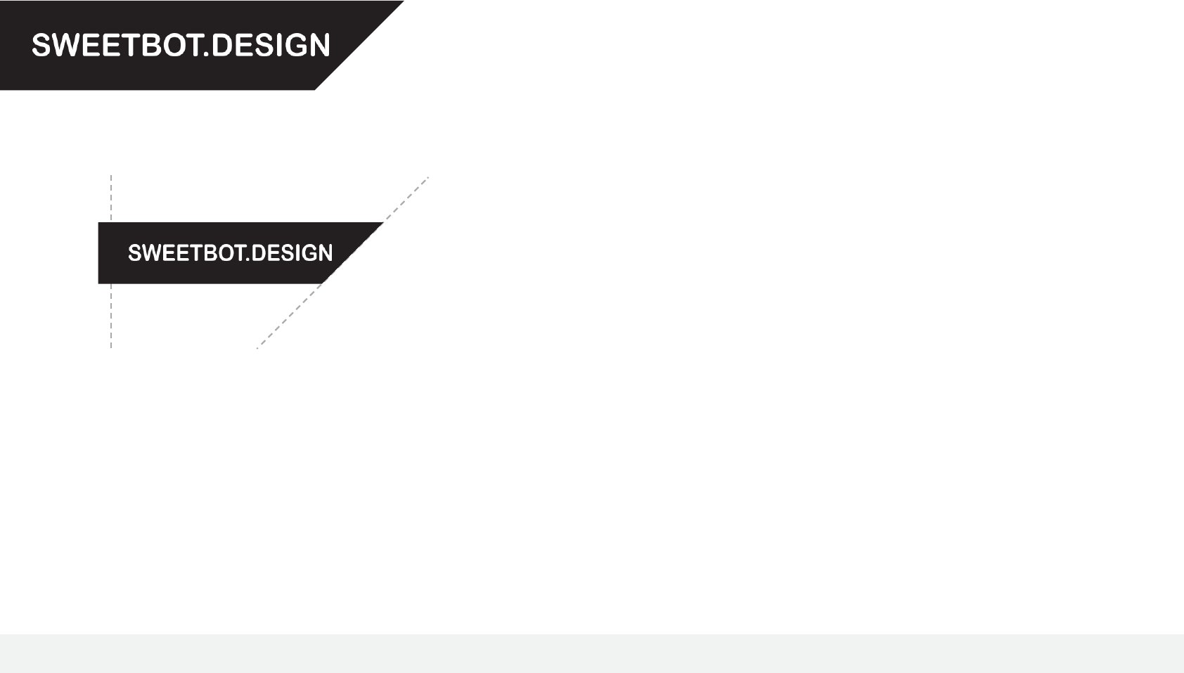
45˚
Page Edge

2.0 The Logo Design
Brand-identity Guidelines - October 2017
3.
The company logo is an important and valued graphic element and must be used consist-
ently and appropriately, even minor variations will undermine and compromise the image
of the branding.
2.0
The Logo Design

2.0 The Logo Design
Brand-identity Guidelines - October 2017
4.
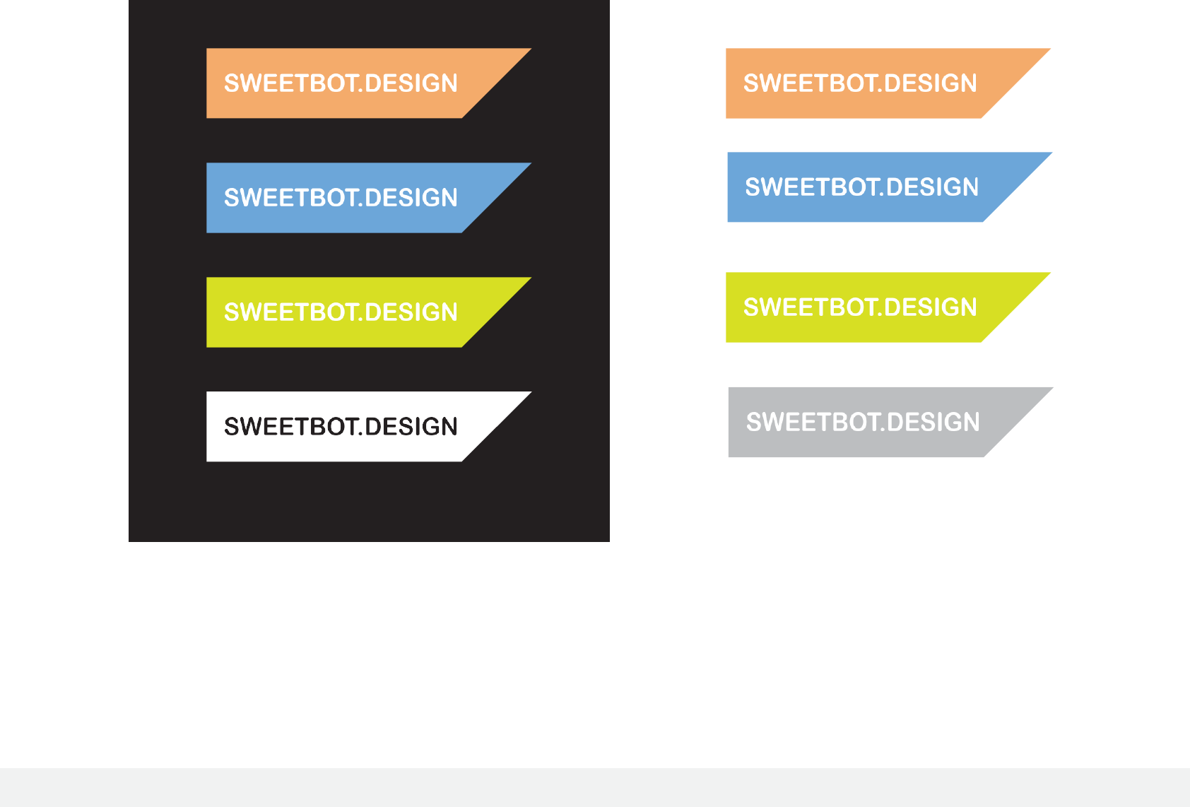
Primary logo - in colour
2.0 The Logo Design
Brand-identity Guidelines - October 2017
5.
Primary logo - alternative colours

2.1 The Logo Usage
Brand-identity Guidelines - October 2017
6.
Always use master artwork when reproducing any logo design. It should never be recreat-
ed under any circumstances. Always ensure you are using the correct artwork for the
application.
When reproducing any logo elements, only the original high resolution or vector graphic
files shall be used - logos should not be taken from this document.
2.1
The Logo Usage
2.1 The Logo Usage
Brand-identity Guidelines - October 2017
7.
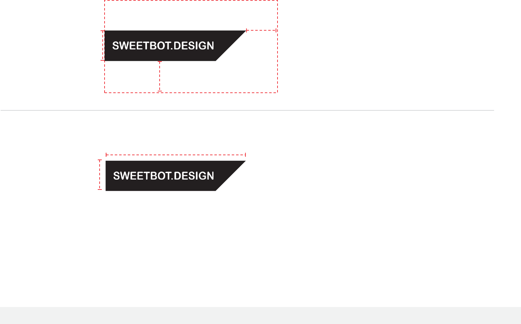
Exclusion Zone
Make sure that text or other design elements do
not encroach upon the logo.
The marked space should always be given to let
the logo ‘breathe’, free from distraction.
7 mm
31 mm
Minimum reproduction size
In the primary logo format a minimum size must
be adhered to so that legibilty is retained.
In exceptional circumstances where space is
below the recommended size, adjustments may
have to be made to balance the shape and
visibility.
x
x
x
2.1 The Logo Usage
Brand-identity Guidelines - October 2017
8.
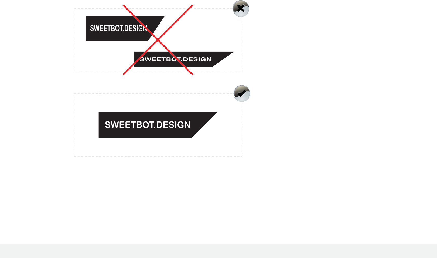
Wrong!
The logo has become distorted from it’s designed
aspect ratio, therefore stretching or squshing the
shape and text.
If the space is restrictive, the scale of the logo (not
the dimensions) must be adjusted to fit.
Correct!
The logo’s shape is consistent with the initial
design, retaining balance and legibility.
2.1 The Logo Usage
Brand-identity Guidelines - October 2017
9.
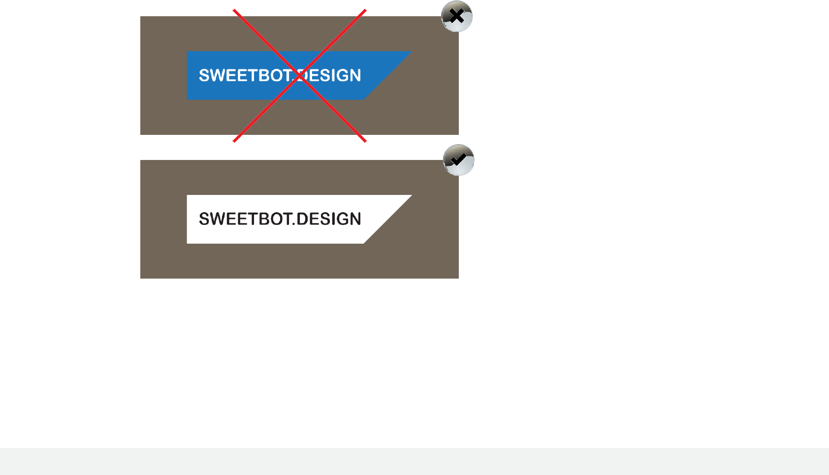
Wrong!
The backdrop for the logo’s placement is too
similar to the primary colour - it lacks visibilty and
contrast.
To fix this problem, you can either select a
contrasting base colour, or switch to one of the
secondary colours assigned to the logo.
Correct!
The logo is clear and visible, set in primary colours
onto a backdrop which shows contrast.
Although the backdrop is not white, the colours
have been adjusted accordingly to work with the
design.
2.1 The Logo Usage
Brand-identity Guidelines - January 2013
10.
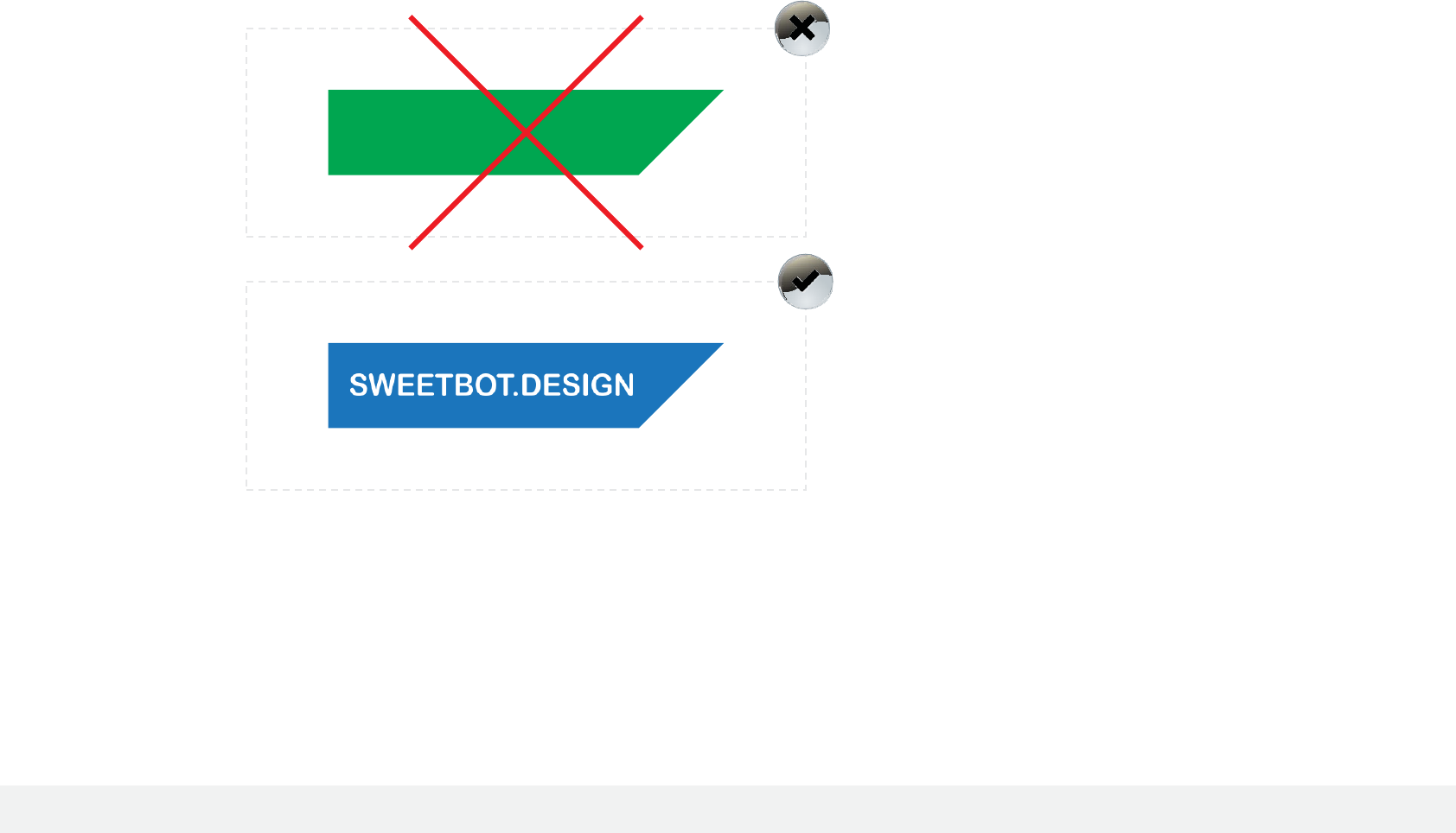
Wrong!
Important elements within the logo have been
distorted, enlarged or shrunk, affecting the
balance and design.
A consistent layout is essential across all media,
and by changing key elements it will introduce
confusion into the brand.
Correct!
The logo has been used in the fashion it was
designed. A consistency has been achieved in how
it is seen.
2.2 The Logo Usage
Brand-identity Guidelines - October 2017
11.
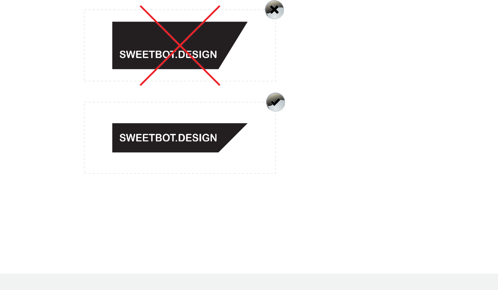
Wrong!
A colour outside of the selected brand colour
scheme has been used. This is not recommended
as it confuses the brand image.
Replacing the font is a definate no-no. The
selected typeface should be used at all times with
the presentation of the logo.
Correct!
The logo is presented in it’s primary colours using
the primary typeface that has been selected for
the logotype.
Sweetbot.Design
2.2 The Logo Usage
Brand-identity Guidelines - October 2017
12.
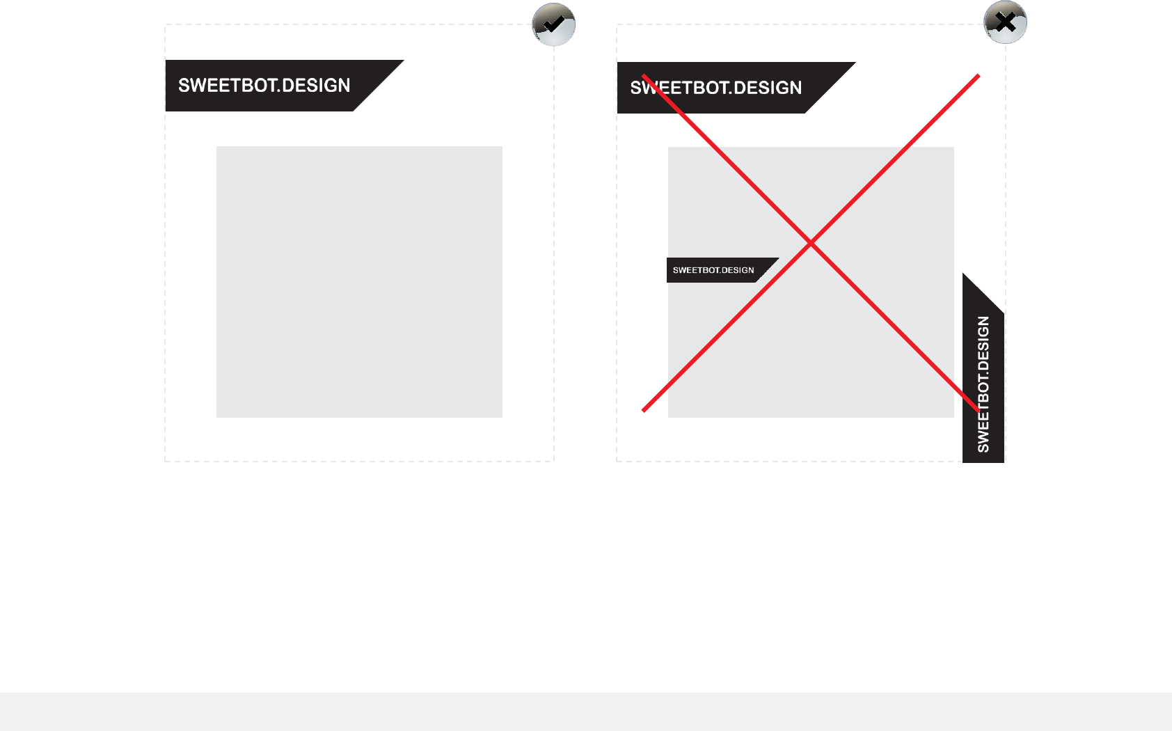
In most cases, use of
one
company logo is all that
is required. If an advertiment is made by your
company then that logo is usually all that is
required for recognition by your audience and/or
customers.
Content
Content

2.2 The Logo Usage
Brand-identity Guidelines - October 2017
13.
Firmaets logo er en vigtig og værdsat del af firmaets brand. Små ændringer i logoet kan
underminere og gøre skade for firmaets brand.
2.2
HotBot Logo
Design

2.2 The Logo Usage
Brand-identity Guidelines - October 2017
14.
Primary logo - in colour
2.2 The Logo Usage
Brand-identity Guidelines - October 2017
15.

3.0 Colour Scheme
Brand-identity Guidelines - October 2017
13.
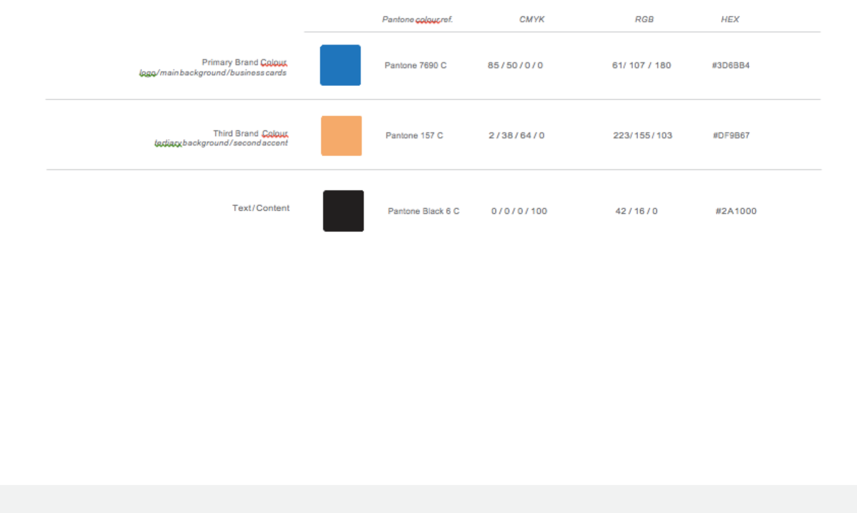
Accurate reproduction of the brand colour scheme is essential in communicating a clear
and consistent message about the company image.
The Pantone colours should be used wherever possible, with CMYK
/
RGB being matched
as closely as possible depending on the materials and print process.
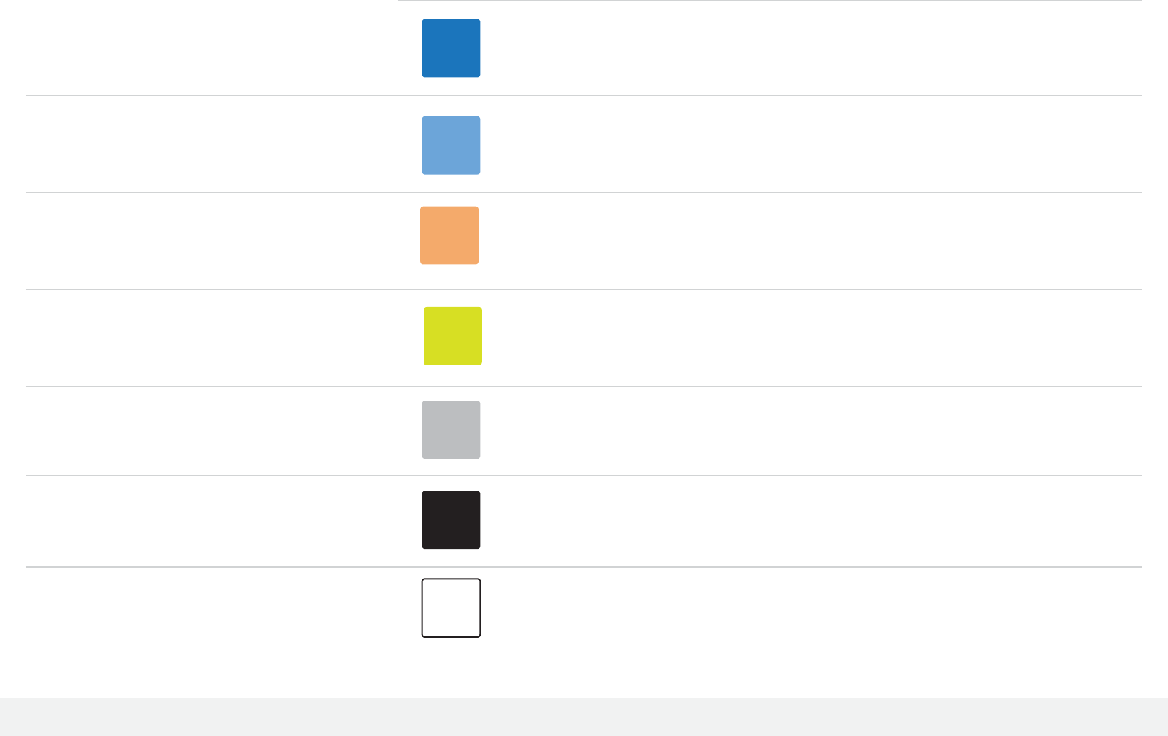
Black and white are acceptable as accent colours, in addition to the colours within the
assigned scheme.
3.0
Colour Scheme
3.0 Colour Scheme
Brand-identity Guidelines - October 2017
14.
Pantone colour ref. CMYK RGB HEX
Primary Brand Colour
logo / main background / business cards
Secondary Brand Colour
secondary background / accent
Third Brand Colour
tertiary background / second accent
Fourth Brand Colour
alternative background / alternative accent
Alternative Background Colour
Pantone 7690 C
Pantone 659 C
Pantone 157 C
Pantone 584 C
Pantone 421 C
85
/
50
/
0
/
0
56
/
24
/
0
/
0
2
/
38
/
64
/
0
20
/
0
/
100
/
0
0
/
0
/
0
/
30
61/ 107
/
180
116
/
156
/
211
223/ 155 / 103
201/ 219
/
80
181
/
178
/
176
#3D6BB4
#749CD3
#DF9B67
#C9DB50
#B5B2B0
Text / Content
Alternative Text / Content
Pantone Black 6 C
0
/
0
/
0
/
100 42
/
16
/
0 #2A1000
0
/
0
/
0
/
0 255
/
255
/
255 #FFFFFF
3.0 Colour Scheme
Brand-identity Guidelines - October 2017
15.
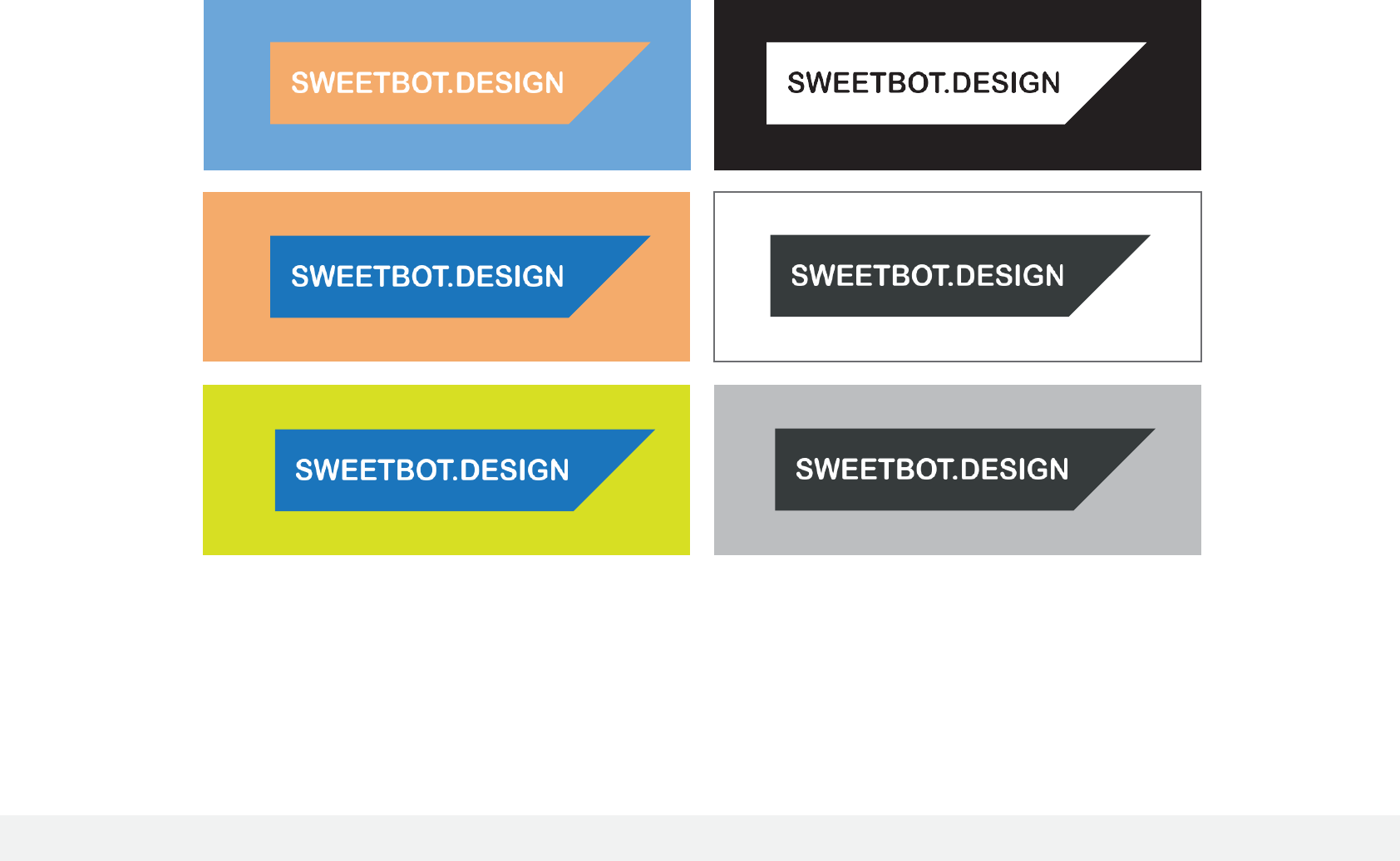
Examples of how the primary logo deals with the alternative colour
backgrounds from the suggested scheme.
The only ‘rules’ are that the colours do not clash and that there is a level
of contrast (or difference) between logo, typography and it‘s specified
backdrop.
This also applies to the logo’s placement over a photographic
background, pattern, visual graphics or other media.

4.0 Typography
Brand-identity Guidelines - October 2017
16
The primary typeface is Lato, selected to best represent the brand image, and must be
used to retain consistency.
Replacing fonts with alternatives should not be done under any circumstances.
4.0
Typography

4.0 Typography
Brand-identity Guidelines - October 2017
17
Primary Typeface
Lato (Regular)
Text
/
Content
abcdefghijklmnopqrstuvwxyz
ABCDEFGHIJKLMNOPQRSTUV WX YZ
1234567890
!
@
£$
%
^
&
*
( )
¡
€#¢
∞
§
¶
•
ª
º
-
–
_
=+
{}
[]
;
:
/\
,
.
~
å∫ç∂´ƒ©˙^Δ˚¬µ~ øπœ®ß†¨√∑≈¥Ω

4.0 Typography
Brand-identity Guidelines - October 2017
18
Secondary Typeface
Lato (Medium)
Tagline
/
Headings
/
Subheadings
abcdefghijklmnopqrstuvwxyz
ABCDEFGHIJKLMNOPQRSTUV WX YZ
1234567890
!
@
£$
%
^
&
*
( )
¡
€#¢
∞
§
¶
•
ª
º
-
–
_
=+
{}
[]
;
:
/\
,
.
~
å
∫
ç
∂
´
ƒ
©
˙
^
Δ
˚
¬
µ
~ø
π
Ϩ
ß
†
¨
√
∑
≈
¥
Ω

