User Guide Network In R
User Manual:
Open the PDF directly: View PDF ![]() .
.
Page Count: 241 [warning: Documents this large are best viewed by clicking the View PDF Link!]
- Preface
- Contents
- 1 Introducing Network Analysis in R
- Part I Network Analysis Fundamentals
- Part II Visualization
- Part III Description and Analysis
- Part IV Modeling
- 10 Random Network Models
- 11 Statistical Network Models
- 12 Dynamic Network Models
- 13 Simulations
- References

Use R !
Douglas A. Luke
A User’s
Guide to
Network
Analysis in R

Use R!
Albert: Bayesian Computation with R (2nd ed. 2009)
Bivand/Pebesma/G´
omez-Rubio: Applied Spatial Data Analysis with R (2nd ed.
2013)
Cook/Swayne: Interactive and Dynamic Graphics for Data Analysis:
With R and GGobi
Hahne/Huber/Gentleman/Falcon: Bioconductor Case Studies
Paradis: Analysis of Phylogenetics and Evolution with R (2nd ed. 2012)
Pfaff: Analysis of Integrated and Cointegrated Time Series with R (2nd ed. 2008)
Sarkar: Lattice: Multivariate Data Visualization with R
Spector: Data Manipulation with R
Douglas A. Luke
A User’s Guide to Network
Analysis in R
123
Douglas A. Luke
Center for Public Health Systems Science
George Warren Brown School
of Social Work
Washington University
St.Louis,MO,USA
ISSN 2197-5736 ISSN 2197-5744 (electronic)
Use R!
ISBN 978-3-319-23882-1 ISBN 978-3-319-23883-8 (eBook)
DOI 10.1007/978-3-319-23883-8
Library of Congress Control Number: 2015955739
Springer Cham Heidelberg New York Dordrecht London
© Springer International Publishing Switzerland 2015
This work is subject to copyright. All rights are reserved by the Publisher, whether the whole or part of
the material is concerned, specifically the rights of translation, reprinting, reuse of illustrations, recitation,
broadcasting, reproduction on microfilms or in any other physical way, and transmission or information
storage and retrieval, electronic adaptation, computer software, or by similar or dissimilar methodology
now known or hereafter developed.
The use of general descriptive names, registered names, trademarks, service marks, etc. in this publication
does not imply, even in the absence of a specific statement, that such names are exempt from the relevant
protective laws and regulations and therefore free for general use.
The publisher, the authors and the editors are safe to assume that the advice and information in this book
are believed to be true and accurate at the date of publication. Neither the publisher nor the authors or
the editors give a warranty, express or implied, with respect to the material contained herein or for any
errors or omissions that may have been made.
Printed on acid-free paper
Springer International Publishing AG Switzerland is part of Springer Science+Business Media (www.
springer.com)
To my most important social network—Sue,
Alina, and Andrew
Preface
In early 2000, Stephen Hawking said that “...the next century will be the century of
complexity.” If his prediction is true, the implication is that we will need new scien-
tific theories, data collection methods, and analytic techniques that are appropriate
for the study of complex systems and behavior. Network science is one such ap-
proach that views the world through a network lens, where physical and social sys-
tems are made up of heterogeneous actors who are connected to one another through
different types of relational ties. Network analysis is the set of analytic tools used
to study these types of systems. Over the past several decades network analysis has
become an increasingly important part of the analytic toolbox for social, health, and
physical scientists.
Until recently, network analysis required specialized software, both for network
data management and analyses. However, starting around 2000, network analytic
tools became available in the Rstatistical programming environment. This not only
made network analytic techniques more visible to the broader statistical community
but also provided the breadth and power of R’s data management, graphic visualiza-
tion, and general statistical modeling capabilities to the network analyst community.
As the title suggests, this book is a user’s guide to network analysis in R.Itpro-
vides a practical hands-on tour of the major network analytic tasks that can currently
be done in R. The book concentrates on four primary tasks that a network analyst
typically concerns herself with: network data management, network visualization,
network description, and network modeling. The book includes all the R code that is
used in the network analysis examples. It also comes with a set of network datasets
that are used throughout the book. (See Chap. 1for more details on the structure of
the book, as well as instructions on how to obtain the network data.) The book is
written for anybody who has an interest in doing network analysis in R. It can be
used as a secondary text in a network science or analysis class or can simply serve
as a reference for network techniques in R.
This book would not exist without the help, support, guidance, and mentoring
I have received over the last 30 years from my own personal and professional so-
cial networks. In the mid-1980s I took a graduate network analysis class from Stan
Wasserman at the University of Illinois in Champaign. I remember being excited
vii
viii Preface
about this new way to analyze data, but thought that I was not likely to ever use it in
my career. However, my colleagues in psychology and public health encouraged me
in my early work exploring how network analysis could answer important research
and evaluation questions. These include Julian Rappaport, Ed Seidman, Bruce Rap-
kin, Kurt Ribisl, Sharon Homan, Ross Brownson, and Matt Kreuter. Whether they
know it or not, I have been inspired and encouraged by an amazing group of net-
work and systems scientists, including Tom Valente, Steve Borgatti, Martina Morris,
Tom Snijders, Scott Leischow, Patty Mabry, Stephen Marcus, and Ross Hammond.
My best network ideas have come from my friends and colleagues at the Center for
Public Health Systems Science, particularly Bobbi Carothers, Amar Dhand, Chris
Robichaux, and Nancy Mueller. I am especially grateful to the students in my net-
work analysis classes and workshops over the years; they have not only improved
this book, but they have improved my thinking about network analysis. A very spe-
cial thank you to Jenine Harris. Jenine was my first doctoral student, now I am
inspired by the rigor and elegance of her own work in network science. I would also
like to thank the Centers for Disease Control and Prevention, the National Insti-
tutes of Health, and the Missouri Foundation for Health for providing research and
evaluation support that allowed me to develop and refine my approach to network
analysis. Finally, my deepest thanks go to my family. They gave me specific sug-
gestions about the content, provided me space and time to work hard on this book
(including a crucial Father’s Day gift), and cheered me on when I most needed it.
Thank you, Sue, Ali, and Andrew.
St. Louis, MO, USA Douglas A. Luke
July, 2015
Contents
1 Introducing Network Analysis in R ............................... 1
1.1 What Are Networks? ........................................ 1
1.2 What Is Network Analysis? .................................. 3
1.3 Five Good Reasons to Do Network Analysis in R ................ 4
1.3.1 Scope of R .......................................... 4
1.3.2 Free and Open Nature of R ............................ 5
1.3.3 Data and Project Management Capabilities of R .......... 5
1.3.4 Breadth of Network Packages in R ...................... 6
1.3.5 Strength of Network Modeling in R ..................... 6
1.4 Scope of Book and Resources ................................ 6
1.4.1 Scope .............................................. 6
1.4.2 Book Roadmap ...................................... 7
1.4.3 Resources .......................................... 8
Part I Network Analysis Fundamentals
2 The Network Analysis ‘Five-Number Summary’ ................... 11
2.1 Network Analysis in R: Where to Start ......................... 11
2.2 Preparation ................................................ 11
2.3 Simple Visualization ........................................ 12
2.4 Basic Description .......................................... 12
2.4.1 Size ............................................... 12
2.4.2 Density ............................................ 14
2.4.3 Components ........................................ 15
2.4.4 Diameter ........................................... 15
2.5 Clustering Coefficient ....................................... 16
3 Network Data Management in R ................................. 17
3.1 Network Data Concepts ..................................... 17
3.1.1 Network Data Structures .............................. 17
3.1.2 Information Stored in Network Objects .................. 20
ix
xContents
3.2 Creating and Managing Network Objects in R .................. 21
3.2.1 Creating a Network Object in statnet ................. 21
3.2.2 Managing Node and Tie Attributes...................... 24
3.2.3 Creating a Network Object in igraph .................. 28
3.2.4 Going Back and Forth Between statnet and igraph ... 30
3.3 Importing Network Data ..................................... 30
3.4 Common Network Data Tasks ................................ 32
3.4.1 Filtering Networks Based on Vertex or Edge Attribute
Values ............................................. 32
3.4.2 Transforming a Directed Network to a Non-directed
Network ............................................ 39
Part II Visualization
4 Basic Network Plotting and Layout .............................. 45
4.1 The Challenge of Network Visualization ....................... 45
4.2 The Aesthetics of Network Layouts ........................... 47
4.3 Basic Plotting Algorithms and Methods ........................ 49
4.3.1 Finer Control Over Network Layout .................... 50
4.3.2 Network Graph Layouts Using igraph ................. 52
5 Effective Network Graphic Design ............................... 55
5.1 Basic Principles ............................................ 55
5.2 Design Elements ........................................... 55
5.2.1 Node Color ......................................... 56
5.2.2 Node Shape ......................................... 60
5.2.3 Node Size .......................................... 62
5.2.4 Node Label ......................................... 66
5.2.5 Edge Width ......................................... 68
5.2.6 Edge Color ......................................... 69
5.2.7 Edge Type .......................................... 70
5.2.8 Legends ............................................ 71
6 Advanced Network Graphics .................................... 73
6.1 Interactive Network Graphics ................................ 73
6.1.1 Simple Interactive Networks in igraph ................ 74
6.1.2 Publishing Web-Based Interactive Network Diagrams ...... 74
6.1.3 Statnet Web: Interactive statnet with shiny .......... 77
6.2 Specialized Network Diagrams ............................... 77
6.2.1 Arc Diagrams ....................................... 78
6.2.2 Chord Diagrams ..................................... 79
6.2.3 Heatmaps for Network Data ........................... 82
6.3 Creating Network Diagrams with Other R Packages .............. 84
6.3.1 Network Diagrams with ggplot2 ..................... 84
Contents xi
Part III Description and Analysis
7 Actor Prominence .............................................. 91
7.1 Introduction ............................................... 91
7.2 Centrality: Prominence for Undirected Networks ................ 92
7.2.1 Three Common Measures of Centrality .................. 93
7.2.2 Centrality Measures in R .............................. 95
7.2.3 Centralization: Network Level Indices of Centrality ....... 96
7.2.4 Reporting Centrality .................................. 97
7.3 Cutpoints and Bridges .......................................101
8 Subgroups .....................................................105
8.1 Introduction ...............................................105
8.2 Social Cohesion ............................................106
8.2.1 Cliques .............................................107
8.2.2 k-Cores ............................................110
8.3 Community Detection .......................................115
8.3.1 Modularity ..........................................115
8.3.2 Community Detection Algorithms ......................118
9 Affiliation Networks ............................................125
9.1 Defining Affiliation Networks ................................125
9.1.1 Affiliations as 2-Mode Networks .......................126
9.1.2 Bipartite Graphs .....................................126
9.2 Affiliation Network Basics ...................................127
9.2.1 Creating Affiliation Networks from Incidence Matrices ....127
9.2.2 Creating Affiliation Networks from Edge Lists ............129
9.2.3 Plotting Affiliation Networks ..........................130
9.2.4 Projections ..........................................131
9.3 Example: Hollywood Actors as an Affiliation Network ...........133
9.3.1 Analysis of Entire Hollywood Affiliation Network ........134
9.3.2 Analysis of the Actor and Movie Projections .............139
Part IV Modeling
10 Random Network Models .......................................147
10.1 The Role of Network Models .................................147
10.2 Models of Network Structure and Formation ....................148
10.2.1 Erd˝
os-R´
enyi Random Graph Model .....................148
10.2.2 Small-World Model ..................................151
10.2.3 Scale-Free Models ...................................154
10.3 Comparing Random Models to Empirical Networks ..............160
xii Contents
11 Statistical Network Models ......................................163
11.1 Introduction ...............................................163
11.2 Building Exponential Random Graph Models ...................165
11.2.1 Building a Null Model ................................167
11.2.2 Including Node Attributes .............................169
11.2.3 Including Dyadic Predictors ...........................171
11.2.4 Including Relational Terms (Network Predictors) .........175
11.2.5 Including Local Structural Predictors (Dyad Dependency) . . 177
11.3 Examining Exponential Random Graph Models .................179
11.3.1 Model Interpretation .................................179
11.3.2 Model Fit ...........................................180
11.3.3 Model Diagnostics ...................................183
11.3.4 Simulating Networks Based on Fit Model ................183
12 Dynamic Network Models .......................................189
12.1 Introduction ...............................................189
12.1.1 Dynamic Networks ...................................189
12.1.2 RSiena .............................................191
12.2 Data Preparation ...........................................192
12.3 Model Specification and Estimation ...........................198
12.3.1 Specification of Model Effects .........................198
12.3.2 Model Estimation ....................................203
12.4 Model Exploration .........................................203
12.4.1 Model Interpretation .................................203
12.4.2 Goodness-of-Fit .....................................209
12.4.3 Model Simulations ...................................212
13 Simulations ....................................................217
13.1 Simulations of Network Dynamics ............................217
13.1.1 Simulating Social Selection ............................218
13.1.2 Simulating Social Influence ............................228
References .........................................................235

Chapter 1
Introducing Network Analysis in R
Begin at the beginning, the King said, very gravely, and go on
till you come to the end: then stop. (Lewis Carroll, Alice in
Wonderland)
1.1 What Are Networks?
This book is a user’s guide for conducting network analysis in the Rstatistical
programming language. Networks are all around us. Humans naturally organize
themselves in networked systems. Our families and friends form personal social
networks around each of us. Neighborhoods and communities organize themselves
in networked coalitions to advocate for change. Businesses work with (and against)
each other in complex, interlocking networks of trade and financial partnerships.
Public health is advanced through partnerships and coalitions of governmental and
NGO organizations (Luke and Harris 2007). Nations are connected to one another
through systems of migration, trade, and treaty obligations.
Moreover, non-human networks exist almost anywhere you look. Our genes and
proteins interact with one another through complex biological networks. The human
brain is now viewed as a complex network, or ‘connectome’ (Sporns 2012). Sim-
ilarly, human diseases and their underlying genetic roots are connected as a ‘dis-
easome’ (Barab´
asi 2007). Animal species interact in many complex ways, one of
which is a networked food-web that describes interactions in ‘who-eats-whom’ re-
lationships. Information itself is networked. Our legal system is built on an inter-
connecting network of prior legal decisions and precedents. Social and scientific
progress is driven by a diffusion of innovation process by which information is
disseminated across connected social systems, whether they are Iowa corn farmers
(Rogers 2003) or public health scientists (Harris and Luke 2009). It appears that one
of the ways the universe is organized is with networks.
So what is a network? Figures 1.1 and 1.2 present two examples of important
and interesting social networks. Figure 1.1 presents the contact network of the 19
9–11 hijackers, based on the work of Valdis Krebs (2002). Every social network
is made up of a set of actors (also called nodes) that are connected to one another
via some type of social relationship (also called a tie). In the figure, nodes are the
circles and the ties are the lines connecting some of the nodes. The network shows
© Springer International Publishing Switzerland 2015
D.A. Luke, A User’s Guide to Network Analysis in R, Use R!,
DOI 10.1007/978-3-319-23883-8 1
1
2 1 Introducing Network Analysis in R
us that the hijackers had some contact with one another before September 11th, but
the network is not very densely connected and there appears to be no prominent
network member who is connected to all or even most of the other hijackers.
AA11 (WTC North)
AA77 (Pentagon)
UA175 (WTC South)
UA93 (Pennsylvania)
Fig. 1.1 Network of 9–11 hijackers
The second example in Fig. 1.2 is from a very different sort of social network.
Here the nodes are members of the 2010 Netherlands FIFA World Cup team, who
went on to lose in the final to Spain. The ties represent passes between the different
players during the World Cup matches. The arrows show the directional pattern of
the passes. We can see that the goalkeeper passed primarily to the defenders, and the
forwards received passes primarily from the midfielders (except for #6, who appears
to have a different passing pattern than the other two forwards).
These two examples may appear to have little in common. However, they both
share a fundamental characteristic common to all social networks. The social
patterns that are displayed in the network figures are not random. They reflect und-
erlying social processes that can be explored using network science theories and
methods. The terrorist network has no prominent leader and is not tightly inter-
connected because it makes the network harder to detect or disrupt. The pattern of
passing ties in the soccer network reflects the assigned positions of the players, the
rules of the game, and the strategies of the coach. The network analysis does not
‘know’ about any of those rules or strategies. Yet, network analysis can be used to
reveal these patterns that reflect the underlying rules and regularities.
1.2 What Is Network Analysis? 3
1
2
3
4
5
6
7
8
9
10
11
Defender
Forward
Goalkeeper
Midfielder
Fig. 1.2 Network of Netherlands 2010 World Cup soccer team
1.2 What Is Network Analysis?
Network science is a broad approach to research and scholarship that uses a rela-
tional lens to study and understand biological, physical, social, and informational
systems. The primary tool for network scientists is network analysis, which is a
set of methods that are used to (1) visualize networks, (2) describe specific charac-
teristics of overall network structure as well as details about the individual nodes,
ties, and subgroups within the networks, and (3) build mathematical and statistical
models of network structures and dynamics. Because the core question of network
science is about relationships, most of the methods used in network analysis are
quite distinct from the more traditional statistical tools used by social and health
scientists.
Network analysis as a distinct scientific enterprise with its own theories and
methods grew out of developments in many other disciplines, particularly graph
theory and topology in mathematics, the study of kinship systems in anthropology,
and social groups and process from sociology and psychology. Although network
analysis was not invented by one person at a specific place and time, the initial dev-
elopment of what we now recognize as modern network analysis can be traced back
to the work of Jacob Moreno in the 1930s. He defined the study of social relations as
sociometry, and founded the journal Sociometry that would publish the early stud-
ies in this area. He also invented the sociogram, which was a visual way to display
4 1 Introducing Network Analysis in R
network structures. The first published sociogram appeared in the New York Times
in 1933, and it was a network diagram of the friendship ties among a 4th grade class.
(These data are available as part of the network dataset package that accompanies
this book, see Sect. 1.4.3 below.)
The theories and methods of network analysis were developed throughout the rest
of the twentieth century, with important contributions from sociology, psychology,
political science, business, public health, and computer science. Network science
as an empirical practice was propelled by the development of a number of network
specific software tools and packages, including UCINet, STRUCTURE, Negopy,
and Pajek. The interest in network science has exploded in the last 20–30 years,
driven by at least three different factors. First, mathematicians, physicists, and other
researchers developed a number of influential theories of network structure and for-
mation that brought attention and energy to network science (see Chap. 10 for some
discussion of these theories). Second, advances in computational power and speed
allowed network methods to be applied to large and very large networks, such as
the internet, the population of the planet, or the human brain. Finally, advances in
statistical network theory allowed analysts for the first time to move beyond sim-
ple network description to be able to build and test statistical models of network
structures and processes (see Chaps. 11 and 12).
1.3 Five Good Reasons to Do Network Analysis in R
As the title suggests, this book is designed as a general guide for how to do net-
work analysis in the R statistical language and environment. Why is R an ideal
platform for developing and conducting network analyses? There are at least five
good reasons.
1.3.1 Scope of R
The R statistical programming language and environment comprise a vast integrated
system of thousands of packages and functions that allow it to handle innumerable
data management, analysis, or visualization tasks. The R system includes a num-
ber of packages that are designed to accomplish specific network analytic tasks.
However, by performing these network tasks within the R environment, the analyst
can take advantage of any of the other capabilities of R. Most other network anal-
ysis programs (e.g., Pajek, UCINet, Gephi) are stand-alone packages, and thus do
not have the advantages of working within an integrated statistical programming
environment.
1.3 Five Good Reasons to Do Network Analysis in R 5
1.3.2 Free and Open Nature of R
One of the important reasons for R’s popularity and success is its free and open
nature. This is formally ensured via the GNU General Public License (GPL) that
R-code is released under. More informally, there is a vast R user and developer com-
munity which is continually working to enhance and improve R base code and the
thousands of R packages that can be freely accessed. The social network capabilities
of R described in this book have, in fact, been developed by the R user community.
This open nature of R facilitates faster (and arguably, cleaner and more powerful)
development and dissemination of new statistical and data analytic techniques, such
as these network analytic tools.
1.3.3 Data and Project Management Capabilities of R
Although there are many good network analysis programs available which can
handle a wide variety of network descriptive statistics and visualization tasks, no
other network package has the same power to handle often complex data and
project management tasks for larger-scale network analyses compared to R. First,
as suggested above, network analysis in R can take advantage of the powerful data
management, cleaning, import and export capabilities of base R. As described in
Chap. 3, network analysis often starts by importing and transforming data from
other sources into a form that can be analyzed by network tools. All network pack-
ages have some data management capabilities, but no other program can match R’s
breadth and depth.
Second, when conducting sophisticated scientific or commercial network anal-
yses, it is important to have the right project management tools to facilitate code
storage and retrieval, managing analysis outputs such as statistical results and infor-
mation graphics, and producing reports for internal and external audiences. Tradi-
tional statistical analysis platforms such as SAS and SPSS have these sorts of tools,
but most network programs do not. By pairing R up with an integrated development
environment (IDE) such as RStudio (http://rstudio.org/) and taking adv-
antage of packages such as knitr and shiny, the user has the ability to manage
any type of complex network project. In fact, the development and availability of
these tools has been one of the driving forces of the reproducible research move-
ment (Gentleman and Lang 2007), which emphasizes the importance of combining
data, code, results, and documentation in permanent and shareable forms. As one
example of the power of the reproducible research tools accessible in R is this book,
which was created entirely in RStudio.
6 1 Introducing Network Analysis in R
1.3.4 Breadth of Network Packages in R
The primary reason R is ideal for network analysis is the breadth of packages that
are currently available to manage network data and conduct network visualization,
network description, and network modeling. There are dozens of network-related
packages, and more are being created all the time. R network data can be managed
and stored in R native objects by the network and igraph packages, and the data
can be exchanged between formats with the intergraph package. Basic network
analysis and visualization can be handled with the sna package contained within
the much broader statnet suite of network packages, as well as within igraph.
More sophisticated network modeling can be handled by ergm and its associated
libraries, and dynamic actor-based network models are produced by RSiena. Free-
standing network analysis programs have many strengths (e.g., the visualization
capabilities of Gephi), but no single program matches the combined power of the
social network analysis packages contained in R.
1.3.5 Strength of Network Modeling in R
Finally, the particular network modeling strengths of R should be mentioned. R is
the only generally available software package that includes comprehensive facili-
ties to do stochastic network modeling (e.g., exponential random graph models),
dynamic actor-based network models that allow study of how networks change over
time, and other network simulation procedures.
1.4 Scope of Book and Resources
1.4.1 Scope
As the title suggests, the goal of this book is to provide a hands-on, practical guide to
doing network analysis in the Rstatistical programming environment. It is hands-on
in the sense that the book provides guidance primarily in the form of short network
analysis code snippets applied to realistic network data. The results of the analyses
follow immediately. All the code and data are available to the reader, so that it is
easy to replicate what is shown in the book, experiment with your own data or code
extensions, and thus facilitate learning.
The practical goal of the book is to demonstrate network analytic techniques
in Rthat will be useful for a wide variety of data analysis and research goals.
This includes data management, network visualization, computation of relevant net-
work descriptive statistics, and performing mathematical, statistical, and dynamic
1.4 Scope of Book and Resources 7
modeling of networks. The intended audiences include students, analysts and
researchers across a wide variety of disciplines, particularly the social, health,
business, and engineering domains.
It is also useful to state what this book is not designed to do. First, it does not
provide an in-depth treatment of network science theories or history. There are many
good books, papers, training courses, and online resources available that cover this
material. For good general overviews, the classic text by Wasserman and Faust
(1994) is still relevant, and John Scott provides a good, more current treatment
(2012). For more in-depth treatment of network science and statistical theory, see
Newman (2010) or Kolaczyk (2009). Finally, two edited volumes that have good
coverage of the recent history of network science as well as well-executed examples
of empirical network research are Newman et al. (2006) and Scott and Carrington
(2011).
Second, this book is not in any way an adequate introduction to Rprogramming
and statistical analysis. Although every attempt is made to make each code exam-
ple clear and succinct, a novice Ruser will find some of the techniques and code
syntax hard to follow. In particular, understanding R’s capabilities for data manage-
ment, graphics, and the object-oriented approach to statistical modeling will be very
helpful for getting the most out of this user-guide.
Thus, the book is designed for the interested student, analyst, or researcher who is
familiar with Rand has some understanding of network science theories and meth-
ods. It could serve as a secondary text for a graduate level class in network analysis.
It also could be useful as a primer for an experienced Ranalyst who wants to incor-
porate network analysis into her programming and analytic toolbox.
1.4.2 Book Roadmap
The book is organized into four main sections, which correspond to the four
fundamental tasks that network analysts will spend most of their time on: data man-
agement, network visualization, network description, and network modeling. The
first section has two chapters that cover both a simple introduction to basic net-
work techniques, then a more in-depth presentation of data management issues in
network analysis. The three chapters in the Visualization section cover basic net-
work graphics layout, network graphic design suggestions, and some discussion of
advanced graphics topics and techniques. The Description and Analysis section has
three chapters that cover the most widely used techniques for describing important
network characteristics, including actor prominence, network subgroups and com-
munities, and handling affiliation networks. The final section, Modeling, includes
four chapters that present advanced techniques for mathematical modeling, statisti-
cal modeling, modeling of dynamic networks, and network simulations. Table 1.1
presents this roadmap.

8 1 Introducing Network Analysis in R
Chapter Packages Datasets
Introduction FIFA Nether, Krebs
5 number summary statnet, sna Moreno
Network data statnet, network, igraph DHHS, ICTS
Basic visualization statnet, sna Moreno, Bali
Graphic design statnet, sna, igraph Bali
Advanced graphics arcdiagram, circlize, visNetwork, networkD3 Simpsons, Bali
Prominence statnet, sna DHHS, Bali
Subgroups igraph DHHS, Moreno, Bali
Affiliation networks igraph hwd
Mathematical models igraph lhds
Stochastic models ergm TCnetworks
Dynamic models RSiena Coevolve
Simulations igraph
Table 1.1 User’s Guide roadmap
1.4.3 Resources
The most important resource for this user guide is a collection of network datasets
that have been curated and made available to the readers of this book. Over a dozen
network datasets are included in the form of an R package called UserNetR. These
datasets are used throughout the book to support the coding and analysis examples.
The network data included in the UserNetR package mostly come from published
network studies, while a few are created to help illustrate particular analytic options.
Table 1.1 lists the names of the datasets that are featured in each chapter.
The UserNetR package is maintained on GitHub, and must be downloaded and
installed to make the network data available. This can be done using the following
code. (The devtools package must also be installed if it is not on your system.)
library(devtools)
install_github("DougLuke/UserNetR")
Once this is done, the package must be loaded to make the various datafiles avail-
able. This can be done with the library() function, just like for any Rpackage.
This command will not always be explicitly shown throughout the book, so make
sure to load the package prior to executing any of the included Rcode.
library(UserNetR)
Finally, the documentation for the UserNetR package can be viewed through
the Rhelp system.
help(package='UserNetR')
Part I
Network Analysis Fundamentals

Chapter 2
The Network Analysis ‘Five-Number Summary’
There is nothing like looking, if you want to find something. You
certainly usually find something, if you look, but it is not always
quite the something you were after. (J.R.R. Tolkien –The
Hobbit)
2.1 Network Analysis in R: Where to Start
How should you start when you want to do a network analysis in R? The answer to
this question rests of course on the analytic questions you hope to answer, the state
of the network data that you have available, and the intended audience(s) for the
results of this work. The good news about performing network analysis in R is that,
as will be seen in subsequent chapters, R provides a multitude of available network
analysis options. However, it can be daunting to know exactly where to start.
In 1977, John Tukey introduced the five-number summary as a simple and quick
way to summarize the most important characteristics of a univariate distribution.
Networks are more complicated than single variables, but it is also possible to exp-
lore a set of important characteristics of a social network using a small number of
procedures in R.
In this chapter, we will focus on two initial steps that are almost always useful
for beginning a network analysis: simple visualization, and basic description using
a ‘five-number summary.’ This chapter also serves as a gentle introduction to basic
network analysis in R, and demonstrates how quickly this can be done.
2.2 Preparation
Similar to most types of statistical analysis using R, the first steps are to load appro-
priate packages (installing them first if necessary), and then making data available
for the analyses. The statnet suite of network analysis packages will be used
here for the analyses. The data used in this chapter (and throughout the rest of the
book) are from the UserNetR package that accompanies the book. The specific
dataset used here is called Moreno, and contains a friendship network of fourth
grade students first collected by Jacob Moreno in the 1930s.
© Springer International Publishing Switzerland 2015
D.A. Luke, A User’s Guide to Network Analysis in R, Use R!,
DOI 10.1007/978-3-319-23883-8 2
11

12 2 The Network Analysis ‘Five-Number Summary’
library(statnet)
library(UserNetR)
data(Moreno)
2.3 Simple Visualization
The first step in network analysis is often to just take a look at the network. Network
visualization is critical, but as Chaps. 4,5and 6indicate, effective network graph-
ics take careful planning and execution to produce. That being said, an informative
network plot can be produced with one simple function call. The only added com-
plexity here is that we are using information about the network members’ gender to
color code the nodes. The syntax details underlying this example will be covered in
greater depth in Chaps. 3,4and 5.
gender <- Moreno %v% "gender"
plot(Moreno, vertex.col = gender +2,vertex.cex =1.2)
The resulting plot makes it immediately clear how the friendship network is made
up of two fairly distinct subgroups, based on gender. A quickly produced network
graphic like this can often reveal the most important structural patterns contained in
the social network.
2.4 Basic Description
Tukey’s original five-number summary was intended to describe the most impor-
tant distributional characteristics of a variable, including its central tendency and
variability, using easy to produce statistical summaries. Similarly, using only a few
functions and lines of R code, we can produce a network five-number summary that
tells us how large the network is, how densely connected it is, whether the network
is made up of one or more distinct groups,howcompact it is, and how clustered are
the network members.
2.4.1 Size
The most basic characteristic of a network is its size. The size is simply the number
of members, usually called nodes, vertices or actors. The network.size() func-
tion is the easiest way to get this. The basic summary of a statnet network object
also provides this information, among other things. The Moreno network has 33
2.4 Basic Description 13
Fig. 2.1 Moreno sociogram
members, based on the network.size and summary calls. (Setting the print.adj
to false suppresses some detailed adjacency information that can take up a lot of
room.)
network.size(Moreno)
## [1] 33
summary(Moreno,print.adj=FALSE)
## Network attributes:
## vertices = 33
## directed = FALSE
## hyper = FALSE
## loops = FALSE
## multiple = FALSE

14 2 The Network Analysis ‘Five-Number Summary’
## bipartite = FALSE
## total edges = 46
## missing edges = 0
## non-missing edges = 46
## density = 0.0871
##
## Vertex attributes:
##
## gender:
## numeric valued attribute
## attribute summary:
## Min. 1st Qu. Median Mean 3rd Qu. Max.
## 1.00 1.00 2.00 1.52 2.00 2.00
## vertex.names:
## character valued attribute
## 33 valid vertex names
##
## No edge attributes
2.4.2 Density
Of all the basic characteristics of a social network, density is among the most imp-
ortant as well as being one of the easiest to understand. Density is the proportion
of observed ties (also called edges, arcs, or relations) in a network to the maximum
number of possible ties. Thus, density is a ratio that can range from 0 to 1. The
closer to 1 the density is, the more interconnected is the network.
Density is relatively easy to calculate, although the underlying equation differs
based on whether the network ties are directed or undirected. An undirected tie is
one with no direction. Collaboration would be a good example of an undirected tie;
if A collaborates with B, then by necessity B is also collaborating with A. Directed
ties, on the other hand, have direction. Money flow is a good example of a directed
tie. Just because A gives money to B, does not necessarily mean that B reciprocates.
For a directed network, the maximum number of possible ties among kactors is
k∗(k−1), so the formula for density is:
L
k×(k−1),
where Lis the number of observed ties in the network. Density, as defined here, does
not allow for ties between a particular node and itself (called a loop).

2.4 Basic Description 15
For an undirected network the maximum number of ties is k∗(k−1)/2 because
non-directed ties should only be counted once for every dyad (i.e., pair of nodes).
So, density for an undirected network becomes:
2L
k×(k−1).
The information obtained in the previous section told us that the Moreno network
has 33 nodes and 46 non-directed edges. We could then use R to calculate that by
hand, but it is easier to simply use the gden() function.
den_hand <- 2*46/(33*32)
den_hand
## [1] 0.0871
gden(Moreno)
## [1] 0.0871
2.4.3 Components
A social network is sometimes split into various subgroups. Chapter 8will describe
how to use R to identify a wide variety of network groups and communities. How-
ever, a very basic type of subgroup in a network is a component. An informal def-
inition of a component is a subgroup in which all actors are connected, directly
or indirectly. The number of components in a network can be obtained with the
components function. (Note that the meaning of components is more compli-
cated for directed networks. See help(components) for more information.)
components(Moreno)
## [1] 2
2.4.4 Diameter
Although the overall size of a network may be interesting, a more useful character-
istic of the network is how compact it is, given its size and degree of interconnect-
edness. The diameter of a network is a useful measure of this compactness. A path
is the series of steps required to go from node A to node B in a network. The short-
est path is the shortest number of steps required. The diameter then for an entire
network is the longest of the shortest paths across all pairs of nodes. This is a mea-
sure of compactness or network efficiency in that the diameter reflects the ‘worst

16 2 The Network Analysis ‘Five-Number Summary’
case scenario’ for sending information (or any other resource) across a network.
Although social networks can be very large, they can still have small diameters
because of their density and clustering (see below).
The only complicating factor for examining the diameter of a network is that it
is undefined for networks that contain more than one component. A typical app-
roach when there are multiple components is to examine the diameter of the largest
component in the network. For the Moreno network there are two components (see
Fig. 2.1). The smaller component only has two nodes. Therefore, we will use the
larger component that contains the other 31 connected students.
In the following code the largest component is extracted into a new matrix.
The geodesics (shortest paths) are then calculated for each pair of nodes using the
geodist() function. The maximum geodesic is then extracted, which is the dia-
meter for this component. A diameter of 11 suggests that this network is not very
compact. It takes 11 steps to connect the two nodes that are situated the furthest
apart in this friendship network.
lgc <- component.largest(Moreno,result="graph")
gd <- geodist(lgc)
max(gd$gdist)
## [1] 11
2.5 Clustering Coefficient
One of the fundamental characteristics of social networks (compared to random
networks) is the presence of clustering, or the tendency to formed closed triangles.
The process of closure occurs in a social network when two people who share a
common friend also become friends themselves. This can be measured in a social
network by examining its transitivity. Transitivity is defined as the proportion of
closed triangles (triads where all three ties are observed) to the total number of open
and closed triangles (triads where either two or all three ties are observed). Thus,
like density, transitivity is a ratio that can range from 0 to 1. Transitivity of a network
can be calculated using the gtrans() function. The transitivity for the 4th graders
is 0.29, suggesting a moderate level of clustering in the classroom network.
gtrans(Moreno,mode="graph")
## [1] 0.286
In the rest of this book, we will examine in more detail how the power of R can be
harnessed to explore and study the characteristics of social networks. The preceding
examples show that basic plots and statistics can be easily obtained. The meaning
of these statistics will always rest on the theories and hypotheses that the analyst
brings to the task, as well as history and experience doing network analysis with
other similar types of social networks.

Chapter 3
Network Data Management in R
Knowledge is of two kinds. We know a subject ourselves, or we
know where we can find information upon it. (Samuel Johnson)
3.1 Network Data Concepts
A major advantage of using R for network analysis is the power and flexibility of
the tools for accessing and manipulating the actual network data. One of the things
that I often tell my quantitative methods students is that they will typically spend the
majority of their time dealing with data management tasks and challenges. In fact,
the time spent analyzing and modeling data is dwarfed by the time spent getting
data ready for analyses. This is no different for network analysis. In fact, given the
specialized nature of network data, the data management tasks loom even larger. In
this chapter we cover three main topics. First, the general nature of network data
is explored and defined. Second, we learn how network data objects can be created
and managed in R. Finally, a number of typical network data management tasks are
illustrated through a set of examples.
3.1.1 Network Data Structures
For many types of data analysis the data are stored in rectangular data structures,
where rows are used to depict cases or observations, and columns depict individual
variables. Spreadsheets use this type of data organization, as well as most statistics
packages such as SPSS. In R one of the fundamental data types is a ‘data frame,’
which uses this same rectangular format.
Networks, because of their need to depict more complicated relational structures,
require a different type of data storage. That is, in rectangular data structures the
fundamental piece of information is an attribute (column) of a case (row). In network
analysis, the fundamental piece of information is a relationship (tie) between two
members of a network.
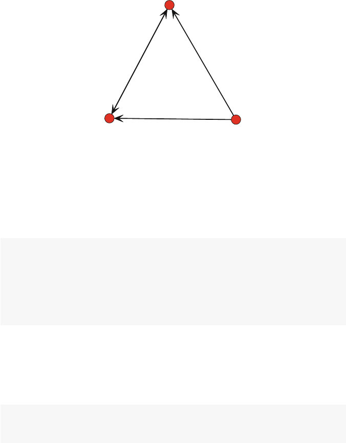
Consider the following simple example of a directed network. The network
graphic itself depicts all of the information about the network. It is made up of
© Springer International Publishing Switzerland 2015
D.A. Luke, A User’s Guide to Network Analysis in R, Use R!,
DOI 10.1007/978-3-319-23883-8 3
17
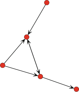
18 3 Network Data Management in R
five nodes (named Athrough E), and there are a total of six directed ties. Because
these are directed ties, we can call them arcs (as compared to non-directed edges).
Although the network diagram is an efficient way to communicate the network inf-
ormation to humans, computers need to use other methods to store, access, and
operate on the underlying network data.
A
B
C
D
E
Fig. 3.1 Simple directed network
3.1.1.1 Sociomatrices
Another way to depict the network data that is more useful for computer storage
is to arrange the information in a matrix. This type of matrix containing network
information is a sociomatrix. Table 3.1 contains the sociomatrix that corresponds
to Fig. 3.1. A sociomatrix is a square matrix where a 1 indicates a tie between two
nodes, and a 0 indicates no tie. So in Table 3.1 we see that there is a 1 in cell 1,2–this
indicates a tie going from node A to node B. The convention is that rows indicate
the starting node, and columns indicate the receiving node. A sociomatrix is also
sometimes called an adjacency matrix, because the 1s in the cells indicate which
nodes are adjacent to one another in the network.
If the network is non-directed (only edges instead of arcs), then the sociomatrix
would be symmetric around the diagonal. Here, however, cell 2,1 has a zero, indi-
cating that there is not an arc that goes from node B back to node A. For simple
networks, there are no self-loops, where a tie connects back to its own node. So,
diagonals are all zeros for simple networks.

3.1 Network Data Concepts 19
ABCDE
A01100
B00110
C01000
D00000
E00100
Table 3.1 Sociomatrix of the example directed network
3.1.1.2 Edge-Lists
Sociomatrices are elegant ways to depict networks, and they are a common way that
many network analysis programs store and manipulate network data. In particular,
many basic network algorithms are based on mathematical or statistical operations
on sociomatrices. For example, to find geodesic distances between all pairs of nodes
in a network the underlying sociomatrices are multiplied together (Wasserman and
Faust 1994).
However, sociomatrices have one large disadvantage. As networks get larger,
sociomatrices become very sparse. That is, most of the matrix will be made up of
empty cells (cells with 0s). Table 3.2 shows the dramatic increase in both the size
and sparseness of a sociomatrix as the network size increases, keeping the average
degree constant at 3. This poses challenges for data storage, data manipulation, and
data display.
Nodes Avg. degree Edges Density Empty cells
10 3 15 0.33 70
100 3 150 0.03 9,700
1,000 3 1,500 0.00 997,000
Table 3.2 Demonstration of sparse sociomatrices
Fortunately, there is another way to depict network information that avoids this
problem of sociomatrices. Table 3.3 presents the edge list format for the example
network. As its name suggests, the edge list format depicts network information
by simply listing every tie in the network. Each row corresponds to a single tie,
that goes from the node listed in the first column to the node listed in the second
column. Although the size of the sociomatrix and the edge list matrix are similar
for this small example (25 cells for the sociomatrix and 12 cells for the edge list
matrix), edge lists become much more efficient for large networks. Referring back
to Table 3.2, for a network with 1,000 nodes, the sociomatrix would have 1,000,000
cells. The edge list for this network, with nodes having average degree of 3, would
only have 3,000 cells (1,500 edges between pairs of nodes).

20 3 Network Data Management in R
From To
AB
AC
BC
BD
CB
EC
Table 3.3 Edge list format for example directed network
3.1.2 Information Stored in Network Objects
Although basic matrices can be used to store some network information, R and other
statistics packages use more complex data structures to contain a wide variety of
network node, tie, metadata, and miscellaneous characteristics. In general, a network
data object can contain up to five types of information, as listed in Table 3.4.
Type Description Required?
Nodes List of nodes in network, along with node labels Required
Ties List of ties in the network Required
Node attributes Attributes of the nodes Optional
Tie attributes Attributes of the ties Optional
Metadata Other information about the entire network Depends
Table 3.4 Types of information contained in network data objects
First, a network data object must know which objects belong to the network, these
are generally known as nodes (in statnet they are called vertices). The second
required component in a network object is the list of ties that connect the nodes to
one another. Without these two types of information, the data object is not really a
network object. In addition to node and tie listings, network data objects will often
be able to store characteristics of those nodes and ties. For example, if the nodes
in the network are people, then basic information on those peoples such as gender
or income could be contained in the data object. Similarly, ties themselves may
have characteristics such as strength or valence (e.g., positive vs. negative). Finally,
network data objects may also contain metadata about the whole network or other
information that may be relevant or useful when accessing or analyzing the data.
For example, statnet stores global information about the network as metadata,
including whether the network is directed, whether loops are allowed, and whether
the network is bipartite.

3.2 Creating and Managing Network Objects in R 21
3.2 Creating and Managing Network Objects in R
Given R’s object-oriented design, it is not surprising that the main way that R
expects to access network data is through some type of a network data object. As
part of the statnet suite of packages, the network package defines a network
class that is an object structure designed to hold network data. Although statnet can
recognize relational data that are stored in basic matrices or data frames, much of
the power and flexibility of R’s network analyses is unlocked when using network
data objects. For more detailed information about network objects in statnet,see
Butts (2008).
3.2.1 Creating a Network Object in
statnet
To create a network object, the identically-named network() function is called.
This function has a number of options, but the most common way to use it is to
feed relational data to it–typically an adjacency matrix or edge list. To see how this
works we will continue with the example directed network from Fig. 3.1. First, we
will create a network using an adjacency matrix.
netmat1 <- rbind(c(0,1,1,0,0),
c(0,0,1,1,0),
c(0,1,0,0,0),
c(0,0,0,0,0),
c(0,0,1,0,0))
rownames(netmat1) <- c("A","B","C","D","E")
colnames(netmat1) <- c("A","B","C","D","E")
net1 <- network(netmat1,matrix.type="adjacency")
class(net1)
## [1] "network"
summary(net1)
## Network attributes:
## vertices = 5
## directed = TRUE
## hyper = FALSE
## loops = FALSE
## multiple = FALSE
## bipartite = FALSE
## total edges = 6
## missing edges = 0
## non-missing edges = 6
## density = 0.3

22 3 Network Data Management in R
##
## Vertex attributes:
## vertex.names:
## character valued attribute
## 5 valid vertex names
##
## No edge attributes
##
## Network adjacency matrix:
## ABCDE
##A01100
##B00110
##C01000
##D00000
##E00100
The results of the class() and summary() calls show that we have success-
fully created a new network object. Also, this demonstrates that if the matrix has
identical row and column names, they will be used as the labels for the nodes. We
can also see that this is the same network as the earlier example by plotting it (Fig.
3.2).
gplot(net1, vertex.col =2,displaylabels =TRUE)
The same network can be created using an edge list format. This will often
be more convenient than adjacency matrices. Not only are edge lists smaller than
sociomatrices, but network data are often obtained naturally in this format. For
example, email communications can be analyzed as networks, where each email
corresponds to a tie from the email sender to the receiver. This leads easily to edge
list node pairs.
netmat2 <- rbind(c(1,2),
c(1,3),
c(2,3),
c(2,4),
c(3,2),
c(5,3))
net2 <- network(netmat2,matrix.type="edgelist")
network.vertex.names(net2) <- c("A","B","C","D","E")
summary(net2)
## Network attributes:
## vertices = 5
## directed = TRUE
## hyper = FALSE
## loops = FALSE
3.2 Creating and Managing Network Objects in R 23
A
B
C
D
E
Fig. 3.2 Plot of new network object
## multiple = FALSE
## bipartite = FALSE
## total edges = 6
## missing edges = 0
## non-missing edges = 6
## density = 0.3
##
## Vertex attributes:
## vertex.names:
## character valued attribute
## 5 valid vertex names
##
## No edge attributes
##
## Network adjacency matrix:
## ABCDE
##A01100
##B00110
##C01000
##D00000
##E00100
This produces the same network as before. Notice that the edgelist was provided
in the form of node ID numbers. To label the nodes properly, we used a special
vertex attribute constructor, network.vertex.names.
We have seen that to create network objects in R we can use a workflow that takes
data in a number of basic matrix formats and transforms them into the network class

24 3 Network Data Management in R
object. However, statnet also includes a number of tools that allow you to reverse
this workflow, by coercing network data into other matrix formats.
as.sociomatrix(net1)
## ABCDE
##A01100
##B00110
##C01000
##D00000
##E00100
class(as.sociomatrix(net1))
## [1] "matrix"
A more general coercion function is as.matrix(). It can be used to produce
a sociomatrix or an edgelist matrix.
all(as.matrix(net1) == as.sociomatrix(net1))
## [1] TRUE
as.matrix(net1,matrix.type ="edgelist")
## [,1] [,2]
## [1,] 1 2
## [2,] 3 2
## [3,] 1 3
## [4,] 2 3
## [5,] 5 3
## [6,] 2 4
## attr(,"n")
## [1] 5
## attr(,"vnames")
## [1] "A" "B" "C" "D" "E"
This ability to go back and forth between network objects and more fundamental
data structures such as sociomatrices and edgelist matrices gives the analyst great
power and flexibility when managing network data. We will take advantage of these
tools later in this chapter as well as throughout the book.
3.2.2 Managing Node and Tie Attributes
One of the major advantages of using network objects when doing network anal-
ysis in R rather than using simpler matrix objects is the ability to store additional

3.2 Creating and Managing Network Objects in R 25
attribute information about the nodes and ties within the same network object. The
analyst typically knows much more about the members of a network than just the
simple list of nodes and ties. These node or tie characteristics can be used in network
visualization (see Chap. 5), network description, and network modeling (Chap. 11).
For both nodes and ties, statnet provides a set of functions that can be used to
create, delete, access, and list any attribute information of relevance. These functions
have a lot of capabilities, see help(attribute.methods) for more details.
3.2.2.1 Node Attributes
In the following example we use two different methods to set a pair of node att-
ributes (called vertex attributes by statnet). The first example uses the more
formal method to assign gender codes to the nodes in net1. The second exam-
ple uses a shorthand method to assign a numeric vector as an attribute. In this case
we are storing the sum of the indegrees and outdegrees of each node as a new vertex
attribute.
set.vertex.attribute(net1, "gender",c("F","F","M",
"F","M"))
net1 %v% "alldeg" <- degree(net1)
list.vertex.attributes(net1)
## [1] "alldeg" "gender" "na"
## [4] "vertex.names"
summary(net1)
## Network attributes:
## vertices = 5
## directed = TRUE
## hyper = FALSE
## loops = FALSE
## multiple = FALSE
## bipartite = FALSE
## total edges = 6
## missing edges = 0
## non-missing edges = 6
## density = 0.3
##
## Vertex attributes:
##
## alldeg:
## numeric valued attribute
## attribute summary:
## Min. 1st Qu. Median Mean 3rd Qu. Max.

26 3 Network Data Management in R
## 1.0 1.0 2.0 2.4 4.0 4.0
##
## gender:
## character valued attribute
## attribute summary:
##FM
##32
## vertex.names:
## character valued attribute
## 5 valid vertex names
##
## No edge attributes
##
## Network adjacency matrix:
## ABCDE
##A01100
##B00110
##C01000
##D00000
##E00100
In this example, we see that information obtained outside of the network
(i.e., gender) or information obtained from the network itself (i.e., degree) can be
used as node attributes. Once node attributes have been set, they can be exam-
ined with the list.vertex.attributes command (note the plural). Also,
the summary of the network will provide some basic information about any stored
attributes.
To see the actual values stored in a vertex attribute, you can use the following
two equivalent methods.
get.vertex.attribute(net1, "gender")
## [1] "F" "F" "M" "F" "M"
net1 %v% "alldeg"
## [1] 2 4 4 1 1
3.2.2.2 Tie Attributes
Information about tie characteristics can also be stored and managed in the
network objects, using the similarly named set.edge.attributes and
get.edge.attributes functions. In the following example we create a new
edge attribute that contains a random number for each edge in the network, and then
access that information.

3.2 Creating and Managing Network Objects in R 27
list.edge.attributes(net1)
## [1] "na"
set.edge.attribute(net1,"rndval",
runif(network.size(net1),0,1))
list.edge.attributes(net1)
## [1] "na" "rndval"
summary(net1 %e% "rndval")
## Min. 1st Qu. Median Mean 3rd Qu. Max.
## 0.163 0.165 0.220 0.382 0.476 0.980
summary(get.edge.attribute(net1,"rndval"))
## Min. 1st Qu. Median Mean 3rd Qu. Max.
## 0.163 0.165 0.220 0.382 0.476 0.980
A more typical situation where you will want to create a new edge attribute is
when you are creating or working with valued networks. A valued network is one
where the network tie has some numeric value. For example, a resource exchange
network may include not just whether this is a flow of money from one node to
another, but the actual amount of that money. In statnet, the actual values of
the valued ties are stored in an edge attribute. To see how this works, consider our
example network now as a friendship network, where the five network members
were asked to indicate how much they liked one another, on a scale of 0 (not at all)
to 3 (very much). The following example shows how we would proceed from the
raw valued sociomatrix to storing the values in an edge attribute called ‘like.’
netval1 <- rbind(c(0,2,3,0,0),
c(0,0,3,1,0),
c(0,1,0,0,0),
c(0,0,0,0,0),
c(0,0,2,0,0))
netval1 <- network(netval1,matrix.type="adjacency",
ignore.eval=FALSE,names.eval="like")
network.vertex.names(netval1) <- c("A","B","C","D","E")
list.edge.attributes(netval1)
## [1] "like" "na"
get.edge.attribute(netval1, "like")
## [1] 2 1 3 3 2 1
Thekeyherearetheignore.eval and names.eval options. These two
options, as set here, tell the network function to evaluate the actual values in the

28 3 Network Data Management in R
sociomatrix, and store those values in a new edge attribute called ‘like.’ Once values
are stored in an edge attribute, the original valued matrix can be restored using as
option of the as.sociomatrix coercion function.
as.sociomatrix(netval1)
## ABCDE
##A01100
##B00110
##C01000
##D00000
##E00100
as.sociomatrix(netval1,"like")
## ABCDE
##A02300
##B00310
##C01000
##D00000
##E00200
3.2.3 Creating a Network Object in
igraph
The other major R package that can be used to store and manipulate network data is
igraph, which is a comprehensive set of network data management and analytic
tools that have been implemented in R, Python, and C/C++. More information can
be obtained at igraph.org.
To start working with igraph, the package needs to be installed and loaded.
It contains a number of functions that have the same names as those found in the
statnet suite of packages, so it is a good idea to detach statnet before loading
igraph.
detach(package:statnet)
library(igraph)
For the most part, igraph can be used to store and access network, node, and
edge information in similar ways as the network package. In particular, igraph
network objects (called ‘graphs’) can be created from more basic sociomatrix or
edge list data structures.
inet1 <- graph.adjacency(netmat1)
class(inet1)
## [1] "igraph"

3.2 Creating and Managing Network Objects in R 29
summary(inet1)
## IGRAPH DN-- 5 6 --
## + attr: name (v/c)
str(inet1)
## IGRAPH DN-- 5 6 --
## + attr: name (v/c)
## + edges (vertex names):
## [1] A->B A->C B->C B->D C->B E->C
The summary information from an igraph graph object is slightly more cryptic
than from a statnet network. After the ‘IGRAPH’ tag is listed (indicating that
this is an igraph object), a series of codes are presented. In this case the ‘D’
indicates a directed graph, and the ‘N’ indicates that the vertices are named. Other
codes might appear that would designate whether the graph is weighted (i.e., valued)
or bipartite. After these codes the number of vertices (5) and edges (6) are then
displayed. See the help entry for summary.igraph for more details. The str()
function provides slightly more information, including the edge list.
Similarly, an igraph graph object can be created from an edge list.
inet2 <- graph.edgelist(netmat2)
summary(inet2)
## IGRAPH D--- 5 6 --
Node and tie attributes can be created, accessed, and transformed in similar ways
as within statnet. (In fact, management of node and tie attributes is somewhat
easier in igraph because of the underlying elegance of the accessor functions.) To
create and use node attributes, the V() vertex accessor function is used. Similarly,
to manage edge attributes, the E() edge accessor function is used. In this example
we use these functions to set names for the nodes, and to set edge values for the
observed ties.
V(inet2)$name <- c("A","B","C","D","E")
E(inet2)$val <- c(1:6)
summary(inet2)
## IGRAPH DN-- 5 6 --
## + attr: name (v/c), val (e/n)
str(inet2)
## IGRAPH DN-- 5 6 --
## + attr: name (v/c), val (e/n)
## + edges (vertex names):
## [1] A->B A->C B->C B->D C->B E->C

30 3 Network Data Management in R
3.2.4 Going Back and Forth Between
statnet
and
igraph
There will be times when you will want to use statnet network functions on
network data stored in an igraph graph object, and vice versa. To facilitate this,
the intergraph package can be used to transform network data objects between
the two formats. In the following example, we transform the net1 data into the
igraph format using the asIgraph function. If we wanted to go in the opposite
direction, we would use asNetwork.
library(intergraph)
class(net1)
## [1] "network"
net1igraph <- asIgraph(net1)
class(net1igraph)
## [1] "igraph"
str(net1igraph)
## IGRAPH D--- 5 6 --
## + attr: alldeg (v/n), gender (v/c), na
## | (v/l), vertex.names (v/c), na (e/l),
## | rndval (e/n)
## + edges:
## [1] 1->2 3->2 1->3 2->3 5->3 2->4
3.3 Importing Network Data
Importing raw data into R for subsequent network analyses is relatively straight-
forward, as long as the external data are in edge list, adjacency list, or sociomatrix
form (or can easily be transformed into such). This example creates an edge list that
corresponds to the same example network from Sect. 3.2.1 and then saves it as an
external CSV file. This file is then read in using read.csv and then turned into a
network data object.
detach("package:igraph",unload=TRUE)
library(statnet)
netmat3 <- rbind(c("A","B"),
c("A","C"),
c("B","C"),

3.3 Importing Network Data 31
c("B","D"),
c("C","B"),
c("E","C"))
net.df <- data.frame(netmat3)
net.df
## X1 X2
## 1 A B
## 2 A C
## 3 B C
## 4 B D
## 5 C B
## 6 E C
write.csv(net.df, file ="MyData.csv",
row.names =FALSE)
net.edge <- read.csv(file="MyData.csv")
net_import <- network(net.edge,
matrix.type="edgelist")
summary(net_import)
## Network attributes:
## vertices = 5
## directed = TRUE
## hyper = FALSE
## loops = FALSE
## multiple = FALSE
## bipartite = FALSE
## total edges = 6
## missing edges = 0
## non-missing edges = 6
## density = 0.3
##
## Vertex attributes:
## vertex.names:
## character valued attribute
## 5 valid vertex names
##
## No edge attributes
##
## Network adjacency matrix:
## ABCDE
##A01100
##B00110
##C01000
##D00000

32 3 Network Data Management in R
##E00100
gden(net_import)
## [1] 0.3
The network package in the statnet suite can read in external network data
that are in Pajek format (either Pajek .net or .paj files), using the read.paj()
function. The igraph package can also import Pajek files, as well as a few other
formats including GraphML and UCINet DL files.
3.4 Common Network Data Tasks
The preceding sections covered the basic information needed to create and manage
network data objects in R. However, the data managements tasks for network anal-
ysis do not end there. There are any number of network analytic challenges that will
require more sophisticated data management and transformation techniques. In the
rest of this chapter, two such examples are covered: preparing subsets of network
data for analysis by filtering on node and edge characteristics, and turning directed
networks into non-directed networks.
3.4.1 Filtering Networks Based on Vertex or Edge Attribute Values
It is quite common to want to examine a subset of a network, either for quick visual-
ization or for further analyses. There are many ways to define or identify interesting
subnetworks in a larger network, and Chap. 8covers many of them. However, as
a basic data management task, you can filter a network based on values contained
either in edge attributes or vertex attributes. For both of these cases, you will delete
either the nodes or the edges, based on selection criteria that you set.
3.4.1.1 Filtering Based on Node Values
If a network object contains node characteristics, stored as vertex attributes, this
information can be used to select a new subnetwork for analysis. In our example
network we have the gender vertex attribute, so if you wanted to look at the sub-
network made up of females, you would use the following code (after switching
back from igraph to statnet).
3.4 Common Network Data Tasks 33
n1F <- get.inducedSubgraph(net1,
which(net1 %v% "gender" == "F"))
n1F[,]
## A B D
##A010
##B001
##D000
The get.inducedSubgraph() function returns a new network object that is
filtered based on the vertex attribute criteria. This works because the %v% operator
returns a list of vertex ids.
gplot(n1F,displaylabels=TRUE)
The same process can work with numeric node characteristics. The following
code will plot the subset of the example network who all have degree greater than
or equal to 2. (But note that the nodes in the new subnetwork will of course not
have the same original degree values!) This works the same way but uses the %s%
operator, which is a shortcut for the get.inducedSubgraph function (Fig. 3.3).
A
B
D
Fig. 3.3 Female subnetwork
deg <- net1 %v% "alldeg"
n2 <- net1 %s% which(deg >1)
gplot(n2,displaylabels=TRUE)
34 3 Network Data Management in R
3.4.1.2 Removing Isolates
Another common filtering task with networks is to examine the network after
removing all the isolates (i.e., nodes with degree of 0). We could use the
get.inducedSubgraph function from the previous section, but given that we
want to delete certain nodes we can take a more direct approach (Fig. 3.4).
A
B
C
Fig. 3.4 High degree subnetwork
For this short example, we will use the ICTS network dataset, which is available
as part of the UserNetR package that accompanies this book. The members of this
network are scientists, and they have a tie if they worked together on a scientific
grant submission. Using the isolates() function, we can see that this network
has a fair number of isolated nodes.
data(ICTS_G10)
gden(ICTS_G10)
## [1] 0.0112
length(isolates(ICTS_G10))
## [1] 96
The isolates() function returns a vector of vertex IDs. This can be fed to
the delete.vertices() function. However, unlike most R functions we have
seen, delete.vertices() does not return an object, but it directly operates on
the network that is passed to it. For that reason, it is safer to work on a copy of the
object.
n3 <- ICTS_G10
delete.vertices(n3,isolates(n3))
gden(n3)

3.4 Common Network Data Tasks 35
## [1] 0.0173
length(isolates(n3))
## [1] 0
3.4.1.3 Filtering Based on Edge Values
A social network often contains valued ties. For example, a resource exchange net-
work may list not only who exchanges money (or some other resource) with each
other, but the amount of money. Remember that in statnet information about ties
is stored in edge attributes (see Sect. 3.2.2). When a network has valued ties, it is not
unusual to want to examine the part of the network that only has certain values for
those ties. For example, you might want to visualize or analyze only those persons
in the resource exchange network who have given or received over a certain amount
of money. For this you will need to filter the network using tie values contained in
the appropriate edge attribute.
For this next example we will use a larger, more realistic social network. The
DHHS Collaboration Network (DHHS) contains network data from a study of the
relationships among 54 tobacco control experts working in 11 different agencies
in the Department of Health and Human Services in 2005. The main relationship
included in this dataset is collaboration – two members have a tie if they worked
together in the past year. This tie is valued to capture differences in the strength of
the collaboration. Specifically, the collaboration tie could take on one of four values:
(1) Shared information only; (2) Worked together informally; (3) Worked together
formally on a project; and (4) Worked together formally on multiple projects.
We can see that the raw network is relatively dense, and because of that the
network structure is somewhat hard to interpret when plotted (Fig. 3.5).
data(DHHS)
d<- DHHS
gden(d)
## [1] 0.312
op <- par(mar =rep(0,4))
gplot(d,gmode="graph",edge.lwd=d %e% 'collab',
edge.col="grey50",vertex.col="lightblue",
vertex.cex=1.0,vertex.sides=20)
par(op)
The graphic hard to interpret partly because of the high density, as well as having
some edge widths being thicker based on the value of the ‘collab’ attribute. We may
have a more interesting network graph (and one that is easier to interpret), if we
only examine the network ties for formal collaboration. That is, we can filter the
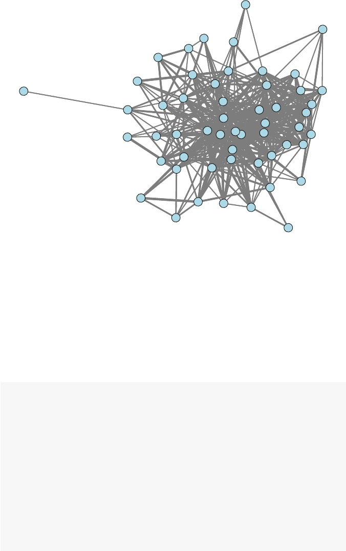
36 3 Network Data Management in R
Fig. 3.5 DHHS collaborations
original network and show only those ties where collaboration is coded 3 or higher.
To understand how edge filtering works, it is important to remember how valued ties
are stored in a network object. The ties themselves are stored as a binary indicator
in the network object, while the values of those ties are stored in an edge attribute.
We can see how this works for the DHHS Collaboration network. First, we examine
the network ties for the first six members of the network. Then we determine where
the collaboration values are stored, and then use that to view the tie values for the
same set of six actors.
as.sociomatrix(d)[1:6,1:6]
## ACF-1 ACF-2 AHRQ-1 AHRQ-2 AHRQ-3 AHRQ-4
## ACF-1 0 1 0 0 0 0
## ACF-2 1 0 0 0 0 0
## AHRQ-1 0 0 0 1 1 1
## AHRQ-2 0 0 1 0 1 1
## AHRQ-3 0 0 1 1 0 1
## AHRQ-4 0 0 1 1 1 0
list.edge.attributes(d)
## [1] "collab" "na"
as.sociomatrix(d,attrname="collab")[1:6,1:6]

3.4 Common Network Data Tasks 37
## ACF-1 ACF-2 AHRQ-1 AHRQ-2 AHRQ-3 AHRQ-4
## ACF-1 0 1 0 0 0 0
## ACF-2 1 0 0 0 0 0
## AHRQ-1 0 0 0 3 3 3
## AHRQ-2 0 0 3 0 3 2
## AHRQ-3 0 0 3 3 0 3
## AHRQ-4 0 0 3 2 3 0
The summary of the network object tells us that there are 447 ties in the DHHS
network. We can easily see the distribution of tie values.
table(d %e%"collab")
##
##1234
## 163 111 94 79
This indicates that of the 447 ties, 163 are informal sharing (1), 111 are informal
(2), 94 are formal on a single project (3), and the final 79 ties are between DHHS
members who have worked together formally on multiple projects (4). Now we can
filter the edges to only include formal collaboration ties. This takes three steps. First,
a valued sociomatrix is created that contains the tie values stored in the ‘collab’ edge
attribute. Then we filter out the ties that we want to ignore. In this case the ties that
are coded 1 and 2 are replaced with 0s. Then, we create a new network based on the
filtered sociomatrix. The key here is that a tie will be created anywhere a non-zero
value is found in d.val. Also, by using the ignore.eval and names.eval
options we store the retained edge values in an edge attribute called ‘collab.’
d.val <- as.sociomatrix(d,attrname="collab")
d.val[d.val <3]<- 0
d.filt <- as.network(d.val, directed=FALSE,
matrix.type="a",ignore.eval=FALSE,
names.eval="collab")
We can see that the new network has the same number of actors, but only 173 ties
(corresponding to the original numbers for the 3 and 4-levels of collab). Also, not
surprisingly, the density is now much lower.
summary(d.filt,print.adj=FALSE)
## Network attributes:
## vertices = 54
## directed = FALSE
## hyper = FALSE
## loops = FALSE
## multiple = FALSE
## bipartite = FALSE

38 3 Network Data Management in R
## total edges = 173
## missing edges = 0
## non-missing edges = 173
## density = 0.121
##
## Vertex attributes:
## vertex.names:
## character valued attribute
## 54 valid vertex names
##
## Edge attributes:
##
## collab:
## numeric valued attribute
## attribute summary:
## Min. 1st Qu. Median Mean 3rd Qu. Max.
## 3.00 3.00 3.00 3.46 4.00 4.00
gden(d.filt)
## [1] 0.121
Now when the network is plotted we can examine a smaller set of ties for impor-
tant structural information (Fig. 3.6).
op <- par(mar =rep(0,4))
gplot(d.filt,gmode="graph",displaylabels=TRUE,
vertex.col="lightblue",vertex.cex=1.3,
label.cex=0.4,label.pos=5,
displayisolates=FALSE)
par(op)
Note that the gplot() function itself has a limited ability to display only the
ties that exceed some lower threshold, using the thresh option. For example, this
command will display the same network as the previous code, without having to
go through the steps to create a new filtered network (results not shown here). Note
that for this to work a valued sociomatrix has to be passed to gplot, not an actual
network object.
op <- par(mar =rep(0,4))
d.val <- as.sociomatrix(d,attrname="collab")
gplot(d.val,gmode="graph",thresh=2,
vertex.col="lightblue",vertex.cex=1.3,
label.cex=0.4,label.pos=5,
displayisolates=FALSE)
par(op)
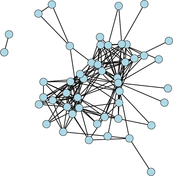
3.4 Common Network Data Tasks 39
ACF-2
AHRQ-1
AHRQ-2
AHRQ-3
AHRQ-4
CDC-1
CDC-2
CDC-3
CDC-4
CDC-5
CDC-6
CDC-7
CDC-8
CDC-9
CDC-10
CDC-11
CDC-12
CMS-1
FDA-1
FDA-2
HRSA-1
HRSA-2
HRSA-3
IHS-1
IHS-2
NIH-1
NIH-2
NIH-3
NIH-4
NIH-5
NIH-6
NIH-7
NIH-8
NIH-9
NIH-10
NIH-11
NIH-12
NIH-13
NIH-14
NIH-16
OGC-1
OGC-2
OS-1
OS-2 OS-3
OS-4
OS-5
SAMHSA-3
Fig. 3.6 DHHS formal collaborations
3.4.2 Transforming a Directed Network to a Non-directed Network
It is often the case that even though the raw data in a network analysis is made up
of directed ties, the analyst wishes to consider the data as non-directed. This could
happen for several reasons. First, although the network relationship is non-directed,
the data collection procedures may result in directed ties. For example, in a survey
of collaboration among organizational representatives, even though collaboration is
non-directed (if agency A is collaborating with agency B, then B is also collabo-
rating with A), the raw data matrices are not likely to be perfectly symmetric. That
is, in self-report data, there may be error in the data or pairs or respondents may
not agree with each other on collaboration status. Respondent A may believe that
agency A collaborates with agency B, but respondent B may not believe the two
agencies are collaborating. In any case, you end up with a directed network that you
wish to ‘fix’ by transforming it into a non-directed network.

40 3 Network Data Management in R
You may also wish to transform directed ties into non-directed ties for conceptual
reasons, and not simply to fix data disagreements. For example, in studying trust
relationships you collect data on directed perceptions of trust. Here a tie between
A and B indicates that A trusts B. This is directed, in the sense that just because
A trusts B, that does not mean that B trusts A in return. However, you may wish
to analyze this in a non-directed sense, where an edge exists between two actors if
there is any trust relationship between the pair. So whether A trusts B, B trusts A, or
even if there is a reciprocal trusting relationship between A and B, then you would
treat A and B as having a trust relationship where you are ignoring the directionality
of the trust.
For either of these reasons, R makes it easy to transform a directed network
into a non-directed network. To do this you can use the symmetrize() function.
The name of the function should remind you that when network data are stored in
a sociomatrix, if the data are symmetric around the diagonal that indicates that the
ties are non-directed.
net1mat <- symmetrize(net1,rule="weak")
net1mat
## [,1] [,2] [,3] [,4] [,5]
## [1,] 0 1100
## [2,] 1 0110
## [3,] 1 1001
## [4,] 0 1000
## [5,] 0 0100
net1symm <- network(net1mat,matrix.type="adjacency")
network.vertex.names(net1symm) <- c("A","B","C","D","E")
summary(net1symm)
## Network attributes:
## vertices = 5
## directed = TRUE
## hyper = FALSE
## loops = FALSE
## multiple = FALSE
## bipartite = FALSE
## total edges = 10
## missing edges = 0
## non-missing edges = 10
## density = 0.5
##
## Vertex attributes:
## vertex.names:

3.4 Common Network Data Tasks 41
## character valued attribute
## 5 valid vertex names
##
## No edge attributes
##
## Network adjacency matrix:
## ABCDE
##A01100
##B10110
##C11001
##D01000
##E00100
The symmetrize procedure is relatively straightforward, except it returns a soc-
iomatrix (or, optionally, an edgelist). So we need to then turn it into a network object,
as we have done previously. The ‘rule’ option gives you four different choices on
how to symmetrize the ties. The ‘weak’ rule corresponds to a Boolean ‘OR’ condi-
tion where a tie is created between nodes i and j if there is a directed tie either from
i to j or from j to i. There is also a ‘strong’ rule, corresponding to a Boolean ‘AND’
where a tie is created between i and j only if there are directed ties from i to j and
j to i. This creates a symmetric network where the only ties preserved are the fully
reciprocated ties.
Part II
Visualization

Chapter 4
Basic Network Plotting and Layout
Above all else, show the data. (Edward R. Tufte, The Visual
Display of Quantitative Information)
4.1 The Challenge of Network Visualization
As suggested in Chap. 2, producing and examining a network plot is often one of
the first steps in network analysis. The overall purpose of a network graphic (as with
any information graphic) is to highlight the important information contained in the
underlying data. However, there are innumerable ways to visually layout network
nodes and ties in two-dimensional space, as well as using graphical elements (e.g.,
node size, line color, figure legend, etc.) to communicate the story in the network
data. In the next three chapters we go over basic principles of effective network
graph design, and how to produce effective network visualizations in R.
An effective network graphic will convey the important information in a social
network, such as the overall structure, location of important actors in the network,
presence of distinctive subgroups, etc. At the same time, the graphic should do its
best to minimize irrelevant information. For example, tie length in a network graphic
is arbitrary in the sense that the length of a tie is not meaningful. An effective net-
work figure will be designed and laid out in a way that minimizes the chance that a
viewer will misinterpret the meaning of tie lengths.
The purpose of this chapter is to introduce basic plotting techniques for networks
in R, and discuss the various options for specifying the layout of the network on
the screen or page. The following example shows how interpretation of a network
graphic can be impeded or enhanced by its basic layout.
data(Moreno)
op <- par(mar =rep(0,4),mfrow=c(1,2))
plot(Moreno,mode="circle",vertex.cex=1.5)
plot(Moreno,mode="fruchtermanreingold",vertex.cex=1.5)
par(op)
At first glance it may appear that the figures are showing two quite different net-
works. In fact, they are two different visual representations of the same underlying
© Springer International Publishing Switzerland 2015
D.A. Luke, A User’s Guide to Network Analysis in R, Use R!,
DOI 10.1007/978-3-319-23883-8 4
45
46 4 Basic Network Plotting and Layout
Fig. 4.1 Same network, different layouts
social network, in this case the friendship ties among a 4th grade class. Despite rep-
resenting the same network data, the righthand figure is easier for us to interpret. In
particular, it is much easier to see that the network is made up of two separate com-
ponents, and that the large component has two fairly distinct cohesive subgroups.
That is, the important structural characteristics of the network are easier to deter-
mine with the second layout compared to the first.
Although it is possible to lay out a network in 3D-space, the vast majority of
network visualizations are two-dimensional. Nodes are represented by shapes, typ-
ically circles, and ties are represented by straight or sometimes curved lines. The
lines themselves can be tricky to interpret for somebody new to network visualiza-
tion. In particular, the length of the line has no real meaning. Consider the following
two graphs, which display the same simple network (Fig. 4.2). At a quick glance it
might appear that node D is further away from B and C in the second graph. But the
ties simply indicate which nodes are adjacent to one another, so the length of each
line does not communicate any substantive information.
A
B
C
D A
B
C
D
Fig. 4.2 Line length is arbitrary
However, as the Moreno 4th grade friendship network example illustrated
(Fig. 4.1), despite the arbitrary nature of some of the layout elements, the way a
network is depicted in a graphic can enhance or obscure other important structural
information.
4.2 The Aesthetics of Network Layouts 47
This is the fundamental challenge of network visualization: to reveal important
structural characteristics of the network without distortion or as Edward Tufte stated,
The minimum we should hope for with any display technology is that it should do
no harm (Tufte 1990).
4.2 The Aesthetics of Network Layouts
Although there are not in fact an infinite number of ways to display a network on
a screen, the number of possibilities might as well be. (For example, consider a
moderate sized network of 50 nodes, and a display grid of 10 by 10. In actuality,
the display grid would be much larger than this. The first node in the network could
be placed in any one of 100 positions, the 2nd node in 99 positions, and so on.
In this example, there are 3.1×1093 different possible network layouts.) Most of
the possibilities will produce ugly or confusing layouts, therefore there must be
some way to pick a layout that has a better than average chance of being visually
acceptable.
Fortunately, network and visualization scientists have studied what makes network
graph layouts easier to understand and interpret. What has emerged from this line of
work is a set of aesthetic principles that can be used to more effectively display net-
works. Network graphics are easier to understand if they follow as much as possible
the following five guidelines:
• Minimize edge crossings.
• Maximize the symmetry of the layout of nodes.
• Minimize the variability of the edge lengths.
• Maximize the angle between edges when they cross or join nodes.
• Minimize the total space used for the network display.
A large number of approaches have been developed for automatic layout of
network graphics. One general class of algorithms, called force-directed, has proven
to be a flexible and powerful approach to automatic network layouts. These algo-
rithms work iteratively to minimize the total energy in a network, where the en-
ergy can be defined in a number of ways. A popular approach is to have connected
nodes have a spring-like attractive force, while simultaneously assigning repulsive
forces to all pairs of nodes. The springs in this algorithm act to pull connected nodes
closer to one another, while the repulsive forces push unconnected nodes away from
each other. The resulting network system will move around and oscillate for a while
before settling into a steady state that tends to minimize the energy in the network
system. This describes how the algorithm works, but the remarkable feature is that
the resulting network graph tends to produce displays that are aesthetically pleasing,
in the sense described above (Fruchterman and Reingold 1991).
To see the positive results of using one of these algorithms, consider the compar-
ison in Fig. 4.3. On the left-hand side, the Moreno network is displayed randomly.
On the right-hand side we are using the Fruchterman-Reingold algorithm for the net-
work display. Fruchterman and Reingold introduced one of the first force-directed
48 4 Basic Network Plotting and Layout
network display algorithms, and it is still very widely used. In fact, it is the default
algorithm used by the statnet network plotting functions. On the right-hand side
the nodes are displayed more symmetrically, there are relatively fewer edge cross-
ings, and the tie lengths are more uniform. All of this makes it easier to interpret the
structural information contained in the network.
op <- par(mar =c(0,0,4,0),mfrow=c(1,2))
gplot(Moreno,gmode="graph",mode="random",
vertex.cex=1.5,main="Random layout")
gplot(Moreno,gmode="graph",mode="fruchtermanreingold",
vertex.cex=1.5,main="Fruchterman-Reingold")
par(op)
Random layout Fruchterman-Reingold
Fig. 4.3 Moreno network-random vs. Fruchterman-Reingold layouts
As stated above, a force-directed algorithm works by iteratively adjusting the
overall network layout until some measure of overall network energy is minimized.
The details of this are usually not of interest, but to see how this works in practice
consider Fig. 4.4, which displays the Bali terrorist network. Starting from a circle
layout, it shows how the Fruchterman-Reingold layout algorithm works through
successive iterations, from 0 (the starting circle) to 50.
The Fruchterman-Reingold algorithm, along with other force-directed approaches,
are iterative and non-deterministic. That means that each time you run the plotting
algorithm you will not get the exact same layout. However, you will get a layout
that tends to be symmetrical, minimize edge crossings, etc.
4.3 Basic Plotting Algorithms and Methods 49
Iteration = 0 Iteration = 1 Iteration = 5
Iteration = 10 Iteration = 25 Iteration = 50
Fig. 4.4 Iterative Fruchterman-Reingold algorithm
4.3 Basic Plotting Algorithms and Methods
Network visualization in statnet is handled by two closely related functions,
plot and gplot. The latter has more layout options, so it may be more gener-
ally useful. To use a different layout algorithm, it is as simple as specifying the
appropriate layout option. Figure 4.5 shows six of the layout options for the gplot
function.
op <- par(mar=c(0,0,4,0),mfrow=c(2,3))
gplot(Bali,gmode="graph",edge.col="grey75",
vertex.cex=1.5,mode='circle',main="circle")
gplot(Bali,gmode="graph",edge.col="grey75",
vertex.cex=1.5,mode='eigen',main="eigen")
gplot(Bali,gmode="graph",edge.col="grey75",
vertex.cex=1.5,mode='random',main="random")
gplot(Bali,gmode="graph",edge.col="grey75",
vertex.cex=1.5,mode='spring',main="spring")
gplot(Bali,gmode="graph",edge.col="grey75",
vertex.cex=1.5,mode='fruchtermanreingold',
50 4 Basic Network Plotting and Layout
main='fruchtermanreingold')
gplot(Bali,gmode="graph",edge.col="grey75",
vertex.cex=1.5,mode='kamadakawai',
main='kamadakawai')
par(op)
circle eigen random
spring fruchtermanreingold kamadakawai
Fig. 4.5 Network layout options
4.3.1 Finer Control Over Network Layout
The layout options provided in statnet (and igraph, see below) work algo-
rithmically or heuristically, usually with some randomness. So, even with the same
layout option, a different graphic layout will be produced each time the network is
plotted. Fortunately, R provides a way to have exact control over the layout coor-
dinates. This allows for exact positioning, or saving the layout coordinates after a
particular network is plotted.
The coord option in the plot function is used for this. This option expects a
matrix with two columns. Each row corresponds to one node, the first column gives
the X coordinate, and the second column gives the Y coordinate. Also, the results

4.3 Basic Plotting Algorithms and Methods 51
of a plotting function can be saved to an object, which will contain the coordinates
of the produced plot. This is demonstrated in the next example. Here, we produce
an initial plot of the Bali network, saving the coordinates. We then stretch out the
layout of the graph by multiplying the Y coordinates by a constant. Both plots are
shown in the figure, along with axes to make it easier to see how the coordinates
have changed (Fig. 4.6). There are many other ways to use specific coordinates, but
the main use is to preserve a particular layout for future production and examination.
mycoords1 <- gplot(Bali,gmode="graph",
vertex.cex=1.5)
mycoords2 <- mycoords1
mycoords2[,2]<- mycoords1[,2]*1.5
mycoords1
## x y
## [1,] -6.299 11.84
## [2,] -3.887 13.80
## [3,] -8.355 9.89
## [4,] -4.672 10.28
## [5,] -8.537 11.65
## [6,] -5.932 12.63
## [7,] -2.420 12.96
## [8,] -7.694 10.09
## [9,] -8.334 10.86
## [10,] -0.935 8.08
## [11,] -3.015 6.98
## [12,] -1.863 7.10
## [13,] -1.094 9.30
## [14,] -2.061 8.51
## [15,] -7.715 12.83
## [16,] -10.453 11.25
## [17,] -8.357 12.43
mycoords2
## x y
## [1,] -6.299 17.8
## [2,] -3.887 20.7
## [3,] -8.355 14.8
## [4,] -4.672 15.4
## [5,] -8.537 17.5
## [6,] -5.932 18.9
## [7,] -2.420 19.4
## [8,] -7.694 15.1
## [9,] -8.334 16.3
## [10,] -0.935 12.1

52 4 Basic Network Plotting and Layout
## [11,] -3.015 10.5
## [12,] -1.863 10.7
## [13,] -1.094 14.0
## [14,] -2.061 12.8
## [15,] -7.715 19.2
## [16,] -10.453 16.9
## [17,] -8.357 18.6
op <- par(mar=c(4,3,4,3),mfrow=c(1,2))
gplot(Bali,gmode="graph",coord=mycoords1,
vertex.cex=1.5,suppress.axes =FALSE,
ylim=c(min(mycoords2[,2])-1,max(mycoords2[,2])+1),
main="Original coordinates")
gplot(Bali,gmode="graph",coord=mycoords2,
vertex.cex=1.5,suppress.axes =FALSE,
ylim=c(min(mycoords2[,2])-1,max(mycoords2[,2])+1),
main="Modified coordinates")
par(op)
4.3.2 Network Graph Layouts Using
igraph
The igraph package provides the user with a similar set of options for controlling
the layouts of network graphics. The layout option is used to specify an existing
layout function or refer to a set of vertex coordinates. See ?igraph.plotting
for more information on plotting and layout options in igraph (Fig. 4.7).
detach(package:statnet)
library(igraph)
library(intergraph)
iBali <- asIgraph(Bali)
op <- par(mar=c(0,0,3,0),mfrow=c(1,3))
plot(iBali,layout=layout_in_circle,
main="Circle")
plot(iBali,layout=layout_randomly,
main="Random")
plot(iBali,layout=layout_with_kk,
main="Kamada-Kawai")
par(op)
4.3 Basic Plotting Algorithms and Methods 53
Original coordinates
-12 -8-6-4-20
5 1015202530
-12 -8-6-4-20
5 1015202530
Modified coordinates
Fig. 4.6 Network layouts with modified coordinates
Circle
1
2
3
4
5
6
7
8
9
10
11
12
13 14 15
16
17
Random
1
2
3
4
5
6
7
8
9
10
11
12
13 14
15
16
17
Kamada-Kawai
12
34
5
6
7
8
9
10
11
12
13
14
15
16
17
Fig. 4.7 Network layout options with igraph

Chapter 5
Effective Network Graphic Design
As with any graphic, networks are used in order to discover
pertinent groups or to inform others of the groups and structures
discovered. It is a good means of displaying structures.
However, it ceases to be a means of discovery when the elements
are numerous. The figure rapidly becomes complex, illegible
and untransformable. (Jacques Bertin)
5.1 Basic Principles
Achieving effective network graphic design is not that different from any other type
of information graphic. As Edward Tufte pointed out in his seminal The Visual Dis-
play of Quantitative Information, “Graphical excellence is that which gives to the
viewer the greatest number of ideas in the shortest time with the least ink in the
smallest space.” Network graphics actually start out with an important advantage in
that they typically have a high information/ink ratio.
The goal for any network graphic design should be to produce a figure that reveals
the important or interesting information that is contained in the network data. To
do this, the analyst must make decisions about every graphical element that can
appear in the figure. R, and the plotting functions contained in the statnet and
igraph packages, give the analyst almost complete programmatic control over the
appearance of the network graphic. The purpose of this chapter is to walk through
many of the most useful design elements in network graphics, and discuss how to
use them and why they should be used in certain ways.
5.2 Design Elements
Like any other type of information graphic, network visualizations are made up
of a large number of distinct visual elements. These individual elements include
things that are distinctive to network graphics, such as nodes and ties, as well as
other elements common to most graphics, such as titles, legends, etc. The plotting
functions in statnet and igraph provide a great deal of programmatic control
to the user.
Although a simple call to a plotting function is enough to produce a default net-
work graphic, it is almost always the case that you will need to take time to set
appropriate function options and develop some additional Rcode to produce an
© Springer International Publishing Switzerland 2015
D.A. Luke, A User’s Guide to Network Analysis in R, Use R!,
DOI 10.1007/978-3-319-23883-8 5
55

56 5 Effective Network Graphic Design
effective graphic. Some design decisions will be made on aesthetic grounds, while
many others will be based on the most important pattern or story that you wish to
convey with the graphic and that is supported by the underlying network data.
The following sections present a quick tour of the most commonly used indi-
vidual graphing elements for network visualizations. They will each be covered on
their own in turn.
5.2.1 Node Color
By default, statnet produces a network graphic with red circles as nodes. To
designate a different color, the vertex.col option is used in the gplot function.
(The gmode option is also used here to tell statnet not to handle Bali as a
directed graph.) So, for example, it is a simple matter to produce a plot with
attractive light blue nodes (Fig. 5.1).
data(Bali)
gplot(Bali,vertex.col="slateblue2",gmode="graph")
In general, all of the basic color-handling options of Rare available for plotting
networks. This opens up a lot of power and flexibility for graphic design, but to use
color effectively will require some homework. In particular, it will be useful to read
more in-depth treatments of color use in R(e.g., Murrell 2005).
As the above example suggests, a color can be designated by its color name.
To see all of the 657 possible color names recognized by R,usethecolors()
command. In addition to specifying the name, colors can be selected using Red-
Green-Blue (RGB) triplets of intensities. Alternatively, the RGB specification can
also be provided using a hexadecimal string of the form ‘#RRGGBB’, where each
of the RR, GG, and BB parts of the string is a hexadecimal number that provides
the red, green or blue intensity ranging from 00 to FF.
The following code will produce the same network graphic with the same light
blue nodes (figure not shown), showing how you can obtain colors using the rgb
and hexadecimal approaches. To get the appropriate rgb values for a particular color
name, you can use the col2rgb() function. The hexadecimal codes were obtained
at http://www.javascripter.net/faq/rgbtohex.htm.
col2rgb('slateblue2')
gplot(Bali,vertex.col=rgb(122,103,238,
maxColorValue=255),gmode="graph")
gplot(Bali,vertex.col="#7A67EE",gmode="graph")
One less common color feature in Rcan come in handy for network diagrams,
especially with large networks where the nodes overlap in the graphic. Normally,
colors are fully opaque, so overlapping nodes in a graphic will lead to large color
‘blobs’ where it is hard to distinguish the nodes. However, it is possible to make
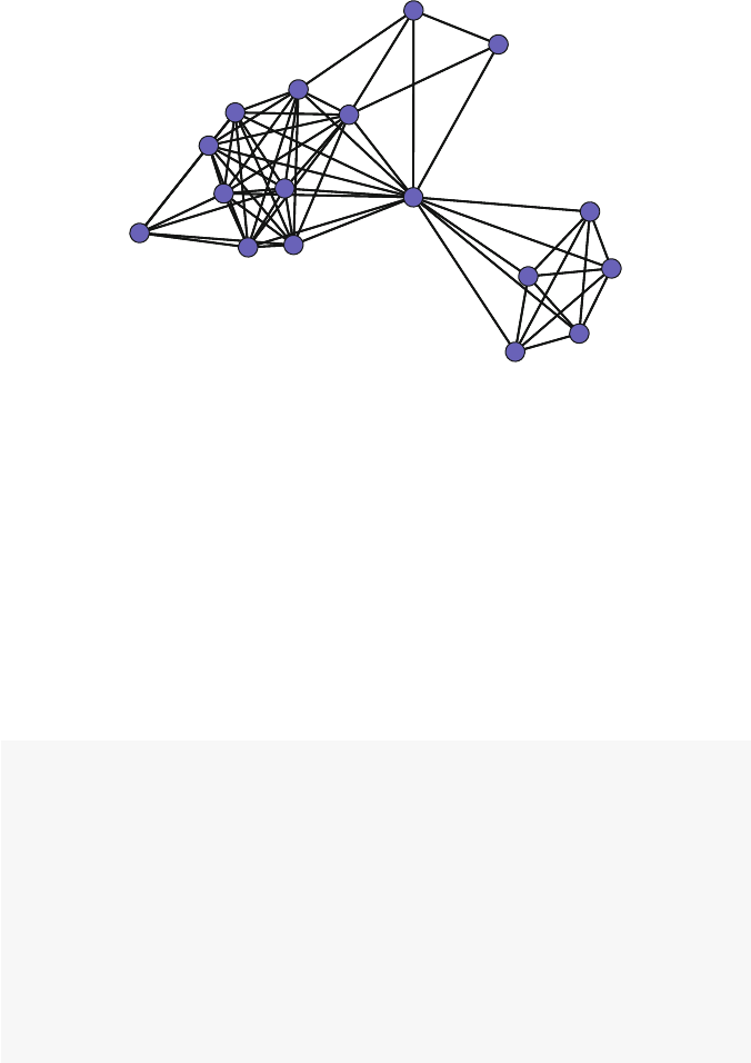
5.2 Design Elements 57
Fig. 5.1 Bali network with light blue nodes
use of partially transparent colors, using a built-in alpha transparency channel. The
rgb() function can be used to specify the amount of transparency, from 0 (fully
transparent) to 1 (fully opaque). See ?rgb for more details.
Figure 5.2 shows the difference when using the alpha transparency color channel.
Both graphics show the same random network of 300 nodes. (The layouts are differ-
ent because each is using the Fruchterman-Reingold force-directed algorithm.) The
figure on the left is using a fully opaque dark blue color. The figure on the right is
still using dark blue, but with an alpha transparency channel of approximately 30 %.
The overlapping nodes are much easier to see when transparent colors are used.
Note that some graphics devices in Rmay not support transparent colors.
ndum <- rgraph(300,tprob=0.025,mode="graph")
op <- par(mar =c(0,0,2,0),mfrow=c(1,2))
gplot(ndum,gmode="graph",vertex.cex=2,
vertex.col=rgb(0,0,139,maxColorValue=255),
edge.col="grey80",edge.lwd=0.5,
main="Fully opaque")
gplot(ndum,gmode="graph",vertex.cex=2,
vertex.col=rgb(0,0,139,alpha=80,
maxColorValue=255),
edge.col="grey80",edge.lwd=0.5,
main="Partly transparent")
par(op)
In these previous examples, every node has the same color. A more important
use of color is to communicate some characteristic of the node or network by having
different nodes have different colors. Specifically, information stored in a categorical
node attribute can often be communicated through judicious node color choices.
58 5 Effective Network Graphic Design
Fully opaque Partly transparent
Fig. 5.2 Alpha transparency channel example
For example, the Bali terrorist network has the role vertex attribute which
stores the categorical description of the role that each member played in the net-
work. CT means a member of the command team, BM is a bomb maker, etc. (See
?Bali for more information.) Node colors can be used to effectively distinguish
the network member roles. Since this information is already stored in a vertex att-
ribute, statnet can use this to automatically pick node colors. (This is only true
for plot(), not gplot().)
rolelab <- get.vertex.attribute(Bali,"role")
op <- par(mar=c(0,0,0,0))
plot(Bali,usearrows=FALSE,vertex.cex=1.5,label=rolelab,
displaylabels=T,vertex.col="role")
par(op)
Figure 5.3 displays the Bali network with nodes colored according to the role
each member played in the network. (The node labels are also printed out to
facilitate interpretation. Node labeling will be discussed in Sect. 5.2.4.) The net-
work is much more interpretable by using color coding in this way. For example,
we can more easily understand the subgroup structure by noting that the greater
density between the members of Team Lima (TL, cyan), as well as the bombmakers
(BM, black).
However, by simply using the name of an existing vertex attribute, statnet
picks node colors from the existing default color palette in R. Viewing this palette,
we can see that “BM” is assigned to the color black because “BM” comes first
alphabetically in the role attribute string, and black is the first entry in the color
palette. “CT” comes second, so it is assigned red which is the 2nd entry in the
palette, an so on.
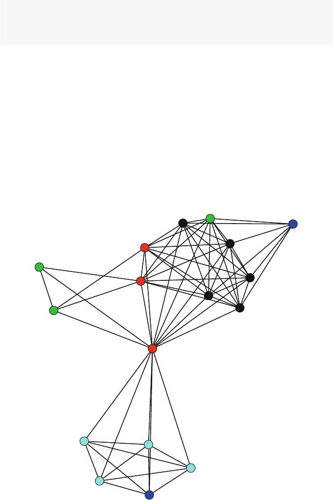
5.2 Design Elements 59
palette()
## [1] "black" "red" "green3" "blue"
## [5] "cyan" "magenta" "yellow" "gray"
Using the default palette has a number of disadvantages. First, it is limited to
eight colors. (Rwill cycle through the set of eight colors if there are more than eight
types of nodes to color.) Second, the default palette starts with black which is often
not a good color choice to include with other colors in a network graphic. More
generally, the default colors do not represent an aesthetically pleasing or useful set
of colors for displaying categorical classifications.
A more flexible, and usually aesthetically more satisfying approach is to set up
your own color palette and then index into it for color selection. The RColor
Brewer package provides a number of predesigned color palettes that are very
useful when using color to distinguish between a relatively small set of categories.
For more information, see ?RColorBrewer. More details on the ColorBrewer
CT
OA
OA
CT
BM
CT
OA
BM
BM
SB
TL
TL
TL
TL
BM
SB
BM
Fig. 5.3 Bali network colored by role

60 5 Effective Network Graphic Design
system are available at http://www.colorbrewer.org. (There are many
other color and palette picking options available, for example see the interactive
palette chooser at http://paletton.com.)
library(RColorBrewer)
display.brewer.pal(5,"Dark2")
In the following code, a user-defined palette is created by selecting five colors
from a larger palette called Dark2 provided by RColorBrewer. Once the palette
has been defined, it can be used in the network plotting call. This approach produces
more pleasing sets of colors, and is much more flexible than relying on the default
color palette (Fig. 5.4).
Dark2 (qualitative)
Fig. 5.4 A set of five colors chosen from an RColorBrewer palette
Note that we convert the role vertex attribute character vector to a factor so
that the indexing will work. This means that if you have a numeric vector stored as
a vertex attribute that you do not have to turn it into a factor. In other words, the
indexing works with factors or numeric vectors, but not character vectors (Fig. 5.5).
my_pal <- brewer.pal(5,"Dark2")
rolecat <- as.factor(get.vertex.attribute(Bali,"role"))
plot(Bali,vertex.cex=1.5,label=rolelab,
displaylabels=T,vertex.col=my_pal[rolecat])
5.2.2 Node Shape
In addition to using color to distinguish between different types of nodes, statnet
can be directed to use different shapes for the nodes. This is mainly useful when
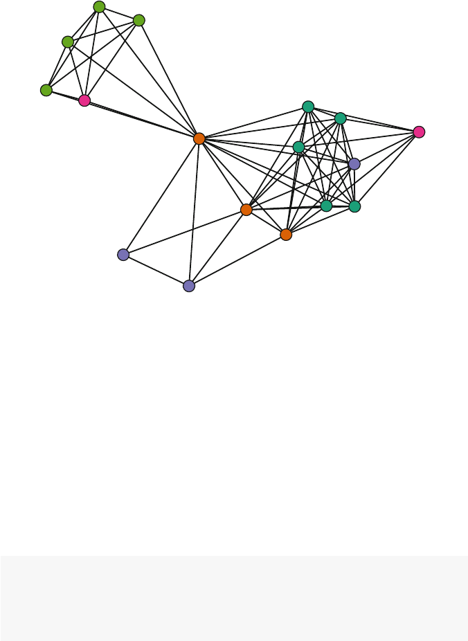
5.2 Design Elements 61
CT
OA
OA
CT
BM
CT
OA
BM
BM
SB
TL
TL
TL
TL
BM
SB
BM
Fig. 5.5 Bali network with better colors
there is a small number of node types. It is also particularly useful for situations
where you will not be able to use color to distinguish nodes (or help viewers who
may be color-blind).
Unfortunately, statnet has only a limited ability to distinguish nodes by
shapes, by designating the number of sides used to plot the node polygon (normally,
the number of sides is 50, which produces a circle). If the number of sides is 3 you
get a triangle, 4 a square, and so on. This is only useful for a very small number of
node types (Fig. 5.6).
If you have a particular need to use node shapes in a network graphic, igraph is
much more flexible in this regard. See Sect. 9.2.3 for an igraph plotting example
with different node shapes.
op <- par(mar=c(0,0,0,0))
sidenum <- 3:7
plot(Bali,usearrows=FALSE,vertex.cex=4,
displaylabels=F,vertex.sides=sidenum[rolecat])
par(op)
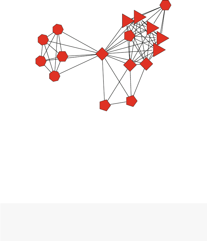
62 5 Effective Network Graphic Design
Fig. 5.6 Bali network with different node shapes
5.2.3 Node Size
Network node sizes are controlled by the vertex.cex optioninthestatnet
plot and gplot functions (similar to how sizes of graphic elements are controlled
in the base Rgraphics system). The overall sizes of the nodes should be set so that
the nodes are large enough to be distinguishable, but small enough that they do
not extensively overlap. In the following ‘Goldilocks’ example, we can see how
vertex.cex can be adjusted to find an effective node size (Fig. 5.7).
op <- par(mar =c(0,0,2,0),mfrow=c(1,3))
plot(Bali,vertex.cex=0.5,main="Too small")
plot(Bali,vertex.cex=2,main="Just right")
plot(Bali,vertex.cex=6,main="Too large")
par(op)
Rather than setting the same overall size for every node, it is often useful to use
the node size in a network graphic to communicate some important quantitative
characteristic. For example, nodes vary in their positions in the overall network.
Some nodes are very central, while others are more peripheral. Chapter 7discusses
node prominence and centrality in more detail, but for now we will simply calculate
some node characteristics such that larger numbers indicate more central nodes.
To set this up, we will calculate three different measures of node centrality. Each
of these lines of code produces a vector of centrality measures for each node, and
larger numbers indicate greater centrality.
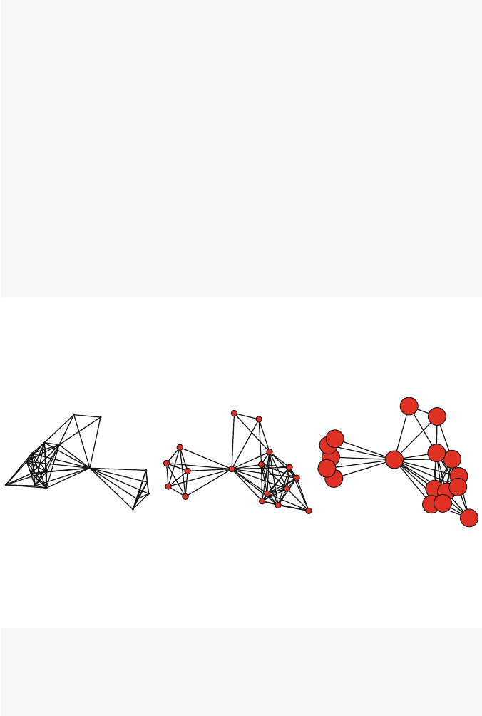
5.2 Design Elements 63
deg <- degree(Bali,gmode="graph")
deg
##[1]94915910399555559
## [16] 6 9
cls <- closeness(Bali,gmode="graph")
cls
## [1] 0.696 0.552 0.696 0.941 0.696 0.727 0.533
## [8] 0.696 0.696 0.571 0.571 0.571 0.571 0.571
## [15] 0.696 0.485 0.696
bet <- betweenness(Bali,gmode="graph")
bet
## [1] 2.333 0.333 1.667 61.167 1.667 6.167
## [7] 0.000 1.667 1.667 0.000 0.000 0.000
## [13] 0.000 0.000 1.667 0.000 1.667
Once you have this node-level vector of quantitative information, it can be used
to set the relative sizes of the nodes. This is done by using the same vertex.cex
Too small Just right Too large
Fig. 5.7 Adjusting overall node size
option as before, but instead of assigning a single number we assign the vector of
node information.
op <- par(mar =c(0,0,2,1),mfrow=c(1,2))
plot(Bali,usearrows=T,vertex.cex=deg,main="Raw")
plot(Bali,usearrows=FALSE,vertex.cex=log(deg),
main="Adjusted")
par(op)
However, as we can see by comparing the two panels in Fig. 5.8, the raw numbers
in the deg vector produce nodes that are much too large. They need to be adjusted,
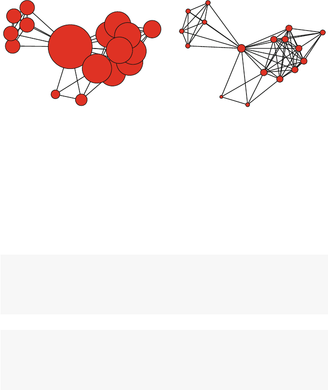
64 5 Effective Network Graphic Design
and in this case we get usable sizes by taking the log of the deg values. This results
in node sizes where we can more easily see the nodes with higher degree relative to
nodes with lower degree.
Raw Adjusted
Fig. 5.8 Adjusting relative node size – Example 1
The next two examples show other types of adjustments that might be necessary
when setting relative node sizes. Using cls (closeness) we have the opposite prob-
lem from the previous example, where the nodes sizes start out too small. So an
appropriate adjustment is to multiply the original values (Fig. 5.9). The bet vector
(betweenness) provides a more complex example. First, the raw vector sizes vary
across several orders of magnitude (with one node with a size of 122.3). In addition,
some of the nodes have 0 for their bet values. These zeros would result in the nodes
being plotted with 0 size, so we need to handle this by adding 1 to the entire vector
before taking the square root (Fig. 5.10).
op <- par(mar =c(0,0,2,1),mfrow=c(1,2))
plot(Bali,usearrows=T,vertex.cex=cls,main="Raw")
plot(Bali,usearrows=FALSE,vertex.cex=4*cls,
main="Adjusted")
par(op)
op <- par(mar =c(0,0,2,1),mfrow=c(1,2))
plot(Bali,usearrows=T,vertex.cex=bet,main="Raw")
plot(Bali,usearrows=FALSE,vertex.cex=sqrt(bet+1),
main="Adjusted")
par(op)
The adjustments for relative node sizes can be tedious, although R does give you
complete control for how to adjust the sizes. The following function can be used to
save some time when figuring out the best node sizes. The function rescale()
takes a vector of node characteristics (actually can be any numeric vector), and
rescales the values to fit between the low and high values.
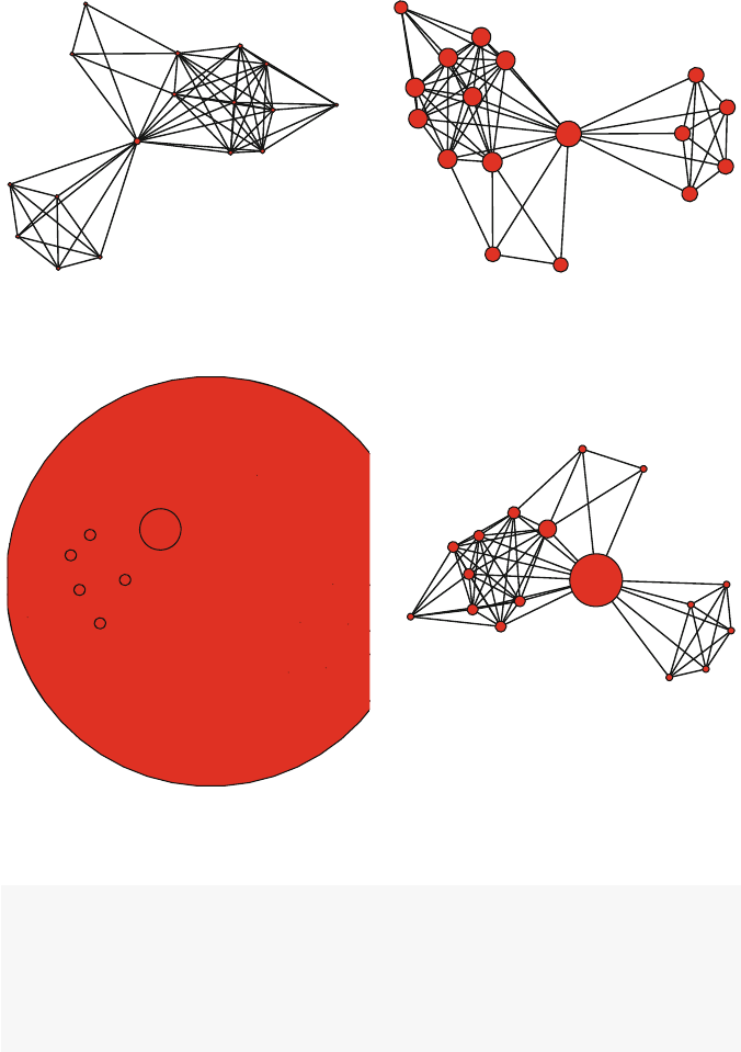
5.2 Design Elements 65
Raw Adjusted
Fig. 5.9 Adjusting relative node size – Example 2
Raw Adjusted
Fig. 5.10 Adjusting relative node size – Example 3
rescale <- function(nchar,low,high){
min_d <- min(nchar)
max_d <- max(nchar)
rscl <- ((high-low)*(nchar-min_d))/(max_d-min_d)+low
rscl
}
The next plot shows how the function works and rescales the raw degree values
for the Bali network to set the node sizes to vary from one to six (Fig. 5.11).
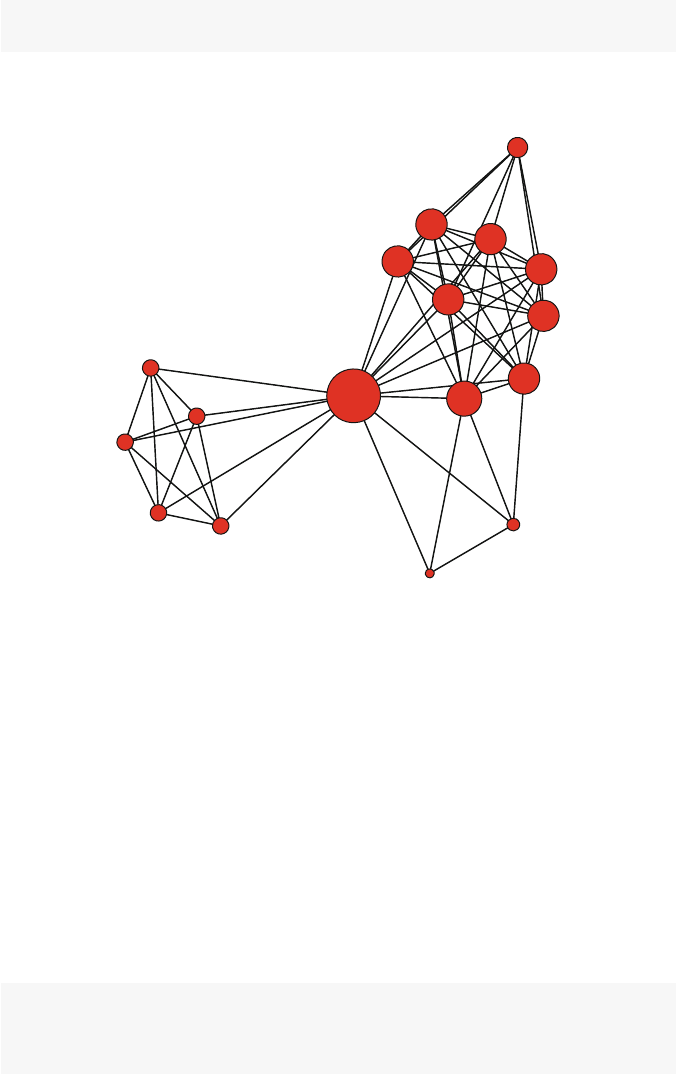
66 5 Effective Network Graphic Design
plot(Bali,vertex.cex=rescale(deg,1,6),
main="Adjusted node sizes with rescale function.")
Adjusted node sizes with rescale function.
Fig. 5.11 Rescaling the node size based on degree
5.2.4 Node Label
A network graphic is often more interesting and easier to interpret if nodes are
labelled so that the audience can see who or what makes up the network. This is
particularly helpful for smaller networks; if networks get too large then the labels
themselves may get in the way of the network information.
If a network object in statnet contains the special vertex attribute
vertex.names, then this can be used to automatically display node labels when
plotting. Other characteristics of the node labels can be controlled such as font size,
color, and distance from node (Fig. 5.12).
get.vertex.attribute(Bali,"vertex.names")
## [1] "Muklas" "Amrozi" "Imron" "Samudra"
## [5] "Dulmatin" "Idris" "Mubarok" "Husin"
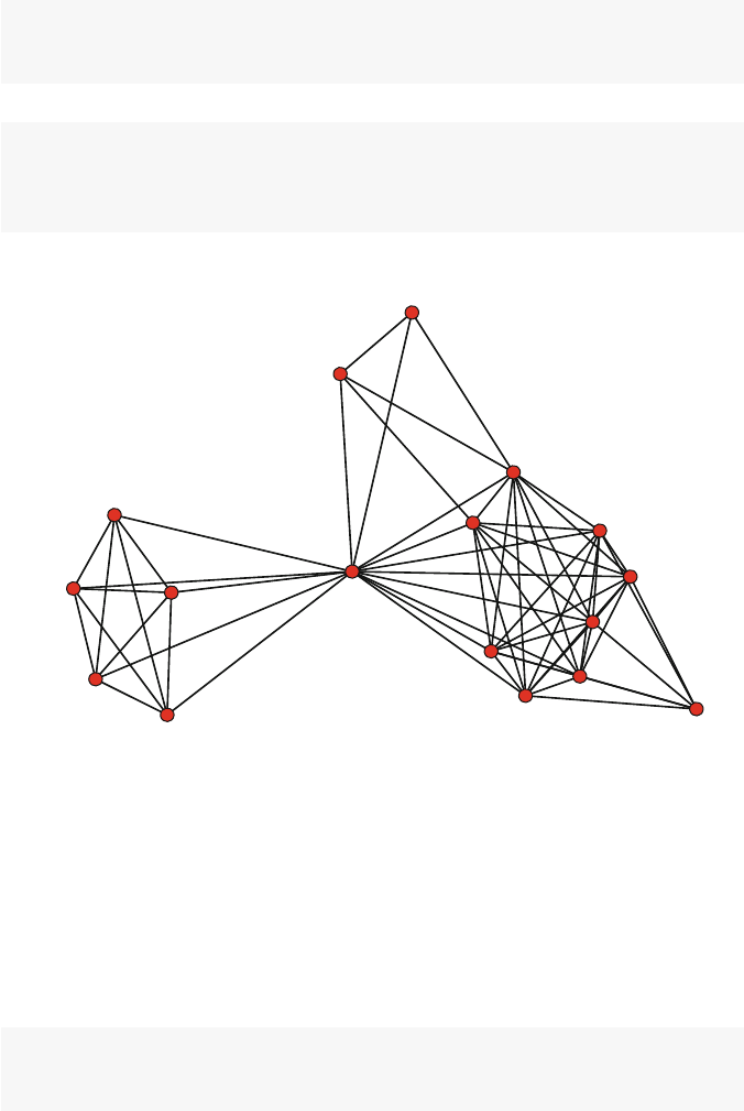
5.2 Design Elements 67
## [9] "Ghoni" "Arnasan" "Rauf" "Octavia"
## [13] "Hidayat" "Junaedi" "Patek" "Feri"
## [17] "Sarijo"
op <- par(mar =c(0,0,0,0))
plot(Bali,displaylabels=TRUE,label.cex=0.8,
pad=0.4,label.col="darkblue")
par(op)
Muklas
Amrozi
Imron
Samudra
Dulmatin
Idris
Mubarok
Husin
Ghoni
Arnasan
Rauf
Octavia
Hidayat
Junaedi
Patek Feri
Sarijo
Fig. 5.12 Bali network with labelled nodes.
The automatic labels based on information stored in the vertex.names
attribute may not be the most important or useful information. For example, in the
case of the Bali network the actual names of the terrorists are not that interesting to
most viewers. Fortunately, you can use other text information to label the nodes. We
saw an example of this earlier in Fig. 5.3. In this case we are using the text stored
in the role vertex attribute to label the nodes. The key here is to use the label
option to specify what text vector to use for the labels (Fig. 5.13).
rolelab <- get.vertex.attribute(Bali,"role")
plot(Bali,usearrows=FALSE,label=rolelab,
displaylabels=T,label.col="darkblue")
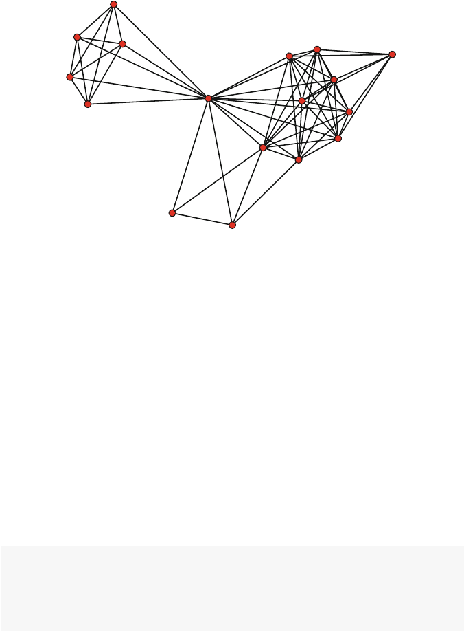
68 5 Effective Network Graphic Design
CT
OA
OA
CT
BM
CT
OA
BM
BM
SB
TL
TL
TL
TL
BM
SB
BM
Fig. 5.13 Bali network with role labels
5.2.5 Edge Width
If your network data include valued ties, or in general any quantitative information
that can be related to ties between nodes, then you can communicate that informa-
tion visually by altering the width of the displayed ties in a network graphic. For
example, the strength of friendship ties might be known, or the amount of money
that flows between organizations in a directed network might be measured. In these
cases, thicker ties can denote greater strength or greater flow (Fig. 5.14).
The Bali network includes a tie attribute called IC, which is a simple five-level
ordinal scale that was used to measure the amount of interaction between members
of the network. This attribute can be used to set the width of the ties in the network
visualization. In the example below the IC values are extracted from the stored edge
attribute, this allows us to transform the vector to better distinguish among the five
IC levels (by multiplying the vector by 1.5).
op <- par(mar =c(0,0,0,0))
IClevel <- Bali %e% "IC"
plot(Bali,vertex.cex=1.5,
edge.lwd=1.5*IClevel)
par(op)
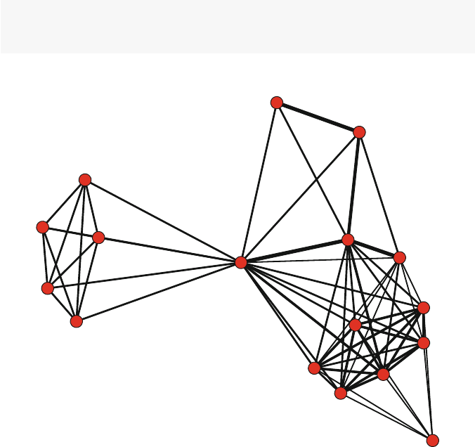
5.2 Design Elements 69
5.2.6 Edge Color
While edge width can be set to communicate quantitative information about network
ties, the color of the edge can be set to communicate qualitative information about
the tie, similar to how node colors can set. For example, you could use different
colors of line graphics to distinguish between positive and negative ties in a social
network (Fig. 5.15).
The Bali network does not contain categorical or qualitative information stored in
an edge attribute, so here we create a random categorical vector to demonstrate how
to use different edge colors in a network graphic. For this example, we set up a color
palette that can be used to index the correct color choice, based on the categorical
edge vector. In this case blue will be used for edge type #1, red for edge type #2,
and green for edge type #3. This might reflect neutral ties (blue), negative ties (red),
and positive ties (green). (Also see Fig. 7.8 in Chap. 7for a more realistic example
of using different line colors.)
n_edge <- network.edgecount(Bali)
edge_cat <- sample(1:3,n_edge,replace=T)
linecol_pal <- c("blue","red","green")
Fig. 5.14 Bali network with edge widths indicating amount of interaction
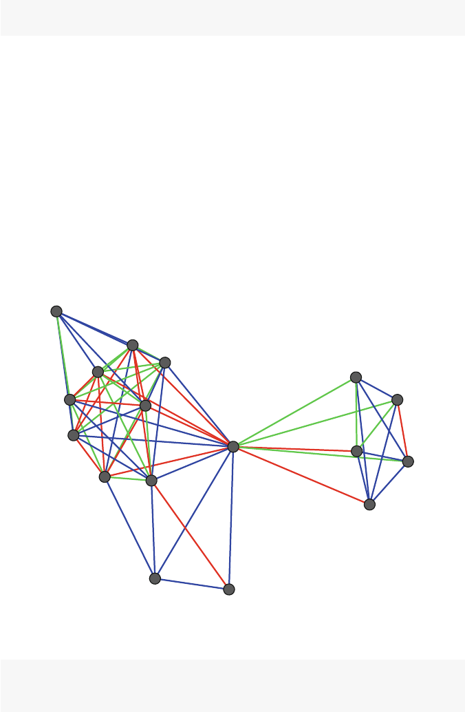
70 5 Effective Network Graphic Design
plot(Bali,vertex.cex=1.5,vertex.col="grey25",
edge.col=linecol_pal[edge_cat],edge.lwd=2)
5.2.7 Edge Type
While edge width can be set to communicate quantitative information about network
ties, the type of the edge can be set to communicate qualitative information about
the ties. For example, you could use different types of line graphics to distinguish
between positive and negative ties in a social network.
The Bali network does not contain categorical or qualitative information stored
in an edge attribute, so here we create a random categorical vector to demonstrate
how to use different edge types in a network graphic. Here three different line types
are used (2 = dashed; 3 = dotted; 4 = dotdash). Also, the different line types do not
show up clearly using plot(),sogplot() is used here (Fig. 5.16).
Fig. 5.15 Bali network with different edge colors
n_edge <- network.edgecount(Bali)
edge_cat <- sample(1:3,n_edge,replace=T)
line_pal <- c(2,3,4)
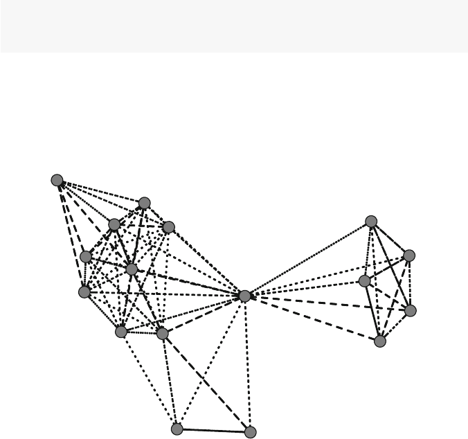
5.2 Design Elements 71
gplot(Bali,vertex.cex=0.8,gmode="graph",
vertex.col="gray50",edge.lwd=1.5,
edge.lty=line_pal[edge_cat])
Although this works as intended, the resulting graphic is not very attractive and
(in my mind) is hard to interpret. Different line types should be used sparingly, and
probably only for very small networks with only two different line types. Most pub-
lished network graphics stick to color and maybe line width to distinguish among
different types of network ties.
Fig. 5.16 Bali network with different edge types
5.2.8 Legends
The examples above show how network graphic elements such as node color, node
shape, node size, edge type, edge width can be used to communicate important
characteristics of the network. As with other types of information graphics, it is
often useful to provide a legend so that the meaning of this information is clear to
the user.
The basic plotting functions contained in statnet do not have built-in func-
tionality for providing a network graphic legend. Fortunately, it is easy to use the
legend() function provided by basic Rto add a legend to a network graphic. In
the example below we replicate the network graphic from Fig. 5.5 but add a leg-
end to provide the node color key. We also scale the node sizes to reflect node
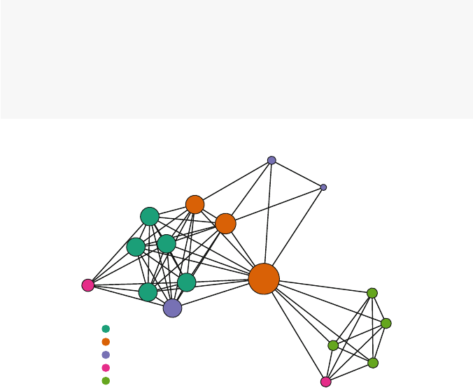
72 5 Effective Network Graphic Design
prominence based on degree. See ?legend for more details on how to use legends.
Figure 5.17, in fact, serves as a nice example of a carefully designed network graphic
that could be used as a final product. It uses node size, node color, and a legend to
efficiently and clearly communicate the most important information contained in
the Bali network.
my_pal <- brewer.pal(5,"Dark2")
rolecat <- as.factor(get.vertex.attribute(Bali,"role"))
plot(Bali,vertex.cex=rescale(deg,1,5),
vertex.col=my_pal[rolecat])
legend("bottomleft",legend=c("BM","CT","OA","SB","TL"),
col=my_pal,pch=19,pt.cex=1.5,bty="n",
title="Terrorist Role")
Terrorist Role
BM
CT
OA
SB
TL
Fig. 5.17 Bali network with legend

Chapter 6
Advanced Network Graphics
One eye sees, the other feels. (Paul Klee)
As the previous two chapters demonstrate, both statnet and igraph have
sophisticated plotting capabilities that can produce a very wide variety of net-
work graphics. However, these plotting functions cannot meet all of the analytic
or presentation needs. In particular, network scientists may wish to produce more
specialized network graphics. Also, while statnet and igraph excel at pro-
ducing high-quality publication ready network graphics, these graphics are static.
Fortunately, developers have started exploring how to take network graphics and
deliver them to web-based platforms where users can interact with the diagrams.
This chapter explores a few of these more specialized network graphic techniques,
as well as demonstrating how to produce some simple web-based interactive net-
work diagrams.
6.1 Interactive Network Graphics
One of the useful features of many other network analysis packages such as UCINet
and Pajek is the ability to produce network diagrams that are interactive at some
level. For example, in Pajek a network visualization can be produced in a sepa-
rate ‘Draw’ window, and then the user can interact with that window in various
ways to edit or change the network graphic. These capabilities can be very useful
for exploring the network, as well as fine-tuning a network graphic for subsequent
dissemination.
Although R’s programmatic framework allows for detailed control over all the
elements of a network graphic, this is generally not made available to the user in an
interactive way. There are a few exceptions to this, as well as some new packages
that allow for creating interactive network diagrams that can be published to the
web. In this section a few of these options are demonstrated.
© Springer International Publishing Switzerland 2015
D.A. Luke, A User’s Guide to Network Analysis in R, Use R!,
DOI 10.1007/978-3-319-23883-8 6
73

74 6 Advanced Network Graphics
6.1.1 Simple Interactive Networks in
igraph
The igraph package includes the tkplot() function which supports simple
interactive network plots through a Tk graphics window. Only some features of
the network graphics can be modified. A typical use for this feature is to produce the
interactive graphic, adjust the node positions to improve the network layout, save the
node position coordinates and then use the coordinates to produce a final (non-
interactive) network diagram. This work flow is illustrated below with the Bali
network, see Chap. 8for a more in-depth example with these data.
library(intergraph)
library(igraph)
data(Bali)
iBali <- asIgraph(Bali)
Coord <- tkplot(iBali, vertex.size=3,
vertex.label=V(iBali)$role,
vertex.color="darkgreen")
# Edit plot in Tk graphics window before
# running next two commands.
MCoords <- tkplot.getcoords(Coord)
plot(iBali, layout=MCoords, vertex.size=5,
vertex.label=NA,vertex.color="lightblue")
6.1.2 Publishing Web-Based Interactive Network Diagrams
Instead of building interactive network graphics within Ritself, more people are
beginning to look at ways to produce interactive graphics that are published on the
Web, using frameworks like the D3 JavaScript library (http://http://d3js.
org/) and Shiny (http://shiny.rstudio.com/).
None of these approaches yet have come close to matching what a fully-developed
network graphics application such as Gephi can do. However, I anticipate that we
will be seeing rapid development of more R-connected approaches to web-based
network visualization in the next few years.
The networkD3 package is a small set of functions that can be used to build
simple interactive network graphics that can be displayed in shiny-aware documents
(i.e., RStudio) or in HTML web-pages. The following code shows how simple it is to
produce an interactive graphic. The first set of lines will send a graphic to the Viewer
window if you run the commands within RStudio. The simpleNetwork()
function expects the network data in the form of an edgelist stored in a dataframe.
(The output from the examples in this section is not shown here, because it requires
RStudio or a web browser to view.)

6.1 Interactive Network Graphics 75
library(networkD3)
src <- c("A","A","B","B","C","E")
target <- c("B","C","C","D","B","C")
net_edge <- data.frame(src, target)
simpleNetwork(net_edge)
To save the interactive network to a freestanding HTML file, use the following
code.
net_D3 <- simpleNetwork(net_edge)
saveNetwork(net_D3,file ='Net_test1.html',
selfcontained=TRUE)
The output from simpleNetwork is so simple that it mainly is useful as a
proof-of-concept or tech demo. Slightly more sophisticated network graphics can be
produced using the forceNetwork() function. For this example, we are using
the Bali network again. The function expects data to be passed to it in two data
frames. The ‘links’ dataframe will have the network data in edgelist format. The
‘nodes’ dataframe will have the node id and properties of the nodes. Currently only
a categorical grouping variable is allowed. If the nodes have numeric ids, they must
start at 0. So, the main work to use the function is putting the data into the correct
format.
iBali_edge <- get.edgelist(iBali)
iBali_edge <- iBali_edge -1
iBali_edge <- data.frame(iBali_edge)
iBali_nodes <- data.frame(NodeID=as.numeric(V(iBali)-1),
Group=V(iBali)$role,
Nodesize=(degree(iBali)))
forceNetwork(Links = iBali_edge, Nodes = iBali_nodes,
Source ="X1",Target ="X2",
NodeID ="NodeID",Nodesize ="Nodesize",
radiusCalculation="Math.sqrt(d.nodesize)*3",
Group ="Group",opacity =0.8,
legend=TRUE)
Once again, this can be saved to an external file. Be careful, you will get an error
if you try to overwrite an existing file, even if it is not open in your browser.
net_D3 <- forceNetwork(Links = iBali_edge,
Nodes = iBali_nodes,
Source ="X1",Target ="X2",
NodeID ="NodeID",Nodesize ="Nodesize",
radiusCalculation="Math.sqrt(d.nodesize)*3",
Group ="Group",opacity =0.8,
legend=TRUE)

76 6 Advanced Network Graphics
saveNetwork(net_D3,file ='Net_test2.html',
selfcontained=TRUE)
The visNetwork package is a similar set of tools that uses the vis.js
javascript library (http://visjs.org/) to produce web-based interactive net-
work graphics.
This package also requires network data to be provided in a nodes data frame
and an edges data frame. The nodes data frame should include an id column, and
the edges data frame should have from and columns. Using the Bali network,
the following code sets up the data and produces a minimal example of an interactive
network graphic. Like in the previous example, this code produces an interactive
network in the Viewer window of RStudio.
library(visNetwork)
iBali_edge <- get.edgelist(iBali)
iBali_edge <- data.frame(from = iBali_edge[,1],
to = iBali_edge[,2])
iBali_nodes <- data.frame(id =as.numeric(V(iBali)))
visNetwork(iBali_nodes, iBali_edge, width ="100%")
The visNetwork package has a large number of options that can be used
to control the appearance of the network diagram, as well as for controlling how
the plot can be embedded in Shiny web applications. See the package help
file for more information, as well as a more in-depth demonstration of its capa-
bilities available at http://dataknowledge.github.io/visNetwork/.
The next code shows off some of these options.
iBali_nodes$group <- V(iBali)$role
iBali_nodes$value <- degree(iBali)
net <- visNetwork(iBali_nodes, iBali_edge,
width ="100%",legend=TRUE)
visOptions(net,highlightNearest =TRUE)
First, some of the display options are controlled by saving node or edge infor-
mation into the nodes or edges data frames. Here, the group variable stores the
‘role’ attribute, and the value variable is used to store the node sizes (in this case,
the degree). The visNetwork() and visOptions() functions are used to dis-
play the network, add a legend based on the grouping variable, set default colors
for each group, and then allow for the user to highlight individual nodes and their
immediate neighbors when clicking on a node in the diagram.
As before, these interactive plots will appear in a plot window if you are using
RStudio. Once the plot has been designed, it can be exported to a freestanding web-
page or embedded in other web platforms (e.g., with Shiny). This last example
shows how to save the plot in a separate web file, using the saveWidget()
function from the htmlwidgets package, which is installed when you install the

6.2 Specialized Network Diagrams 77
visNetwork package. This example adds a set of navigation buttons to the final
network plot that allows moving the network and zooming in or out.
net <- visNetwork(iBali_nodes, iBali_edge,
width ="100%",legend=TRUE)
net <- visOptions(net,highlightNearest =TRUE)
net <- visInteraction(net,navigationButtons =TRUE)
library(htmlwidgets)
saveWidget(net, "Net_test3.html")
6.1.3 Statnet Web: Interactive
statnet
with
shiny
As evidence of the rapid development of interactive network tools, the Statnet devel-
opment team has recently published a web-based version of their Rnetwork analytic
tools using the shiny web application framework.
Statnet Web can be used by connecting directly to the shinyapps.io server
at https://statnet.shinyapps.io/statnetWeb. Or, the tools can be
run locally by installing the statnetWeb package. In addition to producing
basic network plots by selecting parameters and options from drop-down boxes,
statnetWeb can produce a variety of network statistics as well as fit and test
ERGMs (see Chap. 11). Although web-based statnet does not give as much control
over or reproducibility of network analytic results as a programming approach does,
it is an impressive platform for quickly exploring network characteristics and will
be useful for teaching as well as disseminating network analytic results.
library(statnetWeb)
run_sw()
6.2 Specialized Network Diagrams
Traditionally, network diagrams are plotted to illustrate fundamental network and
node properties such as prominence (see Chap. 4). However, there are a number
of more specialized plotting techniques that can be used that are appropriate for
highlighting other important or interesting aspects of the networks. Three of these
approaches are demonstrated in this section: arc diagrams, chord diagrams, and
heatmaps.

78 6 Advanced Network Graphics
6.2.1 Arc Diagrams
Arc diagrams can be used when the positioning of nodes in a network is of less
interest than the pattern of ties. Here is a simple example of an arc diagram, using
the arcdiagram package. Note that this has to be installed using GitHub.
library(devtools)
install_github("gastonstat/arcdiagram")
The set-up for this example includes loading all the required libraries, then cre-
ating an edgelist object for the arcdiagram() function. For this example, we are
using the Simpsons dataset, which contains a set of (fictitious) network data that
shows the primary interaction ties between 15 of the characters on the Simpsons
television show.
library(arcdiagram)
library(igraph)
library(intergraph)
data(Simpsons)
iSimp <- asIgraph(Simpsons)
simp_edge <- get.edgelist(iSimp)
A basic arc diagram can be produced with one function call (Fig. 6.1).
arcplot(simp_edge)
The arc diagram can be enhanced in a number of ways to highlight node and other
network characteristics. Here we define some subgroups in the network (1 = family,
2 = work, 3 = school, 4 = neighborhood) and use colors to distinguish the groups
(colors taken from a palette at colorbrewer2.org). Also, the degree of each
node is used to adjust its size (Fig. 6.2).
s_grp <- V(iSimp)$group
s_col =c("#a6611a","#dfc27d","#80cdc1","#018571")
cols =s_col[s_grp]
node_deg <- degree(iSimp)
arcplot(simp_edge, lwd.arcs=2,cex.nodes=node_deg/2,
labels=V(iSimp)$vertex.names,
col.labels="darkgreen",font=1,
pch.nodes=21,line=1,col.nodes = cols,
bg.nodes = cols, show.nodes =TRUE)
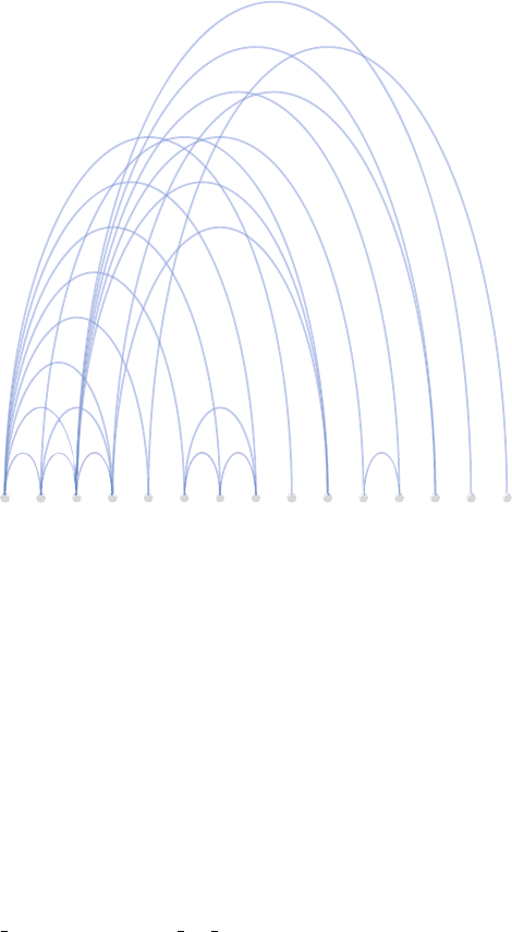
6.2 Specialized Network Diagrams 79
1
2
3
4
6
10
11
12
15
5
8
9
13
14
7
Fig. 6.1 Simpsons contact network
6.2.2 Chord Diagrams
Chord diagrams are a specialized type of information graphic that uses a circular
layout to display the interrelationships between data in a matrix. They have become
particularly popular in genetics research. Because network information can be org-
anized in matrices, chord diagrams are an interesting graphic option for network
plots. This is especially true for valued (weighted) and directed networks, where the
amount and direction of the ‘flows’ are of interest.
The circlize package, by Zuguang Gu, implements a variety of circular
graphics, including chord diagrams. The package has a lot of features, giving
the user great control over the graphical appearance. The included vignette,
circular visualization of matrix is suggested reading.
In this example, we return to the network of the 2010 Netherlands World Cup
soccer team. Although Fig. 1.2 shows the basic pattern of passing flows between the
eleven members of the team, it ignores the number of passes (stored in the vertex
attribute passes). Here we will create a chord diagram to further examine these
patterns.
The first steps are to load the required packages and prepare the data. The main
requirement is to have the network data in the form of a sociomatrix, with the entries
corresponding to the strength or size of the tie if it is a valued network. The matrix
will also have to have names assigned for the rows and columns. (In this example
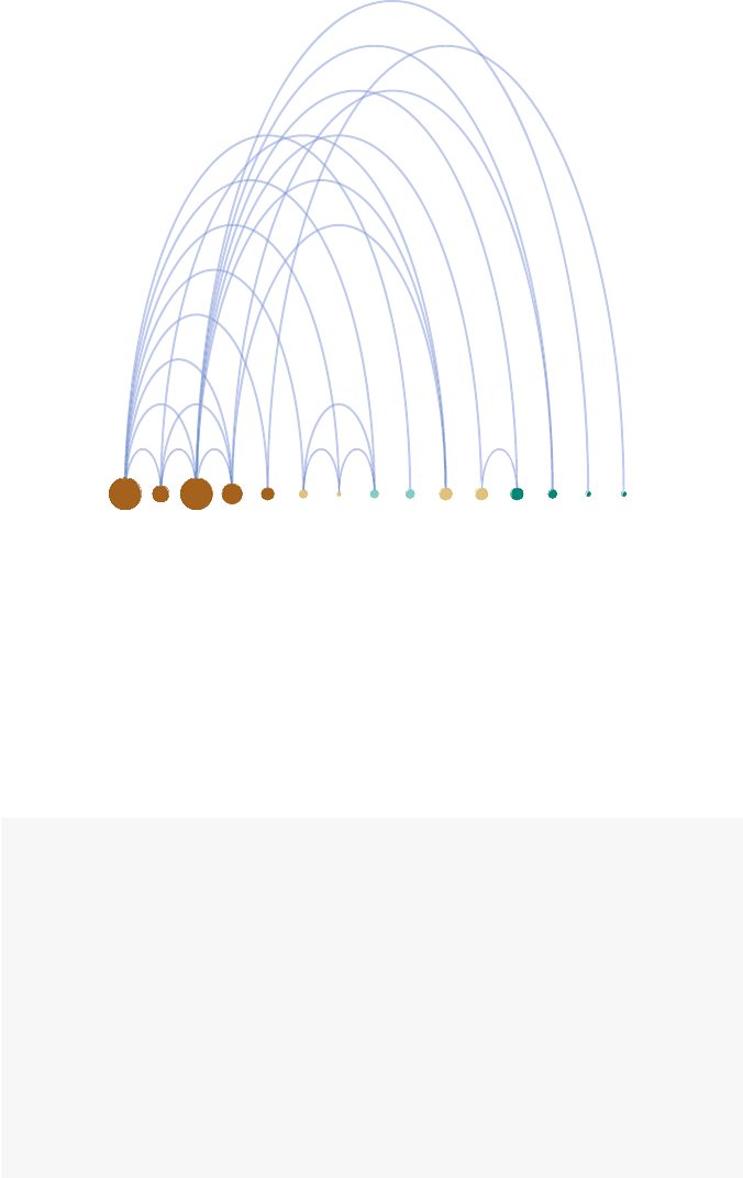
80 6 Advanced Network Graphics
Homer
Marge
Bart
Lisa
Maggie
Mr. Burns
Smithers
Pr. Skinner
Gr. Willie
Carl
Lenny
Moe
Milhouse
Ralph Wiggum
Ned Flanders
Fig. 6.2 Simpsons contact network – Version 2
we have an N×N matrix, so the names will be the same for rows and columns. The
circlize package can also be used for N×k matrices, so chord diagrams will
also be useful for 2-mode affiliation networks, such as those discussed in Chap. 9.)
library(statnet)
library(circlize)
data(FIFA_Nether)
FIFAm <- as.sociomatrix(FIFA_Nether,attrname='passes')
names <- c("GK1","DF3","DF4","DF5","MF6",
"FW7","FW9","MF10","FW11","DF2","MF8")
rownames(FIFAm) =names
colnames(FIFAm) =names
FIFAm
## GK1 DF3 DF4 DF5 MF6 FW7 FW9 MF10 FW11 DF2
## GK1 0 42 67 21 2 27 7 5 2 17
##DF3 30 044144215 8 7 1036
## DF4 38 43 0 57 18 11 7 21 1 7

6.2 Specialized Network Diagrams 81
## DF5 6 14 47 0 11 50 20 40 1 4
## MF6 9 28 25 10 0 41 28 37 14 34
## FW7 4 12 1 21 21 0 15 33 9 25
##FW9 0018712031167
## MF10 1 11 11 22 43 29 20 0 28 13
##FW113223761115 021
## DF2 29 38 8 3 45 38 10 18 26 0
## MF8 12 25 26 38 23 13 12 32 11 24
## MF8
## GK1 3
## DF3 29
## DF4 28
## DF5 42
## MF6 21
## FW7 18
## FW9 2
## MF10 21
## FW11 12
## DF2 15
## MF8 0
The sociomatrix reveals a number of ties that have very low numbers of passes.
To make the subsequent graphics a little easier to interpret we drop all ties with less
than ten passes.
FIFAm[FIFAm <10]<- 0
FIFAm
## GK1 DF3 DF4 DF5 MF6 FW7 FW9 MF10 FW11 DF2
## GK1 0 42 67 21 0 27 0 0 0 17
##DF3 30 044144215 0 0 1036
## DF4 38 43 0 57 18 11 0 21 0 0
## DF5 0 14 47 0 11 50 20 40 0 0
## MF6 0 28 25 10 0 41 28 37 14 34
## FW7 0 12 0 21 21 0 15 33 0 25
##FW9 0000012031160
## MF10 0 11 11 22 43 29 20 0 28 13
##FW110000001115 021
## DF2 29 38 0 0 45 38 10 18 26 0
## MF8 12 25 26 38 23 13 12 32 11 24
## MF8
## GK1 0
## DF3 29
## DF4 28
## DF5 42
## MF6 21

82 6 Advanced Network Graphics
## FW7 18
## FW9 0
## MF10 21
## FW11 12
## DF2 15
## MF8 0
With a sociomatrix that has names assigned, a basic chord diagram can be pro-
duced by a simple call to the chordDiagram() function (Fig. 6.3).
chordDiagram(FIFAm)
Chord diagrams can contain a lot of information, especially for larger networks,
so it is usually important to fine tune the plot to highlight the most important infor-
mation. In this next plot, a number of options are used to make the graphic a little
easier to interpret. First, colors are set so that players in the same position (Forward,
Midfielder, etc.) have the same color. Then, because this is a directed network, flows
(passes, in this case) go in both directions. The directional optionisusedso
that the departing passes start further away from outer circle, making it easier to see
the difference between passes sent and passes received. Finally, the order option
is used to sort the players by their position.
grid.col <- c("#AA3939",rep("#AA6C39",4),
rep("#2D882D",3),rep("#226666",3))
chordDiagram(FIFAm,directional =TRUE,
grid.col = grid.col,
order=c("GK1","DF2","DF3","DF4","DF5",
"MF6","MF8","MF10","FW7",
"FW9","FW11"))
In the resulting chord diagram (Fig. 6.4), it is much easier to see the patterns of
passes among the players. We can see that FW7 receives more than twice the number
of passes than the other two forwards. Similarly, we can see that the goalkeeper’s
favorite target is DF4, and that DF4 likes to pass frequently to DF5.
6.2.3 Heatmaps for Network Data
Heatmaps are another example of a specialized graphic that can be used for net-
works, especially valued or weighted networks. Here, a heatmap is produced to
highlight the players who are passing or receiving the most among the Netherlands
teammates.
First, a sociomatrix is created with the cells reflecting the tie weight, in this case
‘passes.’ Row and column names are defined for the margin labels.
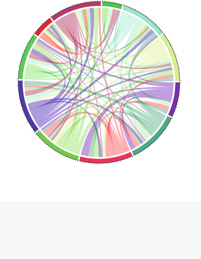
6.2 Specialized Network Diagrams 83
GK1
DF3
DF4
DF5
MF6
FW7
FW9
MF10
FW11
DF2
MF8
0
100
200
0
100
200
300
400
0
100
200
300
400
0
100
200
300
400
0
100
200
300
400
0
100
200
300
0
100
0
100
200
300
400
0
100
0
100
200
300
0
100
200
300
400
Fig. 6.3 Chord diagram of Netherlands 2010 soccer team, with all default options
data(FIFA_Nether)
FIFAm <- as.sociomatrix(FIFA_Nether,attrname='passes')
colnames(FIFAm) <- c("GK1","DF3","DF4","DF5",
"MF6","FW7","FW9","MF10",
"FW11","DF2","MF8")
rownames(FIFAm) <- c("GK1","DF3","DF4","DF5",
"MF6","FW7","FW9","MF10",
"FW11","DF2","MF8")
Once the data are set up, the heatmap is relatively easy to produce (Fig. 6.5). The
colorRampPalette() function is used to designate a color range that will be
used for the low and high ends of the values in the sociomatrix. (The color ranges
chosen here were taken from color chooser tools at paletton.com.) The network data
are directed, so it is important to remember that here the rows are the ‘passers’ and
the columns are the ‘receivers.’
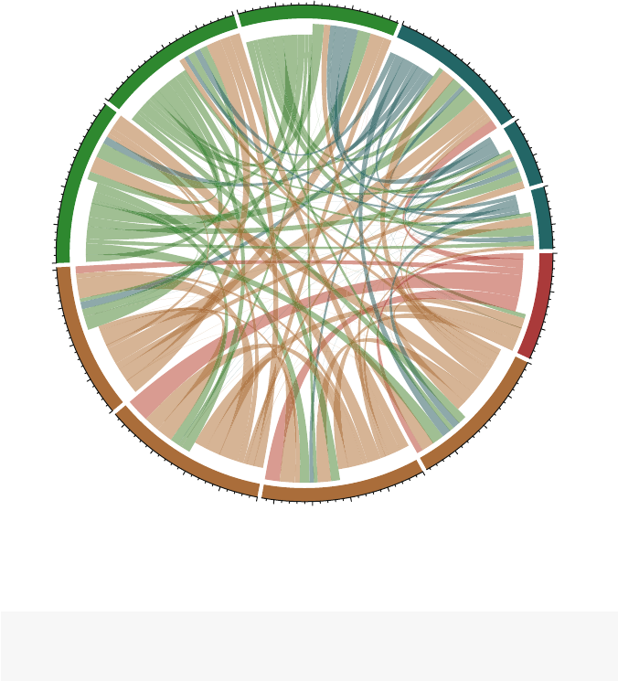
84 6 Advanced Network Graphics
GK1
DF2
DF3
DF4
DF5
MF6
MF8
MF10
FW7
FW9
FW11
0
100
200
0
100
200
300
0
100
200
300
400
0
100
200
300
400
0
100
200
300
400
100
200
300
400
0
0
100
200
300
400
0
100
200
300
400
0
100
200
300
0
100
0
100
Fig. 6.4 Chord diagram of Netherlands 2010 soccer team, with advanced options
palf <- colorRampPalette(c("#669999","#003333"))
heatmap(FIFAm[,11:1],Rowv =NA,Colv =NA,col =palf(60),
scale="none",margins=c(11,11))
The heatmap also shows the same pattern of heavy passers as Fig. 6.4. The dark-
est square is for the passes from the goalkeeper to DF4.
6.3 Creating Network Diagrams with Other R Packages
6.3.1 Network Diagrams with
ggplot2
Although ggplot2 is not designed to handle all of the requirements of a full-
fledged network visualization package, some of its advanced graphics capabilities
can be used to create specialized network plotting routines. The following example

6.3 Creating Network Diagrams with Other R Packages 85
MF8
DF2
FW11
MF10
FW9
FW7
MF6
DF5
DF4
DF3
GK1
GK1
DF3
DF4
DF5
MF6
FW7
FW9
MF10
FW11
DF2
MF8
Fig. 6.5 Heatmap of Netherlands 2010 soccer team number of passes
is based on code developed by David Sparks, and posted on the blog he runs with
his colleague Christopher DeSante, is.R() (http://is-r.tumblr.com).
The edgeMaker() function and supporting code can be used to create att-
ractive and functional plots of directed networks using ‘tapered-intensity-curved’
edges. The bulk of the work is done by the edgeMaker() function which creates
the curved ties between each connected dyad.
edgeMaker <- function(whichRow,len=100,curved =TRUE){
fromC <- layoutCoordinates[adjacencyList[whichRow,1],]
toC <- layoutCoordinates[adjacencyList[whichRow,2],]
graphCenter <- colMeans(layoutCoordinates)
bezierMid <- c(fromC[1], toC[2])
distance1 <- sum((graphCenter -bezierMid)ˆ2)
if(distance1 <sum((graphCenter -c(toC[1],
fromC[2]))ˆ2)){
bezierMid <- c(toC[1], fromC[2])
}
bezierMid <- (fromC +toC +bezierMid) /3
if(curved == FALSE){bezierMid <- (fromC +toC) /2}
edge <- data.frame(bezier(c(fromC[1], bezierMid[1],
toC[1]),
c(fromC[2], bezierMid[2],
toC[2]),
evaluation = len))

86 6 Advanced Network Graphics
edge$Sequence <- 1:len
edge$Group <- paste(adjacencyList[whichRow, 1:2],
collapse =">")
return(edge)
}
In addition to the core sna and ggplot2 packages, the Hmisc package is used
which provides the bezier() functionusedbyedgeMaker.
library(sna)
library(ggplot2)
library(Hmisc)
As has been typical with the examples in this chapter, the network data has to
be transformed to an edgelist format prior to using the plotting functions. For this
example, we also drop the ties that have the associated weight ‘passes’ less than 10.
Finally, the edgeMaker function expects the edgelist object to be named ‘adjacen-
cyList.’
data(FIFA_Nether)
fifa <- FIFA_Nether
fifa.edge <- as.edgelist.sna(fifa,attrname='passes')
fifa.edge <- data.frame(fifa.edge)
names(fifa.edge)[3]<- "value
fifa.edge <- fifa.edge[fifa.edge$value >9,]
adjacencyList <- fifa.edge
Now, we use edgeMaker to create the curved edges. Also, gplot (from sna)
is called once to store the layout coordinates for the ggplot2 function. (This
means that any set of coordinates can be fed to ggplot2.)
layoutCoordinates <- gplot(network(fifa.edge))
allEdges <- lapply(1:nrow(fifa.edge),
edgeMaker, len =500,curved =TRUE)
allEdges <- do.call(rbind, allEdges)
Before producing the plot, we create an empty ggplot2 theme. This is used to
clean up after producing the plot.
new_theme_empty <- theme_bw()
new_theme_empty$line <- element_blank()
new_theme_empty$rect <- element_blank()
new_theme_empty$strip.text <- element_blank()
new_theme_empty$axis.text <- element_blank()
new_theme_empty$plot.title <- element_blank()
new_theme_empty$axis.title <- element_blank()
new_theme_empty$plot.margin <- structure(c(0,0,-1,-1),
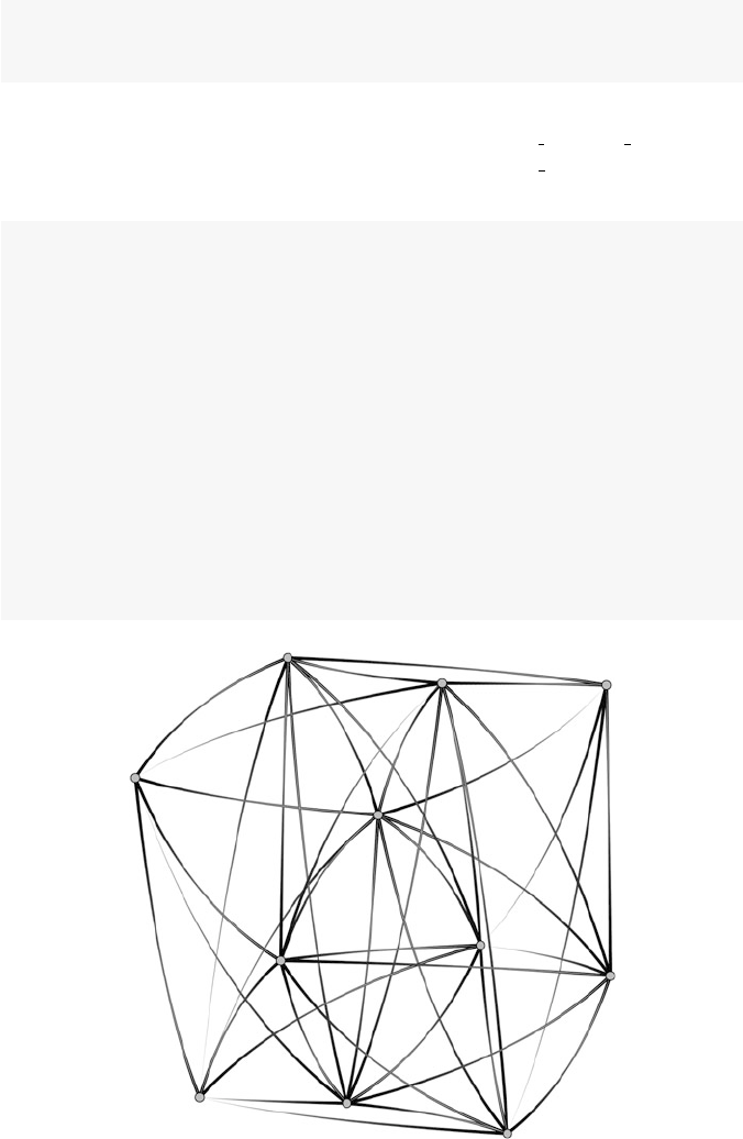
6.3 Creating Network Diagrams with Other R Packages 87
unit ="lines",
valid.unit =3L,
class ="unit")
And now the final step is to create the plot using ggplot(). Familiarity with
ggplot2 will help in understanding this code. The scale colour gradient
option controls the intensity of the gradient, and the scale size option controls
the amount of the taper (Fig. 6.6).
zp1 <- ggplot(allEdges)
zp1 <- zp1 +geom_path(aes(x=x,y=y,group = Group,
colour=Sequence, size=-Sequence))
zp1 <- zp1 +geom_point(data =
data.frame(layoutCoordinates),
aes(x=x,y= y),
size =4,pch =21,
colour ="black",fill ="gray")
zp1 <- zp1 +scale_colour_gradient(low =gray(0),
high =gray(9/10),
guide ="none")
zp1 <- zp1 +scale_size(range =c(1/10,1.5),
guide ="none")
zp1 <- zp1 +new_theme_empty
print(zp1)
Fig. 6.6 Netherlands 2010 passing network with curved ties
Part III
Description and Analysis

Chapter 7
Actor Prominence
...we’re now tied up with human beings, tied to you and forced
to go on with this adventure according to the laws of visibility.
(Jean Genet)
7.1 Introduction
Networks are interesting because of their specific structural patterns, and how those
structures affect the members of the network. Stated more simply, networks affect
their members based on where those members are located in the networks. A person
who is connected to many other members of a network is likely to view the rest
of the network quite differently from somebody who is relatively isolated from the
other members.
Network analysis provides many tools for viewing, analyzing, and assessing
the locations of individual nodes and ties. This is often the first type of network
analysis that is performed once network data are obtained, beyond simple network
description.
By examining the location of individual network members, we can assess the
prominence of those members. An actor is prominent if the ties of the actor make
that actor visible to the other members in the network (Knoke and Burt 1983). In
the rest of this chapter, we will cover a number of the most common ways to assess
network member prominence. For non-directed networks we will look at centrality;
where we view a central actor as one who is involved in many (direct or indirect) ties.
For directed networks, prominence is usually referred to as prestige; a prestigious
actor is one who is the object of extensive ties. This chapter will also cover how
individual node-level measures of centrality and prestige can be aggregated into
network-level centralization measures. An example of how to report the results of
prominence analysis will be presented. Finally, there will be a short discussion of
identifying cutpoints and bridges in networks. These are technically not measures
of prominence, but are simple locational properties of individual nodes or ties, and
as such are somewhat similar to the rest of the chapter’s subject matter.
© Springer International Publishing Switzerland 2015
D.A. Luke, A User’s Guide to Network Analysis in R, Use R!,
DOI 10.1007/978-3-319-23883-8 7
91

92 7 Actor Prominence
7.2 Centrality: Prominence for Undirected Networks
It makes intuitive sense that a network member who is connected to many other
members of the network is in a prominent position. For non-directed networks, we
will say that this type of actor has high centrality, or that it is in a central position.
However, there are a number of ways of operationalizing this type of prominence.
In fact, there are dozens of centrality statistics available to the network analyst.
To see how we can come up with different types of centrality measures, consider
the example network displayed in Fig. 7.1, based on the following simple socioma-
trix, called net mat.
## abcdefghij
##a0110000000
##b1010000000
##c1101101000
##d0010100000
##e0011010000
##f0000101000
##g0010010100
##h0000001011
##i0000000100
##j0000000100
Which node is most central? Nodes cand gare both positioned in the center of
the graph, but as we learned in Chap. 4, the location of nodes in network graphics
may or may not hold any particular meaning. However, node cis directly connected
to more network members than any other node, so in that sense we could view cas
a central node. Alternatively, node gdoes not have as many direct network ties, but
it is positioned in such a way that it connects two different parts of the network. In
particular, the only way that information from nodes h, i, and jgets to the rest of the
network is through node g. Finally, even though node gis only directly connected
to two other nodes, it is positioned so that it is fairly close to every other node in the
network. Specifically, node gcan reach every other node in only one or two steps.
That is, node gis connected to the rest of the network by paths of length one or two.
So, in these two very different senses, node gcan also be thought of as a central
node.
In the next three sections, we will cover the three most commonly used measures
of centrality.
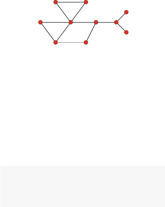
7.2 Centrality: Prominence for Undirected Networks 93
ab
c
d
ef
gh
i
j
Fig. 7.1 Network graph example to demonstrate concepts of prominence
7.2.1 Three Common Measures of Centrality
7.2.1.1 Degree Centrality
The simplest measure of centrality by far is based on the notion that a node that
has more direct ties is more prominent than nodes with fewer or no ties. Degree
centrality thus, is simply the degree of each node. We first introduced node degree
in Chap. 2. The degree of a node is the number of ties it has with other nodes.
Following the notation of Wasserman and Faust (1994), degree centrality is
defined as:
CD(ni)=d(ni)
The network in Fig. 7.1 is simple enough that we could count up the node degrees
by hand. However, here is how degree centrality can be calculated in statnet,
assuming that we have the data stored in a network object called net.
net <- network(net_mat)
net %v% 'vertex.names'
## [1] "a" "b" "c" "d" "e" "f" "g" "h" "i" "j"
degree(net, gmode="graph")
## [1]2252323311
The first line of code simply reminds you of the names of the nodes and their
order. The degree() function calculates and returns the degree centrality scores
for each node. The gmode option tells the function to treat the network object as a
non-directed network (graph). (This option needs to be used, even if the network is
created and stored as a non-directed network.)
The results confirm what we had already suggested above. Node chas the highest
degree centrality. It is connected to five other nodes in the network, more than any
other node.

94 7 Actor Prominence
7.2.1.2 Closeness Centrality
Instead of examining only the direct connections of the nodes, we can focus on how
close each node is to every other node in a network. This leads to the concept of
closeness centrality, where nodes are more prominent to the extent they are close to
all other nodes in the network. Here is the relatively more complicated equation for
closeness centrality,
CC(ni)=g
∑
j=1
d(ni,nj)−1
where dis the path distance between two nodes. Closeness centrality, then, is the
inverse of the sum of all the distances between node iand all the other nodes in the
network.
closeness(net, gmode="graph")
## [1] 0.409 0.409 0.600 0.429 0.450 0.450 0.600
## [8] 0.474 0.333 0.333
This tells us that nodes cand gare tied with the highest closeness.
7.2.1.3 Betweenness Centrality
Betweenness centrality measures the extent that a node sits ‘between’ pairs of other
nodes in the network, such that a path between the other nodes has to go through
that node. A node with high betweenness is prominent, then, because that node is in
a position to observe or control the flow of information in the network. The equation
for betweenness centrality is
CB(ni)=∑
j<k
gjk(ni)/gjk
where gjk is the geodesic between nodes jand k. (A geodesic is the shortest path
between two nodes.) gjk(ni)is the number of geodesics between nodes jand kthat
contain node i.
betweenness(net, gmode="graph")
## [1] 0.0 0.0 20.0 0.0 2.5 2.0 19.5 15.0 0.0
## [10] 0.0
This shows that node chas the highest betweenness score, with nodes gand h
not far behind. These quick examples show that different measures of centrality will
emphasize different aspects of the prominence of nodes in a network.

7.2 Centrality: Prominence for Undirected Networks 95
7.2.2 Centrality Measures in R
R can handle many different measures of centrality and prestige. See the accom-
panying table for a list of the measures currently included in the statnet and
igraph packages (Table 7.1).
As we can see, R provides a wide variety of ways to examine the centrality and
prestige of individual actors in a network. The choice of which measure of centrality
or prestige to use is driven in part by the type of network data you have; in particular,
whether the network is directed or not. However as suggested in Sect. 7.2.1,the
choice should be primarily driven by what type of information is provided by the
particular prominence measure.
That being said, it is also useful to keep in mind that in many real-world social
networks there is a great deal of overlap in the various centrality and prestige mea-
sures. Nodes that are identified as highly central using eigenvector centrality are also
likely to be identified as central with other measures, especially those most closely
related to eigenvector centrality (e.g., Bonacich power). We can illustrate this by
showing the correlations among a set of centrality measures available in statnet
applied to the DHHS Collaboration network.
Measures statnet igraph
Degree degree() degree()
Closeness closeness() closeness()
Betweenness betweenness() betweenness()
Eigenvector evcent() evcent()
Bonacich power bonpow() bonpow()
Flow betweenness flowbet()
Load loadcent()
Information infocent()
Stress stresscent()
Harary graph graphcent()
Bonacich alpha alpha.centrality()
Kleinberg authority auth.score()
Kleinberg hub hub.score()
PageRank page.rank()
Table 7.1 Prominence measures available in statnet and igraph
data(DHHS)
df.prom <- data.frame(
deg =degree(DHHS),
cls =closeness(DHHS),
btw =betweenness(DHHS),
evc =evcent(DHHS),
inf =infocent(DHHS),
flb =flowbet(DHHS)
)

96 7 Actor Prominence
cor(df.prom)
## deg cls btw evc inf flb
## deg 1.000 0.973 0.750 0.972 0.902 0.944
## cls 0.973 1.000 0.787 0.934 0.890 0.941
## btw 0.750 0.787 1.000 0.600 0.485 0.884
## evc 0.972 0.934 0.600 1.000 0.940 0.843
## inf 0.902 0.890 0.485 0.940 1.000 0.773
## flb 0.944 0.941 0.884 0.843 0.773 1.000
7.2.3 Centralization: Network Level Indices of Centrality
Centrality and prestige are characteristics of nodes in a network, based on the posi-
tion of the node in the overall network. The variability of the individual centrality
scores in a network can be very informative. For example, consider the following
two extreme examples: a star graph, and a circle graph (Fig. 7.2).
dum1 <- rbind(c(1,2),c(1,3),c(1,4),c(1,5))
star_net <- network(dum1,directed=FALSE)
dum2 <- rbind(c(1,2),c(2,3),c(3,4),c(4,5),c(5,1))
circle_net <- network(dum2,directed=FALSE)
par(mar=c(4,4,.1,.1))
my_pal <- brewer.pal(5,"Set2")
gplot(star_net,usearrows=FALSE,displaylabels=FALSE,
vertex.cex=2,
vertex.col=my_pal[1],
edge.lwd=0,edge.col="grey50",xlab="Star Graph")
gplot(circle_net,usearrows=FALSE,displaylabels=FALSE,
vertex.cex=2,
vertex.col=my_pal[3],
edge.lwd=0,edge.col="grey50",xlab="Circle Graph")
In statnet, centralization is calculated using the centralization()
function. The function accepts a name of an existing centrality or prestige function,
and returns the appropriate network-level centralization score. Note that
despite its name and the information presented in the help file for the function,
centralization() can be used for directed graphs.
Using the star and circle graphs, we can see that every node has the same cen-
trality score for the circle graph, leading to a minimum centralization score. The
star graph shows the opposite pattern, where there is high variability between the
node-level centrality scores, leading to higher centralization scores.
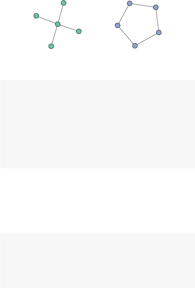
7.2 Centrality: Prominence for Undirected Networks 97
Star Graph Circle Graph
Fig. 7.2 Centralization extreme examples
closeness(circle_net)
## [1] 0.667 0.667 0.667 0.667 0.667
centralization(circle_net,closeness)
## [1] 0
closeness(star_net)
## [1] 1.000 0.571 0.571 0.571 0.571
centralization(star_net,closeness)
## [1] 0.536
7.2.4 Reporting Centrality
All centrality and prestige functions in statnet (as well as igraph) produce a
vector of node-level scores, one for each actor in the network. Using the Bali terror-
ist network, we can see that centrality varies widely across the network members.
data(Bali)
str(degree(Bali))
## num [1:17] 18 8 18 30 18 20 6 18 18 10 ...
summary(degree(Bali))
## Min. 1st Qu. Median Mean 3rd Qu. Max.
## 6.0 10.0 18.0 14.8 18.0 30.0
These scores can be examined individually, but for both analysis and reporting, it
is usually more informative to examine patterns of prominence across nodes, across
different prominence measures, and even across different networks. In this section
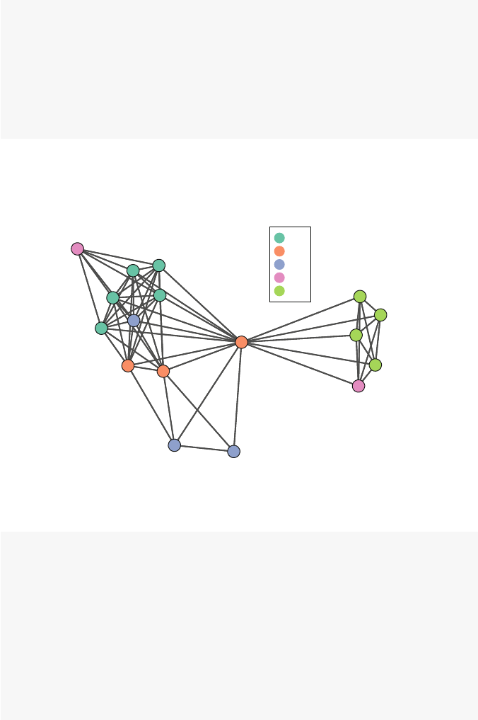
98 7 Actor Prominence
we take a more in-depth look at the centrality of the actors in the Bali terrorist
network (Fig. 7.3).
data(Bali)
my_pal <- brewer.pal(5,"Set2")
rolecat <- Bali %v% "role"
gplot(Bali,usearrows=FALSE,displaylabels=TRUE,
vertex.col=my_pal[as.factor(rolecat)],
edge.lwd=0,edge.col="grey25")
legend("topright",legend=c("BM","CT","OA","SB",
"TL"),col=my_pal,pch=19,pt.cex=2)
If the network is small enough, it can be useful to examine the individual node-
level prominence scores. Table 7.2 shows the individual scores for each of three
common centrality measures: degree, closeness, and betweenness.
Muklas
Amrozi
Imron
Samudra
Dulmatin
Idris
Mubarok
Husin
Ghoni
Arnasan
Rauf
Octavia
Hidayat
Junaedi
Patek
Feri
Sarijo
BM
CT
OA
SB
TL
Fig. 7.3 Interactions among the 17 members of the 2002 Bali terrorist network
data(Bali)
df.prom2 <- data.frame(
degree =degree(Bali),
closeness =closeness(Bali),
betweenness =betweenness(Bali)
)
row.names(df.prom2) <- Bali %v% "vertex.names"
df.promsort <- df.prom2[order(-df.prom2$degree),]
cd <- centralization(Bali,degree)
cc <- centralization(Bali,closeness)
cb <- centralization(Bali,betweenness)

7.2 Centrality: Prominence for Undirected Networks 99
df.promsort <- rbind(df.promsort,c(cd,cc,cb))
row.names(df.promsort)[18]<- "\\emph{Centralization}"
Degree Closeness Betweenness
Samudra 30.00 0.94 122.33
Idris 20.00 0.73 12.33
Muklas 18.00 0.70 4.67
Imron 18.00 0.70 3.33
Dulmatin 18.00 0.70 3.33
Husin 18.00 0.70 3.33
Ghoni 18.00 0.70 3.33
Patek 18.00 0.70 3.33
Sarijo 18.00 0.70 3.33
Feri 12.00 0.48 0.00
Arnasan 10.00 0.57 0.00
Rauf 10.00 0.57 0.00
Octavia 10.00 0.57 0.00
Hidayat 10.00 0.57 0.00
Junaedi 10.00 0.57 0.00
Amrozi 8.00 0.55 0.67
Mubarok 6.00 0.53 0.00
Centralization 0.54 0.33 0.50
Table 7.2 Centrality of the 17 members of the 2002 Bali terrorist network
As described in Chap. 5, nodes can be sized according to any informative quanti-
tative characteristic of the actors. This can be non-network information such as age
or weight. More useful here is to use information from the network itself; in this
case the centrality scores for each node.
This can easily be done using the network plotting options. In fact, only one addi-
tional parameter (vertex.cex) needs to be passed to gplot(). This parameter
can be a constant, in which case it simply controls the overall size of each vertex
in the graph. However, you can also pass it a vector of numeric scores. All of the
node-level prominence measures return a numeric vector, so that is what can be used
to scale node size based on centrality or prestige.
The only tricky issue is that R reads the raw numbers passed to vertex.cex,
and these numbers are often too small or too large. Typically, you will need to
play around with some type of scaling factor to ensure that the graphic is inter-
pretable. (See Chap. 5for a more detailed treatment of node sizing and scaling.) The
following two figures illustrate this. First, the normalized degree centrality for the
Bali network is calculated (option rescale=TRUE). This rescales the raw degree
scores so that they all fall between 0 and 1. The first figure shows that the normal-
ized degree scores are too small. The second graph uses the same information, but
the vertex.cex parameter is multiplied by 20 so that the relative differences between
the node sizes can be seen (Fig. 7.4).
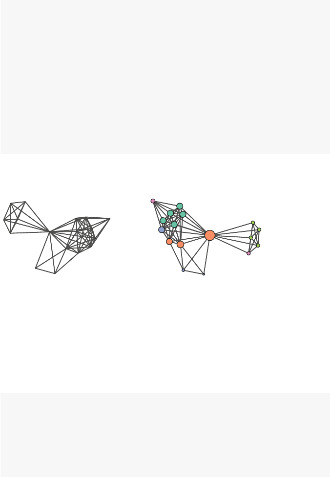
100 7 Actor Prominence
deg <- degree(Bali,rescale=TRUE)
op <- par(mfrow=c(1,2))
gplot(Bali,usearrows=FALSE,displaylabels=FALSE,
vertex.cex=deg,
vertex.col=my_pal[as.factor(rolecat)],
edge.lwd=0,edge.col="grey25",
main="Too small")
gplot(Bali,usearrows=FALSE,displaylabels=FALSE,
vertex.cex=deg*20,
vertex.col=my_pal[as.factor(rolecat)],
edge.lwd=0,edge.col="grey25",
main="A little better")
par(op)
Too small A little better
Fig. 7.4 Comparison of two approaches to sizing vertices by degree centrality
A network graphic that includes node-level prominence information can be an
effective analysis and communication tool. The overall structure of the network can
be made clear, as well as the importance of individual positions. Figure 7.5 is a final
version of the Bali network graphic that combines node-level categorical informa-
tion (denoted by vertex color) with node-level quantitative information (denoted by
vertex size).
deg <- degree(Bali,rescale=TRUE)
gplot(Bali,usearrows=FALSE,displaylabels=TRUE,
vertex.cex=deg*12,
vertex.col=my_pal[as.factor(rolecat)],
edge.lwd=0.5,edge.col="grey75")
legend("topright",legend=c("BM","CT","OA","SB","TL"),
col=my_pal,pch=19,pt.cex=2)
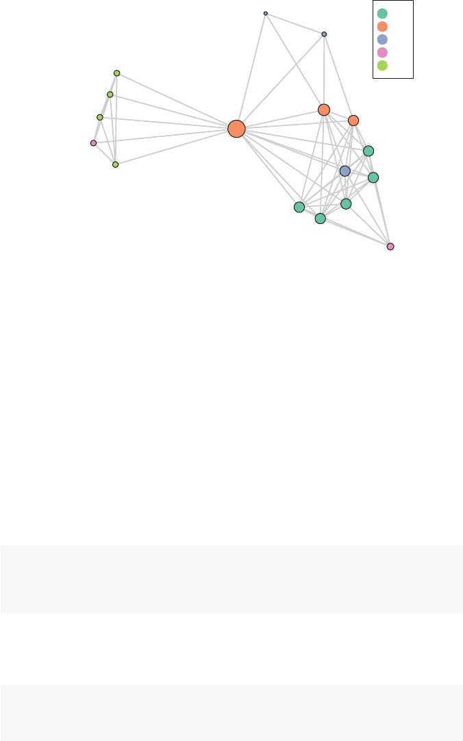
7.3 Cutpoints and Bridges 101
Muklas
Amrozi
Imron
Samudra
Dulmatin
Idris
Mubarok
Husin
Ghoni
Arnasan
Rauf
Octavia
Hidayat
Junaedi
Patek
Feri
Sarijo
BM
CT
OA
SB
TL
Fig. 7.5 Bali network with nodes sized according to degree centrality
7.3 Cutpoints and Bridges
There are two additional concepts from graph theory that can be useful tools when
assessing locational properties of individual nodes or ties. The first is a cutpoint,
which is defined as a node that, if dropped, would increase the number of com-
ponents in the network. In many types of networks cutpoints thus occupy important
positions connecting different parts of the network. If they were dropped, that would
result in two subsets of actors that would not be able to communicate with each other
(Fig. 7.6).
You can use the cutpoint() function in statnet to quickly identify any
cutpoints in a network. (For a directed network, you need to specify whether
you are using a ‘weak’ or ‘strong’ component rule for identifying cutpoints. See
?cutpoints for further information.)
cpnet <- cutpoints(net,mode="graph",
return.indicator=TRUE)
gplot(net,gmode="graph",vertex.col=cpnet+2,coord=coords,
jitter=FALSE,displaylabels=TRUE)
So, in addition to the two central nodes (cand g) we had identified earlier, we can
see that his also a cutpoint. Although simple to see in this example, we can confirm
the nodes as cutpoints in a few different ways (Fig. 7.7).
net2 <- net
components(net2)
## [1] 1
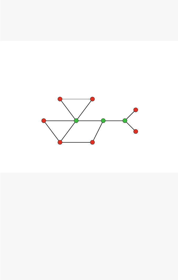
102 7 Actor Prominence
delete.vertices(net2,7)
components(net2)
## [1] 2
gplot(net2,gmode="graph",vertex.col=2,
coord=coords[-7,],jitter=FALSE,displaylabels=TRUE)
Bridges are the edge equivalent to cutpoints. That is, an edge is a bridge if remov-
ing it will split one component into two. There is no bridge identification function
built into statnet, but it is relatively easy to create a function that will detect
bridges. This function takes a statnet directed or non-directed network, and ex-
amines each tie to see if removing it changes the component count. A logical vector
with length equal to the number of ties is returned indicating which ties are bridges.
ab
c
d
ef
gh
i
j
Fig. 7.6 Example graph with identified cutpoints
bridges <- function(dat,mode="graph",
connected=c("strong","weak")) {
e_cnt <- network.edgecount(dat)
if (mode == "graph"){
cmp_cnt <- components(dat)
b_vec <- rep(FALSE,e_cnt)
for(i in 1:e_cnt){
dat2 <- dat
delete.edges(dat2,i)
b_vec[i] <- (components(dat2) != cmp_cnt)
}
}
else {
cmp_cnt <- components(dat,connected=connected)
b_vec <- rep(FALSE,e_cnt)
for(i in 1:e_cnt){
dat2 <- dat
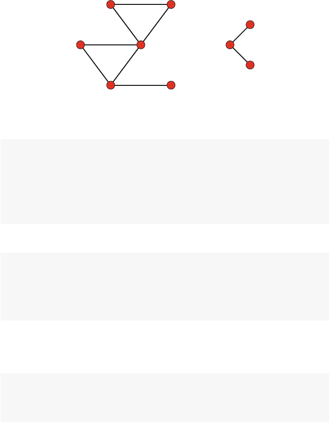
7.3 Cutpoints and Bridges 103
ab
c
d
e
f
h
i
j
Fig. 7.7 Example graph with one cutpoint dropped
delete.edges(dat2,i)
b_vec[i] <- (components(dat2,connected=connected)
!= cmp_cnt)
}
}
return(b_vec)
}
Once the function has been defined, we can use it directly:
bridges(net)
## [1] FALSE FALSE FALSE FALSE FALSE FALSE FALSE
## [8] FALSE FALSE FALSE FALSE FALSE FALSE FALSE
## [15] FALSE FALSE FALSE FALSE TRUE TRUE TRUE
## [22] TRUE TRUE TRUE
This shows us that there are three ties that are bridges in the example network.
We can also use the bridges function similarly to the cutpoints function in a graphic
to display which edges are bridges (Fig. 7.8).
brnet <- bridges(net)
gplot(net,gmode="graph",vertex.col="red",
edge.col=brnet+2,coord=coords,
jitter=FALSE,displaylabels=TRUE)
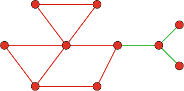
104 7 Actor Prominence
ab
c
d
ef
gh
i
j
Fig. 7.8 Example graph with identified bridges

Chapter 8
Subgroups
Our young people are faced by a series of different groups
which believe different things and advocate different practices,
and to each of which some trusted friend or relative may belong.
(Margaret Mead)
8.1 Introduction
The social systems contained in networks often exhibit complex structures. For
example, in his classic The strength of weak ties, Granovetter (1973) suggested that
many social networks are made up of relatively densely connected subgroups (e.g.,
friendship subnetworks) that are themselves only connected via less common ties
(e.g., between acquaintances). It then follows that it will be important to be able to
define and identify such subgroups. Many disciplines have theories that assume that
larger social systems are made up of distinguishable subgroups, for example soci-
ologists consider social classes; psychologists examine small group behavior, and
public health examine health disparities between different social groups.
This chapter covers a number of techniques available within R to identify and
examine subgroups that may be contained in larger social networks. The igraph
package is used extensively in this chapter, because of the depth of its coverage of
subgroup and community detection techniques.
At times, it may not be necessary to use specific subgroup techniques. For
example, reconsider Moreno’s sociogram that we examined in Chap. 2(Fig. 8.1).
Here, it is self-evident that the network is made up of two primary groups, even if
we did not know beforehand that this depicts a primary school class.
However, in most real-world social networks the subgroup structure is not as
clear, if it even exists at all. Figure 8.2 shows a more realistic network, where the
there is a hint of some subgroup structure, but more systematic analysis will be
required to reveal it. The color coding and labels suggest that the there may be some
cohesion among members from the same DHHS agency, but it is not crystal clear.
© Springer International Publishing Switzerland 2015
D.A. Luke, A User’s Guide to Network Analysis in R, Use R!,
DOI 10.1007/978-3-319-23883-8 8
105
106 8 Subgroups
Fig. 8.1 Moreno sociogram, showing two subgroups
8.2 Social Cohesion
One way to think about network subgroups is through social cohesion. Cohesive
subgroups are sets of actors that are tied together through frequent, strong, and direct
ties (Wasserman and Faust 1994). This approach is so intuitive that it led to a number
of the earliest techniques for identifying network subgroups.
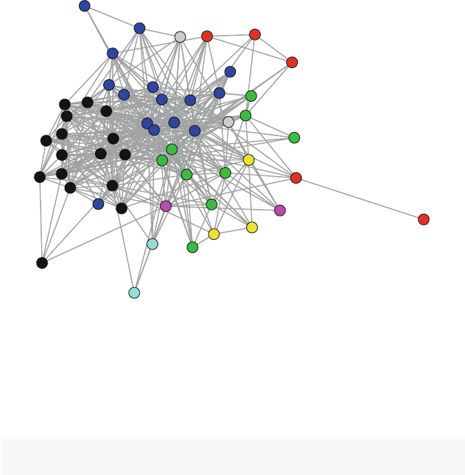
8.2 Social Cohesion 107
8.2.1 Cliques
Cliques are one of the simplest types of cohesive subgroups, and because of their
straightforward definition are also one of the easiest types to understand. A clique is
a maximally complete subgraph; that is, it is a subset of nodes that have all possible
ties among them.
ACF-1
ACF-2
AHRQ-1
AHRQ-2
AHRQ-3
AHRQ-4
CDC-1
CDC-2
CDC-3
CDC-4
CDC-5
CDC-6
CDC-7
CDC-8
CDC-9
CDC-10
CDC-11
CDC-12
CMS-1
CMS-2
FDA-1
FDA-2
HRSA-1
HRSA-2
HRSA-3
IHS-1
IHS-2
NIH-1
NIH-2
NIH-3
NIH-4
NIH-5
NIH-6
NIH-7
NIH-8
NIH-9
NIH-10
NIH-11
NIH-12
NIH-13
NIH-14
NIH-15
NIH-16
OGC-1
OGC-2 OGC-3
OS-1
OS-2
OS-3
OS-4
OS-5
SAMHSA-1
SAMHSA-2
SAMHSA-3
Fig. 8.2 Collaboration ties among DHHS agencies
Consider the example graph in Fig. 8.3. There are two cliques in this graph:
A,B,C,D and E,F,G. (Technically, connected dyads also are cliques, but typically
only cliques of size 3 or larger are of interest. Also, by definition any clique of size
kwill also contain all the cliques sized k-1,k-2, etc.)
library(igraph)
clqexmp <- graph.formula(A:B:C:D--A:B:C:D,D-E,E-F-G-E)
The following commands demonstrate how to get information about any cliques
in a network. Despite what the name suggests, clique.number() does not
return the number of cliques, but the size of the largest clique. To get a list of all
the cliques, constrained by a minimum or maximum size, use cliques(). When
there are a large number of cliques in a network, maximal.cliques() may be
more useful. Finally, as the name suggests, largest.cliques() will find all of
the largest cliques in a network.
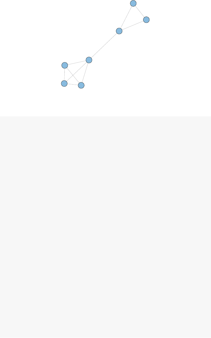
108 8 Subgroups
A
BC
D
E
F
G
Fig. 8.3 Example graph with two cliques
clique.number(clqexmp)
## [1] 4
cliques(clqexmp, min=3)
## [[1]]
## + 3/7 vertices, named:
## [1] A B C
##
## [[2]]
## + 3/7 vertices, named:
## [1] A B D
##
## [[3]]
## + 3/7 vertices, named:
## [1] A C D
##
## [[4]]
## + 3/7 vertices, named:
## [1] B C D
##
## [[5]]
## + 3/7 vertices, named:
## [1] E F G
##
## [[6]]
## + 4/7 vertices, named:
## [1] A B C D
maximal.cliques(clqexmp,min=3)

8.2 Social Cohesion 109
## [[1]]
## + 3/7 vertices, named:
## [1] E F G
##
## [[2]]
## + 4/7 vertices, named:
## [1] A B D C
largest.cliques(clqexmp)
## [[1]]
## + 4/7 vertices, named:
## [1] D A B C
Note that the latter three functions return lists of vertex ids. When the igraph
object has vertex names, the following syntax shows how names rather than ids can
be displayed.
V(clqexmp)[unlist(largest.cliques(clqexmp))]
## + 4/7 vertices, named:
## [1] D A B C
Cliques, however, have two major disadvantages that reduce their utility in real-
world social network analysis. First, a clique is a very conservative definition of a
cohesive subgroup. Consider a subgraph made up of seven vertices. To be a clique,
all of the 21 possible ties must exist between all seven members. If only one is miss-
ing, then the seven vertices will not belong to one clique, even though the density of
these seven vertices (20/21 = 0.95) would suggest that this is a cohesive subgroup.
A consequence of this fragility is the second major issue of cliques: they simply
are not very common in larger social networks. Table 8.1 presents some simple
simulation results demonstrating the rarity of cliques. Four random networks were
created with 25, 50, 100, and 500 nodes. For each network, the average degree was
constrained to approximately 6. The table shows that the number of cliques remains
roughly constant, even as the network size increases dramatically. Furthermore, the
cliques remain small in size. (See Chap. 10 for more information on random graph
models such as erdos.renyi.game.)
g25 <- erdos.renyi.game(25,75,type="gnm")
g50 <- erdos.renyi.game(50,150,type="gnm")
g100 <- erdos.renyi.game(100,300,type="gnm")
g500 <- erdos.renyi.game(500,1500,type="gnm")
nodes <- c(25,50,100,500)
lrgclq <- c(clique.number(g25),clique.number(g50),
clique.number(g100),clique.number(g500))
numclq <- c(length(cliques(g25,min=3)),
length(cliques(g50,min=3)),

110 8 Subgroups
length(cliques(g100,min=3)),
length(cliques(g500,min=3)))
clqinfo <- data.frame(Nodes=nodes,Largest=lrgclq,
Number=numclq)
Nodes Largest Number
25 3 27
50 4 47
100 3 35
500 3 38
Table 8.1 Demonstration of clique characteristics
8.2.2 k-Cores
Partly because of the rarity of cliques in observed social networks, a number of
variations on the clique idea have been proposed. A popular variation is the k-core.
Ak-core is a maximal subgraph where each vertex is connected to at least kother
vertices in the subgraph. k-cores have a number of advantages: they are nested (every
member of a 4-core is also a member of a 3-core, and so on), they do not overlap,
and they are easy to identify.
An analysis of k-cores typically proceeds by first identifying the entire k-core set,
then doing visual examination of the k-core structures, possibly followed by closer
examination of an individual k-core level (e.g., the 6-core).
For an example of how to examine k-cores in a social network we will use
the DHHS dataset. This dataset shows collaboration ties among tobacco control
experts working across various institutes and agencies within the Department of
Health and Human Services in 2005 (Leischow, Luke, et al. 2010). This dataset is a
statnet network object, so we start by translating it to an igraph object using
the intergraph package. Also, DHHS has a valued tie, where the values range
from 1 (only share information) to 4 (formal collaboration across multiple projects).
As the density suggests, if all values are included then the network is highly int-
erconnected. For this example we will only examine formal collaboration ties (i.e.,
the ‘collab’ edge attribute is 3 or 4). Here we use the igraph subgraph.edges
function to select only those edges. This gives us a new network that is half as dense
as the original.
data(DHHS)
library(intergraph)
iDHHS <- asIgraph(DHHS)
graph.density(iDHHS)
## [1] 0.312

8.2 Social Cohesion 111
iDHHS <- subgraph.edges(iDHHS,E(iDHHS)[collab >2])
graph.density(iDHHS)
## [1] 0.153
To identify the k-core structure in the network, the graph.coreness function
is used. It returns a vector listing the highest core that each vertex belongs to in the
network. The results tell us the k-cores range from 1 to 6.
coreness <- graph.coreness(iDHHS)
table(coreness)
## coreness
##123456
##7625226
maxCoreness <- max(coreness)
maxCoreness
## [1] 6
To better understand the k-core structure, we can plot the network using the
k-core set information. This example illustrates how igraph uses the special vertex
attributes name and color. The name attribute is used by default to label the nodes
in a plot. Here we copy over the vertex names that were stored in the statnet ver-
tex attribute vertex.names. The color vertex attribute is used to set the default
colors of the nodes. Here we add 1 to the k-core values stored in the coreness vector
as a quick and dirty way to pick different colors for each k-core, as well as to avoid
black (Fig. 8.4).
Vname <- get.vertex.attribute(iDHHS,name='vertex.names',
index=V(iDHHS))
V(iDHHS)$name <- Vname
V(iDHHS)$color <- coreness +1
op <- par(mar =rep(0,4))
plot(iDHHS,vertex.label.cex=0.8)
par(op)
To help with the interpretation, we can label the nodes with their k-core member-
ship value. Also, in this example we demonstrate an alternative way to automatically
pick a distinctive set of colors for the nodes (Fig. 8.5).
colors <- rainbow(maxCoreness)
op <- par(mar =rep(0,4))
plot(iDHHS,vertex.label=coreness,
vertex.color=colors[coreness])
par(op)
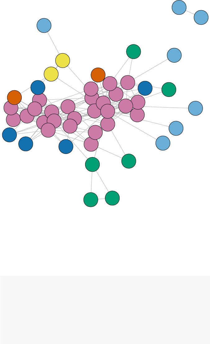
112 8 Subgroups
ACF-2
AHRQ-1
AHRQ-2
AHRQ-3
AHRQ-4
CDC-1
CDC-2
CDC-3
CDC-4
CDC-5 CDC-6
CDC-7
CDC-8
CDC-9
CDC-10
CDC-11
CDC-12 CMS-1
FDA-1
FDA-2
HRSA-1
HRSA-2
HRSA-3
IHS-2
IHS-1
NIH-1
NIH-2
NIH-3
NIH-4
NIH-5
NIH-6
NIH-7
NIH-8
NIH-9
NIH-10
NIH-11
NIH-12
NIH-13
NIH-14
NIH-16
OGC-1
OGC-2
OS-1
OS-2
OS-3
OS-4
OS-5
SAMHSA-3
Fig. 8.4 DHHS k-core structure
This figure shows that the center of the network is made up primarily of the
highest k-core. In this case, the 6-core is comprised of 26 of the 54 total nodes.
Because of the nested structure of k-cores, we can further examine the subgroup
patterns by progressively ‘peeling away’ each of the lower k-cores in turn. To do
this we take advantage of the induced.subgraph function (Fig. 8.6).
V(iDHHS)$name <- coreness
V(iDHHS)$color <- colors[coreness]
iDHHS1_6 <- iDHHS
iDHHS2_6 <- induced.subgraph(iDHHS,
vids=which(coreness >1))
iDHHS3_6 <- induced.subgraph(iDHHS,
vids=which(coreness >2))
iDHHS4_6 <- induced.subgraph(iDHHS,
vids=which(coreness >3))
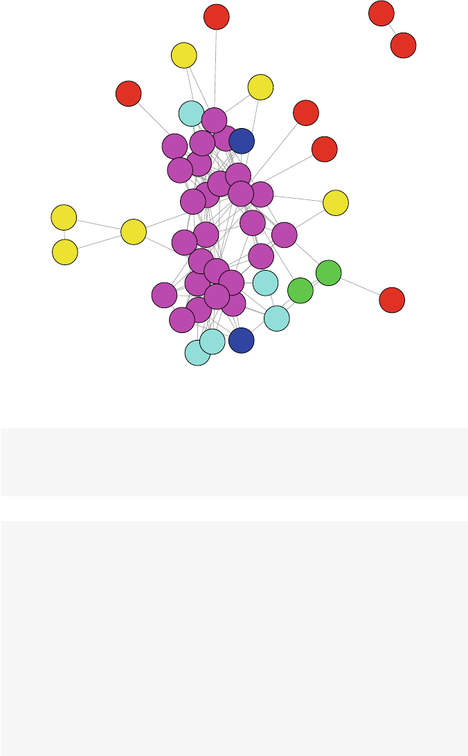
8.2 Social Cohesion 113
1
6
2
6
6
6
6
6
2
6
6
6
4
6
6
6
6
1
1
1
2
2
2
4
4
6
66
6
6
6
5
4
6
6
6
6
2
6
1
3
5
1
4
3
6
6
1
Fig. 8.5 DHHS k-core structure, with k-core membership values
iDHHS5_6 <- induced.subgraph(iDHHS,
vids=which(coreness >4))
iDHHS6_6 <- induced.subgraph(iDHHS,
vids=which(coreness >5))
lay <- layout.fruchterman.reingold(iDHHS)
op <- par(mfrow=c(3,2),mar =c(3,0,2,0))
plot(iDHHS1_6,layout=lay,main="All k-cores")
plot(iDHHS2_6,layout=lay[which(coreness >1),],
main="k-cores 2-6")
plot(iDHHS3_6,layout=lay[which(coreness >2),],
main="k-cores 3-6")
plot(iDHHS4_6,layout=lay[which(coreness >3),],
main="k-cores 4-6")
plot(iDHHS5_6,layout=lay[which(coreness >4),],
main="k-cores 5-6")
plot(iDHHS6_6,layout=lay[which(coreness >5),],
main="k-cores 6-6")
par(op)
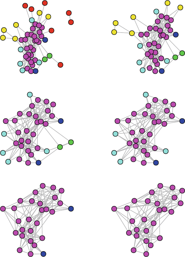
114 8 Subgroups
All k-cores
1
6
2
6
6
6
66
2
6
6
6
4
6
6
6
6
1
1
1
2
2
2
4
4
6
6
6
6
6
65
4
6
6
6
6
2
6
1
3
5
1
4
3
6
6
1
k-cores 2-6
6
2
6
6
6
66
2
6
6
6
4
6
6
6
6
2
2
2
4
4
6
6
6
6
6
65
4
6
6
6
6
2
6
3
5
4
3
6
6
k-cores 3-6
6
6
6
6
66
6
6
6
4
6
6
6
6
4
4
6
6
6
6
6
65
4
6
6
6
66
3
5
4
3
6
6
k-cores 4-6
6
6
6
6
66
6
6
6
4
6
6
6
6
4
4
6
6
6
6
6
65
4
6
6
6
66
5
4
6
6
k-cores 5-6
6
6
6
6
6
6
6
6
6
6
6
6
6
6
6
6
6
6
65
6
6
6
66
5
6
6
k-cores 6-6
6
6
6
6
6
6
6
6
6
6
6
6
6
6
6
6
6
6
6
6
6
6
66
6
6
Fig. 8.6 Peeling away DHHS k-cores

8.3 Community Detection 115
8.3 Community Detection
Both cliques and k-cores are examples of subgroup identification that rely entirely
on the pattern of internal ties defining the particular groups. Network scientists have
developed a wide variety of subgroup identification algorithms and heuristics that
define groups not just based on the internal ties, but also the pattern of ties between
different groups. That is, a subgroup in a network is a set of nodes that has a rel-
atively large number of internal ties, and also relatively few ties from the group to
other parts of the network. These approaches vary in their details, but they are all
designed to identify internally cohesive subgroups that are somewhat separated or
isolated from other groups or nodes. These approaches are sometimes called com-
munity detection algorithms.
8.3.1 Modularity
An important characteristic of a network that is used in many community detection
algorithms is that of modularity. Modularity is a measure of the structure of the net-
work, specifically the extent to which nodes exhibit clustering where there is greater
density within the clusters and less density between them (Newman 2006). Modu-
larity can be used in an exploratory fashion, where an algorithm tries to maximize
modularity and returns the node classification that is found to best explain the ob-
served clustering. Conversely, modularity can be used in a descriptive fashion where
the modularity statistic is calculated for any node classification variable of interest.
For example, an analyst can calculate the modularity score for a friendship network
given the gender of network members. Used this way, modularity reflects the extent
to which gender explains the observed clustering among the friends in the network.
Modularity is a chance-corrected statistic, and is defined as the fraction of ties
that fall within the given groups minus the expected such fraction if ties were
distributed at random. The modularity statistic can range from −1/2 to +1. The
closer to 1, the more the network exhibits clustering with respect to the given node
grouping.
Consider the following simple example of a network with nine nodes. We have
two categorical vertex attributes which each classify the nodes into three groups
(Fig. 8.7).
g1 <- graph.formula(A-B-C-A,D-E-F-D,G-H-I-G,A-D-G-A)
V(g1)$grp_good <- c(1,1,1,2,2,2,3,3,3)
V(g1)$grp_bad <- c(1,2,3,2,3,1,3,1,2)
op <- par(mfrow=c(1,2))
plot(g1,vertex.color=(V(g1)$grp_good),
vertex.size=20,
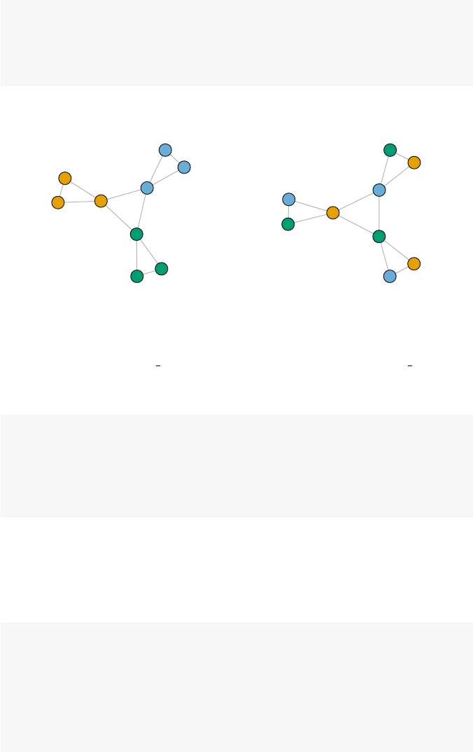
116 8 Subgroups
main="Good Grouping")
plot(g1,vertex.color=(V(g1)$grp_bad),
vertex.size=20,
main="Bad Grouping")
par(op)
Good Grouping
A
B
C
D
E
F
G
H
I
Bad Grouping
A
B
C
D
E
F
G
H
I
Fig. 8.7 Modularity example
As the figure suggests, the clustering that is evident in the network is better
accounted for by the grp good node attribute compared to the grp bad vari-
able. This can be confirmed by calculating the modularity score provided by the
modularity function in igraph.
modularity(g1,V(g1)$grp_good)
## [1] 0.417
modularity(g1,V(g1)$grp_bad)
## [1] -0.333
Real-world social networks are often characterized by clustering, but it is of
course harder to judge the extent of the clustering by eye. Earlier in the chapter
we saw that there was interesting subgroup structure contained in the DHHS net-
work, and that this structure might be partially explained by the DHHS organization
that the person worked for.
library(intergraph)
data(DHHS)
iDHHS <- asIgraph(DHHS)
table(V(iDHHS)$agency)
##
##012345678910
## 2 4 12 2 2 3 2 16 3 5 3

8.3 Community Detection 117
V(iDHHS)[1:10]$agency
## [1]0011112222
modularity(iDHHS,(V(iDHHS)$agency+1))
## [1] 0.14
The modularity function expects that the node grouping variable is numbered
starting at 1 (and in fact the current version of the function will crash if community
membership has zeros.) In this case, agency is numbered starting at 0 so we add 1
to it before passing it to the modularity function. The modularity score of 0.14
suggests that the DHHS agency does explain some of the clustering that is present
in the network. However, like most network descriptive statistics, the number in and
of itself has little meaning. The interpretation of the network characteristic becomes
more meaningful when it is compared to another relevant measure. For example,
how does the modularity change over time? Or, how does this modularity score
compare to the modularity score for a different vertex attribute on the same network?
As a comparison, we can look at the modularity scores for two other datasets
included in UserNetR.FortheMoreno data, we can see how gender accounts
for subgroup structure. For the Facebook network, we can use the group node
attribute, which designates the type of social group the Facebook friends belong to
(family, work, music, high school, etc.). The results show us that both the Moreno
and Facebook social networks exhibit higher modularity than the DHHS network.
data(Moreno)
iMoreno <- asIgraph(Moreno)
table(V(iMoreno)$gender)
##
## 1 2
## 16 17
modularity(iMoreno,V(iMoreno)$gender)
## [1] 0.476
data(Facebook)
levels(factor(V(Facebook)$group))
## [1] "B" "C" "F" "G" "H" "M" "S" "W"
grp_num <- as.numeric(factor(V(Facebook)$group))
modularity(Facebook,grp_num)
## [1] 0.615
118 8 Subgroups
8.3.2 Community Detection Algorithms
The main reason that this chapter uses igraph is that it includes support for many
if not most of the existing community detection approaches. Table 8.2 lists the cur-
rently supported algorithms, along with whether each function supports directed
networks, weighted networks (networks with valued ties), and whether the algo-
rithm can be used on networks with more than one component.
Name Function Directed Weighted Components
Edge-betweenness cluster edge betweenness T T T
Leading eigenvector cluster leading eigen F F T
Fast-greedy cluster fast greedy F T T
Louvain cluster louvain F T T
Walktrap cluster walktrap F T F
Label propagation cluster label prop F T F
InfoMAP cluster infomap T T T
Spinglass cluster spinglass F T F
Optimal cluster optimal F T T
Table 8.2 Community detection functions in igraph
The basic workflow for conducting community detection in igraph is to run
one of the community detection functions on a network and store the results in
acommunities class object. Then, the identified subgroups in the network can
be explored using a number of igraph functions that know how to operate with
communities objects. The networks can also be plotted easily to show the results
of the community detection.
For example, consider the simple Moreno friendship network that is clearly div-
ided into two subgroups based on gender. Community detection on this network
proceeds as follows.
cw <- cluster_walktrap(iMoreno)
membership(cw)
## [1]11111111333555513222444
## [24] 2 2 2 2 2 2 2 2 6 6
modularity(cw)
## [1] 0.618
Modularity is fairly high, suggesting that the walktrap algorithm has done a good
job at detecting subgroup structure. The membership function reveals that six dif-
ferent subgroups have been identified. These are best understood through visualiza-
tion. If the plot function is passed a communities object along with the network it
belongs to, then an attractive plot is produced with each subgroup getting its own
color-coded shaded polygon (Fig. 8.8).
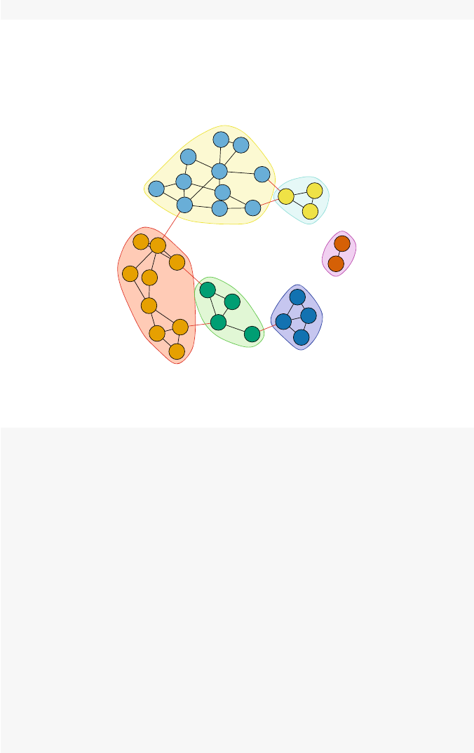
8.3 Community Detection 119
plot(cw, iMoreno)
Once you have a community detection subgroup solution, it can be examined like
any membership vector. For example, you can compare it to an existing partition
based on a node characteristic. In this case, how does a walktrap solution compare
to the specific agency of the nodes in the DHHS network?
1
2
3
4
5
6
7
8
9
10
11
12
13
14
13
16
17
18
19 20
21 22
23
24
25
26
27 28
29
30
31
32
33
Fig. 8.8 Community detection on Moreno network
cw <- cluster_walktrap(iDHHS)
modularity(cw)
## [1] 0.165
membership(cw)
## [1]45111111111111111111111
##[24]11113333333333333333222
## [47] 2 1 2 1 1 1 1 1
table(V(iDHHS)$agency,membership(cw))
##
## 12345
## 0 00011
## 1 40000
## 2120000
## 3 20000
## 4 20000
## 5 30000

120 8 Subgroups
## 6 20000
## 7 0 0 16 0 0
## 8 03000
## 9 32000
## 1030000
A common practice is to use more than one community detection algorithm and
compare the results. (Remember that only some algorithms can handle particular
types of networks such as directed networks.) The following examples explore how
different algorithms find slightly different subgroups in the Bali terrorism network.
data(Bali)
iBali <- asIgraph(Bali)
cw <- cluster_walktrap(iBali)
modularity(cw)
## [1] 0.283
membership(cw)
## [1]21212212233333222
ceb <- cluster_edge_betweenness(iBali)
modularity(ceb)
## [1] 0.239
membership(ceb)
## [1]11111111122222111
cs <- cluster_spinglass(iBali)
modularity(cs)
## [1] 0.297
membership(cs)
## [1]12131121133333111
cfg <- cluster_fast_greedy(iBali)
modularity(cfg)
## [1] 0.263
membership(cfg)
## [1]22121221133333111

8.3 Community Detection 121
clp <- cluster_label_prop(iBali)
modularity(clp)
## [1] 0.239
membership(clp)
## [1]11111111122222111
cle <- cluster_leading_eigen(iBali)
modularity(cle)
## [1] 0.275
membership(cle)
## [1]11121121122222111
cl <- cluster_louvain(iBali)
modularity(cl)
## [1] 0.297
membership(cl)
## [1]31323313322222333
co <- cluster_optimal(iBali)
modularity(co)
## [1] 0.297
membership(co)
## [1]12131121133333111
These results show that all the detection algorithms identify either two or three
subgroups. Modularity ranges from about 0.24 to 0.30.
The community detection results can be compared to one another using a number
of classification comparison metrics, including the adjusted Rand statistic.
table(V(iBali)$role,membership(cw))
##
## 1 2 3
## BM 0 5 0
## CT 1 2 0
## OA 2 1 0
## SB 0 1 1
## TL 0 0 4

122 8 Subgroups
compare(as.numeric(factor(V(iBali)$role)),cw,
method="adjusted.rand")
## [1] 0.35
compare(cw,ceb,method="adjusted.rand")
## [1] 0.616
compare(cw,cs,method="adjusted.rand")
## [1] 0.89
compare(cw,cfg,method="adjusted.rand")
## [1] 0.669
Finally, we can plot multiple solutions to better understand the similarities and
differences among the different community detection algorithms (Fig. 8.9).
op <- par(mfrow=c(3,2),mar=c(3,0,2,0))
plot(ceb, iBali,vertex.label=V(iBali)$role,
main="Edge Betweenness")
plot(cfg, iBali,vertex.label=V(iBali)$role,
main="Fastgreedy")
plot(clp, iBali,vertex.label=V(iBali)$role,
main="Label Propagation")
plot(cle, iBali,vertex.label=V(iBali)$role,
main="Leading Eigenvector")
plot(cs, iBali,vertex.label=V(iBali)$role,
main="Spinglass")
plot(cw, iBali,vertex.label=V(iBali)$role,
main="Walktrap")
par(op)
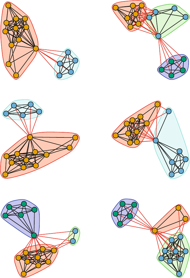
8.3 Community Detection 123
Edge Betweenness
CT
CT
OA
CT
BM
CT
CT
BM
BM
SB
TL
TL
TL
TL
BM
SB
BM
Fastgreedy
CT
OA
OA
CT
BM
CT
CT
BM
BM
SB
TL
TL
TL
TL
BM
SB
BM
Label Propagation
CT
OA
BM
CT
BM CT
OA
BM
BM
SB
TL
TL
TL
TL
BM
SB
BM
Leading Eigenvector
CT
OA
OA
CT
BM
CT
OA
BM
BM
SB
TL
TL
TL
TL
BM
SB
BM
Spinglass
CT
OA
OA
CT
BM
CT
OA
BM
BM
SB
TL TL
TL
TL
BM
SB
BM
Walktrap
CT
OA
OA
CT
BM
CT
OA
BM
BM
SB
TL
TL
TL
TL
BM
SB
BM
Fig. 8.9 Community detection comparisons on Bali network

Chapter 9
Affiliation Networks
A tribe is a group of people connected to one another, connected
to a leader, and connected to an idea. For millions of years,
human beings have been part of one tribe or another. A group
needs only two things to be a tribe: a shared interest and a way
to communicate. (Seth Godin – Tribes: We Need You to Lead Us)
9.1 Defining Affiliation Networks
Until now, all the networks that we have examined are based on direct ties. That
is, the social ties connecting the actors in the social network have been confirmed
through self-report, direct observation, or some other type of data collection that
tells us how actors are directly connected to one another.
However, social scientists are often interested in situations where there may be
the opportunity for social relationships, but these relationships cannot be directly
observed. However, by virtue of occupying the same social situation, we may infer
that there is an opportunity or potential for social connections.
We call this new type of social network an affiliation network. An affiliation
network is a network where the members are affiliated with one another based on
co-membership in a group, or co-participation in some type of event. For example,
students who all belong to the same class can be thought of as being connected to
one another, although we may not know whether they actually have direct social
ties.
The classic example from network science is the case of corporate interlocks.
Company directors have the opportunity to interact with each other when they sit
together on the same corporate board of directors. Moreover, the companies them-
selves can be seen to be connected through their shared director memberships. That
is, when the same director sits on two different company boards, those compa-
nies are connected through that director. Sociologists and political scientists have
used these types of affiliation networks to explain how companies tend to behave in
similar ways to one another (Galaskiewicz 1985).
© Springer International Publishing Switzerland 2015
D.A. Luke, A User’s Guide to Network Analysis in R, Use R!,
DOI 10.1007/978-3-319-23883-8 9
125

126 9 Affiliation Networks
9.1.1 Affiliations as 2-Mode Networks
As a simple example of an affiliation network, consider the following data table of
students grouped in classes (Table 9.1).
C1 <- c(1,1,1,0,0,0)
C2 <- c(0,1,1,1,0,0)
C3 <- c(0,0,1,1,1,0)
C4 <- c(0,0,0,0,1,1)
aff.df <- data.frame(C1,C2,C3,C4)
row.names(aff.df) <- c("S1","S2","S3","S4","S5","S6")
C1 C2 C3 C4
S11000
S21100
S31110
S40110
S50011
S60001
Table 9.1 Students grouped by classes
This type of data matrix is called an incidence matrix, and it depicts how nactors
belong to ggroups. In this case we have six students grouped into four classes.
An incidence matrix is similar to an adjacency matrix, but an adjacency matrix is
an nxn square matrix where each dimension refers to the actors in the network. An
incidence matrix, on the other hand, is an nxg rectangular matrix with two different
dimensions: actors and groups. For this reason, affiliation networks are also known
as two-mode networks.
9.1.2 Bipartite Graphs
In affiliation networks, there are always two types of nodes: one type for the actors,
and another type for the groups or events to which the actors belong. Ties then
connect the actors to those groups. One consequence of this is that there are no direct
ties among actors, and there are no direct ties between the groups. Figure 9.1, which
shows the example student affiliation network, illustrates this defining characteristic
of a bipartite graph.
Both statnet and igraph have functionality built in to recognize and operate
on affiliation networks. The process with igraph is a little more straightforward,
so it will be used in this chapter.

9.2 Affiliation Network Basics 127
library(igraph)
bn <- graph.incidence(aff.df)
plt.x <- c(rep(2,6),rep(4,4))
plt.y <- c(7:2,6:3)
lay <- as.matrix(cbind(plt.x,plt.y))
shapes <- c("circle","square")
colors <- c("blue","red")
plot(bn,vertex.color=colors[V(bn)$type+1],
vertex.shape=shapes[V(bn)$type+1],
vertex.size=10,vertex.label.degree=-pi/2,
vertex.label.dist=1.2,vertex.label.cex=0.9,
layout=lay)
9.2 Affiliation Network Basics
9.2.1 Creating Affiliation Networks from Incidence Matrices
An affiliation network can be stored as an igraph object in a few different ways.
If the underlying data are available as an incidence matrix (e.g., Table 9.1), then this
can be done in one line of code.
bn <- graph.incidence(aff.df)
bn
## IGRAPH UN-B 10 11 --
## + attr: type (v/l), name (v/c)
## + edges (vertex names):
## [1] S1--C1 S2--C1 S2--C2 S3--C1 S3--C2 S3--C3
## [7] S4--C2 S4--C3 S5--C3 S5--C4 S6--C4
The graph.incidence function takes a matrix or data.frame and transforms
it into an affiliation network, reading the rows as actors and the columns as the
groups or events. Note that both the row and column names should be defined so
that they can be correctly assigned to the individual actors and groups.
By typing in the name of the igraph object, we get a cryptic two line summary
of the network. The ‘B’ in the ‘UN-B’ string tells us that this is a bipartite net-
work. Furthermore, the second line shows that this network has two vertex attributes:
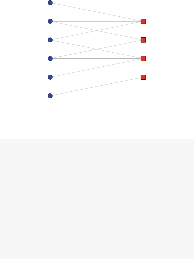
128 9 Affiliation Networks
name stores the name of the vertex, and type is a logical vector that igraph uses
to distinguish between the two different types of nodes (students and classes, in this
case).
S1
S2
S3
S4
S5
S6
C1
C2
C3
C4
Fig. 9.1 Affiliation network as bipartite graph
More information about the affiliation network can be obtained using traditional
igraph functions.
get.incidence(bn)
## C1 C2 C3 C4
## S1 1 0 0 0
## S2 1 1 0 0
## S3 1 1 1 0
## S4 0 1 1 0
## S5 0 0 1 1
## S6 0 0 0 1
V(bn)$type
## [1] FALSE FALSE FALSE FALSE FALSE FALSE TRUE
## [8] TRUE TRUE TRUE
V(bn)$name
## [1] "S1" "S2" "S3" "S4" "S5" "S6" "C1" "C2" "C3"
## [10] "C4"

9.2 Affiliation Network Basics 129
Here we can see the underlying incidence matrix, and the vertex names and types.
The correspondence between the names and the logical type vectors is clear, where
all the students have type =FALSE, and the class nodes have type =TRUE.
9.2.2 Creating Affiliation Networks from Edge Lists
For larger networks, it is more common to have the underlying data available as
an edge list. Edge lists can also be translated into an affiliation network, as long
nodes of one type (e.g., students) are only connected to nodes of the other type
(e.g., classes). The following code constructs the same example affiliation network
from edge list data.
el.df <- data.frame(rbind(c("S1","C1"),
c("S2","C1"),
c("S2","C2"),
c("S3","C1"),
c("S3","C2"),
c("S3","C3"),
c("S4","C2"),
c("S4","C3"),
c("S5","C3"),
c("S5","C4"),
c("S6","C4")))
el.df
## X1 X2
## 1 S1 C1
## 2 S2 C1
## 3 S2 C2
## 4 S3 C1
## 5 S3 C2
## 6 S3 C3
## 7 S4 C2
## 8 S4 C3
## 9 S5 C3
## 10 S5 C4
## 11 S6 C4
bn2 <- graph.data.frame(el.df,directed=FALSE)
bn2
## IGRAPH UN-- 10 11 --
## + attr: name (v/c)
## + edges (vertex names):

130 9 Affiliation Networks
## [1] S1--C1 S2--C1 S2--C2 S3--C1 S3--C2 S3--C3
## [7] S4--C2 S4--C3 S5--C3 S5--C4 S6--C4
The above creates an network object, but igraph does not know that it is a
bipartite graph. (Note that the network description lacks the ‘B’ that indicates a
bipartite graph.) To fix this, we can simply set the type vertex attribute. Once this
is done, we have an affiliation network object that is formed from a bipartite graph.
V(bn2)$type <- V(bn2)$name %in% el.df[,1]
bn2
## IGRAPH UN-B 10 11 --
## + attr: name (v/c), type (v/l)
## + edges (vertex names):
## [1] S1--C1 S2--C1 S2--C2 S3--C1 S3--C2 S3--C3
## [7] S4--C2 S4--C3 S5--C3 S5--C4 S6--C4
graph.density(bn)==graph.density(bn2)
## [1] TRUE
9.2.3 Plotting Affiliation Networks
As with any type of network, affiliation networks can be plotted for visual inspec-
tion. However, it is useful to designate different node shapes and colors to make
the affiliation structure easier to interpret. Here we will set the students to be blue
circles, and the classes to be red squares. The code shows how the type attribute
can be used as an index into both a shapes and a colors vector to select the appro-
priate shape and color for each node. Note that 1 is added to type index because
as a logical vector it starts at 0, whereas we want to select either the first or second
elements of the shapes/colors vectors.
shapes <- c("circle","square")
colors <- c("blue","red")
plot(bn,vertex.color=colors[V(bn)$type+1],
vertex.shape=shapes[V(bn)$type+1],
vertex.size=10,vertex.label.degree=-pi/2,
vertex.label.dist=1.2,vertex.label.cex=0.9)
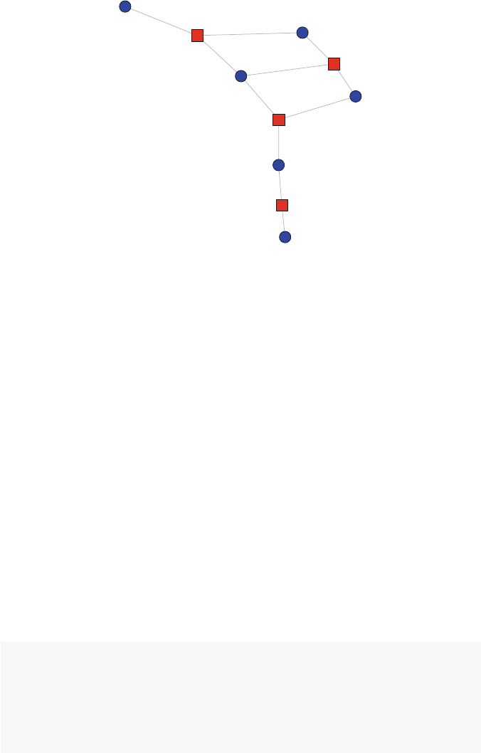
9.2 Affiliation Network Basics 131
S1
S2
S3
S4
S5
S6
C1
C2
C3
C4
Fig. 9.2 Simple plot of affiliation network
9.2.4 Projections
By examining Fig. 9.2 we can see how classes are indirectly connected through their
shared students. For example, classes 2 and 3 are indirectly connected through two
shared students (S3 and S4). In comparison, classes 3 and 4 are also indirectly con-
nected, but only via one shared student (S5). We can also focus the examination on
the individual-level nodes. Here the figure reveals that students 2 and 4 are indirectly
connected by their co-affiliation in class 2.
Examining both types of nodes in a two-mode network graphic is often the first
step in studying an affiliation network. However, it is also useful to examine the
direct connections among the nodes of one type at a time (classes and students, in
this case). This can be done by extracting and visualizing the one-mode projections
of the two-mode affiliation network. Every actor by event affiliation network can
produce two one-mode networks, one of actors and one of the events or affiliations.
In igraph the projections can be obtained again by just one line of code.
The bipartite.projection function returns a list of two igraph network
objects. The first network is made up of the direct ties among the first mode (in our
case students), and the second network shows the ties among the second mode
(classes).
bn.pr <- bipartite.projection(bn)
bn.pr
## $proj1
## IGRAPH UNW- 6 8 --
## + attr: name (v/c), weight (e/n)
## + edges (vertex names):

132 9 Affiliation Networks
## [1] S1--S2 S1--S3 S2--S3 S2--S4 S3--S4 S3--S5
## [7] S4--S5 S5--S6
##
## $proj2
## IGRAPH UNW- 4 4 --
## + attr: name (v/c), weight (e/n)
## + edges (vertex names):
## [1] C1--C2 C1--C3 C2--C3 C3--C4
Each of the list members can be accessed and treated like a typical igraph
network object, either within the list, or by extracting the list member.
graph.density(bn.pr$proj1)
## [1] 0.533
bn.student <- bn.pr$proj1
bn.class <- bn.pr$proj2
graph.density(bn.student)
## [1] 0.533
The adjacency matrix of each one-mode projection can be obtained with the
get.adjacency function. In the code below, notice how the edge attribute
weight is specified. This produces a valued adjacency matrix, where the values
indicate how many ties connect any of the nodes. So, for example, the Class adj-
acency matrix indicates that classes 2 and 3 have a weight of 2. This reflects the
observation we made earlier that classes 2 and 3 share two students (S3 and S4).
get.adjacency(bn.student,sparse=FALSE,attr="weight")
## S1 S2 S3 S4 S5 S6
##S1011000
##S2102100
##S3120210
##S4012010
##S5001101
##S6000010
get.adjacency(bn.class,sparse=FALSE,attr="weight")
## C1 C2 C3 C4
## C1 0 2 1 0
## C2 2 0 2 0
## C3 1 2 0 1
## C4 0 0 1 0
9.3 Example: Hollywood Actors as an Affiliation Network 133
Each of the one-mode projections can, of course, be plotted for visual exami-
nation. Additionally, we can (at least for smaller networks) take advantage of the
weight edge attribute to explore the relative strengths of the ties (Fig. 9.3).
shapes <- c("circle","square")
colors <- c("blue","red")
op <- par(mfrow=c(1,2))
plot(bn.student,vertex.color="blue",
vertex.shape="circle",main="Students",
edge.width=E(bn.student)$weight*2,
vertex.size=15,vertex.label.degree=-pi/2,
vertex.label.dist=1.2,vertex.label.cex=1)
plot(bn.class,vertex.color="red",
vertex.shape="square",main="Classes",
edge.width=E(bn.student)$weight*2,
vertex.size=15,vertex.label.degree=-pi/2,
vertex.label.dist=1.2,vertex.label.cex=1)
par(op)
9.3 Example: Hollywood Actors as an Affiliation Network
The data file hwd in the UseNetR package contains a larger and more interesting
affiliation network that can be explored using these techniques. Hollywood actors
are a good example of an affiliation network, actors are connected to one another
through the movies in which they appear together. The hwd dataset is an igraph
bipartite graph object. The data are originally from IMDB (www.imdb.com).
The dataset contains the ten most popular movies (as judged by IMBD users) for
Students
S1
S2
S3
S4
S5
S6
Classes
C1
C2
C3
C4
Fig. 9.3 Plots of one-mode projections

134 9 Affiliation Networks
each year from 1999 to 2014, and the first ten actors listed on each movie’s IMDB
page. In addition to the movie and actor names, each movie has the year of its re-
lease, its IMDB user rating, and the MPAA movie rating (i.e., G, PG, PG-13, and R)
stored as a node characteristic.
9.3.1 Analysis of Entire Hollywood Affiliation Network
The first steps to analyze these data are to load the file, and explore the basic affili-
ation structure of the network.
data(hwd)
h1 <- hwd
h1
## IGRAPH UN-B 1365 1600 --
## + attr: name (v/c), type (v/l), year (v/n),
## | IMDBrating (v/n), MPAArating (v/c)
## + edges (vertex names):
## [1] Inception--Leonardo DiCaprio
## [2] Inception--Joseph Gordon-Levitt
## [3] Inception--Ellen Page
## [4] Inception--Tom Hardy
## [5] Inception--Ken Watanabe
## [6] Inception--Dileep Rao
## [7] Inception--Cillian Murphy
## + ... omitted several edges
V(h1)$name[1:10]
## [1] "Inception"
## [2] "Alice in Wonderland"
## [3] "Kick-Ass"
## [4] "Toy Story 3"
## [5] "How to Train Your Dragon"
## [6] "Despicable Me"
## [7] "Scott Pilgrim vs. the World"
## [8] "Hot Tub Time Machine"
## [9] "Harry Potter and the Deathly Hallows: Part 1"
## [10] "Tangled"
V(h1)$type[1:10]
## [1] TRUE TRUE TRUE TRUE TRUE TRUE TRUE TRUE TRUE
## [10] TRUE
V(h1)$IMDBrating[1:10]

9.3 Example: Hollywood Actors as an Affiliation Network 135
## [1] 8.8 6.5 7.8 8.4 8.2 7.7 7.5 6.5 7.7 7.9
V(h1)$name[155:165]
## [1] "Notting Hill"
## [2] "Eyes Wide Shut"
## [3] "The Green Mile"
## [4] "10 Things I Hate About You"
## [5] "American Pie"
## [6] "Girl, Interrupted"
## [7] "Leonardo DiCaprio"
## [8] "Joseph Gordon-Levitt"
## [9] "Ellen Page"
## [10] "Tom Hardy"
## [11] "Ken Watanabe"
The summary description of h1 indicates that hwd is indeed a bipartite graph.
We can surmise that the ties link each actor to the movie that actor was in. The
description also reveals that the network has 1,365 nodes and 1,600 ties. This is a
little harder to decipher for an affiliation network, but given what we already know
we can figure out that there are 160 movie nodes, 1,205 actor nodes, and the 1,600
ties arise from each movie having links to just ten actors. (There are only 1,205
actors listed because some actors appear in more than one movie.)
The entire network is too large to show here, but we can examine a small subset
of it before doing more focused analyses. As a first step, we can take advantage of
igraph’s ability to store plotting information within the network object itself. In
this case, the node color and shape can be designated by defining these as vertex
attributes. (Compare to how this was done in the previous plotting example, where
the node colors and shapes were designated within the plot function call.)
V(h1)$shape <- ifelse(V(h1)$type==TRUE,
"square","circle")
V(h1)$shape[1:10]
## [1] "square" "square" "square" "square" "square"
## [6] "square" "square" "square" "square" "square"
V(h1)$color <- ifelse(V(h1)$type==TRUE,
"red","lightblue")
For the first plot, we will look at a subset of Martin Scorsese movies that were
released in the past 15 years. This example also illustrates how to create a subgraph
by extracting only the edges that are incident to vertices with certain properties
(in this case the name matches one of the three listed Scorsese movies). The key
here is the inc special function of the E() edge iterator. The inc function takes
a vertex sequence as an argument, and returns the incident edges. In this case, we
are extracting all of the edges that are incident to the three Scorsese movies. For
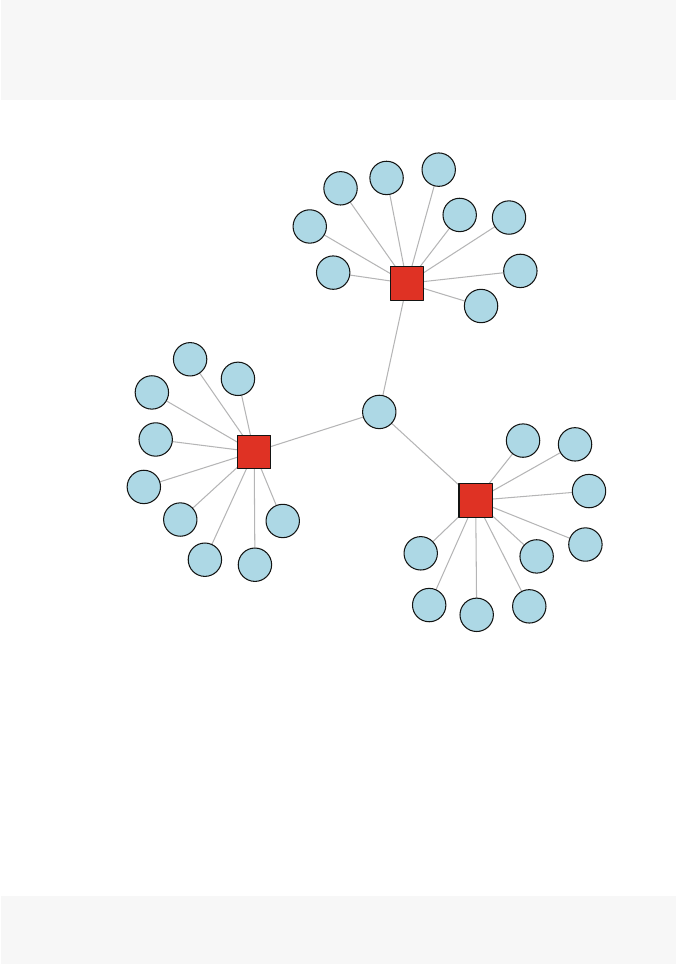
136 9 Affiliation Networks
more information see the igraph help entry on iterators, which can be found with
help(E). The resulting graphic highlights the special role of Leonardo DiCaprio
in these Scorsese movies, being the only actor to star in all three (Fig. 9.4).
h2 <- subgraph.edges(h1, E(h1)[inc(V(h1)[name %in%
c("The Wolf of Wall Street","Gangs of New York",
"The Departed")])])
plot(h2, layout = layout_with_kk)
The Wolf of Wall Street
The Departed
Leonardo DiCaprio
Gangs of New York
Jonah Hill
John C. Reilly
Cameron Diaz
Matthew McConaughey
Margot Robbie
Kyle Chandler
Rob Reiner
Jon Favreau
Jean Dujardin
Jon Bernthal
Joanna Lumley
Mark Wahlberg
Jim Broadbent
Kevin Corrigan
Liam Neeson
Anthony Anderson
Matt Damon Jack Nicholson
Martin Sheen
Ray Winstone
Vera Farmiga
Alec Baldwin
Brendan Gleeson
Daniel Day-Lewis
Henry Thomas
Gary Lewis
Stephen Graham
Fig. 9.4 Scorsese affiliation network
What can be learned from the entire Hollywood network? Most network descrip-
tive statistics can be applied to affiliation networks, but they often need to be adj-
usted either in how they are constructed or how they are interpreted. For example,
the overall density of the affiliation network can be easily calculated, but it is not
very meaningful given how the network data were collected (every actor by defini-
tion is connected to a movie) and that there can be no ties among either the movie
nodes or among the actor nodes.
graph.density(h1)
## [1] 0.00172

9.3 Example: Hollywood Actors as an Affiliation Network 137
Instead, node degree may be more informative, at least for actors. (In this dataset,
every movie has the same degree =10). The degree function allows specification
of which vertices to include, and that is used to select only the actors (for which the
node characteristic type is FALSE).
table(degree(h1,v=V(h1)[type==FALSE]))
##
##12345678
## 955 165 47 23 11 2 1 1
mean(degree(h1,v=V(h1)[type==FALSE]))
## [1] 1.33
This shows that the vast majority of actors only appeared in one movie, but there
were 15 actors who each starred in five or more movies since 1999. Across all the
actors, they starred in an average of 1.3 movies. This information can then be used
to identify the busiest actors of the past decade and a half. They owe a lot of thanks
to Harry Potter and Batman!
V(h1)$deg <- degree(h1)
V(h1)[type==FALSE ° >4]$name
## [1] "Leonardo DiCaprio" "Emma Watson"
## [3] "Richard Griffiths" "Harry Melling"
## [5] "Daniel Radcliffe" "Rupert Grint"
## [7] "James Franco" "Ian McKellen"
## [9] "Martin Freeman" "Bradley Cooper"
## [11] "Christian Bale" "Samuel L. Jackson"
## [13] "Natalie Portman" "Brad Pitt"
## [15] "Liam Neeson"
busy_actor <- data.frame(cbind(
Actor =V(h1)[type==FALSE ° >4]$name,
Movies =V(h1)[type==FALSE ° >4]$deg
))
busy_actor[order(busy_actor$Movies,decreasing=TRUE),]
## Actor Movies
## 5 Daniel Radcliffe 8
## 11 Christian Bale 7
## 1 Leonardo DiCaprio 6
## 2 Emma Watson 6
## 3 Richard Griffiths 5
## 4 Harry Melling 5
## 6 Rupert Grint 5
## 7 James Franco 5

138 9 Affiliation Networks
## 8 Ian McKellen 5
## 9 Martin Freeman 5
## 10 Bradley Cooper 5
## 12 Samuel L. Jackson 5
## 13 Natalie Portman 5
## 14 Brad Pitt 5
## 15 Liam Neeson 5
This tells us who the busiest actors were. If we wanted to assess the popularity
of the actors based on the popularity of the movies they appeared in, we could do
this by accessing the characteristics of each movie that each actor starred in. This is
slightly more complicated than the previous example, but can be done by utilizing
igraph’s abilities to identify the adjacent neighbors for any node in the graph.
The following code loops through the actor nodes in the network, and sums up
the IMDBrating for all the neighbors of each node. Note that the loop only assigns
the summed IMDBrating scores for the actor nodes (which are listed after the first
160 movie nodes).
for (i in 161:1365){
V(h1)[i]$totrating <- sum(V(h1)[nei(i)]$IMDBrating)
}
Once we have this we can once again examine the most popular actors, which is
based on both the number of movies, and the overall popularity of those movies.
max(V(h1)$totrating,na.rm=TRUE)
## [1] 60.9
pop_actor <- data.frame(cbind(
Actor =V(h1)[type==FALSE &totrating >40]$name,
Popularity =V(h1)[type==FALSE &
totrating >40]$totrating))
pop_actor[order(pop_actor$Popularity,decreasing=TRUE),]
## Actor Popularity
## 3 Daniel Radcliffe 60.9
## 4 Christian Bale 55.5
## 1 Leonardo DiCaprio 49.6
## 2 Emma Watson 45
## 5 Brad Pitt 40.5
Finally, network characteristics can always be examined using more traditional
graphical and statistical approaches. For example, we can see if the busiest actors
are starring in more popular movies, on average. First, we calculate an avgrating
characteristic that is based on the mean IMDBrating, rather than the sum. Then,
a simple scatterplot and regression are examined to see the relationship between

9.3 Example: Hollywood Actors as an Affiliation Network 139
number of movies and the average ratings of those movies. The results suggest that
there is not a strong relationship between how busy an actor has been and the popu-
larity of their movies. However, the scatterplot also suggests that actors who appear
in less popular movies are most likely to appear in only one or two movies (Fig. 9.5).
for (i in 161:1365){
V(h1)[i]$avgrating <- mean(V(h1)[nei(i)]$IMDBrating)
}
num <- V(h1)[type==FALSE]$deg
avgpop <- V(h1)[type==FALSE]$avgrating
summary(lm(avgpop ˜num))
##
## Call:
## lm(formula = avgpop ˜ num)
##
## Residuals:
## Min 1Q Median 3Q Max
## -3.986 -0.433 0.198 0.617 1.614
##
## Coefficients:
## Estimate Std. Error t value Pr(>|t|)
## (Intercept) 7.3387 0.0544 134.91 <2e-16
## num 0.0471 0.0353 1.34 0.18
##
## Residual standard error: 0.96 on 1203 df
## Multiple R-sq: 0.00148,Adjusted R-sq: 0.000653
## F-statistic: 1.79 on 1 and 1203 DF, p-value: 0.182
scatter.smooth(num,avgpop,col="lightblue",
ylim=c(2,10),span=.8,
xlab="Number of Movies",
ylab="Avg. Popularity")
9.3.2 Analysis of the Actor and Movie Projections
Following the same procedures as presented in Sect. 9.2.4, the two projections of
the Hollywood affiliation network can be created and analyzed. This will produce
an actor network where actors have ties if they starred together in the same movie,
and a movie network where the movies are connected if they shared the same actors.
The actor projection will thus have 1,205 nodes, and the movie projection network
will have 160 nodes.
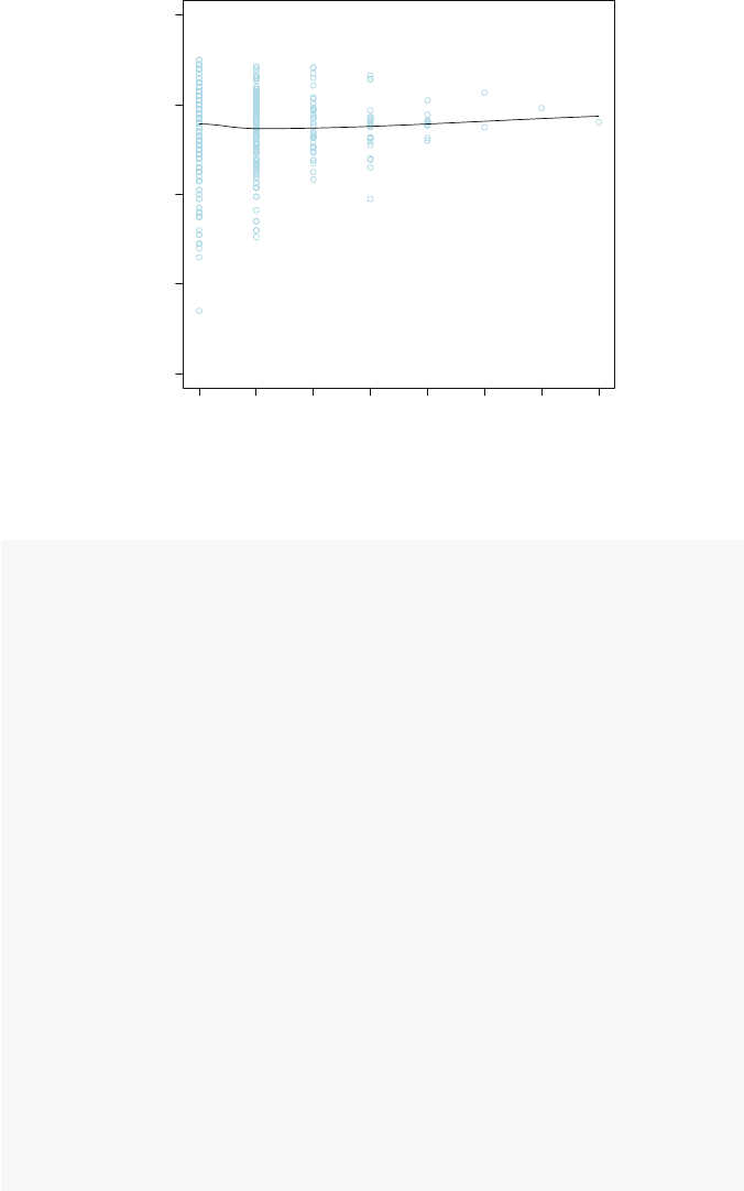
140 9 Affiliation Networks
12345678
108642
Number of Movies
Avg. Popularity
Fig. 9.5 Relationship between actor activity and popularity
h1.pr <- bipartite.projection(h1)
h1.act <- h1.pr$proj1
h1.mov <- h1.pr$proj2
h1.act
## IGRAPH UNW- 1205 6903 --
## + attr: name (v/c), year (v/n), IMDBrating
## | (v/n), MPAArating (v/c), shape (v/c),
## | color (v/c), deg (v/n), totrating (v/n),
## | avgrating (v/n), weight (e/n)
## + edges (vertex names):
## [1] Leonardo DiCaprio--Joseph Gordon-Levitt
## [2] Leonardo DiCaprio--Ellen Page
## [3] Leonardo DiCaprio--Tom Hardy
## [4] Leonardo DiCaprio--Ken Watanabe
## [5] Leonardo DiCaprio--Dileep Rao
## + ... omitted several edges
h1.mov
## IGRAPH UNW- 160 472 --
## + attr: name (v/c), year (v/n), IMDBrating
## | (v/n), MPAArating (v/c), shape (v/c),
## | color (v/c), deg (v/n), totrating (v/n),
## | avgrating (v/n), weight (e/n)
## + edges (vertex names):
9.3 Example: Hollywood Actors as an Affiliation Network 141
## [1] Inception--The Wolf of Wall Street
## [2] Inception--Django Unchained
## [3] Inception--The Departed
## [4] Inception--Gangs of New York
## [5] Inception--Catch Me If You Can
## + ... omitted several edges
Fig. 9.6 Movie affiliation network
In this figure, the entire movie network is presented, with node size based on the
IMDBrating, so that more popular movies have larger nodes (Fig. 9.6).
op <- par(mar =rep(0,4))
plot(h1.mov,vertex.color="red",
vertex.shape="circle",
vertex.size=(V(h1.mov)$IMDBrating)-3,
vertex.label=NA)

142 9 Affiliation Networks
par(op)
Some basic network descriptives provide more information about the Hollywood
movie network. Although there are some isolated movies (i.e., movies that did not
share actors with any of the other movies), most (148) of the movies form a large
connected component.
graph.density(h1.mov)
## [1] 0.0371
no.clusters(h1.mov)
## [1] 12
clusters(h1.mov)$csize
##[1]1481111112111
## [12] 1
table(E(h1.mov)$weight)
##
##123456710
##4112112166123
The complete movie network can be filtered to examine the single large con-
nected component. In the next figure the edge width has been set to equal the square
root of weight edge attribute. This results in the ties being thicker for movies that
share more actors between them (Fig. 9.7).
h2.mov <- induced.subgraph(h1.mov,
vids=clusters(h1.mov)$membership==1)
plot(h2.mov,vertex.color="red",
edge.width=sqrt(E(h1.mov)$weight),
vertex.shape="circle",
vertex.size=(V(h2.mov)$IMDBrating)-3,
vertex.label=NA)
The previous figure is still large and the relatively high density makes it some-
what challenging to interpret any interesting structural features. To help with that,
we can identify the higher density cores of the graph, and use that to ‘zoom in’ on
the more interconnected part of the network. (See Chap. 8for more information.)
This network is small enough that we can add node labels to help with the inter-
pretation. This helps us see that the most tightly connected sections of the network
9.3 Example: Hollywood Actors as an Affiliation Network 143
Fig. 9.7 Largest component of movie affiliation network
correspond to popular movie series, in particular Harry Potter, Batman, Star Wars,
and The Hobbit. This makes sense because movies in a series will naturally share
many or most of the same actors (Fig. 9.8).
table(graph.coreness(h2.mov))
##
##1234567
## 11 5 23 65 29 7 8
h3.mov <- induced.subgraph(h2.mov,
vids=graph.coreness(h2.mov)>4)
h3.mov
## IGRAPH UNW- 44 158 --
## + attr: name (v/c), year (v/n), IMDBrating
## | (v/n), MPAArating (v/c), shape (v/c),
## | color (v/c), deg (v/n), totrating (v/n),
144 9 Affiliation Networks
## | avgrating (v/n), weight (e/n)
## + edges (vertex names):
## [1] Inception--The Wolf of Wall Street
## [2] Inception--Django Unchained
## [3] Inception--The Dark Knight Rises
## [4] Inception--The Dark Knight
## [5] Inception--The Departed
## + ... omitted several edges
plot(h3.mov,vertex.color="red",
vertex.shape="circle",
edge.width=sqrt(E(h1.mov)$weight),
vertex.label.cex=0.7,vertex.label.color="darkgreen",
vertex.label.dist=0.3,
vertex.size=(V(h3.mov)$IMDBrating)-3)
Inception
Alice in Wonderland
Hot Tub Time Machine
Harry Potter and the Deathly Hallows: Part 1
The Interview
The Hobbit: The Battle of the Five Armies
Exodus: Gods and Kings
The Hobbit: The Desolation of Smaug
The Wolf of Wall Street
American Hustle
This Is the End
The Hobbit: An Unexpected Journey
Django Unchained
The Dark Knight Rises
Harry Potter and the Deathly Hallows: Part 2
Arthur Christmas
Captain America: The First Avenger
Rise of the Planet of the Apes
Harry Potter and the Half-Blood Prince
Nativity!
The Dark Knight
Pineapple Express
Taken
Superbad
Harry Potter and the Order of the Phoenix
Hot Fuzz
The Prestige
The Departed
Harry Potter and the Goblet of Fire
Batman Begins
Star Wars: Episode III - Revenge of the Sith
V for Vendetta
Harry Potter and the Prisoner of Azkaban
Love Actually
Big Fish
Harry Potter and the Chamber of Secrets
Gangs of New York
Spider-Man
Catch Me If You Can
Star Wars: Episode II - Attack of the Clones
Harry Potter and the Sorcerer's Stone
American Psycho
X-Men
Star Wars: Episode I - The Phantom Menace
Fig. 9.8 Core movie affiliation network
Part IV
Modeling

Chapter 10
Random Network Models
What is this? A center for ants? How can we be expected to
teachchildren tolearn how to read...iftheycan’teven fitinside
the building? (Derek Zoolander,inthemovieZoolander,after
looking at a miniature model of a school building.)
10.1 The Role of Network Models
According to Linton Freeman (2004), modern social network analysis has four main
characteristics:
1. It is motivated by a structural intuition based on ties linking social actors;
2. It is grounded in systematic empirical data;
3. It draws heavily on graphic imagery; and
4. It relies on the use of mathematical and/or computational models.
The preceding sections of this book focused on the first three elements of
Freeman’s characterization. The next four chapters now turn to consider his last
point, the utility of modeling in network analysis. Scientific models are simplified
descriptions of the real world that are used to predict or explain the characteristics
or behavior of the phenomenon of interest. Models can be used in network science
in the same way. With network models we can move beyond simple description to
build and test hypotheses about network structures, formation processes, and net-
work dynamics
In this chapter, a number of basic mathematical models of network structure
and formation are covered. These are important models in the history of network
science, but they are still useful today to provide insight into fundamental properties
of social networks, to serve as baseline or comparison models for empirical social
networks, and to act as building blocks for more complex network simulations.
Well over a dozen functions are provided in igraph for generating random net-
works based on a number of mathematical algorithms and heuristics. These all use
‘game’ as the final part of the function name, for example barabasi.game()
produces scale-free random graphs based on the Baraba´
si-Albert model (1999). In
the rest of this chapter, a number of important mathematical network models avail-
able in igraph are presented, along with some examples of how to use these mod-
els to explore network properties and as comparisons to observed, empirical social
networks.
© Springer International Publishing Switzerland 2015
D.A. Luke, A User’s Guide to Network Analysis in R, Use R!,
DOI 10.1007/978-3-319-23883-8 10
147

148 10 Random Network Models
10.2 Models of Network Structure and Formation
10.2.1 Erd˝
os-R´
enyi Random Graph Model
The earliest historically, and still one of the most important mathematical models
of network structure, is the random graph model first developed by Paul Erd˝
os and
Alfred R´
enyi in the late 1950s and early 1960s (Newman 2010). This is sometimes
called the Poisson random graph model (because of the Poisson degree distribu-
tion of large random graphs), or sometimes even just the random graph model.The
model is quite simple, G(n,m), where a random graph Gis defined with nvertices
and medges among those vertices chosen randomly. An equivalent model that is
easier to work with is G(n,p), where instead of specifying medges, each edge app-
ears in the graph with probability p. This random graph model is implemented in
igraph with the erdos.reny.game() function. A random graph is produced
by specifying the size of the desired network, and either the number of edges, or
the probability of observing an edge. The type argument is used to specify whether
the second argument should be interpreted as probability of an edge p, or number of
edges m.
library(igraph)
g<- erdos.renyi.game(n=12,10,type='gnm')
g
## IGRAPH U--- 12 10 -- Erdos renyi (gnm) graph
## + attr: name (g/c), type (g/c), loops (g/l),
## | m (g/n)
## + edges:
## [1] 4-- 5 3-- 6 2-- 8 1-- 9 8-- 9 8--10 1--11
## [8] 6--11 8--12 9--12
graph.density(g)
## [1] 0.152
The random nature of the graphs can be seen by producing and examining multi-
ple graphs. In each case the number of vertices is the same, but the ties are randomly
determined (Fig. 10.1).
op <- par(mar=c(0,1,3,1),mfrow=c(1,2))
plot(erdos.renyi.game(n=12,10,type='gnm'),
vertex.color=2,
main="First random graph")
plot(erdos.renyi.game(n=12,10,type='gnm'),
vertex.color=4,
main="Second random graph")
par(op)
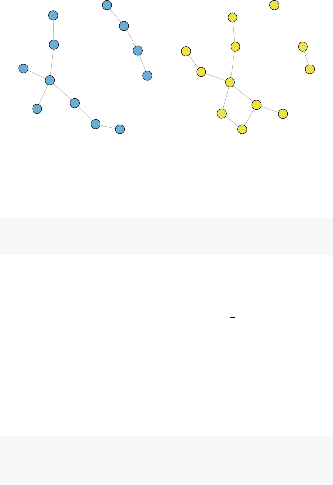
10.2 Models of Network Structure and Formation 149
First random graph
1
2
3
4
5
6
7
8
9
10
11
12
Second random graph
1
2
3
4
5
6
7
8
9
10
11
12
Fig. 10.1 Two random graphs
Despite the simplicity of the random graph model, it has led to a number of
important discoveries about network structures. First, as suggested above, for large
nthe network will have a Poisson degree distribution (Fig. 10.2).
g<- erdos.renyi.game(n=1000,.005,type='gnp')
plot(degree.distribution(g),
type="b",xlab="Degree",ylab="Proportion")
More unexpectedly, it turns out that random graphs become entirely connected
for fairly low values of average degree. That means even when edges are determined
randomly, each individual network member does not have to be connected to too
many other members for the network itself to be connected (i.e., the network has
only one component). More precisely, if pis greater than ln
n, then the random graph
is likely to be connected in one large component (Newman 2010). The average
degree of a random graph, c, is related to graph size and edge probability:
c=(n−1)p
So this means that across the range of network sizes typically seen in social net-
work analysis (say, 100–10,000), the average degree required to have a completely
connected network will be less than approximately 12. The following random graph
simulation and plot demonstrates this relationship (Fig. 10.3).
crnd <- runif(500,1,8)
cmp_prp <- sapply(crnd,function(x)
max(clusters(erdos.renyi.game(n=1000,
p=x/999))$csize)/1000)
150 10 Random Network Models
51015
0.00 0.05 0.10 0.15
Degree
Proportion
Fig. 10.2 Degree distribution for G with n = 1,000 and p= 0.005
smoothingSpline <- smooth.spline(crnd,cmp_prp,
spar=0.25)
plot(crnd,cmp_prp,col='grey60',
xlab="Avg. Degree",
ylab="Largest Component Proportion")
lines(smoothingSpline,lwd=1.5)
This demonstration requires some unpacking to easily understand. First, a vector
is created with 500 random values ranging from one to eight. This will be used as
input to a function that will create 500 random graphs, with average degree varying
from 1 to 8. Next, the sapply() function is used to call the random graph func-
tion repeatedly, and assign the results to cmp prp. The function itself creates each
random graph with 1,000 nodes, and with pequal to the desired average degree div-
ided by 999. (From above, p=c
n−1.) Once the random graph is produced, the size
of the largest component is calculated using the clusters() function. This num-
ber is then divided by the size of the network (1,000) to get the proportion of the
network accounted for by the largest component. The results show that for random
networks of 1,000 nodes, the network will be almost or completely connected when
the average degree is larger than four or five.
Another surprising property of random graphs is that the connected random
graphs are quite compact. That is, the diameter of the largest components in ran-
dom graphs stays relatively small even for large networks.
n_vect <- rep(c(50,100,500,1000,5000),each=50)
g_diam <- sapply(n_vect,function(x)
10.2 Models of Network Structure and Formation 151
12345678
0.2 0.4 0.6 0.8 1.0
Avg. Degree
Largest Component Proportion
Fig. 10.3 Relationship of average degree and connectedness in random graphs
diameter(erdos.renyi.game(n=x,p=6/(x-1))))
library(lattice)
bwplot(g_diam ˜factor(n_vect), panel = panel.violin,
xlab ="Network Size",ylab ="Diameter")
The above code runs a total of 250 simulations, producing random graphs from
50 to 5,000 nodes. As the plot shows, although the size of the graphs increases
across two orders of magnitude, the diameter of the largest component in each graph
increases much more slowly, from about five to ten (Fig. 10.4). These two character-
istics of random graphs: being completely connected with low average degree, and
the diameter increasing slowly relative to graph size, may be partly responsible for
some of the ‘small-world’ characteristics of real-world social networks (Newman
2010).
10.2.2 Small-World Model
The Erd˝
os-R´
enyi random graph model has one major limitation in that it does not
describe the properties of many real-world social networks. In particular, fully ran-
dom graphs have degree distributions that do not match observed networks very
well, and they also have quite low levels of clustering (transitivity).
One type of model, called the small-world model by Watts and Strogatz (1998),
produces random networks that are somewhat more realistic than Erd˝
os-R´
enyi
152 10 Random Network Models
graphs. In particular, small-world model networks have more realistic levels of tran-
sitivity along with small diameters.
The small-world model starts with a circle of nodes, where each node is con-
nected to its cimmediate neighbors (forming a formal lattice structure). Then, a
small number of existing edges are rewired, where they are removed and then rep-
laced with another tie that connects two random nodes. If the rewiring probability
is 0, then we end up with the original lattice network. When pis 1, then we have an
Erd˝
os-R´
enyi random graph. The main interesting discovery of Watts and Strogatz
(and others), is that only a small fraction of ties needs to be rewired to dramatically
reduce the diameter of the network.
Network Size
Diameter
4
5
6
7
8
9
10
50 100 500 1000 5000
Fig. 10.4 Relationship of random graph size and diameter, for average degree =6
Figure 10.5 shows how various small-world model networks look with different
rewiring probabilities. The watts.strogatz.game() is called to produce a
small-world network of 30 nodes. Setting the option nei=2 (for neighborhood)
will start the network with each node tied to the closest two neighbors on either
side. This results in each node having degree =4.
g1 <- watts.strogatz.game(dim=1,size=30,nei=2,p=0)
g2 <- watts.strogatz.game(dim=1,size=30,nei=2,p=.05)
g3 <- watts.strogatz.game(dim=1,size=30,nei=2,p=.20)
g4 <- watts.strogatz.game(dim=1,size=30,nei=2,p=1)
op <- par(mar=c(2,1,3,1),mfrow=c(2,2))
plot(g1,vertex.label=NA,layout=layout_with_kk,
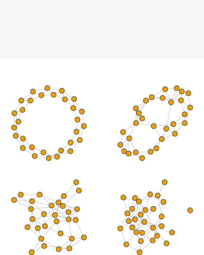
10.2 Models of Network Structure and Formation 153
main=expression(paste(italic(p),"=0")))
plot(g2,vertex.label=NA,
main=expression(paste(italic(p)," = .05")))
plot(g3,vertex.label=NA,
main=expression(paste(italic(p)," = .20")))
plot(g4,vertex.label=NA,
main=expression(paste(italic(p),"=1")))
par(op)
p = 0 p = .05
p = .20 p = 1
Fig. 10.5 Small-world models with increasing rewiring probabilities
The following simulation and figure shows how quickly rewiring reduces the
diameter of a network in the small-world model. Working with a network with 100
nodes, each node starts out connected to its two neighbors on each side. The graph
will thus have 200 edges. The starting diameter of the lattice network is 25 (getting
from one node to the other side of the circle takes 25 steps).

154 10 Random Network Models
g100 <- watts.strogatz.game(dim=1,size=100,nei=2,p=0)
g100
## IGRAPH U--- 100 200 -- Watts-Strogatz random grap
## + attr: name (g/c), dim (g/n), size (g/n),
## | nei (g/n), p (g/n), loops (g/l), multiple
## | (g/l)
## + edges:
## [1] 1-- 2 2-- 3 3-- 4 4-- 5 5-- 6 6-- 7
## [7] 7-- 8 8-- 9 9--10 10--11 11--12 12--13
## [13] 13--14 14--15 15--16 16--17 17--18 18--19
## [19] 19--20 20--21 21--22 22--23 23--24 24--25
## [25] 25--26 26--27 27--28 28--29 29--30 30--31
## [31] 31--32 32--33 33--34 34--35 35--36 36--37
## + ... omitted several edges
diameter(g100)
## [1] 25
The simulation is set to calculate 300 networks, ten each for the number of edges
to rewire ranging from 1 to 30. Because we know how many edges are in each graph
(200), the rewiring probability can be calculated by the number of rewired edges
divided by total number of edges. If 30 edges are rewired, then, the probability is
0.15.
p_vect <- rep(1:30,each=10)
g_diam <- sapply(p_vect,function(x)
diameter(watts.strogatz.game(dim=1,size=100,
nei=2,p=x/200)))
smoothingSpline =smooth.spline(p_vect, g_diam,
spar=0.35)
plot(jitter(p_vect,1),g_diam,col='grey60',
xlab="Number of Rewired Edges",
ylab="Diameter")
lines(smoothingSpline,lwd=1.5)
The plot demonstrates that after only rewiring ten of the edges (p=0.05), the
diameter has shrunk at least 60 %, from 25 to about 10 (Fig. 10.6).
10.2.3 Scale-Free Models
An important limitation of the previous two mathematical network models is that
they produce graphs with degree distributions that are not representative of many
10.2 Models of Network Structure and Formation 155
302520151050
10 15 20 25
Number of Rewired Edges
Diameter
Fig. 10.6 Relationship of rewiring probability to network diameter for the small-world model
real-world social networks. Numerous studies, in fact, have shown that a wide vari-
ety of observed networks have heavy-tailed degree distributions that approximately
follow a power law. These are typically called scale-free networks. For example,
both the network of sexual partners and the World-Wide-Web exhibit this scale-free
pattern (Broder et al. 2000; Liljeros et al. 2001). That is, some people have many
sexual partners (high degree), but most people have a small number of sexual part-
ners. Similarly, some websites have a very large number of other websites connected
to them, but most websites have only a few connections.
How does this power-law characteristic feature of scale-free social networks
arise? A number of network scientists have explored this question, and have det-
ermined that a network formation process of cumulative advantage,orpreferential
attachment can explain this. That is, as networks grow, new nodes are more likely to
form ties with other nodes that already have many ties, due to their visibility in the
network. This ‘rich-gets-richer’ phenomena has been shown to lead to the power-
law distribution in networks (de Solla Price 1976; Barab´
asi and Albert 1999).
The preferential attachment model of Barab´
asi and Albert is implemented in
igraph with the barabasi.game() function. This is a more complicated alg-
orithm than those for the previous models, partly because this is a network growth
model, not just a static network structure model.
Figure 10.7 displays a 500-node network that is formed with this preferential
attachment model. The default behavior of the algorithm is that as each new node is
added to the network, it is connected to another node in the network, with probability
proportional to the degree of that node. Thus, some nodes in the network will end
up with many more ties than most of the other nodes. The code for this example
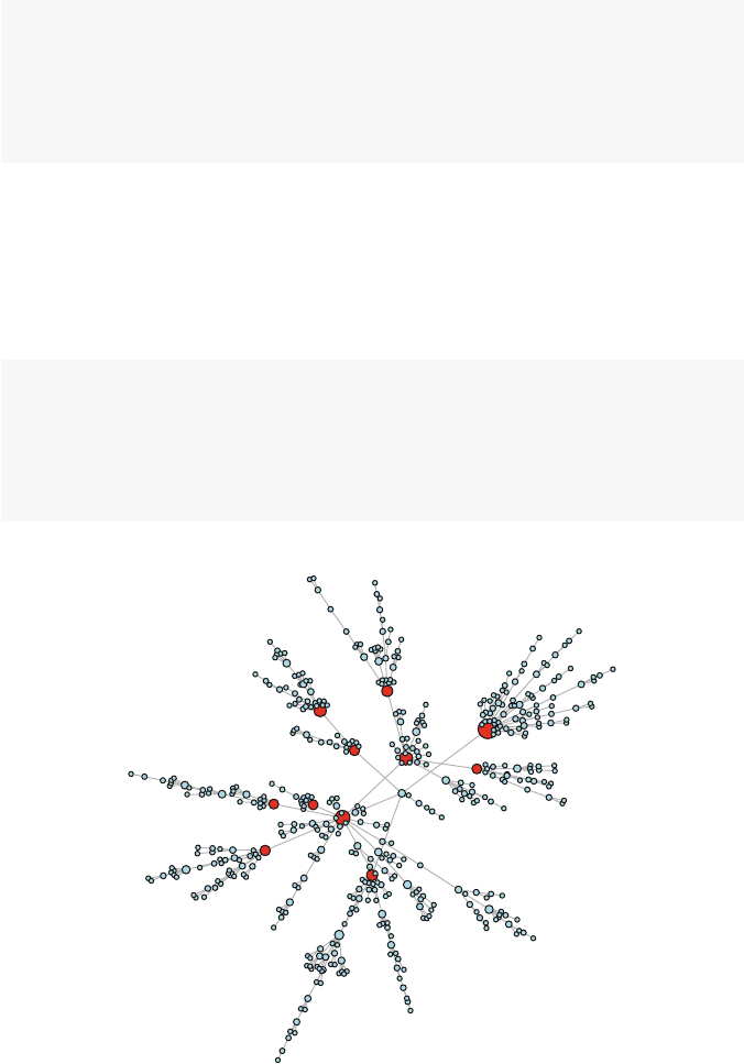
156 10 Random Network Models
highlights these hubs by coloring the nodes with degree >9 red. Also, the nodes
are sized based on their degree, using the rescale() function from Chap. 5.
g<- barabasi.game(500,directed =FALSE)
V(g)$color <- "lightblue"
V(g)[degree(g) >9]$color <- "red"
node_size <- rescale(node_char =degree(g), low =2,
high =8)
plot(g, vertex.label =NA,vertex.size = node_size)
We can see the heavy-tail distribution in a few ways. The median degree is 1,
and the mean is close to 2. The highest degree is 27. The pattern is easily seen in
Fig. 10.8. The left panel shows the raw degree distribution, while the right panel
displays the same degree distribution, but on log-scales. If the distribution follows a
power-law, then the datapoints should fall along a straight line (at least for the tail).
(Note that it is difficult to assess power-law relationships with small networks.)
median(degree(g))
## [1] 1
mean(degree(g))
## [1] 2
Fig. 10.7 Example scale-free network with default options
10.2 Models of Network Structure and Formation 157
table(degree(g))
##
##1234567910111214
##3148641231110313221
## 16 19 27
##111
op <- par(mfrow=c(1,2))
plot(degree.distribution(g),xlab="Degree",
ylab="Proportion")
plot(degree.distribution(g),log='xy',
xlab="Degree",ylab="Proportion")
par(op)
The user can adjust a number of parameters in the barabasi.game() func-
tion to produce a wide variety of preferential attachment networks. For example, the
following code produces a network that might be viewed as a little more realistic
than that shown in the previous figure. Here, instead of each new node connecting to
exactly one other node, the out.dist option is used to specify a distribution of tie
probabilities. In this case a new node will have a tie to 0 other nodes (isolate) 25 %
of the time, will be tied to one other node 50 % of the time, and to two nodes 25 % of
0 5 10 15 20 25
0.0 0.1 0.2 0.3 0.4 0.5 0.6
Degree
Proportion
12 5 1020
0.002 0.005 0.010 0.020 0.050 0.100 0.200 0.500
Degree
Proportion
Fig. 10.8 Degree distribution of scale-free model (linear and log-linear scales)
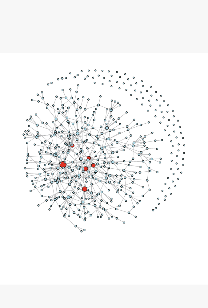
158 10 Random Network Models
the time. Also, the zero.appeal option is used to make it somewhat more likely
that new nodes are connected to previously existing isolates. Figure 10.9 shows that
the resulting graph has produced a number of isolates and slightly fewer nodes with
high degree.
g<- barabasi.game(500,out.dist =c(0.25,0.5,0.25),
directed =FALSE,zero.appeal =1)
V(g)$color <- "lightblue"
V(g)[degree(g) >9]$color <- "red"
node_size <- rescale(node_char =degree(g), low =2,
high =8)
plot(g, vertex.label =NA,vertex.size = node_size)
Fig. 10.9 Example scale-free network with modified options
Finally, to illustrate how preferential attachment networks grow, the following
figure shows what the networks look like at four different stages, with graph sizes
of 10, 25, 50, and 100 nodes (Fig. 10.10).
g1 <- barabasi.game(10,m=1,directed=FALSE)
g2 <- barabasi.game(25,m=1,directed=FALSE)
g3 <- barabasi.game(50,m=1,directed=FALSE)
10.2 Models of Network Structure and Formation 159
g4 <- barabasi.game(100,m=1,directed=FALSE)
op <- par(mfrow=c(2,2),mar=c(4,0,1,0))
plot(g1, vertex.label=NA,vertex.size =3,
xlab ="n = 10")
plot(g2, vertex.label=NA,vertex.size =3,
xlab ="n = 25")
plot(g3, vertex.label=NA,vertex.size =3,
xlab ="n = 50")
plot(g4, vertex.label=NA,vertex.size =3,
xlab ="n = 100")
par(op)
n = 10 n = 25
n = 50 n = 100
Fig. 10.10 Growth of networks using preferential attachment model

160 10 Random Network Models
10.3 Comparing Random Models to Empirical Networks
The mathematical models described here, as well as many others, have been used
to study the theoretical properties of networks. These models can also be useful as
comparisons to empirical social networks. As as simple example of this, we can
explore some basic network properties of the lhds data taken from Harris’ 2013
book on exponential random graph models (see Chap. 11). The lhds network is
made up of communication ties among 1,283 leaders of local public health depart-
ments. The network has quite low density, although the average degree is over four
(Fig. 10.11).
data(lhds)
ilhds <- asIgraph(lhds)
ilhds
## IGRAPH U--- 1283 2708 --
## + attr: title (g/c), hivscreen (v/c), na
## | (v/l), nutrition (v/c), popmil (v/n),
## | state (v/c), vertex.names (v/c), years
## | (v/n), na (e/l)
## + edges:
## [1] 2-- 10 2-- 11 2-- 19 2-- 20 5--1003
## [6] 5-- 6 6-- 11 6-- 17 10-- 11 11-- 19
## [11] 11-- 26 2-- 12 6-- 12 10-- 12 11-- 12
## [16] 12-- 19 12-- 26 9-- 14 14-- 15 14-- 18
## [21] 14-- 25 14-- 27 14-- 226 14-- 414 14-- 697
## + ... omitted several edges
graph.density(ilhds)
## [1] 0.00329
mean(degree(ilhds))
## [1] 4.22
The following code builds three network models that have the same size and
approximately the same density as the lhds network. By comparing the charac-
teristics of the network models with the empirical network, we can highlight the
interesting or important characteristics of the empirical network that might be worth
further exploration (by using, for example, the types of statistical modeling and sim-
ulation approaches presented in the next few chapters).
g_rnd <- erdos.renyi.game(1283,.0033,type='gnp')
g_smwrld <- watts.strogatz.game(dim=1,size=1283,
nei=2,p=.25)
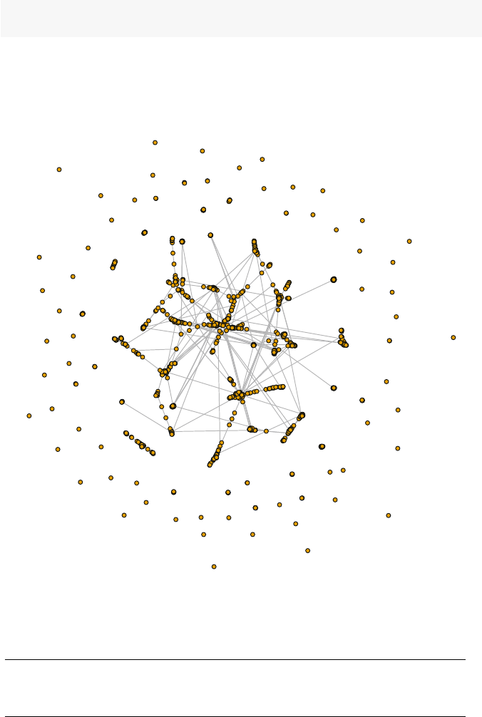
10.3 Comparing Random Models to Empirical Networks 161
g_prfatt <- barabasi.game(1283,out.dist=c(.15,.6,.25),
directed=FALSE,zero.appeal=2)
Table 10.1 presents some descriptive network statistics for the three models and
the lhds network. Although each model captures some of the characteristics of
the observed network, none of them match across all the statistics. In particular, the
lhds network has much higher transitivity than any of the models (Fig. 10.12).
Fig. 10.11 Local health department communication network
Name Size Density Avg. degree Transitivity Isolates
Erdos-Renyi 1283 0.003 4.404 0.002 21
Small world 1283 0.003 4.000 0.088 1
Preferential attachment 1283 0.002 2.195 0.003 109
Health department 1283 0.003 4.221 0.306 58
Table 10.1 Comparison of model and empirical network characteristics
162 10 Random Network Models
0 5 10 15 20 25
0.00 0.05 0.10 0.15 0.20
0.00 0.10 0.20 0.30
Erdos-Renyi Random Graph
Degree
0 5 10 15 20 25
Degree
Small World
0 5 10 15 20 25
0.30 0.1 0.2 0.3
0.00 0.05 0.10 0.15
Preferential Attachment
Degree
0 5 10 15 20 25
Degree
Local Health Dept. Network
Fig. 10.12 Comparison of degree distributions for random models and empirical local health de-
partment network

Chapter 11
Statistical Network Models
Prediction and explanation are exactly symmetrical.
Explanations are, in effect, predictions about what has
happened; predictions are explanations about what’s going to
happen. (John Rogers Searle)
11.1 Introduction
As suggested in the previous chapter, for most of the history of network science
analysts were limited to network visualization and network description. Only in
the past couple of decades has network statistical theory and computational power
developed enough to allow for valid and feasible statistical modeling of networks.
The primary barrier to statistical network modeling was the fundamental assumption
of independence of observations that underlies much of traditional statistical theory.
Networks by definition are non-independent. If you know that one actor is tied to
another actor, you have information about the second actor that is dependent on the
first.
Over the years statistical theorists gradually developed increasingly sophisticated
models that could be applied to empirical network data, including dyadic depen-
dence and dyadic independence models (such as p*,seeHarris2013). The focus of
this chapter is on exponential random graph models (ERGMs), which have turned
out to be the most powerful, flexible, and widely used modeling approach for build-
ing and testing statistical models of networks.
An ERGM is a true generative statistical model of network structure and char-
acteristics (Hunter et al. 2008). This means that inferential hypotheses can be pro-
posed and tested. It is generative in the sense that characteristics of the individual
elements in the network (i.e., actors) and local structural properties can be used to
predict properties of the entire network (e.g., diameter, degree distribution, etc.).
ERGMs are popular for at least four reasons. First, they can handle the complex
dependencies of network data without the types of degeneracy problems that were
frequently encountered in earlier network models. Second, ERGMs are flexible and
can handle many different types of predictors and covariates. Third, the generative
approach where overall network characteristics are predicted from individual actor
and local structural properties enhances the validity of the models. Finally, ERGM
© Springer International Publishing Switzerland 2015
D.A. Luke, A User’s Guide to Network Analysis in R, Use R!,
DOI 10.1007/978-3-319-23883-8 11
163

164 11 Statistical Network Models
models have been implemented in programming suites and statistical packages such
as R, making it easier for applied analysts to build, test, and disseminate the results
of their network models.
ERGMs are fit using Monte Carlo Markov Chain maximum-likelihood estima-
tion (MCMC). The estimates of the statistical parameters are based on an underlying
simulation, where many (typically thousands) of networks are produced to reflect
the particular model being tested. One way to express the basic ERGM model is:
P(yij =1|YC
ij)=1
cexp{
K
∑
k=1
θ
kzk(y)}
This shows that the model is predicting the probability of a tie between actors i
and j, conditional on the rest of the network (all other ties). The thetas (
θ
k)are the
coefficients of the network statistics of interest, one for each of the Kincluded statis-
tics, zk(y).1
cis simply a normalizing constant that ensures that the probabilities
stay within 0 and 1. (See Harris 2013, for more details.)
ERGMs are implemented in the ergm package that is contained in the statnet
suite of network analysis packages in R. It is actively maintained and developed by
network scientists at the University of Washington, among others. More technical
details of ergm are provided in excellent papers by Hunter and colleagues (2008)
as well as Goodreau (2007).
As suggested above, one of the strengths of ERGMs is the ability to handle a wide
variety of predictors. In fact, the documentation for ergm lists more than a hundred
possible types of terms that can be included in an ergm model specification. It is
easier to navigate the possibilities once one knows that all the possible predictors
in an ERGM fall into one of four broad categories: node-level predictors, dyadic
predictors, relational predictors, and local structural predictors.
Table 11.1 lists these categories, along with some of the most commonly used
ergm terms for each type. The first type of predictor is node or actor-level charac-
teristics, where having a particular characteristic is hypothesized to affect the like-
lihood of observing a tie. For example, if you hypothesize that girls are more likely
to make friends than boys in middle school, then you could use actor gender as
a node-level predictor. Dyad-level predictors are used when you hypothesize that
the characteristics of both actors in a dyad may influence the probability of obs-
erving a tie between those two actors. These types of predictors allow you to test
hypotheses of assortative or disassortative mixing in networks, leading to patterns
of homophily or heterophily. For example, if you think that friendships are more
likely to be formed within the same grade in a middle school (assortative mixing),
then you could use grade as a dyad-level predictor. The third type of predictor in
ERGMs is a powerful option to use information about other relationships or ties
when predicting the observed ties in a network. That is, you can use one type of
network tie to predict a second type of tie (as long as they are both collected on the
same set of network members). Finally, information about local structural properties
of the observed network can be used as model covariates. This, for example, allows
the network model to be conditioned on the observed degree distribution, or on the
level of transitivity (closed triangles) that is observed.

11.2 Building Exponential Random Graph Models 165
Predictor type Term
Node nodefactor
nodecov
Dyad nodemix
nodematch
absdiff
Relation edgecov
Structure gwdegree
gwdsp
gwesp
Table 11.1 Common ERGM terms
In the following examples, we will build a series of ERGMs that use predictors
from each of these four broad types of ergm terms. For more detailed information
about the terms included in ergm,seehelp(’ergm-terms’). A more general
overview is provided by Morris, Handcock, and Hunter (2008). Finally, ergm inc-
ludes a helpful vignette that shows how the various terms are related to one another
(vignette(’ergm-term-crossRef’)).
11.2 Building Exponential Random Graph Models
To explore a number of the stochastic modeling possibilities of the ergm package,
we will use network data that describe interorganizational relationships among 25
agencies within the Indiana state tobacco control program in 2010. These data inc-
lude three different types of interorganizational ties: frequency of contact, level of
collaboration, and whether each pair of agencies communicated with one another
about a particular evidence-based guideline published by the Center’s for Disease
Control and Prevention (CDC), called Best Practices for Tobacco Control.This
latter relationship is conceptualized as a type of dissemination tie. The following
example models will focus on predicting the pattern of these dissemination ties
among the Indiana tobacco control organizations.
The data are included in the UserNetR package as a network list object called
TCnetworks. The network data include a number of node characteristics (e.g.,
tob yrs, which records how long an agency has been working in tobacco control),
edge characteristics, and a sociomatrix (TCdist) which contains the geographic
distance between each pair of agencies. For more information, see the help file for
TCnetworks.
Prior to modeling, the network data need to be extracted from the list object, and
any preliminary descriptive and visualization tasks can be conducted.
data(TCnetworks)
TCcnt <- TCnetworks$TCcnt
TCcoll <- TCnetworks$TCcoll

166 11 Statistical Network Models
TCdiss <- TCnetworks$TCdiss
TCdist <- TCnetworks$TCdist
summary(TCdiss,print.adj=FALSE)
## Network attributes:
## vertices = 25
## directed = FALSE
## hyper = FALSE
## loops = FALSE
## multiple = FALSE
## bipartite = FALSE
## title = IN_Diffusion
## total edges = 103
## missing edges = 0
## non-missing edges = 103
## density = 0.343
##
## Vertex attributes:
##
## agency_cat:
## numeric valued attribute
## attribute summary:
## Min. 1st Qu. Median Mean 3rd Qu. Max.
## 1.00 2.00 2.00 3.24 5.00 6.00
##
## agency_lvl:
## numeric valued attribute
## attribute summary:
## Min. 1st Qu. Median Mean 3rd Qu. Max.
## 1.00 1.00 2.00 2.04 3.00 3.00
##
## lead_agency:
## numeric valued attribute
## attribute summary:
## Min. 1st Qu. Median Mean 3rd Qu. Max.
## 0.00 0.00 0.00 0.04 0.00 1.00
##
## tob_yrs:
## numeric valued attribute
## attribute summary:
## Min. 1st Qu. Median Mean 3rd Qu. Max.
## 1.00 3.00 4.50 6.76 9.00 21.00
## vertex.names:
## character valued attribute
## 25 valid vertex names

11.2 Building Exponential Random Graph Models 167
##
## No edge attributes
A quick examination of the network reveals that it is made up of three types of
organizations (local, state, and national), is made up of one connected component
that is fairly densely connected, and there is some variability of centrality across the
network members (shown both by the betweenness centralization score, as well as
the variability of the sizes of nodes in the figure, based on degree) (Fig. 11.1).
components(TCdiss)
## [1] 1
gden(TCdiss)
## [1] 0.343
centralization(TCdiss,betweenness,mode='graph')
## [1] 0.381
deg <- degree(TCdiss,gmode='graph')
lvl <- TCdiss %v% 'agency_lvl'
plot(TCdiss,usearrows=FALSE,displaylabels=TRUE,
vertex.cex=log(deg),
vertex.col=lvl+1,
label.pos=3,label.cex=.7,
edge.lwd=0.5,edge.col="grey75")
legend("bottomleft",legend=c("Local","State",
"National"),
col=2:4,pch=19,pt.cex=1.5)
11.2.1 Building a Null Model
It is often useful to start the modeling process by building a null model, one with no
substantive or structural predictors. This can be used as a baseline model to judge
how much subsequent models are improving. A null model typically only has one
term, edges, which produces a random graph model that has the same number of
edges as the observed network.
Fitting an ergm model uses syntax similar to other statistical modeling functions
in R. The ergm function is called with a model formula. This formula lists the
observed network as the dependent variable, and then all of the ergm model terms
are listed on the right hand side. Other options can also be set by the user. The
control option is used to pass control parameters to the ergm algorithm. Here we
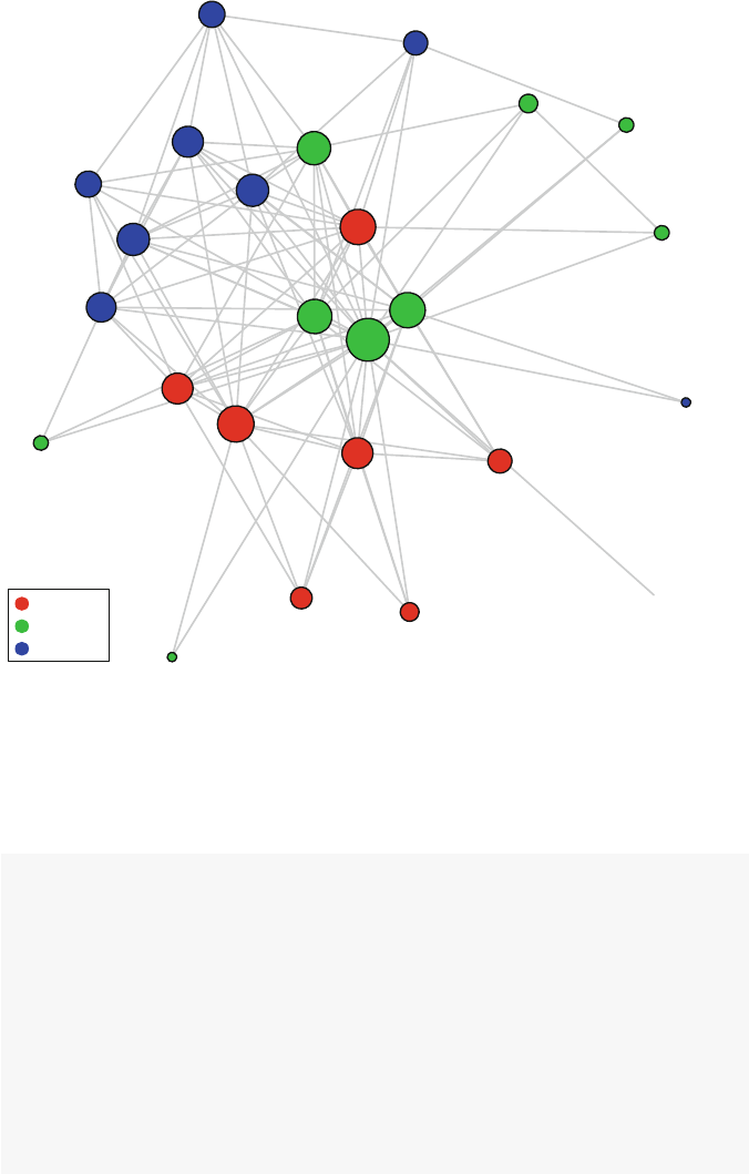
168 11 Statistical Network Models
ITPC
Promotus
RTI
Quitline
IDHA
IN Latino Inst
King's Daughters
Hancock Regional
Hlthy Madison
Wabash
Tippecanoe
CHANCES
Johnson Memorial
ICSA
IN Cancer Consortium
Smokefree Pregnancies
ALA
AHA
DOE
DOH Diabetes Prev. & Chronic Disease
Medicaid
Partnership for Prev.
TTAC CTFK
ANR
Local
State
National
Fig. 11.1 Indiana tobacco control dissemination network
set the random number seed to ensure that the same results will be seen across
multiple runs. The results of fitting the model are stored in a model object for further
examination and analysis.
library(ergm)
DSmod0 <- ergm(TCdiss ˜edges,
control=control.ergm(seed=40))
class(DSmod0)
## [1] "ergm"
summary(DSmod0)
##
## ==========================
## Summary of model fit
## ==========================

11.2 Building Exponential Random Graph Models 169
##
## Formula: TCdiss ˜ edges
##
## Iterations: 4 out of 20
##
## Monte Carlo MLE Results:
## Estimate Std. Error MCMC % p-value
## edges -0.648 0.122 0 <1e-04
##
## Null Deviance: 416 on 300 degrees of freedom
## Residual Deviance: 386 on 299 degrees of freedom
##
## AIC: 388 BIC: 392 (Smaller is better.)
A null model includes only the edges term. This acts as a type of intercept for
the model, and ensures that the simulated networks have the same number of edges
as the observed network. This can be seen by taking the logistic transformation
of the edges parameter, which gives the overall density of network. This demon-
strates that the null model is constrained by the number of edges in the observed
network.
plogis(coef(DSmod0))
## edges
## 0.343
11.2.2 Including Node Attributes
Once a null model is obtained, more interesting models can be fit using a wide
variety of predictors. Following the order suggested by Table 11.1, we start with
main effect terms based on individual node characteristics. In the Indiana network,
we know which agency is the lead agency (receiving funding from CDC), and we
also know how long each agency has been working in tobacco control. It might
be reasonable to assume that agencies are more likely to be connected to the lead
agency. It also would make sense that agencies with a longer history of tobacco
control experience would be more likely to be connected to other agencies. The fol-
lowing scatterplot does suggest that there may be a relationship between experience
and interorganizational connections (Fig. 11.2).
scatter.smooth(TCdiss %v% 'tob_yrs',
degree(TCdiss,gmode='graph'),
xlab='Years of Tobacco Experience',
ylab='Degree')
170 11 Statistical Network Models
5 101520
5101520
Years of Tobacco Experience
Degree
Fig. 11.2 Basic association between years of experience and node degree
Both of the above hypotheses can be formally tested. There are two main
ergm model terms for testing node characteristic main effects, nodefactor and
nodecov.nodefactor is used for a categorical attribute (e.g., lead agency),
while nodecov is used for quantitative characteristics (such as tob yrs).
DSmod1 <- ergm(TCdiss ˜edges +
nodefactor('lead_agency')+
nodecov('tob_yrs'),
control=control.ergm(seed=40))
summary(DSmod1)
##
## ==========================
## Summary of model fit
## ==========================
##
## Formula: TCdiss ˜ edges +
## nodefactor("lead_agency") +
## nodecov("tob_yrs")
##
## Iterations: 16 out of 20
##
## Monte Carlo MLE Results:
## Estimate Std. Error
## edges -1.6783 0.3293

11.2 Building Exponential Random Graph Models 171
## nodefactor.lead_agency.1 17.9366 933.5551
## nodecov.tob_yrs 0.0599 0.0228
## MCMC % p-value
## edges 0 <1e-04
## nodefactor.lead_agency.1 0 0.9847
## nodecov.tob_yrs 0 0.0091
##
## Null Deviance: 416 on 300 degrees of freedom
## Residual Deviance: 323 on 297 degrees of freedom
##
## AIC: 329 BIC: 341 (Smaller is better.)
The results show a number of interesting points. First, the number of years in
tobacco control is positively and significantly associated with the likelihood of obs-
erving a tie between the two agencies (remember that here a tie reflects a dissemi-
nation connection between two organizations). Second, although the parameter for
the effect of being the lead agency is quite large, it is not significant. This appears
to be due to low precision in the estimate. With only one lead agency in a small
network of 25 members, there may not be the power to detect this effect. Finally,
the AIC (Akaike information criterion) for this model with two predictors is lower
than the AIC for the null model. This shows that this model is doing a better job of
explaining the data than the baseline model.
Similar to logistic regression analysis, we can estimate the probability of observ-
ing certain types of ties using the fitted parameter estimates. This requires using the
logistic transformation to obtain numbers that can be properly interpreted as prob-
abilities. For example, based on Model 1, the following code calculates the prob-
ability that there is a dissemination tie between two agencies, one with 5 years of
tobacco control experience, the other with 10 years of experience, neither of whom
are the lead agency.
p_edg <- coef(DSmod1)[1]
p_yrs <- coef(DSmod1)[3]
plogis(p_edg +5*p_yrs +10*p_yrs)
## edges
## 0.314
The result is 0.31, which is just a little less than the overall density (i.e., overall
probability of observing a tie) of the dissemination network.
11.2.3 Including Dyadic Predictors
A rich source of hypotheses for network structures derive from questions about
homophily and heterophily. That is, are ties more or less likely between network

172 11 Statistical Network Models
members who are similar to each other on some characteristic (homophily) or
dissimilar (heterophily). This is a type of dyadic interaction predictor, and ergm
includes a number of these terms.
The raw frequencies of observed ties among and between different types of actors
in the network can be displayed with the mixingmatrix() function. Here, for
example, we see that the most frequent dissemination ties (24) are observed between
local and state-level agencies (see ?TCnetworks for the covariate code defini-
tions). It can be somewhat complicated to interpret these raw frequency patterns;
however, they can generate hypotheses about dyadic interrelationships that can be
formally tested in the ERGM.
mixingmatrix(TCdiss,'agency_lvl')
## Note: Marginal totals can be misleading
## for undirected mixing matrices.
## 1 2 3
##1132414
##2241623
##3142313
mixingmatrix(TCdiss,'agency_cat')
## Note: Marginal totals can be misleading
## for undirected mixing matrices.
## 123456
## 1 0 12 3 2 3 4
##2121918 6 114
## 3 3 18 0 4 3 2
##4264116
##5313100
## 6 4 14 2 6 0 4
In the following models, the non-significant lead agency predictor is dropped.
Three version of Model 2 are estimated, showing different options for including the
dyadic comparison of agency level as a predictor.
DSmod2a <- ergm(TCdiss ˜edges +
nodecov('tob_yrs')+
nodematch('agency_lvl'),
control=control.ergm(seed=40))
summary(DSmod2a)
##
## ==========================
## Summary of model fit
## ==========================
##

11.2 Building Exponential Random Graph Models 173
## Formula: TCdiss ˜ edges +
## nodecov("tob_yrs") +
## nodematch("agency_lvl")
##
## Iterations: 4 out of 20
##
## Monte Carlo MLE Results:
## Estimate Std. Error MCMC %
## edges -2.4808 0.3413 0
## nodecov.tob_yrs 0.1133 0.0201 0
## nodematch.agency_lvl 0.6875 0.2770 0
## p-value
## edges <1e-04
## nodecov.tob_yrs <1e-04
## nodematch.agency_lvl 0.014
##
## Null Deviance: 416 on 300 degrees of freedom
## Residual Deviance: 342 on 297 degrees of freedom
##
## AIC: 348 BIC: 359 (Smaller is better.)
Model 2a uses the basic nodematch term to include one network predictor
that assesses the effect on the likelihood of a dissemination tie when both organi-
zations are the same level (e.g., both are local organizations). This is a homophily
hypothesis, where we are testing if the same types of organizations are more likely
to communicate with one another. The positive and significant parameter indicates
that there is a homophily effect here.
DSmod2b <- ergm(TCdiss ˜edges +
nodecov('tob_yrs')+
nodematch('agency_lvl',diff=TRUE),
control=control.ergm(seed=40))
summary(DSmod2b)
##
## ==========================
## Summary of model fit
## ==========================
##
## Formula: TCdiss ˜ edges +
## nodecov("tob_yrs") +
## nodematch("agency_lvl",
## diff = TRUE)
##
## Iterations: 4 out of 20

174 11 Statistical Network Models
##
## Monte Carlo MLE Results:
## Estimate Std. Error MCMC %
## edges -2.7792 0.3685 0
## nodecov.tob_yrs 0.1331 0.0217 0
## nodematch.agency_lvl.1 1.6145 0.4983 0
## nodematch.agency_lvl.2 -0.2148 0.3974 0
## nodematch.agency_lvl.3 1.3016 0.4422 0
## p-value
## edges <1e-04
## nodecov.tob_yrs <1e-04
## nodematch.agency_lvl.1 0.0013
## nodematch.agency_lvl.2 0.5891
## nodematch.agency_lvl.3 0.0035
##
## Null Deviance: 416 on 300 degrees of freedom
## Residual Deviance: 330 on 295 degrees of freedom
##
## AIC: 340 BIC: 358 (Smaller is better.)
Model 2b shows how to test a hypothesis of differential homophily. Here, in-
stead of one dyad term, there are three; one each for the three levels of the agency
level characteristic. Thus, this model now has three homophily terms, one for local
agencies, one for state, and one for national. The results suggest that the overall
homophily effect is seen mainly at the local and national levels.
DSmod2c <- ergm(TCdiss ˜edges +
nodecov('tob_yrs')+
nodemix('agency_lvl',base=1),
control=control.ergm(seed=40))
summary(DSmod2c)
##
## ==========================
## Summary of model fit
## ==========================
##
## Formula: TCdiss ˜ edges +
## nodecov("tob_yrs") +
## nodemix("agency_lvl", base = 1)
##
## Iterations: 4 out of 20
##
## Monte Carlo MLE Results:
## Estimate Std. Error MCMC %
## edges -1.1757 0.5372 0

11.2 Building Exponential Random Graph Models 175
## nodecov.tob_yrs 0.1340 0.0222 0
## mix.agency_lvl.1.2 -1.5805 0.5501 0
## mix.agency_lvl.2.2 -1.8354 0.6028 0
## mix.agency_lvl.1.3 -1.5363 0.5659 0
## mix.agency_lvl.2.3 -1.7073 0.5445 0
## mix.agency_lvl.3.3 -0.3110 0.6119 0
## p-value
## edges 0.0294
## nodecov.tob_yrs <1e-04
## mix.agency_lvl.1.2 0.0044
## mix.agency_lvl.2.2 0.0025
## mix.agency_lvl.1.3 0.0070
## mix.agency_lvl.2.3 0.0019
## mix.agency_lvl.3.3 0.6116
##
## Null Deviance: 416 on 300 degrees of freedom
## Residual Deviance: 330 on 293 degrees of freedom
##
## AIC: 344 BIC: 370 (Smaller is better.)
Finally, Model 2c shows how to include the most detailed tests for homophily and
heterophily. The nodemix term includes dyadic comparisons for all the possible
patterns of a categorical node attribute. The base option sets a reference category
for the effects, otherwise all possible effects are included (which may lead to model
stability problems). Here the reference category is (1,1), indicating the ties among
the local-level agencies. Note that for smaller networks and categorical attributes
with a large number of values, the mixing matrix may have empty cells (as well as
use up many more degrees of freedom). These can cause problems for the model
estimation and interpretation.
11.2.4 Including Relational Terms (Network Predictors)
The third type of predictor that can be included in ERGMs is a relational predictor,
where information about ties among the network members is used to predict the
likelihood of the dependent variable tie. This means that either other network vari-
ables can be used as predictors, or any other type of relational information among
the actors.
In this example, we use both a traditional network predictor and a relational
quantitative variable as predictors. First, we have the contact network variable,
which measured the frequency of contact among the Indiana tobacco control agen-
cies (1 = yearly; 2 = quarterly; 3 = monthly; 4 = weekly; and 5 = daily). Second, the
physical distance (in miles) between each pair of agencies was calculated and stored
in a statnet network object. For each of these predictors, the hypothesis is fairly

176 11 Statistical Network Models
evident. We expect that agencies who have more frequent contact with each other
will be more likely share information on the Best Practices guidelines. Second, we
also expect that the further apart two agencies are, the less likely they will be to
disseminate information to each other.
To include relational quantitative predictors in an ERGM, the edgecov term
can be used. Also, since these predictors are in the form of valued networks, the
attr option points to the edge attribute that contains the appropriate quantitative
information. First, we view a subset of the relational information for each of the
predictors, then the ERGM is fit.
as.sociomatrix(TCdist,attrname ='distance')[1:5,1:5]
## 1 234 5
## 1 0.00 1.94 492 1870 1.27
## 2 1.94 0.00 492 1869 1.91
## 3 491.87 491.97 0 2325 493.08
## 4 1869.88 1868.98 2325 0 1868.61
## 5 1.27 1.91 493 1869 0.00
as.sociomatrix(TCcnt,attrname ='contact')[1:5,1:5]
## ITPC Promotus RTI Quitline IDHA
## ITPC 0 5 4 4 3
## Promotus 5 0 3 4 0
## RTI 4 3 0 2 0
## Quitline 4 4 2 0 0
## IDHA 3 0 0 0 0
DSmod3 <- ergm(TCdiss ˜edges +
nodecov('tob_yrs')+
nodematch('agency_lvl',diff=TRUE)+
edgecov(TCdist,attr='distance')+
edgecov(TCcnt,attr='contact'),
control=control.ergm(seed=40))
summary(DSmod3)
##
## ==========================
## Summary of model fit
## ==========================
##
## Formula: TCdiss ˜ edges +
## nodecov("tob_yrs") +
## nodematch("agency_lvl",diff = TRUE) +
## edgecov(TCdist, attr = "distance") +
## edgecov(TCcnt, attr = "contact")
##

11.2 Building Exponential Random Graph Models 177
## Iterations: 5 out of 20
##
## Monte Carlo MLE Results:
## Estimate Std. Error
## edges -4.850619 0.629666
## nodecov.tob_yrs 0.128750 0.028270
## nodematch.agency_lvl.1 1.795102 0.625698
## nodematch.agency_lvl.2 -0.646015 0.508164
## nodematch.agency_lvl.3 1.721850 0.546870
## edgecov.distance -0.000184 0.000253
## edgecov.contact 1.124253 0.146957
## MCMC % p-value
## edges 0 <1e-04
## nodecov.tob_yrs 0 <1e-04
## nodematch.agency_lvl.1 0 0.0044
## nodematch.agency_lvl.2 0 0.2046
## nodematch.agency_lvl.3 0 0.0018
## edgecov.distance 0 0.4683
## edgecov.contact 0 <1e-04
##
## Null Deviance: 416 on 300 degrees of freedom
## Residual Deviance: 237 on 293 degrees of freedom
##
## AIC: 251 BIC: 277 (Smaller is better.)
The results show that frequency of contact is positively associated with dissemi-
nation, as we hypothesized. On the other hand, physical distance between agencies
does not appear to be associated with dissemination.
11.2.5 Including Local Structural Predictors (Dyad Dependency)
The final type of predictor that can be included in ERGMs is information about
local structural properties. Remember that we want to model how an entire network
looks and operates. By including some information about local structural tendencies
(such as the tendency for directed ties to be reciprocated), we can often produce
models that are much better fits to the observed, empirical network. These types
of predictors lead to what are called dyadic-dependency models, and these present
many more computational and statistical challenges (Harris 2013). From the applied
analyst perspective, when using these types of predictors you should expect that the
execution time may go up dramatically, and that you are much more likely to run
into problems of model degeneracy and convergence failure.
In recent years, new types of local structural predictor terms have been discov-
ered and developed that at least partially avoid the most problematic model stability

178 11 Statistical Network Models
and convergence issues (Snijders and Pattison 2006). The three most commonly
used of these terms are GWDegree (geometrically weighted degree distribution),
GWESP (geometrically weighted edgewise shared partnerships), and GWDSP (geo-
metrically weighted dyadwise shared partnerships). See Harris’ monograph (2013)
for more details on how to choose and interpret these local structure predictors.
For our example, we include GWESP. This measures the effect of local clustering
(or transitivity) on the likelihood of observing a dissemination tie. The model results
do indicate that there is transitivity in the Indiana network, and that it is positively
associated with dissemination.
DSmod4 <- ergm(TCdiss ˜edges +
nodecov('tob_yrs')+
nodematch('agency_lvl',diff=TRUE)+
edgecov(TCdist,attr='distance')+
edgecov(TCcnt,attr="contact")+
gwesp(0.7,fixed=TRUE),
control=control.ergm(seed=40))
## Starting maximum likelihood estimation via MCMLE:
## Iteration 1 of at most 20:
## The log-likelihood improved by 0.5168
## Step length converged once.
## Increasing MCMC sample size.
## Iteration 2 of at most 20:
## The log-likelihood improved by 0.03238
## Step length converged twice. Stopping.
##
## This model was fit using MCMC.
## To examine model diagnostics and check
## for degeneracy, use the mcmc.diagnostics()
## function.
summary(DSmod4)
##
## ==========================
## Summary of model fit
## ==========================
##
## Formula: TCdiss ˜ edges + nodecov("tob_yrs") +
## nodematch("agency_lvl", diff = TRUE) +
## edgecov(TCdist, attr = "distance") +
## edgecov(TCcnt,attr = "contact") +
## gwesp(0.7, fixed = TRUE)
##
## Iterations: 2 out of 20

11.3 Examining Exponential Random Graph Models 179
##
## Monte Carlo MLE Results:
## Estimate Std. Error
## edges -6.326172 0.960886
## nodecov.tob_yrs 0.097673 0.029612
## nodematch.agency_lvl.1 1.557478 0.595676
## nodematch.agency_lvl.2 -0.266426 0.471595
## nodematch.agency_lvl.3 1.506054 0.526105
## edgecov.distance -0.000154 0.000243
## edgecov.contact 1.039252 0.145160
## gwesp.fixed.0.7 0.877169 0.377682
## MCMC % p-value
## edges 0 <1e-04
## nodecov.tob_yrs 0 0.0011
## nodematch.agency_lvl.1 0 0.0094
## nodematch.agency_lvl.2 0 0.5725
## nodematch.agency_lvl.3 0 0.0045
## edgecov.distance 0 0.5279
## edgecov.contact 0 <1e-04
## gwesp.fixed.0.7 0 0.0209
##
## Null Deviance: 416 on 300 degrees of freedom
## Residual Deviance: 231 on 292 degrees of freedom
##
## AIC: 247 BIC: 276 (Smaller is better.)
11.3 Examining Exponential Random Graph Models
11.3.1 Model Interpretation
The fitted ERGM objects contain a lot of information about the parameter esti-
mates, simulated networks, and model fit. The most important information is in-
cluded in the model summary output. Pay particular attention to any messages about
convergence issues, as they typically indicate estimation problems that should be
addressed.
The parameter estimates themselves, along with their standard errors, can be int-
erpreted similarly to logistic regression parameters. The p-values are associated with
the ratio of the parameter estimates to their standard errors, which are distributed
as Wald test statistics. Although not presented in the default summary output, the
individual parameter estimates can be exponentiated to produce odds-ratios.
The AIC and BIC values are related to overall model fit, where lower numbers
indicate better fit of the model to the observed network. Note how the AIC and BIC

180 11 Statistical Network Models
values were getting smaller as we progressively added predictors to the dissemina-
tion model. This is telling us that we were adding useful predictors to our ERGM.
Finally, as with any type of multivariate statistical model, it is often hard to und-
erstand the model by examining the individual parameter estimates. It is usually
helpful, then, to use the fitted model to produce sets of forecasts that can be plot-
ted or examined to see how the model works across different profiles or ranges of
predictor values.
prd_prob1 <- plogis(-6.31 +2*1*.099 +1.52 +
4*1.042 +.858*(.50ˆ4))
prd_prob1
## [1] 0.408
prd_prob2 <- plogis(-6.31 +2*5*.099 +
1*1.042 +.858*(.50ˆ4))
prd_prob2
## [1] 0.0144
As a simple example, based on our final model we predict the likelihood of a
dissemination tie being observed between two agencies, where they both have been
working in tobacco control for 1 year, they both are national-level agencies, they
have weekly contact, and the network has an average level of transitivity. We ignore
the effects of distance, given the small parameter value and lack of significance. For
that predictor profile, the probability of observing a dissemination tie is 41 %. In
comparison, for two agencies that have been working in tobacco control for 5 years,
that are at different levels (local and national, for example), and only have contact
yearly, the estimated probability is just 1.4 %. (See Harris 2013, for more in-depth
worked examples, as well as details on how the forecasting handles the local struc-
tural parameters such as GWESP here.)
11.3.2 Model Fit
The ergm package includes a number of tools that can be used to examine the fit of
the network model to the data. First, make sure that there were no major problems
with convergence, and that the parameter values, standard errors, and p-values make
sense. AIC values can also be useful, especially examining how AIC (and BIC) is
reduced as more predictors are added to the model.
The simulations underlying the MCMC algorithms also provide useful infor-
mation for judging model fit. The following procedure compares selected network
properties of the simulated networks based on our final model to those same network
characteristics of the observed Indiana tobacco control network. Specifically, here
we will examine the geodesic distances, the distribution of edgewise shared part-
ners, the degree distribution, and the triad census (frequency of different patterns of
triangles).

11.3 Examining Exponential Random Graph Models 181
DSmod.fit <- gof(DSmod4,
GOF =˜distance +espartners +
degree +triadcensus,
burnin=1e+5,interval =1e+5)
summary(DSmod.fit)
##
## Goodness-of-fit for minimum geodesic distance
##
## obs min mean max MC p-value
## 1 103 88 102.90 116 1.00
## 2 197 123 169.44 200 0.04
## 3 0 0 8.90 34 0.20
## 4 0 0 0.02 1 1.00
## Inf 0 0 18.74 69 0.80
##
## Goodness-of-fit for edgewise shared partner
##
## obs min mean max MC p-value
## esp0 1 0 0.76 3 1.00
## esp1 8 0 4.94 14 0.28
## esp2 10 3 10.28 21 1.00
## esp3 7 7 17.68 34 0.02
## esp4 15 8 20.21 32 0.24
## esp5 11 7 16.77 25 0.32
## esp6 9 4 12.83 22 0.48
## esp7 14 3 7.73 16 0.12
## esp8 14 0 5.08 13 0.00
## esp9 5 0 2.77 8 0.32
## esp10 4 0 1.74 7 0.28
## esp11 1 0 1.19 3 1.00
## esp12 1 0 0.61 4 0.88
## esp13 2 0 0.13 1 0.00
## esp14 1 0 0.17 2 0.32
## esp15 0 0 0.01 1 1.00
##
## Goodness-of-fit for degree
##
## obs min mean max MC p-value
## 0 0 0 0.79 3 0.80
## 1 1 0 0.61 3 0.96
## 2 2 0 1.07 4 0.56
## 3 3 0 1.02 4 0.14
## 4 2 0 1.22 4 0.66
## 5 1 0 1.70 6 0.98

182 11 Statistical Network Models
## 6 2 0 1.87 5 1.00
## 7 2 0 2.47 7 1.00
## 8 0 0 2.76 7 0.14
## 9 1 0 2.57 8 0.54
## 10 3 0 2.25 6 0.84
## 11 2 0 2.15 5 1.00
## 12 1 0 1.45 5 1.00
## 13 1 0 1.05 4 1.00
## 14 2 0 0.62 3 0.20
## 15 1 0 0.22 2 0.40
## 16 0 0 0.13 1 1.00
## 17 0 0 0.05 1 1.00
## 18 0 0 0.08 1 1.00
## 19 0 0 0.11 1 1.00
## 20 0 0 0.24 1 1.00
## 21 0 0 0.22 1 1.00
## 22 0 0 0.24 1 1.00
## 23 0 0 0.09 1 1.00
## 24 1 0 0.02 1 0.04
##
## Goodness-of-fit for triad census
##
## obs min mean max MC p-value
## 0 832 616 756 911 0.20
## 1 759 787 881 944 0.00
## 2 517 407 502 625 0.72
## 3 192 114 161 221 0.18
The goodness-of-fit object stores the results of those comparisons. If the model
is doing an adequate or good job of describing the observed network, then we would
expect to see that the simulated networks look like the observed network. For each
possible value of the selected network statistic, the frequency of the observed value
is reported alongside the minimum, mean, and maximum values across 100 (by
default) randomly simulated networks. The Monte Carlo empirical p-values are also
reported and these are the proportion of the simulated values of the statistic that
are at least as extreme as the observed value. Thus, small p-values (traditionally
<0.05) indicate cases where the model is not able to produce the particular network
characteristic (i.e., poor fit).
Examination of DSmod.fit suggests that our relatively simple model with
seven predictors is doing a fairly good job of capturing the structural patterns in
TCdiss. Out of 50 network statistics, only four show poor fit.
In addition to examining the actual goodness-of-fit object, ergm can also easily
produce informative plots of the goodness-of-fit. The resulting plot produces one
panel for each of the four network statistics. Each panel includes box-plots and
95 % empirical confidence intervals (light grey lines) that show the variability of

11.3 Examining Exponential Random Graph Models 183
the individual network statistic across the simulated networks. The thick black line
indicates the value of the same statistic for the observed network. A good-fitting
model will thus have the black line sitting inside the confidence-range bands. In
Fig. 11.3 we can see that our final model does a generally good job, but we can
also see that our model tends to produce networks that underestimate the number
of dyads with geodesics of two, while overestimating the dyads with geodesics of
three.
op <- par(mfrow=c(2,2))
plot(DSmod.fit,cex.axis=1.6,cex.label=1.6)
par(op)
11.3.3 Model Diagnostics
More detailed diagnostic information about the model estimation can be produced
with a call to the mcmc.diagnostics() function. This is useful for seeing
how the MCMC estimation process is running ‘under the hood,’ and is particularly
important if you run into convergence problems. The diagnostics report includes
statistical details for all of the covariates in the model, and also reports information
on how the model behaves over time. The plots produced display the MCMC chain
over time, and a resulting histogram. Both types of plots should show estimates that
are centered around 0 (Because of its length, only the diagnostics plots are shown
here.) (Fig. 11.4).
mcmc.diagnostics(DSmod4)
11.3.4 Simulating Networks Based on Fit Model
The fitted ERGM can be used to produce one or more simulated networks that can
then be examined or analyzed as if it were an observed network. For example, this is
what a simulated network based on our final model looks like compared to the obs-
erved network. Note that the simulated network will have the same node attributes
as the empirical network (Fig. 11.5).
sim4 <- simulate(DSmod4, nsim=1,seed=569)
summary(sim4,print.adj=FALSE)
## Network attributes:
## vertices = 25
## directed = FALSE
184 11 Statistical Network Models
123456 0 3 6 912 16
0.0 0.2 0.4 0.6
minimum geodesic distance
proportion of dyads
0.00 0.15 0.30
edge-wise shared partners
proportion of edges
0369 13 17
0.00 0.15 0.30
degree
proportion of nodes
0231
0.1 0.2 0.3 0.4
triad census
proportion of triads
Goodness-of-fit diagnostics
Fig. 11.3 Goodness-of-fit plots for final tobacco control model
## hyper = FALSE
## loops = FALSE
## multiple = FALSE
## bipartite = FALSE
## title = IN_Diffusion
## total edges = 115
## missing edges = 0
## non-missing edges = 115
## density = 0.383
##
## Vertex attributes:
##
## agency_cat:
## numeric valued attribute
## attribute summary:
## Min. 1st Qu. Median Mean 3rd Qu. Max.
## 1.00 2.00 2.00 3.24 5.00 6.00
##
11.3 Examining Exponential Random Graph Models 185
Sample statistics
Sample statistics
−20 −10 0 10 20
0e+00 1e+06 2e+06 3e+06 4e+06
edges
0.00 0.02 0.04 0.06
−30 −20 −10 01020
edges
−50 5
0e+00 1e+06 2e+06 3e+06 4e+06
nodematch.agency_lvl.1
0.0 0.1 0.2 0.3
−550
nodematch.agency_lvl.1
−50 105
0e+00 1e+06 2e+06 3e+06 4e+06
nodematch.agency_lvl.2
0.00 0.05 0.10
−5−10 5010
nodematch.agency_lvl.2
−50 5
0e+00 1e+06 2e+06 3e+06 4e+06
nodematch.agency_lvl.3
0.00 0.05 0.10 0.15
−5−10 5010
nodematch.agency_lvl.3
−20000 0 10000
0e+00 1e+06 2e+06 3e+06 4e+06
edgecov.distance
0e+00 2e-05 4e-05 6e-05
−10000−20000 100000 20000
edgecov.distance
−400−200 0 200
0e+00 1e+06 2e+06 3e+06 4e+06
nodecov.tob_yrs
0.0000.0010.0020.0030.004
−400 −200 0 200 400
nodecov.tob_yrs
Fig. 11.4 MCMC diagnostics (partial)

186 11 Statistical Network Models
## agency_lvl:
## numeric valued attribute
## attribute summary:
## Min. 1st Qu. Median Mean 3rd Qu. Max.
## 1.00 1.00 2.00 2.04 3.00 3.00
##
## lead_agency:
## numeric valued attribute
## attribute summary:
## Min. 1st Qu. Median Mean 3rd Qu. Max.
## 0.00 0.00 0.00 0.04 0.00 1.00
##
## tob_yrs:
## numeric valued attribute
## attribute summary:
## Min. 1st Qu. Median Mean 3rd Qu. Max.
## 1.00 3.00 4.50 6.76 9.00 21.00
## vertex.names:
## character valued attribute
## 25 valid vertex names
##
## No edge attributes
op <- par(mfrow=c(1,2),mar=c(0,0,2,0))
lvlobs <- TCdiss %v% 'agency_lvl'
plot(TCdiss,usearrows=FALSE,
vertex.col=lvl+1,
edge.lwd=0.5,edge.col="grey75",
main="Observed TC network")
lvl4 <- sim4 %v% 'agency_lvl'
plot(sim4,usearrows=FALSE,
vertex.col=lvl4+1,
edge.lwd=0.5,edge.col="grey75",
main="Simulated network - Model 4")
par(op)
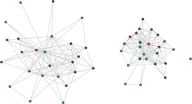
11.3 Examining Exponential Random Graph Models 187
Observed TC network Simulated network - Model 4
Fig. 11.5 Comparison of simulated network to observed tobacco control network

Chapter 12
Dynamic Network Models
What came first–the music or the misery? Did I listen to the
music because I was miserable? Or was I miserable because I
listened to the music? Do all those records turn you into a
melancholy person? (Nick Hornby, High Fidelity.)
12.1 Introduction
Exponential random graph models, as presented in Chap. 11, allow for sophisticated
and powerful modeling of network structures and relationships. Generative models
of networks can be built using a wide variety of predictors, including node character-
istics, dyad characteristics, local structural characteristics, and even other network
relations. Substantive hypotheses can be tested with ERGM models, and estimated
models can be explored with the rich simulation and goodness-of-fit tools that are
provided by the ergm package.
However, ERGMs are generally limited to cross-sectional network data. Social
networks, by their very nature, are dynamic. In particular, network ties are formed,
maintained, and sometimes dissolved over time. These dynamic ties processes may
be driven by a number of social processes, including characteristics of the actors,
dyads, and local network structures. For example, one student may become a friend
with another student partly because of the characteristics of the alter (e.g., attrac-
tiveness), partly because of their own similarity on some behavioral characteristic
(e.g., they both like the same type of music), or because of other local network struc-
tures (e.g., they both are already friends with the same other student). This chapter
covers stochastic actor-based models for network dynamics that are included in the
RSiena package, and which can be used to build models and test hypotheses about
networks as they change over time.
12.1.1 Dynamic Networks
Networks can change over time in two fundamental ways. First, networks can grow
or shrink over time, leading to changes in network composition. Second, as sug-
gested above, network ties can change among the network members. The modeling
methods discussed in this chapter apply primarily to changes of the second type.
© Springer International Publishing Switzerland 2015
D.A. Luke, A User’s Guide to Network Analysis in R, Use R!,
DOI 10.1007/978-3-319-23883-8 12
189
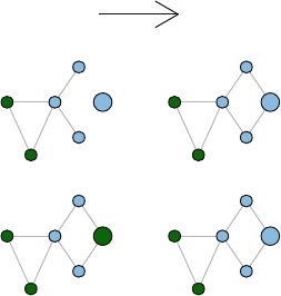
190 12 Dynamic Network Models
(Although RSiena can handle networks that have some changes in network compo-
sition, those changes themselves are not modeled.)
One of the challenges and opportunities for modeling network dynamics is that
overall network characteristics can often be the result of multiple underlying social
mechanisms. For example, homophily is the tendency for people (or other social
entities) to associate with others who are similar to them. Social networks tend to
exhibit strong homophily, and this pattern has been observed for decades across
many areas of social and health sciences. There are at least two social mechanisms
that can account for homophily – social selection and social influence. Social selec-
tion occurs when an actor selects or forms a new social tie with another actor who
is similar to her on some relevant characteristic. Social influence, on the other hand,
acts across existing social ties. Social influence occurs when the behavior of one
actor is changed to become more similar (or dissimilar) to the behavior of one or
more other actors.
Social
Selection
Social
Influence
Time 1 Time 2
Fig. 12.1 Comparison of social selection to social influence
Figure 12.1 visually depicts these two mechanisms. The colors designate some
node characteristic, such as smoking status. Blue nodes are smokers and green nodes
are non-smokers, for example. The top row illustrates social selection – the focal
actor (large blue node) starts out unconnected from the network. By time 2, the
actor has formed two new ties with other actors who are the same as him regard-
ing smoking status. The second row shows how social influence operates. Here, the
focal actor starts out connected to the network, but differs from his friends on smok-
ing status. At time 2 he has changed his behavior to match those of his friends. Note
that the time 2 networks are identical, and show strong homophily. However, we
see that this homophily can arise from two quite different mechanisms. Distinguish-
ing these mechanisms with real network data has important scientific and applied
consequences. For example, public health policies could use word-of-mouth com-
munication strategies to disseminate prevention messages across social networks.
12.1 Introduction 191
This policy would likely have greater effect if social influence mechanisms are the
primary dynamic, where social ties are already in place and messages are more
likely to pass from person to person. In contrast, if social selection is the primary
mechanism, then a word-of-mouth campaign may have less influence where indi-
viduals are choosing their new relationships based on behavioral similarity.
Disentangling the effects of social influence and social selection is not possible to
do with most network modeling techniques such as ERGM. This is mainly because
ERGMs are generally limited to cross-sectional network data. Accurately assessing
dynamic network mechanisms that operate over time requires dynamic modeling
techniques such as those in RSiena.
12.1.2 RSiena
SIENA stands for Simulation Investigation for Empirical Network Analysis, and is
a set of analytic tools that can be used to model longitudinal network data, accord-
ing to the stochastic actor-oriented model (SAOM) of Snijders and his colleagues
(Snijders et al. 2010). RSiena is the R package that contains the SIENA model
estimation functions, as well as a wide variety of supporting tools to plot, diagnose,
and examine the estimated models and simulated networks. The core SAOM is a
type of actor or agent-based simulation model – it uses estimation techniques fol-
lowing a Markov process that assumes that future changes in network states (i.e.,
formation or dissolution of a tie) are based probabilistically on the current state of
the complete network (Snijders et al. 2010).
RSiena combines the power of stochastic network modeling with longitudinal
analysis. This opens up many analytic possibilities. RSiena can be used to model
the evolution of one-mode networks, two-mode networks (see Chap. 9), and the
co-evolution of one-mode or two- mode networks with behavior. This last type of
model is what allows examination of social influence and social selection processes
in the joint evolution of friendship and smoking, for example.
With this power comes a fair amount of complexity. In particular, handling
missing data, analyzing longitudinal network data when there are changes in compo-
sition (i.e., nodes that enter or leave over time), selecting from hundreds of potential
parameter effects to include in the model, and dealing with estimation conver-
gence issues are all challenges that are beyond the ability of this short chapter to
handle in any detail. Instead, this chapter presents an introduction to RSiena anal-
ysis, using an example longitudinal network dataset that has been constructed to
help illustrate a basic approach to dynamic network modeling. This should help
readers get started using RSiena, but it is important to consult the many excel-
lent papers, tutorials, and documentation that are available. The manual for RSiena
is a good place to start, it is available at http://www.stats.ox.ac.uk/
˜snijders/siena/siena_r.htm.

192 12 Dynamic Network Models
12.2 Data Preparation
RSiena requires longitudinal (or panel) network data that have been collected from
the same network at two, or preferably more, timepoints. The Coevolve dataset
that is included in UserNetR has been developed to support exploration of a sim-
ple co-evolution model. The Coevolve data are in the form of a list of four igraph
networks. These are friendship networks among 37 students, measured at four points
in time (or waves). These data are based on an actual school-based directed friend-
ship network presented in Valente (2010). The original network was cross-sectional.
Here, we have added three additional fictional waves of data that show changes both
in tie formation as well as changes in a fictional smoking status variable.
In constructing the Coevolve networks, the following informal change rules were
used to create the new waves:
1. At each wave one smoker was randomly changed to non-smoker and three non-
smokers were changed to smokers, for a net gain of two smokers. The new
smokers were more likely to be network members who were connected to other
smokers.
2. At each wave, 10 % of the existing ties were randomly deleted. Then, the same
number of new ties were formed. This maintains the same overall density over
time.
3. When adding new directed ties, the following rules were used:
(a) Pick somebody who has the same smoking status
(b) Pick somebody who is popular (i.e., high indegree)
(c) Reciprocate an existing tie
These informal rules were used to build in dynamics that are somewhat realistic,
but also simple enough to detect with a basic RSiena model. To examine the net-
works, they can be plotted using igraph. The data are stored as a list object, so
they should be extracted first.
library(igraph)
library("UserNetR")
data(Coevolve)
fr_w1 <- Coevolve$fr_w1
fr_w2 <- Coevolve$fr_w2
fr_w3 <- Coevolve$fr_w3
fr_w4 <- Coevolve$fr_w4
Figure 12.2 shows the four waves of friendship data. Node shape conveys gen-
der (circle = female; square = male) and smoking status is conveyed by node color
(green = non-smoker; blue = smoker). The increase in smoking status over time is
fairly evident, and smoking status does seem to become more clustered, at least for
males.

12.2 Data Preparation 193
colors <- c("darkgreen","SkyBlue2")
shapes <- c("circle","square")
coord <- layout.kamada.kawai(fr_w1)
op <- par(mfrow=c(2,2),mar=c(1,1,2,1))
plot(fr_w1,vertex.color=colors[V(fr_w1)$smoke+1],
vertex.shape=shapes[V(fr_w1)$gender],
vertex.size=10,main="Wave 1",vertex.label=NA,
edge.arrow.size=0.5,layout=coord)
plot(fr_w2,vertex.color=colors[V(fr_w2)$smoke+1],
vertex.shape=shapes[V(fr_w2)$gender],
vertex.size=10,main="Wave 2",vertex.label=NA,
edge.arrow.size=0.5,layout=coord)
plot(fr_w3,vertex.color=colors[V(fr_w3)$smoke+1],
vertex.shape=shapes[V(fr_w3)$gender],
vertex.size=10,main="Wave 3",vertex.label=NA,
edge.arrow.size=0.5,layout=coord)
plot(fr_w4,vertex.color=colors[V(fr_w4)$smoke+1],
vertex.shape=shapes[V(fr_w4)$gender],
vertex.size=10,main="Wave 4",vertex.label=NA,
edge.arrow.size=0.5,layout=coord)
par(op)
Table 12.1 presents some basic descriptive statistics of the Coevolve network
data. As can be seen, the size and density of the networks remain constant, but the
number of smokers increases over time, as does the modularity based on smoking
status. Typically, detailed examination of network graphics and descriptive statistics
would happen prior to jumping into the dynamic modeling.
Wave Size Density Avg.InDegree Smokers Modularity
Wave 1 37 0.134 4.838 8 0.001
Wave 2 37 0.134 4.838 10 0.044
Wave 3 37 0.134 4.838 12 0.077
Wave 4 37 0.134 4.838 14 0.129
Table 12.1 Characteristics of Coevolve networks across four waves
The plots and descriptive statistics suggest that there are some network and be-
havioral dynamics that can be modeled using RSiena. In the rest of this chapter we
will explore a simple co-evolution model of friendship ties and smoking behavior.
The outline of the model building process has three main steps: (1) data preparation;
(2) model estimation; and (3) model exploration and testing.
Before starting, make sure to download and install the RSiena package. Like
most R packages, it is available through the CRAN repository. However, the RSiena
developers make newer versions of the package available at their website:
http://www.stats.ox.ac.uk/˜snijders/siena. This version, called
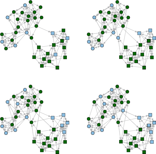
194 12 Dynamic Network Models
Wave 1 Wave 2
Wave 3 Wave 4
Fig. 12.2 Changes over time in Coevolve networks
RSienaTest, is the most up to date version and is used here. (For example, at
the time of writing this chapter RSiena from CRAN was version 1.1-232, while
RSienaTest was version 1.1-284.)
RSiena does not use the traditional method of specifying a statistical formula
for a modeling function, the way that ergm,lm, or in fact most other R statisti-
cal modeling procedures do. Instead, the modeling function (called siena07)is
applied to a set of RSiena objects, which must minimally include a data object
(containing all network and covariate data), an effects object (containing all of the
parameter effects to be included in the model), and an algorithm object (which
controls most of the modeling options).
The first step, then, is packaging the network data in a way that RSiena can
understand. RSiena can handle six different types of variables. A network variable
is the basic dependent variable in an RSiena model, and can be a one-mode or

12.2 Data Preparation 195
two-mode network. A behavior variable is another type of dependent variable. It is
a node characteristic that changes over time, the evolution of which may considered
in a co-evolutionary model. In our example dataset, smoking status will be handled
as a behavior variable. Then there are four types of variables that are all handled as
covariates. A coCovar is a constant node attribute that does not change over time
(e.g., gender). A varCovar, on the other hand, is an attribute that does change over
time. (Note that a behavior variable is a type of varying covariate, but one that is
being treated as a dependent variable.) Similar to ergm,RSiena can also handle
dyadic covariates. A coDyadCovar is a constant dyadic covariate (for example, a
kinship relationship), while varDyadCovar is a dyadic covariate that changes over
time.
For our Coevolve data, we have one dependent network variable (the friendship
ties), one constant covariate (gender), and one varying covariate that will be handled
as a behavior dependent variable (smoking status). RSiena cannot handle igraph
or statnet data directly, it expects data in the form of raw arrays, matrices, or
vectors. So, some of the data management approaches covered in Chap. 3will be
useful here. The first step is to transform the data into raw sociomatrices.
library(RSienaTest)
matw1 <- as.matrix(get.adjacency(fr_w1))
matw2 <- as.matrix(get.adjacency(fr_w2))
matw3 <- as.matrix(get.adjacency(fr_w3))
matw4 <- as.matrix(get.adjacency(fr_w4))
matw1[1:8,1:8]
## [,1] [,2] [,3] [,4] [,5] [,6] [,7] [,8]
## [1,] 0 0000011
## [2,] 0 0000010
## [3,] 0 1000000
## [4,] 0 0000010
## [5,] 0 0000000
## [6,] 0 0000010
## [7,] 1 0000101
## [8,] 1 0000010
Then, a dependent variable object is created with sienaDependent. This ex-
pects a stacked array with each array corresponding to one of the network waves. By
default, sienaDependent expects data in the form of a sparse matrix (from the
Matrix package). Here, the data are simple full matrices, so the sparse option
must be set to false.
fr4wav<-sienaDependent(array(c(matw1,matw2,matw3,matw4),
dim=c(37,37,4)),sparse=FALSE)
class(fr4wav)
## [1] "sienaDependent"

196 12 Dynamic Network Models
fr4wav
## Type oneMode
## Observations 4
## Nodeset Actors (37 elements)
The only problem with this approach is that these sociomatrices will get quite
large for larger networks. As discussed in Chap. 3, edgelists are preferable for han-
dling large networks. RSiena cannot natively handle edgelists, so they must be
transformed into sparse matrices as implemented by the Matrix package. The
following code produces the same friendship RSiena dependent variable, but via
edgelists instead of sociomatrices.
library(Matrix)
w1 <- cbind(get.edgelist(fr_w1), 1)
w2 <- cbind(get.edgelist(fr_w2), 1)
w3 <- cbind(get.edgelist(fr_w3), 1)
w4 <- cbind(get.edgelist(fr_w4), 1)
w1s <- spMatrix(37,37, w1[,1], w1[,2], w1[,3])
w2s <- spMatrix(37,37, w2[,1], w2[,2], w2[,3])
w3s <- spMatrix(37,37, w3[,1], w3[,2], w3[,3])
w4s <- spMatrix(37,37, w4[,1], w4[,2], w4[,3])
fr4wav2 <- sienaDependent(list(w1s,w2s,w3s,w4s))
fr4wav2
## Type oneMode
## Observations 4
## Nodeset Actors (37 elements)
Once the RSienda dependent variable is constructed, then other data objects
such as covariates can be created. Gender is stored in the igraph networks as
a vertex characteristic, so it is easy to extract that to create the coCoVar object.
Gender is coded 1 for female and 2 for males. The default for RSiena is to center
any covariate. This does not make much sense here, so it is turned off.
gender_vect <- V(fr_w1)$gender
table(gender_vect)
## gender_vect
## 1 2
## 22 15
gender <- coCovar(gender_vect,centered=FALSE)
gender
## [1]11112111121212221111121
## [24] 2 2 2 1 2 2 1 2 1 1 1 1 2 2

12.2 Data Preparation 197
## attr(,"class")
## [1] "coCovar"
## attr(,"centered")
## [1] FALSE
## attr(,"nodeSet")
## [1] "Actors"
Smoking status is our behavior variable for the co-evolution model. RSiena
expects an N×W matrix, with N (actor) rows and W (wave) columns. Again, we
extract this information from the igraph objects. Because a behavior variable is a
type of dependent variable, the sienaDependent function is used, but we specify
that this is a behavior variable.
smoke <- array(c(V(fr_w1)$smoke,V(fr_w2)$smoke,
V(fr_w3)$smoke,V(fr_w4)$smoke),dim=c(37,4))
smokebeh <- sienaDependent(smoke,type ="behavior")
smokebeh
## Type behavior
## Observations 4
## Nodeset Actors (37 elements)
Finally, all the individual variable objects are packaged together into a single
RSiena data object.
friend <- sienaDataCreate(fr4wav,smokebeh,gender)
friend
## Dependent variables: fr4wav, smokebeh
## Number of observations: 4
##
## Nodeset Actors
## Number of nodes 37
##
## Dependent variable fr4wav
## Type oneMode
## Observations 4
## Nodeset Actors
## Densities 0.13 0.13 0.13 0.13
##
## Dependent variable smokebeh
## Type behavior
## Observations 4
## Nodeset Actors
## Range 0 - 1
##
## Constant covariates: gender

198 12 Dynamic Network Models
Once this object is created then a basic descriptive report can be generated that
provides important information to examine prior to modeling.
print01Report(friend,modelname ='Coevolve Example' )
The results of this command are not directed to the console or saved in an R
object. Instead an external text file is created in the working directory, named in
this case ‘Coevolve Example.out’. It can be viewed using any text editor such as
Notepad. The report contains a variety of information about the RSiena data, inc-
luding information about any missing data, the degree distribution pattern observed
across the waves of network data, and summary information about each dependent
variable and covariate. A critical piece of information is found near the bottom of
the report under the heading ‘Change in Networks.’ The Jaccard index, which is a
measure of similarity, is calculated on the tie variables for each consecutive pair of
waves. Although there needs to be enough change between the observation periods
to allow for modeling, too much change would imply that the assumption of gradual
change is not tenable. The authors of RSiena suggest that Jaccard values should be
higher than 0.3 (Snijders et al. 2010). For the Coevolve data, we see Jaccard values
of greater than 0.8, suggesting a fairly high level of stability over time.
12.3 Model Specification and Estimation
12.3.1 Specification of Model Effects
Once the RSiena data have been put into the correct format, model specification
and building can proceed. In Chap. 11 we saw that stochastic network models can
have a wide variety of parameters that test hypotheses about node attributes, simi-
larity of node attributes between dyads, tie attributes, and local network structural
properties. Longitudinal network models allow for an even larger set of potential
parameters, and choosing the theoretically appropriate set of parameters can be
challenging. In this chapter we will explore only a very small set of parameters.
For more detailed guidance, the RSiena documentation should be read closely
(especially Chap. 5– Model specification).
The first step for model specification is to create an effects specification object
with a minimal set of parameters.
frndeff <- getEffects( friend )
frndeff
## name effectName
## 1 fr4wav constant fr4wav rate (period 1)
## 2 fr4wav constant fr4wav rate (period 2)
## 3 fr4wav constant fr4wav rate (period 3)

12.3 Model Specification and Estimation 199
## 4 fr4wav outdegree (density)
## 5 fr4wav reciprocity
## 6 smokebeh rate smokebeh (period 1)
## 7 smokebeh rate smokebeh (period 2)
## 8 smokebeh rate smokebeh (period 3)
## 9 smokebeh behavior smokebeh linear shape
## include fix test initialValue parm
## 1 TRUE FALSE FALSE 2.004 0
## 2 TRUE FALSE FALSE 2.004 0
## 3 TRUE FALSE FALSE 2.004 0
## 4 TRUE FALSE FALSE -0.807 0
## 5 TRUE FALSE FALSE 0.000 0
## 6 TRUE FALSE FALSE 0.208 0
## 7 TRUE FALSE FALSE 0.208 0
## 8 TRUE FALSE FALSE 0.208 0
## 9 TRUE FALSE FALSE 0.562 0
This is a basic model that only includes a small number of default effects, notably
the outdegree and reciprocity effects. Typically we will add other effects that we are
interested in testing or exploring. What are those effects and how are they specified?
All the effects that are available given the structure of the friend data set can be
seen using the effectsDocumentation function. Here is one place (of many)
where RSiena shows its non-R roots. Instead of sending the results to the R con-
sole, or creating a new R object, this function creates an HTML file that can then be
opened in your browser.
effectsDocumentation(frndeff)
The effects documentation report is a type of ‘effects dictionary’ that provides
all the information necessary for selecting appropriate model parameters. However,
the report can be daunting – for this simple example dataset with four timepoints,
one covariate (gender) and one behavior dependent variable (smokebeh), there are
over 400 possible effects!
Table 12.2 presents a set of effects that can be tested, along with the information
from the effects documentation that is used to correctly specify the effects in the
model estimation function. To understand this information, please also refer to the
‘frndeff.html’ file that is produced by the effectsDocumentation() function.
Because we are exploring a co-evolutionary model, we will examine effects on
the likelihood of tie formations (the fr4wav dependent variable), and the effects on
changes in behavior (the smokebeh dependent variable). So, there are two broad
types of effects, and they are distinguished by the ‘Name’ column in the effects doc-
umentation report. (‘ED Name’ in Table 12.2.) The actual specific effect that will be
included is specified by the term in the ‘shortName’ column. Many of these effects
will need to refer to a specific covariate or dependent variable, this is typically spec-
ified by the term in the ‘interaction1’ column. To help navigate this information for

200 12 Dynamic Network Models
Effect Type ED name ED shortName ED interaction1 ED row
1 - Gender homophily Selection fr4wav sameX gender 139
2 - Ego smoking effect Selection fr4wav egoX smokebeh 200
3 - Alter smoking effect Selection fr4wav altX smokebeh 197
4 - Smoking homophily Selection fr4wav sameX smokebeh 212
5 - Avg. alter influence Influence smokebeh avSim fr4wav 321
6 - Total alter influence Influence smokebeh totSim fr4wav 324
7 - Reciprocity Structural fr4wav recip NA 14
8 - Transitivity Structural fr4wav transTrip NA 17
Table 12.2 RSiena effects for Coevolve data
the example, Table 12.2 also includes the particular row number from the complete
effects documentation report, but this will be accurate only if the data have been
prepared exactly the same way as in this chapter.
Eight different hypotheses will be tested with the eight effects listed in the table.
First, based on the pattern evident in Fig. 12.2, there appears to be a strong gender
homophily effect, where students are much more likely to be friends with other
students of the same gender. This is a type of social selection effect, we hypothesize
that the likelihood of an ego forming a new friendship tie is higher with an alter
who has the same gender. The RSiena term that will be used is ‘sameX.’ Next, two
different social selection main effects are hypothesized. The first is the hypothesis
that based on the ego’s smoking status, he or she is more or less likely to form a
friendship tie (egoX). Conversely, the likelihood of forming a friendship tie may be
related to the smoking status of alters (altX). This may occur, for example, in schools
that have a strong pro-smoking culture. I may want to be a friend with somebody
because they smoke and smoking is ‘cool,’ regardless of whether I smoke or not.
Note that we have no reason to assume either of these hypotheses are true, given how
these data were constructed. Finally, the last social selection hypothesis is another
homophily effect, but this time in reference to smoking. The hypothesis is that new
friendship ties are more likely to be formed between two students who have the
same smoking status. Note that this hypothesis uses the same shortName.Inthis
case the interaction1 term is used to indicate that the homophily relationship
refers to smoking (instead of gender).
The next two hypotheses are about potential social influences on behavior. They
are similar to each other in that they focus on whether changes in smoking status can
be explained by patterns of smoking of the ego’s friends (to whom the ego is tied).
The first hypothesis is that likelihood of changing behavior is related to the average
similarity of smoking status across all tied alters (avSim). The second hypothesis is
similar, but assumes that the influence is based on the total similarity across alters,
instead of average. (Total similarity captures the effect of having a larger personal
social network that influences behavior.)
The last two hypotheses are local structural effects. Here we will model the ten-
dency for friendship ties to be reciprocated (recip) as well as the general pattern of
transitivity (transTrip).

12.3 Model Specification and Estimation 201
These effects are specified in an RSiena effects object. Typically, effects are
added one at a time using the includeEffects() function. The following code
adds the effects that correspond to the eight hypotheses just described.
frndeff <- getEffects( friend )
frndeff <- includeEffects(frndeff,sameX,
interaction1="gender",name="fr4wav")
## effectName include fix test initialValue
## 1 same gender TRUE FALSE FALSE 0
## parm
##10
frndeff <- includeEffects(frndeff,egoX,
interaction1="smokebeh",name="fr4wav")
## effectName include fix test initialValue
## 1 smokebeh ego TRUE FALSE FALSE 0
## parm
##10
frndeff <- includeEffects(frndeff,altX,
interaction1="smokebeh",name="fr4wav")
## effectName include fix test initialValue
## 1 smokebeh alter TRUE FALSE FALSE 0
## parm
##10
frndeff <- includeEffects(frndeff,sameX,
interaction1="smokebeh",name="fr4wav")
## effectName include fix test initialValue
## 1 same smokebeh TRUE FALSE FALSE 0
## parm
##10
frndeff <- includeEffects(frndeff,avSim,
interaction1="fr4wav",name="smokebeh")
## effectName include
## 1 behavior smokebeh average similarity TRUE
## fix test initialValue parm
## 1 FALSE FALSE 0 0
frndeff <- includeEffects(frndeff,totSim,
interaction1="fr4wav",name="smokebeh")

202 12 Dynamic Network Models
## effectName include
## 1 behavior smokebeh total similarity TRUE
## fix test initialValue parm
## 1 FALSE FALSE 0 0
frndeff <- includeEffects(frndeff,recip,transTrip,
name="fr4wav")
## effectName include fix test
## 1 reciprocity TRUE FALSE FALSE
## 2 transitive triplets TRUE FALSE FALSE
## initialValue parm
## 1 0 0
## 2 0 0
frndeff
## name effectName
## 1 fr4wav constant fr4wav rate (period 1)
## 2 fr4wav constant fr4wav rate (period 2)
## 3 fr4wav constant fr4wav rate (period 3)
## 4 fr4wav outdegree (density)
## 5 fr4wav reciprocity
## 6 fr4wav transitive triplets
## 7 fr4wav same gender
## 8 fr4wav smokebeh alter
## 9 fr4wav smokebeh ego
## 10 fr4wav same smokebeh
## 11 smokebeh rate smokebeh (period 1)
## 12 smokebeh rate smokebeh (period 2)
## 13 smokebeh rate smokebeh (period 3)
## 14 smokebeh behavior smokebeh linear shape
## 15 smokebeh behavior smokebeh average similarity
## 16 smokebeh behavior smokebeh total similarity
## include fix test initialValue parm
## 1 TRUE FALSE FALSE 2.004 0
## 2 TRUE FALSE FALSE 2.004 0
## 3 TRUE FALSE FALSE 2.004 0
## 4 TRUE FALSE FALSE -0.807 0
## 5 TRUE FALSE FALSE 0.000 0
## 6 TRUE FALSE FALSE 0.000 0
## 7 TRUE FALSE FALSE 0.000 0
## 8 TRUE FALSE FALSE 0.000 0
## 9 TRUE FALSE FALSE 0.000 0
## 10 TRUE FALSE FALSE 0.000 0
## 11 TRUE FALSE FALSE 0.208 0

12.4 Model Exploration 203
## 12 TRUE FALSE FALSE 0.208 0
## 13 TRUE FALSE FALSE 0.208 0
## 14 TRUE FALSE FALSE 0.562 0
## 15 TRUE FALSE FALSE 0.000 0
## 16 TRUE FALSE FALSE 0.000 0
12.3.2 Model Estimation
The last step before estimating the model is to set up any algorithm options that are
required. In this case, other than specifying a title string for the model, the algorithm
object will include all default options.
myalgorithm <- sienaAlgorithmCreate(projname='coevolve')
An RSiena model is estimated using the siena07() function, and by passing
the algorithm, data, and effects objects that were already created. Other options can
be specified as well to control the estimation process. In the following example, the
batch and verbose options are used to simplify the output. When run interac-
tively, you may want to set these options to TRUE. The last three options are used
to speed up the estimation process by using multiple cores of the computer’s CPU,
if available. Here, three cores, out of four, are used. Be careful about using all the
CPU cores, in case other processes are being run by the operating system. See the
help file for more technical details.
set.seed(999)
RSmod1 <- siena07( myalgorithm, data = friend,
effects = frndeff,batch=TRUE,
verbose=FALSE,useCluster=TRUE,
initC=TRUE,nbrNodes=3)
12.4 Model Exploration
12.4.1 Model Interpretation
As is typical with any R estimation technique, the results of the modeling can be
explored by viewing the contents of the model fit object. Either list the RSiena fit
object directly, or use the summary() command for a more detailed output. (The
formatting of the output listed here has been edited for length and legibility.)

204 12 Dynamic Network Models
summary(RSmod1)
## Estimates, standard errors and convergence t-ratios
##
## Network Dynamics
## 1. rate constant fr4wav rate (period 1)
## 2. rate constant fr4wav rate (period 2)
## 3. rate constant fr4wav rate (period 3)
## 4. eval outdegree (density)
## 5. eval reciprocity
## 6. eval transitive triplets
## 7. eval same gender
## 8. eval smokebeh alter
## 9. eval smokebeh ego
## 10. eval same smokebeh
##
## Estimate Standard Convergence
## Error t-ratio
##
## 1. 1.1572 ( 0.2073 ) -0.0491
## 2. 1.1410 ( 0.1990 ) -0.0114
## 3. 1.1366 ( 0.1948 ) -0.0273
## 4. -2.9556 ( 0.3949 ) 0.0141
## 5. 0.7990 ( 0.2539 ) -0.0805
## 6. 0.0860 ( 0.0785 ) -0.0508
## 7. 1.1429 ( 0.3174 ) -0.1147
## 8. 0.6885 ( 0.3792 ) -0.0122
## 9. -0.0847 ( 0.2878 ) 0.0165
## 10. 1.0975 ( 0.4373 ) -0.1392
##
## Behavior Dynamics
## 11. rate rate smokebeh (period 1)
## 12. rate rate smokebeh (period 2)
## 13. rate rate smokebeh (period 3)
## 14. eval behavior smokebeh linear shape
## 15. eval behavior smokebeh average similarity
## 16. eval behavior smokebeh total similarity
##
## Estimate Standard Convergence
## Error t-ratio
##
## 11. 0.3028 ( 0.1684 ) 0.0082
## 12. 0.3485 ( 0.1963 ) 0.0528
## 13. 0.3363 ( 0.1949 ) 0.0406
## 14. 4.0791 ( 8.7065 ) -0.0218

12.4 Model Exploration 205
## 15. 18.7278 ( 53.9223 ) -0.1372
## 16. -1.4614 ( 6.9254 ) 0.0824
##
## Total of 2340 iteration steps.
##
For a coevolution model, the parameter estimates are presented in two sections.
The network dynamics section contains the estimates pertaining to the tie formation
(i.e., the fr4wav dependent variable). Conversely, the behavior dynamics section
contains estimates related to changes in the network member behavior variable, here
it is smoking status.
The convergence t-ratios are not traditional t-statistics assessing the size of the
parameter estimates. Instead, they represent tests of the lack of convergence for each
estimate, so small values indicate good convergence. The RSiena manual suggests
that absolute values less than 0.10 indicate excellent convergence, and absolute val-
ues less than 0.15 are reasonable. Here we see that all of the network dynamics pa-
rameters have excellent convergence, while a few of the behavior parameters show
only reasonable convergence.
The rate estimates correspond to the estimated number of opportunities for
change per actor for each period (where period 1 is the time from wave 1 to wave
2). The eval estimates are the weights in the network evaluation function. The exact
calculations for a precise interpretation of the meaning of these effects is compli-
cated, see Snijders et al. (2010) for more details. However, they represent the relative
‘attractiveness’ of a particular network state for each actor. For example, the pos-
itive estimate for same gender (1.13) indicates that actors are more likely to form
new ties (or maintain existing ties) with other actors who have the same gender as
them.
The significance of these evaluation function weights can be determined by di-
viding the estimates by their standard errors. These are distributed as t-statistics, so
any absolute values greater than 2 are significant at the 0.05 significance level.
For our example, we can see that our friendship formation is more likely with
alters who have the same gender and same smoking status as the ego. Conversely,
it appears that the main effects of ego smoking and alter smoking are not signifi-
cant predictors of tie formation. Outdegree and reciprocity are significant structural
predictors, but not transitivity. The behavior dynamics results suggest that smoking
status is increasing over time (linear shape). The large positive estimate for average
similarity would normally suggest that changes in smoking status are driven by the
overall similarity of the smoking status for all tied alters. However, this estimate has
a very large standard error, so the evaluation function weight is not being estimated
with much precision. This is not too surprising, because detecting changes in actor
behavior is harder than detecting changes in tie formation. There is greater power
to detect tie changes because of the greater number of potential ties (on the order
of the square of the size of the network for each period). Conversely, the number
of behavior changes is on the order of the simple number of network members for
each period. This is especially true for this example, where the network is relatively

206 12 Dynamic Network Models
small and only a few changes in smoking status happened at each wave. So, although
we know these smoking changes are ‘real’, the analysis does not have the required
power to detect the effects.
Typically, we will make adjustments and build subsequent models based on what
we learned from earlier models. For this example, we will drop a few non-significant
predictors. To do this we simply update the effects object with either new predictors,
or by listing the predictors that we would like to drop. A dropped predictor is indi-
cated by the ‘include = FALSE’ option. Here we drop the total similarity predictor
for the behavior variable as well as the transitivity predictor.
frndeff2 <- includeEffects(frndeff,totSim,
interaction1="fr4wav",
name="smokebeh",
include=FALSE)
## [1] effectName include fix
## [4] test initialValue parm
## <0 rows> (or 0-length row.names)
frndeff2 <- includeEffects(frndeff2,transTrip,
name="fr4wav",
include=FALSE)
## [1] effectName include fix
## [4] test initialValue parm
## <0 rows> (or 0-length row.names)
frndeff2
## name effectName
## 1 fr4wav constant fr4wav rate (period 1)
## 2 fr4wav constant fr4wav rate (period 2)
## 3 fr4wav constant fr4wav rate (period 3)
## 4 fr4wav outdegree (density)
## 5 fr4wav reciprocity
## 6 fr4wav same gender
## 7 fr4wav smokebeh alter
## 8 fr4wav smokebeh ego
## 9 fr4wav same smokebeh
## 10 smokebeh rate smokebeh (period 1)
## 11 smokebeh rate smokebeh (period 2)
## 12 smokebeh rate smokebeh (period 3)
## 13 smokebeh behavior smokebeh linear shape
## 14 smokebeh behavior smokebeh average similarity
## include fix test initialValue parm
## 1 TRUE FALSE FALSE 2.004 0
## 2 TRUE FALSE FALSE 2.004 0

12.4 Model Exploration 207
## 3 TRUE FALSE FALSE 2.004 0
## 4 TRUE FALSE FALSE -0.807 0
## 5 TRUE FALSE FALSE 0.000 0
## 6 TRUE FALSE FALSE 0.000 0
## 7 TRUE FALSE FALSE 0.000 0
## 8 TRUE FALSE FALSE 0.000 0
## 9 TRUE FALSE FALSE 0.000 0
## 10 TRUE FALSE FALSE 0.208 0
## 11 TRUE FALSE FALSE 0.208 0
## 12 TRUE FALSE FALSE 0.208 0
## 13 TRUE FALSE FALSE 0.562 0
## 14 TRUE FALSE FALSE 0.000 0
myalgorithm <- sienaAlgorithmCreate(projname='coevol2')
Now the next model can be estimated. RSiena allows us to use the estimates
obtained from a previous model as the starting values for the new model estimation.
In this case we specify that the starting values should be based on the estimates
contained in RSmod1,usingtheprevAns option. This is also sometimes helpful
for improving the convergence of the individual weight estimates. Finally, in this
second model, we use the returnDeps option. This stores some required auxiliary
statistics on the simulated dependent variables for use in a subsequent exploration
of goodness-of-fit.
set.seed(999)
RSmod2 <- siena07(myalgorithm,data = friend,
effects = frndeff2,
prevAns=RSmod1,batch=TRUE,
verbose=FALSE,useCluster=TRUE,
initC=TRUE,nbrNodes=3,
returnDeps=TRUE)
summary(RSmod2)
## Estimates, standard errors and convergence t-ratios
##
## Network Dynamics
## 1. rate constant fr4wav rate (period 1)
## 2. rate constant fr4wav rate (period 2)
## 3. rate constant fr4wav rate (period 3)
## 4. eval outdegree (density)
## 5. eval reciprocity
## 6. eval same gender
## 7. eval smokebeh alter
## 8. eval smokebeh ego

208 12 Dynamic Network Models
## 9. eval same smokebeh
##
##
## Estimate Standard Convergence
## Error t-ratio
##
## 1. 1.1392 ( 0.223 ) -0.0454
## 2. 1.1321 ( 0.213 ) 0.0056
## 3. 1.1260 ( 0.200 ) -0.0086
## 4. -3.0585 ( 0.422 ) 0.0695
## 5. 0.8387 ( 0.247 ) 0.0807
## 6. 1.4113 ( 0.303 ) 0.0423
## 7. 0.7123 ( 0.417 ) 0.0127
## 8. -0.0733 ( 0.307 ) 0.0721
## 9. 1.2041 ( 0.486 ) 0.0303
##
## Behavior Dynamics
## 10. rate rate smokebeh (period 1)
## 11. rate rate smokebeh (period 2)
## 12. rate rate smokebeh (period 3)
## 13. eval behavior smokebeh linear shape
## 14. eval behavior smokebeh average similarity
##
##
## Estimate Standard Convergence
## Error t-ratio
##
## 10. 0.3076 ( 0.170 ) 0.0508
## 11. 0.3680 ( 0.249 ) 0.0212
## 12. 0.3493 ( 0.181 ) 0.0178
## 13. 6.6261 ( 37.771 ) -0.0061
## 14. 18.6088 ( 111.033 ) 0.0270
##
## Total of 2140 iteration steps.
##
By dropping some non-significant variables and starting with previously esti-
mated weight estimates, we have improved the convergence, now all effects have
excellent convergence. The similarity effect on smoking behavior is still positive,
but also still with a large standard error. A larger network, or more waves of data
would likely be required to improve the standard error.

12.4 Model Exploration 209
12.4.2 Goodness-of-Fit
Similar to the ergm package, RSiena includes graphical and diagnostic facilities
for exploring the goodness-of-fit of an estimated model to the observed network. As
in ergm, goodness-of-fit statistics can be calculated on properties of the simulated
networks that are not formally included as predictors in the fitted models. This al-
lows us to assess the extent to which the model can produce simulated networks that
‘look like’ the observed network.
Goodness-of-fit is assessed in RSiena using the sienaGOF function. A net-
work descriptive statistic is specified and is calculated across the simulated networks
at the end of each period. These values are then compared to the observed network
using the Mahalanobis distance.
In the current version of the RSienaTest package only a small number of
network statistics are built into the GOF function. One of these is the indegree dis-
tribution. In the following code, we also constrain the possible values of indegree to
the range 1–10 (using the levls option). This matches the range of indegrees in
the observed friendship network at wave 4.
table(degree(fr_w4,mode="in"))
##
##12345678910
##2376546211
gofi <- sienaGOF(RSmod2, IndegreeDistribution,
levls=1:10,verbose=FALSE,join=TRUE,
varName="fr4wav")
Once the GOF object is created, it can be used to plot the goodness-of-fit infor-
mation. In Fig. 12.3, violin plots are used to display the variability of the descriptive
statistic across the simulated networks, in this case the indegrees. The dashed grey
lines represent the empirical 95 % confidence interval. The red circles are the val-
ues of the descriptive statistic for the observed network. When the circles fit inside
the confidence intervals we interpret that as evidence of good fit. In this case, our
second model does an excellent job of producing simulated networks that have the
same or similar indegree distributions.
plot(gofi)
Although only a few statistics are currently built into sienaGOF, RSiena sup-
ports adding in user-supplied statistic functions. This makes it easy to assess
goodness-of-fit with almost any network characteristic that is of interest. The fol-
lowing example (taken from the sienaGOF-auxiliary help file) shows how to
define and then use the Holland and Leinhardt triad census (1978). The triad cen-
sus gives the frequency distribution of all possible triads in a directed network. The
census uses a 3-digit numeric code to designate one of the 16 possible patterns of
a triad. The first digit indicates the number of reciprocated ties in the triad, the sec-
ond digit is the number of oneway ties, and the third digit is the number of empty
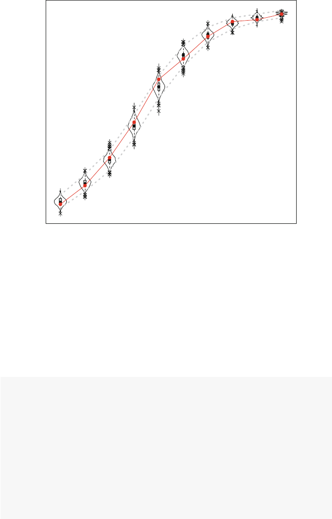
210 12 Dynamic Network Models
Goodness of Fit of IndegreeDistribution
7
17
32
51
74
85
97
105 106 109
123 45
p: 0.804
Statistic
789106
Fig. 12.3 Goodness-of-fit for indegree
ties. So, 300 is the code for a triad connected by 3 reciprocal ties, while 003 is the
code for a completely unconnected triad. See Wasserman and Faust (1994)formore
information.
In the following code, a new TriadCensus function is created. This function
uses the existing triad.census function contained in the statnet package.
(Note that igraph could also be used to calculate descriptive statistics to be used
by sienaGOF.) This wrapper function is then used by sienaGOF.
TriadCensus <- function(i,data,sims,wave,
groupName,varName,levls=1:16){
unloadNamespace("igraph")
# to avoid package clashes
require(sna)
require(network)
x<- networkExtraction(i,data,sims,wave,
groupName,varName)
if (network.edgecount(x) <= 0){x<- symmetrize(x)}
# because else triad.census(x) will lead to an error
tc <- sna::triad.census(x)[1,levls]
# names are transferred automatically
tc

12.4 Model Exploration 211
}
The GOF information stored in the fit object can also directly examined or sum-
marized. The information can be plotted as before. For this type of auxiliary statistic
it is advisable in the plot to center and scale.
Here we see that our second model does a pretty good job of recreating the obs-
erved pattern of directed triads. It only fails in two cases: 021C (the model over-
estimates the number of this type of triad with two directed ties), and 120U (the
model underestimates this type of triad with one reciprocal tie and two directed ties)
(Fig. 12.4).
goftc <- sienaGOF(RSmod2, TriadCensus,
varName="fr4wav",
verbose=FALSE,join=TRUE)
descriptives.sienaGOF(goftc)
## 003 012 102 021D 021U 021C 111D
## max 12416 6506 4301 203 273 425 454
## perc.upper 12199 6248 4055 183 247 360 431
## mean 11830 5895 3775 152 208 302 390
## median 11832 5900 3774 151 208 301 390
## perc.lower 11474 5538 3513 124 173 252 350
## min 11289 5235 3369 111 153 199 328
## obs 11771 6018 3816 137 213 232 353
## 111U 030T 030C 201 120D 120U 120C
## max 336 100.0 19.00 182 80.0 54.0 85.0
## perc.upper 301 88.0 15.00 157 70.0 46.0 69.0
## mean 262 68.3 8.11 127 57.5 35.9 53.7
## median 263 68.0 8.00 126 58.0 36.0 54.0
## perc.lower 227 51.0 3.00 101 45.0 25.0 41.0
## min 214 39.0 1.00 91 41.0 19.0 35.0
## obs 245 82.0 8.00 119 61.0 49.0 65.0
## 210 300
## max 128 67.0
## perc.upper 118 55.0
## mean 102 43.3
## median 102 43.0
## perc.lower 85 32.0
## min 74 25.0
## obs 105 36.0
plot(goftc, center=TRUE,scale=TRUE)
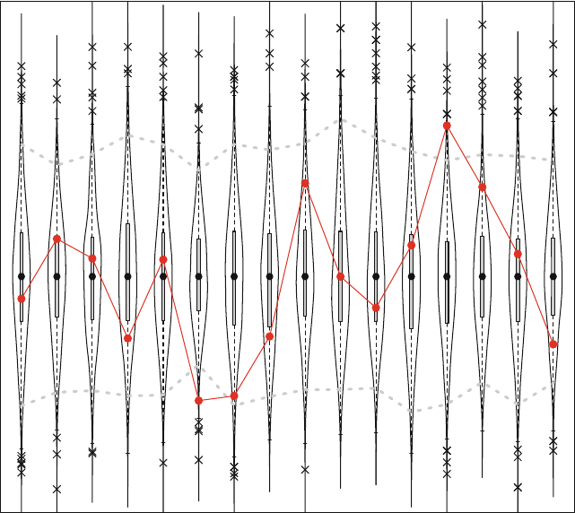
212 12 Dynamic Network Models
Goodness of Fit of TriadCensus
p: 0.001
Statistic (centered and scaled)
11771
6018
3816
137
213
232 353
245
82
8
119
61
49
65
105
36
003 012 102 021D 021U 021C 111D 111U 030T 030C 201 120D 120U 120C 210 300
Fig. 12.4 Goodness-of-fit for triad census
12.4.3 Model Simulations
The actual simulated networks can be accessed if the returnDeps option has
been set to true when estimating the model. (This can take a lot of memory for
larger networks, so the default is false.) The simulated network information is stored
in a nested list object (called sims) within the general fitted model object. The
information is organized as an edgelist for each simulated network for each period.
The default number of simulated networks is 1,000 (set by the n3 parameter in
the sienaAlgorithmCreate function). Within a particular simulation run, one
predicted network is created at the end of each period. So, in this example, with
four waves of data there will be three simulated networks, one each for the ends of
periods one, two, and three.
The general structure of the sims information can be seen with the following
code. Here, the 500th simulation run is being accessed.

12.4 Model Exploration 213
str(RSmod2$sims[[500]])
## List of 1
## $ Data1:List of 2
## ..$ fr4wav :List of 3
## .. ..$ 1: int [1:188, 1:3] 1 1 2 2 2 2 3 3 3 3...
## .. ..$ 2: int [1:185, 1:3] 1 1 1 2 2 2 2 2 3 3...
## .. ..$ 3: int [1:176, 1:3] 1 1 1 2 2 2 2 2 2 2...
## ..$ smokebeh:List of 3
## .. ..$ 1: int [1:37] 1 0 0 0 0 1 0 0 0 0 ...
## .. ..$ 2: int [1:37] 1 1 0 0 0 1 0 0 0 0 ...
## .. ..$ 3: int [1:37] 1 0 0 1 0 1 0 0 0 0 ...
The actual edgelist can be obtained as follows, again for the 500th run. The
first index specifies the run number, the second index is the number of the group
(RSiena can do multiple-group estimation), the third index is the number of the
dependent variable, and the last index is the period number (or, equivalently, Wave -
1). For a coevolution model there are two dependent variables. The first one is the tie
variable fr4wav, and the second is the behavior dependent variable smokebeh.
This code, then, provides the friendship tie edgelist for the 500th run and the third
period (limited to the first 25 cases).
RSmod2$sims[[500]][[1]][[1]][[3]][1:25,]
## [,1] [,2] [,3]
## [1,] 1 7 1
## [2,] 1 8 1
## [3,] 1 11 1
## [4,] 2 7 1
## [5,] 2 17 1
## [6,] 2 21 1
## [7,] 2 30 1
## [8,] 2 32 1
## [9,] 2 35 1
## [10,] 2 37 1
## [11,] 3 13 1
## [12,] 3 17 1
## [13,] 3 20 1
## [14,] 3 21 1
## [15,] 3 33 1
## [16,] 4 13 1
## [17,] 4 17 1
## [18,] 4 21 1
## [19,] 4 27 1
## [20,] 5 10 1
## [21,] 5 22 1

214 12 Dynamic Network Models
## [22,] 5 25 1
## [23,] 5 28 1
## [24,] 5 29 1
## [25,] 6 9 1
The simulated smoking status information for the same run and wave is then:
RSmod2$sims[[500]][[1]][[2]][[3]]
## [1]10010100001001110000100
## [24] 1 0 0 1 0 0 0 0 1 1 1 0 0 1
Using the above information, you can access and transform the data into a
statnet or igraph network object. For example, the following code uses
igraph to create, examine, and plot one of the simulated networks from the second
RSiena model (Fig. 12.5).
library(igraph)
el <- RSmod2$sims[[500]][[1]][[1]][[3]]
sb <- RSmod2$sims[[500]][[1]][[2]][[3]]
fr_w4_sim <- graph.data.frame(el,directed =TRUE)
V(fr_w4_sim)$smoke <- sb
V(fr_w4_sim)$gender <- V(fr_w4)$gender
fr_w4_sim
## IGRAPH DN-- 37 176 --
## + attr: name (v/c), smoke (v/n), gender
## | (v/n), V3 (e/n)
## + edges (vertex names):
## [1] 1 ->7 1 ->8 1 ->11 2 ->7 2 ->17 2 ->21
## [7] 2 ->30 2 ->32 2 ->35 2 ->37 3 ->13 3 ->17
## [13] 3 ->20 3 ->21 3 ->33 4 ->13 4 ->17 4 ->21
## [19] 4 ->27 5 ->10 5 ->22 5 ->25 5 ->28 5 ->29
## [25] 6 ->9 6 ->11 6 ->15 6 ->34 7 ->1 7 ->8
## [31] 7 ->13 7 ->18 8 ->1 8 ->4 8 ->7 8 ->17
## [37] 8 ->19 8 ->21 8 ->30 8 ->32 9 ->6 9 ->7
## + ... omitted several edges
modularity(fr_w4_sim,membership =V(fr_w4_sim)$smoke+1)
## [1] 0.112
modularity(fr_w4,membership =V(fr_w4)$smoke+1)
## [1] 0.129
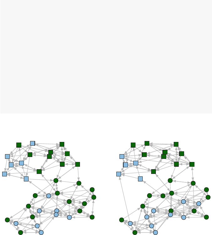
12.4 Model Exploration 215
colors <- c("darkgreen","SkyBlue2")
coord <- layout.kamada.kawai(fr_w4)
op <- par(mfrow=c(1,2),mar=c(1,1,2,1))
plot(fr_w4,vertex.color=colors[V(fr_w4)$smoke+1],
vertex.shape=shapes[V(fr_w4)$gender],
vertex.size=10,main="Observed - Wave 4",
vertex.label=NA,
edge.arrow.size=0.5,layout=coord)
plot(fr_w4_sim,
vertex.color=colors[V(fr_w4_sim)$smoke+1],
vertex.shape=shapes[V(fr_w4_sim)$gender],
vertex.size=10,main="Simulated - Wave 4",
vertex.label=NA,
edge.arrow.size=0.5,layout=coord)
par(op)
Observed - Wave 4 Simulated - Wave 4
Fig. 12.5 Comparison of observed network to simulated network

Chapter 13
Simulations
Sometimes, if you want to change a man’s mind, you have to
change the mind of the man next to him first. (Megan Whalen
Turner – The King of Attolia)
13.1 Simulations of Network Dynamics
Chapter 10 illustrated how Rtools can be used to simulate networks with specific
structures, often based on particular network science models. These modeled net-
works are useful in that they reveal social structures that may reflect reality, or are
interesting for purely theoretical reasons. In any case, these are static networks.
However, social networks are dynamic. Social networks can grow or shrink over
time, and their composition can similarly change. For example, friendship networks
grow as people expand their friendship group, get smaller if friends move away or
friendships cool. The composition of friendship networks may change dramatically
during transitions (e.g., from middle school to high school or from college to work).
This type of network dynamics is captured by changes in node composition (which
people are in the network) and by changes in the pattern of ties connecting the nodes.
A second type of network dynamics is when some characteristic or behavior of
members in a social network is influenced by the structural properties of the network
itself. For example, in public health it has long been known that adolescents are
more likely to start smoking if they have friends or family members in their social
networks who smoke.
In the rest of this chapter two detailed examples will be presented that illustrate
how Rcan be used to model these two broad types of social dynamics. The abil-
ity to build simulations of network dynamics reflects a particular strength of R.In
particular, these network simulations are possible because of the integration of data
management, statistical programming, and network analysis in R. These types of
models are not possible to do in any traditional network analysis package such as
Pajek, UCINet, Gephi, or NodeXL.
© Springer International Publishing Switzerland 2015
D.A. Luke, A User’s Guide to Network Analysis in R, Use R!,
DOI 10.1007/978-3-319-23883-8 13
217

218 13 Simulations
13.1.1 Simulating Social Selection
When network structures change over time, we assume that there is an underlying
process of social selection that determines how new ties are formed or dissolved.
(Although this process may be at least partly random, we usually want to propose a
more interesting model where tie formation is driven by node characteristics, local
network structure, or network history.) Social selection has been studied extensively
in the social sciences, and it has been shown to partly explain homophily, which is
the general pattern that similar types of people tend to be connected to each other
(McPherson et al. 2001; also see Fig. 12.1).
In this section a dynamic model of social selection is constructed. The model is
deliberately kept simple, both to make it easier to understand, but also to reflect good
model building practices. In particular, it is generally a good idea when exploring
computational simulations to start simple, and only add complexity once the simple
model is fully understood. Also, this model is not built to emphasize efficiency
(speed of execution). Efficiency could be built in later when the simulation has been
fully tested and the analyst is ready to scale-up the simulation to handle larger runs.
For our model, we will assume that we have a friendship network where friend-
ship ties can change over time, and that these changes are driven by the similarity
(and dissimilarity) among network members on some abstract node characteristic.
This characteristic can be thought of as a behavior, or also possibly an attitude or
opinion. The characteristic is also quantitative, so that we can think of network
members having more or less of this characteristic. For example, the characteris-
tic might represent physical activity behavior, where some network members have
more of this characteristic (they exercise more) or less of it. In this example, we will
use the simulation model to understand how overall network homophily changes
over time based on individual changes in network tie formation and dissolution.
13.1.1.1 Setting Up the Simulation
To start building and testing our simulation, we need to have a network to work with.
We also want to define some basic network characteristics and model parameters
that will be used as we proceed. We will start with a simple random network that
has 25 members.
library(igraph)
N<- 25
netdum <- erdos.renyi.game(N, p=0.10)
graph.density(netdum)
mean(degree(netdum))
## [1] 0.1
## [1] 2.4

13.1 Simulations of Network Dynamics 219
The network also needs to include a node characteristic that will be used to drive
the network changes. This abstract behavior (Bh) can range from 0 to 1 to capture
diversity from low to high. To help with interpretation later on, a categorical node
characteristic (BhCat) is also calculated. The categorical variable has five levels,
and can be thought of as ‘very low,’ ‘somewhat low,’ ‘medium,’ ‘somewhat high,’
and ‘very high.’
Bh <- runif(N,0,1)
BhCat <- cut(Bh, breaks=5,labels =FALSE)
V(netdum)$Bh <- Bh
V(netdum)$BhCat <- BhCat
table(V(netdum)$BhCat)
##
##12345
##85246
Here is what the network looks like after setting up a color palette that maps onto
the five levels of BhCat. (See Chap. 5for details on how color palettes work.)
library(RColorBrewer)
my_pal <- brewer.pal(5,"PiYG")
V(netdum)$color <- my_pal[V(netdum)$BhCat]
crd_save <- layout.auto(netdum)
plot(netdum, layout = crd_save)
13.1.1.2 Creating an Update Function
To start the simulation building process, we will work from the inside out. That is,
we start by building the inner workings that allow a network to change, and then
build a simulation framework around that. The core of a dynamic network model is
allowing a network to change over time. Time is a rather abstract or slippery concept
in this context, but essentially we want to be able to change a network and observe
those changes. A good place to start is to define a function that updates the network
structure, in this case by forming or dissolving a single tie between two nodes.
Before the formal function is written, we can manually work through the process
by which we would like to form a new tie or dissolve an existing tie. Starting with
removing a tie is slightly easier. First, we need a way to identify all the existing ties
for a particular node. In igraph there are a couple of equivalent ways to extract the
adjacency list for a node in a network, which is a list of its direct ties. Here are the
nodes that are tied to Node 24 in netdum. (To save some syntax space and protect
us against inadvertent changes to the original data, the network is copied first.)
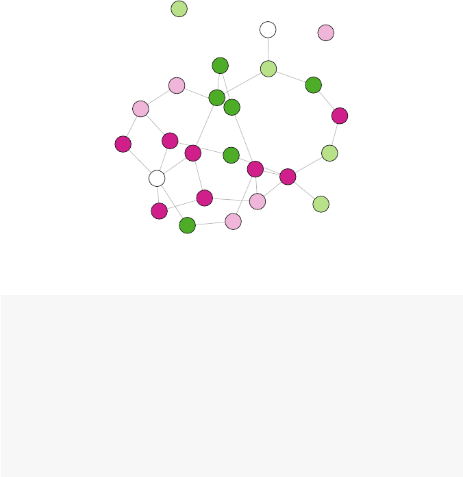
220 13 Simulations
1
2
3
4
5
6
7
8
9
10
11
12
13
14
15
16
17
18 19
20
21
22
23
24
25
Fig. 13.1 Random test network with five levels of behavior indicated
g<- netdum
get.adjlist(g)[24]
## [[1]]
## + 4/25 vertices:
## [1] 2 9 15 22
g[[24,]]
## [[1]]
## + 4/25 vertices:
## [1] 2 9 15 22
Referring back to Fig. 13.1, you can see that Node 24 is connected to four other
nodes (2, 9, 15, and 22). The get.adjlist() syntax is easier to decipher than
the double-bracket shortcut, so that will be used hereafter.
In our model, we will want changes in ties to be driven by our node characteristic
(Bh). Specifically, a reasonable model might suppose that friendship ties are more
likely to be dissolved when the two friends are more dissimilar to each other on
the behavior of interest. To model this we want to be able to compare the behav-
ioral level of a particular network member with the behaviors of all of her friends.
This is easy to do, building on the previous syntax. This uses the igraph vertex
extractor function V(). Also, the get.adjlist() function returns a list, so the
unlist() function is used to obtain a simple numeric vector. Finally, the stored
adjacency list is used to filter the network to only display the behavior values for
the nodes adjacent to Node 24. It looks like Node 24 has low amounts of exercise,
which is similar to the level of Node 15. Node 24 is most dissimilar to Node 9, who
has a very high level of exercise.

13.1 Simulations of Network Dynamics 221
V(g)[24]$Bh
## [1] 0.192
V_adj <- unlist(get.adjlist(g)[24])
V(g)[V_adj]$Bh
## [1] 0.389 0.952 0.114 0.325
All of this can be combined into a simple dissimilarity vector that measures the
absolute values of the differences between the Bh values of Node 24 and its adjacent
nodes.
BhDiff <- abs(V(g)[V_adj]$Bh -V(g)[24]$Bh)
BhDiff
## [1] 0.1966 0.7604 0.0783 0.1327
The next step is to use this information to select a tie that should be removed from
the network. This can be done manually by identifying the two nodes and assigning
FALSE to the node pair (again, by making a copy first):
gdum <- g
gdum[24,9]<- FALSE
get.adjlist(gdum)[24]
## [[1]]
## + 3/25 vertices:
## [1] 2 15 22
A more programmatic way to select the tie to remove is to identify the most
dissimilar pair of nodes. This can be done using index filtering (Fig. 13.2).
gdum <- g
V_sel <- V_adj[BhDiff == max(BhDiff)]
gdum[24,V_sel] <- FALSE
get.adjlist(gdum)[24]
## [[1]]
## + 3/25 vertices:
## [1] 2 15 22
plot(gdum, layout = crd_save)
However, in our model we won’t always want to remove the tie from most dis-
similar pair of nodes. Instead, we would like to randomly remove ties where the
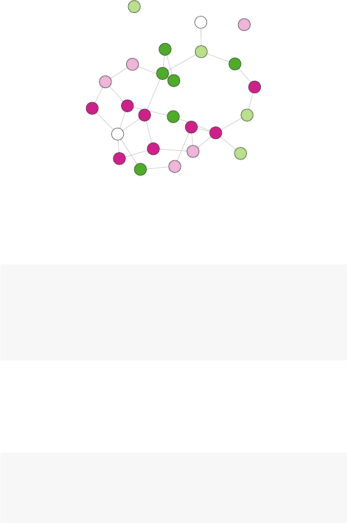
222 13 Simulations
1
2
3
4
5
6
7
8
9
10
11
12
13
14
15
16
17
18 19
20
21
22
23
24
25
Fig. 13.2 Test network with one tie (24-9) removed
probability is weighted by the amount of dissimilarity. This adds some randomness
and heterogeneity to the model. Once we have the dissimilarity vector, it can be used
to do this type of random tie selection.
gdum <- g
V_sel <- sample(V_adj,1,prob=BhDiff)
gdum[24,V_sel] <- FALSE
get.adjlist(gdum)[24]
## [[1]]
## + 3/25 vertices:
## [1] 2 15 22
The sampling function selects one node from the list of adjacent nodes, with
probability weighted by the dissimilarity vector. So, the more dissimilar the node
pair is, the more likely it will be selected to be removed. To check that the sampling
is working properly, we can sample multiple times and look at the selection distribu-
tion. This shows that Node 9 is selected most often, and Node 15 least often, which
matches expectations based on the similarity on Bh values.
smplCheck <- sample(V_adj,500,replace=TRUE,prob=BhDiff)
table(smplCheck)
## smplCheck
## 2 9 15 22
## 91 327 35 47
Adding a new tie from a particular node to any other node proceeds in a similar
fashion. The two main differences are that instead of picking the most dissimilar

13.1 Simulations of Network Dynamics 223
pair of nodes, we want to pick two nodes that are close to each other on the Bh
characteristic. Second, because we are wanting to add a new tie, we need a way
to select all of the non-adjacent nodes (i.e., nodes that are not directly tied to the
target node).
The non-adjacent nodes can be selected by removing the adjacent nodes as well
as the target vertex ID from a list of all the nodes. Nodes in igraph are numbered
from 1 to the total size of the network. So, if we are still interested in Node 24, the
following finds all non-adjacent nodes. This uses the vector indexing facility of R
where values are dropped if a negative sign is used.
vtx <- 24
nodes <- 1:vcount(g)
V_nonadj <- nodes[-c(vtx,V_adj)]
V_nonadj
## [1] 1 3 4 5 6 7 81011121314161718
## [16] 19 20 21 23 25
Following the same logic as before, we can now randomly create a new tie, based
on the similarity between a pair of nodes. The inverse of the absolute differences is
calculated, so now the vector BhDiff2 contains similarity scores.
BhDiff2 <- 1-abs(V(g)[V_nonadj]$Bh -V(g)[vtx]$Bh)
BhDiff2
## [1] 0.912 0.546 0.956 0.771 0.906 0.967 0.712
## [8] 0.900 0.207 0.663 0.859 0.309 0.997 0.194
## [15] 0.305 0.480 0.433 0.486 0.820 0.249
Sel_V <- sample(V_nonadj,1,prob=BhDiff2)
gnew <- g
gnew[vtx,Sel_V] <- TRUE
get.adjlist(gnew)[vtx]
## [[1]]
## + 5/25 vertices:
## [1] 2 9 10 15 22
The following code assigns a different color (“darkred”) to the newly added tie,
so that it can be seen easier in the plot (Fig. 13.3).
E(gnew)$color <- "grey"
E(gnew, P=c(vtx, Sel_V))$color <- "darkred"
plot(gnew, layout = crd_save)
All of this is preparation for creating a simple update function that can be called
within a larger network simulation. The function that follows accepts a network
(igraph) object and a target vertex. It first checks to see if the passed vertex in the
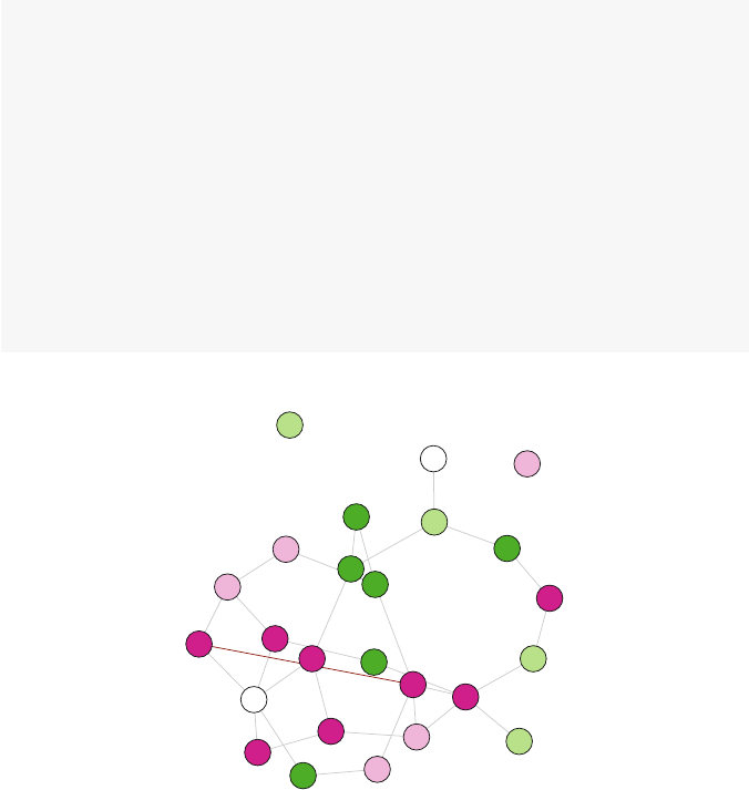
224 13 Simulations
network is an isolate, if it is then the function silently returns the unaltered network
(because you can’t remove a tie from an isolate). If the vertex is not an isolate,
then the function randomly removes an existing tie with probability based on the
dissimilarity between all tied pairs. It then adds a new tie with probability based on
the similarity of all non-tied pairs. The two operations are combined into the same
function so that the returned network object has the same density (i.e., number of
total ties) as the original network. This makes the subsequent simulation easier to
interpret. Note that this function relies on the igraph object already having the
vertex attribute Bh defined.
Sel_update <- function(g,vtx){
V_adj <- neighbors(g,vtx)
if(length(V_adj)==0)return(g)
BhDiff1 <- abs(V(g)[V_adj]$Bh -V(g)[vtx]$Bh)
Sel_V <- sample(V_adj,1,prob=BhDiff1)
g[vtx,Sel_V] <- FALSE
nodes <- 1:vcount(g)
V_nonadj <- nodes[-c(vtx,V_adj)]
BhDiff2 <- 1-abs(V(g)[V_nonadj]$Bh -V(g)[vtx]$Bh)
Sel_V <- sample(V_nonadj,1,prob=BhDiff2)
g[vtx,Sel_V] <- TRUE
g
}
1
2
3
4
5
6
7
8
9
10
11
12
13
14
15
16
17
18 19
20
21
22
23
24
25
Fig. 13.3 Test network with one new tie added to Node 24
To test the function, pass it an igraph object along with the vertex whose ties
are to be updated.

13.1 Simulations of Network Dynamics 225
gtst <- g
node <- 24
gnew <- Sel_update(g,node)
neighbors(gtst,node)
## + 4/25 vertices:
## [1] 2 9 15 22
neighbors(gnew,node)
## + 4/25 vertices:
## [1] 2 7 15 22
13.1.1.3 Building a Simple Simulation of Social Selection
Now that an update function is available that randomly adds and drops ties in the
abstract friendship network, a dynamic simulation model of social selection can be
built. The following simulation model is simple, but has all of the elements of a
dynamic network model. It operates on a network, makes changes over time, and
those changes are observable.
In a dynamic model, time can be realistic or highly abstract. For the social sel-
ection model presented here, an abstract notion of time is used. Specifically, nodes
will be selected randomly for updating, and we assume that there is some passage of
time between each update. However, no further specific characteristics of time are
provided or needed.
The following function Sel sim encapsulates the social selection simulation.
The function accepts an igraph network object and the number of desired updates.
It starts by defining a list object that will be used to store the updated networks. Then
inside a loop that runs for the number of desired updates, a random node is selected
and the update function is called where an existing tie is removed, and a new tie
added. The updated network is stored in the list object after each step, and after the
loop is finished the entire network list is returned.
Sel_sim <- function(g,upd){
g_lst <- lapply(1:(upd+1), function(i)i)
g_lst[[1]] <- g
for (i in 1:upd) {
gnew <- g_lst[[i]]
node <- sample(1:vcount(g),1)
gupd <- Sel_update(gnew,node)
g_lst[[i+1]] <- gupd
}
g_lst
}

226 13 Simulations
This simulation function is inefficient in a few ways. First, the loop could possi-
bly be replaced with a vectorized function. This could speed up the function, with
some loss in readability. More importantly, the function stores the entire network
for each update step. This will result in very large objects being returned by the
function, based on the size of the network and number of updates. It is helpful at
early stages of simulation development to preserve the whole networks, so that they
can be examined. However, in later stages it would be typical to change the func-
tion to only return specific information about the networks, rather than the networks
themselves.
The next step is to create a larger random network that will be used as input for
the social selection simulation.
N<- 100
netdum <- erdos.renyi.game(N, p=0.10)
graph.density(netdum)
## [1] 0.0949
mean(degree(netdum))
## [1] 9.4
Bh <- runif(N,0,1)
BhCat <- cut(Bh, breaks=5,labels =FALSE)
V(netdum)$Bh <- Bh
V(netdum)$BhCat <- BhCat
table(V(netdum)$BhCat)
##
##12345
## 13 19 32 13 23
Now that a starting network has been created, the actual simulation is run and the
results stored in a list of network objects. In this case, the simulation starts with the
netdum network object, and it is run for 500 updates. The returned list of network
objects contains the original network in the first position, and then 500 additional
networks which correspond to each update in the simulation.
set.seed(999)
g_lst <- Sel_sim(netdum,500)
length(g_lst)
## [1] 501
summary(g_lst[[1]])
## IGRAPH U--- 100 470 -- Erdos renyi (gnp) graph
## + attr: name (g/c), type (g/c), loops (g/l),
## | p (g/n), Bh (v/n), BhCat (v/n)

13.1 Simulations of Network Dynamics 227
13.1.1.4 Interpreting the Results of the Simulation
The results of the simulation should always be examined first to determine that the
simulation ran as expected, and then relevant characteristics of the networks can be
studied to see what patterns have emerged from the simulation modeling. Then it
can be determined if the results inform some research question or hypothesis about
the network dynamics.
A simple methods check for this simulation is that if the simulation worked as
intended, then we should see no changes in density over the simulated networks.
However, we should not see the same patterns of direct ties for any particular node
in the network. (Note that the tie patterns will only be different for a particular node
if that node was selected to be updated in the simulation. This is one reason to make
sure to run the simulation many more times than the size of the network, to help
ensure that all or at least most of the nodes have been updated.)
graph.density(g_lst[[1]])
## [1] 0.0949
graph.density(g_lst[[501]])
## [1] 0.0949
neighbors(g_lst[[1]],1)
## + 5/100 vertices:
## [1] 16 33 51 65 72
neighbors(g_lst[[501]],1)
## + 3/100 vertices:
## [1] 4 65 66
After it has been determined that the simulation is running properly, then more
substantive assessments can be done. A basic hypothesis for this simple example is
that we would expect the network to become more homophilous over time. This is
because the tie updates are partially driven by the similarities of the nodes on the
abstract behavioral characteristic. In this case, network modularity is a useful metric
(see Chap. 8for more information about modularity).
modularity(g_lst[[1]],BhCat)
## [1] -0.0221
modularity(g_lst[[501]],BhCat)
## [1] 0.168
Here we can see that the modularity was lower in the starting network compared
to the final updated network. The higher modularity at the end tells us that ties

228 13 Simulations
between nodes in the same BhCat category are relatively more likely than ties
between different categories. That is, connected nodes are more similar to each other
than when the simulation started, thus demonstrating homophily.
This argument is more convincing if we use much more of the data provided by
the simulation. The following plots show that there is substantial variability of mod-
ularity across the steps of the simulation. More importantly, modularity increases
over time until near the end of the simulation run (Fig. 13.4).
sim_stat <- unlist(lapply(g_lst, function(u)
modularity(u,V(u)$BhCat)))
op <- par(mfrow=(c(1,2)))
plot(density(sim_stat),main="",xlab="Modularity")
plot(0:500,sim_stat,type="l",
xlab="Simulation Step",ylab="Modularity")
par(op)
13.1.2 Simulating Social Influence
This next example focuses on a second dynamic network process that can explain
homophily in social networks – namely, social influence. Social influence is the pro-
cess by which behaviors (or attitudes, opinions, etc.) of an individual are influenced
by the behaviors of those other persons who are close to them in their social net-
work. Here, we develop a simple model of this process where an abstract behavior
(Bh) for a particular member of a social network is influenced by the average beh-
aviors of all of those to whom the person is directly tied. This constitutes a simple
model of peer social influence. To make this slightly more realistic (and interesting)
we will also build into the model the concept of a tolerance region. Every member
of the network has a tolerance range (Tl). If an adjacent member has a value of
(Bh) that falls outside of the tolerance range, then that person’s behavior will not
influence them. So, for example, if we again think of Bh as a measure of the level
of physical activity, then in the following model the levels of physical activity of a
network member’s friends will influence her own level of activity, but only when
those friends levels of activity are somewhat close to her own.
13.1.2.1 Setting Up the Simulation
The model building process is similar to the previous example, so we can proceed
with slightly less exposition. The first step is to set up an example network. The
only difference here is that we add a new vertex characteristic, Tl, the tolerance
range for each network member. To start with we assume that every member has the
same tolerance range of 0.20. (Remember that because of the random nature of the
simulation, your network values will not match what is presented below.)
13.1 Simulations of Network Dynamics 229
−0.05 0.05 0.15
01234567
Modularity
Density
0 100 200 300 400 500
0.00 0.05 0.10 0.15
Simulation Step
Modularity
Fig. 13.4 Modularity over time in the social selection simulation
N<- 25
netdum <- erdos.renyi.game(N, p=0.10)
Bh <- runif(N,0,1)
BhCat <- cut(Bh, breaks=5,labels =FALSE)
V(netdum)$Bh <- Bh
V(netdum)$BhCat <- BhCat
V(netdum)$Tl <- 0.20
V(netdum)$Tl[1:10]
## [1] 0.2 0.2 0.2 0.2 0.2 0.2 0.2 0.2 0.2 0.2
13.1.2.2 Creating an Update Function
The first modeling step is once again to define a core update function. In this case,
instead of updating ties, for social influence the vertex attribute Bh needs to be
updated.
g<- netdum
V_adj <- neighbors(g,24)
V_adj
## + 4/25 vertices:
## [1] 2 9 15 22

230 13 Simulations
V(g)[24]$Bh
## [1] 0.192
V(g)[V_adj]$Bh
## [1] 0.389 0.952 0.114 0.325
For Node 24 in the example network netdum,Bh starts quite low (0.19). The
Bh values for Node 24’s four neighbors range from 0.11 to 0.95.
A simple way to update the Bh value for Node 24 would be to take the mean
of the starting value of Bh and the aggregate of the Bh values of all the neighbors.
The new Bh value is 0.32, but this has been adjusted by the Bh values for all four
neighbors. It has been particularly influenced by the high Bh value of Node 9 (0.95).
newval <- .5*(V(g)$Bh[24]+mean(V(g)[V_adj]$Bh))
newval
## [1] 0.318
The tolerance values can be used to filter out the nodes that have Bh values that
fall outside of the tolerance range. So, after setting up vectors that store the Bh
values, the neighbor Bh vector (NBh) is filtered here to only show the values for
those neighbors whose Bh values are within 0.20 of Node 24’s Bh value.
V_Bh <- V(g)[24]$Bh
V_Bh
## [1] 0.192
N_Bh <- V(g)[V_adj]$Bh
N_Bh
## [1] 0.389 0.952 0.114 0.325
N_Bh[abs(N_Bh-V_Bh) <.20]
## [1] 0.389 0.114 0.325
So now an updated Bh value for Node 24 can be calculated after removing the
extremely high value for Node 9 that falls outside of the tolerance range. We see the
updated Bh value for Node 24 has not changed quite as much as before.
newval2 <- .5*(V(g)$Bh[24]+
mean(N_Bh[abs(N_Bh-V_Bh) <.20]))
newval2
## [1] 0.234

13.1 Simulations of Network Dynamics 231
This filtering approach based on the absolute differences forms the heart of the
following social influence update function. This function returns an updated Bh
value for the selected vertex. If the selected vertex has no neighbors with Bh values
inside her tolerance region, the Bh value is returned unchanged. Once again, this
function assumes that the network object already has Bh and Tl vertex attributes.
Inf_update <- function(g,vtx){
TL <- V(g)[vtx]$Tl
V_adj <- neighbors(g,vtx)
V_Bh <- V(g)[vtx]$Bh
N_Bh <- V(g)[V_adj]$Bh
ifelse(length(N_Bh[abs(N_Bh-V_Bh)<TL]) >0,
new_Bh <- .5*(V_Bh +
mean(N_Bh[abs(N_Bh-V_Bh) <TL])),
new_Bh <- V_Bh
)
new_Bh
}
Testing out the new update function, it returns the correct value for Node 24.
newval3 <- Inf_update(g,24)
newval3
## [1] 0.234
13.1.2.3 Building the Simulation of Social Influence
Now that the social influence update function has been created, it can be put inside a
function that runs the dynamic network model. This is similar to the social selection
model in the previous section, with one big difference. It makes more sense to have
every node in the network be influenced at the same time, because we assume that
social influence is more of a continuous process. That means that instead of selecting
nodes randomly to get updated, here we will update every node in the network for
every run of the simulation. (Once again, the function presented here could be made
more efficient in a number of ways.)
Inf_sim <- function(g,runs){
g_lst <- lapply(1:(runs+1), function(i)i)
g_lst[[1]] <- g
for (i in 1:runs) {
gnew <- g_lst[[i]]

232 13 Simulations
for (j in 1:length(V(g))) {
V(gnew)[j]$Bh <- Inf_update(g=gnew,vtx=j)
}
g_lst[[i+1]] <- gnew
}
g_lst
}
The following code sets up the same type of random starting network, and then
runs the influence model 50 times on the network. The simulation does not need to
be run as long as the selection model, because every node gets updated for every run
of the influence model.
N<- 100
netdum <- erdos.renyi.game(N, p=0.10)
Bh <- runif(N,0,1)
V(netdum)$Tl <- .20
V(netdum)$Bh <- Bh
V(netdum)$BhCat <- BhCat
set.seed(999)
g_lst <- Inf_sim(netdum,50)
13.1.2.4 Interpreting the Results of the Simulation
As the influence model runs, we might expect to see the variability of Bh to decrease
because of the way that network members are adjusting their behaviors based on the
average of their selected neighbors’ behaviors (Fig. 13.5).
op <- par(mfrow=(c(3,2)))
plot(density(V(g_lst[[1]])$Bh),xlim=c(-.2,1.2),
main="Original network")
plot(density(V(g_lst[[6]])$Bh),xlim=c(-.2,1.2),
main='After 5 runs')
plot(density(V(g_lst[[11]])$Bh),xlim=c(-.2,1.2),
main='After 10 runs')
plot(density(V(g_lst[[16]])$Bh),xlim=c(-.2,1.2),
main='After 15 runs')
plot(density(V(g_lst[[26]])$Bh),xlim=c(-.2,1.2),
main='After 25 runs')
plot(density(V(g_lst[[51]])$Bh),xlim=c(-.2,1.2),
main='After 50 runs')
par(op)
13.1 Simulations of Network Dynamics 233
−0.2 0.0 0.2 0.4 0.6 0.8 1.0 1.2
0.0 0.4 0.8
Original network
N = 100 Bandwidth = 0.1054
Density
−0.2 0.0 0.2 0.4 0.6 0.8 1.0 1.2
0.0 0.5 1.0 1.5
After 5 runs
N = 100 Bandwidth = 0.08352
Density
−0.2 0.0 0.2 0.4 0.6 0.8 1.0 1.2
0.0 1.00.5 2.01.5
After 10 runs
N = 100 Bandwidth = 0.06472
Density
−0.2 0.0 0.2 0.4 0.6 0.8 1.0 1.2
02468
After 15 runs
N = 100 Bandwidth = 0.02197
Density
−0.2 0.0 0.2 0.4 0.6 0.8 1.0 1.2
0 50 150100
After 25 runs
N = 100 Bandwidth = 0.0009744
Density
−0.2 0.0 0.2 0.4 0.6 0.8 1.0 1.2
0 100000 250000
After 50 runs
N = 100 Bandwidth = 1.182e-06
Density
Fig. 13.5 Variability of Bh over time
The plots show us a few interesting things. First, it takes a few runs of the model
to start shifting the behavioral variability. However, the homogenization process
does not require 50 runs, by Run 25 almost all of the nodes have shifted their be-
havior to match those in the middle.
We can also see, however, that the network has become more homophilous. Fig-
ure 13.6 shows that by Run 25 most of the nodes fall into the middle Bh category,
whereas they started out evenly distributed among the five categories.
V(g_lst[[1]])$BhCat <- cut(V(g_lst[[1]])$Bh,
breaks=c(0,.2,.4,.6,.8,1), labels =FALSE)
V(g_lst[[26]])$BhCat <- cut(V(g_lst[[26]])$Bh,
breaks=c(0,.2,.4,.6,.8,1), labels =FALSE)
V(g_lst[[51]])$BhCat <- cut(V(g_lst[[51]])$Bh,
breaks=c(0,.2,.4,.6,.8,1), labels =FALSE)
234 13 Simulations
V(g_lst[[1]])$color <- my_pal[V(g_lst[[1]])$BhCat]
V(g_lst[[26]])$color <- my_pal[V(g_lst[[26]])$BhCat]
op <- par(mfrow=c(1,2),mar=c(0,0,2,0))
plot(g_lst[[1]],vertex.label=NA,
main="Original network")
plot(g_lst[[26]],vertex.label=NA,
main="Network after Run 25")
par(op)
These simulation examples are intended to provide simple examples to illustrate
the power of R for exploring network and behavioral dynamics. They can be ext-
ended in a number of ways, both to learn how to build such simulations, but also to
apply them to more serious scientific questions. There are at least two simple ways
to extend the examples presented here. First, in the social influence simulation in-
stead of having every network member start with the same tolerance range (0.20),
the effects of heterogeneous tolerance values on characteristics of social influence
could be explored. (Or, you can explore the effects of decreasing or increasing the
tolerance levels.) Second, the examples presented here separate out social influence
and social selection processes. The two simulations could be combined to explore
the characteristics of simultaneous selection and influence processes. (This is exam-
ined in Chap. 12 from a statistical modeling perspective.)
Original network Network after Run 25
Fig. 13.6 Greater homophily over time
References
Barab´
asi AL (2007) Network medicine from obesity to the diseasome. N Engl J
Med. http://www.nejm.org/doi/full/10.1056/nejme078114
Barab´
asi AL, Albert R (1999) Emergence of scaling in random networks. Science.
http://www.sciencemag.org/content/286/5439/509.short
Broder A, Kumar R, Maghoul F (2000) Graph structure in the web. Computer
Netw. http://www.sciencedirect.com/science/article/pii/
S1389128600000839
Butts CT (2008) network: a package for managing relational data in R. J Stat
Softw. http://cran.repo.bppt.go.id/web/packages/network/
vignettes/networkVignette.pdf
Freeman LC (2004) The development of social network analysis: a study in the
sociology of science. Empirical Press, p 205. ISBN:1594577145. https://
books.google.com/books?id=VcxqQgAACAAJ&pgis=1
Fruchterman TMJ, Reingold EM (1991) Graph drawing by force-directed place-
ment. Softw Pract Exp. ftp://132.180.22.143/axel/papers/
reingold:graph_drawing_by_force_directed_placement.
pdf
Galaskiewicz J (1985) The influence of corporate power, social status, and market
position on corporate interlocks in a regional network. Social Forces. http://
sf.oxfordjournals.org/content/64/2/403.abstract
Gentleman R, Lang DT (2007) Statistical analyses and reproducible research.
J Comput Graph Stat. http://www.jstor.org/stable/27594227
Goodreau SM (2007) Advances in exponential random graph (p*) models applied to
a large social network. Soc Netw 29(2):231–248. ISSN:03788733. doi:10.1016/j.
socnet.2006.08.001
Granovetter MS (1973) The strength of weak ties. Am J Sociol. http://www.
jstor.org/stable/2776392
Handcock MS et al (2008) statnet: software tools for the representation, visu-
alization, analysis and simulation of network data. J Stat Softw 24(1):1–11.
ISSN:1548–7660
© Springer International Publishing Switzerland 2015
D.A. Luke, A User’s Guide to Network Analysis in R, Use R!,
DOI 10.1007/978-3-319-23883-8
235
236 References
Harris JK (2013) An introduction to exponential random graph model-
ing. SAGE, p 136. ISBN:148332205X. https://books.google.com/
books?hl=en&lr=&id=lkYXBAAAQBAJ&pgis=1
Harris JK, Luke DA (2009) Forty years of secondhand smoke res-
earch: the gap between discovery and delivery. Am J Prev Med.
http://www.sciencedirect.com/science/article/pii/
S0749379709001548
Holland PW, Leinhardt S (1978) An omnibus test for social structure using triads.
Sociol Methods Res. http://smr.sagepub.com/content/7/2/227.
short
Hunter DR et al (2008) ergm: a package to fit, simulate and diagnose
exponential-family models for networks. J Stat Softw 24(3):nihpa54860.
ISSN:1548-7660. http://www.pubmedcentral.nih.gov/
articlerender.fcgi?artid=2743438&tool=pmcentrez&
rendertype=abstract
Knoke D, Burt RS (1983) Prominence. Appl Netw Anal. https://scholar.
google.com/scholar?q=knoke+burt+prominence&btnG=&
hl=en&as_sdt=0%2C26#0
Kolaczyk ED (2009) Statistical analysis of network data: methods and mod-
els. Springer, p 398. ISBN:0387881468. https://books.google.com/
books?id=Q-GNLsqq7QwC&pgis=1
Krebs VE (2002) Uncloaking terrorist networks. http://firstmonday.org/
ojs/index.php/fm/article/view/941/863
Leischow SJ, Luke DA, et al. (2010) Mapping US government tobacco con-
trol leadership: networked for success? Nicotine Tob Res. http://ntr.
oxfordjournals.org/content/12/9/888.short
Liljeros F, Edling CR, Amaral LAN (2001) The web of human sexual contacts.
Nature. http://www.nature.com/nature/journal/v411/n6840/
full/411907a0.html
Luke DA, Harris JK (2007) Network analysis in public health: history, methods, and
applications. Annu Rev Public Health 28:69–93. ISSN:0163-7525. doi:10.1146/
annurev.publhealth.28.021406.144132
Luke DA, Stamatakis KA (2012) Systems science methods in public health: dyn-
amics, networks, and agents. Annu Rev Public Health. http://www.ncbi.
nlm.nih.gov/pmc/articles/PMC3644212/
Luke DA, Wald LM (2013) Network influences on dissemination of evidence-based
guidelines in state tobacco control programs. Health Educ Behav. http://
heb.sagepub.com/content/40/1_suppl/33S.short
Luke DA, Harris JK, Shelton S (2010) Systems analysis of collaboration in 5 nat-
ional tobacco control networks. Am J Public Health. http://www.ncbi.
nlm.nih.gov/pmc/articles/PMC2882404/
McPherson M, Smith-Lovin L, Cook JM (2001) Birds of a feather: homophily
in social networks. Annu Rev Sociol. http://www.jstor.org/stable/
2678628
References 237
Morris M, Handcock MS, Hunter DR (2008) Specification of exponential-
family random graph models: terms and computational aspects. J Stat Softw
24(4):1548–7660. ISSN:1548–7660. http://www.pubmedcentral.nih.
gov/articlerender.fcgi?artid=2481518&tool=pmcentrez&
rendertype=abstract
Murrell P (2005) R graphics. Taylor & Francis, p 328. ISBN:158488486X.
https://books.google.com/books?id=fUUVngEACAAJ&pgis=1
Newman MEJ (2006) Modularity and community structure in networks. Proc
Natl Acad Sci USA. http://www.pnas.org/content/103/23/8577.
short
Newman M (2010) Networks: an introduction. Oxford University Press, Oxf-
ord, p 784. ISBN:0191500704. https://books.google.com/books?
id=LrFaU4XCsUoC&pgis=1
Newman MEJ, Girvan M (2004) Finding and evaluating community structure in net-
works. Phys Rev E Stat Nonlinear Soft Matter Phys 69(2):1–15. ISSN:1063651X.
doi:10.1103/PhysRevE.69.026113. arXiv: 0308217 [cond-mat]
Newman M, Barab´
asi A-L, Watts DJ (2006) The structure and dynamics of
networks. Princeton University Press, p 582. ISBN:0691113572. https://
books.google.com/books?id=0FNQ1LYKTMwC&pgis=1
Rogers EM (2003) Diffusion of innovations, 5th edn. Simon and Schus-
ter, p 576. ISBN:0743258231. https://books.google.com/books?
id=9U1K5LjUOwEC&pgis=1
Scott J (2012) Social network analysis (3rd Ed.) SAGE Publications.
Scott J, Carrington PJ (2011) The SAGE handbook of social network analysis.
SAGE Publications.
Snijders TAB, Pattison PE (2006) New specifications for exponential random graph
models. Sociol Methodol. url: http://smx.sagepub.com/content/
36/1/99.short.
Snijders TAB, Van de Bunt GG, Steglich CEG (2010) Introduction
to stochastic actor-based models for network dynamics. Soc Netw.
http://www.sciencedirect.com/science/article/pii/
S0378873309000069
de Solla Price DJ (1976) A general theory of bibliometric and other cumulative
advantage process. J Am Soc Info Sci. https://scholar.google.
com/scholar?q=price+1976+bibliometric&btnG=&hl=en&as_
sdt=0%2C26#4
Sporns O (2012) Discovering the human connectome. MIT, p 232.
ISBN:026017903. https://books.google.com/books?
id=uoNf2x0J8LMC&pgis=1
Tufte ER (1990) Envisioning information, vol 914. Graphics Press, p 126.
https://books.google.com/books?id=1uloAAAAIAAJ&pgis=1
Tufte ER (2001) The visual display of quantitative information. Graphics
Press, p 197. ISBN:0961392142. https://books.google.com/books?
id=GTd5oQEACAAJ&pgis=1
238 References
Tukey JW (1977) Exploratory data analysis. Addison-Wesley, p 688.
ISBN:0201076160. https://books.google.com/books?
id=UT9dAAAAIAAJ&pgis=1
Valente TW (2010) Social networks and health: models, methods, and applica-
tions. Oxford University Press, Oxford, p 296. ISBN:0199719721. https://
books.google.com/books?id=xnMzd1-7iGgC&pgis=1
Wasserman S, Faust K (1994) Social network analysis: methods and applications,
vol 25. Cambridge University Press, p 825. ISBN:0521387078. https://
books.google.com/books?id=CAm2DpIqRUIC&pgis=1
Watts DJ, Strogatz SH (1998) Collective dynamics of’small-world’networks.
Nature. http://www.nature.com/nature/journal/v393/n6684/
abs/393440a0.html
