User Guide
User Manual:
Open the PDF directly: View PDF ![]() .
.
Page Count: 5
How to use this application step-by-step?
Step 1 - Selection of the main filters for the analysis
During the first step of the application, the user will have to choose the main filters for his analysis. These
include:
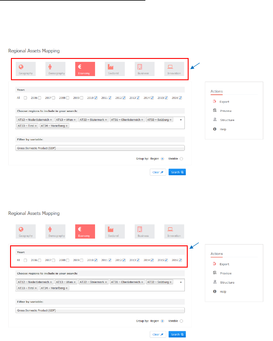
a) main category (e.g. geography, demography & society, economy & labour, sectoral structure, business
characteristics and innovation system)
Figure 1a: Step 1 – Selection of category.
b) years included in the analysis
Figure 1b: Step 1 – Selection of years.
Selection of category
Selection of years
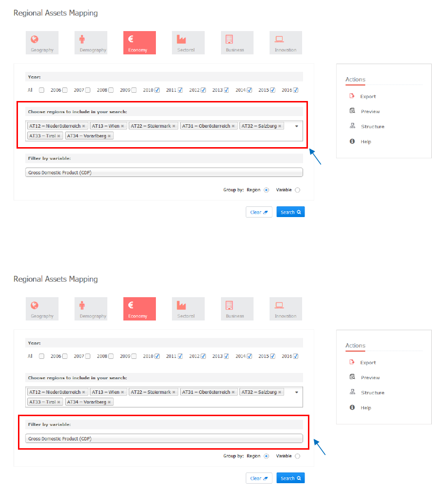
c) regions that are going to be included
Figure 1c: Step 1 – Selection of regions.
d) variables for the analysis
Figure 1d: Step 1 – Selection of variable.
It is important to notice that the application gives to users the opportunity to group their results either based
on regions, or based on variables. Thus, we can obtain results in two forms: i) results for a specific variable
for a number of regions; and ii) results for a number of different variables for a specific region. These two
different option provide the opportunity to perform comparative analysis not only within a region, but also
between different EU regions.
Selection of
regions
Selection of
variable
Step 2 - Extraction of the selected data in table format
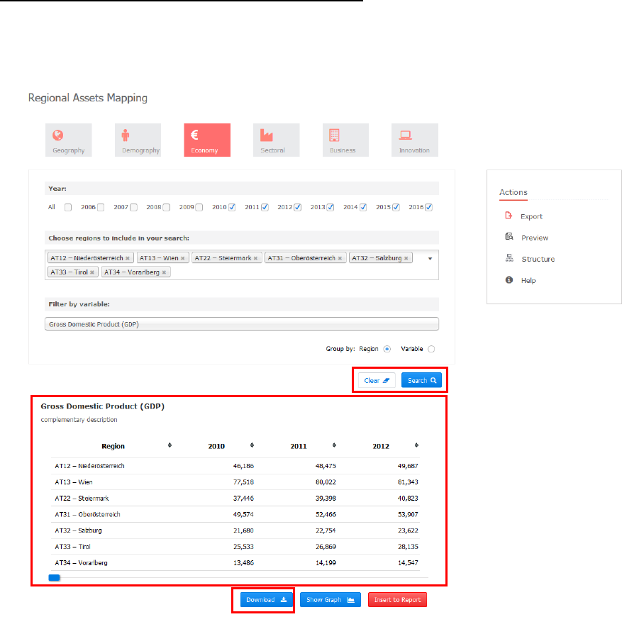
In the second step of the application, the user will be able to see his/her selected indicators in a table format
by pressing the Search button. He/she is also able to reset the selection criteria by pressing the Clear button
(Fig. 2a).
Figure 2a: Step 2 - Extraction of the data in table format.
An additional functionality of the application offers the opportunity to download the selected data at an excel
format (.xlsx). This can be done by pressing the Download button at the end of the table (Fig. 2b). The pop-
up window gives the user the opportunity to open the .xlsx file or Save it in his/her computer.
Clear & Search buttons
Selected indicators
in a table format
Download data in a
.xlsx format
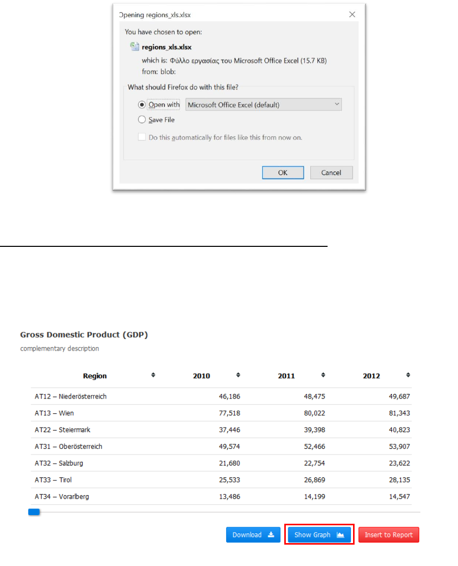
Figure 2b: Pop-up window for downloading the data in a table format.
Step 3 - Selection of the appropriate visualisation mode for the data
The third step of the application offers the opportunity to select the appropriate visualisation mode for the
data by pressing the Show Graph button (Fig. 3a). The choice must be done between two different
visualisation modes: line graphs and bar charts. In both cases, it is possible to export the produced graphs
in an image format (.png) by pressing the Export button at the bottom of the graph.
Figure 3a: Step 3 Selection of the appropriate visualisation mode for the data.
Selection of the visualization mode
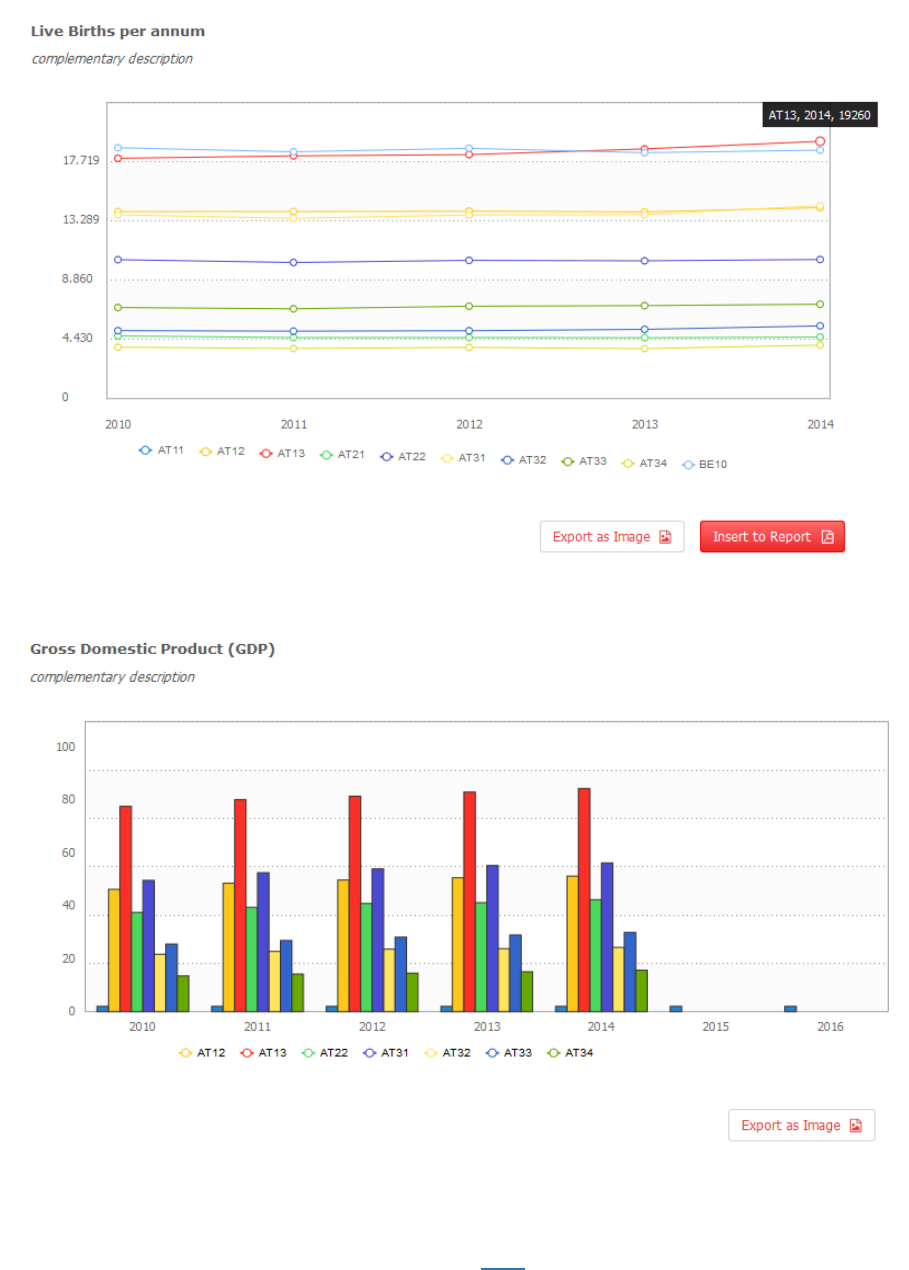
Figure 3b: Line graph produced by the Regional Assets Mapping application.
Figure 3c: Bar chart produced by the Regional Assets Mapping application.
You can download the full guide of the application here.