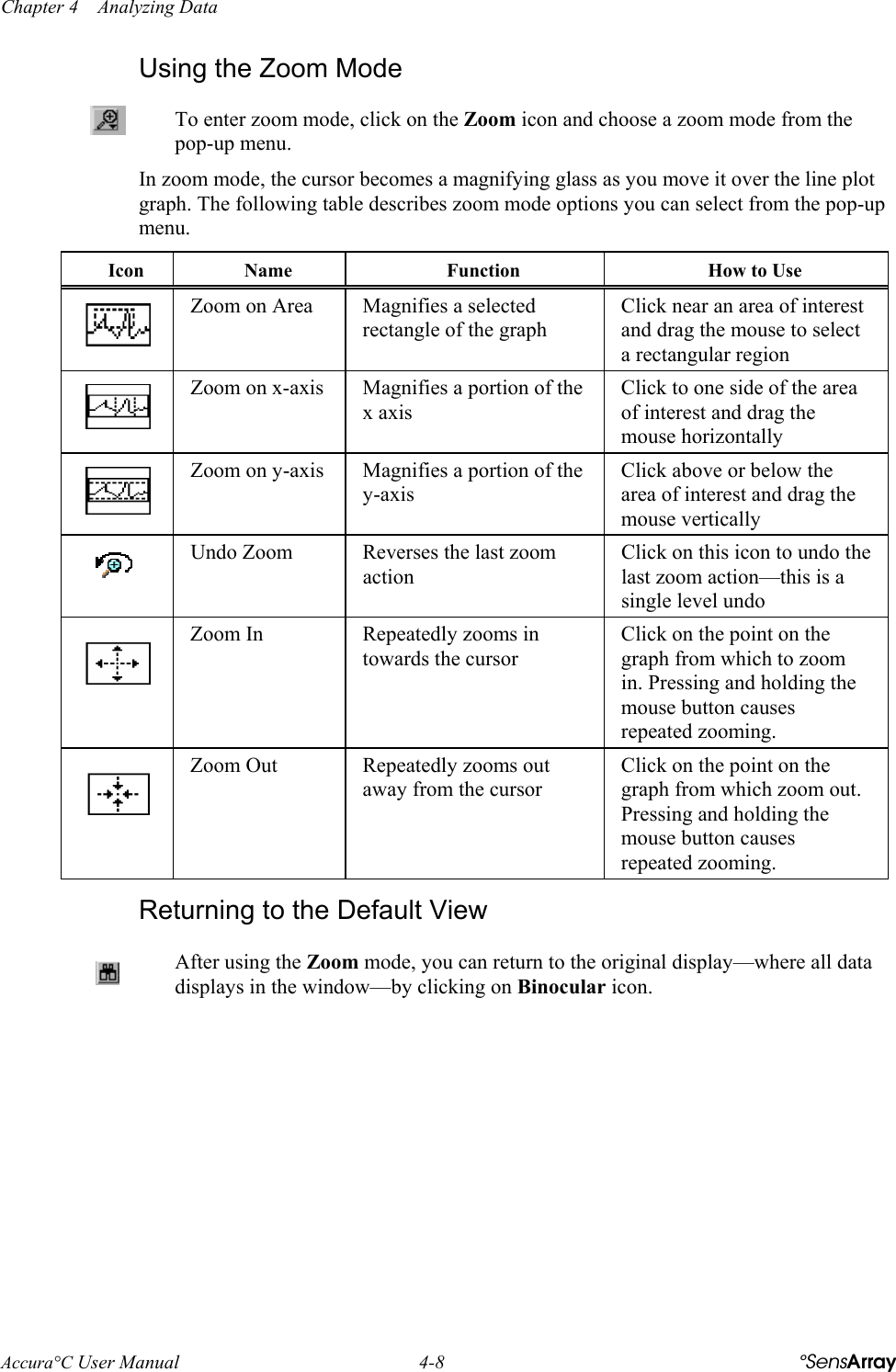
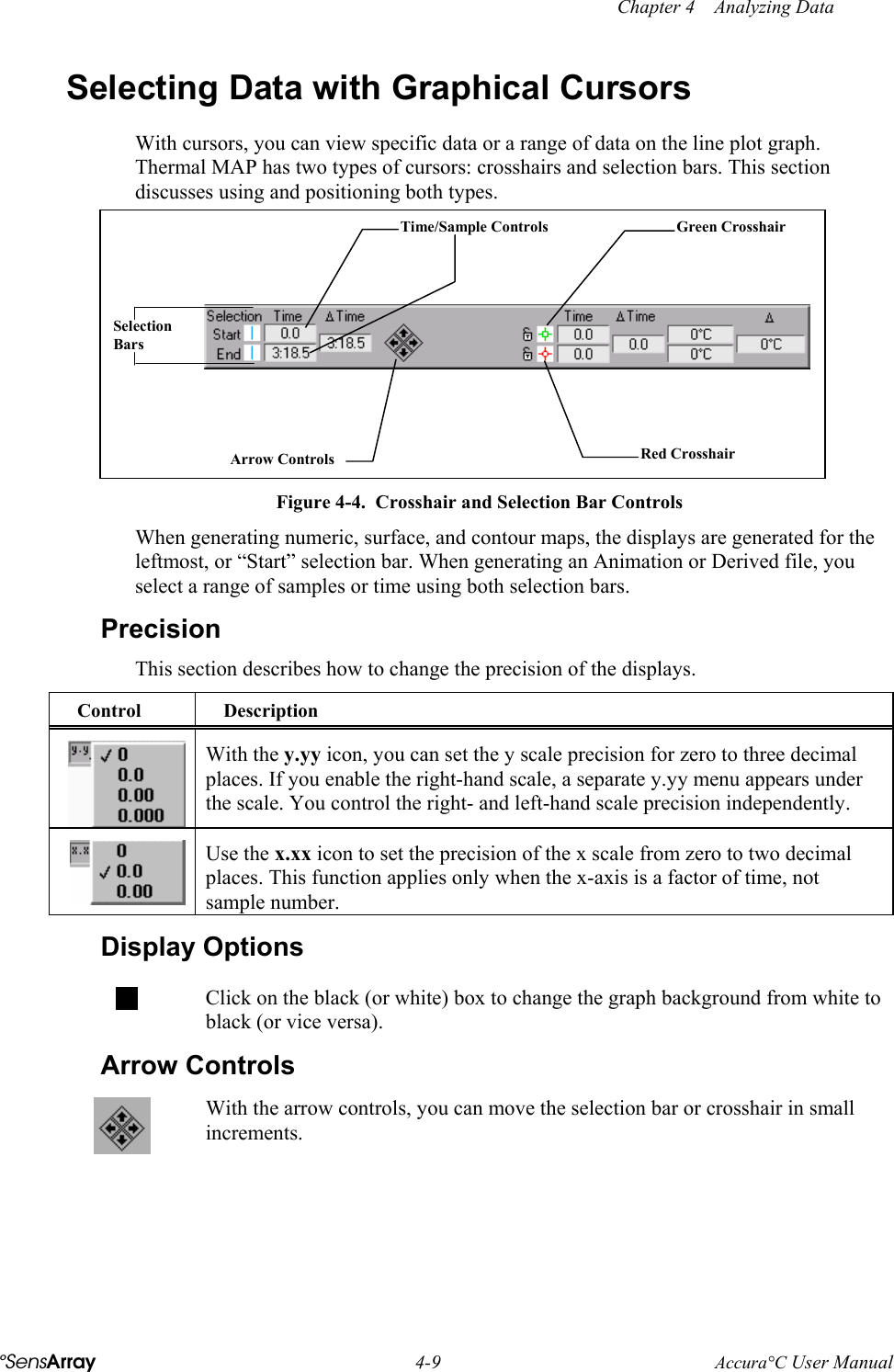
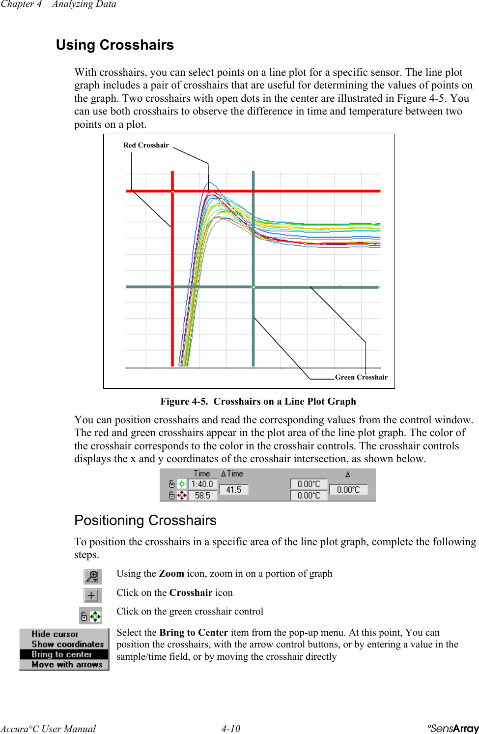
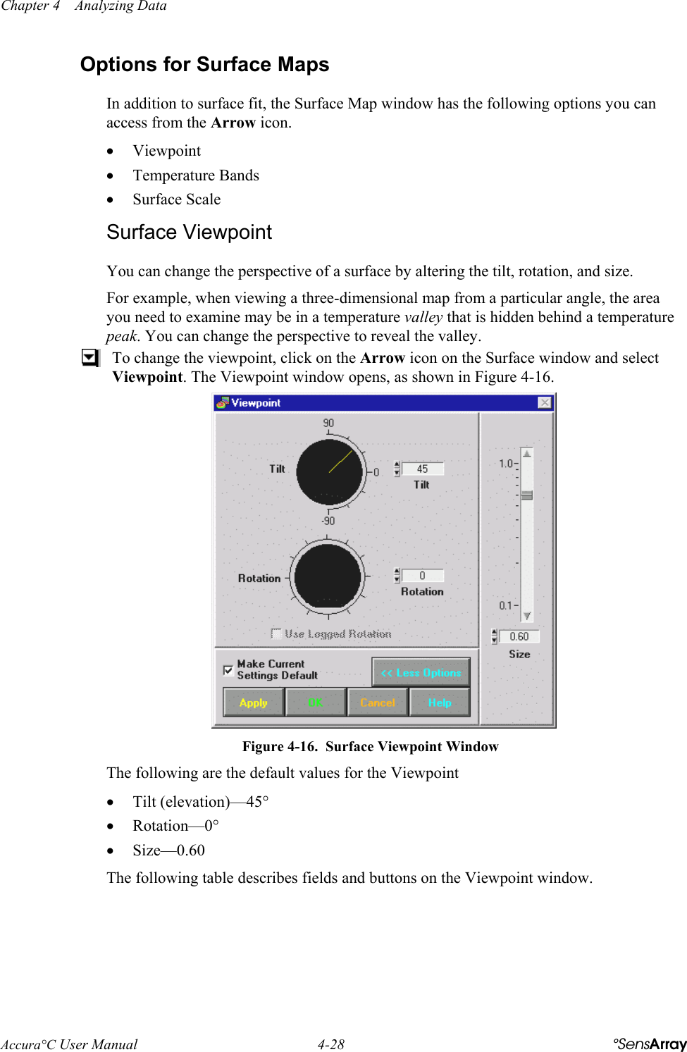
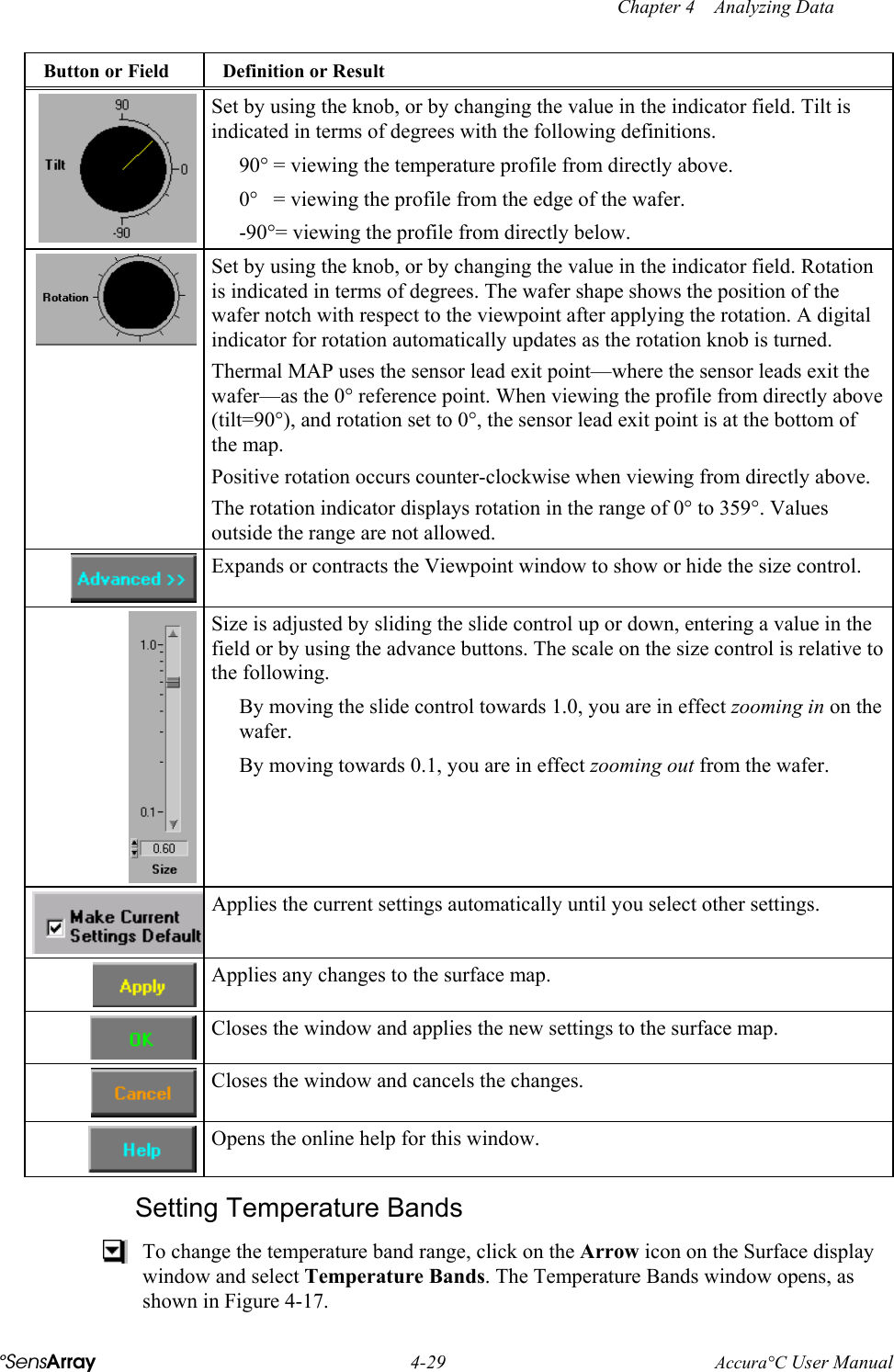
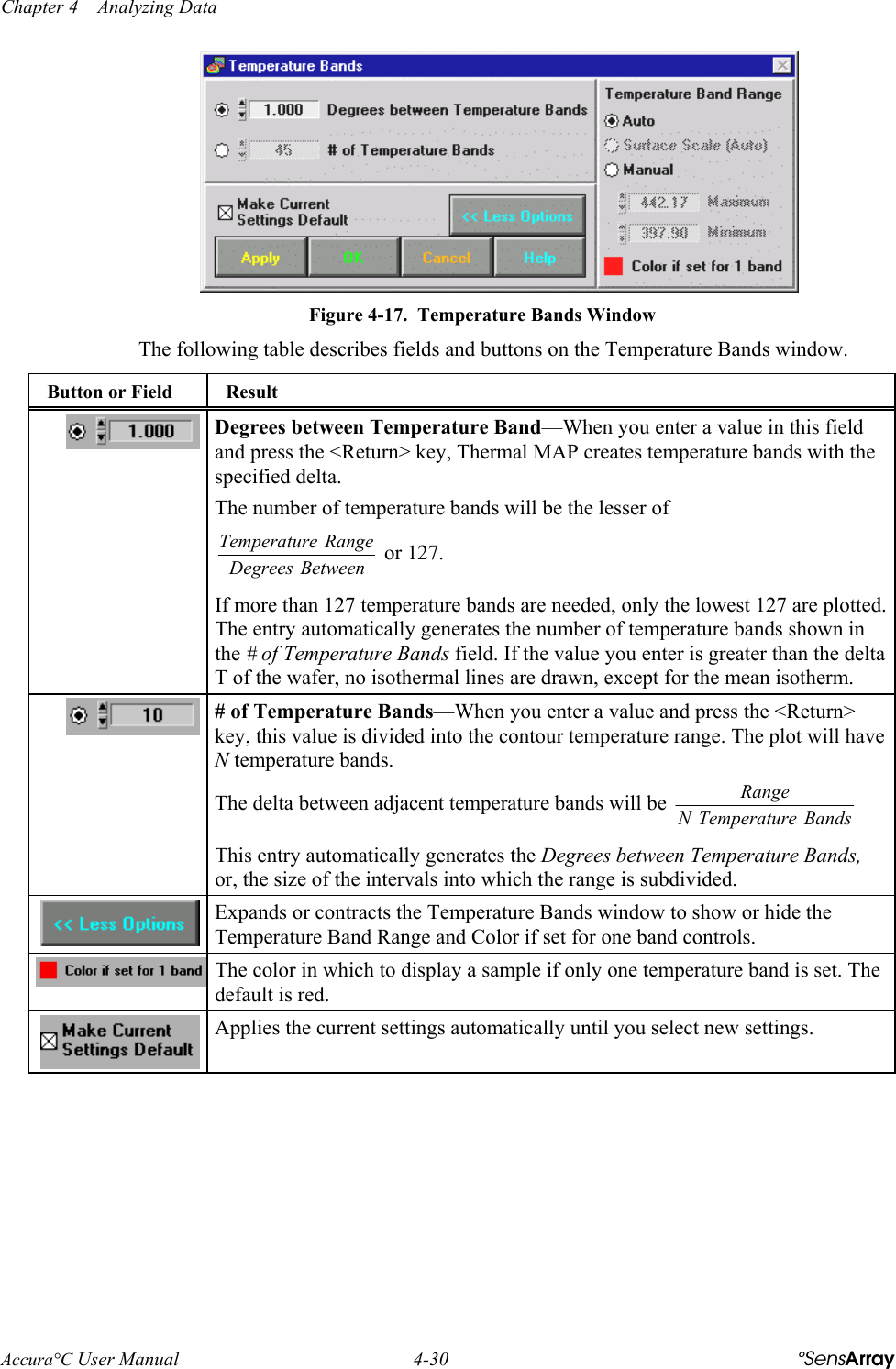
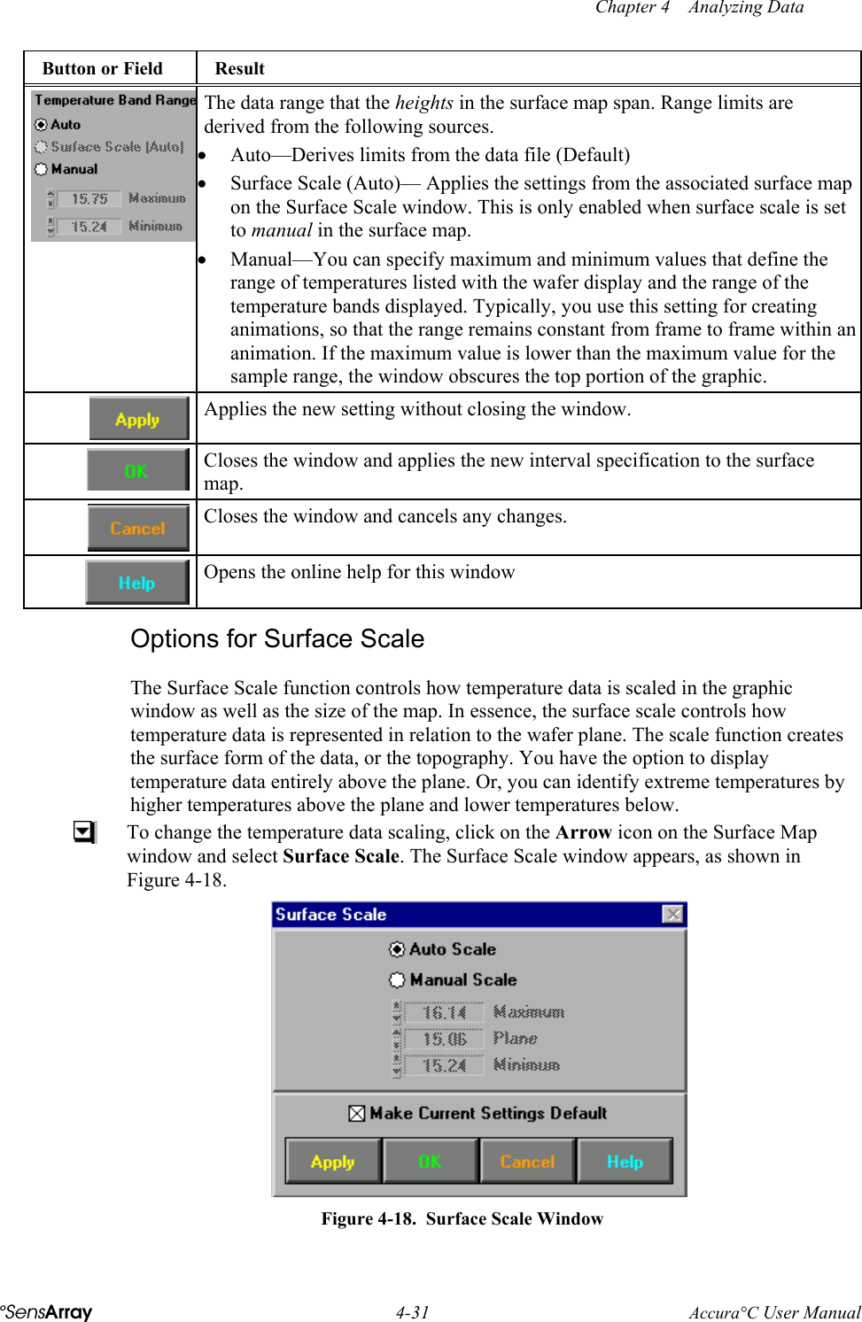
KLA Tencor 482-22-0800 Bluetooth Test and Calibration Device User Manual TMAP 3 Cover

KLA-Tencor Corporation Bluetooth Test and Calibration Device TMAP 3 Cover

Contents

Revised user manual 2 of 2

Chapter 4    Analyzing Data Accura°C User Manual  4-8  °SensArray Using the Zoom Mode  To enter zoom mode, click on the Zoom icon and choose a zoom mode from the pop-up menu.  In zoom mode, the cursor becomes a magnifying glass as you move it over the line plot graph. The following table describes zoom mode options you can select from the pop-up menu. Icon  Name  Function  How to Use  Zoom on Area  Magnifies a selected rectangle of the graph Click near an area of interest and drag the mouse to select a rectangular region  Zoom on x-axis  Magnifies a portion of the x axis Click to one side of the area of interest and drag the mouse horizontally  Zoom on y-axis  Magnifies a portion of the y-axis Click above or below the area of interest and drag the mouse vertically  Undo Zoom  Reverses the last zoom action Click on this icon to undo the last zoom action—this is a single level undo  Zoom In  Repeatedly zooms in towards the cursor Click on the point on the graph from which to zoom in. Pressing and holding the mouse button causes repeated zooming.  Zoom Out  Repeatedly zooms out away from the cursor Click on the point on the graph from which zoom out. Pressing and holding the mouse button causes repeated zooming. Returning to the Default View  After using the Zoom mode, you can return to the original display—where all data displays in the window—by clicking on Binocular icon.
 Chapter 4    Analyzing Data °SensArray 4-9 Accura°C User Manual Selecting Data with Graphical Cursors  With cursors, you can view specific data or a range of data on the line plot graph. Thermal MAP has two types of cursors: crosshairs and selection bars. This section discusses using and positioning both types.  Time/Sample ControlsArrow ControlsGreen CrosshairRed CrosshairSelectionBars Figure 4-4.  Crosshair and Selection Bar Controls When generating numeric, surface, and contour maps, the displays are generated for the leftmost, or “Start” selection bar. When generating an Animation or Derived file, you select a range of samples or time using both selection bars. Precision This section describes how to change the precision of the displays. Control Description  With the y.yy icon, you can set the y scale precision for zero to three decimal places. If you enable the right-hand scale, a separate y.yy menu appears under the scale. You control the right- and left-hand scale precision independently.  Use the x.xx icon to set the precision of the x scale from zero to two decimal places. This function applies only when the x-axis is a factor of time, not sample number.  Display Options  Click on the black (or white) box to change the graph background from white to black (or vice versa). Arrow Controls  With the arrow controls, you can move the selection bar or crosshair in small increments.
Chapter 4    Analyzing Data Accura°C User Manual  4-10  °SensArray Using Crosshairs With crosshairs, you can select points on a line plot for a specific sensor. The line plot graph includes a pair of crosshairs that are useful for determining the values of points on the graph. Two crosshairs with open dots in the center are illustrated in Figure 4-5. You can use both crosshairs to observe the difference in time and temperature between two points on a plot.  Green CrosshairRed Crosshair Figure 4-5.  Crosshairs on a Line Plot Graph You can position crosshairs and read the corresponding values from the control window. The red and green crosshairs appear in the plot area of the line plot graph. The color of the crosshair corresponds to the color in the crosshair controls. The crosshair controls displays the x and y coordinates of the crosshair intersection, as shown below.  Positioning Crosshairs To position the crosshairs in a specific area of the line plot graph, complete the following steps.  Using the Zoom icon, zoom in on a portion of graph   Click on the Crosshair icon  Click on the green crosshair control   Select the Bring to Center item from the pop-up menu. At this point, You can position the crosshairs, with the arrow control buttons, or by entering a value in the sample/time field, or by moving the crosshair directly
 Chapter 4    Analyzing Data °SensArray 4-11 Accura°C User Manual •  To move the crosshairs directly, you must grab the crosshair within the graph and drag it to the desired location. Grabbing and dragging a crosshair along either of its axes moves the crosshair along only vertically or horizontally. To move the crosshair along both axes, grab and drag within the symbol at the intersection of the crosshair’s axes. •  To use the arrow control buttons, first select the crosshair. Click on the Crosshair icon in the graphic window or click on the associated Red or Green Crosshair icon and select the Move with Arrows item from the pop-up menu.   You have selected the icon successfully if black or white arrows appear around the icon.  To select both crosshairs, first select one crosshair and then open the pop-up menu for the second one and select the Move with Arrows option. You move the crosshair left, right, up or down by pressing the appropriate arrow control button. The crosshair continues to move as long as you hold down the mouse button. The difference between the x positions and y positions of the two crosshairs can be read from the delta time and delta value columns on the crosshair controls. Depending on setting of the “Scroll Graph with Cursors” Preference, when positioning crosshairs, if you drag the crosshair outside the graph area in any direction, the graph may pan in that direction. If the crosshairs are not visible on the graph, click on the Red or Green Crosshair icon and select Bring to center from the pop-up menu.  Locking Crosshairs on Sensors  To view measurements from a specific sensor, you can lock a crosshair to that sensor.  You access the lock menu items by clicking on the Padlock icons beside the green and red crosshair icons.  The following table describes options from the pull-down menu. Item Description Unlock  Drag the crosshair anywhere on the graph. You can also move an unlocked crosshair by entering the coordinates into crosshair controls, shown below. Snap  Snaps the crosshair to a specific sensor. When Snap is selected, the crosshair snaps to the closest sensor. When a Snapped crosshair is dragged horizontally, it will follow the trace. When it is dragged vertically, it will snap from one sensor trace to another.
Chapter 4    Analyzing Data Accura°C User Manual  4-12  °SensArray Item Description Lock  Locks the crosshair to a specific sensor. When Lock is selected, the crosshair locks to the closest sensor. Alternately, you can select a specific sensor in the bottom portion of the menu, and the crosshair will lock to that sensor. When a Locked crosshair is dragged horizontally, it will follow the trace. Locked crosshairs cannot be dragged vertically, and can only be moved to another sensor trace with the pop-up menu. Note:  Sensor names appear in gray on the menu if they are not enabled. Sensors can be enabled or disabled on the Sensor Map or Calculated and System Channels Legend. When the crosshair is locked or snapped, you can drag the crosshair to a specific location on the line or use the left and right arrow controls to move the crosshair in increments. The up and down arrow controls have no effect.  The Padlock icon indicates if the crosshair is locked or snapped to a specific sensor. If the crosshair is snapped, the padlock is closed and gray. If neither option is selected, the padlock is open. Using Selection Bars With Selection Bars, you can view a scan or a specific range of time/sample readings. You can position selector bars with the following methods. •  Grab the bar and move manually. •  Select the bar and use the arrow control buttons. •  Enter values into the start and end times in the selection bar controls, shown below.  You can use the pair of selector bars (shown in blue) to select scans on the line plot graph. The selector bars are initially located at the left and right edges of the plot, as shown in Figure 4-6.
 Chapter 4    Analyzing Data °SensArray 4-13 Accura°C User Manual  Figure 4-6.  Using Selection Bars To view sensor data for a single sample in a point in time, called a scan, you use the left-hand selector bar. You can also position both bars to select a range of data for creating an Animation or Derived file.  Printing Line Plots  You can print the line plot display, legends, and data file information.  To print the current line plot, select File»Print Window to print the current line plot or File»Print Report to print the current line plot, along with information and comments about the file.  Using the Numeric Display You can view temperature values superimposed on a graphic of the wafer using the Numeric display, shown in Figure 4-7, by selecting Displays»Numeric on the Analysis window.  The leftmost selection bar on the line plot (or the first scan selected in the data table) determines which sample is displayed in the Numeric display window. The temperature of each sensor is displayed at each sensor location. When you move a selection bar, the display updates automatically. You can move the selection bar without closing the Numeric display.
Chapter 4    Analyzing Data Accura°C User Manual  4-14  °SensArray  Figure 4-7.  Numeric Display The following table describes fields, buttons, and checkboxes on the Numeric display window. Field/Button/ Checkbox Definition or Result  The date and sample time (expressed as the start time plus elapsed time).  For example,  5/31/00 10:39 PM + 0:00 means that the data acquisition was started on May 31st, 2000 at 10:59 PM, and this scan is 0 (zero) seconds into the run.  Uses the rotation logged with the sample. If no rotation is logged with the sample, the field is dimmed and cannot be checked.  Rotates the display map relative to a centered position at the 0° value. To rotate the map clockwise, select decreasing values. Alternately, you can rotate the map counter clockwise by increasing the counter value. In addition, you can rotate the map by clicking directly on the wafer map and dragging.  Displays the sensor identifier and temperature reading in the color related to the sensor on the line plot  When checked, labels identify each specific sensor and the associated temperature value. If you do not check the box, the labels show only temperature values.  The number of decimal places in which sample data is represented. You can select a new decimal place from the precision pop-up menu.  When checked, centers the text over the colored dot representing the sensor. When unchecked, places the text above or to one side of the dot.  The reverse video option for the wafer display. Clicking on this square toggles the map background color between black and white. To print the numeric display, chose File>Print Window or File>Print Report.
 Chapter 4    Analyzing Data °SensArray 4-15 Accura°C User Manual Using Data Tables The data table presents the temperature data in a spreadsheet-like format in which each row shows readings taken during one sample, as shown in Figure 4-8. To open a Data Table window, select Displays»Table on the Analysis window. The tabular data corresponds to the data that appears in the Analysis window.  Figure 4-8.  Data Table Window Note:  The cells in the data table are display only. You cannot enter or update information in the cells. The data in the table appears in rows and columns. The headings appear across the spreadsheet in the following order. Column Heading  Description  Sample number of each row.    Starting time of the sample relative to the start of acquisition. RTD1, RTD2, etc.   Data from the sensors of the Process Probe wafer. Calculated Channels Calculated channel values, if specified. Selecting Data With the data table, you can select data that you want to view. Selected data is reflected by the position of the Selection Bars in the Analysis window. You have the option of selecting one sample, all samples, or a range of samples.  •  Select one sample—Click on the row where the sample is listed. This action automatically de-selects previous selections. •  Select all samples—Use the Data Table arrow menu. •  Select a range of samples—Click on the sample, hold down the <Shift> key and select another sample. The samples do not need to be adjacent. Using this procedure, you can also extend the range of a selected set of samples.
Chapter 4    Analyzing Data Accura°C User Manual  4-16  °SensArray Data Table Options You can control the data table display using options from a pull-down menu.  To access options menu, click on the Arrow icon on the Data Table window.  The following table describes the options.  Option Result Always on Top  When this option is checked, the table will float on top of all open Thermal MAP windows.   Print  Prints the data table. A Print dialog box appears in which you can set parameters and proceed or cancel the print job. Printer Setup  Opens a dialog box where you can select printer options. Format  This command opens a window where you can change the number of digits each data column in the data table displays. (The format of the Sample Number and Time columns is determined automatically and cannot be changed).  To save the settings as the default for viewing the data table, check the Make Current Setting Default check box. Select All  Selects every sample in the data table. Help  Opens online help for this window.
 Chapter 4    Analyzing Data °SensArray 4-17 Accura°C User Manual Displaying Information about the Data File To view information about the data file, select Displays»Info on the Analysis window to open the Data Info window, as shown in Figure 4-9. The left side of this window displays information such as operator name, time and date of creation, and parameters established before acquisition. This is display-only information; you cannot edit or update information.  In the Comments section, you can edit or update the comments by clicking in the box and entering changes.  Figure 4-9.  Data Info Window
Chapter 4    Analyzing Data Accura°C User Manual  4-18  °SensArray Displaying Information about the Wafer Configuration To view information about the wafer used to acquire the temperature data, select Displays»Wafer Config. The window shown in Figure 4-10 appears.  Figure 4-10.  Wafer Configuration Viewer The Wafer field defaults to the wafer configuration for the current open Analysis window. Click on the field to open a menu of all the wafer configurations available, or click on the up/down arrows to move through the list one-by-one. If multiple Analysis windows are open and you change the current open window, the wafer configuration displayed by the viewer automatically changes to reflect the currently selected window. By placing the mouse cursor over a sensor on the sensor map in the upper right-hand corner of the viewer, the line for that sensor is highlighted in the table.
 Chapter 4    Analyzing Data °SensArray 4-19 Accura°C User Manual Contour and Surface Maps After selecting sample data from the line plot graph, you can view the data in detail by using the contour or surface map display. In addition, you can print the map with options from the display window.  Displaying Contour and Surface Maps You can select a sample for display from the line plot graph or the data table. In addition, you can display multiple surfaces and/or contour maps for several data samples simultaneously from a single data file.  To display a map, perform the following steps. 1.  Open a data file. 2.  Move the left-hand Selection Bar to the sample on the line plot, or click on the sample number from the Data Table. 3.  If you select more than one sample in the Data Table, the map plots the sample with the lowest sample number. If you are using the graph and both selection bars are positioned on the line plot, the map plots the lowest sample number (or time). 4. Select Displays»Contour or Displays»Surface from the Analysis window. For more information, see the following sections, Contour Maps and Surface Maps. Before the display window is shown, the surface fit is computed. Computing time varies from a fraction of a second to several seconds, depending on the surface fit algorithm selected and the speed of the computer’s microprocessor. Contour Maps The contour map, as shown in Figure 4-11, displays sample temperature variations across the wafer. You can use the contour to visualize the spatial temperature distribution in the wafer at a given point in time. Variations are represented as colored isothermal lines, similar to a topographical map. The mean temperature displays as a thick line. You can change the number of isothermal lines used in the contour.
Chapter 4    Analyzing Data Accura°C User Manual  4-20  °SensArray  Figure 4-11. Contour Map Window To the left of the map, the vertical list of temperatures corresponds to each isothermal line by color. If you specified system or calculated channels in the data file prior to acquisition, these values appear at the bottom of the window. Surface Maps The surface map, shown in Figure 4-12, like the contour map, displays temperature variations over the wafer surface at a given time. A three-dimensional wire frame perspective displays the data. The x and y (width and depth) values represent a position on the wafer, and the z value (or height) represents the temperature at that position. You can change the perspective of the viewpoint, such as the elevation and rotation parameters, and the size of the image.   Figure 4-12.  Surface Map Window in Auto Scale Mode
 Chapter 4    Analyzing Data °SensArray 4-21 Accura°C User Manual Setting Options for Displaying Contours and Surfaces With contour and surface displays, you can visualize temperature data on a wafer. This section describes options you use to control the representation of data, including menu items from the contour and surface maps, as shown in Figure 4-13.  To access the pull-down menus on the contour or surface display, press the Arrow icon in the upper right corner of the display to shown the menus in Figure 4-13.   Contour Surface Figure 4-13.  Map Menu Items While some options apply to one map type solely, other options apply to both.  Always On Top keeps the open window on top of other open Thermal MAP windows.  This makes it easier to view multiple formats of the same data set simultaneously. Copy to Clipboard copies the Surface or Contour map graphic onto the clipboard so it can be pasted into another application. Save to file saves the created Surface or Contour map to a graphics file for viewing at a future time or for inserting into other documents. You can alter the vantage point or the representation of data in the maps. For example, surface maps show temperature readings in topographical form and by using the Surface Scale option, you can vary the height and depth of the form, or use Viewpoint option to alter the angle of view. The Surface Fit option from the pull-down menu defines the graphical form for contour and surface maps. Each of the available methods fits a surface to the data in unique manners. In addition, you can select White/Black Background and Help from both menu items. The White/Black Background option changes the background of the map from black to white, and vice versa, and the Help option opens the online help for that window.
Chapter 4    Analyzing Data Accura°C User Manual  4-22  °SensArray Printing Contours and Surfaces  You can print contours and surfaces by selecting Print from the pull-down menu located in the upper right-hand corner of the display window. In the Print dialog box, press the OK button. If you want to set up your printer before printing (for example, to print in Landscape mode), select Printer Setup... from the menu on the Surface, Contour, or Table window. A print setup dialog box displays. Note:   Refer to the printer manual for more information about the print dialog box, page setup dialog box, printer setup, and other functions related to printing. Specifying Surface Fit and Resolution With the Surface Fit option, you can change the type of surface fit and resolution from the default values set by the program. From the Contour or Surface window, select the Surface Fit option and the Surface Fit settings dialog box shown in Figure 4-14 displays. The default value is Local Weighted Least Squares with a resolution of 2 mm.  Figure 4-14.  Surface Fit Settings Dialog Box The surface fit includes only the sensors that are enabled before data acquisition. Therefore, if one or more sensors are disabled—for example, an open, damaged, or questionable sensor is excluded—the sensor is removed from the surface fit calculation. The surface fit also ignores sensors that are disabled from the Line Plot window. To work at optimal performance, the Global and Local Weighted Least Squares algorithms require many, well distributed sensors on the wafer.  The following table describes buttons and fields on the Surface Fit window.
 Chapter 4    Analyzing Data °SensArray 4-23 Accura°C User Manual  Button or Field  Description  Global Weighted Least Squares (Default)—more than about 12 sensors—An approximating algorithm with global sensor consideration.  Local Weighted Least Squares—more than about 12 sensors—Similar to Type 1, this type is modified so that the influence of a sensor on a data point is inversely proportional to the distance of that point to the sensor.  Note:  On computers with slower microprocessors, the % Complete Bar Graph window indicates the percentage of completion of the surface fit computation. To cancel the surface fit, press the Cancel button on the Progress Bar window. A dialog box appears in which you can select a new method or resolution or cancel.  Local Weighted Shepard’s Method—any number of sensors—An interpolating method with local consideration.   The resolution of the surface fit, in millimeters. The resolution can be any integer between 1mm and 10mm. The smaller the resolution, the longer time it takes to compute the surface fit. The default, 2 mm, offers good resolution and reasonable computation time.  Applies the current method automatically until you select another setting. Applies changes without closing the window. The contour and/or surface plot update automatically to reflect the change in surface parameters.  Closes the window and applies the changes. The contour and/or surface plot update automatically to reflect the change in surface parameters.  Closes the window and cancels any changes. The surface fit characteristics remain as before.  Opens the online help for this window  Comparison of Algorithms The following figures illustrate the surface map for each algorithm when applied to the identical set of sensor data. The attributes of each algorithm include advantages and disadvantages. Global Weighted Least Squares Approximation Global Support  Advantage:  Computes relatively fast Disadvantages:  Smoothes the data too much. Requires many, well
Chapter 4    Analyzing Data Accura°C User Manual  4-24  °SensArray distributed sensors on the wafer.  Local Weighted Least Squares Approximation Quasi-Local Support  (based on distance from known points)  Advantage:  No flat spots. Reasonably smooth. Probably most accurate fit for silicon. Disadvantages:  Reasonably slow to compute. Does not work unless there are many well-distributed sensors selected on the wafer.   Local Weighted Shepard’s Method Interpolation Local Support  Advantage:  Relatively fast to compute. Works with a few sensors selected. Disadvantages:  Renders flat spots at sensor locations.  About Surface Fit Characteristics Before you can generate a contour or surface plot, a surface must be fitted to the sensor data. The interpolation of the data determines the form of the map. Based on a grid that represents positions on the wafer, temperature values can be approximated at regular intervals. You select the method of fitting this surface to the sensor data, as well as the resolution of the grid that represents the surface. However, each method fits the data to this area somewhat differently.  Fitting sensor data from a Process Probe wafer to a temperature profile is an example of fitting a surface to given data points with x and y values in a plane. In practice, the known data points are used to produce a function of the form z = f(x,y); with this function, the height of the surface at any point (x,y) in the plane can be determined. There are many different methods for fitting a surface to data points; each has advantages and disadvantages.
 Chapter 4    Analyzing Data °SensArray 4-25 Accura°C User Manual Computing by Height One classification of surface fitting methods is according to how the methods compute the height of the fitted surface at the given data points, or, in this case, the temperatures at the sensors. The choices are interpolation and approximation. •  Interpolation—The height of the surface is exactly the same as the given value at each of the known data points. An interpolating surface fit follows local features in the data more accurately. Yet, if the data is noisy, an interpolating fit may render inaccurate temperature features that do not exist. •  Approximation—The surface follows a best fit scenario in which height is close to—but not necessarily accurate to—the values at the known data points. (However, all data points on the surface that lie in between the known data points are only approximate.) An approximating surface fit produces a smooth representation of the peaks and valleys in the data. Use this method when the data is noisy. Computing by Global or Local Support An independent classification of a surface-fitting method is whether the interpolation or approximation has global or local support. •  Global—When computing the height of an in-between point on the wafer, the values of all of the known data points (sensors) are considered. •  Local—When computing the height of the surface of the wafer, only the sensors that are near the point being computed are considered. Note:  For Thermal MAP, only the sensors that are enabled are computed for the surface fit. If only 12 sensors on a 17-sensor wafer are enabled, a surface fit uses only 12 sensors in the calculations. Options for Contour Maps In addition to surface fit, the Contour Map window has the following options you can access from the Arrow icon. •  Show Mean Line •  Isotherms Show Mean Line  To show or hide the thick line representing the mean, click on the Arrow icon on the Contour window and select Show Mean Line. When the check mark appears to the left, then Show Mean Line is active. Setting Isotherms  To control the number of isotherms shown in a map, click on the Arrow icon on the Contour window and select Isotherms. The dialog box shown in Figure 4-15 appears.
Chapter 4    Analyzing Data Accura°C User Manual  4-26  °SensArray  Figure 4-15.  Isotherms Configuration Window The following table describes fields and buttons on the Isotherms window. Button or Field  Result  Degrees Between Isotherms—When you enter a value in this field and press the <Return> key, Thermal MAP creates isotherms with the specified delta.  The number of Isotherms will be the lesser of  BetweenDegreesRangeeTemperatur  or 127.  If more than 127 isotherms are needed, only the lowest 127 are plotted. The entry automatically generates the number of Isotherms shown in the # of Isotherms field. If the value you enter is greater than the delta T of the wafer, no isothermal lines are drawn, except for the mean isotherm.  # of Isotherms—When you enter a value and press the <Return> key, this value is divided into the contour temperature range. The plot will have N isotherms.  The delta between adjacent isotherms will be  IsothermsNRange  This entry automatically generates the Degrees between Isotherms, or, the number of intervals into which the range is subdivided. Expands or contracts the window to show or hide Isotherm Range.  Range limits are derived from the following sources. •  Auto (Default)—Derives limits from the data file •  Surface Scale—Applies the settings from the associated surface map on the Surface Scale window. This is only enabled when surface scale is set to manual in the surface map. •  Manual—You can specify maximum and minimum values that define the range of temperatures listed with the wafer display and the range of the isotherms displayed. However, only the isotherms within the temperature range of the wafer appear on the wafer.  Applies the new setting without closing the Isotherms window.  Closes the Isotherms window and applies the new isotherm specification to the contour map.  Closes the Isotherms window and cancels any changes.
 Chapter 4    Analyzing Data °SensArray 4-27 Accura°C User Manual  Opens the online help for this window.
Chapter 4    Analyzing Data Accura°C User Manual  4-28  °SensArray Options for Surface Maps In addition to surface fit, the Surface Map window has the following options you can access from the Arrow icon. •  Viewpoint •  Temperature Bands •  Surface Scale Surface Viewpoint You can change the perspective of a surface by altering the tilt, rotation, and size.  For example, when viewing a three-dimensional map from a particular angle, the area you need to examine may be in a temperature valley that is hidden behind a temperature peak. You can change the perspective to reveal the valley.  To change the viewpoint, click on the Arrow icon on the Surface window and select Viewpoint. The Viewpoint window opens, as shown in Figure 4-16.  Figure 4-16.  Surface Viewpoint Window The following are the default values for the Viewpoint •  Tilt (elevation)—45° •  Rotation—0° •  Size—0.60 The following table describes fields and buttons on the Viewpoint window.
 Chapter 4    Analyzing Data °SensArray 4-29 Accura°C User Manual Button or Field  Definition or Result  Set by using the knob, or by changing the value in the indicator field. Tilt is indicated in terms of degrees with the following definitions. 90° = viewing the temperature profile from directly above. 0°  = viewing the profile from the edge of the wafer. -90°= viewing the profile from directly below.  Set by using the knob, or by changing the value in the indicator field. Rotation is indicated in terms of degrees. The wafer shape shows the position of the wafer notch with respect to the viewpoint after applying the rotation. A digital indicator for rotation automatically updates as the rotation knob is turned. Thermal MAP uses the sensor lead exit point—where the sensor leads exit the wafer—as the 0° reference point. When viewing the profile from directly above (tilt=90°), and rotation set to 0°, the sensor lead exit point is at the bottom of the map. Positive rotation occurs counter-clockwise when viewing from directly above. The rotation indicator displays rotation in the range of 0° to 359°. Values outside the range are not allowed.   Expands or contracts the Viewpoint window to show or hide the size control.  Size is adjusted by sliding the slide control up or down, entering a value in the field or by using the advance buttons. The scale on the size control is relative to the following. By moving the slide control towards 1.0, you are in effect zooming in on the wafer. By moving towards 0.1, you are in effect zooming out from the wafer. Applies the current settings automatically until you select other settings.  Applies any changes to the surface map.  Closes the window and applies the new settings to the surface map.  Closes the window and cancels the changes.  Opens the online help for this window. Setting Temperature Bands  To change the temperature band range, click on the Arrow icon on the Surface display window and select Temperature Bands. The Temperature Bands window opens, as shown in Figure 4-17.
Chapter 4    Analyzing Data Accura°C User Manual  4-30  °SensArray  Figure 4-17.  Temperature Bands Window The following table describes fields and buttons on the Temperature Bands window. Button or Field  Result  Degrees between Temperature Band—When you enter a value in this field and press the <Return> key, Thermal MAP creates temperature bands with the specified delta.  The number of temperature bands will be the lesser of  BetweenDegreesRangeeTemperatur  or 127.  If more than 127 temperature bands are needed, only the lowest 127 are plotted. The entry automatically generates the number of temperature bands shown in the # of Temperature Bands field. If the value you enter is greater than the delta T of the wafer, no isothermal lines are drawn, except for the mean isotherm.  # of Temperature Bands—When you enter a value and press the <Return> key, this value is divided into the contour temperature range. The plot will have N temperature bands. The delta between adjacent temperature bands will be  BandseTemperaturNRange  This entry automatically generates the Degrees between Temperature Bands, or, the size of the intervals into which the range is subdivided.  Expands or contracts the Temperature Bands window to show or hide the Temperature Band Range and Color if set for one band controls. The color in which to display a sample if only one temperature band is set. The default is red.  Applies the current settings automatically until you select new settings.
 Chapter 4    Analyzing Data °SensArray 4-31 Accura°C User Manual Button or Field  Result The data range that the heights in the surface map span. Range limits are derived from the following sources. •  Auto—Derives limits from the data file (Default) •  Surface Scale (Auto)— Applies the settings from the associated surface map on the Surface Scale window. This is only enabled when surface scale is set to manual in the surface map. •  Manual—You can specify maximum and minimum values that define the range of temperatures listed with the wafer display and the range of the temperature bands displayed. Typically, you use this setting for creating animations, so that the range remains constant from frame to frame within an animation. If the maximum value is lower than the maximum value for the sample range, the window obscures the top portion of the graphic.  Applies the new setting without closing the window.  Closes the window and applies the new interval specification to the surface map.  Closes the window and cancels any changes.  Opens the online help for this window Options for Surface Scale The Surface Scale function controls how temperature data is scaled in the graphic window as well as the size of the map. In essence, the surface scale controls how temperature data is represented in relation to the wafer plane. The scale function creates the surface form of the data, or the topography. You have the option to display temperature data entirely above the plane. Or, you can identify extreme temperatures by higher temperatures above the plane and lower temperatures below.   To change the temperature data scaling, click on the Arrow icon on the Surface Map window and select Surface Scale. The Surface Scale window appears, as shown in Figure 4-18.  Figure 4-18.  Surface Scale Window
Chapter 4    Analyzing Data Accura°C User Manual  4-32  °SensArray The following table describes fields, buttons, and the checkbox on the Surface Scale window. Field/Button/ Checkbox Definition or Result  Scales data according to the temperature values in the sample. The plane is drawn below the lowest temperature value, in a manner in which the entire temperature surface appears to float above the plane. This prevents the plane from hiding the surface. Note that because the height is scaled to the data range, large features on the plot (high peaks and deep valleys) may actually represent very small temperature differences.  By selecting this radio button, you can manipulate the Maximum, Plane, and Minimum fields.  With the maximum and minimum controls, you can specify the following values. Vertical scaling limits of the graph. If these values are significantly outside the actual temperature range of the wafer, the wafer appears almost flat. If these values are inside the temperature range on the wafer, the vertical scale is exaggerated and parts of the wafer may be outside the window. Limits of the color spectrum when the Surface Scale is selected for the range. The maximum value specifies the temperature of red, and the minimum value specifies the temperature of blue.  The temperature equivalent of the three-dimensional plane. For example, you can use the control to set the plane to the mean temperature of the wafer, so that the hotter portions of the wafer are drawn above the plane, and the cooler portions below the plane. In another example, you can set the plane to the desired setpoint of your process, so the deviating portions of the wafer are drawn above and below the plane. Applies the current settings automatically until you select new settings.  Applies the new setting without closing the window.  Closes the window and applies the new scale specifications to the surface display.  Closes the window and cancels the changes. The scaling settings will remain as they were.  Opens the online help for this window
 Chapter 4    Analyzing Data °SensArray 4-33 Accura°C User Manual Animating Analysis Displays With the Thermal MAP 3 animation feature, you can create animation, or movies, of a time-series of contour maps, or surface maps, or both, from your data set. You use animation to gain insight into how temperature profiles change over time. The Animation feature includes creating new animations and playing saved animations. Creating an Animation You can create animations by completing the following steps. •  Open a data file •  Select the scan range to incorporate in your animation •  Open the Animation Setup window by selecting Animation»Create from the Analysis window. (Two plots also open: a surface and a contour plot.) •  Use the Animation Setup window to adjust the plots and animation settings. •  Use the Create Animation button on the Animation Setup window to generate the animation. Animation Setup At the left side of the Animation Setup window, you see sample number and animation frame settings. You can incorporate many samples into the animation.  The following table describes fields and buttons on the Animation Setup window. Field/Button  Definition or Result  Reduce the number of actual samples that are incorporated in your animation. For example, if you set the Record Every control to 2 frames, sample 0, 2, 4 and so on are recorded on the animation. You may choose a smaller set in the interest of time.   Animation Setup defaults to using both a surface plot and a contour plot in your animation. If you prefer to display one plot only, you can close the other plot.  For example, if you prefer to display the surface plot only, press the Close Contour button.  Opens the Temperature Bands configuration window for surface plots. See the Setting Temperature Bands section of this chapter for more information.  Opens the Isotherms configuration window for contour plots. See the Setting Isotherms section of this chapter for more information.
Chapter 4    Analyzing Data Accura°C User Manual  4-34  °SensArray Field/Button  Definition or Result  Opens the Viewpoint configuration window for surface plots. See the Surface Viewpoint section of this chapter for more information.  Opens the Surface Fit configuration window. See the Specifying Surface Fit and Resolution section of this chapter for more information.  Opens the Surface Scale configuration window. See the Options for Surface Scale section of this chapter for more information.  Opens online help at a text explanation of the window  Generates the animation.  Does not generate an animation. Closes the Animation Setup window and the plots in the Animation Setup.  By pressing the Create Animation button, the Animation Setup window closes and the Animation File dialog box opens, as shown in Figure 4-19.  Figure 4-19.  Create Animation Dialog Box In the box, you specify the file name for the animation and press the Save button. The default directory for a new user is C:\Sensarray\Animations. If you change the directory, the software remembers the last directory used by each user and changes the default.  As the software creates the animation, a progress screen indicates how many frames are completed. When your animation is completed, the plot windows for the animation close. Playing the Animation After creating and saving the animation to a file, you can open and play the animation. You can play the animation on any Windows operating system—even if Thermal MAP is not installed—by using the Windows Media Player. Opening the Animation To open the animation, select Animation»Play on the Analysis window.
 Chapter 4    Analyzing Data °SensArray 4-35 Accura°C User Manual This action opens a file dialog box in which you can select an animation to play. After you select an animation and press the OK button, the animation opens, as shown in Figure 4-20.   Figure 4-20.  Sample Animation In addition, when you press the OK button on file dialog box, the TMAP Animation Player window opens, as shown in Figure 4-21.  Figure 4-21.  TMAP Animation Player Window Using the Animation Player The controls on the TMAP Animation Player are similar to controls on a compact disc player.  Field/Button Definition or Function  Pause or Stop. When clicked, the animation pauses and the button changes to the Play button.  Play. When clicked, the animation starts and the button changes to the Pause button.  If checked, the animation restarts upon reaching the end.  Opens the online help for this window
Chapter 4    Analyzing Data Accura°C User Manual  4-36  °SensArray Field/Button Definition or Function  Fast forward or step. If this button is clicked while the animation is playing, it steps forward. If clicked while the animation is paused, it advances a single frame per click. If you click and hold, the animation fast-forwards as long as the mouse button is depressed.  Rewind or step. If this button is clicked while the animation is playing, it steps backward. If clicked while the animation is paused, it reverses a single frame per click. If you click and hold, the animation rewinds as long as the mouse button is depressed.  Go to beginning. Clicking this returns the animation to the first frame. If the animation is playing at the time, it immediately starts playing.  Go to end. Clicking this sets the animation to the last frame and stops the animation. Displays the elapsed time in minutes and seconds, and as a bar graph based on the percentage of the animation viewed.  This adjusts the playback speed of the animation. Animations are recorded in real-time; an animation comprised of five hours of scans takes five hours to play.  You can adjust the Time Rate to speed up or a slow down the animation. Time Rate values range from 100X to 0.1X (one-tenth speed). To speed up: Use the values larger than 1X. To slow down: Use the values smaller than 1X   Shows the playback rate (as modified by the Time Rate control) in scans per minute  Shows the actual rate of the scans (as acquired) in scans per minute To exit the TMAP Animation Player, press the close box to close the Animation window.
 Chapter 4    Analyzing Data °SensArray 4-37 Accura°C User Manual The Derived File Wizard The Derived File Wizard is a program that calculates statistical values on the measured data for a selectable period within the run or the complete run. It can also be used to determine the difference between two runs by subtracting the measured data from one file compared to another. The resulting file is called a derived file. The following types of analysis can be derived from selected thermal data in the Thermal MAP 3 window: •  Minimum temperature—Gives the minimum reading from the selected range of scans or time period for each sensor selected. •  Maximum temperature—Gives the maximum reading from the selected range of scans or time period for each sensor selected. •  Temperature range (max-min)—Gives the difference between the maximum and minimum value of the readings from the selected range of scans or time period for each sensor selected. •  Mean temperature—Gives the mean temperature value for the readings over the selected range of scans or time period of each sensor selected. •  Standard deviation—Gives the standard deviation value for the readings over the selected range of scans or time period of each sensor selected. •  All Calculations (spreadsheet file)—Gives all five of the above derived statistics for each sensor selected.  These derived statistics are listed in a CSV spreadsheet file that is used by a spreadsheet program. Note:  This file is NOT viewable with the Thermal MAP line plot graph. •  Difference between two files (File1 – File2)—Gives the difference between the two files measured values for equivalent sensor channels. This function provides for comparison between runs using the same or an equivalent instrumented wafer.  Preparation Before using the Derived File Wizard, you can prepare a file or files in an Analysis window before you start the wizard, or you can set options within the wizard. Proper preparation of the file is key to effectively using the Derived File Wizard.  Open a file normally in an Analysis window. If the File1 – File2 function is to be used, open the second file in another Analysis window. Set any conditions to be used: •  Adjust the cursors to the desired start and stop points. •  Enable and disable the sensors on the sensor map as desired. •  Highlight any sensors on the sensor map as needed. •  Enable any Calculated Inputs as desired. •  For File 1 –File 2 difference function be sure the selected sensors and ranges are equivalent within the two files. A difference value is calculated for each scan number or scan time interval in the run. The selected range of scans or time period needs to be the same for both files so there will be an equal number of measurements for difference calculation.
Chapter 4    Analyzing Data Accura°C User Manual  4-38  °SensArray If a slope change such as heat up or cool down is included in the selected range of scans or time period, then accurately selecting an equivalent starting scan or time preceding the slope is required so that the slopes occur at the same times or scan number within the two runs. If this is not achieved then inaccurate difference measurement on the slopes will result.  Creating Derived Files To create a Derived File, click on the Display Menu and select Derived File Wizard. The dialog box in Figure 4-22 appears prompting you to choose an open file for analysis from the current open files. In the example, only one file is open.   Figure 4-22.  Select Window Click on the file to select it for derived analysis. A reduced size XY Graph of that file will appear. If the parameters were not already set before starting the wizard, enable or disable sensors and select scans on its line plot graph. Click Next> to proceed with the setup. The dialog box in Figure 4-23 appears.  Figure 4-23.  Format Window  In this panel, select the type of analysis to perform. Selecting Mean will cause the Derived Files Wizard to calculate the Mean Temperature over the selected time or scans. Click Next> to proceed.
 Chapter 4    Analyzing Data °SensArray 4-39 Accura°C User Manual Note:  If you selected File1 – File2 at this point, the system will open an additional window similar to Figure 4-22 to prompt you to open a second file to subtract its measured values from the first file opened. Click on the desired file to select it . Click Next> to proceed  Next, choose the sensors to be included in the analysis.  The panel shown in Figure 4-24 appears:  Figure 4-24.  Sensors Window After the number of sensors are selected, Click Next> to proceed. The derived data will be calculated and Thermal MAP 3 derived file X-Y Graph will appear as shown in Figure 4-25.  Figure 4-25.  Derived File Results Window
Chapter 4    Analyzing Data Accura°C User Manual  4-40  °SensArray Thermal MAP calculates and displays the requested format: mean, min, max, etc. In this example, it displays the mean or average temperature of each sensor in the selected data run. The new analysis window is automatically named with the word ‘-mean’ appended to the original file name. The new windows can be printed or saved. Most Thermal MAP Analysis features are active for Derived Files. Contour maps and surface maps can be viewed if enough sensors are recorded and selected. The numeric display can usually be viewed. The Derived File can be saved for future reference by pressing File»Save.  If the window is closed without saving, the program will prompt you to save the file results. To print the Derived File report, from the File menu choose Print Window to print the report as shown on the screen, or Print Report that includes sensor map, date and time of report, wafer type used, etc.

Navigation menu