AIA Branding Guide Summer2013
User Manual: Pdf
Open the PDF directly: View PDF ![]() .
.
Page Count: 9


page
WHY IS ESTABLISHING A BRAND IMPORTANT?
A brand helps to build recognition and trust toward an organization. Having multiple
pieces with the same branding (look) shows connectivity among different products,
be it a brochure, invitation or DVD, and lets the person who is receiving the products
know that they come from Athletes in Action, even if there are products from
different departments. It says, “Hey, we’re Athletes in Action, and if you see any more
information/booklets/websites like these you can trust that it’s from us, too.”
Think of companies/organizations with well established brands: Nike, Coca-Cola and
Red Cross are a few of the more recognizable. Often you don’t even need to see a
name or logo to know that a piece is from that company/organization.
That’s what we want for Athletes in Action. But we need help from everyone to
obtain that kind of recognition. Please look to this branding guide when designing for
Athletes in Action. Even having our Athletes in Action logo screen-printed the correct
color on a t-shirt is important in building brand recognition.
If you have any questions please feel free to contact me. Thank you for helping us
make our ministry instantly recognizable!
MARY DIXON
Graphic Designer
Creative Connections
mary.dixon@athletesinaction.org
P.S. Please keep an eye on the staff emails for news of updated guides, downloadable templates and stock art.
Go to overview
page
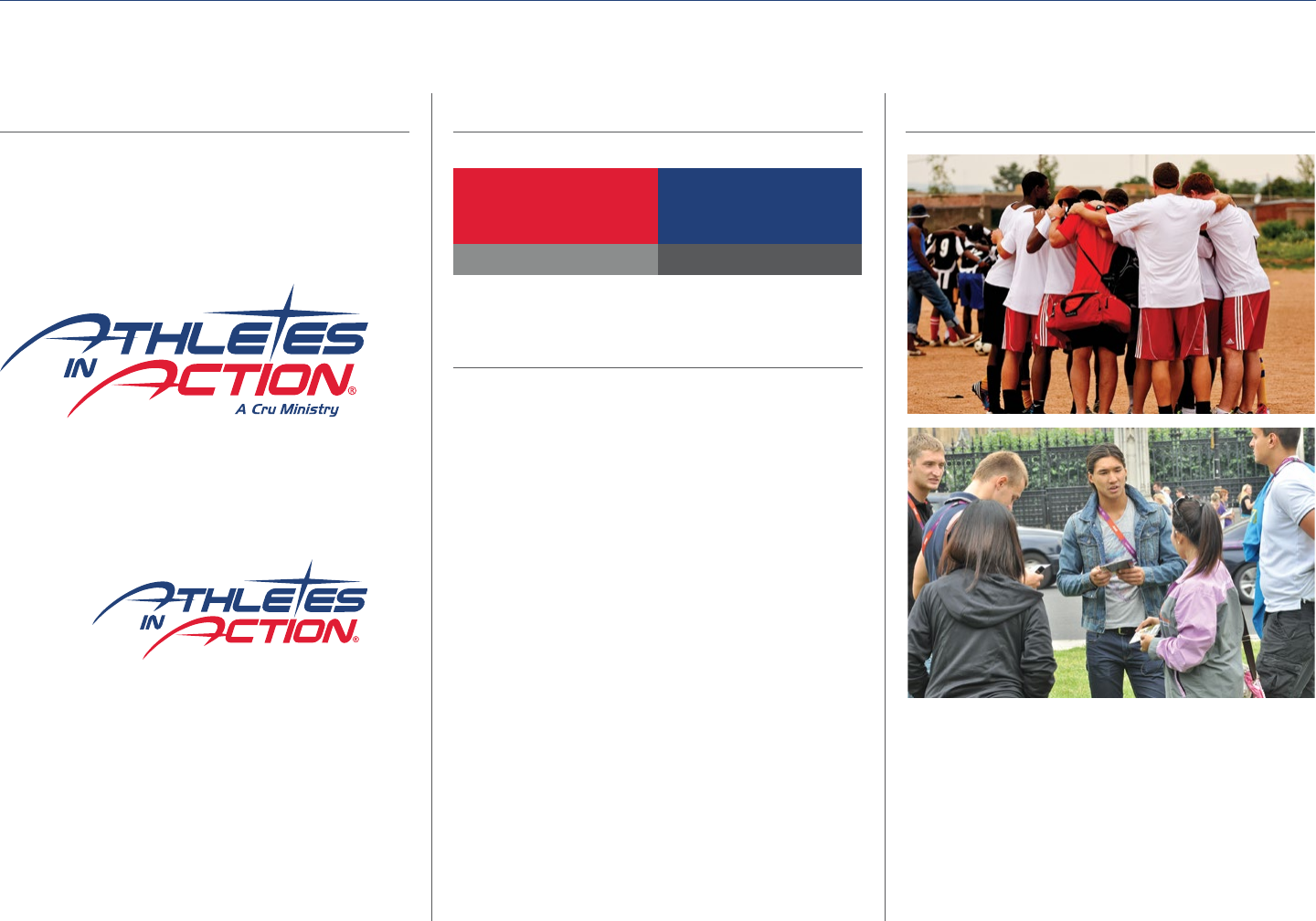
OVERVIEW OF BRAND ELEMENTS
AIA Logo with Cru endorsement
(For print and web)
AIA Logo without Cru endorsement
(For clothing and gear)
Freight Sans Pro Light
Freight Sans Pro Book
Freight Sans Pro Medium
Freight Sans Pro Bold
Leitura roman 3
Logo .......................... pages 4-6
Usage .................................. page 4
Adaptations ..........................page 5
Clothing and Gear ...................page 6
Co-Branding .......................... page 9
Colors ........................... page 7
Type ............................ pages 7
Images .......................... page 8

page
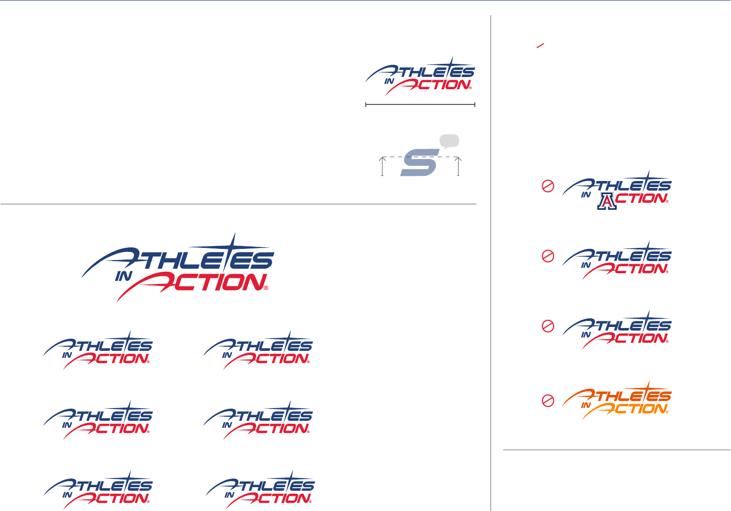
LOGO USAGE
PRIMARY LOGO COLOR
The primary colors for the logo are BLUE and RED. This
is the only multi-colored color scheme allowed. The
Athletes in Action logo has had a slight update. We are
now including a Cru endorsement to better connect us
as a Cru ministry.
INCORRECT LOGO USAGE
Do not rotate, skew, obstruct or alter the logo. Do not
use effects on the logo. Keep it straight and clean!
LOGO OVER A PHOTO
If the logo is on a photo use either the ALL-WHITE logo
or the primary logo. Use the primary logo on light areas
of the photograph and the all white logo on darker
areas. Never put a stroke around the logo to make it
stand out. If the primary logo is hard to see, try the all
white logo in that location.
SECONDARY LOGO COLORS
When printing in black and white please use the ALL-
BLACK or ALL-WHITE version of the logo. If the logo is
on a dark background use the ALL-WHITE logo so the
logo will stand out.
CLEAR SPACE
Make sure the logo is legible when used in a small size.
Leave empty space equal to the height of the “s” on
all sides.
MINIMUM SIZE
The logo should never be smaller than inch wide
inch
Go to overview
page
LOGO ADAPTATIONS
ADDING A SCHOOL OR DEPARTMENT NAME TO THE LOGO
When adding a name to the Athletes in Action logo there are some guidelines to follow
The name must fit evenly under the word “Action” between the long arm
of the A and the right end of the N in the logo and aligned right
The font must be Freight SanS Pro Semi Bold italic in all caps
The name must be legible when the logo is at inches wide
The name may not be larger than /rd the height of the logo’s S
Acceptable colors for the name are gray black white blue or red
You can choose what name to use under the Athletes in Action logo
However you must stay consistent with that choice
You may use abbreviations and symbols such as ampersands &
DO NOT
Add a school’s logo to the Athletes in Action logo
This would go against the logo usage guides on page and
most likely the school’s branding
Use any name or words that do not specifically
pertain to your school or department name
Add text anywhere other than the designated area
Change the logo colors to your school colors
This would go against the logo usage guides on page
UniVerSitY oF WaShington
track & Field SPortS comPlex & retreat center
UniVerSitY oF WaShington
”
U. oF WaShington WaShington
hUSkieS U dUB
max
Resistance
is futile.
U. oF arizona
UniVerSitY oF daYton
go FlYerS!
texaS tech - god iS good!
HAVE QUESTIONS
Contact Mary Dixon at mary.dixon@athletesinaction.org
oklahoma State UniVerSitY
Go to overview
page
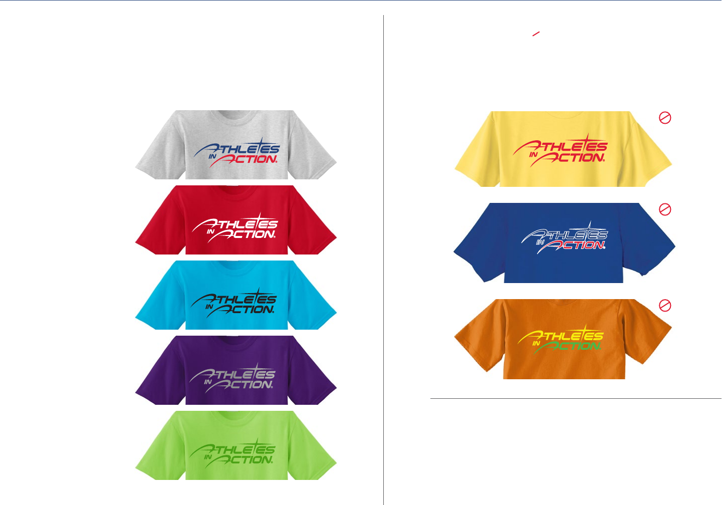
LOGO
We are using the Athletes in Action logo that does not have the Cru endorsement on
clothing and gear. You may choose any color of clothing or gear that you would like.
The acceptable colors for printing or embroidering the Athletes in Action logo are:
Blue and Red ....................
White ............................
Black .............................
Silver ............................
Tone-on-tone* ...................
LOGO USAGE ON CLOTHING AND GEAR
INCORRECT LOGO USAGE
Do not use any other colors than the allowed colors to the left. Do not
use any effects on the logo. No stroke, bevel, drop shadow, outer glow,
reflection, etc.
LET OUR CONNECTIONS SAVE YOU $$
The AIA Gear Store has ongoing relationships with custom apparel
companies in Dayton, OH, and across the country.
Contact: Beth.Morter@athletesinaction.org to help you get the best
price for your custom clothes and gear.
*Consult with your sales rep for the appropriate ink or thread color to achieve the tone-on-tone look.
Go to overview

page
COLORS
FONTS
AIA COLOR PALLET
Red
Blue
Accent Color
Silver
Text Color
Gray % black
MAIN TEXT FONT
Freight Sans Pro
use Open Type Tabular Lining
ABCDEFGHIJKLM
NOPQRSTUVWXYZ
abcdefghijklm
nopqrstuvwxyz
SECONDARY FONT
Leitura roman 3
Only use in all CAPS
aBCDeFGHiJKLm
noPQrStuVWXYZ
1234567890
Print Colors
Pantone C
CMYK
Pantone C
CMYK
Pantone C
CMYK
Web/Screen Colors
#
RGB
#
RGB
#cdd
RGB
#b
RGB
Pantone Cool Gray C
CMYK
Primary applications: Freight Sans Pro
The Freight Sans Pro family is used for primary
applications such as headlines, body text and captions.
Headlines are set in Freight Sans Pro Light, all capital
letters. All other text is set in sentence case.
Secondary applications: Leitura Roman 3
Leitura Roman 3 is used for secondary applications such as
call-outs and subheads. Leitura Roman 3 is used sparingly
(as an accent only), and is set in all capital letters.
Download fonts at staffwebcruorg/operations/
brandingstyle/fonts
Colors on screen are not accurate representations of the printed colors
Go to overview

page
IMAGES
CHOOSING IMAGES
Great images grab people’s attention and hearts much faster than great text. When choosing images choose
compelling shots of people doing ministry, working with students or nationals from other countries, playing their
sport. Action shots are always best.
WHAT TO AVOID
We never use images that are stereotypes or images
that trivialize our mission. Avoid clichéd images—if
we’ve seen it again and again, so have our audiences.
Religious artifacts such as Bibles and crosses should
never be used as props. Instead, they must be
integrated into true-to-life situations (e.g., students
participating in a study group, or a cross displayed
in the background). Never use photos of people
impersonating Jesus. Imagery depicting people should
never seem staged, posed or forced (including group
photos). Instead, they should be candid and believable,
like we’ve captured a brief moment in time. When
viewed as a whole, our imagery must be diverse in both
gender and ethnicity. Avoid imagery that lacks diversity.
Go to overview
page
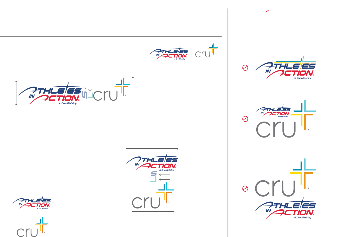
COBRANDING
USING ATHLETES IN ACTION AND CRU LOGOS
If you need to use both the Athletes in Action and Cru logos it is important to represent both brands as equally as
possible. The dimensions of the Athletes in Action and Cru logos are different, so it is important to keep the logos
visually balanced. When using the Cru logo you must follow the Cru Brand Identity Guidelines in regard to the logo
WAYS TO NOT COMBINE THE LOGOS
Careful planning went in to finding the right
proportions for co-branding with the Athletes in
Action and Cru logo. Here are ways you should never
use the logos together.
Y=
=Y
Spacing allowance for both
Athletes in Action and Cru logos
Spacing
allowance
for both
Athletes in
Action and
Cru logos
HORIZONTAL
• Keep the logos at equal height, as depicted by Y.
• Align the base of the word mark "Cru" to the base of "ction" of Action.
VERTICAL
To find the proper width for the Cru logo
Multiply the with of the Athletes in Action logo
X by
Align the left edge of the c in Cru to the left
end of the crossbar of the A in Athletes
X=
XCru logo width
Go to overview
