Communicating The User Experience Experience, A Practical Guide For Creating Useful UX Ation (354 Pages
User Manual: Pdf
Open the PDF directly: View PDF  .
.
Page Count: 354 [warning: Documents this large are best viewed by clicking the View PDF Link!]

01_9781119971108-ffirs.indd iv01_9781119971108-ffirs.indd iv 8/10/11 8:34 PM8/10/11 8:34 PM

Communicating
the User
Experience
01_9781119971108-ffirs.indd i01_9781119971108-ffirs.indd i 8/10/11 8:34 PM8/10/11 8:34 PM

01_9781119971108-ffirs.indd ii01_9781119971108-ffirs.indd ii 8/10/11 8:34 PM8/10/11 8:34 PM

Communicating
the User
Experience
A PRACTICAL GUIDE FOR
CREATING USEFUL UX
DOCUMENTATION
Richard Caddick
Steve Cable
A John Wiley and Sons, Ltd, Publication
01_9781119971108-ffirs.indd iii01_9781119971108-ffirs.indd iii 8/10/11 8:34 PM8/10/11 8:34 PM
is edition rst published 2011
© 2011 Richard Caddick and Steve Cable
Registered o ce
John Wiley & Sons Ltd, e Atrium, Southern Gate, Chichester, West Sussex, PO19 8SQ, United Kingdom
For details of our global editorial o ces, for customer services and for information about how to apply for permission to
reuse the copyright material in this book, please see our Web site at www.wiley.com.
e right of the author to be identi ed as the author of this work has been asserted in accordance with the Copyright,
Designs and Patents Act 1988.
All rights reserved. No part of this publication may be reproduced, stored in a retrieval system, or transmitted, in any form
or by any means, electronic, mechanical, photocopying, recording or otherwise, except as permitted by the UK Copyright,
Designs and Patents Act 1988, without the prior permission of the publisher.
Wiley also publishes its books in a variety of electronic formats. Some content that appears in print may not be available in
electronic books.
DESIGNATIONS USED BY COMPANIES TO DISTINGUISH THEIR PRODUCTS ARE OFTEN CLAIMED AS TRADE
MARKS. ALL BRAND NAMES AND PRODUCT NAMES USED IN THIS BOOK ARE TRADE NAMES, SERVICE MARKS,
TRADEMARKS OR REGISTERED TRADEMARKS OF THEIR RESPECTIVE OWNERS. THE PUBLISHER IS NOT ASSOCI
ATED WITH ANY PRODUCT OR VENDOR MENTIONED IN THIS BOOK. THIS PUBLICATION IS DESIGNED TO PRO
VIDE ACCURATE AND AUTHORITATIVE INFORMATION IN REGARD TO THE SUBJECT MATTER COVERED. IT IS
SOLD ON THE UNDERSTANDING THAT THE PUBLISHER IS NOT ENGAGED IN RENDERING PROFESSIONAL SER
VICES. IF PROFESSIONAL ADVICE OR OTHER EXPERT ASSISTANCE IS REQUIRED, THE SERVICES OF A COMPE
TENT PROFESSIONAL SHOULD BE SOUGHT.
Photography © James Chudley
978-1-119-97110-8
A catalogue record for this book is available from the British Library.
Set in 10/14 Chaparral Pro Light by Wiley Composition Services
Printed in the U.S. by Krehbiel
01_9781119971108-ffirs.indd iv01_9781119971108-ffirs.indd iv 8/10/11 8:34 PM8/10/11 8:34 PM

About the Authors
RICHARD CADDICK set up cxpartners, a user-centered design agency, with Giles Colborne
in 2004 with the aim of creating measurable di erences for clients they love to work with.
Richard has worked as a consultant for several well-known global brands, including Expedia,
Jaguar, HSBC, and Nokia. Richard’s most at home in workshops surrounded by pens, paper
and whiteboards trying to re ne and improve designs for users.
STEVE CABLE, a user experience consultant for cxpartners, spends every day wireframing,
testing, and crafting documents that communicate the needs of users. He’s consulted for
global hotel chains, car manufacturers, eCommerce websites, music management applica-
tions, mobile sites, and too many more to mention. As an illustrator and a lover of info-
graphics, Steve feels it’s important to produce documents that not only communicate clearly
but are as visually interesting as the data that sits behind them.
Richard Caddick (left) and Steve Cable deliver user experience solutions for cxpartners.
01_9781119971108-ffirs.indd v01_9781119971108-ffirs.indd v 8/10/11 8:34 PM8/10/11 8:34 PM
Some of the people who helped bring this book to market include the following:
Editorial and Production
VP Consumer and Technology Publishing Director: Michelle Leete
Associate Director, Book Content Management: Martin Tribe
Associate Publisher: Chris Webb
Assistant Editor: Ellie Scott
Senior Project Editor: Sara Shlaer
Editorial Manager: Jodi Jensen
Editorial Assistant: Leslie Saxman
Development Editor: Box Twelve Communications, Inc.
Project Editor: Box Twelve Communications, Inc.
Technical Editor: Anthony Mace
Copy Editor: Maryann Steinhart
Photography: James Chudley
Marketing
Associate Marketing Director: Louise Breinholt
Marketing Executive: Kate Parrett
Composition Services
Compositor: Wiley Composition Services
Proof Reader: Susan Hobbs
Indexer: Potomac Indexing, LLC
Credits
01_9781119971108-ffirs.indd vi01_9781119971108-ffirs.indd vi 8/10/11 8:35 PM8/10/11 8:35 PM
For Katharine, Emilia, and Elise
—Richard Caddick
For Hannah and Freddie
—Steve Cable
01_9781119971108-ffirs.indd vii01_9781119971108-ffirs.indd vii 8/10/11 8:35 PM8/10/11 8:35 PM
Authors' Acknowledgments
is book couldn’t have been written without the support of our colleagues at cxpartners:
Jesmond Allen, Chris Berridge, Walt Buchan, James Chudley, Giles Colborne, Chloe Holbrook,
Nik Lazell, Joe Leech, Rob Matthews, Amy McGuinness, James Rosenberg, Neil Schwarz,
Jay Spanton, Chui Chui Tan, Anna ompson, Verity Whitmore, and Fiz Yazdi. You’ve all
helped to shape and transform the contents of this book.
We are hugely grateful to the support we’ve received from Wiley. In particular, Chris Webb for
spotting the opportunity and chasing us down, Sara Shlaer for pointing us in the right direc-
tion, Je Riley for his un appable patience with a couple of amateurs, and Jennifer Mayberry
for her design talents.
anks to James Chudley: the photos you’ve taken make the book special and unique. We
love them!
Anthony Mace, thank you for taking the time to make sure the text is clear and useful to
practitioners.
Piers Alder and Jennie Blythe: thank you for reading through drafts and making
improvements.
We are hugely grateful to our clients. Over the past seven years you have trusted us with
your products and allowed us to collaborate with you in understanding your users and your
business.
A personal thanks from Richard: Katharine, you will always be the best thing ever to happen
to me. Emilia and Elise, you make every day brilliant. I love you all so much. Mum and Dad,
you never pressured me into being someone that I wasn’t, but you inspired and encouraged
me to be who I am. ank you.
A personal thanks from Steve: Hannah, thank you for supporting me through this and every-
thing else in my life. You are amazing. Freddie, thank you for being the happiest, most fun
(and craziest) son ever.
01_9781119971108-ffirs.indd viii01_9781119971108-ffirs.indd viii 8/10/11 8:35 PM8/10/11 8:35 PM
Contents
About the Authors . . . . . . . . . . . . . . . . . . . . . . . . . . . . . . . . . . . . . . . . . . . . . . . . . . . . . . . . . . . v
Credits. . . . . . . . . . . . . . . . . . . . . . . . . . . . . . . . . . . . . . . . . . . . . . . . . . . . . . . . . . . . . . . . . . . . . .vi
Authors' Acknowledgments . . . . . . . . . . . . . . . . . . . . . . . . . . . . . . . . . . . . . . . . . . . . . . . . . . viii
Contents . . . . . . . . . . . . . . . . . . . . . . . . . . . . . . . . . . . . . . . . . . . . . . . . . . . . . . . . . . . . . . . . . . . .ix
Introduction ......................................... 1
A summary of the documents . . . . . . . . . . . . . . . . . . . . . . . . . . . . . . . . . . . . . . . . . . . . . . . . . . 2
Putting the documents into context . . . . . . . . . . . . . . . . . . . . . . . . . . . . . . . . . . . . . . . . . . . . 7
Enjoy yourselves!. . . . . . . . . . . . . . . . . . . . . . . . . . . . . . . . . . . . . . . . . . . . . . . . . . . . . . . . . . . . . 8
CHAPTER 1
Personas ........................................... 9
What makes a good persona? . . . . . . . . . . . . . . . . . . . . . . . . . . . . . . . . . . . . . . . . . . . . . . . . . 11
When to create a persona . . . . . . . . . . . . . . . . . . . . . . . . . . . . . . . . . . . . . . . . . . . . . . . . . . 11
What are you communicating? . . . . . . . . . . . . . . . . . . . . . . . . . . . . . . . . . . . . . . . . . . . . . 11
Use short descriptive bulleted points . . . . . . . . . . . . . . . . . . . . . . . . . . . . . . . . . . . . . 12
Base personas on real people . . . . . . . . . . . . . . . . . . . . . . . . . . . . . . . . . . . . . . . . . . . . 12
Use descriptive photography . . . . . . . . . . . . . . . . . . . . . . . . . . . . . . . . . . . . . . . . . . . . 12
Anatomy of a persona . . . . . . . . . . . . . . . . . . . . . . . . . . . . . . . . . . . . . . . . . . . . . . . . . . . . . 14
Photos . . . . . . . . . . . . . . . . . . . . . . . . . . . . . . . . . . . . . . . . . . . . . . . . . . . . . . . . . . . . . . . 14
Persona names . . . . . . . . . . . . . . . . . . . . . . . . . . . . . . . . . . . . . . . . . . . . . . . . . . . . . . . . 14
User quotes . . . . . . . . . . . . . . . . . . . . . . . . . . . . . . . . . . . . . . . . . . . . . . . . . . . . . . . . . . .14
Key goals . . . . . . . . . . . . . . . . . . . . . . . . . . . . . . . . . . . . . . . . . . . . . . . . . . . . . . . . . . . . . 14
Behaviors . . . . . . . . . . . . . . . . . . . . . . . . . . . . . . . . . . . . . . . . . . . . . . . . . . . . . . . . . . . . . 14
Must dos . . . . . . . . . . . . . . . . . . . . . . . . . . . . . . . . . . . . . . . . . . . . . . . . . . . . . . . . . . . . . 15
Must nevers. . . . . . . . . . . . . . . . . . . . . . . . . . . . . . . . . . . . . . . . . . . . . . . . . . . . . . . . . . .15
Who is the audience? . . . . . . . . . . . . . . . . . . . . . . . . . . . . . . . . . . . . . . . . . . . . . . . . . . . . . 16
How to validate personas . . . . . . . . . . . . . . . . . . . . . . . . . . . . . . . . . . . . . . . . . . . . . . . . . . 17
Research and workshop ideas . . . . . . . . . . . . . . . . . . . . . . . . . . . . . . . . . . . . . . . . . . . . . . . . . 18
Start with a theory . . . . . . . . . . . . . . . . . . . . . . . . . . . . . . . . . . . . . . . . . . . . . . . . . . . . . . . . 18
Research Technique: Listen in on call centers . . . . . . . . . . . . . . . . . . . . . . . . . . . . . . . . . 19
Research Technique: Conduct depth interviews . . . . . . . . . . . . . . . . . . . . . . . . . . . . . . . 20
Research Technique: Conduct ethnographic research . . . . . . . . . . . . . . . . . . . . . . . . . . 20
Workshop Idea: De ne your personas . . . . . . . . . . . . . . . . . . . . . . . . . . . . . . . . . . . . . . . 21
02_9781119971108-ftoc.indd ix02_9781119971108-ftoc.indd ix 8/10/11 8:34 PM8/10/11 8:34 PM
xCOMMUNICATING THE USER EXPERIENCE
How To: Create personas in Power Point . . . . . . . . . . . . . . . . . . . . . . . . . . . . . . . . . . . . . . . 24
Creating and setting up the slide presentation . . . . . . . . . . . . . . . . . . . . . . . . . . . . . . . . 24
Adding persona images and titles . . . . . . . . . . . . . . . . . . . . . . . . . . . . . . . . . . . . . . . . . . . 25
Inserting an image . . . . . . . . . . . . . . . . . . . . . . . . . . . . . . . . . . . . . . . . . . . . . . . . . . . . . 25
Inserting a title . . . . . . . . . . . . . . . . . . . . . . . . . . . . . . . . . . . . . . . . . . . . . . . . . . . . . . . .27
Adding icons, subheadings, and bulleted lists . . . . . . . . . . . . . . . . . . . . . . . . . . . . . . . . . 28
Inserting icons . . . . . . . . . . . . . . . . . . . . . . . . . . . . . . . . . . . . . . . . . . . . . . . . . . . . . . . . 29
Adding subheadings . . . . . . . . . . . . . . . . . . . . . . . . . . . . . . . . . . . . . . . . . . . . . . . . . . . . 30
Adding bulleted lists . . . . . . . . . . . . . . . . . . . . . . . . . . . . . . . . . . . . . . . . . . . . . . . . . . . 30
How To: Create personas in OmniGra e Pro . . . . . . . . . . . . . . . . . . . . . . . . . . . . . . . . . . . 34
Creating and setting up the presentation . . . . . . . . . . . . . . . . . . . . . . . . . . . . . . . . . . . . 34
Adding persona images and titles . . . . . . . . . . . . . . . . . . . . . . . . . . . . . . . . . . . . . . . . . . . 35
Inserting an image . . . . . . . . . . . . . . . . . . . . . . . . . . . . . . . . . . . . . . . . . . . . . . . . . . . . . 35
Adding an overlay color . . . . . . . . . . . . . . . . . . . . . . . . . . . . . . . . . . . . . . . . . . . . . . . . . 36
Inserting a title . . . . . . . . . . . . . . . . . . . . . . . . . . . . . . . . . . . . . . . . . . . . . . . . . . . . . . . .37
Adding subheadings and bulleted lists . . . . . . . . . . . . . . . . . . . . . . . . . . . . . . . . . . . . . . . 38
Inserting icons . . . . . . . . . . . . . . . . . . . . . . . . . . . . . . . . . . . . . . . . . . . . . . . . . . . . . . . . 38
Adding subheadings . . . . . . . . . . . . . . . . . . . . . . . . . . . . . . . . . . . . . . . . . . . . . . . . . . . . 39
Adding bulleted lists . . . . . . . . . . . . . . . . . . . . . . . . . . . . . . . . . . . . . . . . . . . . . . . . . . . 40
CHAPTER 2
Task Models ........................................ 43
What makes a good task model? . . . . . . . . . . . . . . . . . . . . . . . . . . . . . . . . . . . . . . . . . . . . . . . 45
When to create a task model . . . . . . . . . . . . . . . . . . . . . . . . . . . . . . . . . . . . . . . . . . . . . . . 45
What are you communicating? . . . . . . . . . . . . . . . . . . . . . . . . . . . . . . . . . . . . . . . . . . . . . 45
e goal . . . . . . . . . . . . . . . . . . . . . . . . . . . . . . . . . . . . . . . . . . . . . . . . . . . . . . . . . . . . . . 47
e order of tasks . . . . . . . . . . . . . . . . . . . . . . . . . . . . . . . . . . . . . . . . . . . . . . . . . . . . . . 47
User behavior . . . . . . . . . . . . . . . . . . . . . . . . . . . . . . . . . . . . . . . . . . . . . . . . . . . . . . . . . 47
Emotional needs . . . . . . . . . . . . . . . . . . . . . . . . . . . . . . . . . . . . . . . . . . . . . . . . . . . . . . . 48
Who or what are they interacting with? . . . . . . . . . . . . . . . . . . . . . . . . . . . . . . . . . . . 49
Content requirements . . . . . . . . . . . . . . . . . . . . . . . . . . . . . . . . . . . . . . . . . . . . . . . . . . 49
Existing barriers . . . . . . . . . . . . . . . . . . . . . . . . . . . . . . . . . . . . . . . . . . . . . . . . . . . . . . . 49
Suggesting solutions . . . . . . . . . . . . . . . . . . . . . . . . . . . . . . . . . . . . . . . . . . . . . . . . . . . 49
e anatomy of a task model . . . . . . . . . . . . . . . . . . . . . . . . . . . . . . . . . . . . . . . . . . . . . . . 49
Goal . . . . . . . . . . . . . . . . . . . . . . . . . . . . . . . . . . . . . . . . . . . . . . . . . . . . . . . . . . . . . . . . . 51
Tasks. . . . . . . . . . . . . . . . . . . . . . . . . . . . . . . . . . . . . . . . . . . . . . . . . . . . . . . . . . . . . . . . . 51
Task phases . . . . . . . . . . . . . . . . . . . . . . . . . . . . . . . . . . . . . . . . . . . . . . . . . . . . . . . . . . .51
02_9781119971108-ftoc.indd x02_9781119971108-ftoc.indd x 8/10/11 8:34 PM8/10/11 8:34 PM
xi
CONTENTS
User behavior . . . . . . . . . . . . . . . . . . . . . . . . . . . . . . . . . . . . . . . . . . . . . . . . . . . . . . . . . 51
Content needs . . . . . . . . . . . . . . . . . . . . . . . . . . . . . . . . . . . . . . . . . . . . . . . . . . . . . . . . . 51
Barriers . . . . . . . . . . . . . . . . . . . . . . . . . . . . . . . . . . . . . . . . . . . . . . . . . . . . . . . . . . . . . . . 51
Design suggestions . . . . . . . . . . . . . . . . . . . . . . . . . . . . . . . . . . . . . . . . . . . . . . . . . . . . . 51
Personas . . . . . . . . . . . . . . . . . . . . . . . . . . . . . . . . . . . . . . . . . . . . . . . . . . . . . . . . . . . . . . 51
Who is the audience? . . . . . . . . . . . . . . . . . . . . . . . . . . . . . . . . . . . . . . . . . . . . . . . . . . . . . 51
How to validate . . . . . . . . . . . . . . . . . . . . . . . . . . . . . . . . . . . . . . . . . . . . . . . . . . . . . . . . . . 52
Research and workshop ideas . . . . . . . . . . . . . . . . . . . . . . . . . . . . . . . . . . . . . . . . . . . . . . . . . 53
Research Technique: Conduct research . . . . . . . . . . . . . . . . . . . . . . . . . . . . . . . . . . . . . . 53
Visit call centers . . . . . . . . . . . . . . . . . . . . . . . . . . . . . . . . . . . . . . . . . . . . . . . . . . . . . . .53
Make contextual observations . . . . . . . . . . . . . . . . . . . . . . . . . . . . . . . . . . . . . . . . . . . 53
Visit online forums . . . . . . . . . . . . . . . . . . . . . . . . . . . . . . . . . . . . . . . . . . . . . . . . . . . . 54
Workshop Idea: Analyze data. . . . . . . . . . . . . . . . . . . . . . . . . . . . . . . . . . . . . . . . . . . . . . . 55
Identify the goal . . . . . . . . . . . . . . . . . . . . . . . . . . . . . . . . . . . . . . . . . . . . . . . . . . . . . . . 55
Analyze the information . . . . . . . . . . . . . . . . . . . . . . . . . . . . . . . . . . . . . . . . . . . . . . . . 55
Group the information . . . . . . . . . . . . . . . . . . . . . . . . . . . . . . . . . . . . . . . . . . . . . . . . . 55
Identify the user behavior . . . . . . . . . . . . . . . . . . . . . . . . . . . . . . . . . . . . . . . . . . . . . . . 55
Highlight the emotions . . . . . . . . . . . . . . . . . . . . . . . . . . . . . . . . . . . . . . . . . . . . . . . . . 56
How To: Create task models in OmniGra e . . . . . . . . . . . . . . . . . . . . . . . . . . . . . . . . . . . . 58
Setting up the template . . . . . . . . . . . . . . . . . . . . . . . . . . . . . . . . . . . . . . . . . . . . . . . . . . . 58
Creating the model . . . . . . . . . . . . . . . . . . . . . . . . . . . . . . . . . . . . . . . . . . . . . . . . . . . . . . .60
Creating a title for your document . . . . . . . . . . . . . . . . . . . . . . . . . . . . . . . . . . . . . . . 60
Indicating direction . . . . . . . . . . . . . . . . . . . . . . . . . . . . . . . . . . . . . . . . . . . . . . . . . . . . 60
Adding individual tasks . . . . . . . . . . . . . . . . . . . . . . . . . . . . . . . . . . . . . . . . . . . . . . . . . 61
Creating a controlled evaluation . . . . . . . . . . . . . . . . . . . . . . . . . . . . . . . . . . . . . . . . . 62
Creating a complex evaluation . . . . . . . . . . . . . . . . . . . . . . . . . . . . . . . . . . . . . . . . . . . 64
Creating loop backs . . . . . . . . . . . . . . . . . . . . . . . . . . . . . . . . . . . . . . . . . . . . . . . . . . . . 65
Creating notes . . . . . . . . . . . . . . . . . . . . . . . . . . . . . . . . . . . . . . . . . . . . . . . . . . . . . . . . .68
How To: Create task models in PowerPoint . . . . . . . . . . . . . . . . . . . . . . . . . . . . . . . . . . . . . 69
Setting up the template . . . . . . . . . . . . . . . . . . . . . . . . . . . . . . . . . . . . . . . . . . . . . . . . . . . 69
Creating the model . . . . . . . . . . . . . . . . . . . . . . . . . . . . . . . . . . . . . . . . . . . . . . . . . . . . . . .70
Adding a title . . . . . . . . . . . . . . . . . . . . . . . . . . . . . . . . . . . . . . . . . . . . . . . . . . . . . . . . . . 70
Adding the tasks . . . . . . . . . . . . . . . . . . . . . . . . . . . . . . . . . . . . . . . . . . . . . . . . . . . . . . . 70
Creating a controlled evaluation . . . . . . . . . . . . . . . . . . . . . . . . . . . . . . . . . . . . . . . . . 72
Creating simple icons . . . . . . . . . . . . . . . . . . . . . . . . . . . . . . . . . . . . . . . . . . . . . . . . . . . 74
Adding the nishing touches . . . . . . . . . . . . . . . . . . . . . . . . . . . . . . . . . . . . . . . . . . . . 76
02_9781119971108-ftoc.indd xi02_9781119971108-ftoc.indd xi 8/10/11 8:34 PM8/10/11 8:34 PM
xii COMMUNICATING THE USER EXPERIENCE
CHAPTER 3
User Journeys ....................................... 77
What makes a good user journey? . . . . . . . . . . . . . . . . . . . . . . . . . . . . . . . . . . . . . . . . . . . . . 79
When to create a user journey . . . . . . . . . . . . . . . . . . . . . . . . . . . . . . . . . . . . . . . . . . . . . . 79
Product development. . . . . . . . . . . . . . . . . . . . . . . . . . . . . . . . . . . . . . . . . . . . . . . . . . . 79
Analysis . . . . . . . . . . . . . . . . . . . . . . . . . . . . . . . . . . . . . . . . . . . . . . . . . . . . . . . . . . . . . . 80
What are you communicating? . . . . . . . . . . . . . . . . . . . . . . . . . . . . . . . . . . . . . . . . . . . . . 80
e goal or task . . . . . . . . . . . . . . . . . . . . . . . . . . . . . . . . . . . . . . . . . . . . . . . . . . . . . . . . 81
Steps . . . . . . . . . . . . . . . . . . . . . . . . . . . . . . . . . . . . . . . . . . . . . . . . . . . . . . . . . . . . . . . . . 81
Decision points . . . . . . . . . . . . . . . . . . . . . . . . . . . . . . . . . . . . . . . . . . . . . . . . . . . . . . . . 81
Start and end steps . . . . . . . . . . . . . . . . . . . . . . . . . . . . . . . . . . . . . . . . . . . . . . . . . . . . . 81
Grouping . . . . . . . . . . . . . . . . . . . . . . . . . . . . . . . . . . . . . . . . . . . . . . . . . . . . . . . . . . . . . 81
Flow . . . . . . . . . . . . . . . . . . . . . . . . . . . . . . . . . . . . . . . . . . . . . . . . . . . . . . . . . . . . . . . . . 81
Content . . . . . . . . . . . . . . . . . . . . . . . . . . . . . . . . . . . . . . . . . . . . . . . . . . . . . . . . . . . . . . 81
Pain points . . . . . . . . . . . . . . . . . . . . . . . . . . . . . . . . . . . . . . . . . . . . . . . . . . . . . . . . . . .82
External factors. . . . . . . . . . . . . . . . . . . . . . . . . . . . . . . . . . . . . . . . . . . . . . . . . . . . . . . . 82
Measurement . . . . . . . . . . . . . . . . . . . . . . . . . . . . . . . . . . . . . . . . . . . . . . . . . . . . . . . . . 82
e anatomy of a user journey . . . . . . . . . . . . . . . . . . . . . . . . . . . . . . . . . . . . . . . . . . . . . . 82
Title . . . . . . . . . . . . . . . . . . . . . . . . . . . . . . . . . . . . . . . . . . . . . . . . . . . . . . . . . . . . . . . . . 82
Groupings . . . . . . . . . . . . . . . . . . . . . . . . . . . . . . . . . . . . . . . . . . . . . . . . . . . . . . . . . . . .82
Start steps and end steps . . . . . . . . . . . . . . . . . . . . . . . . . . . . . . . . . . . . . . . . . . . . . . . 82
Steps . . . . . . . . . . . . . . . . . . . . . . . . . . . . . . . . . . . . . . . . . . . . . . . . . . . . . . . . . . . . . . . . . 83
Pain points . . . . . . . . . . . . . . . . . . . . . . . . . . . . . . . . . . . . . . . . . . . . . . . . . . . . . . . . . . .83
Decision points . . . . . . . . . . . . . . . . . . . . . . . . . . . . . . . . . . . . . . . . . . . . . . . . . . . . . . . . 83
Flow . . . . . . . . . . . . . . . . . . . . . . . . . . . . . . . . . . . . . . . . . . . . . . . . . . . . . . . . . . . . . . . . . 83
Notes . . . . . . . . . . . . . . . . . . . . . . . . . . . . . . . . . . . . . . . . . . . . . . . . . . . . . . . . . . . . . . . . 83
Who is the audience? . . . . . . . . . . . . . . . . . . . . . . . . . . . . . . . . . . . . . . . . . . . . . . . . . . . . . 83
How to validate the user journey . . . . . . . . . . . . . . . . . . . . . . . . . . . . . . . . . . . . . . . . . . . 84
User testing of wireframes, designs, and live sites . . . . . . . . . . . . . . . . . . . . . . . . . . 84
A/B testing and multivariate testing (MVT) . . . . . . . . . . . . . . . . . . . . . . . . . . . . . . . 85
Research and workshop ideas . . . . . . . . . . . . . . . . . . . . . . . . . . . . . . . . . . . . . . . . . . . . . . . . . 86
Research Technique: Process sorting . . . . . . . . . . . . . . . . . . . . . . . . . . . . . . . . . . . . . . . . 86
Workshop Idea: Examine user journeys . . . . . . . . . . . . . . . . . . . . . . . . . . . . . . . . . . . . . . 87
Inviting attendees . . . . . . . . . . . . . . . . . . . . . . . . . . . . . . . . . . . . . . . . . . . . . . . . . . . . . 87
Gathering materials . . . . . . . . . . . . . . . . . . . . . . . . . . . . . . . . . . . . . . . . . . . . . . . . . . . . 88
Conducting the Workshop . . . . . . . . . . . . . . . . . . . . . . . . . . . . . . . . . . . . . . . . . . . . . . 88
02_9781119971108-ftoc.indd xii02_9781119971108-ftoc.indd xii 8/10/11 8:34 PM8/10/11 8:34 PM
xiii
CONTENTS
How To: Create a user journey in OmniGra e . . . . . . . . . . . . . . . . . . . . . . . . . . . . . . . . . . 89
Setting up the template . . . . . . . . . . . . . . . . . . . . . . . . . . . . . . . . . . . . . . . . . . . . . . . . . . . 90
Creating the journey . . . . . . . . . . . . . . . . . . . . . . . . . . . . . . . . . . . . . . . . . . . . . . . . . . . . . .91
Providing a title . . . . . . . . . . . . . . . . . . . . . . . . . . . . . . . . . . . . . . . . . . . . . . . . . . . . . . . 92
Styling shapes . . . . . . . . . . . . . . . . . . . . . . . . . . . . . . . . . . . . . . . . . . . . . . . . . . . . . . . . .92
Using magnetic shapes and arrows . . . . . . . . . . . . . . . . . . . . . . . . . . . . . . . . . . . . . . . 93
Adding lines and arrows . . . . . . . . . . . . . . . . . . . . . . . . . . . . . . . . . . . . . . . . . . . . . . . . 94
Styling the curved arrows . . . . . . . . . . . . . . . . . . . . . . . . . . . . . . . . . . . . . . . . . . . . . . . 95
Finishing o . . . . . . . . . . . . . . . . . . . . . . . . . . . . . . . . . . . . . . . . . . . . . . . . . . . . . . . . . . 96
How To: Create a user journey in PowerPoint . . . . . . . . . . . . . . . . . . . . . . . . . . . . . . . . . . . 98
Setting up the template . . . . . . . . . . . . . . . . . . . . . . . . . . . . . . . . . . . . . . . . . . . . . . . . . . . 98
Creating the journey . . . . . . . . . . . . . . . . . . . . . . . . . . . . . . . . . . . . . . . . . . . . . . . . . . . . .100
Adding shapes . . . . . . . . . . . . . . . . . . . . . . . . . . . . . . . . . . . . . . . . . . . . . . . . . . . . . . . .100
Wrapping text . . . . . . . . . . . . . . . . . . . . . . . . . . . . . . . . . . . . . . . . . . . . . . . . . . . . . . . .101
Adding arrows and lines . . . . . . . . . . . . . . . . . . . . . . . . . . . . . . . . . . . . . . . . . . . . . . . 102
Finishing up . . . . . . . . . . . . . . . . . . . . . . . . . . . . . . . . . . . . . . . . . . . . . . . . . . . . . . . . . 102
CHAPTER 4
Content requirements ................................ 103
What makes a good content requirements document? . . . . . . . . . . . . . . . . . . . . . . . . . . .105
When to create a content requirements document? . . . . . . . . . . . . . . . . . . . . . . . . . .105
What are you communicating? . . . . . . . . . . . . . . . . . . . . . . . . . . . . . . . . . . . . . . . . . . . . 105
Marketing and brand copy . . . . . . . . . . . . . . . . . . . . . . . . . . . . . . . . . . . . . . . . . . . . . 105
Instructions and functionality . . . . . . . . . . . . . . . . . . . . . . . . . . . . . . . . . . . . . . . . . .106
Data and speci cation information . . . . . . . . . . . . . . . . . . . . . . . . . . . . . . . . . . . . . . 106
Image requirements . . . . . . . . . . . . . . . . . . . . . . . . . . . . . . . . . . . . . . . . . . . . . . . . . . . 106
Supporting information . . . . . . . . . . . . . . . . . . . . . . . . . . . . . . . . . . . . . . . . . . . . . . . 106
What makes the perfect content requirements document? . . . . . . . . . . . . . . . . . . . .107
Document title . . . . . . . . . . . . . . . . . . . . . . . . . . . . . . . . . . . . . . . . . . . . . . . . . . . . . . .107
Summary information . . . . . . . . . . . . . . . . . . . . . . . . . . . . . . . . . . . . . . . . . . . . . . . . . 108
Reference ID . . . . . . . . . . . . . . . . . . . . . . . . . . . . . . . . . . . . . . . . . . . . . . . . . . . . . . . . .108
Page name . . . . . . . . . . . . . . . . . . . . . . . . . . . . . . . . . . . . . . . . . . . . . . . . . . . . . . . . . . .108
Core purpose . . . . . . . . . . . . . . . . . . . . . . . . . . . . . . . . . . . . . . . . . . . . . . . . . . . . . . . . .108
User support . . . . . . . . . . . . . . . . . . . . . . . . . . . . . . . . . . . . . . . . . . . . . . . . . . . . . . . . .108
Required elements and suggestions . . . . . . . . . . . . . . . . . . . . . . . . . . . . . . . . . . . . .108
Who is the audience? . . . . . . . . . . . . . . . . . . . . . . . . . . . . . . . . . . . . . . . . . . . . . . . . . . . .109
02_9781119971108-ftoc.indd xiii02_9781119971108-ftoc.indd xiii 8/10/11 8:34 PM8/10/11 8:34 PM
xiv COMMUNICATING THE USER EXPERIENCE
Validating the content . . . . . . . . . . . . . . . . . . . . . . . . . . . . . . . . . . . . . . . . . . . . . . . . . . . 109
Content testing in context . . . . . . . . . . . . . . . . . . . . . . . . . . . . . . . . . . . . . . . . . . . . .109
Content variation testing . . . . . . . . . . . . . . . . . . . . . . . . . . . . . . . . . . . . . . . . . . . . . .110
Research and workshop ideas . . . . . . . . . . . . . . . . . . . . . . . . . . . . . . . . . . . . . . . . . . . . . . . .111
Research Technique: Immerse yourself in the topic . . . . . . . . . . . . . . . . . . . . . . . . . . . 111
Workshop Idea: Audit content . . . . . . . . . . . . . . . . . . . . . . . . . . . . . . . . . . . . . . . . . . . .112
Research Technique: Listen to and observe users. . . . . . . . . . . . . . . . . . . . . . . . . . . . .113
Research Technique: Use benchmark testing . . . . . . . . . . . . . . . . . . . . . . . . . . . . . . . .114
How To: Create a content requirements document in Word . . . . . . . . . . . . . . . . . . . . . .116
Setting up the template . . . . . . . . . . . . . . . . . . . . . . . . . . . . . . . . . . . . . . . . . . . . . . . . . . 116
Creating the audit . . . . . . . . . . . . . . . . . . . . . . . . . . . . . . . . . . . . . . . . . . . . . . . . . . . . . . .116
Titling the presentation . . . . . . . . . . . . . . . . . . . . . . . . . . . . . . . . . . . . . . . . . . . . . . . .116
Inserting the table . . . . . . . . . . . . . . . . . . . . . . . . . . . . . . . . . . . . . . . . . . . . . . . . . . . . 117
Formatting the table . . . . . . . . . . . . . . . . . . . . . . . . . . . . . . . . . . . . . . . . . . . . . . . . . .118
Adding content . . . . . . . . . . . . . . . . . . . . . . . . . . . . . . . . . . . . . . . . . . . . . . . . . . . . . . .121
CHAPTER 5
Sitemaps ......................................... 123
What makes a good sitemap? . . . . . . . . . . . . . . . . . . . . . . . . . . . . . . . . . . . . . . . . . . . . . . . . 125
When to create a sitemap . . . . . . . . . . . . . . . . . . . . . . . . . . . . . . . . . . . . . . . . . . . . . . . . .125
When you need to audit your current content . . . . . . . . . . . . . . . . . . . . . . . . . . . .125
When you need to enhance or improve your current site structure . . . . . . . . . . .125
When you are creating a new website . . . . . . . . . . . . . . . . . . . . . . . . . . . . . . . . . . . . 126
What are you communicating? . . . . . . . . . . . . . . . . . . . . . . . . . . . . . . . . . . . . . . . . . . . . 126
Who is the audience? . . . . . . . . . . . . . . . . . . . . . . . . . . . . . . . . . . . . . . . . . . . . . . . . . . . .127
Wireframers and designers . . . . . . . . . . . . . . . . . . . . . . . . . . . . . . . . . . . . . . . . . . . . .127
Content teams . . . . . . . . . . . . . . . . . . . . . . . . . . . . . . . . . . . . . . . . . . . . . . . . . . . . . . . 128
Development teams . . . . . . . . . . . . . . . . . . . . . . . . . . . . . . . . . . . . . . . . . . . . . . . . . . . 128
SEO teams . . . . . . . . . . . . . . . . . . . . . . . . . . . . . . . . . . . . . . . . . . . . . . . . . . . . . . . . . . .128
Project managers . . . . . . . . . . . . . . . . . . . . . . . . . . . . . . . . . . . . . . . . . . . . . . . . . . . . . 128
Di erent styles of sitemaps . . . . . . . . . . . . . . . . . . . . . . . . . . . . . . . . . . . . . . . . . . . . . . .129
e anatomy of a spreadsheet sitemap . . . . . . . . . . . . . . . . . . . . . . . . . . . . . . . . . . . . .130
Use a tree structure . . . . . . . . . . . . . . . . . . . . . . . . . . . . . . . . . . . . . . . . . . . . . . . . . . .130
Add a column to specify template numbers . . . . . . . . . . . . . . . . . . . . . . . . . . . . . . .130
Include a notes column . . . . . . . . . . . . . . . . . . . . . . . . . . . . . . . . . . . . . . . . . . . . . . . .130
Use ags for non-existent content . . . . . . . . . . . . . . . . . . . . . . . . . . . . . . . . . . . . . . 131
02_9781119971108-ftoc.indd xiv02_9781119971108-ftoc.indd xiv 8/10/11 8:34 PM8/10/11 8:34 PM
xv
CONTENTS
Use actual labels . . . . . . . . . . . . . . . . . . . . . . . . . . . . . . . . . . . . . . . . . . . . . . . . . . . . . .131
Use shading for visual grouping of navigation categories . . . . . . . . . . . . . . . . . . . 131
e anatomy of a visual sitemap . . . . . . . . . . . . . . . . . . . . . . . . . . . . . . . . . . . . . . . . . . .131
1 Don’t make your connecting lines too dark . . . . . . . . . . . . . . . . . . . . . . . . . . . . .131
2 Use shading to show levels . . . . . . . . . . . . . . . . . . . . . . . . . . . . . . . . . . . . . . . . . . . 131
3 Show key cross-links . . . . . . . . . . . . . . . . . . . . . . . . . . . . . . . . . . . . . . . . . . . . . . . . . 131
4 Use template numbers . . . . . . . . . . . . . . . . . . . . . . . . . . . . . . . . . . . . . . . . . . . . . . .132
5 Separate logged in areas . . . . . . . . . . . . . . . . . . . . . . . . . . . . . . . . . . . . . . . . . . . . . .132
6 Flag non-existent content . . . . . . . . . . . . . . . . . . . . . . . . . . . . . . . . . . . . . . . . . . . .132
7 Use actual labels . . . . . . . . . . . . . . . . . . . . . . . . . . . . . . . . . . . . . . . . . . . . . . . . . . . .132
8 Visually di erentiate other content types . . . . . . . . . . . . . . . . . . . . . . . . . . . . . . .132
Research and workshop ideas . . . . . . . . . . . . . . . . . . . . . . . . . . . . . . . . . . . . . . . . . . . . . . . .134
Research Technique: Use site analytics and search logs. . . . . . . . . . . . . . . . . . . . . . . .134
Research Technique: Use open-card sorting . . . . . . . . . . . . . . . . . . . . . . . . . . . . . . . . . 135
Research Technique: Determine the pages you need . . . . . . . . . . . . . . . . . . . . . . . . . .137
Research Technique: Validate your sitemap . . . . . . . . . . . . . . . . . . . . . . . . . . . . . . . . .138
Closed-card sorts . . . . . . . . . . . . . . . . . . . . . . . . . . . . . . . . . . . . . . . . . . . . . . . . . . . . . 138
Remote navigation testing . . . . . . . . . . . . . . . . . . . . . . . . . . . . . . . . . . . . . . . . . . . . .139
How To: Create a sitemap in PowerPoint . . . . . . . . . . . . . . . . . . . . . . . . . . . . . . . . . . . . . . 142
Setting page orientation . . . . . . . . . . . . . . . . . . . . . . . . . . . . . . . . . . . . . . . . . . . . . . . . . .142
Creating and shading boxes . . . . . . . . . . . . . . . . . . . . . . . . . . . . . . . . . . . . . . . . . . . . . . . 142
Adding connecting lines . . . . . . . . . . . . . . . . . . . . . . . . . . . . . . . . . . . . . . . . . . . . . . . . . .144
Signifying page groups . . . . . . . . . . . . . . . . . . . . . . . . . . . . . . . . . . . . . . . . . . . . . . . . . . . 145
Showing cross links . . . . . . . . . . . . . . . . . . . . . . . . . . . . . . . . . . . . . . . . . . . . . . . . . . . . . .146
How To: Create a sitemap in OmniGra e . . . . . . . . . . . . . . . . . . . . . . . . . . . . . . . . . . . . .148
Setting up the template . . . . . . . . . . . . . . . . . . . . . . . . . . . . . . . . . . . . . . . . . . . . . . . . . . 148
Creating boxes with magnetic points . . . . . . . . . . . . . . . . . . . . . . . . . . . . . . . . . . . . . . .148
Using connecting lines . . . . . . . . . . . . . . . . . . . . . . . . . . . . . . . . . . . . . . . . . . . . . . . . . . . 150
De-magnetizing lines . . . . . . . . . . . . . . . . . . . . . . . . . . . . . . . . . . . . . . . . . . . . . . . . . . . .151
How To: Create a sitemap in Excel . . . . . . . . . . . . . . . . . . . . . . . . . . . . . . . . . . . . . . . . . . . . 153
Writing labels and wrapping text . . . . . . . . . . . . . . . . . . . . . . . . . . . . . . . . . . . . . . . . . .153
Shading cells . . . . . . . . . . . . . . . . . . . . . . . . . . . . . . . . . . . . . . . . . . . . . . . . . . . . . . . . . . . .154
Adding new rows and columns . . . . . . . . . . . . . . . . . . . . . . . . . . . . . . . . . . . . . . . . . . . .156
02_9781119971108-ftoc.indd xv02_9781119971108-ftoc.indd xv 8/10/11 8:34 PM8/10/11 8:34 PM
xvi COMMUNICATING THE USER EXPERIENCE
CHAPTER 6
Wireframes ....................................... 159
What makes a good wireframe? . . . . . . . . . . . . . . . . . . . . . . . . . . . . . . . . . . . . . . . . . . . . . .160
When to create a wireframe? . . . . . . . . . . . . . . . . . . . . . . . . . . . . . . . . . . . . . . . . . . . . . .162
What are you communicating? . . . . . . . . . . . . . . . . . . . . . . . . . . . . . . . . . . . . . . . . . . . . 162
Vision . . . . . . . . . . . . . . . . . . . . . . . . . . . . . . . . . . . . . . . . . . . . . . . . . . . . . . . . . . . . . . . 162
Layout . . . . . . . . . . . . . . . . . . . . . . . . . . . . . . . . . . . . . . . . . . . . . . . . . . . . . . . . . . . . . .162
Content and images . . . . . . . . . . . . . . . . . . . . . . . . . . . . . . . . . . . . . . . . . . . . . . . . . . .162
Priority . . . . . . . . . . . . . . . . . . . . . . . . . . . . . . . . . . . . . . . . . . . . . . . . . . . . . . . . . . . . . .163
Navigation . . . . . . . . . . . . . . . . . . . . . . . . . . . . . . . . . . . . . . . . . . . . . . . . . . . . . . . . . . .163
Functionality . . . . . . . . . . . . . . . . . . . . . . . . . . . . . . . . . . . . . . . . . . . . . . . . . . . . . . . . .163
Who is the audience? . . . . . . . . . . . . . . . . . . . . . . . . . . . . . . . . . . . . . . . . . . . . . . . . . . . .163
Development team . . . . . . . . . . . . . . . . . . . . . . . . . . . . . . . . . . . . . . . . . . . . . . . . . . . .164
Specialists . . . . . . . . . . . . . . . . . . . . . . . . . . . . . . . . . . . . . . . . . . . . . . . . . . . . . . . . . . .165
Related business functions . . . . . . . . . . . . . . . . . . . . . . . . . . . . . . . . . . . . . . . . . . . . .166
Sign-o groups . . . . . . . . . . . . . . . . . . . . . . . . . . . . . . . . . . . . . . . . . . . . . . . . . . . . . . .166
Agency teams . . . . . . . . . . . . . . . . . . . . . . . . . . . . . . . . . . . . . . . . . . . . . . . . . . . . . . . . 167
Anatomy of a wireframe . . . . . . . . . . . . . . . . . . . . . . . . . . . . . . . . . . . . . . . . . . . . . . . . . .167
Write clear page titles and numbers . . . . . . . . . . . . . . . . . . . . . . . . . . . . . . . . . . . . .167
Work in actual pixels when possible . . . . . . . . . . . . . . . . . . . . . . . . . . . . . . . . . . . . . 167
Use shading to show visual weighting . . . . . . . . . . . . . . . . . . . . . . . . . . . . . . . . . . . .168
Avoid black text lines or shapes . . . . . . . . . . . . . . . . . . . . . . . . . . . . . . . . . . . . . . . . .168
Use real data . . . . . . . . . . . . . . . . . . . . . . . . . . . . . . . . . . . . . . . . . . . . . . . . . . . . . . . . .169
Use real images where necessary . . . . . . . . . . . . . . . . . . . . . . . . . . . . . . . . . . . . . . . .169
Write descriptive image placeholders . . . . . . . . . . . . . . . . . . . . . . . . . . . . . . . . . . . .169
Use clear annotation . . . . . . . . . . . . . . . . . . . . . . . . . . . . . . . . . . . . . . . . . . . . . . . . . . 169
Clearly link the notes and wireframes . . . . . . . . . . . . . . . . . . . . . . . . . . . . . . . . . . . . 169
Show the fold . . . . . . . . . . . . . . . . . . . . . . . . . . . . . . . . . . . . . . . . . . . . . . . . . . . . . . . . 169
Other pages to include . . . . . . . . . . . . . . . . . . . . . . . . . . . . . . . . . . . . . . . . . . . . . . . . . . .169
Vision . . . . . . . . . . . . . . . . . . . . . . . . . . . . . . . . . . . . . . . . . . . . . . . . . . . . . . . . . . . . . . . 169
Change log . . . . . . . . . . . . . . . . . . . . . . . . . . . . . . . . . . . . . . . . . . . . . . . . . . . . . . . . . . .170
Storyboards . . . . . . . . . . . . . . . . . . . . . . . . . . . . . . . . . . . . . . . . . . . . . . . . . . . . . . . . . . 171
Design principles for wireframes . . . . . . . . . . . . . . . . . . . . . . . . . . . . . . . . . . . . . . . . . . .171
Structure and style . . . . . . . . . . . . . . . . . . . . . . . . . . . . . . . . . . . . . . . . . . . . . . . . . . . . 172
Visual heat . . . . . . . . . . . . . . . . . . . . . . . . . . . . . . . . . . . . . . . . . . . . . . . . . . . . . . . . . . .173
When to use color . . . . . . . . . . . . . . . . . . . . . . . . . . . . . . . . . . . . . . . . . . . . . . . . . . . . .174
02_9781119971108-ftoc.indd xvi02_9781119971108-ftoc.indd xvi 8/10/11 8:34 PM8/10/11 8:34 PM
xvii
CONTENTS
Feel . . . . . . . . . . . . . . . . . . . . . . . . . . . . . . . . . . . . . . . . . . . . . . . . . . . . . . . . . . . . . . . . .174
Stepping back to help give focus . . . . . . . . . . . . . . . . . . . . . . . . . . . . . . . . . . . . . . . . 176
Validating wireframes . . . . . . . . . . . . . . . . . . . . . . . . . . . . . . . . . . . . . . . . . . . . . . . . . . . .176
Research and workshop ideas . . . . . . . . . . . . . . . . . . . . . . . . . . . . . . . . . . . . . . . . . . . . . . . .178
Workshop Idea: Prioritize content . . . . . . . . . . . . . . . . . . . . . . . . . . . . . . . . . . . . . . . . .179
Workshop Idea: Generate ideas . . . . . . . . . . . . . . . . . . . . . . . . . . . . . . . . . . . . . . . . . . . . 181
Workshop Idea: Create a healthy perspective . . . . . . . . . . . . . . . . . . . . . . . . . . . . . . . . 182
How To: Create wireframes in OmniGra e . . . . . . . . . . . . . . . . . . . . . . . . . . . . . . . . . . . .186
Setting up the template . . . . . . . . . . . . . . . . . . . . . . . . . . . . . . . . . . . . . . . . . . . . . . . . . . 188
Creating a new document . . . . . . . . . . . . . . . . . . . . . . . . . . . . . . . . . . . . . . . . . . . . . . 188
Changing canvas sizing . . . . . . . . . . . . . . . . . . . . . . . . . . . . . . . . . . . . . . . . . . . . . . . .188
Changing ruler units . . . . . . . . . . . . . . . . . . . . . . . . . . . . . . . . . . . . . . . . . . . . . . . . . .189
Setting up a grid . . . . . . . . . . . . . . . . . . . . . . . . . . . . . . . . . . . . . . . . . . . . . . . . . . . . . .190
Creating layers . . . . . . . . . . . . . . . . . . . . . . . . . . . . . . . . . . . . . . . . . . . . . . . . . . . . . . .191
Creating shared layers . . . . . . . . . . . . . . . . . . . . . . . . . . . . . . . . . . . . . . . . . . . . . . . . .192
Reordering layers . . . . . . . . . . . . . . . . . . . . . . . . . . . . . . . . . . . . . . . . . . . . . . . . . . . . .193
Creating page titles with variables . . . . . . . . . . . . . . . . . . . . . . . . . . . . . . . . . . . . . . .195
Working with the page outline . . . . . . . . . . . . . . . . . . . . . . . . . . . . . . . . . . . . . . . . . .200
Creating a custom page grid . . . . . . . . . . . . . . . . . . . . . . . . . . . . . . . . . . . . . . . . . . . .203
Creating LinkBack objects . . . . . . . . . . . . . . . . . . . . . . . . . . . . . . . . . . . . . . . . . . . . . .210
Creating the wireframes . . . . . . . . . . . . . . . . . . . . . . . . . . . . . . . . . . . . . . . . . . . . . . . . . . 213
Using basic boxes to mark out content areas . . . . . . . . . . . . . . . . . . . . . . . . . . . . . .213
Using image placeholders . . . . . . . . . . . . . . . . . . . . . . . . . . . . . . . . . . . . . . . . . . . . . . 215
Creating tabs . . . . . . . . . . . . . . . . . . . . . . . . . . . . . . . . . . . . . . . . . . . . . . . . . . . . . . . . .220
Adding images . . . . . . . . . . . . . . . . . . . . . . . . . . . . . . . . . . . . . . . . . . . . . . . . . . . . . . . .225
Adding text . . . . . . . . . . . . . . . . . . . . . . . . . . . . . . . . . . . . . . . . . . . . . . . . . . . . . . . . . .229
Creating buttons . . . . . . . . . . . . . . . . . . . . . . . . . . . . . . . . . . . . . . . . . . . . . . . . . . . . . .232
Using stencils . . . . . . . . . . . . . . . . . . . . . . . . . . . . . . . . . . . . . . . . . . . . . . . . . . . . . . . . 237
How To: Create wireframes in Axure . . . . . . . . . . . . . . . . . . . . . . . . . . . . . . . . . . . . . . . . . .240
An overview of Axure . . . . . . . . . . . . . . . . . . . . . . . . . . . . . . . . . . . . . . . . . . . . . . . . . . . .240
Creating wireframes . . . . . . . . . . . . . . . . . . . . . . . . . . . . . . . . . . . . . . . . . . . . . . . . . . . . .242
Creating and styling basic shapes . . . . . . . . . . . . . . . . . . . . . . . . . . . . . . . . . . . . . . .242
Editing text and bullets . . . . . . . . . . . . . . . . . . . . . . . . . . . . . . . . . . . . . . . . . . . . . . . .244
Adding images . . . . . . . . . . . . . . . . . . . . . . . . . . . . . . . . . . . . . . . . . . . . . . . . . . . . . . . .247
Creating custom buttons . . . . . . . . . . . . . . . . . . . . . . . . . . . . . . . . . . . . . . . . . . . . . . .249
Creating master objects . . . . . . . . . . . . . . . . . . . . . . . . . . . . . . . . . . . . . . . . . . . . . . .252
02_9781119971108-ftoc.indd xvii02_9781119971108-ftoc.indd xvii 8/10/11 8:34 PM8/10/11 8:34 PM
xviii COMMUNICATING THE USER EXPERIENCE
How To: Create wireframes in PowerPoint . . . . . . . . . . . . . . . . . . . . . . . . . . . . . . . . . . . . . 256
Setting up the template . . . . . . . . . . . . . . . . . . . . . . . . . . . . . . . . . . . . . . . . . . . . . . . . . . 256
Enabling Snap to grid . . . . . . . . . . . . . . . . . . . . . . . . . . . . . . . . . . . . . . . . . . . . . . . . . .256
Adjusting sizing . . . . . . . . . . . . . . . . . . . . . . . . . . . . . . . . . . . . . . . . . . . . . . . . . . . . . .257
Creating wireframes . . . . . . . . . . . . . . . . . . . . . . . . . . . . . . . . . . . . . . . . . . . . . . . . . . . . .258
Creating the page outline . . . . . . . . . . . . . . . . . . . . . . . . . . . . . . . . . . . . . . . . . . . . . .258
Creating the tabbed navigation . . . . . . . . . . . . . . . . . . . . . . . . . . . . . . . . . . . . . . . . . 258
Styling shapes . . . . . . . . . . . . . . . . . . . . . . . . . . . . . . . . . . . . . . . . . . . . . . . . . . . . . . . .259
Combining shapes . . . . . . . . . . . . . . . . . . . . . . . . . . . . . . . . . . . . . . . . . . . . . . . . . . . .261
CHAPTER 7
Usability Test Reports................................ 263
What makes a good test report? . . . . . . . . . . . . . . . . . . . . . . . . . . . . . . . . . . . . . . . . . . . . . .265
When to create a test report . . . . . . . . . . . . . . . . . . . . . . . . . . . . . . . . . . . . . . . . . . . . . .265
What are you communicating? . . . . . . . . . . . . . . . . . . . . . . . . . . . . . . . . . . . . . . . . . . . . 265
Anatomy of the perfect test report . . . . . . . . . . . . . . . . . . . . . . . . . . . . . . . . . . . . . . . . .266
Use a clear page title . . . . . . . . . . . . . . . . . . . . . . . . . . . . . . . . . . . . . . . . . . . . . . . . . . .266
Include a screenshot . . . . . . . . . . . . . . . . . . . . . . . . . . . . . . . . . . . . . . . . . . . . . . . . . .267
Write concise comments . . . . . . . . . . . . . . . . . . . . . . . . . . . . . . . . . . . . . . . . . . . . . . . 267
Provide recommendations . . . . . . . . . . . . . . . . . . . . . . . . . . . . . . . . . . . . . . . . . . . . .267
Use severity indicators. . . . . . . . . . . . . . . . . . . . . . . . . . . . . . . . . . . . . . . . . . . . . . . . .267
Provide user quotes . . . . . . . . . . . . . . . . . . . . . . . . . . . . . . . . . . . . . . . . . . . . . . . . . . .267
Include user video . . . . . . . . . . . . . . . . . . . . . . . . . . . . . . . . . . . . . . . . . . . . . . . . . . . .267
Additional slides to include in your test report . . . . . . . . . . . . . . . . . . . . . . . . . . . . . . .267
Who is the audience? . . . . . . . . . . . . . . . . . . . . . . . . . . . . . . . . . . . . . . . . . . . . . . . . . . . .272
ose who roll their sleeves up . . . . . . . . . . . . . . . . . . . . . . . . . . . . . . . . . . . . . . . . . .272
ose who just want the ndings . . . . . . . . . . . . . . . . . . . . . . . . . . . . . . . . . . . . . . .272
ose who trust your expertise . . . . . . . . . . . . . . . . . . . . . . . . . . . . . . . . . . . . . . . . . 272
ose who want the big picture . . . . . . . . . . . . . . . . . . . . . . . . . . . . . . . . . . . . . . . . .272
Note-taking and research tips . . . . . . . . . . . . . . . . . . . . . . . . . . . . . . . . . . . . . . . . . . . . . . . .272
Taking notes for exploratory tests . . . . . . . . . . . . . . . . . . . . . . . . . . . . . . . . . . . . . . . . .273
Coding your notes . . . . . . . . . . . . . . . . . . . . . . . . . . . . . . . . . . . . . . . . . . . . . . . . . . . . 274
Taking notes for design validation tests . . . . . . . . . . . . . . . . . . . . . . . . . . . . . . . . . . . .274
Research and workshop ideas . . . . . . . . . . . . . . . . . . . . . . . . . . . . . . . . . . . . . . . . . . . . . . . .276
Workshop Idea: Identify themes . . . . . . . . . . . . . . . . . . . . . . . . . . . . . . . . . . . . . . . . . . .276
Workshop Idea: Prioritize ndings . . . . . . . . . . . . . . . . . . . . . . . . . . . . . . . . . . . . . . . . .277
Conducting a prioritization workshop . . . . . . . . . . . . . . . . . . . . . . . . . . . . . . . . . . . 277
Workshop Idea: Practice presenting the ndings . . . . . . . . . . . . . . . . . . . . . . . . . . . . .278
02_9781119971108-ftoc.indd xviii02_9781119971108-ftoc.indd xviii 8/10/11 8:34 PM8/10/11 8:34 PM
xix
CONTENTS
How To: Create a report in PowerPoint . . . . . . . . . . . . . . . . . . . . . . . . . . . . . . . . . . . . . . . .281
Setting up the template . . . . . . . . . . . . . . . . . . . . . . . . . . . . . . . . . . . . . . . . . . . . . . . . . . 281
Editing the slide master . . . . . . . . . . . . . . . . . . . . . . . . . . . . . . . . . . . . . . . . . . . . . . . .281
Editing the Title Master . . . . . . . . . . . . . . . . . . . . . . . . . . . . . . . . . . . . . . . . . . . . . . . 283
Creating a custom color palette . . . . . . . . . . . . . . . . . . . . . . . . . . . . . . . . . . . . . . . . .284
Using guides . . . . . . . . . . . . . . . . . . . . . . . . . . . . . . . . . . . . . . . . . . . . . . . . . . . . . . . . .285
Creating the report . . . . . . . . . . . . . . . . . . . . . . . . . . . . . . . . . . . . . . . . . . . . . . . . . . . . . . 286
Editing text boxes . . . . . . . . . . . . . . . . . . . . . . . . . . . . . . . . . . . . . . . . . . . . . . . . . . . . .286
Editing images . . . . . . . . . . . . . . . . . . . . . . . . . . . . . . . . . . . . . . . . . . . . . . . . . . . . . . .287
Creating custom elements . . . . . . . . . . . . . . . . . . . . . . . . . . . . . . . . . . . . . . . . . . . . .289
Inserting video . . . . . . . . . . . . . . . . . . . . . . . . . . . . . . . . . . . . . . . . . . . . . . . . . . . . . . .290
CHAPTER 8
Funnel Diagrams ................................... 291
What makes a good funnel diagram? . . . . . . . . . . . . . . . . . . . . . . . . . . . . . . . . . . . . . . . . . . 293
When to create a funnel diagram . . . . . . . . . . . . . . . . . . . . . . . . . . . . . . . . . . . . . . . . . . 293
When you need to convince stakeholders that there is a problem . . . . . . . . . . . .293
When you need to conduct user testing . . . . . . . . . . . . . . . . . . . . . . . . . . . . . . . . . .294
What are you communicating? . . . . . . . . . . . . . . . . . . . . . . . . . . . . . . . . . . . . . . . . . . . . 294
e what and why . . . . . . . . . . . . . . . . . . . . . . . . . . . . . . . . . . . . . . . . . . . . . . . . . . . . .294
Representing the data . . . . . . . . . . . . . . . . . . . . . . . . . . . . . . . . . . . . . . . . . . . . . . . . .296
Using percentages . . . . . . . . . . . . . . . . . . . . . . . . . . . . . . . . . . . . . . . . . . . . . . . . . . . .297
Anatomy of a funnel diagram . . . . . . . . . . . . . . . . . . . . . . . . . . . . . . . . . . . . . . . . . . . . . 298
1 Use a title that explains the purpose of the document . . . . . . . . . . . . . . . . . . . .298
2 Use blocks to show the number of users who visited each page . . . . . . . . . . . .298
3 Base the percentages on the number of users who started the process . . . . . . 298
4 Use shading to emphasize visitor numbers. . . . . . . . . . . . . . . . . . . . . . . . . . . . . .299
5 Use text size to emphasize visitor numbers . . . . . . . . . . . . . . . . . . . . . . . . . . . . . 299
6 Include the key issues with each page . . . . . . . . . . . . . . . . . . . . . . . . . . . . . . . . . .299
Who is the audience? . . . . . . . . . . . . . . . . . . . . . . . . . . . . . . . . . . . . . . . . . . . . . . . . . . . .300
e development team . . . . . . . . . . . . . . . . . . . . . . . . . . . . . . . . . . . . . . . . . . . . . . . .300
e product managers and senior stakeholders . . . . . . . . . . . . . . . . . . . . . . . . . . .300
Research and workshop ideas . . . . . . . . . . . . . . . . . . . . . . . . . . . . . . . . . . . . . . . . . . . . . . . .301
Research Technique: Get to the what . . . . . . . . . . . . . . . . . . . . . . . . . . . . . . . . . . . . . . .301
Research Technique: Get to the why. . . . . . . . . . . . . . . . . . . . . . . . . . . . . . . . . . . . . . . .302
User testing . . . . . . . . . . . . . . . . . . . . . . . . . . . . . . . . . . . . . . . . . . . . . . . . . . . . . . . . . . 302
Call-center listening . . . . . . . . . . . . . . . . . . . . . . . . . . . . . . . . . . . . . . . . . . . . . . . . . . . 302
Website feedback tools . . . . . . . . . . . . . . . . . . . . . . . . . . . . . . . . . . . . . . . . . . . . . . . .303
02_9781119971108-ftoc.indd xix02_9781119971108-ftoc.indd xix 8/10/11 8:34 PM8/10/11 8:34 PM
xx COMMUNICATING THE USER EXPERIENCE
How To: Create a funnel diagram in OmniGra e . . . . . . . . . . . . . . . . . . . . . . . . . . . . . . .304
Setting up the template . . . . . . . . . . . . . . . . . . . . . . . . . . . . . . . . . . . . . . . . . . . . . . . . . . 304
Creating the diagram . . . . . . . . . . . . . . . . . . . . . . . . . . . . . . . . . . . . . . . . . . . . . . . . . . . . . 305
Representing the pages and percentages . . . . . . . . . . . . . . . . . . . . . . . . . . . . . . . . . 305
Adding the why . . . . . . . . . . . . . . . . . . . . . . . . . . . . . . . . . . . . . . . . . . . . . . . . . . . . . . .310
How To: Create a funnel diagram in PowerPoint . . . . . . . . . . . . . . . . . . . . . . . . . . . . . . . 314
Setting up the template . . . . . . . . . . . . . . . . . . . . . . . . . . . . . . . . . . . . . . . . . . . . . . . . . . 314
Creating the diagram . . . . . . . . . . . . . . . . . . . . . . . . . . . . . . . . . . . . . . . . . . . . . . . . . . . . . 314
Representing pages and percentages . . . . . . . . . . . . . . . . . . . . . . . . . . . . . . . . . . . . . 314
Adding the why . . . . . . . . . . . . . . . . . . . . . . . . . . . . . . . . . . . . . . . . . . . . . . . . . . . . . . .318
Index............................................ 323
02_9781119971108-ftoc.indd xx02_9781119971108-ftoc.indd xx 8/10/11 8:34 PM8/10/11 8:34 PM
Introduction
THE ROLE OF a user experience consultant, and speci cally the user-centered design pro-
cess, is to help guide and shape the development of products and services based on what the
user understands and requires. To do this, the consultant needs to be a facilitator and com-
municator, ensuring that the right user information is uncovered and conveyed to the proj-
ect stakeholders.
e purpose of the book is to help you communicate the user experience more e ectively by
producing insightful documents that successfully communicate the needs of the user to the
business. It shows you what needs to go into the documents; what research needs to be done;
ideas for facilitating practical workshops. ese workshops are designed for the project team
and stakeholders to help them understand user goals and behavior, enabling the team to col-
laborate on process, content and design solutions. is book also shows you how to work with
PowerPoint, OmniGra e, Axure, Word, or Excel to produce these documents (though the
theory can be applied to many more applications beyond these, such as HTML prototyping).
e ultimate goal is for you to create better products and services that have a transforma-
tional, measurable, and lasting impact to their users.
We’re mindful of the real-world constraints of time, budget, and resource availability, so
throughout the book we’ve included straightforward ways to conduct research and produce
documents (call center listening and rapid sketching can transform decision-making in min-
utes and hours rather than days and weeks). e delity of the output is less important than
the message—although conversely, well-presented documents are often better received
because they show care and rigor.
Each chapter is focused on key user experience documents and breaks down into:
> e purpose of the documentation.
> e information and emotional needs you are communicating.
> e project team you are communicating to.
03_9781119971108-intro.indd 103_9781119971108-intro.indd 1 8/10/11 8:34 PM8/10/11 8:34 PM
COMMUNICATING THE USER EXPERIENCE
2
> Ideas for research and workshops.
> e simplest and most e ective ways to rapidly share outputs and ideas.
> Step-by-step instruction for how to develop documentation using common software
programs (such as PowerPoint, OmniGra e, Axure, and Excel).
We’ve spent thousands of hours running workshops, sketching ideas, and creating docu-
ments across hundreds of projects. We want to share the knowledge that we’ve found to be
important so that you can improve what you are doing now (or get a head start in your
career), and hope that in turn you help in uence what we do in the future.
A summary of the documents
Figures 1 through 8 show each document and the speci c user experience insights they pro-
vide for the project team.
Figure 1: Personas. Focusing the team on the users and their needs.
03_9781119971108-intro.indd 203_9781119971108-intro.indd 2 8/10/11 8:34 PM8/10/11 8:34 PM
INTRODUCTION 3
Figure 2: Task Models. Understanding user behavior.
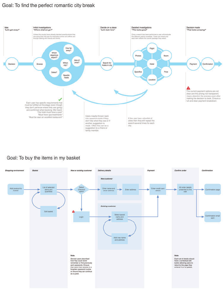
Figure 3: User Journeys. Showing how the system needs to match the user behavior.
03_9781119971108-intro.indd 303_9781119971108-intro.indd 3 8/10/11 8:34 PM8/10/11 8:34 PM
COMMUNICATING THE USER EXPERIENCE
4
Richard Caddick Page 1 20/5/11
Content requirements for choosing a boutique dress
How do users want content presented:
Photos – Large high quality photographs showing the front, back, detailing and a model shot. Copy – Clear and non-patronising. Users want to be reassured by the detailing, heritage and ethics.
Summary of core needs:
Pictures – What do the products look like? Price –Price, any applicable offers and easily accessibly delivery charges. Sizing and availability – What sizes are available and what are the
dimensions of our sizing? Do they have my size? Delivery time – When will I get it?
ID Page name What must users do?
The core purpose of the page.
What support do they need?
Include quotes from research.
Required elements and suggestions
Existing, new or amended assets.
1 Homepage Easily be able to locate and select the dresses
category.
If users have been to the site before they want
to get straight into the category listing,
however in testing it was noted that users
“may get side-tracked by other products on the
homepage”.
New users will want to get a sense that the
brand offers the types of clothes they would
buy.
Images of the latest seasons clothing.
Sale and offer information.
Clear navigation into the product categories.
2 Category listing Easily select a product they like the look of. Colour, price and style are all necessary.
An indication of available sizes is useful at this
stage, but can be omitted as long as it s clear
on the product page.
“I just like looking through everything available
and clicking through to the dresses I like.”
Photos that show the front and back of garments:
Price and discount information.
Alternate color, if applicable
3 Product page Add the dress to their basket. Further images including details and model
shots. Sizing and availability. Delivery and
returns information.
“I often buy two different sizes to try both, so I
need to make sure it s easy to send the one I
don t want back”.
Large (fullscreen) photos both on and off models.
Detailed sizing guide with stock levels for each size and color.
Delivery and returns information.
Quantity and add to basket.
Product description including material, detailing information
and the designer.
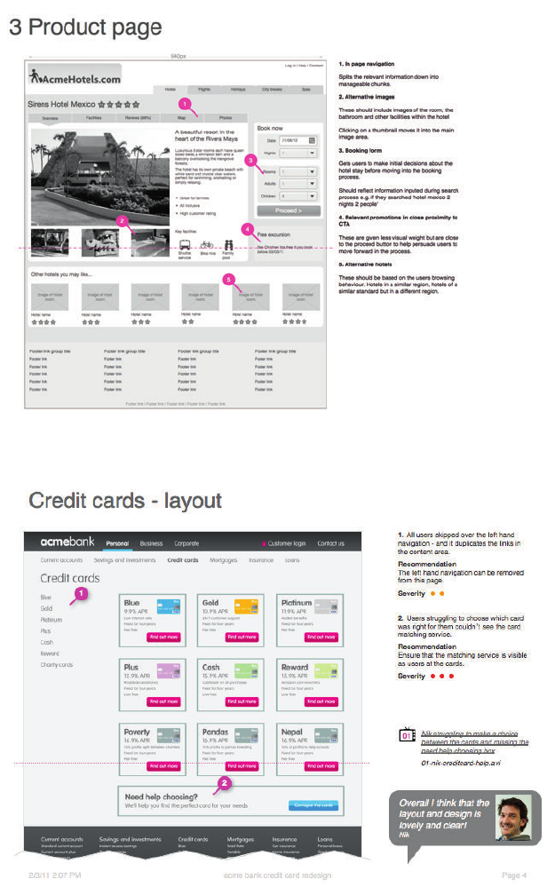
Figure 4: Content requirements. Ensuring your content aligns with the user requirements.
03_9781119971108-intro.indd 403_9781119971108-intro.indd 4 8/10/11 8:34 PM8/10/11 8:34 PM
INTRODUCTION 5
Signed in user
A
cme
App
a
r
el.com Sitema
p
Header links
Home Search Basket Help
Shirts Jackets
Ski
Jackets
Rain
jackets
Leather
jackets
Light
jackets
Trousers Summer
wear
T-shirts
Shorts
Sunglasses
Hats
T- Shirts
Shirts
Polo shirts
Vests
Trainers
Shoes
BootsFormal
Cross link
Sizing
guides
What's
hot
Request a
catalogue
Email
newsletter
Shirts
Jackets
Trousers
Shoes
Article
listing
Article
Page
Casual
Chinos
Jeans
Shorts
3 quarter
lengths
Shoes
Headline
article
PDF
download
Send
email
03
03
03
03
03
03
03
03
03
03
03
03
03
03
03
03
03
03
03
03
03
0202020202
01 04 05 06
07
08
08
08
08
09
10
10
11
12 13
Logged in
homepage 14
My
account 15
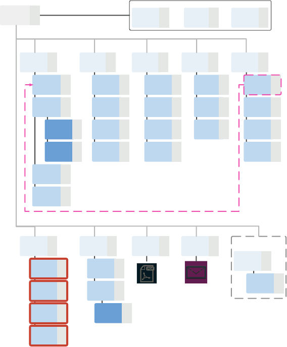
Figure 5: Sitemaps. Sorting out the structure, navigation, and labeling.
03_9781119971108-intro.indd 503_9781119971108-intro.indd 5 8/10/11 8:34 PM8/10/11 8:34 PM
COMMUNICATING THE USER EXPERIENCE
6
Figure 6: Wireframes. Prototyping, visualizing, and validating.
Figure 7: User testing reports. Seeing the world through your users’ eyes and deciding what to focus on.
03_9781119971108-intro.indd 603_9781119971108-intro.indd 6 8/10/11 8:34 PM8/10/11 8:34 PM

INTRODUCTION 7
Why do 90% of people drop out of the checkout process?
100% 78% 52% 21% 10%
Basket
Sign in / Register
Delivery
Payment
Confirmation
Why do 11% leave from payment
It's not clear how much they
will be spending
Credit card charges put
people off
German users preferred
payment method is not
supported
Why do 21% leave from delivery
Postcode lookup was
missed
Error messaging was
confusing
Details are removed if
mistakes are made
Why do 26% leave from Sign in
Users are unsure which
option to choose
People react badly to
having to create an
account
Why do 22% leave from basket
Call to action is not clear
People look for a
'Checkout' button not a
'Pay now' button
Figure 8: Funnel diagrams. Analyzing and optimizing the user journey.
Putting the documents into context
e documents in this book can be used on their own or in tandem to inform a speci c area
of the user experience.
For example, let’s say that you’re working on maintaining an existing site but the team has
lost focus of who the users are and what they need. Decisions are being made based on what
the project team thinks the users want (this is not and never will be a user centered design
process). Developing personas and task models would take the focus away from the project
team and put it back on the user, helping to inform the short-term tactical projects and long-
term strategic aims.
Alternatively you may be creating a product from scratch and able to put together a plan that
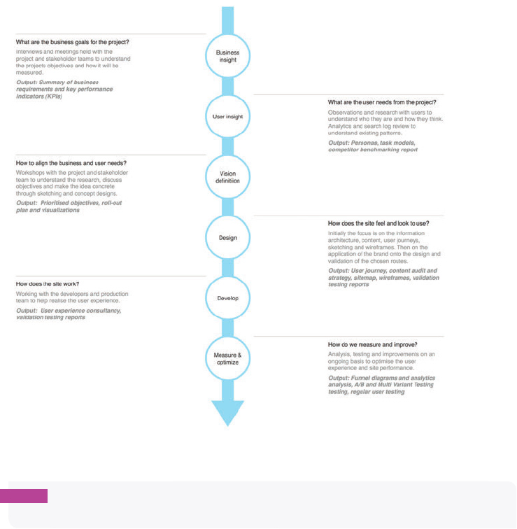
incorporates several or all of the elements described in this book. To provide context, Figure
9 shows a typical project process, user experience activities, and documents produced. You’ll
notice the repetition of validation and benchmark testing throughout.
03_9781119971108-intro.indd 703_9781119971108-intro.indd 7 8/10/11 8:34 PM8/10/11 8:34 PM
COMMUNICATING THE USER EXPERIENCE
8
Figure 9: A typical project process.
note All of the templates, stencils, and icons used in this book are available to download
and use freely at http://cxpartners.com/resources.
Enjoy yourselves!
Facilitating and engaging in user-centered design projects is rewarding for you and the proj-
ect team. You’ll help people love the products and services you produce, and, in turn, those
products and services will become more successful.
So, have fun with the techniques and Tweet us to let us know how you get on.
—Richard (@richardcaddick) and Steve (@steve_cable).
03_9781119971108-intro.indd 803_9781119971108-intro.indd 8 8/10/11 8:34 PM8/10/11 8:34 PM

chapter 1
Personas
1
04_9781119971108-ch01.indd 904_9781119971108-ch01.indd 9 8/10/11 8:33 PM8/10/11 8:33 PM

COMMUNICATING THE USER EXPERIENCE
10
A PERSONA IS a document that describes the ways in which certain types of people will use
your website. Usually one persona is created for each type of user. Personas are used to show
you the goals that users will be trying to achieve on your website. See Figure 1-1.
In this chapter, you will learn exactly what information is needed to create a truly useful
persona. You will learn the best time in which to produce your personas, what information
needs to be communicated, and how to lay it out in a clear and concise way. You will also get
some ideas on how to generate the information that is needed to create a solid persona that
is based on real people.
F -: A persona helps you understand users’ goals when using your website.
04_9781119971108-ch01.indd 1004_9781119971108-ch01.indd 10 8/10/11 8:33 PM8/10/11 8:33 PM
CHAPTER ONE PERSONAS 11
What makes a good persona?
A good persona is based on real people and solid research. It focuses on the key goals that
user groups have to achieve, user behaviors, and user attitudes while completing their goals.
Ultimately, personas need to help you understand if any decisions you make will help or
hinder your users.
When to create a persona
To put it plainly, you should create one now. Unlike wireframes or prototypes, personas
don’t t into a speci c part of a single project process. Instead they help guide every part of
every project. ey provide a quick reference for design decisions, idea generation, and stra-
tegic changes.
Personas and task models sit closely alongside each other and are built on the same types of
research, so for e ciency the two can be developed side-by-side—this also allows you to
consider di erent personas based on the task models.
Personas should be living documents. ey capture a snapshot of an audience at a speci c
time. As further research uncovers new insights, your personas need to be updated to re ect
them. Doing so turns the personas into an ongoing strategic tool that constantly represents
the user behavior and uncovers new opportunities.
What are you communicating?
A persona has two goals:
> To help you make design decisions.
> To remind you that real people will be using your system.
A good persona is not based on demographics or stories; it’s based on the tasks, behaviors,
and attitudes of your users. For example, if you’re developing a vacation reservation site,
your personas shouldn’t focus on what newspapers users read, what cars they drive, and
what the measurements of the inside of their legs are. is information doesn’t help you
develop your product. Avoid irrelevant information; focus on key goals. is helps you imag-
ine how people will use your product—and that helps you make it more useful to them.
04_9781119971108-ch01.indd 1104_9781119971108-ch01.indd 11 8/10/11 8:33 PM8/10/11 8:33 PM
COMMUNICATING THE USER EXPERIENCE
12
Use short descriptive bulleted points
Avoid stories. Don’t get me wrong, I love stories, but not in personas. e problem with sto-
ries is it’s di cult to write them well and people won’t take the time to read them unless they
are incredibly engaging. Keeping your persona content down to short sentences and bullets
creates less e ort for the reader.
Base personas on real people
Personas should be based on real people from real research. A good way to ensure this is to
use somebody you met during your research as a base for your persona. Choose somebody
who is a fair representation of the persona and then add in any other relevant pieces of infor-
mation you found in your research. is means your persona shows a fair representation of
the group it’s representing but uses real examples that you have really experienced.
Use descriptive photography
Photos can be a really valuable part of a persona, but more often then not they are used really
badly. Mostly photos are used to put a human face against the persona, so a cheesy smiling
portrait is stuck at the top of it. Photos on personas can do much more than that.
e right photo can tell the reader something about this user group just from looking at it.
For example if one of your personas has a hard time using technology, then the photo should
be of someone struggling to use technology. Photos in your personas should re ect user
behavior, not just age and gender.
Avoid using stock images. ey are tacky and make your personas feel less real (real people
don’t stand in studios with cheesy grins). Ideally you want to use photos of real users who
you encountered during ethnographical research (explained later in this chapter). Photos of
real users performing relevant tasks will help ground your personas in reality. Of course this
is not always possible. An alternative is to use an online photo sharing site like Flickr. ese
have a wealth of candid photos of real people in real situations. However, you need to be
aware of the licensing that is associated with the images and may need to seek permission
from the photographer before you use them.
Figure 1-2 shows an image from a persona for a shopping site.
A nice addition is to include a photo of the personas’ environment. If you show the space
that they inhabit while trying to use your system, you might come up with some interesting
ideas of their behaviors and constraints. It could tell you if they work in a messy environ-
ment that is full of distractions. It could show you the kinds of devices they use: laptops or
mobiles. It could show you any other resources they use to complete their goals: books, bro-
chures, or notepads. Figure 1-3 shows an example environment image for a persona.
04_9781119971108-ch01.indd 1204_9781119971108-ch01.indd 12 8/10/11 8:33 PM8/10/11 8:33 PM

CHAPTER ONE PERSONAS 13
F -: is example shows their clothes shopping behavior as functional (just buying socks and pants).
F -: is is the actual desk of co-author Steve Cable. What’s it tell you about his environment?
04_9781119971108-ch01.indd 1304_9781119971108-ch01.indd 13 8/10/11 8:33 PM8/10/11 8:33 PM
COMMUNICATING THE USER EXPERIENCE
14
Anatomy of a persona
Here’s a breakdown of what you need to include in your persona. Figure 1-4 shows examples
of the concepts that follow.
Photos
Use representative photos that put a human face against the persona and also tell the reader
something about the person behind the persona.
Persona names
A name humanizes the persona, but also makes it easy to know which you are referring to in
design meetings: “ is idea would work for Ken, but not so much for Deirdre.”
User quotes
A quote from somebody you met during research can bring the persona to life and give a
quick overview of that persona’s state of mind when trying to complete her goals.
Key goals
If you know what people want do on your website or with your software, you can ensure you
have everything in place to make sure they can do it. Di erent personas will have a di erent
number of goals, but generally you want to know the answer to these questions:
> Do they have a speci c task to complete quickly?
> Do they want to take their time and enjoy the experience?
> What do they need to know?
> What is their ultimate goal?
Behaviors
Knowing what motivates people and how they are likely to be feeling helps you create per-
suasive designs that will in uence choices and help reduce any worries they may have. Look
for answers to the following questions:
> What are their motivations for using the system?
> What are they likely to be feeling when they use your system? (Do they assume it’s
going to be a frustrating experience?)
> Do they have a lot of spare time to perform their tasks?
04_9781119971108-ch01.indd 1404_9781119971108-ch01.indd 14 8/10/11 8:33 PM8/10/11 8:33 PM

CHAPTER ONE PERSONAS 15
> What in uences their choices?
> What puts them o or makes them lose trust?
Must dos
A must do is a simple description of what you need to do to support your users’ key tasks and
behaviors. ese must be about your system or service as a whole because they can be used
to validate any design decisions or new functionality.
Must nevers
A must never is the same as a must do, except it focuses on what you must avoid at all costs.
Avoiding any of the points in your must never section will help prevent designing a system
that will make your users feel lost or confused.
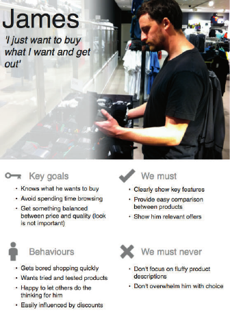
F -: A completed persona that focuses on user goals and behaviors.
04_9781119971108-ch01.indd 1504_9781119971108-ch01.indd 15 8/10/11 8:33 PM8/10/11 8:33 PM
COMMUNICATING THE USER EXPERIENCE
16
Who is the audience?
Personas are for anybody who needs to make a decision about the design of your system, or
a decision about your strategy as a whole. A well-researched persona can help inform these
decisions.
ey are especially useful for companies that don’t know anything about their customers. It
gives you a chance to think about why you are doing what you are doing.
Experience shows that it’s important to get buy-in from senior stakeholders when creating
personas. is ensures they aren’t forgotten and left to gather dust on the shelf. Getting buy-
in does not mean showing the personas o once they are completed.
It’s important to get senior stakeholders involved in the process early on. Invite them to
research and testing sessions so they can see for themselves some of the behaviors and goals
that will be presented in your personas. at way they will see where the content of the per-
sonas is coming from and believe in them more than if they were just slapped on their desk
after six months of research behind closed doors.
Personas are also very useful for internal or external research teams. If any user research is
being carried out, the persona is a very useful tool for recruiting test participants. Goal-based
personas allow you to recruit users based on those goals. For example, when testing a travel
website you will recruit users whose goal is to book a long holiday for a family, and some
users whose goal it is to book a short break for a couple.
As shown in Figure 1-5, it’s useful to keep personas readily available, or on constant display,
to allow project teams to reference them when making design decisions.
04_9781119971108-ch01.indd 1604_9781119971108-ch01.indd 16 8/10/11 8:33 PM8/10/11 8:33 PM

CHAPTER ONE PERSONAS 17
F -: A handy display of user personas.
How to validate personas
Personas are based on lots of research so initially they will not need validation. But as time
goes on, you need to be sure your personas are still relevant.
For quick validation you can always run your personas past the customer service team or call
center sta . ese are the people who have the most contact with your users; they will be
able to see if your personas ring true with what they experience, or just never happen.
Personas can also be validated against any other research that gets carried out for any other
projects within your company. If you’re performing some usability testing to nd some quick
wins or online surveys to gather customer experience information, you can evaluate the
results with your personas. Comparing your results will show if new ndings are consistent
with your personas, making the personas still relevant. If the ndings are inconsistent with
your personas, then they may need updating. However at that point it would be safest to
perform more speci c validation research to be sure.
04_9781119971108-ch01.indd 1704_9781119971108-ch01.indd 17 8/10/11 8:33 PM8/10/11 8:33 PM

COMMUNICATING THE USER EXPERIENCE
18
RESEARCH AND WORKSHOP IDEAS
e key to a good persona is research. Without that, personas are guaranteed to fail. Personas
that are simply made up are easy to spot and are easily forgotten about.
Start with a theory
So you need to talk to lots of people, but who do you talk to? You don’t have your personas
yet to know what types of people use your system, right?
You need to start with a hypothesis. eorize what the core goals are and recruit research
participants based on those goals.
Base your theories on what your company already knows—no matter how little the informa-
tion might be—about its customers or users. ink of what kinds of goals you assume they
need to complete and what kinds of scenarios these people may be in. For example, if you’re
running research for a mother and baby retailer, don’t just recruit based on goals like, “Needs
to buy a crib,” or “Needs to buy a stroller.” Instead, recruit based on wider scenarios and
goals, such as:
> First-time mother trying to buy everything she needs.
> Mother of two or more who needs to make a large necessary purchase.
> A relative looking for a gift for a mother.
Your goals must also cover all relevant aspects of the project.
Once you have a theory, carry out your research. Your research will either prove or disprove
those theories.
tip The more research you do, the more accurate and robust your personas become. This
creates a trade-o between budget and quality. To have personas, you must do research, but
a six-person usability test will not be enough.
e following sections provide a brief overview of some ways that you can gather informa-
tion to create your personas.
04_9781119971108-ch01.indd 1804_9781119971108-ch01.indd 18 8/10/11 8:33 PM8/10/11 8:33 PM

CHAPTER ONE PERSONAS 19
RESEARCH TECHNIQUE: Listen in on call centers
If you have a call center available, it is a great resource for listening to the questions and
needs of lots of users in a short space of time. However, you don’t get the same level of infor-
mation as depth interviews. e idea is to listen in and not interact. Note what people are
calling for, the questions they have, and the information they need. By the end of the day
you should see patterns and themes emerging. If we use the mother and baby retailer exam-
ple, then you will want to listen for:
> e types of products they’re trying to buy.
> e information they want to know about the products.
> e problems they face when trying to buy those products.
You can do call center listening remotely by dialing in, but it’s much more bene cial to go to
the call center in person (see Figure 1-6). is allows you to talk to the call center sta . at’s
important because they are going to know the most common problems that callers have and
the most common questions asked. Hopefully this will ring true with what you have been
hearing and seeing in other research. You can also learn the solutions that call center sta
provide to people.
Speci cally, you want to nd out the following information from the call center sta :
> What are the most common problems or complaints?
> What are the solutions you give to people?
F -: Listening in on calls between customers and call center sta can quickly uncover common issues and
user goals.
04_9781119971108-ch01.indd 1904_9781119971108-ch01.indd 19 8/10/11 8:33 PM8/10/11 8:33 PM

COMMUNICATING THE USER EXPERIENCE
20
RESEARCH TECHNIQUE: Conduct depth interviews
Depth interviews allow you to speak to only a small number of people, but as the name sug-
gests, you can gather some in-depth information.
e idea is to get users to talk to you about their previous experiences when trying to com-
plete goals relevant to your system. You need to talk to the theorized groups of users you
initially de ned (for example, rst-time mother, mother of two or more, and somebody buy-
ing a gift for a mother). Discuss what they remember from the last time they completed their
goal. In particular you want to know:
> What information did they need to know?
> What problems did they encounter?
> What were they able/unable to do?
> What tasks were involved in achieving their goal?
> What did they use to achieve their goal (websites, books, other people, for instance)?
> If they were going to attempt to achieve that goal again, how would they do it?
e rich, qualitative information you gather will give you an idea of the kinds of themes that
may go into your persona, but because the numbers are small you may need to use other
techniques to get more results to validate those themes.
RESEARCH TECHNIQUE: Conduct ethnographic research
What we mean by ethnographic research is simply watching (and talking to) people trying to
achieve their goals in their natural environment (for example, an in-depth interview in their
natural environment).
We once did some research for eBay, trying to understand the goals and needs of users who
sold the most stu on the site. Rather than getting them into the lab, we went to their
homes. is meant we could see the type of environment they worked in, which helped build
an idea of any constraints they might have. We also could be shown things, rather than just
talk about things—like what they were currently trying to sell and how they went about try-
ing to describe it on eBay.
For the mother and baby retailer, a good place to do an ethnographic study is in their stores
(with permission from the company, of course). Subtly follow customers in order to see what
04_9781119971108-ch01.indd 2004_9781119971108-ch01.indd 20 8/10/11 8:33 PM8/10/11 8:33 PM

CHAPTER ONE PERSONAS 21
they are buying (if anything). Listen to conversations they have with shop sta . is can help
you understand customers’ decision processes. It’s also a good idea to talk to the store sta
at the end of the day about what you have discovered. is will help validate your ndings
and draw out more stories about customer behavior.
Ethnographic research is great for getting a good depth of information from a small number
of people. You also learn many things from people in their natural spaces that you wouldn’t
in a lab environment.
WORKSHOP IDEA: De ne your personas
By this point you will have recruited participants based on the goals you identi ed for using
your system. You will have spoken to them about how they perform those goals and discovered
the behaviors they use. Now you need to take this information and group it into personas.
Take the notes from the individuals you have interviewed and cluster them by the goals set
during recruitment. For example, group all the people who were recruited because they were
rst time mothers trying to buy everything they need and group all the people who were
purchasing gifts for mothers.
Focusing on one group at a time, look at the di erent approaches people took to completing
the goals you set. You may see that everybody went about completing the goal in the same
way. However, you may often nd that di erent people approach the same goal in di erent
ways and may even have di erent goals. For example, buying clothes may split into those
people who relish the opportunity and enjoy the process, and those people who buy clothes
for necessity only—two very di erent approaches to the same goal.
Once you have your nal list of personas, you need to determine their behaviors. Go through
the notes for each persona at a time, pick out the interesting behaviors, write them onto
Post-Its, stick the Post-Its up on a wall (see Figure 1-7), and group the interesting behaviors
that appear frequently. It is a good idea to base your personas on one speci c participant and
enrich it with the ndings from others.
Determining must dos and must-nevers is left until last because they are based on the key
goals and behaviors. You need to think about how you can help this user and how you can
avoid frustrating and confusing him. Remember to not be too speci c. If you include a must
do such as, “Must use red on the call to action on the product page,” that will help only with a
speci c decision. ese rules must be broad enough to help with decisions across the whole
site, system, or even the business. For example, “Must never overwhelm the user with choice.”
04_9781119971108-ch01.indd 2104_9781119971108-ch01.indd 21 8/10/11 8:33 PM8/10/11 8:33 PM

COMMUNICATING THE USER EXPERIENCE
22
F -: Using Post-Its to group interesting behaviors helps to show common themes from your research.
What’s the simplest way to create a persona?
The actual design of the persona document should be pretty simple anyway. What really
counts is the quality of the data that sits behind it. If you are really pressed for time or need
to get a brief preview out ahead of the nal document, here is a quick way of presenting
personas using Microsoft Word.
Persona images
The best way to save time and effort is to use alternatives to photos. If you didn’t collect
appropriate photos during research, sourcing ones that are good enough can be time con-
suming and dif cult. As an alternative, you could use icons to represent each persona. This
isn’t as personal as a photo, but at least each persona will be easily distinguishable when all
are stuck up on the wall.
Document titles
Use the persona name as the document title. It’s always a good idea to use the name of a
participant you met during research to keep it realistic. (Also, you’ll nd you will get hung up
on selecting a name.) Use a large font (48 points) so it can be easily read when stuck on a wall.
04_9781119971108-ch01.indd 2204_9781119971108-ch01.indd 22 8/10/11 8:33 PM8/10/11 8:33 PM

CHAPTER ONE PERSONAS 23
Use a quote from the user as a subtitle. Make the font size smaller than your title (22
points). This is a supporting piece of information, so give it less emphasis than everything
else by making the font a lighter shade of gray. Use italics and quotation marks to make it
clear that this is a user quote.
Subheadings
Create a subheading for each of the key areas of information (Key Goals, Behaviors, Must
Do, Must Never). Use a smaller font again (18 points).
Bulleted lists
Use bulleted lists to display the information in each section. This is both an easier way to write
and an easier way to read. To create a bulleted list, write each point on its own line. Highlight
the text you want to make in to bullets and in the top menu select the Home tab, then click on
Bullets. From here you can choose what style of bulleted list you want. It’s best to avoid num-
bered lists for your bullets unless the points you are making have some kind of prioritization. If
you want to tweak the line spacing between each point, highlight the bulleted text, right-click
it, and select Paragraph. You can edit the Line spacing options in the window that pops up.
Figure 1-8 shows a persona created in Word.
Jason
‘I just want to buy what I need and get out’
Key Goals
• Knows what he wants to buy
• Avoid spending time browsing
• Get something balanced between price and quality (look is not
so important)
Behaviors
• Gets bored shopping quickly, whatever is good enough will do
• Wants tried and trusted products
• Happy to let others do the thinking for him
• Easily influenced by discounts
We Must
• Clearly show the key features of each products
• Provide easy comparison between products
• Show him relevant offers
We must never
• Don’t focus on fluffy descriptions of products
• Don’t overwhelm him with choice
F -: If you’re short on time, you can use Word to create a persona.
04_9781119971108-ch01.indd 2304_9781119971108-ch01.indd 23 8/10/11 8:33 PM8/10/11 8:33 PM
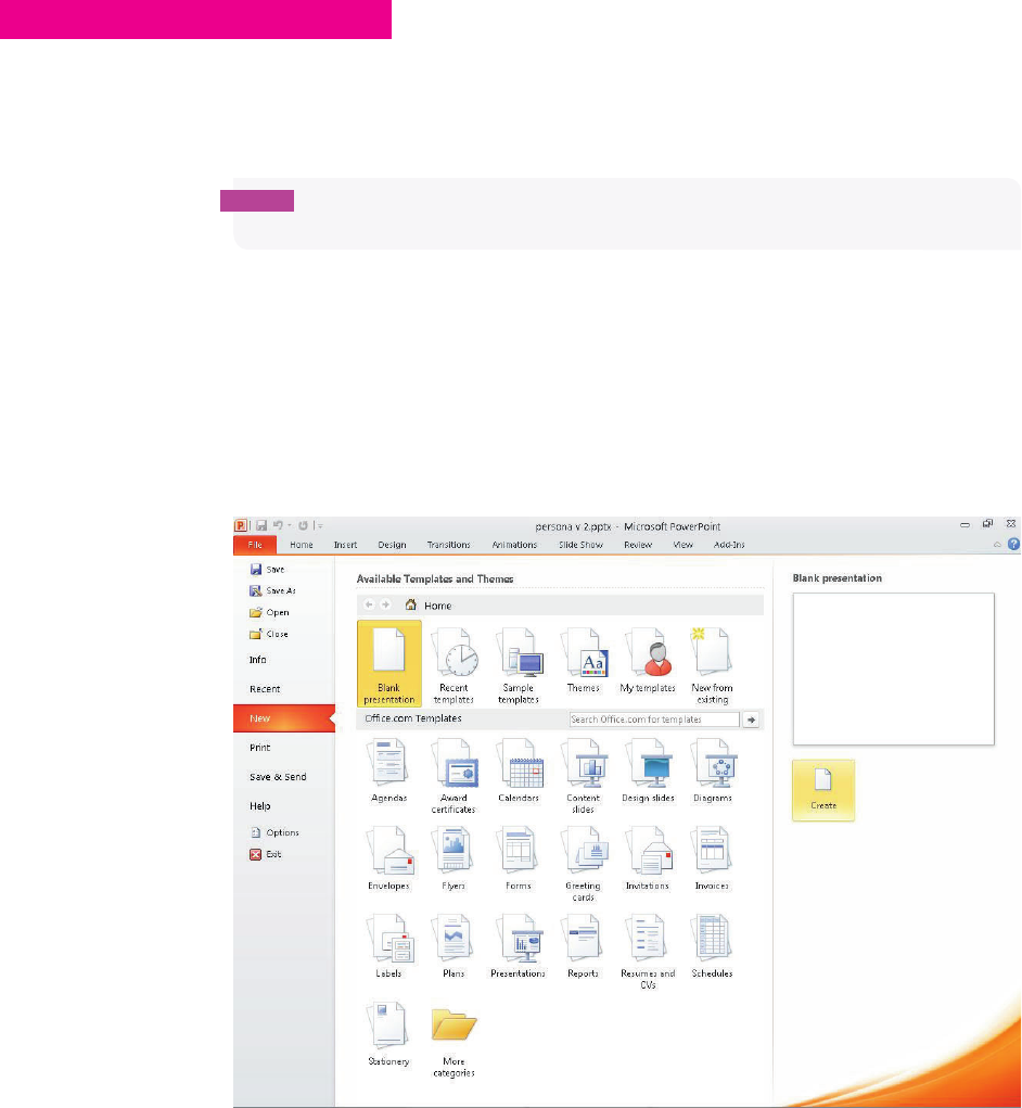
COMMUNICATING THE USER EXPERIENCE
24
HOW TO Create personas in PowerPoint
is section shows you how to create a persona layout that you can reuse for each of the
personas you create. e instructions describe how to create the personas in PowerPoint
2010.
note Mac users can either use the Mac version of PowerPoint or skip to the OmniGra e
tutorial, which shows how to create the same document.
Creating and setting up the slide presentation
To create a new slide presentation and set it up correctly, follow these steps:
1 Go to the File tab and click New. A menu of document templates and themes is displayed.
2 e Blank presentation should be highlighted by default. (If not, click it.) Click the Create
button on the right (see Figure 1-9).
F -: Creating a new Blank presentation.
04_9781119971108-ch01.indd 2404_9781119971108-ch01.indd 24 8/10/11 8:33 PM8/10/11 8:33 PM

25 CHAPTER ONE PERSONAS
e default presentation uses a landscape layout. e persona design uses a portrait layout,
so you need to change this setting.
3 Go to the Design tab and in the Page Setup group, click Slide Orientation and then choose
Portrait.
4 Go to the View tab and in the Show group, select the Guides option.
When Guides is enabled, the page is divided both horizontally and vertically. is will help
divide the page vertically to give equal space to both the persona image and the persona
information.
5 On the Power Point slide, select the Click to add title box and delete it.
6 Click to add subtitle box and delete it as well.
caution Make sure you delete the text boxes, not just the text that sits within them.
Adding persona images and titles
is section describes how to add images into your persona, how to resize images, and how
to create the page titles.
Inserting an image
To insert the persona image:
1 Go to the Insert tab and click the Picture button.
2 Select the image you want and then click Open.
3 Click the blue corner points of the image to resize it, making sure you hold down the Shift
key as you resize the image. is retains the same aspect ratio and ensures the sizing isn’t
warped.
4 Drag the corners of your image to resize and position your image so it takes up the top
half of the page and the person in the photo is over to the left or right of the slide. is
means you will have you will have space on the opposite side to overlay a title.
note Don’t worry if your image spills over into the bottom of the page. You can crop it to
stop this from happening.
04_9781119971108-ch01.indd 2504_9781119971108-ch01.indd 25 8/10/11 8:33 PM8/10/11 8:33 PM
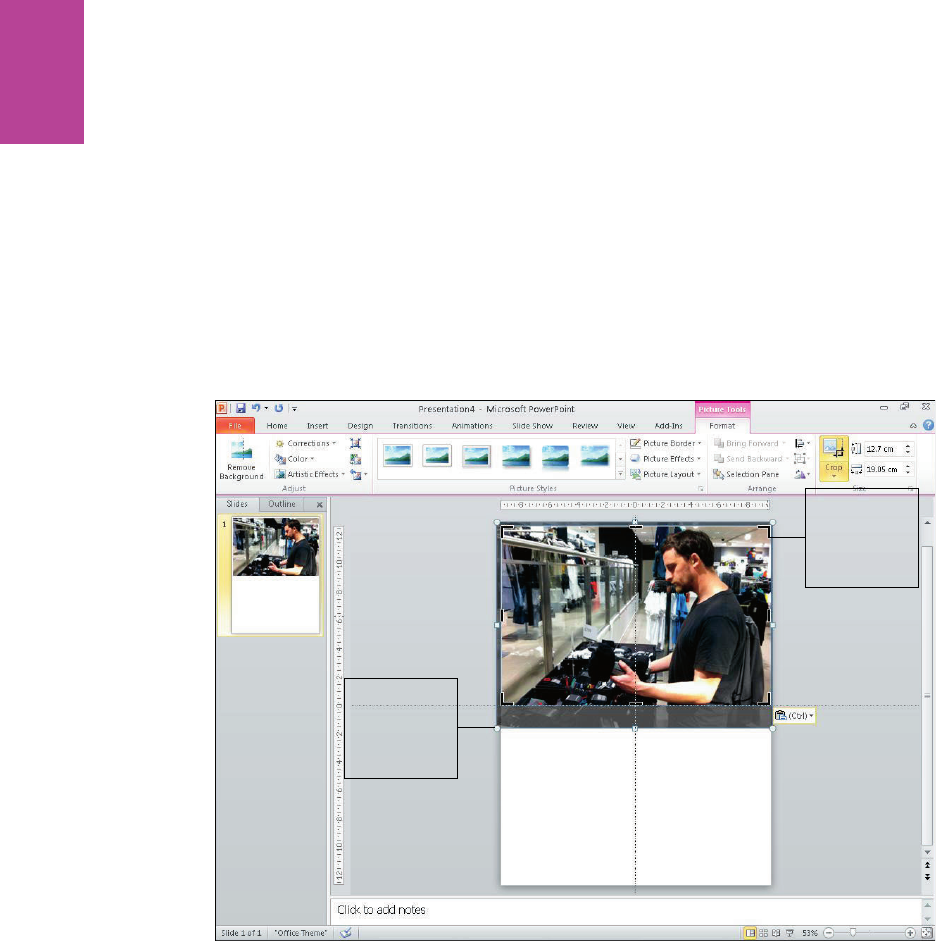
26
COMMUNICATING THE USER EXPERIENCE
5 To crop the image, select the image and then in the Picture Tools Format tab, select Crop
(see Figure 1-10). e controls around the edge of the image will change.
6 Drag the black lines on the edge of the image to crop it. ey should snap to the edges of
the page and the guidelines.
7 Once you’re happy with your crop, just deselect the image.
Click and
drag these
to resize the
image
Click and
drag these
to crop the
image
F -: Use resizing and cropping to make the persona image take up the top half of the page.
Adding an overlay color
Before you add the document title, add a transparent block of color over part of the image to
make the text more readable.
1 In the Home tab, select a rectangle from the shapes menu and draw a rectangle over the
top of your image.
04_9781119971108-ch01.indd 2604_9781119971108-ch01.indd 26 8/10/11 8:33 PM8/10/11 8:33 PM
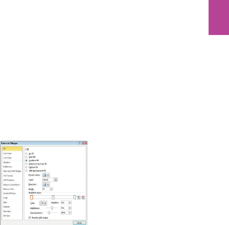
27 CHAPTER ONE PERSONAS
2 With the shape selected, go to the Shape Fill drop-down, select Gradient, and then choose
More Gradients.
3 From the Fill menu, select Gradient ll. Set the following (see Figure 1-11):
• Type drop-down: Linear
• Gradient stops: white (select each and choose white from the Color menu
below)
• Transparency of right stop: 100%
• Transparency of left stop: 20%
• Transparency of middle stop: 20%
4 Click Close when you’re nished.
F -: Adding a transparent overlay to the image.
Inserting a title
To insert a title, follow these steps:
1 Click the Insert tab and in the Illustrations group, click the Shapes down arrow.
2 In the Recently Used Shapes category, click the text box.
3 Click wherever you want to type.
4 Use your personas name as the document title.
5 Make the title large (60 points). Use a font that is easy to read, such as Arial.
04_9781119971108-ch01.indd 2704_9781119971108-ch01.indd 27 8/10/11 8:33 PM8/10/11 8:33 PM
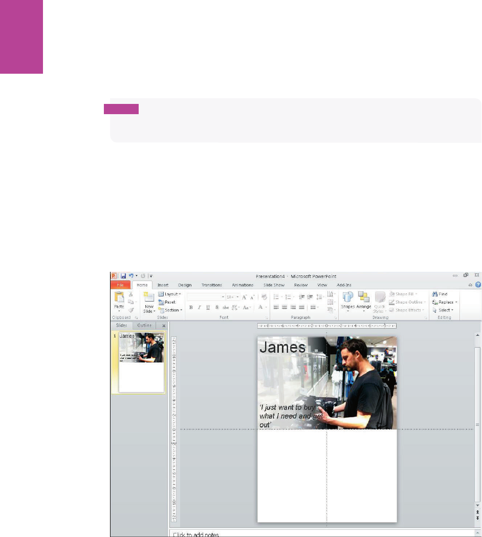
28
COMMUNICATING THE USER EXPERIENCE
note Your personas are likely to be viewed as PDFs. If you use a font that is specifi c to a Mac
or specifi c to a PC, a user who isn’t using the right operating system might have di culty
reading the font.
6 Change the font color to a dark gray and position the text box in the top corner of the
page over your gradient.
7 Repeat Steps 5 and 6 to add your user quote except this time use a smaller font (28 points)
and use italics and quote marks to make it clear that it’s a quote.
See Figure 1-12. Play around with the size and position of your titles to see what looks good
against the background image.
F -: Place your title and subtitle over the transparent overlay.
Adding icons, subheadings, and bulleted lists
Each group of information in the persona (for example, Key Goals) will need an icon to illus-
trate each group of information, a clear subheading, and a bulleted list to display the infor-
mation. Use the same positions for subheadings and icons across all your personas; this will
simplify the comparison of each persona.
04_9781119971108-ch01.indd 2804_9781119971108-ch01.indd 28 8/10/11 8:33 PM8/10/11 8:33 PM
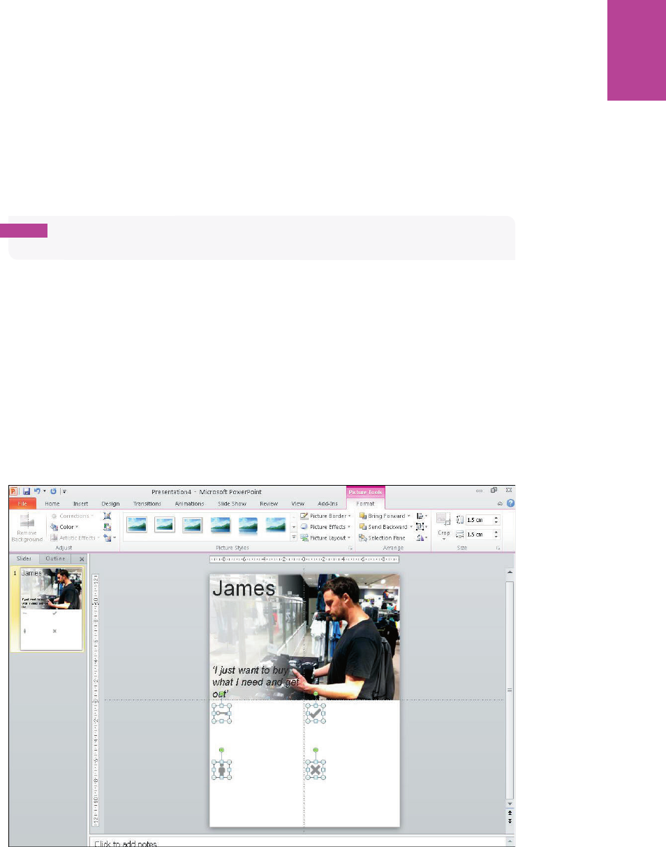
29 CHAPTER ONE PERSONAS
Inserting icons
e icons should be the same size, fairly small, and a light gray. ey should illustrate the
heading but should not take attention away from more relevant information.
note The icons used in this example are available to download along with many others
from the book’s supporting website.
1 Go to the Insert tab and click the Picture button.
2 Select the icons you want and click open. When all the icons have been added to the slide,
select them all.
3 Resize them by going to the Picture Tools format tab and using the size controls on the
right of the menu. Set all the icons to 1.5 cm by 1.5 cm (see Figure 1-13).
4 To change the icons to a lighter gray, select one and in the Adjust group, click the
Corrections menu.
5 Select the Picture correction options and reduce the contrast by 100%.
F -: All icons should be the same size and color.
04_9781119971108-ch01.indd 2904_9781119971108-ch01.indd 29 8/10/11 8:34 PM8/10/11 8:34 PM

30
COMMUNICATING THE USER EXPERIENCE
Adding subheadings
Now add the titles for each section of information:
1 Make the font size 24 points and change the color to a light gray to match the icons (see
Figure 1-14).
F -: Subheadings are set to 24 point and the color is changed to light gray.
2 To make sure the icons and titles are all aligned nicely, click the Home tab and in the
Drawing group, click Arrange and choose Align.
Adding bulleted lists
Use bulleted lists for the main pieces of information. at makes the information much
quicker and easier to read. To create a bulleted list, follow these steps:
1 Create a text box.
2 Type your information into the text box.
3 Select all of the text in the box.
04_9781119971108-ch01.indd 3004_9781119971108-ch01.indd 30 8/10/11 8:34 PM8/10/11 8:34 PM
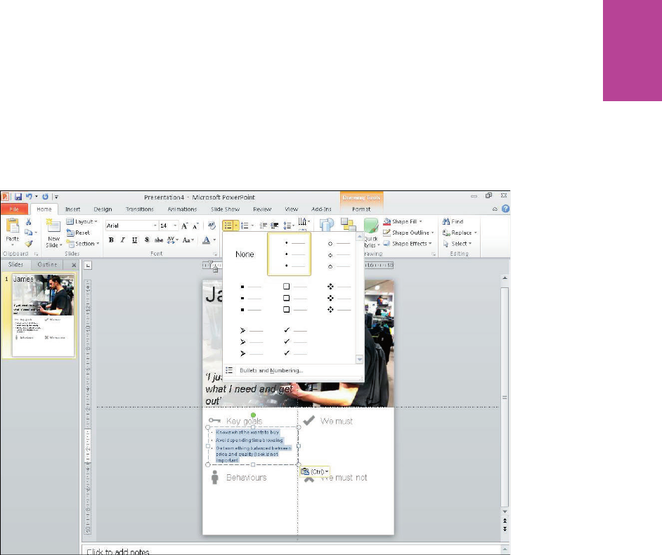
31 CHAPTER ONE PERSONAS
4 Click the Home tab and in the Paragraph group, click the Bullets button and choose round
bullet points (see Figure 1-15).
F -: e round bullet points are simple yet also e ective at helping each point stand out visually.
You can adjust the distance between the bullets and the text by clicking into the text box and
dragging the markers on the rulers at the top of the page. It’s also a good idea to increase the
line spacing to make each point more readable:
1 Select the text box and click the Home tab.
2 In the Paragraph group, click the Line Spacing button and then click Line Spacing Options
(see Figure 1-16).
3 In the Spacing group, change the After setting to 6 pt.
04_9781119971108-ch01.indd 3104_9781119971108-ch01.indd 31 8/10/11 8:34 PM8/10/11 8:34 PM
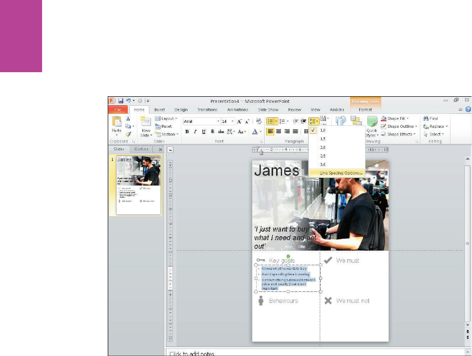
32
COMMUNICATING THE USER EXPERIENCE
F -: e line spacing options give you more control over the space between bullet points.
Make the font around 14 points depending on how much text you need to t in. Change the
color to a darker gray than all the other text because these are the most important pieces of
information.
For each of your subsequent personas, just duplicate this page by right-clicking the slide in
the preview panel on the left and clicking Duplicate Slide (see Figure 1-17). You just need to
change the photo and all the necessary text. It’s best to leave as many elements as possible in
the same place to make all the personas consistent.
04_9781119971108-ch01.indd 3204_9781119971108-ch01.indd 32 8/10/11 8:34 PM8/10/11 8:34 PM

33 CHAPTER ONE PERSONAS
F -: e nished layout can be duplicated and reused for each of your personas.
04_9781119971108-ch01.indd 3304_9781119971108-ch01.indd 33 8/10/11 8:34 PM8/10/11 8:34 PM
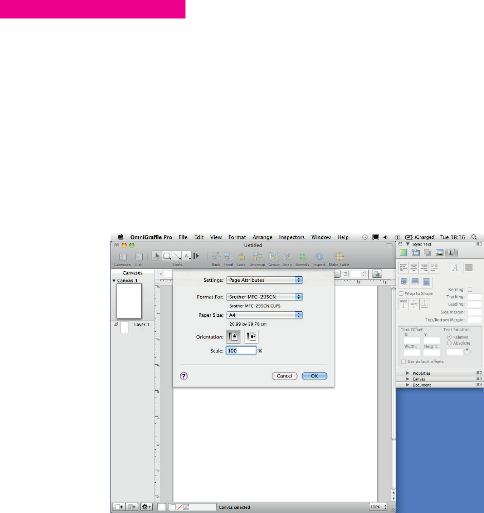
COMMUNICATING THE USER EXPERIENCE
34
HOW TO Create personas in OmniGraf e Pro
is section explains how to create a persona using OmniGra e Pro. You will learn how to
set up the document and add all the necessary images and text elements to create a persona
template that can be reused for all the personas you create.
Creating and setting up the presentation
To create a new presentation and set it up correctly, follow these steps:
1 Go to the File menu, click New, and then select the blank document from the template
chooser.
2 Go to File and choose Page Setup.
3 For the Paper Size setting, select A4 (see Figure 1-18).
4 For the Orientation setting, choose Portrait.
F -: Set up the document as a printable size because most personas exist as print outs stuck on walls.
04_9781119971108-ch01.indd 3404_9781119971108-ch01.indd 34 8/10/11 8:34 PM8/10/11 8:34 PM
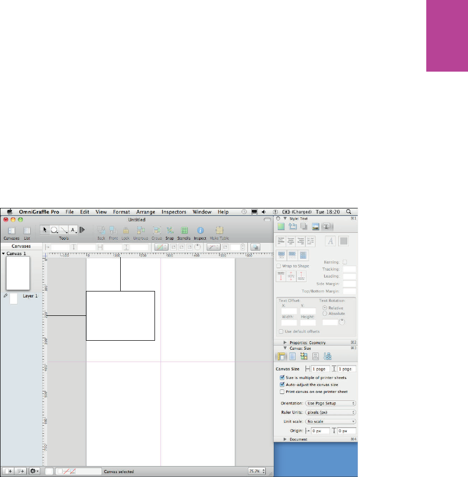
35 CHAPTER ONE PERSONAS
Finally, you want to set some guides up that run down the center of the Canvas horizontally
and vertically. is helps you line all your information up and provides you with equal space
to the persona image and the persona details.
5 Go to the View menu and make sure Rulers and Guides are turned on. ey should be
enabled by default.
6 Set your guidelines to 280 px horizontally and 390 px vertically (see Figure 1-19).
Create new guides
by clicking and
dragging the rulers
F -: Setting your guides to these locations helps align all the information as it’s added into the persona.
Adding persona images and titles
is section explains how to add and resize images as well as how to add the titles and subtitles.
Inserting an image
To add images into OmniGra e, simply drag them from the nder window onto the canvas.
04_9781119971108-ch01.indd 3504_9781119971108-ch01.indd 35 8/10/11 8:34 PM8/10/11 8:34 PM
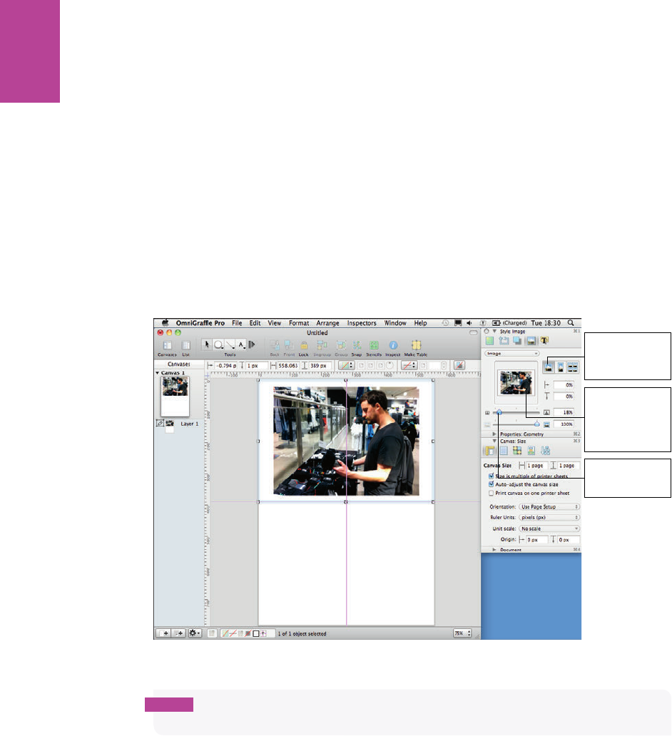
36
COMMUNICATING THE USER EXPERIENCE
Once you have placed your persona photo onto the canvas you will need to resize and crop it
to so it takes up the top half of the page. Here’s the best way to do that:
1 Select the image and, in the image section of the inspector, click the Natural size button
(see Figure 1-20). is masks the image allowing you to determine the area you want your
image to take up and easily crop it to t.
2 With Natural size selected, resize the border around the image so it covers the top half of
the page, and then use the Size slider in the inspector to resize the image to ll the space.
Click the Natural
Size button to
create a crop area
Drag the thumbnail
to position the
image within the
crop area
Drag the Size slider
to resize the image
F -: Use the Natural size options to make sure your persona image takes up the top half of the page.
note It’s a good idea to make sure the person in the photo is over to the left or right of the
image. This means you will have space on the opposite side to overlay a title.
Adding an overlay color
Before you add the title to the image, add an overlay color to make any text that sits on the
image more readable:
1 Draw a rectangle over the half of the image that doesn’t have the person in it
2 Open the stroke options in the style section of the inspector and uncheck the Stroke
checkbox (the line around the shape).
04_9781119971108-ch01.indd 3604_9781119971108-ch01.indd 36 8/10/11 8:34 PM8/10/11 8:34 PM
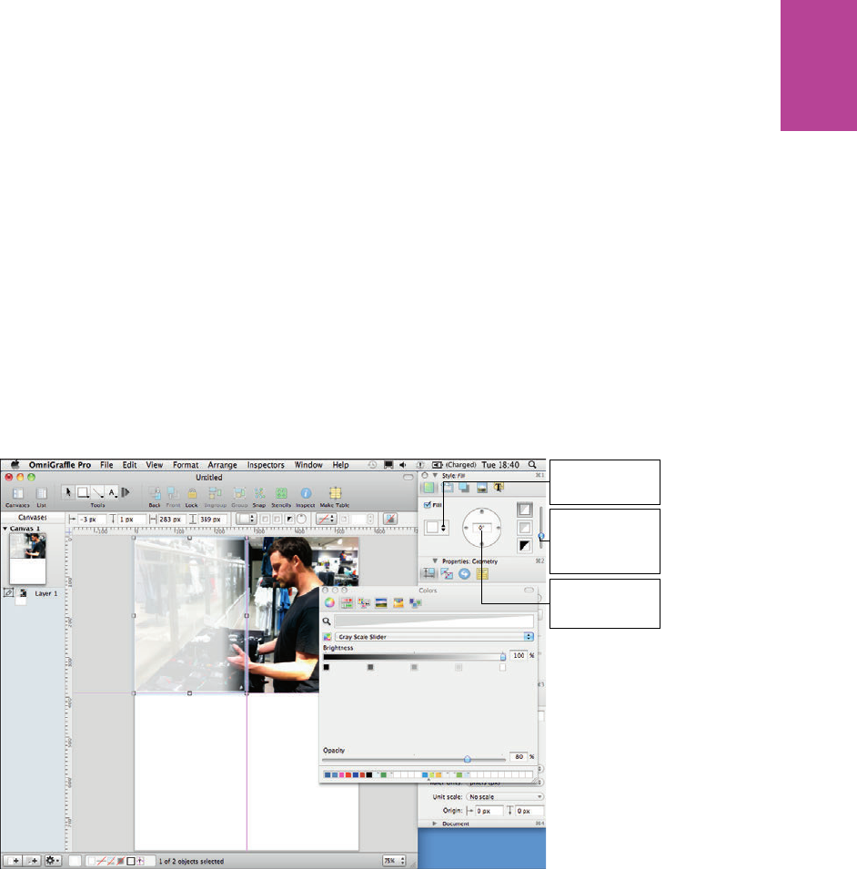
37 CHAPTER ONE PERSONAS
3 Open the shadow options in the style section of the inspector and uncheck the Shadow
checkbox.
4 Open the ll options in the style section of the inspector. Click the Fill type drop-down
and change the Fill type to Double Linear Blend. Use the Angle text box to change the
angle of the gradient to 0 degrees.
5 Click the color boxes on the right of the inspector to change all three colors in the gradient
to white; change the Opacity of the top two to 80% and the bottom one to 0%.
6 Drag the slider next to the gradient colors in the inspector down a fraction to make the
lighter part of the rectangle stand out a little more. See Figure 1-21.
Select the Double
Linear Blend option
Drag the slider to
change the position
of the gradient
Type the angle for
the gradient here
F -: Adding a transparent overlay on your image means any text you put on top of it will be more
readable.
Inserting a title
Next, add the persona name and quote. It’s best to use the name as the title of the page and
the quote as a subtitle. Add a text box over the gradient and use a large font (around 64
points) for the title. For the quote, use a smaller font in italics and quote marks. Play around
with the size and position of your titles to see what looks good against the background image.
See Figure 1-22.
04_9781119971108-ch01.indd 3704_9781119971108-ch01.indd 37 8/10/11 8:34 PM8/10/11 8:34 PM
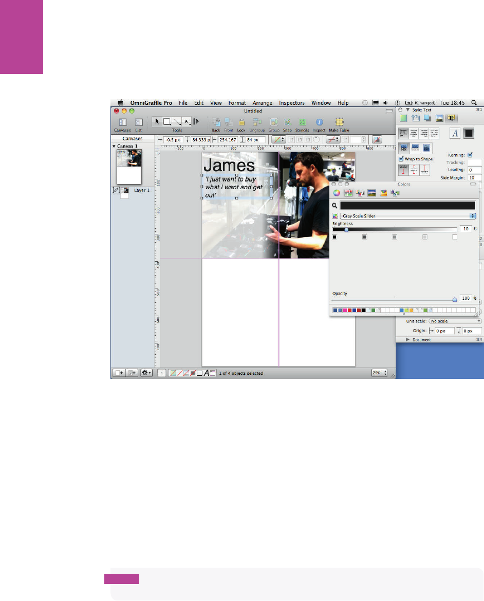
38
COMMUNICATING THE USER EXPERIENCE
F -: Place your title and subtitle over the transparent overlay.
Adding subheadings and bulleted lists
Each group of information in the persona (for example, Key Goals) will need an icon to illus-
trate each group of information, a clear subheading, and a bulleted list to display the infor-
mation. Use the same positions for subheadings and icons across all your personas; this will
simplify the comparison of each persona.
Inserting icons
e icons should be the same size, fairly small, and a light gray. ey should illustrate the
heading but should not take attention away from more relevant information.
note The icons used in this example are available to download along with many others
from the book's supporting website at http://cxpartners.co.uk/resources.
04_9781119971108-ch01.indd 3804_9781119971108-ch01.indd 38 8/10/11 8:34 PM8/10/11 8:34 PM
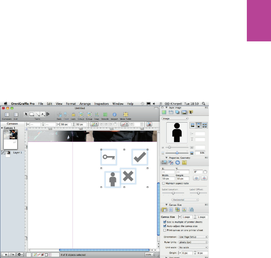
39 CHAPTER ONE PERSONAS
1 When all the icons have been added to the document, select them all.
2 Resize them by going to the Properties: Geometry section of the inspector and changing
the height and width to 50 px (see Figure 1-23).
3 To gray the icons, open the Style: Image section of the inspector and reduce opacity to 50%.
F -: All icons should be the same size and color.
Adding subheadings
Now add the titles for each section of information:
1 Make the font size 24 points and change the color to a light gray to match the icons.
2 Make sure the icons and titles are all aligned nicely by opening the Canvas: Alignment
section (see Figure 1-24) and aligning the icons horizontally with the titles.
04_9781119971108-ch01.indd 3904_9781119971108-ch01.indd 39 8/10/11 8:34 PM8/10/11 8:34 PM
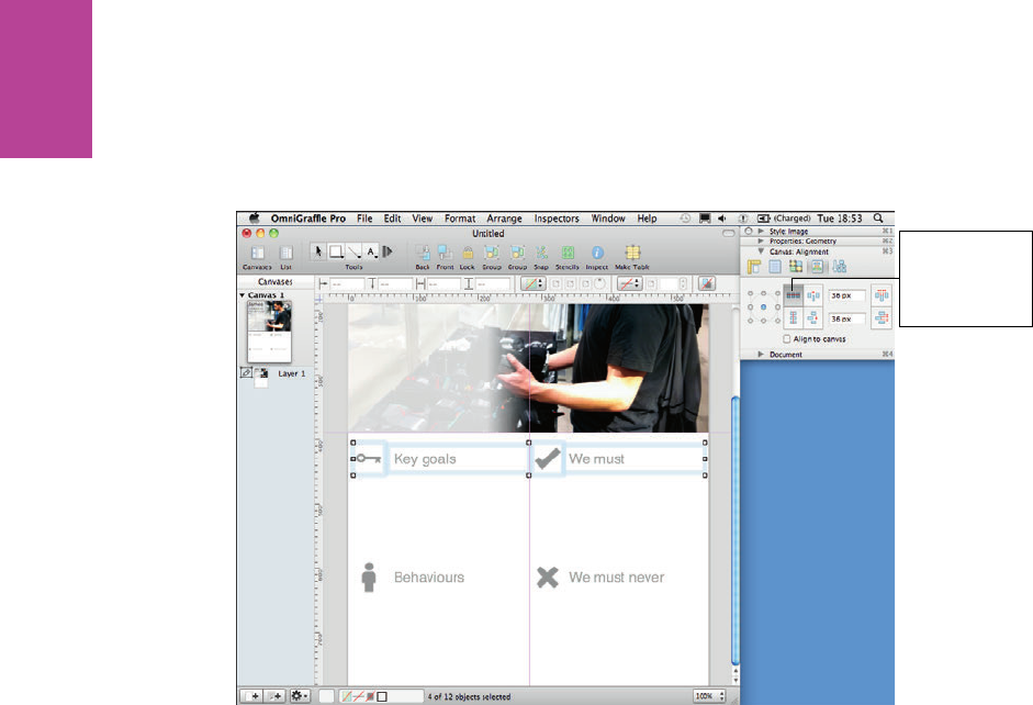
40
COMMUNICATING THE USER EXPERIENCE
Use the alignment
controls to align
icons horizontally
with the titles
F -: Align the icons horizontally with the titles.
Adding bulleted lists
Use bulleted lists for the main pieces of information. is makes the information much
quicker and easier to read. To create a bulleted list:
1 Create a text box.
2 Type your information into the text box.
3 Select all the text.
4 Click the Lists drop-down menu at the top of the canvas and select the round bullet style
(see Figure 1-25).
You can adjust the distance between the bullet and the text by selecting all the text and drag-
ging the arrows in the rulers at the top of the canvas (also refer to Figure 1-25).
04_9781119971108-ch01.indd 4004_9781119971108-ch01.indd 40 8/10/11 8:34 PM8/10/11 8:34 PM

41 CHAPTER ONE PERSONAS
With the text
selected, drag these
arrows to adjust the
indent of the text
F -: Selecting the round bullet style and adjusting indents.
It’s a good idea to adjust the line spacing between the bullets to make everything easier to
read:
1 Select all the text and click the Spacing drop-down menu.
2 Click Other.
3 Adjust the Paragraph spacing after setting to 6.0 points (see Figure 1-26).
For each of your subsequent personas, just duplicate this page by right-clicking the slide in
the canvas list panel on the left and clicking Duplicate Canvas (see Figure 1-27). You just
need to change the photo and all the necessary text. It’s best to leave as many elements as
possible in the same place to make all the personas consistent.
04_9781119971108-ch01.indd 4104_9781119971108-ch01.indd 41 8/10/11 8:34 PM8/10/11 8:34 PM
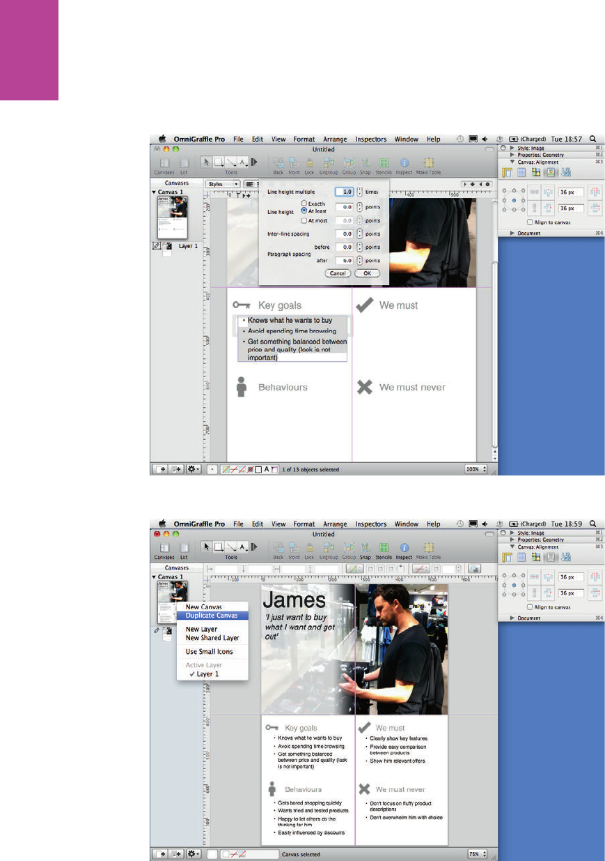
42
COMMUNICATING THE USER EXPERIENCE
F -: Use the Paragraph spacing after settings to keep the text aligned to the top of the text box.
F -: e nished layout can be duplicated and reused for each of your personas.
04_9781119971108-ch01.indd 4204_9781119971108-ch01.indd 42 8/10/11 8:34 PM8/10/11 8:34 PM

chapter 2
Task Models
2
05_9781119971108-ch02.indd 4305_9781119971108-ch02.indd 43 8/10/11 8:32 PM8/10/11 8:32 PM

COMMUNICATING THE USER EXPERIENCE
44
A WELL-RESEARCHED TASK model will transform your project. It’s the most important
design deliverable, and for good reason — it shows what users do, the behavior they adopt,
and speci c requirements at each stage. Building a product or service around these ndings
is more successful because things happen when a user wants them to and the information
they are after can be found.
It’s also a vision document that identi es and communicates how a system needs to behave
to match user expectations. It gives focus and direction to the experience you need to cre-
ate—either in one go or upgrading piece by piece. See Figure 2-1.
F -: A typical task model shows the steps users need to go through and the behavior they adopt in order
to complete goals.
05_9781119971108-ch02.indd 4405_9781119971108-ch02.indd 44 8/10/11 8:32 PM8/10/11 8:32 PM
CHAPTER TWO TASK MODELS 45
What makes a good task model?
At its most basic, a task model shows what tasks a user needs and expects to do to complete
a goal. is can be enhanced with rich information such as behavior patterns, content
requirements, the people involved, the media types that are being referenced, and the users’
emotions.
Many well- nanced projects have failed because they were designed without knowledge of
the expected or desired user behavior. A task model ensures this doesn’t happen by focusing
the team on how the user behaves and what information he needs to complete his goal.
When to create a task model
If a task model hasn’t been created, then there’s no guarantee that the project you are work-
ing on will be a success. For that reason a task model should be created for every project.
Personas and task models sit alongside each other and feed o the same types of research, so
for e ciency the two can be developed side by side, which also allows you to consider di er-
ent task models based on the personas. Competitor benchmarking, personas, and task mod-
els are often covered in the same workshop because they usefully feed o each other.
Task models should be living documents. ey capture a snapshot of an audience at a speci c
time, so they need to be re ned and improved as future research uncovers new insights.
Doing so turns them into an ongoing strategic tool that constantly represents the user
behavior and uncovers opportunity. See Figure 2-2.
What are you communicating?
A task model (see Figure 2-3) tells a story about your audience that becomes a reference
point throughout the projects design and development. e elements included are there to
help you design solutions based on what people actually do.
05_9781119971108-ch02.indd 4505_9781119971108-ch02.indd 45 8/10/11 8:33 PM8/10/11 8:33 PM
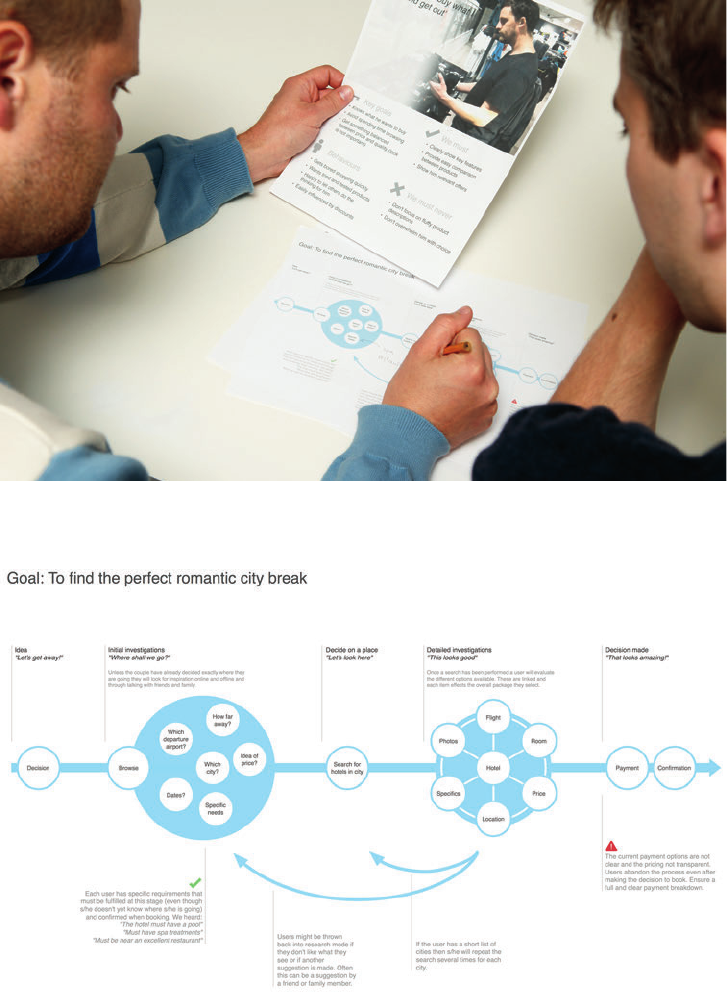
COMMUNICATING THE USER EXPERIENCE
46
F -: Task models are rich documents that you can use to share stories about your users and open
discussions on how best to design to meet their needs.
F -: A completed task model showing the goal, the stages users go through, the behavior they adopt at
each stage, and comments that identify the problems that need to be xed.
05_9781119971108-ch02.indd 4605_9781119971108-ch02.indd 46 8/10/11 8:33 PM8/10/11 8:33 PM
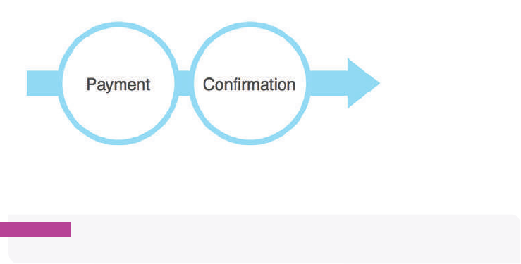
CHAPTER TWO TASK MODELS 47
The goal
What is it that the user is ultimately trying to do? For example, the user is looking to book a
vacation.
The order of tasks
e ow of tasks to complete a goal gives the task model its overall shape. For larger tasks,
these can be grouped into phases. For example, this could be from the initial investigations
of where to go on vacation, the comparing of speci c locations, and on to the actual booking
of the vacation.
User behavior
User behavior shows how a user will want to move between each task. ere are commonly
three behavior states:
> Direct connection. One task leads on to the next. For example, a user has completed
their holiday booking, clicked the submit button, and a con rmation page appears. See
Figure 2-4.
F -: An example of a direct connection: one step leads to the next without deviation.
warning Using direct connections where users don’t want them will lead to a frustrating
experience—they will feel that they are being forced down blind alleys without wanting to be.
05_9781119971108-ch02.indd 4705_9781119971108-ch02.indd 47 8/10/11 8:33 PM8/10/11 8:33 PM
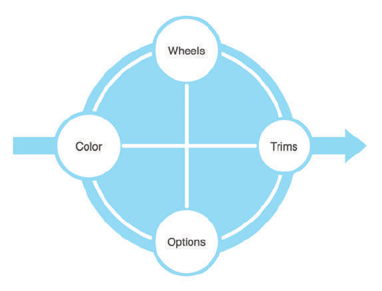
COMMUNICATING THE USER EXPERIENCE
48
> Controlled evaluation. A user wants to explore aspects of a well-de ned product or
service. For example, let’s say you are buying a car and want to evaluate combinations
of di erent wheels, engines, trims, and options (see Figure 2-5). e interface and
navigation can focus just on allowing you to do these things in a controlled environ-
ment until you reach an outcome.
F -: In a controlled evaluation, users move between known variables in order to make decisions. e
designed interface should be focused on clearly presenting these elements.
> Complex evaluation. Complex evaluations can be found in almost every project. is
is where a user requires several di erent, and often unrelated, needs to be ful lled to
complete a goal. When booking a vacation, for example, users evaluate dates, loca-
tions, activities, and cost. It is likely that they will have some speci c requirements
(such as it must have a swimming pool or it must not be too close to a main road). eir
ultimate emotional goals might be to have a relaxing break. Uncovering and under-
standing this information gives guidance to how information is displayed, the feel you
want to convey, and the deeper content that needs to be available. See Figure 2-6.
Emotional needs
What’s driving the user behavior? Is it a need to understand, or a need to be reassured about
the suitability of what he’s looking at? For example, if he is buying a car, the exact speci cation
might be less important than what the car will say about him to his friends and neighbors.
05_9781119971108-ch02.indd 4805_9781119971108-ch02.indd 48 8/10/11 8:33 PM8/10/11 8:33 PM
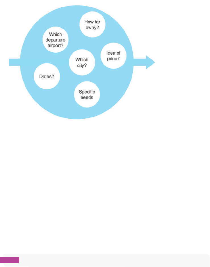
CHAPTER TWO TASK MODELS 49
F -: A complex evaluation recognizes the need to allow users to freely explore often unrelated variables in
order to help them make decisions.
Who or what are they interacting with?
Are there other users involved and what other channels do they want to get the information
from? In the example of choosing a vacation, we envision users reaching decisions collec-
tively with friends or family members. ey will use brochures and they will contact travel
agents in order to explore their options.
Content requirements
rough research you will uncover what content needs users have at di erent times in their
journey. is will range from the general information that every user has to the very speci c
content that a subset of the audience has. It’s worth appreciating that if the speci c needs
aren’t ful lled, the task will fail for those users—or they will switch channels (for example,
they’ll leave a website in favor of picking up the phone to call a call center).
note Refer to Chapter 4, “Content Requirements,” for a simple way to collate these.
Existing barriers
If you have carried out some benchmark research it might be possible to identify the existing
barriers and gaps (through lack of content or functionality) on the task model. Alternatively
05_9781119971108-ch02.indd 4905_9781119971108-ch02.indd 49 8/10/11 8:33 PM8/10/11 8:33 PM
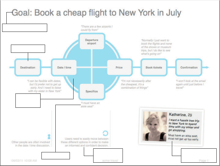
COMMUNICATING THE USER EXPERIENCE
50
if the current model is drastically di erent from the proposed one, you can illustrate the two
alongside each other.
Suggesting solutions
Where barriers have been identi ed and clear solutions exist, these can be overlaid as sugges-
tions onto the task model and discussed in workshops with the project team.
The anatomy of a task model
Task models contain content and design information. is makes them more useful docu-
ments for the project team – ensuring that they are actionable. Visually the task model needs
to be clear and the information expressed simply. So focus on conveying the most important
elements. Figure 2-7 shows a task model that rather simply conveys detailed user behavior.
A reminder of your
persona
Suggestions to
improve design
A controlled
evaluation
An individual task
A clear, goal-based title
Content needs
F -: A simple task model showing the behavior a user adopts for booking a ight. Quotes relating to the
persona reinforce what the user is doing at each stage.
05_9781119971108-ch02.indd 5005_9781119971108-ch02.indd 50 8/10/11 8:33 PM8/10/11 8:33 PM
CHAPTER TWO TASK MODELS 51
Goal
What is the ultimate thing that the user is trying to do? Make this the title of the model.
Tasks
What are the individual things a user has to do to complete the goal? ese become the indi-
vidual elements.
Task phases
Show how the tasks group into natural phases of research, con guration or purchase.
User behavior
What are the behavior patterns a user goes through to complete a task? is is shown in the
layout of the individual tasks and how they are connected.
Content needs
What information do users need to support the task? is is added as a note associated to a
task.
Barriers
Where are the existing barriers and failure points of which you need to be aware of? Highlight
these using an exclamation mark icon, as shown in Figure 2-3.
Design suggestions
What should the site do to help support the task? Include suggestions to discuss with the
project team.
Personas
A reminder of the personas could be added to the task model, especially where di erent task
models are developed to create di erent user scenarios.
Who is the audience?
Task models help to cut through potential complexity on projects. Involve the following
teams in the data analysis workshop so they understand rst hand how users think and what
they do.
05_9781119971108-ch02.indd 5105_9781119971108-ch02.indd 51 8/10/11 8:33 PM8/10/11 8:33 PM
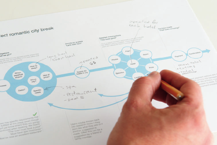
COMMUNICATING THE USER EXPERIENCE
52
A broad audience should review and have input to the development of the task model:
> Stakeholder team. e task model is a great vision document. As you describe the
user behavior you begin to unpack the user experience you want people to have on the
site. It can help to cut through individual thoughts on what the right solution might be
and encourage dialog around nding the best user experience.
> Design team (including user experience teams). Understanding the user behaviors
uncovered in the task models provides insight into how the interface and ow should
be designed.
> Development team (front- and back-end developers, business analysts). ese are the
people who can make the required functionality of the task model a reality. Work with
them to ensure that the right data is available at the right time for users.
How to validate
A task model comes out of research, so in the short term it will not need validating per se.
Any sitemaps, wireframes, designs, and, of course, the nished product will require valida-
tion through user testing. is testing is a good opportunity to re ne your task model. See
Figure 2-8.
F -: Amending a task model during validation testing.
05_9781119971108-ch02.indd 5205_9781119971108-ch02.indd 52 8/10/11 8:33 PM8/10/11 8:33 PM

CHAPTER TWO TASK MODELS 53
When testing, remember to ask what users will expect to happen next and what they want to
be able to do. If what they are expecting or what they want is di erent from what you’ve
designed, there’s a strong likelihood that your task model needs re ning.
When you have a good task model you will be validating labeling and clarity of layout rather
than the underlying ow and functionality.
RESEARCH AND WORKSHOP IDEAS
ere are brilliant research techniques (such as structured depth interviews) where you can
focus on the details of a user recalling a story. And there are methods (such as ethnography
and diary studies) where you see the completion of tasks over a period of time. In this sec-
tion, we’ve focused on some simple research techniques that you can easily slot into even the
smallest of projects.
RESEARCH TECHNIQUE: Conduct research
You can (and should) do lightweight research on every project. Here are some ideas. In all
approaches, jot down stories showing the people that users spoke to, the order in which
users did things, the information users were after, and how they got it.
Visit call centers
If the organization you are working for has a call center, that’s a perfect place to carry out
research. Sit alongside an operator (it’s good to partner with a few over the course of a day),
listen in on as many calls as you can, and capture the user stories, noting:
> What do they ask for?
> In what order?
> How does the operator respond?
> Does the operator have additional reference content to hand?
> Is the call successful?
> What are the parting shots?
Make contextual observations
Customer service points, sales desks, and employee shadowing (following someone around
for a period of time) are all perfect for seeing interactions between customers and businesses.
05_9781119971108-ch02.indd 5305_9781119971108-ch02.indd 53 8/10/11 8:33 PM8/10/11 8:33 PM

COMMUNICATING THE USER EXPERIENCE
54
You are listening for the same information that you are in the call center but you also will
observe the physical gestures and expressions that people make.
You’ll need to think through how you take notes so as not to look too much like a researcher
with a clipboard. Sneaking away to write notes after each customer interaction can work, but
you might miss another good story. Audio recordings are good, but you’ll most likely need
permission.
Taking photos (see Figure 2-9) will remind you of the environment and act as prompts to
help you recall stories. For example, in a clothing store, take photos that show the way in
which people move around. Note how they initially scan all the items before selecting a few
items to try on and eventually purchasing an item.
F -: Photos help to remind you of environments and enable you to recall stories about user behavior.
Visit online forums
Forums are an ideal place to uncover user stories. You can sift through hundreds of posts in
a relatively short amount of time and get a very clear sense of questions and expectations for
any given task.
05_9781119971108-ch02.indd 5405_9781119971108-ch02.indd 54 8/10/11 8:33 PM8/10/11 8:33 PM

CHAPTER TWO TASK MODELS 55
WORKSHOP IDEA: Analyze data
Once you’ve collected the research, you need to make sense of the stories and uncover user
needs and behavior. Use Post-it Notes and a large whiteboard to position the individual ele-
ments and connect them with arrows.
You might discover that your personas have di erent task models—they might be trying to
complete di erent goals or they might have signi cantly di erent ways of completing the
same goal. In this instance, create a unique task model for each persona. Being able to com-
pare the di erences will show you how the product or service must support the needs of each
user type.
Identify the goal
What is it that users ultimately want to do? Identifying the goal is key.
Analyze the information
Analyze each of the stories that you’ve collected and pull out the unique needs, associated
content, and how people were looking to access the information. Put each unique need onto
a Post-it Note.
Group the information
Group the Post-it Notes into the phases that users go through. Order the groups and give
each a name (for example, for a commerce scenario, it might be research, purchase, and post-
purchase). See Figure 2-10.
F -: Signs of a good data analysis workshop. Unique needs have been identi ed and grouped into stages.
05_9781119971108-ch02.indd 5505_9781119971108-ch02.indd 55 8/10/11 8:33 PM8/10/11 8:33 PM
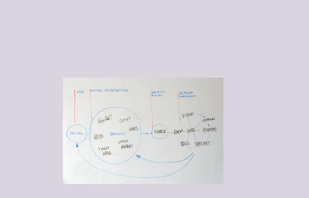
COMMUNICATING THE USER EXPERIENCE
56
Identify the user behavior
Which behavior pattern are users using? Are they going straight from one task to the next or
are they using controlled or complex evaluations to weigh the di erent elements?
Highlight the emotions
Finally run back through your stories and identify the users’ emotional needs. What do they
enjoy, what do they nd frustrating? By understanding these, you can start to add a color
and richness to your task model—and this helps you to prioritize the existing barriers that
need to be resolved. Stick a red dot on Post-it Notes that identify pain points and a green dot
on the positives.
What’s the simplest way to illustrate a task model?
Once you complete the data analysis workshop, you’ll have a whiteboard of Post-it Notes
arranged into the task model and joined by arrows. This can be photographed, shared, and
talked through with the project team immediately.
An alternative approach is to quickly sketch out the task model as in Figure 2-11 and share.
Focus on the tasks and behavior states rst to get the basic structure. Then overlay the
richer content information and notes on top of that.
F -: A sketched task model can be drawn and shared quickly with the project team.
05_9781119971108-ch02.indd 5605_9781119971108-ch02.indd 56 8/10/11 8:33 PM8/10/11 8:33 PM
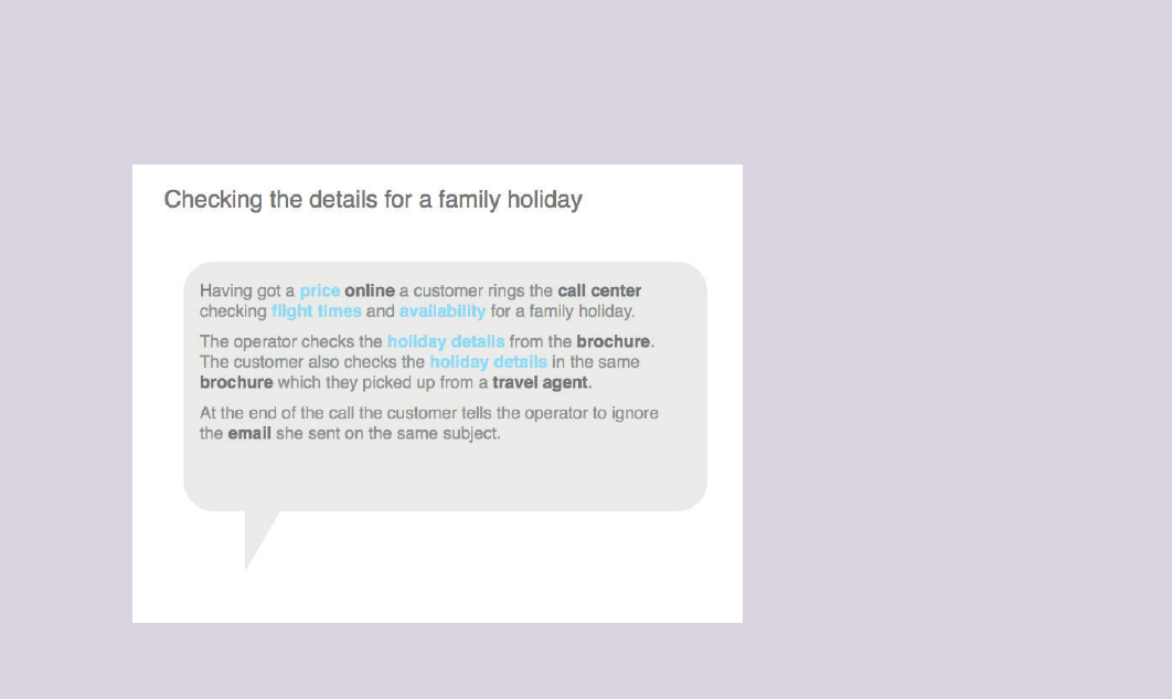
CHAPTER TWO TASK MODELS 57
You can create short stories of an individual’s task process. Highlight what she was after
and the way in which she went about getting it (see Figure 2-12). Putting several stories
together can be a powerful way to communicate the diversity (and richness) of approaches
that users take to complete the same task.
F -: is story shows richness in the way a person clari ed the details of a vacation she
was interested in.
05_9781119971108-ch02.indd 5705_9781119971108-ch02.indd 57 8/10/11 8:33 PM8/10/11 8:33 PM

COMMUNICATING THE USER EXPERIENCE
58
HOW TO Create task models in OmniGraf e
OmniGra e is the perfect tool for creating task models. It’s exible enough to allow you to
do some attractive information design but provides you with all the basic pre-de ned shapes
you’ll need to pull it together simply.
Setting up the template
To set up the template, follow these steps:
1 Launch OmniGra e. e default templates are displayed.
2 Select the blank template and click the New Diagram button.
e size of the canvas you use depends on the size and complexity of the task model you
need to represent. Working on a large canvas is generally easier, as it gives you more room by
default to position shapes—using A3 dimensions (297 mm by 420 mm) is a good starting
point.
To change the canvas size:
1 Go to the File menu and choose Page Setup.
2 Click the Paper Size drop down and select Manage Custom Sizes to enter your own dimen-
sions.
3 Click the + button, give the custom size a name (in this case, A3), and then type the
required dimensions.
4 Click OK in this dialog box and then click OK in the Page Setup dialog box to set the new
canvas size (see Figure 2-13).
tip Additional canvas controls can be accessed by clicking the Inspect button shown in
Figure 2-13.
05_9781119971108-ch02.indd 5805_9781119971108-ch02.indd 58 8/10/11 8:33 PM8/10/11 8:33 PM
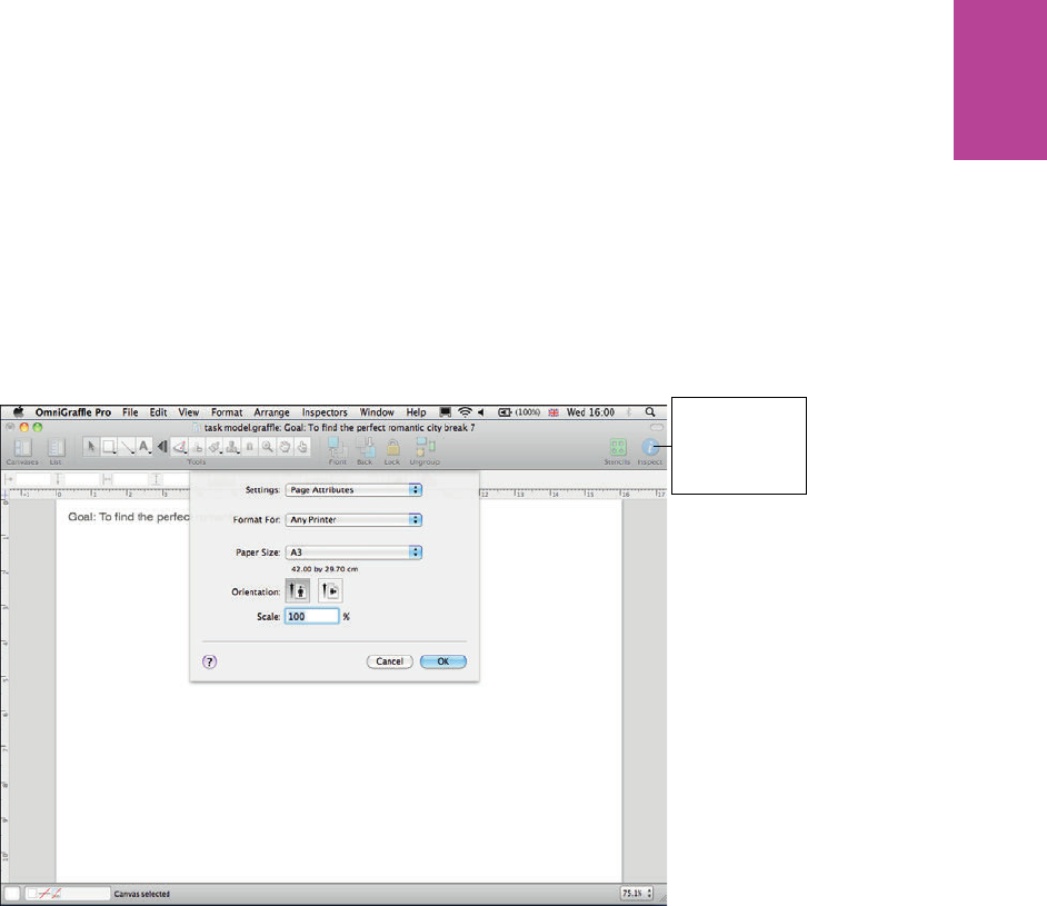
59 CHAPTER TWO TASK MODELS
Click the Inspect
button to access
additional canvas
controls
F -: Using the Page Setup dialog box to choose your canvas size.
05_9781119971108-ch02.indd 5905_9781119971108-ch02.indd 59 8/10/11 8:33 PM8/10/11 8:33 PM
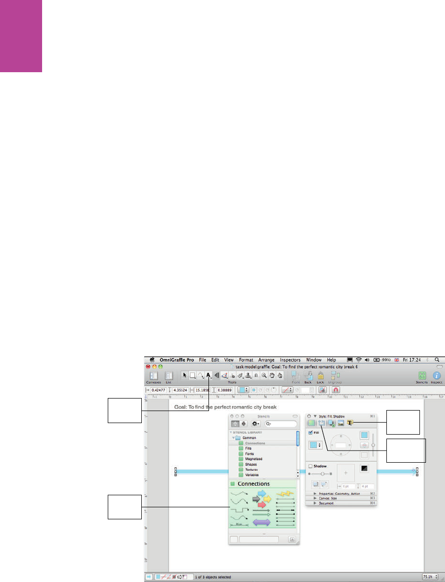
60
COMMUNICATING THE USER EXPERIENCE
Creating a title for your document
To create a title for your document, simply select the Text Tool button (see Figure 2-14) and
then type a title that describes the goal you are representing.
Indicating direction
At its simplest, direction is indicated with a single block arrow through the center of the
model (see Figure 2-14). To do this:
1 Open the Stencils window.
2 Select the block arrow and drag it onto your canvas. Move and resize it into the desired
position.
3 Select the shape and open the Inspector.
4 Select the Style section to select the Fill color, deselect the Shadow option, and then
remove the outline (by un-checking the Stroke box in the Lines and Shapes tab).
Style
section
Lines and
Shapes tab
Text Tool
button
Stencils
window
F -: e title and block arrow are styled and in place. Both the Stencils window and Inspector are open.
Creating the model
With your template now ready, you can begin to add the elements that make up the nal task
model.
05_9781119971108-ch02.indd 6005_9781119971108-ch02.indd 60 8/10/11 8:33 PM8/10/11 8:33 PM

61 CHAPTER TWO TASK MODELS
Adding individual tasks
To create an individual task, follow these steps:
1 From the Stencil window, select the ellipse and drag it onto the canvas.
2 Resize it making sure it’s a perfect circle.
3 Ensure that the ll color is white, remove the shadow and make the outline color the
same as the block arrow.
4 Position tasks along the arrow (see Figure 2-15).
F -: Individual tasks aligned along the block arrow.
05_9781119971108-ch02.indd 6105_9781119971108-ch02.indd 61 8/10/11 8:33 PM8/10/11 8:33 PM

62
COMMUNICATING THE USER EXPERIENCE
Creating a controlled evaluation
In a controlled evaluation a user should be able to move among all elements in order to make
sense of or select a number of di erent linked components.
e nal shape is created by layering a number of individual components on top of each
other and styling them appropriately.
1 Add a circle to the diagram and style it with the same ll color as the block arrow (again
removing shadows and outlines). See Figure 2-16.
F -: Adding a circle to the diagram.
2 Add a second circle on top but this time use the Inspector to give it a white outline. See
Figure 2-17.
05_9781119971108-ch02.indd 6205_9781119971108-ch02.indd 62 8/10/11 8:33 PM8/10/11 8:33 PM
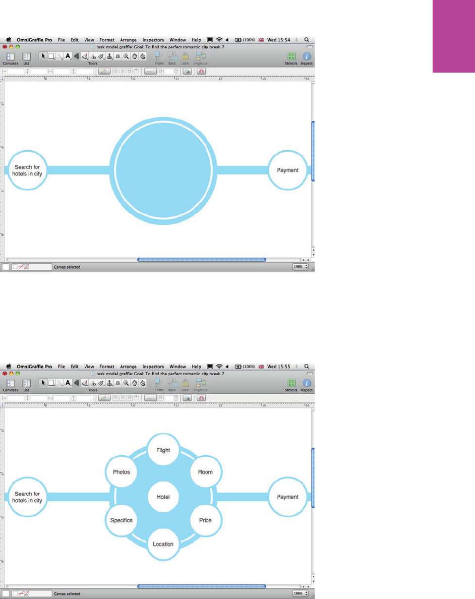
63 CHAPTER TWO TASK MODELS
F -: Adding a second circle with a white outline.
3 Copy and paste individual tasks (created previously).
4 Rename the tasks and position the most important task in the center with the remainder
around the outside. See Figure 2-18.
F -: Renaming the tasks and placing the most important task in the middle.
05_9781119971108-ch02.indd 6305_9781119971108-ch02.indd 63 8/10/11 8:33 PM8/10/11 8:33 PM
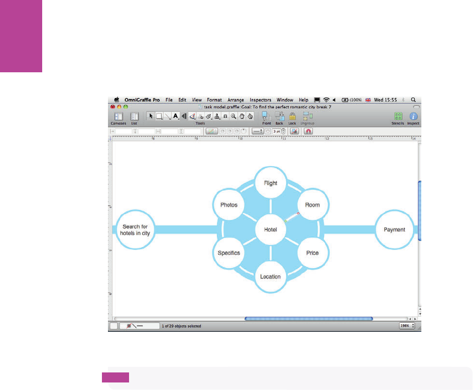
64
COMMUNICATING THE USER EXPERIENCE
5 Select the line tool from the Toolbar and use connecting lines to join the items together
through the center.
6 Style the lines to be white. See Figure 2-19.
F -: Using white connecting lines.
tip Make all lines and outlines the same width to help give the diagram a consistent look.
Creating a complex evaluation
Conceptually a complex evaluation is a harder behavior process to understand. Illustrating it
is straightforward, however:
1 Add a circle to the diagram.
2 Copy and paste individual tasks in a random pattern on top of a lled circle.
3 Rename them.
e illusion you want to create is that a user is holding a number of di erent task consider-
ations in the same state at the same time. See Figure 2-20.
05_9781119971108-ch02.indd 6405_9781119971108-ch02.indd 64 8/10/11 8:33 PM8/10/11 8:33 PM

65 CHAPTER TWO TASK MODELS
F -: e complex evaluation. In this example, all the tasks are relating to the core activity of browsing for
a holiday.
Creating loop backs
Loop backs are possibly the hardest elements to create. ere is no simple way to create
smooth arcs with arrowheads in OmniGra e.
1 On the Toolbar, click and hold on the Line Tool.
2 When the options display, select the Bézier curve with the arrowhead.
3 Add three points on the canvas.
4 Double-click the last point (this moves you into edit mode rather than continuing to add
more points). See Figure 2-21.
05_9781119971108-ch02.indd 6505_9781119971108-ch02.indd 65 8/10/11 8:33 PM8/10/11 8:33 PM
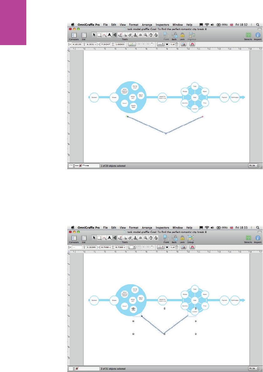
66
COMMUNICATING THE USER EXPERIENCE
F -: Adding three points.
5 Draw and align two white squares (they will be invisible in the nal diagram, but they act
as anchor points for the nal curve).
6 Connect the ends of the arrow to the white squares. See Figure 2-22.
F -: Connecting the arrows to the squares.
05_9781119971108-ch02.indd 6605_9781119971108-ch02.indd 66 8/10/11 8:33 PM8/10/11 8:33 PM

67 CHAPTER TWO TASK MODELS
7 Make sure the center point of the line is aligned halfway between the two ends.
8 Holding down the Cmd key, click the center point and pull it out sideways. is reveals
the handles, which can then be adjusted to create the curve. See Figure 2-23.
F -: Curving the line.
9 Finally, style the line by adjusting the stroke width and color. See Figure 2-24.
F -: Styling the line.
05_9781119971108-ch02.indd 6705_9781119971108-ch02.indd 67 8/10/11 8:33 PM8/10/11 8:33 PM
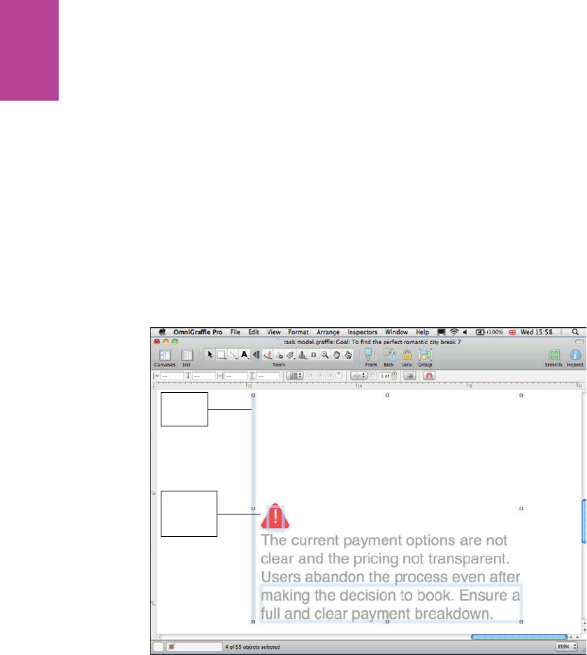
68
COMMUNICATING THE USER EXPERIENCE
Creating notes
To create a note, follow these steps:
1 Select the Line Tool and draw a vertical line between the task model and where you want
the note to appear.
2 Select the Text Tool and click and drag on the canvas to create a text box.
3 Add the note.
4 In the Inspector style the text with the desired font and color.
5 Align the text box with the vertical keyline (see Figure 2-25).
If required, barriers and positive elements discussed in notes can be indicated using simple
icons (such as the exclamation point shown in Figure 2-25).
Vertical
keyline
Adding an
exclamation
point
F -: e nal note with callouts showing alignment with the keyline and the addition of an exclamation
point.
05_9781119971108-ch02.indd 6805_9781119971108-ch02.indd 68 8/10/11 8:33 PM8/10/11 8:33 PM
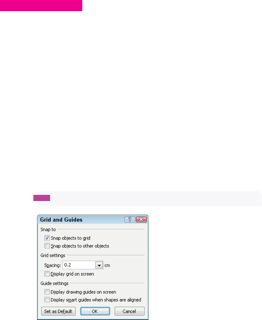
CHAPTER TWO TASK MODELS 69
HOW TO Create task models in PowerPoint
PowerPoint has a solid set of drawing tools that can be used to create sharp-looking task
models. PowerPoint is particularly useful when the task model is presented at the same time
as ndings from a usability test and everything can be created in the same document.
Setting up the template
To set up a template, follow these steps:
1 Launch PowerPoint, go to the File tab, and select New. A menu of document types dis-
plays.
2 Highlight the Blank presentation then click the Create button on the right.
3 In the Home tab, in the Slides group, click the Layout button and select the Title Only
layout.
You’ll nd sizing the shapes and aligning the elements much easier if you enable snapping to
grid. To do this:
1 Right-click the slide and choose Grid and Guides.
2 Select Snap objects to grid (see Figure 2-26).
tip If you want to customize your slide layout we cover this in detail in Chapter 7.
F -: Selecting the Snap objects to grid option.
05_9781119971108-ch02.indd 6905_9781119971108-ch02.indd 69 8/10/11 8:33 PM8/10/11 8:33 PM

70
COMMUNICATING THE USER EXPERIENCE
Adding a title
To add a title, follow these steps:
1 Click in the title box and type the goal the task model is illustrating.
2 Resize the title box and reduce the font size to give the task model diagram more room.
Adding the tasks
To add tasks, follow these steps:
1 On the Home tab, in the Drawing group, click the Shapes menu and select the Rounded
Rectangle from the shape box. Draw a rectangle on the slide.
2 With the shape selected, in the Drawing group, use the Shape Fill menu to select a pale
gray.
3 In the Drawing group, use the Shape Outline menu to select a blue theme color and then
change the width.
4 Type the task name and then style the text using the font controls in the Home tab.
tip Right-clicking any shape allows you to select the Format Shape dialog, which allows
you to control the style of the shape from a single location.
5 Copy and paste the original task for each of the remaining tasks and rename them.
note Depending on the number of tasks, it might be necessary to resize the rectangles and
type size to allow the tasks to fi t into the same slide.
Occasionally, you might need to enlarge slide area in the page set-up (this helps the layout,
and you can scale it back down to a side of A4 you print).
6 Align the shapes—this is where snapping to grid comes into its own.
Creating the model
Task models are created in PowerPoint by simply styling and aligning shapes. But there are a
few tricks that will make getting started easier.
05_9781119971108-ch02.indd 7005_9781119971108-ch02.indd 70 8/10/11 8:33 PM8/10/11 8:33 PM
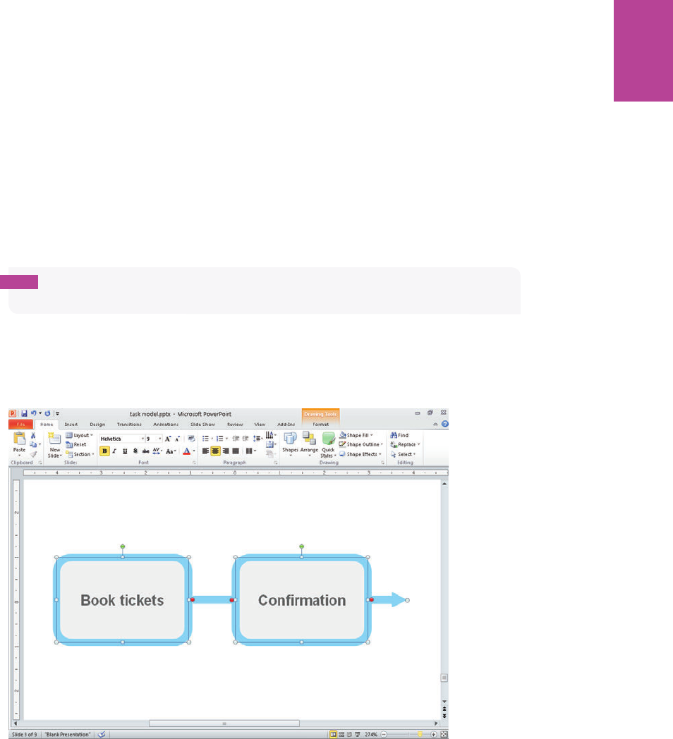
71 CHAPTER TWO TASK MODELS
7 In the Drawing group, click the Shapes menu and choose connecting lines. Draw lines
between the individual tasks. ese are magnetized to allow them to snap to the edge of
other shapes.
tip Use arrows only where necessary to indicate the direction of the task. Using arrows
everywhere can clutter the diagram.
8 In the Drawing group, use the Shape Outline menu to style the connecting lines and
arrows using the same color and thickness as the outline of the rounded rectangle. is
helps join the elements together visually. See Figure 2-27.
F -: e tasks and connecting lines have been added and styled.
05_9781119971108-ch02.indd 7105_9781119971108-ch02.indd 71 8/10/11 8:33 PM8/10/11 8:33 PM

72
COMMUNICATING THE USER EXPERIENCE
Creating a controlled evaluation
e simplest way to create a controlled evaluation is to build it from a series of shapes lay-
ered on top of each other. As with creating tasks, use the shape menu to select the shape and
then style them using the ll and outline controls.
1 Draw a lled circle for the background (see Figure 2-28).
F -: Drawing the circle.
2 Layer a circle with a pale outline (and no ll) over the top to form the connection lines
between the task boxes (see Figure 2-29).
05_9781119971108-ch02.indd 7205_9781119971108-ch02.indd 72 8/10/11 8:33 PM8/10/11 8:33 PM
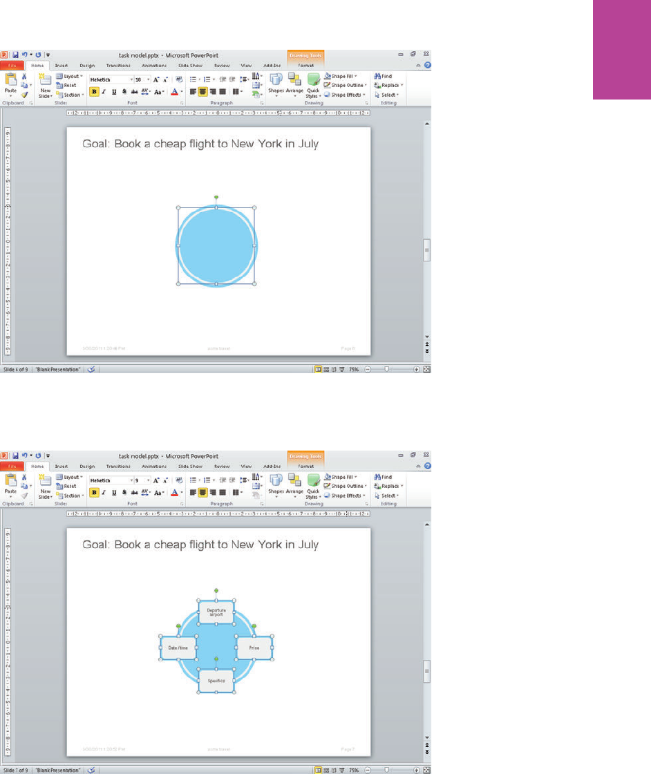
73 CHAPTER TWO TASK MODELS
F -: Layering the circle.
3 Position the task blocks around the edge of the circle (see Figure 2-30).
F -: Positioning the task blocks.
05_9781119971108-ch02.indd 7305_9781119971108-ch02.indd 73 8/10/11 8:33 PM8/10/11 8:33 PM
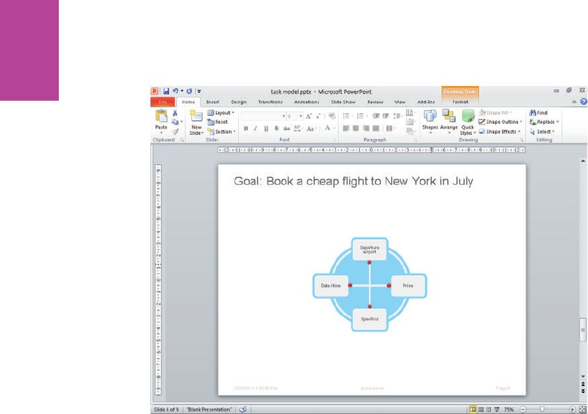
74
COMMUNICATING THE USER EXPERIENCE
4 Use connecting lines to join the opposite shapes (see Figure 2-31).
F -: Using connecting lines to join the shapes.
Creating simple icons
You can easily create icons that help illustrate your task model by combining a few shapes.
Again, shapes are selected from the Shapes menu and styled accordingly. Figure 2-32 shows
how two circles and a rectangle have been grouped together and resized to create a simple
person icon.
Standard shapes within PowerPoint can also be adapted to illustrate a point. Figure 2-33
shows a rounded block arrow that has been styled to indicate an iterative process.
05_9781119971108-ch02.indd 7405_9781119971108-ch02.indd 74 8/10/11 8:33 PM8/10/11 8:33 PM
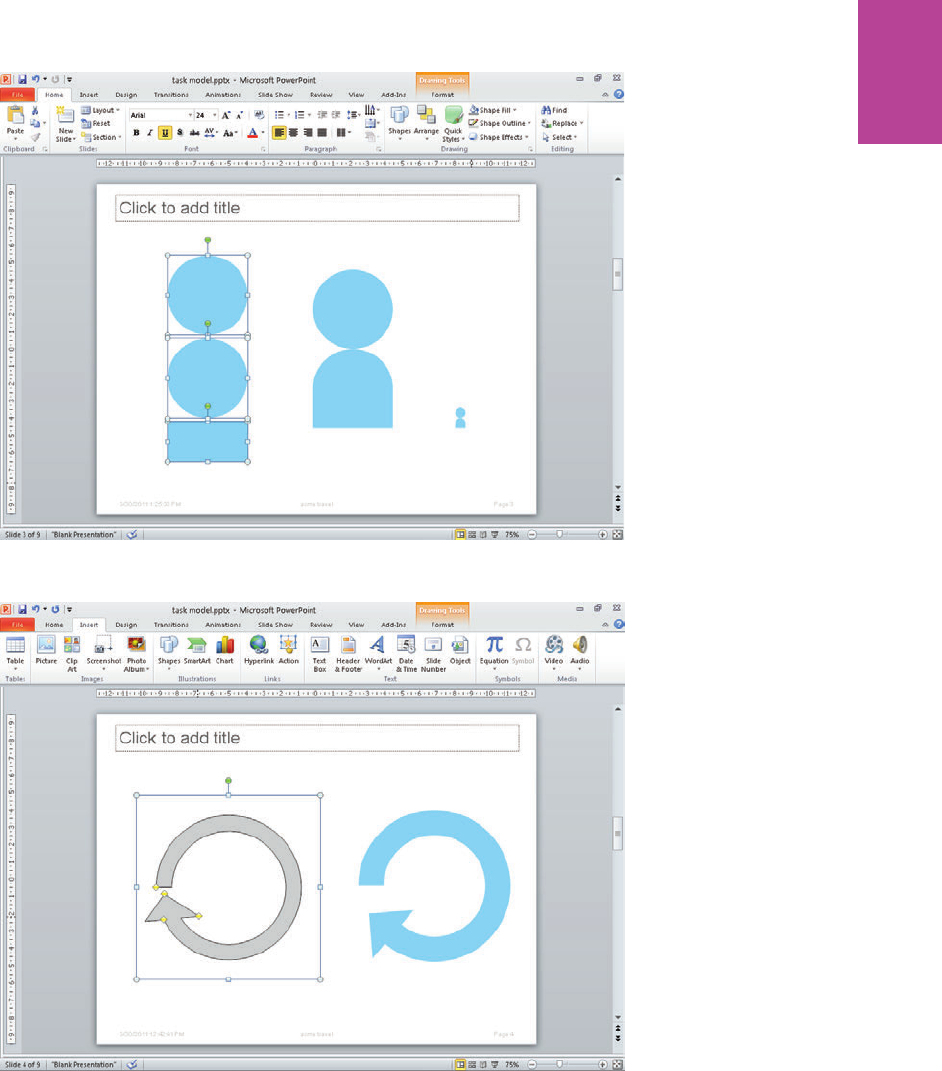
75 CHAPTER TWO TASK MODELS
F -: Two circles and a rectangle have been grouped to create a person icon.
F -: Standard shapes can be selected and styled to create simple icons.
05_9781119971108-ch02.indd 7505_9781119971108-ch02.indd 75 8/10/11 8:33 PM8/10/11 8:33 PM
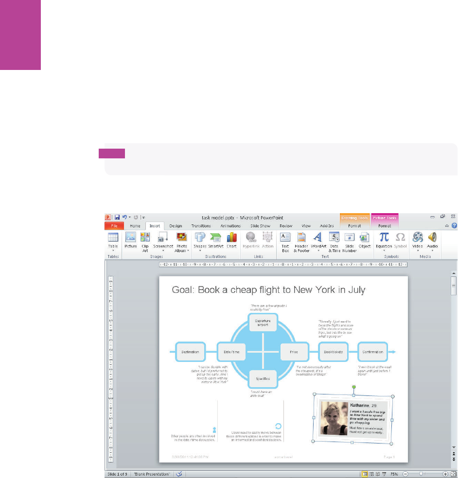
76
COMMUNICATING THE USER EXPERIENCE
Adding the finishing touches
From the Shapes menu, select text boxes and lines to add the notes relating to the task
model.
Information from one of the project’s personas and user quotes are added to give color to the
persona and make it real for the project team. e persona photo is added by clicking the
Insert tab and then clicking the Picture button.
tip Black and white photos often work better because they are less distracting than color
photos.
Figure 2-34 shows the completed task model.
F -: e nished task model showing notes and the persona summary.
05_9781119971108-ch02.indd 7605_9781119971108-ch02.indd 76 8/10/11 8:33 PM8/10/11 8:33 PM

Chapter 3
User Journeys
3
06_9781119971108-ch03.indd 7706_9781119971108-ch03.indd 77 8/10/11 8:32 PM8/10/11 8:32 PM

COMMUNICATING THE USER EXPERIENCE
78
USER JOURNEYS DETAIL the exact steps a user goes through to complete a task or goal.
ey di er from task models in that they show the required interactions and paths through
a system rather than being a representation of desired user behavior. ey also di er from
sitemaps as they show speci c routes through a site rather than the logical structure of the
entire site. However, the three documents need to align with each other and you will nd
yourself working back and forth between them ensuring that the desired user experience
matches.
is chapter focuses on detailed, system-based user journeys (see Figure 3-1) rather than the
broad journeys a user might take as he moves between online and o ine activities.
F -: A user journey showing the individual steps through a system to complete a task.
06_9781119971108-ch03.indd 7806_9781119971108-ch03.indd 78 8/10/11 8:32 PM8/10/11 8:32 PM
CHAPTER THREE USER JOURNEYS 79
What makes a good user journey?
A good user journey re ects the behavior uncovered in the task model, which is developed
through research and observation. Ensuring that the task model and user journey match is
an important way of checking that the system you are creating meets the needs of the user.
A user journey is a great document to help you gure out how elements of a site will ow
together and is helpful when discussing the options with the team. User journeys are easy to
sketch out on a whiteboard or by using Post-it Notes. You can map out the wireframes
against them, ensuring that the right content elements are on each page.
When to create a user journey
ere are two scenarios where user journeys should always be created:
> Product development. Create a user journey when developing a system from scratch.
For example, you’re working with a client to develop a new check-out process and you
need to understand the best way to implement it.
> Analysis. Create a user journey when testing has shown that the current user journey
is broken and needs to be xed. For example, when an confusing check-out process
journey can be redesigned to increase conversion.
Product development
User journeys should be created when you are developing a new product or service. ey help
you understand the system that the user requires to be built and help make sure that you can
match it in the interface (for example, do you have the right links to the right places on each
page?) and with the technical implementation (for example, can the right data calls be made
at the required points?).
Develop the user journey once you have a solid set of personas and task models to base it on;
these will both inform it and help you check that you have the right user journey. Conducting
benchmark testing of an existing service (for example, testing on a previous version of the
product or on a competitor’s products) will help to identify problems with the user journey
that need xing and help you avoid the same mistakes.
To help ensure that the user journey is optimized—and only if time allows for this—explore
more than one user journey and test each both during development and once the product is
launched. is can be helpful for processes such as an e-commerce checkout where you can
test the performance of asking for all customer details on one page versus splitting them
over a number of pages. Both solutions are usable, but the real-world performance and con-
version might vary.
06_9781119971108-ch03.indd 7906_9781119971108-ch03.indd 79 8/10/11 8:32 PM8/10/11 8:32 PM
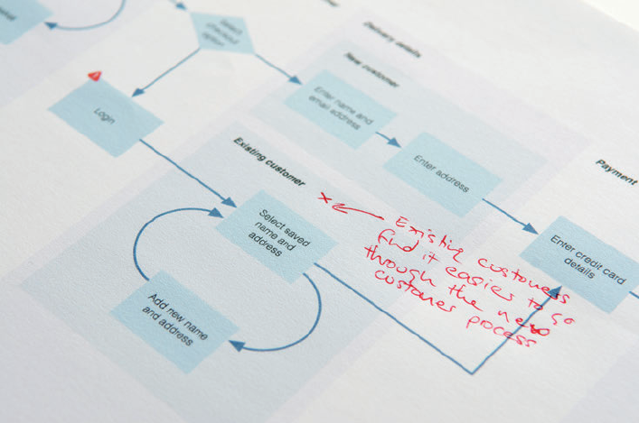
COMMUNICATING THE USER EXPERIENCE
80
Analysis
User journeys are excellent documents to produce after user testing or after expert reviews
have been carried out on an existing product or service. ey enable you to step back from
the page-by-page analysis to view the journey as a whole. is can be done a number of ways:
> You can show the existing user journey and describe the positives and pain points (see
Figure 3-2).
> You can show how the existing user journey needs to be adapted to better serve the
needs of the user.
> You can revise the user journey completely based on the needs of the user.
> Or you can show how the existing journey can be expanded with newly uncovered
journeys.
F -: Analyzing a user journey can show you pain points and where the journey can be re ned.
What are you communicating?
e following elements can typically be illustrated in a user journey.
06_9781119971108-ch03.indd 8006_9781119971108-ch03.indd 80 8/10/11 8:32 PM8/10/11 8:32 PM
CHAPTER THREE USER JOURNEYS 81
The goal or task
Use the goal or task as the page title. is is the user desired outcome from the journey. For
example, this might be the user’s desire to buy the items in the shopping cart.
Steps
In a user journey diagram a single block represents a speci c step users must do to complete
their journey. is could be a piece of information for them to review or an item of data that
they need to submit. For example, it might be their need to enter their mailing address or
their credit card information.
Decision points
Decision points are used when a user has to make a choice in order to carry on through the
journey—picking a car color out of a range of available colors, for example. e result could
be to go on to a single next step with that selection made, or for two or more resultant
branches in the user journey diagram showing alternate routes.
Start and end steps
Start and end steps illustrate the beginning and the end of the user journey. Using di erent
shaped blocks helps these to stand out. For example, the start of the journey might illustrate
the addition of items to the basket and the end of the journey might con rm that the prod-
ucts have been purchased.
Grouping
A single step can be on a page of its own. If there are several steps on a single page, grouping
needs to be shown. is could be where the name, address and contact information is
grouped together on a personal details page.
Flow
Single and double-headed arrows can be used to show the direction in which the user can
move between tasks or steps. Using curved arrows back to a previous step can be a more
e ective way of illustrating where users are repeating the same task (or tasks) one or more
times. Editing a cart on an online store is a good example of an iterative process.
Content
It can be useful to add any content requirements onto the user journey without which the
journey could not be completed. For example, you might nd that users require a summary
06_9781119971108-ch03.indd 8106_9781119971108-ch03.indd 81 8/10/11 8:32 PM8/10/11 8:32 PM
COMMUNICATING THE USER EXPERIENCE
82
of the products they are buying to be carried through each step of the checkout to reassure
them that everything they want is indeed being purchased. ese should also be added to the
content requirements document.
Pain points
In conducting analysis on an existing user journey, a clear illustration of pain points helps
the project team to focus on the elements that need to be xed.
External factors
Are there elements a user needs to complete the task that are outside of the system on which
you are focusing? is could be external sites, conversations, and so on. It’s important to
show the interrelationships to build as accurate a user journey as possible.
Measurement
If your user journey is of an existing system, analytics can be overlaid onto the diagram to
show the actual usage of speci c elements. If you are creating a user journey for a new sys-
tem, then it is a good idea to include the measurement points so you can track how users
interact with the system to help with the ongoing analysis and improvement.
The anatomy of a user journey
User journeys are functional documents. Styling is kept to a minimum in order to let the
design and development team focus on the ow and detail of the content. See Figure 3-3.
Title
e title is a simple summary of the goal the user needs to achieve.
Groupings
Groupings are the pages or phases that the steps group into. In this example, they’re nested
to show a split in the journey for di erent user groups. Shading shows how elements are
nested together.
Start steps and end steps
Start steps and end steps are the elements that trigger the step and the last things that hap-
pen. Depending on your project it might be necessary to show how several user journeys join
together. ese are indicated through simply rounding the corners.
06_9781119971108-ch03.indd 8206_9781119971108-ch03.indd 82 8/10/11 8:32 PM8/10/11 8:32 PM
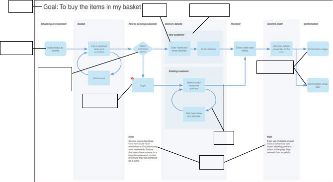
CHAPTER THREE USER JOURNEYS 83
Steps
A step is the action that needs to be performed by the user or the content that he needs to
review.
Pain points
Pain points from existing research can be added to individual steps to show where some-
thing needs re ning.
Decision points
Decision points illustrate the steps that cause a split in the user journey. A diamond is used.
Flow
e ow is simply the direction a user can move in between steps. It’s shown by one- or two-
way arrows and iterative loops.
Notes
Notes are spaces to record key learning and communication points.
Title Step Groupings
End steps
Start step
Decision
points
Pain point
Flow
Notes
F -: An example user journey showing the key elements to include.
Who is the audience?
Like most user experience documentation, the user journey’s audience spans the di erent
roles on the project team. At a high level, the whole team will need to understand the ow
06_9781119971108-ch03.indd 8306_9781119971108-ch03.indd 83 8/10/11 8:32 PM8/10/11 8:32 PM
COMMUNICATING THE USER EXPERIENCE
84
and associated freedom (or restriction) of movement you’ve uncovered through user research
and documented in the task model. At a detailed level, the user journey uncovers exactly
what needs to happen at each stage as a user moves through a site—and therefore where the
content and data need to sit to support it.
I’ve divided the audience according to their di erent practical needs:
> Business analysts and project managers. ey care about the detail of the user jour-
ney. ey will want to make sure that all required elements have been accounted for
and that the process can be developed as speci ed on time and budget.
> e development team. ey want to make sure that the development and framework
they are using can support the journey speci ed. For example, if an o -the-shelf
e-commerce package is being used, how can it be adapted to match the required
user journey?
> Copywriters, designers, and the wireframe team. ey need to understand the
overall ow of the user journey. It will help to identify the number of pages and tem-
plates needed and beyond that help them consider how to create consistency in style
and interaction as a user moves between the pages.
> Business stakeholders. Does the user journey meet the practical, functional and
monetary business needs? Will users be able to easily complete the tasks and have a
positive experience?
How to validate the user journey
When you’ve completed research to set up the user journey (see the research and workshop
ideas later in this chapter), you’ll have a lot of con dence that the journey you’re creating is
the right one. You can validate and optimize the user journey at several times during the
development process, rst on prototypes and later on the live site.
User testing of wireframes, designs, and live sites
Testing sites, applications, and their prototypes frequently expose problems that relate to
the user journey (and often task model).
If you see that the process isn’t meeting user expectations (if users don’t know what’s com-
ing next, or that they can’t do things or nd information at the right time), then you’ll need
to step back and revise the user journey.
If you’ve completed a full user-centered design process, you’re less likely to nd that this is
the case than if you’ve jumped straight into user testing toward the end of a project.
06_9781119971108-ch03.indd 8406_9781119971108-ch03.indd 84 8/10/11 8:32 PM8/10/11 8:32 PM

CHAPTER THREE USER JOURNEYS 85
A/B testing and multivariate testing (MVT)
A/B and multivariate testing allow you to test the real-world performance of two or more
design variables against each other to uncover which combination of variables is most e ec-
tive for the completion of tasks (see Figure 3-4). A/B testing typically looks at two variables;
MVT allows for many more variations.
Before completing A/B or MVT testing, ensure that all candidate solutions are usable (by
developing them as part of a user-centered design process) so you have the con dence that
none of the solutions will break the site.
You can test the user journey at three levels:
> Element level to test that speci c form elds and pieces of content are in the right
place and executed in the best way.
> Group level to test the order of chunks of content on a page.
> Page level to test the optimal ow through the site.
F -: A/B testing and MVT testing can help you decide which variables of a user journey (all proven to be
usable) will perform better for the business.
06_9781119971108-ch03.indd 8506_9781119971108-ch03.indd 85 8/10/11 8:32 PM8/10/11 8:32 PM

COMMUNICATING THE USER EXPERIENCE
86
RESEARCH AND WORKSHOP IDEAS
Researching and de ning user journeys is always fun and enlightening. You begin to take the
learning’s from the persona and task model development and use them to create the actual
experience users will have on the site.
In research, participants feel like they are helping to shape the site around their needs and
engage well. In workshops, the project team can work together to discuss and debate the
ideal user journeys.
RESEARCH TECHNIQUE: Process sorting
In process sorting, you use the same materials as when using card sorting, using labels on
cards, or when using Post-it Notes (see Figure 3-5), but you get participants to put the cards
in the order they expect or want things to happen. If relevant, have the participants group
the cards into items they think will appear on the same page.
F -: A participant uses Post-it Notes to show how she expects a journey to work.
Note any problems the users have with terminology and create new cards where participants
require additional steps (they might also not want all the steps that the organization wants).
Remember that users might have di erent user journeys depending on what they are trying
to complete, so try a number of di erent tasks with the same participant to see how the user
journey might need to be adapted in each instance. For example, on a travel site, you want to
06_9781119971108-ch03.indd 8606_9781119971108-ch03.indd 86 8/10/11 8:32 PM8/10/11 8:32 PM

CHAPTER THREE USER JOURNEYS 87
understand the user journey for booking a ight and a user journey for booking both a ight
with a hotel. You’ll see where each journey overlaps and where the di erences that need to be
accommodated are. is is helpful because you’re ultimately trying to understand how to t
all the required elements together in order to create the best experience for the user.
Once you’ve established the basic journey that the participant is after, use the cards to
explore the next more granular level of information and understand the content and data
requirements at each stage. Ask open and non-leading questions such as “What information
would you expect to complete here?” and “What information do you need to be able to do
that?” Matching a system to the user expectations of how it should work makes the com-
pleted product immensely more satisfying for the user. For example, knowing that you’ll
make your customers happy by just asking for their names and email addresses on a sign-up
page is far better than asking them to also provide their dates of birth and mobile num-
bers—which they are not happy to submit. Another example is to provide a clothing size
guide next to where customers select the sizes of garments—it gives them the information
they need, when they want it.
You’ll end up with a number of processes (one for each participant) that you can analyze and
uncover common patterns. Behind each step you’ll also have a note of user content require-
ments, which you can feed into the content audit documentation.
is analysis and research forms the basis of your user journey document.
WORKSHOP IDEA: Examine user journeys
A user journey workshop with the project team is a good way to map out and discuss all ele-
ments of a user journey. Before you begin, you should have completed your research using
the process-sorting technique described at the beginning of this section. is ensures you
can play the role of the users (championing what they want—not what you or the project
team thinks).
Inviting attendees
Invite a wide range of project stakeholders including designers, developers, business ana-
lysts, project managers, product managers, and marketers.
Ask the participants to prepare and bring information on their area of expertise—whether
it’s the content requirements, data requirements, or information on the technical plat-
form—and any existing analytics. Aside from the user insights, this information helps
06_9781119971108-ch03.indd 8706_9781119971108-ch03.indd 87 8/10/11 8:32 PM8/10/11 8:32 PM

COMMUNICATING THE USER EXPERIENCE
88
ensure that you have the right level of detail to make informed decisions about how the jour-
ney should look.
Gathering materials
Try to use a room with a whiteboard so that Post-it Notes can easily be stuck up and moved
and that lines connecting the elements can be drawn or rubbed out. Have a camera on hand
so that you can document the user journey in di erent states as it evolves (you might need
to roll back to a previous version either during the meeting or later in the project process).
Also have on hand the personas and task model so that user goals and behavior are re ected
in the journey.
Conducting the Workshop
To conduct the workshop, follow these steps:
1 Start at a high level and get the attendees to share the phases and groupings (such as
delivery details or billing information) that need to be in the user journey. Don’t worry
about the detail just yet.
2 Match the groups against the user requirements and functional requirements, discussing
where the two clash (for example, cite di erences between the information a user wants
to input against the information a company wants to collect).
3 Put the groups in order and think about the ow between them. Are users able to move in
one or two directions between elements or can they apply lters that allow them to itera-
tively re ne a list?
is gives you your basic user journey and while it seems straightforward, experience has
shown that it will generate a lot of detailed discussions around how the system (or an ele-
ment of a system) is put together.
4 Work through the individual data and content requirements that are needed to support
each step of the journey. Again, you can use the functional and user requirements to
ensure that the detail is covered.
tip Use di erent colored Post-it Notes to di erentiate the content requirements from the
steps they belong to.
06_9781119971108-ch03.indd 8806_9781119971108-ch03.indd 88 8/10/11 8:32 PM8/10/11 8:32 PM

CHAPTER THREE USER JOURNEYS 89
If you’re creating a user journey from scratch, use the user journey workshop (see Figure 3-6)
as an opportunity to identify the di erent measurement points necessary to understanding
user behavior and assessing the success of the project.
F -: In a user journey workshop, collaborate with the project team to create the user journey.
What’s the simplest way to illustrate the user
journey?
HOW TO Create a user journey
in OmniGraf e
ere are lots of similarities between creating sitemaps, task
models, and user journeys in OmniGra e. Depending on the
result you are trying to achieve, you might want to cross-refer-
ence those chapters.
06_9781119971108-ch03.indd 8906_9781119971108-ch03.indd 89 8/10/11 8:32 PM8/10/11 8:32 PM
COMMUNICATING THE USER EXPERIENCE
90
Setting up the template
e following steps show you how to resize the canvas and set up a grid structure. is sim-
pli es the process of creating the user journey.
1 Launch OmniGra e. e default templates are displayed. Select the blank template and
click the New Diagram button.
2 Change the canvas size to A3 (420mm by 297mm). is setting provides a large canvas
area to work on and scales down nicely to US Letter or A4.
3 Click File and choose Page Set-up.
4 In the Paper Size drop-down, choose the Manage Custom Sizes option.
5 Click the + icon, give your paper size a name (in this case, A3), and type the dimensions
420 mm by 297 mm.
Next, you need to set up a grid structure for the document. e following steps create graph
paper-style markings on the canvas area and allow you to control the sizing, spacing, and
alignment of shapes with precision. Figure 3-7 illustrates how the nished selections will
look.
1 In the toolbar, click the Inspect button to open the Inspect window.
2 In the Canvas: Grid tab, click the Ruler Units button and change the unit of measurement
to centimeters.
3 Click the Grid button and in the Major Grid Spacing text eld, type 1cm (see Figure 3-7).
4 Change the Minor Grid Steps to 4 (equivalent to 2.5mm).
5 In the same panel, select the Snap to grid option.
6 Select the Show grid lines checkbox and the Show major checkbox.
06_9781119971108-ch03.indd 9006_9781119971108-ch03.indd 90 8/10/11 8:32 PM8/10/11 8:32 PM
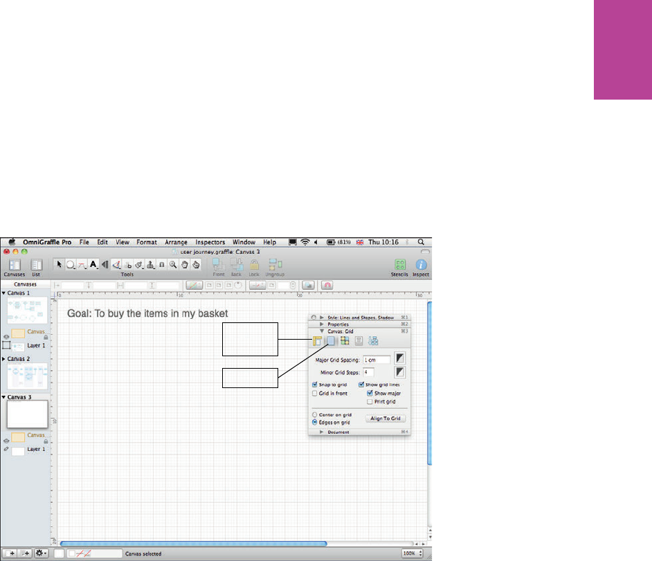
91 CHAPTER THREE USER JOURNEYS
7 e Edges on grid radio button should be selected by default. If not, select it. is ensures
the edges (rather than centers of objects) align to the grid.
Ruler Units
button
Grid button
F -: Setting up the grid structure in the OmniGra e Inspector.
Creating the journey
e following guide gives you all the information you need to create the journey. While the
result looks simple, there is an art to laying out the elements into an easy to read document.
06_9781119971108-ch03.indd 9106_9781119971108-ch03.indd 91 8/10/11 8:32 PM8/10/11 8:32 PM

92
COMMUNICATING THE USER EXPERIENCE
Providing a title
To provide a title, follow these steps:
1 From the toolbar, select the Text Tool.
2 Place the cursor where you want to the title to appear on the canvas and title your user
journey with the goal or task you are representing.
note Refer to Figure 2-14 in Chapter 2 for an overview of OmniGra e’s text controls.
Styling shapes
e Stencil Library has useful default shapes that can be used to create attractive user jour-
neys. Figure 3-8 shows the Stencil window and style controls.
1 On the Toolbar, click the Stencils button to open the Stencils window.
2 In the Stencils library, open the Software folder and click the Flow Chart stencil.
3 Select the Flow Chart shapes you need and drag them onto the canvas. e most com-
monly used shapes are the Start/Stop, Process, and Decision shapes.
4 e default shapes can be styled in the Style window to create the master elements:
• Turn o Shadow and Stroke as they add unnecessary visual clutter to the
document.
• Select a Fill color and Font color with good contrast to ensure legibility both on
screen and when printed.
5 Copy and paste the styled shapes as many times as needed and position them to create
the outline user journey.
06_9781119971108-ch03.indd 9206_9781119971108-ch03.indd 92 8/10/11 8:32 PM8/10/11 8:32 PM
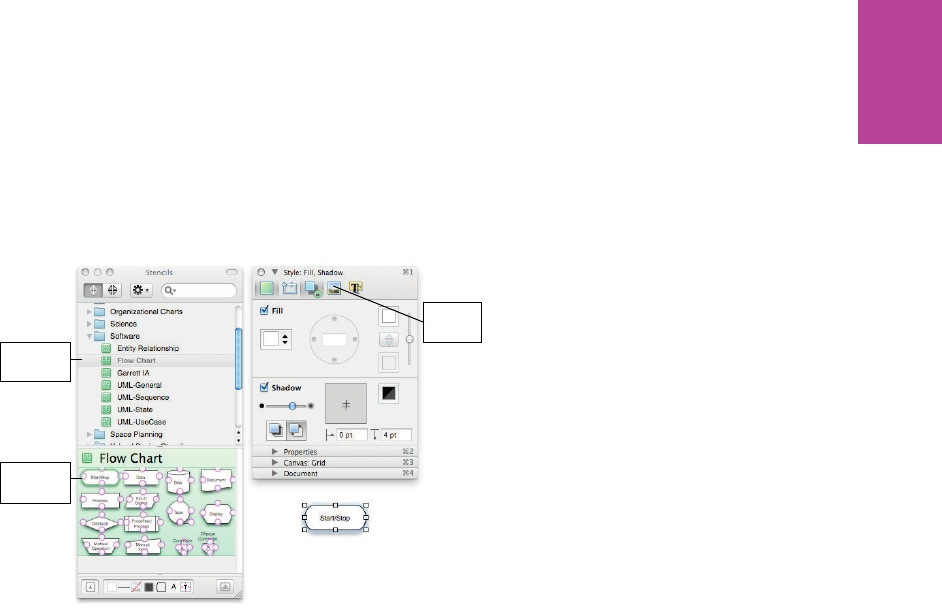
93 CHAPTER THREE USER JOURNEYS
Flow Chart
stencil
Style
window
Flow Chart
shapes
F -: An overview of OmniGra e’s Stencil window and Style window.
Using magnetic shapes and arrows
Using magnets means that when you move shapes, the arrows move with them and that
saves time when you’re rearranging the layout. OmniGra e gives you good control over the
magnetic properties of objects.
1 Select a shape.
2 Open the Inspect palette, open the Properties section, and then click the Connections
button (see Figure 3-9).
3 In the Shapes, Groups and Tables section, check Allow connections from lines (if it isn’t
already selected). is makes your shape magnetic.
4 In the 4 magnets drop down, you can select where you want the magnets to be on your
shape. Typically you’ll just need N, S, E, W selected, but you can also choose the corners
and number of magnets per side.
Now when you add connecting lines, they will snap to the magnets added to your shapes.
06_9781119971108-ch03.indd 9306_9781119971108-ch03.indd 93 8/10/11 8:32 PM8/10/11 8:32 PM
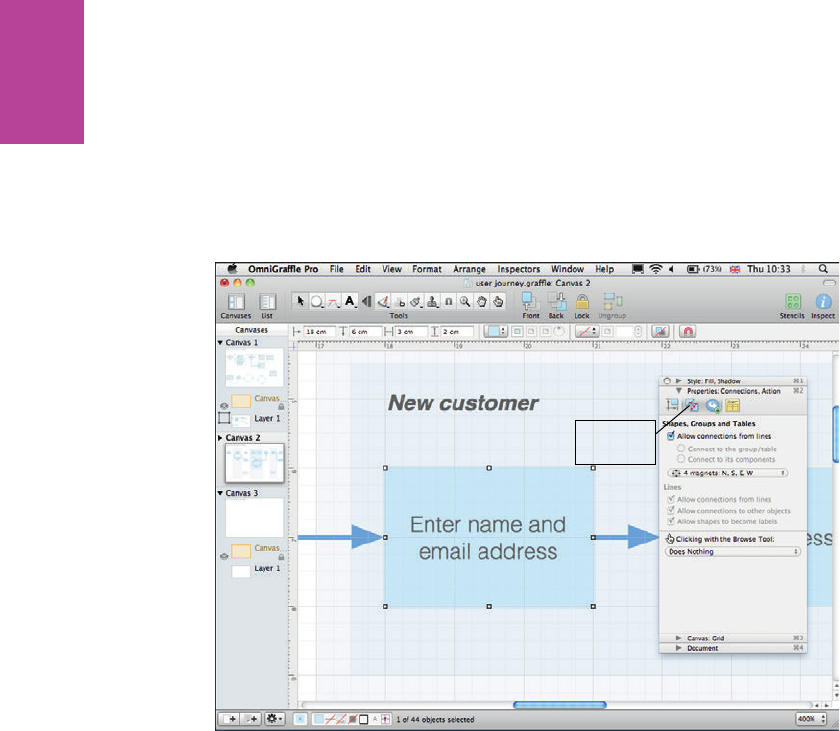
94
COMMUNICATING THE USER EXPERIENCE
Connections
button
F -: Magnets are added using the Connections tab in the Properties panel of the Inspector.
Adding lines and arrows
To add lines and arrows, follow these steps:
1 In the Toolbar, click the Line Tool (see Figure 3-10) and then select the line type you want
to use to connect your shapes. We use Straight and Orthogonal.
2 Draw lines between your shapes connecting the line ends to the magnets.
3 Style your lines using the Style: Lines and Shapes, Shadow inspector.
06_9781119971108-ch03.indd 9406_9781119971108-ch03.indd 94 8/10/11 8:32 PM8/10/11 8:32 PM

95 CHAPTER THREE USER JOURNEYS
Style lines
here
Line tool
F -: Adding and styling lines in OmniGra e.
Styling the curved arrows
To style curved arrows, follow these steps:
1 In the Toolbar, click the Line Tool and then select the Bézier line.
2 Add three points to the canvas equally around an imaginary center point.
3 Connect the two end points to the magnetized shapes.
4 Click the center point and move the position of the handles until you have created a semi-
circle. Figure 3-11 shows how the handles are positioned.
note To create a quarter circle, use the same technique only add just two points and move
the handles of each.
06_9781119971108-ch03.indd 9506_9781119971108-ch03.indd 95 8/10/11 8:32 PM8/10/11 8:32 PM
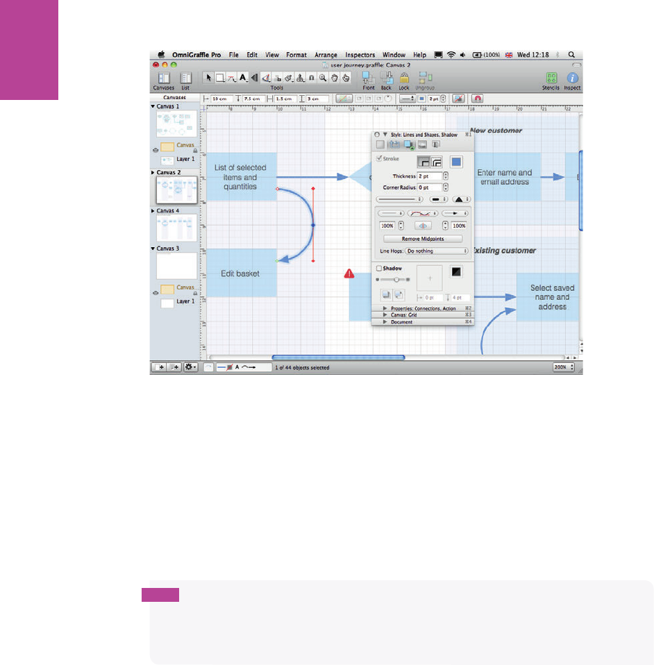
96
COMMUNICATING THE USER EXPERIENCE
F -: A semi-circle created using a Bézier curve showing the handle positions.
Finishing off
Where steps are grouped into pages in the example, zebra stripes are used in the background
to mark out the individual pages. ese are simply lightly shaded rectangles sent to the back
of the other items. On occasion you’ll have to show two options within the same page (for
example, how new customers and existing customers are handled at the same point in a jour-
ney); a shade between the zebra stripes and the individual steps is used to nest these items
together. See Figure 3-12.
tip As you’re working on documents such as user journeys and sitemaps, the alignment
can go slightly o . In the Inspect palette (where you set up the grids), there is a button titled
Align to grid. Clicking this button resizes shapes and aligns objects back to the grid, saving
you a lot of hassle doing it all manually.
06_9781119971108-ch03.indd 9606_9781119971108-ch03.indd 96 8/10/11 8:32 PM8/10/11 8:32 PM
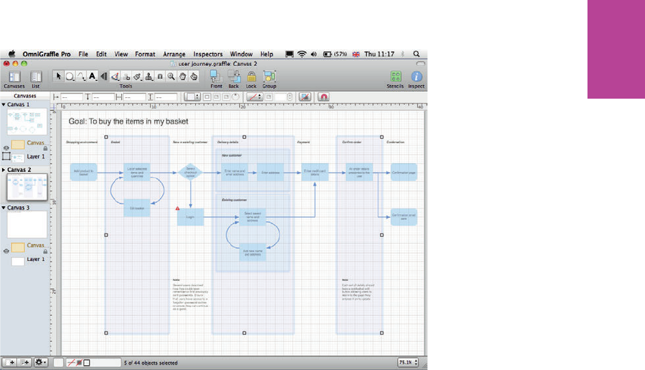
97 CHAPTER THREE USER JOURNEYS
F -: Shaded rectangles illustrate the pages in the journey and the grouping of steps.
06_9781119971108-ch03.indd 9706_9781119971108-ch03.indd 97 8/10/11 8:32 PM8/10/11 8:32 PM

COMMUNICATING THE USER EXPERIENCE
98
HOW TO Create a user journey in PowerPoint
Creating user journeys in PowerPoint is really straightforward but there are a few tricks to
creating a good-looking diagram.
Setting up the template
e user journey template is set up in the same way you set up template for task models in
Chapter 2:
1 Launch PowerPoint, go to the File tab, and select New. A menu of document types is
shown.
2 Click the Blank presentation then click the Create button on the right.
3 On the Home tab, click on the Layout button and choose the Title Slide layout.
You’ll nd sizing the shapes and aligning the elements much easier if you enable snapping to
grid:
1 Right-click the slide area and choose Grid and Guides.
2 Select Snap objects to grid (see Figure 3-13).
3 You should also enable the Display grid on screen option. is provides you with a series
of guide dots that helps alignment, but does increase the visual clutter as you’re working
on the document.
06_9781119971108-ch03.indd 9806_9781119971108-ch03.indd 98 8/10/11 8:32 PM8/10/11 8:32 PM

99 CHAPTER THREE USER JOURNEYS
F -: e Grid and Guides dialog with the Snap objects to grid option enabled and the Display grid on
screen option enabled.
Depending on the size of your user journey, you might need to give yourself a larger slide
area to work on. To do this, click on the Design tab and select Page Setup in the top left. Here
you can choose a number of ratios and dimensions. ere’s usually a little trial and error to
get everything scaled and tting neatly on a single slide — of course you can always divide
the document over multiple slides to be printed out and stuck together on walls.
06_9781119971108-ch03.indd 9906_9781119971108-ch03.indd 99 8/10/11 8:32 PM8/10/11 8:32 PM

100
COMMUNICATING THE USER EXPERIENCE
Creating the journey
e journey is simply a series of aligned shapes.
Adding shapes
To add shapes, follow these steps:
1 Click the Home tab and in the Drawing group, click the Shapes menu and choose your
shape.
2 Style your shapes using the Shape Fill and Shape Outline buttons.
Changing shapes
Once you’ve created and styled a shape, you can copy and paste the shape by using the Edit
menu. You can then use the Change Shape option (see Figure 3-14) and retain the styling of
the original shape:
1 Select the shape.
2 Click the Format tab.
3 Click the Edit Shape button.
4 Choose Change Shape.
5 Select the shape that you want to use.
User journeys primarily use rectangles, rounded rectangles, or diamonds to illustrate the
steps, start points, end points, and decisions.
06_9781119971108-ch03.indd 10006_9781119971108-ch03.indd 100 8/10/11 8:32 PM8/10/11 8:32 PM
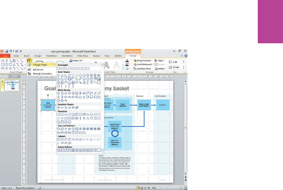
101 CHAPTER THREE USER JOURNEYS
F -: Use the Change Shape menu to copy and paste a shape and change it into another shape while
keeping the original styling.
Wrapping text
Diamond shapes allow for only a limited amount of text inside them. To control where the
line breaks appear and to get the text tting nicely, you’ll need to complete the following
steps:
1 Right-click the shape and click Format shape.
2 In the window that displays, select Text Box from the left menu.
3 Deselect the Wrap text option.
4 To control where you want the line breaks to appear, place the cursor in the desired posi-
tion and enter a soft line break (press Shift+Enter).
06_9781119971108-ch03.indd 10106_9781119971108-ch03.indd 101 8/10/11 8:32 PM8/10/11 8:32 PM
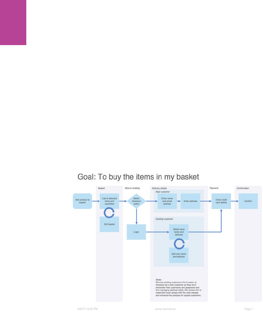
102
COMMUNICATING THE USER EXPERIENCE
Adding arrows and lines
Use Arrows and Elbow Arrow Connectors to join the shapes together. Use Circular Arrows to
indicate the steps users can repeat several times. Follow these steps:
1 In the Drawing group, click the Shapes menu and choose the desired connector lines and
arrows.
2 Draw them between the shapes and connect them to the anchor points.
3 Adjust the outline and ll colors so that the shapes and lines look good on screen and
have enough contrast to print out well.
Finishing up
Grouped steps are indicated by placing shaded rectangles in the background. ese can be
nested where more than one grouping needs to be shown.
Figure 3-15 shows the completed user journey.
F -: e nished user journey in PowerPoint showing the edited colors.
06_9781119971108-ch03.indd 10206_9781119971108-ch03.indd 102 8/10/11 8:32 PM8/10/11 8:32 PM

Chapter 4
Content
Requirements
4
07_9781119971108-ch04.indd 10307_9781119971108-ch04.indd 103 8/10/11 8:42 PM8/10/11 8:42 PM

COMMUNICATING THE USER EXPERIENCE
104
EVERY PROJECT WE’VE worked on and every piece of research we’ve conducted touches
on the text and images that need to be presented to the user. It’s probably surprising then
that most content documents don’t focus on or even mention the user needs.
is chapter shows how to put together a simple document to collect content requirements
(see Figure 4-1) from users in a consistent way throughout the project.
Figure 4-1: A contents requirement document.
07_9781119971108-ch04.indd 10407_9781119971108-ch04.indd 104 8/10/11 8:42 PM8/10/11 8:42 PM
CHAPTER FOUR CONTENT REQUIREMENTS 105
What makes a good content requirements
document?
A great content requirements document focuses on the user needs—speci cally what con-
tent (text, image, sound, and video) needs to be provided to enable a user to ful ll a goal.
When to create a content requirements document?
Content requirements start to be uncovered very early, long before you know how the nal
product will work or look. So it’s worth discussing and setting up a template to capture the
requirements at the beginning of the project.
e result is a consistent template to capture content needs as they emerge from workshops
with stakeholders and research with users. Rather than having to work from several documents
(for example, task models, personas, and user test reports—although these should contain
requirements uncovered in those phases of work), you have one consistent checklist that
ensures all the required information is communicated in the nal product and in the right way.
What are you communicating?
By understanding the di erent types of content, you develop a framework for talking
through the requirements with the project team (it’s often the case that di erent people are
responsible for di erent types of content, such as copy or photography). And when it comes
to wireframing and designing, understanding the content requirements can help establish
the design patterns and styles that are needed throughout the interface.
Marketing and brand copy
Marketing and brand copy sets the purpose of the page through the title and description. e
tone and style will be set by the business and can be tested with users to ensure clarity and
appropriateness.
Within the main content of the page, the brand provides an emotional reason to engage with
a product or service. is can come through expectations of the brand through prior knowl-
edge or by allowing users to decide that the brand is one that they can have an a nity with
and reinforces their beliefs. Some examples of marketing and brand content could be:
> How products are made
> How a bank invests its money
> An organization’s charitable activities
07_9781119971108-ch04.indd 10507_9781119971108-ch04.indd 105 8/10/11 8:42 PM8/10/11 8:42 PM
COMMUNICATING THE USER EXPERIENCE
106
Users care about this information. If it’s not there, they will notice. And they might use
another product or service instead.
Instructions and functionality
e functional content de nes exactly what users must do in order to get to the next step of
their goals. For example, on a product site, a customer might need to select the quantity and
size of items before adding them to her shopping cart. e wording needs to be clear and the
action must be obvious.
Data and specification information
What data do users need in order to make a decision? is could be straightforward, such as
the price of the product, or it might be an element that’s very speci c such as needing the
trunk capacity of an automobile (everybody has niggling requirements that need to be satis-
ed). ese speci c requirements are always uncovered through user research.
Image requirements
Photography is the unsung hero of user experience. Users want to see large, good quality
photos that satisfy their speci c needs or curiosity. is is particularly true when decisions
have to be made, whether it’s a product purchase, the choice of where to go on vacation, or
which company to work for.
You frequently see photos in user testing where brands have applied a house style or cropped
images to make them artistic or in keeping with the design when in fact users just want to
see the product in as much detail and in as large a size as possible.
Sometimes the right photos aren’t provided, so they can’t help the user make a decision.
Product choices are the obvious example. If you are choosing a dress, you want to know
exactly what both the front and back look like before you buy it—if you can’t see the back of
the dress, you won’t buy it. But it is also true for more information rich sites. Universities
and college sites need to let prospective students know what the campus is like, information
about the town and city where it’s situated, and what the other students will be like. Dated or
low-quality photography will present a poor impression.
Supporting information
Research uncovers the supplementary information a user requires to support and reassure
her that she’s making the right decision. Taking an e-commerce example again, this could be
the delivery and returns information, information about the cut of a garment, or information
07_9781119971108-ch04.indd 10607_9781119971108-ch04.indd 106 8/10/11 8:42 PM8/10/11 8:42 PM
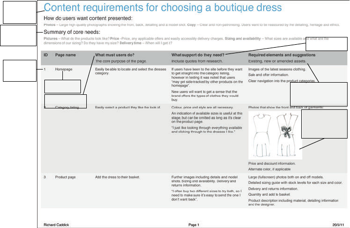
CHAPTER FOUR CONTENT REQUIREMENTS 107
about the material it’s made from. O ering the product without this supporting information
will leave the user with doubts as to whether this is the right purchase for her.
What makes the perfect content requirements
document?
Perfect content requirements ensure that you communicate user information requirements
to the project team e ectively.
e sample document shown in Figure 4-2 is goal based—what users need in order to buy a
boutique dress. It helps communicate the requirements more e ectively and maps more eas-
ily onto the task models and user journeys. When you develop your sitemap and wireframes,
it is used as a checklist to make sure everything is accounted for on each section and page.
User support
Document
title
Summary
information
Page name
Core purpose
Reference
ID
Required elements
and suggestions...
...imagery used
to reinforce
requirements
Figure 4-2: e perfect content requirements document showing the required information.
Document title
e document title gives the goal of the user covered in the requirements document.
07_9781119971108-ch04.indd 10707_9781119971108-ch04.indd 107 8/10/11 8:42 PM8/10/11 8:42 PM
COMMUNICATING THE USER EXPERIENCE
108
Summary information
Content requirements documents can get very large. Summary information—pulling out
the key themes and presentation information—is a useful way of summarizing the require-
ments to the project team.
Reference ID
A unique reference ID helps you to pinpoint rows as you’re discussing them with the project
team and allows you to cross-reference the document easily.
Page name
e page name references the page or section of the site is being referred to. Under most
circumstances, there will be multiple content requirements for one page. For a new site, this
might not be known exactly until after the sitemap is developed, but a reference to the step
in the task will work well.
Core purpose
What must users do? is is the core purpose of the page—the one or two things users must
do in order to continue their journeys.
User support
What content do users need in order to make the decision to continue their journeys? is
type of user support could be a combination of functional, data, imagery, information, or
brand. Figure 4-2 shows how you can include quotes from users to add grounded reality into
content discussions.
Required elements and suggestions
Very often in the user-centered design process, you’ll identify pieces of content and images
that do exactly what a user requires. Required elements and suggestions could be from an
existing site, competitor sites, or other relevant information. You might also sketch out sug-
gestions and write example content to better illustrate the requirements to the project team,
not to be used as nal assets, but to help facilitate meaningful discussion. Figure 4-2 shows
how imagery has been included to reinforce the requirement.
Additional columns can be added depending on the speci c needs of the project and this
document could be expanded into a more complete content matrix, which might also include
the URL of the page, who is responsible for the content, and what the process is for getting it
07_9781119971108-ch04.indd 10807_9781119971108-ch04.indd 108 8/10/11 8:42 PM8/10/11 8:42 PM
CHAPTER FOUR CONTENT REQUIREMENTS 109
produced. ese tasks can fall outside of the user experience role so an expanded document
would need to be worked on with the relevant parts of the project team.
Who is the audience?
e content requirements touch every part of a business because they range from how a
product or service is presented to users down to what data needs to be stored and presented
to the user.
In particular, the content and copy team will be able to take the user requirements and
develop the words that clearly communicate the messages and brand voice. e project man-
agers and business analysts will want to ensure that the content can be sourced and accom-
modated for as part of the development. And the user experience team will be responsible
for making sure all the requirements are fed into the sitemaps and wireframes.
Of course, the reality is that not all the content needs can be ful lled in the short term, so the
requirements document will help to shape future content strategy.
Validating the content
If the right content isn’t presented to users at the right time and in the right way they will
struggle to reach their goals. Validating that the right content is in place will make a huge
di erence to the success of the project.
Content testing in context
As you’re testing wireframes and designs, you are implicitly testing the content that is pre-
sented. Using the think-aloud protocol (encouraging users to think out loud as they are com-
pleting a task on a website) will help you assess whether users’ questions and expectations
are being met, allowing them to do what they need to. Be sure to explore how people feel
about the images and information and assess whether the right data and functions are avail-
able to them. Finally, see if there is anything about the tone that they are particularly
attracted to or nd o -putting.
07_9781119971108-ch04.indd 10907_9781119971108-ch04.indd 109 8/10/11 8:42 PM8/10/11 8:42 PM
COMMUNICATING THE USER EXPERIENCE
110
tip Testing little and often over the course of a project is recommended. Testing with fi ve
users at fi ve times during the project will ensure that the project is more successful than
testing with 25 users at the end.
Frequently the rst user testing completed uncovers the big problems and omissions. en
as you address those problems over the course of the project, the testing starts to validate
the decisions you’ve made giving con dence in a successful product when it goes live. It’s
important to get a new set of participants each time you test to ensure that you’ve properly
solved the problems and that the users aren’t just learning how to use a faulty process.
Content variation testing
Sometimes it can be helpful to take the content out of context, focusing in on a participant’s
response to di erent executions of the same copy or alternate photographic treatments.
Here’s an outline of a frequently used approach. Take a key wireframe from the user journey
(a product page on an e-commerce site in this example) and try two or three versions using
di erent executions of the same content—for example, di erent treatments of the imagery
(see Figure 4-3) or di erent wording for the headlines.
Figure 4-3: e same wireframe is tested with two di erent leading images to see which performs better in
research and why.
07_9781119971108-ch04.indd 11007_9781119971108-ch04.indd 110 8/10/11 8:42 PM8/10/11 8:42 PM

CHAPTER FOUR CONTENT REQUIREMENTS 111
Conduct research with users to understand which variations of content best support their
needs the best and, perhaps more importantly, don’t create barriers for them when they’re
completing tasks. Participants are very good at pointing out changes that the project team
misses.
is testing not only improves the quality of the content, it uncovers the stories and reasons
behind the likes and dislikes that help enrich the understanding of user behavior and there-
fore the personas and task models you produce.
RESEARCH AND WORKSHOP IDEAS
Coming to grips with content is immensely satisfying. It’s the raw material that a product or
service is built on and yet it is often deprioritized in processes behind wireframes, design,
and build.
RESEARCH TECHNIQUE: Immerse yourself in the topic
Every time you start working on a new project, immerse yourself in the subject matter.
Buy the relevant journals and magazines, look at the sites and user forums, and start to
understand the trends, passions, frustrations, questions, and solutions that people are talk-
ing about and that are being presented to them.
If possible, nd places where you can observe people in the real world, whether it’s at the
shopping mall, in an o ce, at a store (see Figure 4-4), or elsewhere.
All these activities help you to get closer to people and allow you to have better empathy for
the lives they lead.
07_9781119971108-ch04.indd 11107_9781119971108-ch04.indd 111 8/10/11 8:42 PM8/10/11 8:42 PM
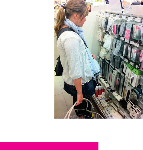
COMMUNICATING THE USER EXPERIENCE
112
Figure 4-4: Take photos to remind you what people did so you can recall better stories. In this case, the picture
might remind you how the customer chose between the various products in front of her.
WORKSHOP IDEA: Audit content
At the beginning of the project take time to audit any existing content with the project team.
Assess what people like and don’t like and the areas for improvement.
Before the workshop, ask the attendees to collate examples of content they like. is could
be from competitor sites, sites they like, magazines, or newspapers. Get them to share their
ideas in turn and listen to their reasoning.
en work at a broad level through the project you are involved with, discussing the e ec-
tiveness of headings, imagery, and informational and data-driven content. Understand
whether it meets the needs of the organization and what is missing that needs communicat-
ing. Match it against examples the team collated to see how it could be enriched or changed.
Print out, draw, or write example assets onto pieces of paper and tear examples out of maga-
zines. Create collages that represent ideas for how the content should be developed. As
you’re making the collages, discuss each asset as you add it and try to decide which work
well—or at least try to understand why some team members don’t agree on which assets
work well and try to resolve those issues right then and there.
07_9781119971108-ch04.indd 11207_9781119971108-ch04.indd 112 8/10/11 8:42 PM8/10/11 8:42 PM
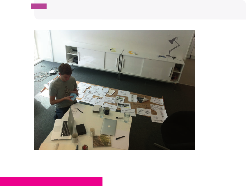
CHAPTER FOUR CONTENT REQUIREMENTS 113
e collages provide useful prompt material that you can take into research and see which
ideas work, which need to be adapted, and which need to be scrapped.
tip Creating collages on rolls of brown paper (see Figure 4-5) makes them easier to travel
with and store.
Figure 4-5: A content audit workshop in progress, showing a collage that has been created to represent the
project team’s content ideas.
RESEARCH TECHNIQUE: Listen to and observe users
For simplicity this research can be done at the same time as the task modeling research.
Spend time simply listening to what users say. What questions are they asking? What infor-
mation is communicated to them that gives satisfactory answers?
Listen to how the responses are being expressed—are there certain words that are being
used that seem to be particularly e ective? Look for any documentation that’s being referred
to. Sta in call centers and at help desks frequently have access to, or have created their own,
resources for responding to customer needs.
Start to ll in your content requirements document with this information.
07_9781119971108-ch04.indd 11307_9781119971108-ch04.indd 113 8/10/11 8:42 PM8/10/11 8:42 PM

COMMUNICATING THE USER EXPERIENCE
114
We once listened to calls while working on a travel website. A lady called wanting to book a
family cruise worth several thousand dollars. She’d been through the process online, but
didn’t have the con dence to complete the purchase because she couldn’t see that her chil-
dren would be fed nutritional meals each day. We heard several similar requirements and
created additional information for the site. Listening to these requirements and making
these changes transformed the online success of the business.
RESEARCH TECHNIQUE: Use benchmark testing
Testing an existing service against its competition allows the project team to audit content
with users at an early stage in the project. is provides information on what users do and
don’t understand, the questions they have at the beginning of the task and the questions
they still have afterward. Capture the content needs from both the existing service and com-
petitor services and use them to populate the requirements document.
For example, with an e-commerce site, you might uncover that users consistently aren’t buy-
ing a product on a competitor’s site because a key piece of information is missing. You can
use this knowledge to ensure that the information is presented on your site.
What’s the simplest way to put together a content
requirements document?
A content requirements document is the rst thing I do at the beginning of every project. It
helps me to come to grips with the content, the functionality, and speci c words and labels
that will be required. Importantly it helps me to understand what I don’t know in terms of
the industry and the way speci c functionality works. Understanding what you don’t know
helps to give focus to questions for the stakeholder team.
There are a few ways to put together a simple content requirements document and the
temptation is to use Excel or Apple’s Numbers. However, using an outliner tool—such as
Apple’s OmniOutliner (see Figure 4-6) or Microsoft Word’s outline view—can help you get
structure and ideas down quickly without worrying about formatting.
07_9781119971108-ch04.indd 11407_9781119971108-ch04.indd 114 8/10/11 8:42 PM8/10/11 8:42 PM

CHAPTER FOUR CONTENT REQUIREMENTS 115
Simply add all the content requirements into the list as they are uncovered, adding descrip-
tive text or example images as necessary.
You can structure the document by grouping similar requirements together (for example, if
they are all on the same page of the site), nesting items, and rearranging the order of the
items and groups.
20/05/2011 06:23:29Choosing a dress.oo3
Topic
aHome
Must be able to:
Easily be able to locate and select the dresses category
What support do they need?
If users have been to the site before they want to get straight into the category
listing, however in testing it was noted that users “may get side-tracked by other
products on the homepage”.
New users will want to get a sense that the brand offers the types of clothes they
would buy.
Required elements and suggestions:
Required elements and suggestions:
Images of the latest seasons clothing.
Sale and offer information.
Clear navigation into the product categories.
a Category listing
Must:
Easily select a product they like the look of
What support do they need?
Colour, price and style are all necessary.
An indication of available sizes is useful at this stage, but can be omitted as
long as it s clear on the product page.
“I just like looking through everything available and clicking through to the
dresses I like.”
Required elements and suggestions
Photos that show the front and back of garments:
front-back
Price and discount information.
Alternate color, if applicable
a Product page
Must:
Add to basket
What support do they need?
Further images including details and model shots. Sizing and availability.
Delivery and returns information.
“I often buy two different sizes to try both, so I need to make sure it s easy to
send the one I don t want back”.
Required elements and suggestions
Large (fullscreen) photos both on and off models.
Detailed sizing guide with stock levels for each size and color.
Delivery and returns information.
Quantity and add to basket.
Product description including material, detailing information and the designer.
Figure 4-6: Content requirements can be collated simply in OmniOutliner.
07_9781119971108-ch04.indd 11507_9781119971108-ch04.indd 115 8/10/11 8:42 PM8/10/11 8:42 PM

COMMUNICATING THE USER EXPERIENCE
116
HOW TO Create a content requirements
document in Word
Word is an ideal tool to use to create content documents because it handles large tables well
(unlike PowerPoint) and images can easily be inserted into individual table cells (unlike
Excel).
Setting up the template
Use the following settings to create the maximum document area to work on:
1 Create a new blank document in Word.
2 Click the Page Layout tab and set the Orientation to Landscape.
3 Click Margins and choose Narrow.
Creating the audit
Creating the audit is incredibly simple, but there are a few tricks included in the following
descriptions to help create a clean, well-styled document.
Titling the presentation
Add your heading in 24-point type and add your subheadings at 12 points. As shown in
Figure 4-7, use 8-point type for the body copy. You can use a larger font if you want to, but
8-point allows you to t more words into each table cell.
07_9781119971108-ch04.indd 11607_9781119971108-ch04.indd 116 8/10/11 8:42 PM8/10/11 8:42 PM
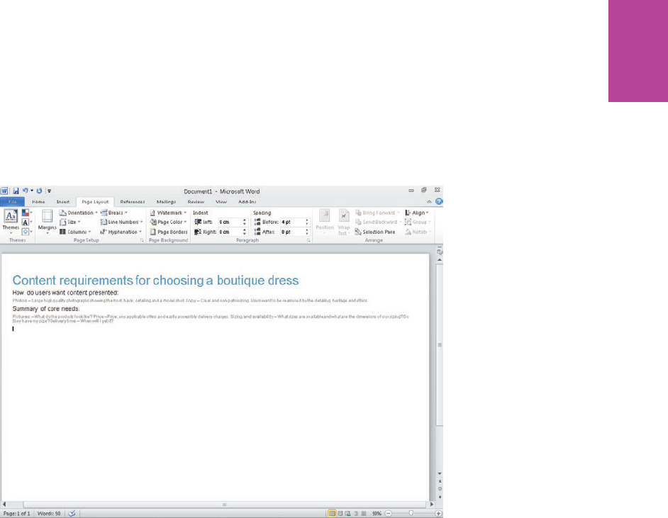
117 CHAPTER FOUR CONTENT REQUIREMENTS
Figure 4-7: e title and summary information have been added to the document.
Inserting the table
To insert a table, follow these steps:
1 Click the Insert tab.
2 Click the Table button.
3 Mouse over the grid that’s shown in Figure 4-8 to select the number of rows and columns
you require.
In this example, the grid is ve columns wide and ve deep.
07_9781119971108-ch04.indd 11707_9781119971108-ch04.indd 117 8/10/11 8:42 PM8/10/11 8:42 PM
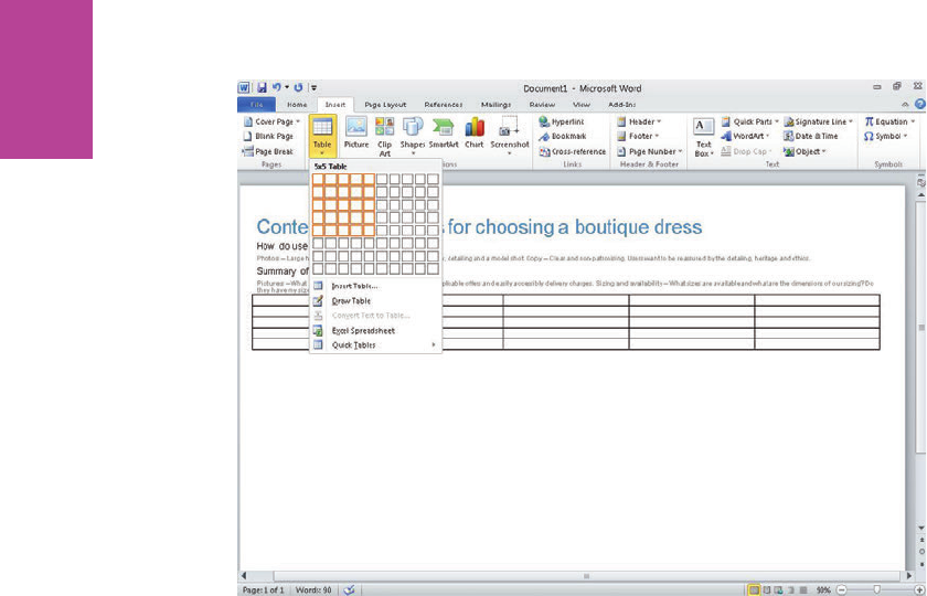
118
COMMUNICATING THE USER EXPERIENCE
Figure 4-8: Clicking the Table button displays a grid that can be used to select the number of rows and columns
you want your table to have.
Formatting the table
To format the table, follow these steps:
1 Select the table by clicking anywhere on it and then click the Design tab to style the table.
2 In the Table Style Options group, make sure only Header Row and Banded Rows are
selected.
3 In the Table Styles group, click the Light Shading style (see Figure 4-9).
07_9781119971108-ch04.indd 11807_9781119971108-ch04.indd 118 8/10/11 8:42 PM8/10/11 8:42 PM
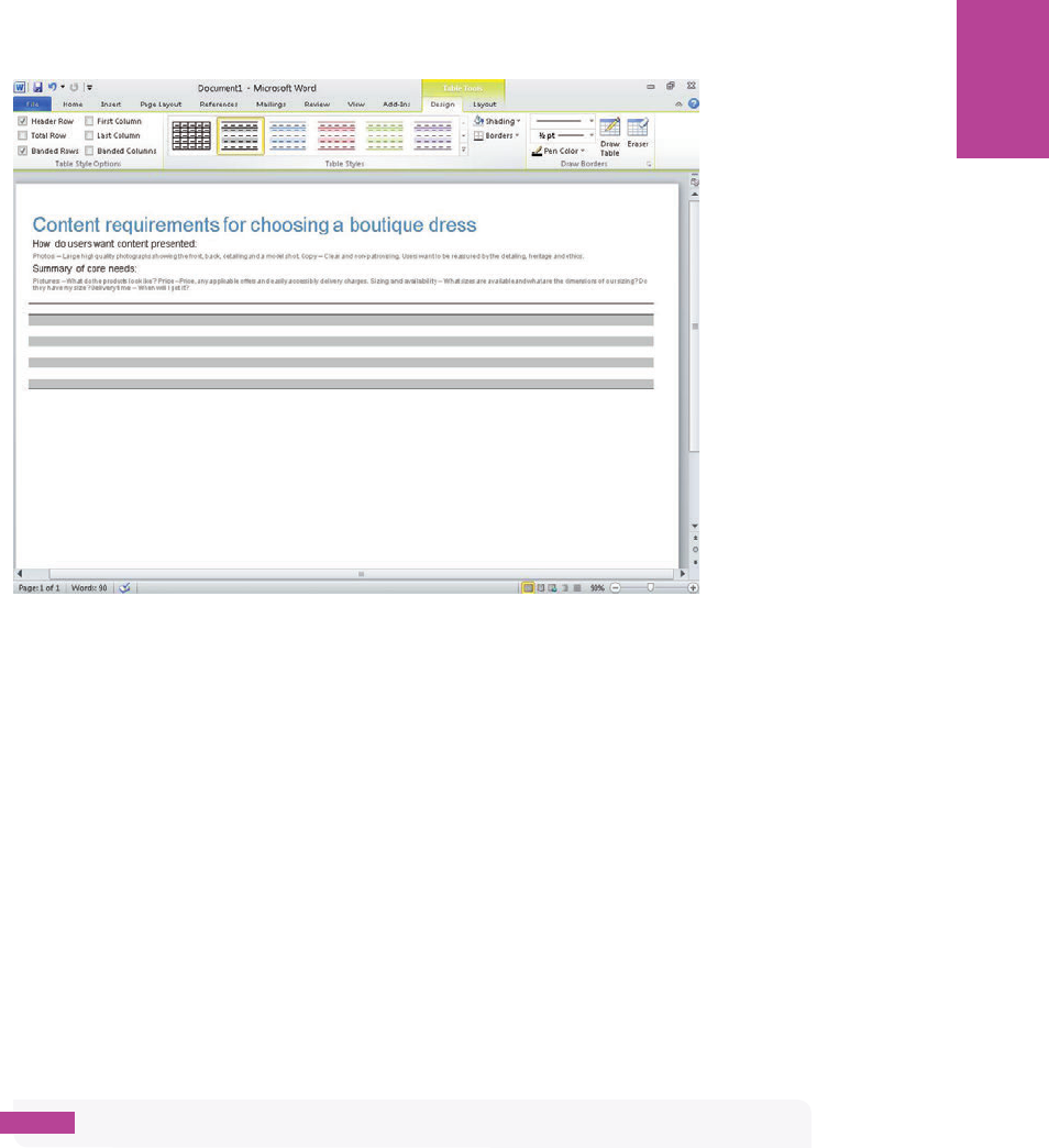
119 CHAPTER FOUR CONTENT REQUIREMENTS
Figure 4-9: e light shading button has been selected to give the zebra stripe e ect.
You can shade each row individually, but using the preset styles retains the alternating row
colors and makes life simpler as more rows are added.
4 Select all the header row cells (the rst row) by clicking in the rst cell and dragging to the
right.
5 In the Table Styles group, click the Shading drop-down arrow and then choose a darker
shade of gray. A 35% darker gray is used in the example.
6 Select the entire table again and, in the Table Styles group, click the Borders drop-down
arrow.
7 Choose the No Border option.
8 Click into the header row, click the Layout tab, and then in the Data group, click Repeat
Header Rows (see Figure 4-10).
note If your document spans multiple pages the header will be displayed on each.
07_9781119971108-ch04.indd 11907_9781119971108-ch04.indd 119 8/10/11 8:42 PM8/10/11 8:42 PM
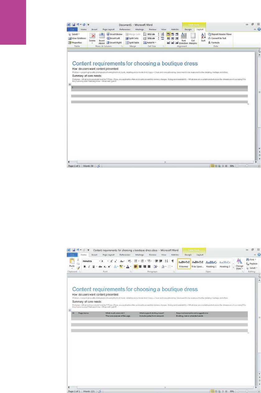
120
COMMUNICATING THE USER EXPERIENCE
Figure 4-10: e borders have been removed and the header row has been given a darker shade of gray.
9 Type the header text using 8-point type. e example uses a 15% lighter than black shade
for all the content.
0 Mouse over the column borders and drag them to the right or left to set the width of each
column.
Figure 4-11 shows a clean-looking table that can now be populated with content.
Figure 4-11: e column headings have been added and the table is ready to be used.
07_9781119971108-ch04.indd 12007_9781119971108-ch04.indd 120 8/10/11 8:42 PM8/10/11 8:42 PM
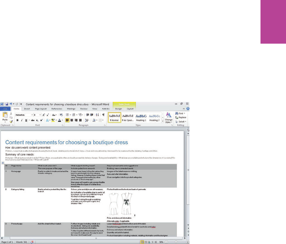
121 CHAPTER FOUR CONTENT REQUIREMENTS
Adding content
Creating the audit is simply a matter of populating the cells in the template with the content
requirements as you uncover them.
Inserting images helps to visualize the requirements, so it’s worth including them where you
can (see Figure 4-12). To insert an image, click the Insert tab then click the Picture button.
If you need to add additional rows or columns, you can right-click in any cell and use the
menu to add rows above or below or add columns to the right or left of the one you are in.
Figure 4-12: e nished document with content requirements added.
07_9781119971108-ch04.indd 12107_9781119971108-ch04.indd 121 8/10/11 8:42 PM8/10/11 8:42 PM

122
COMMUNICATING THE USER EXPERIENCE
07_9781119971108-ch04.indd 12207_9781119971108-ch04.indd 122 8/10/11 8:42 PM8/10/11 8:42 PM

chapter 5
Sitemaps 5
08_9781119971108-ch05.indd 12308_9781119971108-ch05.indd 123 8/10/11 8:41 PM8/10/11 8:41 PM
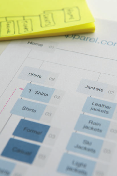
COMMUNICATING THE USER EXPERIENCE
124
A SITEMAP IS an important document for tying all project documents together. It shows
the structure of the site and how each page will be linked together during development. It
acts as a To Do list to show what wireframes need to be produced. It can be used to map out
user journeys and to form the basis of content audits.
In this chapter, you’ll learn the information a sitemap (see Figure 5-1) should contain and
how to present it in a clear concise way. You’ll also learn how to do this based on the type of
site you are developing, and the di erent team members it will be presented to. ere are
techniques for designing the document as well as techniques for researching and organizing
data.
ere are also guides on how to create sitemaps in Excel, Word, and OmniGra e.
Figure 5-1: A sitemap ties together all the project documents.
08_9781119971108-ch05.indd 12408_9781119971108-ch05.indd 124 8/10/11 8:41 PM8/10/11 8:41 PM

CHAPTER FIVE SITEMAPS 125
What makes a good sitemap?
A good sitemap shows the navigation structure and key pages of a website. It should never be
a complete map of your website. If you map out every page exactly, the document will become
out of date very quickly. ink about when you look at where you live in the Google satellite
view; the image is always old, the car you owned two years ago is on the street, or a house two
doors down has not yet been built yet. Full-scale maps are very hard to keep up to date.
A full map of every page of a site could also become vast and unmanageable. Imagine trying
to map out Amazon.com. A sitemap should focus on the top navigation, the subnavigation
categories, and tertiary navigation levels. For a clothing website, you would map out your
main product types (shirts, trousers, shoes, and so on). You would then categorize each prod-
uct type according to style (casual shirts, dress shirts, and so on). But you wouldn’t delve into
speci c product pages.
What the sitemap needs to do is show the main structure of the site and also provide the
project team with a checklist of all the key templates that need to be produced. It shows you
what templates need to be produced, and where everything sits in relation to each other.
note The sitemap ties a lot of other project documents together, showing which wireframes
are used for which section of the site and which are being used to map out user journeys. So
a good sitemap needs show a clear reference to other relevant project documents.
When to create a sitemap
ere are three key scenarios that require a sitemap to be created.
When you need to audit your current content
If you need to get an idea of the current state of your site, then mapping it out gives you a
great overview. It will show you what pages you currently have and if it is structured in the
right order. A sitemap can also form the basis of a more detailed content audit.
When you need to enhance or improve your current site structure
is scenario could be a project that just focuses on reorganizing the site structure, or part of
an overall design overhaul. e best way to start a project like this is to map out the pages
and structure that currently exist. Use that to determine what pages exist, what’s missing,
and what can be removed before restructuring content.
08_9781119971108-ch05.indd 12508_9781119971108-ch05.indd 125 8/10/11 8:41 PM8/10/11 8:41 PM
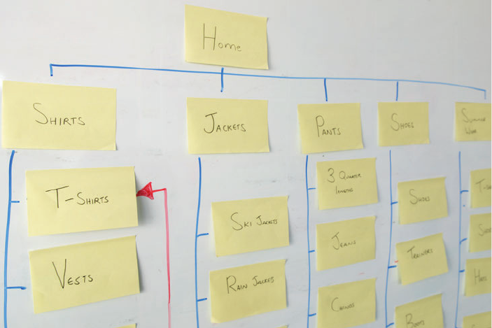
COMMUNICATING THE USER EXPERIENCE
126
When you are creating a new website
If you are creating a new website, a sitemap can provide you with a clear plan of action for
what needs to be produced. e site structure needs to be thought out before wireframe pro-
duction begins because it can help determine what templates and content need to be pro-
duced. See Figure 5-2.
Figure 5-2: Use Post-Its to sketch out the sitemap so you can quickly try out di erent site structures.
What are you communicating?
A sitemap needs to show the pages that support the user goals and the pages that are neces-
sary to meet the business goals. It needs to show the structure of these key pages and the
labels for the navigation. e labels you use should re ect the users’ needs and use language
with which your users are familiar. Avoid industry or internal jargon. For example, a clothing
retailer might have cheaper products that are known to everyone within the business as White
label shoes. Everyone in the business will understand what this means, but customers won’t.
A sitemap is used as a To Do list for many members of the project team. It shows them how
many unique page templates need to be produced. You might have several pages in your
sitemap that share the same template. For example, the shirts, trousers and shoes pages
might all share the same template for listing products. To make it clear which pages share a
template, every template should be assigned a unique number. Each page in the sitemap
should show the number of the template it uses.
08_9781119971108-ch05.indd 12608_9781119971108-ch05.indd 126 8/10/11 8:41 PM8/10/11 8:41 PM
CHAPTER FIVE SITEMAPS 127
Showing key cross-links can be useful on a sitemap. A cross link is when one page links to
another, but the pages don’t sit within the same navigation category. You should only focus
on one or two important examples. Showing every possible cross-link in the site will turn the
sitemap into an impenetrable web of lines and arrows. e majority of cross-links can be
documented within the wireframes instead.
Show if there are any changes to pages if the user is logged in. Do the users see a di erent
version of the home page? Do they go to an entirely di erent section of the site all together?
It’s important to visually separate any logged in areas of the sitemap so the developers can
understand which users get access to which pages.
You might need to produce a few di erent versions of a sitemap to represent the di erent
phases of development. e initial release of a website might have limited pages and func-
tionality, but will have more added in future releases. It’s useful to show how new pages will
be tied in as the site develops over time.
Sitemaps are not used to show how users will move through your website. ey might have
been used for this purpose 10 years ago when it was common to think that users came to
your site through the homepage and worked their way down though the site in a linear fash-
ion. Nowadays users can enter your site at any point and jump around it sporadically.
Sitemaps show how a site is structured and built, not necessarily how users move through it.
A sitemap is a very political document. It is the document that gets the most exposure across
the business and everybody has a stake in it. Di erent departments of a business will want to
make sure they are getting the exposure they want, and that the labels that are given are cor-
rect. SEO teams want to make sure there are enough spaces in the site for Google-friendly
content. UX teams want to make sure it re ects the needs of the users. e key is to make
sure you get all the stakeholders’ input early on to make sure you can re ect their needs
where possible, or give a good reason when you can’t.
Who is the audience?
e sitemap needs to re ect the information needs of each of its key audience members.
Wireframers and designers
A sitemaps does two things for wireframers and designers:
08_9781119971108-ch05.indd 12708_9781119971108-ch05.indd 127 8/10/11 8:41 PM8/10/11 8:41 PM
COMMUNICATING THE USER EXPERIENCE
128
> It shows what unique templates need to be produced. Your sitemap needs to show
which pages share the same template. e home page might be one template; there
might be several second-level category pages that all share the same template. Show
this by placing a template number on each page in the sitemap. Pages that share the
same template should have the same template number.
> It shows what navigation areas need to be designed into each page. It will also be used
as a guide for page titles and navigation labels within the designs. is means it’s
important to carefully consider what you label each page in the sitemap. Do not use
generic names like Category page 01 or internal jargon labels like White label products.
Make sure your labels re ect the goals of your users and use language they are familiar
with.
Content teams
Content teams want to know what needs to be produced to support your proposed sitemap.
If your sitemap contains lots of new pages, it needs to show which pages have existing con-
tent and which need to have new content produced.
Development teams
Development teams need to know what templates are to be developed. ey also need to
know how the whole site links together as well as the structure for implementing the content
management system (CMS) platform.
SEO teams
Search engine optimization (SEO) teams want to make sure there is enough space for SEO
content within the site and ensure labels are SEO friendly. So the labels you use in the
sitemap should re ect the labels that will be used in the nal design.
Project managers
More than anyone, project managers want to know what needs to be done (see Figure 5-3).
Project managers often have a very high attention to detail and will want to see every page in
the sitemap. It’s important (for larger, CMS-based sites) to explain that by including every
page, the document would look bloated and unmanageable. It’s more important to focus on
the main structure and key templates.
08_9781119971108-ch05.indd 12808_9781119971108-ch05.indd 128 8/10/11 8:41 PM8/10/11 8:41 PM

CHAPTER FIVE SITEMAPS 129
Figure 5-3: Sitemaps are used by project teams as a To Do list, showing how many unique page templates need to
be produced.
Different styles of sitemaps
e style of sitemap you produce will depend on the type of site you’re planning, the size of
the site you’re planning, and the people who will be using it.
> A spreadsheet sitemap is a list of the key pages in your site that have been organized
and grouped in a tree structure. If you are planning a larger, CMS-driven site, use the
spreadsheet style. is is simply because mapping out a larger site visually becomes
complex and di cult to read. I’ve also worked with project managers and developers
who prefer a spreadsheet style simply because it matches the way they work.
> A visual sitemap is composed of lines and boxes. is type of sitemap is better suited
for smaller sites and for people who think in a visual way.
It’s always worth asking those who will be using this document what style is most useful to
them.
08_9781119971108-ch05.indd 12908_9781119971108-ch05.indd 129 8/10/11 8:41 PM8/10/11 8:41 PM
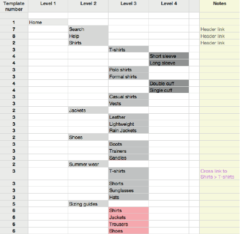
COMMUNICATING THE USER EXPERIENCE
130
The anatomy of a spreadsheet sitemap
is section explains the information you need to include in a spreadsheet sitemap and how
to present the information clearly. See Figure 5-4.
Figure 5-4: Spreadsheet sitemaps use a tree structure and shading to clearly show where each page sits
within the site.
Use a tree structure
Using a tree structure makes it easy to see which pages sit within which pages. Put your top
navigation in the rst column, the secondary level navigation in the next column, and so on.
Add a column to specify template numbers
e project team needs to know how many unique templates to produce. Assign a number to
each page that represents the template that the page uses. If multiple pages use the same
template, they will have the same number.
Include a notes column
A notes column will allow you to add helpful information for the designers and developers.
It’s useful to add notes about areas that are reserved for logged in users, pages that cross link
to other areas of the site, and pages that are intended for main navigation or footer links.
08_9781119971108-ch05.indd 13008_9781119971108-ch05.indd 130 8/10/11 8:41 PM8/10/11 8:41 PM
CHAPTER FIVE SITEMAPS 131
Use flags for non-existent content
Highlight pages that do not yet have the content available. is helps the project manager
and content team understand how much content they need to produce.
Use actual labels
When you hand your sitemap to designers, chances are they will take the labels used in your
sitemap and use them in their designs. It’s important to nalize the page labels at the sitemap
stage; it’s much easier to amend a page name on a sitemap than it is to amend it on the nal
designs.
Use shading for visual grouping of navigation categories
By using shading, you can better show the groups of navigation categories making it easier for
users to see the di erent sections. Figure 5-4 shows that light gray is used to distinguish one
Level 2 category (for example, Shirts) from another Level 2 category (Jackets), and so on. It’s
best to use a light gray to separate sections; darker colors or outlines tend to create visual clutter.
The anatomy of a visual sitemap
is section explains the information needed for a visual style sitemap and how to present
the information clearly. See Figure 5-5.
Don’t make your connecting lines too dark
Your connecting lines are important, but the visual priority should be on the page labels. If
you use thick, black lines, your sitemap can look cluttered. Use a mid-gray line that is easy to
see but isn’t so strong that it detracts from the page labels.
Use shading to show levels
When a lot of pages are displayed on a sitemap it can be di cult to see how deep within the
navigation structure some pages are. Shading can combat this. Use a light color for your top
page (for example, your Home page). Every time you create another level of navigation, use a
darker color. e deeper you delve into the structure, the darker the pages get.
Show key cross-links
If you need to show how users can jump from one section of the site to another, it’s impor-
tant to use a di erent line style and color from the usual navigational routes. is will tell the
reader that it’s not part of the main site structure and that it’s an alternative route between
pages.
08_9781119971108-ch05.indd 13108_9781119971108-ch05.indd 131 8/10/11 8:41 PM8/10/11 8:41 PM
COMMUNICATING THE USER EXPERIENCE
132
Use template numbers
It’s important to show how many pages will need a unique template to be designed and
developed. e example sitemap has 43 pages, but most of these share a template, so only 15
templates need to be produced. e numbers you assign to these pages should be included in
the wire frame document, so the developer knows what templates are to be used for each
page.
Separate logged in areas
If certain areas of the site are available only to some users (for example, those with accounts),
these areas should be agged. A dotted line around these pages is usually used to show
logged-in areas.
Flag non-existent content
Highlight pages that do not yet have the content available. is helps the project manager
and content team understand how much content they need to produce.
Use actual labels
Designers are likely to use the labels in your sitemap in their designs. It’s important to nal-
ize page labels at the sitemap stage. It’s much easier to change a page name on a sitemap than
it is on the nished page templates.
Visually differentiate other content types
Some pages in your sitemap might link to downloadable content or trigger an email. You
need to represent these di erently from the standard pages using icons. is is so the project
team knows if other content (such as emails and downloadable PDFs) need to be produced.
08_9781119971108-ch05.indd 13208_9781119971108-ch05.indd 132 8/10/11 8:41 PM8/10/11 8:41 PM
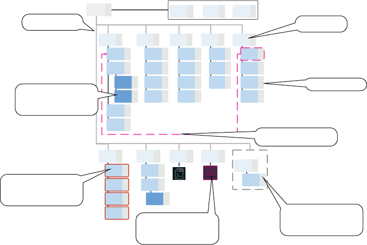
CHAPTER FIVE SITEMAPS 133
Signed in user
A
cme
A
ppa
r
el.com Sitema
p
Header links
Home Search Basket Help
Shirts Jackets
Ski
Jackets
Rain
jackets
Leather
jackets
Light
jackets
Trousers Summer
wear
T-shirts
Shorts
Sunglasses
Hats
T- Shirts
Shirts
Polo shirts
Vests
Trainers
Shoes
BootsFormal
Cross link
Sizing
guides
What's
hot
Request a
catalogue
Email
newsletter
Shirts
Jackets
Trousers
Shoes
Article
listing
Article
Page
Casual
Chinos
Jeans
Shorts
3 quarter
lengths
Shoes
Headline
article
PDF
download
Send
email
03
03
03
03
03
03
03
03
03
03
03
03
03
03
03
03
03
03
03
03
03
0202020202
01 04 05 06
07
08
08
08
08
09
10
10
11
12 13
Logged in
homepage 14
My
account 15
Connecting lines
Levels are indicated through
shading
Indicate key cross links
Template numbers
Area for logged in users
only
Areas where content needs
to be developed
Visually differentiate other
content types
Use real labels
Figure 5-5: Visual sitemaps use boxes and lines to show connections between pages. e placement of boxes and
the use of shading shows the structure.
08_9781119971108-ch05.indd 13308_9781119971108-ch05.indd 133 8/10/11 8:41 PM8/10/11 8:41 PM

COMMUNICATING THE USER EXPERIENCE
134
RESEARCH AND WORKSHOP IDEAS
is section explains techniques for work-shopping and researching ways to organize your
pages and to determine what pages need to be included in your site.
RESEARCH TECHNIQUE: Use site analytics and search logs
If you have to create a new sitemap for an existing site, the chances are people can’t nd what
they want on the current site. Site analytics are a great way to show what areas of your site
are working well and what is performing not so well. In terms of informing a sitemap, use
site analytics to determine where people are currently going in your site, and where they are
not going. is should broadly show you what navigation labels and structures are encourag-
ing people to dig deeper into your site.
However, analytics can’t tell you why people are visiting certain areas of the site and not oth-
ers. Analytics might show a certain page to be very popular, but is this because it’s what
people wanted to see? Or are your navigation labels sending a lot of users to the wrong place?
Analytics can’t get you the reasoning behind user behavior. It’s important to run user testing
to understand why people take certain routes through your site and what your navigation
labels mean to them. Analytics help you understand what’s going on; user testing helps you
understand why it’s happening.
Search logs are really useful for choosing navigation labels. People use search bars on most
websites when they can’t nd what they want by browsing. So if a user is looking for a certain
product on your site, and none of the navigation labels you’ve come up with help him nd it,
he will type a term in the search bar that he thinks best represents what he’s looking for. e
great thing about this is that you should have a ton of terms that real people use to describe
your products or areas of your site. So you don’t have to guess what words your users are
thinking—you have it all written down. If you have a high volume of search terms for a spe-
ci c area or product, then you can use the most common term as your label.
08_9781119971108-ch05.indd 13408_9781119971108-ch05.indd 134 8/10/11 8:41 PM8/10/11 8:41 PM

CHAPTER FIVE SITEMAPS 135
RESEARCH TECHNIQUE: Use open-card sorting
Card sorting (see Figure 5-6) is a great way to create a site structure that re ects the way
users think about your website. It also ensures you create navigation labels in language users
are familiar with. is is because card sorting is essentially an exercise that gets users to cre-
ate a sitemap for you.
To run a card-sorting session, write the name of every page from your site or every product
in your stock onto a separate piece of card stock. Lay all of these out onto a table and then
bring a test participant in to organize them for you. A card-sorting session is around one
hour long—any longer and the participant starts to lose interest. e goal of this session is
for the participant to group cards together in a way that he feels is logical. For example: does
he put shoes and boots in one group, and trousers and shorts in another group? Once all the
cards have been organized into groups, the participant must name each group he created.
is is the bit that participants usually nd most di cult and you will usually nd that the
act of trying to put a name to a group causes them to do a nal bit of re-organizing (which is
ne). Also it’s quite common for participants to create a group called “other stu .” It’s impor-
tant to note the pages or products that the user had di culty grouping, but you should
encourage him to try to group them into other sections.
Figure 5-6: Open-card sorting invites users to organize your website in a way that makes sense to them.
08_9781119971108-ch05.indd 13508_9781119971108-ch05.indd 135 8/10/11 8:41 PM8/10/11 8:41 PM
COMMUNICATING THE USER EXPERIENCE
136
Six to 12 card-sorting sessions is usually enough for a project. e goal at the end of all these
sessions is to see common groupings across participants. Did everybody group the same sets
of products together? Did participants use the same labels to describe groups?
ere is some really useful software that allows you to input all your data from card-sorting
sessions and then group the data in a number of ways for you to analyze. For example, xSort
for Mac not only allows you to analyze data but also run card-sorting sessions using digital
cards that participants drag around the screen with their mouse.
One of the most common ways to use software to show themes from card sorts is through
dendrograms (cluster trees). A dendrogram is a tree diagram that shows how closely related
items in your card sorts are, based on an average of each session. e more times two items
are grouped together, the closer they will appear in the dendrogram. e farther apart two
items appear in the dendrogram, the less your participants thought they were related.
It’s possible to do card sorting remotely using online tools like WebSort.net. is is great for
getting a high volume of results. However, it’s always worth running some of the sessions as
face-to-face interviews. Interviews allow you to nd out why things are grouped together and
why some things are di cult to categorize. If participants do not understand what some of
the pages are, you can explain it to them and ask how they would describe it more clearly.
is means you can make sure your products and pages are described correctly and that your
navigation and groupings will work.
e dendrogram shown in Figure 5-7 shows that participants thought T-shirts were closely
related to polo shirts, not so related to vests, and completely unrelated to boots, shoes, and
trainers.
08_9781119971108-ch05.indd 13608_9781119971108-ch05.indd 136 8/10/11 8:41 PM8/10/11 8:41 PM
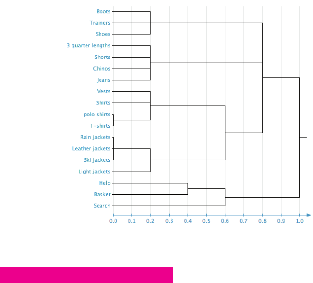
CHAPTER FIVE SITEMAPS 137
Figure 5-7: Analyzing a dendrogram.
RESEARCH TECHNIQUE: Determine the pages you need
If you are creating a sitemap for a website that does not exist yet, then the sitemap does not
just show how the pages are structured, but what pages need to be included. e business
will always have a strong idea of what they want to include in their website.
To a get clear idea of what the business wants in the site you’ll need to interview all the key
stakeholders. Every department in the business will want to make sure its needs from the
website will be supported. It’s easy to assume that an e-commerce site will simply be made up
from all the products it sells, but it’s very common for business to want editorial sections
with articles and blogs to help boost its brand and SEO rankings.
You also need to determine what content your users will need from your new website. e
structure and labeling users expect will come out of the card-sorting sessions. First it’s help-
ful to nd out what content they will expect and nd helpful. e best way to do that is
through benchmark testing (see Figure 5-8), which involves recruiting participants who use
services similar to the one your website will be providing. Get them to perform tasks on com-
petitors’ websites. e aim is to nd out what tasks they go to these sites for and how well
08_9781119971108-ch05.indd 13708_9781119971108-ch05.indd 137 8/10/11 8:41 PM8/10/11 8:41 PM

COMMUNICATING THE USER EXPERIENCE
138
your competitors support these tasks. You can then either be in uenced by the structure and
content they provide, or learn from their failings.
Figure 5-8: Benchmark testing helps you see if other websites are structured in ways that users understand.
RESEARCH TECHNIQUE: Validate your sitemap
Once have created a sitemap and navigation based on business requirements and user goals,
you need to make sure the site structure works before you start coding.
Closed-card sorts
Closed-card sorts are the same as open-card sorts, but use a speci ed number of groups that
have pre-determined names (usually tied to top-level navigation). is is why they are more
suited to validating your navigation structure.
Closed-card sorts are run much in the same way as open-card sorts, with every page written
on a card. However, also write a card for each label of your top navigation, place those on the
table, and tell participants that they are to use those as their groups.
08_9781119971108-ch05.indd 13808_9781119971108-ch05.indd 138 8/10/11 8:41 PM8/10/11 8:41 PM
CHAPTER FIVE SITEMAPS 139
By using closed-card sorting, you’re trying to determine if participants understand the labels
you have used in your top navigation. If they have, then great—they can stay the same. If
not, then ask yourself, “What did they think they meant? What language would they use to
describe each group instead?” You also want to see if they put all the pages in the same
groups as you did on your sitemap. If the results match your navigation structure, it’s work-
ing in a way that makes sense to users. If the results don’t match, you need to restructure
your sitemap.
Remote navigation testing
Remote navigation testing is a cheaper and faster way to validate your sitemap and naviga-
tion. is is because they are un-moderated and multiple tests can take place at once.
Online tools like PlainFrame (see Figure 5-9) and Treejack are used for these tests. ey work
by entering your site structure into the tool and then setting tasks based around nding
speci c pages—for example, “ nd short trousers.” It’s always a good idea to set a number of
tasks that require the users to look in all areas of your structure. It’s important not to focus
the tasks on the easy-to- nd pages. If there was a particular page that was di cult for you to
categorize, then that should form part of your test.
Once your tasks are set, email a link to the test to your participants. ey will be asked to
complete each task on your navigation one by one. e outcome is a list of results based on
whether or not participants were able to complete the tasks. If participants were able to nd
what they were looking for, the navigation is working. If participants were not able to nd a
page, these tools tell you where they tried to look. is tells you where people expect to nd
certain pages, so you should restructure your sitemap to match these expectations.
Remote navigation testing is great for seeing if the navigation is working with a high number
of participants. It’s still worth conducting face-to-face card sorts so you can talk to partici-
pants about why they might be having di culty completing some tasks.
08_9781119971108-ch05.indd 13908_9781119971108-ch05.indd 139 8/10/11 8:41 PM8/10/11 8:41 PM
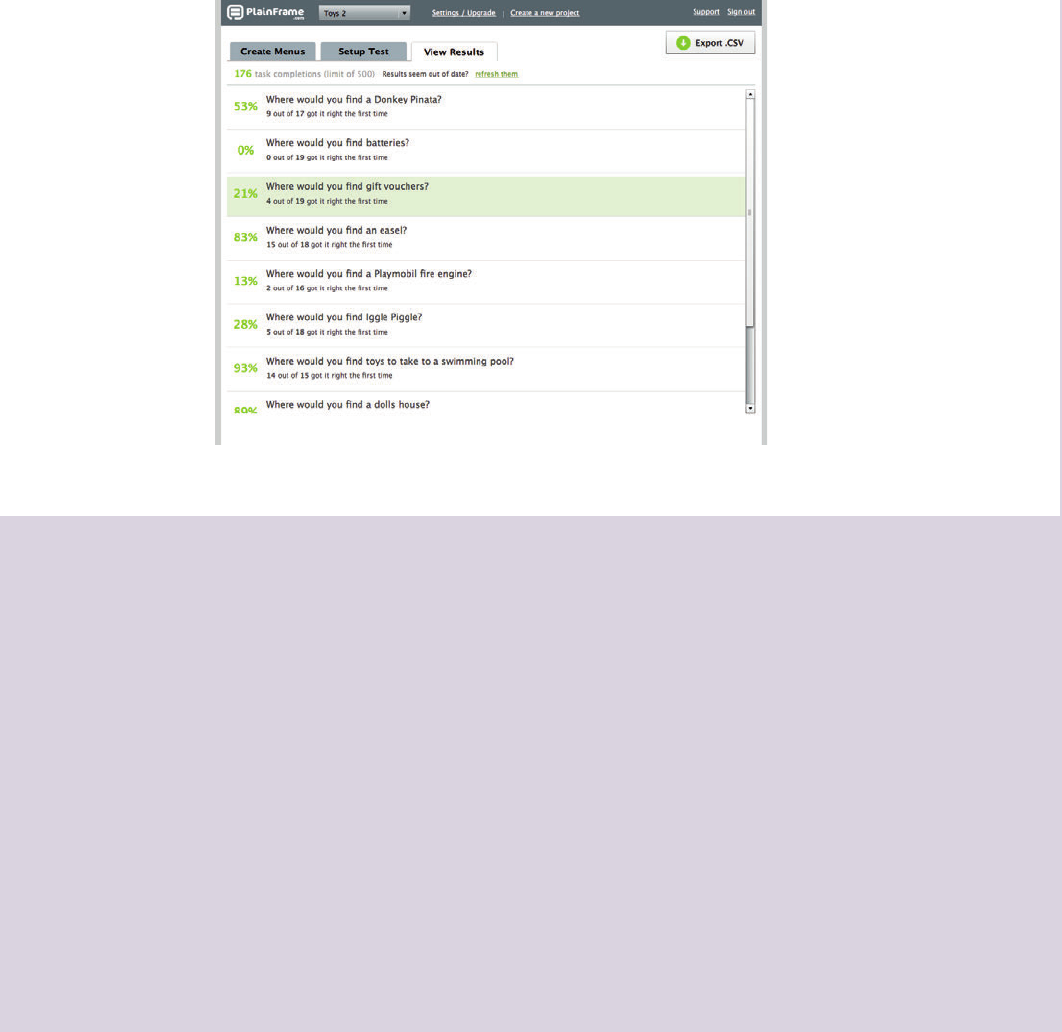
COMMUNICATING THE USER EXPERIENCE
140
Figure 5-9: Remote testing tools tell you if participants successfully used you navigation.
What’s the simplest way to create a sitemap?
To create a quick and simple sitemap I always nd it best to use the Outline view in
Microsoft Word. It allows you to quickly add all your pages into a list and organize them into
a tree structure. The simple nature of Outline view means you only concentrate on the
structure of the sitemap and not about how the document looks, which is important if you
are pressed for time.
I like to start a sitemap in Outline view even if I intend to create a more visual version of it
later. It’s a great way to plan out the structure of the document before you try to add any
styling to it.
To create a sitemap in Outline view, simply open up a new Word document, click View, and
then click Outline. Once you are in Outline view, simply start typing all your pages. Press
Enter every time you add a new page. Indent pages that sit within others to create your tree
structure. In Figure 5-10, Jeans and Chinos each lives within Trousers. To change the indent
in outline view, use Tab or Shift+Tab (this works on PC and Mac).
08_9781119971108-ch05.indd 14008_9781119971108-ch05.indd 140 8/10/11 8:41 PM8/10/11 8:41 PM
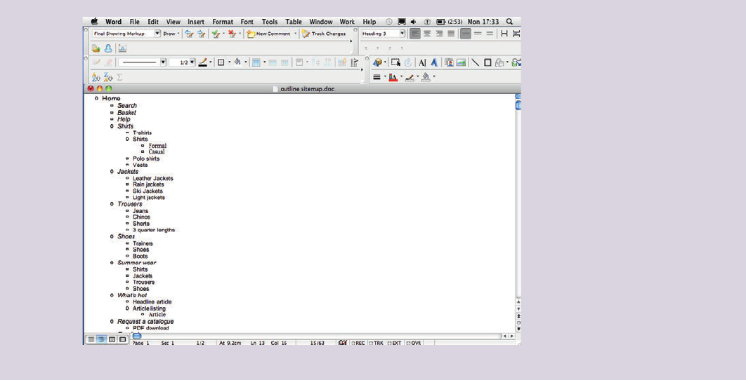
CHAPTER FIVE SITEMAPS 141
Figure 5-10: Outline view allows you to quickly plan out a site structure.
08_9781119971108-ch05.indd 14108_9781119971108-ch05.indd 141 8/10/11 8:41 PM8/10/11 8:41 PM
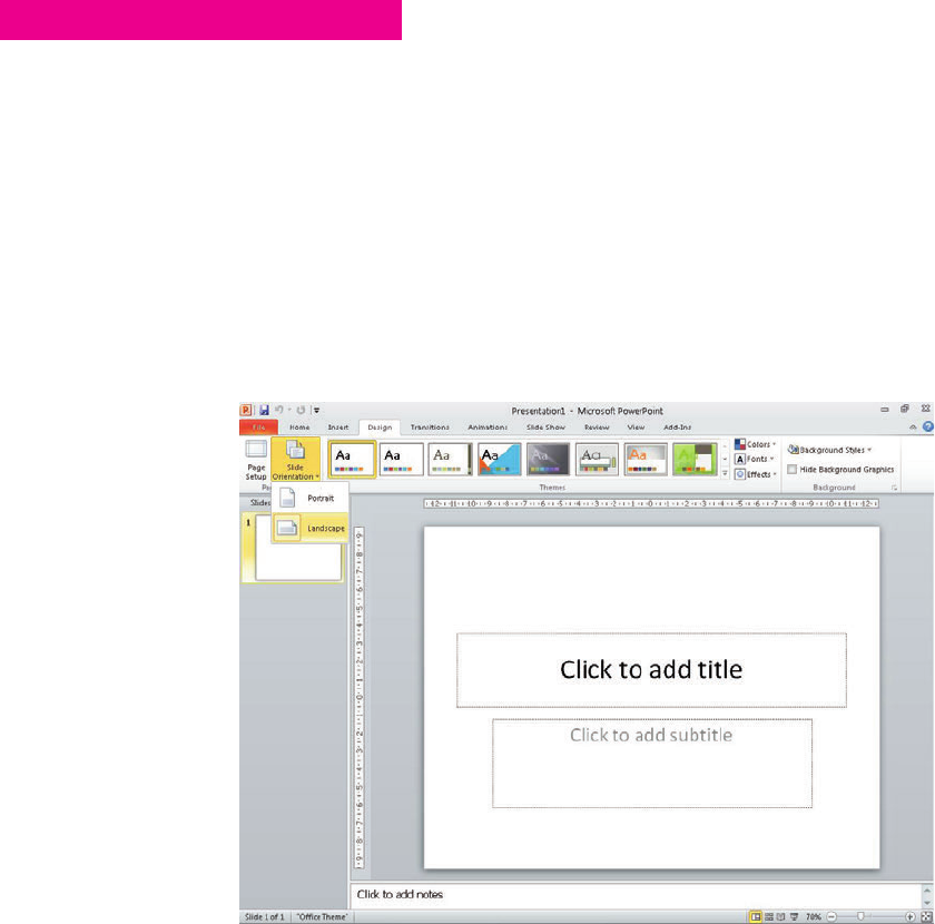
COMMUNICATING THE USER EXPERIENCE
142
HOW TO Create a sitemap in PowerPoint
In this section, you’ll learn how to create a sitemap using PowerPoint, including shaded
shapes and connecting lines.
Setting page orientation
When creating sitemaps in PowerPoint, the slide orientation you use depends on the struc-
ture of your sitemap. If it’s a deep structure (long and thin), a portrait layout is needed. If it a
wide structure, landscape is more appropriate.
To change the orientation, go to the Design tab, click Slide Orientation option. is tutorial
will use the Landscape orientation (see Figure 5-11).
Figure 5-11: e orientation of the slide will depend on how many pages you need to include in your sitemap.
Creating and shading boxes
A box will represent each page in the sitemap. To create one, go the Home tab, click the
Shapes drop-down, and then select the Rounded Rectangle. Whether you use rounded
08_9781119971108-ch05.indd 14208_9781119971108-ch05.indd 142 8/10/11 8:41 PM8/10/11 8:41 PM
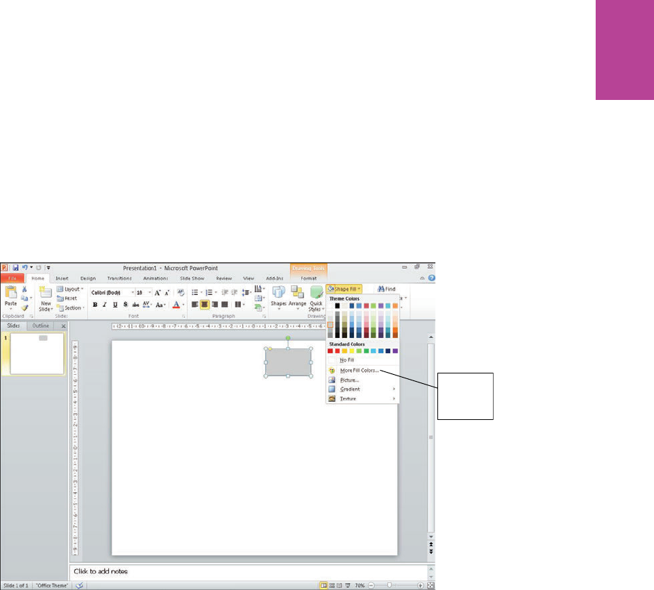
143 CHAPTER FIVE SITEMAPS
corners or not is really personal preference; they do tend to soften the look of the document,
so you should consider using them.
To reduce the visual clutter on the page, don’t use outlines on any of the boxes; just use a
light Shape Fill for your rst box (see Figure 5-12). You can access additional colors by click-
ing More Fill Colors.
Access to
additional
colors
Figure 5-12: To minimize visual clutter, use soft colors and avoid outlines on shapes.
Use shading to show how deep in the navigation each page is. Start to create more boxes for
your rst and second level of navigation. Give the boxes in each new level of navigation a
darker shade. It’s a good idea to introduce some color at this point (see Figure 5-13) because
you might soon run out of varying shades of gray.
08_9781119971108-ch05.indd 14308_9781119971108-ch05.indd 143 8/10/11 8:41 PM8/10/11 8:41 PM
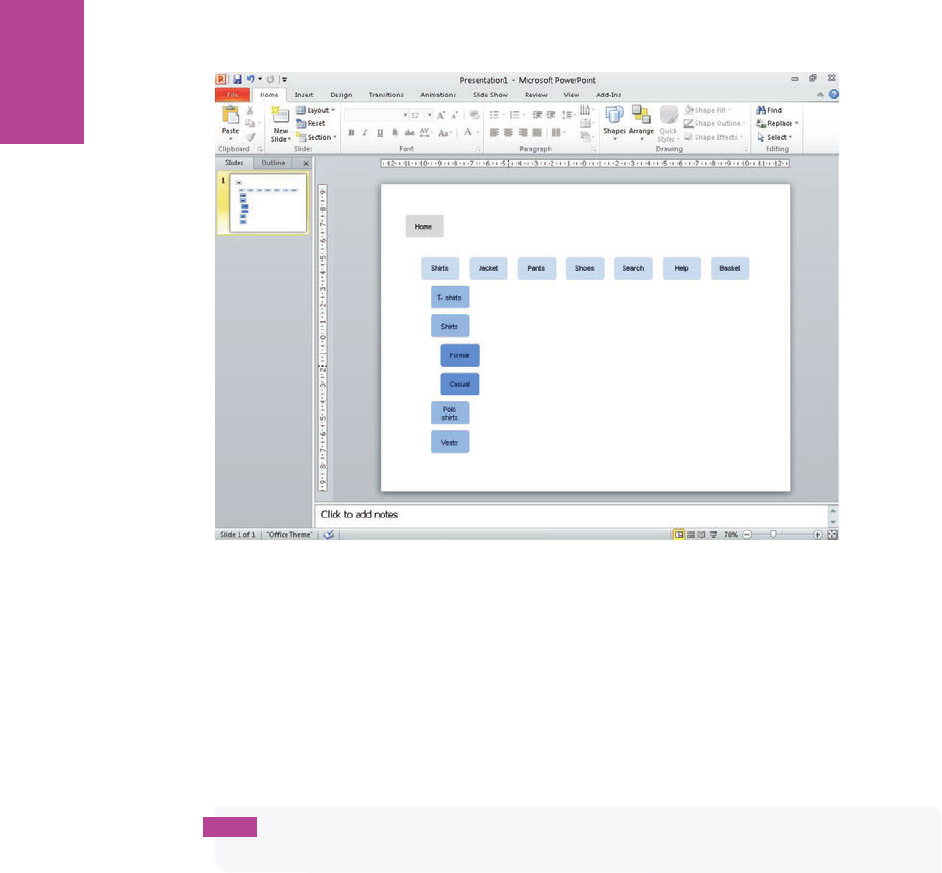
144
COMMUNICATING THE USER EXPERIENCE
Figure 5-13: e top navigation is a light blue, the second level is a darker blue, and the third level is an even
darker shade of blue.
Adding connecting lines
To connect two of the boxes together:
1 Click the Home tab and in the Drawing group, click the Shapes drop-down and select the
Elbow Connector.
tip This style of line is best to use because it creates corners in the line to move around
objects.
2 Drag the line from the Home box to one of your second-level boxes.
As shown in Figure 5-14, the line snaps to one of four center points on each box.
3 Once you’ve drawn all your lines, use the Shape Outline drop-down in the Drawing group
on the Home tab to make your lines a thin mid gray. e lines need to be clearly visible,
but must not take attention away from the page boxes.
08_9781119971108-ch05.indd 14408_9781119971108-ch05.indd 144 8/10/11 8:41 PM8/10/11 8:41 PM
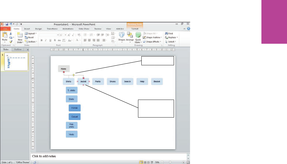
145 CHAPTER FIVE SITEMAPS
Elbow connector
Lines snap to one
of four connecting
points
Figure 5-14: Snapping elbow connectors into place.
Signifying page groups
Sometimes you will need to show that groups of pages are part of a speci c set (for example,
when showing logged in pages or footer links). e usual way of showing this is by drawing a
box around the group of pages using a dashed outline box
1 Select a Rectangle from the Shapes drop-down in the Drawing group on the Home tab.
2 Use the Shape Fill drop-down to remove the ll.
3 Use the Shape Outline drop-down to set the outline to a thin gray dashed line, as shown
in Figure 5-15.
08_9781119971108-ch05.indd 14508_9781119971108-ch05.indd 145 8/10/11 8:41 PM8/10/11 8:41 PM
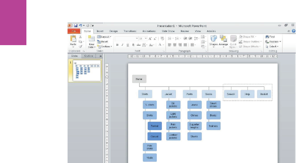
146
COMMUNICATING THE USER EXPERIENCE
Figure 5-15: Dashed outlines are used to signify logged in areas of the site.
Showing cross-links
To show when two pages in the site are linked together, but not as part of the main structure
of the site, use a visibly di erent style of line—known as a cross-link—to connect them. For
example, use an elbow connector with an arrow on one end to link the two pages (see Figure
5-16). is shows the direction of the cross-link. Click the Shape Outline drop-down to
change the line to a bright color and a dash; this visually di erentiates it from the other con-
necting lines.
08_9781119971108-ch05.indd 14608_9781119971108-ch05.indd 146 8/10/11 8:41 PM8/10/11 8:41 PM
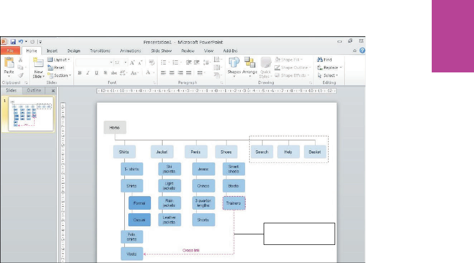
147 CHAPTER FIVE SITEMAPS
Use a colored, dashed
line for cross links
Figure 5-16: Cross-links should look di erent from normal navigation paths.
08_9781119971108-ch05.indd 14708_9781119971108-ch05.indd 147 8/10/11 8:41 PM8/10/11 8:41 PM

COMMUNICATING THE USER EXPERIENCE
148
HOW TO Create a sitemap in OmniGraf e
To produce sitemaps in OmniGra e, you must create a couple of key elements you need to
create and you must follow the same structure that you learned in the section entitled
“Anatomy of a Visual Sitemap.”
Setting up the template
e way your page is laid out depends entirely on the structure of the sitemap. If it has a nar-
row top navigation with deep sets of pages, use a portrait setup. If it has a wide top naviga-
tion with shallow sets of pages, use a landscape setup.
It’s best to design for a large format print out where possible. is gives you more room to
maneuver and creates a much easier document to digest.
Creating boxes with magnetic points
To create boxes with magnetic points, follow these steps:
1 On the Toolbar above the canvas, click the Shape button and then select a rectangle.
2 Draw a rectangle on your canvas.
3 Using the style section of the inspector, apply a shaded ll and remove the outline and
shadow (see Figure 5-17). is eliminates unnecessary lines and clutter from the sitemap.
4 Duplicate this shape for every page in your sitemap and organize them into the site struc-
ture. User a darker shade for each level of navigation you create. (See Figure 5-18.)
08_9781119971108-ch05.indd 14808_9781119971108-ch05.indd 148 8/10/11 8:41 PM8/10/11 8:41 PM
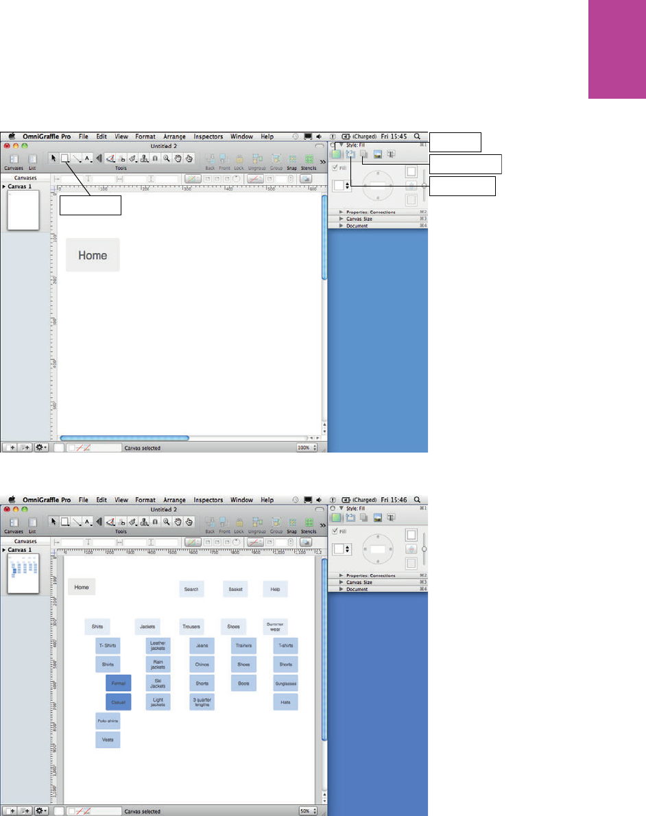
149 CHAPTER FIVE SITEMAPS
Shape button
Fill options
Shadow options
Stroke options
Figure 5-17: Remove lines and shadows from your shapes to remove visual clutter.
Figure 5-18: e top navigation is a light blue, the second level is a darker blue, and the third level is an even
darker shade of blue.
08_9781119971108-ch05.indd 14908_9781119971108-ch05.indd 149 8/10/11 8:41 PM8/10/11 8:41 PM
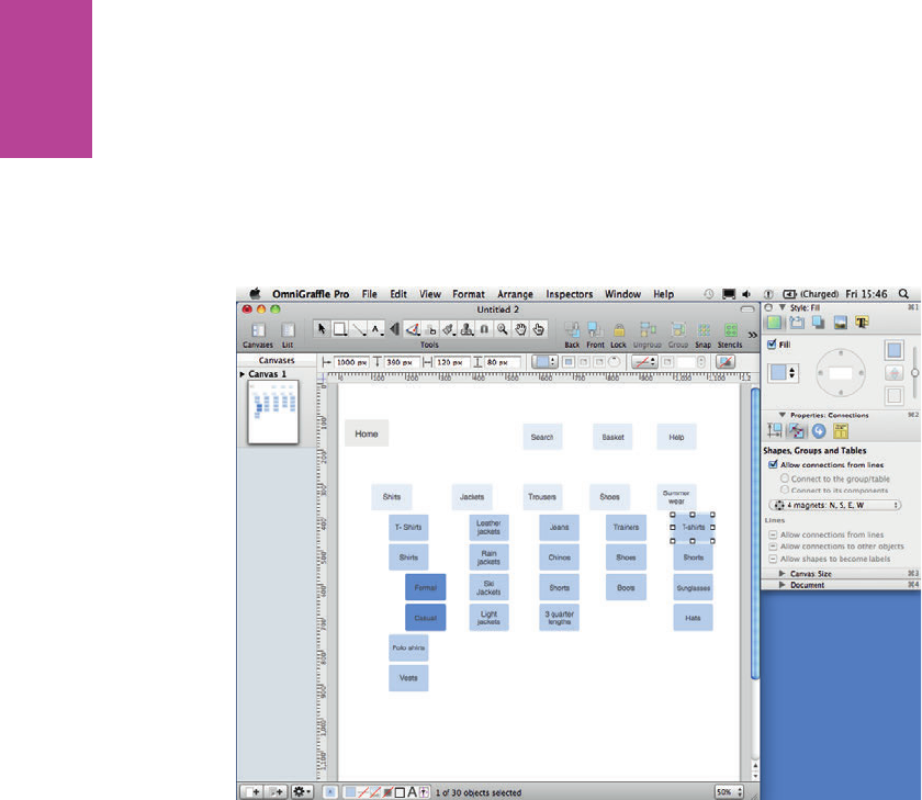
150
COMMUNICATING THE USER EXPERIENCE
5 Select all your rectangles, go to the Properties section of the inspector, and then select the
Connections option.
6 Make sure the Allow connections from lines checkbox is selected.
7 Set the magnets drop-down to 4 magnets N, S, E, W (as shown in Figure 5-19). is makes
it easier to connect lines between two rectangles.
Figure 5-19: Setting magnetic points on your shapes makes it easier to connect them with lines.
Using connecting lines
To use connecting lines, follow these steps:
1 On the Toolbar above the canvas, click and hold the Line Tool button (see Figure 5-20).
2 Select the Orthogonal Stroke: Obsidian line tool. is line creates corners that move
around objects.
3 Draw a line from one of the rectangles to the other.
As shown in Figure 5-20, small circles appear on the rectangle. ese are the magnet points,
and lines will snap to one of these points every time you draw one either to or from the rect-
angle. is is really useful for making sure the lines all start from the same position on every
box in your sitemap.
4 Repeat these steps to connect all the pages.
08_9781119971108-ch05.indd 15008_9781119971108-ch05.indd 150 8/10/11 8:41 PM8/10/11 8:41 PM
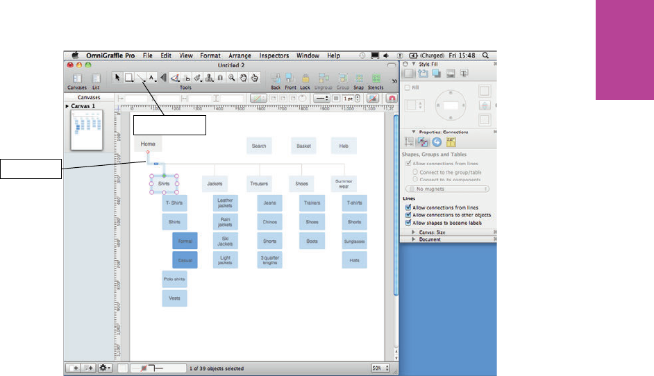
151 CHAPTER FIVE SITEMAPS
Line Tool button
Obsidian line
Figure 5-20: Orthogonal lines allow you to create lines that move around shapes.
De-magnetizing lines
Sometimes you need you lines to not snap to the magnetic points on your shapes because
you want more control over their positions. To de-magnetize lines, follow these steps:
1 Select the line you want to de-magnetize.
2 Click the Magnetize button (see Figure 5-21). When the line is de-magnetized, its end
points turn blue.
To nish o your sitemap, add a gray box to the right of each page rectangle (see Figure 5-22)
and add the template number. If you need to show cross-links, remember to use a line style
and color that is di erent from your other connecting points.
08_9781119971108-ch05.indd 15108_9781119971108-ch05.indd 151 8/10/11 8:41 PM8/10/11 8:41 PM
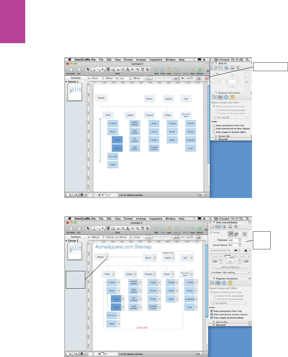
152
COMMUNICATING THE USER EXPERIENCE
Magnetize button
Figure 5-21: De-magnetizing lines stops them snapping to shapes.
Edit line
styles
here
Add
template
numbers
Figure 5-22: e nished site map uses repeated elements that you have already created.
08_9781119971108-ch05.indd 15208_9781119971108-ch05.indd 152 8/10/11 8:41 PM8/10/11 8:41 PM

CHAPTER FIVE SITEMAPS 153
HOW TO Create a sitemap in Excel
Here are some simple instructions on how to create the key elements of an Excel sitemap.
ere are no advanced techniques here—just simple formatting instructions.
Writing labels and wrapping text
To add labels, simply select a cell and type the label. You will nd that some labels are longer
than their cell width, so the text covers the cells to their right (see Figure 5-23).
tip It’s better to get all your page names written at once, before formatting, so you can then
format multiple cells at once.
Labels that extend
past their column
widths
Figure 5-23: Labels that extend beyond their column widths.
To x this problem, you can get the text to wrap within the cell space by following these
steps:
1 Select all the cells using the keyboard shortcut Ctrl+A.
2 Right-click anywhere in the cells and select Format Cells.
08_9781119971108-ch05.indd 15308_9781119971108-ch05.indd 153 8/10/11 8:41 PM8/10/11 8:41 PM
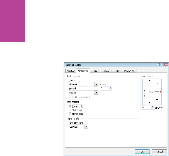
154
COMMUNICATING THE USER EXPERIENCE
3 Select the Alignment tab within the Format cells window.
4 Select the Wrap text check box (see Figure 5-24).
Now if your text is too long for the cell, it wraps onto a new line.
Figure 5-24: Enabling the text-wrapping option.
Shading cells
You will need to apply di erent colors to your sitemap to signify pages that need content to
be produced for the nal website or to visually organize the information in order to make it
easier to read:
1 Click the cell you want to shade.
2 On the Home tab, in the Font group, click the Fill Color button and then choose a color
(see Figure 5-25).
As shown in Figure 5-25, red shows content that is currently missing from the site.
To shade a group of cells, click and drag across the group of cells you want to shade. Pick a
color in the same way. In Figure 5-26, various shades of gray are used to visually group the
information without introducing clutter.
You can shade an entire column or row, too. In fact, it’s a good idea to use shading for the
Notes column and the Template column so they are visually di erentiated from the pages in
the sitemap. To apply shading to an entire column, click the column letter (see Figure 5-27)
and then choose your shading. To apply shading to an entire row, click the row number and
then choose your shading.
08_9781119971108-ch05.indd 15408_9781119971108-ch05.indd 154 8/10/11 8:41 PM8/10/11 8:41 PM
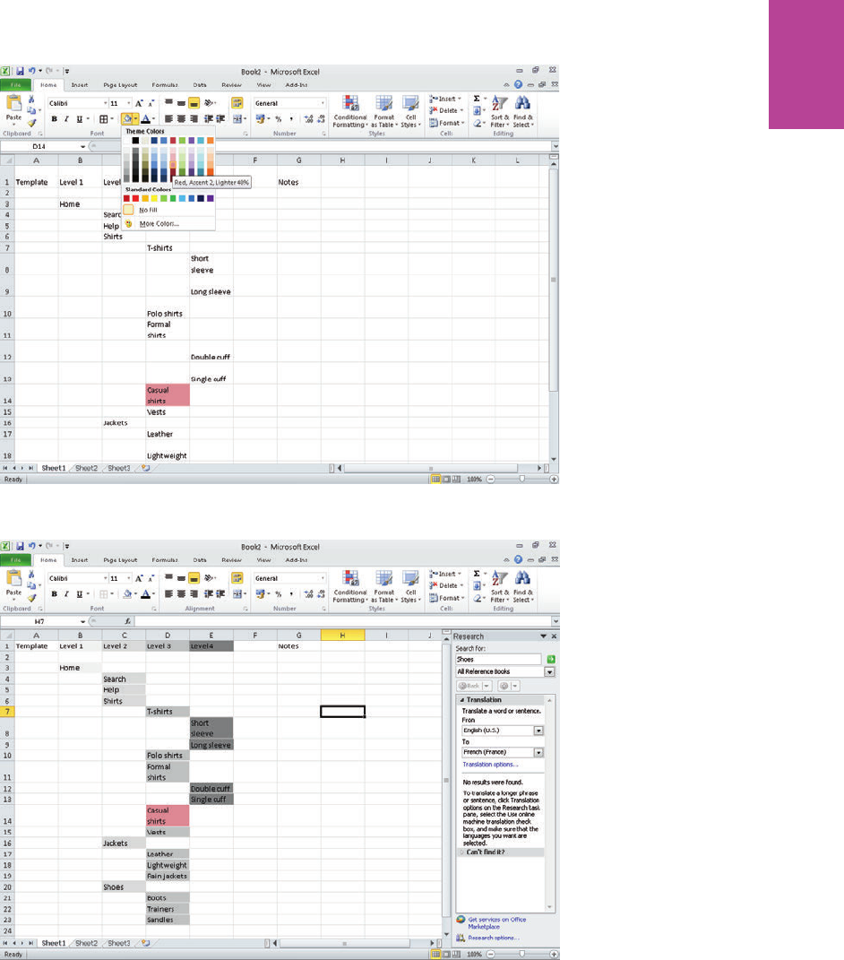
155 CHAPTER FIVE SITEMAPS
Figure 5-25: Select a cell and click the Fill Color button to choose a color.
Figure 5-26: Use shading to group pages that sit within the same categories and to emphasize what navigation
level they sit in.
08_9781119971108-ch05.indd 15508_9781119971108-ch05.indd 155 8/10/11 8:41 PM8/10/11 8:41 PM

156
COMMUNICATING THE USER EXPERIENCE
Click the column
letter to select the
entire column
Figure 5-27: Selecting an entire column.
Adding new rows and columns
To add new rows or columns in the middle of you sitemap:
1 Click the cell directly below where you want to add a row or directly left of where you want
to add a column.
2 Right-click and then choose Insert.
3 In the Insert dialog box, select Entire row or Entire column.
To add multiple rows or columns:
1 Select number of cells that match the number of rows or columns you want to add. For
example, to add three new rows, select the three row numbers below where you want to
add these new rows.
2 Right-click the selected rows and choose Insert.
3 In the Insert dialog box, select Entire Row.
In the example shown in Figure 5-28, a new row is being inserted below Row 6.
08_9781119971108-ch05.indd 15608_9781119971108-ch05.indd 156 8/10/11 8:41 PM8/10/11 8:41 PM
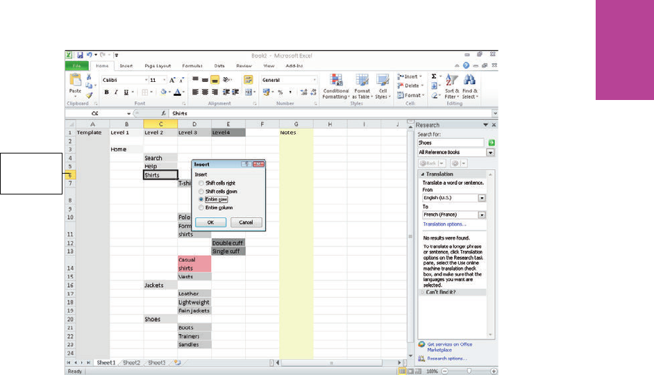
157 CHAPTER FIVE SITEMAPS
Inserting a
new row
below Row 6
Figure 5-28: Inserting a new row.
08_9781119971108-ch05.indd 15708_9781119971108-ch05.indd 157 8/10/11 8:41 PM8/10/11 8:41 PM

158
COMMUNICATING THE USER EXPERIENCE
08_9781119971108-ch05.indd 15808_9781119971108-ch05.indd 158 8/10/11 8:41 PM8/10/11 8:41 PM

chapter 6
Wireframes 6
09_9781119971108-ch06.indd 15909_9781119971108-ch06.indd 159 8/10/11 8:37 PM8/10/11 8:37 PM
COMMUNICATING THE USER EXPERIENCE
160
GOOD WIREFRAMES CAN transform a project. Like an engineer’s blueprint or an archi-
tect’s drawings, wireframes become the glue that holds the product, technical, design, and
management teams together. And they are perfect to get in front of your audience to vali-
date that the ideas work.
At the end of this chapter you’ll look at developing wireframes using speci c tools, but the
principles discussed can be used in any software. See Figure 6-1.
What makes a good wireframe?
Wireframes allow the entire project team to focus on the interface that is being created. You
can consider if the product or service is being presented in the right way, how the content
will be structured, where the data will come from, how the functionality will be developed,
and visually how the page will be laid out and where the emphasis is required.
To help focus on user experience qualities such of ease of use, simplicity, and friendliness,
our colleague Giles Colborne has developed a three-level order of importance:
> How does it feel? Does the user interface respond and act as the user wants it to?
Reinforcing users’ tasks and enhancing their expectations of the product.
> How does it look? Is the interface design clear and well structured?
> How does it work? is is the technical implementation that is needed to support the
look and feel.
For the user, feel is more important than look (as the system rst needs to match how a user
wants and needs it to behave), which is more important than how it works (users are happy
when things just work, not necessarily how they work).
It’s a useful framework for assessing your work and prioritizing elements. And it’s also a
good reminder that while the wireframe is a very functional document (majoring on the look
and workings), the prize is on getting the feel right for the users.
is chapter focuses primarily on static wireframes and what needs to be communicated in
them to help improve the documents you produce. Of course, these can then be made inter-
active as required.
09_9781119971108-ch06.indd 16009_9781119971108-ch06.indd 160 8/10/11 8:37 PM8/10/11 8:37 PM
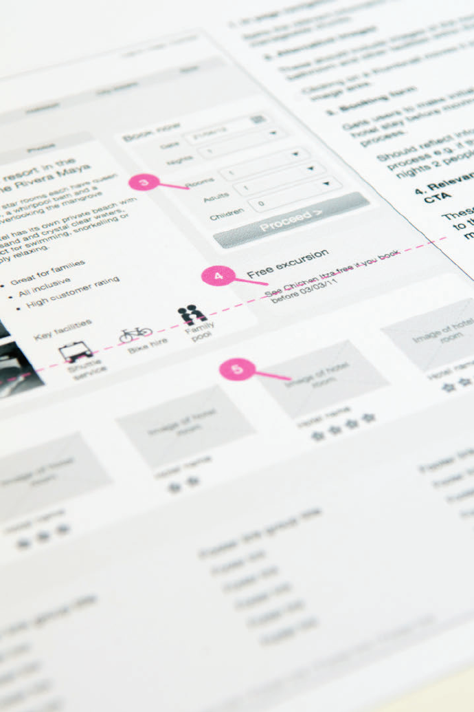
CHAPTER SIX WIREFRAMES 161
F -: A wireframe document showing the page with callouts referring to notes.
09_9781119971108-ch06.indd 16109_9781119971108-ch06.indd 161 8/10/11 8:37 PM8/10/11 8:37 PM
COMMUNICATING THE USER EXPERIENCE
162
When to create a wireframe?
Some form of prototyping should be used on every project—whether it’s a sketch on a piece
of paper or a fully blown OmniGra e, Axure, Visio, or HTML prototype. ey make ideas
real and give focus and direction to the problems you are trying to resolve.
A good wireframe is born out of a collaborative process. e whole project team should be
involved from the rst sketches through to the nal document delivery. Review meetings
should be frequent — one of the bene ts of prototyping is that alternative ideas and changes
are quick to try and discuss.
Get the wireframes in front of the users often and validate that they are working as planned.
Again changes are quick to implement and you can validate again if necessary.
What are you communicating?
A well-presented wireframe helps the project team understand the ideal design and func-
tional solution. It’s a key piece of UX documentation that is relatively quick and cost e ective
to produce and yet helps crystallize the product. e following sections describe the elements
you want to be discussing.
Vision
Wireframes provide the vision for the site that you are creating. Include the vision objectives
at the beginning of the wireframes (and reinforce at the beginning of meetings) to focus and
align the team.
Layout
You can organize the structure of the page and where the di erent elements t. You can eas-
ily try and test alternative layouts to see which works best for the users.
Content and images
What are the content and image requirements for each page? Where will you source the
assets from?
09_9781119971108-ch06.indd 16209_9781119971108-ch06.indd 162 8/10/11 8:37 PM8/10/11 8:37 PM
CHAPTER SIX WIREFRAMES 163
Priority
Wireframes help identify what the priority or key element of each page should be. Where do
you want users to look? What do you want them to do?
Navigation
How is a user going to move around the site? e wireframes let you try and test di erent
approaches for navigation.
Functionality
Wireframes help identify the functionality of a page. How should users interact with the
page and what happens when they do? is will be implied through the a ordance —does it
look the way it works?—of the elements used, notes, and storyboards.
Who is the audience?
Involving a wide range of stakeholders in the wireframes development enables you to discuss
content and functionality without the additional comments on colors, styling, and imagery
that you’d have when presenting creative content.
Wireframes get more attention than any other deliverable you develop. is section covers a
full list of the roles you will likely work with.
is can seem overwhelming, so it’s good practice to agree on the stakeholder sign-o pro-
cess and ensure that the right people are involved at the right time.
e following sections break such a list into common groups. Remember, every company is
di erent, and that will be re ected in the team you work with. See Figure 6-2.
09_9781119971108-ch06.indd 16309_9781119971108-ch06.indd 163 8/10/11 8:37 PM8/10/11 8:37 PM

COMMUNICATING THE USER EXPERIENCE
164
F -: Take time to work through the detail of the wireframes with the project team, ensuring it meets the
business requirements and can be developed.
Development team
e development team group is directly involved with the development and release of the
product.
> Designers want to understand the content needs, visual hierarchy, and how you
intend the user to interact. Designers can work on concepts as you’re working on wire-
frames in order to collaborate on the nal visual approach. You’ll want to avoid them
feeling like they are coloring in your work and instead get them to trust that you can
architect their creative ideas.
> Developers need to understand how the functionality works, both in the front and
back ends:
• With front-end developers you can explore approaches to layout, content orga-
nization, and responsive interactions (how something behaves or feels when
you interact with it).
• With back-end developers you can discuss how you can manipulate the data
between the user and the database—the wireframes help give focus to these
discussions.
09_9781119971108-ch06.indd 16409_9781119971108-ch06.indd 164 8/10/11 8:37 PM8/10/11 8:37 PM
CHAPTER SIX WIREFRAMES 165
• If a content management system (CMS) or e-commerce platform is being used,
then having a walkthrough of how it works and seeing examples of implemen-
tations will be necessary before you start working on the wireframes.
> Project managers want to make sure that agreed-on functionality is in place and that
the site can be built by the team on time and on budget. ey will know and under-
stand the aims and business reasons for the project and so can give good feedback
throughout the wireframe development.
> Business analysts will be looking at the detail. ey will document what you are creat-
ing to the front- and back-end development teams (usually in the form of a functional
speci cation). You’ll spend a lot of time with them going through the details.
> User experience peers can help you share ideas and liaise with the other team mem-
bers. You can collaborate with them on techniques and best practices. If you are an
agency or individual working with them for the rst time, it’s worth spending time to
understand the standards and approaches they use internally.
Specialists
If available, members of the specialists group will add to the quality of the thinking in your
wireframes. Carrying their input into the wireframes is of huge value to the subsequent
development and roll-out of the product and ensures less amends later.
> Search engine optimization (SEO) teams are interested in seeing the navigation
and content layout and o ering input on them. Getting these specialists involved early
in the wireframe development ensures that the SEO needs of the site will be in place
from launch.
> Content and copy teams want to understand how elements will appear on the site
and link together. ey will be responsible for writing or commissioning new content
for the site and ensuring that all elements have a consistent tone of voice.
> Analytics specialists are looking at conversion paths and areas where the site needs
to be optimized. ey may have good insights from existing analytics, which help
shape the ow of the site. ey may also be responsible for multi-variant testing
(MVT), looking at layout scenarios to test after launch.
> Accessibility teams want to know that the site can be developed using clear semantic
markup and that complex interactive elements can degrade gracefully. ey are inter-
ested in the clarity of the copy and that the designs work for users with colorblindness.
09_9781119971108-ch06.indd 16509_9781119971108-ch06.indd 165 8/10/11 8:38 PM8/10/11 8:38 PM
COMMUNICATING THE USER EXPERIENCE
166
Related business functions
Related business function teams often have responsibilities outside of the project, but their
views and opinions are of critical importance to the direction of the wireframes.
> Product managers want to see their ideas realized and make sure that you’ve encap-
sulated the bene ts of the product accurately. For an e-commerce site, the product
managers may understand the monetary value of page elements. It’s worth picking
their brains on this before you move or remove page elements.
> Brand and marketing teams want to ensure that the site is in line with the product
and brand vision. Depending on the project they may be liaising with teams across dif-
ferent media to ensure consistency and commissioning market research to ensure con-
sumers respond favorably to the messaging.
> Legal and compliance teams can often be seen as a stick applied to your wireframes
near the end of the project. However, involving them as stakeholders from an early
stage helps you understand their requirements and includes them as part of the deliv-
erable project, ensuring legal sign-o will be a breeze.
> Finance and operations can have needs similar to the managing directors, but these
folks also will be able to inform the current and future monetization needs of the proj-
ect and speci c products featured.
> Market researchers can give information on the audience demographics and have
good information on the broad user need of the project.
> Customer service managers can provide a wealth of information on users’ content
needs and speci c problems or di culties that they frequently hear from customers.
ey will be able to provide a good objective view to the wireframes and point out areas
that require clari cation.
Sign-off groups
e success of the project is of critical importance to your sign-o groups, but they may not
have the availability to be involved on a day-to-day basis.
> Head of online and online managers will have ultimate responsibility for what goes
on the site. ey’ll be liaising with all the parties involved to ensure that the site can go
live and meet the business objectives. ey will be reporting progress to the board and
will want to ensure that the wireframes are giving the best solution and can be devel-
oped as planned.
09_9781119971108-ch06.indd 16609_9781119971108-ch06.indd 166 8/10/11 8:38 PM8/10/11 8:38 PM
CHAPTER SIX WIREFRAMES 167
> E-commerce teams are responsible for the merchandising elements of the site. From
the wireframes they will want to make sure that people can nd and purchase products
easily, that the right content is available for each product, and that o ers and promo-
tions (including cross-selling and up-selling) are clearly messaged.
> Managing director and board member requirements will vary depending on how
hands-on they are, but generally they want to ensure that their money is being invested
wisely and that the project is meeting the strategic and revenue needs of the company.
Agency teams
Finally, agency teams will often sit alongside the project team to manage the quality and
direction of the delivery.
> Account directors and managers are responsible for the relationship with the client
and are going to want to ensure that the agency is delivering the best possible solution.
You’ll need to work with them to ensure they understand why your solution is the best
one.
> Strategists and planners are interested in the broader context of the project. How
does it t into other projects being worked on? How will it link to marketing activities?
ey want to understand the context of the wireframes against their activity plans.
Anatomy of a wireframe
is section explains everything you need to include in a wireframe to ensure it communi-
cates your ideas e ectively. In Figure 6-3, letters A-E refer to notes located to the right of the
gure.
Write clear page titles and numbers
Writing understandable page titles and numbers makes it obvious what page to look at when
you talk through wireframes with team members over the phone.
Work in actual pixels when possible
Working in actual pixels stops the guess work and makes sure everything will t in the nal
design.
09_9781119971108-ch06.indd 16709_9781119971108-ch06.indd 167 8/10/11 8:38 PM8/10/11 8:38 PM
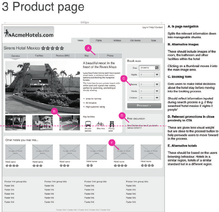
COMMUNICATING THE USER EXPERIENCE
168
F -: An example page from a nished deck of wireframes.
Use shading to show visual weighting
Visual prioritization is important to any design. If your wireframes are just made up of white
boxes with black outlines, your visual priority will not be communicated to the design team.
Use various shades of white and gray to create a visual prioritization.
Avoid black text lines or shapes
Black is harsh on the eyes and makes the page look busy. Use 75% gray text to soften the
whole design, and don’t use black in shapes.
09_9781119971108-ch06.indd 16809_9781119971108-ch06.indd 168 8/10/11 8:38 PM8/10/11 8:38 PM
CHAPTER SIX WIREFRAMES 169
Use real data
Use product names, prices, navigation labels, lter sets, and phone numbers to ensure all the
necessary copy ts in the design. Real data is vital for testing wireframes. Without it testing
is unrealistic and you will miss out on users’ responses to certain pieces of information.
Use real images where necessary
Use real images to test the wireframes and also to show what style of image needs to be used
in the nal design.
Write descriptive image placeholders
Images are often the most important part of a website. Simply saying where images must go
is not enough. Image placeholders are a great opportunity to describe the type of image to
use to enhance the user experience.
Use clear annotation
Describe the functionality and back up your design decisions. Readers of wireframes will be
more focused on the designs than the annotation, so keep the annotations short and clear.
Clearly link the notes and wireframes
Use callouts to clearly link notes and wireframes. Deliberately make them a loud color so it’s
clear they are not part of the design.
Show the fold
Mark what area of your wireframe will be on view when the page rst loads and what users
will need to scroll to see. is helps to make sure your design gives a cue to users that there
is more content for them to view when they scroll down the page.
Other pages to include
is section covers other pages that are included as part of the wireframe document.
Vision
e vision page (see Figure 6-4) is simply a set of design guidelines that you want your wire-
frames to follow. Having them within your deck of wireframes allows you to constantly
check on them and ensure your designs are keeping to the original vision.
09_9781119971108-ch06.indd 16909_9781119971108-ch06.indd 169 8/10/11 8:38 PM8/10/11 8:38 PM
COMMUNICATING THE USER EXPERIENCE
170
F -: A vision page reinforces guidelines and project aims.
Change log
To keep the project team up to date with any changes made to the wireframes, you need to
log any changes at the start of the document. Otherwise they may be overlooked.
Each entry in the change log (see Figure 6-5) should include the version number of the docu-
ment, who made the changes (and their contact details), and all the changes made with page
references.
is will make it easier for the project team to see the updates without having to scan the
entire document.
F -: A change log helps the team keep track of revisions and who made them.
09_9781119971108-ch06.indd 17009_9781119971108-ch06.indd 170 8/10/11 8:38 PM8/10/11 8:38 PM
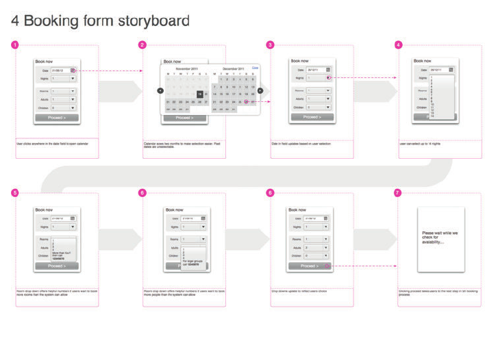
CHAPTER SIX WIREFRAMES 171
Storyboards
Certain parts of your wireframe will have functionality that works in a number of steps.
Storyboards (see Figure 6-6) allow you to lay those steps out.
Make sure it’s clear to the reader what order the storyboard should be read in. People will
always read from left to right, but functionality storyboards can sometimes look disjointed and
it gets di cult to tell where to look next. Adding guide arrows or numbering can counter this.
Clearly show what users have to do to get to the next step. Do they click a button? Use a
drop-down? Highlighting these areas on each step of your storyboard helps clarify the user’s
path through it.
F -: Storyboards show the team how speci c pieces of functionality need to work.
Design principles for wireframes
It is useful to have some base design principles for wireframing. Once mastered, these clarify
your documentation and communicate the desired user experience.
09_9781119971108-ch06.indd 17109_9781119971108-ch06.indd 171 8/10/11 8:38 PM8/10/11 8:38 PM

COMMUNICATING THE USER EXPERIENCE
172
Wireframes often have all the information on them but the user experience is not communi-
cated. How should users engage with the content, nd what they need, and decide on what
they want to do? If these things aren’t demonstrated on the wireframe, then it’s likely that
they won’t be communicated to the user when the product is designed and developed.
Structure and style
Creating a clear set of structured elements is the starting point for developing well-presented
wireframes.
> Decide on a page grid (see Figure 6-7) that all objects can be aligned to. A 960-px grid
is often used because it is divisible by so many numbers—3, 4, 5, 6, 8, or 10 column
grids are all possible, for example. We’ll show you how to set them up in the “How to...”
section of this chapter.
F -: A page grid helps keep wireframes well structured and aligned.
> Create styles for headings, subheadings, body copy, and links (see Figure 6-8).
F -: Use a consistent selection of type styles throughout your document.
> Ensure that interactive elements have the appropriate a ordance (making them look
how they work). For example, make buttons look clickable, as shown in Figure 6-9.
09_9781119971108-ch06.indd 17209_9781119971108-ch06.indd 172 8/10/11 8:38 PM8/10/11 8:38 PM
CHAPTER SIX WIREFRAMES 173
F -: Use a ordance where necessary to make elements look how they work.
> Use nesting to show how groups of items belong together. is helps a user to under-
stand the structure of your content. Figure 6-10 uses nesting to show the relationship
between the di erent sections of the page. For example, Section 1.3 can clearly be seen
to be a child of Section 1.
F -: Nesting gives clarity to which elements belong to each other.
> Finally, be consistent in your use of structure and style between pages.
Visual heat
By using shades of gray you are able to control the emphasis of elements on the page. It helps
you to pull out important information and focus users on key messages or calls to action.
is is called visual heat. Here’s a simple walkthrough, as shown in Figure 6-11:
1 Use pale shades of gray to denote the background regions.
2 Use white blocks on top to focus attention onto the content areas.
3 Use the darker shades of gray to pull out the text and key calls to action. Black is normally
too harsh and will distract the user.
4 Finally, mid-grays can be used for the remaining elements and lesser calls to action.
09_9781119971108-ch06.indd 17309_9781119971108-ch06.indd 173 8/10/11 8:38 PM8/10/11 8:38 PM
COMMUNICATING THE USER EXPERIENCE
174
F -: ese images show the buildup of visual heat is created by using di erent shades of gray.
When to use color
On the whole, color is reserved for indicating the elements to which notes refer (see Figure
6-12).
F -: A colored marker is used to indicate where notes refer to on the wireframe.
Sometimes color can help to pull out key interaction states such as error messaging, alerts, or
other dynamic changes to the interface (see Figure 6-13). However, this can also be done
with a darker shade of gray or black.
F -: Color can help to reinforce the display and feel of key messages to the user.
Feel
When creating wireframes you are focused on the experience you want the users to have (see
Figure 6-14). Often this goes beyond what the page looks like to how you want it to respond
as they mouse over and click on elements.
In a static wireframe, there are a few di erent tricks you can use to document this:
> Storyboard the interaction using clear descriptions with words like fade out, fade in,
delay and pause.
> Create a physical mock-up to allow you and others to play with and improve the inter-
action. Use paper or stick objects to a whiteboard to allow you to move elements
around and switch states (see Figure 6-15).
09_9781119971108-ch06.indd 17409_9781119971108-ch06.indd 174 8/10/11 8:38 PM8/10/11 8:38 PM
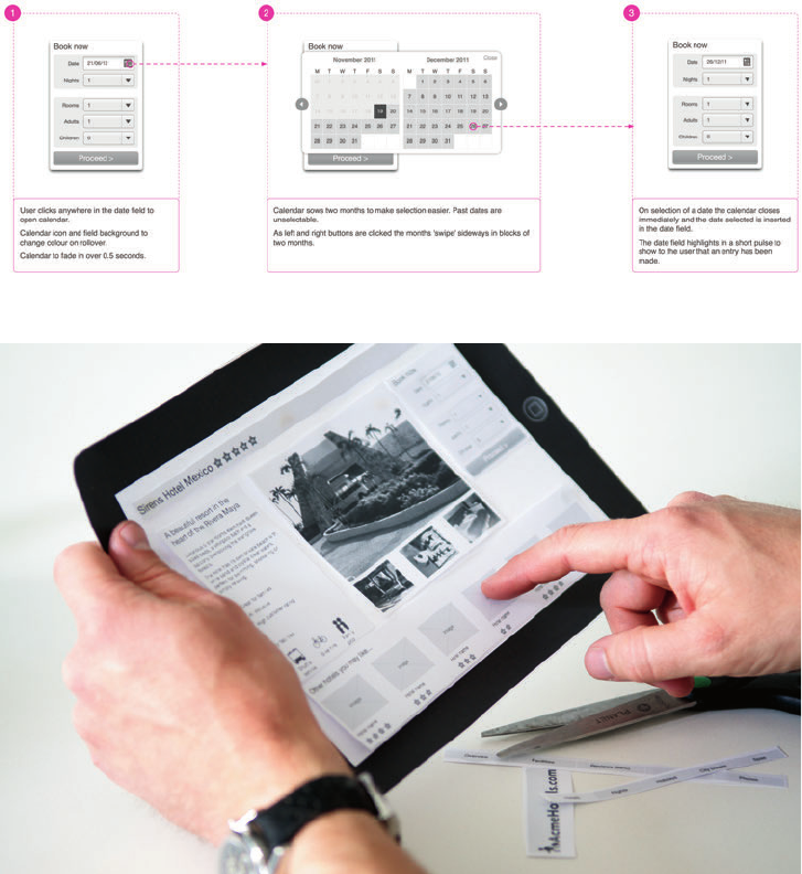
CHAPTER SIX WIREFRAMES 175
F -: e captions in this storyboard describe the behavior you want users to experience.
F -: A physical mock-up shows how an interface will feel to the user.
> Reference existing examples of sites or applications where people have used the same
or similar techniques.
> Create simple animations of just the e ects—mocking it up in Flash or using HTML
and jQuery. e latter can also be useful in assessing how the element will go on to be
developed.
09_9781119971108-ch06.indd 17509_9781119971108-ch06.indd 175 8/10/11 8:38 PM8/10/11 8:38 PM
COMMUNICATING THE USER EXPERIENCE
176
Stepping back to help give focus
is is a slightly unusual design principal, but it is a fact that it’s easy to get bogged in the
process of wireframing (or any creative process for that matter).
Print your images and then spread them out. Imagine yourself clicking through them as a
user would; see how the interactions feel (instead of focusing on what they look like).
Also, practice and use the techniques outlined later in the perspective workshops to help
regain focus.
Here’s a parallel example: while we’ve been writing this chapter, we’ve been going back to our
initial vision, proposal, and content structure to keep us focused on what it is that we’re
communicating.
Validating wireframes
Get your wireframes in front of people informally as soon as possible. Friends, family, and
colleagues will all help to re ne and improve your work. It’s never too early to test. Testing a
simple sketch on a piece of paper can transform the success of your product.
Carry out formal user testing using the think-aloud protocol on your wireframes at least
once during their development. Recruit users that want to perform or are performing tasks
the same as the one you are developing. For instance, if you are designing a travel website,
recruit people who are currently looking for a holiday. You will be able to test that your ideas
are working and re ne the language and labeling used.
In most cases, testing on at non-interactive wireframes (on paper or on screen) is as e ec-
tive as testing clickable prototypes.
If time or budget is tight, then take the testing to where the users are. We’ve tested anywhere
from cafes to railway stations.
Some tips for wireframe validation:
> If you have used color in your wireframes then ensure that they are gray scaled before
testing. It helps you to get a clearer view of whether the emphasis of elements it right.
> Consider removing the logo. Users can be swayed if they know which brand the site is
for. If they have a strong a nity with the brand, then they may forgive mistakes; if
they don’t like the brand, then it can cloud their judgment.
09_9781119971108-ch06.indd 17609_9781119971108-ch06.indd 176 8/10/11 8:38 PM8/10/11 8:38 PM

CHAPTER SIX WIREFRAMES 177
> Use realistic data in your wireframes. Including real product names, prices, and infor-
mation makes the test more believable for the user. It will ensure the test will prove
whether or not users can nd the information they need. If the information isn’t there
(or just represented by placeholder text), then they won’t nd it.
> Create a ow. Decide what the main journey through your designs is and create the
wireframes to support it. Make the journey consistent; for example, if you use a spe-
ci c product page on an ecommerce site, make sure that product appears in the basket.
is will help the test ow better and help spot issues with the journey as a whole, as
well as speci c pages.
note If the fl ow of the pages consistently fails to meet the users’ expectations, your task
model is probably wrong or needs refi ning (or you haven’t developed one). If you don’t
have a task model, or if you have one but don’t stick to it, you’ll encounter issues with the
wireframes that you are designing.
09_9781119971108-ch06.indd 17709_9781119971108-ch06.indd 177 8/10/11 8:38 PM8/10/11 8:38 PM

COMMUNICATING THE USER EXPERIENCE
178
RESEARCH AND WORKSHOP IDEAS
Each of the following ideas can be used on its own or together as a single workshop.
You’ll start with the wireframing process running through all elements, in a single workshop.
en as the wireframes are in development, you’ll use one or more of the techniques to help
you to step back and make sure that you’re on the right track.
Get as many people involved from di erent aspects of the business as possible. is ensures
you capture the requirements and needs up front—my company has run workshops like this
with as many as 100 people tweaking the content and facilitation methods where necessary.
However, you can se these as exercises by yourself or with a couple of people.
How to run a successful workshop
When you’re focusing on wireframes, following these rules will make any workshop you
run a better experience for the participants with better outcomes for you.
> The key to a good workshop is planning (see Figure 6-16). Think about the out-
come you want to arrive at and then list the activities you need complete in
order to get there.
> Develop a list of prompt questions for each activity. You may or may not have
your own answers to these already. Either way, the questions will help
stimulate discussion and help you to explore a variety of ideas that you’re
considering.
> Estimate the time each activity will take (you’ll get better at this with experi-
ence) and stick to your timings. Running through one or all of the activities
beforehand will help you to get a sense of this.
> Take time to describe the rules for engagement and set expectations for the
workshop. Tell the participants even the simple things like turning off mobile
phones, any health and safety notices, how regularly the breaks are going to be,
how each activity works, and the outcome you are aiming for.
> It may be your workshop and you’ll have ideas about the outcomes, but assume
the role of a facilitator. Help people to interact with each other to draw out
ideas. Listen for concerns and constraints. Understand previous successes and
failures. (See Figure 6-16.)
09_9781119971108-ch06.indd 17809_9781119971108-ch06.indd 178 8/10/11 8:38 PM8/10/11 8:38 PM

CHAPTER SIX WIREFRAMES 179
WORKSHOP IDEA: Prioritize content
is exercise helps you to understand, structure, and prioritize the content required on each
page of the site.
1 List all the elements you can think of for each page of the site. Putting each one on a
Post-It Note (see Figure 6-17) helps you move them around easily.
2 Cluster the notes into groups of items that will belong together on the page. For example,
on an ecommerce site a quantity button may be linked to the Add to Basket button.
3 Remove duplication.
4 Prioritize these groups. And keep a forced ranking—make sure one group is always above
or below another.
5 en, prioritize the items within the groups. Again, make sure that elements don’t tie.
F -: Good workshops take planning and preparation.
09_9781119971108-ch06.indd 17909_9781119971108-ch06.indd 179 8/10/11 8:38 PM8/10/11 8:38 PM

COMMUNICATING THE USER EXPERIENCE
180
6 Finally consider the size, weight, and type of each piece of content.
• Is it a photo, a piece of copy, or a call to action?
• How much space does it need on the page?
• Does it need to appear on the page by default or can it be disclosed or linked to?
F -: Elements of a single wireframe have been put onto sticky notes, then grouped and prioritized.
Having gone through this exercise you are left with prioritized groups within which you have
prioritized items.
It’s useful to put this into a structured list—using Outline View in Word or the excellent
Omni Outliner for Mac, for example (although a simple text tool is just as good). is helps
to get the semantics right—thinking through what’s a heading, a subheading, a copy block,
an image, or a link. And you can refer back to it in the future.
09_9781119971108-ch06.indd 18009_9781119971108-ch06.indd 180 8/10/11 8:38 PM8/10/11 8:38 PM

CHAPTER SIX WIREFRAMES 181
RESEARCH TECHNIQUE: Generate ideas
Once you have a good shared understanding of the page content you can start to sketch out
ideas. ere are a number of ways to do this, but my preferred method is to get each person
sketching out as many di erent ideas for solutions as possible in 10 minutes (see Figure
6-18). en everyone in the group take turns in sharing the ideas and discussing the options.
F -: Ideas have been sketched out, stuck to the wall, and options have been discussed.
As patterns and solutions start to emerge, draw them up on a whiteboard as a group to help
reach a consensus of how the nal page needs to work.
e sketching workshop is not about getting the design right the rst time; rather it’s about
generating ideas and understanding potential design solutions. e person responsible for
wireframes can take the ideas to work up a detailed and considered solution.
It’s worth having some tricks up your sleeve to further stimulate ideas:
> Have prompt and stimulus material on hand. Magazines and industry brochures are
good to cut up and stick to walls. ey’ll stimulate discussion on content, layout, and
photography.
09_9781119971108-ch06.indd 18109_9781119971108-ch06.indd 181 8/10/11 8:39 PM8/10/11 8:39 PM

COMMUNICATING THE USER EXPERIENCE
182
> Have related business information that may be of use. Analytics data, product infor-
mation, and business vision documents can all be useful.
> Keep your task models on hand. Going over them again may help develop new ways to
consider the structure of navigation and content.
> Walking around towns, workplaces, and stores can help to generate new ideas. For
example, use the lunch break to walk around a supermarket to see how the managers
have dealt with organization, navigation, promotion, and cross sell. It doesn’t need to
be directly related — in fact, often it’s better if it’s not at all related because you want
to uncover the unexpected.
> Encourage attendees to take photos of anything they think may be relevant in the
week or so leading up to the workshop.
RESEARCH TECHNIQUE: Create a healthy perspective
As you are working on a wireframe deck it’s easy to get bogged down with the detail of an
individual page. You can forget the context in which it sits and forget the focus of the page
itself.
Here are a few workshop ideas to help get over that.
> Sketch out boxes for each of the pages in the user journey (see Figure 6-19). Consider
where the page you’re currently designing sits. What has the user done before? What is
he going to do next? Could a user be deep linking into your page through a search
engine? Taking a step back helps to remind you of the purpose of the page.
> Write down a structured list of the elements on the page. What are the headings and
subheadings, the key calls to action that you want a user to perform, the content ele-
ments? Consider how the elements are grouped together and ordered. is simple task
takes you away from the page and refocuses you on priorities.
> If you are familiar with creating, or have an understanding of developing, semantically
correct HTML (it’s well worth learning if you are not familiar), then apply that knowl-
edge to your wireframes (see Figure 6-20). It will help to focus your mind on the order
in which elements appear so that they are as clear and as accessible to your users as
possible.
09_9781119971108-ch06.indd 18209_9781119971108-ch06.indd 182 8/10/11 8:39 PM8/10/11 8:39 PM
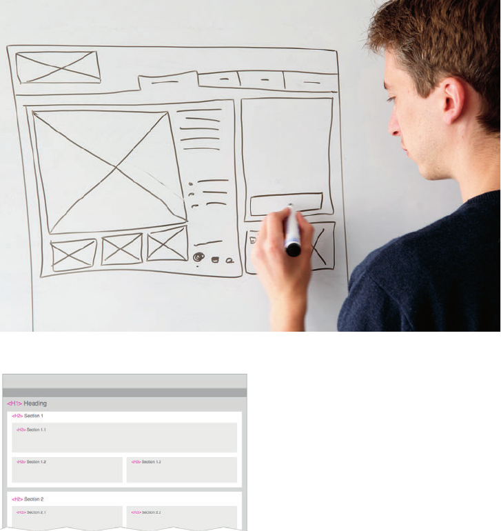
CHAPTER SIX WIREFRAMES 183
F -: Sketch out each of the pages to help consider and optimize the ow through the pages.
F -: Basic HTML tags have been added to the wireframe to help you think through the structure of the
page.
> Run a critique session with your colleagues. Project the wireframes onto a whiteboard
(see Figure 6-21) and look for ways to re ne and optimize the page. Scribble these
directly on top of the projection then take a photo of the outcome to have beside you
as you work through the changes.
09_9781119971108-ch06.indd 18309_9781119971108-ch06.indd 183 8/10/11 8:39 PM8/10/11 8:39 PM

COMMUNICATING THE USER EXPERIENCE
184
F -: A wireframe has been projected onto a whiteboard and notes for amends have been sketched over
the top.
What’s the quickest way to produce a wireframe?
Sketches (see Figure 6-22) are the most obvious way to quickly create and share wire-
frames. Keeping a notepad and pen to hand means that you can always visualize an idea
whether it’s for whole page layouts, positioning or broad components or to rethink how a
speci c function works.
There are a few good digital alternatives now as well, whether it’s using:
> Pre-made stencils for OmniGraf e or Axure
> A simpler prototyping tools such as Balsamiq
> A sketching tool such as SketchBook for iPhone or iPad
09_9781119971108-ch06.indd 18409_9781119971108-ch06.indd 184 8/10/11 8:39 PM8/10/11 8:39 PM
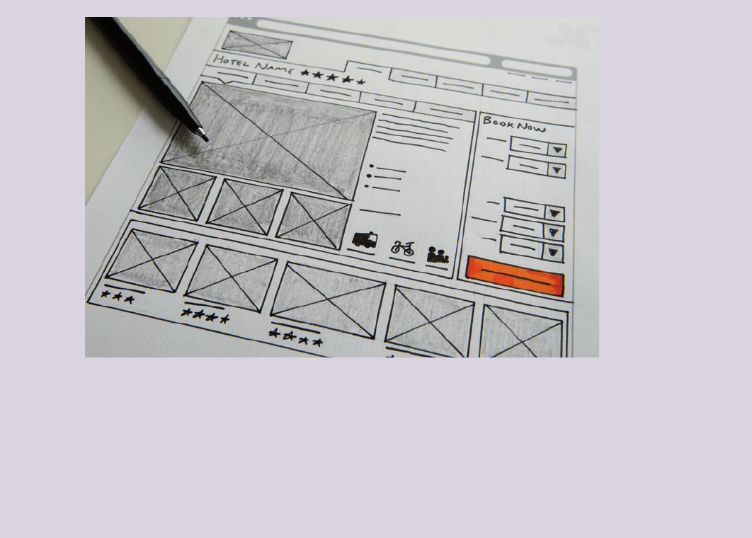
CHAPTER SIX WIREFRAMES 185
F -: Sketches are quick to produce and easy to photograph and share.
The beauty of rapid sketching is that you quickly have something to share with the team
without anyone thinking it’s the nished solution — this can often encourage more honest
input.
If you are not physically in the same location, then you can share immediately using a cam-
era phone and email. I’ve had phone calls where I’ll be sketching solutions based on the
conversation then emailing them over to talk them through a minute later.
09_9781119971108-ch06.indd 18509_9781119971108-ch06.indd 185 8/10/11 8:39 PM8/10/11 8:39 PM

COMMUNICATING THE USER EXPERIENCE
186
HOW TO Create wireframes in OmniGraf e
is section of the chapter guides you through creating a wireframe in OmniGra e. It starts
by explaining how to set up a template then describes how to create the basic elements that
go into creating a wireframe.
First, become familiar with OmniGra e (see Figure 6-23):
> e canvas. is is where the wireframing happens.
> e canvas list. is allows you to add canvases and move between them. You can
also add layers and move between them.
> e Toolbar. is provides quick access to commonly used features and tools.
> e Inspector. is allows you to edit various aspects of objects and canvases. Open it
by selecting the Inspector button on the toolbar.
> Stencils. is allows you to use pre-made shapes and elements. Open it by selecting
the Inspector button in the toolbar.
09_9781119971108-ch06.indd 18609_9781119971108-ch06.indd 186 8/10/11 8:39 PM8/10/11 8:39 PM
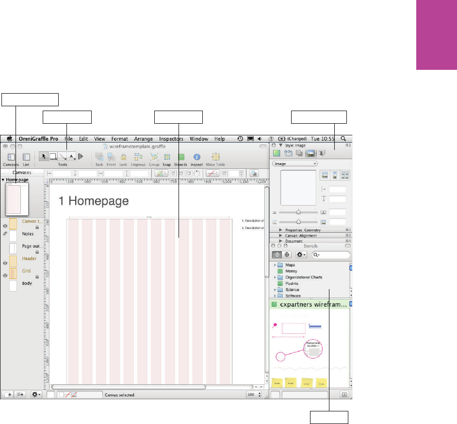
187 CHAPTER SIX WIREFRAMES
The InspectorThe canvas
The canvas list
The Toolbar
Stencils
F -: ese are the main OmniGra e features you will use while wireframing.
09_9781119971108-ch06.indd 18709_9781119971108-ch06.indd 187 8/10/11 8:39 PM8/10/11 8:39 PM

188
COMMUNICATING THE USER EXPERIENCE
Creating a new document
1 Open OmniGra e and select File, New Resource, and then New Template. A choice of
templates appears.
2 Highlight the Blank template and click New Template.
Changing canvas sizing
You want to create wireframes that will scale and print well, so you need to change the page
size.
1 Go to File and choose Page Setup.
2 In the page set up screen select Paper size and select Manage Custom Sizes from the list.
e custom paper sizes window will appear.
3 Create a new custom size by clicking the + on the bottom left of the window. is will put
a custom size called Untitled in the list.
4 Double-click the name Untitled and rename it A1. Name the custom size A1. An A1-sized
page is the right scale for printing and big enough to wireframe in exact pixels.
5 Change the width to 84.1 cm and the height to 59.4 cm (see Figure 6-24).
6 Click OK and your page size should change.
Setting up the template
is section is a step-by-step guide for creating a wireframing template in OmniGra e. It
includes dynamic page labeling, wireframe outline sizing, grid setup, and creating master
objects. Although you may want your templates to look di erent from the one created here,
going through the process will help you familiarize yourself with some of OmniGra e’s
capabilities.
09_9781119971108-ch06.indd 18809_9781119971108-ch06.indd 188 8/10/11 8:39 PM8/10/11 8:39 PM
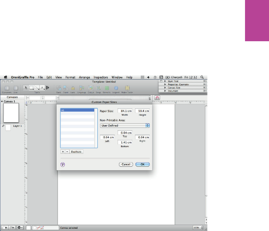
189 CHAPTER SIX WIREFRAMES
F -: e sizes in this image are what you need to create an A1-sized canvas.
Changing ruler units
To change the ruler units to work in, follow these steps:
1 Open the inspector by selecting Inspectors and then choosing Show Inspectors.
2 Open the Canvas section of the inspector by clicking the arrow (see Figure 6-25). Click the
Size button.
3 Change Orientation to Portrait and change Ruler units to pixels (px). As shown in Figure
6-25, the ruler scale displays across the top and down the left of your canvas changes.
09_9781119971108-ch06.indd 18909_9781119971108-ch06.indd 189 8/10/11 8:39 PM8/10/11 8:39 PM
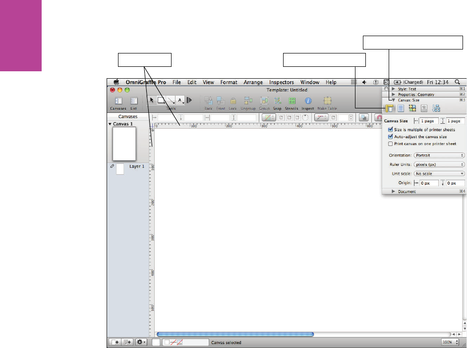
190
COMMUNICATING THE USER EXPERIENCE
Ruler scale Click the Size button
Click arrow to open Canvas
F -: Working in actual pixels enables you to accurately measure to the site’s nal dimensions.
Setting up a grid
To set up a grid, follow these steps:
1 Select the Grid option from the Canvas section of the inspector.
2 Set the major grid spacing to 100 and the minor grid spacing to 10.
3 Make sure Snap to grid, Grid in front, Show grid lines, and Show major check boxes are all
selected (see Figure 6-26). is will help make everything in your wireframe line up and
look great.
09_9781119971108-ch06.indd 19009_9781119971108-ch06.indd 190 8/10/11 8:39 PM8/10/11 8:39 PM
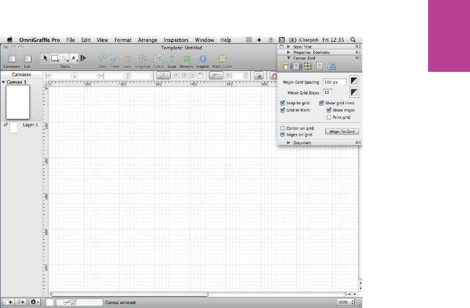
191 CHAPTER SIX WIREFRAMES
F -: Working with snap to grid on makes lining up shapes and text much easier.
Creating layers
OmniGra e allows you to work in layers, which is great. In my experience, however, it’s
good to keep your layers to a minimum. If you’re working on a deck of wires with someone
else, having too many layers can become unmanageable and selecting speci c elements
becomes surprisingly di cult. Here’s how to create a basic layer structure.
1 To view the layers on your canvas, click the triangle next to the canvas name. OmniGra e
starts you o with one layer, called Layer 1 by default.
2 Edit the layer name by double-clicking it and renaming it Body. is is the layer where
most of the wireframing will happen.
3 To create a new layer either click the new layer button at the bottom of the canvas list or
right-click a layer and select New Layer (see Figure 6-27).
09_9781119971108-ch06.indd 19109_9781119971108-ch06.indd 191 8/10/11 8:39 PM8/10/11 8:39 PM

192
COMMUNICATING THE USER EXPERIENCE
F -: Right-click a layer in the canvas list to get this menu.
4 Name your new layer Page outline. It will be the frame for your wireframe.
5 Create one more layer and name it Notes. You’ll use it for annotation.
Next you’ll create shared layers.
Creating shared layers
Shared layers are really useful for areas of your wireframes that will be the same across all
pages and be in the same position on all pages. It’s great for things like page headers, as they
remain consistent.
To create a shared layer, follow these steps:
1 Right-click a layer and select New shared layer. A layer will appear but will be a color dif-
ferent than white—for example, it’s turquoise (not orange) in Omnigra e Pro 5.2.3).
Name this layer Header.
2 Repeat the process to create two more shared layers and call them Canvas title and Grid
(see Figure 6-28).
09_9781119971108-ch06.indd 19209_9781119971108-ch06.indd 192 8/10/11 8:39 PM8/10/11 8:39 PM
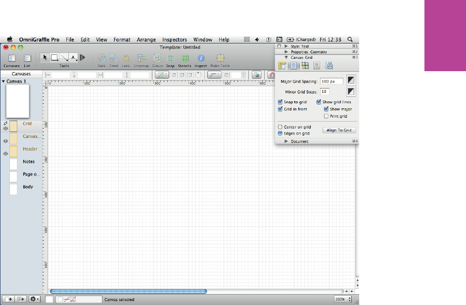
193 CHAPTER SIX WIREFRAMES
F -: It’s best to use as few layers as possible. Too many layers can make it di cult to tell what layer
certain elements are sitting on—and that causes trouble when editing.
at should be all the layers you need for 90% of the time. However, they need to be
reordered.
Reordering layers
To reorder layers, simply click and drag them. Re-order the layers like this (see Figure 6-29):
Canvas title
Notes
Page outline
Header
Body
Grid
09_9781119971108-ch06.indd 19309_9781119971108-ch06.indd 193 8/10/11 8:39 PM8/10/11 8:39 PM

194
COMMUNICATING THE USER EXPERIENCE
F -: It’s best to have the page title, outline, and notes sit above the main body of the wireframe.
Now it’s time to set up the wireframe template using these layers.
note When switching between layers in OmniGra e, simply selecting the layer you want
won’t work. To edit the contents of a layer you need to click to the left of the layer preview. You
will know it has worked when a pencil icon appears on the layer (see Figure 6-30).
09_9781119971108-ch06.indd 19409_9781119971108-ch06.indd 194 8/10/11 8:39 PM8/10/11 8:39 PM
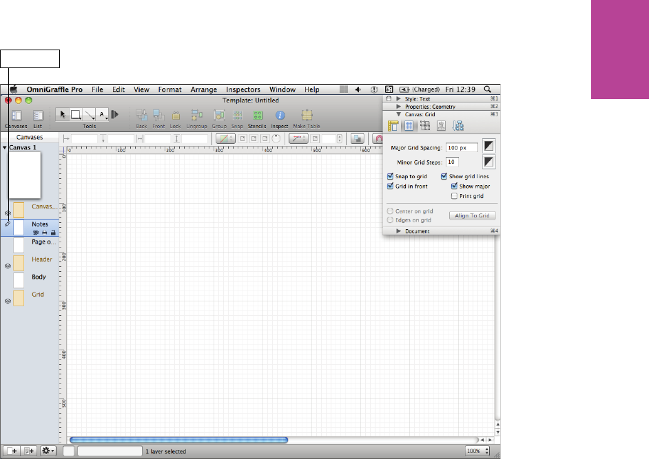
195 CHAPTER SIX WIREFRAMES
Pencil icon
F -: e Notes layer can be edited because the pencil icon appears in next to it in the canvas list.
Creating page titles with variables
OmniGra e allows you to create dynamic page titles and numbers using variables. Variables
are small bits of code that Ominga e generates to create dynamic text boxes that automati-
cally update to display information like page numbers or even the name of the document’s
author.
1 Click the Canvas title layer.
2 Click the Text tool (see Figure 6-31) and create a text box by clicking anywhere on the
canvas.
09_9781119971108-ch06.indd 19509_9781119971108-ch06.indd 195 8/10/11 8:39 PM8/10/11 8:39 PM

196
COMMUNICATING THE USER EXPERIENCE
Text tool
F -: Creating a text box in which to insert the variable.
3 Go to Edit, choose Variable, and then choose Page Number. e text box will be lled with
some odd-looking symbols (see Figure 6-32).
09_9781119971108-ch06.indd 19609_9781119971108-ch06.indd 196 8/10/11 8:39 PM8/10/11 8:39 PM
197 CHAPTER SIX WIREFRAMES
Symbols
F -: e odd-looking symbols are the code that the variable uses to pull in the page number to the text
box.
4 Click outside of the text box and it should change to a number 1. is means it’s guring
out the page number and displaying it, so you don’t have to.
5 To add a page title, click in the text box and add a space after the page number variable.
6 Go to Edit, choose Insert Variable, and then choose Canvas Name.
7 Click out of the text box. It should now read 1 Canvas 1 (see Figure 6-33). It’s getting the
name from the canvas list on the left.
09_9781119971108-ch06.indd 19709_9781119971108-ch06.indd 197 8/10/11 8:39 PM8/10/11 8:39 PM
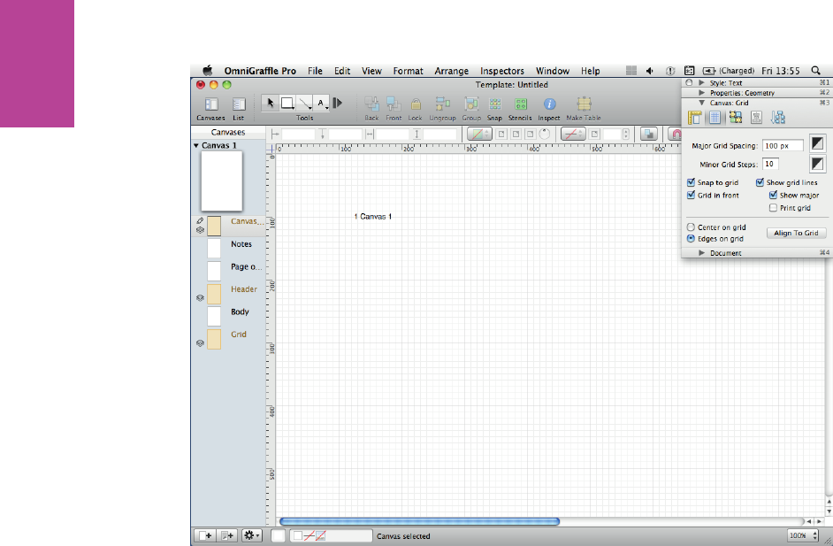
198
COMMUNICATING THE USER EXPERIENCE
F -: Clicking out of the text box will show the variable working and displaying the page number.
8 To change the page name, double-click the name of the canvas in the list on the left,
change the name to Homepage, and then press Enter. e text box on the canvas should
now read 1 Homepage (see Figure 6-34).
09_9781119971108-ch06.indd 19809_9781119971108-ch06.indd 198 8/10/11 8:39 PM8/10/11 8:39 PM
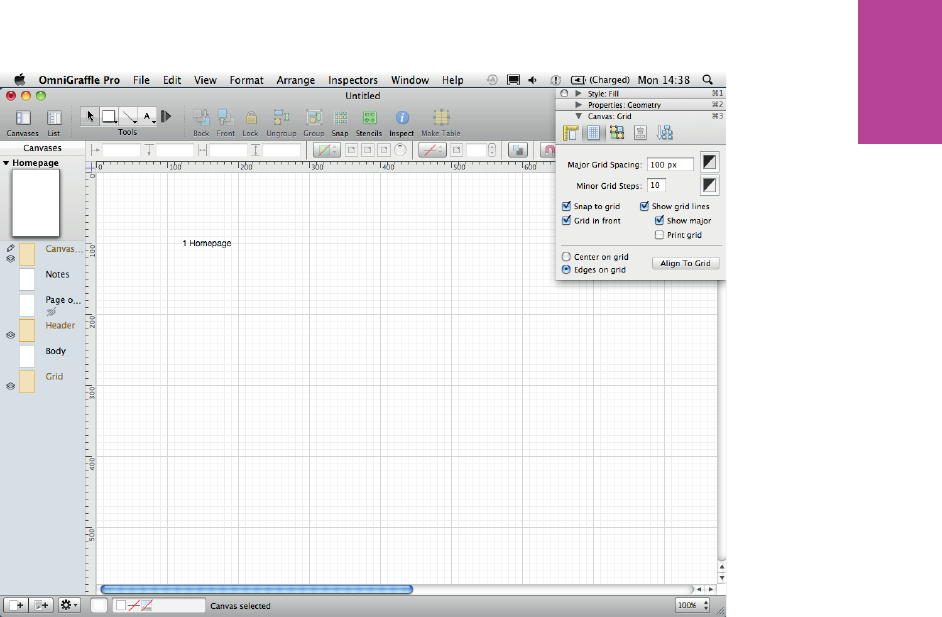
199 CHAPTER SIX WIREFRAMES
F -: e variables in the text box are now displaying the canvas number and the canvas name speci ed
in the canvas list.
9 To change the style of the page title, open the Style panel of the inspector and click the
Text button (see Figure 6-35). From here you can edit the color size and font type.
09_9781119971108-ch06.indd 19909_9781119971108-ch06.indd 199 8/10/11 8:39 PM8/10/11 8:39 PM

200
COMMUNICATING THE USER EXPERIENCE
Text button
F -: Make the page title and number large.
Working with the page outline
In this section, you’ll learn how to work with the page outline, including how to:
> Create shapes
> Set sizes
> Set positions
> Set styles
Begin by creating a shape:
1 Select the Page outline layer, being sure that the pencil icon appears on the layer in the
canvas list.
2 Select the shape tool from the tool palette and draw a rectangle of any size (see Figure
6-36). In this example, the size is 230 px wide by 140 px high.
09_9781119971108-ch06.indd 20009_9781119971108-ch06.indd 200 8/10/11 8:39 PM8/10/11 8:39 PM
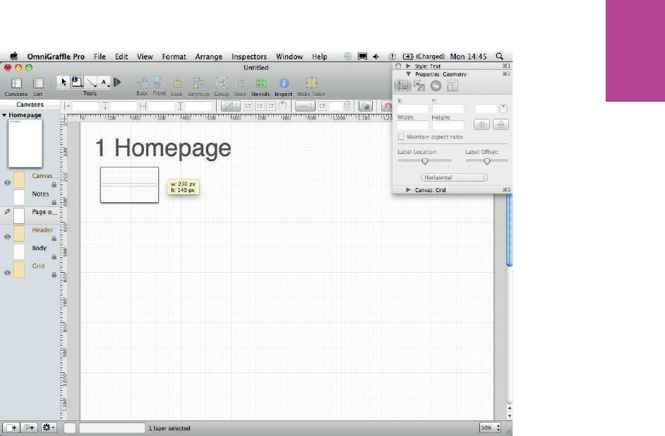
201 CHAPTER SIX WIREFRAMES
F -: It doesn’t matter what size rectangle you draw; you’ll change its size in the next step.
3 Open the Properties panel in the inspector and click the Geometry button. From here,
you can accurately set the size and position of the rectangle:
1. Set the x position to 100 px and the y to 200 px to give the rectangle enough
border and space for the page title.
2. Set the rectangle width to 960 px.
3. Set the height to 2000 (see Figure 6-37). is will t the canvas but the length
of the page outline is likely to be di erent on every page (that is why you don’t
use a shared layer).
09_9781119971108-ch06.indd 20109_9781119971108-ch06.indd 201 8/10/11 8:39 PM8/10/11 8:39 PM
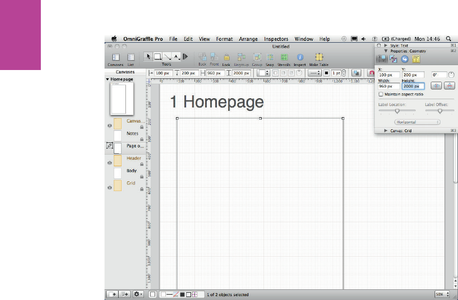
202
COMMUNICATING THE USER EXPERIENCE
F -: You can use the Geometry controls to accurately set the size and position of a shape.
Finally, you need to remove some of the styles from the outline:
1 Remove the shadow by selecting the outline, opening the Style panel of the inspector, and
selecting the Shadow option. Deselect the shadow check box.
2 Remove the ll by selecting the Fill option and deselecting the Fill checkbox.
3 Change the line style by selecting the Lines and Shapes option and changing the line color
to a medium gray (see Figure 6-38). (You want the outline to frame the wireframe, not
take attention away from it.)
09_9781119971108-ch06.indd 20209_9781119971108-ch06.indd 202 8/10/11 8:39 PM8/10/11 8:39 PM
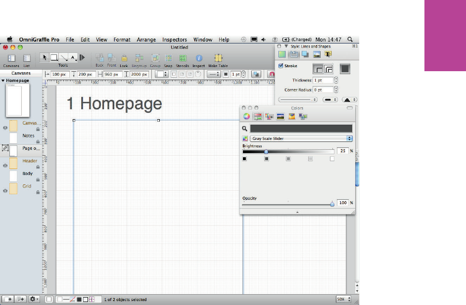
203 CHAPTER SIX WIREFRAMES
F -: A light outline for your wireframe will show where the wireframe starts and stops but not take
attention away from it.
Creating a custom page grid
In this section, you’ll learn how to use shapes and layers to create a custom grid to design
with, including:
> Duplicating an object
> Spacing an object
> Changing a line style
09_9781119971108-ch06.indd 20309_9781119971108-ch06.indd 203 8/10/11 8:39 PM8/10/11 8:39 PM
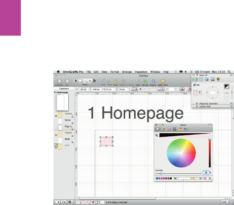
204
COMMUNICATING THE USER EXPERIENCE
You’ll begin by duplicating an object:
1 Draw another rectangle using the shape tool, only this time use the Style panel in the
inspector.
2 Remove the shadow and the stroke.
3 Set the color to red and set the opacity to 10% (see Figure 6-39).
F -: You can set the opacity of a shape within the Colors menu.
4 Click the Properties: Geometry down-arrow (see Figure 6-40) and change the Width of
the rectangle to 60 px and the Height to 2000 px.
09_9781119971108-ch06.indd 20409_9781119971108-ch06.indd 204 8/10/11 8:39 PM8/10/11 8:39 PM
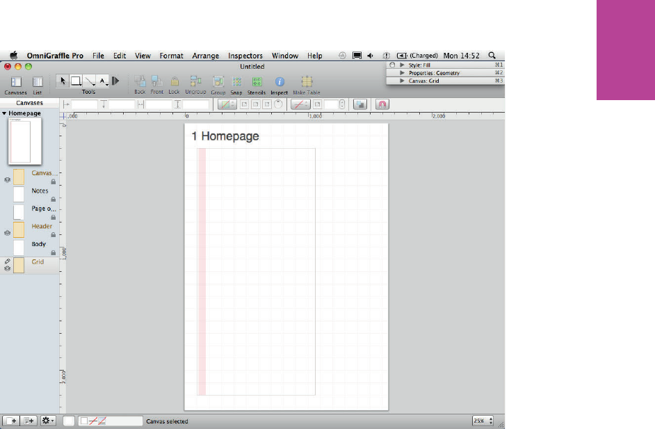
205 CHAPTER SIX WIREFRAMES
F -: Make sure the rectangle runs from the top of the page outline to the bottom.
5 Place the rectangle at the top of the wireframe so it runs from the top of the wireframe’s
outline to the bottom. Move it so it’s 10 pixels from the left edge of the wireframe outline.
Make sure Snap to grid is turned on so it can be easily dragged into position.
Now you need to duplicate the rectangle:
1 Select the rectangle and press Cmd+D to duplicate.
2 Place the new rectangle 20 pixels to the right of the original, making sure it’s aligned to
the top of the wireframe outline (see Figure 6-41).
09_9781119971108-ch06.indd 20509_9781119971108-ch06.indd 205 8/10/11 8:39 PM8/10/11 8:39 PM
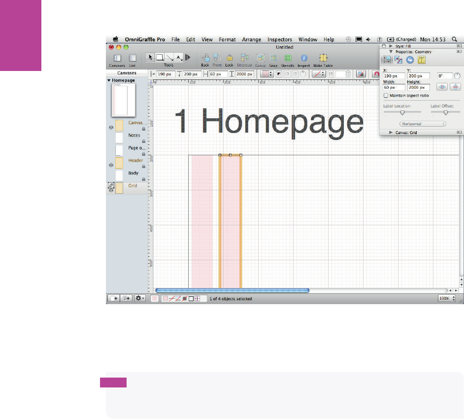
206
COMMUNICATING THE USER EXPERIENCE
F -: e rst rectangle should be 10 pixels from the side of the page outline. en leave a 20-pixel space
between each rectangle.
3 With the duplicate rectangle still selected, press Cmd+D again to repeat the process.
tip When you duplicate objects, OmniGra e remembers the relative positions of the
original object and its duplicate. So if you duplicate again, all objects will be equally spaced
apart.
4 Keep duplicating the rectangle, spacing them 20 pixels apart, until you have 12 rectangles
with 20-pixel gutters between each and 10-pixel bu ers on the left and right edges of the
wireframe (see Figure 6-42).
e nal part of creating the grid is to label its dimensions. is provides the design and
development team a clear idea of page widths and grid sizes. Follow these steps:
1 Select the line tool and draw a line 10 pixels above the wireframe outline that runs from
the left edge of the rst rectangle to the right edge of the last rectangle (see Figure 6-43).
09_9781119971108-ch06.indd 20609_9781119971108-ch06.indd 206 8/10/11 8:39 PM8/10/11 8:39 PM
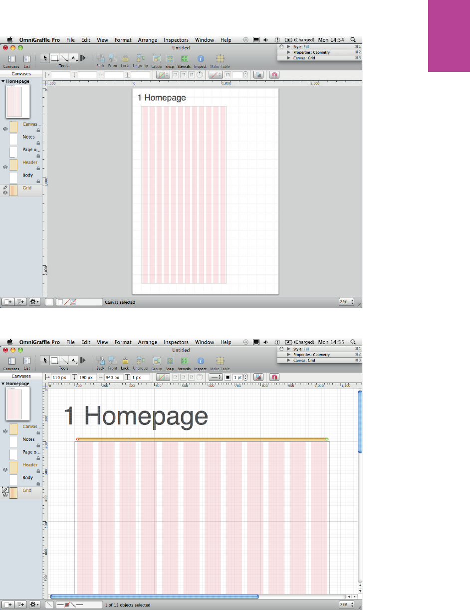
207 CHAPTER SIX WIREFRAMES
F -: Once all the rectangles are in place, they should look like this.
F -: Draw a line just above the page outline.
09_9781119971108-ch06.indd 20709_9781119971108-ch06.indd 207 8/10/11 8:39 PM8/10/11 8:39 PM
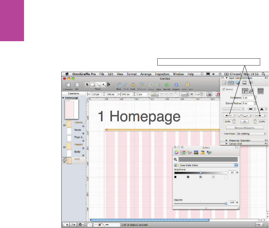
208
COMMUNICATING THE USER EXPERIENCE
2 Click the Style drop-down in the inspector to open the Style panel.
3 Click the Line arrow style drop-down to change the stroke end and start points to arrows.
4 Change the stroke color to a medium gray (see Figure 6-44).
Use these drop-downs to add arrows to each end
F -: Change the line color to light grey and add arrows to each end.
5 Create a text box and type 960.
6 Set the background color of the text box to white and the font color to the same medium
gray (see Figure 6-45).
7 Use the text options in the Style part of the inspector to center the text box on the line
(see Figure 6-48).
09_9781119971108-ch06.indd 20809_9781119971108-ch06.indd 208 8/10/11 8:39 PM8/10/11 8:39 PM
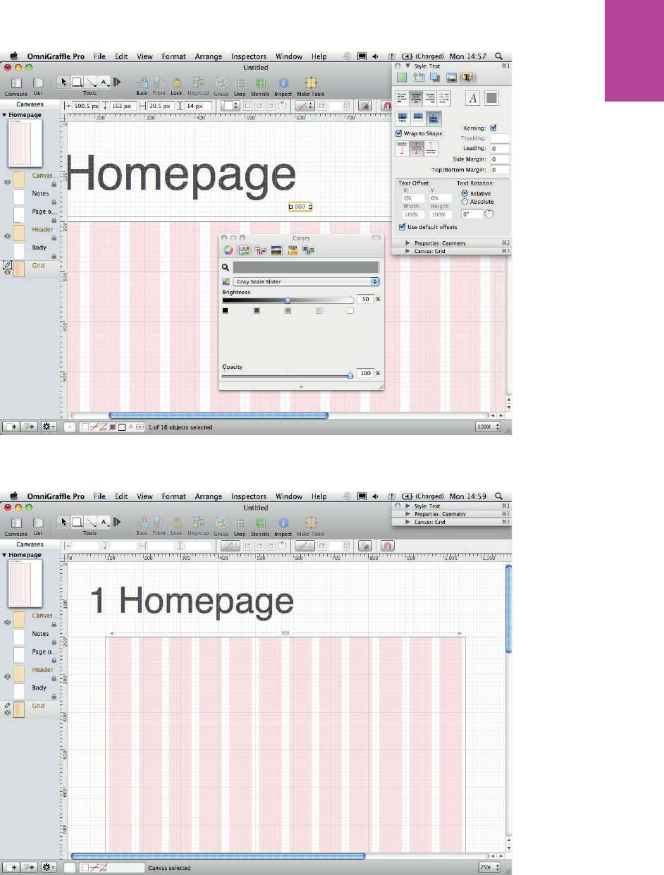
209 CHAPTER SIX WIREFRAMES
F -: Adding the dimensions helps the designers and developers know what size templates they need to
work to.
F -: e nished grid should look like this.
09_9781119971108-ch06.indd 20909_9781119971108-ch06.indd 209 8/10/11 8:39 PM8/10/11 8:39 PM
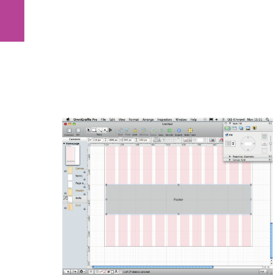
210
COMMUNICATING THE USER EXPERIENCE
Creating LinkBack objects
LinkBack is a technique that allows you to create master objects that work in a way that is
similar to shared layers. If you create duplicates of a LinkBack object and edit one of them, all
the duplicated objects will update and match each other. is is really useful for areas like
footers because they need to look the same on all pages but need to be on di erent positions
on the page.
To create a LinkBack object, follow these steps:
1 Select the Body layer.
2 Create a rectangle for the footer. Color, style it, and add some text (see Figure 6-47).
F -: Create a simple footer element to turn into a master object.
3 Right-click the rectangle, click Copy As, and then choose PDF (see Figure 6-48).
4 Delete the rectangle and then paste it back onto the canvas. You have now created the
LinkBack object.
5 To demonstrate how it works, duplicate the object by pressing Cmd+D, so you now have
two rectangles (see Figure 6-49).
09_9781119971108-ch06.indd 21009_9781119971108-ch06.indd 210 8/10/11 8:39 PM8/10/11 8:39 PM
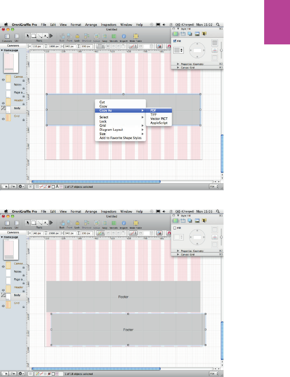
211 CHAPTER SIX WIREFRAMES
F -: Copying as a PDF le.
F -: When you paste the object back onto the canvas, it will be a LinkBack master object.
09_9781119971108-ch06.indd 21109_9781119971108-ch06.indd 211 8/10/11 8:39 PM8/10/11 8:39 PM
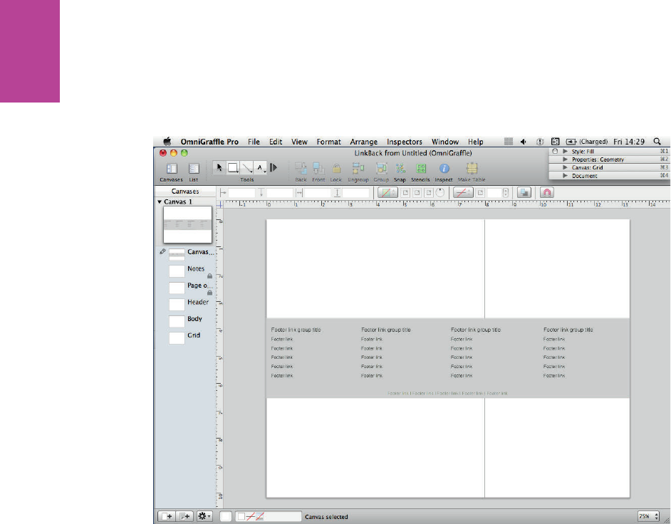
212
COMMUNICATING THE USER EXPERIENCE
6 Double-click the rectangle to edit it. A new window displays with your rectangle in it.
Notice the le name starts with LinkBack.
7 Now edit your LinkBack le. e le shown in Figure 6-50 looks more like a footer.
F -: When you double-click your master object, a new canvas opens it for editing.
8 Go to File and choose Save (or use the keyboard shortcut Cmd+S).
9 Close the Linkback window.
Both rectangles on your template are updated and they should be identical (see Figure 6-51).
09_9781119971108-ch06.indd 21209_9781119971108-ch06.indd 212 8/10/11 8:39 PM8/10/11 8:39 PM
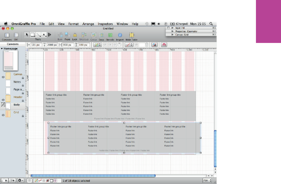
213 CHAPTER SIX WIREFRAMES
F -: When you edit one of the master objects, they are all updated.
Creating the wireframes
is section explains how to use OmniGra e to create common elements found in wire-
frames, including text, lists, image masks, and button styles. You’ll put it all together to cre-
ate a wireframe for a hotel details page for a travel website.
Using basic boxes to mark out content areas
Begin the wireframe by marking out all the content areas with simple boxes. To create visual
heat and make the content areas and the header stand out, you will use a gray background
and white content panels.
1 To create the background, make sure you are working in the Body layer of your document.
2 Select the rectangle from the shape tool and draw a box.
09_9781119971108-ch06.indd 21309_9781119971108-ch06.indd 213 8/10/11 8:39 PM8/10/11 8:39 PM
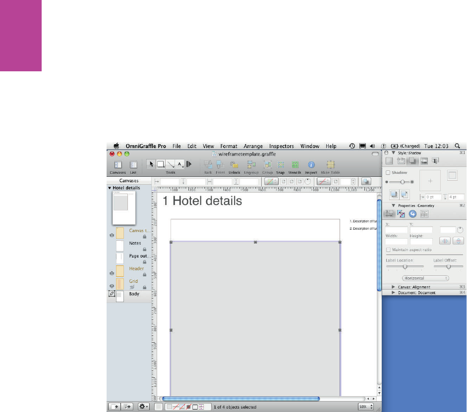
214
COMMUNICATING THE USER EXPERIENCE
3 In the Style section of the inspector panel, change the Fill color to 85% gray and remove
the Stroke and Shadow.
4 Resize the box to cover the entire wire frame, but leaving space at the top for the header
(see Figure 6-52).
5 Once your background is in place, select it and click the lock option in the tool bar. is
prevents you from moving your background by accident.
F -: Make sure the background rectangle is locked so it doesn’t get moved accidentally.
Now create more boxes, but this time, make them white and remove shadows and lines. Use
the grid you created to lay out your content areas. is page will hold the main hotel details
area., a booking form area, a promo area, and a cross-sell area across the bottom of the page
(see Figure 6-53).
09_9781119971108-ch06.indd 21409_9781119971108-ch06.indd 214 8/10/11 8:39 PM8/10/11 8:39 PM
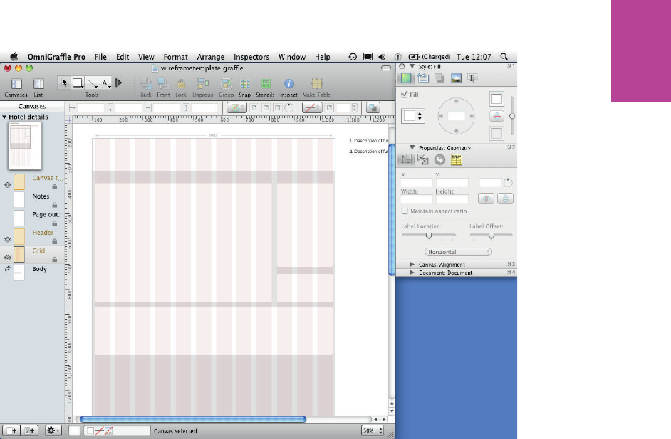
215 CHAPTER SIX WIREFRAMES
F -: e custom grid helps to lay out the content areas.
If you created a footer object during the template setup, put it in as well.
Using image placeholders
Using images in wireframes is not always practical or possible. Instead, use a placeholder
whereby images are represented by a box lled with an X.
To create image placeholders, follow these steps:
1 Select the rectangle from the shape tool and draw a box.
2 In the Style section of the inspector panel, change the Fill color to 75% gray and remove
the Stroke and Shadow (see Figure 6-54).
09_9781119971108-ch06.indd 21509_9781119971108-ch06.indd 215 8/10/11 8:39 PM8/10/11 8:39 PM
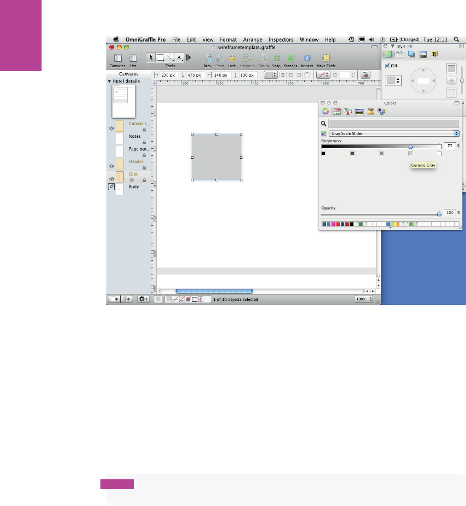
216
COMMUNICATING THE USER EXPERIENCE
F -: Make sure the stroke and shadow are removed from the rectangle.
3 Select the line tool (making sure you have the straight line selected) and draw a line from
one corner of the box to the opposite corner. You’ll notice this doesn’t work. at’s
because the line is magnetic.
OmniGra e makes magnetic lines stick to objects at prede ned points, which is really
useful for creating sitemaps, but not so useful for wireframing.
4 To stop this from happening, draw a line wherever you can.
5 With the line selected, click the Magnet button (see Figure 6-55) in the top menu. e mag-
net button should show a red line through it and the ends of your line should turn blue.
note If you cannot see the magnet option it’s probably because you have rulers turned o .
To turn them on from the top menu, click View and then choose Rulers.
6 Position your non-magnetic line so it runs from one corner of your box diagonally to the
opposite corner,
7 In the Style section of the inspector, change the line color to 40% gray, the thickness to
0.5 and change the stroke to a dashed line (see Figure 6-56).
09_9781119971108-ch06.indd 21609_9781119971108-ch06.indd 216 8/10/11 8:39 PM8/10/11 8:39 PM
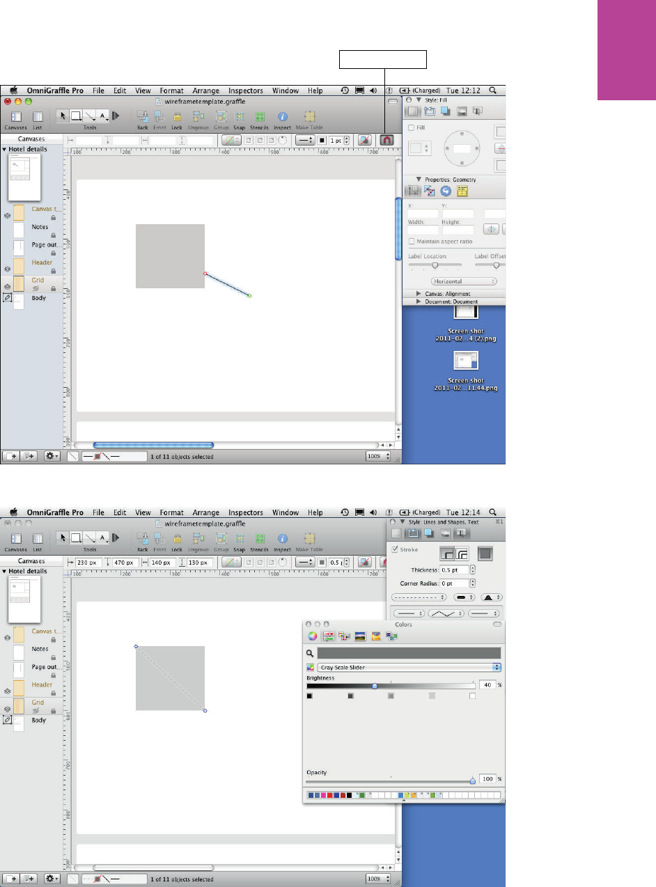
217 CHAPTER SIX WIREFRAMES
Magnet button
F -: Using the Magnet button.
F -: Position the line so it runs diagonally across the rectangle.
09_9781119971108-ch06.indd 21709_9781119971108-ch06.indd 217 8/10/11 8:39 PM8/10/11 8:39 PM
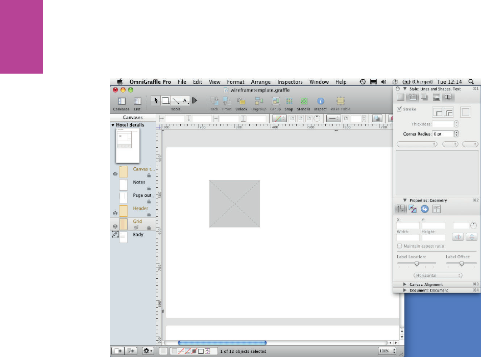
218
COMMUNICATING THE USER EXPERIENCE
8 Duplicate the line (Cmd+D) and position it so it runs diagonally across the box in the
opposite direction (see Figure 6-57).
F -: e lines should be crossed over the rectangle.
9 Group the box and lines using the Group button in the toolbar (or use the keyboard short-
cut Shift+Cmd+G).
Lastly you need to add a label to your image. It will describe the type of image that’s intended
to be placed on the page.
0 Use the text tool to create a text box and type your label. Call it Hotel image.
! Center your text box on your image placeholder using the alignment part of the canvas
panel in the inspector.
@ In the Style panel of the inspector, include a ll in your text box and make the ll color match
the image placeholders. is stops the lines and the text from interfering with each other.
# Change the text color to a 40% gray (see Figure 6-58). e label needs to be subtle and not
have the same weight as body copy or headers.
$ Finally, use the Group button to group all the elements together. You have your image
placeholder!
Now you’ll add these placeholders to the cross promotions panel. Use the grid you created to
make sure they are spaced evenly (see Figure 6-59).
09_9781119971108-ch06.indd 21809_9781119971108-ch06.indd 218 8/10/11 8:39 PM8/10/11 8:39 PM
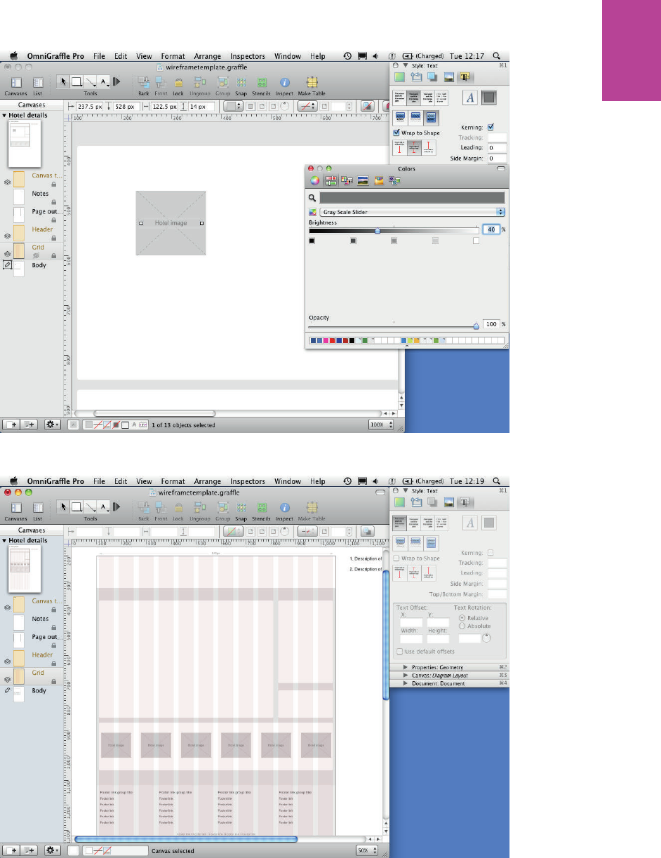
219 CHAPTER SIX WIREFRAMES
F -: e image placeholder text should be centered on the placeholder and it should be a subtle color.
F -: Use image placeholders to represent images on your wireframe.
09_9781119971108-ch06.indd 21909_9781119971108-ch06.indd 219 8/10/11 8:40 PM8/10/11 8:40 PM
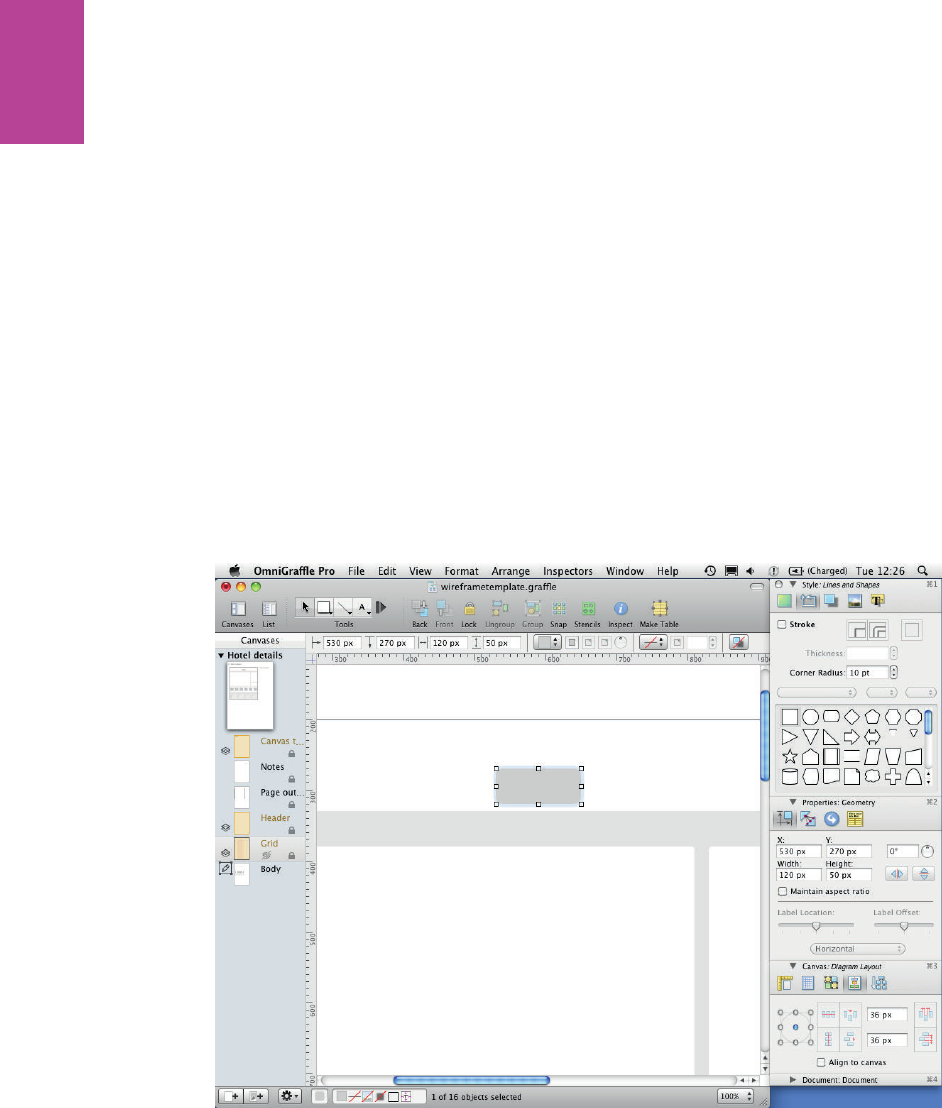
220
COMMUNICATING THE USER EXPERIENCE
Creating tabs
In this section, you’ll learn how to create tabs and how to create custom tab shapes.
To create a tab, follow these steps:
1 Select the rectangle from the shape tool and draw a box for your tab. Make it 20 pixels
taller than you want it to end up being. We are going to remove some of it later.
2 Use the Style panel of the inspector to change the color of your tab.
3 In the Lines and Shapes section of the Style panel, remove the stroke and set the Corner
Radius to 10 (see Figure 6-60). is gives you the nice rounded tab look, but you don’t
want rounded corners on the bottom.
4 Draw another box over your tab so it covers the rounded corners at the bottom (see
Figure 6-61).
5 Select the tab and the box on top of it. Go go Edit, choose Shapes, and then choose
Subtract Shapes (see Figure 6-62).
F -: Draw and style a rectangle that you want to turn into a tab.
09_9781119971108-ch06.indd 22009_9781119971108-ch06.indd 220 8/10/11 8:40 PM8/10/11 8:40 PM
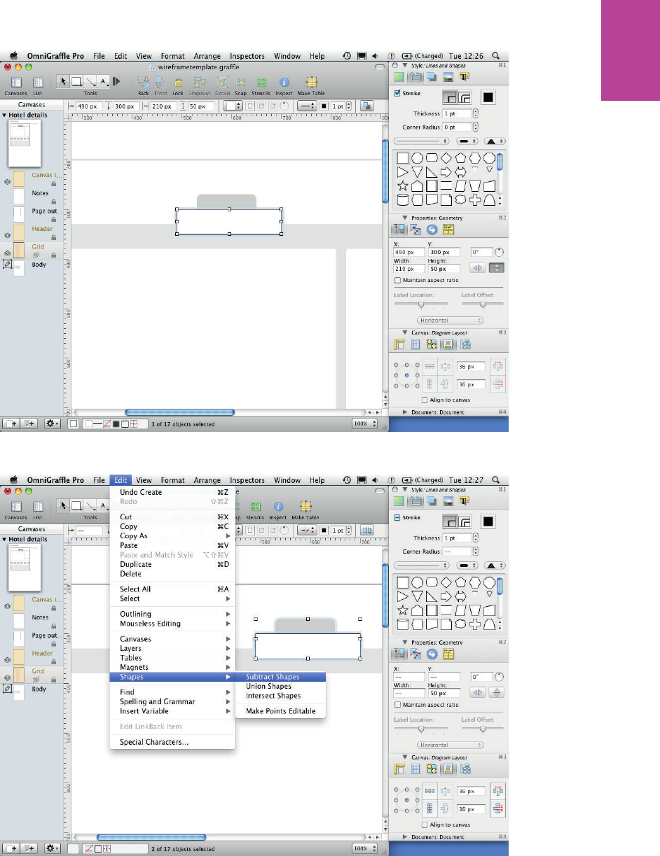
221 CHAPTER SIX WIREFRAMES
F -: Place another rectangle over the part of the rectangle underneath that you want to remove.
F -: Subtract Shapes removes the part of the shape covered by the rectangle on top of it.
09_9781119971108-ch06.indd 22109_9781119971108-ch06.indd 221 8/10/11 8:40 PM8/10/11 8:40 PM
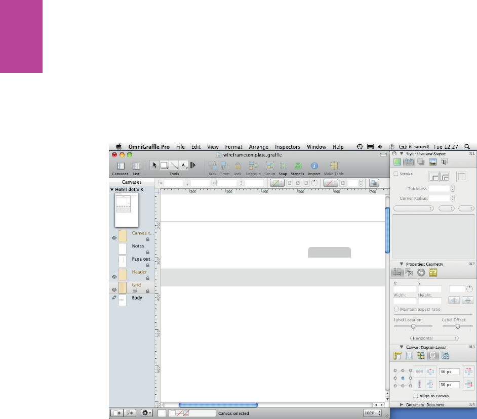
222
COMMUNICATING THE USER EXPERIENCE
is will use the top rectangle as a guide to delete a portion of whatever is selected below it.
You now have a tab with rounded top corners and a straight bottom edge (see Figure 6-63).
6 Duplicate this shape to make as many tabs as you need.
7 Color the selected tab the same as the main background color.
8 Make all of the unselected tabs darker (see Figure 6-64).
F -: Removing the bottom of the rounded rectangle creates the tab shape.
Alternatively you can create custom shapes by combining objects. Here’s how to create a dif-
ferent tab style that you’ll use for the in-page navigation:
1 Create boxes for your tabs (see Figure 6-65). Style them how you want.
2 To create the selected tab, pick the one you want to be selected and duplicate it.
3 With the duplicate selected, open the Lines and Shapes section of the Style panel in the
inspector. Several shapes are displayed in this panel; simply click the shape you want. is
example uses the downward facing triangle (see Figure 6-66).
4 Position the triangle over the tab you want to use, go to Edit, click Shapes, and then
choose Union Shapes (see Figure 6-67).
09_9781119971108-ch06.indd 22209_9781119971108-ch06.indd 222 8/10/11 8:40 PM8/10/11 8:40 PM
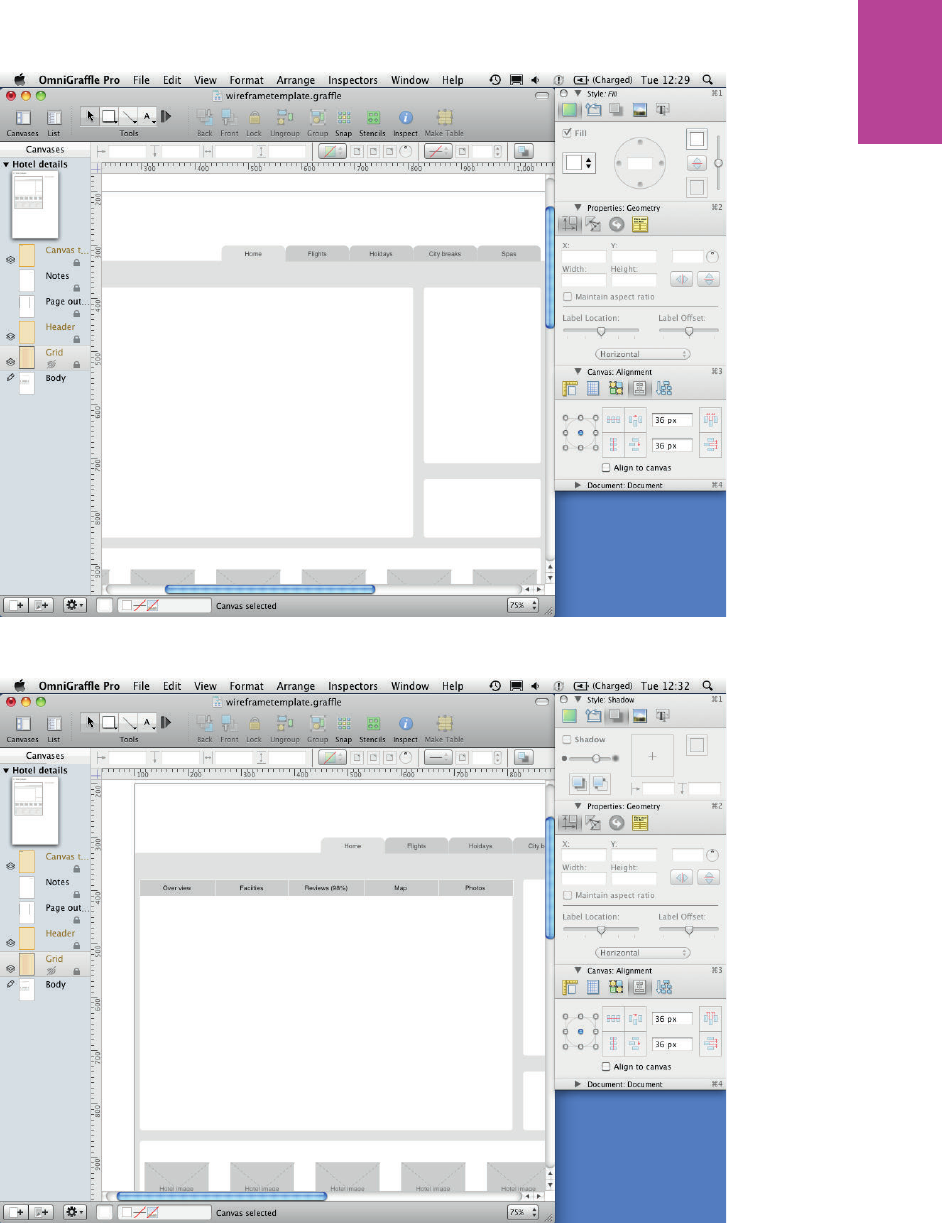
223 CHAPTER SIX WIREFRAMES
F -: You can use these tab shapes to create top navigation.
F -: Create all the rectangles for your tabs in page navigation.
09_9781119971108-ch06.indd 22309_9781119971108-ch06.indd 223 8/10/11 8:40 PM8/10/11 8:40 PM
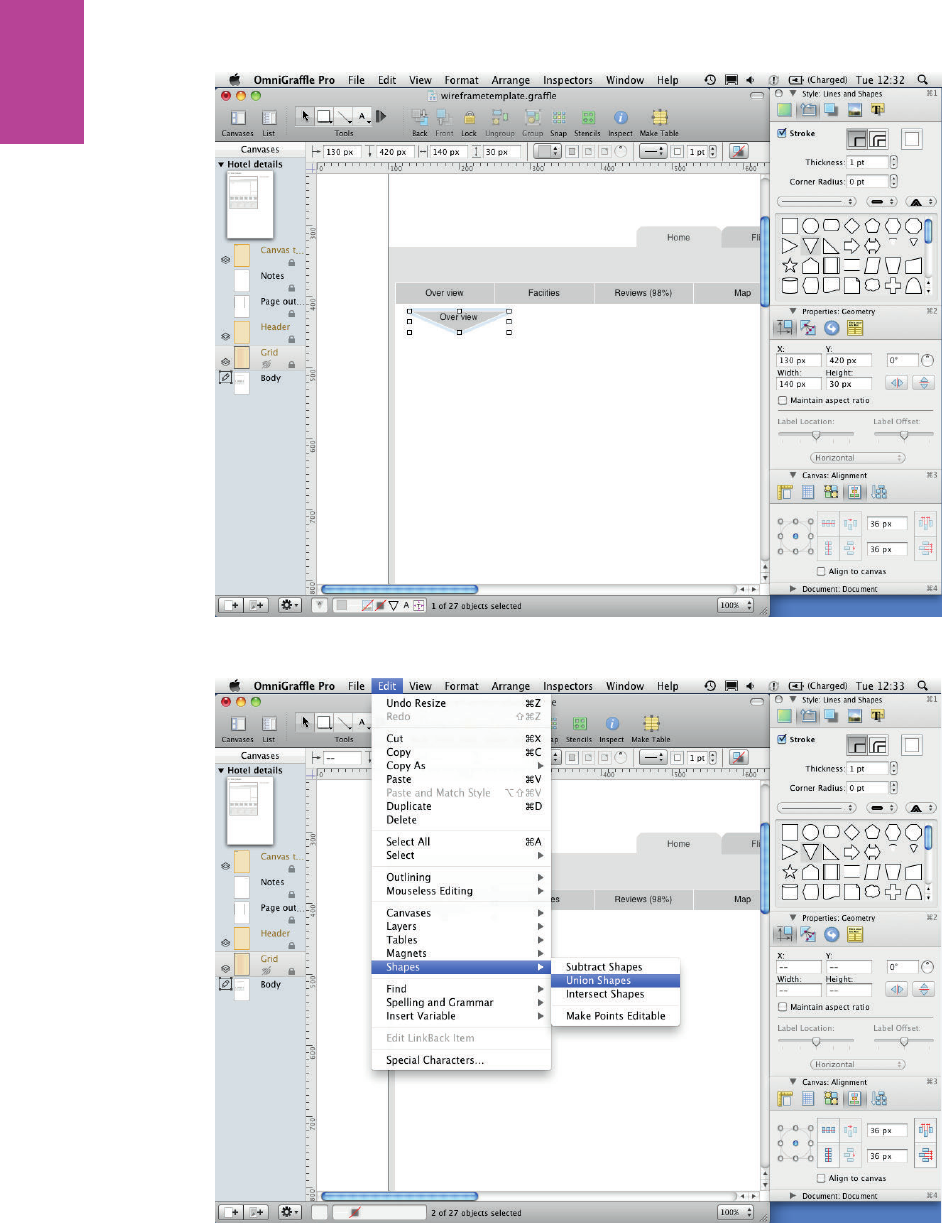
224
COMMUNICATING THE USER EXPERIENCE
F -: Change the shape to a downward triangle.
F -: Union Shapes turns the rectangle and triangle into a single custom shape.
09_9781119971108-ch06.indd 22409_9781119971108-ch06.indd 224 8/10/11 8:40 PM8/10/11 8:40 PM
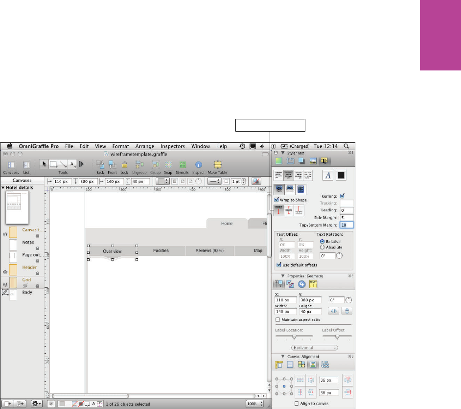
225 CHAPTER SIX WIREFRAMES
ese two shapes will become one, but the text will look out of alignment. To x that:
5 Open the Text part of the Style panel in the inspector.
6 Set the vertical alignment to Top and change the Top/Bottom Margin to 10 (see Figure
6-68).
Vertical alignment
F -: When the shapes are combined, you might need to adjust the vertical alignment of the text.
Adding images
Sometimes you will need to use images in your wireframes. ere are a couple of things
worth remembering about OmniGra e and images.
OmniGra e won’t let you drag images straight from a web browser. Instead you need to
drag images from the browser to your desktop, then you must drag the images from your
desktop into OmniGra e.
OmniGra e doesn’t grayscale images. When using images in wireframes, it’s good practice
to remove all color from them. Having colored images gives them an unfair advantage in
testing because everything else is grayscale. You will need to grayscale your images outside of
OmniGra e. e image viewing application Preview can achieve this easily. You should nd
it in the applications folder on your Mac; it comes as part of the operating system.
09_9781119971108-ch06.indd 22509_9781119971108-ch06.indd 225 8/10/11 8:40 PM8/10/11 8:40 PM
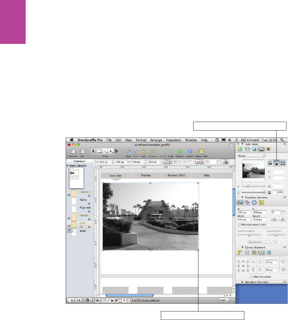
226
COMMUNICATING THE USER EXPERIENCE
ere are two useful ways that OmniGra e allows you to edit images:
> e Stretch to t button, which is located in the Image section of the Style part of the
inspector. It allows you to resize the image in the same way you would any object or
shape.
> e Natural size button allows you to specify an area of the image to mask and allows
you to resize the image within this area.
OmniGra e uses Stretch to t by default, so use that for the main hotel image.
1 Drag an image onto the canvas and resize it to be your main image (see Figure 6-69).
Make sure Stretch to fit button is clicked
Click and drag points to resize image
F -: Resize the image by selecting it and dragging any of the points.
09_9781119971108-ch06.indd 22609_9781119971108-ch06.indd 226 8/10/11 8:40 PM8/10/11 8:40 PM
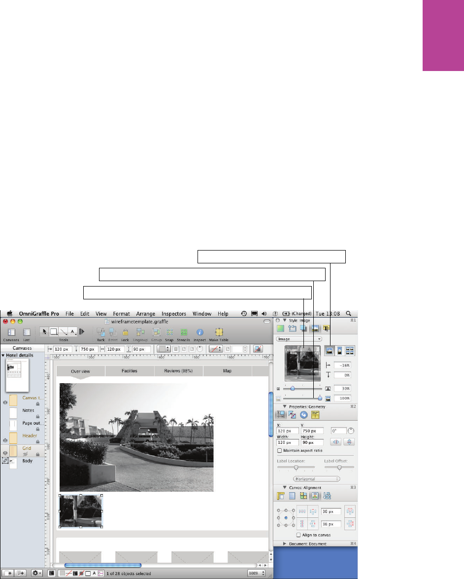
227 CHAPTER SIX WIREFRAMES
For the thumbnails image, use the Natural size button. is is the way OmniGra e masks
images.
2 To use natural size, drag an image onto your canvas.
3 Select the image and open the Style panel of the inspector.
4 Select the images section. You will see three di erent icons of mountains. ese allow you
to switch between Stretch to t, Natural size, and Tile.
5 Select the left icon for Natural size.
If you try to resize your image on the canvas, you will see that the image doesn’t change size;
instead it becomes masked. is is really useful if you only want a portion of the image visible.
6 Set the mask area so the image is a small thumbnail under the main hotel image (see
Figure 6-70).
Drag the preview image to change the position within the mask
Use the slider to change the size of the image within the mask
Make sure Natural Size button is clicked
F -: Using Natural size allows you to mask images.
09_9781119971108-ch06.indd 22709_9781119971108-ch06.indd 227 8/10/11 8:40 PM8/10/11 8:40 PM
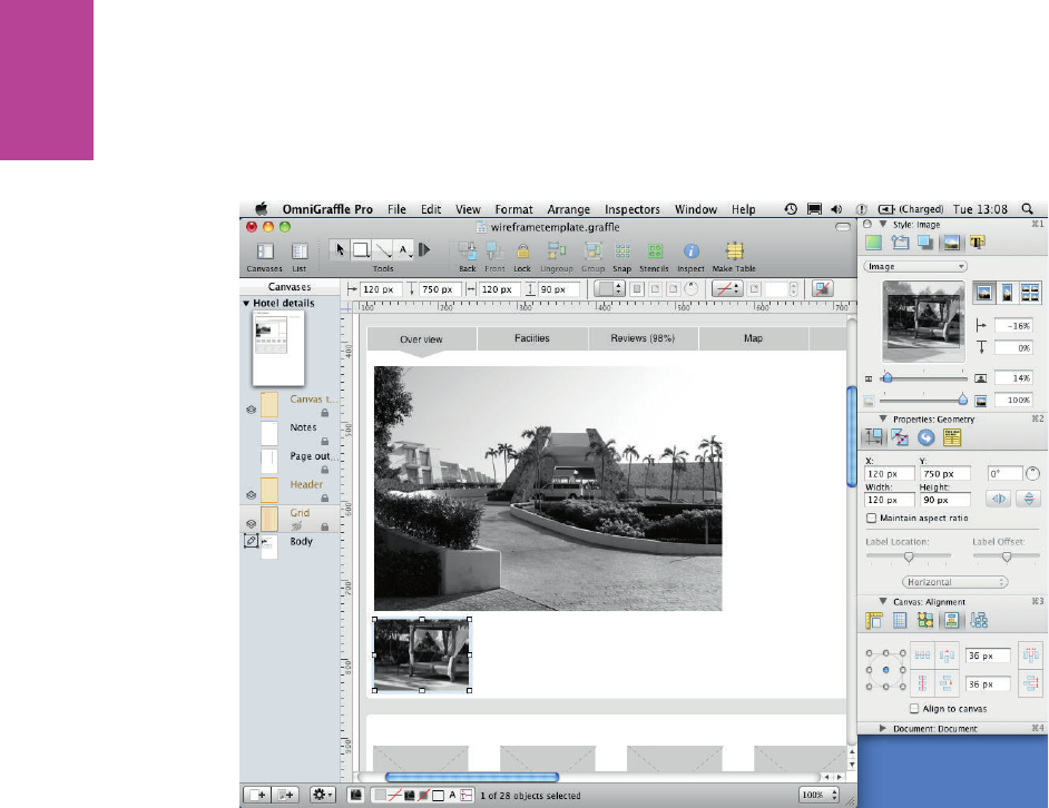
228
COMMUNICATING THE USER EXPERIENCE
7 To resize the image, use the size slider on the image section of the style panel in the
inspector (see Figure 6-71). You can also adjust the position of the image within the mask
by dragging the image in the position box on the inspector.
F -: Natural size allows you to use masks that allow you to make the image ll any size or shape you set.
Getting your mask right can be tricky, but this method is really useful if you want multiple
images to be the same size.
8 Duplicate the masked image and drag a new image into OmniGra e directly onto your
duplicated image. (You should see a blue outline appear.)
9 Drop the new image over the duplicated one; it will replace it with the same mask applied
(see Figure 6-72).
09_9781119971108-ch06.indd 22809_9781119971108-ch06.indd 228 8/10/11 8:40 PM8/10/11 8:40 PM
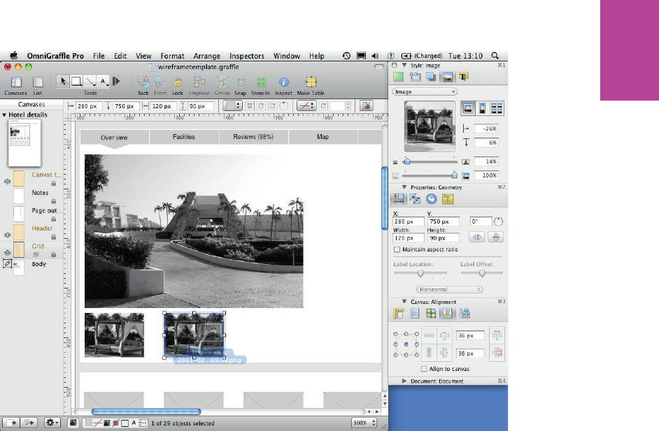
229 CHAPTER SIX WIREFRAMES
F -: Dragging a new image over a Natural size image will create a blue highlight.
Adding text
In this section, you’ll learn how to create and manipulate text, including how to add bulleted
lists and how to set line spacing.
To add text, follow these steps:
1 Select the text tool and create a new text box for the page header.
2 Type the page title (for example, Sirens Hotel Mexico).
3 Using the Text part of the Style panel in the inspector, set the text alignment to left.
4 Change the font size by clicking the A button, which opens the Fonts dialog (see Figure
6-73).
5 Change the color of the text to 10% black. Avoid using a pure black font, which makes the
text look “harsh.” Your page will look cluttered.
6 Create another text box next to the hotel image. Give it a heading (about 18 pt), some
body copy (12 pt), and a list (see Figure 6-74).
09_9781119971108-ch06.indd 22909_9781119971108-ch06.indd 229 8/10/11 8:40 PM8/10/11 8:40 PM
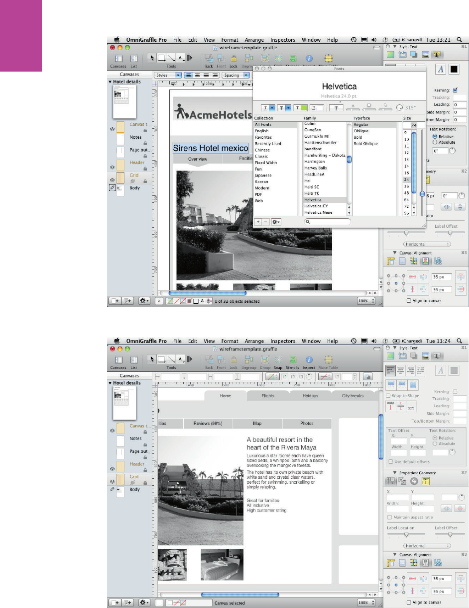
230
COMMUNICATING THE USER EXPERIENCE
F -: Clicking the A button in the Style: Text section of the inspector opens this font popup.
F -: Add a list of 3 or more items.
09_9781119971108-ch06.indd 23009_9781119971108-ch06.indd 230 8/10/11 8:40 PM8/10/11 8:40 PM
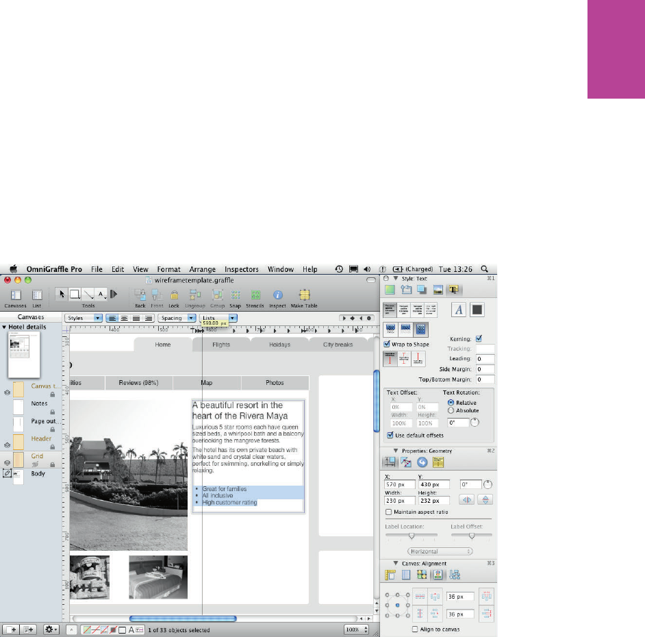
231 CHAPTER SIX WIREFRAMES
7 Double-click into the text box.
Notice the options above the ruler units at the top of the page have changed. e two you are
going to use are Spacing and Lists. You’ll use these to turn the short list into a bulleted list.
8 Highlight the text you want to add bullet points to, click the Lists down-arrow, and then
choose the round text bullet option.
Each line should have a bullet next to it. If the indent of the bullet points and the text is not
quite right, you can adjust it using the arrows on the ruler units at the top of the canvas.
Make sure all the text you want to adjust is selected (see Figure 6-75).
F -: Once the bullet points are added, you can drag the arrows in the rulers above the canvas to adjust
the text and bullet indents.
9 To create more space between each item in the list, making it easier to read, highlight all
the text.
0 Click the Spacing drop-down and choose Other.
! Change Paragraph spacing after to 10.0 points (see Figure 6-76).
09_9781119971108-ch06.indd 23109_9781119971108-ch06.indd 231 8/10/11 8:40 PM8/10/11 8:40 PM
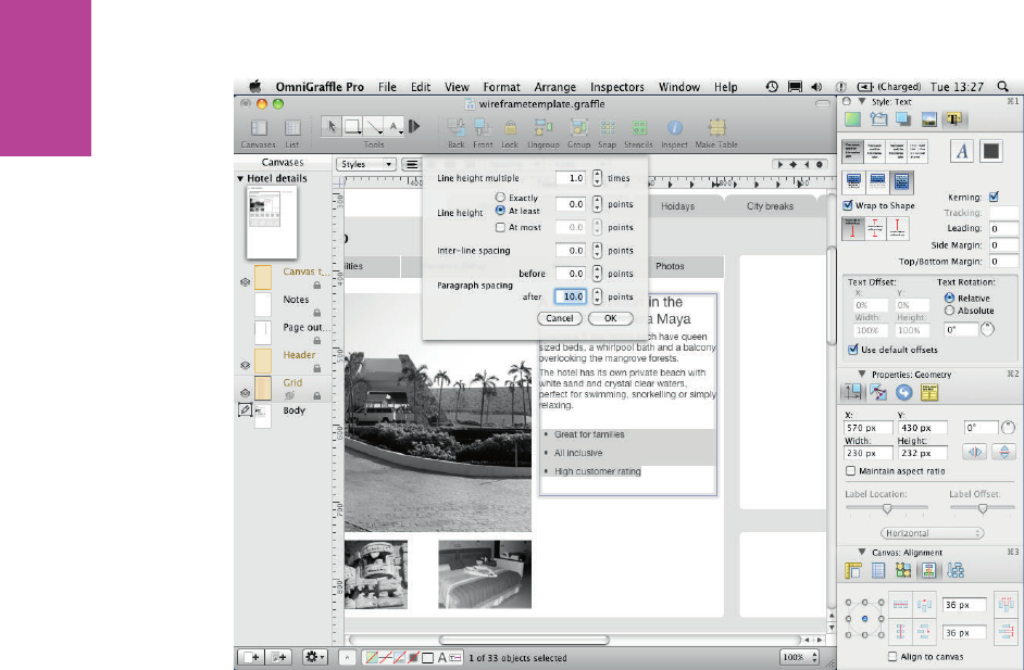
232
COMMUNICATING THE USER EXPERIENCE
F -: Change the Paragraph spacing after so the position of the top of the list is not a ected.
Creating buttons
Buttons and calls to action are key elements of a web page, especially in product pages. It’s
important that buttons look like actual buttons in wireframes so they’re clearly understood
by stakeholders and users during testing. Here’s how to make them in OmniGra e:
1 Select the rectangle from the shape tool and draw a box for your button.
2 In the Style panel in the inspector, select the Fill check box.
3 Change the Fill type to Double Linear Blend (see Figure 6-77). ree color boxes and a
vertical slider appear (see Figure 6-78).
09_9781119971108-ch06.indd 23209_9781119971108-ch06.indd 232 8/10/11 8:40 PM8/10/11 8:40 PM
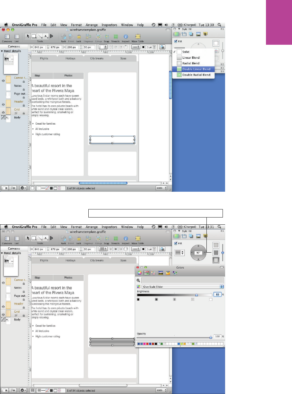
233 CHAPTER SIX WIREFRAMES
F -: Change the Fill type to Double Linear Blend.
Adjust all the colors in the blend to create a bevelled effect.
F -: Adjust all the colors in the blend to create a beveled e ect.
09_9781119971108-ch06.indd 23309_9781119971108-ch06.indd 233 8/10/11 8:40 PM8/10/11 8:40 PM
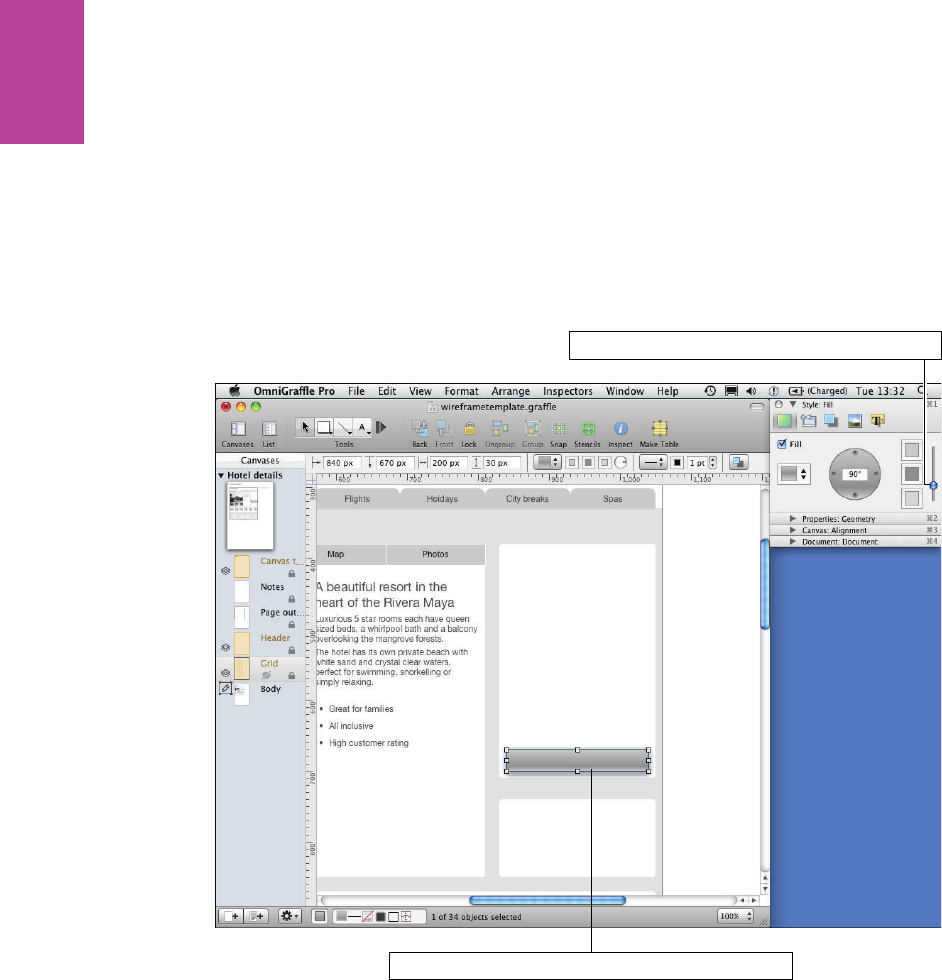
234
COMMUNICATING THE USER EXPERIENCE
4 Change the top color to a light 75% gray.
5 Change the middle color to a darker 50% gray.
6 Change the bottom color to a lighter 80% gray.
e button is starting to look beveled but needs some tweaking.
7 Use the vertical slider to change the position of your gradient and bring it down so the
lightest gray shows only at the bottom of the button (see Figure 6-79).
Drag the slider to adjust the postion of the gradient
Show the lightest gray only at the bottom of the button
F -: Adjust the position of the gradient.
09_9781119971108-ch06.indd 23409_9781119971108-ch06.indd 234 8/10/11 8:40 PM8/10/11 8:40 PM
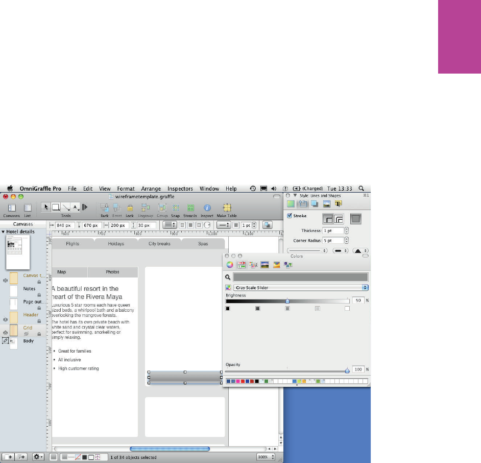
235 CHAPTER SIX WIREFRAMES
e default line style and shadow styles look pretty awful, so you’ll want to change those,
too.
8 In the Lines and Shapes section of the Style panel, change the stroke color to a 50% gray.
is makes the button stand out against the background without being too harsh.
9 Set the Corner Radius to ve to give the button rounded edges (see Figure 6-80).
0 Switch to the Shadow section to edit the various aspects of the shadows.
! Use the slider to change the amount the shadow is blurred.
F -: Make the outline of the button lighter and round o the corners.
You can toggle between showing the shadow immediately below the button or below every
other object.
09_9781119971108-ch06.indd 23509_9781119971108-ch06.indd 235 8/10/11 8:40 PM8/10/11 8:40 PM
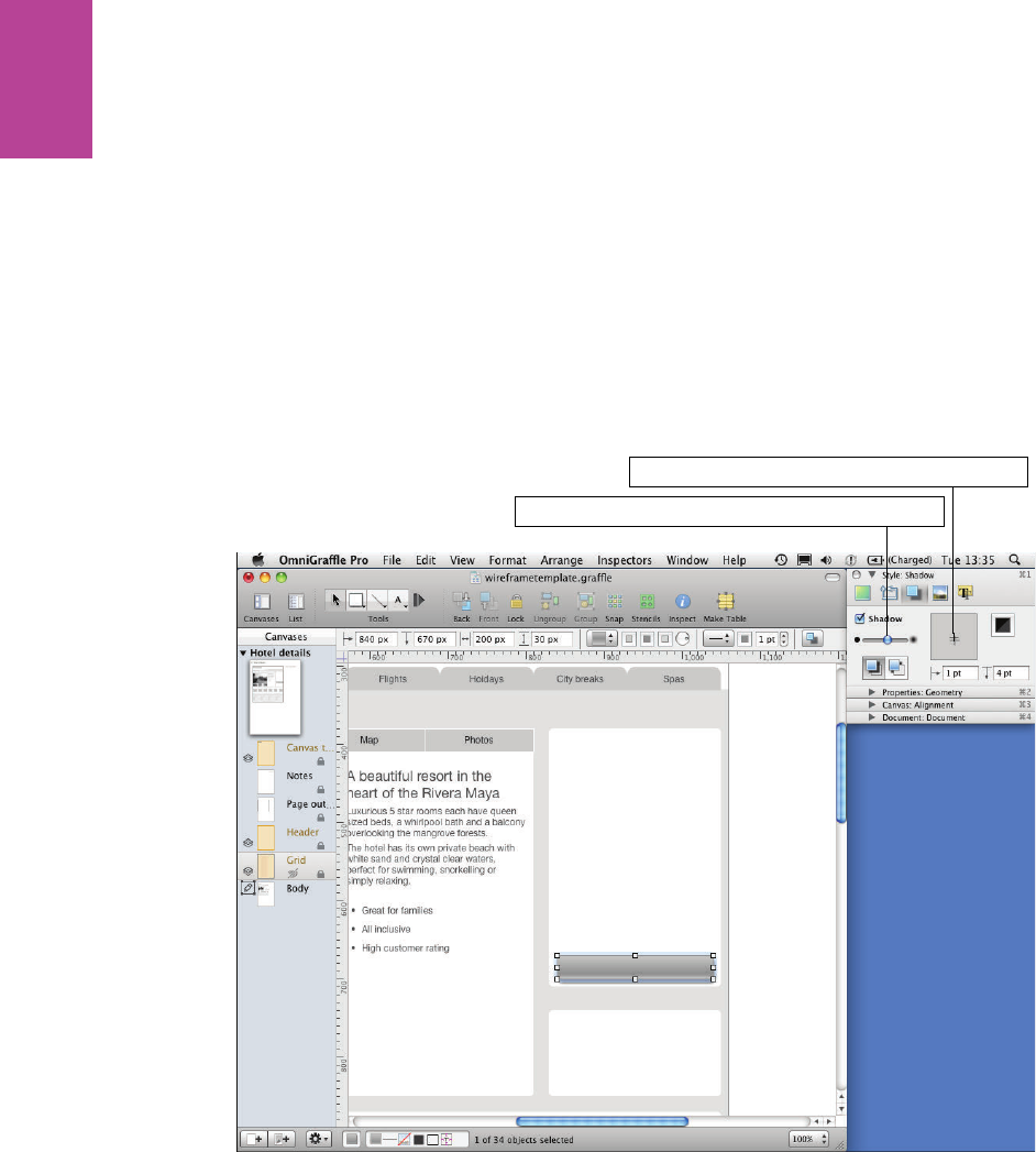
236
COMMUNICATING THE USER EXPERIENCE
To change the position of the shadow, click within the shadow position box. You can be more
accurate by adding vertical and horizontal values below. To move the shadow up or right, you
need to use negative numbers.
You can adjust the color and opacity of your shadow (see Figure 6-81). It’s a good idea not to
make the shadow too dark because it can make the button look messy.
@ Add some text to your button.
at nishes the button. You can use the gradient technique used to create this button to
create a ordance on other interface elements, like drop-downs and check boxes (see Figure
6-82).
Drag the slider to set the level of blur for the shadow
Drag the + to change the position of the shadow
F -: Shadow will add a ordance to your button.
09_9781119971108-ch06.indd 23609_9781119971108-ch06.indd 236 8/10/11 8:40 PM8/10/11 8:40 PM
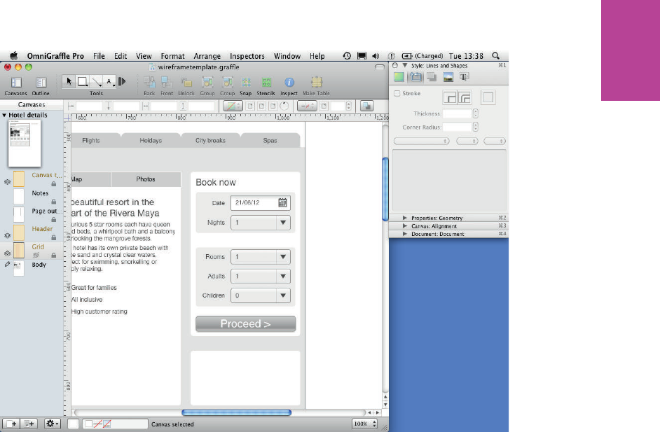
237 CHAPTER SIX WIREFRAMES
F -: A ordance is useful for buttons, drop-downs and other wireframe elements.
Using stencils
Stencils are a great way to speed up your work ow. ey allow you to save speci c elements
that you have created to easily use in later projects. ere are also a ton of great stencils
already out there for you to download and use (including one created for this book).
To use a stencil, follow these steps:
1 Click the Stencils button on the toolbar.
A panel displays with a list of default stencil sets for you to use.
2 Select a stencil set and the contents of the stencil will appear (see Figure 6-83).
09_9781119971108-ch06.indd 23709_9781119971108-ch06.indd 237 8/10/11 8:40 PM8/10/11 8:40 PM
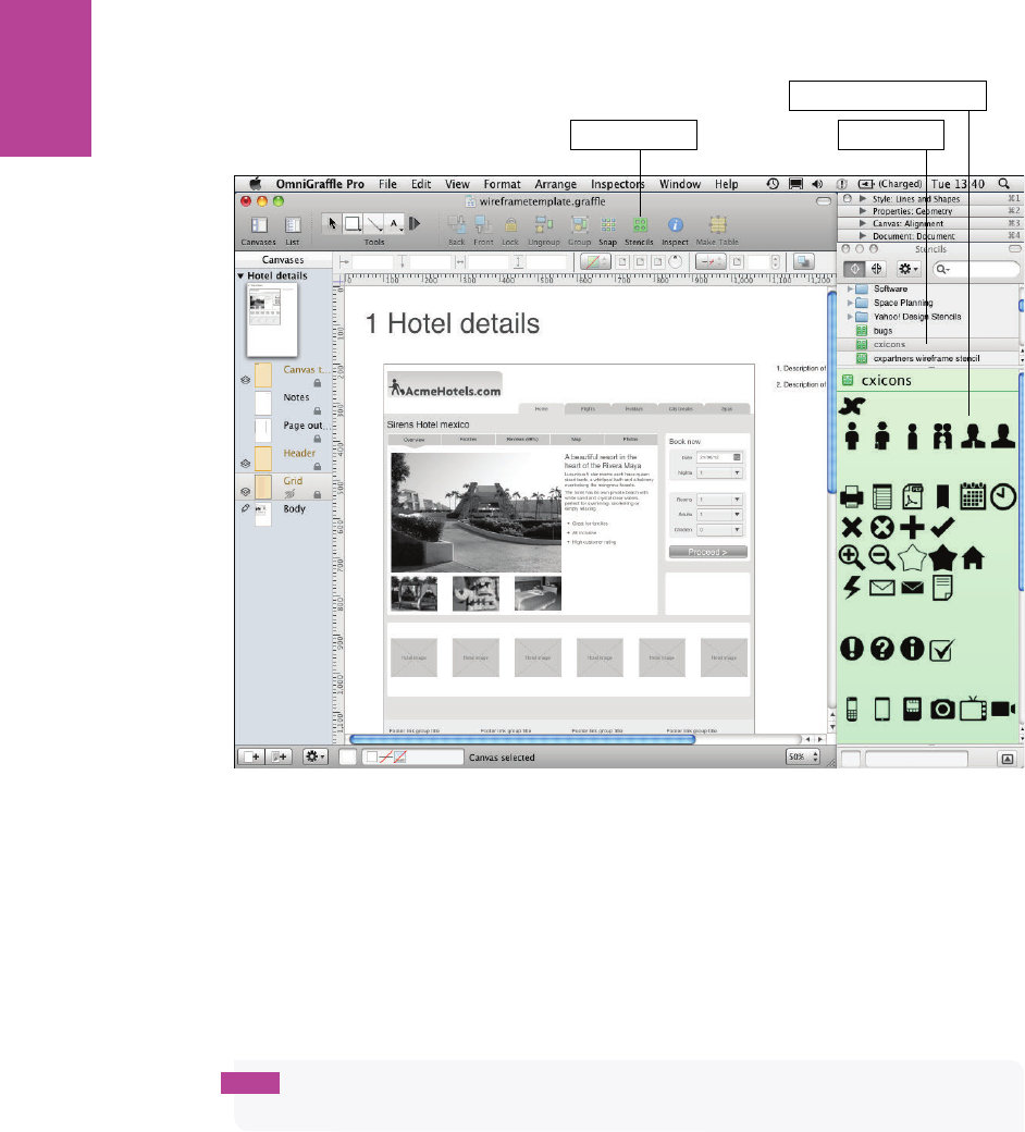
238
COMMUNICATING THE USER EXPERIENCE
Stencils button Stencils sets
Contents of stencil sets
F -: Using stencils.
3 Drag the element you want to use onto the page.
To create a new stencil, follow these steps:
1 Go to File, click New Resource, and then choose New Stencil.
2 Put all the elements you want for your stencil onto the canvas and save it. It now appears
in your stencils panel (see Figure 6-84).
tip Remember to group all the shapes that make up your element. You can only drag
individual objects from stencils onto your canvas.
To edit your stencil, right-click the stencil in the stencils palette and select Edit stencil.
To use downloaded stencils, put the stencil in the right folder in your library by going to
Library, clicking Application Support, choosing OmniGra e, and then choosing Stencils.
So that’s all you need to get you started making wireframes. You can use all you have learned
here to nish o your hotel details page by adding the remaining headings labels and icons
shown in Figure 6-85.
09_9781119971108-ch06.indd 23809_9781119971108-ch06.indd 238 8/10/11 8:40 PM8/10/11 8:40 PM

239 CHAPTER SIX WIREFRAMES
F -: Any changes you make to the stencil while editing will automatically update in the stencil window.
F -: e nished wireframe will look like this.
09_9781119971108-ch06.indd 23909_9781119971108-ch06.indd 239 8/10/11 8:40 PM8/10/11 8:40 PM

COMMUNICATING THE USER EXPERIENCE
240
HOW TO Create wireframes in Axure
Axure is a fantastic tool for creating interactive prototypes. But before you make anything
interactive you need to create a well thought out set of wireframes. is section shows you
some basic techniques for creating wireframe elements in Axure. First, however, you need to
become more familiar with Axure.
An overview of Axure
Figure 6-86 shows the basic layout of the Axure window, including:
> Toolbar. is allows you to format the color and style of objects and text.
> Sitemap pane. is is where you navigate between the pages you are editing.
> Widgets pane. is stores all the useful that you can use to start building your wire-
frame.
> Masters pane. is stores all the custom widgets that you create.
> Canvas. is is where the wireframing happens.
> Widget Properties pane. is is where you can add notes and interactions and for-
mat the size and position of objects.
09_9781119971108-ch06.indd 24009_9781119971108-ch06.indd 240 8/10/11 8:40 PM8/10/11 8:40 PM
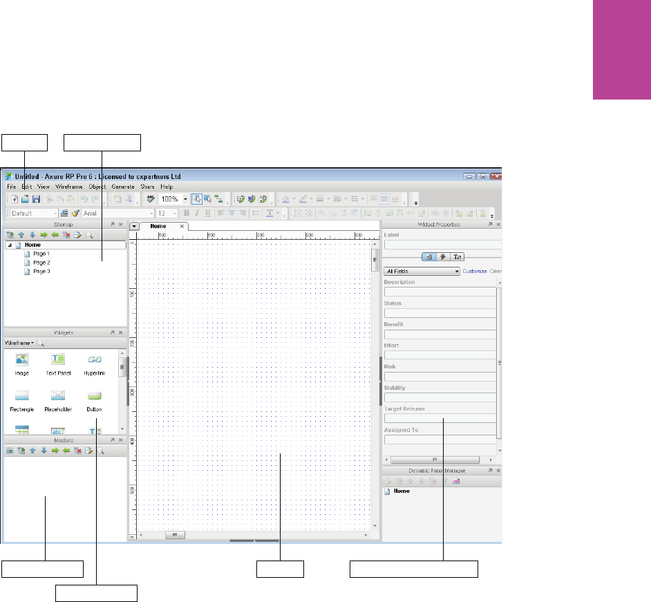
241 CHAPTER SIX WIREFRAMES
Toolbar Sitemap pane
Masters pane
Widgets pane
Canvas Widget Properties pane
F -: e basic layout of Axure.
09_9781119971108-ch06.indd 24109_9781119971108-ch06.indd 241 8/10/11 8:40 PM8/10/11 8:40 PM
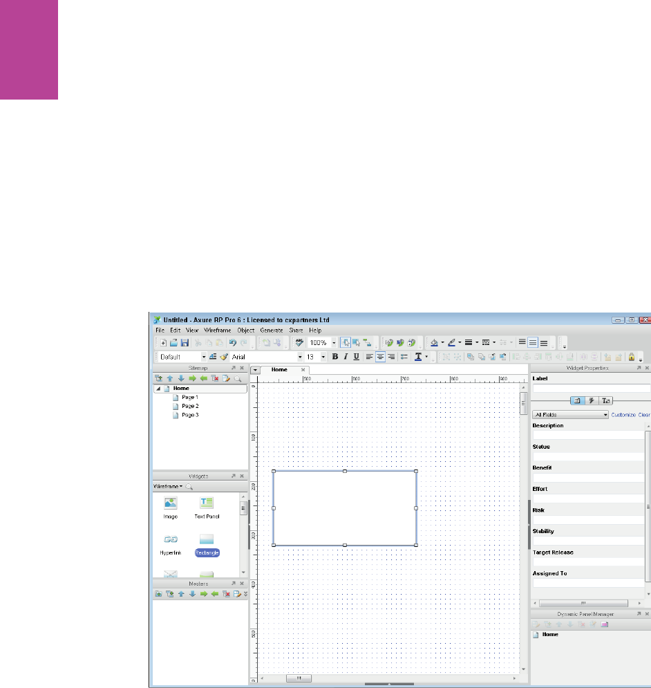
242
COMMUNICATING THE USER EXPERIENCE
Creating wireframes
In this section, you’ll learn how to create and style basic shapes, edit text and bullets, add
images, create custom buttons, and create master objects.
Creating and styling basic shapes
To create a shape, follow these steps:
1 Drag a Rectangle from the widgets pane onto the canvas. ere are several other basic
shapes in the library if you need them.
2 Select the Rectangle on the canvas. You can position and resize your object by dragging,
but for more accuracy, you can use the Location and Size pane on the bottom right (see
Figure 6-87).
F -: To create a rectangle, drag one from the widgets pane onto the canvas.
09_9781119971108-ch06.indd 24209_9781119971108-ch06.indd 242 8/10/11 8:40 PM8/10/11 8:40 PM
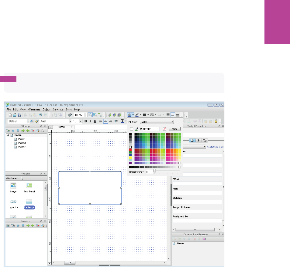
243 CHAPTER SIX WIREFRAMES
You can use the toolbar to change font styles and alignment and the shape color and line
style.
To change the ll color, select the shape and click the Fill Color drop-down (see Figure 6-88).
From here you can select from a pre-de ned set of colors.
tip You can click More to get a more detailed color palette, or use the color picker to copy
a color from anywhere on the screen.
F -: You can adjust the color of any shape from the toolbar.
e Fill icon changes to match the color you picked. is is because the color drop-down
remembers the last color you selected, which makes it easy to make multiple objects the
same color. To do this, select the shape you want to color and click the Fill icon (not the Fill
drop-down arrow).
Change the line color the same way. e drop-down to the right allows you to change line
weight or remove it completely. e drop-down to the right of that allows you to change the
line style (see Figure 6-89).
09_9781119971108-ch06.indd 24309_9781119971108-ch06.indd 243 8/10/11 8:40 PM8/10/11 8:40 PM
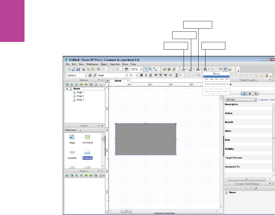
244
COMMUNICATING THE USER EXPERIENCE
Fill Color
Line Color
Line Weight
Line Style
F -: Adjusting line styles.
Editing text and bullets
Editing text in Axure is fairly limited. You can do the basics like changing font style size and
color, but indenting and line spacing are not available. In this section, you’ll learn how to cre-
ate a basic header, how to create body copy, and how to create a bulleted list, and you’ll learn
a workaround for line spacing.
To create a basic header, follow these steps:
1 Drag a Text Panel from the widgets library pane onto your canvas.
2 Double-click it to edit the text and add your heading.
3 With the text panel selected, go to toolbar and change the font size to 18 and change the
color to a dark gray (see Figure 6-90). It’s a good idea not to use 100% black in your wire-
frames because it makes the page look cluttered.
To create body copy, follow Steps 1–3 but use a smaller font (see Figure 6-91).
09_9781119971108-ch06.indd 24409_9781119971108-ch06.indd 244 8/10/11 8:40 PM8/10/11 8:40 PM
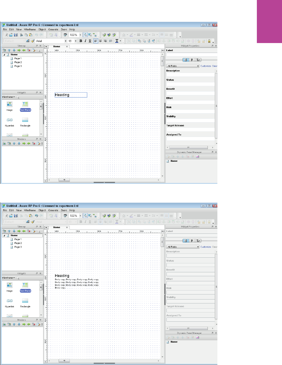
245 CHAPTER SIX WIREFRAMES
F -: To create a text box, drag one from the Widgets pane onto the canvas.
F -: Double click a text box to edit the copy within it.
09_9781119971108-ch06.indd 24509_9781119971108-ch06.indd 245 8/10/11 8:40 PM8/10/11 8:40 PM
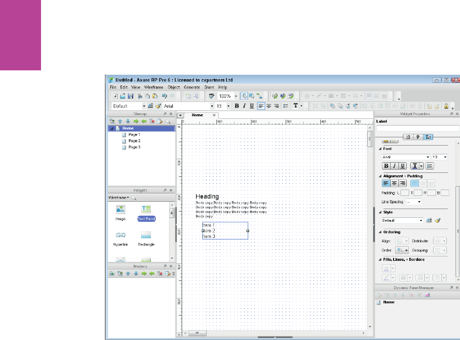
246
COMMUNICATING THE USER EXPERIENCE
When creating bulleted lists, it’s a good idea to create a separate text panel from your body
copy (see Figure 6-92). is allows you to indent the text by moving the text panel.
F -: Putting your bulleted lists in a separate text box allows you to indent the bullets more easily against
the rest of the text.
1 Create the list you want.
2 Select all the text you want to include in the bulleted list and select the bullets button in
the toolbar.
3 To change the line spacing, select all the text in the bulleted list and open the Formatting
section of the Widgets Properties pane (see Figure 6-93). Use the Line Spacing drop-down
to set the line spacing to 24.
09_9781119971108-ch06.indd 24609_9781119971108-ch06.indd 246 8/10/11 8:40 PM8/10/11 8:40 PM
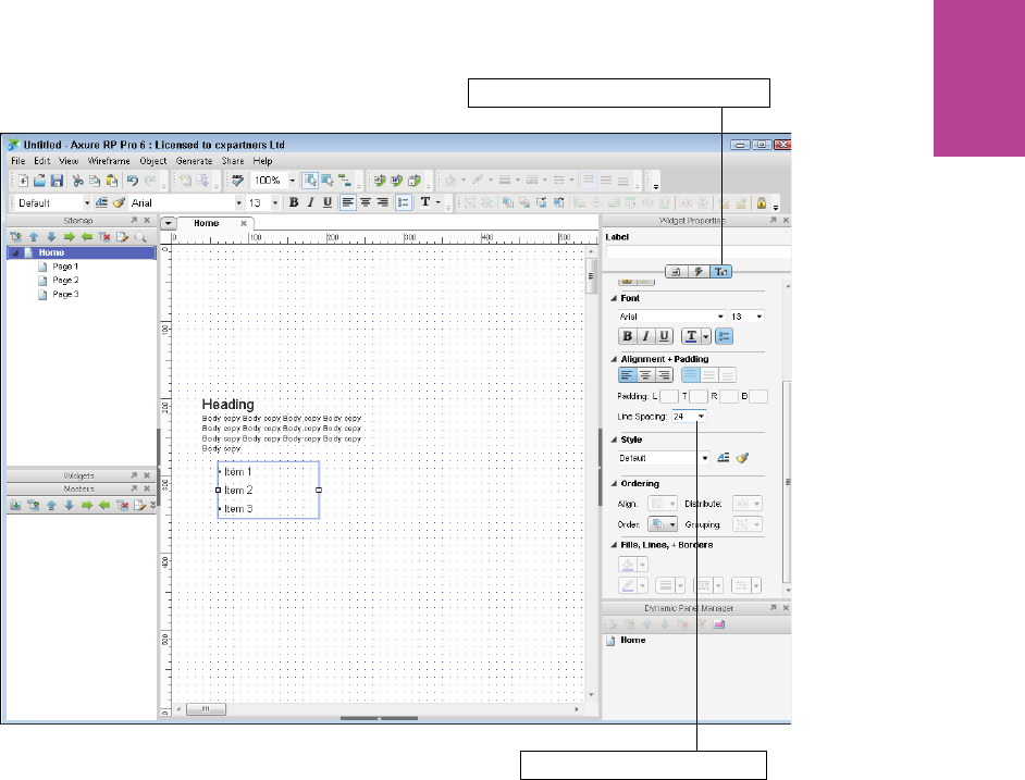
247 CHAPTER SIX WIREFRAMES
Click to open the Formatting section
Adjust the line spacing here
F -: Setting line spacing from the Widgets properties pane.
Adding images
Axure has very little control over images, so it’s a good idea to prep them before adding them
to your wireframe. Get the right crop and grayscale them if necessary.
To add an image:
1 Drag an Image object from the widgets pane onto your wireframe (see Figure 6-94).
2 Position it and resize it to where you want your image to be.
3 Right-click the Image object and select Edit Image > Import Image.
4 Select the image you want and click Open.
09_9781119971108-ch06.indd 24709_9781119971108-ch06.indd 247 8/10/11 8:40 PM8/10/11 8:40 PM
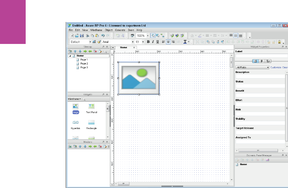
248
COMMUNICATING THE USER EXPERIENCE
F -: To add an image, rst drag an image placeholder from the Widgets pane onto the canvas.
Axure will ask you if you want to auto size the image. Auto size means it will import the
image in its original size. You have already sized and positioned your image object; you want
the imported image to match it.
5 Click No.
If you are importing a large image, Axure will ask if you want to optimize it. is is a good
idea because it reduces the le size and image quality isn’t that important for your wire-
frame.
6 Click Yes.
Your image will replace the image placeholder (see Figure 6-95). You can now reposition or
resize it.
09_9781119971108-ch06.indd 24809_9781119971108-ch06.indd 248 8/10/11 8:40 PM8/10/11 8:40 PM
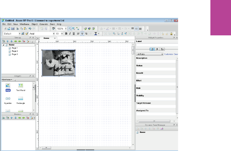
249 CHAPTER SIX WIREFRAMES
F -: Once you choose your image, it will replace the image placeholder.
Creating custom buttons
It’s tempting to use the default buttons from the Axure widget library, but they can make
your wireframe look a bit ugly. e problem is that when you export the prototype, the
default buttons display as default operating system buttons. Here’s how to create custom
buttons:
1 Drag a Rectangle onto your canvas from the widgets pane.
2 Right-click the Rectangle, choose Edit Button Shape, and then choose Rounded Rectangle.
3 Adjust the corner radius by clicking and dragging the small yellow triangle on the top-left
corner of the shape (see Figure 6-96).
09_9781119971108-ch06.indd 24909_9781119971108-ch06.indd 249 8/10/11 8:40 PM8/10/11 8:40 PM
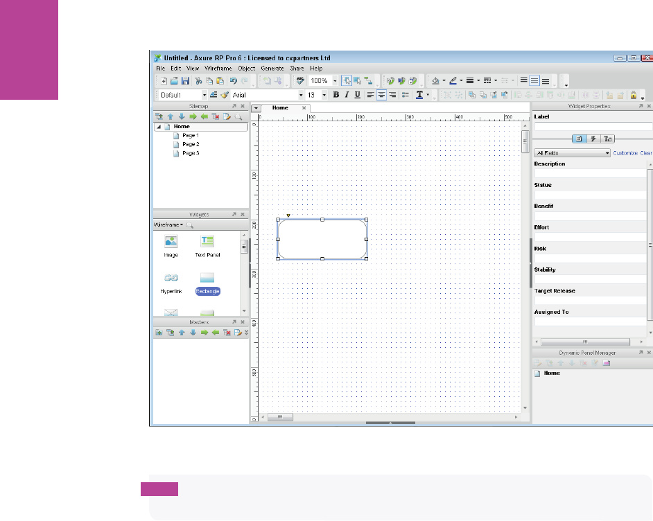
250
COMMUNICATING THE USER EXPERIENCE
F -: Dragging the small yellow triangle above the top left of the rectangle adjusts the corner radius.
tip Editing the button shape is really useful for creating various interface elements. For
example, the Rounded rectangle top option gives you the perfect tab shape.
To shade the button, follow these steps:
1 Open the Fill Color drop-down.
2 Change the ll type from Solid to Linear Gradient. A strip of color will appear that defaults
to a white to black gradient.
3 To change the color of the gradient, select a color slider and then choose a new color from
the palette. For this exercise, change the white to a light-ish gray.
4 Do the same with the black color slider and change it to a darker gray.
5 You can change the position of the colors in your gradient simply by dragging them left or
right. Move your darker gray slider about a quarter of the way in from the right.
09_9781119971108-ch06.indd 25009_9781119971108-ch06.indd 250 8/10/11 8:40 PM8/10/11 8:40 PM

251 CHAPTER SIX WIREFRAMES
6 Add another color to your gradient by clicking just below the gradient strip at the point
you want to add your color.
7 Change this third color slider to a lighter gray and move it to the far right (see Figure
6-97).
Select a tab and pick a color to
change the colors in your gradient
Click below the gradient strip to add another color to the gradient
Click and drag a color tab to
change its positon on the gradient
F -: Working with gradient colors.
8 To make the gradient run from the top of your button to bottom, you need to change the
angle. Use the angle adjuster and set it to 90 degrees.
9 To nish the button, add a thin dark gray outline and white text to make it stand out
against everything else on your wireframe (see Figure 6-98).
09_9781119971108-ch06.indd 25109_9781119971108-ch06.indd 251 8/10/11 8:40 PM8/10/11 8:40 PM

252
COMMUNICATING THE USER EXPERIENCE
F -: Adding gradients to shapes gives them a ordance.
Creating master objects
Axure has a really useful feature called a master object. It allows you to save elements you
have created as masters that can be used elsewhere on your wireframe. Anything you turn
into a master object will appear in the master objects pane. at makes it easy to re-use them
as you can drag them onto any page.
e best thing about a master object is that if you edit it, every instance of that object within
your wireframes is updated. is means it’s perfect for headers, footers, or widgets that need
to be the same on all pages.
To create a master object:
1 Select all the objects you want to include in your master.
tip Make sure every element that you want to include in the master object is selected
before right-clicking them.
09_9781119971108-ch06.indd 25209_9781119971108-ch06.indd 252 8/10/11 8:40 PM8/10/11 8:40 PM
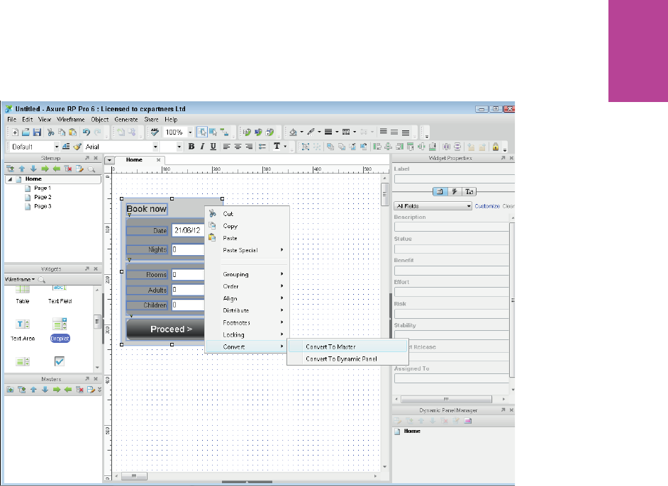
253 CHAPTER SIX WIREFRAMES
2 Right-click your selected items, choose Convert, and then choose Convert To Master (see
Figure 6-99).
F -: Converting to a master.
3 A popup displays, asking that you name your new master object.
All your objects should be grouped and highlighted in red. Your object will also appear in
your Masters panel and will have the name you gave it in Step 3 (see Figure 6-100).
4 You can now add multiples of your master object by dragging your new object from the
Masters pane onto your canvas (see Figure 6-101).
5 To edit a master object, simply double-click it either in the Masters pane or on any
instance of it on your wireframe. Save your changes and then all instances of your master
object will update (see Figure 6-102).
09_9781119971108-ch06.indd 25309_9781119971108-ch06.indd 253 8/10/11 8:40 PM8/10/11 8:40 PM
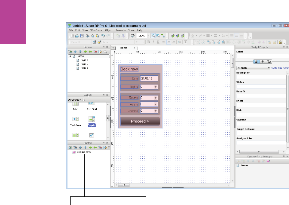
254
COMMUNICATING THE USER EXPERIENCE
New master objects appear here
F -: Your new master will appear in the Masters pane.
09_9781119971108-ch06.indd 25409_9781119971108-ch06.indd 254 8/10/11 8:40 PM8/10/11 8:40 PM
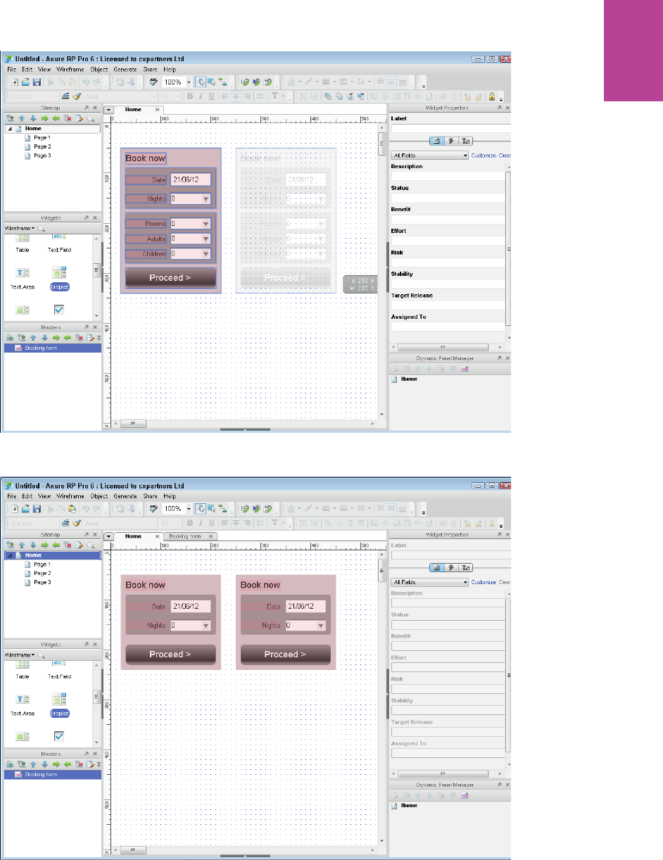
255 CHAPTER SIX WIREFRAMES
F -: You can drag as many copies of your master object onto the canvas as you want.
F -: When you edit a master object, all instances of that object will be updated.
09_9781119971108-ch06.indd 25509_9781119971108-ch06.indd 255 8/10/11 8:40 PM8/10/11 8:40 PM

COMMUNICATING THE USER EXPERIENCE
256
HOW TO Create wireframes in PowerPoint
PowerPoint is often overlooked as a wireframing tool. However most (if not all) of you will
know how to use it on at least a basic level and will have it or Keynote installed on your com-
puter making it very easy for teams to share the les.
If you are a Keynote user, there are di erences in the drawing tools, but the same basic
guidelines can be used.
PowerPoint’s drawing and layout controls are a bit more crude than Axure’s or OmniGra e’s
controls. Still, it’s fairly simple to get up to speed with PowerPoint and you can communicate
exactly the same level of information that you can in either of the other packages.
Setting up the template
is section shows you how to set up the template so it’s easier to create wireframes in
PowerPoint.
Enabling Snap to grid
Make sure that snap to grid is turned on before you do anything. It will help with the posi-
tioning of elements and allow you to align everything more easily.
To turn on snap to grid:
1 Right-click the slide background and select Grid and Guides. You can also change the
spacing of the Grid in this display.
tip Once a shape is selected, by default the cursor controls will move the shape one grid
space. To move it one pixel at a time, hold down the Ctrl key (hold down the Alt key on a Mac)
and then use the cursors.
2 Snapping objects to other objects or snapping to shape can get annoying for wireframing;
we recommend that you turn it o and that you also turn o smart guides. See Figure
103.
09_9781119971108-ch06.indd 25609_9781119971108-ch06.indd 256 8/10/11 8:40 PM8/10/11 8:40 PM
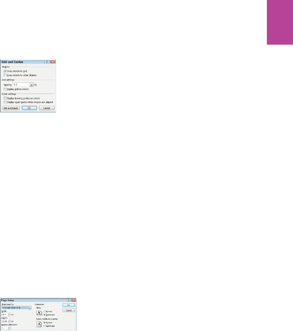
257 CHAPTER SIX WIREFRAMES
F -: e Grid and Guides dialog with the Snap objects to grid selected for wireframing.
Adjusting sizing
Sizing for screen resolution presentations (1024 px by 768 px, for instance) isn’t as accurate
as in OmniGra e or Axure where you can work in actual size.
A neat trick is to paste a screenshot of a site with the page width and type the size that you’re
after. Scale it down to t on the page and then use the font size tool in PowerPoint to match
this size.
Body copy can look small (6 pt or 7 pt) but still be readable.
One option is to set the page layout size to A2 landscape (59.4 cm by 42 cm). is allows you
to create your wireframes in actual size.
Either way, you’ll nd yourself frequently magnifying in and out of slides.
To set the slide size:
1 Go to the Design tab and click Page Setup. e Page Setup dialog box displays.
2 Enter custom sizes in the Width box and Height box (see Figure 6-104).
F -: Customizing sizes in the Page Setup dialog.
09_9781119971108-ch06.indd 25709_9781119971108-ch06.indd 257 8/10/11 8:40 PM8/10/11 8:40 PM
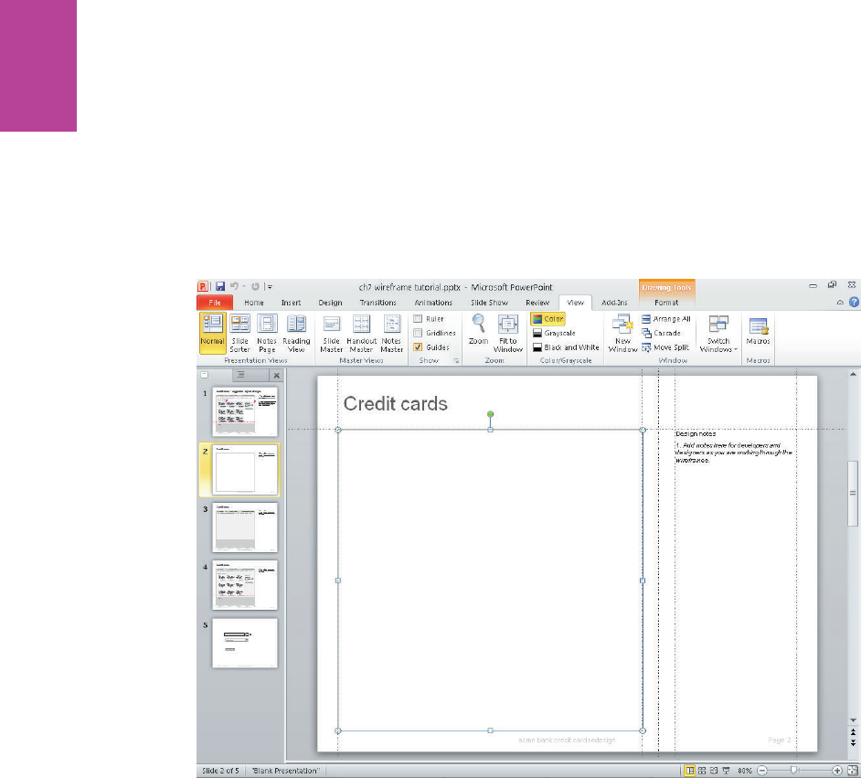
258
COMMUNICATING THE USER EXPERIENCE
Creating wireframes
With your template set up, you can begin to add the elements needed to create wireframes.
Creating the page outline
e page outline for the example wireframe is simply a rectangle with a mid-gray outline (see
Figure 6-105). Depending on what you are wireframing, you’ll probably need to keep bring-
ing it forward so it sits in front of the other elements.
F -: A rectangle has been added for the page outline.
Creating the tabbed navigation
e ordering of objects on top of each other is how you create several of the visual e ects (for
example, tabs).
1 Place three rectangles within the rectangle to form the header, body, and footer areas of
the page. Shade the header and footer in a slightly darker gray to the body.
2 Add the text for the navigation.
09_9781119971108-ch06.indd 25809_9781119971108-ch06.indd 258 8/10/11 8:40 PM8/10/11 8:40 PM
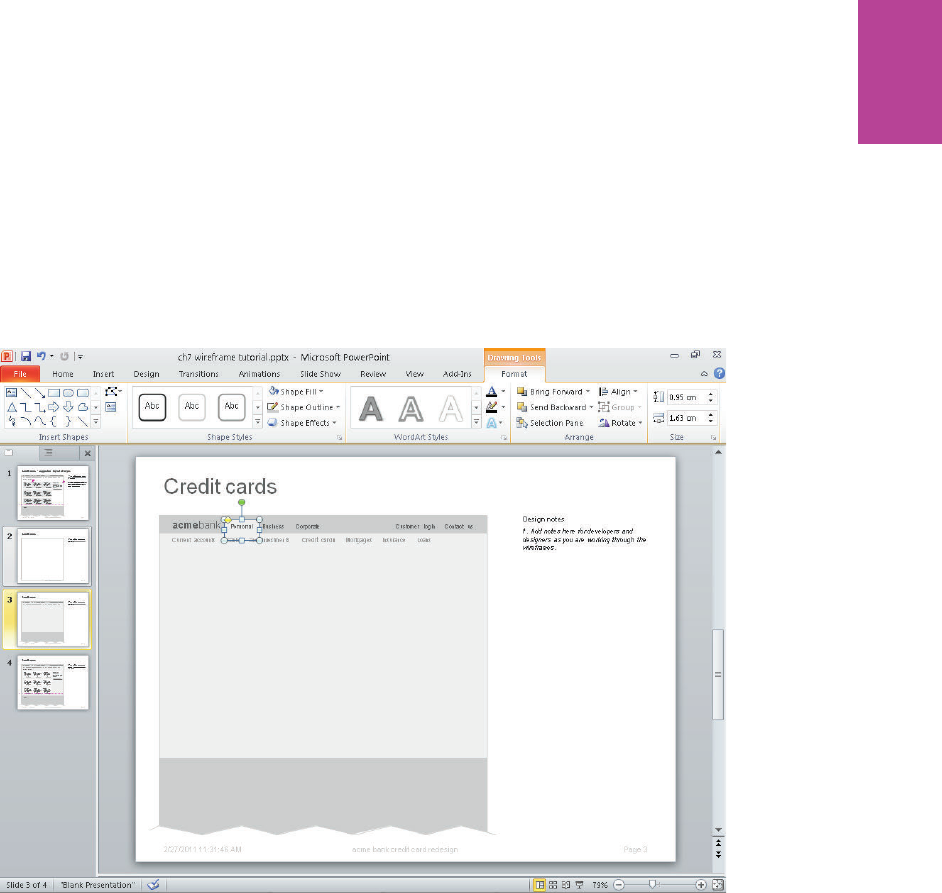
259 CHAPTER SIX WIREFRAMES
3 Select a rounded rectangle from the Shapes menu and make it the same color as the page
body. is ensures the two areas visually link together—and then place it so that it strides
the content and navigation areas.
4 Any text that you have already placed on the slide will need to be brought to the front. e
tab can then be placed beneath the relevant navigation link (see Figure 6-106).
F -: A simple tab created by placing a rounded rectangle to span the header and body area.
Styling shapes
ere are only ve elements you control when styling shapes. In PowerPoint, you are con-
stantly playing with these ve things:
> e type of shape used. Rectangles are most common, but you will also use rounded
rectangles and triangles.
09_9781119971108-ch06.indd 25909_9781119971108-ch06.indd 259 8/10/11 8:40 PM8/10/11 8:40 PM
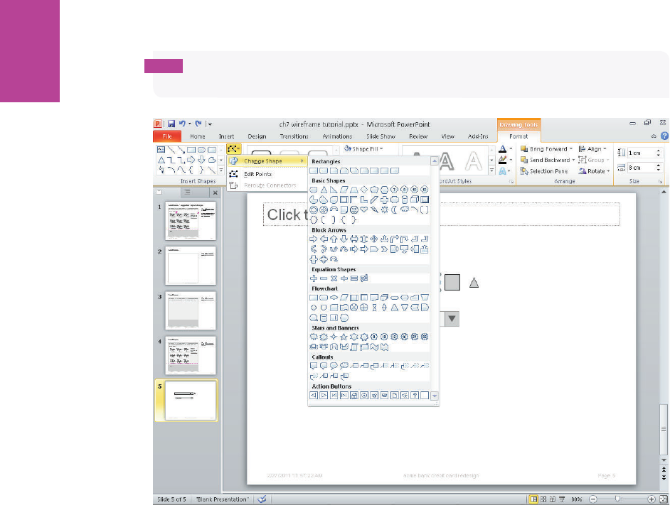
260
COMMUNICATING THE USER EXPERIENCE
tip PowerPoint has a Change Shape command (see Figure 6-107) in case another shape
works better (it retains any styling you might have already applied).
F -: e Change Shape command provides a useful way of switching the selected shape while retaining
its styling.
> e color of the ll. Typically, this is just a matter of playing with shades of gray to
see how it a ects the visual heat of the elements on the page and how they work
together. For some shapes, such as buttons, you might apply a gradient to suggest
a ordance. If you click the Shape Fill button, select Gradient, and then select More
Gradients, it displays a detailed control panel where you can control the colors and
position of the gradient within the shape.
e Fill option within the Format Shape window (see Figure 6-108) gives good control
over the appearance of the ll and allows you to add gradients
09_9781119971108-ch06.indd 26009_9781119971108-ch06.indd 260 8/10/11 8:40 PM8/10/11 8:40 PM

261 CHAPTER SIX WIREFRAMES
F -: Changing the appearance of the ll and adding gradients.
> e color of the outline (if used). Outlines are generally reserved for form elements.
> e size of the type. e type size depends on the hierarchy of the element on the
page. For example, is it a heading or is it body copy?
> e color of the type. Depending on the shade of gray used, you can control the
visual emphasis given to any piece of text.
Combining shapes
Elements such as drop-downs are created by combining di erent shapes.
To create a drop-down:
1 Place a rectangle, a square, and a triangle on the canvas.
2 Remove the outline from the triangle and rotate it 180 degrees. Shade it dark gray.
3 Shade the square to a mid-gray and place the triangle in the center of it, resizing where
necessary.
4 Shade the rectangle with a pale gray and type the text you want to display.
5 Group the shapes, so that they act as a single element that can be moved around the
page—the text in the drop-down eld will still be editable. See Figure 6-109.
09_9781119971108-ch06.indd 26109_9781119971108-ch06.indd 261 8/10/11 8:40 PM8/10/11 8:40 PM
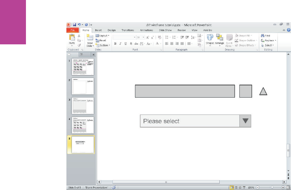
262
COMMUNICATING THE USER EXPERIENCE
F -: A rectangle, square and triangle have been joined together to create a simple drop-down menu.
09_9781119971108-ch06.indd 26209_9781119971108-ch06.indd 262 8/10/11 8:40 PM8/10/11 8:40 PM

chapter 7
Usability Test
Reports 7
10_9781119971108-ch07.indd 26310_9781119971108-ch07.indd 263 8/10/11 8:37 PM8/10/11 8:37 PM

COMMUNICATING THE USER EXPERIENCE
264
USABILITY TEST REPORTS ENABLE YOU TO communicate the ndings of a usability
test to the project team. You might be doing this as part of the project team (involved directly
in its development and release) or as an external contributor. Either way, it’s a critical time in
the project lifecycle. e outcome of the testing will a ect the future development and
release of the product or service.
In this chapter you will learn what makes a good usability test report (see Figure 7-1), what
you need to communicate, the types of audiences, note-taking tips, and research ideas.
F -: A usability test report showing an interface, the problems uncovered, and suggestions for
improvements.
10_9781119971108-ch07.indd 26410_9781119971108-ch07.indd 264 8/10/11 8:37 PM8/10/11 8:37 PM
CHAPTER SEVEN USABILITY TEST REPORTS 265
What makes a good test report?
A usability test report clearly communicates what was uncovered in the user research. A
great report enables the project team to discuss actionable solutions that improve the prod-
uct or service for the users.
When to create a test report
Developing a clear report on how the service is used will help to gain the trust that every-
thing is working as it should or create the necessary buy-in for changes that need to be made.
e level of detail and style of report required can vary depending on:
> e test objectives. is is what you’ve been asked to uncover.
> e audience. Understand that di erent roles in an organization want to hear di er-
ent things.
> e project stage. For example:
• Use benchmark testing at the beginning of a project to understand the current
situation and what the competition is doing. You uncover the paths to follow
and the pitfalls to avoid.
• Use validation testing on wireframes or pre-launch designs to generate amends
to feed back into the projects development.
• Use standalone testing to understand and improve an existing product or
service.
> e desired outputs from the testing. What’s going to happen with the ndings?
Will they be prioritized as part of a phased rollout? Or will they be implemented imme-
diately as part of an agile or iterative process?
> e time you have to turn it around. is will a ect the depth of your report.
What are you communicating?
Test reports can often be verbose Word documents on all the issues uncovered, occasionally
with a screenshot to illustrate the problem. ese reports usually gather dust on desks and
are di cult to make sense out of.
10_9781119971108-ch07.indd 26510_9781119971108-ch07.indd 265 8/10/11 8:37 PM8/10/11 8:37 PM
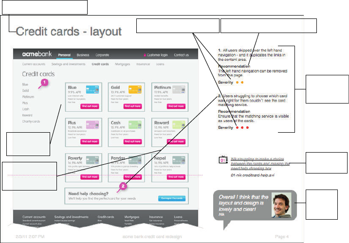
COMMUNICATING THE USER EXPERIENCE
266
Instead a report should be actionable by the project team and show at minimum:
> What is working well and what users like (usability testing isn’t just about the problems).
> What isn’t working and needs to be xed.
> How to x the problems.
is last point is crucial and often omitted, but the purpose of a usability test or expert
review is to make a meaningful di erence in the design of the product or service. Actionable
recommendations will make that di erence.
Anatomy of the perfect test report
A user test report (see Figure 7-2) should give clear context to the research ndings. It should
show the team what was uncovered and spark discussion around the improvements that
need to be made.
Use severity indicators
Use a clear page title
Provide recommendations
Include a
screenshot
Write
concise
comments
Include
user video
Provide
user
quotes
Use numbered
callouts for
comments
F -: A user test report template showing the web page being discussed and the ndings from the research.
Use a clear page title
Base each page on a single topic (for example, navigation) or a theme (for example, a user-
experience theme such as trust). Make the title as straightforward and succinct as possible.
10_9781119971108-ch07.indd 26610_9781119971108-ch07.indd 266 8/10/11 8:37 PM8/10/11 8:37 PM
CHAPTER SEVEN USABILITY TEST REPORTS 267
Include a screenshot
Show the project team the exact screen being referred to and where the problems occurred.
e numbered callouts shown on Figure 7-2 refer to numbered comments listed on the right
of the document.
Write concise comments
Comments should neatly summarize the problem found or observation made. Make sure
you stick to one comment per item number.
Provide recommendations
Include suggestions to overcome problems. Unless you know the site well, frame these as
discussion starters and involve the project team in developing the nal recommendations.
Use severity indicators
Severity indicators are placed below each comment and are a good way to help the project
team understand the extent of the problems. ese can be used in conjunction with com-
mercial factors (such as the cost to implement the change and the expected uplift in sales
from it) to help prioritize changes. In Figure 7-2, severity is simpli ed to a four-point score
and indicated by the colored dots:
• ree red dots: All users had problems
• Two amber dots: Some users had problems
• One yellow dot: A minor problem
• Green: A comment or observation
Provide user quotes
User quotes help provide reality to the presentation. Use a quote or two to summarize how
users found the page—good or bad.
Include user video
Including videos that illustrate the experiences and frustrations users have is a brilliant way
to persuade teams that change is needed.
Additional slides to include in your test report
ese are examples of other templates that are frequently used to help build the nal presen-
tation. Figures 7-3 through 7-9 walk you through these templates, providing you with a
visual representation of the content.
10_9781119971108-ch07.indd 26710_9781119971108-ch07.indd 267 8/10/11 8:37 PM8/10/11 8:37 PM
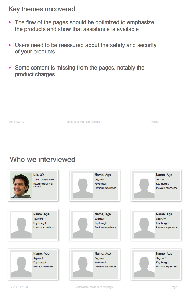
COMMUNICATING THE USER EXPERIENCE
268
F -: Key themes uncovered is a simple template pulling out the key themes that you found and are
presenting. It gives focus to the rest of your presentation.
F -: Who was interviewed focuses on the users with whom you tested. You can enhance the pro les by
including logos of the brands with which they had previous experience.
10_9781119971108-ch07.indd 26810_9781119971108-ch07.indd 268 8/10/11 8:37 PM8/10/11 8:37 PM
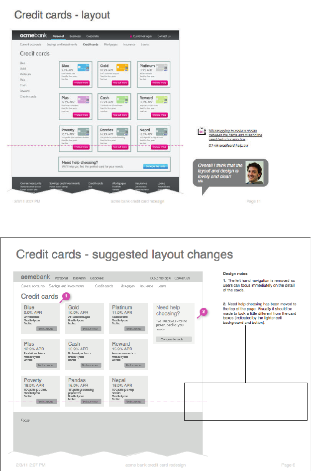
CHAPTER SEVEN USABILITY TEST REPORTS 269
F -: A simpli ed layout that is good for presentations with project overseers.
Design notes should explain how
your changes have improved the
design and how your changes
should be implemented
F -: A suggested layout changes slide is helpful for the frequent occasions when you reach the end of a
test and have ideas for how the changes should be implemented. You can draw these up as sketches or wireframes
and give examples of where others have successfully solved the problem.
10_9781119971108-ch07.indd 26910_9781119971108-ch07.indd 269 8/10/11 8:37 PM8/10/11 8:37 PM
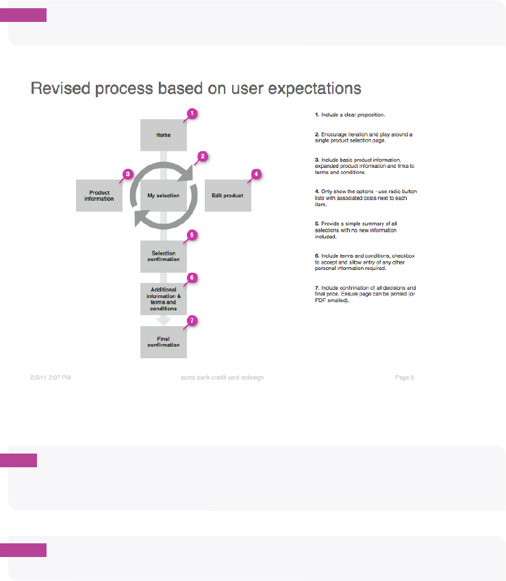
COMMUNICATING THE USER EXPERIENCE
270
note Design notes should explain how your changes have improved the design and how
your changes should be implemented
F -:A Revised process based on user expectations slide is helpful when user tests and expert reviews
uncover fundamental problems with the user journey through a product.
tip Understanding user expectations for how the process should work and remapping the
user journey creates signifi cant di erences in the site’s success—things will then work the
way a user expects them to.
note You might also include simple text outputs or examples using colorblindness checks
to help illustrate accessibility issues.
10_9781119971108-ch07.indd 27010_9781119971108-ch07.indd 270 8/10/11 8:37 PM8/10/11 8:37 PM
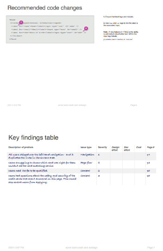
CHAPTER SEVEN USABILITY TEST REPORTS 271
F -: Recommended code changes—yep, really. Snippets of HTML are often included to illustrate how an
element of the page should be recoded to make it more usable or accessible.
F -: A Key ndings table provides you with a prioritization of recommendations.
10_9781119971108-ch07.indd 27110_9781119971108-ch07.indd 271 8/10/11 8:37 PM8/10/11 8:37 PM

COMMUNICATING THE USER EXPERIENCE
272
note Prioritization is best achieved through collaboration with the project team, and can
help assess e ort and cost required against the potential gains from making a change. Later
in this chapter, you’ll learn some workshop ideas to assist with this.
Who is the audience?
Understanding the audience will help to shape your approach to reporting the ndings. Here
are some of the character types we meet and work with on a regular basis:
Those who roll their sleeves up
e people who roll up their sleeves are often the project managers, designers, and develop-
ers. ey want to get involved with the testing and the ndings. Most importantly, they
want to help shape the recommendations and be keen to make them a reality.
Those who just want the findings
Design teams and internal UX teams often just want to understand the ndings. It may be
that they didn’t have the internal resources to run the testing themselves—which they
might be perfectly capable of doing. ey have strong ideas on all aspects of the testing, so
it’s worth involving the early sharing proposed plans, document formats and drafts. ey
understand their products better than you do and are capable of developing their own design
solutions.
Those who trust your expertise
e project team trusts your expertise and wants the best product possible. ey want to
understand your recommendations in order to implement them and care about the impact
of the changes in terms of time and cost. ey will help you liaise with the right teams to get
the changes implemented.
Those who want the big picture
ese are often the marketing directors, business owners, and senior managers. ey want to
be able to take a step back and see how users are interacting with their products and services to
see where improvements must be made. ey’re also interested in the broader user experi-
ence—what the users are up to o ine, where else they are looking and who they are talking to.
Note-taking and research tips
In order to put together a good report, it’s important that you have clear notes that you can
use as a starting point.
10_9781119971108-ch07.indd 27210_9781119971108-ch07.indd 272 8/10/11 8:37 PM8/10/11 8:37 PM
CHAPTER SEVEN USABILITY TEST REPORTS 273
After the testing, these notes can be analyzed and sorted to help uncover the emerging
themes.
Because user tests are conducted at di erent points in the design process they have di erent
objectives. is can a ect the type of report you produce and therefore the notes that you
take. e following sections discuss a number of methods to account for the di erent report
needs.
Taking notes for exploratory tests
In-depth exploratory tests are carried out at the start of the design process or for a compre-
hensive website review (benchmark testing or standalone testing, for instance). ey require
a comprehensive report and you need to record a broad range of ndings, including:
> What’s working well.
> Usability issues that need xing.
> Missing information or functionality that users need to complete their task.
> Where the site fails to match the users’ mental model.
> Interesting user behaviors.
> User quotes to back up usability issues or recommendations that you make.
So you need to capture a lot of information, which leaves you with a large amount of text.
Picking out the really useful bits can be di cult. Here are some useful techniques for creat-
ing more manageable notes.
> Start a new set of notes for each participant (it doesn’t matter if it’s on paper, in Excel,
or in Notepad).
> Divide notes up into web pages visited. Whenever a user visits a new page write that
page as a title then note what happens below it.
> Time stamp your notes. Marking a time next to your notes will make it easier to nd a
speci c point when you go back over them. If you take the time from the computer
being used for testing it will help you easily nd video clips to back up speci c points in
your report.
10_9781119971108-ch07.indd 27310_9781119971108-ch07.indd 273 8/10/11 8:37 PM8/10/11 8:37 PM

COMMUNICATING THE USER EXPERIENCE
274
Coding your notes
Use a code system (see Figure 7-10) to help you nd speci c pieces of information. is sim-
ply means assigning a symbol to each type of information you note down, for example:
> “ (Quote mark)—Something interesting a participant said.
> ! (Exclamation mark)—An error occurred.
> * (Star)—A note that relates to a key testing objective.
> ? (Question mark)—Participant was confused.
> + (Plus)—A positive point.
F -: Notes taken during a user test have been coded to help the analysis.
Taking notes for design validation tests
Design validation tests are used later in the design process to check whether speci c issues
(raised in previous tests) have been resolved. e notes required for this style of testing are
usually more focused on what needs to be xed and the output is often amendments to wire-
frames or designs.
10_9781119971108-ch07.indd 27410_9781119971108-ch07.indd 274 8/10/11 8:37 PM8/10/11 8:37 PM
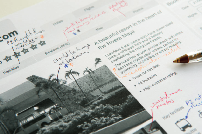
CHAPTER SEVEN USABILITY TEST REPORTS 275
A simple technique for taking notes is to print out the designs you are testing (see Figure
7-11). Make notes on the appropriate pages as the participants work their way through
them. A good idea is to use a di erent color pen for each participant. is makes it really clear
which issue was found by whom and how many di erent participants found the same issue.
Focus your notes on what needs to be changed or tweaked, and you end up with an easy-to-
work-through list of amendments.
F -: Notes from user testing have been made directly onto print-outs of the screens.
10_9781119971108-ch07.indd 27510_9781119971108-ch07.indd 275 8/10/11 8:37 PM8/10/11 8:37 PM

COMMUNICATING THE USER EXPERIENCE
276
RESEARCH AND WORKSHOP IDEAS
Once your user testing is complete, you will have a ton of issues to report. Simply listing
every issue one by one, in the order you found them, can make the report seem disjointed
and hard to read. e report needs structure.
Facilitating workshops helps structure the nal report and, more importantly, encourages
discussion (and ownership) of the ndings with the project team.
WORKSHOP IDEA: Identify themes
e best way to get a structure for a report is to base it on themes that are common across
the various issues you found (we’ve included a few examples in the list that follows). A sim-
ple and e ective way to spot themes in your ndings is to write all the issues down on Post-It
Notes and stick them up on a wall. Group Post-Its with similar issues together and your
themes will start to emerge.
Here are some ways you could group your issues:
> User-experience themes (such as trust issues, learnability, and user expectations)
> Task/goal-based themes (tasks such as nding products, making payments, and
nding information)
> Severity-based (group issues according to how severe a problem they are for users)
> Page functionality (speci c areas like search, navigation, or calls to action)
We frequently run this workshop with the client soon after the testing (sleeping on the nd-
ings can help balance the discussions). We encourage clients to make their own notes and
sticking them on a wall. At the end of the sessions, we start to cluster the notes into the
themes.
note Refer to Figure 1-7 in Chapter 1 for a visual example of clustering.
is process gives clients ownership of the ndings and helps to make them meaningful for
their organization or the project that they are working on.
10_9781119971108-ch07.indd 27610_9781119971108-ch07.indd 276 8/10/11 8:37 PM8/10/11 8:37 PM

CHAPTER SEVEN USABILITY TEST REPORTS 277
WORKSHOP IDEA: Prioritize ndings
Prioritizing your ndings and recommendations is a useful way of giving the product manag-
ers, designers, and developers a clear set of guidelines for taking their website forward. e
order in which you prioritize your ndings should take into account all aspects of designing
and developing a website, not just the user requirements. It’s best to involve all the relevant
stakeholders in a prioritization workshop to determine the nal order.
Your prioritization of issues should take into account:
> Severity of usability issues.
> Impact that any changes will have on the business. Will solving the issue be worth it?
Will it generate more money? Could it potentially lose money? Just because resolving
a usability issue may have a positive impact on the user experience, it may have a nega-
tive impact on the business.
note We worked on a project for a ticketing website in 2010 where one of the
recommendations we considered was to skip a step in the booking process. This, however,
would have meant a big loss in ad impressions from the page we wanted to skip and ultimately
a loss in revenue for the business.
> Feasibility of the project. How much development and design e ort will it take to x
the problem? Can the proposed recommendations be achieved with the business’s cur-
rent capabilities?
Conducting a prioritization workshop
To workshop the nal prioritization, create a table that has a column for all the issues in the
report and a column for severity ratings. Include a column for page reference numbers so
people in the workshop know where to look to nd more detail on the issue. Include extra
columns for impact and feasibility ratings. ese will be lled out during the workshop.
Go through the list of ndings and, as a group, assign a rating to both feasibility and impact
for each issue. It helps to transfer the issues onto Post-It Notes and use color-coded stickers
(see Figure 7-12); this makes the workshop more visual and collaborative for the attendees.
e issues with the highest combined score have the highest priority.
10_9781119971108-ch07.indd 27710_9781119971108-ch07.indd 277 8/10/11 8:37 PM8/10/11 8:37 PM

COMMUNICATING THE USER EXPERIENCE
278
note While these examples use “impact on the business” and “feasibility” as factors in
determining prioritization, it’s important to know that the factors you use may be di erent
for your business or client depending on your goals.
F -: All the issues have been written onto Post-It Notes and ratings have been assigned using colored
stickers.
WORKSHOP IDEA: Practice presenting the ndings
Once you have completed the report you could simply hand it over to the design and devel-
opment team and wave goodbye to it. But if you really want to get across how important the
issues in the report are, and convince the stakeholders that they really need to make updates,
you need to give a presentation.
Practicing your presentation (see Figure 7-13) is essential to making sure it all goes right on
the big day. When you do a practice run, don’t just sit at your computer and go through it in
your head. Stand up and speak aloud, run it though a projector, and get somebody to sit and
listen.
10_9781119971108-ch07.indd 27810_9781119971108-ch07.indd 278 8/10/11 8:37 PM8/10/11 8:37 PM

CHAPTER SEVEN USABILITY TEST REPORTS 279
F -: Practicing the presentation with your peers helps you to work through the best way to express the
ndings clearly.
Reading through the report aloud will give you an idea of how long it will take. If your report
is going to go on longer than time allows, think about what the most important points you
want to get across are and focus on those.
Getting someone to sit and listen is always worthwhile. He can tell you if what you’re trying
to get across is being communicated properly and where to improve.
Running the presentation through a projector will show you if the audience can see the
report clearly. Slides that look good on your screen will not necessarily show up well when
projected across a room.
If you need them, check that you have speakers—and triple check that any video you use
works.
10_9781119971108-ch07.indd 27910_9781119971108-ch07.indd 279 8/10/11 8:37 PM8/10/11 8:37 PM

COMMUNICATING THE USER EXPERIENCE
280
What are the simplest ways to communicate the
ndings?
When project schedules are tight you don’t always have time to craft a beautiful report.
Sometimes you need to get the issues you discovered across as quickly and simply as pos-
sible. Here are some ways to do it.
Use structured email
It sounds obvious but a well-structured email based on the key themes from your testing
can be enough to get your message across. Use bold text to indicate the themes and list
the ndings below each theme. It’s always worth sending an email of the key themes any-
way so everyone knows what to expect from the report.
Spreadsheets can be used in a similar way, but the formatting of them can get too ddly.
Use annotated screenshots
If your notes were written on printouts of the designs tested, then sharing those directly
with the designers can be more useful than a full-blown report. It shows them exactly
where all the issues are and what needs xing.
The projector method
One simple technique that can be used at several points in the design process is to project
what you are testing onto a whiteboard. Then simply annotate directly onto the whiteboard
and take photos to send to the project team.
Share post-testing workshop photos
If you went through the process of identifying these or prioritizing ndings, sharing photos
of those groups is quick and easy. It is a good way to get across an overview of the testing
in a short period of time. Better yet, involve the project team in the workshop.
10_9781119971108-ch07.indd 28010_9781119971108-ch07.indd 280 8/10/11 8:37 PM8/10/11 8:37 PM

CHAPTER SEVEN USABILITY TEST REPORTS 281
HOW TO Create a report in PowerPoint
Sometimes you will need to create a formal presentation of your ndings. To be e ective, the
information you are communicating needs to be clear and persuasive.
Creating a robust document structure will help you to put together reports more e ciently.
And, if they are well designed, they will ensure that audience or reader can understand the
problems users had and the improvements that need to be made.
note You can download the example fi les from http://cxpartners.com/resources, but
there are some helpful tips and tricks in this section to help you create and modify your own
documents.
Other chapters focused just on the creation of the speci c elements; this chapter also covers
some PowerPoint basics.
Setting up the template
is section provides a quick introduction to setting up master slides, which will help you to
break free from the default templates shipped with PowerPoint. It can take your presenta-
tions from being the same as everyone else’s to being beautifully crafted and memorable.
Editing the slide master
To edit the Slide Master, follow these steps:
1 Create a new presentation.
2 Go to View, choose Master views, and then choose Slide Master (see Figure 7-14).
Any changes you make in this view will a ect all the slides in your presentation (except the
title slide). e text boxes can be moved, fonts changed (color, size, type), and elements such
as company logos added to appear on all slides. See Figure 7-15.
10_9781119971108-ch07.indd 28110_9781119971108-ch07.indd 281 8/10/11 8:37 PM8/10/11 8:37 PM

282
COMMUNICATING THE USER EXPERIENCE
F -: Before any changes are made to the Slide Master.
F -: After some changes have been made to the Slide Master.
10_9781119971108-ch07.indd 28210_9781119971108-ch07.indd 282 8/10/11 8:37 PM8/10/11 8:37 PM
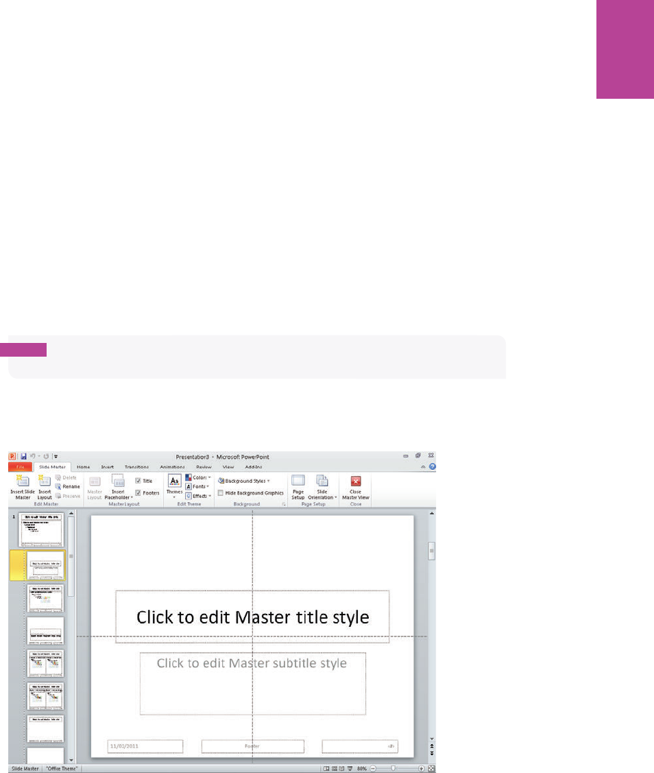
283 CHAPTER SEVEN USABILITY TEST REPORTS
Between Figure 7-14 and Figure 7-15, the main elements were aligned to the guides that are
being used throughout the example presentation. e bullets have been made to a uniform
style and the color changed to the magenta that’s used elsewhere in the presentation. To
revise bullets:
1 Select the text box and go to the Home tab.
2 Click the Bullets drop-down arrow and choose Bullets and Numbering.
3 In the Bullets and Numbering dialog box that displays, you can customize the shape and
color of bullets used.
Editing the Title Master
Once you are in the Slide Master View you can easily access the Title Master from the left
panel (see Figure 7-16).
note In PowerPoint versions before 2010, the Title Master may have to be added as an
extra step.
e elements on this page can be moved around and styled in the same way as on the Slide
Master.
F -: Before the Title Master slide revision.
10_9781119971108-ch07.indd 28310_9781119971108-ch07.indd 283 8/10/11 8:37 PM8/10/11 8:37 PM
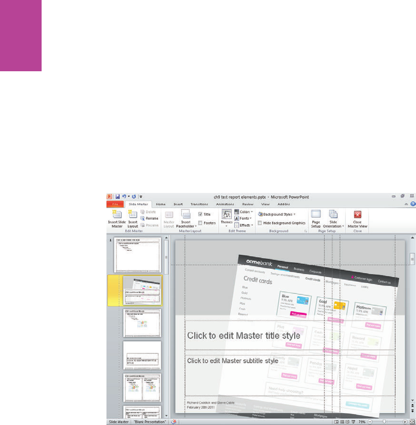
284
COMMUNICATING THE USER EXPERIENCE
Figure 7-17 shows the following revisions to the Title Master slide:
> Text is styled by changing the font, making it smaller and coloring it gray.
> Title and subtitle are aligned to the guides.
> An image that expresses the content of the presentation is added and arranged it so it
appears behind everything else.
> A plain white box is given 25% transparency so that the text stands out on top while
the image can still be seen behind.
> A text box for names and date is added.
F -: Revising the Title Master slide.
Once you have nished editing the Slide Master, go to the Slide Master tab and click the
Close Master View button.
Creating a custom color palette
To create a custom color palette:
1 Click the Design tab.
2 In the emes group, click the Colors down arrow, which displays the list of default color
palettes available.
10_9781119971108-ch07.indd 28410_9781119971108-ch07.indd 284 8/10/11 8:37 PM8/10/11 8:37 PM
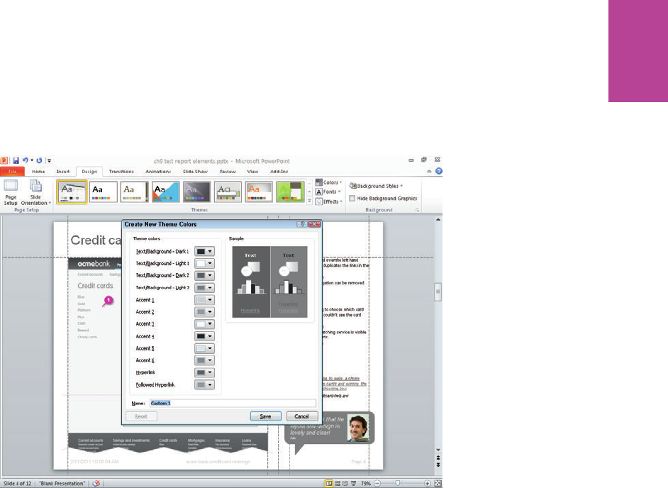
285 CHAPTER SEVEN USABILITY TEST REPORTS
3 At the bottom of is list, click Create New eme Colors, which displays the dialog box
shown in Figure 7-18.
4 In the Create New eme Colors dialog box, update the default colors used for all
elements.
F -: e Create New eme Colors dialog box showing the colors chosen for the di erent elements.
It takes a little experimentation to get exactly what you’re after. ere are some surprise
restrictions, such as not being able to remove the outline surrounding objects.
Using guides
Guides help you to keep items in the same place on each page of your report. You can use
them to help position the screen being referred to, the notes, callouts and user quotes. Figure
7-19 shows where we’ve put the guides in our template and how we’ve aligned objects to
them.
> To turn guides on and o , go to the View tab and select the Guides checkbox.
> To move a guide, click on the guide and drag it.
> To add a new guide, hold down Ctrl (Alt on a Mac) and drag the guide.
> To remove a guide, drag it o the presentation canvas.
10_9781119971108-ch07.indd 28510_9781119971108-ch07.indd 285 8/10/11 8:37 PM8/10/11 8:37 PM
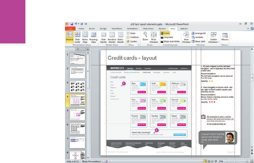
286
COMMUNICATING THE USER EXPERIENCE
F -: e dashed lines show where we’ve positioned the guides in our document.
Creating the report
e following tips will help you create e ective styles for your PowerPoint documents.
Editing text boxes
Learning how to change the default behavior of text boxes will enable you to better control
the styling of your presentations.
Setting margins
e default margins on text boxes can get in the way of the alignment you are trying to
achieve. To get around this, right-click the text box (or other shape with text in it) and select
the Format Shape controls. Click the Text Box tab and set all Internal margin settings to 0.
See Figure 7-20.
Paragraph controls
To neatly lay out the text, you need to get into the line spacing and paragraph spacing con-
trols. Generally you’d use a single spacing line height with increased spacing before each
paragraph.
10_9781119971108-ch07.indd 28610_9781119971108-ch07.indd 286 8/10/11 8:37 PM8/10/11 8:37 PM
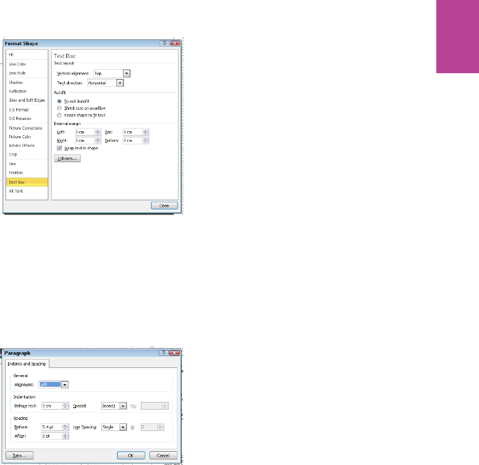
287 CHAPTER SEVEN USABILITY TEST REPORTS
F -: e Text Box dialog box showing the Internal margins set to 0.
1 With the text box selected, click the Home tab.
2 In the Paragraph group, click the spacing icon.
3 Choose Line Spacing Options at the bottom of the menu.
4 In the Paragraph dialog box that displays (see Figure 7-21), adjust the spacing before the
paragraph.
F -: e Paragraph alignment dialog box with the spacing before the paragraph set to 5.4 pt.
Editing images
Here are some useful editing tips to use once you’ve inserted an image.
Crop
With the image selected, use the Picture Tools formatting palette to select the Crop tool (see
Figure 7-22). Once you’ve cropped an image by dragging it inward, you can un-crop it by
using the same tool and dragging outward.
10_9781119971108-ch07.indd 28710_9781119971108-ch07.indd 287 8/10/11 8:37 PM8/10/11 8:37 PM
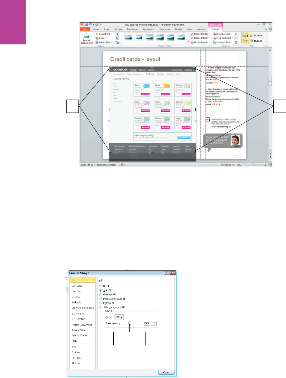
288
COMMUNICATING THE USER EXPERIENCE
Crop
tools
Crop
tools
F -: Using the Crop tools.
Transparency
Image transparency (on JPGs, GIFs, PNGs, BMPs, and so on) isn’t available on a PC. To solve
this problem, you can place a white box over the image and give it a transparency of 25%. To
set transparency, follow these steps:
1 Right-click the shape and click Fill.
2 Click the Solid Fill option.
3 In the Fill Color box, click and drag the Transparency slider to 25% (see Figure 7-23).
Transparency
slider
F -: A semi-transparent white rectangle is placed in front of an image to make the image appear to have
transparency.
10_9781119971108-ch07.indd 28810_9781119971108-ch07.indd 288 8/10/11 8:37 PM8/10/11 8:37 PM
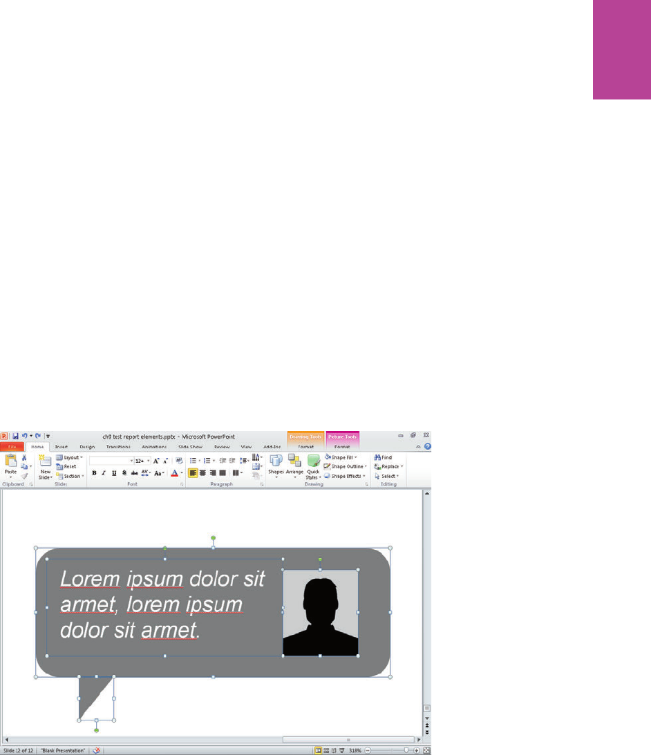
289 CHAPTER SEVEN USABILITY TEST REPORTS
On a Mac, add a transparency by double-clicking the image and adjusting the transparency in
the Fill tab.
Creating custom elements
Some of the default shapes in PowerPoint are a little crude and both hard to control and
style. You can, however, create some custom elements that are easy to make and simpler to
style.
User quote callouts
A user quote callout is simply a rounded rectangle grouped with a right triangle.
Draw the rounded rectangle rst and use the handles to adjust the corner radius—this isn’t
possible with the standard callout. Remove the outlines and turn o shadows.
Draw the triangle and rotate it 180 degrees using the formatting palette. Again, remove out-
lines and turn o shadows.
Place a text box on top of the rounded rectangle. For this example, move the right edge of the
text box toward the left to allow space for the user photo to be inserted. See Figure 7-24.
F -: Creating a user quote callout.
Note indicators
Note indicators are created by grouping a circle with a 45-degree line. e number is put
directly into the circle (without using an additional text box) and text is centered both hori-
zontally and vertically.
10_9781119971108-ch07.indd 28910_9781119971108-ch07.indd 289 8/10/11 8:37 PM8/10/11 8:37 PM
290
COMMUNICATING THE USER EXPERIENCE
On the Home tab, use the Shape Fill and Shape Outline tools to choose a color for the note
indicator that contrasts well with the site you are testing. Use the Shape E ects tool to add a
shadow to help lift the note indicator from the page. See Figure 7-25.
F -: Creating a simple note indicator.
Inserting video
e simplest way to link to a video is to create a hyperlink to it from a text reference on screen:
1 Right-click the text and choose Hyperlink.
2 Browse your computer to nd the le you want to link to, select it, and then click OK.
When the presentation is viewed in Slide Show mode, the hyperlink is active.
tip Perhaps a better approach when giving presentations is to embed the video into the
PowerPoint. Simply go to the Insert tab, click on Video, and then browse to your fi le.
When you give the presentation, make sure that you have speakers for the audio.
tip We’ve found that linking to and embedding videos from PowerPoint isn’t without it’s
problems. So here’s an easy way to fi nd the right video in the middle of a presentation if
the technology doesn’t behave. Create a simple referencing system for each of your video
clips. Number them in a single folder in the order that you want them played. Then use that
number within video reference in the PowerPoint slide. For example, video01, video02, and
so on.
10_9781119971108-ch07.indd 29010_9781119971108-ch07.indd 290 8/10/11 8:37 PM8/10/11 8:37 PM

chapter 8
Funnel
Diagrams 8
11_9781119971108-ch08.indd 29111_9781119971108-ch08.indd 291 8/10/11 8:36 PM8/10/11 8:36 PM

COMMUNICATING THE USER EXPERIENCE
292
FUNNEL DIAGRAMS ARE used in web design, development, and management to show
how many users pass through a certain route on a website. ey show the number of users
who travel through a set of pages (for example, a checkout process) as well as how many
users complete the process, how many users drop out of the process, and where the dropouts
happen. e data for these diagrams are from funnel reports generated by analytics packages
and are used to monitor the performance of certain areas of a website.
is chapter is about taking the data from those reports and presenting it in an easy-to-
understand diagram that helps provide a compelling argument for updates to a website. See
Figure 8-1.
F -: Funnel diagrams present analytic data in an easy to understand way.
11_9781119971108-ch08.indd 29211_9781119971108-ch08.indd 292 8/10/11 8:36 PM8/10/11 8:36 PM

CHAPTER EIGHT FUNNEL DIAGRAMS 293
What makes a good funnel diagram?
e funnel diagrams in this chapter are about taking a complex set of data, usually read by
analytics experts, and presenting it in a way that is easily understandable by a wider audience.
ey show how many users visited each page in a process in order to examine which points are
causing users to leave. Presenting this data in the right way to the right people at the right
time can help put into action changes that are needed to improve the performance of a site.
When to create a funnel diagram
Checking the conversion gures in your analytics package should be a regular exercise. e
funnel diagrams in this chapter are used at key points in website development when a clear
visualization of data is required to convey to the project team where users are dropping out
of a website and why.
When you need to convince stakeholders that there is a problem
Funnel diagrams are a great way to visualize issues with routes through a website. ey
clearly show where the issues are on a website and also why the issues are occurring. ey
encourage the team to start thinking about possible solutions.
When you must convince stakeholders that a problem needs to be xed, a funnel diagram
like the one shown in Figure 8-2 can get the message across clearly and concisely.
F -: Funnel diagrams are a good tool for persuading stakeholders that areas of the website need xing.
11_9781119971108-ch08.indd 29311_9781119971108-ch08.indd 293 8/10/11 8:36 PM8/10/11 8:36 PM
COMMUNICATING THE USER EXPERIENCE
294
When you need to conduct user testing
Funnel diagrams and user testing reports sit together closely and help inform each other.
Funnel reports that are generated by analytic packages are a good way to inform and struc-
ture a user test such as a checkout or booking form. A funnel report can show you where
most of the users are leaving the website, which tells you where the problem areas are. is
lets you know what areas of the website need investigation during the user testing sessions.
Once the testing is complete you can use your ndings to feed into the nal funnel diagram.
If your test was structured around the pages that were causing users to leave the website,
then you should uncover some of the reasons why users are leaving. ese reasons should be
included in your funnel diagram to show why users might be leaving the website at each step
in the process. For example, users going through a checkout process might get to the sign-in/
register page and not want to create an account, so they decide to shop elsewhere.
It’s good to include a funnel diagram in a testing report whenever it is appropriate. For exam-
ple, if the test was performed on a checkout or a form, a funnel diagram shows an overview
of the whole report. It summarizes every page in the process that was tested and the key
ndings for each page.
Testing is often sparked by low conversion rates (for example, when the percentage of users
who complete the checkout is lower than the number of users who added items to their bas-
kets). Showing the results of user testing against a funnel diagram based on conversion rates
will clearly show an answer to the business’ key question: Why is this happening?
What are you communicating?
A funnel diagram is designed to show two things: what users are doing along a key journey
through a website and why they are doing it. e way you present this data can have a great
e ect on the way the reader interprets it. is section explains what you need to include in
your funnel diagram and how to represent the data in a clear and compelling way.
The what and why
e what comes from web analytics tools that measure the number visitors who visit speci c
pages on a website. Better known examples are Google analytics, Omniture, and Webtrends.
Analytics tools also generate funnel reports that show conversion rates through a user jour-
ney. ese show how many users pass through a set sequence of pages, like a checkout pro-
cess. At each page in the process it shows how many users continued onto the next page and
how many left the website. is is important because it shows you where most users are leav-
ing the process so you know where improvements to the site can be made.
11_9781119971108-ch08.indd 29411_9781119971108-ch08.indd 294 8/10/11 8:36 PM8/10/11 8:36 PM
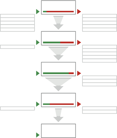
CHAPTER EIGHT FUNNEL DIAGRAMS 295
Funnel reports show the exact number of users who visit each page. It also displays the per-
centage of users who visit each page based on the number of users who started the process.
However, the funnel reports generated by analytics packages are not always the easiest to
read. Understanding the important information can be di cult for those who aren’t familiar
with using analytics tools (see Figure 8-3).
For example, if 100 users start a checkout process by putting items in a shopping cart, then
the number of those who click the Buy button and move onto the next page in the checkout
will be represented as a percentage of the initial 100 users. is percentage usually decreases
at each page in the checkout process. What you end up with is a view of how many users
started the checkout, and what percentage of them actually nished and paid.
Basket
3,641
Sign in / Register
2,839
Delivery
1,839
Payment
764
Confirmation
364
10.00% funnel conversion rate
395
4
0
1
0
3,244
95
28
63
(entrance)
home
Product page
Help
Search results
133
129
103
24
4
(entrance) 4
(entrance) 1
(exit)
home
Product page
Help
Search results
2,452
268
128
126
98
(exit)
home
Product page
Help
Search results
78
6
3
2
2
(exit)
Help
Pop up
24
2
1
(exit)
Help
59
4
2.835 (78%)
Proceeded to sign in/register
1,839 (66%)
Proceeded to delivery
763 (50%)
Proceeded to payment
364 (10%)
Proceeded to confirmation
F -: A typical funnel report looks something like this.
e why comes from user testing, in-depth interviews, call center listening, or any other form
of user research. You need to communicate ndings from user research that help explain
why users might be leaving the website at certain points in the process. It might be key nd-
ings from user testing or common questions that the call center receives. Adding insights
about why users are leaving pages in a process, next to the relevant points in a funnel dia-
gram, creates a compelling user-centered view of the performance of a website.
11_9781119971108-ch08.indd 29511_9781119971108-ch08.indd 295 8/10/11 8:36 PM8/10/11 8:36 PM

COMMUNICATING THE USER EXPERIENCE
296
Fundamentally what you are trying to communicate is what pages in a process are causing
problems and why they are causing problems. You need to communicate the information
from these two sources in an easy-to-understand way. Doing so creates a single page that
shows a convincing argument that the current process is not working for your users and
needs to be xed.
e project team can then collaborate on ideas that help to resolve the issues.
Representing the data
Funnel diagrams are based on funnel reports, but the display of the data should not be
shown as a literal funnel. at’s because the funnel metaphor requires lines similar to those
plotted along a graph causing the drop out to be displayed as a gradient moving from a tall
shape to a shorter shape. In Figure 8-4, it looks as though users were leaving the basket page
gradually as the graph moves toward the sign-in page—one by one over a period of time.
100% 78% 52% 21% 10%
Basket Sign in / Register Delivery Payment Confirmation
F -: e diagonal lines make it look like there is a gradual decrease in visitors between pages.
is is a misrepresentation of the data because you can’t tell from analytics that users left the
page one by one over a period of time. You know only that a certain number of users visited
the basket and a certain number of users visited the sign-in page. All you can accurately show
is how many users landed on each page. A much clearer way of illustrating this is to show
each page in the process as a separate block (see Figure 8-5). e height of each block repre-
sents the volume of users who visited that page, and you can clearly see the reduction in
users between each step.
11_9781119971108-ch08.indd 29611_9781119971108-ch08.indd 296 8/10/11 8:36 PM8/10/11 8:36 PM

CHAPTER EIGHT FUNNEL DIAGRAMS 297
100% 78% 52% 21% 10%
Basket Sign in / Register Delivery Payment Confirmation
F -: By using decreasing the size of each block, you can more accurately represent the number of visitors
on each page.
Using percentages
e data that you get from analytics show how many users pass through a set of pages and
this data can be represented in a number of ways. e three examples shown in Figure 8-6
show the same data represented three ways:
> Example A shows the actual number of users on each page. is gives an accurate rep-
resentation of the data, but requires the reader to work out the percentage di erences
between each page. Percentages are also more useful for tracking the performance of a
funnel over time. Seeing that 10% of users completed the checkout process in Month
1 compared to 15% in Month 2 shows a clear improvement in conversion.
> Example B shows relative percentages—the percentage of users who moved onto the
next step based on the number of users on the previous page. e example shows that
66% of users who were on the Sign In page moved on to the Delivery page. It illustrates
the performance of individual pages, but does not give a clear view of overall perfor-
mance and it is not easy to see exactly how many users nished the process. e data
set shows the last gure as 47%, which works out as 10% of the users who began the
process by entering the Basket page. It is common for this data to be misinterpreted so
the drop out does not seem so bad—the drop between the Payment and Con rmation
pages could be misinterpreted as 3%, when in fact its 47%.
> Example C shows overall percentage and is the recommended method. Each percent-
age shown is based on the number of visitors who started the process. It’s easier to see
from this sequence that there is a steady decline in visitors across the pages. You can
11_9781119971108-ch08.indd 29711_9781119971108-ch08.indd 297 8/10/11 8:36 PM8/10/11 8:36 PM

COMMUNICATING THE USER EXPERIENCE
298
clearly see that only 10% of users who started the process actually nished it. e
information tells the story in an easy-to-understand way.
C.
B.
A.
100% 21% 10%52%78%
66%100% 47%78% 50%
Confirmation
364
Delivery PaymentBasket Sign in
7641,8932,8393,641
F -: e data from funnel reports can be represented in three ways.
Anatomy of a funnel diagram
Figure 8-7 shows a breakdown of what you need to include in your funnel diagram and how
to present it.
Use a title that explains the purpose of the document
A title like “Why do 90% of users drop out of the checkout?” describes the goal being studied
and clearly makes it a user-centered rather than a data-centered document.
Use blocks to show the number of users who visited each page
Using blocks to represent the percentage of users who visited a page helps to show at a glance
where the big drops in visitors are. Make sure the di erence in size between each block is an
accurate representation of the dropout gures.
Keep all the widths equal to show that each page has equal importance in the process.
Base the percentages on the number of users who started the process
It’s clearer to see drops in visitors when reading overall percentages of visitors on each page.
It also shows how many visitors overall managed to nished the process.
11_9781119971108-ch08.indd 29811_9781119971108-ch08.indd 298 8/10/11 8:36 PM8/10/11 8:36 PM

CHAPTER EIGHT FUNNEL DIAGRAMS 299
Use shading to emphasize visitor numbers
For greater visual impact, fade out the key color at each step as the number of visitor decreases.
Be careful not to fade it out so much that the text in the blocks becomes unreadable.
Use text size to emphasize visitor numbers
Decreasing the text size depending on visitor numbers helps to show which pages are doing
well and which are not doing so well. Start with the smallest number (10% in this case) mak-
ing sure that it is at a readable size, then make the text in each block bigger as the numbers
increase.
Include the key issues with each page
Write two or three key issues for each page that you found during user research. Place these
issues under a heading for that page and visually it link it to the appropriate block. is
shows why pages might be performing poorly.
Why do 90% of people drop out of the checkout process?
100% 78% 52% 21% 10%
Basket
Sign in / Register
Delivery
Payment
Confirmation
Why do 11% leave from payment
It's not clear how much they
will be spending
Credit card charges put
people off
German users preferred
payment method is not
supported
Why do 21% leave from delivery
Postcode lookup was
missed
Error messaging was
confusing
Details are removed if
mistakes are made
Why do 26% leave from Sign in
Users are unsure which
option to choose
People react badly to
having to create an
account
Why do 22% leave from basket
Call to action is not clear
People look for a
'Checkout' button not a
'Pay now' button
F -: A completed funnel diagram that shows how many users completed the process as well as any
usability issues that might be causing users to drop out.
11_9781119971108-ch08.indd 29911_9781119971108-ch08.indd 299 8/10/11 8:36 PM8/10/11 8:36 PM
COMMUNICATING THE USER EXPERIENCE
300
Who is the audience?
Funnel diagrams are similar to user testing reports in the way that they are used to explain
the performance of a site from a user perspective. ey often form part of a user test report
and are aimed at a similar audience. is audience is made up of two groups.
The development team
Members of the development team are the people who will be coming up with the solutions
to the problems shown in the funnel diagram. e reasons for the drop in the number of
visitors on each page are important because it gives them the insight they need to collaborate
on solutions.
The product managers and senior stakeholders
Product managers and senior stakeholders want to know how well their product is doing at
the moment as well as how they can improve it. For these people it’s all about convincing
them that changes need to be made. e numbers are going to be the most important thing
for them to see. e big drops in visitors will be the most convincing argument that they
need to fund a project and x the problems. Alternatively, it can con rm that a project they
have already initiated is the right thing to do—therefore their funding is well spent.
In previous projects, for example, you’ve seen how the money spent on user experience has
been paid back through increased revenues within a few weeks of the project going live.
11_9781119971108-ch08.indd 30011_9781119971108-ch08.indd 300 8/10/11 8:36 PM8/10/11 8:36 PM

CHAPTER EIGHT FUNNEL DIAGRAMS 301
RESEARCH AND WORKSHOP IDEAS
e data for your funnel diagram comes from two main sources:
> Analytics tools to understand what pages might be performing poorly
> User research to learn why users might be leaving a website before nishing a process.
RESEARCH TECHNIQUE: Get to the what
e what comes from analytics tools. e default funnel reports they create give you all the
data you need to explain what is happening in the process. You need to do is decide which set
of pages or what process you should use for your funnel report.
Focus on the key user journeys of your site. What is it that users come to your site to do most
often? What are the key goals they are trying to achieve? is might be a speci c journey like
a checkout process or a set of forms. It might also be slightly more open, such as searching
and browsing for products and adding them to the basket. Previous user journey documents
or task models might well determine the pages you evaluate for the funnel diagram.
Look for the unique journeys that users are taking through a process. Your pages might be
step 1, step 2, step 3, but you’ll frequently see that user journeys bounce between the pages.
is is particularly true where a key piece of information isn’t displayed clearly. For example,
use your analytics tool to generate funnel reports for unique journeys, such as:
step 1, step 2, step 1, step 2, step 3
or
step 1, step 2, step 3, step 2, step 3
In addition to the key goals of the users, you need to consider the goals of the business.
Check the performance of journeys that relate to speci c strategic aims or key performance
indicators. (KPIs). For example, if your goal was to steer more customers toward certain sets
of products, did you succeed?
11_9781119971108-ch08.indd 30111_9781119971108-ch08.indd 301 8/10/11 8:36 PM8/10/11 8:36 PM

COMMUNICATING THE USER EXPERIENCE
302
RESEARCH TECHNIQUE: Get to the why
e why comes from user research. Look for insight into why speci c pages in the journey are
stopping users from completing their visits. ese insights can be found in the forms of user
research covered here.
User testing
Get users to think out loud as they try to complete the tasks and talk to them about anything
they nd di cult or confusing. Your goal is to understand any problems they encounter. e
number of users you talk to in user testing is often low, but it enables you to get a better
understanding of why problems might be occurring and what state of mind users might be in
when trying to complete the journey. See Figure 8-8.
F -: User testing the pages within your funnel report can help you understand the problems that cause
users to leave the process.
Call-center listening
Listen in on calls through to the customer service department of the business, and interview
the call-center sta . You want to know the the most common complaints they receive about
the pages within your funnel report and the questions that aren’t being answered online
which prompts the call. Call centers often keep a record of the types of calls received, which
can provide some useful insights. See Figure 8-9.
11_9781119971108-ch08.indd 30211_9781119971108-ch08.indd 302 8/10/11 8:36 PM8/10/11 8:36 PM

CHAPTER EIGHT FUNNEL DIAGRAMS 303
F -: Listening in on calls from users can uncover common issues with the website.
Website feedback tools
Tools like Opinion Lab (www.opinionlab.com/) enable users to leave feedback on speci c
areas of the website. If the business already has tools like this in place then it is always worth
getting information from them. is has the potential to get you a high volume of feedback.
What it does not always tell you is why the user had an issue, and how badly it a ected their
journey.
It’s important to remember that the more research you do, the better your data will be. It’s a
good idea to mix your research methods in order to get a spread of both:
> Quantitative data (high numbers of comparable data). For example, from analytics,
website feedback tools, and surveys.
> Qualitative data (lower numbers of detailed information). For example, user testing
and call-center listening.
Website feedback and call-center listening are a good start to get an idea of what issues there
might be; user testing allows you to investigate those issues in more detail.
11_9781119971108-ch08.indd 30311_9781119971108-ch08.indd 303 8/10/11 8:36 PM8/10/11 8:36 PM
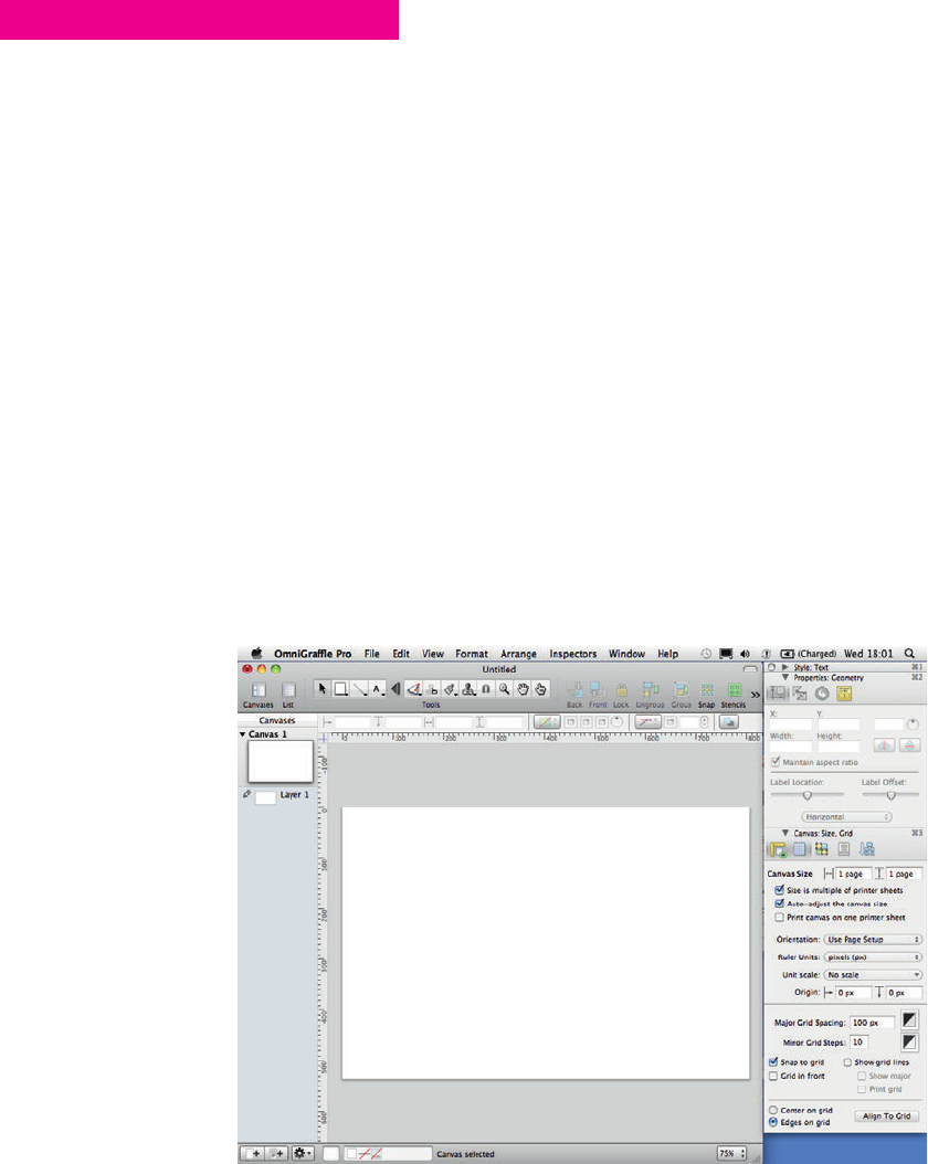
COMMUNICATING THE USER EXPERIENCE
304
HOW TO Create a funnel diagram in OmniGraf e
In this section, you’ll learn how to create a funnel diagram in OmniGra e, including how to
create all the necessary shapes and text elements.
Setting up the template
To set up the canvas for a funnel diagram, follow these steps:
1 Go to File and click New to create a new document.
2 Go to File, choose Page Setup, and then change the paper size to A4 so the diagram will
scale well when printed.
3 Change the orientation to Landscape so the diagram will t into a presentation slide.
4 Open the inspector and in the Canvas section, click the Size option.
5 Set the Ruler Units to pixels (px).
6 In the Canvas section, click the Grid option.
7 Set the Major Grid Spacing option to 100 px and the Minor Grid Steps to 10.
8 Make sure Snap to grid is selected. See Figure 8-10.
F -: Setting size and grid options.
11_9781119971108-ch08.indd 30411_9781119971108-ch08.indd 304 8/10/11 8:36 PM8/10/11 8:36 PM
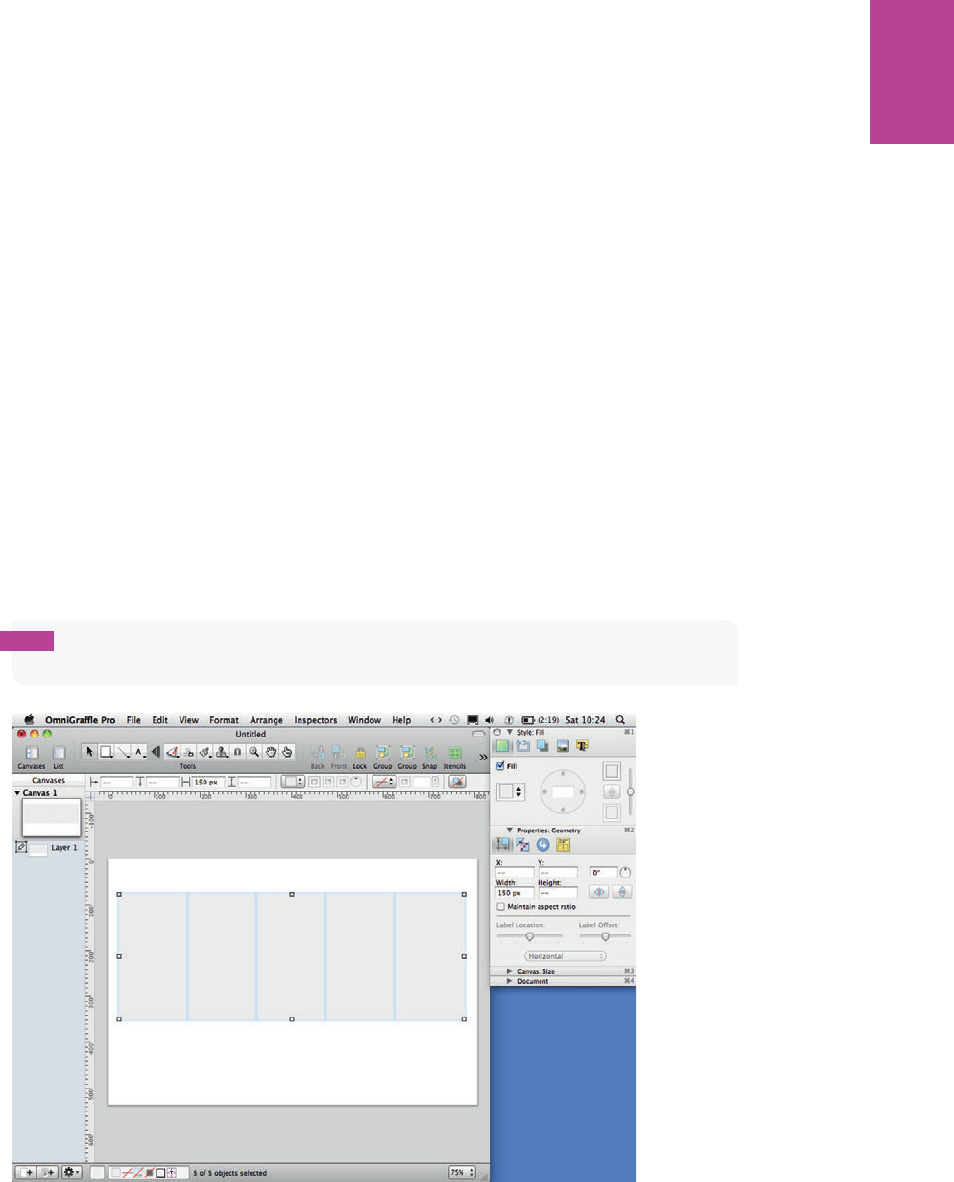
305 CHAPTER EIGHT FUNNEL DIAGRAMS
Creating the diagram
In this section, you’ll learn how to represent the pages in the funnel and how to represent the
amount of users who visited each page. You’ll also learn how to present the usability issues
associated with each page.
Representing the pages and percentages
1 Select the Rectangle shape tool in the toolbar and draw a rectangle for each step in the
process.
Figure 8-11 shows ve rectangles that represent the ve pages in the checkout process.
2 Go to the Style part of the Inspector and deselect the Stroke checkbox in Lines and Shapes;
repeat this for the Shadow checkbox.
3 Make sure each rectangle is the same width as the others, so they all have equal emphasis.
tip The rectangles need to all fi t with space on either side of the page. Five rectangles each
150 pixels wide fi t comfortably.
F -: Make all your rectangles the same width.
11_9781119971108-ch08.indd 30511_9781119971108-ch08.indd 305 8/10/11 8:36 PM8/10/11 8:36 PM
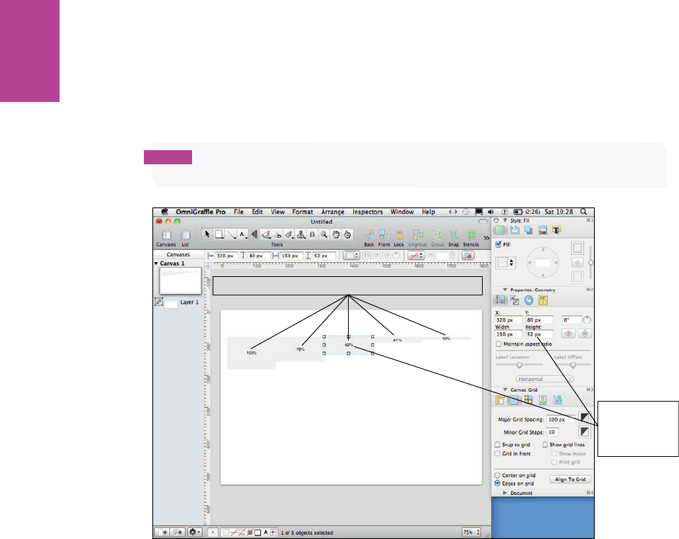
306
COMMUNICATING THE USER EXPERIENCE
4 Type the percentages for each page into each corresponding rectangle (see Figure 8-12).
5 Make each rectangle the same number of pixels high as its respective percentage. For
example, the 52% block should be 52 pixels high (as shown in Figure 8-12).
note To set a shape at a specifi c height use the geometry controls in the properties part
of the Inspector.
Match the
height setting
to the block
percentage
Type the percentages into each corresponding block
F -: Make each block the same number of pixels high as its respective percentage.
6 Align all the rectangles along their horizontal centers using the alignment options in the
Canvas section of the Inspector (see Figure 8-13).
7 Group all the rectangles using the Group button at the top of the canvas (or use keyboard
shortcut Shift+Cmd+G).
8 Resize the group vertically to around 250 pixels high.
ey will now t on the page, but the ratios between the rectangles will be an accurate repre-
sentation of the percentages written on them. See Figure 8-13.
11_9781119971108-ch08.indd 30611_9781119971108-ch08.indd 306 8/10/11 8:36 PM8/10/11 8:36 PM
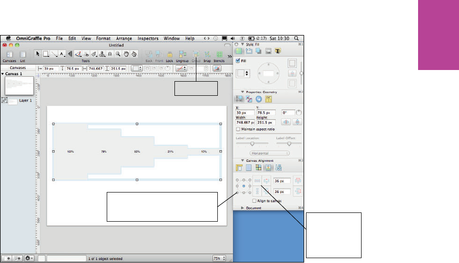
307 CHAPTER EIGHT FUNNEL DIAGRAMS
Use these
buttons to
align objects
horizontally or
vertically
Group button
Use these buttons to set
horizontal or vertical alignment
to top, middle, or bottom
F -: When you resize your rectangles as a group, the ratios between stay the same.
9 Open the Style part of the inspector and within the text options click the Font button
(it looks like a capital A). is opens the Font panel.
0 Adjust the text size of each of the percentages to emphasize the numbers. (For the lowest
percentage, choose a size that is small yet still readable.)
We’ve used 12-point text in our example. As you move back through the steps, increase the
font size by two points for each step. e font sizes in the example are 20-point, 18-point,
16-point, 14-point, and 12-point.
! Use the style part of the Inspector to change the color of the text on each block to white.
@ Add color to the rectangles to emphasize drops in numbers using the style part of the
inspector. (Choose a color for the lowest percentage that is light, but still able to show up
the text.) Make each rectangle darker as you move back through the steps. See Figure 8-14.
11_9781119971108-ch08.indd 30711_9781119971108-ch08.indd 307 8/10/11 8:36 PM8/10/11 8:36 PM
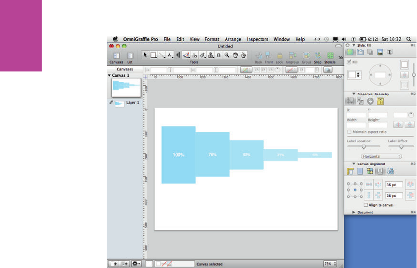
308
COMMUNICATING THE USER EXPERIENCE
F -: Use color and text size to emphasize the numbers written in each rectangle.
# Draw another rectangle, color it white, and set the opacity to 20%. Make it 10 pixels wide.
$ Duplicate the rectangle and put one over the right edge of all the colored rectangles
(except the rst rectangle).
% Make the opaque rectangles the same height as the colored rectangle they’re sitting on
(see Figure 8-15). is helps visually separate each block.
^ Select the Text tool from the Toolbar, add a text box above each block, and then type the
relevant page name. is makes it clear which page each rectangle represents.
& Using the text part of the style panel in the Inspector, change the font size to 12 point and
the font color to a 60% gray. As shown in Figure 8-16, this makes it clear enough to read
but does not put too much emphasis on it.
11_9781119971108-ch08.indd 30811_9781119971108-ch08.indd 308 8/10/11 8:36 PM8/10/11 8:36 PM
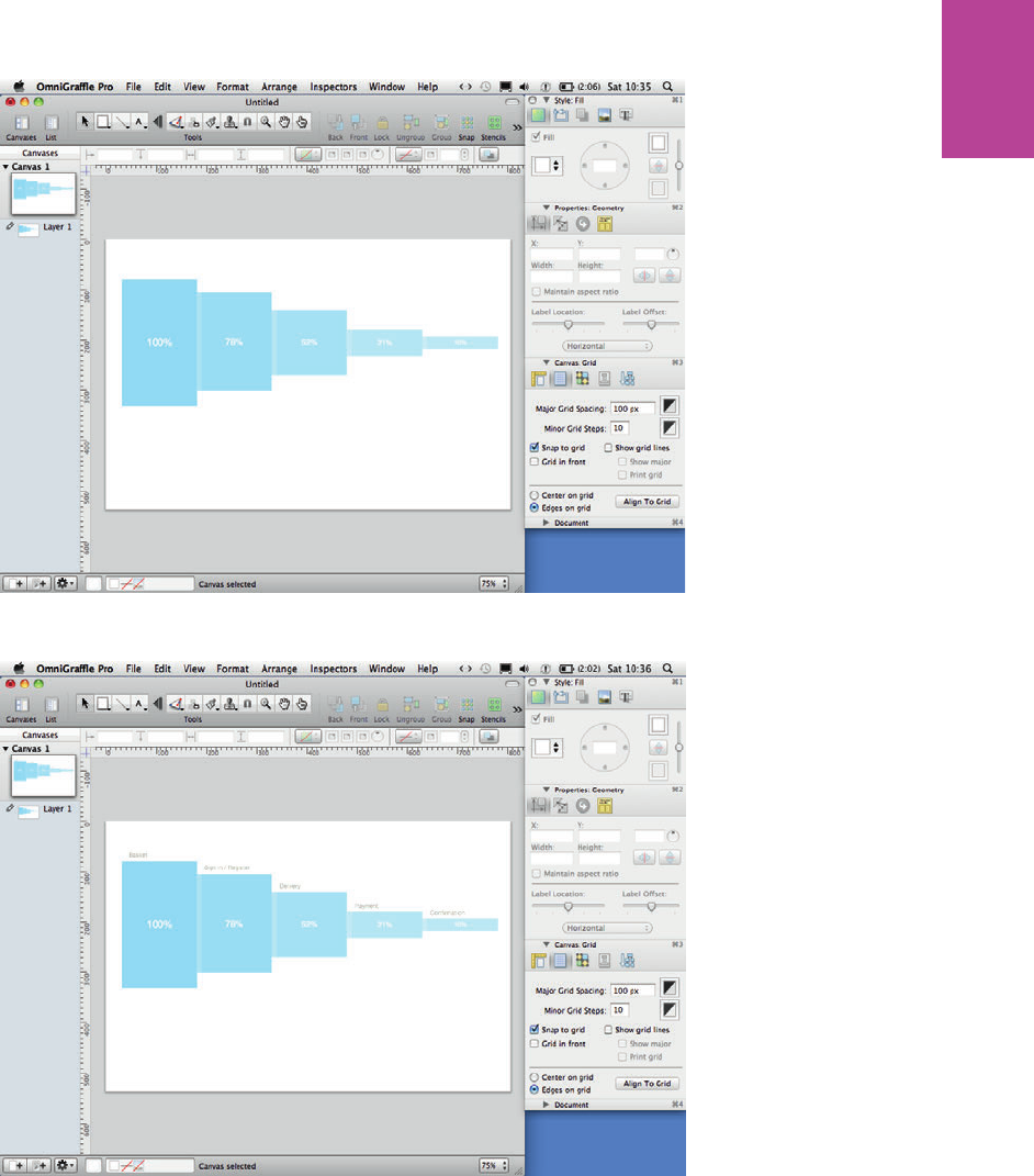
309 CHAPTER EIGHT FUNNEL DIAGRAMS
F -: Adding thin, opaque rectangles helps visually separate each step.
F -: Titles make it clear what page each rectangle represents.
11_9781119971108-ch08.indd 30911_9781119971108-ch08.indd 309 8/10/11 8:37 PM8/10/11 8:37 PM
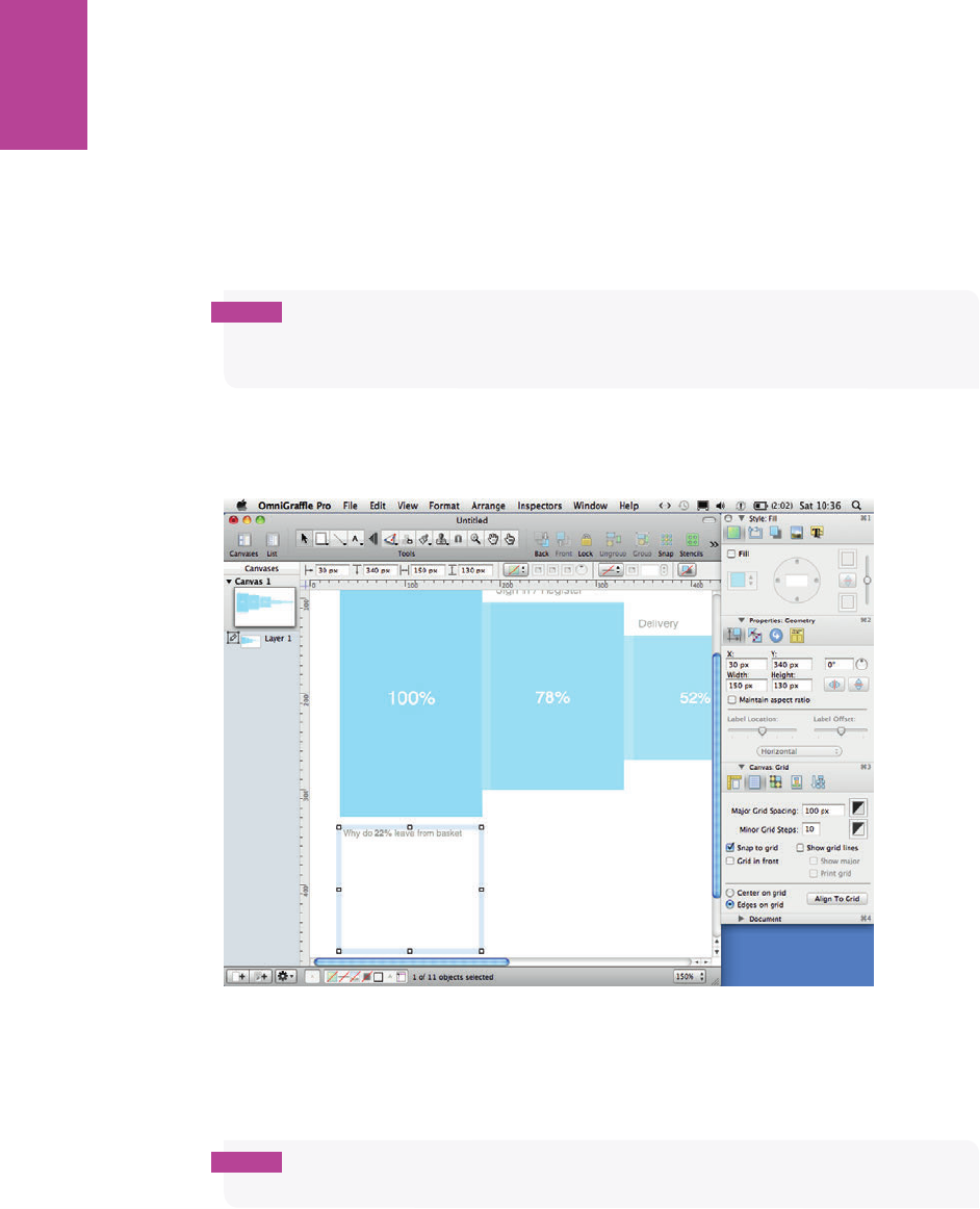
310
COMMUNICATING THE USER EXPERIENCE
Adding the why
To add the usability issues for each page:
1 Select the Text tool from the Toolbar and create a text box that is the same width as one
of the rectangles (in this case, 150 pixels).
2 Place it under the rst box and type Why do 22% leave the basket.
note The page name and the percentage you write in your header should refl ect the name
of the page the issues are on and the number of users who left this page without continuing
through the process.
3 Use the text options in the style section of the Inspector to change the font size to 9 point
and the font color to a 50% gray (see Figure 8-17).
F -: Make the text box the same width as one of the rectangles that represents a page in the funnel.
4 Type the key issues for this page below the header. (Include only one or two key issues per
page; otherwise the document can become cluttered.)
note Leave at least a one-line gap between each issue to make it easy to identify individual
points.
11_9781119971108-ch08.indd 31011_9781119971108-ch08.indd 310 8/10/11 8:37 PM8/10/11 8:37 PM
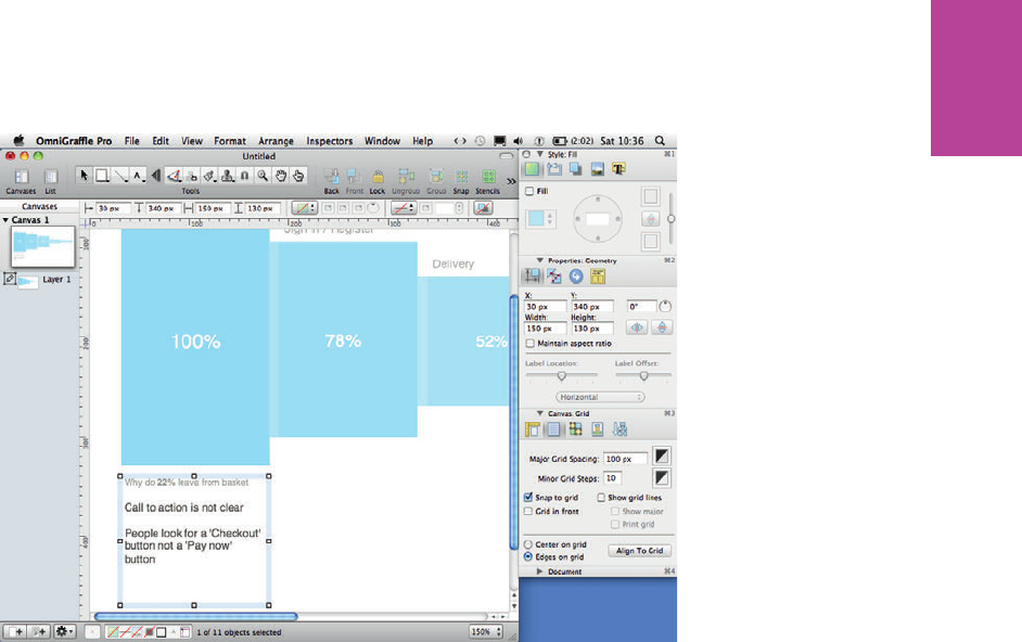
311 CHAPTER EIGHT FUNNEL DIAGRAMS
5 Make the font size of the issues 11 point and the font color 25% gray (see Figure 8-18).
F -: e issues should be in a font that is slightly larger and darker because this information is the most
important.
6 Copy and paste the text box so you have one for each of the pages.
7 Align them all along their top edge using the alignment controls in the canvas section of
the Inspector.
8 Once you have all your issues written and aligned, place each text box so it sits directly
below the page it corresponds to.
9 Select all the text boxes and move them right so they sit between the block they corre-
spond to and the next block in the process (see Figure 8-19).
0 Click the Line tool from the Toolbar and draw a line vertically from about 10 pixels below
the center of the rst block down to the text box. Draw the line past the heading in the
text box below and stop at the rst issue typed in the box.
! Repeat this for all the rectangles and text boxes. is visually links each text box with the
page it corresponds to.
@ Once your lines are drawn, select them all.
# Using the style panel in the Inspector, set the line thickness to 0.5, the line color to a 60%
gray, and the line style to a dotted line (see Figure 8-20).
11_9781119971108-ch08.indd 31111_9781119971108-ch08.indd 311 8/10/11 8:37 PM8/10/11 8:37 PM
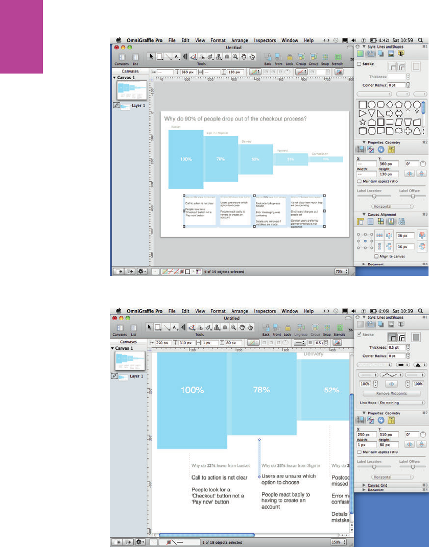
312
COMMUNICATING THE USER EXPERIENCE
F -: Each Key issue block should straddle two steps in the funnel.
F -: in, gray dotted lines visually link each set of issues to the corresponding page without adding too
much clutter.
11_9781119971108-ch08.indd 31211_9781119971108-ch08.indd 312 8/10/11 8:37 PM8/10/11 8:37 PM
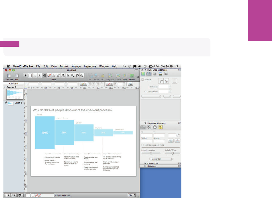
313 CHAPTER EIGHT FUNNEL DIAGRAMS
$ Finally, add a title (see Figure 8-21). Use a 24-point font and use a dark gray color.
note Make sure your title explains the purpose of the document. For example, “Why do
90% of people drop out of the checkout?”
F -: A descriptive title can explain the purpose of the document and also make a strong statement about
how many users dropped out of the process.
11_9781119971108-ch08.indd 31311_9781119971108-ch08.indd 313 8/10/11 8:37 PM8/10/11 8:37 PM

COMMUNICATING THE USER EXPERIENCE
314
HOW TO Create a funnel diagram in PowerPoint
In this section, you’ll learn how to create a funnel diagram in PowerPoint, including how to
set up the page and create all the elements necessary for the diagram.
Setting up the template
is funnel diagram will be designed in a landscape layout, which is usually PowerPoint’s
default layout. If you do need to change the page orientation, you will nd it in the Design
tab under the Slide orientation drop-down.
1 Delete the default text panels to clear o the canvas.
2 Change the grid by right-clicking anywhere on the canvas and selecting Grid and Guides.
3 Set the grid spacing to 0.5 and make sure both Snap objects to grid and Snap objects to
other objects are checked.
Creating the diagram
In this section, you’ll learn how to represent the pages in the funnel and the amount of users
who visited each page. You’ll also learn how to present the usability issues associated with
each page.
Representing pages and percentages
1 Draw a rectangle to represent each step in the process.
Figure 8-22 shows ve rectangles that represent the ve pages in the checkout process.
2 On the Home tab, in the Drawing group, click the Shape outline drop-down and then
remove the outline from the shapes.
3 Make all of the rectangles the same width so they have equal emphasis.
note The rectangles need to fi t with space either side of the page. To set the widths of all
the rectangles accurately, select them all and use the width controls within the Format tab.
As shown in Figure 8-22, fi ve rectangles at 4.8 cm wide will fi t comfortably.
11_9781119971108-ch08.indd 31411_9781119971108-ch08.indd 314 8/10/11 8:37 PM8/10/11 8:37 PM
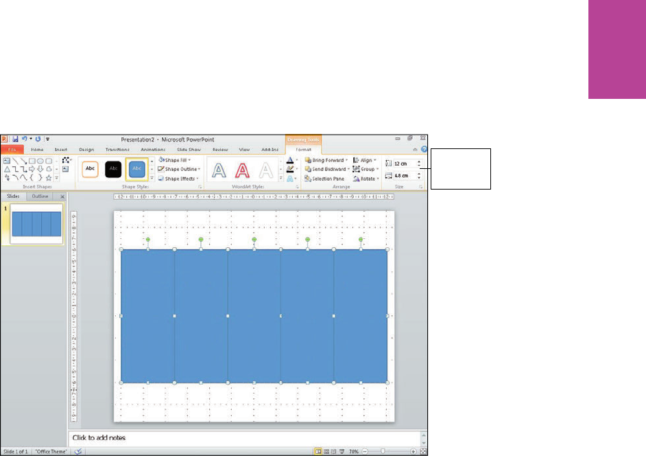
315 CHAPTER EIGHT FUNNEL DIAGRAMS
Set the
height and
width here
F -: Make all the rectangles the same width.
4 Type the percentages of visitors on each page into each corresponding rectangle.
5 Make the heights of each rectangle represent the percentage in them by using the per-
centage gures as points in centimeters (see Figure 8-23). For example, 100% is 10.0 cm
and 78% is 7.8 cm.
6 Select all the rectangles.
7 Align the rectangles to their middles by clicking the Align drop-down in Arrange group on
the Format tab.
8 Adjust the text size of each of the percentages to emphasize the numbers. (For the lowest
percentage, choose a size that is small yet still readable.)
11_9781119971108-ch08.indd 31511_9781119971108-ch08.indd 315 8/10/11 8:37 PM8/10/11 8:37 PM
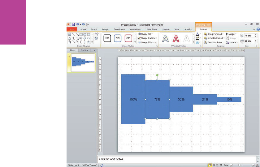
316
COMMUNICATING THE USER EXPERIENCE
F -: Set the height of each block to represent the percentage of users that visited each page.
In our example, we’ve used 12-point text. As you move back through the steps, increase the
font size by two points for each step. e font sizes in the example are 20-point, 18-point,
16-point, 14-point, and 12-point.
9 On the Home tab, in the Font group, change the font color of all the percentages to white.
0 Select the rectangle.
! On the Home tab, in the Drawing group, click the Shape Fill drop-down and then change
the rectangle color. Choose a color for the smallest block that is light but still has enough
contrast against the white text to be readable.
@ Make each rectangle the same color but slightly darker as you move back through the
steps (see Figure 8-24).
# Draw another rectangle, remove the outline, change the ll color to white, and set the
transparency to 80%.
$ Using the Size controls on the Format tab, set the width to 0.5 cm.
% Put the rectangle over the right edge of all the colored rectangles (except the rst rectangle).
^ Make the opaque rectangles the same height as the colored rectangle they’re sitting on
(see Figure 8-25). is helps visually separate each block.
11_9781119971108-ch08.indd 31611_9781119971108-ch08.indd 316 8/10/11 8:37 PM8/10/11 8:37 PM
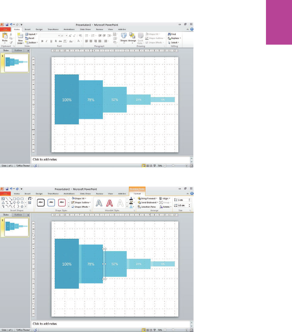
317 CHAPTER EIGHT FUNNEL DIAGRAMS
F -: Use ll colors and font sizes to emphasize the percentages of users who visited each page.
F -: Adding the thin, opaque rectangles helps visually separate each step.
11_9781119971108-ch08.indd 31711_9781119971108-ch08.indd 317 8/10/11 8:37 PM8/10/11 8:37 PM
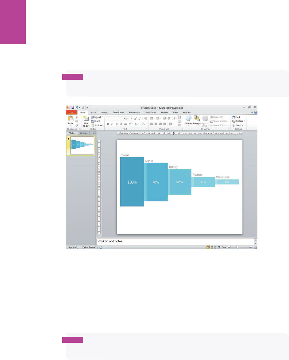
318
COMMUNICATING THE USER EXPERIENCE
& Insert a text box above each step and then type the relevant page name into each of them.
is makes it clear which page each rectangle represents.
* Using the Font controls on the Home tab, set the font size to 14 point and set the font
color to a mid-gray (see Figure 8-26).
note If the fl ow of the pages consistently fails to meet the users’ expectations then it is
probable your task model is wrong or needs refi ning (or you haven’t developed one). This will
have the biggest impact on the wireframes that you are designing.
F -: Titles make it clear what each rectangle represents.
Adding the why
To add the usability issues for each page:
1 Create a text box that is the same width as one of the steps in the funnel (in this case,
4.8 cm).
2 Place it under the rst step and type the header Why do 22% leave the basket.
note The page name and percentage you write should refl ect the name of the page the
issues are on and the number of users who left this page without continuing on through the
checkout process.
11_9781119971108-ch08.indd 31811_9781119971108-ch08.indd 318 8/10/11 8:37 PM8/10/11 8:37 PM
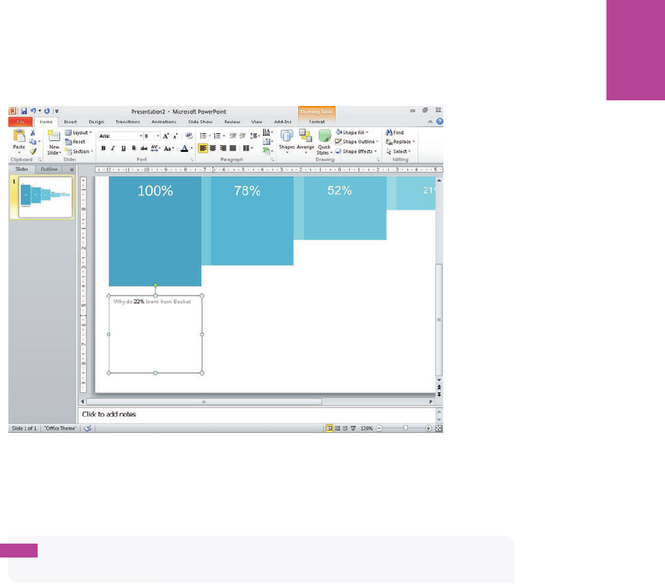
319 CHAPTER EIGHT FUNNEL DIAGRAMS
3 Use the Font options in the Home tab to set the font size to 8 point and the font color to
a mid-gray (see Figure 8-27).
F -: Make the text box the same width as one of the rectangles that represents a page in the funnel.
4 Type the key issues for this page below the header (see Figure 8-28). (Include only one or
two key issues per page; otherwise the document can become overcrowded.)
tip Leave at least a one-line gap between each issue to make it easy to pick individual
issues.
5 Make the font size of the issues 12 point and the font color a dark gray.
6 Copy and paste the text box so you have one for each page in the process.
7 Select all the text boxes and use the Align drop-down on the Format tab to align all the
text boxes along their top edges.
8 Once you have all your titles and issues typed and aligned, place each text box so it sits
directly below the page it corresponds to.
9 Select all the text boxes and move them right so they sit between the block they corre-
spond to and the next block in the process (see Figure 8-29).
11_9781119971108-ch08.indd 31911_9781119971108-ch08.indd 319 8/10/11 8:37 PM8/10/11 8:37 PM
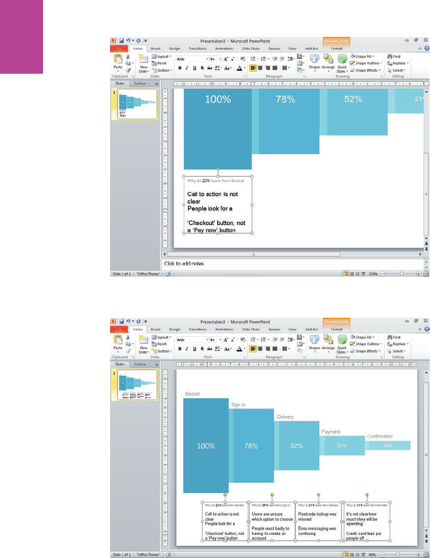
320
COMMUNICATING THE USER EXPERIENCE
F -: e issues should be in a font that is slightly larger and larger because this information must be
emphasized.
F -: Each Key issue block should sit between two steps in the funnel.
11_9781119971108-ch08.indd 32011_9781119971108-ch08.indd 320 8/10/11 8:37 PM8/10/11 8:37 PM
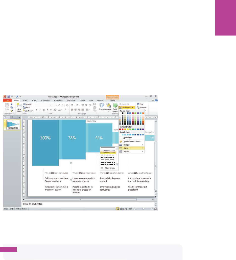
321 CHAPTER EIGHT FUNNEL DIAGRAMS
0 On the Home tab, in the Drawing group, click the Shapes drop-down and draw a line ver-
tically starting about 0.5 cm below the center of the rst block. Draw the line past the
heading in the text box below and stop at the rst issue typed in the box.
! Repeat this for all the rectangles and text boxes. is visually links each text box with the
page it corresponds to.
@ Once your lines are drawn, select them all.
# On the Format tab, in the Drawing group, click the Shape Outline drop-down (see Figure
8-30) to set the line color to a light gray, the weight to 3/4 pt, and the Dashes to Square
Dots.
F -: in, gray dotted lines visually link each set of issues to the corresponding page without adding too
much clutter.
$ Finally, add a title (see Figure 8-31). Use a 24-point font and use a dark gray color.
note Make sure your title explains the purpose of the document. For example, “Why do
90% of people drop out of the checkout?”
11_9781119971108-ch08.indd 32111_9781119971108-ch08.indd 321 8/10/11 8:37 PM8/10/11 8:37 PM

322
COMMUNICATING THE USER EXPERIENCE
100% 78% 52% 21% 10%
Why do 90% of people drop out of the checkout process?
Why do 22% leave from Basket
Call to acon is not clear
People look for a
‘Checkout’ buon, not a
‘Pay now’ buon
Why do 26% leave from Sign in
Users are unsure which
opon to choose
People react badly to
having to create an
account
Why do 21% leave from Delivery
Postcode lookup was
missed
Error messaging was
confusing
Why do 11% leave from Payment
It’s not clear how much
they will be spending
Credit card fees put
people off
Basket
Sign in
Delivery
Payment
Confirmaon
F -: A descriptive title can explain the purpose of the document and also make a strong statement about
how many users dropped out of the process.
11_9781119971108-ch08.indd 32211_9781119971108-ch08.indd 322 8/10/11 8:37 PM8/10/11 8:37 PM
Index
A
A/B testing, 85
accessibility teams, 165
account directors, 167
agency teams, 167
alignment (OmniGra e), 96
analysis, as reason for creating user journeys,
79, 80
analytics, as reason for creating funnel diagrams,
294–296
analytics specialists, 165
analyzing data, 55–56
anatomy
of funnel diagrams, 298–299
of personas, 14–15
of spreadsheet sitemaps, 130–131
of usability test reports, 266–272
of user journeys, 82–83
of visual sitemaps, 131–132
of wireframes, 167–171
annotated screenshots, 280
annotation in wireframes, 169
arrows
in user journeys (OmniGra e), 93–96
in user journeys (PowerPoint), 102
using in PowerPoint, 71
audience
for content requirements documents, 109
for funnel diagrams, 300
for personas, 16
for sitemaps, 127–129
for task models, 51–52
for usability test reports, 272
for user journeys, 83–84
for wireframes, 163–167
auditing content, 112–113
Axure, creating wireframes in
about, 240–241
adding images, 247–249
creating basic shapes, 242–244
creating custom buttons, 249–252
creating master objects, 252–255
editing text and bullets, 244–247
styling basic shapes, 242–244
B
barriers, as components of task models, 49–50, 51
basing personas on real people, 12
behaviors, as components of personas, 14–15
benchmark testing, 114
black and white photos, 76
blocks, as components of funnel diagrams, 298
board members, 167
boxes
in sitemaps (OmniGra e), 148–150
in sitemaps (PowerPoint), 142–144
in wireframes (OmniGra e), 213–215
brand copy, communicating with content
requirements documents, 105–106
brand teams, 166
bullets
in personas, 12, 23, 30–33, 40–42
in wireframes (Axure), 244–247
business analysts
as audience for user journeys, 84
as audience for wireframes, 165
business owners, 272
business stakeholders, 16, 84, 293
buttons
in wireframes (Axure), 249–252
in wireframes (OmniGra e), 232–237
C
call centers, 19, 53, 302–303
Canvas (Axure), 240, 241
canvas sizing, 188–189
card sorting, 135–137
cells, shading on sitemaps in Excel, 154–156
change log, as component of wireframes, 170
closed-card sorts, 138–139
12_9781119971108-bindex.indd 32312_9781119971108-bindex.indd 323 8/10/11 8:36 PM8/10/11 8:36 PM
COMMUNICATING THE USER EXPERIENCE
324
coding notes, 274
Colborne, Giles (managing director), 160
collages, 113
color
adding in OmniGra e Pro, 36–37
adding in PowerPoint, 26–27
using in wireframes, 174
color palettes, in usability test reports
(PowerPoint), 284–285
columns, adding to sitemaps, 130, 156–157
combining shapes for wireframes (PowerPoint),
261–262
comments, as components of usability test
reports, 267
communicating ndings, 280
complex evaluations, 48, 64–65
compliance teams, 166
connecting lines, for sitemaps, 131, 150–151
content
adding to content requirements documents
(Word), 121
auditing, 112–113
communicating with user journeys, 81–82
communicating with wireframes, 162
prioritizing, 179–180
testing in context, 109–110
variation testing, 110–111
content requirements
about, 4, 104
audience for, 109
as component of task models, 49, 51
creating documents for, 4, 114–121
features of good, 105–109
research and workshop ideas, 111–114
validating, 109–111
content teams
as audience for sitemaps, 128
as audience for wireframes, 165
contextual observations, 53–54
controlled evaluations
about, 48
for task models (OmniGra e), 62–64
for task models (PowerPoint), 72–74
copy teams, 165
copywriters, 84
core purpose, as component of content
requirements document, 108
cropping images in usability test reports
(PowerPoint), 286–288
cross-links
about, 127
showing in sitemaps (PowerPoint), 131,
146–147
curved arrows, styling in user journeys
(OmniGra e), 95–96
customer service managers, 166
D
data
analyzing, 55–56
communicating with content requirements
documents, 106
communicating with funnel diagrams,
296–297
real, using in wireframes, 169
decision points, 81, 83
de ning your personas, 21–22
de-magnetizing lines for sitemaps (OmniGra e),
151–152
depth interviews, 20
descriptive image placeholders, 169
descriptive photography, using for personas,
12–13
design notes, as component of usability test
reports, 270
design principles, of wireframes, 171–176
design suggestions, as component of task
models, 51
design team
as audience for task models, 52
as audience for usability test reports, 272
design validation tests, 274–275
designers
as audience for sitemaps, 127–128
as audience for usability test reports, 272
as audience for user journeys, 84
as audience for wireframes, 164
designs, user testing of, 84
developers
as audience for usability test reports, 272
as audience for wireframes, 164–165
development team
as audience for funnel diagrams, 300
as audience for sitemaps, 128
12_9781119971108-bindex.indd 32412_9781119971108-bindex.indd 324 8/10/11 8:36 PM8/10/11 8:36 PM
INDEX 325
as audience for task models, 52
as audience for user journeys, 84
as audience for wireframes, 164–165
direct connections, 47
direction, indicating for task models
(OmniGra e), 60
document titles
for content requirements documents, 107
for personas, 22–23
documents
creating for wireframes (OmniGra e), 188
putting into context, 7–8
summary, 2–7
drop-downs, creating for wireframes
(PowerPoint), 261–262
duplicating objects, 206
E
e-commerce teams, 167
elements, creating for usability test reports
(PowerPoint), 289–290
email, communicating ndings with, 280
embedding video in usability test reports
(PowerPoint), 290
emotional needs, as component of task models,
48–49
emotions, highlighting, 56
enabling
rulers (OmniGra e), 216
Snap to grid for wireframes (PowerPoint),
256–257
end steps, for user journeys, 81, 82
ethnographic research, conducting, 20–21
evaluations, complex, 64–65
evaluations, controlled
for task models (OmniGra e), 62–64
for task models (PowerPoint), 72–74
examining user journeys, 87–89
Excel, creating sitemaps in
adding rows and columns, 156–157
shading cells, 154–156
wrapping text, 153–154
writing labels, 153–154
existing barriers, as components of task models,
49–50
exploratory tests, taking notes for, 273–274
external factors, communicating with user
journeys, 82
F
feasibility of projects, 277
feel, using in wireframes, 174–175
nance teams, 166
ndings
communicating, 280
prioritizing, 277–278
agging non-existent content in visual
sitemaps, 132
ags, using in spreadsheet sitemaps, 131
ow, in user journeys, 81, 83
folds, showing in wireframes, 169
fonts, for personas, 28
formatting tables in content requirements
documents (Word), 118–120
functionality
communicating with content requirements
documents, 106
communicating with wireframes, 163
funnel diagrams
about, 292
anatomy of, 298–299
audience for, 300
creating in OmniGra e, 304–313
creating in PowerPoint, 314–322
document for, 7
features of good, 293
reasons for creating, 293–298
research and workshop ideas, 301–303
G
gathering materials, 88
generating ideas, 181–182
goals
communicating with user journeys, 81
as component of task models, 47, 51
as components of personas, 14
identifying, 55
grids, setting up for wireframes (OmniGra e),
190–191
12_9781119971108-bindex.indd 32512_9781119971108-bindex.indd 325 8/10/11 8:36 PM8/10/11 8:36 PM
COMMUNICATING THE USER EXPERIENCE
326
groupings
communicating with user journeys, 81
as components of user journeys, 82
information, 55
guides, using for usability test reports
(PowerPoint), 285–286
H
head of online managers, 166
headers, creating in wireframes (Axure), 244
highlighting emotions, 56
I
icons
adding to personas, 28–29
creating for task models (PowerPoint), 74–75
inserting in personas (OmniGra e Pro),
38–39
ideas, generating, 181–182
identifying
goals, 55
themes, 276
user behaviors, 56
illustrating
task models, 56–57
user journeys, 89
image placeholders, using in wireframes
(OmniGra e), 215–219
image requirements, communicating with
content requirements documents, 106
images
in personas, 22, 25–28, 35–38
in usability test reports, 286–289
in wireframes, 162, 169, 225–229, 247–249
impact, 277
indicating direction for task models
(OmniGra e), 60
individual tasks, adding to task models
(OmniGra e), 61
information
analyzing, 55
grouping, 55
instructions, communicating with content
requirements documents, 106
interactions, as components of task models, 49
internal UX teams, 272
inviting attendees, 87–88
K
key goals, as components of personas, 14
key issues, as components of funnel
diagrams, 299
L
labels, in sitemaps, 131, 132, 153–154
layers, in wireframes, 191–195
layout, communicating with wireframes, 162
legal teams, 166
lines
in sitemaps, 151–152
in user journeys, 94–95, 102
LinkBack objects, creating in wireframes
(OmniGra e), 210–213
linking notes and wireframes, 169
live sites, user testing of, 84
loop backs, creating for task models
(OmniGra e), 65–67
M
Mac, creating personas on. See OmniGra e Pro,
creating personas on
magnetic shapes, using for user journeys
(OmniGra e), 93–94
managers, 167
managing director, 167
margins, setting in usability test reports
(PowerPoint), 286
market researchers, 166
marketing copy, communicating with content
requirements documents, 105–106
marketing directors, 272
marketing teams, 166
master objects, creating in wireframes (Axure),
252–255
Masters pane (Axure), 240, 241
measurement, communicating with user
journeys, 82
multivariate testing (MVT), 85
must dos, as components of personas, 15
must nevers, as components of personas, 15
MVT (multivariate testing), 85
12_9781119971108-bindex.indd 32612_9781119971108-bindex.indd 326 8/10/11 8:36 PM8/10/11 8:36 PM
INDEX 327
N
names, as components of personas, 14
navigation, communicating with wireframes, 163
note indicators, in usability test reports
(PowerPoint), 289–290
notes
columns in spreadsheet sitemaps, 130
as components of user journeys, 83
creating for task models (OmniGra e), 68
for design validation tests, 274–275
for exploratory tests, 273–274
linking with wireframes, 169
note-taking and research tips, for usability test
reports, 272–275
O
objects, duplicating, 206
OmniGra e, creating funnel diagrams in
adding the “why”, 310–313
representing pages and percentages, 305–309
setting up templates, 304
OmniGra e, creating sitemaps in
creating boxes with magnetic points, 148–150
de-magnetizing lines, 151–152
setting up templates, 148
using connecting lines, 150–151
OmniGra e, creating task models in
creating models, 60–68
setting up templates, 58–59
OmniGra e, creating user journeys in
adding lines and arrows, 94–95
creating titles for user journeys, 92
nishing o , 96–97
setting up templates, 90–91
styling curved arrows, 95–96
styling shapes, 92–93
using magnetic shapes and arrows, 93–94
OmniGra e, creating wireframes in
about, 186–187
adding images, 225–229
adding text, 229–232
changing canvas sizing, 188–189
changing ruler units, 189–190
creating buttons, 232–237
creating custom page grids, 203–209
creating layers, 191–192
creating LinkBack objects, 210–213
creating new documents, 188
creating page titles with variables, 195–199
creating shared layers, 192–193
creating tabs, 220–225
image placeholders, 215–219
reordering layers, 193–195
setting up grids, 190–191
setting up templates, 188–213
using basic boxes to mark out content areas,
213–215
using stencils, 237–239
working with page outlines, 200–203
OmniGra e Pro, creating personas in
adding persona images and titles, 35–38
adding subheadings and bulleted lists, 38–42
creating and setting up presentations, 34–35
online forums, visiting, 54
online managers, 166
open-card sorting, 135–137
operations teams, 166
order of tasks, as component of task models, 47
P
page functionality themes, 276
page grids, in wireframes (OmniGra e), 203–209
page groups, in sitemaps (PowerPoint), 145–146
page name, as component of content
requirements document, 108
page numbers, as components of wireframes, 167
page orientation, setting for sitemaps
(PowerPoint), 142
page outlines, in wireframes, 200–203, 258
page titles
as components of usability test reports, 266
as components of wireframes, 167
creating for wireframes (OmniGra e),
195–200
pages, for funnel diagrams, 305–309, 314–318
pain points, in user journeys, 82, 83
paragraph controls, in usability test reports
(PowerPoint), 286–287
PDFs, personas as, 28
percentages, in funnel diagrams, 297–298,
305–309, 314–318
persona images, 22
12_9781119971108-bindex.indd 32712_9781119971108-bindex.indd 327 8/10/11 8:36 PM8/10/11 8:36 PM
COMMUNICATING THE USER EXPERIENCE
328
personas
about, 10
anatomy of, 14–15
audience for, 16
as component of task models, 51
creating, 22–42
creating in OmniGra e Pro, 34–42
creating in PowerPoint, 24–33
de ning your, 21–22
document for, 2
goals of, 11
qualities of good, 11–13
research and workshop ideas, 18–22
validating, 17
photos
black and white, 76
as persona component, 14
pixels, as component of wireframes, 167
planners, 167
Post-it Notes, 89
post-testing workshop photos, communicating
ndings with, 280
PowerPoint, creating funnel diagrams in
adding the “why”, 318–322
representing pages and percentages, 314–318
setting up templates, 314
PowerPoint, creating personas in
adding icons, subheadings, and bulleted lists,
28–33
adding persona images and titles, 25–28
creating and setting up slide presentation,
24–25
PowerPoint, creating sitemaps in
adding connecting lines, 144–145
creating and shading boxes, 142–144
setting page orientation, 142
showing cross-links, 146–147
signifying page groups, 145–146
PowerPoint, creating task models in
creating models, 70–76
setting up templates, 69
PowerPoint, creating usability test reports in
about, 281
creating custom color palettes, 284–285
creating custom elements, 289–290
editing images, 287–289
editing Slide Master, 281–283
editing text boxes, 286–287
editing Title Master, 283–284
inserting video, 290
setting up templates, 281–286
using guides, 285–286
PowerPoint, creating user journeys in
adding arrows and lines, 102
adding shapes, 99
changing shapes, 99–100
nishing up, 102
setting up templates, 98–99
wrapping text, 101
PowerPoint, creating wireframes in
adjusting sizing, 257
combining shapes, 261–262
creating page outlines, 258
creating tabbed navigation, 258–259
enabling Snap to grid, 256–257
setting up templates, 256–257
styling shapes, 259–261
practicing presentations, 278–279
presentations
creating and setting up (OmniGra e Pro),
38–35
practicing, 278–279
titling for content requirements documents
(Word), 116–117
prioritization workshops, 277–278
prioritizing
about, 272
content, 179–180
ndings, 277–278
priority, communicating with wireframes, 163
process sorting, 86–87
product development, as reason for creating user
journeys, 79
product managers
as audience for funnel diagrams, 300
as audience for wireframes, 166
project managers
as audience for sitemaps, 128
as audience for usability test reports, 272
as audience for user journeys, 84
as audience for wireframes, 165
project team, 272
projector method, communicating ndings
with, 280
12_9781119971108-bindex.indd 32812_9781119971108-bindex.indd 328 8/10/11 8:36 PM8/10/11 8:36 PM
INDEX 329
Q
qualitative data, 303
quantitative data, 303
R
recommendations, as components of usability
test reports, 267
reference ID, as component of content
requirements document, 108
related business functions, 166
remote navigation texting, 139–140
reordering layers in wireframes (OmniGra e),
193–195
required elements, as components of content
requirements document, 108–109
research
conducting, 53–54
theories, 18
research and workshop ideas
content requirements documents, 111–114
funnel diagrams, 301–303
personas, 18–22
sitemaps, 134–140
task models, 53–56
user journeys, 86–89
wireframes, 178–184
research techniques
benchmark testing, 114
call centers, listening in on, 19
conducting depth interviews, 20
conducting ethnographic research, 20–21
conducting research, 53–54
creating healthy perspectives, 182–184
determining pages you need, 137–138
generating ideas, 181–182
identifying themes, 276
immersing yourself in the topic, 111
listening to and observing users, 113–114
open-card sorting, 135–137
practicing presentations, 278–279
prioritizing content, 179–180
prioritizing ndings, 277–278
using site analytics and search logs, 134
validating sitemaps, 138–140
“what”, 301
“why”, 302–303
resizing
canvas in OmniGra e, 58, 188–189
rectangles in PowerPoint, 70
for wireframes (PowerPoint), 257
right-clicking shapes (PowerPoint), 70
rows, adding to sitemaps (Excel), 156–157
ruler units, changing for wireframes
(OmniGra e), 189–190
rulers, enabling in OmniGra e, 216
running successful workshops, 178–179
S
screenshots
communicating ndings with, 280
as component of usability test reports, 267
search engine optimization (SEO) teams,
128, 165
search logs, using, 134
senior managers, 272
senior stakeholders, 16, 300
SEO (search engine optimization) teams,
128, 165
separating logged in areas in visual sitemaps, 132
severity indicators, as components of usability
test reports, 267
severity of usability issues, 277
severity-based themes, 276
shading
boxes on sitemaps (PowerPoint), 142–144
buttons in wireframes (Axure), 249–252
cells in sitemaps (Excel), 154–156
as component of funnel diagrams, 299
as component of wireframes, 168
using in spreadsheet sitemaps, 131
using in visual sitemaps, 131
shapes
in user journeys, 92–94, 100–101
in wireframes, 242–244, 261–262
sign-o groups, 166–167
site analytics, using, 134
Sitemap pane (Axure), 240, 241
sitemaps
about, 124
anatomy of, 130–133
audience for, 127–129
creating, 140–157
creating in Excel, 153–157
12_9781119971108-bindex.indd 32912_9781119971108-bindex.indd 329 8/10/11 8:36 PM8/10/11 8:36 PM
COMMUNICATING THE USER EXPERIENCE
330
sitemaps (continued)
creating in OmniGra e, 148–152
creating in PowerPoint, 142–147
document for, 5
features of good, 125–127
reasons for creating, 125–126
research and workshop ideas, 134–140
styles of, 129
validating, 138–140
sizing, adjusting for wireframes (PowerPoint),
257
Slide Master, editing for usability test reports
(PowerPoint), 281–283
slide presentations, creating and setting up,
24–25
Snap to grid, enabling for wireframes
(PowerPoint), 256–257
solution, suggesting, as component of task
models, 50
specialists, 165
speci cation information, communicating with
content requirements documents, 106
spreadsheet sitemaps, 128, 130–131
stakeholder team, 52
stakeholders, 16, 84, 293
start steps, in user journeys, 81, 82
Stencil Library (OmniGra e), 92–93
stencils, using in wireframes (OmniGra e),
237–239
steps, in user journeys, 81, 83
stock images, avoiding for personas, 12
storyboards, as component of wireframes, 171
strategists, 167
structure of wireframes, 172–173
structured email, communicating ndings
with, 280
style, of wireframes, 172–173
styling
in Axure, 242–244
in OmniGra e, 92–93, 95–96
in PowerPoint, 259–261
subheadings, in personas, 23, 30, 39–40
suggestions, 50, 108–109
summary information, as component of content
requirements document, 108
supporting information, communicating with
content requirements documents, 106–107
T
tabbed navigation, creating for wireframes
(PowerPoint), 258–259
tables, in content requirements documents
(Word), 117–120
tabs, creating for wireframes (OmniGra e),
220–225
task models
about, 44
anatomy of, 50–51
audience for, 51–52
creating in OmniGra e, 58–68
creating in PowerPoint, 69–76
document for, 3
features of good, 45–50
illustrating, 56–57
research and workshop ideas, 53–56
validating, 52–53
when to create, 45
task phases, as component of task models, 51
task/goal-based themes, 276
tasks
communicating with user journeys, 81
in task models, 51, 61, 70–71
template numbers, using in visual sitemaps, 132
templates
for content requirements documents
(Word), 116
for funnel diagrams (OmniGra e), 304
for funnel diagrams (PowerPoint), 314
for sitemaps (OmniGra e), 148
for task models (OmniGra e), 58–59
for task models (PowerPoint), 69
for usability test reports (PowerPoint),
281–286
for user journeys (OmniGra e), 90–91
for user journeys (PowerPoint), 98–99
for wireframes (OmniGra e), 188–213
for wireframes (PowerPoint), 256–257
testing
A/B, 85
benchmark, 114
design validation, 274–275
text
in sitemaps, 153–154
in user journeys, 101
in wireframes, 229–232, 244–247
12_9781119971108-bindex.indd 33012_9781119971108-bindex.indd 330 8/10/11 8:36 PM8/10/11 8:36 PM
INDEX 331
text boxes, editing for usability test reports
(PowerPoint), 286–287
text lines/shapes, as components of
wireframes, 168
text outputs, as components of usability test
reports, 270
text size, as component of funnel diagrams, 299
themes, identifying, 276
Title Master, editing for usability test reports
(PowerPoint), 283–284
titles
in funnel diagrams, 298
personas, 25–28, 35–38
in task models, 60, 70
in user journeys, 82, 92
titling presentations for content requirements
documents (Word), 116–117
Toolbar (Axure), 240, 241
transparency, in usability test reports
(PowerPoint), 288–289
tree structure, of spreadsheet sitemaps, 130
U
usability test reports
about, 264
anatomy of, 266–272
audience for, 272
communicating ndings, 280
creating in PowerPoint, 281–290
features of good, 265
note-taking and research tips, 272–275
reasons for creating, 265–266
research and workshop ideas, 276–279
user behavior
as component of task models, 47–48, 51
identifying, 56
user experience, 1. See also speci c topics
user experience peers, 165
user journeys
about, 78
anatomy of, 82–83
audience for, 83–84
creating in OmniGra e, 90–97
creating in PowerPoint, 98–102
document for, 3
examining, 87–89
features of good, 79–82
illustrating, 89
research and workshop ideas, 86–89
validating, 84–85
user quote callouts, in usability test reports
(PowerPoint), 289
user quotes
as components of usability test reports, 267
as components of personas, 14
user support, as component of content
requirements document, 108
user testing
of designs, 84
of live sites, 84
as reason for creating funnel diagrams,
294, 302
of wireframes, 84
user testing reports, document for, 6
user video, as component of usability test
reports, 267
user-experience themes, 276
users, listening to and observing, 113–114
V
validating
content requirements documents, 109–111
personas, 17
sitemaps, 138–140
task models, 52–53
user journeys, 84–85
wireframes, 176–177
video, in usability test reports, 290
vision, communicating with wireframes, 162
vision page, as component of wireframes,
169–170
visual heat, of wireframes, 173–174
visual sitemaps, 128, 131–132, 133
visual weighting, as component of
wireframes, 168
W
website feedback tools, as reason for creating
funnel diagrams, 303
“why”, in funnel diagrams, 310–313, 318–322
Widget Properties pane (Axure), 240, 241
Widgets pane (Axure), 240, 241
12_9781119971108-bindex.indd 33112_9781119971108-bindex.indd 331 8/10/11 8:36 PM8/10/11 8:36 PM
COMMUNICATING THE USER EXPERIENCE
332
wireframe team, 84
wireframers, 127–128
wireframes
about, 159–160
anatomy of, 167–171
audience for, 163–167
communicating with, 162–163
creating in Axure, 240–255
creating in OmniGra e, 186–239
creating in PowerPoint, 256–262
design principles for, 171–176
document for, 6
features of good, 160–161
producing, 184–185
reasons for using, 162
research and workshop ideas, 178–185
user testing of, 84
validating, 176–177
Word, creating content requirements documents in
adding content, 121
formatting tables, 118–120
inserting tables, 117–118
setting up templates, 116
titling presentations, 116–117
workshop ideas. See also research and workshop
ideas
analyzing data, 55–56
auditing content, 112–113
de ning your personas, 21–22
examining user journeys, 87–89
usability test reports, 276-279
workshops
conducting, 88–89
running successful, 178–179
wrapping text
on sitemaps in Excel, 153–154
in user journeys, 101
writing
descriptive image placeholders, 169
labels in sitemaps in Excel, 153–154
12_9781119971108-bindex.indd 33212_9781119971108-bindex.indd 332 8/10/11 8:36 PM8/10/11 8:36 PM
