Freedom Box Identity Manual
User Manual: Pdf
Open the PDF directly: View PDF ![]() .
.
Page Count: 12
by Robert Martinez
Premise_
_0
01
1
Signature_
_0
02
2
Symbol_
_0
03
3
Logotype_
_0
04
4
Space And Size_
_0
05
5
Colors_
_0
06
6
Reduced Variants_
_0
07
7
Typography_
_0
08
8
Picture Use_
_0
09
9
DON'Ts_
_1
10
0
1
1/
/10
10
Premise
The goal of this document is to define a set of clear
guidelines that lead to a consistent look and feel.
This uniform appearance throughout different
media gives the project an identity. The guide
should not only be considered as a tool to facilitate
the creation of that look, but also give an idea in
situations not covered by this guide. A successful
identity has a connection of what the project is and
what the identity makes it appear to be.
In my eyes, the FreedomBox project is a community
effort fighting for a self-determined digital way of
living with strong commitment to values like
privacy, security, anonymity, collaboration, and
above all: freedom.
Shaping a clear impression true to those underlying
values is the purpose of this identity.
It mainly introduces brand elements as the
signature, colors, typography, but also gives general
advice on how to apply them to any given material
for the FreedomBox.
2
2/
/10
10
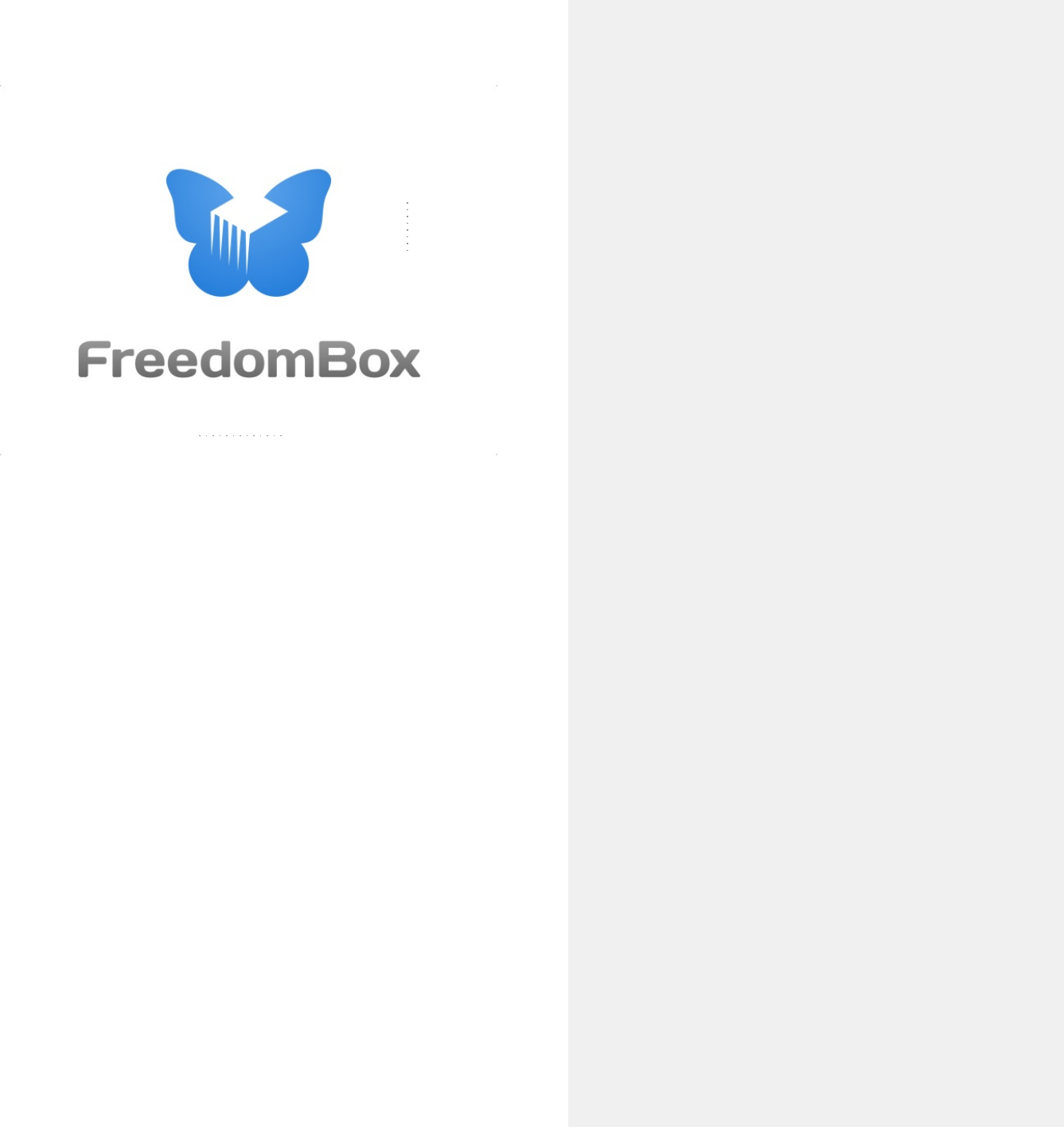
Signature
The FreedomBox signature consists of the
FreedomBox symbol and the FreedomBox logotype.
The signature's goal is to embody the whole project
and therefore should never be altered and always
be used in an original version.
Relative size andposition, as well as aspect ratio
and color, are not subject to change.
logotype
symbol

3
3/
/10
10
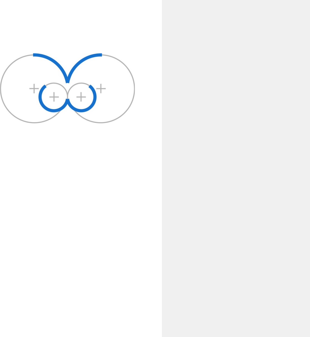
Symbol
The FreedomBox symbol outlines the idea of
freedom and hardware.
The shape achieves that by integrating the outside,
internalizing it into a box and giving it wings.
At very small sizes, the symbol can be used as a
substitute for the complete signature.
4
4/
/10
10
Logotype
The logotype uses thesans serif font-face
"Days One" by Jovanny Lemonad and is released
under the SIL Open Font License. It underlines the
project's technical background with its symmetric
and stringent characters. It also appears quite
strong,giving the needed weight to the text using it.
"Days One" by Jovanny Lemonad
5
5/
/10
10
2X
X
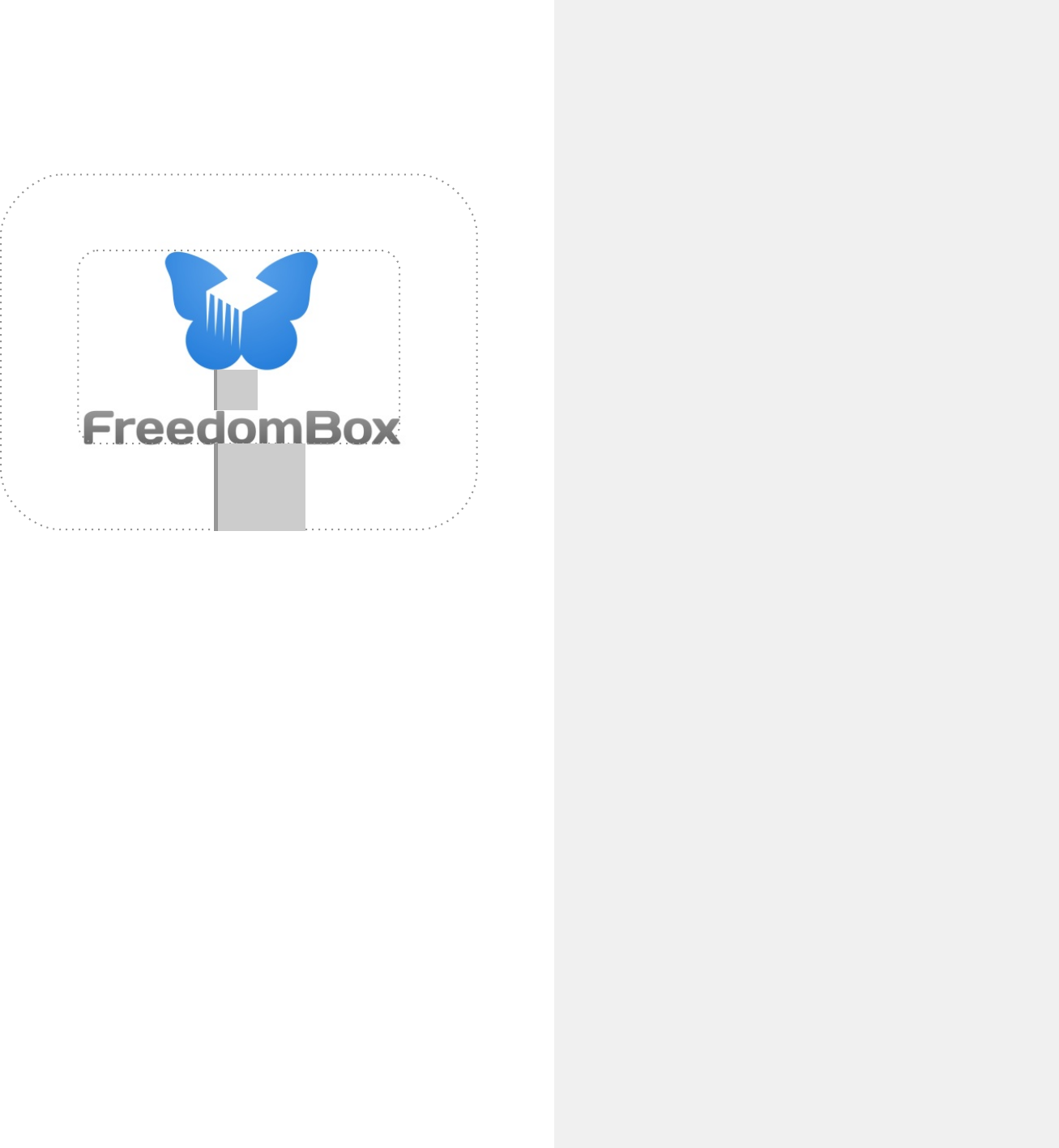
Space And Size
To conserve the unity of the two-part signature, it is
important to always respect a save zone around it.
Any visual objects inside the save zone are not
allowed (text, graphical elements) and should avoid
getting too close to it.
The exact zone can easily be derived from the
distance "X" between symbol and logotype.
The save zone should be 2 times the distance "X".
When choosing the size of the signature on any
given medium, the logotype should always remain
readable. If necessary, the signature can consist of
ONLY the symbol while discarding the logotype.
save zone
6
6/
/10
10
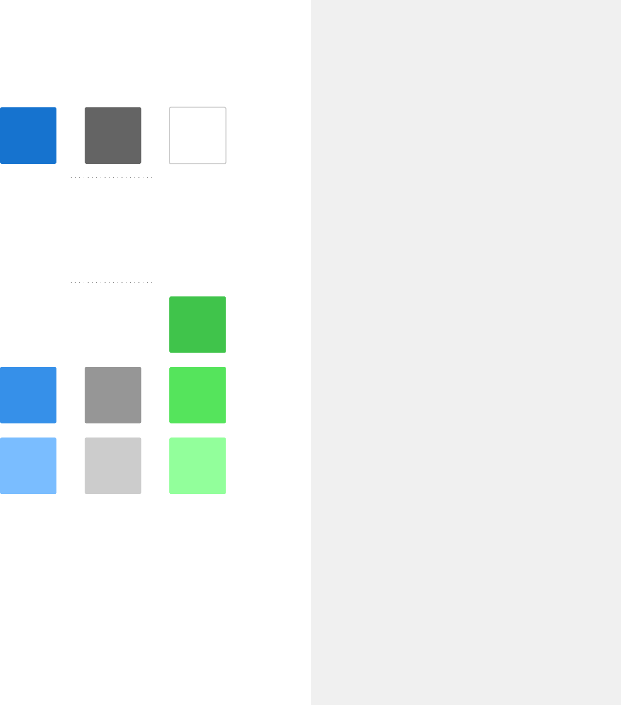
Colors
The primary colors are blue, gray and white.
The secondary palette introduces green and offers
shades of all colors.
The palette encourages a bright look with wide
open spaces that play with the idea of sky & ground.
primary colors
Hex: #1771CF
RGB: (23,113,207)
CMYK: 90, 50, 0, 0
Hex: #646464
RGB: (100,100,100)
CMYK: 0,0,0,60
Hex: #92FF9C
RGB: (146,255,156)
CMYK: 40,0,40,0
Hex: #CCCCCC
RGB: (204,204,204)
CMYK: 0,0,0,20
Hex: #7ABBFF
RGB: (122,187,255)
CMYK: 50,20,0,0
Hex: #368EE9
RGB: (54,142,233)
CMYK: 75,40,0,0
Hex: #969696
RGB: (150,150,150)
CMYK: 0,0,0,40
Hex: #55E45D
RGB: (85,228,93)
CMYK: 60,0,60,10
Hex: #41C44C
RGB: (65,196,76)
CMYK: 67,0,61,23
white
secondary colors
7
7/
/10
10
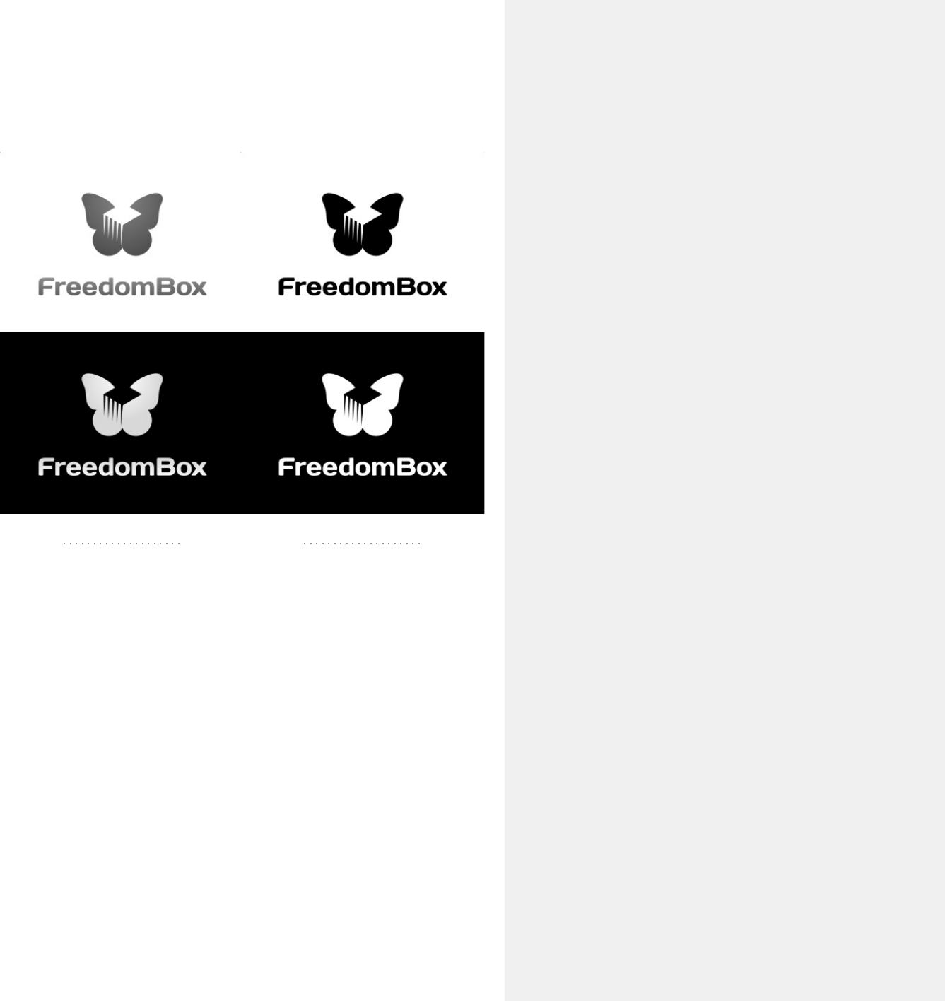
Reduced Variants
Sometimes the signature has to adapt to certain
limitations in reproduction, colorspace or
background color.
For those special cases, there are grayscale, line art
and inverted versions of the signature.
But remember: it is strongly recommended to use
the original signature — whenever possible.
grayscale lineart
8
8/
/10
10
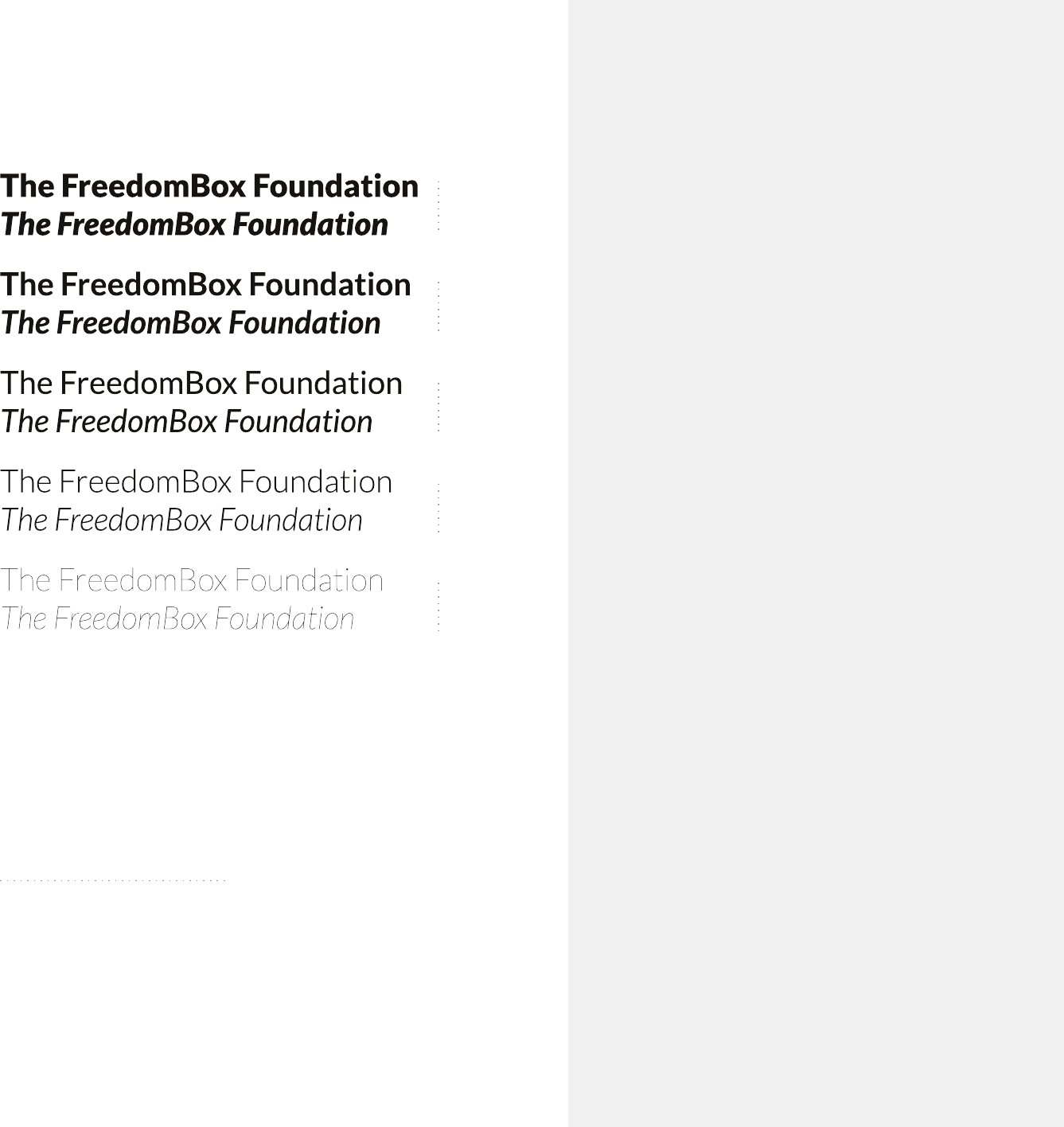
Typography
The FreedomBox font family is "Lato" by Łukasz
Dziedzic, released under the SIL Open Font License.
It performs great on displays, provides a huge
variety of different weights (& italics). Lato also
embodies technical and functional traits while
conserving a distinct look and feel. The number of
different weights makes the font a versatile tool to
represent the identity always & everywhere.
black
bold
regular
light
hairline
"Lato" by Łukasz Dziedzic
3 May. Bistritz.--Left Munich at
8:35 P.M., on 1st May, arriving at
Vienna early next morning;
should have arrived at 6:46, but
train was an hour late. Buda-
Pesth seems a wonderful place,
from the glimpse which I got of it
from the train and the little I
could walk through the streets.
I feared to go very far from the
station, as we had arrived late
and would start as near the
correct time as possible.
The impression I had was that
we were leaving the West and
entering the East; the most
western of splendid bridges over
the Danube, which is here of
noble width and depth, took us
among the traditions of Turkish
rule.
9
9/
/10
10
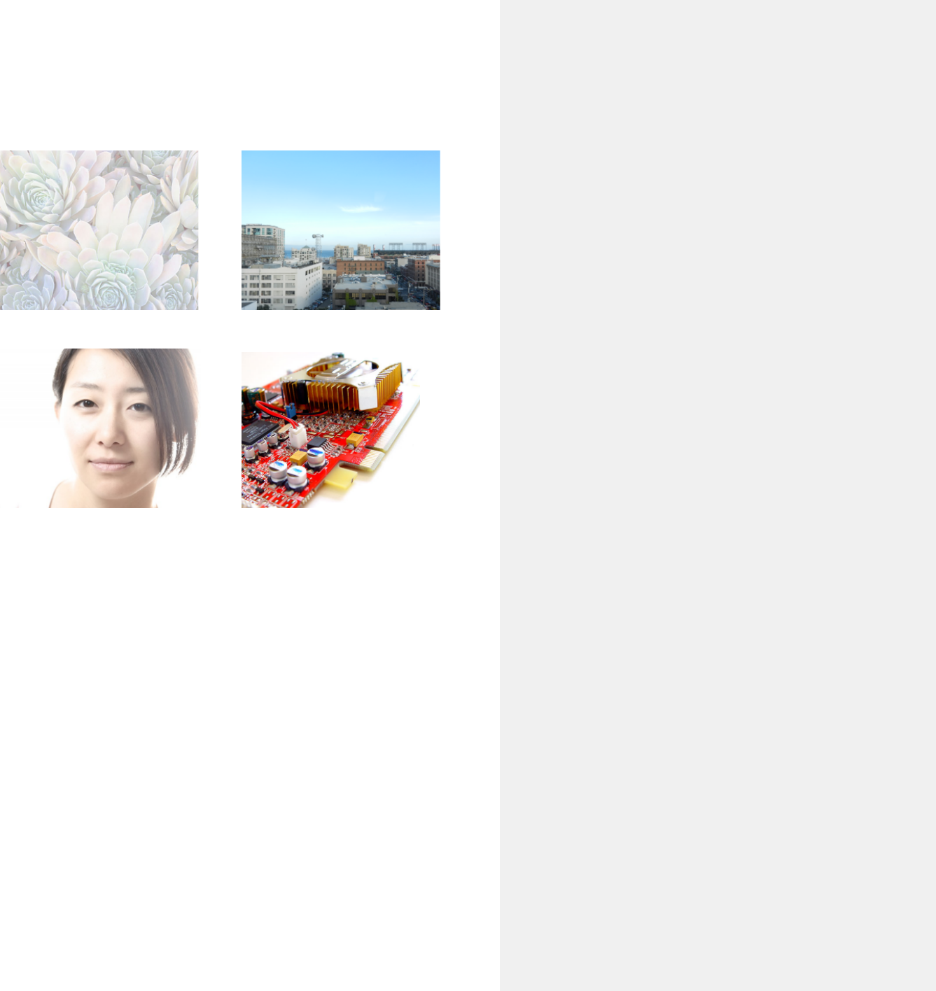
Picture Use
The style of images used in FreedomBox materials
greatly contributes to the general impression of the
project. In order to foster a consistent look and feel,
photographs should be "highkey" (generally bright
with only few dark parts). Other image material
such as illustrations should also use a brighter color
palette whenever possible.
Images with a strong foreground-background
separation (either by depth of field, over-exposure
or plain background) are preferred, as they put
extra weight on the bright, free "flying" feeling.
10
10/
/10
10
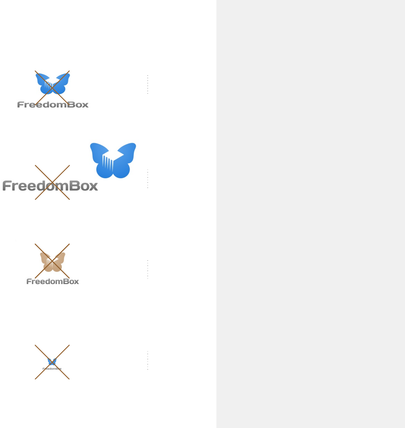
DON'Ts
Regarding the signature, keep in mind:
Do not distort the signature by unclean scaling in X
or Y dimensions or by skewing. Be careful to keep
the correct aspect ratio (often by holding down a
modifier key like shift or control while scaling).
Do not separatesign and logotype and place them in
any other order that may fit better in your current
layout.
Do not use different colors in any part of the
signature. Remember, there are special variants for
different backgrounds.
Do not scale down the complete signature too
much. If the logotype can't be read anymore,
enlarge the sign and remove the logotype.
distort
separate
colorize
miniaturize
