Manual
Manual
Manual
Manual
Manual
Manual
User Manual: Pdf
Open the PDF directly: View PDF  .
.
Page Count: 6
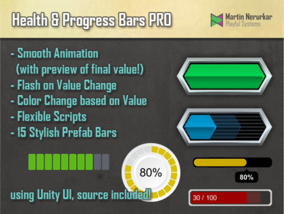
Health and Progress Bars Pro
User Manual – Version 0.4
Health and Progress Bars Pro is an asset for Unity 3d to quickly generate good looking
fillable linear or circular bars. These can be used as progress meters, health or energy bars
among other things. To do this the plugin makes use of the Unity UI system introduced in
Unity 4.6
Features
•Smooth bar animation
•With previews of final value ("Bar shadows")
•Smooth color change based on value
•Flash bar on gain or loss
•Dynamically placed text
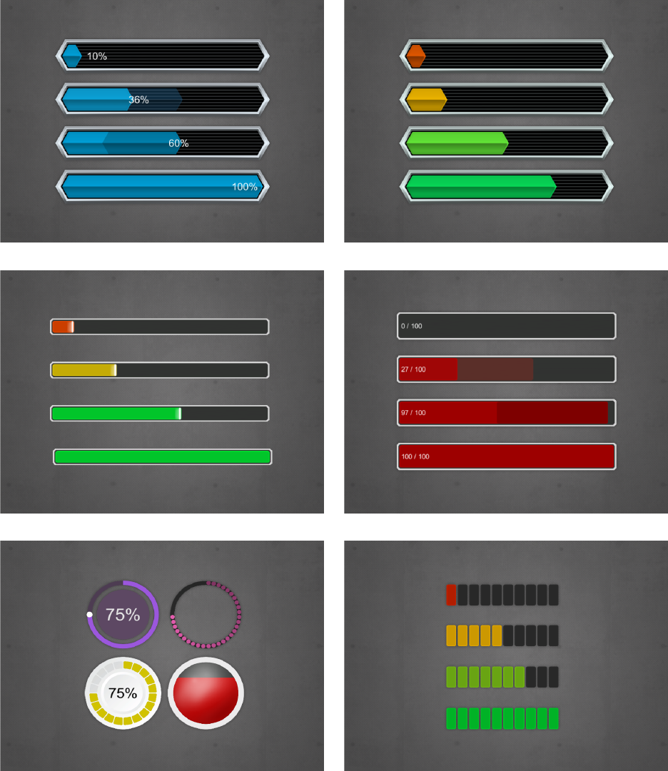
Completed bars
A number of pre-designed bars are part of the package. These are complete with prefabs and
sprites and can be used in a wide variety of projects. Simply put one of those into a UI canvas
in your scene and see it come to life.
More options will be added with future versions of this asset.
Updating the Progress Bar
Once you have added a progress bar to your project there are three methods you can call to
update the progress bar. Simply keep a reference to the ProgressBarPro object and then call
one of the following methods:
•SetValue(float value, float maxValue)
•SetValue(int value, int maxValue)
•SetValue(float value)
Say for example that your progress bar is used as a health bar and that the player has a max
health of 100 and has his health now reduced to 80. This means you'd call the method as
SetValue(80, 100). This will move the bar to the 80% marker.
If you use the Method with the single parameter, then you need to supply a value between 0
and 1. In the example above, you'd call SetValue(0.8f) to set the bar to the 80% marker.
Building your own Progress Bar
At the heart of your own design is the ProgressBarPro script. This should be placed on the
root GameObject of your design. By itself this script displays nothing, it simply takes the
information from the game and uses it to drive other objects.
These objects are called ProgressBarProView and each of these views is updated when the
value of the progress bar changes. If you're designing your bar, think of it as follows: anything
that changes, be it a bar, the color, a text, is a view.
All you need to do is to apply the appropriate view components to your dynamic objects.
Here's an overview over your options:
ViewSizeImageFill
This component is used in conjunction with a UI Image set to image type "Filled". The bar will
change the fill amount to match it's values.
•Hide On Empty
This disables the gameObject when the bar is empty. Note that this may cause some
issues if the gameObject has child objects that would still have to be displayed.
•Use Discrete Steps
This means that the fill rate will clamp to specific steps and not move smoothly
between each step. This is useful if your image is segmented and you never want to
show partial segments. See the "CircularDots" prefab for an example
•Num Steps
This determines the amount of steps used to fill the image.
ViewSizeAnchors
This adjusts the anchors of the element to reflect the size of the bar. At 100% the object will fill
out it's parent on either the X or Y axis (based on your settings). This is good for bars that use
sliced or tiled images.
•Fill Type
This determines the axis and direction along which the bar will be resized
•Use Discrete Steps
This means that the fill rate will clamp to specific steps and not move smoothly
between each step. This is useful if your image is segmented and you never want to
show partial segments. See the "CircularDots" prefab for an example
•Num Steps
This determines the amount of steps used to fill the image.
ViewSizeAnchorsShadow
This is a variation of the SizeAnchors build specifically for progress bar shadows: that show
the target value of the bar while it smoothly animates toward that target. It has the same
options as the ViewSizeAnchors with the following extra option:
•Shadow Type
This can either be gaining or falling and determines how the anchors are picked and
when the bar is shown or hidden. Gaining bars are shown when the value is increased,
falling bars are shown when the value is lowered. Note that generally the gaining bar
should be behind the actual visual bar, the losing bar should be in front.
ViewColor
This controls the color of the referenced UI graphic, such as text or an image. You will usually
want to put this on your central bar element, unless your sprite is already colored.
•Can Override Color
The ProgressBarPro has a convenience method called "SetBarColor" that allows you to
change the color of the bar. It will do so on all views that have a ViewColor component
and have ticked this box.
•Default Color
This is the color of the bar. If your sprite is already colored then this can be left white
•Use Gradient
Check this box if you want your bar to change color based on it's fill state
•Bar Gradient
This is the gradient used to determine the color of the bar, based on it's fill percentage.
You can use the alpha of the bar gradient to have some elements only appear at certain
value ranges.
•Flash On Gain/Flash On Loss
If one of these boxes is checked, then the bar will be recolored shortly after the value
was increased or lowered
•Gain Color/Loss Color
These determine the color to flash the bar with when gaining or losing value.
•FlashTime
This determines the length of the flash after a change
ViewColorWhileMoving
This changes the color of an image while the bar is animating or standing still. For example
shis could be used to show a glow on the bar while it's moving.
•Color Static
This is the color when the bar is not moving. You can set the alpha to 0 to hide the
object on a static bar.
•Color Moving
This is the color when the bar is moving.
•Blend Time on Move / Blend Time On Stop
These determine how long it takes to change from one color to the other on starting to
move or on stopping.
ViewValueText
This allows you update a Text with the value of the progress bar.
•Prefix
This text is always shown at the start of the text field.
•Min Value / Max Value
These are the min and max values between which the bar moves. If you use the bar as a
health indicator and your maximum health changes, you may have to adjust max Value
accordingly.
•Num Decimals
This determines to how many decimals the values will be rounded
•Show Max Value
If this is checked, then the maximum possible value will be displayed
•Number Unit
If text is given, then the unit is added to both the current and the max value (if
applicable)
•Suffix
This text is always shown at the end of the text
ViewPosImageFill
This allows you to position something along the edge of an image set to imageType Filled. It
currently only supports Horizontal, Vertical and Radial360. This is useful if you, for
example, want to position something at the edge of a circular fill progress.
•Reference Image
This is the image that the object will stick to.
•Offset
This determines how much the object will be offset along the fill line.
ViewPosAnchors
This positions an object at the edge of a bar by adjusting it's anchors. It's options are similar to
ViewSizeAnchors. This can be used to make a text move along the edge of the bar, for example.
